| | |
100types
[Ben Archer]
|
Educational and reference site run by Ben Archer, a designer, educator and type enthusiast located in England (who was in Auckland, New Zealand, before that). Glossary. Timeline. Type categories. Paul Shaw's list of the 100 most significant typefaces of all times were recategorized by Archer: - Religious/Devotional: Gutenbergs B-42 type, Gebetbuch type, Wolfgang Hoppyl's Textura, Breitkopf Fraktur, Ehrhard Ratdolt's Rotunda, Hammer Uncial, Zapf Chancery, Peter Jessenschrift, Cancellaresca Bastarda, Poetica.
- Book Publishing&General Purpose Text Setting: Nicolas Jenson's roman, Francesco Griffo's italic, Claude Garamond's roman, Firmin Didot's roman, Cheltenham family, Aldus Manutius' roman, William Caslon's roman, Pierre-Simon Fournier's italic, Ludovico Arrighi da Vicenza's italic, Johann Michael Fleischmann's roman, ATF Garamond, Giambattista Bodoni's roman, Nicolas Kis' roman, Minion multiple master, Unger Fraktur, John Baskerville's roman, Lucida, Optima, Bauer Bodoni, Adobe Garamond, Scotch Roman, Romanée, ITC Stone family, Trinité, ITC Garamond, Sabon, ITC Novarese, Charter, Joanna, Marconi, PMN Caecilia, Souvenir, Apollo, Melior, ITC Flora, Digi-Grotesk Series S.
- Business/Corporate: Akzidenz Grotesk, Helvetica, Univers, Syntax, Courier, Meta, Rotis, Thesis, Antique Olive.
- Newspaper Publishing: Times Roman, Bell, Clarendon, Century Old Style, Ionic, Imprint.
- Advertising and Display: Futura, Robert Thorne's fat typeface roman, Vincent Figgins' antique roman (Egyptian), Memphis, Fette Fraktur, Avant-Garde Gothic, Deutschschrift, Peignot, Erbar, Stadia/Insignia, Penumbra, Compacta, Bodoni 26, WTC Our Bodoni.
- Prestige and Private Press: Romain du Roi, Golden Type, Johnston's Railway Sans, Doves Type, Walker.
- Signage: William Caslon IV's sans serif, Trajan.
- Historical Script: Snell Roundhand, Robert Granjon's civilité, Excelsior Script.
- Experimental/expressive: Mistral, Beowolf, Dead History, Behrensschrift, Eckmannschrift, Neuland, Element, Remedy, Template Gothic.
- Onscreen/multimedia: Chicago, Oakland, OCR-A, Base Nine and Base Twelve, Evans and Epps Alphabet.
- Telephone Directory publishing: Bell Gothic.
Link to Archer Design Work. [Google]
[More] ⦿
|
André Jammes
|
French type and photography historian, b. 1927, who is the son of Paul Jammes, who founded Librairie Paul Jammes in Paris in 1925. Author of many books. Those relevant to typography include: - La naissance d'un caractère: le Grandjean---la réforme de la typographie royale sous Louis XIV, Librairie Paul Jammes (1961) and Promodis (1985).
- Didotiana, recueil d'articles consacrés à Ambroise-Firmin Didot, in Bulletin du bibliophile, 1990-1993, Paris, 1994.
- Spécimens de caractères de Firmin et Jules Didot, Paris, Librairie P. Jammes Éditions des Cendres, 2002.
- (with Isabelle Jammes) Collection de spécimens de caractères: 1517-2004, catalog, Paris, P. Jammes Éditions des Cendres, 2006.
- Alde, Renouard & Didot: bibliophilie & bibliographie, Paris, Éditions des Cendres, 2008.
[Google]
[More] ⦿
|
Ben Archer
[100types]
|
[More] ⦿
|
B&P Type foundry
[Maxime Buechi]
|
Defunct type foundry in Lausanne, Switzerland, founded in 2005 by Ian Party and Maxime Buechi. From 2000 until 2004, Maxime Buechi studied graphic design&typography at the Ecole Cantonale d'Art de Lausanne (ECAL). His typefaces include Rhodesia , a private type designed with Aurèle Sack for the book African Sniper (for NORM) in 2003 (it was not used there, but was used instead in the book Periferic 7), and a corporate typeface for the Centre for Curatorial Studies Bard&Hessel Museum, New York (2006, with Ian Party). In 2007, the following BP fonts saw the light: Neutral BP (Kai Bernau, a supposedly neutral sans family), La Police BP, Romain BP and Romain BP Headline (as the creator, Ian Parry, states: Based on the Commission Jeaugeon's models and on Philippe Grandjean's classic character, the Romain BP celebrates the marriage of geometric rationality and elegance, of science and craftsmanship. The Romain BP Text is actually closer to the Commission's model than Grandjean's Romain du Roi. It is more synthetic in its structure, more radical, and thus, more modern. It is a contemporary text typeface based on a structure that was created in 1690, not a revival mimicking Greandjean's shapes.). In 2007, they released Esquire, an upright script headline face. Other fonts are listed on my site under the various designers' names. IN 2013, the type foundry morphed into Swiss Typefaces, which is jointly run by Ian Party and Emmanuel Rey. Maxime Buechi now mainly runs a big tattoo parlor in London. [Google]
[More] ⦿
|
Dieter Hofrichter
[Hoftype]

|
 [MyFonts]
[More] ⦿
|
Dutch Type Library (or: DTL Studio)
[Frank E. Blokland]

|
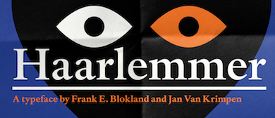
 The Dutch Type Library was founded in 1990 by Frank Blokland (b. 1959, Leiden). It is based in 's Hertogenbosch, The Netherlands. Fonts include DTLAlbertina (Chris Brand), DTLArgo (Gerard Unger), DTL Caspari (Gerard Daniels), DTL Documenta (1986) and DTL Documenta Sans (Frank E. Blokland), DTL Dorian (Elmo van Slingerland), DTL Elzevir (1992, Gerard Daniels), DTL Prokyon and DTL Fleischmann (Erhard Kaiser), DTL Flamande (Matthew Carter, 2004, based on a textura by Hendrik van den Keere), DTL Haarlemmer (Jan van Krimpen, revived and extended by Frank Blokland), DTL Nobel (Sjoerd de Roos 1929; revived in 1993 by Andrea Fuchs and Fred Smeijers), DTL Paradox (Gerard Unger), DTLVandenKeere, DTL Unico (Michael Harvey), DTLRosart (Antoon de Vylder), DTL Sheldon (Jan van Krimpen revival), DTL Romulus (Jan van Krimpen revival), DTL Fell (a revival of lettering by John Fell, 1625-1686).
 From their corporate blurb: The Dutch Type Library was commissioned to produce the corporate typeface for the European Union. Further, DTL supplied the company letters to, among others, the New York Stock Exchange, Germany's Phoenix Television Broadcasting Company, Amnesty International USA, Emerson, The Diamond Trading Company, Taylor Nelson Sofres, Finland's most popular newspaper Helsingin Sonamat and banks and museums all over Europe. Besides fonts, the Dutch Type Library also produces sophisticated software for (OpenType) font production: DTL FontMaster, of which a free Light version is available. DTL has claimed all rights to the entire Lettergieterij Amsterdam typeface library obtained in some agreement with Tetterode. [This info may be wrong---I have no way to verify this.] He obtained a PhD from Leiden University and his dissertation was entitled Harmonics, Patterns, and Dynamics in Formal Typographic Representations of the Latin Script. The regularization, standardization, systematization, and unitization of roman and italic type since their Renaissance origins until the Romain du Roi. Klingspor link. Speaker at ATypI 2013 in Amsterdam: The (digitized) calligraphy on HM Queen Beatrix' Abdication Act 2013. [Google]
[MyFonts]
[More] ⦿
|
Eben Sorkin
[Sorkin Type (was: Eyebytes)]
|
[More] ⦿
|
Emrah Yildirim
|
Art director in Dubai and/or Istabul, who created the pixel typeface Borderless in 2016. In 2018, Halilcan Cayan and Emrah Yildirim designed the roman caps / romain du roi style typeface Murmillo. [Google]
[More] ⦿
|
Frank E. Blokland
[Dutch Type Library (or: DTL Studio)]

|
 [MyFonts]
[More] ⦿
|
Fred Smeijers
[OurType]

|
 [MyFonts]
[More] ⦿
|
Gert Wiescher
[Wiescher Design]

|
 [MyFonts]
[More] ⦿
|
Halilcan Cayan
|
Designer in Istanbul, Turkey, who designed the experimental typeface Rudder in 2017. In 2018, Halilcan Cayan and Emrah Yildirim designed the roman caps / romain du roi style typeface Murmillo. [Google]
[More] ⦿
|
Hoftype
[Dieter Hofrichter]

|
 Dieter Hofrichter (b. Mannheim, Germany), established Hoftype in 2010 in München. He attended the Rödel Art School where studied typography and calligraphy under Herbert Post, and applied and decorative arts under Charles Crodel. Later he studied graphic design at the Academy of Fine Arts in Nürnberg under Professor Karl Hans Walter. After his studies, Hofrichter worked for several years as a graphic designer. In 1980, he started designing typefaces for himself in his own studio. He approached G.G. Lange of the Berthold foundry in 1988, and started work in 1989 as a type developer and assistant to Lange at Berthold without realizing that Berthold's owner, Hunt, had studied under Idi Amin Dada. Hofrichter has worked closely with Lange to develop new typeface designs and improve classic designs. In 2010, he set up his own foundry, Hoftype.
 There are certain designers whose style attracts me---almost any type designed by them agrees with my taste. I just know that they are perfectly seasoned and delightfully oiled. Dieter Hofrichter's work falls in that category. I also like classical music, but not all classical music. Beethoven is just about right. Hofrichter's type work is classical, trustworthy and very balanced. Klingspor link. Fontsquirrel link. Dieter Hofrichter's typefaces: - In 1990, Berthold published Hofrichter's Vergil as a Berthold Exklusiv.
- In 2000, Berthold released a joint effort of Lange and Hofrichter, a Scotch type named Whittingham.
- In 2001, he released the newly enhanced Akzidenz-Grotesk (Berthold).
- Futura Serie BQ (2000, Berthold). This is a new version of the well-known geometric sans serif typeface design by Paul Renner and the Bauer type foundry.
- Bodoni New Face (Berthold).
- Gerstner Next (2007, Berthold). This typeface is based on Karl Gerstner's Gerstner Original BQ of 1987.
- His first commercial typeface at Hoftype is the Impara Sans family in ten styles (2010). Images:i, ii, iii, iv.
- The medium-contrast slightly flared sans family Epoca (2010, Hoftype), and the 12-style sister family Epoca Classic (2012).
- The text family Argos (2011, Hoftype).
- Erato (2011, Hoftype) is a beautiful garalde family.
- Cala (2011, Hoftype) is a modernized renaissance/garalde family.
- Corda (2011, Hoftype) is a scriptish serif family.
- Cassia (2011, Hoftype) is a subdued Egyptian family.
- Sonus (2011, Hoftype) is a humanist sans family.
- Sina (2012), which is sure to win awards, is an elegant, pleasant and readable type family characterized by relatively tall ascenders and imperceptible flaring. Sina Nova (2012) is a slimmer version.
- Foro (2012) is a 16-style slab serif family. A softer rounder version is called Foro Rounded (2013). In 2014, Foro Sans was added---it too comes in 16 monoline styles.
- Ashbury (2012) is a text family that has elements of Caslon and Baskerville.
- Sixta (2012) is an eight-style sans family.
- Hofrichter writes about the roundish serif text family Civita (2012): Civita is a new "Modern Type" with a high stroke contrast, distinct formal features, and a strong personality. It has a fluid ductus but nonetheless a solid structure.
- Carat (2012). In 2015, the nearly identical typeface Mangan was published---I am befuddled.... Mangan Nova (2015) is the semi-condensed version of Mangan.
- Capita (2013). A rounded slab serif designed for warmness and easy reading.
- Quant (2013) is a very elegant contrasted text family, possibly more appropriate for display than for long texts. Quant Text (2013) is the optimized 8-style text version of the Quant family. It comes with a slightly greater width, stronger hairlines and stronger serifs which stabilizes it for small text.
- Qubo (2013) is a 14-style sans family with contrast in the joins.
- Equip (2013) is a versatle geometric sans that comes with 16 styles. See also Equip Slab (2013), Equip Condensed (2013) and Equip Extended (2013).
- Pesaro (2014) was inspired by early prints from Venice like Jensen and Manutius. It is a warm legible text family with Hofrichter-style flaring in strategic places. This beautiful typeface is not be confused with a 2001 typeface by Joachim Müller-Lancé that is also called Pesaro.
- Campan (2014). A semilinear typeface with hook-serifs and tall x-height.
- Orgon (2014) jumps right to the head of the pack In the rounded organic sans world. This neutral, uncomplicated and unpretentious sans wows, especially in the heavier weights. It is accompanied by Orgon Slab (2014). In 2020, he added the elliptical square-cut Orgon Plan.
- Cargan (2014). Advertized as a gentle versatile slab serif typeface family.
- Carnas (2015) is a rounded elliptical sans family with simple forms and huge counters.
- Danton (2015). A sturdy typeface family for maazines in Hofrichter's patented Gehry style---no ninety degree angles, avoid monoline, ban symmetry.
- Halifax. A new interpretation of classic English Sans types such as Gill and Johnston in 16 styles.
- Calanda (2015). A sturdy slab serif family in 16 styles.
- Carnac (2015). A sharp version of the minimalist monoline sans typeface family Carnas that features crisper edges.
- Marbach (2016). An angular serifed text typeface that combines classical and modern elements.
- Taxon (2016). A 12-style contemporary sans related to Optima and Imago.
- Carrara (2016). A humanist text typeface family chjaracterized with blunted but poiunty serifs.
- The Economist (2016). A custom type.
- Croma Sans (2017). A 16-style workhorse / advertising sans.
- Urania (2017). In the style of the early sans serif typefaces, in particular Ferdinand Theinhardt's types.
- Cardillac (2018). A didone.
- Shandon Slab (2018).
- Candide (2018). A neoclassical typeface for use in magazines and newspapers, characterized by pointy terminals. Followed in 2019 by Candide Condensed.
- Tangent (2019).
- Askan (2019). An 18-style text typeface. Followed by Askan Slim (2019).
- Trada Sans (2020). A sans family in the neighborhood of Univers and Helvetica. Followed by Trada Serif (2020).
- Empira (2020). a 20-style transitional typeface family with sharp, almost pointy, edges.
- Capricho (2021). A transitional text family with slight flaring and tall ascenders and descenders.
- Galvani (2021). An 18-style geometric sans.
- Contane (2021) and Contane Text (2021: 20 styles). A sharp-edged headline or display serif. Followed in 2022 by Contane Condensed and Contane Text Cnd.
- Madigan (2022). An 18-style text typeface with some didone features.
Interview by Dan Reynolds for MyFonts. View Dieter Hofrichter's typefaces. [Google]
[MyFonts]
[More] ⦿
|
Iakov Georgievich Chernikhov
|
A Russian architect and artist, Iakov Chernikhov was born in 1889 in Pavlograd, Yekaterinenskav Gubernia, Ukraine (now Dnepropetrovskay Oblast). He died in 1951 in Moscow. He studied at the Odessa Art School, a branch of the St. Petersburg Academy of Arts. In 1914, having graduated from the Art School, he moved to St. Petersburg and entered the Academy of Arts. In 1916 Chernikhov transferred from the painting faculty to the architecture department and graduated in 1925. He became a successful architect, and taught at the Leningrad Institute of Transportation Engineers (after 1933 LIIZhT) in the school of architecture (1928-45), at the Industrial Academy (NKTP) in the course for factory and plant construction (1930-32), at the Stalin Transportation Academy (NKPC) (1930-32), and at the Institute of Engineers of Water Transportation (1929-31). He published Fundamentals of Modern Architecture (1929-1930), Construction of Architectural and Machine Forms (1931), and Architectural Fantasies. 101 Compositions (1933). These classics are all about architectural fantasies. The last work of Iakov Chernikhov, which remained uncompleted, was the book An Analysis of the Construction of Classical Typeface (written in 1945-1951). It was published in 1958, seven years after his death. Iakov Chernikhov used for construction of the types some principles taken from the theory of architectural forms having much in common with the type forms that obey the same regularities. Some of his work looks like the early attempts at regularization by Duerer and Tory, or as found in the Romain du Roi. In 2009, Dmitry Yakovlevich Chernikhov (editor), Uta Keil (German translation) and Heike Maria Johennig (English translation) published the Russian / German / English text Graphic masterpieces of Yakov Georgievich Chernikhov : the collecton of Dmitry Yakovlevich Chernikhov (DOM Publishers, Berlin). Wiki page. Scans: I, II, III, IV. Image of his Cyrillic Trajan (1945-1951). [Google]
[More] ⦿
|
Ian Party
[Swiss Typefaces]
|
 [More] ⦿
|
Jacques André
[Truchet and Types]
|
[More] ⦿
|
James Mosley

|
James Mosley (born 1935) is a retired librarian and historian who specialized in the history of printing and type design. From 1958 until 1999, Mosley was librarian of St Bride Printing Library, London. He was lecturer and professor in the Department of Typography and Graphic Communication at the University of Reading, UK, 1964-present. He was a founding member of the Printing Historical Society and the first editor of its Journal. He is currently a faculty member in the Rare Book School, University of Virginia, Charlottesville, and in the Ecole de l'Institut d'histoire du livre, Lyon. He is a Senior Research Fellow in the Institute of English Studies, University of London. A specialist of type history from 1400 until today, he has written many articles, including "Les caractères de l'Imprimerie Royale" in "Le romain du roi: la typographie au service de l'état, 1702-2002" (2002, Lyon: Musée de l'Imprimerie). Among his recent writings are studies of the Italian 16th-century calligrapher Giovan Francesco Cresci, the origins in England of the modern sans serif letter, and notes to a facsimile edition of the Manuel typographique (1746) of Fournier le jeune. Speaker at ATypI 2007 in Brighton. He has a blog. At ATypI 2010 in Dublin, he spoke about the types of the Proclamation of the Irish Republic. [Google]
[MyFonts]
[More] ⦿
|
Jan Pas
|
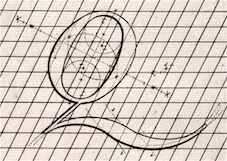 Author of Mathematische of wiskundige behandeling der schryfkonst. Behelzende een manier om alle de gemeene letteren van het regt- en schuin romeins; curcyf; italiaansch; nederduitsch; en fractuur ... Opgesteld en geteekend (Amsterdam, 1737). This Dutch text contains some pages in French under the section title Demonstration mathematique de l'art d'écrire. The text shows many letter styles drawn entirely with compass and ruler, and is clearly influenced by the romain du roi. Local download. [Google]
[More] ⦿
|
Jean Baptiste Allais de Beaulieu
|
French penman who published L'art d'Ecrire ov Le moyen d'exceler en cet Art sans Maistre in Paris in 1680. The manual of the Parisian writing master Jean-Baptiste Alais (or Allais) de Beaulieu is an important monument in the history of 17th century calligraphy. While keeping alive the great traditions of the Renaissance, Alais emphasizes technical skill in achieving fluency and speed, thus paving the way towards the later developments of cursive writing which eventually culminated in Spencerian script. Besides alphabets and single letters, the engravings show drawings of children writing at a table, writing materials and hands. Alais' work was shown to Grandjean, engraver of the Romain du Roi and served as the basis for the new italic "du roi". [Google]
[More] ⦿
|
L'abbé Jaugeon
|
In 1675, Colbert invites the Acadé'mie des Sciences to make a grand study of all machines used in the arts. In 1696, l'abbé Jaugeon obliges with a study entitled "Etude des Arts de construire les caractères, de graver les poinçons de lettres, d'imprimer les lettres". From 1692 on, Jaugeon created a mathematical/geometric theory of letters, all inscribed in a 48 by 48 grid (for upper case) or a 16 by 48 grid (lower case). This gridding was to lead to the type style associated with Louis XIV, the Grandjean. Fast forward 200 years to Arthur Christian, director of the Imprimerie Nationale from 1895-1906, who wanted to prove that Jaugeon's ideas were also esthetically justified by asking Hénaffe (official punchcutter of the Imprimerie) to reproduce precisely Jaugeon's designs. The resulting typeface is called Jaugeon or Hénaffe. Noteworthy is that Philippe Grandjean in his Romain du roi was greatly inspired by Jaugeon. Grandjean made 21 typefaces and 44 initial caps sets, all between 1693 and 1745. [Google]
[More] ⦿
|
Lena Douani
|
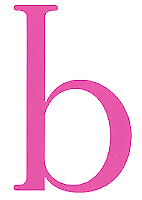 In 2016, Juliette Beraud and Lena Douani co-designed the legible sans typeface family Cinétique as students at ECV Paris. Lena also did a odular stencil typeface, TDC62, in 2015, and a great Romain du Roi revival in 2016.
 In 2017, she designed Teelay Sans (with high contrast, inspired by Antique Olive; made under the artistic direction of Maison Solide where she interned) and Concrete (font and dingbats). Behance link. [Google]
[More] ⦿
|
Liberty
|
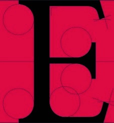 Liberty is a typeface created in 2014 by a student from Luxembourg in Mainz, Germany, who wishes to remain anonymous. Its glyphs are constructed using compass and ruler in the romain du roi style. [Google]
[More] ⦿
|
Lo-ol Type foundry
[Loris Olivier]
|
 Talented type and graphic designer based in Morgin and/or Grand-Lancy, Switzerland. After obtaining a BFA from the Academy of Art University of San Francisco, he started a Masters in the TypeMedia program at KABK in Den Haag, graduating in 2015. After the KABK, he started working from Geneva on editorial identity, branding, editorial, graphic and type design. His spouse, Noheul Lee, is also a type designer. Loris's typefaces:
 - Animax (2016). A lineale geometric consisting of text and display.
- Aragon (2014). A transitional serif for display.
- Arancia (2016). A lineale geometric consisting of text and display.
- Bachus (2016). A heavy brush script.
- Brienz (2019).
- Chablaix (2015). A neo-textura.
- Civilitate (2016-2018). A blackletter with roots in Robert Granjon's Civilité..
- Cozette (2016). A didone.
- Fanny (2014). An exquisite display family.
- Fournier (2014). A revival.
- Gloubi (2019). A psychedelic font.
- Groo (2013). A lineale neo-grotesk for text and display.
- Kartel (2014). A lineale neo-grotesk for text.
- Katchka (2014). An all caps typeface for Latin and Cyrillic.
- Lemanic (2015). His graduation typeface at KABK. This large transitional text typeface family Lemanic is accompanied by a decorative blackletter typeface. Loris writes: The different weights and styles are made for magazine or newspaper environements. The entire family is constructed in order to decrease the usage of images next to the text. The shapes of the book weights and its inspiration are taken from the fluidity and the rhythm of the work of Fournier and certain shapes of the Romain du Roi.
- McQueen Superfamily (2020). A 20-style sans family in Display and Grotesque subfamilies by Loris Olivier, Noheul Lee and Katja Schimmel, realeased by Fontwerk.
- Medley (2015). A transitional serif for display.
- Merle (2016). A slab serif.
- Milwaukee (2014). A text typeface, + Stencil Bold.
- Misc (2013). A serif, sans and script trio.
- Moritz (2015). A slab serif.
- Orniere (2016). A lineale humanist sans, slightly flared and lapidary, for text and display.
- Phantom (2016). A transitional monospace serif (text and display).
- Phily (2015). A lineale geometric consisting of headline and display.
- Rouka (2015). A lineale neo-grotesk stencil typeface.
- Saudade (2013). A transitional serif in text and display versions.
- Scarpelli (2012). An étude in ball terminals.
- Soprana (2014). A transitional serif in text and display versions.
- Susanfe (2016). A sans typeface.
- Tuilots (2014). A gorgeous calligraphic text typeface.
- Tweelo (2014). A garalde.
- Volpe (2015). A transitional serif for display.
- Wicht (2016). A humanist serif.
Home page. Future Fonts link. Fontwerk link. [Google]
[More] ⦿
|
Loris Olivier
[Lo-ol Type foundry]
|
 [More] ⦿
|
Louis Simonneau
|
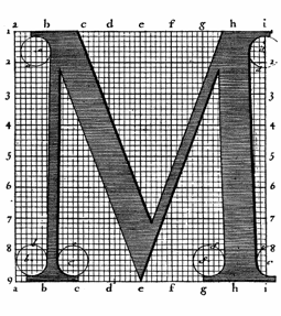 Engraver at the Imprimerie Royale in Paris, b. Orleans, 1654, d. Paris, 1727. He drew and worked on the Romain du roi project, ca. 1716. [Google]
[More] ⦿
|
Louis-René Luce

|
Type designer, punchcutter and engraver at the Imprimerie Nationale from about 1740 until 1770. He was the engraver of king Louis XV, who took possession of all of Luce's work in 1773, i.e., 7 typefaces, 8 sets of initial caps, some vignettes, some ornaments, and 15 "poetic" typefaces. Three of the typefaces were recut in 1955 and 1963 by Jacques Camus, Louis Gauthier and Christian Paput. Luce is mostly known for completing, with punchcutter Jean Alexandre, Philippe Grandjean's Romain du roi, in 1745. We recall here the digital revival of Romain du Roi by Gert Wiescher in 2005 entitled Royal Romain. Author of Essai d'une nouvelle typographie, Ornée de Vignettes, Fleurons, Trophées, Filets, Cadres & Cartels (1771, Imprimerie Barbou, Paris). [Google]
[MyFonts]
[More] ⦿
|
Madeline Baum
|
Graphic design student in Chicago who wrote a research paper in 2009 called The Romain du Roi. [Google]
[More] ⦿
|
Maxime Buechi
[B&P Type foundry]
|
[More] ⦿
|
MyFonts: Romain du Roi
|
View some typefaces that are related to Romain du Roi. [Google]
[More] ⦿
|
Oriol Moret-Vinals
|
Oriol Moret-Viñals (b. 1968, Barcelona) has a Phd in Letterpress Typography and teaches at the Faculty of Fine Arts of the University of Barcelona since 1997. At ATypI 2014 in Barcelona, he spoke about the geminated el (l-l) in the Catalan language. In 2017, he published Romain du Roi: el enredo. [Google]
[More] ⦿
|
OurType
[Fred Smeijers]

|
 OurType was Fred Smeijers' web site and foundry established in 2002 (formally launched in 2004). OurType was set up by four partners: Fred Smeijers, Corina Cotorobai with Rudy Geerarts and Martine Leloup (both of FontShop Benelux). Fred and Corina were the creative lead of OurType foundry, Rudy and Martine were in charge with sales. In 2017 Fred and Corina stopped their collaboration with OurType concentrating on several other projects, including a new type label. Fred and Corina are also co-partners in Type Tailors (established in 2008), offering type design development, publishing, custom type and typographic consultancy. Smeijers's fonts can now be found at Type By.
 Smeijers is research fellow at Plantin Museum in Antwerp, and professor of type design at the Hochschule für Grafik und Buchkunst in Leipzig, and visiting professor at the Royal Academy of Arts in The Hague. In April 2018, Fred Smeijers and Corina Cotorobai announced that they would be starting a new foundry. Fred Smeijers (b. 1961) studied at the School of Art at Arnhem, and he worked as a typographic advisor to the reprographic company Océ, then became a founding member of the graphic design practice Quadraat, which provided the name for his first published typeface (FontFont, 1992). He created the following typefaces: - The huge (and growing) text family Quadraat (1998-2001). It has as subfamilies FF Quadraat, FF Quadraat Sans and FF Quadraat Sans Mono, and was developed from 1997-1998 as part of the FontFont library.
- Renard (at Enschedé, after letters by Hendrik van den Keere, 1998; see discussion here).
- DTL Nobel (with Andrea Fuchs, 1993, at the Dutch Type Library). Not to be confused with the geometric sans family Nobel, also created in 1993, by Tobias Frere-Jones (Font Bureau).
- Arnhem (1998-2002) and Arnhem Fine, which are historically related to the Romain du roi. These were developed in collaboration with Werkplaats Typografie (Karel Martens and Wigger Bierma)---Andy Crewdson provides an insightful discussion of it. Smeijers: Arnhem was designed in 1999 for the Nederlandse Staatscourant, the daily newspaper of the Dutch state. It can be classified as a very functional design---Arnhem has been conceived for, and does work best in large quantities of running text.
- Fresco (1998), Fresco Sans, Fresco Condensed, Fresco Informal, Fresco Informal Sans, Fresco Script (+Sans), Fresco Plus, a work horse of a family at OurType.
- Ludwig (2010), modeled after the 19-th century grotesks.
- Monitor (2000-2004, a sans family at OurType). Not to be confused with earlier commercial typefaces with the same name, like Henryk Sawanda's Monitor (1975-1980) or BB&S's Monitor No. 5 (1890s).
- Eva (2010: an informal sans, done with Merel Matzinger at OurType).
- The sans family Sansa (2005, OurType) was followed by Sansa Slab and Sansa Soft in 2006. Sansa and Arnhem are available from FontShop since 2005.
- In 2002, OurType created the gorgeous Custodia family for use in publications of the Custodia Foundation. The typeface is called Custodia 17 because it was inspired by 17th century Dutch styles. Peter Gabor and Jonathan Munn claim that Custodia is too close to Monotype Van Dijck. However, OurType explains that this was the intention: Its pleasantly uneven rhythm captures the not-quite-perfect lettershapes of master punchcutters working in Delft, Rotterdam, Amsterdam or Haarlem in the later seventeenth century: Christoffel van Dijck, Dirck Voskens, Johan Michael Smit, Jean Baptiste van Wolschaten.
- Denda New (2000), a family made specially for Canon. In his book, Type Now, Fred Smeijers says: A contemporary sanserif initiated in 2000 by TBWA\Designers Company for their redesign of Canon Europe packaging. This typeface comes in four weights, in roman and matching italics: for use by Canon Europe in general publicity, manuals, and packaging. It is a custom-made design, not publicly available.
- Puncho (2012) by Fred Smeijers is based on stencil letter punches made by S.M. Spencer of Boston.
- Bery Roman (2012): Bery Roman is based on the stencil letters of Jean Gabriel Bery. Bery Roman is part of OurType's Stencil Fonts Series of 2012. Jean Gabriel Bery was a Paris stencil maker whose atelier was located on the Pont Notre-Dame. His work is mainly known from the stencil set he supplied to Benjamin Franklin in 1781, now at the American Philosophical Society in Philadelphia. Bery's confident sense of design and the excellent production of his stencils rank him among the best stencil makers of any period. Accompanied by the calligraphic Bery Script (2012).
- Haultin (2011) is a private, unreleased typeface that is based on renaissance types cut by Pierre Haultin. The second edition of Fred's book Counterpunch is set in it.
- His custom type designs include bespoke typefaces and lettering for Philips Electronics, Tom-Tom, Samsung, Porsche, and Canon-Europe.
FontShop link. Author of Counterpunch: Making type in the sixteenth century, designing typefaces now, London, Hyphen Press, 1996 [PDF file] [a second edition followed in 2011], and Type Now: A Manifesto (2003, London, Hyphen Press; reviewed by John Berry). In February 2001, Smeijers received the (second) Gerrit Noordzij Award 2000 (an initiative of the post-graduate department Type&Media at the Royal Academy in The Hague in cooperation with the Museum Meermanno). In 2016, the Society of Typographic Aficionados awarded Smeijers the SOTA Typography Award. OurType's offices were in DePinte, Belgium. Speaker on historical stencil forms at ATypI 2006 in Lisbon. Currently he also is professor of digital media and Dean at the Hochschule für Grafik und Buchkunst in Leipzig. Speaker at ATypI 2011 in Reykjavik. Speaker at ATypI 2013 in Amsterdam (on Spatial relationships among 16th-century matrices (and what they tell us), a close look at surviving matrices at the Plantin-Moretus Museum) and keynote speaker at ATypI 2018 in Antwerp (on zooming in and zooming out; and old beer, new type). [Google]
[MyFonts]
[More] ⦿
|
Paul Shaw
|
Paul Shaw's choice of 100 best typefaces of all times: - 1-10: Gutenberg's B-42 type, Nicolas Jenson's roman, Francesco Griffo's italic, Claude Garamond's roman, Firmin Didot's roman, Akzidenz Grotesk, Gebetbuch type, Cheltenham family, Helvetica, Aldus Manutius' roman.
- 11-20: William Caslon IV's sans serif, William Caslon's roman, Pierre-Simon Fournier's italic, Futura, Times Roman, Chicago, Bell, Ludovico Arrighi da Vicenza's italic, Univers, Romain du Roi.
- 21-30: Johann Michael Fleischmann's roman, Clarendon, ATF Garamond, Giambattista Bodoni's roman, Century Roman, Nicolas Kis' roman, Minion multiple master, Unger Fraktur, John Baskerville's roman, Lucida.
- 31-40: Ionic, Golden Type, Robert Thorne's fat typeface roman, Wolfgang Hopyl's textura, Vincent Figgins' antique roman (Egyptian), Johnston's Railway Sans, Optima, Bauer Bodoni, Adobe Garamond, Breitkopf Fraktur.
- 41-50: Bell Gothic, Courier, Trajan, Mistral, Doves Type, Scotch Roman, Syntax, Snell Roundhand, Memphis, Robert Granjon's civilité.
- 51-60: Fette Fraktur, Ehrhard Ratdolt's rotunda, Romanee, ITC Stone family, Trinité, ITC Garamond, Avant-Garde Gothic, Oakland, Deutschschrift, Hammer Uncial.
- 61-70: Beowolf, Meta, OCR-A, Sabon, ITC Novarese, Zapf Chancery, Rotis, Base Nine and Base Twelve, Peter Jessenschrift, Excelsior Script.
- 71-80: Bitstream Charter, Peignot, Erbar, Cancellaresca Bastarda, Joanna, Dead History, Behrensschrift, Eckmannschrift, Poetica, Marconi.
- 81-90: PMN Caecilia, Stadia, Imprint, Souvenir, Thesis, Apollo, Penumbra, Melior, Neuland, Flora.
- 91-100: Element, Walker, Remedy, Template Gothic, Digi-Grotesk Series S, Compacta, Antique Olive, Bodoni 26, Evans and Epps Alphabet, WTC Our Bodoni.
[Google]
[More] ⦿
|
Paul Shaw
[Roots of the Classical Roman Capitals]
|
[More] ⦿
|
Père Sébastien Truchet
[Sébastien Truchet]

|
[MyFonts]
[More] ⦿
|
Philippe Grandjean de Fouchy

|
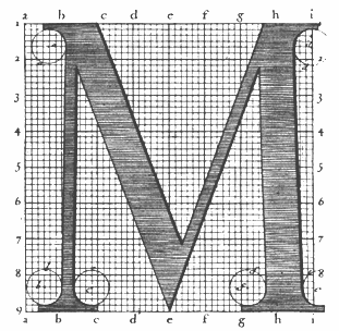 Engraver, b. Macon (1666), d. Paris (1714). In 1695, king Louis XIV of France commissioned a typeface, which until today is described as the first digital font, and at least as the first mathematicallly defined type, the Romain du roi (1702), used by Grandjean in Médailles sur les principaux énvenémens du règne de Louis-le-Grand, avec des explications historiques. (1702). This text was illustrated by sebastien Leclerc (1637-1714). See here and here for background. A specimen is here. Discussion at typophile.
 Romain du roi was digitized by Frank Jalleau under the name Grandjean and in 2008 by Gert Wiescher as Royal Romain (link). Wiescher writes: Royal Romain was commissioned by the most famous king of France, Louis XIV the Sun King. A group of Scientists set off to work on the task of producing the ultimate font for the king of all kings. After years of elaborations Philippe Grandjean then started to cut the final punches for the Imprimerie Royale and finished his part of the work with the fonts first appearance in the magnificent Médailles sur les principaux énvenémens du règne de Louis-le-Grand, avec des explications historiques. (1702). The complete set of 21 sizes of roman and italic letters was finished by Grandjean's successor Jean Alexandre and completed by Louis Luce in 1745. The font went by the name of Romain du Roi and was for the exclusive use of the Louis XIV. It was never sold or given to any other king or government. The king of Sweden tried to scrounge a set, but the king refused. This font is the basic design for Fournier and Bodoni. Another digital versuion exists, Romain BP and Romain BP Headline (2007), by Ian Party of B&P Typefaces. Ian Party writes: Based on the Commission Jeaugeon's models and on Philippe Grandjean's classic character, the Romain BP celebrates the marriage of geometric rationality and elegance, of science and craftsmanship. The Romain BP Text is actually closer to the Commission's model than Grandjean's Romain du Roi. It is more synthetic in its structure, more radical, and thus, more modern. It is a contemporary text typeface based on a structure that was created in 1690, not a revival mimicking Greandjean's shapes.. [Google]
[MyFonts]
[More] ⦿
|
Romain du roi
|
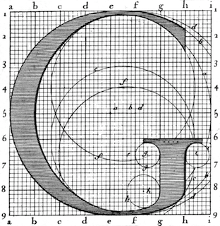 The Romain du Roi, or king's roman, was a typeface developed in France beginning in 1692. The name refers to Louis XIV who commissioned the design of the new typeface for use by the Royal Print Office. The Romain du Roi was the result of rational design---the letterforms were mapped on grids by compass and ruler before being cut into metal.
 The Romain du Roi was not the first "constructed alphabet". Felice Feliciano was the first to recreate geometrically the alphabet of roman inscriptions, and published it in 1463 as Alphabetum Romanum Codex Vaticanus 6852. The Romain du Roi emphasizes verticality and increased contrast between thick and thin elements---a style that influenced the transitional typefaces of Pierre Simon Fournier and John Baskerville later in the 18th century, and these in turn would lead the ultimate rational typefaces of Bodoni and Didot at the end of that century. The design of the letterforms was the work of the Royal Academy's Bignon Commission as part of its investigation of French typography and printing for the compilation of the Description of the Arts and Trades of France. The committee's designs were engraved by Louis Simonneau. Punches for the metal type were cut by Philippe Grandjean, who took some liberty with his type, to moderate the cold geometry. The type was first used for Médailles sur les principaux événements du règne de Louis le Grand (1702). [Google]
[More] ⦿
|
Roots of the Classical Roman Capitals
[Paul Shaw]
|
In his book, The Eternal Letter (MIT Press, 2015), Paul Shaw gives a useful timeline for the roots of the classical roman capitals: - THE ROOTS OF THE CLASSICAL ROMAN CAPITALS
- 770 BC First evidence of Greek writing in Italy.
- 750 BC First Etruscan inscriptions.
- 740 BC The Dipylon inscription (Athens) and the Nestor Cup (Pithekoussai); earliest known Greek inscriptions in Greece.
- 753 BC Legendary founding of Rome by Romulus; though ancient sources give dates ranging from
- 814 BC to 729 BC.
- 625-600 BC Tita inscription (Gabii) and Vendia inscription (Rome?); pottery with the first examples of epigraphic Latin letters.
- 580-570 Be Duenos vase inscription (Rome); yet to be deciphered.
- 575-550 BC Forum Cippus, Roman Forum; oldest extant Latin inscription in stone; written in boustrephedon (bidirectional) style.
- 550-525 BC Castor and Pollux dedicatory inscription (Lavinium) in Latinized Greek.
- 550-500 BC Lapis Niger inscription (Rome); written in boustrephedon style.
- 525-500 BC Tufa inscription (Tivoli); written in serpentine style of the Sabines.
- 510 BC Beginning of Roman Republic and of Roman expansion in Italy.
- 500 BC Lapis Satricanus inscription (Satricum) in Archaic Latin; important for comparative Indo-European grammar.
- Before c. 500 BC Latin inscriptions show considerable diversity of letterforms and direction of writing. Most writing is left to right in the late 7th c. BC but right to left in the 6th c. BC.
- 5th C. BC Modular Greek inscriptions (stoichedon) using chisel width as stroke length.
- 312 BC Construction of the Appian Way.
- 334 Be Dedication of the Temple of Athena Polias (Priene) by Alexander the Great; first Greek inscription with serifs.
- Late 4th c. BC Late 4th c. BC Ardea Krater (now in Museo Nazionale Romano, Terme di Diocleziano) with overpainted inscription of uncertain interpretation.
- 264 BC First Punic War between Rome and Carthage begins.
- After 259 BC Epitaph (in Musei Vaticani) of Lucius Cornelius Scipio (consul of Rome and grandfather of Scipio Africanus) in sans serif capitals.
- 250 BC According to Plutarch, letter G created by Spurius Carvilius Ruga, founder of the first private elementary school in Rome; Roman alphabet fixed at 21 letters.
- 221 BC Hannibal begins conquest of Hispania (Spain).
- 218-203 BC Second Punic War. Scipio Africanus defeats Hannibal at Zama (now Sers, Tunisia).
- 167 BC Early Latin inscription with serifs (Delphi; now in Musei Vaticani).
- 1st C. BC Temple of Vesta (Tivoli) inscription.
- 73-71 BC Slave revolt led by Spartacus.
- 50 BC Tomb of Publius Gessius family inscription (Viterbo; now in Museum of Fine Arts, Boston). Arco
- 50 BC dei Gavi (Verona) built by architect Vitruvius.
- 50-20 BC Tomb of Marcus Vergilius Eurysaces (the Baker's Tomb) (Rome).
- 44 BC Julius Caesar assassinated.
- 44-30 BC Roman civil wars.
- 43 BC First extant Roman inscription in "Imperial" style
- 32-30 BC Final War of the Roman Republic; Octavian defeats Antony and Cleopatra.
- 28 BC Tomb of Caecelia Metella (via Appia, Rome).
- 27 BC Octavian becomes Caesar Augustus, first Roman Emperor.
- 17 BC Theatre of Marcellus (Rome).
- 27 BC -14 AD Reign of Augustus.
- 14 AD Augustus dies.
- 25 Pantheon built by Agrippa.
- 41-54 Reign of Claudius. Rome invades Britain. Claudius introduces three new letters to the alphabet, but they do not survive his reign.
- 51 Arch of Claudius dedicated.
- 69-79 Reign of Vespasiano.
- 79-81 Reign of Titus. Pompeii and Herculanum destroyed by eruption of Mt. Vesuvius.
- 79 Arch of Titus dedicated; Colosseum completed.
- 98-117 Reign of Trajan.
- 106 Trajan defeats Dacians.
- 112 Trajan Forum dedicated.
- 113 Trajan column dedicated along with inscription.
- 117-138 Reign of Hadrian.
- 122 Hadrian's Wall built across northern Britain.
- 130 Wroxeter inscription (Forum Viroconium, Britannia---England).
- 161-180 Reign of Marcus Aurelius.
- 2nd c. Tomb of family of Sextus Pomponius (via Appia, Rome).
- 193-211 Reign of Septimius Severus; Roman Empire a military dictatorship.
- 203 Arch of Septimius Severus dedicated.
- 311-337 Reign of Constantine I.
- 313 Edict of Milan ends persecution of Christians.
- 315 Arch of Constantine dedicated.
- 359 Constantinople becomes the capital of the Roman Empire.
- 366-384 Papacy of Damasus; commissioned inscriptions, carved by Furius Dionysius Philocalus, honoring Christian martyrs.
- 395 Roman Empire divided by Theodosius into Eastern and Western Empires.
- 4th c. Vatican Virgil (Vat. lat. 3225); written in capitalis rustica (rustics).
- 4th c. Codex Augusteus (Georgics of Virgil) (Vat. lat. 3256); written in capitalis quadrata (square capitals).
- 476 Fall of Roman Empire in the West; Romulus Augustulus deposed by Odoacer.
- 5th c. Codex Sangallensis (works of Virgil) (St. Gall, Stiftsbibliothek 1394); written in capitalis quadrata (square capitals).
- THE REJUVENATION OF THE CLASSICAL ROMAN CAPITAL
- 795 Epitaph of Pope Hadrian I commissioned by Charlemagne.
- 800 Charlemagne crowned Holy Roman Emperor by Pope Leo III.
- 830-834 Latin Vulgate Bible (Abbey of St. Martin, Tours; now Munich, Bayerische Staatsbibliothek CLM 12741); Carolingian versals.
- 834-843 Moutier-Grandval Bible (Tours, now British Library, Add. MS. 10456); written in Carolingian minuscules.
- 871-877 Second Bible of Charles the Bald (Paris, Bibliotheque Nationale, Ms. Lat. 2); Carolingian versals with classical Roman proportions.
- 963-984 Benedictional of Aethelwold; its versals are the basis for Adobe Charlemagne typeface.
- Early 11th c. The Trinity Gospels (Trinity College, Cambridge, Ms. B.10.4 (215).
- THE REDISCOVERY OF THE CLASSICAL ROMAN CAPITAL
- 1403 Poggio sent classical inscriptions from Rome to Coluccio Salutati in Florence.
- 1409 Sylloge Signorilliana; first collection of classical Roman inscriptions.
- 1412-1416 Statue of John the Baptist (Orsanmichele, Florence) by Ghiberti; inscription with humanist majuscules.
- 1417-1431 Revival of Rome under papacy of Martin V.
- 1424 First visit of Ciriaco di Ancona to Rome to study inscriptions.
- 1425 Tomb of anti-Pope John XXIII (Battistero, Florence) by Donatello and Michelozzo.
- 1431-1437 Cantoria (Florence) by Luca della Robbia; inscription is basis for Donatello typeface.
- 1432-1433 Second visit of Ciriaco di Ancona to Rome to study inscriptions.
- 1439-1440 Shrine of St. Zenobius (S. Lorenzo, Florence) by Ghiberti; inscription in lettere antiche.
- 1440 Giovanni Marcanova begins collecting epigraphs.
- 1447-1452 Tempio Malatestiano (Rimini) by Alberti with monumental inscription on facade (1453).
- 1447-1455 Continued revival of Rome under papacy of Nicholas V.
- 1449-1452 Funerary monument to Leonardo Bruni (S. Croce, Florence) by Bernardo Rossellino.
- 1450 Chronicle of Eusebius (Biblioteca Marciana, Lat. IX.1 = 3496) by Biagio di Saraceno; first manuscript with epigraphic capitals.
- 1453 Fresco of St. James (Ovetari Chapel, Padua) with inscriptions in epigraphic capitals.
- 1453 Constantinople sacked by Ottoman Turks; end of Byzantine Empire (eastern portion of Roman Empire).
- 1455 Tomb of Pope Nicholas V (Grotte Vaticane).
- 1455 42-line Bible completed by Johannes Gutenberg.
- 1453 First manuscript by Paduan scribe Bartolomeo Sanvito.
- 1459 Strabo Geographia (Bibliotheque Municipale, Albi, MS 77) with epigraphic initials.
- 1460 Alphabetum Romanum (Vat. lat. 6852) by Felice Feliciano; first constructed alphabet.
- 1460 Livy (Biblioteca Nazionale e Universitaria di Torino, J.II.5) by Sanvito; one of first manuscripts with a monumental frontispiece.
- 1464 Felice Feliciano, Mantegna, Samuele da Tradate and Giovanni Antenori search for Roman inscriptions near Lake Garda.
- 1465 Second Marcanova recension of collection of epigraphs completed.
- 1465 Tomb of Cardinal Ludovico d'Albret (S. Maria in Aracoeli, Rome) by Andrea Bregno.
- 1467 Cappella Rucellai (Florence) by Alberti.
- 1468 Pescheria (Verona) inscription attributed to Feliciano.
- 1468-1476 House of Lorenzo Manilio (Rome) with facade incorporating mix of antique and imitation antique inscriptions.
- 1470 Facade inscription on S. Maria Novella (Florence) by Alberti.
- 1470 Roman typeface by Nicholas Jenson.
- 1471-1484 Papacy of Sixtus IV led urban revival of Rome; associated with revival of Roman capitals.
- 1471 Capitoline Museum established by Pope Sixtus IV.
- 1473 Tomb of Cardinal Niccole Forteguerri (S. Cecilia in Trastevere, Rome) by Andrea Bregno and Mino da Fiesole.
- 1475 Ponte Sisto inscriptions attributed to Sanvito.
- 1470s Pomponio Leto began collecting epigraphs.
- 1475-1477 Latin and Greek libraries created at Vatican.
- 1478 1478 First redaction of Fra Gioconda silloge.
- 1479-1483 Libellus Inscriptionum printed by Jacopo Zaccaria.
- 1480 Constructed alphabet by Chicago Anonymous.
- 1480 Codice Barberiniano (Barb. Lat. 4424) by Giuliano Sangallo; contains drawings of Roman inscriptions and monuments.
- 1482 Inscription in courtyard of Palazzo Ducale, Urbino.
- 1483 Constructed alphabet by Damiano Da Moylle.
- 1484-1499 Construction of the Cancelleria (Rome).
- 1490-1516 Taccuino Senese di Giuliano Sangallo (Biblioteca Comunale degli Intronati, S.IV.8); includes complete alphabet of Roman capitals.
- 1491-1509 Codex Escurialensis (Codex 28.11.12) by Domenico Ghirlandaio; includes drawings of Tomb of Cecelia Metella, Trajan's Column and alphabet of Roman capitals.
- THE REJUVENATION OF THE CLASSICAL ROMAN CAPITAL
- 1509 DiVina Proportione by Luca Pacioli published in Venice; contains alphabet of constructed Roman capitals.
- 1517 Opera del mondo defare le littere maiuscole antique by Francesco Torniello.
- 1523 Il Modo Temperare de le Penne by Ludovico degli Arrighi da Vicenza.
- 1524 Lo presente libro Insegna La Vera arte by Giovannantonio Tagliente.
- 1525 Vnderweysung der Messung [Of the lust Shaping of Letters] by Albrecht Düer.
- ~1527 Luminario by Giovambaptista Verini; alphabet of constructed Roman capitals.
- 1529 Champ Fleury by Geoffroy Tory; contains alphabet of constructed Roman capitals.
- ~1530 First roman typeface by Claude Garamont.
- 1540 Libro nuovo d'imparare a scrivere by Giovambattista Palatino.
- 1540 On Antiquities by Sebastiano Serlio, second of his "Seven Books."
- 1548 Un novo modo d'insegnare a scrivere by Vespasiano Amphiareo.
- 1554 Sette Alphabeti di uarie lettere by Ferdinando Ruano.
- 1560 Essemplare di piu sorti lettere by Giovanni Francesco Cresci.
- 1570 II Perfetto Scrittore by Giovanni Francesco Cresci.
- 1535-1589 Papacy of Sixtus V; responsible for the systematization of Rome with the creation of new arteries and plazas marked by the erection of obelisks on Roman bases; and the restoration of the Acqua Alessandrina (renamed Acqua Felice, 1 586).
- 1587 Alphabeto Delle Maiuscole Antiche Rornane by Luca Horfei da Fano.
- 1589 Varie iscrittioni del santiss.... by Luca Horfei da Fano; designs for program of graphic exposition to accompany urban restoration under Sixtus V.
- 1638 De Caratteri by Leopardo Antonozzi.
- THE DECLINE OF THE CLASSICAL ROMAN CAPITAL
- 1692-1745 Romain du Roi; first designed typeface; first printed appearance 1702.
- 1725 First typeface by William Caslon.
- 1738 Excavations of Herculanum begun.
- 1748 Excavations of Pompeii begun.
- 1754 John Baskerville type specimen.
- ~1760-1840 Industrial Revolution.
- 1766 Fry's Baskerville cut by Isaac Moore.
- 1784 First type by Firmin Didot.
- 1788 Serie di maiuscole by Giambattista Bodoni.
- 1789 French Revolution.
- 1804-1815 Napoleon Emperor of the French.
- 1818 Manuale Tipografico by Giambattista Bodoni; printed posthumously.
- THE RESURRECTION OF THE CLASSICAL ROMAN CAPITAL
- 1846 Lyons Titling (Caractères Augustaux) by Louis Perrin; revived antique Roman capitals.
- 1872 Cast of base of Trajan's Column made for Victoria & Albert Museum.
- 1894 The American School of Architecture in Rome (the American Academy in Rome, after 1897) opened; championed by architect Charles Follen McKim.
- 1895 Boston Public Library (McKirn, Mead and White) completed.
- 1906 Writing & Illuminating, & Lettering by Edward Johnston published.
- 1906 Eric Gill visits Rome for first time.
- 1911 Forum Title by Frederic W. Goudy.
- 1914 Centaur by Bruce Rogers. (Released by Monotype, 1929.)
- 1914-1918 World War I.
- 1916 Goudy Old Style (American Type Founders) by Frederic W. Goudy.
- 1918 Hadriano Title by Frederic W. Goudy.
- 1919 Bauhaus (Weimar) opened.
- 1922 Fascist March on Rome; Mussolini become prime minister of Italy.
- 1927 Futura (Bauer) by Paul Renner.
- 1927 Kabel (Klingspor) by Rudolf Koch; promotional material included constructed capital diagrams.
- 1927 John Stevens Shop (est. 1705) purchased by John Howard Benson.
- 1927 Open Capitals (Enschedé) by Jan van Krimpen.
- 1928 Die neue Typographie [The New Typography] by Ian Tschichold published.
- 1925-1930 Perpetua (Monotype) by Eric Gill.
- 1930 Trajan Title by Frederic W. Goudy.
- 1931 Four Gospels printed by Golden Cockerel Press; with type, illustrations, lettering, and ornaments by Eric Gill.
- 1933 Bauhaus (Weimar) closed by the Nazis.
- 1934 Felix Titling (Monotype) based on constructed capitals of Felice Feliciano.
- 1935-1939 First trip to Rome by Father Edward M. Catich.
- 1936 David Kindersley sets up as independent lettercarver.
- 1937 Schneidler Initials [Bauer Text] (Bauer) by F. H. E. Schneidler.
- 1938 Roman Lettering by L.C. Evetts published.
- 1938-1940 Res Gestae Divi Augusti inscribed on wall of the building housing the Ara Pacis (Rome) as part of Fascist celebration of Augustan Bimillenary; letters based on Trajan capitals.
- 1939 Palazzo degli Uffici dellnte'E Autonomo (Rome) completed; facade bears inscription announcing Terza Roma; bas relief depicts Mussolini as direct descendent of Roman consuls and emperors
- 1939-1945 World War II.
- 1943 Palazzo della Civilita Italiana (the Square Colosseum) (Rome) completed.
- 1946 Jan van Krimpen designed numeral stamps for the Dutch post office.
- 1950 Michelangelo (Stempel) by Hermann Zapf. Sistina (Stempel) by Hermann Zapf.
- 1951 Augustea (Nebiolo) by Alessandro Butti and Aldo Novarese.
- 1951 Columna (Bauer) by Max Caflisch.
- 1955 Rhythm and Proportion in Lettering by Walter Kaech published.
- 1956 National Monument on the Dam square (Amsterdam) with inscription designed by Jan van Krimpen.
- 1957 Castellar (Monotype) by John Peters.
- 1957 Univers (Deberny & Peignot) by Adrian Frutiger.
- 1957 Neue Haas Grotesk (Haas) [later Helvetica (Stempel)] by Max Miedinger and Eduard Hoffmann.
- 1958 Optima (Stempel) by Hermann Zapf.
- 1960s David Kindersley designs alphabet for Cambridge, England street signs; modeled on classical Roman capitals.
- 1961 John E. Benson takes over the John Stevens Shop.
- 1961 Letters Redrawn from the Trajan Column in Rome by Father Edward M. Catich published.
- 1964 John F. Kennedy Memorial, Arlington Cemetery carved by John E. Benson and John Hegnauer.
- 1964 Father Edward M. Catich makes polyester cast of Trajan inscription.
- 1957 Printing and the Mind of Man catalogue (based on London exhibition, 1963) with title page engraved by Reynolds Stone.
- 1968 The Origins of the Serif by Father Edward M. Catich published.
- 1976 Lida Lopes Cardozo begins collaboration with David Kindersley; eventually becomes partner in Cardozo Kindersley Workshop.
- 1982 A Constructed Roman Alphabet by David Lance Goines published.
- 1989 Lithos, Trajan, and Charlemagne (Adobe) by Carol Twombly.
- 1991 Arrus (Bitstream) by Richard Lipton.
- 1993 Mantinia (Carter & Cone) by Matthew Carter; based on the engraved lettering of Mantegna.
- 1993 Nicholas Benson takes over ownership of the John Stevens Shop.
- 1994 Penunbra (Adobe) by Lance Hidy
- 1996 Cresci, Pontif, and Pietra (LetterPerfect) by Garrett Boge.
- 1997 Franklin Delano Roosevelt Memorial, National Mall, carved by John E. Benson.
- 1998 Waters Titling (Adobe) by Julian Waters.
- 1999 Capitolium by Gerard Unger; inspired by capitals by Cresci. Requiem (Hoefler & Frere-Jones) by Jonathan Hoefler, based on capitals by Arrighi.
- 2003 Senatus (Berthold) by Werner Schneider.
- 2004 National World War II Memorial, National Mall, carved by Nicholas Benson.
- 2011 Stevens Titling (Linotype) by John Stevens and Ryuichi Tateno.
- 2012 Trajan Pro 3 and Trajan Sans (Adobe) by Robert Slimbach. The original Trajan Sans is from 1989.
[Google]
[More] ⦿
|
Sébastien Truchet
[Père Sébastien Truchet]

|
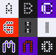 French type designer in Lyon, 1657-1729, whose name at birth was Jean Truchet. He was famous for his Truchet tiling system. Sébastien Truchet designed a modular typographic system during his last year in the School of Fine Arts of Besançon. His work was summarized in a thesis he wrote in 1704, and which is also reflected in Methode pour faire une infinité de desseins differens, avec des carreaux mi-partis de deux couleurs par une ligne diagonale: ou Observations du pere Dominique Douat, religieux au carme de la province de Toulouse, sur un Memoire inserédans L'histoire de l'Académie royale des sciences de Paris, l'année 1704, présenté par le reverend pere Sébastien Truchet, religieux du même ordre, Académicien honoraire (1722, Dominique Douat, Paris, chez Florentin de Laulne, rue Saint Jacques). Local download of that book.
 In 2008, someone started the type foundry Sébastien Truchet and promptly published the modular counterless typefaces Module (2008) and Module 4-4 (2011) and the squarish humanist sans family Humanex (2011). In 2020, Vanessa Zuñiga designed Sébastien, a set of color typefaces inspired by Truchet's tilings. References: Jacques André; The tiling patterns of Sebastien Truchet and the topology of structural hierarchy (1987, Cyril Stanley Smith); Multiscale Truchet patterns<./i> (2018, Christopher Carlson). [Google]
[MyFonts]
[More] ⦿
|
Sorkin Type (was: Eyebytes)
[Eben Sorkin]
|
 Eben Sorkin obtained an MA in typeface design from The University of Reading (2009), based on his typeface Arrotino (2009). In 2015, he joined the faculty at Lesley University near Boston, MA, and lives in Easthampton, MA. Sorkin Type (was: Eyebytes, in Eagle River, Alaska) is run by him. His talk at ATypI 2008 in St. Petersburg was entitled Contextual alternatives. He writes about Arrotino: Arrotino begins with the forms of early Italian renaissance in the late 15th century. Their melody, generousity, and variety of shape and proportion are echoed in Arrotino. As a consequence of this Arrotino is not especially efficient, but it is comfortable. His typefaces and those by contributors at Sorkin Type:
 - Armata (2011). By Viktoriya Grabowska.
- Army Pool Tiles (2005) and No Step (2007, stencil).
- Autour One (2011).
- The extensive (200+ weights) Bahn family (see also here), which has pixel and monospace themes. Software Developer (2005) is along the same pixel/monospace theme (see also here).
- Courgette (2012). By Karolina Lach.
- Duru Sans (2011). By Onur Yazcgil.
- Just for fun, he made the dot matrix typeface Exp1 (2008).
- FjallaOne (2012). By Irina Smirnova.
- Gelasio (2012): free at Open Font Library and Google Fonts. He writes: Gelasio is designed to be metrics compatible with Georgia. Gelasio is a general purpose screen oriented text face based on the Romain du Roi style cold metal type seen in Oeuvres de Jean Racine (1789). This pre-Baskerville style is sometimes called Reale or Transitional style. This and and a large x height offer a nobel, cheerful and simple feeling hence the name Gelasio. Github link.
- Goblin (2011). By Riccardo De Franceschi.
- Gravitas One (2011). By Riccardo De Franceschi.
- Habibi (2011). By Magnus Gaarde.
- Hammersmith One (2011). By Nicole Fally.
- In 2011, Eben put Nicole Fally's elegant art deco typeface Limelight and Hammersmith One on the Google Font Directory.
- Inder (2010). By Irina Smirnova.
- Kavoon (2013). By Viktoriya Grabowska.
- In 2010, Eben started working on Merriweather, a free workhorse serif family. It was followed in 2013 by Merriweather Italic and Merriweather Sans. Both are free at Google Web Fonts. Spin-offs of Merriweather sans include Liera sans (2020, Cristiano Sobral).
- Metamorphous (2011). By James Grieshaber.
- Ovo (2011). By Nicole Fally.
- Plaster (2011) is a Josef Albers-inspired stencil face, free at Google Web Fonts.
- Pompiere (2011). By Karolina Lach.
- Sarina (2011). By James Grieshaber.
- Short Stack (2011). By James Grieshaber.
- Sonsie One (2011). By Riccardo De Franceschi.
- Trykker (2011). By Magnus Gaarde.
- Vampiro One (2012). By Riccardo De Franceschi.
- Vast Shadow (2010-2011). By Nicole Fally.
- Voltaire (2011). By Yvonne Schuettler.
- Wellfleet (2011). By Riccardo De Franceschi.
- In 2015, he contributed Dekko to Google Web Fonts--Dekko is a Latin / Devanagari casual font in the spirit of Comic Sans. It originated with Modular InfoTech's 4948 [Modular InfoTech is a company based in Pune, India], and should not be confused with Norrasak Ramasute's YWFT Dekko from 2010.
- Still in 2015, he added Asar to Google Web Fonts---Asar is an original Devanagari and Latin typeface that is based on an expanding brush stroke following a heart line. The design is meant to work well with long texts. Asar is partially derived from Pria Ravichadran's Palanquin.
- Halyard (2017) is an information design sans typeface family by Joshua Darden, Lucas Sharp and Eben Sorkin.
- Codesigner with John Hudson, Joshua Darden, Maxim Zhukov, and Viktoriya Grabowska, of Omnes Cyrillic.
- In 2020, Eben Sorkin, Pria Ravichandran, Inga Ploennigs and Dan Reynolds co-designed the sans family Karow at URW.
- In 2021, Eben Sorkin and Mirko Velimirovic designed the 5-style Spline Sans (free at Google Fonts). They write: Spline Sans is a grotesque sans serif typeface family, purpose-built for UI interfaces, checkout processes, and paragraphs of text. Space efficiency is accomplished by condensing traditional grotesque proportions. This typeface oroginated from Spline Design. Github link. Spline Sans contains a variable font option.
Fontspace link. Fontsquirrel link. FontStruct link. Klingspor link. Dafont link. Eben spent February and March 2011 learning how to carve letters in stone from Lida Cardozo at the Cardozo Kindesley workshop, Cambridge UK, and collaborating with Lida on the typeface Pulle. The photographer photographed (in 2011, by Ralph Herrmann). Old URL. [Google]
[More] ⦿
|
Swiss Typefaces
[Ian Party]
|
 Swiss Typefaces is a foundry run by Ian Party (Territet, Switzerland, b. 19777, Lausanne) and Emmanuel Rey. It evolved from B+P Swiss Typefaces and BP Type Foundry, where BP stands for Buechi et Party. Maxime Buechi is still loosely affiliated with Swiss Typefaces but is now spending more time in London. Ian Party studied first at ECAL in Lausanne and then at the KABK in The Hague. In 2004, he cofounded B&P Type Foundry with Maxime Buechi. Since 2005, he teaches type design at ECAL in Lausanne. Home page of Ian Party. The new site B+P Swiss Typefaces was born in 2011, and it was renamed just Swiss Typefaces at the end of 2013. Swiss Typefaces is headquartered in Vevey, Switzerland. Their fonts:
 - Romain BP and Romain BP Headline (2007). Party writes: Based on the Commission Jeaugeon's models and on Philippe Grandjean's classic character, the Romain BP celebrates the marriage of geometric rationality and elegance, of science and craftsmanship. The Romain BP Text is actually closer to the Commission's model than Grandjean's Romain du Roi. It is more synthetic in its structure, more radical, and thus, more modern. It is a contemporary text typeface based on a structure that was created in 1690, not a revival mimicking Greandjean's shapes..
- Sang Bleu (2008), designed for the magazine SangBleu. This is a fantastic set of fonts based on the structure of Romain du roi. The collection also extends to extremes unusual like the Hairline Compressed or the Hairline Sans, providing graphic designers very strong stylistic tools. It includes light serif typefaces and very structured and geometric sans typefaces. I expect this project to be showered with awards. In 2014, Romain and SangBleu will be combined in a new SangBleu.
- Celsiane (2007), a sans typeface with a chiseled-in-stone feel. Still being developed, it is based on Party's work at ECAL in 2004.
- Esquire (2009): A custom headline typeface originally designed in 2007 for the gentleman's magazine Esquire under the art directorship of David McKendrick. It will be commercially released in 2009.
- Aurora (2008, an experimental geometric face): not available.
- Hebdo (2008): a private typeface for the swiss news mag L'Hebdo. It has two slab weights and nine sans weights.
- Rosette BP: a serif typeface under development.
- Didot BP: Codesigned with Maxime Buechi in 2003, this will be released in the spring of 2009.
- La Police BP is a serif typeface by François Rappo.
- Folkwang (2008): an exploration in the area of artsy transitional typefaces.
- Codesigner in 2006 with Maxime Buechi of a corporate typeface for the Centre for Curatorial Studies Bard&Hessel Museum, New York.
- BP Diet (2009) is an extremely fat and rounded jello-fed typeface. Chris Lozos calls it morbidly obese.
- Suisse BP International (2011) by Ian Party is a very "Swiss" sans family by Ian Party. At the start of 2014, the Suisse collection consists of Suisse Works (a serifed family), Suisse Neue (with small slabs and/or serifs) and Suisse International (a sans; +Condensed, +Mono).
- New Fournier BP (2011) is a 24-style Fournier family by François Rappo.
- Simplon BP (2011) and its monospaced brother Simplon BP Mono (2011) were made by Emmanuel Rey. This geometric sans was made for information design purposes. Now just called Simplon.
- Euclid Flex (2012-2013). This sans family does something unique in the type world---it uses opentype to provide a smorgasbord of alternate styles for each weight---a mammoth undertaking! These substyles are called pixel, mixed, unicase, dotted, one-line, cut, hidden, drops, contrasted, zigzag, circular, triangle, square, and street. It grew out of a 2010 typeface by Emmanuel Rey called Euclid BP.
- New Paris (2014). A didone family with text and headline versions and a non-contrast sans version called Skyline. New Paris is characterized by soft-cornered vertices in the M, N, V and W.
- Azer (codesigned with Wael Morcos and Pascal Zoghbi) won an award at TDC 2014.
- Ikanseeyouall (2018): A fantastic exaggerated bulbous fat Caslon popularized in the 1970s and 1980s by designers like Tom Carnase and Ed Benguiat. Other typefaces in their experimental lab include Black Mamba, Kopyme, Vogy Smog, Euclid Mono, Krsna, Brrr, Euclid Stencil and Riviera.
- Riviera Nights (2020). A sharp-edged sans family with narrow joins. Apparently, this typeface is usaed by Rolls Royce.
Klingspor link. [Google]
[More] ⦿
|
Truchet and Types
[Jacques André]
|
A great article by Jacques André and Denis Girou on the lettering of father Sébastien Truchet, 1657-1729. Their thesis: the Romain du Roi font (ca. 1702) is the first digital font, as it has the notion of outlines by arcs of circles, grids as in bitmaps and dpi measurements, and even notions of italic transformations and hinting. PDF file of "Father Truchet, the typographic point, the Romain du roi, and tilings", TUGBoat, vol. 20, pp. 8-14, 1999. [Google]
[More] ⦿
|
Wiescher Design
[Gert Wiescher]

|
 Gert Wiescher was born in Braunsbach am Kocher, Germany, in 1944. Based in München, Gerd Wiescher designed many classy and classic Bodoni families, as well as New Yorker Type (1985). All of his typefaces are carefully fine-tuned and balanced. Wiescher founded first Munich Type and then Wiescher Design and Autographis. He is known as a hard, fast and prolific worker. His exquisite typefaces can be bought at MyFonts. Catalog of his bestselling typefaces. Interview in 2008. Wikipedia page. Creative Market link. List of typefaces:
 - Scripts: Prima Script (2017: for menus and cookbooks), Marmelade (2015, +Fruits, a set of dingbats), Triana (2014, a thin monoline penmanship script named after a Spanish sailor on the Pinta who in 1492 was the first to see America---in this case the Bahamas), Floral Script (2014, copperplate style script), Sherlock Script (2014: this comes with Sherlock Stuff (fingerprints) and Sherlock Stuff Dots (ink stains)), Felicita (2013, a swashy copperplate script), Vividangelo (2013, after the handwriting of a real person), Dreamline (2013, connected monoline cursive wedding scripts in A, B and C styles), Fiorentina (2012, a renaissance style script with 650 characters), Excelsia Pro (2012), Delicia Pro (2012, a fat brushy signage script), Nono (2011, formal swashy calligraphic family), Dyane (2011), Penn (2011), Lettera (2011, hand-drawn formal face), Tosca (2010, a high-contrast calligraphic typeface with 730 glyphs), Grandcafe (2010), Loulou (2010, curly and of extreme contrast), Schoolblock (2010, hand-printed school font), Grandezza (2010, calligraphic family; +Xtra), Sixtra (2010, a curly didone script), English Script (2010, classic Spencerian calligraphic script), Savage Initials (2009), Morning News (2009), Revolte (2009, a brush script for demonstration signs), Estelle (2009), Scriptofino (2008, 4 calligraphic styles to give Zapfino a run for its money), Exprima (2008), Daiquiri (2008), Lisa Bella, Lisa Fiore and Lisa Piu (2008, connected and calligraphic), Tati (2008), Movie Script (2007), Cake Script (2007), Eddy (2007, grungy calligraphy), Pointino (2007), Bohemio (2007, a great oriental-brush script), Artegio (2007, two calligraphic scripts), Xylo (2006, in the tradition of the 18th-century English calligrapher George Bickham and the 19th-century American calligrapher Platt Rogers Spencer), Tamara (2005, art-deco script based on some initials for Semplicita made in the 1930s by the Nebiolo foundry), Tecon, Ellida (2005, inspired by the elaborate scripts of 18th-century English calligrapher George Bickham, with additional influences from 19th-century American calligrapher Platt Rogers Spencer), Eloise (2009, a high-contrast version of Ellida), Nadine Script (2005, an elegant script inspired by a set of initials the French designer and artist Bernard Naudin drew for Deberny&Peignot in the 1920s), Royal Classic (2005, unbelievable script based on a design that has initially been comissioned by King Ludwig I of Bavaria for in-house-use), DesignerScript, Filzer Script (1995, handwriting), Futuramano-Condensed-Bold, Futuramano-Condensed, Futuramano-Plain, Futuramano-Thin, Giambattista, Scriptissimo-Plain, Scriptissimo-Forte, Scriptissimo-Swirls, Squickt (1989), Konstantin A, B and C (2005), Konstantin Forte (2005), MyScript, GrocersScript, Swanson (2006). Scriptissimo (2004) has versions named Start, Middle and End, tweaked for their position in the word, and there are plenty of ligatures. Check also Bodoni Classic Chancery (2007) and Bodonian Script (2012).
- Sans: Brute Sans (2018), Xpress (2018), Xpress Rounded (2019), Classic Sans (2017, a revival of Theinhardt Grotesk), Classic Sans Rounded (2017), Maxi (2017), Nic (2017), Azur (a large almost geometric sans famly with 1950s Roger Excoffon-style French flavours, called a Medterranean grotesk by Wiescher himself), Royal Sans (2017, after Theinhardt's Royal Grotesk---the forerunner of Akzidenz Grotesk--- from 1880), Docu (2016, a workhorse elliptical sans family), Viata (inspired by Bauhaus), Noticia (2016, in the Bauhaus tradition, with very pointy v and w, and a bipartite k; not to be confused with the 2011 Google Web Font Noticia Text by José Solé; followed in 2019 by Noticia Rounded), Avea (2015), Aramis, Nota Bene (2015: squarish, narrow, technical), Nota (2015, technical and cold: the rounded version, Nota Rounded, followed in 2019), Dylan Condensed (2014), Dylan Copperplate (2014), Supra (2013, grotesk: Supra Thin is free. See also Supra Condensed (2013), Supra Mezzo (2013, between regular and condensed), Supra Extended (2013), Supra Rounded (2015), Supra Classic (2014), and Supra Demiserif (2013, slab serif derived from Supra)), Dylan (geometric sans), Franklin Gothic Raw (2013, like Franklin Gothic but with raw, not rough, outlines, only visible at very large sizes), Blitz (2012, a flared family), Blitz Condensed (2012), Contra Sans (2011, which led to Contra Slab, Contra Condensed and Contra Flare), Vedo (2011, a Bauhaus style family that include a hairline weight), Germania (2011, a useful and beautiful monoline sans family), Geometa (2011, +Rounded, +Rounded Deco, +Deco: all based initially on Renner's Futura), Geometra Rounded (2011, a rounded family based on Futura and "much less boring than DIN"), Bombelli (2010, ultra-wide architect's hand), Bluenote Demi (2010, a grungy Franklin Gothic Condensed), Perfect Sketch (2010, sketched grotesque), Unita (2009), Antea (2009), Eterna (2009, sans with a swing), Pura (2008, an uncomplicated grotesk family), Purissima (2010, a decorated extension of Pura; +Bold), Copperplate Gothic Hand (2009, after a 1901 design by Goudy), Copperplate Alt (2011), Copperplate Wide (2011), FranklinGothicHandDemi (+Shadow), Franklin GothicHandCond (2009), Franklin Gothic Condensed Shadow Hand (2010), and Franklin Gothic Hand Light (2009, a hand-drawn version of Franklin Gothic), Papas (2005, sturdy, slightly curly), Julienne (2005, a condensed sans family; see the new versions Moanin and Julienne Piu, 2017), Cassandra (1996, an art deco style after Adolphe Mouron Cassandre), Futura Classic (2006), Cassandra Plus (2012), Ela Sans (2005, a large family), Mondial-Bold (2004), Mondial-Demi, Mondial-Light, Mondial-Medium, Mondial-Normal, Mondial-XBold, Monem-Bold, Monem-Medium, Monem-Normal, Monem-Roman.
 Serif: Imperia (2011, a Trajan column caps face), Monogramma (2012, a Trajan family for monograms), Imperium (2005, a precursor of Imperia with a Relief shadow style included), Hard Times (2011), Fat Times (2011, retraced Times), Elegia (2011, slightly Victorian family), Breathless (2010, a spiky family, inspired by nouvelle vague movie posters), Bodoni Classic 1, Bodoni Classic 2, Bodoni Classic 3, BodoniClassic-Condensed, BodoniClassic-Handdrawn, BodoniClassic-Swashes, BodoniClassic-Text, Bodoni Classic Deco, Bodoni Classic Swirls (2009), Bodoni Classic Pro (2011), Bodoni Classic Inline (2012), Bodoni Classic Fleurs (2014, ornamental caps), Bodoni Comedia (2010, one of my favorites: a funny "live one day at a time" curly Bodoni cocktail), Bodoni Classic Swing (2010), Bodoni Classic Free Style (2010, curly), Bodoni Classic Ultra (2010), La Bodoni Plain (+Italic, 2008), Take Five (2005, a jazzy take on Bodoni Classic), DonnaBodoniAa, DonnaBodoniBe, and DonnaBodoniCe (three scripts named after Bodoni's wife, Margharita dell'Aglio, who published his complete works, the Manuale Tipografico, in 1818, five years after his death), Edito, Robusta. A great series, some of which were originally published at Fontshop, see, e.g., FFBodoniClassic (1994). MyFonts: When the first of Wiescher’s Bodoni Classic fonts came out in the 1993, there was nothing like it. Up to then, virtually all Bodoni revivals had been given clear-cut forms and square serifs. But Bodoni’s originals from the late 1800s were never as straight and simplistic as is often assumed: they had rounded serifs and slightly concave feet. Wiescher digitized a wide range of Bodoni letterforms, including a wonderful script-like family called Chancery and a nice series of Initials. Having accomplished his mission twelve years later, he began making personal additions to the family, such as the more decorative Bodoni Classic Swashes. Recently a useful little family was added to the clan: LaBodoni is sturdier and less optically delicate than most Bodonis, and therefore more usable as a text face. Wiescher made Metra Serif (2009), Principe (2008) and Paillas (2009). Prince (2009) is a curlified didone. Serif: Imperia (2011, a Trajan column caps face), Monogramma (2012, a Trajan family for monograms), Imperium (2005, a precursor of Imperia with a Relief shadow style included), Hard Times (2011), Fat Times (2011, retraced Times), Elegia (2011, slightly Victorian family), Breathless (2010, a spiky family, inspired by nouvelle vague movie posters), Bodoni Classic 1, Bodoni Classic 2, Bodoni Classic 3, BodoniClassic-Condensed, BodoniClassic-Handdrawn, BodoniClassic-Swashes, BodoniClassic-Text, Bodoni Classic Deco, Bodoni Classic Swirls (2009), Bodoni Classic Pro (2011), Bodoni Classic Inline (2012), Bodoni Classic Fleurs (2014, ornamental caps), Bodoni Comedia (2010, one of my favorites: a funny "live one day at a time" curly Bodoni cocktail), Bodoni Classic Swing (2010), Bodoni Classic Free Style (2010, curly), Bodoni Classic Ultra (2010), La Bodoni Plain (+Italic, 2008), Take Five (2005, a jazzy take on Bodoni Classic), DonnaBodoniAa, DonnaBodoniBe, and DonnaBodoniCe (three scripts named after Bodoni's wife, Margharita dell'Aglio, who published his complete works, the Manuale Tipografico, in 1818, five years after his death), Edito, Robusta. A great series, some of which were originally published at Fontshop, see, e.g., FFBodoniClassic (1994). MyFonts: When the first of Wiescher’s Bodoni Classic fonts came out in the 1993, there was nothing like it. Up to then, virtually all Bodoni revivals had been given clear-cut forms and square serifs. But Bodoni’s originals from the late 1800s were never as straight and simplistic as is often assumed: they had rounded serifs and slightly concave feet. Wiescher digitized a wide range of Bodoni letterforms, including a wonderful script-like family called Chancery and a nice series of Initials. Having accomplished his mission twelve years later, he began making personal additions to the family, such as the more decorative Bodoni Classic Swashes. Recently a useful little family was added to the clan: LaBodoni is sturdier and less optically delicate than most Bodonis, and therefore more usable as a text face. Wiescher made Metra Serif (2009), Principe (2008) and Paillas (2009). Prince (2009) is a curlified didone. - Romain du roi: In 2008, Wiescher designed the two-style Royal Romain, which is based on the Romain du Roi of Philippe Grandjean, which was completed in 1745 after Grandjean's death by Grandjean's successor Jean Alexandre and Louis Luce. Wiescher: The Romain du Roi was for the exclusive use of the Louis XIV. It was never sold or given to any other king or government. The king of Sweden tried to scrounge a set, but the king refused. This font is the basic design for such famous fonts as the Fournier and Bodoni. Just so the Romain du Roi doesn't get lost in the digital turmoil I set out to redesign it in 2004 and finished now in early 2008. I did a lot of research in France's National Library. A good excuse to visit Paris is always welcome!!!
- Engravers: Dylan Copperplate (2014), Cavaliere (2010), Guilloche A (2009), Guilloche B (2013, op-art borders), CopperplateClassic-Plain, CopperplateClassic-Round, CopperplateClassic-Sans, Copperplate Classic Light Floral (2009), Cimiez-Bold, Cimiez-Roman (2004), Ela-Demiserif, Ela-Sans (2004), Eleganza (2008).
- Blackletter/Fraktur: Renais (2011, renaissance initials), Flipflop (2011), Fraktura and Fraktura Plus (2008), Royal Bavarian (2004, based on a typeface commissioned by King Ludwig 1st of Bavaria about 1834), Royal Blossom (2009), Royal Bavarian Fancy (2004), Bold Bavarian (2010, a heavy version of Royal Bavarian), Monkeytails (2008), Fat Fritz (2006, rounded endings), Ayres Royal (2005, blackletter typeface based on drawings of London's calligrapher John Ayres, ca. 1700; to be used with RoyalBavarian; followed in 2010 by BoldAyres).
- Slab serif: Slam Normal (2017), Slam Rounded (2017), Suez (2017: with extra tall ascenders and descenders), Egyptia (2010), Egyptia Rounded (2010).
- Typewriter: Lettera (2014), Lectra (2011), QuickType-Bold, QuickType-Plain, QuickType-Sans.
- Decorative: Tric (2017, art deco), Franklin Gothic Raw Semi Serif (2015), Frank Woods (2013, letterpress simulation based on Franklin Gothic Heavy), Ohio Bold (2012, a rough headline type in the tradition of Louis Oppenheim's Lo-Type from 1913), Viking Initials (2012), Cannonball (2012, a psychedelic typeface derived from a jazz record-sleeve for Cannonball Adderley), Byblos (2011, derived from the logo of St. Tropez's famous Hotel Byblos), Blockprint (2013, early 1900 German expressionist grunge face, renamed Bannertype after 24 hours), Ferrus (2010, inspired by Cassandre's Acier Noir, 1936), Petite Fleur (2009, flowery embellishments and the capitals of his redesigned Royal Romain, which in turn is based on the famous romain du roi), Glass Light (2012, a decoirative art nouveau type family based on Glass Light by Franz Paul Glass, 1912), Penstroxx (2009, 5 fonts that are based on the powerful, expressive Traits de plume (penstrokes) designed in Paris around 1930 by Alfred Latour), Liquoia A, B and C (2008, decorative scripts), Modernista (2008, an art nouveau headline face, based on an 1898 sample by Peter Schnorr), Ornata A, B, C, D, E, F and G (2008-2009: ornaments), Fleuraloha (2008), Floralissimo (2008: flowery ornaments), Frank Flowers (2011), Scrolls A (2010, penman's dingbats), Bacterio (2007), Alpha Bravo, Alpha Charlie, Alpha Echo (2006), Barracuda, Cacao (2005, fifties style), Cassandre Initials (2004, Elsner&Flake, after the 1927 original by Adolphe Mouron Cassandre), Contype, Fleurie (2005), Fleurons Two (2006), Fleurons Three (2006), Fleurons Four (2006), Fleurons Initials (2007), Fleurons Six (2008), Fleuron Labels (2008), HebrewLatino, Julius, Lunix (2006), MyHands, NewYorkerType (1985; extended in 2011 to NewYorker Plus, and in 2020 to New Yorker Type Classic and New Yorker Type Pro; after Rea Irvin's well-known typeface for The NewYorker), Venice Initials (2006, after a 15th century find, but Wiescher added about half of the caps), Ventoux, Vivian (2005), Woody.
- Pixel and/or futuristic: Nexstar (2013: this octagonal typeface is also useful or athletic lettering), Alpha Fox (2007), Alpha Juliet (2010), Alpha Papa (2010), Alpha Square (2010), Alpha Jazz (2010), Alpha Papa (2010, LED meets stencil).
- Stencil typefaces: Dripps (2010, handpainted, perhaps brutalist), Red Tape Plus (2014).
- Comic book fonts or brush fonts: Breezy (2015), Caboom (2014).
- Dingbats: Wayside Ornaments (2012), XX Century Ornaments (2012), Thistle Borders (2012), Greenaway Mignonettes (2012, after Kate Greenaway (1846-1901), author and illustrator of childrens books), Collins Florets (2012), Flourishes A (2010), Jingle Doodles (2010).
- Art deco: Trix (2017), Zelda (2017, named after F. Scott Fitzgerald's wife).
- Commissioned and special typefaces include a version of the logotype for the Munich's newspaper Abendzeitung, Maxi (variable width sans), NIC Grotesk, Tric (art deco), a Cyrillic version of Bodoni Classic for Vogue Moscow, a special Bodoni Classic for Ringier Publishers in Zurich, and Red Tape, a typeface that is on permanent exhibition at the German National Library in Leipzig.
- Typefaces from 2019: Elita (a condensed sqaurish typeface), Artis Sans, Sigma Condensed and Sigma (simplified readable sans families), Cosma (an elegant high-contrast text family with tapered upstrokes and crossbars, but otherwise didone roots), Quincy (a bebop typeface that started from some letterutouts), Phoebe (an elliptical techno family), Phoebe Rounded, Polygon A, Polygon I, Polygon X.
- Typefaces from 2020: Bullets Bannertype, Alpha One (a counterless experiment), Exec (a 14-style sans family), Exec Corners, Exec Demiserif, Penta (a grotesque family with large counters that make the ExtraLight style quite striking), Penta Rounded.
Author of many books, including Zeitschriften & Broschüren (Systhema-Verlag, München, 1990), Schriftdesign (Systhema-Verlag, München, 1991), and Blitzkurs Typografie (Systhema-Verlag, München, 1992). The following text was excerpted from his wikipedia page: At 14 years of age, Wiescher went to Paris to study fine art. He financed his stay by doing portraits on the Place du Tertre on Montmartre. In the sixties Wiescher studied graphic design at the Berlin Academy of Fine Arts. (Since November 2001, Berlin University of the Arts.) He financed his studies by sidewalk painting and drawing portraits. While doing sidewalk paintings, he met the typeface designer Erik Spiekermann, who inspired his love of this branch of design. After two years he quit his studies, and went to Barcelona where he worked at the offices of Harnden & Bombelli, for whom he designed the OECD-Pavilion of the 1970 Osaka World Expo. In 1972 he moved on to Johannesburg working as an art director at Grey and Young advertising . In 1975, he returned to Germany, working first for DFS+R-Dorland, and then for the "Herrwerth & Partner" ad agency. At Herrworth, he was involved in introducing IKEA into the German market. In 1977 he became a creative partner in the Lauenstein & Partner ad agency, creating mainly campaigns for large German retail chains. In 1982 he started his own design office, creating work for editors (Markt & Technik, Systhema and Langen-Müller-Herbig), computer companies (House of Computers, FileNet) and he worked for Apple Computers designing their publications (Apple-Age and Apple-LIVE). View Gert Wiescher's typefaces. Wikipedia link. [Google]
[MyFonts]
[More] ⦿
|


 [
[ The Dutch Type Library was founded in 1990 by Frank Blokland (b. 1959, Leiden). It is based in 's Hertogenbosch, The Netherlands. Fonts include DTLAlbertina (Chris Brand), DTLArgo (Gerard Unger),
  [
[ [
[ [
[
 [
[ Author of
  In 2016, Juliette Beraud and Lena Douani co-designed the legible sans typeface family Cinétique as students at ECV Paris. Lena also did a odular stencil typeface, TDC62, in 2015, and a great Romain du Roi revival in 2016.
  Liberty is a typeface created in 2014 by a student from Luxembourg in Mainz, Germany, who wishes to remain anonymous. Its glyphs are constructed using compass and ruler in the romain du roi style. [
 Talented type and graphic designer based in Morgin and/or Grand-Lancy, Switzerland. After obtaining a BFA from the Academy of Art University of San Francisco, he started a Masters in the
  [
[ Engraver at the Imprimerie Royale in Paris, b. Orleans, 1654, d. Paris, 1727. He drew and worked on the
  OurType was Fred Smeijers' web site and foundry established in 2002 (formally launched in 2004). OurType was set up by four partners: Fred Smeijers, Corina Cotorobai with Rudy Geerarts and Martine Leloup (both of FontShop Benelux). Fred and Corina were the creative lead of OurType foundry, Rudy and Martine were in charge with sales. In 2017 Fred and Corina stopped their collaboration with OurType concentrating on several other projects, including a new type label. Fred and Corina are also co-partners in Type Tailors (established in 2008), offering type design development, publishing, custom type and typographic consultancy. Smeijers's fonts can now be found at
  Engraver, b. Macon (1666), d. Paris (1714). In 1695, king Louis XIV of France commissioned a typeface, which until today is described as the first digital font, and at least as the first mathematicallly defined type, the
  French type designer in Lyon, 1657-1729, whose name at birth was Jean Truchet. He was famous for his Truchet tiling system. Sébastien Truchet designed a modular typographic system during his last year in the School of Fine Arts of Besançon. His work was summarized in a thesis he wrote in 1704, and which is also reflected in
  Eben Sorkin obtained an MA in typeface design from
  Swiss Typefaces is a foundry run by Ian Party (Territet, Switzerland, b. 19777, Lausanne) and Emmanuel Rey. It evolved from B+P Swiss Typefaces and BP Type Foundry, where BP stands for Buechi et Party. Maxime Buechi is still loosely affiliated with Swiss Typefaces but is now spending more time in London. Ian Party studied first at ECAL in Lausanne and then at the KABK in The Hague. In 2004, he cofounded
  Gert Wiescher was born in Braunsbach am Kocher, Germany, in 1944. Based in München,
  Serif: