TYPE DESIGN INFORMATION PAGE last updated on Mon Jul 20 20:36:16 EDT 2026
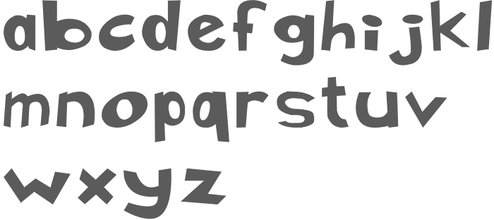
FONT RECOGNITION VIA FONT MOOSE

|
|
|
|
|
Type scene in DC | ||
|
|
|
|
SWITCH TO INDEX FILE
Washington, DC-based designer of Illapa (2014). [Google] [More] ⦿ | |
Originally from the DC / Maryland / Virginia area, Akwele Vassall designed the squarish Western typeface Blackwood in 2016 during his studies at the School of Visual Arts in New York. [Google] [More] ⦿ | |
Freelance graphic designer in Washington, DC, who graduated in 2013 from the Art Institute of Washington. In 2014, she created the vector format blackboard bold (or: tuxedoed) typeface Monkey Bars. [Google] [More] ⦿ | |
Washington-based graphic designer who created the psychedelic typeface Marti McFly (2012). [Google] [More] ⦿ | |
While studying at Corcoran College of Art in Washington, DC, Allison Nambo designed the ornamental caps typeface Barnacles (2012). [Google] [More] ⦿ | |
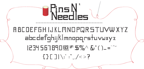
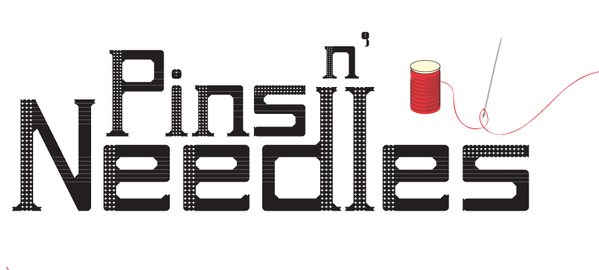
Student at Cornish studying Visual Communications in Design, who lives in Washington. She used FontStruct to make Pins N Needles (2011). [Google] [More] ⦿ | |
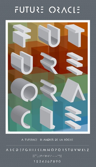
Graphic designer in Washington, DC, who created the 3d typeface Future Oracle (2013) based on Futura. [Google] [More] ⦿ | |
Creator of the octagonal typeface Loaded (2012). Andrew Wilson is located in Washington, DC. [Google] [More] ⦿ | |
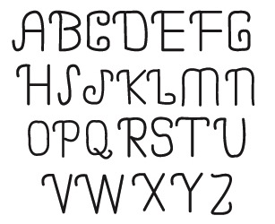
Ann Pope is a freelance calligrapher/custom type designer in Washington, DC. [Google] [More] ⦿ | |
During her graphic design studies in Washington, DC, Bethany Jennings created Monogami (2014). [Google] [More] ⦿ | |
During her studies at The Art Institute of Washington (DC), Brooke emulated speed in her Velocity font (2014) by carefully placed diagonal cutouts. [Google] [More] ⦿ | |
Graphic designer and identity specialist in Washington, DC. He created the multiline typeface Byczek. [Google] [More] ⦿ | |
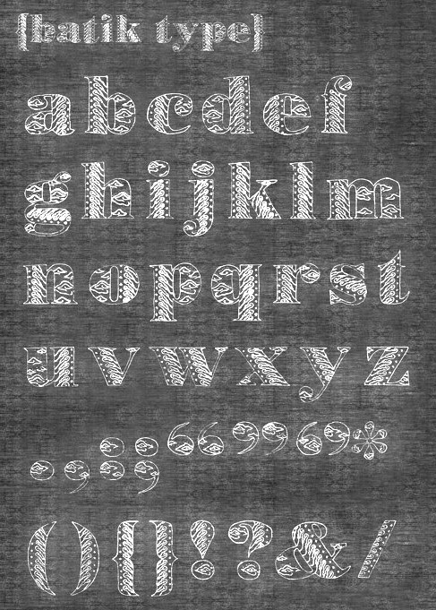
Graphic design student in Washington, DC, in 2013. creator of the ornamental typeface Batik (2013). [Google] [More] ⦿ | |
Washington, DC-based designer of Kaleidoscope (2014), a typeface based on Univers. [Google] [More] ⦿ | |
Washington, DC-based designer of a display typeface in 1946. [Google] [More] ⦿ | |
Charles Ernest Riddiford
| |
Chris E. Lozos
| |
Christian Max Hancock
| |
Clanbadge
| Clanbadge is a foundry in San Jose, CA. MyFonts link. Daniel Isdell (b. 1955, Washington, DC) sells a great font, The Celtic Knot Font (2001), that permits one to make thousands of Celtic knot patterns. An interesting idea, to say the least. The clue is here. MyFonts link. On MyFonts, he writes: Daniel Isdell Dan Isdell is a graphic artist, web designer and programmer living in San Jose, California. He has been a font addict from an early age, first with pencils and markers and then with good old Speedball pens. He designed his first full font at age 15. Attending a technical high school gave him the opportunity to learn typesetting by hand with movable metal type. His parents were both bookbinders and one of his first jobs was working at a real type foundry, where part of his job was stocking the linotype machines with fresh lead and melting galleys full of no longer needed type. Later, working as an engineer allowed him to use computers and CAD systems to design letterforms. As a Senior Web Design Engineer and graphic artist he had the opportunity to apply his love of typography to logos and user-interface design. Although he has yet to publish any of his letterform fonts, he has released the Celtic Knot Font. Its development stemmed from his interest in his hereditary Scottish culture, and the study of Celtic knotwork as embellishments for his leatherwork, knife-making and jewelry-making hobbies. The Celtic Knot Font has been a big success with well over 8000 copies sold. [Google] [MyFonts] [More] ⦿ |
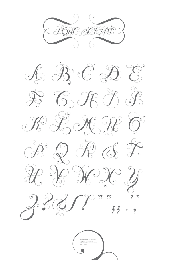
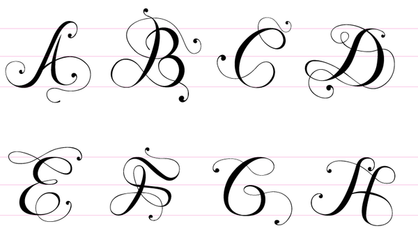
Her typefaces show calligraphic influences:
Bio at ATypI. Linotype link. FontShop link. Klingspor link. [Google] [MyFonts] [More] ⦿ | |
Daniel L. Isdell
| |
David A. Hobbs
| |
David A. Hobbs, Inc.&Tolley Studios
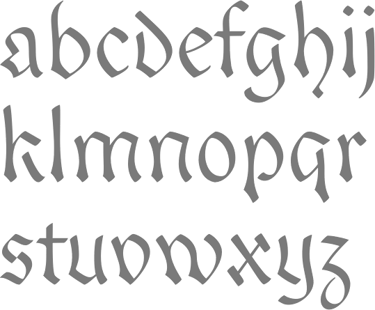
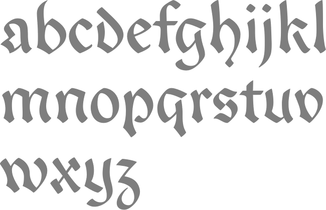
| David Hobbs (b. Midland, MI, 1943) worked for and with William E. Tolley, a noted Engrosser, the son of A.B. Tolley, the White House Calligrapher for several presidents. He opened his own studio in 1976, and says that he "has done work for kings and presidents". David A. Hobbs, Inc.&Tolley Studios in Washington DC provides calligraphic lettering services. They have developed their own in-house fonts, like Engravers Script, Gothic, Readable Text, Cursive, Old English, Simplified Old English, Roman and Stump Script. He has developed Hobbsian Script (Based on Zanerian script), Hobbsian Stump Script, Hobbsian Old English, Hobbsian Roman Cap and Hobbsian Readable Text. [Google] [More] ⦿ |
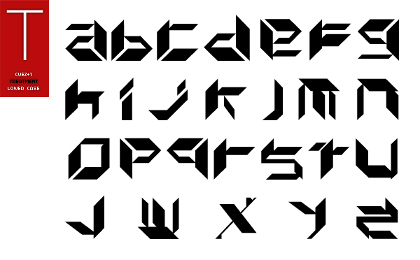
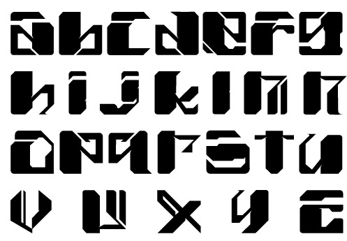
Washington, DC-based graphic designer. He created some experimental custom fonts such as Cuez (2010). [Google] [More] ⦿ | |
| |
During her graphic design studies at the University of South Carolina Columbia, Desiree Cheeks (Washington, DC) created the hand-lettered typeface Pagoda Blossom (2013). [Google] [More] ⦿ | |
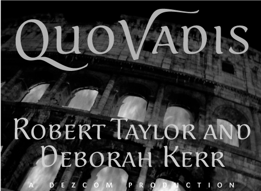
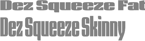
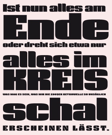
Dezcom Typefaces
|
His typefaces:
|
Diphthong Type Foundry
| Max Hancock lives in the Washington D.C. area. He is the designer (b. 1972) of the lovely organic font Diphthong (2002). He worked at Diphthong in Singapore. After Diphthong was designed, he was hired to design custom, branded font designs for the companies Dome Capital and Top News. In 2011, Max founded the Diphthong Type Foundry in Fairfax Station, VA, where he currently works on a variety of type projects. Klingspor link. [Google] [MyFonts] [More] ⦿ |
District (was: CV Type)
|
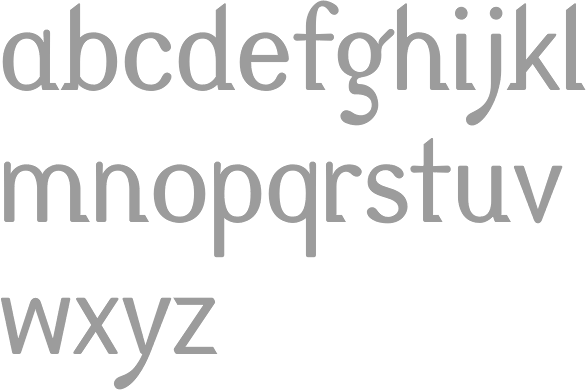
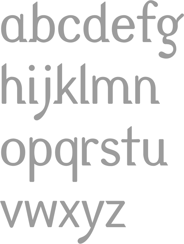
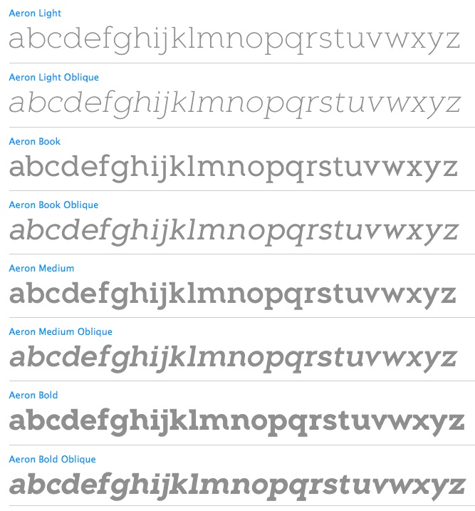
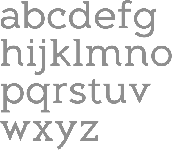
His creations from 2010 until 2012: Aeron (2010, semi-serifed family, with a crippled lower case h), Hijinx (2009, a headline face), Verlico (2009, a take on Optima), and Frusta (2010, a 5-style slab serif family), Level (2010, an elliptical sans family), Reverie (2011, a curly sans), Encoder (2011, a slabby stencil family), Blancmange (2012: a tall informal semi-brush family), Reverie OT (2012). Typefaces from 2013: Hoban (Light and Bold, a pair of high-contrast fashion mag typefaces), Fair Sans (unicase), Fair Sans Text. Typefaces from 2014: Coupler (Coupler is a sturdy text face with low contrast, airy counters, and a strong baseline for smaller sizes and extended reading), Fair Sans Text. Typefaces from 2015: Steady Sans (a sans with curvy dynamics), Emeritus (a lapidary typeface influenced by carved letters found on buildings and monuments in Washington, DC). View Galen Lawson's typefaces as CV Type. View Galen Lawson's typefaces as District. [Google] [MyFonts] [More] ⦿ |
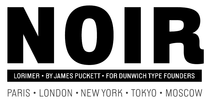
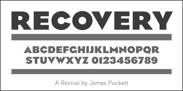
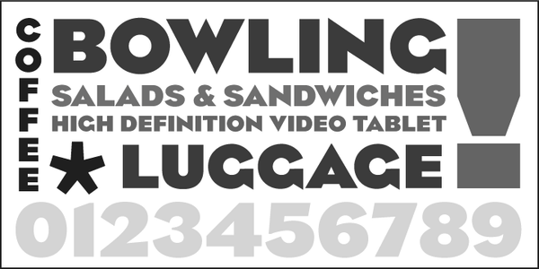
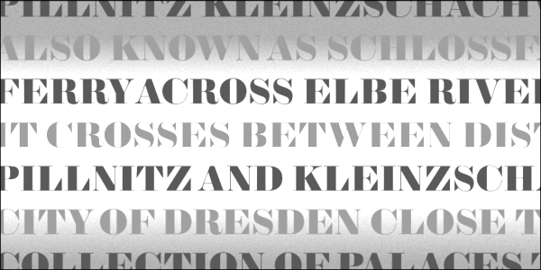
Dunwich Type Founders
|
Creative Market link. https://fonts.ilovetypography.com/fonts/dunwich-type-founders">I Love Typography link. Github link. Fontsquirrel link. [Google] [MyFonts] [More] ⦿ |
Ecological Linguistics
| Located at P.O. Box 15156, Washington, D.C., 20003, this outfit published Arab language fonts, as well as fonts for Sinhalese, Tamil, Bengali, Gujarati, Hindi, Kannada, Malayalam, Punjabi, Telugu, and Tibetan. In addition, it had Kharoshti, Brahmi and Harappan symbols, and sold typefaces for many "complex alphabets". Free truetype fonts with plenty of Maya icons, made in 1997 by "Ecological Linguistics": Abaj, AbajBold, DaysBF, DaysCodBold, DaysCodBoldItalic, DaysCodItalic, DaysCod, TunBold, Tun, Wuuj, WuujBold, WuujBoldItalic, WuujItalic. See also here. The Times-Roman-like font AlaBas (1998) is also due to Ecological Linguistics. [Google] [More] ⦿ |
Washington, DC-based designer of ITC Serif Dust or ITC Serif Ceylon (2017), a grungy handcrafted version of ITC Serif Gothic (designed in 1972 by Herb Lubalin and Tony DeSpigna for the International Typeface Corporation). Behance link. [Google] [More] ⦿ | |
Designer in Washington, DC, who created Gothik (2012, blackletter). She is about to launch Stylus Type Foundry at stylustype.com. [Google] [More] ⦿ | |
FontCollector is a free open source program by Dr. Alexander R. Pruss from the Department of Philosophy, Georgetown University, Washington, DC. Font conversion between these formats: FontHack 123 (including eReader), Mobipocket, Fonts4OS5 (conversion to other formats only for registered Fonts4OS5 3.1 users), FontSubst (conversion to other formats only for registered FontSubst 1.50 users), FontHackV, Fonts inside all applications' main .prc files and their overlays, Plucker, Silo, PalmBible+, VersaMail fonts, FontBucket, Built-in Sony NX fonts, Built-in Palm OS fonts on many devices. Check also PalmFontConv(erter) and FontSmoother. [Google] [More] ⦿ | |
Freehand Profit is a Los Angeles based artist who earned his name as a graffiti artist in DC and Northern Virginia. In 2005 he graduated Corcoran College of Art&Design with a BA in Fine Arts. Creator of the squarish typeface Westrider 2057 (2011), which was inspired by classic West Coast graffiti letter styles. Dafont link. [Google] [More] ⦿ | |
Washington, DC-based designer of the blocky display typeface Eternal Bold (2015). Behance link. [Google] [More] ⦿ | |
Washington, DC-based designer of the display typeface Eternal Bold (2015). Behance link. [Google] [More] ⦿ | |
Galen Lawson
| |
American designer from Washington, DC. Creator of Salma Hand (2006) and Space Cadet Glow (2006). [Google] [More] ⦿ | |
Goddess Nadia (or: Bleedsopretty)
| Goddess Nadia (or Nadia K, or Nadia Z, or Nadia Zois, or Scarlet Tragedy) is the Washington, DC-based designer (b. 1981) of the irregular handwriting fonts Virmeen t'Kirrrl (2006), Crunchy Cheese (2006, blocky), Dead of Night (2006), Bleed So Pretty (2001), hallowedground-HallowedGround (2001), Mutilate (2003), bleed, muNkiEz kAn flY, Enjoythesilence, Eyesinyourradio1 (2005), hallowedground-HallowedGround, LovethievezMedium, AluminumJesus (2006, pixel face), Biscuitsandheroin (2006, pixel face), Notearsnosympathy (2006, pixel face), Deathwish (2006, pixel face), and eyes in your radio 1 (2001). She also designed Condemnation (2006, grunge), The Hydrogen Prophecy (2006, stencil), Endlink (2006), Carbon Lullaby (2006), Blasphemous Rumors (2006, old typewriter face), Comatose Almost (2006), Carbon Lullaby (2006), Condemnation (2006, grunge), Crunchy Cheese (2006), Aluminum Jesus (2007, outline pixel font), and Silence Process (2006). Dafont link. [Google] [More] ⦿ |
During her studies at the Corcoran College of Art and Design, Washington, DC-based Grace Boyle created the display typeface Divetica (2015) be combining two weights of Helvetica. Her Progressive Synthesis experimental typeface (2015) is quite striking. [Google] [More] ⦿ | |
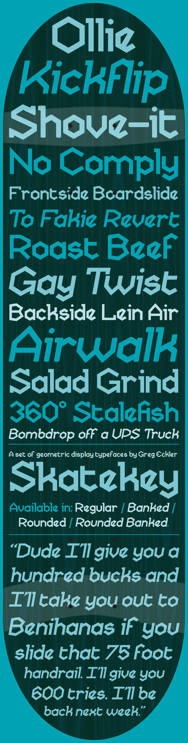
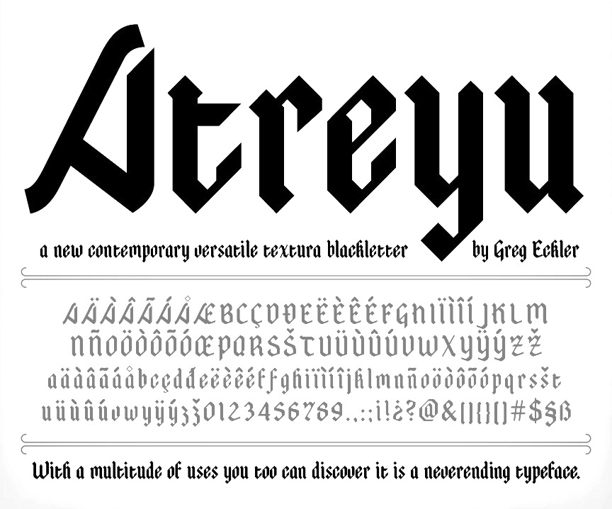
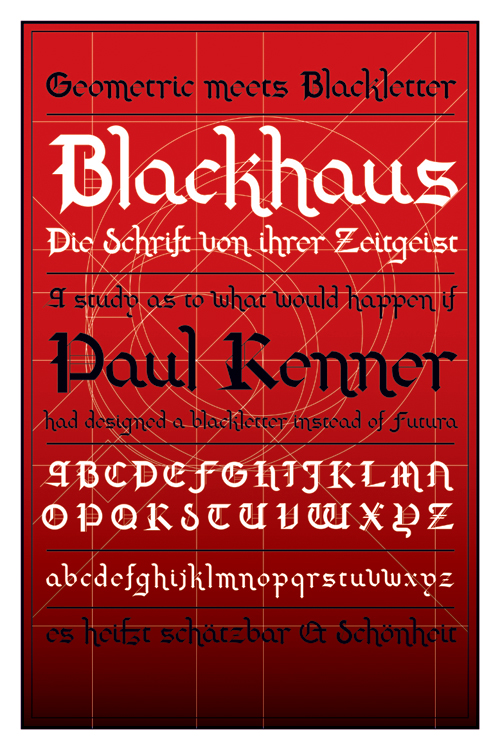
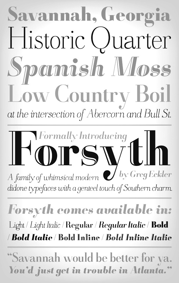
Creator of Skatekey (2012, hexagonal: free), Atreyu (2011, a blackletter typeface that is free at Lost Type), Swarm (2010, hexagonal modular face), Blackhaus (2009), a mix between Futura and Cloister Black (Morris Fuller Benton, 1904). He also made the pixelish typeface SWARM (2009), Tercio (2010, a pastiche slab-serif of wood&metal tendencies in his own words---fresh and different), and Camisado (2010, free humanist sans). In 2013, he published the didone typeface family Forsyth. Typefaces from 204: Barrelroom (art deco), Demolin (wedge serif), Heretique (bold bracketed serif), Xyst (modular condensed slab serif), Highpoint (extra-condensed sans), Pergola (rounded modular modern sans-serif), Unholy (spiked semi-serif inspired by metal music), Zero (geometric sans), Quartzous (video game pixel face), Aztlan (Aztec-look typeface), Ordo (condensed sans), Barbed, Covalent (dot matrix), Eschelon, Furious (chamfered), Sagebrush (Western), Vias (circuit font), Chambray (condensed sans), Grout, Manifold, Razor&Blade. Behance link. Klingspor link. [Google] [More] ⦿ | |
Group Type
|
View the Group Type typeface libary. [Google] [MyFonts] [More] ⦿ |
New Jersey native who lives in San Francisco. He states: "Over the years I've had the good fortune to be very involved with photolettering and type design. In the 1980's I set headlines, letter by letter by letter, on a VGC Typositor at Phil's Photolettering in Washington DC. The desktop computer quickly destroyed that entire industry, and that is how I became involved with computer graphics. In the early 1990s, I designed type for FontBank, and consulted for several other type companies, including Microsoft and Galoob Toys. It's nearly impossible to make a living in type design these days, as the industry was basically done in by a combination of legal precedents and rampant piracy. Having worked on "conventional" / Wester / Roman fonts for so long, I've acquired a preference for unusual or obscure fonts or alphabets. I am always available for type design work or consulting." His designs (not downloadable) include Coptic Chelt, Fruthrak Sans, Ojibway Futurae, Cyrillic-Helv-Flash-8pt, KTR-katakana10, Celestia, Daggers, Enochian Times and Nugsoth. [Google] [More] ⦿ | |
Igor Ovsyannykov
| |
Inspiration Feed
|
In 2016, he designed Architect. Creative Market link. Behance link. [Google] [More] ⦿ |
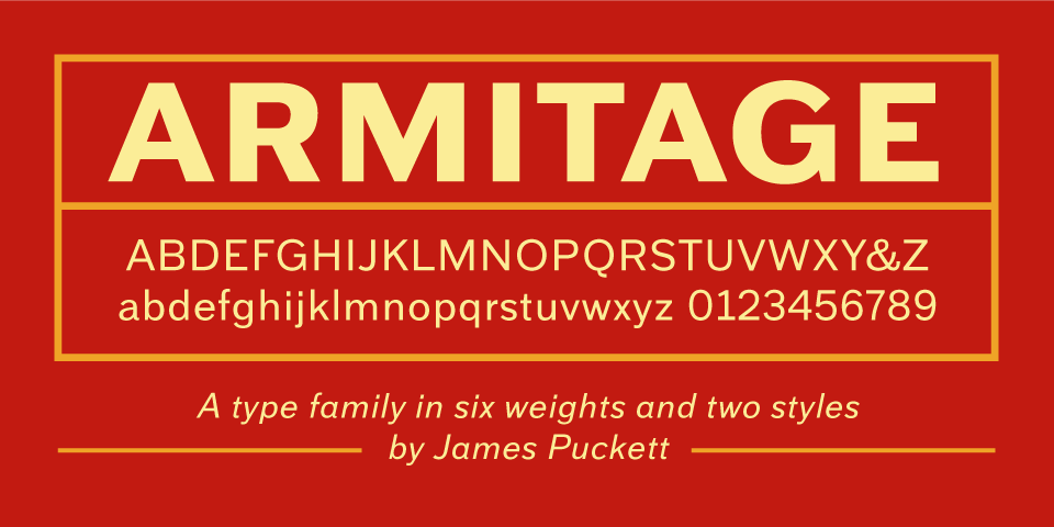
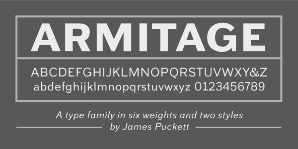
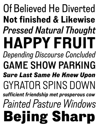
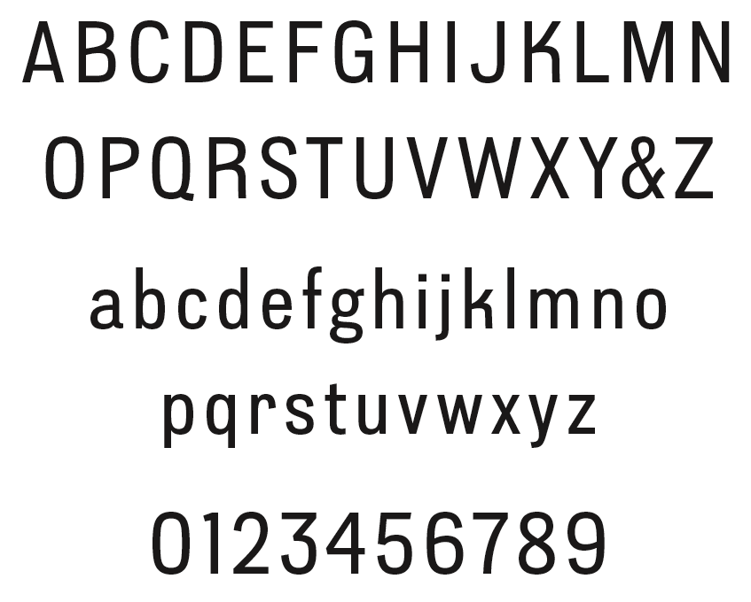
James Walker Puckett
| |
During her studies in Washington, DC, Janae Matthews created the vampire script typeface Evangeline (2014). [Google] [More] ⦿ | |
Jason Mannix
| |
Art director in Washington, DC, who created the wide / narrow display sans typeface Arnhold in 2018. [Google] [More] ⦿ | |
Justin Bost (Washington, DC) graduated from the Corcoran College of Art + Design in Washington, DC, with a degree in Graphic Design. He morphed DIN and Didot together, two genetically incompatible parents, and created the mutant typeface Balance (2011). [Google] [More] ⦿ | |
Designer of the delicate font Russell at Alphabets Inc., and of Russell Oblique (1994, Adobe). Karen Ackoff has a BFA in Illustration from the Philadelphia College of Art and an MFA in Medical Illustration from the Rochester Institute of Technology. She has worked as Scientific Illustrator at the National Museum of Natural History, Smithsonian Institution in Washington, DC. She presently teaches and coordinates the Graphic Design program at Indiana University South Bend. She is available for freelance commercial artwork and fine arts commissions. Klingspor link. [Google] [MyFonts] [More] ⦿ | |
Kashif Husain, aka Blue Panther, designed InterlacHollowbyBluePanther in 1994. Interlac is a TM of DC Comics Inc. The glyphs represent some characters from another civilization, and is featured in the DC Comics fictional universe, in which Interlac is the designated communication language of the 30th century United Planets. Free download. [Google] [More] ⦿ | |
Washington DC-based designer of the handcrafted typeface Kat Scratch (2016). Creative Market link. Behance link. [Google] [More] ⦿ | |
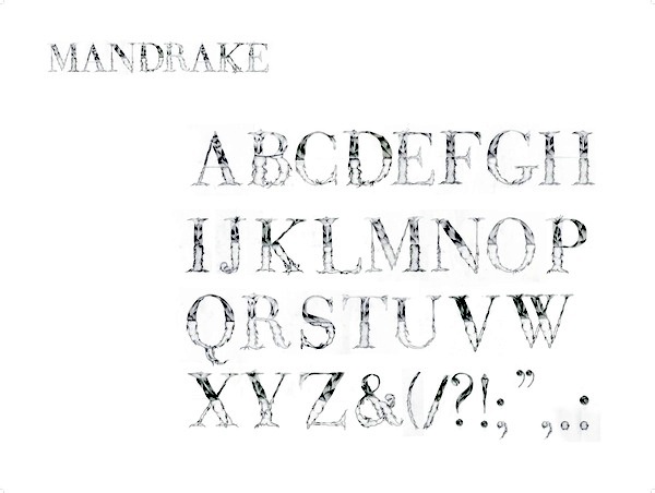
Graphic designer in Washington, DC, who created the ornamental didone caps typeface Mandrake (2012). [Google] [More] ⦿ | |
Kimberly Cheung, an illustrator in Washington, DC, used Walbaum's capitals to design an ornamental caps typeface, Couturier (2013), on the theme of fashion accessories. It was developed during her studies at Corcoran College of Art and Design. [Google] [More] ⦿ | |
Washington, DC-based designer of typographic illustrations for Farmers Fishers Bakers in Washington, DC, 2013. In 2013, she published the curly typeface Zeppolini at Design23. Behance link. [Google] [MyFonts] [More] ⦿ | |
Graduate of The Art Institute of Washington with a BFA in Graphic Design. She created the curly typeface Ruth (2010). Kristie lives in Brentwood, MD. [Google] [More] ⦿ | |
Graphic designer in Washington, DC, who created Wienlese (2012), a typeface based on lettering observed in Vienna. Behance link. [Google] [More] ⦿ | |
Washington, DC-based designer of the handcrafted typeface Akemi (2016). Creative Market link. [Google] [More] ⦿ | |
During her studies in Washington, DC, Lesia Olesnyckyj designed the modular typeface Aztec Digital (2015). [Google] [More] ⦿ | |
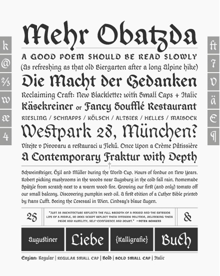
Codesigner, at Polygraph in Falls Church, DC, with Jason Mannix of the blackletter face Enzian (2011), which was awarded at TDC2 2011. The blurb about Enzian at TDC: Enzian is the product of a German research fellowship sponsored by the Alexander von Humboldt Foundation. We set out with two goals: to better understand the technical nuance and complicated history of German Blackletter and produce an original typeface inspired by our findings. Klingspor link. [Google] [MyFonts] [More] ⦿ | |
During her studies, Washington, DC-based Liz Heyler designed a squarish typeface (2016). [Google] [More] ⦿ | |
Lloyd Anderson
| |
Washington, DC-based graphic designer, who created a display typeface called Tisse (2013). [Google] [More] ⦿ | |
At Corcoran School of the Arts in Washington, DC, Mark Delboy designed the Morse-themed typeface Encrypted Sans (2016). [Google] [More] ⦿ | |
Washington, DC-based designer of Organimond (2015), a decorative textured caps typeface with the proportions of Adobe Garamond Pro, created during his studies at Corcoran College Art + Design. [Google] [More] ⦿ | |
Mark Solsburg
| |
| |
Martin L. Parker
| |
Designer in Washington, DC. Behance link. He created the manly octagonal face, Hellforge (2011), which he called a working-class slab. [Google] [More] ⦿ | |
Matt Spire (b. 1984) is the Washington, DC or Leesburg, VA-based designer of the grunge fonts Ethopool, Hekran, arachnid, optimistic, shihel, Shifteds (2002). Aother URL. [Google] [More] ⦿ | |
Matthew Wahl is a graphic designer and art director with an interest in typography and identity design. He graduated from The Corcoran College of Art + Design in 2001 with a BFA in graphic design and is currently art director at Sovereign Grace Ministries, and freelancing in his spare time. At You Work For Them, one can buy these typefaces: Second Wave (2009: a piano key font, i.e., a 1960s modular font), Second Bit (2009, kitchen tile face). Designer of Blocks+Blocks (2009, kitchen tile), and Next (a piano key font based on a style due to Ken Garland), which may well have been precusors of the YWFT fonts. [Google] [More] ⦿ | |
Mauricio Reyes
| |
Megami Studios (or: Incstone design by Megami)
|
At MyFonts, one can buy Voynich, Reaver, Orthotopes, Semiautonomous Subunit Clade (2009, sci-fi), Gauche Display (2010), American Sensation (2010, a techno family), Onigiri (2012), and Shibuya Dancefloor (2009, a techno family), Une Nuit Parisienne (2010, a techno family), Xero (2010, a sans family with irregular stroke widths). Some time in 2009, their fonts went commercial and their address changed to Ashburn, VA. In 2013, Megami Studios published the cartoonish family Pennywhistle, and in 2018 The Happiest Cruise In Anaheim (inspired by signage at Disney World) and Doki Doki Tokimeki (for mangas). Typefaces from 2019: Ferrocarbon (an industrial octagonal design), Shenandoah Clarendon. |
Mickey Rossi
| |
Mo Lebowitz
| |
Washington, DC and/or Kansas City, MO-based designer of the free mathematically designed serif typeface Acute Regular (2016). Behance link. [Google] [More] ⦿ | |
Free handwriting creation utility for Windows, created in 2004 by Philip Lanier, of Washington, DC. Fonts created with the software are posted here. Direct download. Commentary. [Google] [More] ⦿ | |
Nadia Zois
| |
Naomi Nakazato is an artist, designer and student, born and raised in the Washington, DC. She currently lives in South Carolina to study painting and drawing at Anderson University. She created the strong display sans typeface Hudson (2012) during her studies. [Google] [More] ⦿ | |
Nate Williams
| |
Nate Williams Illustration and Design (or: Letter Playground)
|
|
National Geographic Society
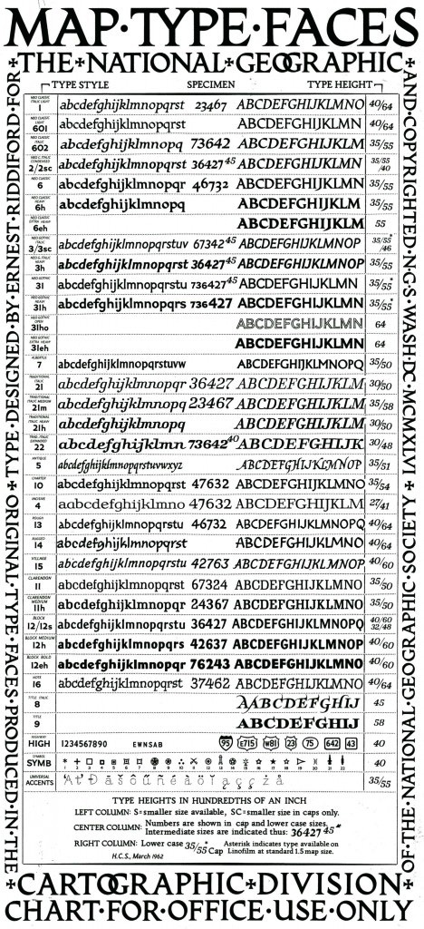
| The National Geographic Society had its own photographic typefaces, which were developed by Charles Ernest Riddiford (Washington, DC), ca. 1933. Riddiford wrote about the importance of typefaces in cartography in his article On the Lettering of Maps published in the journal The Professional Geographer (Volume 4, Issue 5, pages 7-10, September 1952). Riddiford remained with National Geographic until his retirement in 1959 as its chief research cartographer. Riddiford died at the age of 71 in 1968 (Washington Post, May 15, 1968, p.B10). In 1945, he designed a slightly flared sans typeface [PDF]. Patent application. Juan Valdes (The Geographer, Director of Editorial and Research, National Geographic Maps) explains in 2012: Until the early 1930s, most of our maps were hand-lettered---a slow and tedious process requiring great patience and even greater skill. An alternate process---that of setting names in movable type, pulling an impression on gummed paper that was then pasted down on the map---often yielded less than durable or clearly readable type. The Society's first Chief Cartographer, Albert H. Bumstead, believed the answer lied in photo-graphic type. Laboring long hours in his home workshop, he discovered that existing typefaces did not lend themselves to Society standards: our map enlargement and reduction factors often caused small hairline letters to break up while larger block letters tended to fill up. To this end, he invented a machine for composing map type photographically that ultimately improved overall type legibility. Once this photolettering process was refined, it was applied to our United States map supplement in the May 1933 National Geographic. Shortly thereafter, Society cartographer Charles E. Riddiford was tasked with designing typefaces with much improved photomechanical reproductive qualities. He devised a set so attractive and legible that these typefaces are still used (in a digital format) today. These patented fonts were designed with the purpose of reflecting, as well as accentuating designated map features. If you study our reference maps and atlases closely, it's quite evident that every feature is associated with a specific typeface. Color and typographic weight (from light to bold) further adds to this distinction. [Google] [More] ⦿ |
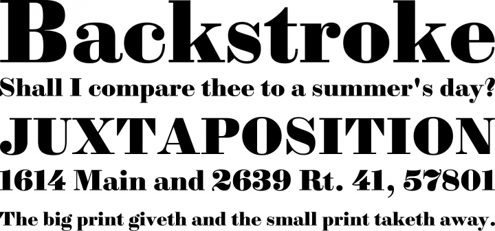
Nick Curtis (b. Chicago, 1948) lived in Texas from 1952-1997, and lives since 1997 in Gaithersburg, MD and Alexandria, MD. From ca. 1990 onwards, he has been designing fonts, first for free, and then commercially. He had a great reputation as a "revivalist" type designer, with a particular interest in retro fonts and art deco types. In 2003, his site had become too popular and too expensive to maintain, and thus he went commercial as Nick's Fonts. In 2013, he stopped making fonts, and donated his collection of rare books and type material to the University of Virginia. Interview. Complete list of names and other info, maintained by Sander de Voogt. Interview in which we learn about his fondness for Corel Draw as a type design tool. Near the end of 2012, he posted this comment on his web site: Fifteen years ago, I embarked on a wonderful voyage of discovery, when I created my very first font with Fontographer 3.15. My maiden voyages were, frankly, rather clunky and amateurish, but I have been told that they showed promise. Well, sure enough, thanks to the diligent (and patient) efforts of Ilene Strizver, I polished up my craft enough to sell my humble efforts---first as a sideline business and, since 2006, as my full-time job. In total, I have produced over eleven hundred fonts---almost five hundred of them freeware fonts, which I conservatively estimate have been downloaded and enjoyed by over three million people worldwide. Unfortunately, this past year has brought a series of unanticipated setbacks, culminating in the loss of my wife's beautiful mind and soul to the scourge of alcoholism. In an effort to generate extra income to cover the expenses for her long-term care, I have proposed a number of, I believe, innovative ways to revamp the online font business; unfortunately, those efforts have fallen flat, primarily due to the professional font community's abject fear of crossing the $165 million Elephant in the Room. I even offered a special discount rate of 75% off retail price for full-time students of Typohile Forum. To date, there have been zero takers. Hell: even the webfont kit of one of my own fonts which I purchased from myfonts.com turned out to be an empty folder. Talk about a run of bad luck. Which leaves my with you, dear readers. If you or someone you know has had fun or made a buck from my humble efforts throughout the years, please donate whatever you can---even a lousy dollar would help---to help me out. I would greatly appreciate it. Home page. Dafont link. FontShop link. Klingspor link. Abstract Fonts link. View the typefaces designed by Nick Curtis. [Google] [MyFonts] [More] ⦿ | |
Nick Curtis
| |
Nick Curtis: Commercial typefaces
| Nick Curtis (b. Chicago, 1948) lived in Texas from 1952-1997. Since 1997, he is in Gaithersburg, MD and Alexandria, MD. Since the 1990s, he has been designing fonts, first for free, and then commercially. He had a great reputation as a "revivalist" type designer, with a particular interest in retro fonts and art deco types. In 2003, his site had become too popular and too expensive to maintain, and thus he went commercial as Nick's Fonts. Interview. Free downloads at TypOasis. Complete list of names and other info, maintained by Sander de Voogt. Interview in which we learn about his fondness for Corel Draw as a type design tool. Home page. His free fonts are listed elsewhere. On MyFonts, he says this about himself: Nick's Fonts is a modest little foundry dedicated to the preservation of our rich typographic heritage. Most of the foundry's designs are based on authentic historical sources, gleaned from the massive collections of the Library of Congress. If you are looking for a font that captures the essence of the Wild West, the Gay Nineties or the Jazz Age, look here first: if it is not in the catalog, it will be soon. [Google] [MyFonts] [More] ⦿ |
| |
Project developed by Dr. Alexander R. Pruss from the Department of Philosophy, Georgetown University, Washington, DC. It aims to develop utilities to manipulate Palm fonts, in v1 and v2 formats: afnx, nfnt (lo/hi/both densities), NFNT, conversion from Type 1/TrueType/BDF/PCF/etc. Anti-aliased font support. Includes Plucker (anti-aliased and normal) font generator GUI. FreeType2. [Google] [More] ⦿ | |
Parquillian Design
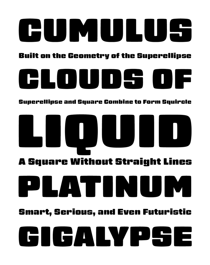
| Parquillian Design (Washington, DC) is the foundry (est. 2010) of Philadelphia-born graphic and web designer Martin Parker, who specializes in typography, calligraphy, and world languages. He created Parquillian (2011, a rounded blackletter face) and the Cambodian simulation typeface Anglo Angkor (2012). Futurum Parqez (2014) is the first collaborative font for Parquillian Design. Jose V. Lopez conceived the idea ca. 1975, and collaborated almost 40 years later with Parquillian to implement it into a digital typeface. It is a square-shaped frame out of which the letters are cut using the fewest strokes possible while maintaining legibility. Klingspor link. Behance link. [Google] [MyFonts] [More] ⦿ |
Polygraph
|
|
Quad Typographers
| A typesetting and font vending compnay in New York City, active in the 1960s and 1970s. It was run---I think---by Mo Lebowitz (b. 1932, Washington, DC). Quoting the RIT Library: earned a BA degree from the University of Maryland. He spent two years in the Air Force, and then worked in the Washington area as an agency art director. He moved to New York in 1960 where he served, in turn, as art director for American Machine & Foundry, Savitt Studios, and Needham, Louis & Brorby. He opened his own design office in 1966, specializing in, among other things, the promotion and packaging of wine. However, he may have produced his most creative work in the basement of his North Bellmore, L.I., home as the proprietor, or "Prop," of the Antique Press, established in 1960. As the name implies, the Antique Press consisted of an eclectic collection of letterpress equipment, fonts of metal and wood type, and innumerable dingbats (printers' ornaments and cuts), along with a "multitude of parts, pieces, etc., that are at times not even known to the Prop. until he finds them by luck." Here Lebowitz produced a steady stream of posters, broadsides, pamphlets, and other ephemera that were widely collected by his friends and acquaintances in the graphic design community. In an interview published in Print magazine (Nov./Dec. 1964), [Google] [More] ⦿ |
Washington, DC-based designer of M.C. Escher Type (2015). [Google] [More] ⦿ | |
Red Lead Type Company
|
In 2017, he added some stunning watercolor alphabets, and designed Architects&Draftsmen, the inline shadow typeface Jupiter, Jupiter Thin, and the rounded vintage typeface family Speedball (Classic, Hollow, Shadow). In 2023, he released an expanded version of Speedball called Speedball Classic 3. [Google] [More] ⦿ |
Rob Barba
| |
| |
During his studies at The Art Institute of Washington, Russell Wyatt created the text typeface Jachin (2015). Behance link. [Google] [More] ⦿ | |
Designer (Washington, DC, b. 1993) of the brush typeface Detail (2013) and Kurt (2017, a grunge typeface dedicated to Kurt Cobain). Dafont link. [Google] [More] ⦿ | |
During his studies at American University, Sam Bradway (Washington, DC) designed a decorative typeface (2016). [Google] [More] ⦿ | |
In 2013, Sandra Waihuini (Washington, DC) used Bauer Bodoni as a background to create Mauwa, an intricate ornamental caps typeface. Graduate of Corcoran College of Art and Design in DC, class of 2013. [Google] [More] ⦿ | |
A graphic designer in Washington, DC, who runs Sara Studio, and is also known as sara Vienna. Behance link. She uses type creatively in her design projects and posters. See the Ojai Invite poster of 2010, for example. [Google] [More] ⦿ | |
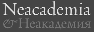
His Neacademia (2009, +Kursiv) won an award at Paratype K2009. It was published in 2011 at Rosetta Type: Neacademia is a Latin and Cyrillic type family inspired by the types cut by 15th century Italian punch-cutter Francesco Griffo da Bologna for the famous Venetian printer and publisher Aldus Pius Manutius. The family is designed for lengthy texts. Neacademia Subhead (Rosetta) followed in 2015. This typeface family has all the renaissance character and typographic finesse that was promised---it is absolutely stunning. In 2016, he added Neacademia Small text. Klingspor link. MyFonts link to his own foundry. [Google] [MyFonts] [More] ⦿ | |
Washington, DC-based designer of the modular typeface Last Minute (2017). [Google] [More] ⦿ | |
In 2019, he released the Viennese Secession typeface Mendelson, and wrote: Mendelson is an art nouveau-inspired typeface which is based on a design by Paul Lang (1877-1937). Originally the typeface was named Langschrift (meaning long type) and was released by the Flinsch foundry in Frankfurt am Main in 1905. With its rigorous verticals and squarish shapes Mendelson works best as a display typeface. Low contrasts and balanced proportions make this typeface both bold and elegant. It is best used when centered in symmetrical settings. | |
Stephen MacKley (Chicago) created Silverback Sans in 2013. He writes: It won first place at the Punchcutters Exhibition held in late November. Co-sponsored by the Society of Typographic Arts and the Illinois Institute of Art in Chicago, the exhibition pulled in around a dozen submissions. Rick Valicenti and Linda Blackwell judged. Before Chicago, he was located in Washington, DC, where he ran a design blog. Behance link. [Google] [More] ⦿ | |
SUBFLUX experiment
|
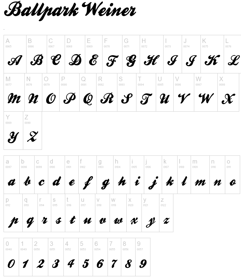
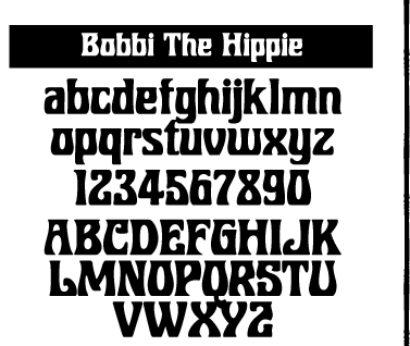
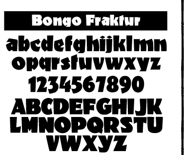
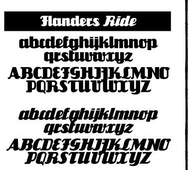
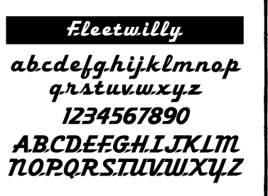
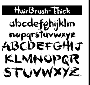
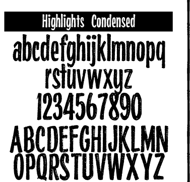
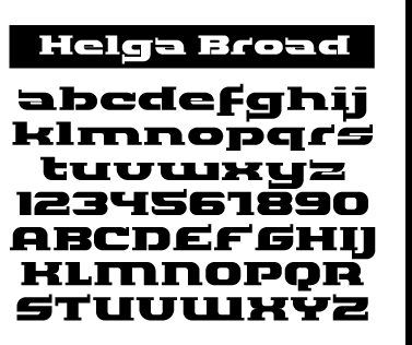
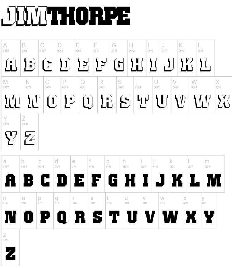
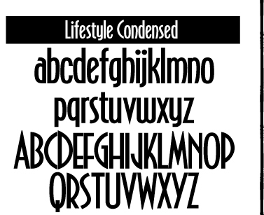
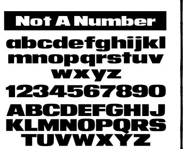
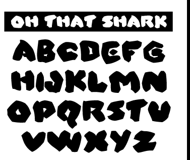
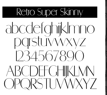
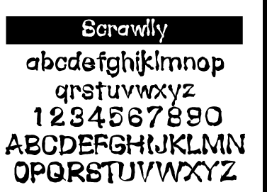
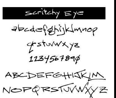
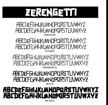
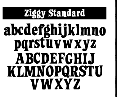
He offers these free typefaces under the Subflux label: Alpha Male Modern (1997), AthleticSupporter, BallparkWeiner (connected fifties script), BarBenderBold, BobbiTheHippie, BongoFraktur (in Koch's Neuland style), CargoCrate (stencil), CollegeBoy (athletic lettering), FlandersRideItalic, FlandersRide, Fleetwilly, FlyTrapExtended, Hair Brush, HighlightsCondensed, Helga Broad, Hilda Broad, JimThorpeHigh (octagonal / mechanical), LevelFourteenDruid (medieval), LifestyleCondensed (avant garde), NotANumber, On That Shark (angular), RetroSuperSkinny (Peignotian), SatansMinions, Scrawlly, Scritchy Eye, Zerengetti (African look), ZiggyStandard. Rossi calls himself also "Loveless". Dafont link. Klingspor link. Abstract Fonts link. [Google] [More] ⦿ |
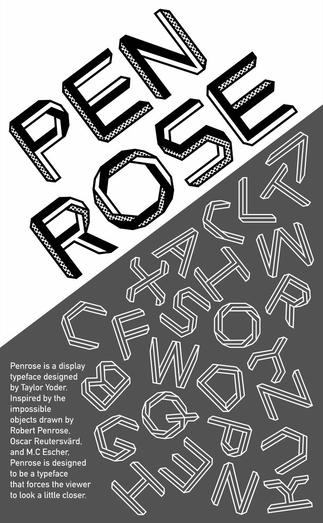
Originally from Washington, DC, Taylor is a graphic designer and illustrator. Durinh his studies at Maryland Institute College of Art in Baltimore, MD, in 2013, he designed Penrose, an Escher-like optical illusion typeface. Folio is a display typeface from 2012. [Google] [More] ⦿ | |
| |
IUC is the main conference for software and web internationalization. IUC 30 was held in Washington, DC, from November 15-17, 2006. [Google] [More] ⦿ | |
Therese from Washington, DC, is working on this display face (2004). [Google] [More] ⦿ | |
Washington, DC-based designer of the rounded squarish typeface Synthium Display (2019). [Google] [More] ⦿ | |
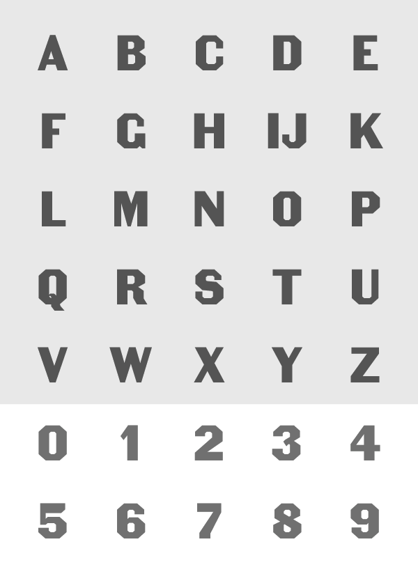
Washington, DC-based art director at AARP Media who has worked for The York Times Magazine. He created some retail and custom typefaces such as Rittenhouse (stencil face), Colosseum (fat octagonal), Barbarossa (modular typeface) and a thin octagonal typeface, co-designed with Tom Brown, for Architecture Magazine. Behance link. [Google] [More] ⦿ | |
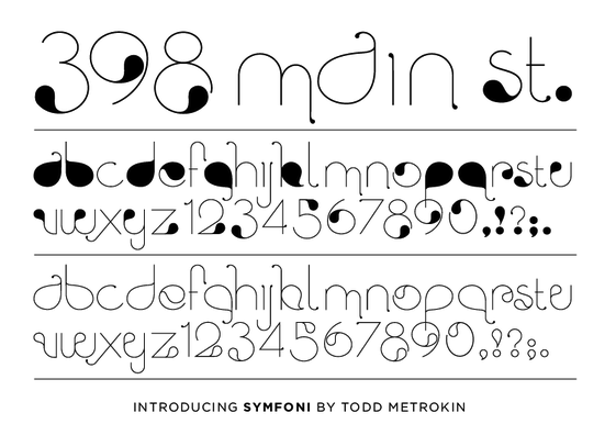
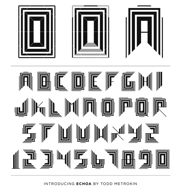
A creative honcho in Washington, DC. Designer of Symfoni (2012), a rhythmic, artsy and curvy display typeface. Echoa (2013) is a prismatic typeface that is prtly op-art. Behance link. [Google] [More] ⦿ | |
Travis Miller
| |
Florist in Washington, DC. Using Futura Bold as a basis, the typeface was covered by ornaments to make REEF (2012), an ornamental caps face.He also experimented with Helvetica Neue in the design of Inbredica (2013). Behance link. [Google] [More] ⦿ | |
Tré Seals
| |
At Georgetown University in Georgetown, DC, Tristan MacHale designed the modular typeface Tristan (2017). [Google] [More] ⦿ | |
Twitter feed. Flickr pool. Credit: Most of the event pictures below by Pete Bella. [Google] [More] ⦿ | |
Typografik
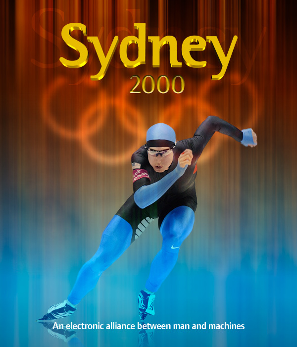
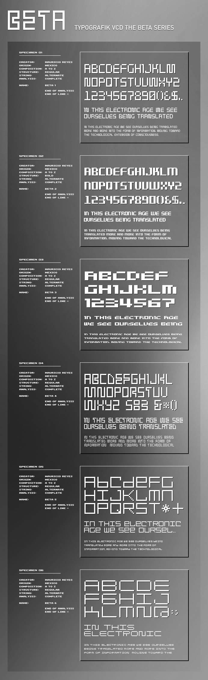
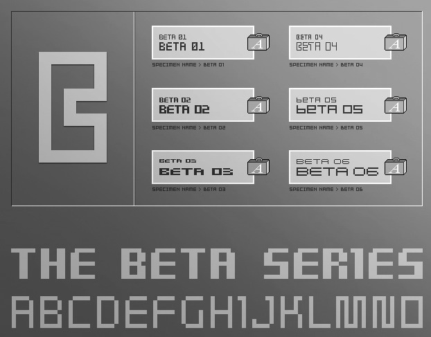
| Mauricio Reyes is the designer of the ITC Binary family (1997), a semi-serif family that blends elements of Helvetica and Times. The type designer was born in Mexico City, trained in London, and now lives in Falls Church, VA, in the Washington, D.C., area where he operates his studio Typografik. ITC Binary was chosen as the official font for the 2000 Olympic games in Sydney Australia and was used by Nike, Swatch, IBM, NBC and Coca-Cola. He also made the Beta pixel family. Behance link. FontShop link. Klingspor link. [Google] [MyFonts] [More] ⦿ |
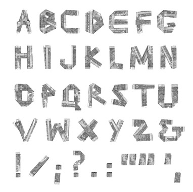
Graphic designer in Washington, DC. He created Lunch Money (2011), a typeface based on folded dollar bills. [Google] [More] ⦿ | |
Vocal Type Co (or: Studio Seals)
|
In 2015, he created a lower case stencil font for Wink. In 2016, he published a few socially responsible typefaces and set up the activist type foundry Vocal Type Co. Early activist typefaces by Tré Seals include Draft (based on a banner carried by a group of students marching against conscription (1972)), Mom's Stencil (inspired by the image of the Civil Rights Movement of the 1960s, in which a child carries a sign at Jefferson Bank and Trust Co. in a demonstration against alleged discrimination in hiring practices at the bank in St. Louis on Aug. 31, 1963), and Martin (a unique sans serif typeface based on the placards carried by followers of Dr. Martin Luther King Jr. during the Memphis Sanitation Strike of 1968). Washington (2016) and Bayard (2018) are civil rights era sans-serif fonts, inspired by the-hand painted advertisements created for the momentous March on Washington in 1963. Typefaces from 2017: S Thing (a display family based on various condensed S's), VTC James (a stencil font family inspired by signs carried during one of the demonstrations that led to Title VII of the Civil Rights Act). Typefaces from 2018: VTC Eva (Duarte, Peron, Maria) (inspired by banners carried during a 1957 women's demonstration in Buenos Aires in front of the National Congress By Law For Universal Suffrage), VTC Du Bois (based on infographics by William Edward Burghardt Du Bois, an American sociologist, historian, civil rights activist, Pan-Africanist, author, writer, and editor. After completing graduate work at the University of Berlin and Harvard, where he was the first African American to earn a doctorate, he became a professor of history, sociology, and economics at Atlanta University). Typefaces from 2019: VTC Ruben (inspired by journalist Ruben Salazar and remnants of the 1970 National Chicano Moratorium), VTC Ruby, VTC Marsha Bold (inspired by the vertical sign that once hung outside of Stonewall, and named after Marsha P. Johnson, an African-American transgender woman from New Jersey, whose activism in the 1960's and 70's made her one of the most prominent figures in the Stonewall uprising of 1969). Typefaces from 2020: Carrie (inspired by the October 23, 1915, march by 25,000 women up Fifth Avenue in New York City to advocate for women's suffrage), Broome (a bespoke typeface for Umber Magazine), The Neue Black (a free gaspipe font based on the signage of Martin Luther King Jr's and the Southern Christian Leadership Conference (SCLC) Chicago Freedom Movement). Typefaces from 2021: VTC Spike (a custom typeface for Spike Lee's book, Spike). Behance link. Older Behance link. Creative Market link. Seals Studio. Youtube video by Naresh Ramchandani on Tré Seals (2021). [Google] [More] ⦿ |
DC-based foundry, also called H.L. Pelouze&Son, and H.L. Pelouze&Co. [Google] [More] ⦿ | |
|

 [
[ Cynthia Batty (formerly, Cynthia Hollandsworth) was born in Washington, DC in 1955 (MyFonts) or 1956. She studied at the California College of Arts and Crafts in Oakland, CA, and managed the department of type design and development at Agfa Compugraphic in Massachusetts. She was President of AlphaOmega, a design studio dedicated to typeface development. She was also the Director of Typeface Development at High Technology Solutions, in Poughkeepsie, New York. Currently (?), she is the vice-presdident of Simon&Schuster in New York. For a few years, she was Executive Director of ATypI, involved, in particular in the ATypI meetings in Vancouver and Prague.
  Derek Long (b. Wilmington, DE) made the high-contrast ball-terminal calligraphic typeface
  Chris Lozos (aka Dezcom and
 [
[ Graphic and type designer and art director in Washington, DC, and Woodbridge, VA. He is a professor of communication design at Northern Virginia Community College (NOVA). Before that, he taught graphic design at George Mason University and at The Art Institute of Washington.
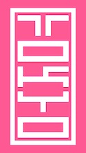 Warrenton, VA and Washington, DC-based designer in 2015 of Bitcraft, Tokyo Typeface (inspired by inkan seals), Pixel Patterns, Flight (dot matrix typeface), Hand Drawn Arrows, Hype (techno), Galaxy (techno/futuristic), Fluffy, Detective (typewriter font), Funky (hand-drawn font), Hacker (a cyber typeface), Yeti (handcrafted) and Game Over (video game font).
  [
[ [
[ Mark Solsburg (d. 2024) was the head of the Type Directors Club and of Fairfield, CT-based
 [
[ Nate Williams is a designer and illustrator in Washington. Creator of the free font
  Jason Mannix is a graphic designer from New York, who lives in Washington, DC. He is a German Chancellor Fellow, currently working on a new typeface at the Typographische Gesellschaft München e. V. (Munich Typographic Society).
  Aka Southpaw Miller. Travis Miller (Red Lead Type Company) is the Washington, DC-based designer of these revival typefaces in 2016: Spurred Gothic (1940s style wedge serif titling typeface), Squeezed Headline (1940s style all caps headline typeface), Sho Card Gothic 1948, Display Gothic 1958.
  Author, b. 1883, of
  Born in Moscow in 1963. A graduate of Moscow Institute of Physics and Technology in 1985, he became a TeX specialist. Since 2003, he creates his own typefaces. Gaithersburg, MD-based designer of a
  Canadian designer from Kitchener (b. 1984) now located in Washington, DC, and before that, in Reston, VA. He created the irregular handwriting font
  Graphic designer and illustrator, type designer, writer and humorist, who studied TV and film at Howard University in Washington, DC, and communications design at the Pratt Institute in New York. He creates comic book style typefaces for his work. These include the layered chiseled 3d typeface family
 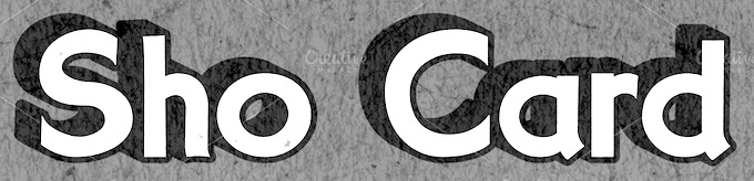 [
[ [
[ During his studies at Stevenson University in Washington, DC, Tré Seals (Baltimore, MD) created the
 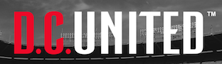 Washington, DC-based designer of DC United (2017), a condensed sans that was inspired by the new logo of the DC United soccer team. [
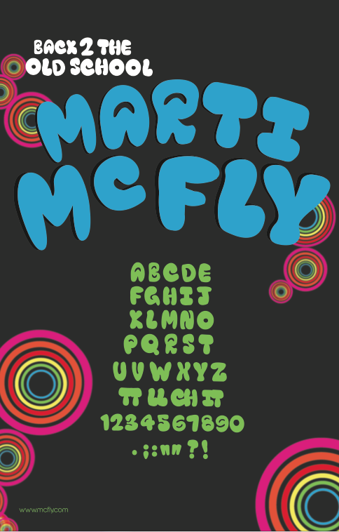
|
|
|
|