TYPE DESIGN INFORMATION PAGE last updated on Mon Mar 9 16:09:00 EDT 2026
FONT RECOGNITION VIA FONT MOOSE

|
|
|
|
|
Type scene in Oregon | ||
|
|
|
|
SWITCH TO INDEX FILE
Oregon-based designer in 2019 of 212 Dreamery Sans, 212 Boys Stuff (dingbats), 212 Phoenix Sans, the upright brushy script typefaces Moon Child, Warmheart (+Serif) and Queenie (+Sans, +Serif), and of 212 Keyboard. Typefaces from 2020: 212 Orion Sans, 212 Leahlee Sans. [Google] [More] ⦿ | |
Aaron Bogle
| |
| |
Portland, OR-based designer of the modular typeface CKMY (2014). Behance link. [Google] [More] ⦿ | |
Portland, OR-based creator of Old English Style Font (2011). [Google] [More] ⦿ | |
Portland, OR-based designer of Notch Font (2012). [Google] [More] ⦿ | |
Adam Wunn
| |
Afrojet Type Foundry
|
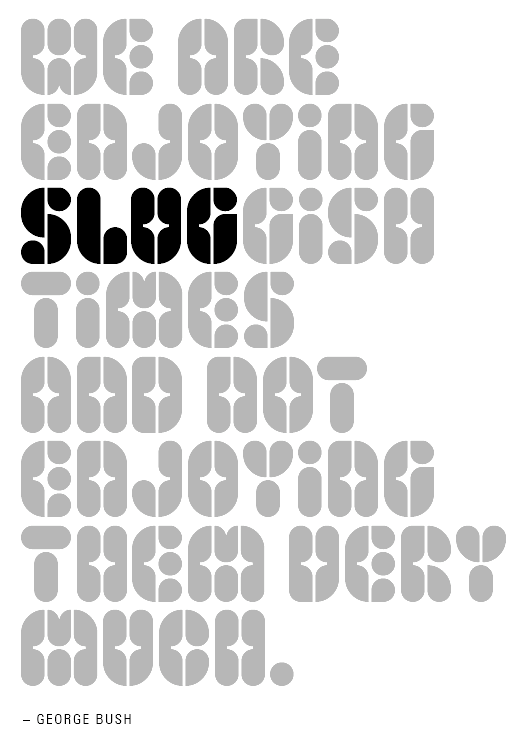
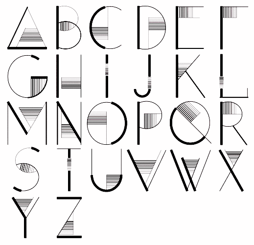
FontStructions in 2008: Playtime (an original stencil family), Playtime Pattern Motifs (dings), Playtime Rounded (+Bold), Playtime Cutouts, Mango Solid (ultra fat, rounded), Mooch (experimental), Mooch Squared, Zombies Are The New Black, Jettison Stencil, Micromoog, hewett, hewett_bold, hewett_extended, Mikey (a Mickey Mouse font). Other creations there include Summer Grillz (about which he writes More gangster than Gill with more gold than Garamond, Summer Grillz is type jewelry for your mouth. All letterforms are diamond-kut using the finest type constructing software on the market today. Customize your grill with different fills., Lovestruc, Konstruct (multiline face), Steeplechase, Sawhorse, Sawhorse Braumarks (dingbats of a brewery), Alfred, Chesterfield, Hydroplane, Jettison-Stencil, Pop-Drops (kitchen tile face), Starstruc, Lovestruc, Chesterfield Prince, Chesterfield King, Chesterfield Queen (piano key font), Brainfreeze (ultra fat). Fontstructions in 2009: the Sans Serious family (a tribute to Dutch Bauhaus designer Jurriaan Schrofer), Factory (stencil), Hunstrüct (blackletter), Slug, Micromoog Remix, Get To The Falcon, Jetstream and Perforate (octagonal, loosely based on several styles of letter and numeral forms observed on various aircrafts at the Evergreen Aviation&Space Museum in McMinnville, Oregon), Get To The Falcon (multiline face), StacheStruct (moustache font), Factory (stencil), Playtime Bolda, Thunderball, Gaga, Gaga Stencil, Pinpression, Sessions (a take on type by Josef Albers; he writes: Having previously played around in Fontstruct with Anni Albers' textile patterns, I thought it time to turn my attention to her husband Josef's work. Josef Albers' constructivist typographic experiments are a perfect match for Fontstruct. Other Fontstructors have done great work with Alber's ideas. Most notably, Saberrider's fontsract and Stewf's Leaflet family. Using Josef Albers' Kombinationsschrift alphabet (1928-1931) as my foundation, I've been having a lot of fun remixing and experimenting with his letters.). Fonts made in 2010: Whoopee (piano key face), Prog. Commercial fonts: Sessions (2009, modular). The commercial fonts by Afrojet type foundry include Sessions, Playtime, Hydroplane, Lovestruc, Dansa, Pinpressions, Micromoog, Widjiwagen, Mooch, Hunstrüct, Slug, and Brutal Exchange. Cargocollective link. Behance link. Home page. Dafont link. [Google] [MyFonts] [More] ⦿ |
In 2012, he published the smilie alphading typeface Say Cheese at Linotype. Linotype page. Adobe page. [Google] [MyFonts] [More] ⦿ | |
During his studies at the Pacific Northwest College of Art, Portland, OR-based Alex Gregory created the simple sans typeface Quartier (2015). Creative Market link. [Google] [More] ⦿ | |
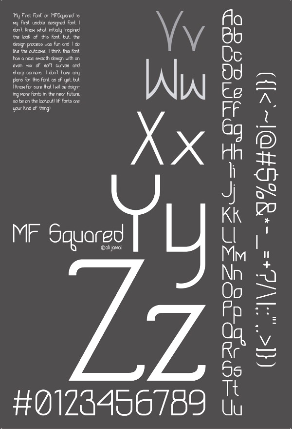
Portland, OR-based designer of MF Squared (2013). [Google] [More] ⦿ | |
During her studies, Alice Sellers-Subocz (Portland, OR) created the alphading typeface Oddpants (2015). [Google] [More] ⦿ | |
Graphic design student at Pepperdine University, who lives in Portland, OR. She created the art deco typeface Modcomb (2011). [Google] [More] ⦿ | |
Creator of the informal hand-printed No Bullies Allowed (2012, iFontMaker) while working as Second Grade teacher at the American School of Madrid. Alyssha is originally from Portland, OR. Fontspace link. [Google] [More] ⦿ | |
| |
Ampercamp
| Tyler Sticka (Hillsboro, OR), who runs Ampercamp, has made a graffiti font, Hip Slop (2009). Tyler Sticka is a designer, artist, speaker and educator who works at McAfee Design Studio. He has taught classes in typography, CSS and web design at the Art Institute of Portland. [Google] [MyFonts] [More] ⦿ |
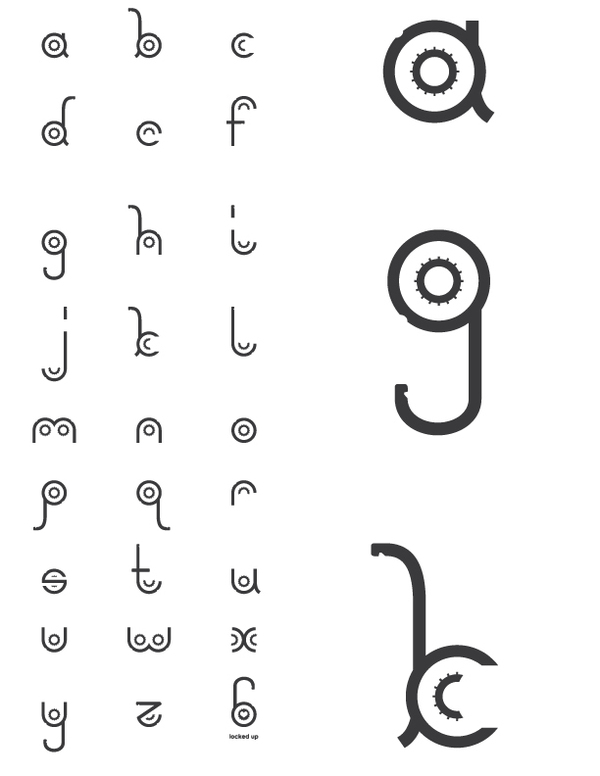
Andrew Lockhart (b. Sandy, OR) runs Andrew Lockhart Design in Montana, where he is a student at Montana State University. As a FontStructor, he made Thick Round, Sport Classic (athletic lettering face), Thin Stripe, Bold Stripe, and Stripe Bold in 2010. Locked Up (2010) is based on a vector image of a combination lock. Home page. Behance link. [Google] [More] ⦿ | |
Andrew S. Fuller
| |
Self-proclaimed illustratress in Portland, OR, with a beautiful web page intro: angie wang has not gone to art school and has not won any awards for illustration and got no job and no cats no dogs and no birds so dont give her no shit.She made a nice all caps illustrated alphabet called Space Nomads (2009). Behance link. [Google] [More] ⦿ | |
Graphic designer and illustrator in Portland, OR, who studied at the University of California Santa Cruz (2002-2007) and Portland Community College (2012-2015). She created the modular display typeface Isidoro (2015). Behance link. [Google] [More] ⦿ | |
Designer and illustratorv in Portland, OR. In 2014, she created the hand-drawn party typeface Birthday Cake. Behance link. [Google] [More] ⦿ | |
At Portland State University, Annie Ton designed the delicate serif typeface Eleva (2019). [Google] [More] ⦿ | |
Portland, Oregon-based designer of these typefaces in 2019: Countdown (spurred; Rough, Outline & Ornament), Countdown Ville, The Hotling (brush font), Sihaloho (signage script), Blues Vacations, Hacrley Serif, Roller Coaster (Victorian), Orlando (a monoline signature font), Fairing Brush (a Halloween brush font), Lydiani, Rusty The Buttcher, Anetha Faith Signature, Gibsons Co Vol.2, Tunnels (dry brush), Hellena Jeslyn (a signature font duo), Gibsons Co, Saint Quard Serif, The Wolfman SignPainted, The Beatcher Typeface (a vintage all caps titling typeface). Typefaces from 2020: Marotho, Leatherhand Stencil. Typefaces from 2021: Future Unwritten, The Luxury (Sans, serif), Theodore Bagwell (font duo), Chammer Beauty, Broken Letters, Manasco (stencil), PQRS Handpainted, Holluise Vintage, Freestyle. [Google] [More] ⦿ | |
Portland, OR-based handwriting consultants and authors of Portland State University's handwriting book Write now: a complete self-teaching program for better handwriting (Portland, OR: Continuing Education Press, Portland State University, 1991). Earlier, they also published Italic letters: calligraphy and handwriting (1984, New York: Van Nostrand Reinhold Co). [Google] [More] ⦿ | |
Graduate of the Parsons School of Design. Designer and illustrator in Portland, OR. Behance link. For the Osh Kosh company, he created a hand-printed corporate family in 2011. [Google] [More] ⦿ | |
Portland, OR-based designer who is working on this italic pixel face in 2007. [Google] [More] ⦿ | |
Graphic designer in Portland, OR. Behance link. Creator of the monoline rounded sans typeface Oyster (2011). [Google] [More] ⦿ | |
Portland-based youngster (b. 1990), who created the art deco typeface Simcha (2008), which can be downloaded from Dafont. [Google] [More] ⦿ | |
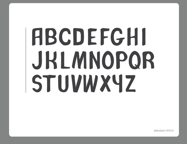
Typefaces designed by Ffitch in 2012 include Agoraphobia (spurred display face), and A Fans Notes. [Google] [More] ⦿ | |
Bruised Goods
| Oregon-based graphic designer. Her typefaces: Aqua, Beach Club, Coastal, Dawn Patrol, Drifter, Floridian, Islander, Kona, Lakeside, Mangrove, Mavericks, North Shore, Oasis, Opal, Pelicano, Sand Bar, Summer, Surf Camp, Tequila. [Google] [More] ⦿ |
At George Fox University, Canby, OR-based Brynn Schwary designed the runic emulation typeface Newport, which, according to her, is inspired by Newport, OR. [Google] [More] ⦿ | |
Busted Zipper
| Portland, OR-based designer of the playful typeface Cherry On Top (2013). [Google] [More] ⦿ |
Carl Anderson
| |
Carl's Web Log
| Type web log run by Carl Anderson in Portland, OR. Carl Anderson is the designer of Cyclist (2005), a font done as a project in Amy Conger's class at the City College of San Francisco. [Google] [More] ⦿ |
At The Art Institute of Pittsburgh-Online, Carole Robare (Mill City, OR) designed the curly typeface The Black Stallion (2016). Behance link. [Google] [More] ⦿ | |
Portland, OR-based designer. Her first font is Crown (2009), a heavy sans. [Google] [More] ⦿ | |
| |
C.C. Stern Type Foundry
| The C.C. Stern Type Foundry (Portland, OR) was founded as a working museum and metal type foundry in 2009. The mission of the C.C. Stern Type Foundry is to cultivate a unique connection between industry and the arts in the Pacific Northwest. The organization is one of the few operating type foundries between San Francisco and Vancouver. The organization's ability to make metal type and decorative print elements, and to share that craft with the community, fills a growing need within the Pacific Northwest's network of designers, letterpress printers and book artists. The C.C. Stern Type Foundry honors the memory of C. Christopher Stern, who built and operated the foundry at Stern&Faye, Printers of Sedro-Woolley, Washington. It is run by Jeff Shay (involved in the Museum of Metal Typography), Brian Bagdonas, Rebecca Gilbert, Chris Chen, Connie Blauwkamp and Joseph Green. Jeff Shay is a printer and photographer who has been making fine art for over 20 years. Jeff earned a Bachelor of Fine Arts with Distinction (magna cum laude) in Photography/Fine Art from Art Center College of Design in 1992. Jeff's hands-on printmaking instruction includes lab instruction at Art Center, where he instructed students in and demonstrated photogravure, intaglio etching techniques and lithography. He currently provides private instruction and printing services for artists through his company, Buzzworm Studios. Jeff brings experience in non-profit board positions including past roles as Board Treasurer and Chairman of the Personnel Committee for Food Front Co-operative Grocery in Portland, Oregon. [Google] [More] ⦿ |
Cedar Publishing
| Type designer, b. Hillsboro, OR, 1957, who got interested in fonts while working as a typesetter on a Linotype typesetting machine at a small newspaper in San Diego in the late 1970s. He recently began designing fonts working from old galleys to resurrect some of the old fonts he used to use, and has decided to make these fonts available to the public. Fonts made by Luke Owens (Cedar Publishing): Owens (1994), Endorse (1995), Same-Sex Marriage Script LDO (2004: script face), Broadsheet LDO (2002: Regular, Bold, Italic, Bold Italic), Oregon LDO (an extensive sans family, 2004: Regular, Bold, Black, Oblique, Bold Oblique, Black Oblique), Portland LDO (Regular, Bold, Italic, Bold Italic, 2004: based on Palatino), Snail Mail LDO (2004), Oregon LDO Condensed (Regular, Bold, Black, Oblique, Bold Oblique, Black Oblique), Oregon LDO Extended (Regular, Bold, Black, Oblique, Bold Oblique, Black Oblique), Oregon LDO Vanishing (Regular, Bold, Oblique, Bold Oblique), Waukegan LDO (2004, another sans family: Regular, Bold, Black, Oblique, Bold Oblique, Black Oblique: based on Eurostile) and Waukegan LDO Extended (Regular, Bold, Black, Oblique, Bold Oblique, Black Oblique), and the family 1066 Calligraphy (1999). Pic. Fontspace link. [Google] [MyFonts] [More] ⦿ |
Free Mac font Gaeilge at the Yamada site of the University of Oregon. [Google] [More] ⦿ | |
Ceol Ryder is currently studying Visual Communication in the Limerick School of Art and Design. He designed Clipper (2010), an experimental alphabet based on clippers. Not sure if this was ever made into an actual font. [Google] [More] ⦿ | |
American creator (b. 1979) of an artificial language font, Common Radian (2009), which is based on an alphabet used by characters in The Peacock King. She lives in Portland, OR. [Google] [More] ⦿ | |
Chelsea Weaver (Portland, OR and before that, Camarillo, CA) studied graphic design at California State University Channel Islands. She designed Newspaper (2012, an experimental typeface) and Piri Piri (2013, a curvy display typeface). [Google] [More] ⦿ | |
At Linn Benton Community College in Salem, OR, Cheri Shones (Dallas, Oregon) designed a typographic Bettie age poster in 2015. Behance link. [Google] [More] ⦿ | |
The typophiles (mostly Wendell Pepperdine from Eugene, OR) discuss some issues related to math fonts after an initial complaint about Cambria+Math. Some passages:
| |
Chris Papasadero
| |
Colby Brooks is an illustrator and designer living in Portland, OR. Designer of a 3d face. [Google] [More] ⦿ | |
Nike product designer in Portland, OR, who created a modular display typeface in 2016. In 2017, he designed the piano key typeface Typeset One. Behance link. [Google] [More] ⦿ | |
Successful graphic designer in New York City. As a student in Corvallis, OR, Darrin Crescenzi designed Darrin Type (2006), a roman caps face. Later, he created the octagonal typeface Gratton. [Google] [More] ⦿ | |
| |
Dave Fenwick
| |
Dave Fenwick
| |
Designer of Apollo and AmericanUncial in 1992, and of the Western font Western Slant (1992). Based in Medford, OR. [Google] [More] ⦿ | |
Dustin Lee
| |
Portland, OR-based creator of the Victorian typeface Wishbone (2012). PDF file. Emilee is a graduate of the Art Institute of Portland with an BA in Graphic Design. [Google] [More] ⦿ | |
Graphic design student at the University of Oregon. Creator of a comic book typeface in 2012. [Google] [More] ⦿ | |
enStep Software
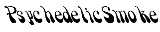
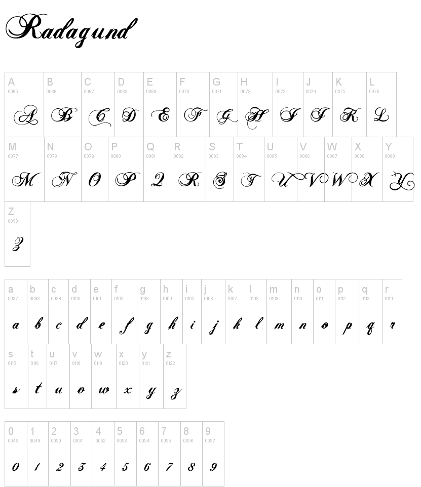
| Clip art and brush script fonts at this Beaverton, OR-based outfit run by Fritz Richard. From the web page: The ImageFonts UltraPak (CD) features over 600 one-of-a-kind typefaces for Windows and Macintosh. ImageFonts come in four flavors, Mac TrueType, Mac Postscript, Windows TrueType and PC Postscript. Some claim that the fonts are rehashed public domain fonts. The enStep font collection found mostly on archives (such as here) is dated 1997. It is largely worthless, though. As an exercise, see if you can recognize which original fonts are were used to obtain these enStep fonts: Casmira, Ellis, Excess, Justice. Free at Dafont: Radagund (script face), Puppylike (psychedelic). Dafont link. Old (dead) link. [Google] [More] ⦿ |
Behance link. T26 link. [Google] [More] ⦿ | |
Foam Train Font Foundry
| Free truetype fonts (PC, Mac) by Andrew Fuller from Portland, OR (was: Lincoln, NE), at his Foam Train Font Foundry: MMMCarbony, Buddy, Derez, Derez Hitek, Deltoid, Gloopy, Hobbit Tattoo-Brush, Hobbit Tattoo-Sloppy, Reeeally Quik Hand, RoundyButt, Unserif, DryToastCaps, Iron Filings, Eeewww Messy Boy, Thirty Months of Victory (2002, handwriting), LeakyPen (2002), Early Western Greek, Samaritan 300BC (2002), Face Eater, Fingerpaint Sans, Ingloriouser (grunge), Rat Brain, Tory Gothic Caps, Lumpin, Wendus, and InsideOut Cow. Commercial fonts include Blackburn Hand, Salted Slug, Satavahana 200AD (2003), Face Eater, Fingerpaint Sans, Gloopy, MMM Carbony, Rat Brain, Reeeeally Quik Hand. This site has a great glossary as well as subpages on type history, classification, and anatomy. Dafont link. Old URL. [Google] [More] ⦿ |
A font pairing design resource, which seems to be run by Extensis, a Portland, OR-based software company. [Google] [More] ⦿ | |
Portland, OR-based designer of the heavyweight industrial typeface Carbide (2017) and the neo deco typeface Quartz (2017). Behance link. [Google] [More] ⦿ | |
Fritz Richard
| |
Future Fonts
| Future Fonts is run by Lizy Gershenzon and Travis Kochel of Scribble Tone, with James Edmondson of OH no Type Co helping shape and grow the community. Scribble Tone is a design studio in Portland, Oregon, known for designing experimental typefaces like FF Chartwell. OH no Type Co is a type foundry in San Francisco that published Hobeaux and Vulf Mono. Both Travis and James also teach typeface design. Travis is currently an adjunct professor at Portland State University, while James teaches Type at Cooper West. On launch in 2018, Future Fonts showed the work of Inga Plönnigs, Dave Coleman, Ryan Bugden, Rüdiger, Sun Helen Isdahl Kalvenes, Erik Marinovich, Acute Studio, Teo Tuominen, Jake Fleming, JazzMaType, OH no Type, and Scribble Tone. [Google] [More] ⦿ |
Fwis
|
|
[T-26] designer of the organic typeface Steam, the hand-drawn typeface Omatic, and the mixed LC/UC typeface Spoing. He runs Omitic Design in Oregon. [Google] [MyFonts] [More] ⦿ | |
Glitschka Studios (was: Pixel Monkey)
| Von R. Glitschka's fonts, including PixelvilleLowRes (2000, available from T26), a phenomenal pixel font with interesting typefaces. At T26 he designed Spazorific and Whatevur (2000). He also designed the nice grunge font Frazzle in 1996 at Utopiafonts. In 2001, he started Pixel Monkey Studios, but that site disappeared in 2002. In 2002, Von started Glitschka Studios in Salem, OR, where he lives. In 2003, he created the dingbat font Dark Morsels at Union Fonts. In 2011, he experimented with iFontMaker, and created the 3d hand-printed face Kerfuffle. Klingspor link. [Google] [MyFonts] [More] ⦿ |
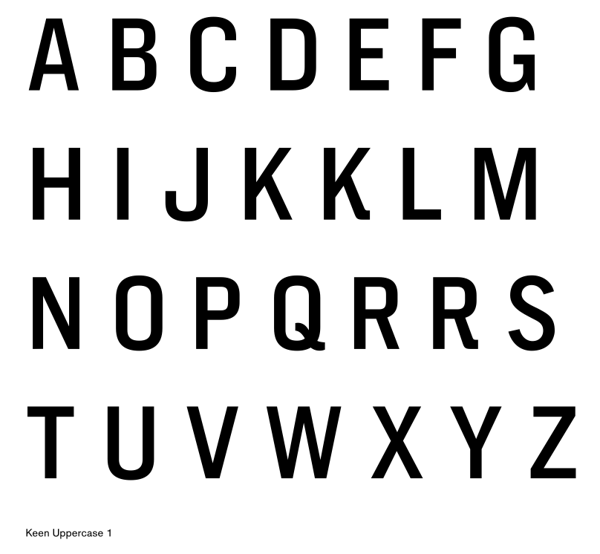
Gus Nicklos (Portland, OR) created a grotesk caps typeface, Keen (2013) that is based on Trade Gothic, Akzidenz Grotesque and Knockout. Behance link. Klingspor link. [Google] [More] ⦿ | |
Harried Type
| Portland, OR-based designer of the hand-printed typeface Granite Letter (2013), the experimental typeface Moonblock (2015), the pixel typeface Protovision (2015), the techno typeface Anchorage (2015), the crayon typeface Autumn Pixels (2015), Barcode Decol (2015), and the hairline squarish typeface Granite Mode (2015). Typefaces from 2016 include Granite Postmodern and the squarish Turntable Aux (2016). Typefaces from 2017: Fuzzface, Graytype, Ventures. Typefaces from 2018: Microchip (an LED or MICR font), Aroundabout (circle-themed), Blakeman Hand, June 5. Dafont link. Old personal URL. [Google] [More] ⦿ |
Harry G. Blakeman
| |
Harry M. Troeger
| |
Harrys Design (was: Harry's Font Page)
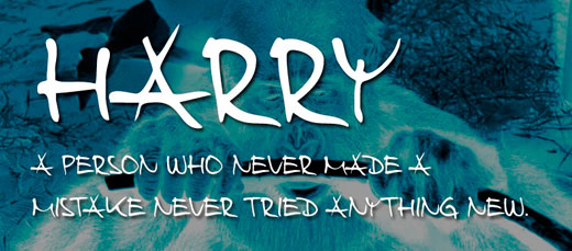
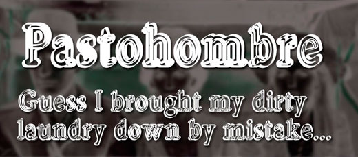
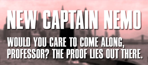
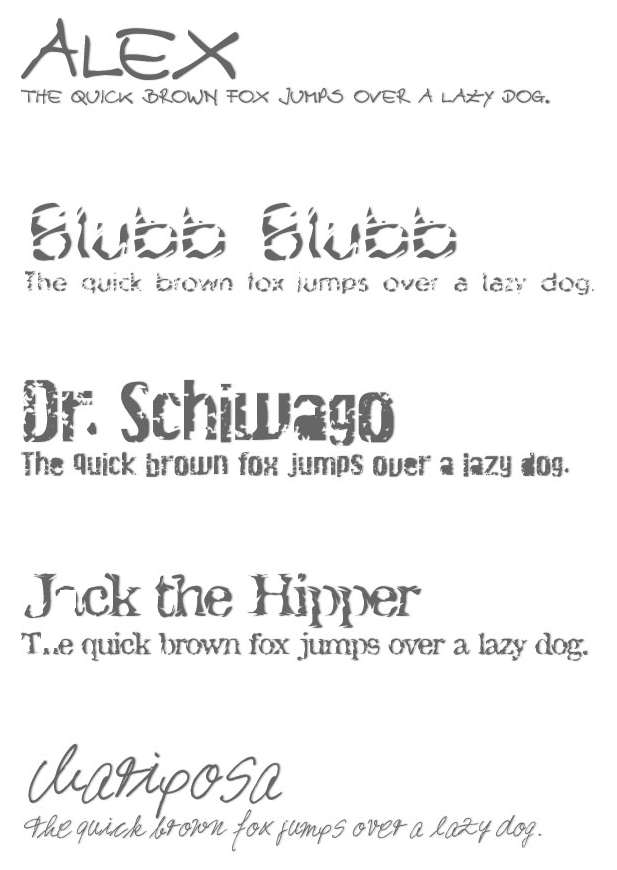
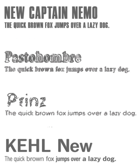
| Harry Troeger (or Harald Tröger, Harrys Design, b. 1963, Germany) is the creator of many typefaces. He was originally from Marktredwitz, Germany, but moved to Cascade Locks, OR, where he still lives. Harald Tröger's own designs include Jack the Hipper, Dr. Schiwago (grunge), Alex (hand-printed), Prinz Regular, Mariposa, Kehl New (a custom font for a German company), Harry (hand-printed), Pastohombre (dymo label font), Thumb, Blubb and New Captain Nemo. Generally handwriting or grunge type. |
In 2013, she published the mixed glyph caps typeface Bits N Bobs, Sqwash, Fire Within (letters in circles), and Castal Street (curly script). Typefaces from 2014: Captain A. | |
Graphic designer in Portland, OR, who created the spurred display typeface ShadowFont (2014). [Google] [More] ⦿ | |
Ian Lynam
| |
Before Ian Lynam Creative Direction and Design, Ian was involved in Wordshape, and I guess he still is. The main people are Ian Lynam, Simon Gane and Selena Hoy. MyFonts link. Creative Market link. [Google] [MyFonts] [More] ⦿ | |
Ihrig Communications
| Mark Ihrig (Gresham, OR) is the designer of the dingbat font Oregondin (1995, revision in 1997). The font has been published in Japan's Hyperlib Magazine and used as artwork in a novel by Charlotte Vale Allen. He has worked in Oregon Broadcast Media for 15 years, including creative web design at Ihrig Web Design. His font can now be bought at MyFonts under its commercial name Oregon Dingbat. [Google] [MyFonts] [More] ⦿ |
Hamburg, Germany-based designer who interned in Portland, OR. Her typefaces include Happy Holidays font (2014), useful for Christmas cards. She also created Fall Vacation Icon Set (2014) and Squibs (2015, a sans typeface with sufficient quirkiness to make it attractive for children's books). [Google] [More] ⦿ | |
Designer from Lebanon, OR (b. 1986), who created Funkified (2002) and Jack's Handwriting (2004). [Google] [More] ⦿ | |
Jake Pumpelly (b. 1978) at jizzus.com is the Portland, OR-based creator of Jizzus (2002). Alternate URL. [Google] [More] ⦿ | |
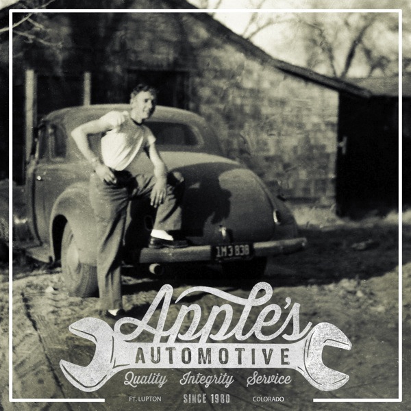
During his studies in Portland, OR, James Martyn created a typographic poster entitled Apple's Automotive (2013). Behance link. [Google] [More] ⦿ | |
James Moore (Portland, OR) created a psychedelic lettering poster of a sheep in 2013. Behance link. [Google] [More] ⦿ | |
Portland based designer and illustrator who made Blobz (2009, in EPS format only). [Google] [More] ⦿ | |
Jeff Shay
| |
Jeri Ingalls
| |
Jeri's Fonts
| Jeri Ingalls (Newport, OR) designed quite a few typefaces and dingbat fonts just after the turn of the new millennium. These include JIWatermelon (2000), Paxil (with Apostrophe [dead link]), FuturexBugz, JIBalloonCaps, JIBaseball, JIBowlingBalls (2003), his Mexican simulation typefaces (JIBurrito, JIChimichanga, JIFajita, JIMargarita, all made in 2001), JIChubbyCaps (2003), JIChunkyCaps (2003), JIColorCrayons, JIDuckabushCaps, JIFlowerVines, JIHoneybees, JIKaleidoscopeBats2, JIKaleidoscopeBats3, JIKaleidoscopeBats4, JIKaleidoscopeBats5, JIKaleidoscopeBats, JIMarshmallowRoast, JINoodles, JIPearlNecklace, JIPicketFence, JIRibbon, JISawblade, JISeeds, JIShinySeeds, JISolidBalloonCaps, JIStarfish, JISunflower, JIAcorn, JINatureBats, Belfry, Deschutes, Skookumchuck (2001), Tracks, SwissCheese, Stickerbush Caps, Toy Train, BunnyCaps (2002), Lilliwaup (2002, sans serif), JIPumpkins (2002), JIAcorn (2000), JINatureBats (2000), JIBelfry (2001), JIDeschutes (2001), JIHiddenVines (2006), JIManhattan (2001), JIStickerbushCaps (2002). Dafont link. Fontspace link. Fontsy link. [Google] [More] ⦿ |
Portland, OR-based creator of the free hand-printed typefaces Brains (2013) and Bray (2011). Aka The Art Institute of Portland. Dafont link. Home page. Fontspace link. [Google] [More] ⦿ | |
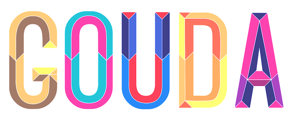
Graphic designer in Portland, OR, who created the beveled typeface Gouda (2013) for a school project at Portland State University. Behance link. [Google] [More] ⦿ | |
Designer of a few free Palm Pilot fonts (suffix .pdb). Based in Portland, OR. See also here. Linkedin link. [Google] [More] ⦿ | |
Designer in Portland, OR, where she studies at the Pacific Northwest College of Art. Joan drew a calligraphic penman script unfortunately called Grunge in 2010. Home page. [Google] [More] ⦿ | |
| |
John Skelton
| |
Graphic designer in Portland, Oregon who studied at The University of Oregon. He designed the sans family Exfoliant (2004). [Google] [More] ⦿ | |
Johnny Vance (b. 1980) is the Oregon-based designer of the brush typeface Pancake Slims (2014). Dafont link. [Google] [More] ⦿ | |
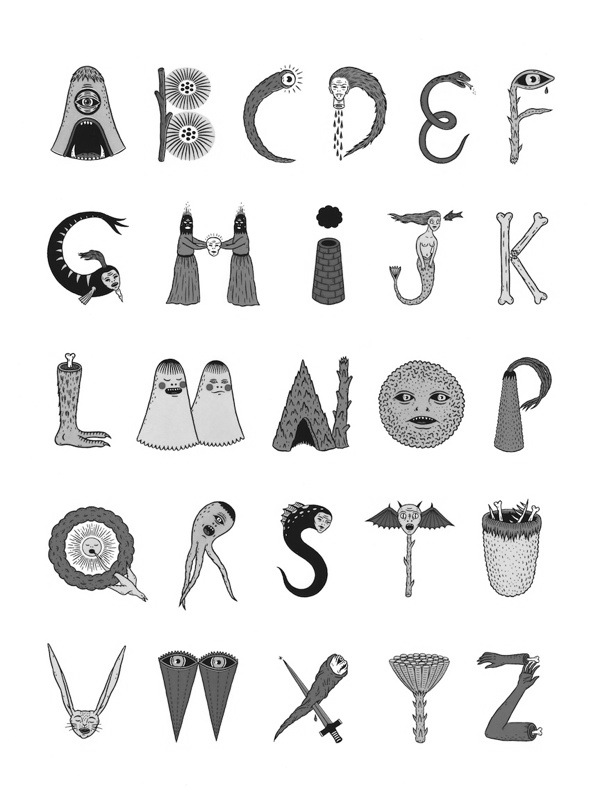
Graduate of The Maryland Institute College of Art, where he earned a BFA in Illustration. Portland, OR-based designer of an alphabet in 2012 that consists of bizarre flora, fauna, monsters and objects. Behance link. [Google] [More] ⦿ | |
| |
In 2018, he designed the sans typeface Airfare. [Google] [More] ⦿ | |
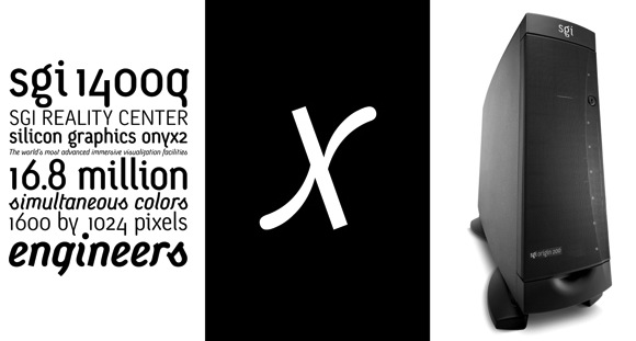
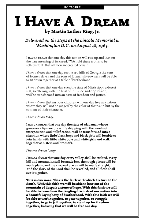
Portland, OR-based creative director where he works at Nike. Before settling at Nike in Portland, he worked at Landor Associates, Stone Yamashita Partners, Chronicle Books, Pentagram, and CKS Partners and was living some of that time in San Francisco. He graduated from the College of DAAP at the University of Cincinnati. His type designs include the Sgiv1Text family in 1999, at first done as an OEM for Silicon Graphics Inc. This SGI corporate typeface evolved a couple of years later into the retail font Monolein (T-26). He also designed the Sempra Energy Corporate Typeface and the modern family ITC Tactile (2002). The latter font family won an award at the TDC2 2003 competition. FontShop link. Klingspor link. Behance link. [Google] [MyFonts] [More] ⦿ | |
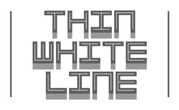
Illustrator and designer in Portland, OR, Mosinee, WI, and/or Marshfield, WI, who created the blocky poster typeface Attack (2015), the squarish inline typeface Thin White Line (2010) and the slab serif typeface Slumbo (2013). Behance link. Home page. [Google] [More] ⦿ | |
During his studies at The Art Institute of Pittsburgh Online, Salem, OR-based J.T. Hammond created the pointy display typeface Labyrinth (2015). [Google] [More] ⦿ | |
Portland Studios illustrator. Designer of Biscuit Boodle Ornaments (2009, Insigne), a font that accompanies Jeremy Dooley's Biscuit Boodle (2008). [Google] [MyFonts] [More] ⦿ | |
Kait McNally
| |
During her studies at Pacific Northwest College of Art, Portland, OR-based Kami Karras designed the manneredyet curvy display typeface Wendy (2017). [Google] [More] ⦿ | |
Portland, OR-based designer of 15 fonts called Nike Numerals (2014) for Nike. Behance link. [Google] [More] ⦿ | |
Katie Johnson (Portland, OR) created the Drip Tickle typeface in 2013. It was developed as a logotype for Dollop Art LLC. Behance link. [Google] [More] ⦿ | |
Graduate of the University of Oregon, with a B.S. Degree in Digital Art and Minors in Fine Art and Communication Studies. Kelli Urabe currently works as a Graphic Artist at Sign Pro Eugene, OR. Creator of the Hawaii-themed typeface Hawaii Grown (2013). Behance link. [Google] [More] ⦿ | |
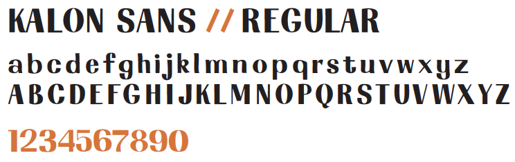
Graphic design student at Portland State University, OR. She created Kalon Sans (2012). [Google] [More] ⦿ | |
Graphic designer in Portlkand, OR, who created a display typeface in 2014. [Google] [More] ⦿ | |
Kris Holmes worked as a staff designer at Compugraphic Corporation in type design. She was part of the team that helped design the city fonts for Apple: Chicago, Geneva, Monaco, New York. [Kris did the truetype versions.] She founded the Bigelow&Holmes foundry in 1976 with Charles Bigelow. Kris Holmes has created over 300 typefaces, including the scripts Isadora, Kolibri, Apple Chancery, and Apple Textile. With Charles Bigelow, she co-designed Apple Capitals. Creator of the ubiquitous Lucida family around 1985 (with Charles Bigelow): Lucida Blackletter, Lucida Bright, Lucida Calligraphy, Lucida Casual, Lucida Console, Lucida Fax (1985), Lucida Handwriting, Lucida Math, Lucida Mono, Lucida Sans, Lucida Sans Typewriter, Lucida Typewriter (1994), Lucida. includes Greek, Cyrillic, Arabic, Hebrew, Thai, and Devanagari scripts. In addition to their popularity in computer operating systems like Macintosh OS X, Microsoft Windows, and Plan 9 from Bell Labs, Lucida typefaces have been widely used for scientific and technical publishing in Scientific American, Notes of the American Mathematical Society, and other mathematical, technical and scholarly books. Also with Bigelow, Kris designed the Lucida Icons, Stars, and Arrows fonts, which Microsoft later purchased and reassembled into Wingdings fonts. Other type designs by Holmes include ITC Isadora (1983), Sierra (1983, Hell: font now sold by Linotype), Leviathan (1979), Baskerville (revival in 1982), Caslon (revival, 1982), Galileo (1987), Apple New York (1991), Apple Monaco (1991), Apple Chancery (1994 [the Bitstream version is Cataneo]), Kolibri (1994, URW, since 2005 available as OpenType Pro with over 1200 glyphs), Wingdings (1990-1992, a dingbat font made with Charles Bigelow, now owned by Microsoft and Ascender) and AT Shannon (a simple lapidary sans family, with Janice Prescott, 1982, Agfa; now owned by Monotype Imaging). For the Go Project, Kris Holmes and Charles Bigelow designed the free typeface families Go and Go Mono in 2016. The font family, called Go (naturally), includes proportional- and fixed-width faces in normal, bold, and italic renderings. The fonts have been tested for technical uses, particularly programming. These fonts are humanist in nature (grotesques being slightly less legible according to recent research) and have an x-height a few percentage points above that of Helvetica or Arial, again to enhance legibility. The name Go refers to the Go Programming Language. . Fontsquirrel link. | |
KVC Design
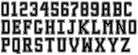
| Kyle Van Cleave (KVC Design, The Dalles, OR) designed the athletic lettering fonts Bucktooth Block (2017), USC (2017) and Oregon State (2017), the octagonal typeface Brute (2017), the sturdy copperplate font Midgard (2017), the national park font Woodsman (2017: Slab, Pillar, Spike), the weathered typeface Brawler (2017), and the squarish typeface Asgard Block (2017). Creative Market link. Behance link. [Google] [More] ⦿ |
Graphic designer in Portland, OR. Creator of New (2014, all caps sans), Slab Serif (2014), Swordplay (2014, beveled typeface), Granite (2014, a 3d typeface), Art Deco Sans (2014), and 3D Block (2014). Behance link. [Google] [More] ⦿ | |
Kyle Van Cleave
| |
Designer of the Adobe multiple master font Penumbra (1994). In its four styles, from Penumbra sans to Penumbra Flare, Penumbra Half Serif and Penumbra Serif, we see a gradual interpolation between a geometric sans and a Trajan-like classical roman serif headline face. Discussion by Phinney. MyFonts link. [Google] [MyFonts] [More] ⦿ | |
| |
Lauren Kilbane
| |
Portland, OR-based designer (City Limit Design) who created the paper fold ribbon font Galactic (2013). Behance link. [Google] [More] ⦿ | |
Lee Robson Spence
| |
Lee Schulz
| |
Portland, OR-based designer of the outlined art deco typeface Outré (2016). The typeface started based on drawings by team member CarrieAnn Rudolph. Other participants in the development, besides Linnea herself, include Keith Wallach, Kyra Gill, and Megan Jones. [Google] [More] ⦿ | |
| |
Lizy Gershenzon
| |
Lizy Gershenzon
| |
LRS Fonts and Lettering
| Portland, OR-based designer (b. Plymouth, UK) of the inline hexagonal typeface Envoyer (2017). Creative Market link. Behance link. [Google] [More] ⦿ |
Luke D. Owens
| |
Graduate of Fort Hays State University. Portland, OR-based designer of the decorative caps typeface Jubilee (2014). Behance link. [Google] [More] ⦿ | |
M U R
| MUR is a design collective with backgrounds and formal education that include fine art, graffiti, graphic design, web design, illustration, and architecture. They offer some commercial typefaces va MyFonts. M U R is located in Portland, OR. Type designers include Julia Moore, Richard Moore, and Ian Williams. Richard Moore (b. Ogden, UT, 1977) runs m u r Font Foundry, and made the children's handwriting font First Grade (2008) and the graffiti fonts REPTILE (2008) and DEJA SADK (2008). Myfonts link. m u r also sells the children's font Wee Ian (2008) by Ian Williams. Other fonts include Julia Spiky (2011, a spindly children's hand), Kids Crayon (2010), Graffiti Drips (2009), Blockbuster (2008, broken concrete slkab look), Putty Peeps (2008, letters shaped as putty-shaped people), Murmur (2011), Skinny Walrus (2013), Old School Tattoo (2013), Rich Handwriting (2013), and Top Heavy (2008). [Google] [MyFonts] [More] ⦿ |
Student at Pacific Northwest College of Art in Portland, OR. Behance link. She created a bouncy alphabet in 2010. [Google] [More] ⦿ | |
Portland, OR-based designer of the birthday cake font You're Invited (2017). [Google] [More] ⦿ | |
Mark Caneso
| |
| |
Portland, OR-based designer of Rant Sans (2014). Behance link. [Google] [More] ⦿ | |
Mark Friesen
| |
Mark Ihrig
| |
Author of Nicholas Jenson and the rise of Venetian publishing in Renaissance Europe [Oxford, UK; Cambridge, Mass., USA : B. Blackwell, 1991]. From Book News Inc: Chronicles the story of how printing came to Venice in the 15th century and transformed the Italian city into the most commercially advanced power in Europe, publishing a fifth of the continent's books only 40 years after Gutenberg developed moveable type. Examines the values and careers of printing's financial backers, and the printers themselves. Focuses on the immigrant French printer, Jenson, his design concerns and business activities, the transition from manuscript to printed page, William Morris' championing of his typefaces in the 19th century, and the significance of those typefaces today. Annotation copyright Book News, Inc. Portland, OR. [Google] [More] ⦿ | |
Illustrator and designer in Portland, OR, who created the caps typeface Aspen (2011). Behance link. [Google] [More] ⦿ | |
During his studies at Portland State University, Matthew Jatip (Portland, OR) created the pine tree-themed display typeface Pine Fesh (2015). [Google] [More] ⦿ | |
Illustrator and designer in Portland, OR. Creator of a display typeface simply called Type in 2013. Behance link. [Google] [More] ⦿ | |
Eugene, OR-based designer of a squarish typeface (2016). Behance link. [Google] [More] ⦿ | |
Illustrator and letterer in Portland, OR, who designed the signage typeface Bohammer Script in 2015. Behance link. [Google] [More] ⦿ | |
Portland, OR-based designer of the outlined athletic lettering font Europe (2019). [Google] [More] ⦿ | |
Designer in Oregon of the gothic font Thorny (2002). [Google] [More] ⦿ | |
Mike Gaines
| |
As a student at Portland State University, Minh Le (Portalnd, OR) designed the cat-themed alphabet Meo (2017). [Google] [More] ⦿ | |
Graphic designer born in French Guiana in 1983, who is currently studying towards a Bachelors in graphic design in Portland, Oregon. Behance link. He created Viscera (2010), an unusual textured ornamental all caps face. [Google] [More] ⦿ | |
During her graphic design studies, Miru Morna (Lisbon, Portugal) created the modular display typeface Pier (2014). [Google] [More] ⦿ | |
Mondo Graphix from Mike Gaines
|
In 2013, he designed the scanbat typeface Sunnydale and the mini-stencil typeface Lou Gramm (based on the logotype of the band Foreigner). Dafont link. Fontreactor link. [Google] [More] ⦿ |
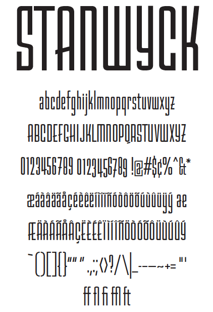
Portland, OR-based designer of Stanwyck (2013), a successfully executed display typeface that is based on film noir movie titles of the '40s and '50s. Behance link. [Google] [More] ⦿ | |
Codesigner, with Apostrophe at Apostrophic Laboratory, of Icklips, Pieces of Eight (a pirate dingbat font), and Powderfinger, all made ca. 2000. [Google] [More] ⦿ | |
Newsdesigner.com
| This was a news design blog run by Friesen, a news designer at The Oregonian in Portland, OR, who has dabbled in daily newspapers for nearly 20 years. He has also worked for the Columbia Missourian, the Gazette-Times in Corvallis, OR, and The Ledger in Lakeland, FL, as a reporter, copy editor, designer and design editor. |
Graphic designer from Selah, WA, who studied in Portland, OR, at the Pacific Northwest College of Art.. Behance link. Creator of Nordzig (2011, a tall rectangular face). [Google] [More] ⦿ | |
Illustrator in Eugene, OR, who designed the cut up Times New Roam typeface New New Roman (2016) and the art deco typeface WC Fields Deco (2016). [Google] [More] ⦿ | |
Beaverton, OR-based student. Creator of the experimental serif typeface Taurine (2006). [Google] [More] ⦿ | |
During her studies at the Art Institute of Portland in Portland, OR, Nicole Liu created the display typeface N-Type (2014, sans) and Leaf (2014, a decorative foliate typeface). [Google] [More] ⦿ | |
Portland, OR-based creator of the free handcrafted typefaces Pals (2017) and Bluff (2017) at iFontMaker. Behance link. [Google] [More] ⦿ | |
Portland, OR-based designer of the free techno typeface family Sonara (2019). [Google] [More] ⦿ | |
One Way Out
| Salem, OR-based foundry of Tony Knight which produces mostly display and headline fonts at about 15USD per font. The fonts are also available through T26. List: Alter-Ego, Aspire, AstroBoy, BeatStreet (1998, with Von R. Glitschka), BeatStreetIn-Line, Blitzkrieg, Damage-Light, Damage, Day3 (1996), Dimentia-Medium, Dimentia-Thin, Dimentia-Wide, Doo-Dads, ElNino, ElNinoRapido, Epidemic, Erratic, Erratic3-D, Espresso (1996, with Wanda Vinje), Frazzle (with Von R. Glitschka), Havoc (with John Nissen), HavvaNiceDay, Hoopla, HunkyDory (1998, with Von R. Glitschka), Hybrid (1996, with Dave Adamson), JiveTalk-Bold, JiveTalk, JollyRoger, Knucklehead, KnuckleheadBoxed, Lollygag (1998, with Von R. Glitschka), LostTribe, Lunatic (1996, with Wanda Vinje), Protoplazm (1996, with Dave Adamson), Ragamuffin, Reactor, Scooter, Shameless (1996, with Dave Adamson), Slackhappy, SlackhappyOutline, Slade, Squidly-Bold, Squidly (1998, with Von R. Glitschka), SurfCity, Thud (1996, with Michelle Seefeldt), Toxic, ToxicWaste, Twitch, WhosFrank, WhyKeeKee, Wisecrack, Yoo-Hoo. [Google] [More] ⦿ |
Oregon Avenue Design Studio
| Grants Pass, OR-based designer of the all caps sans typeface Modern Thrash (2019) and the spurred typeface Crime Dog (2019). [Google] [More] ⦿ |
Pacific Standard Type
| Graphic designer in Bend, Oregon. In 2006, he graduated from Art Center College of Design. He now lives in Bend. He developed Index Sans (2010), a large x-height sans family, the reverse contrast Tuscan Western font Cayuse (2019), and the handcrafted typeface Wynona (2020). [Google] [MyFonts] [More] ⦿ |
Paradigm Software Development (Portland, OR) offers their own Greek TrueType font used in GreekFlash Pro. Free. [Google] [More] ⦿ | |
Pat Snyder
| |
Peggy Dean
| |
Pete McCracken
| |
Pete McCracken
| |
Oregon-based designer of the rounded sans typeface Endura (2017, +Endura Rough). Creative Market link. [Google] [More] ⦿ | |
During her graphic design studies in Portland, OR, Phuong Ta created a set of Fresh Market icons (2014) and a custom display typeface for Nobal Home in Portland (2014). [Google] [More] ⦿ | |
Plazm Fonts
| Portland, OR-based company. Its timeline:
Write-up at Fontnews. Fonts also sold by Mindcandy. Bio of McCracken by ATypI: Pete McCracken is a type designer, designer, artist, musician and educator in Portland Oregon. He owns and runs Plazm Media with business partner Josh Berger. Current projects include 20+ custom typefaces for Nike, the recently published book "XXX The Power of Sex in Contemporary Design", and an extensive branding project for Pierce Brosnan. He also owns and runs Crack Press producing music and custom artwork using silkscreen and letterpress. Current projects include a 43 color commissioned screen print of the Last Supper; Heavy Grass, a metal bluegrass band; and a cd of various compositions called Crack Tracks. He also teaches in the design programme at PNCA. Plazm link. FontShop link. Klingspor link. [Google] [MyFonts] [More] ⦿ |
Portland Type Co
|
Gallery of Pete's design and custom type work. Personal web site. Pete lectures at Pacific Northwest College of Art (or PNCA). His articles at PNCA include an interview with Jonathan Barnbrook and a discussion of web fonts. Speaker at TypeCon 2013 on How to Become a Rich and Famous Type Designer. Bloggers are praising his presentation. FontShop link. Klingspor link. [Google] [MyFonts] [More] ⦿ |
ps type (was: ppwrkstudio)
|
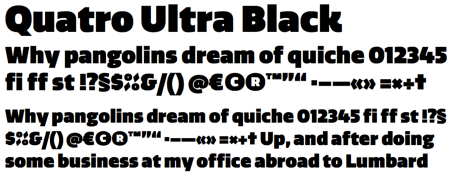
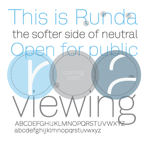
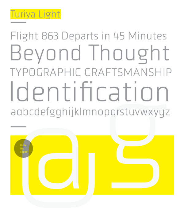
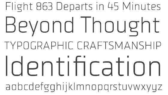
His typefaces include the free sans Quatro and the commercial contemporary sans FB Ratio (2009, Font Bureau, a sans family in 6 styles that grew out of ps Ratio and ps Ratio Headline). In 2009, Quatro became commercial. It was followed by ps Quatro Slab and Quatro Ultra Black in 2010 and Quatro Sans in 2012. Other typefaces include Campaign Grotesk (2015, FontShop), ps Caneso (2010, monoline sans), Runda, ps Untitled, ps Untitled Sans, ps Turiya Light (2009, organic sans), ps Runda (2010, sans), ps Neplus Ultra (2010, ultra thick slab), ps Dot Test (dot matrix face), and ps Fovea (2009, contemporary slab). Also in the works is the dot matrix typeface FF Diode (2009). Typefaces from 2016: Hatch (slab serif, which can be bought here). Typefaces from 2017: Ditch (a great inline typeface), Blue Sky (a sans family for branding). Typefaces from 2019: Pika Ultra (an ultra fat script). Typefaces from 2020: Campaign (Sans, Serif, Slab). Typefaces from 2021: Decoy (a 12-style soft inky serif), Hoss Grotesk (Hoss Sharp and Hoss Round: grotesques), Condenser (a 36-style condensed sans family), Hegante (a fat brush typeface), Naylor Stencil (a custom typeface for Brooklyn-based artist Jason Naylor). |
Graphic designer and illustrator in Portland, OR. Creator of the decorative typeface Rot (2014). [Google] [More] ⦿ | |
In 2018, he designed Lifted at Future Fonts. [Google]
[More] ⦿
| |
RetroSupply Co
|
Typefaces from 2016: Night Hawk (art deco), Over Easy (art deco), Leutner (multilined: the text is unclear whether Dustin designed this himself, or whether Aaron Sechrest is the designer), Transistor (super-condensed, retro), Komrade (a layered constructivist font), Firebox (a western typeface co-designed with Scott Fuller). Typefaces from 2017: Blockprint, Machine Shop. Typefaces from 2021: Lovestruck (psychedelic). Behance link. Creative Market link for Dustin Lee. [Google] [More] ⦿ |
| |
Richard Moore
| |
Graphic designer from Portland, OR. Behance link. He made an all-caps alphabet with rings in 2010. [Google] [More] ⦿ | |
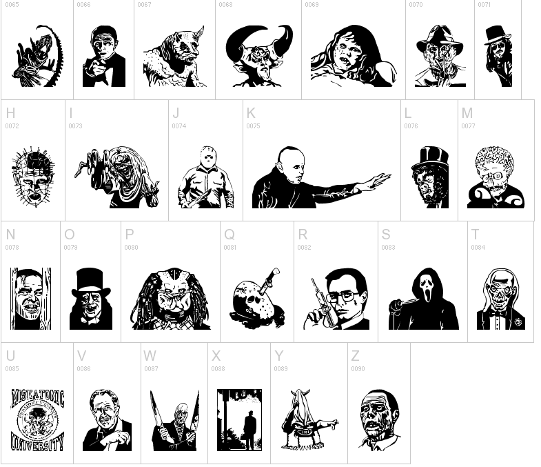
Illustrator and designer in Portland, OR, who created Slasher (2015), a horror movie / comic book brush font. [Google] [More] ⦿ | |
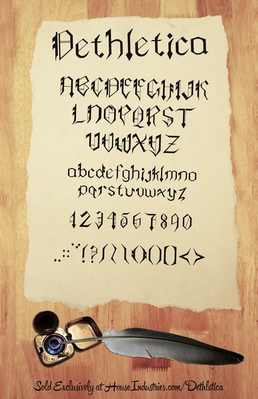
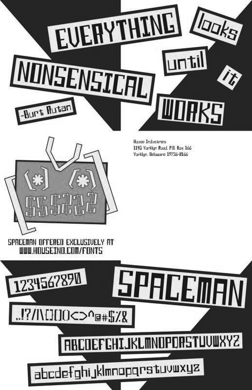
Designer and illustrator in Portland, OR, who created Dethletica (2012), a gothic semi-blackletter typeface that can be bought at House Industries. Spaceman (2012) is a squarish techno typeface. [Google] [More] ⦿ | |
Portland, OR-based designer (b. 1986) of the hand-printed typeface Sara Scribbles (2014). Dafont link. [Google] [More] ⦿ | |
Sarah Cannon (Portland, OR) created the condensed display typeface Geraldine (2013). Behance link. [Google] [More] ⦿ | |
Portland, OR-based designer of Cast (2016), a display typeface inspired by Plato's allegory of the cave. [Google] [More] ⦿ | |
SchoolHouse Fonts
| Commercial educational fonts from Signature Software, aka vLetter, run by Dave Fenwick. Includes D'Nealian and Zaner-Bloser style schoolhouse fonts. All demos are complete except for the lower case a. Defective web page. Schoolhouse Fonts is a product of vLetter, Inc., 509 Cascade, Suite H, Hood River, OR 97031, USA. [Google] [More] ⦿ |
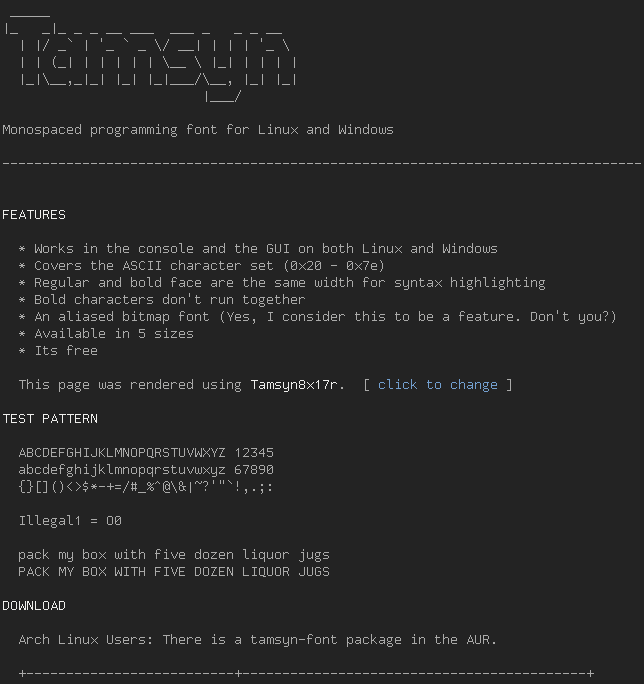
Creator of the free monospaced pixel programming font Tamsyn (2011). He writes that two styles were derived from Gilles Boccon-Gibod's Monte Carlo face. Other inspiration came from Gohufont, Terminus, Dina, Proggy, Fixedsys and Consolas. Scott Fial is with Fial Incorporated in Oregon City, OR. Scribus link. [Google] [More] ⦿ | |
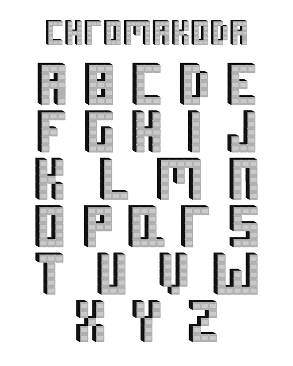
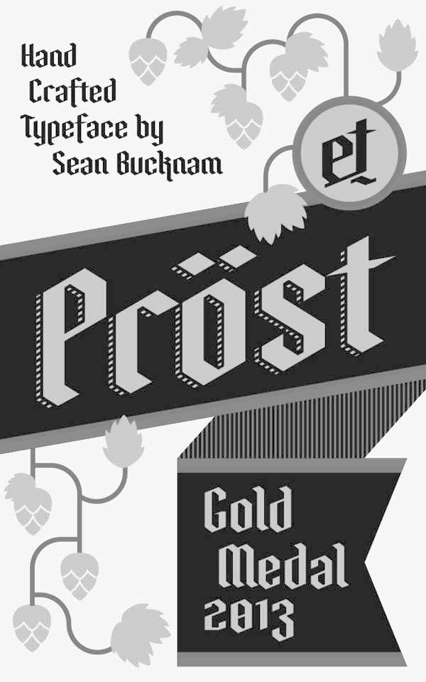
Portland, OR-based designer of Chromakoda (2012, a 3d typeface) and Prost (2013, a blackletter typeface inspired by German beer packaging). [Google] [More] ⦿ | |
Signature Software (or: Vletter Inc.)
| Expensive, so-so quality signature/custom handwriting fonts at this company run by Dave Fenwick. Signature Software, Inc., 489 N. 8th St. Suite 201, Hood River, OR 97031. About 100 US dollars per handwriting font. West Europeans pay almost double. Demo fonts for personal handwriting, as well as D'Nealian and Zaner-Bloser style schoolhouse fonts. All demos are complete except for the lower case a. Alternate URL. The company is also called Vletter Inc What I find incredible is that the home page says that over 75,000 handwriting fonts have been sold. That adds up to a nifty 7.5 million dollars in raw income over a twelve year period. Alternate URL. Their children's font series DMOACursive (2000) and DMOBCursive (2000) was posted on alt.binaries.fonts in November 2002. It also sells handwriting fonts of US presidents such as Abraham Lincoln, George Washington, Thomas Jefferson, John Adams, as well as a font in the style of the Declaration of Independence. In 2017, they published the handcrafted typeface family Dakota. Inside that font, the dates are 1994, 1999 and 2015, and the design is attributed to Dave Fenwick and Doug Dyer. [Google] [More] ⦿ |
Snyder Fonts
| Dead link. Fonts made and sold by Coos Bay, Oregon, high school teacher Pat Snyder. Snyder's Mac shareware fonts: MarkerFeltThin, MarkerFeltWide, MarkerFinePoint, SnyderSpeed, ComicsCarToon, BrushStrokeFast, StarsAndStripes, NeedlePointSew, OregonWet, OregonDry, HeavyHeavyFat, ThinThinSlim, Comics. Some fonts were here. Abstract Fonts link. [Google] [More] ⦿ |
Portland, OR and Sintra, Portugal-based designer of Rotating Typeface (2014, experimental). Behance link. [Google] [More] ⦿ | |
During her studies at acific Northwest College of Art, Portland, OR-based Stephanie Dickerson designed a slab serif typeface (2018). [Google] [More] ⦿ | |
Stone Type Foundry
|
At ATypI 2007 in Brighton, he spoke about The foundation of the humanist sans serif. As of 2008, his entire collection can be licensed for 20 computers in an educational lab for just 300 dollars. Scripps College pages. CV at Agfa. Bio at Linotype. Page at Emodigi. His lecture in 2007 on W.A. Dwiggins. PDF file of his work. Signature. 2012 Newyear's card. Interview by MyFonts in 2014. FontShop link. Klingspor link. View Sumner Stone's typefaces. Summary overview of Sumner Stone's typefaces. [Google] [MyFonts] [More] ⦿ |
Sumner Stone
| |
During her graphic design studies, Susie Morris (Portland, OR) created the experimental typeface Alpine (2012). [Google] [More] ⦿ | |
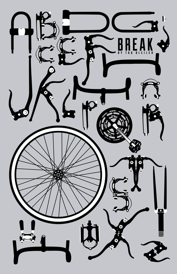
Portland, OR-based creator of the ornamental caps typeface Break Display (2012), which was inspired by bicycle parts. [Google] [More] ⦿ | |
Taurie Davis (Portland, OR) created the rounded display typeface Geppetto (2013) and the serif typeface Maven (2013). Behance link. [Google] [More] ⦿ | |
The Pigeon Letters
| Portland, OR-based designer of the script typefaces Murellet (2017) and Bulbul (2017). Creative Market link. [Google] [More] ⦿ |
The Printers
| Foundry in Nehalem, OR, run by Aaron Bogle. His Fire Ladder (2011) imitates a vintage sign-writer style used for fire and rescue vehicle lettering. Dinzy Minzy (2011) is a fresh informal typeface in the Comic Sans genre. [Google] [MyFonts] [More] ⦿ |
Think Make Design
| Designer of handcrafted and scrapbook typefaces who is based in Salt Lake City, UT, and/or Bend, OR. In 2018, she created California Sunshine, Dark Seas, Vaska, Late Night (dry brush), Lodge Script (monoline script), Board & Batton, Meadowlark Script, Party Time, Quickly, Dazey Display, American Traditional (a spurred tattoo font), Caribbean Limbo (a tiki font), Galley, Mauna Loa (Hawaiian), Witchy, Zion, Hoagie Brush, Denali. Typefaces from 2019: Roadside (a hand-printed Western font), Speakeasy (a display typeface with many flourishes). Typefaces from 2020: Atomic Blip, Bombshell, Chamonix, Clam Bake, Far Out!, Galley, Holly Jolly Holiday, Magic Land, Nope, Neskowin, Party Time Fun Fest, Saturday Market, Scratch, Splish Splash!, Tall Boy, Wanderlust, Weird Show. [Google] [More] ⦿ |
Portland, OR-based designer of the mini-stencil typeface Do It Again (2011, caps only---almost like architectural lettering), developed while he studied type design under Pete McCracken at the Pacific Northwest College of Art in Oregon. Home page with a free download. MyFonts has the commercial version sold by Thinkdust. HypeForType link. Behance link. [Google] [More] ⦿ | |
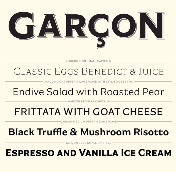
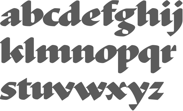
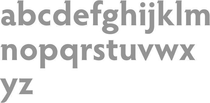
In 2012, he designed the large award-quality copperplate family called Garçon Grotesque. Typefaces from 2013: Ductus (a five-style broad-nibbed calligraphic / medieval family). In 2015, he published Azote (a multilined typeface family inspired by the 1968 Olympic Games in Mexico City). In 2019, he released the free seven font family Lexend at Google Fonts, together with Bonnie Shaver-Troup. Github link. Dedicated site. Lexend now comes in subfamilies called Deca, Exa, Giga, Mega, Peta, Tera and Zetta. He writes that Lexend is empirically shown to significantly improve reading-proficiency. As prescription eyeglasses achieve proficiency for persons with short-sightedness, Lexend's families were developed using Shaver-Troup Formulations. We will eventually release all seven families as a single variable font featuring its own custom axis. Lexend is thus an implementation of Bonnie Shaver-Troup's 2000 study, in which she theorized that reading performance would improve through the use of (1) hyper expansion of character spacing [which creates a greater lag time and reduces potential crowding and masking effects], (2) expanded scaling, and (3) a sans-serif font [to reduce noise]. Lexend is indeed hyper-widely spaced. Lexend also received support from Santiago Orozco and Hector Gomez. Additional links: CTAN link with TeX support. Github link by Brain Stone (Yannick Schinko). [Google] [MyFonts] [More] ⦿ | |
Font technology expert who runs his own type tech blog. Thomas Phinney (Portland, OR) has MS in printing from the Rochester (NY) Institute of Technology, and an MBA from UC Berkeley. He is freelance type consultant, font detective and type designer. Thomas Phinney was in Adobe's type group from 1997 until December 2008, mostly as Product Manager for Fonts&Global Typography, based in Seattle. At Adobe, he was involved in the technical, design, historical and business aspects of type, and worked closely with other font developers and customers. In 2008, he joined Extensis, where he was senior product manager for font solutions. In 2014, he joined the FontLab team, where he became Vice President and then CEO. In 2019, he left FontLab to become a full-time font detective. Phinney created Geode (2004, Adobe) and Hypatia Sans (2005-2007, Adobe, an elegant geometric sans family, complete with coverage of East European languages, Greek and Cyrillic). Hypatia Sans Pro (2009) is a more complete family that was finished with the help of Paul Hunt. In 2012, he started work on Cristoforo, a revival of Hermann Ihlenburg's Victorian typeface Columbus (1890, ATF) and its accompanying American Italic, also by Ihlenburg. Kickstarter project. Phinney notes that it is known as the typeface of Call of Cthulhu, the H.P. Lovecraft roleplaying game, and as the original logo for Cracker Jack. In 2013, Cristoforo Italic, a cooperation with Andrea Leksen, was shown at Leksen Design. In 2019, he worked on Science Gothic At ATypI 2004 in Prague, he spoke about the demise of multiple masters, and the future of OpenType and type 1. At ATypI 2005 in Helsinki, he announced the phasing out of type 1 at Adobe. He has spoken at nearly all of the TypeTech parts of the annual ATypI meetings, and has been on the ATypI board since 2006. At ATypI 2008 in St. Petersburg, he spoke about web fonts and on OpenType. Speaker at ATypI 2010 in Dublin. His talk at ATypI 2011 in Reykjavik was entitled TSI: Type Scene Investigations. The title of his talk at ATypI 2013 in Amsterdam was Free Fonts: Threat, or Menace? Speaker at ATypI 2016 in Warsaw. Klingspor link. [Google] [MyFonts] [More] ⦿ | |
Thomas Spagnolo
| |
Creator of typefaces at VGC, such as Lincoln Gothic (1965), which won the National Typeface Competition. His clients over the years include Acoustic Sciences Corporation, AT&T, Continental Packaging Co., The Ford Foundation, GE, IBM, PepsiCo, RCA, Showtime, Abrams, Colliers, Harpers Magazine, Macmillan, McGraw-Hill, Random House, Harcourt/ Brace, New York Times, Simon and Schuster, and Viking Press. In 2006, Bitstream published New Lincoln Gothic, a 24-weight family starting with a hairline weight. This digital version was made in Fontographer from the old typositor strips by Lincoln himself. In 2011, Canada Type and Thomas Lincoln cooperated in the production of the roman sans family Roma. This typeface was published in 2012 at P22. Lincoln himself tells the story: My intention in designing Roma was to create a definitive, contemporary sans serif expression of the classic Roman majuscule as depicted in the Trajan Inscription at the base of the Trajan Column in Rome. The Capitalis Monumentalis letter forms of the Trajan Inscription, which date to 113 Ad, have been described by the noted type scholar, calligrapher and historian, Father Edward Catich, as "the best roman letter designed in the western world, and the one which most nearly approaches the alphabetic ideal." And in the 1902 publication, "The Practice of Typography", Edmund F. Strange stated: "No single designer, or the aggregate influence of all the generations since has been able to alter the form, add to the legibility, or improve the proportion of any single letter there in." Mr. Strange's pronouncement was true in 1902 and it is true today. Through the years various type designers have been inspired by the Trajan Roman to offer their own interpretations. Most notably, perhaps, Frederick Goudy's Trajan Title (1930), Warren Chappell's Linotype Trajanus (1940) and more recently, Carol Twombly's literal rendition of Adobe Trajan (1989) and John Stevens' spirited Stevens Titling (2011). There have been many other nice interpretations by other contemporary designers, yet it may still be said that none has improved the form, the legibility or the proportion of any single letter---though it can be said that the letters J, K, U, W, Y and Z, nonexistent in the ancient alphabet, have been added. Less common has been the interpretation of Trajan in sans serif form. Hermann Zapf's Optima (1953), Sumner Stone's ITC Stone (1987) and Ronald Arnholm's Legacy Sans (2000), among other nice sans serifs, reflect characteristics of Trajan but seem influenced by other factors as well, including fonts such as Gill Sans and Syntax. And, while I don't presume to speak for their designers, none of these typefaces seem designed specifically with Trajan in mind. My own Lincoln Gothic (1965), and its subsequent expansion as New Lincoln Gothic (2006), was a deliberate attempt to interpret the particular characteristics of the Trajan majuscule in a contemporary sans serif face. The most significant change in the later version was the addition of a lower case; a challenge that had simmered on my personal bucket list for several years. Roma, though, differs from Lincoln Gothic in one significant way: while the terminals of Lincoln Gothic are flat, in Roma the vertices of letters such as A,M,N,V and Z are pointed. I believe this change is the critical difference that moves Roma closer to my objective of honoring the original Trajan. As with Lincoln Gothic, Roma's strokes have an almost imperceptible entasis that terminate in a subtle flare; a vestige of the serif. The importance of this feature is that it imbues the font with a humanist quality. The serif, as Father Catich points out in his book, "The Origin of The Serif", almost certainly derives from a combination of the flat brush and the human hand; it is what ties the letterform directly to human anatomy and craftsmanship, integrating it in a fundamental way with the nature of man---as distinct from the machine. In 2020, he released Lincoln Electric at Canada Type. Lincoln Electric started its life as an in-house experimental film type Thomas Lincoln drew shortly after concluding his work as part of Herb Lubalin's famed crew in the late 1960s. The master alphabet was drawn on illustration boards using pen and ink and press-type lines. The digital retooling of this Bifur-style typeface (after Cassandre's Bifur from 1929) was done by Patrick Griffin. Klingspor link. FontShop link. [Google] [MyFonts] [More] ⦿ | |
During his studies at Portland State University in Portland OR, Tom Huteson designed woodblock-inspired typeface Cobalt (2013). [Google] [More] ⦿ | |
Tony Knight
| |
In 2010, Travis published the contemporary curvy sans family Otari. Chartwell (2011) exploits OpenType features to make fonts that create pie charts, bar charts and histograms. It was published commercially by FontShop in 2012 as FF Chartwell. He explains the tricks. Typophile discussion. Download link. FF Chartwell won an award at TDC 2013. At Vectro Type he released these typefaces:
Interview in 2016 by David Sudweeks. [Google] [MyFonts] [More] ⦿ | |
Tyler Spencer (Coffee for Drew Productions, Portland, OR) created the custom typeface Noir (2013). Behance link. [Google] [More] ⦿ | |
Tyler Sticka
| |
TypeCon 2013 took place from 21-25 August 2013 at the Hilton Portland Executive Tower in Portland, OR. The keynote speaker was Adrian Shaughnessy. The other speakers included Carol Aitken, Monika Bartels, Agnes Barton-Sabo, Aaron Bell, Amir Berbic, John D. Berry, Kurt Campbell, Matthew Carter, Jillian Coorey, Carl Crossgrove, Crystian Cruz, Rafael Díaz Rey, John Downer, Colleen Ellis, Jules Remedios Faye, John Francis, Kalapi Gajjar-Bordawekar, Annabelle Gould, Frank Griesshammer, Paul Herrera, Amelia Hugill-Fontanel, Paul D. Hunt, Richard Kegler, Jeff Kellem, Jim Kidwell, Akira Kobayashi, John Labovitz, Alyssa Lang, Kevin Larson, Faythe Levine, Sam Macon, Ryan Mandell, Daniela Marx, Kitty Maryatt, Steve Matteson, Pete McCracken, Erin McLaughlin, Steve Mehallo, Jeff Moore, Bill Moran, Alejandro Paul, Michelle Perham, Matthew Peterson, Thomas Phinney, Kyle Read, David Jonathan Ross, Bill Sarnecky, Rob Saunders, Rainer Erich Scheichelbauer, Adrian Shaughnessy, Paul Shaw, Jeff Shay, Miguel Sousa, Donna Marie Stepien, Neil Summerour, Barbara Tetenbaum, Bradley Tober, Nahid Tootoonchi, Augusta (Aggie) Toppins, Tricia Treacy, Ben Trissel, Erik Vorhes, Jim Wasco, Laura Worthington, Fu-Chieh Wu, and Onur Yazicigil. [Google] [More] ⦿ | |
| |
A strange sports font story out of Oregon. The University of Oregon protects its font and its logo, a watered down version of Handel Gothic (a font by Don Handel, 1965, and Robert Trogman, 1980). A local politician, Gordon Smith, started using an extremely similar font, and is being accused of font theft. Darrel Plant says it's a tempest in a teapot (and I tend to agree). [Google] [More] ⦿ | |
AmeriCorps volunteer math tutor from Packwood, WA, who designed Oregon (2004), a serif face. [Google] [More] ⦿ | |
Vectro Type Foundry (was: Scribble Tone)
|
Warning: When I am on the Vectro site, my computer goes in overdrive and heats up, as if Vectro is an agent for bitcoin mining. I hope that this technical problem can be fixed. Their typefaces at Scribble Tone, Future Fonts and Vectro Type:
|
Corvallis, OR-based publisher of the free fonts Braille29Tgr, BrailleTgrUS, MTExtraTiger, SymbolTigerExpert, SymbolTiger, TigerExpert, Tiger, Tiger29. The Braille29Tgr.ttf font prints on Tiger as 6-dot US computer braille. The BrailleTgr_US.ttf font prints as US 8-dot computer braille on Tiger. Both fonts are made by ViewPlus Technologies in 2000. Note: they look like ordinary Courier to me, not Braille fonts at all! [Google] [More] ⦿ | |
Von R. Glitschka
| |
Author of Subterranean Worlds: 100,000 Years of Dragons, Dwarfs, the Dead, Lost Races and Ufos from Inside the Earth (Loompanics Unlimited, 1989). [Google] [More] ⦿ | |
Will Smith (Portland, OR) designed Bubblegum Typeface (2011). Behance link. [Google] [More] ⦿ | |
Web and graphic designer in Portland, OR. He made a typeface called Tattoo (2010). [Google] [More] ⦿ | |
William Hastings
| |
Woodside Graphics (was: Arroyo-Style California, or: Rustic Spirit)
|
Other designs include Wild Wood, Prairie, and handmade notecards drawn from early designs featured in Gustav Stickley's Craftsman Magazine, published between 1901 and 1916. [Google] [MyFonts] [More] ⦿ |
Wordshape
|
Speaker at ATypI 2019 in Tokyo on the topic of From Bijin-ga to Brutus, in which he explains the work of graphic designers Hokuu Tada (1889-1948) and Seiichi Horiuchi (1933-1987). [Google] [MyFonts] [More] ⦿ |
Wunn-Way Fonts
| Shareware fonts by Adam Wunn of Wunn-Way Software in Portland, Oregon. This was mainly a Mac site. Its font collection: Alaskan Nights (snow-capped letters), Alli, Big Blue (IBM logo style letters), Winwood Condensed, WackyShadow, Virtual, TylerSlanted, TrumanScript, Pippen Garamond, NoParking, Gambler (Western face), John Hancock, Driveby, Danielle (4 weights), DailyPlanetBlack (4 weights). 50 Fonts in their Everyman's Font Collection, 25USD. Temporarily off-line. Dafont link. [Google] [More] ⦿ |
Yes Please
| Lee Schulz (Yes Please, Portland, OR) created these typefaces in 2012: Standard Shaded Sans (+Fill), Standard Shaded Slab (an octagonal set that could be used for athletic lettering), International (multiline, prismatic). In 2013, he added the baseball script typeface Delicious Pro. Workaday (2014) is Schulz's take on the classical American sans style. He writes: Inspired by the wildly varied history of early to mid 20th century American signage, aircraft markings and industrial shipping vernaculars, Workaday exudes a timeless, classic flavor packed with a personality perfect for graphic headlines, packaging, copy setting and much more! [Google] [MyFonts] [More] ⦿ |
Portland, OR-based designer who created an untitled floriated caps typeface in 2014. Behance link. [Google] [More] ⦿ | |
Freelance designer in Corvallis, OR, who created Aztec (2014) and the pixelish but artsy typeface Blank Blanc Block (2014). Behance link. [Google] [More] ⦿ | |
Zipporah Vannata
|

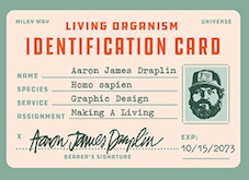 Aaron James Draplin is a graphic designer based in Portland, Oregon. In 2017, Aaron James Draplin and Riley Cran co-designed the industrial typeface DDC Hardware at
  John Skelton is a
  Alan Blackman has a BA in anthropolgy and sociology from Queens Collede, NY (1950) and a BLitt in social anthropology from Oxford University, England (1957). He graduated from the California College of Arts and Crafts in Oakland in the late 1950s. He was a letterform instructor at the Academy of Art College in San Francisco. His first typeface,
  As a student at Portland State University, Amanda Ranit (Portland, OR) created the high-contrast compressed didone typeface Gracie (2015). [
 Design student in Eugene, OR.
  Portland, OR-based graphic designer who made
  From Portland, OR, Dave Fabik's free truetype fonts. Includes fonts such as Slipstream,
  [
[ Portland, OR-based designer of the art deco headline typeface
  Fwis is a graphic design group in Portland, Cupertino and Brooklyn. One of its art directors is Chris Papasadero. As a sideline, they will design an occasional font.
  Oregon-based creator of the freeware fonts
  [
[ Graphic designer (b. Plattsburgh, NY, 1972) and type designer who studied graphic design at Portland State University and the California Institute of the Arts. He currently runs a multidisciplinary creative studio specializing in unique solutions for international clients. The studio has been based in Tokyo since 2005. Lynam writes for a number of design, typography, and cultural publications including Font Magazine, This American Life, PingMag, and Neojaponisme. In 2008, he released his book Parallel Strokes, an investigation into the intersection of type design and graffiti. He created these commissioned fonts: Diesel Sans, Tri (dot matrix as in billboard lights). He also made Hanger, Garland Sans (based on stencil letters used by British designer, educator and theorist Ken Garland, 1929-2021), Inversion (uncial), Cruller (a fantastic handlettered typeface based on a German lettering book from 1910), Bon Appetit (a custom cut Antique Olive for Bon Appetit magazine), Cooper Pink, Cooper Swash Italic Traditional & Cooper Swash Italic Custom, Cooper Italic (2010, after Cooper's original from 1924), Cooper Initials (2010),
  Portland, OR-based designer of the native Colombian-themed typeface Nova Nativa (2017). [
 Portland, OR-based designer of the decorative caps typeface Pod (2014), which is inspired by Stanley Kubrick's movie 2001 A Space Odyssey.
  Portland, OR-based designer of the rounded sans typeface Sonorous (2017), the rounded headline grotesque typeface families Porker (2017) and Bucksaw Geometric (2017) and the wedge serif all caps titling typeface Monterey (2017).
  Born in Reedly, CA, in 1950. She studied calligraphy at Reed College with Lloyd Reynolds and Robert Palladino, and she studied roman brush writing in a workshop with Fr. Edward Catich. In New York, she studied lettering with Ed Benguiat at the School of Visual Arts. Later she studied calligraphy and type design with Hermann Zapf at Rochester Institute of Technology. She received her B.A. from Harvard University and her MFA from UCLA School of Theater, Film and Television, specializing in Animation. In 2012, she was honored with the Frederic W. Goudy Award in Typography from Rochester Institute of Technology, for her achievements in the lettering and typographic arts. Kris Holmes teaches type design at the Rochester Institute of Technology.
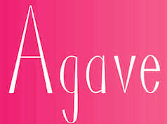 During her new media studies in Portland, OR, Laura Herzfeld created the thin elegant display typeface Agave (2014). [
 Liz Conley is an illustrator, graphic designer and type designer from Portland, Oregon. Now based in San Francisco, she designed the blackboard bold typeface
  [
[ [
[ Portland, OR-based designer and illustrator, who created the monolinear compass-and-ruler typeface Rant Sans in 2016.
  [
[ Mike Gaines is the Corvallis, Oregon-based designer of mainly scanbat typefaces such as
  Mark Caneso is a graphic and type designer who lived in Garden Grove, CA, Kapolei, HI, Beaverton, OR, Austin, TX, and now, Mount Pleasant and/or Charleston, SC. He founded ppwrkstudio (or: ps type) in 2004.
  A graphic designer from American Fork, UT, now based in Portland, OR. Creator in 2008 of an Escher-inspired
  Dustin Lee (RetroSupply Co, Portland, OR, and before that, Palo Alto, CA) sells RetroType, an add-on for Illustrator to make text appear retro. After setting up RetroSupply in 2013, he made the handcrafted poster fonts Roaster (2015) and Wild Fire (2015), the bold octagonal typeface Authority (2015, in standard, rounded and distressed sub-styles; inspired by public transport typefaces from the 1970s; with Scott Fuller), the monoline connected script typeface Palm Canyon Drive (2015: inspired by California in the 1940s and 1950s), the cartoon font Nincompoop (2015; we find this note: Nincompoop was designed by award-winning illustrator, designer, teacher and author Von Glitschka. Until now, this font was part of Von's personal collection of resources. Now you can have this hand crafted typeface for your personal arsenal), the multiline logo font family Solid 70 (2015), and the semi-blackletter typeface Unlucky (2015).
  Senior Aviation and Land Planner at WHPacific Inc, near Portland, Oregon. Designer of the dingbat fonts Spycon (2020), Drone (2020), Disaster (2020), Aviation (2020) and Aircraft Identification (2020). [
 The
The  [
[ Type designer in Brooklyn and/or Holbrook, NY, b. 1986, who studied at the Parsons School of Design and the inaugural Type@Cooper program. He lived in Portland, OR.
 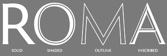 Graphic designer and lettering artist, born in 1939 in Eugene, OR. He studied with Douglas Lynch at the Museum Art School in Portland and later apprenticed with Lynch. Lincoln studied calligraphy with Lloyd Reynolds and Arnold Bank at Reed College in Portland, OR. After a stint as an agency art director producing national ads for Pendletons womens fashions, Lincoln moved to New York City, where he joined the studio of Herb Lubalin. In NYC he continued his involvement with academia, exploring film at The New School and an intensive workshop with Milton Glaser. Eventually Lincoln started his own studio (occupying the space on east 32nd Street where New York Magazine was born), combining a design practice with teaching at New Yorks School of Visual Arts. Lincoln has served as Art Director at TCA (Benton & Bowles) in Westport, CT, as Creative Director, Redington, Inc., Stamford, CT, as Principal, Thomas Lincoln Design & Motion Graphics Communication, Westport, CT, as Freelance in residence Art Director, Baden & Co., Eugene, OR, and in 1992 returned to consulting and design through his own design office, Lincoln Design, based in Eugene/Springfield, OR.
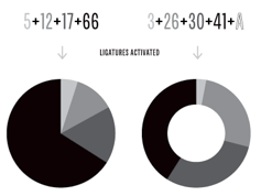
 Walter Kafton-Minkel was an active member of the Portland Macintosh Users Group. Designer of the old shareware font Lumparsky (a comic book font available in most archives), Benjamin (1991, based on the wood type Ben Franklin; revived in 2000 by Dieter Steffmann as
 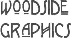 This graphic design firm in Westlake, Oregon makes original fonts. Through
  Commercial fonts at this boutique type foundry and publisher operating in Tokyo, jointly run by Ian Lynam and Thien Huynh.
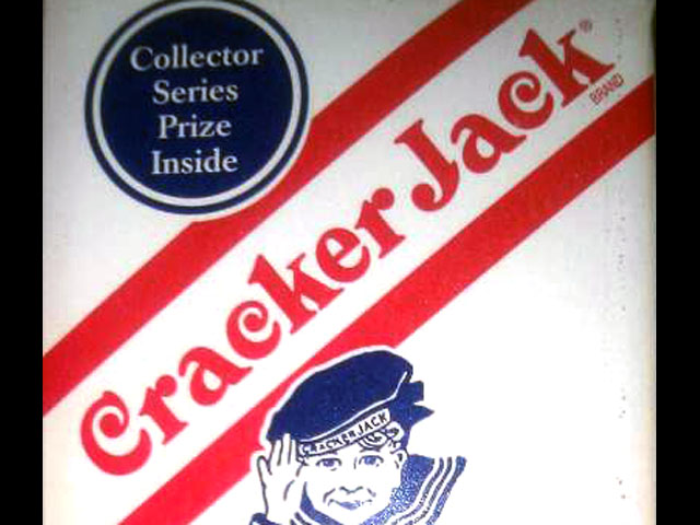
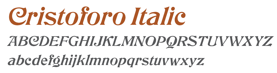
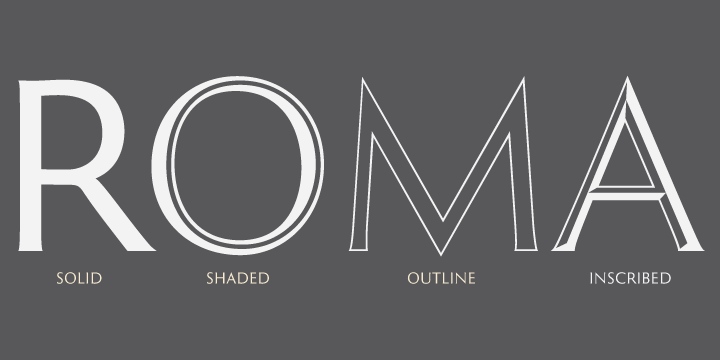
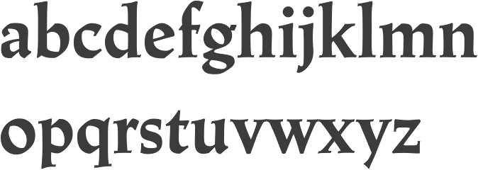
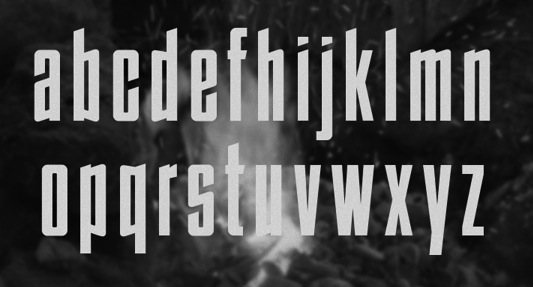
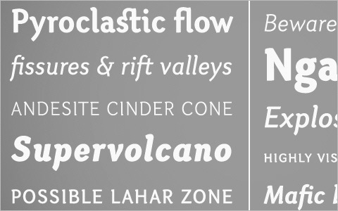
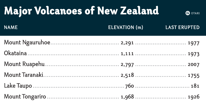
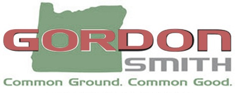
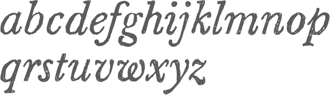
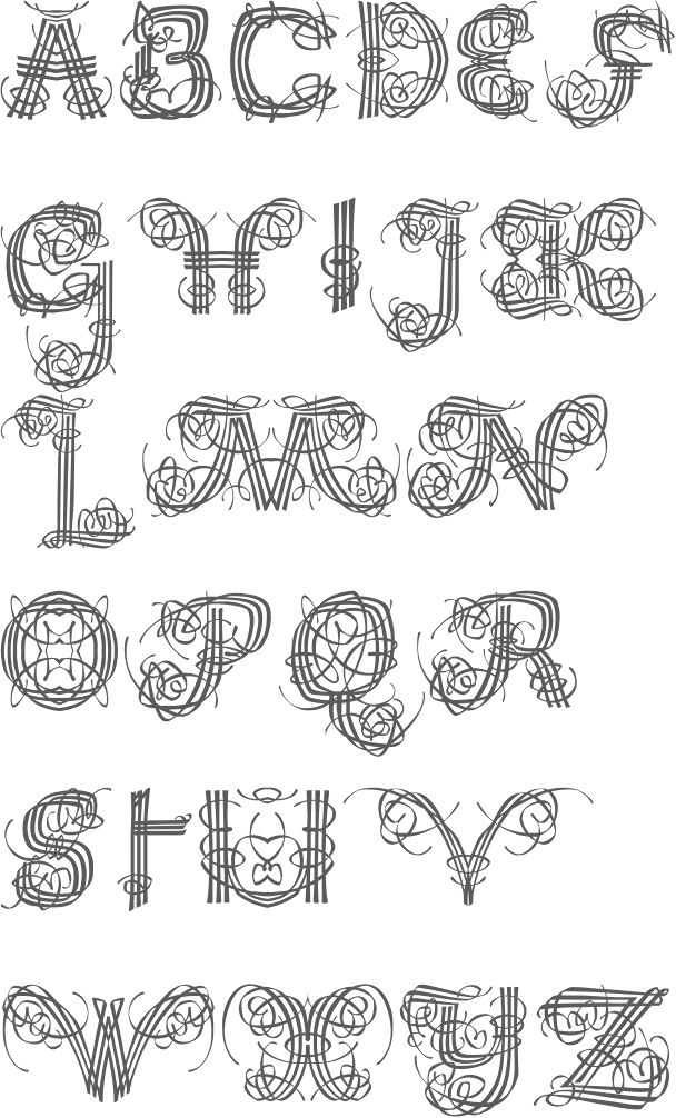
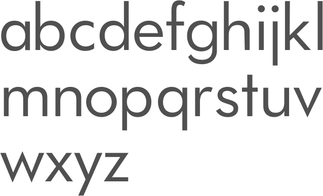
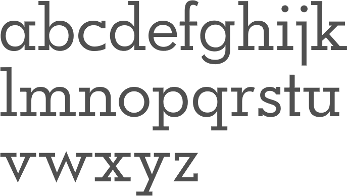
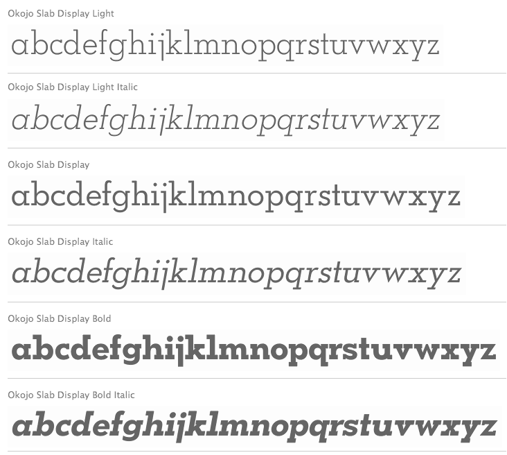
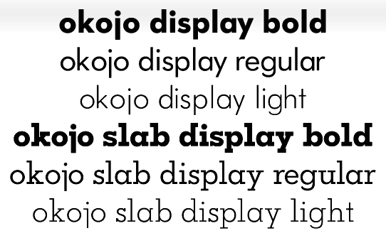
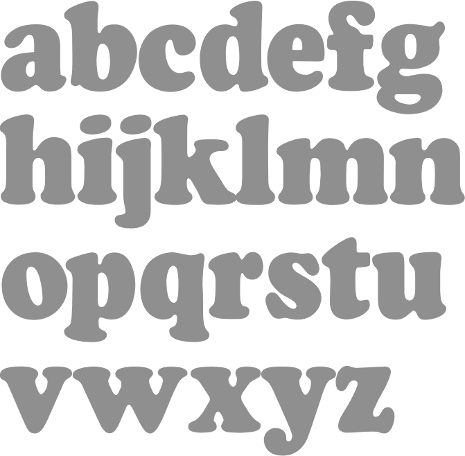
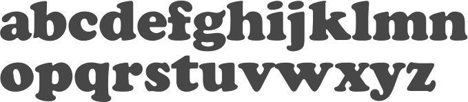
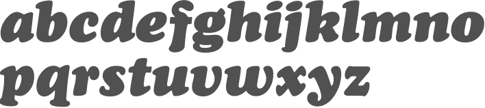
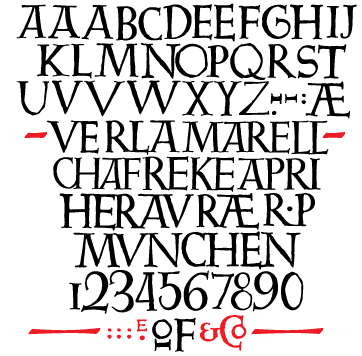
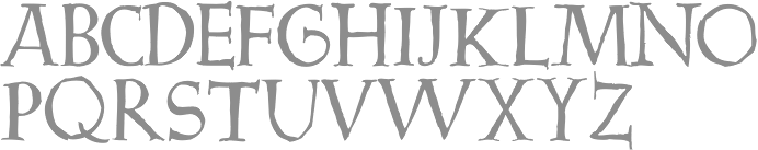
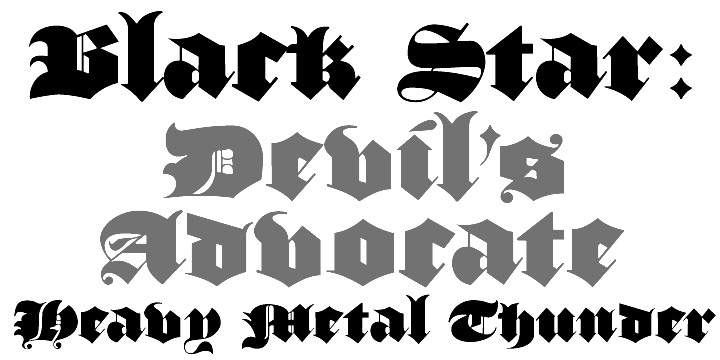
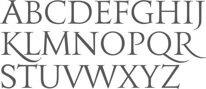
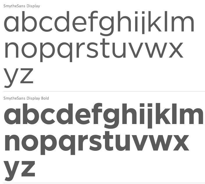
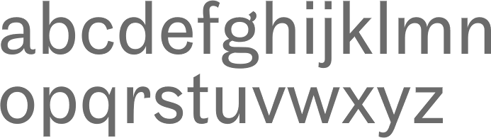
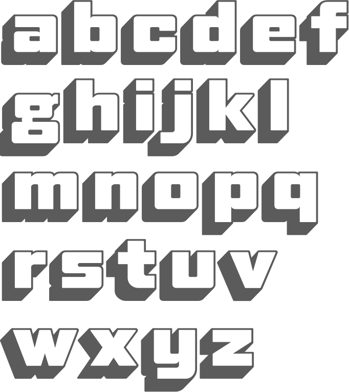
|
|
|
|