TYPE DESIGN INFORMATION PAGE last updated on Mon Mar 9 16:09:09 EDT 2026
FONT RECOGNITION VIA FONT MOOSE

|
|
|
|
|
Type scene in South Carolina | ||
|
|
|
|

SWITCH TO INDEX FILE
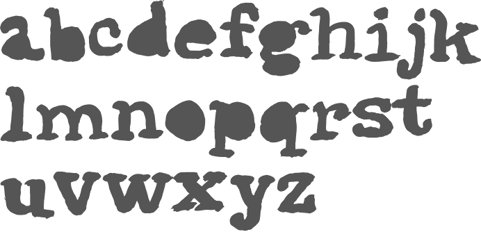
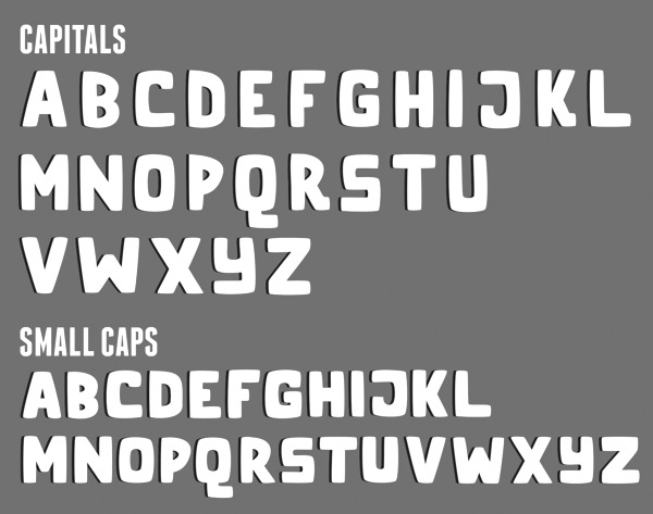
This South Carolinian cartoonist made the squarish typeface Pilgrimage BLT (2010, FontStruct). Aka Sabata. [Google] [More] ⦿ | |
During her studies in Greenville, SC, Abigail Whigham designed the blackletter-inspired typeface Sachsen (2017). Behance link. [Google] [More] ⦿ | |
Adam Eargle
| |
Greenville, SC-based designer of the school font Classy teacher (2016). [Google] [More] ⦿ | |
During her studies in Anderson, SC, Aimee Kaib created the delicate text typeface Maurice (2013). [Google] [More] ⦿ | |
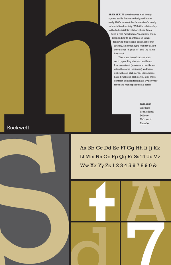
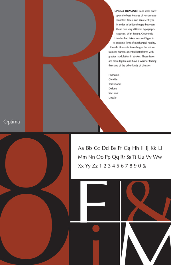
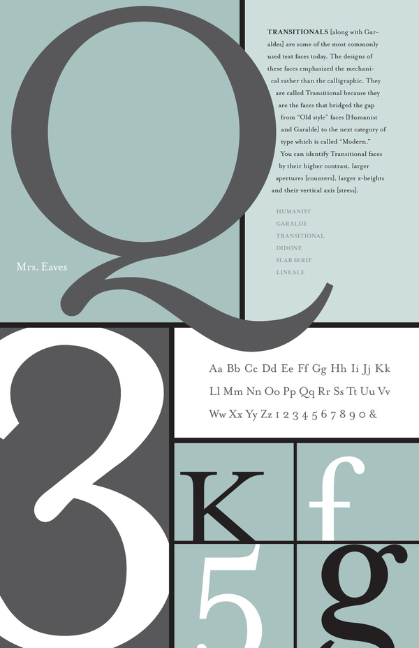
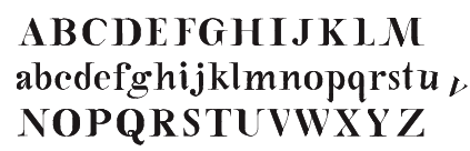
Located in Colombia, SC, Aldrena made a few nice typographic posters in 2010, illustrating typefaces such as Rockwell, Optima and Mrs Eaves. [Google] [More] ⦿ | |
Allison B. Williams
| |
Alphabet Zoo
| Allison B. Williams (Alphabet Zoo) is Hilton Head Island, SC-based type and graphic designer. In 2010, she made the alphading font Christmas Spirit (+Christmas Spirit 2), and the architectural writing font Handwriting Absolute. In 2011, this was followed by Quick Notation (hand-printed). Klingspor link. [Google] [MyFonts] [More] ⦿ |
During her studies at Anderson University in Anderson, SC, Alyssa Crozier created the Marquand typeface (2012). She writes: It was inspired by the gothic architecture of Princeton University, and its use would be specifically for the Princeton University Art Museum. It takes some elements from Mrs. Eaves so it could coincide with the University's logo and the pointed serif feet were based on the gothic arches seen in the entrance to the Cathedral on campus. [Google] [More] ⦿ | |
American Eargle
|
Typefaces from 2017: AE Armada, AE Incline, Rivalry (modular, beveled, layered, in 22 styles, perhaps ideal for athletic lettering). Creative Market link. Behance link. Newer Creative Market link. [Google] [More] ⦿ |
Dafont link. Home page. [Google] [More] ⦿ | |
| |
Arlo Vance
| |
Anderson, SC-based designer of the roman typeface Renée (2011). Behance link. [Google] [More] ⦿ | |
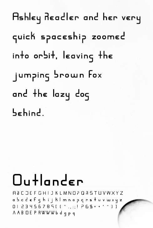
While at Anderson University in Anderson, SC, Ashley Readler designed the Outlander typeface (2012). [Google] [More] ⦿ | |
AU Type Foundry was set up in 2022 by a number of graphic design students at Anderson University in South Carolina. The first ten typefaces coming out of the type foundry are resurrections of old specimens that had not yet been digitized. [Google] [More] ⦿ | |
As a student at Anderson University South Carolina, Greenville, SC-based Ben Boerma designed the sober sans typeface Trailhead (2015). [Google] [More] ⦿ | |
Designer of the pixel font Bullwark. Based in West Columbia, SC. [Google] [More] ⦿ | |
During his graphic design studies At Anderson University in South Carolina, Ben Mahaffey designed the squarish Engadi typeface family (2013), and the contrasted sans typeface family Aristocrat (2013). Dafont link. [Google] [More] ⦿ | |
During her studies at Anderson University in Anderson, SC, Bessie Love created the Molecule typeface (2014). Molecule is the official wayfinding typeface for The Children's Museum in downtown Greenville, South Carolina. [Google] [More] ⦿ | |
Beth Cooper (South Carolina) designed the sans typeface Even Hand (2011). [Google] [More] ⦿ | |
During her graphic design studies in Greenville, SC, Bethany Greene created the quaint typeface Nomad (2013). [Google] [More] ⦿ | |
During her studies in Laurens, SC, Bethany Pritchard designed the fat liquid typeface Aquatica (2017). [Google] [More] ⦿ | |
Greenville, SC-based designer of Mecklenburg (2018). [Google] [More] ⦿ | |
Bob Wertz
| |
Graphic designer of Rock Hill, SC. The typeface Arkitekt (2013) was designed as a tribute to an existing hand-rendered shop sign found in Chester, South Carolina. [Google] [More] ⦿ | |
| |
| |
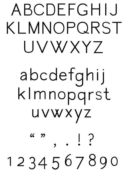
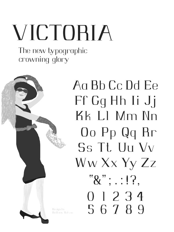
During her studies at Anderson University in Anderson, SC, Brittany Wilson designed Victoria (2013). [Google] [More] ⦿ | |
Greer, SC-based designer of the free typeface Maddox Gothic (2016). Behance link. [Google] [More] ⦿ | |
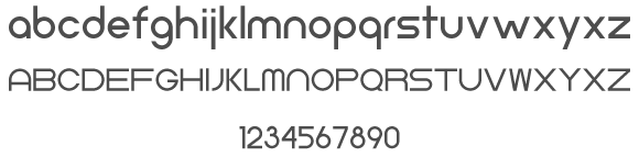
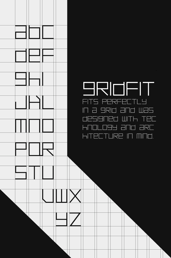
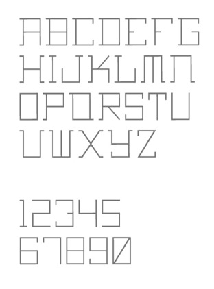
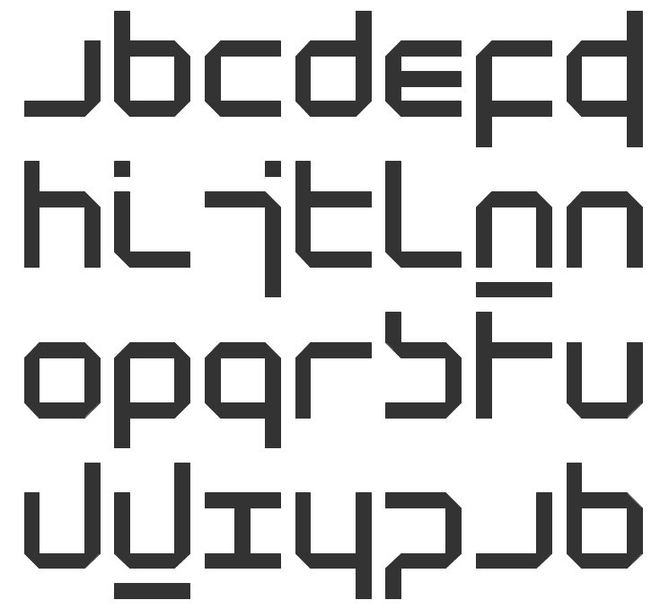
Designer from Easley, SC. He created the perfectly square (and thus monospaced) typeface GridFit (2012), and of the squarish techno typeface Urban Cowboy (2012). Behance link. [Google] [More] ⦿ | |
Greenville, SC-based designer of Bluenote (2018). [Google] [More] ⦿ | |
During his studies at Anderson University, South Carolina, Greenville, SC-based Camerob Knight designed the sans typeface Geometer (2016) using ruler and compass methods derived from basic geometry. [Google] [More] ⦿ | |
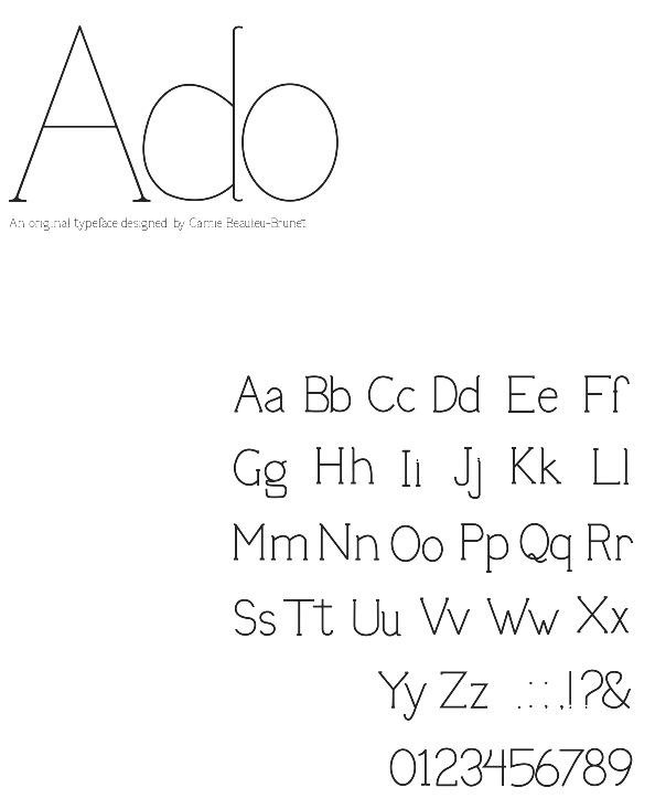
Originally from Montreal, Camille studies graphic design at Anderson University in South Carolina. During her studies, she created the quaint mini-serifed typeface Ado (2012). Behance link. [Google] [More] ⦿ | |
At Winthrop University, Rock Hill, SC-based Carmen Jayde Little designed the circus font Fancy Pants (2017). [Google] [More] ⦿ | |
Carnley Design Co
| Charleston, SC-based designer of the vintage signage typefaces Winston and Winston Sans (2016). They write: In the late 1900s, Winston-Salem was an international hub supplying people around the world with tobacco. While the local industry has changed over the decades, the downtown area is still haunted by looming smoke stacks and ghostly signage, which today act as a decorative reminder of the town's colorful history. The shadows of Winston-Salem's past dance through the tone and overall design of the typeface, offering a playfully reminiscent, and highly contemporary nod to the past. Typefaces from 2019: Desert Island. [Google] [MyFonts] [More] ⦿ |
Graphic designer in Anderson, SC, who created the octagonal athletic jersey typeface Skyhook (2012). She graduated from Anderson University. | |
During her studies in Greenville, SC, Caroline Denton created the serifed typeface Flight (2014). [Google] [More] ⦿ | |
Graphic design student at Anderson University in South Carolina. At Behance, she presents Chloe (2010) and describes the design process in detail. [Google] [More] ⦿ | |
Chandler Van De Water (Greenville, SC) is a designer and front-end developer at NewSpring Church in Anderson, SC. He does freelance design, should a project intrigue him. He also makes fonts. In 2012, he designed the black wood-style typeface Cubano (free at Lost Type). [Google] [More] ⦿ | |
| |
Corey Godbey
| |
Charleston, SC-based creator (b. 1990) of Spooky Drips (2011, a dripping blood Halloween face). Dafont link. [Google] [More] ⦿ | |
Aiken, SC-based designer of the octagonal techno typeface Kuratas (2015), which takes inspiration from Kogoro Kurata and Wataru Yoshizaki's Curates robot, the world's first drivable mech. It in turn is inspired by the giant robots found in popular anime shows such as Gundam and Code Geass. [Google] [More] ⦿ | |
Graphic designer in West Columbia, SC, who drew a nice vintage poster called Becherovka (2013). Behance link. [Google] [More] ⦿ | |
Danton was born and raised Charleston, SC. During his graphic design studies at Winthrop University (Rock Hill, SC), Danton used the eight letters of "Haagen Dazs" on a hand-painted sign found outside a Haagen Dazs ice cream shop in Charleston, SC, to make a comic book style typeface called Playground (2013, Lost Type). | |
South Carloinian (b. 1984) who created the hand-printed font DavidFont (2008). [Google] [More] ⦿ | |
Greenville, SC-based designer of the bilined typeface Neon (2017). [Google] [More] ⦿ | |
At Anderson University in Anderson, SC, in 2019, Dehlia Comeau Hooper designed the thin monoline geometric sans typeface Bella. [Google] [More] ⦿ | |
During her graphic design studies at the University of South Carolina Columbia, Desiree Cheeks (Washington, DC) created the hand-lettered typeface Pagoda Blossom (2013). [Google] [More] ⦿ | |
Behance link. [Google] [More] ⦿ | |
Doghead Studio
|
|
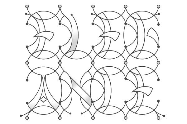
During her studies, Easley, SC-based Elizabeth Borowski designed the display typeface Promenade (2016). [Google] [More] ⦿ | |
Emily Conners
| |
During her studies at Anderson University in Anderson, SC, Emily Heinz created the serifed typeface Matlack (2014). [Google] [More] ⦿ | |
During her studies at Anderson University in Anderson, SC, Emily Klocko designed the thin display typeface Freedom (2016). [Google] [More] ⦿ | |
Emily Lime Design
|
Old home page. Some fonts or subsets of fonts can be had for free at Fontspace and Dafont. MyFonts interview in June 2012, with this introductory paragraph: We've seen a few meteoric careers on MyFonts before, but the dazzling feats accomplished by the one-woman foundry called Emily Lime has left us seriously in awe. Based in Greenville, SC, this brand new font company managed to score one best-seller after another these past six months. The energetic Southern Belle in charge of the operation has made fonts in a range of styles, but capricious scripts are what she does best. Her peacefully named Bombshell Pro is at the top of our Hot New Fonts list as we speak. And while her alphabets are nonchalant and untamed, the underlying font technology is smart and nifty. Meet Emily Conners, a newcomer with a punch. [Google] [MyFonts] [More] ⦿ |
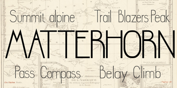
Graphic design student at Anderson University in South Carolina. For a school project, Emmy Dorchak designed a readable geometric typeface called Matterhorn (2012). [Google] [More] ⦿ | |
During her studies at the University of South Carolina, Emmy Persall (Greenville, SC, created an angular display typeface (2014). Behance link. [Google] [More] ⦿ | |
Eric Stevens
| |
Charleston, SC-based designer of Ernie Alphabet (2016), Skinny Chicken (2016), Alexander Handwritten (2016), Nautical Flag Alphabet (2016), Grade School Hand (2016) and Brush Pen (2016). Creative Market link. [Google] [More] ⦿ | |
Evelyn Lane Design
| During her studies at Flagler College in St. Augustine, FL, Lane Weinheimer designed the rope font Can You Knot (2017). Later, from Charleston, SC, she published the modular rope font CC Regatta (2019). [Google] [More] ⦿ |
Fernando Henrique de Sousa
| |
During her studies at Anderson University in Anderson, SC, Frances Stephens designed the high-contrast display typeface Rayonnant (2016). [Google] [More] ⦿ | |
Anderson, SC-based creator (b. 1991) of the Victorian typeface Quest (2012), which was created by taking el;ements of Plantin abd Tengwar. Behance link. [Google] [More] ⦿ | |
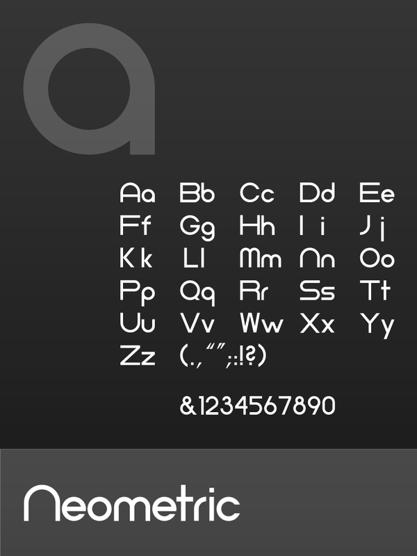
Glyphon
|
In 2012, Matt designed the nibbed typeface Yeti. [Google] [MyFonts] [More] ⦿ |
As a student, Greenville, SC-based Hailey Naeun Hyun designed the techno sans typeface Coffeehouse Rose (2016) and the circle-based monoline sans typeface Aria (2016). [Google] [More] ⦿ | |
Designer in Anderson, SC, who made Anthro (2012), a slab serif typeface based on Gotham. [Google] [More] ⦿ | |
Graphic design student in Anderson, SC, in 2013, who designed the sans typeface Astrotype (2013). [Google] [More] ⦿ | |
Hannah Leonard (Anderson, SC) designed Classic 44 (2011), a typeface based on a combination of two typefaces, Modern No. 20 and Footlight MT. [Google] [More] ⦿ | |
During her studies in Anderson, SC, Haylee Love designed the sans typeface Ovonto (2017). [Google] [More] ⦿ | |
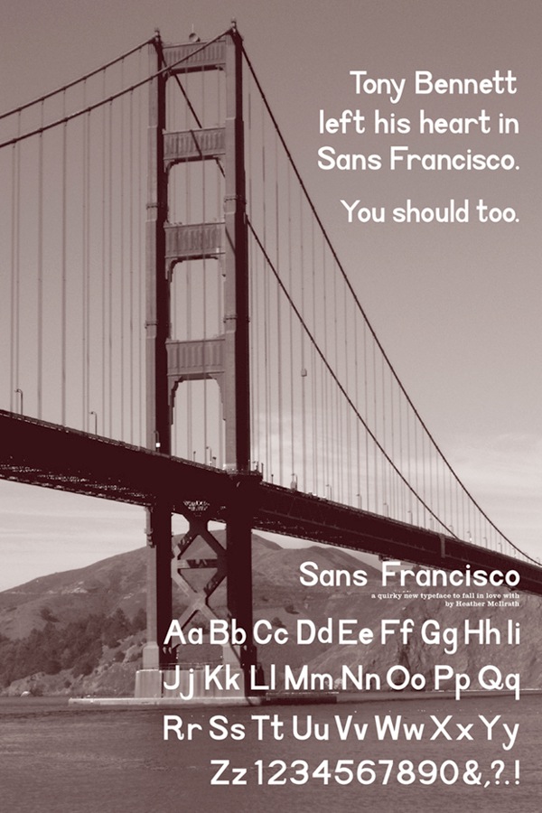
During her studies in Anderson, SC, Heather McIlrath designed Sans Francisco (2012). [Google] [More] ⦿ | |
| |
Helen Rice
| |
During her studies at the South Carolina School of the Arts in Anderson, SC, Holly Lang created the display typeface Chikitsa (2014), advertized as a typeface for Eastern health care. [Google] [More] ⦿ | |
Illustrative Type
| Illustrative Type is Jerry Rose from Charleston, SC. His creations can be downloaded. They include Future Sands (2009, a paperclip font). Behance link. [Google] [More] ⦿ |
Insane Machina
|
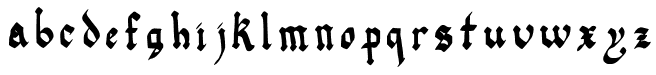
In 2014, he created Julia Black (blackletter typeface) and Lemurika. In 2016, he designed the handcrafted Teacher Notes. Dafont link. . [Google] [More] ⦿ |
Insigne Type Design Studio (was: Dooley Type)
|
Catalog of their typefaces. View Jeremy Dooley's font library. View Jeremy Dooley's typefaces. Adobe link. [Google] [MyFonts] [More] ⦿ |
Greenville, SC-based designer of Gwyndolfin (2019). [Google] [More] ⦿ | |
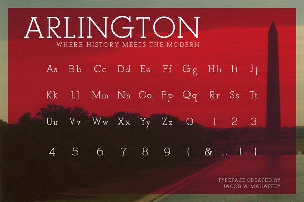
Anderson, SC-based creator of the mini-slabbed typeface Arlington (2012), for which, according to Jacob, inspiration came from Caslon and Optima. Behance link. [Google] [More] ⦿ | |
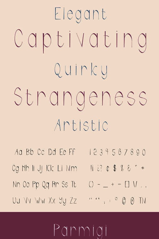
Student in Rock Hill, SC, who is puruing a Bachelors at Anderson University, SC. Creator of the (school project) display typeface Parmigi (2013). [Google] [More] ⦿ | |
Jean hails from South Carolina and studied art history at Queens College in Charlotte, NC. Designer of Dizzy (1995), Elli (1993) and Rats (1997, with the help of Jill Pichotta) at Font Bureau. These are grunge handwriting fonts, except for the great calligraphic font Elli, originally commissioned in 1989 by the Houghton Library of Harvard University, in honor of Eleanor Garvey, curator emerita of the library's Department of Printing and Graphic Arts. Rats was based on the handwriting of children's book illustrator Scott Nash: Its small body height and tall ascenders support an oldstyle spirit drawn from early second-century Roman cursive scripts. Dizzy was made for an artist's book about Dizzy Gillespie. Creative Alliance's font Hatmaker (1996) consists of two all caps typefaces, one of which was inspired by Ben Shahn's hand-constructed alphabet. FontShop link. Klingspor link. [Google] [MyFonts] [More] ⦿ | |
Jean McGuire
| |
Professional artist who received her BFA from the University of South Carolina. Creator of Pea Jelene's Doodles. Dafont link. [Google] [More] ⦿ | |
Graphic designer in Greenville, SC. In 2011, she created the Peignotian typeface Soma, which was derived from Modern No. 20 by cutting off its serifs and removing the ball terminals. [Google] [More] ⦿ | |
During her studies in Greenville, SC, Jennifer Jefferson designed Rangzen (2016) for the Free Tibet campaign. [Google] [More] ⦿ | |
Jeremy Dooley
| |
Jerry Rose
| |
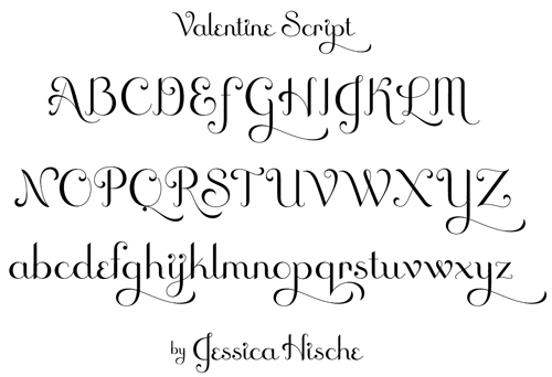
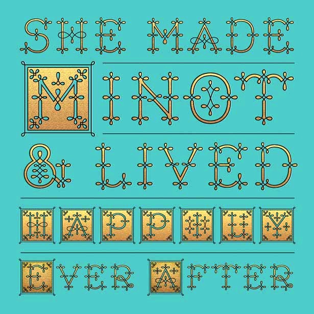
She also has a site called Daily Drop Cap Cap, in which she adds a free drop cap every day (but this lasted four days only). Her drop caps typeface family Minot (2013) and her initals Penguin Drop Caps (2013: a series of twenty-six collectible hardcover editions of fine works of literature, each featuring on its cover a specially commissioned illustrated letter of the alphabet by Jessica in collaboration with Penguin Art Director Paul Buckley) won awards in 2014 at the Communication Arts 4th Typography Competition: 2014. In 2014, Jessica Hische created the script typeface Tilda at Font Bureau for Moonrise Kingdom. Klingspor link. MyFonts link. Behance link. [Google] [MyFonts] [More] ⦿ | |
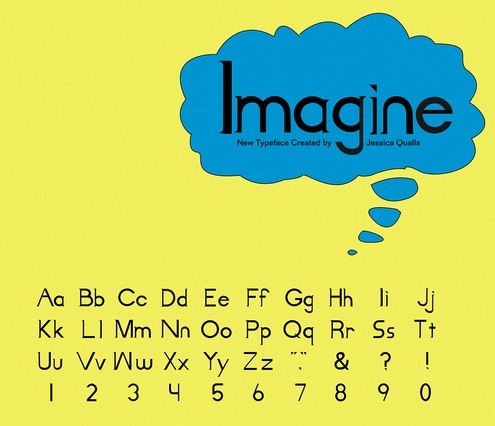
South Carolina-based designer who created the children's book typeface Imagine (2012). [Google] [More] ⦿ | |
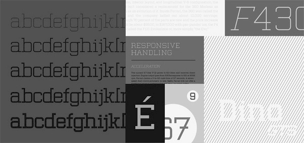
Designer and photographer in Greenville, SC, who created the slab serif typeface family Dino in 2010 while studying in Anderson, SC. Behance link. [Google] [More] ⦿ | |
Jon Jennings
| |
Photographer, designer, and musician in Spartanburg, SC. During his studies atAnderson University in Anderson, SC, he designed the octagonal typeface Keystone (2013). Behance link. [Google] [More] ⦿ | |
Rock Hill, SC-based designer of Royals (2017). [Google] [More] ⦿ | |
Josh Carnley
| |
Graphic designer in Anderson, SC, who created Sans Imperius (2015), which is based on classic roman proportions. [Google] [More] ⦿ | |
Joshua Mayfield
| |
| |
Greenville, SC-based designer of the typeface Libertas (2013), which was developed while Joy was a student. [Google] [More] ⦿ | |
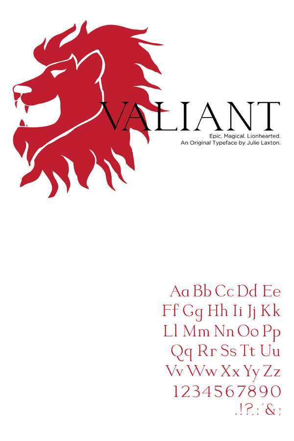
Student at Anderson University in Anderson, SC. Designer of Valiant (2012), a typeface created for fantasy fiction novel covers and film posters. Behance link. [Google] [More] ⦿ | |
Greenville, SC-based creator of the didone typeface Nuvo (2012). [Google] [More] ⦿ | |
Fonts by "Digital Kara" (b. 1979, lives in South Carolina) at KaraKreations. At Devian Tart, she designed the fonts KFNOCENTERZIT (2000) and KFNoCenterz (2000). [Google] [More] ⦿ | |
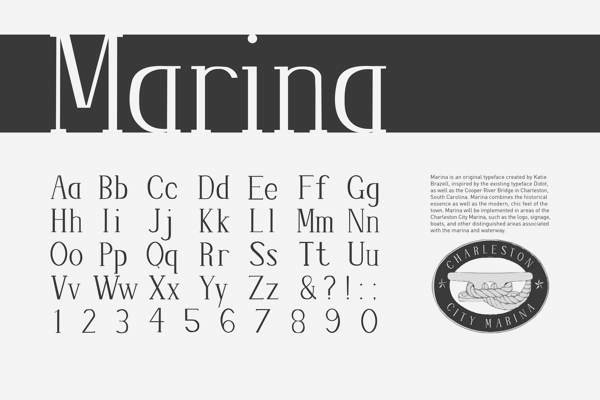
During her studies at Anderson University in Anderson, SC, Katie Brazell used Didot as a model for the design of Marina (2013). [Google] [More] ⦿ | |
Behance link. [Google] [More] ⦿ | |
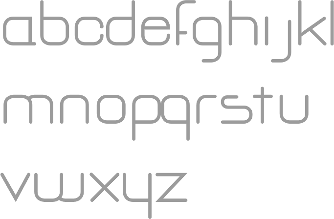
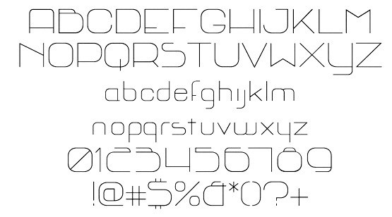
Graphic designer in Moore, SC, who created the modular typeface MindSight in 2014. [Google] [More] ⦿ | |
Behance link. [Google] [More] ⦿ | |
Kelly Johnson
| |
At Winthrop University, Rock Hill, SC-based Kelsie DeBruhl designed the heavy script typeface Brown Fox (2017). [Google] [More] ⦿ | |
South-Carolina-based youngster (b. 1989) who made the futuristic display typeface Busou Shinki (2008). He also uses the names Blitz tactics and Konami. [Google] [More] ⦿ | |
During her studies at Anderson University in Anderson, SC, Kristen Baker created Draper (2012), a typeface custom-designed for Modcloth, an online vintage, indie, retro clothing company. [Google] [More] ⦿ | |
Student designer At Anderson University in Anderson, SC, who created the exaggerated Peignotian typeface Bokini (2012). [Google] [More] ⦿ | |
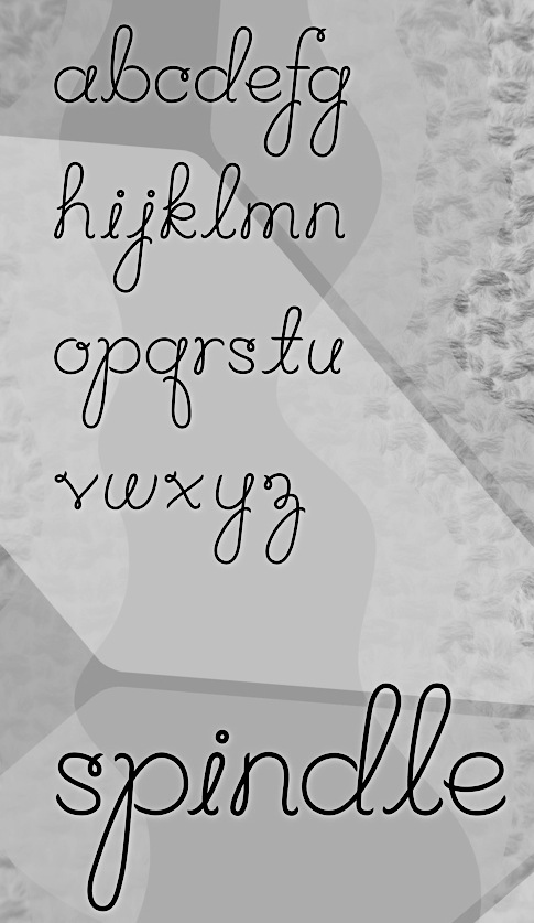
Columbia, SC-based designer of the script typeface Spindle (2013). [Google] [More] ⦿ | |
Lane Weinheimer
| |
In 2012, Laura created a high-contrast typeface, Clarisse, about which she writes: Clarisse is a typeface inspired by House Industries' Neutraface Slab Text and the Mid-Century modern style. [Google] [More] ⦿ | |
Laura Skinner (Greenwood, SC) created the free squarish wayfinding typeface Halt (2014). [Google] [More] ⦿ | |
Simpsonville, SC-based designer of Spur (2016). Its inspiration comes from Soviet propaganda posters from the 20th century. [Google] [More] ⦿ | |
Lauren Roberts (Easley, SC) created the text typeface Walton (2013)C during her studies at Anderson University in Anderson, SC. [Google] [More] ⦿ | |
At Clemson University (Clemson, SC), Lauren Robinson designed Light Tranquility, Space Born (stencil), and Retro Times (2019). [Google] [More] ⦿ | |
Charleston, SC-based designer of the rugged stamped typeface World Explorer (2017). Creative Market link. [Google] [More] ⦿ | |
During her studies at The University of South Carolina, Leah Edwards (Columbia, SC) created the display typeface Psycho Babble (2014). [Google] [More] ⦿ | |
Greenville, SC-based designer of the futuristic typeface Avaruus (2015). Behance link. [Google] [More] ⦿ | |
Greenville, SC-based designer of the blackboard bold typeface Nirosta (2016) and the all caps rounded monolinear wide sans typeface Paris Mountain (2016) intended for use on state park signs. She also designed the free tape typeface Cassius (2016) and ten went on to study at Type@Cooper. Typefaces from 2017: Caprino Stencil, the Trattoria series (Mascarpone, Pecorino, Caprino). Dribble link. Behance link. You Work For Them link. [Google] [More] ⦿ | |
Graphic Design student at Anderson University in South Carolina in 2014. Designer of the Peignotian typeface Caterpillar (2014). [Google] [More] ⦿ | |
| |
Mad Hatter
| Kelly Johnson ("Mad Hatter") is the American creator of the handwriting fonts Etched in a Desk (2008) and Leaky Closet (2008) and of Cydonia Sand Scribbles, aka Son't Read My Journal (2008). He also made Banana Spider (2008, stone chiseled look), Juneau (2008, 3d tin can box look), Cymptum (2005, ink run font). Kelly runs Mad Hatter Designs. Another URL. Dafont link. I do not know if this is the same designer, but this Kelly Johnson is a student at Anderson University who hails from from Greenville, SC. She created Goslon, which is a combination of Hoefler & Frere Jones's Gotham and William Caslon's Caslon. Her blog. [Google] [More] ⦿ |
As a student in Simpsonville, SC, Madinalley designed the custom handcrafted comic book typeface Combat (2016) for RWBY. Behance link. [Google] [More] ⦿ | |
Located in Columbia, SC, Marcus Williamson created the condensed octagonal caps typeface Speakeasy in 2013. Free download. [Google] [More] ⦿ | |
Marius Valdes
| |
Mark Caneso
| |
Mary designed the beautiful pottery-style fattish poster typeface Dumpling (2012, Positype). This was a cooperation with Neil Summerour during her internship at Positype (2011-2016), but I let him explain the experience: Dumpling was drawn, digitized and mastered by an 18-year old over a semester-long Senior Concentration in Graphic Design at the South Carolina Governor's School for the Arts. Seriously, think about that! What were you doing when you were a senior in high school? I watched this unfold as her teacher, guiding where I needed to, encouraging when necessary, but ultimately putting her through a ridiculously tedious, painful and compressed process. She did not falter, she did not complain, she worked. In her own words (taken from an excerpt of her concentration paper), "In the middle of all this, I went to Charlotte, NC and saw and opera, the set designer was Jun Kaneko, [and afterwards] went to the Mint where we attended his talk (subsequently meeting him) and then perused a gallery of his work. His large ceramic forms made me realize how connected type is to sculpture. The medium may be different, but the ideas of negative space and forms interacting with each other and the view to convey a message are essentially the same. Architecture too, is surprisingly connected to type. I find myself gravitating towards the word, entasis a way of describing my letterforms, though they have no reference to the Parthenon or Classicism. In type you need balance, continuity, a little unexpectedness, and a good amount of math." [...] Mary Catherine, after completing her digitization, final tweaks, etc. in FontLab, turned the font over to me for OpenType coding and testing. In 2015, she co-designed Couture with Neil Summerour. This elegant typeface was inspired by Corvinus (Imre Reiner). On August 26, 2017, she presented the results of the second Font Purchasing Habits Survey in a 40-minute talk at TypeCon in Boston, MA. Twitter link. Dribble link. FontShop link. Home page. [Google] [MyFonts] [More] ⦿ | |
Matt Baird
| |
Matt McInerney
| |
Mayfield Type Foundry
|
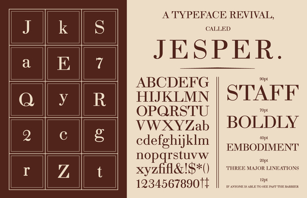
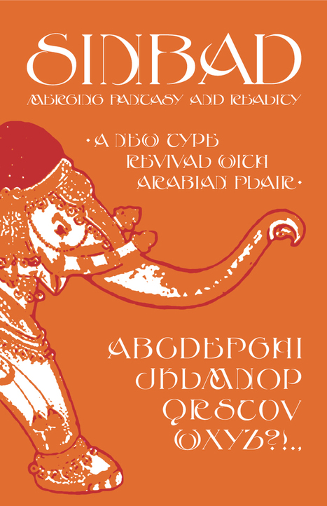
Creator of Jesper (didone), Durham, and Sinbad (art nouveau) in 2012. In 2013, he set up his own commercial foundry, also in Greenfield. His first commercial release is Roloi (2013), a layered numbers font in art deco lettering style. It has many clock symbols as well. In 2016, he designed Durham Latin (a vintage industrial revolution Latin typeface). Behance link. [Google] [MyFonts] [More] ⦿ |
During her studies at Anderson University in Anderson, SC, McKenzie Stokes created the text typeface Flock (2014). [Google] [More] ⦿ | |
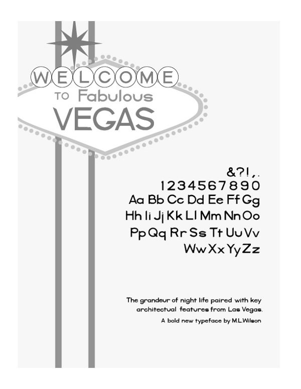
Megan Leigh Wilson created Vegas (2013), a typeface inspired by Las Vegas architecture, during her studies at Anderson University in South Carolina (2013). Behance link. [Google] [More] ⦿ | |
Greenville, SC-based designer of the display typeface Edelwaiser (2016). [Google] [More] ⦿ | |
Anderson, SC-based designer of the display typeface Cadenza (2015). [Google] [More] ⦿ | |
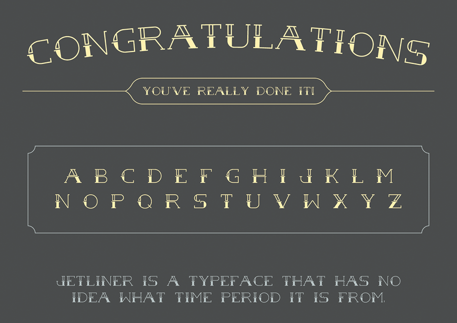
Greenville, SC-based creator of the school project tattoo typeface Jetliner (2013). Free download. [Google] [More] ⦿ | |
Creative Market link. Home page. [Google] [MyFonts] [More] ⦿ | |
In 2016, she created Starvision for the redesign of the World Vision Website, and Rossfit (for a sports branding project). The typeface was inspired by the star in the World Vision logo. She also designed Rossfit (for a sporting goods comnpany) and Tiboro (which was inspired by Tibor Kalman's work). Dafont link. [Google] [More] ⦿ | |
Greenville, SC-based designer of the Peignotian typeface Klaui (2014). She also made Coffee Icons (2014). [Google] [More] ⦿ | |
Naomi Nakazato is an artist, designer and student, born and raised in the Washington, DC. She currently lives in South Carolina to study painting and drawing at Anderson University. She created the strong display sans typeface Hudson (2012) during her studies. [Google] [More] ⦿ | |
Rock Hill, SC-based designer of the Broadway-style art deco typeface family Ritzy (2019). [Google] [More] ⦿ | |
Fort Mill, SC-based designer of Andromeda (2018) and Futuruse (2018). [Google] [More] ⦿ | |
Graphic designer and illustrator in Columbia, SC. In 2014, he created an ultra-black blocky custom typeface. Behance link. [Google] [More] ⦿ | |
Graphic design student at Anderson University in Anderson, SC. . Creator of the Egyptian typeface family Valium (2012). [Google]
[More] ⦿
| |
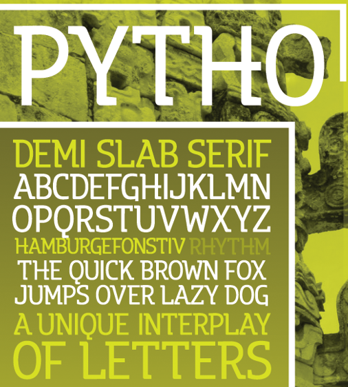
Graphic designer in Travelers Rest, SC, who created Pytho Capitals in 2012. Behance link. [Google] [More] ⦿ | |
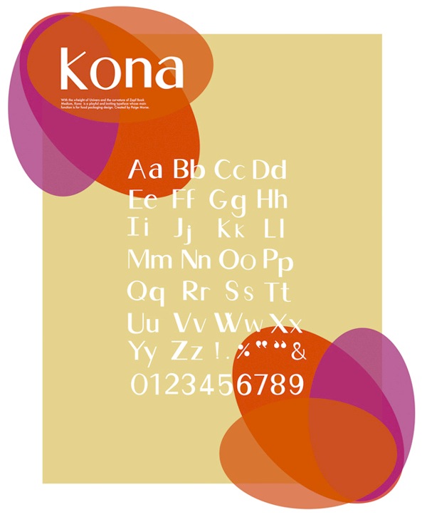
During her studies in Greenville, SC, Paige Elizabeth created the Peignotian typeface Kona (2013) for chocolate package signage. [Google] [More] ⦿ | |
South Carolina-based designer (b. 1985) of MyspaceArcaneFont, Paul Crazy and Paul Symbols in 2008. [Google] [More] ⦿ | |
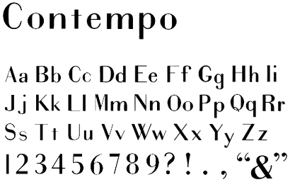
Designer in Greenville, SC. He created the Peignotian typeface Contempo (2011). [Google] [More] ⦿ | |
Pixelspread
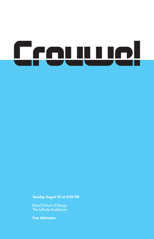
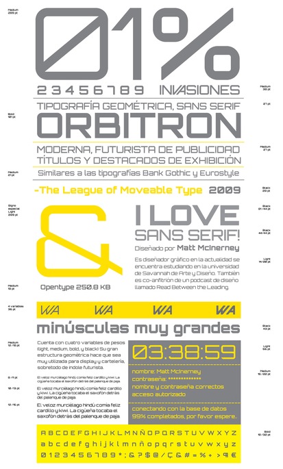
| Graphic designer currently working at Pentagram Design in New York. He graduated from Savannah College of Art and Design, and is originally from Western Massachusetts. At the Typesites page, Matt McInerney looks at sites that have great typographic design. He created Raleway (2009, a free hairline sans; the Google Web Fonts typeface Raleway Dots (2012) is by Brenda Gallo, Matt McInerney, Rodrigo Fuenzalida and Pablo Impallari; see here for a complete extension of Raleway between 2010-2013 by Matt McInerney, Pablo Impallari and Rodrigo Fuenzalida), New Alphabet (2008), an octagonal font based on Wim Crouwel's New Alphabet, using FontStruct. (For a commercial version of New Alphabet, check Architype New Alphabet (The Foundry). He also made Pentagrid (2009, on a 5x5 grid; +Pentagrid v2, +Pentagrid Alphabet), Dotserif, and Neuescreen, typefaces that are in the mold of New Alphabet. Orbitron (2009) is a great free futuristic sans family published at The League of Movable Type: it is a geometric sans related to both Eurostile and Bank Gothic. Romina Vespasiano made a great specimen poster for Orbitron in 2012. Allerta (+Stencil) (2010) is an open source typeface designed for use in signage. Allerta was designed to be easily and quickly read from a distance. Each letter exploits the most unique aspects of that individual letter so that each character can be easily distinguished from any other. Google Directory link. FontStruct link. Abstract Fonts link. Klingspor link. Home page of Matt McInerney. [Google] [More] ⦿ |
Portland Studios
|
|
Pretend Foundry (or: Fuzzco)
|
|
ps type (was: ppwrkstudio)
|
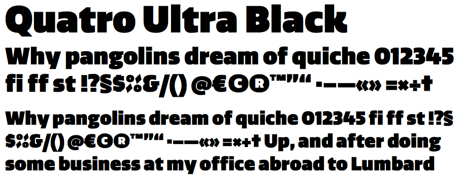
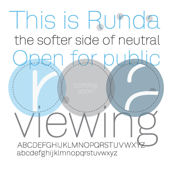
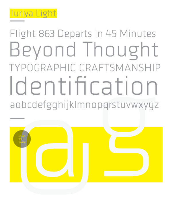
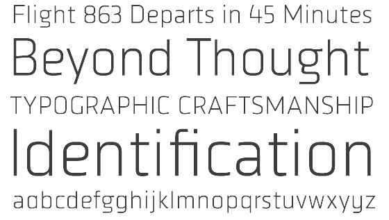
His typefaces include the free sans Quatro and the commercial contemporary sans FB Ratio (2009, Font Bureau, a sans family in 6 styles that grew out of ps Ratio and ps Ratio Headline). In 2009, Quatro became commercial. It was followed by ps Quatro Slab and Quatro Ultra Black in 2010 and Quatro Sans in 2012. Other typefaces include Campaign Grotesk (2015, FontShop), ps Caneso (2010, monoline sans), Runda, ps Untitled, ps Untitled Sans, ps Turiya Light (2009, organic sans), ps Runda (2010, sans), ps Neplus Ultra (2010, ultra thick slab), ps Dot Test (dot matrix face), and ps Fovea (2009, contemporary slab). Also in the works is the dot matrix typeface FF Diode (2009). Typefaces from 2016: Hatch (slab serif, which can be bought here). Typefaces from 2017: Ditch (a great inline typeface), Blue Sky (a sans family for branding). Typefaces from 2019: Pika Ultra (an ultra fat script). Typefaces from 2020: Campaign (Sans, Serif, Slab). Typefaces from 2021: Decoy (a 12-style soft inky serif), Hoss Grotesk (Hoss Sharp and Hoss Round: grotesques), Condenser (a 36-style condensed sans family), Hegante (a fat brush typeface), Naylor Stencil (a custom typeface for Brooklyn-based artist Jason Naylor). |
Greenville, SC-based designer of the typeface Rockefeller New (2013-2015). Behance link. [Google] [More] ⦿ | |
South Carolinian graphic designer. Her font Saalto (2011) is based on posters by Saul Bass created for movies directed by Alfred Hitchcock and Otto Preminger. [Google] [More] ⦿ | |
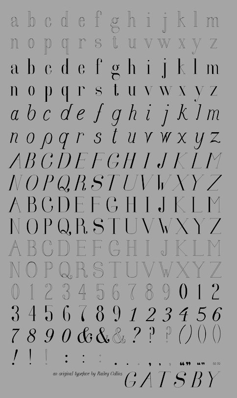
Student in Anderson, SC, who created the teardrop text family Gatsby (2012). [Google] [More] ⦿ | |
During her studies at Anderson University in South Carolina, Rebekah Rhoden designed the sans display typeface Huguenot (2013). She writes: I chose to design a typeface for branding The Peace Center in downtown Greenville, SC. Huguenot blends aspects of Helvetica and Tungsten to echo the renovation of The Peace Center's exterior design. Huguenot was created with the intent to merge the clarity of Modernism with the familiarity of WPA-era America. [Google] [More] ⦿ | |
During his studies at Anderson University, Ryan Hammett (Spartanburg, SC) created Martyrdom (2015). Behance link. [Google] [More] ⦿ | |
Ryon is Partner and Director of Design at Riggs Partners in Columbia, SC. Creator of the chalk typeface Rufus (2012). [Google] [More] ⦿ | |
Salty Goat
| South Carolina (and before that, Tulsa, OK)-based designer. Creator of the font family called Fluid (2006). See also here. In 2017, he designed these handcrafted typefaces: Skinny Willow, Maleficent Marquee, Journal Entry, Look What I Made (school script). Creative Market link. [Google] [More] ⦿ |
See also here. Fontspace link. [Google] [More] ⦿ | |
South Carolina-based designer of the handcrafted typefaces Classic (2017) and Mariah (2017). Creative Market link. [Google] [More] ⦿ | |
During his studies Anderson University in Anderson, SC, Greenville, SC-based Sarah Grace Kivett created Traveler (2014). Behance link. [Google] [More] ⦿ | |
Anderson, SC-based student designer of Charles Type (2013), a typeface created for signage in downtown Charleston, SC. [Google] [More] ⦿ | |
During her studies at Anderson University, Sarah McAbee (Inman, SC) designed the vintage typeface Contender (2016). [Google] [More] ⦿ | |
Anderson, SC-based designer of the display typeface Rustemia (2017). [Google] [More] ⦿ | |
Graphic designer who developed the handcrafted typeface Zodia (2016) during her studies at Anderson University in Anderson, SC. [Google] [More] ⦿ | |
Scott Craig
| |
South Carolina-based designer of the secret code font Seth (2006). [Google] [More] ⦿ | |
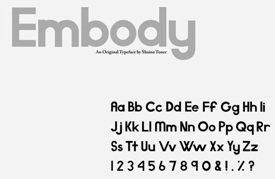
Designer of a stylish sans typeface called Embody (2013). She writes: Embody was inspired by fashion companies such as Urban Outfitters and Anthropologie. Embody was created during her studies in Greenville, SC. [Google] [More] ⦿ | |
Illustrator in Pennsylvania. He created the strongly geometric typeface Elegance (2011) and the typeface Velocity (2011). Behance link. [Google] [More] ⦿ | |
Greenville, SC-based designer who created Dr. Dash (2011), while studying at Anderson University. Behance link. [Google] [More] ⦿ | |
Sketchbook B
|
Powerlane (2012), his first commercial typeface, is an octagonal constructivist typeface family. He writes about himself: Bob Wertz is a graphic designer and art director living in Columbia, SC. In addition to working as designer, Bob has been an adjunct professor at the University of South Carolina. He was a founding member of the AIGA South Carolina board, serving as vice president for two years and then as president for two years. He also made some fonts with iFontMaker in 2010: SketchPad, LilyPad. Fonstructions in 2011 include Dingbots and Monsters XL. In 2013, he co-designed the grungy typeface Valdes Clarendon with Marius Valdes. Typefaces from 2014 include Callsign Narrow (octagonal stencil font), Power Grid 2.0 and Saluda (rounded sans). Typefaces from 2020: SbB Powertrain (101 techno fonts). [Google] [MyFonts] [More] ⦿ |
Graduate of University of South Carolina, class of 2016. Columbia, SC-based creator of the jazzy Broadway-style art deco typeface Speakeasy (2016). [Google] [More] ⦿ | |
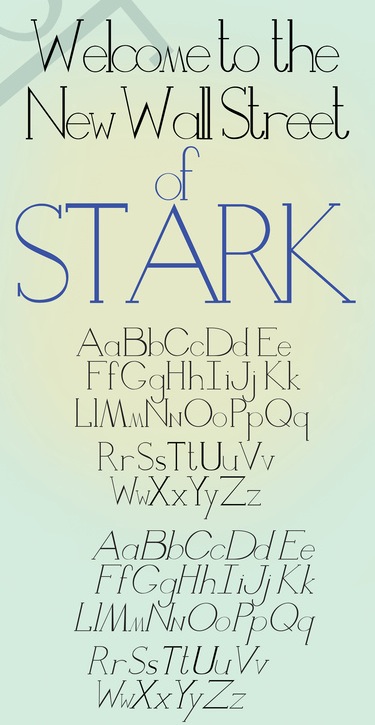
Anderson, SC-based designer of Stark, a fashionable high-contrast typeface created in 2012 for The New Wall Street. [Google] [More] ⦿ | |
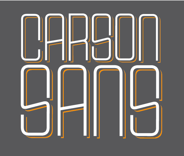
Designer in Greenville, SC, b. 1989, who created the free shadow headline typeface Carson Sans (2012). TJ studied graphic design at Bob Jones University. Dafont link. [Google] [More] ⦿ | |
Graphic designer from Jefferson City, TN, who studied at Anderson University, SC. In 2018, she designed the free transitional text typeface Panthera. [Google] [More] ⦿ | |
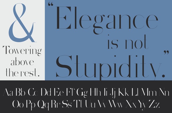
Spartanburg, SC-based creator of Seagram (2012), a high-contrast fashion serif typeface that is based on the Seagram building in Manhattan, and was inspirewd by Didot and Archer Hairline. Behance link. [Google] [More] ⦿ | |
Using a steel brush calligraphy brush nib, Thomas Waldren created the bold elliptical sans typeface Hand N Hand (2012). He was born and raised in Charleston, SC, and lives in Isle of Palms, SC. [Google] [More] ⦿ | |
Timothy Speaker was born and raised in Saginaw, Michigan. Tim received a Bachelor of Science degree in English Literature and Master of Arts and Master of Fine Arts degrees from the University of Wisconsin-Madison. He teaches graphic and type design at Anderson University in Anderson, SC. [Google] [More] ⦿ | |
Tower of Babel
|
Designer of the following typefaces:
View the typefaces of Eric Stevens. [Google] [MyFonts] [More] ⦿ |
While studying at the University of South Carolina in Columbia, SC, Trey Gaines created the alchemic typeface Native (2014). [Google] [More] ⦿ | |
Tucker Myers
| |
Type Minds
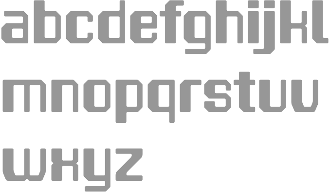
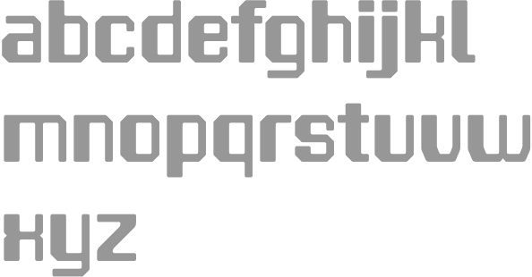
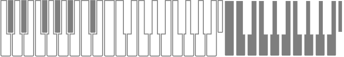
| Foundry of Tucker Myers in Spartanburg, SC, est. 2010. Creator of Piano Keybuild (2010) and Cell (2010, octagonal and futuristic). He also made Piano Keybuild (2011, piano key dingbat face) and Hydragyrum (2011, a squarish almost techno sans family). [Google] [MyFonts] [More] ⦿ |
| |
Typecaste Foundry & Design
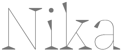
| American type designer, b. 1980, Utah. Designer of the free itchy sans typeface TC Daphne (2008) and the playful display typeface Nika (2011). Arlo Vance has a BFA in Graphic Design from Brigham Young University. Since June of 2007 he has been working as a designer with Hint Creative in Salt Lake City, UT. He founded Typecaste, and is presently located in Charleston, SC. In 2019, Typeverything released the Victorian typeface Cottonhouse by Andrei Robu, Kevin Cantrell and Arlo Vance. [Google] [MyFonts] [More] ⦿ |
During his studies in Greenville, SC, Wesley Jefferies designed the free squarish typeface Superlative (2014). [Google] [More] ⦿ | |
During his studies at the University of South Carolina, Columbia, SC-based Willie Kinard created the dot matrix typeface Dispenzeful (2013). [Google] [More] ⦿ | |
Wintertree Software
| Programmer and gamer based in Aiken, SC. Designer of the commercial font package Arcane Alphabets and the free font Instahex. These typefaces go back to ca. 1997, but updates have been made until 2019. . Purchase fonts here:
|
Zoo Valdes
| Marius Valdes is an illustrator, designer, and artist currently based in Columbia, South Carolina. He is an Associate Professor in studio art concentrating on design and illustration. He cooperated with Sketchbook B (Bob Wertz) to make the free inky hand-printed typeface Poster Sans (2009) and the grungified Valdes Clarendon (2013). [Google] [More] ⦿ |

 Lexington, SC-based designer of the industrial strength typefaces Predator 0316 Slab (2016), Predator 0316 Sans (2016), the slab serif typeface Griffin Display (2015), the wood-inspired vintage typeface Woodchuck (2016), the varsity typeface Grizzly0116 (2016), and the stencil typeface Grizzly (2016).
  Andres Sanchez lives in Greenville, SC, where he does graphic and web design.
  Greenville, SC-based designer of the art deco typeface Jet Set (2014), whose letters were inspired by the minimalist sculptures of Donald Judd.
  [
[ Anderson, SC-based designer of the fashion mag typeface Beaton (2014). [
 Digital and graphic artist in Spartanburg, SC. She clipped the serifs off Georgia, and made
  Student from Atlanta, GA, who made a great
  Dixie Hemingway is a graphic designer in Myrtle Beach, SC. She created the copperplate typeface
  Doghead Studio is the personal foundry of designer Jon Jennings. Jennings created the free handwriting font Lucidity (2008).
  [
[
 Glyphon (Greenville, SC) is the type foundry of American type designer Matt Baird.
 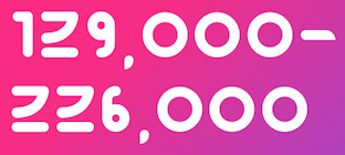 Designer in Charleston, SC. Atom Bomb is a circular display font designed in 2017 in honor of the 129,000 to 226,000 Japanese civilians who were killed in the WWII bombing of Hiroshima and Nagasaki. Some characters take inspiration from hiragana and katakana. [
 Brazilian illustrator residing in Joinville, SC. Creator (b. 1992) of the free blackletter typefaces Hairline Quadrata (2013) and
  Insigne Type Design Studio (est. 2006) is run by
  [
[
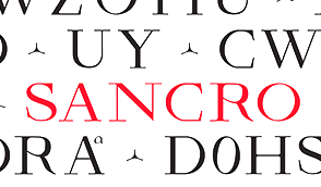 During her studies at Anderson University, Josie Maszk (Charleston, SC) created the inscriptional roman typeface Sancro (2014), which is based on a 13th century inscription in the basilica of Santa Croce in Florence, Italy. The typeface is intended for the church's use on signs, tickets, and other material.
  During her studies at Anderson University in Anderson, SC, Kayla Decker created the high-contrast mini-slabbed typeface
  Greenville, SC-based art director who created the art deco typeface
  Graphic design student at Anderson University in Anderson, SC, who is also a ceramic artist.
  Graphic designer in Fort Mill, SC.
  [
[ Boston-based American type designer who joined
  Graphic designer in Greenfield, SC.
  Type designer from Rock Hill, South Carolina. He created the squarish monoline sans typeface
  Miranda Hayes (Randa Graphics, Anderson, SC, b. 1994) designed these typefaces in 2015 while she was studying at Anderson University: Blithedale (a 192-style mixed heritage superfamily that includes Serif, Sans, Slab and Roman subfamilies in Regular, Expanded, Condensed and Oblique styles spread over 8 weights each), Davicar (named after David Carson), Fellatype (an irregular script named after Ed Fella), and Brodyville (named after Neville Brody).
  New foundry, est. 2005.
  Helen Rice and Josh Nissenboim run Pretend Foundry / Fuzzco, as an outlet to try out experimental fonts. Located in South Carlina, their typefaces as of early 2020 include:
  Mark Caneso is a graphic and type designer who lived in Garden Grove, CA, Kapolei, HI, Beaverton, OR, Austin, TX, and now, Mount Pleasant and/or Charleston, SC. He founded ppwrkstudio (or: ps type) in 2004.
  Clemson, SC-based designer of Partridge-Thin (1994),
  Free font outfit by Bob Wertz that started production in 2009, mostly based on FontStruct:
  Eric Scott Stevens has a BFA in graphic design from Winthrop University, Rock Hill, SC. Eric Scott specializes in display fonts that have a unique character. He is presently based in Tacoma, WA, where he set up the type foundry tower of Babel.
  Foundry in Charleston, SC. Creators of
|
|
|
|