| | |
Adrian Millett
|
Adrian Millett of PC Solutions made the checkers font CheckerPCS (1995). [Google]
[More] ⦿
|
Alan Cowderoy
[Chess Graphics]
|
[More] ⦿
|
Alastair Scott
[Chess Word Macros and Fonts]
|
[More] ⦿
|
Alexander Lange
|
 Karlsruhe-based software developer. Creator of the large (and free) Unicode font Quivira (2005). It covers mathematics, chess, astrological symbols, arrows, fists, Latin, Greek, Cyrillic, Hebrew, Armenian, Georgian, Tifinagh, Coptic, emoticons, Vai, and Braille, to name just a few ranges. Alexander graduated in computer science at the Hochschule Mannheim University of Applied Sciences (degree: Diplom-Informatiker (UAS)). [Google]
[More] ⦿
Karlsruhe-based software developer. Creator of the large (and free) Unicode font Quivira (2005). It covers mathematics, chess, astrological symbols, arrows, fists, Latin, Greek, Cyrillic, Hebrew, Armenian, Georgian, Tifinagh, Coptic, emoticons, Vai, and Braille, to name just a few ranges. Alexander graduated in computer science at the Hochschule Mannheim University of Applied Sciences (degree: Diplom-Informatiker (UAS)). [Google]
[More] ⦿
|
Alexander Sizenko
|
 Russian creator of the free chess font Chess 7 (2008), the free pixel fonts LED Stadion 7 (2013), Dash Dot Square 7 (2013), Enhanced Dot Digital 7 (2013), Small Dot Digital 7 (2013), Modern Dot Digital 7 (2013), Square Dot Digital 7 (2013), Bold Dot Digital 7 (2013), Serif Dot Digital 7 (2013), Serif LED Board 7 (2013), Modern LED Board 7 (2013), Half Bold Pixel 7 (2013), Dash Pixel 7 (2013), Serif Pixel 7 (2013), Power Pixel 7 (2013), Enhanced LED Board 7 (2013), Thin Pixel 7 (2013), Smallest Pixel 7 (2013), Modern LCD 7 (2013), Advanced LED Board 7 (2012), Digital 7 (2008, LED face), Post Pixel 7 (2013), Triple Dot Digital 7 (2013), Dash Dot Square 7 (2013), Enhanced Dot Digital 7 (2013), Dash Digital 7 (2013), Light Pixel 7 (2013), High Pixel 7 (2013), Mini Pixel 7 (2012), Long Pixel 7 (2013), LED Counter 7 (2013), Digital Counter 7 (2013), LED Digital 7 (2013), LED Board 7 (2013), Light LED Board 7 (2013), Advanced LED Board 7 (2013), Printed Circuit Board 7 (2013), Brick LED 7 (2013), Rounded LED Board 7 (2013), Pixel Dingbats 7 (2013), Square Wood 7 (2013), Small Bold Pixel 7 (2013), Rounded Pixel 7 (2013), Line Pixel 7 (2013), Bold LED Board (2013), Narrow Rectangle 7 (2013), Dot Digital 7 (2013, +Advanced), Square Metal 7 (2012), Stencil Pixel 7, Computer Pixel 7 (2012), Small Pixel 7 (2012), LED Counter Plus 7 (2013), LED 7 Display (2012, +Light), Neon Pixel 7 (2012), Old Pixel 7 (2012), Square Stone 7 (2012), Square Pixel 7 (2012), Pixel Font 7 (2012, +Outline), Pixel LCD7 (2012), Advanced Pixel 7 (2012), Ice Pixel 7 (2012), Void Pixel 7 (2012), Dash Dot LCD 7 (2012), Dash Dot Square 7 (2013), Enhanced Dot Digital 7 (2013), Double Pixel 7 (2012), Advanced Pixel 7, Advanced Dot Digital 7 (2013), ZX Spectrum 7 (2012), Bubble Pixel 7, Cyrillic Pixel 7, Basic Square 7 (2013), Basic Sans Serif 7 (2013), Effective Way 7 (2013), Arrow 7 (2013), Abricos 7 (2013), Computer 7 (2013), Disco 7 (2013), Software Tester 7 (2013), Elegant Line 7 (2013), Soft Lines 7 (2013), Effective Way 7 (2013), and the free LED display font Digital-7 (2008).
 Typefaces from 2014: Game Font 7, Square Sans Serif 7, High Sans Serif 7, Smooth Line 7, Bright Line 7, Double Line 7, Rounded Line 7, Rounded Sans Serif 7, Android 7, Arial Narrow 7, Bold Sans Serif 7, Light Sans Serif 7 (avant-garde sans), Modern Sans Serif 7, Software Kit 7 (dingbats), Advanced Sans Serif 7m Strong Line 7. Typefaces from 2015: Steel Blade 7, Semi Rounded Sans Serif 7, Bold Game Font 7, Double Force 7, Roman Font VII, Game Sans Serif 7, Sans Serif Plus 7, Soft Sans Serif 7, Smooth Pixel 7, Clear Metal 7, Military Font 7 (stencil). Typefaces from 2019: Clear Line 7. Open Font Library link. Fontspace link. See also here. Aka Chess 7 and as Style 7. [Google]
[More] ⦿
|
Alpine Fonts
[Steve Smith]
|
Chess fonts and other game fonts at this company in Laramie, WY. The Alpine Fonts, by Steve Smith, are supplied as three sets with different designs (Hastings, Linares or Zürich) containing 17 TrueType or Adobe Type 1 fonts in each set. They are specially supported by my macros. Commercial site. Products include checkers, shogi, ChiangQi, Copenhagen Othello, Las Vegas dice and domino fonts, Monte Carlo backgammon font, Canton Mah Jong font, Tokyo go font, Chess fonts: Linares, Hastings, Zurich. Bermuda playing card font. [Google]
[More] ⦿
|
Altemus Creative
[Robert Altemus]

|
Altemus Creative Services sells dingbat fonts by Robert Altemus from New York, NY: Your premiere source for digital decorative fonts. Their commercial dingbats are sold by MyFonts. Partial list: AltemusBirds, AltemusBorders 1 through 4 (1992; Borders 4 containss pointing hands and flourishes), AltemusBursts 1 through 4, Altemus Bursts 1 through 4 (2002, contains snowflakes), AltemusChecks, AltemusChecksTwo, AltemusCorners, AltemusCrosses, AltemusCuts, AltemusCutsThree, AltemusCutsTwo, AltemusFlowers, AltemusHands, AltemusHolidaysOne, AltemusKitchen, AltemusPinwheels (1996), AltemusPointers, AltemusRays, AltemusRaysBold, AltemusRoughcuts, AltemusRounds, AltemusRules, AltemusSecurity, AltemusShields, AltemusSpirals, AltemusSpiralsBold, AltemusSpiralsBoldItalic, AltemusSpiralsItalic, AltemusSquares, AltemusStars 1 through 3, AltemusSuns, AltemusSunsBold, AltemusToolKit (2 fonts), Altemus Web Icons, EuropaArabesque, Games (cards, domino), Games 2 (mahjong, chess), Sports (balls), Sports 2, Leaves 1 and 2. Catalog, part I, part II. [Google]
[MyFonts]
[More] ⦿
|
Andres Camilo Sanchez Moreno
|
Bogota, Colombia-based designer of an untitled ribbon typeface in 2013. [Google]
[More] ⦿
|
Andrey Kudryavtsev
[Andrey Kudryavtsev Type Foundry (or: AKTF)]
|
 [MyFonts]
[More] ⦿
[MyFonts]
[More] ⦿
|
Andrey Kudryavtsev Type Foundry (or: AKTF)
[Andrey Kudryavtsev]
|
 Foundry in Irkutsk in Siberia.
 Andrey Kudryavtsev designed Spacexplorer (2012), Necromant (2012), Flexy Sans (2011), Otrada (2011, signage script), Micronica (2008), a font shaped like old TV screens, Karlson (2009), Imperator (2010, a Trajan face), Alter (2010), Sommelier (2011), Alebarda (2009), Rubicon (2009) and Flexy Sans (2009). Typefaces made in 2012 include the macho slightly flared Antey (Latin and Cyrillic) and the strong display sans typeface Tambov. In 2013, AKTF published Softipen Script. In 2014, he created Qwincey FY (a high-contrast slightly flared almost Peignotian sans family, published by FontYou), Warren Narrow and Achille II Cyr FY (together with the Fontyou team of Alisa Nowak and Gregori Vincens). Typefaces from 2015: Smile Pro (a fat multi-style handcrafted poster family of exceptional beauty; together with Rodrigo Araya), Ardilla Small (a rounded small x-height sans done together with Rodrigo Araya; inspired by the children's show Peppa Pig), Plumps, Antey, Crisper. Typefaces from 2016: Pequena Pro Cyrillic (Rodrigo Typo), Robest (unicase). Typefaces from 2017: AK Sans, Hatter Cyrillic Display (a Halloween font), La Pica (by Rodrigo Araya and Andrey Kudryavtsev), Fairystory (curly typeface), Kreker (a rounded poster sans), Stickout (comic book style). Typefaces from 2018: Czarevitch (a Cyrillic and Cyrillic simulation pair), Skaz (a psychedelic type inspired by the Victorian typeface Ringlet), Sitari, Dozer, Squick (a comic book / children's font family by Franco Jonas, Andrey Kudryavtsev and Rodrigo Araya), Freept (a free marker font), Nightelf, Ingot (a condensed rounded blackletter), Insolenta. Ding (2018) is a great fattish cartoon font that was co-designed by Rodrigo Araya Salas, Andrey Kudryavtsev and Franco Jonas. See also its extensions, Ding Pro (2019) and Ding Extra (2019). Typefaces from 2019: Clarence Alt (a an almost bubblegum children's book sans by Franco Jonas, Rodrigo Araya Salas and Andrey Kudryavtsev). Typefaces from 2020: La Pica Bonus (a vernacular or supermarket style font and dingbat family by Andrey Kudryavtsev and Rodrigo Araya Salas), Ancoa Slanted (an angular display family in 15 styles; by Andrey Kudryavtsev, Rodrigo Araya Salas and Franco Jonas Hernandez), Skippie (a comic book family by Andrey Kudryavtsev, Rodrigo Araya Salas, Bruno Jara Ahumada and Franco Jonas, and four sets of dingbats including Skippie Monster Lucha Libre and Skippie Monster Halloween), Ancoa (an angular 19-style layerable typeface by Andrey Kudryavtsev, Rodrigo Araya Salas and Franco Jonas Hernandez). Typefaces from 2022: Chessnota (a chess font). Behance link. Creative Market link. Myfonts link. Klingspor link. View the typefaces made by AKTF. Patreon link. [Google]
[MyFonts]
[More] ⦿
|
Andrzej Dzieniszweski
|
Creator of the commercial chess font Akiba Pro available from thr Polish Internet Chess Center. Andrzej lives in Jelenia Gora, Poland. [Google]
[More] ⦿
|
Andy Walker
|
Designer at the Department of Mathematics, University of Nottingham of the GNU chess font, to be used with "gnuchess". [Google]
[More] ⦿
|
Antonis Tsolomitis
[Laboratory of Digital Typography and Mathematical Software]
|
 [More] ⦿
|
Arial unicode: Chess symbols
|
Like many large unicode-compliant fonts, Arial Unicode has a full set of chess figurines. [Google]
[More] ⦿
|
Armando Hernández Marroquín
|
Mexican designer of the TrueType fonts Chess Alfonso-X, Chess Chess Harlequin, Condal, Chess Leipzig, Chess Kingdom, Chess Magnetic, Chess Mark, Chess Marroquin, Chess Maya, Chess Mediaeval, Chess Merida, Chess Millennia, Chess Miscel, Chess Motif, Chess Usual. All freeware. Also made the free PostScript font set FigurineSymbol (6 typefaces) for use in text. Armando lives in San Cristobal de Las Casas, Chiapas. [Google]
[More] ⦿
|
Association for Insight Meditation (or: Aimwell)
[Bhikkhu Pesala]
|
 Bhikkhu Pesala, a Buddhist monk based in London, designs free fonts. His original we page was called Aimwell (Association for Insight Meditation). On that site dedicated to Pali fonts, there was a file with Bhikkhu Pesala's free fonts. Most of Pesala's fonts have well over 1000 glyphs, cover Latin, Vietnamese and Greek, and have an enormous set of symbols including chess symbols and astrological signs.
 The present list of fonts, with some older ones removed: - Acariya (2016): a Garamond style typeface derived from Guru, but with suboptimal kerning.
- Akkhara (2006). Derived from Gentium.
- Balava (2014): a revival of Baskerville derived from Libre Baskerville.
- Cankama (2009). A Gothic, Black Letter script.
- Carita (2006). An all caps roman.
- Garava (2006). Designed for body text. It has a generous x-height and economical copy-fit. The family includes Extra-Bold and Extra-Bold Italic styles besides the usual four. Typeface Sample
- Guru (2008). A condensed Garamond style typeface designed for economy of copyfit in Buddhist publications. 100 pages of text set in the Pali typeface would be about 94 pages if set in Garava, or 92 pages if set in Guru.
- Hari (2016): a hand-writing script derived from Allura by Robert E. Leuschke, released under the SIL license.
- Hattha (2007). A felt marker pen typeface.
- Jivita (2012): an original sans typeface for body text.
- Kabala (2009). A sans serif typeface designed for display text or headings. Kabel?
- Lekhana (2008). Pesala's version of Zapf Chancery.
- Mahakampa (2016): a hand-writing script derived from Great Vibes by Robert E. Leuschke.
- Mandala (2007). A geometric sans designed for decorative body text or headings. Has chess symbols.
- Nacca (2016): a hand-writing script derived from Dancing Script by Pablo Impallari.
- Odana (2006). A calligraphic almost blackletter brush font suitable for titles, or short texts where a less formal appearance is wanted.
- Open Sans (2016): a sans font suitable for body text. Includes diacritics for Pali and Sanskrit.
- Pali: Pesala's version of Hermann Zapf's Palatino.
- Sukhumala (2014): derived from Sort Mills Goudy.
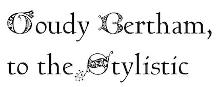
- Talapanna (2007). Pesala's version of Goudy Bertham, with decorative gothic capitals and extra ligatures in the Private Use Area.
- Talapatta.
- Veluvana (2006). A heavy brush style. The Greek glyphs are from Guru. Small Caps are greater than x-height.
- Verajja (2006). A Pali word meaning "variety of kingdoms or provinces." It is derived from Bitstream Vera.
- Verajja Serif.
- Yolanda (2008). Calligraphic.
[Google]
[More] ⦿
|
BDFchess
|
BDFCHESS is a package of additional macros to CHESS.STY 1.2, writen by Piet Tutelaers, for correspondence chess players. To be used with Piet Tutelaers' metafont chess fonts. [Google]
[More] ⦿
|
Bhikkhu Pesala
[Association for Insight Meditation (or: Aimwell)]
|
 [More] ⦿
|
Brent
|
Chess font archive: ChessAdventurer, ChessCases, ChessPiece, Chess-Condal, Chess-Harlequin, Chess-Kingdom, Chess-Leipzig, Chess-Line, Chess-Mark, Chess-Marroquin, Chess-Maya, Chess-Merida, Chess-Motif, Traveller-Standard, Chess-Utrecht. [Google]
[More] ⦿
|
Cerdanyola
|
BibleScrT (URW, 1994), SPTimeFig-Bold, SPTimeFig-Roman. The last two fonts are for chess, and were made in 1998 by SoftPlus Co, Sofia, Bulgaria. [Google]
[More] ⦿
|
Chess diagrams
[Eric Bentzen]
|
Eric Bentzen has links to chess diagram software, and to about twenty chess fonts. THE site for chess fonts! Download his Chess Alpha, his Chess Berlin, and many more TrueType chess fonts. See also here. [Google]
[More] ⦿
|
Chess fonts
|
Anders Thulin explains where to get several chess fonts. [Google]
[More] ⦿
|
Chess Graphics
[Alan Cowderoy]
|
Traveller Standard is a free TrueType chess font by Alan Cowderoy. Download. See also here. [Google]
[More] ⦿
|
Chess group at the University of Pittsburgh
|
Archive of many chess fonts, like the Utrecht font and several of Marroquin's fonts. Mirror. [Google]
[More] ⦿
|
Chess Materials Desktop Publishing
|
Many free chess fonts, including Chess-Magnetic, Chess-Mark, Chess-Marroquin, Chess-Maya, Chess-Millennia-D, Chess-Millennia-L, Chess-Miscel, Chess-Mediaeval, Tilburg3 (by Chessworks Unlimited), Skak, Chess-Utrecht. [Google]
[More] ⦿
|
Chess metafonts
[Piet Tutelaers]
|
Chess package for TEX with metafonts by Piet Tutelaers. See also here. Developed by Piet Tutelaers at Technische Universiteit Eindhoven, The Netherlands. [Google]
[More] ⦿
|
Chess Ole!
[Frank David]
|
This German chess site has the following chess truetype fonts: Cheq, CheqFig, ChessOle!, ChessOle!Figurin. The latter two fonts are made by Frank David from Göttingen in 1993. [Google]
[More] ⦿
|
Chess sets for Fixation for Macintosh
|
William I. Johnston's page on bitmap chess sets. [Google]
[More] ⦿
|
Chess Word Macros and Fonts
[Alastair Scott]
|
Alastair Scott designed the freeware Chess Regular in TrueType. Site contain many freeware fonts, and chess-related links. The page is now maintained by Hans Bodlaender. [Google]
[More] ⦿
|
ChessBase
[Rolf Schlösser]
|
ChessBase GmbH is based in Germany and is run by Rolf Schlösser. He made these chess fonts in 1994: DiagramTTCrystals, DiagramTTHabsburg, FigurineCrrCBBoldItalic, FigurineCrrCBBold, FigurineCrrCBItalic (monospace font), FigurineHlvCrys-BoldItalic, FigurineHlvCrys-Bold, FigurineHlvCrys-Italic, FigurineHlvCrys, FigurineHlvHabs-BoldItalic, FigurineHlvHabs-Bold, FigurineHlvHabs-Italic, FigurineHlvHabs, FigurineTmsCBBoldItalic, FigurineTmsCBBold, FigurineTmsCBItalic, FigurineTmsCB, FigurineTmsHabs-BoldItalic, FigurineTmsHabs-Bold, FigurineTmsHabs-Italic, FigurineTmsHabs. The Figurine series provide text fonts with appropriate chess glyphs added on. Some of these fonts are at certain sites on the web. For example, Diagram Chessbase has DiagramTTCrystals, DiagramTTFritz, DiagramTTHabsburg, DiagramTTBlindAll, DiagramTTBlindBlack, DiagramTTBlindwhite. Of these, DiagramTTFritz (1999) is by Monika Berger, and DiagramTTCrystals (1994) and DiagramTTHabsburg (1994) are by Rolf Schlösser. And UNF Chess Club has FigurineTmsCB, FigurineTmsCBBold, FigurineTmsCBBoldItalic, FigurineTmsCBItalic. [Google]
[More] ⦿
|
chess.com
|
Chess font arghive: Chess-7, Chess-Berlin, Chess-Harlequin, Chess-Kingdom, Chess-Leipzig, Chess-Mark, Chess-Marroquin, Chess-Maya, Chess-Motif, ChessDiagrammPirat, ChessFigurinePirat, ChessFigurinePiratBold, ChessFigurinePiratItalic, ChessKomponentPirat. [Google]
[More] ⦿
|
Chessman
|
Chessman uses the Zurich Jaxboard font. [Google]
[More] ⦿
|
Chessmaster
|
Has a TrueType font built in. [Google]
[More] ⦿
|
Chessnewspapershift
|
Free chess font that can be found here (2003). [Google]
[More] ⦿
|
Chinese chess font
[Jacques Richer]
|
Chinese chess metafont by Jacques Richer. [Google]
[More] ⦿
|
Christian Poisson
|
Nantes-based designer of a free chess font for "fairy" chess called 1Echecs. His font 2Echecs (1996) is here. [Google]
[More] ⦿
|
Convekta
|
Three chess fonts: ISDiagram (font from Chess Assistant, 1994, InformSystems, Russia), CA-Chess (chess font, with Latin and Cyrillic characters thrown in, 1997, ParaGraph), CADiagram (font from Chess Assistant, 2001, InformSystems, Russia). Another URL. Convekta also markets Chess Assistant, chess software. [Google]
[More] ⦿
|
Czcionki Szachowe
|
Polish chess font archive. [Google]
[More] ⦿
|
David L. Brown
|
Creator of the free chess fonts GC2004D, GC2004X, GC2004Y in 2004. Here GC stands for The Good Companions. [Google]
[More] ⦿
|
DejaVu Fonts
[Stepan Roh]
|
The DejaVu fonts form an open source font family based on the Bitstream Vera Fonts. Free download. Its purpose is to provide a wider range of characters (see Current status page for more information) while maintaining the original look and feel through the process of collaborative development. Included are DejaVuSans-Bold, DejaVuSans-BoldOblique, DejaVuSans-Oblique, DejaVuSans, DejaVuSansCondensed-Bold, DejaVuSansCondensed-BoldOblique, DejaVuSansCondensed-Oblique, DejaVuSansCondensed, DejaVuSansMono-Bold, DejaVuSansMono-BoldOb, DejaVuSansMono-Oblique, DejaVuSansMono-Roman, DejaVuSerif-Bold, DejaVuSerif-BoldOblique, DejaVuSerif-Oblique, DejaVuSerif-Roman, DejaVuSerifCondensed-Bold, DejaVuSerifCondensed-BoldOblique, DejaVuSerifCondensed-Oblique, DejaVuSerifCondensed. Authors and contributors comprise Adrian Schroeter, Ben Laenen, Dafydd Harries, Danilo Segan (Cyrillic), David Jez, David Lawrence Ramsey, Denis Jacquerye, Dwayne Bailey, James Cloos, James Crippen, Keenan Pepper, Mashrab Kuvatov, Misu Moldovan (Romanian), Ognyan Kulev, Ondrej Koala Vacha, Peter Cernák, Sander Vesik, Stepán Roh (project manager; Polish), Tavmjong Bah, Valentin Stoykov, and Vasek Stodulka. The idea is to eventually cover most of unicode. Currently, this is covered: Latin (+supplement, extended A and part of extended B), IPA, Greek, Coptic, Cyrillic, Georgian, Armenian, Hebrew, N'ko, Tifinagh, Lao, Canadian aboriginal syllabics, Ogham, Arabic, math symbols, arrows, Braille, chess, and many dingbats. Alternate download site. Wiki page with download information. Fontspace link. Open Font Library link. [Google]
[More] ⦿
|
Denis Roegel
[LaTeX Navigator]
|
[More] ⦿
|
Dick Pape
[Dick Pape: Design Elements]
|
 [More] ⦿
|
Dick Pape: Design Elements
[Dick Pape]
|
 Dick Pape's digitization of design elements, in 43 truetype fonts called Design Elements. Created in 2010, this is a gold mine of useful dingbats. Typeface design Elements 4g contains chess pieces. My preferred typeface is 6e, which has tens of fists. Font 7a has snow crystals. Number 6a consists of arrows.
 Download here. [Google]
[More] ⦿
|
Douglas Wong
[Science Technology Centre Font Page]
|
[More] ⦿
|
ecaGraphics
[Piotr Klarowski]
|
 Polish designer at FontStruct in 2008 of Le Chat Sans (inspired by a 1930s poster), Tetromino, Diamond, Alpha Spot, Ossicles (like ECG output), Cubistic1, Peter's Chess Pieces. In 2009, he added the artistic BO86. [Google]
[More] ⦿
Polish designer at FontStruct in 2008 of Le Chat Sans (inspired by a 1930s poster), Tetromino, Diamond, Alpha Spot, Ossicles (like ECG output), Cubistic1, Peter's Chess Pieces. In 2009, he added the artistic BO86. [Google]
[More] ⦿
|
Egon Madsen
|
Designed the free PostScript chess font Skak. Link temporarliy moved here. [Google]
[More] ⦿
|
En Passant - Nørresundby Chess Club
[Eric Bentzen]
|
 Eric Bentzen's page with links to chess fonts. Download page. Chess font link page. [Google]
[More] ⦿
Eric Bentzen's page with links to chess fonts. Download page. Chess font link page. [Google]
[More] ⦿
|
Eric Bentzen
[En Passant - Nørresundby Chess Club]
|
[More] ⦿
|
Eric Bentzen
[Chess diagrams]
|
[More] ⦿
|
Eric Schiller
[Tilburg Laserfonts]
|
[More] ⦿
|
EVCOMP
|
Czech computer chess jump page, with a few links to font sites. [Google]
[More] ⦿
|
Exotic dingbat fonts
|
Small archive. Has Cheq (truetype), African Ornaments One (Dixie's Delights, 1994). [Google]
[More] ⦿
|
Frank David
[Chess Ole!]
|
[More] ⦿
|
Frank Hassel
|
Designer of the metafont chess font Chess. [Google]
[More] ⦿
|
Gary Katch
|
Montrealer Gary Katch designed a beautiful symmetric (up=down) chess font called Chess Montreal. Truetype, shareware. [Google]
[More] ⦿
|
George Douros
[Unicode Fonts for Ancient Scripts]
|
 [More] ⦿
|
GNU Freefont (or: Free UCS Outline Fonts)
[Steve White]
|
 The GNU Freefont is continuously being updated to become a large useful Unicode monster. GNU FreeFont is a free family of scalable outline fonts, suitable for general use on computers and for desktop publishing. It is Unicode-encoded for compatability with all modern operating systems. There are serif, Sans and Mono subfamilies. Also called the "Free UCS Outline Fonts", this project is part of the larger Free Software Foundation. The original head honcho was Primoz Peterlin, the coordinator at the Institute of Biophysics of the University of Ljubljana, Slovenia. In 2008, Steve White (aka Stevan White) took over. URW++ Design&Development GmbH. URW++ donated a set of 35 core PostScript Type 1 fonts to the Ghostscript project.
 - Basic Latin (U+0041-U+007A)
- Latin-1 Supplement (U+00C0-U+00FF)
- Latin Extended-A (U+0100-U+017F)
- Spacing Modifier Letters (U+02B0-U+02FF)
- Mathematical Operators (U+2200-U+22FF)
- Block Elements (U+2580-U+259F)
- Dingbats (U+2700-U+27BF)
Yannis Haralambous and John Plaice. Yannis Haralambous and John Plaice are the authors of Omega typesetting system, which is an extension of TeX. Its first release, aims primarily at improving TeX's multilingual abilities. In Omega all characters and pointers into data-structures are 16-bit wide, instead of 8-bit, thereby eliminating many of the trivial limitations of TeX. Omega also allows multiple input and output character sets, and uses programmable filters to translate from one encoding to another, to perform contextual analysis, etc. Internally, Omega uses the universal 16-bit Unicode standard character set, based on ISO-10646. These improvements not only make it a lot easier for TeX users to cope with multiple or complex languages, like Arabic, Indic, Khmer, Chinese, Japanese or Korean, in one document, but will also form the basis for future developments in other areas, such as native color support and hypertext features. ... Fonts for UT1 (omlgc family) and UT2 (omah family) are under development: these fonts are in PostScript format and visually close to Times and Helvetica font families. - Latin Extended-B (U+0180-U+024F)
- IPA Extensions (U+0250-U+02AF)
- Greek (U+0370-U+03FF)
- Armenian (U+0530-U+058F)
- Hebrew (U+0590-U+05FF)
- Arabic (U+0600-U+06FF)
- Currency Symbols (U+20A0-U+20CF)
- Arabic Presentation Forms-A (U+FB50-U+FDFF)
- Arabic Presentation Forms-B (U+FE70-U+FEFF)
Yannis Haralambous and Wellcome Institute. In 1994, The Wellcome Library The Wellcome Institute for the History of Medicine 183 Euston Road, London NW1 2BE, England, commissioned Mr. Haralambous to produce a Sinhalese font for them. We have received 03/09 official notice from Robert Kiley, Head of e-Strategy for the Wellcome Library, that Yannis' font could be included in GNU FreeFont under its GNU license: Sinhala (U+0D80-U+0DFF). Young U. Ryu at the University of Texas at Dallas is the author of Txfonts, a set of mathematical symbols designed to accompany text typeset in Times or its variants. In the documentation, Young adresses the design of mathematical symbols: "The Adobe Times fonts are thicker than the CM fonts. Designing math fonts for Times based on the rule thickness of Times =,, +, /, <, etc. would result in too thick math symbols, in my opinion. In the TX fonts, these glyphs are thinner than those of original Times fonts. That is, the rule thickness of these glyphs is around 85% of that of the Times fonts, but still thicker than that of the CM fonts." Ranges: Arrows (U+2190-U+21FF), Mathematical Symbols (U+2200-U+22FF). Valek Filippov added Cyrillic glyphs and composite Latin Extended A to the whole set of the abovementioned URW set of 35 PostScript core fonts, Ranges: Latin Extended-A (U+0100-U+017F), Cyrillic (U+0400-U+04FF). Wadalab Kanji Comittee. Between April 1990 and March 1992, Wadalab Kanji Comittee put together a series of scalable font files with Japanese scripts, in four forms: Sai Micho, Chu Mincho, Cho Kaku and Saimaru. The font files were written in custom file format, while tools for conversion into Metafont and PostScript Type 1 were also supplied. The Wadalab Kanji Comittee has later been dismissed, and the resulting files can be now found on the FTP server of the Depertment of Mathematical Engineering and Information Physics, Faculty of Engineering, University of Tokyo: Hiragana (U+3040-U+309F), Katakana (U+30A0-U+30FF). Note that some time around 2009, the hiragana and katakana ranges were deleted. Angelo Haritsis has compiled a set of Greek type 1 fonts. The glyphs from this source has been used to compose Greek glyphs in FreeSans and FreeMono. Greek (U+0370-U+03FF). Yannis Haralambous and Virach Sornlertlamvanich. In 1999, Yannis Haralambous and Virach Sornlertlamvanich made a set of glyphs covering the Thai national standard Nf3, in both upright and slanted shape. Range: Thai (U+0E00-U+0E7F). Shaheed Haque has developed a basic set of basic Bengali glyphs (without ligatures), using ISO10646 encoding. Range: Bengali (U+0980-U+09FF). Sam Stepanyan created a set of Armenian sans serif glyphs visually compatible with Helvetica or Arial. Range: Armenian (U+0530-U+058F). Mohamed Ishan has started a Thaana Unicode Project. Range: Thaana (U+0780-U+07BF). Sushant Kumar Dash has created a font in his mother tongue, Oriya: Oriya (U+0B00-U+0B7F). But Freefont has dropped Oriya because of the absence of font features neccessary for display of text in Oriya. Harsh Kumar has started BharatBhasha for these ranges: - Devanagari (U+0900-U+097F)
- Bengali (U+0980-U+09FF)
- Gurmukhi (U+0A00-U+0A7F)
- Gujarati (U+0A80-U+0AFF)
Prasad A. Chodavarapu created Tikkana, a Telugu font family: Telugu (U+0C00-U+0C7F). It was originally included in GNU Freefont, but supoort for Telugu was later dropped altogether from the GNU Freefont project. Frans Velthuis and Anshuman Pandey. In 1991, Frans Velthuis from the Groningen University, The Netherlands, released a Devanagari font as Metafont source, available under the terms of GNU GPL. Later, Anshuman Pandey from Washington University in Seattle, took over the maintenance of font. Fonts can be found on CTAN. This font was converted the font to Type 1 format using Peter Szabo's TeXtrace and removed some redundant control points with PfaEdit. Range: Devanagari (U+0900-U+097F). Hardip Singh Pannu. In 1991, Hardip Singh Pannu has created a free Gurmukhi TrueType font, available as regular, bold, oblique and bold oblique form. Range: Gurmukhi (U+0A00-U+0A7F). Jeroen Hellingman (The Netherlands) created a set of Malayalam metafonts in 1994, and a set of Oriya metafonts in 1996. Malayalam fonts were created as uniform stroke only, while Oriya metafonts exist in both uniform and modulated stroke. From private communication: "It is my intention to release the fonts under GPL, but not all copies around have this notice on them." Metafonts can be found here and here. Ranges: Oriya (U+0B00-U+0B7F), Malayalam (U+0D00-U+0D7F). Oriya was subsequently dropped from the Freefont project. Thomas Ridgeway, then at the Humanities And Arts Computing Center, Washington University, Seattle, USA, (now defunct), created a Tamil metafont in 1990. Anshuman Pandey from the same university took over the maintenance of font. Fonts can be found at CTAN and cover Tamil (U+0B80-U+0BFF). Berhanu Beyene, Prof. Dr. Manfred Kudlek, Olaf Kummer, and Jochen Metzinger from the Theoretical Foundations of Computer Science, University of Hamburg, prepared a set of Ethiopic metafonts. They also maintain the home page on the Ethiopic font project. Someone converted the fonts to Type 1 format using TeXtrace, and removed some redundant control points with PfaEdit. Range: Ethiopic (U+1200-U+137F). Maxim Iorsh. In 2002, Maxim Iorsh started the Culmus project, aiming at providing Hebrew-speaking Linux and Unix community with a basic collection of Hebrew fonts for X Windows. The fonts are visually compatible with URW++ Century Schoolbook L, URW++ Nimbus Sans L and URW++ Nimbus Mono L families, respectively. Range: Hebrew (U+0590-U+05FF). Vyacheslav Dikonov made a Braille unicode font that could be merged with the UCS fonts to fill the 2800-28FF range completely (uniform scaling is possible to adapt it to any cell size). He also contributed a free Syriac font, whose glyphs (about half of them) are borrowed from the free Carlo Ator font. Vyacheslav also filled in a few missing spots in the U+2000-U+27FF area, e.g., the box drawing section, sets of subscript and superscript digits and capital Roman numbers. Ranges: Syriac (U+0700-U+074A), Box Drawing (U+2500-U+257F), Braille (U+2800-U+28FF). Panayotis Katsaloulis helped fixing Greek accents in the Greek Extended area: (U+1F00-U+1FFF). M.S. Sridhar. M/S Cyberscape Multimedia Limited, Mumbai, developers of Akruti Software for Indian Languages (http://www.akruti.com/), have released a set of TTF fonts for nine Indian scripts (Devanagari, Gujarati, Telugu, Tamil, Malayalam, Kannada, Bengali, Oriya, and Gurumukhi) under the GNU General Public License (GPL). You can download the fonts from the Free Software Foundation of India WWW site. Their original contributions to Freefont were - Devanagari (U+0900-U+097F)
- Bengali (U+0980-U+09FF)
- Gurmukhi (U+0A00-U+0A7F)
- Gujarati (U+0A80-U+0AFF)
- Oriya (U+0B00-U+0B7F)
- Tamil (U+0B80-U+0BFF)
- Telugu (U+0C00-U+0C7F)
- Kannada (U+0C80-U+0CFF)
- Malayalam (U+0D00-U+0D7F)
Oriya, Kannada and Telugu were dropped from the GNU Freefont project. DMS Electronics, The Sri Lanka Tipitaka Project, and Noah Levitt. Noah Levitt found out that the Sinhalese fonts available on the site metta.lk are released under GNU GPL. These glyphs were later replaced by those from the LKLUG font. Finally the range was completely replaced by glyphs from the sinh TeX font, with much help and advice from Harshula Jayasuriya. Range: Sinhala (U+0D80-U+0DFF). Daniel Shurovich Chirkov. Dan Chirkov updated the FreeSerif font with the missing Cyrillic glyphs needed for conformance to Unicode 3.2. The effort is part of the Slavjanskij package for Mac OS X. range: Cyrillic (U+0400-U+04FF). Abbas Izad. Responsible for Arabic (U+0600-U+06FF), Arabic Presentation Forms-A, (U+FB50-U+FDFF), Arabic Presentation Forms-B (U+FE70-U+FEFF). Denis Jacquerye added new glyphs and corrected existing ones in the Latin Extended-B (U+0180-U+024F) and IPA Extensions (U+0250-U+02AF) ranges. K.H. Hussain and R. Chitrajan. Rachana in Malayalam means to write, to create. Rachana Akshara Vedi, a team of socially committed information technology professionals and philologists, has applied developments in computer technology and desktop publishing to resurrect the Malayalam language from the disorder, fragmentation and degeneration it had suffered since the attempt to adapt the Malayalam script for using with a regular mechanical typewriter, which took place in 1967-69. K.H. Hussein at the Kerala Forest Research Institute has released "Rachana Normal" fonts with approximately 900 glyphs required to typeset traditional Malayalam. R. Chitrajan apparently encoded the glyphs in the OpenType table. In 2008, the Malayalam ranges in FreeSerif were updated under the advise and supervision of Hiran Venugopalan of Swathanthra Malayalam Computing, to reflect the revised edition Rachana_04. Range: Malayalam (U+0D00-U+0D7F). Solaiman Karim filled in Bengali (U+0980-U+09FF). Solaiman Karim has developed several OpenType Bangla fonts and released them under GNU GPL. Sonali Sonania and Monika Shah covered Devanagari (U+0900-U+097F) and Gujarati (U+0A80-U+0AFF). Glyphs were drawn by Cyberscape Multimedia Ltd., #101, Mahalakshmi Mansion 21st Main 22nd "A" Cross Banashankari 2nd stage Banglore 560070, India. Converted to OTF by IndicTrans Team, Powai, Mumbai, lead by Prof. Jitendra Shah. Maintained by Monika Shah and Sonali Sonania of janabhaaratii Team, C-DAC, Mumbai. This font is released under GPL by Dr. Alka Irani and Prof Jitendra Shah, janabhaaratii Team, C-DAC, Mumabi. janabhaaratii is localisation project at C-DAC Mumbai (formerly National Centre for Software Technology); funded by TDIL, Govt. of India. Pravin Satpute, Bageshri Salvi, Rahul Bhalerao and Sandeep Shedmake added these Indic language cranges: - Devanagari (U+0900-U+097F)
- Gujarati (U+0A80-U+0AFF)
- Oriya (U+0B00-U+0B7F)
- Malayalam (U+0D00-U+0D7F)
- Tamil (U+0B80-U+0BFF)
In December 2005 the team at www.gnowledge.org released a set of two Unicode pan-Indic fonts: "Samyak" and "Samyak Sans". "Samyak" font belongs to serif style and is an original work of the team; "Samyak Sans" font belongs to sans serif style and is actually a compilation of already released Indic fonts (Gargi, Padma, Mukti, Utkal, Akruti and ThendralUni). Both fonts are based on Unicode standard. You can download the font files separately. Note that Oriya was dropped from the Freefont project. Kulbir Singh Thind added Gurmukhi (U+0A00-U+0A7F). Dr. Kulbir Singh Thind designed a set of Gurmukhi Unicode fonts, AnmolUni and AnmolUni-Bold, which are available under the terms of GNU license from the Punjabu Computing Resource Center. Gia Shervashidze added Georgian (U+10A0-U+10FF). Starting in mid-1990s, Gia Shervashidze designed many Unicode-compliant Georgian fonts: Times New Roman Georgian, Arial Georgian, Courier New Georgian. Daniel Johnson. Created by hand a Cherokee range specially for FreeFont to be "in line with the classic Cherokee typefaces used in 19th century printing", but also to fit well with ranges previously in FreeFont. Then he made Unified Canadian Syllabics in Sans, and a Cherokee and Kayah Li in Mono! And never to be outdone by himself, then did UCAS Extended and Osmanya.... What next? - Armenian (serif) (U+0530-U+058F)
- Cherokee (U+13A0-U+13FF)
- Unified Canadian Aboriginal Syllabics (U+1400-U+167F)
- UCAS Extended (U+18B0-U+18F5)
- Kayah Li (U+A900-U+A92F)
- Tifinagh (U+2D30-U+2D7F)
- Vai (U+A500-U+A62B)
- Latin Extended-D (Mayanist letters) (U+A720-U+A7FF)
- Osmanya (U+10480-U+104a7)
George Douros, the creator of several fonts focusing on ancient scripts and symbols. Many of the glyphs are created by making outlines from scanned images of ancient sources. - Aegean: Phoenecian (U+10900-U+1091F).
- Analecta: Gothic (U+10330-U+1034F)
- Musical: Byzantine (U+1D000-U+1D0FF)&Western (U+1D100-U+1D1DF)
- Unicode: many miscellaneous symbols, miscellaneous technical, supplemental symbols, and mathematical alphanumeric symbols (U+1D400-U+1D7FF), Mah Jong (U+1F000-U+1F02B), and the outline of the domino (U+1F030-U+1F093).
Steve White filled in a lot of missing characters, got some font features working, left fingerprints almost everywhere, and is responsible for these blocks: Glagolitic (U+2C00-U+2C5F), Coptic (U+2C80-U+2CFF). Pavel Skrylev is responsible for Cyrillic Extended-A (U+2DEO-U+2DFF) as well as many of the additions to Cyrillic Extended-B (U+A640-U+A65F). Mark Williamson made the MPH 2 Damase font, from which these ranges were taken: - Hanunóo (U+1720-U+173F)
- Buginese (U+1A00-U+1A1F)
- Tai Le (U+1950-U+197F)
- Ugaritic (U+10380-U+1039F)
- Old Persian (U+103A0-U+103DF)
Primoz Peterlin filled in missing glyphs here and there (e.g., Latin Extended-B and IPA Extensions ranges in the FreeMono family), and created the following UCS blocks: - Latin Extended-B (U+0180-U+024F)
- IPA Extensions (U+0250-U+02AF)
- Arrows (U+2190-U+21FF)
- Box Drawing (U+2500-U+257F)
- Block Elements (U+2580-U+259F)
- Geometrical Shapes (U+25A0-U+25FF)
Jacob Poon submitted a very thorough survey of glyph problems and other suggestions. Alexey Kryukov made the TemporaLCGUni fonts, based on the URW++ fonts, from which at one point FreeSerif Cyrillic, and some of the Greek, was drawn. He also provided valuable direction about Cyrillic and Greek typesetting. The Sinhala font project has taken the glyphs from Yannis Haralambous' Sinhala font, to produce a Unicode TrueType font, LKLUG. These glyphs were for a while included in FreeFont: Sinhala (U+0D80-U+0DFF). Fontspace link. Crosswire link for Free Monospaced, Free Serif and Free Sans. Download link. [Google]
[More] ⦿
|
Hanna Kolodziejska
|
Designer of the metafont Go (1991), for the game of Go. See also the Metafont package Igo, with alterations in 2003 by Étienne Dupuis. [Google]
[More] ⦿
|
Hans Bodlaender
[True Type chess fonts]
|
[More] ⦿
|
Harry Oesch
[Smart Chess]
|
[More] ⦿
|
Henry Caslon
|
 British typefounder from the famous Caslon family. Author of Specimen of Printing types (1841), which showcases the typefaces of Caslon, Son and Livermore. PDF file of that book. Excerpts: Albion No. 1, Double Pica No. 3, Five Line Pica Open, Four Line Pica Shaded, Italian [this is a famous Western face, dating from 1821, and entitled the Italian Monstrosity by James Clough (who considers it not a monstrosity at all---the title refers to bad reputation of Caslon's Italian in the eyes of type critics such as T.C. Hansard and Nicolete Grey)], Nine Line Pica, Ornament No. 113, Ornament No. 159, Seven Line Pica Italian, Sixteen Line Pica Compressed, Ten Line Pica Compressed, Two Line Letters No. 4, Two Line Pica Chessmen.
 Images of some type specimen from Henry Taylor Wyse's book of 1911: AngloSaxon, Antique Old Style, Baskerville, Black No. 4, Cheltenham, Cheltenham Bold Outline, Cheltenham Heavy Italic, Cheltenham Old Style, Cheltenham Old Style, Lining Carlton, Morland, Morland Italic, Old Face, Old Face Heavy, Old Face Italic, Original Black, Ornaments. [Google]
[More] ⦿
|
Igor Nastenko
[SPSL]
|
[More] ⦿
|
Ingrimayne Type (was: The Bovine Rebellion)
[Robert Schenk]
|
 Ingrimayne Type was established in 1988 by Robert Schenk to sell his fonts via the web and via CDs such as the No-Hype Type CD (2500 typefaces in trueType and PostScript, with mostly original typefaces). Robert Schenk (b. 1946, Minnesota) lives in Rensselaer, IN. Before Ingrimayne, Schenk's type was distributed by Wayzata Technology. Free fonts at his site included Red Letter, Zirkle, Sallonext, Zarrow, Serpent.
 Specimen book. Alternate URL. Dingbat fonts: XPhyngern (1990, pointing fingers), XPointedDesert and XSimpleHands (1994, more fists), Schneeflaken (two snow fonts, now available as XSchneeFlaken), ComputerBugz (nice butterflies, now available as XCompuTerBuggz), Galaxies (around the theme of the sun and stars), GlitzyFlash (1990), Grandecort (1994), LeakOrLeach (1995), Baumfuss (1990), LeafMeAlone (leaves), StarsAndStripes, StarPieces, Fingers, SimpleHands, PointedDesert, IngyDing (1996, 3 dingbat fonts in the style of Zapf Dingbats; in 2010 overhauled into one 1400-ornament monster face, Ingy Ding MCD, containing smilies, arrows, Zapfian ornaments, dice, chess pieces, fists, weather dingbats, and so forth), IngyDingLeftovers. A list of fonts: - A: Aabced-Bold-Italic, Aabced-Bold, Aabced-Italic, Aabced-Regular, Aabced, AabcedBold, AabcedBoldItalic, AabcedExtraBold, AabcedItalic, AabcedRoman, AabcedXBold-Bold, AabcedXBold, Abagail-Regular, AbagailJackson, AccruedInterest, AcornSwash-Regular, AcornSwash, AcornSwashAltern-Regular, AcornSwashAltern, AcornSwashRoman, Accrued Interest, Albert Betenbuch (blackletter), AlbertBetenbuchExtrude, AllSmiles, AmericanMorseCodeIT, AnarckWarp, Anarckhie, AnarckhieBold, AnarckhieBoldItalic, AnarckhieDecayed, AnarckhieItalic, AnarckhieJiggled, AnarckhieRagged, AnarckhieShadow, AndrewAndreasBold, AndrewAndreasPlain, AndrewAndreasXBold, Andrew Andy College (athletic lettering), AndrewAndyStencil, AndrewAndyStencilBold, AndyEight, AntsyPantsy, ArgentBobSquish, Argenta, ArgentaBobbWig, ArgentaBobbed, ArgentaBold, ArgentabObbed, Asterx-Regular, Asterx, Auldroon-Regular, Auldroon (blackletter), AndrewAndyKactus, AntsyPantsy.
- B: Baker Half (2004, an experimental hexagonally designed family), Balboat-Regular, BalboatBold, BalboatPlain, Bannetters (2021: letters for tilted banners), Barefoot, BaumSquiggle, Baumfuss-Regular, Baumfuss, BaumfussTwo-Regular, BaumfussTwo, Bear Anark (2021: a 10-style slab serif), BearButteTBold, BearButteTBoldItalic, BearButteTItalic, BearButteTPlain, BearButteTSpecial, BeastlyFont, Bene, BeneCryptExtrude, BeneCryptine-Regular, BeneCryptine (blackletter), BeneCryptineDistorted, BeneScriptine-Regular, BeneScriptine (blackletter), BetterEuroika, BetterEuroikaBold, BetterEuroikaBoldItalic, BetterEuroikaHybrid, BetterEuroikaHybridBold, BetterEuroikaItalic, BetterIngriana, BetterIngrianaBold, BetterIngrianaBoldItalic, BetterIngrianaHybrid, BetterIngrianaHybridBold, BetterIngrianaItalic, BetterKamp, BetterKampBold, BetterKampBoldItalic, BetterKampItalic, BetterTypeRightBold, BetterTypeRightBoldItalic, BetterTypeRightItalic, BetterTypeRightMedium, BetterTypeRightPlain, BetterTypeRightThin, BetterTypeRightThinItalic, BetterTypeRiteSpec, BetterTypeRiteSpecBold, Big-Regular, BigBottom, Big Stripes Mono (2021), Bigtop-Regular, Bigtop, Bilevel, Billowed (2022), BiteOfApple, Bizaro, BizaroRES, Blockboys, Bluster Left, BobsExtraPictures, BobsStandardChess, Bouncer (2019), Bowling, Bright Ideas (2020: lightbulb alphadings), BringInTheFrowns, Brrrrr-Regular, Brrrrr, BuggyFont, BumberShoot.
- C: Caltic (2020), CemeteryWalk (2018), Cennerik-Bold, Cennerik-Regular, Cennerik, CennerikBold, CennerikEBold, CennerikExtraBold, CennerikPlain, CennerikSpiked, CennerikXBold-Bold, ChainLetterOne, ChainLetterTwo, CheckMateRES, ChessNut, ChessNutTwo, Chessterton, ChesstertonTwo, Circlet, Ckornoments (2020), Close Together (2020), CoffeeMug, Coffinated (2020: letters boxed into coffins), CompassOne, CompuTerBuggz, ConcavWarp, ConcavexCaps, ConcavexCapsWave, ConcavexStepper, CoughingNails, Court-Regular, CourtGesture, CourtJesterFrizzy, CrippledFont, CuthbMangle, CuthbeNick, Cuthbert.
- D: DavidBurry, DavidFarewell, DavidFarewellBold, David Farewell Stencil, Dear John, Demotte-Bold, Demotte-Regular, Demotte, DemotteBold, DemotteWarp, Dinner-Regular, Dinner, DinoTracks (2021), Dottie, DrivEddie, Dschoyphul.
- E: EdsDream, EdwardEdwinBold, EdwardEdwinPlain (1994, copperplate script), Eggad (2020), Eldroon, Erkball, ErkballBold, Euroika-Bold-Italic, Euroika-Bold, Euroika-Italic, Euroika-Regular, EuroikaBold, EuroikaBoldItalic, EuroikaItalic, EuroikaKamp, EuroikaKampBold, EuroikaKampBoldItalic, EuroikaKampItalic, EuroikaRoman, Euroika, Eyebel, EyebelBold, EyebelRuff.
- F: FabFours (2015, patterned typeface), Fangs ALot (2022), FansiPensle (1990, connected signage script), FansiPensleBold, FansiPenslePlain, FansiPensleTwo, FansiPensleTwoBold (1990), FansiPensleTwoPlain, Febdrei, FebdreiBold, Federhozen-Bold-Italic, Federhozen-Italic, Federhozen-Regular, Federhozen, FederhozenBold, FederhozenBoldItalic, FederhozenItalic, FederhozenPlain, FeggoliteDancing, FeggoliteDancingItalic, FeggoliteHatched, FeggoliteKeyed, FeggoliteMonoBold, FeggoliteMonoPlain, FeggoliteRuffled, Fezdaz, Fishhook, FiveOhOne, FiveOhTwo, FlagDayFour, FlagDayOne, FlagDayThree, FlagDayTwo, Fly High, FlyHighBold, FlyHighBoldItalic, FlyHighItalic, ForTheBirds, FourJuly, FourJulyG, FourJulyH, Framo-Regular.
- G: GLitzy, GLitzyBarbed, GLitzyPlain-Regular, GLitzyStripe, GLitzyVStriped, Galexica-Bold-Italic, Galexica-Bold, Galexica-Italic, Galexica-Regular, Galexica, GalexicaBold, GalexicaBoldItalic, GalexicaExtraBold, GalexicaItalic, GalexicaMono-Bold, GalexicaMono-Regular, GalexicaMono, GalexicaMonoBold, GalexicaMonoPlain, GalexicaPlain, GalexicaXBold-Bold, GlitzyCurl-Regular, GlitzyCurl, GlitzyFlash-Regular, GlitzyFlash, GlitzyJewel-Regular, GlitzyJewel, Gothamburg (blackletter), GothamburgBold, GothamburgShadowed, GothicHorror, GothicRock, GranCanaries, GrancMitSripes, GrandecortBold, GrandecortHoly, GrandecortMedium, GrandecortShadow, GretchenHelloBold, GretchenHelloPlain, Grundee.
- H: Hammered, HandanaBold, HandanaPlain, HandmadeFont, HeartMatrixed, Hermainita, HermainitaBold, HermainitaPlain, Hexonu (2020: hexagonal), HeyPumkin, HippityDippityBold, HippityDippityInline, HippityDippityPlain.
- I: IanSegoe, IggoliteMono, IngBurried, IngDingLeftover, Ingone, IngoneSaw, IngoneShadow, IngrianEuroikHybrid, IngrianEuroikHybridBold, IngrianEuroikaH, IngrianEuroikaHBold, IngrianEuroikaHBoldItalic, IngrianEuroikaHItalic, Ingriana, IngrianaBold, IngrianaBoldItalic, IngrianaCasual, IngrianaCasualBold, IngrianaCasualBoldItalic, IngrianaCasualItalic, IngrianaCasualPlain, IngrianaExtraBold, IngrianaItalic, IngrianaPlain, IngyArrows, IngyArrowsTwo, IngyDingThree, IngyDings, Ingy Star Tilings (2019), InsideLetters, InternationalMorseCodeIT, IrritationOne, IrritationTwo.
- J: JabcedHy, JabcedHyBold, JabcedHyBoldItalic, JabcedHyItalic, JasperSqueeze, JasperSqueezeBold, JasperSqueezeBoldItalic, JasperSqueezeEB, JasperSqueezeEBItalic, JasperSqueezeItalic, JenneriCurved, Jennerik, JennerikBold, JennerikExtraBold, JennerikInfml-Bold, JennerikInfml, JennerikInfmlBold, JennerikInfmlExtraBold, JennerikInfmlPlain, JennerikInfmlXBold, JennerikRoman, Jester, JesterRES (Tuscan), JesterTwo (Tuscan), Jestres, JetJanBoldItalicGray, the Jet Jane family [JetJaneButton, JetJaneMonoBold, JetJaneMonoBoldItalic, JetJaneMonoCapsBold, JetJaneMonoCapsPlain, JetJaneMonoCapsThin, JetJaneMonoItalic, JetJaneMonoPlain, JetJaneMonoThinBook, JetJaneMonoThinItalic].
- K: KampFriendshipBold, KampFriendshipBoldItalic, KampFriendshipItalic, KampFriendshipPlain, KampIngrianaH, KampIngrianaHBold, KampIngrianaHBoldItalic, KampIngrianaHItalic, KampIngrianaHybrid, KampIngrianaHybridBold, KampRipple, Karlisbad, KiddyChessFont, KlipJoint, Knaudens-Regular, Knaudens, Kneebls, KneeblsBold, KneeblsExtruded, KneeblsPlain, KneeblsRuffled, KneeblsThin, KnewFont, KnewFontBold, KnewFontJagged, KnewFontPlain, KnewFontWaisted, KnewFontWaistedBold, KnightMares, KolSpotted, KolStriped, KolkFizzy, Kolkman-Bold, KolkmanDimly, KolkmanGray, KolkmanShatter, KolkmanStriped, Kwalett (2020), Kwersity, KwersityBold, KwersityWider, KwersityWiderBold, Kwodsity, KyhotaBarbed, KyhotaOne, KyhotaTwo.
- L: LaserTrain, LaserTrainBold, LastBigFling, LastBigFlingBold, LastMinuteChess, Laudens, LeakorLeach, LeakorLeachLeft, LeefMeAlone, LeefMeAloneHoles, LeekorLeech, Lentzers (2020), Letrinth, LetterTrain-Regular, LetterTrain, LetterTrainBold, LetterTrainBoldItalic, LetterTrainItalic, LetterTrainPlain, Lettergical (1994, blackletter with Lombardic capitals), LettergicalWave, LetunicalBold, LetunicalInline, LetunicalNormal, LetunicalShadow, LetunicalWarp, Library-Italic, Library-Regular, Life After College (2008, athletic lettering family), LineDrive, LineDriveBold, LineDriveOutlined, LineDrivePlain, LineDriveShadow, Lopsickles (a Hobo-style top-heavy font) (2021).
- M: MITuscan, MMCheckered, MMDrawings, MMPattern, Mangaled, Masheen (1990, octagonal font), MasheenBold, MasheenConvicted, MasheenFlag, MasheenIIID, MasheenOutlined, MatthewTwo, MattsFastFont, MedicineShelf, MedievalGunslinger, MedievalGunslingerShadow, Metavoria (2021: playful), Minimalist-Regular, Minimalist, Minniesoda, MinniesodaBold, Modsten-Bold, Modsten-Regular, Modsten (stencil, 1990), ModstenBold, ModstenRoman, MoreTexture, MousyFont, MushmellowBold, MushmellowCactus, MushmellowOutline, MushmellowPlain, MuskitosCaps, MuskitosCapsShadDown, Myhota, MyhotaBarbed, MyhotaBold, MyhotaHatched, MyhotaHatchedBold, MyhotaPlain, MyhotaWithSpikes.
- N: NailsNStaples, NairobiNormal, NeedALilly, NerdishHex, NerdishHexBold, Neu Altisch (blackletter), NeuAltischBold, NeuAltischGray, NeuAltischPlain, NeuAltischShadLeft, NeuAltischShadow, NeuAltischWormEaten, NeuropolMedium, NewLaudens, NewLibrary, NewLibraryItalic, NewNerdShadowed, NewNerdishBold, NewNerdishPlain, NewNerdishThin, NoPainRight, NoPainRightBold, NopainLeft, NopainLeftBold.
- O: OakParkAve, OakParkAvePlain, OakParkBlvdPlain, OakParkExtruded, OakParkSpeckled, OakParkSquaRe, OakParkZiggy, OakParksTripped, Old Harold Ree (1992, a modification of PhederFract, which was a calligraphic fraktur typeface also by Schenk), OldHaroldReeBold, OldHaroldReePlain, Onyon (1997).
- P: PastedWarp, PattyDay, PawnShop, Pedestrian, PencilFat, PencilIn, PencilOut, PensleCaligraf-Bold, PensleCaligraf-Regular, PensleCaligraf, PensleCaligrafBold, PensleCaligrafPlain, PeterPierreBold, PeterPierreCondensed, PeterPierrePlain, PeterPierreXBold, Pheder Frack (blackletter), PhederFrackBold, PhederFrackDtsh, PhederFrackDtshBold, PhederFrackDtshThin, PhederFrackPlain, PhederFrackShadowed, PhederFrackThin, PhrackCack, PhrackSle, PhrackSleBold, PhrackSlePlain, Phraxtured (blackletter), PhraxturedDeutsch, PhraxturedPlain, PhraxturedShadowed, Phyngern, Pigknot, PigknotBold, PlainPensle, PlainPensleBold, PlainPensleBoldItalic, PlainPensleItalic, PlainPenslePlain, PlainPensleXBold, PlainPensleXBoldItalic, Porker, PorkerGrey, Poultry Sign (2020), PutMyFootDown, Pzytupid.
- Q: Qualettee, QualetteeBold, QualetteeMedium, Quatsity (2020), Quidic, QuidicHatched, QuidicHoley, QuidicItalic, QuidicRoman, QuidicShotUp, Quirtly, Qwatick (1992), QwatickBold, QwatickPlacard.
- R: Ranger (1996, octagonal), RangerWider, Rankensteen, Rataczak-Regular, RataczakBold, RataczakBoldItalic, RataczakCandied, RataczakCondItalic, RataczakCondPlain, RataczakExtraBold, RataczakItalic, RataczakRoman, RataczakSwash, Rauchens, Razephu, Red-Regular, RedLetter, Renslaer, RoomingHouse, Rosary, RosaryBold, RoundUp, RoundUpBold, RoundUpShadow, RoundWhy (2019: Western), RoundWhyBold, RummageSaleOne, Rumpled, RundigPencilBold, RundigPencilMedium, RundigPencilNormal, Rundigsburg (1994), RundigsburgBold, RundigsburgMedium, RundigsburgPlain, RundigsburgShadowLeft, RundigsburgShadowRight.
- S: SafetyPinned, Salloon, SalloonAStripe, SalloonCracked, SalloonHStripe, SalloonStripeBottom, SalloonStripeEnds, SalloonStripeMiddle, SalloonStriped, Saloon-Regular, SaloonExt, SaloonFrilled, Samsheriff (2020), Sansduski Mono (2022), Sansduski (squarish) (2022), Sansville, SansvilleBold, SarahfSlob, SarahfSlobItalic, SchneeFlaken, SchneeFlakenTwo, Screwged, Sdrawkcab-Regular, Sdrawkcab, Seasick, SeasickBold, SeasickMirror, SeasickMirrorBold, SeasonsGreetings, SeederChess, SeederChessSmall, Sergury, Serpent-Regular, ShadyCharacters, Sihmittree (2019), ShirlyUJest, SimpleChessFont, Sirpent, SJURecord (2019: blackletter), Skagwae, SkagwaeMono, Skigway, SkwareDots, SlimpiSquares, Slippery Fishes (2022), SmokeHausShadow, SmokeHaus (1998), SmokeHouseRough, SmokeHouseShatter, SmokeHouseWave, Snuggels (2020; hexagonal), Spicandspan, SquiggleRES, SquiggleRESBold, Stamper, Substance, SusiScript, SusiScriptBold, SusiScriptPlain, Swanville-Regular, Swanville, Swirlity, SwirlityBold, SwirlityScript, SwirlityText.
- T: Tape Up (2022: a tape font), Tescellations (2012), Tessie Letters (2019), Tessie Some More (2020), Tessie Dingies (2012), TOCinRings, TRGrunge, Tacky (2005), Talloween, TapedUp, Teapot (1999), Teethee, TessieSpinners, TessieMiscellaneous (2018), TessieMoreStuff (2018), TessieXtraBirds (2018), TessieMoreBirds, TessieAnimals, TessieBugs (2019), TessieOddsNends (2019), TessieStandingBirds (2018), TessieFlyingBirds (2018), TessiePuzzlePieces (2018), TexturesOne, TiedUp, Tieroh, TierohBold, TierohSans, TierohSansBold, Tinkerer, TiredOfCourier (1992, + Bold, +BoldItalic, +Italic, +Plain, +Thin, +ThinItalic), ToothBrush, TootsieBold, TuskcandyBold, TuskcandyInline, TuskcandyPlain, Twigglee-Regular, Twigglee (1990, inspired by the hand lettering on the plates in a 19th century book on ornaments by Owen Jones), TwiggleeBold, TwiggleePlain, TwiggleeWarped, TwoTonedStoned.
- U: UUeirdieBold, UUeirdieRoman, UUeirdieWarp, Undulate (a wavy typeface) (2021), Undulated (2021), Unikled, UnikledBold, UnikledPlain, UnikledSpotted, UnivoxAtomLight, UpsideDown, UrbanScrawl.
- V: ValManGal, Valenteena, ValenteenaBroken, ValentinaContour, Valentine-Regular, Valgal, ValgalBold, Vglee, Vinetters (2020), VunderScriptBold, VunderScriptPlain.
- W: WalcomeOne, WalcomeOneBold, Watchmaker, WatchmakerBold, WaterCloset, WaterWorksCaps (1992), WaterWorksCaps-Bold, WaterWorksCaps-Regular, WaterWorksCapsBold, WaterWorksCapsPlain, Weaving (2022), WeirdChessFont, Wetetque (1991, an all caps multiline family), WetetqueBold, WetetquePlain (1991), Whichit, WhichitBold, WhichitTwo, WhichitTwoBold, Woven (2022), WrenchedLetters, WurstCactus, WurstHassen, WurstchenDotted, WurstchenOutlined, WurstchenSplatted, WyomingMacroni, WyomingMacroniPegged, WyomingMacroniShadRight, WyomingMacroniShadowed, Wyoming Pastad (1994, Western slab face), WyomingPastadShadLeft, WyomingPastadShadowed, WyomingSpaghettiBold, WyomingSpaghettiPlain, Wyoming Strudel (Far West type).
- X: XBobsExtraPictures, XBobsStandardChess, XChessNut, XChessNutTwo, XChesstertonTwo, XCompuTerBuggz, XGalaxies, XGalaxyOne, XIngDingLeftover, XIngyArrows, XIngyArrowsBetween, XIngyArrowsTwo, XIngyDingIII, XIngyDingTwo, XIngyDings, XInterntnlMorseCodeIT, XKiddyChessFont, XKnightMares, XLaserTrainBold, XLaserTrainPlain, XLastMinuteChess, XLeef Me Alone (leaf dingbats), XMMCheckered, XMMDrawings, XMMPattern, XMattsAnimalsOne, XMoreTexture, XPatColumRow, XPatCzeckerz, XPawnShop, XPhyngern (fists), XPointedDesert, XRoomingHouse, XSchneeFlaken (1995), XSchneeFlaken, XSchneeFlakenTwo, XSeederChess, XSeederChessSmall, XSimpleHands, XStarPieces, XStarsAndStripesOne, XStarsAndStripesTwo, XStellaStern, XStellaSternBright, XSternStellaNight, XTexturesOne, Xahosch, Xaltid, XaltidBold, XaltidPlain. The X fonts are predominantly dingbats.
- Y: YahoschBold, YahoschMedium, YahoschPlain, YahoschWormy, Yassitf (2019: a sans), YngreEBStripe, Yngreena, YngreenaBold, YngreenaBoldItalic, YngreenaExtraBold, YngreenaItalic, YngreenaPlain, Youbee, YoubeeBold, YoubeeBoldItalic, YoubeeItalic, YoubeeShadow.
- Z: Zarrow-Regular, Zarrow, ZcriptBold, ZcriptPlain, Zebraw, ZebrawOS, Zigzaggy (2021), ZimpleBlack, Zimric (2020), ZirkStressed, ZirkleOne-Bold, ZirkleOne-Regular, ZirkleOne, ZirkleOneBold, ZirkleOneRoman, ZumbelsburgBold, Zumbelsburg (blackletter, 1996).
Klingspor link. Dafont link. Abstract Fonts link. View Robert Schenk's typefaces. View Ingrimayne's typeface library. [Google]
[MyFonts]
[More] ⦿
|
Jacques Richer
[Chinese chess font]
|
[More] ⦿
|
James Kilfiger
[The Difficult Type]
|
[More] ⦿
|
Jeff Kellem
[Slanted Hall]
|
[More] ⦿
|
Jim Ford
[VersaType]
|
 [MyFonts]
[More] ⦿
[MyFonts]
[More] ⦿
|
Johan Van Barel
|
Creator of two FON-format chess fonts. [Google]
[More] ⦿
|
John Renner
|
Designer of the chess font (1989, Adobe). [Google]
[MyFonts]
[More] ⦿
|
John S. Renner
|
Codesigner with Sumner Stone from 1987-1992 of ITC Stone Serif and ITC Stone Sans. In 1989-1990, he made the chess font Cheq (Adobe). See also Cheq at Linotype. [Google]
[MyFonts]
[More] ⦿
|
Kaiser Zhar Khan
|
 Kaiser Zhar Khan (b. 1980, Chile), aka Zanatilja, used to run a new defunct archive called True Type Fonts. He also designed many typefaces himself. The most famous among these is his free African-themed typeface South Afirkas 2100 (2009), which is downloadable from Dafont.
 In 2012, he made Stickerman Bad Times, Rock X Start TFB, Aespiro TFB, Perspectivo TFB (3d face), Desgarvuda (textured face), Estancofida TFB (textured face), LEDisplay TFB, Restroom Signs TFB, Chinese Cally TFB, Discontinuo, Suast Ornad TFB (a textured face), Scoolar TFB (3d face), Katakana TFB, Hiragana TFB, Dragons TFB, Arrows TFB, Old Retro Keys TFB, Pycuaf, Pycuafodi, Dragon Ball TFB, Escaned (texture face), Chess TFB, Seagram TFB, Army Weapons TFB, Stamp Seal TFB, Logos TFB, Scripto TFB, Another Ornaments TFB, Vintage Auto Cars TFB, Simple (a monoline sans), Travesia TFB (information design dings), Music TFB (dingbats), Xmas Cartoon, Wings of Wind TFB, Mickey M TFB, Pincel Handwrite, Jigsaw Pieces TFB, Valentines Day TFB (heart dingbats), Proportional TFB (squarish sans), Stars TFB, Working Signs TFB, Signs Language TFB, Ornaments Labels and Frames, Snowflakes TFB, Christmas Nativity TFB, Chinese Zodiac TFB, Zodiac TFB, Only Skulls, Calendar Note TFB, Sports TFB (sports silhouettes), Old Retro Labels TFB, 11 Vator TFB, Xmas TFB (Christmas dings), Trees TFB, Clothing Logos TFB, Dirty Sweb, Can Dog TFB, Ornaments, Finger Print, Kitty Kats TFB, Batman Logo Evolution TFB, Light TFB (avant garde sans), Digital Display TFB (LED face), Skullx (dingbats), Tribal Tattoo (dingbats), Klingon, The Meme Font (dingbats), Rongorongo (a system of glyphs discovered in the 19th century on Easter Island), Strangferfixcs, Hotel Transilvania and Frankenwine. Typefaces made in 2013: Pudahuel Sans, Variada TFB (simple circle-and-arc-based sans), Estorea TFB, New LED Board TFB, Rayada TFB (textured face), New Barcode Font TFB, Estrellas TFB (stars), Estrellass (sic) TFB, Spirits Dots Drinks, Mero Ornad TFB (fishnet textured), Toolz TFB, New Stencil TFB, Logocarsbats TFB, Caritons TFB (smilies), Illustrations TFB (scanbats), Edgebat TFB (knives), Crossbats TFB (crosses), Abstrec TFB (organic sans), Frames TFB, BitxMap Font TFB, Austera Simple TFB, Traffic Signs TFB, Extranger Sol TFB, Rifle Bats TFB, New X Digital TFB (LED typeface family), Dasgastada TFB, El Alambre TFB, Punk Not Dead TFB, Triangled TFB, Noxtrey Auf TFB, Cross LED TFB (+Bold), Cursi Extra TFB, Hearts Shapes TFB, Ornamentsss TFB, Eggfaces TFB, Orniste TFB, Shadded TFB (sic) (shadow face), Spoghetti Western (sic) (Italian Far West face), Groovy Font (shaded), Fireguns TFB (dingbats), Only Revolver TFB (dingbats), Aeg Flyon Now (condensed sans), Espinuda TFB, T1 Logoso TFB, Social Logos TFB, Hearts and Flowers for valentines, Astrology Astrological TFB, Ornametss TFB, Astrology TFB, Old Ornaments, Old Foundry Prints TFB, Old seals TFB, English Two Line TFB (pearly alphabet from 1796), Amame TFB (dot matrix face), Fontesda TFB (sketched face), Flowers Dots Bats TFB, Queen Destroy TFB, Bicycle TFB (dingbats), Stone Army, Ancient Weapons TFB, Numismatic Bats TFB, Elizabethan Initials TFB, Anome Ibul, Big Daddy LED, Mavole Sinpo TFB (spurred), Dowted Remix TFB (dot matrix face), QR Font TFB, Another Barcode, Display Free TFB (LED face), Cadabra Debilex, Initials TFB, Music Logos TFB, Toxic Waste TFB, Ornad Dentro TFB, Logos and Logos TFB, Amore Mio, Hearts Shapes TFB, Another X Display TFB (dot matrix), Pro Display TFB (dot matrix), Juino Net, Quiwo Luse TFB, Aliencons Two, Cargante TFB, News Board TFB, Aliencons TFB, Barcode TFB, Birthday Balon TFB, Birds TFB (silhouettes), Le Fish (fish silhouettes), Motos TFB, Love You Too TFB (Valentine's day font), LED LCD 123, Noteame (fat sans), Badopus TFB (monoline script), Estrellado TFB, Love You TFB (Valentine's Day font), Cubs LED TFB (LED / dot matrix typeface), Text Inside TFB (textured face), Kuwa Ronmcie Q (circle-based face), Zebra TFB, Distrogrunge TFB, Carillas TFB (smilies). Another URL. [Google]
[More] ⦿
|
Klaus Wolf
|
Creator of these free chess fonts in 1998: ChessDiagrammPirat, ChessFigurinePirat, ChessFigurinePiratBold, ChessFigurinePiratItalic. [Google]
[More] ⦿
|
K's Bookshelf
[Yoshio Kobayashi]
|
Yoshio Kobayashi is a Japanese font maker. Free fonts by him include Elements Kanji, K's-BarCodeFont-Code39, K's-Floral-Dings, K's-Numeral-Arabic-1, K's-Numeral-Arabic-GC, K's-Numeral-Arabic-GCN, K's-Numeral-Arabic-RC, K's-Numeral-Arabic-RCN, K's-Numeral-Roman-1, K's-Road-Sign-Symbols-J (2001), K's-Japanese-Shogi-Pieces (2001), K's-Snow-Crystals, WeatherJ (2001). Old URL. [Google]
[More] ⦿
|
Laboratory of Digital Typography and Mathematical Software
[Antonis Tsolomitis]
|
 The Department of Mathematics of the University of the Aegean (Samos, Greece) has established a laboratory on Digital Typography and Mathematical Software in 2006. It supports the Greek language with respect to the TeX typesetting system and its derivatives. Antonis Tsolomitis (who lives in Karlovassi, Samos, and is a professor of Mathematics at that university) writes: After the support for Greek was added by A. Syropoulos and the first complete Greek Metafont font was presented by Claudio Beccari there was an obvious need, to be able to use a scalable Greek font with LaTeX. With this in mind, we developed the first Greek fontfamily in Type1 format with complete LaTeX support, called "Kerkis". Their Greek font Epigrafica (2006) is a modification of MgOpen-Cosmetica, which in turn was based on Optima. Tsolomitis is the author of the math font family Kerkis, and of GFS Complutum (2007, with George D. Matthiopoulos), which is based on a minuscule-only font cut in the 16th century (see also here).
 About GFS Complutum, they write: The ancient Greek alphabet evolved during the millenium of the Byzantine era from majuscule to minuscule form and gradually incorporated a wide array of ligatures, flourishes and other decorative nuances which defined its extravagant cursive character. Until the late 15th century, typographers who had to deal with Greek text avoided emulating this complicated hand; instead they would use only the twenty four letters of the alphabet separately, often without accents and other diacritics. A celebrated example is the type cut and cast for the typesetting of the New Testament in the so-called Complutensian Polyglot Bible (1512), edited by the Greek scholar, Demetrios Doukas. The type was cut by Arnaldo Guillén de Brocar and the whole edition was a commision by cardinal Francisco Ximénez, in the University of Alcalá (Complutum), Spain. It is one of the best and most representative models of this early tradition in Greek typography which was revived in the early 20th century by the eminent bibliographer of the British Library, Richard Proctor. A font named Otter Greek was cut in 1903 and a book was printed using the new type. The original type had no capitals so Proctor added his own, which were rather large and ill-fitted. The early death of Proctor, the big size of the font and the different aesthetic notions of the time were the reasons that Otter Greek was destined to oblivion, as a curiosity. Greek Font Society incorporated Brocar's famous and distinctive type in the commemorative edition of Pindar's Odes for the Athens Olympics (2004) and the type with a new set of capitals, revived digitaly by George D. Matthiopoulos, is now available for general use. He also made GFS Solomos (2007) and GFS Baskerville (2007; note that several sites state that GFS Baskerville Classic is due to Sophia Kalaitzidou and George D. Matthiopoulos). In 2010, Tsolomitis published txfontsb, in which he added true small caps and Greek to the txfonts package. These fonts form a family called FreeSerifB, in type 1, that covers Latin, Greek, many Indic languages, Armenian, chess symbols, astrology, music, domino, and tens of other ranges of symbols. GFSNeohellenicMath was published in 2018: The font GFSNeohellenicMath was commissioned to the Greek Font Society (GFS) by the Graduate Studies program "Studies in Mathematics" of the Department of Mathematics of the University of the Aegean, located on the Samos island, Greece. The design copyright belongs to the main designer of GFS, George Matthiopoulos. The OpenType Math Table embedded in the font was developed by the Mathematics Professor Antonis Tsolomitis. The font is released under the latest OFL license, and it is available from the GFS site at http://www.greekfontsociety-gfs.gr. The font is an almost Sans Serif font and one of its main uses is for presentations, an area where (we believe) a commercial grade sans math font was not available up to now. In 2019, Tsolomitis released the free New Computer Modern package. An outgrowth of Knuth's Computer Modern, the fonts cover Latin and accented Latin letters and combinations, Greek (monotonic and polytonic), Hebrew, Cherokee and Cyrillic, and basically any possible math glyph. He writes in 2020: As far as the NewCMMath font is concerned, this is a derivative of lm-math with a huge amount of improvements and new glyphs. Currently the font should at least match STIX fonts in glyph coverage. [...] Finally, a long awaited feature, a Book weight for ComputerModern is added (math included). It produces slightly heavier output suitable for book production with high resolution printing. Further changes were added in 2021. [Google]
[More] ⦿
|
LaTeX Navigator
[Denis Roegel]
|
General links on typography and fonts, compiled by Denis Roegel (with earlier contributions by Karl Tombre who is no longer involved). Very, very useful. This page contains, among other things: - METAFONT for Beginners (Geoffrey Tobin)
- The METAFONT book (TeX source) (Donald E. Knuth)
- How to Create Your Own Symbols in METAFONT and for use in LaTeX Documents (Richard Lin)
- Milieu -- METAFONT and Linux: A Personal Computing Milieu (Thomas Dunbar)
- Simple drawings with METAFONT (Zdenek Wagner)
- Some METAFONT Techniques (article from TUGboat, 10 pages) (Yannis Haralambous)
- List of all available Metafont fonts
- Liam Quin's Metafont Guide (last version)
- MetaFog: Converting METAFONT Shapes to Contours (Richard J. Kinch)
- METAFONT source
- Design of a new font family (slides) (Gerd Neugebauer) (1996)
- PERL Module for reading .tfm files (Jan Pazdziora) (1997)
- fig2mf (UNIX manual) (Anthony Starks)
- bm2font (Friedhelm Sowa)
- Essay on math symbols by Paul Taylor
- drgen genealogical symbol font by Denis Roegel, 1996
- Chess fonts
- The Marvosym Font Package (Martin Vogels)
- Eurosymbol, another font for the euro symbol
- Lots of stuff on virtual fonts
- P. Damian Cugley's Malvern (Greek) font
- Yannis Haralambous's Omega project
- DC and EC fonts by Joerg Knappen
- Technical notes on Postscript fonts, and Postscript fonts in TEX
- Computer Modern type 1 fonts
- Articles on computer typography by Sebastian Rahtz, Aarno Hohti&Okko Kanerva, Richard J. Kinch, Basil K. Malyshev, Hirotsugu Kakugawa, Karl Berry, Victor Eijkhout, Vincent Zoonekynd, Tom Scavo, David Wright, Erik-Jan Vens, and Nelson H. F. Beebe.
- Articles on mathematical symbol fonts
- Links to essential pages for Cyrillic, Japanese, Berber, Khmer, Chinese, Korean, Greek, Indic, Syriac, Hebrew, Hieroglyphic, Tibetan, Mongolian, African fc
At FontStruct, he created Sixer (a pixel face) and Smallish (bold unicase). [Google]
[More] ⦿
|
Macware Font
|
Mac font archive. Has some Japanese fonts: ASLFont+ (by Hiroo Yamada), Kagurazaka12a (by Keitarou Hiraki), Makuhari and Narita (by Tosiaki Oorui), Setsugetsuka (by Emuxu), Youxi (by Tomohiro Sudo). There are many fonts by Marty Pfeiffer, and a Mac Chess font by Rolf Exner. [Google]
[More] ⦿
|
MatPlus
|
MatPlus is chess problem library. It comes with two TrueType fonts: MatPlusTextRc contains specific chess-oriented glyphs including chess pieces logos, and MatPlusDiagramRc is used for drawing the diagrams. [Google]
[More] ⦿
|
Matthieu Leschemelle
|
Designer of the chess font Chess Cases. Dafont link. [Google]
[More] ⦿
|
Merel
|
Three TrueType chess font sets. Commercial site. [Google]
[More] ⦿
|
Page Studio Graphics (or: Pixymbols)
[Roger Vershen]
|
 Page Studio Graphics is Roger Vershen's Oro Valley, AZ-based company specializing in symbols and symbol fonts, founded by him in 1986. Roger Vershen died in Tucson, AZ, in 2003.
 The fonts (grouped under the name PIXymbols) include ADA symbols v.2.0, Africa, Alphabox, Alphacircle, Ameslan (ASL), Antorff (blackletter), Antorff Fractions, Apothecary, Arrows, Astrology, Backstitch, Boxkey, BoxNLines, Braille grade 2, Casual, Chalk Casual, PIXymbols Chess, Command Key, Courex (typewriter family), Crossword, PIXymbols Deco Glass (2001), Digit&Clocks (+LED symbols), Dingbats&Online, DOSScreen, Fabric Care, FARmarks (Federal Aviation Regulations lettering), Flagman (semaphore), Fractions, Gridmaker, Highway Gothic (U.S. Department of Transportation's Standard Alphabets for Highway Signs), PIXymbols Highway Gothic 2002, Highway Signs (U.S. Department of Transportation), Hospital&Safety, LCD, Linea (2002, prismatic), Luna, Malkoff (calligraphic font), Marina, Meeting, Mejicana (2001, a Mexican party font), Menufonts, Morse, Musica (instruments), Newsdots, Orchestra, Passkey, Patchwork, PCx, Phone, PIXymbolsMusica, Prescott (2001, Western), Penman (2001, connected script), PrimerD (letters with lines), Recycle, Roadsigns, Shadowkey, Signet (family), Signet Shadow, Squared, Strings, Stylekey, Tolerances&Datum, Travel&Hotel, TV List, Unikey, US Map, Vershen (2001), Xcharting, Xstitch. They also sell EPS files of all Arms of Swiss cantons, and many nice initial caps. Look also for Faux Hebrew (simulated Hebrew), as part of the Faux package that also includes Faux Sanskrit, Faux Runic, Faux Hebrew, Faux Japanese, Faux Arabic, Faux Chinese and Faux Chinese Sans. Alternate URL. Previews at MyFonts. Klingspor link. View the Page Studio Graphics typeface library. [Google]
[MyFonts]
[More] ⦿
|
Paul van der Laan
|
 Dutch designer at Enschedé, born in 1972. He studied at the Royal Academy of Arts in The Hague where he graduated in 1997, and again in 2000, the second time with a postgraduate degree in typography. Second prize at the 3rd International Digital Type Design Contest by Linotype Library for Linotype Rezident. Founding partner of Bold Monday who lives in Den Haag. In 2003, he became a professor in the Type & Media program of the Royal Academy of Art (KABK) in Den Haag.
 At Kombinat Typefounders, he designed Feisar (1999), a futuristic display typeface which has been extended to the multiline Feiar Express in 2008, about which he writes: Feisar Express could be called a retro-futuristic inline script typeface family. He also made Flex (1999-2000, a sans family, done for Bold Monday) and Sambasko (1998). At his company Type Invaders, he leads us through the development of the pixel font Outbox (2000). At the Enschedé Font Foundry, he is (part-time) involved in font production and maintenance of the website. At Typotheque, he created the chess figurines (2003) to match Bilak's Fedra Sans Alt for the German Chess publisher Schachzentrale Rattmann. He assisted Mike Abbink with FF Kievit Pro (FontFont) and co-designed FF Kievit Slab with Abbink in 2013. In 2019, Abbink and van der Laan released FF Kievit Serif, which has wide apertures and large counters that make it quite legible. At House Industries, he created Chalet Comprimé. In 2009, he and Pieter van Rosmalen created Audi Type (via MetaDesign), which replaces the old Univers-based Audi Sans. In 2010, this type was part of the global Audi identity package that won a Gold "Corporate Design award". Other corporate typefaces were created for USA Today, NBC Universal, and Autodesk. In 2012, a new logo and house style was unveiled for the Rijksmuseum in Amsterdam. The new typeface, named de Rijksmuseum, was specially developed for the Rijksmuseum by typographic designer Paul van der Laan. ATypI 2013 presentation about Rijksoverheid. Oskar. They write: Oskar, designed by Paul van der Laan, is a typeface inspired by Dutch architectural and advertising lettering from the early 20th century. Particularly the style of lettering that was painted on walls and shopfronts, or executed in metal on buildings. This kind of typography did not exist as metal printing types, but was instead painted manually by sign painters, or drawn by architects. Initially the typeface was designed in 2002 for the lettering of a monumental school in The Hague, designed by architect Jan Duiker in 1929. GE Inspira Sans and Serif (Mike Abbink, Paul van der Laan and Pieter van Rosmalen, Bold Monday) won an award in the TDC 2015 Type Design competition. FontShop link. Klingspor link. [Google]
[MyFonts]
[More] ⦿
|
Peter Specht
|
Designer who created the pixel grid typeface z001-rom (2008), Katerina (2010, almost LED face), Kinryu (2010), Kinryu No. 14 (2009), z001-rom_v10.4, Normal (2009, pixel face), Elektrogothic (2008, futuristic), Laurier Test (2009, serifed), Laurier No. 7 (2009, an extensive Unicode typeface that covers Latin, Greek, Cyrillic, most Indic languages, Thai, Hebrew, Lao, Tibetan, runic, Khmer, and mathematical, chess and other symbols), Kinryu No. 8 Regular (2009, an extension of Laurier towards Japanese), Clucky Duck (2008, rounded), and the double-scratch handwriting typeface Wild Freak (2008). [Google]
[More] ⦿
|
Piet Tutelaers
[Chess metafonts]
|
[More] ⦿
|
Piotr Klarowski
[ecaGraphics]
|
[More] ⦿
|
Richard A. Fowell
|
Creator of some bitmap chess sets. These are used in MacChess. See also here. [Google]
[More] ⦿
|
Robert Altemus
[Altemus Creative]
|
[MyFonts]
[More] ⦿
|
Robert Schenk
[Ingrimayne Type (was: The Bovine Rebellion)]
|
 [MyFonts]
[More] ⦿
[MyFonts]
[More] ⦿
|
Roger Vershen
[Page Studio Graphics (or: Pixymbols)]
|
 [MyFonts]
[More] ⦿
[MyFonts]
[More] ⦿
|
Rolf Schlösser
[ChessBase]
|
[More] ⦿
|
Roman Gornitsky
[Temporary State (was: Abstrkt)]
|
[MyFonts]
[More] ⦿
|
Science Technology Centre Font Page
[Douglas Wong]
|
Free TrueType chess font ChessDW. And CU-SYMBOL is another dingbat font with Canadian symbols, chess figurines, icons and Carleton University symbols. All developed by Douglas Wong. Alternate site. [Google]
[More] ⦿
|
Sergey Skrebnev
|
Designer of Chessmaster (2005), a free OpenType chess font. [Google]
[More] ⦿
|
sgf2tex
|
Free Go software for printing go games in TEX. Includes Go metafonts developed by Daniel Bump and Reid Augustin. [Google]
[More] ⦿
|
skak
[Torben Hoffmann]
|
Metafont chess fonts called skak. Part of the skak package developed by Dane Torben Hoffmann in 2000. See also here. In 2002, several symbols were added by Dirk Baechle. [Google]
[More] ⦿
|
Skak New
[Ulrich Dirr]
|
 Skak is a chess font originally developed by Torben Hoffmann and Dirk Bächle. Skak New (2003, by Ulrich Dirr) combines features of Skak and the "chess" font of Piet Tutelaers. It includes the free type 1 and opentype fonts ChessAlphaDiagram (an enhanced version of Eric Bentzen's Chess Alpha font), SkakNew-Diagram, SkakNew-Diagram2, SkakNew-Figurine-Bold, SkakNew-Figurine, skakf10. CTAN link. [Google]
[More] ⦿
Skak is a chess font originally developed by Torben Hoffmann and Dirk Bächle. Skak New (2003, by Ulrich Dirr) combines features of Skak and the "chess" font of Piet Tutelaers. It includes the free type 1 and opentype fonts ChessAlphaDiagram (an enhanced version of Eric Bentzen's Chess Alpha font), SkakNew-Diagram, SkakNew-Diagram2, SkakNew-Figurine-Bold, SkakNew-Figurine, skakf10. CTAN link. [Google]
[More] ⦿
|
Slanted Hall
[Jeff Kellem]
|
Slanted Hall features the type designs of Jeff Kellem, who is located in the Silicon Valley Bay Area, California. In 2012, after a 20+ year hiatus, Jeff Kellem returned to type design. The first typeface release of 2013, 1403 Vintage Mono Pro, includes Latin (including Vietnamese), Cyrillic, Greek, and Hebrew. An updated version was released in early 2016. He writes: 1403 Vintage Mono was inspired by the 1960s era IBM 1403 mainframe line printer and the 52 glyphs on the A and H print chains. It is an all uppercase, monospace (fixed width) font and has been expanded way beyond what the original printer supported. He is working on 1403 Hebrew Sans. In the 1980s, Jeff focused on music notation fonts while working on music notation software research and is also designing new typefaces for scoring, with planned releases in 2020. [Google]
[More] ⦿
|
Smart Chess
[Harry Oesch]
|
Harry Oesch designed a free TrueType chess font that comes with SmartChess. Old link. [Google]
[More] ⦿
|
SPSL
[Igor Nastenko]
|
 SPSL is a Russian foundry, offering mostly fonts made by Igor Nastenko. These include Brush (1990, based E. Shaar and S. Hess's Flash No. 373), Chess (1989, Paratype), Circles, Clarendon (1990, based on H. Eidenbenz's Clarendon of 1953), Elegant (1996, based on Middleton's Coronet), Garland (1996, based on F. Scott Garland's font Enviro done at Letraset in 1982), GeomSlabSerif (1996, a Cyrillic extension of Frutiger's face), Hair-V, Hill, Keys, Old King (1995; based on B. Wolpe's Albertus, 1936, Profont, Ribbon, Russia (1993), Russia-Church, Russian Ornament1, Russian Ornament2, Russian Souvenir (1996), New Serif Condensed (1996, based on Gerry Powell's Arsis from 1938, now an Elsner&Flake font), New Skoryna (1993, now at Paratype), SOS (Morse coding), SQ2, Swordsman (1990, based on Clarendon Condensed), Ustav II (1996). FontShop link. Klingspor link. [Google]
[More] ⦿
SPSL is a Russian foundry, offering mostly fonts made by Igor Nastenko. These include Brush (1990, based E. Shaar and S. Hess's Flash No. 373), Chess (1989, Paratype), Circles, Clarendon (1990, based on H. Eidenbenz's Clarendon of 1953), Elegant (1996, based on Middleton's Coronet), Garland (1996, based on F. Scott Garland's font Enviro done at Letraset in 1982), GeomSlabSerif (1996, a Cyrillic extension of Frutiger's face), Hair-V, Hill, Keys, Old King (1995; based on B. Wolpe's Albertus, 1936, Profont, Ribbon, Russia (1993), Russia-Church, Russian Ornament1, Russian Ornament2, Russian Souvenir (1996), New Serif Condensed (1996, based on Gerry Powell's Arsis from 1938, now an Elsner&Flake font), New Skoryna (1993, now at Paratype), SOS (Morse coding), SQ2, Swordsman (1990, based on Clarendon Condensed), Ustav II (1996). FontShop link. Klingspor link. [Google]
[More] ⦿
|
Stepan Roh
[DejaVu Fonts]
|
[More] ⦿
|
Stephan Weinhold
[xq]
|
[More] ⦿
|
Steve Smith
[Alpine Fonts]
|
[More] ⦿
|
Steve White
[GNU Freefont (or: Free UCS Outline Fonts)]
|
[More] ⦿
|
Studio 2G
|
Shino made several Japanese kanji handwriting fonts, including Moon-font-PRO, Moonfont, S2G-love, S2Gmemo, Sea-font-pro, Sea-font, moon-font-PRO, moon-font, nagurigaki-P, nagurigaki, seafont, uni-font-PRO, uni-font. The uni-font series is quite remarkable as it covers most of the Unicode spectrum (besides Japanese, also Cyrillic, Greek, many dingbats, astrological symbols, chess symbols, the works). Alternate URL. Alternate URL. [Google]
[More] ⦿
|
Tasc Chess Figurine font
|
The Tasc Chess Figurine font can be freely downloaded here. [Google]
[More] ⦿
|
Temporary State (was: Abstrkt)
[Roman Gornitsky]
|
 Moscow, and before that, St. Petersburg, Russia-based foundry, first called Abstrkt, and later extended to The Temporary State. All fonts are by Roman Gornitsky (b. 1986, Leningrad). In 2020, the foundry was located in Leipzig, Germany. Roman's fonts:
 - Krisis Sans (2008).
- Lawyer Gothic (2008).
- Littera Plain (2008) and Littera Text (2008). An interpretation of the most popular sans family in Russia.
- Proto Sans (2008). A 42-style constructivist family.
- Vremena (2009) and Vremena Grotesk (2009) each have eight styles, and are their interpretation of Times and Arial, respectively. See also Nowie Vremena (2011). Vremena was extended in 2016-2017 to the free typeface Wremena.
- Fun City (2010). An extensive family of typefaces designed for multi-layered use. Each letter is designed on the same grid, so overlays can create great effects.
- The Stroke Sans (2010).
- Differentura (2010). A grotesk.
- Lineatura (2011). A great art deco-meets avant garde family.
Twentytwelve (in styles Slab N, Sans R, Sans C, Serif C, Sans G, Sans). Created in 2011-2012 at the Jan van Eyck Academy in The Netherlands, and inspired by Paul Renner's original designs for Futura. Extended in 2017 as Five Years Later. - Manege (2016). Manege was initially designed for the celebration of 200 years of Manege Central Exhibition Hall in Moscow: The shapes of the typeface are heavily influenced by monumental typefaces of late 1950s Stalinist architecture, as well as hand-drawn title pages of Soviet books of the same period and typefaces like Telingater, Lazurski, Trajan and even some Romain du Roi. Initially designed for all caps typesetting, Manege tries to combine in itself monumentality with clumsiness, a particular mixture of feelings one often gets from looking at old stone-carved inscriptions.
- Panama and Panama Monospace (2017). A text typeface in the style of Century.
- Soyuz Grotesk (2017). This free almost experimental sans is based on a Cyrillic version of Helvetica made by two students of the Moscow print Institute in 1963, Yuri Kurbatov and Maxim Zhukov.
- Steinbeck (2018). A playful sans.
- Gramatika (2020). Initially developed as a Helvetica-like typeface for Experimental Jetset's new visual identity of V-A-C Foundation (Moscow/Venice), it became a retail font (with some additions and changes) in 2020. Special attention was paid to spacing and multi-language diacritics, as well as dingbats that include arrows, chess symbols and weather icons.
- Pressuru (2020). A compact sans.
[Google]
[MyFonts]
[More] ⦿
|
The Difficult Type
[James Kilfiger]
|
 James Kilfiger (The Difficult Type) designed the free calligraphic typeface Inkcallig (2006), as well as T-Ball (2006, handwriting), LetsTrace (2006; a *very* readable light sans, even at small sizes), LetsTraceruled (a school font), Letstraceitalic, Pugsley (2006, a bi-ped Tuscan, based on an eighteenth century clock maker's sign from an old edition of Signs of the Times magazine), Pugsley Oblique (2006), AlphabetofChildren (2006, based on 16th century illuminated caps), Animal Silhouette (2006), Fold (2006, an origami-inspired face), Pierce Roman and Oblique (2006, after Gentium), Untitled1 (2010, a chess font), Tudor Rose (2010, script), Fold (2011, paper fold face), Transcends Games (2011, fututuristic), Lets Trace (2011, a school font for tracing), Tudor Rose (2011, an ornamental fat finger family), Pierce Oblique (2011, an angular face), Chess (2011), Wire Wyrm (2011, hairline serif face), Orthoventional Upright (2011), Ackermann (2013), Fifteen (2013, a faux bitmap font) and Contrans.
 In 2013, he designed the free monospaced typeface Quinze Narrow. Link at the Open Font Library. Aka Zeimusu. [Google]
[More] ⦿
|
Tibor Lantos
|
 Budapest-based creator (aka Frodo 7) in 2009 at FontStruct of FontMoot 01 (pixel face), Brego, Magor (minimalist, De Stijl typeface), Andromeda Strain, Elrond (Tengwar font), Oil Stencil, Optill 2A and 2B and 3A and 3B (optical illusion fonts), Rivendell (Celtic weaving), Cubeology (patterned cubes), The Two Towers, Mike Wazowski (emoticon face), Edoras Stencil, Elessar, Earendil, LE Meta (dot matrix), Coccinella (dot matrix), +Two, +TwoB, Picosec, Picosec Rounded (ultra fat retro), Palindrome, Valimar, Fundin Eco, Fundin Regular, Lost Entropy (series of rectangular fonts), Bombs and Men (2009, modular and blocky), Eärendil, Chromosomes, Denethor-Sans (octagonal), Edoras-, Elspeth-, Elspeth-Grey, FontMoot-01 (pixel face), French-Defence-v2 (chess font), French-Defence (chess font), Gilgalad-v2, Gilgalad (octagonal), Hommage-a-Escher-LC1, Hommage-a-Escher-LC2, Legolas-Codex-Stencil, Legolas-Codex (blackletter family), Legolas-Stencil (+v2; art nouveau style), Mirkwood-Regular and Mirkwood Outline (pixel typefaces), Nimrodel-FS, Faramir (gridded), Faramir Black (octagonal, mechanical), Elessar, Vertebrae, Etudes Pour Noir et Blanc (01, 02, 02 Vertebrae), Eomer FS, Karyotype (horizontal stripes), Snooker Ball, Aragorn, Mirkwood Nano (pixel face), Mirkwood Second Iteration, Mirkwood First Iteration, Haldir (pixel face).
 Creations in 2010: Hasta Siempre (military stencil), Hasta Siempre Supplement (Fontstruct rendering of the iconic photograph of Che Guevara by Alberto Korda), Belfalas, Fractal Font, Sierpinski White, Sierpinski Black, Sierpinski Dalmatian, Remolino Stencil, Boikot Stencil, Legolas Pixel, Brego, Vortices (dings), Gamling, Coccinella Two (+B), Cyrillic 02, Waves, Hommage à Escher v2 extLat. Creations in 2011: Midori Dot (2011, a dotted kana face), Sierpinski Black Initials (a stunning decorative caps typeface based on Sierpinski triangles), Fontstructivism (constructivist Latin/Cyrillic face), Sierpinski White Initials, Vasarely Squares (experimental---letters based on Victor Vasarely's work), Hurin (counterless, created after Nagasaki by Tom Muller), Strider (an optical illusion 3d multilined face), Dot Dot White (texture face), Dot Dot Black (texture face), Garamond Italic SP (a pixelized version of Garamond Italic), Rohan (+NE01, +NE03: a textured lined 3d logotype family, +NE04, +NE10), Gray Scale (a very interesting texture experiment in which gray scales are "simulated" by simple font mechanisms). Fonts made in 2012: Font Neuf, Khazad (stencil font), Oktogon Stencil, Oktogon Outline, Thorin Stencil (army stencil), Deagol Stencil. Typefaces from 2013: the Voxelstorm family (3d, Escher-style), Elendil (3d face), Denethor Sans (strong mechanical sans), Mirkwood Nano (pixel face), Waves (op art). Typefaces from 2014: Wrath of Mordor (video game font), Gray Scale, Luthien Pixel (blackletter pixel), Gimli (Bevel Black, Inline Shadow, Inline, Bevel Shadow, Shadow), Zebroid, Hunor, Denethor Sans v2, Vasarely Squares (op-art), Waves (op-art), Ecthelion, Hast Siempre (octagonal stencil). FontStruct link. [Google]
[More] ⦿
|
Tilburg Laserfonts
[Eric Schiller]
|
Tilburg Laserfonts has a commercial set of TT and PostScript fonts designed by Eric Schiller and Bill Cone. Eric Schiller (Chicago, IL) designed the sans face Sapir (1991) and Hilversum (Mac only). Alternate URL. [Google]
[More] ⦿
|
Tomas Kindahl
|
 Aka Rursus, this Swedish viking calls himself a nerd and a cyber vagabond---exactly my kind of guy! Designer of the slab typewriter font for Latin and Cyrillic called Rursus Compact Mono (2007-2010), an Open Font Library font that covers everything under the sun: Basic Latin, Latin-1 Supplement, Latin Extended-A, Latin Extended-B, IPA Extensions, Spacing Modifier Letters, Combining Diacritical Marks, Greek and Coptic, Cyrillic, Cyrillic Supplement, Armenian, Arabic, Runic, Phonetic Extensions, Phonetic Extensions Supplement, Latin Extended Additional, Greek Extended, General Punctuation, Superscripts and Subscripts, Currency Symbols, Number Forms, Arrows, Mathematical Operators, Miscellaneous Technical, Optical Character Recognition, Enclosed Alphanumerics, Geometric Shapes, Miscellaneous Symbols, Miscellaneous Mathematical Symbols-A, Latin Extended-C, Lycian, Carian, Old Italic, Gothic, Phoenician. [Google]
[More] ⦿
Aka Rursus, this Swedish viking calls himself a nerd and a cyber vagabond---exactly my kind of guy! Designer of the slab typewriter font for Latin and Cyrillic called Rursus Compact Mono (2007-2010), an Open Font Library font that covers everything under the sun: Basic Latin, Latin-1 Supplement, Latin Extended-A, Latin Extended-B, IPA Extensions, Spacing Modifier Letters, Combining Diacritical Marks, Greek and Coptic, Cyrillic, Cyrillic Supplement, Armenian, Arabic, Runic, Phonetic Extensions, Phonetic Extensions Supplement, Latin Extended Additional, Greek Extended, General Punctuation, Superscripts and Subscripts, Currency Symbols, Number Forms, Arrows, Mathematical Operators, Miscellaneous Technical, Optical Character Recognition, Enclosed Alphanumerics, Geometric Shapes, Miscellaneous Symbols, Miscellaneous Mathematical Symbols-A, Latin Extended-C, Lycian, Carian, Old Italic, Gothic, Phoenician. [Google]
[More] ⦿
|
Torben Hoffmann
[skak]
|
[More] ⦿
|
True Type chess fonts
[Hans Bodlaender]
|
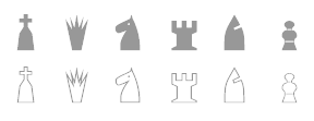 Hans Bodlaender's chess font archive: very useful! It includes many fonts by Armando Hernandez Marroquin (Figurine Symbol fonts, Chess-Alfonso-X, ChessAdventurer, Chess-Condal, Chess-Harlequin, Chess-Kingdom, Chess-Leipzig, Chess-Line, ChessLucena, Chess-Magnetic, Chess-Mark, Chess-Marroquin, Chess-Maya, Chess-Merida, Chess-Millennia-D, Chess-Millennia-L, Chess-Miscel, Chess-Motif, Chess-Mediaeval), Chess Utrecht (by Hans Bodlaender), Chess Cases (by Matthieu Leschemelle), Chess Montreal, the Checkers or Draughts font by Hans Bodlaender (b. 1960, Bennekom, the Netherlands). Many links to chess board generating filters. [Google]
[More] ⦿
Hans Bodlaender's chess font archive: very useful! It includes many fonts by Armando Hernandez Marroquin (Figurine Symbol fonts, Chess-Alfonso-X, ChessAdventurer, Chess-Condal, Chess-Harlequin, Chess-Kingdom, Chess-Leipzig, Chess-Line, ChessLucena, Chess-Magnetic, Chess-Mark, Chess-Marroquin, Chess-Maya, Chess-Merida, Chess-Millennia-D, Chess-Millennia-L, Chess-Miscel, Chess-Motif, Chess-Mediaeval), Chess Utrecht (by Hans Bodlaender), Chess Cases (by Matthieu Leschemelle), Chess Montreal, the Checkers or Draughts font by Hans Bodlaender (b. 1960, Bennekom, the Netherlands). Many links to chess board generating filters. [Google]
[More] ⦿
|
Ulrich Dirr
[Skak New]
|
[More] ⦿
|
Unicode Fonts for Ancient Scripts
[George Douros]
|
 This is a fantastic source of free high-quality fonts for scripts of the greater Aegean vicinity, Egyptian Hieroglyphs, Meroitic, Sumero-Akkadian Cuneiform, Musical Symbols and all Symbol Blocks in the Unicode Standard. George Douros is their Greek font designer. His free fonts come with this exemplary footnote: In lieu of a licence: Fonts in this site are offered free for any use; they may be opened, edited, modified, regenerated, posted, packaged and redistributed. Many of his fonts contributed to important section in the GNU Freefont project. Here is the list:
 - Abidos (2018). An attempt to catalogue about 8000 Egyptian hieroglyps. His Nilus font (2018) catalogues the Gardiner hieroglyphs.
- Aegean (2007-2012). Covers Basic Latin, Greek and Coptic, Greek Extended, some Punctuation and other Symbols, Linear B Syllabary, Linear B Ideograms, Aegean Numbers, Ancient Greek Numbers, Ancient Symbols, Phaistos Disc, Lycian, Carian, Old Italic, Ugaritic, Old Persian, Cypriot Syllabary, Phoenician, Lydian, Archaic Greek Musical Notation. Other things in it: Linear A, Cretan Hieroglyphs, Cypro-Minoan, Ancient Greek Alphabets, Phrygian, Old Italic Alphabets (Cumaean, Archaic Etruscan, Neo Etruscan, Ancient Latin, Lugano, Faliscan, Marsiliana, Messapic, Middle Adriatic South Picene, North Picene, Oscan, Umbrian), the Arkalochori Axe and Anatolian Hieroglyphs.
- Aegyptus (2007-2020) and Gardiner. Over 7000 hieroglyphs. In addition, we have Basic Latin, Greek and Coptic, Egyptian Transliteration characters, some punctuation and other symbols.
- Akkadian (2007). Basic Latin, Greek and Coptic, some Punctuation and other Symbols, Ugaritic, Cuneiform, Cuneiform Numbers and Punctuation.
- Alexander (2007, text typeface built around the Greek letters originally designed by Alexander Wilson in 1744; compare with Wilson Greek (1996, Matthew Carter) and Junicode (2006, Peter S. Baker)). The Latin and Cyrillic parts are based on Garamond.
- Alfios. Lowercase upright Greek were designed in 1805 by Firmin Didot (1764-1836) and cut by Walfard and Vibert. The typeface, together with a complete printing house, was donated in 1821 to the new Greek state by Didot's son, Ambroise Firmin Didot (1790-1876). Lowercase italic Greek were designed in 1802 by Richard Porson (1757-1808) and cut by Richard Austin. They were first used by Cambridge University Press in 1810. Capitals, Latin and Cyrillic, as well as the complete bold weights, have been designed in an attempt to create a well-balanced font. The font covers the Windows Glyph List, Greek Extended, various typographic extras and some Open Type features (Numerators, Denominators, Fractions, Old Style Figures, Historical Forms, Stylistic Alternates, Ligatures); it is available in regular, italic, bold and bold italic.
- Anaktoria. Douros: Grecs du roi was designed by Claude Garamond (1480-1561) between 1541 and 1544, commissioned by king Francis I of France, for the exclusive use by the Imprimerie Nationale in Paris. Greek in Akaktoria is based on a modern version of Grecs du roi prepared by Mindaugas Strockis in 2001. Lowercase Latin stems from the titles in the 1623 First Folio Edition of Shakespeare. Scott Mann & Peter Guither prepared a modern version for The Illinois Shakespeare Festival in 1995. Cyrillic has been designed to match the above Greek and Latin.
- Analecta (2007, Byzantine style). An ecclesiastic scripts font, in Byzantine uncial style, covering Basic Latin, Greek and Coptic, some Punctuation and other Symbols, Coptic, typographica varia, Specials, Gothic and Deseret.
- Anatolian
- Aroania: In 1927, Victor Julius Scholderer (1880-1971), on behalf of the Society for the Promotion of Greek Studies, got involved in choosing and consulting the design and production of a Greek type called New Hellenic cut by the Lanston Monotype Corporation. He chose the revival of a round, and almost monoline type which had first appeared in 1492 in the edition of Macrobius, ascribable to the printing shop of Giovanni Rosso (Joannes Rubeus) in Venice. Aroania is a modern recast of Victor Scholderer's New Hellenic font, on the basis of Verdana.
- Asea (2020, Latin-Greek-Cyrillic). A modern font based on Firmin Didot's Greek type.
- Assyrian.
- Atavyros. Douros writes: Robert Granjon (1513-1589) produced his Parangonne Greque typeface (garmond size) at the instigation of Christophe Plantin as a counterpart to Garamond's Grec du roi, in Antwerp Holland, between 1560--1565. It was used in Plantin's multilingual Bible of 1572. Versions of Granjon's type were used for the 1692 edition of Diogenes Laertius and for the Greek-Dutch edition of the New Testament in 1698, both published by Henric Wetstenium in Amsterdam. A digital revival was prepared by Ralph P. Hancock for his Vusillus font in 1999. Latin and Cyrillic are based on a Goudy typeface.
- Avdira. Douros: Upright is based on the lowercase Greek letters in the typeface used by Demetrios Damilas for the edition of Isocrates, published in Milan in 1493. A digital revival was prepared by Ralph P. Hancock for his Milan (Mediolanum) font in 2000. Italic Greek were designed in 1802 by Richard Porson (1757-1808) and cut by Richard Austin. They were first used by Cambridge University Press in 1810.
- Maya. Maya covers the glyphs in J. Eric S. Thompson's A Catalog of Maya Hieroglyphs (1962, University of Oklahoma Press).
- MusicalSymbols (2007) or Musica (2013). Basic Latin, Greek and Coptic, some Punctuation and other Symbols, Byzantine Musical Symbols, (Western) Musical Symbols, Archaic Greek Musical Notation. There is also the Greek musical notation font EE Music (2018) for Hellenic ecclesiastic music.
- UnicodeSymbols (2007, in the Computer Modern style) and UniDings (2013). It has every imaginable symbol: Basic Latin, Latin-1 Supplement, Latin Extended-A, IPA Extensions, Greek, Cyrillic, Cyrillic Supplementary, General Punctuation, Superscripts and Subscripts, Combining Diacritical Marks for Symbols, Letterlike Symbols, Number Forms, Arrows, Mathematical Operators, Miscellaneous Technical, Control Pictures, Optical Character Recognition, Box Drawing, Block Elements, Geometric Shapes, Miscellaneous Symbols, Dingbats, Miscellaneous Mathematical Symbols-A, Supplemental Arrows-A, Supplemental Arrows-B, Miscellaneous Mathematical Symbols-B, Supplemental Mathematical Operators, Miscellaneous Symbols and Arrows, CJK Symbols and Punctuation, Yijing Hexagram Symbols, Vertical Forms, Combining Half Marks, CJK Compatibility Forms, Specials, Tai Xuan Jing Symbols, Counting Rod Numerals, Mathematical Alphanumeric Symbols, Mahjong Tile Symbols, Domino Tile Symbols.
- Symbola (2013) is an unbelievably rich font. It contains Basic Latin, IPA Extensions, Spacing Modifier Letters, Combining Diacritical Marks, Greek and Coptic, Cyrillic, Cyrillic Supplement, General Punctuation, Superscripts and Subscripts, Currency Symbols, Combining Diacritical Marks for Symbols, Letterlike Symbols, Number Forms, Arrows, Mathematical Operators, Miscellaneous Technical, Control Pictures, Optical Character Recognition, Box Drawing, Block Elements, Geometric Shapes, Miscellaneous Symbols, Dingbats, Miscellaneous Mathematical Symbols-A, Supplemental Arrows-A, Braille Patterns, Supplemental Arrows-B, Miscellaneous Mathematical Symbols-B, Supplemental Mathematical Operators, Miscellaneous Symbols and Arrows, Supplemental Punctuation, Yijing Hexagram Symbols, Combining Half Marks, Specials, Byzantine Musical Symbols, Musical Symbols, Ancient Greek Musical Notation, Tai Xuan Jing Symbols, Counting Rod Numerals, Mathematical Alphanumeric Symbols, Mahjong Tiles, Domino Tiles, Playing Cards, Miscellaneous Symbols And Pictographs, Emoticons, Ornamental Dingbats, Transport And Map Symbols, Alchemical Symbols, Geometric Shapes Extended, Supplemental Arrows, and Symbols of occasional mathematical interest. It is one of a hanful fonts that dares to have a glyph that shows the middle finger. Github link for free download. see also Symbola Goomoji (2013).
- Unidings. Various glyphs and icons.
Since George permits redistribution, I am offering his work for download here. [Google]
[More] ⦿
|
VersaType
[Jim Ford]
|
 Versa Type is Jim Ford's foundry. Jim graduated in graphic design from Columbia College in Chicago. He received his BFA in Graphic Design in 2005. Jim lives in Delavan, Wisconsin. He joined Ascender Corp in 2005, and Monotype in 2013.
 At Ascender, he co-designed Ayita (2006), a decorative sans family, with Steve Matteson. Pokerface (2009, Ascender) is an industrious mixed-case display font devised on the theme of playing cards. Captain Quill (2008, Ascender Corp) is calligraphic. Moire (2008, Microsoft) is a sans face. Jimmy Crack Corn (2009, Ascender) is an ordinary handwriting font. Ford's Folly (2010, Ascender) is a felt tip pen face. He also made Artcraft Pro (Ascender). Dempster (2010, Ascender) is a geometric sans with angular terminals; it was reissued in 2016 and Steve Matteson's name was adeed to the list of designers. He also designed the Segoe Chess Font (2006, Ascender, with Steve Matteson). He co-designed Segoe Mono in 2012 with Steve Matteson at Ascender. In 2013, Jim joined Monotype as a type designer. The Halloween font Wolfsblood was designed in 2013. In 2014, he created Quire Sans (a humanist sans) at Monotype. In 2015, he designed Esca (Monotype). Richie (2016, Monotype) is a brush script typeface inspired by the work of Czech type designer Oldrich Menhart, who liked angular calligraphic outlines. Posterama (2016, Monotype) is a 63-font set that pays homage to the 20th century. Its base set is Posterama Text (Latin, Greek, Cyrillic). Additional subfamilies include Posterama 1901 (art nouveau), Posterama 1913 (abstract art, as seen at the Armory Show, or 1913 Exhibition of Modern Art), Posterama 1919 (Bauhaus), Posterama 1927 (related to Metropolis, The Jazz Singer and Paul Renner's Futura), Posterama 1933 (art deco), Posterama 1945 (constructivism and Russian propaganda), Posterama 1984 (sc-fi and video game era, with a bit of George Orwell thrown in), and Posterama 2001 (inspired by Stanley Kubrick's science fiction movie). Still in 2016, he designed Ernie, a funky animated typeface, intended as a complimentary serif design to Freeman Craw's fun retro hit, Ad Lib. Typefaces from 2017: Beefcakes (butcher shop type), Masqualero, a display typeface family with a luxurious look and a sparkly smooth finish: Like the legendary jazz song of the same name, Masqualero is haunting and sophisticated. Drawn as a tribute to Miles Davis, its letterforms are as beautiful as his Masqualero composition. I approached drawing the letters as if they were marble sculptures. Typefaces from 2018: Hideout (a sturdy typeface family inspired by the flared serif lettering of antique tobacco tins), Alfie (a casual script). Typefaces from 2021: Guzzo (an informal, humble and naive sans family with 18 styles that takes its name from American artist Jeremy Pinc, aka the painter Guzzo Pinc; Guzzo channels the quirky, funny and poignant qualities of his paintings). View Jim Ford's typefaces. [Google]
[MyFonts]
[More] ⦿
|
Vladimir Nikolic
|
 Belgrade, Serbia-based designer (b. 1981) of these typefaces:
 - The dingbat fonts Canavarlar (2020: funny men), Haircut (2020: women's hairdos), Ornament Borders (2020), Gourdy (2020: birds), Lizards (2020), Mantra (2020), All Star (2020), Speel (2020), Soavely (horses) (2020), Forma (2020), Hell Beasts (2020), Mistresses (2020), Paraiso (2020), Crow (2020), Traverser (2020: crosses), Cats (2020), Dogs (2020), Negative-Heads (2020), Otu (2020), Wakazi (2020), Risk (2020), Wurm (2020), Beard Man (2020), Hoder (2020), Damen (2018), Damen 2 (2020), Foliga (2020), Solo Drinker (2020), Congress (2020), Farmacy (2020), Elections (2020), Emergency (2020), VN Arrows (2020), Hexagonos (2020), Automobiles (2020), Cars (2020), Emoji Boom (2020), Bestia (2020), Aliens (2020), Insect (2020), Bytost (2020), Monstero (2020), Aveto (2020), Dancing Cat (2020), Atradimas (2020), Womanhood (2020), Figur (2020: an alien insect font), Halfwits (2020), Silly Donkey (2020), Crazy Monkey (2020), Round Masks (2020), The Quick Dog (2020), Flying Birds (2020), Maskid (2020), Monstra (2020), Bull Skulls (2020), War Items (2020), Public Transport (2020), Loomad (2020), Mokhabiso (2020: African patterns), Record (2020), Mulher (2020), Heroez (2020), Bulls (2020), Madarak (2020: birds), Bold People (2020), Munari (2019: a collection of drawings based on Bruno Munari's book "Artista e designer" from 1966), Screws (2019), White Mouse (2019), Schepselen (2019), Glatze (2019), Crosses (2019), Chefs (2019), Diamond Blocks (2019), Hexagons (2019), Maumbo (2019), Circles (2019), Enfeite (2019), Pigs (2019), Mythos (2019), Kreaturen (2019), Baby Alien (2019), Body Moving (2019), Various Boys (2019), Lines and Objects (2019), Mouvman (2019), Watch (2019), Credit Card (2019), Cycles (2019), Devil Emoji (2019), Fare (2019), Mund (2019), Labbra (2019), Circular Ornaments (2019), Cranium (2019), Ugok (2019), Ansigter (2019), Tsim (2019), Schmetterlinge (2019), Jungfrau Maria (2019: religious icons), Knights Helmets (2019), Kinderskizzen (2019), Wolves (2019), Various Cats (2019), Owls (2019), Spiral Object 3D (2019), Zodiac Signs (2019), Cyborg (2019), Duck (2019), Cat 3D (2019), Object 3D (2019), Circle and Line (2019), Various Girls (2019), Dulcet (2019), Erotic Symbols (2019), Frauen (2019), Pierre the Vampire (2019), Robotter (2019), Middle Finger (2019), Claudio The Cat (2019), Medusa (2019), Veggie (2019), Pablo (2019), Fishes (2019), Dream of Picasso (2019), Stam (2019), Animality (2019), Ink Drops (2019), Faces (2019), Bayan (2019), Froggy (2019), Senhoras (2019), Diamondo (2019), Skallen (2019: skulls), Swimmers (2019), Churches (2019), Easter Icons (2019), Lippen (2019), Gullar (2019), Bankwesen (2019), Creatures with Horns (2019), Vehicles (2019), Various Hands (2019), 3D Animals (2019), Abantu (2019), Herr (2019), Menge (2019), Funny Aliens (2019), Mustachos (2019), Kids Drawings (2019), Tierfarm (2019), Troep (2018), Women Heads (2018), Cats and Dogs (2018), Wanita (2018), Eyez (2018), Animales (2018), Peoples (2018), Mobile Icons (2018), Controllers (2018), Womano (2018), Lost in Space (2018), Blumen (2018: flowers), Tetriso (2018), Snowflake (2018), Meine (2018: masks), Horoscopicus (2018), Esoterica (2018), Astrologicus (2018, astrolical symbols), Abbild (2018: African masks), Being (2018: monsters), Gebell (2018), Headed (2018), Falter (2018), Filling (2018), Anichka (2018), Cyclopia (2018), Buggus (2018), Opa (2018), Messe (2017), Head of Idol (2018), Diavolo Nero (2017: funny silhouettes).
- The boxed or encircled alphabets Audience Capitals (2020), Galileo (2020), Compare (2020), Compare-Light (2020), Hexagonas (2020), Select (2020), Before (2020), Before-Dark (2020), Boxes (2020), Boxes-Extravagant (2020), Boxes-Fancy (2020), Calf-Negative (2020), Capital-Relationship (2020), Pyxidas (2020), Capitalica (2020), Tundra (2020), Ordinary Capitals (2020), Broadway Capitals (2020), Browser Capitals (2020), Capitalismo (2019), Schwarzenberg Capitals (2019), Retrospective Capitals (2019), Official Capitals (2020), Impression (2020), Oriental (2020), and Letters in Circles (2018).
- Shadowed caps: Cleopatra (2021), Farmers Market (2021), Erkekler (2021), Assignation (2021), Greek Tragedy (2021), Distorted (2021), Lightshow (2021), Credenza (2021), Ragusa (2021), Comunismo (2021), Scordia (2021), Gazelle (2021), Organ (2021), Strizhi (2021), Umoya (2021), Ninja Justice (2021), Unlimited (2021), Unicorns (2021), Labyrinth (2021), True Artisans (2021), Poker (2021), Donald (2021), Ferrari (2021), Booster (2021), Madness (2021), Favorita (2021), Vitamin (2021), Robot (2021), Robust (2021), Engine (2021), Whether (2021), Nucleus (2021), Trunk (2021), Ombre (2021), Viscosus (2021), Jewelry (2021), Verge (2021), Pursue (2021), Keener (2021), Visor (2021), Korvo (2021), Squash (2021), Scum (2021), Darker (2021), Education (2021), Cimice (2021), Tomb (2021), Bambola (2021), Calla (2021), Rump (2021), Complex (2021), Razor (2021), Driveller (2021), Karambol (2021), Princino (2021), Berger (2021), Adopted (2021), Bugbear (2021), Samara (2021), Talisman (2021), Waterway (2021), Megabus (2021: a marquee font), Roller (2021), Numerica (2020), Bond (2020), Gloom (2020: a marquee font), Chalkboard (2020: sketched), Unboxing (2020: techno), Antennas (2020), Secca (2020), Umfo (2020), Sabbia (2020), Squirrel (2020), Byzan (2020), Debtor (2020), Bridge (2020), Familie (2020), Lake (2020), Roma (2020), Tissue (2020), Bombay (2020), Osteology (2020), Restroom (2020), Speaker (2020), Bebika (2020), Center (2020), Gismo (2020), Fierce (2020), Gambler (2020), Afterparty (2020), Birdbrain (2020), Boner (2020), Divine (2020), Gelatin (2020), Lost (2020), Marshland (2020), Quadri (2020), Shadow (2020), Stairs (2020), Superba (2020), Techno (2020), Underman Book (2020), Wired Capitals (2020), Fineliner (2020), Fictive Kinship (2020), Exotica (2020), Ural (2020), Devianza (2020), Kultur (2020), Unmute (2020), Antiqua (2020), Chains (2020), Scheme (2020), Stumble (2020), Aroma (2020), Beans 2 (2020), Cover (2020), Cronica (2020), Fundament (2020), Horna (2020), Loce (2020), Mademoiselle (2020: art nouveau), Melodia (2020), Penny (2020), Taikun (2020), Assault (2020), Athletica (2020), Baraka (2020), Brassica (2020), Builder (2020), Chancellery (2020), Gwara (2020), Pliez (2020), Recinzione (2020), Right (2020), Rimes (2020), Seal (2020), Service (2020), Scorpions (2020), Terraces (2020: American flag font), Wedding Cabbage (2020), Wild Girl (2020), Tragedy (2020), Indos (2020), Starfish (2020), Vintage (2020), Adriatica (2020), Funeral (with American flag texture) (2020), Voleur (2020), Calzino (2020), Peshkop (2020), Metzger (2020), Asshole (2020), Puppet (2020), Broeksel (2020), Hals (2020), Escort (2020), Vortex (2020), Dades (2020), Boild Hedgehog (2020), Mermer (2020), Grower (2020), Rainbow (sketched) (2020), Baise (2020), Necklace (2020), Angels (2020), Smuggler (2020), Dommage (grungy) (2020), Squalor (2020), Fusto (2020), Course (2020), Fisheye (2020), Baiser (2020), Banda (2020), Cantaloupe (2020), Canto (2020), Begriff (2020), Trapeze (2020), Arabeska (2020), Silver (2020), Wasco (2020), Kosaken (2020), Triangle (2020), Banquet (2020), Demode Capitals (2020), Cultus Capitals (2020), Idiot Capitals (2020), Granary Capitals (2020), Liberta (2020), Montblanc (2020), Granary (2020), Blanket (2020), Tuyaux (2020), Wolf (2020), Comeback (2020), Oliba (2020), Idiot (2020), Trailer (2020), Bricks (2020), Toys (2020), Luxury (2020), Hertz (2020), Signal (2020), Serenada (2020), Kurven (2020), Schnecke (2020), Mona (2020), Sierra (2020), Search (2020), Tranchante (2020), Eccentric (2020), Fast (2020), Mosquito (2020), Speed-of-Light (2020), Thanks (2020), Album (2020), Boyhood (2020), Ending (2020), Trend (2020), Universal-Serial-Bus (2020), Fixed (2020), Kings (2020), Holiday (2020), Range (2020), Numbers (2020), Shipman (2020), Officer (2020), Video (2020), Order (2020), Route (2020), Cosa-Nostra (2020), Clowns (2020), Unique (2020), Voyeur (2020), Shape (2020), Brigadier (2020), Allora (2020), Spartacus (2020), Advisor (2020), Ambis (2020), Cables (2020), Genesa (2020), Horse (2020), Laptop (2020), Pork (2020), Mafioza (2020), Mucho (2020), Athens (2020), Audience (2020), Rotor (2020), Mundo (2020), Olympus (2020), Border (2020), Scale (2020), Survival (2020), Trouble (2020), Turnabout (2020), Catharsis (2020), Parade (2020), Discoteque (2020), Rude (2020), Fame (2020), Safran (2020), Ausweis (2020), Mechanica (2020), Moscowian-Party (2020), Beers (2020), Strengthen (2020), Tempo (2020), Unreal (2020), Poetico (2020), Bach (2020), Bach-Fat (2020), Energy (2020), Alexandra (2020), Basket (2020), Cushion (2020), Model (2020), Organiser (2020), White (2020), Anabela (2020), Cannibal (2020), Casablanca (2020), Castle (2020), Control (2020), Crazy (2020), Crazy-Gradient (2020), Emotion (2020), Honey-Bunny (2020), Knockout (2020), Linearo (2020), Murmure (2020), Polished (2020), Reon (2020), Sparrow (2020), Storms (2020), Street-Stars (2020), Franchise (2020), Pencil (2020), Ruanda (2020), Pepito (2020), Megalomania (2020), Rouleaux (2020), Frozen (2020), Together (2020), Saldo (2020), Museum (2020), Network (2020), Hunk (2020), Cultus (2020), Creator (2020), Flow (2020), Blocchi (2020), Possession (2020), Bad Germans (2020), Discounted (2020), Traversal (2020), Mangalica (2020), Murmansk (2019), Summer Candy (2019), Question (2019), Second Channel (2019), 3D Models (2019), Memory (2019), Computer (2019), Diversity (2019), Elastic Letters (2019), Businessman (2019), Kuchen (2019), Demode (2019), Objective (2019), Medication (2019), Nonsense (2019), Plagiat (2019), Toledo (2019), Tricks (2019), Common (2019: a trompe-l'oeil font), Mafia (2019), Releases (2019), Extradition (2019), Shoot To Kill (2019), Groowing (2019), Enough (2019), President (2019), Silence (2019), Dressed (2019), Already (2019), Hocus Pocus (2019), Password (2019), Ready (2018) and Messages (2017).
- The ornamental caps typefaces Mahal (2021), Stamp (2021), Hell Door (2021), Tangram (2021), Custom (2021), Remake (2021), Studio (2021), Adagio (2021), Oxidizer (2021), Mondial (2021), Paraglide (2021), Tattoo (2021), Developer (2021), Dama (2021), Lobby (2021), Gabaritos (2021), Sence (2021), Ombre (2021), Cresa (2021), Anniversary (2021), Wire (2021), Triton (2021), Lamina 92021), Hangup (2021), Years (2020), Dowry (2020), Sephora (2020), Jewels (2020), Straightforward (2020), Dance (2020), Necklace (2020), Maria (2020), Taxi2 (2020), Outlaw (2020), Combat (2020), Chewed (2020), Fantasy (2020), Observation (2020), Cure (2020), Pioneer (2020), Near (2020), Kleid (2020), Unitas (2020), Tomato (2020), Blader (2020), Canal (2020), Baked Snails (2019), Alcoholic (2019), Bonjour (2019), Zylinder (2019), Phenomenal (2019), Surfaces (2019), Success (2019: as in De Stijl), Retailer (2019: multilined), Havana (2019: multilined), Mechanismo (2019) and Pencil Letters (2019).
- The display typefaces Trader (2020), Oysters (2020), Furious Ride (2020), Portfolio (2019), Pontos (2019), Swordsman (2019), Regular (2019), Andrey (2019), Retrive (2019), Connected (2019), Locator (2018), Tracking (2018), Iceberg (2018: snow-capped letters), New Amsterdam (2018), Ana (2018), Enemy (2018), New Yorkers (2018), Happy Day at School (2018), Focused (2018), Modish (2018), Beholder (2018) and Principality (2017).
- The alphadings Birthdays and Parties (2021), Bahanalia (2020), Icecreams (2020), Brailler (2020), Night Dreams (2020), Flower Capitals (2020), Jingle Bells (2020), Neuron Capitals (2020), Easter Time (2020), Hearts and Arrows (2018), Penguins (2018), Kitties (2018), Doggy (2018), Teddy Bears (2018), International Capitals (2018), Aafia Capitals (2018), Answer Capitals (2018), Beholder Capitals (2018).
- The circuit font Simple Repairs (2021).
- The 3d typefaces Sharp (2021), Edited (2021), Three Dimensions (2020), Rental (2020), Shiny Blocks (2020), Turbulence (2020), Labor (2020), Worship (2020), Fantasy-3D (2020), Zucker (2020: stacked blocks) Perfetto (2020), Rude-3D (2020), Lover (2020), Kasten (2020), 3D Models (2019), Tricks (2019) and Metallic (2019).
- The multiline typefaces Yiphi (2021), Porker (2020), Formula (2020), Laguna (2020), Hypochondria (2020), Majestic (2020), Vibes (2020), Tubes (2020), Yogurt (2020), Turkish (2020), Question (2019), Pancake (2019), Remained (2017), Liquidrom (2018), Second Channel (2019), 3D Models (2019), However (2019), Confarreatio (2018) and Fudged (2018).
- The textured typefaces Incompetent (2021), Autumn (2021), Sangria (2021), Studio (2021), Kino (2021), Elixir (2021), Espace (2020), Mistress (2020), Heritage (2020), Silicone (2020), Hornettio (2018), Ignorant (2018), Americans (2020: the American flag embedded into the glyphs), Pollution (2020), Jakob (2019), Diversity (2019), Townscape (2019), Patriotic (2019: American flag theme), Meshes (2018), Complained (2019), Duration (2018) and its solid counterpart, Duration Book (2018).
- The Slavonic emulation typeface Russian Land (2017) and the Cyrillic emulation typefaces Monarch (2021), Cold War (2021), Beograd (2020), Ukrainian Princess (2019), Territory (2019), Kalinka (2019), Rubles (2018), Maniac (2018), Jurij (2018), Kachusha (2018), Soviet Program (2018), Armenia (2017), Fontograd (2018) and Russian Spring (2017).
- The constructivist typefaces Tokarev (2017), Russiano (2018), Suggested (2018), Hungaria (2018) and Schwachsinn (2018).
- Art deco typefaces: Cavalier (2021), Performer (2021), Angelica (2019), Protocol (2019), Retrospective (2019), Leculier (2018, after an alphabet in Georges Leculier's art deco lettering book from ca. 1930), Better (2018), Critical (2017).
- Art deco caps: Reverse (2020), Bathroom (2019), Idiotism (2019).
- The chess fonts Schach (2020) and Wisdom Chess (2020).
- The weather icon font Weather Symbols (2020).
- The decorative sans typefaces Shock (2021), Energia (2021), Pitviper (2021), Nemesis (2021), Addiction (2021), Nehad (2021), Chewer (2021), Nightfall (2021), Gourmet (2021), Flipside (2021), Layered Letters (2019), Imbecile (2019), Answer (2018), Hours (2018), Abandoned (2018), Sea Gardens (2017), Forvertz (2018), Yeysk (2018) and Closeness (2018).
- Sans: Wollicht (2021), Ministro (2021), Lonely (2021), Noix (2021), Messina (2021), Samara (2021), Rickrack (2021), Broadcaster (2021), Catamaran (2021), Official (2019).
- Comic book fonts: Reset (2021).
- Artsy fonts: Hornstick (2021), Kikundi (2021), Shanghai (2021), Skewed (2021), Company (2021), China (2020).
- The headline sans typefaces Finance (2020), Marija (2020), Fashion (2020), Magazine (2020), Policemen (2020), Impressum (2019), Educated Deers (2019), Hindenburg (2019) and Fixation (2018).
- The rounded organic sans typefaces Hofmann (2020), Adelino (2020), Available (2018) and Biysk (2018).
- The handcrafted typefaces Diana (2020), Flood In London (2019), Milord (2018), Sex and Breakfast (2018), Sweet Handwrite (2018), Industrial Revolution (2018), Oh Maria (2017), Sofija (2017) and Travelling (2017).
- The bubblegum typefaces Roller (2020), Jellies (2020), Designero (2019), Bubblicious (2019) and Icecreamer (2017), and its oily companions Gummy (2018) and Liquid (2018).
- The heavy deco typefaces Guest (2019), Bigger (2018), Hours (2018), Intransitive (2018: Dutch deco), Theatrical (2017) and Consequences (2017).
- The beveled fonts Iron (2020), Rising (2020), Novgorod (2020), Troy (2020), Fake Hope (2019), Diamond Ring (2019), Playback (2018) and Member (2018).
- The starred caps typefaces Farmers Market (2021), Donald (2021), Citizen (2021), Wizard (2021), Adrenaline (2021), Diabolo (2021).
- The stencil fonts Browser (2019), Serbia (2019), Belgrado (2019), Further (2019), Generals (2018), Mayor (2018) and Olga (2018).
- The semi-stencil all caps typefaces Restaurant Menu (2019), Queen Dea (2019), Latest (2019) and Large (2019).
- The fat rounded sans typefaces Guest (2019) and Subscribe (2019).
- The Western fonts Newlywed (2020) , Tombola (2019), Permission (2019), Alexander (2019), Retrosonic (2019), Kasplysk (2019).
- The experimental typeface Typo Layer (2019).
- The German expressionist outline typeface Robert (2018).
- Current Moment (2019): a digitized "Zuccini" plate by Frits Jonker.
- The LED fonts Remaster (2021), Ringing (2022), Gigabytes (2020), Error (2020) and Technology (2018).
- The octagonal athletic lettering fonts Academy (2021), Junk (2020), Barbara (2019), Soccer (2020), and Soccer League (2018) and the outlined athletic font Onderneming (2018).
- Leculier (2018). After an alphabet in Georges Leculier's art deco lettering book from ca. 1930.
- The speed fonts Live News (2020) and Speed Racing (2019).
- Essere (2018).
- The squarish typefaces Archipelago (2021), Haine (2020), Augsburg (2020), Legionary (2020), Cyber Princess (2019), Professor (2019), Layers (2018) and Cataclysmo (2017).
- Driving Around (2018).
- The decorative floral caps typefaces Floral Capitals (2018) and Narcissus (2018).
- Gradientico (2018). A textured didone.
- The Greek simulation font Meteora (2018).
- Griddy Blocks (2018) and Blocky Letters (2018).
- Decorattio (2018).
- Ordinary (2018) and Mina is Gone (2018).
- The trilined typeface Trio (2017).
- The connected handwriting typeface Eric's (2016).
- The military typefaces Login (2018), Commanders (2017) and Hunt (2017, after an alphabet by the Hunt Brothers in their 1930s book Lettering of Today).
- The neon typeface Bubble 3D (2017), and the neon and shadow font family Magia (2019).
- Schaeffer (2017). A revival of the famous multiline typeface Fatima (1933, Karl Hermann Schaefer).
- The grungy typefaces Horizont (2020), Cosmas (2020), Drunk Millionaire (2019), Leave No Fingerprints (2018), Haziness (2017) and Victorious (2017).
- The molecular typeface Neuron (2019).
- The inline caps typefaces Panther (2021), Africa (2021), Look (2019) and Speed (2019).
- The inline typefaces Green (2020), Bernard (2020), and Games (2017).
- The display serif typefaces Kandinsky (2021), Funia (2021), Army Guys (2021), Hoodie (2019).
- The marquee typefaces Squad (2021), Grotto (2021), Megabus (2021), Plagiat (2019), Dropped (2019), Casino (2018) and Chicago (2018).
- The layerable marquee font Rockefeller (2018).
- Movie fonts: Film Letters (2018).
- The outlined typeface Important (2018).
- The white-on-black typeface Circusant (2019).
- The didone typeface Vogue (2018).
- The geometric solid typeface family Ivan (2019).
- The geometric sans typeface Occupied (2017).
- Rise of Kingdom (2017).
- Cartoonish (2017).
- Hesitation (2017). A rounded handcrafted poster font.
- Leben and Leben Shadow (2018).
- Braillenum (2018).
- The condensed grotesks Around (2020), Heinrich (2019) and Schwarzenberg (2019).
- Schreibmaschine (2017). A dusty old typewriter font.
- The vintage initial caps typefaces Nautiica 3d (2018), Fantasy Capitals (2018) and Herne Capitals (2018).
- The Arabic emulation typefaces Bayram (2020) and Sinbad (2018).
- Herne (2018).
- Passage (2018).
- Knotty (2018).
- The Mexican style font Mexicanera (2018), Dilemma (2018: Mexican Calavera skulls), and Mexican Tequila (2018).
- The techno typefaces Flight 21 (2019), Cyber Princess (2019), Passionate Relationship (2019), Neighbor (2018), Bombardment (2018) and Leprosy (2018).
- The avant-garde typeface Typolino (2018).
- Regensburg (2018).
- The ultra-fat typefaces Crime (2020), Owners (2018) and Housebreak (2019).
- The prismatic typefaces Jumble (2020), Boogie Woogie (2019), Running (2019), Bigger Italic (2018; based on Bigger Book), Linerine (2018) and Cosmology (2018).
- Failed (2018).
- The codex typefaces Grille (2020), Compass (2020) and Measurements (2018).
- Damages (2018).
- The circle-themed fonts Sparks (2020) and Condition (2018).
- The textured typefaces Mitesser (2020), Object (a meshed font) (2020), Noisy Walk (2020), Brightness (2020), Mistress (2020), Heritage (2020), Silicone (2020), Hornettio (2018) and Ignorant (2018).
- The oriental simulation fonts Dasvidaniya Book (2020), Pearl Harbor (2020), Chinese Dragon (2019), Sudoku (2019), Hiroshima (2019) and Kamikaze (2018).
- Monograms: Quintete (2020), Formogram (2020), Diamond Monogram (2020), Ribbon-Monogram (2020), Bulged Monogram (2020), Monogramus (2019), Blocky Monogram (2018) and Monograma (2018).
- Blackletter: Bramble Princess (2021), Drunks (2021), Cosmopolite (2020).
- Fists: The-Point (2020).
- Scanbats: Retro-People (2020), Vladimir (2019: Putin scanbats), Portraits de Femmes (2019: scanbats), Notre Dame and Notre Dame de Paris (2019: scanbats), Hollywood Actors (2019: scanbats), European Leaders (2018: scanbats), Trumpolina (2018: Trump scanbats).
- Word fonts: Black-Lives-Matter (2020).
- Plank fonts: Wooden Planks (2020).
- The outlined typefaces Carwash (2020), Hypno (2020), George (2020), 3D Letters (2018), Milk & Chocolate (2018: trilined), Czar (2018), Classica (2018) and Created (2018).
- The glitch fonts Elderberry (2021), Sparkle (2021), Eclairages (2021), Nectar (2021), Check Your Connection (2020), Horizons (2020) and Searching For Signal (2019).
- The glaz krak font Smashed (2018).
- The circus font Amigo (2020).
- The kitchen tile font New Message (2020).
- The 3d dingbats typefaces Basic Objects (2020: geometric shapes) and Jigsaw Puzzles 3D (2018).
- The modular typefaces Orenburg (2018), Broadway (2018) and Assyrian (2018).
- Escher style: Illusion (2019), Vologda (2019).
- Slinky typefaces: Rings (2020), Zylinder (2019), Pipes (2019).
- Lombardic caps: Moher (2020), Dublin (2020), Moderno (2020).
- Ransom note caps: Today (2020).
- Artistic font: Meute (2020).
- Halftone fonts: Tourner (2020), Cinquecento (2020), Devotion (2020), Gulliver (2020), Bamboo (2020).
- Ornaments: Adornos (2020).
- Antique caps: Grandes (2020), Reveler (2020: from Draughtsman's Alphabets (1877) by Hermann Esser)).
- Funny faces: Isitolo (2020).
- Angular caps: Milk (2020), Strike (2020), Worldwide (2020).
- Tall sans caps: Bungler (2020), Shakeout (2020).
- Mecano typefaces: Shakers (2020).
- Titling sans: Steinberg (2020).
- Titling serif: Love (2020).
- Break (2020).
- China (2020).
Creative Fabrica link. [Google]
[More] ⦿
|
William Overington
|
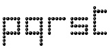 Located in Worcestershire, England. Designer in 2005-2006 of the free fonts 10000, 10000Outline, ArtisticText, HouseBricks, HouseBricksOutline, BUILD3D, CHESS3D, Chronicle, ChronicleTextDocument, ChronicleTextLozenge, ChronicleTextOutline, ChronicleTextSublozenge, ChronicleText, FontofSpaces, ForSupermarketWallSigns, GalileoLetteringEnamelled, GalileoLetteringGilding, GalileoLettering, GalileoLetteringMosaic, GalileoLetteringSubmosaic, GothicSplendour, Invention103, PaperSimulation, PixelPolka, PixelPolkaOutline, Poetical, QuestChess, Questtext, SculptureGarden, SpanglewareBlues, Stones, Style, StyleArtFont, TomatoesOrangesandLimes. Those are mostly pixel-inspired and techno fonts.
 Fonts made in 2006: AlternateGlyphSelectorsV, CropMarks, EutopianArchitecture (architectural writing face). From 2007: the futuristic but also art deco KernDeco-Italic, KernDeco, KernDecoOutline-Italic, KernDecoOutline, KernDecoShadowLayer, KernDecoShadowLayer2. And PicturesLandscape, PicturesPortrait, Sonnet to a Renaissance Lady, Sonnet Large Initials. From 2008: TRAIAN Experiment. From 2009: FOODQUALITYCOLOURSHAPES. From 2011: Disc and Annuli, Art Test, Sonnet Calligraphic. [Google]
[More] ⦿
|
xq
[Stephan Weinhold]
|
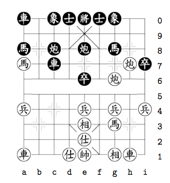 A set of free metafonts by Stephan Weinhold made in 2006 for Chinese chess. [Google]
[More] ⦿
A set of free metafonts by Stephan Weinhold made in 2006 for Chinese chess. [Google]
[More] ⦿
|
Yoichi Ozaki
[Y.Oz Font]
|
[More] ⦿
|
Yoshio Kobayashi
[K's Bookshelf]
|
[More] ⦿
|
Y.Oz Font
[Yoichi Ozaki]
|
Yoichi Ozaki ran Y.Oz Vox. He designed H.OzFont, H.OzFontP, Y.OzFontKA, Y.OzFontKG, Y.OzFontNJ, Y.OzFontNL, Y.OzFontK, Y.OzFontM, YOzFont14s, YOzFont5x7d, YOzFontOTW, YOzFontOTWD, YOzFontOTWL, H.OzFontB, Y.OzFontUIB, Y.OzFontPB, Y.OzFontUI, Y.OzFont, Y.OzFontB, Y.OzFontP. These were highly interesting fonts, mostly consisting of handwritten or printed letters covering Latin, Greek, Cyrillic, most mathematical symbols, most standard dingbats, the chess pieces, kana, and kanji. They were all free. More recently, the fonts were grouped in packs: Pen-Ji (ballpoint pen font), Mouhitsu (brush in Gyosho, Gyosho Old Style and Kaisho styles), Eibun (Latin), Moga Gothic and Moga Mincho (based on the IPA fonts). Download site. [Google]
[More] ⦿
|

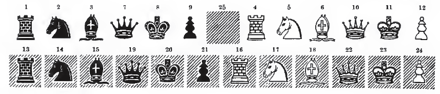
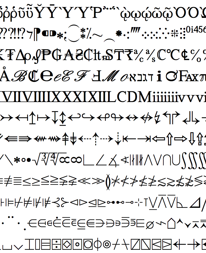
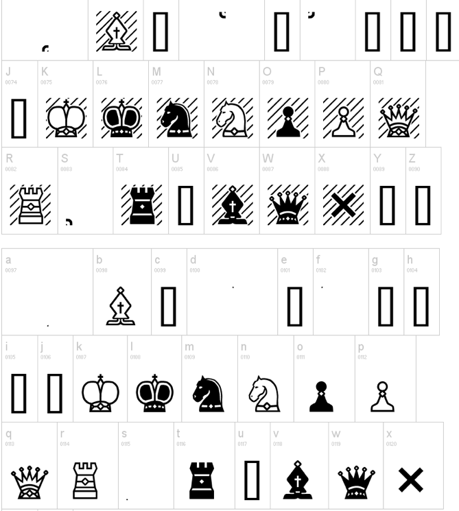
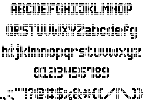
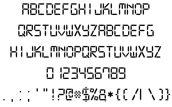
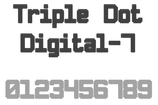
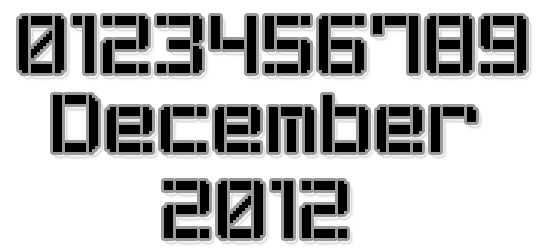
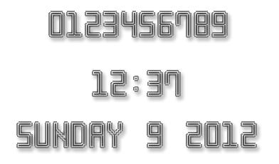
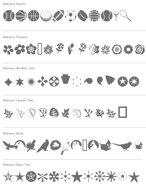
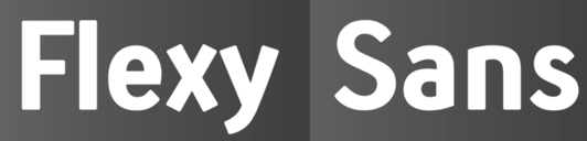
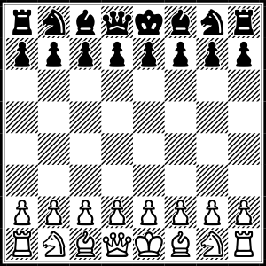
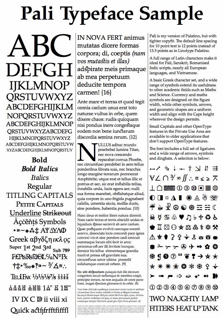
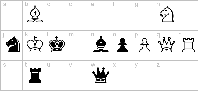
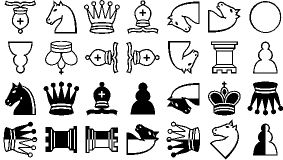
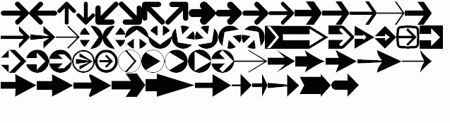
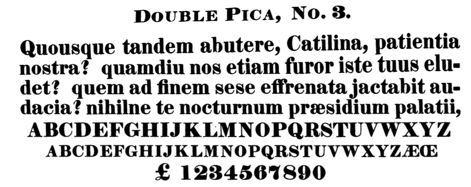
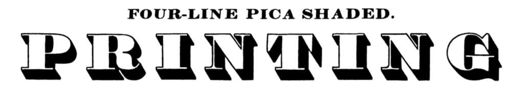
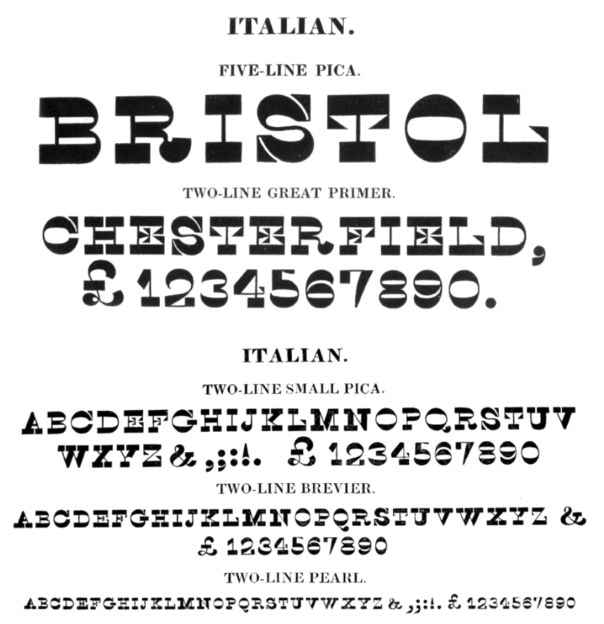
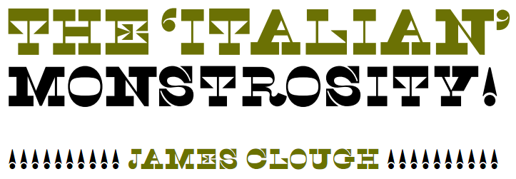
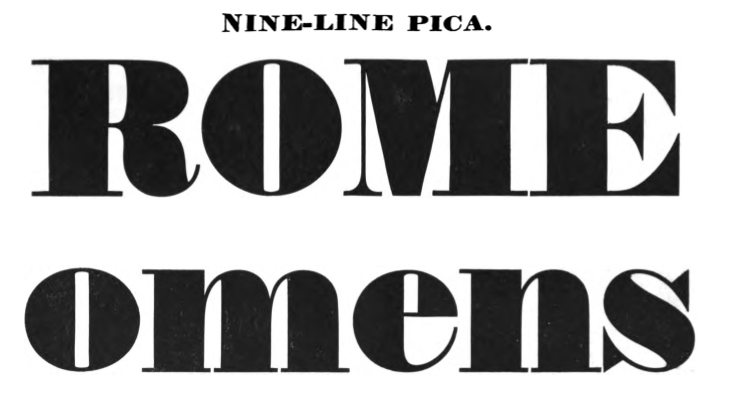
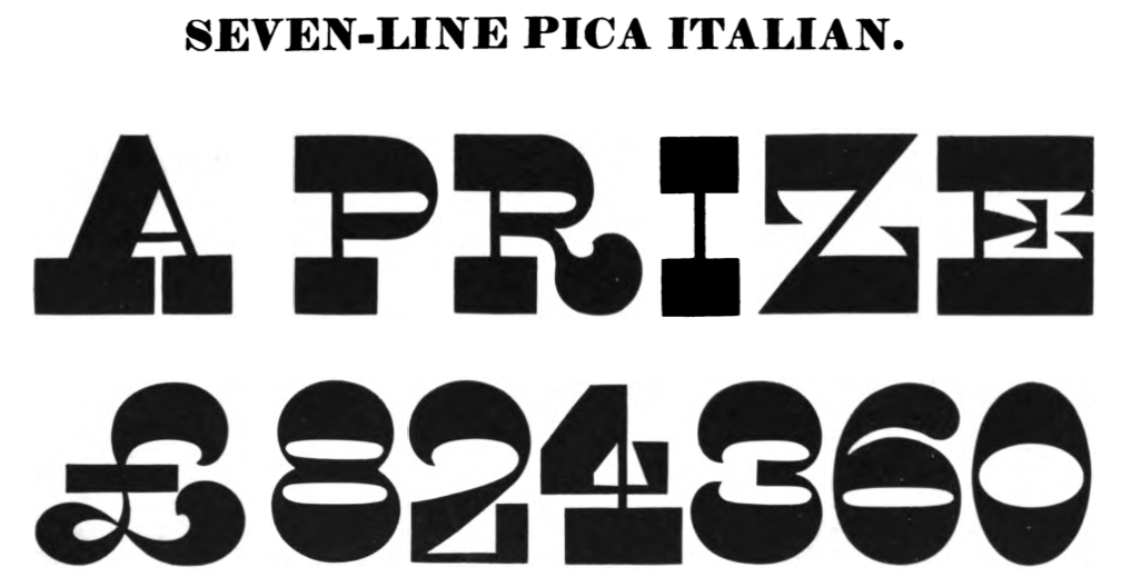
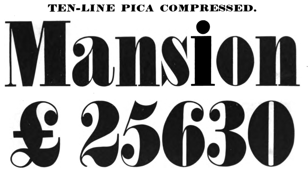
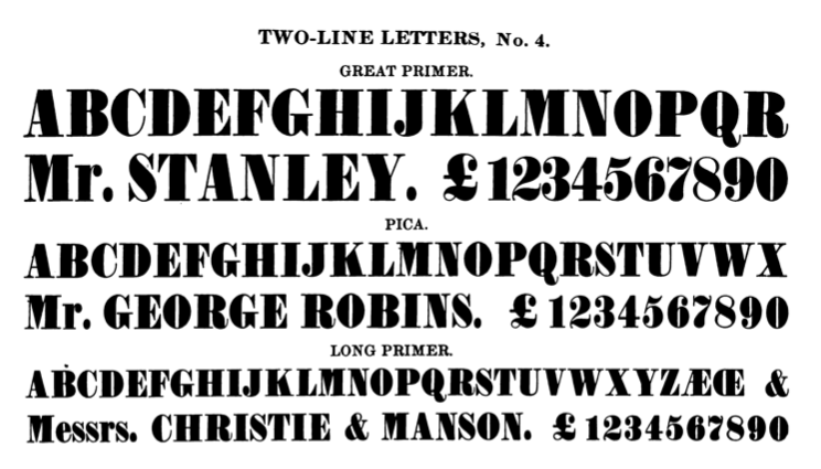
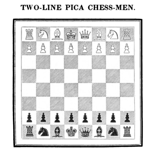
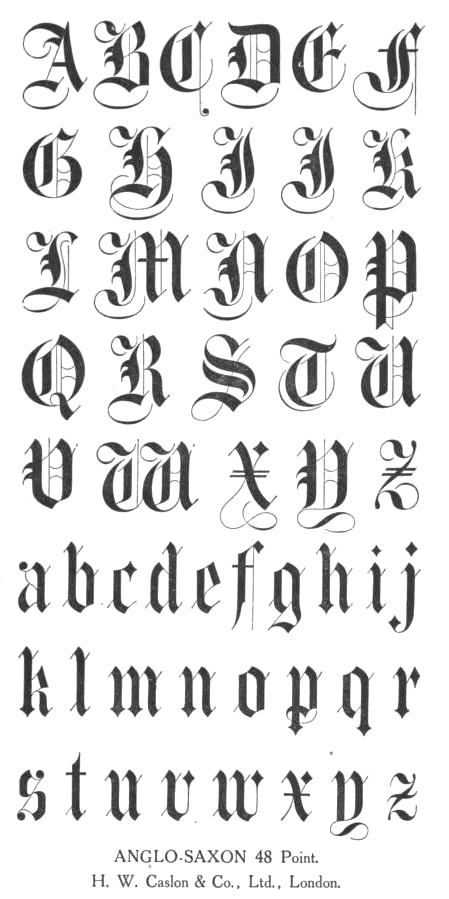
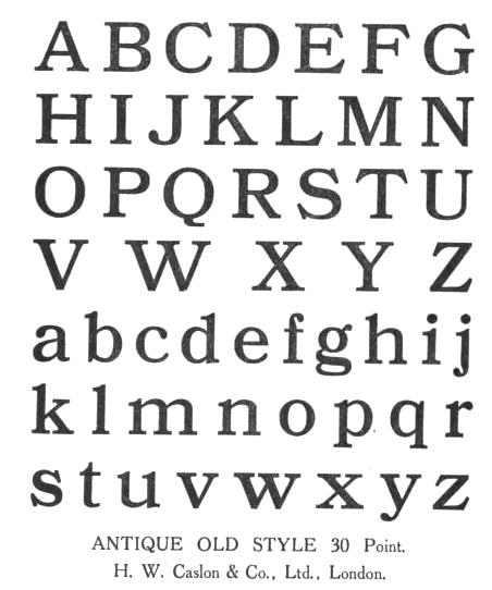
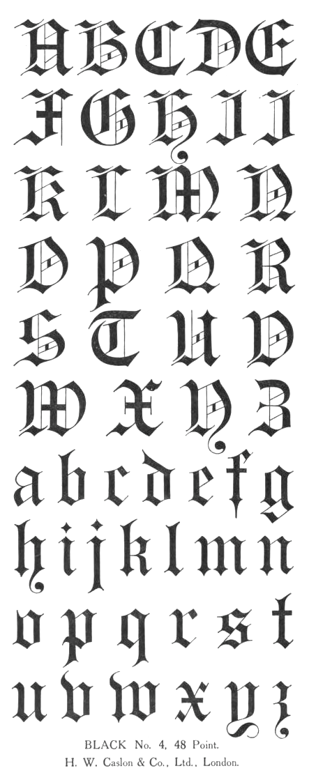
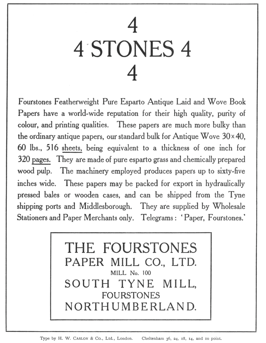
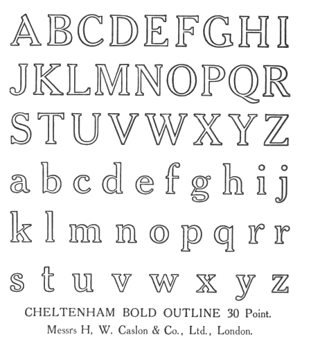
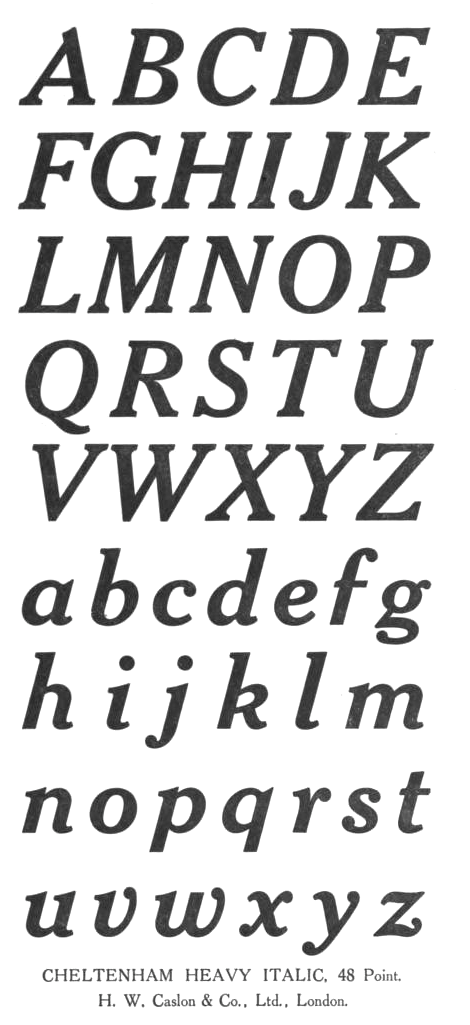
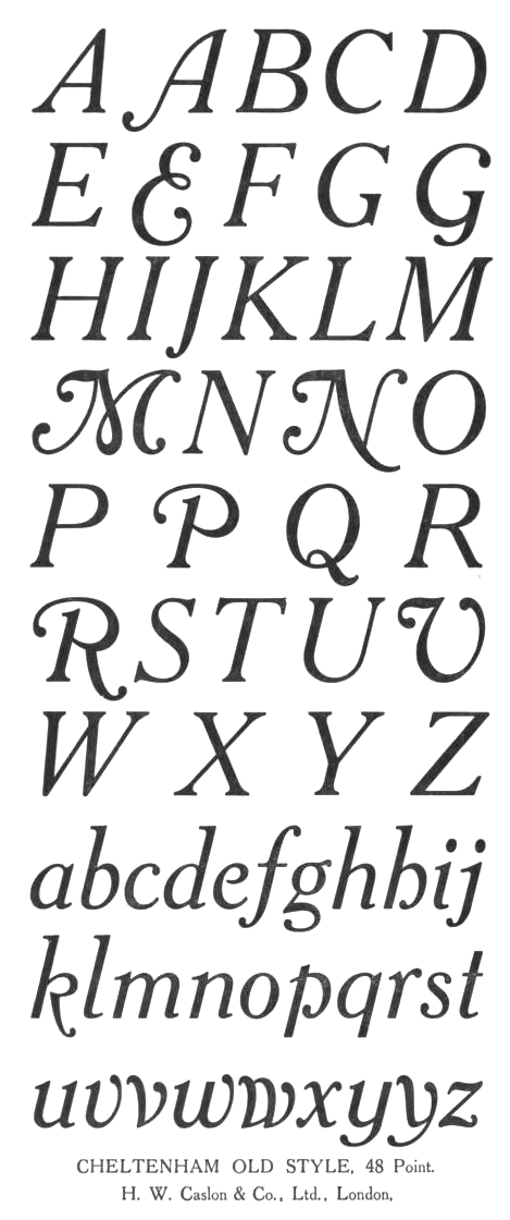
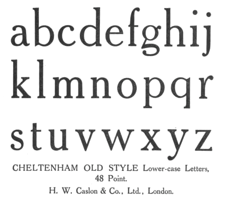
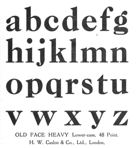
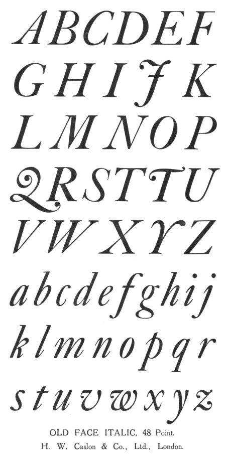
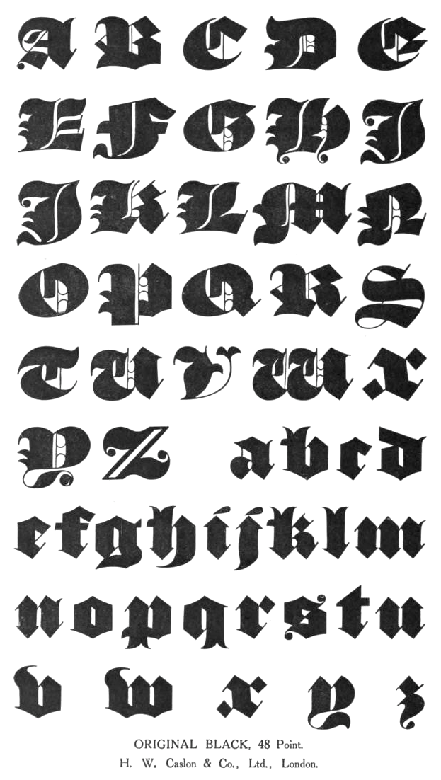
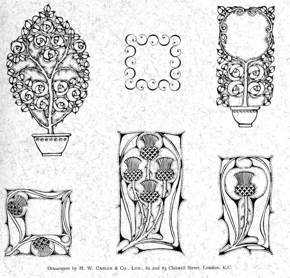
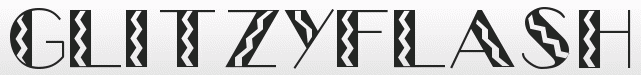
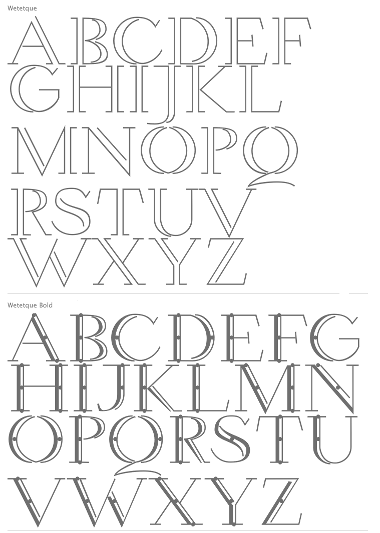
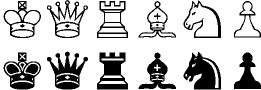
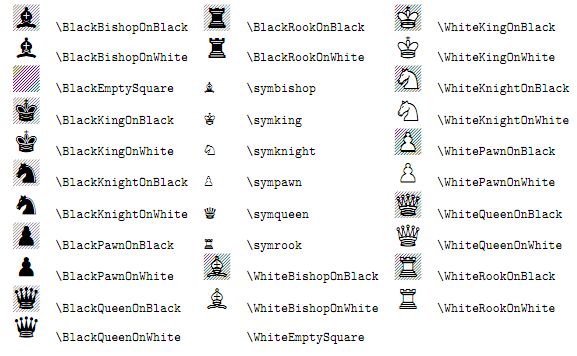
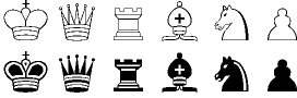
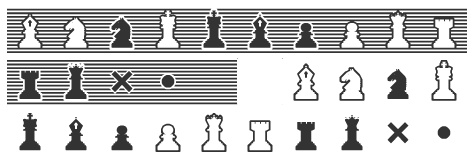
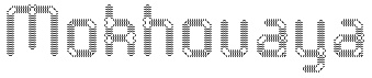
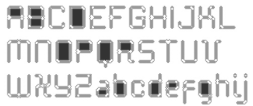
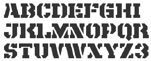
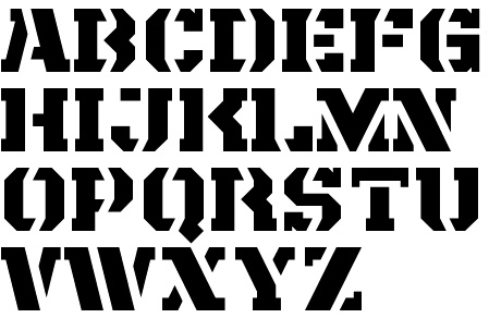
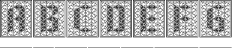
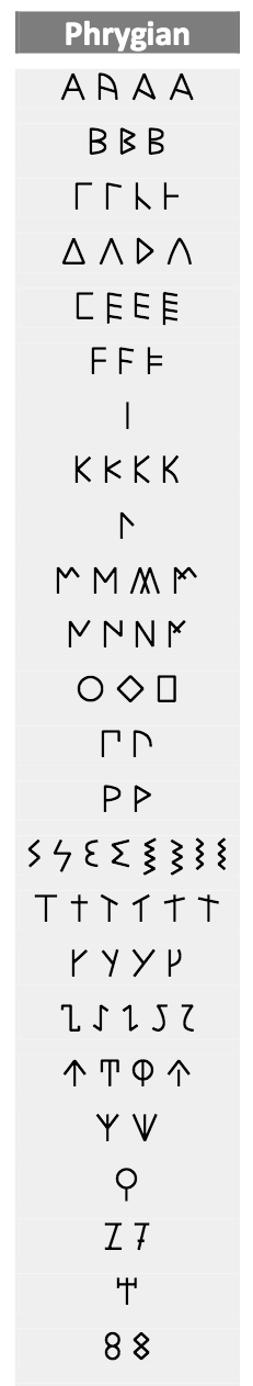
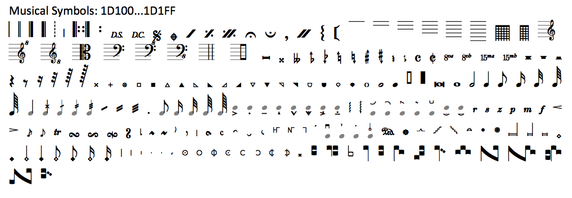
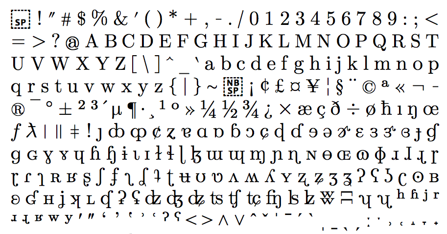
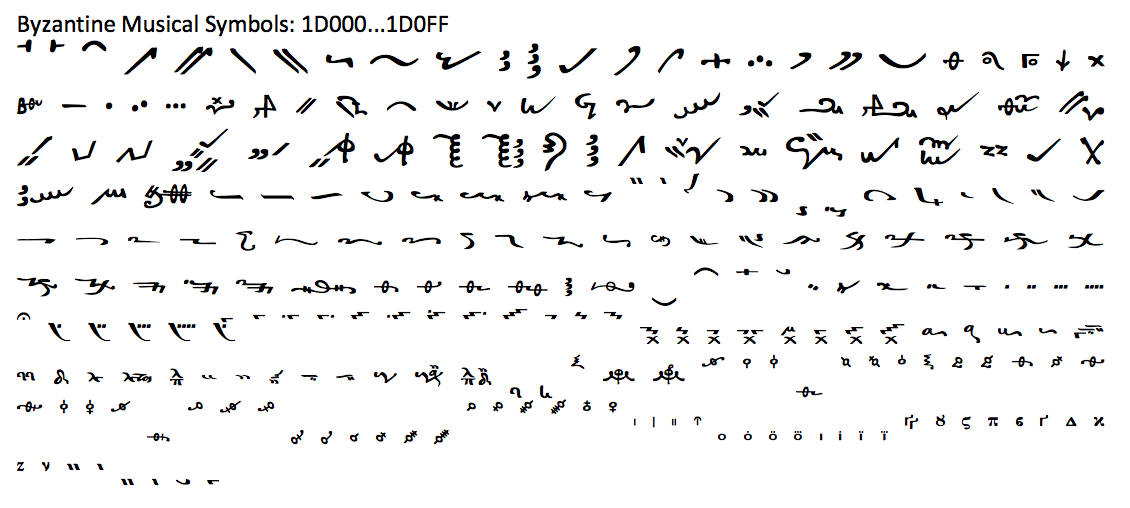
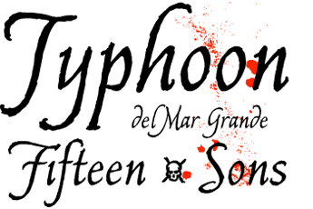