| | |
177 Studio
|
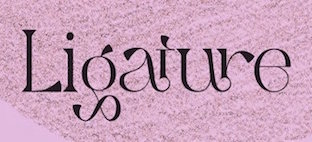 Aka Kenz, b. 1996. Studio in Singapore, specializing in display fonts. Their work is characterized by the frequent use of special ligatures. In 2020, 177 studio published the handcrafted typefaces Yambag, Good Things Script, Acmedia, Apollo, Autolinker, Medio, Qubely, Rigel Star, The Wave (wavy, zebra-striped), Tornado Night Party, Unique, Bqtrack-Script, Generating-Script, Hotel-Script, Sangi-Serif, Themify-Brush (a dry brush script), Extra Serif, Rhythm Script, Blogger 1983 Brush (dry brush), Bambi (monoline script), Staples Calligraphy, Bimber Brush (dry brush), Stthomas Script, Quotes (a dry brush font), Raghen (a monoline script) and Royal (a brush font). Other typefaces from 2020: Queens Gambit, Fashionable, Allright, Abnes, Ocean Wave (textured), Nuvel (textured caps), Okemo (a decorative serif), Omegle, High Speed, Kingsley, Medio Vintage (heavy caps), Karen, Amigh, Paint Drops, The Barista, Rainy Day.
 Befonts link. Typefaces from 2021: Aretha Bridge (a decorative serif), Aerobic (a decorative serif), Aristotle, Akashic, Celebrate (a display serif), Chaman (decorative), Conical Condensed, Coxxon (a logo font), Character with Text (textured), Digital Geometric, Gimbal Extended, Gramling, Hamachi (a decorative serif), Matiott (a display serif), Mclassic (stylish thin roman caps), Newton Howard, Ostrich Habitat (a display serif), Rothko Sans, Space (a futuristic speed font), Strarat (perhaps a horror font), String Beads, The Shouting, The Solstice, Theories (a tall modern sans), Travel (a modern display sans), Walting, Wind Creek (wind emulation), Cake Circle, Aremat (a rounded monolinear sans, perhaps a neon font), Urial, Gangitem (a ligature-rich serif), Roblox (futuristic), Selena Marin (a multi-width font), Wolf (octagonal), Amidala, Qaitan (a ligature-themed display serif), Raugi, Excellent (blackletter), Abington (sans), Aweber (an avant-garde sans), The Bangles (a vintage sans), Ohio (an all caps monolinear geometric sans), Mailyn, Celattin (a hipster sans), Landing, Soothing, Tommy. [Google]
[More] ⦿
|
Agustin Kurincic
|
During his studies at FADU, UBA in Buenos Aires, Agustin Kurincic designed the geometric solid typeface Geo (2019). [Google]
[More] ⦿
|
Ahmad Ramzi Fahruddin
[Arterfak Project]

|
 [MyFonts]
[More] ⦿
[MyFonts]
[More] ⦿
|
Aiman Azman
|
Designer of the geometric solid font Geomet (2020). [Google]
[More] ⦿
|
Ainara Rodriguez
|
Graphic designer in Bilbao, Spain. In 2017, Hamex Design (Bilbao, Spain), Teresa Bacelar, Laura Pajuelo, and Ainara Rodriguez co-designed a geometric solid typeface. [Google]
[More] ⦿
|
Akos Polgárdi
|
 Pest, Hungary-based designer of Hexa (2012, free hexagonal typeface).
 In 2013, he published the beautiful free poster font Mopster. Trefort Grotesk (2014) is a custom unicase monoline condensed sans typeface that was created for a World War II monument at Eötvös Loránd University to commemorate the university's students and professors who died during the war. In 2016, he designed the octagonal typeface Matematica: Matematica is a rounded, unicase, mono-spaced, pseudo-bitmap typeface constructed on a 5-by-5 grid. Relying on the most basic geometric shapes, the typeface draws heavily on the work of Dutch Bauhaus typographer Jurriaan Schrofer (1926-1990). Dafont link. Behance link. Cargo Collective link [Google]
[More] ⦿
|
Alessia Sbabo
|
Thiene, Italy-based designer of Geometric (2019). [Google]
[More] ⦿
|
Alex Etewut
|
 Moscow-based artist who created these typefaces in 2016: Buena Onda, Londa (a connected script), Foie Gras (signage script), Fuego, Cama (a thick connected script), Blackthorn, Savoiardi (connected monoline script), Savoiardi Sans, Savoiardi Display, Zimbra (a zebra stripe font), Signal, the Vincent Van Gogh-inspired Absinth, the Russian fairy tale font Anchor, the handcrafted Swan, the weathered Cliché Font, the constructed extraterrestrial font Structure, the geometric solid typeface Forma, the semi-calligraphic Absinthe and Glasgow, the calligraphic oriental brush typeface Yakudza, and the brush typefaces Augenblick and Barbada.
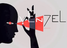
 Typefaces from 2017: Curator (a curvy decorative didone), Gluck (a rounded monoline sans family with outlined and double outlined styles), Laser Dots, Zarathustra (a soft blackletter typeface family), Pedrera and Pedrera Script, Hooley (advertized as a party font), Forma (free counterless typeface), Fuego (calligraphic script), Arc Boutant (a vintage ballpoint-laden text typeface), Moloko (script), Etalon (a 33-style organic sans family), Molodos All Caps, Click (Stripes, Black), Geometry Pair, Venzel (an interesting experimental deco typeface), Batllo (inspired by Gaudi), Pluma (handwriting). Typefaces from 2018: Pistoletto (a jelly or toothpaste script inspired by the work of Roy Lichtenstein and Michelangelo Pistoletto), Lento (a monoline script family), Rajomon (a dry brush typeface), Solomonk (an inky script), Ma Tilda, Warka, Abudabi (connected script), Lunar, Tilda (a monoline sans with character), Jeunes (connected script), Danken (a textured all caps typeface family), Salud (a hand-drawn slab serif, with some interesting sketched and arched styles), Hoochie, Brutto (stencil with alyering and coloring potential), Hvala, Mafond (slab serif), Tadaam, Liberal (a simple monoline sans). Typefaces from 2019: Etewut Serif, Etewut Sans, New Lobster (sigange script). Typefaces from 2020: Vulgary (a glistening oily font family), Spiro 2020 (a rounded sans), Chakra (script), Baker ST (spurred, all caps), Geraldica (a monoline script). Typefaces from 2021: Domosed (sci-fi), Riley Wow (a round oily font for emulating glows). As Etewut Graphics in Florence Italy, he published Pronto (2018, a monoline sans) and Allora (2018). Typefaces from 2022: Domosed Slab Serif. [Google]
[MyFonts]
[More] ⦿
|
Alex Hunt
|
During his graphic design studies at UCA Farnham, Alex Hunt (London) created an unnamed modular typeface (2013), which only uses rectangles, circles and triangles. [Google]
[More] ⦿
|
Alex Lasserre
|
Graphic designer in Toulouse, France, who created a geometric solid font and an experimental textured font in 2018. [Google]
[More] ⦿
|
Alex Tarallo
|
Codesigner with Donald Tarallo at Tarallo Design of FormPattern Color (2018),d FormPattern Color Three (2019: a typeface for creating borders and frames) and FormPattern Color Six (2020), Varese Outlined (an all caps geometric outline font) (2020). [Google]
[MyFonts]
[More] ⦿
|
Alfonso Gardel
|
Monterrey, Mexico-based designer of Tipografica (2014), a typeface based on simple geometric solids. Behance link. [Google]
[More] ⦿
|
Alvin Alif
|
Bandung, Indonesia-based designer of an experimental typeface based on rectangles, triangles and circles (2015). [Google]
[More] ⦿
|
Amanda Edholm
|
Stockholm, Sweden-based designer, with Jens Schildt, of a geometric solid typeface in 2018. [Google]
[More] ⦿
|
Amber Maxwell
|
During her graphic design studies at UCA Farnham, Amber Maxwell (London) created the modular typeface Angle Right (2013), which only uses rectangles, circles and triangles. [Google]
[More] ⦿
|
Ami Littlefair
|
 During her graphic design studies in Newcastle upon Tyne, UK, Ami Littlefair created Paperclip (2013), Colostic (2013: purely geometric shapes), Backtrack (2013) and Croudi (2013, a stitching typeface). Inspired by the constructivist movement, she created Geometric Typeface (2013) by superposing and juxtaposing geometric solids. Other geometric experiments include Line Alphabet (2013), Diagonal Alphabet (2013, a stitching font), Connecting Alphabet (2013).
 In 2014, she made the free hipster font Aesthetika. Dafont link. [Google]
[More] ⦿
|
Ana Dobarova
|
Based in Sofia, Bulgaria, Ana Dobarova created the geometric solid typeface Ponyo (2014) for a children's book. [Google]
[More] ⦿
|
Ana Margarida Soares
|
Or Ana Margarida Felipe. For a project at University of Aveiro in Portugal in 2016, Ana Margarida Soares (Figueira da Foz, Portugal), Filipa Oliveira and Joana Silva designed the geometric solid typeface Clumsy Types. Earlier, in 2012, at the same university, Ana Margarida Soares and Joana Silva co-designed the display typeface Palalimbagan. In 2018, she designed the clorful all caps alphabet Tropical Birds. [Google]
[More] ⦿
|
Anastasia Ladan
|
Odessa, Ukraine-based designer of Unfiolded Letters (2019). [Google]
[More] ⦿
|
Andrea Malpede
|
 Andrea Malpede (Nocive Laboratory, Naples, Italy) works in London. He created the ornamental alphabet called Maxicanito Nocive Font (2011). He also did Baboletor (2011, a superposition of basic geometric shapes), and Busy (2011).
 In 2013, he designed Xylophone (an experimental 3d font) and Siick Nocive. Behance link. [Google]
[More] ⦿
|
Andreas Gustavsson
[Gustav & Brun (was: Jagjavi)]
|
[MyFonts]
[More] ⦿
|
Andres Chavez
|
Santa Ana, CA-based designer of a multicolor geometric solid alphabet called Geometric Type (2016). [Google]
[More] ⦿
|
Anna Piat
|
Parisian designer of Retro (2016), a geometric solid typeface inspired by the Café Français in Paris. [Google]
[More] ⦿
|
Annaëlle Cousinié
|
Graphic designer in Lyon, France. She created the colorful textured geometric solid typeface Dyslexie (2013), the geometric display typeface Codex (2016), and the connect-the-dots electronic circuit typeface Le Lien (2016, FontStruct). [Google]
[More] ⦿
|
Anne Louise Rom
|
 During her studies at Copenhagen School of Design and Technology, Copenhagen, Denmark-based Anne Louise Rom created a colorful geometric solid typeface (2015). [Google]
[More] ⦿
During her studies at Copenhagen School of Design and Technology, Copenhagen, Denmark-based Anne Louise Rom created a colorful geometric solid typeface (2015). [Google]
[More] ⦿
|
Another Other
|
Designer of the geometric solid typeface Rotor (2014) and the hipster or black magic typeface Kom (2014). You Work For Them Link. [Google]
[More] ⦿
|
Anthony Odu
|
Graphic designer in London, who created the geometric solid typeface Aku Display in 2017. [Google]
[More] ⦿
|
Anton Malina
|
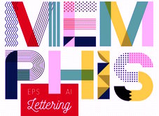
 Russian designer of the LED lights font LED (2015), the colorful 3d typeface Isometric (2016), and the bubblegum font Bubble Letters (2016). In 2017, he designed the colorful geometric all caps alphabet Memphis and the colorful sketched typeface Funky.
 All fonts are in vector format. Aka Malina Shop. [Google]
[More] ⦿
|
Anton Priyatna
[Apria]
|
[More] ⦿
|
Anugraha Design
[Cina Catteau]
|
 Pokhara, Nepal-based designer whose work is characterized by bold colorful geometric patterns and constructions. Typefaces from 2017 include Roam (which Cina calls a tribal type) and the color font Beach Towel.
 In 2017, she also published a wood type collection: - Barn Raising. A sturdy sans-serif in regular and rounded.
- Prairie. A perfectly square geometric serif, in inline and regular.
- Broad Sheet. A wide slab serif with 1.5:1 proportions. This one has a western flair but is simple enough to work for a variety of projects.
- Prize. An ornate slab serif with a circus / carnival vibe.
- Extra extra. A quirky slab serif most like 1900s printmaking letters.
Creative Market link. [Google]
[More] ⦿
|
Aoi Kageyama
|
During his studies at Kuwasawa Design School in Tokyo, Aoi Kageyama created the geometric solid typeface Katie (2017). [Google]
[More] ⦿
|
Apria
[Anton Priyatna]
|
Bandung, Indonesia-based designer (b. 1997) of the handcrafted typeface Caca (2017) and the geometric solid (Memphis style) typeface Yeah (2017). In 2021, he released the free asymmetrically-serifed typeface Mellow. [Google]
[More] ⦿
|
Arnaud Laly
|
During his studies in Rennes, France, Arnaud Laly created the geometric solid alphabet Transparence Typographie (2015). Behance link. [Google]
[More] ⦿
|
Arterfak Project
[Ahmad Ramzi Fahruddin]
|
 Ahmad Ramzi Fahruddin (aka Ramzehhh and as Ramz Fahruddin, b. 1993) established Arterfak Project in 2015. He is the Palembang, Indonesia-based designer of the display typefaces Aidah (2015, spurred), Temenyut (2015, spurred), Basenglah (2015, a geometric solid typeface), Local Genius (2015), Oropitem (2015, blackletter), Cakmacak (2015), Maeninaja (2015), Yagitudeh (2015, a free doodle font), Cagar (2015, free), Pletakrutuk (2015) and Beguyur (2015), the free experimental techno typeface Semravut (2015), the lava lamp typeface Cagar (2015) and the free spurred vintage typeface Outromoro (2015).
 Typefaces from 2016: Anehena (a beveled ornamental typeface), Bongoknian (spurred), Sebasengan (sketched, arched, stitched, textured, eroded and embossed substyles), Sekatoon (Victorian), Bekelakar (Victorian), Sambeltigo, Wayawaya (free bilined art deco), Geroboktuo, Bedengkang, Ringam, Cindo Kato (spurred Victorian typeface), Ngopi Doken (a layered handcrafted typeface family), Bedesau (Victorian), Temenyut (spurred Victorian style), Sirugino (a spurred tattoo / blackletter type), Buyanbengak (spurred), Geradakan (dry brush type). Typefaces from 2017: Martinez (Tuscan), Hughoney, Rockrace, Monabelia (Victorian), Philosophiya, Love Quake, Childwood, Circulat Decorative Frames, Dakmodal, Yasaman, Bsakoja, Meringam, Besigetz (Victorian), Bedempank, Ngamboel (a modern inline), Jemahok (an inline typeface), Sirunian (decorative blackletter), Belinjangan (brush style), Cerudikan, Kanjian (Victorian deco). Typefaces from 2018: Mirandah (monoline, vintage), Subversia (Victorian), Bertha (a free display family that includes Shadow Line, Sans and Spurred substyles), Quickers, Marchelle (art deco), Lourena, Mellynda, Leophard (octagonal), Wishteria, Slashback, Katheryna, Febiolla, Tropicane, Maretha (a monoline script). Typefaces from 2019: Requeiro (a spurred inline vintage font), Mourich (an all caps display typeface), Newston (a tall condensed news headline typeface family), The Black Sugare (blackletter-inspired), Magnies (an elegant stencil), Hermona (a spurred vintage label font), Bronzier (a sports font), Mayhena (a monoline script), Amnestia (a vintage all caps typeface), Highrush (font duo), Humeira (for children's books), Montheim (retro signage font), Hodgeson (a slab serif family), Delaroca, (a spurred black metal band font) Banda Niera, Bargers Distressed (spurred, Victorian), The Realita, Newston (a compressed skyline-style font), Ariestha Script, The Black Square, Requiem (Victorian or rococo inline caps), Invasible, Ferguson (an almost monoline slab serif family), Mirenath (a rounded vintage monoline typeface), Afolkalips (a tribal painted font inspired by the Papuan culture), Mellandry, Masterson (a slab serif western font), Marsheila (art deco), Kanjian, Belinjangan, Sirunian (a decorative spurred typeface), Quickers, Marcheile (slightly art nouveau), Marcheile, Monabelia, Nourishe (a fashion mag sans). Typefaces from 2020: Trashbone, Burgery (a monolinear all caps children's book font), The Brande and Lotaline (a decorative serif), Rimba Andalas (a tribal font), Bronela (a decorative serif), Wonder Night (a beatnik font), Malinsha (a signage script), Marones (spurred, vintage, all caps), Katenila (a fat finger font), Meliana Script (a brush script), Romelio (sans / script pair), Bondrians (a vintage label font), Black Ravens (a dry brush font), Shinkoya (vernacular lettering), Brothership, Novante (stylish caps), Almatine Script (a flat pen calligraphic script, with perhaps a touch of Arabic script emulation), Almatine Sans, Wargate (a military stencil font family), Bragley (a cartoon font), Varino (a rounded unicase sans family), Ranille (a bold display serif), Neilvard (a vintage label font family), Nagietha, Khodijah (an Arabic emulation font), Sometimes Rough, Savaneta (a vintage all caps typeface), Valmera (a Peignotian sans), Hargalia (classic calligraphy), Cherione (a unicase font), Revans (a display sans). Typefaces from 2021: Larantuka (an informal font with a dancing baseline), Bolandes (a weathered monoline sans), Delauney (a formal art deco typeface), Chieezy Burger (grungy, vernacular), Ranmor (a vintage slab serif), Andalia (a signage script), Insiders (a dry brush script), Granesta (a dry brush font), Abigral (a Peignotian serif), Suzanstein (a dripping blood font), Broken Console (a retro video game pixel font), Naluka (a tiki or nature park font), Lovatine (a scrapbook script), Rushen (vintage caps in curvy, regular, distressed, stencil and shadow versions), Siegra (futuristic), Komersie (a bold supermarket font), Borensa (a reverse stress font), Rashavine (a dry brush font), Blankone (a brush font), Montagna (a monolinear script), Hadnich (a heavy signage script), Sallomae (a scrapbook font), Vankours (a dry brush font), Wonderful Melanesia (a decorative serif), Albertson (a Tuscan font), Rantika (a bold brush script), Rusthack (a stylish brush typeface), Mustopha (an upright typeface in arabesque style), Marviona (a marker pen font), Marviona (a marker pen font), Niquitta Mirzani (script), Shikamaru (emulating a Japanese brush), Mortend (a 5-style expanded all caps sans), Barlock (an all caps and spurred varsity font), Northash (stencil), Motteka (a beatnik font), Sharely (a brush font), Rompies (a condensed titling sans), Beardsons (a vintage label font), Broken Crush (dry brush). Typefaces from 2022: Bradrock (a vintage semi-Tuscan Western font), Market Written (a fat finger font), Almalik (Arabic emulation), Vanitha (a brush script), Rambors (prismatic caps with four parallel lines), The Last Shuriken (emulating Japanese), Warzone (an all caps echno / sci-fi font), Kalidony (calligraphic with heart-themed tittles), Lemands (a stocky condensed display typeface). Dafont link. Creative Market link. Behance link. Graphicriver link. Creative Fabrica link. [Google]
[MyFonts]
[More] ⦿
|
Arve Båtevik
[Store Norske Skriftkompani]
|
 [More] ⦿
|
Atelier Olschinsky
[Peter Olschinsky]
|
 Vienna, Austria-based design studio, est. 2002 by Peter Olschinsky and Verena Weiss. They published the type family Ato (2012), which has Sans, Slab and Display (art deco) subfamilies. Outer Space (2012), Sato (2012, a bilined display typeface), Neopolis (2012, futurismo), Deconstruct (2012), Chaos (2012) and Construct (2012) are experimental. Bato (2012) is an alchemic type family. And Vato (2012) is a wonderful brushy poster headline face.
 In 2017, he published the bespoke typeface BirdYard, the free AO Grotesk (with poygonal outlines), free display sans typeface family Matol, the free geometric solid typeface AOX, which comes in Stencil and Regular styles, the free polygonal typeface family AO Mono, and the free monospaced Minimal Mono. Typefaces from 2020: Kaomo (monlinear, monospaced), AO Mono (polygonal). Behance link. [Google]
[More] ⦿
|
Athena Tejada
|
Verona, Italy-based designer of the geometric solid color font Loxi (2018) [Google]
[More] ⦿
|
Audrey Larouche
|
Montreal-based art director who created the geometric solid typeface Artwork in 2015. [Google]
[More] ⦿
|
Avi Agarwal
|
During her studies at the MIT Institute of Design in Pune, India, Avi Agarwal (New Delhi) created the condensed typeface Canister (2014), which is based on basic geometric shapes. [Google]
[More] ⦿
|
Ayoub Ahrrar
|
Artistic director in Paris who designed a geometric siolid and several other experimental typefaces in 2017. [Google]
[More] ⦿
|
Ayushi Bhandari
|
During her studies, Jaipur, India-based Ayushi Bhandari created a geometric solid typeface (2015). [Google]
[More] ⦿
|
Baptiste Chaloux
|
Graphic designer in Rennes, France, who created the über-modular typeface One Curve (2015), in which each glyph is either a rectangle or a quarter circle. He also made the free monoline sans typeface Crossed Type (2015) [careful: the zippyshare download site has viruses]. Behance link. [Google]
[More] ⦿
|
Benoit Dupré
|
French designer of Fazioli (2017: a piano key typeface) and Mo (2018: a geometric solid typeface). [Google]
[More] ⦿
|
Bianca Alcantara
|
 During her studies in New York City, Bianca Alcantara designed the geometric solid caps style Box Alphabet (2015). Earlier, at UFMA (Federal University of Maranhao, Brazil), in 2014, she created the vernacular typeface Traço together with Ana Carolina Aquino. [Google]
[More] ⦿
During her studies in New York City, Bianca Alcantara designed the geometric solid caps style Box Alphabet (2015). Earlier, at UFMA (Federal University of Maranhao, Brazil), in 2014, she created the vernacular typeface Traço together with Ana Carolina Aquino. [Google]
[More] ⦿
|
Bilal Ahmed
[Graphic Out]
|
[More] ⦿
|
Bold
[Oskar Lübeck]
|
Founding creative director of Differ Design in Stockholm. Founder and Creative Director of the Swedish design agency Bold (in 2011). Prior to Bold he was the Design Director at The Brand Union's Stockholm office. He has many years of international experience having worked and studied in Japan, New York, Dubai and London. His typefaces include Nordea Sans (for Nordea Bank), Labyrinyth (pixel style), Lateral (vertically striped face), Pop-Up, Fine Line, and Basic Shapes (a geometric experiment). [Google]
[More] ⦿
|
Boris Kahl
|
Born in 1975 in Schwäbisch Gmünd, Kahl graduated in 2001 from the Hochschule für Gestaltung in Pforzheim. Boris Kahl is Art Director of the German advertising agency MAGMA (Büro für Gestaltung) since 2001. He cofounded the German type and design weblog Slanted. His type designs are published at Volcano Type (Karlsruhe): - Athletic lettering: Sports (grungy, with Lars Harmsen), Sports Skinny.
- Blackletter: Frakturbo, Fraktendon (=Fraktur+Clarendon, co-designed with Harmsen)
- Dingbats: Mr. J. Smith Eye, Mr. J. Smith Head, Mr. J. Smith Mouth, Mr. J. Smith Nose, and Mr. J. Smith Wanted are experimental dingbat typefaces by Nikolaii Renger, based on an idea of Lars Harmsen, and digitized by Ulrich Weiss and Boris Kahl. These won an award at the 2005 FUSE competition. Multigenic are a collection of black and white boxes and rectangles (free).
- Dot matrix typefaces: C64 (original Commodore 64 font), Doublepoint (five styles), Monopoint (three styles), Rollerblind, Rollerblind Grid
- Grungy: Mud (free), Psycho, Poke
- Hand-drawn: Decomic Oblique
- LED style: Digibeck, Strichcode (a family co-designed with Harmsen).
- Kitchen tile typefaces: Bus, Bus PI.
- Patriot family, done with Lars Harmsen: Saddam, Commander Robot, Fidel, Slobbodan, Osama, George.
- Pixel typefaces: Amiga, Screeny, Pixel, C64, Fette Pixel
- Script typefaces: Filou (free, three styles)
- Techno typefaces: DigiBo, Teckbo (2002. Boris Kahl writes: Retro-Avant-Garde for Club-Flyer-Honks and Plastic-Pussy-Chicks)
- Uncial: Chaucer
free fonts at Dafont include Filou Medium (2010, calligraphic). View Boris Kahl's typefaces. Klingspor link. Dafont link. Volcano Type link. [Google]
[MyFonts]
[More] ⦿
|
Bowie Shum
|
Toronto-based designer of Mondrian (2013), a geometric font inspired by the geometric shapes of the De Stijl art movement and of Piet Mondrian. [Google]
[More] ⦿
|
Brandon Soto
|
Trujillo, Peru-based designer of the geometric solid typeface Van Gogh (2018). Behance link. [Google]
[More] ⦿
|
Cagil Aygen
[Velvele Design Community]
|
 [MyFonts]
[More] ⦿
[MyFonts]
[More] ⦿
|
Cameron Morton Watts
|
Petersfield, UK-based designer of the triangulated typeface Pryzm (2018) and the circle-and-squre typeface Valiant (2018). [Google]
[More] ⦿
|
Catarina Ferreira
|
Santarem, Portugal-based designer of the geometric solid typeface Pink Circle (2019) and the stick figure font Motion Code (2016). [Google]
[More] ⦿
|
Chinthye Law
|
 Chinthye Law (b. Kuala Lumpur, Malaysia) was an art director for Band China in Shanghai, but is now back in Kuala Lumpur, Malaysia.
 In 2011, she made some typefaces, including a paperclip face. In 2012, she added Disorder, Water (a wavy typeface), and New Typeface. In 2013, Chinthye designed the outline typeface Onyx and the hip display typeface City. In 2015, she designed a modular typeface and the circle-themed typeface Space. In 2019, she released the geometric solid typeface Cargo and the bubblegum typeface Home. [Google]
[More] ⦿
|
Christine ADM
|
German designer who is now located in Chicago, IL. For a club night in Frankfurt, she created the straight-edged techno typeface Sexpol (2014). For KISD Gala 2012, she designed an experimental geometric solid typeface. Behance link. [Google]
[More] ⦿
|
Christoph Ruppli
|
During his studies at the Schule für Gestaltung Basel, Christoph Ruppli created a hexagonal typeface (2014) and a bicolored geometric solid font called Duplex (2014). In 2015, still exploring the geometry of type design, he created Blox and Square. [Google]
[More] ⦿
|
Christopher P. Cacho
|
 Designer and lettering artist in Austin, TX, who created the warm display typeface Mainsail CPC (2012), and the masculaine rounded octagonal slab serif typeface Batten CPC (2013). In 2014, he made Scrimshaw CPC (Latin, kana and Cyrillic), Siren CPC, and Batten Sans CPC.
 Typefaces from 2015: Armada CPC (a wide sans), Beach Ball CPC (a geometric solid font; Filled and Outline), Compass Rose CPC (a geometric sans family designed for web sites), Mutiny CPC (an angry all-caps brush typeface). Typefaces from 2016: Waves CPC (pixel fonts), Wave Blackletter CPC (pixel fonts). Behance link. Creative Market link. [Google]
[More] ⦿
|
Cilab Studio
|
 Montreal-based studio with a French-only web site. Designers of the gorgeous Split (2015), the geometric solid typeface Braziu (2015), the multilined prismatic art deco typeface Brooklyn Fat Black (2015) and the pixel typeface Pixies (2015). Behance link. [Google]
[More] ⦿
Montreal-based studio with a French-only web site. Designers of the gorgeous Split (2015), the geometric solid typeface Braziu (2015), the multilined prismatic art deco typeface Brooklyn Fat Black (2015) and the pixel typeface Pixies (2015). Behance link. [Google]
[More] ⦿
|
Cina Catteau
[Anugraha Design]
|
 [More] ⦿
|
Clara Jeannin
|
Graphic designer in Nantes, France, who designed the geometric solid typeface Impasse in 2018. [Google]
[More] ⦿
|
Colleen Hancuch
|
During her studies in Chicago, Colleen Hancusch created a Geometrypography (2013), a typeface built up from simple geometric solids. [Google]
[More] ⦿
|
Cornelis André Vlaanderen
|
 Despite his name, André Vlaanderen was a Dutch designer, 1881-1955. He drew several alphabets, such as Moderne Schabloonletter (1933, a geometric stencil), and Silhouetteletter (1933, a counterless geometric solid art deco face).
 Digital revivals: - Vlaanderen NF, Vlaanderen Chiseled NF, Vlaanderen Round NF, Vlaanderen Square NF, all by Nick Curtis. These free fonts are based on an untitled work by André Vlaanderen from 1928.
- F37 Xan (2010, Rick Banks, F37). Based on a 1925 design by André Vlaanderen.
- Eutopia (2015, Victor Navarro Barba), based on an original from 1928 in the geometric solid genre.
- Konstrukt (2020, Mew Varissara Ophaswongse).
[Google]
[More] ⦿
|
Cybèle
|
Illustrator, graphic designer and concept artist based in Brooklyn, NY. Creator of a geometric solid typeface called Natho (2013). Behance link. [Google]
[More] ⦿
|
Dame Yucca
|
Dame Yucca is a creative graphic design studio based in Paris, founded by Géraldine Glisic and Jonathan Budenz, graphic designers and art directors who graduated from ESAG Penninghen. In 2017, they published the geometric solid typefaces Quartz and Ombre. In 2018, they published the decorative typeface Beautiful. [Google]
[More] ⦿
|
Dani Marti
|
Haiku, Maui, HI-based designer of the display typeface Boga (2015) and the free 3d Escher effect font Volume (2015). He also made vector hand icons and a free AT Vecor Symbol Logo font. Typefaces from 2017: the geometric solid typeface Malibu. Creative Market link. Behance link. [Google]
[More] ⦿
|
Daniel Baek
|
Schwalbach am Taunus, Germany-based designer of the geometric solid typeface Onyu Leon (2016). Behance link. [Google]
[More] ⦿
|
Danielle Warne
[Warnetype]
|
[MyFonts]
[More] ⦿
|
Deep Blue
|
UK-based designer of the pixel font 3DBoxes (2005), which is just a bunch of empty rectangles. [Google]
[More] ⦿
|
Diego Antelo
|
Madrid-based designer of a colorful geometric solid typeface (2016). [Google]
[More] ⦿
|
Diogo Tomas
|
During his studies in Lisbon, Portugal, Diogo Tomas designed the experimental phonetic alphabet Less (2017). His geometric solid typeface Aedifico (2017) only uses rectangles and triangles. [Google]
[More] ⦿
|
Dominic Pegg
|
Dominic Pegg uses nothing but geometric shapes in the creation of the origami typeface Crazy Dreamer (2013). This typeface was made while Domic was studying in London. [Google]
[More] ⦿
|
Donald Tarallo
[Tarallo Design]
|
 [MyFonts]
[More] ⦿
[MyFonts]
[More] ⦿
|
East End
[Shinpei Ino]
|
Shinpei Ino graduated from a Japanese art school and worked for two design firms before founding East End in 2017. In 2021, he released the counterless geometric solid typeface Sails Next. Typefaces from 2022: Chet (a sans inspired by the lettering on the signs of American diners and gas stations in the 1950s and 60s). [Google]
[MyFonts]
[More] ⦿
|
Eric Ellis
[widmest.org]
|
[More] ⦿
|
Erin Chabot
|
Medicine Hat, Alberta-based designer of Geometric PH (2017), which is inspired by the abstract art of Peter Halley. [Google]
[More] ⦿
|
Escaphandro (or: Rafael Cervi Barrozo)
[Rafael Nascimento]
|
 Rafael Nascimento (b. 1977) is a Sao Paulo, Brazil-based graphic designer whose fonts are mostly free. FontStructor who made these modular display typefaces in 2014: Wim Gestreept (an octagonal typeface inspired by Wim Crouwel's work), Sao Paulo (pixacao emulation), Pixel Spaceships, Chippanze (+LoRes, +DotMatrix), Kamada, Illusion (op-art based on the work of visual artist Martijn Sandberg), De Lorean, Pulse (pixel face), De Stijl, Soundwave (experimental), Ninja Gaiden, Pony PX, Act1, Platypus, Geo Geo, Expressionista, Soundwave Round, Video, Geo Libre (a tangram font).
 Typefaces from 2019: the dot matrix typeface Ghouls (attributed to Rafael Cervi Barrozo). Typefaces from 2020: - Geo (a free kitchen tile or stencil font based on retro record covers).
- Choripan. A revival typeface based on the classic round font Frankfurter (1970, Bob Newman at Letraset).
- The free brutalist typeface Blknd (made with FontStruct).
- The free sports lettering font Wim Pro.
- The graffiti font SP011.
- Refuse. A revolutionary or military stencil font. Free download.
- Sumano. Squarish, tribal, and experimental. Free download.
- Volume Dealers. A free bold art deco font This typeface that references the photo typeface Black Body (Peter Steiner, 1973) and the classic lettering of the album Vol 4 by Black Sabbath.
- Swiss Grit. A free grungy typeface in the destructionist style of Brody and Carson.
Typefaces from 2021: Volume Round (Volume Round takes its cousin Volume Dealer structure to a retro-weird leve; it too is inspired by late 1960s photo typesetting designs, and in particular the works of Peter Steiner, adding a little sci-fi flair to the details). Typefaces from 2022: Ghosts (a 4-style experimental geometric display font), CMYK (an experimental textured typeface). You Work For Them link. [Google]
[More] ⦿
|
Evgeny Tkhorzhevsky
[Robot Smith]
|
 Based in Vladivostok, calligrapher Evgeny Tkhorzhevsky (Robot Smith, or ET Lettering Studio) created Braxton (2013, a brush script published by Fontfabric---one style is free), and Construct (2012, a constructivist experiment with geometric solids).
 In 2014, he created the semi-connected vintage signage script (or marker script) typeface Suzee FY (Fontyou), the creamy script Kumiz FY (with Gia Tran, Fontyou), which is a renamed version of Maio FY (with Gia Tran, at FontYou). In 2016, together with FontFabric, he designed the great free rough-edged script typeface Resphekt (Latin/Cyrillic). Another alias is Robot Smith. Behance link. Behance link for ET Lettering Studio. Dribble link. [Google]
[MyFonts]
[More] ⦿
|
F37 (or: Face37)
[Rick Banks]
|
 Rick Banks (b. 1985, Manchester, UK) established F37 (Face37) in 2010 in London, UK. His typefaces:
 - F37 Xan (2010). A counterless geometric typeface based on a geometric solid typeface from 1925 by André Vlaanderen.
- F37 Form (2010). A mimimalist circular experimental (Bauhaus?) font. He writes about Form: After looking at Armin Hoffman's Die Gute Form poster and Herbert Bayer's universal typeface I constructed an alphabet based on their letterforms. Inspired by Wim Crouwel's Soft Alphabet, I constructed a grid to create the modular alphabet and programmed very tight letterspacing into the font lending itself to the style of Die Gute Form.
- F37 Bella (2011). An extremely contrasted didone display typeface. He says that he was influenced not only by Didot, but also by Pistilli and by Tschichold's Saskia. F37 Bella won an award at TDC Tokyo 2012. See also F37 Bella Pro (2020), in Text, Hairline, Stencil and Display substyles.
- F37 Ginger (2013). A Swiss geometric sans inspired by the work of Herb Lubalin, Jan Tschichold and Paul Renner. The customized version of F37 Ginger, Boots Sharp (2019), was commissioned by Coley Porter Bell and True Story as part of an extensive rebrand. F37 Ginger Pro was released in 2019.
- F37 Neue Grotesque (2013).
- F37 Stencil Bella (2013).
- F37 Glaser Stencil (2015).
- F37 Bolton (2016). A sans family influenced by the style of Berthold's G.G. Lange.
- F37 Jan (2016). Inspired by Jan Tschichold's geometric sans-serif and Matthew Carter's Bell Centennial font, F37 Jan features pronounced ink traps.
- F37 Jagger (2017). A sans inspired by Edward Johnston's London Underground font.
- F37 Bergman (2017). A Peignotian typeface family that revives a revival Hans Möhring's Florida typeface. The Swedish director Ingmar Bergman consistently used Florida in his films.
- BHF Beats (2018): Working alongside Wolff Olins we were comissioned to create the new font for the British Heart Foundation. The letterforms are based on their iconic logo featuring waves of a heart beat.
- F37 Bobby (2018). A warm text typeface.
- F37 Ping Pong (2018). A 1970s style dot matrix font that was inspired by the 1970s Letraset font Pinball created by Alan Dempsey.
- F37 Factory (2019). Named after Andy Warhol's The Factory in New York City, F37 Factory was inspired by stencil letters etched into marble in what was once a Hovis flour mill in Ramsgate. That building was designed by E. W. Pugin. F37 Factory was originally conceived for a commercial development project for Want Marketing and commissioned by London design studio Bold & Bold.
- F37 Judge (2019). Banks's take on DIN and old wood types.
- F37 Moon (2019). Influenced by Avant Garde and Futura, in 14 styles.
- F37 Flux (2019). Experimental and intestinal.
- F37 Neuro (2019). A Swiss sans family.
- F37 Beckett (2020). A sans based on British road signs from the 1930s. F37 Beckett pays homage to the British Ministry of Transport's 1933 alphabet.
- F37 Stout (2020). An octagonal family base on a letterpress font called Stoutheart.
- F37 Gruffy (2020). A grotesque.
- F37 Hooj (2020). A geometric sans family.
- F37 Wicklow (2020). A 24-style wedge serif inspired by the Gaelic letter carvings by Irish sculptor Michael Biggs in Dublin. It includes a set of stencil fonts as well.
- F37 Snake (2020). an octagonal industrial stencil typeface inspired by John Carpenter's film Escape From New York.
- F37 Caslon (2020). He explains why the world needs another Caslon: F37 Caslon is our personal take on a stone-cold classic. Originally designed by William Caslon in 1726, this old-style serif has fascinated typographers ever since. Over the years, the font has been tweaked, reworked, modernised, pulled, stretched, squashed and embellished, as successive generations have created their own versions of Caslon, particular to their times and tastes. We have taken the best of these seminal Caslon revisions to create our own super family in a huge range of weights and styles. Our cut features a tall x-height, old-style numerals, capital italic swashes, ligatures and discretionary ligatures.
- F37 Grotesc (2021). Inspired by Pica Sans.
- F37 Attila (2021). A sans serif is inspired by Albert Auspurg's Krimhilde (1933).
- F37 Drago (2021). A serif typeface based on Columbus (1892).
- F37 Wyman (2021). F37 Wyman is based on lettering work created by graphic designer Lance Wyman in 1976, which was commissioned as part of the graphic identity marking 200 years of American Independence.
- Corporate typefaces include Dunlop Sans, F37 Selfridges (=F37 Bella), F37 Avid (=F37 Ginger), Pamela (for Foilco), F37 Zip (for the hotel chain), Pizza Pilgrims, Dar Headline (octagonal), Lloyds Bank (icons).
- F37 Lineca (2021). A fifteen-weight geometric sans with a strong emphasis on the horizontal.
- Ocado (2021). A custom sans done for a grocery company.
- Stonewall (2021). A sans font for Stonewall, a cmpany that has championed a world where LGBTQ+ people everywhere are free to be themselves and enjoy life fully.
- F37 Incise (2021). A heavy, experimental display font, inspired by stone cutting.
He also published Type Trumps, a set of playing cards that feature the main typefaces. Behance link. [Google]
[MyFonts]
[More] ⦿
|
Fabio Mansos
|
During his studies at ESAD.CR, Fabio Mansos (Vila Nova de Santo André, Portugal) designed the geometric solid typeface Plexis (2017). [Google]
[More] ⦿
|
Fatumata Camara
|
Barcelona-based freelance designer who designed the experimental typeface Universe (2016) by combining Arial with geometric shapes. [Google]
[More] ⦿
|
Felipe Fredes
|
Santiago, Chile-based designer of the geometric solid typeface Reticular (2015). [Google]
[More] ⦿
|
Fernanda Lazo
[Frau im Mond]
|
[More] ⦿
|
Fortunee Cohen
|
American designer of the geometric solid typeface Formas Geometricas (2018). [Google]
[More] ⦿
|
Francisco Jose Garcia Alanis
|
Sevilla, Spain-based designer of the geometric solid typeface Lichtenstein (2017). [Google]
[More] ⦿
|
Frau im Mond
[Fernanda Lazo]
|
 Graphic designer in Mexico City who published the geometric solid alphabet simply called Wedge (2021). [Google]
[More] ⦿
Graphic designer in Mexico City who published the geometric solid alphabet simply called Wedge (2021). [Google]
[More] ⦿
|
Gargi Ashtekar
|
Designer of Elements (2017), a decorative typeface that consists of juxtaposed triangles and geometric solids. This typeface was published during her studies at Sophia Polytechnic, Art & Design, Mumbai. [Google]
[More] ⦿
|
Garisman Studio
[Risman Ginarwan]
|
 Bandung, Indonesia-based designer (b. 1994) of Patient (squarish) (2021), Wilden (a national park signage font) (2021), Renaise (2021: a letter sign typeface), Farson Family (a weathered vintage label font) (2020), Hookward (condensed and handdrawn) (2020), Retrosey (2020), Holdem (a geometric solid font) (2020), Pylox Street (a fat graffiti font) (2020), Hello Eatery (2020), Highly (2020: an all caps grotesk with some quirks), Chelsea Olivia (a font duo) (2020), Attractype Reborn (2020: a vernacular script), Blocky (2020), Beblock (counterless, handcrafted), Yournotes (2020: a notebook script), Austellia (2020: a dry brush script), Courtland (2020), Lastwinter (2020: a brush script), GR Milesons (2020: art deco), Amoore (2020: all caps, hand-drawn), GR Altosa (2020: a headline sans), Blacks Roobin (2020), Barnett (2020), Highly (2020), Zanaz (2020: a neurotic font), Header Marker (2020), Folkner (2020: emulating stamped letters), Backrush (2020: a dry brush script), Bebrush (2020), Alligator (2020: a death metal font), Nersans (2020: a vintage display sans), GR Read (2020: an all caps headine sans), GR Norch (2020: a sports font), Pintersan (2020), Wattgone (2020), Delight Love (2020), Cattle (2020), Kartoon (2020), Yournotes, Magic Spring, Strong Boyz, Indentia (2020: art deco), Bruzh (2020), Australove (2020), Keypass (2020), Ecriture (2020), Meethlake (2020), Ellouise (2019), Rezpector (2019), Childo (2019: rounded sign painting sans), Elbrush (2019), Jungle Land (2019), Winterbrush (2019), Wintersoul (2019: free), Cordon (2019), Humming (2019), Ouders and Ouders Stencil (2019: rustic), Black Ground (2019: a letterpress font), Hardcore (2019: dry brush), Wattermellon (2019), Attractype Reborn (2019), Real Brush (2019), Wardness (2019), Headson (2019), Signation (2019: signage script), Meranie (2019), Blocky (2019), Destone (2019), Sattersoon (2019), Bassheads (2019; a brush script), Beautiful Heart (2019), Rembank (2019: script), Darkwart Letter (2019), Winsberg (2019), Smackover (2019), Magelove One (2019), Lastwinter (2019), Beattingvile (2019), Sanpaullo (2019), Slovenia (2019), Hellotropica (2019), Molliquam (2019: a brush stroke font), Alinnea (2019: a signature font), Webrush (2019), Starbricks (2019: dry brush), Sacreditty (2019: a free dry brush), Donatellia (2019), Chelsea Olivia (2019: font duo), Austellia (2019: dry brush script), Maxtield (2019: a mural paint or graffiti font), Courtland, Hasthon (2019), Beattingvile (2019), Hardner (2019: monoline retro script), Vector Type (2019), Mighty Brush (2019), Thanose (2019: blackletter), Motowerks (2019: a fat monoline script), Millo (2019), Freudian (2019), Hurson Clean and Rough (2019), Nootdorp (2019), Afterkilly (2019: blackletter), Vintages (2019), Sutter Camp, Westpart (dry brush), Maqueen (2019: sans and script), Easttalia (2019), Meifen (2019: oriental simulation), Chakie (2019: chalk font), Reallova (2019: brush), Theme (2019: a painted texture font), Sunkiss (2019: brush script), Riborn (2019: vintage lettering), Southen (2019), Ultra Brush (2019), Soul Paint (2019: brush), Dirty Brush (2019), Hurson (2019: vintage style), Northen (2019: brush font), Dakwart Letter (2019: brush font), Lolitta (2018), High Xire (2018: dry brush), Hoolegan (2018: grungy), Lesjam (2018: sans), Letter Hellen (2018: a rabbit ear script), Venator (2018: brush script), Sellwyne (2018: a creamy brush script), Kakara (2018), JustJessy (2018), Ellaine (2018) and Adelard (Serif and Scratches) (2018). [Google]
[MyFonts]
[More] ⦿
Bandung, Indonesia-based designer (b. 1994) of Patient (squarish) (2021), Wilden (a national park signage font) (2021), Renaise (2021: a letter sign typeface), Farson Family (a weathered vintage label font) (2020), Hookward (condensed and handdrawn) (2020), Retrosey (2020), Holdem (a geometric solid font) (2020), Pylox Street (a fat graffiti font) (2020), Hello Eatery (2020), Highly (2020: an all caps grotesk with some quirks), Chelsea Olivia (a font duo) (2020), Attractype Reborn (2020: a vernacular script), Blocky (2020), Beblock (counterless, handcrafted), Yournotes (2020: a notebook script), Austellia (2020: a dry brush script), Courtland (2020), Lastwinter (2020: a brush script), GR Milesons (2020: art deco), Amoore (2020: all caps, hand-drawn), GR Altosa (2020: a headline sans), Blacks Roobin (2020), Barnett (2020), Highly (2020), Zanaz (2020: a neurotic font), Header Marker (2020), Folkner (2020: emulating stamped letters), Backrush (2020: a dry brush script), Bebrush (2020), Alligator (2020: a death metal font), Nersans (2020: a vintage display sans), GR Read (2020: an all caps headine sans), GR Norch (2020: a sports font), Pintersan (2020), Wattgone (2020), Delight Love (2020), Cattle (2020), Kartoon (2020), Yournotes, Magic Spring, Strong Boyz, Indentia (2020: art deco), Bruzh (2020), Australove (2020), Keypass (2020), Ecriture (2020), Meethlake (2020), Ellouise (2019), Rezpector (2019), Childo (2019: rounded sign painting sans), Elbrush (2019), Jungle Land (2019), Winterbrush (2019), Wintersoul (2019: free), Cordon (2019), Humming (2019), Ouders and Ouders Stencil (2019: rustic), Black Ground (2019: a letterpress font), Hardcore (2019: dry brush), Wattermellon (2019), Attractype Reborn (2019), Real Brush (2019), Wardness (2019), Headson (2019), Signation (2019: signage script), Meranie (2019), Blocky (2019), Destone (2019), Sattersoon (2019), Bassheads (2019; a brush script), Beautiful Heart (2019), Rembank (2019: script), Darkwart Letter (2019), Winsberg (2019), Smackover (2019), Magelove One (2019), Lastwinter (2019), Beattingvile (2019), Sanpaullo (2019), Slovenia (2019), Hellotropica (2019), Molliquam (2019: a brush stroke font), Alinnea (2019: a signature font), Webrush (2019), Starbricks (2019: dry brush), Sacreditty (2019: a free dry brush), Donatellia (2019), Chelsea Olivia (2019: font duo), Austellia (2019: dry brush script), Maxtield (2019: a mural paint or graffiti font), Courtland, Hasthon (2019), Beattingvile (2019), Hardner (2019: monoline retro script), Vector Type (2019), Mighty Brush (2019), Thanose (2019: blackletter), Motowerks (2019: a fat monoline script), Millo (2019), Freudian (2019), Hurson Clean and Rough (2019), Nootdorp (2019), Afterkilly (2019: blackletter), Vintages (2019), Sutter Camp, Westpart (dry brush), Maqueen (2019: sans and script), Easttalia (2019), Meifen (2019: oriental simulation), Chakie (2019: chalk font), Reallova (2019: brush), Theme (2019: a painted texture font), Sunkiss (2019: brush script), Riborn (2019: vintage lettering), Southen (2019), Ultra Brush (2019), Soul Paint (2019: brush), Dirty Brush (2019), Hurson (2019: vintage style), Northen (2019: brush font), Dakwart Letter (2019: brush font), Lolitta (2018), High Xire (2018: dry brush), Hoolegan (2018: grungy), Lesjam (2018: sans), Letter Hellen (2018: a rabbit ear script), Venator (2018: brush script), Sellwyne (2018: a creamy brush script), Kakara (2018), JustJessy (2018), Ellaine (2018) and Adelard (Serif and Scratches) (2018). [Google]
[MyFonts]
[More] ⦿
|
Ghassane Moutaoukil
|
Bozeman, MT-based designer, as a student at MSU, of the all caps sans headline typeface Robust Elegance (2017), the North African emulation typeface Tamazight (2017), and the geometric solid typeface Geometric Art Deco (2017). Behance link. [Google]
[More] ⦿
|
Ghiffari Haris
|
Sydney, Australia-based designer of the curvy display typeface Dewi (2015). This free typeface is inspired by Balinese dances. In 2018, he designed the geometric solid typeface Geometric. [Google]
[More] ⦿
|
Giel Cobben
|
 Located in Boxtel, The Netherlands, Giel Cobben designed of the geometric typeface Droplet (2010). He took five fundamental shapes (modules) to contstruct this modular font. Home page. [Google]
[More] ⦿
Located in Boxtel, The Netherlands, Giel Cobben designed of the geometric typeface Droplet (2010). He took five fundamental shapes (modules) to contstruct this modular font. Home page. [Google]
[More] ⦿
|
GraceHillary Kim
|
During her studies in London, GraceHillary Kim designed these poster typefaces: Korean origami (2015), Pennis (2015, based on semicircles), Constellation (2015, a connect-the-dots typeface), Unstoppable Words (2015). [Google]
[More] ⦿
|
Graphic Out
[Bilal Ahmed]
|
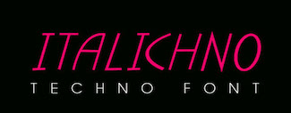 Lahore, Pakistan and/or London, UK-based designer of Contour (a titling sans), Chubby (2019), the free display sans Linicircle (2017), the free rounded sans typeface Roudge or Wasey E (2019), the modular typeface Bract (2019), the copperplate serif Billag (2019), the color font Taster (2019), Zonta (2019), the techno or architectural lettering font Italichno (2018), the geometric shape fonts Shape (2019) and Shape Out (2019), and the semi-stencil typeface CoolCut (2019). Behance link for Graphic Out. [Google]
[More] ⦿
Lahore, Pakistan and/or London, UK-based designer of Contour (a titling sans), Chubby (2019), the free display sans Linicircle (2017), the free rounded sans typeface Roudge or Wasey E (2019), the modular typeface Bract (2019), the copperplate serif Billag (2019), the color font Taster (2019), Zonta (2019), the techno or architectural lettering font Italichno (2018), the geometric shape fonts Shape (2019) and Shape Out (2019), and the semi-stencil typeface CoolCut (2019). Behance link for Graphic Out. [Google]
[More] ⦿
|
Gustav & Brun (was: Jagjavi)
[Andreas Gustavsson]
|
 Andreas Gustavsson is a Swedish designer, b. 1979, located in Nyköping. At MyFonts, starting in 2013, the name Andreas Brunelius started to appear as the designer of most of the typefaces. It is possible that Andreas Brunelius = Andreas Gustavsson. Gustavsson's typefaces were first published under the foundry name Jagjavi, but in 2014, that name changed to Gustav & Brun.
 Creator of the simple hand-printed typeface Kohicle 25 (2009). See also his waxy letter studies from 2010. At his commercial foundry, he published Pushups (2012, hand-printed 3d face), Itchy Handwriting (2012), Docklan (2012, textured face), Herbarium (2012, plants dingbats) and Old Earthy (2012, a hand-drawn font inspired by the mid 19th-century art movement with William Morris and the Pre-Raphaelite Brotherhood). Typefaces from 2013: Sweeper, Paper Cuts, Nanu and Nanu Simple Ornaments (hand-drawn poster font), Macro (fat headline or poster face), Macro Print (the eroded version of Macro), Karl and Karl Black (blackboard bold typeface family). Typefaces from 2014: Caitiff (a fun poster typeface), Albus (comic book font), Expedition One (bichromatic geometric solid typeface), Sweeper Slanted (brush typeface). Home page. Behance link. Another home page. Fontspace link. Dafont link. View all their typefaces. [Google]
[MyFonts]
[More] ⦿
|
Hamex Design
|
In 2017, Hamex Design (Bilbao, Spain), Teresa Bacelar, Laura Pajuelo, and Ainara Rodriguez co-designed a geometric solid typeface. [Google]
[More] ⦿
|
Hazel Nguyen
|
During her studies in Madrid, Spain, Hazel Nguyen designed the colored wooden block / geometric solid color typeface Creario in 2017. She also designed the squarish typeface Glime (2017). [Google]
[More] ⦿
|
Helena Lunding Hultqvist
|
 Kristianstad, Sweden-based graphic designer and illustrator. Creator of an alphabet consisting only of solid geometric shapes called Geoalfabet (2013). She also created the illustrated caps alphabet I Want To Be (2013).
 Behance link. [Google]
[More] ⦿
|
Hollie Garrett
|
Luton, UK-based student-designer of the geometric solid typeface Geomet (2016). [Google]
[More] ⦿
|
Hoon Kim
[Why Not Smile LLC]
|
[More] ⦿
|
Hugh van der Lande
|
During his studies at London College of Communications, Hugh van der Lande designed the colorful geometric solid typeface Brixton Village (2016) and the chromatic typeface Hacker (2017). Behance link. [Google]
[More] ⦿
|
Iain Budgen
|
Guildford and/or Cranleigh, UK-based creator of the pixelish typeface Speakerbox (2014), the hipster typeface Yelofinch (2014), Pinkfinch (2014), Clock Icons (2014), Weather Icons (2014), the cryptic typeface Kruptos (2012) and of the pixelish typeface Type Beast (2013). Shapabet (2012) is an alphabet composed entirely of simple geometric shapes. [Google]
[MyFonts]
[More] ⦿
|
Ian Swift
[Swifty Typografix (was: Command (Z))]
|
[More] ⦿
|
Ida Greco
|
Naples, Italy-based designer of Eclectida (2016), a versatile art deco typeface family that was constructed by using rectangles and circles. [Google]
[More] ⦿
|
Igor Kovalov
|
Cliftonville, UK-based designer of Slick (2015), a typeface inspird by gooey oil, and of an untitled geometric solid typeface, also in 2015. [Google]
[More] ⦿
|
Isa Lloret
|
 During her studies at Escola d'Art i Superior de Diseny de Valencia, EASD, Isa Lloret (Trieste, Italy) created a geometric solid alphabet that was inspired by the Bauhaus work of Josef Albers, and colored it according to Kandinsky's paradigm of relating color to shape. Behance link. [Google]
[More] ⦿
During her studies at Escola d'Art i Superior de Diseny de Valencia, EASD, Isa Lloret (Trieste, Italy) created a geometric solid alphabet that was inspired by the Bauhaus work of Josef Albers, and colored it according to Kandinsky's paradigm of relating color to shape. Behance link. [Google]
[More] ⦿
|
Isaias Barreto Silveira
|
 Palhoça, Brazil-based designer of the decorative caps typeface Bauhaus Flow (2019). [Google]
[More] ⦿
Palhoça, Brazil-based designer of the decorative caps typeface Bauhaus Flow (2019). [Google]
[More] ⦿
|
IYBI
[Radi Safi]
|
Radi Safi (If You Build It) is the Sydney, Australia-based designer of the geometric solid typeface Happy (2015), the sans typeface Swish (2014) and the display typefaces Panthony (2015), Salvesen (2014, designed for the cover of a CD by Sydney artist Atlas B Salvesen) and Smoke Signals (2014). Dafont link. Behance link. [Google]
[More] ⦿
|
Jackson Chang
|
Chiayi City, Taiwan-based designer of the geometric solid typeface Letters (2016). [Google]
[More] ⦿
|
Jacob Hinman
|
Saint Augustine, FL-based designer of a multicolor geometric solid alphabet called Back to the Basics (2015). [Google]
[More] ⦿
|
Jahng Hyoung Joon
|
 Seoul, Korea-based designer of a geometric solid typeface in 2017, and a great set of human pictograms in 2016. Behance link. [Google]
[More] ⦿
Seoul, Korea-based designer of a geometric solid typeface in 2017, and a great set of human pictograms in 2016. Behance link. [Google]
[More] ⦿
|
Jan LeWit
|
Polish designer of the Hebrew typeface Haim (1930s). Adi Stern writes about Haim and another Polish-designed Hebrew font, Sapir: Both typefaces are clearly influenced by the Bauhaus and early modernism and involve simplified, constructed and more geometrical forms. The Haim typeface holds seven symmetrical letterforms while the Sapir has eight of them. The Sapir brings on stage several additional important features. First, as a monolinear sans-serif, it is far more constructed than the Miryam. The Sapir is basically made of simple geometrical shapes, similarly to many Latin faces of the time (e.g. Futura). Second, it uses identical forms, rotated, to make different letters. Third, it introduces---probably for the first time---convex curves instead of flat x-height horizontal strokes. The design of those curves might have been inspired by Hebrew semi-cursive or cursive handwriting, but it is more likely an attempt to simulate the Latin script's x-height curved nature. Digital versions of Haim include Haim MF (1997-1998, Masterfont), which was designed by Eventov Elizov, Zvika Rosenberg and Pini Hemo. [Google]
[More] ⦿
|
Jeanne Rolfe
|
 During her graphic design studies, Jeanne Rolfe (Tours, France) created a geometric solid typeface in 2013 under the supervision of Malou Verlomme. Behance link. [Google]
[More] ⦿
During her graphic design studies, Jeanne Rolfe (Tours, France) created a geometric solid typeface in 2013 under the supervision of Malou Verlomme. Behance link. [Google]
[More] ⦿
|
Jennifer Klinedinst
|
Freelance graphic designer in York, PA, who created the geometric solid typeface Ectomorphic (2015). [Google]
[More] ⦿
|
Jhozy Mendez
|
Caracas, Venezuela-based designer of the geometric figure typeface Focus (2019). [Google]
[More] ⦿
|
Joana Silva
|
Joana Silva (Joana Silva Design, Figueira da Foz, Portugal) co-designed the display typeface Palimbagan in 2012 with Ana Margarida Soares during their studies at the University of Aveiro, Portugal. For a project at University of Aveiro in Portugal in 2016, Ana Margarida Soares (Figueira da Foz, Portugal), Filipa Oliveira and Joana Silva designed the geometric solid typeface Clumsy Types. [Google]
[More] ⦿
|
Joanna Blackford
|
American designer of the circle-and-rectangle-based typeface Potamus (2017). [Google]
[More] ⦿
|
Joao Santos
|
Lisbon, Portugal-based designer of a geometric solid typeface and a graffiti-inspired typeface called Salmao in 2015. [Google]
[More] ⦿
|
Johannes König
[Melville Brand Design]
|
[MyFonts]
[More] ⦿
|
John Greatorex
[School Fonts (was: Shepherdson Community Education Centre)]
|
[More] ⦿
|
Jordan Dale Young
|
Boston-based designer of the colorful geometric shape typeface Party Down (2017) and Stone Henge (2017). Creative Market link. Behance link. [Google]
[More] ⦿
|
Jose V. Rodriguez
|
Freelance graphic designer and illustrator in Brooklym, NY. Creator of the geometric solid typeface Moonman (2012). [Google]
[More] ⦿
|
Jovana Krstanovic
|
Belgrade, Serbia-based graphic designer who created the Cyrillic geometric solid typeface Abstract Font (2017). [Google]
[More] ⦿
|
Kaer
[Roman Korolev]
|
 Roman Korolev (Kaer, Vologda, Russia) designed the wood stick brush typeface WoodStick in 2016.
 Typefaces from 2017: OneLine Bold (rounded fat color font). Typefaces from 2019: Antique Initials (regular and color; with a flower pattern), OneLine Overlap (a color font). Typefaces from 2020: Pagesso (a lava lamp font), Avery (a monolinear connected sans), Sailem (an inline art deco font), Old Stamp (a fingerprint font), Silvery (a display typeface on the theme of thick and thin), Blueberry Spot, Coffee Chalk (a textured typeface), Allegro (a blueprint type), Northern Monk (beveled), Westland (blackletter), Neon Line, Bronze (art deco, +color, +texture), Shtrih (dry brush), Geoline (sketched, textured), Flowline, Foliageant (floral, curly), Northern Runes (rune emulation), Neon (color font), Parallel Lines, Bronzen Abundance (a display family with textured and color options), Sharp Stroke (a heavy brush typeface), Renaissance Initial, Celtic Spiral, Lace Line. Typefaces from 2021: Atta Weird (a font for LSD addicts), Three Neon Lines, Dead Saint (a Halloween alphabet), Lockdown Christmas (a dot matrix font), Nordic Folk (a layerable typeface family with Scandinavian texture; plus Nordic Folk Icons), Hewy (a display typeface), Planny (a blueprint font), Sportlight (a speed font), Wesloy (a brush serif font), Carle (a 3d polygonal children's book font; +Shadow, +Colored), Absundo (a playful dual weight font), Wide Plump (a geometric solid typeface), Colton (a condensed boutique serif), Aztec Initials (+a colored version), Adrim (a thin floriated sans), Northern Monk (an inscriptional ustav-inspired typeface), Sogia (a decorative serif). Typefaces from 2022: Asl Line (an American Sign Language font). [Google]
[MyFonts]
[More] ⦿
|
Kaja Kusak
|
London-based designer of the geometric solid and triangle-based typeface Leytonstone (2018) that takes inspiration from Hitchcock movies. [Google]
[More] ⦿
|
Karan Darhji
|
Pune, India-based designer of the colored geometric solid typeface Material Alphabet (2017, free in AI format). [Google]
[More] ⦿
|
Karishma Pinto
|
During her studies in Philadelphia, PA, Karishma Pinto designed a colorful geometric solid typeface (2017). [Google]
[More] ⦿
|
Kartika Wijaya Kosasih
|
Graphic designer in Singapore. Creator of Honk (2012), an ornamental caps typeface on the theme of musical instruments. She also designed the triangulated colored typeface Rainbow Puke (2012) and the geometric solid typeface Playful Type (2014). [Google]
[More] ⦿
|
Kateryna Hovorun
|
Kiev, Ukraine-based designer of the geometric solid Cyrillic font Iceberg (2015). [Google]
[More] ⦿
|
Ket Monnyreak
|
Phnom Penh, Cambodia-based graphic designer and illustrator who created the geometric solid typeface Hamburger in 2015. [Google]
[More] ⦿
|
Kimmy De Leon
|
Manila-based art director, who used basic geometric shapes in the creation of Shape Type (2012). He is presently located in Singpore. Behance link. [Google]
[More] ⦿
|
Kornel Faludi
|
 Graphic designer in Budapest, Hungary. Graduate of Loughborough University, class of 2018 (with a bachelor's degree), and Moholy-Nagy University of Art and Design in Budapest in 2021 (with a master's degree). At Loughborough University (UK), Kornel Faludi designed a set of generative typefaces (2016), i.e., typefaces that are very modular and computer-generated to a large extent. His typographic oeuvre is quite experimental. Many of his fonts use just basic geometric structures such as circles, arcs and rectangles.
 In 2019, he published Thin Stroke, Alien, the kitchen tile typeface Blocks, the organic typeface Swan, the blocky typeface Bagur, the prismatic typeface Baton, the rounded stencil typeface Stencil, the experimental typeface Geometric, the piano key typeface Darling, and the techno typeface Aquarius. Creator of these display typefaces between 2015 and 2021: Aquarius, Black (piano key style), Blocky (kitchen tiles), Computer, Futuristic, Geometric (prismatic), Martian, Organic, Sliced, Stencil, Striped, StrokeLine, Thinline. [Google]
[More] ⦿
|
Kristina Radovanovic
|
Belgrade, Serbia-based designer of a geometric solid / decorative art deco typeface for Latin and Cyrillic in 2018. [Google]
[More] ⦿
|
Lara Hochreiter
|
Innsbruck, Austria-based designer of the experimental modular typeface Circus (2018). [Google]
[More] ⦿
|
Laura Blow
|
London, UK-based designer of the multilined typeface Disqo (2015), the geometric solid typeface No Name (2015), the smooth decorative caps typeface Salmonype (2015), and the rounded sans typeface Mars (2015). [Google]
[More] ⦿
|
Laura Pajuelo
|
Graphic designer in Barakaldo, Spain. In 2017, Hamex Design (Bilbao, Spain), Teresa Bacelar, Laura Pajuelo, and Ainara Rodriguez co-designed a geometric solid typeface. [Google]
[More] ⦿
|
Lea Maheo
|
French designer of the hipster typeface Fougères (2019) and the geometric solid typeface Pyramide (2019). [Google]
[More] ⦿
|
Leandro Castelao
|
 Illustrator in Buenos Aires who heads Studio Castelao. In 2018, he designed Maquina at Sudtipos in cooperation with Alejandro Paul. Maquina is a geometric Memphis-style decorative color font. They explain: The package contains a normal OTF font in Black and White and 3 versions of colorfonts in SVG-OTF format. [Google]
[MyFonts]
[More] ⦿
Illustrator in Buenos Aires who heads Studio Castelao. In 2018, he designed Maquina at Sudtipos in cooperation with Alejandro Paul. Maquina is a geometric Memphis-style decorative color font. They explain: The package contains a normal OTF font in Black and White and 3 versions of colorfonts in SVG-OTF format. [Google]
[MyFonts]
[More] ⦿
|
Lee Goater
|
Independent brand specialist Lee Goater (Leeds, UK), known for his work across cultural organisations including the Northern School of Contemporary Dance, Leeds West Indian Carnival and Leeds International Film Festival. In 2017, together with Dalton Maag and Hungry Sandwich Club, a creative collective made up of graduates from Leeds College of Art, he designed the geometric solid bespoke typeface Leeds 2023. Leeds has commissioned a new Leeds 2023 Typeface and Brand Identity to support its bid for the European Capital of Culture title in 2023. The typeface will be open source at some point. Report by Typetoken. Creative Review link. [Google]
[More] ⦿
|
Les Graphiquants
|
 Graphic design studio in Paris, est. 2008. Designers include Maxime Tétard and Romain Rachlin. It is mainly involved in corporate identity and occasionally designs fonts for clients. Typefaces as of 2017 include Alsace (2012: modular all caps display typeface), Amsterdam (2012: an exercise in high contrast), Athènes (2009: experimental), Berline (2012: in Grotesk and Calligraphique substyles), Craft (2012: hipster style), Frankfort (2012), Intervalle (2016), Sofia (2011: Peignotian), Linbourg (2013), Rive (2010), and Lorraine (2011). [Google]
[More] ⦿
Graphic design studio in Paris, est. 2008. Designers include Maxime Tétard and Romain Rachlin. It is mainly involved in corporate identity and occasionally designs fonts for clients. Typefaces as of 2017 include Alsace (2012: modular all caps display typeface), Amsterdam (2012: an exercise in high contrast), Athènes (2009: experimental), Berline (2012: in Grotesk and Calligraphique substyles), Craft (2012: hipster style), Frankfort (2012), Intervalle (2016), Sofia (2011: Peignotian), Linbourg (2013), Rive (2010), and Lorraine (2011). [Google]
[More] ⦿
|
Likun Zhu
|
London-based designer of Camberwell (2015) and the geometric solid typeface family Geo (2015). [Google]
[More] ⦿
|
Lisa Ghosheh
|
At the University of Petra, Lisa Ghosheh (Amman, Jordan) designed a Bauhaus-inspired typeface in 2020. [Google]
[More] ⦿
|
Logan Dufrn
|
 Parisian designer of Geotype (2012, letters constructed from basic geometric shapes), and Quadritype (2012, an experimental rhombic typeface). [Google]
[More] ⦿
Parisian designer of Geotype (2012, letters constructed from basic geometric shapes), and Quadritype (2012, an experimental rhombic typeface). [Google]
[More] ⦿
|
Lucia Verdejo Baron
|
Madrid and/or Dubai-based designer of the geometric solid typeface Cloudy (2014), which was created during a workshop led by Pablo Abad. She also created the beveled 3d typeface Arch (2014). [Google]
[More] ⦿
|
Lucie Will
|
Lucie Will (Edinburgh, Scotland) created the typeface Three Shapes (2013) using just three geometric shapes, a triangle, a rectangle, and a circle. The result is remarkably classy, and shows, once again that imposing design limitations ahead of a task often leads to pleasing results. [Google]
[More] ⦿
|
Luke Aubin
|
West Hartford, CT-based designer of the geometric solid typeface Primary (2016). [Google]
[More] ⦿
|
Luqilen
|
Hong Kong-based designer of the free geometric solid typeface Logi (2017). [Google]
[More] ⦿
|
M. Eugenia Lopez Zafra
|
Architect and graphic designer in Madrid, Spain, who created several modular typefaces in 2016, including a piano key style, a circle-themed style, and a geometric solid style. Behance link. [Google]
[More] ⦿
|
Mahalakshmi Anantharaman
|
Computer science engineer, b. 1993, who is based in Chennai, India. In 2016, she designed a geometric solid alphabet. Behance link. [Google]
[More] ⦿
|
Manorota Studio
|
Studio in Barcelona. Their typefaces include Pernocta (2014, a piano key stencil typeface), and Basic (2016, a geometric solid typeface). Behance link. [Google]
[More] ⦿
|
Marco Oggian
|
 Freelance designer and illustrator in Milan, now based in Laveno. Creator of Magico (2013, Ten Dollar Fonts: an ornamental caps typeface), Conizugna (2013, Ten Dollar Fonts), the alchemic typefaces Roccia (2013), Parqa (2012, Ten Dollar Fonts: inspired by Gotham, a font used in German expressionist cinema), Labieno (2012) and Harf 77 (2012, Ten Dollar Fonts: Harf77 is a contribution to the English punk scene of the late 70's). Harf 77 Neue followed in 2013.
 Typefaces from 2014: Freschezza, Milano (a free sans typeface). Typefaces from 2017: Friki (a free geometric solid style font). Behance link. Hellofont link. Additional URL. [Google]
[More] ⦿
|
Maria Wieczorek
|
Graphic design student in Warsaw, Poland, who created a geometric solid alphabet in 2017. [Google]
[More] ⦿
|
Mariana Magalhaes
|
Rio de Janeiro, Brazil-based designer of the colored geometric solid typeface Convex (2018). [Google]
[More] ⦿
|
Marianna Papadogiannaki
|
London, UK-based designer of the geometric solid typeface Geometric (2018). [Google]
[More] ⦿
|
Marie Colella
|
Bulle, Switzerland-based designer of the geometric sold typeface Misterica (2017) which was done as a project at Eracom in Lausanne. [Google]
[More] ⦿
|
Marine Le Moine
|
At LISAA in Rennes, France, Marine Le Moine designed a geometric solid typeface (2019). [Google]
[More] ⦿
|
Marius Roosendaal
|
 Art director in Amersfoort, The Netherlands, who created the blackletter typeface Albrecht (2015) by superimposing rectangles and basic geometric objects. Behance link. [Google]
[More] ⦿
Art director in Amersfoort, The Netherlands, who created the blackletter typeface Albrecht (2015) by superimposing rectangles and basic geometric objects. Behance link. [Google]
[More] ⦿
|
Mark Foster
|
 Graphic designer in Bristol, UK, who designed the colorful geometric solid typeface Mod in 2015. He also created various sets of icons for brands. Behance link. [Google]
[More] ⦿
Graphic designer in Bristol, UK, who designed the colorful geometric solid typeface Mod in 2015. He also created various sets of icons for brands. Behance link. [Google]
[More] ⦿
|
Marta Sousa
|
Brag, Portugal-based designer of a geometric solid typeface in 2018. [Google]
[More] ⦿
|
Mateusz Jaroszewicz
|
Polish designer of Geometric (2019). [Google]
[More] ⦿
|
Matheus Coimbra
|
Curitiba, Brazil-based designer of the geometric solid typeface Tipogrfia em Quadros (2014). [Google]
[More] ⦿
|
Matt Barnes
|
 Art director in Louisville, KY, who designed the geometric solid typeface family Steak and Lemonade (2016). Behance link. [Google]
[More] ⦿
Art director in Louisville, KY, who designed the geometric solid typeface family Steak and Lemonade (2016). Behance link. [Google]
[More] ⦿
|
Matt Barnes
|
Brooklyn, NY-based designer of these display typefaces: Cybergoth Chinese Food (2019), Dark Scripture (2019), Steak and Lemonade (2016: a geometric solid family). [Google]
[More] ⦿
|
Megan Dorigo
|
During her studies, Cahors, France-based Megan Dorigo designed the geometric solid typeface Pastorale (2017). [Google]
[More] ⦿
|
Melville Brand Design
[Johannes König]
|
Led by Michael Schmidt, with participation of Florian Brugger, Lars Hamsen and Johannes König (art director, b. 1979). This German design studio made the free font Melville Too Bold (2009). After Johannes König graduated from the University in Salzburg as a "Magister for Multimedia-Arts", he worked for Fantomas and Starshot Munich as a free-lance art director and illustrator. In 2010, Johannes published the art deco all caps typeface Abracadabra and the variable stroke size typeface Trick Pony at Volcano. In 2012, he created the alchemic typeface Mestizo, which was published by Volcano. Accius, Alerio and Amias are three substyles that deal with the basic geometric shapes, while the Balbo, Belus and Borba styles are for playful icons. Some of the guys are involved in Karlsruhe-based MAGMA Brand Design (Behance link). The successful Slanted magazine is published by MAGMA Brand Design. Home page. Klingspor link. Volcano Type link. [Google]
[MyFonts]
[More] ⦿
|
Mercedes Casasola
|
Guatemala City-based designer of a decorative geometric solid all caps typeface in 2017. [Google]
[More] ⦿
|
Metis Digital Type Foundry (or: Studio Io, or: Metis Foundry; was: Volume2a)
[Simon Bent]
|
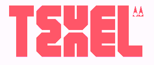 Simon Bent from Melbourne (Metis Foundry, or: Studio Io; was: Volume2a) designed these typefaces in 2007-2008: Epsilon, Annual (modular, architectural), Tangerine, Deccade (experimental), Hoax [more scans: i, ii, iii, iv], Babylon (another modular experiment).
 In 2012, he created the geometric sans typeface Acumen, and the sans family Silence. He is working on Fragile, Terminal, Link, Recurrence (very experimental), Autonomy, Motor, Velcro, and Elevator. In 2013, he designed the sans typeface Figure. In 2016, he published the ultra-condensed blackletter typeface Optimum Compress in Textura style. In 2018, he published the great condensed brutalist octagonal typeface Texel, the experimental geometric typeface Pyxis (published by The Designers Foundry), and the geometric solid typeface Geometer. In 2019, he added the ultra-fat Dot19, the monoline experiment LXII, the modular Alexandro, the geometric sans typefaces Software and Gertrudes, and the sans font Mizzen. Typefaces from 2020: Geometer. Typefaces from 2021: LXII Display (a prismatic typeface). [Google]
[More] ⦿
|
Mew Varissara Ophaswongse
|
Software engineer and type designer based in San Francisco, originally from Bangkok. At Type@Cooper West, Mew Varissara Ophaswongse (who graduated there in 2018) developed the reverse stress typeface family Sandwich (2019), which contains styles called Hoagie (a cartoon font), Lettuce Italic, Lettuce Regular, Sandwich Bold, Sandwich Italic, and Sandwich Regular. Sandwich won an award at the Type Directors Club's Type Design Competition 2019. Still at Type@Cooper West, Mew designed Fraktur Alemannia, a revival of a Ludwig & Mayer typeface from 1910. Designer of Konstrukt (2020), which is based on the geometric solid alphabets of André Vlaanderen (1928). She developed TypeTuner, a browser extension that allows the user to apply a local font to any web page, as well as to configure values for variable font axes. [Google]
[More] ⦿
|
Mey Toledo
|
During her studies in Albacete, Spain, Mey Toledo designed the geometric solid typeface Kleur (2018). [Google]
[More] ⦿
|
Micaela Jacinto
|
Leira, Portugal-based designer of the geometric solid typeface Optimist (2016), which was designed during her studies at ESAD CR. Other typefaces by her include Chaos And Creation On The Backyard (2016) and Everyday Blades (2016). [Google]
[More] ⦿
|
Miguel Felix
|
Culiacan, Mexico-based designer of the geometric solid typeface Vector (2019). [Google]
[More] ⦿
|
Miranda Manns
|
During her studies in Las Vegas, NV, Miranda Manns designed the geometric solid typeface Primary (2018). [Google]
[More] ⦿
|
Monika Gause
|
Hamburg, Germany-based designer of the typeface Skribble Schrift (2014), Chair Design Alphabet (2016), and the free geometric solid color font Geometric (2017). [Google]
[More] ⦿
|
Monika Grause
|
Hamburg, Germany-based designer of the free modular all caps typeface MGGeometricColor NoColor (2019) and the freeGeometric Color. Both were made with Fontself. Other fonts by Monika include MG Skribble. [Google]
[More] ⦿
|
Mora Dreszman
|
During her studies at FADU / UBA in Buenos Aires, Mora Dreszman designed the geometric solid typeface Estilo (2016). [Google]
[More] ⦿
|
Mr. Kuns
|
Creative studio in Pachuca de Soto, Mexico. Creator(s) of the experimental geometric solid typeface Kuns (2013). [Google]
[More] ⦿
|
Nastya Sokha
|
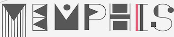 During her studies in Kharkiv, Ukraine, Anastasiia Sokha designed an elaborate deco typeface called Memphis (2015). The name refers the Memphis Style promoted by the Memphis group in 1981, for whom decoration and styling was a game to combat austere modernism. They achieved this by combining flashy geometric shapes with bright colors. [Google]
[More] ⦿
During her studies in Kharkiv, Ukraine, Anastasiia Sokha designed an elaborate deco typeface called Memphis (2015). The name refers the Memphis Style promoted by the Memphis group in 1981, for whom decoration and styling was a game to combat austere modernism. They achieved this by combining flashy geometric shapes with bright colors. [Google]
[More] ⦿
|
Nelly Boyanova
|
Copenhagen, Denmark-based designer (b. Bulgaria) of the free vector format geometric solid typeface Metra (2019). [Google]
[More] ⦿
|
Nemury (was: Tsuyatsuya Nemury)
[Tomosuki Kurosawa]
|
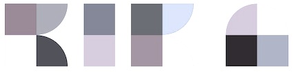 Tokyo-based designer of the geometric solid typefaces Patchwork App (2014) and Kikagiga (2014). Behance link. [Google]
[More] ⦿
Tokyo-based designer of the geometric solid typefaces Patchwork App (2014) and Kikagiga (2014). Behance link. [Google]
[More] ⦿
|
Nicolas Payen
|
Tours, France-based designer of the abstract geometric typeface Kandinsky (2018). [Google]
[More] ⦿
|
Nina Shamloomontazer
|
American designer of Geometric Alphabet (2020). [Google]
[More] ⦿
|
Olena Kuts
|
Wroclaw, Poland-based designer of a geometric color font in 2018. [Google]
[More] ⦿
|
Olly Corps
|
During his studies, Bath, UK-based Olly Corps designed the geometric solid color typeface Auto Colour (2017). [Google]
[More] ⦿
|
Onat Ozer
|
Based in Toronto, Onat Ozer created the bullethole typeface Rectcircle (2013), which was completely constructed by using circles and rectangles. [Google]
[More] ⦿
|
Oskar Lübeck
[Bold]
|
[More] ⦿
|
Pablo Alfieri
|
Buenos Aires-based graphic designer and typographer, aka Alfieri. Flickr link. Behance link. He designed Playful (2010), a geometric font that was inspired by 3d toys for children. Odyssea 652 (2010) and Odyssea 632 (2011-2012, Thinkdust) are also geometric in nature. This poster showcases his lettering. With Mariano Farias, he formed Plenty. At HypeForType, Plenty published the arts and crafts typeface Odyssea (2011). [Google]
[More] ⦿
|
Parab Saylee
|
Mumbai, India-based designer of a geometric solid typeface in 2017. [Google]
[More] ⦿
|
Patricia Ortega
|
Freelance designer in Madrid who created the colorful rectangle-based typeface Hola (2017). [Google]
[More] ⦿
|
Peter Olschinsky
[Atelier Olschinsky]
|
 [More] ⦿
|
Prepper
|
Designer who used FontStruct to design several fonts. These include Luacle (2021: a counterless geometric typeface), Threestyle (2020), Quion (2020), Oh Well (2020), Fuzzball (2017) and Plaidened (2016: a dot matrix font). [Google]
[More] ⦿
|
Primary School Fonts
[Rupert Russell]
|
The Sheperdson Community Education Center's Primary Math's Font set includes 3-d geometric shapes, coins, 2-d shapes, die typefaces, LED digits, math symbols and fractions and pies. There is also a cursive script set for children at 25 Aus$. All by Rupert Russell. [Google]
[More] ⦿
|
Print Mysoul
|
 Graphic designer and illustrator in Manchester, UK, who created the geometric solid typeface GestaltK in 2015. Behance link. [Google]
[More] ⦿
Graphic designer and illustrator in Manchester, UK, who created the geometric solid typeface GestaltK in 2015. Behance link. [Google]
[More] ⦿
|
Putra Cetol Studio
[Putra Novembria Candra Kusuma]
|
 Karanganyar, Indonesia-based designer, b. 1989, of these typefaces in 2018:
 - Oriental simulation fonts: Japanese Emperor (2022: emulating Japanese).
- The spurred typeface Darkrise.
- The circus font The Circus Show.
- The futuristic typeface Digitechno.
- The curly script typeface Valentijn.
- The monoline poster typeface Revalate.
- The monoline cursive script typefaces Simplyline, Cinta Cantik, Antiqueline, The Beautyline, Aiushtya, Skywave, Simbok Pudjie and Yesie.
- The vintage typeface Nuri.
- The retro signage script typeface Vintage Party.
- The tall octagonal typeface Armor.
- The display typefaces Ratigk, Deco Tech, Horstail and Murai.
- Playlines.
- The tiki font Tikiland.
- The script typefaces Jofi, Beauty Love, Bigfun, and Rhonde (a free swashy calligraphic typeface).
- The upright scripts Shathika, Sweetyhearts and Shaquilla.
- The brush typefacesAuthorfun and Pax Suyud.
- The weathered condensed Therlalu.
- The color fonts Garis Lengkung and Circuitra.
- The textured typeface Quiltrix.
- The poster typeface Audrey.
Typefaces from 2019, mainly calligraphic except if specified otherwise: Attaira (art deco and script), Arshaka (a great vampire blackletter font), Honey Berry, Vanetta, Safiar (font duo), Havina, Eurolite (a modular sans), Florita (font duo), Silky Candy, Ultimate Slayer (brush), Zahiya (a ronde), Networld (a mesh font), Stranger Creature, Amella, Grimscy, Visaka (a tall spurred wedge serif), Micayla, Rougher (brush), Slatter, Rygid (a straightened script), Mixy Missy (an oily script), Qunky (a formal script), Marceila (upright script), Glamoury (calligraphic), Thicxer, Madhen (script), Secret Darling, Keshia, Mahaputra (a spurred swashy Victorian typeface), Busther (brush style), Sherley, Shanela, Rotters (script), Sweety Lovers (script), Aliyah, Laureta, Tashia, Smash Wall (a glaz krak typeface), Delacruz (techno), Elvino (techno), Crava (a vintage display typeface), Bornena (curly script), Vintage Queens (for vintage signage), Kanaya, Yuanita, Daysha, Thickline, Maze Line (labyrinthine), The Doctor (a signature font), West Kingdom (fat signage script), Pixel Bit, Barstrip, Arjunka, Waffle Latte (monoline and connected), Strip Deco (Broadway style), Corlita Script, Fathur (signature script), Royal King (inline, vintage), Boldest (an oily fat font), High Mount (titling sans), Stasya, Ultimate Class (a thin monline script), Hai Eisya (geometric sans), Dirty Rock (grunge), Hello Eisya, Boldline, Dvorak (dry brush), Ayana, Bigdot, Ghaya, Scary Night, Keytip (Victorian), Melodious Script, Lusya, Nachelle. Typefaces from 2020: Techno Board (a circuit font), Happy Christmas Party, Roadstone (a signage script), Cavilay Script (wild calligraphy), Urban Sketart (a fine mural art font), Shecarea, Rose Thorns, Retroparty (a bold script), Lovely Couple, Macrosty (a bold script), Amarithe, The Bold Street (a fat graffiti font), Rahaely (script), Nightcrow (a fiery font), Vintage King (a grungy vintage signage script), Vintage Party (a signage script), Gayesha, Water Splash, Clarinta (a wide hairline calligraphic script), Kinghawk, Audrena (a monoline script), Royal Queen, Headbrush, Coldcoast (script), Mahacara, Goldenlife (an upright signage script), Lyodra (a monoline script), Mayla (wild inky calligraphy), Faylake (a fat finger font), Grandmora (monoline script), Qonitya, Clowney (an inky script), Shafiqa (a rabbit ear script), Spirly (curly, Victorian), Quentara, Roxer, The Excited (signature script), Street Road (modular), Rasputia (a calligraphic script), Retroking. Typefaces from 2021: Antique Vignette (a stylish script with extreme contrast), Love Paradise (a scrapbook font), Vintage Reclame (an upright retro advertizing script), Bulky Book (in the piano key genre), Scarf Bandana, Double Pineapple, Lychee Farmland, Single Tangelo (a cuddly casual typeface), Grandtown (a bold retro script), Dizzy Fence (a beatnik font), Cheesy Bread (a bold supermarket font), Roughpen, The Night Lamp (a horror brush font), Monokind Script (a monoline script), Cristaloak (a script with a weathered outline), Cute Love Story (a scrapbook font), My Love Letter (a monoline scrapbook script), Feldberg (a dynamic display typeface), Morrello (a rounded wide display serif), Quaker Ladies (Victorian), Spooky Monsta, Abstract Style (a geometric solid typeface), Ballsye (a fat finger font), Burning Hammer (a font with flaming letters), Falsetto Signature, Kharinniswa (a bold and wide serif typeface), Roshmary (a condensed monolinear sans), Unpredictable (a condensed display sans), Surprise Spring (script), Handaru (a wide script), Queen Veronica (a monolinear script), Strong Grandpa (a bold retro signage font), Rahardian (a signage script), Candrika (a vintage spurred typeface), Euphoria Party (a psychedelic font), Spookies Identity (this is what a font infected with pestilence or leprosy would look like), Alvarisky, Springate (script), The Knight (script), Hello Audrey (an upright script), Winslet (a bold script), Hello Audrey (an upright script), Winslet (a bold script), My Beautiful Story (an inky script), Romantic Dates (calligraphic), Blossom Heart (script), Happy New Year Party. Typefaces from 2022: Japanese Emperor (emulating Japanese), Binlay (script), Child Krafter, Fresh Spring (a scrapbook script), Our Infinity Love (a wonderful connected script with a warm rhythm), East Aurora (a bold slab serif), Heathfield (a bold vintage serif). Creative Fabrica link. [Google]
[MyFonts]
[More] ⦿
|
Putra Novembria Candra Kusuma
[Putra Cetol Studio]
|
 [MyFonts]
[More] ⦿
[MyFonts]
[More] ⦿
|
Radi Safi
[IYBI]
|
[More] ⦿
|
Rafael Nascimento
[Escaphandro (or: Rafael Cervi Barrozo)]
|
 [More] ⦿
|
Rafael Ruvalcaba
|
 During his studies, Coahulla, Mexico-based Rafael Ruvalcaba designed the decorative caps typeface Memphis (2017). [Google]
[More] ⦿
During his studies, Coahulla, Mexico-based Rafael Ruvalcaba designed the decorative caps typeface Memphis (2017). [Google]
[More] ⦿
|
Ramona Blau
|
Valencia, Spain-based designer a modular geometric solid typeface in 2017. [Google]
[More] ⦿
|
Razana Kamarudin
|
 During her studies in Singapore, Razana Kamarudin created a great geometric stick typeface (2015) and a colorful geometric solid alphabet (2014). [Google]
[More] ⦿
During her studies in Singapore, Razana Kamarudin created a great geometric stick typeface (2015) and a colorful geometric solid alphabet (2014). [Google]
[More] ⦿
|
Rebecca Caputi
|
Graphic designer in New York City, who created the geometric solid typeface Blue Hue (2013). Behance link. [Google]
[More] ⦿
|
Rebecca Hull
|
During her studies, Morecambe, UK-based Rebecca Hull created the bicolored geometric solid typeface Plug (2015). [Google]
[More] ⦿
|
Rebecca Lewin
|
Nottingham, UK-based designer of Modhaus (2019), a geometric solid typeface inspired by Bauhaus. [Google]
[More] ⦿
|
Rendy Yanwar
|
 Aka Rendy Messenjah. Bandung, Indonesia-based designer of these typefaces in 2016: Eastern (rough, rounded and weathered), Sleepy Fat Cat, Oceanwaves, Lucy Glitch, Road House, The Division (fat slab serif), Carlsbad, Raleigh (stencil family), Cloverdale, Lucy Rounded (sans), Book Worm (marker script), The Summit (brush script), Braga Deco, Coffee Morning (brush script), Teacher's Chalk (chalkboard script emulation).
 Typefaces from 2017: Puffy Fluffy (a monoline children's book script), Coffee Morning Sans, Smouchy Font Duo, Adventura (marker pen font, +Speedol, +Letter), Marbelous Script (retro style). Typefaces from 2018: Roseberry (vintage, spurred), Junkoung (spurred and vintage). Typefaces from 2020: Milkie Wylkie, Slice o Paper (cutout typeface), Geometricity (a layerable geometric color font), Coffee Morning with Milk, Junkoung, Lick a Candy (script), Lick Candy Sans, Neu Marbelous, Creamy Milky, Manieskoew. Typefaces from 2021: Kwash Brush. [Google]
[MyFonts]
[More] ⦿
|
Rick Banks
[F37 (or: Face37)]
|
 [MyFonts]
[More] ⦿
[MyFonts]
[More] ⦿
|
Rick Deslavu
|
Bandung, Indonesia-based designer of the free display typeface Deslavu (2015), the display typeface Typ (2015), and the geometric solid typeface Jhon (2015). In 2016, he designed the alchemic typeface Namory. [Google]
[More] ⦿
|
Riley J. Shaw
|
Creator of At Night (2013, OFL), a font made up of rectangles and triangles. [Google]
[More] ⦿
|
Risman Ginarwan
[Garisman Studio]
|
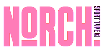 [MyFonts]
[More] ⦿
[MyFonts]
[More] ⦿
|
Robin Billaudel
|
During his studies in Amiens, France, Robin Billaudel designed the geometric poster typeface Cisco (2017) and the broad nib emulation typeface Brave (2017). Behance link. [Google]
[More] ⦿
|
Robot Smith
[Evgeny Tkhorzhevsky]
|
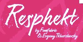 [MyFonts]
[More] ⦿
[MyFonts]
[More] ⦿
|
Robson Loureiro
|
Rio de Janeiro-based designer of a textured geometric solid typeface (2016). [Google]
[More] ⦿
|
Roger Schami
|
Roger Schami (b. 1991), aka Hoodboi, is a designer in Los Angeles, who, during his BFA studies at ACCD (Art Center College of Design) in 2012, created Blok, a display typeface designed for the 2015 Milan Work Expo. Blok uses standard heavy geometric shapes. Founder of RO-SC (2019), andv art director at Seoul Projects since 2020. [Google]
[More] ⦿
|
Roman Korolev
[Kaer]
|
[MyFonts]
[More] ⦿
|
Rupert Russell
[Primary School Fonts]
|
[More] ⦿
|
Rupert Russell
|
Vendor of Australian school fonts including Victorian script fonts, a set of math fonts with many geometric shapes, and dotted outline fonts. [Google]
[More] ⦿
|
Saje Damen
|
Calgary, Alberta-based designer of the geometric solid (and also deco) typeface Effy (2017). Behance link. [Google]
[More] ⦿
|
Sammi Arman
|
Owing Mills, MD-based freelance graphic designer who created the geometric solid typeface Pizazz (2015) during her studies at SCAD (Savannah College of Art and Design). [Google]
[More] ⦿
|
Sandro Londero
|
 Udine, Italy-based designer in 2016 of the geometric solid typeface Moon and Diamonds (created to celebrate Aretha Franklin), Bazar (a sans loosely based on Mark van Bronkhorst's Conduit designed in 1997), Woman Serif, Man Sans (avant garde), and HausNCo (inline Bauhaus style).
 In 2017, he designed the sharp-serifed Syrah and the sans typeface Halifax. [Google]
[More] ⦿
|
Sarah Smith
|
For a school project at the univrsity of Kansas, Sarah Smith (Lawrence, KS) designed the geometric solid typeface Transcendent (2018). [Google]
[More] ⦿
|
School Fonts (was: Shepherdson Community Education Centre)
[John Greatorex]
|
Jean Greatorex is the Aussie designer (Casuarina, NT) of the freeware font YMVictorianDots (1995). Commercial font set (20 A$$) includes 3D Geometric Shapes, Australian coins, 2D geometric shapes, die typefaces, digital numerals, math symbols, fraction pies and tallies. His "Shepherdson Community Education Centre" is now called School Fonts. Among handwriting fonts for kids, he has NSW Foundation (7 weights), Qld Modern, Qld Beginners (7 weights), Tasmanian School Fonts (8 weights), SA Beginners (7 weights), Victorian, WA, NT and SA Linked Cursive. The math set includes Geometric Shapes, Any Fraction, Mathematical Symbols, and Time and Money. The handwriting sets come with seven fonts, Bold, Dots, Cursive, Outline, Regular, Numbered Dots and Numbered Outline. He also has New Zealand school handwriting fonts (7 styles), Stick&Ball (4 fonts), Letter Box (4 fonts) and Casual (2 fonts). [Google]
[More] ⦿
|
Shana Pagano-Lohrey
|
London, UK-based designer of the colored geometric solid typeface Magnified Paper Type (2015). [Google]
[More] ⦿
|
Shinpei Ino
[East End]
|
[MyFonts]
[More] ⦿
|
Shishun Jiao
|
At the NZSE School of Design and Animation in Auckland, New Zealand, Shishun Jiao created a colored geometric solid typeface (2015). Behance link. [Google]
[More] ⦿
|
Shumpei Yoshitsugu
|
Shumpei Yoshitsugu (Peach Studio, Tokyo) designed the geometric solid typeface Sailor in 2018. [Google]
[More] ⦿
|
Simon Bent
[Metis Digital Type Foundry (or: Studio Io, or: Metis Foundry; was: Volume2a)]
|
[More] ⦿
|
Sina Vodjdani
|
Creator of a geometric solid block typeface in 2014. [Google]
[More] ⦿
|
Spun Inthawong
|
 London, UK-based designer of a colorful geometric solid typeface in 2017, that could be considered in the Memphis Design Group style. [Google]
[More] ⦿
London, UK-based designer of a colorful geometric solid typeface in 2017, that could be considered in the Memphis Design Group style. [Google]
[More] ⦿
|
Spyros Athanassopoulos
|
Athens, Greece-based designer of a purely geometric alphabet or typeface in 2016. Behance link. [Google]
[More] ⦿
|
Stanislaw Stupkiewicz
|
Warsaw, Poland-based designer of the layered geometric deco typeface Social (2019). [Google]
[More] ⦿
|
Stéphanie Desjeunes
|
Parisian designer of a colorful geometric solid typeface for Festival de l'air in Fréjus, France, in 2018. [Google]
[More] ⦿
|
Stephanie Fast
|
During her studies in Chattanooga, TN, in 2013, Stephanie Fast created an experimental typeface by using only three design elements---a straight line, an arc, and a rounded rectangle. [Google]
[More] ⦿
|
Store Norske Skriftkompani
[Arve Båtevik]
|
 Norwegian type designer, b. 1991, who graduated from Westerdals School of Art in Oslo in 2015 and ECAL in 2017. At ECAL in Lausanne, he finished an MA in Art Direction and completed an exhaustive comparative study of the Geometric Sans genre. He joined Lineto in 2017 and returned to Norway in 2020, where he set up his own commercial type foundry, Store Norske Skriftkompani, in Volda. His typefaces:
 - During his studies at Westerdals in Oslo, Arve Båtevik created the display typeface Toulouse (2014). Toulouse consists of a basic sans skeleton. Arve then added two weights, one in a 2 to 1 ratio, and one in a 1 to 2 ratio. This allows for some great designs for logos and posters.
- In 2015, from his then base in Zurich, he created Sagen Grotesk as an interpretation of Schelter Grotesk (after Schelter Breite Grotesk, 1886), and developed Passelig Sans from the bottom up.
- With Maura Paolozzi, he co-designed LL Prismaset A and B at Lineto (2003-2017). Both LL Prismaset A and LL Prismaset B are based on Rudolf Koch's Prisma (1930).
- LL Supreme (2020, Lineto). He writes: LL Supreme presents a new take on Paul Renner's Futura (1927). [...] Working against the current tendency of interpolating entire families, each cut of LL Supreme was drawn separately and, as a consequence, has its own identity.
- LL Ruder Plakatschrift. Done with Hans-Christian Pulver.
- Store Norske Jazz Book & Italic (2015-2020) and Store Norske Jazz (2021). A sans typeface inspired by Frutiger's Univers and Hoefer's Permanent. In the end it is closer to Univers and a bit more playful (which is not hard---Frutiger's fonts are hardly playful). He writes: Store Norske Jazz is a typeface well within the aesthetically dodgy territory of the contrasted sans serif.
- Store Norske Tyggis (2016-2020). A prismatic typeface that extends the phototype Or (1967, Andy Song for Studio Hollenstein).
- Store Norske Trafikk Medium & Italic (2014-2020). A constructed sans serif, based on the Norwegian road sign typeface Trafikkalfabetet (Karl Petter Sandbaek, 1965, for the Norwegian Public Roads Administration). Trafikkalfabetet is modeled after the German road sign typeface DIN 1451, and the British road sign typeface Transport.
- Store Norske Brus (2017-2020). Mecano-inspired letters.
- Store Norske Foto Book & Italic (2015-2020). A sans that pays homage to phototype.
- Store Norske Mekaniske (2020). A constructivist typeface based on the lettering on Akers Mekaniske Verksted's shipyard workshop in Oslo.
- Store Norske Maleri (2020): Store Norske Maleri is a remix of Ehmcke's Mediaeval (Designed in 1917, published by Schriftgiesserei D. Stempel AG in 1920). I find the original intriguing in many ways, especially how he managed to sneak so many circles, triangles and squares---while still maintaining a rough arts and crafts aesthetic. In my version the capitals are quite true to the original, although I did put some more circles, triangles and squares in there. The lowercase, numbers and the remaining characters deviate quite a bit from the original.
- Store Norske Stilig (2021). A colour remix and elaboration of a display phototype named Indigo by Andy Song (1936-1995), which was designed in 1972 for Studios Hollenstein Phototypo in Paris. In addition to the colour font, Stilig exists in Dark, Light, Solid and Open styles.
- Store Norske Funksjon (2021). A display colour geometric solid font, based on a lettering alphabet by Erich Mollowitz that was featured in Moderne Vindusreklame [Modern Window Advertisement] (1933, Knut Schjefstad in 1933), an instructional book on shop front decoration. Knut Schjefstad (1905-1943) is best known for playing the long neck banjo in Norway's first jazz orchestra Sixpence.
- Store Norske Ja (2021). A sans typeface that started out as a revival of Akzidenz Grotesk.
- Store Norske Samvirke (2020) is an all-caps typeface based on the lettering found on the Oslo Samvirkelag store in the Kampen city district.
- Store Norske Neon (2020-2021) is a remix of the Metall Standardbokstaver alphabet used by the sign makers at Neon Electric Limited AS, which was operational in the 1950s. Neon Electric was one of the main neon sign suppliers in Norway. They created signage for big events and important buildings, like the signs for the Oslo 1952 Winter Olympics and the Deichmanske Bibliotek [Oslo's Main Public Library].
- Store Norske Bygg (2020-2021) is a monospaced typeface based on a lettering found on the offices of Frimann Bye & Winsvold A, a mortar and construction supplier in Oslo, in the 1920s and 1930s.
- Store Norske Tango (2016-2021). A geometric typeface that sprung out of Arve Båtevik's MA diploma at ECAL in Lausanne. The project was based on Intertype Vogue (1930), the American response to the geometric wave in Europe in the 1920s. Store Norske Tango builds on Vogue's naiveté, according to Arve. It is more rude and playful, as it focuses on pure geometric shapes, with almost no optical correction. Most letters are nearly monolinear. The typeface has old school hyper slanted italics, often found in early sans serifs, offering two options for the degrees of tilt.
- Store Norske Magi (2021). A sans family.
- Store Norske Graut (2021). A wonderful rounded sans family that includes a Mono style.
- Store Norske Skandia (2021). Arve explains its roots: Store Norske Skandia is a remix of "Skiltskrift", a typeface made for the redesign of Norwegian National Railway (NSB) in 1977. In 1973, Knut Skuland became the director of NSB. The company's communication was eclectic, and he wanted to unify their visual identity. They first bought the rights to use the British Rail identity. Skuland spoke with the director of the Danish National Railways who had bought the same identity some years before. The Danish director convinced Skuland of the impact the identity would have on Norway's visual culture. Skuland then decided to put together a team to reshape the British Rail identity, to fit the Norwegian environment and frame of mind. He commissioned industrial designer Odd Thorsen, art historian and Alf 130e, and designers John Engen, Knut Harlem, Paul Brand, Ruedi a Porta and Arild Eugen Johansen. They redesigned everything from the trains and uniforms to the type and colours. Paul Brand collaborated with a paint factory in Nittedal, to produce a colour blue that would be dark enough to contrast the white type, but still bright enough to be perceived as blue in dark Norwegian lighting conditions. The typeface is similar to the British Rail Alphabet in weight, but is a lot softer and more geometric. Unfortunately, many of the people involved in the project have passed away. I have spoken with John Engen, Halvor Thorsen (son of Odd), Paul Brand, Ruedi a Porta and Arild Eugen Johansen and none of them have any clear answers to who actually designed the typeface. But if there ever was a Norwegian grotesk from the modernist era, this is it. The original typeface was a single bold cut made for signage, and for the rest of the identity they used Helvetica. I have extrapolated on the "Skiltskrift" design, and made it into a small family of three weights, with matching italics.
- Store Norske Baguette (2022). A primitive all caps sans based on several old French signage typefaces.
- Store Norske Stempel (2022). After an alphabet used for certain texts on old Norwegian license plates (See also Store Norske Jernskrift.)
- Store Norske Jernskrift (2022). Store Norske Jernskrift is a typeface based on the numbers found on old Norwegian number plates. He explains: On the 17th of january 1929, new regulations for car number plates took effect in Norway. They were referred to as Vertikal Jernskrift [vertical iron letters]. The design is similar to local hand painted roadsigns of the era. Most, if not all, were produced at Christiania Chablon & Stempelfabrikk (G. Enderle, 1904-1933) and Mignon Chablon & Stempelfabrikk (Jallik Johnsen, Wilh Olsen, 1931-1958).
Personal site. [Google]
[More] ⦿
|
Susana Garcia de Vicuña
|
Bilbao, Spain-based codesigner, with Yienia Bilbao, Boiz Saenz and Beatriz Ramos, of the geometric solid typeface Publica (2019). [Google]
[More] ⦿
|
Suyoung Yang
|
At the School of Visual Arts, Suyoung Yang (originally from Seoul, Korea) designed the geometric solid (Latin) typeface GeoType (2015) and an experimental circle-based typeface (also in 2015). Suyoung graduated from the School of Visual Arts in 2019, and started work at Everything Type Company in 2019. Suyoung is based in Brooklyn, NY. In 2018, her bold and eccentric display typeface Chiifer won a Gold Award at the Graphis competition in the category type design. In 2019, under the mentorship of Courtney Gooch and Paula Scher at SVA, she designed an experimental typeface for the Korean record label DRDR. Home page. [Google]
[More] ⦿
|
Swifty Typografix (was: Command (Z))
[Ian Swift]
|
 Ian Swift, aka Swifty, designed Dolce Vita, Hand Job and Miles Ahead at his London-based outfit, Command (Z), which he set up in 1995. Defunct and replaced by Typomatic in 1998. Other fonts: Coltrane (1994, inspired by old John Coltrane record sleeves), Funkadelic (1999), Bad Eggs (1997, a hand-drawn stencil font), Obsolete, Repo-Thin, Slice of Cake (1996), Positive Ident (1996), Bit Normal, Fat Arse (1997, a sofa-shaped font shown in Nathan Gale's book as due to Mitch, who is also credited with the liquid font Perpetual (1998)), Gunshot (1992), Keep it Locked, Bear, Cut It Out (stencil), Get Stoked, Chain Gang (stencil), Sci Fi Classic, Astral Funk, Beat Box Bold, Too Cool, Soul Tree (stencil), Thought (organic), Bad Bull (stencil), Phat Black, This Reg, Dingwalls Plain, Jumbo Light, Jumbo Bold, Coltrane Phat (piano key style), Single Whip, Five Point Fuzzy. Emodigi site. His Maze 91 at FUSE 1 is very interesting--it shows what you can do with rectangles. [Google]
[More] ⦿
Ian Swift, aka Swifty, designed Dolce Vita, Hand Job and Miles Ahead at his London-based outfit, Command (Z), which he set up in 1995. Defunct and replaced by Typomatic in 1998. Other fonts: Coltrane (1994, inspired by old John Coltrane record sleeves), Funkadelic (1999), Bad Eggs (1997, a hand-drawn stencil font), Obsolete, Repo-Thin, Slice of Cake (1996), Positive Ident (1996), Bit Normal, Fat Arse (1997, a sofa-shaped font shown in Nathan Gale's book as due to Mitch, who is also credited with the liquid font Perpetual (1998)), Gunshot (1992), Keep it Locked, Bear, Cut It Out (stencil), Get Stoked, Chain Gang (stencil), Sci Fi Classic, Astral Funk, Beat Box Bold, Too Cool, Soul Tree (stencil), Thought (organic), Bad Bull (stencil), Phat Black, This Reg, Dingwalls Plain, Jumbo Light, Jumbo Bold, Coltrane Phat (piano key style), Single Whip, Five Point Fuzzy. Emodigi site. His Maze 91 at FUSE 1 is very interesting--it shows what you can do with rectangles. [Google]
[More] ⦿
|
Tarallo Design
[Donald Tarallo]
|
 Donald Tarallo obtained a BA in Studio Arts and Graphic Design from Clark University, and an MFA in Graphic Design from Rhode Island School of Design (RISD). He also studied with André Gürtler and Wolfgang Weingart in the Weiterbildungsklasse at the Basel School of Design in Switzerland. Since 1998, Don has maintained a freelance practice working on projects in identity, publication, and web design. He has taught at Clark University, Guangzhou Academy of Fine Art, Rhode Island School of Design, Samsung Art and Design Institute, Siena Art Institute, and Bridgewater State University. Don currently teaches at Fitchburg State University in Fitchburg, MA.
 In 2017, he published the geometric sans serif typeface Binario. Donald writes: The design was inspired by elements of Italian Art Deco, early 1900s advertising, and shop signage. Binario pays homage to early modernism's optimism, modularity, and efficiency. Binario was followed in 2019 by Binario Soft. He also designed the geometric solid dingbat font FormPattern (+FormPattern Color, 2018; by Donald and Alex Tarallo) and the dingbat fonts Poeta and Poeta Color in 2017. In 2018, he designed the 8-weight sans family Scanno. In 2019, he released the zodiac sign font Starsigns, the art deco typeface Varese and FormPattern Color Three (2019: a typeface for creating borders and frames; with Alex Tarallo). In 2020, he released FormPattern Color Six (done with Alex Tarallo) and the plump bubblegum art deco typeface Varese Soft. Typefaces from 2021: East (a condensed sans in six weights; includes a variable font). [Google]
[MyFonts]
[More] ⦿
|
Teresa Bacelar
|
Graphic designer in Bilbao, Spain. In 2017, Hamex Design (Bilbao, Spain), Teresa Bacelar, Laura Pajuelo, and Ainara Rodriguez co-designed a geometric solid typeface. [Google]
[More] ⦿
|
Thales L. Aquino
|
Graphic designer from Rio de Janeiro (b. 1982) who created a mecano-style typeface called Articulada (2011) and the basic geometric shape typeface Patriota (2012, based on the Brazilian flag). Articulada won an award at Tipos Latinos 2012. In 2015, Thales designed the pixel typeface Nativa over at FontStruct. Dafont link. Cargo Collective link. [Google]
[More] ⦿
|
Tim Blunck
|
Hamburg, Germany-based designer of the free hipster font Stacked (2015) and the geometric solid typeface Gometric (2017). [Google]
[More] ⦿
|
Tim Fishlock
|
Tim Fishlock made an alphabet by using pieces of the London Underground Map. He also made an alphabet based on seats, and another one based on geometric shapes. Typetoken link. [Google]
[More] ⦿
|
Tipofil
[Victor Navarro Barba]
|
 Tipofil is graphic designer Victor Navarro Barba in Barcelona. In 2015, he strated selling his fonts via Creative Market and MyFonts. His typefaces include:
 - Eutopia (2015). This (originally free but now commercial) 400-glyph counterless art deco font is motivated as follows: I was inspired by the letters of the mythical Ideales tobacco package, designed in 1936 in Barcelona by Carlos Vives, director of the designers studio of the Rieusset graphical industry. We have also studied other geometrical models from the 1920s, to be highlighted among them the alphabet drawn by Cornelis André Vlaanderen at Amsterdam in 1928, which would have been very probably the inspiration for the famous tobacco package. The font family comes in Duotone, Yang, Yin, Outline and Solid styles. In a way, it can be considered as suprematism.
Behance link. Home page. Creative Market link. [Google]
[MyFonts]
[More] ⦿
|
Tom Davidson
|
During his studies in Bolton, UK, Tom Davidson created Malevich (2013), a typeface that was inspired by the classic suprematist coloured geometric shapes and lines of Russian artist Kazemir Malevich. [Google]
[More] ⦿
|
Tomi Tuomela
|
Helsinki, Finland-based designer of the stylish all caps typeface Ribbondale (2017) and the geometric solid typeface Radavak (2018). [Google]
[More] ⦿
|
Tomosuki Kurosawa
[Nemury (was: Tsuyatsuya Nemury)]
|
 [More] ⦿
|
Vaishali Jain
|
As a student at the Indian Institute of Crafts and Design, Jaipur, India-based Vaishali Jain designed the geometric solid typeface She (2018). [Google]
[More] ⦿
|
Valentin Adam
|
 French graphic designer who spent 2007-2009 at Ensaama Olivier de Serres in Paris. He does experimental type. His creations include Fake, Madone, Composite, Hommes Femmes (2008: geometric solid) Eleanor (hard sans), Marlene (octagonal), Magdalena, Versailles, Strates (multilined), Vanina-Vanina (artsy hairline sans), Quarante Cinq, TweenLady, Tatiana (hairline) and Lettuce. Old URL. [Google]
[More] ⦿
French graphic designer who spent 2007-2009 at Ensaama Olivier de Serres in Paris. He does experimental type. His creations include Fake, Madone, Composite, Hommes Femmes (2008: geometric solid) Eleanor (hard sans), Marlene (octagonal), Magdalena, Versailles, Strates (multilined), Vanina-Vanina (artsy hairline sans), Quarante Cinq, TweenLady, Tatiana (hairline) and Lettuce. Old URL. [Google]
[More] ⦿
|
Velvele Design Community
[Cagil Aygen]
|
 Milan, Italy-based design group that published these fonts, which unless mentioned otherwise, are all by Cagil Aygen, a Turkish graphic designer (who is also based in Milan):
 - VVE Giallo (2018). A geometric sans with a large x-height.
- Neuf (2016). A hybrid of art deco and blueprint lettering font.
- Nora Grotesque (2017), Nora Art (2018; this contains Nora Art Glitch and many other derived styles) and Nora Slab (2018).
- Suidae (2017). A bubblegum font.
- The geometric layering typeface Vecmetry (2017).
[Google]
[MyFonts]
[More] ⦿
|
Veronica Moran
|
During her studies in Barcelona, Veronica Moran designed the sans typeface Onara (2017), the display typeface Anticontraste (2017) and the geometric solid typeface Momu (2017). [Google]
[More] ⦿
|
Victor Navarro Barba
[Tipofil]
|
 [MyFonts]
[More] ⦿
[MyFonts]
[More] ⦿
|
Viktorya Makovskaya
|
Minsk, Belarus-based designer of the geometric typefaces Dotted (2019: an interrupted glyph typeface with a molecular feel), Lines (2019), Area Lines (2019), the geometric solid typeface Area (2019) and the multiline typeface Cables (2019) for Cyrillic and Latin. [Google]
[More] ⦿
|
Vincent Nespoulous
|
Vincent Nespoulous (b. 1980) created the display typeface Beetlejuice (2013) during his studies in Chambéry, France. It was inspired by the Beetlejuice movie. In 2017, located in Aix-les-Bains, France, he designed the geometric solid typeface Alfred Geo. [Google]
[More] ⦿
|
Vladimir Nikolic
|
 Belgrade, Serbia-based designer (b. 1981) of these typefaces:
 - The dingbat fonts Canavarlar (2020: funny men), Haircut (2020: women's hairdos), Ornament Borders (2020), Gourdy (2020: birds), Lizards (2020), Mantra (2020), All Star (2020), Speel (2020), Soavely (horses) (2020), Forma (2020), Hell Beasts (2020), Mistresses (2020), Paraiso (2020), Crow (2020), Traverser (2020: crosses), Cats (2020), Dogs (2020), Negative-Heads (2020), Otu (2020), Wakazi (2020), Risk (2020), Wurm (2020), Beard Man (2020), Hoder (2020), Damen (2018), Damen 2 (2020), Foliga (2020), Solo Drinker (2020), Congress (2020), Farmacy (2020), Elections (2020), Emergency (2020), VN Arrows (2020), Hexagonos (2020), Automobiles (2020), Cars (2020), Emoji Boom (2020), Bestia (2020), Aliens (2020), Insect (2020), Bytost (2020), Monstero (2020), Aveto (2020), Dancing Cat (2020), Atradimas (2020), Womanhood (2020), Figur (2020: an alien insect font), Halfwits (2020), Silly Donkey (2020), Crazy Monkey (2020), Round Masks (2020), The Quick Dog (2020), Flying Birds (2020), Maskid (2020), Monstra (2020), Bull Skulls (2020), War Items (2020), Public Transport (2020), Loomad (2020), Mokhabiso (2020: African patterns), Record (2020), Mulher (2020), Heroez (2020), Bulls (2020), Madarak (2020: birds), Bold People (2020), Munari (2019: a collection of drawings based on Bruno Munari's book "Artista e designer" from 1966), Screws (2019), White Mouse (2019), Schepselen (2019), Glatze (2019), Crosses (2019), Chefs (2019), Diamond Blocks (2019), Hexagons (2019), Maumbo (2019), Circles (2019), Enfeite (2019), Pigs (2019), Mythos (2019), Kreaturen (2019), Baby Alien (2019), Body Moving (2019), Various Boys (2019), Lines and Objects (2019), Mouvman (2019), Watch (2019), Credit Card (2019), Cycles (2019), Devil Emoji (2019), Fare (2019), Mund (2019), Labbra (2019), Circular Ornaments (2019), Cranium (2019), Ugok (2019), Ansigter (2019), Tsim (2019), Schmetterlinge (2019), Jungfrau Maria (2019: religious icons), Knights Helmets (2019), Kinderskizzen (2019), Wolves (2019), Various Cats (2019), Owls (2019), Spiral Object 3D (2019), Zodiac Signs (2019), Cyborg (2019), Duck (2019), Cat 3D (2019), Object 3D (2019), Circle and Line (2019), Various Girls (2019), Dulcet (2019), Erotic Symbols (2019), Frauen (2019), Pierre the Vampire (2019), Robotter (2019), Middle Finger (2019), Claudio The Cat (2019), Medusa (2019), Veggie (2019), Pablo (2019), Fishes (2019), Dream of Picasso (2019), Stam (2019), Animality (2019), Ink Drops (2019), Faces (2019), Bayan (2019), Froggy (2019), Senhoras (2019), Diamondo (2019), Skallen (2019: skulls), Swimmers (2019), Churches (2019), Easter Icons (2019), Lippen (2019), Gullar (2019), Bankwesen (2019), Creatures with Horns (2019), Vehicles (2019), Various Hands (2019), 3D Animals (2019), Abantu (2019), Herr (2019), Menge (2019), Funny Aliens (2019), Mustachos (2019), Kids Drawings (2019), Tierfarm (2019), Troep (2018), Women Heads (2018), Cats and Dogs (2018), Wanita (2018), Eyez (2018), Animales (2018), Peoples (2018), Mobile Icons (2018), Controllers (2018), Womano (2018), Lost in Space (2018), Blumen (2018: flowers), Tetriso (2018), Snowflake (2018), Meine (2018: masks), Horoscopicus (2018), Esoterica (2018), Astrologicus (2018, astrolical symbols), Abbild (2018: African masks), Being (2018: monsters), Gebell (2018), Headed (2018), Falter (2018), Filling (2018), Anichka (2018), Cyclopia (2018), Buggus (2018), Opa (2018), Messe (2017), Head of Idol (2018), Diavolo Nero (2017: funny silhouettes).
- The boxed or encircled alphabets Audience Capitals (2020), Galileo (2020), Compare (2020), Compare-Light (2020), Hexagonas (2020), Select (2020), Before (2020), Before-Dark (2020), Boxes (2020), Boxes-Extravagant (2020), Boxes-Fancy (2020), Calf-Negative (2020), Capital-Relationship (2020), Pyxidas (2020), Capitalica (2020), Tundra (2020), Ordinary Capitals (2020), Broadway Capitals (2020), Browser Capitals (2020), Capitalismo (2019), Schwarzenberg Capitals (2019), Retrospective Capitals (2019), Official Capitals (2020), Impression (2020), Oriental (2020), and Letters in Circles (2018).
- Shadowed caps: Cleopatra (2021), Farmers Market (2021), Erkekler (2021), Assignation (2021), Greek Tragedy (2021), Distorted (2021), Lightshow (2021), Credenza (2021), Ragusa (2021), Comunismo (2021), Scordia (2021), Gazelle (2021), Organ (2021), Strizhi (2021), Umoya (2021), Ninja Justice (2021), Unlimited (2021), Unicorns (2021), Labyrinth (2021), True Artisans (2021), Poker (2021), Donald (2021), Ferrari (2021), Booster (2021), Madness (2021), Favorita (2021), Vitamin (2021), Robot (2021), Robust (2021), Engine (2021), Whether (2021), Nucleus (2021), Trunk (2021), Ombre (2021), Viscosus (2021), Jewelry (2021), Verge (2021), Pursue (2021), Keener (2021), Visor (2021), Korvo (2021), Squash (2021), Scum (2021), Darker (2021), Education (2021), Cimice (2021), Tomb (2021), Bambola (2021), Calla (2021), Rump (2021), Complex (2021), Razor (2021), Driveller (2021), Karambol (2021), Princino (2021), Berger (2021), Adopted (2021), Bugbear (2021), Samara (2021), Talisman (2021), Waterway (2021), Megabus (2021: a marquee font), Roller (2021), Numerica (2020), Bond (2020), Gloom (2020: a marquee font), Chalkboard (2020: sketched), Unboxing (2020: techno), Antennas (2020), Secca (2020), Umfo (2020), Sabbia (2020), Squirrel (2020), Byzan (2020), Debtor (2020), Bridge (2020), Familie (2020), Lake (2020), Roma (2020), Tissue (2020), Bombay (2020), Osteology (2020), Restroom (2020), Speaker (2020), Bebika (2020), Center (2020), Gismo (2020), Fierce (2020), Gambler (2020), Afterparty (2020), Birdbrain (2020), Boner (2020), Divine (2020), Gelatin (2020), Lost (2020), Marshland (2020), Quadri (2020), Shadow (2020), Stairs (2020), Superba (2020), Techno (2020), Underman Book (2020), Wired Capitals (2020), Fineliner (2020), Fictive Kinship (2020), Exotica (2020), Ural (2020), Devianza (2020), Kultur (2020), Unmute (2020), Antiqua (2020), Chains (2020), Scheme (2020), Stumble (2020), Aroma (2020), Beans 2 (2020), Cover (2020), Cronica (2020), Fundament (2020), Horna (2020), Loce (2020), Mademoiselle (2020: art nouveau), Melodia (2020), Penny (2020), Taikun (2020), Assault (2020), Athletica (2020), Baraka (2020), Brassica (2020), Builder (2020), Chancellery (2020), Gwara (2020), Pliez (2020), Recinzione (2020), Right (2020), Rimes (2020), Seal (2020), Service (2020), Scorpions (2020), Terraces (2020: American flag font), Wedding Cabbage (2020), Wild Girl (2020), Tragedy (2020), Indos (2020), Starfish (2020), Vintage (2020), Adriatica (2020), Funeral (with American flag texture) (2020), Voleur (2020), Calzino (2020), Peshkop (2020), Metzger (2020), Asshole (2020), Puppet (2020), Broeksel (2020), Hals (2020), Escort (2020), Vortex (2020), Dades (2020), Boild Hedgehog (2020), Mermer (2020), Grower (2020), Rainbow (sketched) (2020), Baise (2020), Necklace (2020), Angels (2020), Smuggler (2020), Dommage (grungy) (2020), Squalor (2020), Fusto (2020), Course (2020), Fisheye (2020), Baiser (2020), Banda (2020), Cantaloupe (2020), Canto (2020), Begriff (2020), Trapeze (2020), Arabeska (2020), Silver (2020), Wasco (2020), Kosaken (2020), Triangle (2020), Banquet (2020), Demode Capitals (2020), Cultus Capitals (2020), Idiot Capitals (2020), Granary Capitals (2020), Liberta (2020), Montblanc (2020), Granary (2020), Blanket (2020), Tuyaux (2020), Wolf (2020), Comeback (2020), Oliba (2020), Idiot (2020), Trailer (2020), Bricks (2020), Toys (2020), Luxury (2020), Hertz (2020), Signal (2020), Serenada (2020), Kurven (2020), Schnecke (2020), Mona (2020), Sierra (2020), Search (2020), Tranchante (2020), Eccentric (2020), Fast (2020), Mosquito (2020), Speed-of-Light (2020), Thanks (2020), Album (2020), Boyhood (2020), Ending (2020), Trend (2020), Universal-Serial-Bus (2020), Fixed (2020), Kings (2020), Holiday (2020), Range (2020), Numbers (2020), Shipman (2020), Officer (2020), Video (2020), Order (2020), Route (2020), Cosa-Nostra (2020), Clowns (2020), Unique (2020), Voyeur (2020), Shape (2020), Brigadier (2020), Allora (2020), Spartacus (2020), Advisor (2020), Ambis (2020), Cables (2020), Genesa (2020), Horse (2020), Laptop (2020), Pork (2020), Mafioza (2020), Mucho (2020), Athens (2020), Audience (2020), Rotor (2020), Mundo (2020), Olympus (2020), Border (2020), Scale (2020), Survival (2020), Trouble (2020), Turnabout (2020), Catharsis (2020), Parade (2020), Discoteque (2020), Rude (2020), Fame (2020), Safran (2020), Ausweis (2020), Mechanica (2020), Moscowian-Party (2020), Beers (2020), Strengthen (2020), Tempo (2020), Unreal (2020), Poetico (2020), Bach (2020), Bach-Fat (2020), Energy (2020), Alexandra (2020), Basket (2020), Cushion (2020), Model (2020), Organiser (2020), White (2020), Anabela (2020), Cannibal (2020), Casablanca (2020), Castle (2020), Control (2020), Crazy (2020), Crazy-Gradient (2020), Emotion (2020), Honey-Bunny (2020), Knockout (2020), Linearo (2020), Murmure (2020), Polished (2020), Reon (2020), Sparrow (2020), Storms (2020), Street-Stars (2020), Franchise (2020), Pencil (2020), Ruanda (2020), Pepito (2020), Megalomania (2020), Rouleaux (2020), Frozen (2020), Together (2020), Saldo (2020), Museum (2020), Network (2020), Hunk (2020), Cultus (2020), Creator (2020), Flow (2020), Blocchi (2020), Possession (2020), Bad Germans (2020), Discounted (2020), Traversal (2020), Mangalica (2020), Murmansk (2019), Summer Candy (2019), Question (2019), Second Channel (2019), 3D Models (2019), Memory (2019), Computer (2019), Diversity (2019), Elastic Letters (2019), Businessman (2019), Kuchen (2019), Demode (2019), Objective (2019), Medication (2019), Nonsense (2019), Plagiat (2019), Toledo (2019), Tricks (2019), Common (2019: a trompe-l'oeil font), Mafia (2019), Releases (2019), Extradition (2019), Shoot To Kill (2019), Groowing (2019), Enough (2019), President (2019), Silence (2019), Dressed (2019), Already (2019), Hocus Pocus (2019), Password (2019), Ready (2018) and Messages (2017).
- The ornamental caps typefaces Mahal (2021), Stamp (2021), Hell Door (2021), Tangram (2021), Custom (2021), Remake (2021), Studio (2021), Adagio (2021), Oxidizer (2021), Mondial (2021), Paraglide (2021), Tattoo (2021), Developer (2021), Dama (2021), Lobby (2021), Gabaritos (2021), Sence (2021), Ombre (2021), Cresa (2021), Anniversary (2021), Wire (2021), Triton (2021), Lamina 92021), Hangup (2021), Years (2020), Dowry (2020), Sephora (2020), Jewels (2020), Straightforward (2020), Dance (2020), Necklace (2020), Maria (2020), Taxi2 (2020), Outlaw (2020), Combat (2020), Chewed (2020), Fantasy (2020), Observation (2020), Cure (2020), Pioneer (2020), Near (2020), Kleid (2020), Unitas (2020), Tomato (2020), Blader (2020), Canal (2020), Baked Snails (2019), Alcoholic (2019), Bonjour (2019), Zylinder (2019), Phenomenal (2019), Surfaces (2019), Success (2019: as in De Stijl), Retailer (2019: multilined), Havana (2019: multilined), Mechanismo (2019) and Pencil Letters (2019).
- The display typefaces Trader (2020), Oysters (2020), Furious Ride (2020), Portfolio (2019), Pontos (2019), Swordsman (2019), Regular (2019), Andrey (2019), Retrive (2019), Connected (2019), Locator (2018), Tracking (2018), Iceberg (2018: snow-capped letters), New Amsterdam (2018), Ana (2018), Enemy (2018), New Yorkers (2018), Happy Day at School (2018), Focused (2018), Modish (2018), Beholder (2018) and Principality (2017).
- The alphadings Birthdays and Parties (2021), Bahanalia (2020), Icecreams (2020), Brailler (2020), Night Dreams (2020), Flower Capitals (2020), Jingle Bells (2020), Neuron Capitals (2020), Easter Time (2020), Hearts and Arrows (2018), Penguins (2018), Kitties (2018), Doggy (2018), Teddy Bears (2018), International Capitals (2018), Aafia Capitals (2018), Answer Capitals (2018), Beholder Capitals (2018).
- The circuit font Simple Repairs (2021).
- The 3d typefaces Sharp (2021), Edited (2021), Three Dimensions (2020), Rental (2020), Shiny Blocks (2020), Turbulence (2020), Labor (2020), Worship (2020), Fantasy-3D (2020), Zucker (2020: stacked blocks) Perfetto (2020), Rude-3D (2020), Lover (2020), Kasten (2020), 3D Models (2019), Tricks (2019) and Metallic (2019).
- The multiline typefaces Yiphi (2021), Porker (2020), Formula (2020), Laguna (2020), Hypochondria (2020), Majestic (2020), Vibes (2020), Tubes (2020), Yogurt (2020), Turkish (2020), Question (2019), Pancake (2019), Remained (2017), Liquidrom (2018), Second Channel (2019), 3D Models (2019), However (2019), Confarreatio (2018) and Fudged (2018).
- The textured typefaces Incompetent (2021), Autumn (2021), Sangria (2021), Studio (2021), Kino (2021), Elixir (2021), Espace (2020), Mistress (2020), Heritage (2020), Silicone (2020), Hornettio (2018), Ignorant (2018), Americans (2020: the American flag embedded into the glyphs), Pollution (2020), Jakob (2019), Diversity (2019), Townscape (2019), Patriotic (2019: American flag theme), Meshes (2018), Complained (2019), Duration (2018) and its solid counterpart, Duration Book (2018).
- The Slavonic emulation typeface Russian Land (2017) and the Cyrillic emulation typefaces Monarch (2021), Cold War (2021), Beograd (2020), Ukrainian Princess (2019), Territory (2019), Kalinka (2019), Rubles (2018), Maniac (2018), Jurij (2018), Kachusha (2018), Soviet Program (2018), Armenia (2017), Fontograd (2018) and Russian Spring (2017).
- The constructivist typefaces Tokarev (2017), Russiano (2018), Suggested (2018), Hungaria (2018) and Schwachsinn (2018).
- Art deco typefaces: Cavalier (2021), Performer (2021), Angelica (2019), Protocol (2019), Retrospective (2019), Leculier (2018, after an alphabet in Georges Leculier's art deco lettering book from ca. 1930), Better (2018), Critical (2017).
- Art deco caps: Reverse (2020), Bathroom (2019), Idiotism (2019).
- The chess fonts Schach (2020) and Wisdom Chess (2020).
- The weather icon font Weather Symbols (2020).
- The decorative sans typefaces Shock (2021), Energia (2021), Pitviper (2021), Nemesis (2021), Addiction (2021), Nehad (2021), Chewer (2021), Nightfall (2021), Gourmet (2021), Flipside (2021), Layered Letters (2019), Imbecile (2019), Answer (2018), Hours (2018), Abandoned (2018), Sea Gardens (2017), Forvertz (2018), Yeysk (2018) and Closeness (2018).
- Sans: Wollicht (2021), Ministro (2021), Lonely (2021), Noix (2021), Messina (2021), Samara (2021), Rickrack (2021), Broadcaster (2021), Catamaran (2021), Official (2019).
- Comic book fonts: Reset (2021).
- Artsy fonts: Hornstick (2021), Kikundi (2021), Shanghai (2021), Skewed (2021), Company (2021), China (2020).
- The headline sans typefaces Finance (2020), Marija (2020), Fashion (2020), Magazine (2020), Policemen (2020), Impressum (2019), Educated Deers (2019), Hindenburg (2019) and Fixation (2018).
- The rounded organic sans typefaces Hofmann (2020), Adelino (2020), Available (2018) and Biysk (2018).
- The handcrafted typefaces Diana (2020), Flood In London (2019), Milord (2018), Sex and Breakfast (2018), Sweet Handwrite (2018), Industrial Revolution (2018), Oh Maria (2017), Sofija (2017) and Travelling (2017).
- The bubblegum typefaces Roller (2020), Jellies (2020), Designero (2019), Bubblicious (2019) and Icecreamer (2017), and its oily companions Gummy (2018) and Liquid (2018).
- The heavy deco typefaces Guest (2019), Bigger (2018), Hours (2018), Intransitive (2018: Dutch deco), Theatrical (2017) and Consequences (2017).
- The beveled fonts Iron (2020), Rising (2020), Novgorod (2020), Troy (2020), Fake Hope (2019), Diamond Ring (2019), Playback (2018) and Member (2018).
- The starred caps typefaces Farmers Market (2021), Donald (2021), Citizen (2021), Wizard (2021), Adrenaline (2021), Diabolo (2021).
- The stencil fonts Browser (2019), Serbia (2019), Belgrado (2019), Further (2019), Generals (2018), Mayor (2018) and Olga (2018).
- The semi-stencil all caps typefaces Restaurant Menu (2019), Queen Dea (2019), Latest (2019) and Large (2019).
- The fat rounded sans typefaces Guest (2019) and Subscribe (2019).
- The Western fonts Newlywed (2020) , Tombola (2019), Permission (2019), Alexander (2019), Retrosonic (2019), Kasplysk (2019).
- The experimental typeface Typo Layer (2019).
- The German expressionist outline typeface Robert (2018).
- Current Moment (2019): a digitized "Zuccini" plate by Frits Jonker.
- The LED fonts Remaster (2021), Ringing (2022), Gigabytes (2020), Error (2020) and Technology (2018).
- The octagonal athletic lettering fonts Academy (2021), Junk (2020), Barbara (2019), Soccer (2020), and Soccer League (2018) and the outlined athletic font Onderneming (2018).
- Leculier (2018). After an alphabet in Georges Leculier's art deco lettering book from ca. 1930.
- The speed fonts Live News (2020) and Speed Racing (2019).
- Essere (2018).
- The squarish typefaces Archipelago (2021), Haine (2020), Augsburg (2020), Legionary (2020), Cyber Princess (2019), Professor (2019), Layers (2018) and Cataclysmo (2017).
- Driving Around (2018).
- The decorative floral caps typefaces Floral Capitals (2018) and Narcissus (2018).
- Gradientico (2018). A textured didone.
- The Greek simulation font Meteora (2018).
- Griddy Blocks (2018) and Blocky Letters (2018).
- Decorattio (2018).
- Ordinary (2018) and Mina is Gone (2018).
- The trilined typeface Trio (2017).
- The connected handwriting typeface Eric's (2016).
- The military typefaces Login (2018), Commanders (2017) and Hunt (2017, after an alphabet by the Hunt Brothers in their 1930s book Lettering of Today).
- The neon typeface Bubble 3D (2017), and the neon and shadow font family Magia (2019).
- Schaeffer (2017). A revival of the famous multiline typeface Fatima (1933, Karl Hermann Schaefer).
- The grungy typefaces Horizont (2020), Cosmas (2020), Drunk Millionaire (2019), Leave No Fingerprints (2018), Haziness (2017) and Victorious (2017).
- The molecular typeface Neuron (2019).
- The inline caps typefaces Panther (2021), Africa (2021), Look (2019) and Speed (2019).
- The inline typefaces Green (2020), Bernard (2020), and Games (2017).
- The display serif typefaces Kandinsky (2021), Funia (2021), Army Guys (2021), Hoodie (2019).
- The marquee typefaces Squad (2021), Grotto (2021), Megabus (2021), Plagiat (2019), Dropped (2019), Casino (2018) and Chicago (2018).
- The layerable marquee font Rockefeller (2018).
- Movie fonts: Film Letters (2018).
- The outlined typeface Important (2018).
- The white-on-black typeface Circusant (2019).
- The didone typeface Vogue (2018).
- The geometric solid typeface family Ivan (2019).
- The geometric sans typeface Occupied (2017).
- Rise of Kingdom (2017).
- Cartoonish (2017).
- Hesitation (2017). A rounded handcrafted poster font.
- Leben and Leben Shadow (2018).
- Braillenum (2018).
- The condensed grotesks Around (2020), Heinrich (2019) and Schwarzenberg (2019).
- Schreibmaschine (2017). A dusty old typewriter font.
- The vintage initial caps typefaces Nautiica 3d (2018), Fantasy Capitals (2018) and Herne Capitals (2018).
- The Arabic emulation typefaces Bayram (2020) and Sinbad (2018).
- Herne (2018).
- Passage (2018).
- Knotty (2018).
- The Mexican style font Mexicanera (2018), Dilemma (2018: Mexican Calavera skulls), and Mexican Tequila (2018).
- The techno typefaces Flight 21 (2019), Cyber Princess (2019), Passionate Relationship (2019), Neighbor (2018), Bombardment (2018) and Leprosy (2018).
- The avant-garde typeface Typolino (2018).
- Regensburg (2018).
- The ultra-fat typefaces Crime (2020), Owners (2018) and Housebreak (2019).
- The prismatic typefaces Jumble (2020), Boogie Woogie (2019), Running (2019), Bigger Italic (2018; based on Bigger Book), Linerine (2018) and Cosmology (2018).
- Failed (2018).
- The codex typefaces Grille (2020), Compass (2020) and Measurements (2018).
- Damages (2018).
- The circle-themed fonts Sparks (2020) and Condition (2018).
- The textured typefaces Mitesser (2020), Object (a meshed font) (2020), Noisy Walk (2020), Brightness (2020), Mistress (2020), Heritage (2020), Silicone (2020), Hornettio (2018) and Ignorant (2018).
- The oriental simulation fonts Dasvidaniya Book (2020), Pearl Harbor (2020), Chinese Dragon (2019), Sudoku (2019), Hiroshima (2019) and Kamikaze (2018).
- Monograms: Quintete (2020), Formogram (2020), Diamond Monogram (2020), Ribbon-Monogram (2020), Bulged Monogram (2020), Monogramus (2019), Blocky Monogram (2018) and Monograma (2018).
- Blackletter: Bramble Princess (2021), Drunks (2021), Cosmopolite (2020).
- Fists: The-Point (2020).
- Scanbats: Retro-People (2020), Vladimir (2019: Putin scanbats), Portraits de Femmes (2019: scanbats), Notre Dame and Notre Dame de Paris (2019: scanbats), Hollywood Actors (2019: scanbats), European Leaders (2018: scanbats), Trumpolina (2018: Trump scanbats).
- Word fonts: Black-Lives-Matter (2020).
- Plank fonts: Wooden Planks (2020).
- The outlined typefaces Carwash (2020), Hypno (2020), George (2020), 3D Letters (2018), Milk & Chocolate (2018: trilined), Czar (2018), Classica (2018) and Created (2018).
- The glitch fonts Elderberry (2021), Sparkle (2021), Eclairages (2021), Nectar (2021), Check Your Connection (2020), Horizons (2020) and Searching For Signal (2019).
- The glaz krak font Smashed (2018).
- The circus font Amigo (2020).
- The kitchen tile font New Message (2020).
- The 3d dingbats typefaces Basic Objects (2020: geometric shapes) and Jigsaw Puzzles 3D (2018).
- The modular typefaces Orenburg (2018), Broadway (2018) and Assyrian (2018).
- Escher style: Illusion (2019), Vologda (2019).
- Slinky typefaces: Rings (2020), Zylinder (2019), Pipes (2019).
- Lombardic caps: Moher (2020), Dublin (2020), Moderno (2020).
- Ransom note caps: Today (2020).
- Artistic font: Meute (2020).
- Halftone fonts: Tourner (2020), Cinquecento (2020), Devotion (2020), Gulliver (2020), Bamboo (2020).
- Ornaments: Adornos (2020).
- Antique caps: Grandes (2020), Reveler (2020: from Draughtsman's Alphabets (1877) by Hermann Esser)).
- Funny faces: Isitolo (2020).
- Angular caps: Milk (2020), Strike (2020), Worldwide (2020).
- Tall sans caps: Bungler (2020), Shakeout (2020).
- Mecano typefaces: Shakers (2020).
- Titling sans: Steinberg (2020).
- Titling serif: Love (2020).
- Break (2020).
- China (2020).
Creative Fabrica link. [Google]
[More] ⦿
|
Wardz Rune
|
Krusevac, Serbia-based designer of the free geometric solid typeface Stereo (2015). [Google]
[More] ⦿
|
Warnetype
[Danielle Warne]
|
London-based designer of the script typeface Heathtop (2020) and the geometric solid typeface Geoblox (2020). [Google]
[MyFonts]
[More] ⦿
|
Why Not Smile LLC
[Hoon Kim]
|
Korean-born, New York-based Hoon Kim is with design consultancy Why Not Smile. In 2015, he published the typeface family Pin at Colophon: Pin is a three-weight, nine-cut family of geometric sans-serif types, available in dot-matrix, stencil, and (monoline) solid variations. [Google]
[More] ⦿
|
widmest.org
[Eric Ellis]
|
Eric Ellis (widmest.org) is a graphic designer. He has some nice type posters (especially one called Reinvent The Alphabet that shows an experimental alphabet made up of arcs, rectangles and triangles), as well as a few fonts, including Arms (the endings of the strokes are hands). [Google]
[More] ⦿
|
Xavi Palouzié
|
Graphic designer from Barcelona who made the potato stamp typeface Geo Basic Fifteen (2013), in which all letters are crafted from fifteen basic geometric shapes. Behance link. [Google]
[More] ⦿
|
Yann Poirson
|
Vesoul, France-based designer of a couple of geometric solid typefaces in 2019. [Google]
[More] ⦿
|

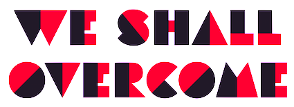
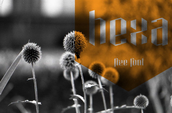
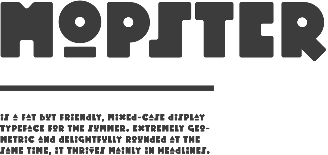
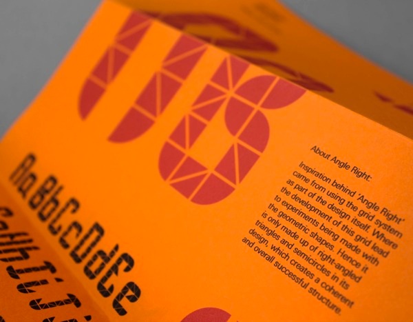
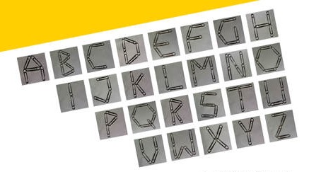
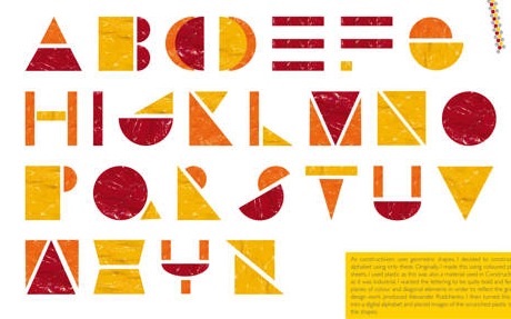
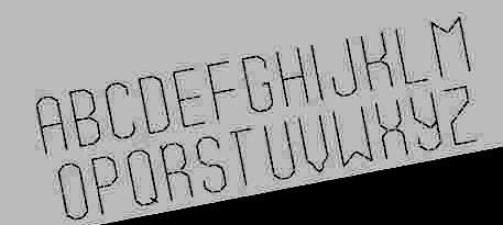
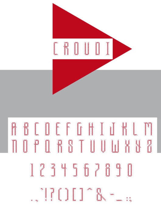
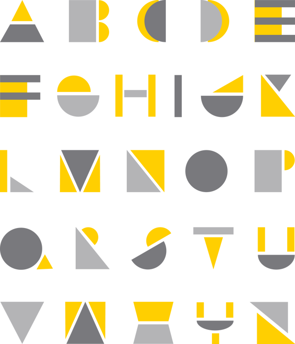
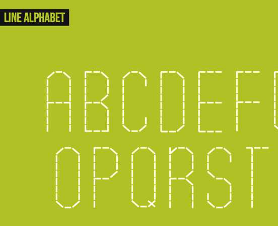
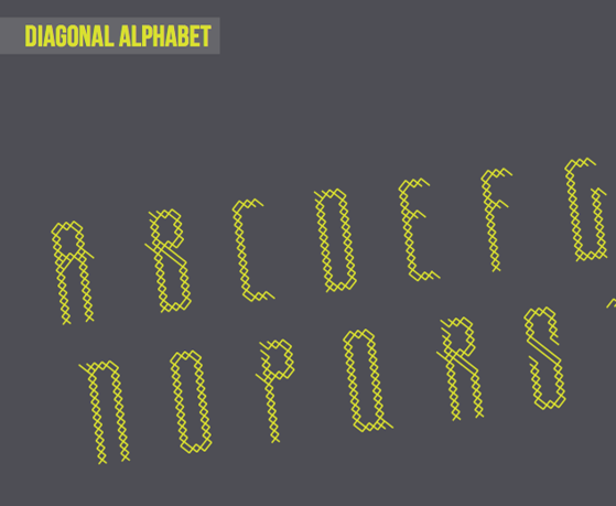
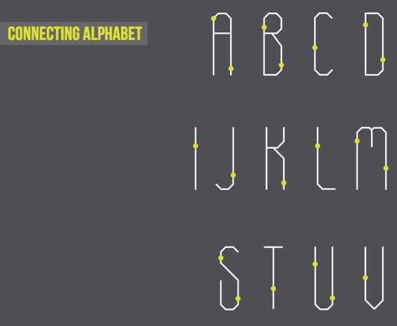
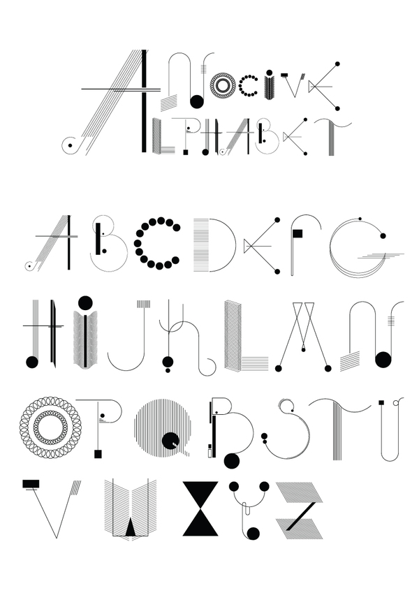
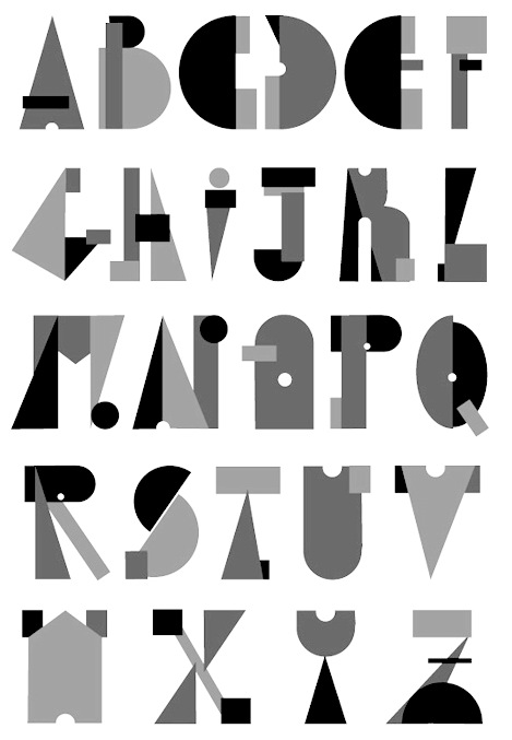
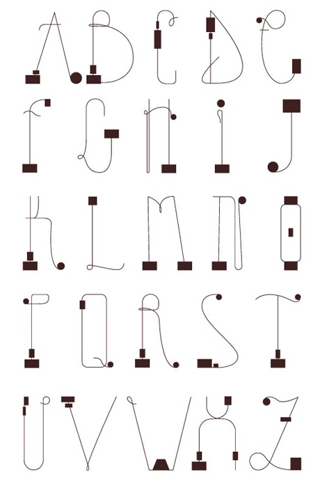
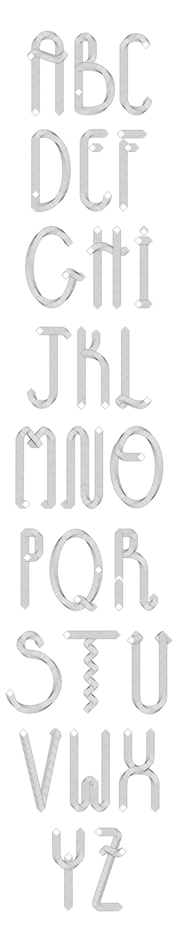
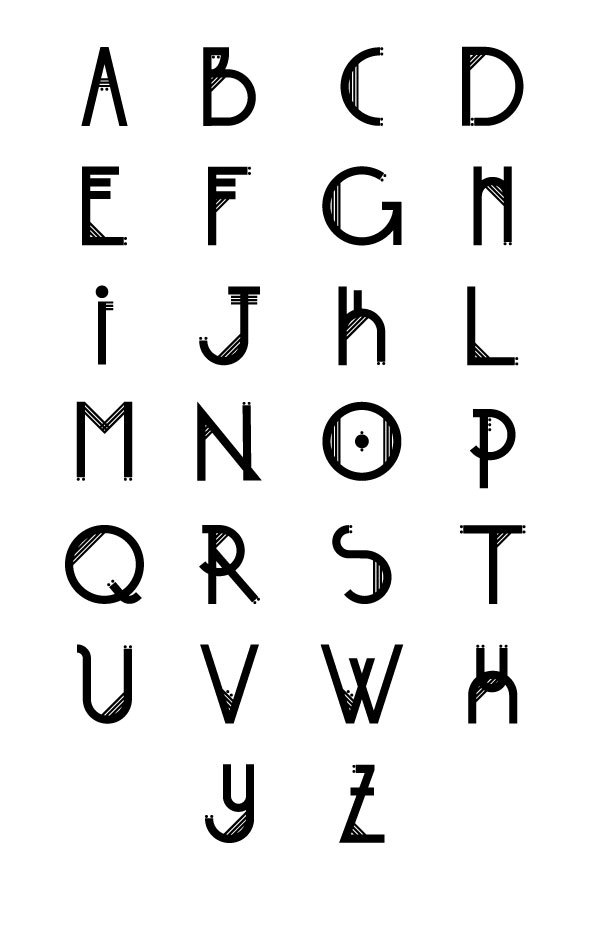
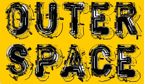
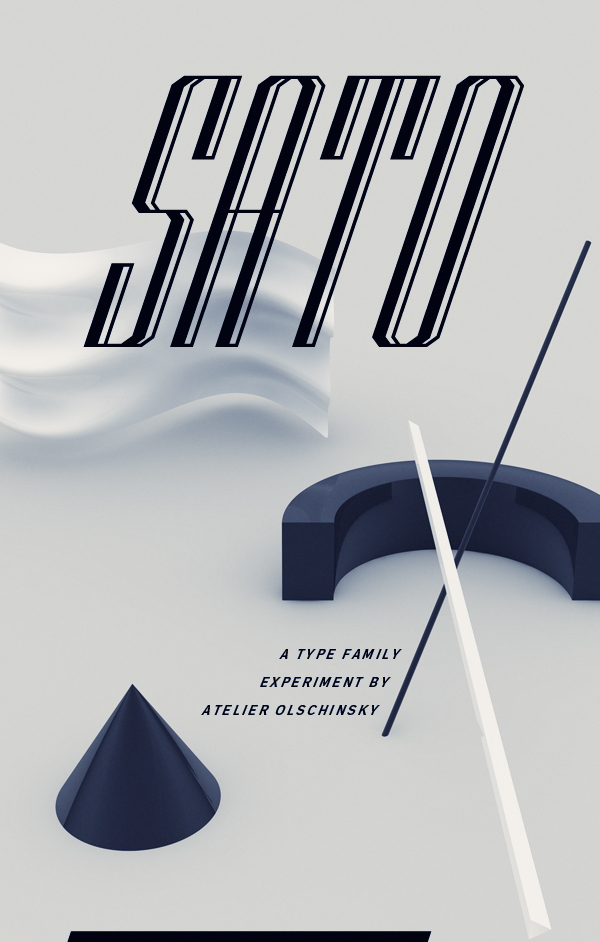
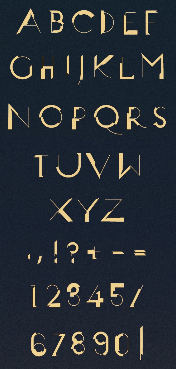
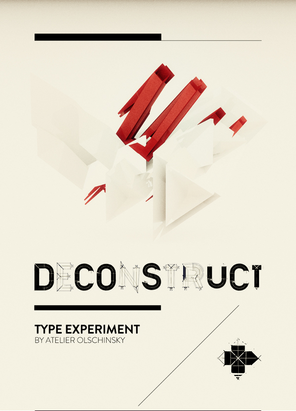
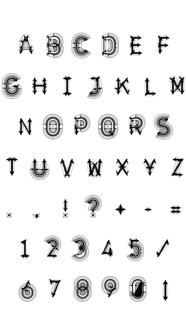
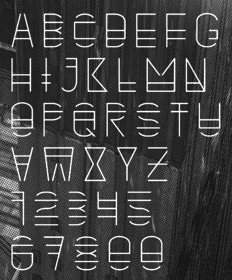
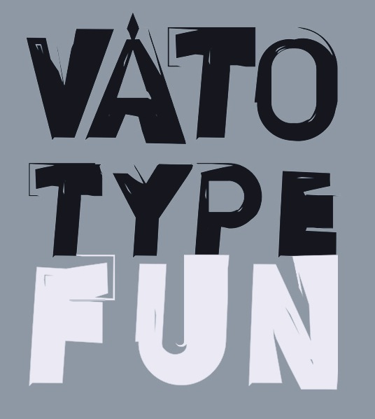
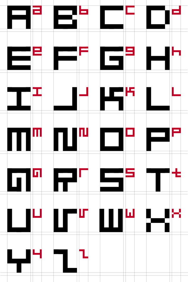
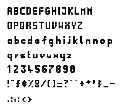
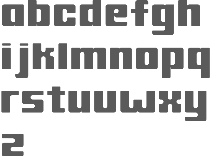
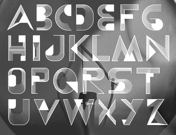
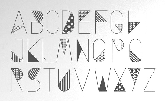
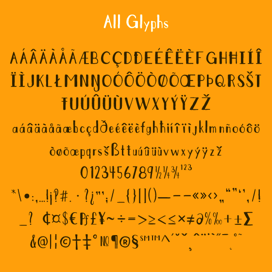
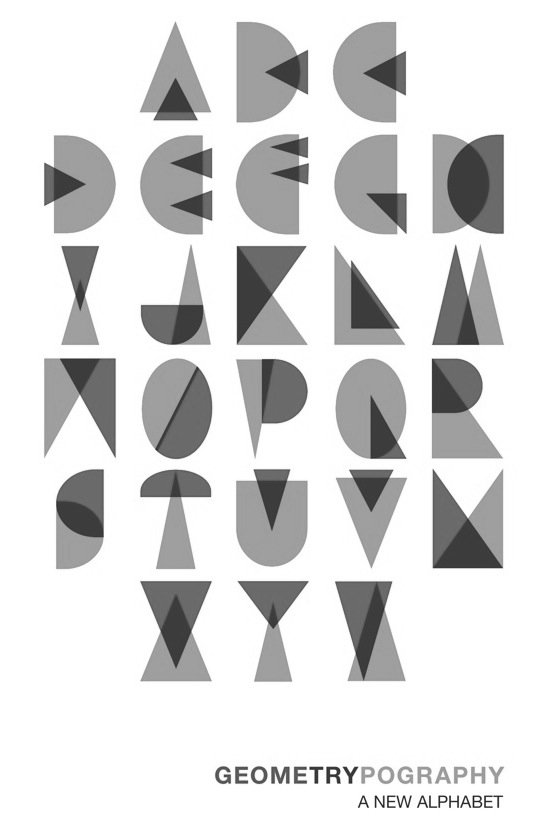
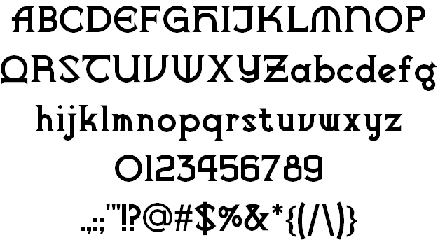
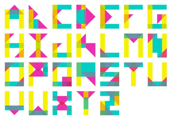
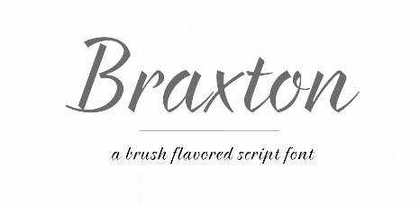
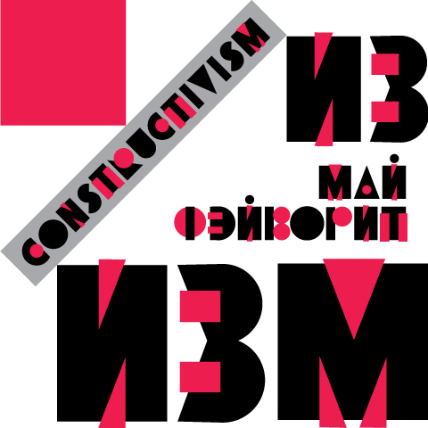
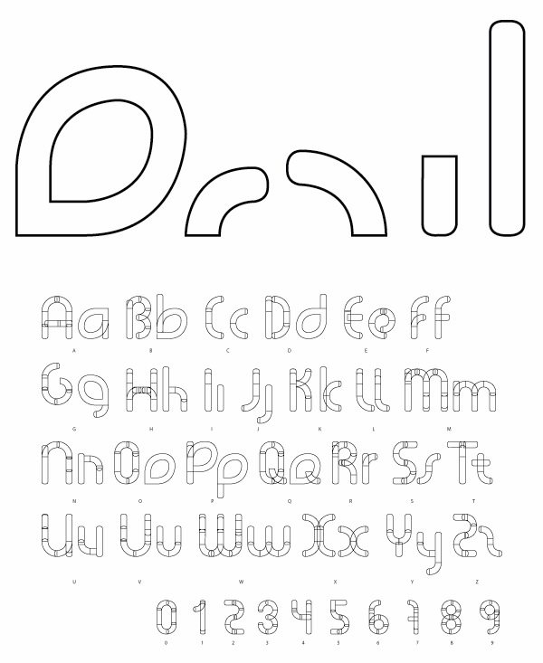
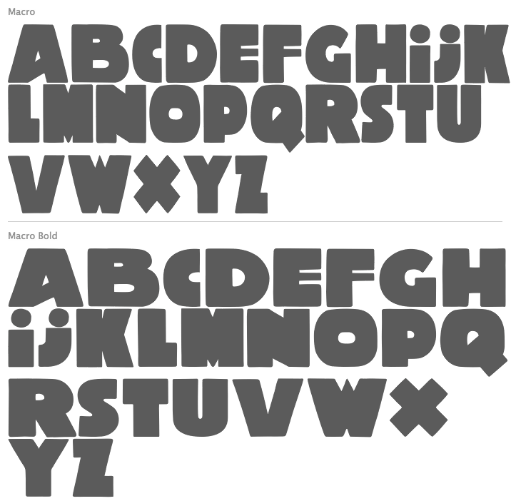
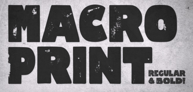
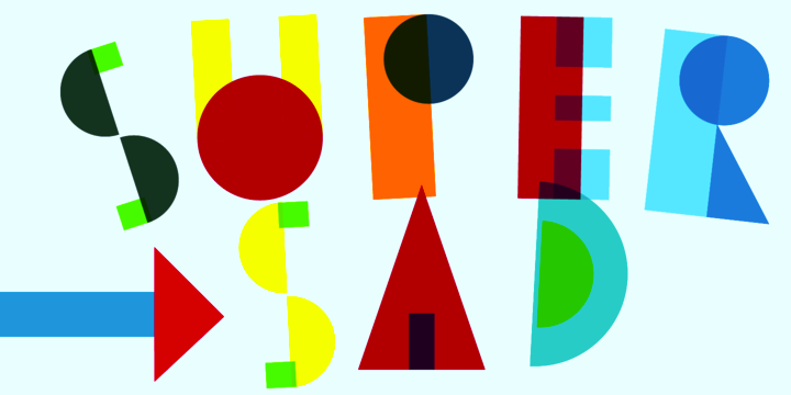
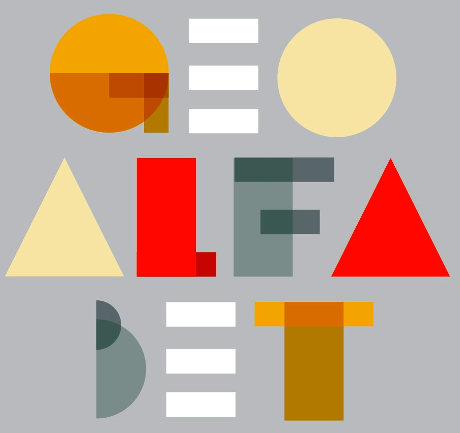
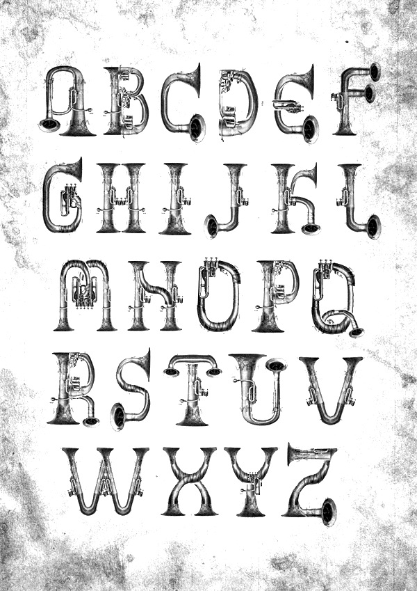
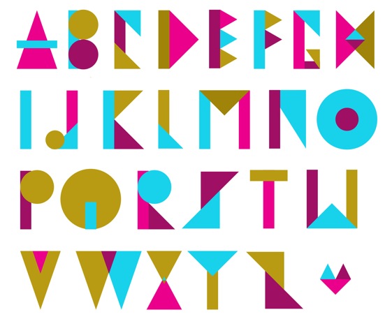
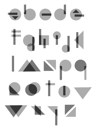
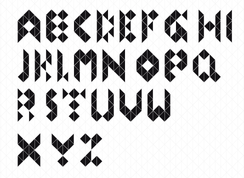
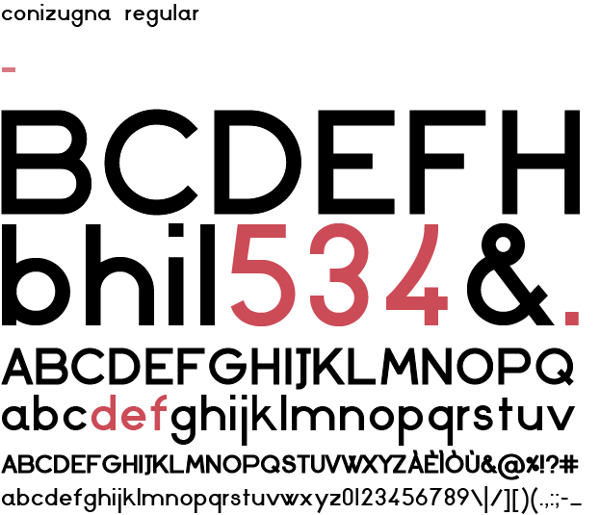
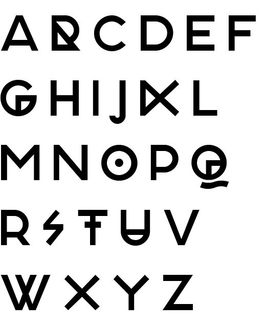
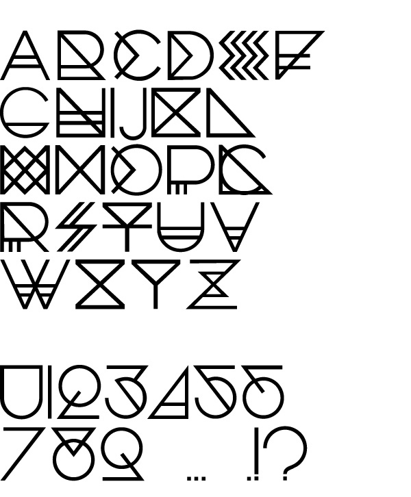
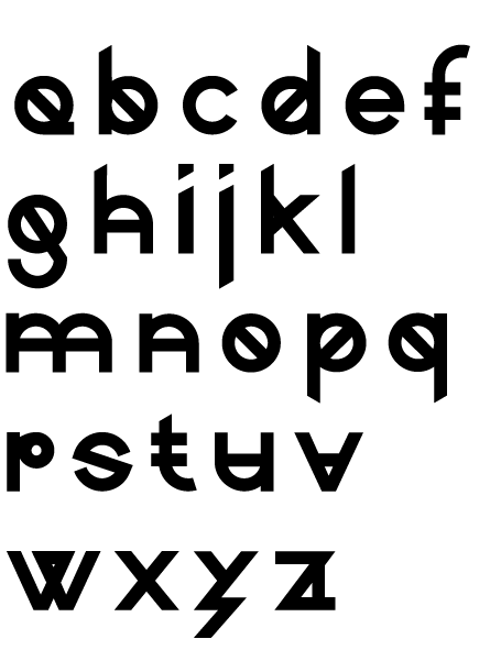
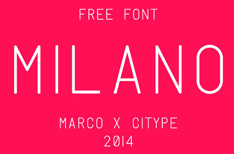
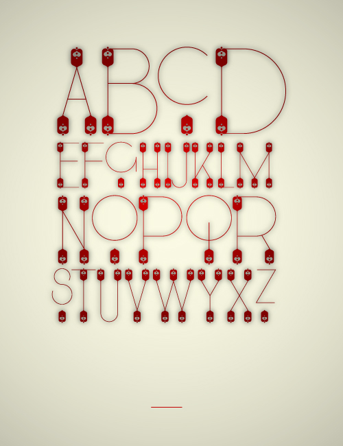
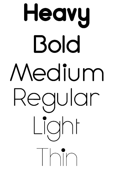
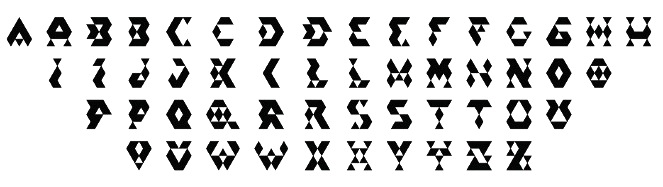
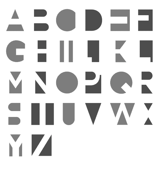
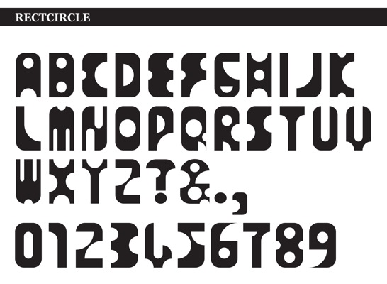
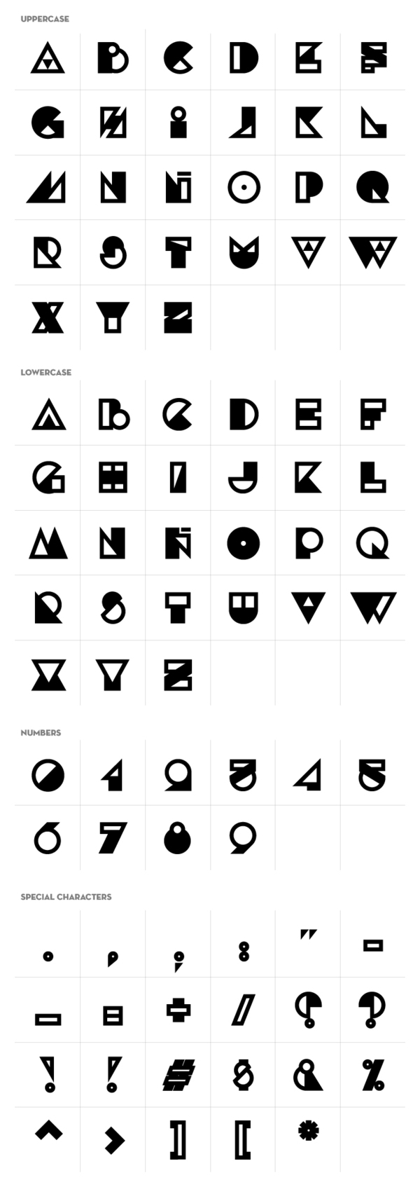
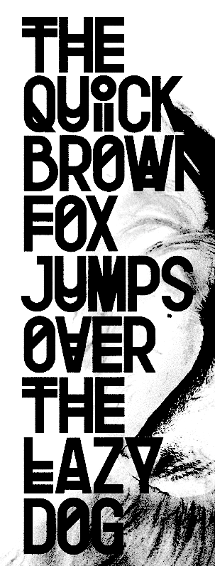
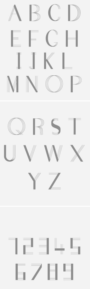