| | |
100types
[Ben Archer]
|
Educational and reference site run by Ben Archer, a designer, educator and type enthusiast located in England (who was in Auckland, New Zealand, before that). Glossary. Timeline. Type categories. Paul Shaw's list of the 100 most significant typefaces of all times were recategorized by Archer: - Religious/Devotional: Gutenbergs B-42 type, Gebetbuch type, Wolfgang Hoppyl's Textura, Breitkopf Fraktur, Ehrhard Ratdolt's Rotunda, Hammer Uncial, Zapf Chancery, Peter Jessenschrift, Cancellaresca Bastarda, Poetica.
- Book Publishing&General Purpose Text Setting: Nicolas Jenson's roman, Francesco Griffo's italic, Claude Garamond's roman, Firmin Didot's roman, Cheltenham family, Aldus Manutius' roman, William Caslon's roman, Pierre-Simon Fournier's italic, Ludovico Arrighi da Vicenza's italic, Johann Michael Fleischmann's roman, ATF Garamond, Giambattista Bodoni's roman, Nicolas Kis' roman, Minion multiple master, Unger Fraktur, John Baskerville's roman, Lucida, Optima, Bauer Bodoni, Adobe Garamond, Scotch Roman, Romanée, ITC Stone family, Trinité, ITC Garamond, Sabon, ITC Novarese, Charter, Joanna, Marconi, PMN Caecilia, Souvenir, Apollo, Melior, ITC Flora, Digi-Grotesk Series S.
- Business/Corporate: Akzidenz Grotesk, Helvetica, Univers, Syntax, Courier, Meta, Rotis, Thesis, Antique Olive.
- Newspaper Publishing: Times Roman, Bell, Clarendon, Century Old Style, Ionic, Imprint.
- Advertising and Display: Futura, Robert Thorne's fat typeface roman, Vincent Figgins' antique roman (Egyptian), Memphis, Fette Fraktur, Avant-Garde Gothic, Deutschschrift, Peignot, Erbar, Stadia/Insignia, Penumbra, Compacta, Bodoni 26, WTC Our Bodoni.
- Prestige and Private Press: Romain du Roi, Golden Type, Johnston's Railway Sans, Doves Type, Walker.
- Signage: William Caslon IV's sans serif, Trajan.
- Historical Script: Snell Roundhand, Robert Granjon's civilité, Excelsior Script.
- Experimental/expressive: Mistral, Beowolf, Dead History, Behrensschrift, Eckmannschrift, Neuland, Element, Remedy, Template Gothic.
- Onscreen/multimedia: Chicago, Oakland, OCR-A, Base Nine and Base Twelve, Evans and Epps Alphabet.
- Telephone Directory publishing: Bell Gothic.
Link to Archer Design Work. [Google]
[More] ⦿
|
Amondo Szegi
[FONTana Typestudio]

|
[MyFonts]
[More] ⦿
|
Anton Janson
|
Born in Friesland, 1620-1687. Dutch punchcutter and typefounder, who worked in Leipzig. He was not responsible for the types that bear his name today---they were in fact due to Miklós Tótfalusi Kis (Nicholas Kis). [Google]
[MyFonts]
[More] ⦿
|
Autologic
|
Newbury Park, CA-based outfit where Slimbach and Stone worked at one point. Its staff designed (and in some cases, imported, via Autologic SA in Lausanne, Switzerland) some nice typefaces in the mid eighties such as the Champfleury family (1985), Geometrica (1985), Kis-Janson (1985), Media (1976, André Gürtler, Christian Mengelt and Erich Gschwind), Melencolia (1985), Signa (1978, André Gürtler, Christian Mengelt and Erich Gschwind) and Trinité (1981, Bram de Does, part Bobst Graphic, part Autologic). [Google]
[More] ⦿
|
Ben Archer
[100types]
|
[More] ⦿
|
Bitstream
|
 Founded in 1981 by Mike Parker, Matthew Carter, Cheri Cone, and Rob Freedman, Bitstream is the first digital font foundry. Not without controversy, though, as many claim that the original digital collection was an illegal copy of Linotype fonts [Note: I disagree with that statement--take out "illegal"]. In 1999, Bitstream created MyFonts.com, a web site for finding, trying, and buying fonts on line. Bitstream was headquartered in Cambridge, Massachusetts, and led dfior some time by CEO Anne Chagnon.
 Bitstream wrote on the origins of the collection: The Bitstream Typeface Library was developed under the supervision of Matthew Carter, the creator of such esteemed typefaces as ITC Galliard; Snell, Bitstream Charter and Swiss Compressed. Carter, who also serves as Bitstream's Senior Vice President of Design, set uncommonly high standards for the company's highly-skilled design staff. Working from the earliest-generation artwork available, each character of every typeface is hand-digitized on advanced workstations specially programmed by Bitstream's engineers. In building the library, Carter has overseen the licensing of typefaces from such respected international sources as the International Typeface Corporation (ITC), Kingsley-ATF Type Corporation, and Fundicion Tipografica Neufville SA, among others. Bitstream also develops new and original designs. Many countries provide for the legal protection of typeface names only, not the designs themselves. This means that the original names of many typefaces can only be used with a license from the owner. The majority of Bitstream typefaces in this catalog have licensed names (on which royalties are paid), or have historical names that reside in the public domain, or have names to which Bitstream owns the rights. In these cases, the name is used. When the original name is not available for use by Bitstream, an alternative name appears. For example, Swiss 721 is the name that Bitstream uses for its version of the typeface popularly known as Helvetica? Because the original name of that typeface is not widely licensed, there are many offerings of the design with completely different names. It is important to note that the use of an alternative name has no bearing on the inherent quality or authenticity of the typeface design. Bitstream sold a nice 500-font CD for 39 USD around 1996, with all the great text families. This was a fantastic buy, as proved by this quote from John Hudson: I have said it before and I will say it again: I think the development of the original Bitstream library was one of the worst instances of piracy in the history of type, and it has set the tone for the disrespect for type shown today. (A bit of background: Bitstream asked Linotype if they could digitize Linotype's library of fonts. Linotype refused, but Bitstream went ahead anyway.) On this issue, read these pages by Ulrich Stiehl and Typophile. Bitstream was offering a 250-font CD. Type Odyssey Font CD (2001). Bitstream has added Greek, Cyrillic, OldStyle versions to many of its families. New releases in July 2001: Artane Elongated, Cavalero, Drescher Grotesk BT, FM Falling Leaves Moon, FM Rustling Branches Moon, Picayune Intelligence (by Nick Curtis), Raven, Richfont, Rina, Sissy Boy, Stingwire, Tannarin. In November 2001, Serious Magic entered into a long-term agreement to license 25 Bitstream outline fonts for its new visual communication products. Bitstream has been an exemplary corporate citizen, occasionally producing license-free fonts for the masses, such as their Vera collection. Bitstream's own overstated blurb about itself: Bitstream Inc. (NASDAQ: BITS) is a software development company that makes communications compelling. Bitstream enables customers worldwide to render high-quality text, browse the Web on wireless devices, select from the largest collection of fonts online, and customize documents over the Internet. Its core competencies include fonts and font technology, browsing technology, and publishing technology. Finally, together with its spin-off, MyFonts, Bitstream was sold to Monotype Imaging in 2011. Catalog of typefaces [large web page warning]. [Google]
[MyFonts]
[More] ⦿
|
Celia Marchal Garcia
|
 During her studies in Jaen, Spain, in 2017, Celia Marchal Garcia (Granada, Spain) designed Kis, a revival of the typeface of Miklos Totfalusi Kis. She also created Central Perk, a fun revival of the beatnik cafe lettering for the TV show Friends (1994-2004), which was created and produced by Marta Kauffmann and David Crane. [Google]
[More] ⦿
During her studies in Jaen, Spain, in 2017, Celia Marchal Garcia (Granada, Spain) designed Kis, a revival of the typeface of Miklos Totfalusi Kis. She also created Central Perk, a fun revival of the beatnik cafe lettering for the TV show Friends (1994-2004), which was created and produced by Marta Kauffmann and David Crane. [Google]
[More] ⦿
|
Chauncey H. Griffith
|
 Kentucky-based type designer and printer, 1879-1956. He was a Linotype salesman who directed the growth of the Linotype library from 1915 to 1948, and improved the look of the world's newspapers. He worked to establish Linotype as the composing machine of choice in America. He continued as a consultant to Linotype well into his retirement.
 Claus Eggers Sorensen writes: In 1922 Chauncey H. Griffith was promoted to Vice President of Typographic Development at Mergenthaler Linotype. He immediately started the development of new typefaces to replace the prevailing modern style typefaces. The issue troubling the moderns was their high contrast design. Especially the hairline parts of the cast lines could break of while printing, and counters could clog with ink and pulp. Faster printing meant transferring the cast lines with the stereotype process to a letterpress cylinder for high-speed rotary printing on endless rolls of paper stock. C. H. Griffith's new approach was to engineer new typefaces to the printing method. That meant drawing inspiration from the Egyptienne style as seen in the Clarendon typeface, with its very sturdy lower contrast design, and Theodore Low De Vinne and Linn Boyd Benton's Century Roman, which possessed elegance and legibility. The first product of these efforts was Ionic No. 5. It was an instant success, within eighteen months it was used by more than 3000 newspapers all over the world. C. H. Griffith and Mergenthaler Linotype continued to refine the design in subsequent iterations: Excelsior (1931), Paragon (1935), Opticon (1935), Corona (1941). These became known as the Legibility group. Ionic No. 5, Excelsior and Paragon form the Linotype Legibility Group. He designed or co-designed the following fonts, all at Mergenthaler: - Baskerville (1939, Linotype).
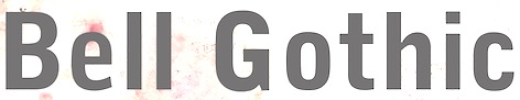
- Bell Gothic (1937-1938). Now available at Bitstream. Font Bureau has its own version, Griffith Gothic (1997-2000, by Tobias Frere-Jones): Of all his work, Chauncey Griffith claimed one type, Bell Gothic, as his own design. Griffith Gothic is a revival of the 1937 Mergenthaler original, redrawn as the house sans for Fast Company. Tobias Frere-Jones drew a six weight series from light and bold, removing linecaster adjustments and retaining the pre-emptive thinning of joints as a salient feature. Mac McGrew: Bell Gothic was developed in 1937 by C. H. Griffith of Mergenthaler Linotype, primarily for use in the New York City telephone directory, but quickly became standard for telephone books nationwide. The aim was to eliminate roman types with objectionably thin serifs and hairlines. Furlong and Market Gothic were specialized adaptations of this typeface for newspaper work, the former with special figures and other characters for setting racetrack results, the latter in 1941 with other special characters for stock market details. The basic Bell Gothic was also cut by Intertype in 1939. Compare No. 11 and No. 12, shown under Numbered Faces, previously used for directory work. Imitations include OPTI Benet (Castcraft). Poster by Jaime Schweitzer. View digital versions of Bell Gothic.
- Bookman (1936, after the 1960 original by Alexander Phemister at Kingsley ATF).
- Corona (1941), a narrow newspaper typeface with large x-height. Corona was designed to meet the rigorous requirements of high-speed printing, and is still the chosen type of many American daily newspapers. Mac McGrew: Corona was drawn and cut by Linotype under the direction of C. H. Griffith in 1941. It is a member of the "Legibility Group" of faces designed for easy reading under newspaper conditions of stereotyping and high-speed printing with inks that could be trapped in close quarters. Royal on Intertype is a 1960 copy of Corona. Digital revivals include C795 Roman (Softmaker), News 705 BT (Bitstream).
- Elegant Garamond (Bitstream). This Granjon design was made by Chauncey H. Griffith based on models by George William Jones, and before that, Robert Granjon.
- The didone-style newspaper typeface Excelsior (1931, Linotype). At Bitstream, this is News 702. URW calls it Excius, and SoftMaker's version is Exemplary. Mac McGrew: Excelsior was cut for Linotype in 1931 under the direction of C. H. Griffith. It is a plain type, but designed for the utmost readability, with only slight variation from thick to thin, and careful fitting that makes the characters flow into easily recognizable words. Long or short descenders are available in certain sizes. Like a number of Linotype typeface intended primarily for newspaper work, Excelsior is available in closely graded sizes, including odd and some half-point multiples.
- Granjon (1928-1930, with George William Jones at Linotype). MyFonts: Claude Garamond's late Texte (16 point) roman was the model used by George W. Jones when he designed this typeface for Linotype&Machinery in 1928. To avoid confusion with the Garamond romans based on Jannon's seventeenth century work, L&M called the typeface Granjon, after the designer of the italic used as a model, thus creating confusion with the typefaces based on Granjon's romans, Plantin and Galliard. Granjon is a little less crisp in cut than either Sabon, Stempel Gararmond or Berthold Garamond, but makes a magnificent and most readable text face, as shown in Reader's Digest since its founding. Mac McGrew: Granjon was designed for Linotype in 1928 by George W. Jones, distinguished English printer, to meet his own exacting requirements for fine book and publication work. It is derived from classic Garamond sources, but with refinements made possible by modern methods of punch cutting. In fact, one critic has called it "the purest form of Garamond." It is named for Robert Granjon, mid-sixteenth-century punch cutter noted in particular for his italics, from which the present Granjon Italic was derived. Granjon Bold, by C. H. Griffith, was added in 1931. Lanston Monotype acquired reproduction rights to the typeface from Mergenthaler.
- Ionic No. 5 (Linotype, 1925). Mac McGrew: Ionic is a general name for a style of typeface which is closely related to the Clarendons (q.v.). Plain, sturdy designs with strong serifs and little contrast, the Ionics were popular in the latter part of the nineteenth century. Although many founders offered them, they were generally gone by early in this century. A few received a new lease on life when they were copied by Monotype, Linotype, or Intertype. Two new Ionics appeared in this century. Ionic No.5 was designed by C. H. Griffith in 1926 for Linotype, as a newspaper text face. It features a large lowercase with short ascenders and descenders, with no fine lines or serifs to break down in stereotyping, and no small openings to fill up with ink. This is one of a few typefaces made in many closely graded sizes: 5-, 51/2-, 6-, 61/2-, 63/4-, 7-, 71/2-, 8-, 9-, 10-, and 12-point. Intertype's Windsor, developed in 1959, is comparable. Ionic Condensed was designed by Griffith in 1927, also for Linotype. It is a refinement of traditional designs, intended for newspaper head- ings, and has most of the general characteristics of the text face. Ionic Extra Condensed is essentially the same, a little narrower and without lowercase, also for newspaper headlines.
- Janson (1932). Mac McGrew: Janson is adapted from types often attributed to Anton Janson, seventeenth-century Dutch letter founder, although researchers have shown that the originals were cut by Nicolas Kis, a Hungarian punchcutter and printer. The Linotype version was done in 1932 under the direction of C. H. Griffith, based on the 14-point size of about 1660. The Monotype version was adapted by Sol Hess in 1936, in collaboration with Bruce Rogers. Both versions are sharp and clear cut, and rather compact. They bear some resemblance to the types of William Caslon, which were based on later, similar Dutch types.
- Memphis (1929): the prototypical Egyptian of Rudolf Wolf. Mac McGrew: Memphis is the Linotype copy of the popular German square-serif typeface known as Memphis or Girder, designed by Rudolf Weiss about 1929, which did much to revive interest in this old style. Memphis Light and Bold were introduced by Linotype in 1933, Italics and Unique Caps in 1934, Medium in 1935, and other variations up to 1938. The Extra Bold versions were designed by C. H. Griffith. Alternate characters are available in some versions to more nearly approximate the appearance of Stymie or Beton (q.v.). The Lining versions are comparable to small caps in the regular versions, being propor- tionately wider and heavier than caps, and have no lowercase; there are several sizes each in 6- and 12-point, permitting various cap-and-small-cap combinations, in the manner of Copperplate Gothic. Also see Ward; compare Cairo, Karnak. Digital versions are everywhere. The Bitstream version is Geometric Slabserif 703.
- Linotype Monticello was designed by Griffith in 1946. Its design is based on James Ronaldson's Roman No.1 and Oxford Typefaces from American Type Founders and was revised by Matthew Carter while he was working at Linotype between 1965-1981. Mac McGrew: Monticello is a Linotype recreation of America's first great typeface, Binny&Ronaldson's Roman No.1, cut about 1796 by Archibald Binny in Philadelphia. His was the first permanent American type foundry. After about 30 years, the Binny typeface fell into disuse. The matrices survived, though, and a few fonts were cast about 1892 and the typeface was renamed Oxford (q. v.). In 1943 Princeton University Press announced plans for publishing a 52-volume edition of The Papers of Thomas Jefferson. As President, Jefferson had personally written to friends in France, introducing a Binny&Ronald- son representative who was seeking a source of antimony to replenish the shortage which threatened the young typefounding industry in this country. Jefferson also referred in this letter to the importance of type to civilization and freedom. In addition, the popularity of this typeface coincided with the most prominent years of Jefferson's life. Therefore Linotype suggested that a recutting of the typeface would be most appropriate for the Jefferson books, and the publisher heartily agreed. C. H. Griffith, Linotype typographic consultant, made a detailed study of Binny's type and redrew it in 1946 for the requirements of Linotype composition and modern printing conditions. It is a vigorous transitional face, somewhat similar to Baskerville but slightly heavier and a little crisper.
- Opticon (1935, Linotype). Mac McGrew: Opticon was designed in 1935 by C. H. Griffith for Linotype. It is a member of what that supplier calls its Legibility Group of typefaces designed primarily for newspaper use. It is essentially the same as Excelsior, but with stems and thick lines weighted slightly, for printing on hard-surfaced paper.
- Paragon (1935, Linotype). Mac McGrew: Paragon was designed by C. H. Griffith for Linotype in 1935. It is a member of that company's Legibility Group of typefaces, planned primarily for sharp and clean printing under the difficult inking and printing conditions of newspaper production, but also useful and popular for other periodical work. This typeface is lighter and airier than most such typefaces; otherwise it is much the same style. Compare Excelsior, Ionic, Opticon, Textype.
- Poster Bodoni (1920). Digital versions of Poster Bodoni or a textured ornamental version of it include Poster Bodoni (Bitstream), Modern 721 (Bitstream), OPTI Poster Bodoni Compressed (Castcraft), Bodoni Poster (Softmaker), Bodnoff (Corel), Poster Bodoni (Tilde), Poster Bodoni WGL4 (Bitstream), Saphir (Linotype), Bodoni Poster (Linotype), Bodoni poster (Adobe; same as the Linotype version), and Bodoni Ornamental (FontMesa).
- Ryerson Condensed was designed by C. H. Griffith in 1940 for Linotype, as a modernization of Globe Gothic Condensed.
- Textype (1929, Linotype). Mac McGrew: Textype was designed in 1929 by C. H. Griffith for Linotype. Although intended as a newspaper face, Textype with its smaller x-height and longer ascenders than most newspaper typefaces also became popular for magazines and other publications, as well as for a certain amount of advertising and general printing. There is an 18-point size in roman with italic, also a bold and bold italic. The 18-point size and the bold italic are both rare in newspaper typefaces. Compare Excelsior, Ionic, Rex, etc.
- Non-Latin typefaces: Porson and Metro Greek; thirteen Arabic designs adaptable for use throughout the Moslem world; Hebrews; the Indian scripts devanagari, Gujarati, and Bengali; Sinhalese for use in Ceylon, Tamil, and Syriac.
Klingspor link. Linotype link. FontShop link. Font Bureau link. Pic. [Google]
[MyFonts]
[More] ⦿
|
David Berlow
|
 David Berlow (b. Boston, 1955) entered the type industry in 1978 as a letter designer for the Mergenthaler, Linotype, Stempel, and Haas typefoundries. He joined the newly formed digital type supplier, Bitstream, Inc. in 1982. After Berlow left Bitstream in 1989, he founded The Font Bureau, Inc. with Roger Black. Font Bureau has developed more than 300 new and revised type designs for The Chicago Tribune, The Wall Street Journal, Entertainment Weekly, Newsweek, Esquire, Rolling Stone, Hewlett Packard and others, with OEM work for Apple Computer Inc. and Microsoft Corporation. The Font Bureau Retail Library consists mostly of original designs and now includes over 1,000 typefaces. In a video made for Mike Parker's TDC medal in 2011, Mike Parker says that David Berlow is the most talented type designer he ever met. David lives in Martha's Vineyard.
 At ATypI 2004 in Prague, David spoke about Daily types. At ATypI 2009 in Mexico City, he spoke on The heart of my letter, (and the online version). Since that time he has been very active and vocal on the issue of high quality web fonts. Speaker at ATypI 2011 in Reykjavik and at ATypI 2014 in Barcelona. David Berlow Type Specimens (free pdf). Another type specimen booklet. Interview by A List Apart in 2009. Speaker at ATypI 2010 in Dublin. FontShop link. www.typovideo.de/david-berlow. David Berlow on web fonts. Interview by The Boston Globe. His typefaces: - Agency FB (1995). After Morris Fuller Benton's squarish typeface from 1932-1933 for American Typefounders.
- Amstelvar (2017). A variable (or parametric) font at Font Bureau. Contributors include David Berlow, Santiago Orozco, Alexandre Saumier Demers, and David Jonathan Ross. Open Font Library link, where one can download the font. Github link.
- Apres (2008, a sans with 40 styles). David Berlow and staff drew Apres as part of a series designed originally for the Palm Pre smart phone, for use both on the device and in print marketing. Simple, open letterforms and generous proportions provide a clear, comfortable, and inviting experience for navigation and readability.
- Belizio (1987-1988), a beautiful Clarendon-style slab serif modeled after the 1958 original slab serif by Aldo Novarese called Egizio Corsiva Nero. Claudio Piccinini would have liked Font Bureau to acknowledge Aldo Novarese's Egizio as the source of this family.
- Belucian (1990, by David Berlow and Kelly Ehrgott Milligan. Several weights exist, including Demi and Ultra.
- Berlin Sans (1997).
- Bureau Grotesque (1989). This 27-style family is now called Bureau Grot. Font Bureau's blurb: The current family was first developed by David Berlow in 1989 from original specimens of the grotesques released by Stephenson Blake in Sheffield. These met with immediate success at the Tribune Companies and Newsweek, who had commissioned custom versions at the behest of Roger Black. Further weights were designed by Berlow for the launches of Entertainment Weekly and the Madrid daily El Sol, bringing the total to twelve styles by 1993. Jill Pichotta, Christian Schwartz, and Richard Lipton expanded the styles further, at which point the family name was shortened to Bureau Grot.. Note: there is a custom version called M&C Saatchi Grotesque with truetype data created by dtpTypes in 1998.
- CalifornianFB.
- CheltenhamFB.
- Custer RE (2014), a typeface for small on screen use. The Font Bureau blurb: In 2009, a book from 1897 in the library of the University of Wisconsin caught David Berlow’s attention. It was set in a clear text face---a predecessor of Bookman---cast by the Western Type Foundry who called it Custer. Upon noting how well the typeface worked in point sizes of 6 and 7 points, Berlow developed it into a member of the Reading Edge series specifically designed for small text onscreen. Custer RE is a broad and approachable typeface drawn large on the body with a tall x-height to maximize its apparent size when set very small. The minimal stroke contrast and the hefty serifs let it stay exceptionally clear down to a font-size of 9px. Font Bureau.
- Decovar (2017). A variable font. Github link, where one can freely download the font family. See also Open Font Library.
- Desdemona (1992). An art nouveau face.
- Eagle (1889-1994). This art deco typeface Font Bureau Eagle was started in 1989 for Publish. David Berlow designed a lowercase, finished the character set, and in 1990 added Eagle Book for setting text. In 1994, Jonathan Corum added Eagle Light and Eagle Black to form a full series.
- Eldorado.
- Empire.
- Esperanto (1995).
- ITC Franklin Gothic (1991). In 2008, David Berlow added Condensed, Compressed and Extra Compressed widths to Vic Caruso's 1979 ITC Franklin interpretation (which had Light, Medium, Bold and Black), and Font Bureau sells a complete ITC Franklin now. In 2010, Berlow completed his definitive revision of ITC Franklin, a single new series of six weights in four widths for a total of 48 styles. Typeface review at Typographica.
- Giza (an Egyptian family.
- Hitech (1995).
- Juliana Text (2009), a rebirth of Sem Hartz's Juliana (1958, Linotype), a popular narrow legible paperback text face.
- Kis FB (2007): a revival of old style types by Nicholas Kis from ca. 1700.
- Letras Oldtsyle (1998). Letras Oldstyle was commissioned by Letras Libres, the reigning literary magazine published by Enrique Krauze in Mexico City. This garalde series was inspired by the earliest typefaces cut in the Americas in the early 1600s by printer Henrico Martinez. Proofs survive in the Biblioteca Nacional. Letras Oldstyle stands as the first typeface ever cut in the Americas, the root of American type design.
- Meyer Two (1994). Based on a 1926 type by L.B. Meyer.
- Millenium BT Bold Extended (1989, Bitstream). Also known by insiders as Starfleet Bold Extended, this font was used on federation starship hull markings until episode ten. MyFonts link.
- Moderno FB (1995): an exhibitionist didone in 32 styles, for Esquire Gentleman. In 1996 Berlow cut new styles with Richard Lipton for El Norte. In 1997, Roger Black ordered new weights for Tages Anzeiger. It grew further when the Baltimore Sun, with FB Ionic as text, was redesigned. The whole series was then revised for Louise Vincent, Montreal Gazette, with further styles added in 2005 for La Stampa. [It is my favorite type family at Font Bureau.]
- Momentum (2018). An in house variable font family for use on the Type Network web site.
- Nature (1995).
- Numskill (1990).
- Old Modern.
- Online Gothic (1995).
- Ornaments.
- Phaistos (1990-1991). A flared angular design done with Just van Rossum, and inspired by Rudolf Koch's Locarno.
- Poynter Agate.
- Reforma: Based on Giza.
- Rhode (1997).
- Roboto Flex (2017). A large free variable typeface family by David Berlow on commission for Google; based on Christian Robertson's original Roboto. Google Fonts link. Github link. Google redits Font Bureau, David Berlow, Santiago Orozco, Irene Vlachou, Ilya Ruderman, Yury Ostromentsky and Mikhail Strukov.
- Romeo.
- Scotch Roman (1993).
- Skia (1993, Apple). A Greek simulation sans, in the style of Twombly's Lithos, co-designed with Matthew Carter for Apple's QuickDraw GX project.
- Skyline.
- Titling Gothic FB (2005): Berlow spent 10 years developing FB Titling Gothic in seven weights of seven widths each for use as display and headline romans. It was inspired by the popular ATF Railroad Gothic and grew out of Berlow's own Rhode.
- Throhand: a classic family based on metal type found at the Plantin Moretus Museum in Antwerp.
- Truth FB (1995).
- Village.
- Vonness (2007): a newspaper sans family. Font Bureau: Vonness was designed by David Berlow working closely with Neville Brody on corporate redesign for Jim Von Ehre at Macromedia. Core weights are loosely based on Bauersche Giesserei's Venus, 1907-1910. Berlow expanded the ideas behind the series to 56 fonts.
- Yurnacular (1992, part of FUSE 4).
- Zenobia (1995).
View David Berlow's typefaces. Another catalog of David Berlow's fonts. Speaker at ATypI 2018 in Antwerp. [Google]
[MyFonts]
[More] ⦿
|
Dirk Voskens
|
Dutch punchcutter. In 1680, he taught Miklos Kis, who had just moved from Hungary to Amsterdam. Richard Lipton designed the text family Meno FB (1994, Font Bureau) in fifteen styles. He explains: the romans gain their energy from French baroque forms cut late in the sixteenth century by Robert Granjon, the italics from Dirk Voskens' work in seventeenth-century Amsterdam. [Google]
[MyFonts]
[More] ⦿
|
Erhard Kaiser
|
 German type designer (born in Quedlinburg, near Leipzig, 1957), who made the extensive DTL Fleischmann family (1992) at the Dutch Type Library. The font is named after Johann Michael Fleischmann (1701-1768), a German punchcutter who lived and died in Amsterdam. From 1983 until 1991 Erhard Kaiser worked at TypeDesign for Typoart, Dresden and since 1993 has been with DutchTypeLibrary/URW++. Still at DTL, he made the sans serif DTLProkyon family in 2002 around a curvy "4". This family gets raves from many typographers. Among possible imitations, we cite Dalton Maag's Ubuntu. For Typoart he designed Caslon Gotisch, Kleopatra, Quadro, Weiß-Antiqua and B embo Antiqua. Since 1998 he teaches at the Muthesius Hochschule in Kiel. In 2005, he created DTL Antares, a strangely proportioned serif to accompany DTL Prokyon. Some weights published in 2008 are called Evonik Antares and some Evonik Prokyon.
 Kis Antiqua Now TB Pro and (2008, Erhard Kaiser for Elsner & Flake) are based on earlier Elsner & Flake versions of Kis Antiqua published by them in 2006, which, in turn, go back to Hildegard Korger's Kis Antiqua at Typoart, 1986-1988, and ultimately to a Jansonian Garamond by Miklos Totfalusi Kis in 1686. Klingspor link. Bio at ATypI. [Google]
[MyFonts]
[More] ⦿
|
FONTana Typestudio
[Amondo Szegi]
|
 FONTana is a font design studio in Szeged, Hungary, started in 1999. Free and commercial typefaces (39USD/piece) by Gabor Kóthay (La Danse, Luxury, Sehrgut (Fraktur), Faximile (1999), L&R (1999), Monsoon (1999)), and Amondó Szegi (Telegdi family, which is based on the worn typefaces used by Abbot Nicolaus Telegdi at the Vienna Jesuit press in the 16th Century; Velorex (1999)). Very beautiful web page, and fantastic fonts in all respects!
 Free typefaces: Zodiac (2000), Cards (Gyula Zsigri, 2001), Maldoror, Domino (Gabor Kóthay), Count, Csenge (a Hungarian rune font by Csaba Dávid), Qwerty (Gabor Kóthay, 2000), Y2K (Gabor Kóthay, 2000). Early commercial fonts: Woodini (caps), Sleeping Beauty (caps), Zimbalo (1999, Amondó Szegi), Pacalsone (1999, Amondó Szegi), Paradox (1999, Amondó Szegi), Construct (2001, Amondó Szegi), Binario (2000, Amondó Szegi), Bikewrench (2001, Amondó Szegi), Cabin (2001, Gábor Kóthay). At T-26, in 2001, Amondó Szegi published the commercial typefaces MuseFace (art nouveau), Glosso (2003), Xodus (2001, Regular, Italic, Forgotten), Kozma-Ornaments, all showing old Slavonic and/or Armenian influences in Latin letters. In 2000, he made Alian Ornaments (floral ornaments) for T-26. At T-26, Gábor Kóthay published Adagietto (2000), Minerva (2000), Archetype (2000). At PsyOps, Gábor Kóthay published the formal script Anglia (2001), Berill (2001), and Plexo (2001). Amondó Szegi's typefaces at T-26: Nexodus (2008, medieval style), Zenthes (2008), Alien Ornaments, Glosso, Iskola (2002, a Victorian typeface done with Silas Dilworth), Kozma (great ornaments), Melico, Melico Ornaments (2004, another great set), Xodus. At P22, Szegi designed the curly typeface Mantra (2005). Amondó Szegi's Telegdi family is since 2001 available from P22. At The Type Trust, he created the playful Gepetto (2006). Typefaces from 2013: Ma (avant-garde, constructivist, done as an hommage to Lajos Kassak), Overdose, Sorry (kitchen tile typeface), Atett (hommage to Lajos Kassak), Street Soul, Samizdat, Velorex (brush script), Zsir (fat octagonal face), Kedves (hipster font). Typefaces from 2014: Iseum, Pix Gotisch. Among their custom corporate identity jobs, the Losonczi Hair Salon work (2012) is quite outstanding. Dubstep (2012) is an experimental triangulated grid-based typeface. In 2013, Glosso Novum (2013, Fontana Type Foundry), a remastering of Glosso (2003), was published. Nexodus (2013) is a reworking of his 2001 typeface Xodus, with new ornaments and zodiac signs, and more weights. Xodus (2001, Regular, Italic, Forgotten) revives work by Miklós Kis Misztótfalusi (Nicholas Kis), who was one of the first designers of Armenian type: He prepared his first set of exotic types before September 1685 for the Armenian printing house in Amsterdam. It was the knowledgeable mayor of Amsterdam who requested that those types be founded. These types were used to print the mayor's (Nicolaes Witsen) work entitled Noord en Oost Tartarye. Misztótfalusi's name appears in the colophon of the book. Later, in 1687, he found Georgian types, which were, in many respects, similar to the Armenian set. Since there was no printing house in Georgia, he designed the types on the basis of some manuscripts. Unfortunately, as legend has it, the types never reached the Georgian court, which had commissioned Misztótfalusi to design them. They were either lost or stolen somewhere in Sweden. However, a sample sheet survived and was found in 1980 in Amsterdam. It may seem to make no sense to re-Latinise the types of Misztótfalus, who himself was a great master in founding Latin types, and for whom Armenian types meant the first step in a new direction. Typefaces from 2016: Crave Sans. Klingspor link. Fontspace link. Behance link. Dafont link. Creative Market link. [Google]
[MyFonts]
[More] ⦿
|
Franko Luin
[Omnibus Typographi]
|
[MyFonts]
[More] ⦿
|
Fred Brady
[Fryda Berd]
|
 Fryda Berd is Fred Brady. Type designer who worked at Adobe, and who created Autologic Kis-Janson. Fred Brady (helped by Jim Wasco) designed Adobe Sans and Adobe Serif, which were originally introduced with Acrobat, to stand in as fall-back fonts for missing typefaces. They came with Adobe Acrobat version 2 (1994). In 1992, Adobe released Myriad, a neutral humanist sans family. The design team consisted of Robert Slimbach, Carol Twombly, Fred Brady, and Christopher Slye.
 Designer of Quake, a quite useless font showing wiggly characters. See also here. Linotype link. [Google]
[MyFonts]
[More] ⦿
|
Fryda Berd
[Fred Brady]
|
[MyFonts]
[More] ⦿
|
George Tulloch
|
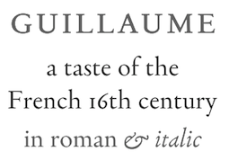 British typefounder based in Oxford. His typefaces include Guillaume (2015): Guillaume is a small family of text fonts with its roots in the French sixteenth century. The roman is based on the types of Guillaume Le Bé (c. 1525-1598), and the italic on those of Claude Garamont (Garamond) (d. 1561). The italic is especially attractive.
 In 2016, he designed Analogia, which is a digital interpretation of types used in the mid eighteenth century in books printed at Leuven, Belgium, by Martin van Overbeke. In 2018, he published the text typeface Cunaeus and explains: Cunaeus is intended primarily for use in running text. It brings together the types of two renowned sixteenth-century punchcutters: the roman is an interpretation of a pica font cut [in 1551] by Ameet Tavernier (ca. 1522-1570), and the italic that of a pica font [from 1565] of Robert Granjon (1513-1589/90). Granjon's italics have inspired a number of revivals in the past, but usually of his more slanted styles; the present digitization features the lesser slant of his so-called droit style typical of the mid 1560s. At the end of 2018, he designed Whittington, a revival of a congenial modern typeface of the mid nineteenth century, unassuming and businesslike with an even colour that reads comfortably over long stretches. It is intended primarily for use in running text. In 2019, he released Miklos, which is based on the "mediaen" roman and italic cut by Miklos Kis in Amsterdam ca. 1680. [Google]
[MyFonts]
[More] ⦿
|
György Haiman
|
Author of Nicholas Kis. A Hungarian Punch-Cutter and Printer, 1650-1702. The creator of the Janson Type, San Francisco / Budapest, 1983. [Google]
[More] ⦿
|
H. Berthold AG
|
 H. Berthold Systeme AG was founded in 1858 in Berlin by Hermann Berthold. Also known as H. Berthold Messinglinienfabrik und Schriftgiesserei, the type foundry was the largest in the world by 1918, with offices in Stuttgart, St. Petersburg, Leipzig, Riga, Budapest and Vienna. It grew by acquisitions of many other foundries, see., e.g., here. A partial list:
 - 1897 Bauer&Co, Stuttgart, 100%, Germany
- 1898-1900 Branch St. Petersburg, 100%, Russia
- 1901 Georg Ross&Co. St. Petersburg + new Branch in Moscow, 100% Russia
- 1905 J. H. Rust&Co. Vienna, 100%, Austria
- 1907 A. Haase, Prague, 100%
- 1908 Ferdinand Theinhardt GmbH Berlin, 100%, Germany
- 1912 St. Petersbrug Branch of Flinsch (later Bauer), 100%, Russia
- 1917 Emil Gursch Berlin, 100%, Germany
- 1918 Gottfried Böttger, Leipzig, 100%, Germany
- 1918 A. Kahle, Weimar, 100%, Germany
- 1920 Julius Klinkhardt, Leipzig, 100%, Germany
- 1922 C. Kloberg, Leipzig, 100%, Germany
- 1926 Poppelbaum, Vienna, 50% - 50% to D. Stempel A.G., Austria
- 1926 First Hungarian Type Foundry, Budapest, 50% - 50% D. Stempel A.G, Hungary
- 1929 Genzsch&Heyse, Hamburg 33% - 33% Bauersische Gießerei (Bauer) - 33% D. Stempel A.G., Germany
Typesetting MPEG4 movie, ca. 1935. To complement its typesetting equipment business activities, Berthold developed the Berthold Exklusiv Collection, a collection of typefaces created solely for Berthold by distinguished designers. Günter Gerhard Lange began his association with Berthold in 1952, and was artistic director from 1961-1990. In March 1991, Adobe Systems and H. Berthold AG announced that Adobe was to produce PostScript versions of numerous Berthold Exklusiv ("BE") typefaces - these typefaces were later to be known as Adobe Berthold BE fonts. Until 1999, Adobe marketed its versions of 365 Berthold Exklusivs under agreements with H. Berthold AG, and later Berthold Types Limited. H. Berthold AG also produced its own digital versions of their entire library using the Ikarus system - some of these fonts are later to be known as Berthold BQ. In 1993 the company reported insolvency. A follow-up company, H. Berthold Systeme GmbH was formed, but it finally was dissolved in 1995. Shortly before dissolution, the Berlin-based H. Berthold company signed license agreements with and transferred certain rights and trademarks to a Chicago-based US company that later took the name Berthold Types Limited, now called Berthold Direct Inc. This company now offers digital versions of the "Exklusiv" Berthold typefaces. Some of its history is explained in this letter. Old blackletter typefaces from the metal era: Ballade (ca. 1927, Paul Renner), Berthold-Fraktur (1909), Bismarck-Fraktur (1860), Breda-Gotisch (1928, house font), Englische Schreibschrift (1972, version One, version Two; for digital versions elsewhere, see English 157 by Bitstream, or Elegant Script by SoftMaker), Deutschland (ca. 1934), Hansa Kursiv (ca. 1895: art nouveau style, the light version of Regina Kursiv), Schraffierte Gotisch (before 1900; aka Stella), Mainzer Fraktur (1901, Carl Albert Fahrenwaldt for Bauer and Berthold), Morris-Gotisch (before 1905, for Bauer and Berthold), Post Fraktur (1935, Herbert Post), Prinzeß Kupferstichschrift (1905, digitized by Ralph M. Unger as Prinzess Gravur in 2010), Regina Cursiv (ca. 1895: revivals include Carlsbad (2018, Ralph M. Unger), Regina Cursiv (2007, HiH), Toffee Script (2010, Tomi Haaparanta)), Sebaldus-Gotisch (1926: revival by Ralph M. Unger in 2019 as Sebaldus; see also the earlier revivals by Ingo Preuss and Dieter Steffmann, both called Sebaldus), Straßburg (1926, a blackletter face; the digital version by Delbanco is called DS Strassburg; see also Strasburg by Gerhard Helzel), Trump-Deutsch (1936, Georg Trump). House typefaces include Isolde (1912, script face), Augustea Kursiv (1906) and Augustea Fett. Hebrew fonts in their collection include Meruba, Stam, Mirjam and Frank Ruehl. Some of the Berthold collection can nowe be bought through Monotype Imaging and Linotype. [Google]
[MyFonts]
[More] ⦿
|
Hildegard Korger
|
 Calligrapher (b. 1935, Reichenberg, d. 2018) and professor of calligraphy and writing at HGB Leipzig (Hochschule für Grafik und Buchkunst Leipzig) since 1968. Her typefaces:
 Author of Handbook of Type and Lettering (1992, Design Press, or Lund Humphries), a translation of The Sixth Edition of Schrift und Schreiben (Fachbuchverlag GmbH Leipzig, 1971), which has been lauded as the best books ever on type and typography. [Google]
[MyFonts]
[More] ⦿
|
Horst Heiderhoff on Linotype's Janson Text
|
Janson Text was originally created by Miklós Kis in the 17th century. It was updated by Linotype under the supervision of Hermann Zapf in the 1950s. Professor Horst Heiderhoff made eight weights of Janson Text in 1985 for Linotype. Linotype writes about Linotype Janson Text: A faithful recreation of one of the great seventeenth century Dutch typefaces cut by the protestant Transylvanian Nicolas Kis. The matrices survive at Stempel. Their value was recognized by Chauncey Griffith at Mergenthaler Linotype, who used Kis's 14 point to undertake the revival for composing machines while following a Voskens italic better suited to the Linotype than the Kis italics. George Ostrochulski adapted the typeface for photocomposition at Mergenthaler, returning to the original italics. [Google]
[More] ⦿
|
IBM Composer
|
The type styles of the IBM Selectric Composer, which worked with typewriter balls: - Bembo (imitated by Aldine Roman)
- Baskerville
- Bodoni
- Century Expanded (called Century here)
- News Gothic (sort of imitated by Classified News)
- Copperplate Gothic
- Kis's Janson (imitated by Journal Roman)
- Times Roman (imitated by Press Roman). Includes Press Roman Symbol (Greek, Mathematical, Technical).
- Memphis (imitated by Pyramid)
- Optima (imitated by Theme)
- Univers
- Ruling Font
Interestingly, but not surprisingly in view of today's corporate ethics, IBM "forgets" to mention that Theme is Optima, that Pyramid is Memphis, and so forth. [Google]
[More] ⦿
|
Janson
|
One Nicholas Kis's typefaces cut about 1690. Metal versions of this typefaces were cut by Stempel, Mergenthaler Linotype 1937, Linotype (London), Linotype (Frankfurt) and Lanston Monotype.' Berry, Johnson and Jaspert write: Another type which has been misnamed. The original dates from about 1690 and was cut by Nicholas Kis, a Hungarian in Amsterdam. The original matrices have survived in Germany and have since 1919 been held by the Stempel foundry. The type was not cut by Anton Janson, a Dutchman who worked at Leipzig. In the upper case the M is an easily remembered letter and in the lower case the g, which has a curved ear. In general the thin strokes are thinner than in earlier types. In the italic the m and n are more squared up. Note also the curves of the v and w. The Linotype version follows the original type was designed under the direction of C.H. Griffith. The Monotype Corporation's Ehrhardt (because the original types were in the Ehrhardt Foundry at Leipzig in the early eighteenth century) is a version of this type. [Google]
[More] ⦿
|
Janson Text
|
Designed by Hermann Zapf in 1954, based on Nicholas Kis (ca. 1700). Textism gives Janson Text a B-: Another of the great book typefaces, based on late-17th century type designed by the Hungarian printer Nicholas Kis. The version available for computer layout is better than some digital translations, but it lacks the strength required for a truly realized page. [Google]
[More] ⦿
|
Jay Rutherford
[Typoart GmbH (or: VEB Typoart)]
|
 [MyFonts]
[More] ⦿
[MyFonts]
[More] ⦿
|
Joy Reddick
|
Type designer who worked at Adobe, and who created Autologic Kis-Janson italic. [Google]
[More] ⦿
|
Mate Osvald
|
Designer of Vorm (2018), which is modeled after Miklos Totfalusi Kis's Kis Antiqua. [Google]
[More] ⦿
|
Miklós Tótfalusi Kis
|
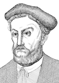 Miklós Tótfalusi Kis (Nicholas Kis) was born in Misztótfalu, Hungary, in 1650. He left for Amsterdam in 1680, where he worked on la Biblia Hungara (1685), Book of Hymns of San David (1686), and the New Testament (1687). He also published many books for children. Taught there by Dirk Voskens, he made what is now known as Janson Text around 1690. Around 1690, he made an elegant face, Nikis. He died in 1702. The story of Kis's types, now also known as Dutch types, is eloquently told by Daidala based on research by Bringhurst, Lawson, Morrison and Carter. Types influenced by him include Stempel Janson (1937, based on his original matrices), Mergenthaler Linotype Janson (1954, by Hermann Zapf; digitized in 1985), Monotype Ehrhardt (1938, named after the Ehrhardt foundry in Leipzig, where in the early 1700s his types were found), Nikis (finished by Hell Design Studio (now Linotype); see Nikis EF) and Adobe's Janson Text (based on the original matrices as well). The name Janson comes from Anton Janson, a Dutch typographer who worked in Leipzig. Janson was incorrectly credited with the designs of Kis's typefaces. Note: since 1919, Kis's original matrices are in the hands of Stempel.
 John Tranter recalls the Kis/Janson affair: In his book On Type Faces, published in 1923, the great typographic historian Stanley Morison describes a roman and italic typeface that he said was cut by Anton Janson, a seventeenth-century Dutch type foundry owner. By the 1920s the typeface had fallen into disuse, and when it was revived for the modern age on both Linotype and Monotype machines in 1937, it was named 'Janson' after its presumed designer. Even the German Stempel foundry, who owned the original 'Janson' punches and matrices from the 1600s, called it by that name. The typeface became more and more widely used. Robert Bringhurst (a poet as well as a typographer) refers to it as a wonderfully toothy and compact Baroque type. In the United States it is now the third most popular typeface for book composition, according to its frequency of appearance in the 'Fifty Books of the Year' annual exhibition organised by the American Institute of Graphic Arts. In 1939 Stanley Morison uncovered the embarrassing fact that the typeface had not been cut by Janson, but even he was unable to put his finger on the designer. It was not until the 1950s that Harry Carter and George Buday discovered that the man who had designed the type was a Transylvanian Hungarian named Nicholas (or Miklós) Kis, born in 1650. Kis took religious orders and became a teacher, and eventually decided to visit Holland and study typography, as those skills were needed in Hungary. He turned out to be very gifted at punchcutting, the shaping of metal type, and became so famous in his own time that Cosimo de Medici, the Grand Duke of Tuscany, offered him a position at his court. Kis declined the offer, and returned to Hungary in 1690, determined to spend the rest of his life designing and printing bibles. It was a time of religious and political upheaval in Hungary. The social turmoil, together with personal enmities, shortened his life, and Kis died in 1702, an embittered man. His reputation had to wait 250 years for proper recognition; and such is the conservative nature of the world of type that the typeface he created is still called 'Janson'. Detlef Schäfer writes in 1989 in his book Fotosatzschriften: No other printing type has ever generated as far-reaching a controversy as this typeface which Jan Tschichold called the most beautiful of all the old Antiqua types. For a long time, it was thought to have been designed by Anton Janson. In 1720 a large number of the original types were displayed in the catalog of the Ehrhardische Gycery (Ehrhardt Type foundry) in Leipzig. Recently, thanks to the research performed by Beatrice Warde and especially György Haiman, it has been proven unambiguously that the originator of this typeface was Miklós (Nicholas) Tótfalusi Kis (pronounced Kisch) who was born in 1650 in the Hungarian town of Tótfal. His calvinistic church had sent him to the Netherlands to oversee the printing of a Hungarian language bible. He studied printing and punch cutting and earned special recognition for his Armenian and Hebrew types. Upon his return to Hungary, an emergency situation forced him to sell several of his matrice sets to the Ehrhardt Type foundry in Leipzig. In Hungary he printed from his own typefaces, but religious tensions arose between him and one of his church elders. He died at an early age in 1702. The significant characteristics of the Dutch Antiqua by Kis are the larger body size, relatively small lower case letters and strong upper case letters, which show clearly defined contrasts in the stroke widths. The Kis Antiqua is less elegant than the Garamond, rather somewhat austere in a calvinistic way, but its expression is unique and full of tension. The upper and lower case serifs are only slightly concave, and the upper case O as well as the lower case o have, for the first time, a vertical axis. In the replica, sensitively and respectfully (responsibly) drawn by Hildegard Korger, these characteristics of this pleasantly readable and beautiful face have been well met. For Typoart it was clear that this typeface has to appear under its only true name Kis Antiqua. It will be used primarily in book design. Adobe writes that the model for Janson Text was mistakenly attributed to the Dutch printer Anton Janson. Bitstream explains: His types, the original matrices for which were obtained by Stempel in 1919, were revived for hot metal as Janson by C.H. Griffith for Mergenthaler Linotype (1937), and as Janson and Ehrhardt (1937) from Monotype. Good digitizations exist of Monotype Ehrhardt. Digitizations of Kis / Janson: - Janson (URW).
- Janson Text (1985, Linotype), supervised by Adrian Frutiger. Linotype writes: A faithful recreation of one of the great seventeenth-century Dutch typefaces cut by the Protestant Transylvanian Nicolas Kis. The matrices survive at Stempel; their value was recognized by Chauncey Griffith at Mergenthaler Linotype, who used Kis' 14 point to undertake the revival for composing machines while following a Voskens italic better suited to the Linotype than the Kis italics. George Ostrochulski adapted the face for photocomposition at Mergenthaler, returning to the original italics.
- Janson Text (Adobe). Based on, or identical to, the Linotype version.
- Monotype Janson (Monotype).
- Janson SB (Scangraphic Digital Type Collection).
- Miklos (2019, George Tulloch), based on the "mediaen" roman and italic cut by Miklos Kis in Amsterdam ca. 1680.
- Kis (ParaType), based on Bitstream's Kis BT.
- Kis Classico (Linotype), by Franko Luin.
- Tyrnavia (T-26).
- Kis (Bitstream).
- Kis Antiqua Now TH Pro (Elsner+Flake) and Kis Antiqua Now TB Pro (Elsner+Flake). Dated 2008, by Erhard Kaiser for Elsner & Flake, after an earlier version of Kis Antiqua published by them that was based on Hildegard Korger's Kis Antiqua at Typoart, 1986-1988.
- David Berlow at Font Bureau did a revival in 2007 called Kis FB.
- Berthold Kis BQ.
- Kis (Celia Merchal Garcia, 2017).
- Noteworthy are the italics of Reiher Headline (2018, Ramiro Espinoza) that are based on Kis's Aszendonica.
Bio by Nicholas Fabian. View the Janson / Kis typefaces at MyFonts. [Google]
[MyFonts]
[More] ⦿
|
Monotype Ehrhardt
|
 Historical discussion by the typophiles of Ehrhardt, a type attributed at Nicolas Kis, ca. 1700, and Wolfgang D. Ehrhardt of the Ehrhardtsche Gesserei in Leipzig, Germany. The discussion by the typophiles focuses on the Monotype version of Ehrhardt, 1936-1937.
 Caleffi writes: There's an interesting essay on Monotype Ehrhardt by Harry Carter in a reprint of Stanley Morison's "A Tally of Types"; there, Carter tells the story of that typeface revival, stating, among other things, that the "Nonesuch Press had a case or two of the 14-point (Didot) [Ehrhardt] in its cellar and set a few small books in it from 1927 onwards. Some of the Nonesuch fount eventually found its way to Cambridge [to Monotype] ... The type was favoured enough to make the American Linotype and Monotype companies cut it for their machines ... Both completed their series in 1937". Carter doesn't quote any specific designer or punch-cutters, but adds that in 1937 Morison started working on a "different treatment" of the type, named "Series 453", which in the end, in Carter's words, resulted in "an exercise in making a Fleischman out of a Kis". Again, there's no mention of any cutter. So it seems that the first Monotype version was faithfully based on the Nonesuch Press cut, while the second one was more an interpretation given by Morison? Anyway, I suggest to everyone to get copy of "A Tally of Types", it is a wonderfully written and beautifully typeset book, even if one doesn't agree with Morison's vision or statements. It seems Chauncey Griffith was involved in the Mergenthaler Linotype version in 1936-1937. And Morison seems to be the main guy for Monotype in 1937. Robin Nicolas, who has a long Monotype experience, writes: I am pretty sure that no other designer (outside of Monotype) was involved in the development of Ehrhardt. The account by Harry Carter in the 1973 'Tally of Types' seems pretty accurate to me. I think it was Morison's take on Janson---made a little heavier and narrower to give improved legibility and economy. The project started in 1936 and was originally called 'Old Hollandische' but Morison scrapped the first trial, which had been based on 'Janson Antiqua 12pt', and re-started the work in 1937, based on a different model. [Google]
[More] ⦿
|
MyFonts: Nicolas Kis
|
Commercial typefaces based on Nicolas Kis's type [or Janson's type]: [Google]
[More] ⦿
|
Omnibus Typographi
[Franko Luin]
|
 Fonts designed by talented Swedish designer Franko Luin (born in Trieste, Italy in 1941, to Slovenian parents). Luin immigrated to Sweden in 1961. After studying at the Grafiska Institutet during the 1960s, Franko Luin spent two decades as a print designer for Ericsson before becoming independent. In the 1990s he was involved in multimedia and typeface design. In 1996, he founded his own typographic studio, Omnibus Typografi. At some point, he led a course in Web Typography at the Berghs School of Communication in Stockholm. Franko Luin passed away on September 15, 2005, in Tyresö, Sweden. Autobiography. Obituary by Dan Reynolds. Linotype pages on Luin.
 His typefaces, all at Linotype: View Franko Luin's typefaces. [Google]
[MyFonts]
[More] ⦿
|
ParaType
|
 The main digital type foundry in Russia. ParaType was established as a font department of ParaGraph International in 1989 in Moscow, Russia. At that time in the Soviet Union, all typeface development was concentrated in a state research institute, Polygraphmash. It had the most complete collection of Cyrillic typefaces, which included revivals of Cyrillic typefaces developed by the Berthold and Lehmann type foundries established at the end of 19th century in St. Petersburg, and artwork from Vadim Lazurski, Galina Bannikova, Nikolay Kudryashov and other masters of type and graphic design of Soviet time. ParaType became the first privately-owned type foundry in many years. A license agreement with Polygraphmash allows ParaType to manufacture and distribute their typefaces. Most of Polygraphmash staff designers soon moved to ParaType. In the beginning of 1998, ParaType was separated from the parent company and inherited typefaces and font software from ParaGraph. The company was directed by Emil Yakupov until February 2014. After Yakupov's death, Irina Petrova took over the reins.
 Products include FastFont, a simple TrueType builder, ParaNoise, a builder for PostScript fonts with random contours, FontLab, a universal font editor and ScanFont, a font editor with scanning module. Random, customized fonts. Multilingual fonts including, Latin, Cyrillic, Arabic, Greek, Georgian and Hebrew fonts for Macintosh and Windows. Catalog. Designers. Alternate URL. Famous typefaces by Paratype include Academy, Pragmatica, Newton, Courier, Futura, Petersburg, Jakob, Kuenstler 480, ITC Studio Script, ITC Zapf Chancery, Amore CTT (2004, Fridman), Karolla, Inform, Hafiz (Arabic), Kolheti (Georgian), Benzion (Hebrew). The PT Sans (Open Font Library link), PT Serif and PT Mono families (2009-2012) are free. PT stands for Public Type. Another download site. PT Sans, for example, consists of PTSans-Bold, PTSans-BoldItalic, PTSans-Caption, PTSans-CaptionBold, PTSans-Italic, PTSans-Narrow, PTSans-NarrowBold, PTSans-Regular. Other free ParaType fonts include Courier Cyrillic, Pushkin (2005, handwriting font), and a complete font set for Cyrillic. Type designers include Vladimir Yefimov, Tagir Safayev, Lyubov Kuznetsova, Manvel Schmavonyan and Alexander Tarbeev. They give this description of the 370+ library: The Russian constructivist and avant garde movements of the early 20th century inspired many ParaType typefaces, including Rodchenko, Quadrat Grotesk, Ariergard, Unovis, Tauern, Dublon and Stroganov. The ParaType library also includes many excellent book and newspaper typefaces such as Octava, Lazurski, Bannikova, Neva or Petersburg. On the other hand, if you need a pretty typeface to knock your clients dead, meet the ParaType girls: Tatiana, Betina, Hortensia, Irina, Liana, Nataliscript, Nina, Olga and Vesna (also check Zhikharev who is not a girl but still very pretty). ParaType also excels in adding Cyrillic characters to existing Latin typefaces -- if your company is ever going to do business with Eastern Europe, you should make them part of your corporate identity! ParaType created CE and Cyrillic versions of popular typefaces licensed from other foundries, including Bell Gothic, Caslon, English 157, Futura, Original Garamond, Gothic 725, Humanist 531, Kis, Raleigh, and Zapf Elliptical 711. Finally, ParaType offers a handwriting font service out of its office in Saratoga, CA: 120 dollars a shot. View the ParaType typeface library. Another view of the ParaType typeface collection. [Google]
[MyFonts]
[More] ⦿
|
Péter Maczö
|
Hungarian type expert. He published an article in Magyar Grafika (2002, vol. 5, pp. 2-7) on the legacy of Miklós Tótfalusi Kis. [Google]
[More] ⦿
|
Ralph Michael Unger
[RMU (Ralph Michael Unger Typedesign)]
|
 [MyFonts]
[More] ⦿
[MyFonts]
[More] ⦿
|
Ramiro Espinoza
[Re-Type]
|
 [MyFonts]
[More] ⦿
[MyFonts]
[More] ⦿
|
Re-Type
[Ramiro Espinoza]
|
 Argentinian designer Ramiro Espinoza (b. Santa Fe, 1969) studied at the Universidad Nacional del Litoral in Santa Fe. He dabbled in fonts at his gorgeous (but now defunct) Jazz Futurezone site. In 2007, he founded Re-type, where he heads a group of designers including Yomar Augusto, Leo Beukeboom and Ricardo Rousselot. Ramiro graduated from the Type and Media's KABK (Den Haag) in 2004. He taught typography at the Universidad Nacional del Litoral, Universidad de Buenos Aires and the Escola d'Art i Superior de Disseny in Valencia, Spain. At FontShop International, he was in a team that converted more than 50 font families to OpenType. He freelances occasionally for David Quay's studio. He joined Type Network in 2017. He is currently located in Amsterdam. His typefaces:
 - Mabella (2001), a free font dedicated to the Argentinian feminist activist Mabel Bellucci. It was for some time available at Sudtipos but discontinued there. It is still at Dafont.
- Bellucci (2008), a commercial redesign of Mabella.
- The display font Mariabrug (2002). This too is no longer available--it was redesigned and marketed as Kurversbrug, one of the ReType's fonts. Kurversbrug (2007) is a revival of the famous letters appearing on Amsterdam's bridges: the letters were probably designed by Anton Kurvers (b. Den Haag, 23 July 1889; d. Amsterdam, 29 January 1940).
- At Union Fonts: Lula (2002-2003).
- Maitena (2003), a free font based on the hand of an Argentinian comic artist, Maitena Burundarena.
- Lavigne (2004-2010): Lavigne Display is the first release of a type-family aimed at publications such as interior design and women magazines-anywhere a touch of distinction is to be desired. Lavigne Display won an award at TDC2 2010. Lavigne Display and Lavigne Text (a modern serif family) were both winners at Tipos Latinos 2010.
- Tomate (2008) is a brush lettering / signage script font influenced by Goudy Heavyface Italic. It won an award at Tipos Latinos 2010.
- Barbieri (2009) is a signage face.
- Work on Severino (2004) has been abandoned.
- Smidswater Italics (2009): Smidswater is a Dutch graphic design studio with offices in The Hague and Breda. They had a corporate font (designed by Paulus Nabbe and Onno Bevoort) but wanted to expand the package adding italics and light weights. Ramiro Espinoza was commissioned for this and now Smidswater Font is a complete set extensively used in the studio's indentity.
- Bath (2010-2011) is a Dutch typeface developed with David Quay for the signage and orientation in the city of Bath.
- Winco (2012) is a glyphic (flared, incise) type family created from scratch. Espinoza mentions Arpke Antiqua and Globus Cursive as indirect influences on his new type family. It won an award at Tipos Latinos 2012.
- Krul (2012) is an interpretation of the Amsterdamse Krulletter style of calligraphic signage. This was presented at ATypI 2013 in Amsterdam. A book entitled Amsterdamse Krulletter by Rob Becker and Ramiro Espinoza was published by Lecturis.nl in 2014. The English edition, The Curly Letter of Amsterdam followed in 2015.
- Dulcinea (2012), a chancery / penmanship typeface. He writes: Dulcinea looks at Spanish Baroque calligraphy's most extreme tendencies, and especially at some of those produced by the writing masters Pedro Diaz Morante and Juan Claudio Aznar de Polanco. These 17th and 18th century alphabets with their plentiful calligraphic flourishes represented a marked break with the harmonic and angular Renaissance Cancellaresca style. It was Morante who first introduced and popularized the use of the pointed quill in Spain, and although his famous text entitled Arte Nueva de escribir(first volume published in 1616) contains alphabets that have much in common with traditional broad nib Cancellaresca calligraphy, most of the examples therein are outgrowths of the new models put forward by the Italian master Gianfrancesco Cresci. The swashes are complex and intricate, but at the same time they feature a profusion of defects. Many of them sometimes come close to ugliness. However, these pages contain an artistic essence that bears a relationship to the ironic and sometimes somber character of Spanish Baroque.
- Medusa (2013) is a delicate copperplate penmanship script based upon renowned master Ramón Stirling. Helped in the type production by Paula Mastrangelo, Ramiro looked very carefully at the original manner in which glyphs connected. This typeface will win awards. Well, I wrote the previous sentence on the day I first saw Medusa. Medusa won an award at TDC 2014. In March 2014, it won an award at Tipos Latinos 2014.
- Laski Slab, co-designed with Paula Mastrangelo, won an award at Tipos Latinos 2014. It is based on Paula's thesis work in 2012. Ramiro Espinoza kept on developing that typeface and published Laski Sans in 2016.
In 2017, he published Guyot Headline (a revival of Françcois Guyot's types). Guyot Text followed later in 2017---it is very legible even at small print sizes and is a sturdy workhorse overall. Winner at Tipos Latinos 2018 of a type design award for Guyot. Guyot also won an award won an award at TDC Typeface Design 2018. In 2020, Guyot was selected as a typeface for Garcia Media's redesign of the major German finacial newspaper, Handelsblatt. - Reiher Headline (2018). A typeface family inspired by two fonts displayed in the famous Ploos van Amstel specimen, first printed in Amsterdam in 1767. The Reiher Headline romans were based on the handsome N° 1 Groote Paragon Romein, a rather condensed typeface whose punchcutter has not yet been identified. Reiher Headline's italics were based on the Aszendonica types attributed to Nicholas Kis. Several of the ornaments included in the Reiher types have been ascribed to J.F. Rosart. Espinoza further expanded the possibilities of his new family with Reiher Headline Open, a decorative inline version of Reiher Headline Bold. Reiher Headline was designed for magazine and newspapers.
- Dejanire and Dejanire Headline (2019), a typeface family loosely inspired by an anonymous display typeface found in the type specimen of Claude Lamesle, published in Paris in 1742. It takes its name from Deianira, a Calydonian princess in Greek mythology and the wife of Heracles. Lamesle introduced it under the blah name of Gros canon deux points de gros romain. Ramiro Espinoza set out to improve Lamesle's typeface by fixing its flaws while preserving its freshness. It was followed in 2020 by Dejanire Sans and in 2022 by Dejanire Text and Dejanire Jewel (a baroque, profusely ornate set of capitals inspired by a set of titling capitals found in a religious decree printed in 1800 by Pedro Battle in Barcelona).
- Kranto (2021). A 144-style sans serif typeface inspired by British and German grotesque typefaces from the first half of the twentieth century. It features weights from thin to black, widths from regular to condensed, and x-heights from small to large (called text, normal and display).
MyFonts interview in 2012. Speaker at ATypI 2018 in Antwerp. Fontspace link. Dafont link. Behance link. Type Network link. [Google]
[MyFonts]
[More] ⦿
|
RMU (Ralph Michael Unger Typedesign)
[Ralph Michael Unger]
|
 Ralph M. Unger (b. 1953, Thuringia, East Germany) says this about himself at MyFonts: Typesetter from the composing stick via Linotype setting machines to the Mac. Jobs in various Thuringian printeries. Barred further education by Communist authorities due to political reasons. Imprisoned in East Germany. Since 1988 in the state of Baden-Wuerttemberg, former West Germany. Jobs in several newspaper printing houses as advertisement compositor. Own office since 1995, in Aalen, Baden-Wuerttemberg. He lives in Schwaebisch Gmuend, and was a freelance type designer for Profonts and URW++, where he contributed frequently to their libraries between 2002 and 2009. In 2009, he founded RMU. MyFonts link. I split his contributions into two groups, the URW / Profonts group, and the RMU group. The prefix FontForum refers to a subseries of URW++ fonts. Unless specifically mentioned, all the following fonts are at URW++ and/or Profonts:
 - FontForum Admiral Script (2005): revival of Middleton's Admiral script from 1953.
- Amitié (2009): a garalde family.
- Arabella Pro (2006): after the script by Arnold Drescher from 1936, published at Joh. Wagner.
- Fontforum Atrament (2006): architectural lettering. Do not confuse with a Suitcase Type Foundry font from 2003 by the same name.
- Atze (2010): a comic book family.
- Behrensschrift D (2007): after the jugendstil typeface Behrens Schrift, 1902, by Peter Behrens.
- FontForum Bernhard Script (2005): after Bernhard Script from the 1920s.
- Bradley (2005): blackletter, after the original by William H. Bradley.
- Breite Kanzlei (2007).
- Breitkopf Fraktur (2003): after the original by Johann Gottlob Immanuel Breitkopf, done in 1793.
- Brocken (2011) is a signage typeface inspired by a design of Volker Küster (1960s).
- Profonts Bureau (2010, Profonts): a minimalist rounded sans family.
- FontForum Calypso (2005): a revival of Roger Excoffon's Calypso (1958).
- Card Pro (2006): a decorative display based on Ella Cursief (1916, Sjoerd Hendrik de Roos, Lettergieterij Amsterdam).
- Chaweng (2006, Profonts): an oriental all caps simulation face.
- Civilite URW (2005).
- Compliment (2004, casual script). Based on a 1965 script by Helmu Matheis for Ludwig & Mayer.
- Cranach (2007): a blackletter typeface modeled after Kuenstler Gotisch from the Krebs Foundry.
- Dominante (2007): a serif family based on Johannes Schweitzer's font by that name, 1959.
- Dominique (2010, profonts): an informal typeface.
- FontForum URW Ecsetiras (2005): revival of Ecsetirás (Zoltan Nagy, 1967, a brush face).
- Edda Pro (2008). An art nouveau typeface that revives a Heinrich Heinz Keune typeface from 1900.
- Energia Pro (2008, Profonts): connected monowidth script, based on Arno Drescher's Energos from 1932.
- Estro (2003, Western lettering). Seems close to Nebiolo's Estro from the 60s.
- Eurobrush Pro (2007, Profonts): handwriting.
- EuroSans (2008).
- Euroscript Pro (2006, Profonts): school script typeface based on his own handwriting.
- Flashes (2007): a revival of Crous-Vidal's Flash, 1953.
- Fox (2007): a brush script based on W. Rebhuhn's original from the 1950s.
- Gamundia (2010): a calligraphic copperplate script inspired by Excoffon's Diane.
- Ganz Grobe Gotisch (2006): a fat blackletter modeled after the original by F.H.E. Schneidler.
- Gmuender Elan Pro (2011) is a 1950s style script face.
- Gradl Nr 1 (2008): based on hand-drawn art nouveau upper case characters by M. J. Gradl, ca. 1900.
- Graphique Pro (2008): shaded caps face, based on Graphique, which was originally created by Swiss designer Hermann Eidenbenz in 1945, and issued as hot metal font by Haas'sche Schriftgießerei. See also New Graphique Pro (2011).
- Handel Slab (2009): a 6-style extension of Trogram's 1980 typeface Handel Gothic.
- Hanseat (2010): a grotesque family done at Profonts. It was heavily inspired by Germany's official DIN 1451 Engschrift.
- Iova Nova (2007): based on Jowa Script, designed by J. Wagner in 1967.
- Profonts>Impression (2008): art deco.
- Jessen Schrift (2004): after the Rudolf Koch blackletter typeface by that name.
- FontForum URW Konzept Pro (2005): revival of Konzept (1968, Martin Wilke's handprinting face).
- Legende (2002): a script typeface based on the original typeface of Friedrich Hermann Ernst Schneidler (1937).
- Leipziger Antiqua. The original Leipziger Antiqua by Alfred Kapr at Typoart dates from 1971 until 1973. The digital version of Leipziger Antiqua was developed by Ralph M. Unger in 2005.
- Manuskript Antiqua (2005): after Oldrich Meinhart's Manuskript Antiqua.
- The Maszynysta family of heavy industrial sans typefaces (2010) have a textured style (Struktura), a Shadow, and a plain Roman.
- Maxim (2003, Profonts): The heavy brush typeface Maxim was originally designed by Peter Schneidler in 1956 for the Bauer foundry.
- New Bayreuth (2008): after Friedrich Hermann Ernst Schneidler's Bayreuth from 1932.
- Old Borders and Lines (2010). A free font.
- Ornella (2008): Jugendstil.
- Peter Schlemihl (2008, Profonts): a revival of a blackletter by Walter Tiemann.
- Pedell (2009): a casual script.
- Polo (2002): a brush face modeled after Carl Rudolph Pohl's Polo (1960).
- In 2012, Ivana Koudelkova co-designed the grungy headline typeface Retroactive Pro with Ralph M. Unger at Profonts.
- Fontforum Rhapsody (2006): a revival of Ilse Schüle's rotunda face.
- Roberta (2003): art nouveau typeface after obert Trogman's typeface for FotoStar.
- FontForum Signs and Symbols (2006).
- Splendor (2009): a revival of a brush script typeface by Wilhelm Berg, Schriftguss, 1930. See also Splendor Pro (2014).
- Sportowy (2009): an outline face.
- Stanford (2011). A sports lettering face.
- Stiletto (2006): a medieval script.
- Fontforum Stripes (2007): a multistripe op art display typeface based on a Letraset font from 1973 by the same name.
- Fontforum Thalia (2006): retro font.
- Tintoretto (2006): shadow display face based on an origonal by Schelter & Giesecke.
- Tip Top Pro (2008): a Julius Klinkhardt art nouveau typeface revival.
- FontForum Unciala (2005): a revival of Oldrich Menhart's typeface Unciala (1953, Grafotechna).
- Unger Chancery (2005).
- Unger Script (2003): based on H. Matheis' Slogan typeface designed for Ludwig&Mayer in 1957.
- Veltro (2007): after a 1931 original by G. da Milano at Nebiolo.
- Profonts Woodpecker (2008).
The list of RMU fonts: - Affiche (2017). A revival of Helios Reklameschrift of the Klinkhardt foundry.
- Aldo Manuzio (2017). After a house typeface from 1897 by Schelter&Giesecke.
- Amati Pro (2010): after Georg Trump's condensed didone face, Amati, 1951.
- Antiqua Florenz (2021). A revival and extension of Paul Zimmermann's Antiqua Florenz (1960, Ludwig & Mayer), which is based on Venetian romans.
- Avus Pro (2012). A sans family that extends Gert Wunderlich's Maxima (1970).
- Baroque Pearl (2016). A pearly typeface that revives Peter A. Demeter's Fournier Geperlt (1922, Schriftguss).
- Behrens Kursiv (2013). After a 1906 original by Peter Behrens.
- RMU Belvedere (2020). A revival of Heinrich Wieynck's art nouveau / fin-de-siècle typeface Belvedere (1906, Bauer).
- RMU Bison (2020). A revival of Julius Kirn's brush script Bison (1935-1938, C.E. Weber).
- Bernhard Blackletter (2016). After Lucian Bernhard's extrafette Bernhard Fraktur (1921).
- Bernhard Cursive Extra Bold (2010).
- Borghese (2015). An art nouveau font after a Schelter & Giesecke original from 1904.
- Borgis Pro (2012). A Clarendon-style text family.
- Boulette (2015, a fat creamy script).
- RMU Bowery (2019) A revival of Old Bowery (1933, ATF)).
- Bravura Pro (2013). After G.G. Lange's Publica.
- Bricklayers (2012). An original fat slab display face.
- Brillant (2009): art nouveau and ultra heavy.
- Butti (2011). A script family paterned after Fluidum (1951, Alessandro Butti, Nebiolo).
- Cable Condensed (2014). Based on Koch's Kabel.
- Caesar Pro (2011). A flared sans typeface after Caesar Schrift (1913, Georg Schiller, C.F. Rühl).
- Capitol Pro (2012). An art deco typeface based on Capitol (Karl Hermann Schaefer for Schriftguss, 1931).
- Carina Pro (2017). A calligraphic script typeface based on Rautendelein (1929, Schriftguss).
- Carla Pro (2013). A broad-nibbed script modeled after Ballantines Script (Elsner & Flake, 1974; see also Ballantines Serial by SoftMaker).
- Carlsbad (2018). A couple of art nouveau typefaces based on originals from 1895 by H. Berhold called Regina Cursiv and Hansa Cursiv.
- Caslon Gotisch (2009): after the original by William Caslon from 1763.
- Celebration (2009): blackletter.
- Circensis (2016). A Western circus font based on a concept of Fritz Richter.
- Claudius (2010): after a 1937 blackletter font at Klingspor.
- Constanze Pro (2012). A light cursive typeface based on Constanze (1954, Joachim Romann, Klingspor).
- Contact Pro (2010): after Contact, a 1963 font by Helmut Matheis.
- Dante Alighieri (2018). Based on a Schelter & Giesecke original.
- Daphnis (2016). A revival of Daphnis (1929, Walter Tiemann).
- Deutschmeister (2017). A textura blackletter typeface after Deutschmeister by Berthold Wolpe for Ludwig Wagner in 1934. (Some dispute that Wolpe made this font.)
- Diamant Pro (2012). A transitional serif face.
- Emilia (2016). Based on Weiss Antiqua (1928) by Emil Rudolf Weiss.
- Neue Echo (2016). Based on Echo for Schriftguss.
- Elbflorenz (2020). A revival of Albert Auspurg's display typeface Miami (1934, Schriftguss).
- Emilia Gotisch (2016). After Weiss Gotisch (1936) by Emil Rudolf Weiss.
- Emilia Fraktur (2021). A revival of Emil Rudolf Weiss's Weiss Fraktur (1913).
- Erler Titling (2015). After Erler Versalien (1953, Herbert Thannhaeuser for Typoart).
- Eurotech Pro (2011): a slabby techno family.
- Faulkner Pro (2011): a connected heavy signage script based on Alan Meeks's Kestrel.
- Fette Kanzlei (2019).
- Fette Unger Fraktur (2010).
- Fichte Fraktur (2020). After Walter Tiemann's Fichte Fraktur (1934).
- Fontanesi RMU. An ornamental caps typeface that revives Aldo Novarese's Fontanesi (2018).
- Forelle Pro (2010): after the original Forelle script typeface by Erich Mollowitz, 1936.
- Frankenberg Pro (2012). An antique script face.
- Gabor Pro (2014). A connected copperplate script.
- Gaby Pro (2017). A revival of Hans Möhring's script typeface Gabriele (1938 or 1947, C.E. Weber).
- Garamond Antiqua Pro (2015).
- RMU Gilgengart (2020). A revival of Hermann Zapf's Fraktur font Gilgengart (1938).
- Gillray Pro (2015). A copperplate script after Hogarth Script (by Harald Bröder for Typoart).
- RMU Gloria (2019). After Gloria (1898, Emil Gursch).
- RMU Gong (2020). Based on Arno Drescher's Super Grotesk Schmalfett first released in 1933 at Schriftguss.
- Gmuender Gravur (2011). A 3d shadow face. Gmuender Antiqua Pro (2015) is influenced by the metal font Imprimatur (1952-1955, Konrad F. Bauer and Walter Baum). Gmuender Kanzlei (2018) is a blackletter typeface.
- Goethe Fraktur (2022). A revival of a blackletter typeface by Wilhelm Woellmer (1905).
- Gravira (2021). A revival of Herbert Thannhaeuser's Gravira, released by Schelter & Giesecke in 1935 .
- Haenel Antiqua (2020, based on a 19th century antiqua by Eduard Haenel) and Haenel Fraktur (2011, after Haenel Fraktur, ca. 1840).
- Hanse Textura (2020). A revival of a textura by Hermann Zapf.
- RMU Helion (2020). A revival of the 3d titling typeface Helion (1935, Arno Drescher for Schriftguss Dresden).
- RMU Herkules (2019). After a late 19th century font by Bauer and Berthold called Reklameschrift Herkules.
- Hoelderlin (2018). After Eugen Weiss's Hoelderlin blackletter font (1937).
- Hoyer Script (2017). After Hanns Thaddeus Hoyer's Hoyer Schoenschrift (1939, Stempel).
- Hupp Fraktur (2016). After Otto Hupp, 1911.
- Impuls (2010): a brushy typeface based on Paul Zimmermann's Impuls (1945).
- Initials RMU One (2012) consists of revivals of Rudhardsche Initialen (Otto Eckmann, ca. 1900) and Walthari Initials (ca. 1900, Rudhardsche Giesserei). Initials RMU Two (2012) consists of revivals of Jubilaeumsinitialen (by Bauersche) and Augsburger Initialen (by Peter Schnorr, 1901).
- Jean Paul Fraktur (2021). A revival of Breitkopf's Fraktur font Jean-Paul-Schrift (1798).
- Jobs Gravure (2011). It had to happen---a few days after Steve Jobs' death, Unger released the beveled engraved typeface Jobs Gravure, which is an extension of Trump Gravur (1954, Weber).
- Jolly Polly (2012): a curly non-connected script face.
- Kis Antiqua Pro (2018). A revival of Hildegard Korger's Kis Antiqua at Typoart.
- Kleist Fraktur (2010): after Walter Tiemann's original.
- Kompress Pro (2013). Two compressed sans typefaces.
- RMU Kontrast (2021). An art deco typeface that revives Kontrast (1930, F.H.E. Schneidler at Weber).
- Koralle RMU (2018). A revival of Schelter and Giesecke's Koralle (1915).
- Korpus Pro (2014). A text typeface family. Followed later in 2014 by Korpus Sans Pro.
- Korpus Serif Pro (2021). A revival and extension of Timeless (Typoart) that covers Greek, Latin and Cyrillic.
- Leibniz Fraktur (2012) is modeled after the famous Genzsch & Heyse blackletter font.
- Lenbach (2021). Inspired by a German font from the Victorian era.
- Liliom Pro (2012). A beautiful fat didone typeface based on an original from the Fonderie Française.
- Lipsia Pro (2011). An angular serif family.
- Literatura Pro Book (2012).
- Litfass (2021). A revival of an art nouveau font by Flisch.
- Lutetia Nova (2014). A fresh two-style take on Jan van Krimpen's Lutetia (1924).
- RMU Luchs (2021). A redesign of Jakob Erbar's inline all caps art deco font Lux (Ludwig & Mayer, 1929).
- Luxor Pro (2010): a Victorian/Western display face.
- Lyrica (2014). A revival of the informal blackletter typeface Lyrisch (1907, Georg Schiller).
- RMU Magnet (2021). A redesign and revival of Magnet (1951, Arthur Murawski at Ludwig & Mayer).
- RMU Manolo (2019). Based on the art nouveau typeface Manolo (Ludwig & Mayer).
- Manutius Pro (2012).
- Meister Antiqua (2011, +Bold, +Book). A Typoart original from 1951 in the tall flared ascender serif genre, revived and extended.
- Mitropaschrift (2016). An octagonal original.
- Mobil Pro (2011). A semi-script typeface in the fifties style of Matheis.
- Monument (2010): a 3d shadow roman caps face created after Oldrich Menhart's Monument.
- Narziss (2018). A revival of Walter Tiemann's Narziss from 1921.
- RMU Neptun (2021). A revival and extension of the art nouveau typeface Neptun by Aktiengesellschaft fuer Schriftgiesserei und Maschinenbau, Offenbach.
- Neue Kurier (2011). Typoart's popular signage script font in a new, completely remastered version.
- Neue Muenchner Fraktur (2010).
- Neue Schwabacher (2021). After Albert Anklam's Neue Schwabacher (Genzsch & Heyse, 1876).
- Neue Thannhaeuser (2011).
- Old Towne Pro (2010): a Western font.
- RMU Omega (2020). After Omega, an art deco typeface by Friedrich Kleukens at Stempel in 1926.
- Orbis Pro (2016). A revival of Walter Brudi's shadow typeface Orbis (1953, Stempel).
- Orplid Pro (2019). a layerable typeface that revives and extends Hans Bohn's all caps Bauhaus era typeface Orplid (1929).
- Parcival Antiqua (2016). A revival of Parcival Antiqua (1926, Herbert Thannhaeuser).
- Parfum (2013). A low x-height script that was inspired by Howard Allen Trafton's Quick (1933, bauer).
- Parler Fraktur (2018). A revival of Friedrich Poppl's Poppl Fraktur.
- Parler Gotisch (2011). A blackletter face.
- RMU Pittoreske (2019). A decorative Victorian typeface.
- Plastica Pro (2015, a chiseled typeface inspired by a J. Lehmann design).
- RMU Pergola (2021). A vintage shadow typeface inspired by a late-19th century font of Georg Giesecke.
- Post Fraktur (2014) and Postillon (2014). After Herbert Post, 1933-1937.
- Primana Pro (2012). A seductive geometric grotesk family.
- Prinzess Gravur (2010): a blackletter typeface modeled after Prinzeß Kupferstichschrift (1905, Berthold).
- Prisma Pro (2011). Revival and extension of Rudolf Koch's multiline typeface Prisma (1931).
- Reklame Fraktur (2016). After Reklame Fraktur by Albert Christoph Auspurg, 1914.
- Reflex Pro (2018). All caps, with an inline style.
- Reznicek Pro (2011) is a post-Victorian pre-art nouveau typeface named after Ferdinand von Reznicek (1868-1909), one of the leading artists and illustrators of those times.
- Rekord Antiqua (2020). A revival of the art nouveau era text typeface Rekord Antiqua (1911, Wagner & Schmidt).
- Rhythmus Pro (2016). After a Schriftguss AG and Schelter&Giesecke original grotesk, and extended to cover Cyrillic.
- Ridinger Std (2012). Based on Riedingerschrift (Franz Riedinger, 1906, for Benjamin Krebs Succ.).
- Ronde Pro (2011): roundhand script.
- Royal Grotesque (2021). A revival of Wotan by Wagner & Schmidt, 1914. Did this typeface become RMU Royal Sans (2022)?
- Salzmann Fraktur (2019). A revival of Max Salzmann's blackletter font released by Schelter & Giesecke in 1912.
- Saskia Pro (2016). Revival of Jan Tschichold's Saskia (1931, Schelter & Giesecke).
- Schmale Anzeigenfraktur (2009): based on Koch's Schmale Deutsche Anzeigenschrift, 1923, Klingspor.
- Schmale Mediaeval (2020). Based on Schelter & Giesecke's Schmale Mediäval (1840).
- Schmuckinitialen (2009): an ornamental caps typeface in the art nouveau style based on Walthari Initials [Walthari (1899, Heinz König for the Rudhard'sche Giesserei) in the upper case and Eckmann Initials (ca. 1900, by Otto Eckmann, Germany's chief art nouveau type designer) in the lower case].
- Schreibmeister (2021). Ralph's interpretation of Arno Drescher's formal cursive typeface for Ludwig Wagner (1958, Leipzig).
- Schwabacher Book (2013).
- Sebaldus (2019). A heavy blackletter typeface, after Sebaldus Gotisch (1926, H. Berthold).
- Senatsfraktur (2020). After Friedrich Bauer's Senats Fraktur done in 1907 for Genzsch & Heyse.
- Concordia (2020). A revival of Sensation Schmalfett (1914, Heinrich Hoffmeister).
- Siegfried Pro (2017). A revival of the art nouveau typeface Siegfried (1900, Wilhelm Woellmer).
- RMU Skizze (2021). This revives Walter Höhnisch's script typeface Skizze (1935, Ludwig&Mayer).
- Staxx Pro (2013). A prismatic typeface.
- Staufer Gotisch (2015). An engraved blackletter typeface modeled after Herbert Thannhaeuser's Hermann Gotisch (Schriftguss, 1934).
- Steinschrift Pro (2015). A single style condensed sans serif.
- Sylphe Pro (2019). A vintage script font that revives Schelter & Giesecke's Isabel (not Sylphide, as claimed by him).
- Tablica (2017). After Karl-Heinz Lange's DDR telephone directory font Minima (1984).
- Thannhaeuser Fraktur (2013) is a redesign of Typoart's Thannhaeuser Fraktur.
- Thomasschrift (2014). A rustic typeface that revives and extends Thomas-Schrift by Friedel Thomas (1957-1958, Typoart).
- Titanschrift (2011). A yummy soft and fat display face.
- Tombola (2018). After an alphabet from the 1920s by Otto Heim.
- RMU Trianon, renamed RMU Trifels (2020). After Heinrich Wieynck's Trianon (1905, Bauersche Giesserei).
- Trocadero Pro (2010): an extension and revival of Trocadero Kursiv, 1927, Albert Auspurg, Trennert.
- Troubadour Pro (2010): In Medium and Engraved styles.
- Trump Deutsch (2011): a blackletter face, after the 1935 original by Georg Trump.
- Trybuna (2013). Based on Herbert Thannhaeuser's Liberta Antiqua (1958), but completely redrawn.
- Turnier (2019). A revival of G.G. Lange's derby (1952-1953).
- Tyton Pro (2013). A brush script after Heinz Schumann's famous 1964 Stentor.
- Typoskript Pro (2010): a revival of Hildegard Korger's Typoskript, first done at TypoArt in 1968.
- Unger Fraktur (2010): after a 1793 design by Johann Friedrich Unger; includes fett and mager.
- Walbaum Antiqua Pro (2013). A revival of Justs Erich Walbaum's didone classic.
- RMU Wallau (2019). After Rudolf Koch's rotunda typeface Wallau (1926-1934).
- Werbedeutsch (2021). A revival of the blackletter typeface Buchdeutsch (Ernst Schneidler, 1926).
- Wieynck Fraktur (2019). after Heinrich Wieynck's Wieynck Fraktur (1912).
- Wieynck Gotisch (2018). After Wieynck Gotisch (1926, Heinrich Wieynck).
- Zentenar Fraktur (2010): mager and halbfett; after the 1937 workhorse by Ernst Schneidler at Bauer.
- Zierfraktur (2010): after Deutsche Zierschrift, an engraved blackletter font that was cut by Rudolf Koch between 1919 and 1921 for Klingspor.
Ralph made some typefaces outside URW/Profonts and RMU, such as Stripes (2014, a prismatic typeface puvlished by Thinkdust). Klingspor link. View Ralph M. Unger's typefaces. [Google]
[MyFonts]
[More] ⦿
|
Stan Knight
|
Idaho-based author of - Historical Scripts from Classical Times to the Renaissance (1998, Oak Knoll Press, New Castle, DE). This is an excellent survey of bookhands containing full-page, enlarged illustrations and well-researched sources. It is a useful text for studying the history of manuscripts as well as the details of letter construction.
- Historical Types from Gutenberg to Ashendene (2012, Oak Knoll Press, New Castle, DE). This book covers Jenson, Griffo, Garamont, Caslon, Baskerville, Bodoni, Simon de Colines, Miklós Kis, Johann Michael Fleischman, and Richard Austin. It is reviewed by Alastair Johnston.
[Google]
[More] ⦿
|
The Typehead Chronicles of Thomas Christensen
[Thomas Christensen]
|
 Information and specimen of all historically important typefaces: Akzidenz Grotesk, Aldus, Antique Olive, Avant Garde, Avenir, Baskerville, Bell, Bembo, Bodoni, Bulmer, Caslon, Centaur, Century Old Style, Cheltenham, Dante, Frutiger, Galliard, Garamond, Gill Sans, Goudy Old Style, Granjon, Helvetica, Janson (Kis), Minion, Mrs. Eaves, Optima, Palatino, Perpetua, Sabon, Syntax, Times New Roman, Today, Trump Medieval, Univers, Walbaum. [Google]
[More] ⦿
Information and specimen of all historically important typefaces: Akzidenz Grotesk, Aldus, Antique Olive, Avant Garde, Avenir, Baskerville, Bell, Bembo, Bodoni, Bulmer, Caslon, Centaur, Century Old Style, Cheltenham, Dante, Frutiger, Galliard, Garamond, Gill Sans, Goudy Old Style, Granjon, Helvetica, Janson (Kis), Minion, Mrs. Eaves, Optima, Palatino, Perpetua, Sabon, Syntax, Times New Roman, Today, Trump Medieval, Univers, Walbaum. [Google]
[More] ⦿
|
Thomas Christensen
[The Typehead Chronicles of Thomas Christensen]
|
[More] ⦿
|
Typoart GmbH (or: VEB Typoart)
[Jay Rutherford]
|
 Dresden (East Germany)-based font studio that evolved from the former East German centralized press, VEB Typoart. VEB Typoart operated from 1948 until 1989, when it was renamed Typoart GmbH. Typoart GmbH dissolved mysteriously in 1995, perhaps due to bankrupcy.
 MyFonts catalog of digitizations. Timeline as provided by Typoart-Freunde, a project of Jay Rutherford at the Bauhaus University in Weimar (and published in 2007 in a book by the same title, Heinz Wohlers Verlag, Harrlach): - 1945: Schriftguß KG (before that, Gebr. Butter) produces type again.
- 1946: Schelter&Giesecke in Leipzig becomes VEB Druckmaschinenwerk Leipzig.
- 1948: Schriftguß KG becomes VEB Schriftguß Dresden. This is the true start of Typoart.
- 1951: the foundry section of VEB Druckmaschinenwerk Leipzig is absorbed by the VEB Schriftguß Dresden. Herbert Thannhaeuser becomes art director. We see the name Typoart.
- 1952: Herbert Thannhaeuser publishes Papier und Druck, and creates Meister-Antiqua and Technotype.
- 1957: Typoart is in full production now. An eyecatcher is Albert Kapr's Leipziger Antiqua.
- 1958: Thannhaeuser publishes his Liberta Antiqua and Garamond Antiqua. The Party decides that all private industrial property now belongs to the state.
- 1961: Typoart absorbs Ludwig Wagner KG in Leipzig and Norddeutsche Schriftgießerei Berlin. The Berlin wall is built.
- 1962: There is some negative press about Typoart's domination by Thannhaeuser's designs. VEB Typoart is absorbed by Vereinigung Volkseigener Betrieb (VVB) Polygrafische Industrie.
- 1963: Thannhaeuser dies. Albert Kapr becomes art director.
- 1965: The annual production reaches 4,5 million matrices. Purchase of the Digiset machine, built by Firma hell in Kiel, which is the first machine for electronic typesetting.
- 1967: Sabon Antiqua appears.
- 1970: Typoart is now owned by SED. In the DDR, all phototype printing is now done in Berlin, Leipzig and Dresden.
- 1971: Typoart is now producing its own phototype for the Linotron 505. Their prime productions include Maxima (by Karl-Heinz Lange; based on Gert Wunderlich's Linear-Antiqua) and Prillwitz-Antiqua (Albert Kapr).
- 1973: Albert Kapr publishes Typoart-Typenkunst, in which 19 typefaces are showcased.
- 1976: Phototype fonts are developed for Diatype, Diacomp (such as Maxima, Liberta, Garamond-Antiqua, Tschörtner-Antiqua, Leipziger-Antiqua), and 2NFA (Russian). Detlef Schäfer becomes head of research and development.
- 1977: To help with the digital transition, Norbert du Vinage joins Typoart.
- 1980: New types include Kleopatra, Biga, Zyklop, Quadro and Molli.
- 1987: Albert Kapr hands the art directorship to Norbert du Vinage. Publication of the first phototype catalog by Typoart.
- 1989: Publication of Fotosatzschriften, Typoart's typeface program. Typoart folds.
- 1990: VEB Typoart is changed into a GmbH with 230 employees.
- 1991: Eckehart Schumacher Gebler acquires all of Typoart's matrices. This collection is kept in the Werkstätten und Museum für Druckkunst Leipzig GmbH. Typoart GmbH and HL Computer (Karl Holzer's company) are joined.
- 1995: Typoart GmbH still has 100 employees. It offers typefaces in truetype and postscript formats. Albert Kapr dies in Leipzig. The demise of Typoart is mysterious, and not much is known about who owes what to whom. The copyright status of its typefaces remained uncertain. This page mentions the present situation. Andreas Seidel explains that Typoart has digitized lots of its type typefaces using Ikarus, and that the rights are held by Mr. Holzer, who may be in some financial trouble. He says that no living Typoart designers have received any royalties or public recognition.
Typoart Freunde and Typowiki have partial lists of typefaces. Here is my own: - Agitator (1960). By Wolfgang Eickhoff. This rough-brush typeface was digitally revived in 2007 by Patrick Griffin at Canada Type as Merc.
- Alte Schwabacher: blackletter by Herbert Lemme.
- Antiqua (fett, kursiv fett and schmalfett) by Barbara Cain. A didone family.
- Baskerville (1982) by Volker Küster and Peter Greinke.
- Bembo: Typoart's version is by Erhard Kaiser.
- Biga: a shaded headline typeface made by Fritz Richter in 1985.
- Caslon-Gotisch: a blackletter typeface originally created by William Caslon in 1760, it was brought to Leipzig from England in 1904 by Carl Ernst Pöschel.
- Eckmann: a soft blackletter, dating from 1900.
- Egyptienne. By Hans-Peter Greinke.
- Erler Versalien (1953, Herbert Thannhaeuser). Digital versions: Erler Titling (2015, Ralph M. Unger), Missale Incana (2004, Andreas Seidel).
- Garamond (1955): the metal Typoart version is by Herbert Thannhaeuser. The digital version is Garamond No.5 at Elsner&Flake. See also here. URW published a different digital version, Garamond No. 4. And Infinitype / SoftMaker says that its German Garamond is based on TypoArt's.
- Fleischmann: a serif based on Fleischmann's historical face. An original cursive by Harald Brödel was added.
- Halbfette Baskerville: an interpretation of Baskerville by Volker Küster.
- Hogarth Script: an elegant script based on 18th century copperplate originals by William Hogarth. Font by Harald Brödel. Digital versions at URW, Softmaker (as Hobson), Alexandra Gophmann (Cyrillic version, 2005), Ralph M. Unger (as Gillray Pro, 2015), Castcraft (as OPTI Historic Script), Linotype and Elsner&Flake. Incredibly, Linotype owns the Hogarth Script trademark.
- Kis Antiqua: Hildegard Korger's interpretation of this classic Dutch Antiqua by Nikolaus Kis. For a digital revival, see Ralph Unger's Kis Antiqua Pro (2018).
- Kleopatra: a double-line decorative typeface by Erhard Kaiser (1985), digitized in 1989.
- Leipziger Antiqua: a very legible Antiqua designed by Albert Kapr in 1959, developed for phototypesetting by Hans-Peter Greinke, and further developed in digital form by Tim Ahrens in 2002 as Lapture.
- Liberta Antiqua and Kursiv: a robust house typeface from 1958 made by Herbert Thannhaeuser. Klingspor gives the date 1956.
- Lotto (1955). By Herbert Thannhaeuser.
- Luthersche Fraktur: a blackletter by Volker Küster and Herbert Lemme, digitized in 1989.
- Magna: a DDR magazine text typeface from 1968, by Herbert Thannhaeuser. In 1975, Albert Kapr added Cyrillic letters. Karl-Heinz Lange developed the phototype. URW, Linotype and Elsner&Flake (who owns the trademark) have a digital version.
- Maxima: a sans family by Gert Wunderlich (1970). Elsner&Flake (who owns the trademark), Linotype and URW have a digital version.
- Minima: Karl-Heinz Lange's narrow sans designed for the DDR's telephone directory in 1984. Revived by Ralph M. Unger in 2017 as Tablica.
- Molli: a comic book typeface by Harald Brödel.
- Neutra (1968): A variant of Clarendon, rendered more legible by Albert Kapr. Used in the DDR for advertising.
- Nidor: a slab serif by Harald Brödel.
- Norma-Steinschrift: a house sans.
- Prillwitz (1971-1987): a didone by Albert Kapr and Werner Schulze based on the original from 1790 by Johann Carl Ludwig Prillwitz. Elsner&Flake have a digital version. See also the 2015 revival by Ingo Preuss called Prillwitz Pro.
- Polo by Carl Pohl. URW++ has a digital version.
- Primus: a 1962 workhorse family (with Magna and Timeless) for the magazines in the DDR. Conceived in 1962, it was later adapted in Phototype by Karl-Heinz Lange. However, the Berthold Phototypes book of 1982 and Klingspor Museum put the date of creation at 1950.
- Publika: a sans typeface developed between 1981 and 1983 by Karl-Heinz Lange. Sometimes spelled Publica.
- Quadro: a four-line showstopper typeface by Erhard Kaiser.
- Roesner Versalien (1960). By Wolfgang Roesner.
- Schwabacher T09, T20 and T48. By Herbert Lemme.
- Sinkwitz Gotisch and Versalien (1950). By Paul Sinkwitz.
- Stentor: a brush script by Heinz Schumann (1964). Digital versions by Scangraphic, Ralph M. Unger (2013, as Tyton Pro), Elsner&Flake and URW. Rosalia (2004, Ingo Preuss) is based on Stentor.
- Super Grotesk: a legible sans by Arno Drescher (1930, Schriftguss). Super Grotesk Buchtype (kursiv and halbfett) are placed in 1951. For a digital version, see FF Super Grotesk (1999, Svend Smital).
- Technotyp (1951). By Herbert Thannhaeuser.
- Thomas Schrift (1956). By F. Thomas.
- Timeless (1982). See also Elsner&Flake and URW. In 2021, Ralph Unger revived and extended Timeless, calling it Korpus Serif Pro.
- Tschörtner Antiqua and Kursiv (1955). By Helmut Tschörtner.
- Typo Skript (1968). By Hildegrad Korger.
- Typoart Didot (antiqua, kursiv and halbfett). Added in 1958 by Herbert Thannhaeuser.
- Typoart Garamond (1955). By Herbert Thannhaeuser.
- Walbaum (1984): a didone by Hans-Peter Greinke based on Walbaum's originals.
- Zyklop: an art nouveau/Jugendstil face by Fritz Kossack.
References on Typoart: - Walter Begner: 25 Jahre Typoart Dresden In: Papier und Druck, Leipzig 6/1973.
- Walter Begner: Entwurf und Herstellung von Schrifttypen in Ostdeutschland. In: Leipziger Jahrbuch zur Buchgeschichte. Jahrgang 6 (1996), pages 405-436.
- Albert Kapr and Hans Fischer: Typoart Typenkunst. Leipzig, 1973.
- Albert Kapr and Detlef Schäfer: Fotosatzschriften, Itzehoe, 1989.
- Detlef Schäfer: Fotosatzschriften Type-Design+Schrifthersteller, VEB Fachbuchverlag Leipzig, 1989.
- Norbert du Vinage (as artistic director of Typoart): 40 Jahre Typoart---vier Jahrzehnte intensives Bemühen um niveauvolle Schriften. In: Papier und Druck, Leipzig 11/1988.
Personal home page of Jay Rutherford. MyFonts link. View Typoart's typefaces. [Google]
[MyFonts]
[More] ⦿
|
Vladimir Vendiktorich Yefimov
|
 Vladimir Yefimov (b. Moscow, 1949, d. Moscow, 2012) was the art director and a co-founder of ParaType, Ltd., Moscow (since 1992; before that, starting in 1988, it was called ParaGraph, and he had been staff designer there since its inception). He lectured on type design at the Stroganov Higher School of Arts and Crafts, Moscow (1995-96) and the Higher Academical School of Graphic Design, Moscow (1997-98). He worked at the type department of NPO Polygraphmas (1973-1991). He is the designer of many Cyrillic typefaces, and several Indian, Greek, and Hebrew typefaces, and author on typography and type design.
 His typefaces include Bitstream Kis Cyrillic, AdverGothic (1989, after Advertisers Gothic by Robert Wiebking from 1917), Futuris, Futura PT (1991, 22 styles in all, after Renner's famous 1927 design), Compact (1991, ParaGraph, based on Anons by Gennady Baryshnikov), Decor (1989, after a typeface by Gennady Baryshnikov), Zhikharev (1989, after a 1953 original by Igor Zhikharev), Arthur (1994, TypeMarket, based on Agfa Marigold by Arthur Baker, 1989), Fraktura (1987, a Latin Fraktur typeface based on Justus E. Walbaum's Walbaum Fraktur), PT Didona (1992), PT ITC True Grit (1997, a Cyrillic version of Michael Stacey's ITC True Grit from 1995), PT Octava (2000, earlier (1996) called Scriptura Russica, a family commissioned by the Russian Bible Society and based on Lectura, 1969, by Dick Dooijes and Stone Print, 1991, by Sumner Stone. Octava won the Grand Prix of the Golden Biennale in 1996), Standard Poster (1992, based on a design from 1986 at Polygraphmash, inspired in turn by the fat didone style of the Ossip Lehmann type foundry (St.Petersburg)), Mason Sans Cyrillic (2002, Paratype, extending the Mason Sans family of Barnbrook at Emigre (1992)), Petersburg (1992), PT Compact (1991), PT ITC Fat Face (1993, with the help of Gennady Baryshnikov), PT ITC Zapf Chancery (1993, with the help of Gennady Baryshnikov), PT ITC Flora (1993, with help from Emma Zakharova, an extension of Unger's 1989 font ITC Flora), PT Pragmatica (1989, with Alexander Tarbeev and later Isabella Chaeva), the Cyrillic version of ITC Avant Garde Gothic (Paratype, 1993), the Cyrillic version of ITC Charter (1999, called PT ITC Charter) and the Cyrillic version of Barnbrook's Mason. He oversaw the development of the PT Sans (Open Font Library link) and PT Serif superfamilies in 2010-2011. PT Serif was co-designed with Olga Umpeleva and Alexandra Korolkova. In 2012, Isabella Chaeva and Vladimir Yefimov created a Cyrillic version of Roundhand BT (1966, Matthew Carter) for ParaType. The typeface was posthumously released. Yefimov Serif (2014) is a contemporary serif face, with low contrast, squarish shapes of round glyphs and emphasized business-like nature. It is one of the last original typefaces by Vladimir Yefimov. The typeface was completed by Maria Selezeneva and released by ParaType in 2014. The companion typeface is Yefimov Sans (2015, by Alexandra Korolkova and Maria Selezeneva). Adam Twardoch's announcement of his death: Today, the co-founder of ParaType, prolific type designer and teacher Vladimir Yefimov has died in Moscow. Both his original typefaces and his masterful Cyrillic extensions of existing Latin typefaces were truly impressive. He even attempted multi-script extensions such as that of ITC Avant Garde. Among my favorite text typefaces (or actually, serif screen typefaces) is Vladimir's Octava. Matthew Carter praised Vladimir's Cyrillic version of ITC Charter, which I think is one of the finest Cyrillic alphabets ever designed. I was also very fond of Vladimir's Cyrillic extension of Kis, which John Hudson described as "one of his favourite Cyrillic text types as well as a remarkable exercise in historic imagination." Vladimir often collaborated with other designers, many of them were his former students. One of the last projects that he participated in was the monumental PT Sans (Open Font Library link, Github link) and PT Serif project. But he was not only dedicated, skillful and artistically refined---but also kind, generous, modest, warm and funny. I first met him in 1998 at the ATypI Lyon conference, and greatly enjoyed all the subsequent occasions that I could spend some time with him. It's been a great pleasure and a true privilege knowing him (a bit). Brief CV. At ATypI 2004 in Prague, he spoke about the origin and history of Cyrillic letters. At ATypI 2008 in St. Petersburg, he spoke about designing Latin/Cyrillic fonts. Obituary by Maxim Zhukov. FontShop link. Klingspor link. Paratype link. Google Plus link. [Google]
[MyFonts]
[More] ⦿
|
Vladimir Yefimov: Obituary by Maxim Zhukov
|
 Maxim Zhukov's obituary was posted precisely 40 days after Yefimov's passing. I quote from that letter:
 The fortieth day of passing is widely observed in Russia, not only by the Orthodox faithful. Vladimir Venediktovich Yefimov, the pre-eminent Russian type designer and typographic expert, known to his friends as Volodya, or Jeff, died on the 23rd of February, at the age of 62. Vladimir was born in Moscow on May 6, 1949. He graduated from Moscow Printing Institute in 1973 with a major in graphic art and design. Vladimir began his career as a staff designer at the Type Design Department of the National Printing Research Institute (NIIPoligrafmash). His professional development was influenced by his senior fellow colleagues Mikhail Rovensky, Isay Slutsker, Lyubov' Kuznetsova, and Nikolay Kudryashov, all outstanding design professionals. From 1992 to 1998 Vladimir worked as a senior designer at ParaGraph International; in April 1998 he became one of the founders, and the art director, of ParaType, Inc. Since then Vladimir designed more than 60 type families (more than 200 type styles), of which many are now well known, without exaggeration, to any Cyrillic user. Among them are Pragmatica (1989), Adver Gothic (1989), Newton (1990), Petersburg, Didona (1992), Octava (1966), ITC Charter Cyrillic and Kis Cyrillic (1999). Vladimir's typefaces are widely recognized in the professional community world-wide for their superb quality. They won awards at many exhibitions and competitions, including the Certificate of Merit of the Academy of Graphic Design; the Grand Prix of the Golden Bee, Moscow International Biennial of Graphic Design; the Certificate of Design Excellence of the Type Directors Club, and others. Vladimir taught a course in the history of type design at a number of Moscow-based design schools: Stroganov State University of Industrial Art; Higher Academical School of Graphic Design, British Higher School of Art and Design. He authored, edited, and contributed to, many books on type design and typography, including a series "Great typefaces" (Book 1: The Beginnings. Moscow: ParaType, 2006; Book 2: The Serifs. Moscow: ParaType, 2007); Language Culture Type: International Type Design in the Age of Unicode, John D. Berry, ed. (New York: Graphis, 2002); Russian editions of Peter Karow's Font Technology: Description and Tools (Moscow, Mir Publishers, 2001), Erik Spiekermann's Über Schrift (Moscow: ParaType, 2005), Robert Bringhurst's The Elements of Typographic Style (Moscow: D. Aronov, Publisher, 2008), Jan Tschichold's The Form of the Book (Moscow: Art. Lebedev Studio, 2008). Vladimir's mastery of design, his talks at the international typographic fora, and his multiple, productive contacts with foreign colleagues, his profound and multi-faceted erudition, his irresistible charm and charisma, have secured the international recognition of the achievements of the Russian type design school. It is not least due to his efforts that the type design and production in Russia has been revived, and has caught up with the current international level. Vladimir was a full member of the Academy of Graphic Design (since 1995), and its Vice-President (since 2012), a member of the Association Typographique Internationale (since 1996), and a member of the Moscow Artist Union (since 1997). Vladimir's typefaces, his books, his gentle charm and his lovely smile will remain with us forever. Memory eternal. [Google]
[More] ⦿
|
Wolfgang D. Ehrhardt
|
German typefounder who is associated with the early development of the Ehrhardt style of (Jansonian) typeface classically associated with Nicholas Kis, ca. 1700. At least, the type is named after the Ehrhardtsche Giesserei in Leipzig, because it is there that Kis's types were found in the early 1700s. The original designer of the Ehrhardt type is unknown but often conjectured to be Kis. A metal version, Monotype Ehrhardt, was cut by Monotype in 1936-1937. Berry, Johnson and Jaspert date the Monotype version in 1938 and write: The original types were in the Ehrhardt foundry at Leipzig in the early eighteenth century. The type is another version of Janson. The upper case M is splayed and the g has a curved ear. There is also a semi-bold and italic. Many digital versions exist: [Google]
[More] ⦿
|

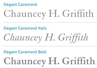
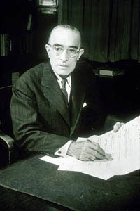
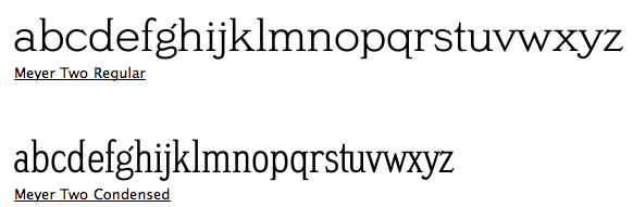
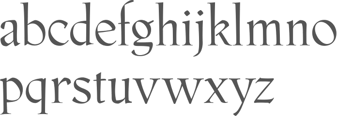
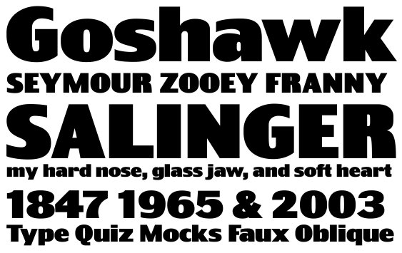
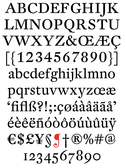
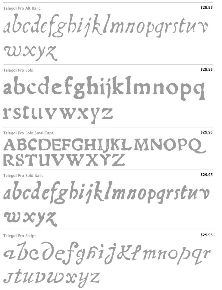
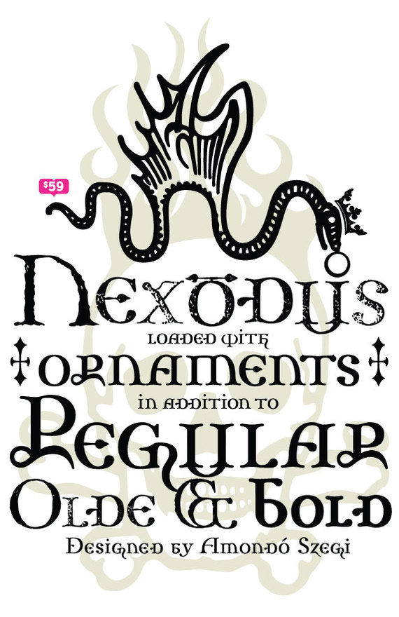
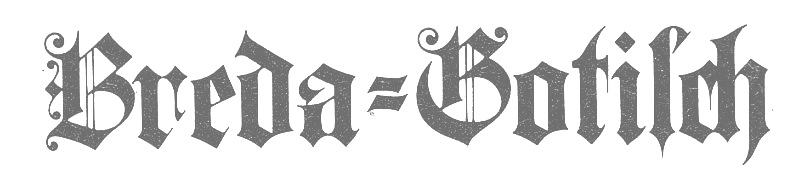
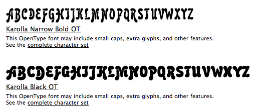
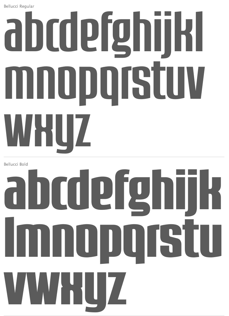
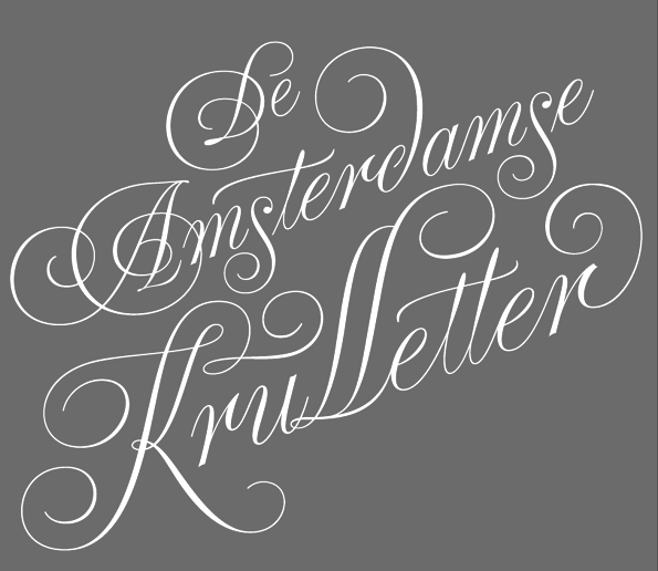
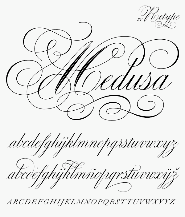