TYPE DESIGN INFORMATION PAGE last updated on Mon Jun 8 17:45:42 EDT 2026
FONT RECOGNITION VIA FONT MOOSE

|
|
|
|
|
The Norwegian type scene | ||
|
|
|
|
SWITCH TO INDEX FILE
5ive
| 5ive is the design studio of Fabrice Bats, a Parisian who has moved to Oslo. His lettering includes a couple of alphabets called Kinky (2010). Dafont link. Devian Tart link. [Google] [More] ⦿ |
Norwegian designer in Trondheim. He created the corporate identity sans typeface SINTEF (2006). [Google] [More] ⦿ | |
During her studies at Bergen Academy of Art and Design, Agnieszka Gawlik created the all caps shadow typeface Noon (2016) and the experimental stick typeface Vertical (2016). [Google] [More] ⦿ | |
Norwegian art director and graphic designer in Oslo. He has done Banana Hello (2010), an alphabet in which all curves come from bananas. Devian tart link. [Google] [More] ⦿ | |
Born in Norway from Dutch parents, Oslo-based Aleksander Schipper created Frank (2012) and Proto Mono (2012) during his graphic design studies at Westerdals School of Communication. Devian tart link. [Google] [More] ⦿ | |
Alex Valentina is a graphic designer from Italy who graduated from KHIB, Bergen, Norway, and is based in London, UK. A musician, music producer and video director, he also occasionally designs typefaces. At The Designers Foundry, he released the fairytale font Goliagolia in 2019, and the spindly lava lamp font GabyGaby in 2020. [Google] [More] ⦿ | |
Oslo-based graphic designer and art director who has desiged some logotypes. Behance link. He used black censureship strips to create the calligraphic experimental typeface Shame (2010). [Google] [More] ⦿ | |
Oslo-based designer of the octagonal techno typeface Offshore (2013). In 2013, he started work on the sans family Anonymous Typeface. Still in 2013, he published the geometric sans typeface AK No. 3 Sans, which was inspired by sans typefaces from the art deco era. Behance link. [Google] [More] ⦿ | |
Designer and artist in Bergen, Norway, who made a remarkable typographic poster called Le Muée (2010). [Google] [More] ⦿ | |
Norwegian designer of the hand-printed typeface Alexis (2013). [Google] [More] ⦿ | |
Norwegian designer of the thin straight-edged typeface Apostrofus (2018). [Google] [More] ⦿ | |
Behance link. [Google] [More] ⦿ | |
In 2015, he created the free poster font Chubby. [Google] [More] ⦿ | |
Graphic design student in Oslo, Norway, who created Typical Oslo Pictograms (2014) and an electrically charged display typeface called Volt (2014). Behance link. [Google] [More] ⦿ | |
Andrea Tinnes
| |
Bodø, Norway-based graphic designer who created the scanbat typeface Black Gold in 2015. [Google] [More] ⦿ | |
Andrew Irvine
| |
During her studies, Anna Michaelsen (Michaelsen Design, Oslo, Norway) created the typeface Technofreak (2016). Behance link. [Google] [More] ⦿ | |
During her graphic design studies in Oslo, Anny Idebøen created a tessellated hipster typeface (2014). [Google] [More] ⦿ | |
Knut S. Vikor's Arabic Macintosh page explains about the use of Arabic on Macs. He points out that Macs come with six Arabic fonts already installed, Geeza Pro (the system font), Al-Bayan, Baghdad, DecoType Naskh, Kufi Standard and Nadeem. [Google] [More] ⦿ | |
This Norwegian graphic designer created a linear geometric counterless typeface in 2010. [Google] [More] ⦿ | |
Arild Hauge's rune font link site. Also, every imaginable rune alphabet is shown and explained. [Google] [More] ⦿ | |
Norwegian creator of Kisa Slab (2013). Behance link. [Google] [More] ⦿ | |
Arve Båtevik
| |
Atle Mo
| |
Audun Stien
| |
Norwegian designer of the dots-and-lines font Dots (2018). [Google] [More] ⦿ | |
Self-described as an exile Swede and medieval rockstar currently studying Graphic Design at Westerdals SoC in Oslo, graduating summer 2013.. At Westerdals, he developed Dystopia (2012), a monospaced typeface inspired by retrofuturism and repressive social control systems. Behance link. [Google] [More] ⦿ | |
Norwegian creator of the free pixel typeface Baardfaant (2015) and the stitching font Cross Sew (2016). [Google] [More] ⦿ | |
Trondheim, Norway-based designer of Times New Rosetta (2018). [Google] [More] ⦿ | |
Sandnes, Norway-based creator of the techno / paperclip font Binders (2013). [Google] [More] ⦿ | |
Oslo-based designer of a neatly hand-drawm mini-slab serif typeface called Nighttime (2013, free at iFontMaker). Behance link. [Google] [More] ⦿ | |
Oslo, Norway-based designer of the deco typeface Transformasjon (2016), which is based on two fonts used by Kristiania University College. At FontStruct, she designed the free font Røst (2016). At iFontMaker, she created NightTime (2016) and After Midnight (2016, a free connect-the-dots style font). Behance link. FontStruct link. [Google] [More] ⦿ | |
| |
Graphic design student in Oslo, b. 1988. She designed some experimental typefaces during her studies. [Google] [More] ⦿ | |
Rune archive page by Björn Asle Taranger. Interesting fonts: Merlin, Lincoln (blackletter), both by Corel, Lakise (Mac font), Hermetic, Futhark, Enochian and HebrewScript (the latter three all by the Digital Type Foundry), Dethek-Dwarvish-FR, Fantasy Forgotten Realms. [Google] [More] ⦿ | |
Norwegian creator of Pedersen (2012, children's hand). [Google] [More] ⦿ | |
Bureau Bruneau
|
|
Cafe.no
| Cafe.no was founded in 2000 by Norwegian designer Cato Hernes Jensen, who holds a BA in Graphic Design from Staffordshire University (UK) and an MA in Sociology from the University of Oslo. He also studied computer engineering in his hometown Horten. His typefaces include Journeyman (2016: an all caps layered display typeface in the sign painter tradition, which comprises 3d Shadow and Silhouette styles and covers Latin, Greek and Cyrillic). |
| |
Carina Cosenza Christensen
| |
Design student in Oslo, aka Frisso. Creator of a few all caps typefaces in 2012, including one called DNA Sans. [Google] [More] ⦿ | |
Norwegian type designer. Some of his work:
| |
Norwegian designer of Dripping Blood (2019). [Google] [More] ⦿ | |
Cato Hernes Jensen
| |
Norwegian-born graphic designer in London, UK, who designed the eperimental typeface Tissi (2016) which is named after designer Rosmarie Tissi. [Google] [More] ⦿ | |
CheapProfonts
|
Designer at FontStruct in 2008 of cowboy_hippie and Syndrome X (DNA-look typeface inspired by Syndrome BRK by Brian Kent). Nelsson's fonts are Classic Trash BRK Pro, Dynamic BRK Pro, Galapogos BRK Pro, Genotype BRK Pro, King Cool KC Pro (kid's hand; done with Kimberly Geswein), Lamebrain BRK Pro, Matrise Pro and Matrise Text Pro (dot matrix), Phorfeit BRK Pro, Syndrome BRK Pro, Technique BRK Pro, Vigilance BRK Pro, Grapple BRK Pro. The "BRK" refers to Brian Kent, the original free font designer. In 2009, he added a number of fonts that were done by Nick Curtis some years before that (hence the "NF"): Boogie Nights NF Pro (art deco face), Copasetic NF Pro, Coventry Garden NF Pro, Pro, Fontleroy NF Pro, Hamburger Heaven NF Pro, Monterey Popsicle NF Pro, and Wooden Nickel NF Pro. Trypewriter Pro (2009) is based on Kevin King's Trypewriter. Helldorado Pro (2009) is a Tuscan wood type style typeface based on a font by Levente Halmos. Designer of Isbit Pro (2012, a magnificent melting ice cube-shaped superlliptical typeface family), Familiar Pro (2011, designed with the same metric as Helvetica but "better than Arial"), Bloco Pro (2010, fat counterless face), Trump Town Pro (2009, athletic lettering slab serif), Geometric Soft Pro (2009), Geometry Script Pro (2010, upright connected script), DIN Fun Pro (2011), Infantometric Pro (2012), Foobar Pro (2012) and Cheap Pro Fonts Serif (2009). Typefaces from 2013: Adultometric Pro (narrow monoline sans). Dafont. Fontspace link. Fontsquirrel link. Catalog of Nelsson's bestselling typefaces. [Google] [MyFonts] [More] ⦿ |
Oslo-based designer of the thin lachrymal sans typeface Velouet (2014). [Google] [More] ⦿ | |
Christian Widlic (Brighton, UK) created a knitting typeface called Askeladden (2011). He writes: Based on Norwegian tradition and the so called lusekofte (the traditional sweater), I have designed a typeface specifically made for knitted sweaters. The typeface is called Askeladden and comes with six different fonts. Askeladden is the main character in many Norwegian folktales. In some ways, he represents the small man who succeeds where all others fail. He always wins in the end, often winning the princess and half the kingdom. Academic project 2011. Behance link. [Google] [More] ⦿ | |
| |
Norwegian designer of Tom Yum Superslim (2001-2002) and Tom Yum Superfat (2001-2002). She also designed the Thai simulation typefaces Decomposing Lover (2003) and Tom Yum Superhot (2002). The Birchleaf (sans) typeface, done for Bjørka, a workshop for art photography in Oslo, is still under development. Snøfnugg is a fat paperclip font. Sucomandante (2002) is octagonal and computer-inspired. Bjørkeblad (2002-2003) is futuristic. CC Lisbao (2005) is experimental and modular. Museum X (2005, co-designed with Halvor Bodin and Tone Hansen) was a custom type done for Museum X for kunst/arkitektur/design. Claudia lives and works in Oslo. [Google] [More] ⦿ | |
Claus Martin Torp
| |
Amsterdam-based student at the Gerrit Rietveld Academie who was born in Oslo in 1982. He is working on this Gill-like sans face (2006). [Google] [More] ⦿ | |
Dan Erik Rønnbäck (Noob Design, Kragerø, Norway) is a Norwegian designer who has a Bachelors degree in Multimedia Arts from John Moores University Liverpool, UK. He created an octagonal display face and a multiline art deco typeface in 2011. In 2013, while studying at IAD at Hyper Island in Stockholm, he created onezero Display, a large sans family. Behance link. Devian tart link. [Google] [More] ⦿ | |
Norwegian software specialist who created the free font CCSymbols in 2020. It contains all Creative Commons symbols. [Google] [More] ⦿ | |
Daniel created the extreme-contrast art deco / fashion mag typeface Casanova (2011), which features two choices of tilt---positive and negative. The way in which this typeface is used by Brokstad is sheer genius. In 2013, he designed the decorative caps typeface Medic Type. In 2019, he published Lucifer Sans. This mammoth 162-style typeface family is rooted in Scandinavian geometry and minimalism, mixed with a healthy dose of black metal and irreverent attitude. Harsh vertical cuts and angles throughout the font creates a very strict and hard look, that can either be amplified or loosened up through its stylistic sets. In 2020, he designed the 10-style rounded octagonal typeface Geometrisk. [Google] [MyFonts] [More] ⦿ | |
Oslo-based designer of the 3d typeface Block Font (2013). Behance link. [Google] [More] ⦿ | |
Behance link. [Google] [More] ⦿ | |
Norwegian graphic designer who made the counterless experimental Point Blob Font (2010). [Google] [More] ⦿ | |
Norwegian upstart foundry, with two fonts for now, Goal (2000, heavy italic display), Beep (2000, futuristic) and Expose (a Multiple Master font for the Mac). Bad link? [Google] [More] ⦿ | |
Digital Flame Studios
| Japanese site which has Kokkei Mizu's free fonts, such as the screen typeface Pixelation (2005). Dafont mentions that the designer is Sindre Smâ (b. 1993, Norway). Dafont link. [Google] [More] ⦿ |
Hommersaak, Norway-based foundry interested in African and technical typefaces. The fonts are sold through MyFonts. Their collection: Christmas (dings), Elektronika (dings), TechTools (dings), ABCKids, Gates (dings), Transistors (dings), Ariya (Yoruba based on Arial), Igba (Yoruba based on Times New Roman), Eagle (Nigerian), Eredo (Edo). [Google] [MyFonts] [More] ⦿ | |
| |
Eifoni
|
At Skin Design Studio, he created the all caps DIN-like typeface Skin Extra Regular for in-house use. Behance link. Typecache link. Cargocollective link. [Google] [More] ⦿ |
Oslo-based designer of the 3d cubic font Cave (2015). [Google] [More] ⦿ | |
Eivind Fonnaas Nilsen
| |
His student project at the Kunsthøgskolen in Bergen, Norway, has two experimental fonts, AKA the Bomber and AKA the Artist, both finished in 2006. See here. [Google] [More] ⦿ | |
Kleppe, Norway-based designer of Festivetica (2014), a typeface that was inspired by gothic doors. [Google] [More] ⦿ | |
Ellmer Stefan
| |
Ellmer Stefan & Johannes Lang
|
Codesigner with Joakim Jansson and Dag Laska of the bespoke typeface Aker Brygge Display (2012). For an architecture magazine, he created Corvus Corax at Skin Designstudio. The Science typeface family was commissioned by Work AS. In 2013, Stefan is in the stages of publishing Essay, a wonderful very readable angular text typeface, at Type Together. Ellmer was finally published in 2014 as Essay Text. Other typefaces in development include Amalgam and Yorrick Tristram (a baroque typeface). He also designed the grotesque typeface family Georges. Still in 2013, Johannes Lang and Stefan Ellmer co-designed the free display typeface Brevier Viennese (Langustefonts). It is based on a Victorian typeface called Viennese by the Fann Street Foundry from 1874. In 2014, he created Ur 1927 and writes: Ur 1927 is a digital reanimation of the original sketches by Paul Renner made for the typeface that later became Futura as part of the social-housing program Das Neue Frankfurt in 1927. Ur 1927 is not an auto-traced imitation neither an interpretation of the original source---like other revivals of pre-digital type---but an attempt to grasp the inherent design principles of the original design and the ideological impetus intended by its maker. Ur 1927 is sticking stubbornly to the sketches made in 1927---not performing any optical compensations or deviations from geometrical construction. In addition it incorporates all (!) alternative---radical even to contemporary eyes---letter shapes drawn by Renner. Schouss Plass (2014) is an angular display typeface developed for Schous Plass, a youth café and concert hall in Grünerløkka, Oslo. In 2014, Johannes Lang and Stefan Ellmer revived the frilly Victorian typeface Stencil Gothic originally designed by John West in 1885. Sentralen Oslo (2016). They write: A set of 3 text and one display typefaces for the branding of a new multidisciplinary cultural site based in the old town of Oslo, Kvadraturen. The text styles are based on the former stationary of the Oslo Sparebank, which later became the foundation responsible for the redefintion of the old bank building. The display typeface is a derivate of the logotype (not shown) and is intended for use in the site's wayfinding system. These typefaces were commissioned by and developed in close collaboration with Metric Design, Oslo. Levvel Script (2016) is a brush script based on illustrator Bjørn Rune Li's distinct handwriting style. It was commissioned by Scandinavian Design Group. Gustav Display (2018) is an exclusive (lapidary, roam, inscriptional, wedge serif, all caps) typeface for the celebration of Gustav Vigeland's 150th birthday in 2019. Commissioned by the Vigeland Museum in Oslo, it was designed by Ellmer Stefan under the Art Direction of Anders Hofgaard (NODE Berlin Oslo), and is based on an inscription accompanying one of Vigeland's sculptures. In 2018, Ellmer Stefan designed a custom sans typeface for Diller Scofidio + Renfro. Behance link. [Google] [MyFonts] [More] ⦿ |
Emil Bonsaksen
| |
Norwegian design student at JCU, Townsville, Australi. She created an experimental typeface in 2010. [Google] [More] ⦿ | |
Norwegian designer who is working on this tilted sans (2007). He works at the design firm Orangeriet. [Google] [More] ⦿ | |
Erik Jacob Jeddere-Fisher (b. 1988) is based in Oslo. He created the free comic book caps-only font Totally Oilsome (2010), and The Efish Hand (2005). Home page. Another home page. Devian Tart link. Dafont link. [Google] [More] ⦿ | |
Norwegian designer of the free flared typeface AIK Erik Holm (2013). Norway also uses a similar font on the Norwegian money banknotes. Dafont link. [Google] [More] ⦿ | |
Norwegian designer at Die Gestalten of Friends (2004, an OCR-like sans), Kit Lean, Kit Ideal, Kit Shiny, and Kit Fat (2001, a monoline family). FontShop link. [Google] [More] ⦿ | |
Oslo, Norway-based designer of the free typeface Pogo Display (2018). [Google] [More] ⦿ | |
Graphic designer in Milan of Norwegian roots. In 2016, he created the thick rounded monoline set of digits called Cloudy Numbers. [Google] [More] ⦿ | |
Espen Aaeng
| |
Norwegian designer (b. 1984) who lives in Bergen. Creator of nittenaattifire (2007, sans), Temanotica (2006, futuristic sans), Asphyxiate (2006, handwriting), Analfabet (2010, hand-printed), Gladatur Rum (2006), Bob-Filled (2001), Parallello (2008, a gorgeous futuristic typewriter serif), Fregne Myriad (2002, childish hand), Looksky-Font (2001, pixel face), unborneditrion (2005, pixel face), Finder (2005), Unintended (2005, dot matrix face). [Google] [More] ⦿ | |
| |
Evolutionzone
| Norwegian type designer Marius Watz created the very nice pixel fonts Protozoan square (1996; well, this is really a squarish organic face) and Amoeba_FivePX (1996). He is part of the Norwegian group "Function", together with Halvor Bodin and Kim Hiorthøy. With the latter two, he designed F Shinjuku in 1997 in the experimental FUSE series, based on Tokyo graffiti and inspired by the hip-hop culture. In the same series, he did F Where the Dog is Buried (octagonal, with Norwegian style dingbats), also in FUSE 17 in 1997. I-Ching (1997) is a three-font dingbat series consisting of Classic, Batman and Kogu. Psychoboy (1997) is a scratchy script. [Google] [More] ⦿ |
Fabrice Bats
| |
Fabritius
| Norwegian printer Fabritius and Sønner in Oslo worked on its own version of Munthe's letterforms. In 1962, it published the blackletter typeface Fabritius-skriften, but this typeface is only available in matrix form at the company, and is hardly ever used today. See also here. [Google] [More] ⦿ |
| |
Norwegian designer (b. 1975) of Packed Flinch (2011). [Google] [More] ⦿ | |
Fontcapture
|
Update in May 2010: Amazingly, Fontcapture is now being redirected to Yourfonts (where one has to pay 10 dollars for the same service). Maybe Fontcapture became too popular. But the redirection makes me think that Bertheussen could be bought after all. So here is an opportunity for hackers: imitate the Fontcapture experiment, offer a free service for a year, and then cash in. [Google] [More] ⦿ |
Fontourist
| Fontourist is the Norwegian foundry of Oslo-based Hans Gerhard Meier (b. 1972). The fonts there include Boycott Israel (2003, dingbats), Deathmix (1999, gothic), Stencil or Die (2007, paint drip stencil), Streetart Tribute (2006, dingbats), Yalla, Metoo Pixzi (2001, pixel font), Journal (1999, handwriting and dings), Stencile or Die (2017), Mr. Otis (2017), NYC ABC (2014, ransom note style), and HubaHuba (1998, a hubcap dingbat font also known as GF HubaHuba at Garagefonts). Dafont link. FontShop link. Font Squirrel link. [Google] [More] ⦿ |
Fontwerke
| Norwegian company which published the heavy italic display typeface Goal (1995). The fontographers are Claus Martin Torp and Anette Strobel. This was followed in 1998 bu Beep, an organic face. [Google] [More] ⦿ |
Formfett
|
|
Foundr-E
|
Another URL. Hellofont link. [Google] [More] ⦿ |
Roemteland is the Norwegian designer of FKRNiceLifeMedium, FKRParkLifeUltraBold, FKRStarLifeSemiBold, FKRWifeLife. Roemteland is Comania's webmaster. Other fonts of his include SlurrLife Medium, and Area51Life. See also here and here. [Google] [More] ⦿ | |
Oslo, Norway-based designer of Staurfont (2009), an ultra-fat concoction, and Staurland2 and Staurfont2_minuscule (2009), an anorexic roman all caps family. He also made the organic typeface Holtica (2009). Hallo Sans (2013) is a free rounded monoline sans typeface. Devian Tart link. Behance link. [Google] [More] ⦿ | |
Oslo, Norway-based designer of a custom rune simulation font in 2017. [Google] [More] ⦿ | |
Free Fonts for Fine Folks
| From Norway, Inge Fossland's creations: DwarfFat (1999, pixel) and DwarfFatOldStyleFigures. [Google] [More] ⦿ |
FRKT
| A 2009 article on font replacement, written by Oslo-based graphic designer and web developer Johannes Gorset. Verdict: Cufón and typeface.js are based on later technologies (that's not to say they are not widely supported, as is so often the case with new technology and the web), so it should come as no surprise that they perform better in most respects. Unless you are overly bothered about text selection not looking entirely right just yet, you should probably go with the HTML5-based technique Cufón. [Google] [More] ⦿ |
Frode Bo Helland
| |
Frode Nordbø
| |
Nodeland, Norway-based designer of the decorative caps set Norwegian Alphabet (2020). [Google] [More] ⦿ | |
Norwegian typographer and printer (1849-1929). Around 1910, he worked with the Klingspor brothers to produce Munthe-skrift (1904-1910), a Fraktur-like script font. However, it was never commercially released, and was lost when the foundry was bombed during the Second World War. Frisianus (1994-1995, by T. Eng) is a wonderful script font with great alternate caps, based on Munthe's lettering. It was made by Torbjørn Eng and is available from Luth og Co. Munthe drew the characters based on manuscripts from the 12th century, especially the famous Codex Frisianus, to use with a 1904 book of poems, Draumkvedet. [Google] [More] ⦿ | |
Self-proclaimed mad scientist, concept artist, illustrator and graphic artist from Burträsk, Sweden (b. 1982). Creator of the rune font Theban Alphabet (2008) and Old Norse Runes (or: Urnordiska Runor) (2008). On behalf of Ba'al Graphics, he made the blackletter typeface Scaenarium Unus (2008). He also created the dripping blood typeface Terror Production (2008). Alternate URL. Devian Tart site. Old home page. [Google] [More] ⦿ | |
Good Type Foundry
|
In 2018, he released Figue, (a text typeface with large x-height) Good Sans (a contemporary sans serif typeface inspired by mid-century neo-grotesques) and Tekno. Typefaces from 2019: Ekstra (a contemporary neo grotesque with large x-height), Kubik (a semi monospaced modular techno font inspired by the synth music and visual culture of the 1980s), Soya (an experimental sans). Behance link. Behance link for Kennth Knutsen. [Google] [More] ⦿ |
Gøran Frilstad
| |
Gradient (was: Mindburger Studio)
|
His early typefaces included the 1920s style sans family Bambino (2014), which was influenced by Futura. In 2015, he published Bambino New. Typefaces from 2016: Bergen Sans (a modern geometric sans advertized in this manner: [...]clean and stylized Scandinavian geometry, partnered with explosive post Bauhaus type aesthetics[...]), Noir (based on early 20th century geometric sans models; in 12 styles, for Latin, Greek and Cyrillic). Typefaces from 2017: Bergen Mono, Bergen Text (a great geometric sans family). Typefaces from 2019: Radial (a variable sans), Linear Sans. Typefaces from 2020: Poly Sans (+Mono). Typefaces from 2021: Okay Serif (a decorative didone for Latin, Greek and Cyrillic). [Google] [MyFonts] [More] ⦿ |
| |
Guro Waagene (Oslo) created (as a student project) a font called Tics Type (2013) and a logo for The National Tourette Syndrome Association. In 2013, Martine Hage and Guro Waagene co-designed Throne Sans, which is named after Johan Throne Holst (1868-1946). [Google] [More] ⦿ | |
CSS co-inventor who proposed the CSS font solution for font selection on web pages in 1994: browser makers should fully implement the CSS font specification by letting raw, unprotected font files be linked to web pages. And revise the CSS specs to allow zipped font collections to be linked to web pages, so that web designers can benefit from the large volume of freeware fonts. He is still a member of the W3C CSS Working Group. He is the CTO of Opera Software and a champion for CSS compliance in all browsers. Lie is also a director of YesLogic, the company behind the CSS-based Prince formatter, which was used to produce a book he co-authored: Cascading Style Sheets: Designing for the Web. He has a Master's degree from the MIT Media Lab and a PhD from the University of Oslo. He is an advocate of Acid2. [Google] [More] ⦿ | |
Norwegian-born designer. During his studies at Griffith University, Queensland College of Art, Gold Coast, Australia, he created the display typeface Baltic (2015) starting from PT Serif. In 2015, he published the text typeface Kompani (2014). [Google] [More] ⦿ | |
Halvor Bodin
| |
Norwegian graphic design student who created the slab serif typeface Esile in 2012. [Google] [More] ⦿ | |
Designer in Ski, Norway, who created the circle-based outline typeface Hanne in 2013. [Google] [More] ⦿ | |
| |
Hans Gerhard Meier
| |
Norwegian designer in Trondheim. He created the sans typeface Creative Trondelag (2004). [Google] [More] ⦿ | |
Håkon Bertheussen
| |
| |
Håvar Ingmund Henriksen (b. 1980) is from Skjervøy, in Nord-Troms, in the northern part of Norway. His interests include technology and comics. In 2009, he used FontStruct to create LCD DotMatrix. He writes: This is the Dot Matrix LCD Font used on the Ricoh Aficio AP3800C, Aficio AP3200 and AP306D printers, among others. He also explains how to use FontForge to extract fonts from PDF files. He says: Basically you just need to select "Extract from PDF" in the filter section of the "Open Font" dialogbox used when opening files. When you have selected your PDF file, a "Pick a font" dialogbox will open where you could select wich font to open. Then you'll just need to compact the font using the "Encoding" menu and selecting "Compact". This will remove all non-used glyphs in the font. Then you would have to edit the Font Info, and save the font as a font file (usally TrueType is best). Quote from the article: "Beware though, sometimes when a font is embedded into a PDF it will only contain [glyphs for] characters used. So, if the PDF file that you are trying to extract from does not contain the letter "P" [glyph], then that letter will not show up in FontForge." (You could see an example of this in the image above, the PDF file the font was extracted from did not contain glyphs for all the letters in the english alphabet). [Google] [More] ⦿ | |
Norwegian designer, with Jacob Øvergaard, of Synnøve (2003, a connected script). An example is here. [Google] [More] ⦿ | |
During her studies in Randaberg, Norway, Helene Serine created a thin straight-edged display face (2013). [Google] [More] ⦿ | |
Norwegian designer of the grunge typeface Identity (2006), shown here. That font mixes Helvetica, Times, Comic Sans and Arial. [Google] [More] ⦿ | |
Media design student at Gjøvik University in Oslo. Behance link. Creator of the paper fold typeface Calligami (2011) and the calligraphically-inspired serif typeface Karlsen Serif Pro (2012). [Google] [More] ⦿ | |
Gjøvik, Norway-based designer of the gothic arc-themed typeface Kalligrafi (2015). [Google] [More] ⦿ | |
Hilde's handwriting font made by Hilde Skjölberg (Norway) and Chank Diesel: Hilde Sharpie (1996), now available from T-26 and Chank. It is called Hilde Sharp (2009) at MyFonts. [Google] [MyFonts] [More] ⦿ | |
| |
Oslo, Norway-based designer of Sulten (2017). [Google] [More] ⦿ | |
Designer of the Norwegian school font Norsk Skoleskrift (2010). [Google] [More] ⦿ | |
Idiofonts
| Andrew Irvine (Idiofonts, Oslo, Norway) designed the commercial rounded sans typeface Showcard Draftsman in 2014. Creative Market link. [Google] [More] ⦿ |
Inge Fossland
| |
Norwegian artist (b. Stavanger, 1982) who according to DaFont made some free bitmap fonts such as elektr_02_5. Dafont link. [Google] [More] ⦿ | |
Norwegian type designer who grew up in Vinstra, Gudbrandsdalen, Norway. She writes about her typeface Vinstra (2012): Vinstra was developed during a typeface design workshop at Gjøvik University College held by Veronika Burian, spring 2012. This is my first typeface, inspired by Vinstra, Gudbrandsdalen (Norway)---where I grew up. The font started out with a combination of Berthold Walbaum and Baskerville Old Face's glyphs. Vinstra also have integrated serifs and ligatures taken from the leaf pattern in the national costume of Gudbrandsdalen. I wanted to create a typeface that captures some of the traditional feeling, the mood that is often associated with both Gudbrandsdalen and Norway in general. This is the very own typeface of my home. [Google] [More] ⦿ | |
Norwegian designer of the handwriting font Intens Writings (2006). [Google] [More] ⦿ | |
Coding that supports the following languages: Afrikaans, Catalan, Danish, Dutch, English, Faeroese, Finnish, French, German, Galician, Irish, Icelandic, Italian, Norwegian, Portuguese, Spanish and Swedish. See also here, here, here, here, here, here, here, and here. More specifically, other ISO-8859 groups are as follows:
| |
Norwegian architect, and graphic and type designer who lives in Jar, Norway. Creator of the free fonts Mir II (futuristic) and Mir III (like architectural lettering). [Google] [More] ⦿ | |
| |
Norwegian type designer who created these fonts:
| |
Jacob Øvergaard
| |
On the Arabic Mac site in Norway kept by Knut S. Vikor. Three fonts for transcription of Arabic, Jaghbub, Koufra and Bairut. [Google] [More] ⦿ | |
Article in Norwegian about the life of Norwegian calligrapher and typographer Jakob Rask Arnesen, 1918-2008. A type specialist, he devoted his life to calligraphy, the development of models for handwriting in schools, and books on letterforms and type. [Google] [More] ⦿ | |
During her studies at Westerdals school of communication in Oslo, Norway, Jana Hestervold created Paperclip Typeface (2014). [Google] [More] ⦿ | |
Designer in Slemmestad, Norway, who graduated from a school in Oslo in 2012. She created an experimental caps typeface in 2012. [Google] [More] ⦿ | |
Jeffrey Bowman (Hemsedal, Norway) created some very original typographic illustrations in 2013 including Skirt for a Virgin Media Shorts film. He created the experimental microbial typeface Hemsedal (2013), which was contributed in 2014 as a free font to Citype. Behance link. DE [Google] [More] ⦿ | |
During her studies at the Royal College of Art in London, Jen Haugan, who was born and raised in Norway, designed the decorative caps typeface Penguin (2016). Behance link. [Google] [More] ⦿ | |
Norwegian creator of the circle-based typeface Avrundet (2012). [Google] [More] ⦿ | |
This used to be a beautiful and simply fantastic web page on typography, with absolutely gorgeous Tamil fonts designed by Sri Lankan Jeyachandran Kopinath (OviyaResearch in Fantoft, Norway): Tamilini, HuntPR, Gonsalves, Tamilweb (1998). Some of the fonts are here. Last known live link (now dead). [Google] [More] ⦿ | |
Oslo-based Joakim Jansson (1UP) is guilty of art direction and graphic design. His fertile fingers brought us (mostly custom) typefaces such as Aker Bryfgge Display (2012, for Aker Brygge; cocreators Stefan Ellmer and Dag Laska), Soda Popinski (2009), Margaret Berger (2009), Digital Etikett (2009), The Legends (2009), Zoo Room (2009) and Frankfurter on Acid (2009---not a font, just a coloring idea). Behance link. Old URL. [Google] [More] ⦿ | |
Trondheim, Norway-based designer of the free paperclip typeface Homework (2018). [Google] [More] ⦿ | |
| |
Johannes Gorset
| |
Norwegian design student at Norges Kreative Fagskole in Oslo. Creator of a floriated caps alphabet in 2012, and the typeface Creativity in 2011. Devian tart link. Behance link. [Google] [More] ⦿ | |
John Hansen Budalsplads (1798-1874), a craftsman from Budalen, a remote mountain valley in central Norway, is well known for his production of ornamented, wooden boxes. He also had a great interest and ability in cutting letters in wood. He produced whole alphabets in blackletter and Latin (copperplate) style. On some plates the letters are cut into the wood, but he also cut letters which stand out of the wood (as punches). The latter ones were then printed on paper, to be hung up on walls on the farms. They were both educational and decorative, as the letters are well executed. The article discusses how Budalsplads can have got them printed. Torjorn Eng regards him as the first representative of Norwegian typeface design. A sample from 1820 until 1831. A sample from 1826. Another link. [Google] [More] ⦿ | |
Norwegian graphic designer and illustrator who lives in Oslo where he started studying at the Oslo Academy of the Arts in 2009. Behance link. Creator of the beveled alphabet Metalface (2010) and the blackletter typeface Entartete Fraktur (2010). In 2014, he created the free font Helsinkifjes (Citype). Helsinki is inspired by leters on the memorial monument for fallen German soldiers of the Finnish civil war in 1918 in Vanha Kirkkopuisto in Helsinki. Hellofont link. [Google] [More] ⦿ | |
Jon Forss
| |
| |
| |
Designer in Frogner, Norway. For one of his school assignmints, he made the bitmap typeface Analog (2012). Behance link. [Google] [More] ⦿ | |
Behance link. [Google] [More] ⦿ | |
Trondheim, Norway-based designer of the handcrafted Harvest Font (2016), the vernacular typeface Barn Door Font (2015), Flattrack Font (2015), the handcrafted Quaint (2015, with James Lewis), and the rustic typefaces Blacksmith (2015) and Handmade Vintage (2015). Creative Market link. Behance link. [Google] [More] ⦿ | |
Designer in Bergen, Norway, who created the free blackletter typeface Svart in 2017. Behance link. [Google] [More] ⦿ | |
Norwegian designer of the display typefaces Broadway (2018) and Sharp (2018). [Google] [More] ⦿ | |
Graphic designer in Oslo, Norway. I believe that made a text typeface in 2017, but the text around her posting on Behance is unclear in that respect. [Google] [More] ⦿ | |
As a student at KHIB in Bergen, Norway, June Aarseth designed the decorative caps typeface The Most Amazing Font (2016). [Google] [More] ⦿ | |
Norwegian designer of the purely geometric alphabet Combine (2011). [Google] [More] ⦿ | |
Oslo, Norway-based creator of Marius Display (2014), a wavy bespoke typeface created for Marius. Behance link. [Google] [More] ⦿ | |
Bergen, Norway-based designer of the Latin and Cyrillic connect-the-dots typeface Alchelys (2019). It was inspired by Malachim. [Google] [More] ⦿ | |
Kalle Graphics
|
His modular sensual rounded stencil typeface Curb Desire (2008) deserves an award! Carved Blox (2010) is a counterless ultra-fat face. Chiseled (2010) is a beveled face. EcoLeaf (2009) is part stencil, part organic. Free fonts: Kilogram (2010, art deco sans display face), Alpharuler (2010, grunge), Disco Sans and Disco Deco (2009, art deco, counterless), Circle Script (2008; all outlnes are parts of arcs), Ribbon (2008, multiline), Softsquare (2008), Cable Script (2008, paperclip face; and its variation, Cable Climb). Behance link. [Google] [More] ⦿ |
Karl Martin Sætren
| |
| |
Katachi
| Oslo-based studio and design mag. In 2011, Katachi Media collaborated with Andrés Torresi to create a typeface superfamily, targeted mainly for the iPad, but also for web and print. Andrés in Argentina, and Katachi in Norway, jointly developed a serif and sans-serif type family called Katachi. Video about Katachi. On Behance, we read that Ken Olling (Oslo) is one of Katachi's men. [Google] [More] ⦿ |
Kristiansund Nord, Norway-based creator of Siira (2012). [Google] [More] ⦿ | |
Ken Olling
| |
Norwegian computer specialist at Høgskolen i Østfold. He created the icon font WriteSocial (2012). [Google] [More] ⦿ | |
Kenneth Knutsen
| |
| |
Norwegian designer at Function (Halvor Bodin's experimental design guerilla group) of Shinjuku, a semi-dingbat font published by FontShop in FUSE17. [Google] [More] ⦿ | |
Kim Ruben Hansen Lockertsen
| |
Kimpix
| Kim Ruben Hansen Lockertsen (b. 1985) is the Norwegian designer of the simple handwriting fonts High Sign (2007) and Kims Hand (2009). [Google] [More] ⦿ |
Eidsvoll, Norway-based designer of the counterless typeface Blake (2015). Behance link. [Google] [More] ⦿ | |
Centre for Middle Eastern and Islamic Studies, University of Bergen, Norway. Fantastic page on Arabic fonts and font software. [Google] [More] ⦿ | |
Kokkei Mizu
| |
Trondheim, Norway-based designer of a monoline script typeface (2018) that is inspired by a grocery store sign in Oslo that dates back to the 1950s. [Google] [More] ⦿ | |
| |
Oslo-based designer of the fat finger font Jlee (2011). Dafont link. [Google] [More] ⦿ | |
Norwegian youngster aka "Smevog" (b. 1989) who created the Gabriele 8008 Typewriter font in 2007. Alternate URL. [Google] [More] ⦿ | |
Norwegian brand designer located in Oslo. Dinamo and/or Tennebø made an outline font for the identity of the Norwegian opera in 2009. [Google] [More] ⦿ | |
During her studies in Stavanger, Norway, Kristina eriksen created he Greek simulation typeface Modern Alphabet (2014). [Google] [More] ⦿ | |
| |
During his studies at Westerdals Oslo School of Arts Communication and Technology, Oslo, Norway-based Kristofer Hoffmann Schärer designed the Bauhaus-inspired blackletter stencil typeface Umlaut (2016). [Google] [More] ⦿ | |
Norwegian designer of the detached all caps typeface Detached (2018). [Google] [More] ⦿ | |
Graphic design student at Westerdals School of Communication in Oslo. In 2009, he created an angry angular nameless typeface. [Google] [More] ⦿ | |
Norwegian designer of Criminal Security (2006), an all-caps printed hand. [Google] [More] ⦿ | |
Creator of the stylish My Fat Font (2012). [Google] [More] ⦿ | |
Blommenholm, Norway-based designer of the experimental all caps typeface Junky (2017). [Google] [More] ⦿ | |
Norwegian type designer. Some of his work:
| |
Lid & Wiken
| Lid & Wiken is a multidiciplinary design & storytelling studio based in Oslo, Norway, which is run by Natasha Lid and Eva Wiken. Natasha is from the Northwestern part of Norway and grew up between fjords and mountains. She studied Graphic Design at Westerdals and has been working with clients such as Neepo, Snowboardforbundet, Kulturhuset i Stryn, Kokong, Oslo Open, Westerdals, Skinlove and more. Eva is from Trondheim. She has studied both Art Direction and Graphic Design at Westerdals and is experienced working with both advertising and design, creating solutions for Statoil, DNB, Think, Stormberg, Statkraft og Dyreparken i Kristiansand and more. In 2013, they created a grotesk display typeface called Block. Behance link. [Google] [More] ⦿ |
Ligature is a collective that provides a broad knowledge of vintage and modern typography. It is based in Trondheim, Norway, but has members from across the globe: Ahda Firdaus, Alex Timokhovsky, Alyson Brown, Antonio Rodrigues Jr, Christopher Craig, Danny Dek, Franz Jeitz, James Lewis, Jeremy Pruitt, Jeremy Teff, Joe Horacek, Joshua Noom, Justyna Frackiewicz, Jørgen Grotdal, Keith Tatum, Leo Kiricic, Lorenzo Natale, Mark Lozano, Moe Pike Soe, Nicolas Fredrickson, Noel Shiveley, Odds, Peter Bacallao, Ricardo Gonzales, Ricky Ray Lester Jr, Rob Brink, Sam Lee, Sydney Goldstein, Zane Kaiser. Typefaces designed by them include Quaint (2015, by James Lewis and Jorgen Grotdal), Woodland (Mark Van Leeuwen), and Timber (Mark Van Leeuwen). [Google] [More] ⦿ | |
Norwegian designer of the handwriting typeface Ir (2005). [Google] [More] ⦿ | |
| |
Norwegian youngster, b. 1995. Creator at FontStruct of the pixel typeface Crackers (2009). [Google] [More] ⦿ | |
Ludvig Bruneau Rossow
| |
In 2012, Madeleine designed the hexagonal Etern typeface family. In 2013, she designed Circ (circle-based). In 2014, she published the sans titling typeface Haandlagd. In 2015 she added Friends who Drink and in 2016 Oval. Behance link. [Google] [More] ⦿ | |
Art director in Copenhagen. Norwegian creator of the prismatic typeface Seal (2012). | |
Magnus Cederholm
| |
Norwegian designer of the avant garde sans family Daco (2004) sold by Luth. He was also commissioned to make Aenigma, a techno face. Identifont says: Magnus Holder Bjørk is a freshly educated designer now working in Trondheim, Norway. While at a design school in Australia he started developing an Art Deco font family, and with the helping hand of FontShop Norway his Daco font family was prepared for sale. [Google] [More] ⦿ | |
Magnus Osnes (Magnus Osnes Design, Gjovik, Norway) created Rotan (2013), a sans typeface developed during a workshop held by Veronika Burian. Behance link. [Google] [More] ⦿ | |
Magnus Rakeng
| |
Norwegian graphic designer, born in Lillehammer in 1967, who works in Oslo. His fonts are distributed by Thirstype. He now runs Millimeter Design. He is also involved in the Norwegian design studio Melkeveien designkontor, where all his fonts can be ogled. They include:
| |
Norwegian designer of the typeface for the visual identity of a music festival in bergen called Borealis (2006). [Google] [More] ⦿ | |
| |
Marcus Pedersen, a graphic design student at Westerdals School of Communication, created the bilined typeface Illusory Sans during his studies in 2012. He now lives in Oslo. [Google] [More] ⦿ | |
During her studies at Bergen Academy of Art and Design in Bergen Norway, in 2015 and 2016, Maren L. Knutsen (Fredrikstad, Norway) designed the modular typeface I Never Read and the ornamental caps typeface Modified Futura. Behance link. [Google] [More] ⦿ | |
Designer in Oslo who created Muridae (2012), a flowery ornamental caps typeface, and Borealis (2013, humanist sans). [Google] [More] ⦿ | |
Graphic designer in Oslo, b. 1987. Creator of the avant garde sans family Universe (2009). In 2013, she published the geometric custom typeface Huxley and created the identity typeface for Kunsthall Oslo. Underfundig is her studio in Norway. Behance link. [Google] [More] ⦿ | |
Oslo-based designer and illustrator, who hand-drew Lamp Font in 2013 during her studies. [Google] [More] ⦿ | |
Marius Hole (Trondheim, Norway) created Nidaros Sans (2013) for wayfinding in his home town during his studies in the Bachelor of Arts program at Gjovik University College. Behance link. [Google] [More] ⦿ | |
Graphic design student at Westerdals School of Communication in Oslo, Norway. In 2011, he made the experimental histogram-based typeface Grafont. Designer of Erga (2013), a decorative geometric sans-serif typeface with a 3d beveled look. Behance link. [Google] [More] ⦿ | |
Oslo, Norway-based designer of the spurred constructivist typeface 276Vintage (2015). [Google] [More] ⦿ | |
Norwegian [T-26] designer of the grunge typeface Helix (1994). Ran the outfit called Subtopia. Also available here. [Google] [MyFonts] [More] ⦿ | |
Marius Watz
| |
Norwegian designer (b. 1992) of the fat brush typeface Lund (2012) and the squarish typeface Sibling Rivalry (2015). Dafont link. [Google] [More] ⦿ | |
Norwegian designer of the typewriter typeface Mino (2008). [Google] [More] ⦿ | |
Graphic designer in Gjovik, Norway. Creator of the text typeface Adonia (2013). She explains: Adonia was developed during a two week long type design workshop with Veronika Burian from TypeTogether. Adonia is especially inspired by Didot and Bodoni. The characteristics of Adonia are high and abrupt contrast between thick and thin strokes, vertical axis, horizontal stress, small aperture and elegant curves. Adonia is conceived specifically for headlines and big sizes, ideally suited for text in sizes ranging from 20 pt. [Google] [More] ⦿ | |
Graphic designer in Oslo. Behance link. For an editorial design project, she made the typeface KEY (2011), in which all horizontal strokes are required the follow one of five possible lines (as for music notes). The typeface has a monoline octagonal look. [Google] [More] ⦿ | |
Marthe Frøshaug (Gjovik, Norway) created the old style serif typeface Monde (2013) during her studies at Gjovik University College. [Google] [More] ⦿ | |
Martin Holm
| |
Norwegian FontStructor (b. 1993) who made these typefaces in 2011: Mixed Ancient Text, Ancient Basic, Ancient New, Ancient Text With Letters. Alternate URL. [Google] [More] ⦿ | |
Norwegian graphic designer, who created New Typeface (2012, experimental), Marune Five (2012, runic simulation typeface), and Spacematter (2012). [Google] [More] ⦿ | |
Graphic designer in Oslo, Norway, who created the hipster typeface Phoenix in 2014. . [Google] [More] ⦿ | |
Graphic design student at Westerdals School of communication. In 2012, she created the alchemic typeface Droste. She also made pictogram set for Vestfjorden restaurant and catering in collaboration with Petter Bergundhaugen. In 2013, Martine Hage and Guro Waagene co-designed Throne Sans, which is named after Johan Throne Holst (1868-1946). Behance link. [Google] [More] ⦿ | |
Matei Nichitescu
| |
Oslo-based graphic designer. He created the upright connected sans typeface Tails (2010). [Google] [More] ⦿ | |
Bømlo, Norway-based designer of Piety (2015). [Google] [More] ⦿ | |
Melkeveien designkontor
| Norwegian design studio. They made the logotype Generator Group / Canal Digital (2003), the stencil typeface Nasjonale festningsverk (2004), Think (2008, an organic visual identity typeface done with Stian Berger and Melkeveien), Always (2005, a connected 1950's style face, designers Magnus Rakeng and Stian Berger; based on Rakeng's very popular earlier typeface Radio) and the Jugendstil style typeface Ålesund jugendstilsenter (2004, designers Magnus Rakeng and Stian Berger: based on architect H. Schytte Berg's architectural lettering), Eyecon (Magnus Rakeng), Telenor (a family of five for Telenor), some typefaces for Statoil [samples: i, ii, iii], I am Totally Sonja Henie (for Henie Onstad Kunstsenter), Superduper (by Magnus Rakeng, a comic book style typeface sold by Village), Quality (another connected script based on Radio, this time produced by Magnus Rakeng and Chester, from Village Type). An example can be seen here. In 2010, they designed Statoil, a display sans family. Klingspor link. [Google] [More] ⦿ |
Art direcrtor in Oslo, Norway, who has done corporate branding for amny international companies. In 2016, he designed the bilined caps-only typeface family MFF Strict Serif and the super-condensed techno typeface MFF Hell on Earth. Behance link. [Google] [More] ⦿ | |
Oslo-based designer of Rebbel Oblique (2013). Behance link. [Google] [More] ⦿ | |
Trondheim (or Oslo?) (Norway)-based designer of this face (2005, display), which was inspired by FontBureau's Constructa and Red Rooster's Grand Canyon RR. In 2010, he showed hs paper fold family Hot Report (download EPS file here). Hot Report defines the outlines in a mathematically correct manner, like an engineer would. In fact, I think Kovalev is an engineer. [Google] [More] ⦿ | |
Millenium Calendar 99 (was SWWE)
| Norwegian Stein V. Lund designed the following "broken" fonts: Angstrom, AteUpWithDumbAss, Brain Stew, Circuit Scraping, Deportees, FKR Parklife, Grotto, Prefix, I am monomer, Primer, Rez, Ugly Face. [Google] [More] ⦿ |
Milos Mitrovic
| |
Graphic Design graduate of Solent University in Southampton, UK, who lives and works in Bergen, Norway. Her experimental typeface Mir Sans (2012 and 2013, vol. 1 and 2) is based on DIN. Behance link. [Google] [More] ⦿ | |
Oslo-based designer of the ornamental caps alphabet Creeps (2010). He created some interesting typographic posters, such as Next Time Cards (2009). Behance link. [Google] [More] ⦿ | |
During her studies in Oslo, Norway, Mona Ulnes Flatåker designed the display typeface Subherbs (2016). [Google] [More] ⦿ | |
MonoGram Design
|
|
Monokrom
|
In December 2012, he set up his own type foundry together with Sindre Bremnes and Hans Ivar, Monokrom, and started with five type families:
Typecache link. Personal page of Frode Bo Helland. Fontshop link. [Google] [MyFonts] [More] ⦿ |
Moonbase Press (or: Dionaea)
| Free fonts made by Svein Kåre Gunnarson from Norway. The handwritten Crazee is my favorite; there is also a dot matrix font. List: blok, HiBlok, Crazee, Neistil, DotMatrix. Type 1 and truetype. Dafont link. [Google] [More] ⦿ |
Graduate of Westerdals School of Communication, Oslo. San Francisco-based associate creative director and art director at the ride-sharing company Lyft, who, in 2020, made the shaky handwriting font Shake, which is based on the handwriting of Halvorsen's mother, who is struck with Parkinson's disease. [Google] [More] ⦿ | |
Morten Iveland
| |
Norwegian designer in Oslo. He created Oslofonten (2005), a DIN Engschrift type of beast. Codesigners: Thomas Thiis-Evensen, Per Jæger. [Google] [More] ⦿ | |
Senior designer in Porsgrunn, Norway, who created the all caps sans typeface CWG Sans in 2013. Dafont link. Behance link. [Google] [More] ⦿ | |
Natasha Lid
| |
Designer in Oslo who created Hung Up Icons (2016) and April (2016, an all caps sans display typeface). Behance link. [Google] [More] ⦿ | |
Non-Format
|
Typefaces by them include Heroine (2008), a titling typeface created for Very Elle Magazine, and Otto (2009, their first commercial family). Gridiron (2013-2014) is a custom typeface family commissioned by ESPN magazine for their 2013 College Football Preview issue. Three versions of the Gridiron typeface were developed for different applications: The lightest weight, Quarterback, is used for headlines. The two bolder weights are Fullback and the more intricately structured Touchdown. These three styles cover the entire spectrum from athletic lettering to labyrinthine extravaganza. The hipster typeface Coleman Air (2015) is a special version of their Nomi typeface, created for Coleman's Japanese catalogue of outdoor gear. In 2017, for SModa Magazine, they designed the summa cum laude partly curvy typeface Sølve. Klingspor link. Behance link. [Google] [More] ⦿ |
Great links page on Old English, Icelandic, Norwegian, Swedish, Celtic and Germanic. [Google] [More] ⦿ | |
Norway Design Manual
| Norwegian Government site that offers a free text face, Aeroportal (2007). In addition, you can download Matthew Carter's Charter BT Pro (1987, redesigned and improved in 2004). Aeroportal (+Medium, +Bold) is an organic sans family designed from 2003 until 2006 by Per Olav Walmann (a senior designer in Oslo-based Jimmy Royal), who states that you can only download these fonts if you have got the rights to use them. The rights belongs exclusively to The Norwegian Ministry of Foreign Affairs. [Google] [More] ⦿ |
Norwegian Ink -- Design for Dough
| Norwegian Ink is an Oslo-based graphic design/ motion design studio. At Dafont, one can download the rounded cheese air pocket typeface "Laurel or Hardy" (2009), the futuristic Elektrofant (2009), Happy Squid (2010) and JUSTIFYlazy (2009), the pixel typeface 3x3 Font For Nerds (2011), the blocky outline typeface Salty (2011), and the counterless Quart 07 (2009). [Google] [More] ⦿ |
Not my type: the centuries-long identity crisis of Scandinavian typography | Great article by Shane Wilson in the Harvard Independent on Scandinavian typography and type design. But the Scnadinavians won't like it: Wilson says that there is no such thing as a Scandinavian typographical identity. [Google] [More] ⦿ |
| |
During her studies at Westerdals Oslo Act in Oslo, Norway, Oda Wahl designed the hipster unicase typeface Pablo (2016). [Google] [More] ⦿ | |
Odd Einar Haugen (b. 1954) is professor of Old Norse Philology (norrøn filologi) at the University of Bergen, Norway. He was born and grew up in Lunde, Telemark, but moved to Bergen in 1973 when he began his studies at the university. He obtained his PhD from that university in 1992 and became professor there in 1993. At the Department of Scandinavian languages and literature at the University of Bergen, Norway, he maintained interesting pages on rune fonts. He wrote: The two Rune fonts, Gullskoen and Eggja cover the Viking age and younger Scandinavian Runes (Gullskoen) and the older 24 rune Germanic Futhark + the Anglo Saxon runes (Eggja). Both fonts will be available as Postscript fonts and as TrueType fonts, and both will be available for Apple's Macintosh and for MS Windows. His typefaces:
| |
Norwegian designer of the black sans display typeface Median Burner (1999, Contrazt Design). [Google] [More] ⦿ | |
| |
Norwegian graphic design student at Westerdals School of Communication in Oslo. In 2010, he made Gami, a font in 2D and 3D versions based on origami paper folding. [Google] [More] ⦿ | |
Norwegian professor in the Graphics Engineering Arts Program of Gjøvik College. Type designer who lives in Raufoss. In 1999 at the University of Reading, he wrote a doctoral thesis, entitled Knowledge construction in typography: the case of legibility research and the legibility of sans serif typefaces. At ATypI 2004 in Prague, he spoke about British traffic signs. In particular, he will talk about Jock Kinneir and Margaret Calvert's influential traffic signs and accompanying letterforms from the early 1960s for Britain's national roads (first for the new motorways and later for the whole national road network). [Google] [More] ⦿ | |
Graphic design student at Westerdals School of Communication, Oaslo, Norway. Behance link. Creator of Strung Serif (2011). [Google] [More] ⦿ | |
Ole T. Ystenes
| |
Graphic designer in Bodo, Norway. Creator of a typographic poster simply called 2009. This was done as an illustration for the 2009 edition of Helse Nords calendar, depicting "a year in northern Norway". Home page. [Google] [More] ⦿ | |
Graphic designer from Oslo. He created the minimalist rganic Mellow Sans (2010). [Google] [More] ⦿ | |
Watercolor artist and illustrator living in Norway whose watercolor illustrations often feature nice scripts. [Google] [More] ⦿ | |
Optician Sans
| Optician Sans (2018) is a free typeface based on the ten historical optotype letters seen on millions of eye charts worldwide. It is a custom font by Fabio Duarte Martins commissioned by Anti Hamar for one of their clients, Optiker-K, a family-held Norwegian business, providing optometrist services since 1877. Github link. The project was art directed by Simen Schikulski (Norway). Github link for Schikulski. A historical timeline of optotypes:
|
Orgdot
| Orgdot is Carina Cosenza Christensen's Norwegian site with her great free pixel fonts (for exactly 8 pixels or multiples of 8 pixels): Fixedbold, Fixedv03, Genownv01 (2002), Kharon4aBold, Org (2002), Pixelpunch (2002), Serifv01 (2002), SWFTv02, Swfitslmfw (2002), TeachersPetBold (2002), TeachersPetSansSerifBold, TeachersPetSansSerif, TeachersPet, Fixedv01 (2002), Fixed02, Kharon4av01 (2002), Orgv01, SWFTv01. Alternate URL. Dafont link. Kernest link. [Google] [More] ⦿ |
Øyvin Rannem
| |
Organization for Tamil typography. Includes an informative essay by Jeyachandran Kopinath. Last known live link (now dead). [Google] [More] ⦿ | |
| |
During his studies, Harstad, Norway-based Patrick Evensen Markussen designed the free fat finger font Lumberman (2015). [Google] [More] ⦿ | |
Bergen, Norway-based designer of a simple modular sans typeface called BWSR (2013). [Google] [More] ⦿ | |
Designer and cinematographer in Oslo, Norway. In 2014, Peirik created Standard Grotesque during studies towards a BA in graphic design at Westerdals ACT in Oslo, Norway. Standard Grotesque is a a functional sans serif based on optically corrected geometric shapes. Behance link. [Google] [More] ⦿ | |
Norwegian designer in Oslo. He created Oslofonten (2005), a DIN Engschrift type of beast. Codesigners: Thomas Thiis-Evensen, Morten Krogstad [Google] [More] ⦿ | |
Per Olav Walmann
| |
Per Olof Rizell's free runic fonts Runar and OlofR, truetype for Windows. [Google] [More] ⦿ | |
Norwegian designer of the connect-the-dots typeface Wiretype (2013). [Google] [More] ⦿ | |
Graphic design student at Westerdals School of Communication in Oslo, Norway. In 2011, he made a counterless black typeface. Behance link. [Google] [More] ⦿ | |
During his studies in Oslo, Petter Torgersen Myhr designed the free sans typeface Vaageby Sans (2016), which is Vaageby Sans is based on vernacular type seen in the old Rodeløkka neighborhood of Oslo. Behance link. [Google] [More] ⦿ | |
From Belgrade, Predrag Milivojevic's free Cyrillic truetype font, CRenfrewItalic. Over here, he has C_Sveti_NIKOLA (1993). [Google] [More] ⦿ | |
Prikken over Stien
|
|
Free, the Psion Symbol truetype font for use in mathematics. With Greek symbols. Adapted from a Monotype font. [Google] [More] ⦿ | |
Norwegian design studio which made some typefaces. [Google] [More] ⦿ | |
Bergen, Norway-based designer of the typeface Origami (2014). [Google] [More] ⦿ | |
Oslo-based designer who made the hand-printed Rev (2009) and Festival Jomfruer (2010, all caps). Aka huskmelk. Blog. Alternate URL. Fontspace link. Home page. [Google] [More] ⦿ | |
Studio in Bergen, Norway, that involves art director Thomas Dahl Birkeland and graphic designer Peder Hiis. Together, they designed Ingis 05 (2016), which was drawn by 10-year old Ingebjøborg. Behance link. [Google] [More] ⦿ | |
Oslo, Norway-based designer of the free text typeface Kraketaer (2018). [Google] [More] ⦿ | |
Robin Mientjes
| |
Roger S. Nelsson
| |
Norwegian creator of the handwriting typefaces Heavy Love and Soft Rock (2009, Fontcapture). [Google] [More] ⦿ | |
Graphic designer in Oslo. Ruben created the avant garde family Cocaine (2010), which is based on Panda by Alexis Marcou. [Google] [More] ⦿ | |
Norwegian designer of the free monolinear monospaced typeface Victor Mono (2019). It comes in seven weights and Roman, Italic and Oblique styles, and covers Latin, Greek and Cyrillic. Font Squirrel link. [Google] [More] ⦿ | |
Runic bibliography by Jan Axelson (Stockholm/Uppsala), James E. Knirk (Oslo) and Jonas Nordby (Oslo). [Google] [More] ⦿ | |
Espen S. Ore is the project leader at Norwegian Computing Centre for the Humanities, Bergen, Norway. As part of this work a database comprising the runic inscriptions at the Historic Museum in Bergen will be built. Other runes will be added, and plans are to expand the search to Sweden and Denmark as well. Anne.Haavaldsen is another runologist heading the project. The steering committee consists of professors Helge J.J. Dyvik, Odd Einar Haugen and Richard H. Pierce of the University of Bergen. Included is the Gullskoen font (Odd Einar Haugen (University of Bergen, Department of Scandinavian languages and literature, Sydnesplassen 7, 5007 Bergen, Norway) and Gullhornet. [Google] [More] ⦿ | |
MacCampus writes: The Saames are a small people living in Northern Norway, Sweden, Finland, and Russia. They have their own language called Saami (Samisk, Saamisch), sometimes also called Lappe (Lappisch). The language (or rather its three different dialects) uses some characters not present in any other European language. For Saami, MacCampus has created the SamoFont series of fonts. Currently available are Nimbus Roman SA (SamoFont 01) and Nimbus Sans SA (SamoFont 02). [Google] [More] ⦿ | |
Stavanger, Norway-based creator of a sans typeface in 2014. [Google] [More] ⦿ | |
Oslo-based designer of the curly typeface Saltet (2016), which is based on traditional pen strokes and Norwegian ornaments. Saltet was finished during her studies at Westerdals ACT in Oslo. [Google] [More] ⦿ | |
From Norway: "Saral Soft offers different collections of TrueType fonts for various Indian languages/alphabets." Included are Hindi, Gujarathi, Marathi, Tamil, Punjabi, and Bengali. From the readme file at this download site: Saral is a series of OpenType fonts in 9 Indic scripts for 12 Indian languages. These fonts have been designed and developed under the type font design directorship of Prof. R. K. Joshi and the fonters team at C-DAC, Mumbai (formerly NCST). Fonters team: Prof. R.K.Joshi, Vinay Saynekar, Rajith Kumar K.M., Omkar Shende, Sarang Kulkarni, Amresh Mondkar, Jui Mhatre, Kruti Dalvi, Nirmal Biswas, Seema Mangaonkar, Supriya Kharkar, Riddhi Joshi, Lokesh Karekar. SaralHindi has been designed and developed by Prof. R. K. Joshi (TypeFont Design Director, Visiting Design Specialist at C-DAC Mumbai), assisted by Ms. Jui Mhatre and Ms. Supriya Kharkar and Ms. Kruti Dalvi at C-DAC Mumbai (formerly NCST) under IndiX2, Project funded by TDIL, Department of Information Technology, Ministry of Communications and Information Technology, Govt. of India. SaralTamil has been designed and developed by Prof. R. K. Joshi (TypeFont Design Director, Visiting Design Specialist at C-DAC Mumbai) in association with Mr. Rajith Kumar K. M. (TypeFont Designer), assisted by Ms. Jui Mhatre and Ms. Supriya Kharkar at C-DAC Mumbai (formerly NCST) under IndiX2, Project funded by TDIL, Department of Information Technology, Ministry of Communications and Information Technology, Govt. of India. RRSaralTamil and RKSaralHindi are free at the latter site. [Google] [More] ⦿ | |
Norwegian graphic designer with a Bachelor of Creative Arts (Graphic Design) from Deakin University, Melbourne, Australia. Based in Tromso and then in Oslo, Sigbjørn Sørensen created these typefaces: Bris (2013, avant-garde), Organs (2013, an organic typeface that was inspired by Dali's paintings), Old Days (2012, a hairline runic simulation typeface). Behance link. [Google] [More] ⦿ | |
Graphic design graduate from the WSoC in Oslo. In 2011, she created the geometric experimental face Wratex, and the high-contrast piano key typeface Connect (2011). In 2012, she added the refined connected semi-script typeface Continuum, the tattoo typeface Aboard, and the art deco marquee typeface Accent. Behance link. [Google] [More] ⦿ | |
About 40 freeware truetype fonts at this Norwegian archive. [Google] [More] ⦿ | |
Silo Design
| Brooklyn, NY-based multidisciplinary design company of New Yorker Susanne Cerha and her Norwegian husband Terje Vist. In the type world best known for their spectaculrly beautiful Flash-based web page Type Is Art, where one can interactively make art from parts of typefaces. [Google] [More] ⦿ |
Simen Schikulski
| |
In 2012, he was based in New York City. In 2016, Simon published the free superfamilies Sean Slab and Sean Sans. The typeface is about to be renamed Canola. Github link for Metapolator: Canola is the first typeface created using Metapolator. It includes Sean Devanagari. As part of his Biblia Libre project, he addded Bold and Italic to Apostrophic Lab's free Day Roman font family (2020), which is based on François Guyot's 16th century types. [Google] [More] ⦿ | |
Typecache link. Personal page of Frode Bo Helland. Fontshop link. [Google] [More] ⦿ | |
Dead link. Interesting type pages on old Norwegian lettering. [Google] [More] ⦿ | |
Studio in Oslo. Creators of the corporate typeface Avinor Sans (2014) for Avinor, a company that owns and operates 46 airports in Norway. Behance link. [Google] [More] ⦿ | |
Trondheim, Norway-based designer of the extended techno font Beta (2013). [Google] [More] ⦿ | |
Spacefish Productions
| Martin Holm (was: Spacefish Productions) is the Norwegian designer of the bouncy fat display typeface Blueberry Foxhound (1999, a bouncy almost comic book face), Zebra-Ztripez (1999), Martin (1999), and Hollywood (1999). He also made Phat Blox (2009). Dafont link. [Google] [More] ⦿ |
Norwegian cartography outfit that sells three symbol fonts with holiday/outdoors/sports glyphs ("Symbolfonter for Friluftsliv og Sport"). [Google] [More] ⦿ | |
Stefan Ellmer
| |
Graphic designer and visual artist, b. 1990. He lives in Oslo. His typefaces, all made in 2009, include Tiny Little Miss Squirrel (hairline, curly), Big Fat Ugly Cow (fat fad face), Mr. Hedgehog (geometric experiment) and Just Comic (child's hand). [Google] [More] ⦿ | |
Norwegian graphic designer, b. 1990. Creator of the ultra-fat Big Fat Ugly Cow (2008), which has filledin counters. [Google] [More] ⦿ | |
Born in Oslo in 1982, Stein Strindhaug is a developer. He designed the artificial language fonts Qvasi Chalem (2007), Qvasi Pen Font (2007) and Qvasi Runes Font. [Google] [More] ⦿ | |
Stein V. Lund
| |
Graphic designer in Bergen, Norway, who created an untitled brush font in 2014. [Google] [More] ⦿ | |
Norwegian co-designer with Magnus Rakeng at Millimeter Design of Telenor (2001, sans) for the new corporate identity for Telenor. Still with Rakeng, but now at Melkeveien designkontor, he cocreated Always (2005, a connected 1950's style face, based on Rakeng's very popular earlier typeface Radio) and the Jugendstil style typeface Ålesund jugendstilsenter (2004, based on architect H. Schytte Berg's architectural lettering). [Google] [More] ⦿ | |
Designer from Trondheim, Norway. Behance link. Sea Ark Sheep (2010) is a contextual typeface that was started as a project at Central Saint Martins, and ended up being released by Die Gestalten in collaboration with Simon Egli. Klingspor link. Die Gestalten link. [Google] [More] ⦿ | |
Norwegian designer of the paper fold typeface Shin Ai (2011). Home page. [Google] [More] ⦿ | |
Graphic designer in Oslo. He used FontStruct in 2008 to create these typefaces: Donna 80, Donna 82, Donna 85, Lofoten Wave Starter, Donna Circels Black. The Donna series consists of glyphs entirely composed of hollow circles. [Google] [More] ⦿ | |
Drammen, Norway-based designer of Whitstrand (2015), a simplified display font that was inspired by the skeleton of Whitney HCF. Behance link. [Google] [More] ⦿ | |
Store Norske Skriftkompani
|
Personal site. [Google] [More] ⦿ |
Strappado, or Daily Atheist, is the Norwegian designer of the blackletter brush typeface Fundamentalist (2010). [Google] [More] ⦿ | |
A few truetype fonts including the rune font NeoNordic. [Google] [More] ⦿ | |
Subtle patterns
| Atle Mo (Subtle Patterns, Norway) created the typeface Subtle Sans (2012). [Google] [More] ⦿ |
Earlier work by her includes some calligraphy, a corporate typeface for the KADK (2012), and an unnamed slab serif typeface (2012). [Google] [More] ⦿ | |
Norwegian design and type magazine edited by Norwegian designer Halvor Bodin. On-line, handy PDF files. Discussion papers include an essay on blackletter type. [Google] [More] ⦿ | |
Susanne Cerha
| |
Svein Kåre Gunnarson
| |
During his studies, Oslo-based Svein Ligaard designed the rune-inspired typeface Haarfagre (2016). [Google] [More] ⦿ | |
Norwegian creator of the black cheese font No Dice (2010). Home page. He works at NRK as a web developer, designing games and working in multimedia. [Google] [More] ⦿ | |
Big Tamil TTF archive. Most fonts are by Ethno Multimedia. Included are several gorgeous Tamil dingbat fonts (drums, teapots, and so forth). One of the greatest Tamil font archives. Included are: ComicTSC, ELANGO-TML-Panchali-Normal, NanthiniTSC, Sri-TSC, TimesTSC, Amudham, TamilAvarangal31TSC, Cheithi2, KalkiNormal, LT-TM-Kurinji, MylaiFixTSC, PonniLetterBig, SHREE802, TamilZone, TamilwebPlainBeta, TBoomiHBold, TBoomi, TBoomiSBold, TMNEWS, Vikatan, JaffnaNormal. [Google] [More] ⦿ | |
Jörg Knappen's page on the European Computer Modern fonts. "The following languages are supported by the Cork encoding: Afrikaans, Albanian, Breton, Croat, Czech, Danish, Dutch, English, Estonian, Faroese, Finnish, French, Frisian, Gaelic, Galician, German, Greenlandic, Hungarian, Icelandic, Irish (modern orthography), Italian, Letzeburgish, Lusatian (Sorbian), Norwegian, Polish, Portuguese, Rhaetian (Rumantsch), Romanian, Slovak, Slovene, Spanish, Swedish, Turkish." [Google] [More] ⦿ | |
The Infamous Foundry
|
In 2010, he started work on an avant-garde extravaganza to honor Herb Lubalin, simply called Herbie. It was published in 2012. Creator of Fancy Antique Display (2012), an uppercase art deco partially multilined display font inspired by French decorative alphabets from the 1940s. RPM45 (2012) is a free condensed sans display face. In 2014, he published the geometric sans typeface Illumini. Cargocollective link. Another Cargocollective link. Behance link. Infamous Foundry link. [Google] [MyFonts] [More] ⦿ |
The Pyte Foundry
|
The list of typefaces from 2016: Prhyme, Alcove, Mortar, Plakat, Cabaret, Antique, Galore (piano key style), Lyrics, Protocol, RoutineA, RoutineB, Routine C, KinkA, Kink B, Moloch, Symptom, Residue (ultra-condensed), Perdu (Western, Italian), Turmoil, Polymer, Houdini (wide slab serif), Umbra (shaded style), Montage (mechano style), Flounce (Tuscan Western font), Throng (piano key style), Italian (reversed stress style), Epitome (ultra-condensed didone), Overdose (Italian), Overdone, Gyrator, Henry I, Plumb A, Blockage, Seryph (stitching font), Octango (a chiseled typeface), Potpourri (decorative caps), Persiflage, Radiator Italic, Ortho (octagonal), Nihilist, Errata, Dosage, Radiator, Vulture, Filocalus, Latency, Postulate, Syzygy, Cuneiform, Cuneimorf, Absolu (a great decorative titling typeface family), QFWFQ. In 2016, he designed Levvel Script (brushy), and Sentralen Oslo. Skald (2017) is a set of three typefaces designed for a series of classics issued by Norwegian publishing house Skald Forlag. In 2018, he designed the custom type system Diller Scofidio + Renfro (for the New York-based architecture firm). In 2019, they released Triptych (Roamn, Italick, Grotesque). He writes: Triptych consists of three distinct styles amplifying the notion of structural differentiation within a typeface family. The triplet of Roman, Italick [sic] and Grotesque is designed to take on clearly defined hierarchical functions in a typographic system. Roman and /Italick are irreverently free interpretations of the sturdiest of all sturdy book faces ever produced, namely O.S. (Old Style Antique No.7 by Miller & Richard of Edinburgh first issued in 1858). Most probably not designed by Miller & Richard's prime punchcutter Alexander Phemister. Despite its name, Triptych is of secular, utilitarian nature: its unsentimental, at times mechanical drawing makes for a stubbornly robust and economic design. Bare any bourgeois flamboyance it is suited for confident and hardworking typography. Where other typefaces are promoted as workhorses, this one is a mule. Also, for the celebration of Norwegian sculptor Gustav Vigeland's 150th birthday in 2019, he released the wedge serif roman inscriptional capital typeface Gustav Display. Still in 2019, he added the bespoke flared lapidary typeface Hamran and the custom typeface Aurlands Display. In 2020, he designed the economical sans family Oslo Sans for the City Council of Oslo. He also released Compagnie, a set of three typefaces that are a digest of various French and Swiss wood type Grotesques from the second half of the 19th century. [Google] [More] ⦿ |
Oslo, Norway-based designer of the octagonal typeface 3D Space (2013). Behance link. [Google] [More] ⦿ | |
Norwegian designer in Oslo. He created Oslofonten (2005), a DIN Engschrift type of beast. Codesigners: Morten Krogstad, Per Jæger. [Google] [More] ⦿ | |
Typefaces from 2018: Hothead, Anderson, Nodes, Salome (art nouveau style), Dirdy Birdy (calligraphic and inky), Betong (stencil), Solid Sans, College Sans, Giovanni, Cardboard Cutout, ZX80. Typefaces from 2019: Brush Off (brush script). Creative Fabrica link. [Google] [More] ⦿ | |
Founder of and designer at Punktum Finale. Oslo-based creator of the sans typeface Byx (2012). Behance link. [Google] [More] ⦿ | |
German designer based in Bergen, Norway. In 2012, he created a custom typeface that was inspired by the movie They Live. [Google] [More] ⦿ | |
Tiny Type Co
|
|
Designer in Oslo. At Fontspace, one can find his free fonts. These include the octagonal typeface True Blood (2010). [Google] [More] ⦿ | |
| |
In 2014, now based in Oslo, he designed the free rounded sans typeface Queensway and Spruce. [Google] [More] ⦿ | |
Norwegian designer. Museum X (2005, co-designed with Halvor Bodin and Claudia C. Sandor) was a custom type done for Museum X for kunst/arkitektur/design. An example can be seen here. [Google] [More] ⦿ | |
During her graphic design studies in Trondheim, Norway, Tone Helåsaunet Johansen designed the hipster typeface Ankre (2014). [Google] [More] ⦿ | |
Freeware DOS bitmap font editor. By by Jouni Miettunen. [Google] [More] ⦿ | |
Norwegian designer based in Gjøvik, who studies at Gjøvik University College. Behance link. Creator of Skipta (2012, an angular typeface). [Google] [More] ⦿ | |
Torbjørn Eng
| |
Torbjørn Engs typografisider
|
|
Born in Sarpsborg, Norway, in 1973, Torgeir Holm designed the pixel font Invaders (1998), and the display typefaces Thank Heaven Bold (2001), Egzfont v1.0 (2001), (...) (2001) and Bonedog (2001). From 1997 until 2001, he worked at Union Design as a graphic designer. [Google] [More] ⦿ | |
Norwegian freelance graphic designer since the mid 1980s. He joined the P22 crew in 2008. His fonts there:
| |
Norwegian designer in Trondheim. He created the sans typefaces Grot (2016), Eurostile Nova (2004) and Adressa (2005). [Google] [More] ⦿ | |
An refreshing type blog out of Trondheim, but not updated since the end of 2012. They write about themselves: TTC (Trondheim Type Club) started out in 2008 by Aasmund Hegglid and Trond Aslak Øvrum. The idea was made in 2007 as something we missed in our town. A breeding place for type-fanatics. We are now a group of people with relations to the design/advertising industry in Trondheim, Norway. [Google] [More] ⦿ | |
Typecuts
|
|
Typografi.no
| Øyvin Rannem's Norwegian type portal. Has a good lexicon (in Norwegian). [Google] [More] ⦿ |
Oslo, Norway-based designer of the Urdu simulation typeface Alif (2015) and the high-contrast poster typeface Modest (2016). Behance link. [Google] [More] ⦿ | |
Union Design
| Born in Lillehammer, Norway, in 1964, Halvor Bodin co-started Union Design, and made Amp (at Superlow), and BurieDog (at FUSE 17, FontShop). [Google] [More] ⦿ |
Syed Adnan Ahmed's page on Urdu word processing (Sadaf word processor). Download the free Kaatib font. Dead link removed. [Google] [More] ⦿ | |
Uwe Zimmermann
| |
Vicente designed the horror font Occultus Schwarts (2011). [Google] [More] ⦿ | |
Vormedal, Norway-based designer of the free squarish typeface Geometrix (2015). [Google] [More] ⦿ | |
Viking
| Uwe Zimmermann designed the metafont Viking (2003). He explains: "The package VIKING contains the two 16 letter runic alphabets as used by the vikings in Scandinavia. It is based on the archaic font series by Peter Wilson and uses the same, simple installation and interface routines." [Google] [More] ⦿ |
We Make
| Norwegian outfit in Valderøy. Emil Bonsaksen created the handwriting typeface Hi Emil (2009). Fontspace link. [Google] [More] ⦿ |
Dr. Wolfgang Leister, formerly from the Institut für Betriebs und Dialogsysteme at the Universität Kärlsruhe in Germany, and now a Senior Research Scientist, Norwegian Computing Center, made a Braille metafont. [Google] [More] ⦿ | |
XMyriad
| The XMyriad PC Truetype family was created by Jacob Øvergaard at FontShop Norway, as an extension of Adobe's Myriad: XMyriadFetItalic, XMyriadFetSmalnetItalic, XMyriadFetSmalnet, XMyriadFet, XMyriadHalvfetItalic, XMyriadHalvfetSmalnetItalic, XMyriadHalvfetSmalnet, XMyriadHalvfet, XMyriadNormalItalic, XMyriadNormalSmalnetItalic, XMyriadNormalSmalnet, XMyriadNormal. As Jacob wrote: These are instances of Adobe's MyriadMM - specially made for the Norwegian Red Cross (hence the X) when they introduced Myriad into their profile. Using MM-fonts in a large office network was not an option, so we made this version for them. It is perfectly legit, but of course only intended for use with work related to the Norwegian Red Cross. They have properly licensed the fonts, and everyone who wants to use XMyriad first have to have a proper license for MyriadMM. For a while these were freely downloadable. [Google] [More] ⦿ |
Yeahllow
|
|
Designer of the monoline display typeface Enlightdeco (2014). Ingvild is based in Stavanger, Norway. Behance link. [Google] [More] ⦿ | |
French graphic designer whose studio, WA75, cofounded with Laurent Meszaros, is located in Paris. In 2010-2011, Yorel made Oslo for wayfinding and signage in Oslo. La Quartier (2008-2011) is a sturdy sans typeface. In 2014, WA75 made the heavy sans typeface Mama, and in 2015, it published the geometric sans Salt. [Google] [More] ⦿ |
 Anders Engen (Oslo, Norway) created
 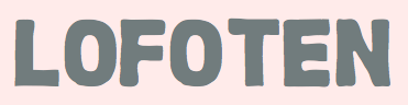 Anders writes about himself: A Norwegian wine-loving Interactive Art Director student from the cold depths of Lofoten. I did a two year advertising degree in Trondheim, Norway at the Norwegian School Of Creative Studies, giving me the fancy title "Creative market communicator". I then topped up my degree with an Honorary Bachelor of Arts in advertising from Southampton Solent University. At the moment I am studying at Hyper Island in Stockholm. I am currently exploring experience design, business transformation, team development and tech. His
 [
[ [
[ Based in Oslo, Birgit Hove evoked the lettering of Polish poster artist Leszek Zebrowski and German expressionism in her typeface
  During her studies in Stavanger, Norway, Camilla Høgemark created the bilined typeface Futuristic Font (2014) and as a student in Brisbane, Australia, she created the trilined custom typeface Tres Kokks Sportifs (2016).
  Started in 2008, this web place by Norwegian entrepreneur Roger S. Nelsson (based in Honningsvåg, Norway) sells fonts by Ray Larabie, Brian Kent, Nick Curtis, Derek Vogelpohl and Kevin King that were originally freeware fonts. Nelsson reworked them (more glyphs, more multilingual) and asks about 10 dollars per font now. He says his fonts now cover these Latin languages: Afrikaans, Albanian, Basque, Belarusian (Lacinka), Bosnian, Breton, Catalan, Chamorro, Chichewa, Cornish, Croatian, Czech, Danish, Dutch, English, Esperanto, Estonian, Faroese, Filipino (Tagalog), Finnish, French, Frisian, Galican, German, Greenlandic, Guarani, Hungarian, Icelandic, Indonesian, Irish (Gaelic), Italian, Kashubian, Kurdish (Kurmanji), Latvian, Lithuanian, Luxembourgian, Malagasy, Maltese, Maori, Northern Sotho, Norwegian, Occitan, Polish, Portuguese, Rhaeto-Romance, Romanian, Saami (Inari), Saami (Lule), Saami (North), Saami (South), Scots (Gaelic), Serbian (latin), Slovak(ian), Slovene, Sorbian (Lower), Sorbian (Upper), Spanish, Swedish, Tswana, Turkish, Turkmen, Ulithian, Walloon, Welsh, Yapese.
  Oslo-based Norwegian who was born in Cheltenham, UK, in 1966. Haanes teaches calligraphy, lettering and typography, and is a freelance calligrapher, book designer and typographer. He designed
  Daniel Brokstad lived in Australia where he graduated from RMIT University in Bachelor of Design. He returned to Stavanger, Norway, in 2011, and later joined Sagmeister & Walsh in New York City.
  Oslo-based Norwegian designer of the octagonal monoline typeface
  During her studies in Oslo, Edel Horne created the rune emulation font Fornminne (2015).
  Eifoni is the studio of Eivind Fonnaas Nilsen in Oslo. Elvind has done
  [
[ Stefan Ellmer is a Norwegian type designer based in Oslo. In 2014, he set up the commercial type foundry
  Trondheim, Norway-based creator of the
  Felix Skaara (Oslo, Norway) created the grotesque typeface Avia (2014), which was inspired by the golden era of aviation. [
 Launched at the end of August 2009 by Håkon Bertheussen, this was a truly free font generation service---the users own the generated fonts, and there are no commercial interests behind the scenes. Some minor improvements are being implemented. It looked and felt like the popular YourFonts, which is not free. Håkon Bertheussen is a design engineer at Atmel, Trondheim, Norway. He runs
 Espen Aaeng has been a designer and art director in Oslo since 1973. At
  [
[ Oslo, Norway-based type foundry, est. 2016. Their typefaces include Agentur, Adieu, Opposit, Plakat Grotesk (2016), Chapter (2017: by Kenneth Knutsen), and Riposte and Riposte Mono (2016: geometric sans typefaces by Kenneth Knutsen).
  [
[ Milos Mitrovic's foundry in Bergen, Norway, is called
  Type foundry in Stavanger, Norway. In 2015, they published the sans typeface KK Masiv. [
 For Nike Consept Store in Oslo, Hans Christian Øren (Oh Yeah Studio, Oslo) designed the prismatic typeface Oslo (2018), which takes a bit after the logo font for the Mexico City Olympics. Earlier, he designed a hipster font for Nike USA. [
 Håkon Sukuvara (Oslo, Norway) created
  Hjort Nidudsson (Norway?) is a supporter of open source software.
  Graphic design graduate of the Bergen National academy of the arts in Norway. Jacob lives in Copenhagen. Creator of the playful high-contrast curly typeface
  Norwegian photographer and graphic designer working within type design, editorial design and illustration. In 2020, she released the compressed sans typefaces Due Display and Commission Display, as well as Oblong Sans (a 5-weight grotesque) at Type Department. [
 [
[ Norwegian designer whi hails a small island in Norway called Bømlo and went to Bergen to study graphic design for two years. He created
  Jonas Helgeneset (Oslo, Norway) created the curvy decoratie headline typeface
  During his graphic design studies at Westerdals school of Communications in Oslo, Jørgen Brynhildsvoll created the delicate didone typeface
 Designer of the lettering for traffic signs in Norway, called
  Stavanger, Norway-based cartographer. In 2014, he created a typeface called UltiMap (2014).
  Oslo-based designer and illustrator. In 2010, he created a didone display typeface with art deco motifs and a bit of Pistilli Roman, called Gotheco Regular. [
 At Westerdals ACT in Oslo, Norway, Kristine Kallevik designed the sturdy Fabriken (2016), a typeface made to honour the industrialisation of Oslo and based on the letters used in the sign of the city's old sail cloth factory, Christiania Seildugsfabrik. [
 Graphic design student at NKF/NSCS in Trondheim, Norway.
  Illustrator and graphic designer located in Oslo, Norway. His/her typefaces:
  Graduate of the Westerdals School of Communication in Oslo. Creator of a nice typographic logo called Reach (2010). She also created a high-contrast art deco typeface called
  During his studies at Norges Kreative Fagskole in Trondheim, Norway, and at Solent University, Southampton, UK, Marcus Lien Gundersen designed these typefaces:
 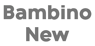 [
[ Matei Nichitescu (Monogram Design, Romania, and now Tønsberg, Norway) created these typefaces in 2014: Dendricula (connect-the-dots), Piper, Typewriter, Thinster, Monogram, Neon, Revolution, Printed Revolution, Halftone Revolution. In 2015, he added Designer, Chalk Bar and the handcrafted typefaces Manufactura (ultra tall) and Olive Oil. [
 Monokrom is a small independent type foundry based in Norway, founded by Frode Helland and Sindre Bremnes. Frode Bo Helland is a Norwegian graphic designer in Oslo who created the typefaces
  Graphic design student at Westerdals School of Communication in Oslo. She created a beautiful all caps display typeface called
  While studying at NKF, Ole Erik Sandbakken designed the artsy
  Oslo, Norway-based designer of the monospaced Cyrillic simulation typeface Arhaic (2015) and of Impossible Letters (2015, Escherian characters).
  Audun Stien, a graphic designer from Oslo, is based in Melbourne, Australia. He created the high-contrast fashion mag typeface
  [
[ Swiss art director who has done substantive typographic work for some clients. For Tess model agency in London, he custom-designed
  News designer and editor in Oslo. In December 2012, Sindre Bremnes, Hans Ivar and Frode Bo Helland set up the
 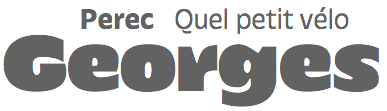 [
[ Norwegian type designer, b. 1991, who graduated from Westerdals School of Art in Oslo in 2015 and ECAL in 2017. At ECAL in Lausanne, he finished an MA in Art Direction and completed an exhaustive comparative study of the Geometric Sans genre. He joined
  Sun Helen Isdahl Kalvenes (b. Stavanger, Norway) was based in Copenhagen, Denmark, and is now in Oakland, CA. In 2012-2013, she studied towards an M.A. in Type Design at the KADK (Royal Danish Academy of Fine Art School of Design). In 2013, she graduated from the
 The Pyte Foundry was established in 2015 by Ellmer Stefan in Oslo, Norway. During the course of the year 2016 Ellmer Stefan released a new free display font every consecutive Monday. They explain: Paying tribute to the typographic diversity of the 19th century, this project's aim is not historical accuracy---none of the typefaces are strict revivals of specific typefaces produced in the Victorian era. It is rather a revival in spirit---indulging into stylistic manifoldness and idiosyncratic hyperbolism. The digital fonts are generated using a component-based system that globally applies changes made to independently adjustable letter parts, such as stems or serifs. This approach mirrors the production methods envisioned for the making of wood types around 1880: in American Wood Type 1818-1900 (Van Nostrand Reinhold Company, New York; 1969) historian Rob Roy Kelly refers to a series of inventions by William H. Page using interchangeable modules in the creation of wood type letters enabling the rapid manufacturing of new styles.
  Oslo-based designer (b. 1986) of i8080 (2017: old computer screen emulation font), Manos (2017), Modum (2017), Monomod (2017), the tall serif typeface Roland (2017), the modular monoline monospace sans typeface Borgen (2017), Sullivan (2017), Inverted Stencil (2017), the high-contrast sans High Society (2017), and the slim slab serif typeface Klub Katz (2017).
  Tiny Type Co. was established by Dutch graphic and type designer Robin Mientjes in 2016, in Oslo, Norway. Robin writes about herself: Robin Mientjes is a genderqueer feminist type designer, with an obsession for baking, cooking, and thoughtful graphic design. She's been designing for print and web for fifteen years, and studied at the KABK. Her typefaces:
  Oslo, Norway-based graphic designer. Creator of the multiline typeface Bird (2015) and the fun Finger Flickin Good (2015).
  During his graphic design studies in Trondheim, Norway, Tommy Larsen designed the display typeface
  Pages on
 Yeahllow is the company of Drammen (Skien?), Norway-based graphic designer
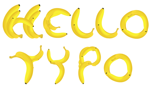
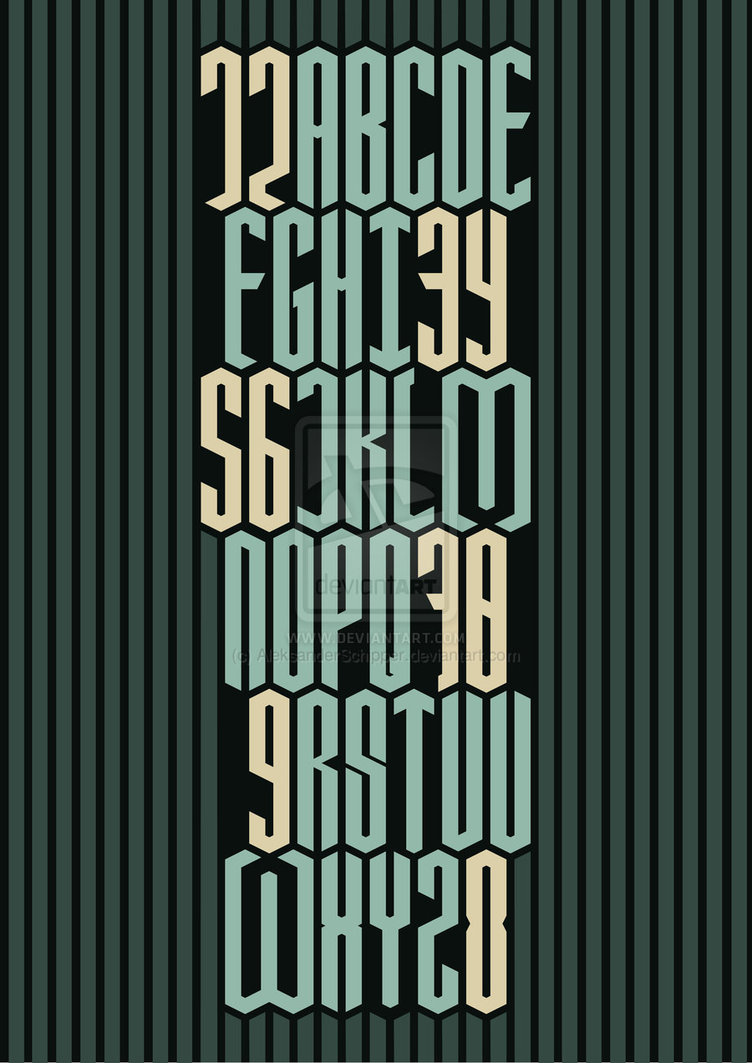
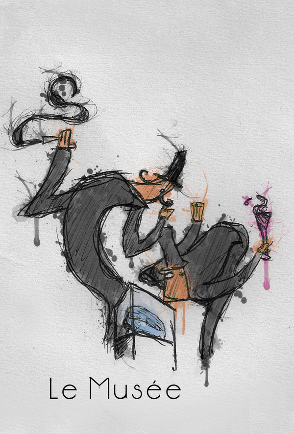
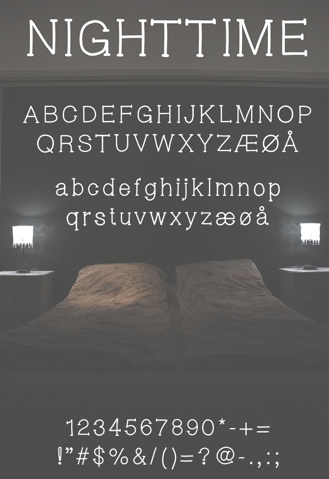
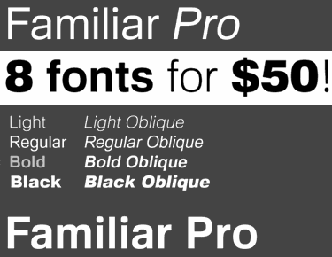
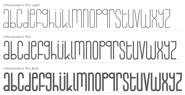
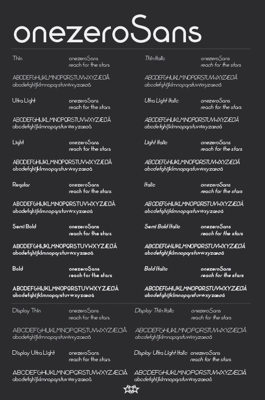
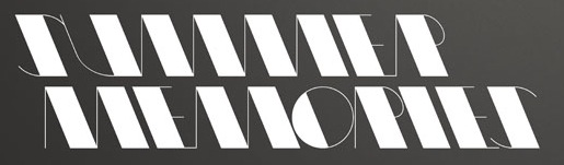
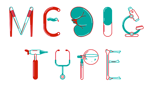
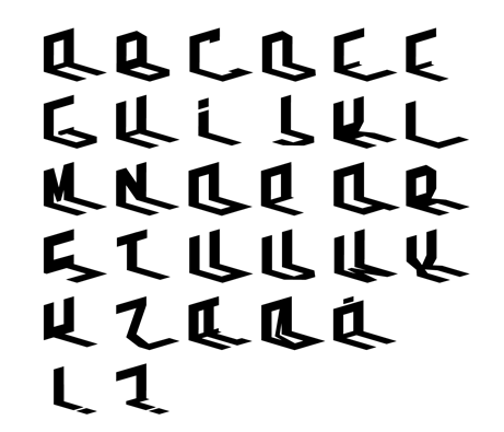
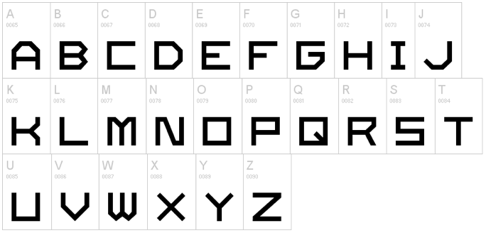
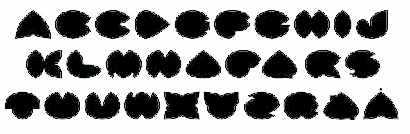
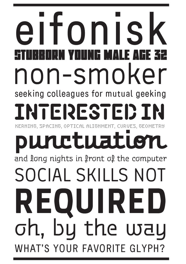
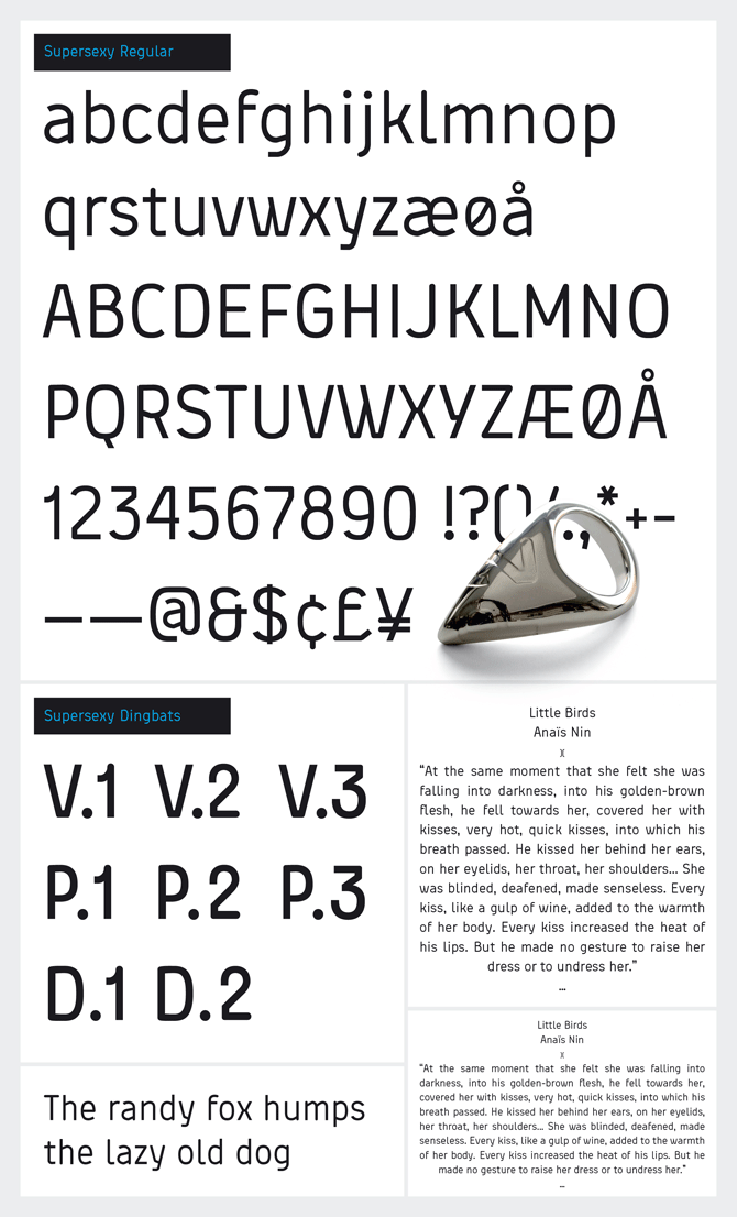
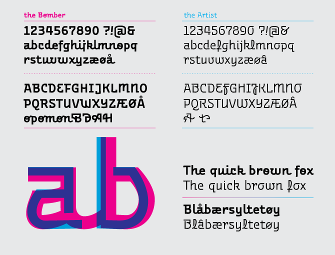
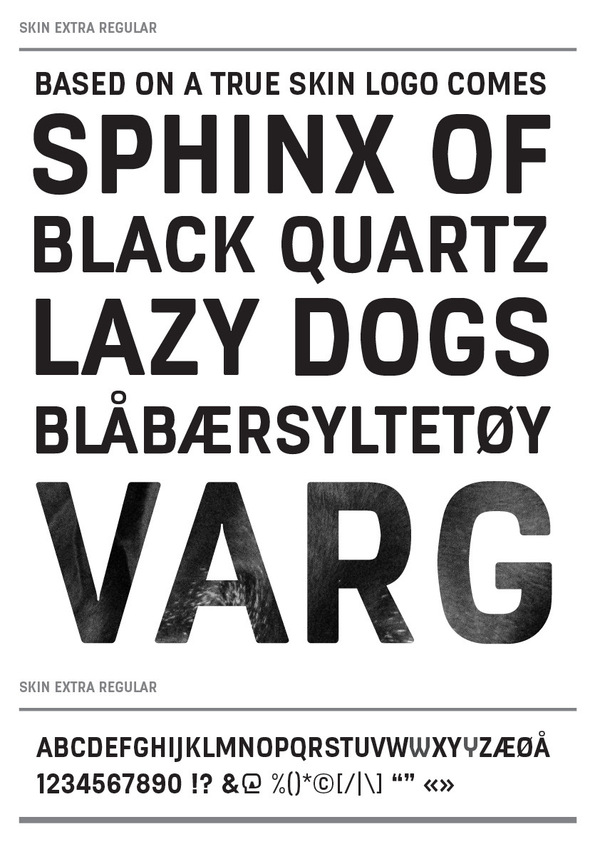
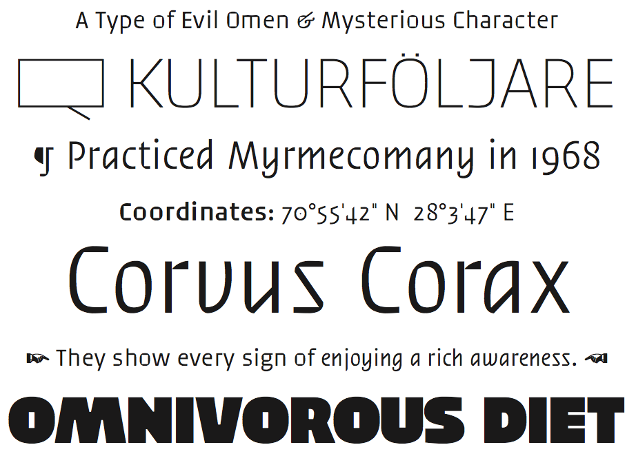
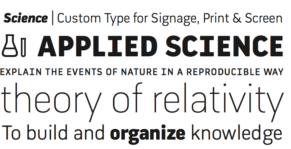
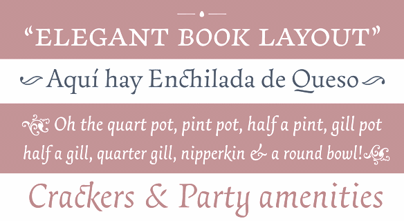
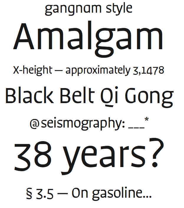
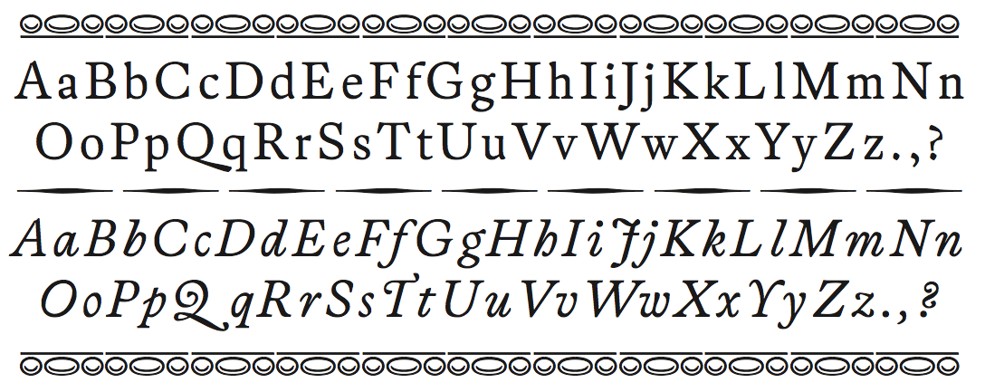
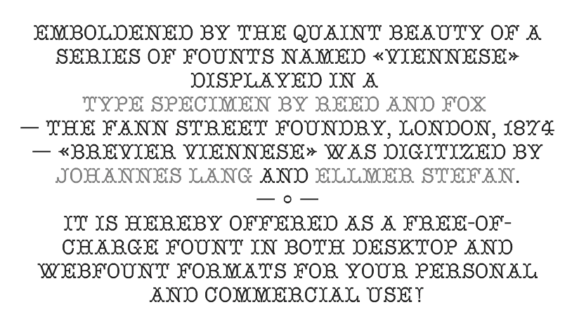
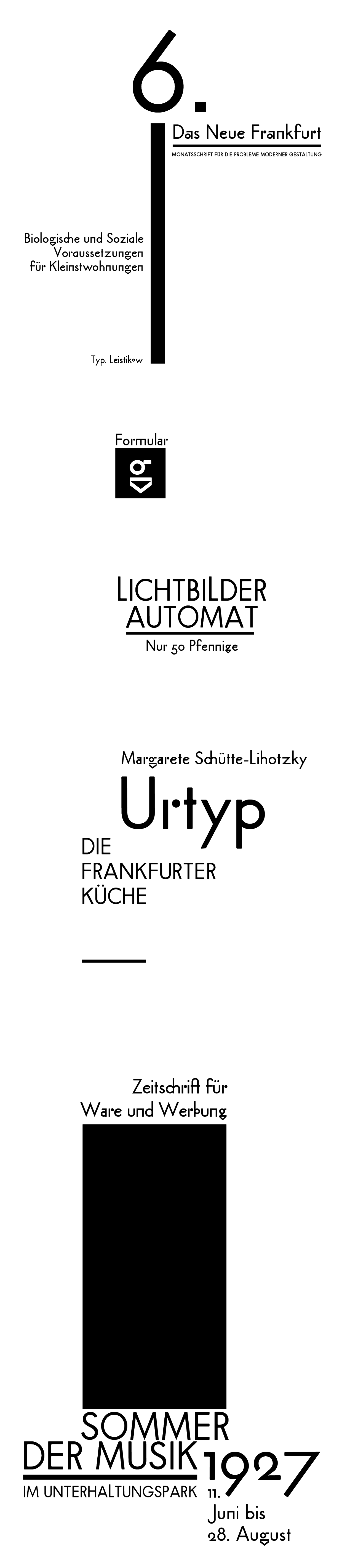
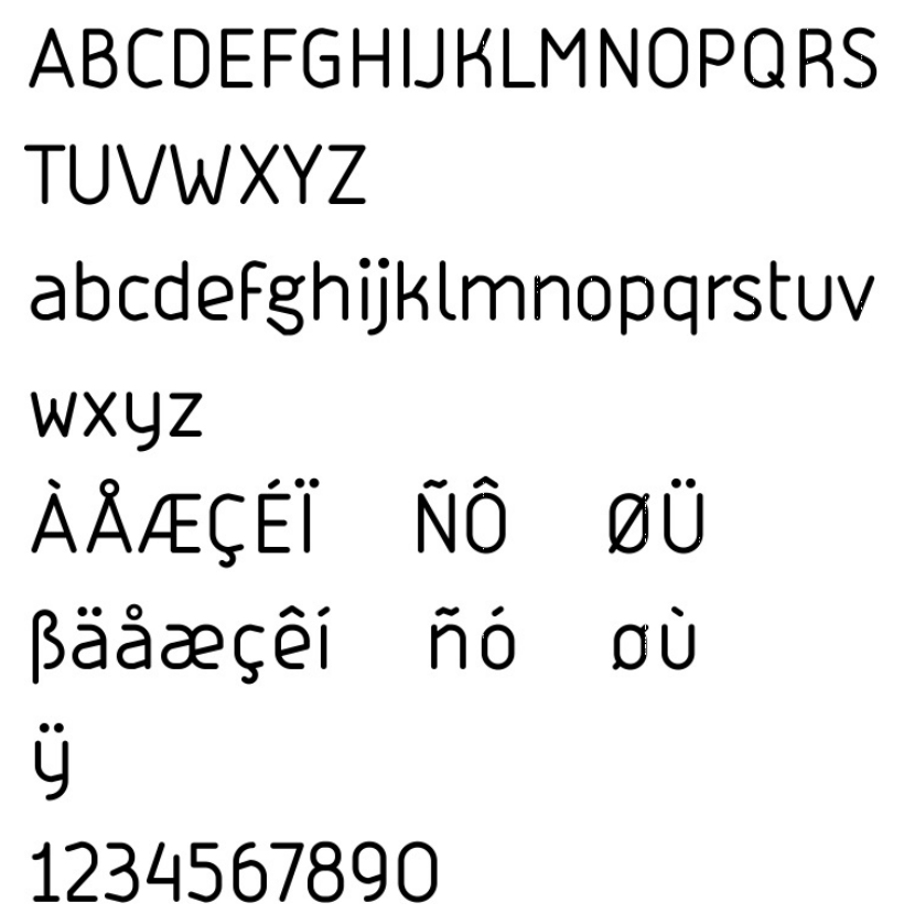
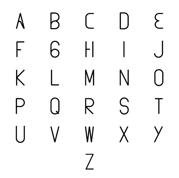
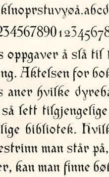
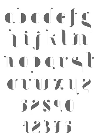
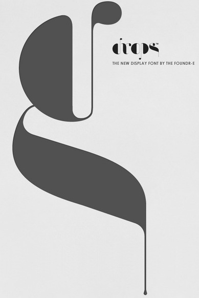
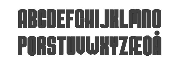
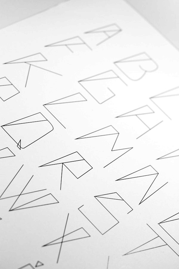
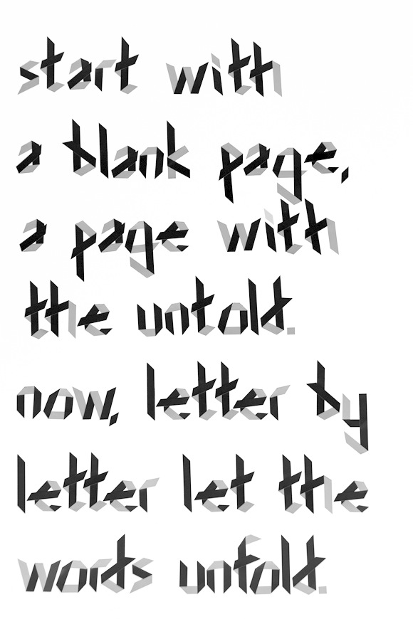
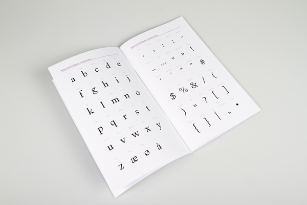
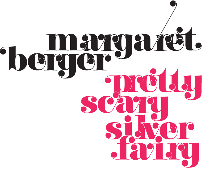
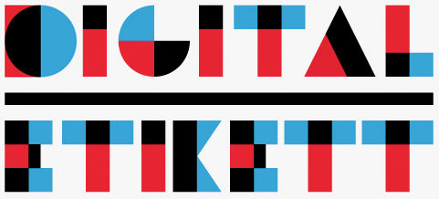
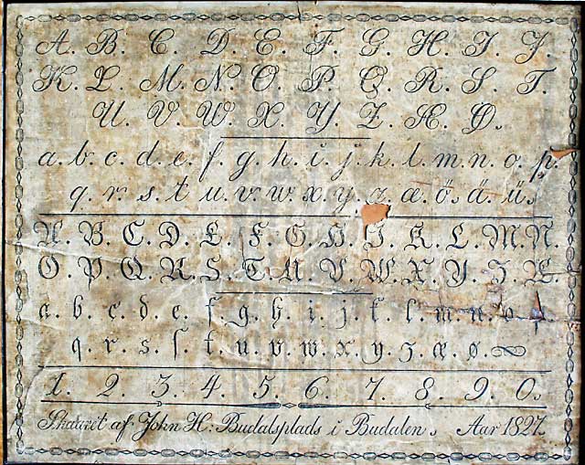
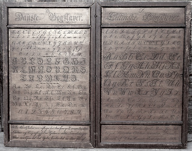
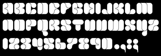
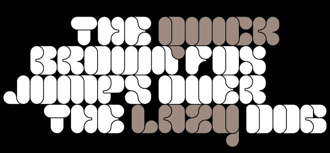
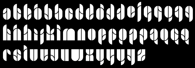
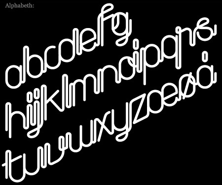
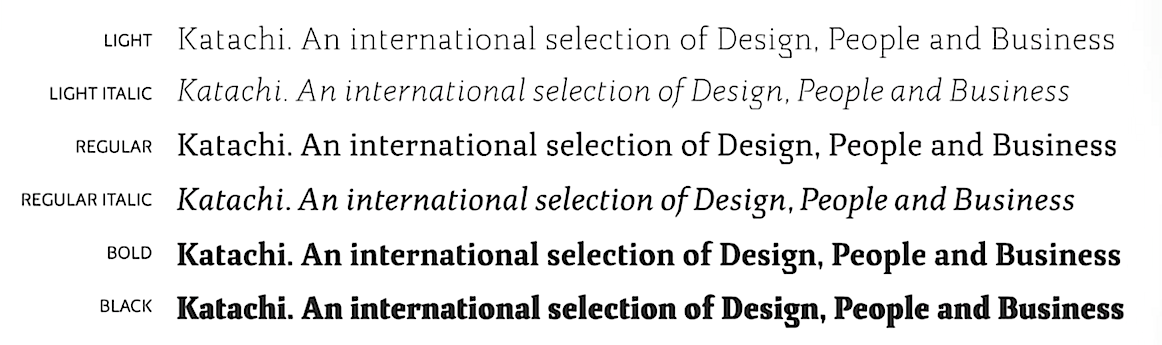
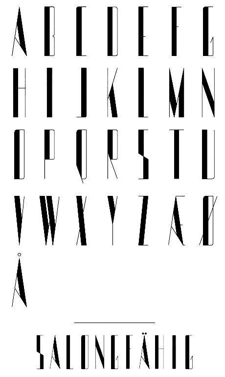
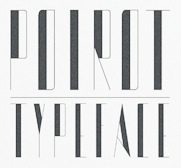
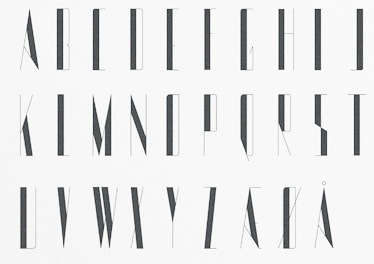
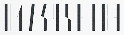
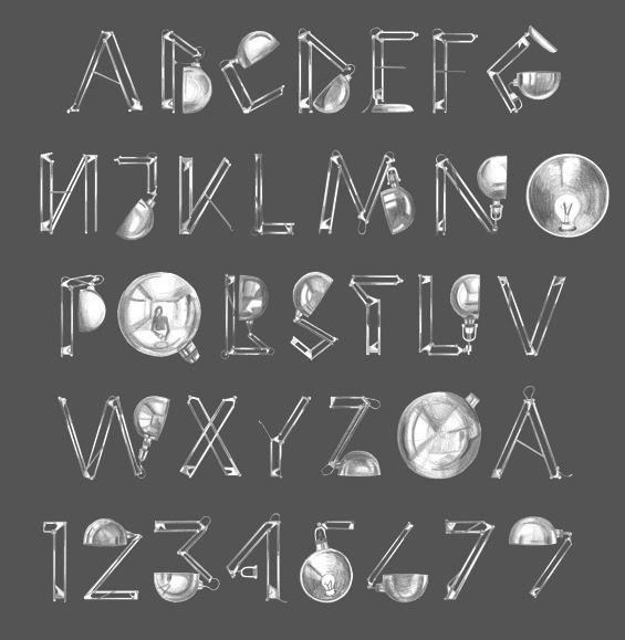
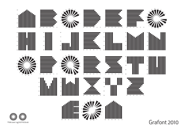
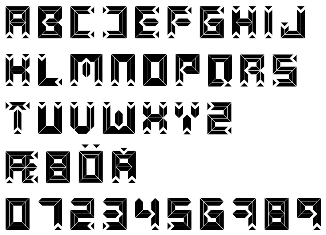
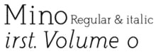
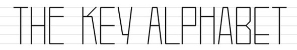
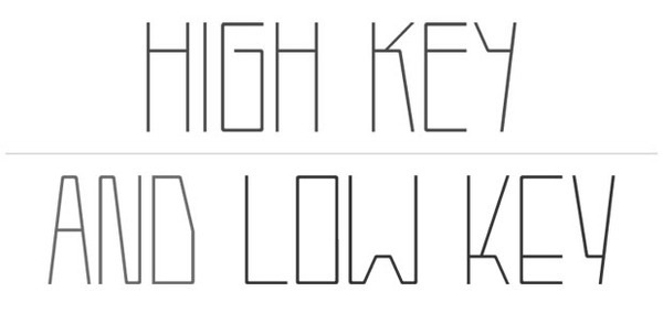
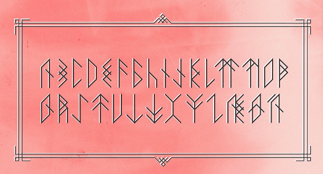
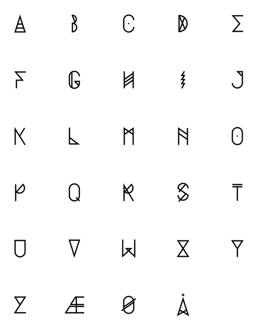
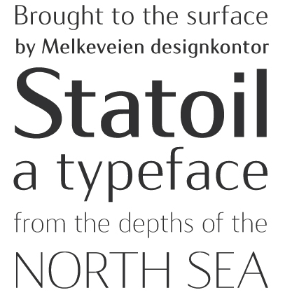
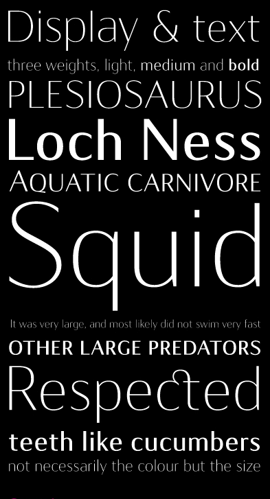
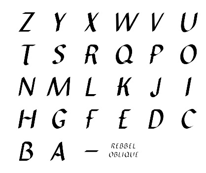
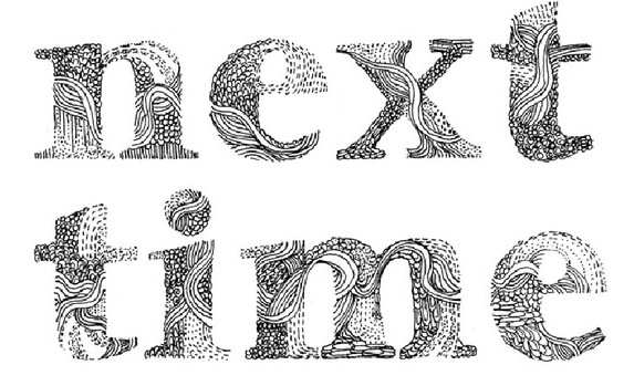
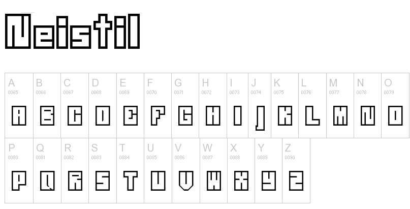
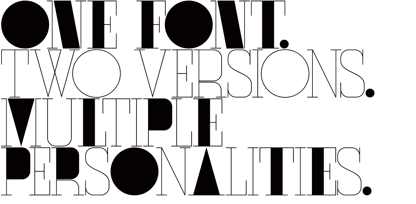
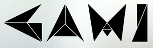
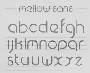
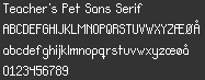
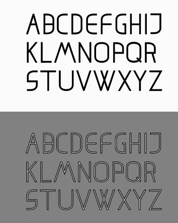
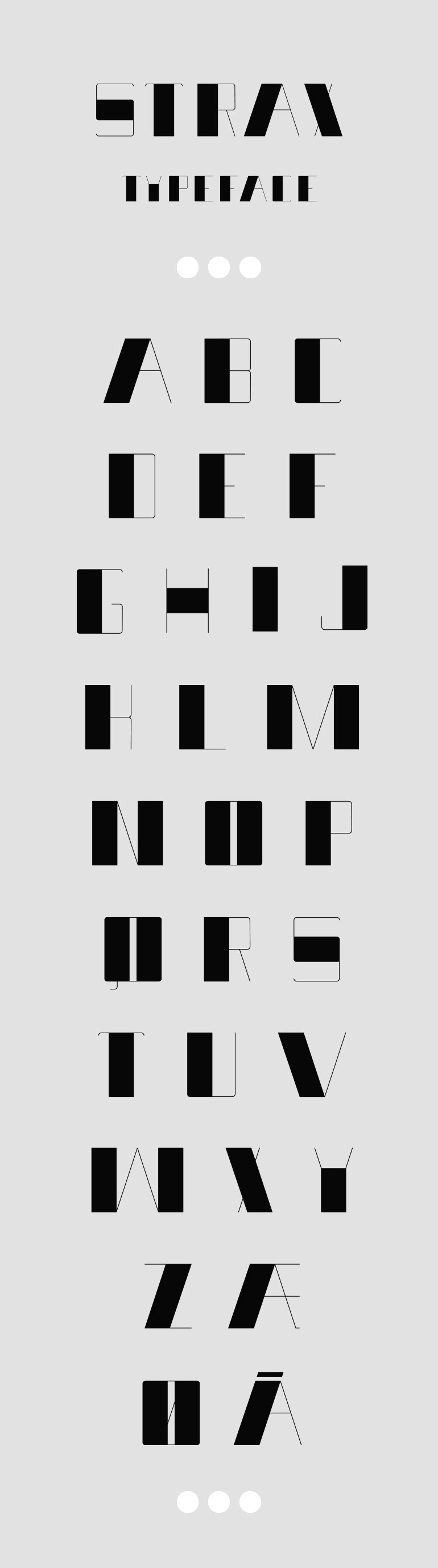
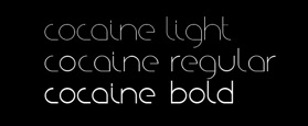
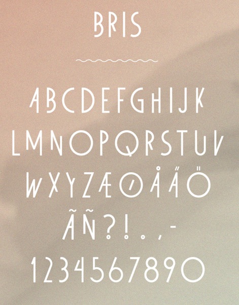
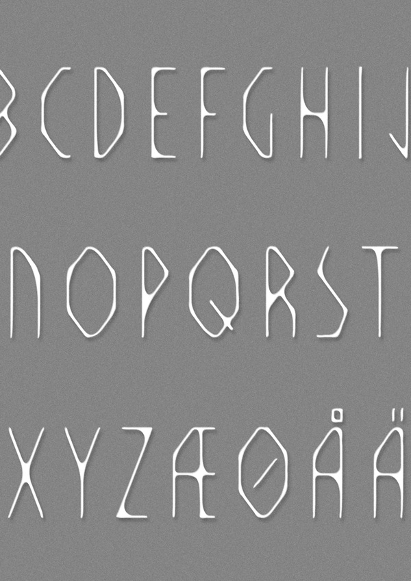
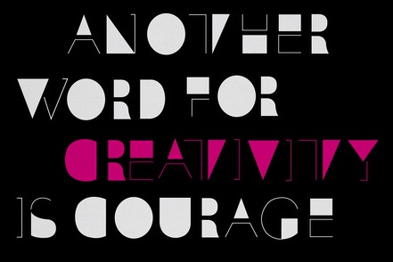
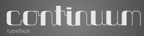
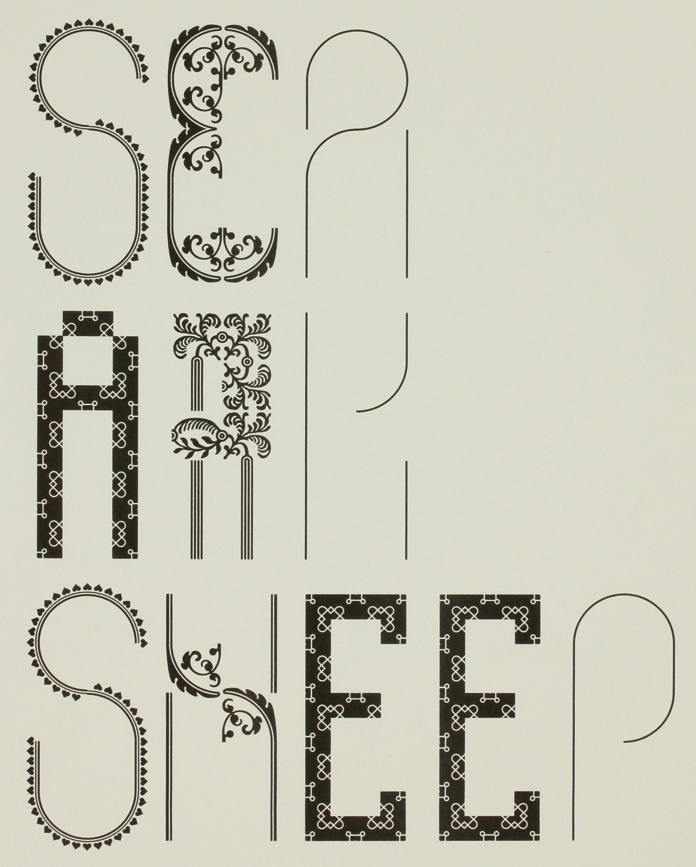
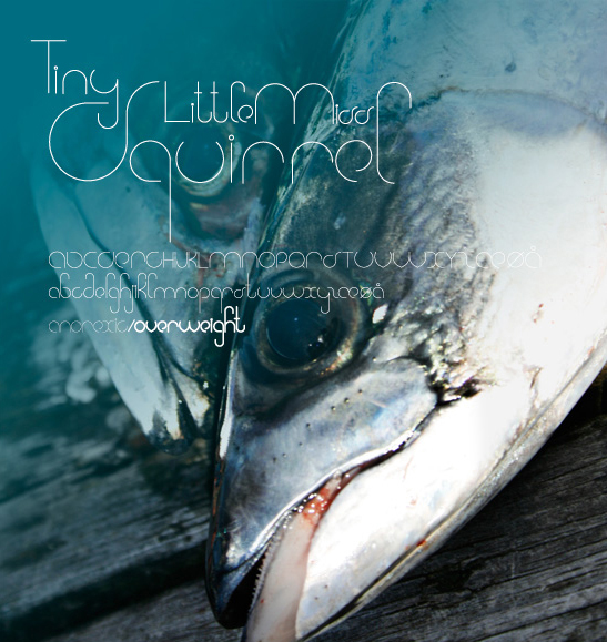
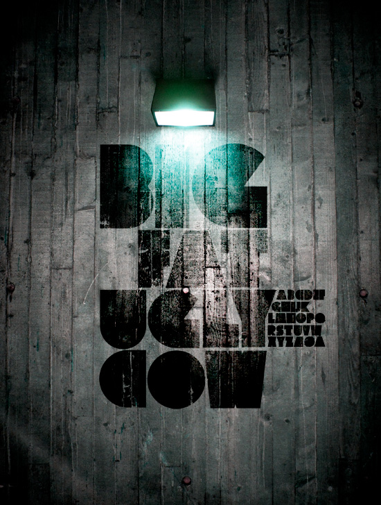
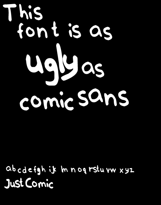
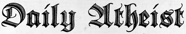
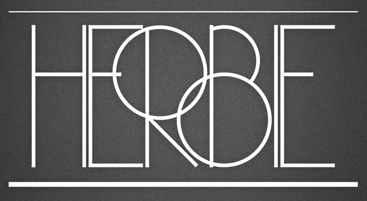
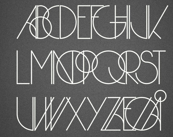
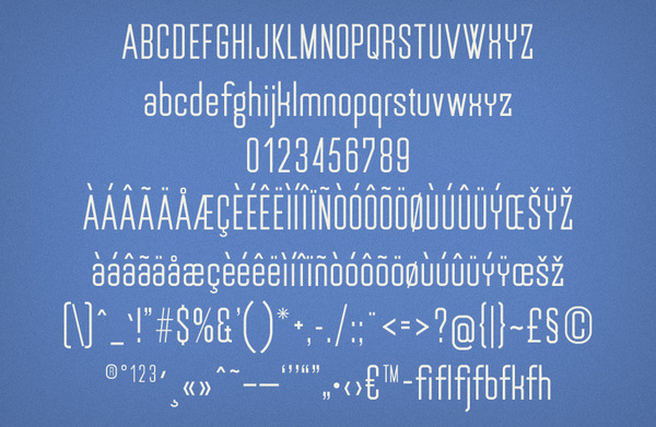
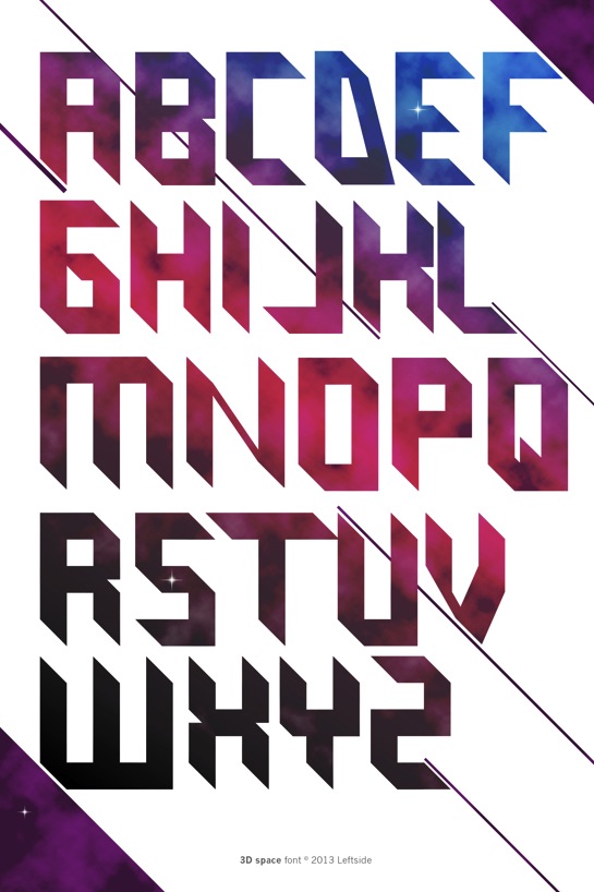
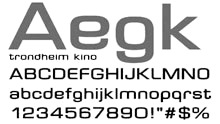
|
|
|
|