| | |
Afkari Studio (or: Kanatype, or: Musthafanet)
[Musthafa Kamal Emje]

|
Banda Aceh, Indonesia-based designer (b. 1985) in 2020 of Atakana Script, Bandar (a 5-style rounded monoline sans), Brullos (a free brush script), Gasing, Hollgati Sans, Klenik Slab, Majanan, Richest Sans, Vemina (a monoline script). Several of these fonts can also be found at Jarnawi Saja's Grontype foundry. Typefaces from 2021: By Note (a notebook script), The Prada (a tuxedoed sans with stiff cufflinks), Vemina (a scrapbook script), The Lingke (a tall condensed vintage display typeface), A Note (a notebook / marker pen font), Hokaplay (unicase, playful), Godan (a 10-style wide slab serif with a slightly futuristic twist), Nalom (an 8-style elliptical sans), Kalela Slab (a slab serif family with a silent movie feel), Beuna Line (multilinear), Alehna (a 5-style comic book sans), Grah (a marker font), Medan Slab. Typefaces from 2022: Sagobi (hand-crafted, for children's books), Amiline (script), Fungka City (a tall condensed sans). [Google]
[MyFonts]
[More] ⦿
|
Andrew H. Leman
[E-phemera (was: HPLHS Prop Fonts, and earlier: Prop Fonts)]
|
 [MyFonts]
[More] ⦿
[MyFonts]
[More] ⦿
|
Art deco typefaces by Nick Curtis: I
[Nick Curtis]
|
 Free art deco typefaces by Nick Curtis, made between 1997 and 2003. Nick Curtis also made commercial art deco typefaces, but these will be listed elsewhere.
 - AmstelHeavyNF (2002): based on this poster from 1926 by C. De Haas.
- AmsterdamTangram (2002): based on this poster by Joost Swarte from 1987 entitled "De wereldtentoonstelling van Joost Swarte".
- AnchorSteamNF (2002): based on a poster from 1923 by Wilhelm Poetter.
- Rainbow Bass (1982, Saul Bass) a vertically striped disco style design, was remade by Nick Curtis as Backstage Pass (1999, 2008).
- BeckerBlackNF (2002, 2007): Based on Alf R. Becker's lettering.
- BigAppleNF (2000, 2007).
- BoogieNightsNF, BoogieNightsShadowNF (2002, 2007): based on this poster from 1916 by Paul Hosch and Hans Melching. In 2009, CheapProFonts made a "pro" version.
- BoomerIngueNF (2002, 2007).
- Bric-aBraqueNF (1999, 2007). Bric-a-Braque was based on Cubist Bold (John W. Zimmerman, 1929).
- ChainsawGeometric (1999). Based on this alphabet by Draim (1928).
- ChippewaFallsNF (2002, 2007). Originally called Hiawatha. See this roadside photograph that inspired Nick.
- Coaster Poster (1999).
- DayPosterBlackNF, DayPosterShadowNF (2002, 2007).
- DebonairInlineNF (2000, 2007). The commercial Debonair Inline (2008) is an extension (uppercase, etc.) of Herbert Bayer's 1931 monocase typeface Architype Bayer, also known as the universal moderrn face.
- DecoBordersNF (1999) and DecoDingbatsNF (2000).
- Drumag Studio NF (2003, 2007).
- DustyRoseNF (2000), DustyRoseRevised (2007): Dusty Rose is an art deco typeface based on the logotype for the Dutch magazine Geillustreerd Schildersblad in 1940, by Anton Kurvers. The commercial Dusty Rose NF was published in 2008.
- EastMarket (1999), EastMarketTwoNF (2007).
- GradoGradooNF (2002, 2007): a Bauhaus-style font, based on this 1932 poster by Urbano Corva.
- Great Lakes (2003, 2007), GreatLakesShadowNF (2007): based on this poster by Peter Ewart (1935).
- Heavy Tripp NF, Heavy Tripp Ultra Bold (2001, 2007). Both Day Tripper NF and Heavy Tripp are based on Dignity Roman, a typeface from 1929 by art deco alphabet designer Alphonso E. Tripp.
- HeraldSquareNF, HeraldSquareTwoNF (2002, 2007): a font family based on a design by Welo shown in Studio Handbook for Artists and Advertisers (1927).
- High Five Jive NF, High Five NF (2001, 2007).
- Indochine NF (2003, 2007). Based on this poster by Joseph-Henri Ponchin (1931).
- Ironick-Normal (1999, 2007): an exaggerated Bernhard Modern.
- KerfuffleNF (2000, 2007). Based on this poster by Chris Van Der Hoef (1920).
- KismetNF. A free font. Based on this lettering.
- LabyrinthCapital, Labyrinth (1999, 2007). Based on this poster.
- MetroRetroNF (1999, 2007). MetroRetroRedux (2001, 2010) is a commercial version of that.
- Milton Burlesque NF (2000, 2007).
- Monkey Fingers NF (1999, 2007). Based on an alphabet by Otto Heim published in Farbige Alphabete (1925).
- MunchausenNF (2003, 2007). Based on a poster for an exhibition by Ludwig Heinrich Jungnickel (1911). This is inbetween art deco and art nouveau.
- NickerbockerNF (1999, 2007).
- NightcapCapital, Nightcap NF (1999, 2007). Based on Disque (A. Bardi, 1931).
- OdalisqueNF, OdalisqueRevised (2000, 2007). The commercial versions are Odalisque NF (2008) and Odalisque Stencil (2010). These art deco typefaces are based on Morris Fuller Benton's Chic (1927).
- ParkLaneNF, ParkLaneRevised (2000, 2007).
- PhattPhreddyNF (2001, 2007).
- PinballWhizNF (2002, 2007). Based on this logotype by Joost Swarte for the comic-strip series "Katoen + Pinbal" (1975).
- PlatonickNF (1999, 2007).
- PlugNickelNF (+Black) (1999, 2007): a reworking of Bremen Black, with small caps and a rather skeptical uppercase R added.
- RadioRanchNF (1999, 2007). Adolf Behrmann designed the classical display typeface Rundfunk at Berthold in 1928. This typeface was digitized by Nick Curtis as Radio Ranch NF.
- RaskalnikovNF (2003, 2007). A Cyrillic simulation typeface based on this poster.
- RialtoEngraved, Rialto NF (2000, 2007): a Broadway style art deco face.
- RiotSquadNF (2000, 2007). after a design by Otto Heim from Heim's 1925 book, Farbige Alphabete.
- RitzyRemixNF (2000, 2007). RitzyNormal is based on Tom Carnase's Busorama.
- Seaside Resort NF (2003, 2007). A bilined titling typeface based on a 1933 poster by Italy's Bertarelli Studios.
- SelznickNormal, SelznickRemixNF (1999, 2007). An art deco typeface inspired by movie theaters of the 1930s. Based on ITC Anna (1991, Daniel Pelavin).
- Sesquipedalian, SesquipedalianAlternates (2000, 2007). Inspired by a handlettered logo for Torre's Buckdruckerei in Vienna, circa 1919.
- Sid The Kid NF (1999, 2007).
- Skittles N Beer NF (2007) is based on handlettering on a 1929 brochure for the P&O British-India Steamship Line.
- Standing Room Only NF (1999, 2007). Modeled after Broadway, designed by Morris Fuller Benton for ATF in 1928, originally named Broadway Poster.
- Stony Island NF (2002, 2007). An adaptation of an art deco font called Chicago Modern, designed by lettering artist Alf Becker, whose designs graced the pages of Signs of the Times magazine from the late 30s into the 50s.
- StudebakerNF-Bold, Studebaker (1999, 2007). Based on the lettering on a package for True-Mark Brand Typewriter Ribbons, circa 1938, designer unknown.
- TaraBulbousCapital, TaraBulbousNF (1999, 2007). TaraBulbous NF (the commercial version is from 2008) is a fat-lettered font based on Carlyle-Oring lettering. See also here.
- TitanickDisplayNF (1999, 2007): a remake of the bold pin-striped trilined Dextor by L. Meuffels.
[Google]
[MyFonts]
[More] ⦿
|
CAT Design Wolgast
[Peter Wiegel]
|
 Wolgast-based type designer Peter Wiegel (b. 1955) runs CAT Design Wolgast. Designer of these free fonts:
 - In 2019: Kufi Pattern.
- In 2018: Aurach Tri (a trilined typeface), Googee (monoline circle-themed sans), Gianna (medieval script), Hamburger Schwabacher.
- In 2017: Eyechart (heavy slab serif), Border Control (inline), Espresso Dolce (rounded sans), Gotisch Weiss, Halt (a dry brush typeface after Walter Hoehnisch's Stop from 1939), Kanzler, Llewie (rounded sans), Schulze Werbekraft (expressionist, after Arthur Schulze, 1926).
- In 2016: Ronaldson Gothic (after a MacKellar, Smiths & Jordan Co original), Vorgang (a great 1920s geometric sans), 5by7 (LED pixel font), BP 12-22 (industrial sans), u DIN 1451 Mittelschrift, Flubby, Gaeilge (Irish / uncial), Junior CAT (after Hans Heimbeck, 1936), CAT Liebing Gotisch (after Kurt Liebing), Tippa (an old typewriter font based on Adler Tippa 1).
- In 2015: Nuernberg (blackletter), CAT Schmalfette Thannhaeuser (blackletter), Offenbacher Reform (a revival of Offenbacher Reform, a blackletter typeface by Roos & Junge), Autobahn (blackletter), Barloesius Schrift (after Georg Barloesius's Barlösius Schrift, 1906), CAT-Franken-Deutsch (after Alfons Schneider, 1936), Fuckin Gwenhwyfar, CAT Kurier (a script after Herbert Thanhaeuser's Kurier from 1939), CAT Linz, CAT Rhythmus (a sharp-edged black grotesk after a Schriftguss AG original), DIN Schablonierschrift (DIN-based stencil), CAT North Licht, Feronia, Fette National Fraktur (after Walter Hoehnisch, 1934), Grobe-Plakat-Fraktur, CAT Childs (fifties style cursive typeface), Jena Gotisch (decorative caps), Kabinett Fraktur (after Johann Friedrich Unger, 1793-1794), Wattauchimma (heavy hipster sans), Friedolin (blackletter), Lorem Ipsum, Symphonie (a calligraphic script, reviving Imre Reiner's Symphonie (1938), also called Stradivarius (1945)), Power (a retro techno typeface), Krugmann Brush, Omega.
- In 2014: BernerBasisschrift1, BernerBasisschrift2 (school script), Berolina, Brausepulver (after Brause & Co., 1912), Fette Mikado (psychedelic style oriental look), Germanica, Gloria, HentimpsCirclet (blackletter), Hofstaetten (blackletter), Kleinsemmering, KuenstlerGotisch (blackletter), LacledeCAT (psychedelic), NeptunCAT, Neue Zier Schrift (a mischievous curly script), Pommern Gotisch, Reclame, CAT Report (retro brush script), Rueck-Italic, Rueck, RueckLeft, RueckLicht, RundschriftCAT (hairline ronde), Standard Graf (German expressionist and hexagonal typeface), Teutonic, VerzierteFavorite, VictoriaCAT, AdmiralCAT (a retro script), Dynamo (poster font), Des Malers Fraktur, Kanzleyrath (blackletter), Ober-Tuerkheim (art nouveau), PopplFrakturCAT (blackletter), Rundkursiv, Modeschrift (fifties script), Biedermeier Kursiv, Ehmcke Federfraktur (after a 1935 font by F.H. Ehmcke), Wernicke Schwabacher (after an original by Emmi Wernicke), Gotische Missalschrift, Hand Textur (after a 1935 font by F.H. Ehmcke), Renata (after a 1914 bastarda by Bauersche Giesserei), Rundgotisch Rauh (possibly after a Schelter & Giesecke design from 1903), Offenbacher Schwabacher (after Kurt Wanschura's bastarda from 1900), Incopins Clusters (multilined typeface), BadGong, Bernardo Moda (Bold, Semibold, Moda, Contrast: modeled after Lucian Bernhard's Bernhard fashion), CAT-Hohenzollern (after a 1902 art nouveau font by Bauersche), CATNorth, CATNorthLicht, CATNorthShadow, CAT Zentenaer Fraktur UNZ1 (a blackletter after a 1937 original by F.H.E. Schneidler), Coggers-Tariqa, EirikRaude, Fabrik (a geometric sans), Grobe Deutschmeister (German expressionist face), Harry Piel (or Piehl--a tattoo font), Kanalisirung, Klaber-Fraktur, Peter Obscure, Rumburak (a fat retro script), Flottflott (retro script), Indira K, Regent UNZ (a Schwabacher), Postamt, TGL 0-1451 Engschrift (a DIN-like font).
- In 2013: Spartakus (+Round), Cut Me Out (white on black sans), 5by9 (dot matrix face), Tartlers End (high-contrast ball terminal face), Alpha 54 (rounded flared script face), Chunk Five Ex (slab serif; he writes: With permission of Meredith Mandel, the original author of the ASCII-Font Chunk Five, I have extended Chunk Five Ex to a full featured unicode font with all figures used in Latin and Cyrillic writing), Simple Print (simple sans), Fette Bauersche Antiqua (a didone fat face), Manuskript Gothisch (after Manuskript Gotisch (1899, Bauersche), which was modeled after Wolfgang Hopyl's 1514 Textura), Quast (hairy font).
- Still in 2013, he published a number of school scripts, including Neue Rudelskopf, Deutsche Normalschrift, Imrans School, Rastenburg (German school font), and Bienchen.
- In 2012: Hardman (connected fifties script), Immermann (a quaint slab serif), Quast (grunge), Fundamental Brigade (sans family), DiffiKult (a bilined face), Men Nefer (a Memphis lookalike), Fette Unz Fraktur (like Fette Fraktur), Mutter Krause (for the reconstruction of the 1929 silent movie "Mutter Krausens Fahrt ins Glück", where it is used for intertitles, that where missing. The font is redrawn from the original intertitles), Youbilee (a font with laurels).
- In 2010: Alfabilder (dingbats), Gondrin (athletic lettering with a 3d effect), Helvetia Verbundene (making Helvetica into a school script? The original typeface was by Carl Albert Fahrenwaldt 1901), Proletarsk (a grotesk face), Vis-à-vis (great idea--a double-storied serif face), ApolloASM (Victorian), BertholdrMainzerFraktur, Doergon-Regular (license plate font), DoergonBackshift, DoergonShift, Eureka (Victorian, ornamental face), GoeschenFraktur (1880-style Fraktur used in Sammlung Göschen books), Makushka, MakushkaKontura, MakushkaQuadriga, MakushkaSecunda, Moderne3DSchwabacher, ModerneGekippteSchwabacher, StrassburgFraktur, TGL0-16 (same as DIN 16), TGL0-17 (same as DIN 17), TGL0-17Alt, Tank (emblems of gas companies), EricaType-Bold, EricaType-BoldItalic, EricaType-Italic, EricaType-Regular (typewriter), ErikaOrmig, Fibel Vienna (2012, a high-legged sans), GreifswalderTengwar-Regular, GreifswalerDeutscheSchrift (German Schreibschrift), Midroba-Regular (a strong mechanical octagonal face), MidrobaSchatten, MMX2010 (futuristic), Präsent60, Rotunda Pommerania (blackletter), TengwarOptime, TengwarOptimeDiagon, cbe-Bold, cbe-BoldItalic, cbe-Italic, cbe.
- In 2009: 18thCenturyInitials, 18thCenturyKurrent-Regular, 18thCenturyKurrentAlternates, German writing from the 18th century), CentreClaws, CentreClawsBeam1, CentreClawsSlant, Cöntgen Kanzley Regular (blackletter), Cöntgen Kanzley Aufrecht (2009), ElficCaslin, H1N1, Loxembourg1910Shadow (an art nouveau-influenced stencil face), Luxembourg1910, Tschichold, VarietScala (an art deco sans family), Varietee, VarieteeArtist, VarieteeCabaret, VarieteeCascadeur, VarieteeCasino, VarieteeCirque, VarieteeColege, VarieteeConferencier, VarieteeFolies, VarieteeIkarier, VarieteeJongleur, VarieteeMirage, VarieteeRevue, VarieteeTheatre, KochFetteDeutscheSchrift (blackletter), MoradoFelt-Regular (upright connected script), MoradoMarker (2009), MoradoNib, PreussischeVI9 (DIN-like family), PreussischeVI9Linie, PreussischeVI9Schatten-Linie, PreussischeVI9Schatten, SchatternvonPreussischeVI9, Stage (art deco), Ring Matrix (dot matrix), Nathan, Amptmann Script (2009, upright connected script), Cat Shop, Blankenburg (blackletter), Murrx (arched face), Schwaben Alt (1988, bastarda), Vrango, 14LED (Regular, Phattt-Heavy, Rised-Black), 24LED (+Bright, +Grid, +Modul), DIN1451fetteBreitschrift1936-Regular, FibelNord (basic sans family with an architectural twist), FibelSued (family), PaneuropaBankette, PaneuropaCrashbarrier-Black, PaneuropaFreeway, PaneuropaHighway, PaneuropaRoad, PaneuropaStreet, PaneuropaWrongWay, Quirkus (family), RingMatrix (dot matrix family), RingMatrix3D, RingMatrixTwo, DiscipuliBritannica (connected script), GruenewaldVA-Regular (connected school script), Rudelskopfdeutsch-Aufrecht, WiegelLatein (connected school script), WiegelLateinMedium (2009), Morado, Moebius Bicolor (art deco), Elbaris (sans), ElbarisOutline, Nomitais (multiline face), RostockKaligraph, Waschkueche, WaschkuecheGrob-Ultra, WiegelKurrent (traditional German school script), WiegelKurrentMedium, XAyax, XAyaxOutline (2009), Kaufhalle (squarish), Quimbie (art deco), CasaSans-Regular, Elb-Tunnel, MeyneTextur (blackletter), Yiggivoo, TGL 31034-1 (futuristic sans), Beroga (a simple organic sans).
- Before 2009: Xayax, PreussischeIV44Ausgabe3 (2006, a severe sans), Utusi Star (1989, very condensed all-caps face), Avocado (2006, script face), CbeNormal (2006, script face), Leipzig Fraktur (+Bold) (2006), Berlin Email (2006, a condensed sans family, followed in 2009 by Berlin Email Serif), MaassslicerItalic (2006, a futuristic typeface made for Rudolf Maass + Partner GmbH), Powerweld (a gorgeous avant-garde typeface made for OPTI Pumpen und Technik GmbH), WolgastScript (2005), WolgastTwo (2006, connected script), WolgastTwoBold, ZeichenDreihundert-Regular, ZeichenHundert-Regular, ZeichenVierhundert-Regular, ZeichenZweihundert-Regular (2006, traffic dingbats), Djerba simplified (Arabic font, Computer and Technologie, Hamburg, 1995; it can be downloaded here), Titus FrakturBaltic (1998), TITUS FrakturEast Normal (1998), and TITUS FrakturWest Normal (1998) [which used to be downloadable here; these fonts were retired and the Titus name dropped; most of the glyphs made it to Schwaben Alt].
Dafont link. One more URL. Fontspace link. Yet another URL. Font Squirrel link. Fontsy link. The list of his truetype and opentype typefaces as of 2011: 18thCenturyInitials, 18thCenturyKurrentStart, 18thCenturyKurrentText, Alfabilder, AlteDIN1451Mittelschrift, AlteDIN1451Mittelschriftgepraegt, AmptmannScript, ApolloASM, Avocado, Barnroof, BerlinEmail, BerlinEmail2, BerlinEmailBold, BerlinEmailBold, BerlinEmailHeavy, BerlinEmailHeavy, BerlinEmailOutline, BerlinEmailOutline, BerlinEmailSchaddow, BerlinEmailSchaddow, BerlinEmailSemibold-Bold, BerlinEmailSemibold-Bold, BerlinEmailSerif, BerlinEmailSerif, BerlinEmailSerifSemibold, BerlinEmailSerifSemibold, BerlinEmailSerifShadow, BerlinEmailWideSemibold, BerlinEmailWideSemibold, Beroga, Beroga, BerogaFettig-Bold, BerogaFettig-Bold, BertholdMainzerFrakturUNZ1A-Italic, BertholdMainzerFrakturUNZ1A, BertholdrMainzerFraktur, Blankenburg-Regular, BlankenburgUNZ1A-Italic, BlankenburgUNZ1A, CasaSans-Regular, CasaSans, CasaSansFettig-Bold, CatShop, CentreClaws, CentreClawsBeam1, CentreClawsSlant, ChunkFiveEx, CntgenKanzley-Regular, CntgenKanzleyAufrecht, DIN1451fetteBreitschrift1936-Regular, DiscipuliBritannica, DiscipuliBritannicaBold, Doergon-Regular, DoergonBackshift, DoergonShift, DoergonWave-Regular, Elb-Tunnel, Elb-TunnelSchatten, Elbaris, ElbarisOutline, ElficCaslin, EricaType-Bold, EricaType-BoldItalic, EricaType-Italic, EricaType-Regular, ErikaOrmig, Eureka, FibelNord-Bold, FibelNord-BoldItalic, FibelNord-Italic, FibelNord, FibelNordKontur, FibelSued-Bold, FibelSued-BoldItalic, FibelSued-Italic, FibelSued, FibelSuedKontur, GoeschenFraktur, GoeschenFrakturUNZ1A-Italic, GoeschenFrakturUNZ1A, Gondrin, GreifswalderTengwar-Regular, GreifswalerDeutscheSchrift, GruenewaldVA-Regular, GruenewaldVA1.Klasse, GruenewaldVA3.Klasse, H1N1, HelvetiaVerbundene, KochFetteDeutscheSchrift, KochFetteDeutscheSchriftUNZ1A-Italic, KochFetteDeutscheSchriftUNZ1A, LeipzigFrakturBold, LeipzigFrakturHeavy-ExtraBold, LeipzigFrakturLF-Bold, LeipzigFrakturLF-Normal, LeipzigFrakturNormal, LeipzigFrakturUNZ1A-Bold, LeipzigFrakturUNZ1A-BoldItalic, LeipzigFrakturUNZ1A-Italic, LeipzigFrakturUNZ1A, Luxembourg1910, Luxembourg1910Contur, Luxembourg1910Ombre, MMX2010-Regular, Maassslicer3D, Maassslicer3D, MaassslicerItalic, MaassslicerItalic, Makushka, MakushkaKontura, MakushkaQuadriga, MakushkaSecunda, MeyneTextur, MeyneTexturUNZ1A-Italic, MeyneTexturUNZ1A, Midroba-Regular, MidrobaSchatten, Moderne3DSchwabacher, ModerneFetteSchwabacher, ModerneFetteSchwabacherUNZ1A-Italic, ModerneFetteSchwabacherUNZ1A, ModerneGekippteSchwabacher, MoradoFelt-Regular, MoradoMarker, MoradoNib, MoradoSharp-Regular, Murrx, Nathan-CondensedRegular, Nathan-ExpandedRegular, Nathan-Semi-expandedRegular, Nathan, NathanAlternates-CondensedRegular, NathanAlternates-ExpandedRegular, NathanAlternates-Semi-expandedRegular, NathanAlternates, Nomitais, Nomitais, Numikki, Numukki-Italic, Numukki-Italic, Numukki, Powerweld, PreussischeIV44Ausgabe3, PreussischeIV44Ausgabe3, PreussischeVI9, PreussischeVI9Linie, PreussischeVI9Schatten-Linie, PreussischeVI9Schatten, Proletarsk, Prsent60, Quimbie, Quimbie3D, QuimbieShaddow, QuimbieUH, Quirkus-Bold, Quirkus-BoldItalic, Quirkus-Italic, Quirkus, QuirkusOut, QuirkusUpsideDown, RostockKaligraph, RotundaPommerania, RotundaPommeraniaUNZ1A-Italic, RotundaPommeraniaUNZ1A, Rudelskopfdeutsch-Aufrecht, SchatternvonPreussischeVI9, Schulfibel-Nord-Linie-2, SchwabenAlt-Bold, SchwabenAltUNZ1A-Italic, SchwabenAltUNZ1A, Stage, StrassburgFraktur-Regular, TGL0-16, TGL0-17, TGL0-17Alt, TGL31034-1, TGL31034-1, TGL31034-2, TGL31034-2, Tank, TengwarOptime, TengwarOptimeDiagon, TitilliumMaps29L-1wt, TitilliumMaps29L-400wt, TitilliumMaps29L-800wt, TitilliumMaps29L-999wt, TitilliumText22L-1wt, TitilliumText22L-250wt, TitilliumText22L-400wt, TitilliumText22L-600wt, TitilliumText22L-800wt, TitilliumText22L-999wt, TitilliumTitle20, UtusiStar-Bold, UtusiStar, VarietScala, Varietee, VarieteeArtist, VarieteeCabaret, VarieteeCascadeur, VarieteeCasino, VarieteeCirque, VarieteeColege, VarieteeConferencier, VarieteeFolies, VarieteeIkarier, VarieteeJongleur, VarieteeMirage, VarieteeRevue, VarieteeTheatre, Via-A-Vis, Vrng, Waschkueche, Waschkueche, WaschkuecheGrob-Ultra, WaschkuecheGrob-Ultra, WiegelKurrent, WiegelKurrent, WiegelKurrentMedium, WiegelKurrentMedium, WiegelLatein, WiegelLateinMedium, WolgastScript, WolgastScript, WolgastTwo, WolgastTwo, WolgastTwoBold, WolgastTwoBold, XAyax, XAyax, XAyaxOutline, XAyaxOutline, YiggivooUnicode-Italic, YiggivooUnicode-Italic, YiggivooUnicode, YiggivooUnicode, YiggivooUnicode3D-Italic, YiggivooUnicode3D-Italic, YiggivooUnicode3D, YiggivooUnicode3D, ZeichenDreihundert-Regular, ZeichenDreihundertAlt, ZeichenHundert-Regular, ZeichenHundertAlt, ZeichenVierhundert-Regular, ZeichenZweihundert-Regular, ZeichenZweihundertAlt, cbe-Bold, cbe-BoldItalic, cbe-Italic, cbe, kaufhalle, kaufhalle, kaufhalleblech, kaufhalleblech, moebius. His type 1 fonts as of 2011: Avocado, BerlinEmail, BerlinEmail2, BerlinEmailBold, BerlinEmailHeavy, BerlinEmailOutline, BerlinEmailSchaddow, BerlinEmailSemibold-Bold, BerlinEmailSerif, BerlinEmailSerifSemibold, BerlinEmailSerifShadow, BerlinEmailWideSemibold, Beroga, BerogaFettig-Bold, CasaSans, Elb-Tunnel, Elb-TunnelSchatten, Maassslicer3D, MaassslicerItalic, Numukki-Italic, Numukki, Powerweld, PreussischeIV44Ausgabe3, Quimbie, QuimbieUH, RostockKaligraph, TGL31034-1, TGL31034-2, UtusiStar-Bold, UtusiStar, Waschkueche, WaschkuecheGrob-Ultra, WolgastScript, WolgastTwo, WolgastTwoBold, YiggivooUnicode-Italic, YiggivooUnicode, YiggivooUnicode3D-Italic, YiggivooUnicode3D, cbe-Bold, cbe-BoldItalic, cbe-Italic, cbe, kaufhalle, kaufhalleblech. A list of typefaces in alphabetical order, with descriptive comments provided by Reynir Heidberg Stefansson from Iceland: 18th Century Kurrent (Kurrent-style handwriting, Wiegel-coded), Alfabilder (Alphabetic picture font for the German alphabet), Amptmann Script (Partly-connected, upright writing, used on Prussian Railways pattern drawings), ApolloASM (Jugendstil, vaguely resembling an ornate Bocklin), Avocado (Handwriting, broad-nib pen-style), Berlin Email (Narrow sans-serif, based on emailled signage; Wiegel-coded), Berlin Email Serif (Narrow serif, based on emailled signage; Wiegel-coded), Beroga (All-minuscule, rounded marker-style sans-serif with ca. 8° slope), Berthold Mainzer Fraktur (Fraktur in Wiegel (Regular only) and UNZ1(A) coding), Blankenburg (Semicondensed Tannenberg in Wiegel (Regular only) and UNZ1(A) coding), Casa Sans (Squarish, broad-nib pen-style block writing), CatShop (Serif, soft of an acid-washed didone), cbe Normal (Sans-serif, narrow, somewhat cuneiform), Centre Claws (Sans-serif, Art Deco display, a bit like Broadway), Cöntgen Kanzlei (Cöntgen Kanzley) (Fraktur-based calligraphy by Heinrich Hugo Cöntgen, Wiegel coding), DiffiKult (Sans-serif, display, no horizontal lines), DIN 1451 fette Breitschrift 1936 (The now-withdrawn Wide version of DIN 1451 traffic font), Discipuli Britannica (UK school handwriting), Doergon (Slab-serif, narrow-ish, all majuscule), CAT Eckmann, Elabris (Elbaris) (Sans-serif, caps/smallcaps, shades of DIN1451 Engschrift), Elb-Tunnel (Sans-serif, based on signage in the old Elbe tunnel in Hamburg), Elbic Caslon (Elfic Caslon, Elfic Caslin) (a Caslon for the Queen Galadriel), Erika Type (Erica Type) (Slab-serif, typewriter, comes from Wiegel's old Erika typewriter), Eureka (Serif, caps/smallcaps, Art Deco/Jugendstil), Fibel Nord (2009, sans-serif, based on German school primer), Fibel Sued (2009, sans-serif, based on German school primer), Fibel Vienna (Sans-serif, based on Austrian school primer), Fundamental Brigade (Sans-serif, geometric, some UNZ1 ligatures), Göschen Fraktur (Goeschen Fraktur) (Fraktur with a biblical feel, Wiegel (Rg only) and UNZ1 coding), Gondrini (Gondrin) (Sans-serif, geometric, display, shaded outlines, cookie-cutter), Greifswalder Deutsche Schrift (Handwriting, based on Rudolf Koch's Offenbacher Kurrent, Wiegel coding), Greifswalder Tengwar (Tengwar handwriting in Offenbach style), Gruenewald VA (Latin-style schoolhand, Wiegel coding), H1N1 (Heavy display typeface made of parallel wavetrains), Hardman (Heavy, wide, squarish logotype with connecting letters), Helvetia Verbundene (Swiss handwriting), Immermann (Display, resembles a seriffed Radio/Rundfunk, UNZ1 coding), Kaufhalle (Display, recreation of HO Kaufhalle logotype), Koch Fette Deutsche Schrift (Very plain fraktur, Wiegel (Rg only) and UNZ1 coding), Leipzig Fraktur (Fraktur for bread text, Wiegel coding), Leipzig Fraktur UNZ1A (Fraktur for bread text), Luxembourg 1910 (Sans-serif, Jugendstil display typeface from old spice drawers), Maass Slicer (Maassslicer) (Sans-serif, oblique display face, orig. logotype), Makushka (Sort-of an Elabris with minuscules, looks overlayable), Men Nefer (Slab-serif, geometric, UNZ1 coding), Midroba (Spur-serif, display, all-majuscule, heavy, octal), MMX2010 (Sans-serif, display, caps/smallcaps, TV game machine feel), Moderne Schwabacher (Heavily reworked, Wiegel coding), Moderne Fette Schwabacher UNZ1A (Heavily reworked, Wiegel coding), Möbius (moebius) (Sans-serif, display, bicolour (u/c = non-spacing fills, l/c = spacing outlines)), Morado (Connected handwriting with nib or marker pen), Murrx (Heavy display typeface made from ellipsoids on NE-SW axis), Mutter Krause (Serif, slanting, Jugendstil-feel), CAT Neuzeit and CAT Neuzeit Schatten (2012-2014), Nathan (Slab-serif, hand-drawn.), Nomatais (Nomitais) (Elabris with multiple levels of outlines), Numukki (Conlang, knotted-line, good for separators and scenebreaks), Powerweld (Sans-serif, Bauhaus style, all-minuscule), Präsent 60 (PI font with various East German logos), Preussische IV 44 (PreussischeIV44Ausgabe3) (Repro of Prussian Railways pattern type IV 44 version 3), Preussische VI 9 (Repro of Prussian Railways pattern type VI 9 version 2), Proletarsk (Sans-serif, monoline, doubled-up questionmark), Quast (Brush type, all-majuscule, very rough outline), Quimbie (Sans-serif, all-majuscule, resembles Amelia), Quirkus (Sans-serif), Ring Matrix (LED matrix with ring LEDs, solid LEDs and ring LEDs with shadow), Rostock Kaligraph (Very round calligraphy, resembles rotunda), Rotunda Pommerania (Rotunda style, Wiegel-code (Regular only) or UNZ1-coded), Rudelskopf deutsch (Sans-serif, based on Kurrent-style letterforms), Schwaben Alt (Schwabacher in Wiegel- (Rg only) or UNZ1-coding.), Stage (Sans-serif, narrow, Art Deco, fleeting taste of Broadway), Strassburg Fraktur (Handwritten fraktur, ornate majuscules, Wiegel-coding), Tank (PI font with (gas/petrol) tank station logos), TengwarOptime (Optima for Tengwar), TGL 0-16/0-17 (East German versions of DIN 16 and DIN 17 blueprint types), TGL 31034-1, TGL 31034-2 (East German versions of DIN 6776 / DIN EN ISO 3098 blueprint types), Utusi Star (Sans-serif, slight resemblance with Rundfunk), Varieté (Sans-serif, all-majuscule or caps/smallcaps), Vis-A-Vis (Serif, all-majuscule, split in middle), Volk Redis (Kurrent handwriting, anno 1930-1941), Vrångö (LED matrix type like Ring Matrix), Waschküche (Serif, resembles Antykwa Torunska), Wiegel Kurrent (Kurrent-style handwriting), Wiegel Latein (Latin-style handwriting), Wolgast Script (Sloppy-looking handwriting with a broad-nib pen), Wolgast Two (Latin/Cyrillic handwriting), XAyax (Serif, Jugendstil, narrow, all-majuscule), Yiggivoo Unicode (Sans-serif, wide, tall x, board game packaging feel), Youbilee (PI font with various jubilee laurels), Verkehrszeichen (Zeichen) (PI fonts with traffic signs (in layers)), Verkehrszeichen alt (Zeichen Alt) (PI fonts with old traffic signs (in layers)). Abstract Fonts link. Dafont link. Kernest link. Klingspor link. CAT Fonts link. Fontesk link. [Google]
[More] ⦿
|
Chantal Abdel-Nour
|
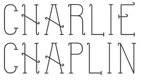 Sudbury, Ontario-based creator of the silent movie font Charlie Chaplin (2013). [Google]
[More] ⦿
Sudbury, Ontario-based creator of the silent movie font Charlie Chaplin (2013). [Google]
[More] ⦿
|
Chaplin
|
Typefaces that were used in movie credits of Charlie Chaplin movies. [Google]
[More] ⦿
|
Eda Rada
|
Skopje, Macedonia, and Prizren, Kosovo-based designer of Ollio and Stanlio (2019: a delightfully irregular silent movie font named after Stan and Ollie), Handwriting Font (2019), and Graffiti Font (2019). [Google]
[More] ⦿
|
E-phemera (was: HPLHS Prop Fonts, and earlier: Prop Fonts)
[Andrew H. Leman]
|
 Andrew Leman is a prop designer in Hollywood, CA. The type foundry HPLHS Prop Fonts (was: Ephemera, Prop Fonts) was started by Hollywood's Andrew Leman, and is now located in Pasadena, CA. Some fonts are free, most are commercial.
 Dafont link. Klingspor link. Andrew Leman's fonts: - Cablegram (2001, old typewriter face, T-26).
- Leviathan.
- Garamold (2007, 2 styles).
- Journalistic (2007, a blackletter inspired by the nameplate of a New England newspaper from the 1920s).
- Blackburn (2006, distressed).
- RTemporal (2006, blackletter).
- Fonts in the HPLHS series, dated 2002: HeadlineTwoHPLHS, OldStyle1HPLHS, OldstyleItalicHPLHS, OldstyleSmallCapsHPLHS, Rogo, SlabSerifHPLHS, TelegramHPLHS, WW2BlackletterHPLHS, WW2BlackltrAltHPLHS, HPLHS-Lovecraft Cursive and Block (replica of H. P. Lovecraft's own handwriting), HPLHS-Autograph Lanier (replica of the 1875 handwriting of Sidney Lanier, a 19th century American poet), HPLHS-TextSerif (really Linotype Antique No. 1), HPLHS-TypoScript, HPLHS-TextSerif Oblique, HPLHS-Bulfinch, HPLHS-Colwell, HPLHS-Colwell Italic, HPLHS-Cromwell, HPLHS-National Oldstyle (after Goudy's font by that name), HPLHS-Post Monotone, HPLHS-Atlas Italic, HPLHS-Italic, HPLHS-Victoria (from the 1923 ATF book), HPLHS-Manuscript Caps, HPLHS-Tome Pi, HPLHS-TypoGothic, HPLHS-Copperplate Roman, HPLHS-Gothic520, HPLHS-Times Gothic, HPLHS-Persnickety, HPLHS-Roman Engraved, HPLHS-Mercantile, HPLHS-Mercantile Oblique, HPLHS-Mercantile Card, HPLHS-Headline Modified, HPLHS-ExtraExtra, HPLHS-Extra (wood type), HPLHS-Forsythe, HPLHS-MetroThin, HPLHS-MetroLight, HPLHS-MetroMedium, HPLHS-MetroMedium Italic, HPLHS-MetroBlack, HPLHS-Policy Gothic, HPLHS-Black Gothic, HPLHS-Gothic Compressed, HPLHS-Black Condensed, HPLHS-Black Oblique, HPLHS-Electro Gothic, HPLHS-Blackletter (an irregular hand-drawn textura font based on the lettering of French heraldic engraver Charles Demengeot).
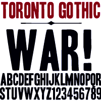
- The E-phemera Font Collection, available from MyFonts, which includes these fonts, with a majority being retro or script typefaces: Policy Gothic (2012, an eroded caps face), Mooseheart (2012), Operapolitan (2012), Fishwrapper (2012), Fred (2007, inspired by a 1930s typeface by Fred G. Cooper), Schreibweise (2007, a pirate-flavored font inspired by a hand-lettered manuscript dating from 1492), Cablegram-Regular, Golden Ticket (2003: Base, Fill, Highlight; a digitization of hand-drawn poster lettering by Otto Heim from 1925), Cablegram-Urgent, Cablegram-Madras, Cablegram-Ottoman, Julius Klinger (2003, based on 1925 fabric lettering by Julius Klinger), Cablegram-Zagreb, DMV Printer, Landry Gothic, Telegrafo, Toronto Gothic (2003: worn wood type or letterpress emulation, close to Condensed Titling Gothic #11), Vogue (pencil-lettered caps), Penitentiary Gothic (+Fill, +Lolite, +Hilite, +Shadow), Chicago House, Compliments (+Upright), Satisfaction (script based on 1930s cigarette ads), Vandal Broke Extra Juicy, Lanier (2004), Impersonal. The Cablegram and DMV series are typewriter fonts. Heck Italic (2010) is based on captions, labels and legends appearing on 19th-century maps and natural history engravings by Johann Georg Heck. Dai Vernon (2010) is based on the handwriting of card magician Dai Vernon.
View Andrew Leman's typefaces. View the E-phemera typeface collection. [Google]
[MyFonts]
[More] ⦿
|
Eric Python
[Silent Movie Fonts]
|
[More] ⦿
|
Ernst Deutsch
|
Born in 1887 in Vienna, Austria, Ernst Deutsch first worked as a costume designer and studied under Gustav Klimt. In Paris, he worked on costumes for Coco Chanel, before moving to the United States in 1929, where he changed his name to Ernst Dryden and was employed from 1933 onwards as a costume designer for Universal, Columbia and Selznick in Hollywood. He died in Los Angeles in 1938. Designer of Tango Kursiv (1913, +Fett; aka IKA Schriften), and the prototypical silent movie fonts Tango Antiqua (1913), and Tango Antiqua Halbfett (1916), all published by J. Klinkhardt in Leipzig. Digital revivals by Nick Curtis (Rhumba Script NF: free revival of Tango Kursiv) and Oliver Weiss (Walden Font) (WF Paletti, 2016-2017). [Google]
[More] ⦿
|
Frederic Goudy
[GoudyFonts.Com]
|
[More] ⦿
|
Frederic William Goudy
[Goudy's typefaces]
|
[More] ⦿
|
Frederic William Goudy
[National Old Style and Nabisco]
|
[More] ⦿
|
Free Arts&Crafts Fonts
[John M. Murphy]
|
 Among the fonts in this small art nouveau style and arts and crafts archive, compiled by John M. Murphy in 2003, we find
 - By Anke Arnold: Fortunaschwein.
- By David Fabik: Willow (1995).
- By Steven J. Lundeen: Spanky's Bungalow (1997).
- By David Nalle (Scriptorium): Adresack (1996), Chelsea Studio (1997), Semiramis (1997).
- By Nick Curtis: Avignon (1999), Bala Cynwyd (2001, inspired by Dard Hunter), HobbyHorse (2000), Hut Sut Ralston (2001), Kelmscott Roman (2000, after a William Morris alphabet), Nickelodeon (1999: a silent movie font), Nickley (1997), Our Gang (1999), Runy Tunes Revisited, Grasshopper (2001), Rivanna (2002, art nouveau), Payzant Pen (2001, similar to Speedball), RaggMoppRegular (2000), Runy Tunes (1999; +Revisited, 2001), Shangri-La (2002), SouciSans (1999), Speedball No2 SW (2001), Speedball No3 (2001), Tanglewood Tales (2000).
- By David Siegel: Eaglefeather.
- By Sam Wang: Sarah Caps, EddaCaps (1993, pure art nouveau).
- Other fonts: Davys, Dyer, Eccentrical, Art Noveau Intitials (2001, House of Lime).
[Google]
[More] ⦿
|
Friedrich Groegel
[Fritz Grögel]
|
[More] ⦿
|
Fritz Grögel
[Friedrich Groegel]
|
Fritz Grögel (b. Wassertrüdingen, Germany, 1974) studied graphic design and typography at the University of Applied Sciences in Potsdam, Germany. In his graduation work French Délice, he explored the history of French letterpainting. After several years of work as a corporate designer, he attended the TypeMedia master course of KABK The Hague where he researched the German letterpainting tradition. Together with Elena Albertoni, he founded the studio LetterinBerlin in 2011. The following year he conducted extensive research at Berlin's Kunstbibliothek on the history of German lettering which is the subject of his talk at ATypI 2013 in Amsterdam. That talk is based on the content of the book Karbid From lettering to type design (2013) by Verena Gerlach and Fritz Grögel published by Ypsilon Éditeurs and released on the occasion of the Amsterdam conference. His project for the Masters in type design program at KABK in 2010 led to the signage family Hinterland (2010), and to Builderdyke (2010), a revival project with Paul van der Laan: a digital reinterpretation of Johann Michael Fleischmann's Mediaan Romein. Other typefaces by him include Glupsisch (2010, is a round piano key typeface created with the help of Typecooker), Fritzskript (a flowing connected script that was done at the Ecole supérieure Estienne, Paris), and Estelita (a calligraphic hand that was inspired by the titles of a French art deco silent movie by Marcel L'Herbier called L'Inhumaine). Flickr page. Old URL for Fritz Grögel. [Google]
[More] ⦿
|
GoudyFonts.Com
[Frederic Goudy]
|
 A subpage of Ascender, which is reviving most of Goudy's fonts. They compiled a rather incomplete list of other revivals, conveniently leaving out all free fonts. The main source for commercial Goudy fonts is Lanston, now part of P22. I will provide a better list below.
 1896: Camelot 1897: Unnamed 1897: A “Display Roman” 1898: DeVinne Roman. Revived by Nick Curtis in 2014 as Tedlo Roman NF. 1902: Pabst Roman, Pabst Italic 1903: Powell 1904: Cushing Italic 1904: Boston News Letter 1905: Copperplate Gothics 1905: Caxton Initials 1905: Globe Gothic Bold 1905: Caslon Revised 1908: Monotype No. 38-e, Monotype No. 38-e Italic 1910: Norman Capitals 1911: Kennerley Old Style, Kennerley Open Caps 1911: Forum Title 1912: Sherman (revived in 2017 by Pentagram and Chester Jenkins for Syracuse University). 1912: Goudy Lanston 1914: Goudy Roman 1914: Klaxon 1915: Goudy Old Style 1915: Goudy Catalogue 1915: Goudy Old Style Italic 1916: Goudy Cursive 1916: Booklet Old Style 1916: National Old Style (for a revival, see National Oldstyle NF (2014, Nick Curtis)). 1916: Goudy Type. Revival in 2018 by Steve Matteson as Goudy Type. 1917: Advertiser’s Roman 1917: An Unnamed Design 1918: Kennerley Italic 1918: Cloister Initials 1918: Hadriano Title 1918: Goudy Open 1918: Goudy Modern 1919: Collier Old Style 1919: Goudy Modern Italic 1919: Goudy Open Italic 1919: Goudy Antique 1921: Nabisco 1921: Lining Gothic 1921: Garamont, Garamont Italic 1921: Goudy Newstyle 1924: Goudy Italic 1924: Italian Old Style, Italian Old Style Italic 1924: Kennerley Bold, Kennerley Bold Italic 1925: Goudy Heavy Face 1925: Goudy Heavy Face Italic 1925: Marlborough 1925: Venezia Italic 1926: Aries 1927: Goudy Dutch 1927: Companion Old Style, Companion Old Style Italic 1927: Deepdene 1927: Record Title 1927: Goudy Uncials 1928: Deepdene Italic 1928: Goudy Text 1929: Strathmore Title 1929: Lombardic Capitals 1929: Sans Serif Heavy 1929: Kaatskill 1929: Remington Typewriter 1930: Inscription Greek 1930: Trajan Title 1930: Sans Serif Light 1930: Mediaeval 1930: Hadriano Lowercase 1930: Advertiser’s Modern 1930: Goudy Stout 1930: Truesdell, Truesdell Italic 1931: Deepdene Open Text 1931: Deepdene Text 1931: Ornate Title 1931: Sans Serif Light Italic 1931: Deepdene Medium 1932: Goethe 1932: Franciscan 1932: Deepdene Bold 1932: Mostert 1932: Village No. 2 1932: Quinan Old Style 1932: Goudy Bold Face 1933: Goudy Book 1933: Goudy Hudson 1933: Goethe Italic 1933: Deepdene Bold Italic 1934: Saks Goudy, Saks Goudy Italic, Saks Goudy Bold 1934: Hadriano Stone Cut 1934: Village Italic 1934: Textbook Old Style 1934: Hasbrouck 1935: Tory Text. A blackletter typeface in the spirit of the lettrs batardes found in Geoffroy Tory's Champs Fleury. Revival by Steve Matteson in 2018 simply called Tory. 1935: Atlantis 1935: Millvale 1936: Bertham 1936: Pax 1936: Mercury 1936: Sketches Unnamed 1937: Friar 1938: University of California---FB Californian, University of California Italic---FB Californian Italic 1938: New Village Text 1938: Murchison 1939: Bulmer 1941: Scripps College Old Style 1942: Goudy Thirty 1943: Spencer Old Style, Spencer Old Style Italic 1944: Hebrew 1944: Scripps College Italic 1944: Marlborough Text Goudy Borders Goudy Fleurons Goudy Sorts Park Ridge ITC Berkeley Old Style, ITC Berkeley Old Style Italic [Google]
[More] ⦿
|
Goudy's typefaces
[Frederic William Goudy]
|
 List of Goudy's typefaces, with dates, compiled by Paulo W.
 - 1896 Camelot.
- 1897 Unnamed, A Display Roman.
- 1898 DeVinne Roman.
- 1902 Pabst Roman.
- 1903 Pabst Italic, Powell, Village.
- 1904 Cushing Italic, Boston News Letter, Engravers Roman.
- 1905 Copperplate Gothics, Caxton Initials, Globe Gothic Bold, Caslon Revised.
- 1908 Monotype No. 38-e, Monotype No. 38-e Italic.
- 1910 Norman Capitals.
- 1911 Kennerley Old Style, Kennerley Open Caps, Forum Title.
- 1912 Sherman, Goudy Lanston.
- 1914 Goudy Roman.
- 1915 Klaxon, Goudy Old Style, Goudy Old Style Italic.
- 1916 Goudy Cursive, Booklet Old Style, National Old Style (often used in silent movies), Goudy Type.
- 1917 Advertisers Roman, An Unnamed Design.
- 1918 Kennerly Italic, Cloister Initials, Hadriano Title, Goudy Open, Goudy Modern.
- 1919 Collier Old Style, Goudy Modern Italic, Goudy Open Italic, Goudy Antique.
- 1921 Nabisco, Lining Gothic, Garamont, Garamont Italic, Goudy Newstyle. Mac McGrew: National Oldstyle was designed by Frederic W. Goudy for ATF in 1916. It is based on lettering he had done about fifteen years earlier for National Biscuit Company, hence the name. It was moderately popular for a while for publication and advertising display work, and for titles for silent motion pictures. Compare Nabisco.
- 1924 Goudy Italic, Italian Old Style, Italian Old Style Italic, Kennerly Bold, Kennerley Bold Italic.
- 1925 Goudy Heavy Face, Goudy Heavy Face Italic, Marlborough, Venezia Italic.
- 1926 Aries [image by Nikolas Matses].
- 1927 Goudy Dutch, Companion Old Style, Companion Old Style Italic, Deepdene, Record Title, Goudy Uncials.
- 1928 Deepdene Italic, Goudy Text.
- 1929 Strathmore Title, Lombardic Capitals, Sans Serif Heavy, Kaatskill, Remington Typewritter.
- 1930 Inscription Greek, Trajan Title, Sans Serif Light, Mediaeval, Hadriano Lower-case, Advertisers Modern, Goudy Stout, Truesdell.
- 1931 Truesdell Italic, Deepdene Open Text, Deepdene Text, Ornate Title, Sans Serif Light Italic, Deepdene Medium.
- 1932 Goethe, Franciscan, Deepdene Bold, Mostert, Village No. 2, Quinan Old Style, Goudy Bold Face, Goudy Book.
- 1933 Goudy Hudson, Goethe Italic, Deepdene Bold Italic.
- 1934 Saks Goudy, Saks Goudy Italic, Saks Goudy Bold, Hadriano Stone Cut, Village Italic, Hasbrouck.
- 1935 Tory Text, Atlantis, Millvale.
- 1936 Bertham, Pax, Mercury, Sketches Unnamed, Sketches Unnamed.
- 1937 Friar.
- 1938 University of California O.S., University of California Italic, New Village Text, Murchison.
- 1939 Bulmer.
- 1941 Scripps College Old Style.
- 1942 Goudy Thirty.
- 1943 Spencer Old Style, Spencer Old Style Italic.
- 1944 Hebrew, Scripps College Italic, Marlborough Text.
[Google]
[More] ⦿
|
HypoTypo
|
HypoTypo (real name: Walter J. P.) is the designer in 2002-2004 of several ornamental fonts, which he showcased via alt.binaries.fonts. His typefaces: Amber'Shadowed', AnnabelleJF'LessItalic', AntiqueThings-01, AridiRenaissanceCaps, Asphalt'Wicker', Bauhaus'StainedGlass'-Heavy, BigRigs, Centurnalus'Deluxe', ChurchText'Replicant', ChurchText'Shaded' (blackletter), Coventree'Deluxe', CupieDoll, CupieDoll Buckshot (2004), Dantium'Tracing', FearFactor'3D', FearFactor'SmallCaps', FearFactor, FearFactorBlack, FearFactorText, Florence'Striped', Florence'Stripped', FuturexRoughlySliced, GillSans'MonkeyBars'-UltraBold, Gramius Blizzard (snow-cover alphabet), Gramius'ChromeDeco', Gramius'StainedGlass', GreatPrimerUncials'SnowBound', Guppulla'RoughlySliced', HopScotch'Denim', HopScotch'ElectricEddie', Kreepshow'Frigid', Lancastershire (2004), Licinia'Aged' (2003: weathered), Licktenstein'Chromed', Malaki'Continuum', Malaki'Deluxe', Metilius'BongoWood', Metilius'LeadedGlass', Metilius'PopCulture', Modius'Frigid', NewYorkTimes, Oleander'RoyalTablets', Oleander'StainedGlass', Ornam-oodles-01, PhoenixScriptUpr'Shadowed', PhoenixScriptUpright, Plautius'Branded', Plautius'LeadedGlass', Plautius'Rugged', Point-Dexter, Puffy'SandStone', Quintus'StainedCameo', QuintusLeadedGlass, Rocillius'QuickSilver', RocilliusBlack'Arson', Sintex'3D'UltraBlack, SkuareNot'BongoWood', Snoilies-01, Snoilies-02, Tekton'WhiteOnBlack', Timrombo'Erroded-DoubleVision'-Tall, VehicleDecals'Flames&Art', WoodsWorld'Deluxe', WoodsWorld'LeadedGlass', WoodsWorld'Melting', WoodsWorld'Quilted', WoodsWorld'StainedGlass', Auriol 'Shaded' Black (posted 09-02-2002), Bauhaus 'Shaded' Heavy (posted 09-19-2002), Bauhaus 'StainedGlass' Heavy (posted 10-23-2002), Bauhaus 'Textile' Heavy (posted 09-14-2002), Broadway 'Corroded' (posted 09-19-2002), Cooper 'Chromed' Heavy (posted 10-22-2002), Kid Type 'Flintstones' (posted 10-17-2002), Zapf 'SnowBound' Heavy (posted 10-19-2002), Zapf Int'l 'BubbleWrap' Heavy (posted 10-06-2002), LocusDelecti'Sibylline', SkuareNot'PlankYou', SkuareNot'Waveform', TexasWilly'Tracing', Half SunBurst-w4-01 (2003), Half SunBurst-w4-02 (2003), Half SunBurst-w4-03 (2003), NurfStar 'Shaded' (2003), StarBurst-w4-01 (2003), HavingWrit, IceCrystals-01'Continuum', IceCrystals-01'Impressions', IceCrystals-01 (snowflakes), PictoGlyphs, PlymouthRock'SnowDusted', Santa'sSleighFull-Bold, Santa'sSleighFull (a silent movie / art nouveau font), Zoophel (2003), Monika'Engraved'-Italic, Monika'Upright', Monika-Italic (2003), DotsType (Regular and 'OnFilm'), Hearts-O-Plenty, PinWheel, SchoolsOut, ButterCream'Tracing' (2004), Bartholomeow, ChitownScript (Regular, Bold, Light, Italic, Bold Italic and Light Italic), Guppula 'Ripples', Gramius Blizzard (2004), Letter People Things, Point-Dexter, TownSquare ('Grate' and 'Lattice'), StarryType. [Google]
[More] ⦿
|
Jeff Levine
[Jeff Levine: Additional typefaces]
|
 [MyFonts]
[More] ⦿
[MyFonts]
[More] ⦿
|
Jeff Levine: Additional typefaces
[Jeff Levine]
|
 This is a list of fonts by Jeff Levine not categorized anywhere else on my pages.
 - A: Adelanto JNL (2009), Adhesive Letters JNL (2011), Adhesive Serif Letters JNL (2015), Adventure Film JNL (2021: a casual sans based on the titles and credits for Texas Across the River, 1966), Afternoon Edition JNL (2015), Air Circus JNL, Aisle Seats JNL (2006, based on letters cut by the Redikut Letter Company of Hawthorne, CA), Album Cover JNL (2008), Alleway JNL (2012, a condensed sans), Allograph JNL (2007), Alphacal JNL (2008, outlined, and like Juneway JNL, based on water-applied decals once made by the Duro Decal Company (now Duro Art Industries) of Chicago), Alton JNL (2010: a bold display sans), Amateur Printer JNL (2007, grunge), Ampersorts JNL (2011: ampersands), And So Forth JNL (2011), Anecdote JNL (2009), Announcement Board JNL (2018: white-on-black), Antique Packaging JNL (2019: Victorian), Antique Price Tags JNL (2019), Arcaro JNL (2013, a calligraphic typeface based on the movie credits of the ABC TV series Naked City, 1958-1963, starring detective Frank Arcaro), Antique Show Card JNL (2018: based on an alphabet from the first Speedball Lettering Book in 1915), Arch Creek JNL (2010, an all caps revival of Beton), Ardball (2006), Arrevederci JNL (2018), Arrow Callouts JNL (2021: an arrow-themed alphading font), Art Deco Monograms JNL (2015), Arte Critique JNL (2009), Artist Colony JNL (2009), Arts District JNL (2014), Art Student JNL (2010), Art Techno JNL (2017), Astrospy JNL (2008: techno), Awkward Gothic JNL (2008), Axelby JNL (2013).
- B: Backpage Article JNL (2010), Bal Harbour JNL (2008), Balcony Seats JNL (2007, narrow retro sans), Ball Game JNL (2018), Bandmaster JNL (2021: based on the opening movie titles from the 1940 musical comedy Strike up the Band starring Judy Garland and Mickey Rooney), Barricade (2011, a great shadowed caps face), Bayview JNL (2008, based on Inland Type Foundry's Studley), Best Bet JNL (2014, a slab serif redesign of Beton), Bike Decals JNL (2008), Billing and Shipping JNL (2010), Bingo Player JNL (2010), Birch Beer JNL (2008), Bitmap Typewriter JNL (2017), Bit Part JNL (2017: extra condensed), Bit Player JNL (extra-condensed tall poster font) (2015), Bloktor Mosaik JNL (2007), Blue Parrot (2006), Bluesman JNL (2014: based on the lettering of the blues album "I'm Jimmy Reed" released on the legendary Vee-Jay label out of Chicago), Bold Display Sans JNL (2016: based on an imge in a Speedball book), Bonehead JNL (2013, bones), Bookkeeper JNL (2019: based on R. Hunter Middleton's slab serif, Karnak), Bookkeeping JNL (2019, like an extra bold version of R. Hunter Middleton's slab serif Karnak (1936)), Boss Jock JNL (2021: an informal font based on the title and credits from the 1965 film Strange Bedfellows), Box Lunch JNL, Brass Rail JNL (2015), Brazil Nut JNL (2015), British Cinema JNL (2021, based on the hand lettered titles and credits from the 1945 British film The Way to the Stars), British Vehicle JNL (2020; based on the UK license plate font created by Charles Wright in 1935; with Ahmed Eraqi), Broadcast JNL (2015), Broadletter JNL (2009), Brochure Sans JNL (2022: based on Sans Serif No.7 from the 1921 Miller & Richard type specimen book), Brogado (2006), Brookside JNL (2016), Brushmark JNL (2011), Brush Off JNL (2017), Bulk Weight JNL (2017), Bum Steer JNL (2015), Burger Joint (2006), Burger Royale JNL (2007), Burlesk Queen JNL (2020: blocked letters), Business Helpers JNL (2014), Business Letter JNL (2021: based on the squarish typeface Geometric in the 1894 catalog of the John Ryan Foundry in Baltimore, MD).
- C: Calendar Blocks JNL (2009), Calling Card JNL (2010), Callouts JNL (2011, in Circle and Square styles; white letters on black background), Canby (2006, a squarish caps face), Candle Wax JNL (2014, based on the movie poster for Bell, Book and Candle starring James Stewart), Cast And Crew JNL (2015, condensed monoline), Cast Shadow JNL (2010), Casual Lunch JNL (2009), Casual Friday JNL (2008, roman lettering), Casual Tune JNL (2015), Catalog Serif JNL (2015), Catalog Sheet JNL (2022: based on an extra condensed serif typeface from the 1892 MacKellar, Smiths & Jordan type foundry specimen book), Catch Words JNL (2009), Channel Tuning JNL (1999), Channel Surfing JNL (2010), Charlies Bar BQ JNL (2008, heavy slab serif), Charmer JNL (2014), Chive Turkey JNL (2007), Chunky Nouveau JNL (2020), Circuletter JNL (2016), Ciribiribin JNL (2014), Classification JNL (2015), Classroom JNL (2009), Cling Vinyl JNL (2009), Coal Train (2004), Cocktail Hour JNL (2016, a beatnik typeface based on the opening title for the 1962 Blake Edwards film Days of Wine and Roses starring Jack Lemmon and Lee Remick), Coffee Bar JNL (2021: a squarish typeface), Coldfield JNL (2008), College Nouveau JNL (2018), Colmar JNL (2018), Columnist JNL (2020, after Morris Fuller Benton's News Gothic, 1908, ATF), Commentary JNL (2010, almost typewriter type---easy on the eye), Composer JNL (2017), Concierge JNL (2014), Conscription JNL (2017), Corkboard JNL (2010: a rounded all caps family), Cornfield JNL (2008), Crepe Paper JNL (2018), Criminal Intent JNL (2018: based on the trailer of the 1942 movie Mr. and Mrs. North), Crown Heights JNL (2007, slab serif caps), Cruise Director JNL (2021: an inline typeface based on a hand-lettered title on the poster for the 1933 musical comedy film Melody Cruise), Courtship JNL (2018), Cover Letter JNL (2019), Curtain Up JNL (2018), Cyberglass (2010, techno), Cybrox JNL (2012, grunge).
- D: Dance Hall JNL (2011), Dance Lesson JNL (2015, a wedge serif in the style of Latin Wide), Rotisserie Menu JNL (2021: based on a 1928 menu for the restaurant Rotisserie Du Cardinal), Dangits JNL (2009), Danish Script Initials JNL (2019, based on letters designed by Copenhagen-born industrial artist and letterer Gustav Boerge Jensen (1898-1954), Date Book JNL (2021; based on the credits of the movie The Awful Truth, 1937), Decal (2006), Decalcomania JNL (2017), Deco Of Tomorrow JNL (2014), Deconstructed JNL (2012), Decorative Panels JNL (2009), Deco Template JNL (2018: squarish), Deerfield JNL (2006, Bank Gothic style), Department Store JNL (2019), Desk Jockey JNL (2008), Deskplate JNL (2011: an all caps copperplate font), Desk Job JNL (2018), Detective Client JNL (2021: based on the cast credits of the 1941 film, The Maltese Falcon), Detention JNL (2007, hand-printed), Diamond Callouts JNL (2019, letters in triangles), Diamond Jim (2010), Diamondwood JNL (2015, rhombic), Dip Pen JNL (2017, rounded, handcrafted), Disclaimer JNL (2010, condensed thin headline face), Display Board JNL (2020: based on Paul Renner's Futura Display from 1932), Display Inline JNL (2009), Displayced (2006, LED font), Display Roman JNL (2014), Doggone It JNL (2019: based on the movie posters for the 1962 film, Mono Cane), Do It Yourself JNL (2008), Doo Wop Initials JNL (2007), Doowop (2006), Dormitory Decals JNL (2009), Double Take JNL (2008), Drafting Class JNL (2021: based on an all caps alphabet in The Essentials of Lettering by Thomas E. French and Robert Meiklejohn (circa 1912)), Dreamy JNL (2017), Dual Line Roman JNL (2021: an inline titling typeface), Duonor JNL (2010), Durable JNL (2016, based on a 1940s cover of a catalog for the Duro Decal Company of Chicago).
- E: Eastport JNL (2019: an interpretation of Morris Fuller Benton's 1931 classic, Stymie Extra Bold), Eat More Fruit JNL (2016), Eccentric Sans JNL (2018), Edessa JNL (2009: chiseled stone look, faux Greek), Editorial Comment JNL (2009, grotesk caps-only headline face), Edits and Credits JNL (2008), Egg Farm JNL (2021: based on the opening titles and credits of the 1947 film comedy The Egg and I), Electric Newspaper JNL (2021: a dot matrix font based on the moving message board electric newspaper from 1931 installed by the Los Angeles Times---in partnership with the Richfield Oil Company---on its building), Electrostatic JNL (2017, textured), Elite Resort JNL (2017, slab serif), Elsinor (2006), Endless Journey JNL (2009), Ensemble Inline JNL (2014), Entitled JNL (2007, squarish as in Bank Gothic), Evening Edition JNL (2009), Evening Event JNL (2021; based on hand lettering from the title credits for the 1950 film All about Eve), Evening Paper JNL (2015), Evening Walk JNL (2018), Expressions (smilies).
- F: Factual JNL (2010,headline face), Fairgrounds (2006), Fancy Free JNL (2016: decorative caps), Fancy Show Card JNL (2021), Farragut JNL (2008, hairline geometric), Fastenating JNL (2012, paper clip font), Federal Agent JNL (2021: a condensed typeface based on the opening title of the 1959 premiere season of The Untouchables), Feltboard JNL (2008), Fence Post JNL (2012), Festival Nights (fancy letters), File Clerk JNL (2020, Jeff Levine: based on Cushing (1897)), File Folder JNL (2010, Bank Gothic style family), Film Crew JNL (2009), Fincastle JNL (2011, all caps sans titling face), First Responder JNL (2017: a left-slanted version of Catalog JNL), Flagstaff JNL (2010), Flatbush Beanery (2006), Flipboard JNL (2011), Flivver (2006, a slab-serif display font), Floor Tiles JNL (2009), Florida (2006, retro), Food Vendor JNL (2011), Fordham JNL (2011, all caps slab serif), Formal Invite JNL (2021: thin, condensed serif lettering found in a 1937 magazine ad for Chris Craft boats), Formal Notice JNL (2020: a revival of an alphabet by Samuel Welo in Studio Handbook for Artists and Advertisers), Frankly Plain JNL and Franky Ornate JNL (2010, all caps typefaces after Franklin Gothic), Frantic Pace JNL (2016, a bouncy retro party font), Free Form Retro JNL (2021: an all caps sans based on the titles and credits from the 1960 French film Le Passage Du Rhin), French Calligraphic JNL (2019), French Cinema JNL, French Serif Moderne JNL (2009), French Slab Serif JNL (2018: based on the 1934 French lettering instruction book L'Art du Tracé Rationnel de la Lettre), French Song JNL (2021: a whimsical typeface based on the titles and credits of the 1952 British comedy Song of Paris), Freunlaven JNL (2006, psychedelic), Front Row JNL (2017: a tall condensed typeface that reinterprets Morris Fuller Benton's Empire from 1937), Fruit Juice JNL (2020), Fun and Games (2011, a casual retro typeface redrawn from the lettering found on the cover of a 1935 Speedball Lettering Pen book).
- G: Gene Condensed JNL (2014), Generic Sans JNL (2022: modeled after Condensed Blair from the 1907 specimen book of the Inland Type Foundry), Generic Gothic JNL (2013: an interpretation of Franklin Gothic Condensed), Genesee JNL (2010), Gift List JNL (2016), Gift Wrap JNL (2014), Gilbert JNL (2011, after Eric Gill's sans), Go Home JNL (2017), Good Sport JNL (2019), Goose Creek JNL (2021: based on hand lettered credits from the 1942 British film comedy The Goose Steps Out), Go To Town JNL (casual inline type style) (2015), Gothic Grotesk JNL (2020; a revival of Royal Gothic (1930s, Stevens, Shanks & Sons), which in turn was based on Charter Oak (1899, Keystone Foundry)), Greenwich Village JNL (2014), Groovy 3D Caps JNL, Groovy Happening JNL (2005, psychedelic, in the style of Action Is), Groovy Summer (2006, a casual sans), Guadalajara JNL (2014, a Mexican party font), GummedAlphabet JNL (2011), Gummed Letters JNL (2010).
- H: Halavah Twist JNL (2007; see also its extension Zydeco JNL in 2009), Hallandale (2006), Halliday JNL (2013: an outlined typeface based on Beton Open Condensed), Handbills And Posters JNL (2015), Handmade Caslon JNL (2015), Handmade Dropshadow JNL (2010), Handmade Gothic JNL (2011, inspired by lettering samples in a 1941 Speedball Lettering Pen instructional booklet), Handmade Headline JNL (2018: a 1940s style typeface), Handmade Roman JNL (2011), Hand Stamped JNL (2006, rubber stamp look), Hanford (2010, a sans headline family), Hash and Beans JNL (2007), Headstone Roman JNL (2015), Hectonoid JL (2008), Heller Sans JNL (2019: after an experimental alphabet by Steven Heller), Highbrow Cafetorium JNL (2009), Hippie Comics JNL (2021: based on poster lettering in the 1920 edition of How to Paint Signs and Sho Cards by E. C. Matthews), Home Address JNL (2019), Home Economics JNL (2018), Home Room JNL (2009), Horse Puckey JNL (2008), Hotel Suite JNL (2017), Hoxie JNL (2008).
- I-J: Impecunious JNL (2017), Impressionable JNL (2012, based on a rubber stamp set), Incarceration JNL (2020), Industriality JNL (2015), Informational Gothic (2013: The Wood-Regan Instruments Company (Wrico) of New Jersey manufactured for decades a line of lettering kits called the Wrico Sign Maker. With only special ink pens, plastic templates and a template guide anyone could letter clean, clear signs, posters and notices. This typeface is based on one of those kits), Informational Sans JNL (2021: squarish, caps only), Initial Seals JNL (2012), Inkpad Letters JNL (2011), Inline Lettering JNL (2011, inspired by the opening title of a classic 1940s horror film, The Invisible Man's Revenge), Inlet JNL (2017), Inline Square JNL (2017), Innerspring JNL (2015), Intermediate JNL (2019: based on a home movie titling kit from circa the 1950s or 1960s called the Magna Tech Titler Number 312, modeled after Futura Bold), Interoffice Memo (2011), Intrigue JNL (2014, based on the hand-lettered movie titles from one of the William Powell / Myrna Loy Thin Man series of films), Island Time JNL (2015), Jalopy (2014), Jive Jump (2006), Jobseeker JNL (2011: hand-printed), Juneway (2006, modeled after a set of water-applied decals made by the Duro Decal Company of Chicago), Jungle Drums JNL (2017, African theme), Junior Printer JNL (2015), Just Great JNL (2016: angular display typeface).
- K-L: Katydid JNL (2015, a connect-the-dots typeface), Katz Pajamas JNL (2017), Keyden Drop Caps JNL (2021: a set of slab serif framed capitals based on John Alden Initials, shown in the 1906 edition of the Keystone Type Foundry specimen book), Key Largo JNL (2011, all caps slab serif), Lakeland JNL (2013), Kiddie Blokz JNL (2010), Kids Activities JNL (2017, handcrafted), Lamp Post JNL (2012, an interpretation of Post Old Style, ca. 1901), Last Date JNL (2018), Lasting Impression JNL (2008), Late Breaking News JNL (2016, headline sans), Late Hours JNL (2021: inspired by the hand lettered titles for the 1961 film The Children's Hour), Lecture Hall JNL (2012), Lefferts (2006, squarish display face), Legal Brief JNL (2021), Legal Eagle JNL (2017, with engraved lines), Les Folies JNL (2009, Victorian), Lettering Lesson JNL (2021: a bold serif typeface based on the 1922 instructional booklet from the St. Louis Show Card School), Lettering Pen JNL (2015, handcrafted), Library Book Initials JNL (2018: Library Book Initials JNL was modeled from examples of Sidney Gaunt's Publicity Initials; originally sold in metal type by Barnhart Brothers and Spindler as a companion to the Publicity Gothic typeface), Liebestraum JNL (2014, a decorative caps font), Limited Appeal JNL (2016), Linem Up (2010), Lobby Card JNL (2010), Local News JNL (2021: a condensed sans based on the hand lettered title for the 1954 film Power of the Press), Location JNL (2017), Longbranch Initials (2006, for decorative monograms), Longacre JNL (2013, fat rounded sans), Long And Thin Initials JNL (2015), Loose Leaf JNL (2010), Love Notes JNL (2011: alphadings), Luminum JNL (2007).
- M: Made in Japan (2014), Mailbox Letters JNL (2008), Main Feature JNL (2017, a marquee sans), Mainline JNL (2014), Manual Typewriter JNL (2017: allegedly after a 1933 example by Morris Fuller Benton), Manufactory JNL (2019, a wedge serif not unlike the ones used in advertizing in the late 19th century), Manufacturer JNL (2020: a reinterpretation of the Extra Bold Extended weight of Bauersche's Venus Grotesk (ca. 1907)), Marble Cutter JNL (2015, based on dies used for stamping text into marble headstones or other monuments manufactured by The Vermont Marble Company (Vermarco), which operated from the 1880s until 1976), Marching Band JNL (2019), Margate JNL (2013, based on water-applied decals manufactured in 1962 by the American Decalcomania Company for Goodyear), Marketing Strategy JNL (2017), Marking Device JNL (2014), Maryland JNL (2014), Matchbook JNL (2014: based on lettering on a matchbook from the Carrousel Restaurant in Miami Beach), Mayville JNL (2009), McCadden JNL (2013, inspired by the hand-lettered credits for the George Burns and Gracie Allen Show [1950-1958]), Meal Ticket JNL (2008, squarish), Merchandiser JNL (2010), Merchandising JNL (2014, brush signage script), Merchant Trade JNL (2020, after the Matthews Series by Inland Type Foundry, 1901), Merrymakers JNL (2020), Midnite Movie JNL (2017, inspired by the hand lettered title credits from the 1961 Hammer Pictures film Curse of the Werewolf), Millport (2006, squarish display face), Mimeograph Template JNL (2019: based on a plastic lettering guide manufactured by the Albert Blake Dick Company of Chicago), Misdirection JNL (2009), Mixed Messages JNL (2007, ransom note), Mocombo JNL (2010, an African look typeface that is a slightly modified version of one of the numerous alphabets created by the late Alf R. Becker for Signs of the Times Magazine during the period of the 1930s through the 1950s), Model Railroad JNL (2015), Moderator JNL (2013), Modern Appliances JNL (2014), Monoline Rounded JNL (2014), Monster Movies JNL (2018: a Halloween font), Monthly Meeting JNL (2013), Monthly Newsletter JNL (2011), Monthly Statement JNL (2018: based on the 1934 French lettering instruction book L'Art du Tracé Rationnel de la Lettre), Morning Edition JNL (2021), Morning Paper JNL (2015), Morningside Heights JNL (2015), Morningstar JNL (2012, named after Jeff's friend, Estella Dawn Roberts of Stella Roberts Fonts), Movieland JNL (2008), Movie Night JNL (2011), Movie Set JNL (2021: an all caps wedge serif based on a 1911 movie poster for the film How Bella Was Won), Movie Show JNL (2021: an all caps wedge serif based on a 1911 movie poster for the film How Bella Was Won), Moving Message JNL (2015, dot matrix typeface), Musical Arrangements JNL (2014), Musical Comedy JNL (2021: hand-printed), Musical Score JNL (2015), Music Course (2019), Mystery Show JNL (2018: modeled after the hand lettered titles found on various early episodes of the 1950s TV suspense program Alfred Hitchcock Presents).
- N: Naroid Initials JNL (2010, one of the most ultra-compressed sets of initials available in digital type), Narrow Minded JNL (2014), National Spirit JNL (2009), Newark JNL (2014: a strong slab serif), New Car Tag JNL (2020: based on the new license plates in Florida, which were introduced in 2018), Newsbreak JNL (2008), Newsbreaker JNL (2016; a vintage newspaper titling typeface), News Crew JNL (2017), Newshawk JNL (2007, a condensed sans), Newspaper Publisher JNL (2021: based on a headline in the 1917 edition of Logansport, Indiana Pharos-Observer), Newsprint JNL (2011), Newsreel Caps JNL (2014), Newsreel Text JNL (2021), News Ticker JNL (2021: based on the New York Times Square ticker operational in the 1930s), Newsworthy JNL (2011: a condensed headline sans), New Thin Roman JNL (2019, based on an alphabet called Compressed Roman in Essentials of Lettering, 1912), Nightcap JNL (2011), Nighthawk JNL (2009, a retro headline sans), No Entry JNL (2021: a bold blocky slab serif based on the hand lettered titles and credits from the 1958 war film The Young Lions), Nondescript JNL (2012), Nouveau Date JNL (2021: arts and crafts style), Nouveau Fashion JNL (2018), Nouveau Spur JNL (2019: neither art nouveau nor spurred), Nouveau Standard JNL (2018), Nouveau Handlettered JNL (2017), Nouveau Lettering JNL (2019, based on a 1916 slab serif alphabet by Thomas Wood Stevens), Nouveau Romance JNL (2017), Nouveau Roundcorner JNL (2015), Nouveau Square JNL (2017, squarish), Nouveau Standard JNL (2018), Nouveau Work JNL (2018), Nouveau Years JNL (2019), Nouveau Yorke JNL (2015), Novelty Nouveau JNL (2021), Now Playing JNL (2010).
- O: Oblogram JNL (2008, techno), Occidental Tourist JNL (2009), Odditype JNL (2006, computer simulation), Off Duty JNL (2021: based on the hand lettering from the titles and credits of the 1964 French film comedy Le Gendarme de Saint-Tropez), Office Staff JNL (2021: a version [with serifs added] of Popularity JNL---a condensed art deco design based on a popular typeface known as Radiant), Office Space JNL (2021: based on Condensed Edina from the 1921 Miller & Richard type specimen book), Office Work JNL (2021: a squarish typeface based on the title and credits of the 1965 film Mirage), Off The Wall JNL (2008). Old Bodoni Wide JNL (2016), Old Songs JNL (2018), Old Tijuana JNL (2018: in the serape style of pseudo-Mexican lettering found on ad designs of the 1930s and 1940s), Order Form JNL (2021: after MacKellar, Smiths & Jordan's Lining Gothic Extended from their 1892 catalog), Ordinary Gothic JNL (2017: gaspipe style), Outline Sans JNL (2018), Overnight JNL (2017), Oversimplified JNL (2019), Overton JNL (2017, based on early letter designs of Rudolf Wolf).
- P-Q: Pacific Atoll JNL (2021: a stylized slab serif type design based on the movie title lettering for the 1942 wartime film Pacific Rendezvous), Pacific Island JNL (2017: a tiki font based on the sheet music cover for the title song from the 1957 Marlon Brando movie Sayonara), Packaged Cookies JNL (2021; based on the first Oreo Sandwich package from 1923), Packaged Goods JNL (2016), Park Slope JNL (2014), Parfum de Paris JNL (2014), Paint Store JNL (2006), Parking Lot Sale JNL (2021: a flag font), Parkitechture (2006), Part and Parcel JNL (2009), Partial Eclipse JNL (2012), Patriotica JNL (2011, American flag face), Pavement JNL (2010, based on the extra-condensed lettering used on roadway information signs as revised by the U.S. Government in 2000), Pendraw Roman (2006), Pen Elegant JNL (2018, after an alphabet from a 1918 lettering instruction book by William Hugh Gordon), Pen Gothic JNL (2017: a rounded sans), Penmanshift JNL (2006, ronde style), Pen Nib Square JNL (2019), Penny Wise JNL (2017), Pen Sans Rounded (2019: based on a Speedball book from 1940), People Talk JNL (2021; a squarish all caps typeface based on a title card with cast credits for the 1935 movie The Whole Town Talking starring Edward G. Robinson and Jean Arthur), Performer JNL (2014, re-drawn from condensed hand lettering found on a piece of vintage sheet music), Personal Invitation JNL, Personalization (2019: a squarish typeface), Personal Note JNL (2011), Photo Developer JNL (2021), Picz JNL (2009), Pillow Puff JNL (2008, fluffy and cloud-like lettering), Pistol Twelve JNL (2008), Pitkin JNL (2006, a hand-lettered sans), Plastic Display JNL (2010, sketched from photo examples in an old sales promotion sheet for the Movitex Do-It-Yourself Plastic Sign Kit by Pryor Marking Products of Chicago), Plastic Template JNL (2011), Pleasantville JNL (2012, a condensed slab serif), Pocket Initials JNL (2008), Podunk JNL (2007), Political Poster JNL (2021: a condensed casual sans inspired by the hand lettering on a 1940 campaign poster for Franklin Delano Roosevelt), Pool Deck JNL (2015), Popstix JNL (2013), Pop Tune JNL (2014), Popularity JNL (2014, after Radiant), Port Of Call JNL (2015), Postal JNL (2009, white on black, as on stamps), Poster Contoured JNL (2018), Poster Pen JNL (2017), Poster Inline JNL (2014), Poster Plain JNL (2012), Poster Project JNL (2020), Post Production JNL (2021: a slab serif modeled after title card of the 1950 Humphrey Bogart and Gloria Grahame drama In a Lonely Place), Prehysteric JNL (2010), Presentation JNL (2011, a slabby family), Press Run JNL (2015, a reinterpretation of the classic typeface Cheltenham Condensed), Pricing Labels JNL (2010), Printed Letters (2006, made from stamped impressions made by a 1940s childrens sign making set), Printing Set JNL (2006, based on a rubber stamp alphabet), Printing Sorts JNL (2009), Prismatiq JNL (2009, shadow face), Privilege Sign JNL (2021: based on above-the-store signage for many newspaper stands, soda shops, candy stores, luncheonettes and pharmacies of the 1950s and early 1960s), Privilege Sign Two JNL (2021: based on decorative signage for many drive-ins, motels, food stores and other businesses of the 1940s), Promotional Copy JNL (2012), Proofreader JNL (2011, a rounded slab serif face), Prospect Heights JNL (2015), Public Notice JNL (2009), Public Transportation JNL (2008), Public Utility JNL (2012), Public Works JNL (2007: emulates the hand-cut lettering silk screened onto metal), Publication JNL (2010, a revival of DeVinne, 1890), Punch Tape JNL (2016, dot matrix font), Quick Meal (2019: a hand lettered interpretation of Morris Fuller Benton's 1905 design Miehle Extra Condensed Title), Quick Poster JNL (2019), Quick Response JNL (2015, based on QR codes), Quick Titling JNL (2019), Quorfid JNL (2010).
- R: Raccoon Coat JNL (2014), Radio Interference (2019: grungy), Radio Show JNL (2019: based on a logo from the TV show Car 54 Where Are You?), Rail Bum JNL (2016, basically Morris Fuller Benton's Hobo with slab serifs added), Railway Station (2019: a spurred wedge serif), Recording Artist JNL (2019), Record Jacket JNL, Recreation JNL (2013, outlined shadow face), Red Border Labels JNL (2015), Rendering (2011, architectural draftman's lettering), Reprint JNL (2013), Restaurant And Lounge JNL (2015, handcrafted), Retail Merchant (2006), Retail Monoline JNL (2021: a stylish thin headline typeface), Retail Packaging JNL (2019), Recruitment JNL, Retail Price JNL (2021, +Inline; for catchy price cards), Retail Shop JNL (2018: based on vintage New York City neon signage), Retirement JNL (2021: a flared headline typeface based on the hand lettered film credits for the 1937 movie Make Way for Tomorrow), Retro Packaging JNL (2018), Retro Resort JNL (2011), Reveler JNL (2019), Reverberation JNL (2011, horizontally striped face), Reverse Calendar Blocks JNL (2011), Rhineland Roman JNL (2017), Ritz Slab Serif JNL (2018), Road Picture JNL (2021: modeled after the hand lettered title and credits for the 1940 Bob Hope-Bing Crosby semi-musical comedy Road to Singapore), Roadside Diner JNL (2021: a signpainting font in the style of pre-war Miami), Rockaway JNL (2006, titling sans), Rock Concert JNL (2021; an all caps curly Victorian typeface inspired by the opening title and credits for the 1964 motion picture comedy Send Me No Flowers starring Rock Hudson, Doris Day, and Tony Randall), Roma Initial Caps JNL (2009), Rotisserie Menu JNL (2021: based on a 1928 menu for the restaurant Rotisserie Du Cardinal), Rough Print JNL (2012, rubber stamp lettering), Roundpoint Pen JNL (2011, based on instructional lettering found in an old Speedball Pen textbook), Roughshod (2006), Running Board JNL (2017, monoline, pen-lettered), Rural Route JNL (2010), Rustic Inn JNL (2014).
- S: Salad Bar JNL (2013), Sales Convention JNL (2021: a squarish typeface based on a menu printed in 1937 for the Starlight Room of the Waldorf-Astoria in New York City), Sales Pitch JNL (2014), Sales Slip JNL (2013), Sandcastle JNL (2011), Sans Poster Bold + 3D, Savings And Loan JNL (2014), Scandals JNL (2017), School Project JNL (2015, based on self-adhesive poster board letters once made by the E-Z Letter Stencil Company and sold under the name Quik Stik), Schoolroom JNL (2020: a school font based on the type style used for the Superior Sign and Chart Printer No. 929), School Age (2019: based on Trixy Toy Educator, a 1930s-era set of letters and numbers for teaching children, manufactured by the Durrel Company of Gardner, MA), Schoolyard Blues JNL (2018), Sea Cruise JNL (2015), Scoreboard JNL (2014: dot matrix typeface), Screentext JNL (2010, pixel), Screenwriter JNL (2021; based on the all caps hand lettered credits from the 1950 Humphrey Bogart film In a Lonely Place), Second Guess JNL (2017), Second Impression JNL (2008), Sennetarium JNL (2008, after lettering in a Charlie Chaplin movie), Semi Calligraphic JNL (2018), Sentzoff Coupon (2006, stitched), Series A Signage JNL (2018: this is based on Highway Gothic, also known as FHWA, by the United States Federal Highway Administration; the widths varied from A (condensed) to F (wide), but A was discontinued, hence the motivation to create Series A Signage), Serif Callouts JNL (2017), Sew What JNL (2010, stitching face), Shareholder JNL (2015), Shelf Numbers JNL (2008), Shelf Tags JNL (2017), Shicken Zoop JNL (2008, Hebrew), Shipping Carton JNL (2012), Sign and Poster JNL (2009, die-cut letters), Sign and Display JNL (2019: a companion of Sign and Poster), Shopkeeper JNL (2010, after a a vintage rubber stamp sign and chart printing set), Shopping Guide (2019), Short Subject JNL (2016, based on some hand-lettered title cards from various vintage Columbia Pictures two-reel comedies), Show Card Freehand JNL 2021; based on the title and credits for the 1951 Dick Powell and Rhonda Fleming film Cry Danger), Show Card Pen JNL (2021: based on an alphabet in the 1920 edition of How to Paint Signs and Sho Cards by E. C. Matthews), Show Card Sans JNL (2021: based on an alphabet in the 1922 book Modern Show Card Writing), Showmanship JNL (2017), Show Poster JNL (2021: A vernacular typeface based on a design from the 1960 edition of Samuel Welo's Studio Handbook for Artists and Advertisers), Shutterbug JNL (2021: a blocky typeface based on the signage of Jerry Lewis's Camera Exchange on Vine Street in Hollywood in 1950), Sightseeing Boat JNL (2021: based on the titles and credits for the 1966 romantic comedy The Glass Bottom Boat), Sign Expert JNL (2021: based on an alphabet in The Expert Sign Painter, 1922), Sign Studio JNL (2019: a multiline typeface modeled after an alphabet found in Martin Meijer's Album de Lettres Arti (1949)), Sign Template JNL (2015, based on one of the many plastic lettering guides manufactured by the now-defunct Wright-Regan Instrument Company also known as Wrico), Silent Film JNL (2021: a display slab serif used by the Uptown Theater in Wichita, Kansas, in 1928), Silent Movies JNL (2021; a rounded monolinear sans of the interbellum period), Silly Behavior (2019: a shaded bouncy letter font that revives a 1930 alphabet from 100 Alphabets Publicitaires dessinés par M. Moullet), Simplicity JNL (2014), Simply Grotesk JNL (2012, Peignotian), Simply Nouveau JNL (2017), Slab Compact JNL (2019), Sleuth JNL (2013, after the trailer for the 1936 movie After The Thin Man), Slim Chance JNL (2015, an ultra-narrow font based on an image of vintage packaging for Aquapruf Ear Drum Protectors), Slim Nouveau JNL (2017), Snack Shop JNL (2007, the retro diner look in a bold outline face), Snorkel JNL (2014), Snow Job JNL (2017, inspired by the hand-lettered titles for the 1964 Rankin-Bass animated holiday classic Rudolph the Red Nosed Reindeer), Socialite JNL (2009), Soda Fountain JNL (2015, bilined), Solid Serif JNL (2014), Songbook JNL (2014), Song Composer JNL (2017), Song Merchant JNL (2017), Song Plugger JNL (2014), Song Publisher JNL (2015), Song Stylist JNL (2016), Song Vendor JNL (2017), So Unusual JNL (2021: based on the hand lettered credits for the 1942 film comedy I Married a Witch), Southwest Serenade JNL (2015), Special Edition JNL (2021: based on a newspaper headline font used in 1924), Specimen Book JNL (2020: based on Lining Antique (1889. Illinois Type Foundry) and Central Lining Antique (1892, Central Type Foundry)), SplintersJL (2004), Sporting Event JNL (2021: a slab serif based on the title and credits of a British boxing film from 1953 called The Square Ring), Sportsboard JNL (2020: a flipboard font), Sport Shaded JNL (2009), Spring Fashion JNL (2010), Spring Season JNL (2020: textured caps), Spur Handlettered JNL (2008), Squarity JNL (2008), Stage Production JNL (2020), Stage Show JNL (2021: based on the movie credits for 9 Garcons...Un Coeur starring Edith Piaf), Stamp of Approval JNL (2007), Stamped Metal JNL (2012, beveled), Starlight Sans, Stationer JNL (2018), Stellator JNL (2006, a high-tech modular font), Stenographer JNL (2021: close to Bank Gothic Condensed), Stickball JNL (2017), Stonecut JNL (2014), Store Clerk JNL (2020: outlined), Store Tags JNL (2011), Streetcar JNL (2019: a vintage railroad wagon lettering font), Streeter JNL (2013, based on Beton Bold Condensed), Stylish Title JNL (2021: based on the cover title of the July 1935 issue of Harper's Bazaar), Subscription JNL (2018), Summer Holiday JNL (2021; based on the hand lettered production credits for the 1930 film Holiday), Summertime Breeze JNL (2021: based on the opening title sequence for the 1958 film The Long, Hot Summer), Sunlight JNL, Sunny South JNL (2015), Sunshine Susie JNL (2018), Supporting Cast JNL (2011), Surf Bum (2019), Swing Band JNL (2013: inspired by the title lettering from "Hi-De-Ho", a 1930s all-black cast film starring legendary bandleader Cab Calloway), Swing Vote JNL (2020: a beatnik font).
- T: Tabloid Edition JNL (2021: based on a headline newspaper font from UK's Daily Mail in 1918), Tabloid News (2019: an all caps condensed slab serif), Tabloid Press JNL (2015), Take Charge JNL (2016, based on the opening title card for the 1936 film The Charge of the Light Brigade starring Errol Flynn, Olivia de Havilland, Donald Crisp and David Niven), Tallahassee Chassis JNL (2007, modeled from a toy rubber stamp set imported from Japan), Tall And Narrow JNL (2015), Tamiami JNL (2009, Victorian, known as "Cuba"), Tea Bag JNL (2013), Tea Time JNL (2014), Technerd JNL (2011, a thin technical/mechanical face), Technopen JNL (2013: a rounded techno sans from a 1929 instructional booklet for the Esterbrook Drawlet Pens), Teenagers JNL (2021: a beatnik font that was inspired by the hand lettered opening credits for The Many Loves of Dobie Gillis, a teen-oriented television comedy that ran from 1959 to 1963 on CBS), Teen Years JNL (2021: a blocky sans inspired by the hand lettered name for the Joyce Records label (circa 1956)), Template Basic JNL (2021: a simple sans), Template Sans (2019: based on a lettering template by the Wright-Regan Instrument Company (Wrico)), Template Shadow (2019), Tenement JNL (2020: based on a Cooper Black style alphabet by Harry Lawrence Gage that was shown in Thomas Woods Stevens's book Lettering (1916)), Terrace JNL (2015), Terror JNL, That Stuff JNL (2009), Theater Lights JNL (2014), Theater Tickets JNL (2021: Based on the marquee signage for Detroit's Majestic Theater built in 1934), Theatrics JNL (2009, 3d face), Thin Mint JNL (2011), Thinly Disguised JNL (2016), Three Day Pass JNL (2009), Tiler JNL (2012, a gridded face), Title Block Sans JNL (2011, an avant-garde titling face), Too Much Information JNL (2007), Top Billing JNL (2008, dot matrix), Top Forty (2019: handcrafted), Topographic Sans JNL (2018: a mapmaking sans featured in a U.S. Army Corps of Engineers topographic drafting manual), Toucan Tango JNL (2007, multiline face), Tough Guy (2006, shaded titling face), Tough Stuff JNL (2008), Toy Decals JNL (2018), Toy Letters JNL (2018: based on die-cut letters and number by Village Toys (circa 1930s or 1940s)), Toyprint JNL (2009, grunge), Trade Journal JNL (2010), Trade Printer JNL (2007, Victorian-era sans emulation), Train Car JNL (2021: based on the hand-lettered opening credits of Alfred Hitchcock's Strangers on a Train (1951)), Transactive JNL (2007, dot matrix), Transcendental JNL (2017), Tribal Council JNL (2011, jungle lettering with a linocut look), Trilium JNL (2010, triline face), Tropicano JNL (2013, a wavy typeface), Tunesmith JNL (2014, Victorian), Twelve Oaks (2006), Two Cents Plain JNL (2012), Two Reeler JNL (2006; see also its follow-up typeface Positive Vibe JNL, 2007, both modeled after title cards of an early Charlie Chaplin movie), Two Step Nouveau JNL (2018), Type Catalog (2011, bilined all caps face), Typemonger JNL (2022: based on Two Line Sans Serif from the British type specimen book of Vincent Figgins (circa 1860)), Typesetter JNL (2011), Type Vendor JNL (2012), Typewriter Sans JNL (2015), Type Wronger JNL (2013, old typewriter typeface).
- U-V: Unpretentious JNL (2014), Urmeba JNL (2012, named after amoebas and co-designed with Ray Larabie; a barf font), Used Cars (2012), Utica JNL (2010, squarish all caps face), Vacation Resort JNL (2021: based on the hand lettered cast and production credits for the 1942 musicl comedy Holiday Inn starring Bing Crosby and Fred Astaire), Vaudevillian JNL (2017), Utility Signage JNL (2017), Vehicle JNL (2010, a condensed block font as for car plates), Vendor JNL (2010, Victorian era ribbon face), Vertical Roundpoint JNL (2011, found in a 1941 edition of the Speedball Lettering Pen instruction book and re-drawn digitally by Jeff Levine), Victorian Typewriter JNL (2020), Vintage Designs JNL (2009, dingbat which has some fists), Vintage Price Tags JNL (2015), Vododeo JNL (2014).
- W: Washington Heights JNL (2016), Wavely (2010), Weekend Date JNL (2020), Weeneez JNL (2011, wiener-shaped glyhs), Welcome Home JNL (2009), Werble JNL (2010), What A Night JNL (2018), Whoosh JNL (2007), Wild About Myself JNL (2015), Willoughby JNL (2006, based on 1950s toothpaste lettering), Window Sign JNL (2013), Wine Cellar JNL (2014), Winery JNL (2012: a soft-serifed caps face), Winkle Picker JNL (2021: a cut paper font based on the 1963 movie poster for an Italian documentary called Sexy Nudo), Winter Garden JNL (2017), Wireline JNL (2021: a paperclip font), Wire Mesh JNL (2009), Work Force JNL (2011), Wynwood JNL (2009).
- X-Y: Yankee Doodle Boy JNL (2017), Yard Sale JNL (2013), Yargo JNL (2009, hand-printed), Yayazout JNL (2008, fun titling face), Yorso Square JNL (2007).
- Z: Zera JNL (2007, intersecting rings), Zodor JNL (2010), Zoning Department JNL (2012), Zydeco JNL (2009).
[Google]
[MyFonts]
[More] ⦿
|
John M. Murphy
[Free Arts&Crafts Fonts]
|
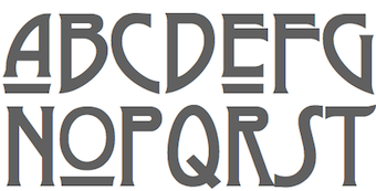 [More] ⦿
|
Joseph M. Pence
|
 Exclusive fonts by Joseph M. Pence at Fontasia International: Paranoid Android (1998, grungy), Shoryuken Streetfighter, and Tecmo Rounded Caps, Clive Barker (2005, an inky script face: A cramped, claustrophobic handwritten font based on the chapter and title illustrations from Clive Barker's "Thief of Always.").
 In 2013, he published Mad Somnambulist: Mad Somnambulist is a choppy, abstract script font based on the hand-etched playbills from the stylized Expressionist silent classic, "The Cabinet of Dr. Caligari." Ascension Day (203) is an intricate handwritten font based on the liner notes of the Talk Talk album "Laughing Stock." Dafont link. [Google]
[More] ⦿
|
Julien Gerardot
|
 Aix-en-Provence-based designer of the blackletter-style Cursibve Typeface (2014) and the art deco silent movie typeface Random Type (2014). Behance link. [Google]
[More] ⦿
Aix-en-Provence-based designer of the blackletter-style Cursibve Typeface (2014) and the art deco silent movie typeface Random Type (2014). Behance link. [Google]
[More] ⦿
|
Michael Scarpitti
|
 Mike graduated from Ohio State University with a degree in philosophy. Prolific Columbus, OH-based designer (b. Columbus, OH) whose fonts are mainly available through Scriptorium. Many of his fonts were influenced by roman inscriptional or Trajan types. These include Caesario (1993, a Trajan column font based on Goudy's drawings from 1936), Minerva (1993), Falconis and Vespasiano. Other typefaces with ancient origins include DeBellis, Pomponianus, Praitor, Jerash (1993, with Nalle), Macteris Uncial (1993), Antioch (1993), and Corbei Uncial.
 He prepared a set of fonts based on a medieval Latin British manuscript (Pontifica, 1999) and another one called Orlock (1993), a linocut style typeface based on the lettering in a poster for the German German expressionist silent film Nosferatu. Pontifica was redesigned in 2009 based on the source manuscripts from the Papal Archive. He writes: Pontifica is an example of protogothic calligraphy, a style developed at the monestery of St. Gall in the 12th century to replace Carolingian minuscule with a more efficient and compact system of lettering. Ultimately it became the progenitor of the gothic lettering styles of the late Medieval period. View Michael Scarpitti's typefaces. [Google]
[MyFonts]
[More] ⦿
|
Musthafa Kamal Emje
[Afkari Studio (or: Kanatype, or: Musthafanet)]
|
[MyFonts]
[More] ⦿
|
MyFonts: Silent movie typefaces
|
Fonts used in the 1810s and 1920s for silent movies. [Google]
[More] ⦿
|
National Old Style and Nabisco
[Frederic William Goudy]
|
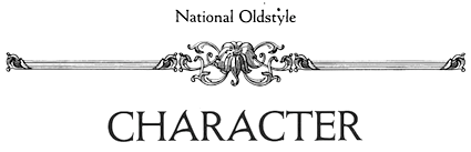 Two Goudy fonts, from 1916 and 1921, respectively. Goudy wrote about them, as reported in A Half-Century of Type Design and Typography: 1895-1945, Typophiles Chap Books XIV, 1946 at pages 99 and 110:
 - National Old Style (1916). Clarence Marder asked me later that same year whether I could use the lettering I had done for the National Biscuit Company in 1901 or 1902 and make a type approximating it in character. I called his attention to the fact that the lettering he referred to consisted of capitals only, and while it would be easy enough to make a type of those, it would be more difficult to make a lower-case which would not be rather freakish to go with them. However, I went ahead with the design, adding a lower-case in harmony with the capitals, and it is shown in the specimens of the company. I see it occasionally in printing; one use of it, I recall, is on the cover and title page of _Graphic Arts_ issued by the _Encyclopaedia Britannica_ for a selection of articles from its 14th edition. It has also been used for captions for movies, owing to its strong but even color. As a display letter it probably compares favorably with many others we could do without.
- Nabisco (1921). In Chicago, in 1901 or 1902, I had hand-lettered the words "National Biscuit Company" for that concern. The commission came through their advertising executive, James Fraser, who did not tell me that twenty-five or more designers also had been given the same commission at the same time. A few days after I had delivered my drawing to Fraser, I received a telephone message from him requesting my presence at his office. On arriving there I was shown some forty other drawings of the same words I had drawn, and was then told that mine had won the competition. If I had known it was a competitive affair I might not have accepted the order at all, although _all_ the drawings were to be paid for. One nice thing occurred when I presented my reasonable bill: Fraser surprised me by tearing it up in my presence, and asked me to make out another for double the amount. Practically twenty years later, the New York advertising representatives of the company asked me to make a type for the National Biscuit Company, using letters of the character of those drawn so long before. I didn't like to tell them that I was not sure those letters were the sort that would make a good type to use for their announcements, booklets and advertisements; or that, since I had already made a type for the American Type Founders Company along the same lines, I feared any new attempt might prove too reminiscent of that type. However, I made drawings and had several sizes engraved by Wiebking. The Company named it "Nabisco" and used it frequently for booklets and small advertisements. Of late years I have not seen it so often, but I imagine it still is in occasional use. In 1912 one day while seated at my desk on Madison Avenue, a man came in with a package under his arm. He said he was a lithographer, and had an order to reproduce a drawing which by constant use over a period of years was in pretty bad shape for satisfactory reproduction ; he wondered if I could make a good copy of it for him. On opening the package I was amazed to find it was the original drawing I had made in Chicago in 1901 for the National Biscuit Company!
Mac McGrew: National Oldstyle was designed by Frederic W. Goudy for ATF in 1916. It is based on lettering he had done about fifteen years earlier for National Biscuit Company, hence the name. It was moderately popular for a while for publication and advertising display work, and for titles for silent motion pictures. Compare Nabisco. Mac McGrew on Nabisco: Nabisco was designed by Frederic W. Goudy in 1921 as a private type for National Biscuit Company, based on hand-lettering of the company name he had done about twenty years earlier. As he had in the meantime drawn National Oldstyle (q.v.) for ATF, based on the same lettering, this typeface is consciously different although retaining the same general characteristics. Several sizes were cut by Robert Wiebking. The baking company was pleased. and used it frequently for several years. For a revival of National Oldtsyle, see National Oldstyle NF (2014, Nick Curtis). For a revival and extension to bold, semibold and italics, see Goudy National (2018, Steve Matteson. [Google]
[More] ⦿
|
Nick Curtis
[Art deco typefaces by Nick Curtis: I]
|
 [MyFonts]
[More] ⦿
[MyFonts]
[More] ⦿
|
Nick Curtis
[Nick Curtis: Victorian typefaces]
|
 [MyFonts]
[More] ⦿
[MyFonts]
[More] ⦿
|
Nick Curtis
[Nick Curtis: Typefaces from 2007]
|
 [MyFonts]
[More] ⦿
[MyFonts]
[More] ⦿
|
Nick Curtis
[Nick Curtis: Typefaces from 2014]
|
 [MyFonts]
[More] ⦿
[MyFonts]
[More] ⦿
|
Nick Curtis: Early commercial typefaces
|
A list of commercial typefaces made by Nick Curtis from 2001-2003, and not listed elsewhere on these pages. Several of these typefaces appeared in the ITC and Bitstream collections. In 2003, he set up his own foundry, Nick's Fonts. The list: Atelier Sans, Cuppa Joe, Jeepers (a silent movie font), Mister Chuckles, Vinnie Boombah (2002, an outline font, based on 1950 poster lettering for Cinzano Spumante by Nico Eder), Scram Gravy, Steppin Out, ITC Zinzinnati, BoyzRGross (2001), HardlyWorthit, Margarita Ville NF (2001, a curly monoline slab serif), ITC Atelier Sans (2001), ShangriLa NF (2002), LaModaNF (2002, based on poster lettering for an Italian fashion house of the same name, designed by Wilman Schiroli in 1935), March Madness (2003, inspired by lettering from a 1920s Italian poster by legendary "postermeister" Marcello Dudovich), White Tie Affair (2002, pretty vertical lines), Ciné Miroir NF (2003), Fireside Chat NF (2003, based on lettering of Samuel Welo), Nord Express NF (2003, simulating poster font ideas of A.M. Cassandre; a variation of the typeface Acier Noir, Deberny&Peignot, 1936), Parsival Oldestyle NF (2003, patterned after Camelot, a 1920's font by ATF), Petre Devos NF (2003, based on a 1930s poster for a Flemish beer), Red Star Line NF (2003, based on a 1926 travel brochure), Soda Jerk NF (2003, based on a 1929 travel brochure), Toot Sweet Bistro NF (2003, based on a 1928 restaurant poster by artist Karl Bauer), BoDiddlioniStencil, ITC Photoplay (2002, based on lettering from 1927 by Samuel Welo, intended originally for captions of silent movies), ITC Scram Gravy, ITC Jeepers (2002), Erehwon Roman NF (2002, an exaggeration of University Roman), Heberling Casual NF, Marrakesh Express NF (2002, based on a 30s poster font), Slam Bang Theater NF (2002, patterned after the font Nubian Black, designed by Willard T. Sniffin for American Type Founders in the 1930s), Wagner Silhouette NF (2002, based on a 1946 design by Charles Louis Henry Wagner), Laguna Madre WBW, WHG Simpatico NF (2002), Sabrina Zaftig NF (2002), Bergling Fantasia NF (2002, after handlettering by J.M. Bergling), Bundle of Joy NF (2002), Namesake (2002, loosely based on Allan Gothic by Allan Brandtner), New Deal Deco NF (2002), Perserphone NF (2002, a Greek simulation font), Day Tripper NF (2002, based on a design originally called Dignity Roman by the unconventional 30s lettering artist Alphonso E. Tripp), Vielle Varsovie NF (2003), Raskalnikov NF (2003, Cyrillic simulation font), Spatz (2000, Sign DNA), Mrs Bathhurst (2001; a display typeface based on a 1916 alphabet by Fred G. Cooper), Vacation Postcard (patterned after various souvenir postcards available at gift shops along US highways, 1950s to present). [Google]
[MyFonts]
[More] ⦿
|
Nick Curtis: Typefaces from 2007
[Nick Curtis]
|
 Typefaces made by Nick Curtis from 2007, not listed elsewhere on these pages: Dundee Castle NF (based on lettering by Harvey Hopkins Dunn, 1930), Sheik Of Araby NF (2007), Aethelred NF (a unicase typeface, with alternate characters in several of the lowercase positions, is patterned after Mosaik, designed by Martin Kausche for Schriftgiesserei Stempel in 1954; Sultan (2005, Canada Type) is also based on Mosaik). Cerulean NF (a sans based on Lining Gothic No. 71 (BBS and ATF, 1907)), Rimshot NF (script), Jaunty Gent NF (based on the upright connected script Forelle, aka Rheingold Kräftig, by Erich Mollowitz in 1936-1937 for the Hamburg foundry of J. D. Tennert&Sohn), Baby Cakes NF (a bubblegum face based on a 1974 release by Karlgeorg Hoefer at the Ludwig&Mayer foundry called Big Band), Amper Sans NF (after Hobby, a script designed in 1956 by Werner Rebhuhn for Schriftgießerei Genzsch&Heyse), Wacky Duck NF (2007), By George Titling NF (inspired by silent movie lettering), Dinky Rink NF (partially based on Steile Futura), Fuller Brush NF (a bouncy signage script from The New Lone Pine ABC of Showcard and Ticketwriting by Australian author C. Milnes), Tiddly Winks NF (2007), Iraan (a stars and stripes typeface based on the ATF typeface Rodeo), Haut Relief (a 3d typeface based on a 1960s typeface called Sculpture), Fiddle Sticks (based on West Banjo (Dave West, 1960s)), Djibouti (an African theme font modeled after African Queen (Dave West, 1960s), Wacky Duck NF (2007), Turing Car NF (2007, a monospaced typeface based on a lineprinter font from the 1960s, the Unisys 0776), Route 66 NF (based on the typefaces used on U.S. Highway signs from the 1930s to the 1950s), Anna Nicole NF (2007, based on the upright semiscript Mirabelle (1926, Wagner&Schmidt); Nick Curtis: Round, firm and fully-packed, it is sure to get attention anywhere it is used.), Keynote Speaker NF (an awkward blocky typeface patterned after Bloomsbury (1920s, P. M. Shanks&Sons)), Twitty Bird NF (2007, an architectural drawing font based on Dan X. Solo's Conway), Balder Dash NF (the caps are based on Breda-Gotisch (1928, H. Berthold AG) and the lowercase on Goudy Text)), Outer Loop NF (2007), Tutti Paffuti NF (after Stymie Black Flair by Dave West for Photolettering), Weedy Beasties NF (after a variation of Seymour Chwast's Blimp), Bully Pulpit NF (2007), Keepon Truckin NF (a 3d typeface based on Milton Glaser's Baby Fat). In the 1970s, Vincent Pacella made a Photolettering Egyptian headline typeface called Blackjack, which was digitized in 2007 by Nick Curtis as Flap Jacks NF. ITC Jeepers and Woodley Park (based on Naudin) won awards at the TDC2 Type Directors Club's Type Design Competition 2002. Artone (Seymour Chwast, 1968) was revived as Loose Caboose NF (2007). Edwin Sisty's upright curly semiscript Belcanto (1970s, Photolettering) was revived in 2007 by Nick Curtis as Glissando NF. F.W. Kleukens' Kleukens Antiqua (1910) was digitized by Nick as Kleukens Antiqua NF (2007). Holo Fernes NF (2007) is based on Christian Heinrich Kleukens' Judith Type (1923), a hookish hell-inspired face. Pudgy Puss (2007) is an ultra-fat modern display type based on Fat Face (Herb Lubalin, Tom Carnase). Omaha Bazoo (2007) is patterned after Viola Flare, issued by Franklin Photolettering in the 1970s. Lateral Incised NF (2007) is an engraved old style typeface originally released in 1929 as Gravure by the London foundry of C. W. Shortt. Tall Scrawl NF (2007) is an original Curtis hand-printed font. Alfred Riedel's Domino (Ludwig&Mayer, 1954) was revived as Idle Fancy NF (2007). Boxcar Willie NF (2007) is a quaint curly face. [Google]
[MyFonts]
[More] ⦿
Typefaces made by Nick Curtis from 2007, not listed elsewhere on these pages: Dundee Castle NF (based on lettering by Harvey Hopkins Dunn, 1930), Sheik Of Araby NF (2007), Aethelred NF (a unicase typeface, with alternate characters in several of the lowercase positions, is patterned after Mosaik, designed by Martin Kausche for Schriftgiesserei Stempel in 1954; Sultan (2005, Canada Type) is also based on Mosaik). Cerulean NF (a sans based on Lining Gothic No. 71 (BBS and ATF, 1907)), Rimshot NF (script), Jaunty Gent NF (based on the upright connected script Forelle, aka Rheingold Kräftig, by Erich Mollowitz in 1936-1937 for the Hamburg foundry of J. D. Tennert&Sohn), Baby Cakes NF (a bubblegum face based on a 1974 release by Karlgeorg Hoefer at the Ludwig&Mayer foundry called Big Band), Amper Sans NF (after Hobby, a script designed in 1956 by Werner Rebhuhn for Schriftgießerei Genzsch&Heyse), Wacky Duck NF (2007), By George Titling NF (inspired by silent movie lettering), Dinky Rink NF (partially based on Steile Futura), Fuller Brush NF (a bouncy signage script from The New Lone Pine ABC of Showcard and Ticketwriting by Australian author C. Milnes), Tiddly Winks NF (2007), Iraan (a stars and stripes typeface based on the ATF typeface Rodeo), Haut Relief (a 3d typeface based on a 1960s typeface called Sculpture), Fiddle Sticks (based on West Banjo (Dave West, 1960s)), Djibouti (an African theme font modeled after African Queen (Dave West, 1960s), Wacky Duck NF (2007), Turing Car NF (2007, a monospaced typeface based on a lineprinter font from the 1960s, the Unisys 0776), Route 66 NF (based on the typefaces used on U.S. Highway signs from the 1930s to the 1950s), Anna Nicole NF (2007, based on the upright semiscript Mirabelle (1926, Wagner&Schmidt); Nick Curtis: Round, firm and fully-packed, it is sure to get attention anywhere it is used.), Keynote Speaker NF (an awkward blocky typeface patterned after Bloomsbury (1920s, P. M. Shanks&Sons)), Twitty Bird NF (2007, an architectural drawing font based on Dan X. Solo's Conway), Balder Dash NF (the caps are based on Breda-Gotisch (1928, H. Berthold AG) and the lowercase on Goudy Text)), Outer Loop NF (2007), Tutti Paffuti NF (after Stymie Black Flair by Dave West for Photolettering), Weedy Beasties NF (after a variation of Seymour Chwast's Blimp), Bully Pulpit NF (2007), Keepon Truckin NF (a 3d typeface based on Milton Glaser's Baby Fat). In the 1970s, Vincent Pacella made a Photolettering Egyptian headline typeface called Blackjack, which was digitized in 2007 by Nick Curtis as Flap Jacks NF. ITC Jeepers and Woodley Park (based on Naudin) won awards at the TDC2 Type Directors Club's Type Design Competition 2002. Artone (Seymour Chwast, 1968) was revived as Loose Caboose NF (2007). Edwin Sisty's upright curly semiscript Belcanto (1970s, Photolettering) was revived in 2007 by Nick Curtis as Glissando NF. F.W. Kleukens' Kleukens Antiqua (1910) was digitized by Nick as Kleukens Antiqua NF (2007). Holo Fernes NF (2007) is based on Christian Heinrich Kleukens' Judith Type (1923), a hookish hell-inspired face. Pudgy Puss (2007) is an ultra-fat modern display type based on Fat Face (Herb Lubalin, Tom Carnase). Omaha Bazoo (2007) is patterned after Viola Flare, issued by Franklin Photolettering in the 1970s. Lateral Incised NF (2007) is an engraved old style typeface originally released in 1929 as Gravure by the London foundry of C. W. Shortt. Tall Scrawl NF (2007) is an original Curtis hand-printed font. Alfred Riedel's Domino (Ludwig&Mayer, 1954) was revived as Idle Fancy NF (2007). Boxcar Willie NF (2007) is a quaint curly face. [Google]
[MyFonts]
[More] ⦿
|
Nick Curtis: Typefaces from 2014
[Nick Curtis]
|
 Typefaces made by Nick Curtis in 2014:
 - Alto Rey NF. A revival of a Victorian typeface issued by the Palmer and Rey Type Foundry of San Francisco in 1884.
- Angler NF. A revival of Anglo, a Victorian typeface by Barnhart Brothers and Spindler, 1895.
- Argentina Cursive NF. Based on a typeface by Morris Fuller Benton, 1919.
- Bandiera Del Legno NF. A Tuscan wood type that revives Gothic Tuscan Condensed Reversed by William H. Page.
- Belgique NF. A revival of the (Western) wood type French Clarendon XXX Condensed No. 117 by William H. Page.
- Benton Gothic Thin NF. A revival of Lightline Gothic (1908, Morris Fuller Benton, ATF).
- Big D NF. Based on a Speedball pen font by Ross F. George.
- Bricoleur NF. A connected script from a French magazine in 1927.
- Bully Pulpit Plain NF. After Bullion Shadow (1970, Face Photosetting).
- Call Me Ishmael NF. After Moby Dick (Affolter and Gschwind).
- Chapeaux Noirs NF. After a MacKellars, Smiths & Jordan typeface.
- Chieftain NF. Revival of Pontiac (1893, ATF).
- Coronation Street NF. Based on a typeface created in 1936 by Stephenson Blake.
- De Roos Mediaeval NF. After Sjoerd de Roos.
- Dimanche NF. An art nouveau typeface revival. The original is known as Domingo or Brillante.
- Fluid Drive NF. A take on an art deco typeface by Samuel Welo.
- Gloriosus NF. Revival of the Victorian typeface Apollo (1888, Gustave F. Schroeder, Central Type Foundry).
- Grieshaber Monos NF. After a Schelter & Giesecke typeface designed in 1911 by Moritz Grieshaber.
- Harley Quinn NF.
- Hi Ho Steverino NF. In the Beat style of the 1960s and 1970s.
- Koralle Rounded NF. A rounded revival of Koralle (1913, Schelter & Giesecke).
- Leabhar Ceilteach NF. Inspired by lettering in the Book of Kells.
- Legnano (2014, Italian art deco wood type).
- LevellerNF (2014, Nick Curtis). A revival of Roundhead (Charles Beeler, Mackellar Smiths & Jordan, 1883).
- Lodewijk Gothic NF (2014). Adter Elzevir Gothic (1897, ATF).
- Loopy Loo NF. Upright script based on an original by the Hunt Brothers.
- Marmorherz NF. After an 1866 font, Marble Heart, by Farmer, Little, and Co.
- Maxed Out NF (+Inline, +Starstruck). This series of fonts is based on a 1970s art deco series at PhotoLettering Inc called Riverside Drive by Peter Max.
- Meriwether Circular NF. After a 1905 Victorian typeface by William Martin Johnson for ATF called Meriontype.
- Millrich Olivian NF. A revival of Olivian by Richard & Miller.
- Miss Dottie NF. After Dotted Roman (1897, Barnhart Brothers and Spindler).
- Morticia NF. Based on an ATF original.
- National Oldstyle NF. After a 1916 font by Frederic W. Goudy.
- Nickel Box NF.
- Olden Daze NF. From Alphabets A to Z.
- Page Ephesian NF. A wood type after William H. Page, 1890.
- Page Etruscan No 5 NF. A wood type after William H. Page.
- Painters Roman NF. A wood type based on Painters Roman by Vanderburg and Wells (1878).
- Pique-Nique NF. Based on the art nouveau typeface Outing (1888, John F. Cumming, and 1895, ATF).
- Receding Hairline NF. After L&C Hairline (1966, VGC, Herb Lubalin and Tom Carnase).
- Renaissant NF. After the Victorian typeface Renaissant (1880, by John F. Cumming, Dickinson Type foundry).
- Rythme NF. After a Mexican simulation typeface from 1935 by Maximilien Vox called Éclair.
- Scalar Biform NF.
- Schweimann Moderne NF. An art nouveau typeface.
- Skelett Antiken NF. After William H.Page's wood typeface Clarendon XX (1859).
- Ski Alpin NF. An art deco typeface based on a Swiss travel poster from 1927.
- Sodbuster NF. After William H. Page's wood type Gothic Dotted.
- Southie Signboard NF.
- Strassenmeister NF. After an art deco typeface called Buick Schmalfett by Herbert Thannhaeuser.
- Sweet Afton NF. After a silent movie font by Samuel Welo.
- Talsmann NF. A faithful reproduction of the Advocate font used by the IBM Selectric typewriter.
- Trading Hoss NF. After Ross F. George's Speedball alphabet D-nib Display.
- Tuscalooza NF. After William H. Page's font Tuscan Extended.
- Twinkletoes NF. After a comic book typeface by Ross F. George.
- Unjustified NF. Inspired by the opening credits for the television series Justified.
- Vauxhall NF. Based on Angelica, a 1970s typeface by Robert Trogman (FotoStar).
- Venusian Ultra NF. A heavy sans based on the extra bold extended version of Bauersche's classic sans typeface family Venus (1907-1927).
- Vulkan NF. A wedge-serifed typeface based on a Barnhart Brothers and Spindler original called Vulcan (1884).
- Well Said Black NF. Modeled after Welling Black, a 1970s typeface by Robert Trogman (FotoStar).
[Google]
[MyFonts]
[More] ⦿
|
Nick Curtis: Victorian typefaces
[Nick Curtis]
|
It is difficult to precisely define a Victorian typeface. They range from the ridiculously ornate typefaces from 1850-1870 to awkwardly balanced display typefaces and the pre-art nouveau trends. Nick Curtis's revivals in this genre are listed below. - Alto Rey NF (2014). A revival of a Victorian typeface issued by the Palmer and Rey Type Foundry of San Francisco in 1884.
- AnagramShadowNF. A free font. Commercial version in 2008. Anagram Shadow NF is based on handlettering from a 1928 poster for a steamship line by renowned British artist Austin Cooper.
- Angler NF (2014). After Anglo, which appears in the Barnhart Brothers and Spindler catalog of 1895.
- Beantown Bounce NF (2007) revives Century, an ornamental display typeface from the 1898 catalog of the Boston Type Foundry.
- Brownwood NF (2011). The inspiration for this semi-Victorian semi-art nouveau typeface came from a 1906 travel poster, promoting the Hotel Braunwald, located in the Swiss Alps.
- Cinnci Card Ornaments NF (2014) is a collection of design elements used in logotypes and calling cards from the Victorian era.
- Cleveland Litho NF (2007), a curly Victorian face, appeared in the 1898 specimen book of the Cleveland Type Foundry, under the name of Litho, while Yum Yum NF (1898) appeared in Cleveland's 1893 specimen book as Mikado.
- DoctorJekyllNF. A free font.
- Durham Abbey NF (2005). Based on a Victorian era font called Romanesque, which can be found in the Dan X. Solo collection.
- Dury Lane (2007) is based on a Victorian era release by Blake Type Foundry called Blackfriars.
- FancyPantsNF. A free font.
- Federlyn NF (2010) and Federlyn Initials NF (2011). Based on the Edwardian-era Artcraft by Robert Wiebking.
- Filibuster NF (2007). This curly über-Victorian typeface is based on Congress, an ornamental typeface found in H. C. Hansen Type Foundry's catalog of 1909.
- GingerPeachyNF. A free font.
- Great Sage NF (2010). That ugly duckling Victorian typeface Karnac (1888, ATF) [not to be confused with the Egyptian typeface Karnak by R.H. Middleton] led Nick Curtis to Great Sage NF.
- Habana Sweets NF (2012). Based on Cuban (1873, Richard & Miller).
- HardlyWorthit. A free font.
- HornswoggledNF. A free font.
- HutSutRalstonNF (2001). Based on a 1915 example in a Speedball Pen book.
- LabyrinthCapital, Labyrinth (1999, 2007). A free font family based on this poster.
- Londonderry Air NF (2002-2004) is based on Canterbury Old Style, a typeface designed by Morris Fuller Benton in 1920-1926 at ATF.
- MarchMadnessNF (2003). A free font. Inspired by lettering from a 1920s Italian poster by legendary postermeister Marcello Dudovich.
- MetropolisNF. A free font. Based on this movie poster from 1927 by Hungarian Josef Bottlik.
- Millrich Reading NF (2010). A Victorian typeface that revives a 1918 Miller&Richard face. Millrich Olivian NF (2014) revives Olivian.
- Nickelodeon NF (1999). A free font. This is sometimes compared with silent movie fonts.
- Nickley Normal (1997). A free font based on arts and crafts lettering by William Joseph Dard Hunter.
- Oaken Bucket NF (2009).
- Oh You Klid NF (2009). Based on a Victorian typeface by Central Type Foundry called Euclid (1880s).
- Palmer Oxonian NF (2011). Based on Oxford (Palmer&Rey, 1884).
- PasticheCapital, Pastiche. A free font.
- PayzantPenNF (2001). A free font, with a commercial version in 2010. Payzant Pen NF is based on Frank H. Atkinson's A Show at Sho-Cards: Comprehensive, Complete, Concise, published in 1918, executed with the then-state-of-the-art Payzant Reservoir Pen.
- Plus de Vagues NF (2006). Based on a curly semi-Victorian alphabet by Stephenson Blake called Recherché.
- Putney Junction NF (2007). Based on a BBS typeface called Design, ca. 1900.
- RhumbaScriptNF. A free font. Based on Tango Kursiv (1913, Ernst Deutsch), it is often compared with silent movie fonts.
- Shady Lady NF (2005). An ornamental shaded caps typeface called Umbra in the 1907 Barnhart Brothers&Spindler type specimen catalog.
- ShangriLaNF, ShangriLaNFSmallCaps (2002). A free font family. The commercial version was done in 2008. Based on a Victorian alphabet from the 1922 chapbook Modern Show Card Writing, by Joseph Bertram Jowitt.
- Sil Vous Plait NF (2009). A Victorian text typeface based on a 1917 font by Morris Fuller Benton called Invitation.
- SouciSans (1999). A free font. Based on a type design by Sam Welo shown in Lettering Modern and Foreign (1930).
- Speedball No1, Speedball No2 SW (2001), Speedball No3 (2001). SpeedballNo1NF-Bold, SpeedballNo1NF, SpeedballNo2NF-Bold, SpeedballNo2NF, SpeedballNo2SW, SpeedballNo3, SpeedballNo3NF-Bold, SpeedballNo3NF. This series is based in part on alphabets by Samuel Welo.
- Storybook Initials NF (2014).
- Streamers NF (2005). A Victorian-era typeface called Fillet revived.
- Tanglewood Tales (2000). A free font.
- Vidalia Sunshine NF (2007). An extension of the 1888 all caps typeface Ornamented No. 5 from MacKellar, Smiths&Jordan.
- Vintage Panels NF (2011): Victorian panels.
- VlaanderenChiseledNF, VlaanderenRoundNF, VlaanderenSquareNF. A free font family. These are based on an untitled work by Dutch designer André Vlaanderen from 1928. These are ugly ducklings because they mix various inconsistent styles without much thought.
[Google]
[MyFonts]
[More] ⦿
|
Oliver Weiss
[Walden Font]
|
 [MyFonts]
[More] ⦿
[MyFonts]
[More] ⦿
|
Peter Wiegel
[CAT Design Wolgast]
|
 [More] ⦿
|
Ray Larabie
[Typodermic]
|
 [MyFonts]
[More] ⦿
[MyFonts]
[More] ⦿
|
Ray Vatter
|
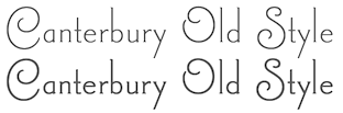 American type designer. At International Type Founders, Ray Vatter and Steve Jackaman digitized the elegant tall silent movie typeface Canterbury Old Style in 1992, a typeface originally created in 1920 and produced in 1926 by Morris Fuller Benton at American Type Founders. Vatter and Jackaman added a bold weight and a Swash style in 2003. Finally, Jackaman remastered the whole thing in 2017 at Red Rooster as Canterbury Old Style Pro. For another revival of Morris Fuller Benton's original typeface, see Londonderry Air NF (2002-2004, Nick Curtis).
 FontShop link. [Google]
[MyFonts]
[More] ⦿
|
Renae Hill
|
Graphic designer in Ellicott City, MD, who graduated from Monmouth University. Caligari (2011) is an angular typeface that was inspired by the 1920 silent German film, The Cabinet of Dr. Caligari (Das Cabinet des Dr. Caligari). [Google]
[More] ⦿
|
Samuel Welo
|
 Samuel Welo was an American advertising calligrapher, typographer, designer and lettering artist whose work appeared in the 1920s. Scans by Gene Gable of many pages of Studio Handbook Letter&Design for Artists and Advertisers (1927, Samuel Welo). This book has 233 pages and is entirely hand-lettered! Based on his lettering, several typefaces have seen the light of day. A partial list:
 - P22 Art Deco Chic (2002, James Grieshaber).
- Hamilton (David Nalle, Scriptorium, 1993): a tall, bold display font typical of art nouveau poster lettering and turn-of-the-century advertising design.
- Plakat (David Nalle, Scriptorium, 1993): a rough-edged curly decorative poster face.
- Melcheburn (David Nalle, Scriptorium, 1993): a blackletter face.
- Samuello (Iza W, Intellecta Design, 2007). This type family comes in five styles.
- Rio Rita NF (2012, Nick Curtis).
- Welo Casual NF (2012, Nick Curtis).
- Mohair Sam (2005, Nick Curtis): the upper case is based on Welo's letters, but the lower case on ATF's Romany Script.
- Pyriform Tones (2007, Nick Curtis): first done by Welo in 1925.
- Fireside Chat NF (2003, Nick Curtis) is a font based on a design by Welo shown in Studio Handbook for Artists and Advertisers (1927).
- ITC Photoplay (2002, Nick Curtis): based on lettering from 1927 by Samuel Welo, intended originally for captions of silent movies. It was in Studio Handbook for Artists and Advertisers (1927).
- Sweet Afton NF (2014, Nick Curtis) is based on another silent movie font by Welo.
- Grenadier NF (Nick Curtis) is based on Samuel Welo's Modernistic.
- Souci Sans (Nick Curtis) is based on a type design shown in Lettering Modern and Foreign (1930).
- Blue Plate Special (Nick Curtis) is a font family based on a design by Welo shown in Studio Handbook for Artists and Advertisers (1927).
- Herald Square NF (Nick Curtis) is a font family based on a design by Welo shown in Studio Handbook for Artists and Advertisers (1927).
- Magic Lantern NF (Nick Curtis) is a font family based on a design by Welo shown in Studio Handbook for Artists and Advertisers (1927).
- Speedball No 1 NF and Speedball No 2 NF (Nick Curtis) are font families based on a design by Welo shown in Studio Handbook for Artists and Advertisers (1927).
- Washington Square NF (Nick Curtis) is a font based on a design by Welo shown in Studio Handbook for Artists and Advertisers (1927).
- Whoopie Cushion SW (Nick Curtis) is a font family based on a design by Welo shown in Studio Handbook for Artists and Advertisers (1931).
- Mustang Sally and Tugboat Annie (Nick Curtis) are fonts based on a design by Welo shown in Studio Handbook for Artists and Advertisers (1931).
- Suave Sam NF (2009, Nick Curtis) is art deco at its peak.
- Fluid Drive NF (2014, Nick Curtis).
- Carillon (2014, David Nalle) is based on one of Welo's alphabets.
- LHF Welo Thin (2015, Patrick Kalange) is an art deco poster typeface based on Welo's work.
- Lenox Avenue (2017, David Kerkhoff).
- Formal Notice JNL (2020, Jeff Levine). A revival of an alphabet in Studio Handbook for Artists and Advertisers.
- Show Poster JNL (2021, Jeff Levine). A vernacular typeface based on a design from the 1960 edition of Samuel Welo's Studio Handbook for Artists and Advertisers.
Other alphabet designs: (unnamed, 1928), (unnamed, 1928), Modernistic (1932; I suspect that this was used as a basis for Samuello by Intellecta Design). Books by Welo: - Lettering: Modern and Foreign (1930, Chicago: Frederick J. Drake and Company). Local download.
- Practical lettering, modern and foreign (1946).
- Studio Handbook Letter&Design for Artists and Advertisers (1927).
- Trademark and Monogram Suggestions (1937).
View Samuel Welo's typefaces. [Google]
[MyFonts]
[More] ⦿
|
Sierra Kamatchus
|
 Sierra Kamatchus is a Minnesota-based designer and alumna of University of Minnesota Duluth. In 2014, she co-designed the vintage silent film typeface Good Bad Man with Chank Diesel. She explains: This historic revival font was created especially for use in the preservation and restoration of the 1914 silent film "The Good Bad Man," starring Douglas Fairbanks. There is only one copy of the original film print in existence, and when the film was restored for a screening at the San Francisco Film Festival in 2014 the new font was created to best recreate the intent of the original lettering in the film. It is a smooth and pleasant vintage lettering style, original designed for use on silver screens, now fully rendered in OpenType and ready for you to use in your designs or web pages today. Read about this story here. [Google]
[MyFonts]
[More] ⦿
Sierra Kamatchus is a Minnesota-based designer and alumna of University of Minnesota Duluth. In 2014, she co-designed the vintage silent film typeface Good Bad Man with Chank Diesel. She explains: This historic revival font was created especially for use in the preservation and restoration of the 1914 silent film "The Good Bad Man," starring Douglas Fairbanks. There is only one copy of the original film print in existence, and when the film was restored for a screening at the San Francisco Film Festival in 2014 the new font was created to best recreate the intent of the original lettering in the film. It is a smooth and pleasant vintage lettering style, original designed for use on silver screens, now fully rendered in OpenType and ready for you to use in your designs or web pages today. Read about this story here. [Google]
[MyFonts]
[More] ⦿
|
Silent Movie Fonts
[Eric Python]
|
Silent movie fonts collected by Eric Python on abf include Santa's SleighFull (by HypoTypo), Rhumba Script (by Nick Curtis, based on Tango Kursiv by Ernst Deutsch), Nickelodeon (by Nick Curtis), and Jeepers. [Google]
[More] ⦿
|
Stefan Huebsch
[Typocalypse Types]
|
 [MyFonts]
[More] ⦿
[MyFonts]
[More] ⦿
|
Thomas Hirter
|
 Graduate of Biel's School of Design, and now based in Bern, Switzerland. Designer of Lunica (2014, Die Gestalten), a monoline serif font available in four styles, plus italics: thin, light, regular and medium. Inspired by the basic letterforms of the cinema subtitles during his years in Stockholm, Thomas Hirter was compelled to add serifs to reflect the charm of the Swedish language. The serifs are abstracted with a geometric quarter circle leading to a highly individual typeface with poetic character. Home page. [Google]
[More] ⦿
Graduate of Biel's School of Design, and now based in Bern, Switzerland. Designer of Lunica (2014, Die Gestalten), a monoline serif font available in four styles, plus italics: thin, light, regular and medium. Inspired by the basic letterforms of the cinema subtitles during his years in Stockholm, Thomas Hirter was compelled to add serifs to reflect the charm of the Swedish language. The serifs are abstracted with a geometric quarter circle leading to a highly individual typeface with poetic character. Home page. [Google]
[More] ⦿
|
Tricia Ziegelman
|
 Graduate of St Cloud State University, who works as a graphic designer in Albertville, MN. In 2017, she published the fun rounded display typeface Good Bad (perhaps a silent movie text font) at Chank Fonts. In 2013, she designed an untitled techno typeface. [Google]
[More] ⦿
Graduate of St Cloud State University, who works as a graphic designer in Albertville, MN. In 2017, she published the fun rounded display typeface Good Bad (perhaps a silent movie text font) at Chank Fonts. In 2013, she designed an untitled techno typeface. [Google]
[More] ⦿
|
Typocalypse Types
[Stefan Huebsch]
|
 Typocalypse Types was founded in 2009 by two students of communication design from the University of Applied Science in Trier: Kai Merker and Stefan Huebsch (b. 1981, Saarbrucken; Stefan Huebsch lives in Heusweiler / Saarbrücken in Saarland, Germany). Sven Fuchs joined some time later.
 Huebsch's first font, made in 2009, is Black No. 7---it was inspired by the Jack Daniel's Black Label Whiskey logo from 1866. Black No. 7 Vintage (2009) is a grungy version. In 2011, he created Lith, a hand-drawn headline typeface inspired by Alice In Wonderland and the Brothers Grimm fairy tales. In 2014, he published a spectacular 11-style font family, Lichtspiele, that takes inspiration from early 20th century movies, and more specifically, the film noir genre. In this series, Lichtspiele Neon 3D is of particular interest. Lichtspielhaus (2014) is an ultra-condensed version. Lichtspielhaus Handmade (2014) is the handwritten version---it was influenced by the hand-painted signs on cinema facades of the early cinema days. In 2015, we were treated to Lichtspielhaus Slab (ultra-condensed), and in 2016 to Lichtspiele Reklame (the ultra-condensed version). In 2017, Stefan Huebsch and Daniela Spinelli co-designed Konkret (a sharp-edged all-caps secret service sans with some left-leaning Kontra italics). Behance link. Creative Market link. [Google]
[MyFonts]
[More] ⦿
|
Typodermic
[Ray Larabie]
|
 Ray Larabie (b. 1970, Ottawa, Canada) ran Typodermic in Mississauga, ON, which opened in the Fall of 2001. In 2006, it moved to Vancouver, BC, and in 2009 it moved on to Nagoya, Japan. Dafont page. Ray Larabie has been making fonts since 1996, but those early fonts were freeware. His pre 2001 fonts are grouped under the label Larabie Fonts. In 2001, he set up Typodermic. Latest additions.
 The Typodermic fonts: - 2022: Biphoton (a monospaced sans with the same proporions as Letter Gothic 12), Valve (an industrial muffler shop font), Deception (a sub-pixel typeface with ten captivating effects---Deception Array (wide blocks), Deception Bars (text viewed through lenticular glass), Deception Blocks (as in heavy JPEG degradation), Deception Diamonds, Deception Lines (for a grayscale effect), Deception Particles, Deception Plusses, Deception Process (simulates grayscale LCD text or a thermal printer on the fritz), Deception Scanline (television picture tube text rendering), Deception System (1-bit dithering gone haywire)), Monofonto (a monospaced sans), Encercle Draft (permitting users to create numbers in borders), Encercle Sans, Heavy Heap (a groovy psychedelic typeface with a scorching look, reminiscent of 1960s hot-rod culture and die-cast toy vehicles), Ggx89 (a 48-style tightly spaced Swiss style sans family).
- 2021: Quadrillion (a 12-style rounded monoline sci-fi family), Mochon (a wall writing or chalk font based on the lettering of Donald Mochon, dean of the RPI School of Architecture until 1966; the Mochon samples were provided by an ex-student of Mochon, Karl A. Petersen), Steelfish Hammer (a subtly rustic version of Larabie's most popular typeface, Steelfish), Wavetable (sci-fi), Xyzai (an LED emulation font, described by Ray Larabie as a hardcore, Y2K-style techno typeface), Geoparody (a 12-style squarish typeface inspired by a late 1960s font called Anonymous), Typewriter Spool (122 fonts, modeled after the Underwood No. 5 typewriter font).
- 2020: Gravtrac (a 56-style condensed to crushed slab serif family inspired by mid-twentieth century classics like Univers 59 Ultra-Condensed, Helvetica Inserat and Compacta; +Greek, +Cyrillic), Vinque Antique (a rustic handcrafted blackletter in eight styles).
- 2019: Dealerplate (17 license plate styles for various states and provinces in the USA and Canada, current as of 2019; included are California, New York, New Jersey, Ohio, Illinois, Pennsylvania, Florida, Maryland, Michigan, Wisconsin, Massachusetts, Missouri, Washington, North Carolina, Virginia, Quebec, and Ontario), Kenyan Coffee Stencil, Good Timing, Steelfish Rounded, Bitcrusher (a consumer electronics / techno font), Galderglynn 1884 (a nineteenth-century style sans-serif typeface that exp[ands his Galderglynn Esquire).
- 2018: Cybermontage, Crack Man (a pac man font), Propaniac (a 1980s-style postmodern typeface inspired by a Pointer Sisters record sleeve which was designed by Shoot That Tiger Creative Services), Zelega Zenega, Spectrashell.
- 2017: Minicomputer (MICR style), Squirty, PCTL9600, PCTL4800 (retro techno), Ultraproxi (semi-monospaced and influenced by the high speed computer printers from the 1950s to 1970s), Toxigenesis (techno sans), Venus Rising, Vanchrome (a compact sans-serif headliner with chromatic layers), Krait (a layered geometric typeface designed for architectural display), Xylito (a layered font for chromatic or 3d effects).
- 2016: Refuel (octagonal, based on military aircraft markings), Expressway Soft (a sans-serif font family inspired by the U.S. Department of Transportation's FHWA Series of Standard Alphabets, also known as Highway Gothic), Conthrax (squarish, techno), Cornpile (cartoonish), Electric, Evensong (art deco), Fledgling (a very tall typeface), Gymkhana (sans), Remissis (sans), Sunday Evening (a reverse contrast typeface), Meloche (Meloche is a unique grotesque sans-serif typeface influenced by hand-painted French signs of the late nineteenth century. It's available in 7 weights and obliques).
- 2015: Canada 150 (a custom font for the Canadian government; see here, here, this coverage regarding the Inuktitut part of the font, and this reaction by the curmudgeons in Toronto who complain that Ray did this work for free), Autoradiographic (sans family), Built Titling (for compact headlines), Chickweed Titling (cartoon titling font), Cardigan Titling (flared headline face), Bench Grinder Titling, Kleptocracy Titling, Palamecia Titling (rounded black comic book typeface), Quasix Titling, Galderglynn Titling (all caps sans family from hairline to black), Mixolydian Titling, Stormfaze (a sci-fi font started in 1996 and finished in 2015), NK57 Monospace (a 60-style programmer typeface), Gargle, Athabasca (a sans family designed for the rugged Canadian oil patch).
- 2014: Mesmerize (a large free sans family), Kingsbridge (a large slab serif family with sharp points on the A, M, N, V and W), Manbow (a layered geometric art deco display font which includes solid, clear, stripe, polka-dot and screen patterns), Breamcatcher (an all caps art deco font inspired by the piano sheet music for With Every Breath I Take which was featured in the Bing Crosby/Kitty Carlisle musical comedy film, Here is my Heart), Kilsonburg (Dutch deco based on an old Vogue magazine cover), Uchiyama (poster typeface), Goldsaber (art deco design), Vexler Slip (unicase), Rakesly, Dacquoise, Pretender, Rimouski (a rounded geometric font family), Nulshock (techno), Recharge (techno/industrial font), Interrogator Stencil, Strange Alphabets (arts and cratfs font), Angerpoise Lampshade (free).
- 2013: Numbers With Rings, Shookup (funky cartoon font), Pastrami on Rye (cutout comic book style), Chickweed, Built (a condensed headline sans), Fluctuation (a softly rounded elliptical sans family), Astrochemistry (sci-fi, techno with rounded edges), Snasm (sci-fi).
- 2012: Engebrechtre (2000-2012), Die Nasty (1999-2012: free), Strasua (1999-2012), Planet Benson (1997-2012), Husky Stash (1998-2012), Barbatrick (1999-2012: a speed emulation font), Zero Hour (1997-2012), Urkelian (1998-2012: very condensed), Zolasixx (inspired by the video game Zaxxon), Ampacity (neon font), Chromakey (a space deco headline font inspired by box art classic video games including Matrix Marauders and Magical Chase), Disassembler (1980s style bitmap font), Zerbydoo (a dot matrix family), Superego (a geometric-techno font inspired by the cabinet graphics for the 1981 Stargate arcade game), Rukyltronic (a set of dot matrix typefaces), Nerdropol (pixel family), Gulkave (rounded pixel font), Cyclopentane, Palamecia (a fat finger poster face), Gameness (a 1990 retro industrial deco font), Camulogen (headline face), Color Basic (a pixel typeface inspired the by TRS-80 Color Computer), Triac Seventy One (a funky face), Acroyear (retro all-caps headline font), Troll Bait, Strenuous (unicase), Permanence (a retro=futuristic font based on Alvin Toffler's cover of Future Shok, 1970), Clockpunk (octagonal and quaint), Battlemaze (trekkie face), Mixolydian (industrial sans).
- 2011: Ugocranis (a brutalist typeface), Clipwave, Wheaton (MICR-inspired), Mango Scribble, TRS Million (dot matrix face), Ugogranis (constructivist), Gomoku (paper cut face), From The Internet.
- 2010: Cranberry Gin (2010, octagonal), Restore (all caps, geometric sans), From The Stars (an elliptical techno family done with Chikako Larabie), Thrusters (space age face), Dream Orphanage, Dream Orphans (2000-2012), Kengwin (rounded slab serif), Gleaming The Cube (Greek simulation face), Vectipede (a slab serif family), Great Escape (an elliptical sans family), Subrocs (connected script), Hackensack (with Chikako Larabie), Polarband (bilined stackable headline face), Naked Power, Special Forces (a great macho slab serif headline face---watch for awards to roll in), Warugaki (handpainted), Warmer, Honfleur (art deco; with Chikako Larabi), Voivode (a headline typeface done with Chikako Larabie), Hachimitsu (Asian look face, done with Chikako Larabie), Kadeworth (rounded retro look sans, done with Chikako Larabie), Gnuolane Jump (2010, with Chikako Larabie), Markerfield (brush), Board of Directors (Bank Gothic style family, done with Chikako Larabie), GGX88 (a Swiss sans family), Body Goat, Reversal, Gord (techno), Computechnodigitronic (LED, LCD geek-look font), Bench Grinder, Inklea (a bubbly face), Skygirls (retro brush script), Gloss (a paint brush typeface based on Champion, 1957, G.G. Lange), Galderglynn Esquire.
- 2009: Maqui (an industrial headline sans family), Zingende (art deco family: caps only), Misadventures, Gaz (large retro sans family), Acrylic Brush, Enamel Brush (a digitization of Catalina, 1955, Emil J. Klumpp), DDT (neutral sans), Thump (fat, casual), Desperate Glamour, Pricedown (an update of his free 1990s font, patterned after the lettering on The Price Is Right show), Mitigate (monoline and slabbed; has some typewriter styles), Catwing, Walken (slab serif stencil), Silicone (soft rounded sans family), Movatif (sans), Gunplay (a stencil family inspired by the poster for the 1972 Steve McQueen/Ali MacGraw film The Getaway), Fragile Bombers (octagonal), Forgotten Futurist (techno sans, 19 styles), Bullpen (slab serif), Coolvetica (35 styles), Duality, Good Times, Strenuous, Shlop (paint-drip style), Dirty Baker's Dozen (stencil), Junequil (VAG Rounded style), Owned (graffiti), Domyouji, Threefourtysixbvarrel (stencil), Enacti, Uniwars (futuristic, 16 styles).
- 2008: Madawaska (a rugged slab serif), Ebenezer (grunge), Gnuolane Stencil, Raincoat, Report School (avant garde sans), Jesaya, Carouselambra (art nouveau), Debusen (rounded), Barge (military font), Renju (2008, potato or rubber stamp print face), Otoboke (handlettered), Hit (informal hand), R6 D8 (futuristic sans family), Rexlia (an octagonal machinistic family), Hybrea (a display sans with TV screen rounding), Sweater School, Tussilago (2008, a neutral sans family), Presicav (extended sans), Hover Unit, Addlethorpe (grunge), Scheme (rounded sans), Usurp (bouncy poster lettering), Negotiate (technical sans family), Divulge, Sewn, Gnoulane (condensed sans), Moja, Teeshirt (old typewriter face), Pound (art deco marries grunge), Graveblade (heavy metal font), Synthemesc (psychedelic anti-Starbucks font), Chysotile (white on black grunge), Cardigan (sans), Gurkner (balloon style), Reagan (grunge).
- 2007: Tight (a copy of Dean Morris's 1976 Letraset chrome font Quicksilver), Headlight, Meloche (a 3-style grotesk), Octin Spraypaint (grunge stencil), Octin Vintage (grunge), Bouffant (script), Octin Prison (stencil), Octin Sports (octagonal), Octin College (octagonal, for sports jerseys), Octin Stencil (free octagonal font family), Burnaby Stencil (stencil), Superclarendon, Conceal, Ohitashi, Stud (grunge), Bristles (grunge), Skirt, Cotton (grunge), Kelvingrove (a bit of copperplate gothic, rounded and shaved), Augustine, Containment, Snowa, Veriox, Scrubby, Transmute, Sheaff, Injekuta (techno), Rinse (grunge), Polyflec, Domyouji (square sans), Winthorpe (old style), Cutiful (script), Flyswim (grunge), Dirtstorm (spray-painted stencil), Shnixgun (grunge), Neuzon (grunge), Oxeran (old typewriter), PRINTF (grunge all caps monospaced), Akazan (sans), Nyxali (a metal tag face), Nesobrite (25 styles of Bank Gothic lookalikes), Meloriac (a heavy headline sans inspired by Futura), Walnut (graffiti face), Gnuolane (a narrow superelliptical sans), Edifact (a damaged computer font), Darkheart, Stampoo (squarish), Raymond (rough script), Hayate (oriental look), Telephoto. The entire Octin series is free at DaFont.
- 2006: Octynaz (grunge), Paltime (ornamented), Jolie Ecriture Desard (children's hand), Mango (comic book face), Desard (child's hand), Bulltoad, Lerku (eroded serif), Charbroiled (also eroded), Ceroxa (eroded stencil), Nagomi (a chiseled-look Asian font based on calligraphy of Chikako Suzuki from Nagoya), Whiterock, Yellande, Chilopod (a futuristic typeface inspired by the logo from the 1980s videogame, Atari Centipede), Order, Goldburg (based on a typeface by George Bowditch, 1957), Laserjerks (2006, brutalist), Milibus (futuristic), Bonobo (serifed), Ohitashi, Sarasori (TV-tube shaped typeface in the style of Oban), Structia (an octagonal family), Betaphid (octagonal), Gendouki (futuristic stencil), Slugger (athletic lettering), Marianas (a gorgeous art deco face), Lineavec (octagonal), Corzinair (serif family), Buxotic (a great caps face), Cinecav X (for closed caption TV and DVD), Salsbury (comic book face), Lonsdale (loosely based on a font called Parkway Script, which was designed by Emil Hirt in 1964), Alepholon (futuristic), Kwokwi, Mikadan (a tribute to Stephenson Blake's Verona from 1948, which was in turn based on William Dana Orcutt's Humanistic from 1904), Marion (2012: a beautiful transitional family adopted as a standard Mac OS X font), Quasix (hookish), Skraype (grunge stencil), Bleeker (casual lettering), Linefeed (monospaced line printer font), Draculon (a casual typeface inspired by the letterforms of William Orcutt's humanist font from 1904 which was in turn based on an Italian manuscript from 1485), Mahavishnu (a mix between 1970s psychedelics and art nouveau), Doradani (a corporate identity sans family), Korotaki (futuristic).
- 2005: Beat My Guest, Kadonk (a Halloween face), Report (a VAG-Rounded style face), Croteau (a poster face), Heroid (ook face), Barrista (informal script), Wyvern (sans serif), Wubble (like puddles of water), Caryn (casual script), Folder (a rigid sans family), Venacti (a futuristic family), Xenara (a keyboard lettering family), Emory (a destructionist sans family), Ligurino (neat sans&serif family), Biondi (update of Copperplate Gothic; followed in 2010 by Biondi Sans; these copperplate style typefaces are in the style of AT Sackers), Byington (Trajan column lettering), Sayso Chic, Expressway (28 weights, a highway signage family), Algol (pixel type), Meposa (fat display face), Tandelle (condensed), Vigo, Maychurch, Mecheria, Vactic (dot matrix), Zosma, Topstitch, Windpower, Llandru, Soap (a creative extension of Cooper Black, with dingbats), Kleptocracy (1999-2005), Owned, Rimouski (sans), Burnstown Dam (2005, a wooden plank font), Sinzano (sans with opentype ligatures galore; compare, e.g., House Ed Interlock), Zamora.
- 2004: Affluent, Threefortysixbarrel (stencil face), Tank, Telidon (dot matrix face), Funboy, Neuropol X, Neuropol Nova, Mufferaw (comic book face), Larabiefont, Zekton (techno), Strenuous 3D, Silentina (advertised as "a silent movie font"), Amienne (brush script), Fenwick Outline (free), Betsy Flanagan (1998, a keyboard face), Boopee (children's handwriting), Pirulen (in the general Bank Gothic style), Zalderdash.
- 2003: Zupiter, Blue Highway.
- Before 2002: the dot matrix family Telidon, Telidon Ink, Butter Belly, Almonte (1999), the architectural font Jillican (octagonal), Snowgoose, Bomr, Pakenham, Neuropol, Nasalization, Fenwick, Kleptocracy DLX, Sui Generis, Dirty Bakers Dozen (faded stencil), Minya Nouvelle, Asterisp, Chinese Rocks, Jillsville (great artsy Courier), Ulian, Wevli (including Wevli Dingbats), Sappy Mugs (funny mugshots), Sofachrome (1999, inspired by Pontiac car emblems), Eden Mills (1999).
MyFonts interview. Fontspace link. Fontspring link. Catalog of the typefaces in the Larabie Fonts collection. Klingspor link. Catalog of the Typodermic library in decreasing order of popularity. Extensive (large page warning) Typodermic catalog. Font Squirrel link. Creative Fabrica link. Fontsquirrel link. Fontdaily link. [Google]
[MyFonts]
[More] ⦿
|
Vasile Alin Adnan
|
Timisoara, Romania-based student who is developing some typefaces. He is working on an artsy, 45-degree serifed, silent-film inspired type family called Stab (2007) that can be viewed here. [Google]
[More] ⦿
|
Walden Font
[Oliver Weiss]
|
 Walden Font (est. 1997) sells historical typefaces&clip-art by Oliver Weiss from Winchester, MA. Walden's site includes a brief history of blackletter, as summarized in the PDF document The Gutenberg Press: Five Centuries of German Fraktur (1997). Typefaces by categories:
 - The nice 14-font package called Civil War Press.
- The free art nouveau font Jugend WF (2006).
- Kraftwerk Press (2016-2017), a collection of 25 German industrial fonts emulating the era from 1920-1930:
- WFBorderBergland, WFBorderLineal, WFBorderLorbeer, WFBorderRauhreif, WFBorderRiesel, WFBorderSaftig, WFBorderSandmann, WFBorderSchnuppe, WFBorderWolkig, WFBorderZahnung, WFKraftwerkOrnamente, WFKraftwerkVignettenFett, WFKraftwerkVignettenLicht. Great borders and ornaments that were mainly revived from Neues Schmuckmaterial (Schriftguss AG, formerly Brüder Butte).
- WFFettdruck, WFHochdruck, WFNormdruck: Examples of Reklameschrift originally designed in 1908, 1926 and 1920, respectively.
- WFFetteKrause. Inspired by an advertisement for printing machinery in a 1924 issue of the Hungarian trade magazine Magyar Grafika.
- WFKaracho: Inspired by a bit of hand-lettering from a 1926 issue of the German advertising art periodical Gebrauchsgrafik.
- WFLuftpost. Based on lettering samples for sign painters.
- WFNeueOhioSchrift. Weiss writes: The Brüder Butter foundry in Dresden had a good working relationship with ATF, and thus several American typefaces found their way into the Butter catalog. Among them was Pabst Oldstyle, designed in 1902. Brüder Butter changed the erect peak of Pabst's A to a flaccid one, and distributed the result as Ohio Schrift, starting about 1913. Throughout the 1920s, Brüder Butter marketed the Ohio family through a series of leaflets that put the typeface through its paces in innovative ways. WFNeueOhioKursiv is the Italian companion. In 1922, Brüder Butter added a bold typeface to the Ohio family. This was not an ATF transplant, but a new design by Eduard Lautenbach. It was available with a set of swash capitals, and several curly-cued, lowercase alternates, ideally suited for children's books. Weiss's revival is WFNeueOhioKraft.
- WFNeueWerbeKraft. Based on Arthur Schulze's Werbkraft (1926).
- WF Paletti. Loosely based on the popular monoline silent movie script typeface Tango-Kursiv (1913, Ernst Deutsch).
- WF Vulkan. A loud all caps typeface based on an advertisement in the April 1926 issue of Gebrauchsgraphik.
- Their Renaissance&Handwriting font pack has nine different handwriting fonts from 1450 to 1700.
- The Minuteman Printshop set contains 18 colonial fonts: Ancient Black, Caslon Book, Caslon Book Italic, Caslon Swash Italic, Webster Italic, Webster Roman, English Hand, Rev.War Heroes, Signers of the DoI, Colonial Bullets, Daisy Border, Lily Border, Marigold Border, Needlepoint Border, Pine Cone Border, Quilt Border, Rose Border, Tulip Border.
- Eighteen blackletter fonts, called the Gutenberg Press series: Alte Schwabacher, Breitkopf Fraktur, Coelnisch Current, Fette Haenel Fraktur, Ganz Grobe Gotisch, Grossvater Kurrent, Gutenberg Bibelschrift, Kurrent Kupferstich, Luthersche Fraktur, Maximilian Gotisch, Neue Schwabacher, Peter Schlemihl, Suetterlin, Theuerdank Fraktur, Unger Fraktur, W'bg. Schwabacher, Zentenar Fraktur.
- Wood type, the Wild West Press series (2010, 47 fonts), and related fonts: Sawtooth WF (2002), Acanthus Border, Ashwood Condensed, Ashwood Extra Bold, Asphaltum, Aubrey Landing, Baubles Border, Bear Gulch, Brass Rules, Bullion Extra Condensed, Bullion Italic, Bullion, Cattle Brands, Chalk Bluff, Clifford Eight, Cut and Shoot, Dead Man's Hand, Faywood Extra Condensed, Faywood Italic, Faywood, Fringe Border, Garland Border, Gatlin Bold, Grid Border, Heroes and Villains, Jawbones Condensed, Lace Border, Langtry, Matchwood Bold Italic, Matchwood Bold, Matchwood Italic, Matchwood, Muleshoe, Ophir, Rawhide, Round Mountain, Royal Nonesuch, Sageland, Sawtooth, Seal Border, Shelldrake, Stockton, Thousandsticks, Thunder Mountain, Vine Border, Western Bullets, Whitecross, Wildwash.
- Art nouveau revivals. His Art Nouveau Printshop Vol. 1 (2020) includes these fonts:
- WF Border Edellinien: Based on borders by Schelter & Giesecke, 1901.
- WF Border Eos.
- WF Border Flach: After a specimen seen in a 1915 specimen book at Bauersche Giesserei.
- WF Border Nimbus.
- WF Border Patriz Huber: After a Schelter & Giesecke design from 1906 called Patriz Huber Ornamente, which was named after designer, goldsmith and furniture maker Patriz Huber, 1878-1902.
- WF Border Peacock: Based on borders by Schelter & Giesecke, 1904 (or earlier).
- WF Border Seerosen.
- WF Border Ver Sacrum: Based on borders by Heinz Keune for Schelter & Giesecke, 1901 (or earlier).
- WF Dahlia: Closely based on a draft for F. Schweimann's Wodan, first issued by Stempel & Co in 1902.
- WF Fafner: After a poster typeface by Schelter & Giesecke first seen in 1905. Unknown designer.
- WF Habsburg: After an original by Heinz Keune from 1903 for Schelter & Giesecke.
- WF Jugendstil Ornaments.
- WF Liane Semibold: A condensed Plakatschrift that revives Liane Semibold (1908, Schelter & Giesecke).
- WF Maria Theresia: After Maria-Theresia-Versalien (1903, Heinz Keune for Schelter & Giesecke).
- WF Meierschrift: Based on Meierschrift (1903, C.F. Meier), which was produced by Schelter & Giesecke in 1904.
- WF Ovid: After an original by Heinz Keune from 1903 for Schelter & Giesecke.
- WF Radium: After an original white on black typeface by Schelter & Giesecke (1905).
- WF Rienzi Versalien: After Versalienschrift Rienzi (1901).
- WF Schelter Antiqua: A revival of Schelter Antiqua (1905, Schelter & Giesecke).
- WF Wallenstein: Based on an original by Heinz Keune (1904), who intended it as a heavy weight companion of Habsburg and Wittelsbach,
- WF Wittelsbach: After an original by Heinz Keune from 1903 for Schelter & Giesecke.
- Gnomos is a grungified merovingian typeface [Walden Font claims that it was found in a 16th century house].
- Magick: A series of 11 alchemic and medieval typefaces, including custom creations by Australian calligrapher Mark Calderwood: Astaroth, Bastarda, Batwynge, Gnomos, Luxeuil, Orgeuil, Runor, Salem 1692, Alchemy Symbols, Astrological Symbols.
- Diverse Handes: Nine historically accurate script fonts from the Renaissance era: 10th Century Bookhand WF, Bastarda WF, Copperplate 1672 WF, English Hand WF, German Latin WF, James the Second WF, Spanish Court Hand WF, Uncial WF, William Shakespeare WF.
- A collection of 62 American poster fonts of World War II, heavily influenced by art deco, was created in 2013: Acie WF, Almanzo WF, Balfrey WF, Bellofatto WF, Bleecker WF, Bleecker WFShaded, Bobbin WF, Bullshorn WF, Calt WF, Cassino WF, Cephus WF, Chippett WF, Cutright Bold ItalicWF, Cutright Bold WF, Cutright WF, Dickie WF, Dragoo WF, Elbie WF, Eldon WF, Elmira WF, Enlow WF, Epsom WF, Falaise WF, Fansler WF, Fustian WF, Glancy WF, Golden WF, Graveney WF, Greenlaw WF, Hackett WF, Hardwick WF, Harlie WF, Huntley WF, Irby WF, Iva WF, Jowdy WF, Kilroy WF, Kododa WF, Lacar WF, Maximino WF, Nelda WF, Nuisance WF, Odon WF, Olindo WF, Payson WF, Payson WFBold, Payson WFBold Italic, Payson WFItalic, Perlina WF, Poster Bullets WF, Remely WF, Reny WF, Sharkey WF, Sheffie WF, Telmoss WF, Tilmon WF, Toxie WF, Ula WF, Wallington WF, Wilber WF, Wylie WF, Zipnut WF.
- Other fonts in the collection: 10thCenturyBookhand, AcanthusBorder, Alchemy-Symbols, Alte Schwabacher, AncientBlack, AshwoodCondensed, AshwoodExtraBold, Asphaltum, Astaroth, Astrological-Symbols, AubreyLanding, Bastarda, Batwynge, BaublesBorder, BearGulch, BrassRulesBorder, BreitkopfFraktur, Bullion, BullionExtraCondensed, BullionItalic, BullionRoman, CWP_TypeNo08, CWP_TypeNo09, CaslonBook-Italic, CaslonBook, CaslonSwashItalic, Cattle Brands, ChalkBluff, CliffordEight, CoelnischCurrentFraktur, ColonialBullets, ConfederateSignatures, Copperplate1672, Cut&Shoot, DaisyBorder, Dead Man's Hand, EnglishHand, Faywood, FaywoodExtraCond, FaywoodItalic, FetteHaenelFraktur, FinalFrontierShipside, FringeBorder, GanzGrobeGotisch, GarlandBorder, GatlinBold, GebetbuchFraktur, GermanLatin, Gnomos, GridBorder, GrossvaterKurrent, GutenbergBibelschrift, Heroes & Villains, JamesII, JawbonesCond, Jugend, KurrentKupferstich, LaceBorder, Langtry, LilyBorder, LutherscheFraktur, Luxeuil, MarigoldBorder, Matchwood, MatchwoodBold, MatchwoodBoldItalic, MatchwoodItalic, MaximilianGotisch, Muleshoe, NeedlepointBorder, NeueSchwabacher, OldStateHouse, Ophir, Orgeuil, Pangho, Panghobl, Pangolin, Pangbl, PeterSchlemihl, PineConeBorder, QuiltBorder, Rawhide, RevolutionaryWarHeroes, RoseBorder, RoundMountain, RoyalNonesuch-Bold, Runor, Sageland, Salem1692, Sawtooth, SealBorder, Shelldrake, SignersoftheDOI, SpanishCourtHand, Stockton, Sütterlin, TheuerdankFraktur, Thousandsticks, ThunderMountain, TulipBorder, TypeNo1, TypeNo2, TypeNo3, TypeNo4, TypeNo5, TypeNo6, TypeNo7, TypeNo8, TypeNo9, TypeNo10, TypeNo11, TypeNo12, TypeNo13, TypeNo14, Uncial, UngerFraktur, UnionSignatures, VineBorder, WebsterRoman, Western Bullets, Whitecross, WilliamShakespeare, WittenbergSchwabacher, ZentenarFraktur.
- The New Victorian Printshop collection (56 fonts): Absalom, Adelar, Amaltea, Amilcar, Augur, Banter, Baretto Italic, Baretto Shaded, Baretto, Barettoshaded Italic, Beamish, Blaisdell, Blinov, Braham, Brinton, Brunel Script, Chatelaine, Cupboard, Devough, Dewitt, Ephinol, Gano Extended, Giglio, Gresley, Grubb Script, Hester, Hipolon, Hiram, Inigo, Isherwood, Jasper, Jophet, Klabasto, Lightburn, Medola, Monboddo, Nestor, Oldkirk Italic, Oldkirk, Ormsby, Pennyfarthing, Phectic, Pomeroy, Rebstock, Rudyard, Rungholt, Sedgwick, Steam Border Medium Aztec, Steam Border Medium Bar and Balls, Steam Border Medium Bar and Curls, Steam Border Medium Bar and Leaves, Steam Border Medium Baroque, Steam Border Medium Belgian Lace, Steam Border Medium Dish and Wire, Steam Border Medium Drainfly, Steam Border Medium Flourish, Steam Border Medium Frill, Steam Border Medium Geometric, Steam Border Medium Leaf, Steam Border Medium Loops, Steam Border Medium Picture Frame, Steam Border Medium Quatrefoil, Steam Border Medium Ribbon, Steam Border Medium Shells, Steam Border Medium Spruce, Steam Border Medium Tiles, Steam Border Medium Triangles, Steam Border Medium Woody, Steam Border Thin Brick Bar, Steam Border Thin Cordula, Steam Border Thin Double Wavy, Steam Border Thin Double, Steam Border Thin Fine Dots, Steam Border Thin Forward Wave, Steam Border Thin Oscillations, Steam Border Thin Scallop, Steam Border Thin Straight Rule, Steam Border Thin Tight Oscillations, Steam Border Thin Triple, Steam Border Thin Undulations, Steam Border Wide Arch and Vine, Steam Border Wide Argent Leaf, Steam Border Wide Bar and Acanthus, Steam Border Wide Bower, Steam Border Wide Knots and Weeds, Steam Border Wide Lattice, Steam Border Wide Mephisto, Steam Border Wide Peacock, Steam Border Wide Rebstock, Steam Border Wide Roccoco, Steam Border Wide Shield and Acanthus, Steam Border Wide Shield and Vine, Steam Border Wide Stipple, Steam Border Wide Stone Leaf, Steam Border Wide Vault, Steam Charms, Steam Flourishes, Steam Gems, Steam Logotypes, Steam News Cuts 1, Steam News Cuts 2, Steam News Cuts 3, Swartwood, Tempris, Tilson Initials, Tivadar, Trowbridge, Twiselton, Whitcomb, Whittle, Winan.
Dafont link. [Google]
[MyFonts]
[More] ⦿
|
WLM Fonts
[Wolf Lambert]
|
 Wolf Lambert (WLM Fonts) is the designer in Tielt, Belgium, of these free fonts in 2012: Jason's Bowling, Number 19000, Begin From A, Banana, Exodus Gothic, Fixton Gothic, WLM Boring Old Teletext, WLM Connecto, WLM Poster Type, WLM Sketch Cool, WLM Small Caps, WLM Robbe Sans (octagonal), WLM Future Round, WLM Hello Sans, Display Gothic (a large textured or neon sign family), Fondel, WLM Road Sans, Hook Gothic, Festival (marquee typeface family), Headline Gothic (octagonal), Fontstruct Gothic, WLM 1F (octagonal), King Sans (+Stencil: mechanical), WLM Slab Serif, Wood Block One, 4th Street Sans, Ice Sans, WLM Nova Sans (pixelized), WLM Grid Font, WLM The Quick Brown Fox (a chiseled face), WLM Pixel Party (a set of 22 pixel fonts), WLM The Font Troll, Yent Notes, Kilimanjaro One, WLM Happy Icons, Number 18000, Soft Micro (techno font), Let's Go Digital (an LED typeface), Autocars & Rolling Bikes (sans), Cool Book Sans, Midas Script, WLM Smileyface, Silent Film Frame, WLM Black, WLM Idea, Thomas Sans, and Wolf Sans (rounded sans family), Dolores Cortez (brush font), WLM Exvwreff, WLM Web Iconized.
 Some of his fonts are made with FontStruct. Typefaces made in 2013: Perfect Pixel, Script Test, WLM Groovy, WLM Modern Sans, Simonschrift (fat finger typeface), Moonphase (pixel face), WLM Braille, WLM Stencils, Alien Alphabet, Hyperdigital (octagonal family), Wagon Sans (912 styles), WLM Print Failed, Hyperdigital (heavy octagonal face), WLM Poster Rounded, WLM Building, WLM Carton (mechanical/octagonal), WLM Cloudly (pixel face). Fontspace link. Another Fontspace link. Old URL. FontStruct link. [Google]
[More] ⦿
|
Wolf Lambert
[WLM Fonts]
|
[More] ⦿
|


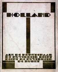
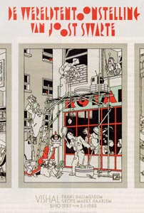
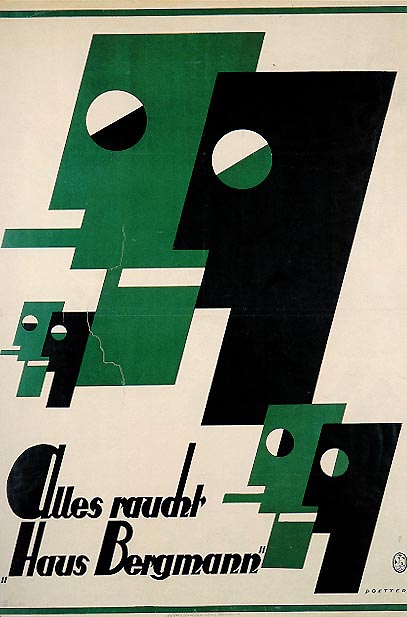
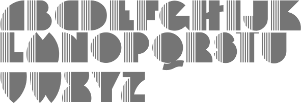
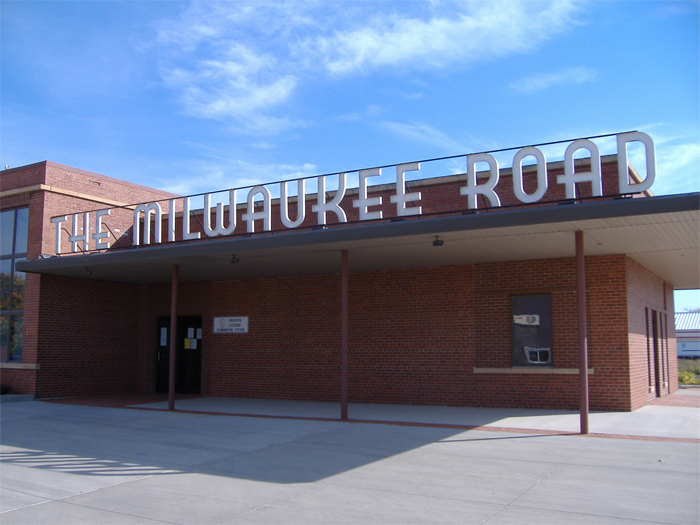
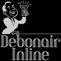
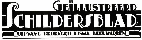
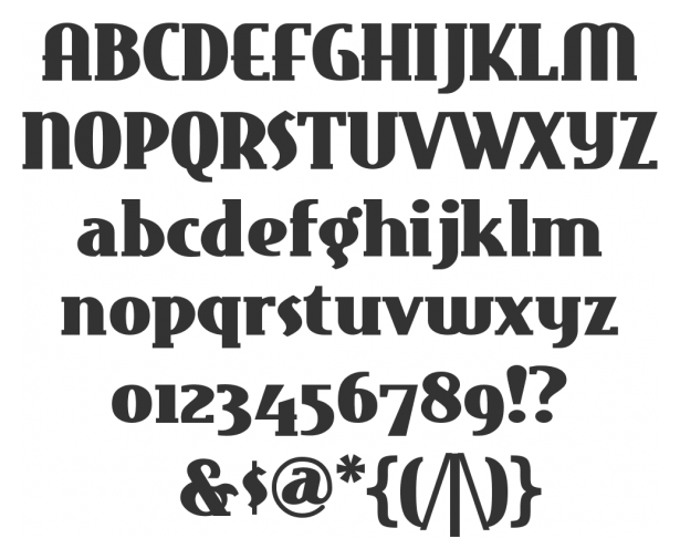
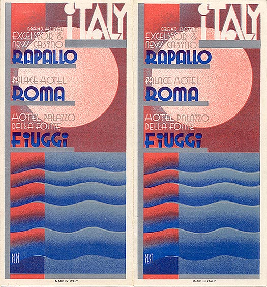
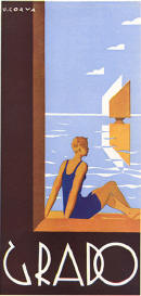
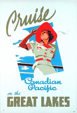
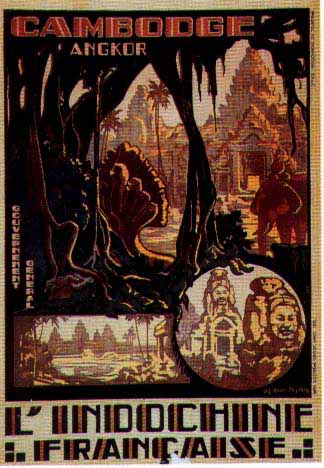
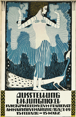
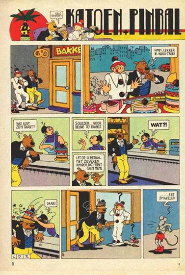
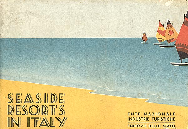
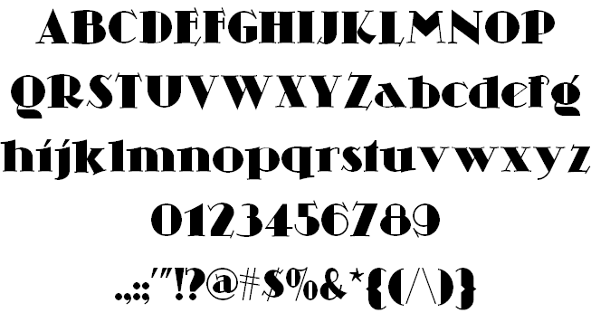
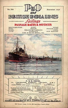
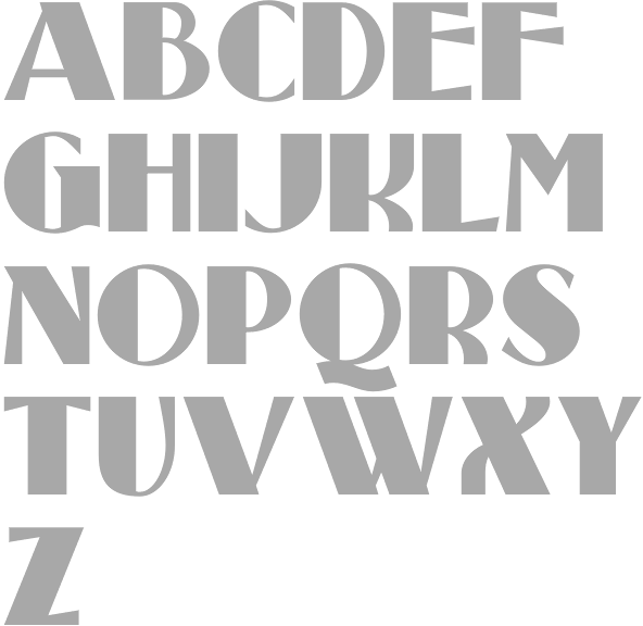
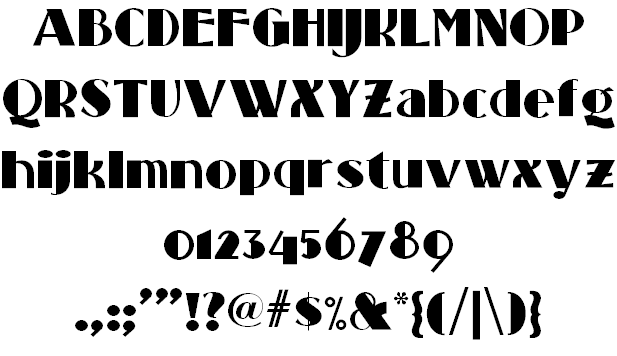
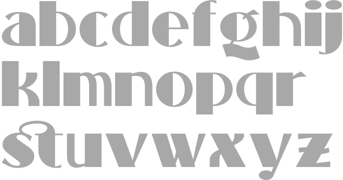
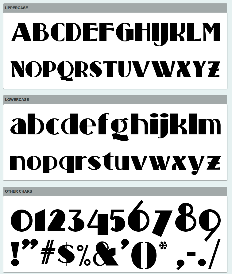
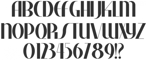
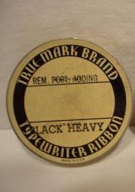
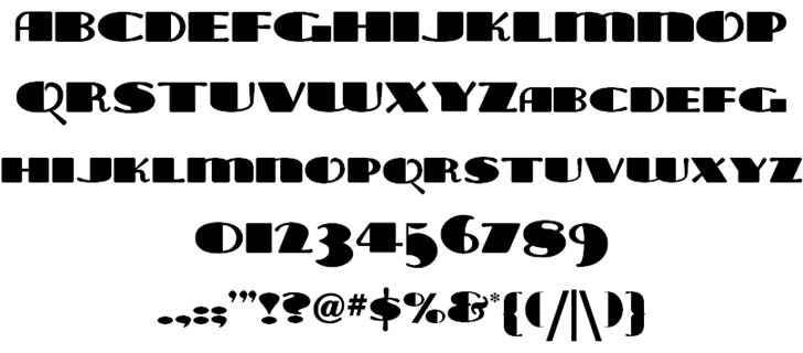
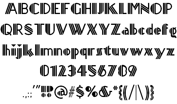
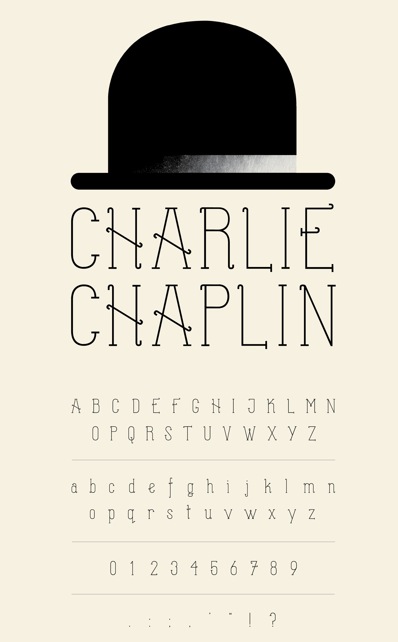
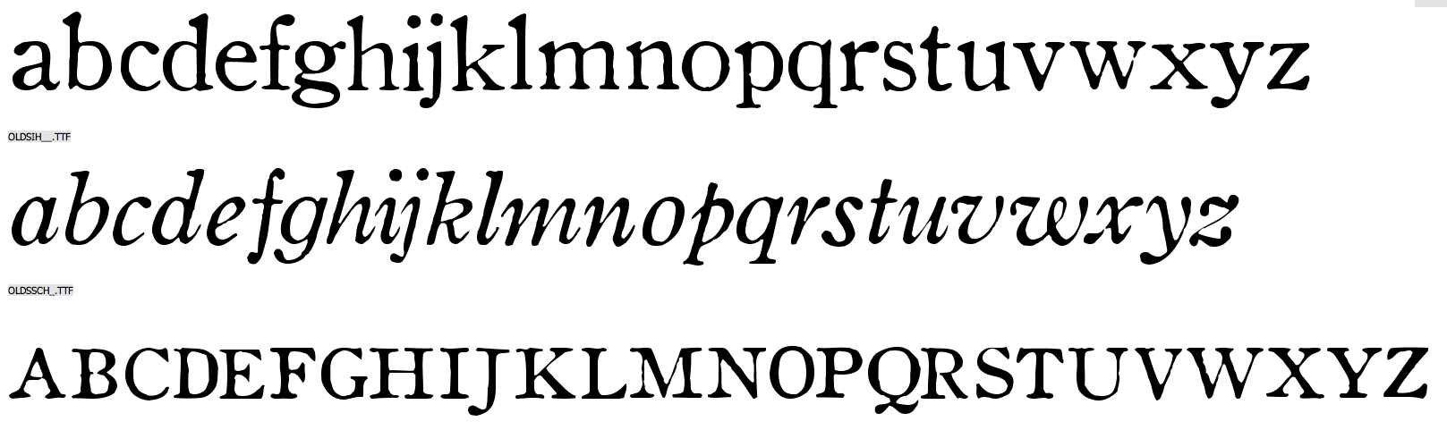
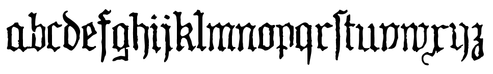
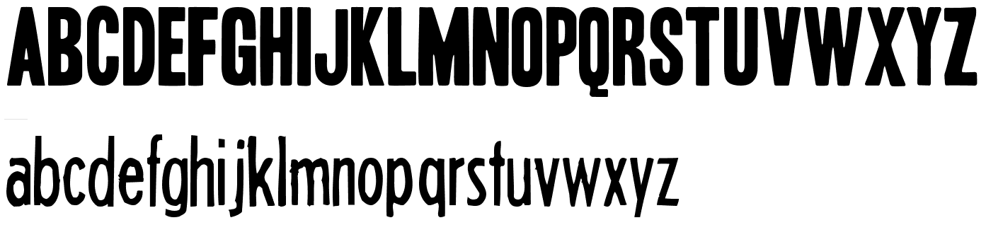
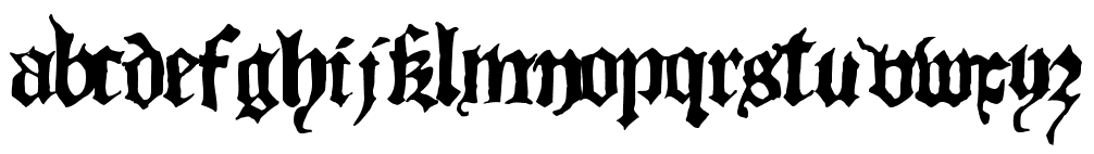
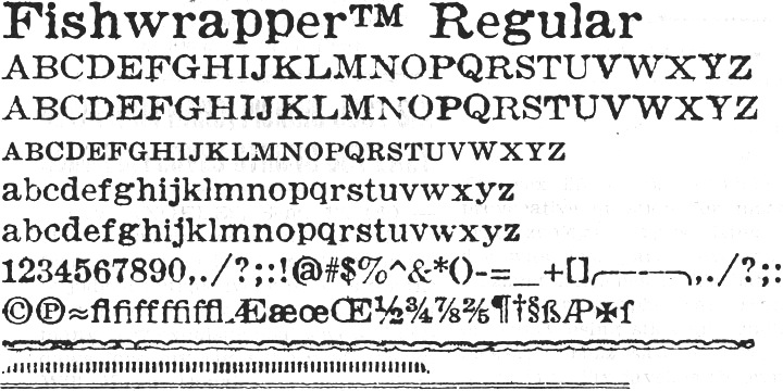
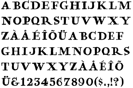
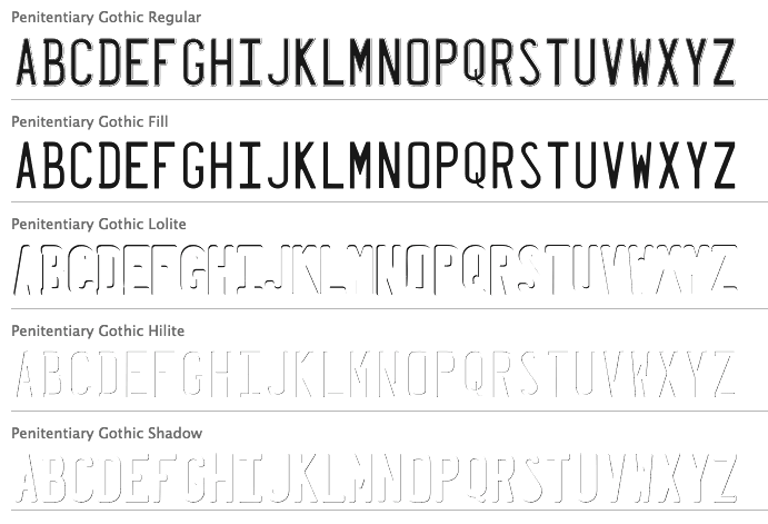
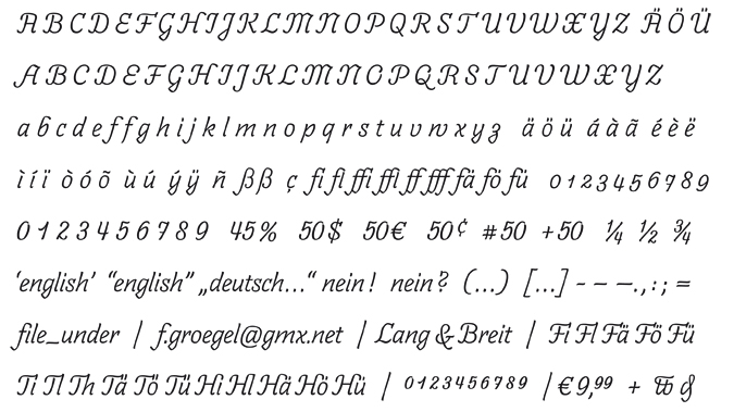
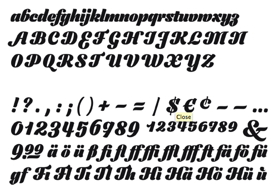
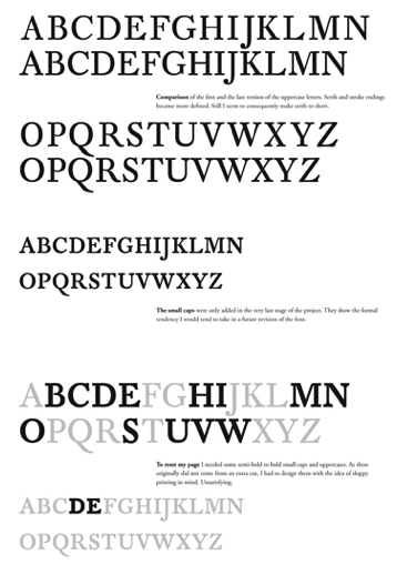
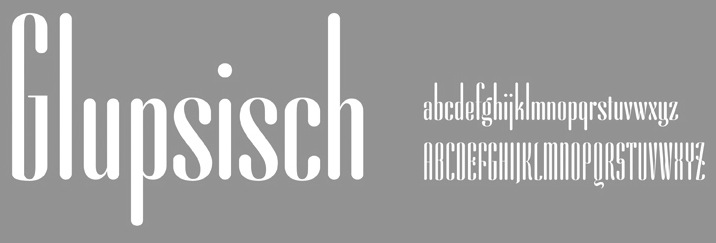
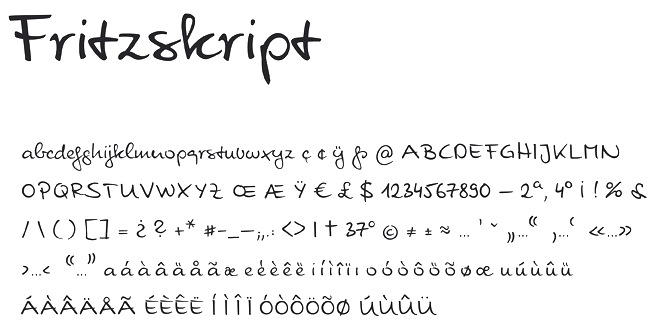
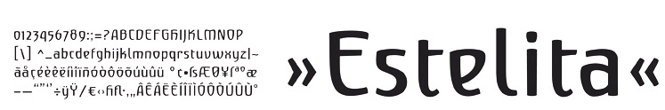
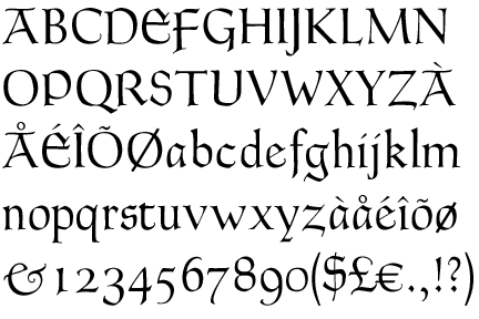
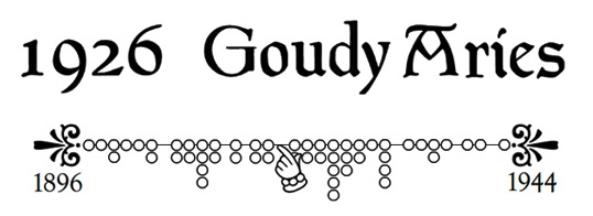
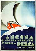
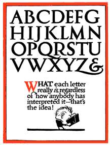
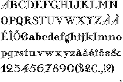
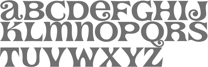
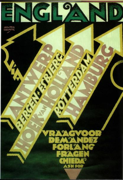
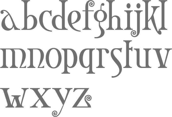
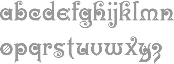
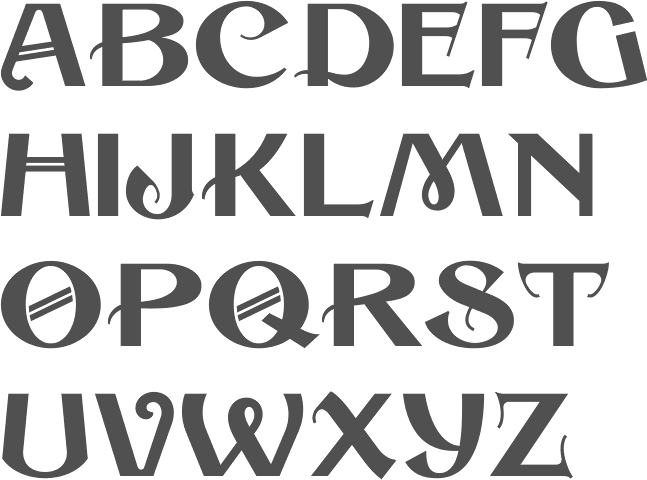
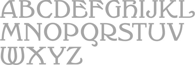
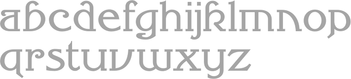
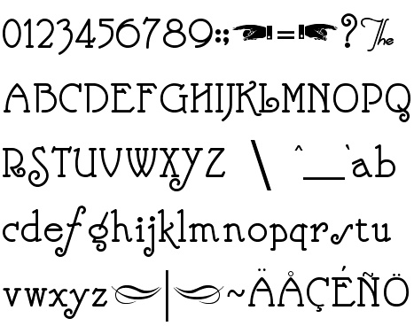
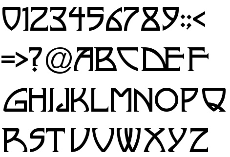
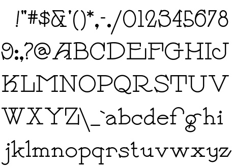
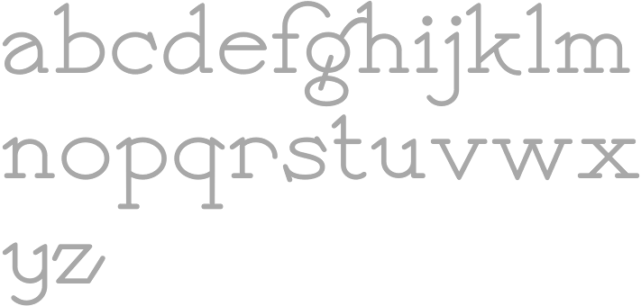
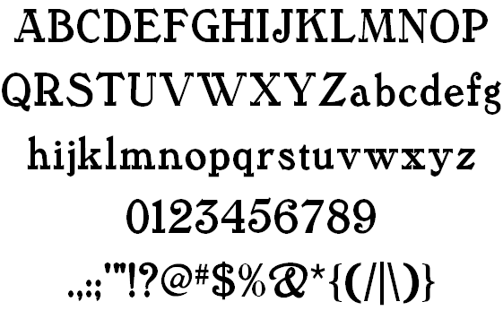
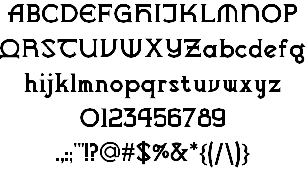
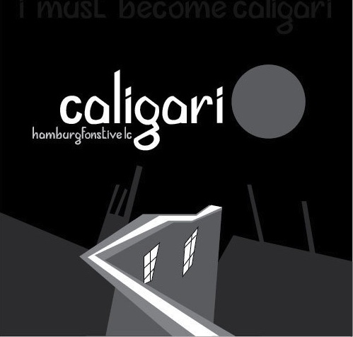
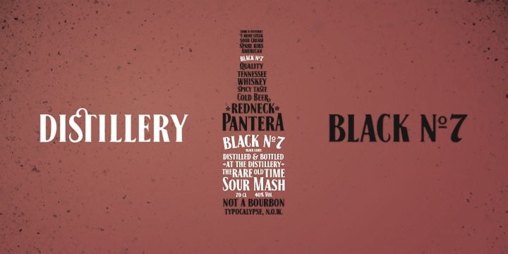
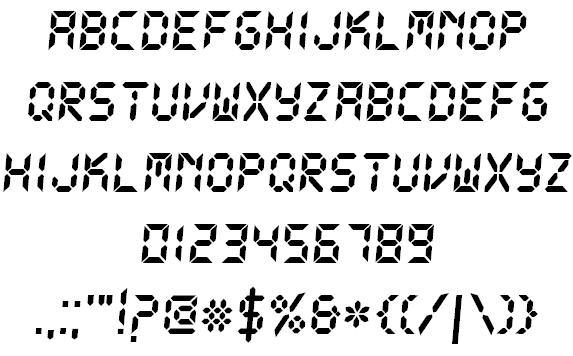
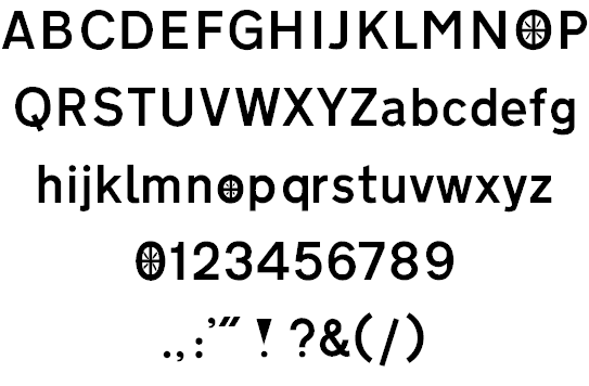
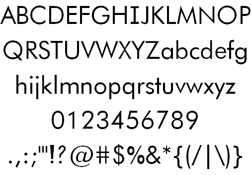
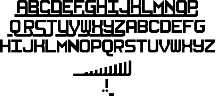
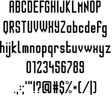
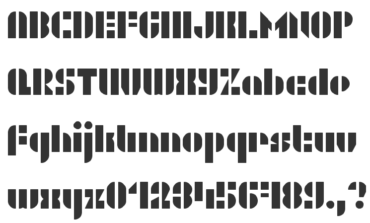