| | |
Alexandre Frasca
|
Graphic designer in Sao Paulo who created the sci-fi typeface Invader and the steampunk typeface Clockworks in 2017. [Google]
[More] ⦿
|
Aliff Zamri
|
Designer of the textured typeface Steampunk Machinery (2020). [Google]
[More] ⦿
|
ALT Foundry
[Andreas Leonidou]

|
 ALT is the type foundry of prolific type designer Andreas Leonidou from Limassol, Cyprus, b. 1986. His main work is commercial, but there is also a substantial collection of free fonts.
 He created Foldgami, Apollo 13 (techno, futuristic), Fatgami, Origamia, Paper Roll, Alt Retro (2010, multilined family), Alt Tiwo (2010, fat counterless), Alt Matey (2010, a family that includes a multiline style; the piano key typeface Alt Matey V2 followed in 2012), ALT Lautus (2010, a minimalistic monoline sans family), Japanese Cities Type Experiment (2010), ALT Alternatice (2010), ALT Vxt11 (2010, a high-contrast art deco octagonal face), ALT Aeon (2010, a unicase but multiline family), Alt Re 32 (2010, techno), ALT Mun (2010, a curlified family), ALT Breo (2011, octagonal family), ALT Exline (2011), Jun Script (2011, connected contemporary upright script), ALT Ayame (2011, condensed squarish family ain the piano key style, +Long), Alt UAV31 (2011, an octagonal experiment), Alt Moav (2011, a striking geometric caps face. Images: i, ii, iii), Alt Geko (2011, an art deco caps face), and Archetype (unicase, Bauhaus). Free fonts at Devian Tart: Alt Retro (2010, multilined family), ALT Hiroshi (2011, ornamental), ALT Deville (2011, spurred). Typefaces made in 2012: DNR001 (hipster style), ALT Kora (for the identity of Drone), ALT Fat (monospaced squarish caps face), ALT Exodus (sci fi face), Alt Wet (a paint splatter face), Alt Sku (ornamental didone face), Alt Robotechnica (pixel face), Exodus (a blackletter style straight-edged typeface), Juk01 (an ornamental mechanical, or steampunk, typeface), Alt Sake (a thin condensed poster typeface). Typefaces from 2013: Modu (alchemic, hipster style), Modu Deco, Bely (a severe-looking almost constructivist Latin/Cyrillic typeface). Typefaces from 2014: Ren (a free vintage display typeface family). Typefaces from 2015: ALT Hazer (a great free shadow sans), ALT Smaq (a family of eight free beveled styles for Latin and Greek). The free fonts as of 2015: ALTBELY, AltJoli, AltPixelsGoneBad, AltRe32-Duo, AltRe32-Normal, AltRenDuo, AltRenRegular, AltRenRetro, AltRenShadow, AltRetroBlack, AltRetroBold, AltRetroLight, AltRetroRegular, AltRetroThin, Alt-Twitchy, AltVxt11, Altapollo13, AltAeon-Black, AltAeon-Bold, AltAeon-Light, AltAeon-Medium, AltAeon-Thin, AltAeonRegular, AltAxlDeco, AltAxlRegular, AltDEVILE, AltGeko-AltGeko, AltMateyv2-Black, AltRobotechnica, AltSku, AltSkuItalic, AltUAV31, AltWet, Altapollo13-Black, Altapollo13, althazer, altsmaq2.8, altsmaq4.8, altsmaq6.8, altsmaq8.8, altexodus, altfatgami, altfatitalic, altfatregular, altfoldgami. Typefaces from 2016: Sadistic (a free scratchy font), System Code (free programming font). Typefaces from 2017: Rekt, Rogue (free). Typefaces from 2018: Alt Catwalk (a fashion mag typeface family), Frantic, Looper (a compass-and-ruler font), Silent Scream (a free dry brush font). free). Flickr link. Behance link. Hellofont link. Devian Tart link. Klingspor link. Creative Market link. View Andreas Leonidou's typefaces. Home page. [Google]
[MyFonts]
[More] ⦿
|
Aly Kelly
|
During her studies at the Illinois Institute of Art-Schaumburg, Aly Kelly (AK Designs, Algonquin, IL) designed Steampunk Speech Typeface (2013) and Vine Lnes (2013, a curly script). [Google]
[More] ⦿
|
Ana Paula Pimenta
|
Manaus, Brazil-based designer of the cigaret-themed typeface Steampunk Rounded (2020). [Google]
[More] ⦿
|
Andreas Leonidou
[ALT Foundry]
|
 [MyFonts]
[More] ⦿
[MyFonts]
[More] ⦿
|
Andriy Dykun
[NREY]
|
 [MyFonts]
[More] ⦿
[MyFonts]
[More] ⦿
|
Angela Gutierrez Garcia
|
During her studies in Sevilla, Spain, Angela Gutierrez Garcia designed the steampunk typeface Steampang (2016), the art nouveau typeface Natural Type (2017), and the stitching font Old Granny Cross (2017). [Google]
[More] ⦿
|
Angeline Yeeai
|
Designer in Kuala Lumpur, Malaysia. Creator of an ornamental caps typeface called Steampunked (2012). [Google]
[More] ⦿
|
Anita Jürgeleit
[Type This Studio]
|
 [MyFonts]
[More] ⦿
[MyFonts]
[More] ⦿
|
Annastasia Samsonova
|
 Russian codesigner with Jovanny Lemonad of the free Latin / Cyrillic handcrafted typeface Hitch Hike (2015). Other free typefaces: Steamy (2014, pure steampunk beauty), Insektophobiya (2012). [Google]
[More] ⦿
Russian codesigner with Jovanny Lemonad of the free Latin / Cyrillic handcrafted typeface Hitch Hike (2015). Other free typefaces: Steamy (2014, pure steampunk beauty), Insektophobiya (2012). [Google]
[More] ⦿
|
Anthony Rodriguez
|
Marietta, GA-based designer of Loko Type (2013), a distressed steampunk caps typeface. [Google]
[More] ⦿
|
Anton Krause
|
Hamburg-based designer of the steampunk font Steamjunk (2014). [Google]
[More] ⦿
|
Art deco typefaces by Nick Curtis: I
[Nick Curtis]
|
 Free art deco typefaces by Nick Curtis, made between 1997 and 2003. Nick Curtis also made commercial art deco typefaces, but these will be listed elsewhere.
 - AmstelHeavyNF (2002): based on this poster from 1926 by C. De Haas.
- AmsterdamTangram (2002): based on this poster by Joost Swarte from 1987 entitled "De wereldtentoonstelling van Joost Swarte".
- AnchorSteamNF (2002): based on a poster from 1923 by Wilhelm Poetter.
- Rainbow Bass (1982, Saul Bass) a vertically striped disco style design, was remade by Nick Curtis as Backstage Pass (1999, 2008).
- BeckerBlackNF (2002, 2007): Based on Alf R. Becker's lettering.
- BigAppleNF (2000, 2007).
- BoogieNightsNF, BoogieNightsShadowNF (2002, 2007): based on this poster from 1916 by Paul Hosch and Hans Melching. In 2009, CheapProFonts made a "pro" version.
- BoomerIngueNF (2002, 2007).
- Bric-aBraqueNF (1999, 2007). Bric-a-Braque was based on Cubist Bold (John W. Zimmerman, 1929).
- ChainsawGeometric (1999). Based on this alphabet by Draim (1928).
- ChippewaFallsNF (2002, 2007). Originally called Hiawatha. See this roadside photograph that inspired Nick.
- Coaster Poster (1999).
- DayPosterBlackNF, DayPosterShadowNF (2002, 2007).
- DebonairInlineNF (2000, 2007). The commercial Debonair Inline (2008) is an extension (uppercase, etc.) of Herbert Bayer's 1931 monocase typeface Architype Bayer, also known as the universal moderrn face.
- DecoBordersNF (1999) and DecoDingbatsNF (2000).
- Drumag Studio NF (2003, 2007).
- DustyRoseNF (2000), DustyRoseRevised (2007): Dusty Rose is an art deco typeface based on the logotype for the Dutch magazine Geillustreerd Schildersblad in 1940, by Anton Kurvers. The commercial Dusty Rose NF was published in 2008.
- EastMarket (1999), EastMarketTwoNF (2007).
- GradoGradooNF (2002, 2007): a Bauhaus-style font, based on this 1932 poster by Urbano Corva.
- Great Lakes (2003, 2007), GreatLakesShadowNF (2007): based on this poster by Peter Ewart (1935).
- Heavy Tripp NF, Heavy Tripp Ultra Bold (2001, 2007). Both Day Tripper NF and Heavy Tripp are based on Dignity Roman, a typeface from 1929 by art deco alphabet designer Alphonso E. Tripp.
- HeraldSquareNF, HeraldSquareTwoNF (2002, 2007): a font family based on a design by Welo shown in Studio Handbook for Artists and Advertisers (1927).
- High Five Jive NF, High Five NF (2001, 2007).
- Indochine NF (2003, 2007). Based on this poster by Joseph-Henri Ponchin (1931).
- Ironick-Normal (1999, 2007): an exaggerated Bernhard Modern.
- KerfuffleNF (2000, 2007). Based on this poster by Chris Van Der Hoef (1920).
- KismetNF. A free font. Based on this lettering.
- LabyrinthCapital, Labyrinth (1999, 2007). Based on this poster.
- MetroRetroNF (1999, 2007). MetroRetroRedux (2001, 2010) is a commercial version of that.
- Milton Burlesque NF (2000, 2007).
- Monkey Fingers NF (1999, 2007). Based on an alphabet by Otto Heim published in Farbige Alphabete (1925).
- MunchausenNF (2003, 2007). Based on a poster for an exhibition by Ludwig Heinrich Jungnickel (1911). This is inbetween art deco and art nouveau.
- NickerbockerNF (1999, 2007).
- NightcapCapital, Nightcap NF (1999, 2007). Based on Disque (A. Bardi, 1931).
- OdalisqueNF, OdalisqueRevised (2000, 2007). The commercial versions are Odalisque NF (2008) and Odalisque Stencil (2010). These art deco typefaces are based on Morris Fuller Benton's Chic (1927).
- ParkLaneNF, ParkLaneRevised (2000, 2007).
- PhattPhreddyNF (2001, 2007).
- PinballWhizNF (2002, 2007). Based on this logotype by Joost Swarte for the comic-strip series "Katoen + Pinbal" (1975).
- PlatonickNF (1999, 2007).
- PlugNickelNF (+Black) (1999, 2007): a reworking of Bremen Black, with small caps and a rather skeptical uppercase R added.
- RadioRanchNF (1999, 2007). Adolf Behrmann designed the classical display typeface Rundfunk at Berthold in 1928. This typeface was digitized by Nick Curtis as Radio Ranch NF.
- RaskalnikovNF (2003, 2007). A Cyrillic simulation typeface based on this poster.
- RialtoEngraved, Rialto NF (2000, 2007): a Broadway style art deco face.
- RiotSquadNF (2000, 2007). after a design by Otto Heim from Heim's 1925 book, Farbige Alphabete.
- RitzyRemixNF (2000, 2007). RitzyNormal is based on Tom Carnase's Busorama.
- Seaside Resort NF (2003, 2007). A bilined titling typeface based on a 1933 poster by Italy's Bertarelli Studios.
- SelznickNormal, SelznickRemixNF (1999, 2007). An art deco typeface inspired by movie theaters of the 1930s. Based on ITC Anna (1991, Daniel Pelavin).
- Sesquipedalian, SesquipedalianAlternates (2000, 2007). Inspired by a handlettered logo for Torre's Buckdruckerei in Vienna, circa 1919.
- Sid The Kid NF (1999, 2007).
- Skittles N Beer NF (2007) is based on handlettering on a 1929 brochure for the P&O British-India Steamship Line.
- Standing Room Only NF (1999, 2007). Modeled after Broadway, designed by Morris Fuller Benton for ATF in 1928, originally named Broadway Poster.
- Stony Island NF (2002, 2007). An adaptation of an art deco font called Chicago Modern, designed by lettering artist Alf Becker, whose designs graced the pages of Signs of the Times magazine from the late 30s into the 50s.
- StudebakerNF-Bold, Studebaker (1999, 2007). Based on the lettering on a package for True-Mark Brand Typewriter Ribbons, circa 1938, designer unknown.
- TaraBulbousCapital, TaraBulbousNF (1999, 2007). TaraBulbous NF (the commercial version is from 2008) is a fat-lettered font based on Carlyle-Oring lettering. See also here.
- TitanickDisplayNF (1999, 2007): a remake of the bold pin-striped trilined Dextor by L. Meuffels.
[Google]
[MyFonts]
[More] ⦿
|
Artistic and Unique
[Osman Taner Kucukgenc]
|
 Turkish designer of these typefaces:
 - Asherah (a slab serif).
- Agentic (2021). An 18-style elephant feet serif.
- Alpha Wolf (2021). A slab serif.
- The display typeface Animus (2020).
- Artum (2020). A steam punk typeface with a Basque capital A.
- Asherah (2021). A 12-style slab serif.
- Bosphorus (2019). An octagonal athletic shirt font.
- The stylized almost Tuscan display typeface Corvus (2020).
- Cosmopolis (2021). A 24-style sans family.
- Crypto Code (2012). a 12-style octagonal circuit board font family.
- Diabolus (2020). A threatening spurred decorative serif.
- Dusty Boots (2020). A vintage spurred bike gang typeface.
- Epidemia (2020). A 15-style sans.
- Geomatic (2020). A geometric sans in 20 styles.
- Homeric (2021). A vintage wedge serif.
- Horus (2020). A 12-style mini-wedge serif family.
- Icarus (2020). A 4-style steam punk serif with wedgy gas pipe terminals.
- Illuminatum (2020). A vintage typeface.
- The wedge serif antiqua typeface Inferno (2020).
- Librarium (2020). A 12-style ball terminal-laden typeface.
- Lone Wolf (2020). A vintage typeface.
- The text typeface family Lunaris (2020).
- Metallum (2020). A dystopian wedge serif.
- The roman typeface Morpheus Dream (2020).
- Moviemania (2020). A 12-style monoline display sans.
- Nigrum (2020). A 12-style geometric sans.
- Omenica (2021). A 12-style vintage serif.
- Optimus (2021). An 188-style vintage serif.
- Pandorica-Sans (2020). A 12-style display sans.
- Polyphonicus (2020). A twelve-style display sans.
- Prodigium (2020). A 13-style monolinear sans family.
- Proximus (2020). A 12-style low contrast sans family in which even the Light weight is bold.
- The medieval font family Quadrim (2020).
- Relica (2021). An 18-style roundish bold serif family.
- Sapientia (2020). A rounded old style serif familiy in tweleve styles.
- The rounded monline typeface family Shibui (2020).
- Sidus (2020). A 12-style wedge serif typeface.
- Superstellar (2021). A modular sci-fi typeface.
- Temporis (2020). An 18-style bracketed serif.
[Google]
[MyFonts]
[More] ⦿
|
Ben Nicol
|
Graphic designer in Melbourne, who created the display typeface Steampunk (2013). [Google]
[More] ⦿
|
Benjamin Nicol
|
Melbourne, Australia-based designer of the display typeface Steampunk (2016). [Google]
[More] ⦿
|
Blaine
|
American creator of Steam Font (2011, octagonal). [Google]
[More] ⦿
|
Carly Romano
|
Orlando, FL-based designer of Steampunk (2013). [Google]
[More] ⦿
|
Carolina Camisassa
|
Cordoba, Argentina-based designer of Steampunk (2016). [Google]
[More] ⦿
|
Carolina Costa
|
During her studies, Salvador, Brazil-based Carolina Costa designed the steampunk typeface Steamtime (2017). [Google]
[More] ⦿
|
Catharsis
[Christian "Cinga" Thalmann]
|
 Catharsis is located in Leiden, The Netherlands. Before that, Christian Thalmann's page Cinga.ch was run out of Switzerland, when he was a student at ETH Zürich. Thalmann is an astrophysicist by training.
 Catharsis had free typefaces such as the great Arabic simulation typeface Catharsis Bedouin (2004), CatharsisCircular, CatharsisRequiem (a unicase pair), CatharsisRequiemBold, CatharsisCargo, Cirnaja Bookhand and Cirnaja Calligraphy (made for his artificial language, Obrenje), Catharsis Macchiato (2005), CatharsisEspresso (2005). At Catharsis, the commercial foundry, he published Octant in 2013: Octant is an original steampunk display typeface drawing inspiration from Victorian-age steel and brass engineering, as well as from blackletter typography. Gryffensee (2013, in styles called Eins, Zwei and Drei) is designed to be the Futura of blackletter, combining the time-honored gravity and relentlessness of the Gothic script with the clean, contemporary freshness of the geometric sans. It also covers Cyrillic. Backstein (2013), baked brick, took its inspiration from the broken antiqua lettering in Berlin's old subway stations. Volantene Script (2013) is a (free) uncial display typeface inspired by the penmanship of Lady Talisa Maegyr-Stark as seen on HBO's Game of Thrones. Numina (2013, Glamour and Glory substyles) is an extensive condensed fashion-oriented typeface family related to Skyline and Corvinus. Maestrale (2013) adds calligraphic and flamboyant extenders to a decorative text typeface for a dramatic effect. Choose between Maestrale Manual (swashy) and Manuale Text. Blumenkind (2013) is inspired by an instance of metal-strip lettering found on the Bürgermeister Kornmesser Siedlung residential building complex in Berlin from the 1960s. Brilliance (2013) is a glamorous contemporary display blackletter combining the rich tapestry of Textura with a hint of the airy lightness of Spencerian script. Let's say that it is a light-hearted Textura. In 2015, he made the free 45-style classic serif typeface family Cormorant, which includes several unicase fonts. This typeface started out in 2014 as Paramond, a light, contrasted, space-taking Garalde with impossibly tiny counters and long extenders. Links to the Google Font directory: Cormorant, Cormorant Garamond, Cormorant Infant, Cormorant SC, Cormorant Unicase, Cormorant+UprightCormorant Upright. See also CTAN. In 2016, he created the humanist geometric sans typeface family Quinoa for Latin, Cyrillic, Greek and Hebrew. Typefaces from 2017: Tesserae (kitchen tile style), Traction. Traction was originally conceived and designed by Christian Thalmann. Chiara Mattersdorfer and Miriam Suranyi expanded, completed and produced the font family. This typeface sports signature serifs, soft edges and a fluid, organic design. In 2018, Christian started work on a blackletter-themed stencil typeface, first called Komik Ohne (the German for Comic Sans) and later named Kuschelfraktur (2019). Between 2016 and 2019, he developed Eau de Garamond---a sans distilled from the essence of Garamond---, which was later renamed Ysabeau. Github link. In 2020, we find another fork, Isabella Sans. Overbold (2019) is described by him as follows: Overbold is an unapologetic display typeface inspired by an illustration in Eric Gill's Essay on Typography (p.51), in which he demonstrates how not to make letters. In particular, he shows that increasing the weight of the downstroke in a serif A without structural adjustments yields an absurd, overbold result. I found the letter so charming that I decided to blatantly disregard Gill's wisdom and draw an entire overbold typeface. Here is the result. I'm not sorry. 1001 fonts link. Yet another URL. Fontspace link. Behance link. Klingspor link. Dafont link. Open Font Library link. Github link. [Google]
[MyFonts]
[More] ⦿
|
Cayo Navarro
|
Peruvian graphic and web designer. At FontStruct, he created a number of pixel fonts in 2009, such as gridnPix75 (+Light, +nLite), OCR-APix6, cayoPix45, ScrptPix5, sCapsPix4, SerifPix6, moSpPix57, ClassPix5, MicriPix4, CorpoPix5, and BminiPix5. Other fonts there include Proton Type (2009), the geometric pxlNotSqr (2009) and the sturdy headline typefaces Woznian (2009, inspired by bitmap fonts like Chicago and Charcoal) and Gizmatik (2009), his best font. In 2009, he added NuevoSolStile (in the Eurostile/Microgramma mold), MacroBold (ultra-fat), Steam Punker, Funkadeliai, Monocodigo, FS Mini, FS Remix (horizontally striped), BlackSQRda (blackletter), Fontscript, Scanografia (vertical striping of letters), Stencikal, Bloxed (white on black), BlackSQRda, NSS Unicase (unicase), NuevoSolStile (unicase). [Google]
[More] ⦿
|
Christian Baumgart
|
Concord, NC-based creator of a steampunk caps typeface in 2012. [Google]
[More] ⦿
|
Christian "Cinga" Thalmann
[Catharsis]
|
 [MyFonts]
[More] ⦿
[MyFonts]
[More] ⦿
|
Claudia Oropeza
|
Caracas, Venezuela-based designer of the steampunk typeface Steam Font (2014). [Google]
[More] ⦿
|
Coert De Decker
[Kustomtype]
|
 [MyFonts]
[More] ⦿
[MyFonts]
[More] ⦿
|
Cruzine
[Peter Olexa]
|
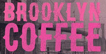 Peter Olexa (Bratislava, Slovakia, b. 1978) created the (typically retro / vintage) mostly commercial typefaces Slow SVG (2020: a brush font), Hurley (2020), Royal (2020: vintage caps), Wagoon (2020), Snow (2020: a 3d color SVG font), Venomous (2020: spurred, grungy), Behofeel (2020), Chasmophile (2020: formal calligraphy), Angelic (2019: dry brush), Boutique Paris (2019), Umbrella (2019), Cellica Bold (2019), Abigaile (2019), Ragtime (2019: a brush font), Ragtime Marker (2019), Futu (2018), Kiko (2018), Pineapple (2018), Urban (2018: inline), Plasma (2018), Evolve (2018: inline), Hallowen (sic; 2018), Phantom (2018), Palam (2018), Alter (2018), Chrome (2018), Rhino (2018), Giant (2018), Valeria (2018), Ruas (2018), Strife (2018), Giant (2018), Atari (2018), Octopus (2018), Green Light (2018), Atlantis (2018), Maroon (2018), Secure 3D (2018), Cube (2018), Billionaire (2018: art deco), Savana (2018: bejeweled), Castile (2018), Starla (2018), Brodo (2018), Nomos (2018), Brisk (2018, art deco), Tron (2018), Jewel (2018), Forest (2018), Noxa (2018), Ama Deust Inline (2018), Goliath Inline Grunge (2017), Arbatosh (2017: Victorian), Momoco (2017), Heyro Fun (2017), Calliope Fun (2017), Steampunk Gears (2017), Ponds (2017: Victorian), Zahra (2017: inline grunge), Green Light (2017: inline grunge), Jordan Bold Grunge (2017: inline), Metalic 3D (2017), Mecha Grunge (2017), Buffalo (2017), Queen (2017), Lacoste Inline (2017), Ollie (2017, sans family), Nomos (2017), Blue North (2017: spurred), Murray (2017), Atlantis (2017), Montana (2017, outlined), Speedhunter Line (2017), Star Black Inline (2017), Gatsby Inline (2017: art deco), Jibril (2016: spurred), Hallowen (sic) (2016), Kiko (2016), Sailor (2016, tattoo font), Annabel (2016), Zalora (2016), Geno (2016), Marin (2016), Starship (2016), Mozza Shadow (2016), Meravin (2016), Venomous (2016), Amora Inline Grunge (2016), Rocket Shadow (2016), Hydrant (2016), Boston Inline Grunge (2016), Skywalker (2016, art deco), Ocela (2016), Columbus (2016), Raven (2016), Nomura Grunge (2016), Stella (2016), Salada (2016), Vultron (2016), Majestic (2016), Napoleon (2016), Temu (2016), Rodeo (2016, Western style family), Brooklyn (2016), Thunder (2016, Victorian label typeface family), Murray Inline Grunge (2016), Opera (2016, Victoriana), Flamingo Shadow (2016), Blue North Inline Grunge (2016), Montana Bold Outline (2016), Monophone Fancy (2016, retro style), Marin Victorian (2016), Westwood (16-style Western font family), Mozza (2016, +Inline, +Shadow, +Grunge), Speed Hunter (2016), Metro Grunge (2016), Annabel (2016, Victorian), La Forest (2016, blackletter), Star (2016, decorative caps, with outlined and inline versions), Phoenix (2016, a spurred typeface), Gatsby (2016), Bureno (2016, a Victorian display typeface), New York (2016, letterpress emulation), Capella (2016), Almanac Italic Grunge (2015), Anabel (2016, roman caps), Regolith (2015), Chocoleta (2015, hand-printed), Sailor (2015), Turmeric (2015), Ultimatum (2015), Heyro (2015, a rough brush font), Calliope (2015, a rough brush), Glass Beads (2015), Red Paprika (2015), Greenkitchen (2015), Artistico (2015, grungy), Brush Shop (2015), Graceful (2015, irregular script), Brush Wall (2015), Nickainley (2015, connected script), Harloft (2015, a warm brush script), Detective Typewriter (2015), Not Perfect (2015), Good Vibes (2015), Cool Story (2014), Get Coffee (2014), Think Happy (2014), Say Less (2014), Let's Do This (2014), Just Be Cool (2014), Brooklyn Coffee (2014, a spurred poster typeface), Bronx Shoes (2014), Nevermind (2014), RockNRoll (2014), Bluegrass (2014), Memento (2014, spurred Victorian face), Melody (2014) and Grazioso (2014). He runs Dealjumbo.
 Creative Market link. Behance link. Dafont link. [Google]
[More] ⦿
|
Dalal Nizam
|
 Graphic designer in Sydney who studied Visual Communication at University of Western Sydney. Creator of Steamafide (2013), a free steampunk / Victorian typeface family.
 Behance link. [Google]
[More] ⦿
|
Dana Alhasan
|
During her graphic design studies in Dubai, UAE, Dana Alhasan created the steampunk-inspired Latin / Arabic typeface Tick Tock (2014). [Google]
[More] ⦿
|
Daniel Pelavin
|
 American type designer, born in Detroit, who lives in New York City. His early typefaces include
 - ITC Kulukundis (1997).
- ITC Anna (1991). Pelavin's first typeface. The Cyrillic version of ITC Anna was done by Svetlana Yermolayeva, Vladimir Yefimov and Alexander Tarbeev in 1993. There is also a (rather poor) derived font from 1993 by Thomas E. Harvey called Tall Deco.
- Canton Market (1995). An oriental simulation font.
- Test (1996).
- The geometric patter fonts Sindbad, Circles, Triangles, and Squares.
Pelavin was Chairman of the Type Directors Club, 2002-2003. In 2009, he designed the 1940s art deco face Bokar. In 2010, he created Marquue Faceted and Marquee Solid (which can be layered to make a 3d effect), China Market (oriental simulation), Setsuko, an oriental simulation face, Rilke (an adaptation of the lettering used by Gustav Klimt on his poster for the 1st Vienna Secession exhibition in 1898 and is named for Klimt's contemporary the poet Rainer Maria Rilke: caps only), Tribeca Script, Monograph (as if written with a Speedball B pen), Book Country (crude octagonal folksy face), Bing (art nouveau), HiFi (retro script), Twentieth Century (an art deco headline sans), and Safety (1930s style). In 2011, he added Tiki (a pair of Hawaiian typefaces), Salty Dog. In 2012, he created the monoline uprigt connected script typeface Mimosa, which was inspired by the packaging for Moulinard Jeune, a line of French toiletries from the 1920s. Typefaces from 2013: Forgia (Pelavin writes: Forgia is a result of my fascination with the beauty I find in utilitarian industrial objects like the riveted stanchions in New York subway stations, decorative ironwork in Grand Central terminal and the eloquent construction details of the urban infrastructure of the 19th and early 20th century.) Perhaps the steampunk typeface Rivets (2016) is an outgrowth of Forgia. Typefaces from 2016: Oscar (tri-lined art deco typeface that pays trbute to the Acadmy Awards), Plot (brushed or lined wood style), Camp (a wooden log typeface), Rosa (art deco). Typefaces from 2017: Neroli (2017, formal art deco), Taos (2017, a cactus font). Typefaces from 2018: Trilight (trilined typeface). Typefaces from 2019: Noir et Blanc (a deco poster typeface). Typefaces from 2020: Molly Louie (a patterned decorative caps typeface). Typefaces from 2021: Bedazzle (a movie marquee font), Bankster (a spurred bank note or financial document font with various hatched and shadow styles). Typefaces from 2022: Mr Porter (a robust monolinear rounded slab serif rooted in 17th century England: rich and full-flavored with notes of coffee, licorice and molasses). [Google]
[MyFonts]
[More] ⦿
|
David Duke
|
Ontario-based graphic and web designer. Behance link. He created Steampunk (2012). [Google]
[More] ⦿
|
David Fleming Nalle
[Scriptorium (Ragnarok Press, Fontcraft)]
|
 [MyFonts]
[More] ⦿
[MyFonts]
[More] ⦿
|
Deni Dessastra
[The Sastra]
|
[More] ⦿
|
Elyssa Tan Mei Qenn
|
Kuala Lumpur, Malaysia-based designer of a steampunk alphabet in 2020. [Google]
[More] ⦿
|
Enci Bognar
|
Enci Bognar (Budapest) is working on a hexagonal typeface called To Bee Cafe (sic) (2013). Steam Font (2013) is an experimental typeface. [Google]
[More] ⦿
|
Gary Sumner
|
Designer in New York, NY, who created Steampunk Teletyped (2016) from small circles. [Google]
[More] ⦿
|
Gasoline Creative
|
 Gasoline Creative is located in Mumbai, India. It created a colorful set of decorative caps called Tesla (2015) to honor the technological genius of Nikola Tesla. Earlier, it designed the steampunk caps typeface Tesla Title (2015). Behance link. [Google]
[More] ⦿
Gasoline Creative is located in Mumbai, India. It created a colorful set of decorative caps called Tesla (2015) to honor the technological genius of Nikola Tesla. Earlier, it designed the steampunk caps typeface Tesla Title (2015). Behance link. [Google]
[More] ⦿
|
Gleb Guralnyk
|
 Dnipropetrovsk, Ukraine-based designer of these typefaces in 2015: Odd Times (a vintage blackletter typeface), Brandy Label (a layered Victorian signage font), Smoking (a great Western layered poster font), Traveller, Letterhead (steampunk, vintage, Victorian), Age, Nataly Temper, Vintage Auto (a retro chrome automobile font), Golden Dust (a lava lamp font), Rusty Phoenix, Phoenix, the Victorian signage typeface Whiskey, Spirals, Biker (spurred inline font), the oily signage font Pin Up.
 In 2016, he designed Far Kingdoms (Victorian), Brass Heart (steampunk / Victorian), Big City Light (a vintage movie theater typeface), Lostamp (a weathered vintage rough stencil script), Kexman (calligraphic script), Loftype (creamy brush script), Shoelaces (monoline script), Tobacco Box (Victorian), Humblest, Whiskey Label (a great vintage Victorian headline font), Insane Fear (spurred), Falchion Edge (Victorian display typeface), Inside The Box (techno), Amber Taste (a layered Victorian beer label font; see also Amber Taste Pro (2020)), One Thin Line (a paperclip font), Bald Eagle (Victorian), Autumn Feel (brush script), Dirty Cartoon, Magic Curls, Winery, Bite Hard (beveled caps), Lovebus (psychedelic style), Column (layered Victorian), Golden Brush, Marine Fairytale (Victorian), and Old Story (handcrafted). Typefaces from 2017: Goodwine, Daub (EPS format brush alphabet), Rusted Bevel, Dirty Cartoon (a layerable cartoon font), Bald Eagle (vintage), La Belman (Victorian; see also La Belman Pro in 2020), Bright (creamy calligraphic), Winery, Magic Curls, Black Queen (Victorian style), Little Mess (dry brush), Lovebus (psychedelic), Bite Hard, Fiver (prismatic style), Sweet Rum (vintage), The Freaky Circus (Western circus font), Biker New (spurred), Flex Wire, Agress (graffiti style), Old Story, Rusted Brushpen (dry brush), Mosaic Pool, Ranch (vintage style with layered textures), Golden Dust, Letter Head, Limber (dry brush script), Patina, Craft Beer (a layered beer label font), Droptune (Victorian), Chimera Tail, Hardwatt (dry brush), Megawatt (signage script), Jamish (a handcrafted blackboard bold typeface), Oak Lumber, Odd Times (blackletter), Gunshot (an art nouveau display typeface), Bootleggers (a vintage label typeface), Brandy Label (vintage layered font), Smoking Typeface (vintage Western style, with layering). Typefaces from 2018: Shining Night (a marquee font), Scratches, Candy Shop (a multiline titling typeface), Nataly Temper (a crayon font), Anise Seeds, Lostamp (a great stamp font), Hicksons (retro signage script), Loftype (creamy script), Far Kingdoms (spurred vintage typeface), Predators Cuspid, Sweet & Fresh, Frantic (a vintage car typeface), Affair (Victorian), Falchion Edge (spurred vintage style), Lost in Space, Traveler (an interlocking vintage Tuscan display typeface), True Black, Late Frost, Inside The Box (an interesting double-width font), Magic Garden (curly style), Skater Girl (retro script). Typefaces from 2019: True Black (Tuscan), Nature Force, Sweettooth (script: 2018-2019), Rusted Bevel, Rusted Bevel, Fishermans Knot (a vintage label font started in 2018), Skater Girl (a heavy upright script), Cidrella, Western Shooter, Little Mess (a dry brush calligraphic script), Spirit Board (pure Victoriana), Ranch Vintage (shadowed, textured, vintage), Forged Fence (an ironwork font), Long Ride (an octagonal license plate font), Chimera Tail Rough, Patina. Typefaces from 2020: Sweet Ponch, Natural Heap (letters in laurels), Street Rush, Cally (a decorative Tuscan typeface), Sunny Bay, Harietta (a retro monoline script), Cheer Inside (a vintage font), Frizzy (a vintage label font), Asia Impact (simulating an oriental brush calligraphy), Exa Metline (an inline font), Hallie (a curly display typeface), No Rules, Parallax, Golden Treasure (a vintage ironwork font), Squidink, Bushman (an organic sans), Florry (a display sans), Propeller, Spirit Board (a layered circus font family), Lord Grayson (Victorian), Grayson (a tall gloomy monoline sans), Grayson Rough, Kaipara (a patterned all caps font), Classic Heritage (a Victorian or steampunk signage typeface), Anise Seeds (vintage softly spurred Tuscan caps), Candy Shop (vintage trilined caps), Plop, Practish (an experimental slab serif family), Everleigh (a stylish thin typeface), Everleigh Duo, Love Affair (vintage, perhaps art nouveau), Lost in Space (sci-fi), Sweet and Fresh. Typefaces from 2021: Dusky Rough (a Western or saloon font), Dusky Pub (a Western typeface with Tuscan features), Dusky Slab (a reverse stress Western font), Humblest Pro (an all caps display sans), Giftbox (a vintage label font). Typefaces from 2022: Simply Royal (layerable vintage caps with an engraved money look), Go Pop (pop art). [Google]
[MyFonts]
[More] ⦿
|
Graph Art
|
Luton, UK-based designer of Steampunk (2015). [Google]
[More] ⦿
|
Hanna Burrows
|
Aussie creator of Steampunkfontbyhannarb (2009). [Google]
[More] ⦿
|
Helga Guru
|
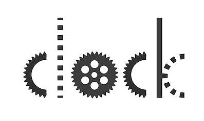 Graphic designer in Saint Petersburg, Russia, who created the great experimental typeface Somnium (2015), the connect-the-dots typeface Saturn (2015) and the artsy steampunk typeface Clock (2015). [Google]
[More] ⦿
Graphic designer in Saint Petersburg, Russia, who created the great experimental typeface Somnium (2015), the connect-the-dots typeface Saturn (2015) and the artsy steampunk typeface Clock (2015). [Google]
[More] ⦿
|
imagex
|
 Frenchman (b. 1957) who started making fonts in 2010, after a career in illustration, comics, and video games. In 2010, he created the free fonts BabyJo (pixel face), Bayday, Chrom (beveled face), LaPresse (grunge), Muffaroo, Poppy, Poppydot, Spacecard, Strokewith, Strokeless, ToonLand (comic book lettering), ToonLandBlack, ToonLandShad, TrashToys (grunge), WorldColors (3d face).
 In 2011, he published Francobelge (comic book face), Freepress (grunge), Gamix (Western titling face), Inmyroom (dingbats), Majestrick (calligraphic), Onomatopaf (comic book dings), Outerzone, OuterzoneB, Starz (dingbats), Stenstreet (grunge), Tram, Tramix (texture face), TrashToys02, War-Lettersn, Mixagex, Massive Dynamite (grunge), Not Well (grunge), Actu, Blck, Gling (texture face), HeRioz (silhouettes), Brightoon (cartoonish brush face), Muzo (ink spill face), Sharpy, Space Shop (dingbats), Pulp Dance (hand-printed), Essef (art deco), Retro Sign (grunge), Labo (grunge), Exhausted, Komikoz, Puzzled, Toonimals (dings), Penstriped (sketch face), Cashier (grungy), Dan Hand, Hardwell (grungy caps), Colleged (athletic lettering), Goodjean (jeans texture face), Seaside Things (dingbats), Real Tek (techno), Zou (3d hand-printed caps), Painter, Border Line (grunge), Handout (grunge), Tract (grunge), Pulpatone (grunge), Logos I Love, Pal Antic (chancery hand), Twent (fat rounded display face), DoodFlow (dingbats), Afro Add (texture face), Crump (grunge), Big White, Dark Room (grunge), Manifesto (grunge), Tacketil (a FontStruct font), Otto Land (sketch face), Over (outline face), Under (brush dings), Baskertown (grunge), Nursery Tale, Panic (texture face), BlackNDot (ink spill face), Beyond (striped display face), Advert, Car Crash (grunge), Heartz, Starsteel, Smart Faces, Blackflag (a brushed blackletter), Dock 51 (grungy stencil), Lead (3d face). In November 2011, he created a number of texture typefaces: Hotöcop, Pal Mod, Speedy (sketch face), Thirties Gold, Sunset GP. Further 2011 typefaces: Poptivi, Shadow Mole, Super Modern Black. Faces from 2012: Remanence, Winter Days (dingbats), Nowharehouse (grunge), Snuff (grunge), Cup of Tea (3d shadow face), Talk of the wall. Typefaces from 2012: Egirlz (dingbats), Art Post (white on black poster lettering), Volutes (copperplate calligraphic script), From me 2 you (curly script), PS I Love You, Kolossal (caps only), Kraash, Alexandre (3d engraved headline face), Monstres de poche (dingbats), Alternate (grunge), Warning, Dreams (brush face), Headline Crack, Bump Pad (textured typeface), Carton (grungy white-on-black stencil face), Maybe maybe Not, Frames n Riboons (sic), Blackboard (sketched face), Logotronik (a 3d techno face), Big Bad Dogs (dingbats), Libre Expression (engraved copperplate typeface), Mecagothix (textured blackletter face), Destroy, Destroy Helpers, Buy More, Things we said (curly face), Lost Saloon (Tuscan), Salon de Coiffure (beveled), Brighton Pier (grunge), Motel Vacancy (grunge), Bates Shower (dripping blood typeface), Venus Furs (texture typeface), Showmen, True Men Tattoos (dingbats), Quicker (sketch font), Romanum Est (grungy Trajan face), Also (scratchy letters), Lazy Day (3d font), Pusher, Hard Dumb, The Idiot, Overflowing (grunge), Fast Foont (sketched), Melange (grunge), Jumbo Parade (circus font), Happy Monsters, Zozox (experimental), Magic Sound (packaging typeface), Arena Mascaras (dingbats), Top View (3d face), Flagadoum, Last King Quest, Rhythm n Blacks (textured face), Troll Sketched, Superpoz (a 3d painted typeface of exceptional beauty), HalloCuties (Halloween font), Gothik Steel (circus font), Silvestre Relief (3d titling face), Just Like That (comic book face), Numero 10 (athletic lettering), Tet de Mor (skulls), Facelook, Xmas Dad, Instant Marker, Ragtimer, Punk Dots (textured face), Onomato Vlam (comic book balloons), 8th Cargo (textured mechanical octagonal face), Zu Kabarett (creepy curly German expressionist face), Unusual Day One, Happy New One (party font), Xmas Doods, Xmas Doods 2, Higher, Usual Day One, Team 401 (athletic lettering), Doonga (comic strip letters), Killer's Move. Typefaces from 2013: Them (fat brush), Ghost Code, Tiny Heroes (figurines), Over There (sci-fi), Higher than High, Abandon (sketched face), Broken Hearts, True Stories, A wolf at the door (wood style poster face), Elo Hand, Bots n Droids (dingbats), Toonimals 2 (dingbats), Halftoned Backup (textured face), Novlang (textured poster face), Come With Us, Ptits Pirates (pirate figurines), Board Dudes (skateboard dingbats), Big Bro's Watch (grungy), Doonga Slash (comic book face), Round About, Signz, Lethal League (grungy athletic lettering), Dark Times, Dandy Hat Trick, tardots (textured typeface), Dinoz (dinosaur dingbats), Big Surprise (fat script), Comix Loud, Arlequin, Fanzine Title, Scotch Taped, Phoenix (dingbats), Rock's Death (grunge), Tuamotu (textured), Trees Friends (dingbats), King Arthur Legend (blackletter), Fairy Strange, Flame On, Mystery, Money Go Round (ransom note font), Seven of One, Captain's Talk, Peaches en Regalia (sketch font), Wrong Board (textured or crayon typeface), Subito (comic book face), Extra Sales (signage face), Gimme Danger (grunge stencil), Alphabet City (graffiti font), Raleigh Rock, Rysky Lines, Splash, Good Vibers (comic book figurines), Tequilla Sunrise (3d shadow face), Graphers Blog, Star Waves, Splash, Action Comics, Wild Trails (wood plank typeface), Tiki Club (dingbats), Bad Striped (sketched face), Come With Me (paint drip face), Famous Oldies (textured face), Girly Toons (dingbats), Eshop Advert, Full Pack 2025, Dickson's Tale (a great grungy caps face), Hand Typewriter, Campus Relief (athletic lettering), ZalienZ (dingbats), Manga Style (oriental brush), Journal du Soir (letterpress emulation), Royal Delight (3d sketched face), Gothix Fate, Lettrisme (a letterpress ransom note font), NYC Zone 123 (graffiti face), Tedz (teddy bear dingbats), Merry Xmas, Last Day On Earth (textured typeface). Typefaces from 2014: Dite Alla Giovine (flared cursive script), Heavy Gothik (textured blackletter), Comix Bubbles, King of Scotland (textured), Lazy Sketch, Arabica Export (coffee bag texture), Scream Again, Season of the Witch, Soul Festival, Back Ride 342, Cheap-Potatoes, Nine-Feet-Under (grunge), Remingtoned-Type, Search'n-Destroy, Starz-2, Vanished, On The Roof (or: On The Tops), Mad Groove Blast, Another Brick (textured face), Destination Future, Perversionist, Dex's Jobs (Treefrog-style typeface), Ptit Coeur d'Amour, Mickey's School (athletic lettering), One Way or Another (a hand-drawn poster typeface), Californian Cars (license plates), Building State Empire, Back on Lime (shadow face), Next Ups (graffiti face), PatchFun (textured face), Railway to Hells, Shut'em Down, Misunderstanding, Another Brick (textureface), Perversionist (grunge), Destination Future, Linographer, Polish Posterisation, For Girls Only, Half Price 4 You (sketched typeface), Secret Agency (bad ink grunge), Player One (a grungy baseball Script), Raw Notice, Home Mad Popsters, No Silly Walk There, Bad Coma (lovely grunge), Dark Net Warrior (grunge), Cowboy Movie (Western font), Palm Beach (textured typeface), Search n Destroy (textured), Carnaval de mai, Variations (textured), Black Jeans (weathered font), City of Light, Santa's Air Mail (snow-capped letters), Cheap-Potatoes, Nine-Feet-Under, Remingtoned-Type, Search'n-Destroy, Starz-2, Vanished. Typefaces from 2015: Snake Jacket, Big Campus (athletic lettering), Penball Wizard, When The Eagles Dare, Urban Brush Zone (graffiti font), Wild West Pixel, World Black Shadow, Next Custom, Irresponsible Direction (grunge), Doodle Gum (textured), Posthuman (textured), Red Zone (glaz krak face), Smasher 312 (graffiti font), Columbine (dripping blood font), Tarentula's Web, Just Like This (retro funk), Eastern Brush (oriental brush typeface), Pulp Headlines (grungy typeface), War is Over (letterpress emulation), Thirties Relief, Flowers Power (sic) (floral caps), Direct du Gauche (inky brush), Jackpot (3d, sketched), Numero 10 Clean (athletic lettering), Lace Dreams (textured), Right Chalk (chalky crayon font), Lazy Sketch Black, Golden Age (shaded pixel font), Swamp Death (textured), Astounding News, Heavy Metal Rocking, Fifties Movies, Grunge Strokes 01, Cosmik Orchestra, Paysley Sports (sandy athletic lettering), No Safety Zone (grungy stencil), Quicksands (textured), Break It Down (glaz krak font), Naughty Cartoons, Mad Groove Clean (athletic lettering), Outlaw Stars (grungy Western face), Space Comics, Dirty Bowl 86 (athletic lettering), Cheap Potatoes Black (imitating pototo printing?), ExtraBlur (textured), Backside Air, Megalopolis, Curse of the Zombie, After the Goldrush, Avantgardiste 1934, Easy Fashion (textured), Free Thinking's Murder (textured), Phantom Zone (zombie texture), Snake In The Boot, Checkpoint Charlie (grungy stencil), For Girls Only Bold, Playing In The Mood (piano key face), Intergalactik Airlines, Les Mystères de Paris, Season of the Witch Black (blackletter), Resistance Is Futile (a great textured mechanical typeface), On The Tops Lights (matinee signage), Strawberry Fields, Serif of Nottingham, OnomatoBom (cartoon smaks). Typefaces from 2016: Dynamix (a shaded comic book typeface), Black Santa (snowy letters), Astral Delight, Mr. Headlines (titling sans), Sister Spray, Shaka Pow (cartoon font), Jack in the Box, Glitter Campus (athletic lettering), Ghost Crazy (heavy brush), Prezident, Flowers Kingdom (psychedelic), Galaxy Corps (octagonal stencil), Stitchn School, Brown Shoes, Armagedon (dry brush), Smasher 312 (graffiti style), Bad Stories, Master Droid, Heavy Metal Box (grungy letterpress), Outerspace Shoping (sic), Extros Backstage (squarish), Jelly Crazies (jellybean font), Black and White Banners, Ballad of Dwight Frye (grungy), Crazy Sixties, SciFi Movies, Maximum Strength (athletic lettering), Evanescente (sketched typeface), Urban Ghost, Vif Argent (watercolor brush script), Demolition Crack (textured), How to Disappear, Public Market, Pyjama Party, Magician Rings (modular sans), Pale Blue Eyes (brush script), All The Mad men (sketched), Dixociative (white-on-black), White Flame (octagonal typeface), Asian Delight (oriental brush emulation), Candy Shop, Barb Wire Club, Super Weird, My Socks Line. Typefaces from 2017: Scoubidou Rap, Good Morning (cartoon font), Graphik Arts (textured), Danger Zone Warning, Love The One You're With, Are You Hung Up (textured), Keys of Paradise, Mr Headlines Fancy, Game of Brush, Powerful, Ghost Shadow, Quick Menu Boards, Urban Fresh Air, Cheer Lace Leader (textured), Cracked Code (grunge), Very Simple Chalk, Fluo Gums, Very Popular, Personal Service, Blind Signature (crayon font), Blood n Guts, Quarterback Fight (octagonal athletic lettering), Supersonic Rocketship, Reboot Crush, Strange Path (dry brush font), Heroes Legend, Cache-Tampon, Championship (a great horizontally striped typeface), Silver Age Queens, Strange Tales. Typefaces from 2018: Play With Fire, Scrunched, Megalomaniac Headliners, Craps of Paper (white on black), All Things Must Pass (textured), Presque Normal, Interfearence, Pop of the Tops, Universal Knowledge, Digital College, Cold Turkey (a handcrafted horror font), Strange Magic, Grandissimo, Best Prices (sketched), Magician's Daughter, Children's Theater (textured), Magnifico, Lethal Slime, Pop of the Pops, Slow Death, Folk Festival, Strange Marvel, Strong Impact (octagonal), Heavy Metal Blight, Mango Slice, Are You Jimmy Carl Black, Strange Clowns, Mechanical Animals, Fast Forward, Spanish Castles, Vintage Warehouse, Swamp Black, Pixelmania, Enigma key, Vlump (wooden plank font), Guns n Flash Comix, Black Streamer, East Border (military stencil), Bot Craftshop, Super Quick, Don't You Know?, Return of the Flash, Only The Strong (weathered athletics font), Hands Up, Strange Shadow, White on Black, Ed Wood Movies. Typefaces from 2019: Inner Mounting Flame, Playtimes, Game Commands (white on black), Magic Spots (with a spotted texture), Vanishing (with a halftone effect), State Secret (squarish), All My Stitches (a hospital font), Lightyear Design, Ancient Ad, African Style (textured with African patterns), Secret Planet (sci-fi), Universal Ignorance, Give Peace a Chance, Hard Punk Gothic, Vraoum (speed emulation font), Galaxy Travels, Megapoliscape, Red Signal, Perfect Mystery (dry brush), Many Years Ago (mechanical, octagonal), Vintage Display (textured caps), Space Sport (textured, octagonal), Dancing Days, Steam Punk, Splatch (comic book font), Rear Defender (octagonal, stencil), Ghost Factory, Kids Magazine. Typefaces from 2020: Bright Star (sci-fi), Fiesta Rumba (a matinee font), Sergeant Rock (a stencil typeface), Tricky Hearts (a vampire font), Organic Brand, Campus Riot (grungy), Crazy Love Song, Shiny Signature, Evil Highway, Slightly Eroded, Lightyear Shadow, City Player (graffiti), Night of the Deads (a horror font), Ka Blam (an all caps cartoon font), Unforgettable, Corrupted File (grungy, pixelish), Urban Heroes (a dripping paint font), Victorian Art Magic Remains, Kid Games, Restricted Area (a dripping paint stencil), Dark Poestry, Platinum Sign, Tacos de Tijuana (a Mexican party font), Retro Shine, Lower East Side (a graffiti font), Holidays Homework (a chalk font), Deep Shadow, Finger Printed, Crushed (a glaz krak typeface), Bing Bam Boum, Stars Fighters (a Star Trek font). Typefaces from 2021: Baby Party, Shadow Of The Deads, Big Bad Bugs, Boldfinger (bold caps), Paperback Writer (sketched), Comics Tricks, Charming Sixties, Squarely, Mad King Games, Back to School (a varsity font), Youtube Star (an oily typeface), Silver Medal (beveled), Cosmic Blaster. [Google]
[More] ⦿
|
Inga van Haren
|
In 2016, Inga van Haren (Wijchen, The Netherlands) created the steampunk typeface Walle. [Google]
[More] ⦿
|
Insigne Type Design Studio (was: Dooley Type)
[Jeremy Dooley]
|
 Insigne Type Design Studio (est. 2006) is run by Jeremy Dooley, b. Columbia, SC, 1981, who received a masters in graphic design at Savannah College of Art and Design in 2005. He lived in Atlanta, GA, and is now in Knoxville, TN. From 2004 until 2006, he ran Dooley Type in Greenville, SC. Behance link. Klingspor link. Font squirrel link. Creative Market link. MyFonts interview. His fonts:
 - 44th President (2009, based on Obama's handwriting).
- Aberlyth (2006). An informal script face.
- Ainslie (2014), Ainslie Slab (2014), Ainslie Sans (2014) and Ainslie Contrast (2020: a 42-style sans).
- Antigen (2007) is futuristic.
- Arendahl (2007) is a connected but irregular handwriting font.
- Ashemore (2012). Production assistance for Ashemore was provided by Lucas Azevedo and Marcelo Magalhaes. Followed by Ashemore Softened (2012).
- Avaloc (2006) is an expanded sans.
- The Aviano superfamily. Aviano Wedge (2012), Aviano Slab (2007), Aviano Serif (2008), 2009 Aviano Didone (2009), Aviano Flare (2010), Aviano Sans (2010), Aviano Future (2011), Aviano Contrast (2012), Aviano Gothic (2013), Aviano Sans Layers (2013), Aviano Copper (2018), Aviano Didone (2019). Aviano Titling (2007) is inspired by Trajan. Aviano Silk (2015) is a bilined decorative titling typeface. Aviano Royale followed in 2016.
- Barcis (2013). An organic sans family.
- Beastias (2006). An informal script face.
- Belda (2017). An elegant serif family of fonts that grew from the ancient roman capital. Followed by the 54-style Belda Didone (2020). A 54-style didone family without ball terminals.
- Biortec (2004).
- Biscuit Boodle (2008) is a fun and crazy script from Portland Studios illustrator Justin Gerard. Biscuit Boodle Ornaments (2009, dingbats).
- Blue Goblet (2005) is a Treefrog-style script developed for the pending illustrated childrens book from Portland Studios, The Blue Goblet. It was co-designed by Cory Godbey of Portland Studios and Jeremy Dooley. In 2011, Cory Godbey added Blue Goblet Christmas Ornaments.
- Boncaire Titling (2012) was iInspired by the type elements of 17th century map of Curacao made by Dutch cartographer Gerard Van Keulen.
- Brigette (2007) is an ink-splattered calligraphic script.
- Cabrito (2013). A typeface for children's books. Followed by Cabrito Inverto (2014) for reversed stroke stress---some of its heavier styles have a Western appearance. In 2014, Cabrito Sans was added to the set. Cabrito Semi followed in 2015, the playful Cabrito Didone in 2016, Cabrito Contrast in 2018, and Cabrito Flare and Cabrito Serif in 2019.
- Caridade.
- Carta Marina is a family of medieval map text typefaces and dingbats (2007).
- Cartes (2020). A charming 54-style family with chancery ascenders, and a roaring twenties handcrafted appeal.
- Cavole Slab (2011).
- Celari Titling (2014).
- Chatype is a geometric slab serif typeface family designed in 2012 for the city of Chattanooga, TN, by Robbie de Villiers and Jeremy Dooley.
- Chennai and Chennai Rounded (2007) are playful display sans typefaces. Chennai Slab (2009).
- Chypre (2017). A techno sans family.
- Civane (2017). A flared inscriptional typeface family.
- Coegit (2012). A sans family that offers Compressed, Compact and Condensed subsets.
- Cohort (2010, elliptical sans).
- Coupe (2003).
- Dever (2015) is a 107-style family of rough and weathered letterpress typefaces with industrial octagonal skeletons.
- Dienstag (2008, 8 styles).
- Daito (2018). A welcoming soft slab serif typeface family.
- Donnerstag (2010, extended slab serif).
- Dulcian (2017). A bright open sans family.
- Eigerdals (2010, rounded sans family).
- Enocenta (2013). A penmanship typeface family done with Cecilia Marina Pezoa.
- Enzia (2009, an elegant sans family).
- Evalfey (2021). Formal calligraphic.
- Fizgiger (2006). An informal script face.
- Florencia (2007) is a vintage script.
- Foverdis (2010, a calligraphic family that includes a hairline).
- Gineso (2016). A set of 48 slightly condensded and squarish headline typefaces. Followed by Gineso Titling (2016) and Gineso Soft (2018).
- Grayfel (2015). A 42-style sans typeface family characterized by flush horizontal or vertical terminal endings.
- Grenale (2013). A flashy in-your-face didone family from Thin to Heavy. Grenale #2 (2013) is a curvy sans that is almost a monoline. In 2015, Dooley launched Grenale Slab.
- Haboro (2016). A 54-font strong didone family with wedge serifs replacing the standard rectangular ones. It has no ball terminals. Followed by Haboro Slab (2016), Haboro Soft (2016), Haboro Serif (2016), Haboro Sans (2016), Haboro Contrast (2017), and Haboro Slab Soft (2020).
- Honeydrop (2017). A brush script.
- Insigne Abstractions (2007) and Insigne Fleurons (2008) are dingbats.
- Jon Cary (2004, the handwriting of John Kerry).
- Kairengu (2007) is a comic book family.
- Kasuga (2008) and Kasuga Brush (2009) are fresh new scripts with oriental undertones.
- Kidela (2007) is a sassy scrapbook family. Kidela Sketch (2009).
- Kochi (2015). A 54-font rounded organic sans typeface family.
- Le Havre (2008) is a gorgeous 8-style geometric art deco sans with tall ascenders. In 2010, the Le Havre Sketch family was added. We also have Le Havre Rough (2014, a bit of letterpress feel thrown in), Le Havre Rounded (2009), Le Havre Titling (2012), Le Havre Layers, Le Havre Hand (2015) and Le Havre Width (2017).
- Look (2015). In Sans, Script, and Serif subfamilies, this super-collection blends a bit of vernacular signage with weathered letterpress.
- Lorelei (2007, Insigne) is a bouncy script family.
- Lourdes (2007) is an informal script.
- Madeleine (2007) is a basic handwriting face.
- Madurai (2012). A simple monoline sans superfamily. Madurai Slab (2013) has 54 styles.
- Mahalia (2008) is a retro script.
- Majidah and Majidah Potens (2006) are medieval scripts.
- Mandrel (2017). A typeface with sharp serifs. Followed by Mandrel Didone (2021: a 54-style didone).
- Marintas (2012).
- Maris (2015). A curly script.
- Massif (2008) is an aggressive sans family.
- Metairie (2018). A connected high-contrast script.
- Mirantz (2019). A 54-style text typeface family.
- Mittwoch (2009, organic serif).
- Montag (2007) is a casual rounded sans family in six styles.
- Mr Darcy (2015). A Tuscan all-caps typeface.
- Mynaruse Flare (2018). An update of Mynaruse (2010), which is a roman inscriptional titling family---it is characterized by skinny flared serifs.
- Nanumunga (2007) is a comic book style face.
- Natalya (2007) is a connected calligraphic script. Natalya Monoline (2007). Natalya Swashes (2009, calligraphic).
- Newcomen (2008) is a 4-style roman titling face.
- Obline (2004, sans).
- Oita (2014). An octagonal typeface family.
- Olidia (2008) is calligraphic.
- Orewelia (2004, grunge face).
- Pauline Didone (2011, a curly didone family). Pauline Script (2008) is a monolinear retro script.
- Pershal (2021). A 54-style family, described as an oddball sans.
- Plathorn (2014). Inspired by the Wild West, this generous typeface family uses flaring in a thousand ways to recreate the feel of that era.
- Promethian (2005, futuristic).
- Quarca (2013). A 36-font sans family with a sturdy rounded square look.
- Quatie (2013). A curvaceous family: Quatie draws much of its inspiration from the industrial brawn of the railroad and the unique characteristics of Cherokee letterforms, giving it an atypical form not usually found in an industrial slab (accring to Dooley).
- Questal (2007) is a unicase serif face.
- Qurillian (2006, legible sans).
- Radona (2021). A 54-style geometric sans described as the typeface version of Synthwave.
- Ranelte (2016). A condensed sans series with techno or DIN appeal. The textured versions are collected in Ranelte Deco (2017).
- RendtPhysic (2006).
- Ript Cure (2005).
- Sabler Titling (2016). An all caps typeface family with tapered flared strokes.
- Sancoale (2011, an organic sans family, from Thin to Black). Sancoale Narrow (2011). Sancoale Softened (2012). Sancoale Slab (2012). Sancoale Slab Soft (2013), Sancoale Gothic (2022: 48 styles; a subdued and calming version of Sancoale, with quiet futurism).
- Sangli (2015). A 54-style rounded organic sans typeface family.
- Savigny (2011). Images: Savigny Black Extened, Savigny Regular Condensed.
- Savory Paste (2007). Grunge.
- Schorel (2019). A 54-style Scotch roman.
- Senlot (2018). A 54-strong sans family. In 2019, Senlot Sans and Senlot Serif (2019) were added. Senlot Didone followed in 2021.
- Serofina (2010, a calligraphic face).
- Shrike2003 (2003).
- Sildetas (2010, a high-contrast script typeface with tear drop terminals).
- Sociato (2022). A 54-style baroque text family with didone roots. The typeface was inspired by a declaration published during the French Revolution that extolled the development of a new religion, the cult of the Supreme Being.
- Solitas (2015). A rounded 42-style geometric sans family. Followed by Solitas Slab (2015), Solitas Serif (2017) and Solitas Contrast (2021; a 42-style display sans family described as sensual by Jeremy Dooley).
- The sans family Sommet (2008; see also Sommet Rounded (2008), Sommet Slab, 2010, and Sommet Serif (2011, a wedge serif family)) is futuristic. Sommet Slab Rounded (2011).
- Sophima (2021). A weathered script family.
- Soprani (2020). A 54-font set with considerable flaring and thorny serifs, based on a vintage plaque from the 1920s.
- Sovba (2009, upright italic).
- Steagal (2013). A geometric sans with a 1930s American feel.
- Steam Court (2015). A combination of steam punk and blackletter.
- Stefania (2007) has two calligraphic/chancery styles. Its aged version is called Stefania Antique (2008).
- Stratham (2007) is a medium to black family of legible sans typefaces.
- Terfens (2007) is an informal and quite rounded sans serif with inspiration from chancery scripts like Stefania. Terfens Contrast (2021) is an 48-style sans with calligraphic traits.
- Torcao (2013). An elliptical anthroposophic typeface family.
- Ultine (2016), an utilitarian sans family.
- Valeson (2020). A vintage display typeface with a kneeling art nouveau lower case n.
- Valfieris (2006). Valfieris Aged (2007) imitates medieval printing.
- Varidox (2019). A variable font with a roundish slab serif design.
- Verao (2018) and Verao Ornaments. A calligraphic script.
- Vergils (2021). A 54-style sans that tries to instill the spirit of the eighties and electronic music genres like Synthview.
- Waialua (2019). A script typeface with a variable font option.
- Waimea (2019). A variable script font produced with the help of Lucas Azevedo.
- Winsel (2019). A flared typeface influenced by British nostalgia, vintage signage and typographic ancestors like Edward Johnston and Eric Gill. Perfect for typesetting speeches by Winston Churchill.
- Wreath (2016). A script typeface family.
- Xalapa (2008) is a grunge family.
- Yevida and Yevida Potens (2006, scripts).
- Yorkten (2015): 54-style monoline sans family. See also Yorkten Slab (2017).
- Youngblood (2008, +Youngblood Antique, 2010) is non-connected.
Catalog of their typefaces. View Jeremy Dooley's font library. View Jeremy Dooley's typefaces. Adobe link. [Google]
[MyFonts]
[More] ⦿
|
Inumocca Mocakaliyeh
|
 Indonesian designer.
 Creator of the spiky spurred tattoo typeface Inumocca (2012), Longhorn (2014), the spurred vintage typefaces Gedung State Art Deco (2014, a spurred Victorian typeface inspired by the Gedung building in Bandung), Lemonade (2014, signage script), Iorek Byrnison (2014, based on the movie The Golden Compass) and Empire Wars (2013), Morning Glory (2013, spurred Tuscan Victorian typeface), England (2013, spurred 19th century style), InuTattoo (2013), and InuMocca Belut Listrik (2013). Typefaces from 2015: Kathleen (handcrafted), Akiko (sans), Kiota (spurred sans), Day After End (pure Victoriana), Summers (handcrafted), Carters (spurred, steampunk style), House of Glory (a hand-lettered family with substyles called Kiota and Akiko), Oldiez, Yellow Orange, Flamboyan (vintage signage type). Typefaces from 2016: Bhejeuct Gash (sci-fi), Early Morning (signage script). Typefaces from 2017: Pumpkin's Brush, Urban Case (a glitch font), Rock Sands (decorative blackletter), Bouquet (signage script). Typefaces from 2019: Brother Wood, Bobber Bold, Ceuretas (an origami font), Crunchy Burn (handcrafted), Bertha Neckline (vintage blackletter), Landdeuh (layered), Iron Horse (Victorian), The Boiseries (Victorian). Typefaces from 2020: Paddingtoons (a comic book font), High Rise (a blackletter), Industrial Sans, Cuba Script (monolinear), Morning Sunshine, Sanekala, Oat Crackers (brush script), Rootking (blackletter), Bronco Speedway (a layered vintage serif), Work Space, Stronghold (brush), Morning Beach. Typefaces from 2021: Patinas Stencil (a pearl-studded, but not a stencil, typeface), Rullen (an all caps display font), Patinas Pointed (spurred), Howl Castel, Arunika Lavanaa (a script), Marry Gold, Mollucas Clove (a modern day Tuscan font), Cabo Blancco (a tiki font), Morning Sunshine (a display serif with monumental top slabs), Folkloric (a retro poster typeface), The Buckarooz (a reverse stress Western font), Adenium (a decorative serif), Cendrawasih (a tall rhythmic script), Gold Giggers (all caps, very Victorian), San Louis (a swashy decorative serif). Typefaces from 2022: Lusto (a display typeface with concave outlines borrowed from wood type), Showra (a very bold and wide display typeface), Urban Case (a font with glitches), Fatdudes (a hybrid between Western and Hebrew emulation styles). Behance link. Creative Market link. Dafont link. Graphicriver link. [Google]
[MyFonts]
[More] ⦿
|
Irma Asharini
[Letrasupply Type foundry]
|
[MyFonts]
[More] ⦿
|
J. Randall Harris
[Just My Type]
|
 [MyFonts]
[More] ⦿
[MyFonts]
[More] ⦿
|
Janet Ellis Valdez
[Janworx]
|
[MyFonts]
[More] ⦿
|
Janworx
[Janet Ellis Valdez]
|
Janworx is the American type foundry of Janet Ellis Valdez. Creator of the steampunk art typeface Gears (2012), JWX Memo (2012, hand-printed), and JWX Zebra (2012, striped letters). In 2013, she created JWX Twisted Star (starred letters appropriate, perhaps, as lettering on basketball shoes) and JWX Western (in Melodrama, Honky Tonk, and Old West styles). [Google]
[MyFonts]
[More] ⦿
|
Jeasson Bryan Marin Carvajal
|
Cali, Colombia-based designer of the steampunk logo font Dandy (2015). [Google]
[More] ⦿
|
Jeremy Dooley
[Insigne Type Design Studio (was: Dooley Type)]
|
 [MyFonts]
[More] ⦿
[MyFonts]
[More] ⦿
|
Jo Alfie Wimborne
|
In 2014, Jo Alfie Wimborne was studying at the University of South Wales in Cardiff. Her typeface family Toy Airship (2014) combines Victorian and steampunk elements. [Google]
[More] ⦿
|
Joshua Alexander
|
Graduate of the Art Institute of Pittsburgh. Southington, CT-based designer of the steampunk typeface Tick Tock (2016). [Google]
[More] ⦿
|
Just My Type
[J. Randall Harris]
|
 Just My Type is a type foundry set up in 2012 by J. Randall (or Randy) Harris (b. 1947, Marion, IN) in Tucson, AZ. Harris is a graphic and type designer who has been making typefaces since 1997. He teaches at the Art Institute of Tucson. His typefaces from 2013: Megatropolis (a stackable deco font system), Historic Warehouse (Victorian).
 Typefaces from 2012: Happenstance (a lovely retro-futuristic script), Illuminations Woodcut, Yule Love It (Christmas time dingbats), Gawain (based on the hand of Gawain Douglas), Oaxaca (a Mexican look face), Boxy Code, Channel B (a rounded monoline sans), Curves, Puzzle, Dempsey (based on the writing of Tucson film teacher, media artist and programmer, Vikki Dempsey), Chilespice, Strata, Deco Donut, Jiminy (a comic book face), Invites (a roundish upright script that intends to recreate the 1920s spirit), Hunky Chunky (an obese poster face), the hand-printed typeface Carissa, Got Milk, Cutting Corners, Astro (retro-futurustic), Dix (2012: a slabby wood style typeface inspired by the poster for the 1929 film Redskin, and a desire to create a black Edwardian font with an offbeat serif), and the monoline rounded stripped-down sans typeface family Laszlo (2012: the name is an homage to Laszlo Moholy-Nagy of Bauhaus fame). Kolega (2012) is a constructivist typeface family that consists of Kolega, Kolega Tall, and Kolega Podrobska (fake comrade). Steampipe (2012) is an ironwork, Jules Verne, wrought iron and time machine font. Los Muertos (2012) is a Halloween font. Typefaces from 2013: Megatropolis (a stackable deco font system). In 2014, he created the art deco typeface HG Welles, which was originally designed for a privately-published luxury edition of The Time Machine. Behance link. J Randall Harris Design link. Home page. [Google]
[MyFonts]
[More] ⦿
|
Karmen Cesnovar
|
Graphic designer in Ljubljana, Slovenia, who published the typeface Steampunk in 2019. [Google]
[More] ⦿
|
Kelly Street
|
During her studies in Cardiff at the University of South Wales, Kelly Street created the steamunk typeface Time Travelling in Switzerland (2015). [Google]
[More] ⦿
|
Kevin Cornell
|
 Illustrator and designer from Philadelphia. With Randy Jones, he created Phaeton (2009, Umbrella Type and later, Toad Fonts), a high-waisted hand-drawn font with lots of pizzazz. Nina Stoessinger: Oh I like how Phaeton makes my favorite web site feel like an old medicine cabinet with emaille drawer knobs ... slightly twisted. Theunis De Jong talks about the steam punk genre of which Phaeton is an example. Klingspor link. [Google]
[More] ⦿
Illustrator and designer from Philadelphia. With Randy Jones, he created Phaeton (2009, Umbrella Type and later, Toad Fonts), a high-waisted hand-drawn font with lots of pizzazz. Nina Stoessinger: Oh I like how Phaeton makes my favorite web site feel like an old medicine cabinet with emaille drawer knobs ... slightly twisted. Theunis De Jong talks about the steam punk genre of which Phaeton is an example. Klingspor link. [Google]
[More] ⦿
|
Kickingbird
[Seymour Caprice]
|
 I like the description of this Catalan foundry at MyFonts: A foundry with a home in Catalunya. Kickingbird font work takes place in the quiet treehouse headquarters near a former Barcelona textile homestead. Font sketches are completed anywhere a notebook is handy... in the cafes of Gràcia, on the RENFE railway or outside the cloisters of Santa Maria del Mar. Font design inspiration comes from many sources. Faded broadside wall manifestoes in Ravel, broken floor tiles washed up on the shores of Vilassar de Mar or from old cigar boxes found at the Mercat de Sant Antoni. For those who know Barcelona, sweet memories. The designer, Seymour Caprice, created the vernacular typefaces Pop Manta (2009: Pop Manta has been described as "Morris Fuller Benton meets Roy Lichtenstein". Benton's 1903 neo-grotesque letter shapes set to a Pop Art beat.) and Locutorio (2011).
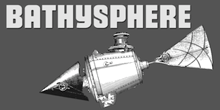
 Typefaces from 2013: Bathysphere. This is a steampunk sans described as follows: This steam era typeface, created by Gustav Schroeder in 1884, found popular use on soap box labels and tobacco tins during its initial release. Then, later, a successful and stout revival of Gustav's face, named Othello, was carried out by Morris Fuller Benton in 1934, and the typeface's appeal widened to include items such as broadside posters featuring Boris Karloff's Frankenstein. After metal gave way to film type, Gustav's creation experienced a brief fashion moment in the 1960's, but then disappeared entirely, never re-surfacing as a full digital typeface. With the release of Bathysphere, the typeface comes full circle, having been completely redrawn from scratch using Gustav's original specimens. The new extended language support establishes the typeface firmly in the modern era, while Bathysphere's refinement of subtle blunt corners restores a deep-sea grace to this iron giant. However, Nick Curtis's Iago NF (2011) is also based on Othello, and is close in execution. In 2016, Caprice designed Trop Magus and writes: Trop Magus is a rugged typeface following in the tradition of Ramon Llull and Jean Jannon. Llull's illuminated manuscripts from the Middle Ages inspired many later Alchemical texts in the Renaissance. And it was during this era, in 1615, that Jannon cut the matrices for Typi Academiae. Sixty-five astrological and alchemical symbols are included. Klingspor link. [Google]
[MyFonts]
[More] ⦿
|
Kustomtype
[Coert De Decker]
|
 Kustomtype is Coert De Decker's type foundry in Otegem, Belgium. Coert (b. 1966) created KTF Roadbrush (2014) and KTF Roadstar (2012, a retro connected script).
 Coert started his career as an assistant type cutter and stone carver in 1983, and founded the Kustomtype foundry in 2011. In 2013, he published the frame family Label Pro XL, the stencil typeface family Bomber TV and the stencil typeface Crate Pro. The Far West poster style and circus font styles are recalled in the 19th century wood type revivals Wood Factory, Buffalo Western and Buffalo Circus. Typefaces from 2014: Atlantic Cruise (avant garde), Copperhead (a titling all-caps typeface influenced by Goudy's Copperplate), Biscuit Pro (monoline sans), Medoc (a didone titling face). Typefaces from 2015: Starbounder (stencil), Integra Chic, Chic Chalk, Romantico, Annexxus, Beatboy. Typefaces from 2018: Fontwax (inspired by 1960s sign painting), Luckystrikes (a heavy comic book style typeface that was inspired by 1950-style advertising of these well-known American cigarettes), America Line (based on posters from the 1930s for the Holland-America Line made by Dutch graphic designer Wim ten Broe), New York Line (based on the Holland America Line inscription at Hotel New York in Rotterdam), Comicblast (based on the style of several Belgian comic book artists), Steampunk (a slab serif inspired on sixties hand-lettered French movie poster of Charles Bronson). Typefaces from 2019: Newbeats (based on a poster of the film A Hard Day's Night starring the Beatles), Burlesk (Regular and Inline; based on the paper cutout letters in a 1950s Bollywood movie poster), Soundboy (a beatnik typeface that pays homage to Elvis Presley: it was drawn by hand from a number of images from Elvis's Blue Hawaii film), Poppin (a beatnik family), Sunbeam (a branding sans), Stonetype (an all caps for stonemasons, by an ex-stonemason), Initials BB (a hand-printed typefaces; BB stands for Brigitte Bardot). Typefaces from 2020: Doggybag, Strak (a squarish typeface family that celebrates the tight, precise lines in the work of Belgian comic strip artist Eddy Vermeulen), Deaffont (an experimental font specially designed for a music video and album concept by the metal band Deafcon), Mars Model (futuristic, sci-fi). [Google]
[MyFonts]
[More] ⦿
|
Laura Kuhn
|
New Orleans, LA-based graphic designer who created several themed alphabets in 2017, including Steampunk, Marquee, Horror, Gatsby, Backspace, and Adventure. Behance link. [Google]
[More] ⦿
|
Letrasupply Type foundry
[Irma Asharini]
|
Bandung, Indonesia-based designer of Holistic Duo (2017: Script and Sans), the monoline all caps sans typeface Aerioz (2017) and the tattoo script font Familia Script (2017). In 2018 she designed Colesberg Script (retro calligraphic) and Golden Signer, which was influenced by vintage and tattoo letters, and Versica (with Agung Gumilang Sugih). Typefaces from 2020: Breland (a titling typeface, and decorative borders and ornaments, by Agung Gumilang Sugih and Irma Asharini). Typefaces from 2021: Casler (a steampunk era caps typeface). Home page. [Google]
[MyFonts]
[More] ⦿
|
Letterhead Studio YG
[Yuri Gordon]
|
 Letterhead is Yuri Gordon's (b. Moscow, 1958) Moscow-based foundry which publishes mainly Cyrillic fonts. Its coowners are Valery Golyzhenkov and Olga Vassilkova and it was established in 1998. It evolved from Garbage Type Foundry. Not to be confused with Chuck Davis' Letterhead. The main designer is Yuri (or: Jury) Gordon, the Moscow-based designer of the Type Directors Club 1999 award-winning designs Dve Kruglyh and FaRer Cyrillic, available from Paratype. URL at Yakovlev's Foundry. Picture. Article in the Moscow Times (2006), in which he proclaims: Better to make five fun and tasty new display fonts than one old, boring (and you thought it would look fresh!) text font. He is a graphic designer, illustrator, type designer, engraver and copyrighter. He is Art Director of several magazines.
 - Yuri Gordon created AntiQuasi (2008, a nice lightly slabbed serif family), Babaev [1996; inspired by the Russian Art Nouveau typefaces, initially created as a part of a corporate identity programme for Babayevskoye AO of Moscow], Artemius (custom designed family for Art Lebedev Studio), Barrizmo (2004), Bistro (1997, hand-printed), Chantage (2000, handwriting), Conqueror Text, Conqueror Slab and Conqueror Display (large families), Conqueror Sans (2005-2010), Conqueror Text (2005-2010), Costa Brava (2003, fun script described as beach type), Costa Dorada (2003), Dva Probela (1997-1998), Dve Kruglyh (1997, unicase), Excession (1999), FaRer [1994; art deco typeface inspired by the work of Russian graphic artists Vladimir Favorsky (1886-1964) and Ivan Rerberg (1892-1957), especially by Favorsky's lettering of 1924 and by Rerberg's of 1935. Dedicated to the Moscow Underground (Metro). Obtained an award at the 1997 TDC competition], Forward No. 10 (1995-1996), Forward Grotesque No. 9 (1998-2000), Gordoni (his take on Bodoni), GiardyOla (2008-2019), Handy, HotSause (1997, irregular handwriting), Karkas (2004, a manly sans), Little Shift (1999), Method (2002, a sans family), Minusmanscript (1998, calligraphic), Mr. Mixter (2011), Non System (2000), OptiMyst (1997), ResPublicana (1999), Sivtzev Vrazhek (1999, + mono), Michelle (2004, medieval), Naylorville (2004), Probel (1997-1998).
- Illarion Gordon made the fun fonts Strelochnik (1996, irregular hand), Probbarius (1996), Monte Summa (1997), as well as Rahit (1998, kid's handwriting), Rough (2000, blotchy hand), Simpel (kid's hand), St. Valentin (2001), Accept (1998), Kartofel (2000, irregular handwriting), LangobardR (1999), Ospa (1997, funky handwriting), pLatinum (1999, informal script).
- Valery Golyzhenkov's fonts from before 2000 are typically destructionist. He made 04.07 (1998), Bort#1 (2000), CardHolder (1997), Chellebrity (2004, screen), Cracker (1997), Cubes (2000), Dead Metro (1997, a constructivist family renamed Dead Mementro in 2017), Do Not Touch (1997), Dream Team (2000), Formalist (2001), Gamering (+Sans, 2009: a game font), Garbage (12997), GarbEdge (1997), Garmony (1997), Grammatika (1997), HandsOn (1997), Hole Down (1997), Hot Sauce (2009, Yuri Gordon), Ice Cola (2000), Kabotage (1998, octagonal), Kassa (2002, octagonal), Kren (1998), Laborant (2000), Lavert Noise (1997), Matrrolla (2001, octagonal), Mono (2000), Musor (1997), OneCode (1998), Primitiv (1998), Principal (1998-1999), Recruit (2004, octagonal), Remont (2000), Rounds (basic dingbats), Silver Winer (2000), Sklad (2000), Stampit (2000), Upadok (1997, futuristic), YE Stencil (2009), Zaplyv (1997), Zanoza (2005).
- Custom typefaces for companies or special projects: 19oclock (2004, Yuri Gordon: for Vernost Kachestvu confectionery factory), AlfaBank, Always, Anteus, Artemius, Alexey, Atlas-1904, Bat Sans, Bat Roman, Calendarus, Carlis, Cifirki, CTC Screen, Digrol, Digimag, Esquire, Gulliver UTS, Gurmania_MA (2004, handwriting), Hi Afisha, In CaST, Ka, Kater, Komet, Kostro, Lumene Script, N.B.T., Nochnoi Dozor, Odessa, Progress Custom, Redd's, Robb Report New, Rolling Stone 2003, Rolling Stone 2005, Romb (2010), Rosbank Sans, RMA 2006, Salon Script (2007, calligraphic), Salon Antiqua (2007), Seventeen, N.Side, W.Side, Sivtzev Vrazhek, Snickers, Sovereign, STS Vizion, Svyaznoy RF (2008, sans), ToShi, Trust, Whiskas lettering, Zabava.
- Typefaces and/or lettering from 2007-2009: Barocco Mortale (2005-2007curly script), Barocco Mortale Borders, Alfavita (ornamental caps by Goluzhenkov), Fleurs du Mal (2008, a Baudelarian antiqua, mischievous and decadent), DBL Cheque (by Goluzhenkov), Medved (by Goluzhenkov), YE Stencil (by Goluzhenkov), 21Cent (2009, related to Century; +Cyrillic; +Thin; +Black; advertised as not Century, not Clarendon, this fresh family is sure to win awards), Antiquasi (2008), Around the world, Bazaarban (2009, for Harper's Bazaar), Blacksteel, Citizen M (art deco), EsqGuardi (for Esquire), the curly Naska, with accompanying dingbats Naska Kozliki, the bird dingbats Udo Birdo, and more at Flickr.
- Production in 2012: Digital October, Red Square (constructivist), Red Ring (art deco sans), Baker Street 221B (anglomane grotesque).
- In 2013: Clarendorf (a hand-printed spoof on Clarendon), Bonvalet (large x-height sans), Bazaart (an art deco typeface for Harper's Bazaar), The drop-dead gorgeous condensed American slab and sans serif typefaces Mr Palker and Mr Palkerson.
- Typefaces from 2014: 20 Kopeek (sans family with steampunk influences).
- Typefaces from 2015: Buffon (a spaghetti Western italian typeface), Mr Palker Dad, Mr Palker Dadson.
- Typefaces from 2018: Atomic Alice (a simple stocky sans family).
Author of the acclaimed 384-page book Book of Letters From to ” (2007, Art. Lebedev Studio). Behance link. Art by Yuri. Issuu link. Klingspor link. Behance link for Yuri Gordon. Art Lebedev link. View Letterhead YG's typefaces. [Google]
[MyFonts]
[More] ⦿
|
Luciano Vergara
[Mendoza&Vergara]
|
 [MyFonts]
[More] ⦿
[MyFonts]
[More] ⦿
|
Marta Waniek
[Polish Your Art (was: Marta Van Eck Designs)]
|
[More] ⦿
|
Mendoza&Vergara
[Luciano Vergara]
|
 MendozaVergara is Luciano Vergara, a Chilean graphic designer from Concepcion (b. 1979), and his companion, Guisela Mendoza. Mendoza & Vergara is located in Santa Juana, Chile.
 Vergara created these typefaces between 2004 and 2010: the sans typeface Conce (2004), Pepona (2006, T-26, a pixel face), Sketch (2008, T-26), Trauco (2006, T-26, a wonderful display face), Otto (2006, T-26, another pixel face), Roket U (2007, T-26, rounded anthroposophic unicase typeface) and Hisla Negra (2004), the serif typeface Patua (2003; Patua One is free at Google Web Fonts), the pixel typeface Xerif (2004), the pixel typeface Sinaptix (2004), the pixel typeface UNXERIF (2004), the pixel typeface Don Paul (2004, named after Paul Renner), the liquid display typeface Revolución (2006), the pixel family Renex (2004) and the pixel typeface O'Higgins (2003). At Latinotype (which Vergara co-founded with Daniel Hernandez in 2007), he created the dingbat typeface Chilean Bugs (2006) (free at Dafont), as well as Patua (serif), Regia (2008, hairline condensed sans). At FontStruct, he experimented with Flaca (2008). At his Flickr site, check out more commercial typefaces: Fidel (strong sans), Regia and Trasans (two light, even hairline, sans typefaces), Biotech, Working on a short-ascendered sans typeface called Midas (2010). Typefaces from 2011: Biotech, Cachiyuyo (a pixel family), Machi (titling sans), Los Lana Pro (an angular poster face; a stone age font), Fidel Black (a strong rounded sans, +Stencil Black), Patagon (Latinotype: a rounded wood-inspired poster typeface done with Miguel and Daniel Hernandez), Suisside (a humanist sans). Typefaces from 2012: Julius Sans One (Google Web Fonts), Pantano Pro (Pantano is a handmade grunge typeface inspired by the rustic style of Amazonia), Antartida (an 8-style family at Latinotype), Antartida Rounded (a rounded sans family), Kahlo (2012, Latinotype, designed for magazine headlines), Frida (Latinotype: a Latin style hipster sans typeface), Schwager (a steampunk slab serif, followed by Schwager Sans in 2014). Typefaces from 2013: Estandar (a wayfinding sans published by Latinotype; the Regular is free), Estandar Rounded, Moderna Condensed (+Unicase: an organic sans family), Four Seasons (handwritten, with Guisela Mendoza), Pasarela, Kahlo Rounded (Latinotype). Moderna (a monoline organic sans, with unicase styles thrown in). Antartida Rounded Essential (2013) is a rounded sans by Luciano Vergara, done for Los Andes Type. Typefaces from 2014: Estandar Rounded (by Vergara, a rounded sans in 13 styles named after Standard Oil Company), Garden (a playful decorative set of typefaces), Darwin (2014, a 20-font sans family with multiple fathers; see also Darwin Office, 2014, Darwin Pro, 2017, and Darwin Rounded, 2018), DIY Time (hand-printed, with Coto Mendoza at Latinotype). Typefaces from 2015: Nordikka (a headline sans with large x-height and a Scandinavian feel; Latinotype), Styling (a simple almost techno sans family inspired by the aerodynamic curves and elliptical shapes of old cars and airplanes). Corporative Sans, Corporative Sans Rounded and Corportaive are large typeface familes created by the Latinotype Team in 2015. In particular, they were developed by Javier Quintana and Cesar Araya, under the supervision of Luciano Vergara, and Daniel Hernandez. With Bruno Jara, Luciano Vergara designed the angular Jurassic park style typeface Los Lana Niu (2016). In 2016, Mendoza Vergara (Cecilia Mendoza, Coto Mendoza and Luciano Vergara) published the script family Bach and the script/slab pair Matcha at Los Andes. In 2016, Bruno Jara Ahumada, Alfonso Garcia, Luciano Vergara, Daniel Hernandez and the Latinotype Team designed the roman square capital headline typeface family Assemblage. In 2017, Luciano Vergara published Niemeyer as a tribute to Brazilian architect Oscar Niemeyer, and the modular---almost sci-fi---sans typeface family Nizzoli as a tribute to Marcello Nizzoli. He also designed the 28-style Internacional in 2017-2018, following the Swiss grotesque examples. Typefaces from 2018: Alvar (a humanist sans family at Los Andes; italics designed with the help of Alfonso Garcia), Resort (Sans, Script, Ornaments). In 2019, Luciano Vergara and Alfonso Garcia co-designed Moderna Sans at Latinotype. It is an interpretation of American gothics like Alternate Gothic. Typefaces from 2020: Abstract (an eclectic serif family with post-pandemic tensions and existential angst; by Luciano Vergara at Los Andes), Aestetico (Luciano Vergara, Daniel Hernandez and Alfonso Garcia: a 54-style sans family having Formal and Informal subsets of fonts so that the family covers several sans genres), Spock (2020: a 48-style demi-sans demi-slab family by Luciano Vergara, Cesar Araya and Rodrigo Fuenzalida), Neogrotesk. P>Typefaces from 2021: Grotesco (advertized as a South American grotesk; in 20 styles). Klingspor link. Dafont link. Behance link. View Lucian Vergara's typefaces. Fontspring link. [Google]
[MyFonts]
[More] ⦿
|
Michael Kovacevich
[MKGD]
|
[MyFonts]
[More] ⦿
|
Michael Montoure
|
A graduate of the University of Washington. He created the Victorian / Jules Verne look font called Difference Engine for Forever London. [Google]
[More] ⦿
|
MKGD
[Michael Kovacevich]
|
Canadian designer of these typefaces: - Baba Jaga (2021). A geometric modular display typeface.
- Redtab (2021). A display typeface.
- Steamfunk (2021). a steam punk era typeface.
- The spiky display typeface Brokve (2021)--Brokve is Croatian for nails--.
- Lady Edith (2021: all caps, art deco).
- Blackbow (2021). A textured display typeface with small x-height.
- Spannerz (2021). An all caps mecano font.
- Totoey (2021). A syrupy chocolate store serif.
- Hastings (2022). Art deco.
[Google]
[MyFonts]
[More] ⦿
|
Muhammad Panji
[Sipanji (was: Straightwell)]
|
[MyFonts]
[More] ⦿
|
MyFonts: Jules Verne
|
Jules Verne is one of the pioneers of sci-fi novels. His books inspired styles that recall his era, such as the steampipe style. This page lsts a couple of Jules Verne-inspired digital typefaces. [Google]
[More] ⦿
|
MyFonts: Steamer age fonts
|
MyFonts selection for steamer age fonts. [Google]
[More] ⦿
|
MyFonts: Steampunk
|
Top Steampunk style fonts at MyFonts. [Google]
[More] ⦿
|
Neale Davidson
[Pixel Sagas (was: Protoform Project, and Fontshack)]
|
 [More] ⦿
|
Nick Curtis
[Art deco typefaces by Nick Curtis: I]
|
 [MyFonts]
[More] ⦿
[MyFonts]
[More] ⦿
|
Niteesh Yadav
|
 Graduate of the TDi program at the University of Reading, UK, 2017. He graduated in 2018 from the University of Reading's MATD program.
 He designed the Saur typeface for Hindi in 2017. It was made after collecting and studying the handwriting of the people from Saur village in Uttarakhand. Now based in New Delhi, he published the all caps alphabet ABC Of Social Issues in 2017 (free download of an AI file), possibly to forget the dismal events of 2016. He also started drawing exquisite steampunk style initial caps. He also created a great PDF file on the topic of Gill Sans (1927, Eric Gill). His graduation in 2018 at the University of Reading was ARone, a multiscript type family designed for augmented reality headsets. Its low contrast, generous spacing and robust shapes make it work well in busy backgrounds with high readability. [Google]
[More] ⦿
|
NREY
[Andriy Dykun]
|
 Makeevka, Donetsk, Ukraine-based designer of these typefaces in 2017: Vector Waves, Quasimodo (a free spurred and curvy decorative display typeface), Courtney (monoline script), Lumberjack (blackletter; see also Lumberjack Zombie in 2019), Marvin (a 10-font Marvin Heemeyer-inspired bulldozer and wrench font family with a free heavy slab serif), Awakening (signage script), Bang Bang, Round Compound, Rot Shield (blackletter), Rust (spurred), Furious, Dry Brush, Balalaika (Cyrillic emulation typeface), Moustache, Barbara (script), Arigato, The Pontifice (blackletter), Amsterdam, Megapolis (inline), Megapolis Black Bold (free, for Latin and Cyrillic), Phoenix Gothic, Brush Pen, Nround (rounded sans), DieCunst (free connected script).
 Typefaces from 2018: Fontuna (+stencil), Sansterdam (a geometric condensed grotesk with a few deco styles), Ethna (a fashion mag sans typeface family), Voguer Sans (a free Latin / Cyrillic display typeface with fashion applications in mind), Ravenholm (an expressionist blackletter), Jorick (vintage, Latin and Cyrillic), Ultravog and Ultravog Glitch Black (extreme contrast stencil styles: free), Walpurgis Night, Voguer (a high-contrast fashion mag font), Voguer II (didone-inspired, accompanied by a script typeface). Typefaces from 2019: Anicon Sans, Anicon Slab, Thephir (a variable cursive typeface), Oblique Rain (monoline script), Skiff (a quaint almost painted sans), Cadency (a monoline script), Waymar (Serif and Script font duo; include the textured caps typeface Waymar Ornate and the blackboard bold style Waymar Outline), Phagoth (blackletter), Gunhill (a vintage font family that includes blackboard bold styles), Heartland (Script & Sans), Marvin Slab. Typefaces from 2020: Calmius, Calmius Sans. Calmius Sans has Oppo (reverse contrast), Low and High (Peignotian) subfamilies, all experiments on contrast. Typefaces from 2021: Quartell Round (a squarish typeface), Asterlight (a steampunk font), Barosa (inspired by the slavonic style, all glyphs in this typeface have the same height). Graphicriver link. Behance link. Newest Behance link. Dafont link. [Google]
[MyFonts]
[More] ⦿
|
Oleg Voznyy
[Vozzy (was: Oleg Vozny)]
|
 [MyFonts]
[More] ⦿
[MyFonts]
[More] ⦿
|
Oliver Weiss
[Walden Font]
|
 [MyFonts]
[More] ⦿
[MyFonts]
[More] ⦿
|
Osman Taner Kucukgenc
[Artistic and Unique]
|
 [MyFonts]
[More] ⦿
[MyFonts]
[More] ⦿
|
Paul Davidson
|
Prince George, BC-based free-lance designer of Kaiser (2003, a fun distant display relative of Bodoni and Dalliance), Steampunk Metron (2002), a hookish font, the soft boulder sans serif font Epoch (2003), Coquitlam Gothic (2003), and Abbotsford (2003). At Union Fonts, he created Epoch (2003) and Cosmorton (2002). [Google]
[More] ⦿
|
Paul van Oijen
[Quill Type Co]
|
[More] ⦿
|
Peter Olexa
[Cruzine]
|
 [More] ⦿
|
Pixel Sagas (was: Protoform Project, and Fontshack)
[Neale Davidson]
|
 Free original designs, often with a science fiction feel, by Neale Davidson (b. 1971). Does some custom font work. Adventure.
 Neale Davidson's typefaces: - 4E Dings (based on those used in WotC's 4E Dungeons and Dragons game).
- AdventureNormal (1998), AdventureSubtitlesNormal, Alpha Mutation (2012, based on the title logo to the 2011 version of "Gammaworld"), Algol (2013, based on the logo for R Talsorian's "Mekton Zero" role-playing game), Alternity, Amuro (2013, +Condensed: an ocragonal typeface), Anayanka (2013, Cyrillic simulation font), Ancient Thorass (2013), Angel Arms (2012, a shothole font), Anglo Celestial (2014, connect-the-dots typeface), Anglorunic (2011), AngloYsgarth (2014), Angolmois (2013, based on the Hasbro 'Dark Energon' exclusive toy line), Armorhide (2013, sci-fi face), Arneson (2013), Artifact (2011; became Ravenwood), Aurebesh (2013, based on the WEG version of Star Wars Imperial Writing).
- Bantorain (2013, spurred), Barazhad (2014, flourished, runic typeface based on the demonic and occult and necrotic languages from Wizards of the Coast's Dungeons and Dragons game), BattleBeasts (2000), Bayformance (2014), Beastformer (2011, based on the long-ago logo of Hasbro's "Battle Beasts"), Bayformance (2014), Beast Wars (2011, based on the logo of the show of the same name), Betazed (2013, for Star Trek betazoids), Bidan (2013, constructivist), Bienvenu (2011, pixel face), Blitzwing (2013, octagonal family), Blofeld (2013, a distressed font based on the title logo of Exile's cult-classic "Evil Genius"), Bloomingworth (2013), Braddington (2013, art deco), Britannian (2014, runes), Broadmoor (2012, art deco).
- Callie Mae (2013: a rounded organic sans), Cardosan (2013, runic script), Carlton (2012), Celestial, Chapleau (2012, art deco), Chinyen (2005, oriental simulation), Clark (2013), Classic Robot (2011), Coburn (2013: military stencil), Colony Wars (replaced by Gallonigher), Comic Book, Constitution Class Hull, Convoy (2011, based on the logo for "Armada" and "Robots in Disguise"), Counterfire (2014, stencil), Crichton (2013, an avant-garde font based on the title logo from the "Farscape" television series), 2015 Cruiser (2013, based on the police-car lettering used in the move "Back to the Future II"), Crystal Deco (2008, based on the logo for much of the merchandising for "Indiana Jones and the Crystal Skull"), CuniformEnglishNormal, Cyberfall (2013, octagonal / mechanical typeface based on the logo of the console game "Fall of Cybertron"), Cybertron Generations (dingbats, now replaced by Transdings), Cybertron Metals, Cybertron OpCode (2014), Coulson (2014, stencil), Cyberverse (2011, futuristic), Cyrodiil (2014).
- Daedra (2012: based on the Elder Scrolls series of games), Dai Atlas (2013, based on the original Transformers logo from Hasbro), DalelandsNormal (a Celtic typeface based on the lettering used in early TSR Dungeons and Dragons products), Datacron (2013: based on the Fall of Cybertron toyline), Davek (2014, based on the dwarven and "under-mountain" runic scripts found in Wizards of the Coast's Dungeons and Dragons fourth edition role-playing game), Decahedron (2012), Destronic Graffiti (2013), Dethek Stone (2011, runes), DiamondFantasyNormal, Dinobots (based on the Dinobots logo from Hasbro's Beast Machines line), Dodecahedron (2012), Downlink (2013, techno), Dragonmaster, Droid (2015), Dunkin and Dunkin Sans (2012, based on the rounded fat letters of the Dunkin Donuts logo), Dovahkiin (2013), dPoly (2013, polyhedra and game dingbats), Duodecahedron (2012), Dwemer (2013), Dynotherm (2013, a heavy octagonal face).
- Eladrin (2011, based on the third edition version of the Elven font used in Dungeons and Dragons), Electrorocket (2012, art deco), Elminster, Emotion Engine (2012, based on the Playstation 2 logo from Sony), Empanada (2013), Emulator (based on the old Nintendo game font), Energon (2011), Equestria (2012: based on the My Little Pony Line), Erte (2013), Espruar (2011, based on the Elvish script found within TSR's "2nd Edition: Dungeons and Dragons" Forgotten Realms Elvish script), Eurocorp (2012, based on the logo and menus within the classic "Syndicate Wars" game from Bullfrog Entertainment), Exodite Distressed (2013, a custom design for LPJ's "Neo-Exodus" Pathfinder campaign world), Explorien (2014), Eyvindr (2014, rune simulation font).
- Falmer (2013), Fhokki (2014), Flipbash (2012, an octagonal typeface that is based on the logo of Hasbro's Bot Shots), Flynn (2011, futuristic stencil face), Fontana (2011, techno-futuristic), Fractyl (2013, used for the Predacons' speaking bubbles in the BotCon "Ground Zero" comic in 1997), Furmanite (2011).
- Gaiking (2012: Based on the logo of Mattel's Giant Robot toyline, Shogun Warriors), Galaxy Force (2011, based on Hasbro's Transformers: Cybertron logo), Gallonigher (was Colony Wars), Gamedings, Gargish (2013), Gargoyles, Garriott (2013, runic), Geddes (2011, art deco sans related to Futura), Gemcut (2013), Generation Two, GIColton (2014), GiediAncientAutobot (2014), GiediDecepticonGraffiti, GiediGoldenDisk, GiediMaximal, GiediPredacon, Gin Rai (2011, based on the logo of Hasbro's latter-era "Generation One" Transformers series), Gold Box (2012, a pixel typeface based on the in-game lettering from the classic SSI "Gold Box" game collection, featuring Dungeons and Dragons: Pool of Radiance, Curse of the Azure Bonds, and so on), Gosub (2011, a pixel typeface similar to the on-screen lettering of the Timex Sinclair), Gotham Nights (2011, based on the lettering used in "Batman: The Animated Series"), Green Martian (2013), Gutcruncher (2011, based on the logo from the famous Blood Bowl game), Graalen (2013: an alien-glyph typeface based on the Andorian writing found in Last Unicorn Games' Among the Clans supplement for their Star Trek: Roleplaying Game).
- Harker (2013), Harpers (runes), Hauser (octagonal, futuristic; Former "Action Force", based on the logo of GI Joe), Hellpoint (2013, based on some of the plate markings founds in IDW's "Transformers" comic series), Hetfield (2013: a spurred typeface), Hexahedron (2012: dice), Hexahedron Rounded (2013), Hyperspace (2012, thin monoline octagonal, based on the original Atari vector font from Battlezone, and on Asteroids).
- Imaki (2011, futuristic; was Cybertron Metals; based on the logo of the Japanese Beast Wars Metals series), Indiana (2012, from the titling for the Indiana Jones movies and comics), Instruction (2012, monospaced and monoline caps typeface for engineering applications), Interceptor (2014, sci-fi), Invaders (2012, based on posters for the 1960s movie), Iokharik (2014, a Mandarin-stylized runic typeface based on the language described in Wizards of the Coast's Dungeons and Dragons), Iori (2013, octagonal stencil family).
- Jedi (2012: Star Wars logo font), JediHollowNormal, JediSolidNormal, Jefferies (former Constitution Class Hull, based on the original Star Trek Enterprise lettering), Jhiaxus (2011, based on the logo of "Transformers: Generation Two"), Joystick (2011, based on the lettering used from Sears' Tele-Games cartridges), Jumpman (2012, based on the logo of the original Donkey Kong game from Nintendo).
- Kanno (a geometric sans formerly called Sharon Apple), Kargi (2014), Kentaurus (2013, Greek simulation typeface; he writes: This 'microgramma-like' font is based on the "Kentaurus" writing found within Franz Joseph's "Star Trek: Technical Manual"), Ketchum (2011, a comic book typeface based on the logo of the popular Pokemon franchise), Kehdrai (2014), Kreon (2011, a round techno typeface based on the logo of Hasbro's Kre-O line).
- LaBoeuf (2011, techno: based on Indiana Jones subtitles), Laser Rod (2011, based on the Transformers line), Lassiter (2012, a spurred Western typeface), Lorre (art deco).
- Mage Script (2013), Majel (2013, an avant-garde typeface), Majoram (2012, a hairline avant garde typeface), Majoram Serif (2012), Manga (2011, oriental simulation), Mara's Eye (2013, based on the lettering used on Disneyland's Indiana Jones "Forbidden Eye" ride), Marston (2013, on the title logos of numerous Spaghetti westerns), Masterforce, MasterforceHollow, MasterforceSolid, MaximalBeasts, Maximus, Mechalock (2013, based on the "Combiners" subline logo from Hasbro's "Robots in Disguise" Transformers series), Mech Tech (2013, based on Hasbro's "Transformers: Dark of the Moon's" toys' "Mech Tech" logo), Medabots (based on the Hasbro toy line), Megatron (2011, based on the logo of the live-action Transformers movies), Microgramma Extended (later replaced by Probert), Minerva (2012: based on the logos used for Shout's releases of Transformers: Headmasters, Masterforce, and Victory), Mission GT-R (2013, based on Takara's "Transformers: GT-R"), Mode X (2012, based on lettering from classic "Mode X" games of the early 1990s), Modern Cybertronic (2013: an alien-dings font based on Jim Sorenson's "Ancient Autobot" script), Modern Destronic (2013: based on Jim Sorensen's "Ancient Decepticon" script), Modern Iaconic (2014: based on the 'runic' letting found in Transformers: Legacy), Mons Olympia (2014, sci-fi), Montalban (2011, based on the title credits of Star Trek II: The Wrath of Khan), Moria (runes), Morse Tech, MysticEtchingsNormal.
- Nakadai (2011, a unicase techno font based on Hasbro's Transformers: Prime figures), Neo Gen (2011, based on the logo for the SD Gundam series of games), Neostar (2012, sci-fi), Neverwinter (2011, based on the logo of the popular "Neverwinter Nights" computer game from Bioware) (see also here), Night Warrior, Nippon Tech (faux oriental), Nite Club (2011, dot matrix), Nyctographic (2014).
- Octohedron (2012), Okuda (formerly Okudagrams; based on the LCARS characters from Star Trek: The Next Generation), Omnicron, Ophidian, Optic (2011), Optimus (2011, based on the original Transformers logo from Hasbro), Orion (2012, a techno-style font based on the "Robots in Disguise" logo from Hasbro's 2012 Transformers toyline), Overseer (2011).
- Pacmania (2013), Palisoc (2013), Pcap Terminal (2014, sci-fi face), Phoenixians (2012: based on the logo of Centuri's Phoenix arcade game), Pixel Cowboy (2015), Pixel Musketeer (2013, based on Sony's Wild Arms and Wild Arms 2 games for the Playstation), Pixel Azure Bonds (2015), Pixel Combat (2015), Pixel NES (2013: based on screen fonts of Colecovision, Timex Sinclar, Nintendo, SimTech's ModeX VGA, Tandy Color), Planewalker (formerly called Magic Cards. Based on the text used in older Magic: The Gathering cards), PlanewalkerDings (2014), Plavsky (2013), Pokemon, Politik (2014, constructivist), Powerpuff (based on the logo of "The Powerpuff Girls" from Cartoon Network), PredaconBeasts, Probert (replaces Microgramma Extended), Protoculture (2012, based on the franchise logo of Robotech).
- Qijomi (2013), Quintanar (2011), Quantum (2013: based on the title credits of the James Bond movie "Quantum of Solace").
- Rapier Zero (2013), Ravenwood (2011), Razorclaw (2013: based on the logo of the Beast Hunters Transformers line), Reanaarian (2014), Reconstruct (2013), Red World (2014), Regen (2012: a science-fiction font based on the logo used on the cover of the Transformers: Regeneration One comics), Rellanic (2014), Renegade (2013, techno stencil, based on FASA's "Renegade Legions" gaming line), Resavy (2012, a Broadway style art deco beauty), Rio Oro (2012, a Far West Tuscan marquee font), Robot Masters (now called Takara), Roddenberry (2011, based on the StarTrek logo), Roughknight (formerly Materia Arms. Based on the Wild Arms 5 video game logo---it simulates wood type and is Western in concept), RubCaps (2013), RunicEnglishNormal.
- SandsofFireNormal, Schnaubelt (2011, rounded technical caps face), Semphari (2014), SharpAvienne (2014), Sierra Madre (2012: an avant-garde typeface based on the Sierra Madre casino's logo from Fallout: New Vegas: Dead Money), Silverball Oblique (2012, LED font), Simple Runes, Sinescript (2013), SkeksisNormal, Skir, Sorenson (2013, a stencil typeface), StarburstPips (2014), StarcraftNormal, Starfleet (2004), Stark (2012: based on the title logo of the Iron Man and Iron Man 2 movies), Steamcog Caps (2013), Steampuff (2012), Steamwreck (2012), Steiner (2014), Sternbach (2011), Straczynski (2011, based on the opening credits for the classic television series "Babylon 5"), Strongarm (2014, based on the title logo of Hasbro's Transformers: Robots in Disguise (2015) line), Suchet (2013: a nice art deco typeface inspired by the material of BBC Production's legendary "Poirot" series starring David Suchet), Symtext (2012, a faux 5x5 bitmap font based on the lettering used in early VGA games, such as Syndicate).
- Taibaijan (faux Arabic), Takara (former Robot Masters; based on the "Robot Masters" logo from Takara's Transformers), Tandysoft (2011, based on the old typeface of the MC-10 computer), Tellarite (2013: based on the canonical glyphs of the "Tellarite" language from Paramount's Star Trek franchise), Tetrahedron (2012), Thorass (runes), Thundara (the old name was Thundercats), Tirolese (2013, an alien glyph font), Tonopah (2012, western font), Toril (2011), Transdings (replaces Cybertron Generations: based on Transformers logos from Hasbro), Transformers, TransformersHollowNormal, TransformersSolidNormal, Transmaidens, Transmetals (based on Hasbro Inc's, "Beast Wars: Transmetals" logo), Trek Arrowheads (2013), Trek Arrowcaps (2013), Tsa Script (2011, based on logos used within TSR's classic "Dragon Magazine"), Turok (2011, based on the logo of the "Turok" video game), Turtles (2011, based on the popular classic "Teenage Mutant Ninja Turtles" logo; for an extension, see Dieter Steffmann's Turtles), Twobit (2013, LCD font).
- Vector Sigma (2011, based on the secondary "Beast Machines" logo), Vecna (2014), Videopac (2013, a stencil typeface based on a Philips gamme from the 1970s), Virtucorp (2014), Visionaries, Visitor Script (2013), Volkoff (2013, a Russian style tencil face).
- Warlords (2011, based on the logo of the game series), Whitestone (2014, octagonal), Whittle (2013, octagonal), Winslett (2012, Far West face), Wreckers (2013, octagonal).
- XBall (2013, loosely based on several title logos from Electronic Arts's (EA's) sports gaming titles).
- YsgarthEnglishNormal (2011, almost blackletter).
- Zarathos (2012, based on the titles for the Ghost Rider movie series), Zebulon (2013, sci-fi typeface based on the title logo of TSR's classic "Star Frontiers" game series), Zentran (2013, based on the Zentraedi glyphs found in Harmony Gold's "Robotech" franchise).
- Typefaces from 2014: Rebellion, Politik (squarish).
- Typefaces from 2015: Diner Bold, RPM, Pixel Calculon, Pixel Intv, Pixel Digivolve (based loosely on the title logo from the classic Digimon), Mechfire (military stencil and octagonal styles), Aurabesh Cantina (Star Wars font), Huggy Bear, Sigma Five, dPoly Block Dice, dPoly Imperial, dPoly Steampips (steampunk genre), Pixel Gosub, Pixel Symtext, Strongarm (circled glyphs), Chromia, Pixel Countdown, Pixel Tactical, Pixel Azure Bonds, Pixel Combat, Pixel Cowboy, IDroid.
- Typefaces from 2016: Hastings (art deco), Timepiece, Norfolk (octagonal; based on US Navy ship lettering), Nuffle (slab serif), Nuffle Dice, Outland (octagonal), Subspace (based on the early logo for CBS/Paramount's 2017 Star Trek television series), Spellweaver Nodes (a simple runic connect-the-dots font based on Dragon Magazine's fantasy hieroglyphics), Gobotronic (based on a design from Jim Sorenson, Gobotronic is a symbolic interpretation of the language of Hanna-Barbera's own take on robots in disguise), Kaplah (angular sans), Brainstorm, Manhattan Tower, Persis, Exostencil, Phelps (based on the Mission Impossible series), Inquisitor (insipired by the Dark Heresy sub-titles from Fantasy Flight Games), Steamwheel (steampunk style), Horizon, Thirty-Seven (art deco), Draconis (loosely on the title logos of Wizards of the Coast's Dungeons and Dragons: Fifth Edition game line).
Dafont link. See also here and here, here, and here. Klingspor link. Abstract Fonts link. Devian Tart link. Fontspace link. [Google]
[More] ⦿
|
Polish Your Art (was: Marta Van Eck Designs)
[Marta Waniek]
|
Marta Waniek (Marta Van Eck Designs, Poland and Germany) made the free old typewriter typeface SENTA Schreibmaschine (2011), the curly script Midnight Reverie (2012), the spindly script Vintage Marta Van Eck (2012), and Burned Letters (2012, recovered from burnt newspapers). In 2013, she published the grungy typeface Rubber Stamp, the children's hand font Melchior, and the scratchy chalky Chalkboard. Typefaces from 2014: Steampunk (grungy), Mischief Circus, Comic Block (3d, shaded). Typefaces from 2015: Clasica Striped (an etched money font). Typefaces from 2016: Sketched 3D. Fontspace link. Dafont link. Home page. [Google]
[More] ⦿
|
Quill Type Co
[Paul van Oijen]
|
 Berlin-based product designer who created these typefaces in 2017: Luzia (text typeface), Cache (letterpress emulation), Stash, the display sans typeface Gerst, Konstanz (industrial age font), the slab serif Wrangell, the great all caps sans typeface Hossa (+Soft) (2017), and the dashing serif typeface Elaris (2017).
 Typefaces from 2018: Meryll (serif), Hanko (sans), Brusco. Elsewhere, he writes that he is based in Maastricht, The Netherlands, and Helsinki, Finland. Creative Market link. Behance link. Newest Creative Market link. [Google]
[More] ⦿
|
Scriptorium (Ragnarok Press, Fontcraft)
[David Fleming Nalle]
|
 Dave Nalle was born in Beirut on March 19, 1959, and died on February 13, 2021 from COVID in his home town of Manor, Texas. From his wiki page: Dave Nalle is a political writer, game author and font designer who was active in the early history of the development of the internet. Nalle was at one time Chairman of the Republican Liberty Caucus, a group that promotes libertarianism within the Republican Party, Senior Politics Editor at Blogcritics online magazine, and was the CEO of Scriptorium Fonts. Obituary [PDF] by Steve Jackson at the Daily Illuminator. Obituary by Shannon Appelcline at RGG Net. Obituary [PDF] at Dungeon Master Magazine.
 A creative and prolific designer, he has made hundreds of beautiful (often historic) fonts. His outfit, Scriptorium (based near Austin, TX, est. 1989), also does custom font and logo design. At some points, Scriptorium was also known as Ragnarok Press and Fontcraft. It specializes in artsy and ancient typefaces. Some subset of the fonts is made by Michael Scarpitti. Free font demos. Images of his best selling fonts. Special subpages: - Three free fonts: Onuava (a mini-serifed hybrid fixed-width font), Divona (sans), Sirona (based on Lombardic calligraphy).
- Lombardic: Aneirin, Benevento (8th century Lombardic), Cymbeline, Fabliaux, Formidable, Locksley.
- Decorative initials such as the 20th century sign lettering initials set Pencraft Initials (2009), New Saxon Initials (2016, based on work by F.G. Delamotte), Delamotte Initials One (2016), Delamotte Initials Two (2016), Holly Initials (2010, based on Real PenWork (1880s, Knowles and Maxim), Vyones (2010), Vergennes (2001), Cascade (2009), Bergling (2010; based on initials by John M. Bergling).
- Steampunk typefaces: Clockwork, Gearhead, Gears, Verne, Draughtwork, Belgravia, Boetia, Blackthorn, Linthicum, Good-fellow, Necromantic, Mephisto.
- Wild West fonts: Academy, Alcalde, Atkinson Boomtown (2009, after the lettering of Frank Atkinson), Atkinson Eccentric (2009), BigIron, Cibola, Del Norte, Lachesis, Perdido, Plowright, Primer, Riudoso, Niederwald, San Lorenzo (2011, with a Mexican and Tuscan look), Stonehouse, Manquo, Rochambeau, Purcell, Vaquero.
- Arabic simulation fonts: Samaritan is based on the poster lettering of Alphons Mucha from his poster for the play La Samaritan. Serendib and Waziri are based on the hand lettering of René Bull from his edition of the Arabian Nights. Caliph (1993) is derived from Ernst Schneidler's classic Legende font, with variant characters based on his original lettering. Also: Satampra, Jerash, Samarkand, Isfahan.
- Celtic fonts: the fonts include Constance, Durrow (1993, traditional rendering of Insular Minuscule calligraphy), Malvern, Glendower (based on the most common lettering in the Book of Kells), Knotwork (caps based on Celtic knots), Alba Text (modernized text font based on Celtic uncial lettering), Lindisfarne (based on a square uncial style), Stonecross (1997, derived from Celtic cross and gravestone inscriptions), Celtic Spirals (dingbats), Celtic Borders font (lets you combine key strokes to form decorative borders; many frames and borders are original Celtic designs by Arts&Crafts period artists like Evelyn Paul and Louis Rhead), Spiral Initials, Brigida (based on Rudolph Koch's interpretation of a squared uncial), Macteris Uncial, Coverack (heavy non-traditional uncial), Dahaut (modernized uncial), Dunsany, Glendower, Morgow (1999, spiral uncial), Teyrnon (elaborate spurred uncial), Padstow (heavy uncial), Vafthrudnir (2011, uncial), Sualtim and Columba (decorative initials based on characters found in the Book of Kells), Albemarle (2001).
- Oriental simulation fonts: Yoshitoshi (2003, based on the 1900-style writing by Yoshi Toshi.
- Gothic fonts, including Alt Gothic, Koch Gothic, Barnabas (2011), Sternhagen (2014), Montgisard (2010, roman capitals with blackletter lower case), Serenissima, Gelderland, Alcuin, Monumental, Goldwork, Waldeck, Roncesvalles, Montressor (2010, ornamental blackletter capitals), T4C Beaulieux (1998, a free copy here), Bastarda (2011), Burgundian, Cadeaulx, Collins Old English, Courtrai, Descant, Ereshkigal, Faustus, Franconian (1993, a Schwabacher), Froissart (2000), Ghost Gothic, Katisha, Koch Gothic, Ligeia, Magdeburg, Magdelena, Melusine, Pyle Gothic, Rheingold, Sanctum, Stuttgart Gothic (2010), Textura, Theodoric, Yngling (2002).
- German expressionist: Dromon.
- Renaissance fonts: Monumental Gothic, Caswallon (a Caslon family), humanist cursive (Palmieri, Castiglione and Hanes Italic), quirky Italian cursives (Fiorenza and Alleghieri), a Roman style hand-lettered font (Rudolfo and Rudolfo Swash), a Trajan-style Roman lettering (Hadrianus), a classic flourished cursive (Trinculo) and a set of floral intials from the Quattrocento (Fraticelli).
- Modern poster fonts: Ascelon, Bilitis, Cosmic Dude, Dromon, Ducatus Rough, Eglantine (after Central Type Foundry's Quaint Roman), Ekberg (2002, based on Samuel Welo's posters), Fortinbras, Hamilton, Jambon, Oblivion, Posada (2008, based on the poster lettering of Mexican artist José Guadalupe Posada), Squiffy, Suspicion, Magnin (2003).
- Mapmaker fonts: building elements are available in Basilica; Ortelius is a map dingbat font; Queensland (based on lettering by artist and calligrapher Eric Sloane), is bold, hand-drawn and reminiscent of medieval writing on maps. There are also Brandywine, Daresiel, Hesperides, Longhorne, Windlass (1996), and Cityscape. Orford (2008) is based on samples of hand lettering from a 1693 manuscript collected by Lewis Day in his classic book on historical paleography, Alphabets Old and New.
- Calligraphic fonts: Albemarle (2001), Azariel, Moncrief (2011, based on the calligraphy of J.M. Bergling), Pavane, Rasael (2009), Abdiel (2005), Roncesvalles, Gazardiel (2003, connected script), Spoonbill (2003, arts and crafts), Macteris (Roman uncial font), Antioch Uncial (Roman uncial font), Burgundian (Classic black letter font), Franconian (993, a classic black letter font), Castiglione (Attractive Renaissance lettering), Cicero (Roman Rustica font), Formidable (1993, very bold late medieval / Lombardic style), Collins Old English (Classic Old English style gothic), Corbei Uncial (Roman uncial font), Cymbeline (late medieval lettering), Durrow (Standard insular minuscule uncial font), Theodoric (Classic black letter font), Gazardiel, Ghost Gothic (Unusual gothic font), Glendower (Uncial font based on Book of Kells), Gloriana (Interesting hand lettering style), Folkard (from the hand-lettering of Charles Folkard), Offenbach Chancery, Ranegund Merovingian Courthand, Benevento (8th century Lombardic), Hesperides.
- Art deco typefaces: Imperatore (2018: based on a hand lettered design from California art deco master designer Pedro de Lemos in the 1920s), Speakeasy (2018), Gates of the West (2018), Lyceum (2014), Borealis (2009), Criterion (2011), Illuminata, Madding (2009, a bold poster font that grew out of Aventine), Alexandrine (2009), art Deco Stencil (2009, based on samples of Art Deco stencil lettering by Pedro Lemos), Falmouth.
- Art nouveau typefaces: Acadian, Agravain (2009), Amphitryon (2009), Ariosto, Asphodel, Averoigne, Beaumains (2011, based on J.M. Bergling's lettering), Beauvoir, Belgravia (based on J.M. Bergling), Bernhardt (based upon the lettering of the Czech art-nouveau artist Alphonse Mucha), Bentham, Berenicia, Boetia (2003, based on J.M. Bergling's lettering), Bruges, Bucephalus (1993), Burd Ellen (2009), Butterfield (1993; in Alfred Roller's style), Cafe Society (2018), Curetana, Damariscotta, Elsene (2011, based on lettering by early 20th century illustrator Clara Elsene Peck), Elysian, Exotique, Flaubert, Gaheris, Ganelon, Gehenna, Goodfellow, Grammophon (2019: a bold Jugendstil poster font), Harbinger, Huyot (2016, after Georges Auriol's types), Jugendstil Kunsthand (2003), Lysander, Maginot (1993; after Peter Schnorr, 1898), Munich (after the Munchner Jugend magazine), Norumbega, Odeon, Ormandine (2010), Pantagruel, Phaeton, Reggio, Rochmbeau, Rockne (2009), Rudolfo, Setebos, Sprite, Summerisle, Sylphide (2005), Undine, Valentin (2008), Vambrace (2010), Walhal, Wendingen (2016), Wormwood (2018), Zeitschrift (2016, based on the Ver Sacrum magazine).
- Modern poster fonts: Field Day (2003), Ascelon, Bilitis, Cosmic Dude, Dromon, Ducatus Rough, Eglantine (after Central Type Foundry's Quaint Roman), Ekberg (2002, based on Samuel Welo's posters), Fortinbras, Hamilton, Jambon, Oblivion, Squiffy.
- Constructivist fonts: Krasny Mir (2009), Vrubel, Structura (1997).
- Futuristic fonts: Alecto, Angelus, Circuit, Culdrose, Gearhead, Ironclaw, Parika, Sanhedrin, Semiramis (1997), Slither, Structuro, Yazata, Adastra (dings).
- Borders and ornaments. These include New Arets and Crafts Borders (20912, based on The Calendar of Golden Thoughts (Barse and Hopkins Publ, 1911).
- Boneyard fonts: Undertaker (2014), Antrobus (2010), Sepultura (2002), Halloweenies, Dementia, Boneyard, Skull and Bones, Malagua (1999-2013), Paleos (2002, from titling of B movies in the cave girl genre), Carmilla, Abaddon, Black Cow (1998), Valdemar, Cuede, Ligeia, Mayhem, Mephisto, Golgotha, Sanguinary, Ironworks, Moravia, Gehenna, Nosegrind (2005, graffiti), Corpus, Ghostly.
- School fonts: Schoolhand (2010).
- Arts and Crafts movement (late Victorian period, 19th century), based on work and lettering by Walter Crane, William Morris, Charles Rennie Mackintosh and Elbert Hubbard. The Arts&Crafts movement was enormously influential on the works of designers, artists and architects of the 20th century, and inspired the Art Nouveau and Art Deco movements. Fonts include William Morris' Kelmscott (based on Morris' Troy type), and True Golden, fonts from the Glasgow branch of the movement like Chelsea Studio (1997), which is based on Charles Rennie Mackintosh's lettering, fonts from the Roycrofters of New York like Semiramis and Ganelon, fonts based on Walter Crane's work such as Crane Gothic, Pencraft Initials (2009) and Walter Crane, and even fonts from the California Arts&Crafts period of the early 1900s like Coloma. Other typefaces: Jesse M. King (refreshed in 2015, and based on hand lettering from a frontispiece design by Glasgow-based Jessie King who was known for her lavish book covers), Aylward, Palmyra (based on work by the Roycrofters, a design community founded by Elbert Hubbard), Aylward (2010, Victorian), Hyacinth Initials, Spoonbill, Adresack (1996: inspired by the arts and crafts lettering styles of designers like Charles Rennie MacKintosh and Jessie M. King), Brandywine, Changeling (2009, based on lettering by fairy artist Fanny Railton), Goddard, and Advertising Gothic (2003), Valentin, Gaheris, Agravain (2009). Delaguerra (2001-2009) is based on a lettering style originating in the California Arts&Crafts period commonly associated with Mission Style. It is still in common usage in signage at historical sites in California.
- Victorian: Beaumarchais, Berenicia, Bilibin, Brandywine, Brigidis, Curetana, Durendal, Elphinstone, Flaubert, Folkard, Gjallarhorn, Gloriana, Hermia, Ironclaw, Magnus.
- Typewriter: Fontcraft Courier.
- Anthroposophic: Ekberg (2002, based on a sample of poster lettering by Samuel Welo).
- Medieval fonts of Scriptorium, critiqued by Marc Smith, page 65: Batwynge is based on lettre gffe by Geofroy Tory (1529), and not on an illuminated manuscript of the tenth century as claimed by Scriptorium. Perigord (1993) is based on a Carolingian alphabet drawn by Ernst Bentele in 1952. Allencon is a calligraphic font based on an interpretation of 6th century Ostrogothic Italian calligraphy.
Some selected fonts: Finchley (psychedelic), Captain Kidd (2012, an original font design based on the title lettering from the classic pirate movie starring Charles Laughton), Aerobrush (2011), Fondry Ornament (2009), Atkinson Egyptian (2008, after the lettering of Frank Atkinson), Verne (2008: remade in 2020 into Covid19), Goldwork (almost blackletter), BigBlok (2010), LetterpressGothic (2010), Plymouth (2010, in the style of Cooper Bold), Broadley (2008, an architecturally inspired script based on lettering by British architect and designer C.F.A. Voysey), Locksley (2004, medieval lettering), Tuscarora (curly lettering), Fiorenza (Renaissance calligraphy), Hesperides (old colonial calligraphic script), Angelus (beautifully printed monospaced script), Esperanza (1996, connected medieval handwriting), Ithuriel (2002), Alleghieri (2002), Hamilton (2002), Spiral Initials, Zothique (great font, based on hand lettering from a map of Clark Ashton Smith's fantasy world of Zothique), Reynard (semi-Celtic), Daresiel (elegant script), Caliph (1992, Arabic simulation), Bassackwards, Rosalinde (1999, handwriting), Arakne (2000, connected handwriting), Falconis (by Michael Scarpitti), Asrafel (semi-Celtic), Swithin (2004), Tyrfing (Art Nouveau/Fraktur, 1999), Waldeck (2008, blackletter), Woburn Initials, Stampwork, Draughtwork, Roughwork (a codex font derived from Nalle's own True Golden which is based on a=n earlier typeface by arts and crafts master William Morris), Melusine (gothic calligraphy), Corbei (uncial), Niederwald (hand lettering), Gjallarhorn (great uncial), Gaiseric (early medieval uncial), Taranis (1987, an uncial first drawn as a font for the cover of the old Ysgarth roleplaying system), De Bellis (roman era, by Michael Scarpitti), Engravers Gothic, Monimental Initials, Sanhedrin (Enemy of the State font), Vespasiano (roman capitals, by Michael Scarpitti), Bilitis, Hendrix (2002), Collins OE (old English), Samedi, Praitor, Evadare (1993, based on a character set which was hand calligraphed by Rudolf Koch), Koch Fantasie (1993), Black Cow (1998). Zothique, Ruritania, Mariner (2004, based on hand lettering originally done by Willy Pogany), Trinculo (a swinging cursive font), Texas Star (2002), Octavian (antique demi-serif font), Ruffian (antique type font), Ascelon (thin sans serif font), Munich (title lettering from Munchner Jugend magazine), Necromantic (bizarre bold titling font), Titania (romantic decorative lettering font), Oberon (bold romantic font), Knotwork, Guede (1993), Pullman, Purcell (Victorian circus poster style font), Allegheny, Carmilla, Malagua (1999-2013), Ardenwood, Platthand, Buccaneer, Cochin Archaic (2010), Boswell (1994), Guilford (based on lettering by artist and calligrapher Eric Sloane), Death Ray (2012, constructivist), Alecto (futuristic), Candlemas (2003), Bridgeport (2003, based on lettering by artist and calligrapher Eric Sloane), Medieval Tiles (2003), Linthicum (2003), Draughtwork (2003), Yngling (Fraktur, 2003), Rheingold (elaborate Fraktur: Music Hall Text elsewhere; see also Teuton Text, Cincinnati Type Foundry, 1877), Kidd (2003), Belgravia (2004), Peck Shields (2004), Scrawlies (2000, handcrafted), Albrecht Durer Gothic (2004), Orpheus (2004), InduXtrial (2004, a grunge face), Yoshitoshi (2003), Veronique (2004), Veneto (2006), Vidilex (1993, monospaced), Abelarde (2006), John Speed (1993: a mapmaker font), Furbelow (2006), Estoril (2006), Tangle, Aventine (sans), Texas Star (2002), Groningen (Bauhaus design), Nevins Hand, Scrapple (2011, Victorian, ornamental), Leodegar (2011, based on samples of 7th century Frankish hand lettering), Candlemass (2012). Fonts from 2013: Doge (a Venetian font based on a J.M. Bergling revival), Original Django (after the titling font in Quentin Tarantino's movie Django Unchained). Fonts from 2014: Highball, Carillon (based on a typeface by Samuel Welo), Edifice (based on lettering by J.M. Bergling). Fonts from 2015: Gods of Mars (an inline sci-fi typeface), Rykov (based on a 1930s Ukrainian constructivist style; Latin and Cyrillic), Vie Moderne (French art deco), Dahlgren, Grand Concours (art deco), Tantalus, Power Tie (art deco), Marquis Greeking. Fonts from 2016: Ekberg Modern (based on lettering samples by Samuel Welo from poster designs of the 1920s), Knuckleduster, Tzaphkiel, Sarandiel, Primrose Initials, Elizabethan Script (chancery style), Zeitschrift (an art nouveau font based on the Ver Sacrum magazine), Wendingen (Dutch deco), Memento Mori (Tuscan), Rounders (art deco). Fonts from 2017: Buzzmill (wooden plank font), Pumpkin Patch Initials, Talinn, Reliquary, Nopalito, Scattershot (script). Typefaces from 2018: Marionettas (a Mexican horror movie poster font), Fascination, Architextura, Santa Sangre, Glyphos. Typefaces from 2019: Cafe Corso (art nouveau), Comic Classix. Fnts released in 2020: Epigramatic (based on lettering by Dard Hunter for the Roycroft Press in the early 1900s), Cryptos (graffiti). Klingspor link. Abstract Fonts link. Dafont link. View David Nalle's typefaces. Scriptorium's library. [Google]
[MyFonts]
[More] ⦿
|
Seymour Caprice
[Kickingbird]
|
[MyFonts]
[More] ⦿
|
Sipanji (was: Straightwell)
[Muhammad Panji]
|
Known as Si Panji, Muhammad Panji and Panji Ramdhani, b. 1998. Indonesian designer of the handcrafted typefaces Kiddie Love, Roadart Grafiti (2021), Baby Magpies (2020), Street Of Zeus (2020: a graffiti font), Dashtin Brush (2020), Vope Dome (2020: a graffiti font), Giecella Kids (2020), Seventeen Winter (2020), Cute Lime (a bubblegum font) (2020), Ben Kidoz (2020: all caps and rounded, for children's books), Xandercode (2020: an all caps graffiti font), Nightvandals (2020: a graffiti font), Wolvins (2020: an all caps beatnik font), Pumpkinos Horror (2020: a dripping blood horror font), Dirty Lizard (2020: graffiti style), Amazing Grafiti (2020), Dance Kitty (2020), Los Porttal (2020), Cute Lime (2020), SpaceBro (2020), Wigenda, Wofferine (handcrafted), Swadi Marker (2020), Veruzza Hollow (2020), Veruzza Italic (2020), Veruzza (2020), Good Summer (2020), Hayven (2020), Break Flames (2020), Molusca (2020), Digital Space (2020), Wolvins (2019), Rocketboss (2019), Straightwell (2019: a steampunk slab serif typeface) and Zhivanii (2020; for Latin and Cyrillic). Typefaces from 2021: Ashlyn (a brush script), Black Brody (spurred), Notress Graffiti, Dastin Toxic Graffiti, Fallaxe Drip Graffiti, Red Bubble Graffiti, Thick or Melted (a graffiti font), Thick or Melted (a graffiti font), Death Stinger Horror (a dripping blood font), Zigatos Graffiti, Vandalust Graffiti, Street Air (a graffiti font), Hello Velisha, Trick or Bite, Black Magnet (a death metal font), Magnekidz (a death metal font), Night Franklin (a horror font), Beluga Road (a graffiti font), Love Twins Solid (a scrapbook font), Lucky Boy (handcrafted), Tight Hug (a fat finger font), Punch of Love (a scrapbook font), Ruckshack (a dry brush script), Afterlife Party (a genie bottle font?), Nala Junior (a goofy font for children), Kaindra (a brush font), Wushand Graffiti, Jamstreet Graffiti, Gheamarker (a marker pen font), Gracelyn (hand-printed), Nightfate (a graffiti font), Kids Touch, Locked Monster (a graffiti font), Thiny Bunny (a condensed display typeface), Foolish Hand (a fat finger font), Snakehead Graffiti, Spring Butter (a wild calligraphic script), Happy Dinosaur, Sword Art (a dry brush font inspired by the samurai), The Bossman (a graffiti font), Cyberwar (cyberpunk, DeLorean style), Boldist (German expressionist). Typefaces from 2022: Dark Razoor Graffiti, Wild Gang Graffiti, Spiky Frog Graffiti, Street Eagle Graffiti, Crazy Rooster (a graffiti font), Dragon Scribble (illegible graffiti), Java Temple (a lava lamp font), Weely Honey (a retro dancing baseline font, useful for cartoons). [Google]
[MyFonts]
[More] ⦿
|
Steampunk genre
|
 Steampunk refers to a subgenre of science fiction and fantasy that incorporates technology and aesthetic designs inspired by 19th-century industrial steam-powered machines. Its literary origins are sometimes associated with the cyberpunk genre. In general though, steampunk art is often set in an alternative history of the 19th century's British Victorian era or American Wild West, in a post-apocalyptic future during which steam power has maintained mainstream usage, or in a fantasy world that similarly employs steam power.
 Steampunk features anachronistic technologies or retro-futuristic inventions as people in the 19th century might have envisioned them. It is rooted in that era's perspective on fashion, culture, architectural style, and art. Such technology may include fictional machines like those found in the work of H. G. Wells and Jules Verne, or the modern authors Philip Pullman, Scott Westerfeld, Stephen Hunt and China Miéville. Several type designers have attempted to recreate the mood of the steampunk movement in their typefaces. [Google]
[More] ⦿
|
Steven Skaggs
|
 A native of Louisville, KY, he studied calligraphy and typography under Hermann Zapf. His typefaces, all part of Delve Fonts (Delve Withrington's foundry in Alameda, CA), in alphabtical order:
 - Piston (2012). A steam-punk typeface designed to be customized by the user through converting to outlines and pulling the straight strokes to pack as desired. It was called Engine nine at some point.
- Maxular (2012-2018). A 14-font rounded slab serif family that includes special Rx styles fine-tuned for macular degeneration sufferers. Very legible at small sizes.
- Rieven Uncial (2009). Post-modern hybrid uncial. Rieven received a "Certificate of Excellence in Type Design" in the 2010 TDC2 competition. The Rieven family was expanded with the additions of Rieven Roman and Rieven Ornaments in 2013.
Professor of Design at the University of Louisville. He also works in design theory and semiotics. Author of FireSigns A Semiotic Theory for Graphic Design (2017, MIT Press). The publisher writes: Graphic design has been an academic discipline since the post-World War II era, but it has yet to develop a coherent theoretical foundation. Instead, it proceeds through styles, genres, and imitation, drawing on sources that range from the Bauhaus to deconstructionism. In FireSigns, Steven Skaggs offers the foundation for a semiotic theory of graphic design, exploring semiotic concepts from design and studio art perspectives and offering useful conceptual tools for practicing designers. [Google]
[MyFonts]
[More] ⦿
|
Tami Ribeiro
|
At UNESP in Baura, Brazil, Tami Ribeiro designed the steampunk typeface Distopia (2016). [Google]
[More] ⦿
|
Tatiana Nikitina
|
Moscow-based designer of a Cyrillic steampunk-themed typeface in 2015. [Google]
[More] ⦿
|
Thais Sperhacke
|
During her graphic design studies in Porto Alegre, Brazil, Thais Sperhacke created SteamPunk Type (2015). [Google]
[More] ⦿
|
The Sastra
[Deni Dessastra]
|
 Singkawang, Indonesian Borneo-based designer, b. 1983. Creator of the decorative Victorian typefaces Noir (2015) and Dwiss (2015), which are intended for tattoos. He also made Crypton (2015), Steampunk Ornaments (2015), and Rosewell (2015, Western decorative caps typeface).
 Typefaces from 2016: Lawless (biker style blackletter), Union. Typefaces from 2017: Volcano (script). Typefaces from 2018: Wolfgang (a vintage tattoo font). Typefaces from 2019: Vanderink (tattoo type), Monteradoo, Temadjo (a biker gang font), Khatulistiwa (spurred tattoo type), Jhoony Richmond (art deco; caps only), Black Borneo (vintage, spurred), Blackphanters (vintage), Noise Storm. [Google]
[More] ⦿
|
Time Peace
|
 FontStructor who made the horizontally-striped typeface Strobes (2012), Simplicity (2012), Smashel (2012), Extora (2012, textured face), Dead Stirrup (2012), Checker (2012), Slice (2012), and Tesla (2012, based on the logo of the electrical company Tesla).
 In 2013, we find Hearty (Valenttine's Day font), Anubis (retro futurism), Tockice (connect-the-dots), Swirl, Teeny Dots (dot matrix face), Specs (arrowed letters), Atlas Regul (art deco marquee face), Smash (dot matrix face), Steam (steam punk, mechanical), Apricot (dot matrix), Peach, Koverkav (tall connected script), Zastava (art deco), Syncopation (avant garde), Centrivid, Time Script, Grey Sans (a textured sans), Seriphagy, Mona, Lightheart (a Broadway style art deco face), Lower (tall ascenders), 2Time, DotoMagy (dot matrix face), Finolin, Remaster (horizontal stripes), Whimsy, Procol (vertical striping), Ceremonio (vertical striping), Island, and Quindle. In March 2013, he published Circles and wrote I finally nailed a perfect circle, which many consider the holy grail over at FontStruct. That is to say, the imperfections in the circle are only visible at large point sizes---quite an achievement. Typefaces from 2014: Cybertron, Puzzler, Just Peachy (blackboard bold), Bubble Pop, Pointy (arrowed face), Gypsy Train (bilined, frilly), Mad Hatter (card font), Origami, Pointers (hexagonal), Angled (deco), Owlarium, Blossum (floral), Jarvis (wooden plank font), Cocktail Bar, Circuit Breaker, Every Good Boy, Circus Comes to Towne (sic) (circus font), Fruit Stripes (art deco, striped). Typefaces from 2015: Cogsworth (connect-the-dots), Neomorph (techno). [Google]
[More] ⦿
|
Type This Studio
[Anita Jürgeleit]
|
 Graduate of the University of Applied Sciences, Hamburg, Germany, who was initially associated with URW++ in that city. She first set up her own foundry under her last name, but in 2021 started using Type This Studio.
 Co-designer with Michael Hoffmann of the stamped font URW Urban (2013). She also made the strong-willed handwriting typeface Quendel (2013, URW++; extended in 2015 to include the textured Quendel Wood and the eroded Quendel Crayon) and Hangulatin (2014, URW++). Hangulatin applies the principles of Hangul to make letter combinations in Latin. See also Hangulatin EN (2016). In 2015 she created the slim vintage / steampunk typeface Nitaah One (URW++) and the handsome super-tall 1970s cocktail lounge sans Allioideae (URW++, Latin and Cyrillic). In 2018, she set up her own type foundry, and published Umba Sans, a 30-style family that exudes joy and is useful for display applications. It is accompanied by Umba Soft (2018) and Umba Slab (2019). Typefaces from 2019: Cosima (a low contrast workhorse sans), Captura (a simplified geometric sans), Famosa (+the pearl-studded Famosa Diara), Diara (a colorable wedding font package including ornaments), Crossfit (an elliptical sans family), Hyper (a wonderful packaging font). Typefaces from 2020: Orangina (a creamy supermarket typeface), Mireille (a decorative serif) , Marilka (a snappy 4-style modern text typeface characterized by the vertical terminals atop a, c, f, s and z), Lovebeat (a Valentine's Day font). Typefaces from 2021: Every Core (an 8-style serif), Headlines (a 12-style + 2 variable font headline sans), Every (a 24-style serif). Typefaces from 2022: Crossfit Core (a 5-style rounded technical sans), Horizona (a 9-style harlequin typeface), Cosima Core Edition (an 8-style sans), Famosa Core Edition (a fashion mag family with hints of Victoriana), [Google]
[MyFonts]
[More] ⦿
|
Vivien Gorse
|
 Vivien Gorse (Toulouse, France) is a freelance designer who created these typefaces:
 - Inland Series (2014-2015). A revival of Inland Series (1895, Nicholas Werner, Inland Type Foundry). This typeface adds many Victorian or steampunk elements to a didone skeleton. It is also called Edwards, and Bizarre Bold (the BBS name of Edwards).
- Rotury (2015). Also based on Inland Series.
- Grosse Black (2014). A black slab serif typeface, ideal for poster work. Followed by the fat face Grosse in 2016.
- Sèche Narrow (2015).
- Beotian (2015). A German expressionist or heavy blackletter typeface.
- Melville Bold (2015). A condensed grotesque titling face inspired by the work of French cinematographer Jean-Pierre Melville.
- Moche (2014).
- Lizard (2014).
- Kanyon (2012). Experimental type.
Behance link. [Google]
[More] ⦿
|
Vladimir Yudin
|
Tver, Russia-based designer of the decorative Cyrillic steampunk typeface Pipeline (2018). [Google]
[More] ⦿
|
Vozzy (was: Oleg Vozny)
[Oleg Voznyy]
|
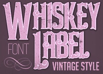 Aka Vozzy, Oleg Voznyy, Oleg Vozny, and Anton Antipov. Dnipro, Dnipropetrovsk (was: Nepropetrovsk), Ukraine-based designer whose company is called Trivia. His typefaces from 2015: Ghost (a spurred typeface), Whiskey Label, Barber Label (shaded vintage font), Scotch Whiskey Label Font, Gouache, Hot Coffee, Mastodon (hipster typeface), Whiskey Shine, Bourbon Whiskey (a Tuscan spurred signage font), Bandidas (a Tuscan spurred label font), Finest Whiskey, Retro Disco, Tequila (a vintage spurred bottle label font), Tortuga Hand (a spurred tattoo font), Hand Drawn Font, Steampunk, Vintage hand Drawn Font, Modern Whiskey, Marine Whiskey, Old Label, Rock On Font, Chulkboard Sketch Font, Chalk Board Hand Drawn Font and Whiskey Label (vintage typeface).
 His typefaces from 2016: Samurai (layerable oriental simulation type), Old Mariner (vintage signage type), Two Shots, Curls (layerable Victorian label font), Ginger Gin Label, Old Style Label (Victorian, layered), Motorcycle Gang, Absinthe (vintage labeling font family, with layering), Mystic Label, Bourbon Strong (a whiskey label font), Aged Whiskey, Bold Craft (vintage label font family for absinthe, brandy, whiskey, rum, gin and beer), Origami, Vintage (a Victorian signage typeface), Gangster (a layered Victorian signage font), Motor (+Shadow, +Shine: a spurred motorcycle / tattoo font family), Family Hand, Absinthe Label (Victorian signage font), Old Sailor (layered vintage typeface set), Old Barrel, BadBoy (hand-printed), Nautical, Sinister (Victorian), Heavy Metal, Darkness Whiskey (Victorian). Typefaces from 2017: Blended Whisky Label, Adventure Vintage Label, Whiskey Original Label, Doncaster Vintage Label, Bourbon Special Label, Vintage Marine Label, Marine Whiskey, Alcohol Vintage Label, Virginia Vintage Label, Old Barrel Vintage Label, Tequila Vintage Label, Bubble Vintage Label, Vintage Classic Look, Bourbon Vintage Label, Handcrafted Old Style, Vintage Classic Look, Barber Vintage Label, Walsall Vintage Label, Original Tequila, Retro Style Label, Absinthe Vintage Label, Whiskey Vintage Label, Mystic Vintage Label, Castlecary Vintage Label, Real Estate Vintage Label, Whiskey Vintage Label, Rock And Roll Vintage Label, Blackburn Vintage Label, Tavern Vintage Label, Bourbon Vintage Label, Rock Star Vintage Label, Sandford Vintage Label, Norwich Vintage Label, Whiskey Glory, WireFont Vintage Label, Midieval Vintage Label, Barbershop Vintage Label, Summer Hippie, Bradford Vintage Label, Cartoon Vintage Label, Vintage Age, Retro Label, Stone Angry Look, Retro Alphabet Label, Tattoo Parlor, Brandy Vintage Label, Striped Vintage Label, Hit The Light Vintage Label, Music Album, Irish Whiskey Vintage Label, Northwood Vintage Label, Stitch Vintage Label, Innkeeper Vintage Label, Whiskey Vintage Label, Racer Label, Malt Whiskey Vintage Label, Marine Bay Vintage Label, Alcohol Vintage Label, New York label, Tequila Vintage Label, Portsmouth Label, Sunderland Label, Moonshine Label, Tavern Vintage label, Harbor Vintage Label, Peterborough Label, Blackpool Vintage label, Fresh Cartoon Look Label, Spiced Rum Vintage Label, Old Windsor Vintage, Team Spirit Label, Northamton Vintage, Saloon Label, Gold Rush Label, Rock and Roll Label, New Castle Vintage, Authentic Whiskey Label, Birmingham Vintage Label, Cognac Label, Hipster Label, Rock Star Label, Stockport Label, Barber Label, Colchester Label, WildForest Vintage Label, Brentford Vintage Label, Premium Beer Vintage Label, Lumberjack Vintage Label, Manchester Label, Richmond Label, Old Logger Label, Norwich Label, London Label, Liverpool, Liberty Label, Lancaster, Independence, Grand Reserve, GreatShot Label, Derby, Coventry Label, Coldwater Label, Brighton Label, Bourbon Label, Carlisle Label. Typefaces from 2018: Brewery (vintage label font), Amber Whiskey (a great spurred vintage Western typeface family). Typefaces from 2019: Coral Reef (monoline script), Sambuca, Original Absinthe (spurred), Tattoo Master, Horror Story (a gory dry brush script), Heavy Boxing (a vintage label font), Hawaii Beach, Green Mexican, Outer Space (a vintage label font), Aviation Cocktail (vintage), Bodybuilder (14 athletic lettering fonts), Biker Whiskey, Vintage Whiskey, Wanted Denim (weathered texture), Bandidas (vintage label style), Cosmic Lager, Spicy Taste, Farm House, Pirate Bay, Smokers, Quick Or Dead (Western, layered). Typefaces from 2020: Falange (a 5-style skeletal bone font family), Western Whiskey, Big Wave (a vintage layered font family), Eight Cylinder, Whisky Trail, Brew House (a beer bottle blackletter), Cyberpunk, Beer Time (a vintage label font family), Bobber Motorcycles (a vintage label font), Fire Sauce (layerable), Space Vacation, Metal Core (a spurred blackletter metal band font), Outdoors (a vintage label font family), Bakehouse, Roots, Asgaard (a textured vintage label font), Speedster, Mountain Expedition, Junk Food (a vintage label font family), Old Biker (a vintage spurred label font). Typefaces from 2021: Circus Sideshow (a spurred circus font), Vida Bandida (a tattoo font), Healthy Freak (a vintage sign painting sans), Tokugawa (inspired by Japanese), Seaman (a lava lamp font), Stuntman (a font duo, +Stencil and Stencil Paint), Road Rage (Tuscan), Unfair (a squarish all caps typeface), Race To Space (a vintage marquee font), Fun Baking (a condensed organic sans), Urban Ink (a prototypical tattoo font---the last tattoo font you will ever need?), Brewing Crafters (spurred, vintage). Typefaces from 2022: Bistro (a vintage shadowed label font), Sport Bar (a spurred vintage label font), Time To Play (a vintage gaming label font), Happy Trip (psychedelic), Barely Legal (a vintage label font). Alternate Creative Market link. [Google]
[MyFonts]
[More] ⦿
|
Walden Font
[Oliver Weiss]
|
 Walden Font (est. 1997) sells historical typefaces&clip-art by Oliver Weiss from Winchester, MA. Walden's site includes a brief history of blackletter, as summarized in the PDF document The Gutenberg Press: Five Centuries of German Fraktur (1997). Typefaces by categories:
 - The nice 14-font package called Civil War Press.
- The free art nouveau font Jugend WF (2006).
- Kraftwerk Press (2016-2017), a collection of 25 German industrial fonts emulating the era from 1920-1930:
- WFBorderBergland, WFBorderLineal, WFBorderLorbeer, WFBorderRauhreif, WFBorderRiesel, WFBorderSaftig, WFBorderSandmann, WFBorderSchnuppe, WFBorderWolkig, WFBorderZahnung, WFKraftwerkOrnamente, WFKraftwerkVignettenFett, WFKraftwerkVignettenLicht. Great borders and ornaments that were mainly revived from Neues Schmuckmaterial (Schriftguss AG, formerly Brüder Butte).
- WFFettdruck, WFHochdruck, WFNormdruck: Examples of Reklameschrift originally designed in 1908, 1926 and 1920, respectively.
- WFFetteKrause. Inspired by an advertisement for printing machinery in a 1924 issue of the Hungarian trade magazine Magyar Grafika.
- WFKaracho: Inspired by a bit of hand-lettering from a 1926 issue of the German advertising art periodical Gebrauchsgrafik.
- WFLuftpost. Based on lettering samples for sign painters.
- WFNeueOhioSchrift. Weiss writes: The Brüder Butter foundry in Dresden had a good working relationship with ATF, and thus several American typefaces found their way into the Butter catalog. Among them was Pabst Oldstyle, designed in 1902. Brüder Butter changed the erect peak of Pabst's A to a flaccid one, and distributed the result as Ohio Schrift, starting about 1913. Throughout the 1920s, Brüder Butter marketed the Ohio family through a series of leaflets that put the typeface through its paces in innovative ways. WFNeueOhioKursiv is the Italian companion. In 1922, Brüder Butter added a bold typeface to the Ohio family. This was not an ATF transplant, but a new design by Eduard Lautenbach. It was available with a set of swash capitals, and several curly-cued, lowercase alternates, ideally suited for children's books. Weiss's revival is WFNeueOhioKraft.
- WFNeueWerbeKraft. Based on Arthur Schulze's Werbkraft (1926).
- WF Paletti. Loosely based on the popular monoline silent movie script typeface Tango-Kursiv (1913, Ernst Deutsch).
- WF Vulkan. A loud all caps typeface based on an advertisement in the April 1926 issue of Gebrauchsgraphik.
- Their Renaissance&Handwriting font pack has nine different handwriting fonts from 1450 to 1700.
- The Minuteman Printshop set contains 18 colonial fonts: Ancient Black, Caslon Book, Caslon Book Italic, Caslon Swash Italic, Webster Italic, Webster Roman, English Hand, Rev.War Heroes, Signers of the DoI, Colonial Bullets, Daisy Border, Lily Border, Marigold Border, Needlepoint Border, Pine Cone Border, Quilt Border, Rose Border, Tulip Border.
- Eighteen blackletter fonts, called the Gutenberg Press series: Alte Schwabacher, Breitkopf Fraktur, Coelnisch Current, Fette Haenel Fraktur, Ganz Grobe Gotisch, Grossvater Kurrent, Gutenberg Bibelschrift, Kurrent Kupferstich, Luthersche Fraktur, Maximilian Gotisch, Neue Schwabacher, Peter Schlemihl, Suetterlin, Theuerdank Fraktur, Unger Fraktur, W'bg. Schwabacher, Zentenar Fraktur.
- Wood type, the Wild West Press series (2010, 47 fonts), and related fonts: Sawtooth WF (2002), Acanthus Border, Ashwood Condensed, Ashwood Extra Bold, Asphaltum, Aubrey Landing, Baubles Border, Bear Gulch, Brass Rules, Bullion Extra Condensed, Bullion Italic, Bullion, Cattle Brands, Chalk Bluff, Clifford Eight, Cut and Shoot, Dead Man's Hand, Faywood Extra Condensed, Faywood Italic, Faywood, Fringe Border, Garland Border, Gatlin Bold, Grid Border, Heroes and Villains, Jawbones Condensed, Lace Border, Langtry, Matchwood Bold Italic, Matchwood Bold, Matchwood Italic, Matchwood, Muleshoe, Ophir, Rawhide, Round Mountain, Royal Nonesuch, Sageland, Sawtooth, Seal Border, Shelldrake, Stockton, Thousandsticks, Thunder Mountain, Vine Border, Western Bullets, Whitecross, Wildwash.
- Art nouveau revivals. His Art Nouveau Printshop Vol. 1 (2020) includes these fonts:
- WF Border Edellinien: Based on borders by Schelter & Giesecke, 1901.
- WF Border Eos.
- WF Border Flach: After a specimen seen in a 1915 specimen book at Bauersche Giesserei.
- WF Border Nimbus.
- WF Border Patriz Huber: After a Schelter & Giesecke design from 1906 called Patriz Huber Ornamente, which was named after designer, goldsmith and furniture maker Patriz Huber, 1878-1902.
- WF Border Peacock: Based on borders by Schelter & Giesecke, 1904 (or earlier).
- WF Border Seerosen.
- WF Border Ver Sacrum: Based on borders by Heinz Keune for Schelter & Giesecke, 1901 (or earlier).
- WF Dahlia: Closely based on a draft for F. Schweimann's Wodan, first issued by Stempel & Co in 1902.
- WF Fafner: After a poster typeface by Schelter & Giesecke first seen in 1905. Unknown designer.
- WF Habsburg: After an original by Heinz Keune from 1903 for Schelter & Giesecke.
- WF Jugendstil Ornaments.
- WF Liane Semibold: A condensed Plakatschrift that revives Liane Semibold (1908, Schelter & Giesecke).
- WF Maria Theresia: After Maria-Theresia-Versalien (1903, Heinz Keune for Schelter & Giesecke).
- WF Meierschrift: Based on Meierschrift (1903, C.F. Meier), which was produced by Schelter & Giesecke in 1904.
- WF Ovid: After an original by Heinz Keune from 1903 for Schelter & Giesecke.
- WF Radium: After an original white on black typeface by Schelter & Giesecke (1905).
- WF Rienzi Versalien: After Versalienschrift Rienzi (1901).
- WF Schelter Antiqua: A revival of Schelter Antiqua (1905, Schelter & Giesecke).
- WF Wallenstein: Based on an original by Heinz Keune (1904), who intended it as a heavy weight companion of Habsburg and Wittelsbach,
- WF Wittelsbach: After an original by Heinz Keune from 1903 for Schelter & Giesecke.
- Gnomos is a grungified merovingian typeface [Walden Font claims that it was found in a 16th century house].
- Magick: A series of 11 alchemic and medieval typefaces, including custom creations by Australian calligrapher Mark Calderwood: Astaroth, Bastarda, Batwynge, Gnomos, Luxeuil, Orgeuil, Runor, Salem 1692, Alchemy Symbols, Astrological Symbols.
- Diverse Handes: Nine historically accurate script fonts from the Renaissance era: 10th Century Bookhand WF, Bastarda WF, Copperplate 1672 WF, English Hand WF, German Latin WF, James the Second WF, Spanish Court Hand WF, Uncial WF, William Shakespeare WF.
- A collection of 62 American poster fonts of World War II, heavily influenced by art deco, was created in 2013: Acie WF, Almanzo WF, Balfrey WF, Bellofatto WF, Bleecker WF, Bleecker WFShaded, Bobbin WF, Bullshorn WF, Calt WF, Cassino WF, Cephus WF, Chippett WF, Cutright Bold ItalicWF, Cutright Bold WF, Cutright WF, Dickie WF, Dragoo WF, Elbie WF, Eldon WF, Elmira WF, Enlow WF, Epsom WF, Falaise WF, Fansler WF, Fustian WF, Glancy WF, Golden WF, Graveney WF, Greenlaw WF, Hackett WF, Hardwick WF, Harlie WF, Huntley WF, Irby WF, Iva WF, Jowdy WF, Kilroy WF, Kododa WF, Lacar WF, Maximino WF, Nelda WF, Nuisance WF, Odon WF, Olindo WF, Payson WF, Payson WFBold, Payson WFBold Italic, Payson WFItalic, Perlina WF, Poster Bullets WF, Remely WF, Reny WF, Sharkey WF, Sheffie WF, Telmoss WF, Tilmon WF, Toxie WF, Ula WF, Wallington WF, Wilber WF, Wylie WF, Zipnut WF.
- Other fonts in the collection: 10thCenturyBookhand, AcanthusBorder, Alchemy-Symbols, Alte Schwabacher, AncientBlack, AshwoodCondensed, AshwoodExtraBold, Asphaltum, Astaroth, Astrological-Symbols, AubreyLanding, Bastarda, Batwynge, BaublesBorder, BearGulch, BrassRulesBorder, BreitkopfFraktur, Bullion, BullionExtraCondensed, BullionItalic, BullionRoman, CWP_TypeNo08, CWP_TypeNo09, CaslonBook-Italic, CaslonBook, CaslonSwashItalic, Cattle Brands, ChalkBluff, CliffordEight, CoelnischCurrentFraktur, ColonialBullets, ConfederateSignatures, Copperplate1672, Cut&Shoot, DaisyBorder, Dead Man's Hand, EnglishHand, Faywood, FaywoodExtraCond, FaywoodItalic, FetteHaenelFraktur, FinalFrontierShipside, FringeBorder, GanzGrobeGotisch, GarlandBorder, GatlinBold, GebetbuchFraktur, GermanLatin, Gnomos, GridBorder, GrossvaterKurrent, GutenbergBibelschrift, Heroes & Villains, JamesII, JawbonesCond, Jugend, KurrentKupferstich, LaceBorder, Langtry, LilyBorder, LutherscheFraktur, Luxeuil, MarigoldBorder, Matchwood, MatchwoodBold, MatchwoodBoldItalic, MatchwoodItalic, MaximilianGotisch, Muleshoe, NeedlepointBorder, NeueSchwabacher, OldStateHouse, Ophir, Orgeuil, Pangho, Panghobl, Pangolin, Pangbl, PeterSchlemihl, PineConeBorder, QuiltBorder, Rawhide, RevolutionaryWarHeroes, RoseBorder, RoundMountain, RoyalNonesuch-Bold, Runor, Sageland, Salem1692, Sawtooth, SealBorder, Shelldrake, SignersoftheDOI, SpanishCourtHand, Stockton, Sütterlin, TheuerdankFraktur, Thousandsticks, ThunderMountain, TulipBorder, TypeNo1, TypeNo2, TypeNo3, TypeNo4, TypeNo5, TypeNo6, TypeNo7, TypeNo8, TypeNo9, TypeNo10, TypeNo11, TypeNo12, TypeNo13, TypeNo14, Uncial, UngerFraktur, UnionSignatures, VineBorder, WebsterRoman, Western Bullets, Whitecross, WilliamShakespeare, WittenbergSchwabacher, ZentenarFraktur.
- The New Victorian Printshop collection (56 fonts): Absalom, Adelar, Amaltea, Amilcar, Augur, Banter, Baretto Italic, Baretto Shaded, Baretto, Barettoshaded Italic, Beamish, Blaisdell, Blinov, Braham, Brinton, Brunel Script, Chatelaine, Cupboard, Devough, Dewitt, Ephinol, Gano Extended, Giglio, Gresley, Grubb Script, Hester, Hipolon, Hiram, Inigo, Isherwood, Jasper, Jophet, Klabasto, Lightburn, Medola, Monboddo, Nestor, Oldkirk Italic, Oldkirk, Ormsby, Pennyfarthing, Phectic, Pomeroy, Rebstock, Rudyard, Rungholt, Sedgwick, Steam Border Medium Aztec, Steam Border Medium Bar and Balls, Steam Border Medium Bar and Curls, Steam Border Medium Bar and Leaves, Steam Border Medium Baroque, Steam Border Medium Belgian Lace, Steam Border Medium Dish and Wire, Steam Border Medium Drainfly, Steam Border Medium Flourish, Steam Border Medium Frill, Steam Border Medium Geometric, Steam Border Medium Leaf, Steam Border Medium Loops, Steam Border Medium Picture Frame, Steam Border Medium Quatrefoil, Steam Border Medium Ribbon, Steam Border Medium Shells, Steam Border Medium Spruce, Steam Border Medium Tiles, Steam Border Medium Triangles, Steam Border Medium Woody, Steam Border Thin Brick Bar, Steam Border Thin Cordula, Steam Border Thin Double Wavy, Steam Border Thin Double, Steam Border Thin Fine Dots, Steam Border Thin Forward Wave, Steam Border Thin Oscillations, Steam Border Thin Scallop, Steam Border Thin Straight Rule, Steam Border Thin Tight Oscillations, Steam Border Thin Triple, Steam Border Thin Undulations, Steam Border Wide Arch and Vine, Steam Border Wide Argent Leaf, Steam Border Wide Bar and Acanthus, Steam Border Wide Bower, Steam Border Wide Knots and Weeds, Steam Border Wide Lattice, Steam Border Wide Mephisto, Steam Border Wide Peacock, Steam Border Wide Rebstock, Steam Border Wide Roccoco, Steam Border Wide Shield and Acanthus, Steam Border Wide Shield and Vine, Steam Border Wide Stipple, Steam Border Wide Stone Leaf, Steam Border Wide Vault, Steam Charms, Steam Flourishes, Steam Gems, Steam Logotypes, Steam News Cuts 1, Steam News Cuts 2, Steam News Cuts 3, Swartwood, Tempris, Tilson Initials, Tivadar, Trowbridge, Twiselton, Whitcomb, Whittle, Winan.
Dafont link. [Google]
[MyFonts]
[More] ⦿
|
Yuri Gordon
[Letterhead Studio YG]
|
 [MyFonts]
[More] ⦿
[MyFonts]
[More] ⦿
|

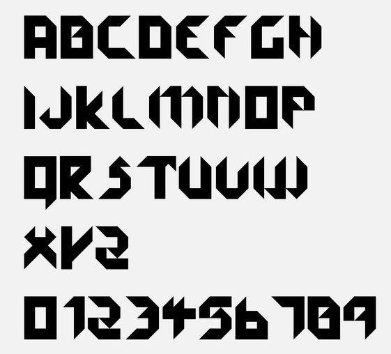
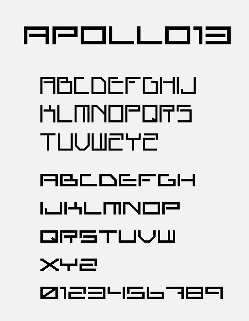
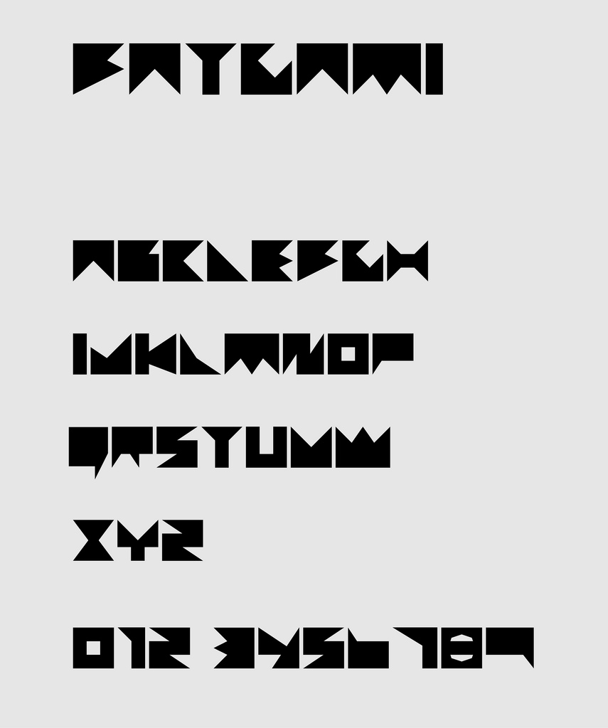
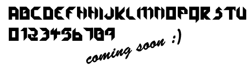
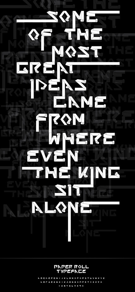
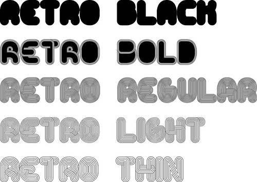
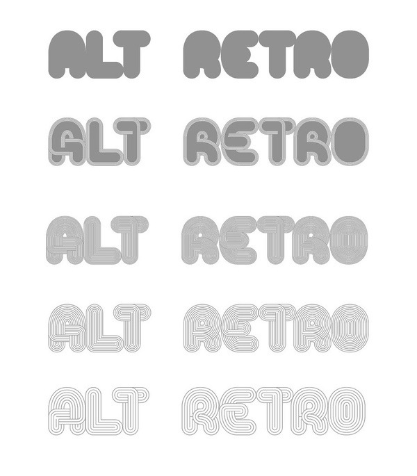
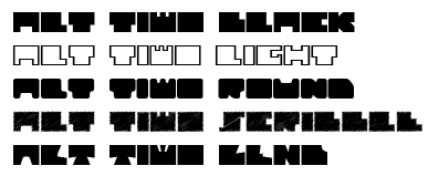
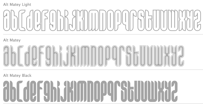
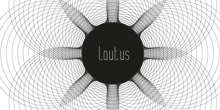
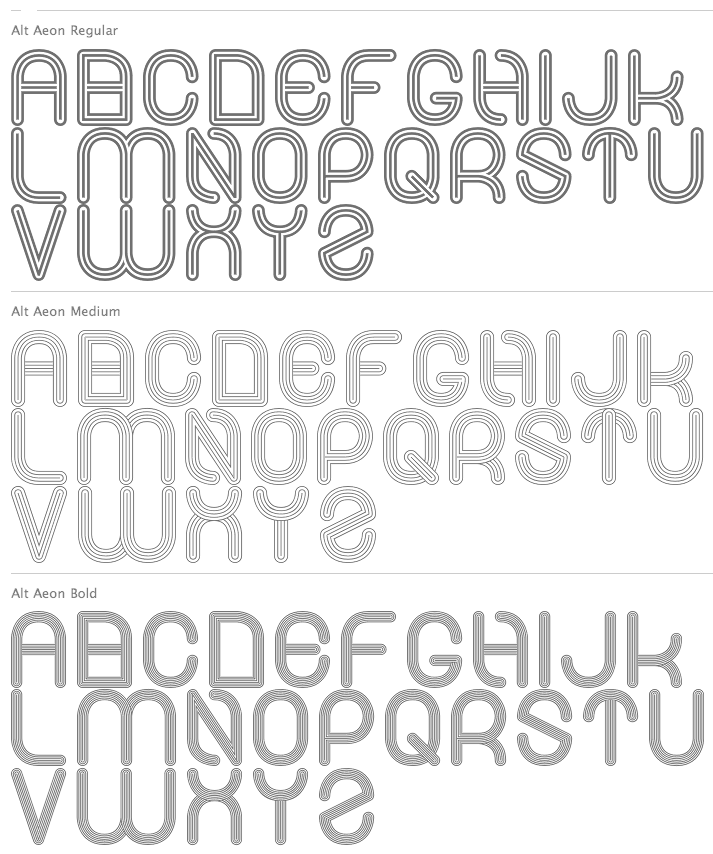
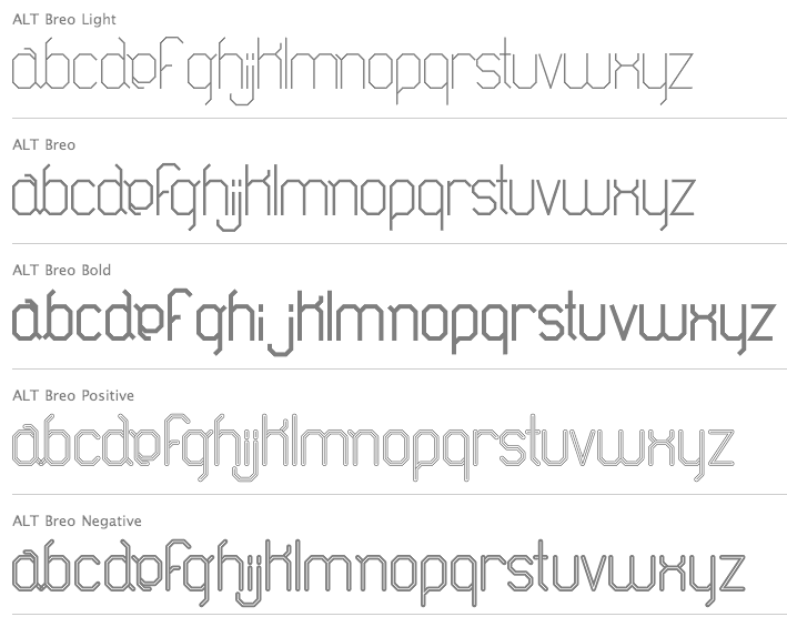
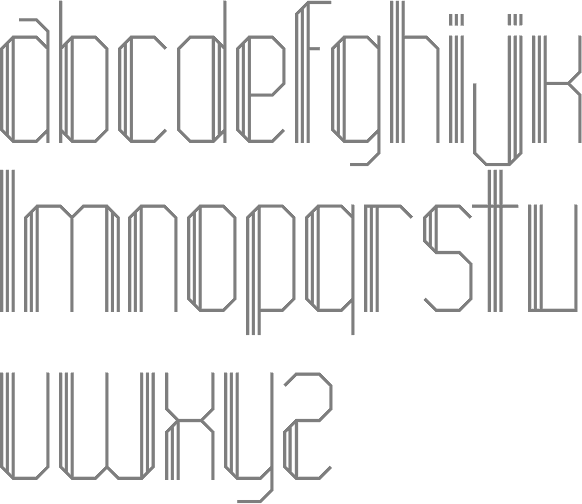
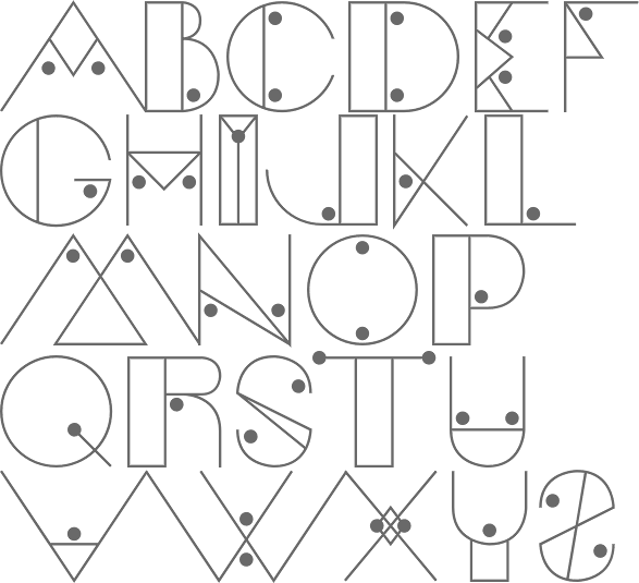
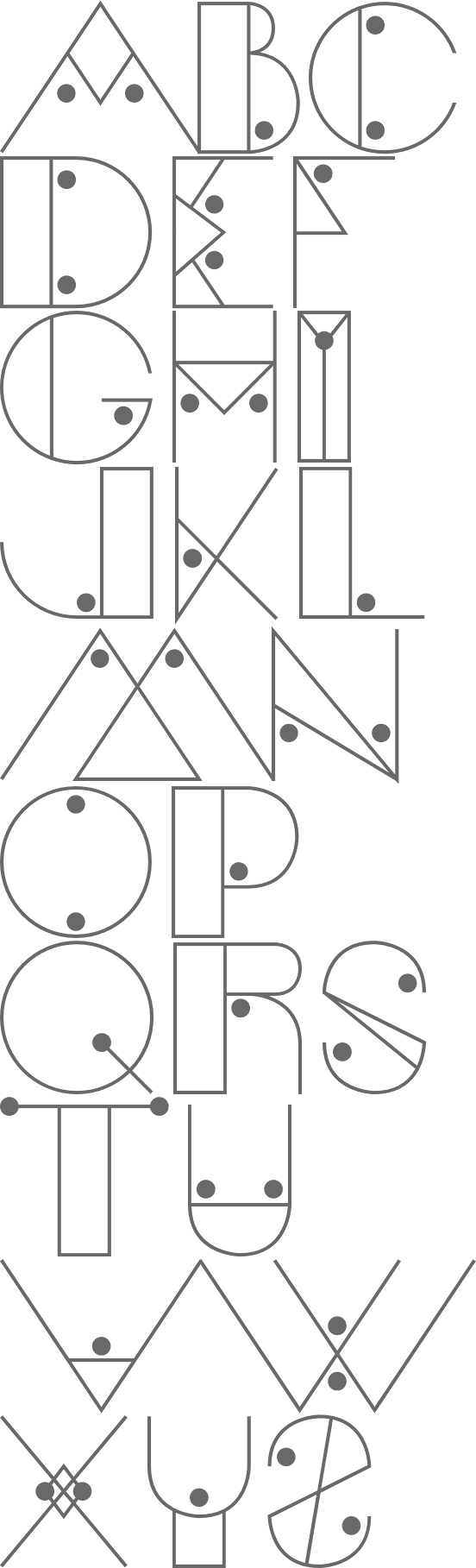
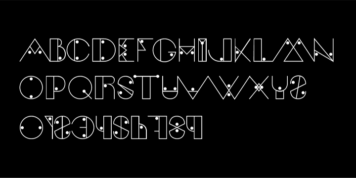
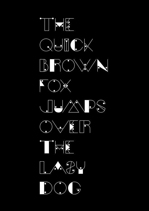
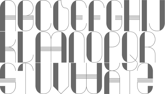
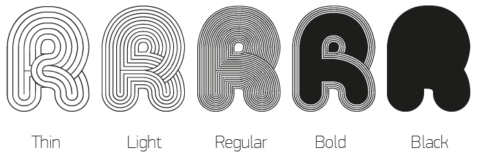
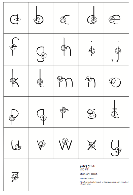
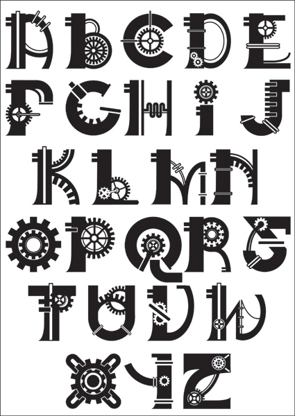
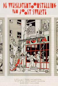
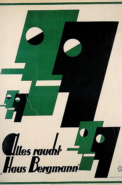
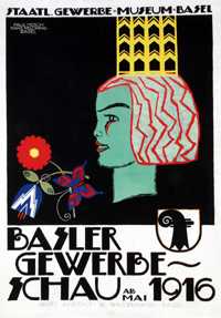
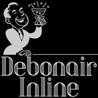
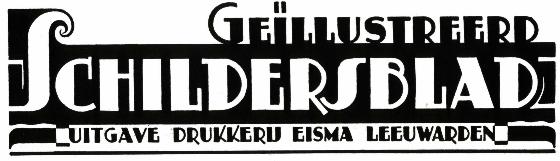
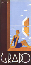
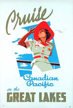
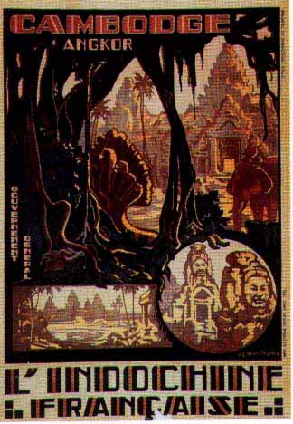
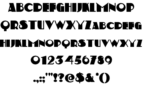
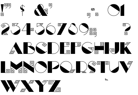
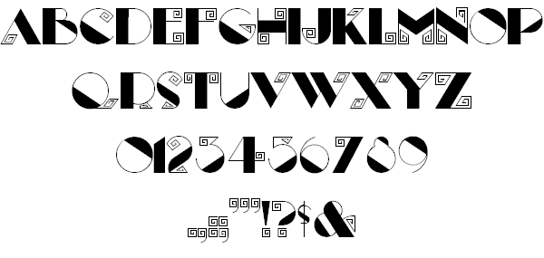
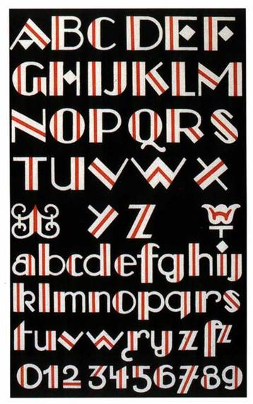
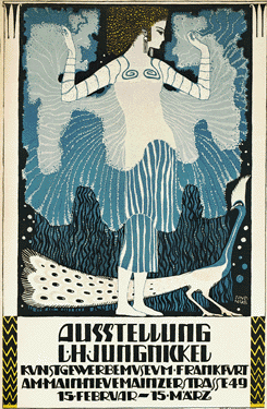
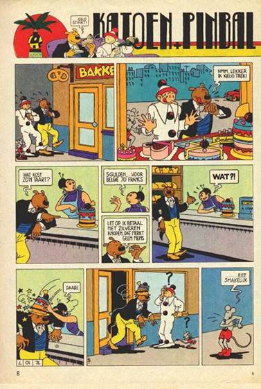
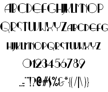
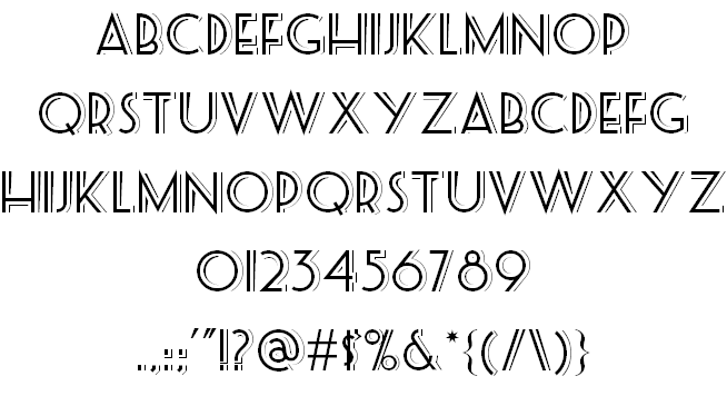
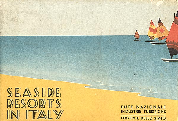
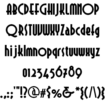
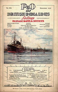
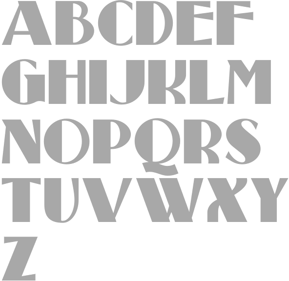
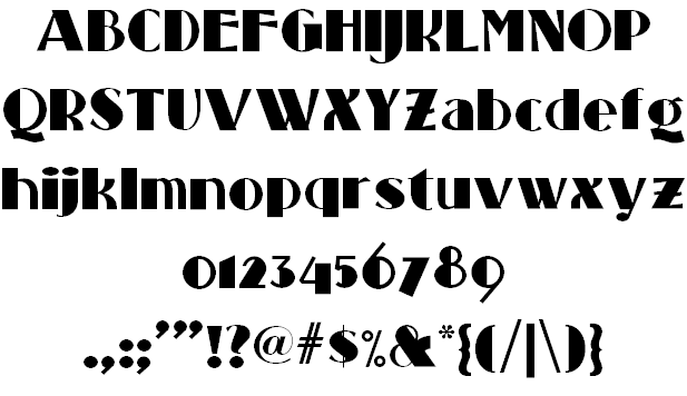
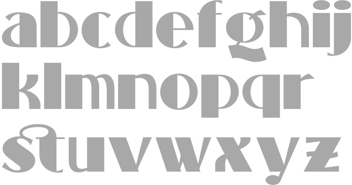
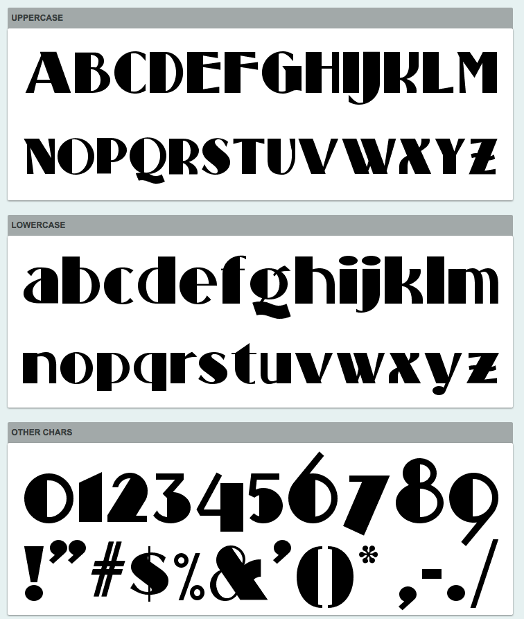
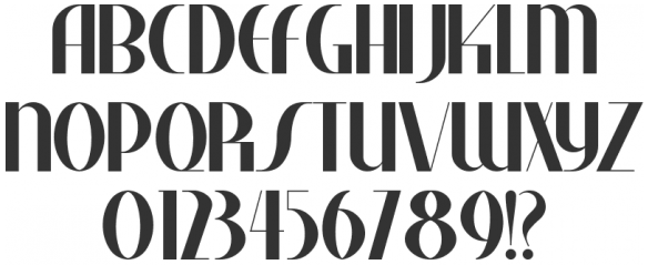
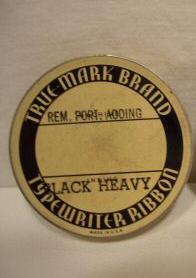
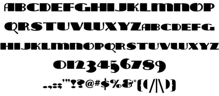
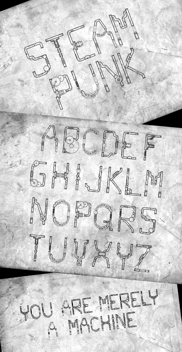
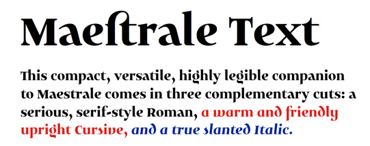
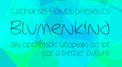
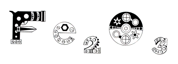
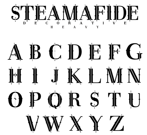
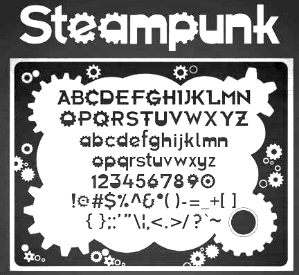
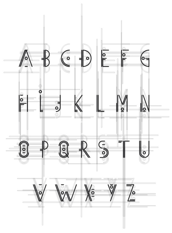
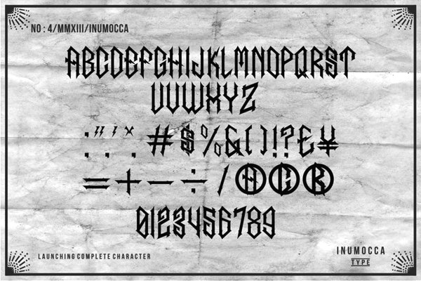
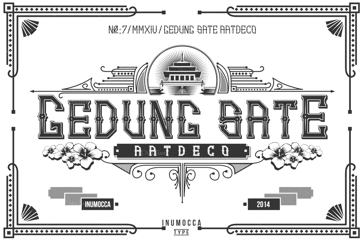
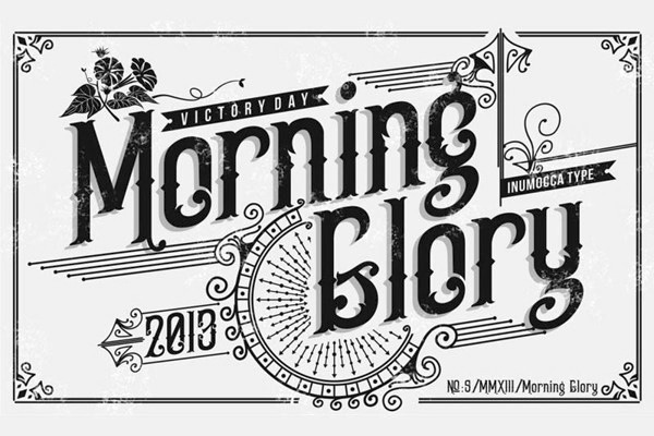
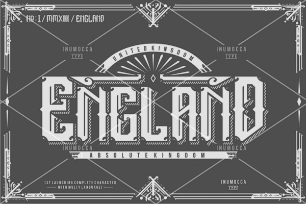
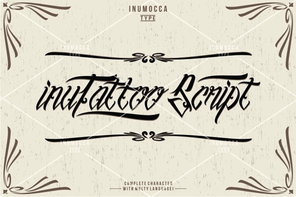
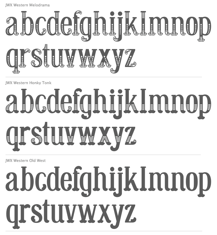
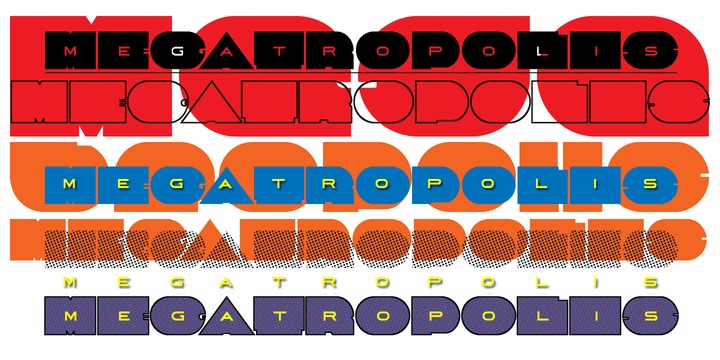
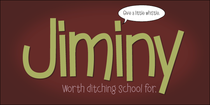
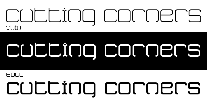
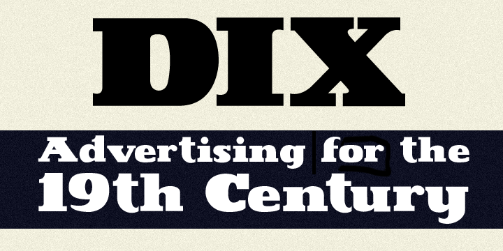
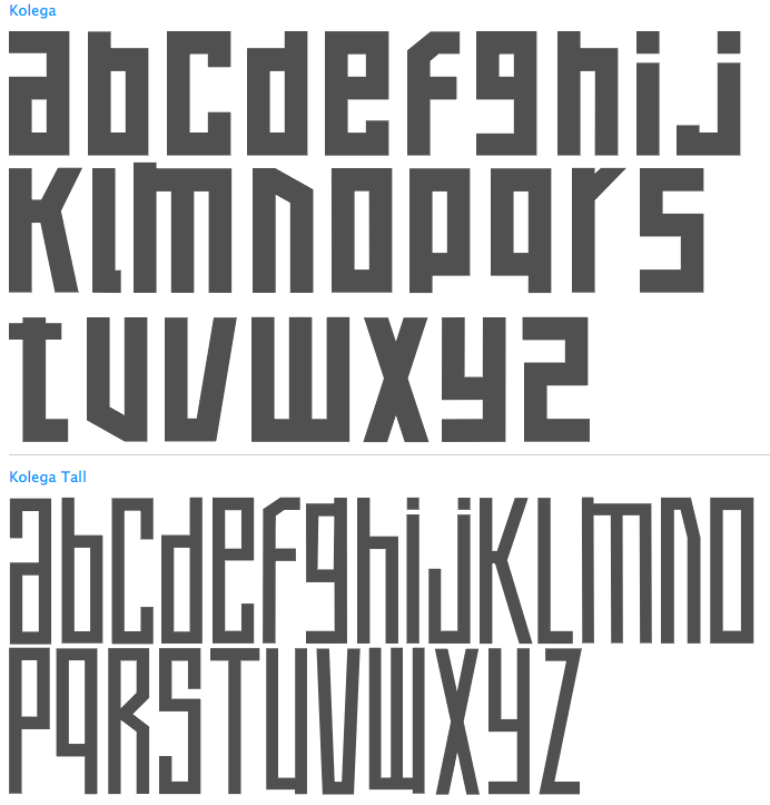
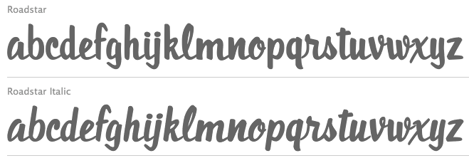
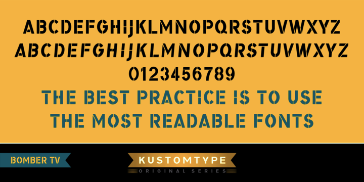
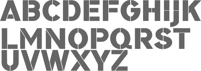
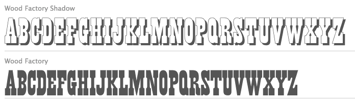
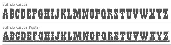
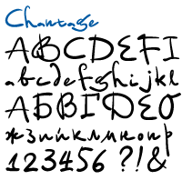
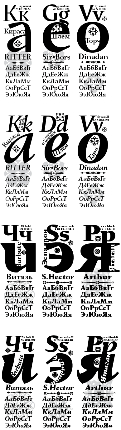
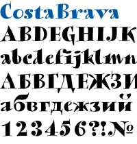
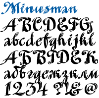
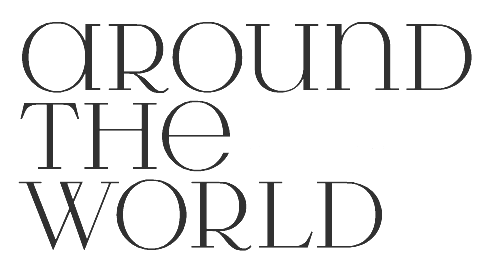
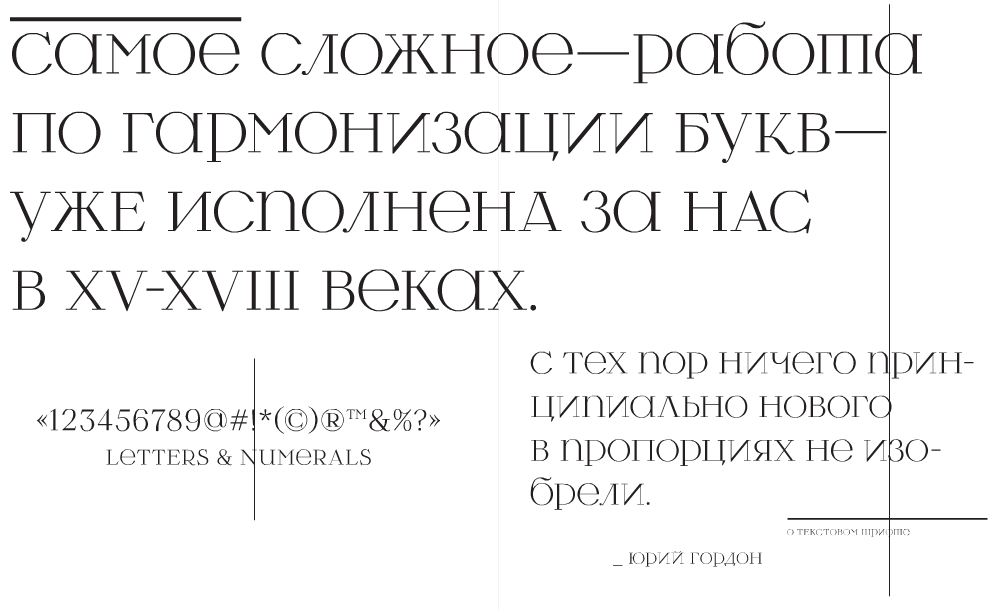
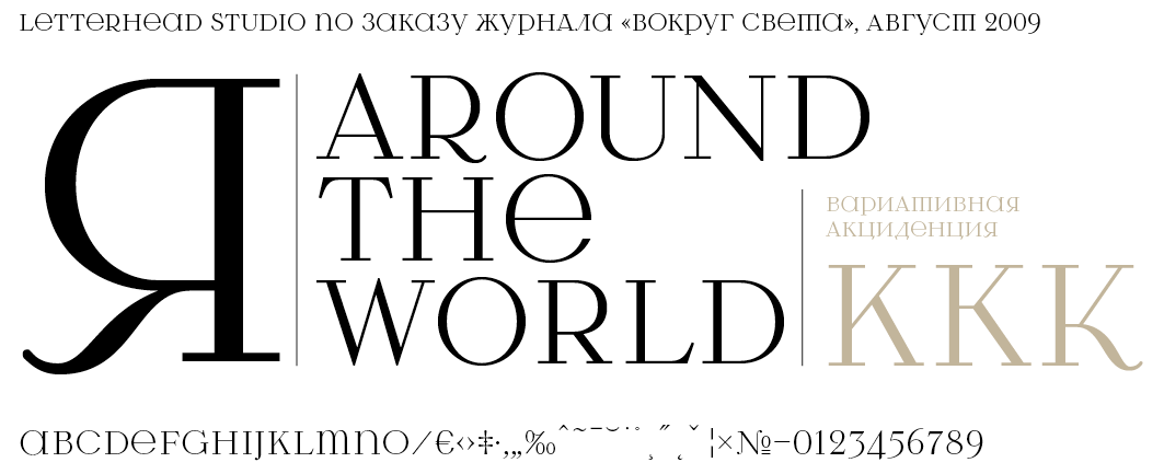
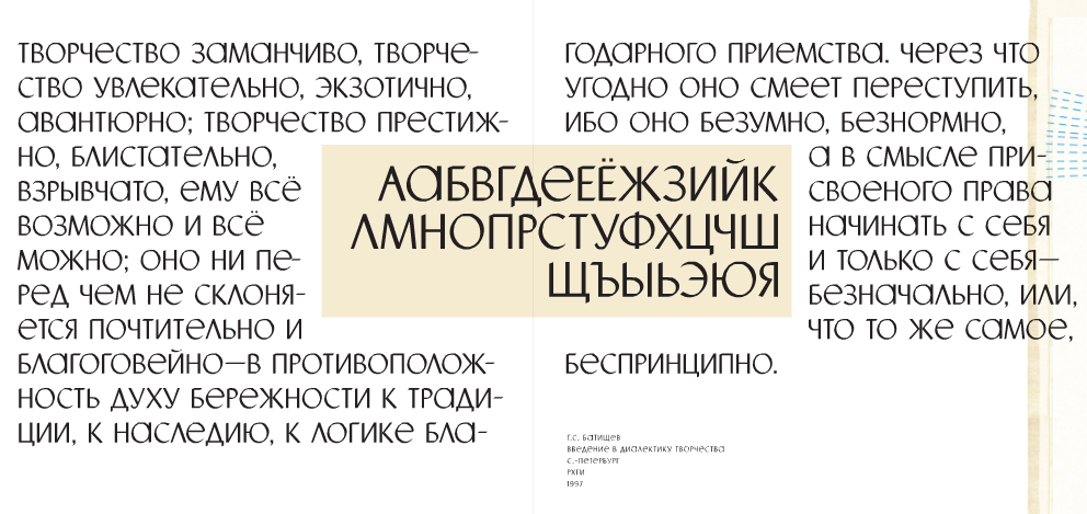
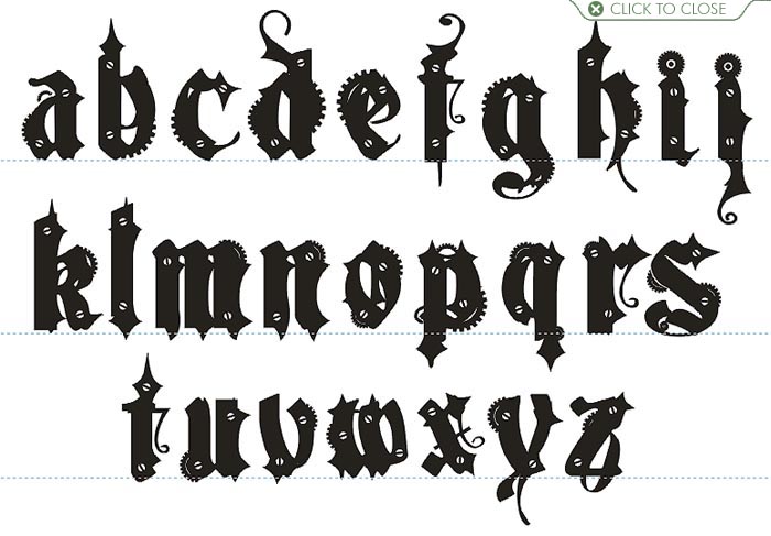
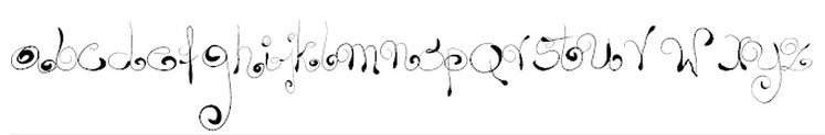