TYPE DESIGN INFORMATION PAGE last updated on Fri Nov 14 12:54:09 EST 2025
FONT RECOGNITION VIA FONT MOOSE
|
|
|
|
|
Type news | ||
|
|
|
|
SWITCH TO INDEX FILE
29 Letters
|
At ATypI 2008 in St. Petersburg, he ran a workshop on the Arabic Kufi script. Speaker at ATypI 2010 in Dublin on the topic of political resistance and expression through graffiti in Lebanon and Palestine. His contributions to type design:
|
Free service by some font enthusiasts: free fonts posted by occasional type designers on alt.binaries.fonts are collected here for easy download, and for historical reference. [Google] [More] ⦿ | |
Abstract Fonts
| Growing 13000+ font archive maintained by Alex Chumak from Mississauga, ON. Chumak himself designed these fonts: AF Pepsi, AF Champion, AF Tommy Hilfiger. List of designers. New fonts. Fontspace link. Dafont link. [Google] [More] ⦿ |
Aegir Hallmundur
| |
AisleOne
| Interesting graphic design and typography news and blog site by Antonio Carusone. His CV in his own words: Born in Queens, NY into a colorful Italian family, Antonio Carusone has been in the creative arts since he was a child. His early artistic talents led him to NYCs esteemed, High School of Art and Design, where he graduated in 1997. He then attended Pratt Institute in Brooklyn, NY and The Academy of Art College in San Francisco, where he studied Computer Animation. Currently Antonio resides in NYC, where he is a Senior Art Director at Ogilvy. Prior to Ogilvy he was an Art Director at Atmosphere BBDO where he worked on projects which have included Lays, Dial, Red Stripe, AOL, NFL, Gillette, Cingular, Audi, Verizon, and Bank of America. Type subpage. Commercial typefaces: Enotmik (2008, a monocase display typeface available in two weights, Light and Bold. Designed on a grid, Enotmik (2008) is made up of 90 and 45 degree angles). See also here. [Google] [More] ⦿ |
Links to free fonts for Japanese. Also, discussion and news on commercial Japanese fonts. [Google] [More] ⦿ | |
Alex Chumak
| |
Alexander Neuber
| |
Russian language type news and blog site managed by the Jakovlev Type Foundry. Subpage on Russian fonts. [Google] [More] ⦿ | |
News page run by Nononina, the company that owns Alltop. It consists of Will Mayall, Kathryn Henkens and Guy Kawasaki: We import the stories of the top news websites and blogs for any given topic and display the headlines of the five most recent stories (except Moms.alltop which has fewer headlines because there are so many feeds). This an automated link page---don't expect original contributions to type. [Google] [More] ⦿ | |
American Amateur Press Association (AAPA)
| Organization with many type pages related to letterpress, and run mostly by Dave Tribby. I quote Tribby: From its formation in 1892 (from the merger of 23 leading foundries) to its demise in the late twentieth century, American Type Founders was the dominant force in foundry type. Throughout its existence, ATF produced some of the most beautiful printing fonts. During its first half century, those typefaces were displayed in a series of substantial catalogs. Chicago's Barnhart Brothers & Spindler foundry chose not to join the ATF combine in the 1890s. It finally became part of ATF in 1911, but continued to operate under its own name until it was closed in 1933. Based upon Mac McGrew's American Metal Typefaces of the Twentieth Century, Maurice Annenberg's Type Foundries of America and their Catalogs, and a review of ATF type catalogs published in 1897, 1899, 1900, 1903, 1906, 1909, 1912, 1923, 1934, 1941, 1960, and 1971 (plus BB&S catalog No. 25), Tribby has compiled a spreadsheet of ATF typefaces, their identification numbers, and which page numbers they appeared on in those catalogs. He put together a similar spreadsheet for BB&S catalogs that were published in 1897, 1909, and 1925. The following PDF files were prepared from the individual worksheets in the spreadsheet file.
|
Andrij Shevchenko
| |
Antonio Carusone
| |
ATypI, Association Typographique Internationale, is the type community's premier organization. Founded in 1957 by Charles Peignot. Its goals are
Past presidents:
| |
Beautiful New Fonts
| Facebook group that announces new fonts, run by Igor Petrovic (Berlin). The last post was in 2017. [Google] [More] ⦿ |
Typography subgroup at the Behance Network collection of blogs. Behance was acquired by Adobe, and has always struggled with Chrome (switch to Firefox for better performance). It started capping the number new projects shown. Projects appreciated by yours truly. Subpages with keywords such as typeface, font, type design, Schrift, and tipografia. [Google] [More] ⦿ | |
Brian A. Jaramillo
| |
A design collective with subpages on typefaces. [Google] [More] ⦿ | |
Caroline Hadilaksono
| |
Type news from this group located in Chicago. [Google] [More] ⦿ | |
| |
Until 2013, it was mainly hosted by Jim Hefferon at St. Michael's College. In 2013, the new official North American redistribution site is at the University of Utah, thanks to Nelson Beebe and Pieter Bowman. Recommended file transfers, in decreasing order of efficiency: rsync, ftp and http. Generic redirector to balance traffic. | |
Dafont
| Useful French archive with nice categories such as Cartoons, Horror, Tech, Fantasy, Script, Symbols, Famous fonts, pixel fonts, typewriter, Gothic. It has grown to be the number one site in the world for publishing new free fonts. All designers are clearly identified, and all font information is easily accessible. Links. About 10000 fonts now, with monthly additions. Newest stuff. Links to all designers. All pre-October 2009 fonts in one 660MB download file. Run by Rodolphe Milan (France, b. 1972). [Google] [More] ⦿ |
A font download site that hopes to feed off the success of Dafont. [Google] [More] ⦿ | |
Daily Type
|
|
Dave Tribby
| |
Latest links and information added by David McCreedy to his great unicode pages for most languages. [Google] [More] ⦿ | |
A place with many images by new visual artists, a designer gallery and information on typography. See also here. [Google] [More] ⦿ | |
Design & typo
| Peter Gabor's type blog and type education site in Paris, started in 2005. In French and English. [Google] [More] ⦿ |
Design Observer
| A design site where one sometimes finds discussions on type. The founding writers are Michael Bierut, William Drenttel (an ex-typographer practicing law), Jessica Helfand and Rick Poynor. From Bierut's CV: Michael Bierut studied graphic design at the University of Cincinnati's College of Design, Architecture, Art and Planning. Prior to joining Pentagram in 1990 as a partner in the firm's New York office, he worked for ten years at Vignelli Associates, ultimately as vice president of graphic design. His clients at Pentagram have included The Council of Fashion Designers of America, Harley-Davidson, The Minnesota Children's Museum, The Walt Disney Company, Mohawk Paper Mills, Motorola, Princeton University, the Brooklyn Academy of Music, and the New York Jets. Bierut's work is represented in the permanent collections of the Museum of Modern Art and the Metropolitan Museum of Art in New York, and the Musee des Arts Decoratifs, Montreal. He has served as president of the New York Chapter of the American Institute of Graphic Arts (AIGA) from 1988 to 1990 and is president emeritus of AIGA National. Michael was elected to the Alliance Graphique Internationale in 1989, and was elected to the Art Directors Club Hall of Fame in 2003. Michael is a Senior Critic in Graphic Design at the Yale School of Art. He writes frequently about design and is the co-editor of the four-volume series Looking Closer: Critical Writings on Graphic published by Allworth Press. In 1998 he co-edited and designed the monograph Tibor Kalman: Perverse Optimist. His commentaries about graphic design in everyday life can be heard nationally on the Public Radio International program "Studio 360." He received the AIGA Medal in 2006, and was a winner in the Design Mind category at the 2008 Cooper-Hewitt National Design Awards. He is a cofounder of the website Design Observer. Michael's book 79 Short Essays on Design was published in 2007 by Princeton Architectural Press. His collection of new essays, Now You See It, was published in the fall of 2017. In 2018, Michael Bierut and Village type director Chester Jenkins talk collaborated on the Sherman typeface designed as the linchpin of the new identity for Syracuse University. The typeface revives a design created by Frederic Goudy in 1912 which ended up in the possession of the University. Additional material and links on Bierut: The Atlantic Talks Typography: interview with M. Bierut, Pentagram link, Reasons to Choose a Particular Typeface For a Project. In 2013, Bierut redesigned the New York City parking signs. [Google] [More] ⦿ |
First established in 1994 to provide an online web site for DT&G Zine. DT&G was originally published each month on AOL and Compuserve for attendees of Fred Showker's design and publishing seminar and conference appearances. The Design&Publishing Center is owned by Showker Graphic Arts&Design, Harrisonburg, Virginia, USA, established in 1972. Hot type news, type discussions, and links. [Google] [More] ⦿ | |
Forum on DTP which exists since 1989. Sublist on fonts. [Google] [More] ⦿ | |
I know, the real name is deviantART, but I like Devian Tart better. Several original fonts by a gaggle of young crazy happy-go-lucky designers and enthusiasts. The original fonts are mixed in with archived fonts, so it's a bit of a jungle. However, it was a goldmine of undiscovered fonts and new ideas, until about 2010. Since then, the site gets swamped with self-promotion messages, and amateurish graphics, and the font downloads have dwindled to a trickle. Direct downloads at TypOasis. [Google] [More] ⦿ | |
Dribbble is show and tell for designers. Players share shots---small screenshots of the designs and applications they are working on. Some have called Dribbble "Twitter for designers." Invented by Dan Cederholm, Rich Thornett, and Bruce Spang. [Google] [More] ⦿ | |
Chinese type site that identifies and catalogues over 500,000 fonts for all languages. It feels like this entire site is automated. [Google] [More] ⦿ | |
Erik Sachse
| |
Erik Vorhes
| |
Erin McLaughlin
| |
Erwin Denissen
| |
Ethan Dunham
| |
Femme Type is a platform celebrating female type designers. Founded by ex-University of Arts London Chelsea graduate Amber Weaver, it features news stories and commentary. [Google] [More] ⦿ | |
Search engine for type-related photographs. [Google] [More] ⦿ | |
Font Bureau's blog is more than a blog. It is the place where they announce new types, tell stories, and in general add a fourth dimension to all things typographic. [Google] [More] ⦿ | |
Font Squirrel
| Ethan Dunham's list of free fonts from and for professional type designers. The archive is huge (622 at the end of 2010) and clearly organized. There are useful @font-face kits to help users place these fonts on their web sites. Newly added typefaces. List of foundries. Ethan Dunham also runs a similar commercial web font service, Fontspring. [Google] [More] ⦿ |
FontShop's type news site, with contributions by Yves Peters, Jürgen Siebert, Ivo Grabowitsch and Stephen Coles. 2009 or 2010 picture of its editors, Yves Peters, Erik Spiekermann, Juergen Siebert and Stephen Coles. [Google] [More] ⦿ | |
Japanese font site with links to new Japanese fonts and Japanese font sites. Has some links for Western fonts as well. [Google] [More] ⦿ | |
Font archive. Font authors. [Google] [More] ⦿ | |
Free font archive, started up in 2012 by Ayman Hafez in Cairo. Google Plus link. [Google] [More] ⦿ | |
Well-designed type news and promotion site. Facebook page. [Google] [More] ⦿ | |
Type news and type blog located in Hungary, run by Tamas, Teufel, and Jobart (Eva and Gábor) and the Kóthay's (Eva, Sára, Kata and Gábor). [Google] [More] ⦿ | |
Advertised as the center of Polish type. It has an active archive with many new postings. [Google] [More] ⦿ | |
Fonts2U
| Large nicely categorized font archive. Font designers. Font vendors. The owner seems to Peter Olexa, a Slovakian visual artist who is based in Bratislava. [Google] [More] ⦿ |
Fontshop blog with stories about its typefaces. [Google] [More] ⦿ | |
Established in 1989 in Berlin by Erik Spiekermann, Joan Spiekermann and Neville Brody. Also offices in San Francisco, Australia, Austria and Norway. It has a formidable collection of fonts, better known as the FontFont collection. It is a major source of new type, and organizes a Conference in Berlin each year, called TYPO Berlin. In 2015, FontShop was sold to Monotype. Fontshop team. Designers. Subpages: FontFeed (font news), FontStruct (free modular fontre), FontBook, Font education. Catalog of FontFont's typefaces [large web page warning]. [Google] [MyFonts] [More] ⦿ | |
Fontsinuse
| Stephen Coles set up this site about fonts in advertising and the media in 2010. The initial page reads: Our effort begins here, with a regularly updated collection of case studies and trend reports. We've invited experts from various fields to comment on how type is used (and misused) in graphic design today. In our first few installments, magazine designer Marc Oxborrow has an emotional reaction to the redesign of Bloomberg Businessweek, the Font Bureau's Sam Berlow notices that the type specimen has become a design genre, I point to some recent projects in which type and especially typeface selection plays a central role, and instructor and historian Indra Kupferschmid reminds us that the real Bauhaus was not all geometric and experimental letterforms. This blog is a prologue of more to come. Behind the scenes, we are building a searchable, sharable archive of typographic design, all indexed by typeface, industry, and medium. And you are invited to join us. [Google] [More] ⦿ |
Free font hosting site based in Knoxville, TN. In 2009, it had over 550 designers and over 20,000 fonts, incredibly neatly categorized and cross-listed. List of participating designers. Newest additions. [Google] [More] ⦿ | |
As of July 2017, its typefaces: Aktura, Associate Sans, Associate Sans Mono, Associate Sans Stencil, Associate Slab, Associate Slab Stencil, Astrup, Author, Baro, Bega, Bespoke Sans, Bespoke Slab, Bespoke Serif, Bianco Slab, Boeing 24, Bonny, Bookmark, Boxing, Cabinet Grotesque or Cabinet Grotesk (2017), Claire, Clash Grotesk, Clash Grotesk Display, Comico, Cosmetic, Demo, Didac, Ekster, Erika Hand, Excon (2017), Folito, Gambarino, Gambetta, Griff, HongKong, Hoover, Indikator, Interlink, Katana, Kola, Litmus, Locomo, Malhar, Malis, Matteo, Monorama, Neco, Neptune, Neurial Grotesk, Nougato, Pally, Paquito, Passenger Display, Passenger Serif, Picket, Plein, Prachar, Pramukh, Pramukh Rounded, Ray, Rion, Rowan, Rustic, RX100, Schmalfette, Schotis, Screen Sans, Sharpie, Snooze, Stardom, Striper, Styro, Syphon, Tanker, Tara, Telma, Try, Troy Grotesk, Ulm Grotesk, Zesta. [Google] [More] ⦿ | |
FontStruct
|
It is amazing how the 100 or so basic shapes can be combined in many beautiful typefaces---this is not just a simple generalization of a pixel font editor. After only 3 weeks, FontStruct had over 21,000 registered users, and people had already made over 23,000 new fonts. FontStruct was made for FontShop by Robert Meek. List of many designers and fonts at FontStruct compiled by yours truly. My wishlist for them [which they have happily ignored for many years now, and things are getting increasingly worse]: to add all font designer names to their pages and inside the fonts, to organize a super-page with a list of all designers, to speed up the software and/or internet line (by a factor of ten), to remove the annoying extra clicks on license agreements before downloads, to fix the browser crashes reported by many (Allan Weiser and others; Mac OSX Leopard/Firefox has problems and still crashes Firefox as late as January 2010), to enable mass downloads and mass downloads per designer, to split the free fonts from those that cannot be downloaded (an increasingly large portion, by the way), to eliminate logins with passwords for visiting tourists, and to eliminate Flash (it crashes in Google Chrome regularly when FontStruct windows are open). Daumen9 made by Crissov in 2009 exposes the fundamental flaw of all modular designs that work within the limitations of truetype or opentype or type 1---one can't achieve proper small circles. Not FontStruct's error---blame it on short-sightedness of the font format engineers. [Google] [More] ⦿ |
Fontwala (was: Hindi Rinny)
|
She designed Katari for her thesis. Originally from Milwaukee, she received a BFA in Graphic Design from the Minneapolis College of Art & Design before her MA at Reading. Erin created an angular typeface---à la Oldrich Menhart---, and added a matching Devanagari style---the harmonious ensemble is called Katari. This typeface earned her the 2011 SoTA Catalyst award. In 2015, she published the free Google Web Font typeface Khula for Latin and Devanagari. The Latin is based on Steve Matteson's Open Sans. GitHub link. Still in 2015, she published the useful free Devanagari typeface family Yantramanav at Google Web Fonts, to accompany Christian Robertson's Roboto. Adobe Kannada was also designed in 2015---the Latin part of that font was by Robert Slimbach. Typefaces from 2016 include Hubballi (a free monolinear typeface for Kannada; Google Fonts link). In 2019, she aided with the Devanagari part of the free Google Fonts typeface IBM Plex Sans Devanagari (by Mike Abbink, Paul van der Laan, Pieter van Rosmalen, Erin McLaughlin). In 2021, Erin McLaughlin and Wei Huang developed the traditional workhorse sans serif typeface Tenorite for Microsoft for use as one of the default fonts in Office apps and Microsoft 365 products. Elements such as large dots, accents, and punctuation make Tenorite comfortable to read at small sizes on screen. In 2020, she published BhuTuka Expanded One at Google Fonts. BhuTuka Expanded One, originally designed in 2017, is a Gurmukhi companion to Aoife Mooney's BioRhyme Expanded Light typeface. Home page. Github link. Personal home page. [Google] [MyFonts] [More] ⦿ |
Frederik Samuel
| |
Free Fonts
| Excellent free font search engine. Run by Alexander Neuber. More direct page. Handwriting archive. [Google] [More] ⦿ |
freetypography.com
| Free font blog and news site maintained by Philipp Thom (Ulm, Germany). It has several free fonts. [Google] [More] ⦿ |
Fresh Fonts
| Barcelona-based designer and type enthusiast, originally from Lausanne, who publishes a curated newsletter, Fresh Fonts, that reviews the best new contemporary fonts from independent designers. Co-curated with Christian Bouche. Home page. Twitter link. [Google] [More] ⦿ |
Typography sub-pages at Fubiz Daily Dose of Inspiration. [Google] [More] ⦿ | |
Google's answer to web fonts, including a directory of over 1,000 free fonts. Their goal was to have 1,000 fonts by the end of 2011, but they passed the 500 mark only in 2012, the 800 level in 2016, the 900 threshold in 2018, and 1,000 units in 2020. Blog. On May 19, 2010, Typekit announced an open source collaboration with Google called the WebFontLoader: Now you can have complete control over how fonts are loaded and what happens when they're rendered. You can download the code and use it however you like, or link directly to the latest version via the Google Ajax APIs. [...] You can use WebFont Loader with fonts on your own server, links to the just-announced Google Webfont API, or any Typekit account. We've also made sure the code is modular, so other font hosting services can add to it in the future. Google offers these fonts for free, and pays its designers a few thousand dollars. This prompted a reaction from Bruno Maag in 2012: Yes, Google with its free fonts, or libre fonts as they like to call them, is a particular bugbear of mine. Now, if someone wants to make their fonts available for free that is up to them; I have no problems with that. However, it is very different if a giant corporate entity which has a market valuation of a gazillion dollars is asking young and budding designers to submit their fonts for a measly few thousand dollars under the condition of an open source licence. I call this exploitation as well as a complete disregard for design. The result, unfortunately, is that in many cases the fonts are of not very good quality since they have been designed by inexperienced designers. Download all Google Web fonts in one huge file. Old (pre-2016) Google Fonts site. Master file containing all of Google Fonts. Google font archive from 2015. [Google] [More] ⦿ | |
Blog related to a bookseller in Oakland, CA. They state: Grain Edit is a blog that covers contemporary graphic design and illustration as well as design from the from the golden era of advertising (1950s-1970s). Besides found tidbits of news, interviews and events we will be posting obscure kids books, annuals, type catalogues, corporate manuals, and designer monographs from our shelves. Type subpage. Archives. [Google] [More] ⦿ | |
Font vendor site. Individuals can hawk their new fonts here, with typical font prices between 2 and 10 dollars. Direct link to font collections. [Google] [More] ⦿ | |
Font vendor with occasionally free fonts mixed in. [Google] [More] ⦿ | |
High Logic Font Forum
| Font Creator and Scanahand are font editors made by High Logic (Erwin Denissen). They have an active forum, with a lot of interesting technical discussions. Gallery of fonts made with High Logic software. [Google] [More] ⦿ |
I Love Typography
| Type information site and blog run since 2007 by graphic designer and web developer John D. Boardley from Kagawa, Japan. Now based in the UK, I Love Typography became a font vendor in 2020 under a junta that comprises John Boardley, Nadine Chahine and Julia Hines. Glossary. Examples of inspiring use of display/poster type. John Boardley is the author of Typographic Firsts (2019, Bodleian Library, University of Oxford). [Google] [More] ⦿ |
iFontMaker
|
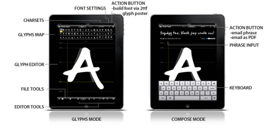
Born in 1984, Tomonaga studied in Kyoto and is an artist and self-taught programmer. A gallery of free fonts made with the software:
Looking for an author? Replace the %s string in this URL by the name. Showcase. [Google] [More] ⦿ |
Big Russian font archive, nicely categorized and organized. New things. [Google] [More] ⦿ | |
Igor Petrovic
| |
Ilya Ruderman
| |
Italic 2.0 is an Italian blog and type project, very central to all that is happening on the type scene in Italy. There is also a book by the same title, dated 2008, edited by Marta Bernstein, Luciano Perondi, and Silvia Sfligiotti, with articles by Giovanni Lussu, James Clough, Antonio Cavedoni, Marta Bernstein, Luciano Perondi, Giangiorgio Fuga, and Silvia Sfligiotti. [Google] [More] ⦿ | |
James Mosley
| |
John D. Boardley
| |
José Ramón Penela
| |
Juan Pablo De Gregorio Concha
| |
Letritas
|
|
LetterCult
|
Behance link. Brian is located in Signal Hill, CA. [Google] [More] ⦿ |
Michael Bierut
| |
| |
Nick Sherman
| |
Nicolas Spalinger
| |
Noemi Stauffer
| |
Set up in 2006 and finalized in 2011 by Jon Phillips, the original goal of this site was summarized as follows: The Open Font Library is a sister project of the Open Clip Art Library. The goal of this project is to collect public domain fonts so that they may be used freely. In 2011, they wrote: At the 6th Libre Graphics Meeting 2011 in Montreal, the Open Font Library, the Open Font Library community and Fabricatorz launch an online library of fonts that all type designers and font enthusiasts may participate in. The goal of the Open Font Library is to offer great fonts, help designers share their work, accelerate the usage of the @font-face tag available in modern web browsers, and to help educate everyone about how to design and use fonts. The Open Font Library received sponsorship and direction from Dave Crossland. Other major contributors to the project include Alexandre Prokoudine, Ben Weiner, Ed Trager, Eric Schrijver, James Weiner, Jon Phillips, Nicolas Spalinger, and Robert Martinez, who developed the Open Font Library logo. Initial patrons to the project include Mozilla Foundation, River Valley Technologies, TeX Users Group and Yes Logic. The Font Library has also benefited tremendously from input by participants at the Libre Graphics Meeting 2011. Others mentioned in earlier years include Benji Park, Nicu Buculei, Alexandre Prokoudine, and Simos Xenitellis. The original batch of free fonts includes Inkcalig (2006, a calligraphic typeface by James Kilfiger), LetsTracebasic (2006; a *very* readable light sans, even at small sizes), LetsTraceruled, RDS (2003, LED simulation face), TribalBenji (2005, by Benji Park), handfont (2005, Benji Park), handfontshadow (2005, Benji Park), PugsleyOblique (2006), AlphabetofChildren (2006, based on 16th century illuminated caps), AnimalSilhouette (2006), and Fold (2006). Software problems have wreaked havoc with the OFL site since 2010, so others made pages that are helpful: Download link. In 2017, the web site became more stable. [Google] [More] ⦿ | |
ParaType news, in Russian. De-Fis is ParaType's e-zine. Russian type glossary. [Google] [More] ⦿ | |
Pascal Naji Zoghbi
| |
His typefaces include the free didone typeface Valentina (2012). In 2016, he published the humanist sans typeface family Mestre, which, in his own words, is a German & Dutch-inspired geometric sans-serif. In 2017, Pedro graduated from the University of Reading with the multi-script typeface pair Rock (for Latin, Greek and Cyrillic) and Roll (for Latin, Arabic and Japanese). In 2018, Fontsmith published the mammoth sans family FS Industrie. Still in 2018, Arilla released FS Neruda at Fontsmith. This transitional storytelling text family is named after Chilean poet Pablo Neruda. The Lost & Foundry family of fonts was designed in 2018 by Fontsmith's designers Stuart de Rozario and Pedro Arilla together with M&C Saatchi London: FS Berwick FS Cattle, FS Century, FS Charity, FS Marlborough, FS Portland, FS St James. The campaign was developed by Fontsmith, M&C Saatchi London and Line Form Colour. The crumbling typefaces of Soho were recovered to be sold online as a collection of display fonts, to fund the House of St Barnabas's work with London's homeless. In 2020, Monotype released Bunbury, FS Rosa (a soft serif family influenced by Cooper Black and Windsor), FS Renaissance, a stencil serif typeface by Pedro Arilla and Craig Black. Behance link. Home page for Pedro Arilla. [Google] [MyFonts] [More] ⦿ | |
Pedro Serrao
| |
Peter Gabor
| |
| |
Peter Olexa
| |
Philipp Thom
| |
This site shows "pins" (images) from other sites, with subpages on everything, including typography, calligraphy and typography, lettering, typefaces, typographic design, fonts, more typography, more fonts. Why, they even have a subpage on Luc Devroye's pins. [Google] [More] ⦿ | |
News stories and picture galleries related to graphic design and typography in France. [Google] [More] ⦿ | |
Jean-Christophe Loubet del Bayle's web site on typography. In French. Besides articles, there are also useful type links. Old pages. Temps typographiques. [Google] [More] ⦿ | |
Planet Open Fonts
| Blog and open source font news, moderated by Nicolas Spalinger. The community's manifesto: We are members of the wider FLOSS community and we have a special interest in open fonts: appropriate licensing, collaborative typeface design, featureful open font design toolkit, packaging and availability of quality open fonts in the various distributions and OSes to cover the needs of language communities, publishers and artists, etc. We support the Open Font License as the recommended license for libre/open fonts. We are users, contributors and developers of various components of the open font design toolkit. Some components of the Open Font Design toolKit (OFDK) are:
A few small shell, python or perl scripts designed between 2014 and 2018 to help with font-related tasks published at the Planet Open Fonts site:
|
Type news. Type museum. Small archive. [Google] [More] ⦿ | |
French language type news site. Its organizers are Jean-Baptiste Levée, Pauline Nuñez, and Jérémie Baboukhian. [Google] [More] ⦿ | |
A type news and discussion site. The typefaces under scrutiny are limited to independent foundries (by which they mean small commercial type foundries) and to Latin type. The names of the editors of the site are not mentioned on the site. [Google] [More] ⦿ | |
Jean-François Porchez's great on-line newspaper about type. Great web page. Full of information. A must! Lots of links to books. [Google] [More] ⦿ | |
This information is copied from Richard's own site. Richard Fink is a consulting font technologist and developer focused on web fonts for multiple languages that look good on any screen and any device. His technical skill with fonts evolved out of his interest in screen readability and the revolution in human expression summed up in the title and tag line of his original blog - in what may have been the first time a web font - scalable, selectable, and search engine friendly - was used to brand a site: Encouraged by Microsoft's screen font innovator, the late Bill Hill, and also Thomas Phinney, at one time a key member of the Adobe Type team but who is, today, President of Fontlab, the industry leader in font design and production software, Rich began blogging at Readable Web where, almost immediately, his insightful analysis of Microsoft's proprietary Embedded OpenType (EOT) web font format earned him a mention in web standards evangelist Jeffrey Zeldman's iconic book Designing With Web Standards. Rich was also invited, along with other web typography visionaries like Dave Crossland, who would soon become the driving force behind Google Web Fonts, to speak at Kernest.com founder Garrick Van Buren's FontConf - The Unconference for Web Fonts & @Font-Face - in St. Paul, Minnesota. Rich was also invited to Dublin, Ireland to speak before the annual conference of the Association Typographique Internationale (ATYPI). Rich is also a frequent contributor to font-related online forums such as Typedrawers, and the Google Web Fonts Forum. Rich has written full-length articles for the long-running web design publication AListApart. First with the seminal Web Fonts At The Crossing - key parts of which made their way into a book by the brilliant Zoe Mickley Gillenwater, now Senior Designer at Booking.com, titled Stunning CSS3. This was soon followed by The Look That Says Book – an article about the various techniques for achieving Hyphenation & Justification in web typography using HTML, CSS, and JavaScript. As an activist, Rich helped push the adoption of web fonts early on in a number of ways. First, with his development of EOTFAST, a Windows command-line tool for converting TrueType fonts into fully compressed Embedded OpenType (EOT) fonts in a way that avoided copyright or patent infringement of the Monotype Corporation's MicroType compression algorithm – a barrier that most in the industry at the time wrongly assumed was insurmountable. Even today, with many other TTF-to-EOT conversion options available, the carefully researched documentation that shipped with EOTFAST - remains the best literature available on the subject and is still being referenced and recommended by font makers today - 6 years and counting after it was published! Simultaneously, Rich collaborated with Google's Paul Irish and Ethan Dunham, founder of the highly influential web font distribution and sales sites Font Squirrel and Fontspring to develop the backward-compatible “?#iefix” CSS @font-face syntax that solved the parsing problem in versions of Internet Explorer prior to IE9 as first reported by Mozilla's John Daggett in the W3C's WWW-Font mailing list. This syntax was documented and flagged as best practice by CSS expert Eric A Meyer in his reference books CSS Fonts and CSS: The Definitive Guide and it can be found "under the hood" in the style sheets of hundreds of millions of web pages viewed by internet users every day. Then, in collaboration with designer Garrick Van Buren founder of Kernest.com, the web's first open-source web font service and, in that sense, direct ancestor and proof-of-concept for Google Web Fonts, Rich became Font Director of Kernest.com's next incarnation Kernest Konstellations, a project that pioneered the extensive use of open-source web fonts within working HTML5 design templates. More recently, Rich has been involved with quality control efforts at Google Web Fonts with a focus on best practices for font construction, the development of advanced multilingual HTML web font test pages, Python-based font testing tools, and a new taxonomy for font character sets. In keeping with the general move away from dedicated blogging sites, Readable Web is now static. Instead, Rich aggregates links and posts comments at his managed Facebook Page FontFriday. He also writes an occasional analysis or essay as FontFriday on Medium.com. You can follow Rich as FontFriday on Twitter at @FontFridayTweet. [Google] [More] ⦿ | |
Robert Meek
| |
Rodolphe Milan
| |
Sean Mitchell
| |
Type design and type examples at Smashing Magazine. [Google] [More] ⦿ | |
Stephen Coles
| |
Stephen Coles
| |
Over the years, Stephen Coles's Flickr page has grown to a real resource, and also a valuable source of inspiration. [Google] [More] ⦿ | |
Swiss Miss
| Design blog by Tina Roth Eisenberg (Switzerland&New York City). Has subpages on type design. [Google] [More] ⦿ |
Knowledgeable type design group on Devian Tart: Temple of Typefaces features the best fonts, typefaces, type design and hopefully a lot of type-related talk, debate and constructive criticism. All typography lovers are welcome but only quality type is allowed. [Google] [More] ⦿ | |
The Cooper Union School of Art is a famous design (and type design) school in New York City. Starting in the fall of 2010, the Continuing Education Department of The Cooper Union, in conjunction with the Type Directors Club, offers a Certificate Program in Typeface Design, called Type @ Cooper. The faculty in 2010 included Jesse Ragan, Ken Barber, Stephen O. Saxe, Roger Black, Mark Jamra and Christian Schwartz. In 2019, the teachers were Karen Charatan, Ewan Clayton, Andy Clymer, Cara Di Edwardo, James Edmondson, St&eacue;phane Elbaz, Hannes Famira, Berton Hasebe, Daniel Morris, Jean François Porchez, Jesse Ragan, Christian Schwartz, Sara Soskolne, Sumner Stone, Alexander Tochilovsky, and Just van Rossum. Cooper Union Typography is a jump site for many typographic treasures. [Google] [More] ⦿ | |
London-based graphics marketplace in the style of Creative Market. Publisher of a few typefaces such as Millanha (2017: calligraphic). [Google] [More] ⦿ | |
The League of Movable Type
|
In-house free font creations include League Gothic (2009-2011) [League Gothic is a revival of an old classic, and one of our favorite typefaces, Alternate Gothic No.1. It was originally designed by Morris Fuller Benton for the American Type Founders Company (ATF) in 1903. The company went bankrupt in 1993. And since the original typeface was created before 1923, the typeface is in the public domain.] and League Spartan (2014) [a bold geometric sans based on ATF's Spartan]. In 2017, they started an on-line type design course with type designer Thomas Jockin. [Google] [More] ⦿ |
The Ministry of Type
| British type blog run by Aegir Hallmundur who lives in Brighton, UK. Subpages. [Google] [More] ⦿ |
Chinese type design and type history site. [Google] [More] ⦿ | |
Themtypes
| Erik Sachse presents the latest experimental and crazy typefaces. [Google] [More] ⦿ |
Spanish language web site with thoughts on type and design by Ramiro Espinoza. [Google] [More] ⦿ | |
Thomas Jockin
| |
Tina Roth Eisenberg
| |
Spanish language type blog and type jump and news site. It has excerpts of many type articles, and subpages on type history, type design type designers and type foundries. [Google] [More] ⦿ | |
Type and letter design site run by Olivera Stojadinović, Jana Orsolic (was: Nikolic) and Olivera Batajic Sretenovic from Serbia. Types shown there:
| |
Tomonaga Tokuyama
| |
Twitter news on variable fonts. Edited by Nick Sherman. [Google] [More] ⦿ | |
Type blog at Adobe, now run by Paul Hunt. Before him, it was run by Thomas Phinney. [Google] [More] ⦿ | |
Commercial type news site run by Amber Weaver and edited by Zoe Loring Murphy. Their motto: Type 01 covers the world's most exciting type-focused designers, projects and campaigns. We also run Femme Type, a platform that celebrates and promotes the type work created by womxn in our industry.. [Google] [More] ⦿ | |
Type For You
| Portuguese type blog by Pedro Serrao, Joao Planche and Pedro Mesquita. Behance link. [Google] [More] ⦿ |
Type foundry
| Personal blog of James Mosley, type historian. This is one of the deepest and most useful type sites in the world. [Google] [More] ⦿ |
Type Release
| Commercial type release list by Vancouver-based Sean Mitchell. [Google] [More] ⦿ |
Type Thursday
| TypeThursday is a meeting place for people who love letterforms. Founded by Thomas Jockin, they meet in person or on-line in Chicago, London, Los Angeles, New York, Philadelphia, Seattle, and San Francisco. [Google] [More] ⦿ |
Type UA
| Ukrainian type news site associated with Andrij Type of Andrij Shevchenko. [Google] [More] ⦿ |
The team at Typecache consists of Taro Yumiba (an interactive designer/editor), Akira1975, Shohei Itoh (engineer), Shinsuke Okamoto (engineer), and James Chae. They write: Typecache.com is an online index for type foundries and font sellers, and showcases their collections of type. As typographic literacy grows, the site will hopefully be a useful resource for designers, art directors, and type enthusiasts. Useful subpages: Helvetica alternatives. DIN alternatives. Rounded blunt-cornered fonts. | |
Typedia is a community website to classify typefaces and educate people about them. Think of it like a mix between IMDb and Wikipedia, but just for type. Anyone can join, add, and edit pages for typefaces or for the people behind the type. Site created and run by Jason Santa Maria, Mark Simonson, Liz Danzico, Dan Mall, Mark Huot, Brian Warren, Ethan Marcotte, Stephen Coles, Ryan Masuga, Aaron Gustafson, Garrett Murray, and John Langdon. Blog. News. [Google] [More] ⦿ | |
Typedia: Type News
| Erik Vorhes (Chicago, IL) writes the type news at Typedia. Erik Vorhes is a web developer, accessibility advocate, design technologist, and writer. Speaker at TypeCon 2012 in Milwaukee and at TypeCon 2013 in Portland. His work can be viewed at Dribble. [Google] [More] ⦿ |
Type forum started in March 2012. One of the main admin people was James Puckett. He transferred the management of the site to Stephen Coles at the end of 2014. In November 2015, Stephen Coles in turn passed the poupon to Tiffany Wardle de Sousa and James Todd. In 2018, the acting moderators were Tiffany Wardle, James Todd, Ramiro Espinoza, Jess McCarty and Dyana Weissman. In 2021, the gang was headed by James Hultquist-Todd (was: James Todd) and Paul Hanslow. [Google] [More] ⦿ | |
Typegoodness
| Frederik Samuel's showcase of beautiful typographic work. Active between 2009-2012, and not updated after 2012. [Google] [More] ⦿ |
Unsure what this is. The International Type Index is a free project from a non-profit organisation. The objective is to build a searchable database of all fonts from all foundries, from all the world, to the benefit of both users AND authors. As a non-profit project, TypeIndex.org is 100% user-built : the font database grows through submission of missing foundries, fonts, and reviews. Well, there you have it. There is type news, a type handbook, downloads of free fonts, links to commercial fonts, and a type museum. [Google] [More] ⦿ | |
A foundry index made and maintained by Mark Johnson and Thomas Drach. The list covers about five percent of the commercial foundries in Europe and the Americas. [Google] [More] ⦿ | |
Typetoken is an online magazine (est. 2011) that covers typography: The site showcases, discusses and reviews the world of typography, icons and visual language. A collaboration between graphic designers Mike Sullivan of Mister and Mark Millic of Modularlab, and web developer David Cole of Mayfield Digital, typetoken features contributions from designers around the globe and aims to be a source of inspiration and stimulation for those in the international design community who wish to keep abreast of what's new and exciting in mainstream and experimental typography and iconography. [Google] [More] ⦿ | |
A German typography site with pages on classification, news, designers, a type glossary, and tutorials. Run by Ralf Hermann. [Google] [More] ⦿ | |
Typographica
| The official title of Stephen Coles' revival of the Old Typographica is Typographica. Type Reviews, Books, Commentary. [Google] [More] ⦿ |
Ralph Herrmann's type site set up in 2015. Great look, great content, including a Forum, a Font ID page, and a type calendar. [Google] [More] ⦿ | |
Visually catching gallery of recent type projects in the graphic design realm. [Google] [More] ⦿ | |
Messages, announcements, discussions, links, a world web site by and for type designers, Typophile is/was managed by Jared Benson, Joe Pemberton, and their firm Punchcut in San Francisco. Typophile's moderators are/were Jared Benson, Joe Pemberton, Christian Robertson, Stephen Coles, Yves Peters, Paul Hunt, Dan Reynolds, Tamye Riggs (now resigned), Zara Evens, Eben Sorkin, and Tiffany Wardle. Regular censorship, but one of the best, if not the best, home for type designers on the web. There was a brief hiatus in 2015 and 2016, but the site reopened in November 2016. The new layout is for mobile devices and looks absolutely awful on big screens. Messages are limited to 329 characters. [Google] [More] ⦿ | |
German type wiki. Has a German glossary. [Google] [More] ⦿ | |
unostiposduros.com
| Very didactic and insightful Spanish language web site devoted to typography and its history. Pages by freelance graphic designer José Ramón Penela from Madrid. Check Penela's comparison of truetype and postscript. [Google] [More] ⦿ |
v-fonts
| A list of variable fonts, maintained and regularly updated by Nick Sherman. [Google] [More] ⦿ |
Popular image site that has interesting subsections tagged by letter, font, type design, typeface, typo, typography, lettering and alphabet. [Google] [More] ⦿ | |
A type and typographic picture news site. Subsection on typefaces. [Google] [More] ⦿ | |
A comprehensive Hebrew typography blog and Hebrew type design and typography jump site with the latest news. Israel-based Yaronumus is the author of From Le Be to Days and Nights, which is based on his seminar work [in Hebrew]. [Google] [More] ⦿ | |
Type blog at Mike Cina's YouWorkForThem. New releases. [Google] [More] ⦿ |
|
|
|
|


 Madrid (and before that, Lebanon)-based Arabic type designer who runs the Arab type news and blog site called Arabic Typography.
 [
[ Popular font and graphic design product vendor that struggled for a long time with its web site.
  The Comprehensive TeX Archive Network is the authoritative collection of materials related to the TeX typesetting system and
  Daily Type is a creative project run by four Russian type designers. Regularly updated page with many new type designs and ideas. Based on a concept of Yury Ostromentsky & Dasha Yarzhambek, the site features designs by Yury Gordon, Yury Ostromentsky, Dasha Yarzhambek, Dmitry Jakovlev and Ilya Ruderman, and was launched in 2005. Daily Type is a creative project run by several Russian type designers. Day by day, they create original typefaces and post their results along with routine. [
 [
[ Fontstore was started by Indian Type Foundry co-founder Satya Rajpurohit, and is based in Singapore. It was a slow and uninformative site. As of July 2017, its designers are Aarya Purohit, Alisa Nowak, Anurag Gautam, Barbara Bigosinska, Dan Reynolds, Deni Anggara, Diana Ovezea, Easha Ranade, Fritz Helmuth Ehmcke, Frode Helland, Gaetan Baehr, Ilya Naumoff, Indian Type Foundry, Inga Plönnigs, Jean-Baptiste Morizot, Jérémie Hornus, Jitka Janeckova, Joachim Vu, Juanjo Lopez, Julie Soudanne, Lukas Schneider, Manushi Parikh, Morgane Pambrun, Parimal Parmar, Paul Troppmair, Rafael Jordán Oliver, Ruosi Huang, Sabina Chipara, Samo Acko, Satya Rajpurohit, Tania Alvarez Zaldivar, Theo Guillard, Xavier Dupré.
  A nifty and elegant free service by FontShop started in 2008 to make, share and download modular fonts, peppered, of course, with FontShop ads. FontStruct lets you quickly and easily create fonts constructed out of geometrical shapes, which are arranged in a grid pattern, like tiles or bricks. Once you're done building, FontStruct generates high-quality TrueType fonts, ready to use in any Mac or Windows application. You can keep your creations to yourself, but we encourage users to share their "FontStructions". Explore the
 Juan Pablo De Gregorio Concha is the Chilean designer (b. 1978) of the hip Bodoni typeface
 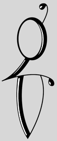 Brian Jaramillo's page that highlights remarkable work by type designers, letterers, sign painters, graffiti artists, stone carvers, calligraphers, poster artists, and graphic designers. Its founders are Brian Jaramillo and Ray Frenden (a custom letterer), and frequent contributors include Jonathan Selig,
  MyFonts.com: new links announced.
  [
[ Spanish type foundry, est. 2016 by Pedro Arilla (b. 1984, Ejea de los Caballeros), who runs
 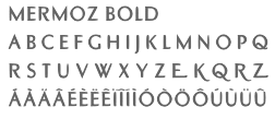 Born in Budapest in 1957, but Parisian since 1957. Designer and type artist who made many custom and magazine fonts.
  Another cooperative where one can submit open source fonts, which is currently located in Anaheim, CA. Initial contributors in 2009 are Micah Rich, Caroline Hadilaksono, Haley Fiege, and Andrea Bergamini. The project was started by Micah Rich and Caroline Hadilaksono. Their manifesto: As designers on the web, we have a calling to raise the standards of the web-design world. We're not the only ones who value good design, and it's time for the web world to catch up with it. We understand the challenges that comes with the internet, but with our recent discovery of @font-face, we started getting excited. For those who aren't up to speed, @font-face is a fairly new addition to web styling, letting a designer specify the location of their own font files. Instead of having to design with just a handful of web-friendly fonts, we'll be able to use any typeface we desire. Well, that's our vision, anyway. There are people who design typefaces for a living, and we want them to make money off of something that they do well. This revolution is not a movement against type foundries and type designers; it's quite the opposite. The kind of revolution we want is a change in the way people think about doing business. We want type foundries and typographers to start thinking, "Maybe there's nothing wrong with giving things away sometimes." It's not always about the money, sometimes it's also about making a contribution to the society, in this case, the design community. Giving one typeface away for free will most likely only boost sales, and it's a good deed. We want more people to look at it like that: like they have a responsibility to do something good for their peers. We're not asking type designers and type foundries to sacrifice profit, we're asking them to contribute to a greater cause, to create a community where we not only have a high design standard for print and web alike, but also a community where we're able to share our creations, knowledge, and expertise with our peers and the world.