TYPE DESIGN INFORMATION PAGE last updated on Mon Mar 9 16:07:25 EDT 2026
FONT RECOGNITION VIA FONT MOOSE

|
|
|
|
|
Type scene in Connecticut | ||
|
|
|
|

SWITCH TO INDEX FILE
19th Annual International Conference of the Lettering Arts, East | Organized by Writing beyond Words, 14-20 August 1999, Madison, CT. Registration 100 USD. Geared towards calligraphers, mainly. [Google] [More] ⦿ |
Abby Leighton is from the New England town of Simsbury, Connecticut. Brooklyn, NY-based student at the Pratt Institute in 2017. Her typefaces:
| |
Adnauseum
| Adnauseum is an experimental design studio in Brooklyn, NY, run by Christian Acker, an American type designer (b. 1979, Norwalk, CT) who graduated from the Parsons School of Design in New York City in 2002. Christian occasionally guest lectures typography classes at Parsons. He set up Adnauseam in 2002 and Handselecta in 2003. He designed Sailor Gothic (2003), the Spanish-looking font Sailor Jerry (2002), Joker Straight Letter (2006), Mene One NY Throwie (2006), Mesh One AOK (2006), Meskyle Laid Back (2006), Sabe Ghetto Gothic (2006), and 24Hrs (2002, Cubanica). Klingspor link. [Google] [MyFonts] [More] ⦿ |
Connecticut-based graphic expressionist painter and typographer, b. 1940, Bronx, d. 2017, Connecticut. He developed typefaces for brands like New York University and Revlon. After graduating from Pratt in 1964, Peckolick briefly worked in advertising before becoming an assistant to Herb Lubalin, who would become his mentor and lifelong friend. Coauthor with Gertrude Snyder of Herb Lubalin Art Director, Graphic Designer and Typographer (New York, 1985). He began painting professionally in 1998, a few years before he learned he had Parkinson's disease. Huffington Post obituary. New York Times obituary. [Google] [More] ⦿ | |
Bridgeport, CT-based designer of the display typeface Bubblegum (2016) and Beatrix (2016: a mischievous text typeface). [Google] [More] ⦿ | |
American Wood Type Co.
| One of two American wood type manufacturers with the same name. This one was started by Charles Tubbs, John Martin and George Keyes in South Windham, CT, in the factory built by Edwin Allen in 1851 and sold by John G. Cooley in 1863. The three founders had been employed previously by William Page. In 1902, the company changes name to Tubbs and Co., but Tubbs kicks the bucket in 1903, and the company moves to Luddington, MI, under the new name Tubbs Mfg Co. [Google] [More] ⦿ |
Designer and illustrator Apirah Infahsaeng ("Synthetic Automatic", Brooklyn, NY) made Elastic (2004), based on wrapping a series of rubber bands around a 3x3 pegboard grid. Four (2004) takes inspiration from the dot matrix display in the popular children's game Connect Four. Seven Board of Cunning (2004) is a modular paper fold typeface constructed with Chinese tangram puzzle tiles. In 2004, he also made an ascii typeface drawn from Helvetica Neue R, created and manipulated using Microsoft Word [sic], called Helvetica Neue R Microsoft Word. He studied art at the University of Connecticut. In 2008, he drew a custom didone display typeface for New York Magazine. [Google] [More] ⦿ | |
Barton Market
| Connecticut-based designer of the monoline marker pen font Southern Mood (2019) and the kawaii font Slinky Bear (2019). [Google] [More] ⦿ |
Raisonné is a contemporary sans-serif typeface, designed by Benjamin Critton over the course of several months during the summer of 2010. It can be bought at Colophon Foundry. In 2012, Colophon published his Value Serif typeface. In 2013, the angular typeface Lydia Bold Condensed was published at Colophon: The typeface is a calligraphic sans-serif re-drawn and developed by Benjamin Critton after Warren Chappell's 1938-1946 designs. It is concurrently fluid and sharp; intended to appear wrought by both pen and machine. In 2016, Critton designed the Google Font typeface family Space Mono, which follows in the footsteps of 1960s headline typefaces such as Microgramma and Eurostile. He also designed the sans typeface Sunset in 2016. Github link. [Google] [More] ⦿ | |
Cheltenham was adapted, extended, and revisited by many, starting with Morris Fuller Benton from 1904-1911, who created a full family of Cheltenhams for ATF---Benton's Cheltenham is the Cheltenham we have today. The (British) Monotype version was Gloucester [it had an italic p with the normal closed bowl]. Stephenson Blake had Winchester [which may be distinguished by the curl of the ear in the g and the serifs of the s]. Intertype had Cheltonian. Berthold originally called their version Sorbonne (1905). In 1975, Tony Stan increased the x-height in his revival for ITC. Digital Cheltenham versions can be found at SoftMaker (Cheltenham Pro, and S790), Elsner&Flake (Cheltenham OldStyle EF), Berthold (as Sorbonne BQ), Adobe (ITC Cheltenham by Tony Stan), URW (Cheltenham Old Style, and the 2001 typeface Cheltenham D Bold Extra Condensed), Castcraft (as OPTI Cheltenham Old Style), Monotype (as Gloucester Old Style, Monotype's version of Cheltenham), Paratype (the 1997 Academy typeface family by Lyubov Kuznetosova and Alexander Tarbeev), Cheltenham Pro (2012, Softmaker), Bitstream (Cheltenham; also under the names Stubserif 705 and Stubserif 205 for the Extra Condensed versions), Font Bureau (FB Cheltenham by Jane Patterson, 1992), ITC (Tony Stan's 1975 version of Cheltenham; and ITC Cheltenham Handtooled, a 1993 openface family by Tony Stan and Ed Benguiat), and Scangrapghic (Chelten or Cheltenham Old Style SB). Mac McGrew on Cheltenham: The design of Cheltenham Oldstyle and Italic is credited to Bertram Grosvenor Goodhue, an architect who had previously designed Merrymount, a private press type. For Cheltenham he had the assistance of Ingalls Kimball, director of the Cheltenham Press in New York City, who suggested and supervised the face. Original drawings were made about 14 ' inches high, and were subjected to much experimentation and revision. Further modification of the design was done by the manufacturers. Some historians credit this modification or refinement to Morris F. Benton; another source says it was done at the Boston branch of ATF, which suggests that the work may have been done by Joseph W. Phinney. In fact, Steve Watts says the typeface was first known as Boston Oldstyle. Mergenthaler Linotype also claims credit for developing the face, but it was first marketed by ATF. Trial cuttings were made as early as 1899, but it was not completed until about 1902, and patented in 1904 by Kimball. It was one of the first scientifically designed typefaces. The thin lines were strengthened to avoid the emaciated look of many types of the period. It is almost a monotone, but with just enough difference between light and heavy lines to avoid monotony. The small serifs and short, compact lowercase make a high character count. Ascenders are unusually long, while descenders are quite short. This was done as a result of studies that showed the greater importance of the upper half of a line of type in creating readily recognizable word shapes and result ing readability. The typeface has had much adverse criticism, especially because of its short descenders and the unusual design of several characters---notably A with the extension of its thick stroke at the top, G with the curve extended at the bottom, and g with its angular, unclosed tail. The alternate form of r, with its arm raised above x-height, has also been criticized, but this is mostly the result of misuse. It is disturbing within a word, but adds a bit of grace at the end of a word. Oddly, original fonts had only this form, with the more regular r added later; most fonts for handsetting include both forms of r, but those for machine setting include only the normal form or in a few cases only the more exotic form. Morris Benton, ATF's chief designer, produced Cheltenham Bold in 1904 and a score of variations up to 1913, methodically exploring the possibilities of various combinations of weight and width, and making this the first true large type family. Benton's variations include Cheltenham Bold Condensed, 1904; Cheltenham Bold Italic, Cheltenham Bold Condensed Italic, Cheltenham Wide and Cheltenham Bold Outline, 1905; Cheltenham Bold Extra Condensed and Cheltenham Bold Extended, 1906; Cheltenham Inline, Inline Extra Condensed and Inline Extended, 1907; Cheltenham Oldstyle Condensed, 1909; Cheltenham Medium, 1909; Medium Italic, 1910; Cheltenham Extrabold, 1910; Cheltenham Bold Shaded, Bold Italic Shaded and Extrabold Shaded, 1912; and Cheltenham Medium Condensed and Expanded, 1913. Linotype, Monotype, and Ludlow each have duplicates of a dozen or more Cheltenhams, while Intertype has the same under the name Cheltonian. Nearly all of these are essentially the same, except for the addition of ligatures and diphthongs in some display fonts (as shown for Cheltenham Bold), and the modification of keyboard sizes to fit mechanical requirements, but this is substantial in some cases. A curious exception is C heltenham Bold Outline; in the original foundry version it is cut from the same patterns as Bold so they will register for two-color work, while Monotype display sizes have several characters rather crudely redesigned---note H, P, R, e, h, u shown separately. Some of these other sources have also added versions of their own, notably Cheltenham Cursive, designed by Robert H. Middleton for Ludlow, and Cheltenham Wide Italic on Monotype, probably designed by Sol Hess. The latter carries the modifications required for machine-set sizes into display sizes as well. There are several oddities in the Cheltenham family. Cheltenham Wide is identical with Cheltenham Oldstyle except for the lowercase, in handset fonts. The same figures and punctuation marks from these two typefaces are also shared by Cheltenham Oldstyle Condensed, again in handset fonts. In the specimens shown here, compare Oldstyle and Wide. The former, set in ATF type, has two forms of cap C, which that foundry supplied with both typefaces, while the latter, set in Monotype, has two forms of cap W, which that company made only for that face. The unusual paragraph, prime and double prime marks, as well as parentheses and brackets, were made by ATF in some sizes of all three typefaces, but by Monotype only in Cheltenham Oldstyle. There is no Cheltenham Condensed Italic, but Linotype has a Cheltenham Extra Condensed Italic (so-called), which is actually a little wider than Cheltenham Condensed (roman)---why it is called extra condensed is not known. It suffers from adaptation to straight matrices, with annoying gaps between some letter combinations. But Cheltenham Medium Italic was designed more successfully by Benton to fit straight type bodies without kerns. Figures in the medium, bold, and extrabold weights differ from those of the Oldstyle; also notice how the x-height increases with weight. Ludlow Cheltenham is distinguished by the greater slant of some of its italics, and by the rounder top on the roman lowercase a and the rounder lower spur on capital G, as shown in some of the specimens. Western Type Foundry copied several members of this family as Chesterfield. Hansen had the Craftsman series, differing most noticeably in the few characters shown; and other foundries around the world copied it under a variety of names. Also see Kenilworth, Lowell, Venetian. Books on Cheltenham include one by Thomas Hailing: Specimens of General Printing . Cheltenham (1882, Oxford Printing Works). Posters created on Cheltenham include one by Anna Brooks (2013). Klingspor link. Linotype link. FontShop link. View various digital versions of Cheltenham. See also here. [Google] [MyFonts] [More] ⦿ | |
Its typefaces included Bill Stark Roman Extended (a "fatface"), and Concave Tuscan Condensed (1853). For digitizations, see, e.g., Dick Pape's AWT Bill Stark Concave Tuscan Cond (2013), AWT RIT Conc Tuscan Open Shade (2013) and AWT Vandenburgh Concave Tuscan (2013: this typeface was cut by Vanderburgh Wells but is based on an 1853 design by Bill, Stark & Co). [Google] [More] ⦿ | |
Bill Tchakirides
| |
Brandon Duffany (from Southington, CT) studied Computer science at Cornell University, and is now based in Mountain View, CA. Creator of the hand-printed Sharp Curve (2009). [Google] [More] ⦿ | |
Cheshire, CT-based designer of the octagonal typeface Shadowbox (2014). [Google] [More] ⦿ | |
Hamden, CT-based designer of the experimental typeface Innossence (sic) (2015). [Google] [More] ⦿ | |
Brian Willson
| |
In subsequent years, he designed books for Mount Vernon Press, and Harvard University Press, and served as typographic advisor at Lanston Monotype. To produce the Oxford Lectern Bible for Oxford University Press, an italic complement to Centaur was needed. Wikipedia: As he did not feel capable of designing the sort of chancery typeface that he thought appropriate, Rogers chose to pair Centaur with Frederic Warde's Arrighi, a pairing retained to this day. Rogers died in New Fairfield, CT, and donated his books and papers to Purdue University, where they are in the Beinecke Rare Book and manuscript Library. His typefaces:
Linotype link. FontShop link. Klingspor link. [Google] [MyFonts] [More] ⦿ | |
Carol Wahler (Westport, CT) has been Executive Director with the Type Directors Club since 1983. She has a B.A. degree in Art History from from William Paterson University. Her husband Allan is president of A to A Studio Solutions in Stamford, CT. Carol is best known for her involvement, passion and hard work for the Type Directors Club competitions and exhibitions. Carol Wahler was honored with the 2018 SOTA Typography Award. [Google] [More] ⦿ | |
| |
During her studies at the University of Connecticut, Trolland, CT-basedCasey Cotzin designed the modular typeface Sweetheart (2016). [Google] [More] ⦿ | |
As a student in Cheshire, CT, Chandler caso designed Neon Lights (2015) [Google] [More] ⦿ | |
Charles Tubbs
| |
Charles Tubbs
| |
CT-born creator of Serious (2013), an avant garde sans typeface, during his studies at The Art Institute of Boston at Lesley University, where he is in the class of 2014. Behance link. [Google] [More] ⦿ | |
Christian Acker
| |
Christian Acker
| |
During his studies, Christopher Mihaly (Danbury, CT) designed the rhombic typeface Boxed Out (2015). [Google] [More] ⦿ | |
Colette Barton
| |
Coniglio Type
|
Other fonts: Aspersion, Grasshopper (dada), Burnt Toast (rounded fat finger face), Yardbord Numerals, Snyder Speed, Autocrat, NudE, Jack Rabbit, Felt Marker, Oregon Dry, Sublime, Omaha, Nomad, Aquacia (stencil), Rainmaker (stencil), Dirty Numbers (2021). Showcase of Joseph Coniglio's typefaces at MyFonts. The Coniglio Type typeface library. [Google] [MyFonts] [More] ⦿ |
Editor of A web log of design and high drama which frequently comments on typographic matters such as web fonts (why pay for them?), traffic signs, and typeface use. He calls himself the world's toughest writer, and lives in the New England area (he graduated from Dartmouth, NH). In this piece entitled The Tell-Tale R Some Thoughts on Clearview, Cosmo writes this about the decision to start using Clearview for America's highway signs: While I admit it's (much) easier to read, I can't say I'm exactly psyched about seeing it. There are a variety of reasons why. I suppose my gut reaction is that it no longer feels like I'm driving down a federally-funded expressway-it feels like I'm staring at ads. While I've mentioned that Interstate has really picked up its public profile recently, Interstate isn't really the FHWA typeface. Tobias Frere-Jones got a lot of attention for Interstate because the edits he made were very subtle, yet somehow made the font tolerable for more than 12 characters at a time. Clearview, on the other hand, was in use for advertising years before it ever appeared along the highway-most notably by megalith AT&T. I liked the old, ugly FWHA typeface because it was so odd and idiosyncratic. It was like watching a David Bowie in his "androgynous alien" days-no mistaking it for anything else, let alone a sweeping corporate rebranding. FWHA's cold formlessness was also nice because it didn't encourage you to interact. One of Steve Jobs' most persistent design maxims is that products need to be anthropomorphic; it makes people want to engage with them. Clearview is definitely more human than FHWA, but is that really a good thing? Do we really want people relating to and engaging with signage? Or do we want them to glance, comprehend, and get their eyes back on the road? I'm also skeptical of the notion that legibility should be the only standard. Reading interstate signage-even with the old, weird FHWA face-is pretty damn easy. If you need the extra 200 feet to pick out an exit, what other details are you missing? Should you really be on the road? [Google] [More] ⦿ | |
| |
Madison, CT-based designer of the octagonal typeface Gridlock (2016) for a school project at RISD. [Google] [More] ⦿ | |
Davalign LLC (was: Connecticut Web Design, or: DB Elements Web Design)
| Dave Panfili (Davalign LLC, and before that, Connecticut Web Design, and before that, DB Elements Web Design) is the Fairfield County, CT-based creator of the futuristic typefaces DBE-Rigil Kentaurus (2009, hand-printed), DBE-Rigel (2010, hand-printed), DBE Nitrogen, DBE Hydrogen (2009, futuristic), DBE Lithium (2009, squarish), Gridshift (2010), DBE Oxygen (2010, grunge), and DBE Fluorine. DBE Beryllium (2009, splattered paint font), DBE Canopus, DBE-Sirius, DBE-Vega, and DBE-Arcturus are all hand-printed typefaces. Dafont link. Fontspace link. Fontspace link for Davalign LLC. Devian tart link. [Google] [More] ⦿ |
Dave Panfili
| |
David C. Lovelace
| |
David M. Cushman
| |
Typefaces based on his covers include Granz (2015, Pintassilgo Prints), which is based on Martin's Oscar Peterson's Porgy & Bess beatnik style album cover. [Google] [More] ⦿ | |
Farmington, CT-based designer of Shark Bite Typeface (2017). Behance link. [Google] [More] ⦿ | |
Dirtfonts
| Part of the Chank Army, Dirtfonts (part of Dirt Magazine, also called Form://subtance) has produced some grunge/grunge fonts for the Mac such as df_unitype (2001), Blip (2001), Chunky (2001), Fader (2001), Fatslab (2001; see also here), Faxt (2001), M-smcaps (2001), Matrix (2001), Receipt (2001), Scrawl (2001), Scribble (2001), ShadowGrotesque (2001), Shift (2001), Solidsubstance (2001), Substance (2001), Stampkit (2002), Hyperbole (2002, a handwriting font), Basic (2002). The designer is David M. Cushman out of Harwinton, CT. [Google] [More] ⦿ |
Divide by Zero (or: DBZ Fonts)
| Divide by Zero (or: DBZ Fonts) has about 100 fun freeware TrueType fonts by Tom Murphy from Hamden, CT. Direct downloads. All the fonts in one zip. The fonts, made between 1993 and 2005: 32768NO, 7hours, ActionJackson, Angstrom, AntelopeH, AntimonyBlue, BoringBoron, CODON, ColophonDBZ, ConventionalWisdom, CosineKatie, Davis, Dissonant-Fractured, DoctorAzul, Donner, DouglasAdamsHand, Dysprosium, Epilog, Faraday, Fresnel, GaussJordan, Geodesic, Germs, GreenwichMeanTime, GuildofProfessionalActors, HockeyisLif, HockeyisLif, HydrogenScore, Initial, Isuckatgolf, Levity, Lexographer, Linear, MayQueen, MelanieGirly, MetaLanguage, MusicDBZ, NaturalLog, NonBlockingSocket, NullPointer, OPTICBOT, OneConstant, PROGBOT, Pinball-Data, PotassiumScandal, Prefix, Proteron, Ransom, RealBttsoief, Resurgence, RobotTeacher, Secret-Labs, SignalToNoise, Snootorgpixel10, Submerged, Technetium, Tetanus, ThisBoringParty, Toast, Tom's-Handwriting, Tom's-NewRoman, Tombats-One, Tombats6, Tombats7, TombatsFour, TombatsSmilies, TombatsThree, Tombots, TommysFirstAlphabet, TomsHeadache, Tuesday, Two-TurtleDoves, Valium, WolvesLower, Yikatu, ZincBoomerang. Fontspace link. Dafont link. [Google] [More] ⦿ |
Dobi (was: Toxic Type)
|
|
Wood type collectors weho started building a collection in 1940 in Dobbs Ferry, New York. [Google] [More] ⦿ | |
Edwin Allen manufactured wood type for newspapers in South Windham, CT, from 1837-1840, after having invented in 1836 his own version of the router/pantograph for wood type manufacture. His wood types were sold exclusively through George Nesbitt in New York City. In 1845, two of his employees, William and Samuel Day, left to set up their own company in Ohio. Two other employees, Horatio and Jeremiah Bill, from Lebanon, CT, left in 1850 to start their own business as well. In 1852, Allen's company was purchased by John G. Cooley and production moved to New York City. Typefaces by Edwin Allen include Antique Open Shaded (1828), Antique Rose Ornamental (1838) and Antique English Ornamental (1838). [Google] [More] ⦿ | |
Author of Art of Penmanship (1821, Hartford, CT). [Google] [More] ⦿ | |
Glastonbury, CT-based designer of the display typeface Roboteria (2015). It was designed with FontStruct for one of her classes at Parsons The New School for Design. [Google] [More] ⦿ | |
Elliott Peter Earls
| |
Dring her studies, Windsor, CT-based Emma Gudrian designed the decorative typeface Haywire (2016). [Google] [More] ⦿ | |
Enrich Design
| Enrich Design was founded by Richard Hubbard (b. Torrington, Connecticut, 1971), the designer at Bitstream of RichType, Ingrid (hand-printed), Ruly, StarsStripesRH (free face), Richfont, Upperclass (1995, an informal family), Lifeguard (2004, athletic lettering), Solfont (hand-printed), Cell Block 6 (2002, a gridded typeface by Jeff Solak), and Rich Dingbats&Bursts. He started his own on-line design business, Enrich Design, which offers his fonts as well. Richard holds a BFA in Art&Design from Pratt Institute (1993) and does freelance graphic design. In 2012, he created Anne's Hand for The National Eating Disorders Association (NEDA), a non-profit organization dedicated to supporting individuals and families affected by eating disorders. He writes: Anne's Hand is a custom handwriting font of Anne Hubbard, who tragically lost her battle with anorexia nervosa this past January. Anne loved to write, so her brother Richard designed a custom font of her handwriting as a tribute to her memory. FontShop link. Klingspor link. [Google] [MyFonts] [More] ⦿ |
Wolcott, CT-based designer of the techno typeface Metagalactic Mass (2017). [Google] [More] ⦿ | |
Fat Cat Fonts (was: MintCure)
|
She also made the commercial handwriting typeface Luna Bar (2001-2004), F/Stop, Inkling, Sanford, Sweeney, Icing Sugar, and Orgy. |
During his studies, Newtown, CT-based Felix Summ designed the hairline avant garde typeface Helios (2017) and the tattoo typeface Greaves (2017). Behance link. [Google] [More] ⦿ | |
Font-A-Day
| The "About" of March 1, 2010, reads: FONT A DAY is a place for me to put some of the free/shareware/etc fonts I come across on my internet travels. I am going to try to post at least one free font a day in a format that windows and mac people can use, and try to tell a little about the typeface and the designer whenever possible. The page is run by Ronald Sansone (Middletown, CT). By the end of 2010, holes started appearing in the updates. We are converging towards one or two a week. [Google] [More] ⦿ |
FontHaus (or: DsgnHaus)
| Mark A. Solsburg's company, FontHaus (or DsgnHaus), was located in East Fairfield, CT, then in Westport, CT and Norwalk, CT, and now in Chelsea, MI. Established in 1990, it offers a 1200-font collection of original fonts. It briefly became DsgnHaus, then ForDesigners.Com, and then went back to FontHaus. It used to sell typefaces for 2 Rebels, FontHaus, Intellecta, Adobe, FontShop, Alphabets, ITC/Fonttek, Berthold-Adobe, Linotype, Berthold, Lunchbox, Bitstream, Scangraphic, Carter&Cone, T-26, Dennis Ortiz-Lopez, Font Bureau, Elsner&Flake, and so forth. At the end of 2010, it was offering over 75,000 fonts. On their DsgnHaus Exclusives CD, we find fonts by the following individuals or foundries: Al Brantner, Frank Heine (UORG), Munich Type, Altemus, Franta Storm, Patricking, Ampersand, Galapagos Design, Pepper Tharp, Andrew Smith, Gary Munch, Robert Knopf, Andy Stock, Graphics by Gallo, Robert Petrick, Ann Pomeroy, Haig Bedrosian, Rodrigo Cavazos, Apply Design, Holly Goldsmith, Self Build, Bill Fletcher, Jack Tom, Spiece Graphics, Blue Sky Graphics, Jason Sutton, Swordfish Design, Casey Cheeseman, Jens Gelhlaar, Terminal Design, Christian Scwartz, Joe VanDerBos, Tintin Timen, Circus Design, John Alfonso, Wolfer Type, DsgnHaus, Kayde Fonts, Wolfgang Wagner, Kurt Roscoe, Woodrow Phoenix, Emma Smith, Mark Jamra, Faruk Ulay, Mondrey (Castcraft). Since 2001, the fonts are available through MyFonts. Their 155 exclusive fonts, as of 2017: 2 Rebels Un, AlaCarte One, AlaCarte Two, Alert Code, Allan Gothic, Always Twelve, Angry, Aries, Babbio, BadDeni, Bereta, Billes, Boggle, Bonray, Boulbar, Boules, Bristol FH, Bubba Bold, Bubble Bath, Caaarc, Cafe Noir, Carbon, Caslon Antique, Cattawampus, Chew Toy, Chicane, Chuckle Head, Clean Cut, Coeval, Cooper Poster FH, Cro Aloha, Curly Luly, Cuty, DH Sans, DV9, Day Job, Db8 digital, Design, Dieselis, Dieselis Economic, Dinky Dinks, Doublecross, Doubler Script, Doufff, Dynamic, Eternity, Faxsimile, Fleche, Flembo, Flywheel, Frank Gorshin, Fred, Freysk, Gagarin, Garaline, Graphic, Groundlings, Haberdasher, Hanbuhrs, Handex, Hector, Huoncry, Inbetween, Infobahn, Jandoni, Junk, KO, Keynote, Kidy, Knitmap, Krome Domes, LaPlaya, Laser Beam, Laughin, LeScript, LearnedBehavior, LeftBrain, Leticea Bumstead, Lines, Lolo, Luna Martino, Magma, Manesca, Manipulator, Manipule, Manomessa, Manosk, Marcel Duchamp, Mariasfont, Market Place, Marsh Mallow, Menace, Message, Midlaw, MilkShake, Minimex, Modern, Mutation, Nacht, Nameless, Napoleon, Non Linear, Novella, Nuclear Reactor, Nunavik, Outfitters, Ovidius, Pastor, Pep Rally, Perceval, Peripheral, Perles, Phoenix Chunky, Pilgrim, Plastik, Poster Gothic FH, Punch, Quattr occhi, Razzia, RightBrain, Rigolotte, SP Elder, SP Stoned Oldstyle, SP Thais, Saturn, Scratch n Sniff, Scritto Politto Freako, Semi Sans, Shindig, Sinister, Sitcom, Snowslider, Sofa, Solo Sport, South, Sportif, Stadion, Stencil Full, Superman U, Table Manners, Tape, Tata One, Tex Loose, Thin Man, Toxin, Toy Box, Traveler, Troiminut, Tutu One, Vague, Vintage Gothic, Voyou, Wooders, Yisana, Zkumavka. Showcase of FontHaus's typefaces at MyFonts. [Google] [MyFonts] [More] ⦿ |
View digital typefaces related to Frank Hinman Pierpont's work. [Google] [MyFonts] [More] ⦿ | |
Gary Munch
| |
Gary Munch (Stamford, CT) writes frequently on copyright on alt.binaries.fonts. Here are some statements as a reaction to someone who posted a font on that newsgroup. The discussion turned to the presence of a copyright notice in the font. Gary writes "The lack of a copyright notice does not make an image or artwork public domain. " Agreed, but this is at least a very confusing situation. Surely, consumers cannot be assumed to be expert enough to know who owns copyright to what if there are no notices. And how can they distinguish freeware from payware? Forgetting to place a copyright notice in a font is just unforgivable sloppiness on the part of a font producer. Even Paul King's SSi fonts have copyright notices. He goes on: "It is the heart of copyright that only the artist or the heirs or assignees of the artist can determine the disposition of the images in the artwork. The first person who makes an unauthorized copy and distributes it infringes that copyright. Each subsequent copying, by whoever copies the image, still represents an infringement." The first problem with this is the application to fonts. In many countries, fonts are not considered art, and in the USA, font shapes (the arts contents) cannot be copyrighted. So, assume that we are in a country where such font copyright protection exists. Then no one can use any font downloaded from anywhere because the copyright notice may be fake or may have been deleted by someone else. Indeed, where should a consumer turn to for help? Even if you buy a 1000 dollar CD, you may be infringing on someone's copyright. No ordinary consumer can reasonably be expected to know the font world well enough to figure out who owns the copyright on his/her own. Gary goes on: " Copyright holders -have the right- to protest the wrongful posting of their work. The diminishing of the effectiveness of one copyright holder's rights diminishes that of all copyright holders. " [Google] [More] ⦿ | |
Gerard Huerta
| |
Gerard Huerta Design
| Lettering artist, b. 1952, head of Gerard Huerta Design in Southport, CT. Lettering and logos of Huerta were used by Swiss Army Brands, MSG Network, CBS Records Masterworks, Waldenbooks, Spelling Entertainment, Nabisco, Calvin Klein's Eternity, Type Directors Club, the mastheads of Time, Money, People, The Atlantic Monthly, PC Magazine, Adweek, Us, Condé Nast's Traveler, Working Mother, WordPerfect, Scientific American Explorations and Architectural Digest, as well as corporate alphabets for Waldenbooks, Time-Life and Conde Nast. Designer and vice-president of New York's Type Directors Club. Based in Southport, CT. He made many famous logos and created several logo-fonts. Huerta worked for some time at CBS Records. His type designs include a custom Franklin Gothic in the late 1970s as part of Walter Bernard's redesign of Time Magazine. [Google] [MyFonts] [More] ⦿ |
Manchester, CT-based company that sells a font package, as well as a number of fonts for Arabic, Cyrillic, Greek, Hebrew and Thai. See also here. [Google] [More] ⦿ | |
Graffont (or: Six Above Studios)
| An American graffiti font outfit, which is possibly the type design branch of Six Above Studios, an enterprise in Norwalk, CT, run by Jason Larche. In 2019, they released Black Top, and in 2020 Madtags. In 2020, they added the brush font Crooklyn Brush. [Google] [More] ⦿ |
Graham Hicks Product Designer at Slack in San Francisco, and maker of Emoji Finder. Originally from Connecticut, Graham studied Industrial Design at Carnegie Mellon before spending almost two decades working as a designer in California. For the Type West program, he designed the chunky typeface Clinker (2019), and wrote: Clinker is a chunky display typeface built from thick overlapping strokes. Its misaligned construction leaves gaps at the corners, creating an unusual texture while still remaining readable. [Google] [More] ⦿ | |
Grosse Pointe Group LLC
|
|
Group Type
|
View the Group Type typeface libary. [Google] [MyFonts] [More] ⦿ |
Handselecta
| Christian Acker (b. 1979, Norwalk, CT) and Kyle Talbott, two graphic designers in New York City, set up Handselecta on Long Island in 2003 as a division of Adnauseum, Inc. They have pages on graffiti art, graffiti and calligraphy, and graffiti-based typefaces: Espo, Joker (done with Jerry Inscoe), Sabe, Mesk, Mesk AOK. Run by Brooklyn-based Christian Acker. They are selling the graffiti fonts. MyFonts link. MyFonts sells HSMene One NYThrowie (2006), 24 HRS, Joker Straight Letter, Mene One Mexicali, Mesh One AOK, Meskyle Laid Back, Sabe Ghetto Gothic, and Sailor Gothic. Behance link. Interview by Ping Mag in 2006. In 2008, he made a custom graffiti font called Lebron6 for the launch of Lebron James's Sixth Shoe. View Christian Acker's typefaces. [Google] [MyFonts] [More] ⦿ |
HiH (Hand in Hand)
|
View Tom Wallace's fonts. View the typefaces designed by Tom Wallace. MyFonts link. [Google] [MyFonts] [More] ⦿ |
In 1850, these brothers, who had previously worked for Edwin Allen in South Windham, CT, start a wood type manufacturing business in Lebanon, CT, and move to Willimantic, CT, the next year. A few years later, they were joined by Stark, and the company was renamed Bill, Stark, and Co. In early 1854, it is renamed again to H. and J. Bill Co., but closes its doors later that year. Their equipment gets purchased by William Page in 1856 who will start his own successful wood type company, Page&Bassett. [Google] [More] ⦿ | |
Graphic designer who studied and the University of Connecticut and lives in Connecticut. She created designs for typefaces tentatively called Blade and Peppermint. [Google] [More] ⦿ | |
Ilene Strivzer
| |
From Westport, CT, Ilene Strizver is the founder of The Type Studio. She consults on type, designs type and writes about typography and visual communication. She co-designer ITC Vintage (1996) with Holly Goldsmith. She was the Director of Typeface Development for International Typeface Corporation (ITC) where she developed more than 300 text and display typefaces with type designers such as Sumner Stone, Erik Spiekermann, Jill Bell, Jim Parkinson, Tim Donaldson, and Phill Grimshaw. Her essay on spacing and kerning. Essay on rags (ragged lines), orphans (short last lines) and widows. She published "Type Rules! The designer's guide to professional typography". [Google] [MyFonts] [More] ⦿ | |
Jangs Müller
| |
Jangs Müller Type Foundry
| Type foundry, est. 2012 by Jangs Müller in New Haven, CT. Typefaces as of 2018:
|
Jason Larche
| |
Jason Mark
| |
Designer born in Hartford, CT, in 1979. Art director and founding partner of Media Masters, a full-service communications and design firm. He made the commercial typeface Cell Block 6, published by Enrich Design. [Google] [MyFonts] [More] ⦿ | |
Jennifer Dickert
| |
Hartford, CT-based designer of the modular display typeface Swanson (2014). Behance link. [Google] [More] ⦿ | |
Valencia, Venezuela-based designer of the striped speed typeface Velocidad (2017) and the bilined circle-themed and perjhaps neon sign typeface Cartel (2017). [Google] [More] ⦿ | |
South Norwalk, CT-based designer of the sans typeface Kithe (2018). [Google] [More] ⦿ | |
For a project at Yale, she digitized Paganini (2010), an Italian typeface originally drawn by Alessandro Butti and Raffaello Bertieri in 1928. [Google] [More] ⦿ | |
Illustrator and album cover artist in the 1940s and 1950s, b. Bellefontaine, OH, 1914, d. Rowayton, CT, 1998. He lived mostly in Rowayton, CT. Irwin Chusid writes: Flora's album covers pulsed with angular hepcats bearing funnel-tapered noses and shark-fin chins who fingered cockeyed pianos and honked lollipop-hued horns. Yet this childlike exuberance was subverted by a tinge of the diabolic. Flora wreaked havoc with the laws of physics, conjuring flying musicians, levitating instruments, and wobbly dimensional perspectives. Taking liberties with human anatomy, he drew bonded bodies and misshapen heads, while inking ghoulish skin tints and grafting mutant appendages. He was not averse to pigmenting jazz legends Benny Goodman and Gene Krupa like bedspread patterns. On some Flora figures, three legs and five arms were standard equipment, with spare eyeballs optional. His rarely seen fine artworks reflect the same comic yet disturbing qualities. "He was a monster," said artist and Floraphile JD King. So were many of his creations. His headline in a 1953 issue of Park East Magazine inspired Nick Curtis to create the font Cool Cat Jim NF (2005). Other Jim Flora fonts revived by Nick Curtis include Jimbatz NF (2005, dingbats) and Flora Dora NF (2003). P22 Type Foundry has released Flora Mambo (2010), a font set based on playful hand-lettering from the 1955 Jim Flora Mambo For Cats RCA Victor album cover. The set includes Flornaments, consisting of 72 miniature figure icons (dingbats) from Flora artworks. Scans of some of his album covers and illustrations: Collaboration, Dog, Kallao set, Solomon's Seal (1942), The Day the Cow Sneezed (1957), Self Portrait. | |
Middletown, CT-based designer of the experimental Systematic Typeface (2015). Behance link. [Google] [More] ⦿ | |
Joe Treacy
| |
American wood type designer/manufacturer from the 19th century, whose company started out in 1852 by taking over Edwin Allen in South Windham, CT. In 1864, he partners with Robert Lindsay, sells the South Windham factory, and moves to New York City as John B. Cooley and Co. In 1866, he enters into a partnership with Samuel T. Dauchy to become Cooley&Dauchy. In 1869, however, that company was bought by William Page, who ironically, had been Cooley's employee in 1855-1856. He published Specimens of Wood Type. Examples of their wood types: Antique Tuscan No. 1 (1859). Digital revivals: Jeff Levine's Winnetka JNL (2009) was inspired by Cooley Antique Tuscan Condensed from 1859. Compressed Wood JNL (2020, Jeff Levine) is extrapolated from J.G. Cooley's Roman Triple Extra Condensed Fifty Line. Finally, AWT Cooley Ant Tuscan XX Cond (2013) and AWT Cooley Grecian XX Condensed were released by Dick Pape. [Google] [More] ⦿ | |
Digital descendants of Albers's work include ThM Architype Albers (2013, Thijs Mertens), Architype Albers (Freda Sack and David Quay of The Foundry, 1997), P22 Albers (P22), Futura Black (Bitstream), Alber New (2010, Chris Dickinson at Moretype), Concreta (Tony de Marco and Niko Fernandez, 2011, at Just in Type), Modernist Stencil (Keith Bates, 2009, at K-Type), Sessions (John Skelton, 2009, at Afrojet), Idiom (Mike Jarboe, 2010, at Reserves), Gridiot (2003-2011, Peter Bain), Plaster (Eben Sorkin, 2011), Slink (Gene Buban, 2009), Albers (Crissov, 2009), Albers Numerals (2015, Tomek Zastawny), Duo (Omer Chafai), Rigid (Marta Cerda Alimbau, 2010), Albers Moiré (Nick Shea), Little Tittle (Michael Blair, 2012), Tp Floral (Two Points, 2006), Decade (Robert Holmkvist, 2015), Bauhaus Typography Experiment (Jonathan Kevin William Holburn, 2014), and Modular Alphabet (Isa Lloret, 2015). References: Regarding the Economy of Typeface (an article explaining Albers' vision for typography), Josef Albers: Interaction of Color (1975, New Haven: Yale University Press), François Bucher: Josef Albers: Despite Straight Lines: An Analysis of His Graphic Constructions (1977, Cambridge, MA: MIT Press), Brenda Danilowitz and Fred Horowitz: Josef Albers: to Open Eyes: The Bauhaus, Black Mountain College, and Yale (2006, Phaidon Press), Eva Diaz: The Ethics of Perception: Josef Albers in the United States (2008, Volume XC Number 2 of The Art Bulletin), Nicholas Fox Weber and Fred Licht: Josef Albers: A Retrospective (1988, New York: Guggenheim Museum Publications), Nicholas Fox Weber, Fred Licht and Brenda Danilowitz: Josef Albers: Glass, Color, and Light (1994, New York: Guggenheim Museum Publications), The Josef & Anni Albers Foundation. [Google] [MyFonts] [More] ⦿ | |
Joseph Coniglio
| |
Graduate of the Art Institute of Pittsburgh. Southington, CT-based designer of the steampunk typeface Tick Tock (2016). [Google] [More] ⦿ | |
Graphic designer in Danbury and/or Stambury, CT, who graduated from Western Connecticut State University. Creator of Sci Noir (2012): "Sci-Noir" is a genre of both film and literature that combines the dark and mysterious elements of Film Noir and classic Science Fiction. In 2019, he published the sci-fi typeface Xibalba, the Mayan-themed caps typeface Muyal, and the glitch typeface Paramorfosi. Fontspace link. [Google] [More] ⦿ | |
| |
Writer/consultant Kathleen Tinkel runs Tinkel Design in Westport, CT. She wrote a useful article on the recognition of fonts: What type is this?. [Google] [More] ⦿ | |
Newport, RI and Stamford, CT-based student, letterer and graphic designer. Creator of an ornamental caps face (2011) and a nice psychedelic typography poster in 2009. Behance link. [Google] [More] ⦿ | |
| |
Bridgeport, CT-based photographer, who created the typeface family Abadox in 2013. [Google] [More] ⦿ | |
West Hartford, CT-based designer of the great geometric outline font called De Stijl (2014). [Google] [More] ⦿ | |
American web and graphic designer in Derby, CT. Behance link. Creator of the funky bullet hole typeface Buboo (2009). [Google] [More] ⦿ | |
West Hartford, CT-based designer of the geometric solid typeface Primary (2016). [Google] [More] ⦿ | |
Fairfield County, CT-based designer of Marc Digital Graffiti (2012). [Google] [More] ⦿ | |
Mark A. Solsburg
| |
Mark Solsburg
| |
Mark Solsburg
| |
| |
Madison, CT-based designer (b. 1988) of the rounded display typeface family At Great height (2015). Behance link. [Google] [More] ⦿ | |
Matthew Carter
| |
Matthew Frederick
| |
McLetters Hand-Made Type
| Windsor, CT-based student attending Ithaca College for Communication (class of 2019), who created the elegant hand-made display typeface Saranac Hand in 2017. In 2018, he designed the free all caps Latin / Cyrillic font family Labor Union (Labor Union Small): These fonts were made for the student-run group Students for Labor Action at Ithaca College. They fight for the fair treatment of employees at the college and are closely connected to the local county's worker union (Tompkins County Workers Center). This font was made for industrial use as well as for anything pertaining to worker's rights and socialism. His other fonts from 2018 include Heart of the Sea (spurred) and Heart of the Land. In 2018, he published the rounded hand-printed typeface Motherlands that could be used in comic books or on hand-drawn maps. Typefaces from 2019: Pagan Whiskey (Irish type). Typefaces from 2020: MC Grease (an intestinal font), Bungalow, Brooklyn (a stylish mix of art deco and didone), Canoe Trip Sans. Fontsquirrel link. Typefaces from 2021: MC Portland (an all caps typeface with an art nouveau era vibe), MC Malibu (a national park or tiki font), MC Milton, MC Sunshine (a wavy font). |
Stamford, CT-based graduate of Colby-Sawyer College and School of Visual Arts, New York. He created a typographic poster in Giacometti's style in 2013. [Google] [More] ⦿ | |
New Canaan, CT-based designer of a simplistic monoline typeface in 1929. [Google] [More] ⦿ | |
New Haven, CT-based Mike Furbish created the rounded sans typeface Nimble Sans in 2015. Behance link. [Google] [More] ⦿ | |
Born in Egypt, Moataz Ahmed now lives in Stamford, CT. In 2018, he designed the free curly text typeface Teach. Aka Motizzy. [Google] [More] ⦿ | |
MunchFonts
|
Klingspor link. FontShop link. Linotype link. Old home page. |
New Milford, CT-based creator of the squished squarish techno typeface Under Pressure (2013). [Google] [More] ⦿ | |
Foundry in Pittsburgh, active in the first part of the 20th century. There was also a National Type Foundry in Bridgeport, CT [The Inland Printer, 1922]. [Google] [More] ⦿ | |
Graphic Design student at the Maine College of Art in Portland, ME, who grew up in Connecticut. She created Pizzacones (2013) and Braid (2012). Behance link. [Google] [More] ⦿ | |
Simsbury, CT-based designer. Creator of Golden Deco (2007), an artsy face. [Google] [More] ⦿ | |
Graphic design student in the MFA program at the Yale University School of Art. Creator of the 3d outline font Mineral Alphabet (2012). [Google] [More] ⦿ | |
nonDairy Fonts
| A small foundry offering some free and some commercial fonts by Raven Hanna: OgdredWeary (1996: free, based on a typeface in one of Edward Gorey's books, The Curious Sofa; note that Ogdred Weary is a permutation of Edward Gorey), Xerkle, Dali (with melting clocks), Ravenous, Fredfont (free), and Fred-Chunky. Raven was helped by Jesse Reklaw from New Haven, CT. Fontspace link. [Google] [More] ⦿ |
Old Typewriter TrueType Fonts Home Page
| Jason Mark's own creations: Loony (curly letters), (old) Typewriter (1996, 3 versions) and Scratchy Mess. Alternate site. Another site. Jason lives in Brantford, CT. [Google] [More] ⦿ |
As a student based in New Milford, CT, Olivia Taylor created the octagonal typeface Construction (2014). [Google] [More] ⦿ | |
Parallax (Dave's Free Fonts)
|
Alternate URL. Dafont link. Fontspace link. [Google] [More] ⦿ |
New York-born graphic designer and art director (1914-1996). He is the author of Thoughts on Design, Design and the Play Instinct, The Trademarks of Paul Rand, and Paul Rand Miscellany, as well as numerous papers on design, art, typography. Paul Rand is best known for his corporate logo designs, including the logos for IBM, UPS, Enron, Morningstar, Inc., Westinghouse, ABC, and NeXT. He was one of the first American commercial artists to embrace and practice the Swiss Style of graphic design. Rand was a professor emeritus of graphic design at Yale University in New Haven, Connecticut where he taught from 1956 to 1969, and from 1974 to 1985. He was inducted into the New York Art Directors Club Hall of Fame in 1972, and was an inspiring speaker. In 1984 he was awarded the TDC Medal by the Type Directors Club in New York. Interview. Art Chantry called him a corporate whore and explained it this way: He sort of invented the term in graphic design circles. He even designed logos that went on nuclear warheads. His final project was the Enron logo. Despicable, really. His typefaces include Westinghouse Gothic and Westinghouse Gothic Light. Mac McGrew writes: Westinghouse Gothic is a contemporary condensed gothic of uniform line weight, developed in 1960 by graphics design consultant Paul Rand for Westinghouse Electric Corporation. It was derived from lettering Rand had done earlier for the company logotype and originally used on signs; that was condensed to save space with the long name. It is distinguished by the unusual st ligature, for use in the company name. In 1964 that company had matrices made by Monotype, with exclusive rights to the typeface for two years. A lighter version was cut a few years later. MyFonts writes: A giant of American graphic design, with the logos of IBM, Westinghouse, American Broadcasting Co., United Parcel Service, and NeXT Computer to his credit. Author of several books on the graphic design process. From 1935 he ran his own studio in New York. From 1956 he was a professor of graphic design at Yale. He continued designing until well into the 1990s. In his 1999 biography of Rand, Stephen Heller writes: He was the channel through which European modern art and design Russian Constructivism, Dutch De Stijl and the German Bauhaus was introduced to American commercial art. Author of these texts:
| |
View Philip Bouwsma's typefaces. [Google] [MyFonts] [More] ⦿ | |
Art director at ESPN. Bristol, CT-based designer of the great poster entitled ESPN College Football (2016). Behance link. [Google] [More] ⦿ | |
Raven Hanna
| |
Richard Hubbard
| |
Thomaston, CT-based author of The Barefoot Hiker (1993). FontStructor whose fonts in 2011 include Frumfceaft Uncial (an outlined art nouveau typeface with uncial roots), Barefoot Hikers (a roman typeface done for his book), Caedmon, Nikonorian (needlepoint face), Frumfceaft Rune (an anglo-saxon rune face), Barefoot Standard. [Google] [More] ⦿ | |
Rob Dobi
| |
Robbie de Villiers
| |
Ronald Sansone
| |
Ronald Sansone
| |
During her studies at Central Connecticut State University, Sabrina Awdi designed the hairline sans typeface Ponyo (2019). [Google] [More] ⦿ | |
Fairfield, CT-based designer of the handwriting font Scott (2003, named after Scott Warren), created with FontCreator. [Google] [More] ⦿ | |
Free software, anti-cyber spying, UNIX philosophy and open source guru and speaker who studied at the University of Connecticut in Storrs (class of 2008) and is Asst. Director for Technology, Office of International Students & Scholars at Tale University in New Haven, CT, since 2013. At Open Font Library, where he published as Sean Diggity O'Brien, Sean created the cartoonish handwriting font Diggity (2015). [Google] [More] ⦿ | |
Studio Sans-1 (Typography)
|
|
During her studies at the University of Connecticut, Suzanne Rozdilski designed the decorative caps Mermaid Alphabet (1981). See U&LC Vol. 8, No. 3, 1981. [Google] [More] ⦿ | |
Graphic designer in Hartford, CT. He created the free Helvetica-like typeface LüYlandika (2010). Behance link. [Google] [More] ⦿ | |
Nicholas Fabian on the American point system. [Google] [More] ⦿ | |
The Apollo Program
| Fonts by Greenwich, CT-based Elliott Peter Earls, typically sold by Emigre. Fonts available from Emigre: Jigsaw Dropshadow, Subluxation Perma, Typhoid Mary 3D. Other fonts: PenalCode, Toohey and wynand, Dysphasia (1993), Subluxation, Bland Serif, Calvino Hand, Mothra Parallax (1994), Distillation, Blue Eye Shadow, Venus Dioxide, Heimlich Maneuver (1994), Klieglight (1994), Penal Code (1994), Hernia, BlueEyeShadow. At Plazm, he published Subluxation (1994). Not the hottest-looking typefaces. Bio at Emigre, where the name Apollo Program is explained, and we find a 6-font grunge family called Elliotts. In his own words, unedited: What Is The Apollo Program? In 1993 after leaving Cranbrook, I got fired from Elektra Records. I guess my ideas for the european release of "The Eagles Greatest Hits" weren't quite what they were looking for. My inability to "fit in" with the rest of the art dept. might of had something to do with it(?) I opened my own "studio." I designed type, wrote some music, shot video, posters... then I put out this package "Throwing Apples at the Sun." I made a ton of money! I decided to keep a few clients, cause I liked them. (I guess they liked me too.) Then I made these gold boots, and drew a big portrait of Malcom X. And I got a speed skating suit. I figured out how to hook them all up to the computer. I started to perform at HERE in soho. SHEEESH. Then I got a call on the telephone... it seems I won this "emerging artist" grant from the Wooster Group (you know, Wilem Dafoe's's company) and boy the phone started to ring off the hook! (Like out of a movie.) I've been performing all over. The "exit" festival outside Paris was the best. Then I got a real studio with recording gear'n what not. I'm working on a few top secret projects. (But not for the government or anything)....I still work for clients if they're real cool'n what not. - Elliott Earls [Google] [MyFonts] [More] ⦿ |
The Factory of Font
| Middletown, CT-based designer of some typefaces. The Factory of Font is apparently a real or fictitious type foundry established in 2014 by Rick Erickson. Relation with Matthew Frederick unknown. [Google] [More] ⦿ |
Renegade artist from Willimantic, CT, who created scanbats related to his personal history and collected them in The Figurehead Experiment (1998). Fontspace link. [Google] [More] ⦿ | |
The Type Studio
| Author of Type Rules!: The Designer's Guide to Professional Typography (2010, Ilene Strivzer Inc). Ilene Strivzer (b. 1953), the founder of The Type Studio in Westport, CT, writes: The Type Studio is a unique and innovative studio specializing in all aspects of typography and visual communications. Our services range from the technical to the aesthetic, and include font development, type direction and consulting, type-oriented graphic design, copy writing, workshops and seminars. She wrote this article as an advertisement for OpenType (read: make people pay once again for fonts they already have). She was production director of Upper and Lower Case Magazine and director of type production at ITC in New York City, where she developed more than 300 text and display typefaces in cooperation with Sumner Stone, Erik Spiekermann, Jill Bell, Jim Parkinson, Phill Grimshaw and others. She organizes Gourmet Typography workshops. [Google] [More] ⦿ |
The Yale Typeface
| Typeface specially designed in 2004 by Matthew Carter for Yale. It is free for all units at Yale University. From the press release: Yale is inspired by the late fifteenth-century Venetian typeface that first appeared in Pietro Bembo's De Aetna, published by Aldus Manutius. [...] In 1929, Stanley Morison of the Monotype Corporation in England led a project to revive Aldus's De Aetna face. The resulting typeface, Bembo, proved to be one of the most widely used and highly regarded book typefaces of the twentieth century. It continues regularly to appear in Yale publications. Unfortunately, the more recent photocomposition and digital versions of Bembo lack the vigor, weight, and formal integrity of either the De Aetna typeface or of the original Monotype version of Bembo. Matthew Carter's Yale recovers the strength of the Aldine original, and updates it by sensitively simplifying the basic letterforms and their details. Aspects of the vigor and "color" of the well-known typeface Galliard, an earlier Carter design, are also evident in the new Yale face. The fonts include YaleAdministrative Roman, YaleAdministrative Italic, Yale Design Roman, Yale Design Italic, Yale Small Capitals, Yale Web Small Capitals, Yale Street and Yale Street Aligning Figs. later additions include YaleNew, Yale Display, and Mallory (a companion font designed in 2015 by Tobias frere-Jones). Free download. [Google] [More] ⦿ |
Biography by Nicholas Fabian. Bio at Britannica. Bio at Infoplease. His type styles were revived in 2010 by Jeff Levine as Publication JNL. Typophile Chapbook: Theodore Low De Vinne; was published by Carl Purington Rollins. View digital typefaces based on De Vinne's work. [Google] [MyFonts] [More] ⦿ | |
| |
Creator of typefaces at VGC, such as Lincoln Gothic (1965), which won the National Typeface Competition. His clients over the years include Acoustic Sciences Corporation, AT&T, Continental Packaging Co., The Ford Foundation, GE, IBM, PepsiCo, RCA, Showtime, Abrams, Colliers, Harpers Magazine, Macmillan, McGraw-Hill, Random House, Harcourt/ Brace, New York Times, Simon and Schuster, and Viking Press. In 2006, Bitstream published New Lincoln Gothic, a 24-weight family starting with a hairline weight. This digital version was made in Fontographer from the old typositor strips by Lincoln himself. In 2011, Canada Type and Thomas Lincoln cooperated in the production of the roman sans family Roma. This typeface was published in 2012 at P22. Lincoln himself tells the story: My intention in designing Roma was to create a definitive, contemporary sans serif expression of the classic Roman majuscule as depicted in the Trajan Inscription at the base of the Trajan Column in Rome. The Capitalis Monumentalis letter forms of the Trajan Inscription, which date to 113 Ad, have been described by the noted type scholar, calligrapher and historian, Father Edward Catich, as "the best roman letter designed in the western world, and the one which most nearly approaches the alphabetic ideal." And in the 1902 publication, "The Practice of Typography", Edmund F. Strange stated: "No single designer, or the aggregate influence of all the generations since has been able to alter the form, add to the legibility, or improve the proportion of any single letter there in." Mr. Strange's pronouncement was true in 1902 and it is true today. Through the years various type designers have been inspired by the Trajan Roman to offer their own interpretations. Most notably, perhaps, Frederick Goudy's Trajan Title (1930), Warren Chappell's Linotype Trajanus (1940) and more recently, Carol Twombly's literal rendition of Adobe Trajan (1989) and John Stevens' spirited Stevens Titling (2011). There have been many other nice interpretations by other contemporary designers, yet it may still be said that none has improved the form, the legibility or the proportion of any single letter---though it can be said that the letters J, K, U, W, Y and Z, nonexistent in the ancient alphabet, have been added. Less common has been the interpretation of Trajan in sans serif form. Hermann Zapf's Optima (1953), Sumner Stone's ITC Stone (1987) and Ronald Arnholm's Legacy Sans (2000), among other nice sans serifs, reflect characteristics of Trajan but seem influenced by other factors as well, including fonts such as Gill Sans and Syntax. And, while I don't presume to speak for their designers, none of these typefaces seem designed specifically with Trajan in mind. My own Lincoln Gothic (1965), and its subsequent expansion as New Lincoln Gothic (2006), was a deliberate attempt to interpret the particular characteristics of the Trajan majuscule in a contemporary sans serif face. The most significant change in the later version was the addition of a lower case; a challenge that had simmered on my personal bucket list for several years. Roma, though, differs from Lincoln Gothic in one significant way: while the terminals of Lincoln Gothic are flat, in Roma the vertices of letters such as A,M,N,V and Z are pointed. I believe this change is the critical difference that moves Roma closer to my objective of honoring the original Trajan. As with Lincoln Gothic, Roma's strokes have an almost imperceptible entasis that terminate in a subtle flare; a vestige of the serif. The importance of this feature is that it imbues the font with a humanist quality. The serif, as Father Catich points out in his book, "The Origin of The Serif", almost certainly derives from a combination of the flat brush and the human hand; it is what ties the letterform directly to human anatomy and craftsmanship, integrating it in a fundamental way with the nature of man---as distinct from the machine. In 2020, he released Lincoln Electric at Canada Type. Lincoln Electric started its life as an in-house experimental film type Thomas Lincoln drew shortly after concluding his work as part of Herb Lubalin's famed crew in the late 1960s. The master alphabet was drawn on illustration boards using pen and ink and press-type lines. The digital retooling of this Bifur-style typeface (after Cassandre's Bifur from 1929) was done by Patrick Griffin. Klingspor link. FontShop link. [Google] [MyFonts] [More] ⦿ | |
Three Islands Press (was: The Type Quarry)
|
Alternate URL. MyFonts link. Alternate URL. alternate site. Agfa-Monotype page. Fonts sold by Mindcandy. Creative Market link. FontShop link. Klingspor link. |
Tom McAuliffe
| |
Tom Murphy
| |
Tom Wallace
| |
Treacyfaces
|
Klingspor link. [Google] [MyFonts] [More] ⦿ |
Tubbs Mfg Co
| American wood type manufacturer. The company, located in Luddington, MI, started in 1903 when Charles Tubbs (of Tubbs and Co. in South Windham, CT) died. It was sold to Hamilton in 1918. Antique Extended (1900, Tubbs) is a version of the 1838 font by George Nesbitt. Dick Pape's AWT Tubbs Modified Gothic XX Cond (2013) is a revival of a design by Tubbs. Valjean (Dan X. Solo) is based on wood type by Solo. [Google] [More] ⦿ |
| |
UTF Type Foundry
| Fonts designed by Bill Tchakirides (b. 1946) out of Shepherdstown, WV (was Hartford, CT), who writes about himself: Would you believe that this old man in West Virginia was once a Broadway Producer, or a Commercial Food Photographer, or a Justice of the Peace, or a Font Designer, or even a Director of a major non-profit Arts Program on Cape Cod? Well, he was. Now he spends most of his time posting in the blogosphere and looking for things to do (retirement is a bitch). This company (UTF=U-Design Type Foundry) sells display and picture fonts at 45 dollars a shot (30+15 handling): Bill's Hand Chiseled, Bill's Blasting Caps, Bill's Fat Freddy Caps, Bill's Olde Foundry, Bill's 1935 Caps, Bill's Printer Pals (2003), Bill's Light Deco, Bill's DECOrations, Bill's Tropical DECOrations, Bill's Modern Diner, Bill's Barnhart Ornaments (1989), Bill's Victorian Ornaments, Bill's Broadway DECOrations, Bill's Dingbats (1988---his first font), Bill's Universal Symbols, Bill's Century Marks, Bill's Cast O Characters (2003), Bill's New Elzevir (1993), Bill's School Letters (1993), Bill's School Daze (1993), Bill's American Ornaments (1993), Bill's Bertham (after Goudy), Bill's Brushed Broadway (1993, fat art deco face), Bill's Metropolitan (1993, art nouveau), Bill's Peculiars, Bill's Real Rubber Stamps, Bill's Asterisks and Bullets (1993), Bill's FISTory (1993), Bill's Brackets, Bill's Ampersands, Bill's Box Specials. Klingspor link. [Google] [More] ⦿ |
William H. Page Wood Type Company
|
Many of his wood types were digitized by Jordan Davies of Wooden Type. Page's fonts include Aetna, Antique No. 4 (revived as HWT Slab in 2013 by Hamilton Wood Type Foundry), Antique Tuscan No 9 (revived by Tom Wallace in 2006), Bindweed (revived by Solotype), Clarendon Condensed, Clarendon Condensed Bold, Clarendon Extended, Clarendon Heavy, Columbian (ca. 1870; revived in 23020 by Jeff N. Levine as Cherrywood JNL, by Dick Pape in 2013 as AWTPageColumbian), Concave Tuscan X, EgyptianTwo (2005), French Antique, French Clarendon (XXX Condensed No. 117), French Semi, Gilbey, Gothic Tuscan Round, Hamilton, Minnesota, Norwich Aldine ML (1872, digitized by Tom Wallace in 2010 under the same name), Number 154, Page No. 508, Peerless 131 Bold, Rigney, Skeleton Antique, Teutonic, Tuscan Italian Round, Unique Wood, William Page 500, William Page 506. In 2013, John Bonadies (MPress Interactive) started making digital typefaces based on Page's models. They published MPI Aldine Extended (based on a 1872 wood type by William H. Page), MPI Antique (slab serif), MPI French Clarendon (based on wood type from 1865 by William H. Page), MPI French Antique (a typical far West saloon font based on wood type by William H. Page, 1869), MPI Egyptian Ornamented (a western typeface based on a 1870 wood type by William H. Page), MPI Arcadian (based on a 1870 design by William H. Page), MPI Tuscan Extra Condensed (based on William H. Page wood type from 1872), MPI Norwich Aldine Reversed (from a 1872 original). Also in 2013, Dick Pape embarked on a large process of digitization of wood types at the Rob Roy Collection of the University of Texas. His digital fonts are free and are bundled under the label American Wood Type, or AWT. Revivals by Dick Pape of fonts due to William Page include AWTPage&SetchellNo154, AWTPage-SetchellNo515, AWTPageAldine, AWTPageAldineExpanded, AWTPageAldineOrnamented, AWTPageAntTuscanCond, AWTPageAntTuscanOutlined, AWTPageAntiqueBlack, AWTPageAntiqueCond, AWTPageAntiqueNo7, AWTPageAntiqueTuscan, AWTPageAntiqueTuscanNo1, AWTPageAntiqueTuscanNo8, AWTPageAntiqueXXCond, AWTPageAntiqueXXXCond, AWTPageBelgianCond, AWTPageBeveledNo142, AWTPageCelticOrnamented, AWTPageClarendonExtended, AWTPageClarendonNo1, AWTPageClarendonXXCondensed, AWTPageColumbian, AWTPageConcaveTuscanXCond, AWTPageConcaveTuscanXCondOutline, AWTPageCorinthianNo2, AWTPageEgyptian, AWTPageEgyptianOrnamented, AWTPageFrenchAntique, AWTPageFrenchClarendonCond, AWTPageFrenchClarendonXXX, AWTPageFullFacedGrecian, AWTPageGothicLightFace, AWTPageGothicTuscanNo1, AWTPageGothicTuscanPointed, AWTPageIonic, AWTPageIonicCondensed, AWTPageNo500, AWTPageNo501, AWTPageNo506, AWTPageNo508, AWTPageNo51, AWTPageNo510, AWTPageNo515, AWTPageNorwichAldine, AWTPageOrnamentedAldine, AWTPagePeerlessAntNo129, AWTPagePeerlessCondOldStyl, AWTPagePhanitalianNo132, AWTPageRomanAetna, AWTPageRunic, AWTPageSkeletonAntique, AWTPageTeutonic, AWTPageTuscanCondNo2. Revivals by Nick Curtis: Page Five Fifteen NF (2015), Rockwall NF (2015, after Aldine and Aldine Extended), Hunky Dory NF (2014, a circus font after William H. Page's wood type Doric, ca. 1850), Sodbuster NF (2014, after Gothic Dotted), Tuscalooza NF (2014, after the 1872 typeface Tuscan Extended), Bandiera Del Legno NF (2014: this Tuscan wood type revives Gothic Tuscan Condensed Reversed), Belgique NF (2014: a revival of the (Western) wood type French Clarendon XXX Condensed No. 117), Skelett Antiken NF (2014, after Clarendon XX, 1959). In 2020, Mark Simonson reworked, extended and modernized Aetna in his 30-style text and display typeface family Etna. Digital typefaces based on W.H. Page's work. View revivals of William Hamilton Page's typefaces. [Google] [MyFonts] [More] ⦿ |
William Hamilton Page
| |
Wilton Foundry
|
Chatype is a geometric slab serif typeface family designed in 2012 for the city of Chattanooga, TN, by Robbie de Villiers and Jeremy Dooley. Unio (2012) is a rounded slab family designed to be sturdy and legible. In 2017, Wilton Foundry published Yotta, Marcus, Chateau, Pagina, Plato, Beurre, Vecta Serif, Cyan Neue, Buckle, Suzie, Unio, Attic Sans, Blau (hand-chiseled, angular text typeface) and Taglio, a contemporary calligraphic interpretation of incised or inline engraving or carving. Typefaces from 2018: Chartre, EM, Mijne, Brew, De La Croix (a stencil sans inspired by the works of Eugène Delacroix, leader of the Romantic School) , Halla (a light monoline sans). Typefaces from 2019: Kular (monospaced), Zentral (an awesome 2-style sculptural font with the angularity of old Czech masters such as Preissig and Menhart). Typefaces from 2020: Obo Regular (a diamond-studded display typeface), Rito (monospaced). View Robbie de Villiers' typefaces. Home page. [Google] [MyFonts] [More] ⦿ |

 Benjamin Critton (b. 1983) is an American designer, typographer, art director, publisher, writer, editor and curator. He lived in New Haven, Connecticut, where he studies towards an MFA in graphic design at the Yale School of Art, and is now based in Brooklyn, NY. In 2010, he joined the British type foundry
  New York architect, designer and artist. Born in Pomfret, Connecticut in 1869 and died in New York in 1924. He is most famous for designing Cheltenham (1896) for the Cheltenham Press in New York, a long-ascender classical American typeface created initially for Ingalls Kimball at the Cheltenham Press. He also designed
  In 1850, Horatio and HJeremiah Bill, who had previously worked for Edwin Allen in South Windham, CT, start a wood type manufacturing business in Lebanon, CT, and move to Willimantic, CT, the next year. A few years later, they were joined by Stark, and the company became Bill, Stark, and Co. In early 1854, it is renamed again to H. and J. Bill Co., but closes its doors later that year. Their equipment gets purchased by William Page in 1856 who will start his own successful wood type company, Page&Bassett.
  [
[
 Carson Evans has a BA from Yale University and will have an MFA from Rhode Island School of Design in Providence, RI, in 2018. She designed the Venetian typeface Jarndyce (2016) under the supervision of Cyrus Highsmith. [
 Delta, CO (and, earlier, Stamford, CT)-based
 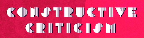 Griswold, CT-based designer of the constructivist art deco typeface Constructive Criticism (2016). [
 [
[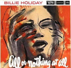 David Stone Martin (born David Livingstone Martin in 1913 in Chicago; died 1992 in New London, CT) was an influential American artist known for his illustrations on jazz album covers.
  Site of prolific designer Rob Dobi from Fairfield, CT, who made many freeware/shareware fonts. Some fonts are grungy, but many have a strong calligraphic influence (Killigraphy and Arthur for example). The list: Apocalypse1, Arthur, AssCrack, BallstotheWall, Blasphemy,
  Fat Cat Fonts (was: Mintcure) offers absolutely wonderful grunge fonts by CT-based Jennifer Dickert. These include Caterpillar, La Ment,
 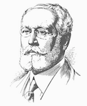 American type designer, b. 1860, New Haven, CT, d. 1937, London. In 1894 he started working at Loewe AG in Berlin. In 1899, he became president of Monotype in England.
  The Grosse Pointe Group LLC is located in Westport, CT, and is run by Mark Solsburg, who also owns Group Type, ansd who was involved in or ran FontHaus and TypoBrand. Under the Grosse Pointe label, we find a digital font called Stradivarius (1992), named after Imre Reiner's 1938 formal script font Symphonie (Bauer; renamed Stradivarius in 1945). At Group Type or the other outfits of Solsburg, we find these fonts: Carpenter (a 1995 revival of an old connected ATF script by James West), Aquiline (an absolutely wonderful 16th century script), Bank Gothic (1994, a revival of Morris Fuller Benton's original---see also Bank Gothic BT), Aries (a 1995 revival of a lapidary by Eric Gill), Schneidler Initials (a 1995 revival of Friedrich Hermann Ernst Schneidler's Trajan-style typeface), Raleigh Gothic (a 1995 typeface based on Morris Fuller Benton's design. See also Raleigh Gothic RR for a different revival),
 Tom Wallace's foundry, HiH (est. 2005), was first located in Woodbridge, CT. Subsequently, Tom Wallace (b. 1944) moved from Woodbridge to Naugatuck to Waterbury and finally in 2009 to New Britain, CT. His type designs are based on historical letterforms:
  Jessica Svendsen is a designer working in identity, editorial design, and illustration. She is currently an Associate Creative Director at Dropbox (2016-). Jessica previously worked as a designer at Pentagram in New York for partner Michael Bierut (2013-2015) and at Apple (2015-2016) on the global communications team. She teaches design as adjunct faculty at Parsons The New School and the Pratt Institute. She received a MFA in Graphic Design from the Yale School of Art and a BA in English Literature from Yale University.
 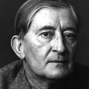 German-born designer (b. Bottrop, 1888, d. New Haven, CT, 1976) associated with the
  Student-designer in Wilton, CT, of the African-themed font Afronative (2015). [
 Mark Solsburg (d. 2024) was the head of the Type Directors Club and of Fairfield, CT-based
  Gary Munch (born 1953) is the Stamford, CT-based principal of MunchFonts. He teaches at Norwalk Community College and at the University of Bridgeport Shintaro Akatsu School of Design.. His typefaces:
  Free futuristic fonts by David C. Lovelace from Broad Brook, CT:
  Type designer born in Boston in 1948 who created many exquisite designs such as
  [
[ Art director Ronald Sansone is from Middleton, CT (and before that, Weston, CT). He ran the AOL font library and font software forums and libraries from ca. 1992 until 1999. He runs the free font site
  American printer (b. Stamford, CT, 1828, d. New York, 1914). In 1848, he entered the shop of Francis Hart in New York City, where he became owner after Hart's death in 1877. It continued as Theo. L. De Vinne&Company until 1908, when it was incorporated as the De Vinne Press. De Vinne was the best-known American printer of his day. He was neither a type designer nor a type cutter. His books include
  New York-born book designer, painter, type designer and illustrator, b, Brooklyn, NY, 1880, d. Danbury, CT, 1964. He was mainly involved with ATF.
 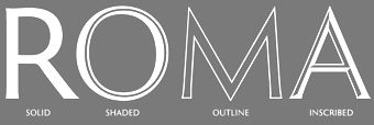 Graphic designer and lettering artist, born in 1939 in Eugene, OR. He studied with Douglas Lynch at the Museum Art School in Portland and later apprenticed with Lynch. Lincoln studied calligraphy with Lloyd Reynolds and Arnold Bank at Reed College in Portland, OR. After a stint as an agency art director producing national ads for Pendletons womens fashions, Lincoln moved to New York City, where he joined the studio of Herb Lubalin. In NYC he continued his involvement with academia, exploring film at The New School and an intensive workshop with Milton Glaser. Eventually Lincoln started his own studio (occupying the space on east 32nd Street where New York Magazine was born), combining a design practice with teaching at New Yorks School of Visual Arts. Lincoln has served as Art Director at TCA (Benton & Bowles) in Westport, CT, as Creative Director, Redington, Inc., Stamford, CT, as Principal, Thomas Lincoln Design & Motion Graphics Communication, Westport, CT, as Freelance in residence Art Director, Baden & Co., Eugene, OR, and in 1992 returned to consulting and design through his own design office, Lincoln Design, based in Eugene/Springfield, OR.
 [
[ Joseph Treacy's West Haven, CT-based foundry selling hundreds of fonts. Names start with TF. In total, 320 typefaces by Joe Treacy himself and a few independent designers. The entire collection costs about 5000 dollars. Individual fonts at about 29 USD a shot. Treacyfaces acquired the phototype collection from Headliners (New York), so some of Treacy's typefaces are digitizations from that collection. Joe's typefaces include DuffyScript, Armada, EmpireState, Grange, Montauk,
  Company in Westport, CT, run by Mark Solsburg. They offer typographic consulting and custom type design. Partners are Mark Van Bronkhorst and Linnea Lindquist. Mark is the designer of Verdigris (garalde) and
  Norwich, CT-based company involved in wood type production. In 1856,
  [
[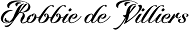 The Wilton Foundry, which started out in Wilton, CT, but is now in Chattanooga, TN), was founded in 2003 by
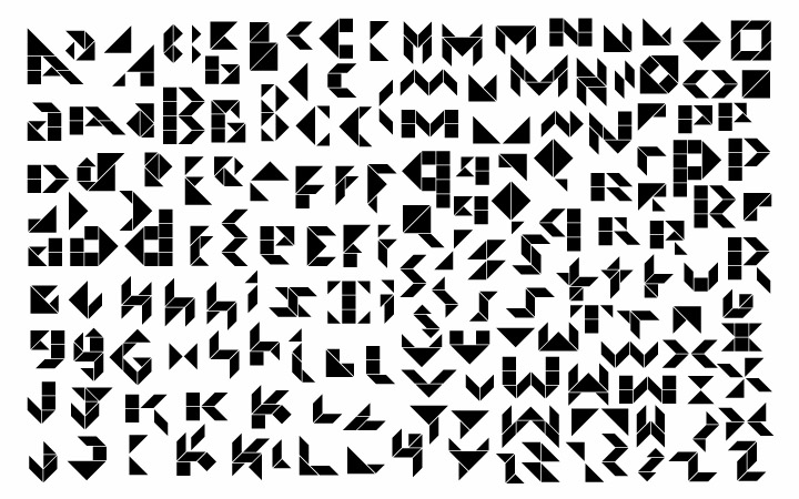
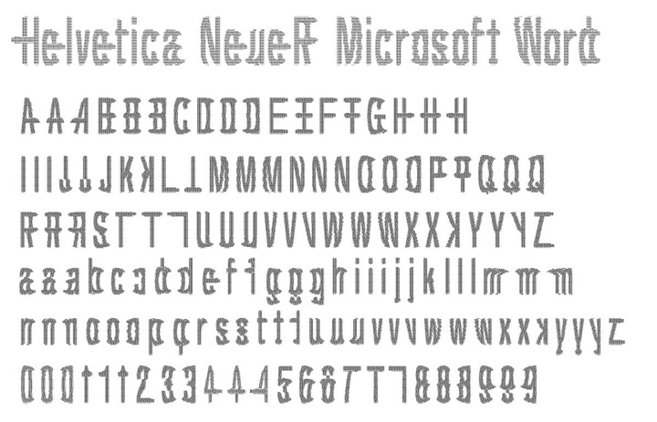
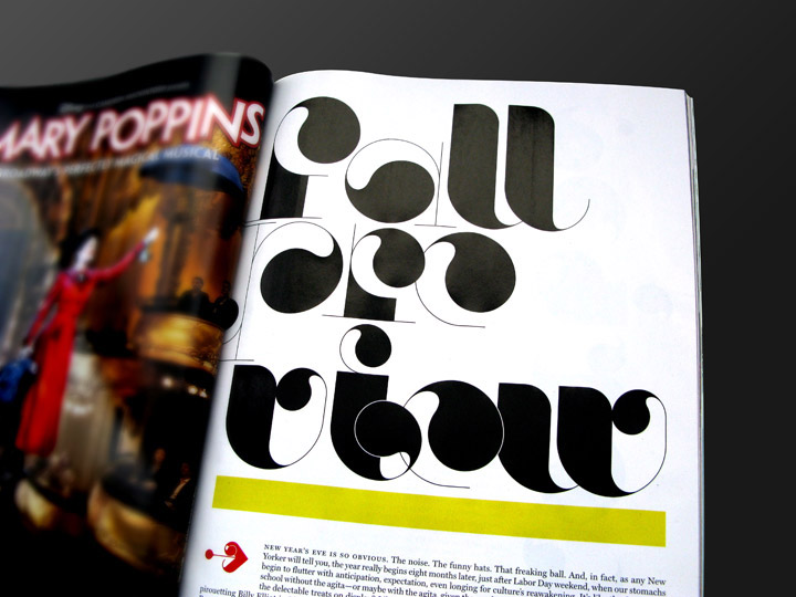
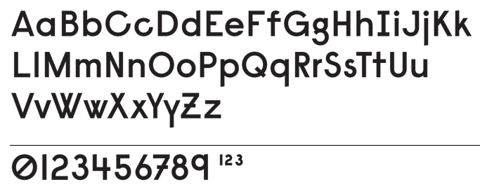
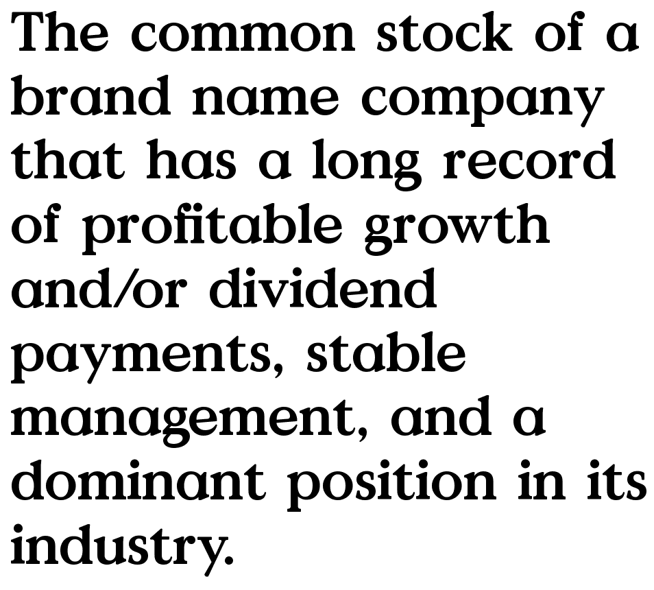
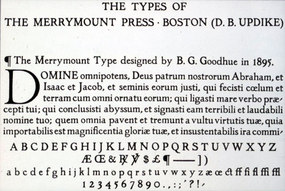
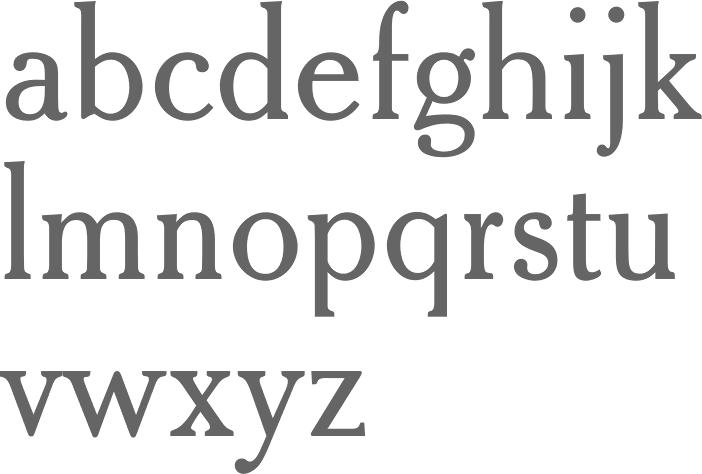
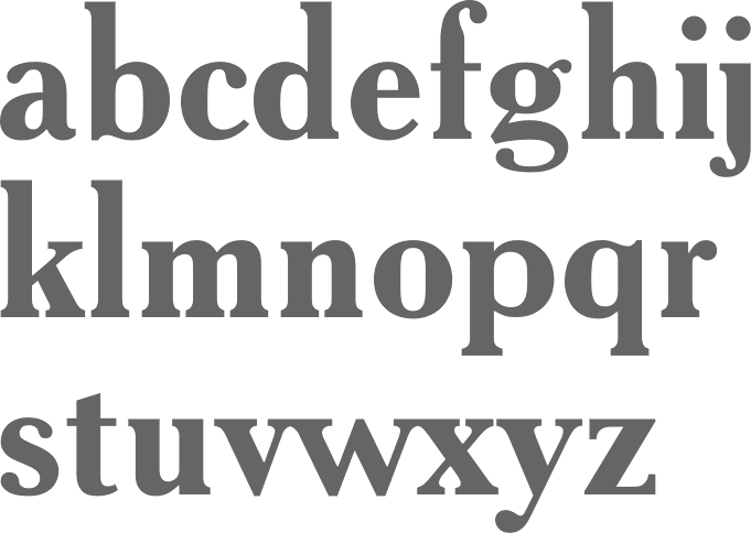
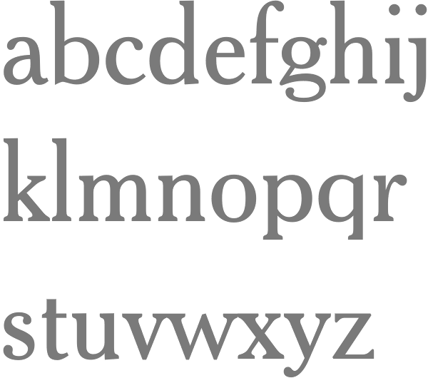
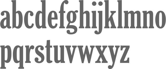
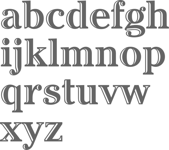
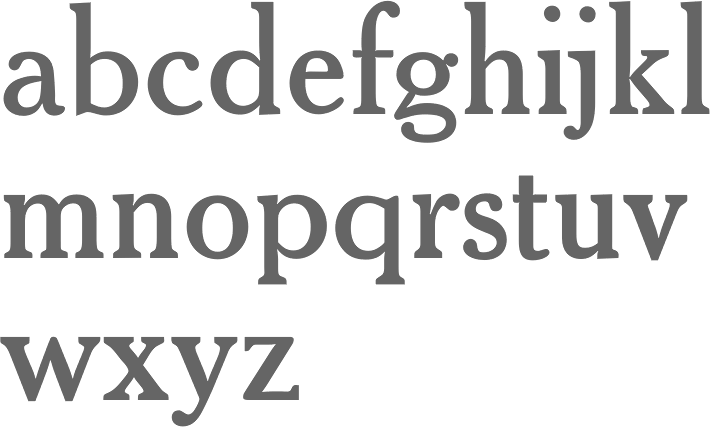
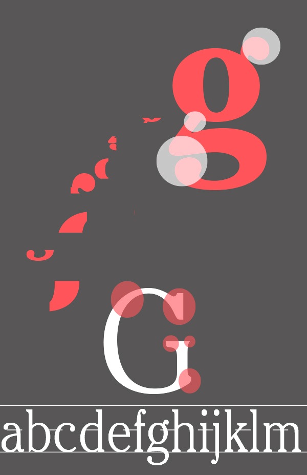
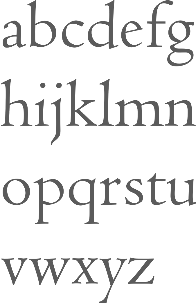
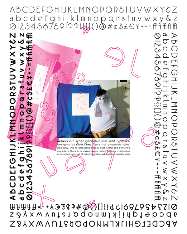
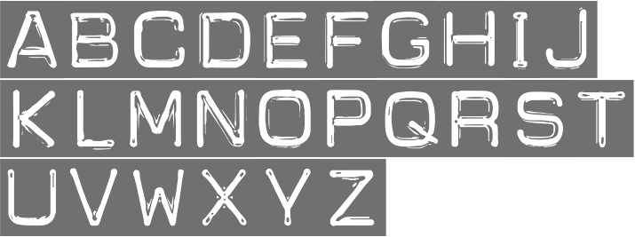
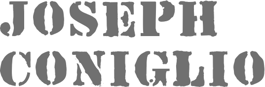
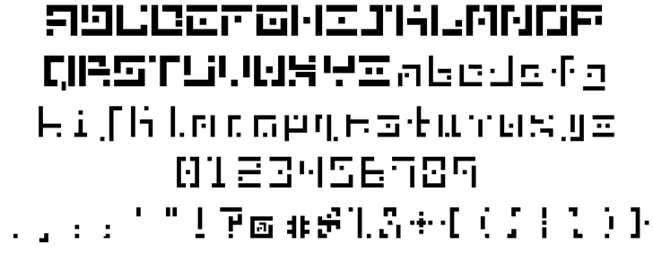
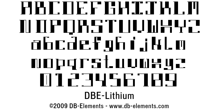
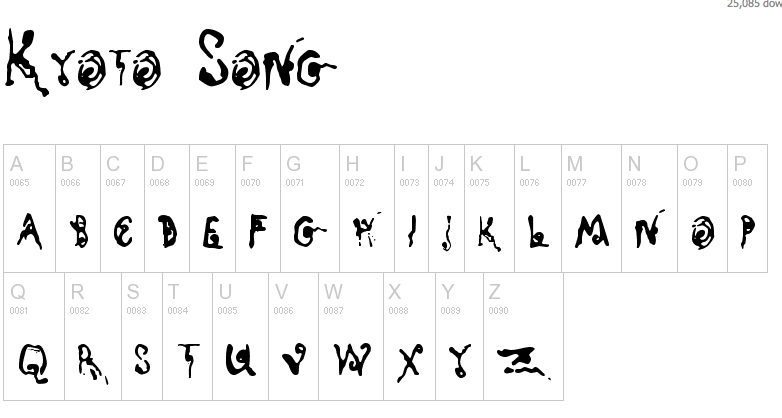
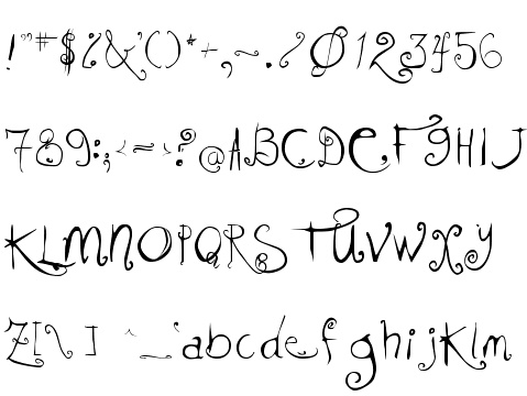
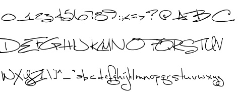
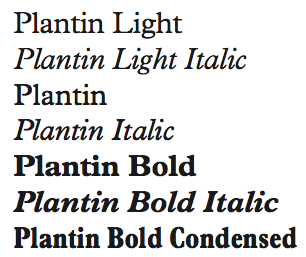
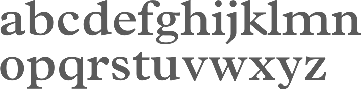
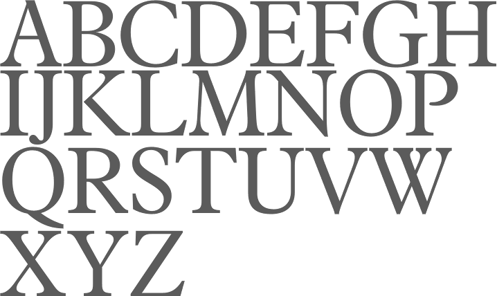
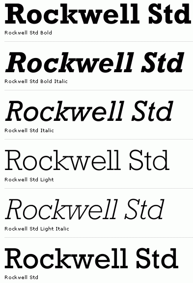
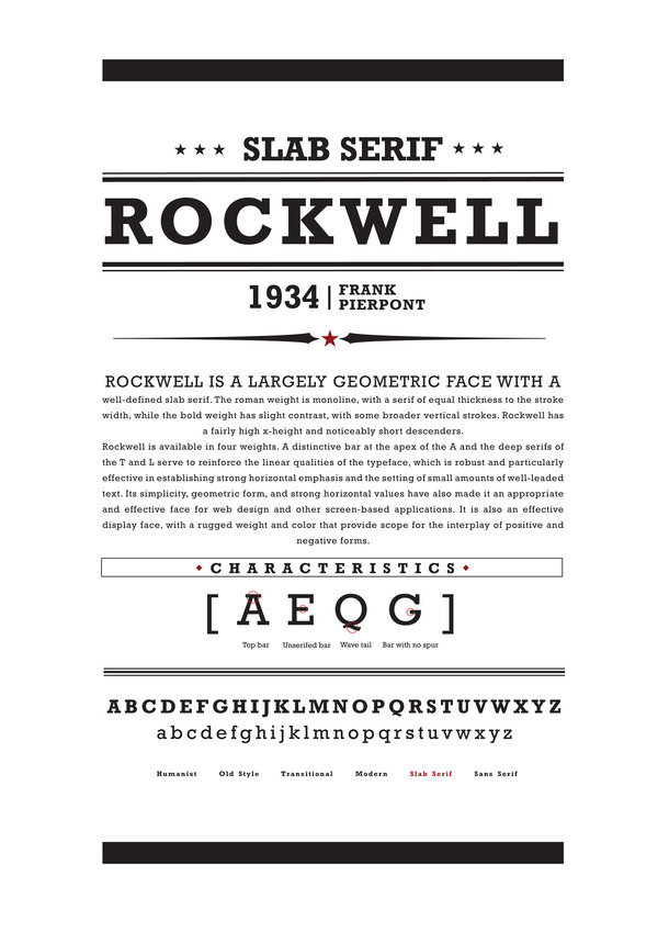
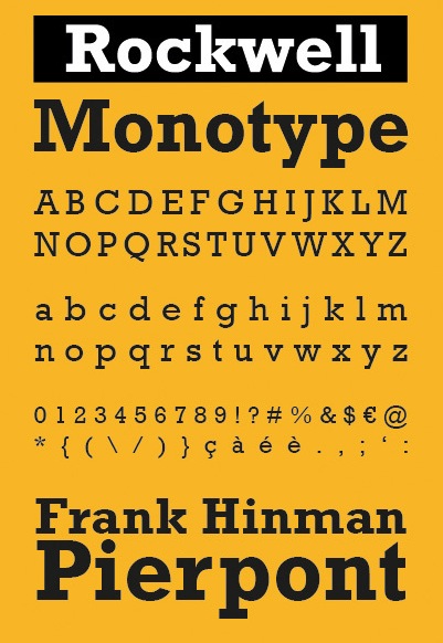
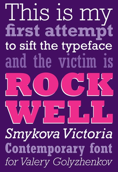
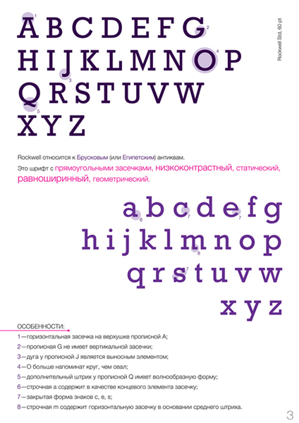
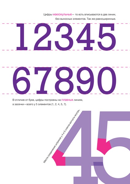
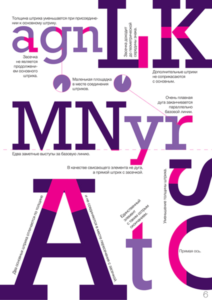
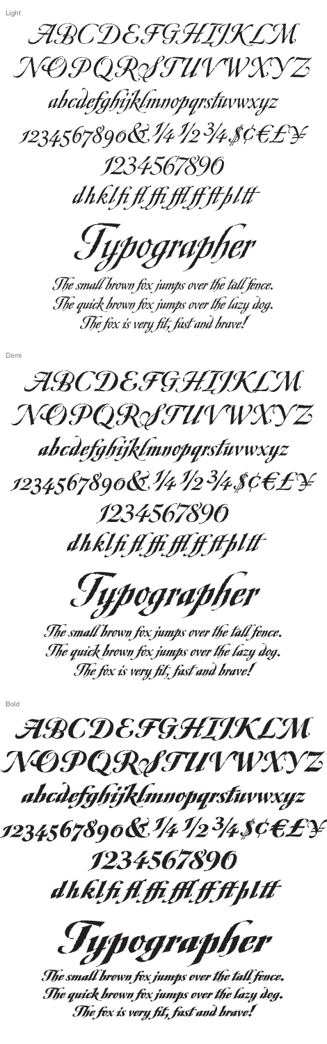
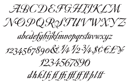
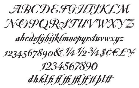
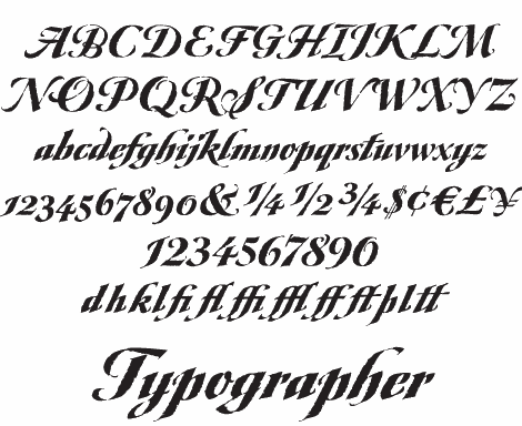
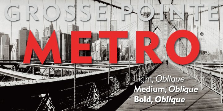
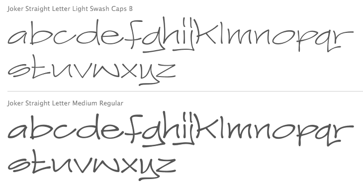
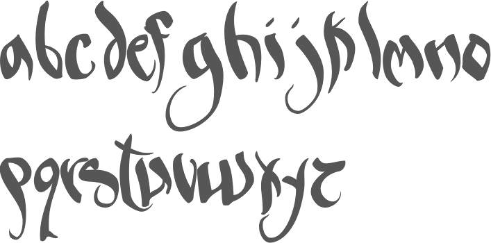
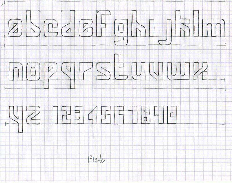
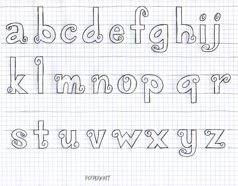
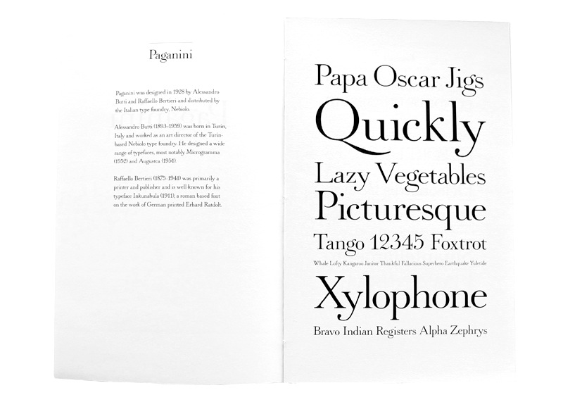
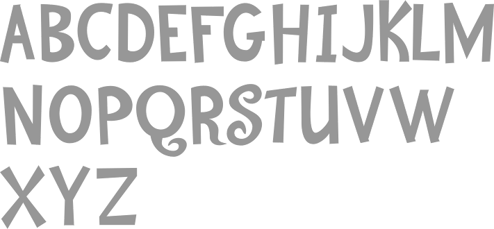
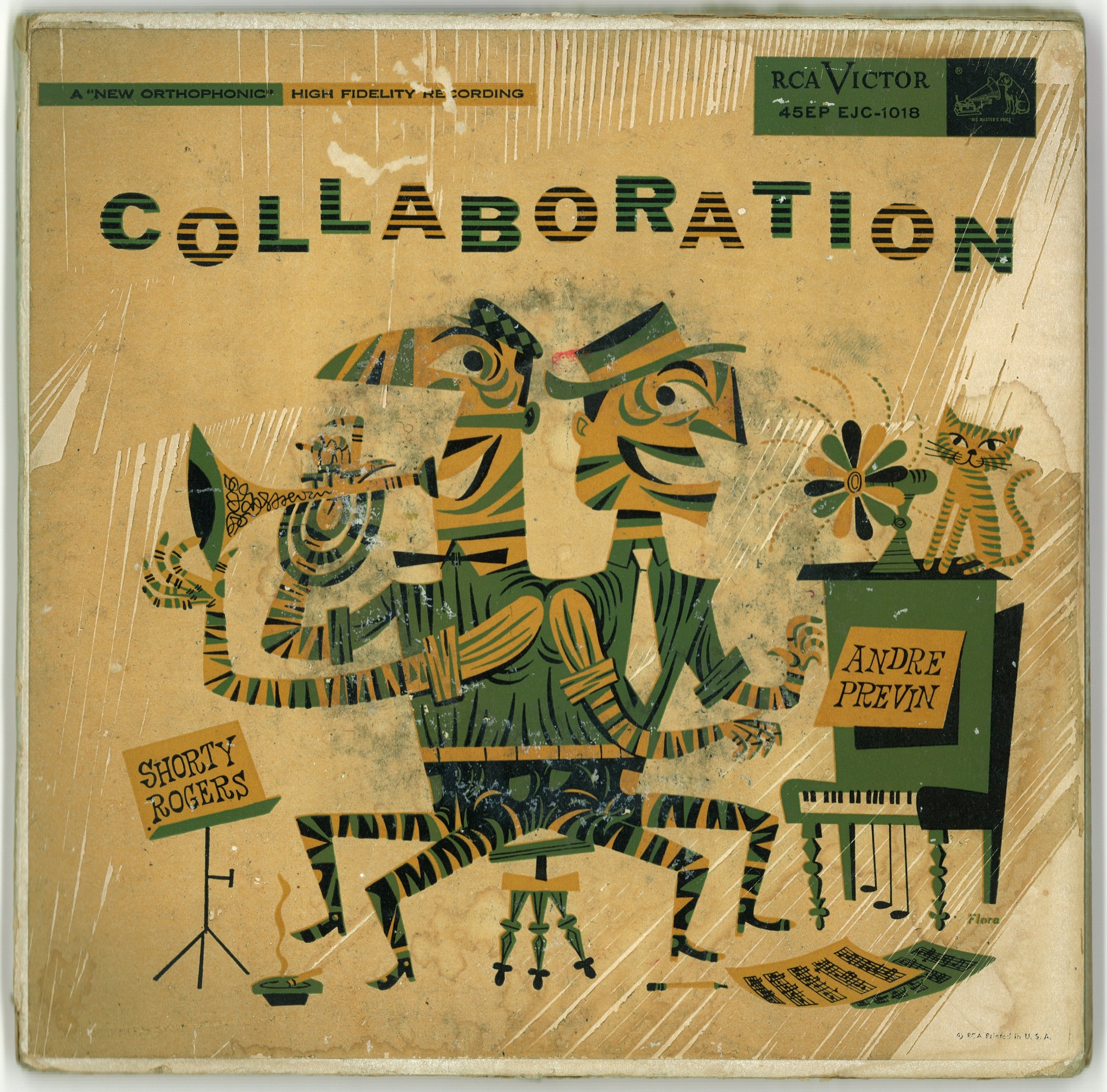
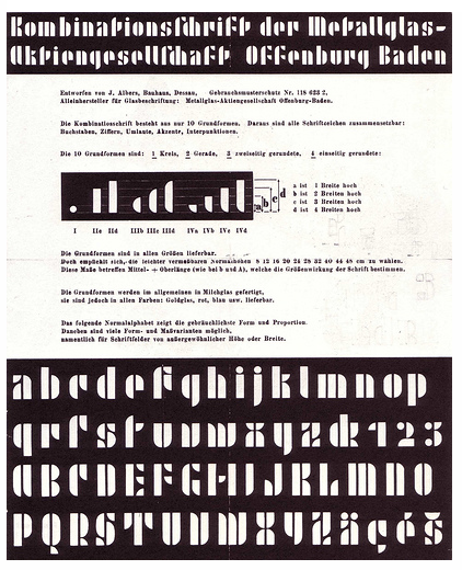
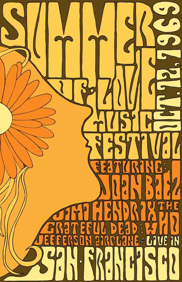
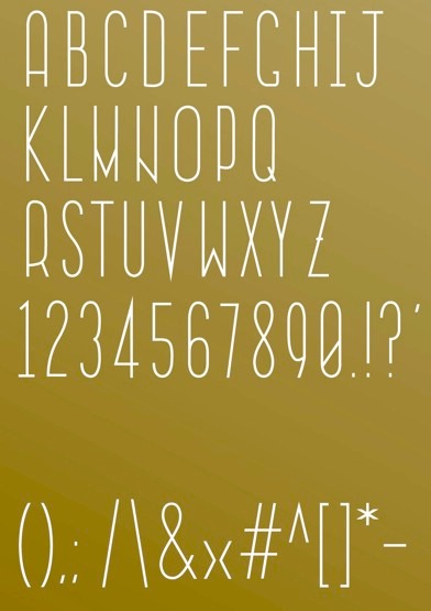
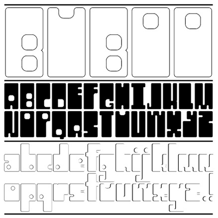
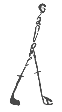
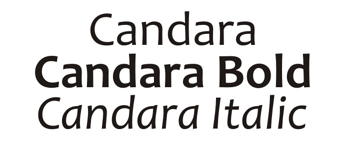
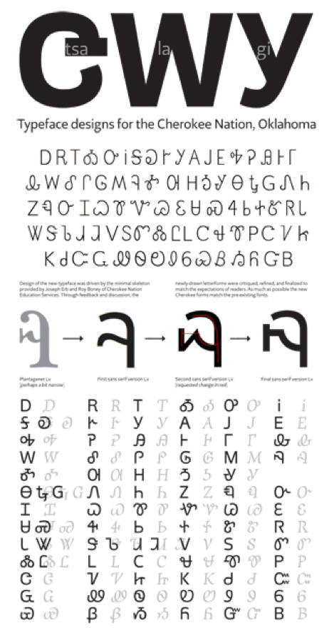
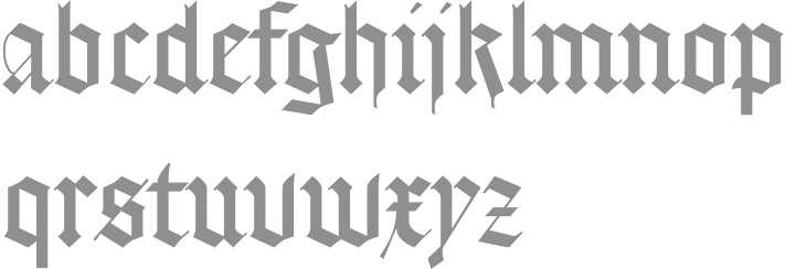
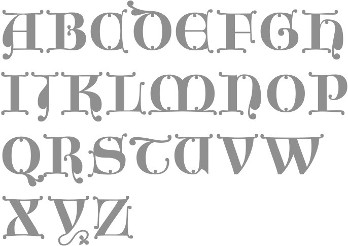
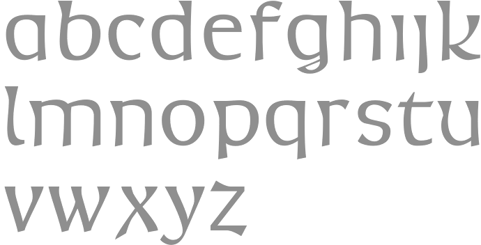
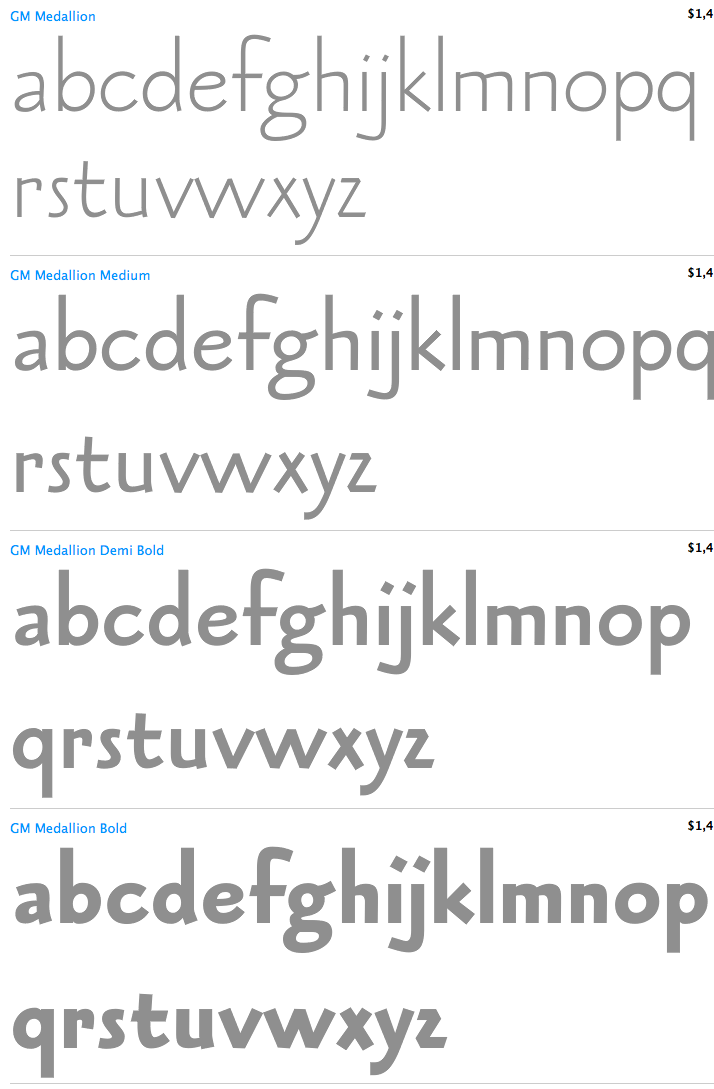
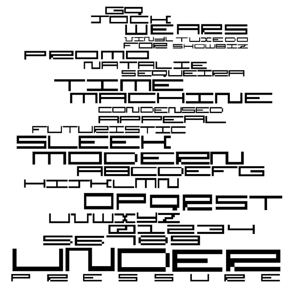
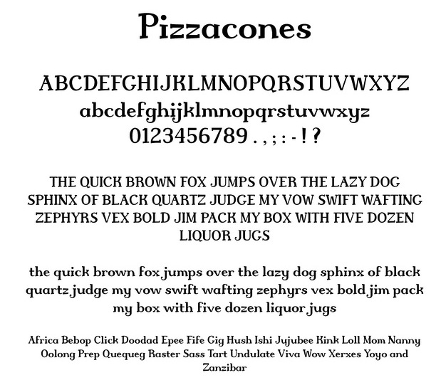
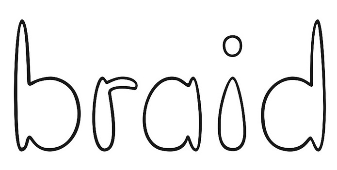
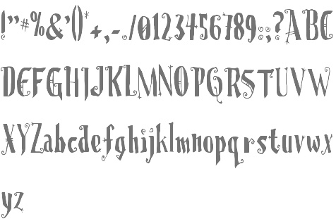
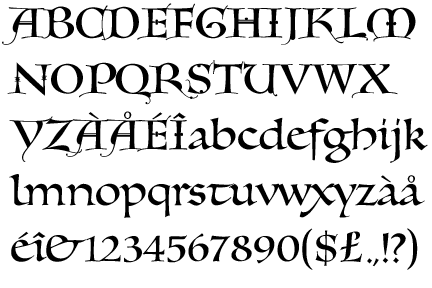
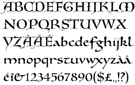
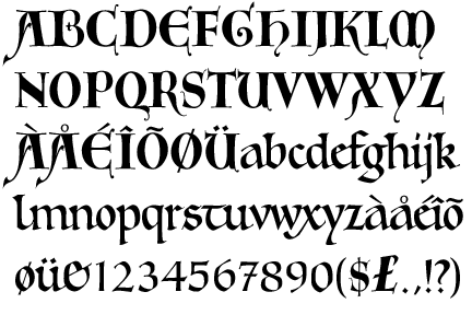
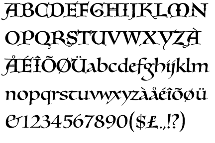
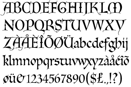
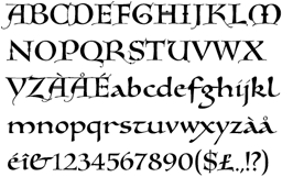
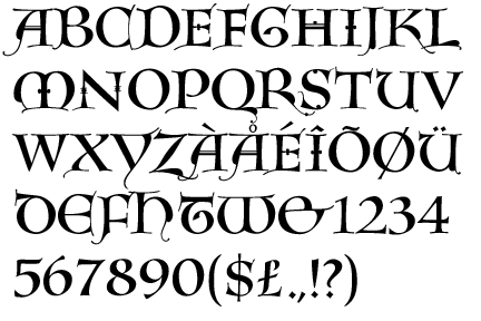
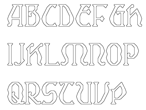
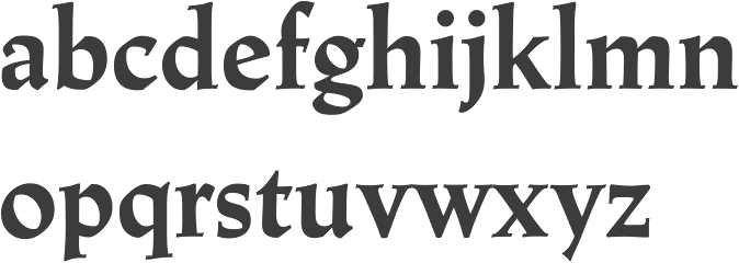
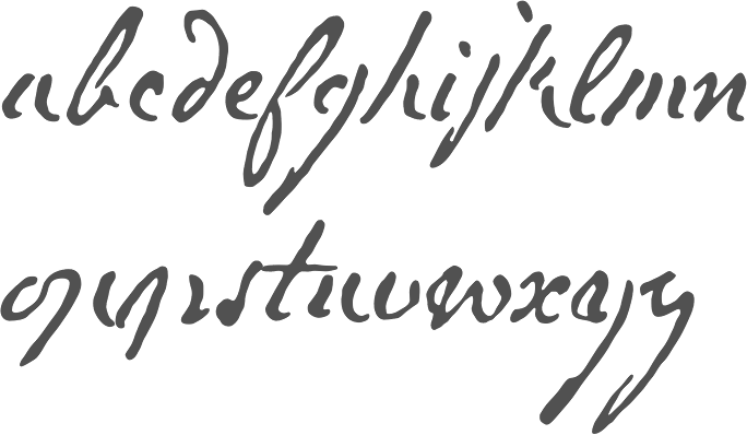
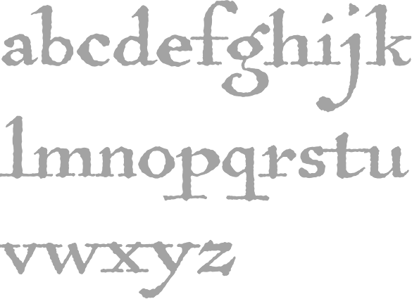
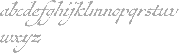
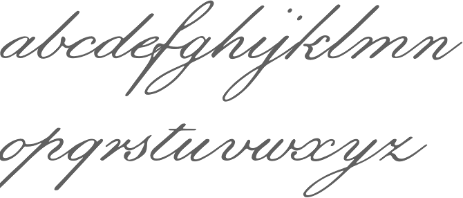
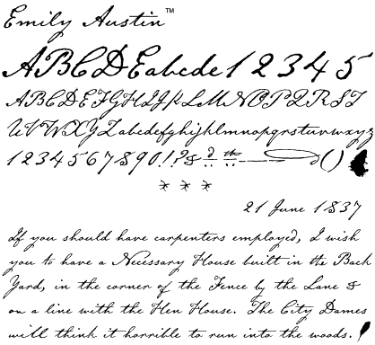
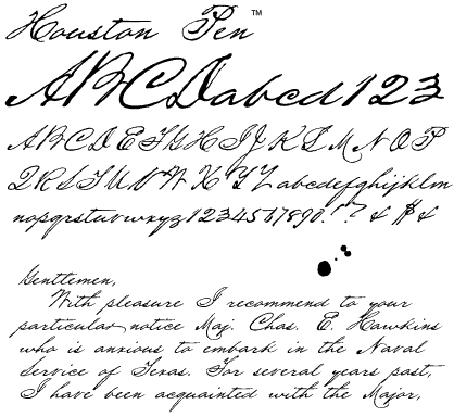
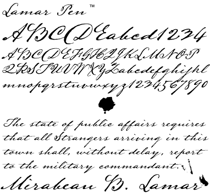
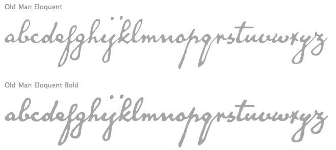
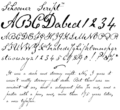
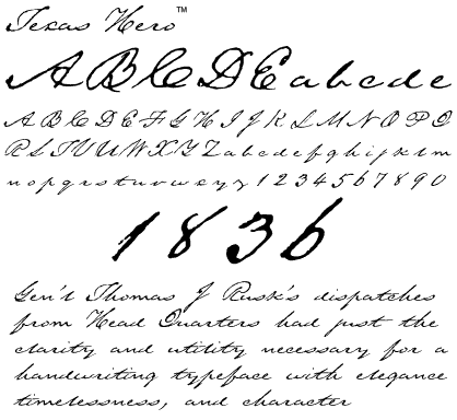
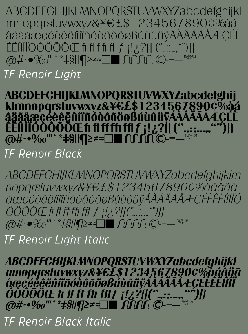
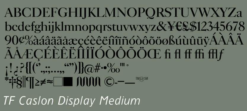
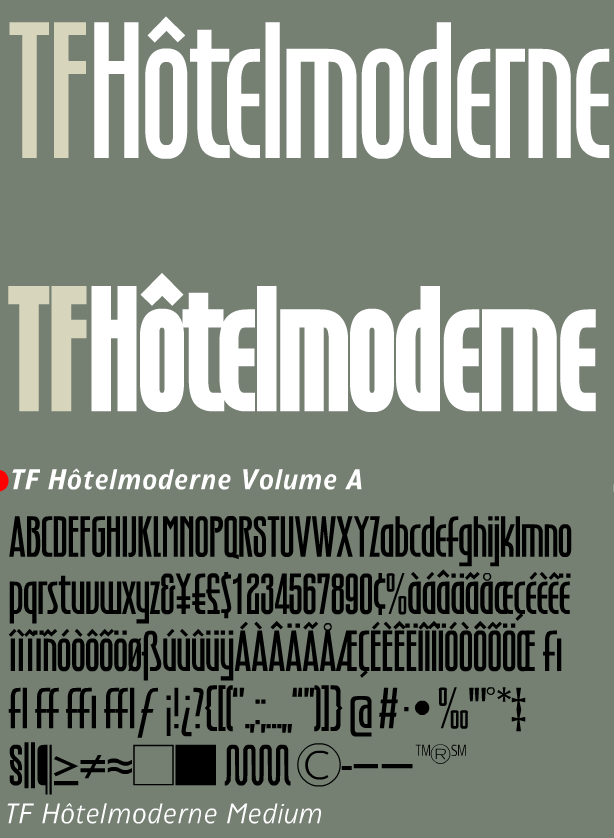
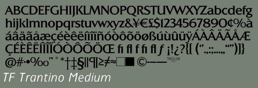
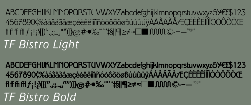
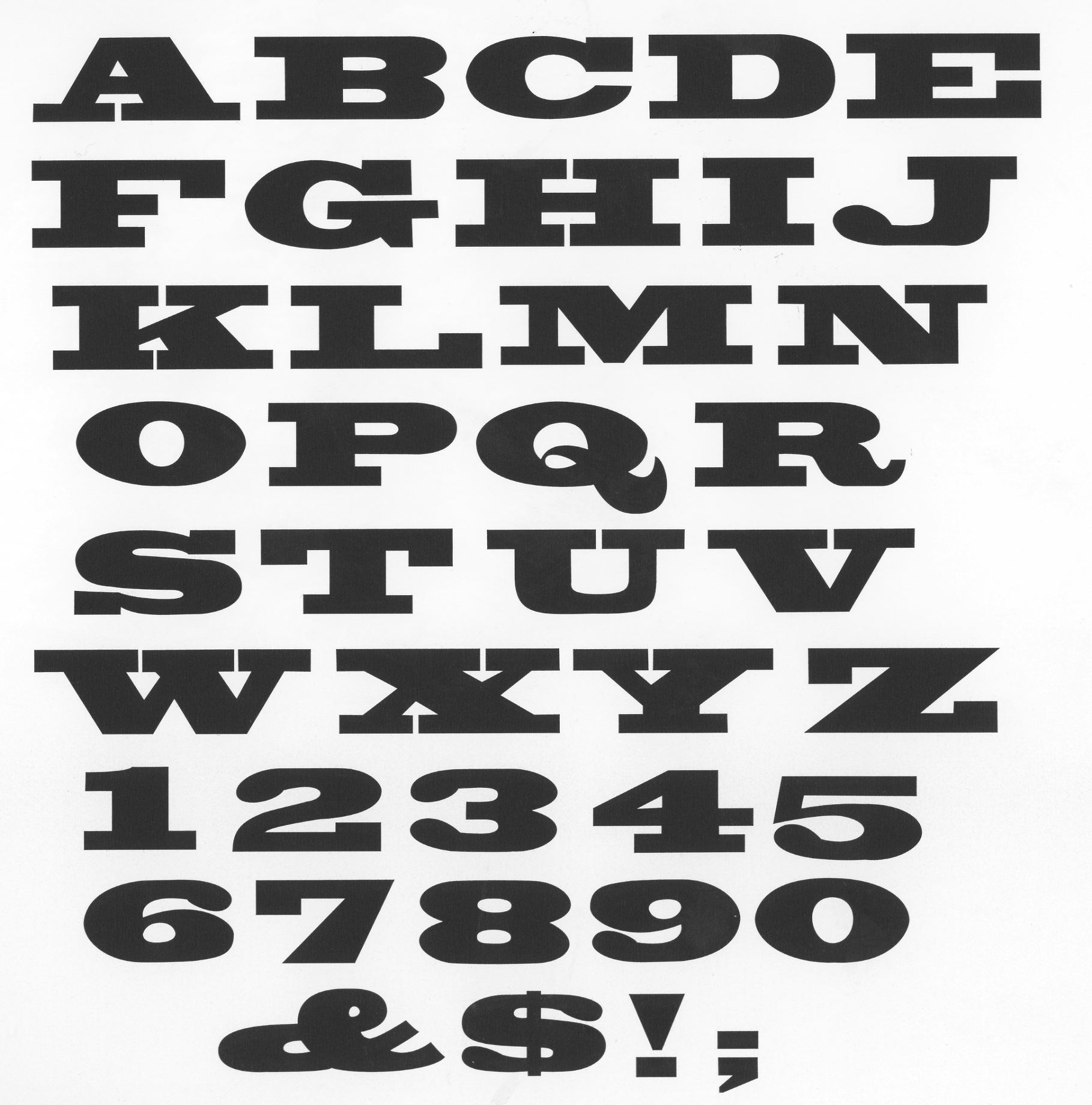
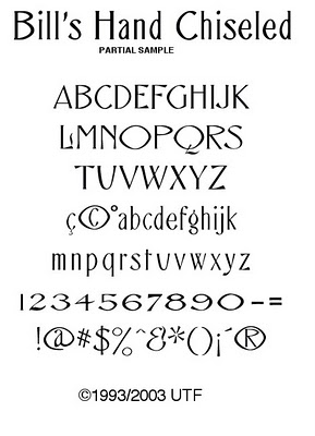
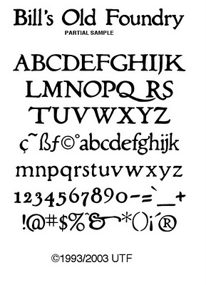
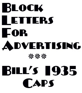
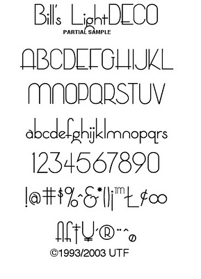
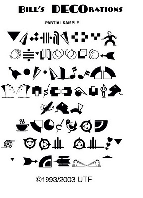
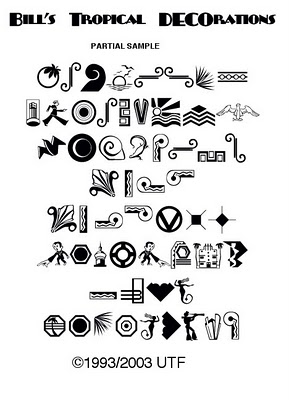
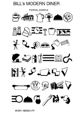
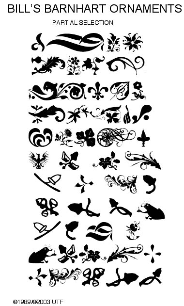
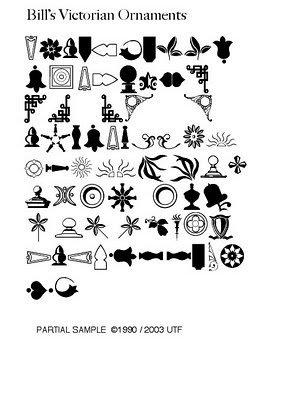
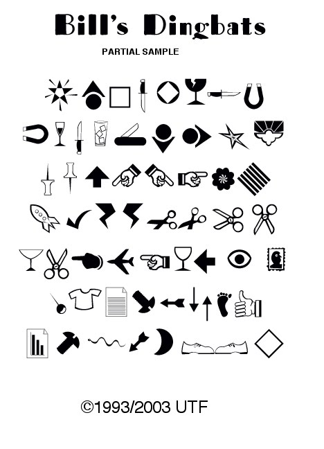
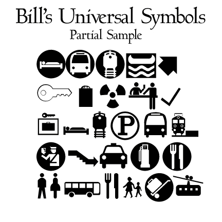
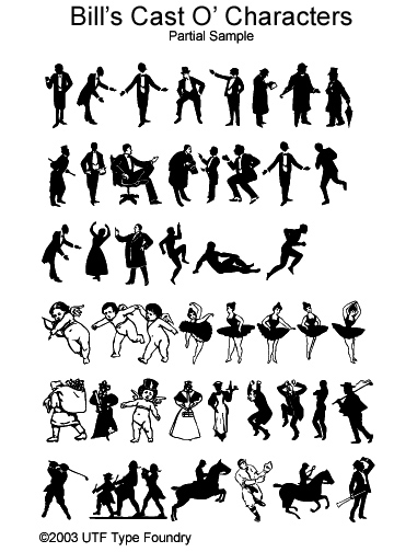
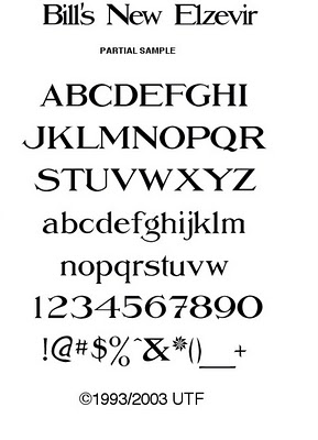
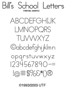
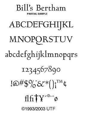
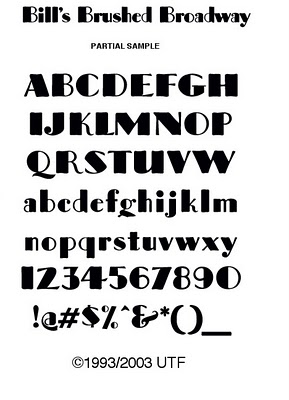
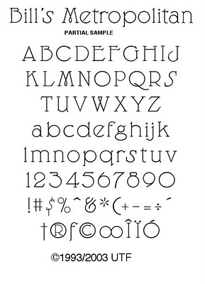
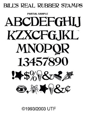
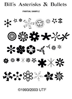
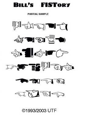
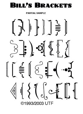
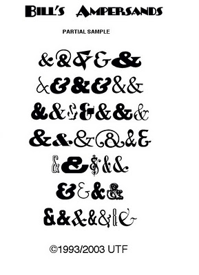
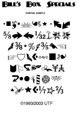
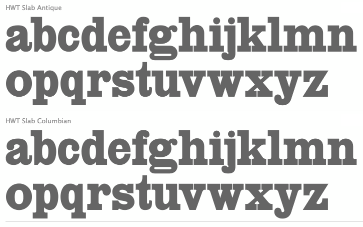
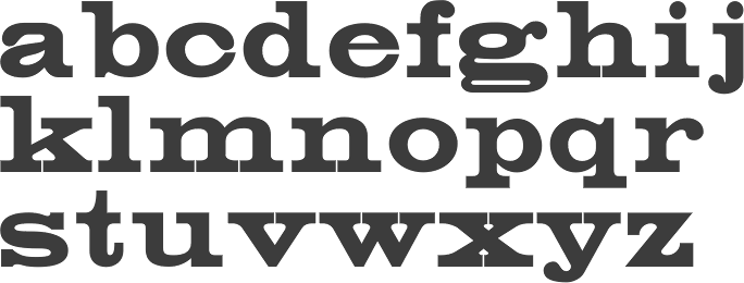
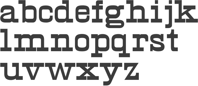
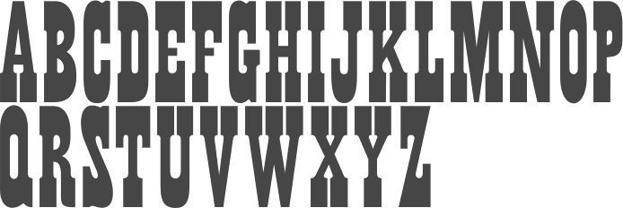
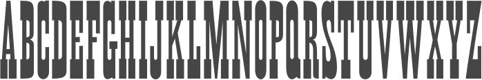
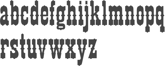
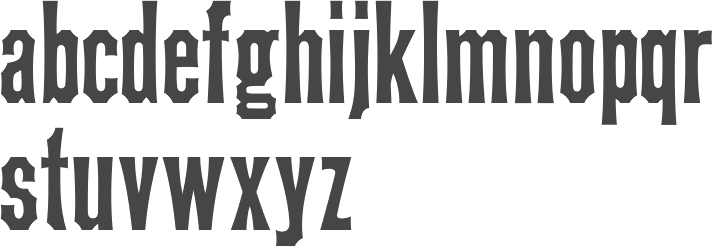
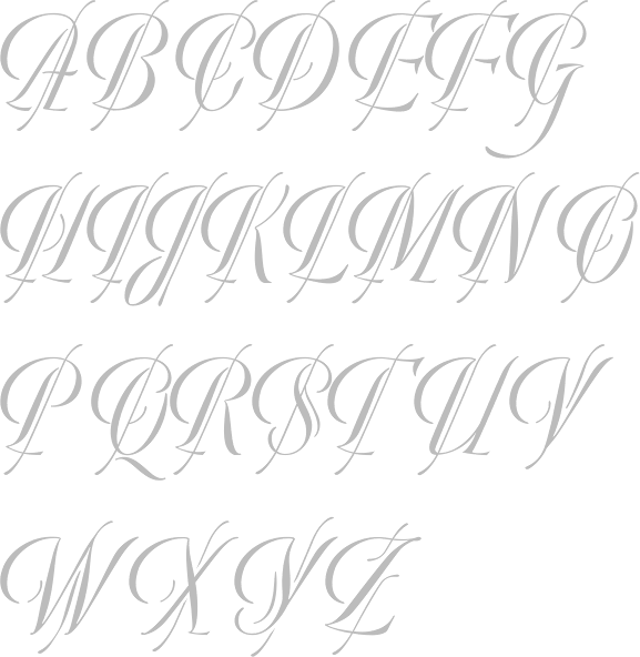
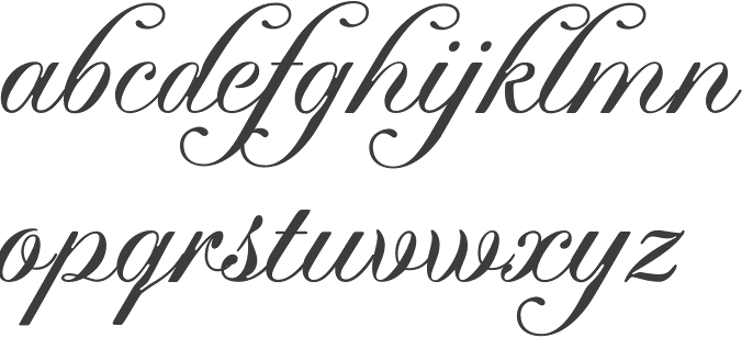
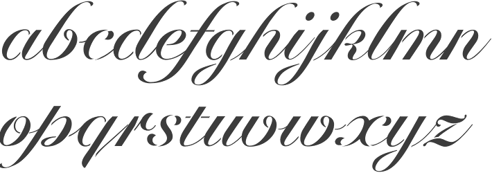
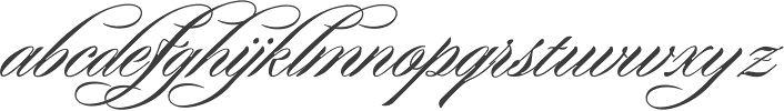
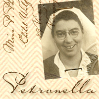
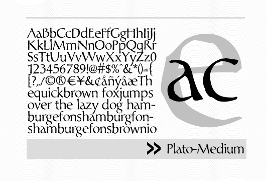
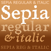
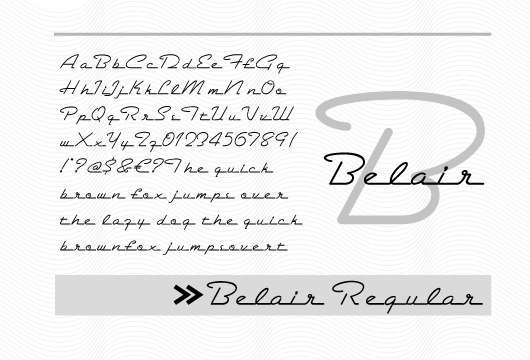
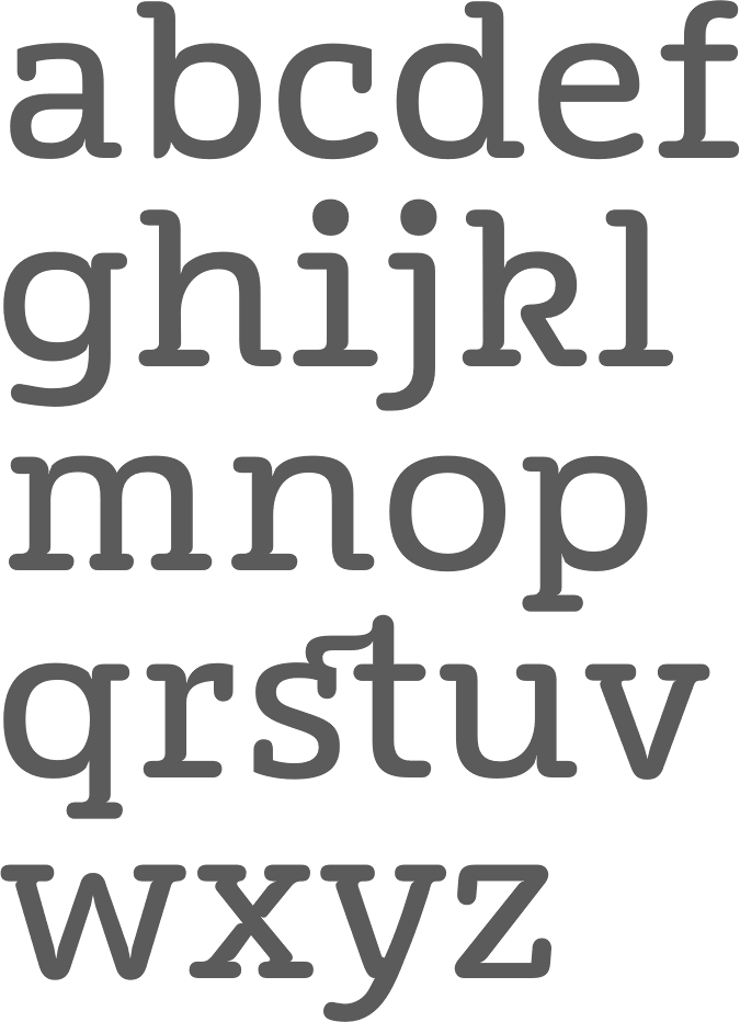
|
|
|
|