TYPE DESIGN INFORMATION PAGE last updated on Wed May 6 15:49:26 EDT 2026
FONT RECOGNITION VIA FONT MOOSE

|
|
|
|
|
Type scene in Ohio | ||
|
|
|
|
SWITCH TO INDEX FILE
1919 Type Foundry
| 1919 Type Foundry presents the typographic work of Scott Sullivan, who is currently a graphic design major at Ohio University in Athens, Ohio, scheduled to graduate in 2009. About the name: The year 1919 was the year that the Bauhaus school opened in Weimar, Germany. It was roughly the year 1919 when Modernism and Constructivism were born in Germany and the U.S.S.R., respectively. All fonts are heavily based in geometry, therefore: Dosim OKT, Geovlad (2009, constructivist, based on the posters of Georgii and Vladimir Stenberg), 44X34X (2009, futuristic, free). The Triflig Paradigm is another project of his. There he is developing some fonts such as Moon Man, and one can download Gnashraw-Spaced (2009) and two of his FontStruct (pixel) fonts, pgdm001 and pgdm002 (2009). Designmoo link. [Google] [More] ⦿ |
| |
AArrgghh! Typefaces
| AArrgghh! Typefaces used to offer shareware fonts by Jonathan Smith (Cleveland, OH) of Rhode Island Soft Systems: New Land Contour, All-Hearts, Bunny-Lips, Confetti, El-RioLobo (1993, Mexican simulation face), Elbjorg-Script, Essential-Times, Firey, Glifik, Gyptienne (hieroglyphics), Hero-Outline, Hirosh (oriental simulation face; an exact copy of Sukiyaki, made in 1968 by Gene Eidy for Lettergraphics International), Ice-CreamSandwich, Ice-Snow, Made-InTheUSA, New-LandContour, New-LandInline, New-LandOutline, New-LandSport, Ol'54, Planetz, Porter-Lil'Kaps (gorgeous late night show display font), Religious, RockArt, Spider-WebBlock, The-Score, Wet-Paint. Fontspace link. [Google] [More] ⦿ |
Columbus, OH-based designer of the slab serif typeface Odwalla (2013), which was custom-made forv the Odwalla drinks. Behance link. [Google] [More] ⦿ | |
Adam Hines (Raindrop Creative, Columbus, OH) designed the bold modular squarish typeface Breathe (2010). [Google] [More] ⦿ | |
Adam Ladd Design
|
Free typefaces from 2015: Poster Cut, Poster Line. Poster Cut Neue followed in 2021. Typefaces from 2016: Oilvare (an 18-style layered font family), Cheddar Gothic (handcrafted letterpress emulation family; followed in 2018 by Cheddar Gothic Rough). Typefaces from 2017: Neato Serif (followed in 2018 by Neato Serif Rough), Highest Praise (brush script), Citrus Gothic, Bakerie (42 hand-drawn typefaces), Trailmade, Farmhand (Farmhand is a textured, hand drawn, condensed font family featuring serif, sans, inline, italic, and extras styles suited for display titling), Garlic Salt, Likely (brush script), Likely Sans, Active (an upright brush script). Typefaces from 2018: Config (a condensed geometric sans; see also Config Condensed and Config Ultra in 2019), Config Rounded, Quiche (in Text, Display, Fine and Stencil substyles, for a total of 52 ball terminal-themed fonts), Quiche Sans (Peignotian), Cheddar Gothic Sans Two, Botany, Braisetto (connected signature font). Typefaces from 2019: Skie (a big gothic sans family with low contrast, small x-height and tall ascenders), Quiche Flare, Magdelin (a 40-style gothic sans), Fractul (a geometric sans characterized by its dramatic squarish "a"), Gopher (a reverse contrast family), Konnect (a geometric sans family). Typefaces from 2020: Lufga (an 18-style low-contrast sans with large x-height and short ascenders and descenders), Gopher Mono (a 16-style reverse stress monospaced sans), Quiche Display, Neulis (a sans typeface with a script lower case "l" and "s"), Zuume (a high impact condensed all-caps sans family), Zuume Rough, Zuume Soft. Typefaces from 2021: Serca (a 40-style sans with some tension), Otterco (a condensed geometric sans in 32 styles). Typefaces from 2022: Zuume Edge (a 32-style high-impact all-caps condensed octagonal typeface), Fromage (a stylish 14-style Peignotian sans). Fontsquirrel link. [Google] [MyFonts] [More] ⦿ |
Adam McIntyre
| |
Albert J. Kim
| |
Springfield, OH-based designer of the colorful Chicago Latino Film Festival Poster in 2016. Behance link. [Google] [More] ⦿ | |
Altered Ego Fonts (was: Sooy Type Foundry, STF)
|
Brian, who also runs Brian Sooy&Co, calls his fonts trendy and neo-humanist. Check Alphabets Inc for EclecticOne, EclecticTwo, EclecticPixel (2004, pixel dingbats), Greenbriar (hexagonal), Temerity, Chevron and Veritas, and the Bitstream Type Odyssey CD (2001) for most of his collection. Corporate work includes the Lucerna Bible Font for the New Living Translation Bible of Tyndale House Publishers in 1995, which was based on Veritas. Showcase of Brian Sooy's typefaces at MyFonts. [Google] [MyFonts] [More] ⦿ |
American Greetings Corporation
| In 1996, the American Greetings Corporation company issued a number of mostly script and blackletter fonts, whose names all start with CAC. These can now be found on many font archives. A partial list: CACCamelot, CACChampagne, CACFuturaCasual, CACFuturaCasualBold, CACFuturaCasualBoldItalic, CACFuturaCasualMedItalic, CACKrazyLegs, CACKrazyLegsBold, CACLaskoCondensed, CACLaskoEvenWeight, CACLeslie, CACLogoAlternate, CACMoose, CACNormHeavy, CACOneSeventy, CACPinafore, CACSaxonBold, CACShishoniBrush, CACValiant, Care-Bear-Family, ShishoniBrush. Founded in 1906 and based in Cleveland, American Greetings Corporation no longer develops or sells fonts. Some web sites report that AGC, in cooperation with AGI, published these fonts in 2011: Erin B Regular, Handwriting, Hucklebuc, Lady Script, Lasko Medium, Lovebirds, Milli, Moonstruck, Otto Matic Sans Regular, Pigpen Two Plain, Sage Script Regular, Wild Bill Bold. Six of the CAC fonts were designed and produced by graphic designer and Vietnam veteran Courtney Kent Rhodes (b. 1949, Rochester, IN) from Westlake, OH, who worked for AGC from 1988 until 2003. He is a graduate of Indiana University, class of 1977, and is principal of Courtney Rhodes Design since 1980. Dafont link [removed]. Archive of most of the CAC fonts. [Google] [More] ⦿ |
During his studies at the University of Cincinnati, Andrew Block designed the curly typeface Swish And Flick (2016). [Google] [More] ⦿ | |
American designer in Columbus, OH, of the hand-printed Pooch Scrawl (2009, FontCapture). [Google] [More] ⦿ | |
Andrew Weber (Azzurro 360) is the designer of Andrew's Handwriting (2007, handwriting). Born in 1987, he lives in Indiana and Ohio. [Google] [More] ⦿ | |
Andy Hayes
| |
Student at Ohio State University in 2013 and 2014. Columbus, OH-based designer of the angular typeface Still Old Greek (2014). [Google] [More] ⦿ | |
Anna Richard is a designer, typographer, and bibliophile based in Cleveland, Ohio. She graduated from Kent State University with a BFA in Visual Communication Design and a specialization in typography. At present, she designs typefaces and has expanded font families for Google. [Google] [More] ⦿ | |
Columbus, OH-based designer of the free font Operator (2018), a monospaced font for space cadets that shares some features with OCR. [Google] [More] ⦿ | |
She designed Magnimo while at Reading. Aoife writes: from the Latin Magna, meaning great or large, and the Indic Anima, meaning spirit or soul. Magnimo is a big-hearted typeface with many moods and voices. I am quite impressed by this three-style typeface (Regular, Italic, Upright Italic), which, with its lively angular design, seems just right for green party and energy drink magazines. All the extra features expected of a 2010 typeface are there, including a matching and nicely balanced Greek, and coverage of most European diacritics. Additional scans: i, ii, iii. In 2016, she published the free Google Font family BioRhyme (+Expanded). See also Open Font Library. Speaker at ATypI 2016 in Warsaw on Synoptic Translations. Speaker at ATypI 2017 Montreal, where she entertained the crowd with socially relevant typography and type for dissenting voices. Speaker at ATypI 2018 in Antwerp. [Google] [More] ⦿ | |
Aibrean's Studio (translated as "April Studio") has been owned and operated by April Sadowski since 2003 in Xenia, OH. She created the squarish modular typeface Modal (2009, FontStruct). Other FontStruct typefaces include MoxBox (2009, squarish), Dripple (2009, dot matrix), Polaris (2009) and Squirls (2009). [Google] [More] ⦿ | |
Arlyn Eve Simon
| |
Aurora Borealiz Design
| Columbus, OH-based designer of the pixelish typeface Inverted Squircle (2021). [Google] [MyFonts] [More] ⦿ |
Baltimore&Ohio Railroad Historical Society
| Jack Aaron Rodriguez made a font called Baltimore&Ohio R.R. Co. Loco.&Pass. Equipt. Cars Lettering (2004) for the Baltimore&Ohio Railroad Historical Society. Jack lives in Riverdale, MD. Kenneth Van Mechelen made B&OStation (2005), B&OLoco (2005), EMD (2006), and B&OX (2005). [Google] [More] ⦿ |
Type designer, letterer and calligrapher located in Willoughby Hills, OH. Ex-student at the University of Reading (2003) who designed Owyhee (2003). In 2008, he created Cora, a 6-style corporate-look sans with a large x-height. In 2011, he did Katie's Font. MyFonts link. Behance link. Klingspor link. [Google] [MyFonts] [More] ⦿ | |
Bedoodle
|
Additions in 2009: Barack, Mrs. Obama, Malia (upright connected script), Violette (female script), Abbatia (ornaments), Frame Ups (frames), Sasha (didactic font with lines). [Google] [MyFonts] [More] ⦿ |
Benn Coifman
| |
Beth Rufener
| |
In 2012, he published a number of medieval style typefaces: Throrian, Mirkwood Chronicle, Gothic Birthday Cake, Elementary Gothic (+Bookhand), EG Dragon Caps, Renny Hybrid, Bruce, East Anglia (Lombardic). Abstract Fonts link. A second Dafont link. FontM link. [Google] [More] ⦿ | |
Billy Jacobs
| |
Bob Aufuldish
| |
Graduate of The Art Institute Online- Pittsburgh Division. Springfield, OH-based designer of the curly typeface Beauty and the Beast (2017). [Google] [More] ⦿ | |
During his studies at Kent State University in Kent, OH, Brenan Stetzer created the free slab serif typeface Saros (2016). [Google] [More] ⦿ | |
Galena, OH-based designer of the old typewriter font Corpus Typewriter (2022). [Google] [MyFonts] [More] ⦿ | |
MyFonts link. [Google] [MyFonts] [More] ⦿ | |
Brian Kniceley is a sign artist at the Cedar Point amusement park in Sandusky, Ohio. At Letterhead Fonts, he designed Henderson Roman, Henderson Church Text, Strong Nouveau, Strong Italic, Strong Angle, Equinox (caps and flourishes), LHF Strong Caliope (2000: a circus font; see also p.53 of the The Solotype Catalog of 4,147 Display Typefaces by Dan X. Solo), LHF Strong Tea House (2000). Many of his fonts have a Western influence. Brian Kniceley named all of his fonts after their creator or the books he found them in. Examples: LHF Strong Angle, LHF Strong Caliope, LHF Strong Italic, LHF Strong Nouveau, LHF Strong TeaHouse, LHF Ohnimus Florid, LHF Ohnimus Spiked, LHF Henderson Church. [Google] [More] ⦿ | |
Cincinnati, OH-based designer of the art deco typeface Expo (2018). [Google] [More] ⦿ | |
Brian Sooy
| |
During her Visual Communication Design studies at Northern Kentucky University, Briana Arnold (Ft. Mitchell, KY and Cincinnati, OH) created the rounded squarish sans typeface Aero (2012). She also created the sans typeface Sequent in 2012, which was designed for screens. Behance link. [Google] [More] ⦿ | |
Brittany Deighton
| |
Graphic designer in Columbus, OH. Tissues (2012) is a hand-drawn ornamental caps typeface inspired by organs, muscles, and tissues of the human body. [Google] [More] ⦿ | |
During her graphic design studies at Columbus College of Art and Design, Camika Blackwell (Cleveland, OH) created the connect-the-dots typeface Spacial (sic) Constellation (2014). [Google] [More] ⦿ | |
Dayton, OH-based creator of an animal-themed ornamental caps typeface in 1926. Its patent application. [Google] [More] ⦿ | |
Akron, OH- based designer (b. 1980) of Slag Version One (2006, grunge) and Meatpie (2006, grunge). [Google] [More] ⦿ | |
Columbus, OH-based designer of the display typeface Daisy (2016). Behance link. [Google] [More] ⦿ | |
Dead Crack Babies (famous grunge font), Half Tone, My Left Font, Times and Times Again. All free, from Cleveland, OH. [Google] [More] ⦿ | |
Charles Nix
| |
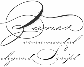
In 2006, Paul Hunt designed a set of connected calligraphic scripts, called P22 Zaner. | |
Charles S. Wilkin
| |
Columbus, OH-based designer of some great animated letters in 2018. [Google] [More] ⦿ | |
Chris Modarelli
| |
Sign designer from Columbus, OH. Creator of Fleur de Wee (2005, Chank's place), a dingbat font of shields and fleur-de-lys interpretations, and Fowl Play (2005, 26 bird silhouettes). Kernest link. [Google] [More] ⦿ | |
Christo Creative
| Chris Modarelli (Christo Creative, Cleveland, OH) designed the handcrafted paint emulation typeface Lester Fields in 2014. [Google] [More] ⦿ |
| |
Cincinnati, OH-based student who designed Cyril (2005, serif). [Google] [More] ⦿ | |
Cincinnati-based foundry (est. 1817), also called Oliver&Horace Wells, Horace Wells, Agant, and L.T. Wells, Agent. Among digitizations, we find French Ionic (Dan X. Solo, Solotype: quite ugly--based on an 1870 Clarendon derivative by the Cincinnati Type Foundry). Free specimen books on the web:
| |
Claude Fayette Bragdon (b. Oberlin, OH, 1866-1946) was an American architect, writer, and stage designer based in Rochester, New York, up to World War I, and in New York City after that. He was known for his creative geometric ornaments. At some point, he proposed this modern American italic for architectural plans. Check also his set of modern small letters. This page shows his art nouveau art. [Google] [More] ⦿ | |
Its original designs include Koster Initials and Litho (a curly Victorian typeface digitally revived by Nick Curtis in 2007 as Cleveland Litho NF; Curtis says that it comes from an 1898 specimen book but that contradicts the ATF date). Another Curtis revival, Yum Yum NF (2008) is said to be based on Mikado from an 1893 Cleveland specimen book. And in 2008, Nick Curtis continued with a revival of the geometric display typeface Morning Glory (1893), and a revival of Oxford called Really Big Shoe NF (2009). One of Central type foundry's most famous typefaces is the faux-Chinese font Chinese (1883, later called Mandarin). In 2010, Nick Curtis redid Geometric, a typewriter style face, and called it Linndale Square NF. In 2013, the Victorian capitals typeface Oxford No. 2 (from the 1893 catalog) provided the inspiration for the digital typeface MFC Damask (Brian J. Bonislawsky and Jim Lyles, Monogram Fonts Co). MFC Damask Flourish (2013) is a floriated caps typeface from the same source. [Google] [More] ⦿ | |
Coffee Bin Fonts
|
His 2006 designs: Drugstore, Horsfords, Hoyts German Cologne (art nouveau), Letterhead, Soap Box, The Youths Companion (+Shaded: Victorian). MyFonts selection. [Google] [MyFonts] [More] ⦿ |
Courtney Kent Rhodes
| |
As a student at Bluffton University, Courtney Landers (Lima, OH) designed the decorative typeface After Feather (2016). [Google] [More] ⦿ | |
Brookville, OH-based designer of the handcrafted typeface Curt (2015). Behance link. [Google] [More] ⦿ | |
Columbus, OH-based creator of the hand-printed poster typeface Nomad (2013). [Google] [More] ⦿ | |
Industrial design student at the University of Cincinnati (2012). Behance link. He created Fudge Slab (2012). [Google] [More] ⦿ | |
During her studies at NKU, Amelia, OH-based Danielle Gehler designed the thin monoline typeface Slaner (2016). [Google] [More] ⦿ | |
The Mountain House Press Types were designed and cut by Dard Hunter between 1912 and 1915, and by Dard Hunter Jr. (b. 1917) in 1937-39, for the private use of their Mountain House Press. A Specimen of Type (Dard Hunter Jr., 1940, Paper Museum Press, Cambridge, MA) is a small booklet shows a roman type started in 1936 by Dard Hunter Jr. under the guidance of Professor Otto F. Ege. Apologies for the poor quality of the digital pics, which were taken under challenging conditions in the dungeon of a gothic library. A third generation has emerged as well, as Dard Hunter III is an active printer and book designer in modern times. Klingspor link. [Google] [MyFonts] [More] ⦿ | |
Professional photographer in Westerville, OH. During his studies at Columbus College of Art and Design, Darrek created a great typographic poster that celebrates the fifth and sixth symphonies of Beethaven (2013). Behance link. [Google] [More] ⦿ | |
In 1855, David Knox started producing wood type in Fredericksburg, OH, together with Edwin and Thomas Ferry, John McNulty, and M.S. Richards. The latter four were on strike at the W.T. and S.D. Day Co., a competing wood type manufacturer in the same city, and left that company to start with Knox. A flood destroys the plant in 1858, and that was it. Revivals include Grecian Light Face (2016, Wood Type Revival: this revices the 1858 typeface Light Face Grecian). [Google] [More] ⦿ | |
Deleterious Design
| Born in Dayton, OH, in 1991, Frederick Awich founded the Deleterious Design foundry in North Brunswick, New Jersey, in 2010. His first fonts were Infringe (display sans) and UndercoverLovahh (hand-printed face). Old URL. Klingspor link. [Google] [MyFonts] [More] ⦿ |
DeMarco Hill
| |
Graphic designer in Cleveland, OH, who created the Nut and Bolt typeface in 2013. Behance link. [Google] [More] ⦿ | |
Cincinnati, OH-based designer of these typefaces in 2011: Frakked (blackletter), Spartan, Octagon, Modern Wood, Wasabi (a free Asian calligraphic simulation face; +Shogun, +Samurai, +Ninja). Behance link. [Google] [More] ⦿ | |
Doug Burns
| |
Born in Irvona, PA, in 1890, Earl Lupfer studied at the Zanerian College of Penmanship in 1908 and 1908, and joined the faculty there afterwards. He taught penmanship into the 1950s and was known as an inspirational teacher. He was the last principal of the Zanerian College. He died in 1974. [Google] [More] ⦿ | |
Design student at the University of Cincinnati. Creator of Pointed Sans-Serif (2012). [Google] [More] ⦿ | |
Pickerington, OH-based designer of the set of dingbats called Global Footrints Ghana (2017) and of the Africa-themed typeface Tribal Warrior (2017). Behance link. [Google] [More] ⦿ | |
During her studies in Oberlin, OH, Elizabeth Correll designed Pen Font (2011). [Google] [More] ⦿ | |
During her graphic communication studies at the University of Cincinnati in 2012, Elizabeth Crutcher designed a hairline typeface. [Google] [More] ⦿ | |
During her studies at Miami University (Oxford, OH), Libby Swofford (Cincinnati, OH) designer of a hand-painted floral alphabet in 2016. [Google] [More] ⦿ | |
| |
During her studies at CCAD, Columbus, OH-based Emily Pack designed the deconstructed dadaist typeface Dadalliance (2016). [Google] [More] ⦿ | |
Cincinnati, OH-based designer who is working on First Glance (2005, serif) and a revival of Imre Reiner's Gotika (2005). [Google] [More] ⦿ | |
Cleveland, OH-based designer of Formal (2017), a free titling typeface that comes in regular and inline styles. [Google] [More] ⦿ | |
Cincinnati, OH-based creator of the thin avant-garde sans typeface Zephyr (2012). [Google] [More] ⦿ | |
Fantazia Fonts
| In 1994, Fantazia published a 2500-font CD (431MB), with fonts in TTF and T1 formats for both Mac and PC. The packages changed names over the years---they were called Fantazia Concepts, and Fantazia Fonts and Sounds at some point. The font names are recognized by their prefix, FZ. The mother company, Fantazia Concepts Inc, used to be located at PO Box 5142, Willowick, OH 44095. It seems to have disappeared though. [Google] [More] ⦿ |
Mumbai-based font parasite, who sells fonts made by others and claimed as his/her own, including Michael Script (connected script), Gail Davis (handcrafted), Rustick (by Alex Haigh) and Umbrella (by Ront Beld). On Behance, they claim to be from Dayton, OH. Sales point. [Google] [More] ⦿ | |
FontBoy
|
Bio at Emigre. MyFonts site. FontShop link. View Bob Aufuldish's typefaces. Klingspor link. [Google] [MyFonts] [More] ⦿ |
Examples of the thousands of images in this 457-page book: Aesthetic, Armenian, Art Initials, Bank Not Black Extended, Card Gothic, Chancel, Circular Script, Condensed Title No. 3, French Clarendon, French Clarendon Shaded, Hogarth, Japanesque No. 3, Latin Condensed, Moslem, Queen Bess Script, Radiant, Ringlet, St. Louis, Steel Plate, Teutonic, Title Text, Title Text Open, Trojan, Unique. Digital revivals include MFC Brass Rules Petit (2013, Monogram Fonts Co), MFC Brass Rules Grand (2015, Monogram Fonts Co: based on Franklin Type Foundry's brass rules in Convenient Book of Specimens, 1889), MFC Franklin Corners (2009, Monogram Fonts Co: based on Metal Corners from the 1889 Convenient Book of Specimens). [Google] [More] ⦿ | |
Frederick Awich
| |
Canton, OH-based creator of a hilarious typographic poster called Gentleman (2014). [Google] [More] ⦿ | |
North Olmsted, OH-based creator of Galthop (2009), a typeface that is based on scans of glasses. Behance link. [Google] [More] ⦿ | |
During her studies at Ohio State University, Genie designed the hand-printed typeface GeeKnee (2013). [Google] [More] ⦿ | |
Graphic designer in Cincinnati, OH. She writes about her typeface Abe (2012): Abe Regular was designed to give the classic typeface Din a humanist touch. With a focus on subtle contrast, natural curves and a dancing baseline; Abe is the less intense, country version of the rigid classic. Behance link. [Google] [More] ⦿ | |
Designer of the artificial language font Angelic Writing (2011). He is based in Ohio. [Google] [More] ⦿ | |
Grafica Studio (or: Grafica Type)
|
|
Grafica Studio (or: Grafica Type)
| Neil Wengerd studied at Kent State University. In 2009, he started work on a Bauhaus-style typeface called Neuehaus. He established Grafica Studio in Columbus, OH. Designer of Autostrada (2017), a utilitarian typeface based on vintage Italian highway lettering. Cargo Collective link. [Google] [More] ⦿ |
Greg Ponchak
| |
Cleveland, OH-based of the strong sans typeface families Structure (2017) and Industrial (2017). In 2018, they designed the rounded sans typeface family Sinuous. [Google] [More] ⦿ | |
During his studies at Universidade do Estado de Minas Gerais in 2014, Guilherme Sander (Belo Horizonte, Brazil, and/or Bowling Green, OH) designed the oil spill / lava lamp typeface Smile At Me (2014-2015). In 2015-2016, he created the curvy typeface Crescent Moon (2016). [Google] [More] ⦿ | |
| |
During her studies in Columbus, OH, Haleigh Richards drew the Letter People alphabet. [Google] [More] ⦿ | |
Hannah is a graduate of the University of Cincinnati's College of Design (Bachelor of Science in Design). She grew up in Cincinnati and currently lives in San Francisco. In 2012, she created the multined typeface simply called Illumination. Behance link. [Google] [More] ⦿ | |
Company in Melbourne, FL, which seems no longer interested in making fonts. This page tells its history: Alfred and Charles G. Harris set up the Harris Automatic Press Company in 1895 in Niles, OH. The Harris Automatic Press Company was responsible for many printing innovations during the early 1900s including the first commercially successful offset lithographic press and the first two-color offset press. In 1957 Harris-Seybold merged with Intertype Corporation (and thus Harris inherited the Harris-Intertype library!), a world leader in typesetting equipment. The resulting Harris-Intertype Corporation would be responsible for many subsequent innovations in the typesetting industry. In 1974 the name of the company was changed to Harris Corporation, and four years later Harris moved its headquarters from Cleveland to Melbourne, FL. Harris sold its printing equipment business in 1983, and today is a large high tech and communications firm. [Google] [More] ⦿ | |
A graduate of NC State's College of Design, Heidi created a slabby monoline typeface there in 2009. Born in Columbus, OH, she lives in Raleigh, NC. Behance link. [Google] [More] ⦿ | |
Designer of the free fonts Helena'sHand (handwriting), and Scrapbook-Chinese (Chinese characters). Helena grew up in Ohio and graduated from Brigham Young University. [Google] [More] ⦿ | |
Born in 1866 in Cleveland, OH. Credited with the design of these typefaces:
| |
Hucklebuck Design Studio
| Andy Hayes (Hucklebuck Design Studio, springfield, OH) created Reverend Italic (2011), an architectural drawing italic as seen on Foundfont. Priest Condensed (2011) is a condensed wood type headline face. It is unclear if they also made the grotesk typeface Modelfont (2011). Vanity Numbers (2009) is a number font based on old Californian license plates. Model Plane Slab (2009) is a slab serif headline typeface with wood type influences. In 2010, they made M.C. Gothic Condensed. Grain-O (2011) is another grotesk headline face. In 2012, Andy Hayes designed Bad Postcard and Postal Gothic. [Google] [More] ⦿ |
Hydro 74
|
His typefaces: Gestapo Dirty, Gestapo Tech, Terra Firma, Rehab, MissionUK, Messiahcom, Kogji, New York Corp, Texan, Grace For The Fallen. Free fonts include Beast, Broken74, Gatecrashertexan, Heresy, MeaniesThick, MegalomaniaItalic, MegalomaniaNormal, MilitarizeConform, MoogwaiItalic, MoogwaiNormal, MoogwaiThinOblique, OmnipotenceBlack, PietyBlack, Platipus, Proclivitydark, Proven, Resurrection, Revolution, Sacrafical, SailorJerry, Spitfire (2010, tattoo face), Submit, SubmitItalic, SubmitThinItalic, TripleXXX, Conform, Meanies, Megalomania, Moogwai, Platipus, Resurection, Revolution, Proven, Gate Crasher, Agnostic, Working Class hero (Western), Blasphemy, Disestarlishmentarianism, Napalm Vertigo, Black Mass (2005, blackletter / tattoo face). In 2009, he fired up his creative mind, and started working on a new batch of display typefaces: Muerte Black, West Coast Soul, Iron Fist, Nue Black, Uber Black (+Caps, blackletter), Le Venom (a phenomenal high-contrast art deco face), Avante (art deco, counterless), Nue Goth (blackletter), The Thickness (ultra fat), Script, Razor Black, Martyr Black, Sentry Black, Imperial Black, Thai Black, Dayton Black (racecar lettering), Slash Black (blood and guts font), Burial Black (blackletter), Cadaver Ink (gothic), Czar (hairline sans), Tramp Stamp, Wolfstien Electro (in the spirit of Sinaloa), Viper Black (scary), Catalyst Solid (ulta fat), Calypso (sans), Suture Slab (gothic), Venice Black (gothic), Black Mamba (metal rock band lettering, Cyrillic influences), Tyranny Gothic (blackletter), Blackmail Sect (more blackletter), Sailor Jerry (bilined), Napalm Vertigo (army stencil), Heresy Gothic (blackletter grunge), Working Class Hero (Western grunge), Golden Age, La Santisma Muerte (scary). Free typefaces at Legacy of Defeat, as of 2011: H74Cairissian, H74DemonRacer, H74EastZombieHigh, H74Federation, H74GhettoWolves (scary), H74InfectedZombies, H74Pistola, H74SnakeOilEmbossed, H74SnakeOilSolid (2011, constructivist), H74Spitfire, H74TheBlackBureau, H74TheGoldenDawn, H74TheGoldenDawnItalic, H74ThunderScript, H74ZombieAttack, Black Label Whiskey, H74 Cadaver Ink (2011, tattoo face), Cortez, Damn Hippies, H74 False Idols (2011), Heathen, Kremlin Ink, H74 Kustom Style (2011, a tattoo/graffiti font), Moscow Moonshine, San Loscisco (2011), Blood Tonic (2011), Snake Whiskey (2011), Time Is Money (2011), Valkyrie (2011), Viva Los Vatos (2011), Warriors (2011), West Coast Soul (2011), Yo Santos (2011). Commercial typefaces done in 2011: H74 Warriors (2011), H74 Viva Los Vatos (2011, cholo graffiti), H74 Snake Whiskey (2011, spurred Western face), H74 Norway Black (2011), H74 Her Majesty (2011, spurred face), H74 Muerte (2011), H74 Hellfire (2011, spurred family), H74 Luckys Flash (2011), H74 Le Venom (2011, art deco), H74 Dishonor, H74 Cobra (tattoo face), H74 Pistola (2011, a tattoo font), H74 San Loscisco, H74 Wizard Nip (brush), H74 Wizard Staff, H74 The Black Bureau (black slab serif headline face), H74 Zombie Allegiance, H74 Monniker, H74 El Librador, H74 Eastern Star, H74 Dead Empire, H74 Black Diamond, H74 Alcazar, H74 Corpse Black, H74 Corpse Paint. Production in 2012: Achilles, Bootleggers, Chingon, Hernandez, Kuso, Malice, Muerte Wolf, Pendejo, Pinche Muerte, The Order, Witness. Typefaces from 2013: The Pricks, Ocelot Piss, The Witches, Wizard Tit, Conquest, Wizard Dick, Riverside, Dirty Sanchez, Corpus Delicti, Warlock Ghetto Wolves, Spitfire. Typefaces from 2014: Thunder Pussy, The Kült, The Clap, Shit Script, Prison Bitch, Hëavy Mëtal, Fucktura Heavy, Fucktura Thin, Go Fuck YerSelf, Drop Anchor, Camp Cooter, Born to Lose. Typefaces from 2015: The Dirty Collection (Fucktura Thin, Brothel, Caracas, The Clap, Scalliwag, Cholo Fett, Camp Cooter, Drop Anchor, Born to Lose, Pillow Biter, Prison Bitch, Salty Sailor, Go Fuck Yerself, Heavy Metal, Fucktura Heavy, Fancy Fuck), Forty Thieves, Zombie Headshot, Fancy Fuck (a tattoo script), Emancipator. Typefaces from 2016: BloodCloth, Brothel, Dreamwave, GoldenDawn, HCholobakka, Mystic, Nomad, RazorBlack, RoyalBaron, Vahalla, Warlock. Typefaces from 2018, mostly military stencils, war game fonts and sci-fi typefaces: Bioroid, BlackOps, Cipher, Complx, CounterStrike, Crux, Crypto, DeathStrike, Destroid, Division, Epitaph, FirstAssault, Frontline, HouseHarkonne, Kuso, Merc, Protocol, Psyops, ReconDelta, RoboticSystem, SaintAnn, Section9, Shogun, Surrogate, System, Tachikomo, Tactical, Warmech. Typefaces from 2019: Recita (a solid oldstyle text typeface), Recita Sans, Interceptor, Mecha Unit 01 (octagonal), Ghost, Cataclysm, Protagonist (a tech / stencil font), Executioner, Kingslayer, Epitaph (stencil), Black Ops (a rough military stencil), Bioroid, Miami Viced. Dafont link. Legacy of Defeat is a related site with their free fonts. Behance link. Creative Market link. Klingspor link. [Google] [MyFonts] [More] ⦿ |
During his studies at The Columbus College of Art and Design in Columbus, OH, Ian Adams designed the mini-serifed display typeface Aroma (2016). [Google] [More] ⦿ | |
Jack Aaron Rodriguez
| |
Cleveland, Ohio-based designer of the thick blackletter typeface From A Cage (2017), created as a reaction to Trump's crackdown on freedom of speech and movement. Behance link. [Google] [More] ⦿ | |
Jackie Piert
| |
Student at the University of Cincinnati, who is from Villa Hills, KY. Creator of Tux Serif (2012). [Google] [More] ⦿ | |
Professor of Law, Co-Director, Center for Law, Technology, and the Arts, Associate Director, Frederick K Cox International Law Center, Director, Cyberspace Law and Policy Office, Case Western Reserve University School of Law, Cleveland, OH. She wrote an authoritative article on digital typeface protection entitled To Copyright or Not to Copyright? Copyright and Innovation in the Digital Typeface Industry (2009). Abstract: Intellectual property rights are often justified by utilitarian theory. However, recent scholarship suggests that creativity thrives in some industries in the absence of intellectual property protection. These industries might be called IP's negative spaces. One such industry that has received little scholarly attention is the typeface industry. This industry has recently digitized. Its adoption of digital processes has altered its market structure in ways that necessitate reconsideration of its IP negative status, with particular emphasis on copyright. This article considers the historical denial of copyright protection for typefaces in the United States, and examines arguments both for and against extending copyright protection to digital typefaces. It compares copyright law with alternative methods of protection for digital typefaces. It also suggests that the digital typeface industry may be a useful lens through which to consider broader claims about the application of intellectual property law to IP's negative spaces in the digital age. The article is meant for the US market, and, while really well-researched, it is a bit vague in its recommendations---it does not take any strong position. It is cautious (most lawyers are), and seems to want more typeface design protection laws (most lawyers do). In her conclusions, Lipton states Because copyright protection can potentially chill innovation, it is necessary to consider relevant market factors in more detail before making a determination about the need to extend copyright to digital typeface designs as such, or to their code. If such an extension is to be made, copyrights granted for digital typefaces should only be thin. Copyrights should also only be available prospectively and not retroactively. This should mitigate concerns about propertization of the public domain. PDF file of Lipton's 2009 article at the University of Califnia Davis. Local link. [Google] [More] ⦿ | |
Creator at Ohio State University of the handwriting font Sribble Normal (sic). [Google] [More] ⦿ | |
James Martin is from Cincinnati but works as a designer in Atlanta. The computer mouse served as the catalyst for the funky Mousetrap alphabet (2006-2007). Not a font. In 2012, he created the free octagonal font Aluap Sans. [Google] [More] ⦿ | |
Assistant professor at Central Ohio Technical College. Columbus, OH-based designer of the free handcrafted typeface Blue Jay Jay Scribbles (2018). [Google] [More] ⦿ | |
Montville, OH-based creator of the squarish pixelish typeface Square Synapse Light (2013). [Google] [More] ⦿ | |
Graduate of the Myers School of Art at the University of Akron, OH, who lives in Cleveland, OH. Behance link. Creator of a sketched alphabet called Retro Nouveau (2011). This is not a font yet, I understand. [Google] [More] ⦿ | |
Graphic designer in Oxford, OH, who created the paper fold typeface Paper (2012). [Google] [More] ⦿ | |
Jason Nolan
| |
American designer, b. 1973, based in Cincinnati, OH. Between 2002 and 2010, he created Rebel Caps. Rebel Redux and Chemy Retro (art deco) followed in 2013. [Google] [More] ⦿ | |
Typefaces from 2010-2011: What UP (2011, gridded), Headshot (2011), PHUTUREphlamesPHAST (2011), PHUTUREphlames (2011), Gothferatu (2010, a spiky tattoo parlour blackletter face), Skyline (2010), Hexcellent (2011). Typefaces from 2012: Fontmageddon. Typefaces from 2014: Bus Stop, Blockt, Skylinesketch, Fast Block Flames, Hot Librarian, Hot Secretary, UpTop, Synced, Small Tall, Bus Stop Worn. Typefaces from 2015: Namo, Jinkeez (dripping ink font), BeWicked (script), Stout Deco (art deco geometric sans), Middle Management (thick calligraphic script), A15Bit, Tentacles, Dsplaid, 1313 Mockingbird Lane (dripping blood font), Red Velvetica Shadows Bold (Helvetica with an outline and a shadow), Rough Draught, Prosciutto Sansish. Typefaces from 2016: Brown Bag (script). Typefaces from 2017: Zombie Tai, Gooey Drippy Sticky, Fingerspelling, Super Skyline, Picksuhl (pixel), Stop Slant Sans. Typefaces from 2018: Flip Clock, Spoopy, Bologna Sansish, Flip Clock Black, Flip Clock White, Runden, Time For Salad (fat rounded italic), Grabage (grunge), Sole Survivor, Capicola Sansish. Typefaces from 2019: Shocktober (a dripping blood Halloween font), Puck Man (Pacman font). [Google] [More] ⦿ | |
Graphic designer in Bellefontaine, OH, who created the wide slab serif typeface family Sailor Serif in 2013. [Google] [More] ⦿ | |
Jenny Boehme
| |
Cincinnati, OH-based design student who created Wonka (2012, Victorian decorative face). [Google] [More] ⦿ | |
Jesse R. Ewing
| |
Jesse Snyder
| |
| |
Parma, OH-based designer of several sets of handcrafted fonts for children. [Google] [More] ⦿ | |
Columbus, OH-based designer of the display typeface Grimm (2019). [Google] [More] ⦿ | |
Illustrator and album cover artist in the 1940s and 1950s, b. Bellefontaine, OH, 1914, d. Rowayton, CT, 1998. He lived mostly in Rowayton, CT. Irwin Chusid writes: Flora's album covers pulsed with angular hepcats bearing funnel-tapered noses and shark-fin chins who fingered cockeyed pianos and honked lollipop-hued horns. Yet this childlike exuberance was subverted by a tinge of the diabolic. Flora wreaked havoc with the laws of physics, conjuring flying musicians, levitating instruments, and wobbly dimensional perspectives. Taking liberties with human anatomy, he drew bonded bodies and misshapen heads, while inking ghoulish skin tints and grafting mutant appendages. He was not averse to pigmenting jazz legends Benny Goodman and Gene Krupa like bedspread patterns. On some Flora figures, three legs and five arms were standard equipment, with spare eyeballs optional. His rarely seen fine artworks reflect the same comic yet disturbing qualities. "He was a monster," said artist and Floraphile JD King. So were many of his creations. His headline in a 1953 issue of Park East Magazine inspired Nick Curtis to create the font Cool Cat Jim NF (2005). Other Jim Flora fonts revived by Nick Curtis include Jimbatz NF (2005, dingbats) and Flora Dora NF (2003). P22 Type Foundry has released Flora Mambo (2010), a font set based on playful hand-lettering from the 1955 Jim Flora Mambo For Cats RCA Victor album cover. The set includes Flornaments, consisting of 72 miniature figure icons (dingbats) from Flora artworks. Scans of some of his album covers and illustrations: Collaboration, Dog, Kallao set, Solomon's Seal (1942), The Day the Cow Sneezed (1957), Self Portrait. | |
Joe Puckett (Columbus, OH) created the cistom typeface BurType for the snowboarding brand Burton in 2013. [Google] [More] ⦿ | |
Cincinnati, OH-based designer of a display typeface in 2016. [Google] [More] ⦿ | |
Johnny Ropple (SloganWantedGraphicSupply, Ohio) designed the handcrafted advertizing / comic book typeface Scooter in 2016. Creative Market link. [Google] [More] ⦿ | |
Digital illustrator who made some fonts. He lives in Hudson in rural Ohio, where his company, The Archetype Press, produces classic poster-style artwork in digtal format. [Google] [More] ⦿ | |
Jonathan Smith
| |
Portland, OR-based creative director where he works at Nike. Before settling at Nike in Portland, he worked at Landor Associates, Stone Yamashita Partners, Chronicle Books, Pentagram, and CKS Partners and was living some of that time in San Francisco. He graduated from the College of DAAP at the University of Cincinnati. His type designs include the Sgiv1Text family in 1999, at first done as an OEM for Silicon Graphics Inc. This SGI corporate typeface evolved a couple of years later into the retail font Monolein (T-26). He also designed the Sempra Energy Corporate Typeface and the modern family ITC Tactile (2002). The latter font family won an award at the TDC2 2003 competition. FontShop link. Klingspor link. Behance link. [Google] [MyFonts] [More] ⦿ | |
Joshua M. Smith
| |
Centerville / Dayton, OH-based designer of the handcrafted typeface pair Parks Sans and Parks Script (2016), the handcrafted slab serif typeface Trail Ranger (2016, +Shadow), the curvy handcrafted stencil typeface Drink Up (2016), and the wood emulation sans typeface Ohio (2016). Typefaces from 2017: 7th Inning Stretch, Offhand (textured 3d layered font), Whimsy (connect-the-dots), Rosie Script, Rosie Sans, Brace Slab (vintage lettering with and without spurs). Behance link. Creative Market link. [Google] [More] ⦿ | |
Illustrator and designer from Cleveland, OH, who created a modular typeface in 2011. [Google] [More] ⦿ | |
Columbus, OH-based designer at Columbus College of Art and Design of the Victorian typeface Eclipse (2017). Behance link. [Google] [More] ⦿ | |
Kathy has a BFA in Painting from Illinois Wesleyan University and an MA in Graphic Design from Kent State University, Ohio. Her illustrations have appeared on the cover of over 20 books. She is a managing partner in Aufuldish & Warinner, with type designer Bob Aufuldish. Codesigner with Bob Aufuldish at Fontboy of several fonts, such as Viscosity (1996). Klingspor link. [Google] [MyFonts] [More] ⦿ | |
| |
Graphic designer at Go Media, a creative agency based in Cleveland, Ohio. She created three fonts, Celest, Diffraction, and Identity Theft. The font link is broken though. IN 2016, Go Media arsenal designed the JPG-format alphabet Vendor. Creative Market link. [Google] [More] ⦿ | |
Graphic designer and artist in New Albany, OH, who created a Latin pixel typeface, Kitabat (2014), and an Arabic typeface (2014). [Google] [More] ⦿ | |
Graphic designer and photographer in Cleveland, OH, who obtained an MFA in graphic design at SCAD (Savannah, GA) in 2013. She runs Kelsey Cronkhite Design. Creator of the octagonal typeface Powerpants (2011), the flowing curly script typeface Blue Spruce (2013), and the calligraphic Swanville Road (2016). In 2017, she designed Cleverly Brush. Behance link. Creative Market link. Home page. [Google] [More] ⦿ | |
Ken Gross
| |
Designer at the Baltimore&Ohio Railroad Historical Society of the railroad lettering fonts B&OStation (2005), B&OLoco (2005), EMD (2006), and B&OX (2005). [Google] [More] ⦿ | |
Beele Center, OH-based type designer Kent Barns created Dolsáb (2011) and Remedia (2013, an 18-weight sans). [Google] [MyFonts] [More] ⦿ | |
Cincinnati-based graphic designer who created the modern typeface Klare in 2013. [Google] [More] ⦿ | |
During his design studies, Kevin Crnett (Bowling Green, OH) created the modular typeface Modern Hand (2014). [Google] [More] ⦿ | |
Kris Bazen
| |
Graphic communication design student at the University of Cincinnati. During his studies, he created a high-contrast display typeface (2012). [Google] [More] ⦿ | |
Jane, aka Lady Timeless, aka GraphXGoneWild created a number of dingbats. Born in 1961, she lives in Ohio. In her own words: These Dingbats were all created by me (Lady Timeless). Some of the files were created from using OutLaw by Designs Poser graphics (with permission) and some were created from The Big Box of Art clipart, but some are my own original designs too. The fonts, all dated 2005-2006: 12HalloweenSignsLT, 7DingbatSlatsLT, CaliKatsPathDrawsLT, CathysArtDecoDings, FreakyCommentBalloonsLT, CatsvsDogsLT, CharmHoldersLT, FencedInLT, JewelryPartsLT, LadyFootwearLT, MakeYourOwnPetsLT, PostItLT, SilhouettesfromPoserLT, WindowsLT. [Google] [More] ⦿ | |
During her studies at Northern Kentucky University, Leah Kroeger (Cincinnati, OH) created the slab serif typeface Audacity (2014). [Google] [More] ⦿ | |
Cincinnati, OH-based designer of the simple thin sans typeface Novo (2016), created for a rebranding of Space Camp. [Google] [More] ⦿ | |
Liz Hejny
| |
Logan Louis Hecklinger is a printer, type designer and illustrator born and raised in Toledo, Ohio. He graduated from Bowling Green State University, where he received his bachelor of fine arts in graphic design. In 2015, he designed the display typefaces Toy Deco and Corn Dog. Behance link. [Google] [More] ⦿ | |
Looseleaf Fonts
|
In 2010 he published the angular flared Solveig family. Solveig Text and Solveig Display followed in 2013. The Looseleaf Foundry published the serifed typeface Walleye (2013), which covers Latin, Cyrillic and Greek. Klingspor link. Blogspot link. Github link. [Google] [MyFonts] [More] ⦿ |
Oxford, OH-based designer of Kiddovian (2013). [Google] [More] ⦿ | |
Columbus, OH-based illustrator who studied at the Columbus College of Art and Design. Working on this serif face (2005). [Google] [More] ⦿ | |
Graphic designer in Cincinnati, OH. Behance link. | |
MarcoH Designs
| Cincinnati, OH-based designer of the free sci-fi typeface Marz (2018). [Google] [More] ⦿ |
| |
A graduate of the University of Cincinnati, Ohio and of the Atelier national de Recherche typographique (Paris). She is a professor of applied typography at the Ecole Estienne in Paris since 1994. Her work is centered around the use of writing within an architectural context, as a vehicule of information, or an element of architectural identity. [Google] [More] ⦿ | |
Oxford, OH-based designer of the pixelish typeface Techtonic (2014), which was created during her studies at Miami University. [Google] [More] ⦿ | |
Chinese font links. A great resource brought to you by Marjorie Chan at Ohio State. [Google] [More] ⦿ | |
Mark Farris
| |
Mark Kusek
| |
Mark Searfoss
| |
Middlefield, OH-based designer of Fried Chicken (2017, a handcrafted vernacular typeface) and Bainbridge (2017, Victorian signage type). Creative Market link. [Google] [More] ⦿ | |
Born in Cleveland, Matt Roth studied at Ohio University, and lives in Athens, OH. Fiji (2012) is a serifed typeface developed in Don Adleta's Letterform Design class at Ohio University. [Google] [More] ⦿ | |
Ohio-based graphic designer (b. 1991) who created the rounded futuristic typefaces Veracity (2008) and Evolution (2008). See also here, where Evolution is credited to Schoch and Paul Willocks. [Google] [More] ⦿ | |
In 2014, Matthew created the free sans typeface family Klima for the climate movement: Klima is my version of a more relaxed DIN: slightly wider, with a similar geometric foundation but more plainspoken. In three weights with obliques, free for non-commercial, non-climate denial use. It is exquisite and quite good, except perhaps that the italics are just obliques (slanted romans). In 2015, he made OCR-B, extending Adrian Frutiger's 1968 design towards more languages (by adding accents of all sorts) and making the weight lighter. The all caps sans typeface Graph was used in websites, signs and posters for the 2014 People's Climate March in New York City. It is designed to be a display-oriented companion to Klima. It was inspired by typefaces like DIN 1451 Engschrift, Tungsten and Trade Gothic Bold Condensed. In 2015, Graph was supplemented with Graph Paris in view of the major U.N. climate conference in Paris. It is characterized by the curvy elliptical A, V and W. | |
During his studies in Columbus, OH, Matthew Cordes created the customized typeface Arctic Circle (2013). [Google] [More] ⦿ | |
Designer in 2006 at Bedoodle, a foundry located in Dayton, OH, of the handwriting fonts Funnies, Grimble Castle, Paparazzi, Scratch Pad, Selvin, and Wavy Gravy. [Google] [MyFonts] [More] ⦿ | |
Cincinnati, OH-based and/or San José, Costa Rica-based designer of the techno ornamental caps typeface Alex Young (2013), named after a DC-area producer and DJ for whom the typeface was created. In 2014, he made the squarish typefaces Elite and This Way To Costa Rica. Behance link. [Google] [More] ⦿ | |
Millersburg, OH-based designer of the display typeface Wisdom (2017). Behance link. [Google] [More] ⦿ | |
Cincinnati, Ohio-based designer of these typefaces in 2020: the decorative serif typefaces Calypso, Aphrodite, Andromeda (Cooper Black-inspired), and Taurus, the handcrafted typefaces Hermes and Momus, the serif typefaces Narcissus and Persephone, the sans typefaces Helios, Aries and Karkinos, the poster typeface Demeter, and the artsy typeface Gemini. [Google] [More] ⦿ | |
Designer and letterer in Columbus, OH. During her studies at Type@Cooper in 2013, she created Tasso, a revival of the art nouveau typeface Tasso No. 2 (1890 or earlier, Barnhart Brothers & Spindler). Still at Type@Cooper in 2013 and 2014, she designed the high contrast serif typeface Perry. Tasso Two (2016) is a modernized version of her earlier typeface Tasso. Behance link. [Google] [More] ⦿ | |
Artist and graphic designer based in Cincinnati, OH. Designer of mostly display typefaces. These include
| |
During her studies, Cleveland, OH-based Melinda Michaels designed a manicured sans typeface in 2018. [Google] [More] ⦿ | |
He prepared a set of fonts based on a medieval Latin British manuscript (Pontifica, 1999) and another one called Orlock (1993), a linocut style typeface based on the lettering in a poster for the German German expressionist silent film Nosferatu. Pontifica was redesigned in 2009 based on the source manuscripts from the Papal Archive. He writes: Pontifica is an example of protogothic calligraphy, a style developed at the monestery of St. Gall in the 12th century to replace Carolingian minuscule with a more efficient and compact system of lettering. Ultimately it became the progenitor of the gothic lettering styles of the late Medieval period. View Michael Scarpitti's typefaces. [Google] [MyFonts] [More] ⦿ | |
Midwest Type
|
In 2014, he created Addressotype (Midwest Type) based on sketches by Sam Potts's font Addressograph, which was based on lettering from a vintage ad for the Addressograph-Multigraph Corporation, manufacturers of the Addressograph addressing machine that stamped out dog-tag-like plates that were used to print mailing labels at high volume. The glyphs of Addressograph follow the gaspipe lettering style popular in the United States in the 1930s and 1940s. Typefaces from 2015: Centrifuge (inspired by manufacturer badges on old laboratory equipment). Typefaces from 2018: Addressotype Slab. Typefaces from 2019: Patricia Gothic. Typefaces from 2021: Bang Zoom (an all caps comic book font). [Google] [MyFonts] [More] ⦿ |
Oxford, OH-based designer of Word Up (2013), a hand-printed outline typeface. [Google] [More] ⦿ | |
GD&T font is a safety symbol truetype font for 49USD: "Professionally designed Windows TrueType font that contains the complete QS-9000 critical characteristics and safety symbol set, as well as the entire set of ASME GD&T symbols." From MMST Inc in Willoughby, OH, 49USD. MMST stands for Metrology e URL listed for MMST, Inc. Metrology Methods Support Technology. The founder and owner is Wayne Knazek. [Google] [More] ⦿ | |
During her studies at Miami University in Cincinnati, OH, Morgan Holliday designed an untitled modular typeface (2013). [Google] [More] ⦿ | |
Graphic designer in Cincinnati, OH. She created the sharp-edged display typeface Razor in 2014 using FontStruct. Behance link. [Google] [More] ⦿ | |
During her studies, Kent, OH-based Morgan Semmelhack created the hand-printed typeface Morgan (2014). [Google] [More] ⦿ | |
Based in Galion, OH, Nathan Eady (b. 1974) used the free tools Inkscape and FontForge to make the free architectural lettering font family Blooming Grove (2009, Open Font Library). Blog. [Google] [More] ⦿ | |
In 2021, he released the humanist sans typeface family Mack at Blaze Type (where Matthieu Salvaggio took care of the production). He writes: Although indirectly influenced by early geometric fonts, Mack runs the opposite direction of the refined, cold, typefaces that define the genre today. Instead, it builds on the quirks found in those early examples and highlights them in a distinctly human way. The name Mack refers to Mackinac Island---a map of that island gave the early inspiration for the project. [Google] [More] ⦿ | |
Nathanael Bonnell
| |
Neil Wengerd
| |
Neil Wengerd
| |
New Fonts
|
Charles Nix digitized the Augereau family for George Abrams in 1997 and manages the Abrams Legacy Collection, which also offers Abrams Venetian. Typefaces in the New Fonts collection are derived from a rich variety of sources---from 15th century Spain to 21st century Sumatra. The Sumatran Series of fonts is inspired by hand-painted letterforms from commercial signage in the tiny village of Tuk Tuk on the island of Samosir in Northern Sumatra. The series consists of six typefaces: Batak, Nani, Tuk Tuk, Samosir, Melaka, and Huta Bolon. In May, 2015, Charles joined Monotype as a Senior Type Designer, and later became its Type Director. His work at Monotype:
FontShop link. Klingspor link. View Charles Nix's typefaces. Fontsquirrel link for D-DIN and Datto. [Google] [MyFonts] [More] ⦿ |
Illustrator in Cleveland, OH, who designed a great ornamental caps typeface in 2017. [Google] [More] ⦿ | |
Designer in Cincinnati, OH, who created some custom typefaces in 2010, such as Heinz Schenker. He is a student at the University of Cincinnati's College of Design, Architecture, Art, and Planning. [Google] [More] ⦿ | |
This college in Oberlin, Ohio, was well-known in the 19th century for its penmanship studies. C.A. Barnett, J.T. Henderson and J.N. Yocom published the Oberlin Business College Compendium of Penmanship (1901). [Google] [More] ⦿ | |
Pick up the Phonetic family of truetype fonts, in Monotype's TimesNewRoman style. [Google] [More] ⦿ | |
Cincinnati-based foundry, also called Guilford&Jones, and Williams&Jones. [Google] [More] ⦿ | |
Ornaments of Grace
|
In 2015, she created the handcrafted funky typeface Capriccio (Plain and Rough). Typefaces from 2016: Miss Elizabeth Script, Humoresque (a signpainter's family emulating the 19th century Western style; it has 12 weights designed for layering), Home page. Behance link. Creatove Market link. [Google] [More] ⦿ |
| |
During her studies at Miami University, Paige Hake (Oxford, OH) created the modular typeface Under The Sea (2012). [Google] [More] ⦿ | |
Akron, OH-based designer of the handcrafted typeface families Sweetwater (2016), Summer Swirl (2016, curly letters), Ellie Mae (2016), Hurried Hand (2016), Sweet Water (2016), Super Sweet (2016), Fruity AppleJax (2016) and Loverly (2016). She operates as Millie Mae & Co. Creative Market link. Dafont link. [Google] [More] ⦿ | |
Review of Poptics by Fred Showker. Noteworthy is that Poptics became Poptics Delux in 2010, and is now a pay font at MyFonts. Other fonts: Fidelma (at Type Quarry), Samson, Delilah, Benderville, ElegeionScript (2001, formal handwriting), ITC Tickle (2001), ITC Tickle Too, ITC Cinderella (2002), Miss Kitty Deluxe (2009, comic book face), Zarlino (2011, a brand new bastarda blackletter family), Boppa Delux (2011, an elegant bold display family). [Google] [MyFonts] [More] ⦿ | |
Dayton, OH-based designer of Machino Display (2015). [Google] [More] ⦿ | |
Piink Iink Studio
| Jenny Boehme (Piink Iink Studio, Columbus, OH) designed the wedge serif typeface Honor Display (2019), the great blocky typeface Brave New World Block (2019) and the wavy typeface Waggle (2019). [Google] [More] ⦿ |
| |
Proportional Lime
|
Charlemagne (2010) is an imaginary medieval script. Fleurious (2010) are ornaments. Sweynheym Pannartz (2010) is modeled after an example Conrad Sweynheym and Arnold Pannartz used in their early printing venture in Subiaco, Italy which began around 1465. Ballard (2010) was inspired by a font used by Henrie Ballard, who operated on Fleet Street at the Signe of the Bear in London from ca. 1597-1608. White Now (2010) is a music note font. Enn'agrammaton (2010) is a cryptographic font. Pluton (2010) is a fixed width font with over 1400 glyphs. Old Venexia (2010) simulates an irregular medieval type. Black Tie (2010) is a simple monoline sans family. Azabercna (2010) is based on gothic principles. Alchimistes (2010) is a medieval symbol face, while Florati (2010) provides a set of ornamental caps. Wappenstein (2010) is an angular stone-carved face: The font Wappenstein was inspired by the carving on a memorial stone located in Paderborn, Germany. The stone was a Epitaph of the Brenkener family, and the carver is known as the Meister des Brenkener Familienepitaphs. The carving, dating to 1562, currently is curated by the Erzbischöfliches Diözesanmuseum in the city of Paderborn and was originally in the Brenkener Pfarr Kirche. Boston 1851 (2010) is based on a stereotype used by Wier and White, Printers of Boston, that was created by the New England Stereoype Foundry under the auspices of Hobart and Robbins, also of Boston. Cruxially (2010) is a 500-glyph dingbat font with crosses. Gaspardo (2011) is an art deco display face. Anguillette (2011) is a quaint grungy face. Ernst (2011) is a very simple but large hand-printed face. The blackletter typeface Schoeffer (2011) is based on Typ.7:146/148G also known as Gesellschaft für Typenkunde plate no. 258, by Peter the Younger (son of Peter Schoeffer), cut ca. 1509-1520. Printers in Marks is a printer mark dingbat typeface created in 2011. Cat E Poultry (2011) is a scanbat typeface of cats. Lucas Brandis (2011) is based on section headings used by printer Lucas Brandis, the first printer to operate in the city of Lübeck around 1473. Creations in 2012: Vine Street, Nicolaus Kesler (a blackletter type based on one of the typefaces of Basel-based Nicolaus Kessler, 15th century), Modality Antiqua (straight-edged and mechanical), Martin Crantz (2012: Martin Crantz (or sometimes Krantz) of the three, including Ulrich Gering and Michael Friburger, that set up a press at the Sorbonne in 1470 was likely the fellow who had the technical know how how to cast the type itself, hence the name of this new typeface that is based on his work.). Modality Antiqua and Modality Novus are explorations of the octagonal principle. Zainer is a rough-edges renaissance era typeface named after Augsburg-based printer Günther Zainer who was active from 1468 until 1478. Swine And Roses is based on a Free Mason script. Ammurapi is a Ugaritic script face. Typefaces from 2013: Michael Wenssler (an incunabula / blackletter typeface based on Michael wenssler typeface from 1482), Andreae (a Fraktur based on a 16th century font by Hieronymus Andreae, who first worked as woodblock cutter and then became a publisher in the city of Nuremberg until his death in 1565), Dropsomaniacal (Lombardic), Therhoernen (grungy medieval script after a Cologne-based printer Arnold Therhoernen, active from 1470 until 1483), Rusch (a 1000-glyph revival of a late 15th century antiqua by Adolf Rusch von Ingweiler, who was active in Strasbourg from 1460 until 1489), Gutknecht (a Schwabacher based on a font used by Jobst Gutknecht, a printer in Nuremburg from 1514 until 1542). The rough blackletter typeface Kachelofen and Konrad Kachelofen are named after Konrad Kachelhofen, a printer in Leipzig active from 1482 until 1529. Albrecht Pfister (2013) is a textura typeface based on Biblia Paperum, which was printed by Pfister in Bamberg, ca. 1460. Amerbach 883 (2013) is a rotunda typeface based on a typeface by Basel-based printer and typefounder Johann von Amerbach, who was active from 1477 until 1513. Typefaces from 2014: Willie Caxton (a blackletter used by William Caxton in his 1476 edition of Chaucer's Canterbury Tales), Azabercna, Lion of Antwerp (an incunabula typeface: Gerard Leeu met his untimely end in a work-related altercation in 1492. He was a notable printer in both the cities of Gouda and Antwerp. This font typeface is based on the "Die gesten of gheschienisse van romen" typeface, ca. 1481.), Hildegardis (an alphabetic cipher that was invented in the 12th century by Hildegard von Bingen to obscure a language called Lingua Ignota. The exemplar was found in the Riesencodex), Lady Vittoria (vampire script based on a German cross stitch pattern from the 1870s), Trowel. Typefaces from 2016: Holle There (a re-cut of a typeface that Lienhart Holle used in his epic edition of Ptolemy's Cosmographia that dates to the early 1480's, even predating italics). Typefaces from 2017: Archbishop (based on the legal documents of Archbishop Arnold von Selenhofen, who granted Hildegard von Bingen and her nuns rooms at the Rupertsberg Monastery in the year 1150), Schoensperger Der Altere (after a blackletter font used by the first female printer, Anna Ruuml;gerin, who was Johann Schönsperger der Altere's sister; Johann was a famous printer in Augsburg, Germany, during the last 20 years of the 15th century). Typefaces from 2018: Zell (a rough blackletter based on 15th century German typeface by Ulrich Zell), Captain Cookie (based on the original font used to print a short history of Captain Cook's exploits around the world), Adelheid (a great curly blackletter based on a 16th century Swiss publication), Feodorov (named after Russia's first printer, Ivan Feodorov). Creative Market link. Klingspor link. [Google] [MyFonts] [More] ⦿ |
Prototype Experimental Foundry
| Commercial foundry, est. 1994 in Brooklyn by Charles Wilkin (b. Buffalo, NY). Designers selling their fonts through them include
Free fonts by Charles Wilkin: Creep (1995), Cypher (1997), Nude (1995), Pixely (2002). Alternate URL. At MyFonts. Dafont link. Personal web site. View Charles Wilkin's typefaces. [Google] [MyFonts] [More] ⦿ |
During her studies at Kent State University in Kent, OH, Rachel Kozy created the free sans typeface Crescent (2015). Dafont link. Behance link. [Google] [More] ⦿ | |
RailFonts.com
|
The typefaces: 1940s Autos, Alaska Railroad, Alphabet Train, Atlantic - New Haven, Atlantic Alternate, BNSF Narrow 1X, Boxcars, Burlington, Car, Chesapeake, Chesapeake Alternate, Chesapeake Roman, ChesC, City of Font, Clinch Narrow Roman, Clinch Roman, Consolidated, Crossword, Daylight Series (1937; 1947; 1958), Egyptian, Empire Builder, Extra Gray, F7 Profile, FastTrak, Freight, Gotthard, Grand Central, Great Western, Heavyweight, Illinois Central, Illinois Central Alternative, Jade Green, LaGrange, Lehigh Valley, Marquette Roman, Maryland, Milwaukee Road Herald, Milwaukee Road Station & Wayside, MISC Railroad, Modern Herald, Modern Passenger, Monon Route, More Rail Art, Nickel Plate, Northwestern RR Roman, NP RR Roman, Passenger, Pennsylvania 1930s, Pennsylvania Wayside, Rail Art, Rail Dingbats, Railroad Heralds, Railroad Roman, Randals Mac Icons, Reading, Rio Grande, Roads, RR Sign, Seaboard, Seaboard Block, Signals, Signals Second Section, Southern Pacific Daylight, Southern Pacific Extended Roman, Southern Pacific RR Roman, Steam Locomotives, Steam-1880, Streamliner, Street Sign, Texas Special, Train Overhead, Train Tracks, Transit Silhouettes, US Army Transportation Corps., Warbirds, Zephyr. Fonts by Pete Willard: BC Rail, Bessemer, BNSF, Car Knocker, Chessie, DRGW, Efliner, Erie Roman, Eurida, GoForIt, IC Logo, KCS, Lifesaver, Midland, NS, Pen Station, Rail Road Number Board 1, Rail Road Number Board 2, Rail Road Number Board 5, Rail TNK 1, RR Stencil, Seaboard, Sirbarry, Square1, STD Gothic Narrow, Tex Spec, TTX. [Google] [More] ⦿ |
Reference Type Foundry
| Small foundry run by Albert J. Kim of Toledo, OH, who made the Adagio sans family in 1994. The fonts Aspire (1994, calligraphic) and HeadlineNews (1993) were shareware. I do not think this outfit is still up. Alternate URL. [Google] [More] ⦿ |
Creator (at Xavier University in Cincinnati, OH) of many free typewriter fonts, that were mostly made with Yourfonts or Fontifier. These include:
| |
Richie Guere (Fairborn, OH) made the handwriting typeface Guyer (2009, Fontcapture font). [Google] [More] ⦿ | |
Graphic designer in Youngstown, OH, who created the grungy typeface Piece of Mine (2012). [Google] [More] ⦿ | |
During her studies in Columbus, OH, Riley McQuown designed the display typeface Snail Mail (2013). [Google] [More] ⦿ | |
Cincinnati, OH-based Rob Hungerman (b. Pittsburgh, PA) studied at the University of Dayton, OH (class of 2014) and Cincinnati State (class of 2017). In 2016, he designed the oriental simulation typeface California Roll. [Google] [More] ⦿ | |
Youtube interview. [Google] [More] ⦿ | |
Cleveland, OH-based type designer active in the 1950s and 1960s. He made several photo lettering and metal typefaces. These include Layout Gothic No.1, 2, 3, and Roys Gothic No.2, 3. Mac McGrew writes: Layout Gothic was an attempt to do in metal some of the things that advertising artists were demanding of photolettering with its new-found 'freedom" of tight spacing. Roy Rothstein, a Cleveland typographer, redesigned several characters for the Alternate Gothics; these were specially cast by ATF about 1959, and other characters were trimmed for very close fitting. Similar heavier gothics had been made about 1951: Roys Gothic No.2 by Rothstein in collaboration with Jack Forman, Roys Gothic No.3 by Rothstein, and Roys Gothic No.4, an adaptation of Helvetica Extra Bold Condensed, imported from Germany. All this was done in the 60-point size; other sizes were furnished photographically. [Google] [More] ⦿ | |
Rustbelt Type
| Ken Gross is a map designer and editor at Rustbelt Cartography in Cleveland, OH. He designed the free font MapBats in 1998. [Google] [More] ⦿ |
| |
Ryan Clark
| |
Dayton, OH-based designer at Virb. Also, front-end coder, illustrator and typographer. He says about Liberator (2011, Lost Type Coop): This bomber-inspired typeface provides a masculine punch to any project or design. Creative Market link. [Google] [More] ⦿ | |
Creator of a an unnamed roman typeface in 2010 while studying at Ohio University. Ryan works as a graphic designer in Athens, OH. [Google] [More] ⦿ | |
| |
Ryan vs Clark
| Ryan versus Clark is the Ohio-based type foundry that created these fonts in 2014: Tattoo Deco, Liberator (Light, Medium, Heavy). I assume that the owner is Ryan Clark. [Google] [More] ⦿ |
| |
Youngster from Ohio who made the primitive handscripted TF2 Professor (2007). I am bit puzzled, because the copyright says that TF2 Professor is due to Andrea Wicklund. In any case, it was made with Fontifier. [Google] [More] ⦿ | |
During her studies at Kent State University, Sarah Riedlinger (Columbus, OH) designed Bobbins (2018), a variable neo-grotesque typeface that was inspied by embroidery. [Google] [More] ⦿ | |
School of Art, Ohio University, Athens
| Offers a graphic design program, in which Arlyn Eve Simon teaches typography. She designed a nice typeface sold by Galapagos. [Google] [More] ⦿ |
Graphic designer in Hilliard, OH, who made some nice logotypes. [Google] [More] ⦿ | |
Scott Sullivan
| |
Searfoss Design
|
Typefaces from 2021: Whittemore, Porter, Ginger Ale, Millstone, Rambler, Blue Ridge, Sign Guy (dry brush, signage). Study of Searfoss's work by Julia Sagar (2017). [Google] [More] ⦿ |
| |
Shane Brandes
| |
SINDSINDSIND
|
He created the minimalist high-contrast Qag (2009, Mostar Design Company), Muneris (2010, squarish), some experimental typefaces, the minimalist geometric sans typeface Monolite (2013), Berque (2010, a minimalist rounded sans typeface with hints of DIN), Kolg Gothic (2011), Jirue (2011, high-contrast didone), Kajf (2011, piano key face), NERC (2011, avant-garde), ARGN (2011, a rounded monospaced stencil family), FOSU (2010, hairline avant-garde sans, at HypeForType), Kosumi (2014, experimental), Roxic (high contrast art deco typeface), Shine Pro (2014, a neutral sans), and Squoosh Gothic (2014, a headline sans). (Dead) Behance link. Klingspor link. [Google] [MyFonts] [More] ⦿ |
From Encyclopaedia Britannica: Style of cursive script developed by Platt Rogers Spencer (d. 1864) of Geneva, Ohio. Energetically promoted by five sons and a nephew, the Spencerian method became the most widely known system of handwriting instruction in the third quarter of the 19th century. [Google] [More] ⦿ | |
Ohio-based creator of Mitt romney, the Font (2011), a techno face. The designers are "Mel" and "Christina". [Google] [More] ⦿ | |
Sportsfonts
| Sportsfonts was founded in 2014 or 2015 by Kristopher Bazen (b. Canton, OH) who studied at the Art Institute of Pittsburgh. He worked in the world of sports marketing, lived in Columbus, OH, and is now in Charlotte, NC. He writes that Sportsfonts was built with the sports designer in mind. We are a rare breed that is enamored with the aesthetic of athletics, so it was only appropriate to create a site focused on such a crucial element of sport: typography. From jerseys to end zones, it is impossible to downplay the effect of type in our industry/passion of choice, so instead, we choose to embrace it wholeheartedly. Please join me in creating the one and only mecca of all sports font foundries! Typefaces: Forge, Robison, Playoff, Nameplate, Champions, Recon, Edge, Junction, Special Forces / Ops, Capone, Rush, Union, Full Speed Ahead, Armor, Sports Machine, Flint, Okie, Razor, Roundtree. Creative Market link. [Google] [More] ⦿ |
During her studies at Columbus College of Art and Design (CCAD) in 2016, Stephanie Wirawan created the textured Dual Font (2016). [Google] [More] ⦿ | |
Behance link. [Google] [More] ⦿ | |
See also here. MyFonts link. Klingspor link. Behance link. Creative Market link. [Google] [MyFonts] [More] ⦿ | |
Youngstown, OH-based designer of the rounded sans typeface Stem Cell (2019). [Google] [More] ⦿ | |
Studio One Four
| Fort Loramie, OH-based designer of the sports font Dagger (2019), Gasoline (2019), Butcher (2019), Certified (2019), the octagonal typeface Diesel (2019), the sports font Gameday (2019), the sports font Flyer (2018), the athletics fonts Tribe (2018) and Lightning (2018), Lawson (2018), the Tuscan typeface Warsaw (2018), and the futuristic typeface Krypto (2018). [Google] [More] ⦿ |
Susan Derrick
| |
Reynoldsburg, OH-based designer of the lemon wedge-themed display typeface Fresh Alphabet (2015), Double-Lined (2015), and the modular typeface Garage (2015). Behance link. [Google] [More] ⦿ | |
The Rivertown Inkery
| The Rivertown Inkery was founded as a screen printing shop in Cincinnati, Ohio, by Doug Burns. Doug's typefaces: Cinema Moderne (2017, art deco), Gardens (2017: an all caps sports sans inspired by an arena that is scheduled for demolition). [Google] [MyFonts] [More] ⦿ |
The Warehouse (or: Warehouse Design)
| Based in Kent, Ohio, Brittany Deighton founded Warehouse Design with Jesse Snyder. At Warehouse, one can buy some icon font sets from them, such as Miniglyph, Parks and Rec, and Snack Time. Together, they designed the slabby wood type typeface Ohio, and Medical Icons in 2013, while Brittany was studying in the Visual Communication Design program at Kent State University. Creative Market link. [Google] [More] ⦿ |
Behance link. [Google] [More] ⦿ | |
Todd Childers (b. 1964) is an Associate Professor at the Bowling Green State University School of Art (Graphic Design, 1995-present), who lives in Toledo, OH. He designed the Usher family (1999) at Garagefonts. Usonian is a concrete block font. Fraktura is a marriage between Futura and Fraktur. And Burnout-2000 (2000, Garagefonts) is a grunge font done when those were popular. CV. Speaker at ATypI 2010 in Dublin: All type is dimensional. FontShop link. [Google] [More] ⦿ | |
American type man (b. Ohio, 1844, d. Washington, 1913) who founded Monotype Corporation Ltd in 1897. Monotype history. [Google] [MyFonts] [More] ⦿ | |
In 2013, Tommy Isbell (Parma Heights, OH) and Stephen Politte (Cleveland, OH) co-designed a 3d typeface called ShowSicle. [Google] [More] ⦿ | |
| |
Ultimate Font Download
| This is as much an ultimate font download as my uncle's manure pool. $19.95 gets you 10,000 fonts now. The owner, Jason Nolan, claims: I have received the permission from all the font creators to include their work in my download. Hmmmm... right. Jason Nolans is located in Columbus, Ohio, and Dublin, Ireland, which is asking 12 US dollars for a download of 4000 mostly shareware and freeware fonts. Located in 1785 O'Brien Rd, Columbus, OH 43228. [Google] [More] ⦿ |
Columbus, OH-based designer (b. 1979) of Victor's Pixel Font (2005). Alternate URL. Yet another URL. [Google] [More] ⦿ | |
Warehouse Design
| The Warehouse is a collaborative effort between Brittany Deighton (Kent, Ohio) and Jesse Snyder, who is located in Ohio. We also find a mention of Wilmington, NC, more recently. Typefaces by them include some icon font sets, Stilts (2013, a thin headline typeface), Narwhal (2013, a clean all-caps sans typeface), Miniglyph, Parks and Rec (icons), and Snack Time (icons). Together, they designed the slabby wood type (and letterpress emulation) typeface Ohio, Medical Icons, Survival Icons, Bike Icons and Transit Icons in 2013. In 2015, they published the squarish sans typeface Carolina. Creative Market link. [Google] [More] ⦿ |
Matt Desmond created Dwiggins Deco in 2009 and writes: This typeface was originally designed in 1930 by W.A. Dwiggins as the cover for the book "American Alphabets" by Paul Hollister. Only the 26 letters of the alphabet were included on the cover, so the rest of the numbers, punctuation, symbols, and accented characters have been crafted in a matching [art deco] style. A free version called Dwiggins Initials KK was designed in 2012 by John Wollring. Noteworthy also is Stefan Hattenbach's Dwiggins Script (2018), developed together with Glenn Sjökvist. Books about Dwiggins include Bruce Kennett's W.A. Dwiggins A Life in Design (2017, Letterform Archive). Linotype link. FontShop link. Klingspor link. MyFonts link. Bio by Nicholas Fabian. Flickr picture group for Dwiggins. View digital typefaces based on the work of Dwiggins. View W.A. Dwiggins's typefaces. [Google] [MyFonts] [More] ⦿ | |
The US patent office showed its profound incompetence by granting Mowry (from Dayton, OH) in 1989 a patent for the design of a typeface of numerals. [Google] [More] ⦿ | |
Together with Ross F. George, William Hugh Gordon invented the Speedball pens in 1914, the first of which was patented in 1916. Born in Canada in the 1860s of Scottish parents, he emigrated to the United States in the 1870s and lived in Colorado Springs, Chicago, Los Angeles and Seattle. He died in 1920. To promote the pens, Gordon and George published an instructional book, Presenting the Speedball Pen with alphabets, drawings and designs produced with this wizard of lettercraft (1915). Author of Lettering for Commercial Purposes, Cincinnati, Ohio, 1918 [Open Library link; local download]. He liked full round ovals, condensed vertical elements and a slightly broken alignment. He was one of the main American designers of commercial lettering during the early part of the 20th century. His students included Ross F. George. PDF of that book. Digital typefaces based on his alphabets include Penina (2021, Mario Feliciano: a multi-contrast single weight delicate serif), Pen Elegant JNL (2018, by Jeff Levine; after an alphabet from a 1918 lettering instruction book by Gordon), Cowling Sans AOE (2017, Astigmatic), Gordoni (2016, James Greenwood), WHG Simpatico NF (2002, Nick Curtis), and Minstrel Poster NF (2002, Nick Curtis). Additional link, where we find his Black Face Poster alphabet from 1918. Biographical research by Alex Jay. [Google] [MyFonts] [More] ⦿ | |
Designer from Cleveland, OH, who created an upright connected script for American Greetings Corporation (also in Cleveland, OH) in 1970. He did another script for them in 1964. [Google] [More] ⦿ | |
Wood Type Impressions
| Without Walls is Mark Kusek's company in Powell, OH. It sells a CD called Wood Type Impressions, which contains eight complete wood type fonts. [Google] [More] ⦿ |
China-born graphic designer who is absed in Columbus, OH. In 2017, he created an oriental emulation typeface. Behance link. [Google] [More] ⦿ | |
Graphic designer, b. Cleveland, OH, who graduated from the Cleveland Institute of Art in 2018. In 2020, he released the free all caps sans typeface family R-Spectr. [Google] [More] ⦿ |
 Aka OKpants, Cleveland, OH-based Aaron Sechrest created the luxurious layered type system
 Graphic designer in Cincinnati, OH. He gradually moved to type design and joined
  [
[
 Aoife is an Irish typeface designer and teacher. She has a BA degree in Visual Communications from Dublin Institute of Technology (2005) and an MA in Typeface Design from the
 [
[ Ohioan Bill Roach (b. 1966) created the script typeface Goldilocks (2009, +Reprised), Hollow Roachian Futhark (2009, runic), Anfalas (bumpy poster font), and the techno typeface Glyphstream (2009).
  [
[
 [
[ Famous American teacher of penmanship, b. 1864. Author of
  Designer in Cincinnati, OH, b. 1982, who has mainly designed tattoo and black metal typefaces.
  Foundry in Cleveland that existed from 1875 until 1892, when it was absorbed by ATF. It was also called H.H. Thorpe Mfg. Co. They published Catalogue and Book of Specimens From the Cleveland Type Foundry. The H.H. Thorp Mfg. Co., 147 St. Clair Street, Cleveland, Ohio (176 pages, 1880),
  Navarre, OH-based foundry run by artist/designer Billy Jacobs (b. 1958).
  William Joseph Dard Hunter was born in 1883 in Steubenville, OH, and died in 1966 in Chillicothe, OH. He was one of the most influential graphic designers to come out of the American Arts and Crafts movement around 1900-1910. The typeface
 Cincinnati-based foundry, also called Franklin Type Foundry, and Allison&Smith. Publishers of
 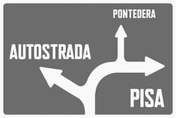 Neil Wengerd studied at Kent State University. In 2009, he started work on a Bauhaus-style typeface called
  [
[
 Ex-student from the University of Toledo, b. 1971. Creator of the flamed dingbat and alphading fonts J-Flames (2011), Up In Flames (2008), Up In Flames Too (2008), Up No Flames (2008),
  [
[ Cincinnati-based graphic designer and illustrator.
  [
[ During her studies in Batavia, OH, Kati Best created the typeface
  Nathanael Bonnell studied in Cincinnati, OH, and set up the Looseleaf Fonts commercial foundry in 2012 in Wyoming, OH. Before that, he created
  Born in Columbus, OH, in 1970.
  Or Matthew Hinders-Anderson. Climate activist and lead designer for
  Mike graduated from Ohio State University with a degree in philosophy. Prolific Columbus, OH-based designer (b. Columbus, OH) whose fonts are mainly available through Scriptorium. Many of his fonts were influenced by roman inscriptional or Trajan types. These include
  Midwest Type is the type foundry of Jesse R. Ewing, est. 2014. Jesse is a designer, illustrator, and type designer in Akron, Ohio. In 2021, Midwest Type joined
  Cedarville, OH-based graphic designer. Designer of the
  [
[ New York-based foundry run by Charles Nix (b. 1967, Ohio), who studied tye design at The Cooper Union. Charles Nix is professor of Typography and Book Design at the Parsons School of Design, New York. His foundry was helped by Wong Chee (digitization) and
  Rittman, Ohio-based creator of a set of 23 Victorian-style vintage fonts called Church in the Wildwood (2014). She also made a free set of Victorian drop caps called
  Influential designer and type designer, motivated by beautiful advertising type (b. Mountgilead, Ohio, 1879, d. Chicago, 1940).
  From Ashtabula, OH,
 Oberlin, OH-based foundry of
  Benn is an electrical engineering professor at Ohio State. Benn Coifman's site specializes in commercial railroad train and train lettering fonts. Also included (for free) are a crossword font, a population font, a car font, and a cartography font, all designed by Ben. Check
  Cleveland, OH-based expert (b. 1964) in American film type, who launched himself in type design in 2006, and has made great contributions in the
  Westerville, OH-based designer of Reservation Sans (2015), a geometric handcrafted vintage display font custom designed for one of his friends.
  This Ryan Smith is from Akron, OH. His site is called Design by Smitty. He is scheduled to graduate from Ohio University's School of Fine Arts in 2012. He created a peppy slab serif typeface called
  Kent, OH-based designer of the
  Graduate of Columbus College of Art & Design, class of 1995. Art director and lettering artist in Columbus, OH, who published his first typefaces at
 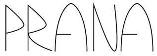 Shain Picard (Columbus, OH) designed the artsy hairline display typeface
  [
[ Greg Ponchak (
 In 2013, Tommy Isbell (Parma Heights, OH) and Stephen Politte (Cleveland, OH) co-designed a 3d typeface called
  American calligrapher, letterer, and type designer (b. 1953, Indianapolis, IN) located in Lakewood, OH, and/or Kent, OH. As a lettering artist for American Greetings since 2000, he has designed and developed numerous proprietary fonts. He specializes in beautiful script typefaces. Stephen's commercial fonts can be found in both Veer and P22/IHOF collections. Creator of these fonts:
  Tobias Brauer is a graphic design professor from Cincinnati, OH. He runs a blog that occasionally discusses type. In 2014, he published the sans typeface Apposite, originally designed in 2012. Tobias writes: In its earliest versions and derivations, the design of Apposite experienced aesthetic influence by trying to engineer a hybrid between Helvetica and FF DIN. However, as Apposite’s design progressed, and became much more refined, it also developed into a visual voice that speaks in a contemporary tone, reflecting Swiss, German, and American characteristics.
 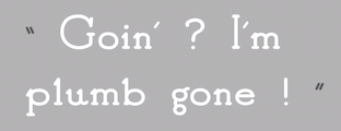 Graduate of St Cloud State University, who works as a graphic designer in Albertville, MN. In 2017, she published the fun rounded display typeface Good Bad (perhaps a silent movie text font) at Chank Fonts. In 2013, she designed an untitled techno typeface. [
 Martinsville, Ohio-born illustrator, calligrapher, typographer, book designer, author, type designer and puppeteer, 1880-1956 (Hingham, MA).
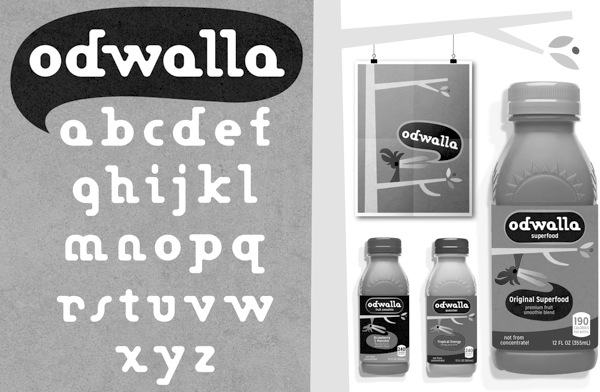
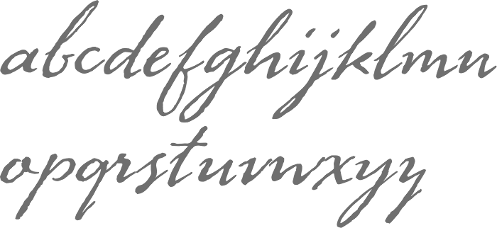
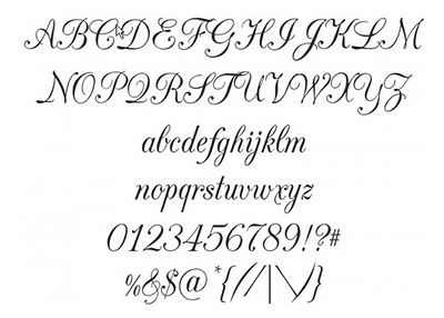
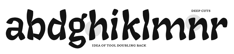
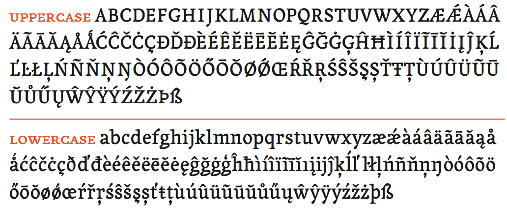
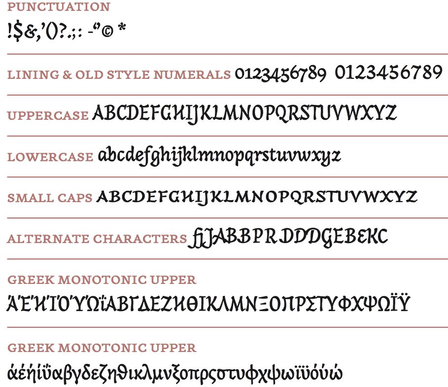
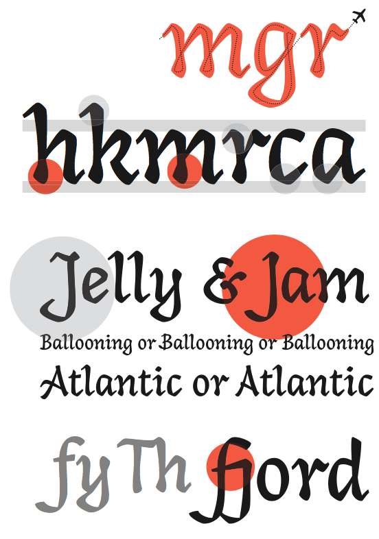
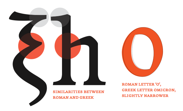
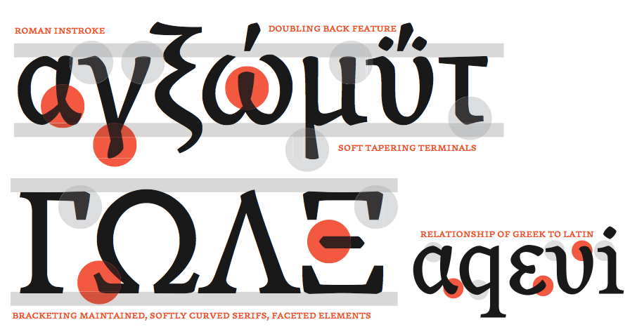
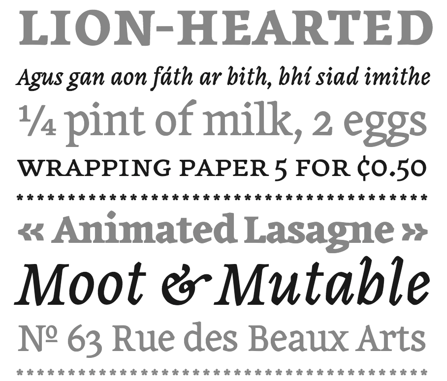
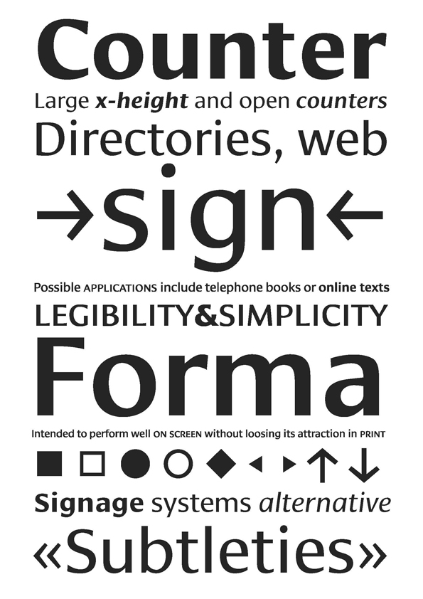
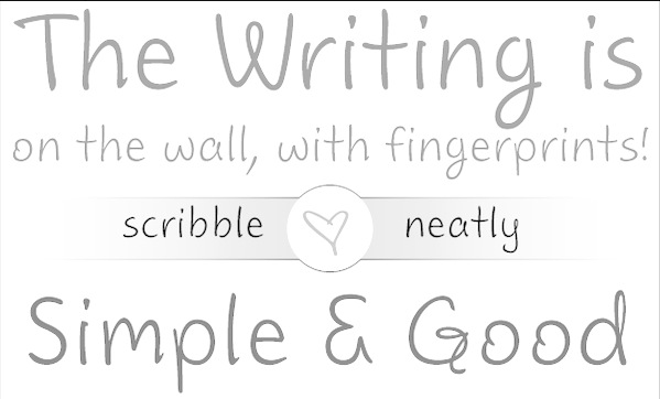
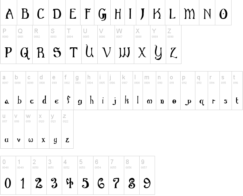
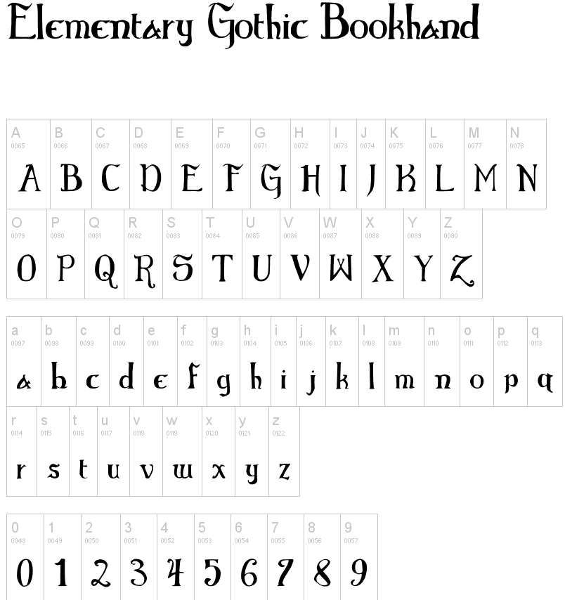
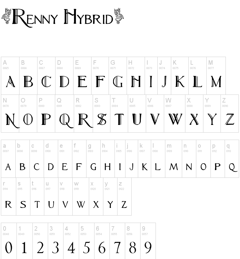
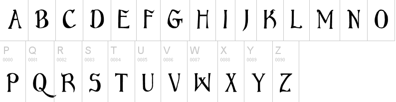
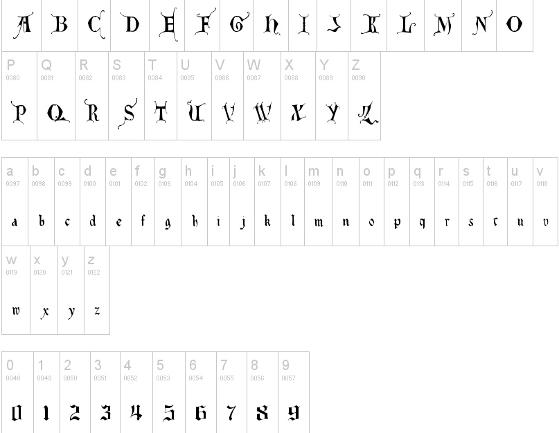
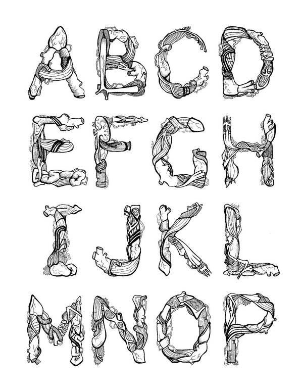
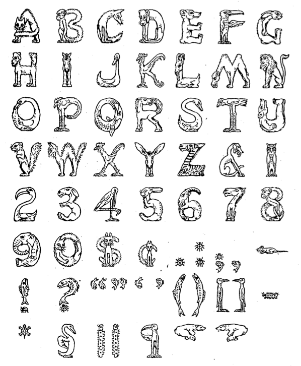
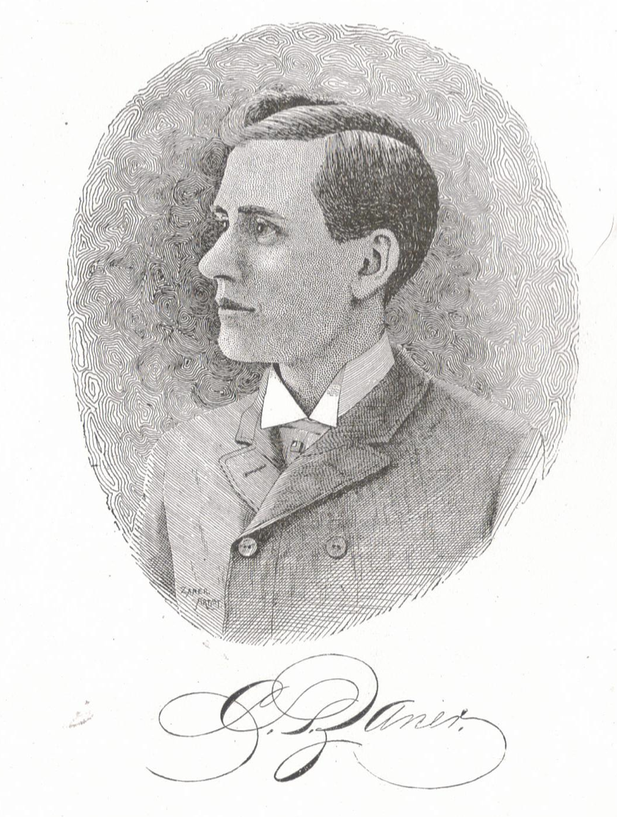
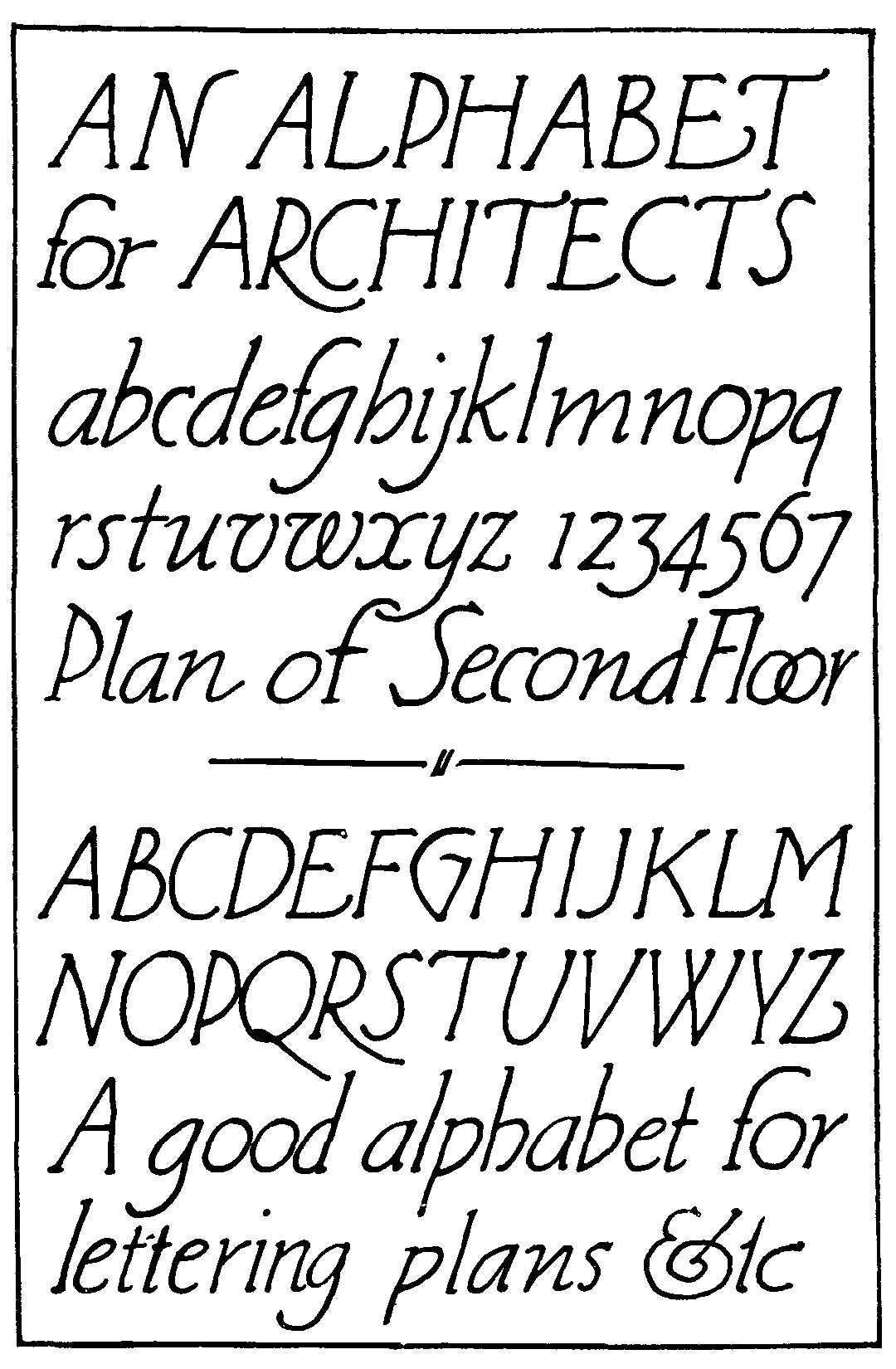
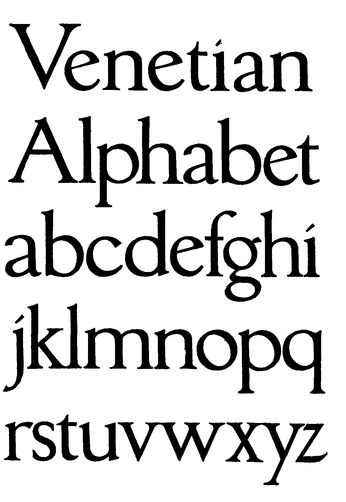
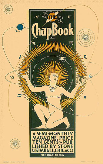
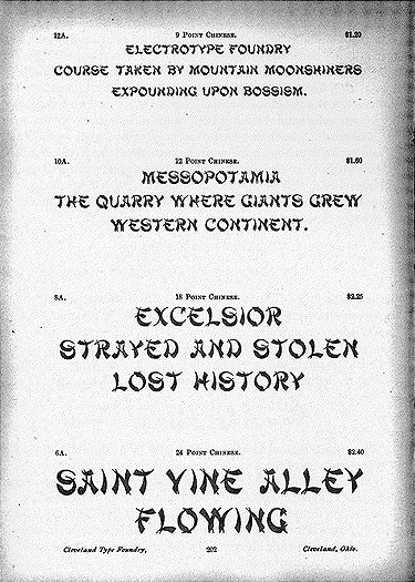
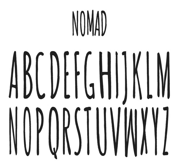
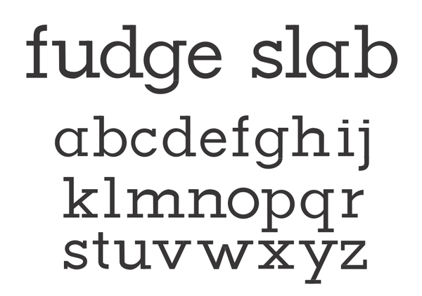
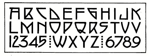
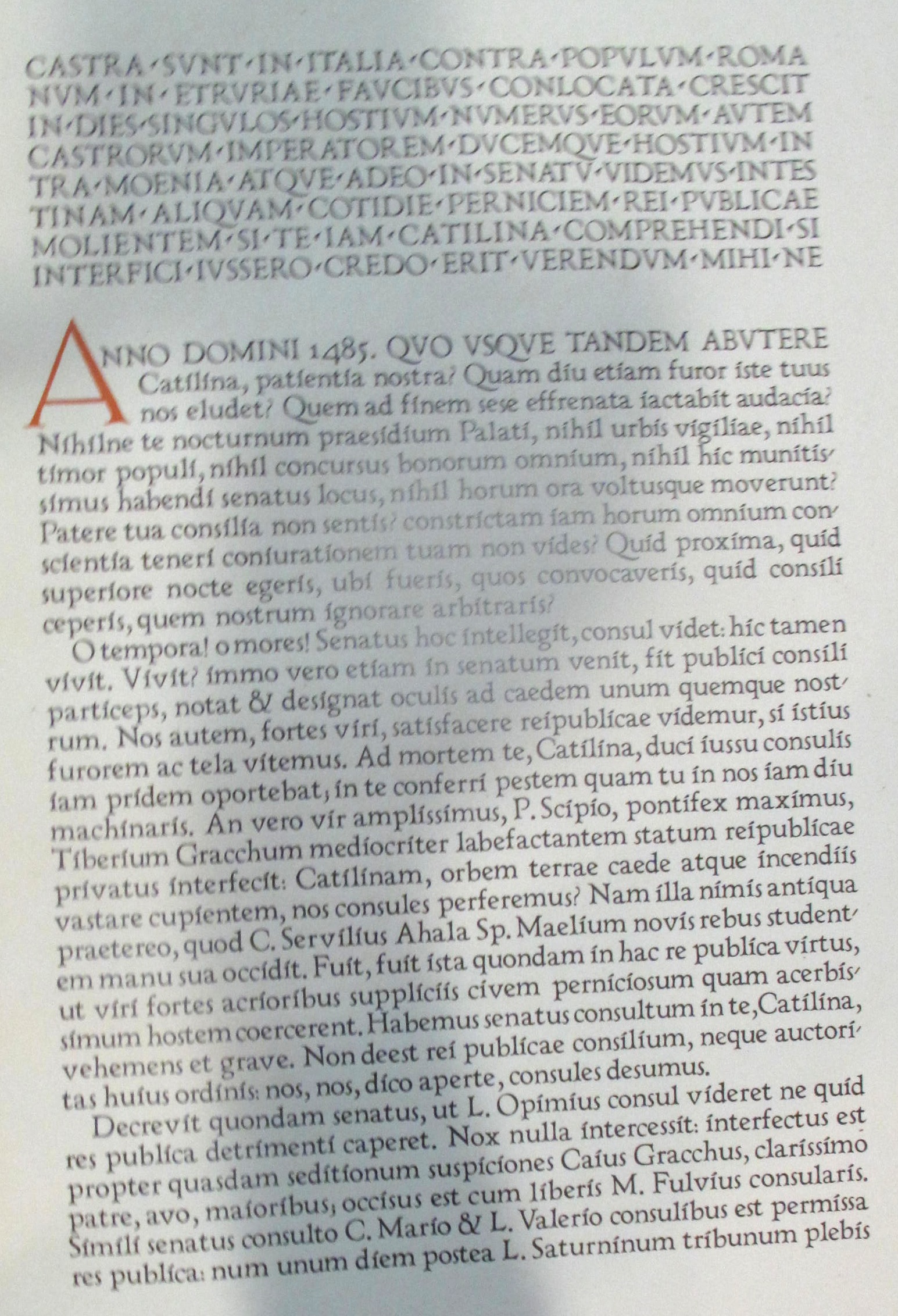
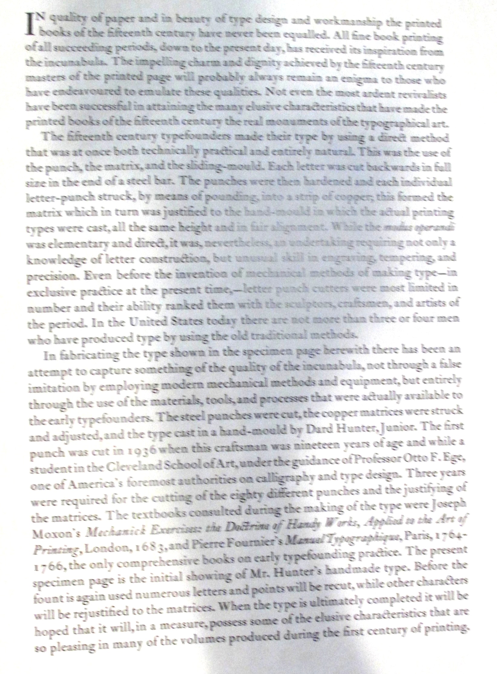
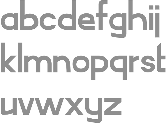
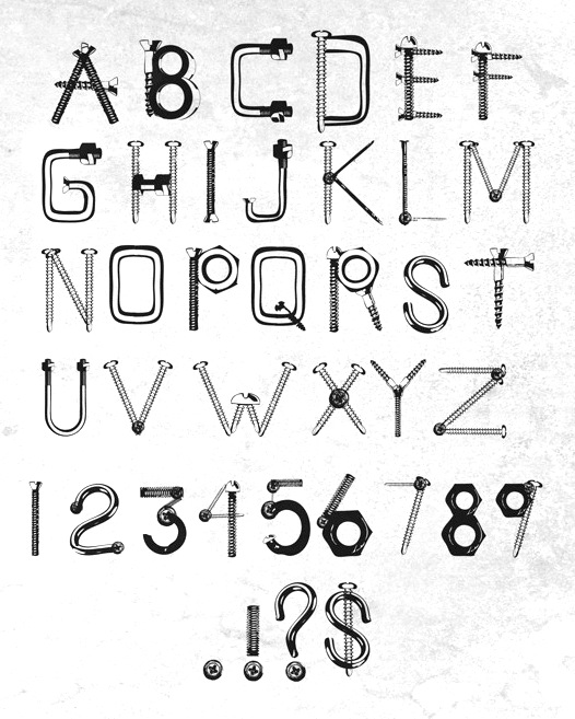
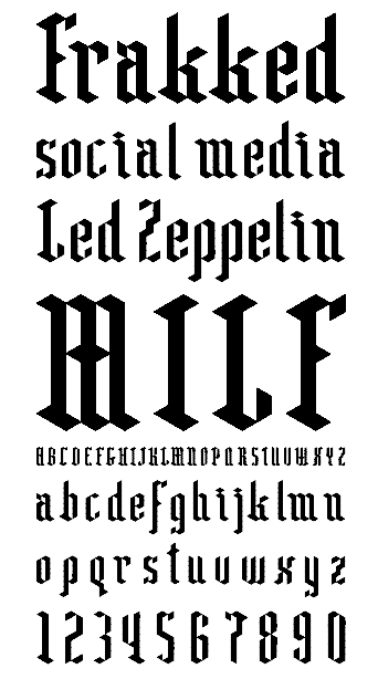
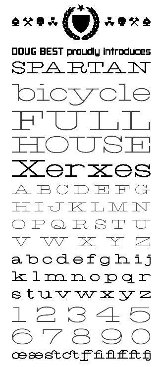
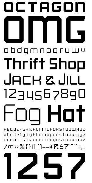
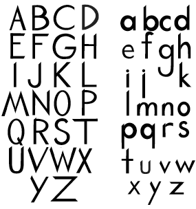
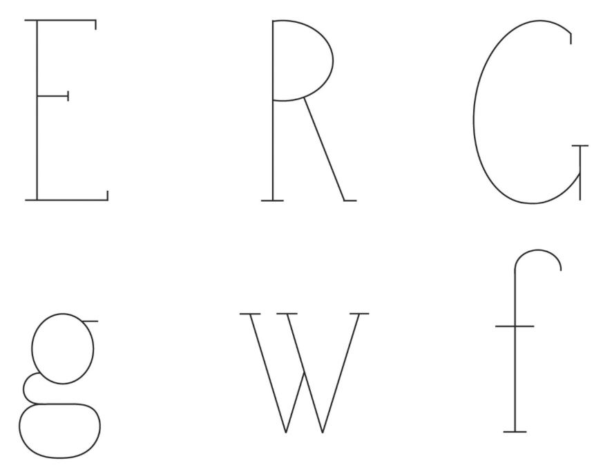
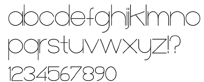
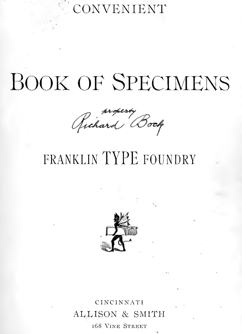
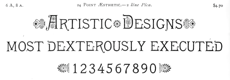
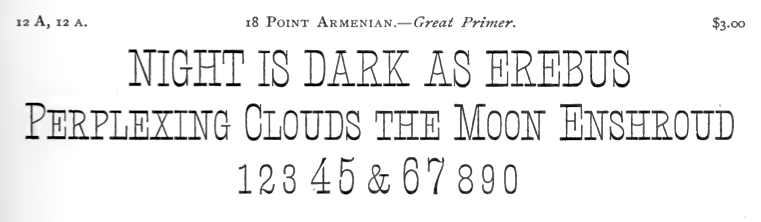
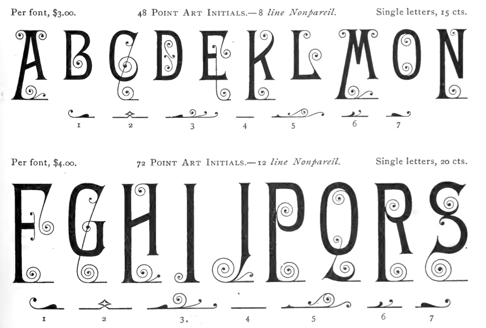
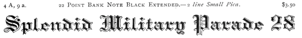
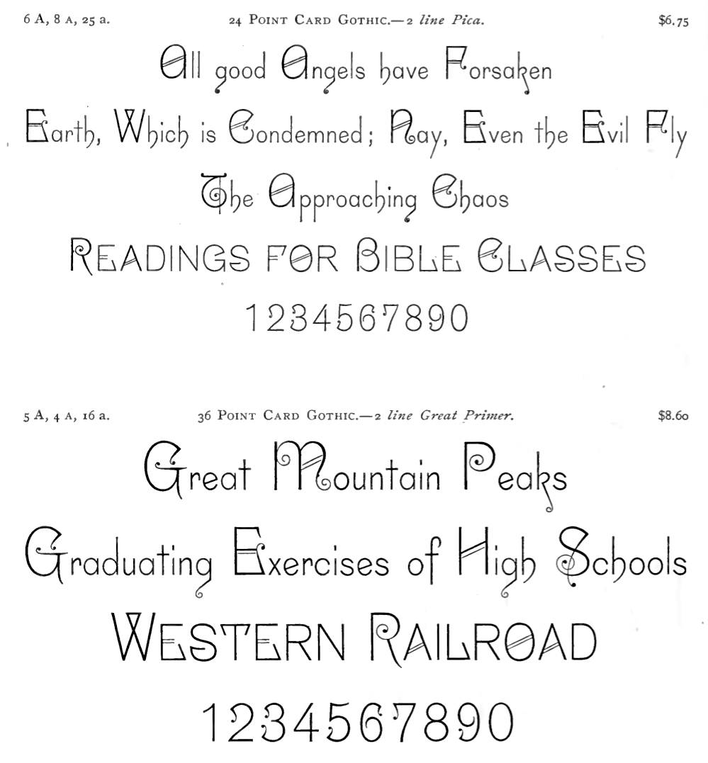
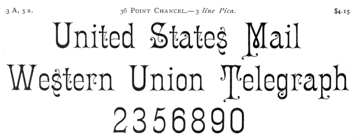
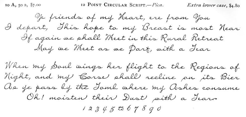
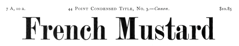
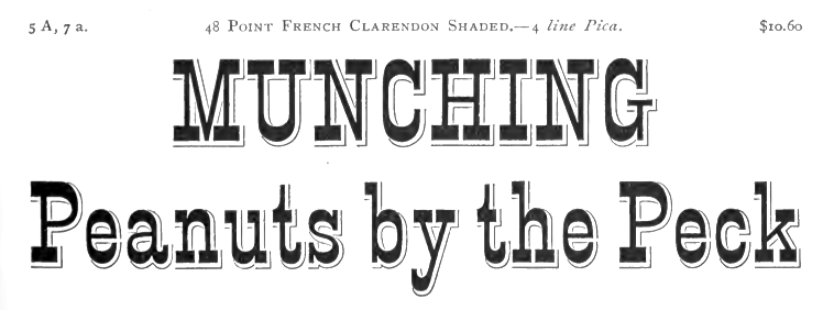
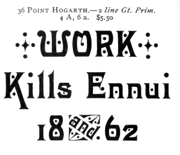
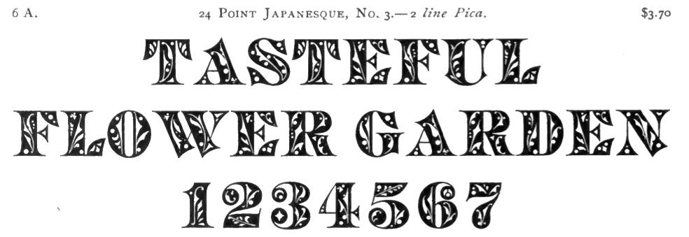
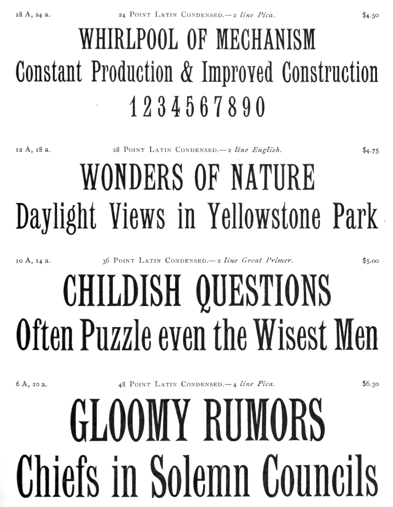
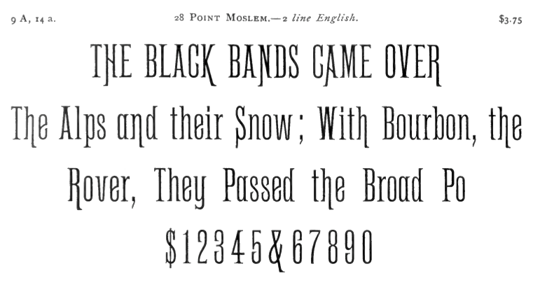
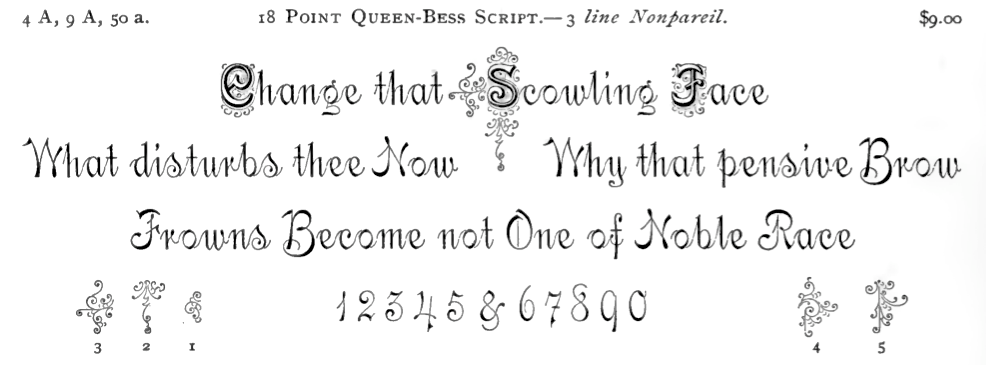
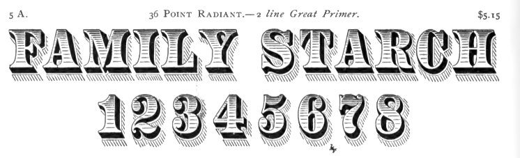
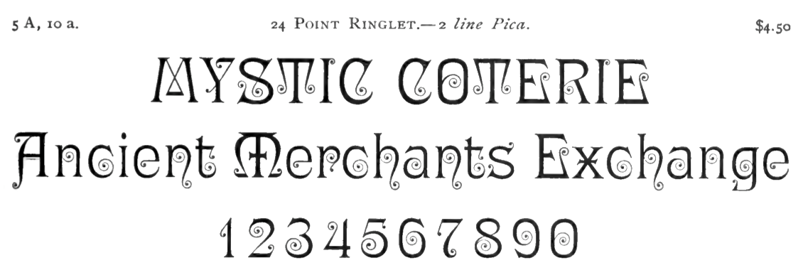
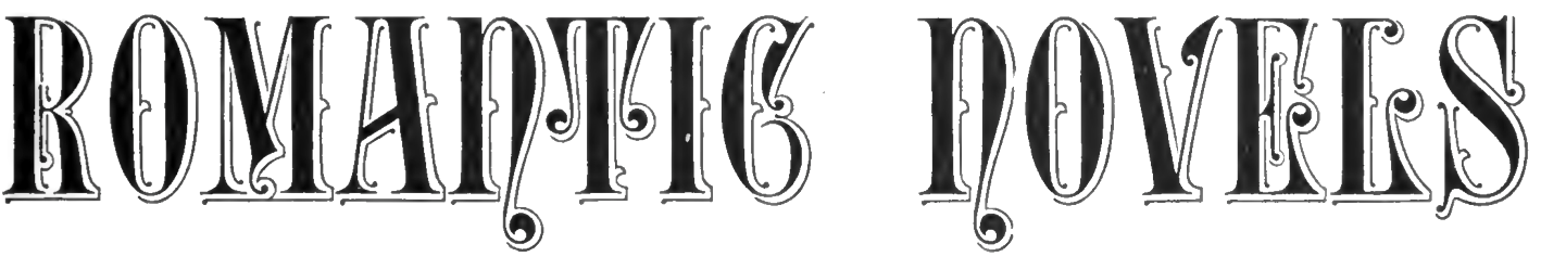
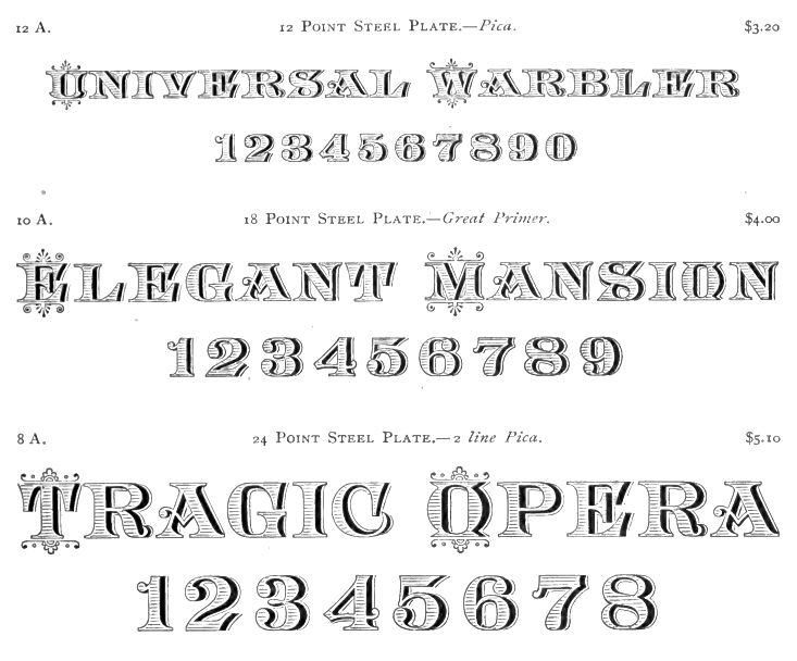
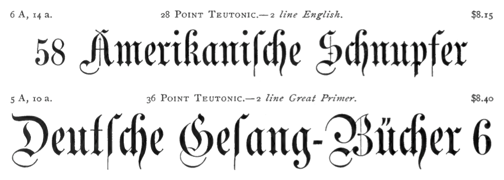
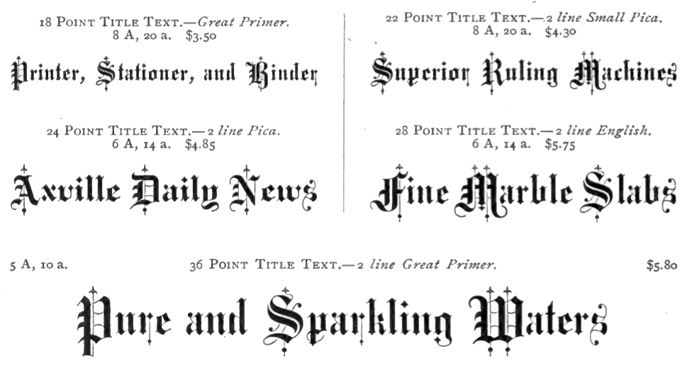
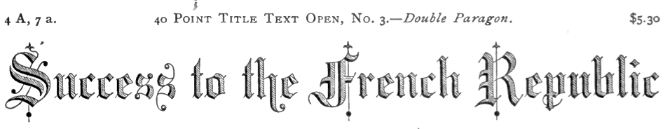
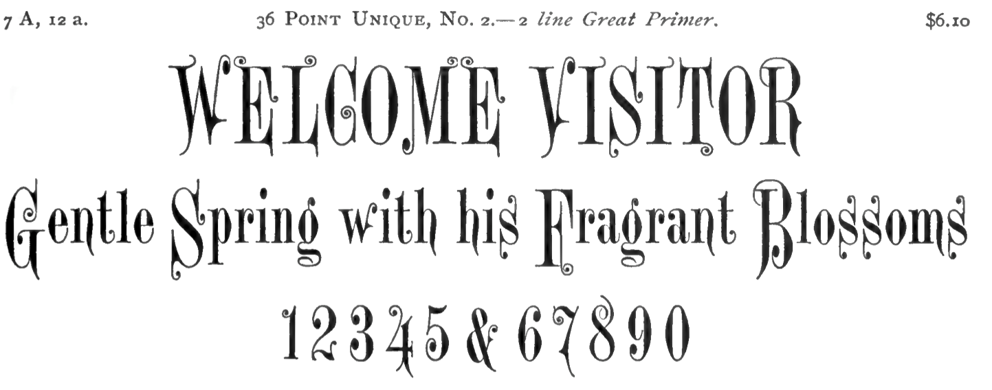
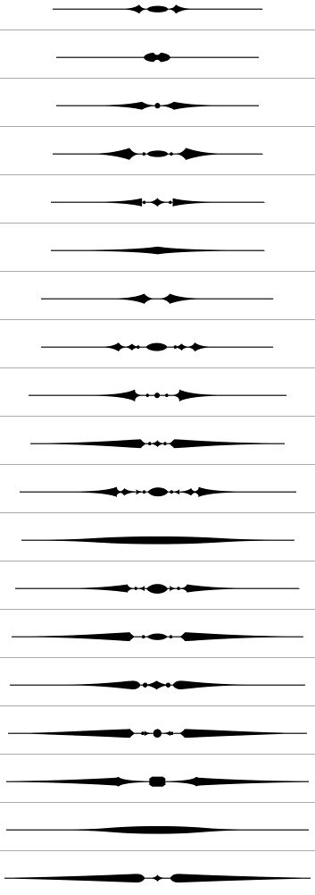
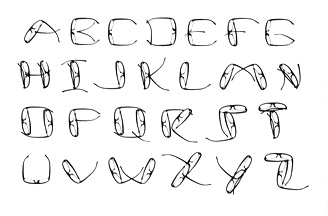
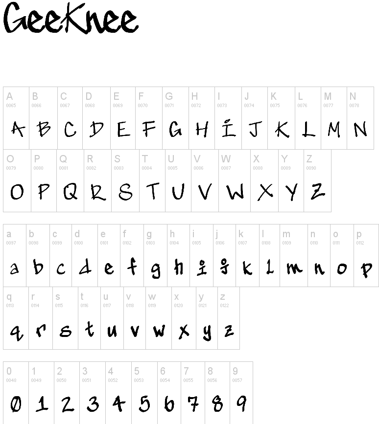
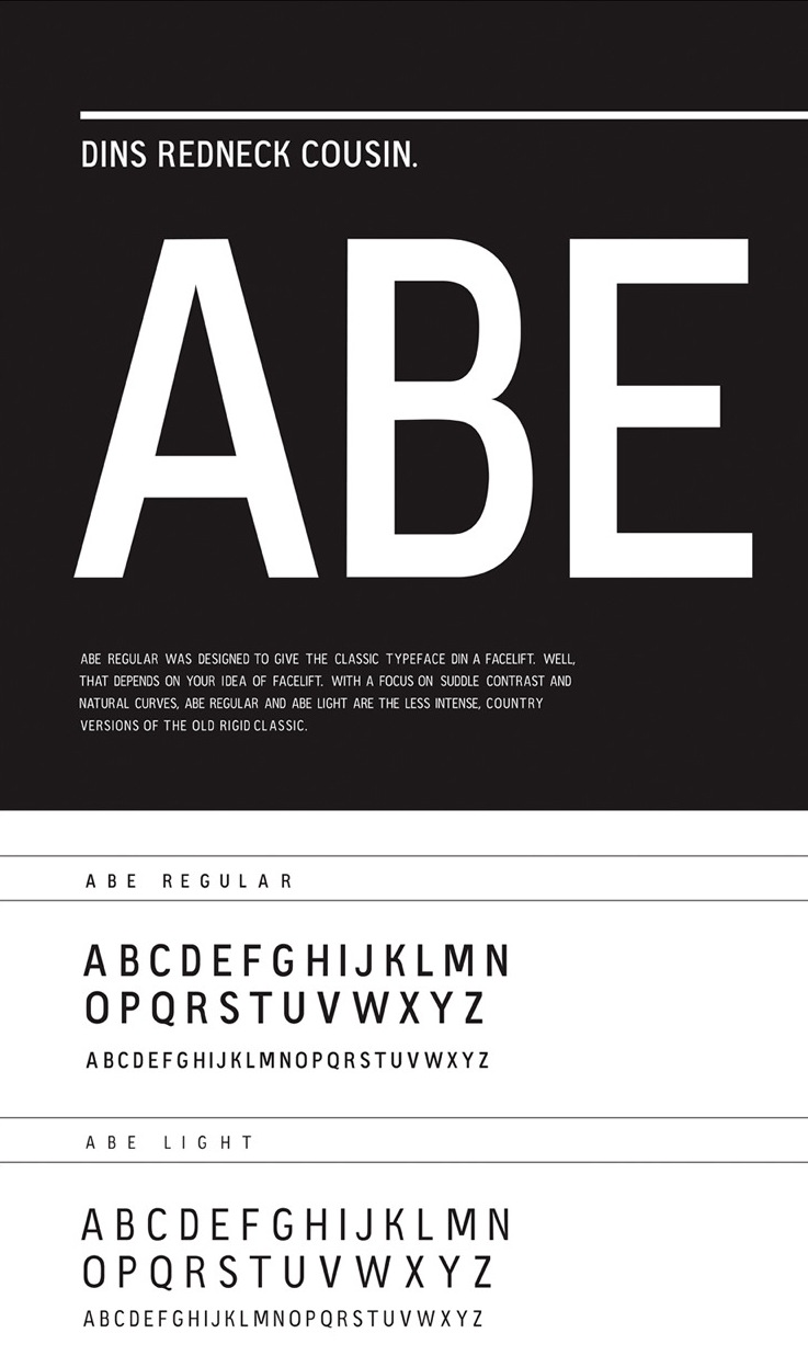
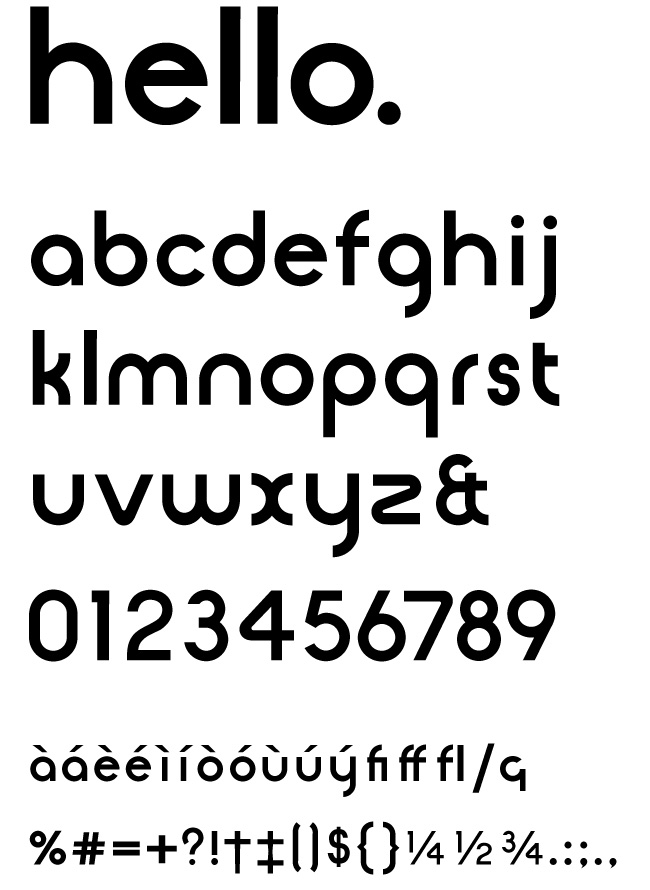
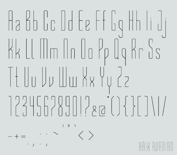
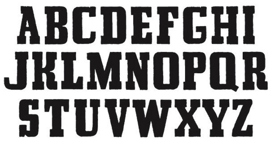
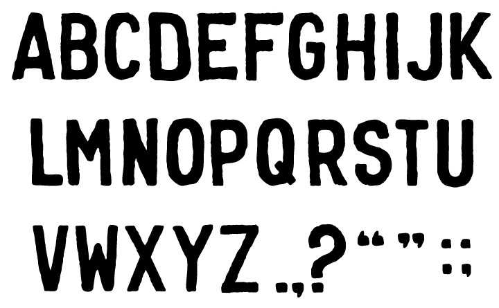
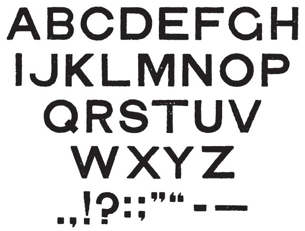
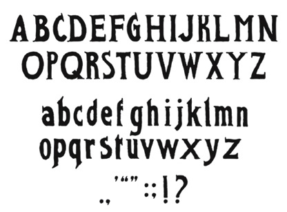
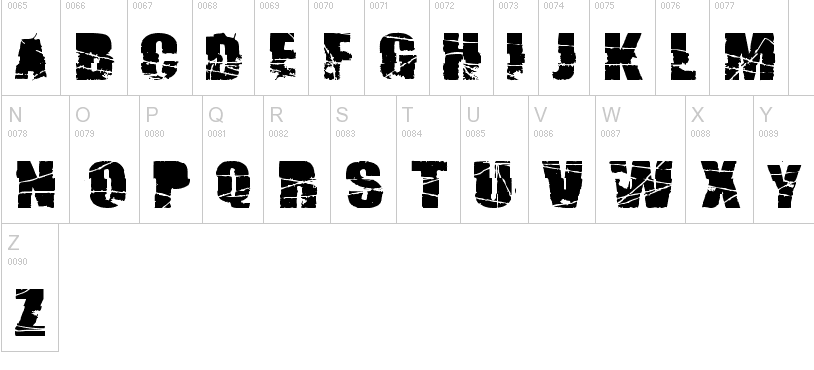
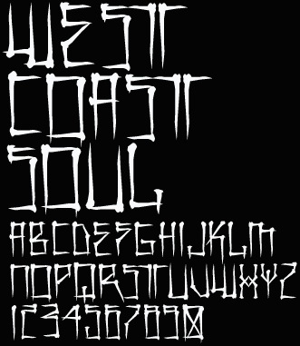
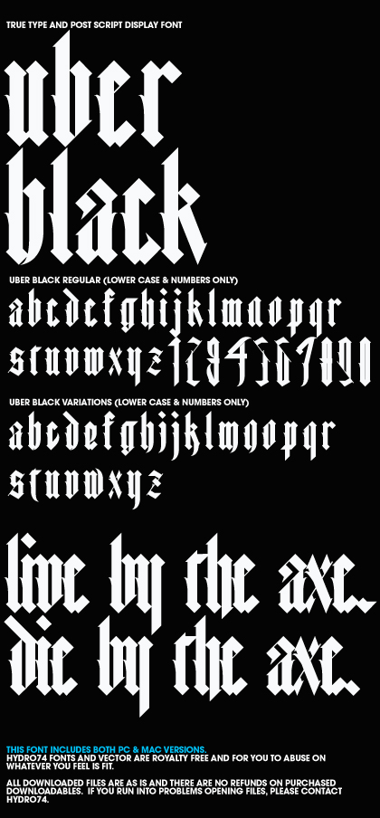
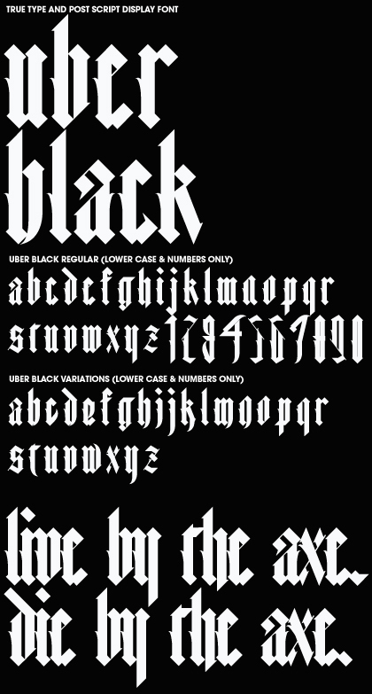
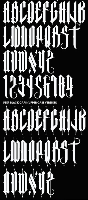
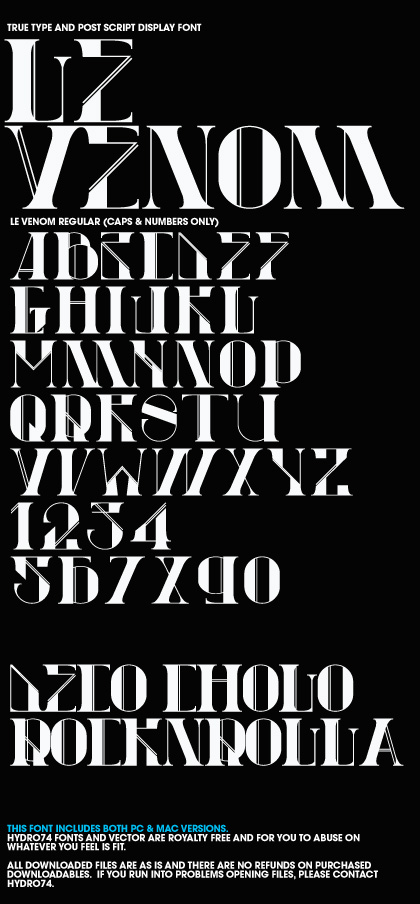
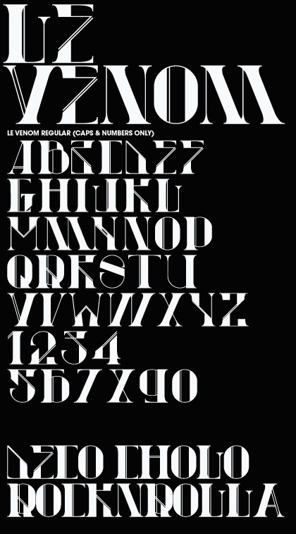
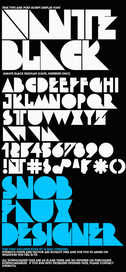
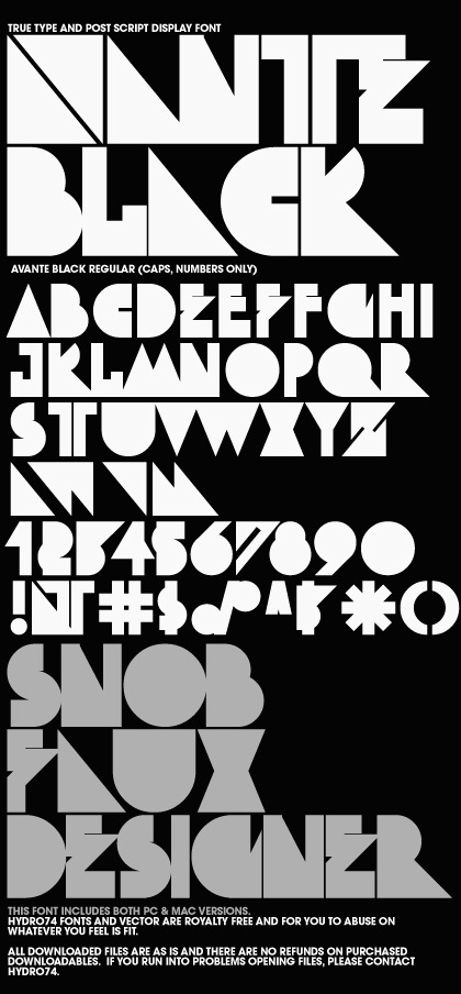
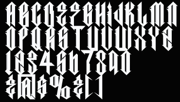
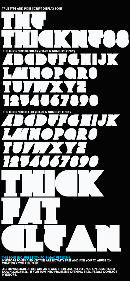
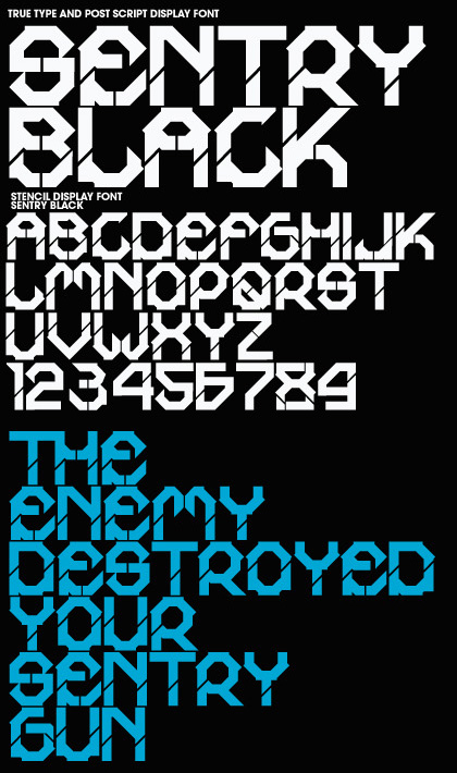
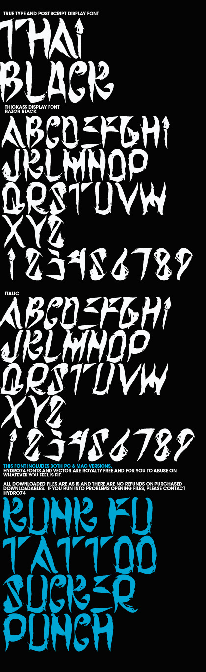
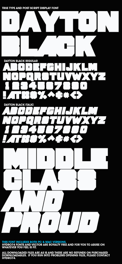
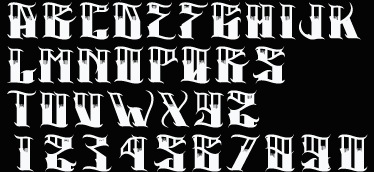
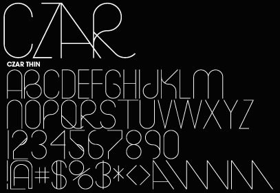
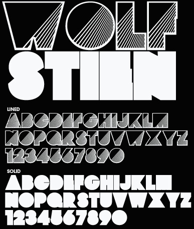
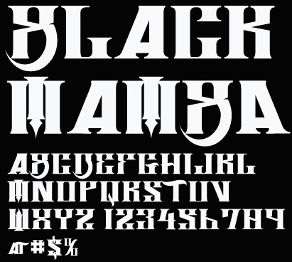
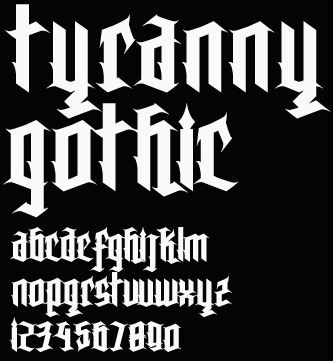
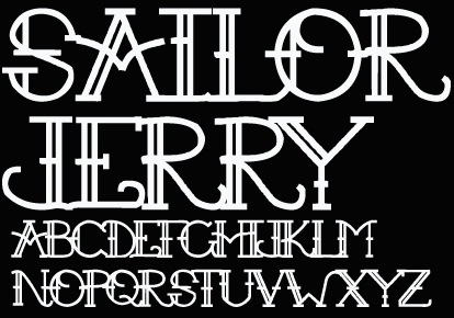
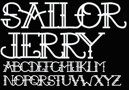
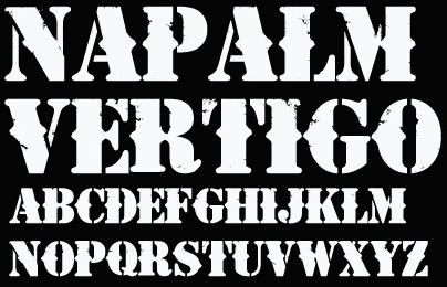
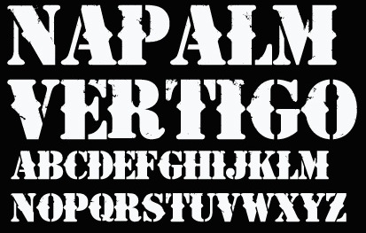
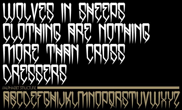
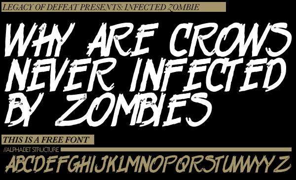
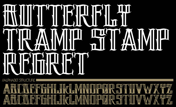
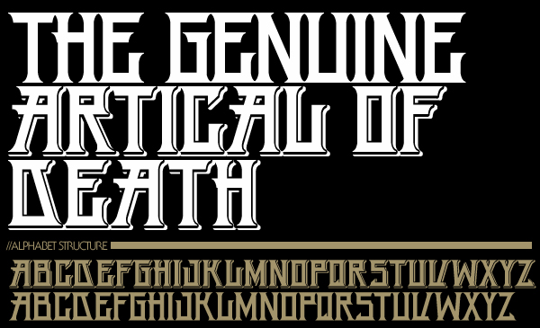
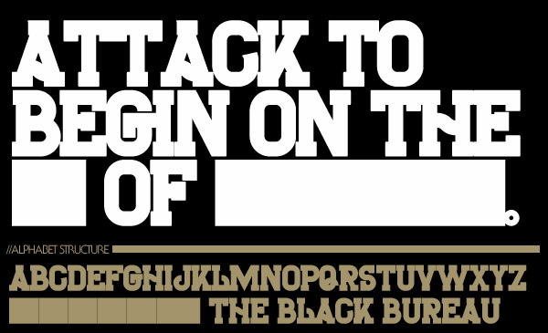
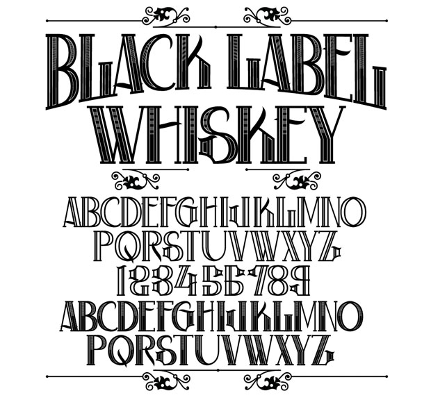
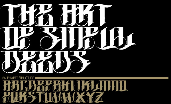
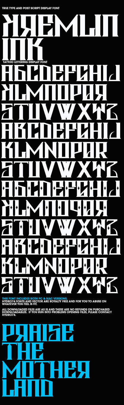
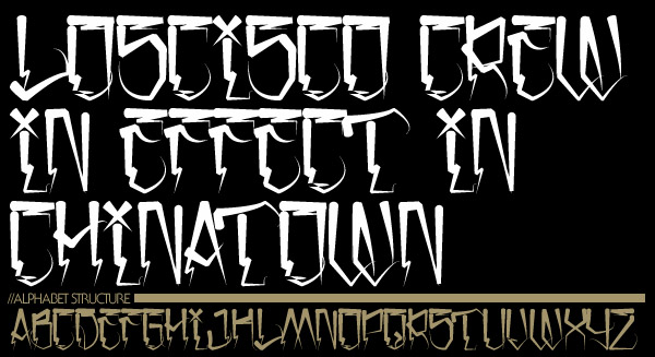
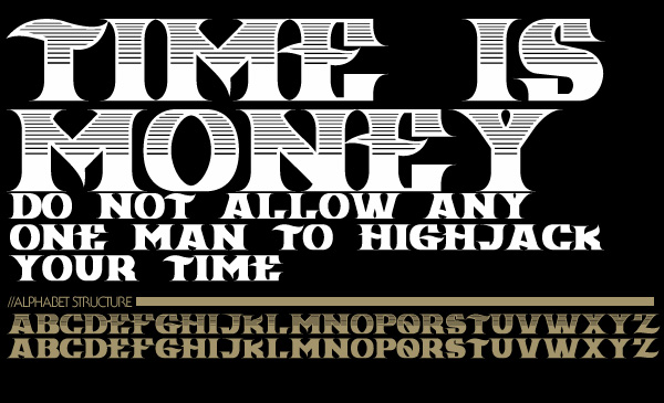
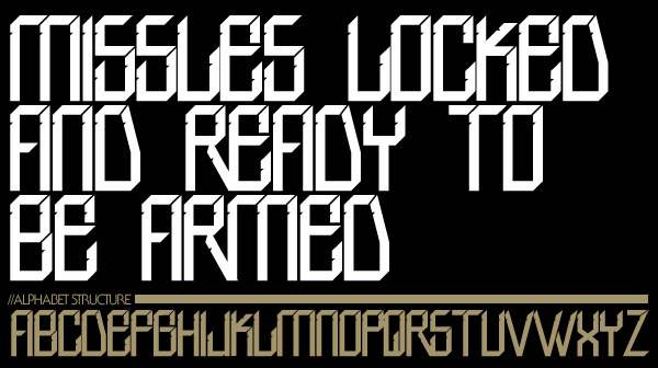
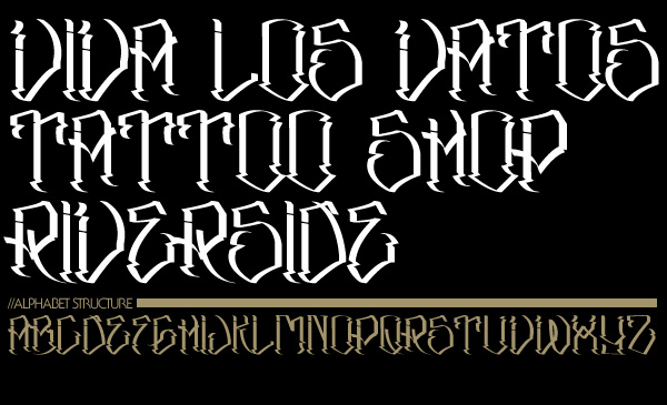
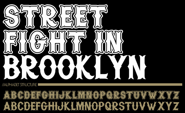
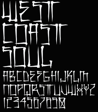
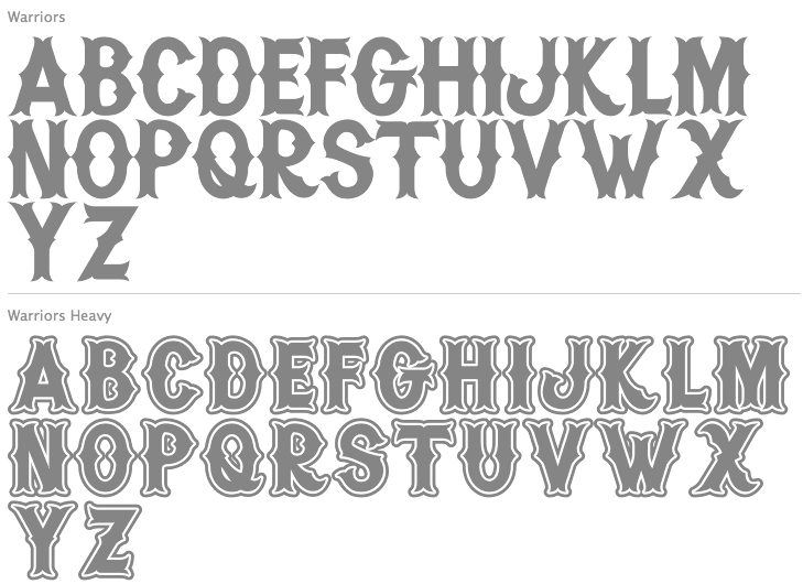
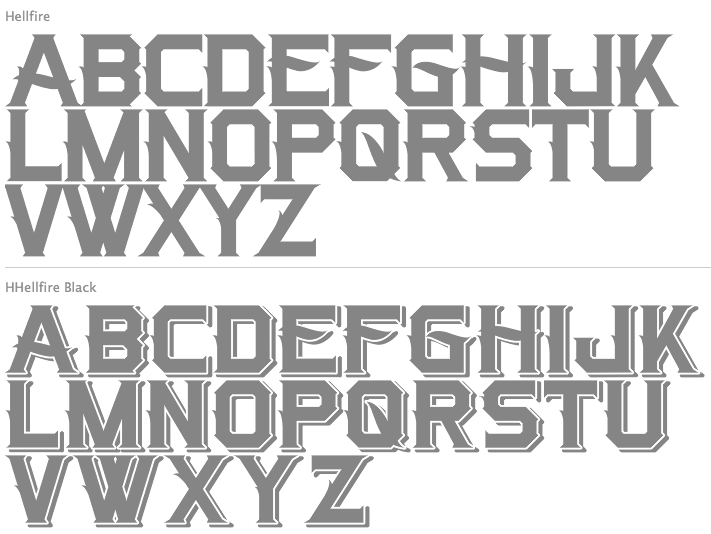
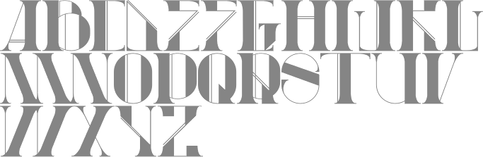
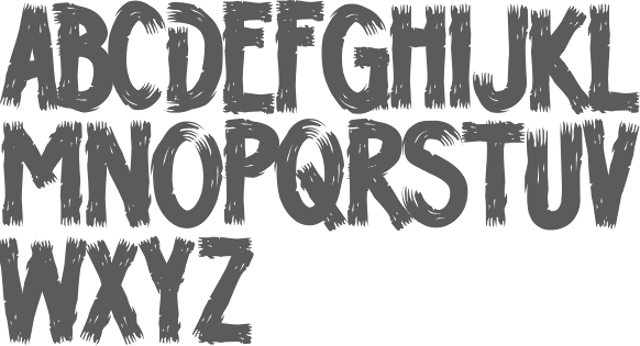
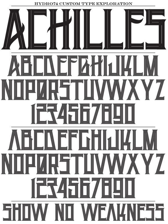
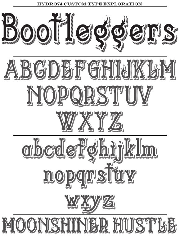
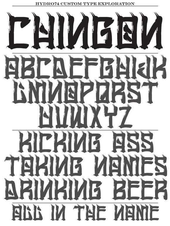
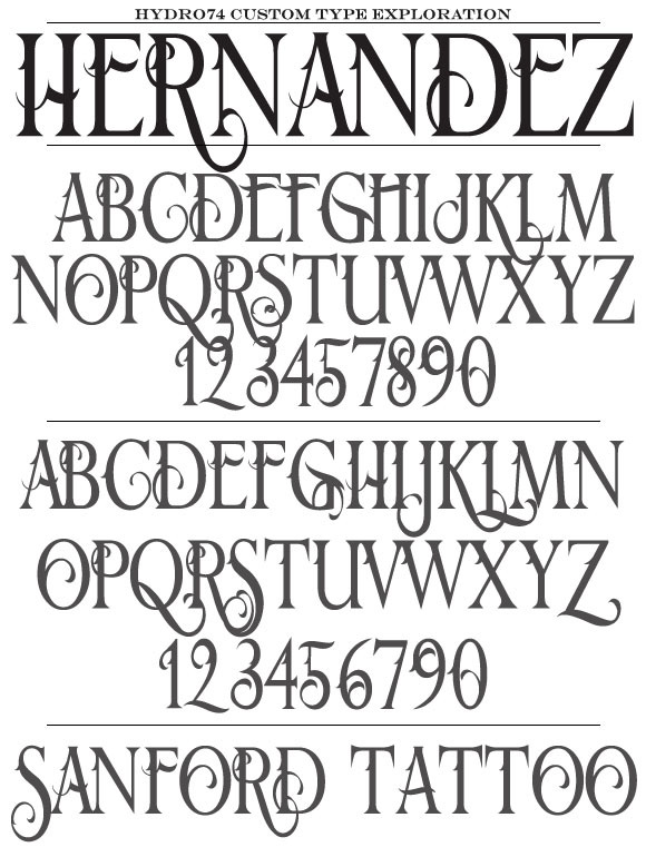
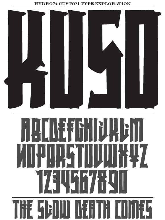
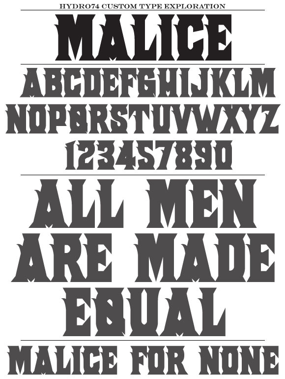
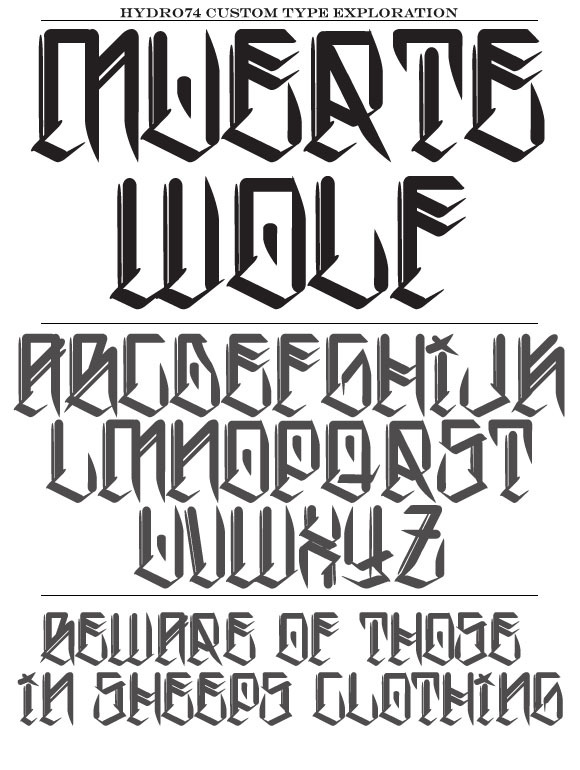
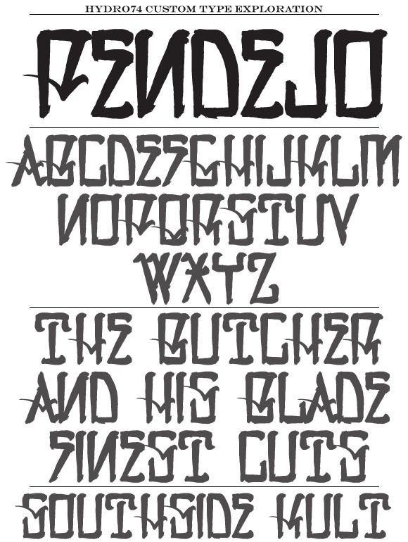
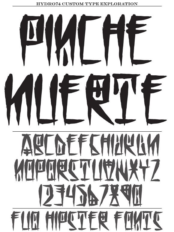
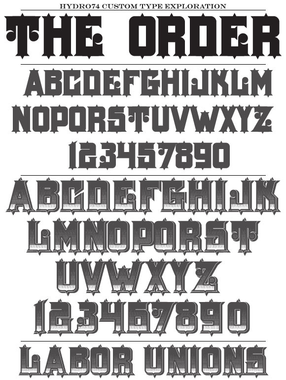
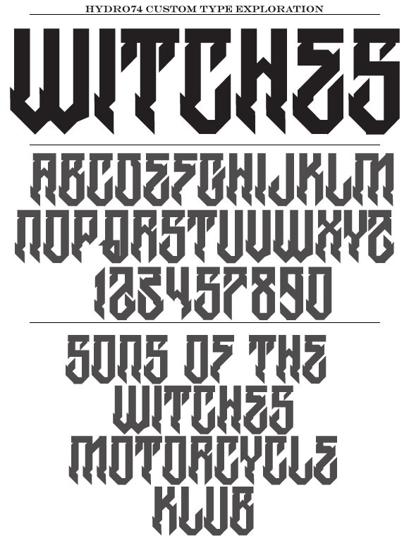
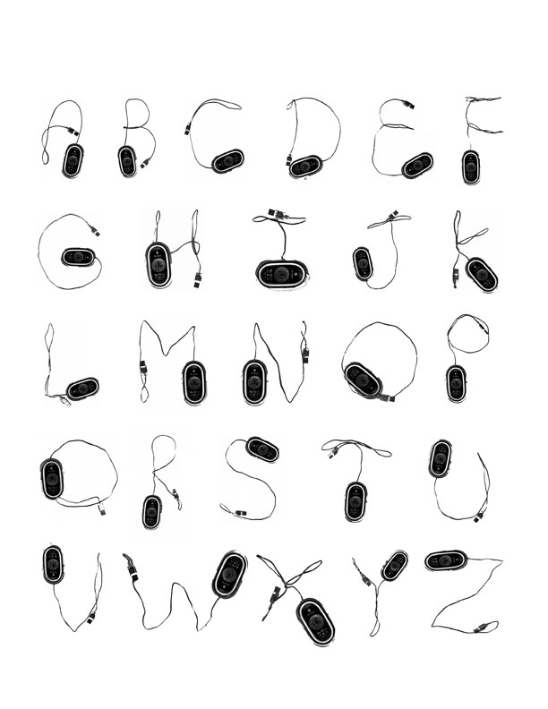
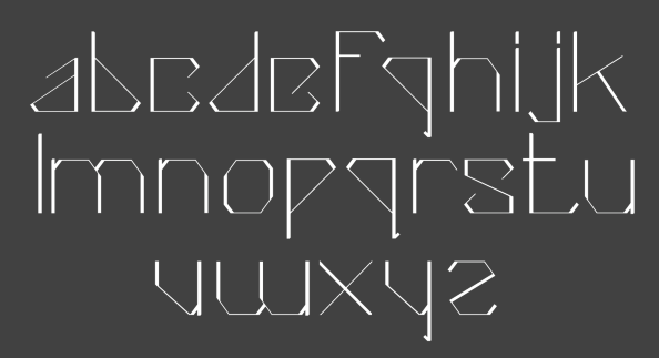
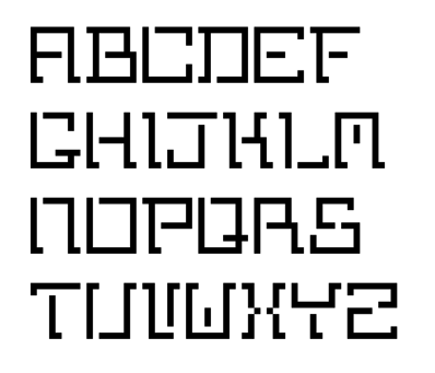
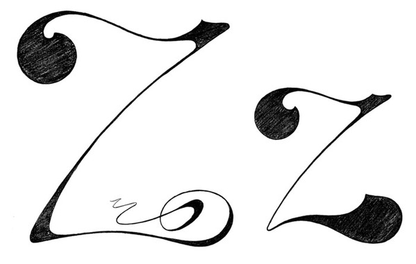
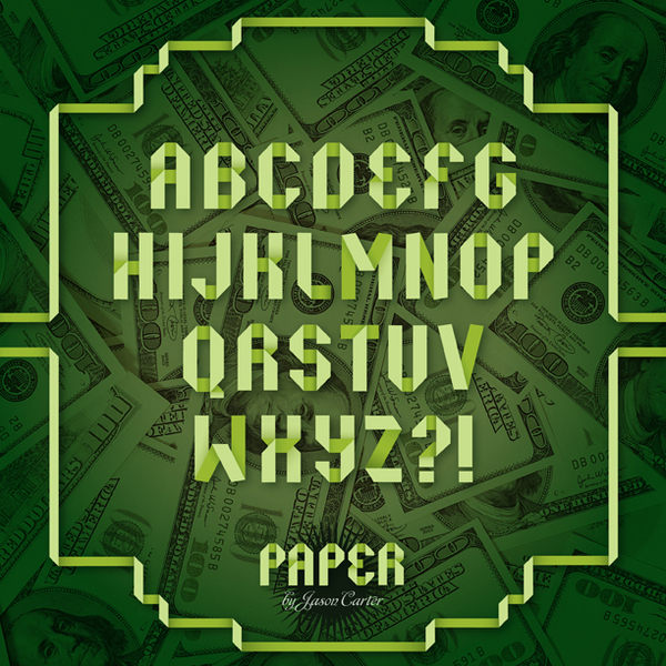
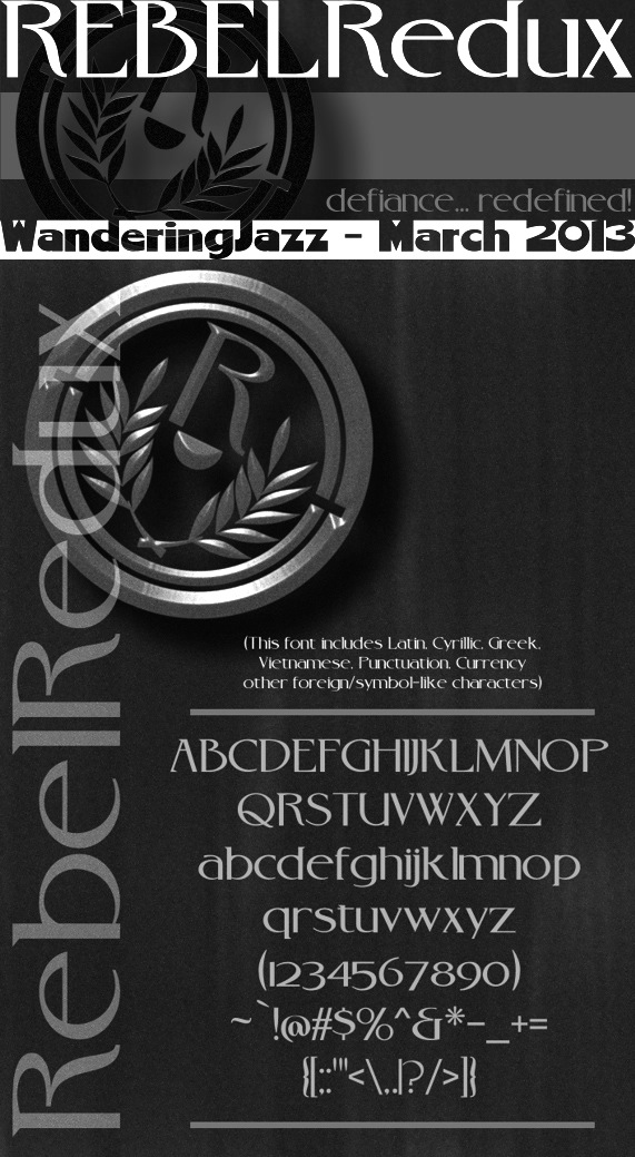
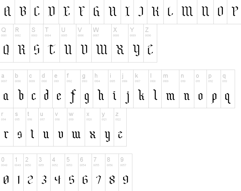
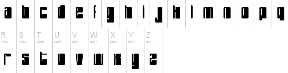
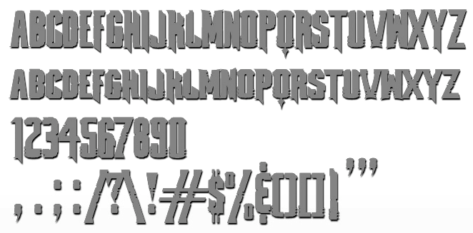
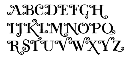
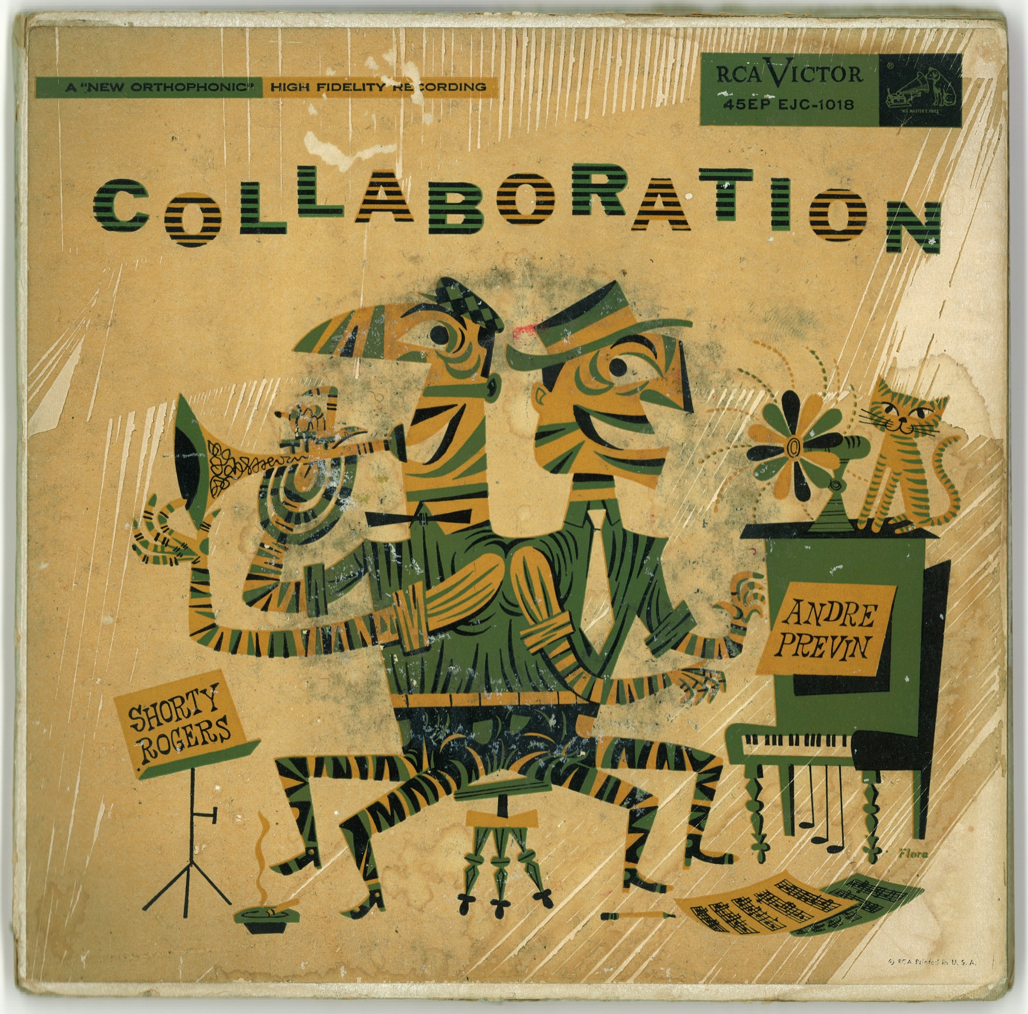
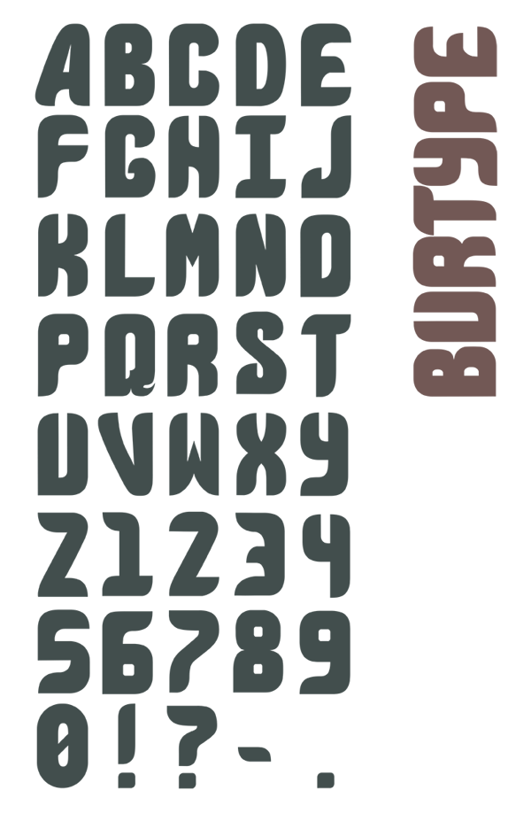
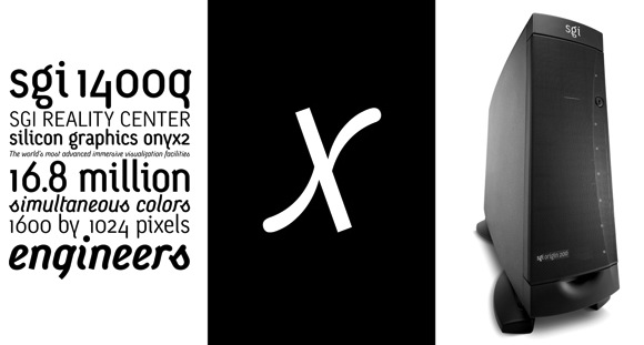
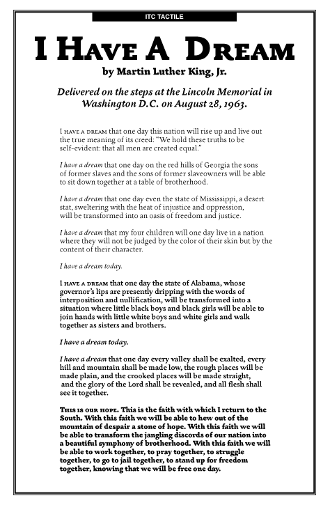
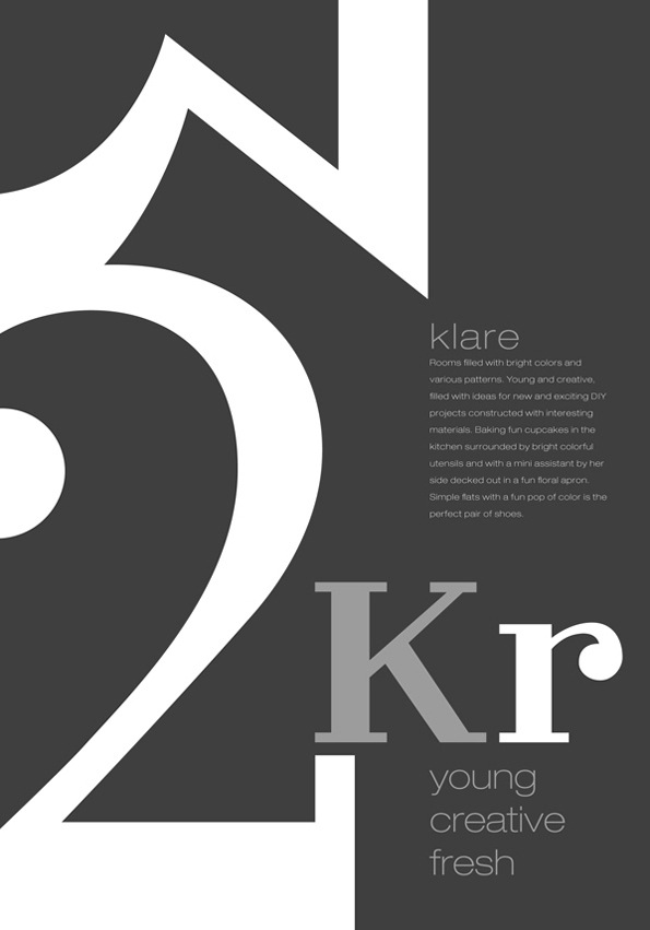
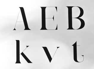
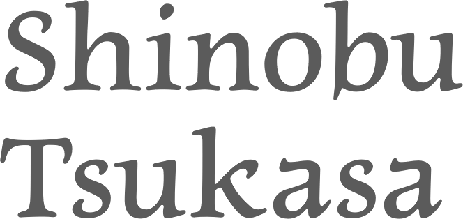
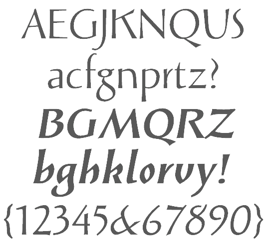
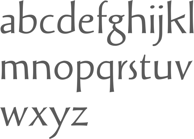
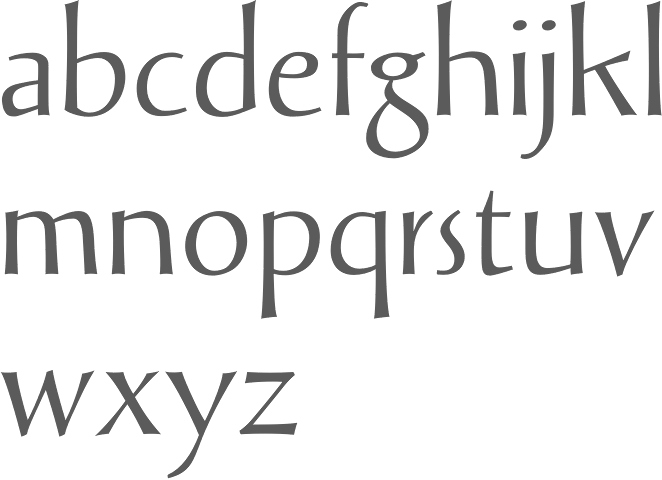
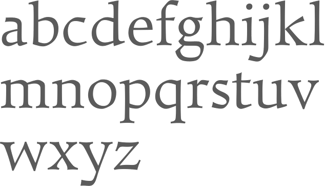
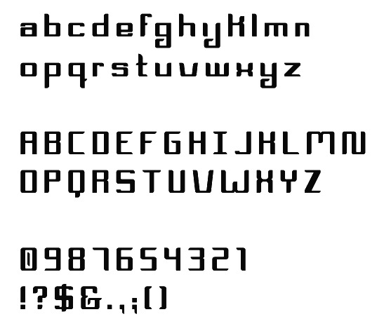
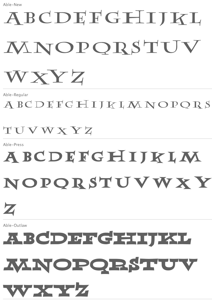
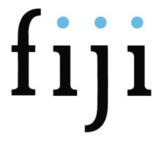
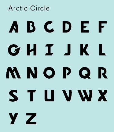
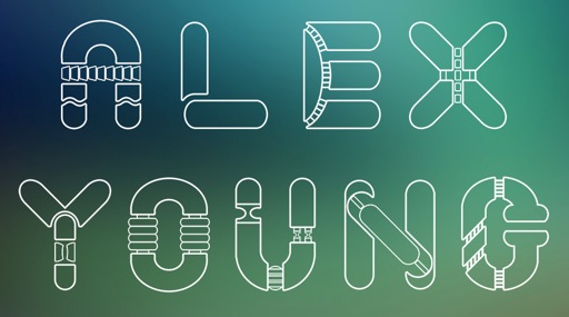
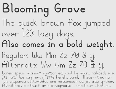
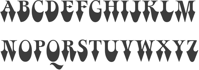
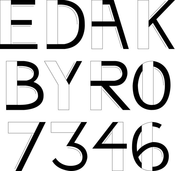
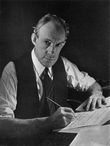
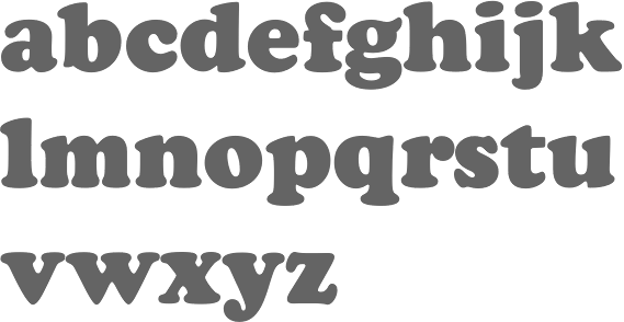
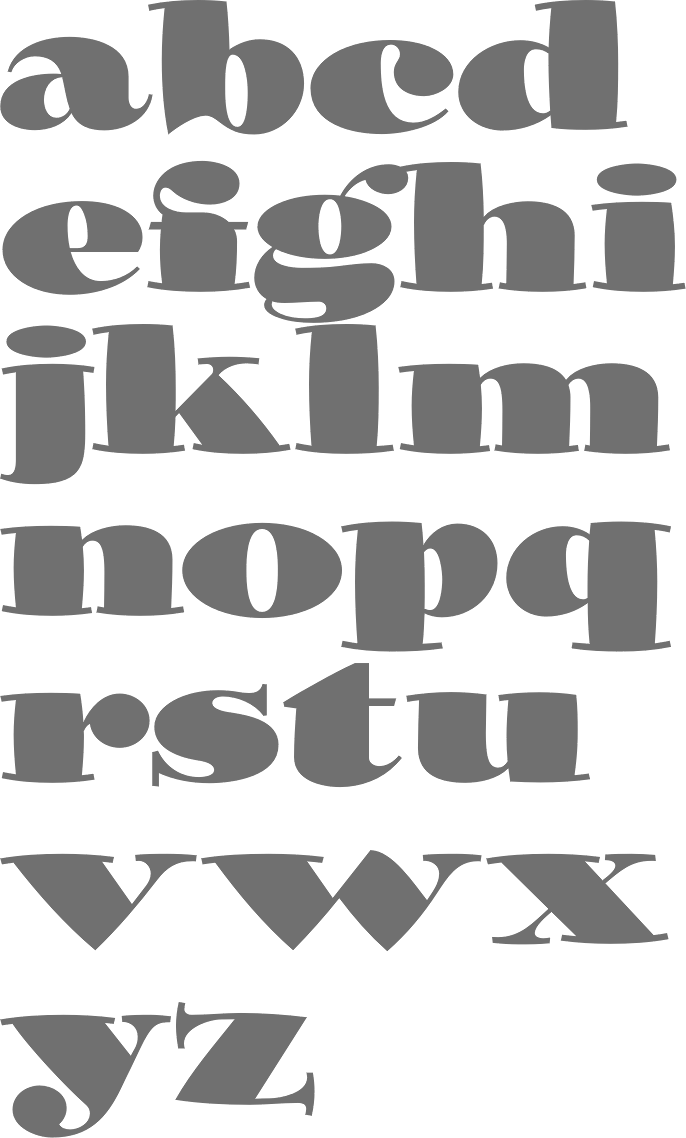
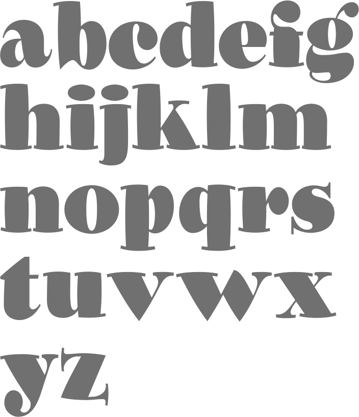
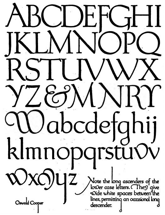
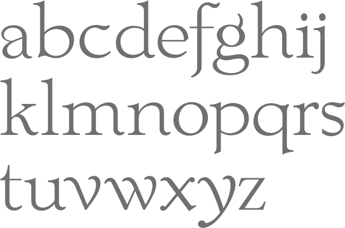
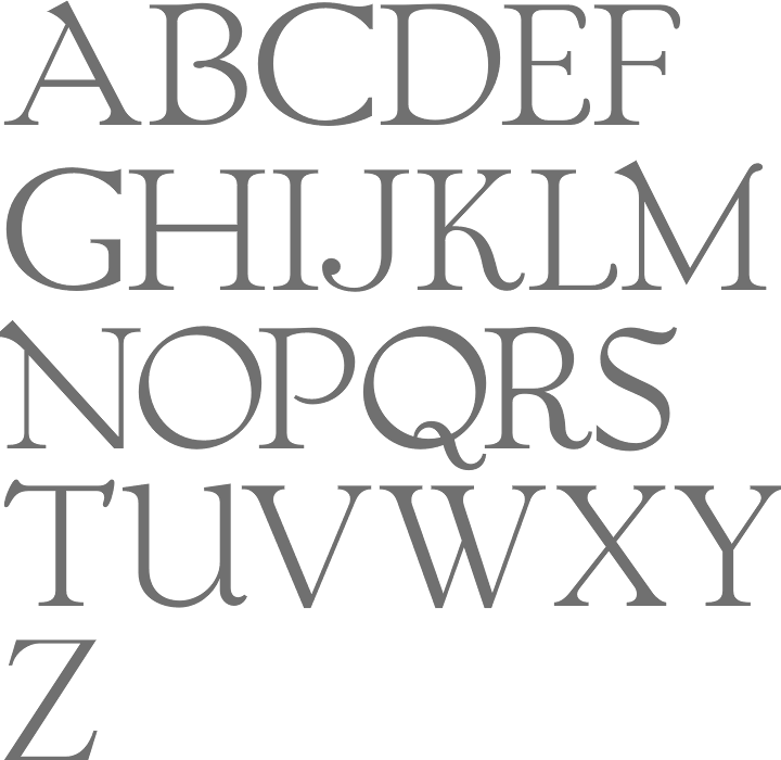
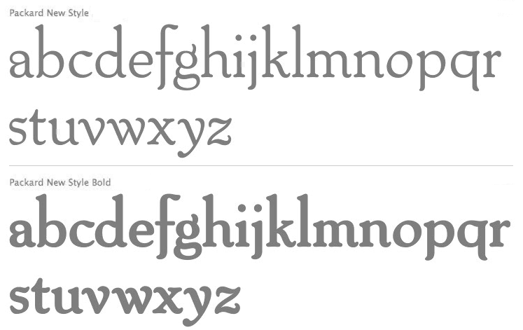
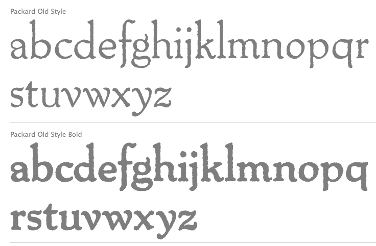
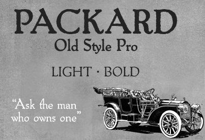
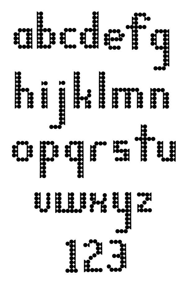
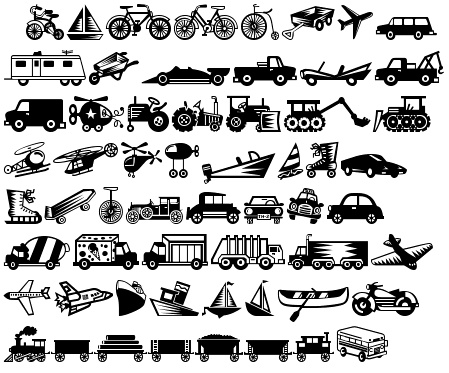
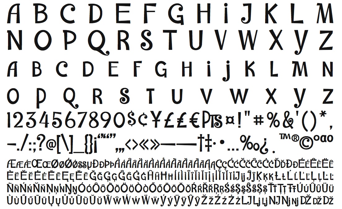
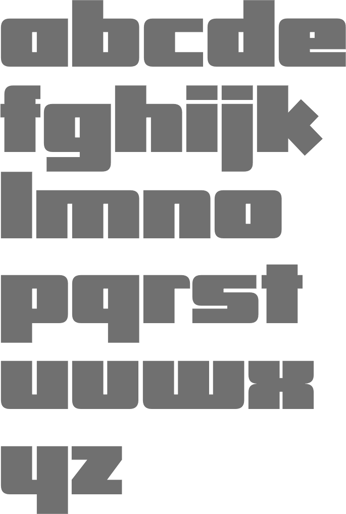
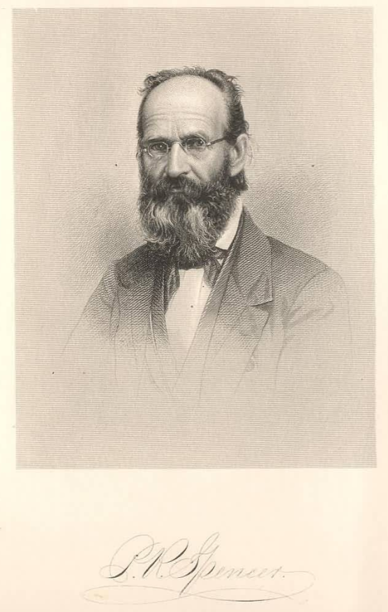
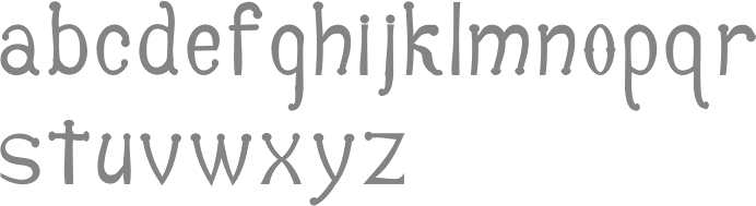
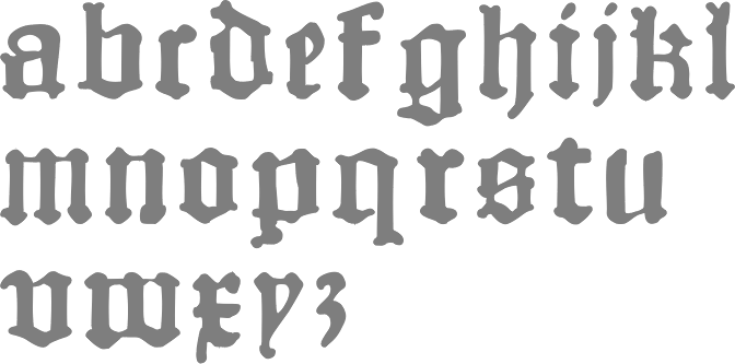
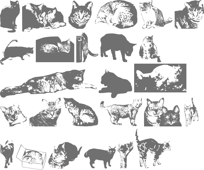
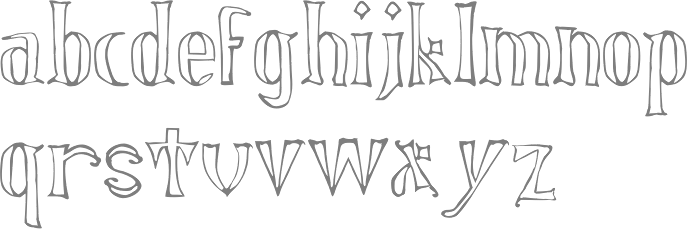
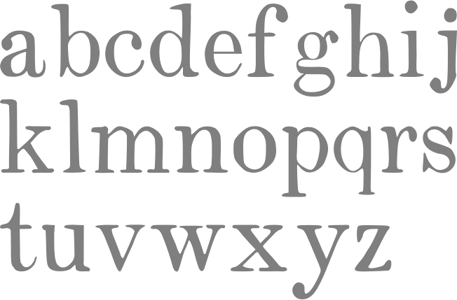
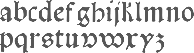
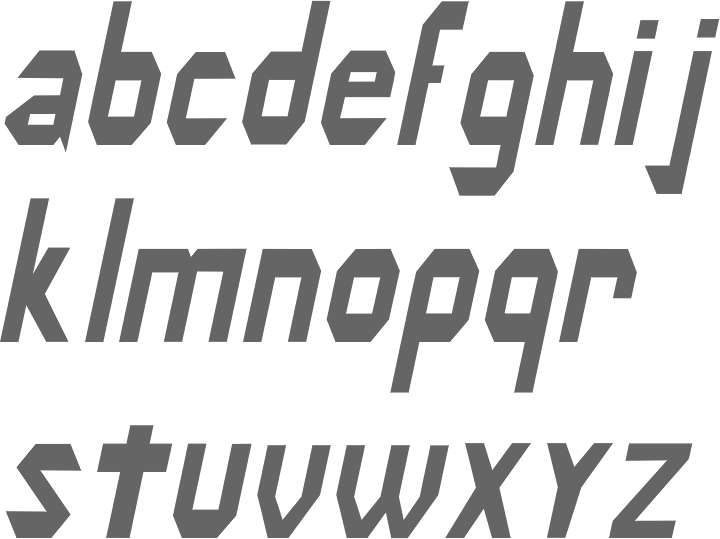
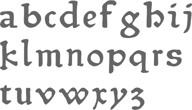
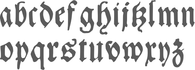
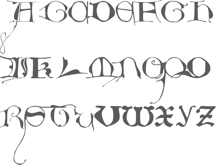
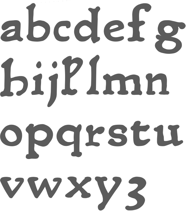
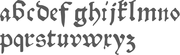
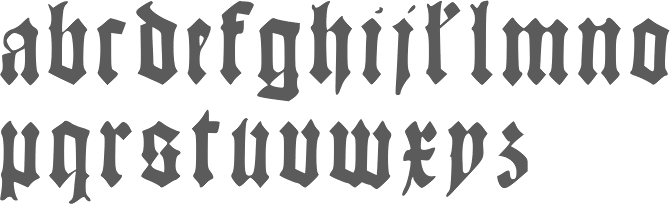
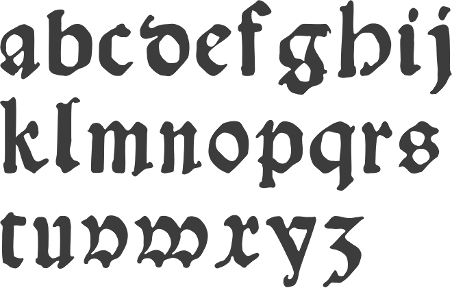
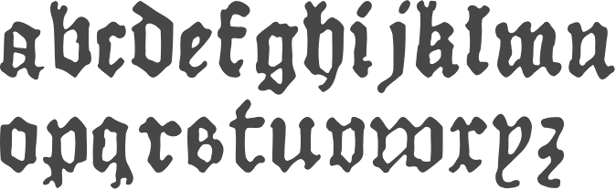
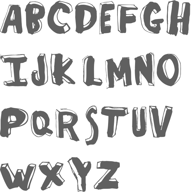
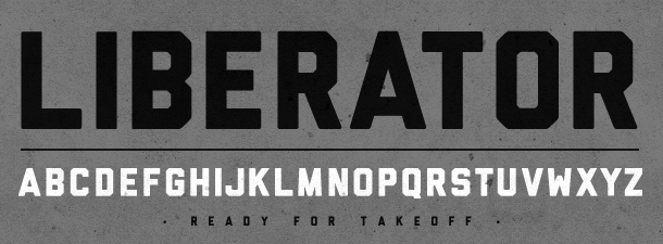
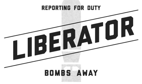
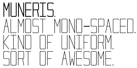
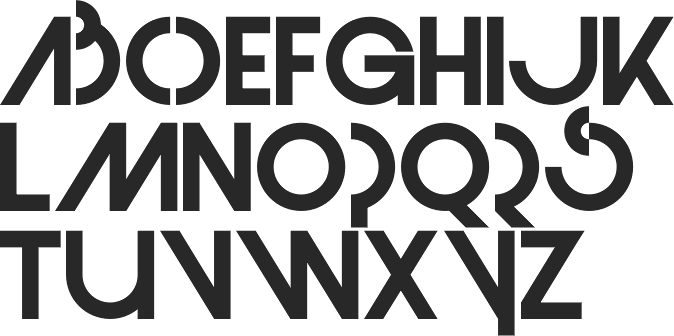
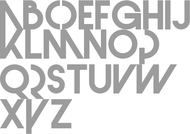
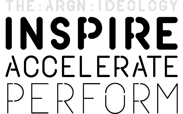
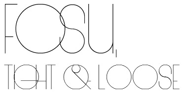
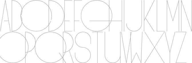
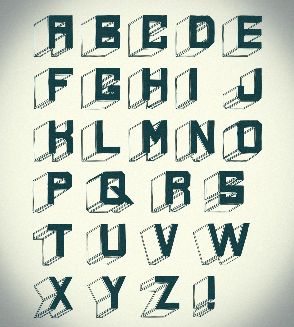
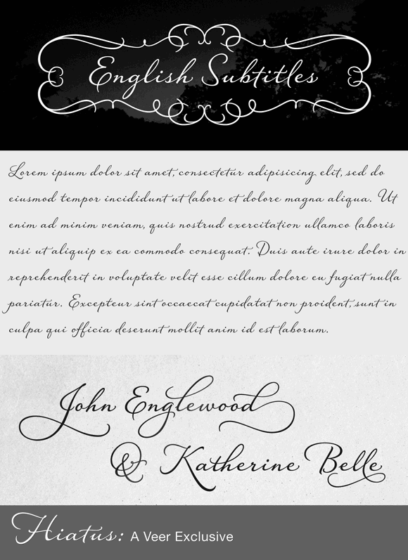
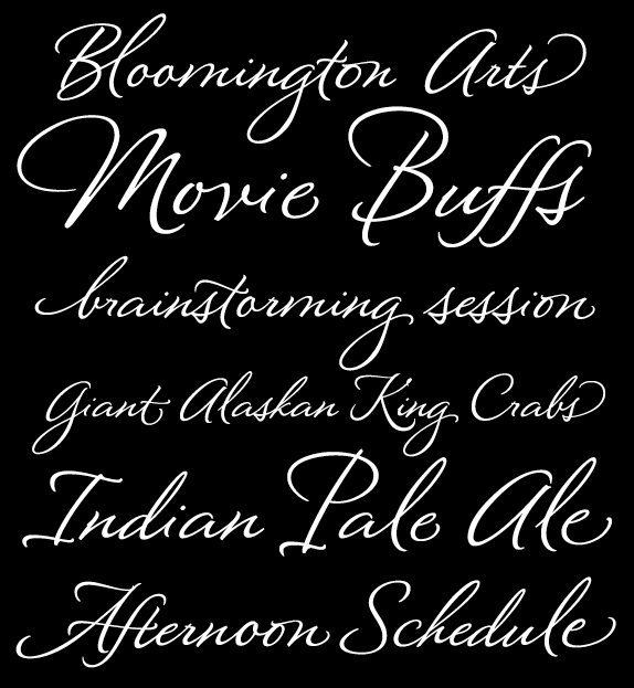
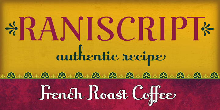
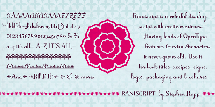
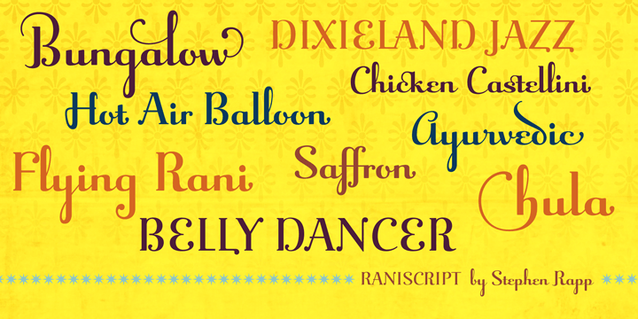
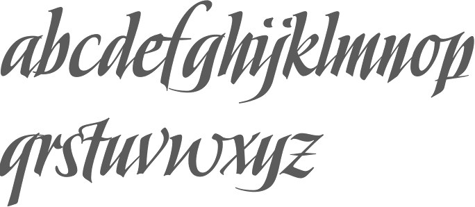
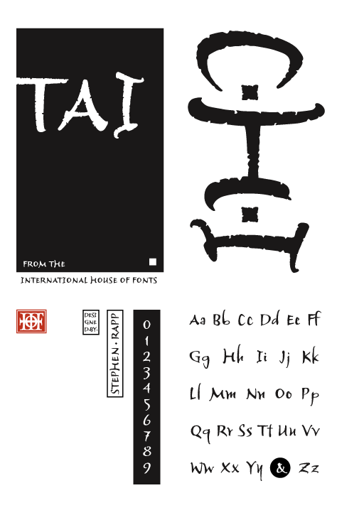
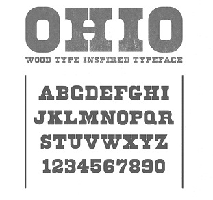
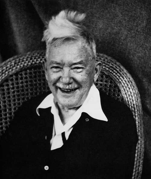
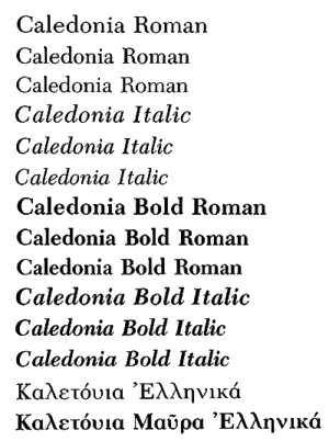
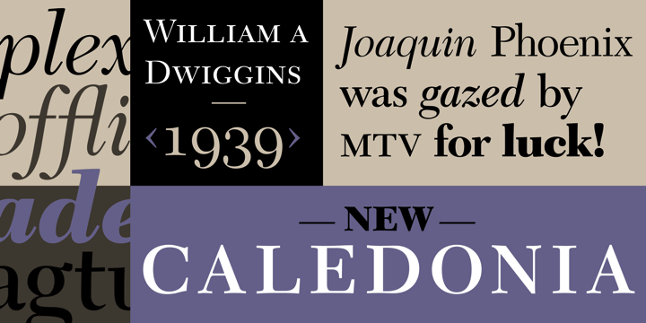
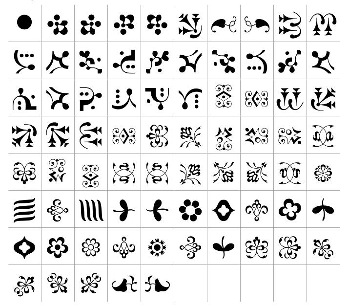
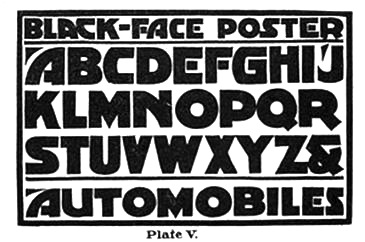
|
|
|
|