| | |
Adrianna Bilas

|
 Graphic and type designer in London, UK. In 2019, she released Cinque, a vintage slab serif with arts and crafts elements that was inspired by the movie The Grand Budapest Hotel. [Google]
[MyFonts]
[More] ⦿
|
Agata Jakubowska
|
 Agata graduated from the Academy of Fine Arts in Poland, where she studied graphics and paintings. Presently, she is a graphic designer in Graz, Austria. She created colourful arts and crafts style typefaces in 2012. Behance link. [Google]
[More] ⦿
|
Alan Cairns
|
Designer of Nouveau (1992), a font based on the work of Charles Rennie Mackintosh in Glasgow at the turn of the century. [Google]
[More] ⦿
|
Alejandro Paul

|
 Designer who lives in Buenos Aires and who teaches graphic design and typography at the Universidad de Buenos Aires. He has worked as an art director in prestigious Argentina-based studios, handling high-profile corporate brands such as Arcor, Marta Harff, Morph, SC Johnson, Danone, and Movicom. He runs Estudio Paul. Professor at Facultad de Arquitectura, Universidad de Buenos Aires. Co-creator, with Apostrophe at Apostrophic Laboratory, of Usenet (2000), FontCop I through IV (2000) and the pixel font family Cayetano. Published the dot matrix font Stardust with T-26 in 2000. Designed the gorgeous font Elektora in 2000. He developed with Michael Lynch a 17-font Tennis set of grid-based pixel fonts. At Typeworx, he published Reflex (2002), a commercial 6-style unicase font family. Another web site by Alejandro. Cofounder of DAS, a design studio in Buenos Aires.
 Cofounder of Sudtipos (2003), where he does custom work and creates new typefaces. His work there includes Tierra (a titling face), Latinaires (2003-2018: originally called Latina Sans), Reflex, Downtempo (2003), Stardust and Mosaico (1999, pixel face). Still at Sudtipos, he digitized the beautiful handwriting/calligraphic typefaces by Angel Koziupa called Alma (2005), Murga, Habano and Tiza, which together with his script typeface Argenta (2004), Oxida (2005), the medieval script typeface Mama Script (2004, designed with Alfredo Graziani), Divina (2004, with Alfredo Graziani), and the sans family Kautiva (2004) can be bought via Umbrella Type. For children's orthography, he developed Estrada Hand, on commission for Editorial Estrada. He was working on the serif family Libertina (2004). Herencia (2004, a handwriting typeface done with Diego Giaccone), Grover (2004, slab serif), Milk Script (2004, with Alfredo Graziani), Mama Script (2004, with Alfredo Graziani), Politica (2004, a techno typeface with a very thin Thin weight) are at Sudtipos. The Bluemlein Scripts (2004-2005, Umbrella and Veer) are based on the calligraphic renderings of Charles Bluemlein, shown in a 1943 ink catalog: Miss Le Gatees, Mr Rafkin, Mr Keningbeck, Mr Lackboughs, Lady Dawn, Mrs Von Eckley, Mr Sheppards, Mr Dafoe, Mr Canfields, Mr Stalwart, Mr Sandsfort, Mr Leopolde, Mr DeHaviland, Mr Blaketon, Miss Stanfort, Miss Packgope, Miss Fajardose, Mrs Saint-Delafield, Mrs Blackfort, Mr Sopkin, Mr Sheffield, Miss Lankfort, Herr Von Muellerhoff, Dr Sugiyama, Dr Carbfred. (Note: Soft Horizon's Lainie Day (1993) is an earlier free font in the style of Lady Dawn and Mr Lackboughs). In 2011, that series was made available at Google Web Fonts. Sudestada (2005, Sudtipos) is a handwriting script developed with Diego Giaccone. Cuisine (2005, Umbrella Type) is an informal bold script. Mousse Script (2005, Sudtipos) is based on Glenmoy, a 1932 Stephenson Blake typeface. Suave Script (2005) is a 4am jazz bar script. Ministry (2005) is related in style but less funky, Chocolate (2005) is for sales ads, and Cenizas (2005, with Angel Koziupa) is straight from an old manuscript. Whomp (2006, Umbrella) was based on a partial sign-painting font by Alf Becker (1930s), and so was Buffet Script (2006, Sudtipos). Affair (2006, Umbrella) is swashy and calligraphic, while Candy Script (2007) and its italic version Sugar Pie (2011) are based on Argentina's market lettering. Galgo Script (2007) is a brush calligraphic font based on a design of Angel Koziupa. Burgues Script (2007) is an ornate calligraphic script based on the lettering of calligraphy teacher Louis Madarasz (1859-1910) (award at TDC2 2008). Burgues Script, Adios Script (2008: it won an award at TDC2 2009), Feel Script and Sugar Pie all won awards at Tipos Latinos 2008. Sinfonieta (2006) and Buffet Script are fifties style connected scripts. Feel Script (2007) is based on lettering that calligrapher and logo designer Rand Holub created in 1950 and that was subsequently captured in Intertype's typeface Monterey (1958). Some letterforms were redrawn from vintage American magazine ads (some by Holub himself), Cuisine (2008, food advertising script), Pronto (2008, comic book style, by Alejandro Paul and Angel Koziupa), Grover (2004, rounded sans family), Grover Slab (2004). Burgues Script, Adios Script, Feel Script and Sugar Pie all won awards at Tipos Latinos 2008. Calgary Script (2008, Umbrella) is a pure signpainting job. Accolades from all typophiles for his calligraphic wunderkind, Compendium (2008). The 2009 haul: Sugar Pie (signage font), Bravissima Script, Theorem (upright semi-script). Speaker at ATypI 2009 in Mexico City. The year 2010 starts off with a bang, five awards at Tipos Latinos 2010: a grand prize for Brownstone Sans, and four standard awards, for Semilla, Kewl Script (for food packaging and store windows), Calgary Script, and for Business Penmanship. Typefaces from 2010 include the baseball lettering typeface Fan Script and the tattoo script face Piel Script (piel=skin), which was influenced by Burgues Script and more remotely by showcard lettering by B. Boley (1930s, Sign of the Times Magazine). Piel Script won an award at Tipos Latinos 2012. In 2011, he and Koziupa made the fat signage typeface Aventura and Viento (a grunge version of their earlier 2004 face, Brisa). He added one retro connected signage font to the Filmotype collection in 2012, called Filmotype Kitten (original from 1955). Filmotype Zephyr (2012) is an italic roman formal script. Filmotype Yukon (2012) is inspired by the classic Palmer style of penmanship. Storefront (2012) is a swashy signage typeface based on an incomplete alphabet by Alf Becker. His signage script typeface Hipster Script won an award in the TDC 2012 competition and at Tipos Latinos 2012. Typefaces from 2013: Rolling Pen (a connected script that recalls the business penmanship genre), Bellissima Script (based on a copperplate calligraphic alphabet from Bellezas de la Caligrafía by Ramón Stirling, 1844). In 2014, he helped Panco Sassano, a lettering artist and illustrator from Mar del Plata, who designed the wide connected semi-calligraphic handwriting typeface Horizontes Script (Horizontes subsequently won an award at Tipos Latinos 2016). Still in 2014, he published the fat packaging or signage script Bowling Script, which is based on Freely Drawn Italic, a non-font alphabet by Ernst Bentele (1953). In 2015, Alejandro Paul, Yani Arabena and Guille Vizzari combined forces in the signage script typeface Quotes (Script+Caps) (2015, Sudtipos). Merengue Script (2015, with Panco Sassone) is a fun creamy script, ideal for pastry shops, tea rooms or supermarkets. Steak (2016) is a connected vintage signage script based on an Alf Becker design. Envelove (2017) is a script typeface family consisting of Script, Icons, and Caps, designed at Sudtipos by Yani Arabena, Guille Vizzari, and Alejandro Paul. Winner at Tipos Latinos 2018 of a type design award for Envelove. Still in 2017, Guille Vizzari and Alejandro Paul co-designed the great Moleskine notebook-inspired typeface family Proprietor. Proprietor comes in Script, Icon, Deco, Wide, Open and Roman styles. It won an award at Tipos Latinos 2018. Rigatoni (2017): A skyline didone based on mid-20th century example by Eugen Nerdinger. Bibliophile Script (2017). A pair of copperplate calligraphic typefaces. Fixture (2018: a 72-font grotesk family published by Sudtipos). Newbery Sans Pro (2018). A simple workhorse sans typeface family that is inspired by German industrial design and the lettering of Eugen Nerdinger. Winner at Tipos Latinos 2018 of a type design award for Tennis Set, Bibliophile Script, French Bulldog, Envelove, La Taqueria, and Speakeasy Set (a collection of (copperplate) script, sans, modern, flare and gothic substyles). From 2019: Hot Salsa (a retro brush script; with Ximena Jimenez), Old Letterhand, Clockmaker (arts and crafts style), Steak Script (inspired by an old alphabet by Alf Becker), Address Sans Pro (a sans family inspired by Butti and Novarese). In 2019, Alejandro Freitez and Claire Menager, under the art directoship of Alejandro Paul, designed the multistyle wood type look / Western / Victorian / reverse stress / hyper-decorative Presley Slab. Typefaces from 2020: Apothicaire (a wonderful quaint serif family in the frivolous didone genre; three variable fonts, 16 styles in all), Inglesa (a penmanship script), Dilemma, Dilemma Serif (Dilemma is a sans/serif type system with 42 styles; it is inspired by the anonymous Polyphème, Cyclopéen and Extra Condensé designs from the early 1900s at the Peignot Fonderie; two variable fonts are included), Sporty Pro (a large sports / athletics font family). Typefaces from 2021: Plethora (an 18-style family and two variable fonts that build on Julius Herriet's Old Style Ornamented for Bruce Type Foundry; Alejandro added various frills, ligatures, weights, exaggerating in true Victorian spirit), Magari (a fat face or Normande; Alejandro likens it to Italian classics of the 19th century though), Regional (27 styles, plus variable styles). Typefaces from 2022: Wienerin (a revival and expansion of Olympia (1929) by Carl Otto Czeschka, one of the members of The Wiener Werkstätte). [Google]
[MyFonts]
[More] ⦿
|
Alexander Marshall

|
Scottish type designer, b. 1935. He studied architecture and graphic design in London and founded Marshall Arts. In 1980, he moved to Santa Barbara, CA. Creator of Ingram BT (2004, Bitstream), a tall typeface with Arts and Crafts features. [Google]
[MyFonts]
[More] ⦿
|
Alexander Mendes
|
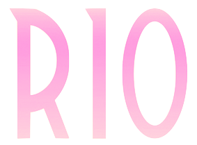 During his studies at UFRJ in Rio de Janeiro, Alexander Mendes designed the great arts and crafts / art deco typeface Geometrum (2017). [Google]
[More] ⦿
|
Andrea Chopp
|
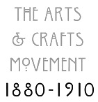 Graphic designer and typographer in Ferndale, MI. She did some type posters (e.g., on the Arts and Crafts Movement), and some calligraphic work. She also designed some experimental typefaces. [Google]
[More] ⦿
|
Andreas Gustavsson
[Gustav & Brun (was: Jagjavi)]

|
[MyFonts]
[More] ⦿
|
Andrew White
|
Designer of the free arts-and-crafts font Seminole (2015). [Google]
[More] ⦿
|
Ariela Gittlen
|
 Brooklyn, NY-based creator of the very friendly rounded arts and crafts typeface Thistle Display (2014), which was inspired by the lettering of Charles Rennie Mackintosh and Margaret MacDonald. [Google]
[More] ⦿
|
Art nouveau typefaces by Nick Curtis
[Nick Curtis]

|
 Art nouveau revivals by Nick Curtis include the following free typefaces.
 - Bala Cynwyd NF (2001, 2007) is an Arts&Crafts style poster typeface inspired by lettering of Dard Hunter.
- MadisonSquareIncised, MadisonSquareNF (2001, 2007).
- MunchausenNF (2003, 2007). Based on a poster for an exhibition by Ludwig Heinrich Jungnickel (1911). This is inbetween art deco and art nouveau.
- RivannaNF (2002, arts and crafts style): Rivanna NF revives Max Joseph Gradl's Gradl Zierschriften, an art nouveau typeface from 1903. Rivanna NF Pro was done in 2010 by CheapProFonts.
- Runy-Tunes, RunyTunesRevisited (1999, 2001, 2007).
- SmorgasbordNF (2003, 2007). Based on this poster by André C. de Takacs (1912).
- TobaccoRoadNF (2002, 2007). This is based on a poster for an art exhibition, designed by Eva Volkel in 1912. It is typical of style of the Austrian Secession school---combining medieval forms with late art nouveau styles.
- ValleyGrrrlNF (2003, 2007). ValleyGrrrlNF (Nick Curtis) is based on Johann Cissarz's poster lettering in Erste Hoehenluft Radfahr-Bahn (1897).
There are also commercial art nouveau typefaces: - Abbey Road NF. After Joseph W. Phinney's Abbey Old Stytle (1901).
- Aint Baroque NF (2009). An art nouveau/psychedelic-style variation on Milton Glaser's Baby Teeth Baroque from 1968.
- Deukalion NF (2006). A fun art nouveau headline face.
- Elefantasia NF (2012) is based on Elefanta, a font by the Karl Brendler & Söhne foundry in Vienna.
- Foxcroft and Foxcroft Shaded (2005). An art nouveau family based on Vassar (1887, Farmer, Little&Co).
- Graphic Stylin NF (2006). A script stencil typeface with an art nouveau feel.
- Half Full NF (2011). A bold weight of Glass Antiqua (Franz Paul Glass, 1912, Genzsch&Heyse).
- Hupp Antiqua NF (2006). A gorgeous display typeface pair first done in 1909 by Otto Hupp for Klingspor. This one has a Basque A.
- Inglenook Corner NF (2005). Based on the lettering of Laurence Schall, as presented in Lewis F. Day's 1910 classic, Alphabets Old and New.
- Jugendstil Borders NF (2011).
- Millrich Moravian NF (2010). A revival of Bohemian (1918, a jugendstil typeface by Miller&Richard). Millrich Olivian NF (2014) revives Olivian.
- One Good Urn NF (2005). Based on the art nouveau lettering of J. M. Bergling in Art Alphabets and Lettering (1914).
- Petrushka NF (2012): based on the art nouveau typeface Petrarka (1900, Schelter & Giesecke).
- Rough Cut NF (2006, linocut). A grunged up version of the art nouveau typeface Daphne.
- Schweimann Moderne NF (2014).
[Google]
[MyFonts]
[More] ⦿
|
Artemisa Pascu
|
During her studies in Bucharest, Romania, Artemisa Pascu created the display typeface Xenology (2015, almost an arts-and-crafts typeface) and Constellation (2015). [Google]
[More] ⦿
|
Arts and Crafts Computer Fonts
|
This outfit seems to have disappeared. It had four commercial fonts, ca. 2000: Syracuse, Arts and Crafts, Greene&Greene, Frank Lloyd Wright. The last one is like Eaglefeather. [Google]
[More] ⦿
|
Arts and Crafts Fonts
|
Dead link removed. it was an upstart commercial outfit that sold "Handcraft", "Arts&Crafts", and the gorgeous fat-lettered Vienna Komputer Schrift, ca. 1999. Willow can be obtained from Esselte. All fonts are artsy, and come with collections of great borders and geometric patterns. [Google]
[More] ⦿
|
ATF 1923 Catalog: Artcraft Series
[Robert Wiebking]
|
 Showcasing the best pages from the Artcraft Series in the ATF 1923 Catalog. Artcraft&Bold&Italic are display typefaces originally designed for Barnhart Bros&Spindler by Robert Wiebking (1911-1913). Jaspert lists Artcraft as a 1930 publication at Ludlow, and Klingspor as Western Type Foundry typefaces from 1911 until 1913. Mac McGrew: Artcraft was designed in 1912 by Robert Wiebking and featured under the name of Craftsman in the first ad for his short-lived Advance Type Foundry, operated by Wiebking, Hardinge&Company, in Chicago. A short time later, the typeface was advertised as Art-Craft, and later as one word---Artcraft. Advance was soon taken over by Western Type Foundry, for whom Wiebking designed Artcraft Italic and Artcraft Bold a year or two later. Western in turn was taken over by Barnhart Brothers&Spindler in 1918. BB&S was already owned by ATF but operated separately until 1929; in the meantime, though, Artcraft and a number of other typefaces were shown in ATF specimens as well as those of BB&S. Artcraft has an unusual roundness in some of its serifs and line endings and a line of it produces a rolling feeling; some characters have curlicues, such as the long curl at the top of the a and and the exaggerated ear on the g. A number of auxiliary characters were made for roman and italic fonts; as these were sold separately, they were overlooked by many printers and typographers. The boldface has fewer eccentricities. Artcraft was a popular typeface for a number of years; the roman was copied by Monotype in 1929 without the fancy characters, and all three typefaces were copied by Ludlow. Adaptation in 1924 of Artcraft Italic to the standard 17-degree slant of Ludlow italic matrices was the second assignment of Robert H. Middleton (after Eusebius, q.v.) at that company. Hansen called it Graphic Arts. One source attributes the Artcraft family to Edmund C. Fischer, otherwise unidentified, but the details stated here are more generally accepted and seem to fit known facts better.
 Digital versions: [Google]
[More] ⦿
|
Bannigan Artworks
[Todd M. Hallock]

|
 Based in Perry, OK, Bannigan Artworks was founded in 1998 by Todd Hallock (b. 1969). His fonts include Arts&CraftsGS (2001, inspired by decorative lettering by Glaswegian illustrator Jessie Marion King (1876-1949) and by the Scottish style of Charles Rennie Mackintosh (1868-1928). This font was published by Jack Yan), Renaissance Caps (2005, floriated), Celtic Knots-BA (2002), Celtic BA (2003), Celtic Ornaments BA (2008), Christianity BA (2004, Christian symbols), and the futuristic font Hallock.
 Home page on Celtic Art. Agfa/Monotype sells Hallock, Celtic-BA and Celtic Knots. At MyFonts, we find the Keltic caps typeface Medieval Caps BA (2006), Left Hand BA (2007) and Art Nouveau 2 BA (2007). Archibald BA (2009) is inspired by the art nouveau lettering of Archibald Knox (1864-1933), a designer for Liberty&Co. from the Isle of Man. In 2014, he created Arts and Crafts Sans BA. In 2015, Todd published Circle BA. Klingspor link. View Todd Hallock's typefaces. [Google]
[MyFonts]
[More] ⦿
|
Benoît Champy
|
 French designer of these free typefaces that can be downloaded at Dafont:
 - Stencil category: Game Plan (2011), Karen Stencil (2011), Fine Stencil (2011), Stencil Gothic (2011).
- Constructivist: Konstructiv (2011).
- Handprinted or marker fonts: Andi (2014), Dker Finepoint (2011), Dker Feltpen (2011), Dker Poster (2011).
- Grunge: Aerial Demented (2011).
- Shadow face: Oh Jay (2011).
- 3d face: Bleuck (2011).
- Geometric experimental typefaces: Rondie (2011), Again (2011), Kawai Desu (2011), Modular Tkno (2011), Modern Plate (2012).
- Upright connected script: Bellefine (2011).
- 3D Simulation face: Bonus (2011).
- Tuscan: De Flandre (2012).
- Experimental: Comic Tragedy (2013), Scan Me (2011), Jizz Mass (2011, a gooey play on snow cover at Xmas...).
- Ransom note typefaces: Weird Cuts (2012).
- Arts and Crafts: Home Square (2012).
- Other: Flea Market (2013), Computer Aid (2016).
[Google]
[More] ⦿
|
Bernhard Pankok
|
German graphical artist, painter and printmaker, 1872-1943. He studied at the Düsseldorf and Berlin Art Academies. From 1892 Bernhard Pankok had a studio of his own in Munich. There he freelanced as an artist, graphic artist and illustrator for the journals "Pan" and "Jugend". Greatly impressed by the British Arts and Crafts movement, Bernhard Pankok joined Hermann Obrist, Richard Riemerschmid, and Bruno Paul in founding the Munich Vereinigte Werkstätten für Kunst im Handwerk. Afterwards, he also designed furniture, stage sets, interiors and buildings, and painted portraits. In 1907 Bernhard Pankok was a co-founder of the Deutscher Werkbund. [Google]
[More] ⦿
|
Bill Livingstone
|
Toronto-based designer of the Arts & Crafts scrapbooking style typeface Crafty Font (2013) and of the wood type Bauer Bodoni-inspired slab serif Bodoni Block Font (2013). In 2016, he designed the geometric wedge serif typeface Equinox. Behance link. [Google]
[More] ⦿
|
Bonnie Clas
|
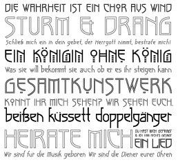 Bonnie Clas has completed her B.F.A. and M.F.A. at Savannah College of Art and Design as a major in Graphic Design with a minor in Drawing. She has been developing her career by taking positions as a designer, illustrator, and letterer for SpotCo, Rodrigo Corral Design, and Hsu+Associates in Manhattan. She lives in New York City. Creator of TWD Sans (2011, semi-blackletter), Mecano Neue (2011), Kule Script (calligraphic, for a clothing brand), Kule Slab (2011, didone), Lady Chatterly (curly fashion mag face), Lacie (curly typeface for Latin and Cyrillic), Methodenstreit (2011, arts and crafts face), Habana (2011, Lost Type), Feverish (2011, experimental), Burlesque (art deco). She also did the lettering for tens of projects. [Google]
[More] ⦿
|
Brian Davies
|
His beautiful font Kashmir (an arts and crafts style font) was created in 1992 as a tribute to Led Zeppelin. Brian was a software designer at Northwestern's Institute of Learning Sciences. His address is listed in the text file as Box 46 CT, Bowdoin College, Brunswick ME 04011. Download link. [Google]
[More] ⦿
|
Bureau Brut (was: Extra Brut)
[Yoann Minet]
|
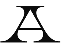 Bureau Brut was founded in 2015 by Julia Joffre, Yoann Minet and Camille Prandi. In 2017 Bureau Brut opened up Extrabrutshop to sell their typefaces. Both are located in Montreuil, France. The original collection of typefaces were all done by Yoann Minet. They include Droulers, Matorral (2016-2019, with the help of Baptiste Lecanu: Matorral is based on the fiery single-weight bespoke typeface Bureau Brut designed for the identity of Musée de la Poterie de La Borne. It draws inspiration from Fritz H. Ehmcke's Ehmcke Antiqua (Flinsch, 1908: the lower case t) and William F. Capitain's Caxton Old Style (Marder, Luse & Co., 1889: the R), and features an M with a distinctive Marseille vibe as in the monogram of René Dufaure de Montmirail, founder of the Olympique de Marseille football club in 1899), Ostia Antica, Totentanz and Traulha. In 2016, Minet designed the custom ultra-condensed typeface Scories Mono. Dr (2017) was published by Production Type. In 2018, they added the floarting-in-the-wind typeface Bourrasque. In 2020, Bureau Brut released Brut Grotesque (the original design started in 2015), and designed the compressed arts and crafts custom font MySen for the jewelry brand MySen. In 2021, Bureau Brut published the chamfered typeface family Round and the experimental Roman Grotesque without revealing who designed it. [Google]
[More] ⦿
|
Cahya Sofyan
[Studio Sun (or: Sun Brand Co)]

|
 [MyFonts]
[More] ⦿
|
Carl Hrachowina
|
In the late 19th century, Dr. Carl Hrachowina (1845-1896) taught at the Arts and Crafts School in Vienna. Among his students were Franz von Matsch and Gustav Klimt. He selected and published a series of study aids. Author of Initialen, Alphabete und Randleisten verschiedener Kunstepochen (1897, Carl Graeser, Vienna), and of Vorlagen für das Kunstgewerbe 1. Band. Künstliches Alphabet von J. Th. de Bry (1886, Carl Graeser, Vienna). Downloads of his 1897 books: Archive.org, local. [Google]
[More] ⦿
|
Carol Toriumi-Lawrence
|
Codesigner with David Siegel in 1999 of an arts and crafts font called Eaglefeather (P22). It was made for the Frank Lloyd Wright Foundation, which owns various manuscripts of the beautiful lettering of this American artist and designer, 1867-1959. This font family is based on the alphabet designed by Frank Lloyd Wright for the Eaglerock project in 1922. P22 Eaglefeather Pro is a large extension released in 2012. [Google]
[More] ⦿
|
Catalina Juarros
|
During her studies at FADU / UBA (Buenos Aires), Catalina Juarros created the interlocking wide arts-and-crafts typeface Glasgow (2014). [Google]
[More] ⦿
|
Charles Rennie Mackintosh

|
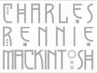 Lettering artist and architect in Glasgow (b. Glasgow, 1868, d. London, 1928). He was a designer in the Arts and Crafts movement and also the main exponent of Art Nouveau in the United Kingdom. Some speculate that he had Asperger's Syndrome. Typefaces based on his lettering include ITC Rennie Mackintosh (1996, by Phill Grimshaw), ITC Rennie Mackintosh Ornaments (also by Phill Grimshaw), ITC New Rennie Mackintosh (2017, by the Monotype design team), and Willow (by Tony Forster). Check the Glasgow School of Art, ITC and U&LC.
 The CRMFontCo headed by George R. Grant specialises in typefaces based upon the letterforms of Mackintosh. They published multiple styles of these fonts: Rennie Mackintosh (1993, the original by George R. Grant), Rennie Mackintosh Glasgow (2007, with lowercase letters added), and Rennie Mackintosh Artlover (1995: art deco dingbats by George Grant and Joanna McKnight). Later additions include The Classic Charles Rennie Mackintosh Font, The Charles Rennie Mackintosh Artlover Font, The Charles Rennie Mackintosh Stems Font, The Charles Rennie Mackintosh Glasgow Font, The Charles Rennie Mackintosh Renaissance Font, The Charles Rennie Mackintosh Hillhouse Font, The Charles Rennie Mackintosh Moonlight Font, The Charles Rennie Mackintosh Scotland St. Font, and The Charles Rennie Mackintosh Venezia Font<. Poster by Ryan Irven (2010). See also the free font Nouveau (1992) by Alan Cairns. CRM company link. View Charles Rennie Mackintosh's typefaces. [Google]
[MyFonts]
[More] ⦿
|
Charles Robert Ashbee

|
British type designer, b. Isleworth, 1863, d. Kent, 1942. He made Endeavour Type (1901) and Prayer Book Type (1903). Part of the Arts and Crafts movement, [quoting Wikipedia] he was the son of businessman and erotic bibliophile Henry Spencer Ashbee. His Jewish mother developed suffragette views, and his well-educated sisters were progressive as well. Ashbee went to Wellington College and read history at King's College, Cambridge from 1883 to 1886, and studied under the architect George Frederick Bodley. Ashbee was involved in book production and literary work. He set up the Essex House Press after Morris's Kelmscott Press closed in 1897. Between 1898 and 1910 the Essex House Press produced more than seventy books. Ashbee designed two typefaces for the Essex House Press, Endeavour (1901) and Prayer Book (1903), both of which are based on William Morris's Golden Type. Quoting wikipedia again: Despite his father's amateur career as an enthusiastically heterosexual pornographer, Ashbee was gay. He came of age in a time when homosexuality was illegal and "the love that dare not speak its name". He is thought to have been a member of the Order of Chaeronea, a secret society founded in 1897 by George Ives for the cultivation of a homosexual ethos. To cover his homosexuality, he married Janet Forbes, daughter of a wealthy London stockbroker. CRA, as he was known, had admitted his sexual orientation to his future wife shortly after he proposed. They wed in 1898 and, after 13 years of rocky marriage (including a serious affair on the part of Janet), had children: Mary, Helen, Prue and Felicity. Berry, Johnson and Jaspert write: A black face with heavy serifs, designed by C.R. Ashbee, the punches cut by E.P. Prince. This is perhaps the most exotic of the private press types. Few of the letters have a normal design. The bowls of the B are divided diagonally. H has a very high bar. The M has slab serifs and very short middle strokes. W has foot serifs and brief middle strokes. In the lower case e is a cursive form, g has no link and a contorted tail, in the h, m and n the last stroke is curved and descends below the line, w has the foot serifs of the capitals. Ascenders and descenders are short. The ampersand is curious. The name is derived from the title of the first book in which the type was used, An Endeavour towards the Teachings of Ruskin and Morris. The Prayer Book Type of 1903, is the same design in Great Primer. [Google]
[MyFonts]
[More] ⦿
|
Christina Torre

|
 Co-designer with Richard Kegler of several fonts at P22 type foundry, which she joined in 2000. She graduated from the State University of New York at Buffalo with a BA in Communication Design. She worked at the Pushpin Group in NYC and at Dog Eat Dog Advertising, Inc. in Buffalo, NY. Her typefaces:
 - P22 Art Nouveau Bistro, P22 Art Nouveau Cafe, P22 Art Nouveau Extras (ornaments), all made in 2001-2002.
- P22 Dearest Script, P22 Dearest Swash: calligraphic in the style of medieval scribes, and a winner of an award at the TDC2 Type Directors Club's Type Design Competition 2002.
- P22 FLW Exhibition and P22 FLW Terracotta, both done in 2000: these are based on alphabets by Frank Lloyd Wright published in 1931 and in 1896-1897 (in his book The House Beautiful), respectively.
- Gothic Gothic (2001): a blackletter done with James Grieshaber.
- P22 Mucha (2001): an art nouveau font inspired by Alfons Mucha, ca. 1900.
- P22 Pan Am (1999, with Richard Kegler). Created for the centennial of the Pan-American exposition of 1901, held in Buffalo, NY.
- P22 Salon (2001): more art nouveau.
- P22 Victorian Gothic (2000, with Richard Kegler and Amy Greenan). Based on a type style called Atlanta, similar to Copperplate.
[Google]
[MyFonts]
[More] ⦿
|
Corey McHugh
|
Australian designer of New Utopia (2017), a typeface that combines elements of Russian constructivism and the arts and crafts movement. [Google]
[More] ⦿
|
Cosimo Lorenzo Pancini

|
 Born in Firenze in 1969. Cofounder with Francesco Canovaro and Debora Manetti of the Italian design firm in Firenze called Studio Kmzero. He co-designed some typefaces there such as Arsenale White (2009). In 2002, Pancini developed Targa, TargaMS and TargaMSHand (for comic books?), basing his design on the peculiar sans serif monospace typeface with slightly rounded corners and a geometric, condensed skeleton that Italy had been using for its license plates. In 2022, Francesco Canovaro redesigned this font into a versatile multi-weight typeface, Targa Pro, which includes Targa Pro Mono (which keeps the original monospace widths), Targa Pro Roman (with proportional widths), both in five weights plus italics, the handmade version Targa Hand, and Targa Pro Stencil.
 The handwriting of Lord Byron led Pancini to develop the brush script typeface Byron (2013, Zetafonts). MyFonts credits him with the rounded avant garde sans family Antipasto (2007), but elswhere we read that this typeface is made by Matteo di Iorio, so there is some confusion. It was extended in 2017 by Pancini as Antipasto Pro. In 2014, Cosimo Lorenzo Pancini and Francesco Canovaro co-designed Amazing Grotesk (+Ultra). He also designed the calm bold geometric rounded sans typeface Cocogoose (2014; replaced by Cocogoose Pro in 2017) and the stylish deco font Offensive Behaviour. Cocogoose Letterpress is free. Cocogoose is part of the Coco Gothic family, a collection of twelve typefaces each inspired by the fashion mood of every decade of last century, named after fashion icon Coco Chanel. Cocogoose is Coco Gothic for the 1940s. See also Coco Gothic Pro (2021). In 2015, Pancini published the grand family Coco Gothic. This Latin / Greek / Cyrillic typeface family features a small x-height and sligghtly rounded corners to make the avant garde and geometric sans typefaces in vogue in the 1970s come alive again, ready for 21st century fashion magazines. It comes with substyles that recreate many moods, including art nouveau and arts and crafts (Cocotte), Italian propaganda style and Italian deco (Cocosignum), hipster style (CocoBikeR), or Bauhaus (Cocomat). Coco Gothic was initially developed as a corporate font for Lucca Comics & Games Festival 2013. The rounded geometric sans family Cocomat (by Cosimo Lorenzo Pancini, Deborah Manetti and Francesco Canovaro) was inspired by the style of the twenties and the visions of Italian futurists like Fortunato Depero, Giacomo Balla and Antonio Sant'Elia. Updated in 2019 as Cocomat Pro. Still in 2015, Cosimo and Zetafonts published the connected creamy baseball script Bulletto, the grungy handvetica Neue, and the calligraphic wedding typeface Hello Script. In 2015, at Zetafonts, Cosimo Lorenzo Pancini designed CocoBikeR (2015) to celebrate the hipster and bike cultures. CocoBikeR (for Latin, Greek and Cyrillic) is part of the successful Coco Gothic typeface family. In 2017, Pancini designed the 1930s Italian art deco typeface families Cocosignum Maiuscoletto and Cocosignum Corsivo Italico. In 2021, he published the 48-style (+variable) font family Coco Gothic Pro. This is a redrawn and expanded set of fonts: Inspired by a biography of Coco Chanel and trying to capture the quintessential mood of classical fashion elegance, Cosimo Lorenzo Pancini designed Coco Gothic looking for the effect that the first geometric sans typefaces (like Futura, Kabel or the italian eponyms like Semplicita) had when printed on paper. The crisp modernist shapes acquired in printing charme and warmth through a slight rounding of the corners that is translated digitally in the design of Coco Gothic. [...] A distinguishing feature of Coco Gothic Pro is the inclusion of ten alternate historical sets that allow you to use the typeface as a true typographic time machine, selecting period letterforms that range from art deco and nouveau, to modernism and to eighties' minimalism. Equipped with such an array of historical variants, Coco Gothic Pro becomes an encyclopedia of styles from the last century. There is also attention to Darkmode and there is coverage of Cyrillic and Greek. Typefaces from 2016: Adlery (a curly brush script), Kitten (Fat, Swash, Swash Monoline, Slant, Bold: signage script family), Adlibitum (a blackletter typeface by Cosimo Lorenzo Pancini and Francesco Canovaro), Morbodoni (a display didone by Cosimo Lorenzo Pancini and Francesco Canovaro). In 2016, Cosimo Lorenzo Pancini, Andrea Tartarelli, Giulia Ursenna Dorati and Andrea Gaspari co-designed the 1940s vintage brush script typeface Banana Yeti, which is based on an example by Ross George shown in George's Speedball 1947 Textbook Manual. The Zetafonts team extended the original design to six styles and multilingual coverage. The ExtraBold is free. Still in 2016, Pancini designed Calligraphunk, an experimental typeface that mimicks polyrythmic calligraphy, by alternating two sets of lowercase letters to emulate handwriting. In 2016, Cosimo Lorenzo Pancini, Matteo Chiti, Luca Chiti and Andrea Tartarelli co-designed the retro connected brush script font family Advertising Script, which is based on an example from Ross George's Speedball 1947 Textbook Manual. Beatrix Antiqua (2016, by Francesco Canovaro, Cosimo Lorenzo Pancini and Andrea Tartarelli). This humanist sans-serif typeface is part of the Beatrix family (Beatrix Nova, etc.) that takes its inspiration from the classic Roman monumental capital model. Its capitals are directly derived from the stone carvings in Florence's Santa Croce Cathedral. Beatrix keeps a subtle lapidary swelling at the terminals suggesting a glyphic serif, similar to Hermann Zapf's treatment in Optima. Amazing Grotesk (2016) is based on a logo designed by Francesco Canovaro. Studio Gothic (2017, by Francesco Canovaro, Cosimo Lorenzo Pancini and Andrea Tartarelli) is an 8-style geometric sans family based on Alessandro Butti's geometric sans classic, Semplicita. Hello Script and Hello Sans can be used for layering and coloring. The Christmas-themed version is Hello Christmas. Pancini designed the 64-strong typeface family Body Grotesque and Body Text in 2017-2018, together with Andrea Tartarelli. It was conceived as a contemporary alternative to modernist super-families like Univers or Helvetica. In 2017, Cosimo Lorenzo Pancini and Andrea Tartarelli co-designed the sans typeface family Kabrio, which gives users four different corner treatment options. Anaphora (2018). Anaphora is a contemporary serif typeface designed by Francesco Canovaro (roman), Cosimo Lorenzo Pancini (italic) and Andrea Tartarelli. It features a wedge serif design with nine weights from thin to heavy. Its wide counters and low x-height make it pleasant and readable at text sizes while the uncommon shapes make it strong and recognizable when used in display size. Anaphora covers Latin, Greek and Cyrillic. Canovaro's Arista served as a basis for the 29-style monolinear rounded sans typeface family Aristotelica (2018) by Cosimo Lorenzo Pancini and Andrea Tartarelli. See also Aristotelica Pro (2020). In 2018, he designed the italics for Cosimo Lorenzo Pancini's Domotika typeface family. Between 2018 and 2021, Cosimo Lorenzo Pancini and Andrea Tartarelli developed the 8-weight humanist sans typeface Domotika for Latin, Cyrillic and Greek, further into the 18-style Domotika Pro (2021). In 2018, he published Radcliffe, with Andrea Tartarelli, a Clarendon revival with Text and Casual subfamilies. Radcliffe (a Clarendon revival by Cosimo Lorenzo Pancini and Andrea Tartarelli), and added the layerable condensed Cocogoose Narrows to the Cocogoose family. Codec (2018) by Cosimo Lorenzo Pancini, Francesco Canovaro and Andrea Tartarelli is a geometric sans typeface family in which all terminal cuts are horiontal or vertical. See also Codec Pro (2019). His Double Bass (2018) is a jazzy 4-style typeface family that pays tribute to Saul Bass's iconic hand lettering for Otto Preminger's The Man with the Golden Arm film title sequence and other movies, Bass's vibrating, almost brutal cut-out aestethics, and the cartoonish lettering and jazzy graphics of the fifties. In 2018, he published the sharp wedge serif typeface Blacker to pay homage to the 1970s. In 2019, that was followed by Blacker Pro (Cosimo Lorenzo Pancini and Andrea Tartarelli, who write: Blacker Pro is the revised and extended version of the original wedge serif type family designed by Cosimo Lorenzo Pancini and Andrea Tartarelli in 2017. Blacker was developed as a take on the style that Jeremiah Shoaf has defined as the "evil serif" genre: typefaces with high contrast, oldstyle or modern serif proportions and sharp, blade-like triangular serifs). Still in 2018, he designed the swooping polyrhythmic calligraphic typeface Calligraphunk. In 2018, Cosimo Lorenzo Pancini and Andrea Tartarelli designed Holden, a very Latin cursive sans typeface with pointed brush aesthetics and fluid rhythmic lines. In 2019, Cosimo Lorenzo Pancini, Francesco Canovaro and Andrea Tartarelli published the monolinear geometric rounded corner amputated "e" sans typeface family Cocogoose Classic, the sans family Aquawax Pro, and the condensed rounded monoline techno sans typeface family Iconic. In 2019, Cosimo Lorenzo Pancini, Andrea Tartarelli and Maria Chiara Fantini at Zetafonts published a slightly calligraphic Elzevir typeface, Lovelace. In 2019, the lapidary typeface family Beatrix Antiqua (Francesco Canovaro) was reworked by Cosimo Lorenzo Pancini together with Andrea Tartarelli and Maria Chiara Fantini into a 50-style type system called Monterchi that includes Text, Serif and Sans subfamilies. Monterchi is a custom font for an identity project for a famous fresco in Monterchi, developed under the art directorship of Riccardo Falcinelli. Tarif (2019) is a typeface family inspired by the multicultural utopia of convivencia---the peaceful coexistence of Muslims, Christians and Jews in tenth century Andalusia that played an important role in bringing to Europe the classics of Greek philosophy, together with Muslim culture and aesthetics. It is a slab serif typeface with a humanist skeleton and inverted contrast, subtly mixing Latin zest, calligraphic details, extreme inktraps, and postmodern unorthodox reinvention of traditional grotesque letter shapes. The exuberant design, perfect for titling, logo and display use, is complemented by a wide range of seven weights allowing for solid editorial use and great readability in body text. Matching italics have been designed with the help of Maria Chiara Fantini and Cosimo Lorenzo Pancini, while Rania Azmi has collaborated on the design of the arabic version of Tarif, where the humanist shapes and inverted contrast of the Latin letters find a natural connection with modern arabic letterforms. Late in 2019, Cosimo Lorenzo Pancini released the fun typeface family Hagrid at Zetafonts, which writes: Crypto-typography---the passion for unknown, weird and unusual character shapes---is a disease commonly affecting type designers. Cosimo Lorenzo Pancini has celebrated it in this typeface family, aptly named Hagrid after the half-blood giant with a passion for cryptozoology described by R. K. Rowling in her Harry Potter books. Extreme optical corrections, calligraphic counter-spaces, inverted contrast, over-the-top overshoots: all the inventions that abound in vernacular and experimental typography have been lovingly collected in this mongrel sans serif family, carefully balancing quirky solutions and solid grotesque design. In 2020, Pancini released Stinger (2020, a 42-style reverse contrast family by Francesco Canovaro, Cosimo Pancini, Andrea Tartarelli and Maria Chiara Fantini) and Boring Sans (a typeface family designed along two variable axis: weight and weirdness). As part of the free font set Quarantype (2020), Cosimo Lorenzo Pancini designed Quarantype Embrace, Quarantype Hangout, Quarantype Hopscotch, Quarantype Joyride, Quarantype Sackrace, and Quarantype Uplift (with Maria Chiara Fantini). In 2020, Cosimo Lorenzo Pancini and Mario De Libero revived Nebiolo's Carioli (1928) as Cairoli Classic and Cairoli Now at Italian Type / Zetafonts. They extended the original weight and width range and developing both a faithful Classic version and a Now variant. The Cairoli Classic family keeps the original low x-height range, very display-oriented, and normalizes the design while emphasizing the original peculiarities like the hook cuts in curved letters, the high-waisted uppercase R and the squared ovals of the letterforms. Cairoli Now is developed with an higher x-height, more suited for text and digital use, and adds to the original design deeper inktraps and round punctuation, while slightly correcting the curves for a more contemporary look. Cairoli Variable has a weight and width axis. In 2020, Cosimo Lorenzo Pancini and Mariachiara Fantini---with the help of Solenn Bordeau---released Erotique at Zetafonts. Erotique evolved from Lovelace, an earlier Zetafonts typeface. Zetafonts describe this evil serif as follows: it challenges its romantic curves with the glitchy and fluid aestethic of transmodern neo-brutalist typography. Late in 2020, they added Erotique Sans, the sans version of Erotique, also designed by Cosimo Pancini and Maria Chiara Fantini. Late in 2020, he co-designed the 46-style font family Eastman Grotesque together with Francesco Canovaro and Andrea Tartarelli. This monolinear sans with a tall x-height comprises an interesting Eastman Grotesque Alternate subfamily with daring and in-your-face glyphs. The typeface evolved from Zetafonts' earlier Bauhaus-inspired typeface Eastman (2020). Later fonts in this family include Eastman Condensed (2021, by Francesco Canovaro, Cosimo Pancini and Andrea Tartarelli). In 2020, Cosimo Pancini, Andrea Tartarelli and Mario De Libero drew the 60-style Cocogoose Pro Narrows family, which features many compressed typefaces as well as grungy letterpress versions. Sunshine Pro (2020, Zetafonts) was designed by Cosimo Lorenzo Pancini and Solenn Bordeau expanding the original Sunshine design by Francesco Canovaro, part of the Quarantype collection (2020), which in turn was designed as a typeface for good vibes against Covid-19. Sunshine Pro is an experimental Clarendon-style font with variable contrast along the weight axis---contrast is reversed in light weight, minimized in the regular weight and peaks in the bold and heavy weights. Coco Sharp (2021) is a 62-style sans feast, with two variable fonts with variable x-height, by Francesco Canovaro, Cosimo Pancini and Andrea Tartarelli. Co-designer of Heading Now (2021), a 160-strong titling font (+2 variable fonts) by Francesco Canovaro, Cosimo Pancini, Andrea Tartarelli and Mario De Libero that provides an enormous range of widths. Keratine (2021, Cosimo Pancini, Andrea Tartarelli and Mario De Libero). A German expressionist typeface that exists in a space between these two traditions, mixing the proportions of humanistic typefaces with the strong slabs and fractured handwriting of blackletter calligraphy. Pancini, its main designer, writes that it explores the impossible territory between antiqua and blackletter. Geppetto (2021) is a frivolous Tuscan font that started out as a revival of a condensed Tuscan wood type family appearing in the 1903 Tubbs Wood Type catalog and which was probably derived from an 1859 typeface by William Hamilton Page. Pancini built a variable font on top of it and calls it a font for fake news. In 2021, Pancini added Coco Tardis as a variable font with a time travel slider to the Coco Gothic family. Millard Grotesque (2021) is a true "grot" in the Akzidenz Grotesque sense of the word. This typeface family was designed by Cosimo Lorenzo Pancini and Andrea Tartarelli. Pancini's Descript (2021) is a variable script font with two axes, slant and speed of writing. Milligram (2021) is a very tightly set grot by Cosimo Pancini and Andrea Tartarelli. [Google]
[MyFonts]
[More] ⦿
|
Cristina Matayoshi Kian
|
Lima, Peru-based designer of the arts-and-crafts typeface Rem (2013), which is possibly named after Rennie Mackintosh. [Google]
[More] ⦿
|
CRMFontCo
[George R. Grant]

|
 The Charles Rennie Mackintosh Font Company is located in Glasgow, Scotland. It specialises in typefaces based upon the letterforms of Scotland's artist, architect and designer, Charles Rennie Mackintosh. In 1993, designer George R. Grant (b. Scotland, 1957) had the idea to create the Charles Rennie Mackintosh font, which became an interantional hit. George employed the talents of Glasgow designer Joanna McKnight to help with the artwork for the CRM Artlover font (art deco dingbats), which was launched in 1995. Rennie Mackintosh Glasgow (2006) is like the original font, but includes four styles and lowercase letters as well. See also Rennie Mackintosh Renaissance (2006). Additions in 2009 include Rennie Mackintosh Allan Glens, Rennie Mackintosh Stems, Rennie Mackintosh Hillhouse, Rennie Mackintosh Moonlight, Rennie Mackintosh Scotland St, Rennie Mackintosh Stems and Rennie Mackintosh Venezia. CRM American Horror was launched in 2011---it was Spider Man 2, which was emulated by the branding of the new Fox TV series American Horror Story.
 Klingspor link. View the typefaces designed by CRM Font Co. [Google]
[MyFonts]
[More] ⦿
|
Crt Mate
[Type Fleet]

|
[MyFonts]
[More] ⦿
|
Damian King
|
Illustrator in Oakland, CA. Designer of a great arts and crafts poster for Monarch Designs in 2014. Behance link. [Google]
[More] ⦿
|
Dan X. Solo
[Solotype]

|
 [MyFonts]
[More] ⦿
|
Daniel McQueen
|
Christchurch, New Zealand-based creator of Cupertino (2011, a geometric sans headline face), Rathe (2012, Ten Dollar Fonts) and Native (2011, an arts and crafts face, sold by Ten Dollar Fonts). In 2012, Daniel McQueen founded Ten Dollar Fonts. [Google]
[More] ⦿
|
Daniela de los Rios
|
During her graphic design studies at PUCP in Callao, Peru, Daniela de los Rios created the arts and crafts typeface Navaro (2014). [Google]
[More] ⦿
|
Danielle Gravelle
|
Danielle Gravelle (Milford, MI) designed an arts and crafts logo for Vienna Café in 2012. [Google]
[More] ⦿
|
Dard Hunter

|
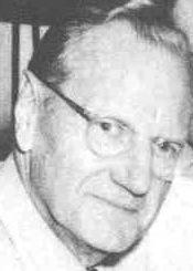 William Joseph Dard Hunter was born in 1883 in Steubenville, OH, and died in 1966 in Chillicothe, OH. He was one of the most influential graphic designers to come out of the American Arts and Crafts movement around 1900-1910. The typeface P22 Arts and Crafts (1995) by James Grieshaber at P22 comes complete with Arts and Crafts Ornaments and is based on Dard Hunter's designs. Bala Cynwyd NF (2008) and Nickley NF (1997, an arts and crafts font) by Nick Curtis are other digital revivals of his lettering. Related arts and crafts fonts include Syracuse (1999, Woodside Graphics) and Nouveau Riche JNL (Jeff Levine).
 The Mountain House Press Types were designed and cut by Dard Hunter between 1912 and 1915, and by Dard Hunter Jr. (b. 1917) in 1937-39, for the private use of their Mountain House Press. A Specimen of Type (Dard Hunter Jr., 1940, Paper Museum Press, Cambridge, MA) is a small booklet shows a roman type started in 1936 by Dard Hunter Jr. under the guidance of Professor Otto F. Ege. Apologies for the poor quality of the digital pics, which were taken under challenging conditions in the dungeon of a gothic library. A third generation has emerged as well, as Dard Hunter III is an active printer and book designer in modern times. Klingspor link. [Google]
[MyFonts]
[More] ⦿
|
Dave Fabik
|
 From Portland, OR, Dave Fabik's free truetype fonts. Includes fonts such as Slipstream, Willow (1995, Rennie Mackintosh style lettering), DungeonBlocksFilled (1995), GrekoDeco (1992, based on El Greco Adornado by Fundicion Richard Gans), SableBrush, RoughBrush, Zoom, Quainte, DeRoos Caps (Lombardic).
 Dafont link. Abstract Fonts link. [Google]
[More] ⦿
|
David Fernando Espinosa Martínez
[Type Sailor]
|
 [More] ⦿
|
David Fleming Nalle
[Scriptorium (Ragnarok Press, Fontcraft)]

|
 [MyFonts]
[More] ⦿
|
David Kerkhoff
[Hanoded]

|
 [MyFonts]
[More] ⦿
|
David Lafourcade
|
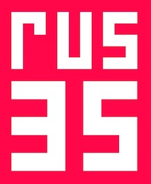 During his graphic design studies in Lyon, France, David Lafourcade created the constructivist typeface Rus 35 (2014), the Trajan typeface Oedipe Antique (2014) and the Fraktur typeface Dornach (2014).
 In 2015, he made the crazy arts-and-craftsy typeface Whaye, the geometric script typeface Fibule (which has starter, middle and end glyphs), and the hacker typeface Gaio. Typefaces from 2016: Aldgate (inspired by London transport signs), Dragonfly, Rallonge (a circle-based typeface designed to be stretched). [Google]
[More] ⦿
|
David Shankin
|
During his studies in Grand Rapids, MI, David Shankin created the arts and crafts typeface A Baby's Finger (2014), which is isnspired by the Glasgow School of Art. [Google]
[More] ⦿
|
David Siegel

|
 Educated at Stanford (M.Sc. in digital typography in 1985 under the supervision of Donald Knuth and Charles Bigelow) and before that at the University of Colorado at Boulder (undergraduate math degree in algorithms under Hal Gabow). Type designer. Creator of these architecturally-inspired type families:
 - Eaglefeather (1999), P22). An arts and crafts font made for the Frank Lloyd Wright Foundation, which owns various manuscripts of the beautiful lettering of this American artist and designer, 1867-1959. This font family is based on the alphabet designed by Frank Lloyd Wright for the Eaglerock project in 1922. Extended in 2012 and 2018 to P22 Eaglefeather Pro. Codesigned with Carol Toriumi-Lawrence.
- Tekton (1988, Adobe). Tekton was released by Adobe in 1989. Ideal for architectural writing, an OpenType family, called Tekton Pro, was released in 2000. Adobe lists Jim Wasco as a co-designer. The glyphs are based on the hand-lettering of Seattle-based architect and author Francis D.K. Ching.
- Graphite (1991, FontBureau). Graphite (FontBureau, 1991) is a drafting letter based on the hand of San Francisco draftsman Anthony Celis LaRosa.
- He worked with Hermann Zapf, trying to get Knuth's METAFONT program to produce beautiful typefaces. He worked again with Zapf on Zapfino.
His page has discussions on typography in general, and handwriting and architectural fonts in particular. He heads Studio Verso, a site-design consultancy in San Francisco. Author of The Euler project at Stanford Stanford, CA (1985, Stanford University, Department of Computer Science). CV at FontBureau. Interview. FontShop link. Klingspor link. MyFonts link. [Google]
[MyFonts]
[More] ⦿
|
Dominic Vielnascher
|
 Born in 1989, Dominic Vielnascher studies at NDU (New Design University) St. Pölten, Austria. His typefaces in 2011 include Naraganda (a beautiful low x-height arts and crafts family), an unnamed modular face, and Fraktur (blackletter).
 Behance link. Images of Naraganda: i, ii, iii, iv, v, vi, viii. [Google]
[More] ⦿
|
Dominik Krotscheck
[zum Egon]

|
 [MyFonts]
[More] ⦿
|
Douglas Peters
[Symbiotic Design]
|
[More] ⦿
|
Dream Up
|
Moscow-based illustrator who designed the vintage typeface Zeppelin Up (2016), the Poetry & Fiction font duo (2016), the thin arts-and-crafts typeface Sublime Up and the brush typefaces Rosemary and Snow Up in 2016. Creative Market link. [Google]
[More] ⦿
|
Dyer
|
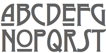 A mysterious free typeface created in 1997 in the style of the Glasgow School of Charles Rennie Mackintosh. Unknown designer. [Google]
[More] ⦿
|
Eccentrical
|
 An orphaned arts and crafts font, identical to the digital fonts all called Eccentric published by Monotype (Agfa), Solotype, and Adobe. Of course, all these digital fonts are copies of the original typeface from 1881 by Gustav F. Schroeder for Central Type Foundry. Download the font here. [Google]
[More] ⦿
|
Edmund C. Fischer
|
Designer of the Artcraft series of typefaces. [Google]
[More] ⦿
|
Edward Johnston

|
 Born in Uruguay in 1872, he died in the UK in 1944. A medical doctor, he taught all his life at the Central School of Arts and Crafts in London and at the Royal College of Art in London. From 1910 until 1930, he designed fonts for the Cranach-Presse in Weimar, which was owned by Count Harry Kessler.
 In 1916, he made a typeface for the London Underground (helped by Eric Gill). Johnston's London Transport type was reworked by Colin Banks in his New Johnston (1979), and again in 2016 by Malou Verlomme at Monotype, on commission for Transport For London (TfL), as Johnston100. Edward Johnston's fonts show a strong influence by Eric Gill. Hamlet-Type (1912-27, designed for a Shakespeare edition, Cranach Press, 1929) was also called Kessler-Blackletter. It was designed by Edward Johnston and cut in three sizes (10, 12 and 18 pt) by Edward Prince for William Shakespeare's Hamlet (published by Harry Kessler's Cranach Press in Weimar in 1929). The type is based on the Durandus for the lowercases, and Sweynheim & Pannartz's Subiaco type for the capitals. For a digital revival, see Hamlet Tertia 18 and Hamlet Cicero 12 by Alexis Faudot and Rafael Ribas which was developed at a workshop in Weimar in 2018. Hamlet was revived by Manfred Klein and Petra Heidorn as HamletOrNot. Johnston designed Imprint-Antiqua with Gerard Meynell and J. H. Mason in 1913. It includes Imprint Shadow. Digital descendants exist at Monotype [Imprint MT], URW [Imprint URW, preferred over the MT version by some of my correspondents], SoftMaker [I771], and Bitstream [Dutch 766<]. Johnston Sans Serif was done in 1916. A version of the London Underground typeface (1997, by Richard Kegler) was digitized by P22. In 2007, Paul D. Hunt extended that typeface to a 21-style multilingual collection called P22 Underground Pro. At ITC, Dave Farey and Richard Dawson recreated a Johnston sans serif family with 3 weights, aptly called ITC Johnston. Nick Curtis created Underground NF in 1999. Jordan Davies called his revivals London Medium (2017) and London Heavy (2017). Many other designers aped Johnston's Underground as well. In 2012, Greg Fleming published Railway Sans as a free open source font at OFL. It is based upon Johnston's original drawings and work started by Justin Howes just before his death. In 2021, P22 added italics to P22 Underground Pro and now covers Latin, Cyrillic and Greek---help with this newest version came from Housestyle Graphics (Dave Farey; for the italics), James Todd, and Patrick Griffin (final mastering). Edward Johnston is a book published by Priscilla Johnston (London, 1959). Author of Writing&illuminating,&lettering (1917, J. Hogg, London; original done in 1906). Writing Illuminating Lettering at Amazon. Scans of some lettering by him: illuminations (1917), modernized half uncial (1906), Calligraphy by Johnston. Digital fonts based on alphabets from the 1906 book include Edward's Uncial 1904 (2011, David Kettlewell). Links: Linotype, FontShop. [Google]
[MyFonts]
[More] ⦿
|
Elsa Z. Mersayeva
|
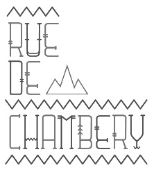 Belgium-based Elsa Mersayeva is unique. She writes about herself: I'm all about typography, matryochkas, Paris, pirates, funny people, urban culture, Bukowski, red nails&messy hair, gangsters' bandanas, huge golden earings and unicorns. Her Chambéry typeface (2011) has elements of the Arts&Crafts movement. Sailor (2011) is an ornamental caps face. [Google]
[More] ⦿
|
Erik Hannink
|
 Erik lives in Zwolle, The Netherlands, and was born in 1964. He designed the splendid free handcrafted typefaces Eryx Rennie Macintosh (2015, Scottish arts and crafts typeface), Eryx Freeform (2015) and Eryx Cartoon (2015). Dafont link. [Google]
[More] ⦿
|
Ethan Paul Dunham
[Fonthead Design]

|
[MyFonts]
[More] ⦿
|
Exuberance: Typefaces by Matt Jalbert
[Matt Jalbert]
|
Typefaces for the Mac and PC designed by Matt Jalbert from Albany, CA: a shareware Ludlow Dingbats (leaf motifs), Arts and Crafts Dingbats, and the gorgeous text typefaces Artcraft Light and Artcraft Light Italic (40 USD). See also here. [Google]
[More] ⦿
|
FactoryType Studio (was: One Dollar Font, Factory 738, Today Pixels)
[Wahyu Setiya Rahmawan]

|
 Bali, Indonesia-based designer of the geometric sans typeface family Cleon (2015: a geometric monoline sans), the handcrafted Brook (2015), and the brush script typefaces Kinemon (2015) and Aurora (2015). In 2016, he designed the rounded sans typefaces Reiju, Ichiji and Tony Tony, the handcrafted Jacks Script, Jacks Sans, Buho, Buho Sans, and the pixel family Abeja Tribe.
 Typefaces from 2017: Lovely Pudding (script), Phephe (a modernist arts-and-crafts font), Rouge Sans (rounded sans), Franky, Roger Serif (slab serif), Roger Sans, Moscato Script, Brulee Sans and Brulee Script, Big Mom Sans and Big Mom Script (round printed script). Typefaces from 2018: Opera (a 10-font all caps family that includes an inline and a stencil), Smoothie (font duo), Brownie (font duo), Ace Sans (caps only), Ace Serif (slab serif), The Dalmation (textured octagonal caps family), Robin, Bastille (a techno stencil), Django. Typefaces from 2019: Michelangelo (semi-stencil), Mike Sans (an 8-style squarish sans), Maya (signature script), Maya Sans, Leonardo Rounded, Leo Sans, Leo SemiRounded, Leonardo. Typefaces from 2020: Kinemon, Tony Tony (a condensed sans), Cream Opera (a sans family, including a stencil), Leonardo Sans (geometric, all caps), Benn (a bold squarish typeface family), Beckman (a geometric sans family). Typefaces from 2021: Lethbridge Script, Roseau Slab (five weights), Vaughan Pro (a 21-font stylized sans), Tombstone, Castlegar Script, Dubbo (like Cooper Black), Campbell, Brant (a swashy bold serif), Nova Scotia (script), Trail (incised), Ontario Script, Manitoba Script (inky), Alberta Signature Script, Gosford, Redland (a 5-style creamy display typeface), Rockdale (a 5-style luxury serif in the didone genre), Edensor (an 11-style stylish display serif), Alexandria Eschate (a sophisticated display serif), Welland (an 11-style decorative didone), Koldby (11 styles; a descendant of Didot), Maya Duo (a monolinear script), Benn Beckman (an all caps sans family), Trio Smoothie (a sans and script trio). Typefaces from 2022: Buche (a 12-style display serif), FTMilky (a vintage display serif; ten styles), King Sans (a 10-style Peignotian sans), Buche (a 12-style display serif), Newgate (a 10-style elephant foot serif). Creative Fabrica link. Old URL for Today Pixels. [Google]
[MyFonts]
[More] ⦿
|
Firat Kocaman
|
 Katowice, Poland-based designer of the art deco / arts and crafts typeface atlantis (2016). [Google]
[More] ⦿
|
Florent Schirrer
|
Mons, Belgium-based creator (b. 1985) of the free hand-drawn didone typeface BodoFlo (2013), ABlockyFont (2014, iFontMaker font), and of Hipsterish Pro (2015; buy it here; despite the name, the typeface is closest to the arts-and-crafts style of 1895), Marker Pen (2015), Feltipen Pro (2015), Thin Font (2014), Tape Type (2015, iFontMaker), and Large Font (2014). Aka Hello I'm Flo. Jellycube link. Dafont link. Behance link. [Google]
[More] ⦿
|
flpr
|
Designer in Sao Paulo. Creator of the arts and crafts typeface I Want To Be A Ballerina for Capricho Magazine. [Google]
[More] ⦿
|
Fonthead Design
[Ethan Paul Dunham]

|
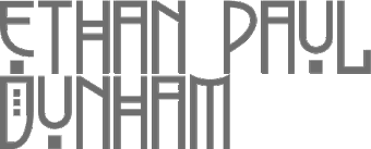 FontHead Design (Wilmington, DE) sells cool fonts designed by Ethan Dunham (b. 1972, Glens Falls, NY), who now heads Fontspring. A partial list: Mother Goose (2008), Allise, GoodDogCool, Fontheads (dingbats), Randisious, Greyhound (1997, an arts and crafts face), Rochester, Samurai, AsimovSans, Gurnsey20, Scrawl, BadDog, Holstein, SlackScript, Bessie, SloppyJoe (gone?), Blearex, HandSkriptOne, SmithPremier, BlueMoon, HolyCow, SororityHack, Bonkers, HotCoffeeFont, SpillMilk, BraveWorld, Isepik, Sputnik, Brolga, TekStencil, Carnation, Mekanek (1995), Teknobe (1995), Merlin, Toucan Grunge (gone?), Tycho, TypewriterOldstyle, MotherGoose, Croissant, Democratika (now Americratika--I think Emigre forced FontHead to change the name), Noel (1996-1997, Lombardic all caps face, with an open version added), LillaFunk (gone?), Margo Gothic (gone?), Toddler (gone?), NoelBlack, WashMe, Diesel, Orion, Gritzpop, Pesto, BattleStation, CircusDog, Dandelion, DraftHand, Flowerpot, Navel, ShoeString, Stiltskin, ZipSonik. Plus JohnDoe, and old typewriter font. Free fonts: Font Heads (dings), Smith Premier, Vladimir, Tycho, Typewriter Oldstyle, ScareCrow, Millennia, SpillMilk, GoodDog, Holstein, Red Five. All formats, Mac and PC. In the comic font series, look for Stan Lee (now Comic Talk), FH Excelsior (now Titlex), Grimmy (now Flim Flam), and Kirby (now Grit).
 Dafont link. Fonts created in 1999: AppleSeed, Caterpillar, Chinchilla, ChinchillaBlack, ChinchillaDots, CrowBeak, CrowBeakLight, CyberMonkey, DanceParty, DingleHopper, FourScore, FourScoreTitling, Hopscotch, HopscotchPlain, Ladybug, Leaflet-Regular, LeafletBold, LeafletLight, ReadOut, ReadOutSuper, Smoothie, Swizzle, TwoByFour, VeryMerry. Made in 2001: ButterFinger, ButterFingerSerif, CatScratch, Catnip, FighterPilot, FrenchRoast, Handheld, HandheldItalic, HandheldRaised, HandheldRaisedItalic, HandheldRound, HandheldRoundItalic, Kingdom, OldGlory, Quadric, QuadricSlant. MyFonts page. In 2006, several dingbats fonts were added, such as the ClickBits Arrow series and the ClickBits Icon series. In 2008, he created InfoBits Things and InfoBits Symbols, Abigail, Assembler, Click Clack, Drawzing (children's font, crayon or chalk style), El Franco (grunge), Good Dog New (hand-printed), Helion (futuristic), Lead Paint (brush), Schema (architectural lettering), Skizzors (paper cut font), Tachyon (2008, techno, futuristic). Free font download. This place has Allise, Americratika, AppleSeed, AsimovSans, Asterix-Blink-Italic, Asterix-Blink, Asterix-Italic, Asterix-Light-Italic, Asterix-Light, Asterix, BadDog, BattleStation, Beckett, Bessie, BlackBeard, Blearex, BlueMoon, Bonkers, BraveWorld, Brolga, BrownCow, Carnation, CatScratch, Caterpillar, Chinchilla, ChinchillaBlack, ChinchillaDots, CircusDog, CornDog (2004), Croissant, CrowBeak, CrowBeakLight, CyberMonkey, DanceParty, Dandelion, Dannette-Outline, Dannette, DayDream, Democratika, Diesel, DingleHopper, DoomsDay, DraftHand, Flowerpot, Font-Heads, FourScore, FourScoreTitling, FunkyWestern, Goliath, GoodDog-Bones, GoodDog-Cool, GoodKitty, Greyhound, Grimmy, Gritzpop, GritzpopGrunge, Gurnsey20, HandskriptOne, Holstein-Bold, Holstein, HolyCow, Hopscotch, HopscotchPlain, HotCoffeeFont, HotTamale, Isepik, JohnDoe, JollyJack, Keener, Klondike-Bold, Klondike, Ladybug, Leaflet-Regular, LeafletBold, LeafletLight, LillaFunk, Log Jam (+Inline), MargoGothic, MarvelScript, MatrixDot-Condensed, MatrixDot, Mekanek, Merlin, Millennia, Mondo-Loose, MotherGoose, Navel, Network, Noel, NoelBlack, Oatmeal, Orion, Pesto, Randisious, ReadOut, ReadOutSuper, RedFive, Rochester, Samurai, Scarecrow, Scrawl, ShoeString, ShoeStringRound, SlackScript, SloppyJoe, SmithPremier, Smock, Smoothie, SororityHack, SpaceCowboy, SpillMilk, Sputnikk, StanLee-Bold, StanLee-BoldItalic, StanLee-Regular, Stiltskin, Submarine, Swizzle, TekStencil, Teknobe, Torcho, ToucanGrunge, TwoByFour, Tycho, Typewriter2, TypewriterOldstyle, VeryMerry, Vladimir, WashMe, Watertown-Alternate, Watertown-Black, Watertown-Bold, Watertown, ZipSonik-Italic, ZipSonik, ZipSonikSketch-Italic, ZipSonikSketch. Font Squirrel carries ElliotSix (simple handwriting), GoodDog (children's hand) and Millennia (squarish). In fact, in 2009-2010, Ethan Dunham became a very active web font persona, offering a commercial web font service, Fontspring, and a free font service, Fontsquirrel. Klingspor link. Creative Market link. [Google]
[MyFonts]
[More] ⦿
|
Fontherapy (was: Typecoconut Studio)
|
Indonesian designer of the script typefaces Sweet Shine (2020: a fat finger font), Truw Way (2020), Mermaid Stories (2020), Callovia (2020), Madonna (2020: a signature script), Heartland (2020: drawn with calligraphic pens) and Catlove (2020). Typefaces as of 2021: Aggel Heart, Arthemiz, Bellova, Blacksun Vintage, Bladekill Font, Blank Magic, Blinkwomen, Browman, Chalk Study, Dinofont, Dream of Heartland, FT Getcode Pro, Funwork, Glory Sunset, Great Friends, Hello Doctor, Hollow City, Hopes Letter, Hotel Sans (arts and crafts style), Making Bomber, Mallika, Me Amanda, Mermaid Stories, Modern Deluxe, Modiz (an all caps sans), Mommy and Baby, Plankiss, Remember Moment, Rollingtime, Rosemate, Southlove, Stargod, Sweet Shine, Sweetball, Sweety Craft, Winlove. [Google]
[More] ⦿
|
Fontscape: Arts and Crafts
|
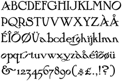 Fontscape lists digital Arts and Cratfs movement fonts:
 - From P22: P22 arts and Crafts (+Tall, +Hunter), P22 Morris (Troy, Golden), P22 Vale (+King's Fount).
- From ITC: Willow, ITC Golden Type.
- From Bannigan Artworks: Arts and Crafts GS.
- From JY&A Fonts: JY Arts and Crafts.
- From Nick Curtis: Lance Corporal NF.
[Google]
[More] ⦿
|
Fontscape: Secession
|
Fontscape lists digital Viennese Secession style fonts: - From Flashfonts: Love (Solid, Open, Stoned)---these are more psychedelic, really.
- From Adobe / Letterperfect: Kolo.
- From JM Fonts: Poster (Solid, Inline).
- From ITC: Willow, ITC Stoclet.
[Google]
[More] ⦿
|
Francisco López Bustamante
|
 Graphic designer in Guadalajara, Mexico, who works at Memela Studio. Behance link. His typefaces include the seductive multiline beauty, Miami Deco Type (2011), Haarlem (Display and Stencil), the Italian Western face El Solitario (2011), and the arts and crafts typeface Poiret (2011). Later in 2011, he promises the fashion mag typeface Marais Serif, and made the alchemic typeface Arcan.
 I am a bit confused, as most of these typefaces also show up in the portfolio of Pancho Lopez, also of Guadalajara. And to top it off, the Behance link now mentions that the designer is Frank Gutierrez from Monterrey. [Google]
[More] ⦿
|
Frank Lloyd Wright

|
 American architect, artist and designer, b. Richland Center, WI, 1867, d. Phoenix, AZ, 1959. He was associated with the Arts and Crafts movement. His lettering inspired many to create typefaces based on them. The Frank Lloyd Wright museum is near the University of Chicago. He lived in Oak Park, IL, two blocks away from Luc Devroye's daughter. A partial list of fonts related to FLW:
 - David Siegel made Eaglefeather (1994-1999) for the Frank Lloyd Wright Foundation, which owns various manuscripts with his beautiful lettering. P22 made a few typefaces based on his hand.
- Christina Torre (P22) created P22 FLW Exhibition and P22 FLW Terracotta in 2000 (revival in 2018), based on alphabets by Frank Lloyd Wright published in 1931 and in 1896-1897 (in his book The House Beautiful), respectively.
- Paul Hunt made the FLW Midway font family (2006-2018), comprising Midway One, Two and Ornaments. This set is based on the lettering found on the Midway Gardens working drawings of Frank Lloyd Wright---tall-legged and casual.
- There are several free fonts. For example, swiftw5 created the typeface Hendrikus Wijdeveld (2010), based on a Hendrikus Wijdeveld poster entitled Architecture Exhibition / Frank Lloyd Wright from 1931.
- Funky Lloyd Wright (2002) by Kristian Walker (Eurekaville) is an experimental font based on Frank Lloyd Wright's ideas.
FontShop link. View Frank Lloyd Wright fonts. [Google]
[MyFonts]
[More] ⦿
|
Franz Fiebiger
|
Austrian art nouveau era painter, 1880-1932, who took the Czech citizenship in 1919. His Viennese Secession poster for the Kaiserjubiläums Möbel Ausstellung (a furniture exhibition during the Kaiser's Jubilee) inspired David Kerkhoff to design Fiebiger Eins (2013) and Fiebiger Zwei (2013). Fiebiger has many traits of the arts & crafts movement. Biography at the University of Magdeburg. [Google]
[More] ⦿
|
Franzi Draws
[Franzi Paetzold]

|
 Illustrator and type designer based in Berlin. Designer of the floriated caps typeface Bahor (2019), the arts and crafts typeface Elodie (2018), the free handcrafted font Caroni (2018). In 2021, she extended Caroni to an 18-style commercial family.
 Typefaces from 2022: Moonless (a hand-crafted font duo). Fontsquirrel link. [Google]
[MyFonts]
[More] ⦿
|
Franzi Paetzold
[Franzi Draws]

|
[MyFonts]
[More] ⦿
|
Free Arts&Crafts Fonts
[John M. Murphy]
|
 Among the fonts in this small art nouveau style and arts and crafts archive, compiled by John M. Murphy in 2003, we find
 - By Anke Arnold: Fortunaschwein.
- By David Fabik: Willow (1995).
- By Steven J. Lundeen: Spanky's Bungalow (1997).
- By David Nalle (Scriptorium): Adresack (1996), Chelsea Studio (1997), Semiramis (1997).
- By Nick Curtis: Avignon (1999), Bala Cynwyd (2001, inspired by Dard Hunter), HobbyHorse (2000), Hut Sut Ralston (2001), Kelmscott Roman (2000, after a William Morris alphabet), Nickelodeon (1999: a silent movie font), Nickley (1997), Our Gang (1999), Runy Tunes Revisited, Grasshopper (2001), Rivanna (2002, art nouveau), Payzant Pen (2001, similar to Speedball), RaggMoppRegular (2000), Runy Tunes (1999; +Revisited, 2001), Shangri-La (2002), SouciSans (1999), Speedball No2 SW (2001), Speedball No3 (2001), Tanglewood Tales (2000).
- By David Siegel: Eaglefeather.
- By Sam Wang: Sarah Caps, EddaCaps (1993, pure art nouveau).
- Other fonts: Davys, Dyer, Eccentrical, Art Noveau Intitials (2001, House of Lime).
[Google]
[More] ⦿
|
Fype Co
[Muhammad Hasan]

|
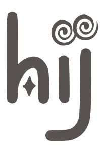 Aka Fitiyawan, who seems to have many other identities as well. As "Fype Co" (est. 2019), based in Magelang, Indonesia, he/she designed these script typefaces in 2019: Justoma, Ameyasi, Balgona (formal calligraphic), Qimona, Beardcanye, Renate, Grimalkin, Amelia Nature (a monoline script), Baliany, HoneySome, Blacks, Sunday Sugar (signage script), Minerals Buble, and Panda Script. Other typefaces designed in 2019: Biosphere (a squarish industrial style condensed all caps sans), Nought (an experimental slab serif), Graveyard, Blackfire (a rounded all caps sans with arts and crafts influences), Dioxide, Pomiform, Sci Fi Bronze, Prestigious, Relaunch, Marginal (oriental simulation), Necked (a sports font), Dia de Martini (Tuscan), Charlie (art deco), Kingfish (a cartoon font).
 Typefaces from 2020: King and Queen (a 23-style lachrymal serif family), Saodah, Rei Biensa, Lemenso, Hiluan Sea, Beard Canye, Pier Georad (a supermarket signage script), London Bridge (a wide geometric sans with a short-armed lowercase r and a spectacular ri ligature), Glover, Prestigious (a fashion mag typeface), Dioxide (an all caps wedge serif titling typeface), Relaunch, Bollent (fashionable, all caps), Cargiona (a stylish plumpish sans), Moilgo (a curvy display typeface), Kickers (a rounded vintage display serif family). Typefaces from 2021: Mister Frogs (a funky font with a cartoon feel), Bloena, Boedimant (a weathered stencil typeface), Dogiesland (scrapbook font), Gostend, Kamaboko (a delightfully loony children's book font). Creative Fabrica link. [Google]
[MyFonts]
[More] ⦿
|
George R. Grant
[CRMFontCo]

|
 [MyFonts]
[More] ⦿
|
Gilar Studio
[Gumilar Pratama Adiatna]

|
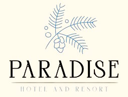 Serang, Indonesia-based designer (b. 1990) of the free handwriting fonts Rafiosa (2019) and Hasta La Vista (2019), and the script typefaces Gilani Sign, Galinah (a rabbit ear script), Patlystic, Raline, Gilar Saleh, Aminarthie, Charlotte Bellamy, Gallillea, Hellowish, Hokie, Holiday Script, Isabela, Jhon Wick, Pandora, Riverlands Tully, Rudolp, Samudera, Santuy, Sella Callista, Shalitta, Starlight, Sunday Rully, and Taman Signature.
 Typefaces from 2020: Fontana, Houston (inline caps), Goord (titling caps), El Fonte (all caps), Norland, Bonjour (condensed caps), Sigtia (calligraphic), Honney (calligraphic), Bigola, Axilia, Sunkisa, Santhin, Sulqata, Nagisha, Rithey, Rodelia, Betharia, Celya, Sonetha, Ruang Teduh, Reality, Jallu Salafi, Tagonda, Sigoda. Typefaces from 2021: Bunny Flowers (a scrapbook font), We Are Allstar (a playful font, perhaps even beatnik), African Paradise (a beatnik font), House Easter (a scrapbook font), Nona Manis (a beatnik font), Anak Sultan (a scrapbook font), Luar Galaxy, Lovely Unicorn (a scrapbook typeface), Ikan Salmon (a beatnik font), The Crafty (a scrapbook font), The Funy Times (a scrapbook font), Lovely Unicorn, Fontena (an all caps arts-and-crafts sans), Amoselia (a wild calligraphic script), Bontour (a skyline font), Goordy (a classical roman caps typeface with unbracketed serifs), Hatolie (display wedge serif caps), Marisa, Cameta Cuttes (wild calligraphy), Hello Crimsons (blackboard bold), Chris Master (wild and calligraphic), Carilos (an all caps decorative serif), Budyloves (a romantic script), Valentina (an upright Valentine's day script), Berylover (a wild calligraphic script), Love Birdy (a wild calligraphic script), Loving Hearty (a lovers' script), Night City (a forceful script), Beach Loves (wild and inky calligraphy), Kity love (wild calligraphy), Love Angel (wild calligraphy), Lovely Valentine, Helo Xmas (wild calligraphy), Karoline (wild calligraphy), Looqie (a display font), Mettalian (a wild calligraphic script), Royante (a signage script), Verali (a wild calligraphic script), Quality Times (a wild script). Typefaces from 2022: Collager (an 18-style display serif family). [Google]
[MyFonts]
[More] ⦿
|
Graham Bradley
[Roxaboxen]
|
[More] ⦿
|
Grant Keinzley
|
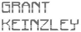 CEO of Ni Hao Cybertek (or NH Cybertek) in China. Fontstructor known as gothman who made the arts and crafts-look typeface Cybertek (2012). [Google]
[More] ⦿
|
Greater Albion Typefounders (or: GATF)
[Paul James Lloyd]

|
 Paul J. Lloyd's type foundry in Western Australia, est. 2008. Lloyd (b. UK) made over 100 free truetype fonts before that. He writes: What we will offer is new designs, replete with Edwardian Fun, Victorian distinction, or any other piece of elegance we can manage.
 Edwardian creations from 2008-2010: Ark Wright (traditional shop signage), Adantine, Goldbarre, Brosse, Crewekerne, Crewekerne Magna and Crewekerne Magister (arts and crafts face), Larchmont, Brissard, Brossard (slab serif), Bonavia, Bonavia Blanc, Clementhorpe, Veneribe, Chiara Script, Howlett, Svengali Roman, Bonning and Bonnington (1920's style families with ideas from University Roman), Absinette (2009, art nouveau), Bamberforth, Tumbletype, Vertrina, Bromwich, Great Bromwich, Fleete, Helenium. Chipping emulates the Edwardian 1920s. In 2012, he added the Bolton Commercial family (late Edwardian, early art nouveau). Art deco typefaces: Oakland (2011, multiline typeface gleaned from a 1930s French car ad), Zenia (2010, trilined), Plebe (Plebia, 2008: a grotesk emulating the 1930s), Whitehaven (2008, an extensive art deco family with several shadow weights), Merry Fleurons (2008, Christmas ornament dingbats), Braxia (2008), Keynsia (fifties style art deco family with Peignot influences). Other typefaces: Haymer is a large sans family made in 2010. Clunic (2008) is a blackletter face. Tectura (2008) is a handwriting font. Eldridge is a slab serif family. Aliqua (2009), Chipperly (2009) and Syondola (2008, Tuscan) are Wild West families. Terazza Tilings (2009) and Valentine's Fleurons (2009) are dingbat typefaces. Additions in 2009 include Lowndes (soft blackletter), Christmas Fleurons, Merry Snowmen, Cherritt (described as a Victorian era Courier), DoodleBirds, Halloween Fleurons, ButtonFaces, Sabio (neither slab nor sans), Daub (brush graffiti font), Sabinard (a modern swash face), Cullions (futuristic blackletter), Coronard (blackletter / roman hybrid), Easter Fleurons, Chapter Initials, Paveline (19th century calligraphic script), Mellin Sans and Open, Gildersleeve (evoking the 1920s Arts and Crafts movement), Stannard (a 1920's advertising inspired small caps face), Slattery (a horizontally shaded fun face), Slatterine (2009, more retro futurism), Spillsbury (2010, Victorian family), Cirflex (2010, geometric display typeface based on arcs of circles), Oxonia (2010, a classic roman family) and Vectis (classic Roman elegance, another small caps face). Creations in 2010: Windevere, Albion's White Christmas, Paragon (a great didone display family with a wood type feel), Compton (slab serif family), Mexborough, Morover (Schwabacher family), Anavio (a classical roman family), Corvone (3d-effect font), Granville (Victorian), Corton (Victorian), Wellingborough (Victorian), Worthing (Victorian), Ark Wright (traditional shop signage), Bonaventure (art nouveau), Federal Streamliner (1950s feel techno face), Deva (classical roman), Crucis Ornaments (crosses), Bronzino (a roman with Arts and Crafts roots), Bertoni (2010, a didone family), Pardon Me Boy (train dingbats), Woodruff (Open Face fonts with a wood type look), Jonquin (based on a WWI poster; +Incised), Luscombe (1920s display family; +Parva), Movella (futuristic from the 1950s), Magdalena Sans (2010: a clear monoline sans), Endymion (2010: Tuscan), Paget (a Tuscan experimental all caps face), Portello (Victorian). Typefaces made in 2011: Admiral (art nouveau), Tuscaloosa (Tuscan face), Eccles (bombastic Victorian), Wolverhampton (pre-Victorian), Doncaster (Victorian family), Metropole (art nouveau family), Corsham (stone engraved lettering family), Leibix (casual), Albia Nova (an elegant futuristic organic face), Flapper (art nouveau face), Bertolessi (curly Victorian), Tulk's Victorian Banner (all caps banner face), Fitzgerald (Victorian all caps face), Cleveden (Victorian headline family), Spargo (an extensive set of early 20th century-look engraved typefaces for official documents and securities), Bettendorf (2011, based on a 1900s masthead typeface), Wolvercote (2011, similar to Bettendorf), Pittsburgh (2011, a Western-style engraved face), Chubbly (2011), Portmeirion No. 6 (2011, a Victorian / circus design), Bronzetti (2011; images: i, ii, iii, iv, v, vi), Sophie J (hanprinted), Dem Bones (2011, glyphs made from bones), Stout (2011), Birmingham New Street (a Victorian family inspired by the hand lettered title on a 19th century railway map), Beckinslade (ornamental blackletter). Production in 2012: Alfere Sans Stripes, Albion's Americana (Western stars and stripes face), Tudor Perpendicular (blackletter), Amici (rounded headline face), Amie (rounded sans), Wolverton Text (Edwardian family), Vinea (10-style display family), Par Avion (retro futuristic), AstroBats (retro sci-fi dingbats), Beeching (+Shadowed), Gondolieri (didone meets Tuscan), Penrose Slabserif (an Escher-like trompe l'oeuil 3d face), Haldane (art nouveau, Arabic look), Solidarius (chubby, fat felt-tip pen font), Bluebottle (angular display face), Merrivale (Victorian), Future Runes (runic simulation), Coliseo, Alfrere Sans (inspired by a 1950s television caption style), Tectura II (Lloyd's answer to Comic Sans), Secombe (Edwardian caps family), Milligan, London Court (Tudor-era caps family). Typefaces from 2013: Speedblur, Belhampton (Edwardian), Merry Baubles (Christmas tree dings), Merry Bauble Letters (Christmas alphadings), Wroxeter (blackletter), Thurbrooke (+Banner, +Initials, +Black, +Reverso, all based on 19th century banner headings and engraved lettering), Bourne (a rounded type system), Henrician (a set of eight Tudor style display typefaces), Belle Jardin (art deco marquee face), Lavery (Edwardian), Baldione (a stylized didone), Chequers (a vintage poster face), Turvy Topsy (fat finger face), Merrivaux (faux medieval), Blout (German expressionist typeface), Easter Egg Letters, Isometrica (a banner typeface family), Valentine's Letters, Imperial Granum (roman titling face), Brollo (chunky display face). Typefaces from 2014: Albions Very Old Masthead, Albions Engraved Black, Albions Old Masthead, Albions Incised Masthead, Albions Black Holly, Zanderley (pure Victoriana, +Initials), Landsdowne Commercial, Friendly Shaded Sans, Trivette, Wellmere Sans, Uncia Black, Henry VII, Greene and Rollins (layered Victorian typeface), Barollo, Alfrine, Alfrere Banner (+Incised), Lugano, Lanvier (1930s-style caps typeface family), Bonlivet (a hyper-decorative capitals alphabet from the late Victoian or early art nouveau era), Ames Text (a didone family with rounded brackets), Ames Roman (related to didones but with wedge serifs), Ames Weathered, Ames Shadow, Ames Shaded, Amersham (vintage signage family, 2013-2014). Typefaces from 2015: Netherland Perpendicular (Victorian blackletter), Ledbury (Victorian), Ambergate (Edwardian poster face), Empyrean (futuristic, yet curvy), Flinscher (1920s script), Signwriter Standard, Display Hatched, Albions Marker No.1 (a charming outlined marker pen typeface inspired by Bembo and Caslon), Joyvrie, Kinver (Victorian), Nationale (Victorian), Doges Banner, Doges Darker (Victorian), Doges Delight (Victorian), Doges Venezia (Victorian). Typefaces from 2016: Buntisland, Elmcourt, Allorette, Albion Sharp Italic, Deco Metro (art deco), SpeedSwash (blackletterish), Stridere (blackletterish), SpeedSketch. Typefaces from 2017: Shervington, Cantebriggia 1207 (a weathered blackletter), Algreve, Alambart, Duquesne Dark Woodcut, Courtold Shadow, Athabasca (Wild West Tuscan), Fargo Tuscan, Millerstown (Western), Millerstown Races, Old Millerstown, Sasparillo (Tuscan), Sasparillo Fizz, Wylgate, Herald Banner. Typefaces from 2018: Garstang Engraved, Halliwell Casual, Portculliard, Rotham Industria, Sombrieul (Edwardian), Shervington Engraved (a shaded typeface that appears hand-engraved on copper-plate). Typefaces from 2019: Dewhirst Display, Rakia (retro futuristic), Eurobia (art nouveau style). Typefaces from 2020: Draughtsman Engraved, Draughtsman Label Hand (Victorian), Civic Triline. Typefaces from 2021: Albion Seventies, Portculliard Engraved (an engraved ultra-decorative blackletter). Type announcements. Behance link. Klingspor link. Abstract Fonts link. Font Squirrel link. Kernest link. Abstract Fonts link. Hellofont link. View all typefaces by Paul Lloyd. Images of Paul Lloyd's best-selling typefaces. Greater Albion Typefounders: typeface collection. View Paul Lloyd's Victorian typefaces. [Google]
[MyFonts]
[More] ⦿
|
Guguh Gumantoro
[Letter Stock (was: Gumacreative)]

|
 [MyFonts]
[More] ⦿
|
Guilhem Greco
[Herofonts (was: Hypefonts)]
|
 [More] ⦿
|
Gumilar Pratama Adiatna
[Gilar Studio]

|
[MyFonts]
[More] ⦿
|
Gustav & Brun (was: Jagjavi)
[Andreas Gustavsson]

|
 Andreas Gustavsson is a Swedish designer, b. 1979, located in Nyköping. At MyFonts, starting in 2013, the name Andreas Brunelius started to appear as the designer of most of the typefaces. It is possible that Andreas Brunelius = Andreas Gustavsson. Gustavsson's typefaces were first published under the foundry name Jagjavi, but in 2014, that name changed to Gustav & Brun.
 Creator of the simple hand-printed typeface Kohicle 25 (2009). See also his waxy letter studies from 2010. At his commercial foundry, he published Pushups (2012, hand-printed 3d face), Itchy Handwriting (2012), Docklan (2012, textured face), Herbarium (2012, plants dingbats) and Old Earthy (2012, a hand-drawn font inspired by the mid 19th-century art movement with William Morris and the Pre-Raphaelite Brotherhood). Typefaces from 2013: Sweeper, Paper Cuts, Nanu and Nanu Simple Ornaments (hand-drawn poster font), Macro (fat headline or poster face), Macro Print (the eroded version of Macro), Karl and Karl Black (blackboard bold typeface family). Typefaces from 2014: Caitiff (a fun poster typeface), Albus (comic book font), Expedition One (bichromatic geometric solid typeface), Sweeper Slanted (brush typeface). Home page. Behance link. Another home page. Fontspace link. Dafont link. View all their typefaces. [Google]
[MyFonts]
[More] ⦿
|
Gustave F. Schroeder

|
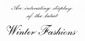 Punchcutter, b. 1861 (Berlin), who made many typefaces. He worked at the Central Type Foundry and then ATF in the late 1800s, and was living in St. Louis, MO, in 1891 and in Mill Valley, CA in 1892. The Inland Printer announced in 1895 that Schroeder had joined the Pacific States Type Foundry in San Francisco. His typefaces straddle the Victorian, arts and crafts and art nouveau eras.
 His typefaces include: - Victorian style typefaces at Central Type foundry, done early in his career: Apollo (1888), Atlanta (1885, based on a design of Andreas V. Haight), Harper (1882, curly), Hogarth (1883), Jeffderson (1890), Jupiter (1888), Lafayette (1885), Morning Glory (1884), Scribner (1883), Victoria (1886, with Nicholas J. Werner), Victoria Italic (1891), Washington (1886). Apollo was revived by Nick Curtis in 2014 as Gloriosus NF.
- At Marder, Luse and Co: French Old Style Extended.
- At Pacific States: Aldus Italic (before 1891), Sierra (before 1897).
- Arts and crafts typefaces at Central Type Foundry: Eccentric (1881, available in digital form at Monotype (Agfa), Solotype, Jeff Levine (2020: called Oddly Nouveau JNL), and Adobe. There is also a free version, Eccentrical, from an unknown designer.
- Art nouveau typefaces done at Central Type Foundry: Art Gothic (1885), Multiform No. 1 through No. 4 (1892).
- Othello (1886, Central Type Foundry). A black condensed rounded typeface that became very successful thanks to its revival (copy?) by Morris Fuller Benton. Digital versions include Bathysphere (2013, by Seymour Caprice) and Nick Curtis's Iago NF (2011).
- Geometric Condensed (1882, Central Type Foundry, with W.W. Jackson). Revived in 2014 under the same name by Robert Donona.
- For Barnhart Bros and Spindler: Era (1891) and Era Condensed No. 5 (1891). These typefaces were done with Nicholas J. Werner. Pastel was originally called Era.
- For ATF: Empire Initials (ca. 1898), McCullagh No. 2 (1897, a remarkable art deco typeface twenty years ahead of its time). Patent application for McCullagh.
- Geometric (+Italic, Condensed, Antique). Done in 1881 at Central Type Foundry. The Condensed and Antique are from 1883. For a digital version, see HWT Geometric (2013) by Hamilton Wood Type / James Grieshaber.
- DeVinne (1890-1896, Central Type Foundry). This design was sold to Stephenson Blake. Digital versions available at Bitstream and Wooden Type Fonts. Bitstream writes about its version: This revival of the Bruce Foundry's No. 11 is typical of the nineteenth century types derived from the work of Didot and Bodoni; the typeface remains popular with lawyers and government printers. In fact, Theodore Low De Vinne opposed this kind of design as hard to print and read; he had Century designed to replace it.
- Other typefaces at Central Type Foundry: Cushing Old Style (1890), Erebus (1889), Hades (1889), Johnston Gothic (1892, with Nicholas J. Werner), Laclede (1897), Novelty Script (ca. 1891), Old Style Bold (1886), Old Style Script (1887), Quaint Roman (1890 or 1895), Royal Script (1887), Typewriter (1884), University (1889). Mac McGrew on Royal Script: Royal Script originated with the Central Type Foundry branch of ATF in St. Louis in 1893. It is much like the later Typo Script, but wider. In spite of that similarity, it appeared in ATF specimen books as late as 1968. In the 24- and 30-point sizes there are normal and small versions of lowercase, caps being the same. Early specimens designated these large and small sizes as No.1 and No.2 respectively, later specimens as No. 551 and No. 552. Hansen's Newton Script is the same design.
- The angled serif font family Romana (1892). Digital versions by Linotype, Elsner & Flake (called EF Romana) and Bitstream. Bitstream puts this didone design in the proper context: The French interest in the revival of suitably edited Oldstyle romans as an alternative to a world of Modern typefaces started in 1846 when Louis Perrin cut the Lyons capitals. About 1860, as Phemister was cutting the Miller & Richard Old Style in Edinburgh, Theophile Beaudoire turned the idea of the Lyons capitals into a complete Oldstyle typeface, with similar overwhelming success; it was generally known as Elzevir in France and Roemisch, Romanisch, Romaans or Romana in Germany, Holland and Switzerland. In 1892, Gustav Schroeder, at the Central Division of ATF, expanded the series, adding a boldface under the name DeVinne. It was promptly copied, initially in Europe by Ludwig & Mayer, and spread rapidly throughout the US and Europe, becoming the best known member of the series. ATF made popular an ornamental form under the name De Vinne Ornamental.
- Patent applications: unnamed face for BBS (1891), another unnamed face (1893), an unnamed art nouveau face and another unnamed serif face (1893, for VJA Rey).
FontShop link. Google patent link. Typefaces by him at MyFonts. [Google]
[MyFonts]
[More] ⦿
|
Hanoded
[David Kerkhoff]

|
 Hanoded is the foundry (est. 2010) of Dutch designer and photographer David Kerkhoff, b. Epe / Vaassen, 1969. In its first year, Hanoded was a free font outfit specializing in handwriting and hand-printed typefaces. Its creations could be seen at Dafont, Abstract Fonts and Fontspace. Fontspring link. Klingspor link.
 In 2011, he went partially commercial via MyFonts. His typefaces became more diversified and are quite stunning at times: - A: Aardvark Dreams (2016), Abeille (2016), Abelia (2015), Abysmal Gaze (2011. scratchy face), Aceituna (2018), Adagietto (2018), Aderyn (2012: a poster family), Adieu Mon Ami (2021: a crayon font), Aeronic (2015, based on a 1937 Japanese poster for Nikke Coat by Japanese print artist Gihachiro Okuyama (1907-1981)), Aficionado (2019), After Nightfall (2018: spooky), Aiguille (2018), Aint Nothing Fancy (2010). All Over Again (2010), All Over Again All Caps (2010), Allez Hop (2011), Ambleside (2018: a fun scratchy curly script), Ambrosine (2017), Americain (2012, constructivist), American Grunge (2015), Amoebica (2014), Andorra Script (2014), Another Monday (2020), Antisocial Behavior (2010), Antidote (2016, 3d and handcrafted), Apex Brush (2019), Appelstroop (2016), Arancello (2018, a connected didone), Artful Dodger (2012, a grungy Clarendon), AshesToAshes (2010), Ashtanga (2013, curly caps), Astromonkey (2016), Atonement (2018: a great irregular inky script), Attaboy (2016, dry brush), Attention Seeker (2017), Au Revoir (2012), Autumn Voyage (2017), Avontuur (2017), Awesome Sauce (2019).
- B: Background Echo (2021), Backyard Hero (2018), Badehaus (2015, an art npuveau typeface modeled after the lettering on the Thermal Badehaus in Bad Neuenahr, Germany), Bad Medicine (2017), BadPaintjob (2010), Bakeapple (2019), Balagan (2010), Bandolina (2014), Band Wagon (2018: Western), Baznat (2010), Beanstalker (2018), Bearskin (2019), BehindDirtyBlinds (2010), DK Bergelmir (2014), Bergie Seltzer (2019), Betula (2018), Bintang (2016), Bitterbrush (2018), Bitumen (2017: a sticky typeface), Blabbermouth (2018), Black Bamboo (2014), Black Cluster (2018), Black Mark (2012, a heavy brush face), Blackminster (2017: blackletter), Bladesmith (2018), Blauhaus (2015, a rounded organic monoline Bauhaus), Bloemgracht (2014, Dutch deco), Bloomer (2019), Blueberry Jam (2016), Boarding House (2017), Bocadillo (2016, brush script), Bodiam (2016, beatnik style), Bombay Blue (2014, handcrafted poster font), Blue Sheep (2016, comic book style), Bogeyman (2019), Boris Brush (2016), Borrowdale (2016, a crayon font), Bottle Brush (2017, dry brush), Bottle Shop Faded (2010), Bratislava (2015), Breadcrumbs (2019), Breakfast Noodles (2020), Brochette (2019), Bronwen (2018: a vampire or bewitched font), Brouwerij (2021), Brushcrazy (2019), Brush Crush (2016), Buckthorn (2017, grungy), Bugbear (2019: a cartoon font), Bunny Daydream (2020), Bupkis (2017), Breakfast Burrito (2015), Brooklyner (2013: an art deco caps typeface based on the typeface used for The Brooklynite, a magazine from the 1920's), Brouillard (2017), Brushzilla (2017), Bullet in your Head (2010), Bumper Sticker (2020), Bungehuis (2015, Dutch deco after the lettering on a building in Amsterdam, 1931), Buntaro, Burobu (a blobby typeface), Business As Usual (2011, scratchy), Buttered Toast (2015), Butterfly Ball (2014), Bygone (2017, brush font).
- C: Cadora Woods (2020), Caerphilly (2018), Caffe Lungo (2019), Camping Holiday (2018: comic book style), Canned Whale (2012, outlined and hand-printed), Canoodle (2016), Capricious (2020: a dry brush font), Carambola (art deco sans), Carbonara (2011, grungy typewriter), Carpe Noctem (2017, a haunted font), Carrot Juice (2017), Carte Blanche (2012, a gorgeous arched / sketched caps face), Castanea (2012, a painter's font), Castle On The Hill (2017), Castlerigg (2020), Catskin, Mon Petit Cahier (a children's handwriting emulation) (2021), Celluloid Bliss (2010), Cerulean Blue (2018), Chalkaholic (2018), Charons Obol (2011, scary brush face), Cheat Sheet (2013, handwritten), Checkout (2015, a basic supermarket script), Cherubina (2016, beatnik style), Chewy Caramel (2020), Chillerz (2020), Chilly Cherry (2018), China Syndrome (2019: a brush-lettered typeface), Chocolatte (2016), Chunky Chicken (2013), Cinnamon Swirl (2016, curly lettering), Cinnabar Brush (2016), DK Clair de Lune (2012, an exquisite curly poster font), Clochard (funky quirky lettering), Closet Skeleton (a scary font based on the cover of the 1946 book De Sprookjeshoorn by Anton Eijkens (1920-2012)), Clootie (2020), Coal Brush (2016), Coconut Punch (2018, dry brush), Codswallop (2011, fat hand-printed), DK Coliseu (2014, art deco), Colporteur (2017), Combustible (2017), Compagnon (2017), Concertina (2018), Cookie Crumble (2019: beatnik style), Cookie Supply (2019), DK Cool Crayon, Cool Daddy (2017, bubblegum font), Coquillage (2017), Corner Shop Chique (2010), Cortese (2016: an interlocking letter poster font based on a 1971 Italian movie poster for La Morte Cammina Con I Tacchi Alti directed by Luciano Ercoli), Cosmo Stitch (2015), Cosmic Turtle (2021: hand-crafted, in beatnik style), Couldnt be bothered (2010), Courant (2011, grungy blackletter), Cover Up (2017), Crayon Crumble (2011, chalk face), Crayon En Folie (2016, a crayon or chalk typeface), DK Crayonista (2012), Crayon Works (2021), Crimson Skyline (2019), Criss Cross (2011), Crocodile Feet (2018: beatnik style), Crowbar (2017), Crowd Pleaser (2021), Crowfeather (2018), Crowd Funded (2018), Crypt (2016), Cry Wolf (2017), Cubissimo (2013, a cubist geometric font inspired by a 1929 poster advertising a museum exhibition), Cul de Sac (2010, 3d outline face, hand-printed and sketched), Cut Along (2017: a paper cutout typeface), Cykelsmed (2018).
- D: Daft Script (2021), Daily Challenge (2021), Daitengu (2020), Dapplegrim (2018), Darker Marker (2016), Darkness Rising (2018), Deco Pimp (2011), Delivery Note (2019), Demagogue (2020), Die Bruecke (2013, a woodblock printing emulation typeface named after the Die Brücke movement), Dinosaur Cake (2018), Dirrrty (2016, a grungy brush font), DK Allez Hop (2011), Discolicious (2017), Display Patrol (2017), Dominant Type (2021), Donkeyman (2021), Don Quixote (2011. nice grunge calligraphic hand), DK Dortmunder Ecke (2015, inspired by cubism), Doubledecker (2019), Double Quick (2014), Douceur (2014, a blackboard bold / tattoo script), Downhill Dive (2019), Down The Wall (2017), Downward Fall (2014, a rough brush), Dragonblood (2015), Dragon Spell (2017, drawn with Chinese ink), Drawing Blood (2010), Dreadnought (2014, brush face), Dreamworld (2022: a comic book brush font), Drop Dead Gorgeous (an all caps brush typeface), Dubbel Zout.
- E: Early Morning Coffee (2012), Earworm (2018), Elbow Grease (2017), Element 120 (2018, a hand-drawn Ultra Bodoni), Endgame (2019), Entourage (2017), Ersatz Quality (2010), Erstwhile (2019), Evil Laughter (2019: a typewriter font with blood drips), Exit Strategy (2020: all caps, dry brush).
- F: Face Your Fears (2011), Face Your Fears II (2015), FairNSquare (2010), Fairy Godmother (2018), Fallout Font (2010), Fantastique (2012, a 3d hand-printed caps face), Fat Little Piggy (2010), Father Frost (2012), Fearsome (2018), Fictional Friend (2019), Fiebiger Eins (2013, an art nouveau / arts & crafts typeface after a 1908 poster by Franz Fiebiger), Fiebiger Zwei (2013), Fingerfood (2018), Flagellum Dei (2016, a rough brush script), Fleabitten (2019), Fledermaus (2012: Fledermaus ("bat") was a cabaret theater from Vienna. The original Jugendstil decor was designed by Josef Hoffman and several posters, advertising performances, were designed by other members of the Vienna Workshop. The Fledermaus font was based on a 1907 poster by Bertold Löffler.; the missing glyphs were created by Kerkhoff), Flying Saucer (2019), Follow The Light (2018), Food Truck (2016, vernacular style), Forgotten Dream (2020: a heavy brush typeface), DK Formosa (2012), Framboisier (2017), Frozen Memory (2017), Fruity Snack (2022), Full Blast (2017: dry brush), Full English (a handcrafted stencil) (2021), Fully Automatic (2022), Funky Flamingo (2018).
- G: Galangal (a phenomenal poster typeface that plays on thick and thin, in the style of Horst Caps), Gallows Hill (2019), Gamboge (2017), Garden Bed (2016, a fat brush font), Garden Gnome (2016), Genki Desu (2019: comic book style), Gerards Gold (2010, script face), Getaway Car (2019). Ghost Reverie (2010, a scratchy family), Gingerline (2018), Glitter Candy (2018), Gobsmacked (2019: dry brush style), Goodie Bag (2019), Grafiker (2013, a brush typeface loosely based on the work of designers Oskar Kokoschka (1886-1980) and Jean Carlu (1900-1997)), Gravitational Pull (2021: a fat finger font), Gravity Well (2021: a rough brush), Greyfriars (2017, a hand-drawn Baskerville), Griezelig (2019: eerie), Grigory (2017), Grindylow (2020), Gritstomper (2020), Grumpy Tiger (2017), Guerilla Handshake (2017), Guilty Pleasure (2019: a fat brush font), Gulag Decay (2010), Gumbo (2019), Gumboots (2020).
- H: Halewyn (2017), Halfway There (a fat finger font) (2021), Hangmans Delight (2016), Hanoded Hand (2010), Hanoded-Heavy (2010), Harajuku Script (2017), Harimau (2012, a rounded children's book font), Harimau Dua (2015), Harrumph (2011, a fat poster lettering family), Hasta Luego (2020), Hasty Tasty (2011), HaraldRunicDEMO (2010), Headlock (2017), Heartsome (2020), Heckel (2013, a German expressionist hand-drawn typeface based on the handwriting of Erich Heckel (1883-1970), a founding member of Die Brücke, a group of German expressionist), Hedgehog Hans (2012, comic book typeface), Henceforth (2017), Hex (2012), Hexenhammer (2017, a font for witches and vampires), Hey Comrade (2016: a messy script font made with a bamboo satay skewer), Hibagon (a rough dry brush font) (2021), Hieratic Numerals (2010), High Tea (2012), Himawari Script (2019), DK Himmelblau (2012, art nouveau font based on a poster from 1902 made by the Künstlerbund Hagen), Hjem (2019), Hobgoblin (2014), Hofstad (2014, after an art deco typeface used by poster designer John Lavies), Hokitika (2014, art deco), Home Education (2021), Homeward Bound (2017, a grungy slab serif), Honey Dew (2016), Honeyguide (2017), Huggin and Muninn (2012, script face), Hungry Zombie (2020), Hummus Chips Salat (2010), Hyggelig (2015), Hyldemoer (2018).
- I: Ice Cream Man (2018), Identity Check (2022: handprinted), Impending Distaster (2022), Inky Fingers (2013, a fat finger font), Innuendo (2015), Interstellar Erosion (2010), DK Insomniac (2015), Instant Harmony (2019), Irena (2016, a cubist/expressionist font inspired by Czech type designer Vojtech Preissig), Ishtar (2012: spooky brush font).
- J: Jalebi (2015), Jambo (2014, bouncy and funky), Joe Schmoe (2011, hand-printed), John Brown (2016), Jubileum (2013), Juicer (2021), Just Before Liposuction (2010).
- K: Kabouter (2019), Kaikoura (2014, art deco), Kandij (2020), Kapsalon (2019, +Pencil, +Brush), Katsudon (2020), Katzenjammer (2015), Kempoka (2014, brush script), Kerberos Fang (2011), Keswick (2013, a lipstick font created using a 6B pencil), Ketimun (2019), Kingsmead Script (2020), Fat Kitty Kat (2013), DK Koerier (2014, a 3d outlined typeface), Knockdown (2016, brush style), Knucklebones (2017), Kodama Forest (2017, Treefrog style), Kokomo (2012, 3d and outlined), Kolkata Hotelroom (2010), Komsomol (2014: was modeled on several Soviet propaganda posters and anmed after the youth division of the Communist Party of the Soviet Union, the Komsomol, or Kommunisticheskii Soyuz Molodyozhi), Konditorei (2018), Koshatnik (2011, all caps brush face), Kubikajiri (2011, an India ink brush face), DK Kundalini (2013, curly), Kunstschau (2012: a beautiful poster font that was modeled on a stamp, designed by Austrian artist Bertold Löffler, for the Kunstschau 1908 exhibition in Vienna), Kurkuma (2013, a wonderful poster caps face), Kuroneko (2019), Kusukusu (2011, hand-printed), Kwark (2013: a 3d poster font).
- L: Lachrymose (2021: a brush font), Lampion (2012, a condensed unicase hand-drawn face), Leakage (2010, ink splash face), Languedoc (2016), Larks Tongues (2017), Laser Vision (2022: a marker font), Lazy Morning (2020), Leftover Crayon (2017), Lemon Yellow Sun (2014), Lenox Avenue (2017, after Studio Handbook Letter And Design For Artists And Advertisers by Samuel Welo), Lille Snemand (2015), DK Limoen (2012, shadow outline face), Liquid Amber (2018), Liquid Embrace (2015, a brush font), Little Boy Blue (2016), Lokomotiv (2012, an art deco caps typeface based on poster for the 1930 Geneva Motor Show), Longreach (2018), DK Louise (2012, art deco, cubist: based on the art of Louise Marie (lou) Loeber, a Dutch painter), Lucky Goldfish, Lunisolar (2017).
- M: Maduki (2013), Majolica (2014, art deco), Magical Brush (2017), DK Mama Bear (2012), Mandarin Whispers (2017, a brush font actually made by a marker pen), Mandolin (2014), Mango Smoothie (2015), Mariken (2017), Market Square (2017, vernacular style; +Market Square Marker), Mary Ate a Little Lamb (2010), Matrijs (grungy, stencil) (2021), Mayblossom (2021: a fat finger font), Mayonaise (2011), Meshuggeneh (2013---crazy fool on Yiddish; a twisted 3d typeface), Midnight Chalker (2016, a chalk or crayon font), Midnight Hour (2011), Midnight Sun (2019), Mikan (a bold rounded handcrafted sans) (2020), Millefeuille (2017), Mind Boggle (2020), Minehead (2020), Modern Fantasy (2020), Moi Non Plus (2011), Minou (2018), Mission Accomplished (a fat finger font) (2021), Momotaro (2015, a fun rough brush script), DK Monsieur Le Chat (2012, curly face---can't wait for Madame La Chatte...), Montello (2018), Moonlight Serenade (2016), Moonlight Shadow (2010, a nice scribbly pair of fonts), More Or Less (2016), Morgenfrisk (2017), Mortal Coil (2020: a dry brush font), Mosca (2013), Mothman (2011, a spooky scratchy face), Motley Crew (2016), Mr Stickman (2015, funny dingbats), Mulhouse (2019), Mundbind NL (2021), Mysterious (2017).
- N: Nakata (2012, a great notebook style script), Nanuk (2013, an outlined 3d typeface), Nefarious (2019: a great Halloween font), Neuer Weltschmerz (2019: a rounded sans), Neues Bauen (2011), New Beginnings (2016), Nightbird (2011, blood drip face), Northumbria (2012: modeled on original 7th and 8th century monastic gospel books from Northern England), Notaris (2015, a bouncy typeface), Nouveau Crayon (2016), Numpty (2019), DK Nutnik (2012, a mural paint font), Nuuk (2018), Nyctophobia (2010, brush face).
- O: Obrigado (2012, rounded art deco face), Odaiba Script (2019), Oei (2010), Office Squeeze (2017, a sketched font made with a Japanese brush pen), Ogenblik (2020), Oomph (2010), Okiku (2014, a scratchy poster typeface), Oranjerie (2013, poster typeface), Orenji (2016), Original Quality (2019), Oslo Stitch (2020), Otago (2014: a classic all caps art deco typeface), Output Volume (2021), Overseas (2020: a dry brush font), DK Oyuki's Ghost (2013, scratchy scary typeface made with a steel pen and Chinese Ink---the name comes from a painting by Maruyama Okyo (1733-1795), which depicts his mistress who died young. Maruyama Okyo claimed she haunted him in his sleep).
- P: Palembang (2015, a Dutch art deco typeface), Pandanus (2014), Panettone (2018: upright script), Paradise Lost (2016, created using a broken bamboo satay skewer and Chinese ink), Pardesi (2013, a fat marker pen font), Party Pocket (2019), DK Pastis (2016, a lovely handcrafted typeface), Paviljoen (2014: Dutch art deco), Pawn Shop Pretty (2010), Peanut Crunch (2019), Peking Duck (2021), Perfect Day (2019), Petit Four (2015), Petit Oiseau (2013), Phantom Peach, Pigeon Post (2020), Pimpernel (2012), Pinda (2011), P.I. (2011), Pineapple Daydream (2018), Pingo (2012, display face), Pinkus (2013, a caps-only poster font), Pisang (2013, an all caps poster font), Plague Master (2016), Plakkaat (2011), Plastic Fantastic (2019: a comic book face designed to fight the overuse of plastic), Poison Ivy (2014, scratchy hand), Pondicherry (2014, a hand-sketched 3d typeface), Popty Ping (2018, beatnik style), Popular Vote (2021), Porcupine Pickle (2011), Power Breakfast (2021), Primordial (2017), Prince Frog (2015, a cartoon / children's book font), Printout (2018: a sketched font), ProjectX (2010), ProjectY (2010), ProjectZ (2010), Promedanenmischung (2010), Psycho Killer (2013), Public Secret (textured, handcrafted) (2021), Pumpkins Brush (2021), Pumpkin Soup (2013: a poster typeface), Pundak (2014, all caps 3d outlined typeface), DK Pusekatt (2013).
- Q: DK Qilin (2014: a great inky font), Quatrain (a hand-drawn didone), Quid Pro Quo (2011, scratchy calligraphic), Quilted Butterfly (2010), Quite Something (2018), QuoVadisQuasimodo (2010).
- R: Rabbit Escape (2016), Rabbit on the Moon (2011, children's typeface), Radical Brush (2019), Rainclouds (2020), Rainforest (2010), Ramkoers (2018), Raspberry Sherbet (2020), Rat Infested Mailbox (2010), Ravenheart (2017, Treefrog or Ralph Steadman style: scary and inky), Ravenstonedale (2018: based on a number of handwritten letters by English author D.H. Lawrence), Reality Check (2019), Rearview Mirror (2018), Redcurrant (2020), Reluctant Aviator (2020), Republica Banana (2019), Retch (2013, frightening scratchy script), Retrouvailles (2018), Return Policy (2018), Roskilde (2018), Rosy Lee (2016), Rotorua (2014, art deco), Roughcast (2020: an all caps brush typeface), Rough Patch (2017), Rough Therapy (2019), Route Du Soleil (2018), Ruby Red (2015, brush style), Rum Doodle (2013), Rumpelstiltskin (2011, comic book family), Runaround Kid (2018), Runic Series [Gunfjaun Runic (2010), Modraniht Runic (2010), Leakage (2010), Hyrrokkin Runic (2010), Harald Runic (2010). Gunnar Runic (2010), Nidhogg Runic (2010), Nippon Note (2016), Skraeling Runic (2010), Sleipnir Runic (2010), Tjelvar Runic (2010), Yggdrasil Runic (2010), Graip Runic (2010), Fenrir Runic (2010), Beowulf Runic (2010)], Running Hipster (2016), Rusty Cage (2011).
- S: Saffron Walden (great fattish inky brush script), Same Same but Different (2010), DK Samhain (2012, dry brush face), Sammy Boy (2011, fat poster face), Sanseki (2016, Chinese ink brush script named after Sanseki, a Japanese term used to describe three famous Heian period calligraphers: Yaseki, Gonseki and Saseki), Satsuma (2013, a poster face), Saturday Sunday Monday (2010), Scapegoat (2018), Scissor Madness (2021: cutout font), Scrawlerz (brush script), Scratch Up (2018), Scrawny Cat (2016, a brush and China ink typeface), Scribble Note (2020), Scribbler (2015), Scurvy Dog (2011, scratchy hand), Secret Diary (2013: hand-printed), Semarang (2015, an art deco sans), Senko Hanabi (2020), Sensory Overload (brushed typeface), Seven Seas (2018: a curly script), Shadowfield (2018), Shaken Not Stirred (2015), Sheepman (2012), Shesek (2011, a fat finger face), Shibby (2019), Shinano (2017, made using a Japanese brush), Shoganai (2019), Sibylle (2018: dry brush), Silent Echo (2018), Sing Along (2021; hand-printed), Single Malta (2010), Sirius B (2013, poster font), Skeletal Wish (2019: an inky brush script), Sketchy Smiley (2010, smilies), Sketchy Smiley II (2012), Skratch (2010, broken glass face), Skulduggery (2019), Sleepy Time (2013, hand-printed), Sleight of Hand (2010), Slipstream Sweetheart (2010), Slivowitz (2017), Smiling Cat (2017), Smooth Brushings (2016), Smurrie (2016), Snemand (2013, a poster titling typeface), Snippity Snap (2015, paper cut typeface), Sobriquet (2012: a wonderful antique poster face), Soerabaja (2017, all caps Dutch art deco), Sound Bubble (2020), Souplesse (2013), Southside Fizz (2017, handcrafted art deco), Southwark (2017: sketched), Spaghetti And Cheese (2017), Spandau (art deco), Spiced Pumpkin (2016), Spiderlegs (2011, Spinnenkop (2018: a curly vampire script), Spinwash (2019), Spiraling Down (2019), Splinterhand (2017), Spoonbread (2020), Spring Chicken (2019), Springwood (2019), Springwood Display (2019), Square Beat (2021), SquareOne (2010), SquareOneGrunge (2010), Squint (2013, squarish), Starboard (2021: a dry brush font), Starlight Lovers (2016), Statendam (2014, caps only Dutch art deco influenced by interbellum ads for the Holland America Line), Steamed (2021), Sticky Toffee (2017), Struffoli (2017), Studio Brush (2019), Subway Circle (2021: an informal typeface, perhaps for comic books), Suco de Laranja (2012), Sugarloaf (2018), Sumida Script (2019), Sunbird (2019), Summer Romance, SundayMonday (2010), Sugary Pancake (2016), Superbrush (2017, a Great Chinese ink brush font), Sushi Bar (2016, dry brush), Sweet Lemon (2018: paper cutout type), Sweet Steeffie (2010), Sibylle (2018: Japanese brush), Sunny Weather (2021), Symbolic Prophecy (2020: a dry brush typeface), Symptomatic (2018: brush script), Syphon Spritz (2010, a great curly script; a Pro version appeared in 2010 at CheapProFonts), System Overload (2020).
- T: Takeshi (2019), Tartufo (sketched font), Teacup (2017), Tequileria (2016), That Little Piggy (2010), Technojunk (2014, 3d squarish hand-drawn typeface), Tenterhooks (2019), The Cats Whiskers (2016), Terpentijn (2017, grungy), Thievery (2012, curly script), Third Time Lucky (2019), This Little Piggy (2010), Toadstool (2017), Tobu (2014), Tombouctou (2019), Tompouce (2017), Tokeh (2019), Tough Cookie (2018), Tournedos (2019), Toverheks (2016, a bewitched typeface), Traiectum (2017, a messy roman caps typeface based on Goudy Old Style), Treacle (2021), Treppenwitz (2018), Trashtype (2011, grungy), Trained Monkey (2017, a cartoon font), Tripping on Acid (2010), Trollslayer (2011, brush face), Troutbeck (2020), Twelve Weeks Pregnant (2010), Twirrewyn (2018), Twisted System (2018), Tzeva Tari (2010, grunge Hebrew).
- U: Udon Soup (2018), Ugh (2010), Utroligt (2021), Umbilical Noose (2014, a rough brush), Umbrella Man (2019: dry brush), Uncle Edward, Uncle Oscar (2016, a crayon font), Under My Umbrella (2018), Understory (2019), Utroligt (2021).
- V: Vegetability (2020), Ventana (2013, created using Chinese ink and a bamboo pen), Vermilion (2013, hand-printed poster face), DK Viareggio (2012, an art deco font Viareggio is based on the handlettering found on a 1931 poster, advertising the carnival of Viareggio), Vienna Workshop (2012, an art nouveau typeface based on some of the artwork produced by Vienna Workshop artists, in particular that of Koloman Moser), Visum (2014), Vlinder (2017), Vox Populi (2012, an ancient parchment look font).
- W: Waiting For My Girl (2019), Wandering Pencil (2020), Warpspeed (2010), Wayang (2013, influenced by Indonesian puppets), Wayland (2018), Weekend Warrior (2010), Weeping Willow (2018), Welt Schmerz (2012, a post-art nouveau typeface based on a 1910 poster from Austria), WetDream (2010), Whalebone (2020), Whale Song (2017), Whatnot (2013), Whynot (2014), Widdershins (2018), Wild Bunch (2015: Western font), WindshieldMassacre, Wintanceastre (2018: an uncial based on a 10th century Latin manuscript), Winterberry (2017: a messy script), With A Twist (2011), Woebegone (2018).
- X: Xanthine (2017, a messy brush type).
- Y: Yasuragi (2021), Yellow Balloon (2013, a fat poster face), Yuge (2020), Yuli (2014).
- Z: Zealand (2017, sketched), Zeebonk (2013, a tattoo font), Zesty Lime (2016, brush font), Zombie Starfish (2017), Zonnig (2011).
[Google]
[MyFonts]
[More] ⦿
|
Herofonts (was: Hypefonts)
[Guilhem Greco]
|
 Herofonts (was: Hypefonts) offers commercial fonts with free demos. This company in San Francisco was set up in 2013 by Guilhem Greco (France). The typefaces from 2013 include Strong Glasgow (arts and crafts typeface), Deadmobil (a grungy version of the Mobil logo font), Midnight Moon, Google Spies, Tarantino (grungy wood type), Bronx Bystreets (grunge), Hidden Archives, Stallions, Hidden Archives (grunge), Broken Detroit (grunge), Motor (2013, a lovely scratchy grunge face), New Motor (2013), Twisted Stallions (scratchy typeface), Stallions, Dust Overhaul and Grunge Overlords.
 Typefaces from 2014: Primetime, Polar Vortex (grungy, 3d, beveled), Crushed, Flexsteel (techno), Diamond Dust (an eroded script), Delicacy, Primetime (sans). Typefaces from 2015: Above (thin sans), Quartzo, Stargazer, Neoteric (geometric sans). Typefaces from 2017: Meteora (a slab serif originally coded in Metafont), Blackthorns (squarish sans), Crystal Symphony (calligraphic). Typefaces from 2018: Mirfak, Maybe One Day, Youth Touch (script), Nightmare Pills (grunge). Typefaces from 2019: Moonglade (a sharp monoline sans), Dreamwood, Deadmobil (grungy), Miralight (script). Dafont link. Fontspace link. Creative Market link. Behance link. Creative Market link for Herofonts. [Google]
[More] ⦿
|
Hicks Design
[Jon Hicks]
|
Small design studio in Oxfordshire, UK, run by Jon Hicks, who created the free arts and crafts typeface Hill House, based on the handwriting of Glasgow architect Charles Rennie Mackintosh (1868-1928). He writes: The Hill House is a building originally designed for the publisher Walter Blackie, and is now in the care of The National Trust for Scotland. Now that the copyright on his handwriting style is in the public domain, this typeface is seen everywhere in Glasgow, from jewellers to chip shops! Fontsquirrel link. Klingspor link. Abstract Fonts link. [Google]
[More] ⦿
|
Holly Goldsmith
[Small Cap Graphics]

|
 [MyFonts]
[More] ⦿
|
Intellecta Design (or: Monocracy Types)
[Paulo W]

|
 Intellecta Design is a design company in Brazil run by Paulo W (b. 1970) from Recife. In 2020, he also set up Monocracy Types. Paulo W is a gaúcho (Brazilian southerner), with interests in multiple areas, including poetry (he has published the digital opus Magical Book), graphic design and, most recently, type design.
 Dafont link. MyFonts. MyFonts link. Abstract Fonts link. YWFT link. Behance link. Blog. Home page. Fonthaus. Monotype. Eshops. Facebook. Flickr. Klingspor link. Wordpress. Devian tart. T26. Linkedin. Identifont. Linotype. ITC. Faces.co. His typefaces: - Free fonts: Inductive Resonance (2014: connected script), Retrodings (+Two, 2014), Living In The Past (outlined Tuscan face), Rough Ornaments Free (2014), CornPop Three (borders), Too Good To Be True (2013, retro script), Blanchard Inland (2013), Living Together (2013), Arresto (2013, brush script), Hertziano (2013, non-connected fat script), Japanese Tourist (2013), Nouveau Never Dies Free (2013), The Beat Goes On (2012, fifties script), Stencix (2012), Figgins Brute Trash (grunge), Fontaniolo Beveled (2011, ornamental caps), Czech Gotika (2011), Random Dingbats (2011), Victorian Free Ornaments (2011), Rustic (2011), Armorial (2011), Woman Silhouettes (2011), The Nile Song (2010, hieroglyphics), Smith Typewriter (2009), Sign Flags (2010, semaphore dingbats), Senectus Morbus (2010), MesoAmerica (2010, Indian symbols), ClassicSketches (2010, dingbats), Columns (2010, dingbats of Greek and Roman columns), EasyCuneiform (2010), EasyLombardicTwo (2010), EasyOpenFace (2010, blackboard bold style), Egidia (2010), Significante (2010, dingbats with, e.g., gender symbols), WhiteDominoes (2010, domino pieces), Easy Heraldics (2010), Intellecta Heraldics (2010), Heraldic Devices (2011), KidingsFree (2010, dingbats), RoughTuscan (2010), The French (2009, Fleur de Lys dings), AprendizCaligrafico (2010), Volitiva (2006, Trajan caps and chancery lower case, all based on work by Ludovico Vicentino Arrighi), Gaivota (2006), KurrentKupferstichThin (2006), PaulKlein (2010), PaulKleinTwo (2010), PortuguesArcaicoLectura (2005), ReproxScript (2009, based on Jerry Mullen's Repro Script from 1953-1954), RickGearyHomage (2007, scanbats), WestBalaio (2006, ornamental caps), Corto Maltese (2006, scanbats), Renaissance Coiffure (2006), Renaissance Ornaments (2007), Renaissance Shoes (2012, free), TTF Tattoef (2006, tattoo-inspired dingbats), ExperiTypo5 (2006), Lower Metal (2006), Geometric Serif PW (2006), Geometric (2006), Geometric Petras PW (2006), War II Warplanes (2005), Carbono (2005), Times New Vespasian (2005), BoldBold (2005), Vengeance (2005), Doppleganger (2005), Chancelaresca (2005), Cursivo Saxonio (2005), Gotische Minuskel 1269 (2005: a Kanzlei Schrift after Dekan Hermann zu Soest, 1269) and Guto Lacaz (2005, dingbats).
- Richard Gans revival project: Gans Tipo Adorno, Gans Lath Modern, Gans Titular Adornada (2006), Gans Ibarra (2006, after Carlos Winkow's Elzeviriano Ibarra), Gans Antigua (2006), Gans Antigua Manuscrito (2006), Gans Radio Lumina (2006), Gans Fulgor (2006), Gans Carmem Adornada (2006), Gans Italiana (2006, extensive Italian-style slab serif family), Gans Titania (2007), Gans Titania Adornada (2007), Gans Titular (2007), Gans Gotico Globo (2007: 9 styles by Iza W), Gans Royality (2007: 3 styles by Iza W), Gans Headpieces (2008), Gans Rasgos Escritura (2010: filets---followed in 2011 by Rasgos Escritura Nuevos), Gan Esquinazos (2010, frames), Gans Blasones (2010, shields), Gans Neoclassic Fleurons (2008), Gans Classical Fleurons, Gans Ding.
- Wood-inspired typefaces: Dead Wood Rustic (2007), Taranatiritza (5 wood type styles, after William Hamilton Page), Majestade (2007, by Iza W---two Tuscan style typefaces), Decorative Tuscanian (2007), Concave Tuscan (2010, wood type), Palermo (2007, by Iza W---Tuscan style family), Teatro (2009, Tuscan), Bruce Double Pica (2009, Tuscan; the Beveled weight is free), Antique Extended (2010, slab serif wood type), Dark Wood (2009, gothic), Dark Wood Beveled (2011).
- Charles Bluemlein's script revivals: Bluelmin Kisaburo (2013), Bluelmin Ralph (2012), Bluelmin Ronald (2012), Bluelmin Sandsfort (2012) and Bluelmin Benedict (2012). (2012).
- Blackletter: Salterio (2012, +Trash, +Three, +Gradient, +Shadow, +Shadow Two), Leothric (2011, bastarda), Bruce 532 Blackletter (2011, after George Bruce), Schneider Buch Deutsch (2007, +Trash, +Shadow, +Shadow Two), Schneidler halb fette Deutsch (2009, +Beveled), Schneidler Zierbuchstaben, Hostetler Fette Ultfraktur Ornamental (2007, blackletter caps), Gothic 16 CG (2007), Gothic 16 CG Decorative (2007, blackletter caps), Schneidler Grobe Gotisch (2008, Iza W, T-26), Allerlei Zierat (2008, ornament fonts based on a 1902 catalog of Schelter & Giesecke), Allerlei Zierat Capitals (2007), Psalter Gotisch (2009, a blackletter after the Benjamin Krebs blackletter face by the same name, ca. 1890), Münster-Gotische (2009, a blackletter family after a 1896 typeface by the same created by Schelter&Giesecke), Koberger N24 Schwabacher (2007), Student's Alphabet (2007, blackletter), Like Gutemberg Caps (2007), Nürnberg Schwabacher, Gotische Frame (2007: four framed blackletter styles by Iza W), Gotische (2007: ten ornate blackletter styles by Iza W), Gothic Garbage, Gothic Shadow, Gothic Trashed, Gothic Flourish (2009), Gotica Moderna (octagonal, blackletter), AltDeutsch (2007, four severe blackletter fonts by Iza W), Fin Fraktur, Gotische Bouffard, Heimat RGS, Gothic Handtooled Bastarda (2006), HostetlerFetteUltfrakturOrnamental (2007, blackletter caps), Gothic Handtooled Bastarda (2006).
- Historical revivals: Pantographia (2010: a digitization, as is, of several alphabets from Edmund Fry's Pantographia, 1799), Caslon2000, Caslon B, Delamotte Large Relief (2010), Figgins Brute (2007: 8 heavy Egyptian styles by Iza W based on Figgins' 1817 specimen book), Erased Figgins Brute (2007), Gras Vibert (2007, a didone family; followed by Gras Vibert Two in 2009).
- Erotic or human alphabets: American Way of Life (2011), Roman Silhouettes (2011), Silvestre Weygel (2007, named after Martin Weygel'a erotic alphabet from 1560, which in turn was based on Peter Flötner's 1534 alphabet), Gravure (caps typeface made of human silhouettes), Innocence (2007, dingbats of girls).
- Medieval chancery hand: Portugues Arcaico (2005, three medieval handwriting styles), Kurrent Kupfertisch (2006, a medieval hand done with Fernanda Salmona), Dovtrina Christam 1622 (authentic old manuscript face), Catania (2007, exquisite medieval caps in 3 styles by Iza W).
- Typewriter typefaces: Remix Typewriter (2012), Smith Trash (2012), Neo Bulletin (2010, +Trash), Remington PW (old typewriter face), Olivetti Linea (old typewriter face), Erased Typewriter 2 (2007: 4 styles by Paulo W), RIP Typewriter (2009), Shadow Typewriter (2007), Underwood Typewriter (by Iza W).
- Calligraphic: Broken Kiss (2015), Derniere Script (2015), Bradstone Parker Script (after Zaner's penmanship), Jan van den Velde Script (2011, based on the penmanship of Jan van den Velde as illustrated in vna den Velde's 1605 book Spieghel der schrijfkonste; developed jointly by Paulo and Iza W), Penabico (2010, with Iza W); Penabico is a free interpretation of the copperplate script styles to be found in the Universal Penman, London, 1741, by George Bickham---it contains over 1500 calligraphic glyphs and 250 ornaments. Samples of Penabico: i, ii, iii, iv, v, vi, vii, viii, ix), Easy Calig, Intellecta Mixed Script (2008), Spencerian Constancia (2008), Calligraphia Latina Soft4 (2010, quilled ornaments), Intellecta Script commercial (2009), Spencerian By Product (2009), Spencerian Palmer Penmanship Pro (2010), Indenture English Penman (2010), Calligraphia Latina (2008-2010, in weights called Soft2, Dense, 3, Soft4, Mixed, Square Edition).
- Victorian, Edwardian: Engel (2007, by Iza W in 15 styles that have a 1870s look), Compendium (Victorian), Costado (2009, a Victorian / Western face).
- Ornamental caps: Campi (2009), Doppel Mittel Lapidar Azure (2012), Musirte Antiqua (2012), The House of Usher (2012), Peterlon (2012), Dolphus Mieg Alphabet (2011, +Two), Dolphus Mieg Monograms (2011), Human Nature (2011), English Arabesque Revival 1900 (2011), Imprenta Royal Nonpareil (2011), XVI Century Shaw Woodcuts (2011), Ichweis Caps (2011), Cherubim Caps (2011), Rara Beleza (2011), Gothic 1880 Revival (2011), Angelicaps (2010), Unnamed Caps Two (2010), VertiCaps (2010) Rebimboca Caps (2010), Rebimboca Beveled (2012, free), Rebimboca Gradient (2012, free), Rebimboca Trash (2012, free), Rebimboca Outlined (2012, free), Republica Presente (2010), Speedball Metropolitan Caps (2010, after a design by Ross F. George), Nice Initials (2010), Morphelic (2010), DurerGotischCapitals (2010), Egmontian (2007, ornamental caps family), Saducismus Triumphatus (ornamental caps), Vogus (Victorian caps), Victorian Ornamental Capitals (2009) and Frompac 1889 Arabesque (2007) [both are classical arabesques published in Ludwig Petzendorfer's Schriften-Atlas. Eine Sammlung der wichtigsten Schreib- und Druckschriften aus alter und neuer Zeit nebst Initialen, Monogrammen, Mappen, Landeskarten und heraldischen Motiven fur die praktischen Zwecke des Kunstgewerbes, 1889], Lettrines Petin (+Ornée), Numa Initials (2006), Gradl Initialen, Vampirevich (2009, ornamental caps), Paulus Franck 1602 (2006, ornate caps), Geodec (2006, baroque caps), HostetlerFetteUltfrakturOrnamental (2007, blackletter caps), Cadels (2007, ornate caps by Iza W), Manuscript XIV Century (2007, by Iza W--four Lombardic caps), Merona (2007, by Iza W--ten Lombardic caps fonts), Selena (2007, by Iza W---ornate Victorian caps), Leyenda (great Victorian era ornamental caps), Mixed Capital Style (2007, caps), Lenda (2008, capitals), Kidnaped at Old Times (2008, ornamental caps, ransom note style), Mortised Capitals, Is Not ABrazilian Font (hand-printed blackboard bold caps), Robur The Conqueror (2009, ornamental caps), Georgia Capitals (2009), Decadence avec Elegance (exaggerated ornamental caps).
- The American Advertise series: American Advertise No. 9 (2008), American Advertise No. 17 (2007, 19th century caps), American Advertise 018 and 019 (2008), American Advertise Square Series (2007), American Advertise 003 (2012), American Advertise 004 (2010), American Advertise 005 (2010), American Advertise 006 (2010, alphadings), American Advertise 007 (2010, ornamental caps).
- Ornaments, fleurons: Transportation Dings *2015), Cornucopia of Dingbats Eight (2015), Animals Old Cuts Two (2015), Unpublished Ornaments Two (2013), Classix (2012), Cornucopia of Dingbats (2012-2014, +Two, +Three, +Four, +Five, +Six, +Seven), Cornucopia of Ornaments (2013; +Two, +Three, +Four, +Five, +Six, 2014), Cornucopia Caligrafica (2012), Vintage Hands (2012), Human Silhouettes (2012; +Free, 2013; +Two, 2013; +Human Silhouettes Three, 2013; +Four, 2013; +Five, 2014; +Six, 2014; +Seven, 2014; +Eight, 2014; +Nine, 2015), Easy Fleurons (2012), Floreale Two (2012), Neoclassic Fleurons Free (2011), Calligraphic Frames Soft (2011, +Two), Jugendstil Flowers Free (2011), Easy Ornaments (2011), Blasons (2011), Blasons Free (2012), Armorial (2011), Monograms Soft (2010, with Iza W), Easy Tiles (2010), Free Tiles (2010), Rough Fleurons Two (2010), Vegetable Breathe (2010), Corn Pop Plus (2010), Mortised Fleurons (2010), Mortised Ornaments (2011), Mortised Ornaments Free Two (2013), Golden Times (2010), Stahlhelme und Kronen (2010), Rough Fleurons (2006), Nouveau Never Dies (2009, ornaments), GeodecBruceOrnamented6 (2006, after a sample from the Bruce Type Foundry), Grave Ornamental (2006), BlackOrnaments (2008), Hera Hedelix (2009, ornamental tiles), Mortised Ornaments (2009), Soft Fleurons (2007), Half Flower (2007), Frames 1 (2007, by Iza W), Flower Essences, Micro Fleurons (2009), Naturella (2009, leaf and grape dingbats by Iza W), Black Fleurons (2010), Easy Fleurons Two (2011), Intellecta Borders (2008, by Iza W), Intellecta Style (2007, borders).
- Fonts made before 2007: Brute Aldine (2007, Western family), Bad Situation (2007, after a design by Freeman Delamotte from 1864), Benjamin Franklin (2007), Geodec Petras Enhanced (2006), Deutsche Poster (2006), FatFontGrotesk (2006), Orchis (2006, an art deco family by Iza W), Fantis (2006), Frompac (2006, with Iza W), Geodec Fog (2006), Intellecta Modern (2006), Intellecta Modern 2 (2006), Intellecta Romana Humanistica (2006), Advantage (2006, together with Iza W), Biza (2006, together with Iza W), Elegancy (2006, together with Iza W), Estiliza (2006, a sans family together with Iza W), Experitypo 4, Stairway to Heaven, Copperplate PW, Dings PW, Roger Dean, Gliphs PW, Luxeuil, Watchtower Bible 1965, Gabinete Portugues (11 fonts), Elara (2009), Xilografuras (dingbats), Beta, Alta, Paleolitica Nacional, Shakespeare Studs, Copperplate collection (5 fonts), Wine, Ampersamp, James Poem, Leal Conselheiro, Haeckel Enygma, Iza B, Of, Lementa (2006, ornate family), Pirates (dingbats), Wire Clip (2009), Divina Proportione (2009, dingbats), Tharagaverung (2007), Correo (2009, a nice manly bold face), Titivilus (2007, Roman lettering), Pirates De Luxe (2007, dingbats), Geodec Minuskel (2006), Geodec Spyral (2006), Copperplate Decorative (2006), Feosa (2006), Francesco Decorative (2006, Iza W), Geodec Petras Enhanced (2006), Ibarra Flourished (2006), Intellecta Decorative 017 (2006), Intellecta Decorative 018 (2006), Intellecta Slab Bold (2006), Kansas Decorative (2006), Pingente (2006), Sixties Living (2006), Caractere Doublet (2007), DeutschePosterSteinschrift (2007; by Iza W), Bailarina (2007), GP Casual Script (2007), Colonia Portuguesa (2007), Contouration (2007), Deco Experiment 3 (2007), Floresco (2007), Flower Jars (2007, by Iza W---a very nice idea), Frutisis (2007), Intellecta Monograms (2007: 19 monogram fonts by Paulo W), Intellecta Monograms Random Sample (2012-2013: several typefaces), Peloponeso (2007, by Iza W), Porcupine (2007, by Iza W), Southern Flight (2007, by Iza W---condensed), TTF TTTOEF 4 (2007, by Iza W---dingbats), GeodecBruceFlourished, HostetlerNormande, Victorian Ultra Parphernalia (2007), Angels (2007), Angels Free (2013), Mondrongo (2007), Oorlog (2007).
- Fonts in 2008: Das Riese (3d engraved caps, +Shadow), Economica (sans, T26), Antiqua Double 12, Bad Baltimore (+Beveled, +Typewriter), Calligraphia Latina (2008-2009, in weights called Soft2, Dense, 3, Mixed, Square Edition, Free), Fry's Alphabet, Grissom (bug dingbats, by Iza W), Latinish (by Iza W), Lettering Deco (by Iza W), Litho Romana Inland, Quadratta Serif (a slab serif by Fernando Diaz), TTF TATTOEF 7 (by Iza W).
- Fonts made in 2009: Eingraviert (engraved; scans: i, ii, iii), Eingraviert Beveled (2011), Greko Roman Oldstyle, Ortodoxa do oriente, Sans Square, Speedball (by Iza W, Victorian style), Speedball Western Letters (after Ross F. George's lettering), Elara (2009), Intellecta Roman Tall, Force Brute & Ignorance, Sunamy Caps, Starret, The Pilgrim (alphadings), Renaisperian (alphadings), Real Caps Two, Mateus Bold (4 bold styles), Intellecta Crafts (arts and crafts family), Bruce 1490, Bradley Dingies (five dingbat typefaces, after William H. Bradley), Allerlei Zierat Renaissance, Grave Plus, the grungy Monkey series (Victorian Monkey, Monkey Poesy, Monkey Messed Gutenberg Caps, Monkey Was Here, Monkey Insinuation, Monkey In The Middle Ages), Montezuma (dingbats), Grotesque and Arabesque, Calhambeque (old car dingbats), Eiger (2009, a 3d sketched headline face).
- Faces made in 2010: Polen, Pencraft (capitals were inspired in Swagger Capitals, an original design from Carl Stephen Junge, at Barnhart Brothers & Spindler; lowercase based Pencraft Specials, an ornamental variation of the Pencraft Oldstyle series, as displayed in the BBS catalog from 1922), Salamemingoe (children's hand), BarberPoles, Beware the neighbors (scary), BlackInitialText, CaligrafiaDivina, CornPop, CowboyHippie Pro, Grotesca3-D, Nardis, Senzacuore, Speedball Metropolitan Poster (2010, after a design by Ross F. George), TagWood, Tosca, TypographyTribute, Zooland, Bubbleboddy-Fat, bubbleboddylight-Light, Pretoria Gross (a Victorian family done with Iza W), Wood Font Five (wood plank font), Wood Font Four, Herr Foch (art nouveau), Rebimboca, Octagon French (a 3d beveled typeface due to George Nesbitt, 1838), Picuxuxo (retro futuristic, comic book style), Large Old English Riband, Ornamental Riband, Kidings (Dutch dingbats), Hostil (originally done in 2007: a headline family; followed by Hostil Shadow Two (free, 2012) and Hostil Gradient (free, 2012)), Grotesca, Heptagon French, Antiquariaat (condensed), Cortinado, Sanoxio (3d headline face), Violentia (grunge), Swirlies (spiral dings).
- Faces from 2011: Dia de los Muertos (fantastic skeletal masks), Inland Becker, Rasgos Escritura Nuevos, Jaggard (2007, a renaissance penmanship caps typeface modeled after Joachim Romann's Queen (1954-1956, Stempel)), Jaggard Two, Naive Ornaments Black, Augustus (+Beveled: roman letters), Sayonara (oriental simulation face; the Beveled style is free), Trash Barusa (inline ornamental face), Free Ribbons, Black Ornaments Three, Calligraphia Latina Soft 5, Heraldic Devices Premium, Ornate Blackboards, Benjamin Franklin Beveled, Baltimore Typewriter Beveled, Bernardo Beveled, Van den Velde Script (a free interpretation of the work of the famous master penman Jan van den Velde, found in the Spieghel der schrijfkonste, in den welcken ghesien worden veelderhande gheschrifften met hare fondementen ende onderrichtinghe (Haarlen, 1605)), Indenture English Penmanship, Penmanship Birds and Ornaments (2012), Beware The Neighboors Shadow (texture face), White Free (shadow face), Delamotte Large Relief Beveled.
- Typefaces made in 2012: Porosa, Presto, Derradeira (signage script), About Sweet Memories (brush script), Intellecta Ribbons, Irrelevante (beveled caps), Laus Sus Chris (Christian dingbats), Unpublished Ornaments, Heavy Squared Writing (brush face), Mezcla Titan, Sweet About (retro script), Publicité, Hard to read monograms, Free Medieval, Doctor Polidori (initial caps), Mixed Silhouettes (One through Five), Glosilla Castellana Cursiva (inline type family), Sayonax (a textured version of the oriental simulation typeface Sayonara), Wood Stevens (free), Rockabilly (fifties script), Interdite Script (heavy calligraphic face), Prismatica (free), Cristalid (free prismatic face), Zed Leppelin (free), Neo Bulletin Outline (free), Neo Bulletin College (2012), Victorian Free Ornaments (+Two), Spanish Army Shields (+Two), Varius Multiplex, Stephens Heavy Titling.
- Typefaces from 2013: Face of Yesterday (calligraphic script), Ribbon in the sky, Dreamer (a flowing upright semi-connected script), Vorname (blackletter), Barocque Capitals, Close To You (a rabbit-eared script), Wappen (heraldic shields), Eletroz (hand-printed), Morcrepito (blackletter), Metropolitan Poster Black, Animal Silhouettes, Intellecta Pointers and Hands, The Loyalist (script), Vonnegut (a left-leaning script), Perhaps Love (left-leaning script), So Lonely (script), Exposition (upright script), Plaster of Paris (connected script), Volstead (connected script), Versitia (connected script), Porongo (heavy brush script), Fat Fantasy, Das Krieg (soldier dingbats), Corn Pop Two (ornamental corners), Corn Pop Four, Corn Pop Five, Astrodings, Vulnavia Sans (comic book face), Capitular Heraldica, Mirella Initials Ornamntals (a swashy calligraphic script; with Iza W), Carpete (retro script), Free Writer, Round Hand, Exclusivite (fifties script), Hertz Oscillations (fat retro script), Heavy Rock (fifties script), Raindrops (retro script), Ralph Walker (ronde), Exiles (retro signage script), Mr. Richmond Caps (art nouveau alphadings), Berengard Caps Two.
- Typefaces from 2014: Prester John, Animals Old Cuts, Take a Pebble, Corn Pop Five (borders), Kidnapped at German Lands (ransom note font), Kidnapped at German Lands 2, Kidnapped at German Lands 3, Kidnapped at German Lands 4 (finished in 2016).
- Typefaces from 2015: Rogeer (script), Chart Moss, Eliensee, Speedball Ragged, State Bridge, Derniere Script, Grissom Four (dingbats of critters), Das Modern, Zona Pro (a sans family).
- Typefaces from 2016: Ares Modernos, Soldier William Holmes (vintage handwriting), Doctor Russel (script), Hollandisch Closed (blackletter), Rough Flowers (floral ornaments), Equis (crosses), Mattaaus (a counterless poster font), Holland Morleau (a Kanzlei style blackletter font), Rough Vignettes, Rechnung (a bejeweled didone), Alphabet Fantasie (decorative caps), Phantasinian (blackletter), Loosing Memory (blackletter), Laandbrau (blackletter), Lord Radcliff.
- Typefaces from 2019: Penmanship Feather.
- Typefaces from 2020: Victorian Alphabets (a weathered engraved money font; despite its name, this is just one alphabet), Mortised Vignettes, Mortised Caps, Monocracy Cuts And Clips, Sincelo Ornaments, Augusta Torino Ornaments (based on art nouveau ornaments from Societa Augusta Torino), Renouveau (art nouveau).
Typefaces from 2021: Gotteslob (blackletter), Cotton Mather (a medieval blackletter), Josef Wein Moderne Blackletter (after an alphabet by Josef Heim from the 1900 book Moderne Schriften / herausgegeben und verlegt von Josef Heim, Supernouveau (art nouveau ornaments). Showcase of Intellecta Design's fonts, numbering 554 as of early 2017. [Google]
[MyFonts]
[More] ⦿
|
Jack Yan
[Jack Yan and Associates (or: JY&A Fonts)]

|
[MyFonts]
[More] ⦿
|
Jack Yan and Associates (or: JY&A Fonts)
[Jack Yan]

|
Jack Yan (b. 1972, Hong-Kong) now lives in Wellington, New Zealand, where he founded Jack Yan and Associates (JY&A) in 1987, the first kiwi digital type foundry. He designed over 100 typefaces, which mostly share calligraphic roots---his lower case f is like a signature Yan glyph. In 2013, he turned to politics and is running to become mayor of wellington. He designed the extensive family Aetna, digitized based upon 16th century work by Francesco Griffo and Giovanni Antonio Tagliente. It is Yan's version of Bembo. His other font families include Decennie Express Pro (2011, a sans companion for JY Décennie), Decennie JY Titling, Integrity JY (2002), Pinnacle JY (1995-1996, +Bold), Ray JY, Rebeca JY (1993), Tranquility (1994-1995), Artemis JY, and Yan Series 333 (1987-1993). JY Koliba (by Jure Stojan, 2001) is a sans serif typeface family based on Slovenian architects' lettering of the 1940s. Other typefaces include Circles JY, Dandy JY (2012: Originally created for a theatre project at Massey University, Dandy is reminiscent of Pablo Ferro's hand-lettering; created by Danielle Smith), Comic Pro JY (1999, by Antonio Gonzalez de Santiago for Jack Yan), Novalis JY (2008, an anthroposophic family), Boomerang JY (by Greg Bastin), Boum-Boum (2002) and Alia JY (2008-2009, an aldine serif family). JY Pressly (2012, a serif family) was originally designed for Lucire, and destined for web and print use. Arts and Crafts alphabet by JY&A. Personal and political web site. Interview. Klingspor link. [Google]
[MyFonts]
[More] ⦿
|
Jackkrit Anantakul
|
Bangkok-based graphic designer (b. 1979) who founded Design Reform Council in 2005, and is senior designer at YWFT. He made Fetti (2009), a type experiment in 3d based on polyhedra. Spikes (2009) is a modern, wild and abstract handset. Buffer (2010) is a highly contrasted slab display face. YWFT Soaka (2010) is more grungy, but remains slabby. YWFT Gavin (2010) began as a hand-drawn exploration of George Bruce's Seven-Line Pica. YWFT Wonderland (2011) is a smorgasbord of various hand-drawn styles. Pello (2011) is an arts and crafts typeface with Mexican influences. Typefaces from 2013: YWFT Swell (a rounded vector EPS font), YWFT Riet (Bauhaus or architectural style letters in vector format, You Work For Them). Home page. You Work For Them link. Behance link. Klingspor link. [Google]
[More] ⦿
|
James Cromar Watt
|
Scottish architect, 1862-1940. He was part of the Arts and Crafts movement. Examples of his alphabets include Modern Roman Capitals. [Google]
[More] ⦿
|
James Grieshaber
[Typeco]

|
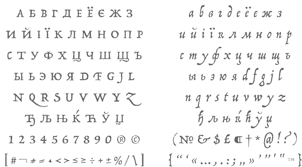 [MyFonts]
[More] ⦿
|
Jamie Clarke
[Jamie Clarke Type]

|
 [MyFonts]
[More] ⦿
|
Jamie Clarke Type
[Jamie Clarke]

|
 Jamie Clarke (Bristol and London, UK, and at some point, Sydney, Australia) creates illustrative type and lettering. He ran his own digital agency for ten years, and retrained after that period by studying type design at the University of Reading and letterpress at the St. Bride Foundation in London. His commercial typefaces include Brim Narrow (2015). He writes about this engraved layered typeface: Brim is inspired by antique woodtype and chromatic type from the 1800s. Its various styles stack together creating a variety of decorative combinations. Each layer can be assigned its own colour. The horizontal etching in some styles and subtle shadow effects can give the typeface the appearance of a vintage money font. In 2016, he added Brim Combined.
 His commissioned led him to the Kelmscott Bakehouse K (2016), a decorative letter commissioned by Kelmscott Bakehouse and based based on William Morris's ats and crafts style. Typefaces from 2017: Rig Shaded (a large 3d shaded typeface family---the best such collection available to date). Typefaces from 2018: Shovel Knight Drop Caps (partial woodblock print alphabet), Rig Solid (a superb family of layered 3d fonts). Typefaces from 2020: Span (a 3-style a modern glyphic type family that flaunts its engraved heritage with sweeping serifs and sculptural forms). Typefaces from 2021: Rig Sans (a 16-style geometric sans). Author of the very informative article The Evolution of Chromatic Type (2017). Creative Market link. Behance link. [Google]
[MyFonts]
[More] ⦿
|
Jan-Christian Bruun
[JC Design Studio]

|
 [MyFonts]
[More] ⦿
|
Jay Castruita
|
Monterrey, Mexico-based designer (b. 1989) of the arts and crafts style display typeface Metropolis (2012). Cargo Collective link. [Google]
[More] ⦿
|
JC Design Studio
[Jan-Christian Bruun]

|
 Danish graphic designer in Lyngby. He made the following typefaces:
 Behance link. Creative Market link. Hellofont link. [Google]
[MyFonts]
[More] ⦿
|
Jeff Levine
[Jeff Levine: Art nouveau types]

|
[MyFonts]
[More] ⦿
|
Jeff Levine
[Jeff Levine: Additional typefaces]

|
 [MyFonts]
[More] ⦿
|
Jeff Levine: Additional typefaces
[Jeff Levine]

|
 This is a list of fonts by Jeff Levine not categorized anywhere else on my pages.
 - A: Adelanto JNL (2009), Adhesive Letters JNL (2011), Adhesive Serif Letters JNL (2015), Adventure Film JNL (2021: a casual sans based on the titles and credits for Texas Across the River, 1966), Afternoon Edition JNL (2015), Air Circus JNL, Aisle Seats JNL (2006, based on letters cut by the Redikut Letter Company of Hawthorne, CA), Album Cover JNL (2008), Alleway JNL (2012, a condensed sans), Allograph JNL (2007), Alphacal JNL (2008, outlined, and like Juneway JNL, based on water-applied decals once made by the Duro Decal Company (now Duro Art Industries) of Chicago), Alton JNL (2010: a bold display sans), Amateur Printer JNL (2007, grunge), Ampersorts JNL (2011: ampersands), And So Forth JNL (2011), Anecdote JNL (2009), Announcement Board JNL (2018: white-on-black), Antique Packaging JNL (2019: Victorian), Antique Price Tags JNL (2019), Arcaro JNL (2013, a calligraphic typeface based on the movie credits of the ABC TV series Naked City, 1958-1963, starring detective Frank Arcaro), Antique Show Card JNL (2018: based on an alphabet from the first Speedball Lettering Book in 1915), Arch Creek JNL (2010, an all caps revival of Beton), Ardball (2006), Arrevederci JNL (2018), Arrow Callouts JNL (2021: an arrow-themed alphading font), Art Deco Monograms JNL (2015), Arte Critique JNL (2009), Artist Colony JNL (2009), Arts District JNL (2014), Art Student JNL (2010), Art Techno JNL (2017), Astrospy JNL (2008: techno), Awkward Gothic JNL (2008), Axelby JNL (2013).
- B: Backpage Article JNL (2010), Bal Harbour JNL (2008), Balcony Seats JNL (2007, narrow retro sans), Ball Game JNL (2018), Bandmaster JNL (2021: based on the opening movie titles from the 1940 musical comedy Strike up the Band starring Judy Garland and Mickey Rooney), Barricade (2011, a great shadowed caps face), Bayview JNL (2008, based on Inland Type Foundry's Studley), Best Bet JNL (2014, a slab serif redesign of Beton), Bike Decals JNL (2008), Billing and Shipping JNL (2010), Bingo Player JNL (2010), Birch Beer JNL (2008), Bitmap Typewriter JNL (2017), Bit Part JNL (2017: extra condensed), Bit Player JNL (extra-condensed tall poster font) (2015), Bloktor Mosaik JNL (2007), Blue Parrot (2006), Bluesman JNL (2014: based on the lettering of the blues album "I'm Jimmy Reed" released on the legendary Vee-Jay label out of Chicago), Bold Display Sans JNL (2016: based on an imge in a Speedball book), Bonehead JNL (2013, bones), Bookkeeper JNL (2019: based on R. Hunter Middleton's slab serif, Karnak), Bookkeeping JNL (2019, like an extra bold version of R. Hunter Middleton's slab serif Karnak (1936)), Boss Jock JNL (2021: an informal font based on the title and credits from the 1965 film Strange Bedfellows), Box Lunch JNL, Brass Rail JNL (2015), Brazil Nut JNL (2015), British Cinema JNL (2021, based on the hand lettered titles and credits from the 1945 British film The Way to the Stars), British Vehicle JNL (2020; based on the UK license plate font created by Charles Wright in 1935; with Ahmed Eraqi), Broadcast JNL (2015), Broadletter JNL (2009), Brochure Sans JNL (2022: based on Sans Serif No.7 from the 1921 Miller & Richard type specimen book), Brogado (2006), Brookside JNL (2016), Brushmark JNL (2011), Brush Off JNL (2017), Bulk Weight JNL (2017), Bum Steer JNL (2015), Burger Joint (2006), Burger Royale JNL (2007), Burlesk Queen JNL (2020: blocked letters), Business Helpers JNL (2014), Business Letter JNL (2021: based on the squarish typeface Geometric in the 1894 catalog of the John Ryan Foundry in Baltimore, MD).
- C: Calendar Blocks JNL (2009), Calling Card JNL (2010), Callouts JNL (2011, in Circle and Square styles; white letters on black background), Canby (2006, a squarish caps face), Candle Wax JNL (2014, based on the movie poster for Bell, Book and Candle starring James Stewart), Cast And Crew JNL (2015, condensed monoline), Cast Shadow JNL (2010), Casual Lunch JNL (2009), Casual Friday JNL (2008, roman lettering), Casual Tune JNL (2015), Catalog Serif JNL (2015), Catalog Sheet JNL (2022: based on an extra condensed serif typeface from the 1892 MacKellar, Smiths & Jordan type foundry specimen book), Catch Words JNL (2009), Channel Tuning JNL (1999), Channel Surfing JNL (2010), Charlies Bar BQ JNL (2008, heavy slab serif), Charmer JNL (2014), Chive Turkey JNL (2007), Chunky Nouveau JNL (2020), Circuletter JNL (2016), Ciribiribin JNL (2014), Classification JNL (2015), Classroom JNL (2009), Cling Vinyl JNL (2009), Coal Train (2004), Cocktail Hour JNL (2016, a beatnik typeface based on the opening title for the 1962 Blake Edwards film Days of Wine and Roses starring Jack Lemmon and Lee Remick), Coffee Bar JNL (2021: a squarish typeface), Coldfield JNL (2008), College Nouveau JNL (2018), Colmar JNL (2018), Columnist JNL (2020, after Morris Fuller Benton's News Gothic, 1908, ATF), Commentary JNL (2010, almost typewriter type---easy on the eye), Composer JNL (2017), Concierge JNL (2014), Conscription JNL (2017), Corkboard JNL (2010: a rounded all caps family), Cornfield JNL (2008), Crepe Paper JNL (2018), Criminal Intent JNL (2018: based on the trailer of the 1942 movie Mr. and Mrs. North), Crown Heights JNL (2007, slab serif caps), Cruise Director JNL (2021: an inline typeface based on a hand-lettered title on the poster for the 1933 musical comedy film Melody Cruise), Courtship JNL (2018), Cover Letter JNL (2019), Curtain Up JNL (2018), Cyberglass (2010, techno), Cybrox JNL (2012, grunge).
- D: Dance Hall JNL (2011), Dance Lesson JNL (2015, a wedge serif in the style of Latin Wide), Rotisserie Menu JNL (2021: based on a 1928 menu for the restaurant Rotisserie Du Cardinal), Dangits JNL (2009), Danish Script Initials JNL (2019, based on letters designed by Copenhagen-born industrial artist and letterer Gustav Boerge Jensen (1898-1954), Date Book JNL (2021; based on the credits of the movie The Awful Truth, 1937), Decal (2006), Decalcomania JNL (2017), Deco Of Tomorrow JNL (2014), Deconstructed JNL (2012), Decorative Panels JNL (2009), Deco Template JNL (2018: squarish), Deerfield JNL (2006, Bank Gothic style), Department Store JNL (2019), Desk Jockey JNL (2008), Deskplate JNL (2011: an all caps copperplate font), Desk Job JNL (2018), Detective Client JNL (2021: based on the cast credits of the 1941 film, The Maltese Falcon), Detention JNL (2007, hand-printed), Diamond Callouts JNL (2019, letters in triangles), Diamond Jim (2010), Diamondwood JNL (2015, rhombic), Dip Pen JNL (2017, rounded, handcrafted), Disclaimer JNL (2010, condensed thin headline face), Display Board JNL (2020: based on Paul Renner's Futura Display from 1932), Display Inline JNL (2009), Displayced (2006, LED font), Display Roman JNL (2014), Doggone It JNL (2019: based on the movie posters for the 1962 film, Mono Cane), Do It Yourself JNL (2008), Doo Wop Initials JNL (2007), Doowop (2006), Dormitory Decals JNL (2009), Double Take JNL (2008), Drafting Class JNL (2021: based on an all caps alphabet in The Essentials of Lettering by Thomas E. French and Robert Meiklejohn (circa 1912)), Dreamy JNL (2017), Dual Line Roman JNL (2021: an inline titling typeface), Duonor JNL (2010), Durable JNL (2016, based on a 1940s cover of a catalog for the Duro Decal Company of Chicago).
- E: Eastport JNL (2019: an interpretation of Morris Fuller Benton's 1931 classic, Stymie Extra Bold), Eat More Fruit JNL (2016), Eccentric Sans JNL (2018), Edessa JNL (2009: chiseled stone look, faux Greek), Editorial Comment JNL (2009, grotesk caps-only headline face), Edits and Credits JNL (2008), Egg Farm JNL (2021: based on the opening titles and credits of the 1947 film comedy The Egg and I), Electric Newspaper JNL (2021: a dot matrix font based on the moving message board electric newspaper from 1931 installed by the Los Angeles Times---in partnership with the Richfield Oil Company---on its building), Electrostatic JNL (2017, textured), Elite Resort JNL (2017, slab serif), Elsinor (2006), Endless Journey JNL (2009), Ensemble Inline JNL (2014), Entitled JNL (2007, squarish as in Bank Gothic), Evening Edition JNL (2009), Evening Event JNL (2021; based on hand lettering from the title credits for the 1950 film All about Eve), Evening Paper JNL (2015), Evening Walk JNL (2018), Expressions (smilies).
- F: Factual JNL (2010,headline face), Fairgrounds (2006), Fancy Free JNL (2016: decorative caps), Fancy Show Card JNL (2021), Farragut JNL (2008, hairline geometric), Fastenating JNL (2012, paper clip font), Federal Agent JNL (2021: a condensed typeface based on the opening title of the 1959 premiere season of The Untouchables), Feltboard JNL (2008), Fence Post JNL (2012), Festival Nights (fancy letters), File Clerk JNL (2020, Jeff Levine: based on Cushing (1897)), File Folder JNL (2010, Bank Gothic style family), Film Crew JNL (2009), Fincastle JNL (2011, all caps sans titling face), First Responder JNL (2017: a left-slanted version of Catalog JNL), Flagstaff JNL (2010), Flatbush Beanery (2006), Flipboard JNL (2011), Flivver (2006, a slab-serif display font), Floor Tiles JNL (2009), Florida (2006, retro), Food Vendor JNL (2011), Fordham JNL (2011, all caps slab serif), Formal Invite JNL (2021: thin, condensed serif lettering found in a 1937 magazine ad for Chris Craft boats), Formal Notice JNL (2020: a revival of an alphabet by Samuel Welo in Studio Handbook for Artists and Advertisers), Frankly Plain JNL and Franky Ornate JNL (2010, all caps typefaces after Franklin Gothic), Frantic Pace JNL (2016, a bouncy retro party font), Free Form Retro JNL (2021: an all caps sans based on the titles and credits from the 1960 French film Le Passage Du Rhin), French Calligraphic JNL (2019), French Cinema JNL, French Serif Moderne JNL (2009), French Slab Serif JNL (2018: based on the 1934 French lettering instruction book L'Art du Tracé Rationnel de la Lettre), French Song JNL (2021: a whimsical typeface based on the titles and credits of the 1952 British comedy Song of Paris), Freunlaven JNL (2006, psychedelic), Front Row JNL (2017: a tall condensed typeface that reinterprets Morris Fuller Benton's Empire from 1937), Fruit Juice JNL (2020), Fun and Games (2011, a casual retro typeface redrawn from the lettering found on the cover of a 1935 Speedball Lettering Pen book).
- G: Gene Condensed JNL (2014), Generic Sans JNL (2022: modeled after Condensed Blair from the 1907 specimen book of the Inland Type Foundry), Generic Gothic JNL (2013: an interpretation of Franklin Gothic Condensed), Genesee JNL (2010), Gift List JNL (2016), Gift Wrap JNL (2014), Gilbert JNL (2011, after Eric Gill's sans), Go Home JNL (2017), Good Sport JNL (2019), Goose Creek JNL (2021: based on hand lettered credits from the 1942 British film comedy The Goose Steps Out), Go To Town JNL (casual inline type style) (2015), Gothic Grotesk JNL (2020; a revival of Royal Gothic (1930s, Stevens, Shanks & Sons), which in turn was based on Charter Oak (1899, Keystone Foundry)), Greenwich Village JNL (2014), Groovy 3D Caps JNL, Groovy Happening JNL (2005, psychedelic, in the style of Action Is), Groovy Summer (2006, a casual sans), Guadalajara JNL (2014, a Mexican party font), GummedAlphabet JNL (2011), Gummed Letters JNL (2010).
- H: Halavah Twist JNL (2007; see also its extension Zydeco JNL in 2009), Hallandale (2006), Halliday JNL (2013: an outlined typeface based on Beton Open Condensed), Handbills And Posters JNL (2015), Handmade Caslon JNL (2015), Handmade Dropshadow JNL (2010), Handmade Gothic JNL (2011, inspired by lettering samples in a 1941 Speedball Lettering Pen instructional booklet), Handmade Headline JNL (2018: a 1940s style typeface), Handmade Roman JNL (2011), Hand Stamped JNL (2006, rubber stamp look), Hanford (2010, a sans headline family), Hash and Beans JNL (2007), Headstone Roman JNL (2015), Hectonoid JL (2008), Heller Sans JNL (2019: after an experimental alphabet by Steven Heller), Highbrow Cafetorium JNL (2009), Hippie Comics JNL (2021: based on poster lettering in the 1920 edition of How to Paint Signs and Sho Cards by E. C. Matthews), Home Address JNL (2019), Home Economics JNL (2018), Home Room JNL (2009), Horse Puckey JNL (2008), Hotel Suite JNL (2017), Hoxie JNL (2008).
- I-J: Impecunious JNL (2017), Impressionable JNL (2012, based on a rubber stamp set), Incarceration JNL (2020), Industriality JNL (2015), Informational Gothic (2013: The Wood-Regan Instruments Company (Wrico) of New Jersey manufactured for decades a line of lettering kits called the Wrico Sign Maker. With only special ink pens, plastic templates and a template guide anyone could letter clean, clear signs, posters and notices. This typeface is based on one of those kits), Informational Sans JNL (2021: squarish, caps only), Initial Seals JNL (2012), Inkpad Letters JNL (2011), Inline Lettering JNL (2011, inspired by the opening title of a classic 1940s horror film, The Invisible Man's Revenge), Inlet JNL (2017), Inline Square JNL (2017), Innerspring JNL (2015), Intermediate JNL (2019: based on a home movie titling kit from circa the 1950s or 1960s called the Magna Tech Titler Number 312, modeled after Futura Bold), Interoffice Memo (2011), Intrigue JNL (2014, based on the hand-lettered movie titles from one of the William Powell / Myrna Loy Thin Man series of films), Island Time JNL (2015), Jalopy (2014), Jive Jump (2006), Jobseeker JNL (2011: hand-printed), Juneway (2006, modeled after a set of water-applied decals made by the Duro Decal Company of Chicago), Jungle Drums JNL (2017, African theme), Junior Printer JNL (2015), Just Great JNL (2016: angular display typeface).
- K-L: Katydid JNL (2015, a connect-the-dots typeface), Katz Pajamas JNL (2017), Keyden Drop Caps JNL (2021: a set of slab serif framed capitals based on John Alden Initials, shown in the 1906 edition of the Keystone Type Foundry specimen book), Key Largo JNL (2011, all caps slab serif), Lakeland JNL (2013), Kiddie Blokz JNL (2010), Kids Activities JNL (2017, handcrafted), Lamp Post JNL (2012, an interpretation of Post Old Style, ca. 1901), Last Date JNL (2018), Lasting Impression JNL (2008), Late Breaking News JNL (2016, headline sans), Late Hours JNL (2021: inspired by the hand lettered titles for the 1961 film The Children's Hour), Lecture Hall JNL (2012), Lefferts (2006, squarish display face), Legal Brief JNL (2021), Legal Eagle JNL (2017, with engraved lines), Les Folies JNL (2009, Victorian), Lettering Lesson JNL (2021: a bold serif typeface based on the 1922 instructional booklet from the St. Louis Show Card School), Lettering Pen JNL (2015, handcrafted), Library Book Initials JNL (2018: Library Book Initials JNL was modeled from examples of Sidney Gaunt's Publicity Initials; originally sold in metal type by Barnhart Brothers and Spindler as a companion to the Publicity Gothic typeface), Liebestraum JNL (2014, a decorative caps font), Limited Appeal JNL (2016), Linem Up (2010), Lobby Card JNL (2010), Local News JNL (2021: a condensed sans based on the hand lettered title for the 1954 film Power of the Press), Location JNL (2017), Longbranch Initials (2006, for decorative monograms), Longacre JNL (2013, fat rounded sans), Long And Thin Initials JNL (2015), Loose Leaf JNL (2010), Love Notes JNL (2011: alphadings), Luminum JNL (2007).
- M: Made in Japan (2014), Mailbox Letters JNL (2008), Main Feature JNL (2017, a marquee sans), Mainline JNL (2014), Manual Typewriter JNL (2017: allegedly after a 1933 example by Morris Fuller Benton), Manufactory JNL (2019, a wedge serif not unlike the ones used in advertizing in the late 19th century), Manufacturer JNL (2020: a reinterpretation of the Extra Bold Extended weight of Bauersche's Venus Grotesk (ca. 1907)), Marble Cutter JNL (2015, based on dies used for stamping text into marble headstones or other monuments manufactured by The Vermont Marble Company (Vermarco), which operated from the 1880s until 1976), Marching Band JNL (2019), Margate JNL (2013, based on water-applied decals manufactured in 1962 by the American Decalcomania Company for Goodyear), Marketing Strategy JNL (2017), Marking Device JNL (2014), Maryland JNL (2014), Matchbook JNL (2014: based on lettering on a matchbook from the Carrousel Restaurant in Miami Beach), Mayville JNL (2009), McCadden JNL (2013, inspired by the hand-lettered credits for the George Burns and Gracie Allen Show [1950-1958]), Meal Ticket JNL (2008, squarish), Merchandiser JNL (2010), Merchandising JNL (2014, brush signage script), Merchant Trade JNL (2020, after the Matthews Series by Inland Type Foundry, 1901), Merrymakers JNL (2020), Midnite Movie JNL (2017, inspired by the hand lettered title credits from the 1961 Hammer Pictures film Curse of the Werewolf), Millport (2006, squarish display face), Mimeograph Template JNL (2019: based on a plastic lettering guide manufactured by the Albert Blake Dick Company of Chicago), Misdirection JNL (2009), Mixed Messages JNL (2007, ransom note), Mocombo JNL (2010, an African look typeface that is a slightly modified version of one of the numerous alphabets created by the late Alf R. Becker for Signs of the Times Magazine during the period of the 1930s through the 1950s), Model Railroad JNL (2015), Moderator JNL (2013), Modern Appliances JNL (2014), Monoline Rounded JNL (2014), Monster Movies JNL (2018: a Halloween font), Monthly Meeting JNL (2013), Monthly Newsletter JNL (2011), Monthly Statement JNL (2018: based on the 1934 French lettering instruction book L'Art du Tracé Rationnel de la Lettre), Morning Edition JNL (2021), Morning Paper JNL (2015), Morningside Heights JNL (2015), Morningstar JNL (2012, named after Jeff's friend, Estella Dawn Roberts of Stella Roberts Fonts), Movieland JNL (2008), Movie Night JNL (2011), Movie Set JNL (2021: an all caps wedge serif based on a 1911 movie poster for the film How Bella Was Won), Movie Show JNL (2021: an all caps wedge serif based on a 1911 movie poster for the film How Bella Was Won), Moving Message JNL (2015, dot matrix typeface), Musical Arrangements JNL (2014), Musical Comedy JNL (2021: hand-printed), Musical Score JNL (2015), Music Course (2019), Mystery Show JNL (2018: modeled after the hand lettered titles found on various early episodes of the 1950s TV suspense program Alfred Hitchcock Presents).
- N: Naroid Initials JNL (2010, one of the most ultra-compressed sets of initials available in digital type), Narrow Minded JNL (2014), National Spirit JNL (2009), Newark JNL (2014: a strong slab serif), New Car Tag JNL (2020: based on the new license plates in Florida, which were introduced in 2018), Newsbreak JNL (2008), Newsbreaker JNL (2016; a vintage newspaper titling typeface), News Crew JNL (2017), Newshawk JNL (2007, a condensed sans), Newspaper Publisher JNL (2021: based on a headline in the 1917 edition of Logansport, Indiana Pharos-Observer), Newsprint JNL (2011), Newsreel Caps JNL (2014), Newsreel Text JNL (2021), News Ticker JNL (2021: based on the New York Times Square ticker operational in the 1930s), Newsworthy JNL (2011: a condensed headline sans), New Thin Roman JNL (2019, based on an alphabet called Compressed Roman in Essentials of Lettering, 1912), Nightcap JNL (2011), Nighthawk JNL (2009, a retro headline sans), No Entry JNL (2021: a bold blocky slab serif based on the hand lettered titles and credits from the 1958 war film The Young Lions), Nondescript JNL (2012), Nouveau Date JNL (2021: arts and crafts style), Nouveau Fashion JNL (2018), Nouveau Spur JNL (2019: neither art nouveau nor spurred), Nouveau Standard JNL (2018), Nouveau Handlettered JNL (2017), Nouveau Lettering JNL (2019, based on a 1916 slab serif alphabet by Thomas Wood Stevens), Nouveau Romance JNL (2017), Nouveau Roundcorner JNL (2015), Nouveau Square JNL (2017, squarish), Nouveau Standard JNL (2018), Nouveau Work JNL (2018), Nouveau Years JNL (2019), Nouveau Yorke JNL (2015), Novelty Nouveau JNL (2021), Now Playing JNL (2010).
- O: Oblogram JNL (2008, techno), Occidental Tourist JNL (2009), Odditype JNL (2006, computer simulation), Off Duty JNL (2021: based on the hand lettering from the titles and credits of the 1964 French film comedy Le Gendarme de Saint-Tropez), Office Staff JNL (2021: a version [with serifs added] of Popularity JNL---a condensed art deco design based on a popular typeface known as Radiant), Office Space JNL (2021: based on Condensed Edina from the 1921 Miller & Richard type specimen book), Office Work JNL (2021: a squarish typeface based on the title and credits of the 1965 film Mirage), Off The Wall JNL (2008). Old Bodoni Wide JNL (2016), Old Songs JNL (2018), Old Tijuana JNL (2018: in the serape style of pseudo-Mexican lettering found on ad designs of the 1930s and 1940s), Order Form JNL (2021: after MacKellar, Smiths & Jordan's Lining Gothic Extended from their 1892 catalog), Ordinary Gothic JNL (2017: gaspipe style), Outline Sans JNL (2018), Overnight JNL (2017), Oversimplified JNL (2019), Overton JNL (2017, based on early letter designs of Rudolf Wolf).
- P-Q: Pacific Atoll JNL (2021: a stylized slab serif type design based on the movie title lettering for the 1942 wartime film Pacific Rendezvous), Pacific Island JNL (2017: a tiki font based on the sheet music cover for the title song from the 1957 Marlon Brando movie Sayonara), Packaged Cookies JNL (2021; based on the first Oreo Sandwich package from 1923), Packaged Goods JNL (2016), Park Slope JNL (2014), Parfum de Paris JNL (2014), Paint Store JNL (2006), Parking Lot Sale JNL (2021: a flag font), Parkitechture (2006), Part and Parcel JNL (2009), Partial Eclipse JNL (2012), Patriotica JNL (2011, American flag face), Pavement JNL (2010, based on the extra-condensed lettering used on roadway information signs as revised by the U.S. Government in 2000), Pendraw Roman (2006), Pen Elegant JNL (2018, after an alphabet from a 1918 lettering instruction book by William Hugh Gordon), Pen Gothic JNL (2017: a rounded sans), Penmanshift JNL (2006, ronde style), Pen Nib Square JNL (2019), Penny Wise JNL (2017), Pen Sans Rounded (2019: based on a Speedball book from 1940), People Talk JNL (2021; a squarish all caps typeface based on a title card with cast credits for the 1935 movie The Whole Town Talking starring Edward G. Robinson and Jean Arthur), Performer JNL (2014, re-drawn from condensed hand lettering found on a piece of vintage sheet music), Personal Invitation JNL, Personalization (2019: a squarish typeface), Personal Note JNL (2011), Photo Developer JNL (2021), Picz JNL (2009), Pillow Puff JNL (2008, fluffy and cloud-like lettering), Pistol Twelve JNL (2008), Pitkin JNL (2006, a hand-lettered sans), Plastic Display JNL (2010, sketched from photo examples in an old sales promotion sheet for the Movitex Do-It-Yourself Plastic Sign Kit by Pryor Marking Products of Chicago), Plastic Template JNL (2011), Pleasantville JNL (2012, a condensed slab serif), Pocket Initials JNL (2008), Podunk JNL (2007), Political Poster JNL (2021: a condensed casual sans inspired by the hand lettering on a 1940 campaign poster for Franklin Delano Roosevelt), Pool Deck JNL (2015), Popstix JNL (2013), Pop Tune JNL (2014), Popularity JNL (2014, after Radiant), Port Of Call JNL (2015), Postal JNL (2009, white on black, as on stamps), Poster Contoured JNL (2018), Poster Pen JNL (2017), Poster Inline JNL (2014), Poster Plain JNL (2012), Poster Project JNL (2020), Post Production JNL (2021: a slab serif modeled after title card of the 1950 Humphrey Bogart and Gloria Grahame drama In a Lonely Place), Prehysteric JNL (2010), Presentation JNL (2011, a slabby family), Press Run JNL (2015, a reinterpretation of the classic typeface Cheltenham Condensed), Pricing Labels JNL (2010), Printed Letters (2006, made from stamped impressions made by a 1940s childrens sign making set), Printing Set JNL (2006, based on a rubber stamp alphabet), Printing Sorts JNL (2009), Prismatiq JNL (2009, shadow face), Privilege Sign JNL (2021: based on above-the-store signage for many newspaper stands, soda shops, candy stores, luncheonettes and pharmacies of the 1950s and early 1960s), Privilege Sign Two JNL (2021: based on decorative signage for many drive-ins, motels, food stores and other businesses of the 1940s), Promotional Copy JNL (2012), Proofreader JNL (2011, a rounded slab serif face), Prospect Heights JNL (2015), Public Notice JNL (2009), Public Transportation JNL (2008), Public Utility JNL (2012), Public Works JNL (2007: emulates the hand-cut lettering silk screened onto metal), Publication JNL (2010, a revival of DeVinne, 1890), Punch Tape JNL (2016, dot matrix font), Quick Meal (2019: a hand lettered interpretation of Morris Fuller Benton's 1905 design Miehle Extra Condensed Title), Quick Poster JNL (2019), Quick Response JNL (2015, based on QR codes), Quick Titling JNL (2019), Quorfid JNL (2010).
- R: Raccoon Coat JNL (2014), Radio Interference (2019: grungy), Radio Show JNL (2019: based on a logo from the TV show Car 54 Where Are You?), Rail Bum JNL (2016, basically Morris Fuller Benton's Hobo with slab serifs added), Railway Station (2019: a spurred wedge serif), Recording Artist JNL (2019), Record Jacket JNL, Recreation JNL (2013, outlined shadow face), Red Border Labels JNL (2015), Rendering (2011, architectural draftman's lettering), Reprint JNL (2013), Restaurant And Lounge JNL (2015, handcrafted), Retail Merchant (2006), Retail Monoline JNL (2021: a stylish thin headline typeface), Retail Packaging JNL (2019), Recruitment JNL, Retail Price JNL (2021, +Inline; for catchy price cards), Retail Shop JNL (2018: based on vintage New York City neon signage), Retirement JNL (2021: a flared headline typeface based on the hand lettered film credits for the 1937 movie Make Way for Tomorrow), Retro Packaging JNL (2018), Retro Resort JNL (2011), Reveler JNL (2019), Reverberation JNL (2011, horizontally striped face), Reverse Calendar Blocks JNL (2011), Rhineland Roman JNL (2017), Ritz Slab Serif JNL (2018), Road Picture JNL (2021: modeled after the hand lettered title and credits for the 1940 Bob Hope-Bing Crosby semi-musical comedy Road to Singapore), Roadside Diner JNL (2021: a signpainting font in the style of pre-war Miami), Rockaway JNL (2006, titling sans), Rock Concert JNL (2021; an all caps curly Victorian typeface inspired by the opening title and credits for the 1964 motion picture comedy Send Me No Flowers starring Rock Hudson, Doris Day, and Tony Randall), Roma Initial Caps JNL (2009), Rotisserie Menu JNL (2021: based on a 1928 menu for the restaurant Rotisserie Du Cardinal), Rough Print JNL (2012, rubber stamp lettering), Roundpoint Pen JNL (2011, based on instructional lettering found in an old Speedball Pen textbook), Roughshod (2006), Running Board JNL (2017, monoline, pen-lettered), Rural Route JNL (2010), Rustic Inn JNL (2014).
- S: Salad Bar JNL (2013), Sales Convention JNL (2021: a squarish typeface based on a menu printed in 1937 for the Starlight Room of the Waldorf-Astoria in New York City), Sales Pitch JNL (2014), Sales Slip JNL (2013), Sandcastle JNL (2011), Sans Poster Bold + 3D, Savings And Loan JNL (2014), Scandals JNL (2017), School Project JNL (2015, based on self-adhesive poster board letters once made by the E-Z Letter Stencil Company and sold under the name Quik Stik), Schoolroom JNL (2020: a school font based on the type style used for the Superior Sign and Chart Printer No. 929), School Age (2019: based on Trixy Toy Educator, a 1930s-era set of letters and numbers for teaching children, manufactured by the Durrel Company of Gardner, MA), Schoolyard Blues JNL (2018), Sea Cruise JNL (2015), Scoreboard JNL (2014: dot matrix typeface), Screentext JNL (2010, pixel), Screenwriter JNL (2021; based on the all caps hand lettered credits from the 1950 Humphrey Bogart film In a Lonely Place), Second Guess JNL (2017), Second Impression JNL (2008), Sennetarium JNL (2008, after lettering in a Charlie Chaplin movie), Semi Calligraphic JNL (2018), Sentzoff Coupon (2006, stitched), Series A Signage JNL (2018: this is based on Highway Gothic, also known as FHWA, by the United States Federal Highway Administration; the widths varied from A (condensed) to F (wide), but A was discontinued, hence the motivation to create Series A Signage), Serif Callouts JNL (2017), Sew What JNL (2010, stitching face), Shareholder JNL (2015), Shelf Numbers JNL (2008), Shelf Tags JNL (2017), Shicken Zoop JNL (2008, Hebrew), Shipping Carton JNL (2012), Sign and Poster JNL (2009, die-cut letters), Sign and Display JNL (2019: a companion of Sign and Poster), Shopkeeper JNL (2010, after a a vintage rubber stamp sign and chart printing set), Shopping Guide (2019), Short Subject JNL (2016, based on some hand-lettered title cards from various vintage Columbia Pictures two-reel comedies), Show Card Freehand JNL 2021; based on the title and credits for the 1951 Dick Powell and Rhonda Fleming film Cry Danger), Show Card Pen JNL (2021: based on an alphabet in the 1920 edition of How to Paint Signs and Sho Cards by E. C. Matthews), Show Card Sans JNL (2021: based on an alphabet in the 1922 book Modern Show Card Writing), Showmanship JNL (2017), Show Poster JNL (2021: A vernacular typeface based on a design from the 1960 edition of Samuel Welo's Studio Handbook for Artists and Advertisers), Shutterbug JNL (2021: a blocky typeface based on the signage of Jerry Lewis's Camera Exchange on Vine Street in Hollywood in 1950), Sightseeing Boat JNL (2021: based on the titles and credits for the 1966 romantic comedy The Glass Bottom Boat), Sign Expert JNL (2021: based on an alphabet in The Expert Sign Painter, 1922), Sign Studio JNL (2019: a multiline typeface modeled after an alphabet found in Martin Meijer's Album de Lettres Arti (1949)), Sign Template JNL (2015, based on one of the many plastic lettering guides manufactured by the now-defunct Wright-Regan Instrument Company also known as Wrico), Silent Film JNL (2021: a display slab serif used by the Uptown Theater in Wichita, Kansas, in 1928), Silent Movies JNL (2021; a rounded monolinear sans of the interbellum period), Silly Behavior (2019: a shaded bouncy letter font that revives a 1930 alphabet from 100 Alphabets Publicitaires dessinés par M. Moullet), Simplicity JNL (2014), Simply Grotesk JNL (2012, Peignotian), Simply Nouveau JNL (2017), Slab Compact JNL (2019), Sleuth JNL (2013, after the trailer for the 1936 movie After The Thin Man), Slim Chance JNL (2015, an ultra-narrow font based on an image of vintage packaging for Aquapruf Ear Drum Protectors), Slim Nouveau JNL (2017), Snack Shop JNL (2007, the retro diner look in a bold outline face), Snorkel JNL (2014), Snow Job JNL (2017, inspired by the hand-lettered titles for the 1964 Rankin-Bass animated holiday classic Rudolph the Red Nosed Reindeer), Socialite JNL (2009), Soda Fountain JNL (2015, bilined), Solid Serif JNL (2014), Songbook JNL (2014), Song Composer JNL (2017), Song Merchant JNL (2017), Song Plugger JNL (2014), Song Publisher JNL (2015), Song Stylist JNL (2016), Song Vendor JNL (2017), So Unusual JNL (2021: based on the hand lettered credits for the 1942 film comedy I Married a Witch), Southwest Serenade JNL (2015), Special Edition JNL (2021: based on a newspaper headline font used in 1924), Specimen Book JNL (2020: based on Lining Antique (1889. Illinois Type Foundry) and Central Lining Antique (1892, Central Type Foundry)), SplintersJL (2004), Sporting Event JNL (2021: a slab serif based on the title and credits of a British boxing film from 1953 called The Square Ring), Sportsboard JNL (2020: a flipboard font), Sport Shaded JNL (2009), Spring Fashion JNL (2010), Spring Season JNL (2020: textured caps), Spur Handlettered JNL (2008), Squarity JNL (2008), Stage Production JNL (2020), Stage Show JNL (2021: based on the movie credits for 9 Garcons...Un Coeur starring Edith Piaf), Stamp of Approval JNL (2007), Stamped Metal JNL (2012, beveled), Starlight Sans, Stationer JNL (2018), Stellator JNL (2006, a high-tech modular font), Stenographer JNL (2021: close to Bank Gothic Condensed), Stickball JNL (2017), Stonecut JNL (2014), Store Clerk JNL (2020: outlined), Store Tags JNL (2011), Streetcar JNL (2019: a vintage railroad wagon lettering font), Streeter JNL (2013, based on Beton Bold Condensed), Stylish Title JNL (2021: based on the cover title of the July 1935 issue of Harper's Bazaar), Subscription JNL (2018), Summer Holiday JNL (2021; based on the hand lettered production credits for the 1930 film Holiday), Summertime Breeze JNL (2021: based on the opening title sequence for the 1958 film The Long, Hot Summer), Sunlight JNL, Sunny South JNL (2015), Sunshine Susie JNL (2018), Supporting Cast JNL (2011), Surf Bum (2019), Swing Band JNL (2013: inspired by the title lettering from "Hi-De-Ho", a 1930s all-black cast film starring legendary bandleader Cab Calloway), Swing Vote JNL (2020: a beatnik font).
- T: Tabloid Edition JNL (2021: based on a headline newspaper font from UK's Daily Mail in 1918), Tabloid News (2019: an all caps condensed slab serif), Tabloid Press JNL (2015), Take Charge JNL (2016, based on the opening title card for the 1936 film The Charge of the Light Brigade starring Errol Flynn, Olivia de Havilland, Donald Crisp and David Niven), Tallahassee Chassis JNL (2007, modeled from a toy rubber stamp set imported from Japan), Tall And Narrow JNL (2015), Tamiami JNL (2009, Victorian, known as "Cuba"), Tea Bag JNL (2013), Tea Time JNL (2014), Technerd JNL (2011, a thin technical/mechanical face), Technopen JNL (2013: a rounded techno sans from a 1929 instructional booklet for the Esterbrook Drawlet Pens), Teenagers JNL (2021: a beatnik font that was inspired by the hand lettered opening credits for The Many Loves of Dobie Gillis, a teen-oriented television comedy that ran from 1959 to 1963 on CBS), Teen Years JNL (2021: a blocky sans inspired by the hand lettered name for the Joyce Records label (circa 1956)), Template Basic JNL (2021: a simple sans), Template Sans (2019: based on a lettering template by the Wright-Regan Instrument Company (Wrico)), Template Shadow (2019), Tenement JNL (2020: based on a Cooper Black style alphabet by Harry Lawrence Gage that was shown in Thomas Woods Stevens's book Lettering (1916)), Terrace JNL (2015), Terror JNL, That Stuff JNL (2009), Theater Lights JNL (2014), Theater Tickets JNL (2021: Based on the marquee signage for Detroit's Majestic Theater built in 1934), Theatrics JNL (2009, 3d face), Thin Mint JNL (2011), Thinly Disguised JNL (2016), Three Day Pass JNL (2009), Tiler JNL (2012, a gridded face), Title Block Sans JNL (2011, an avant-garde titling face), Too Much Information JNL (2007), Top Billing JNL (2008, dot matrix), Top Forty (2019: handcrafted), Topographic Sans JNL (2018: a mapmaking sans featured in a U.S. Army Corps of Engineers topographic drafting manual), Toucan Tango JNL (2007, multiline face), Tough Guy (2006, shaded titling face), Tough Stuff JNL (2008), Toy Decals JNL (2018), Toy Letters JNL (2018: based on die-cut letters and number by Village Toys (circa 1930s or 1940s)), Toyprint JNL (2009, grunge), Trade Journal JNL (2010), Trade Printer JNL (2007, Victorian-era sans emulation), Train Car JNL (2021: based on the hand-lettered opening credits of Alfred Hitchcock's Strangers on a Train (1951)), Transactive JNL (2007, dot matrix), Transcendental JNL (2017), Tribal Council JNL (2011, jungle lettering with a linocut look), Trilium JNL (2010, triline face), Tropicano JNL (2013, a wavy typeface), Tunesmith JNL (2014, Victorian), Twelve Oaks (2006), Two Cents Plain JNL (2012), Two Reeler JNL (2006; see also its follow-up typeface Positive Vibe JNL, 2007, both modeled after title cards of an early Charlie Chaplin movie), Two Step Nouveau JNL (2018), Type Catalog (2011, bilined all caps face), Typemonger JNL (2022: based on Two Line Sans Serif from the British type specimen book of Vincent Figgins (circa 1860)), Typesetter JNL (2011), Type Vendor JNL (2012), Typewriter Sans JNL (2015), Type Wronger JNL (2013, old typewriter typeface).
- U-V: Unpretentious JNL (2014), Urmeba JNL (2012, named after amoebas and co-designed with Ray Larabie; a barf font), Used Cars (2012), Utica JNL (2010, squarish all caps face), Vacation Resort JNL (2021: based on the hand lettered cast and production credits for the 1942 musicl comedy Holiday Inn starring Bing Crosby and Fred Astaire), Vaudevillian JNL (2017), Utility Signage JNL (2017), Vehicle JNL (2010, a condensed block font as for car plates), Vendor JNL (2010, Victorian era ribbon face), Vertical Roundpoint JNL (2011, found in a 1941 edition of the Speedball Lettering Pen instruction book and re-drawn digitally by Jeff Levine), Victorian Typewriter JNL (2020), Vintage Designs JNL (2009, dingbat which has some fists), Vintage Price Tags JNL (2015), Vododeo JNL (2014).
- W: Washington Heights JNL (2016), Wavely (2010), Weekend Date JNL (2020), Weeneez JNL (2011, wiener-shaped glyhs), Welcome Home JNL (2009), Werble JNL (2010), What A Night JNL (2018), Whoosh JNL (2007), Wild About Myself JNL (2015), Willoughby JNL (2006, based on 1950s toothpaste lettering), Window Sign JNL (2013), Wine Cellar JNL (2014), Winery JNL (2012: a soft-serifed caps face), Winkle Picker JNL (2021: a cut paper font based on the 1963 movie poster for an Italian documentary called Sexy Nudo), Winter Garden JNL (2017), Wireline JNL (2021: a paperclip font), Wire Mesh JNL (2009), Work Force JNL (2011), Wynwood JNL (2009).
- X-Y: Yankee Doodle Boy JNL (2017), Yard Sale JNL (2013), Yargo JNL (2009, hand-printed), Yayazout JNL (2008, fun titling face), Yorso Square JNL (2007).
- Z: Zera JNL (2007, intersecting rings), Zodor JNL (2010), Zoning Department JNL (2012), Zydeco JNL (2009).
[Google]
[MyFonts]
[More] ⦿
|
Jeff Levine: Art nouveau types
[Jeff Levine]

|
 Art nouveau typefaces by Jeff Levine:
 [Google]
[MyFonts]
[More] ⦿
|
Jessie Marion King

|
Scottish book designer, talented illustrator, and artist in abroad sense (b. New Kilpatrick, Dunbartonshire, 1875-d. Kirkcudbright, 1949). In Kirkcudbright, Scotland, she founded Green Gate Close, a center for women artists. Often, her illustrations included hand lettering. A children's book Art Nouveau style illustration from 1898 gave Richard Every the inspiration to make ITC Greengate from 1996 until its release in 2002. She left behind a collection of beautiful illustrations and floral borders. [Google]
[MyFonts]
[More] ⦿
|
Joanna R. McKnight

|
Born in Scotland in 1975, Joanna helped George R. Grant with the artwork of the Rennie Mackintosh Artlover font (1995, CRMFontCo). [Google]
[MyFonts]
[More] ⦿
|
John M. Murphy
[Free Arts&Crafts Fonts]
|
 [More] ⦿
|
Johnny Feron
[Jvne77 Studio]

|
 [MyFonts]
[More] ⦿
|
Jon Hicks
[Hicks Design]
|
[More] ⦿
|
José Luis Cóyotl Mixcoatl

|
 Mexican designer in Puebla who studied at the Benemerita Universidad Autonoma de Puebla (BUAP). Designer of the 4-weight semi-blackletter display family El Chamuco (2004, T-26), the pixel/modular family Zoomanic (2007, an award winner at Tipos Latinos 2010), Artico (2003, a custom family for the Spanish magazine Simbad), the script typeface Santanera (2004, consisting of Cha Cha Cha and Rhumba), the purely geometric and linear Mixcoatl (2005), the octagonal typeface Vulcana (2004), and of the pixelated typeface Pixetl (2004, T-26).
 At Tiypo, we find his futuristic typeface Cachirul, the futuristic Rayos Gama, Forever, Frizz (2004, Display, Quadra: octagonal and squarish), the starry typeface Galaxia, Gen (2004), Gum Sans, Gum Organica, the squarish Ix Sans, the organic Latex, Mimetic, Monique, the techno typeface Neutron, Pancracia, Pixetl, the Broadway typeface Pocket, Super (grunge), the script typeface Santanera, and the octagonal Vulcana. In 2012, he designed the warm serif family Maria, the angular typeface Anahuak. For the magazine Padres & Hijos, he created a custom ronde typeface in 2012. He lives in Tlaxcalancingo, Puebla. His company is called The Coyote Lab of Design. At Tipos Latinos 2010, he won awards for Zoomanic and for Cubomatics Icons. In 2014, he created the custom typefaces Lyons Script (anmed after Rob Lyons) and Reposè Script. Typefaces from 2016: the handcrafted CyMx Breath, the arts-and-crafts movie credit font American Horror Story, Klingspor link. T-26 link. Behance link. [Google]
[MyFonts]
[More] ⦿
|
Juliana Kloos
|
Argentinian designer of Wave (2018) and Madeleine (2018: an arts and crafts font). [Google]
[More] ⦿
|
Jürgen Huber
[Supertype]
|
 [More] ⦿
|
Jürgen Huber
[Type Department]

|
[MyFonts]
[More] ⦿
|
Jvne77 Studio
[Johnny Feron]

|
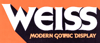 Lyon, France-based designer (b. 1977) of these typefaces:
 - The industrial / sci-fi octagonal typefaces Smoothdron (2018: free) and Squaredron (2018, +V2).
- The blackletter typeface JVNE Blackie (2017).
- Edith Lite (2018).
- JVNE Porte (2018). Art deco.
- JVNE Fiction (2018).
- JVNE Coalworks (2018). An attempt to recreate the "Fireworks" 7 inches vinyl sleeve lettering from 1982 by Siouxsie & the Banshees.
- Dreamhouse Kissies (2018). Arts and crafts style.
- JVNE WOPR Pro and JVNE WOPR 83 (renamed JVNE Wopper83;) (2018). Based on the titles of the 1983 Wargames movie. Made with FontStruct.
- Gialle (2019). A brushed typeface.
- Feronne Serif (2019).
- Arcachon (2019). Art deco.
- JVNE Minervae (2019). A stunning hand-printed all caps typeface family.
- JVNE Broomstx (2019). A brush typeface.
- Weiss Modern Gothic (2019). Earlier called W.Modern Gothic Display. A German expressionist typeface. He writes that W.ModernGothicDisplay is the first digital re-creation with a lot of improvements of a typeface by Bauer known as Weiss Initials Extra Bold or Weiss Modern Gothik. That Bauer design was inspired by Weiss Initialen No2 drawn by Emil Rudolf Weiss (1875-1942).
- Sauvage (2021). A neon light monolinear script font.
- Citta Novela (2021). A 12-style condensed Peignotian typeface that celebrates the architecture between the 1920s and 1960s by Oscar Niemeyer, Friedrich Kiesler, Le Corbusier and the Bauhaus school.
- Arkham77 (2021). A detective story font inspired by the works of Howard Philips Lovecraft (1890-1936), and the witchcraft city of Arkham.
- Futurette (2021). A large squarish / techno sans family.
[Google]
[MyFonts]
[More] ⦿
|
Kotta Rainen
|
 Graduate of the British Higher School of Art and Design, Moscow. Saint Petersburg, Russia-based designer of the Bauhaus genre sans typeface Travertine (2015, influenced by Mies van der Rohe), the free art deco sans typeface Flatiron (2015, Latin and Cyrillic), the free casual typeface Five (2015), and Kundera (2016).
 In 2017, Kotta published the wonderful two-font text typeface system Bilingua. In 2021, he designed the Latin / Cyrillic arts-and-crafts typeface Belgian. [Google]
[More] ⦿
|
La Belle Epoque
|
A survey article on La Belle Epoque, with historical data, but also lists of digital fonts that represent the various movements. On the history and nomenclature, they write: Influenced by Arts and Crafts, which tried to tear down the boundaries between fine art, design, printing, architecture and goods manufactory, Art Nouveau in Paris and Glasgow, Jugendstil in Munich, Modernisme in Catalunya, the Wiener Sezession in, Vienna ... rejected neoclassicism, embraced aestheticism and stuck two fingers up at industrialisation. It is fundamentally Arts and Crafts and Art Nouveau that we have to blame for both theme pubs and flower children. They continue: In terms of graphic design, La Belle Epoque kicked off in 1891 when the Post Impressionist Toulouse Lautrec made Moulin Rouge and Europe went crazy for posters. Constructivists might call it "The Curve Rejecting The Straight Line." [...] "The Age of the Poster." [...] About a zillion things fed into the Belle Epoque, but some key components were: Arts and Crafts, the Pre-Raphealites, Post-Impressionism, Arabesque, Symbolism, Chromolithography, and Ukiyo-e. [Google]
[More] ⦿
|
Letter Stock (was: Gumacreative)
[Guguh Gumantoro]

|
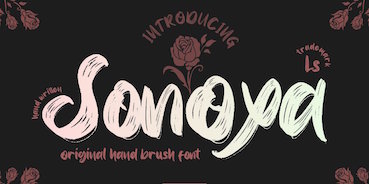 Bandung, Indonesia-based designer (b. 1982) of Masura (2016, brush style), Space Cake (2016, sci-fi style), Caroline Script (2016), Morning Fever (2016), Binzo (2016), Morning Cloud (2016, handcrafted), Rancha (2016: grungy style), Alkhali (2016), Gath Is A Robot (2015) and Scarlet (2015, textured typeface).
 Typefaces from 2018: Vanhala (Tuscan), Orchard, Solitaire, Founder (a thin script), Elanor, Callous (signature script), Keith (script), Subsky (script), Hamburger (artsy script), Smith (monoline rounded sans). Typefaces from 2019: Steven Mattew, Romansa (script), Pianicas, Infamous, Voltras, Faddox, Slayer Creeper (a dripping blood blackletter font), Hellioum (a balloon font), Grootten Beast (a wooden plank font), Lazarrous (beatnik), Salmounth (a clean script), Damaskush (a blackletter), Neurotic (spurred, blackletter), Maclucash, Neowave, Throoper, Maldivine, Morrisette (signage script), Descrendent (sans), Athlenstan, Hole Script, Cardigan, Lenox, Aero Space, Esentrik (over-decorated), Lethal (sans), Markwell (script), Hallmark, Fymous (signature script), Brighford (spurred), Bulb (a bubblegum font), Wavecraft. Typefaces from 2020: Flinch (a stone cut Flintstone font), Jack Miller (a signature script), Jaguar Jugglers (squarish, constructivist), Lazarrous (beatnik style), Jane Frediction, Grindmore (a calligraphic blackletter typeface), Descendent (a monolinear rounded coffee shop sans), Oliver Queen (a fat brush script), Orangutan, Chadwick (a Halloween font), Oakleaf, Buckles, Hackwell, Susan Brooks, Jacqueline, Alistair Morrison, Gibson Walsh, Slapstick, Monkey Werch, Rooselyn, Northway (lettering for outdoor or nature trail signage), Ghotana, Apija, Rawkin Pickles, Lockdown, Linger (a curly delight), Nuttyclash (a dry brush typeface), Ghosie, Kuro (a brush script). Typefaces from 2021: Bellamind (a decorative serif), Bingana (a playful typeface with oriental influences; appropriate for toys), Cheshire (sketched, textured), Creepycall, Croftler (a grungy athletic shirt font), Goldenwick (a vintage decorative serif), Karlburns (an ultra-decorative font by Vic Carless), Shorelly (an arts and crafts all caps serif), Walkingblue (a round vernacular slab serif), Garlicha (a great formal copperplate calligraphic font that unfortunately features a lower case r that can be confused with a lower case n), Hamingduck (copperplate calligraphy), Antucious (an ornamental serif), Monkeymod (a textured reverse srtress display font), Eightbit (a retro pixel font), Maloney West (art nouveau), Adamovick (a spurred Halloween font), Grindleaf (organic), Cronicalypse (a reverse stress elephant foot display font), Houston Palace (a monolinear retro script), Raceryouth (a weathered stencil font), Lyonade (a monolinear script based on retro motorbike posters), Alleysondust (a calligraphic script), Carlosberg (a spurred Victorian typeface), Clubeight (a trilined neon typeface that is reminiscent of Wyman's designs for the 1968 Olympics in Mexico), Slacksluger (a decorative inline typeface with medieval terminals), Beckmarine (a rough typeface inspired by retro cartoon and retro motorbike posters), Bullmars (a heavy font), Sinofluck (a stylish brush script inspired by a samurai poster), Scandlers (a dry brush script), Melvines (a thick paint brush font), Rockapolis (stencil), Lexaviers (a rune simulation font), Mylo (a dry brush typeface), Meckatler, Machiates (a vintage signage font), Fluxion (a dry brush script), Black Marilyn (blackletter), Palermosh, New Kids on the Font, Psychonaut (a reverse contrast, or even a Western, font), Black Valentine (a decorative blackletter), Buckles (a dry brush font), Smegh Mouth (a dry brush font), Armthadore, Brookland (a dry brush script), Khian Shantang (a decorative blackletter), Laekar (a hand-drawn blocky poster font), Schoutler (an ornamental fantasy font), Sonoxa (a heavy and creamy dry brush typeface), Classicloud (a decorative and festive blackletter). Typefaces from 2022: Gavin Zoo (a vintage decorative serif), Sallam (Arabic emulation), Sururim Maudunah (emulating Arabic), Ar Rayyan (Arabic emulation), Hollybucks (a round handprinted typeface), Mack Dutch (a weathered elephant foot serif), Obidel (a squarish vernacular typeface), Pinkerton (a playful cartoonish font), Sloopy Joe (a condensed sans with some curly terminals), Xylo Macloud (a decorative serif), Hickenwitch (a decorative serif), Parkwilson (a decorative serif), Buckedtalk (an inline blackletter typeface), Buckedtalk (an inline blackletter typeface). Creative Fabrica Script. [Google]
[MyFonts]
[More] ⦿
|
Lewis Buddy III

|
Magazine artist and letterer, b. 1872, d. 1941. He designed Roycroft and Tabard (which appeared, e.g., in the 1912 ATF Specimen book). Tabard was digitized by Nick Curtis in 2006 as Gandy Dancer NF. Mac McGrew on Roycroft: Roycroft was one of the most popular of a number of rugged typefaces used around the turn of the century, when printing with an antique appearance was in vogue. It was inspired by lettering used by the Saturday Evening Post, then a popular weekly magazine, and has been credited to Lewis Buddy, a former Post artist and letterer, but ATF says it was designed "partly" by Morris Benton, about 1898. Gerry Powell, director of typographic design for ATF in the 1940s, says, "Roycroft was first known as Buddy, changed when it was adopted by Elbert Hubbard for the Roycroft Press." Henry L. Bullen, ATF librarian and historian, says, "The first font of type to be made from matrices directly engraved on the Benton machine was 24-point Roycroft. October 4, 1900." While the machine was originally designed in 1884 to cut punches rather than matrices, it is doubtful that no fonts of mats were cut before 1900. Roycroft is also said to be the first typeface for which the large size of 120-point was engraved in type metal, with matrices made by electrotyping. Many typefaces of the day had a number of alternate characters. For this face. ATF gave specific instructions for their intended use: "M with the short vertex, in words the letters of which are open; R with the long tail, as a final letter in all-cap words; the wide h, m, and n, as a final letter only; t with the swash tail, as a final letter but not too frequently; u with the descending stroke, in words having no descending letters; ct ligature, wherever possible; the long s and its combinations, in antique work." Roycroft Open was cut in 1902, probably from the same patterns as the parent face. Roycroft Tinted is a very unusual face, in which the typeface is engraved with the equivalent of a halftone screen of about 25 percent tone value, with a black shadow on the right side; this typeface was cut by the Dickinson Type Foundry branch of ATF in Boston, and includes the same special characters as Roycroft. Compare Post Oldstyle. For a digital revival of Roycroft, see Croft (2018, Brian J. Bonislawsky and Jim Lyles). [Google]
[MyFonts]
[More] ⦿
|
Lily Bueno
|
During her studies in Tijuana, Mexico, Lily Bueno created the arts and crafts typeface Lirobu (2013). [Google]
[More] ⦿
|
Linan Chen
|
 American designer of the decorative all caps typefaces Anxious (2018) and Morris (2018), which is named after arts-and-crafts designer William Morris. [Google]
[More] ⦿
|
Luciana Seljak
|
 During her studies at FADU / UBA, Luciana Seljak created the excellent arts and crafts hairline typeface Etager (2013). [Google]
[More] ⦿
|
Ludlow
[Robert Hunter Middleton]

|
 Foundry in Chicago run by Robert Hunter Middleton. Myfonts.com writes that its type library was largely derivative, with some original scripts. After Middleton's death, and Ludlow's demise, most of the typefaces from the Ludlow library were licensed exclusively to International TypeFounders, Inc., (ITF) and are part of the Red Rooster collection. Since 2021, its fonts can be licensed via The Type Founders.
 Typefaces by Middleton at Ludlow include Bodoni Campanile, Bodoni (see Bodoni D Black by URW, and Bodoni Campanile Pro (2017) by Steve Jackaman), Coronet, Mandate, Lafayette (now sold by Font Bureau), Tempo (see Tempo by Monotype), and Umbra (now sold by Bitstream and Monotype). Ludlow house typefaces revived by Steve Jackaman include Caslon RR Extra Condensed, Chamfer Gothic (the original being from ca. 1898), and Gothic Medium Condensed. A renewed Ludlow was established in 2001 and is run from the UK. Current (2002) catalog: Admiral Script (Robert H. Middleton's formal script, 1953: see the digital revival by Ralph Unger in 2005), Adrian VGC (2003), Annonce Grotesque (Wagner&Schmidt, 1914), Delphian Open Title (Robert H. Middleton), Flair (connected writing, 40-50s style), Franklin Gothic ExCnd Title, Founders Garamond (based on the Berner type specimen of 1592), Lotther Text (blackletter based on an alphabet of Melchior Lotther, 1535), Ludlow Ornaments (2001), Ludlow Stygian (art deco, which inspired Nick Curtis' 2009 font Kharon Ultra NF), Maxim (Peter Schneidler, hand-printed font from 1955), Orplid (Hans Bohn), Samson (Robert H. Middleton), Speedball Roman, Ludlow Stencil (1937, Robert H. Middleton; a digital revival includes Jeff Levine's Favorite Stencil JNL (2015)), Tempo MedCond (Robert H. Middleton), Theda Bara (great titling type), Vulcan Shaded (based on the design of the Richard Gans Foundry in Madrid), Karnak Black (Egyptian slab serif originally designed by Robert Hunter Middleton in 1930), Oriana (blackletter font based on a design of the Imprimerie Nationale, Paris), Ludlow Square Gothic (revival/modernization of a 1920s font by Robert Wiebking for Ludlow), The Hardy Arcade (like Umbra), Ogre, Vulcan Bold (a display font inspired by a 1925 design of the Richard Gans Foundry, Madrid), Walbaum. Crestwood (2006, Ascender) is an updated version of an elegant semi-formal script typeface originally released by the Ludlow Type Foundry in 1937. References: Ludlow Typefaces A Supplement, November 1933, Ludlow Typefaces Typefaces Recently Produced, April 1936, Ludlow Typefaces [Edition D] (between 1940 and 1956). View a list of digital typefaces derived from the metal typefaces at Ludlow. Ludlow Foundry: List of some digital fonts. [Google]
[MyFonts]
[More] ⦿
|
Ludlow Typefaces
|
 A type specimen book of the Ludlow Typograph Company (2032 Clybourn Avenue, Chicago), published between 1940 and 1958. The list of typefaces shown: Artcraft, Bodoni (Bold, Black), Bodoni Campanile, Bodoni Modern, Bookman, Cameo, Caslon, Caslon Old Face Heavy, Caslon Heavy Italic, Century, Chamfer Gothic, Cheltenham Oldstyle, Cheltenham Cursive, Cheltenham Wide, Commerce Gothic, Condensed Gothic, Coronet, Clearface Bold, Cushing Antique, Delphian Open Title, Eden, Eleven, Engravers Bold, Eusebius, Extra Condensed, Franklin Gothic, Fraktur No. 16, Garamond, Gothic Bold Condensed Title, Gothic Extra Condensed, Greenwich, Hauser Script, Headline Gothic, Hebrew Modern, Karnak, Lafayette Extra Condensed, Laureate, Lining Litho, Lining Plate Gothic, Ludlow Black, Mandate, Mayfair Cursive, Medium Condensed Gothic, Number 11, Old English, Plantin, Powell, Radiant, Record Gothic, Samson, Square Gothic, Stellar, Stencil, Stygian Black, Tempo, True-Cut Caslon, Ultra-Modern, Umbra, Underwood Bold, Victoria Italic. [Google]
[More] ⦿
|
Luis Vicente Hernandez
|
 Luis Vicente Hernandez (Dos Decadatres, or DDCT) is a Spanish designer in Madrid who created the free pixelish typeface Houndstooth in 2007 for Neo2, a Spanish magazine. His typefaces include Anchor Deco (2009), Caponata (2009, elegant display face), Maxima (2009), Aguadulce (2009), Super League Font (2010), Minima, Absurda, Houndstooth, Unga Unga (primitive counterless comic book face), Perruna, DDCT Abstrusa (2009), Black Diamonz (2009, rhombic), Bouncing Wisdom (2010, a face in the style of Rennie Mackintosh), Boaz (2010, a display headline face for Go Skateboarding Mag), Farewell (2011), Averis (2011, an art deco display face).
 In 2012, he created the tall piano key typeface Buho. Typefaces from 2013 include OOG. Typefaces done between 2013 and 2017 include Hoot (used in the Tao Te Ching book). Bespoke typefaces: Suanzesburg (for TheCube), Sphere (for Henry Blake). HypeForType link. Behance link. [Google]
[More] ⦿
|
Mariano Farias
[Plenty]
|
[More] ⦿
|
Marina Tercelan
|
Art director and illustrator in Milan, who created the arts and crafts display typeface Pesto (2013). [Google]
[More] ⦿
|
Mashall Smith
|
During her studies, Ruston, LA-based Mashall Smith created the arts and crafts typeface Flapper (2016). [Google]
[More] ⦿
|
Matt Braun
[Wood Type Revival]
|
 [More] ⦿
|
Matt Jalbert
[Exuberance: Typefaces by Matt Jalbert]
|
[More] ⦿
|
Maxfield Parrish

|
 P22, which sells Parrish Roman, Parrish Hand and Parrish Extras (dingbats), writes this about the Phildalphia-born artist Maxfield Parrish: Maxfield Parrish (1870-1966), whose career spanned nearly ninety years, holds a unique place in American art and culture. He was enormously accomplished and successful in both fine art and commercial endeavors. Parrish's hand-drawn letters were a significant part of his works, which bridged the familiar with a startling otherworldliness. P22 has created the Parrish font set in cooperation with the National Museum of American Illustration. See also here. Character made a font called MaxfieldParrish140 in 2007 and writes this: From an incomplete (no "N") hand-drawn alphabet by Maxfield Parrish. See figure 140 of "Letters&Lettering" by Frank Chouteau Brown, 1921. This is a different source than the P22 Parrish font family. Examples of Parrish's lettering: Modern American letters, Modern American capitals. Maxfield died in 1966 in Plainfield, NH. [Google]
[MyFonts]
[More] ⦿
|
Meredith Uyeyama
|
Sacramento, CA-based designer of the arts and crafts / art nouveau sans typeface After Dark (2017). Creative Market link. [Google]
[More] ⦿
|
Michael Stickley

|
Michael Stickley graduated with a BFA in Drawing and Painting and developed a focus on early 20th century art, architecture, and design, which grew into an interest in typography and type design. He works as a graphic designer in the print, interactive, and broadcast fields. Long Beach, CA-based designer of the Arts&Crafts / Goudy-inspired P22 Stickley Text Pro (2009, P22). P22 published Stickley Optical Font family in 2013. [Google]
[MyFonts]
[More] ⦿
|
Miller&Richard
[William Miller]

|
 Founded by William Miller in Edinburgh in 1809. The company became Miller&Richard in 1838, and closed in 1952, when the designs became the property of Stephenson Blake. They are best known for innovative type design, including hits such as the Miller&Richard Oldstyle (and its boldface, nowadays called Old Style or Century Oldstyle), Le Naudin, Egyptian Expanded (1850), and Antique Old Style, or Bookman. Specimen book from 1884. In 1974, Bloomfield Books (Owston Ferry Lincs) published a facsimile of Miller&Richards Typefounders Catalogue for 1873. Scans: Cuban, Grange, Ludgate, Teutonic, Tudor Black, Grotesque Capitals, Old Style Antique No. 7, Old Style Italic, Sans Serif No. 7.
 From their 1912 catalog: Grotesque No4, Grotesque No4 Italic, Grotesque No7, Grotesque No7. Revivals: - Bruntsfield CF (2020). A revival of Bruntsfield by Chuck Mountain.
- Nick Curtis offers a few digitizations: his Millrich Moravian NF (2010) revives Bohemian (1918, a jugendstil face). Millrich Grange NF (2015) revives Grange. Millrich Reading NF (2010, Victorian) revives a 1918 Miller&Richard typeface (by the same name, I presume). Millrich Olivian NF (2014) revives Olivian. Habana Sweets NF (2012) is a Victorian typeface modeled on Cuban (1873).
- Canada Type's digitizations: King Tut (2011, Kevin Allan King) is a revival and expansion of the original Egyptian Expanded (1850).
- Vintage Type Co revived Egyptian Expanded in 2019 as Bloke.
- Wood Type Revival (Matt Braun) revived the arts and crafts typeface Teutonic (1909) as WTR Roycroft (2015).
- Sean Coady revived Egyptian Expanded as VTC Bloke (2019).
- Auber CF (2019, Chuck Mountain). A revival and extension of Bohemian, a metal type that can be seen in Printing Machinery and Material (Miller & Richard, 1902).
- Massenet (2020, Chuck Mountain). A revival of Old Style Grotesque Condensed as shown in Specimens of Printing Type (Miller & Richard, Edinburgh, c. 1920).
- Jeff Levine revived Condensed Edina from the 1921 Miller & Richard type specimen book as Office Space JNL (2021).
- Brochure Sans JNL (2022, Jeff Levine). This is based on Sans Serif No.7 from the 1921 Miller & Richard type specimen book.
[Google]
[MyFonts]
[More] ⦿
|
Muhammad Hasan
[Fype Co]

|
[MyFonts]
[More] ⦿
|
MyFonts: Arts and Crafts
|
Top Arts and Crafts fonts at MyFonts. View the full list of Arts and Crafts typefaces. See also here and here. [Google]
[More] ⦿
|
Nick Curtis
[Nick Curtis: Serif typefaces]

|
 [MyFonts]
[More] ⦿
|
Nick Curtis
[Art nouveau typefaces by Nick Curtis]

|
 [MyFonts]
[More] ⦿
|
Nick Curtis
[Nick Curtis: Fat typefaces]

|
 [MyFonts]
[More] ⦿
|
Nick Curtis
[Nick Curtis: Victorian typefaces]

|
 [MyFonts]
[More] ⦿
|
Nick Curtis: Fat typefaces
[Nick Curtis]

|
 Nick Curtis was making and reviving fat typefaces long before they became the hot trend ca. 2006. Goudy Stout is the prototypical forefather of all of them. Among the free typefaces in this list:
 - Altamonte NF. Based on this poster from 1896 for the Italian confection company Talmone. A commercial version appeared in 2011.
- AntsyPants
- ArbuckleFat, ArbuckleInlineNF, ArbuckleRemix. This was meant to improve on ITC Beesknees. In 2008 it was extended to the commercial typeface Arbuckle Remix.
- Ashkelon NF (2011). A heavy poster typeface based on Samson (1940, Robert Hunter Middleton).
- Aunt Bertha NF (2000). Based on a circus poster from 1880.
- Conga Line NF, CongaLineRevised (1999, 2007). Based on Joan Trochut Blanchard's SuperVeloz.
- DingDongDaddyoNF. This is Nick's version of Goudy Stout.
- Elephunky NF (2011) is an amalgam of two typefaces from the Flower Power era, Dave West's Elephant Gothic and Wayne Stettler's Neil Bold.
- Fat Freddy NF (2011). Based on an uncredited typeface from Photo-Lettering Inc. named Palisade Graphic. Some say that Palisade Graphic was created by Milton Glaser for Bobbie Gentry's album Ode to Billie Joe in 1967.
- FattySnaxNF. Based on this poster by Eric Christian Matthews (1920).
- FlatironCapital, FlatironNF.
- GramophoneNF, GramophoneShadedNF. Based on this poster by Achille Luciano Mauzan (1927).
- Guinness Extra Stout NF (1999). Based on a Carlyle-Oring script from 1938. See this poster.
- Indochine NF (2003, 2007). Based on this poster by Joseph-Henri Ponchin (1931).
- KerfuffleNF (2000, 2007). Based on this poster by Chris Van Der Hoef (1920).
- Phunky Ella NF (2011). Based on Implode in Schriftatlas: Alphabete von A bis Z.
- PleasinglyPlumpNF.
- RaggMoppNF (2000). In the Arts and Crafts style.
- Sid The Kid NF (1999, 2007). This ultra fat art deco typeface is based on Independant, which was designed by G. Collette and J. Dufour in 1930 in Belgium.
- Slugfest NF (2001, commercial version in 2008) is patterned after Snail (2001, Maniackers).
- TaraBulbousCapital, TaraBulbousNF (1999, 2007). TaraBulbous NF (the free typeface dates back to 1999; the commercial version is from 2008) is a fat-lettered font based on Carlyle-Oring lettering from 1938. See also here.
- Telenovela NF (2011). This is based on Novel Gothic (1929, ATF, Morris Fuller Benton and Charles H. Becker).
- Unicorn, UnicornHeavy (2000). A revival if Salut or Einhorn (1931, Heinrich Johannes Maehler for Klingspor).
- WoodenNickelBlack, WoodenNickelNF. This is a revival of Bernhard Antique Bold Condensed, fattened up.
The commercial fat typefaces include the following: [Google]
[MyFonts]
[More] ⦿
|
Nick Curtis: Serif typefaces
[Nick Curtis]

|
 It is rare that Nick Curtis makes serif typefaces, as he specializes in display type. Nevertheless, we find a few of them in his collection. These are free: ChanticleerRomanNF-Bold, ChanticleerRomanNF (2000-2006, related to Perpetua), Fairfax Station NF (2002, based on Caslon Open), Happy Campers NF (2002), Indubitably NF, Kelmscott Roman NF-Bold, Kelmscott Roman NF (2000, in the style of William Morris). Among his commercial serif typefaces, these stand out:
 - Argentina NF (2009). Based on the elegant titling typeface Sterling (1917-1919, ATF).
- Decimosexto NF (2006). This family includes Spanish Roman letters and Griffo-style italics, both hand-drawn by Francisco Lucas in Madrid in 1577.
- Droobie NF (2014). After Drew (1910, Inland Type Foundry).
- Ingvaeonic-Oldestyle (2007). Based on Viking Oldstyle, from the 1909 H.C. Hansen Type Foundry catalog, due to John F. Cummings.
- John Alden NF (2010). A quaint serif typeface for a cold winter night, based on an 1884 ATF original.
- Kifisia Antigua NF (2005). An antiqued (slightly rough outline) interpretation of El Greco Antique, a 1930s typeface by Richard Gans.
- McKenna Handletter NF (2002): based on a 1923 text family by Elizabeth Colwell for ATF.
- Mercantile Display NF (2008). Based on Engravers Roman (1912, ATF).
- Numancia NF (2011). A faithful copy of Numantina (Carl Winkow, 1940s, Fundición Tipográfica Nacional).
- Cooper's Packard was first handlettered for use in ads for the Packard Motor Company, and later converted to metal by BB&S. A digital version of this was done by Nick Curtis in 2008 under the name Packard Patrician NF.
- Ragged Write NF (2006). Based on ATF's Hearst, ca. 1904. According to Goudy, Inland Type Foundry pirated this typeface from him. In any case, Rough Write has a large x-height and sufficient roughness to make this a lively text titling face.
- Rowan Oak NF (2007). Based on Richmond Oldstyle (1920s, Blackfriars Type Foundry of London).
- Tedlo Rowan NF (2014). Based on DeVinne Roman (1898, Frederic Goudy).
[Google]
[MyFonts]
[More] ⦿
|
Nick Curtis: Victorian typefaces
[Nick Curtis]

|
 It is difficult to precisely define a Victorian typeface. They range from the ridiculously ornate typefaces from 1850-1870 to awkwardly balanced display typefaces and the pre-art nouveau trends. Nick Curtis's revivals in this genre are listed below.
 - Alto Rey NF (2014). A revival of a Victorian typeface issued by the Palmer and Rey Type Foundry of San Francisco in 1884.
- AnagramShadowNF. A free font. Commercial version in 2008. Anagram Shadow NF is based on handlettering from a 1928 poster for a steamship line by renowned British artist Austin Cooper.
- Angler NF (2014). After Anglo, which appears in the Barnhart Brothers and Spindler catalog of 1895.
- Beantown Bounce NF (2007) revives Century, an ornamental display typeface from the 1898 catalog of the Boston Type Foundry.
- Brownwood NF (2011). The inspiration for this semi-Victorian semi-art nouveau typeface came from a 1906 travel poster, promoting the Hotel Braunwald, located in the Swiss Alps.
- Cinnci Card Ornaments NF (2014) is a collection of design elements used in logotypes and calling cards from the Victorian era.
- Cleveland Litho NF (2007), a curly Victorian face, appeared in the 1898 specimen book of the Cleveland Type Foundry, under the name of Litho, while Yum Yum NF (1898) appeared in Cleveland's 1893 specimen book as Mikado.
- DoctorJekyllNF. A free font.
- Durham Abbey NF (2005). Based on a Victorian era font called Romanesque, which can be found in the Dan X. Solo collection.
- Dury Lane (2007) is based on a Victorian era release by Blake Type Foundry called Blackfriars.
- FancyPantsNF. A free font.
- Federlyn NF (2010) and Federlyn Initials NF (2011). Based on the Edwardian-era Artcraft by Robert Wiebking.
- Filibuster NF (2007). This curly über-Victorian typeface is based on Congress, an ornamental typeface found in H. C. Hansen Type Foundry's catalog of 1909.
- GingerPeachyNF. A free font.
- Great Sage NF (2010). That ugly duckling Victorian typeface Karnac (1888, ATF) [not to be confused with the Egyptian typeface Karnak by R.H. Middleton] led Nick Curtis to Great Sage NF.
- Habana Sweets NF (2012). Based on Cuban (1873, Richard & Miller).
- HardlyWorthit. A free font.
- HornswoggledNF. A free font.
- HutSutRalstonNF (2001). Based on a 1915 example in a Speedball Pen book.
- LabyrinthCapital, Labyrinth (1999, 2007). A free font family based on this poster.
- Londonderry Air NF (2002-2004) is based on Canterbury Old Style, a typeface designed by Morris Fuller Benton in 1920-1926 at ATF.
- MarchMadnessNF (2003). A free font. Inspired by lettering from a 1920s Italian poster by legendary postermeister Marcello Dudovich.
- MetropolisNF. A free font. Based on this movie poster from 1927 by Hungarian Josef Bottlik.
- Millrich Reading NF (2010). A Victorian typeface that revives a 1918 Miller&Richard face. Millrich Olivian NF (2014) revives Olivian.
- Nickelodeon NF (1999). A free font. This is sometimes compared with silent movie fonts.
- Nickley Normal (1997). A free font based on arts and crafts lettering by William Joseph Dard Hunter.
- Oaken Bucket NF (2009).
- Oh You Klid NF (2009). Based on a Victorian typeface by Central Type Foundry called Euclid (1880s).
- Palmer Oxonian NF (2011). Based on Oxford (Palmer&Rey, 1884).
- PasticheCapital, Pastiche. A free font.
- PayzantPenNF (2001). A free font, with a commercial version in 2010. Payzant Pen NF is based on Frank H. Atkinson's A Show at Sho-Cards: Comprehensive, Complete, Concise, published in 1918, executed with the then-state-of-the-art Payzant Reservoir Pen.
- Plus de Vagues NF (2006). Based on a curly semi-Victorian alphabet by Stephenson Blake called Recherché.
- Putney Junction NF (2007). Based on a BBS typeface called Design, ca. 1900.
- RhumbaScriptNF. A free font. Based on Tango Kursiv (1913, Ernst Deutsch), it is often compared with silent movie fonts.
- Shady Lady NF (2005). An ornamental shaded caps typeface called Umbra in the 1907 Barnhart Brothers&Spindler type specimen catalog.
- ShangriLaNF, ShangriLaNFSmallCaps (2002). A free font family. The commercial version was done in 2008. Based on a Victorian alphabet from the 1922 chapbook Modern Show Card Writing, by Joseph Bertram Jowitt.
- Sil Vous Plait NF (2009). A Victorian text typeface based on a 1917 font by Morris Fuller Benton called Invitation.
- SouciSans (1999). A free font. Based on a type design by Sam Welo shown in Lettering Modern and Foreign (1930).
- Speedball No1, Speedball No2 SW (2001), Speedball No3 (2001). SpeedballNo1NF-Bold, SpeedballNo1NF, SpeedballNo2NF-Bold, SpeedballNo2NF, SpeedballNo2SW, SpeedballNo3, SpeedballNo3NF-Bold, SpeedballNo3NF. This series is based in part on alphabets by Samuel Welo.
- Storybook Initials NF (2014).
- Streamers NF (2005). A Victorian-era typeface called Fillet revived.
- Tanglewood Tales (2000). A free font.
- Vidalia Sunshine NF (2007). An extension of the 1888 all caps typeface Ornamented No. 5 from MacKellar, Smiths&Jordan.
- Vintage Panels NF (2011): Victorian panels.
- VlaanderenChiseledNF, VlaanderenRoundNF, VlaanderenSquareNF. A free font family. These are based on an untitled work by Dutch designer André Vlaanderen from 1928. These are ugly ducklings because they mix various inconsistent styles without much thought.
[Google]
[MyFonts]
[More] ⦿
|
P22 Type Foundry
[Richard Kegler]

|
 Richard Kegler's fun Buffalo-based foundry, which he founded in 1995 together with his wife, Carima El-Behairy. Currently, on staff, we find type designers James Grieshaber and Christina Torre. In 2004, it acquired Lanston Type. P22 has some great unusual, often artsy, fonts. In 2021, P22 jopined The Type Founders as a distribution outlet.
 The fonts are: Industrial Design (an industrial look font based on letters drawn by Joseph Sinel in the 1920s---this font is free!), LTC Jefferson Gothic Obliquie (2005, free), Sinel (free), P22Snowflakes (free in 2003 and P22 Snowflakes (retail) in 2020, finishedd by Richard Kegler and Terry Wüdenbachs), Acropolis Now (1995, a Greek simulation typeface done with Michael Want), P22 Albers (1995; based on alphabets of Josef Albers made between 1920 and 1933 in the Bauhaus mold), Arts and Crafts (based on lettering of Dard Hunter, early 1900s, as it appeared in Roycroft books), Ambient, Aries (2004, based on Goudy's Aries), Arts and Crafts ornaments, Atomica, Bagaglio (Flat, 3D; in the style of Il Futurismo), P22 Basel Roman (2020, Richard Kegler: an update of a 2015 typeface, P22 Basel, based on a garalde font used by Johannes Herbst (aka Ioannes Oporinus) in 1543 to publish Andreas Vesalius' On the Fabric of the Human Body (De humani corporis fabrica) in Basel), Bauhaus (Bauhaus fonts based on the lettering of Herbert Bayer), Bifur (2004, Richard Kegler, after the 1929 original by Cassandre), Blackout, P22 Brass Script Pro (2009, Richard Kegler; based on an incomplete script fond in a booklet from Dornemann&Co. of Magdeburg Germany, ca. 1910 entitled Messingschriften für Handvergoldung; for years, P22 and MyFonts claimed that Michael Clark co-designed this, but Michael does not want any credit, as he did only about 20 letters), Cage (based on handwriting and sketches of the American experimental composer John Cage), P22 Casual Script (2011, Richard Kegler, a digitization of letters by sign painter B. Boley, shown in Sign of the Times Magazine), Cezanne (Paul Cezanne's handwriting, and some imagery; made for the Philadelphia Museum of Art), Child's Play, Child's Play Animals, Child's Play Blocks, Constructivist (Soviet style lettering emulating the work of Rodchenko and Popova), Constructivist extras, Czech Modernist (based on the design work of Czech artist Vojtech Preissig in the 20s and 30s), Daddy-o (Daddy-o Beatsville was done in 1998 with Peter Reiling), Daddy-o junkie, Da Vinci, Destijl (1995, after the Dutch DeStijl movement, 1917-1931, with Piet Mondrian inspired dingbats; weights include Extras, P22 Monet Impressionist (1999), Regular and Tall), Dinosaur, Eaglefeather, Escher (based on the lettering and artwork of M.C. Escher), P22 FLW Exhibition, P22 FLW Terracotta, Folk Art (based on the work of German settlers in Pennsylvania), Il futurismo (after Italian Futurism, 1908-1943), Woodtype (two Tuscan fonts and two dingbats, 2004), P22 Woodcut (1996, Richard Kegler: based on the lettering carved out in wood by German expressionists such as Heckel and Kirchner), Garamouche (2004, +P22 Garamouche Ornaments; all co-designed with James Grieshaber), GD&T, Hieroglyphic, P22 Infestia (1995), Insectile, Kane, Kells (1996, a totally Celtic family, based on the Book of Kells, 9th century; the P22 Kells Round was designed with David Setlik), Koch Signs (astrological, Christian, medieval and runic iconography from Rudolf Koch's The Book of Signs), P22 Koch Nueland (2000), Larkin (2005, Richard Kegler, 1900-style semi-blackletter), London Underground (Edward Johnston's 1916 typeface, produced in an exclusive arrangement with the London Transport Museum; digitized by Kegler in 1997, and extended to 21 styles in 2007 by Paul D. Hunt as P22 Underground Pro, which includes Cyrillic and Greek and hairline weights), Pan-Am, Parrish, Platten (Richard Kegler; revised in 2008 by Colin Kahn as P22 Platten Neu; based on lettering found in German fountain pen practice books from the 1920s), P22 Preissig (and P22 Preissig Calligraphic, 2019), Prehistoric Pals, Petroglyphs, Rodin / Michelangelo, Stanyan Eros (2003, Richard Kegler), Stanyan Autumn (2004, based on a casual hand lettering text created by Anthony Goldschmidt for the deluxe 1969 edition of the book "...and autumn came" by Rod McKuen; typeface by Richard Kegler), Vienna, Vienna Round, Vincent (based on the work of Vincent Van Gogh), Way out West. Now also Art Nouveau Bistro, Art Nouveau Cafe and the beautiful ornamental font Art Nouveau Extras (all three by Christina Torre, 2001), the handwriting family Hopper (Edward, Josephine, Sketches, based on the handwriting styles of quintessential American artist Edward Hopper and his wife, Josephine Nivison Hopper, and was produced in conjunction with the Whitney Museum of American Art), Basala (by Hajime Kawakami), Cusp (by James Grieshaber), P22 Dearest (calligraphic, by Christina Torre and Miranda Roth), Dwiggins (by Richard Kegler), Dyrynk Roman and Italic (2004, Richard Kegler, after work by Czech book artist Karel Dyrynk), Gothic Gothic (by James Grieshaber), La Danse (by Gábor Kóthay;), Mucha (by Christina Torre), Preissig Lino (by Richard Kegler), P22Typewriter (2001, Richard Kegler, a distressed typewriter font), the William Morris set (Morris Troy, Morris Golden, Morris Ornaments, based up the type used by William Morris in his Kelmscott Press; 2002), Art Deco Extras (2002, Richard Kegler, James Grieshaber and Carima El Behairy), Art Deco Display, the Benjamin Franklin revival font Franklin's Caslon (2006), Dada (2006) and the Art Nouveau font Salon (bu Christina Torre). In 2006, Kegler added Declaration, a font set consisting of a script (after the 1776 declaration of independence), a blackletter, and 56 signatures. Many of the fonts were designed or co-designed by Richard Kegler. International House of Fonts subpage. Lanston subpage (offerings as of 2005: Bodoni Bold, Deepdene, Flash, Fleurons Granjon, Fleurons Garamont, Garamont, Goudy Thirty, Jacobean Initials, Pabst, Spire). Bio and photo. In-house fonts made in 2008 include Circled Caps, the Yule family (Regular, Klein Regular, Light Flurries, Heavy, Klein heavy, Heavy Snow, Inline; all have Neuland influences). Kegler / P22 created a 25-set P22 Civilité family in 2009 based on a 1908 publication from Enshedé, the 1978 English translation by Harry Carter, and a 1926 specimen also from Enshedé. P22 Declaration (Script, Signatures, Blackletter, 2009) is based on the lettering used in the 1776 Declaration of Independence. At ATypI 2004 in Prague, Richard spoke about Vojtech Preissig. Speaker at ATypI 2010 in Dublin, where he presented Making Faces: Metal Type in the 21st Century about which he writes: This film has the dual aim of documenting the almost-lost skill of creating metal fonts and of capturing the personality and work process of the late Canadian graphic artist Jim Rimmer (1931-2010). P22 type foundry commissioned Mr. Rimmer to create a new type design (Stern) that became the first-ever simultaneous release of a digital font and hand-set metal font in 2008. At ATypI 2011 in Reykjavik, he showed Making Faces. Typefaces from 2014: LTC Archive Ornaments (Richard Kegler and Miranda Roth). Typefaces from 2020: Showcard Script (by Terry Wüdenbachs, based on an original of Beaufont at the Hamilton Wood Type Museum, custom designed by the Morgan Sign Machine Company of Chicago). Typefaces from 2021: P22 Glaser Houdini (a layerable family, after Glaser's Houdini from 1964), P22 Glaser Babyteeth. Kegler writes: In 2019, P22 Type Foundry met with Milton Glaser (1929-2020) to initiate the official digital series of typefaces designed by Glaser in the 1960s and 70s. P22 Glaser Babyteeth is the first family released in the series. Milton Glaser's inspiration for his Babyteeth typeface came from a hand painted advertisement for a tailor he saw in Mexico City. He was inspired by that E drawn as only someone unfimilar with the alphabet could have concieved. So he set about inventing a completelly ledgible alphabet consistant with this model. P22 Glaser Babyteeth was based on original drawings and phototype proofs from the Milton Glaser Studios archives. Over the years there have been many typefaces that borrowed heavily from the Glaser designs, but these are the only official Babyteeth fonts approved by Milton Glaser Studio and the Estate of Milton Glaser. The solid and open versions are designed to overlap for two-color font effects and can even be mixed and matched for multi layer chromatic treatments. In 2021, he published the 3d art deco shadow font P22 Glaser Kitchen which is based on Big Kitchen (1976). MyFonts interview. View Richard Kegler's typefaces. View the IHOF / P22 typeface library. [Google]
[MyFonts]
[More] ⦿
|
Pablo Alfieri
|
Buenos Aires-based graphic designer and typographer, aka Alfieri. Flickr link. Behance link. He designed Playful (2010), a geometric font that was inspired by 3d toys for children. Odyssea 652 (2010) and Odyssea 632 (2011-2012, Thinkdust) are also geometric in nature. This poster showcases his lettering. With Mariano Farias, he formed Plenty. At HypeForType, Plenty published the arts and crafts typeface Odyssea (2011). [Google]
[More] ⦿
|
Paul James Lloyd
[Greater Albion Typefounders (or: GATF)]

|
 [MyFonts]
[More] ⦿
|
Paulo W
[Intellecta Design (or: Monocracy Types)]

|
 [MyFonts]
[More] ⦿
|
Pete Russo
|
During his studies at the School of Visual Arts in New York City, Pete Russo (aka Voodo Bownz) created the arts-and-crafts typeface Bownz (2013). He writes: "Bownz" is a decorative sans-serif typeface that borrows elements from mystical voodoo symbols known as veve's as well as the distinct style of artist Charles Rennie Mackintosh. He also made NYC Marble Cemetery Type (2013), based on letters found at the entrance of that cemetery. Behance link. [Google]
[More] ⦿
|
Peter Nevins

|
San Francisco poster artist (b. 1968), whose hand-lettered alphabets are in the art nouveau tradition. His alphabets are being digitized by Scriptorium. Fonts there include NevinsHand, Nevins Avant and Exotique (the latter font looks like lettering of Alphonse Mucha). [Google]
[MyFonts]
[More] ⦿
|
Philip Kelly

|
 Type designer who runs Philip Kelly Digital Design in the UK. He worked for Letraset from 1969-1994 as a type designer. His type design work there included Arabic and Hebrew letterforms. From 1994 until 1997, he designed typefaces at Signus, and became an independent designer in 1997. His typefaces:
 - He redesigned University Roman in 1977 at the Latraset Studio based on Mike Daines's origina design of University Roman (1972), which is now offered in a myriad of digital libraries. See University Roman (ITC), University SB (Scangraphic Digital Type Collection), University SH (Scangraphic Digital Type Collection).
- Gillies Gothic Extra Bold Shaded (1982). See Gillies Gothic (ITC) and Gillies Gothic (Linotype).
- Cortez (1977). An exaggerated flashy copperplate. See Cortez (Linotype).
- Pump (1980). This family has rounded simple letterforms including a triline style. See Pump (Linotype) and Pump (ITC).
- Croissant (1978, ITC or Elsner+Flake). Rounded and almost an oriental simulation face. See Croissant SH (Scangraphic Digital Type Collection) and Croissant (Linotype).
- The often copied Algerian (1988). See, e.g., Algerian Condensed (Linotype), Algerian EF (Elsner+Flake) and Algerian SB (Scangraphic).
- Emporium (Letraset). A circus font.
- Spritzer (1987, Letraset). A shaded face.
- Impress (1983, Letraset).
- Sendai (2010). A gracious copperplate-influenced 6-weight sans family.
- Fantail (2012). An arts and crafts style all caps typeface inspired by an RO monogram used during a Roy Orbison concert at the now defunct Coconut Grove nightclub in Los Angeles.
- Elan Greek and Elan Cyrillic to match ITC Elan (1985, Albert Boton).
- Elegant hand-drawn numeral typefaces based on calligraphic samples by illustrator Sarah Jane Coleman (2009).
- The italics for IR Modena (IR stands for Inland Revenue).
- Calligraphic typefaces done for Mandalay in 2009.
- Sendai (2001-2010).
- Shiosai and Shiosai Calm (2015). Wavy display typefaces.
- Zipper (Letraset). This was not Kelly's design, in fact. He was a stencil cutter at the time and only partially cut it, under direction. He writes: I just recall that I worked under close direction, but what was the inspiration/idea I have no idea. Personally I would prefer not to be thought of as its designer as I never really liked it. See ITC Zipper (ITC) and Zipper (Linotype).
Linotype link. FontShop link. Klingspor link. Portfolio. Testimonial of Kelly's days at Letraset. View several digital typefaces based on Philip Kelly's designs. [Google]
[MyFonts]
[More] ⦿
|
Phill Grimshaw

|
 Successful British designer, b. Bolton, 1950, d. Manchester, 1998. He studied at Bolton College of Art. Obituary in Serif, the magazine. List of typefaces:
 - Arriba (1993) and Arriba-Arriba (1993) are Mexican simulation typefaces.
- ITC Banco (1997, +Light). Based on Roger Excoffon's Banco (1952).
- Bendigo (1993).
- ITC Braganza (1995).
- ITC Choc Light (1997). Based on Roger Excoffon's famous brush typeface Choc (1955).
- Gravura (1995, ITC). A formal calligraphic typeface.
- ITC Grimshaw Hand (1995).
- Hazel (1992).
- One of his best families and in its kind one of the best anywhere is the ITC Kallos family (1996), which has high ascenders, and an aristocratic yet calligraphic feel, 1996.
- ITC Kendo (1997), ITC Kendo Initials.
- ITC Klepto (1996).
- Locomotive (Letraset). This was copied as OPTI LenLen by Castcraft.
- ITC Mistral Light (1997).
- ITC Noovo Light (1997).
- ITC Obelisk Medium (1996).
- Oberon (1986-1994, Letraset).
- Pristina (1994).
- The calligraphic ITC Regallia (1998) was one of his last typefaces before he died.
- ITC Rennie Mackintosh (1996), ITC Rennie Mackintosh Ornaments (1996): based on the handwriting and drawings of Scottish designer Charles Rennie Mackintosh. See also ITC New Rennie Mackintosh (2017, by the Monotype design team).
- Shaman (a great Jurassic Park type font, 1994).
- ITC Samuel.
- ITC Stained Glass (1997).
- ITC Stoclet (1998).
- The wedding invitation font Striptease (1995).
- ITC Tempus (1995, +Sans and Sans Italic).
- Latin flavors should check Zaragoza (1995).
- Zennor (1995): a brush face.
Klingspor link. FontShop link. View Phill Grimshaw's typefaces. [Google]
[MyFonts]
[More] ⦿
|
Plenty
[Mariano Farias]
|
Plenty is the combined creative talent of Argentinian designers Pablo Alfieri and Mariano Farias. Their client list includes Chevrolet, Motorola, Coca Cola, Fox, and MTV. At HypeForType, they published the arts and crafts face Odyssea (2011). [Google]
[More] ⦿
|
Randomville
|
Among the fonts in this small art nouveau archive, David Siegel's Eaglefeather, Chelsea Studio, Dyer, Esmount, Semiramis, Eccentrical, Willow (Dave Fabik, 1995), Adresack, Spanky's Bungalow, and Edda Caps. [Google]
[More] ⦿
|
Ray Larabie
[Typodermic]

|
 [MyFonts]
[More] ⦿
|
Regina Coraldi
|
In 2016, during her studies, Regina Coraldi (Albany, NY) created the Frank Lloyd Wright Stained Glass Font. [Google]
[More] ⦿
|
Richard Beatty
|
 Richard Beatty (Colorado) died on May 14, 2018. He made beautiful fonts, often revivals and interpretations of old typefaces and calligraphic designs, and was influenced by Frederic Goudy. In the 1990s, he operated as Richard Beatty Designs, making over 500 typefaces. Most were only for private or corporate use. Richard's typefaces:
 - Baxter New Style (1988), Baxter Old Style (1988)
- Beatty Victoriana (1991): a set of five Victorian era fonts---Wanted, Spiral, Recherché, Hermosa and Childs (1985). Hermosa and Childs are nearly art nouveau. Childs is a revival of an 1892 typeface by Hermann Ihlenburg. Puzzling note: the Linotype catalogue says that Kismet was designed in 1879 by John F. Cumming. When you look at Spiral by Richard Beatty, you find a close copy of Kismet; Beatty says it's an "edited version of Kismet", but he holds the copyright. Is this another case of legal cloning? Finally, Wanted is based on an ATF typeface, Fantail, that was already shown in 1889 by the Franklin Type Foundry.
- Benjamin (2002, BeattyType): from sketches by Ed Benguiat.
- BernardsHand (beautiful medieval hand)
- Borders (1990, some designed by R. Mitchell and R. Beatty)
- Calligraph Initials (1997): a Lombardic face.
- Childs. After a design from 1893 by Hermann Ihlenburg.
- Civilite
- Cooper
- Desdemona (1994, +Black): art nouveau
- Doric
- Doves Type (2006). After the famous Venetian typeface designed by Emery Walker and T.J. Cobden-Sanderson, 1900.
- Duchy Blackletter, Duchy Initials (2002): A blackletter typeface based on a sketch by Ed Benguiat of Benton's Dutch Initials.
- Elizabeth RB. After Frederic Goudy, 1900.
- Elizabeth (1994, BeattyType): An all caps almost uncial face.
- Fanny Mitchell, Fanny Mitchell Initials (2005).
- GeneralMenou
- Goodhue (2005).
- Goudy Claremont (1993: based on Scripps College Old Style, 1941).
- Goudy Italian Old Style (1992).
- Goudy Mediaeval (1992).
- Goudy Saks (1990: based on a typeface designed in 1934 by Goudy for Saks Fifth Avenue in New York).
- Hermosa (1991). a Victorian typeface.
- Kennerley Old Style (1986, after Goudy's 1911 design)
- Jensen Eusebius, Jensen Eusebius New Style (1989). A Venetian typeface.
- 11LivingstonJCL
- Lucianard
- Mediaeval Calligraphy
- Ornaments (based on 1928 figures drawn by E. Adler)
- Overdressed (2002): based on a sketch by Edward Benguiat for his Phototype Company.
- Prairie Poster (Plain, Fancy): arts and crafts face.
- Quillsong (calligraphic)
- Recherché (1991). A curly Victorian typeface.
- Rene Louis (1992)
- Rolls Royce.
- Spiral (1991). Revival of John F. Cumming's Victorian typeface.
- Troyer
- University Old Style. After Frederic Goudy, 1938.
- Velda (2005, connected hand): the handwriting of Velda Burgess Will, classmate of the designer.
- Wanted RB (1991). A western font.
- White Tie, White Tie Relaxed (2005): roman lettering.
[Google]
[More] ⦿
|
Richard de Ruijter
|
Dutch graphic designer at Hagenaar Reclame who lives in Hardinxveld, The Netherlands. He created the arts and crafts typeface Brazil (2011). His Tikal typeface (2012, inspired by the Inca culture) can be bought at Ten Dollar Fonts. Behance link. [Google]
[More] ⦿
|
Richard Every

|
 South African designer of ITC Greengate (2002), an arts and crafts (almost art nouveau) font in the mould of Eaglefeather.
 He writes: Jessie Marion King (1875-1949) began her professional career as a book designer and illustrator, but over time her creativity found its outlet in many forms, including posters, jewelry, ceramics, wallpaper, fabrics, murals, interior design and costumes. After eventually settling in Kirkcudbright, Scotland, she founded Green Gate Close, a center for women artists. Although her style is reminiscent of the Art Nouveau artist, Aubrey Beardsley, King's aesthetic was an offshoot of the "Glasgow Style," a Scottish hybrid of the Arts and Crafts movement and Art Nouveau. Often, her illustrations included hand lettering. It was just this kind of lettering that gave Richard Every his inspiration for ITC Greengate. When he saw some children's book illustrations that King created in 1898, he knew on the spot he had to complete the hand lettering as a typographic font. FontShop link. [Google]
[MyFonts]
[More] ⦿
|
Richard Kegler
[P22 Type Foundry]

|
 [MyFonts]
[More] ⦿
|
Robert Hunter Middleton
[Ludlow]

|
 [MyFonts]
[More] ⦿
|
Robert Wiebking
[ATF 1923 Catalog: Artcraft Series]
|
[More] ⦿
|
Roman Cernohous

|
 Type designer in Prague whose typefaces are published at Signature Type Foundry. Most of them were designed after sketches by Professor Rotislav Vanek of the Studio of Graphic Design and Visual Communication at the Academy of Arts, Architecture and Design in Prague. Roman's typefaces include:
 - Aktion. A revival of Akzidenz Grotesque based on Roman Cernohous's dissertation in the Studio of Typography at the Academy.
- Corridor. Created for use on highway signs.
- Connector (2012). A rounded techno font.
- Qbig (2015). Qbig was originally designed as a typeface for an amateur sci-fi movie in 2006. It comes with two types of shadows (Block and Superblock) for 3D effects.
- Sablon (2021). An all caps arts-and-crafts typeface for Latin and Cyrillic. Followed by Sablon Class (a 5-style distinguished all caps display serif).
[Google]
[MyFonts]
[More] ⦿
|
Roxaboxen
[Graham Bradley]
|
 A Lebanese American, Graham Bradley grew up in Pasadena, CA. He studied twentieth-century European history at the University of California, Berkeley, and graduated in 2009. He also graduated from the Type@Cooper program at The Cooper Union in New York. Graham designs printed materials, lettering, typefaces, and the occasional website. He is located in California. Before founding Roxaboxen, Graham was the first employee at Frere-Jones Type, where he worked with Tobias Frere-Jones on Mallory and Retina. He is an instructor at Type West at the Letterform Archive.
 During his studies at Type@Cooper in 2012, he designed Anacapa, and writes: Anacapa is an attempt to subtly express, in type, the identity of my home state: the cool, gray calm of beach volleyball courts in the early morning, the dispersed energy of Los Angeles, the warmth of the sunlight on the rocky Central Coast... It is an imagined piece of California's vernacular, designed to be as flexible and complex as the emotional range it seeks to capture. His typeface Madtown (2019, Future Fonts) is inspired by letters from the American West, in particular the styles that have a capital oh with wedge-shaped serifs. In 2019, he also released the arts and crafts-inspired Mara des Bois at Future Fonts. Other typefaces by Graham include Ogilvy Serif (2021, with Jeremy Mickel), and Bacterium (2014, a molecular typeface done for Alexander Issey Inc; it has multiple versions for each glyph). Graham also helps with type design at MCKL Type, Jeremy Mickel's type foundry in Los Angeles. Future Fonts link. Home page. [Google]
[More] ⦿
|
Sam Edwards
|
 During his studies in Cheltenham, UK, Sam edwards designed an exquisite ornamental caps alphabet called Lovely Letterforms (2013), which was inspired by the Victorian and Arts & Crafts styles. [Google]
[More] ⦿
|
Sandra Persson
|
Malmö, Sweden-based designer of the all caps arts-and-crafts typeface Old Fashioned (2017). [Google]
[More] ⦿
|
Sara Link
|
New Richmond, WI-based designer of the arts-and-crafts typeface Fearless (2018). [Google]
[More] ⦿
|
Scriptorium (Ragnarok Press, Fontcraft)
[David Fleming Nalle]

|
 Dave Nalle was born in Beirut on March 19, 1959, and died on February 13, 2021 from COVID in his home town of Manor, Texas. From his wiki page: Dave Nalle is a political writer, game author and font designer who was active in the early history of the development of the internet. Nalle was at one time Chairman of the Republican Liberty Caucus, a group that promotes libertarianism within the Republican Party, Senior Politics Editor at Blogcritics online magazine, and was the CEO of Scriptorium Fonts. Obituary [PDF] by Steve Jackson at the Daily Illuminator. Obituary by Shannon Appelcline at RGG Net. Obituary [PDF] at Dungeon Master Magazine.
 A creative and prolific designer, he has made hundreds of beautiful (often historic) fonts. His outfit, Scriptorium (based near Austin, TX, est. 1989), also does custom font and logo design. At some points, Scriptorium was also known as Ragnarok Press and Fontcraft. It specializes in artsy and ancient typefaces. Some subset of the fonts is made by Michael Scarpitti. Free font demos. Images of his best selling fonts. Special subpages: - Three free fonts: Onuava (a mini-serifed hybrid fixed-width font), Divona (sans), Sirona (based on Lombardic calligraphy).
- Lombardic: Aneirin, Benevento (8th century Lombardic), Cymbeline, Fabliaux, Formidable, Locksley.
- Decorative initials such as the 20th century sign lettering initials set Pencraft Initials (2009), New Saxon Initials (2016, based on work by F.G. Delamotte), Delamotte Initials One (2016), Delamotte Initials Two (2016), Holly Initials (2010, based on Real PenWork (1880s, Knowles and Maxim), Vyones (2010), Vergennes (2001), Cascade (2009), Bergling (2010; based on initials by John M. Bergling).
- Steampunk typefaces: Clockwork, Gearhead, Gears, Verne, Draughtwork, Belgravia, Boetia, Blackthorn, Linthicum, Good-fellow, Necromantic, Mephisto.
- Wild West fonts: Academy, Alcalde, Atkinson Boomtown (2009, after the lettering of Frank Atkinson), Atkinson Eccentric (2009), BigIron, Cibola, Del Norte, Lachesis, Perdido, Plowright, Primer, Riudoso, Niederwald, San Lorenzo (2011, with a Mexican and Tuscan look), Stonehouse, Manquo, Rochambeau, Purcell, Vaquero.
- Arabic simulation fonts: Samaritan is based on the poster lettering of Alphons Mucha from his poster for the play La Samaritan. Serendib and Waziri are based on the hand lettering of René Bull from his edition of the Arabian Nights. Caliph (1993) is derived from Ernst Schneidler's classic Legende font, with variant characters based on his original lettering. Also: Satampra, Jerash, Samarkand, Isfahan.
- Celtic fonts: the fonts include Constance, Durrow (1993, traditional rendering of Insular Minuscule calligraphy), Malvern, Glendower (based on the most common lettering in the Book of Kells), Knotwork (caps based on Celtic knots), Alba Text (modernized text font based on Celtic uncial lettering), Lindisfarne (based on a square uncial style), Stonecross (1997, derived from Celtic cross and gravestone inscriptions), Celtic Spirals (dingbats), Celtic Borders font (lets you combine key strokes to form decorative borders; many frames and borders are original Celtic designs by Arts&Crafts period artists like Evelyn Paul and Louis Rhead), Spiral Initials, Brigida (based on Rudolph Koch's interpretation of a squared uncial), Macteris Uncial, Coverack (heavy non-traditional uncial), Dahaut (modernized uncial), Dunsany, Glendower, Morgow (1999, spiral uncial), Teyrnon (elaborate spurred uncial), Padstow (heavy uncial), Vafthrudnir (2011, uncial), Sualtim and Columba (decorative initials based on characters found in the Book of Kells), Albemarle (2001).
- Oriental simulation fonts: Yoshitoshi (2003, based on the 1900-style writing by Yoshi Toshi.
- Gothic fonts, including Alt Gothic, Koch Gothic, Barnabas (2011), Sternhagen (2014), Montgisard (2010, roman capitals with blackletter lower case), Serenissima, Gelderland, Alcuin, Monumental, Goldwork, Waldeck, Roncesvalles, Montressor (2010, ornamental blackletter capitals), T4C Beaulieux (1998, a free copy here), Bastarda (2011), Burgundian, Cadeaulx, Collins Old English, Courtrai, Descant, Ereshkigal, Faustus, Franconian (1993, a Schwabacher), Froissart (2000), Ghost Gothic, Katisha, Koch Gothic, Ligeia, Magdeburg, Magdelena, Melusine, Pyle Gothic, Rheingold, Sanctum, Stuttgart Gothic (2010), Textura, Theodoric, Yngling (2002).
- German expressionist: Dromon.
- Renaissance fonts: Monumental Gothic, Caswallon (a Caslon family), humanist cursive (Palmieri, Castiglione and Hanes Italic), quirky Italian cursives (Fiorenza and Alleghieri), a Roman style hand-lettered font (Rudolfo and Rudolfo Swash), a Trajan-style Roman lettering (Hadrianus), a classic flourished cursive (Trinculo) and a set of floral intials from the Quattrocento (Fraticelli).
- Modern poster fonts: Ascelon, Bilitis, Cosmic Dude, Dromon, Ducatus Rough, Eglantine (after Central Type Foundry's Quaint Roman), Ekberg (2002, based on Samuel Welo's posters), Fortinbras, Hamilton, Jambon, Oblivion, Posada (2008, based on the poster lettering of Mexican artist José Guadalupe Posada), Squiffy, Suspicion, Magnin (2003).
- Mapmaker fonts: building elements are available in Basilica; Ortelius is a map dingbat font; Queensland (based on lettering by artist and calligrapher Eric Sloane), is bold, hand-drawn and reminiscent of medieval writing on maps. There are also Brandywine, Daresiel, Hesperides, Longhorne, Windlass (1996), and Cityscape. Orford (2008) is based on samples of hand lettering from a 1693 manuscript collected by Lewis Day in his classic book on historical paleography, Alphabets Old and New.
- Calligraphic fonts: Albemarle (2001), Azariel, Moncrief (2011, based on the calligraphy of J.M. Bergling), Pavane, Rasael (2009), Abdiel (2005), Roncesvalles, Gazardiel (2003, connected script), Spoonbill (2003, arts and crafts), Macteris (Roman uncial font), Antioch Uncial (Roman uncial font), Burgundian (Classic black letter font), Franconian (993, a classic black letter font), Castiglione (Attractive Renaissance lettering), Cicero (Roman Rustica font), Formidable (1993, very bold late medieval / Lombardic style), Collins Old English (Classic Old English style gothic), Corbei Uncial (Roman uncial font), Cymbeline (late medieval lettering), Durrow (Standard insular minuscule uncial font), Theodoric (Classic black letter font), Gazardiel, Ghost Gothic (Unusual gothic font), Glendower (Uncial font based on Book of Kells), Gloriana (Interesting hand lettering style), Folkard (from the hand-lettering of Charles Folkard), Offenbach Chancery, Ranegund Merovingian Courthand, Benevento (8th century Lombardic), Hesperides.
- Art deco typefaces: Imperatore (2018: based on a hand lettered design from California art deco master designer Pedro de Lemos in the 1920s), Speakeasy (2018), Gates of the West (2018), Lyceum (2014), Borealis (2009), Criterion (2011), Illuminata, Madding (2009, a bold poster font that grew out of Aventine), Alexandrine (2009), art Deco Stencil (2009, based on samples of Art Deco stencil lettering by Pedro Lemos), Falmouth.
- Art nouveau typefaces: Acadian, Agravain (2009), Amphitryon (2009), Ariosto, Asphodel, Averoigne, Beaumains (2011, based on J.M. Bergling's lettering), Beauvoir, Belgravia (based on J.M. Bergling), Bernhardt (based upon the lettering of the Czech art-nouveau artist Alphonse Mucha), Bentham, Berenicia, Boetia (2003, based on J.M. Bergling's lettering), Bruges, Bucephalus (1993), Burd Ellen (2009), Butterfield (1993; in Alfred Roller's style), Cafe Society (2018), Curetana, Damariscotta, Elsene (2011, based on lettering by early 20th century illustrator Clara Elsene Peck), Elysian, Exotique, Flaubert, Gaheris, Ganelon, Gehenna, Goodfellow, Grammophon (2019: a bold Jugendstil poster font), Harbinger, Huyot (2016, after Georges Auriol's types), Jugendstil Kunsthand (2003), Lysander, Maginot (1993; after Peter Schnorr, 1898), Munich (after the Munchner Jugend magazine), Norumbega, Odeon, Ormandine (2010), Pantagruel, Phaeton, Reggio, Rochmbeau, Rockne (2009), Rudolfo, Setebos, Sprite, Summerisle, Sylphide (2005), Undine, Valentin (2008), Vambrace (2010), Walhal, Wendingen (2016), Wormwood (2018), Zeitschrift (2016, based on the Ver Sacrum magazine).
- Modern poster fonts: Field Day (2003), Ascelon, Bilitis, Cosmic Dude, Dromon, Ducatus Rough, Eglantine (after Central Type Foundry's Quaint Roman), Ekberg (2002, based on Samuel Welo's posters), Fortinbras, Hamilton, Jambon, Oblivion, Squiffy.
- Constructivist fonts: Krasny Mir (2009), Vrubel, Structura (1997).
- Futuristic fonts: Alecto, Angelus, Circuit, Culdrose, Gearhead, Ironclaw, Parika, Sanhedrin, Semiramis (1997), Slither, Structuro, Yazata, Adastra (dings).
- Borders and ornaments. These include New Arets and Crafts Borders (20912, based on The Calendar of Golden Thoughts (Barse and Hopkins Publ, 1911).
- Boneyard fonts: Undertaker (2014), Antrobus (2010), Sepultura (2002), Halloweenies, Dementia, Boneyard, Skull and Bones, Malagua (1999-2013), Paleos (2002, from titling of B movies in the cave girl genre), Carmilla, Abaddon, Black Cow (1998), Valdemar, Cuede, Ligeia, Mayhem, Mephisto, Golgotha, Sanguinary, Ironworks, Moravia, Gehenna, Nosegrind (2005, graffiti), Corpus, Ghostly.
- School fonts: Schoolhand (2010).
- Arts and Crafts movement (late Victorian period, 19th century), based on work and lettering by Walter Crane, William Morris, Charles Rennie Mackintosh and Elbert Hubbard. The Arts&Crafts movement was enormously influential on the works of designers, artists and architects of the 20th century, and inspired the Art Nouveau and Art Deco movements. Fonts include William Morris' Kelmscott (based on Morris' Troy type), and True Golden, fonts from the Glasgow branch of the movement like Chelsea Studio (1997), which is based on Charles Rennie Mackintosh's lettering, fonts from the Roycrofters of New York like Semiramis and Ganelon, fonts based on Walter Crane's work such as Crane Gothic, Pencraft Initials (2009) and Walter Crane, and even fonts from the California Arts&Crafts period of the early 1900s like Coloma. Other typefaces: Jesse M. King (refreshed in 2015, and based on hand lettering from a frontispiece design by Glasgow-based Jessie King who was known for her lavish book covers), Aylward, Palmyra (based on work by the Roycrofters, a design community founded by Elbert Hubbard), Aylward (2010, Victorian), Hyacinth Initials, Spoonbill, Adresack (1996: inspired by the arts and crafts lettering styles of designers like Charles Rennie MacKintosh and Jessie M. King), Brandywine, Changeling (2009, based on lettering by fairy artist Fanny Railton), Goddard, and Advertising Gothic (2003), Valentin, Gaheris, Agravain (2009). Delaguerra (2001-2009) is based on a lettering style originating in the California Arts&Crafts period commonly associated with Mission Style. It is still in common usage in signage at historical sites in California.
- Victorian: Beaumarchais, Berenicia, Bilibin, Brandywine, Brigidis, Curetana, Durendal, Elphinstone, Flaubert, Folkard, Gjallarhorn, Gloriana, Hermia, Ironclaw, Magnus.
- Typewriter: Fontcraft Courier.
- Anthroposophic: Ekberg (2002, based on a sample of poster lettering by Samuel Welo).
- Medieval fonts of Scriptorium, critiqued by Marc Smith, page 65: Batwynge is based on lettre gffe by Geofroy Tory (1529), and not on an illuminated manuscript of the tenth century as claimed by Scriptorium. Perigord (1993) is based on a Carolingian alphabet drawn by Ernst Bentele in 1952. Allencon is a calligraphic font based on an interpretation of 6th century Ostrogothic Italian calligraphy.
Some selected fonts: Finchley (psychedelic), Captain Kidd (2012, an original font design based on the title lettering from the classic pirate movie starring Charles Laughton), Aerobrush (2011), Fondry Ornament (2009), Atkinson Egyptian (2008, after the lettering of Frank Atkinson), Verne (2008: remade in 2020 into Covid19), Goldwork (almost blackletter), BigBlok (2010), LetterpressGothic (2010), Plymouth (2010, in the style of Cooper Bold), Broadley (2008, an architecturally inspired script based on lettering by British architect and designer C.F.A. Voysey), Locksley (2004, medieval lettering), Tuscarora (curly lettering), Fiorenza (Renaissance calligraphy), Hesperides (old colonial calligraphic script), Angelus (beautifully printed monospaced script), Esperanza (1996, connected medieval handwriting), Ithuriel (2002), Alleghieri (2002), Hamilton (2002), Spiral Initials, Zothique (great font, based on hand lettering from a map of Clark Ashton Smith's fantasy world of Zothique), Reynard (semi-Celtic), Daresiel (elegant script), Caliph (1992, Arabic simulation), Bassackwards, Rosalinde (1999, handwriting), Arakne (2000, connected handwriting), Falconis (by Michael Scarpitti), Asrafel (semi-Celtic), Swithin (2004), Tyrfing (Art Nouveau/Fraktur, 1999), Waldeck (2008, blackletter), Woburn Initials, Stampwork, Draughtwork, Roughwork (a codex font derived from Nalle's own True Golden which is based on a=n earlier typeface by arts and crafts master William Morris), Melusine (gothic calligraphy), Corbei (uncial), Niederwald (hand lettering), Gjallarhorn (great uncial), Gaiseric (early medieval uncial), Taranis (1987, an uncial first drawn as a font for the cover of the old Ysgarth roleplaying system), De Bellis (roman era, by Michael Scarpitti), Engravers Gothic, Monimental Initials, Sanhedrin (Enemy of the State font), Vespasiano (roman capitals, by Michael Scarpitti), Bilitis, Hendrix (2002), Collins OE (old English), Samedi, Praitor, Evadare (1993, based on a character set which was hand calligraphed by Rudolf Koch), Koch Fantasie (1993), Black Cow (1998). Zothique, Ruritania, Mariner (2004, based on hand lettering originally done by Willy Pogany), Trinculo (a swinging cursive font), Texas Star (2002), Octavian (antique demi-serif font), Ruffian (antique type font), Ascelon (thin sans serif font), Munich (title lettering from Munchner Jugend magazine), Necromantic (bizarre bold titling font), Titania (romantic decorative lettering font), Oberon (bold romantic font), Knotwork, Guede (1993), Pullman, Purcell (Victorian circus poster style font), Allegheny, Carmilla, Malagua (1999-2013), Ardenwood, Platthand, Buccaneer, Cochin Archaic (2010), Boswell (1994), Guilford (based on lettering by artist and calligrapher Eric Sloane), Death Ray (2012, constructivist), Alecto (futuristic), Candlemas (2003), Bridgeport (2003, based on lettering by artist and calligrapher Eric Sloane), Medieval Tiles (2003), Linthicum (2003), Draughtwork (2003), Yngling (Fraktur, 2003), Rheingold (elaborate Fraktur: Music Hall Text elsewhere; see also Teuton Text, Cincinnati Type Foundry, 1877), Kidd (2003), Belgravia (2004), Peck Shields (2004), Scrawlies (2000, handcrafted), Albrecht Durer Gothic (2004), Orpheus (2004), InduXtrial (2004, a grunge face), Yoshitoshi (2003), Veronique (2004), Veneto (2006), Vidilex (1993, monospaced), Abelarde (2006), John Speed (1993: a mapmaker font), Furbelow (2006), Estoril (2006), Tangle, Aventine (sans), Texas Star (2002), Groningen (Bauhaus design), Nevins Hand, Scrapple (2011, Victorian, ornamental), Leodegar (2011, based on samples of 7th century Frankish hand lettering), Candlemass (2012). Fonts from 2013: Doge (a Venetian font based on a J.M. Bergling revival), Original Django (after the titling font in Quentin Tarantino's movie Django Unchained). Fonts from 2014: Highball, Carillon (based on a typeface by Samuel Welo), Edifice (based on lettering by J.M. Bergling). Fonts from 2015: Gods of Mars (an inline sci-fi typeface), Rykov (based on a 1930s Ukrainian constructivist style; Latin and Cyrillic), Vie Moderne (French art deco), Dahlgren, Grand Concours (art deco), Tantalus, Power Tie (art deco), Marquis Greeking. Fonts from 2016: Ekberg Modern (based on lettering samples by Samuel Welo from poster designs of the 1920s), Knuckleduster, Tzaphkiel, Sarandiel, Primrose Initials, Elizabethan Script (chancery style), Zeitschrift (an art nouveau font based on the Ver Sacrum magazine), Wendingen (Dutch deco), Memento Mori (Tuscan), Rounders (art deco). Fonts from 2017: Buzzmill (wooden plank font), Pumpkin Patch Initials, Talinn, Reliquary, Nopalito, Scattershot (script). Typefaces from 2018: Marionettas (a Mexican horror movie poster font), Fascination, Architextura, Santa Sangre, Glyphos. Typefaces from 2019: Cafe Corso (art nouveau), Comic Classix. Fnts released in 2020: Epigramatic (based on lettering by Dard Hunter for the Roycroft Press in the early 1900s), Cryptos (graffiti). Klingspor link. Abstract Fonts link. Dafont link. View David Nalle's typefaces. Scriptorium's library. [Google]
[MyFonts]
[More] ⦿
|
Sean Coady
[Vintage Type Co]

|
 [MyFonts]
[More] ⦿
|
Shokd
|
Lisbon-based designer of Horror (2012, an arts and crafts typeface) and Bella (2012, experimental). [Google]
[More] ⦿
|
Small Cap Graphics
[Holly Goldsmith]

|
 Holly Goldsmith has a BA in Art from Brooklyn College. She worked first at (Mergenthaler) Linotype, then at Photo Lettering and World Typeface Center before moving to Los Angeles. In LA, she worked at Xerox's type design department for a few years before starting her own company, Small Cap Graphics, where she is engaged in both graphic design and custom type design, with clients such as Agfa Monotype, ITC, DsgnHaus, Disney Corporation and Margo Chase Design.
 She designed Novella (1996, DsgnHaus: an Arts and Crafts font), ITC Bodoni Six (1994, with Jim Parkinson, Sumner Stone, Janice Fishman), ITC Bodoni Twelve (1994, with Sumner Stone, Jim Parkinson and Janice Fishman), ITC Bodoni Seventy-Two (1994, with Sumner Stone, Jim Parkinson, Janice Fishman), Bossa Nova MvB (1995, at MvB Design), MVB Peccadillo (2002, with Alan Dague-Greene), Havergal (1994, Agfa), and ITC Vintage (1996, with Ilene Strizver). At Bitstream, she designed Melanie BT (a script typeface), Liorah (2000, a connected script), Hank BT, Missy BT, Ryan BT (2000, jungle font), Raven, Raven Evermore. Linotype link. FontShop link. Klingspor link. View Holly Goldsmith's typefaces. [Google]
[MyFonts]
[More] ⦿
|
Solotype
[Dan X. Solo]

|
 Dover Press sold Oakland's Dan X. Solo's digitizations. Dan Solo (b. 1928, d. 2012) has collected over 13,000 sets of metal fonts, starting when he was 9 years old and growing up in Oakland, CA. Finally, in 2002, he stopped doing that and began converting all of his fonts to computer type. Solotype, his company, was established in Alameda, CA. He printed 30 books on fonts (with Dover), including The Solotype catalog of 4,147 display typefaces, and created hundreds of fonts. In 2007, Dan Solo retired from the font business. He died in 2012.
 Robert Trogman writes: I know Dan X. Solo personally. He ran a typographic studio in Berkeley for over 30 years. He had a large collection of film fonts, including some of my own. He created thousands of fonts and is now retired and is an avocational prestigitator. Copyrights have run out on most of his fonts. He also protected himself by creating pseudonyms on the questionable font names. Stuart Sandler confirms that many of the fonts in Solo's Dover books are in fact from the Filmotype collection, which Stuart is digitizing right now. Gene Gable writes: Dan Solo of Solotype in Berkeley was experimenting with photo type as early as 1945 and started doing optical special effects in the early '60s. And a number of the larger display-type shops developed their own techniques. But in terms of opening up new markets for display type (and giving designers more control over type setting), Visual Graphics and Letraset lead the way. These companies were proud of, and promoted, the fact that that their products could be used by non-typesetters with little training. Bio. He wrote about himself: Dan X. Solo The Solotype Archive was begun in 1942 when I was 14. I was a kid printer for several years before that. At 16, after a quick three months of training, I dropped out of school and went to work full time as a radio actor and announcer in San Francisco. (Easy to get jobs in those days, due to the war-induced manpower shortage.) In 1949 and 1950, I created a magic show which played West Coast theatres with some success. After that, back to broadcasting. By 1962, I was completely burned out on radio, so I decided to see if I could make a living with my collection of antique types, which numbered about a thousand fonts at that time. In 1962, I sent out 4,000 catalogs showing the type to ad agencies all over the U.S. The timing was perfect (no thanks to me) because there was developing at that time a renewed interest in the old types. Business took off immediately. The Solotype collection was one of four commercial collections at the time, but I seemed to have been more aggressive in marketing than the other chaps. (Well, Morgan Press certainly knew how to market.) Two years into the business, I began to collect alphabets on paper for conversion to photo lettering, which was just becoming mainstream in the type business. We closed the shop for a month every year and went on a type hunt, mostly in Europe where there didn't seem to be much competition among collectors. Other typographers couldn't understand how we could do this, but I believe it made people appreciate the resource we offered even more. Over the years, the collection became quite large. When I closed Solotype a couple of years ago, I got rid of about half the archive (because the fonts were dull, or already digitized, or for a variety of other reasons) leaving me with about 6,000 fonts on paper or film. In 1974, I began to supply Dover Publications with mechanicals for books of 100 alphabets on a particular theme. I did 30 of these books over the years, and 30 more of printers' ornaments, borders, and so forth. Sometime in the 1990s, Dover asked me to digitize books of 24 fonts each, to be sold with a disk in the back. I did 12 of these. The Dover relationship came to an end when Hayward Cirker, the owner and my special friend, died and the company was sold to another publisher. Dover felt that they had covered the type field thoroughly. Now in my old age, my wife and I have a mindreading act that is great fun and good for the ego. Even so, when not traveling, I digitize type for relaxation and enjoyment, but have made no effort to sell it. Until now. Solo's wood type/Western/ headline/ Victorian collection includes Acantha, Bindweed, Dime Museum (2004, a French Clarendon revived by ATF in 1933 under the name P.T. Barnum), Egyptian Oldstyle, Excelsis, Extravaganza, Rigney, Assay, Baraboo Banner, Beijing, Brevet (after a Victorian typeface from 1887 by Ernst Lauschke), Brussels, Cathedral, Cleopatra, Cognac, Crossroads, Dainty Lady, Dangerfield, Diablo, Dutch Treat, Grecian, Lord Mayor, Malibu, Minnesota, Moulin Rouge, Penny Arcade (1992, a Victorian face after an 1890 original called Mural by Boston Type Foundry), Trixie, Valerie, Valjean, and Zorro. Alaska is based on an 1890 design of Marder, Luse and co. Arcade imitates an 1888 design of Barnhart Brothers&Spindler. Bamboo (oriental simulation face) is based on a 1889 creation of Barnhart Brothers&Spindler. Behrens Antiqua and Behrens schrift are revival of early 20th century typefaces by Peter Behrens. Eccentric is a digitization of a 1898 arts and crafts typeface by Kingsley/ATF. Hansard is a revival of a display type published in 1887 by MacKellar, Smiths,&Jordan. Pekin is a digitization of a face, first designed by Ernst Lauschke in 1888 and issued by Barnhart Bros.&Spindler foundry in Chicago under the name Dormer, and revived by them in 1923 under the name Pekin. Charles Henry Beeler made a condensed sans serif issued by Mackellar, Smiths&Jordan foundry in 1887: it was digitally revived as Roundhead. Monument is a revival of a 1893 typeface by the Boston Type Foundry, but was also cast at the Central Type Foundry. Vienna Light is a delicate early 1900s type originally created by the German foundry of Schelter&Gieseke. Other designs: Bareback, Campaign (ca. 1970), Cigar Label (1997), Estienne, Farringdon (a western face), Goodfellow (digitization of wood type from 1895 found at Hamilton and probably due to W.H. Page), Harlem Text (blackletter), Houdini (ca. 1992), Memorial, Quadrille 2 (a simplified Tuscan face), Sparticus, Vanities (a Victorian type), Whirligig. In 2005, MyFonts added Seminary (after a Victorian font from 1885 by Bruce Type Foundry), Margie (formal script based on Marggraff Bold Script by the Dresden foundry vormalig Brüder Butter, 1920s), Fancy Dan, Bamberg (2005, after a condensed wood type from ca. 1850), Fat Face No. 20, French Ionic (quite ugly--based on an 1870 Clarendon derivative by the Cincinnati Type Foundry), Hearst Italic (based on a 1904 typeface by Carl Schraubstadter of the Inland Type Foundry), Hearst Roman (based on a typeface from the Inland Type Foundry allegedly stolen from a hand lettering job done by Goudy, acccording to Goudy himself), Tally Text (early photolettering type of the comic book style), Welcome 1 (based on Van Loey-Nouri's art nouveau typeface from 1900). A list of some digitized fonts: - Art Deco: Advertisers Gothic Light, Alex, Beverly Hills, Boul Mich, Capone Light, Chic (after Morris Fuller Benton's Chic, 1927), Clyde, Eagle Bold, Eagle Narrow, Eden Bold, Eden Light, French Flash, Gallia, Graybar Book, Grock, Matra, Modernique (art deco), Parasol, Parisian, Phoenix American, Plaza Suite, Publicity Gothic, Salut, Stymie Obelisk, Zeppelin.
- Victorian: Anglo, Arboret, Campanile, Chorus Girl, Fancy Celtic, Ferdinand, Floral Latin, Glorietta, Grant Antique, Gutenberg, Hogarth, Jagged, Katherine Bold, Lafayette, Meisteringer, Olympian, Phidian, Ringlet (1998, a Victorian typeface after an 1882 original by Hermann Ihlenburg), Romanesque, Rubens, Stereopticon, Templar, Wedlock, Zinco.
- Script/Cursive: Amapola, Artists Script, Carpenters Script, Certificate Script, Commercial Script, Conway (an architectural script), Elegance, Engrossing Script, Figaro, Flare, Gloria Script, Hanover, Helvetica Cursive, Holly, Kunsteler Bold, Liberty, Manuscript, Orion Script, Pantagraph Script (+No2, +No3), Park Avenue, Romany Script, Trafton Script, Typo Upright, University Script, Virginia Antique.
- Art Nouveau: Ambrosia, Argus, Artistik, Auriol, Baldur, Bocklin, Cabaret (2003, as in Murder She Wrote), Carmen, Childs, Edda Black, Excelsior, Francomia, Giraldon, Harrington, Isadora, Metropolitan, Murillo, Oceana, Odessa, Orbit Antique, Palmetto (2005; an art nouveau typeface based on a 1887 typeface called Palm from the A.D. Farmer Foundry), Siegfried, Skjald, Spartana, Titania.
- Gothic/Medieval: Academy Text, American Uncial, Antique Black, Becker Bold, Bradley, Castlemar, Celebration Text Fancy, Church Text, Engravers Old English, Frederick Text, Freehand, Hingham Text, Initials-Bradley and Caxton, Kanzlei Light, Lautenbach, Lautenbach Fancy Caps, Libra, Morris Black, Nicholini Broadpen, Rhapsodie Swash Caps, Scottford Uncial, Solemnis, Washington Text, Wedding Text.
- Celtic: Anglo Text, Camden Text, Chappel Text, Cimbrian, Colchester Black, Durer Gothic, Durwent, Fenwick, Genzsch Initials, Gloucester Initials, Gutenberg Gothic, Hansa Gothic, Harrowgate, Kaiser Gothic, Kings Cross, Konisburg, Malvern, Medici Text, Middlesex, Progressive Text, Tudor Text, Warwick, Westminster Gothic, Yonkers.
- Special-Effects Display Fonts: Azteca Condensed, Buddha (oriental simulation face, after a Schelter&Giesecke type), Burst, Campaign (1970), Chinatown (oriental simulation), Cigar Label (1997-2002), Colonial Dame, Contract Banner (2004, a take on Mezzotint from 1880), Direction, Fillet, Filmstar (1999), Firebug, Headhunter, Hollywood Lights, Igloo Solid, Import, Lariat, Needlepoint, Old Glory, Protest, Rustic, Scimitar (Arabic simulation face), Scoreboard, Skyline, Starburst, Sundown Shadow, Tableau, Tonight, Xerxes.
- Other: Acantha, Assay, Baraboo Banner, Beijing, Bindweed, Brevet (after a Victorian original by Ernst Laushke, 1887), Brussels (positioned inbetween Stephenson Blake's Flemish Expanded and Flemish Condensed), Cathedral, Cleopatra, Cognac, Crossroads, Dainty Lady, Dangerfield, Diablo, Dime Museum, Dutch Treat, Egyptian Oldstyle, Excelsis, Extravaganza, Grecian, Lord Mayor, Malibu, Minnesota, Moulin Rouge, Penny Arcade, Rigney, Trixie, Valerie, Zorro.
Images of selected typefaces: Agency Gothic, Alpha Midnight, Alpha Twilight, Anita Lightface (1977), Art Deco Display Alphabets, Ashley Crawford, Ashley Inline, Astur, Bamberg, Banco, Beans, Blackline, Bobo Bold, Braggadocio, Broadway Engraved, Busorama Bold, Busorama Light, Bust, Charger, Checkmate, Colonel Hoople, Corral, Dudley P Narrow, Dynamo, Earth (a futuristic / prismatic typeface revived by nick Curtis in 2015 as Terranova NF), Eclipse, Empire, Ewie, Fat Cat, Fatso, Festival, Futura Black, Futura Inline, Gillies Gothic Bold, Greeting Monotone, Grooviest Gothic, Hess Neobold, Hotline, Huxley Vertical, Inkwell Black, Joanna Solotype, Joyce Black, Koloss, Lampoon, Mania, Mania Contour A, Mania Contour B, Margit, Mindy Highlight, Modernistic, Monograms Stencil, Mossman, Neon, Neuland (+Inline), Phosphor, Piccadilly, Pickfair, Polly, Prismania P, Quote, Rhythm Bold, Shady Deal, Sheet Steel, Sinaloa. The Solotype Catalog is a file with information on Dan Solo's typefaces, annotated with remarks about name equivalences and digitizations. The original file was due to Thibaudeau, but typophiles on alt.binaries.fonts have added to it in 2010. PDF version. Excel version. Text version. See also here. View Dan Solo's typefaces. Another page on Solotype. Dan Solo's typefaces listed in decreasing order of popularity. View Dan Solo's typefaces. View Dan Solo's typefaces. [Google]
[MyFonts]
[More] ⦿
|
Struvictory Art
[Viktoryia Strukouskaya]

|
 Struvictory Art (Hrodna, Belarus) is run by Viktoryia Strukouskaya and Viktor Strukovski. Most of their typefaces are jointly designed. Their creations include the patterned typeface Endless Hygge in 2017. In 2018, they designed the decorative Mexican flavor typeface Mexico, the textured Nordic Tale, the tribal font Solaris, the color font Jazz, the floral typeface Gardenia, Insectarium, Folk Tile, the alchemic typeface Majolica (released in 2019 as Maiolica), Rustic Spring, Africa, and the tribal African font Tabu.
 Typefaces from 2019: Runista, Runista Symbols, Wigwams, Aronia, Norwolk (a Nordic folklore font, +Symbols), Solarica (a tribal font family), Agnostic Font (a hipster font), Modesto (arts and crafts style font), Wigwam and Wigwam Symbols (a tribal font), Sealife. Typefaces from 2020: Moonwild (a celestial font and symbol set), Moonwild Decorative, Okaeri (a Japanese emulation foint), Quizles (a stencil serif), Doubleganger (a Peignotian typeface for fashion magazines that plays on two different widths), Hedonist (a great modern poster sans). Typefaces from 2021: Hygge Adore (a hairline slab serif), Geonica (a great geometric deco typeface), Le Tarot (a spurred celestial font), Stonage (stone age letters and patterns), Foliart (floriated, blackboard bold; originally called Foliar), Mystyline Decorative, Ajoure (a folk art font that includes a set of symbols). Typefaces from 2022: Nomad Decorative (a decorative boho font). [Google]
[MyFonts]
[More] ⦿
|
Studio Sun (or: Sun Brand Co)
[Cahya Sofyan]

|
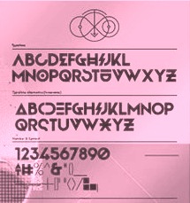 During her studies in Bandung, Indonesia, Bali-based Cahya Sogyan (b. 1994) created the free rounded sans typeface Synthesia (2014), the free sans typeface New Dawn (2015), and the free techno / futuristic typeface Cosmonaut (2015), with accompanying drop caps.
 In 2016, she co-founded Spencer and Sons with Gilang Purnama Jaya. In 2017, she started Studio Sun in Denpasar, Bali. In 2016, Cahyan published June of Fortune, the free hipster typeface family Soda Popp and writes: The new typeface called Soda Popp is inspired by pop-culture, vaporwave music, and seapunk that emerged in the early 2010s among Internet communities. It is characterized by a nostalgic fascination with retro cultural aesthetics, typically of the 1980s, 1990s, and early-mid 2000s. Typefaces from 2017 at Spencer and Sons: S&S Nickson (a copperplate display font including eight font styles and seven dingbat fonts). In 2018, she published the retro auto racing font Intensa, the extended sans typeface Matrice, and the free flared poster typeface Florent. Typefaces from 2019: Alathena (a decorative Victorian and Arts & Crafts typeface family), Rustob Club (a variable font), Tropiline, Matahari Sans (a large family that includes Matahari Sans Mono). Typefaces from 2020: Rachee (a 6-style renaissance text font), Klose Slab (an ultra-fat variable font), Gulfs Display (a 6-width ultra bold cartoon font family), Gliker (an extraordinary comic book font family; a new take on the Hobo typeface), Radiate Sans (40 styles), Balgin (a large display family that celebrates the 1990s), Brice Pop (a sixties display style; with Syarif Hafidh). Typefaces from 2021: Bethari (a 6-style art deco typeface, including a blackboard bold outline style). Typefaces from 2022: Fragmatika (a 9-style a geometric sans serif typeface with support for Latin, Cyrillic, Greek, Arabic, Armenian, Georgian, Hebrew and Thai). [Google]
[MyFonts]
[More] ⦿
|
Supertype
[Jürgen Huber]
|
 A Berlin-based foundry started by Jürgen Huber and Martin Wenzel. In 2010, Jürgen Huber (Berlin, b. 1967) and Malte Herok had started The Type Department. They are also part of Type Network. In 2020, their typeface library contained
 - Realist, Realist Narrow and Realist Wide (2011-2019) by Martin Wenzel.
- Cy (2018). A geometric hipster sans by Juergen Huber.
- Duper. Evolved from FF Duper (2009). By Martin Wenzel.
- Hothouse. TD Hothouse---that font was started in 2001 as a corporate typeface for the Glasgow School of Art, and took inspiration in the arts and crafts lettering of Charles R. Mackintosh. Bukvaraz 2001 award.
- Lemon Serif, Lemon Sans, Lemon Sans Condensed, Lemon Sans Rounded, and Lemon Sans Rounded Condensed (2014-2015). See also Lemon Sans Next (2021, 24 styles).
- Ode (2010). A German expressionist typeface by Martin Wenzel.
- Profile Pro. A humanist sans family by Martin Wenzel that won an Excellence award at The Type Directors Club, which evolved from FF Profile (1999), a flared sans known for its little contrast. This evolved in a semi-hand-printed casual teenager, FF Duper (2009), mentioned above.
- Scarlet, Scarlet Script and Scarlet Wood (2016). By Juergen Huber.
- Blinker (2019). A free Google font family by Juergen Huber who writes: Blinker is a low contrast sans serif typeface with a squircle as its basic shape, think squarish curves, or Eurostile's flamboyant cousin. Github link.
- Adapt (2021). A no-nonsense legible sans family that consists of 80 standard fonts and two variable fonts.
[Google]
[More] ⦿
|
Symbiotic Design
[Douglas Peters]
|
Douglas Peters (Symbiotic Design, Sioux Falls, SD) created the free hand-printed typeface Milton Serif Bled (2013). Behance link. His other free fonts, mostly made with FontStruct, can be downloaded at Font Journal: Struck, Pursuede, Base, Broadbill, Uset, Struckshur, Wester Breeze, Kindegraf, State (athletic lettering), Goforit, Get Even, 70sStyle Overlap 3D, Tonder, Base 10, Scurry. Typefaces from 2014 include Cebrosys, Pursuite, Mothership (arts and crafts style), Smush, 70s Style Overlap 3D Extended, Avenura, Sketchy. Particulated, Exsample Trimmed Reverse. Typefaces from 2018: Blown Out (stencil). Typefaces from 2019: Jonarun, Tirrel (stencil). Typefaces from 2020: Shadow Nose (a squarish multiline typeface). Font Journal is a font archive site run by him. Behance link for his company, Symbiotic Design. FontStruct link. [Google]
[More] ⦿
|
Thomas Damien Renaudin
|
 Parisian art director. He did some nice custom work for Peugeot, and says this about his arts and crafts typeface Prairie (2012): Frank Lloyd Wright is recognized as one of the best American architects. In the beginning of the 20th century, Wright conducted his first experimentations, drawing the lines of a style characterized by the predominance of horizontal lines and a large use of geometric patterns : the Prairie Style. These rules were the guidelines for this typeface. Prairie is a decorative, yet legible typeface. It is not a typeface designed for body copy, but it can be used for headlines when looking for a geometric, surprising, retro yet futuristic style.
 Behance link. [Google]
[More] ⦿
|
Todd M. Hallock
[Bannigan Artworks]

|
[MyFonts]
[More] ⦿
|
Tony Forster

|
British designer (d. 2008) at Letraset of the calligraphic nuptial style typeface Tiranti Solid (1993-1995). He also made Willow (1990, Letraset, a font based on lettering of Charles Rennie Mackintosh, now offered by both ITC and Linotype). Quoting from Timothy Donaldson's announcement of his death: He was well-known for his commercial lettering and type-design, which he continued to practice until the last. He also influenced many through the mid-period of his career, when he was a lecturer at Bolton College of Art (now a part of the university). Possibly the most well-known amongst the influenced was Phill Grimshaw. FontShop link. [Google]
[MyFonts]
[More] ⦿
|
Type Department
[Jürgen Huber]

|
 The Type Department was founded in 2010 by Jürgen Huber (Berlin, b. 1967) and Malte Herok. In 2011 Martin Wenzel joined as a friend of the Type Department. Much of the work is typographic and centers on logo, retail and custom type design. Jürgen Huber, who studied at Folkwang Academy in Essen and is now a professor of typography at FHTW in Berlin, a city he moved to in 1997, designed FF Plus Sans (2003, a sans family), FF Ginger (2002, includes Ginger-Icons, and FF Ginger Flamboyant, 2014), FF Angst (1997, grunge) and Hothouse (which netted him a Bukvaraz 2001 award). His typeface Scheck (Meta Design, made for Sport Scheck GmbH) won an award at the TDC2 2005 type competition.
 Jürgen Huber originally designed Crocodile Brokenscript (2013, blackletter) for a small brewery in München where it is used alongside with its sanserif counterpart. FontShop link. Most of Huber's typefaces are published vi FontShop / FontFont due to his spell as type director at Meta Design. Typefaces from 2014 by Huber include TD Lemon Sans, TD Lemon Sans Rounded (released in 2015), TD Lemon Serif (a low contrast very readable text typeface; +Unicase; see also here), TD Hothouse---that font was started in 2001 as a corporate typeface for the Glasgow School of Art, and took inspiration in the arts and crafts lettering of Charles R. Mackintosh. Typefaces from 2016: Scarlet, Scarlet Wood, and Scarlet Script. In 2019, he released the free Google web font Blinker. He writes: Blinker is a low contrast sans serif typeface with a squircle as its basic shape, think squarish curves, or Eurostile's flamboyant cousin. It's best used for medium to large text, rather than a long copy. To do its claim justice Blinker also comes with a headline weight with an extra large x-height, tight spacing, and glyphs drawn more narrowly. Github link. [Google]
[MyFonts]
[More] ⦿
|
Type Fleet
[Crt Mate]

|
 Type Fleet is a Slovenian type cooperative in Ljubljana that includes type designers such as Martin Santic. Crt Mate is the Slovenian designer of Wieldy (2018), a Victorian typeface that is influenced by the Central European Arts and Crafts movement. [Google]
[MyFonts]
[More] ⦿
|
Type Sailor
[David Fernando Espinosa Martínez]
|
 Type Sailor is David Espinosa (born in 1986) who lives in Bogotá. He graduated from the Universidad de Bogotá Jorge Tadeo Lozano as graphic designer and advertiser. He is a descendant of Antonio Espinosa de los Monteros, first royal printer of the viceroyalty of Nueva Granada.
 He designed these typefaces: - In 2021: Chapinero (blackletter, serif and sans system).
- In 2020: AmaLita (handcrafted), Font Negra (a spurred blackletter typeface done for a client, Mao Fonnegra).
- In 2019: Monteros (text typeface), TS Chapinero (blackletter).
- In 2017: Monteros (a revival of an old style typeface by Antonio Espinosa de los Monteros), Gautama (an organic sans).
- In 2014: Internerd, Old Providence New Roots (a poster typeface co-designed with Mateo Rivano), Santander (a great didone family).
- In 2013: Vercingetorix (monoline informal sans), Persifal (calligraphic typeface), Ygraine, Urania, Zephiroth (a semi-connected script), X-Classified (very grungy typewriter typeface), Salme (Treefrog-style script), Joyeux, Fugitiva (an ornamental Western saloon or circus font), Tomsk.
- In 2012: Pelida, Valpuesta, Walkiria (an informal blackletter), Quattro (a techno family), Olimpia, Luisa, Merlot (like caps in the style of William Morris), Bizancia (Arab simulation face), Imelda, Epifanía, Nero d'Avola (a great calligraphic script), Round, Avanti (calligraphic), Street Dork (stencil face).
- In 2011: Daniela (hairline sans), Glamourousse (sans), Caro (pixel), Carolina (sans), Kermesse (an octagonal font).
- In 2010: Davidcito (handwriting) and Hug Femmes (sans).
He says that his inspiration comes from the female form, which always has been associated with classic typography. Dafont link. Iphoneruler link. FontM link. Facebook link. Issuu link. Behance link. [Google]
[More] ⦿
|
Typeco
[James Grieshaber]

|
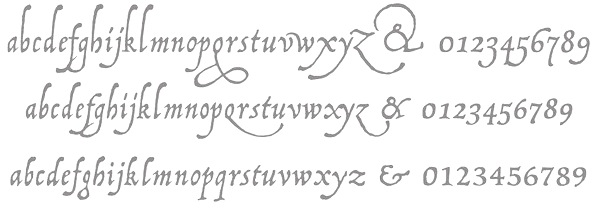 James Grieshaber earned a BFA in Graphic Design from Rochester Institute of Technology. Based first in Rochester, NY, and then in Chicago, IL, and then again in Rochester, Grieshaber ran Typeco, a typographic services and solutions company established in 2002. James Grieshaber (b. Detroit, 1967) most recently was on staff of P22 Type Foundry, where he designed many type families and helped establish International House of Fonts. He has been honoured with an award of Excellence in Type Design from Association Typographique International (ATypI) for his Gothic Gothic (2004, blend of blackletter and English style), and by TypeArt'05 (for Operina Cyrillic). Designer and Co-editor of the Indie Fonts book series, Grieshaber now teaches typography at RIT and runs Typeco. MyFonts sells his fonts now. YouWorkForThem sells the Super Duty family (stencil), Glyphic Neue, the Trapper families, Chunk Feeder, Gothic Gothic and Cusp. Identifont page. FontShop link. Behance link. Details on some of his typefaces:
 - Gothic Gothic (2001), an extended blackletter co-designed with Christina Torre. In 2004, he received an award of Excellence in Type Design from Association Typographique International (ATypI) for his Gothic Gothic type design.
- The Glyphic Neue display family was inspired by the Op Art style of lettering in the United States that ran rampant in many photo type houses in the 1960's and 1970's---I like to call it the "piano key style".
- Chunkfeeder (2002) is a beautiful monospaced octagonal OCR-like family.
- Cypher (2003, an LED/LCD family) has 24 weights. Of these, Cypher7 is free.
- Duty (2002) is a sans typeface co-designed at T26 with Lee Fasciani.
- The stencil family Super Duty (2004) has 8 variations. There are also techno variant called Superduty Condensed, Superduty Regular, Superduty Narrow and Superduty Text.
- Cusp (2001-2005): a techno display family with 18 weights, including an LED style, art deco styles and Cusp De Stijl.
- Trapper (2004) is an 8-weight exaggerated ink trap font family which comes in Trapper Round and Trapper Sharp versions.
- Zaftig (2008, Typeco) is a super-fat face.
- P22 Operina (2003, in Romano, Corsivo and Fiore versions) is based on Vicentino Ludovico degli Arrighi's calligraphy used in his 1522 instructional lettering book La Operina da Imparare di scrivere littera Cancellarescha. This book contains what is considered to be the earliest printed examples of Chancery Cursive. P22 Operina won an award at TypeArt 05. Operina Pro contains over 1200 glyphs. In 2010, Paulo Heitlinger compared P22 Operina favorably to another digital chancery font, Poetica (by Robert Slimbach, Adobe), which, according to him [and I agree], lacks vigor and dynamism.
- P22 Posada (2003, with Richard Kegler): based on lettering of Mexican printmaker José Guadalupe Posada (1851-1913) that was used for some of his posters and broadsides.
- P22 Arts and Crafts Tall (1995, art nouveau), P22 Arts and Crafts Hunter (1995). Both based on alphabets by Dard Hunter, 1908-1910.
- P22 Art Deco Chic (2002), based on the Art Deco hand lettering of Samuel Welo, ca. 1930. P22 Art Deco Display (2002) is a Broadway style face.
- Churchy (2002).
- He offered (offers?) a handwriting font service for 100 USD. Free trial typeface Reenie Beanie (2002). Signature font service for 50 USD. Reenie Beanie (2002) is now offered (as a joke, I assume) as part of the Google open font directory (for free web fonts).
- P22 Garamouche (2004, with Richard Kegler). Comes with Garamouche Ornaments (2004).
- Segoe Print (2006, Monotype Imaging). [Isn't this Googlee's competition?] This is an informally hand-printed typeface co-designed with Brian Allen, Carl Crossgrove, James Grieshaber and Karl Leuthold at Ascender.
- P22 Cezanne Pro (2006). Has over 1,200 glyphs.
- P22 Yule (2005; Heavy, Inline): a stone chisel family with a hint of Neuland.
- P22 Numismatic (2005): originally offered by the Devinne Press, and based on ornaments and letters used by 15th and 16th century engravers of seals and coins; however it looks very much like Otto Hupp's Numismatisch (1900, Genzsch&Heyse).
- Black Ops One (2011) is a military stencil face, available at the Google Font Directory.
- Short Stack (2011) is Grieshaber's free contribution to the Comic Sans genre. It was published by Sorkin Type and can be downloaded from Dafont.
- Atomic Age (2011) is a free font at Google Font Directory. It was inspired by 1950s era connected scripts seen on nameplates of American cars.
- Sarina (2011). A connected script published by Sorkin Type.
- Supermercado One (2011, Google Font Directory) is a low contrast semi geometric typeface inspired by naive industrial letters. More a signage typeface than a web font.
- Typeco Grecian (2012, FontStruct) is loosely based on a Wells & Webb Grecian style woodtype circa 1846.
- Typeco De Stijl (2012, FontStruct) is based on Van Doesburg's De Stijl magazine's name plate in 1923. Typeco Topaz Serif Tall (2012, FontStruct) is a pixel typeface. Typeco New Wave (2012, FontStruct) is an op art party font.
- Metamorphous (2012, Sorkin Type) borrows its arches from Gothic cathedrals---it was inspired by Jonathan Barnbrook and by the free font Morpheus. Google font download.
- HWT Geometric (2013, Hamilton Wood Type Foundry) is a squarish wood type family: Geometric began its life as a metal typeface from the Central Type Foundry, circa 1884. Soon after, this design was officially licensed to Morgans & Wilcox and was shown in their 1890 catalog in Regular, Light and Condensed Light variations. After acquiring Morgans & Wilcox, Hamilton Manufacturing offered Geometric Light Face Condensed as their own No 3020 and the Geometric Light Face as No 3021. HWT Geometric has been expanded digitally to include a Regular Condensed version.
- Trattatello (2014). An Apple system font.
- HWT Archimedes (2017, P22). A revival of the Page No. 122 wood type called Mansard Ornamented, done together with Richard Kegler (P22) and Virgin Wood Type. They write: This new digital version is a simultaneous release with Virgin Wood Type and features a variety of styles including the standard screw head option plus a Phillips head, hex/Allen wrench head, and even the vexing Apple pentalobe tamper resistant star screw. As a bonus, the screwheads themselves are accessible via a glyph palette, so you can put the screws to Comic Sans, or any other font, if you so desire.
Klingspor link. Google Plus link. Behance link. Fontsquirrel link. [Google]
[MyFonts]
[More] ⦿
|
Typodermic
[Ray Larabie]

|
 Ray Larabie (b. 1970, Ottawa, Canada) ran Typodermic in Mississauga, ON, which opened in the Fall of 2001. In 2006, it moved to Vancouver, BC, and in 2009 it moved on to Nagoya, Japan. Dafont page. Ray Larabie has been making fonts since 1996, but those early fonts were freeware. His pre 2001 fonts are grouped under the label Larabie Fonts. In 2001, he set up Typodermic. Latest additions.
 The Typodermic fonts: - 2022: Biphoton (a monospaced sans with the same proporions as Letter Gothic 12), Valve (an industrial muffler shop font), Deception (a sub-pixel typeface with ten captivating effects---Deception Array (wide blocks), Deception Bars (text viewed through lenticular glass), Deception Blocks (as in heavy JPEG degradation), Deception Diamonds, Deception Lines (for a grayscale effect), Deception Particles, Deception Plusses, Deception Process (simulates grayscale LCD text or a thermal printer on the fritz), Deception Scanline (television picture tube text rendering), Deception System (1-bit dithering gone haywire)), Monofonto (a monospaced sans), Encercle Draft (permitting users to create numbers in borders), Encercle Sans, Heavy Heap (a groovy psychedelic typeface with a scorching look, reminiscent of 1960s hot-rod culture and die-cast toy vehicles), Ggx89 (a 48-style tightly spaced Swiss style sans family).
- 2021: Quadrillion (a 12-style rounded monoline sci-fi family), Mochon (a wall writing or chalk font based on the lettering of Donald Mochon, dean of the RPI School of Architecture until 1966; the Mochon samples were provided by an ex-student of Mochon, Karl A. Petersen), Steelfish Hammer (a subtly rustic version of Larabie's most popular typeface, Steelfish), Wavetable (sci-fi), Xyzai (an LED emulation font, described by Ray Larabie as a hardcore, Y2K-style techno typeface), Geoparody (a 12-style squarish typeface inspired by a late 1960s font called Anonymous), Typewriter Spool (122 fonts, modeled after the Underwood No. 5 typewriter font).
- 2020: Gravtrac (a 56-style condensed to crushed slab serif family inspired by mid-twentieth century classics like Univers 59 Ultra-Condensed, Helvetica Inserat and Compacta; +Greek, +Cyrillic), Vinque Antique (a rustic handcrafted blackletter in eight styles).
- 2019: Dealerplate (17 license plate styles for various states and provinces in the USA and Canada, current as of 2019; included are California, New York, New Jersey, Ohio, Illinois, Pennsylvania, Florida, Maryland, Michigan, Wisconsin, Massachusetts, Missouri, Washington, North Carolina, Virginia, Quebec, and Ontario), Kenyan Coffee Stencil, Good Timing, Steelfish Rounded, Bitcrusher (a consumer electronics / techno font), Galderglynn 1884 (a nineteenth-century style sans-serif typeface that exp[ands his Galderglynn Esquire).
- 2018: Cybermontage, Crack Man (a pac man font), Propaniac (a 1980s-style postmodern typeface inspired by a Pointer Sisters record sleeve which was designed by Shoot That Tiger Creative Services), Zelega Zenega, Spectrashell.
- 2017: Minicomputer (MICR style), Squirty, PCTL9600, PCTL4800 (retro techno), Ultraproxi (semi-monospaced and influenced by the high speed computer printers from the 1950s to 1970s), Toxigenesis (techno sans), Venus Rising, Vanchrome (a compact sans-serif headliner with chromatic layers), Krait (a layered geometric typeface designed for architectural display), Xylito (a layered font for chromatic or 3d effects).
- 2016: Refuel (octagonal, based on military aircraft markings), Expressway Soft (a sans-serif font family inspired by the U.S. Department of Transportation's FHWA Series of Standard Alphabets, also known as Highway Gothic), Conthrax (squarish, techno), Cornpile (cartoonish), Electric, Evensong (art deco), Fledgling (a very tall typeface), Gymkhana (sans), Remissis (sans), Sunday Evening (a reverse contrast typeface), Meloche (Meloche is a unique grotesque sans-serif typeface influenced by hand-painted French signs of the late nineteenth century. It's available in 7 weights and obliques).
- 2015: Canada 150 (a custom font for the Canadian government; see here, here, this coverage regarding the Inuktitut part of the font, and this reaction by the curmudgeons in Toronto who complain that Ray did this work for free), Autoradiographic (sans family), Built Titling (for compact headlines), Chickweed Titling (cartoon titling font), Cardigan Titling (flared headline face), Bench Grinder Titling, Kleptocracy Titling, Palamecia Titling (rounded black comic book typeface), Quasix Titling, Galderglynn Titling (all caps sans family from hairline to black), Mixolydian Titling, Stormfaze (a sci-fi font started in 1996 and finished in 2015), NK57 Monospace (a 60-style programmer typeface), Gargle, Athabasca (a sans family designed for the rugged Canadian oil patch).
- 2014: Mesmerize (a large free sans family), Kingsbridge (a large slab serif family with sharp points on the A, M, N, V and W), Manbow (a layered geometric art deco display font which includes solid, clear, stripe, polka-dot and screen patterns), Breamcatcher (an all caps art deco font inspired by the piano sheet music for With Every Breath I Take which was featured in the Bing Crosby/Kitty Carlisle musical comedy film, Here is my Heart), Kilsonburg (Dutch deco based on an old Vogue magazine cover), Uchiyama (poster typeface), Goldsaber (art deco design), Vexler Slip (unicase), Rakesly, Dacquoise, Pretender, Rimouski (a rounded geometric font family), Nulshock (techno), Recharge (techno/industrial font), Interrogator Stencil, Strange Alphabets (arts and cratfs font), Angerpoise Lampshade (free).
- 2013: Numbers With Rings, Shookup (funky cartoon font), Pastrami on Rye (cutout comic book style), Chickweed, Built (a condensed headline sans), Fluctuation (a softly rounded elliptical sans family), Astrochemistry (sci-fi, techno with rounded edges), Snasm (sci-fi).
- 2012: Engebrechtre (2000-2012), Die Nasty (1999-2012: free), Strasua (1999-2012), Planet Benson (1997-2012), Husky Stash (1998-2012), Barbatrick (1999-2012: a speed emulation font), Zero Hour (1997-2012), Urkelian (1998-2012: very condensed), Zolasixx (inspired by the video game Zaxxon), Ampacity (neon font), Chromakey (a space deco headline font inspired by box art classic video games including Matrix Marauders and Magical Chase), Disassembler (1980s style bitmap font), Zerbydoo (a dot matrix family), Superego (a geometric-techno font inspired by the cabinet graphics for the 1981 Stargate arcade game), Rukyltronic (a set of dot matrix typefaces), Nerdropol (pixel family), Gulkave (rounded pixel font), Cyclopentane, Palamecia (a fat finger poster face), Gameness (a 1990 retro industrial deco font), Camulogen (headline face), Color Basic (a pixel typeface inspired the by TRS-80 Color Computer), Triac Seventy One (a funky face), Acroyear (retro all-caps headline font), Troll Bait, Strenuous (unicase), Permanence (a retro=futuristic font based on Alvin Toffler's cover of Future Shok, 1970), Clockpunk (octagonal and quaint), Battlemaze (trekkie face), Mixolydian (industrial sans).
- 2011: Ugocranis (a brutalist typeface), Clipwave, Wheaton (MICR-inspired), Mango Scribble, TRS Million (dot matrix face), Ugogranis (constructivist), Gomoku (paper cut face), From The Internet.
- 2010: Cranberry Gin (2010, octagonal), Restore (all caps, geometric sans), From The Stars (an elliptical techno family done with Chikako Larabie), Thrusters (space age face), Dream Orphanage, Dream Orphans (2000-2012), Kengwin (rounded slab serif), Gleaming The Cube (Greek simulation face), Vectipede (a slab serif family), Great Escape (an elliptical sans family), Subrocs (connected script), Hackensack (with Chikako Larabie), Polarband (bilined stackable headline face), Naked Power, Special Forces (a great macho slab serif headline face---watch for awards to roll in), Warugaki (handpainted), Warmer, Honfleur (art deco; with Chikako Larabi), Voivode (a headline typeface done with Chikako Larabie), Hachimitsu (Asian look face, done with Chikako Larabie), Kadeworth (rounded retro look sans, done with Chikako Larabie), Gnuolane Jump (2010, with Chikako Larabie), Markerfield (brush), Board of Directors (Bank Gothic style family, done with Chikako Larabie), GGX88 (a Swiss sans family), Body Goat, Reversal, Gord (techno), Computechnodigitronic (LED, LCD geek-look font), Bench Grinder, Inklea (a bubbly face), Skygirls (retro brush script), Gloss (a paint brush typeface based on Champion, 1957, G.G. Lange), Galderglynn Esquire.
- 2009: Maqui (an industrial headline sans family), Zingende (art deco family: caps only), Misadventures, Gaz (large retro sans family), Acrylic Brush, Enamel Brush (a digitization of Catalina, 1955, Emil J. Klumpp), DDT (neutral sans), Thump (fat, casual), Desperate Glamour, Pricedown (an update of his free 1990s font, patterned after the lettering on The Price Is Right show), Mitigate (monoline and slabbed; has some typewriter styles), Catwing, Walken (slab serif stencil), Silicone (soft rounded sans family), Movatif (sans), Gunplay (a stencil family inspired by the poster for the 1972 Steve McQueen/Ali MacGraw film The Getaway), Fragile Bombers (octagonal), Forgotten Futurist (techno sans, 19 styles), Bullpen (slab serif), Coolvetica (35 styles), Duality, Good Times, Strenuous, Shlop (paint-drip style), Dirty Baker's Dozen (stencil), Junequil (VAG Rounded style), Owned (graffiti), Domyouji, Threefourtysixbvarrel (stencil), Enacti, Uniwars (futuristic, 16 styles).
- 2008: Madawaska (a rugged slab serif), Ebenezer (grunge), Gnuolane Stencil, Raincoat, Report School (avant garde sans), Jesaya, Carouselambra (art nouveau), Debusen (rounded), Barge (military font), Renju (2008, potato or rubber stamp print face), Otoboke (handlettered), Hit (informal hand), R6 D8 (futuristic sans family), Rexlia (an octagonal machinistic family), Hybrea (a display sans with TV screen rounding), Sweater School, Tussilago (2008, a neutral sans family), Presicav (extended sans), Hover Unit, Addlethorpe (grunge), Scheme (rounded sans), Usurp (bouncy poster lettering), Negotiate (technical sans family), Divulge, Sewn, Gnoulane (condensed sans), Moja, Teeshirt (old typewriter face), Pound (art deco marries grunge), Graveblade (heavy metal font), Synthemesc (psychedelic anti-Starbucks font), Chysotile (white on black grunge), Cardigan (sans), Gurkner (balloon style), Reagan (grunge).
- 2007: Tight (a copy of Dean Morris's 1976 Letraset chrome font Quicksilver), Headlight, Meloche (a 3-style grotesk), Octin Spraypaint (grunge stencil), Octin Vintage (grunge), Bouffant (script), Octin Prison (stencil), Octin Sports (octagonal), Octin College (octagonal, for sports jerseys), Octin Stencil (free octagonal font family), Burnaby Stencil (stencil), Superclarendon, Conceal, Ohitashi, Stud (grunge), Bristles (grunge), Skirt, Cotton (grunge), Kelvingrove (a bit of copperplate gothic, rounded and shaved), Augustine, Containment, Snowa, Veriox, Scrubby, Transmute, Sheaff, Injekuta (techno), Rinse (grunge), Polyflec, Domyouji (square sans), Winthorpe (old style), Cutiful (script), Flyswim (grunge), Dirtstorm (spray-painted stencil), Shnixgun (grunge), Neuzon (grunge), Oxeran (old typewriter), PRINTF (grunge all caps monospaced), Akazan (sans), Nyxali (a metal tag face), Nesobrite (25 styles of Bank Gothic lookalikes), Meloriac (a heavy headline sans inspired by Futura), Walnut (graffiti face), Gnuolane (a narrow superelliptical sans), Edifact (a damaged computer font), Darkheart, Stampoo (squarish), Raymond (rough script), Hayate (oriental look), Telephoto. The entire Octin series is free at DaFont.
- 2006: Octynaz (grunge), Paltime (ornamented), Jolie Ecriture Desard (children's hand), Mango (comic book face), Desard (child's hand), Bulltoad, Lerku (eroded serif), Charbroiled (also eroded), Ceroxa (eroded stencil), Nagomi (a chiseled-look Asian font based on calligraphy of Chikako Suzuki from Nagoya), Whiterock, Yellande, Chilopod (a futuristic typeface inspired by the logo from the 1980s videogame, Atari Centipede), Order, Goldburg (based on a typeface by George Bowditch, 1957), Laserjerks (2006, brutalist), Milibus (futuristic), Bonobo (serifed), Ohitashi, Sarasori (TV-tube shaped typeface in the style of Oban), Structia (an octagonal family), Betaphid (octagonal), Gendouki (futuristic stencil), Slugger (athletic lettering), Marianas (a gorgeous art deco face), Lineavec (octagonal), Corzinair (serif family), Buxotic (a great caps face), Cinecav X (for closed caption TV and DVD), Salsbury (comic book face), Lonsdale (loosely based on a font called Parkway Script, which was designed by Emil Hirt in 1964), Alepholon (futuristic), Kwokwi, Mikadan (a tribute to Stephenson Blake's Verona from 1948, which was in turn based on William Dana Orcutt's Humanistic from 1904), Marion (2012: a beautiful transitional family adopted as a standard Mac OS X font), Quasix (hookish), Skraype (grunge stencil), Bleeker (casual lettering), Linefeed (monospaced line printer font), Draculon (a casual typeface inspired by the letterforms of William Orcutt's humanist font from 1904 which was in turn based on an Italian manuscript from 1485), Mahavishnu (a mix between 1970s psychedelics and art nouveau), Doradani (a corporate identity sans family), Korotaki (futuristic).
- 2005: Beat My Guest, Kadonk (a Halloween face), Report (a VAG-Rounded style face), Croteau (a poster face), Heroid (ook face), Barrista (informal script), Wyvern (sans serif), Wubble (like puddles of water), Caryn (casual script), Folder (a rigid sans family), Venacti (a futuristic family), Xenara (a keyboard lettering family), Emory (a destructionist sans family), Ligurino (neat sans&serif family), Biondi (update of Copperplate Gothic; followed in 2010 by Biondi Sans; these copperplate style typefaces are in the style of AT Sackers), Byington (Trajan column lettering), Sayso Chic, Expressway (28 weights, a highway signage family), Algol (pixel type), Meposa (fat display face), Tandelle (condensed), Vigo, Maychurch, Mecheria, Vactic (dot matrix), Zosma, Topstitch, Windpower, Llandru, Soap (a creative extension of Cooper Black, with dingbats), Kleptocracy (1999-2005), Owned, Rimouski (sans), Burnstown Dam (2005, a wooden plank font), Sinzano (sans with opentype ligatures galore; compare, e.g., House Ed Interlock), Zamora.
- 2004: Affluent, Threefortysixbarrel (stencil face), Tank, Telidon (dot matrix face), Funboy, Neuropol X, Neuropol Nova, Mufferaw (comic book face), Larabiefont, Zekton (techno), Strenuous 3D, Silentina (advertised as "a silent movie font"), Amienne (brush script), Fenwick Outline (free), Betsy Flanagan (1998, a keyboard face), Boopee (children's handwriting), Pirulen (in the general Bank Gothic style), Zalderdash.
- 2003: Zupiter, Blue Highway.
- Before 2002: the dot matrix family Telidon, Telidon Ink, Butter Belly, Almonte (1999), the architectural font Jillican (octagonal), Snowgoose, Bomr, Pakenham, Neuropol, Nasalization, Fenwick, Kleptocracy DLX, Sui Generis, Dirty Bakers Dozen (faded stencil), Minya Nouvelle, Asterisp, Chinese Rocks, Jillsville (great artsy Courier), Ulian, Wevli (including Wevli Dingbats), Sappy Mugs (funny mugshots), Sofachrome (1999, inspired by Pontiac car emblems), Eden Mills (1999).
MyFonts interview. Fontspace link. Fontspring link. Catalog of the typefaces in the Larabie Fonts collection. Klingspor link. Catalog of the Typodermic library in decreasing order of popularity. Extensive (large page warning) Typodermic catalog. Font Squirrel link. Creative Fabrica link. Fontsquirrel link. Fontdaily link. [Google]
[MyFonts]
[More] ⦿
|
Typograf
|
 Moldovan creator of these free fonts:
 - Berry Rotunda (2016).
- Excalibur Nouveau (2015). Pure art nouveau.
- Dyer Arts and Crafts (2015).
- Behrens Antiqua Initialen (2015, after Peter Behrens, 1907). A revival font.
- Morris Jenson Initialen (2015). Contains many of William Morris's art nouveau initial letters done for Kelmscott Press. A revival font.
- Feinsliebchen Barock (2015). Also known as Kanzlei Initialen, an excessively ornate set of blackletter initials.
- Maximilian Antiqua Initialen (2015). An initial caps version of Rudolf Koch's Maximilian Antiqua.
- Blumenstrauss Caps (2018).
[Google]
[More] ⦿
|
Valeriya Besedina
|
Moscow-based designer of the Latin / Cyrillic arts-and-crafts typeface American Horror Story (2016). Behance link. [Google]
[More] ⦿
|
Viktoryia Strukouskaya
[Struvictory Art]

|
 [MyFonts]
[More] ⦿
|
Vintage Type Co
[Sean Coady]

|
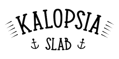 Graphic designer from Summerside and/or Charlottetown, Prince Edward Island, Canada, who was located first in Edmonton, Alberta, and then in Moncton, NB, then in Toronto, and finally in halifax, Nova Scotia. He runs SRC Designs and founded Vintage Type Co in 2015 (not to be confused with Susan Townsend's Vintage Type, a company set up in the 1990s). Creator of the free sans titling typeface family Municipal (2013) and of the hand-printed typeface Fruit Sale (2013).
 In 2014, he created Shifty Sailor (spurred), Hofmann (psychedelic typeface), Kalopsia Slab (a condensed slab serif family with an arts-and-crafts flair). One weight is free---the others can be bought here. He also created free User Interface Icons in 2014. Typefaces from 2015: Jackal Display, Anaheim Gothic, Alehouse (vintage connected script), Dorchester Display (vintage Victorian typeface), Huxley (brush script), Drone Ranger (octagonal dystopian type), Authentico (vintage poster typeface in eight styles), Firefly (free poster font), Highbinder (an eroded vintage typeface), Adventurous Script (watercolor brush), Nomad Icon Font, Arctic Express (handcrafted capitals). Typefaces from 2016: VTC Numeric (free), Grindstone (vintage), Grindstone Script, Grindstone Sans, Midnight Owl, Southbank (free), Planet Rouge, Life Is Jazz Script, Mystery Tour (+Sans) (a layered Americana or circus font), Sugar Boats, Navy Queen (a nice free font influenced by vintage nautical posters). Typefaces from 2017: Virgo Antique, Virgo Display, PressBox (letterpress and Americana emulation), Merchant Street Sans (eight stackable fonts), Old Spirits (spurred Victorian style), Prizefighter (art deco sans), Andre's Diner, Artisans Script (signature script), Milton Grotesque (a free all caps American grotesque), Queen Street (a layerable family). Typefaces from 2018: Grindhaus Sans (geometric), Drone Ranger Pro (octagonal). Typefaces frm 2019: VTC Bloke (a revival of Miller&Richard's Egyptian Expanded, a wide typeface reminiscent of the Egyptian wood types), VTC Horoscope. Typefaces from 2020: VTC Elmwood (a modernized blackletter font family), Fellbaum Grotesk, VTC Fellbaum Grotesk. Typefaces from 2021: Chocolate Chipped (a condensed woodblock emulation typeface family). Vintage Type Co. Dafont link. Behance link. Another Behance link. Creative Market link. Home page. Creative Market link for Vintage Type Co. [Google]
[MyFonts]
[More] ⦿
|
Wahyu Setiya Rahmawan
[FactoryType Studio (was: One Dollar Font, Factory 738, Today Pixels)]

|
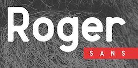 [MyFonts]
[More] ⦿
|
Walter Crane
|
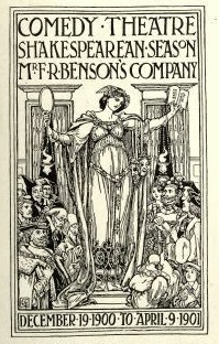 Walter Crane (1845-1915) was an English artist and book illustrator. Wikipedia states that He, along with Randolph Caldecott and Kate Greenaway, are considered the strongest contributors to the child's nursery motif that the genre of English children's illustrated literature would exhibit in its developmental stages in the latter 19th century. His work featured some of the more colorful and detailed beginnings of the child-in-the-garden motifs that would characterize many nursery rhymes and children's stories for decades to come. Born in Liverpool, he was part of the Arts and Crafts movement. He produced paintings, illustrations, children's books, ceramic tiles and other decorative arts.
 His lettering was at the basis of Crane Titling (2006, Nick Curtis), Crane Gothic (David Nalle, Scriptorium) and Walter Crane (2009, David Nalle, Scriptorium). Example alphabets drawn by him with a quill pen include Modern Gothic Capitals and this set. In 2012, Dick Pape created a digital alphabet called LFD Penwork 160 that is based on Crane's (utterly unattractive) modern gothic capitals. In 2013, Michael Bolen designed BU Scarecrow based on Crane's alphabets. [Google]
[More] ⦿
|
William Miller
[Miller&Richard]

|
[MyFonts]
[More] ⦿
|
William Morris

|
 British type designer, architect and designer (b. Walthamstow in East London, 1834, d. 1896). Defender of the medieval form, he set up Kelmscott Press in 1891, and was one of the founders of the Arts and Crafts Movement. Morris was an artist, poet, writer and designer himself, but he is probably best remembered for his fabric designs and his book designs for Kelmscott Press, such as The Kelmscott Chaucer (1896). All his punches and matrices and some types are now with Cambridge University Press.
 William Morris's typefaces: - Kelmscott Golden or Golden Type (1889-1890): a bolder re-design of the classical Jenson face, done while he ran Kelmscott Press. The punches were cut by E.P. Prince. It was based on Nicolas Jenson but darkened. ATF's copy of this was called Nicolas Jenson, just before 1900. Morris used it in many of the books in the Kelmscott Press. Ancient Roman was Keystone Type Foundry's adaptation in 1904 of the Golden type [Mac McGrew deems it comparable to Jenson Oldstyle]. All matrices, punches and some of the types are in possession of Cambridge University Press. Digital versions include GoldenType (Elsner and Flake), GoldenType ITC (ITC), Kelmscott Roman (Nick Curtis), Kelmscott (Scriptorium), True Golden (Scriptorium), URW GoldenType (URW), URW GoldenTypeITC (ITC).
- Troy (1891-1892): blackletter. Called Morris Gotisch, it was published by Berthold in 1903. Multiple digital versions exist: GL Morris (2017-2018, Gutenberg Labo, a free version), P22 Morris Troy (2001, Richard Kegler), Joyeuse (1992, Scriptorium: a variation), Morris Gothic and Morris Initials (Tom Wallace), Troy3Roman (Chet Gottfried), MorrisBlack (Dan Solo), Satanick (Marty Snyder), an unnamed revival by Eliana Ferreira (2010), Kelmscott (Scriptorium), Morris Gotisch (Gerhard Helzel), MorrisBlackLetter (Scriptorium), MorrisRoman (Dieter Steffmann), Troycer (Torbjörn Olsson).
- Chaucer (1892): an enlargement [in the sense of point size only!] of Troy. Wetzig mentions the date 1897. For a digital version, se Alter Littera Chaucer (2012).
- Morris Romanized Black. Mac McGrew: Morris Romanized Black is an adaptation of the Troy and Chaucer types designed by William Morris for his Kelmscott Press. This adaptation first appeared under the name Tell Text about 1895, and was renamed in 1925. Troy and Chaucer were two sizes of one style, approximately 18- and 12- point respectively. William Morris had previously designed a roman type which became popular commercially as Jenson Oldstyle (q.v.); of this design he says, "After a while I felt that I must have a Gothic [in the sense of Blackletter or Old English] as well as a Roman, and herein the task I set myself was to redeem the Gothic character from the charge of unreadableness. ... Keeping my end steadily in view, I designed a blackletter type which I think I may claim to be as readable as a Roman one, and to say the truth, I prefer it to the Roman." Compare Satanick. For digital versions, refer to the digital interpretations of Troy.
- Jenson Oldstyle, Morris Jensonian, Morris Old Style. Well, not really---Mac McGrew explains: Jenson Oldstyle, though a comparatively crude typeface in itself, did, much to start the late nineteenth-century move toward better types and typography. Designed by J. W. Phinney of the Dickinson Type Foundry (ATF) and cut by John F. Cumming in 1893, it was based on the Golden Type of William Morris for the Kelmscott Press in 1890; that in turn was based on the 1470-76 types of Nicolas Jenson. Morris had established standards for fine printing, in spite of the fact that he did not design really fine types. Serifs in, particular are clumsy, but the Jenson types quickly became popular. BB&S introduced Mazarin in 1895-96, as "a revival of the Golden type, redesigned by our artist." But it was a poor copy, and was replaced by Morris Jensonian. Inland's Kelmscott, shown in 1897, was acquired by BB&S and renamed Morris Jensonian in 1912; Keystone had Ancient Roman (q. v.); Crescent Type Foundry had Morris Old Style. Hansen had Hansen Old Style (q. v.); and other founders had several other typefaces, all nearly like Jenson. It is hard to realize that Jenson was inspired by the same historic type as the later and more refined Centaur, Cloister, and Eusebius. ATF spelled the name "Jensen" in some early specimens, and added "No. 2" to the series, the latter presumably when it was adapted to standard alignment or when minor changes were made in the design. Jenson Italic was introduced at the same time as the roman. ATF advertised Phinney's Jenson Heavyface in 1899 as "new and novel-should have been here long ago." Jenson Condensed and Bold Condensed were introduced in 1901.
- Morris Initials: illuminated capitals in the Kelmscott edition of Chaucer's works at the Kelmscott Press. Digital versions: Morris Inits (George Williams), Chaucerian Initials (Scriptorium), Morris Initials (Scriptorium), Morrisinits (Dieter Steffmann), William Morris Initials (2018, Chafomon). The Morris Jenson Initialen font by Typograf (2015) is somehow different.
Self portrait, 1856 and picture, age 53. William S. Peterson writes on Morris. FontShop link. MyFonts link. Bio by Nicholas Fabian. Reference books include Typophile Chapbook: The Kelmscott Press, 1891 to 1898 (William Morris), and The Cambridge University Press Collection of Private Press Types, Kelmscott, Ashendene, Eragny, Cranach (Thomas Balston, 1951; inscribed by Adrian Wilson to Bob&Jane Grabhorn). William Morris himself wrote The Art and Craft of Printing (1895, Kelmscott Press) in which he explains his aims in founding the Kelmscott Press. Ebook version of the latter book. View typefaces by William Morris, and historical descendants. [Google]
[MyFonts]
[More] ⦿
|
Wood Type Revival
[Matt Braun]
|
 Foundry specializing in digital versions of old wood type. Set up in 2011 by Matt Griffin, all font licenses refer to Bearded, which has offices in Pittsburgh, Pennsylvania and Montpelier, Vermont. Matt Griffin is a designer and co-founder of Bearded, and teaches in the School of Design at Carnegie Mellon University. He also has a great love for letterpress printing, which he acquired while attending Indiana University in Bloomington, Indiana, where he received a BFA in Graphic Design. Bearded writes: Matt Braun and Matt Griffin wanted to collect lost and forgotten old wood type from the 1800s and revive those typefaces as digital fonts for modern designers. Matt Braun is a senior designer at Bearded and letterpress printer. They first operated Rare Letterpress Wood Type as a kickstarter. After some time, they started the foundry Wood Type Revival.
 Their typefaces include - Concave Tuscan (2015). Concave Tuscan was first shown as wood type under the name Gothic Tuscan by William H. Page in James Conner's Sons Typographic Messenger (1866). Almost all the major manufacturers of the 19th century offered a version of Gothic Tuscan.
- Cosmopolitan (2016).
- Delittle Chromatic (2016). DeLittle Chromatic was issued by DeLittle of York around the turn of the century under the name No. 56/54.
- WTR Fat Boy (2011). Fatboy is derived from a widespread (no pun intended) typeface of the 19th century, commonly known as Antique Extended. It was first seen in print as wood type in 1838 in George Nesbitt's First Premium Wood Types Cut by Machinery.
- WTR French Clarendon Ornamented (2011). The original design for French Clarendon Ornamented first appeared in print in the catalogs of the type manufacturer Young&Morgans (who was later purchased by Morgans&Wilcox Mfg Co) between 1876-1880. M&W was later purchased by Hamilton Mfg Co in 1897. Hamilton then offered this typeface under the name No 3026.
- French Octagon (2011). French Octagon was first shown by Morgans & Wilcox Manufacturing Co. in their 1884 Condensed Specimen Book of Wood Type.
- Grecian Light Face (2016). This revives Light Face Grecian by David Knox & Co. in 1858.
- WTR Gothic Open Shaded (2011). Gothic Open Shaded was first seen in George Nesbitt's First Premium Wood Types, Cut by Machinery (1838). This cut of Gothic Open Shaded most closely matches a design first cut by Young&Morgans between 1876-1880. Once Morgans&Wilcox was acquired by Hamilton Manufacturing Co. (1897), they listed the typeface as No. 3238.
- WTR Gothic Outline (2016).
- WTR Roycroft (2011). The arts and crafts typeface Roycroft was originally created by Miller & Richard under the name Teutonic and is shown in their 1909 catalog. It is a hand-carved typeface.
- Planned is Grecian Light Face.
Creative Market link. [Google]
[More] ⦿
|
Woodside Graphics (was: Arroyo-Style California, or: Rustic Spirit)

|
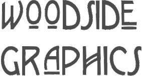 This graphic design firm in Westlake, Oregon makes original fonts. Through MyFonts.com, they are selling
 - Presidio (2001). Presidio is a stylized version of the hand-lettered calligraphy typical of the Mission era of early California.
- Craftsman (2001). The Craftsman font is a faithful reproduction of the logo, or Title typeface used for Gustav Stickley's Craftsman Magazine, the foremost journal of the American Arts & Crafts Movement during its publication years of 1901-1916.
- G+G (1996). The only authentic digitized version of the unique handlettering of Pasadena architects Charles and Henry Greene.
- Syracuse (1999). The explanation for this arts & crafts typeface: In Syracuse you will find hints of Dard Hunter's work at the Roycrofters in East Aurora, New York, a little of the Art Nouveau style of 1900 Vienna, even a touch of Charles Rennie Mackintosh's design ideas in Glasgow, Scotland. The font was named for the city in New York where Gustav Stickley produced his Craftsman furniture.
- Mission Art (2001). Mission Art contains 26 design elements from many of the California missions.
- Stickley Decorations (1997). Stickley Decorations contains 26 classic images from Gustav Stickley's Craftsman Magazine.
- Batchelder Ruff (2000). Batchelder Ruff is a battered version of the typeface used for titling in the catalogs and advertising of the Batchelder Tile Company in Pasadena, California in the 1920s.
- Greene Designs (1997). This font consists of 26 design elements derived and adapated from various architectural works of Charles and Henry Greene who created hundreds of designs for houses, furniture and decorative arts in their own unique interpretation of the Arts & Crafts style in the early years of the 20th Century, mostly in Pasadena, California.
- Batchelder Elements (2000). Batchelder Elements contains 26 images from legendary Pasadena tilemaker Ernest Batchelder's design books of the 1920s.
Other designs include Wild Wood, Prairie, and handmade notecards drawn from early designs featured in Gustav Stickley's Craftsman Magazine, published between 1901 and 1916. [Google]
[MyFonts]
[More] ⦿
|
Yoann Minet
[Bureau Brut (was: Extra Brut)]
|
[More] ⦿
|
zum Egon
[Dominik Krotscheck]

|
 Graphic designer in Brunn am Gebirge, Austria, b. 1989, who graduated in 2012 from the New Design University in St. Pölten. His thesis work was the sans typeface family Fahrplan (2012). He is located in Judenburg, Austria, and operates as zum Egon (and before that, as Dwiedoml). Domink Krotschek's partner at zum Egon is "Julia".
 In 2012, he created the layered font family Fudge. He also created the rounded sans typeface Dega (2012), as well as Pixelstuff (2012). In 2013, he created the layered sans family Furunkel. This arts-and-crafts typeface is characterized by the possibility of having different top, middle and bottom thirds of the capital letters. Later in 2013, he set up the commercial type foundry Dominik Krotscheck in Judenburg, Austria. His commercial typefaces include the layered system Furunkel (2013) and Floz (2014, a gaspipe sans). Free typefaces include Keel (2013) and Firty (2013). Typefaces from 2014: Schnipsl (a stackable paper cut-out typeface family), Clarke (at The Designers Foundry), Flounder (a condensed all-caps sans serif font), Flounder Pro. Typefaces from 2015: Rhea (condensed all caps sans serif fonts), Unfug Tight, Unfug Wiggly, Unfug Box (a nice fat handcrafted poster typeface). Typefaces from 2017: Agnes By Hand. Typefaces from 2019: Darlene (a Peignotian sans with rounded corners). Typefaces from 2020: Edith (a handmade serif type), Corso (an ultra condensed sans). [Google]
[MyFonts]
[More] ⦿
|

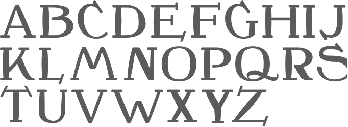

 Graphic and type designer in London, UK. In 2019, she released
  Agata graduated from the Academy of Fine Arts in Poland, where she studied graphics and paintings. Presently, she is a graphic designer in Graz, Austria. She created colourful
  Designer who lives in Buenos Aires and who teaches graphic design and typography at the Universidad de Buenos Aires. He has worked as an art director in prestigious Argentina-based studios, handling high-profile corporate brands such as Arcor, Marta Harff, Morph, SC Johnson, Danone, and Movicom. He runs
  During his studies at UFRJ in Rio de Janeiro, Alexander Mendes designed the great arts and crafts / art deco typeface Geometrum (2017). [
 Graphic designer and typographer in Ferndale, MI. She did some
  Brooklyn, NY-based creator of the very friendly rounded arts and crafts typeface Thistle Display (2014), which was inspired by the lettering of Charles Rennie Mackintosh and Margaret MacDonald. [
 Art nouveau revivals by Nick Curtis include the following free typefaces.
  Showcasing the best pages from the Artcraft Series in the ATF 1923 Catalog. Artcraft&Bold&Italic are display typefaces originally designed for Barnhart Bros&Spindler by Robert Wiebking (1911-1913). Jaspert lists Artcraft as a 1930 publication at Ludlow, and Klingspor as Western Type Foundry typefaces from 1911 until 1913. Mac McGrew: Artcraft was designed in 1912 by Robert Wiebking and featured under the name of Craftsman in the first ad for his short-lived Advance Type Foundry, operated by Wiebking, Hardinge&Company, in Chicago. A short time later, the typeface was advertised as Art-Craft, and later as one word---Artcraft. Advance was soon taken over by Western Type Foundry, for whom Wiebking designed Artcraft Italic and Artcraft Bold a year or two later. Western in turn was taken over by Barnhart Brothers&Spindler in 1918. BB&S was already owned by ATF but operated separately until 1929; in the meantime, though, Artcraft and a number of other typefaces were shown in ATF specimens as well as those of BB&S. Artcraft has an unusual roundness in some of its serifs and line endings and a line of it produces a rolling feeling; some characters have curlicues, such as the long curl at the top of the a and and the exaggerated ear on the g. A number of auxiliary characters were made for roman and italic fonts; as these were sold separately, they were overlooked by many printers and typographers. The boldface has fewer eccentricities. Artcraft was a popular typeface for a number of years; the roman was copied by Monotype in 1929 without the fancy characters, and all three typefaces were copied by Ludlow. Adaptation in 1924 of Artcraft Italic to the standard 17-degree slant of Ludlow italic matrices was the second assignment of Robert H. Middleton (after Eusebius, q.v.) at that company. Hansen called it Graphic Arts. One source attributes the Artcraft family to Edmund C. Fischer, otherwise unidentified, but the details stated here are more generally accepted and seem to fit known facts better.
  Based in Perry, OK, Bannigan Artworks was founded in 1998 by
  French designer of these free typefaces that can be downloaded at
  Bonnie Clas has completed her B.F.A. and M.F.A. at Savannah College of Art and Design as a major in Graphic Design with a minor in Drawing. She has been developing her career by taking positions as a designer, illustrator, and letterer for SpotCo, Rodrigo Corral Design, and Hsu+Associates in Manhattan. She lives in New York City. Creator of
  Bureau Brut was founded in 2015 by Julia Joffre, Yoann Minet and Camille Prandi. In 2017 Bureau Brut opened up Extrabrutshop to sell their typefaces. Both are located in Montreuil, France. The original collection of typefaces were all done by
  [
[ Lettering artist and architect in Glasgow (b. Glasgow, 1868, d. London, 1928). He was a designer in the Arts and Crafts movement and also the main exponent of Art Nouveau in the United Kingdom. Some speculate that he had Asperger's Syndrome. Typefaces based on his lettering include
  Co-designer with Richard Kegler of several fonts at P22 type foundry, which she joined in 2000. She graduated from the State University of New York at Buffalo with a BA in Communication Design. She worked at the Pushpin Group in NYC and at Dog Eat Dog Advertising, Inc. in Buffalo, NY. Her typefaces:
  Born in Firenze in 1969. Cofounder with Francesco Canovaro and Debora Manetti of the Italian design firm in Firenze called Studio Kmzero. He co-designed some typefaces there such as
  The Charles Rennie Mackintosh Font Company is located in Glasgow, Scotland. It specialises in typefaces based upon the letterforms of Scotland's artist, architect and designer, Charles Rennie Mackintosh. In 1993, designer
  [
[ William Joseph Dard Hunter was born in 1883 in Steubenville, OH, and died in 1966 in Chillicothe, OH. He was one of the most influential graphic designers to come out of the American Arts and Crafts movement around 1900-1910. The typeface
  From Portland, OR, Dave Fabik's free truetype fonts. Includes fonts such as Slipstream,
  [
[ [
[ [
[ During his graphic design studies in Lyon, France, David Lafourcade created the constructivist typeface Rus 35 (2014), the Trajan typeface Oedipe Antique (2014) and the Fraktur typeface Dornach (2014).
  Educated at Stanford (M.Sc. in digital typography in 1985 under the supervision of Donald Knuth and Charles Bigelow) and before that at the University of Colorado at Boulder (undergraduate math degree in algorithms under Hal Gabow). Type designer. Creator of these architecturally-inspired type families:
  Born in 1989, Dominic Vielnascher studies at NDU (New Design University) St. Pölten, Austria. His typefaces in 2011 include Naraganda (a beautiful low x-height arts and crafts family), an
  [
[ A mysterious
  An orphaned arts and crafts font, identical to the digital fonts all called Eccentric published by
  Born in Uruguay in 1872, he died in the UK in 1944. A medical doctor, he taught all his life at the Central School of Arts and Crafts in London and at the Royal College of Art in London. From 1910 until 1930, he designed fonts for the Cranach-Presse in Weimar, which was owned by Count Harry Kessler.
  Belgium-based Elsa Mersayeva is unique. She writes about herself: I'm all about typography, matryochkas, Paris, pirates, funny people, urban culture, Bukowski, red nails&messy hair, gangsters' bandanas, huge golden earings and unicorns. Her
  Erik lives in Zwolle, The Netherlands, and was born in 1964. He designed the splendid free handcrafted typefaces Eryx Rennie Macintosh (2015, Scottish arts and crafts typeface),
  Bali, Indonesia-based designer of the geometric sans typeface family Cleon (2015: a geometric monoline sans), the handcrafted Brook (2015), and the brush script typefaces Kinemon (2015) and Aurora (2015). In 2016, he designed the rounded sans typefaces Reiju, Ichiji and Tony Tony, the handcrafted Jacks Script, Jacks Sans, Buho, Buho Sans, and the pixel family Abeja Tribe.
  Katowice, Poland-based designer of the art deco / arts and crafts typeface atlantis (2016). [
 Fontscape lists digital Arts and Cratfs movement fonts:
  Graphic designer in Guadalajara, Mexico, who works at
  Illustrator and type designer based in Berlin. Designer of the floriated caps typeface Bahor (2019), the arts and crafts typeface
  Among the fonts in this small art nouveau style and arts and crafts archive, compiled by John M. Murphy in 2003, we find
  Aka Fitiyawan, who seems to have many other identities as well. As "Fype Co" (est. 2019), based in Magelang, Indonesia, he/she designed these script typefaces in 2019: Justoma,
  [
[ Serang, Indonesia-based designer (b. 1990) of the free handwriting fonts Rafiosa (2019) and Hasta La Vista (2019), and the script typefaces Gilani Sign, Galinah (a rabbit ear script), Patlystic, Raline, Gilar Saleh, Aminarthie, Charlotte Bellamy, Gallillea, Hellowish, Hokie, Holiday Script, Isabela, Jhon Wick, Pandora, Riverlands Tully, Rudolp, Samudera, Santuy, Sella Callista, Shalitta, Starlight, Sunday Rully, and Taman Signature.
  CEO of
 [
[ [
[ Andreas Gustavsson is a Swedish designer, b. 1979, located in Nyköping. At MyFonts, starting in 2013, the name
  Punchcutter, b. 1861 (Berlin), who made many typefaces. He worked at the Central Type Foundry and then ATF in the late 1800s, and was living in St. Louis, MO, in 1891 and in Mill Valley, CA in 1892. The Inland Printer announced in 1895 that Schroeder had joined the Pacific States Type Foundry in San Francisco. His typefaces straddle the Victorian, arts and crafts and art nouveau eras.
  Hanoded is the
  Herofonts (was:
  [
[ Intellecta Design is a design company in Brazil run by
  [
[ [
[ Jamie Clarke (Bristol and London, UK, and at some point, Sydney, Australia) creates illustrative type and lettering. He ran his own digital agency for ten years, and retrained after that period by studying type design at the University of Reading and letterpress at the St. Bride Foundation in London. His commercial typefaces include
  [
[ Danish graphic designer in Lyngby. He made the following typefaces:
  [
[ This is a
  Art nouveau typefaces by Jeff Levine:
  [
[ Mexican designer in Puebla who studied at the Benemerita Universidad Autonoma de Puebla (BUAP). Designer of the 4-weight semi-blackletter display family
  [
[ Lyon, France-based designer (b. 1977) of these typefaces:
  Graduate of the British Higher School of Art and Design, Moscow. Saint Petersburg, Russia-based designer of the Bauhaus genre sans typeface Travertine (2015, influenced by Mies van der Rohe), the
  Bandung, Indonesia-based designer (b. 1982) of Masura (2016, brush style), Space Cake (2016, sci-fi style), Caroline Script (2016), Morning Fever (2016), Binzo (2016), Morning Cloud (2016, handcrafted), Rancha (2016: grungy style), Alkhali (2016), Gath Is A Robot (2015) and Scarlet (2015, textured typeface).
  American designer of the decorative all caps typefaces Anxious (2018) and Morris (2018), which is named after arts-and-crafts designer William Morris. [
 During her studies at FADU / UBA, Luciana Seljak created the excellent arts and crafts hairline typeface
  Foundry in Chicago run by Robert Hunter Middleton. Myfonts.com writes that its type library was largely derivative, with some original scripts. After Middleton's death, and Ludlow's demise, most of the typefaces from the Ludlow library were licensed exclusively to International TypeFounders, Inc., (ITF) and are part of the Red Rooster collection. Since 2021, its fonts can be licensed via
  Luis Vicente Hernandez (Dos Decadatres, or DDCT) is a Spanish designer in Madrid who created the free pixelish typeface
  [
[ P22, which sells Parrish Roman,
  Founded by
  [
[ [
[ [
[ [
[ Nick Curtis was making and reviving fat typefaces long before they became the hot trend ca. 2006. Goudy Stout is the prototypical forefather of all of them. Among the free typefaces in this list:
  It is rare that Nick Curtis makes serif typefaces, as he specializes in display type. Nevertheless, we find a few of them in his collection. These are free: ChanticleerRomanNF-Bold, ChanticleerRomanNF (2000-2006, related to Perpetua),
 [
[ [
[ Type designer who runs Philip Kelly Digital Design in the UK. He worked for Letraset from 1969-1994 as a type designer. His type design work there included Arabic and Hebrew letterforms. From 1994 until 1997, he designed typefaces at Signus, and became an independent designer in 1997. His typefaces:
  Successful British designer, b. Bolton, 1950, d. Manchester, 1998. He studied at Bolton College of Art.
  [
[
 South African designer of
  [
[ [
[ Type designer in Prague whose typefaces are published at Signature Type Foundry. Most of them were designed after sketches by Professor Rotislav Vanek of the Studio of Graphic Design and Visual Communication at the Academy of Arts, Architecture and Design in Prague. Roman's typefaces include:
  A Lebanese American, Graham Bradley grew up in Pasadena, CA. He studied twentieth-century European history at the University of California, Berkeley, and graduated in 2009. He also graduated from the Type@Cooper program at The Cooper Union in New York. Graham designs printed materials, lettering, typefaces, and the occasional website. He is located in California. Before founding Roxaboxen, Graham was the first employee at Frere-Jones Type, where he worked with Tobias Frere-Jones on Mallory and Retina. He is an instructor at Type West at the Letterform Archive.
  During his studies in Cheltenham, UK, Sam edwards designed an exquisite ornamental caps alphabet called
  Dave Nalle was born in Beirut on March 19, 1959, and died on February 13, 2021 from COVID in his home town of Manor, Texas. From his
  [
[ Holly Goldsmith has a BA in Art from Brooklyn College. She worked first at (Mergenthaler) Linotype, then at Photo Lettering and World Typeface Center before moving to Los Angeles. In LA, she worked at Xerox's type design department for a few years before starting her own company, Small Cap Graphics, where she is engaged in both graphic design and custom type design, with clients such as Agfa Monotype, ITC, DsgnHaus, Disney Corporation and Margo Chase Design.
  Dover Press sold Oakland's
  Struvictory Art (Hrodna, Belarus) is run by Viktoryia Strukouskaya and
  During her studies in Bandung, Indonesia, Bali-based Cahya Sogyan (b. 1994) created the
  A Berlin-based foundry started by Jürgen Huber and Martin Wenzel. In 2010, Jürgen Huber (Berlin, b. 1967) and Malte Herok had started The Type Department. They are also part of
  Parisian art director. He did some nice custom work for
  The Type Department was founded in 2010 by Jürgen Huber (Berlin, b. 1967) and Malte Herok. In 2011 Martin Wenzel joined as a friend of the Type Department. Much of the work is typographic and centers on logo, retail and custom type design. Jürgen Huber, who studied at Folkwang Academy in Essen and is now a professor of typography at FHTW in Berlin, a city he moved to in 1997, designed
  Type Fleet is a Slovenian type cooperative in Ljubljana that includes type designers such as Martin Santic. Crt Mate is the Slovenian designer of
  Type Sailor is David Espinosa (born in 1986) who lives in Bogotá. He graduated from the Universidad de Bogotá Jorge Tadeo Lozano as graphic designer and advertiser. He is a descendant of Antonio Espinosa de los Monteros, first royal printer of the viceroyalty of Nueva Granada.
 Ray Larabie (b. 1970, Ottawa, Canada) ran Typodermic in Mississauga, ON, which opened in the Fall of 2001. In 2006, it moved to Vancouver, BC, and in 2009 it moved on to Nagoya, Japan.
  Moldovan creator of these free fonts:
  [
[ Graphic designer from Summerside and/or Charlottetown, Prince Edward Island, Canada, who was located first in Edmonton, Alberta, and then in Moncton, NB, then in Toronto, and finally in halifax, Nova Scotia. He runs SRC Designs and founded Vintage Type Co in 2015 (not to be confused with Susan Townsend's Vintage Type, a company set up in the 1990s). Creator of the free sans titling typeface family
  [
[ Walter Crane (1845-1915) was an English artist and book illustrator. Wikipedia states that He, along with Randolph Caldecott and Kate Greenaway, are considered the strongest contributors to the child's nursery motif that the genre of English children's illustrated literature would exhibit in its developmental stages in the latter 19th century. His work featured some of the more colorful and detailed beginnings of the child-in-the-garden motifs that would characterize many nursery rhymes and children's stories for decades to come. Born in Liverpool, he was part of the Arts and Crafts movement. He produced paintings, illustrations, children's books, ceramic tiles and other decorative arts.
  British type designer, architect and designer (b. Walthamstow in East London, 1834, d. 1896). Defender of the medieval form, he set up Kelmscott Press in 1891, and was one of the founders of the Arts and Crafts Movement. Morris was an artist, poet, writer and designer himself, but he is probably best remembered for his fabric designs and his book designs for Kelmscott Press, such as The Kelmscott Chaucer (1896). All his punches and matrices and some types are now with Cambridge University Press.
  Foundry specializing in digital versions of old wood type. Set up in 2011 by Matt Griffin, all font licenses refer to
  This graphic design firm in Westlake, Oregon makes original fonts. Through
  Graphic designer in Brunn am Gebirge, Austria, b. 1989, who graduated in 2012 from the New Design University in St. Pölten. His thesis work was the sans typeface family