| | |
100types
[Ben Archer]
|
Educational and reference site run by Ben Archer, a designer, educator and type enthusiast located in England (who was in Auckland, New Zealand, before that). Glossary. Timeline. Type categories. Paul Shaw's list of the 100 most significant typefaces of all times were recategorized by Archer: - Religious/Devotional: Gutenbergs B-42 type, Gebetbuch type, Wolfgang Hoppyl's Textura, Breitkopf Fraktur, Ehrhard Ratdolt's Rotunda, Hammer Uncial, Zapf Chancery, Peter Jessenschrift, Cancellaresca Bastarda, Poetica.
- Book Publishing&General Purpose Text Setting: Nicolas Jenson's roman, Francesco Griffo's italic, Claude Garamond's roman, Firmin Didot's roman, Cheltenham family, Aldus Manutius' roman, William Caslon's roman, Pierre-Simon Fournier's italic, Ludovico Arrighi da Vicenza's italic, Johann Michael Fleischmann's roman, ATF Garamond, Giambattista Bodoni's roman, Nicolas Kis' roman, Minion multiple master, Unger Fraktur, John Baskerville's roman, Lucida, Optima, Bauer Bodoni, Adobe Garamond, Scotch Roman, Romanée, ITC Stone family, Trinité, ITC Garamond, Sabon, ITC Novarese, Charter, Joanna, Marconi, PMN Caecilia, Souvenir, Apollo, Melior, ITC Flora, Digi-Grotesk Series S.
- Business/Corporate: Akzidenz Grotesk, Helvetica, Univers, Syntax, Courier, Meta, Rotis, Thesis, Antique Olive.
- Newspaper Publishing: Times Roman, Bell, Clarendon, Century Old Style, Ionic, Imprint.
- Advertising and Display: Futura, Robert Thorne's fat typeface roman, Vincent Figgins' antique roman (Egyptian), Memphis, Fette Fraktur, Avant-Garde Gothic, Deutschschrift, Peignot, Erbar, Stadia/Insignia, Penumbra, Compacta, Bodoni 26, WTC Our Bodoni.
- Prestige and Private Press: Romain du Roi, Golden Type, Johnston's Railway Sans, Doves Type, Walker.
- Signage: William Caslon IV's sans serif, Trajan.
- Historical Script: Snell Roundhand, Robert Granjon's civilité, Excelsior Script.
- Experimental/expressive: Mistral, Beowolf, Dead History, Behrensschrift, Eckmannschrift, Neuland, Element, Remedy, Template Gothic.
- Onscreen/multimedia: Chicago, Oakland, OCR-A, Base Nine and Base Twelve, Evans and Epps Alphabet.
- Telephone Directory publishing: Bell Gothic.
Link to Archer Design Work. [Google]
[More] ⦿
|
A.D. Farmer
[Farmer, Little&Co.]

|
 [MyFonts]
[More] ⦿
|
Alessia Mazzarella
[Typeland]

|
 [MyFonts]
[More] ⦿
|
Alexander Bobrov
[Indian Summer Studio]

|
 [MyFonts]
[More] ⦿
|
Alexander Wilson

|
Scottish typefounder, b. St. Andrews, 1714, d. Edinburgh, 1784. Educated in London, he started the Wilson foundry in 1742 at St. Andrew's in a partnership with John Baine, and set up shop in Glasgow in 1744, where he began work with Glasgow University Printers, Robert and Andrew Foulis. William Miller (who later started Miller&Richard), Richard Austin and Johann Christian Bauer all worked for Wilson. Wilson's first known specimen sheet was issued in 1772. However, William Rind seems to be using these types as early as February, 1770 in his Virginia Gazette. The business was left to his son Andrew and later to his grandson Alexander. Under Alexander's tenure, it went bankrupt in 1845. Several specimen books exist, including A specimen of printing types by Alexander Wilson&Sons, dated 1783. Life and Letters of Alexander Wilson (by Alexander Wilson) was reprinted in 1983 by Diane Publishing Company, and is freely viewable at Google. Wikipedia link. They are credited with the first British modern face, Scotch Roman, whch became very popular in the United States. Mac McGrew: Scotch Roman is derived from a typeface cut and cast by the Scotch foundry of Alexander Wilson&Son at Glasgow before 1833, when it was considered a novelty letter. The modern adaptation of the typeface was first made in 1903 by the foundry of A. D. Farmer&Sons, later part of ATF. It is a modern face, but less mechanical than Bodoni, and has long been popular. Capitals, though, appear heavier than lowercase letters and tend to make a spotty page. Hansen's National Roman is virtually the same face, with the added feature of an alternate r with raised arm in the manner of Cheltenham Oldstyle. When Monotype copied Scotch Roman in 1908, display sizes were cut to match the foundry face, but in keyboard sizes, necessarily modified to fit mechanical requirements, the caps were lightened and the entire typeface was somewhat regularized. Scotch Open Shaded Italic, a partial set of swash initials, was designed by Sol Hess in 1924. Similar swash letters, but not shaded, were also drawn by Hess and made by Monotype for regular Scotch Roman Italic. Linotype had adapted Scotch Roman to its system in 1903, retaining the heavier capitals, but in 1931, by special permission of Lanston Monotype, brought out Scotch No.2 to match the Monotype version. Compare Atlantic, Bell, Caledonia, Original Old Style. [Google]
[MyFonts]
[More] ⦿
|
Ascender: Newspaper font study
|
An in-depth study of font usage in American newspapers, carried out by Bill Davis of Ascender Corporation in 2004. A brief summary of its findings: - The ten most popular typefaces are Poynter, Franklin Gothic, Helvetica, Utopia, Times, Nimrod, Century Old Style, Interstate (1993, Tobias Frere-Jones), Bureau Grotesque and Miller.
- Many newspapers, including the top seven nationally, use custom designed typefaces.
- The most popular foundry for newspaper design, by far, is Font Bureau. It is followed by Adobe, Linotype, ITC, Bitstream, Hoefler&Frere-Jones, Monotype and Carter&Cone.
- The custom fonts are listed in the article. They include, for the top seven newspapers, USA Roman (a modification by Gerard Unger of his Gulliver for USA Today), DJ4Scotch (a modification of Escrow by Font Bureau for The Wall Street Journal), NY Cheltenham (by Carter&Cone for the New York Times), LA Text (by Font Bureau for the LA Times), Post Roman (by Font Bureau for the Washington Post), CustomNewsOneDN (used by Daily News, NY), and Tribune Century and Eclipse (by Font Bureau and Jim Parkinson, respectively, for the Chicago Tribune).
[Google]
[More] ⦿
|
ATF: Scotch Roman
|
Images of Scotch Roman from the 1923 catalog of ATF (American Type Founders). [Google]
[More] ⦿
|
Atlantic
|
Mac McGrew: Atlantic (or Atlantic Monthly) was cut by Monotype in 1909 for Atlantic. Monthly magazine, which used it as a body type for many years. The design is an adaptation of Scotch Roman, more regularized and with less emphasis on the capital letters than the original Scotch Roman, but hardly distinguishable from Monotype's keyboard sizes of that face, which were necessarily modified to fit mechanical limitations of the time. It can be classified as a modern typeface because of the sharp serifs and the contrast between thick and thin strokes. The typeface was recut and new sizes added in 1936. It is simply called Modern in some Monotype lists.o [Google]
[More] ⦿
|
Atlantic Condensed
|
Peter Mendelsund of The Atlantic talks about the bespoke (Scotch) typeface Atlantic Condensed, that was created for the redesign of the Atlantic in 2019. [Google]
[More] ⦿
|
Baltimore Type Foundry (or: Baltotype)
[Herbert F. Czarnowsky]
|
Also known as Fielding Lucas, Jr., Lucas Bros., H.L. Pelouze&Son, and Chas. J. Cary&Co. Specimen may be found in Convenient Specimen Book of Type, Rules, Borders, and Electrotype Cuts from the Baltimore Type Foundry (Baltimore: Chas. J. Cary&Co., 1888. Banta Book of Types&Typographical Tips. Menasha: George Banta, 1961). The company existed until well into the 20th century, and published a catalog as late as 1957 called Type and Rule Catalogue 13, Baltotype. A selected list of typefaces: - Airport Gothic: Turista Gorda NF (2009, Nick Curtis) is based on Baltimore Type Foundry's Airport Tourist which in turn used ideas from Renner's 1932 typeface Futura Display. Mc McGrew on Airport Gothic: Most of this series is the first American copy of Futura, which originated in Germany in 1927, designed by Paul Renner for Bauer. One source says it was cut from original Futura drawings, smuggled out of that country, but it seems more likely that matrices were made by electrotyping the imported type. An extrabold weight, Airport Black, was cut by Baltimore about 1943; information on this cutting is scarce and contradictory- one account says it was designed by Bill Stremic or Bill Blakefield, another that it was designed by Carl Hupie (or Hooper), and cut by Herman Schnoor. There is also Airport Black Condensed Title and Airport Broad. The latter is a modification of Airport Black, cut 50 percent wider on the pantagraph by Herman Schnoor. Baltimore later cast some of its Airport series from Monotype Twentieth Century matrices, and in a few cases listed both series. Airport Relief, Baltimore 299, is English Monotype Gill Sans Cameo Ruled, while Airport Tourist, Baltimore 602, is Futura Display, cast from electrotype mats of the German foundry type.
- Baltimore Script (1955). Mac McGrew: Baltimore Script is a fancy style designed by Tommy Thompson and cut by George Battee for Baltimore Type in 1955. The lowercase follows the general style of a script letter hand-written with a broad pen, although the inclination is slight and the letters don't quite connect. Capitals are flourished. It is suitable for stationery, announcements, and greeting cards, but its range of small sizes is hardly enough for advertising use.
- Mac McGrew: Czarin and Czarin Title were produced by Baltimore Type&Composition Corporation about 1948, the name being derived from the Czarnowsky family which owned the foundry. Czarin Title, issued first, is a copy of Offenbach Medium, a set of pen-drawn capitals designed by Rudolf Koch about 1935 for the Klingspor foundry in Germany. Czarin has minor changes in a few characters, but adds a lowercase, designed by Edwin W. Shaar, that is substantially different from that of Steel, the cap-and-lowercase version of Offenbach. The new lowercase harmonizes well with the capitals, and makes a handsome appearance. Compare Lydian. Footnote: McGrew spelled the name of the owner as Czarnowski. Irene Traeger, the granddaughter of Herbert F. Czarnowsky, pointed out the incorrect spelling to me.
- Mac McGrew: Elegante is a decorative, nearly monotone typeface cut by George Battee for Baltimore Type, after the German typeface Sensation of 1913, from Foundry Heinrich Hoffmeister. It is upright, with flourished caps and loops on some of the ascenders and descenders, and is suitable particularly for announcements and personal stationery. Compare Greeting Monotone.
- Mac McGrew: Emperor is a 1957 adaptation by Baltimore Type of Wide Latin which was cut by Stephenson Blake in England and related to nineteenth-century typefaces under other names. However, this Baltimore Type version has been modified and resized, and is less successful due to excess space between letters (although not as much as in the specimen shown here, which is letterspaced). Emperor was originally shown as Imperial.
- Their geometric series from 1884 became famous, and was often imitated. HiH created two font families based on it: Teutonia (2007) and Baltimore Geometric (2008, a revival of Antique Geometric by Baltimore Type Foundry, 1883). HiH writes: Roos&Junge of Offenbach am Main in Germany produced Teutonia in a "back-to-basics" effort that has seen many quite similar attempts in the field of topography. In 1883, Baltimore Type Foundry released its Geometric series. In 1910, Geza Farago in Budapest used a similar letter design on a Tungsram light bulb poster. In 1919 Theo van Doesburg, a founder with Mondrian and others of the De Stijl movement, designed an alphabet using rectangles only -- no diagonals. In 1923 Joost Schmidt at Bauhaus in Weimar took the same approach for a Constructivist exhibit poster. The 1996 Agfatype Collection catalog lists a Geometric in light, bold and italic that is very close to the old Baltimore version. Even though none of these designs took the world by storm, they all made a contribution to our understanding of letterforms and how we use them.
- Mac McGrew: Greco Bold and Italic are Spanish typefaces of the mid-1920s. They are very heavy, with long ascenders and small x-height, and have a hand-lettered appearance. Linotype Vulcan (q.v.) is equivalent. National Matrix&Type Co. in Baltimore, one of several independent companies which made matrices for the popular casting machines, offered Greco Bold in 1929 as its series 100; this was the source of Baltimore Type's mats, but Baltimore and some other sources cast Greco Bold and Italic as series 326-3261. These numbers have not been found in Monotype literature; perhaps another independent source also made mats. Notice the figures, which are termed hanging or old style, although they do not follow the usual form. However, taller 1, 2, and 0 are also available to convert the set to lining figurees. Compare Hess Monoblack. Greco Adornado, an ornamented version, has also been imported.
- Mac McGrew: Homewood is a recutting by Baltimore Type of Metropolis Lined, a German typeface of the 1930s. It was made from a large size of Metropolis Bold, with the fine white lines cut in, and differs from the original in minor details of the curves. Other sizes were cut by pantagraph and do not necessarily match original sizes.
- IBM Executive Modern, a typewriter type.
- Mac McGrew: Mademoiselle was designed by Tommy Thompson in 1953 as a display typeface for Mademoiselle magazine. It was cut by Herman Schnoor at Baltimore Type, which also offered fonts for general sale. It is a delicate, narrow modern roman, with long ascenders and short descenders, rather loosely fitted, and works well for display with transitional text typefaces such as Bulmer and Scotch Roman. Both lining and oldstyle figures are provided, along with several pointing hands as shown.
- Tourist Extra Condensed. Turista Flaca NF (2009, Nick Curtis) is based on Tourist Extra Condensed. McGrew: Tourist Extra Condensed of Baltimore Type is a copy of Phenix (q.v.) in 24- to 48-point sizes, and is Jefferson Gothic (q.v.) in larger sizes. Phenix is a 1935 ATF typeface by Morris Fuller Benton.
- Mac McGrew: Trend is a brush-lettered typeface cut by Baltimore in 1953. It is very similar to Dom Casual (q.v.), but has a slight back slant.
- Mac McGrew: Trylon as made by Baltimore Type was a 1949 copy of Stephenson Blake's Playbill (see Imports in Appendix), but Trylon Shaded and Trylon Shaded Oblique were designed and cut by George Battee of the Baltimore foundry. The solid version has lowercase in some sizes; it is somewhat similar to P. T. Barnum, with greatly exaggerated horizontal strokes and serifs at top and bottom, but is heavier and narrower. The Shaded versions are more properly outlines of the same design, with a small shadow effect at the top (which is unusual) and right of each letter, but without lowercase.
- Mac McGrew: Vernen is essentially a copy of Huxley Vertical (q.v.), but omitting the round characters AKMNWY and using the alternate pointed characters instead. In addition, the slight extensions of cross strokes to the left of stems have been omitted, and a few other characters have been redrawn. It was offered by Baltimore in 1953.
- Mc McGrew: Vista is a very wide square-serif face, cut by Baltimore Type in 1956. It is said to be a pantagraphic modification of Hellenic Wide from Bauer in Germany; actually it does not match that typeface in details, though it has the same general effect.
- Mac McGrew: Wide Line Gothic is a creation of Herman Schnoor for Baltimore Type, modified by pantagraph from Philadelphia Lining Gothic, increasing the width by about 50 percent. The flat sides of round letters. acceptable in the moderately condensed original, make awkward shapes in this extended version. Compare Franklin Gothic Wide, Tempo Black Extended.
- Among the wood types, we have Oak Leaf (1832, ornamental caps).
Rich Hopkins, a printing historian, acquired Baltotype ca. 1993. Based on drawings from the 1950s in the Baltotype material, Miranda Roth at P22 designed LTC Athena, a narrow art deco typeface, in 2013. [Google]
[More] ⦿
|
Barbara Bigosinska

|
 Barbara Bigosinska received her master degree in Graphic Design at the Academy of Fine Arts in Katowice, Poland. In 2013, she graduated from the Type & Media program at the KABK in Den Haag. At KABK, Barbara Bigosinska designed the angular text typefaces Barbear and Sambukka in 2013. Since 2014, she runs her own studio in The Hague, offering type design and typography services to international clients.
 For her type revival project at KABK, she picked Lutetia (2013) and writes: Lutetia was designed as a commission from Enschedé by Jan van Krimpen. The drawings of the typeface were ready in the middle of 1924 and first cut and cast in 16 point size in the Enschedé Type Foundry. For the first time the typeface was used in the book dedicated to the exhibition that took place in Paris in 1925. Therefore the name Lutetia reffers to the Roman name of Paris. Her KABK graduation typeface family was Mala (2013). Loaded with opentype features and choices of widths, Mala was created for cartographic purposes. It was published by Bold Monday in 2016. In 2016 she published Abelard at Indian Type Foundry and wrote: Abelard is a modern (or neoclassical) family with 10 font styles. It is a contemporary take on classic types like Baskerville, Bulmer, and Scotch Roman that has been optimised for text embedding on eReaders. The design features elements ensuring even text color, including case-sensitive forms, prominent punctuation marks, ligatures, and four sets of figures. Each font also contains ornaments resembling pen nibs, bullet points, and arrows. In 2017, she published the didone fashion mag typeface family Rion and the text typeface Neco at Fontstore. Rion was republished in 2018 at Indian Type Foundry. Typefaces from 2018: Bonny (a decorative serif font family published by Indian Type Foundry; see also Bonny at Fontshare). In 2019, Noopur Choksi and Barbara Bigosinska published the sturdy wedge serif text typeface family Sapien at Indian Type Foundry. Still in 2019, Manushi Parikh and Barbara Bigosinska released the octagonal athletics font Fielder at Indian Type Foundry. Somehow this octagonal typeface seems to have been evolved into the 5-style free typeface Nippo at Fontshare. In 2021, Barbara Bigosinska released the 12-style didone family (+two variable fonts) Boska at Fontshare. Boska has quite extreme contrast and some calligraphic hooks in the c, f, k, r, s, x and z glyphs that make it perhaps less suitable for text but more in line with fashionable displays. Bevellier (2019-2021; by Arya Purohit and Barbara Bigosinska) is a 16-style (+variable) rounded condensed organic sans family. In 2021, Barbara Bigosinska, Rafa Buchner and Diana Ovezea set up Blast Foundry. At Blast Foundry, she designed the wonderfully expressive sharp-edged display typeface Sharf. Boska was published as a free font at Fontshare. Behance link. Bold Monday link. [Google]
[MyFonts]
[More] ⦿
|
Barco Type
|
Metal type foundry in Northlake, IL and/or Bensenville, IL, still operational in 2007. Also called F&S Type Founders Inc., it was located at 237 S. Evergreen, Bensenville, IL 60106. Some of its types are listed here, but none appear to be original designs. Barco Type Founders [Specimen Book]. Images of some metal typefaces in the Barco collection: AmericanGaramondNo648, AshleyCrawford.png, Binney No. 21, Bon Aire, BulmerRomanNo462, Cameo, CheltenhamWideNo164, CloisterBlackNo95, Comique, ComstockNo202, EleganteNoS106, FigaroNo536, Glamour Medium, Greco Bold, Hauser Script, Hess Neo Bold No. 363, Homewood, Lydian Roman, Matura Scriptorial Caps, Modernistic No. 297, Orplid, Prisma, Punch, Sans Serif Light No. 329, Samson, Scotch Roman No. 36, Spire No. 377, Stymie Medium No. 290, Tangoe, Thello Inline No. 2481, Thello No. 246, TwentiethCenturyUltraboldExtend, Typewriter Type No. 17L. [Google]
[More] ⦿
|
Ben Archer
[100types]
|
[More] ⦿
|
Christian Schwartz
[Commercial Type (Was: Schwartzco)]

|
 [MyFonts]
[More] ⦿
|
Commercial Type (Was: Schwartzco)
[Christian Schwartz]

|
 Foundry, est. 2009 or 2010 by Paul Barnes (London and New York) and Christian Schwartz (New York). Their own blurb: Commercial Type is a joint venture between Paul Barnes and Christian Schwartz, who have collaborated since 2004 on various typeface projects, most notably the award winning Guardian Egyptian. The company publishes retail fonts developed by Schwartz and Barnes, their staff, and outside collaborators, and also represents the two when they work together on typedesign projects. Following the redesign of The Guardian, as part of the team headed by Mark Porter, Schwartz and Barnes were awarded the Black Pencil from the D&AD. The team were also nominated for the Design Museum's Designer of the Year prize. In September 2006, Barnes and Schwartz were named two of the 40 most influential designers under 40 in Wallpaper. Klingspor link.
 In house type designers in 2010: Paul Barnes, Christian Schwartz, Berton Haasebe, and Abi Huynh. Typefaces sold by them: - Austin (+Cyrillic): Designed for British style magazine Harper's&Queen, Austin is a loose revival of the typefaces of Richard Austin of the late 18th century for the publisher John Bell. Working as a trade engraver Austin cut the first British modern and later the iconoclastic Scotch Roman. Narrow without being overtly condensed, Austin is a modern with the styling and sheen of New York in the 1970s. Designed by Paul Barnes and Ilya Ruderman from 2007 until 2009. Has a Cyrillic.
- Giorgio (+Sans): Giorgio and its matching sans were designed for Chris Martinez at T, the New York Times Style Magazine, bringing runway proportions to the page in contrasting ways. Designed by Christian Schwartz, 2008-2009.
- Graphik: The dominant trend of the mid twentieth century simple sans serifs still reverberates in visual culture. Graphik proves that it is still possible to create something refreshing inspired by this era. Taking cues from the less-known anonymous grotesques and geometric sans serifs, Graphik is perfectly suited for graphic and publication design. Originally designed for the Schwartz's own corporate identity, it was later finished for Condé Nast Portfolio and then expanded for Wallpaper and later T, the New York Times Style Magazine. Designed by Christian Schwartz in 2009.
- Guardian (Egyptian Headline, Sans Headline, Egyptian Text, Agate Sans): What happens when you try to make a new sans serif by chopping the slabs off of an Egyptian? That was the original inspiration behind this modern classic designed for Mark Porter and the Guardian newspaper. Comprised of several interrelated families: Sans and Egyptian for headlines; a Text Egyptian; and an Agate Sans, every possible typographic need of a daily paper is fulfilled. Serious news headlines, expressive features, readable text, tiny financial listings, info graphics, and everything in between can be capably handled with ease. Designed by Paul Barnes and Christian Schwartz, 2009.
- Lyon Text: Begun as Kai Bernau's degree project on the Type + Media course at the Royal Academy of Art (KABK) in The Hague, Bernau extensively revised the typeface in time for its debut in the New York Times Magazine in 2009. Like many of the great seriffed typefaces it draws intelligently from the work of Robert Granjon, the master of the Renaissance, while having a contemporary feel. Its elegant looks, are matched with an intelligent, anonymous nature, making it excellent for magazines, book and newspapers. Designed by Kai Bernau, 2009.
- Neue Haas Grotesk (2011).
- Stag (+Sans, Dot, Stencil, Sans Round): Stag started as a small family of slab serifs commissioned for headlines by the US edition of Esquire magazine and eventually grew into a sprawling multi-part family including a flexible sans companion and two additional display variants that are probably best described as special effects. Designed by Christian Schwartz, Berton Hasebe and Ross Milne, 2008, 2009.
- Atlas Grotesk (2012, by Kai Bernau, Susan Carvalho and Christian Schwartz, Commercial Type). A revival of Dick Dooijes's Mercator. Extended to Atlas Typewriter in 2012.
- VF Didot (2013) is a custom Didot by Paul Barnes and Christian Schwartz for Vanity Fair, as requested by its design director, Chris Dixon. Based on work of Molé Le Jeune, a punchcutter used by the Didot family in the early part of the 19th century, VFDidot has 7 optical sizes and up to 5 weights in each size, plus small caps and even a stencil style.
- Zizou or Clouseau (2011). A reworking (from memory) of Antique Olive (1960, Roger Excoffon). This was published at the end of 2013 as Duplicate (2013, with Miguel Reyes). In three styles, Slab, Sans and Ionic. Commercial Type writes: Christian Schwartz wanted to see what the result would be if he tried to draw Antique Olive from memory. He was curious whether this could be a route to something that felt contemporary and original, or if the result would be a pale imitation of the original. Most of all, he wanted to see what he would remember correctly and what he would get wrong, and what relationship this would create between the inspiration and the result. Though it shares some structural similarities with Antique Olive and a handful of details, like the shape of the lowercase a, Duplicate Sans is not a revival, but rather a thoroughly contemporary homage to Excoffon. Duplicate Sans was finally finished at the request of Florian Bachleda for his 2011 redesign of Fast Company. Bachleda wanted a slab companion for the sans, so Schwartz decided to take the most direct route: he simply added slabs to the sans in a straightforward manner, doing as little as he could to alter the proportions, contrast, and stylistic details in the process. The bracketed serifs and ball terminals that define the Clarendon genre (also known as Ionic) first emerged in Britain in the middle of the 19th century. While combining these structures with a contemporary interpretation of a mid-20th century French sans serif seems counterintutive, the final result feels suprisingly natural. The romans are a collaboration between Christian Schwartz and Miguel Reyes, but the italic is fully Reyes's creation, departing from the sloped romans seen in Duplicate Sans and Slab with a true cursive. Mark Porter and Simon Esterson were the first to use the family, in their 2013 redesign of the Neue Züricher Zeitung am Sonntag. Beecause the Ionic genre has ll ong been a common choice for text in newspapers, Duplicate Ionic is a natural choice for long texts.
- Kommissar (2014, Schwartzco). A condensed sans family with little contrast that was inspired by 1920s type styles like Vertikal and Paul Renner's Plak.
- Produkt (2014, Christian Schwartz and Berton Hasebe). This is Graphik with slabs added on.
- Sanomat (2013-2017). This custom typeface by Paul Barnes was originally commissioned by Sami Valtere in 2013 for his acclaimed redesign of Helsinging Sanomat in Finland. Sanomat is now available for retail via Commercial Type in two subfamilies, Sanomat (serif) and Sanomat Sans.
- Schnyder (Commercial Type) was designed by Berton Hasebe and Christian Schwartz for the 2013 redesign of T, the New York Times Style Magazine by creative director Patrick Li and his team. Schnyder has the high contrast typical of a fashion typeface and has a large number of alternates. The stem thicknesses in each weight are identical across the widths, an unusual feature that allows the widths to be mixed freely in headlines, even within single words. It features three weights, four widths, and four optical sizes. Production assistance by Hrvoje Zivcic and Miguel Reyes.
- The Commercial Classics series from 2019:
- Brunel (Paul Barnes): Elegant and hardworking, Brunel is the Anglo variant of the high contrast Modern style. Based on designs that were cut first for Elizabeth Caslon at the end of the eighteenth century, we have expanded them to encompass a range of weights and sizes: from a roman to an emphatic black and from a text to a hairline for the largest sizes.
- Caslon Doric (Paul Barnes): The sans was the natural progression of nineteenth-century innovations. From the pioneering faces of Caslon and Figgins in the second and third decades, they quickly became a phenomenon across Europe and the United States, but it was only in the second half of the century that the British foundries would embrace lowercase forms and make faces that could be used in multiple sizes. Caslon Doric is the synthesis of these styles, from narrow to wide and from thin to heavy.
- Caslon Italian (Paul Barnes, Tim Ripper, Christian Schwartz): Perhaps the strangest and ultimate example of experimentation in letterforms during the early nineteenth century was the Italian. Introduced by Caslon in 1821, it reverses the fat face stress---thins becomes thicks and thicks become thins---turning typographic norms on their heads. This new version extends the forms into new territory: a lowercase, an italic, and another one of the more unusual ideas of the time, the reverse italic or Contra.
- Isambard (Paul Barnes and Miguel Reyes): The boldest moderns were given the name fat face and they pushed the serif letterform to its extremes. With exaggerated features of high contrast and inflated ball terminals, the fat face was the most radical example of putting as much ink on a page to make the greatest impact at the time. These over-the-top forms make the style not only emphatic, but also joyful with bulbous swash capitals and a wonderfully characterful italic.
- Caslon Antique (Paul Barnes and Tim Ripper): The slab serif or Egyptian form is one of the best letters for adding a drop shadow to. Its robust nature and heaviness support the additional weight of a prominent shading. First appearing in the 1820s, the style was pioneered and almost exclusively shown by the Caslon foundry, who introduced a wide range of sizes and, eventually, a lowercase.
- Caslon Sans Serif Shaded (Jesse Vega and Paul Barnes): The addition of graphic effects to typefaces was one of the most popular fashions of the nineteenth century, with the most common being the shaded form. Fashionable throughout this period, they largely disappeared from the typographic landscape, but their simple graphic qualities offer much potential today.
- Christian Schwartz collaborated with Richard Turley, the art director behind the famous redesign of Bloomberg Businessweek (for which Druk was initially commissioned), in 2019 on a custom typeface for the windows of Barneys, a near-century-old New York department store, which recently filed for bankruptcy. AIGA link.
- In 2019, Christian Schwartz, Paul Barnes and Mark Porter were asked by the Nature journal to develop a new typeface, Harding.
The crew in 2012 includes Paul Barnes (Principal), Christian Schwartz (Principal), Vincent Chan (type designer), Berton Hasebe (type designer, who worked at Commercial type from 2008 until 2013) and Mark Record (font technician). Miguel Reyes joined in 2013. Greg Gazdowicz joined in 2014. Hrvoje Zivcic helps with font production. View Christian Schwartz's typefaces. [Google]
[MyFonts]
[More] ⦿
|
Cyanotype
[Damian Guerrero]

|
Damian Guerrero Cortes is the Mexico City-based designer of the 48-style multi-texture layerable pixel-based font families Dance Floor (2019) and 2nd Dance Floor (2020). Damian's take on Bookman is Bookseller Bk (2020): it has straightened serifs on the ascenders and features some ball terminals to distinguish it from the original Bookman. Damian's italic is totally different though. Damian says that Bookseller is based on a typeface found in a French book published between 1882 and 1893 and cites Didot, Scotch Roman and Clarendon as distant references. Bookseller covers Greek and Cyrillic and shows sturdiness for small print. See also Bookseller Cp (2020: a 12-style Scotch family). Typefaces from 2021: Sweetener (a sugary script), MultiType Brick, MultiType Rows (34 fonts with horizontal stripes as in retro video games), MultiType Brick (brick-textured), MultiType Glitch, MultiType Gamer (a 24-style retro gaming font family), MultiType Pixel. [Google]
[MyFonts]
[More] ⦿
|
Cyrus Highsmith
[Occupant Fonts]

|
 [MyFonts]
[More] ⦿
|
Damian Guerrero
[Cyanotype]

|
[MyFonts]
[More] ⦿
|
David Berlow

|
 David Berlow (b. Boston, 1955) entered the type industry in 1978 as a letter designer for the Mergenthaler, Linotype, Stempel, and Haas typefoundries. He joined the newly formed digital type supplier, Bitstream, Inc. in 1982. After Berlow left Bitstream in 1989, he founded The Font Bureau, Inc. with Roger Black. Font Bureau has developed more than 300 new and revised type designs for The Chicago Tribune, The Wall Street Journal, Entertainment Weekly, Newsweek, Esquire, Rolling Stone, Hewlett Packard and others, with OEM work for Apple Computer Inc. and Microsoft Corporation. The Font Bureau Retail Library consists mostly of original designs and now includes over 1,000 typefaces. In a video made for Mike Parker's TDC medal in 2011, Mike Parker says that David Berlow is the most talented type designer he ever met. David lives in Martha's Vineyard.
 At ATypI 2004 in Prague, David spoke about Daily types. At ATypI 2009 in Mexico City, he spoke on The heart of my letter, (and the online version). Since that time he has been very active and vocal on the issue of high quality web fonts. Speaker at ATypI 2011 in Reykjavik and at ATypI 2014 in Barcelona. David Berlow Type Specimens (free pdf). Another type specimen booklet. Interview by A List Apart in 2009. Speaker at ATypI 2010 in Dublin. FontShop link. www.typovideo.de/david-berlow. David Berlow on web fonts. Interview by The Boston Globe. His typefaces: - Agency FB (1995). After Morris Fuller Benton's squarish typeface from 1932-1933 for American Typefounders.
- Amstelvar (2017). A variable (or parametric) font at Font Bureau. Contributors include David Berlow, Santiago Orozco, Alexandre Saumier Demers, and David Jonathan Ross. Open Font Library link, where one can download the font. Github link.
- Apres (2008, a sans with 40 styles). David Berlow and staff drew Apres as part of a series designed originally for the Palm Pre smart phone, for use both on the device and in print marketing. Simple, open letterforms and generous proportions provide a clear, comfortable, and inviting experience for navigation and readability.
- Belizio (1987-1988), a beautiful Clarendon-style slab serif modeled after the 1958 original slab serif by Aldo Novarese called Egizio Corsiva Nero. Claudio Piccinini would have liked Font Bureau to acknowledge Aldo Novarese's Egizio as the source of this family.
- Belucian (1990, by David Berlow and Kelly Ehrgott Milligan. Several weights exist, including Demi and Ultra.
- Berlin Sans (1997).
- Bureau Grotesque (1989). This 27-style family is now called Bureau Grot. Font Bureau's blurb: The current family was first developed by David Berlow in 1989 from original specimens of the grotesques released by Stephenson Blake in Sheffield. These met with immediate success at the Tribune Companies and Newsweek, who had commissioned custom versions at the behest of Roger Black. Further weights were designed by Berlow for the launches of Entertainment Weekly and the Madrid daily El Sol, bringing the total to twelve styles by 1993. Jill Pichotta, Christian Schwartz, and Richard Lipton expanded the styles further, at which point the family name was shortened to Bureau Grot.. Note: there is a custom version called M&C Saatchi Grotesque with truetype data created by dtpTypes in 1998.
- CalifornianFB.
- CheltenhamFB.
- Custer RE (2014), a typeface for small on screen use. The Font Bureau blurb: In 2009, a book from 1897 in the library of the University of Wisconsin caught David Berlow’s attention. It was set in a clear text face---a predecessor of Bookman---cast by the Western Type Foundry who called it Custer. Upon noting how well the typeface worked in point sizes of 6 and 7 points, Berlow developed it into a member of the Reading Edge series specifically designed for small text onscreen. Custer RE is a broad and approachable typeface drawn large on the body with a tall x-height to maximize its apparent size when set very small. The minimal stroke contrast and the hefty serifs let it stay exceptionally clear down to a font-size of 9px. Font Bureau.
- Decovar (2017). A variable font. Github link, where one can freely download the font family. See also Open Font Library.
- Desdemona (1992). An art nouveau face.
- Eagle (1889-1994). This art deco typeface Font Bureau Eagle was started in 1989 for Publish. David Berlow designed a lowercase, finished the character set, and in 1990 added Eagle Book for setting text. In 1994, Jonathan Corum added Eagle Light and Eagle Black to form a full series.
- Eldorado.
- Empire.
- Esperanto (1995).
- ITC Franklin Gothic (1991). In 2008, David Berlow added Condensed, Compressed and Extra Compressed widths to Vic Caruso's 1979 ITC Franklin interpretation (which had Light, Medium, Bold and Black), and Font Bureau sells a complete ITC Franklin now. In 2010, Berlow completed his definitive revision of ITC Franklin, a single new series of six weights in four widths for a total of 48 styles. Typeface review at Typographica.
- Giza (an Egyptian family.
- Hitech (1995).
- Juliana Text (2009), a rebirth of Sem Hartz's Juliana (1958, Linotype), a popular narrow legible paperback text face.
- Kis FB (2007): a revival of old style types by Nicholas Kis from ca. 1700.
- Letras Oldtsyle (1998). Letras Oldstyle was commissioned by Letras Libres, the reigning literary magazine published by Enrique Krauze in Mexico City. This garalde series was inspired by the earliest typefaces cut in the Americas in the early 1600s by printer Henrico Martinez. Proofs survive in the Biblioteca Nacional. Letras Oldstyle stands as the first typeface ever cut in the Americas, the root of American type design.
- Meyer Two (1994). Based on a 1926 type by L.B. Meyer.
- Millenium BT Bold Extended (1989, Bitstream). Also known by insiders as Starfleet Bold Extended, this font was used on federation starship hull markings until episode ten. MyFonts link.
- Moderno FB (1995): an exhibitionist didone in 32 styles, for Esquire Gentleman. In 1996 Berlow cut new styles with Richard Lipton for El Norte. In 1997, Roger Black ordered new weights for Tages Anzeiger. It grew further when the Baltimore Sun, with FB Ionic as text, was redesigned. The whole series was then revised for Louise Vincent, Montreal Gazette, with further styles added in 2005 for La Stampa. [It is my favorite type family at Font Bureau.]
- Momentum (2018). An in house variable font family for use on the Type Network web site.
- Nature (1995).
- Numskill (1990).
- Old Modern.
- Online Gothic (1995).
- Ornaments.
- Phaistos (1990-1991). A flared angular design done with Just van Rossum, and inspired by Rudolf Koch's Locarno.
- Poynter Agate.
- Reforma: Based on Giza.
- Rhode (1997).
- Roboto Flex (2017). A large free variable typeface family by David Berlow on commission for Google; based on Christian Robertson's original Roboto. Google Fonts link. Github link. Google redits Font Bureau, David Berlow, Santiago Orozco, Irene Vlachou, Ilya Ruderman, Yury Ostromentsky and Mikhail Strukov.
- Romeo.
- Scotch Roman (1993).
- Skia (1993, Apple). A Greek simulation sans, in the style of Twombly's Lithos, co-designed with Matthew Carter for Apple's QuickDraw GX project.
- Skyline.
- Titling Gothic FB (2005): Berlow spent 10 years developing FB Titling Gothic in seven weights of seven widths each for use as display and headline romans. It was inspired by the popular ATF Railroad Gothic and grew out of Berlow's own Rhode.
- Throhand: a classic family based on metal type found at the Plantin Moretus Museum in Antwerp.
- Truth FB (1995).
- Village.
- Vonness (2007): a newspaper sans family. Font Bureau: Vonness was designed by David Berlow working closely with Neville Brody on corporate redesign for Jim Von Ehre at Macromedia. Core weights are loosely based on Bauersche Giesserei's Venus, 1907-1910. Berlow expanded the ideas behind the series to 56 fonts.
- Yurnacular (1992, part of FUSE 4).
- Zenobia (1995).
View David Berlow's typefaces. Another catalog of David Berlow's fonts. Speaker at ATypI 2018 in Antwerp. [Google]
[MyFonts]
[More] ⦿
|
David Williams
[Manchester Type]

|
[MyFonts]
[More] ⦿
|
Dino dos Santos
[dstype]

|
 [MyFonts]
[More] ⦿
|
dstype
[Dino dos Santos]

|
 Established in 1994, dstype used to offer free fonts but has gone commercial now. It is run by Dino dos Santos (b. 1971, Oporto) from Oporto, Portugal. He graduated in Graphic Design at ESAD, Matosinhos. He received a Masters degree in Multimedia Arts at FBAUP, Porto. MyFonts place. In 2006 he won the Creative Review Type Design Competition in the Revival/Extension Family. At ATypI 2006 in Lisbon, he spoke about Portuguese lettering since 1700. Interview in 2007. Klingspor link. Author of A Letra Portuguesa, a book about Portuguese calligraphy. Dino created these typefaces:
 - Access (1997).
- Acta, Acta Display and Acta Poster (2011, +Poster swashes). A didone fashion mag family. First designed for Chilean newspaper La Tercera in 2010, DSType's Acta family is a clean information design type system. It includes Acta Symbols, an extensive dingbat family. Acta Var (2020) has two axes, weight and optical size.
- Acto (2012). Acto is a type system designed as the sans serif counterpart of the previous released Acta. Both type families were designed in 2010 for the redesign of the Chilean newspaper La Tercera.
- Andrade Pro (a modern) and Andrade Script Pro: based on the calligraphy of Andrade de Figueiredo, ca. 1722.
- Anubis (2003): a unicase face.
- Aparo (2013). A plumpish elegant high-contrast script face.
- Apice (2022). A highly structured calligraphic typeface with five optical sizes.
- Apud and Apud Display (2010): a high-contrast serif family.
- Aquila (2004).
- Ardina (2016). Done with Pedro Leal, this text typeface family has three optical sizes.
- Boldina (2004). A fat informal poster family with 18 weights and styles.
- Braga (2011, Dino dos Santos and Pedro Leal). This is a layered font design family. Dino writes: Braga is an exuberant baroque typeface, named after a portuguese city, also known as the baroque capital of Portugal. Our latest typographic extravaganza comes with a multitude of fonts designed to work like layers, allowing to insert color, lines, gradients, patterns, baroque, floral swashes, and many other graphic elements. Starting with Braga Base, you can add any of the twenty-three available styles, to create colourful typographic designs.
- A type system from 2014: Breve News, Breve Display, Breve Slab Title, Breve Sans Title, Breve Title, Breve Slab Text, Breve Sans Text, Breve Text. The Breve system includes modern design elements in the skeleton and ball terminals, transional elements, almost wedge-serifs in the serifed styles. As with most of dos Santos's typefaces, even the sans and slab styles exhibit Latin warmth and exuberance.
- Capsa (2008): a family that was inspired by, but is not a revival of the Claude Lamesle types Gros Romain Ordinaire and Saint Augustin Gros Oeil.
- Ception (2001): a futuristic sans family.
- Cimo (2017). A distinguished condensed sans.
- Cultura, and its improved version Cultura New (2013), a text book typeface family.
- Decline (1996).
- Denso (2019). By Dino dos Santos and Pedro Leal: a great condensed variable font with weight, serif and optical size axes.
- Digno (2022). A fuzzy text typeface family.
- Dione (2003): a sans; redone in 2009 as Dobra at TypeTrust. See also Dobra Slab (2009).
- Enorme (2020). Ultra massive and modular 3000-glyph mastodont of a constructivist font, by Pedro Leal and Dino dos Santos.
- Esta (2004-2005): extensive (transitional) text and newsprint family.
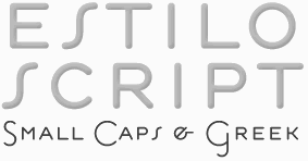
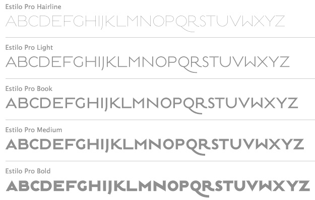
- Estilo (2005): a gorgeous and simple art deco-ish geometric headline face. This was accompanied by Estilo Script (2006), Estilo Text (2007, a 6-style rounded sans family), and later, Estilo Pro (2010, +Hairline).
- Ezzo: a sans family.
- Factor (1997).
- Finura (2009): this typeface has hints of University Roman.
- Firme (2014). A geometric sans for corporate use.
- Fragma (2003): squarish techno family.
- Girga (+Italic, +Engraved, +Banner, +Stencil) is a strong black Egyptian family designed in 2012 together with Pedro Leal at DS Type.
- Glosa (2008): Glosa is a meaty multi-style didone family. Glosa Text and Glosa Headline all followed a bit later in 2008, and Glosa Display in 2009.
- Hades (2012). A yummy and free blackletter typeface.
- Hypergrid (2002): octagonal.
- Ines (2015). A classic 7-style text typeface.
- Isento and Isento Slab (2017). Both are loosely based on ATF's Times Gothic.
- Lucius (Sans, Serif) (2022). The Lucius type family began as an attempt to reproduce the Principios Methodicos para as Letras Aldina e Roman---Typo Portuguez, but went went way beyond that in its multi-faceted execution.
- The Quase family (2017): Quase is a very free interpretation of the types found in the Specimen of Printing Types by William Caslon from 1785. We wanted to start with Caslon and then transform it into an editorial typeface, hence the increase of the x-height and the radical reduction of the ascenders and descenders. Subfamilies: Quase Headline (12 styles), Quase Poster, Quase Display, Quase Text.
- Idem and idem Display (2021).
- Dino dos Santos and Pedro Leal published Jules in the summer of 2015---a fat fashion mag didone 45-style family inspired by several plates from Portuguese calligrapher Antonio Jacintho de Araujo; it comes in Big, Colossal and Epic. They followed up in 2017 with Jules Text.
- Kartago (2005): based on Roman inscriptions from Cartago.
- Keiss (2017) and Keiss Text (2021). A Scotch roman with a lot of contrast. Keiss Text comes in twelve styles and features short descenders and ascenders, along with three very distinct optical sizes. It was designed with contemporary newspapers in mind. In 2021, he added Keiss Title, Keiss Condensed, Keiss Big (14 styles) and Keiss Condensed Big.
- Large (1999) and Large Pro (2006).
- In 2020, Dino dos Santos and Pedro Leal designed Larga, which was inspired by the typefaces shown in the specimens of the Fundiçãao Typographica Portuense from 1874. Larga is a wide all caps family and comes with a variable opentype format.
- Leitura, Leitura Headline, Leitura News, Leitura Sans, Leitura Symbols, Leitura Display (2007): the 31 styles were all made in 2007.
- Logica (2016). A classical text typeface.
- Maga (2012). A text family.
- Methodo (2005): calligraphic penman typefaces.
- Missiva (2004).
- Monox and Monox Serif (1998-2000): a monospaced family.
- Ni Sans, Ni Slab, Ni Serif (2018).
- Musee (2006): a transitional family with ornaments and borders.
- Nerva (2004). A subdued Trajan typeface with flaring.
- Nitida (2017). A 114-font family with five optical sizes.
- Nyte (2012). A serifed text family.
- Otite (1995).
- Outside (1996): grunge.
- Parco (2021). A compact headline typeface with large x-height.
- Plexes (2003). See also Plexes Pro (2006).
- Pluma (2005): a series of three exquisite calligraphic flowing scripts called PlumaPrimeyra, PlumaSegunda and PlumaTerceyra). Inspired by the typographic work of Manuel de Andrade de Figueiredo that was published in 1722: "Nova Escola para Aprender a Ler, Escrever e Contar, offerecida a Augusta Magestade do Senhor Dom Jao V, Rey de Portugal".
- Poesis (1999).
- Pratico UI and Pratico Slab UI (2022).
- Prelo (2008): A sans family for magazines, it has styles that include Hairline, Hairline Italic, Extra Light, Extra Light Italic, Light, Light Italic, Book, Book Italic, Medium, Medium Italic, Semi Bold, Semi Bold Italic, Bold, Bold Italic, Extra Bold, Extra Bold Italic, Black, Black Italic, Slab and Prelo Condensed.
- Priva Pro (2006): a sans family that includes Greek and Cyrillic).
- Prumo (2011-2012). A 92-font family originally created for the redesign of the Argentinian newspaper La Nacion. Released to the public in 2013, it covers low and high contrasts, and has slab serif styles as well as Scotch Roman styles. So, it is more a type system or type collection than one single typeface: Prumo Banner, Prumo Deck, Prumo Display, Prumo Poster, Prumo Slab, Prumo Text.
- Quadricula (1998).
- Quaestor and Quaestor Sans (2004). Roman inscriptional typefaces.
- Recita (2019). A sturdy oldstyle text typeface family.
- Resea (2004) and Resea Consensed: Bank Gothic style typefaces.
- Solido (2012) is a versatile type system with five widths: Solido, Solido Constricted, Solido Condensed, Solido Compressed and Solido Compact. In total there are 35 fonts. In 2020, a variable font was added to Solido. Codesigned with Pedro Leal.
- Synuosa (1999): an experimental typeface showing only the top half of the characters.
- Tecla (2018). After Printype, a typeface developed in the early twentieth century for the Oliver Typewriter.
- Terminal (1996).
- Titan and Titan Text (2003).
- User (2012), User Upright (2012), and User Stencil (2012). Monospace type families.
- Velino (2010): an extensive family including Velino Text, Velino, Velino Condensed, Velino Compressed, Velino Poster, Velino Sans, Velino Sans Condensed, Velino Display (+Compressed Display, +Condensed Display). This didone superfamily is sure to win a ton of awards.
- Ventura (2007): based on the calligraphy of Portuguese calligrapher Joaquim José Ventura da Silva, ca. 1802, who wrote Regras methodicas para se aprender a escrever os caracteres das letras Ingleza, Portugueza, Aldina, Romana, Gotica-Italica e Gotica-Germanica in 1820. It had a "Portuguese Script". Do not confuse Ventura with Dieter Steffmann's font by the same name made many years earlier. Ventura won an award at TDC2 2008).
- Viska (2015, by Dino dos Santos and Pedro Leal) is designed for small print.
- Volupia (2005): a connected advertising face.
DS Type also has typefaces by other type designers, such as Pedro Leal. They worked with leading companies, world scale events and well-known design agencies including: Appetite, Banco CTT, Banco Economico, BBDO, CondéNast, CTT Correios de Portugal, Electronic Arts, Errea Communicacion, Erste Bank, ESPN, Expo 2020 Dubai, Fifa World Cup 2018 Russia (the Ducha typeface), Garcia Media, Gatorade, Gruner + Jahr, Hearst, Innovation, King Games, McCann-Erickson, Meredith, Palmer Watson, Pentagram, Sagres, Starbucks, The New York Times (the Nyre typeface), Vox Media and Wolff Olins. View Dino dos Santos's typefaces. DS Type's typeface library. [Google]
[MyFonts]
[More] ⦿
|
Dyana Weissman
[Kerns&Cairns]

|
 [MyFonts]
[More] ⦿
|
Eduardo Manso
[Emtype]

|
 [MyFonts]
[More] ⦿
|
Elias Hanzer
[Hanzer Liccini]
|
 [More] ⦿
|
Eller Type
[Emerson Eller]

|
 Emerson Nunes Eller is a Brazilian graphic designer based in Lisbon, Portugal. He has a Masters from UEMG in Belo Horizonte, Brazil, in 2014, and his thesis there was entitled Letras do cotidiano: a tipografia vernacular na cidade de Belo Horizonte. It led to the (caps only, Tuscan, Victorian) vernacular typeface Sucata. He holds a PhD in Communication Design from the University of Lisbon. In 2019, he graduated from the Expert Class type design at the Plantin Institute of Typography, Antwerp.
 In 2017, he designed the innovative hybrid (sans / serif) typeface Sagarana. Typefaces from 2021: Itacolomi. He explains: Itacolomi is a result of an extensive investigation into Scottish style types produced in Brazil around 1820. A possible connection between Brazil and Scotland. In short, it preserves the qualities of the famous 19th-century Scotch Roman types while adding a personal approach with unique features from the early Brazilian models. In 2019, supervised by Frank E. Blokland at the Plantin Institute of Typography, he developed the (garlde) Glossa type family. In 2021, he released the slab serif Perva, which is accompanied by Perva Reverse (a Western font) and Perva Black (an old English blackletter). [Google]
[MyFonts]
[More] ⦿
|
Emerson Eller
[Eller Type]

|
 [MyFonts]
[More] ⦿
|
Emtype
[Eduardo Manso]

|
 Emtype is the foundry in Barcelona that was founded in 1997 (in Buenos Aires) by Eduardo Manso. Eduardo was born in Buenos Aires in 1972 and studied graphic design at the Escuela de Artes Visuales Martín A. Malharro and at the Universidad Nacional de Mar del Plata, both in Mar del Plata. Art director of the Argentinian graphic design mag "el Huevo". He currently lives in Barcelona. His typefaces include the pixel font family Dixplay (2003, Emtype), the grunge font Eroxion (1997) and Rina Linea and Rina (2001), all at Bitstream, the Scotch roman text family Bohemia (2004), Andromeda ([T-26]), Garadonis, Fluxus, Ovalus (2005, free dot matrix face), Relato (2005, advertised as a muscular serif family), Relato Sans (2005, which won an award at TDC2 2006), Merss (2000, ITC), Argot (2004, winner of an award at TDC2 2004), Flour, and Flour Inline.
 Argot was renamed Bohemia (published in 2004 with Linotype), and won an award at the Linotype International Type Design Contest 2003. EMT Lorena won an award at TDC2 2007. He custom designed Sunday Times Modern (2008) for the Sunday Times. Still in 2008, he published Geogrotesque, a semimodular geometric display typeface in 7 styles. Geogrotesque won an award at Tipos Latinos 2010. This was followed in 2009 by Geogrotesque Stencil and in 2015 by Geogrotesque Stencil Italic, Geogrotesque Compressed, Geogrotesque Condensed, and Geogrotesque Extra Compressed. In 2016, he added Geogrotesque Slab, in 2018 Geogrotesque Cyrillic, in 2019 Geogrotesque Expanded and in 2020 Geogrotesque Sharp (98 styles, and a variable font). He created the custom typeface La Grilla. Periodico (Text, Display) was originally commissioned by the Spanish daily newspaper 'ABC', and was published as a 30-font family with lots of old Spanish ingredients in 2011. In 2012 the London agency GBH commissioned Emtype to develop a custom typeface for the Puma football teams for use in the Brazil World Cup 2014 as well as in the national competitions. Ciutadella (2012) was originally commissioned by Mario Eskenazi's studio. It is a versatile geometric sans serif, a simple, clean and direct family. In 2015, Emtype published Ciutadella Rounded and in 2016 Ciutadella Slab and Ciutadella Display. Typefaces from 2014: Shentox. This squarish nearly monoline typeface family started out from British license plates. Camber (2015) is a workhorse sans typeface, slightly squarish and on a geometric base. Eduardo's keen eye strikes again in the variable width grotesque typeface family Akkordeon (2017), whose black weight will give Impact serious competition. Akkordeon Slab< (2017) is equally impressive. Other typefaces from 2017: Isotonic (a rounded almost monoline sans typeface based on Ciutadella). Corporate typefaces: Sunday Times, Lorena Serif (newspaper type; certificate of excellence in TDC2 2007). Typefaces from 2018: Steradian (a geometric sans), Aribau Grotesk (a low contrast geometric sans). Typefaces from 2019: Approach (a low contrast sans in the style of the earliest grotesques, with slightly angled terminals and plenty of elbow pipes, and a characteristic snub nose "1"). Typefaces from 2020: Approach Mono (a typewriter or programming font family derived from Approach), Majorant (a stocky monoline avant-garde geometric sans). Typefaces from 2021: Classike (a 13-style high contrast squarish display typeface inspired by art deco), Chiaroscura (Eduardo writes: inspired by an art technique, Chiaroscura is a display typeface that conveys elegance and finesse; it has high contrast, sharp terminals and compact vertical proportions that makes it ideal for headlines), Inklination (a low x-height neo-grotesque with five romans, ten italics, five monospaced versions and 50 fun fists and icons). Interview in 2013. Myfonts page. Linotype page. Behance link. FontShop link. Klingspor link. Catalog of Eduardo Manso's typefaces. View Eduardo Manso's typefaces. View even more of Eduardo Manso's typefaces. [Google]
[MyFonts]
[More] ⦿
|
Extratype (was: Textaxis)
[Iñigo Jerez Quintana]

|
 Textaxis was Spanish/Catalan foundry run by Barcelona-based Iñigo Jerez Quintana since 1995. In 2015 it was renamed Extratype. Iñigo Jerez's beautiful typefaces include Eina (2013, first designed as a corporate typeface fpr the EINA school in Barcelona), ASM (2013, Type O Tones: ASM stands for the Santa Monica Arts cultural center in Barcelona, where the monospaced typeface ASM has been in use as the custom typeface from 2008 onwards), Poster (2013, plus Display and Monster styles: a fat excessive didone family published by Type O Tones), Scozia (2011, didone), Amy, CX Type, School (fat octagonal face), Hidalgo, 112 Type, Point (2011, rounded typewriter family), Papers (2011, a fat fashion mag didone display family), Slim (2011), Batin (2005, neat garalde family), Palo (2000), Dinamo (1999), Oneline (1998), On Serif (2001), On Sans (2001; with On-Serif, a winner at Bukvaraz 2001), Blok (2004, poster face), Blak (heavy version of Blok), Track (2004, octagonal), Plus (2004, octagonal), Bonus (2004, ink trap face), Interfunktionen (2004, old typewriter), SuiteSerif (2003), Xquare (2003), Interpol (2002), Maeda (2002), Luomo (2002), Borneo (2002), Suite (2001), Self (1999, sans family), Valeria (1997, liquid serif), Inercia (1995, a rounded organic sans done at Garcia Fonts), Latina Sans (1998, a winner at Bukvaraz 2001), Latina Serif (1998), Textaxis (2000, sans).
 Typefaces either made or extended in 2015 when the company was renamed Extratype: ASM (an industrial monospaced sans: ASM stands for the Santa Monica Arts cultural center located in Barcelona where ASM was the corporate typeface from 2008-2013), Blak (a chubby typeface originally designed for the now defunct magazine Suite), Poster (a fat face family, i.e., with ultra-black didone excesses and high contrasts). In 2020, he released the 56-style text family Chamberi (co-designed with Francisco Torres) and wrote: Chamberí is designed to be Vogue Spain's bespoke typeface. An ambitious typographic branding project made for one of the most iconic magazine headers of the world, it defines the Spanish edition's personality through a blending of the functionality of 19th century modern romans (also known as Scotch typefaces) and the gestural expressiveness of typographic Baroque. Chamberi is a peculiar combination of the rational and the delicate, the sturdy and the feminine. It is offered in Text, Headline, Display and (fashion mag) Super Display sub-families. Suite won an award at the TDC2 2003 competition. His Quixote text family (2005) won an award at TDC2 2006 and at Tipo-Q. FontShop link. Klingspor link. [Google]
[MyFonts]
[More] ⦿
|
Fanny Hamelin
|
 Fanny Hamelin has a DMA in Type Design Ecole Estienne in Paris, class of 2016, and a DSAA in type design from Estienne, class of 2018. After working for a few months for Black Foundry, she took up type design positions at Typofonderie and design studio Baldinger Vu Huu.
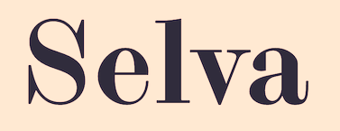
 Designer of Savon (2020: a Garamond) and the textured reverse stress display typeface Giana (2020), an all caps design that mixes typographic and kaleidoscopic ornaments in bold and display styles. In 2021, she released the Scotch roman typeface Selva and an accompanying script at Colophon. Home page. [Google]
[More] ⦿
|
Farmer, Little&Co.
[A.D. Farmer]

|
 New York-based foundry, also called White's Type Foundry and A.D. Farmer Foundry. It was created in New York in 1862, and sold to ATF in 1892. Many of its typefaces were digitized in recent years, such as the art nouveau typeface Palm (1887), which resurfaced as Palmetto (2005, Solotype Foundry). Arbor was revived by Nick Curtis as Surely You Jest NF (2005). The slab serif (almost wood type) typefaces Antique No. 2 and Antique Light Extended live on in digital form as Old Mac Donald NF (2011, Nick Curtis) and Spade (2012, Canada Type). Monotype's Scotch Roman MT [link] is based on a typeface from A.D. Farmer. The art nouveau typeface Vassar (1887) was recreated in digital form as Foxcroft and Foxcroft Shaded (2005, Nick Curtis). Specimen book (1867) can be consulted freely on-line or here. From that book: ornament of a horse and cart.
 Catalogs published by Farmer include Specimens from the A. D. Farmer&Son Type Founding Co. Including Book, Newspaper and Jobbing Type, Brass Borders and Rules, with Complete Price List, &c, New York, 1897. Farmer and Little published The Reduced Price List and Latest Specimens of Printing Types Etc. (In an Abridged Form.) Cast by Farmer, Little&Co., Type Founders in New York in 1882. In 1900, A.D. Farmer & Son published Typographic specimens: illustrated catalogue. Farmer, firm, type-founders, New York, a 607-page catalog. Linotype link. [Google]
[MyFonts]
[More] ⦿
|
Fatima Lazaro
|
Mexican type designer (b. 1986) who graduated from Universidad Autonoma Metropolitana in Mexico City and ESAD in Amiens (2016-2018), France and now works in both paris and Mexico City. Winner at Tipos Latinos 2018 of a type design award for Cardone (2016-2018), her graduation typeface at ESAD. She wrote about Cardone Serif: Cardone is a contemporary typeface that has its roots in the early modern model of Scottish faces, a model that would be later called Scotch Roman. It explores the right balance between elegance and a studier feel through the combination of pronounced curves, abrupt lines and vertical stress. Later, she added Cardone Grotesk Regular and Black. In 2021, Cardone was published by 205TF. Presently, she collaborates with Bureau 205 and 205TF. [Google]
[More] ⦿
|
Fedwa Snoussi
|
Paris-based designer. During a workshop at Type Paris 2018, she designed the Scotch roman typeface Victoriana, which was inspired by Lewis Carroll's Alice in Wonderland from 1865, which was set in a Scotch roman typeface. [Google]
[More] ⦿
|
Ferran Riera Bonito
|
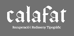 Barcelona-based designer in 2017 of these typefaces: Calafat (a gorgeous blackletter that revives a typeface made by the first printing press in Mallorca, Nicolau Calafat), Mirona (Scotch), Eixam (octagonal; named after the octagonal intersections of the Eixample neighborhood of Barcelona), and Kely (piano key stencil). [Google]
[More] ⦿
|
Fontsmith
[Jason Smith]

|
 Jason Smith is the British corporate typeface designer who founded Fontsmith in 1997, where he retailed his own designs from his office in London. He has created a typographic identity for the Post Office in the UK. Phil Garnham was one of the in-house type designers. In January 2020, Fontsmith was acquired by Monotype.
 Smith's custom typefaces include Casey, Seat, Tractebel, PPP Healthcare, Powergen, Allied Irish Bank, UUnet, Channel 4, and Saudi Aramco, Champions (2009: for the UEAFA Champions League), Colgate Ready (2014: for Colgate, covering Latin, Cyrillic, Eastern European, Devanagari and Thai), More4 (2005, for the Channel 4 Adult Entertainment channel), ITV (2006, for the ITV network), BBC ONE (2006, for the BBC), Post Office Sans (2003), Severstal (2009), and Moto GP (2020: a custom techno / sports font). Vernon Adams and Fontsmith got into a quarrel about Vernon's Mako, which was submitted and rejected by Fontsmith, which published its own similar typeface Lurpak a few weeks later. Most of Jason Smith's typefaces are now at MyFonts, after Monotype's take-over in 2020: - FS Albert (2002). A soft-edged sans family by Jason Smith, Mitja Miklavcic and Phil Garnham. Followed by Emanuela Conidi's FS Albert Arabic. In 2007, Jason Smith designed the custom typeface Xerox Sans (+Condensed) as a modification of his FS Albert, to which Greek and Cyrillic alphabets were added as well.
- FS Aldrin (2016). A rounded sans by Phil Garnham.
- FS Alvar (2007, Jason Smith and Phil Garnham). A modernist utilitarian headline font family inspired by the work of Alvar Aalto.
- FS Benjamin (2018). A flared sans serif by Stuart De Rozario.
- FS Blake (Emanuela Conidi). A sans with some inherent tension.
- FS Brabo (2015, Fernando Mello). Named after Brabo in Antwerp, FS Brabo was inspired by the Plantin Moretus museum and the garalde styles (Bembo, Garamond, Plantin). FS Brabo won an award at Tipos Latinos 2016.
- FS Clerkenwell (2004, Jason Smith and Phil Garnham). A slab serif.
- FS Conrad (2009). A multiline display face by Phil Garnham.
- FS Dillon. Influenced by the Bauhaus quest for simplicity.
- FS Elliot (2012). By Nick Job.
- FS Emeric (2013, Phil Garnham). A large humanist slightly angular sans family. Dedicated web site.
- FS Hackney. An assertive sans typeface family by Nick Job.
- FS Industrie (2018). A 70-style techno / mechanical sans family by Fernando Mello and Phil Garnham.
- FS Ingrid. A humanist sans family by Jason Smith.
- FS Irwin (2017). An incised typeface inspired by New York, FS Irwin is a sans serif with calligraphic roots.
- FS Jack (2009, Jason Smith and Fernando Mello). A confident sans family that was awarded at Tipos Latinos 2010.
- FS Joey (2009, Jason Smith and Fernando Mello). An organic sans typeface family.
- FS Kim (2018). A joyful display typeface family by Krista Radoeva.
- FS Kitty (2007, Jason Smith and Phil Garnham). In the Japanese kawaii style.
- FS Koopman (2018). A sans family designed by Andy Lethbridge and Stuart De Rozario. A hybrid sans workhorse that takes inspiration from Swiss grotesks, American gothics and early British grotesques
- FS Lola (2006). Originally designed for Wechsler Ross&Portet by Phil Garnham, it is advertised by Fontsmith as a transgender type.
- Lost + Foundry (2018, Pedro Arilla and Stuart de Rozario). The Lost & Foundry family of seven fonts includes FS Berwick, FS Cattle, FS Century, FS Charity, FS Marlborough, FS Portland and FS St James. The campaign was developed by Fontsmith, M&C Saatchi London and Line Form Colour. The crumbling typefaces of Soho were recovered to be sold online as a collection of display fonts, to fund the House of St Barnabas's work with London's homeless. Fontsmith's designers Stuart de Rozario and Pedro Arilla worked with M&C Saatchi London to develop the fonts.
- FS Lucas (2016). A geometric sans by Stuart de Rozario.
- FS Maja. A curvy display typeface.
- FS Matthew. A sans family.
- FS Me. Mencap, a British company that works with people with a learning disability, asked Smith to design a font, FS Mencap (also known as FS Me), for the learning disabled---easy to read, yet elegant. Codesigned by Jason Smith, Mitja Miklavcic and Phil Garnham.
- FS Meridian (by Kristina Jandova). A rhythmic geometric sans family with circular forms.
- FS Millbank (2015). A wayfinding typeface family by Stuart de Rozario.
- FS Neruda (2018, by Pedro Arilla). A transitional storytelling text family named after Chilean poet Pablo Neruda.
- FS Olivia (2012). An angular poetic text typeface family by Eleni Beveratou.
- FS Ostro (2018, Alessia Mazzarella). A modern typeface family in text and display versions. It brings warmth and fresh air to the cold Italian didones. Its more subdued and less contrasted text version was influenced by Scotch romans. There are also genetic elements of Spanish display types.
- FS Pele (2007). An ultra fat typeface by Jason Smith and Phil Garnham.
- FS Pimlico (2011, Fernando Mello). A humanist display sans.
- FS Rigsby (2005). A sans.
- FS Rome (Mitja Miklavcic and Emanuela Conidi). An all caps Trajan typeface.
- FS Rufus (2009). A slab serif by Mitja Miklavcic, Jason Smith and Emanuela Conidi. Described by them as benevolent, quirky, peculiar, offbeat, jelly beans and ice cream, a retro eco warrior.
- FS Sally (Jason Smith and Phil Garnham). FS Sally Pro won an award at Granshan 2016.
- FS Sammy (Satwinder Sehmi, Jason Smith). A script typeface.
- FS Shepton (2015). A calligraphic brush script by Andy Lethbridge.
- FS Siena (2016). A luxurious fashion mag typeface given a new life in 2016 by Krista Radoeva. Jason Smith had started drawing Siena 25 years earlier. It is delicate, oozes style, and shows touches of Peignot in its contrast.
- FS Silas Sans (2008, Jason Smith, Bela Frank, Fernando Mello and Phil Garnham).
- FS Silas Slab (2015, Bela Frank).
- FS Sinclair (2007-2008). A rounded octagonal typeface by Jason Smith and Phil Garnham.
- FS Sophie (2004). A feminine sans typeface.
- FS Split Sans and FS Split Serif (2019, Jason Smith and Fernando Mello). Has a variable type option.
- FS Truman (2012, Jason Smith and Fernando Mello). A sans family.
- FS Untitled (2016, Jason Smith and Fernando Mello). Developed for screens.
[Google]
[MyFonts]
[More] ⦿
|
Francisco Torres
|
 Aka Senhor Baltazar. At Type@Paris 2016, Francisco Torres (Antwerp, Belgium, and Porto, Portugal) designed Emigrant Serif for small wine companies in Portugal.
 In 2020, Iñigo Jerez (Extratype) released the 56-style text family Chamberi (co-designed with Francisco Torres) and wrote: Chamberí is designed to be Vogue Spain's bespoke typeface. An ambitious typographic branding projeect made for one of the most iconic magazine headers of the world, it defines the Spanish edition's personality through a blending of the functionality of 19th century modern romans (also known as Scotch typefaces) and the gestural expressiveness of typographic Baroque. Chamberi is a peculiar combination of the rational and the delicate, the sturdy and the feminine. It is offered in Text, Headline, Display and (fashion mag) Super Display sub-families. [Google]
[More] ⦿
|
Frere Jones Type
[Tobias Frere-Jones]

|
 Celebrated type designer, born in 1970 in New York City. Frere-Jones received a BFA in Graphic Design from the Rhode Island School of Design in 1992. He moved to Boston, where he worked at the Font Bureau until 1999. He joined the faculty of the Yale University School of Art in 1996 and has lectured throughout the United States, Europe and Australia. From 1999 until 2014, he worked for and with Jonathan Hoefler in New York. In 2015, he set up his own type foundry, Frere Jones Type. His old Font Bureau typefaces can be bought since 2020 at Frere Jones / Type Network. His work is in the permanent collections of the Victoria & Albert Museum in London and the Museum of Modern Art in New York. In 2006, The Royal Academy of Visual Arts in The Hague (KABK) awarded him the Gerrit Noordzij Prijs, for his contributions to typographic design, writing and education. In 2013 he received the AIGA Medal, in recognition of exceptional achievements in the field of design.
 His Font Bureau typefaces: - Armada (1987-1994). A rigid elliptical sans in many styles. This is a surprisingly beautiful family despite its self-imposed design restrictions. The Compressed Black is a piano key typeface in the style of Wim Crouwel. Font Bureau: An experiment in algorithmic design, Armada follows the verticals and flat arches so often to be found in the architectural geometry of cast iron and brickwork in 19th century American cityscapes.
- Asphalt (1995). Font Bureau: Who hasn't admired the energy of Antique Olive Nord? All other ultrabolds seem sluggish in comparison. Nord exudes Excoffon's animation and Gallic impatience with the rules. Tobias Frere-Jones cross-bred the weight, proportion, and rhythms of Nord with the casual grace of his own Cafeteria, gaining informality and a dancing vitality on the page.
- Benton Sans (1995-2003). Created by Tobias frere-Jones and Cyrus Highsmith, it is a revival of Benton's 1903 family, News Gothic, and one of Font Bureau's bestsellers. It is a very complete family, ranging from regular widths to Condensed, Compressed and ExtraCompressed subfamilies. The Small Caps set is complete as well.
- Benton Modern (1997-2001). Benton Modern was originally undertaken by Tobias Frere-Jones to improve text at The Boston Globe. Widening the text face for the Detroit Free Press, he returned Century's proportions to Morris Fuller Benton's turn-of-the-century ATF Century Expanded, successfully reviving the great news text type. The italic, based on Century Schoolbook Italic, was designed by Richard Lipton and Christian Schwartz, who also added the Bold.
- Cafeteria (1993). Font Bureau about this cartoonish font: The irregularities normally found in script can enliven sans-serif letterforms. In Cafeteria, Tobias Frere-Jones took special care to balance activity with legibility on the paper napkin that served as his sketchpad, drawing a freeform sans-serif that is condensed but in no way stiff.
- Citadel (1995).
- CochinOldstyle (1992), CochinBlack (1991).
- Eldorado (1993-1994).
- Epitaph (1993). Drawn around 1880 at the Boston Type Foundry (the Boston branch of American Type Founders), Epitaph was modeled on a graceful Art Nouveau letterform that was bringing a new vitality to gravestone inscriptions at the time. The energy and life of the Vienna Secession alphabet drew the attention of Tobias Frere-Jones, who digitized the original set of titling capitals and added alternate characters for its Font Bureau release.
- Garage Gothic (1992). In three weights, it is based on parking garage ticket lettering but very reminiscent of license plate characters.
- Grand Central (1998). Grand Central was designed for 212 Associates from late-twenties capitals hand-painted on the walls of Grand Central Station. Font Bureau writes: The design is a distinguished Beaux Arts descendant of the great French Oldstyle originated by Louis Perrin in Lyons in 1846, known across Europe as Elzevir and in the U.S. as De Vinne.
- Griffith Gothic (1997-2000). A revival of Chauncey Griffith's telephone book directory typeface, Bell Gothic (1937-1938).
- Hightower (1994-1996). A Venetian typeface originally done for the Journal of the American Institute of Graphic Arts. Font Bureau: Dissatisfied with others' attempts to bring Nicholas Jenson's 1470 roman up to date, Frere-Jones prepared his version of this calligraphic roman, with his own personal italic.
- Interstate (1993, Font Bureau). Done for the United States Federal Highway Administration, but later released as a type family by Font Bureau. Interstate Mono (done with Christian Schwartz) followed in 2000, also at Font Bureau. The family is a reinterpretation of Highway Gothic, which has been the official typeface for American highway signage for decades. Its design is ultimately based on signage alphabets developed in the late 1940s by Dr. Theodore Forbes, assisted by J.E. Penton and E.E. Radek.
- Miller. A Scotch Roman finished in 1997 together with Matthew Carter and Cyrus Highsmith at Font Bureau.
- Niagara (1994). Almost a skyline typeface. Contains Niagara engraved.
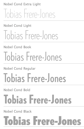
- FB Nobel (1993). An exquisite geometric sans family based on old ideas of De Roos at Amsterdam who explored alternative character sets to enliven basic Futura forms. Frere-Jones views Nobel as Futura cooked in dirty pots and pans. FB Nobel showcased. The Extra Lights were added by Cyrus Highsmith and Dyana Weissman.
- Pilsner (1995). A beer bottle typeface. Font Bureau: Sitting in a Paris cafe with a bottle of beer, Tobias Frere-Jones gave his attention to the label. It was set in a roman design wearing blackletter-like clothes, probably to suggest an origin in Alsace or points to the East. Unable to forget the design, with its blocky, straight line emphasis, Tobias designed Pilsner, an exercise in straight lines in an angle-centered scheme.
- Poynter Old Style (1997, Font Bureau).
- FB Reactor (1996). This was first a FUSE7 font in 1993). Reactor destroys itself as it is put to use.
- Reiner Script (1993). Based on a 1951 brush script by Imre Reiner (ATF).
- Stereo (1993). After a typeface by Karlgeorg Hoefer, 1963 (Font Bureau says 1968).
At FontFont, he designed the children's fonts FF Dolores (1991) and FF Dolores Cyrillic. At FUSE 15, he designed Microphone (1996). At FUSE 10, he published Fibonacci, a font consisting just of lines. His custom work includes WorthGothic (1996), WorthLogo1996 (1995), WorthText (1995), GQGothic (1995), Halifax, Commonwealth (1995), Belizio-TwentySix (Font Bureau), HermanMillerLogo (1999, Font Bureau). Cassandra, Vitriol (1993), Quandry (1992-1994) and Chainletter (1993). Retina Agate (2001, specially made for small-print stock listings at the Wall Street Journal) netted him a Bukvaraz 2001 award and an AIGA 2003 Design Award. From 1999 until 2014, he designed for the Hoefler Type Foundry, which he joined as an equal partner (and the new company became Hoefler & Frere-Jones (in 2004), or H&FJ). He claims that he brought with him to H&FJ a lot of typefaces including Whitney, Whitney Titling, Elzevir, Welo Script, Archipelago (Shell Sans), Type 0, Saugerties, Greasemonkey, Vive, Apiana, and Esprit Clockface. It is not expicitly stated at the H&FJ site which typefaces he had a hand in, but one can safely assume that it must have been nearly every typeface made since he entered into the partnership. In 2014, Tobias sued Jonathan for half of the company in a 20-to-80 million dollar lawsuit since he claims that Hoefler reneged on his promise to give him his half. The typefaces at H&FJ he had a hand in include: Archer (2001, by Jonathan Hoefler and Tobias Frere Jones). A humanist slab serif originally designed for Martha Stewart Living. It has a great range of features, including a classy hairline style. Some say that Archer is just Stymie with some ball terminals. Nevertheless, it became a grand hit, and has been used by Wes Anderson in The Budapest Hotel, and by Wells Fargo for its branding. David Earls on Archer: with its judicious yet brave use of ball terminals, and blending geometry with sexy cursive forms, all brought together with the kind of historical and intellectual rigour you fully expect from this particular foundry, Archer succeeds where others falter. - HTF Retina (2002). For use in the Wall Street Journal.
- Gotham (2001). A sans serif done with the help of Jesse M. Ragan. In fact, the orignal design in 2000 was for GQ magazine. Read about it here. In 2007, he published the rounded version Gotham Round. Gotham was used in 2008 by Obama in his presidential campaign. Joshua Brustein (Business Week): Gotham is one hell of a typeface. Its Os are round, its capital letters sturdy and square, and it has the simplicity of a geometric sans without feeling clinical. The inspiration for Gotham is the lettering on signs at the Port Authority, manly works using "the type of letter that an engineer would make," according to Tobias Frere-Jones, who is widely credited with designing the font for GQ magazine in 2000. Critics have praised Gotham as blue collar, nostalgic yet exquisitely contemporary, and simply self evident. It's also ubiquitous. Gotham has appeared on Netflix (NFLX) envelopes, Coca-Cola (KO) cans, and in the Saturday Night Live logo. It was on display at the Museum of Modern Art from 2011 to 2012 and continues to be part of the museum's permanent collection. It also helped elect a president: In 2008, Barack Obama's team chose Gotham as the official typeface of the campaign and used it to spell out the word HOPE on its iconic posters. Hoefler produced versions in 2016 such as Gotham Office and Gotham Narrow Office.
- Cyclone (2003).
- In 2010, he and Jonathan Hoefler designed the sans family Forza.
- Giant (2003).
- Knoz (2003).
- Topaz (2003).
- Verlag (2006). Developed together with Jonathan Hoefler.
- Whitney (2004). This is an amazing 58-style sans family designed for the Whitney Museum, but now generally avalaible from Hoefler, and touted as a great family for infographics. A derivative, Whitney-K, is the house font of Kodak. Whitney's sales blurb: While American gothics such as News Gothic (1908) have long been a mainstay of editorial settings, and European humanists such as Frutiger (1975) have excelled in signage applications, Whitney bridges this divide in a single design. Its compact forms and broad x-height use space efficiently, and its ample counters and open shapes make it clear under any circumstances.
- With Hoefler, he collaborated on projects for The Wall Street Journal, Martha Stewart Living, Nike, Pentagram, GQ, Esquire, The New Times, Business 2.0, and The New York Times Magazine. In all, he has designed over five hundred typefaces for retail publication, custom clients, and experimental purposes. His clients have included The Boston Globe, The New York Times, The Cooper-Hewitt Museum, The Whitney Museum, The American Institute of Graphic Arts Journal, and Neville Brody. He has lectured at Rhode Island School of Design (from which he graduated with a BFA in 1992), Yale School of Art, Pratt Institute, Royal College of Art, and Universidad de las Americas. His work has been featured in How, ID, Page, and Print, and is included in the permanent collection of the Victoria&Albert Museum, London.
Interview. Interviewed by Dmitri Siegel. He created Estupido Espezial for fun, but it actually made it into an issue of Rollingstone. Catalog of his typefaces at Font Bureau. Keynote speaker at Typecon 2014. View typefaces designed by Tobias frere-Jones. Another page with typefaces created by Tobias Frere-Jones. [Google]
[MyFonts]
[More] ⦿
|
Glenn Goluska
|
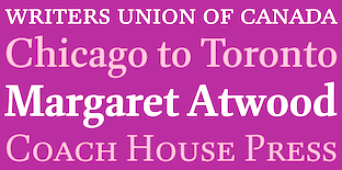 Glenn Goluska (b. 1947, Chicago; d. 2011, Montreal) was a Canadian book designer and typographer. He came to Canada as a student at the University of Toronto. After graduating he worked for some time in the United States before returning to Canada to work at Coach House Press. He left Coach House Press to focus on letterpress printing first in Toronto and later in the Saint Henri neighborhood of Montreal under the labels Imprimerie Dromadaire and Nightshade Press. Goluska was awarded the Robert R. Reid Award for lifetime achievement or extraordinary contributions to the book arts in Canada by the Alcuin Society in 2011.
 Goluska had a book typeface designed in his honour by Nova Scotia-based type designer Rod MacDonald. The typeface, simply called Goluska, was published in 2021 at Canada Type, where Patrick Griffin oversaw the production and the addition of some variable fonts. Goluska admired Dwiggins, so Goluska, the typeface, was influenced by the puppeteer's work, especially the Scotch roman typeface Caledonia. Obituary by Brigitte Schuster. [Google]
[More] ⦿
|
Hanzer Liccini
[Elias Hanzer]
|
 Elias Hanzer is the Berlin, Germany-based designer of the sans typefaces EH Eins A (2018?), EH Normal (2017) and Eh Gut (2015). He also created typefaces Phase Phase. Together with book designer Lucas Liccini he founded Hanzer Liccini in 2018 in Berlin, which released these typefaces:
 - Arizona Oldstyle. In 2020, Elias Hanzer released the Arizona superfamily at Dinamo in 2020 and 2021. This includes sans, text, mix, flare and serif subfamilies and contains variable forms as well.
- Colant (2020). Based on Columbia Antiqua, a Scotch/Modern-style serif typeface, featuring distinct angular details and produced by the Bauersche Giesserei (Frankfurt am Main) on the occasion of the 1893 World Exposition in Chicago.
- Fake.
- Matex (2019). A 7-style geometric sans inspired by both schoolbook/textbook grotesques and Bauhaus, including Herbert Bayer's mid-1920's lowercase Universal.
- Moment.
- Orbital.
- Primago.
- Timezone (2021). A transitional typeface close to Times Roman. The G has a protruding chin.
- Vincent (2019). An experimental script by Elias Hanzer and Lucas Liccini. The letter forms are inspired by a script font designed by naval scientist Dr. Allen Vincent Hershey. The Hershey fonts were a collection of early vector fonts released in Hershey's report Calligraphy for Computers (1967).
Liccini is also involved in Studio Manuel Raeder. [Google]
[More] ⦿
|
Herbert F. Czarnowsky
[Baltimore Type Foundry (or: Baltotype)]
|
[More] ⦿
|
Huy Fonts
[Juan José Lopez]

|
 Huy Fonts is a foundry in Madrid run by Juan José Lopez. In 2016, he designed the great poster typeface Black Pack, which is inspired by the odd bold plastic shops signs from the 60s and 70s.
 With Inés Atienza, Juanjo designed the multilayered and/or chromatic circus font family Show (2014). Influenced by chromatic letterpress types, it is based on a type family called Concave, a Victorian type launched in 1884 by the foundry Marder, Luse & Co. Inés Atienza and Juanjo López are members of the Familia Plomez association, a small printshop based in Madrid that devote their efforts to promote everything about letterpress printing, calligraphy, and lettering. Lopez made Choriza and Choriza Sans (2013: sausage-inspired type), Adoquin (2013), the informal sketchified family Bodoniez (2011), Chiripa (2011, hand-printed), Hands Up (2011, various hands, including "thumbs up", "a OK", "the finger", and fists), Paquita Pro (2011, informal lettering; this children's book font was remodeled in 2016 as Paquita Next), Ultramarina (2011, a quaint face based on wood type headline examples), and Pichi (2011). Designer of the Scotch modern typeface Schotis Text (2017), the cartoon font family Xunga (2017) and the angular text typeface family Pliego. Earlier, Lopez was a T-shirt designer, who also used the name Juanjo Lopez. Old page of Juanjez Nikis. At Dafont, one could download the headline handwriting font Paquita (2006), a predecessor of Paquita Pro. See alo Fontstore / Fontshare's Paquito (2017). In 2021, he released the 70-strong thick-and-thin poster sans typeface Rotulo, which was inspired by Jano's Spanish movie posters. Later in 2021, he designed Graveur (he writes: Graveur is a Renaissance style text face based in the work of the French punchcutter Robert Granjon (1513-1589). Working on original artifacts kept in Museum Plantin-Moretus in Antwerp, observation of his punches, matrices and printed materials resulted in a extense type family that tries to capture the overall style of Granjon rather than simply being a slavish copy of a particular source. Started as my project at Expert Class in Type Design in Antwerp, Graveur has grown to become a typeface with four optical sizes and seven weights, plus italics and an ornaments font. It also has variable font). Klingspor link. Home page. I Love Typography link. Behance link. View Juanjo Lopez's typefaces. [Google]
[MyFonts]
[More] ⦿
|
Identity Letters
[Moritz Kleinsorge]

|
 Moritz Kleinsorge (Düsseldorf, Germany) studied at Rhine-Waal University. He attended the Expert Class Type Design in Antwerp and completed his Master in Communication Design at Peter Behrens School of Art in Düsseldorf. After graduating, he was mentored by Pilar Cano from LetterJuice via the Alphabettes mentorship program while developing his first retail font, Bw James (2017, Branding With Type), a 14-style sans typeface family that introduces many elements from handwriting and features subdued ball terminals.
 In 2018, he designed the geometric typeface Flink, the Peignotian typeface Bw Vivant (with Alberto Romanos), the fresh grotesque typeface Klainy, and the humanistic "upright italic" sans typeface Campuni. Typefaces from 2019: Faible (a soft and friendly sans), Kisba (a wedge serif workhorse). Typefaces from 2020: Compiler (a 32-font family that consists of 16 sans styles and 16 proportionally spaced typewriter or programming styles), Leifa (a flared serif in 16 styles), Glance Slab (an almost stencil style), Allrounder, Allrounder Antiqua (Granjon inspired) and Allrounder Monument (inspired by ancient inscriptions on columns, monuments and buildings in Rome), Allrounder Grotesk (from a hairline Air weight up to a strong Black). Typefaces from 2021: Baghira (an 8-style text family with sharp teeth by Christian Gruber and Moritz Kleinsorge), Kisba Nova (a wedge serif), Werksatz (a 20-style family inspired by early grotesque typefaces such as Akzidenz Grotesk and Venus, this evergreen grotesque ages like fine wine), Werkdruck (a Scotch roman), Glance Sans (14 styles; a sans that tries to decide if it wants to be a stencil font). I Love Typography link. [Google]
[MyFonts]
[More] ⦿
|
Indian Summer Studio
[Alexander Bobrov]

|
 Alexander Bobrov (Indian Summer Studio, or simply Indians, Moscow) designed the vintage didone typeface family Dodo (Latin and Cyrillic) from 2008-2012. This beautiful typeface is in a style similar to Nick Shinn's scotch Modern and Alexey Kryukov'sOld Standard but was developed independently based on old books from 1930s (printed with 1860s to 1910s metal type). His web site shows lots of calligraphic work, but also a few typefaces such as Oriental Font (2015), Photon Display (2014) and Trafareta (2015, stencil).
 Typefaces from 2016: Historical Stencil Font USSR 1980 (2016), Geometric Sans Serif, Tanuki, Curly Cyrillic Sans, Historical Geometrical Art Nouveau Study, Indian Stylized Cyrillic, Historical USSR (constructivist), IBM Selectric Typewriter, 1966 Olympia SF DeLuxe Cursive (typewriter font), Moscow Metro, Cynzel (cyrillization). Typefaces from 2019: Funny Toons (a rounded cartoon family by Ekke Wolf and Alexander Bobrov), Selectric Century (a Scotch Modern / Schoolbook typeface modeled after the famous IBM Selectric golfball font), Aldo New Roman (a modern version of the typeface cut by Francesco Griffo for Venetian printer Aldus Manutius around 1490AD). Typefaces from 2020: Air Force 30 Stencil (the official US military fonts/lettering used in U.S. Air Force, U.S. Army, U.S. Navy, U.S. Marine Corps, based on their technical specifications), Oriental Kaishu (all caps, oriental simulation), Selectric Melt, Air Force (the official US military fonts/lettering used by US Air Force, US Army, US Navy and US Marine Corps, designed based on the Military Standards and Technical Manual; covers Latin, Cyrillic and Greek), Stone Age (a neolithic font), Selectric Pyramid (a typefwriter font based on Rudolf Wolf's Memphis from 1929), Selectric (a 1315-glyph (!) revival of IBM's famous golfball typeface, Selectric), Dymond (a dymo label font). Typefaces from 2021: Science Fiction (rounded, squarish), USSR (a squarish Russian cold war propaganda font; Latin and Cyrillic), Age (squarish and rounded; for Latin and Cyrillic). [Google]
[MyFonts]
[More] ⦿
|
Inessa Mitrozor

|
Graphic designer who graduated from the National Design Institute in Moscow. As a student at TypeType Education in 2016-2017, she created the high contrast modern antiqua typeface Capella. Co-designer of TT Barrels (2018: a Scotch modern typeface by Inessa Mitrozor, Vika Usmanova, Marina Khodak, Nadezhda Polomoshnova and the TypeType Team). In 2019, TypeType published TT Tsars, a 20-style font family with five subfamilies. It is a collection of serif display titling fonts that are stylized to resemble the fonts of the beginning, the middle and the end of the XVIII century and seen on book title pages in Russia. A reference for the development was Abram Shchitsgal's book Russian Civil Type. The fonts were designed by Marina Khodak, Inessa Mitrozor, Nadezhda Polomoshnova and the TypeType Team. [Google]
[MyFonts]
[More] ⦿
|
Insigne Type Design Studio (was: Dooley Type)
[Jeremy Dooley]

|
 Insigne Type Design Studio (est. 2006) is run by Jeremy Dooley, b. Columbia, SC, 1981, who received a masters in graphic design at Savannah College of Art and Design in 2005. He lived in Atlanta, GA, and is now in Knoxville, TN. From 2004 until 2006, he ran Dooley Type in Greenville, SC. Behance link. Klingspor link. Font squirrel link. Creative Market link. MyFonts interview. His fonts:
 - 44th President (2009, based on Obama's handwriting).
- Aberlyth (2006). An informal script face.
- Ainslie (2014), Ainslie Slab (2014), Ainslie Sans (2014) and Ainslie Contrast (2020: a 42-style sans).
- Antigen (2007) is futuristic.
- Arendahl (2007) is a connected but irregular handwriting font.
- Ashemore (2012). Production assistance for Ashemore was provided by Lucas Azevedo and Marcelo Magalhaes. Followed by Ashemore Softened (2012).
- Avaloc (2006) is an expanded sans.
- The Aviano superfamily. Aviano Wedge (2012), Aviano Slab (2007), Aviano Serif (2008), 2009 Aviano Didone (2009), Aviano Flare (2010), Aviano Sans (2010), Aviano Future (2011), Aviano Contrast (2012), Aviano Gothic (2013), Aviano Sans Layers (2013), Aviano Copper (2018), Aviano Didone (2019). Aviano Titling (2007) is inspired by Trajan. Aviano Silk (2015) is a bilined decorative titling typeface. Aviano Royale followed in 2016.
- Barcis (2013). An organic sans family.
- Beastias (2006). An informal script face.
- Belda (2017). An elegant serif family of fonts that grew from the ancient roman capital. Followed by the 54-style Belda Didone (2020). A 54-style didone family without ball terminals.
- Biortec (2004).
- Biscuit Boodle (2008) is a fun and crazy script from Portland Studios illustrator Justin Gerard. Biscuit Boodle Ornaments (2009, dingbats).
- Blue Goblet (2005) is a Treefrog-style script developed for the pending illustrated childrens book from Portland Studios, The Blue Goblet. It was co-designed by Cory Godbey of Portland Studios and Jeremy Dooley. In 2011, Cory Godbey added Blue Goblet Christmas Ornaments.
- Boncaire Titling (2012) was iInspired by the type elements of 17th century map of Curacao made by Dutch cartographer Gerard Van Keulen.
- Brigette (2007) is an ink-splattered calligraphic script.
- Cabrito (2013). A typeface for children's books. Followed by Cabrito Inverto (2014) for reversed stroke stress---some of its heavier styles have a Western appearance. In 2014, Cabrito Sans was added to the set. Cabrito Semi followed in 2015, the playful Cabrito Didone in 2016, Cabrito Contrast in 2018, and Cabrito Flare and Cabrito Serif in 2019.
- Caridade.
- Carta Marina is a family of medieval map text typefaces and dingbats (2007).
- Cartes (2020). A charming 54-style family with chancery ascenders, and a roaring twenties handcrafted appeal.
- Cavole Slab (2011).
- Celari Titling (2014).
- Chatype is a geometric slab serif typeface family designed in 2012 for the city of Chattanooga, TN, by Robbie de Villiers and Jeremy Dooley.
- Chennai and Chennai Rounded (2007) are playful display sans typefaces. Chennai Slab (2009).
- Chypre (2017). A techno sans family.
- Civane (2017). A flared inscriptional typeface family.
- Coegit (2012). A sans family that offers Compressed, Compact and Condensed subsets.
- Cohort (2010, elliptical sans).
- Coupe (2003).
- Dever (2015) is a 107-style family of rough and weathered letterpress typefaces with industrial octagonal skeletons.
- Dienstag (2008, 8 styles).
- Daito (2018). A welcoming soft slab serif typeface family.
- Donnerstag (2010, extended slab serif).
- Dulcian (2017). A bright open sans family.
- Eigerdals (2010, rounded sans family).
- Enocenta (2013). A penmanship typeface family done with Cecilia Marina Pezoa.
- Enzia (2009, an elegant sans family).
- Evalfey (2021). Formal calligraphic.
- Fizgiger (2006). An informal script face.
- Florencia (2007) is a vintage script.
- Foverdis (2010, a calligraphic family that includes a hairline).
- Gineso (2016). A set of 48 slightly condensded and squarish headline typefaces. Followed by Gineso Titling (2016) and Gineso Soft (2018).
- Grayfel (2015). A 42-style sans typeface family characterized by flush horizontal or vertical terminal endings.
- Grenale (2013). A flashy in-your-face didone family from Thin to Heavy. Grenale #2 (2013) is a curvy sans that is almost a monoline. In 2015, Dooley launched Grenale Slab.
- Haboro (2016). A 54-font strong didone family with wedge serifs replacing the standard rectangular ones. It has no ball terminals. Followed by Haboro Slab (2016), Haboro Soft (2016), Haboro Serif (2016), Haboro Sans (2016), Haboro Contrast (2017), and Haboro Slab Soft (2020).
- Honeydrop (2017). A brush script.
- Insigne Abstractions (2007) and Insigne Fleurons (2008) are dingbats.
- Jon Cary (2004, the handwriting of John Kerry).
- Kairengu (2007) is a comic book family.
- Kasuga (2008) and Kasuga Brush (2009) are fresh new scripts with oriental undertones.
- Kidela (2007) is a sassy scrapbook family. Kidela Sketch (2009).
- Kochi (2015). A 54-font rounded organic sans typeface family.
- Le Havre (2008) is a gorgeous 8-style geometric art deco sans with tall ascenders. In 2010, the Le Havre Sketch family was added. We also have Le Havre Rough (2014, a bit of letterpress feel thrown in), Le Havre Rounded (2009), Le Havre Titling (2012), Le Havre Layers, Le Havre Hand (2015) and Le Havre Width (2017).
- Look (2015). In Sans, Script, and Serif subfamilies, this super-collection blends a bit of vernacular signage with weathered letterpress.
- Lorelei (2007, Insigne) is a bouncy script family.
- Lourdes (2007) is an informal script.
- Madeleine (2007) is a basic handwriting face.
- Madurai (2012). A simple monoline sans superfamily. Madurai Slab (2013) has 54 styles.
- Mahalia (2008) is a retro script.
- Majidah and Majidah Potens (2006) are medieval scripts.
- Mandrel (2017). A typeface with sharp serifs. Followed by Mandrel Didone (2021: a 54-style didone).
- Marintas (2012).
- Maris (2015). A curly script.
- Massif (2008) is an aggressive sans family.
- Metairie (2018). A connected high-contrast script.
- Mirantz (2019). A 54-style text typeface family.
- Mittwoch (2009, organic serif).
- Montag (2007) is a casual rounded sans family in six styles.
- Mr Darcy (2015). A Tuscan all-caps typeface.
- Mynaruse Flare (2018). An update of Mynaruse (2010), which is a roman inscriptional titling family---it is characterized by skinny flared serifs.
- Nanumunga (2007) is a comic book style face.
- Natalya (2007) is a connected calligraphic script. Natalya Monoline (2007). Natalya Swashes (2009, calligraphic).
- Newcomen (2008) is a 4-style roman titling face.
- Obline (2004, sans).
- Oita (2014). An octagonal typeface family.
- Olidia (2008) is calligraphic.
- Orewelia (2004, grunge face).
- Pauline Didone (2011, a curly didone family). Pauline Script (2008) is a monolinear retro script.
- Pershal (2021). A 54-style family, described as an oddball sans.
- Plathorn (2014). Inspired by the Wild West, this generous typeface family uses flaring in a thousand ways to recreate the feel of that era.
- Promethian (2005, futuristic).
- Quarca (2013). A 36-font sans family with a sturdy rounded square look.
- Quatie (2013). A curvaceous family: Quatie draws much of its inspiration from the industrial brawn of the railroad and the unique characteristics of Cherokee letterforms, giving it an atypical form not usually found in an industrial slab (accring to Dooley).
- Questal (2007) is a unicase serif face.
- Qurillian (2006, legible sans).
- Radona (2021). A 54-style geometric sans described as the typeface version of Synthwave.
- Ranelte (2016). A condensed sans series with techno or DIN appeal. The textured versions are collected in Ranelte Deco (2017).
- RendtPhysic (2006).
- Ript Cure (2005).
- Sabler Titling (2016). An all caps typeface family with tapered flared strokes.
- Sancoale (2011, an organic sans family, from Thin to Black). Sancoale Narrow (2011). Sancoale Softened (2012). Sancoale Slab (2012). Sancoale Slab Soft (2013), Sancoale Gothic (2022: 48 styles; a subdued and calming version of Sancoale, with quiet futurism).
- Sangli (2015). A 54-style rounded organic sans typeface family.
- Savigny (2011). Images: Savigny Black Extened, Savigny Regular Condensed.
- Savory Paste (2007). Grunge.
- Schorel (2019). A 54-style Scotch roman.
- Senlot (2018). A 54-strong sans family. In 2019, Senlot Sans and Senlot Serif (2019) were added. Senlot Didone followed in 2021.
- Serofina (2010, a calligraphic face).
- Shrike2003 (2003).
- Sildetas (2010, a high-contrast script typeface with tear drop terminals).
- Sociato (2022). A 54-style baroque text family with didone roots. The typeface was inspired by a declaration published during the French Revolution that extolled the development of a new religion, the cult of the Supreme Being.
- Solitas (2015). A rounded 42-style geometric sans family. Followed by Solitas Slab (2015), Solitas Serif (2017) and Solitas Contrast (2021; a 42-style display sans family described as sensual by Jeremy Dooley).
- The sans family Sommet (2008; see also Sommet Rounded (2008), Sommet Slab, 2010, and Sommet Serif (2011, a wedge serif family)) is futuristic. Sommet Slab Rounded (2011).
- Sophima (2021). A weathered script family.
- Soprani (2020). A 54-font set with considerable flaring and thorny serifs, based on a vintage plaque from the 1920s.
- Sovba (2009, upright italic).
- Steagal (2013). A geometric sans with a 1930s American feel.
- Steam Court (2015). A combination of steam punk and blackletter.
- Stefania (2007) has two calligraphic/chancery styles. Its aged version is called Stefania Antique (2008).
- Stratham (2007) is a medium to black family of legible sans typefaces.
- Terfens (2007) is an informal and quite rounded sans serif with inspiration from chancery scripts like Stefania. Terfens Contrast (2021) is an 48-style sans with calligraphic traits.
- Torcao (2013). An elliptical anthroposophic typeface family.
- Ultine (2016), an utilitarian sans family.
- Valeson (2020). A vintage display typeface with a kneeling art nouveau lower case n.
- Valfieris (2006). Valfieris Aged (2007) imitates medieval printing.
- Varidox (2019). A variable font with a roundish slab serif design.
- Verao (2018) and Verao Ornaments. A calligraphic script.
- Vergils (2021). A 54-style sans that tries to instill the spirit of the eighties and electronic music genres like Synthview.
- Waialua (2019). A script typeface with a variable font option.
- Waimea (2019). A variable script font produced with the help of Lucas Azevedo.
- Winsel (2019). A flared typeface influenced by British nostalgia, vintage signage and typographic ancestors like Edward Johnston and Eric Gill. Perfect for typesetting speeches by Winston Churchill.
- Wreath (2016). A script typeface family.
- Xalapa (2008) is a grunge family.
- Yevida and Yevida Potens (2006, scripts).
- Yorkten (2015): 54-style monoline sans family. See also Yorkten Slab (2017).
- Youngblood (2008, +Youngblood Antique, 2010) is non-connected.
Catalog of their typefaces. View Jeremy Dooley's font library. View Jeremy Dooley's typefaces. Adobe link. [Google]
[MyFonts]
[More] ⦿
|
Iñigo Jerez Quintana
[Extratype (was: Textaxis)]

|
 [MyFonts]
[More] ⦿
|
James Hultquist-Todd
[James Todd (or: JTD Type)]

|
 [MyFonts]
[More] ⦿
|
James Mosley: Scotch Roman
|
James Mosley on Scotch Roman. [Google]
[More] ⦿
|
James Todd (or: JTD Type)
[James Hultquist-Todd]

|
 Chicago, IL, and/or Fredonia, NY, and/or Philadelphia, PA-based designer, who runs James Todd Design.
 Creator of the text family Garvis (2012), which was inspired by didones and the Dutch Fleischmann types. In 2013, he designed the wood type revival family HWT Unit Gothic for Hamilton Wood Type Foundry. The Unit Gothic series was released by Hamilton Manufacturing Co. in 1907, and comprises a flexible range of widths from compressed to very wide. In 2015, he published the contemporary didone optically corrected typeface family Essonnes [MyFonts link]. In 2016, James Todd designed the 6-style sans typeface family Cresta and his garalde take on the (normally didone) fat faces, Gastromond. In 2017, he co-designed Biwa and Biwa Display, a grotesk typeface family, with Ian Lynam. Typefaces from 2018: Chapman (a large Scotch roman typeface family with lots of pizzazz), Stack. Typefaces from 2019: Elfreth (an informal blackletter), Glot (a 10-style flared terminal sans family by James Todd and Ian Lynam; see also Glot Round from 2020). In 2021, he was part of a big effort by P22 to revive and extend Johnston's Underground to P22 Underground Pro [13 styles: Richard Kegler (1997), Paul D. Hunt (2007), Dave Farey (2021), James Todd (2021) and Patrick Griffin (2021) contributed at various stages]. In 2021, he released Cambium---a text family based on roman inscriptional lettering in which special attention was paid to trhe lowercase---at Future Fonts. YTypefaces from 2022: Oculi. Behance link. Dribble link. Old Fontspring link. Old URL. Future Fonts link. [Google]
[MyFonts]
[More] ⦿
|
Jason Smith
[Fontsmith]

|
 [MyFonts]
[More] ⦿
|
Jawher Matmati

|
Creator of high quality music typefaces. Belgium-based designer of the one-weight Roman Ionic (2017) who explains: Roman Ionic is a unique revival of a typeface that was once popular and used in many late 19th century and early 20th century music publishing houses, such as Durand et fils. It displays a happy marriage between the beautiful features of the Clarendon type and the legibility of the Scotch roman class and is thus aimed to work for titling and body text. Other music typefaces by Jawher Matmati: HP Diagram (Jawher Matmati: a font for harp pedal diagrams). His fonts can be bought at Abraham Lee's Music Type Foundry. [Google]
[MyFonts]
[More] ⦿
|
Jean-François Porchez
[Typofonderie (was: Porchez Typofonderie)]

|
 [MyFonts]
[More] ⦿
|
Jeremy Dooley
[Insigne Type Design Studio (was: Dooley Type)]

|
 [MyFonts]
[More] ⦿
|
Jordan Bell
|
 Graduate of the Masters of Type Design program of the University of Reading, UK. Jordan Bell (Waco, TX) writes about his graduation typeface Odelay (2014): Odelay is a contemporary interpretation of the transitional American Scotch Roman, or Century types, that were designed in the U.S.A. near the end of the 19th century by DeVinne and the Bentons. Inspired by these designs and hand-painted sign lettering, Odelay has a warm, friendly aesthetic that invites the designer to put it to use on a variety of different jobs. With very delicate thin weights, ultra-heavy fat weights, and everything in-between, Odelay is readily available for complex typography at any size. Odelay covers Latin, Greek, Arabic and Cyrillic, with emphasis on the Latin. Jordan's description requires a correction, however--Theodore DeVinne did not design any typefaces---some were named after him, but that is a different story. [Google]
[More] ⦿
|
Juan José Lopez
[Huy Fonts]

|
 [MyFonts]
[More] ⦿
|
Kerns&Cairns
[Dyana Weissman]

|
 American type designer, b. 1980, who graduated from the RISD, and worked at Font Bureau (as Senior Custom Designer) and Type Network (as Custom Type Director) in Boston. She set up Kerns & Cairns, also in Boston. Interview at Daidala. Interview by Christian Palino. Her typefaces:
 - Materot: calligraphic.
- She expanded the Benton Sans family into an ultra for Toyota, commissioned by Saatchi&Saatchi.
- Baskerville was modified by her for Northeastern University (via Korn Design).
- She made a font for learning handwriting for TouchMath.
- Apotek (2020): a squared counter typeface family based on lettering on old medicine bottles seen in Oslo.
- Benton Modern Display (2008), co-designed with Richard Lipton at Font Bureau: Benton Modern Text was first prepared by Font Bureau for the Boston Globe and the Detroit Free Press. Design and proportions were taken from Morris Fuller Benton's turn-of-the-century Century Expanded, drawn for ATF, faithfully reviving this epoch-making magazine and news text roman. The italic was based on Century Schoolbook.
- A redesign of Matthew Carter's Postoni (1997), called Stilson (2009, with Richard Lipton and Jill Pichotta): Since 1997, The Washington Post's iconic headlines have been distinguished by their own sturdy, concise variation on Bodoni, designed by Matthew Carter. For the 2009 redesign, Richard Lipton, Jill Pichotta, and Dyana Weissman expanded the family with more refined Display & Condensed styles for use in larger sizes. Originally called Postoni, the fonts were renamed in honor of The Post's founder, Stilson Hutchins.
- Escrow Reading Edge (2016, Font Bureau). An extension of Cyrus Highsmith's Scotch Roman, Escrow (2006).
- Syfy Hero and Syfy Sidekick.
- Waldorf Astorai. An art deco typeface inspired by the lettering on the facade of Waldorf Astoria Hotel at 301 Park Avenue in New York City.
- Comedy Sans. A 12-style typeface commissioned by Comedy Central.
- Firdevs (2022). A digitization of a Victorian typeface drawn in Silivri Prison by political prisoner and journalist Fevzi Yazici, and named after Fevzi's wife.
- CTV Sans. For the Canadian TV network.
- ESPN College Football. A custom varsity font family developed together with Victoria Rushton and loyalkaspar.
- Peacock Sans (2020, with Victoria Rushton). A custom typeface for Peacock, NBC Universal's video streaming platform.
- GRab=vity Grotesk (2021, with Victoria Rushton and CSTM Fonts).
FontShop link. Type Network link. [Google]
[MyFonts]
[More] ⦿
|
Kilotype
[Selma Losch]

|
 German type designer, who created the informal bouncy sans typeface Jolly in 2011.
 In 2013, Selma graduated from the MATD program of the University of Reading. Her graduation typeface was Teras, which she describes as follows: Teras (Greek for monster) is a kindheartedly vicious creature. It has a strong affinity for an entire range of typographic encounters, is highly articulate, slightly deformed, fierce and roughly eight feet tall. Due to its Arabic, Greek, Latin and Tamil background, every syllable it utters is a mongrel mouthful of a variety of cultural influences. It is also an exploration into the alternative type family, which in the upright mutates from a serif light weight into a sans serif black and the reversed procedure in the italics. The symbiosis of the four scripts is achieved principally by making the Latin flared, lapidary, open to conversation with its curvier peers. Bressay (Dalton Maag), a Scotch roman co-designed in 2015 by Tom Foley, Selma Losch, and Spike Spondike (design lead by Stuart Brown), won an award at TDC 2016. Aktiv Grotesk, a Dalton Maag typeface, was extended to cover Indic languages by Selma Losch and Kalapi Gajjar-Bordawekar. It won an award at Granshan 2016. In 2017, Francesca Bolognini and Selma Losch co-designed the ribbon calligraphy font Volina at Dalton Maag. Tom Foley and Selma Losch published the rounded slab serif typeface family Gelo at Dalton Maag in November 2017. She set up her own foundry, Kilotype, in 2018, and changed her name. Her fonts there include Frequenz (2018), Oldschool Grotesk (2019, by William Montrose), Queens (2019: a display type sysyem with several widths), and Sequenz (2018). In 2020, she added Queens Air (+Condensed, +Compressed). [Google]
[MyFonts]
[More] ⦿
|
Kimmy Design
[Kimmy Kirkwood]

|
 Kimmy Kirkwood (b. 1988, Seattle, WA) (Kimmy Design) studied at Chapman University, and lives in Santa Monica, Orange County. He graduated in 2018 from the University of Reading's MATD program.
 Kimmy created a gracious curly calligraphic script face, Madeleine (2010), which is based on a logo she designed for Hotel Le Sirenuse. At Dafont, one can download Kuppel (a hairline display sans) and Hammer Head, both done in 2010 as well. Phase two of Kimmy's career started late in 2010 as Kimmy Design, where one now has to pay for Madeleine (2010) and Katelyn (2011). Addison (2011) is a wood type Western circus poster font in two styles, West and Circus. In 2012, Kimmy created the counterless art deco typeface Chelsnuts, the worn wood type typeface Cpl Kirkwood, Elizabeth Script, and Paper Cutout Pro. In 2013, Kimmy published Lunchbox Slab, the grungy Appareo, the condensed minimalist sans family Maxwell Sans, its companion Maxwell Slab, the scriptish typeface Lunch Box, and the bold headline family Station (inspired by old train station typography). Typefaces from 2014: Catalina (hand-drawn typeface family with sub-styles called Anacapa, Avalon, Clemente Script, Typewriter and Extras, ideal for hand-drawn menus, table cards, chalkboards, and wall quotes), Amorie (a skinny hand-drawn family, with styles called Modella, Nova, SC and Extras). Typefaces from 2015: Avaline Script, Baker Street (vintage hand-drawn typeface family), Burford (a 16-style vintage layered family), Burford Rustic (layered font family). Typefaces from 2016: Bourton (a layered font for vintage yacht club or whiskey bar logos; it is the sans version of Burford; sufamilies include Drop, Lines and Outlines), Rainier (handcrafted). Typefaces from 2017: Evanston Alehouse (octagonal, beer bottle style, slightly copperplate), Bourton Hand. Typefaces from 2018: Clifton (his MATD graduation typeface): Clifton is a modern type family with many weights and contrast styles. It supports Latin scripts as well as Greek, Cyrillic and Arabic. Originally intended as a book typeface, it was designed so that all the weights and styles would work together as a cohesive family. Typefaces from 2019: Refinery (an 85-style octagonal family based in early 20th century signage), Evanston Tavern (Evanston Tavern is a square typeface and the sans-serif version to Evanston Alehouse. Inspired by the years that prefaced the ratification of the American Prohibition, this typeface mimics the signage commonly seen outside of saloons, taverns and alehouses during that time.), Winslow Book (a playful modern Scotch). Typefaces from 2020: Roadhouse (a layering typeface family that is part of the greater Evanston type collection, which is inspired by American typefaces commonly used at the turn of the century leading up to prohibition), Winslow Title (a decorative didone family), Winslow Title Script (monoline), Hawkes (Sans, Script, Variable Width Sans). Typefaces from 2021: Madley (a 12-style soft slab serif). Typefaces from 2022: Bourton Text (an elliptical sans in 42 styles). [Google]
[MyFonts]
[More] ⦿
|
Kimmy Kirkwood
[Kimmy Design]

|
 [MyFonts]
[More] ⦿
|
Léo Guibert
|
 French type designer based in Paris. He graduated in 2020 from the postgraduate program in type design at ESAD Amiens (France) and in 2018 from the DSAA Design Typographique (MFA Type Design) at École Estienne, Paris with a project about experimental workhorse typefaces. He regularly works with PoliceStudio and Typofonderie.
 His graduation typeface at ESAD was Welfare (Grot and Press), about which he writes: Welfare is rooted in the English Industrial Revolution context and acts as witness to the opposition that existed between typefoundries' commercial typefaces and Private Press Movement's handcrafted revivals. The typeface is composed of two subsets: Grot, a grotesque design inspired by early English sans serifs; and Press, a serif design inspired by Jensonian revivals of the Private Press Movement's typefaces. Co-designer of Cloche d'Or (2016), a custom all caps alphabets done for Minale Design Strategy Brussels. Cloche d'Or was designed by Christophe Badani (lead), Maha Mouidine, and Léo Guibert. It includes Normal, Hatch, Inline Bright, Inline Dark, Stencil and Outline styles. Other earlier typefaces: Covenant (2019: a Scotch roman), Retex (2018: a study into readibility), Savon Italic (2018: with Loan Bottex), Galmi (2017: inspired by Praguese Clay Golem). [Google]
[More] ⦿
|
Leo Philp

|
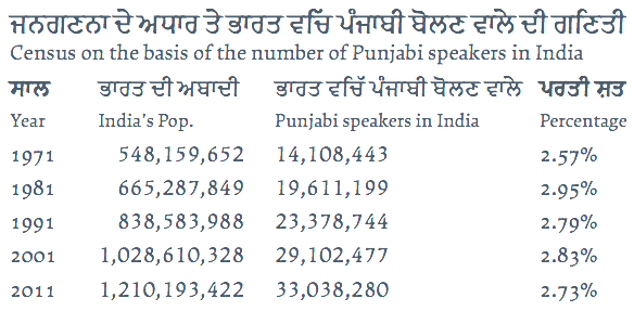 MyFonts lists him as Leo Philip, but it should be Leo Philp, without an i. Scottish student-designer at the University of Reading of Makar (2014), a Latin / Gurmukhi / Cyrillic / Greek typeface family whose angular forms confirm Philp's description of Makar---an opinionated typeface for opinionated texts.
 In 2020, he released the (variable) text typeface Fulmar at CAST, and wrote: Named after a practical seabird, Fulmar is a modern Scotch intended for extended reading. More European than American, it draws on a range of influences from around the North Sea, from Fife's Alexander Wilson to 17th-century French experiments in modulation and 18th-century Belgian flash, and combines them with contemporary structure and proportions.. [Google]
[MyFonts]
[More] ⦿
|
Linn Boyd Benton

|
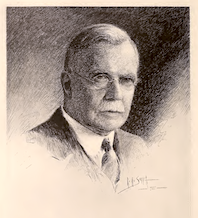 Type designer (b. Little Falls, NJ, 1844, d. Plainfield, NJ, 1932) who lived in New Jersey. Father of Morris Fuller Benton. He cut Century Expanded (1894) based on a design of Th. L. De Vinne. This Scotch roman typeface was later redrawn by Morris Fuller Benton in 1900. Linn Boyd Benton managed manufacturing at ATF from 1892 until his death in 1932.
 Article by Patricia Cost for Printing History: Linn Boyd Benton, Morris Fuller Benton,&Typemaking at ATF. Cynthia Jacquette writes about Linn Boyd and his son. FontShop link. [Google]
[MyFonts]
[More] ⦿
|
Lipton Letter Design
[Richard Lipton]

|
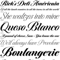 Calligrapher, sign painter, and graphic and type designer from Milton, Mass., who was born in New York, studied design and photography at Harpur College there (graduating in 1975), did some lettering in Syracuse until 1977, worked for Bitstream in Boston from 1983-1991, and made a career afterwards as a staff type designer at Boston's Font Bureau. In 2016, he joined Type Network, where his fonts can be bought. Since 2021, Richard Lipton is senior type designer at The Type Founders in New York. MyFonts page. MyFonts interview in which his modesty comes to the fore. His typefaces:
 - Alhambra: a calligraphic typeface.
- Apotek: based on lettering on old medicine bottles seen in Oslo.
- Arrus BT (Bitstream, 1991). This is a serif typeface with heavy calligraphic influences. The capitals are roman inscriptional. More typefaces in this style are to come, he promised in 2010.
- Avalon (1995, calligraphic): based on the calligraphic writing of Austrian artist Friedrich Neugebauer.
- Bennet Text, Bennet Display (36 styles: a wedge serif news text family), Bennet Banner (36 styles). This high contrast didone-themed superfamily (but for the wedge serifs) can't shed that "look at me" vibe. The initial idea for Bennet came from Moth Design's logotype and stationery system for the North Bennet Street School in Boston.
- Benton Modern Display (2008, co-designed with Richard Lipton at Font Bureau: Benton Modern Text was first prepared by Font Bureau for the Boston Globe and the Detroit Free Press. Design and proportions were taken from Morris Fuller Benton's turn-of-the-century Century Expanded, drawn for ATF, faithfully reviving this epoch-making magazine and news text roman. The italic was based on Century Schoolbook.). See also here.
- Bickham Script (1997, Adobe): The 2004 OpenType Pro version has hundreds of ligatures and substitute forms. See also Bickham Script 3 (2014). Review of Bickham by Timothy Rolands. Bickham Script is based on examples from Bickham's The Universal Penman. Poster by Fernanda D'Andrea (2013). Bickham Script 3 won an award at Modern Cyrillic 2014.
- Bodoni FB (1992, Font Bureau, a headline bold based on Benton's 1933 Ultra Bodoni).
- Bremen (Bitstream), Bremen (1992, Font Bureau). This German art deco face was influenced by the poster lettering of Ludwig Hohlwein in 1922. Munich is an angular version of Bremen.
- Bureau Grot. One of Font Bureau's bestsellers.
- Canto (2011, Font Bureau) is a 32-style roman family that started out from the Trajan inscriptions via a few styles called Canto Brush to smooth and delicate styles such as Canto Pen. New styles were added in 2017.
- Cataneo BT (Bitstream, 1993; with Jacqueline Sakwa): an elegant chancery cursive based on the calligraphic work of the 16th-century writing master Bernardino Cataneo.
- Ecru
- Escrow Banner (2016). An extension of Cyrus Highsmith's Scotch Roman, Escrow (2006).
- Hoffmann (1993): a display family that is based on lettering by Lothar Hoffmann.
- Meno (1994, Font Bureau). Lipton explains his oldstyle design: the romans gain their energy from French baroque forms cut late in the sixteenth century by Robert Granjon, the italics from Dirk Voskens' work in seventeenth-century Amsterdam. In 2016, he extended Meno to a 78-style superfamily. In 2021, MyFonts released Meno Text and in 2022 Meno Display (36 styles) and Meno Banner (36 styles).
- Miller Banner (2010, Font Bureau): a completion of Matthew Carter's Scotch family Miller, that has banner and titling styles, and adds styles with extreme contrast and hairline serifs.
- Moderno FB
- Munich.
- Nutcracker.
- Rocky (2008, Font Bureau, with Matthew Carter).
- Savanna Script (2013). A connected tightly spaced calligraphic script in three weights.
- Shimano: an industrial geometric font.
- Shogun (with Margo Chase, 1995).
- Sloop Script (a penmanship script, 1994), inspired by the lettering of Raphael Boguslav. Sloop Script won an award at Modern Cyrillic 2014. Type Network published Sloop Script Pro in 2018. MyFonts relesed Sloop Script Pro in 2021.
- Talon
- Tangier (2010, Font Bureau): a Spencerian calligraphic family that was part of the 2008 redesign of Glamour Magzine.
A redesign of Matthew Carter's Postoni (1997), called Stilson (2009, with Jill Pichotta and Dyana Weissman): Since 1997, The Washington Post's iconic headlines have been distinguished by their own sturdy, concise variation on Bodoni, designed by Matthew Carter. For the 2009 redesign, Richard Lipton, Jill Pichotta, and Dyana Weissman expanded the family with more refined Display & Condensed styles for use in larger sizes. Originally called Postoni, the fonts were renamed in honor of The Post's founder, Stilson Hutchins. - Delaney (2016).
- Collier (2018). A 150+-style lapidary flared stem typeface family ranging from Compressed to Extra Extended widths.
- Englewood (2022). A script whose inspiration for Englewood came from the calligraphic hand of Philip Grushkin.
I Love Typography link. Klingspor link. FontShop link. Type Network link. MyFonts interview. View Richard Lipton's typefaces. [Google]
[MyFonts]
[More] ⦿
|
Luzi Gantenbein
[Luzi Type]

|
 [MyFonts]
[More] ⦿
|
Luzi Type
[Luzi Gantenbein]

|
 Luzi Gantenbein (Luzi Type, Bern, Switzerland) is a type designer, b. 1988, Fläsch, Switzerland. He created the vernacular all caps wall paint typeface Valparíso (2010, Volcano). At the Hochschule der Künste Bern, he designed the angular family Rijeka (2011, Volcano), the Avenir/Futura-genre typefamily Buenos Aires (2011), and the multilayer family Lisboa (2011).
 Luzi made the sans typeface Cadiz in 2013. Cadiz Italic was finished in 2014. Livorno (2013) is a sturdy round-serifed text typeface. In 2014, she created the masculine wedge serif typeface Beirut. In 2015 she finished the titling sans typeface Faro which has two sub-versions, Lucky and Sad. She also published Faro (a typeface that by virtue of stroke curvature emulates sadness or hapiness), Messina Modern, Messina Sans (+Mono), and Messina Serif. Typefaces from 2016: Assembly (a symbol archive for the globalized world), Lynstone (sans), Nantes (transitional text typeface), Koper (a rough woodcut typeface with polygonal outlines that were inspired by Vojtech Preissig). Typefaces from 2018: Recife (an editorial typeface inspired by Times and Plantin). Typefaces from 2019: Spezia (sans). Typefaces from 2021: Portonovo (a Garamond / Caslon style font based on the typeface used in the Martyrologium Romanum; a book printed by the Plantin Press in 1690), Termoli (a Scotch roman inspired by Linn Boyd Benton's Century Roman). Klingspor link. Behance link. Home page. Behance link for Luzi Type. Fontdeck link. Volcano Type link. [Google]
[MyFonts]
[More] ⦿
|
Manchester Type
[David Williams]

|
 Manchester Type (Manchester, UK) specializes in custom typeface design, font development and typographic consultancy. The business was set up by David Williams, a typeface designer and graphic designer from the city of Manchester. David holds a BA (Hons) Graphic Design from The University of Salford and an MA in Typeface Design from The University of Reading, class of 2019. His typefaces:
 - David's graduation typefaces in Reading were Firnas Sans (2019) and Mansa (2019). Mansa is a medium contrast serif typeface in the scotch roman genre. Firnas Sans and Mansa both cover Latin and Arabic (Naskh), with Mansa following the Diwani style and Firnas Sans the Ruqah style.
- Salford Sans (2020). An 8-weight headline sans family developed in collaboration Lewis Guffie (Latin, Greek, Cyrillic) and Elsa Baussier (symbols). Dave Williams did the Latin and Arabic parts.
- Manchester Type has supported Google in their development of multi-script, non-Latin variable fonts including Noto Kufi Arabic, Noto Naskh Arabic, Noto Sans Sora Sompeng, Noto Sans Tai Tham and Noto Sans Balinese for the Google Fonts library.
[Google]
[MyFonts]
[More] ⦿
|
Marginal Type
[Vincent Lacombe]
|
Graduate of Atelier National de Recherche Typographique in Nancy, France, class of 2020. His graduation thesis was entitled Les caract®rave;res gothiques russes [Cyrillic blackletter typefaces]. During earlier graphic design studies at ECV Bordeaux (2012-2017), he created the display typeface Astek (2015) and the circle-based experimental typeface Ecotype (2016). Now located in the Bordeaux area, he is doing some corporate graphic and type design for the local wine industry. In the context of his ANRT thesis, he designed a Latin / Cyrillic blackletter, Tamara Gothic (2018-2020) and a Latin / Cyrillic copperplate script, Sokolov 1821 (2018-2020). In 2020, he also designed the Scotch Roman typeface Album, and revived a Cyrillic didone by Moscow's S. Selivanovsky foundry (done between 1826 and 1834) as a font simply called Selivanovski (2020). [Google]
[More] ⦿
|
Marina Khodak

|
 As a student at TypeType Education, Marina Khodak designed the rounded slab serif typeface Splash (2016-2017). She joined TypeType after these studies. In 2018, Ivan Gladkikh, Alexander Kirillov, Philipp Nurullin, Vika Usmanova, Marina Khodak, and Nadyr Rakhimov published TT Severs. Still in 2018, Nadezhda Polomoshnova and Marina Khodak co-designed the forceful display typeface TT Phobos, which features striling stencil and inline styles. Continuing in 2018, Sergey Kotelnikov, Philipp Nurullin, Nadezhda Polomoshnova, Marina Khodak and the TypeType Team designed the not-quite-geometric 18-style typeface family TT Smalls, which is characterized by a small x-height and modulated joins. Co-designer of TT Barrels (2018: a Scotch modern typeface by Inessa Mitrozor, Vika Usmanova, Marina Khodak, Nadezhda Polomoshnova and the TypeType Team). At the end of 2018, TypeType published TT Supermolot Neue (Roman Ershov, Marina Khodak, Nadezhda Polomoshnova, Ivan Gladkikh and the TypeType Team).
 In 2019, TypeType published TT Tsars, a 20-style font family with five subfamilies. It is a collection of serif display titling fonts that are stylized to resemble the fonts of the beginning, the middle and the end of the XVIII century and seen on book title pages in Russia. A reference for the development was Abram Shchitsgal's book Russian Civil Type. The fonts were designed by Marina Khodak, Inessa Mitrozor, Nadezhda Polomoshnova and the TypeType Team. In 2020, Marina Khodak and Anna Tikhonova co-designed TT Marxiana (TypeType). It is an attempt to reconstruct a set of pre-revolutionary fonts that were used in the layout of the Niva magazine, published by the St. Petersburg publishing house A.F. Marx, and includes antiqua, grotesque and elzevir styles. In 2020, she was part of the Type Type team that designed TT Ramillas, a 20-style high contrast transitional serif by Pavel Emelyanov, Marina Khodak, Yulia Gonina and Kseniya Karataeva. TT Ramillas also contains variable styles. In 2021, she designed the thin roman capital lettering typeface TT Ricordi Fulmini which was inspired by an inscription on the altar in the National Gallery of Umbria in Perugia. Still in 2021, she co-designed TT Commons Classic (a 24-style geometric sans by Ivan Gladkikh, the TypeType Team, Pavel Emelyanov and Marina Khodak; it includes two variable fonts). Near the end of 2021, she published TT Rationalist (a 22-style slab serif with accompanying variable fonts). [Google]
[MyFonts]
[More] ⦿
|
Matteo Giordano
|
Jacopo Atzori (Milano), Vicky Chinaglia (Roma) and Matteo Giordano (Alessandria) co-designed Anatomia in 2013-2014 during their studies at Politecnico di Milano (Italy) under the guidance of professors Marta Bernstein, Michele Patané and Andrea Braccaloni. It is a grotesk with peculiarities (such as the terminals on a and t) inherited from the Scotch Roman model found in the 1930 book by Giulio Chiarugi, Anatomia dell'Uomo. Behance link. [Google]
[More] ⦿
|
Matthew Carter

|
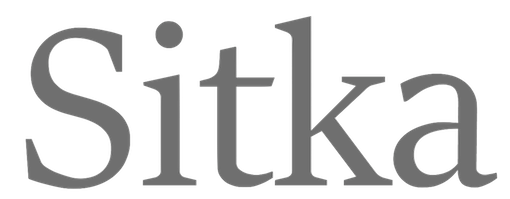 Matthew Carter (born in London in 1937, and son of Harry Carter) is one of today's most influential type designers. He trained as a punchcutter at Enschedé in 1956. In 1963 he was hired by Crosfield, a firm that pioneered the new technology of photo-typesetting, to lead their typographic program. He worked for Mergenthaler Linotype (1965-1981), and co-founded Bitstream Inc. with Mike Parker in 1981, adapting many fonts to digital technology. In January 1992, he founded Carter&Cone with Cherie Cone, and often collaborated with Font Bureau. In 1995, he won the Gold Prize at the annual Tokyo Type Directors Club competition for Sophia. In 1997, he received the TDC Medal for significant contributions to the life, art, and craft of typography. In 2010, he received a MacArthur grant. He lives in Cambridge, MA.
 John Berry on Carter's art (2002). Apostrophe comments on Berry's article. Interview. His fonts: - The Microsoft screen fonts Verdana (1996), Georgia (1996), Georgia Greek, Georgia Cyrillic, Nina and the humanist sans typeface Tahoma (1994). Georgia (in roman and italic only) is a screen version of Miller, Carter's Scotch design. Nina was designed to address the requirements on smaller screens such as phones, and was used in Windows Mobile smartphones before Microsoft switched to Segoe. The Greek and Cyrillic versions of Nina were developed by François Villebrod. Georgia Pro (2010, Ascender) was developed from Georgia with the help of Steve Matteson. For Verdana Pro (2010, Ascender), Carter was assisted by David Berlow and David Jonathan Ross.
- Apple's Skia (1993), a sans serif designed with David Berlow for Apple's QuickDraw GX technology, now called AAT. [Carter's Skia and Twombly's Lithos are genetically related.]
- Monticello (2003), based on Linotype's Monticello (1950), which in turn goes back to Binny&Ronaldson's Monticello from 1797, a typeface commissioned by Princeton University Press for the Papers of Thomas Jefferson. It is in the Scotch roman style.
- Miller (1997, Font Bureau), an extremely balanced family co-designed by Carter, Tobias Frere-Jones and Cyrus Highsmith. Carter explains: Miller is a Scotch Roman, a style that had its beginnings in the foundries of Alexander Wilson In Glasgow and William Miller in Edinburgh between about 1810 and 1820. It is considered that the punchcutter Richard Austin was responsible for the types of both Scottish foundries. Miller is a revival of the style, but is not based on any historical model. Now, there is also a 16-weight newspaper version, Miller Daily (2002), and an 8-weight Miller Headline (2002). This was followed by News Miller, a typeface designed for the Guardian. Note: Georgia (1996) is a screen version of Miller, and Monticello (2002) is a later modification. A comparison of these typefaces.
- Alisal (1995, +Bold).
- ITC Galliard (1978), a recreation of Robert Granjon's garalde letters. This typeface was originally conceived in 1965. Bringhurst recommends a Carter and Cone version of this font, called Galliard CC: it has old style figures and small caps. Further versions include Aldine 701 (Bitstream), Matthew (Softmaker), ITC Galliard Etext (2013, Carl Crossgrove, Linotype), and Gareth (Softmaker).
- The ITC Charter family (1987 for Bitstream and known as Bitstream Charter; licensed to ITC in 1993; see the Elsner&Flake version of ITC Charter). An upgraded commercial version was released by Bitstream in 2004 under the name Charter BT Pro.
- Vincent (1999), a font commissioned for use in Newsweek. It is named after Vincent Figgins, an English foundry owner and punch cutter who lived in the late 18th century.
- Walker (1994), designed for The Walker Art Center.
- Ionic Number One (1999, Carter&Cone).
- Mantinia (1993, Font Bureau), based on inscriptional forms, both painted and engraved, by the Italian renaissance artist Andrea Mantegna.
- Big Caslon (1994, Font Bureau), a display typeface based on the largest romans from William Caslon's foundry.
- Big Figgins (1992) and Big Figgins Open (1998, based on the decorative didone types shown in the specimens of Vincent Figgins of 1815 and 1817). Big Figgins was called Elephant and Elephant Italic in Microsoft's Truetype Fontpack 2.
- Sammy Roman (1996), loosely based on the 17th century romans of Jean Jannon. A beautiful typeface designed to accompany kanji and kana typefaces produced by Dynalab in Taiwan.
- Sophia (1993, Font Bureau), a mix with Greek, uncial and classical Roman influences.
- Shelley Script (1972), a family of formal scripts, split into Andante, Volante and Allegro. It is based on intricate English scripts of the 18th and 19th centuries attributed to George Shelley.
- Cochin (1977, at Linotype). MyFonts writes: In 1913 Georges Peignot produced a typeface based on Nicolas Cochin's eighteenth century engravings. In 1977, Matthew Carter expanded this historic form into a three part series.
- Bell Centennial (Linotype-Mergenthaler, 1975-1978), a legible heavily ink-trapped family designed by Matthew Carter as a replacement of Bell Gothic at Mergenthaler. There are also digital Linotype and Bitstream versions. AT&T commissioned the font to replace their previous typeface choice Bell Gothic for their 100th Anniversary.
- Cascade Script (1965-1966, Linotype, now also known as Freehand 471 BT in the Bitstream collection). Paratype's extension of Freehand 471 to Cyrillic is by Oleg Karpinsky (2011).
- New Century Schoolbook was designed from 1979-1981 in the New York Lettering office of Merganthaler Linotype based on Morris Fuller Benton's Century Schoolbook from 1915-1923. It was the second face, after New Baskerville, that was digitized and expanded using Ikarus (digital technology). The Bitstream version [Century Schoolbook] is a virtually exact copy, only being moved from a 54 unit to a 2000 or so unit design.
- Auriol (Linotype), an art nouveau family (including Auriol Flowers 1 and 2 and Auriol Vignette Sylvie) based on the lettering of the painter and designer Georges Auriol. MyFonts explains: Auriol and Auriol Flowers were designed by Georges Auriol, born Jean Georges Huyot, in the early 20th century. Auriol was a French graphic artist whose work exemplified the art nouveau style of Paris in the late 19th and early 20th centuries. In 1900, Georges Peignot asked Auriol to design fonts for Peignot&Sons. The resulting Auriol font was the basis for the lettering used by Hector Guimard for the entrance signs to the Paris Metro. It was re-released by Deberny&Peignot in 1979 with a new bold face, designed by Matthew Carter. These decorative fonts with a brush stroke look are well-suited to display settings. The Peignot drawing office insisted on a more normal appearance in the boldface, calling it Robur. Matthew Carter has returned to Auriol's original design for the whole series.
- Helvetica Greek (Linotype).
- Helvetica Compressed (Linotype, 1974, with Hans-Jörg Hunziker).
- Wilson Greek (1995), compatible with Miller Text, and based on a type cut by Alexander Wilson for the Glasgow Homer of 1756. See here.
- Olympian (1970, Linotype), designed for newspaper use. This is Dutch 811 in the Bitstream collection. The custom typeface Milne (Carter&Cone) done for the Philadelphia Inquirer is based on Olympian.
- Gando, a French "ronde" typeface based on the work of Nicholas Gando (mid 1700s), and designed for photo-typesetting at Mergenthaler by Carter and Hans-Jörg Hunziker in 1970. Very similar to Bitstream's Typo Upright.
- Fenway (1998-1999, Carter&Cone), commissioned by Sports Illustrated to replace Times Roman.
- Snell Roundhand (1965-1966): a connected cursive script based on the 18th-century round hand scripts from English writing masters such as Charles Snell. Early in the digital era, Matthew published this in the Bitstream collection as Roundhand BT. A Cyrillic version by Isabella Chaeva and Vladimir Yefimov was released by ParaType in 2013.
- Auriga (1970). (Wallis dates this in 1965 at Linotype.)
- CRT Gothic (1974).
- Video (1977).
- V&A Titling (1981).
- Deface (in the FUSE 18 collection).
- Madrid (2001), done for the Spanish newspaper El País.
- Milne, done for the Philadelphia Inquirer (a revised version of Olympian). Not available.
- Durham, a sans serif family for US News&World Report.
- Airport.
- Century 725 (Bitstream, for the Boston Globe: after a design by Heinrich Hoffmeister).
- For Microsoft: Georgia, Verdana, Tahoma (1994), Nina.
- Freehand 471 (Bitstream). A chunky slightly angular script.
- New Baskerville. [Matthew Carter says that this is wrongly attributed to him. It was directed by John Quaranta.]
- Postoni [or Post-Bodoni], for the Washington Post, which is still using it. See here.
- Le Bé, a Hebrew typeface that was used in the Pennyroyal Caxton Bible.
- Rocky (2008, Font Bureau, with Richard Lipton), for the Herald in Scotland.
- Time Caledonia.
- Wiredbaum, for WIRED.
- Wrigley (for Sports Illustrated). Matthew Carter designed Roster in the 1990s, and it was adopted as a display face for Sports Illustrated under the name Wrigley. Jesse Ragan was instrumental in later expanding the family from its original seven styles to the current 60. In 2015, Carter & Cone and Font Bureau released an expanded 60-style family of this typeface under the new name Roster.
- Benton Bold Condensed (for Time Magazine).
- Foreman Light (for the Philadelphia Inquirer).
- Newsbaum (for the New York Daily News).
- Carter Latin: Matthew was commissioned in 2003 to create a new design to be cut in wood type by the Hamilton Wood Type&Printing Museum in Two Rivers, WI. He came up with an all-caps, chunky, Latin-serif design.
- Times Cheltenham (2003), which replaces in 2003 a series of headline typefaces including Latin Extra Condensed, News Gothic, and Bookman Antique.
- The Yale Typeface (2004), inspired by the late fifteenth-century Venetian typeface that first appeared in Pietro Bembo's De Aetna, published by Aldus Manutius. This extensive family is freely available to members of Yale University.
- DTL Flamande (2004, Dutch Type Library), based on a textura by Hendrik van den Keere. Since 2018, available from URW++. Additions to DTL Flamande by Lukas Schneider.
- Meiryo UI, Meiryo UI Bold, Meiryo UI Bold Italic, Meiryo UI Italic (2004). Meiryo is a modern sans serif Japanese typeface developed by Microsoft to offer an optimal on screen reading experience and exceptional quality in print, as part of the Cleartype project. The Japanese letterforms are generously open and well-proportioned; legible and clear at smaller sizes, and dynamic at larger display sizes. The beauty of Meiryo is that it sets text lines in Japanese with Roman seamlessly and harmoniously. Meiryo was designed by a team including C&G Inc., Eiichi Kono, Matthew Carter and Thomas Rickner. It won a 2007 type design prize from the Tokyo Type Directors.
- Suntory corporate types (2003-2005), developed with the help of Akira Kobayashi and Linotype from Linotype originals: Suntory Syntax, Suntory Sabon, Suntory Gothic, Suntory Mincho.
- Rocky (2008, Font Bureau): A 40-style high contrast roman family that is difficult to classify (and a bit awkward). Developed with Richard Lipton.
- Carter Sans (2010, ITC), based on epigraphic letters used in inscriptions. Created for the identity of the Art Directors Club 2010 class of its Hall of Fame, one the laureates in the 2010 Hall of Fame. Codesigned by Dan Reynolds, this chiseled typeface is loosely based on Albertus.
- In 1997, he designed Postoni for the The Washington Post's headlines, a sturdy Bodoni.
- MS Sitka (2013). A typeface with six optical sizes that are chosen on the fly if an appropriate application is present. Developed at Microsoft with the help of John Hudson (Tiro Typeworks) and Kevin Larson (who carried out extensive legibility tests). German link. Typophile link. Sitka won an award at Modern Cyrillic 2014.
- Van Lanen Wood Type (Hamilton Wood Type, 2002-2013). Carter started work on the wood type in 2002, but technical accuracy issues postponed the implementation. Digital versions were finally done in 2013 by P22's Hamilton Wood Type.
- Big Moore (2014, Font Bureau): A 1766 specimen by Isaac Moore, former manager of Joseph Fry's foundry in Bristol, England, shows many types inspired by John Baskerville. But a century later, standardization had foisted inept lining figures and shortened descenders upon these designs. Matthew Carter remedies the tragedy with Big Moore. Oldstyle figures, full-length descenders, and historic swashes are restored to this regal serif in two styles. Big Moore won an award in the TDC 2015 Type Design competition.
- Role (2019, Sans, Slab, Serif, Soft). A superfamily published at Morisawa and Fontelier. Matthew Carter, Shotaro Nakano, and Kunihiko Okano co-designed Role Serif at Morisawa.
Speaker at ATypI 2013 in Amsterdam. Speaker at ATypI 2019 in Tokyo on the topic of Expressing Vocal Tones through Typography. Linotype link. FontShop link. Favorite quote: Watching me work is like watching a refrigerator make ice. Another quote: A typeface is a beautiful collection of letters, not a collection of beautiful letters. View Matthew Carter's typefaces. Matthew Carter's fonts. The typefaces made by Matthew Carter. See also here. Wikipedia page. Klingspor link. [Google]
[MyFonts]
[More] ⦿
|
Moritz Kleinsorge
[Identity Letters]

|
 [MyFonts]
[More] ⦿
|
MyFonts: Scotch roman typefaces
|
 MyFonts selection for the keyword Scotch roman. These include, in decreasing order of relevance:
 - From Monotype: Scotch Roman. Based on the original Scotch Roman by A.D. Farmer.
- From Font Bureau: Miller, Miller Banner. Designed by Matthew Carter in 1997, and augmented later by Cyrus Highsmith and Tobias Frere-Jones.
- From Adobe: Century Expanded, Inflex, Scotch Roman MT, New Caledonia. Inflex Bold is based on a Scotch Roman fat typeface by Monotype. Scotch Roman MT is identical to the Monotype font by the same name. William A. Dwiggins designed Caledonia for Linotype in 1939 as a mix between Scotch Roman and Bulmer. It is slightly flared and thus not really a pure bred Scotch Roman.
- From Huy Fonts (Juan Jose Lopez): Schotis Text.
- From Insigne (Jeremy Dooley): Schorel (2019).
- From DS Type: Prumo Banner, Prumo Deck, Prumo Display, Prumo Poster, Prumo Slab, Prumo Text,
- From Type Together: Abril Titling, Abril, Portada. Abril was designed by Veronika Burian and Jose Scaglione in 2011.
- From Linotype: Monticello. Designed by Matthew Carter in 2005, this is based on James Ronaldson's Roman No.1 and Oxford typefaces from American Type Founders.
- From Dalton Maag: Bressay
- From Positype: Scotch.
- From Okay Type: Harriet (2012). Winner of a TDC medal in 2012.
- From Berthold: Whittingham BQ. Designed by G.G. Lange and Dieter Hofrichter in 2000, Whittingham is a rendition of the type used around 1840 by Charles Whittingham, founder of the (successful) Chiswick Press in Birmingham, England. It is mostly a didone typeface.
- From Cape Arcona: CA Normal Serif. Created in 2011 by Stefan Claudius.
- From Bitstream: Century Schoolbook.
- From Type Innovations: Directors Cut Pro, My Darling.
- From DTP Types: Century Schoolbook DT.
- from Filmotype: Filmotype Royal.
- From Indian Summer Studio: Dodo, Selectric Century.
- From Indian Type Foundry: Abelard, Equitan Slab.
- From James Todd: Chapman.
- From Jawher Matmati: Roman Ionic.
- From Kimmy Kirkwood: Winslow Book.
- From Letterjuice: Quars.
- From Nick Curtis: Mercantile Display NF.
- From Sudtipos: Distillery.
- From The Ampersand Forest: The Fudge.
[Google]
[More] ⦿
|
Nadezhda Polomoshnova

|
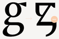 Nadezhda Polomoshnova was educated in classical art in Yaroslavl and at the Department of Graphic Design of the Polytechnic University in St. Petersburg, Russia. In 2016-2017, during the TypeType education program, she created the Latin / Cyrillic humanist sans typeface Leo.
 Saint Petersburg, Russia-based type designer in the TypeType and Pinata teams. In 2017, Yuliana Morgun, Nadezhda Polomoshnova and the TypeType Team co-designed TT Knickerbockers Grotesk and TT Knickerbockers Script. They write: TT Knickerbockers Grotesk symbolizes the monumentality of New York expressed in both its traditional historic architecture and skyscrapers. Both typefaces are loaded with features: TT Knickerbockers Script consists of 967 characters and also contains a huge number of contextual alternatives and ligatures. For all lowercase and uppercase letters of basic Latin and Cyrillic alphabets we have drawn 236 swashes which, depending on the context, can appear both at the beginning and at the end of a letter. In 2018, Nadezhda Polomoshnova, Vika Usmanova, Phill Nurullin, Nadyr Rakhimov and the TypeType Team co-designed TT Jenevers. Still in 2018, Nadezhda Polomoshnova and Marina Khodak co-designed the forceful display typeface TT Phobos, which features striling stencil and inline styles. Continuing in 2018, Sergey Kotelnikov, Philipp Nurullin, Nadezhda Polomoshnova, Marina Khodak and the TypeType Team designed the not-quite-geometric 18-style typeface family TT Smalls, which is characterized by a small x-height and modulated joins. At the same time, she created the fantastic experimental ultra-ink-trapped typeface Hunter. Co-designer of TT Barrels (2018: a Scotch modern typeface by Inessa Mitrozor, Vika Usmanova, Marina Khodak, Nadezhda Polomoshnova and the TypeType Team). At the end of 2018, TypeType published TT Supermolot Neue (Roman Ershov, Marina Khodak, Nadezhda Polomoshnova, Ivan Gladkikh and the TypeType Team). In 2019, TypeType published TT Tsars, a 20-style font family with five subfamilies. It is a collection of serif display titling fonts that are stylized to resemble the fonts of the beginning, the middle and the end of the XVIII century and seen on book title pages in Russia. A reference for the development was Abram Shchitsgal's book Russian Civil Type. The fonts were designed by Marina Khodak, Inessa Mitrozor, Nadezhda Polomoshnova and the TypeType Team. [Google]
[MyFonts]
[More] ⦿
|
Neil Summerour
[Positype]

|
 [MyFonts]
[More] ⦿
|
Nick Shinn
[Shinn Type]

|
 [MyFonts]
[More] ⦿
|
Occupant Fonts
[Cyrus Highsmith]

|
 Senior designer at Font Bureau since 1997, after graduating that year from the Rhode Island School of Design. Born in Milwaukee, WI, he now is a faculty member at RISD, where he teaches typography in the department of Graphic Design. He regularly offers a summer course on Digital Type Design, Summer Institute of Graphic Design, Rhode Island School of Design. His sketchbooks are now on line. In 2016, he set up Occupant Fonts as part of the Type Network.
 In September 2017, Morisawa announced the establishment of "Morisawa Providence Drawing Office" in Providence, RI, as its new base for developing Latin fonts. Cyrus Highsmith, who had served as a designer for Font Bureau for many years, and who started Occupant Fonts in 2015, has been appointed as its creative director. By this move, Morisawa acquired Occupant Fonts. Author of Inside Paragraphs, written for a foundational typography course. Matthew Carter writes: Cyrus Highsmith takes the lid off a paragraph of type and shows its inner workings. There is nothing you need to understand about using type that's not in this book. Cyrus explains the correct terms for the typographic components of form and space that make a letter, a word, a line, a paragraph, and he does it with clear drawings, simple language, and a legible typeface for the text. Interview at MyFonts. Cyrus created wonderful typefaces such as Loupot (1997, with Laurie Rosenwald, based on the lettering on Charles Loupot's St. Raphael poster from 1948), Eggwhite (2000-2018, for comics), Relay (2002, a somewhat art deco sans serif family that will be in vogue for years to come!), Benton Sans (1995-2003, with Tobias Frere-Jones, a revival of Benton's 1903 family, News Gothic; see also Benton Sans Wide, 2013), Occupant Gothic (2000-2018, angular), Prensa (2003, a simple 24-style serif family), Prensa Display (2012), Dispatch (1999-2000), Halo (2003), the 12-weight Stainless family (2001), and Daleys Gothic (1998). The Wall Street Journal uses his D4ScotchD4Scotch family (2001). He made a modified Palatino for the newspaper El Mercurio, and designed Zocalo or El Universal for the newspaper El Universal. He won Bukvaraz 2001 awards for Prensa and Relay. His Amira (Font Bureau) and (Spanish-feeling) Zocalo (Font Bureau) won awards at TDC2 2004. At ATypI 2004 in Prague, he spoke about the wealth of typefaces. In 2006, Escrow (Font Bureau) was published, an out-of-this-world 44-style subdued Scotch family that is used by The Wall Street Journal. In 2007, still at Font Bureau, he created Antenna, a 56-style sans family, as well as Biscotti, a delicate connected (wedding) script commissioned in 2004 by Gretchen Smelter and Donna Agajanian for Brides magazine. His calligraphic copperplate script Novia (2007, Font Bureau) was commissioned to grace the pages of Martha Stewart Weddings. Still in 2007, he won an award for his newspaper type family Quiosco (Font Bureau). Font Bureau writes: With Quiosco, Cyrus Highsmith continues an examination of themes and possibilities which he first explored in Prensa, inspired by the work of W. A. Dwiggins---specifically a dynamic tension between inner and outer contours. However, the crackling, electrical energy of Prensa here gives way to a more fluid, mercurial muscularity in Quiosco. See also Quiosco Display. In 2006, he designed Scout for Geraldine Hessler's redesign of Entertainment Weekly, under the influence of DIN, Venus and Cairoli. Scout is a utilitarian sans serif series that was followed in 2013 with Scout RE---four styles optimized for screen text and small sizes in print. In 2016, he added Scout Text. In 2010, at Font Bureau, he published the extensive families Ibis Text and Ibis Display, which he says were influenced by Walbaum (1919) and Melior (1952). The Webtype version IbisRE is poorly kerned / displayed in my browser though. From 2007 until 2010, he developed Salvo Sans and Salvo Serif (Font Bureau), which were originally called Boomer Sans and Serif. They were released in 2011. In 2012, he published Serge (an angular script family in three styles: a frisky, acrobatic typeface that dashes off decorative blurbs, signs, and headlines with a lively, angular zest), Heron Sans and Heron Serif at Font Bureau, which writes: Heron Serif and Sans are born of hard iron and steel, but galvanized with Cyrus Highsmith's warmth and energy. In 2013, he published Icebox at Font Bureau---a font that is based on a set of magnetic letters found at a variety store. Typefaces from 2014: Tick and Tock, two stencil styles. Typefaces from 2015: Antenna Serif. Typefaces from 2016: Gasket, Gasket Unicase, Gasket Uncial. Typefaces from 2017: Allium. Typefaces from 2018: Allium Text. Speaker at ATypI 2013 in Amsterdam: Don't design web fonts Its theme is: The successful type series of the future will be the ones that can move between media. He says that new typefaces should be smarter than the devices that use them. In 2015, he received the coveted Gerrit Noordzij Prijs. His illustrations were the subject of an exhibition and a book, both called Products Of A Thinking Hand (Typotheque / KABK, 2018). View Cyrus Highsmith's typefaces. Klingspor link. FontShop link. MyFonts interview. Old Font Bureau link. [Google]
[MyFonts]
[More] ⦿
|
Positype
[Neil Summerour]

|
 Positype was founded in 2002 by Athens and/or Jefferson, GA-based designer and type designer Neil Summerour (b. 1972, Azores, Portugal). Neil began developing typefaces in 1996 with the 1996 Olympic Brick Paver Project proprietary typeface. He is the co-principal and senior designer of Athens-based interactive, design, and advertising agency Genetic:ICG. In the summer of 2003, he began teaching Advanced Electronic Design in the Graphic Design Department at The University of Georgia.
 Swash & Kern is the bespoke lettering and typeface design alter ego of Neil Summerour. In 2001, Neil published his first two type designs with [T-26] Digital Type Foundry in Chicago, IL. Since then, he has released tens of font families including hiragana and katakana fonts. Positype fonts are sold by Myfonts.com and [T-26]. Klingspor link. Facebook link. Blog. Behance link. Union Fonts link. The list of his fonts: - Aago (2017). A 54-style sans family.
- Aaux, Aaux Office (2002), Aaux Pro (2004), Aaux Next (2009, 72 typefaces), Aaux Alphanumera, Aaux Emoticons.
- Agent Sans (2021). An economical 22-style sans intended to be warm although the name seems to contradict that.
- The Air superfamily (2011), which consists of 81 sans typefaces. Followed by Air Soft (2011), Air Pro (2021), Air Pro Condensed (2022) and Air Pro XCondensed (2022). He writes about Air: Heavily influenced by Summerour's Aaux Next typeface and Akzidenz-Grotesk, the typeface features a very efficient footprint, logical weight options, small caps, expanded numeral sets, extensive language support, and 5 total widths.
- Altar (8-weight Gothic family).
- Akagi (2008): 20 style sans family. Extended and refreshed in 2011 into Akagi Pro.
- AMP (at Union fonts).
- Anago (2012) is a softly rounded sans family, the product of a designer addicted to designing sans families.
- Anarcharsis (2002): a serif family inspired by incomplete rubbing made from a stone wall located in the Bahamas.
- Angel Script (2009, TypeTrust).
- Baka (2005, a fantastic scratchy handwriting face), Baka Too (2006; followed in 2010 by Baka Expert).
- The Bodoniesque family (Umbrella Type).
- Cherry Blossoms (2018). A crayon script.
- Claustrum (2003).
- Clear Sans (2013). Starting from a monoline rather geometric set of thin weights, this typeface family morphs into a more humanist beast, with a, b, d and g having a squeezed look at the intercepts. And maybe because of that, this unclassifiable typeface is quite appealing. Followed by Clear Sans Text and Clear Sans Screen.
- Courage (2019). A high contrast ultra black poster typeface.
- Couture (2015) and Couture Sans (2015). Summerour was charmed by Imre Reiner's Corvinus when he designed this extremely high-contrast pair of fashion mag typeface families together with Mary Catherine Pflug.
- Cynapse (2003; or Cynapse Pro. 2004, 12 weights). A sans family.
- In 2018, Martina Flor and Neil Summerour published the layerable Tuscan typeface family Decorata.
- Delphi (2014). A decorative multiline typeface by Lily Feinberg and Neil Summerour.
- Directors Gothic (2013, Lettering Inc). A large retro sans family.
- Donatora (2004).
- Dream Big (2019). A swashy script typeface with weathered edges.
- Ego (2003, octagonal family).
- Epic (2007-2009, a 12-style contemporary garalde).
- Ether, Ether Connected.
- Eva (2003).
- Filmotype Dancer (2012).
- Filmotype Harvard (2015). Based on a Filmotype brush script from 1955.
- Filmotype Horizon (2011).
- Flirt Script (2014). Flirt Script won an award at TDC 2014.
- Friendly (2012). In part based on Morris Fuller Benton's upright script typeface Announcement.
- Fugu (2009, rough-outlined script family, winner at TDC2 2010).
- Ginza (2008, a squarish techno family), and Ginza Narrow (2011).
- Good Karma (2017). A sumi brush font. See also Good Karma Smooth (2020).
- Grava (2018, twenty fonts) and Grava Display: Quirky and sharp, Grava is Neil Summerour's injection of warmth within the geometric sans font category.
- Halogen (2012). An organic wide techno sans family. In 2014, he added Halogen Slab and Halogen Flare (flared). All have hairlines.
- Headcold (2004).
- Hype (2019). A collection of 432 low contrast gothic sans typefaces consisting of three subfamilies of 144 fonts each: Hype vol 1, Hype vol 2, Hype vol 3.
- Ice Cream (2021). A creamy vernacular non-connected script for food packaging.
- Iru1, Iru2.
- Juicy (T-26, 2004, brushdrawn family).
- Kari and Kari Pro (2005): a connected upright script. Kari Display (2009). Redrawn in 2020 and released as Kari (2020).
- Kryptk Flash (2003).
- Kurosawa Bastard, Kurosawa Hand, Kurosawa Sans, Kurosawa Serif, Kurosawa Hiragana, Kurosawa Katakana.
- Love Script (2014). A high energy high contrast brush pen / marker script. Love Script won an award in the TDC 2015 Type Design competition.
- Luce (2004).
- Lush Script (2011). A connected script inspired by the 1940s.
- Lust (2012), a curvy hight-contrast didone in the Pistilli style. Neil: The result yielded a rather diverse typographic gene pool: a little Scotch Modern, a little Didone and Didot, a dominant dose of Caslon, and a pinch of Baskerville-- all wrapped up in the leggy body of a Brazilian supermodel. A confident, self-reliant typeface that shows just enough to keep everyone staring and leave them wanting more. Followed by Lust Slim (2014). In 2015, these were extended to the large families Lust Pro [dedicated page] and Lust Pro Didone.
- Lust Script (2013). This is a curvier, sexier (Neil's words) version of Lust. For use in fashion magazines and large sizes.
- Macha (2012). A sans family. In 2015, this was followed by Lust Hedonist, which has Didone, Italic and Script sub-styles---the ultimate fashion mag typeface. In 2021, he added Lust Sans (a 12-style high-contrast fashion mag typeface family), Lust Didone (a 6-style contribution to the fat face genre), Lust Stencil (six styles), Lust Text (ten styles).
- The Type Trust: Magneta (2009, The Type Trust). Includes a Condensed subfamily.
- Marshmallow (2017). A super-creamy high-contrast script typeface straight from a parisian bonbonnerie.
- Murecho (2021). Murecho is a low-stroke contrast, flat terminal sans serif Japanese typeface designed for text settings in Japan. It covers Hiragana, Katakana, and Kanji (JOYO+). It also supports Latin, Cyrillic, and Greek.
- Muscle (2009, TypeTrust---a futuristic family).
- Nori (2010): a calligraphic brush typeface obtained by applying the Pilot Japan Kanji Fude brush pen on paper. It has over 1100 glyphs, 250 ligatures, 487 alternate characters, 125+ swash and titling alternates, lining and old style numerals. Awarded at TDC2 2011.
- Organic (2009). A rounded warm sans family. In 2021, he published the 16-style Organic Pro.
- Penumbra.
- Plastek (2004-2009).
- The R.E.M. Athens project involves three fonts published in 2009, REM Orange, REM Accelerate and REM Tourfont. They are based on ideas by Chris Bilheimer for the band R.E.M. (Michael Stipe and Chris Bilheimer). Both attended the fine arts program at the University of Georgia. Michael Stipe, singer and lyricist, formed R.E.M. in 1980. Bilheimer began working with the band in 1994.
- In 2019, Martina Flor and Neil Summerour released the extensive typeface family Ribbons at Positype.
- Romp (2009, condensed hand-printed).
- Reserve (2018). A text typeface family designed to accompany Summerour's Scotch typeface family.
- Rhythm (2011). An italic inline and solid display family based on ATF's Ratio (ca. 1930) and Herbert Thannhaeuser's Adastra (1928).
- Rough Love (2014). A brushy crayon script.
- Scotch (2017). An 31-style scotch roman typeface family consisting of Scotch Text, Scotch Display (more contrast), Scotch Deck (for subheads) and Scotch Dingbats. In 2020, he added Scotch Compressed to the set.
- Shameless (2013). A connected penmanship-style script.
- Sneakers (2003-2004): athletic lettering family. Also, Sneakers Script and Sneakers Max (2019: rounded and ultra fat).
- So Lovely (2019).
- Tactical (2011, octagonal mechanical face; +Stencil).
- In 2012, he won the Second Akashi Prize in the kanji (!!!) category of the Morisawa Type Design Competition for Tegaki. Tegaki also won at TDC 2013.
- Truss Ultra Light (2006): hairline architectural font.
- Vekta Serif (2009), Vekta Neo and Vekta Sans (2009, a sans family at TypeTrust).
- Wasabi Condensed and Wasabi (2010): an organic elliptical family, based on Iru.
- Yumi (2003, techno font, Union Fonts).
His life in hiw own words: Neil Summerour is a type designer, lettering artist, calligrapher and designer based in Georgia, USA with one foot in Takamatsu, Japan. After graduating from The University of Georgia Lamar Dodd School of Art with a BFA in Graphic Design, he soon found himself opening his own studio to deal with the flow of freelance work. [...] Neil opened his personal type foundry, Positype, in 2000 to feed his ever-growing desire for type design. He later co-founded TypeTrust (2002) with Silas Dilworth as his addiction to type and lettering grew. [...] He was an adjunct art professor at The University of Georgia in graphic design and taught graphic design at the Governor's School for the Arts. [...] As a typeface designer, he has published over 60 typeface families and produced numerous custom typefaces for clients worldwide. [...] He has won the Type Directors Club Certificate of Excellence in Type Design in 2010 and 2011 for Fugu and Nori, respectively. Showcase of Neil Summerour's fonts. [Google]
[MyFonts]
[More] ⦿
|
Richard Lipton
[Lipton Letter Design]

|
 [MyFonts]
[More] ⦿
|
Richard T. Austin

|
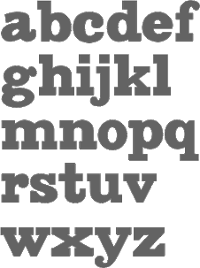 London-based punchcutter (1768-1830) who had his own foundry, The Imperial Letter Foundry, in London. Before that, he had worked at John Bell's British Letter Foundry from 1788-1798 (when the foundry closed) as a punchcutter, and at William Miller's foundry in Edinburgh. His typefaces:
 One of the most remarkable digital revivals and extensions of his work is also called Austin. Originally designed by Paul Barnes as headline type for the British magazine of fashion Harper's & Queen, of Hearst Magazines UK, Austin is a loose revival of the typefaces cut by Richard Austin in the late 18th century. Referencing Austin's original creation, Paul Barnes turned up the contrast, tightened the spacing and came up with a fresh, new, bold and beautiful look for the constantly changing world of fashion. Barnes himself describes the face as "a British Modern with the styling and sheen of New York in the 1970s." The Cyrillic version was designed in 2009 and 2016 by Ilya Ruderman (CTSM Fonts). FontShop link. Klingspor link. Wikipedia link. View Richard T. Austin's typefaces. Alexa Stephenson's detailed image of Bell. View Richard Austin's typefaces. [Google]
[MyFonts]
[More] ⦿
|
Samuel Winfield Tommy Thompson
|
New York-based letterer and type designer, b. 1906, Blue Point, NY, who was also known as "Tommy". [Some sources have 1905]. He had a studio in New York City and was the author of several books on type and lettering. He died in 1967 in New York. His oeuvre includes - Baltimore Script (1955). Matrices cut by George Battee. Mac McGrew: Baltimore Script is a fancy style designed by Tommy Thompson and cut by George Battee for Baltimore Type in 1955. The lowercase follows the general style of a script letter hand-written with a broad pen, although the inclination is slight and the letters don't quite connect. Capitals are flourished. It is suitable for stationery, announcements, and greeting cards, but its range of small sizes is hardly enough for advertising use.
- Collier Heading. McGrew: Collier Heading was designed by Tommy Thompson in 1946 for Collier's magazine. It is an adaptation of an eighteenth-century style known generally as Grecian, and was cut by Monotype in a considerable range of sizes. Other Collier or Collier Heading types have turned up; one was designed by Tommy Thompson for Collier's magazine, but not identified otherwise. It was probably also cut by Monotype. One of these could possibly be the Bert Black mentioned previously.
- Various weights of Futura (later digitized by URW).
- Mademoiselle (1953, baltimore Type Foundry). Mac McGrew writes about Mademoiselle: Mademoiselle was designed by Tommy Thompson in 1953 as a display typeface for Mademoiselle magazine. It was cut by Herman Schnorr at Baltimore Type, which also offered fonts for general sale. It is a delicate, narrow modern roman, with long ascenders and short descenders, rather loosely fitted, and works well for display with transitional text typefaces such as Bulmer and Scotch Roman.
- Post Headletter (1943). Privately cast for the Saturday Evening Post.
- Thompson Quillscript (1953, ATF): a 50s version of a chancery hand. McGrew: Thompson Quillscript was designed by Tommy Thompson for ATF about 1952. It is an attractive cursive letter with the appearance of lettering with a broad pen. Letters slope moderately and are not joining. The general effect is less formal than most other such typefaces. Capitals are rather reserved, but a font of alternate characters, mostly more informal capitals, was available separately until 1968. Compare Heritage, Lydian Cursive, Park Avenue, Raleigh Cursive. This typeface made it to the PhotoLettering collection.
- The following typefaces for Photo Lettering: Thompson Buccaneer Thompson Cable, Thompson Coliseum, Thompson Colonial Wide 8, Thompson English, Thompson Federal, Thompson Federal Italic, Thompson Federal Open, Thompson Georgian 2, Thompson Georgian Semi Condensed 2, Thompson Georgian 3, Thompson Georgian 4, Thompson Glasgow Italic 4, Thompson Gross Bold 9, Thompson Headline Casoni, Thompson Logotype, Thompson Pegasus Stencil, Thompson Penscript, Thompson Railway Stencil, Thompson Scribe, Thompson Stencil 8, Thompson Stencil 10, Thompson Trend Extra Cd 3.
Author of these books: The ABC of our Alphabet (1942, London), The Script Letter: Its Form, Construction, and Application (1939, New York), How to render roman letter forms (1946, New York), Basic layout design; a pattern for understanding the basic motifs in design and how to apply them to graphic art problems (1950, New York), Script Lettering for Artist (1969, New York). [Google]
[More] ⦿
|
Scotch Roman
|
Wikipedia: Scotch Roman refers to a class of typefaces popular in the early nineteenth century, particularly in the United States and to a lesser extent the United Kingdom. These typefaces were modeled on an original 1839 design by Samuel Nelson Dickinson, founder of the Dickinson Type Foundry in Boston, who had the design cut by Richard Austin, and cast by Alexander Wilson and Son in Glasgow, Scotland. This is wrong, because Richard Miller died in 1830. The William Miller foundry's Scotch Roman is from 1813. The Scotch Roman typefaces are in the modern (didone) style, with long ascenders and an elegant aura that make them agreeable to the eye. Present day typefaces in the shadow of Scotch Roman include Caledonia, Georgia (Matthew Carter), and Escrow (Font Bureau). Mac McGrew: Scotch Roman is derived from a typeface cut and cast by the Scotch foundry of Alexander Wilson&Son at Glasgow before 1833, when it was considered a novelty letter. The modern adaptation of the typeface was first made in 1903 by the foundry of A. D. Farmer&Sons, later part of ATF. It is a modern face, but less mechanical than Bodoni, and has long been popular. Capitals, though, appear heavier than lowercase letters and tend to make a spotty page. Hansen's National Roman is virtually the same face, with the added feature of an alternate r with raised arm in the manner of Cheltenham Oldstyle. When Monotype copied Scotch Roman in 1908, display sizes were cut to match the foundry face, but in keyboard sizes, necessarily modified to fit mechanical requirements, the caps were lightened and the entire typeface was somewhat regularized. Scotch Open Shaded Italic, a partial set of swash initials, was designed by Sol Hess in 1924. Similar swash letters, but not shaded, were also drawn by Hess and made by Monotype for regular Scotch Roman Italic. Linotype had adapted Scotch Roman to its system in 1903, retaining the heavier capitals, but in 1931, by special permission of Lanston Monotype, brought out Scotch No.2 to match the Monotype version. Compare Atlantic, Bell, Caledonia, Original Old Style. [Google]
[More] ⦿
|
Scotch Roman
|
 Great discussion on Typophile regarding Scotch Roman. We have two different opinions on the source of Scotch Roman: Linotype gives it to Richard Austin, while DeVinne credits Samuel Nelson Dickinson with modelling the first Scotch in Boston in 1837. Both sources agree that it was first cut by Alexander Wilson and Son in Glasgow. In 1839, Dickinson opened his foundry with the Scotch matrices.
 Scotch is a great book and magazine typeface (short ascenders and descenders, good width, strong capitals, bracketed serifs, moderate contrast, calligraphic italics). Scotch typefaces initially come from Scottish foundries, which were popular in the United States in the late 18th century, through the Victorian era and even most of the 20th century among books, magazines, newspapers, and advertisements. It has always been more popular in the USA than elsewhere. Scan of 6-50pt Scotch Roman from the 1912 ATF book. And of 34-60pt. Summary of some Scotch typefaces: - Dwiggins' Caledonia.
- Matthew Carter created many Scoth Romans. Witness his FB Miller, Georgia ("Scotch Roman for screen"), Vincent, Big Figgins, Elephant, Caledonia (for Time magazine), and Linotype Monticello (after Binny & Ronaldson's Pica Roman No. 1, done for Princeton University Press).
- Another font in this gene is FB Scotch (1993) by David Berlow (for Newsweek), based on the original Scotch and on Dwiggins' Caledonia.
- Scotch Roman (Linotype), traced back to A.D. Farmer, 1904.
- Scotch Roman by Nick Shinn.
- Schorel (2019). A 54-style Scotch roman by Jeremy Dooley.
[Google]
[More] ⦿
|
Scott Vander Zee
|
Scott Vander Zee (New York City) is a graphic designer, typographer, typeface designer, and educator specializing in book and editorial design projects, typefaces, exhibitions, signage and wayfinding, and visual identity systems. Scott received a BFA in Graphic Design from the School of Art at Western Michigan University, and completed his MFA studies between two Swiss schools, the ECAL [Ecole cantonale d'art de Lausanne] and the HGK Basel [Hochschule für Gestaltung und Kunst Basel]. He ais adjunct professor at Rutgers University's Mason Gross School of Art & Design (since 2017) and at the Pratt Institute (since 2018). His typefaces: - Vanilla (2020-2021). In Regual, Itailic and Mono weights.
- NYC Typewriter (2021): a contemporary interpretation of American Typewriter.
- BT Grotesk (2020, +Mono)
- Scotch Genovese Display (2019)
- Nordic Pavilion Book (2021)
- Alice AG
- Default Sans (2020, +Mono)
- SDC Caslon (2017). SDC stands for Sound Development City.
- Roentgen Therapie Käch Revival. A revival of Walter Käch's RoentgenTherapie (1949)
- FFS Book (2016)
[Google]
[More] ⦿
|
Selma Losch
[Kilotype]

|
 [MyFonts]
[More] ⦿
|
Shinn Type
[Nick Shinn]

|
 Nick Shinn (b. London, 1952) is an art director and type designer. He teaches at York University in Toronto, and is a founding member of the Type Club of Toronto. He writes regularly for Graphic Exchange magazine, and has contributed to Applied Arts, Marketing, Design, and Druk. He founded Shinn Type in 1999, and made fifteen type families. Interview by Jan Middendorp, in which he describes himself as a contrarian. Pic by Isaias Loaiza. Pic by Chris Lozos at Typo SF in San Francisco in 2012. Custom typefaces have been produced for newspapers such as The Birmingham News (Alabama), The Chicago Tribune, The Daily Express (London), The Daily Mail (London), The Globe and Mail (Toronto), The Montreal Gazette, and The St. Petersburg Times (Florida). Custom fonts, with exclusive rights, have been created for corporations such as Thomson Nelson, Enbridge, Rogers Communications Inc., and Martha Stewart Living. Nick organizes type evenings in Toronto all year long.
 Shinn Type fonts at MyFonts. Behance link. He is the designer of Fontesque (a wild family of curly glyphs), the monospaced font Monkey Mono, Artefact (1999), Beaufort (a sharply serifed family done in 1999; in 2008, he published a 10-style extension called Beaufort Pro), Bodoni Egyptian (1999), Alphaville (2000, techno typeface with straight mono-width strokes), Brown, Brown Gothic, Duffy Script (2008, in 4 styles: an interpretation of the lettering of contemporary illustrator Amanda Duffy, aka Losergirl), Handsome (1999, cursive handwriting family, since 2005 available in OpenType), Merlin, Oneleigh (1999, masterful!!), Paradigm (1995, updated in 2008, inspired by 15th century letterforms), Shinn, Walburn (1996) [note: Walburn and Brown were originally commissioned for the 2000 redesign of the Globe and Mail. Walburn is an adaptation of a didone typeface by Erich Walbaum, c.1800], Worldwide (1999). In 2001, he designed the Richler font in honour of the memory of Mordecai Richler. The Richler font was only available to the Giller Prize, Random House and the Richler family until its public release in May 2013 at MyFonts, where Richler (+Cyrillic, +Greek) is advertised as a 21st century antiqua book face. In 2002, he published Goodchild (a Jenson revival; see also Goodchild Pro (2017). Goodchild is a Venetian with clean (not antiqued!) outlines and a larger-than-Jensonian x-height. It comes in 4 styles and is targeted at sophisticated academic typography) and the liquid lettering family Morphica, exclusively at Veer. In 2003, he released the absolutely gorgeous "modern" sans Eunoia (which has a unicase weight), and the quirky sans family Preface (2003; Preface Thin is a hairline weight; Preface Light is free at FontShop). In 2003, he also published the mmonowidth unicase family Panoptica (2003), which includes styles called Regular, Sans, Egyptian, Doesburg and Octagonal, to name a few. In 2004, he released Nicholas, a Jensonian serif family, which is the headline version of Goodchild. Additions in 2006 include Softmachine (VAG Rounded/comic book style family). Sexy type from Toronto is an article by Erin Kobayashi about Shinn's work published in the Toronto Star on April 15, 2007. Nick Shinn designed the type for the redesign of The Globe and Mail in April 2007: Globe and Mail Text [look at the f], Globe and Mail Sans (or GM Sans), Globe and Mail News (or GM News). In 2008, these typefaces went retail. One typeface is called Pratt, named after David Pratt, the design director at The Globe and Mail who commissioned the typeface for his redesign of the paper. The companion typeface will be called Pratt Sans. Additions in 2008: Figgins Sans (4 styles), Scotch Modern (a 5 style didone family that revives the typeface used in New York State Cabinet of Natural History), Scotch Micro. Paul Shaw writes: Scotch Roman, beloved by D.B. Updike and W.A. Dwiggins, was a standard in the typographic repertoire of pre-World War II printers but fell out of favor after the war, supplanted by Bodoni. Nick Shinn of Shinntype has made a bid to resurrect this oft-maligned typeface with Scotch Modern. Scotch Modern is not a revival of the familiar Scotch Roman of Linotype and Monotype, but of a more modern design attributed to George Bruce, the great 19th-century New York punchcutter. Shinn used a sample of the typeface from the New York State Cabinet of Natural History's 23rd Annual Report for the Year 1869 (printed in 1873) as a model. He drew it by eye, aided by a sharp loupe: no photographic enlargements, no scans, no tracing. The ends of the strokes are slightly rounded, to capture the effect of metal type being impressed into soft paper. Shinn contends that the 19th-century Scotch types were "eminently readable" and a factor in the rise of modern literacy. His rendition, an OpenType font, aims for readability in all situations with display, regular, and microtype versions. The display roman includes a unicase font-a nod to Bradbury Thompson's Alphabet 26 experiment-and the italic has elegant swash caps. Scotch Roman has never been a typeface for those seeking eternal beauty or anyone desperate for typographic kicks. Dwiggins gave it a 10 for legibility (where 10 was "reasonable human perfection") but only 4 for grace and 0 for novelty. Shinn's Scotch Modern, with its many OpenType extras, scores well on all three counts. It's a typeface for those who prefer a mature single malt: simple at first, but more complex as it is savored. Photograph. At ATypI 2008 in St. Petersburg, his talk was entitled Scotch Modern. Several catalogs have been published by Shinntype. Particularly noteworthy is The Modern Suite (2008, Nick Shinn, Coach House Press, Toronto), which showcases Figgins Sans and Scotch Modern. Sample of some Scotch Modern dingbats. Production in 2010: Sensibility (a humanist sans superfamily), Sense (a modernist sans superfamily), Bodoni Egyptian Pro (a monoline slab Bodoni experiment---the Pro version of a 1999 family by him). In 2011, he created Checker, an all caps 3d black and white-tiled typeface, and Parity (a roman unicase pair). Naiad (2013) is a didone, or neoclassical, typeface with Victorian curlicues thrown in to create a Victorian look. Pratt Nova (2014) is a 17-style large x-height typeface family that attempts to achieve visual and semantic opulence, equipping the typographer with a comprehensive array of harmonized fonts, all rigorously drawn, superbly fitted iterations of a single, profoundly original design. Neology (2014) is a 15-style sans family subdivieded into Deco, Grotesque and plain sans subfamilies. Brown Pro (2016) is a classic grotesque, distinguished by its semi-condensed proportions and slight flaring of the edges and some ink traps. Figgins Standard (2016) is a take on the low-contrast original sans typefaces designed in the 1830s in industrial London. Gambado (2016). This is a collection of shaken typefaces with bouncing letters. Particular fonts include Gambado Sans and Gambado Scotch. Dair (2017) is a revival of Canada's first home-grown typeface, Cartier, which was completed by Carl Dair in 1967 and named after 16th century explorer Jacques Cartier, who mapped the Gulf of St. Lawrence in the 1530s. Dair 67 and Dair 67 Italic are facsimiles of the original fonts. Dair and Dair Italic are fully-featured 21st century fonts. In 2018, Nick Shinn published Phiz, a diverse suite of 27 decorative fonts based on Figgins Sans Extra Bold. Designer of Boxley (2016), a superelliptical sans typeface family. At the end of 2020, he published the 14-style condensed rounded sans typeface family Aptly. o Typefaces from 2021: Buslingthorpe (a tall-necked typeface in which the x-height is only 29% of the ascender height, beating classic tall fonts such as Rudolf Koch's Koch Antiqua, and Lucian Bernhard's Lucian and Bernhard Modern). Speaker at ATypI 2017 Montreal. MyFonts interview. I Love Typography link. FontShop link. Klingspor link. View Nick Shinn's typeface library. [Google]
[MyFonts]
[More] ⦿
|
Spike Spondike
|
 American designer in the UK, who created the voluptuous didone fatface Blenny (2014, Dalton Maag). Blenny covers Latin and Thai. In 2013, she created the tongue-in-cheek typeface family Nokia Pure Klingon, also at Dalton Maag. Pilar Cano, Spike Spondike and the Dalton Maag team won an award at Granshan 2014 in the Thai typeface category for HP Simplified.
 Bressay (Dalton Maag), a Scotch roman co-designed in 2015 by Tom Foley, Selma Losch, and Spike Spondike (design lead by Stuart Brown), won an award at TDC 2016. Dalton Maag's Hanna Donker and Spike Spondike won an award at Granshan 2016 for Intel Clear Thai. Cargocollective link. [Google]
[More] ⦿
|
Textism: Miller
|
A robust text typeface designed in 1997 at Font Bureau by Matthew Carter, Tobias frere-Jones and Cyrus Highsmith. Recommended for newsprint. Textism wrote: Matthew Carter's Miller is a very successful modern interpretation of the bulky, utilitarian style known traditionally as Scotch Roman. It's well-equipped, featuring requisite parts such as small caps, and is available in a svelte display weight. Miller stands up very well to unpredictable printing situations such as laser printing and newsprint. [Google]
[More] ⦿
|
Thomas Foley

|
 Or Tom Foley. Graphic and type designer in London. Foley obtained an MA in Communication Design Central from Saint Martins in 2009. Visiting lecturer on The MA Communication Design course at Central Saint Martins and the BA Visual Communications Course at Bristol University of Art&Design. In 2018, he became Creative Type Director at Monotype.
 His typefaces: - The transitional text typeface Nib (2010). Developed under the guidance of Freda Sack.
- The sans family Hewitt (2010).
- Intel Clear Cyrillic, for which Dalton Maag, Tom Foley, Mary Faber, Stuart Brown and Hanna Donker won a Granshan 2014 award.
- Bressay (2015). A Scotch roman designed by Stuart Brown and the Dalton Maag team (including Tom Foley, Selma Losch, and Spike Spondike). Bressay won an award at TDC 2016.
- Tom Foley and Selma Losch published the rounded slab serif typeface family Gelo at Dalton Maag in November 2017.
- Cotford and Cotford Variable (2021, Monotype). A 16-style text and display serif family, accompanied by a variable font. Monotype writes: Cotford is a languid serif that ranges from delicate thins, bending and reaching like flower stems, to bold heavy weights that command the page and screen with confidence and vintage charm.
Speaker at ATypI 2010 in Dublin, where he discussed the history of Irish type and the roots of his book family, Nib. [Google]
[MyFonts]
[More] ⦿
|
Tobias Frere-Jones
[Frere Jones Type]

|
 [MyFonts]
[More] ⦿
|
Type Trends
[Vika Usmanova]

|
 Russian type designer who was part of the TypeType team in Saint Petersburg. As a student in the TypeType education program, she designed the modern text antiqua Guillaume (2016-2017). In 2019, she founded Type Trends.
 In 2017, Vika Usmanova released the octagonal Latin / Cyrillic typeface TT Mussels which includes a stencil subfamily. She also was part of TT Travels in 2017, a wide dense modern grotesque. In 2017, Vika Usmanova, Philipp Nurullin, and the TypeType Team designed the condensed modular geometric grotesk typeface TT Tunnels. In 2018, I believe---but am not sure---that Nadezhda Polomoshnova, Phill Nurullin, Vika Usmanova, Nadyr Rakhimov and the TypeType Team co-designed TT Jenevers. In 2018, Sofia Yasenkova, Philipp Nurullin, and Vika Usmanova designed the modern serif TT Tricks at TypeType. TT Tricks has many stencil styles. In 2018, Ivan Gladkikh, Alexander Kirillov, Philipp Nurullin, Vika Usmanova, Marina Khodak, and Nadyr Rakhimov published TT Severs. That same year, Vika Usmanova published the display sans ans script pair TT Nooks which took inspiration from the Empire State Building. Co-designer of TT Barrels (2018: a Scotch modern typeface by Inessa Mitrozor, Vika Usmanova, Marina Khodak, Nadezhda Polomoshnova and the TypeType Team). In 2019, Vika Usmanova and the TypeType Team designed TT Trailers, a modern narrow humanist grotesque, that is accompanied by a variable font version. TT Trailers is based on the concept of preserving the amount of white: when changing from thin to bold. In 2019, Vika published the free font Trappist, which started out as a custom type for a Belgian cafe in St. Petersburg. At TypeTrends, she released TT Alientz (Variable, serif, Grotesque) and TT Frantz, also in 2019. The latter ultra-condensed monospaced sans typeface has matching upper and lower case heights and comes as a variable type with a waistline axis. Typefaces from 2020: TT Geekette (2020; with the TypeType Team), TT Runs (a 20-style sports sans by the TypeType team in cooperation with Vika Usmanova, Antonina Zhulkova and Philipp Nurullin). In 2020, she co-designed TT Lakes Neue, a 91-style sans family by Vika Usmanova, Antonina Zhulkova and Kseniya Karataeva at TypeTypType. Tt is a functional sans-serif that draws inspiration from Finnish signs of the functionalism era. TT Lakes Neue is an almost monolinear sans, with ovals in the form of rounded rectangles, reminiscent of Nebiolo's Microgramma. It comprises a useful variable font. In 2021, Svetoslav Simov and Vika Usmanova dusted off the 18-style update of Fontfabric's geometric sans family Mont called Mont Blanc. It has very short descenders and medium-sized ascenders, two variable styles, and some redesigned glyphs. Its biggest problem will be the name---surely, the famous Swiss pen maker Mont Blanc will complain sooner or later about its trademark. I am puzzled about MyFonts, which did not catch this problem when they announced the typeface. In 2022, Vika Usmanova and Plamen Motev co-designed the wayfinding sans family Ways at Fontfabric. [Google]
[MyFonts]
[More] ⦿
|
Typedia: Typeface classification
|
The classification from the Typedia community: - Blackletter
- Fraktur: A German form of Blackletter with broken strokes. Classic example: Fraktur.
- Old English: The English blackletter style. Classic example: Cloister Black.
- Rotunda: A Blackletter style featuring wider lowercase with more rounded strokes.
- Schwabacher: A German form of Blackletter with simplified, rounded strokes.
- Textura: A Blackletter style featuring tall, narrow lowercase made mostly of straight strokes.
- Calligraphic
- Chancery: A script style of calligraphy made with a broad-point pen with slightly sloping, narrow letters that are the basis for italics in serif typefaces. Capitals may or may not have flourishes. Originated during the Renaissance. Classic example: Zapf Chancery.
- Etruscan: An early Roman form of calligraphy drawn with a flat brush held at a steep angle. Caps only, as lowercase had not been invented yet. Classic example: Adobe Pompeii.
- Uncial: A Celtic style of calligraphic script with forms created by a broad-nibbed pen at an almost horizontal angle, but sometimes more tilted in later variants. Roman lowercase is derived from Uncial forms. There is only one case in pure Uncial designs. Used during the middle ages. Classic example: American Uncial.
- Inscriptional---Roman Inscriptional: Stone-cut serif style from the late Roman Empire. The basis of modern roman capitals. Classic example: Trajan.
- Non-alphanumeric
- Dingbats
- Ornaments
- Pictorial
- Ornamented, Novelty
- Art Deco: A geometric display typeface style popular in the 1920s and 1930s. Classic example: Broadway.
- Art Nouveau: Display typefaces with a flowing, organic style popular in the early 20th Century. Classic example: Arnold Bocklin.
- Comic Strip Lettering: A style meant to look like the hand-drawn letters associated with comics or cartoons. This style is usually san serif, often having a loose, informal structure and is sometimes based on brush lettering. Classic example: Balloon.
- Dot Matrix: A style whose characters are composed of a pattern of dots used mainly for low-resolution impact printers, or to simulate the look of the output of such printers. Classic example: FF Dot Matrix.
- Futuristic: A style meant to suggest a futuristic theme. Often cold, brutal and geometric with a machine aesthetic and simplified construction. Classic example: Stop.
- Machine Readable: A style designed to be read by machine. These fonts are usually san serif and often feature unusual character shapes to make them more distinguishable from one another. Classic example: OCR-B.
- Pixel: A style whose characters are composed of pixels (usually represented as squares) used mainly for low-resolution computer display. Outline fonts are sometimes made to look like Pixel Fonts. Classic example: Silkscreen.
- Pseudo Foreign Script: A style intended to mimic non-Western letters. For example, a font that looks like Chinese, but is actually composed of Latin characters. Faux Chinese/Arabic/Hebrew. Classic example: Bruce Makita.
- Victorian: A whimsical, eclectic display style popular in the late 19th Century. Classic example: Skjald.
- Sans Serif
- Gothic: A sans serif style with moderate stroke contrast and modern proportions particular to the U.S. Usually features a two-story lowercase g, angled strokes on C and S, and a sloped, non-cursive italic. Classic example: Franklin Gothic.
- Grotesque: A sans serif style with moderate stroke contrast and modern proportions particular to the U.K. Usually features a two-story lowercase g, closed strokes (usually curving in slightly) on C and S, and a sloped, non-cursive italic. Classic example: Bureau Grot.
- Geometric Sans: A sans serif style made with rigidly geometric forms and little to no stroke contrast. Classic example: Futura.
- Grotesk: A sans serif style with low stroke contrast and modern proportions. Usually features a one-story lowercase g, closed or angled strokes on C and S, and a sloped, non-cursive italic. Classic examples: Akzidenz Grotesk, Helvetica.
- Humanist Sans: A sans serif style with proportions modeled on old-style typefaces. Characterized by open strokes on characters like C and S. Italics of this style often are more cursive in appearance, rather than a simple slanted version of the roman. Often has more slightly stroke contrast than other sans serifs. Classic examples: Gill Sans, Frutiger.
- Square Gothic: A sans serif style composed mainly of straight or nearly straight lines and (often) curved corners. Stroke contrast is usually low. Classic example: Bank Gothic.
- Swiss Gothic: A sans serif style with noticeable stroke contrast, straight sides on round characters, modern proportions, and large x-height. Usually features a one-story lowercase g and closed strokes on C and S. Classic example: Jay Gothic.
- Script
- Brush Script: Typefaces modeled after lettering made with a brush. Strongly associated with advertising in the mid-20th Century on. Classic example: Brush Script.
- Casual Script: Typefaces based on a style of lettering characterized by informal appearance, somewhat like handwriting, but more refined. Similar to Brush Script or Sans Serif. Classic example: Murray Hill.
- English Roundhand: A connecting-script style of calligraphy made with a flexible tipped pen. The characters are usually steeply sloped and capitals are often very elaborate. Popular in the 18th and 19th Century. Sometimes called Copperplate Script. Classic example: Bickham Script.
- French Roundhand: A connected-script style of calligraphy, sometimes with upright characters, a high stroke contrast and decorative capitals. Used in France in the 17th through 19th Century. Also called Civilité. Classic example: Typo Upright.
- Handwriting: A script style based on ordinary handwriting. Characters may or may not be connected. Classic example: Felt Tip Roman.
- Rationalized Script: A script style with sans serif qualities, low stroke contrast, and a formal appearance. Characters may or may not connect. Associated with 20th Century commercial design. Classic example: Gillies Gothic.
- Serif
- Grecian: A typically heavy display typeface with octagonal shapes where curves are normally used. Also known as Chamfered or Beveled. Popular in the 19th Century for wood types. Classic example: Acropolis.
- Latin: A serif style with large triangular or wedge-shaped serifs. Stroke contrast is medium to low. Popular in the 19th Century for wood types. Classic example: Latin.
- Modern: A serif style with high stroke contrast and vertical stress. Classic example: Modern No. 20.
- Didone: A serif style with high stroke contrast and vertical stress. Serifs are usually unbracketed. Classic examples: Bodoni (Italian), Didot (French).
- Scotch Modern: A serif style with medium to high stroke contrast and vertical stress, known for large serifs and tiny aperture. Serifs are usually bracketed. Classic examples: Modern No. 20, Scotch Modern.
- Old Style: A serif typeface with relatively low stroke contrast, angled stress, angled serifs. Classic example: Bembo.
- Antique: A serif style with moderate stroke contrast, bracketed serifs and usually vertical stress. Serifs are angled as in Old Style. Popular in the 19th Century. Classic example: Bookman.
- Dutch Old Style: A serif style with somewhat angled stress, bracketed serifs, and medium to high stroke contrast. Characteristic of Dutch and English types of the 18th Century. Classic examples: Caslon, Plantin, Times Roman.
- French Old Style: A serif style with angled stress on rounds; usually features a small eye on the lowercase e; soft, bracketed serifs and moderate stroke contrast. Classic example: Garamond.
- Spanish Old Style: A serif style with soft, bracketed serifs, medium to high stroke contrast, and often highly angled stress. Classic example: Rongel.
- Venetian Old Style: A serif style with angled stress on rounds; usually a tilted crossbar on the lowercase e; usually has somewhat low stroke contrast. Serifs are sometimes unbracketed. This style is associated with very early printing (Incunabula) in the West. Classic example: Jenson.
- Slab Serif: A serif style with serifs equal to or nearly the same thickness of the main strokes. Main strokes usually have low contrast. Classic example: Rockwell.
- Clarendon: A slab serif style with heavy, bracketed serifs, modern proportions and construction, low stroke contrast. Classic example: Clarendon.
- Egyptian: A serif style with heavy, unbracketed serifs, modern proportions, low stroke contrast. Basic construction is similar to Modern, but with low stroke contrast. Sometimes called Antique. Classic example: Egiziano.
- French Clarendon: A serif style with reverse stress (horizontal strokes thicker than vertical strokes) and slab serifs, sometimes bracketed, usually condensed. Popular in the 19th Century. Classic example: Playbill.
- Geometric Serif: A serif style made with rigidly geometric forms. Usually features slab serifs. Classic example: Stymie.
- Spur Serif: A serif style with very small serifs. Usually similar in design to san serif typefaces, except for the serifs. Usually very little stroke contrast. Classic example: Copperplate.
- Transitional: A serif style which, historically, bridges the gap between Old Style and Modern. Stroke contrast is stronger than old style, but less than modern. Bracketed serifs. Stress is mainly vertical. Characteristic mainly of English types around 1800. Classic example: Baskerville.
- Scotch Roman: A serif style with medium contrast and vertical stress, medium-sized bracketed serifs. Classic examples: Miller, Caledonia.
- Tuscan: A serif style with splayed or ornate serifs. Classic example: Thunderbird.
[Google]
[More] ⦿
|
Typeland
[Alessia Mazzarella]

|
 Italian-born graduate of the MATD program at the University of Reading, class of 2013. Before that, she received a Bachelor of Arts in Graphic Design from Central Saint Martins, London and a Bachelor of Arts in Graphic and Multimedia Design from Sapienza, University of Rome. She currently lives and works in the UK.
 For her graduation program, she created the typeface family Prakashan for Odia (Oriya) and Latin. The Latin comes in a low-contrast Light and a quite striking and lively high-contrast Black. Prakashan won an award at Granshan 2014. Other typefaces by her include SMN (a display typeface that is based on metal letters located in Florence's Santa Maria Novella train station) and Xstitch (a multi-layered typeface designed as part of the One Day Font project while studying at Central Saint Martins, London). In 2014, she created Rossella Hairline. In 2015, with Jonathan Hill of The Northern Block, she designed Monsal Gothic, a modern gothic sans which was influenced by News Gothic, Benton and Whitney. In 2016, she published the free angular Latin/Gurmukhi typeface Langar at Google Fonts. Github link. FS Ostro (2018, at Fontsmith) is a modern typeface family in text and display versions. It brings warmth and fresh air to the cold Italian didones. Its more subdued and less contrasted text version was influenced by Scotch romans. There are also genetic elements of Spanish display types. In 2020, she co-designed Marble with Vaibhav Singh at URW. Marble is part of Asterisk Type Collection by URW Type Foundry. Marble is a modern sans serif with a distinct character and comes in 108 styles plus variable fonts. Behance link. Home page. Github link. [Google]
[MyFonts]
[More] ⦿
|
Typofonderie (was: Porchez Typofonderie)
[Jean-François Porchez]

|
 Jean-François Porchez (b. 1964) lived in Malakoff near Paris until 2006, when he moved to Sèvres, and from there to Clamart in 2008. He studied at the Atelier Nationale de Recherche Typographique (or ANRT), and caught the world's attention when he created a new type family for Le Monde in 1994. His fonts Angie and Apolline were prize-winning entries at the Morisawa Typeface competition. He received the Charles Peignot award in 1998, and many awards at Bukvaraz in 2001 for fonts such as Ambroise and Anisette. He runs an increasingly important foundry, Porchez Typofonderie, and is the main typographical driving force in France today. He set up ZeCraft. Until 2004, he taught typography at ENSAD in Paris, and teaches occasionally at Reading. From 2004 until 2007, he was President of ATypI. His fonts:
 - Airco Std (2020). An italic at 27 degrees to evoke speed.
- Allumi PTF (2009---Eurostile meets Frutiger). Allumi comes in 27 styles. In 2021, Allumi Inline was added. Allumi Dingbats (2009) is free: it has several fists and arrows.
- Alpha Poste (2005). A sans family for the group La Poste.
- Ambroise, Ambroise Firmin (condensed) and Ambroise François (extra condensed) (2001, 30 fonts in all). Inspired by late style (1830s) Didot's, and with g, y and k as in the types of Vibert, the Didot family punchcutter as per the specimen books of the Fonderie Générale. This family was updated and extended with a new italic in 2016 as Ambroise Pro.
- Angie (1995, FontFont). A flared humanist sans in six styles.
- Anisette (1997, Font Bureau), Anisette Petite (2001-2008). Anisette is an art deco / avant garde family. The Petite is trending towards a more standard geometric sans. Anisette Pro Petite appeared in 2013.
- The Typelab fonts Antwerpen (1993) and Antarée (1993).
- Apolline (1995-1998, Porchez Typofonderie).
- Arcane (1997, Ogilvy-Quérac).
- Ardoise (2010). An extension of the Charente typeface (1999), which Porchez designed for the daily La Charente Libre, following the simple style of Franklin Gothic. The typeface extension to normal widths was developed from 2006 by Porchez and was used in 2010 in the redesign of the magazine Pelerin. Porchez: Ardoise PTF and its 45 series could be considered as an homage to Antique Olive. [...] It is virtually immune to distortion.
- Audace Std (2020). A curvy sans.
- Bienvenue (1999-2000, for France Telecom), Francetelecom-Demi (1999-2000, also for France Telecom).
- Charente (2000).
- AW Conqueror (2010). Jean-François Porchez was approached at the end of 2009 by Reflex Image to create a set of typefaces to relaunch the Conqueror papers collection. AW Conqueror is a family of free fonts available at the slow, chaotic and dysfunctional Conqueror.com / Arjo Wiggins web site. Styles include AW Conqueror Sans, AW Conqueror Slab, AW Conqueror Inline, AW Conqueror Didot and AW Conqueror Carved (with horizontal stripes as in money fonts). Not to be confused with the 2005 family called Conqueror by Yuri Gordon.
- Courrier (1997).
- Deréon (2005). Custom design for Beyoncé Knowles, remotely related to Dwiggins' Caledonia.
- Disney Channel (1997).
- Henderson Serif & Sans [2006). A Baskerville-meets-Arial family conceived by J.-F. Porchez, but extended and perfected by J.-B. Levée.
- La Terre (1994-2000). Circulated on abf under the names BAAAAALaTerre-Regular in 2002.
- Le Monde Journal (1997), Le Monde Sans (1997), Le Monde Livre and Le Monde Livre Classic (1997), Le Monde Journal Ipa (2003, a phonetic family), Le Monde Costa (Costa Crociere), Le Monde Courrier (2002).
- Linotype Sabon (2002). An interpretation of Tschichold's Sabon. This project was conceived at Type Sexy Night in Leipzig with a thoroughly drunk Bruno Steinert.;
- Lion (1998, Peugeot automobiles).
- Pyrénée (1996, Albert Boton, Carré Noir).
- Mencken (2005). For the Baltimore Sun, dubbed a contemporary Didot by JFP himself. Mencken replaces Retina for the stock tables and small print---Retina was originally created by typographer Tobias Frere-Jones of Hoefler&Frere-Jones for use in The Wall Street Journal, but seems harder to read than Mencken). In 2017, it was developed into a 163-style family, consisting the low contrast transitional Mencken Text, and the Scotch didone Mencken Head. It was also used near the end of presidential campaign of Emmanuel Macron. It is named after American journalist and satirist Henry Louis Mencken (1880-1956). For a retail version, see Mencken (2020, Typofonderie).
- Parisine (1996). Read about the history here. Parisine Office was done in 2005 for the RATP. Other weights include Parisine Clair, Parisine Sombre, Parisine Plus.
- Renault Identité (2004). Designed for Renault, and based on lettering by Eric de Berranger.
- Retiro (2006-2009). A Didot headline suitably ibericized for the magazine Madriz. Winner at TDC2 2010.
- Singulier (2012) is a geometric sans typeface created for Yves Saint Laurent Parfums. It was inspired by the monogram and logotype called Yves Saint Laurent that was created by Cassandre in the early 1960s.
- Sitaline (a corporate type for SITA, 1998).
- Vuitton Persona (2007). An all-capital two-color custom font designed for Louis Vuitton Malletier. Retail since 2008.
- Ysans was conceived in 2010 and published in 2017. Influenced by Cassandre's lettering, this geometric sans is aimed at the fashion industry. Its beveled multiline version is Ysans Mondrian.
- In 2020, he designed Arteria, a compressed display typeface family inspired by Italian shop signs and wood types.
- In 2021, Porchez developed the wonderful copperplate calligraphic typeface family Altesse, which is a typographic adaptation of the scripts engraved by the French copperplate masters from the 19th and 20th centuries. Altesse comes in many optical sizes. It won the grand prize in the 2022 Tokyo TDC competition.
- In late 2021, he released Astronef Super, a retro-futuristic typeface family with seven weights pushed to the extreme on both ends.
FontFont write-up. Adobe write-up. Bio. At ATypI 2004 in Prague, he spoke about Parisine and legibility. In 2014, Adverbum published the French/English book Jean François Porchez L'excellence typographique---The haute couture of typeface design, which has pieces by Karen Cheng, Aaron Levin, Muriel Paris and Sumner Stone. Linotype link. Behance link. Another Behance link. FontShop link. MyFonts link. MyFonts interview in 2009. Behance link. Speaker at ATypI 2010 in Dublin. View the typefaces made by Typofonderie Porchez. Adobe link. [Google]
[MyFonts]
[More] ⦿
|
Vicky Chinaglia
|
Jacopo Atzori (Milano), Vicky Chinaglia (Roma) and Matteo Giordano (Alessandria) co-designed Anatomia in 2013-2014 during their studies at Politecnico di Milano (Italy) under the guidance of professors Marta Bernstein, Michele Patané and Andrea Braccaloni. It is a grotesk with peculiarities (such as the terminals on a and t) inherited from the Scotch Roman model found in the 1930 book by Giulio Chiarugi, Anatomia dell'Uomo. [Google]
[More] ⦿
|
Vika Usmanova
[Type Trends]

|
 [MyFonts]
[More] ⦿
|
Vincent Lacombe
[Marginal Type]
|
[More] ⦿
|
William Addison Dwiggins

|
 Martinsville, Ohio-born illustrator, calligrapher, typographer, book designer, author, type designer and puppeteer, 1880-1956 (Hingham, MA). Pic (1955). All his typefaces were designed for the Mergenthaler Linotype Company, where he worked for 27 years. He also was Acting Director of the Harvard University Press, 1917-1918. In 1919, he founded the Society of Calligraphers, Boston, and was in fact an accomplished calligrapher, who drew many ornaments and designed many jackets. Dwiggins studied lettering under Goudy in Chicago while a student at Frank Holme's School of Illustration. When Goudy moved to Hingham, Dwiggins followed and was to work there for the rest of his life. As a puppeteer, he often used the pseudonym Dr. Hermann Puterschein. His papers:
 - Some why's and wherefore's of the shapes of roman letters (1919), a short essay full of quotes, some good, but mostly derogatory, regarding the main text types in vogue at the time, such as Century, Caslon, Cheltenham, Pabst, Cadmus and Scotch.
- WAD to RR, a letter about type design, Department of Printing and Graphic Arts, Harvard College Library, Cambridge, MA, 1940. In this letter to a friend, RR, entirely written in a beautiful hand, he explains how to make type.
His typefaces: - Arcadia (1943-1947). Mac McGrew: Arcadia was an experimental typeface designed by William A. Dwiggins for Mergenthaler in 1943-47, used in Some Random Recollections, by Alfred A. Knopf for the Typophiles as Chapbook XXII in 1949.
- Caledonia (1938-1939). Known as Transitional 511 at Bitstream, New Caledonia at Adobe, and New Caledonia at Linotype. See C651 Roman on the SoftMaker MegaFont XXL CD, 2002. Nicola Caleffi complains that New Caledonia and BT 511 are too weak and miss old style figures.
Mac McGrew: Caledonia and Caledonia Italic were designed by William A. Dwiggins for Linotype in 1938, with Caledonia Bold and Bold Italic added two years later. A Bold Condensed version was produced by Lino for newspaper head- line use. Caledonia has been described as a modernization of Scotch Roman (and Caledonia is the ancient name for Scotland), but it is more than that. It also shows the influence of the Bulmer typeface, with a large portion of Dwiggins' individuality. He describes the typeface as having a "liveliness of action. [...] quality is in the curves---the way they get away from the straight stems with a calligraphic flick, and in the nervous angle on the under side of the arches as they descend to the right." Being designed specifically for the Linotype and its mechanical limitations, rather than being adapted from a foundry face, Caledonia Italic is particularly successful, and the whole family has become very popular. In text sizes, short descenders may be cast on nominal body sizes, while the more handsome long descenders (not made for italics) require one point larger body size. Compare Baskerville, Bulmer, Scotch. - Caravan Borders (1938). Four fonts available at Linotype (1976).
- Charter (1946). Mac McGrew: Charter was an experimental, special-purpose typeface designed by William A. Dwiggins for Mergenthaler between 1937 and 1942. An upright script, only the lowercase and the few other characters shown were completed. For tests, these were combined with Electra caps. It was used in a limited edition book, The Song Story of Aucassin and Nicolete, designed and printed in 1946 by S. A. Jacobs at the Golden Eagle Press, Mt. Vernon, New York, with Electra small caps in place of regular caps. Between 2010 and 2018, Cristobal Henestrosa developed the titling typeface Royal Charter, a digital revival of Charter. With the help of Oscar Yanez, this became a retail typeface at Sudtipos called Mon Nicolette.
- Eldorado (1953). Berry, Johnson and Jaspert give an earlier date, 1951. Created after a 16th century early roman lowercase by Jacques de Sanlecque the elder. Revived in 1993 at Font Bureau as Eldorado by David Berlow, Jane Patterson, Tobias Frere-Jones, and Tom Rickner. Mac McGrew: Eldorado is a contemporary roman designed by W. A. Dwiggins for Linotype about 1950, based on early Spanish models. The lowercase is compact, with a small x-height and long ascenders. Several italic letters have cursive or decorative forms; also notice the cap Y, with curved, serifless arms.
- Electra (1934-1935), a text typeface with a distinctive Q but otherwise unobtrusive glyph shapes. Known as Transitional 521 at Bitstream. Mac McGrew: Electra is a contemporary modern typeface designed by W. A. Dwiggins for Linotype. The light weight was drawn in 1935, the bold a few years later. Aside from its readability and distinctive character, Electra is distinguished by a choice of italic forms. Electra Italic is really a sloped roman, while Electra Cursive, released in 1944, is more nearly a conventional italic form; only the lowercase is different. Like a number of the better Linotype typefaces, Electra also has a choice of short descenders, which will cast on the nominal body, or long descenders, which must be cast one point larger. Compare Fairfield. A digital revival was done by Jim Parkinson in 2010: Parkinson Electra. Parkinson did another revival in 2017, Aluminia, exclusively for use in Bruce Kennett's 2017 book on W.A. Dwiggins. In 2018, Laura Garcia attempted a revival while studying at Type West.
- Experimental 267D.
- Falcon (published in 1961) is an experimental font at Mergenthaler Linotype. Mac McGrew: Falcon was designed during World War II for Linotype by William A. Dwiggins and released in 1961. It seemed to him, he said, "to hit the middle ground between mechanical exactitude and the flow and variety of a written hand-suggesting some of that flow and variety but controlling it, so the letter can be repeated."
- Hingham (1937-1943). Mac McGrew: Hingham was an experimental newspaper face, originally called Newsface, designed between 1937 and 1943 by William A. Dwiggins, for improved readability. Only the 7-point size was cut by Mergenthaler, and it was used only for tests.
- Metro (1929-30). This famous sans serif family was published by Linotype in 1936-1937. It is also called Metroblack, and sometimes dated 1928. In digital format, it is known as Geometric 415 at Bitstream, and Metro Office, Metro #2, Metrolite, Metromedium and Metroblack at Linotype. It is DH Sans at FontHaus. It was revived as Examiner NF by Nick Curtis (2009). It lives another life as Grosse Pointe Metro at Group Type. Mac McGrew: Metrolite and Metroblack were designed by William A. Dwiggins and introduced by Linotype in January 1930, as the first American typefaces to join the trend to sans serif started by Futura and Kabel. These typefaces are less mechanical than the European imports, and were promoted as being less monotonous and illegible. The first two weights were soon followed by Metrothin and Metromedium. In 1932 several characters were redesigned; thereafter the series was promoted as Metrothin No.2, Metrolite No.2, Metromedium No.2, and Metroblack No.2, including the redesigned characters, but the original characters were available as extras. Metrolite No.2 Italic was shown in 1935, along with Lining Metrothin and Lining Metromedium, which are like the small caps of the regular typefaces. Italics for Metromedium No.2 and Metroblack No.2 were shown in 1937. Metrolite No.4 Italic and Metrothin No.4 Italic are essentially the same design but narrower, for mechanical purposes. Unique Capitals are made for some sizes of Metrothin and Metromedium. Alternative figures are made as follows: Gothic No. 39, for Metrothin No.2, similar to Spartan Light. Gothic No. 40, for Metrolite No.2, similar to Spartan Medium. Gothic No. 41, for Metroblack No.2, similar to Spartan Black. Gothic No. 42, for M etrothin No.2, similar to Kabel Light. Gothic No. 43, for Metrolite No.2, similar to Kabel Medium. Gothic No. 44, for Metromedium No.2, similar to Kabel Bold. Gothic No. 45, for Metroblack No.2, similar to Sans Serif Extra Bold.
- Stuyvesant (1942-1947). Mac McGrew: Stuyvesant and Stuyvesant Italic were designed in 1942-47 by William A. Dwiggins, inspired by a quaint Dutch type cut by J. F. Rosart about 1750, and used in 1949 in The Shelby Letters, from the California Mines, 1851-1852, published by Alfred Knopf. An entirely different Stuyvesant, a novelty design, was made by Keystone before 1906, perhaps before 1900.
- Tippecanoe (1944-1946). McGrew writes: Tippecanoe was an experimental typeface designed in 1944-46 by William A. Dwiggins for Mergenthaler, on the Bodoni-Didot theme. It was used in a book by Elizabeth Coatsworth, a friend of Dwiggins, The Creaking Stair, published in 1949 by Coward-McCann. Compare Louvaine Bold [by Morris Fuller Benton]..
- Winchester (1944). Revived as ITC New Winchester by Jim Spiece. Mac McGrew: Winchester Roman and Winchester Uncial with their italics were completed in 1944 by William A. Dwiggins, the Uncial being an experiment aimed at making the English language easier to read by eliminating some of the ascenders and descenders typically used in this language. Italic caps and other characters were drawn in 1948 but not cut. Although made on Linotype matrices by Mergenthaler, fonts of hand type were cast and used only by Dwiggins and Dorothy Abbe beginning in 1950 at the Puterschein-Hingham Press, where they were partners until his death in 1956. In the specimen shown here, the uncial f appears in both italic alphabets. A regular italic f was cut but apparently not cast.
- He worked with multiple typewriter manufactures including Underwood, Remington Rand, and IBM, but none of them were finished. He left a number of intriguing drawings which are now kept at the Boston Public Library. In his Dossier, Toshi Omagari combined these materials to make a cohesive monospaced typeface family: the upright was taken from a drawing of monospaced lowercase for an unknown client, and the italic was from the work he did for Underwood which he called Aldine.
Matt Desmond created Dwiggins Deco in 2009 and writes: This typeface was originally designed in 1930 by W.A. Dwiggins as the cover for the book "American Alphabets" by Paul Hollister. Only the 26 letters of the alphabet were included on the cover, so the rest of the numbers, punctuation, symbols, and accented characters have been crafted in a matching [art deco] style. A free version called Dwiggins Initials KK was designed in 2012 by John Wollring. Noteworthy also is Stefan Hattenbach's Dwiggins Script (2018), developed together with Glenn Sjökvist. Books about Dwiggins include Bruce Kennett's W.A. Dwiggins A Life in Design (2017, Letterform Archive). Linotype link. FontShop link. Klingspor link. MyFonts link. Bio by Nicholas Fabian. Flickr picture group for Dwiggins. View digital typefaces based on the work of Dwiggins. View W.A. Dwiggins's typefaces. [Google]
[MyFonts]
[More] ⦿
|


 [
[ [
[ [
[ Barbara Bigosinska received her master degree in Graphic Design at the Academy of Fine Arts in Katowice, Poland. In 2013, she graduated from the
  [
[ Foundry, est. 2009 or 2010 by Paul Barnes (London and New York) and Christian Schwartz (New York). Their own blurb: Commercial Type is a joint venture between Paul Barnes and Christian Schwartz, who have collaborated since 2004 on various typeface projects, most notably the award winning Guardian Egyptian. The company publishes retail fonts developed by Schwartz and Barnes, their staff, and outside collaborators, and also represents the two when they work together on typedesign projects. Following the redesign of The Guardian, as part of the team headed by Mark Porter, Schwartz and Barnes were awarded the Black Pencil from the D&AD. The team were also nominated for the Design Museum's Designer of the Year prize. In September 2006, Barnes and Schwartz were named two of the 40 most influential designers under 40 in Wallpaper.
  [
[
 [
[ Established in 1994, dstype used to offer free fonts but has gone commercial now. It is run by
  [
[ [
[ [
[ Emerson Nunes Eller is a Brazilian graphic designer based in Lisbon, Portugal. He has a Masters from UEMG in Belo Horizonte, Brazil, in 2014, and his thesis there was entitled
  [
[ Emtype is the foundry in Barcelona that was founded in 1997 (in Buenos Aires) by Eduardo Manso. Eduardo was born in Buenos Aires in 1972 and studied graphic design at the Escuela de Artes Visuales Martín A. Malharro and at the Universidad Nacional de Mar del Plata, both in Mar del Plata. Art director of the Argentinian graphic design mag "el Huevo". He currently lives in Barcelona. His typefaces include the pixel font family
  Textaxis was Spanish/Catalan foundry run by Barcelona-based Iñigo Jerez Quintana since 1995. In 2015 it was renamed Extratype. Iñigo Jerez's beautiful typefaces
  Fanny Hamelin has a DMA in Type Design Ecole Estienne in Paris, class of 2016, and a
  New York-based foundry, also called White's Type Foundry and A.D. Farmer Foundry. It was created in New York in 1862, and sold to ATF in 1892. Many of its typefaces were digitized in recent years, such as the art nouveau typeface Palm (1887), which resurfaced as
  Barcelona-based designer in 2017 of these typefaces: Calafat (a gorgeous blackletter that revives a typeface made by the first printing press in Mallorca, Nicolau Calafat), Mirona (Scotch), Eixam (octagonal; named after the octagonal intersections of the Eixample neighborhood of Barcelona), and Kely (piano key stencil). [
 Jason Smith is the British corporate typeface designer who founded Fontsmith in 1997, where he retailed his own designs from his office in London. He has created a typographic identity for the Post Office in the UK. Phil Garnham was one of the in-house type designers. In January 2020, Fontsmith was acquired by Monotype.
  Aka Senhor Baltazar. At
  Celebrated type designer, born in 1970 in New York City. Frere-Jones received a BFA in Graphic Design from the Rhode Island School of Design in 1992. He moved to Boston, where he worked at the
  Glenn Goluska (b. 1947, Chicago; d. 2011, Montreal) was a Canadian book designer and typographer. He came to Canada as a student at the University of Toronto. After graduating he worked for some time in the United States before returning to Canada to work at Coach House Press. He left Coach House Press to focus on letterpress printing first in Toronto and later in the Saint Henri neighborhood of Montreal under the labels Imprimerie Dromadaire and Nightshade Press. Goluska was awarded the Robert R. Reid Award for lifetime achievement or extraordinary contributions to the book arts in Canada by the Alcuin Society in 2011.
  Elias Hanzer is the Berlin, Germany-based designer of the sans typefaces EH Eins A (2018?), EH Normal (2017) and Eh Gut (2015). He also created typefaces Phase
  Huy Fonts is a foundry in Madrid run by
  Moritz Kleinsorge (Düsseldorf, Germany) studied at Rhine-Waal University. He attended the Expert Class Type Design in Antwerp and completed his Master in Communication Design at Peter Behrens School of Art in Düsseldorf. After graduating, he was mentored by Pilar Cano from LetterJuice via the Alphabettes mentorship program while developing his first retail font,
  Alexander Bobrov (Indian Summer Studio, or simply Indians, Moscow) designed the vintage didone typeface family
  Insigne Type Design Studio (est. 2006) is run by
  [
[ [
[ Chicago, IL, and/or Fredonia, NY, and/or Philadelphia, PA-based designer, who runs
  [
[ [
[ [
[ Graduate of the Masters of Type Design program of the University of Reading, UK. Jordan Bell (Waco, TX) writes about his graduation typeface
  [
[

 Kimmy Kirkwood (b. 1988, Seattle, WA) (Kimmy Design) studied at Chapman University, and lives in Santa Monica, Orange County. He graduated in 2018 from
  [
[ French type designer based in Paris. He graduated in 2020 from the postgraduate program in type design at
  MyFonts lists him as Leo Philip, but it should be Leo Philp, without an i. Scottish student-designer at the University of Reading of Makar (2014), a Latin / Gurmukhi / Cyrillic / Greek typeface family whose angular forms confirm Philp's description of
  Type designer (b. Little Falls, NJ, 1844, d. Plainfield, NJ, 1932) who lived in New Jersey. Father of Morris Fuller Benton. He cut
  Calligrapher, sign painter, and graphic and type designer from Milton, Mass., who was born in New York, studied design and photography at Harpur College there (graduating in 1975), did some lettering in Syracuse until 1977, worked for Bitstream in Boston from 1983-1991, and made a career afterwards as a staff type designer at Boston's Font Bureau. In 2016, he joined
  [
[ Luzi Gantenbein (Luzi Type, Bern, Switzerland) is a type designer, b. 1988, Fläsch, Switzerland. He created the vernacular all caps wall paint typeface Valparíso (2010, Volcano). At the Hochschule der Künste Bern, he designed the angular family
  Manchester Type (Manchester, UK) specializes in custom typeface design, font development and typographic consultancy. The business was set up by David Williams, a typeface designer and graphic designer from the city of Manchester. David holds a BA (Hons) Graphic Design from The University of Salford and an
  As a student at
 [
[ MyFonts selection for the keyword
  Nadezhda Polomoshnova was educated in classical art in Yaroslavl and at the Department of Graphic Design of the Polytechnic University in St. Petersburg, Russia. In 2016-2017, during the
  [
[ [
[ Senior designer at Font Bureau since 1997, after graduating that year from the Rhode Island School of Design. Born in Milwaukee, WI, he now is a faculty member at RISD, where he teaches typography in the department of Graphic Design. He regularly offers a summer course on Digital Type Design, Summer Institute of Graphic Design, Rhode Island School of Design.
  [
[ London-based punchcutter (1768-1830) who had his own foundry, The Imperial Letter Foundry, in London. Before that, he had worked at John Bell's British Letter Foundry from 1788-1798 (when the foundry closed) as a punchcutter, and at William Miller's foundry in Edinburgh. His typefaces:
  Great discussion on Typophile regarding Scotch Roman. We have two different opinions on the source of Scotch Roman: Linotype gives it to Richard Austin, while DeVinne credits Samuel Nelson Dickinson with modelling the first Scotch in Boston in 1837. Both sources agree that it was first cut by Alexander Wilson and Son in Glasgow. In 1839, Dickinson opened his foundry with the Scotch matrices.
  [
[ Nick Shinn (b. London, 1952) is an art director and type designer. He teaches at York University in Toronto, and is a founding member of the Type Club of Toronto. He writes regularly for Graphic Exchange magazine, and has contributed to Applied Arts, Marketing, Design, and Druk. He founded Shinn Type in 1999, and made fifteen type families.
  American designer in the UK, who created the voluptuous didone fatface
  [
[ Russian type designer who was part of the
  Italian-born graduate of the
 Martinsville, Ohio-born illustrator, calligrapher, typographer, book designer, author, type designer and puppeteer, 1880-1956 (Hingham, MA).