| | |
100 Beste Schriften aller Zeiten
|
 German FontShop-sponsored site listing the hundred best fonts of all times, compiled by a jury in 2007. There is a lot of good information about each of the fonts mentioned. PDF file compiled by the jury: Stephen Coles, Jan Middendorp, Veronika Elsner, Roger Black, Ralf Herrmann, Claudia Guminski (FontShop) and Bernard Schmidt-Friderichs. Visualization of the list. The list:
 - (1) Helvetica
- Garamond
- Frutiger
- Bodoni
- Futura
- Times
- Akzidenz Grotesk
- Officina
- Gill Sans
- Univers
- (11) Optima
- Franklin Gothic
- Bembo
- Interstate (1993, Tobias Frere-Jones)
- Thesis
- Rockwell
- Walbaum
- Meta
- Trinité
- DIN
- (21) Matrix
- OCR A und B
- Avant Garde
- Lucida
- Sabon
- Zapfino
- Letter Gothic
- Stone
- Arnhem
- Minion
| | - (61) Blur
- Base
- Bell Centennial
- News Gothic
- Avenir
- Bernhard Modern
- Amplitude
- Trixie
- Quadraat
- Neutraface
- (71) Nobel
- Industria, Insignia, Arcadia
- Bickham Script
- Bank Gothic
- Corporate ASE
- Fago
- Trajan
- Kabel
- House Gothic 23
- Kosmik
- (81) Caecilia
- Mrs Eaves
- Corpid
- Miller
- Souvenir
- Instant Types
- Clarendon
- Triplex
- Benguiat
- Zapf Renaissance
| - (91) Filosofia
- Chalet
- Quay Sans
- Cézanne
- Reporter
- Legacy
- Agenda
- Bello
- Dalliance
- Mistral
| Follow-up in English. Credit for some images below: Danielle West. [Google]
[More] ⦿
|
Akzidenz Grotesk
|
 Akzidenz Grotesk and is digital descendants. These include the many versions of it at Berthold (Akzidenz Grotesk, AG Book, AG Book Old Face, Akzidenz Grotesk Next, and so forth), typefaces like the Linotype clone, Basic Commercial, and some fonts that are further afield. The Bitstream clone is Gothic 725 (1990). The Softmaker clone is Atkins. [Google]
[More] ⦿
Akzidenz Grotesk and is digital descendants. These include the many versions of it at Berthold (Akzidenz Grotesk, AG Book, AG Book Old Face, Akzidenz Grotesk Next, and so forth), typefaces like the Linotype clone, Basic Commercial, and some fonts that are further afield. The Bitstream clone is Gothic 725 (1990). The Softmaker clone is Atkins. [Google]
[More] ⦿
|
Akzidenz-Grotesk
|
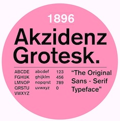
 The original sans typeface Akzidenz-Grotesk, the most influential grotesque, was first released by the Berthold type foundry in 1896 (as Accidenz-Grotesk). Quoting a Berthold press release: The design originates from Royal Grotesk light by Ferdinand Theinhardt who also supplied the regular, medium and bold weights. In Berthold's specimen booklet (Schriftprobe) number 444 released in December of 1957, Akzidenz-Grotesk mager (light) was referenced as Royal-Grotesk in parenthesis.
 Karl Gerstner said of Akzidenz-Grotesk, It is the work of anonymous typecutters: craftsmen, specialists, whose professional background and experience meant they were familiar with the finest subtleties and principles, and not just those of Grotesque. They gave Akzidenz-Grotesk the ultimate accolade a typeface can have: a functional, formal rightness, transcending the whims of fashion. Erik Spiekermann on the origins: Accidenz (sic) Grotesk was acquired by Berthold in Berlin when they bought another foundry, Pöpplbaum in Vienna. That was 1896 or 1898, depending whether one takes the date of the sale or the release of AG. The original weight was quite light, and Berthold kept adding weights, some of them from other typefaces, acquired from other foundries. Every foundry had a version of that type of face, more often than not available in a few sizes only. The original series remained quite diverse, individual weights showing not much resemblance but name. It was mainly a marketing and naming success. That only changed when they cut (I'm talking foundry type, with some sizes and weights also available on Intertype slug casters) Series 57, and then Series 58, named for the years of release. These had some sizes (but not all) recut under the direction of Günter Gerhard Lange, who was their (freelance) artistic director at the time. Throughout the years, Berthold has expanded this extremely popular and versatile family. AG ExtraBold (1966) and AG Super (1968) were developed by Guenter Gerhard Lange and are excellent choices for headlines. Guenter Gerhard Lange added more weights for Berthold including Super Italic (2001) and ExtraBold Italic (2001). In 2006, Berthold first released Akzidenz-Grotesk in OpenType. In 2007, Berthold announces the release of Akzidenz-Grotesk Pro+ with Cyrillic and Greek support for all 30 fonts in the collection as well as language support for Central European, Baltic and Turkish. Akzidenz-Grotesk Pro+ is available in CFF PostScript flavored OpenType. Also added in 2007 was Akzidenz-Grotesk Next in 14 styles. Akzidenz-Grotesk Probe Nr. 473 (1966, H. Berthold AG) is a specimen book. Ulrich Stiehl dociuments the Linotype clones from 1958. In 1992, H. Berthold made 22 PostScript fonts of Akzidenz Grotesk, shown here. Images of Akzidenz Grotesk, courtesy of Gabriel Perdomo Motta: i, ii, iii. Credit for some images below: Danielle West. [Google]
[More] ⦿
|
Alfredo Marco Pradil
[Hanken Studio]

|
 [MyFonts]
[More] ⦿
[MyFonts]
[More] ⦿
|
Andrea Tartarelli
|
 Andrea Tartarelli studied at the Academy of Fine Arts of Carrara and worked as a marble sculptor before turning to graphic and type design. He continued his studies at the Plantin Institute at Antwerp, and now teaches type design at IED Florence. He designed Tarif (selected by Fontspring.com among the Best fonts of 2019), Malik (shortlisted for the Communication Arts Typography awards 2021) and has been co-designer on dozens of typefaces at Zetafonts including the award winning Blacker (selected by Myfonts as one of the best new families of 2019), Monterchi (CA typography award 2020, Myfonts hidden gem 2019) and Stinger (CA typography award 2021). He works and lives in Pietrasanta (Tuscany, Italy). His graphic design outfit is called Surface Studio. Tartarelli's typefaces:
 |
Andy Budd
|
Managing Director of Clearleft in Brighton, UK. He has a blog, where people were prompted for the names of type families, if they could only buy six of them. Continued here and here. The totals are tallied for you: - Akzidenz Grotesk (2 votes): Akzidenz Grotesk is the classic alternative to its dowdy and overused relation, Helvetica. If you ever feel the need to use Helvetica, resist the urge and try Akzidenz instead.
- Avenir or Avenir Next (2 votes): Futura is a wonderful typeface, although is can feel slightly sterile at times. Adrian Frutiger set about humanizing Futura and created Avenir in 1988. Avenir is a beautiful typeface but is restricted to just 12 weights. In 2004 the typeface was completely revised and Avenir Next was released with a stunning 96 weights. If you are looking for a modern sans, you need look no further.
- Neutraface (2 votes): Designed by Christian Schwartz for House Industries, Neutraface captures the 1950s stylings of architect Richard Neutra in a beautiful typeface meant for application on the screen, in print, and in metalwork. If you are ever in need of a classy retro face, they don't get any more polished than this. [...] Tired of Futura and Gill Sans? Neutraface is a beautiful art-deco alternative. Modern yet retro, this typeface comes with loads of ligatures and 7 beautiful figure styles. If this typeface was a drink it would be a Vodka Martini, shaken, not stirred.
- Engravers Gothic: For a period of about two years, I attempted to inject this font into every single project I worked on. Even if I couldn't fit it into the main scene, I screened it back somewhere in the distance just to feel better about myself. For a brief time, I was actually creating design projects for the sole purpose of using Engravers Gothic in them. It was at this point that I sought professional help.
- Myriad: Its quite simply the most readable sans-serif typeface ever invented for print at least. On the web, that'd be Lucida Grande, but thanks to Apple, I don't really have to buy that now, do I?
- Meta: Like a good mullet, this typeface has something for everyone. Its clean lines make it ideal for logotype, headings, and other professional applications, but its curvy flourishes keep it from looking sterile or uptight.
- Agency: Originally designed in 1932, and then expanded to multiple weights and widths in the 1990s by David Berlow, this typeface can be made to look futuristic or retro. Im partial to flexible typefaces, and Agency is second-to-none in this regard. Use it for old movie posters. Use it for your pathetic Star Trek Convention flyers. Agency feels at home in any environment.
- Palatino: Also abused in both web and print work, Palatino is undeniably versatile and (imho) a much better option overall than Times.
- Proxima Nova: I am counting down the minutes until this typeface is available. No joke.
- Dynasty Light: Someone please give me an excuse to use this in my next project. I take that back: no excuse needed.
- Trajan Pro: I am a sucker for classic Roman letterforms, and it doesn't get much better than Trajan.
- Warnock Pro Light Italic: I stumbled across this gorgeous typeface just recently, and its one of the hottest italics I have had the pleasure of using in recent months.
- Frutiger: Originally designed for the signage at Charles De Gaulle Airport in Paris, Frutiger is a beautifully fluid and legible typeface. Without doubt the most influential typeface in the past 30 tears, Frutiger has been the inspiration for many amazing fonts including the excellent Myriad Pro.
- DIN Schriften: DIN stands for Deutsche Industrie-Norm, the German industrial standard. Originally used for German road signage, this typeface was the darling of 90s graphic designers, and like FF Meta, is starting to make a comeback. With its wide open letter forms DIN is am extremely clear and legible typeface, great at any size.
- Mrs Eaves: If I had to choose one serif typeface it would be Mrs Eaves. Named after John Baskervilles wife, this stylised version of Baskerville is loved by graphic designers around the world. Mrs Eaves is a modern serif that retains an air of antiquated dignity. Playful without being too scripty, its a fully featured typeface with a beautiful collection of ligatures.
[Google]
[More] ⦿
|
Archetypo.xyz
|
Archetypo.xyz was set up in 2020 by Joaquin Contreras and Miguel Hernandez Montoya, South American type designers based in Germany. Their typefaces: [Google]
[MyFonts]
[More] ⦿
|
Arve Båtevik
[Store Norske Skriftkompani]
|
 [More] ⦿
|
Basic Commercial
|
Linotype family from 2000-2003. The Linotype site says: "Basic Commercial is a font based off of historical designs from the hot metal typeface era that began appearing around the year 1900. [...] Basic Commercial was distributed for many years in the United States under the name Standard Series. The typeface worked its way into many aspects of daily life and culture; for instance, it became the typeface chosen for use in the New York City subway systems signage." Linotype says at MyFonts that the typeface was designed by Morris Fuller Benton ca. 1900 (not true). What Linotype never states is that Basic Commercial is equal to Akzidenz Grotesk--I mean--electronically identical to Adobe's Akzidenz Grotesk except for the copyright/trademark notices and the name (they should do that). This was detected by Ulrich Stiehl and is documented in this file. Akzidenz Grotesk started out as a Berthold family, which Linotype distributed under license for about 20 years. Bruno Steinert finally explains on behalf of Linotype: Since the 1950ies, Linotype sold its own design adaptions of some weights of Akzidenz Grotesk as matrices for Linotype typesetting machines. Over the years, Linotype created phototypesetting versions and digital fonts of these typefaces. In 1989, Adobe licensed Linotype's version of Akzidenz Grotesk from Linotype as Type 1 fonts. In 1990, Adobe licensed, together with more H. Berthold AG fonts, Berthold Akzidenz Grotesk, from H. Berthold AG. H. Berthold AG went bankrupt in 1993 and ceased to exist forever. In 2000, Berthold Types Ltd. obtained trademark registration for Akzidenz Grotesk. The same year, Linotype started to sell Basic Commercial. Berthold Akzidenz Grotesk is not identical to Basic Commercial. But if one compares older Linotype outline data with newer Linotype outline data, there might be very close similarities. Morris Fuller Benton has nothing to do with Basic Commercial or Akzidenz Grotesk. Akzidenz-Grotesk is a registered trademark of Berthold Types Limited. Linotype formerly offered typeface fonts under the name "Akzidenz-Grotesk" under license from H. Berthold AG. Linotype discontinued sale of those typeface fonts in approximately 2000. "Akzidenz-Grotesk" is offered by Berthold Types Limited of Chicago, Illinois. "Basic Commercial" is in the style of H. Berthold A.G.'s "Akzidenz-Grotesk" typeface fonts. Case closed. [Google]
[More] ⦿
|
Berthold Direct Corp
[Harvey Hunt]
|
 Once called Berthold Types and now Berthold Direct Inc, this companay is located in Chicago, IL, and was/is run by Harvey Hunt (1949-2022) and his wife Melissa Hunt, an attorney. The font collection is aristocratic, unpolluted by grunge and cheap thrills, featuring many well-known text type families. On the other hand, typophiles all over the world are aghast at the marketing strategies of Berthold. The fonts, all having "BE" or "BQ" in the font names, originated from Berthold AG in Germany, a company that went bankrupt. Some people argue that the Chicago-based Berthold has no rights to the old Berthold AG collection---a fact documented by Uli Stiehl. But most importantly, the Hunts became famous because of the numerous lawsuits typically related to the selection of font names too close to names in their collection.
 A few months after Hunt's death, Monotype acquired the Berthold collection. For many years, on and off between about 1970 and his death in 2009, Günter Gerhard Lange was the typographic director [of Berthold Direct Corp, and its German "predecessor" Berthold]. Lange, along with Bernd Möllenstadt and Dieter Hofrichter, formed the core of Berthold's Type Atelier located in München to continue the development of the Berthold Exklusiv typefaces. The classics in the collection include Akzidenz-Grotesk, Block, City, AG Book, Delta, Formata, Imago and Laudatio. Frequent contributors in the 1970s and 1980s were Friedrich Poppl and Gustav Jaeger. There are also many less frequently used older typefaces like Normande (1860), Augustea (1905-1926), and Michelangelo (1950, by Hermann Zapf). MyFonts link. Cover of their sans catalog. Cover of their modern typeface catalog. [Image: Karim Ahmed uses Normande BT in a beautiful poster] The main Berthold typefaces at MyFonts. Large catalog of Berthold's typefaces, given in alphabetical order. See also here. [Google]
[MyFonts]
[More] ⦿
|
Berthold Standard
|
Berthold Standard BQ was explained by Fred Nader as follows, ca. 2005: The latest example of the Hunts' attitude towards their customer base and their intelligence is in the so called 'new' release of the Standard set. To call this a 'new' release and to issue it and charge prior customers money for it is insulting at best, not to mention a knockoff of their own library. Standard was the name Berthold used for Akzidenz Grotesk when it was marketed as metal type in english speaking countries. There were no other differences. In this case, they have added a Euro symbol and changed the name, so that users will hopefully be lulled into paying $249 for what amounts to an added glyph that every other major foundry offers at no charge. For some, this is an indicator of how low the new Berthold will stoop for a dollar. This opinion misses the point though that, in fact, Berthold Standard BQ is actually a rename of a digitized form of a low point size Helvetica previously named Helvetica BQ. Update: Each style now sells for 350 dollars, or 3500 dollars for the ten-weight collection. Credit for some images below: Danielle West. [Google]
[More] ⦿
|
Bertholdgate I: Die selbsternannten Rechtsnachfolger der Aktiengesellschaft H. Berthold AG
|
German language article by Ulrich Stiehl regarding the question: Who is the legal successor of H. Berthold AG? And a damning indictment of the Hunts who run Berthold Types in Chicago. The main dates in this sad case, beautifully researched by Stiehl: - 1858: Hermann Berthold (1831-1904) founds the company in Berlin.
- 1896: The company becomes Aktiengesellschaft H. Berthold AG.
- 1896-1960s: The company operates from Berlin and Stuttgart under the name H. Berthold AG Schriftgiesserei und Messelinienfabrik.
- 1960s-1993: The company uses the name H. Berthold AG.
- 1993: H. Berthold AG files for bankruptcy. Its main business at that point was the sale of phototypesetting machines, not fonts, and that business had come to a standstill. The 1800 fonts at the time of the bankruptcy are all listed in Stiehl's document.
- 1993: The bankrupt company had incredible debts, and no one was interested in taking over those debts. So, the bankruptcy court in Berlin decided to liquidate the company. There is no legal successor (Rechtsnachfolger). For a period of 30 years after 1993, any legal successor would have to take care of the debts.
- 1994-now: Several companies stake out claims of being legal successors or at least copyright owners of Berthold fonts:
- Softmaker GmbH in Nürnberg, owned by Martin Kotulla. His 59 Euro CD with 10,000 fonts (the best buy in the business) has over 1,000 of Berthold's 1,800 fonts. The names were changed. Softmaker claims to have copyright to these fonts.
- Berthold Types Limited, Chicago, owned by Harvey and Melissa Hunt: The CD "Exklusiv Collection" has 800 of the 1,800 Berthold fonts but costs 6350 Euros. This outfit uses the old Berthold names. Incredibly, Berthold Types claims to have the copyright, and states that it is the legal successor of H. Berthold AG. (How can this be, if they never assumed the debts?) To complicxate matters, the company started calling itself Berthold Direct Corp in 2005.
- Franzis Verlag GmbH, owned by Werner Mützel and others: The CD "1800 Profischriften für Windows" (16 Euros, 4 Euros on Ebay) has 1,800 fonts, of which 1,200 (renamed, though) are from the Berthold collection. Franzis claims to have copyright to these fonts. Note: these fonts are qualitywise indistinguishable from the Berthold Types collection.
- FontStuff Ltd, London, or Bertlib Corporation, a post office box company which started up a font business on the web in 2005 based on the old Berthold collection. Just as Berthold Types Limited, they say that they are the legal successors of H. Berthold AG, and that the copyright is theirs. The web site disappeared at the end of 2005 though. Stiehl belives that the company was a front for Klaus-Dieter Bartel's "Babylon Schrift Kontor" (a defunct foundry). Bartel died recently.
As an example, Stiehl compares the copyright lines of several Akzidenz Grotesk styles, starting with H. Berthold AG's own Akzidenz Grotesk Buch (copyright H. Berthold AG, 1992). This was followed by Agba by Franzis (copyright ClassicFontCorporation, 1993), AG Book by Berthold Types (copyright Berthold LLC, 1997 and 2001), Atkins by Softmaker (copyright Softmaker Software GmbH, 2002), Gothic 725 (Bitstream), Ancona (Infinitype), A750 Sans Schoolbook (Softmaker), and Europa-Grotesk by Bertlib (copyright BERTLib Corporation, 2004). Stiehl then notes that the quality of the cheapest collection (Franzis) is just like that of Berthold Types Limited, Chicago. He observes that Berthold Types does not have an office in Germany--for otherwise they could be in legal trouble for misleading web visitors into thinking that they are the legal owners of the Berthold collection. I quote from them: Berthold Types is the legal successor to H. Berthold AG, the highly regarded German type foundry. Stiehl produces a document signed by Dr. Susanne Teipel from an attorney's office (Schwabe Sandmair Marx) in München (representing Berthold Types) in which the following official statement is made: Berthold Types is the legal successor to H. Berthold AG. Stiehl believes that this alone could spell serious trouble in Germany for both that law firm and Berthold Types. Development in 2008: Berthold fonts are now sold through Linotype/Monotype. [Google]
[More] ⦿
|
Callum Rowney
|
Margate and/or Westgate-on-Sea, UK-based designer of Bauen (2015), which is influenced by Bauhaus, the avant garde and Akzidenz Grotesk. Later in 2015, he designed the octagonal typeface Azimuth and the pixelish typeface Alpha Display. His Atom Display (2016) is influenced by Wim Crouwel's Stedelijk. [Google]
[More] ⦿
|
Colophon Foundry
[Edd Harrington]
|
 Colophon Foundry was a London and Los Angeles-based digital type foundry established in 2009. Its members comprised Benjamin Critton (US), Edd Harrington (UK), and Anthony Sheret (UK). The foundry's commissioned work in type design was complemented by independent and interdependent initiatives in editorial design, publishing, curation, and pedagogy. It grew out of the Brighton-based design studio, The Entente (Anthony Sheret&Edd Harrington) in April 2009. Benjamin Critton (Brooklyn, NY) joined them later. In December 2023, it was acquired by Monotype.
 Fonts: - Aperçu (2010, +Mono), a sans family by Anthony Sheret / The Entente.
- Archive (2013). A text family by Anthony Sheret and Edd Harrington.
- Basis Grotesque (2015). Influenced by Akzidenz Grotesk.
- Burgess (2014). A Times-Roman-like typeface family by The Entente and Benjamin Critton.
- Castledown (2014). A sans family for educational purposes. They write: From 2012-2014 we collaborated closely with Castledown Primary School, Hastings, UK. The project began as a custom typeface commission for the school but soon developed into an initiative to develop and unify typography within primary education. Extended in 2020.
- Central Avenue (2011). By Studio Makgill.
- Coign (2018-2021). An extensive study of ultra condensed forms based on the DeLittle type foundry's Elongated Sans.
- DM Mono (2020). A free 3 weight, 3 style family designed for DeepMind. DM Mono was loosely based off of Jonny Pinhorn's DM Sans, with a reduction in contrast and less geometric proportions. The type design and font development was commissioned from Colophon Foundry, with Creative Direction from the DeepMind team. Design by Edd Harrington and Anthony Sheret. They also developed DM Sans, DM Serif Text and DM Serif Display (2019). The Serif families are derived from Source Serif Pro. The Sans family is derived from Jonny Pinhorn's Poppins (2014-2017). Github link. Google Fonts link.
- Fann Grotesque (2019). A 9-weight sans family inspired by the 19th century British Grotesque types from British type foundries such as Stephenson Blake, Day & Collins and Miller & Richard.
- Fortescue (2009): a text family with triangular serifs commissioned for the identity of artist and printmaker, Jake Spicer.
- La Fabrique Pro (2012-2017). A sans by The Entente.
- Goodall. A 10-style take on the geometric slab serif genre; bringing together a melting pot of 19th century wood type influences and more contemporary reference points such as Memphis (Rudolf Wolf, 1929) and Rockwell (Monotype, 1934).
- Grenette (2020). Colophon writes: Combining influences from Windsor (from Stephenson Blake & Co's Wood Letter Specimen, 1915) and Richmond Old Style (from DeLittle's Wood Type Specimens, 1966), Grenette's imposing serifs contrast with the serif-less interiors of certain forms such as n, h and v.
- Leroy (2012). By Stockholm-based Oscar & Ewan.
- Lisbon (2013, Anthony Burrill). Lisbon is a geometric stencil typeface based on an original metal stencil that Burrill found in a sign makers shop in Lisbon, Portugal. The font was first used in a series of posters commissioned by the British Council for Experimenta cultural biennale in Lisbon (2010).
- Lydia Bold Condensed (2013, Benjamin Critton) revives an angular typeface by Warren Chappell from 1946.
- Mabry (2018, Benjamin Critton): Originally commissioned in 2014 for Los Angeles-based apparel company Nasty Gal---named as such after the 1975 album and song of the same name by influential funk singer Betty Davis (b. Betty Mabry, 1945)---Mabry is the commercial iteration of the former NG Grotesque.
- MAD Sans and MAD Serif (2011-2017) by Dries Wiewauters.
- Marché (2014). By The Entente, inspired by Eurostile.
- Midnight sans (2021). Colophon writes: Midnight Sans was initially drawn for Gary Green's "When Midnight Comes Around", published by our friends at Stanley/Barker in 2020. The condensed-only style embodied a warm but idiosyncratic flavour: a reflection of the publication's photographs, which document the burgeoning downtown alternative music scene of 1970s New York City.
- Monosten (2011). A rounded monospace sans by Anthony Sheret that includes a couple of stencil styles.
- Montefiore (2009): a grotesque with wood type influences.
- One Night Sans (2020). A bespoke typeface for condom manufacturer Durex.
- Pantograph: Pantograph is an authentic redraw of the typeface employed by the British pantograph etching process. Designed by Hamish Makgill in 2009.
- Peggs (2009): typewriter style for the identity of Peggs&Son, designed by Edd Harrington.
- PDU (2010). By Dries Wiewauters. PDU stands for Plaque Découpée Universelle, a stencil system patented in 1876 by Joseph A. David.
- Perçu (2010): a full sans family that is---in their own words---an amalgamation of classic humanist typefaces such as Johnston and Gill Sans with Neuzeit and Franklin Gothic.
- Perfin (2009, by Alison Haigh).
- PIN (2015). By Hoon Kim / Why Not Smile LLC.
- Raisonné (2010). By Benjamin Critton. Raisonné is a 7-weight geometric sans-serif type initially designed in 2010 and subsequently expanded upon, first in 2012 and again in 2018-2019. Colophon writes: The typeface is parodic-serious, intended to be blunt, candid, and affable all at the same time. It outwardly pays homage to noteworthy precedents, among them Rudolf Koch's Kabel (1927) and Victor Caruso's later redrawing for ITC (1976), Joseph Churchward's Crossbred (1970s), Paul Renner's Futura (also 1927), and Herb Lubalin's Avant Garde (1968).
- Reader (2009): Reader is a neo-grotesque typeface initially created in a medium weight, and now re-cut into a base family of six weights with an additional seventh in the form of Reader Black. The typeface itself has been referenced from an RSPB letter dating 1972. The original typeface, which is unknown, was a monospaced, rounded face. It had geometric proportions which felt like they wanted to break free of the restrictions of a monospaced grid.
- Relative (2011). By The Entente: Initially drawn in August 2010 for Outside In by Stephen Gill; a book designed for the Brighton Photo Biennale 2010. Includes monospaced styles.
- System85 (+Mono). A sans family.
- Transcript Pro (2017).
- Value Sans and Value Serif (2012): Value Sans borrows in style and behaviour from precedents like Elegant Grotesk and Granby. Value Serif pays homage to forebears like Plantin Infant and Italian Old Style. The Sans was drawn first by The Entente (Edd Harrington & Anthony Sheret, UK). The Serif was drawn shortly after, by Benjamin Critton (US). Each borrows their geometries from the other, and nuances were finalised by all parties as Colophon Foundry.
- Visuelt (2013-2016, The Entente). Originally created as a bespoke face for the 2013 and 2014 identity for Visuelt, Oslo, Norway, Visuelt spawned from a more considered and constrained version of Aperçu. Visult Pro (2019) covers Cyrillic and Greek as well.
Bespoke projects: - Battlebridge for the area of King's Cross, London (2016).
- Burberry Apercu Bespoke (2010-2017).
- Chelsea Basis (2015) and Chelsea Basis Chiselled (2018). For FC Chelsea.
- Corona Headline for Corona (2016).
- Europa Nuova & Europa Mono (2016). For UEFA's Europa League.
- Fanta Playful for Fanta (2017).
- Fulham First XI & Substitute XI for Fulham Football Club (2013). Stencil types.
- FQ Value for New Covent Garden Market (2016).
- GF Smith for paper manufacturer and merchant G.F. Smith (2014).
- Grey Goose for the French Vodka Producer (2014).
- Helen for Race Against Dementia (2016).
- Mondial for Rapha's Magazine (2015).
- NG Grotesque for LA-based fashion label, Nasty Gal, with Benjamin Critton (2014).
- Poynings, for printer Generation Press (2014).
- Tesco Modern, Tesco Modern Condensed, Tesco Slab and Tesco Serif for supermarket chain Tesco (2016-2017).
- Ubisoft Sans for French games publisher, Ubisoft (2016).
- Unify for the English Rugby Football Union (2013).
- Wales and Cymru Sans for Visit Wales / Welsh Government (2015).
[Google]
[More] ⦿
|
Context Ltd
[Stefan Peev]
|
Stefan Peev (Context Ltd, Plovdiv, Bulgaria) released the free Latin / Cyrillic sans typeface Selena, the free transitional text typeface Sibila, and the sans typeface Bretan in 2014 via the Open Font Library. Tipotype (2014, free at Open Font Library) is a roman type serif font family inspired by the well known fonts like Free Serif, Tex Gyre Termes and Omega Serif. Besides Latin and Cyrillic, Tipotype also includes the "Bulgarian" letterform model, which has been proposed by a group of Bulgarian designers in the 1960s. In 2015, he published the old Slavonic typeface Supralskija, the text typeface Sibila, and the commercial (and sometimes free) sans typefaces Tervel, Hemus, Repo, Omurtag, Gremi, Plovdiv (the project started as a part of the official programme of Plovdiv---European Capital of Culture 2019), Libra Sans (based on Liberation Sans), Font Night (an art deco project with Krassimir Stavrev for an event in Plvdiv), and Coval. In 2016, he designed the free Libra Serif Modern (based on Libra Serif), the free text typeface Pliska, the free Veleka (a modification of Charis SIL to cover Bulgarian Cyrillic and Greek), the free font Linguistics Pro (based on Andreas Nolda's Utopia Nova), Maritsa, Perun (a modification of Free Universal (Stephen Wilson, 2009) and SIL Sophia (1994-2008)), Arda (a condensed sans), Libra Sans Modern, HK Grotesk (he added Cyrillics to Pradil's Latin font), and Bogorov (Cyrillic font). In 2018, he designed the Cyrillic revival typeface Grazhdanskiy Shrift. In 2020, he released the manicured family Hebert Sans. and the condensed sans typeface Arda (which is in the orbit of Akzidenz Grotesk) Behance link. Open Font Library link. Fontsquirrel link. [Google]
[More] ⦿
|
Cosimo Lorenzo Pancini
|
 Born in Firenze in 1969. Cofounder with Francesco Canovaro and Debora Manetti of the Italian design firm in Firenze called Studio Kmzero. He co-designed some typefaces there such as Arsenale White (2009). In 2002, Pancini developed Targa, TargaMS and TargaMSHand (for comic books?), basing his design on the peculiar sans serif monospace typeface with slightly rounded corners and a geometric, condensed skeleton that Italy had been using for its license plates. In 2022, Francesco Canovaro redesigned this font into a versatile multi-weight typeface, Targa Pro, which includes Targa Pro Mono (which keeps the original monospace widths), Targa Pro Roman (with proportional widths), both in five weights plus italics, the handmade version Targa Hand, and Targa Pro Stencil.
 The handwriting of Lord Byron led Pancini to develop the brush script typeface Byron (2013, Zetafonts). MyFonts credits him with the rounded avant garde sans family Antipasto (2007), but elswhere we read that this typeface is made by Matteo di Iorio, so there is some confusion. It was extended in 2017 by Pancini as Antipasto Pro. In 2014, Cosimo Lorenzo Pancini and Francesco Canovaro co-designed Amazing Grotesk (+Ultra). He also designed the calm bold geometric rounded sans typeface Cocogoose (2014; replaced by Cocogoose Pro in 2017) and the stylish deco font Offensive Behaviour. Cocogoose Letterpress is free. Cocogoose is part of the Coco Gothic family, a collection of twelve typefaces each inspired by the fashion mood of every decade of last century, named after fashion icon Coco Chanel. Cocogoose is Coco Gothic for the 1940s. See also Coco Gothic Pro (2021). In 2015, Pancini published the grand family Coco Gothic. This Latin / Greek / Cyrillic typeface family features a small x-height and sligghtly rounded corners to make the avant garde and geometric sans typefaces in vogue in the 1970s come alive again, ready for 21st century fashion magazines. It comes with substyles that recreate many moods, including art nouveau and arts and crafts (Cocotte), Italian propaganda style and Italian deco (Cocosignum), hipster style (CocoBikeR), or Bauhaus (Cocomat). Coco Gothic was initially developed as a corporate font for Lucca Comics & Games Festival 2013. The rounded geometric sans family Cocomat (by Cosimo Lorenzo Pancini, Deborah Manetti and Francesco Canovaro) was inspired by the style of the twenties and the visions of Italian futurists like Fortunato Depero, Giacomo Balla and Antonio Sant'Elia. Updated in 2019 as Cocomat Pro. Still in 2015, Cosimo and Zetafonts published the connected creamy baseball script Bulletto, the grungy handvetica Neue, and the calligraphic wedding typeface Hello Script. In 2015, at Zetafonts, Cosimo Lorenzo Pancini designed CocoBikeR (2015) to celebrate the hipster and bike cultures. CocoBikeR (for Latin, Greek and Cyrillic) is part of the successful Coco Gothic typeface family. In 2017, Pancini designed the 1930s Italian art deco typeface families Cocosignum Maiuscoletto and Cocosignum Corsivo Italico. In 2021, he published the 48-style (+variable) font family Coco Gothic Pro. This is a redrawn and expanded set of fonts: Inspired by a biography of Coco Chanel and trying to capture the quintessential mood of classical fashion elegance, Cosimo Lorenzo Pancini designed Coco Gothic looking for the effect that the first geometric sans typefaces (like Futura, Kabel or the italian eponyms like Semplicita) had when printed on paper. The crisp modernist shapes acquired in printing charme and warmth through a slight rounding of the corners that is translated digitally in the design of Coco Gothic. [...] A distinguishing feature of Coco Gothic Pro is the inclusion of ten alternate historical sets that allow you to use the typeface as a true typographic time machine, selecting period letterforms that range from art deco and nouveau, to modernism and to eighties' minimalism. Equipped with such an array of historical variants, Coco Gothic Pro becomes an encyclopedia of styles from the last century. There is also attention to Darkmode and there is coverage of Cyrillic and Greek. Typefaces from 2016: Adlery (a curly brush script), Kitten (Fat, Swash, Swash Monoline, Slant, Bold: signage script family), Adlibitum (a blackletter typeface by Cosimo Lorenzo Pancini and Francesco Canovaro), Morbodoni (a display didone by Cosimo Lorenzo Pancini and Francesco Canovaro). In 2016, Cosimo Lorenzo Pancini, Andrea Tartarelli, Giulia Ursenna Dorati and Andrea Gaspari co-designed the 1940s vintage brush script typeface Banana Yeti, which is based on an example by Ross George shown in George's Speedball 1947 Textbook Manual. The Zetafonts team extended the original design to six styles and multilingual coverage. The ExtraBold is free. Still in 2016, Pancini designed Calligraphunk, an experimental typeface that mimicks polyrythmic calligraphy, by alternating two sets of lowercase letters to emulate handwriting. In 2016, Cosimo Lorenzo Pancini, Matteo Chiti, Luca Chiti and Andrea Tartarelli co-designed the retro connected brush script font family Advertising Script, which is based on an example from Ross George's Speedball 1947 Textbook Manual. Beatrix Antiqua (2016, by Francesco Canovaro, Cosimo Lorenzo Pancini and Andrea Tartarelli). This humanist sans-serif typeface is part of the Beatrix family (Beatrix Nova, etc.) that takes its inspiration from the classic Roman monumental capital model. Its capitals are directly derived from the stone carvings in Florence's Santa Croce Cathedral. Beatrix keeps a subtle lapidary swelling at the terminals suggesting a glyphic serif, similar to Hermann Zapf's treatment in Optima. Amazing Grotesk (2016) is based on a logo designed by Francesco Canovaro. Studio Gothic (2017, by Francesco Canovaro, Cosimo Lorenzo Pancini and Andrea Tartarelli) is an 8-style geometric sans family based on Alessandro Butti's geometric sans classic, Semplicita. Hello Script and Hello Sans can be used for layering and coloring. The Christmas-themed version is Hello Christmas. Pancini designed the 64-strong typeface family Body Grotesque and Body Text in 2017-2018, together with Andrea Tartarelli. It was conceived as a contemporary alternative to modernist super-families like Univers or Helvetica. In 2017, Cosimo Lorenzo Pancini and Andrea Tartarelli co-designed the sans typeface family Kabrio, which gives users four different corner treatment options. Anaphora (2018). Anaphora is a contemporary serif typeface designed by Francesco Canovaro (roman), Cosimo Lorenzo Pancini (italic) and Andrea Tartarelli. It features a wedge serif design with nine weights from thin to heavy. Its wide counters and low x-height make it pleasant and readable at text sizes while the uncommon shapes make it strong and recognizable when used in display size. Anaphora covers Latin, Greek and Cyrillic. Canovaro's Arista served as a basis for the 29-style monolinear rounded sans typeface family Aristotelica (2018) by Cosimo Lorenzo Pancini and Andrea Tartarelli. See also Aristotelica Pro (2020). In 2018, he designed the italics for Cosimo Lorenzo Pancini's Domotika typeface family. Between 2018 and 2021, Cosimo Lorenzo Pancini and Andrea Tartarelli developed the 8-weight humanist sans typeface Domotika for Latin, Cyrillic and Greek, further into the 18-style Domotika Pro (2021). In 2018, he published Radcliffe, with Andrea Tartarelli, a Clarendon revival with Text and Casual subfamilies. Radcliffe (a Clarendon revival by Cosimo Lorenzo Pancini and Andrea Tartarelli), and added the layerable condensed Cocogoose Narrows to the Cocogoose family. Codec (2018) by Cosimo Lorenzo Pancini, Francesco Canovaro and Andrea Tartarelli is a geometric sans typeface family in which all terminal cuts are horiontal or vertical. See also Codec Pro (2019). His Double Bass (2018) is a jazzy 4-style typeface family that pays tribute to Saul Bass's iconic hand lettering for Otto Preminger's The Man with the Golden Arm film title sequence and other movies, Bass's vibrating, almost brutal cut-out aestethics, and the cartoonish lettering and jazzy graphics of the fifties. In 2018, he published the sharp wedge serif typeface Blacker to pay homage to the 1970s. In 2019, that was followed by Blacker Pro (Cosimo Lorenzo Pancini and Andrea Tartarelli, who write: Blacker Pro is the revised and extended version of the original wedge serif type family designed by Cosimo Lorenzo Pancini and Andrea Tartarelli in 2017. Blacker was developed as a take on the style that Jeremiah Shoaf has defined as the "evil serif" genre: typefaces with high contrast, oldstyle or modern serif proportions and sharp, blade-like triangular serifs). Still in 2018, he designed the swooping polyrhythmic calligraphic typeface Calligraphunk. In 2018, Cosimo Lorenzo Pancini and Andrea Tartarelli designed Holden, a very Latin cursive sans typeface with pointed brush aesthetics and fluid rhythmic lines. In 2019, Cosimo Lorenzo Pancini, Francesco Canovaro and Andrea Tartarelli published the monolinear geometric rounded corner amputated "e" sans typeface family Cocogoose Classic, the sans family Aquawax Pro, and the condensed rounded monoline techno sans typeface family Iconic. In 2019, Cosimo Lorenzo Pancini, Andrea Tartarelli and Maria Chiara Fantini at Zetafonts published a slightly calligraphic Elzevir typeface, Lovelace. In 2019, the lapidary typeface family Beatrix Antiqua (Francesco Canovaro) was reworked by Cosimo Lorenzo Pancini together with Andrea Tartarelli and Maria Chiara Fantini into a 50-style type system called Monterchi that includes Text, Serif and Sans subfamilies. Monterchi is a custom font for an identity project for a famous fresco in Monterchi, developed under the art directorship of Riccardo Falcinelli. Tarif (2019) is a typeface family inspired by the multicultural utopia of convivencia---the peaceful coexistence of Muslims, Christians and Jews in tenth century Andalusia that played an important role in bringing to Europe the classics of Greek philosophy, together with Muslim culture and aesthetics. It is a slab serif typeface with a humanist skeleton and inverted contrast, subtly mixing Latin zest, calligraphic details, extreme inktraps, and postmodern unorthodox reinvention of traditional grotesque letter shapes. The exuberant design, perfect for titling, logo and display use, is complemented by a wide range of seven weights allowing for solid editorial use and great readability in body text. Matching italics have been designed with the help of Maria Chiara Fantini and Cosimo Lorenzo Pancini, while Rania Azmi has collaborated on the design of the arabic version of Tarif, where the humanist shapes and inverted contrast of the Latin letters find a natural connection with modern arabic letterforms. Late in 2019, Cosimo Lorenzo Pancini released the fun typeface family Hagrid at Zetafonts, which writes: Crypto-typography---the passion for unknown, weird and unusual character shapes---is a disease commonly affecting type designers. Cosimo Lorenzo Pancini has celebrated it in this typeface family, aptly named Hagrid after the half-blood giant with a passion for cryptozoology described by R. K. Rowling in her Harry Potter books. Extreme optical corrections, calligraphic counter-spaces, inverted contrast, over-the-top overshoots: all the inventions that abound in vernacular and experimental typography have been lovingly collected in this mongrel sans serif family, carefully balancing quirky solutions and solid grotesque design. In 2020, Pancini released Stinger (2020, a 42-style reverse contrast family by Francesco Canovaro, Cosimo Pancini, Andrea Tartarelli and Maria Chiara Fantini) and Boring Sans (a typeface family designed along two variable axis: weight and weirdness). As part of the free font set Quarantype (2020), Cosimo Lorenzo Pancini designed Quarantype Embrace, Quarantype Hangout, Quarantype Hopscotch, Quarantype Joyride, Quarantype Sackrace, and Quarantype Uplift (with Maria Chiara Fantini). In 2020, Cosimo Lorenzo Pancini and Mario De Libero revived Nebiolo's Carioli (1928) as Cairoli Classic and Cairoli Now at Italian Type / Zetafonts. They extended the original weight and width range and developing both a faithful Classic version and a Now variant. The Cairoli Classic family keeps the original low x-height range, very display-oriented, and normalizes the design while emphasizing the original peculiarities like the hook cuts in curved letters, the high-waisted uppercase R and the squared ovals of the letterforms. Cairoli Now is developed with an higher x-height, more suited for text and digital use, and adds to the original design deeper inktraps and round punctuation, while slightly correcting the curves for a more contemporary look. Cairoli Variable has a weight and width axis. In 2020, Cosimo Lorenzo Pancini and Mariachiara Fantini---with the help of Solenn Bordeau---released Erotique at Zetafonts. Erotique evolved from Lovelace, an earlier Zetafonts typeface. Zetafonts describe this evil serif as follows: it challenges its romantic curves with the glitchy and fluid aestethic of transmodern neo-brutalist typography. Late in 2020, they added Erotique Sans, the sans version of Erotique, also designed by Cosimo Pancini and Maria Chiara Fantini. Late in 2020, he co-designed the 46-style font family Eastman Grotesque together with Francesco Canovaro and Andrea Tartarelli. This monolinear sans with a tall x-height comprises an interesting Eastman Grotesque Alternate subfamily with daring and in-your-face glyphs. The typeface evolved from Zetafonts' earlier Bauhaus-inspired typeface Eastman (2020). Later fonts in this family include Eastman Condensed (2021, by Francesco Canovaro, Cosimo Pancini and Andrea Tartarelli). In 2020, Cosimo Pancini, Andrea Tartarelli and Mario De Libero drew the 60-style Cocogoose Pro Narrows family, which features many compressed typefaces as well as grungy letterpress versions. Sunshine Pro (2020, Zetafonts) was designed by Cosimo Lorenzo Pancini and Solenn Bordeau expanding the original Sunshine design by Francesco Canovaro, part of the Quarantype collection (2020), which in turn was designed as a typeface for good vibes against Covid-19. Sunshine Pro is an experimental Clarendon-style font with variable contrast along the weight axis---contrast is reversed in light weight, minimized in the regular weight and peaks in the bold and heavy weights. Coco Sharp (2021) is a 62-style sans feast, with two variable fonts with variable x-height, by Francesco Canovaro, Cosimo Pancini and Andrea Tartarelli. Co-designer of Heading Now (2021), a 160-strong titling font (+2 variable fonts) by Francesco Canovaro, Cosimo Pancini, Andrea Tartarelli and Mario De Libero that provides an enormous range of widths. Keratine (2021, Cosimo Pancini, Andrea Tartarelli and Mario De Libero). A German expressionist typeface that exists in a space between these two traditions, mixing the proportions of humanistic typefaces with the strong slabs and fractured handwriting of blackletter calligraphy. Pancini, its main designer, writes that it explores the impossible territory between antiqua and blackletter. Geppetto (2021) is a frivolous Tuscan font that started out as a revival of a condensed Tuscan wood type family appearing in the 1903 Tubbs Wood Type catalog and which was probably derived from an 1859 typeface by William Hamilton Page. Pancini built a variable font on top of it and calls it a font for fake news. In 2021, Pancini added Coco Tardis as a variable font with a time travel slider to the Coco Gothic family. Millard Grotesque (2021) is a true "grot" in the Akzidenz Grotesque sense of the word. This typeface family was designed by Cosimo Lorenzo Pancini and Andrea Tartarelli. Pancini's Descript (2021) is a variable script font with two axes, slant and speed of writing. Milligram (2021) is a very tightly set grot by Cosimo Pancini and Andrea Tartarelli. [Google]
[MyFonts]
[More] ⦿
|
Edd Harrington
[Colophon Foundry]
|
 [More] ⦿
|
Erik Spiekermann
[Spiekermann's favorite typefaces]
|
[More] ⦿
|
Ferdinand Theinhardt
[Ferdinand Theinhardt Schriftgiesserei Berlin]
|
 [MyFonts]
[More] ⦿
[MyFonts]
[More] ⦿
|
Ferdinand Theinhardt Schriftgiesserei Berlin
[Ferdinand Theinhardt]
|
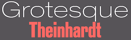 Berlin-based foundry from the 19th century, whose typefaces included Aldeutsch (aka Psalterium, or as Mainzer Gotisch, 1851) and Monumental (1863: roman caps). Ferdinand Theinhardt (b. Halle, 1820, d. Berlin, 1909) ran it.
 Around 1880, he published four weights of a Royal Grotesk (in 4 styles) for the Prussian Academy of Sciences in Berlin (Königlich-Preußischen Akademie der Wissenschaften zu Berlin; see, e.g., here or here; here is a sample of his 1895 Breite Grotesk). In 1885 he sold his own type foundry---Ferd. Theinhardt Schriftgiesserei Berlin---to Brothers Mosig and Oskar Mommen. In 1908, Berthold AG bought that foundry, and published the Royal fonts under the new name Akzidenz Grotesk. Theinhardt's Royal Grotesk became internationally known as Berthold's Akzidenz Grotesk, which some call the godmother of all modern grotesque typefaces. [Note: Akzidenz Grotesk is often given the 1898 date.] Theinhardt was also known as a specialist in cutting hieroglyphs. Author with R. Lepsius of Liste de Hieroglyphischen Typen aus der Schriftgiesserei F. Theinhardt (1875, G. Vogt, Buchdrückerei der Königl. Akademie der Wissenschaften, Berlin). It lists hieroglyphic symbols available from Theinhardt's foundry. Royal Grotesk was digitally released by Berthold Types (an American company with no legal connection with the original H. Berthold) in 2009. Typedia link from which I quote: Akzidenz (sic) Grotesk was released by Berthold in Berlin in 1898, according to their own literature. It was obviously based on typefaces already offered by other foundries, some of which were later taken over by Berthold. One of the contemporaries of AG was Royal Grotesk from Theinhardt. In Berthold's specimen booklet no. 429, which was most likely released in 1954, Akzidenz Grotesk Mager (light) was still referred to as Royal Grotesk, in brackets. Berthold acquired a typeface in 1908, (when they bought Ferd.Theinhardt) which they released as Akzidenz Grotesk Halbfett (medium). They kept adding weights, some of them from other typefaces, acquired from other foundries. Every foundry had a version of that type of face, more often than not available in a few sizes only. The original series remained quite divers, individual weights showing not much resemblance but in name. It was mainly a marketing and naming success. That only changed when they cut Series 57, and then Series 58, named for the years of release. These had some sizes (but not all) recut under the direction of Günter Gerhard Lange, who was their (freelance) artistic director at the time. GG Lange always claimed that Berthold had taken some AG weights and sizes from Popplbaum in Vienna, and that is supposed to account for the release date of 1896 or 1898. Popplbaum was not bought by Berthold until 1926. Berthold did take different fonts from all the foundries they bought (and obviously also made deal without buying a foundry) and rename them until they got a family together which still showed the original influences, sometimes even from size to size. The deals between foundries (by 1924 Berthold had bought 17 foundries, in Prague, Riga, Stuttgart, Leipzig, Moscow and St. Petersburg) have never been fully researched, and neither has the complete history of Akzidenz Grotesk been written yet. Digitizations include AltDeutsch by Gerhard Helzel. The Theinhardt family (2010, Francois Rappo, Optimo) is named after Theinhardt. Klingspor link. Credit for some images below: Danielle West. [Google]
[MyFonts]
[More] ⦿
|
Forgotten Shapes
[Stephan Müller]
|
 A project started by Stephan Müller (Lineto's founding partner), Reymund Schröder and Pierre Pané-Farré in 2017. They write: The three designers met at HGB Leipzig, the Academy of Fine Arts where Müller co-directs the type design course, and where their inevitable discussions about the witnessed inflation of digital typefaces led them to explore alternative strategies for the practice of type design, the study of typeforms, their development and their future existence in rapidly developing digital environments. Are there any more challenging and more rewarding methods of publication than the mindless race to discover, scan, trace & refit for a panicked release? That's one of the questions Forgotten Shapes aims to find answers for. Their typefaces:
 - As a preamble, Stephan Müller digitized Karl Gerstner's Gerstner Programm in 2008. They write: [Gerstner Programm is] Gerstner's conceptual take on the most classic of German grotesques, Akzidenz-Grotesk, a commercially ill-fated attempt to transform and re-position it with the Berthold type foundry for photo-type, the prevailing typesetting technology of the 1960s and 70s. Stephan Müller was fascinated by Karl Gerstner's rigorous conceptual approach, outlined in a detailed analysis published in 1963. After contacting him, Müller digitised it with his approval in 2008. Extensive additional research at the Swiss National Library, which holds Gerstner's archives, led him to rework and extend it in the years to follow. He also consulted with Christian Mengelt, who had originally drawn the typeface under Gerstner's guidance in the 1960s. The resulting font family remained unreleased until now [2017, the year of Gerstner's death], but has been used on a number of projects throughout the years.
- Antiques FSL (2017). By Pierre Pané-Farré: Antiques FSL is the digital re-issue of Antiques advertised in "Epreuves de caracteres" by E. Tarbe & Cie. (Fonderie Generale) around May 1839 in Paris. Antiques was available in the sizes of Corps 220, Corps 252 and Corps 280. The design was the sans serif counterpart to Allongees---a condensed Egyptian display typeface.
- Breite-Fette Antiqua FSL (2017). By Pierre Pané-Farré: Breite-Fette Antiqua FSL is the digital re-issue of an unidentified display typeface which---from ca. 1850 onwards---was part of the type case in the printing workshop of Oskar Leiner in Leipzig. It can not be said whether it was a custom-made design or if the typeface was distributed commercially by a foundry.
- Doppel-Mittel Egyptienne FSL (2017). By Pierre Pané-Farré: Doppel-Mittel Egyptienne FSL is the digital re-issue of Doppel-Mittel Egyptienne by Eduard Haenel, Magdeburg. It was advertised 1833 in "Schrift- und Polytypen-Probe. Zweite Lieferung. Blatt 25-72." and again 1834 in "Neueste Lettern", a supplement to the "Journal fuer Buchdruckerkunst." Doppel-Mittel Egyptienne itself was a re-casting of Two-Line English Egyptian No. 1 originally shown in 1821 by William Thorowgood, London.
- Schmale Egyptienne N.12 FSL (2017). By Pierre Pané-Farré: Schmale Egyptienne N.12 FSL is the digital re-issue of Schmale Egyptienne No. 12, 28 Cicero Kegel advertised in 1841 in "Proben der Affichen-Schriften von Eduard Haenel. Berlin."
- Lector FSL (2017). A text typeface family by Reymund Schröder: Lector FSL (originally named Lector Gewoehnlich and Lector Kursiv) is the digital rework of an original type design by Gert Wunderlich, drawn between 1963-1990. Lector was designed for, but never released by former Typoart (GDR). Published in cooperation with and permission of Gert Wunderlich.
[Google]
[More] ⦿
|
Gert Wiescher
[Wiescher Design]
|
 [MyFonts]
[More] ⦿
[MyFonts]
[More] ⦿
|
Gunnar Klack
|
Author of Neubau Akademie Study of a Grotesque Typeface in its Historical and Sociocultural Context (2020). This is a translation of Neubau Akademie, Historische und soziokulturelle Kontextualisierung einer Groteskschrift (2016). [Google]
[More] ⦿
|
Günter Gerhard Lange
|
 Known to his peers as GGL. German type designer, born in Frankfurt-an-der-Oder in 1921, d. 2008. He fought in World War II and lost his leg in a battle in France. Starting in 1941, Lange studied as apprentice of Georg Belwe at the Academy of Graphic and Book Arts in Leipzig. After graduation in 1945, until 1949, he was assistant of Professor Walter Tiemann, while also practicing painting and graphic design independently. In 1949, he continued his studies with Professors Hans Ullmann and Paul Strecker at the Hochschule für Bildende Künste in West Berlin. From 1950 onwards, he worked at Berthold AG in Berlin, where he designed his first type, Arena in 1951. In 1955, he became Reader in Typography at the Meisterschule für Graphik, Druck und Werbung in West Berlin. One of his many students was Manfred Klein. He also was Advisor in Visual Communications and Reader at the U5 Academy of Graphic Design and Art Direction Munich, and Instructor at the School of Applied Art in Vienna. H. Berthold AG's artistic director from 1961 to 1990, Lange was responsible for the creation and meticulous production of many of Berthold's typefaces. According to Dieter Hofrichter, his motto was 8 point is the moment of truth (when proofing typefaces). In 1989 he received the Frederic W. Goudy Award from the Rochester Institute of Technology (RIT). Recipient of the year 2000 TDC medal. After ten years of retirement from his position as Berthold AG's artistic director, Lange resumed his design activities in 2000 at Bertholdtypes (now Berthold Direct Inc) in Chicago. Bio at ATypI.
 Lange's own designs include his revivals of many classical typefaces. Here is a list, all Berthold typefaces: - Akzidenz Grotesk AG Book (1969-1972; see Atkins on the SoftMaker MegaFont XXL CD, 2002), AG Book Stencil Pro, AG Old Face (1984), AG Schoolbook.
- Arena (1951-1959): a condensed stocky roman. Now called Arena New.
- Berthold Baskerville (1961). Berthold Baskerville Book appeared in 1980.
- Berthold Bodoni Old Face (1983; see Giambattista on the SoftMaker MegaFont XXL CD, 2002).
- Bodoni Antiqua (1935).
- Boulevard (Berthold, 1955). Imitated by Opticast (Brandenburg), Greenstreet (Koepenick), Lanston (Francis No.982) and in Regency. Boulevard was revived digitally by P22 as LTC Francis in 2018.
- Caslon Buch (1977).
- Champion (1957, a paint brush typeface revived in 2010 by Ray Larabie as Gloss).
- Concorde (1969; see C791 Roman on the SoftMaker MegaFont XXL CD, 2002, CJ by Itek, Chinchilla by Scangraphic, Transport by Varityper, Contus by URW, Dutch 809 by Bitstream, and Concept by SoftMaker), Concorde Nova.
- Deepdene (1982-1983), a revival of Frederick Goudy's Deepdene of 1927-1934.
- Derby (1952-1953). This script typeface was digitally revived by Gerhard Helzel, and in 2019 by Ralph M. Unger as Turnier.
- El Greco (1964).
- Franklin Antiqua (1976; see F820 Roman on the SoftMaker MegaFont XXL CD, 2002).
- Berthold Garamond (1972).
- Imago (1982).
- Publica. This Peignotian sans typeface was the source of inspiration for Ralph M. Unger's Bravura Pro (2013).
- Berthold Script (1977; see B690 Script on the SoftMaker MegaFont XXL CD, 2002).
- Solemnis (1952-1953, refreshed in 2003; a hybrid uncial remade by Harold Lohner in 2000).
- Walbaum Buch (1975) and Walbaum Standard (1976).
- Whittingham (with Dieter Hofrichter, 2000).
Yvonne Schwemer-Scheddin writes a day after his death: Dear type friends, yesterday morning, the 2nd of December 2008, Günter Gerhard Lange died, 87 years old. We lost an upright, steadfast fighter for quality in type design. Not only Berthold's artistic director, but a friend and objective adviser to many who needed personal help or an evaluation in type design. GGL was Berthold. For Berthold GGL "enhanced" many type designs of other well known type designers. His valued critizism was a great help, because it came from a positively tuned man. GGL transferred the lead heritage and its classical type typefaces into photocomposition and into the digital format on a high aesthetic and historically authentic level - as for instance Garamond or Van Dijk. Akzidenz-Grotesk is not thinkable without GGL. Bodoni Old Face one of the best contemporary text typefaces. With his sans serif Imago you can be different and yet classical. And the Americans should be pleased with the revival of Deepdene, which he also turned into a well working textface with a distinct character. But perhaps most important of all, he relentlessly encouraged the young, teaching and talking up to almost the end. Thus opening fences, eyes and hearts to art, architecture, literature and for the values of studies and love for the correct details without which the whole would not function. He was a rare communicator, because he lived his convictions and values. He became an example, a light of orientation. We lost a passionate type lover and expert---an authentic man. An era has come irreversible to its end. Credit for some images below: Danielle West. [Google]
[MyFonts]
[More] ⦿
|
Hanken Studio
[Alfredo Marco Pradil]
|
 Graduate of the College of Architecture and Fine Arts, Batangas State University, The Philippines, who has been working as a graphic designer since 2005. He is currently located in Dubai, UAE and is a prolific type designer. His typefaces:
 - Neue Einstellung (2021). A nine style geometric sans that exudes rigidity and mechanical precision.
- Ouido (2021). A condensed old style serif family with twelve cuts.
- Pianono (2021). A curly typeface named after a Filipino dessert.
- Nuova Volte (2021). A carefully designed sans family.
- Compound Sans (2021). In 45 styles, plus a variable font.
- Trinkle Sans (2020).
- HK Requisite (a 9-style low contrast sans) (2020).
- Terminal Guise (2020). An 8-style monolinear geometric sans with open counters (except on the lower case o).
- Luckybones (2020).
- Action Sans (2020). A free almost monolinear sans.
- Open Sauce Sans, Open Sauce One and Open Sauce Two (2020). He writes about these three large free sans families: Open Sauce is a font superfamily that I developed for Creative Sauce's internal type system. It is a compact typeface that is optimised for better viewing small text on screen and print. Open Sauce (Sans, One and Two) is under the SIL Open Font License and is going to be actively developed, improved and tested. One small modification is Cristiano Sobral's Criativa Sans (2020).
- Yelena (2020). A brush script.
- Keiner (2020). A rigid monolinear sans typeface family.
- Cosmic Octo (2020). A blocky display/poster typeface for an experimental ice cream recipe venture.
- Snah (2020). A playful free all caps typeface.
- Belina Script (2020).
- Itzkarl (2020). An all caps typeface with flared terminals.
- Anahaw (2020). A foliate typeface modeled after palm leaves.
- Batangas (2020). Free.
- Lumi Sans (2019).
- Device (2019). A sans that supports orange-dyed fascists, oil industry buffoons and climate change deniers.
- Stenzel (2019). a stencil typeface.
- Nourd (2019).
- Suprapower SE (a display sans) (2019). Heavy and wide, for posters, packaging, headline and titles.
- Sauce Grotesk (2019). Sauce Grotesk is a sans serif typeface that James Birch and Alfredo Marco Pradil developed for Creative Sauce's internal type system.
- TEG (2019).
- Enreal (2019).
- Arca Sentora (2019). A geometric sans.
- Serif 420 (2019).
- Guise (2019). A Swiss style sans family.
- Grantipo (2019), A sans family inspired by Cerebri Sans, Helvetica and Akzidenz Grotesk. .
- HK Sentiments (2018). A neutral / geometric sans.
- Natrix Sans (2018). A free grotesque family without italics.
- Reminisce (2018). A Peignotian sans typeface family.
- Aeon Hexa (2018). Alfredo explains that he tried to amalgamate the features of Helvetica and Cerebri Sans.
- Acari Sans (2018). A free typeface by Alfredo Marco Pradil (Latin part) and Stefan Peev (Cyrillic portion). Based on HK Grotesk (2015).
- HK Kontrast (2018). An angular wedge serif typeface.
- HK Yavimayan (2018). A text typeface with flaring.
- HK Focus (2017).
- HK Gothic (2017). Twelve styles.
- HK Compression (2017). A bold compressed all caps sans.
- HK Carta (2017). A text typeface with didone elements.
- HK Spec (2017).
- HK Zercon (2017). A free sans.
- HK Concentrate (2017). A sans typeface family.
- Arlene (2017). A didone typeface family.
- Barter Exchange (2017).
- HK Blocker (2017), a heavy rounded sans.
- Zwizz (2017). A Swiss typeface family.
- Cerebri Sans (2017). Free download.
- HK Nova (2017). A geometric sans family inspired by Century Gothic and Futura. The Medium weight is tweetware. See also HK Nova Narrow and HK Nova Rounded.
- Illuma (2017). A free headline sans typeface.
- Number 23 (2017). A text typeface family.
- HK Caslon (2017).
- Polarity (2017).
- Placid Amor (2016). Copperplate style.
- Ludema (2016). An informal sans typeface, made by Joao Symington..
- Alienware (2016). A custom typeface for Dell's Alienware computers.
- Extremis Compakt (2016). A custom typeface for Extremis.
- Number 23 (2016). A Caslon-style text family.
- El Enra Rounded (2016). A condensed headline sans.
- Faldore (2015-2016). A simple sans typeface family.
- Hans Grotesque (2016). A sans designed for long texts.
- Decalotype (2016). A free sans typeface.
- HK Compakt (2016). Inspired by Akzindenz Grotesk.
- HK Serif (2016).
- Jellee (2016). A very soft heavy rounded sans typeface. Download.
- El Enra (2016). A free bold condensed sans.
- Type 36 (2016). A clean geometric sans.
- Arco Perpetuo (2016). A free subtly rounded sans family.
- Industri (2016). A tweetware sans.
- Okomito (2016). A sans with large open counters. Okomito Medium is free. Okomito Next was released in 2020.
- Comprehension Semibold (2016).
- Radnika (2016). Announced as a workhorse sans. Followed in 2017 by Neue Radnika Schriftart, or Radnika Next.
- Hanken Sans (2016).
- ADA Hybrid Display (2016).
- The free geometric sans typeface Orkney (2016, with Samuel Oakes).
- Caslon OS (2015, Open Font Library).
- The basic sans typefaces Now (2015, Open Font Library: geometric), Now Alt (2015), Einstellung Schrift (2015, geometric sans), Neue Einstellung (2015), Elenar (2015; and the free Elenar Love), Amicale (2015), HK Explorer (2015), HK Explorer Soft (2015), HK Explorer Sharp (2015), HK Grotesk (2015: free; extended to HK Grotesk Pro in 2016, and HK Grotesk Light in 2017, HK Grotesk Wide in 2020, and Uacari Legacy by Cristobal Sobral in 2020), Industri (2015, caps only headline face), Monoist (2015, monospaced), Glacial Indifference (2015, Bauhaus-inspired), Malakas (2015), Genome (2015) and Gen Light (2014, OFL).
- Arca Majora (2014) and Arca Majora 2 (2016). A free heavy geometric sans face.
- SAG Block (2014).
- Ahamono and Ahamono Monospaced (2012-2015). Originally, this was a free rounded monospace typeface with typewriter features.
- Neue Hans (2014), Hanken Round (2014, a free rounded sans), Neutrage (2014, a neutral signage sans).
- Hard Edge (2014). An octagonal typeface.
- Teknik (2014). A technical sans typeface.
- Bullet (2014).
- The grotesk typefaces Primary Hans (2014) and Hans Kendrick (2014) and Neue Hans Kendrick (2016). Both have elements of Avenir and Futura, and are characterized by a relatively small x-height. Followed by the art deco sans-inspired Neo Hans in 2019.
OFL link. Hellofont link (for purchasing his fonts). Behance link. Facebook link. He operates as Hanken Studio. [Google]
[MyFonts]
[More] ⦿
|
Harvey Hunt
[Berthold Direct Corp]
|
[MyFonts]
[More] ⦿
|
Hell GmbH
[Rudolf Hell]
|
 Foundry started by Dr. Ing. Rudolf Hell in 1947 in Kiel, Germany. The business started off repairing Hellschreiber machines, but went on to produce the Klischograph, Hell's invention---an electronically controlled printing block engraver. In 1964 he invented the Digiset, the first digital typesetter. His Digi-Grotesk S (1968) is said to be the first digital typeface. Gerard Unger worked there until the mid eighties. In the late 1970s Hell became a subsidiary of Siemens. It merged with Linotype in 1990 to become Linotype-Hell. Its main designers were Gerard Unger (Demos, 1975; Hollander, 1983; Praxis, 1977; Swift, 1985) and H. Zapf (Edison, 1978; Marconi, 1976).
 MyFonts sells Vario Com (by Hermann Zapf for Hell, but now a Linotype face), and Sierra Com by Kris Holmes, also first done for Hell but now owned by Linotype. About Sierra Com, they write: Sierra is an antiqua with a high x-height and generous, open counters. Many curves of the letters are almost right angles, which was particularly suited to the Digiset machines. Linotype now has digital versions of Digi Grotesk and Digi Antiqua in its library. DigiGrotesk N was influenced by Neuzeit Grotesk, while DigiGrotesk S was a more general sans in the style of Akzidenz Grotesk, Univers and Futura. Digi Antiqua (1968) goes back to the 1820s in England. Hell created Holsatia (Latin for Holstein, as in Schleswig-Holstein), a Helvetica clone. Rudolf Hell was born in Eggmühl, Germany in 1901 and died in Kiel in 2002. MyFonts also shows Hell Design Studio. [Google]
[MyFonts]
[More] ⦿
|
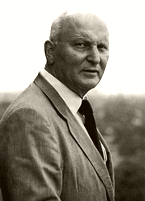
Hermann Berthold
|
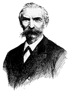 Typographer and entrepreneur, b. Berlin 1831, d. Berlin, 1904. In 1858, he founded his "Institute for Galvano Technology" in Berlin. He discovered a method of producing circular lines from brass instead of lead or zinc. The soldering normally necessary could be dispensed with. The lines were elastic and highly durable, and produced fine results. Most of German's letterpress printers and many printers abroad placed their orders with Berthold. In 1864, he set up H. Berthold Schriftgießerei und Messinglinienfabrik in Berlin. The company specialized initially in new technical processes for printing, such as galvano-type, as described above. Hermann Berthold headed the foundry until 1888. Around 1900, Haus Berthold was one of the largest foundries in the world.
 MyFonts link. Portrait by Arthur William Presser regarding the Akzidenz Grotesk typeface pioneered by Berthold's company. [Google]
[MyFonts]
[More] ⦿
|
Heypen Type
[Rofiki Anas Maruf]
|
Indonesian designer aka sixdegrees, b. 1986, East Java. He is based in Batu / Surabaya. Anas created Hargloves Sans (an 18-style elliptical sans) (2022), Hunkster (an artsy stencilized font family with nine styles) (2021), Hansplatz Grotesk (9 styles in the Akzidenz Grotesk genre) (2021), Halfroy (2020), Hostilica (2020: a slightly flared display serif), the children's book font Hagen Kids (2020), Horush (2020: a typeface inspired by aerodynamics and speed), Hazelle (2019), the squarish typeface Helios (2011) and the futuristic / sci-fi / industrial stencil typeface AV Cosmos (2019). Home page. [Google]
[MyFonts]
[More] ⦿
|
Hubert and Fischer
[Sebastian Fischer]
|
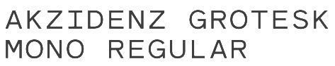 Founded by Philipp Hubert (based in New York) and Sebastian Fischer (based in Stuttgart), Hubert & Fischer is a design studio with offices in New York and Stuttgart, Germany with a global client base. The studio specializes in creating editorial design, type design, visual identity, print, application, websites and e-commerce design from concept to production.
 Google Creative Lab approached them to design a typeface for the branding of the Rubik's Cube Exhibition "Beyond Rubik's Cube" the Liberty Science Center, Jersey City. They designed a slightly rounded heavyweight font (Rubik, 2015, Rubik One, 2014, and Rubik One Mono, 2014) in which the letters fit perfectly in a single cubelet of the Rubik's Cube. The font was expanded to include Cyrillic and Hebrew characters for the exhibition. Free downloads at Google Web Fonts (see also here), Github and Open Font Library. Rubik One was created by Elvire Volk Leonovitch under the art direction of Hubert and Fischer. Bickerton (2014) is a rhombic typeface. Other commissioned typefaces: Dumpling Grotesk (based on a hand-painted sign of a Chinese restaurant in New York and characterized by a two-legged m), Bickerton (based on the work of artist Ashley Bickerton), Akzidenz Grotesk Mono, Unterwirt Regular, Cold Comfort (2010, a sharp-edged typeface for the exhibition catalogue Cold Comfort of artist Rudolf Reiber), Stripe (by Sebastian Fischer: A signage system typeface developed for the high school Quinta das Flores in Coimbra, Portugal), EDP (by Sebastian Fischer: a thick geometric sans for Latin, Chinese, Hindi and Cyrillic), Oberkofler (a pixel script for the publication Blut im Schuh for artist Gabriela Oberkofler), Tiptop (a sans designed as headline for the publication Jugend Forscht), Morus (a hipster typeface family), Swollen. Behance link. Fontspace link. [Google]
[More] ⦿
|
Karl Gerstner
|
 Born in Basel in 1930, died in Basel, January 1, 2017. Karl Gerstner designed these typefaces:
 - Gerstner Programm (1963-1967). See also Opti Gurney Med Expanded by Softmaker. Fontsinuse writes that it is an attempt to work Akzidenz-Grotesk into a Univers-like system of harmonized weights and widths, initiated by Karl Gerstner at GGK (Gerstner, Gredinger und Kutter) Basel, drawn by Christian Mengelt, and produced by Berthold for the Diatype. Released from 1964 on. [Gerstner on Swiss Type Design] G.G. Lange claims that it was not available commercially. [Homola quoting from an interview in Typographische Monatsblätter 2/2003] In his monography though, Gerstner mentions that the typeface was launched by Berthold, and it is shown in the E1 Fototypes catalog. After the demise of the Diatype, it was still carried by VGC. In Programme entwerfen Gerstner says it was successfully issued by Aaron Burns in the US. In 2017, Lineto published a revival by Stephan Müller also called Gerstner Programm. It also published a translation of a 1963 article on Gerstner Programm by Karl Gerstner that appeared in Der Druckspiegel.
- KG Privata. Renamed KG Vera.
- Gerstner Original (1987, Berthold). Sold as Gerstner BQ. See Gerling on the SoftMaker MegaFont XXL CD, 2002. Berthold markets his extensive sans family Gerstner Next (2007, with Dieter Hofrichter), which is based on and almost identical to Gerstner Original BQ (1987).
- The Akzidenz-Grotesk family (1962, Berthold) and Akzidenz-Grotesk Buch. See Atkins on the SoftMaker MegaFont XXL CD, 2002.
- In the 1980s, he designed a didone for IBM's identity. That typeface is now available from URW++ under the name IBM Bodoni.
Gerstner is best known for his eccentricity in design, and his use of equally eccentric type (often Grotesk) to accompany his designs. The designer as programmer Karl Gerstner Review of 5x10 Years of Graphic Design is a book on Gerstner's influence as a designer, edited by Manfred Kröplien Hatje Cantz. He was trained under Armin Hofmann and Emil Ruder at the School of Design in Basel. He co-founded GGK (Gerstner Gredinger und Kutter), a leading Swiss advertising agency in 1963. GGK has been responsible for a number of promotional campaigns and corporate identities. His books include Integral Typography (1959), The New Graphic Art (1959), Designing Programs (1963), and Compendium for Literates (1970). In 1972, an entire issue of Typografische Monatsblatter was devoted to Gerstner. Also in 1972, he wrote Kompendium für Alphabeten (last edition: 2000, Verlag Niggli AG). Klingspor link. Short video on Gerstner by Melanie Hofmann. Obituary at Swissinfo. Gerstner's work is now available in the Helvetica Archives thanks to his own donation (in 2006) and that of his daughter (after his death). [Google]
[MyFonts]
[More] ⦿
|
KLIM (or: Klim Type Foundry)
[Kris Sowersby]
|
 KLIM is a type and graphic design studio run by Wellington, New Zealand-based designer Kris Sowersby, now affiliated with Village. Interview. Behance link. Klingspor link. Views on engineered geometry. His creations:
Retail - Feijoa (2007, a serif family for text, Village).
- National (2007, a sans serif family, Village). This type family won an award at TDC2 2008. Duncan Forbes: National is slightly mannered, which becomes more apparent in the heavier weights yet it still remains simple, subtle and serious. [...] It has a human charm that gives such warmth and learned beauty to text.
- FF Meta Serif (2007, Serif counterpart of FF Meta, with Erik Spiekermann and Christian Schwartz).
- Galaxie Copernicus (2009) is a large x-height serif family done at Village in cooperation with Chester Jenkins. It was inspired (from very far) by Plantin's types. Another outgrowth of Plantin is Tiempos (2018), in Fine, Headline and Text subfamilies, which has both Times New Roman and Copernicus Galaxie as its parents.
- Domaine Text and Display, in 48 styles (2013). Wedge serif on a didone skeleton. The Domaine Sans Display and Domaine Sans Fine subfamilies are exquisite fashion mag typefaces.
- Founders Grotesk (2010). Roughly based on Miller&Richard Grotesque (No. 4, No. 7, No. 3), from a 1912 Miller&Richard specimen book. The proportions are just right---I will place my bets on this one for several best of 2010 award lists. The Condensed and X-Condensed are from 2011, and Founders Grotesk Text was published in 2013. Founders Grotesk Mono followed in 2014.
- Metric (2011). A sans family with hints of art deco in the heavier weights. It is paired with Calibre (2011). Sowersby writes: Metric&Calibre are a pair of typefaces that share a fundamental geometry yet differ in the finish of key letterforms. Metric is a geometric humanist, sired by West Berlin street signs. Calibre is a geometric neo-grotesque, inspired by the rationality of Aldo Novarese's seldom seen Recta. They were conceived as a pair but function independently of each other. In a clever twist, Metric offers vertical stroke endings and Calibre horizontal ones in a selected number of glyphs.
- Tiempos Text and Tiempos Headline (2010). Named for Times New Roman, this type has influences from the Egyptian Galaxie Copernicus, which is based on Plantin, as well as from Times New Roman.
- FF Unit Slab (2007, with Erik Spiekermann and Christian Schwartz).
- Newzald (2007), an economical text serif based on rough lettering found in New Zealand. Review of Newzald at Typographica.
Custom - Pitch (2011). A typewriter face.
- Hardys (2008), an elegant serif typeface custom designed for Australia's Constellation Wines. Hardys won an award at TDC2 2009. Hardys reviewed at Typographica.
- Serrano (2008): a sans family designed for the Bank of New Zealand. It will be available for licensing starting in October 2013. In addition, it won an award at TDC2 2009.
- Eliza (2003).
- NZ Rugby Chisel (2006, The All Blacks Typeface).
- Hokotohu (2007, a typeface for the Moriori).
- Victoria Sans and Serif (2007, custom typefaces for Victoria University).
- Methven Flow.
- Rewards (2006). A serif family designed with Chester Jenkins for American Express.
- Financier (2014). A corporate typeface done for Financial Times.
- The blackletter pixel font Pixel Fraktur (2002).
- The pixel script font Nobody came to class (2003).
- Pixel uncial (2003).
- Luca Titling (2003, an ancient roman titling typeface based on inscriptions from 1590).
- Mono, Mono Pre (2003).
- Kilbernie Sans (2003), Kilbirnie Serif (2004).
- Klim Sans (2004).
- A Slabb (2004, a slab serif), Slabb (nice slab version of Klim Sans).
- Karv (2005, alternative for Trajan), Karv Sans.
- National Condensed and National Compressed (2007).
- Aperture (2007), a sans for small sizes.
- Valencia (2007), a warm didone.
- Salamanca (2005).
- Sevilo (2005).
- Zinc (2005).
- Elegantia (2005, based on Polyphilus).
- Karbon, Karbon Serif (2006: raves from the typophiles!). Karbon is an open, geometric sans serif with a contemporary spartan finish. It is an exploration of Paul Renner's reductionist Futura concept channelled through the proportions of Eric Gill's eponymous sans, with a slight nod towards Jan Tschichold's Uhertype sans-serif. Includes seven weights in roman and italic.
- The Italian (negative stress) typeface Maelstrom (2018). Review by Bethany Heck.
- In 2015, the custom octagonal typeface Pure Pakati was developed at Whybin TBWA Auckland for Tourism New Zealand. Its design team comprised Philip Kelly (design director), Karl Wixon (Maori design consultant), Kris Sowersby (type designer) and Rangi Kipa (Maori carver). Pure Pakati blends the traditions of wood type with the traditional indigenous carving style of Aotearoa (New Zealand) in a hand-carved and digital fonts. It won an Nga Aho Award from the Designers Institute of New Zealand and Nga Aho Inc in 2015.
- Domaine Sans (2014, with Dave Foster) won an award in the TDC 2015 Type Design competition.
- Stern Metric (2011).
- The monospaced / typewriter typeface family Pitch Sans (2018).
- Geograph (2017-2018) was designed by Kris Sowersby and engineered by Noe Blanco. Panos Haratzopoulos designed Greek versions. The Geograph fonts are currently licensed for the exclusive use of National Geographic. It is a comprehensive replacement of several typefaces that National Geographic had been using such as Verlag and Neue Haas Grotesk. Free download.
- Heldane (Text, Display) (2018), designed by Kris Sowersby and engineered by Noe Blanco: Heldane is a contemporary serif family inspired by the renaissance works of Hendrik van den Keere, Claude Garamont, Robert Granjon and Simon de Colines. Rather than emulating a specific font, Heldane amalgamates the best details from these sources into a cohesive whole. The classical typographic foundations of Heldane are refined with rigorous digital drawing. I consider Heldane a third generation garalde typeface drawn from secondary sources. The first generation are 16th century works from the likes of Van den Keere, Garamont, Granjon and De Colines. The second generation are 20th century conscious metal revivals. By conscious, I mean the concerted effort to revive a specific style, whether the source was accurate---like Stempel Garamond; or not---like American Type Foundry Garamond No.3. The third generation are those made since 1955, after the re-discovery of the Plantin-Moretus archives and subsequent scholarship. These are types like Sabon, Galliard, Adobe Garamond and Renard. The designers of these faces skilfully exploit modern scholarship, disambiguation of punchcutters, and trace accurate lines to their primary sources. Heldane won an award at the Type Directors Club's Type Design Competition 2019.
- The Future Mono (2018). A superb take on Futura, which Kris describes as follows: Imagine if Paul Renner moved to Japan and Kyota Sugimoto asked him to adapt Futura to a typewriter. A mono version of Futura thanks to a great plastic surgeon. the Future Mono v0.2 was released at Future Fonts in 2020.
- Soehne or Söhne (2019). Superlatives fail me. This complete sans family in Normal, Mono, Schmal, and Breit subfamilies is described by Sowersby as follows: Söhne is the memory of Akzidenz-Grotesk framed through the reality of Helvetica. It captures the analogue materiality of Standard Medium used in Unimark's legendary wayfinding system for the NYC Subway.. Engineered by Noe Blanco, and with help from Dave Foster and Tim Kelleher.
- Signifier (2019). A digital remake of the Fell types. Sowersby calls his own attempt brutalist. The outcome is sharp-edged and very much 21st century stuff.
- Manuka (2019-2021, by Dave Foster and Noe Blanco). Award winner at 25 TDC in 2022. Compressed typefaces for large sizes. Described by Klim Type: With deviant details pilfered from Teutonic timber type, Manuka grafts a contemporary antipodean aesthetic onto 19th century German root-stock. Tight spacing, closed apertures and sharp joins make a compelling texture, like sunlight sparkling through a forest canopy.
- Untitled Sans and Untitled Serif (2020). Klim writes that they are quotidian typefaces: Untitled Sans is a plain, neogrotesk sans validated by the ideas of Jasper Morrison and Naoto Fukasawa's Super Normal project. Untitled Serif is drawn from the old-style genre of typefaces: the post-Caslon, pre-Times workhorses offered by almost every metal type foundry of the time. Untitled Sans and Untitled Serif are related neither by skeleton nor a traditional aesthetic connection, but by concept only.
- Epicene Text & Display (2021, by Dave Foster and Noe Blanco). Award winner at 25 TDC in 2022. These are baroque typeface families inspired by the work of 18th century masters J-F. Rosart and J.M. Fleischmann. AIGA describes the result as a baroque typeface celebrating ornamental idiosyncracy.
In 2020, he started writing the text The Art of Letters. [Google]
[MyFonts]
[More] ⦿
|
Kris Sowersby
[KLIM (or: Klim Type Foundry)]
|
 [MyFonts]
[More] ⦿
[MyFonts]
[More] ⦿
|
Max Miedinger
|
 Swiss designer, born and died in Zürich, 1910-1980. His typefaces, all produced for the Haas Foundry in Basel, Switzerland:
 - Pro Arte (1954), a very condensed Playbill-like slab serif that is similar to many of its genre.
- Helvetica (1956/57), Helvetica Rounded (1956/57). Helvetica was in fact first called Neue Haas Grotesk, and was only named Helvetica in 1960 by Stempel AG, because it wanted to appeal to an international market. Erik Spiekermann says that it was coined by a Stempel salesman, Heinz Eul, although credit for the invention of the name later went to Eul's boss, Schultz-Anker, the managing director of Stempel. Linotype published Neue Helvetica in 1983, with weights denoted by two digits, ab, where a goes from 2 to 9 (ultra light to black), and b from 3 to 7 (extended to condensed)---example: 75 is Bold Regular. A total of 51 weights were produced in 1983.
The Bitstream version of Helvetica is called Swiss 721. See also "Sans" and "Hegel" on the SoftMaker MegaFont XXL CD, 2002. URW's version of Helvetica, free with the Ghostscript font package, is Nimbus Sans (1987). Most famous for Meta, Spiekermann is quoted as saying: Neue Haas Grotesk was a redesign of (surprise!) Haas Grotesk, which in turn was partly based on Scheltersche Grotesk from Schelter&Giesecke in those days, type was also quickly assimilated, copied, emulated, ripped-off; the success of Akzidenz Grotesk had alerted Haas to the fact that they were missing sales because all the Swiss designers were specifying AG from Germany. People are always reminded that Miedinger was in fact a salesman, not a true type designer. Nick Shinn: Here is a document showing the working process of plagiarizing Akzidenz Grotesk that Miedinger oversaw. Mac McGrew: Helvetica originated as Neue Haas Grotesk at the Haas Type foundry in Switzerland, where Max Miedinger, in cooperation with Edward Hoffman, drew the first version in 1957; this was acquired by Stempel in Germany and developed into an extensive series, which has become what is probably the most widely used typeface of the 1980s and 1990s. The name is derived from an ancient name for Switzerland. Along with the foundry type, many fonts of German Linotype matrices were imported into the United States. In 1965 Mergenthaler Linotype copied several versions and later added more of its own. Since alignment standards are different, American typographers who had bought imported matrices had to replace them with domestic mats so the older versions would align with the added ones. Linotype's Helvetica Bold is the same weight as what is common- ly known as Helvetica Medium in foundry type; this has caused much confusion. A spokesman says, "At Mergenthaler we use Medium to designate a weight that is in the text category. We have no Mediums that are designed for bold typeface emphasis. We intend to stick with this system for all the future faces we produce." Lanston Monotype, after it was taken over by ATF in the late 1960s, produced several weights of Helvetica, but listed them only as Gothic with their identifying numbers. Reportedly they were copied directly from Linotype cuttings, without the delicate adjustments normally made to fit the Monotype unit system; thus these typefaces have a somewhat spotty appearance when assembled. Compare Record Gothic Medium-Extended. - Horizontal (1964). Digitally revived in 2007 by Patrick Griffin (Canada Type) as Miedinger. Canada Type writes: The original film typeface was a simple set of bold, panoramically wide caps and figures that give off a first impression of being an ultra wide Gothic incarnation of Microgramma. Upon a second look, they are clearly more than that. This typeface is a quirky, very non-Akzidental take on the vernacular, mostly an exercise in geometric modularity, but also includes some unconventional solutions to typical problems (like thinning the midline strokes across the board to minimize clogging in three-storey forms). This digital version introduces a new lighter weight alongside the bold original.
Biography by Nicholas Fabian. Linotype link. FontShop link. Klingspor link. Wikipedia link. [Google]
[MyFonts]
[More] ⦿
|
Moritz Zimmer
[Schrift.co]
|
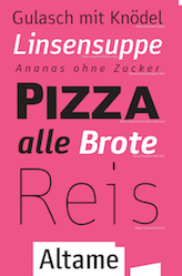 [More] ⦿
|
Neubau Berlin (or: NB Typography, or: Neubau Laden)
[Stefan Gandl]
|
 Stefan Gandl was the designer at Designer Shock in Berlin of the pixel fonts DS1D, DS2D, DS3D, DSClone, DSClone3D, DSCutout, DSImitate, DSMufdi, DSMufdi3DL, DSMufdi3DR, DSNSW45, DSNSW55, DSNSW65, DSNSW75, DSNSW85, DSNSW95, DSP9RMX (with Markus Angermeier), DSP9RMX3D, DSSQR35, DSSQR45, DSSQR55, DSSQR553DL, DSSQR553DR, DSSQR65, DSSQR75, DSSQR85, DSTicket35, DSTicket45, DSTicket55, DSTicket65, DSTicket75, DSTicket85, DSTicket95, DSVDOTXT1, DSVDOTXT2, DSVDOTXTError. At the end of 2001, he established Neubau Berlin or NB Typography. He created DS Yakuti (experimental) and DS Lane (2001, trilined) at Die Gestalten. Fonts at Neubau include NB55RMS, NB55RBX, NB55RLS, NB55MS, NB55BX, NB55SET, NBFETT, NBFORM, NBRUND, NBTRANSFER, NBUNIVERS, and NBBLOCK, which are all mostly futuristic-looking designs. In 2008, they added the beautiful 6-weight (35, 45, 55, 65, 75, 85) NBGrotesk family (+Mono, +Mono Stencil), also by Stefan Gandl. In the Neubau series, we also find the gorgeous didone display typeface NB Antiqua Nero (+Italic), NB Antiqua Roman, Antiqua Libro, and NB Typewriter.
 NB Architekt and NB Architekt Neue (2015) pay tribute to blueprint typefaces used during the Letraset era. The typeface is a classic modern monoline monospace that was originally designed by Gandl in 2002 and named NB55RMS. Neubau made a concerted effort in the Akzidenz Grotesk genre. The classical AG became the starting point for the development of Neubau's distilled grotesque NBGrotesk (2008)---a strongly restricted, grid-based, brutally honest and optically non-corrected mono line type system comprising 28 styles. An optically balanced version of NB Grotesk's skeleton resulted in Neubau's popular NB International (2014) type system paying homage to the "international style" era. Coming full circle with NB International's conceptual successor---NB Akademie---(2016-2020) is a more distinctive and refined follower inspired by the studio homegrown Berlin influences. The in house, non-retail and beta versions of NB Akademie are called NB National. Gandl writes: The typeface's infuences and naming go way back to legendary German type designer Ferdinand Theinhardt and his revolutionary typeset Royal Grotesk (1880) designed for the publications of the Königlich-Preußischen Akademie der Wissenschaften zu Berlin. After selling his own type foundry Ferd. Theinhardt Schriftgiesserei Berlin Theinhardt's Royal Grotesk became internationally successful as Berthold's Akzidenz Grotesk (1896)---the godmother of all modern grotesque typefaces. Other typefaces: NB Plan Pro, Postmates (2017). Alternate URL. Yet another URL. [Google]
[More] ⦿
|
Normal Grotesk
|
 Normal-Grotesk was released around 1943. According to Indra Kupferschmid and Stephen Coles, it was reworked by Haas from Haas's Akzidenz-Grotesk (based on a Wagner & Schmidt design, ca. 1909). It is not the same as the Berthold Akzidenz-Grotesk, but both designs, along with Französische Grotesk, were models for Neue Haas-Grotesk (later Helvetica). [Google]
[More] ⦿
Normal-Grotesk was released around 1943. According to Indra Kupferschmid and Stephen Coles, it was reworked by Haas from Haas's Akzidenz-Grotesk (based on a Wagner & Schmidt design, ca. 1909). It is not the same as the Berthold Akzidenz-Grotesk, but both designs, along with Französische Grotesk, were models for Neue Haas-Grotesk (later Helvetica). [Google]
[More] ⦿
|
On the history of sans serif
|
Linotype had pages on the history of sans serif ("Grotesk" in German), from its inception in 1816 in England and the early versions of William Caslon and Vincent Figgins (1832), through the Akzidenz Grotesk (1900), Reform-Grotesk (1904) and Venus (1907). [Google]
[More] ⦿
|
Record Gothic
[Robert H. Middleton]
|
 An American grotesk in the style of News Gothic (1908, Morris Fuller Benton) published by Ludlow in 1927. Its history according to Mac McGrew: Record Gothic was made on Ludlow before 1930, but originally only in small sizes and in regular weight and width. As such it was a copy of News Gothic, useful for small headings on ruled record sheets, hence probably the name. But typefaces such as News Gothic were by then being pushed aside by the new wave of sans serifs, inspired by Futura, and nothing was added to this series until the early 1950s, when typographers rediscovered the traditional American gothics. Then Ludlow added larger sizes of Record Gothic, and cut Record Gothic Condensed, followed by Record Gothic Extra Condensed; these were likewise copied from their News Gothic prototypes. In 1956, Robert H. Middleton, director of Ludlow's department of typeface design, began a series of original additions to this family, which eventually included twenty members. First came Record Gothic Condensed Italic and Record Gothic Bold; then Bold Extended and other variations as shown. Record Gothic Medium-Extended was an innovation; the name indicates semi-wide. It was that, and it retained general family characteristics, but it also had much of the appearance of the new grotesques such as Helvetica which were beginning to come over from Europe. Eventually there were four weights of Medium-Extended plus an italic, forming a family within a family. and making Record Gothic probably the only family available in five widths. Record Gothic Thinline Condensed was another innovation, on the order of a condensed version of Lightline Gothic. Record Gothic Bold Condensed and Heavy Condensed, done in 1969, show the influence of European grotesques. Most unusual is Record Gothic Bold Extended Reverse, which features white letters on a black band, complete with several optional endings for the band. And Record Gothic Offset, a reverse-reading typeface for titling photographs and marking electronic parts. (See Offset Faces.) All Record Gothic italics are cut for Ludlow's 17-degree italic matrices; most serifless italics slope about 8 to 12 de.grees. While not the greatest angle. 17 degrees is rather extreme, and results in some awkward character shapes. Nearly all versions of Record Gothic have as alternate characters a single-bowl lowercase g and a figure 1 without bottom serifs. Most also have fractions and percent mark available; a few have other alternate characters. Compare News Gothic and Trade Gothic families, Alternate Gothic, Helvetica.
 Digital revivals and descendants: - A2 Record Gothic (2019, Henrik Kubel at A2). They write: In celebration of Record Gothic's eclectic history, we designed four related but independent styles: Slab, Mono, Stencil and Outline.
- Notary (2014, James Montalbano, Terminal Design). He writes: I followed the proportions of the Regular and Bold weights of the original Ludlow design. Many of the drawing decisions this led me to were at first shocking to my sensibilities. Rather than correct what I saw as errors I kept to it and developed these two weights as a beginning reference. I used these to then create very thin and heavy extremes and developed a carefully calibrated series of weights. Something the original never had.
- Relevant (2007, Michael Mischler and Nik Thoenen).
[Google]
[More] ⦿
|
Robert H. Middleton
[Record Gothic]
|
 [More] ⦿
|
Rofiki Anas Maruf
[Heypen Type]
|
[MyFonts]
[More] ⦿
|
Roman Cernohous
|
 Type designer in Prague whose typefaces are published at Signature Type Foundry. Most of them were designed after sketches by Professor Rotislav Vanek of the Studio of Graphic Design and Visual Communication at the Academy of Arts, Architecture and Design in Prague. Roman's typefaces include:
 - Aktion. A revival of Akzidenz Grotesque based on Roman Cernohous's dissertation in the Studio of Typography at the Academy.
- Corridor. Created for use on highway signs.
- Connector (2012). A rounded techno font.
- Qbig (2015). Qbig was originally designed as a typeface for an amateur sci-fi movie in 2006. It comes with two types of shadows (Block and Superblock) for 3D effects.
- Sablon (2021). An all caps arts-and-crafts typeface for Latin and Cyrillic. Followed by Sablon Class (a 5-style distinguished all caps display serif).
[Google]
[MyFonts]
[More] ⦿
|
Rotislav Vanek
|
 At Storm Type, Czech designer Rotislav Vanek published the Clara type system in 2012: it consists of full palettes of weights for Clara Sans and Clara Serif. Rotislav is professor and head of the Studio of Graphic Design and Visual Communication at the Academy of Arts, Architecture and Design in Prague. Through Tomas Nedoma, he got his ideas translated into digital typefaces at Nedoma's type foundry, Signature Type. His typefaces there include some made with Roman Cernohous (Aktion, Corridor), Marek Pistora (Meridianus Sans+Serif), and Tomas Nedoma (Fenomen Sans, Galaxy, Haven, Quodlibet Serif and Quodlibet Sans).
 Fenomen Slab (2017) is a useful slab serif family by Tomas Nedoma and Rotislav Vanek. The set contains four width proportions (Normal, SemiCondensed, Condensed and ExtraCondensed) in eight weights ranging from Hairline to Black. [Google]
[MyFonts]
[More] ⦿
|
Rudolf Hell
[Hell GmbH]
|
[MyFonts]
[More] ⦿
|
Schrift.co
[Moritz Zimmer]
|
 Web developer for a creative firm in the Dallas, TX, area. Designer of these typefaces:
 - Altame (2015: Sans, Condensed, Expanded).
- Rotesk (2016: Zimmer's take on Helvetica featuring rounded dots).
- Kambri (2016: a reinterpretation of Akzidenz Grotesk).
- Neue Mogobau (2016: a geometric sans, for for Moritz Goes BauHaus).
- Moritz Sans (2015-2016: a grotesk family for Juliette's Learn German web site).
- Juli Julei Jule (2016: Akzidenz Grotesk revivals for copyandpasta.com, and Juliette's Recipes).
- Blockschrift (2016: a revival of Blockschrift (1897, Genzsch & Heyse)).
- Klaro (2016).
|
Sebastian Fischer
[Hubert and Fischer]
|
 [More] ⦿
|
Seung Hyun Kim
|
Seoul, Korea-based designer of a textured version of Berthold's akzidenz Grotesk, called Alien Akzidenz Grotesk (2013). [Google]
[More] ⦿
|
Signature Type Foundry
[Tomas Nedoma]
|
 Tomas Nedoma established Signature Type Foundry in Prague in 2014. Most of their work is influenced by and rooted in the work of Professor Rotislav Vanek of the Studio of Graphic Design and Visual Communication at the Academy of Arts, Architecture and Design in Prague. In many cases, Vanek's sketches were digitized by participating type designers. Except where explicitly mentioned below, all typefaces were made by Tomas Nedoma. The typefaces:
 - Quodlibet Sans and Serif (2008). Nedoma's graduation typeface at Tomas Bata University in Zlí.
- Aktion. A revival of Akzidenz Grotesque based on Roman Cernohous's dissertation in the Studio of Typography at the Academy.
- Giovanni.
- Corridor (Roman Cernohous). Created for use on highway signs.
- Clara Sans and Clara Serif (2012, a teardrop serif by Frantisek Storm).
- Fenomen Sans. This typeface has Bauhaus roots.
- Galaxy. Hints of art deco and Bauhaus.
- Haven. An octagonal typeface family.
- Meridianus Sans and Meridianus Serif (Marek Pistora).
- Quodlibet Serif (2015) and Quodlibet Sans (2015). A transitional typeface system by Tomas Nedoma and Rotislav Vanek.
- Haven (2016). A basic sans typeface family by Tomas Nedoma and Rotislav Vanek.
- Fenomen Slab (2017). A useful slab serif family by Tomas Nedoma and Rotislav Vanek. The set contains four width proportions (Normal, SemiCondensed, Condensed and ExtraCondensed) in eight weights ranging from Hairline to Black.
[Google]
[MyFonts]
[More] ⦿
|
Spiekermann's favorite typefaces
[Erik Spiekermann]
|
Erik Spiekermann reveals his choices for type: "I use my own typefaces (mainly Meta, Officina and Unit - I don't have to pay for them) and corporate type like Frutiger, FF Transit, News Gothic, Minion (very versatile), Univers, Myriad et al and even Helvetica (for Deutsche Bahn, the German railways, but that's going to change)." He goes on to list those typefaces he admires most: - Reklameschrift Block; the staple diet of pre-war jobbing printing in Germany, and the one typeface I had from 8pt through to 96pt (plus larger sizes in wood type) in my metal typeshop (which burnt down in 1977). I redrew some of the versions for Berthold in the 70s, making Block Halbfett into Berliner Grotesk Medium.
- Akzidenz Grotesk Mager. The first font I bought from the Berthold foundry as brand new type; 8pt, half a minimum, which meant about 8 a, 9e, 2c, etc. 3.5kg of type which cost me half a month's wages, except as a freelancer, I didn't earn any.
- Concorde. The first typeface whose design process (in 1968) I followed. GGL's answer to Times, and much better.
- FF Clifford by Akira Kobayashi (now type director at Linotype). Amazing book typeface by a Japanese designer. Not a revival, but in the baroque tradition. Only regular weight, but for 3 sizes plus great Italics and Small Caps. Try it!
- Arnhem by Fred Smeijers (great website). Love it for newspapers, magazines, etc. Not so keen on the headline weights, they look too Dutch for my use (perhaps too Ungerish, but then Fred is also from Arnhem). But the text weights are a superb modern interpretation of a legible serif with an edge.
[Google]
[More] ⦿
|
Stefan Gandl
[Neubau Berlin (or: NB Typography, or: Neubau Laden)]
|
 [More] ⦿
|
Stefan Peev
[Context Ltd]
|
[More] ⦿
|
Stephan Müller
[Forgotten Shapes]
|
[More] ⦿
|
Store Norske Skriftkompani
[Arve Båtevik]
|
 Norwegian type designer, b. 1991, who graduated from Westerdals School of Art in Oslo in 2015 and ECAL in 2017. At ECAL in Lausanne, he finished an MA in Art Direction and completed an exhaustive comparative study of the Geometric Sans genre. He joined Lineto in 2017 and returned to Norway in 2020, where he set up his own commercial type foundry, Store Norske Skriftkompani, in Volda. His typefaces:
 - During his studies at Westerdals in Oslo, Arve Båtevik created the display typeface Toulouse (2014). Toulouse consists of a basic sans skeleton. Arve then added two weights, one in a 2 to 1 ratio, and one in a 1 to 2 ratio. This allows for some great designs for logos and posters.
- In 2015, from his then base in Zurich, he created Sagen Grotesk as an interpretation of Schelter Grotesk (after Schelter Breite Grotesk, 1886), and developed Passelig Sans from the bottom up.
- With Maura Paolozzi, he co-designed LL Prismaset A and B at Lineto (2003-2017). Both LL Prismaset A and LL Prismaset B are based on Rudolf Koch's Prisma (1930).
- LL Supreme (2020, Lineto). He writes: LL Supreme presents a new take on Paul Renner's Futura (1927). [...] Working against the current tendency of interpolating entire families, each cut of LL Supreme was drawn separately and, as a consequence, has its own identity.
- LL Ruder Plakatschrift. Done with Hans-Christian Pulver.
- Store Norske Jazz Book & Italic (2015-2020) and Store Norske Jazz (2021). A sans typeface inspired by Frutiger's Univers and Hoefer's Permanent. In the end it is closer to Univers and a bit more playful (which is not hard---Frutiger's fonts are hardly playful). He writes: Store Norske Jazz is a typeface well within the aesthetically dodgy territory of the contrasted sans serif.
- Store Norske Tyggis (2016-2020). A prismatic typeface that extends the phototype Or (1967, Andy Song for Studio Hollenstein).
- Store Norske Trafikk Medium & Italic (2014-2020). A constructed sans serif, based on the Norwegian road sign typeface Trafikkalfabetet (Karl Petter Sandbaek, 1965, for the Norwegian Public Roads Administration). Trafikkalfabetet is modeled after the German road sign typeface DIN 1451, and the British road sign typeface Transport.
- Store Norske Brus (2017-2020). Mecano-inspired letters.
- Store Norske Foto Book & Italic (2015-2020). A sans that pays homage to phototype.
- Store Norske Mekaniske (2020). A constructivist typeface based on the lettering on Akers Mekaniske Verksted's shipyard workshop in Oslo.
- Store Norske Maleri (2020): Store Norske Maleri is a remix of Ehmcke's Mediaeval (Designed in 1917, published by Schriftgiesserei D. Stempel AG in 1920). I find the original intriguing in many ways, especially how he managed to sneak so many circles, triangles and squares---while still maintaining a rough arts and crafts aesthetic. In my version the capitals are quite true to the original, although I did put some more circles, triangles and squares in there. The lowercase, numbers and the remaining characters deviate quite a bit from the original.
- Store Norske Stilig (2021). A colour remix and elaboration of a display phototype named Indigo by Andy Song (1936-1995), which was designed in 1972 for Studios Hollenstein Phototypo in Paris. In addition to the colour font, Stilig exists in Dark, Light, Solid and Open styles.
- Store Norske Funksjon (2021). A display colour geometric solid font, based on a lettering alphabet by Erich Mollowitz that was featured in Moderne Vindusreklame [Modern Window Advertisement] (1933, Knut Schjefstad in 1933), an instructional book on shop front decoration. Knut Schjefstad (1905-1943) is best known for playing the long neck banjo in Norway's first jazz orchestra Sixpence.
- Store Norske Ja (2021). A sans typeface that started out as a revival of Akzidenz Grotesk.
- Store Norske Samvirke (2020) is an all-caps typeface based on the lettering found on the Oslo Samvirkelag store in the Kampen city district.
- Store Norske Neon (2020-2021) is a remix of the Metall Standardbokstaver alphabet used by the sign makers at Neon Electric Limited AS, which was operational in the 1950s. Neon Electric was one of the main neon sign suppliers in Norway. They created signage for big events and important buildings, like the signs for the Oslo 1952 Winter Olympics and the Deichmanske Bibliotek [Oslo's Main Public Library].
- Store Norske Bygg (2020-2021) is a monospaced typeface based on a lettering found on the offices of Frimann Bye & Winsvold A, a mortar and construction supplier in Oslo, in the 1920s and 1930s.
- Store Norske Tango (2016-2021). A geometric typeface that sprung out of Arve Båtevik's MA diploma at ECAL in Lausanne. The project was based on Intertype Vogue (1930), the American response to the geometric wave in Europe in the 1920s. Store Norske Tango builds on Vogue's naiveté, according to Arve. It is more rude and playful, as it focuses on pure geometric shapes, with almost no optical correction. Most letters are nearly monolinear. The typeface has old school hyper slanted italics, often found in early sans serifs, offering two options for the degrees of tilt.
- Store Norske Magi (2021). A sans family.
- Store Norske Graut (2021). A wonderful rounded sans family that includes a Mono style.
- Store Norske Skandia (2021). Arve explains its roots: Store Norske Skandia is a remix of "Skiltskrift", a typeface made for the redesign of Norwegian National Railway (NSB) in 1977. In 1973, Knut Skuland became the director of NSB. The company's communication was eclectic, and he wanted to unify their visual identity. They first bought the rights to use the British Rail identity. Skuland spoke with the director of the Danish National Railways who had bought the same identity some years before. The Danish director convinced Skuland of the impact the identity would have on Norway's visual culture. Skuland then decided to put together a team to reshape the British Rail identity, to fit the Norwegian environment and frame of mind. He commissioned industrial designer Odd Thorsen, art historian and Alf 130e, and designers John Engen, Knut Harlem, Paul Brand, Ruedi a Porta and Arild Eugen Johansen. They redesigned everything from the trains and uniforms to the type and colours. Paul Brand collaborated with a paint factory in Nittedal, to produce a colour blue that would be dark enough to contrast the white type, but still bright enough to be perceived as blue in dark Norwegian lighting conditions. The typeface is similar to the British Rail Alphabet in weight, but is a lot softer and more geometric. Unfortunately, many of the people involved in the project have passed away. I have spoken with John Engen, Halvor Thorsen (son of Odd), Paul Brand, Ruedi a Porta and Arild Eugen Johansen and none of them have any clear answers to who actually designed the typeface. But if there ever was a Norwegian grotesk from the modernist era, this is it. The original typeface was a single bold cut made for signage, and for the rest of the identity they used Helvetica. I have extrapolated on the "Skiltskrift" design, and made it into a small family of three weights, with matching italics.
- Store Norske Baguette (2022). A primitive all caps sans based on several old French signage typefaces.
- Store Norske Stempel (2022). After an alphabet used for certain texts on old Norwegian license plates (See also Store Norske Jernskrift.)
- Store Norske Jernskrift (2022). Store Norske Jernskrift is a typeface based on the numbers found on old Norwegian number plates. He explains: On the 17th of january 1929, new regulations for car number plates took effect in Norway. They were referred to as Vertikal Jernskrift [vertical iron letters]. The design is similar to local hand painted roadsigns of the era. Most, if not all, were produced at Christiania Chablon & Stempelfabrikk (G. Enderle, 1904-1933) and Mignon Chablon & Stempelfabrikk (Jallik Johnsen, Wilh Olsen, 1931-1958).
Personal site. [Google]
[More] ⦿
|
The story of Akzidenz Grotesk
|
This text is from notes published in a PDF file by Kris Sowersby (KLIM Type Foundry, New Zealand) in November 2019. It is quoted verbatim. [Early history.] Nobody knows who designed Akzidenz-Grotesk. For about 20 years it was attributed to Theinhardt, but this has recently been proven untrue. The very first sans serif typeface was published in England, circa 1816. It did not create waves in typography immediately, but the use of sans serifs would increase over time. The first sans serif sold in Germany was introduced by the typefoundry inside Eduard Haenel's Magdeburg printing-house in 1833. The matrices for this Neuste Titel-Versalien, Zehnte Sorte were imported from Caslon & Livermore in London. Like other early British sans serifs, this approximately 36-pt face was an all-caps design. The first book composed entirely in upper- and lowercase sans serif types was only published in 1900. This was the Feste des Lebens und der Kunst: eine Betrachtung des Theaters als höchsten Kultursymbols, written and designed by Peter Behrens. When Jan Tschichold's Die neue Typographie appeared 28 years later, it was also composed entirely with sans serifs. Still outré for whole books, German typographers were by then finally beginning to regularly consider sans serifs for long texts, or publications intended for immersive reading. Those designers were just as likely to specify new geometric-style sans serifs like Futura as they were older typefaces, like Schelter & Giesecke's late-nineteenth-century Breite magere Grotesk. Typographically, it took a long time to get to something like the ubiquity that Helvetica enjoyed among Western European and North American graphic designers in the 1960s. Helvetica's popularity eventually became so widespread that---as Gary Hustwit presented in his 2007 documentary film Helvetica---its use represented a cultural milestone. No earlier typeface had ever experienced that kind of hold on the market, at least not in Germany. While Helvetica was not simply a reworking of Akzidenz-Grotesk, its initial development as Neue Haas-Grotesk in Switzerland reflected, in part, the popularity that Akzidenz-Grotesk had begun to enjoy in Western European graphic design during the immediate postwar years. [The typeface.]As a family of typefaces, Akzidenz-Grotesk was a work-in-progress. Bauer & Co. in Stuttgart and Berthold in Berlin published its very first weight together in 1898, but it was only in the 1950s that the typeface's use began to take off. Although Akzidenz-Grotesk seems to have inspired similar designs beforehand, such as Venus and Ideal-Grotesk---themselves the basis for Monotype Grotesque Series 215 and 216---and perhaps even Titania and Urania, something is fascinating about the number of neo-grotesques produced in the 1950s and 60s. In addition to the above-mentioned Neue Haas-Grotesk/Helvetica, that wave of new designs included Folio, Univers and Record Gothic as well as many others. Akzidenz-Grotesk and Helvetica are often compared with each other, but Univers represents a far more interesting counterpoint for Akzidenz-Grotesk. No other designs better illustrate the changes in the ways typefaces were developed between the 1890s and the 1950s, or even between the 1890s and today. The story of the young Adrian Frutiger's development of Univers at Deberny et Peignot has often been told: from the beginning, he conceived of Univers as a family of typefaces, with multiple weights and widths. Twenty-one styles were part of Univers's initial release, and each was designed according to the same letterform scheme. All the fonts matched each other stylistically. Today, a term like systems design could be applied to the project. Akzidenz-Grotesk, on the other hand, is not as harmonious a family. Its members were not all conceived of at a single point. Indeed, it is difficult to imagine that a collection of related fonts was even envisioned when its premier style was published. While Univers was the work of Frutiger and his assistants in Deberny et Peignot's design studio, Akzidenz-Grotesk's various styles were produced by anonymous employees at several typefoundries in different historical times. Although the base style of Akzidenz-Grotesk---its regular weight---was published in fifteen sizes by H. Berthold AG in Berlin and its and its then-recently acquired Stuttgart subsidiary Bauer & Co. in 1898, the genesis of the design was slightly older. In 1894/95, when Bauer & Co. had still been an independent typefoundry, it published a nine-sized, single-weight, drop-shadowed display face called Schattierte Grotesk. Like Akzidenz-Grotesk itself, this was a generic name, which just meant shaded sans. Clip the drop shadow off of Schattierte Grotesk's letters and you get the base style of Akzidenz-Grotesk. Unfortunately we do not know the Bauer & Co. or Berthold employee who had this idea. In retrospect, it turned out to have been one of the most important decisions ever made at either firm. I have not found any evidence that Berthold had a type drawing office during the late-nineteenth or early-twentieth centuries, and no information about the internal workings of Bauer & Co. at all. The work of interpreting the exact forms each type size would take was performed by Bauer & Co. and Berthold's punchcutters, and probably not by draughtspersons who worked on paper. As a manufacturer, Berthold did not even introduce pantographic punchcutting and matrix-engraving machines into its main Berlin factory until 1910. Before that time, the physical masters for each new font had to be cut as series of steel punches or softer-metal patrices, depending on the exact point size. Steel punches could strike bars of copper as the first step in matrix-making, while soft-metal patrices would have matrices grown around them via electrotyping instead. Staff photographers may have resized images shot from a master drawing---or a print from a trial size of the type---for punchcutters to engrave onto their punches/patrices, whey they could follow as a guide. The then still-larger Schelter & Giesecke foundry at Leipzig had been using pantographs to scale letter drawings down to type size by 1894, for instance, and could even trace outlines onto the faces of punches and patrices this way. While Schattierte Grotesk and Akzidenz-Grotesk really were new designs when they were published, they were not atypical products. Many of their letterforms bear resemblance to earlier sans serifs that had already been published in and outside of Germany. Nevertheless, they seem to me to be more of a synthesis of then-current ideas of sans serif letterform design, rather than copies of any specific products from other firms. [The name.] The name Akzidenz-Grotesk means jobbing sans. It came from the German-language term for everyday commercial printing, Akzidenzen. This was a loan word, rooted in the Latin accidentia, which referred to chance or casual events. Jobbing encompassed things like business cards, invoices, and letterheads. Berthold/Bauer & Co. must have intended for Akzidenz-Grotesk to be used in jobbing typography from the first. Together, their circa 1904 and circa 1912 specimen brochures for the typeface and its later---or otherwise related---styles included twenty-six pages of fictitious fonts in use scenarios. These ranged from advertisements for art galleries, interior decorators, and piano-making companies to engagement and change of address cards, as well as price lists for a baby carriage manufacturer and a vintner. The large Berthold/Bauer & Co. catalogue from circa 1911 included the same kind of fictitious usage scenarios for these fonts as well. [Release.] The first proper addition to Akzidenz-Grotesk was published by Berthold and Bauer & Co. in 1902/03. This was a lighter-weight design that was initially sold under a unique name: Royal-Grotesk. We know that Akzidenz-Grotesk and Royal-Grotesk were intended to be used together---is that not the basic definition of what a typeface family is?---because Berthold and Bauer & Co. produced a dedicated specimen brochure for the two faces about a year after Royal-Grotesk's release. It was not until the 1950s that Royal-Grotesk would be properly adopted into the family, and renamed AkzidenzGrotesk Light. [Not due to Theinhardt.] Since 1998, many authors have incorrectly stated that Royal-Grotesk predated AkzidenzGrotesk, and that it had been designed by the Berlin-based punchcutter and typefoundry owner Ferdinand Theinhardt. Indeed, Theinhardt's foundry was acquired by Berthold in 1908. Berthold kept it open in its own factory for about two years, and as a subsidiary for about twenty more. During that time, it sold both Akzidenz-Grotesk and Royal-Grotesk, as well as several more Berthold and Bauer & Co. faces. Theinhardt himself had already retired from punchcutting decades before this. He sold off his foundry in the mid 1880s, and died in 1906. The misattribution of Akzidenz-Grotesk and Royal-Grotesk to Theinhardt was put forward by Günter Gerhard Lange between 1998 and 2002. Lange was Berthold's longtime artistic director and the designer of several later versions of Akzidenz-Grotesk. His claims about Akzidenz-Grotesk's origins were already disproven by Eckehart SchumacherGebler in 2007/08 and Indra Kupferschmid in 2012-17, making them out of date now. Nevertheless, we still see new typefaces designed in the style of Akzidenz-Grotesk, which are advertised as being inspired by Ferdinand Theinhardt's Royal-Grotesk. Ferdinand Theinhardt did not cut the punches for RoyalGrotesk or Akzidenz-Grotesk---he might not have even ever cut sans serif type at all. The only collection of type specimen from his foundry I have found that can definitively be dated to the time when he still owned the company includes just two sans serifs. Ferdinand Theinhardt gave this folio to the German printer and author Theodor Goebel in January 1884, about a year before he sold his business. The first of the folio's two sans serifs was simply called Grotesque. This was a duplicate of the Moderne Steinschriften types created at the Benjamin Krebs Nachfolger typefoundry of Frankfurt am Main, published in 1865. The second was an italic named Cursiv-Grotesque, which probably came to Theinhardt from the J.H. Rust & Co. foundry of Offenbach am Main and Vienna. Rust had imported the larger sizes of this typeface from Americirca They then created the three smallest sizes themselves, publishing them in 1875. The first proper bound type specimen catalogue from the Theinhardt foundry dates to the late 1880s or 1890s, after Ferdinand Theinhardt had sold the business, and after its new owners had moved it from the northern part of Berlin to the city's southwestern district. The catalogue features six sans serifs, including the two mentioned above. Of the other four designs, only one was actually created by the Theinhardt foundry. As this was published just after Ferdinand Theinhardt had sold his business, it is difficult to gauge what his exact role in the typeface might have been. Originally called Neuste schmale fette Zeitungs-Grotesk, the design was listed in this catalogue as Enge fette Grotesque. It was a straight-sided sans serif with rounded terminals, and it bears no relation to any styles of Akzidenz-Grotesk. The remaining three sans serif designs in that undated, post-sale catalogue were Schmale magere Grotesque, Breite Grotesque, and Breite fette Grotesque. Where did these come from? Schmale magere Grotesque was a design sold under various names by at least seven other nineteenth-century German foundries. I do not know where it originated. The matrices may have come from Britain or the United States. Breite Grotesque probably came via the Krebs foundry. Krebs had produced the larger sizes for this design in-house; they called it Halbbreite Steinschrift. The typeface was different from the other Breite Grotesques sold by, e.g., Ludwig&Mayer and Schelter&Giesecke. I have not found any mentions in primary or secondary sources that suggest who the authors of the Halbbreite Steinschrift design's smaller sizes might be. I think it is quite likely that Krebs imported them from Britain or the United States, too. The visually unrelated typeface the Theinhardt foundry called Breite fette Grotesque was originally published in the mid 1870s as Zeitungs-Grotesk. That came from the Francke foundry in Danzig. Like most of the other sans serifs that the Theinhardt foundry featured in this catalogue, many German companies carried the Zeitungs-Grotesk design during the nineteenth century's last two decades. [Expansion of the family] By 1911, Berthold and Bauer & Co. had expanded the Akzidenz-Grotesk family to include a total of six styles with the term AkzidenzGrotesk in their names. In 1958, the number had grown to thirteen. By 1968, there were twenty-one. During the early twentieth century, it began to be established practice in German typefoundries for products to have proper names, rather than generic ones, and for successful designs to be expanded to include multiple related fonts, such as a base design that was coupled with a bold or italic. The groundwork was thus underway for typeface families, both there and in other countries. For example, Cheltenham is considered by some authors to represent what, in retrospect was the first proper, large typeface family. It had at least twenty-two styles by 1913. With multiple weights and widths of Akzidenz-Grotesk available by 1911, we can begin to see the kind of design template that would be followed decades later by neo-grotesque families like Univers. Unlike Univers, however, Akzidenz-Grotesk's each other. The condensed and expanded styles have different skeletons as Akzidenz-Grotesk's regular weight. Even the terminals of Akzidenz-Grotesk and Royal-Grotesk differ from one another in their angles and exact detailing. This would not be so with Univers. [Outside Germany.] Akzidenz-Grotesk became available for sale in the United States around 1957. The fonts of foundry type were sold by a New York company named Amsterdam Continental, a subsidiary of Dutch type foundry N. Tetterode. Amsterdam Continental had an exclusive license to sell the typeface in the USA, but they did not market the fonts as Akzidenz-Grotesk because it is difficult for English speakers to pronounce. They called it Standard instead. This was much easier to pronounce and almost implies that Akzidenz-Grotesk is the default variety of sans serif type. I think that this was a brilliant marketing move, but I have not yet been able to find out whether this was a decision made at Berthold, Tetterode, or Amsterdam Continental. A list inside a small book published by Berthold for their 1958 centenary suggests that oldest weights of the Akzidenz-Grotesk family were from 1896. These were not even named AkzidenzGrotesk when they were initially published. They were renamed Akzidenz-Grotesk Condensed Heavy and Akzidenz-Grotesk Condensed Bold, from Enge Steinschrift and Halbfette BücherGrotesk. Those generic terms meant narrow stone type and bold book sans, despite the latter not being a typeface with which anyone would compose a book. The stone referenced in the former's name was likely the lithographer's stone. Like Akzidenz-Grotesk itself, those types cannot be attributed to a specific designer or punchcutter. Despite the year 1896 given in the centenary publication, Enge Steinschrift and Halbfette Bücher-Grotesk may not be from 1896, exactly. Enge Steinschrift is older than that, and Halbfette Bücher-Grotesk may be more recent. Each typeface is included in Berthold and Bauer & Co.'s large 1911 catalogue, but an undated, bound collection of loose Berthold specimen sheets in the collection of Berlin's Prussian State Library---attributed to c.1900---includes only Enge Steinschrift, not Halbfette Bücher-Grotesk. Berthold's 1911 catalogue declares that Halbfette Bücher-Grotesk was produced in-house, but neither it nor the circa 1900 specimen does so for Enge Steinschrift, except for three of the fourteen total sizes the Berthold companies did produce. The Enge Steinschrift typeface, as an identical product with a similar name, was carried by several German typefoundries in the late nineteenth century. For example, the Flinsch, Krebs, and Ludwig & Mayer foundries in Frankfurt each sold the design under the name Schmale Steinschrift, while Genzsch foundries, sold the design under the name Longina. Like Berthold, who themselves probably acquired the matrices for Enge Steinschrift as part of their acquisition/merger with the combined Emil Berger/Gustav Reinhard foundries in 1893, none of those foundries claimed the Enge Steinschrift design as an in-house product. The original punches for the types were cut at the typefoundry of James Conner's Sons in New York. After Berthold acquired the Theinhardt foundry they adopted several types from it into their offerings. The only sans serif with which Ferdinand Theinhardt himself may have played a role---Enge fette Grotesque---was included in the sans serif section of Berthold's 1911 catalogue, together with Halbfette Bücher-Grotesk and Enge Steinschrift. Unlike those latter typefaces, however, it would never be adopted into the AkzidenzGrotesk family. For its first half century, the Akzidenz-Grotesk family did not include any italic styles. Berthold only developed those during the 1950s and 60s neo-grotesque wave. Even then, Berthold released the italic styles gradually, rather than all at once. Berthold's earlier fin de siècle customers must have preferred the use of lighter and heavier weights---or narrower and wider styles---to establish typographic hierarchy, instead of upright and sloped pairings. Before the mid-twentieth century, italic type was less common in German-speaking countries than in the rest of Europe. Blackletter type, unlike roman, rarely relied on slanted secondary faces for emphasis. Compositors used stylistically different faces instead, like a Schwabacher to emphasise Fraktur, or added letter spacing/tracking. Like other neo-grotesque typeface families' italics, Akzidenz-Grotesk's were oblique designs (sloped romans). The basic structure of each upright letter remained the same in its italic companion. The lowercase a was always double-storey, and not single-storey. While such a true italic may be a useful exercise in historical fiction, it moved away from the design language of the late-nineteenth century grotesk and mid-twentieth century neo-grotesque, resulting in an essentially humanist companion for a realist design. [Google]
[More] ⦿
|
The Typehead Chronicles of Thomas Christensen
[Thomas Christensen]
|
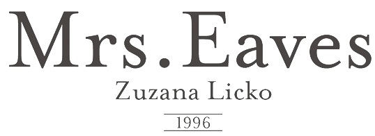 Information and specimen of all historically important typefaces: Akzidenz Grotesk, Aldus, Antique Olive, Avant Garde, Avenir, Baskerville, Bell, Bembo, Bodoni, Bulmer, Caslon, Centaur, Century Old Style, Cheltenham, Dante, Frutiger, Galliard, Garamond, Gill Sans, Goudy Old Style, Granjon, Helvetica, Janson (Kis), Minion, Mrs. Eaves, Optima, Palatino, Perpetua, Sabon, Syntax, Times New Roman, Today, Trump Medieval, Univers, Walbaum. [Google]
[More] ⦿
Information and specimen of all historically important typefaces: Akzidenz Grotesk, Aldus, Antique Olive, Avant Garde, Avenir, Baskerville, Bell, Bembo, Bodoni, Bulmer, Caslon, Centaur, Century Old Style, Cheltenham, Dante, Frutiger, Galliard, Garamond, Gill Sans, Goudy Old Style, Granjon, Helvetica, Janson (Kis), Minion, Mrs. Eaves, Optima, Palatino, Perpetua, Sabon, Syntax, Times New Roman, Today, Trump Medieval, Univers, Walbaum. [Google]
[More] ⦿
|
Thomas Christensen
[The Typehead Chronicles of Thomas Christensen]
|
[More] ⦿
|
Tomas Nedoma
[Signature Type Foundry]
|
 [MyFonts]
[More] ⦿
[MyFonts]
[More] ⦿
|
Vladimir Andrich
|
Main type designer (b. 1915) at AlphaType in Niles, IL. Bitstream states: AlphaType Corporation, a family-owned company, was founded by Al and Beatrice Friedman in the mid-1960s to make high quality but inexpensive phototypesetters for advertising typographers. In 1981 Berthold acquired AlphaType. His typefaces: - Allan (1978, Alphatype).
- American Gothic (Alphatype). A copperplate gothic based on Frederic Goudy's Copperplate Gothic from 1904. For a digital version, see URW's American Gothic.
- Andrich Minerva (1965, VGC). This typeface won Second Prize in the 1965 VGC National Type Face Design Competition.
- Beatrice Script (Alphatype).
- Claro (Alphatype). A Helvetica-style typeface.
- Contemp (Alphatype).
- Cremona in 1982 for Alphatype, now available at Berthold. A macho text typeface. Cremona is C820 in the Softmaker library.
- Magna Carta (1974, Alphatype).
- Vladimir Script (1966, Alphatype), a calligraphic script. Digital versions at URW++, Elsner & Flake and Linotype. Vladimir Script is called Violin Script in the Softmaker collection.
MyFonts and Linotype refer to this designer as Vladimir Andrevich. Klingspor link. [Google]
[MyFonts]
[More] ⦿
|
Walter Baum
|
 German type designer, born in 1921 in Gummersbach. Head of the Bauer graphics studio from 1949-1972. From 1972 until 1986, he led the Kunstschule Westend in Frankfurt. He died in 2007 in Bad Soden.
 Together with Konrad F. Bauer, he designed the Akzidenz Grotesk-like sans serif typeface Folio (1957-1965; see digital revivals Folio EF by Elsner & Flake (condensed styles only), Folio by URW++ (the largest of the sets of revivals), Folio by Adobe, Folio by Linotype, Folio by Tilde, Folio SB by Scangraphic, Folio B EF by Elsner & Flake, and Folio by Bitstream), as well as Caravelle (1957), Alpha (1954, a comic book style face), Beta (1954, another comic book style face; both Alpha and Beta designed with K.F. Bauer), Imprimatur (1952-1955, a narrow roman done with K.F. Bauer at Bauersche; also called Horizon; for digital revivals, see I772 Roman by SoftMaker, and Gmuender Antiqua Pro (2015) by Ralph M. Unger), Impressum (1963), Volta (1956), and Verdi (1957, a shadow caps face) for the Bauersche Giesserei in Frankfurt am Main. Klingspor link. Linotype link. FontShop link. View digital typefaces that can be traced back to Baum. View digital typefaces based on Walter Baum's work. Digital versions of Folio. [Google]
[MyFonts]
[More] ⦿
|
Wiescher Design
[Gert Wiescher]
|
 Gert Wiescher was born in Braunsbach am Kocher, Germany, in 1944. Based in München, Gerd Wiescher designed many classy and classic Bodoni families, as well as New Yorker Type (1985). All of his typefaces are carefully fine-tuned and balanced. Wiescher founded first Munich Type and then Wiescher Design and Autographis. He is known as a hard, fast and prolific worker. His exquisite typefaces can be bought at MyFonts. Catalog of his bestselling typefaces. Interview in 2008. Wikipedia page. Creative Market link. List of typefaces:
 - Scripts: Prima Script (2017: for menus and cookbooks), Marmelade (2015, +Fruits, a set of dingbats), Triana (2014, a thin monoline penmanship script named after a Spanish sailor on the Pinta who in 1492 was the first to see America---in this case the Bahamas), Floral Script (2014, copperplate style script), Sherlock Script (2014: this comes with Sherlock Stuff (fingerprints) and Sherlock Stuff Dots (ink stains)), Felicita (2013, a swashy copperplate script), Vividangelo (2013, after the handwriting of a real person), Dreamline (2013, connected monoline cursive wedding scripts in A, B and C styles), Fiorentina (2012, a renaissance style script with 650 characters), Excelsia Pro (2012), Delicia Pro (2012, a fat brushy signage script), Nono (2011, formal swashy calligraphic family), Dyane (2011), Penn (2011), Lettera (2011, hand-drawn formal face), Tosca (2010, a high-contrast calligraphic typeface with 730 glyphs), Grandcafe (2010), Loulou (2010, curly and of extreme contrast), Schoolblock (2010, hand-printed school font), Grandezza (2010, calligraphic family; +Xtra), Sixtra (2010, a curly didone script), English Script (2010, classic Spencerian calligraphic script), Savage Initials (2009), Morning News (2009), Revolte (2009, a brush script for demonstration signs), Estelle (2009), Scriptofino (2008, 4 calligraphic styles to give Zapfino a run for its money), Exprima (2008), Daiquiri (2008), Lisa Bella, Lisa Fiore and Lisa Piu (2008, connected and calligraphic), Tati (2008), Movie Script (2007), Cake Script (2007), Eddy (2007, grungy calligraphy), Pointino (2007), Bohemio (2007, a great oriental-brush script), Artegio (2007, two calligraphic scripts), Xylo (2006, in the tradition of the 18th-century English calligrapher George Bickham and the 19th-century American calligrapher Platt Rogers Spencer), Tamara (2005, art-deco script based on some initials for Semplicita made in the 1930s by the Nebiolo foundry), Tecon, Ellida (2005, inspired by the elaborate scripts of 18th-century English calligrapher George Bickham, with additional influences from 19th-century American calligrapher Platt Rogers Spencer), Eloise (2009, a high-contrast version of Ellida), Nadine Script (2005, an elegant script inspired by a set of initials the French designer and artist Bernard Naudin drew for Deberny&Peignot in the 1920s), Royal Classic (2005, unbelievable script based on a design that has initially been comissioned by King Ludwig I of Bavaria for in-house-use), DesignerScript, Filzer Script (1995, handwriting), Futuramano-Condensed-Bold, Futuramano-Condensed, Futuramano-Plain, Futuramano-Thin, Giambattista, Scriptissimo-Plain, Scriptissimo-Forte, Scriptissimo-Swirls, Squickt (1989), Konstantin A, B and C (2005), Konstantin Forte (2005), MyScript, GrocersScript, Swanson (2006). Scriptissimo (2004) has versions named Start, Middle and End, tweaked for their position in the word, and there are plenty of ligatures. Check also Bodoni Classic Chancery (2007) and Bodonian Script (2012).
- Sans: Brute Sans (2018), Xpress (2018), Xpress Rounded (2019), Classic Sans (2017, a revival of Theinhardt Grotesk), Classic Sans Rounded (2017), Maxi (2017), Nic (2017), Azur (a large almost geometric sans famly with 1950s Roger Excoffon-style French flavours, called a Medterranean grotesk by Wiescher himself), Royal Sans (2017, after Theinhardt's Royal Grotesk---the forerunner of Akzidenz Grotesk--- from 1880), Docu (2016, a workhorse elliptical sans family), Viata (inspired by Bauhaus), Noticia (2016, in the Bauhaus tradition, with very pointy v and w, and a bipartite k; not to be confused with the 2011 Google Web Font Noticia Text by José Solé; followed in 2019 by Noticia Rounded), Avea (2015), Aramis, Nota Bene (2015: squarish, narrow, technical), Nota (2015, technical and cold: the rounded version, Nota Rounded, followed in 2019), Dylan Condensed (2014), Dylan Copperplate (2014), Supra (2013, grotesk: Supra Thin is free. See also Supra Condensed (2013), Supra Mezzo (2013, between regular and condensed), Supra Extended (2013), Supra Rounded (2015), Supra Classic (2014), and Supra Demiserif (2013, slab serif derived from Supra)), Dylan (geometric sans), Franklin Gothic Raw (2013, like Franklin Gothic but with raw, not rough, outlines, only visible at very large sizes), Blitz (2012, a flared family), Blitz Condensed (2012), Contra Sans (2011, which led to Contra Slab, Contra Condensed and Contra Flare), Vedo (2011, a Bauhaus style family that include a hairline weight), Germania (2011, a useful and beautiful monoline sans family), Geometa (2011, +Rounded, +Rounded Deco, +Deco: all based initially on Renner's Futura), Geometra Rounded (2011, a rounded family based on Futura and "much less boring than DIN"), Bombelli (2010, ultra-wide architect's hand), Bluenote Demi (2010, a grungy Franklin Gothic Condensed), Perfect Sketch (2010, sketched grotesque), Unita (2009), Antea (2009), Eterna (2009, sans with a swing), Pura (2008, an uncomplicated grotesk family), Purissima (2010, a decorated extension of Pura; +Bold), Copperplate Gothic Hand (2009, after a 1901 design by Goudy), Copperplate Alt (2011), Copperplate Wide (2011), FranklinGothicHandDemi (+Shadow), Franklin GothicHandCond (2009), Franklin Gothic Condensed Shadow Hand (2010), and Franklin Gothic Hand Light (2009, a hand-drawn version of Franklin Gothic), Papas (2005, sturdy, slightly curly), Julienne (2005, a condensed sans family; see the new versions Moanin and Julienne Piu, 2017), Cassandra (1996, an art deco style after Adolphe Mouron Cassandre), Futura Classic (2006), Cassandra Plus (2012), Ela Sans (2005, a large family), Mondial-Bold (2004), Mondial-Demi, Mondial-Light, Mondial-Medium, Mondial-Normal, Mondial-XBold, Monem-Bold, Monem-Medium, Monem-Normal, Monem-Roman.
 Serif: Imperia (2011, a Trajan column caps face), Monogramma (2012, a Trajan family for monograms), Imperium (2005, a precursor of Imperia with a Relief shadow style included), Hard Times (2011), Fat Times (2011, retraced Times), Elegia (2011, slightly Victorian family), Breathless (2010, a spiky family, inspired by nouvelle vague movie posters), Bodoni Classic 1, Bodoni Classic 2, Bodoni Classic 3, BodoniClassic-Condensed, BodoniClassic-Handdrawn, BodoniClassic-Swashes, BodoniClassic-Text, Bodoni Classic Deco, Bodoni Classic Swirls (2009), Bodoni Classic Pro (2011), Bodoni Classic Inline (2012), Bodoni Classic Fleurs (2014, ornamental caps), Bodoni Comedia (2010, one of my favorites: a funny "live one day at a time" curly Bodoni cocktail), Bodoni Classic Swing (2010), Bodoni Classic Free Style (2010, curly), Bodoni Classic Ultra (2010), La Bodoni Plain (+Italic, 2008), Take Five (2005, a jazzy take on Bodoni Classic), DonnaBodoniAa, DonnaBodoniBe, and DonnaBodoniCe (three scripts named after Bodoni's wife, Margharita dell'Aglio, who published his complete works, the Manuale Tipografico, in 1818, five years after his death), Edito, Robusta. A great series, some of which were originally published at Fontshop, see, e.g., FFBodoniClassic (1994). MyFonts: When the first of Wiescher’s Bodoni Classic fonts came out in the 1993, there was nothing like it. Up to then, virtually all Bodoni revivals had been given clear-cut forms and square serifs. But Bodoni’s originals from the late 1800s were never as straight and simplistic as is often assumed: they had rounded serifs and slightly concave feet. Wiescher digitized a wide range of Bodoni letterforms, including a wonderful script-like family called Chancery and a nice series of Initials. Having accomplished his mission twelve years later, he began making personal additions to the family, such as the more decorative Bodoni Classic Swashes. Recently a useful little family was added to the clan: LaBodoni is sturdier and less optically delicate than most Bodonis, and therefore more usable as a text face. Wiescher made Metra Serif (2009), Principe (2008) and Paillas (2009). Prince (2009) is a curlified didone. Serif: Imperia (2011, a Trajan column caps face), Monogramma (2012, a Trajan family for monograms), Imperium (2005, a precursor of Imperia with a Relief shadow style included), Hard Times (2011), Fat Times (2011, retraced Times), Elegia (2011, slightly Victorian family), Breathless (2010, a spiky family, inspired by nouvelle vague movie posters), Bodoni Classic 1, Bodoni Classic 2, Bodoni Classic 3, BodoniClassic-Condensed, BodoniClassic-Handdrawn, BodoniClassic-Swashes, BodoniClassic-Text, Bodoni Classic Deco, Bodoni Classic Swirls (2009), Bodoni Classic Pro (2011), Bodoni Classic Inline (2012), Bodoni Classic Fleurs (2014, ornamental caps), Bodoni Comedia (2010, one of my favorites: a funny "live one day at a time" curly Bodoni cocktail), Bodoni Classic Swing (2010), Bodoni Classic Free Style (2010, curly), Bodoni Classic Ultra (2010), La Bodoni Plain (+Italic, 2008), Take Five (2005, a jazzy take on Bodoni Classic), DonnaBodoniAa, DonnaBodoniBe, and DonnaBodoniCe (three scripts named after Bodoni's wife, Margharita dell'Aglio, who published his complete works, the Manuale Tipografico, in 1818, five years after his death), Edito, Robusta. A great series, some of which were originally published at Fontshop, see, e.g., FFBodoniClassic (1994). MyFonts: When the first of Wiescher’s Bodoni Classic fonts came out in the 1993, there was nothing like it. Up to then, virtually all Bodoni revivals had been given clear-cut forms and square serifs. But Bodoni’s originals from the late 1800s were never as straight and simplistic as is often assumed: they had rounded serifs and slightly concave feet. Wiescher digitized a wide range of Bodoni letterforms, including a wonderful script-like family called Chancery and a nice series of Initials. Having accomplished his mission twelve years later, he began making personal additions to the family, such as the more decorative Bodoni Classic Swashes. Recently a useful little family was added to the clan: LaBodoni is sturdier and less optically delicate than most Bodonis, and therefore more usable as a text face. Wiescher made Metra Serif (2009), Principe (2008) and Paillas (2009). Prince (2009) is a curlified didone. - Romain du roi: In 2008, Wiescher designed the two-style Royal Romain, which is based on the Romain du Roi of Philippe Grandjean, which was completed in 1745 after Grandjean's death by Grandjean's successor Jean Alexandre and Louis Luce. Wiescher: The Romain du Roi was for the exclusive use of the Louis XIV. It was never sold or given to any other king or government. The king of Sweden tried to scrounge a set, but the king refused. This font is the basic design for such famous fonts as the Fournier and Bodoni. Just so the Romain du Roi doesn't get lost in the digital turmoil I set out to redesign it in 2004 and finished now in early 2008. I did a lot of research in France's National Library. A good excuse to visit Paris is always welcome!!!
- Engravers: Dylan Copperplate (2014), Cavaliere (2010), Guilloche A (2009), Guilloche B (2013, op-art borders), CopperplateClassic-Plain, CopperplateClassic-Round, CopperplateClassic-Sans, Copperplate Classic Light Floral (2009), Cimiez-Bold, Cimiez-Roman (2004), Ela-Demiserif, Ela-Sans (2004), Eleganza (2008).
- Blackletter/Fraktur: Renais (2011, renaissance initials), Flipflop (2011), Fraktura and Fraktura Plus (2008), Royal Bavarian (2004, based on a typeface commissioned by King Ludwig 1st of Bavaria about 1834), Royal Blossom (2009), Royal Bavarian Fancy (2004), Bold Bavarian (2010, a heavy version of Royal Bavarian), Monkeytails (2008), Fat Fritz (2006, rounded endings), Ayres Royal (2005, blackletter typeface based on drawings of London's calligrapher John Ayres, ca. 1700; to be used with RoyalBavarian; followed in 2010 by BoldAyres).
- Slab serif: Slam Normal (2017), Slam Rounded (2017), Suez (2017: with extra tall ascenders and descenders), Egyptia (2010), Egyptia Rounded (2010).
- Typewriter: Lettera (2014), Lectra (2011), QuickType-Bold, QuickType-Plain, QuickType-Sans.
- Decorative: Tric (2017, art deco), Franklin Gothic Raw Semi Serif (2015), Frank Woods (2013, letterpress simulation based on Franklin Gothic Heavy), Ohio Bold (2012, a rough headline type in the tradition of Louis Oppenheim's Lo-Type from 1913), Viking Initials (2012), Cannonball (2012, a psychedelic typeface derived from a jazz record-sleeve for Cannonball Adderley), Byblos (2011, derived from the logo of St. Tropez's famous Hotel Byblos), Blockprint (2013, early 1900 German expressionist grunge face, renamed Bannertype after 24 hours), Ferrus (2010, inspired by Cassandre's Acier Noir, 1936), Petite Fleur (2009, flowery embellishments and the capitals of his redesigned Royal Romain, which in turn is based on the famous romain du roi), Glass Light (2012, a decoirative art nouveau type family based on Glass Light by Franz Paul Glass, 1912), Penstroxx (2009, 5 fonts that are based on the powerful, expressive Traits de plume (penstrokes) designed in Paris around 1930 by Alfred Latour), Liquoia A, B and C (2008, decorative scripts), Modernista (2008, an art nouveau headline face, based on an 1898 sample by Peter Schnorr), Ornata A, B, C, D, E, F and G (2008-2009: ornaments), Fleuraloha (2008), Floralissimo (2008: flowery ornaments), Frank Flowers (2011), Scrolls A (2010, penman's dingbats), Bacterio (2007), Alpha Bravo, Alpha Charlie, Alpha Echo (2006), Barracuda, Cacao (2005, fifties style), Cassandre Initials (2004, Elsner&Flake, after the 1927 original by Adolphe Mouron Cassandre), Contype, Fleurie (2005), Fleurons Two (2006), Fleurons Three (2006), Fleurons Four (2006), Fleurons Initials (2007), Fleurons Six (2008), Fleuron Labels (2008), HebrewLatino, Julius, Lunix (2006), MyHands, NewYorkerType (1985; extended in 2011 to NewYorker Plus, and in 2020 to New Yorker Type Classic and New Yorker Type Pro; after Rea Irvin's well-known typeface for The NewYorker), Venice Initials (2006, after a 15th century find, but Wiescher added about half of the caps), Ventoux, Vivian (2005), Woody.
- Pixel and/or futuristic: Nexstar (2013: this octagonal typeface is also useful or athletic lettering), Alpha Fox (2007), Alpha Juliet (2010), Alpha Papa (2010), Alpha Square (2010), Alpha Jazz (2010), Alpha Papa (2010, LED meets stencil).
- Stencil typefaces: Dripps (2010, handpainted, perhaps brutalist), Red Tape Plus (2014).
- Comic book fonts or brush fonts: Breezy (2015), Caboom (2014).
- Dingbats: Wayside Ornaments (2012), XX Century Ornaments (2012), Thistle Borders (2012), Greenaway Mignonettes (2012, after Kate Greenaway (1846-1901), author and illustrator of childrens books), Collins Florets (2012), Flourishes A (2010), Jingle Doodles (2010).
- Art deco: Trix (2017), Zelda (2017, named after F. Scott Fitzgerald's wife).
- Commissioned and special typefaces include a version of the logotype for the Munich's newspaper Abendzeitung, Maxi (variable width sans), NIC Grotesk, Tric (art deco), a Cyrillic version of Bodoni Classic for Vogue Moscow, a special Bodoni Classic for Ringier Publishers in Zurich, and Red Tape, a typeface that is on permanent exhibition at the German National Library in Leipzig.
- Typefaces from 2019: Elita (a condensed sqaurish typeface), Artis Sans, Sigma Condensed and Sigma (simplified readable sans families), Cosma (an elegant high-contrast text family with tapered upstrokes and crossbars, but otherwise didone roots), Quincy (a bebop typeface that started from some letterutouts), Phoebe (an elliptical techno family), Phoebe Rounded, Polygon A, Polygon I, Polygon X.
- Typefaces from 2020: Bullets Bannertype, Alpha One (a counterless experiment), Exec (a 14-style sans family), Exec Corners, Exec Demiserif, Penta (a grotesque family with large counters that make the ExtraLight style quite striking), Penta Rounded.
Author of many books, including Zeitschriften & Broschüren (Systhema-Verlag, München, 1990), Schriftdesign (Systhema-Verlag, München, 1991), and Blitzkurs Typografie (Systhema-Verlag, München, 1992). The following text was excerpted from his wikipedia page: At 14 years of age, Wiescher went to Paris to study fine art. He financed his stay by doing portraits on the Place du Tertre on Montmartre. In the sixties Wiescher studied graphic design at the Berlin Academy of Fine Arts. (Since November 2001, Berlin University of the Arts.) He financed his studies by sidewalk painting and drawing portraits. While doing sidewalk paintings, he met the typeface designer Erik Spiekermann, who inspired his love of this branch of design. After two years he quit his studies, and went to Barcelona where he worked at the offices of Harnden & Bombelli, for whom he designed the OECD-Pavilion of the 1970 Osaka World Expo. In 1972 he moved on to Johannesburg working as an art director at Grey and Young advertising . In 1975, he returned to Germany, working first for DFS+R-Dorland, and then for the "Herrwerth & Partner" ad agency. At Herrworth, he was involved in introducing IKEA into the German market. In 1977 he became a creative partner in the Lauenstein & Partner ad agency, creating mainly campaigns for large German retail chains. In 1982 he started his own design office, creating work for editors (Markt & Technik, Systhema and Langen-Müller-Herbig), computer companies (House of Computers, FileNet) and he worked for Apple Computers designing their publications (Apple-Age and Apple-LIVE). View Gert Wiescher's typefaces. Wikipedia link. [Google]
[MyFonts]
[More] ⦿
|

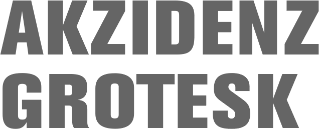
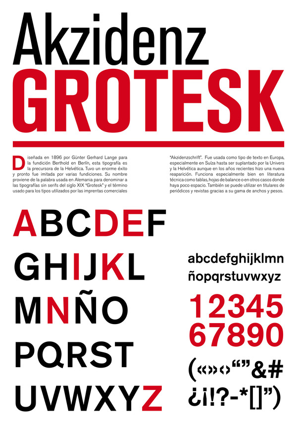
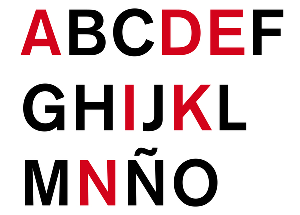
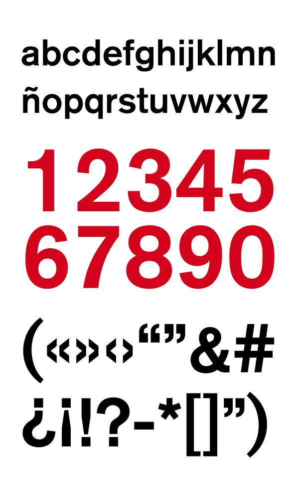
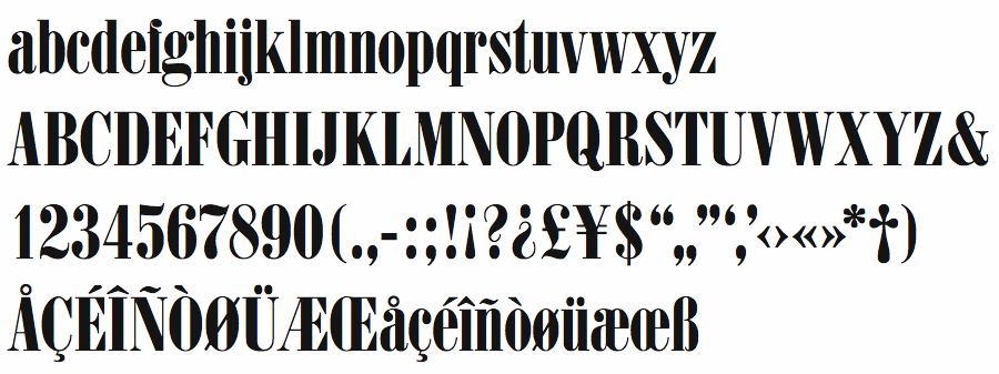
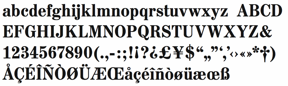
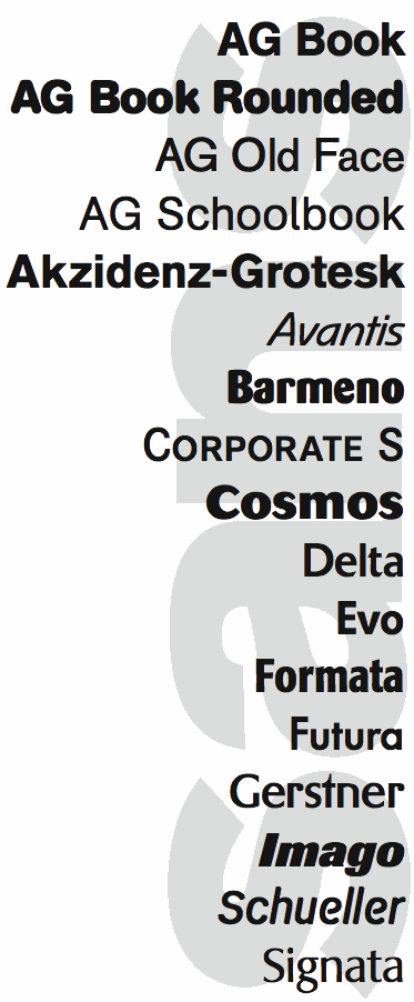
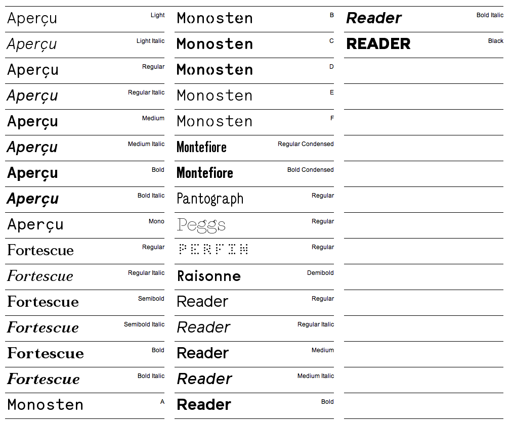
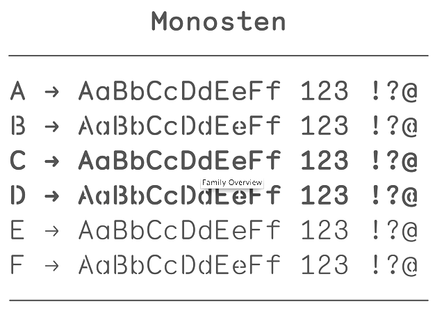
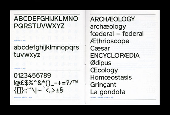
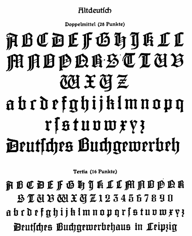
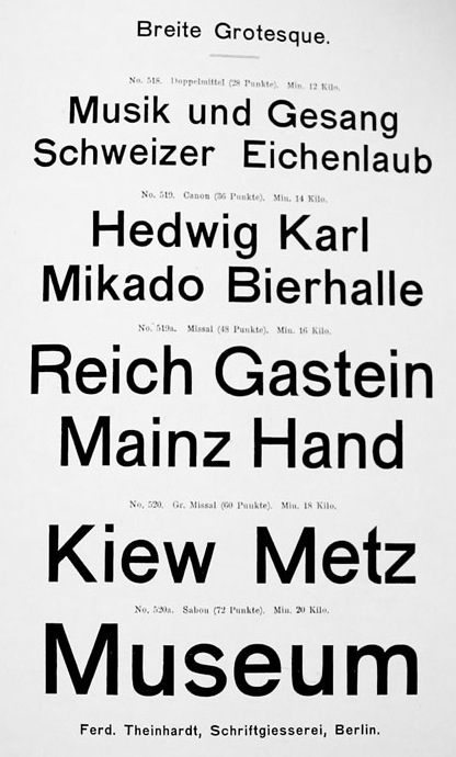
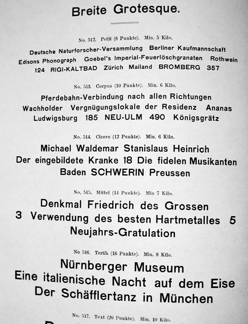
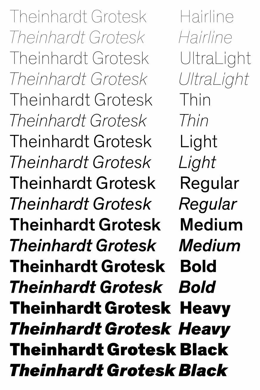
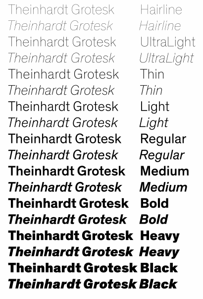
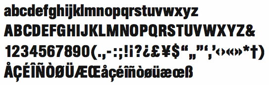
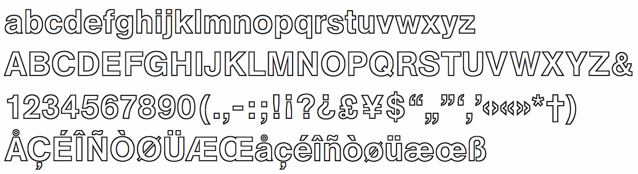
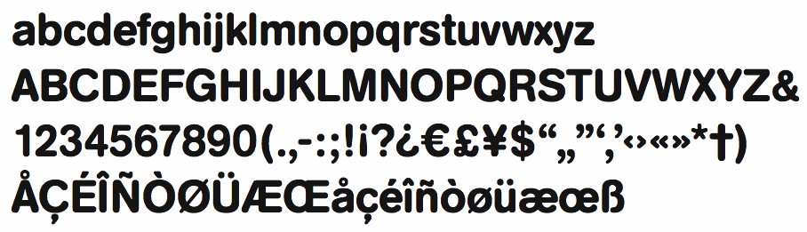
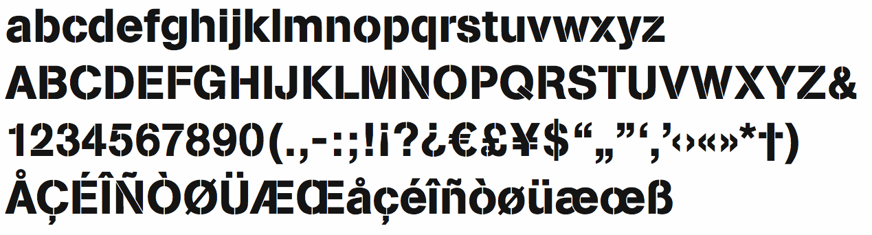
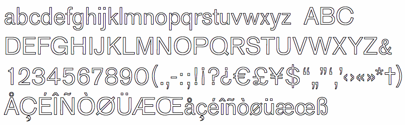
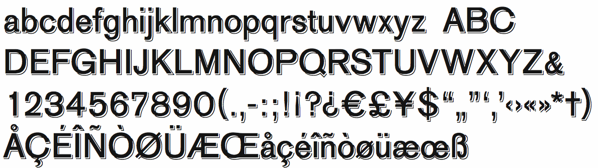
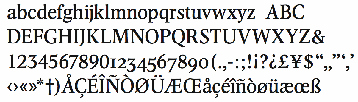
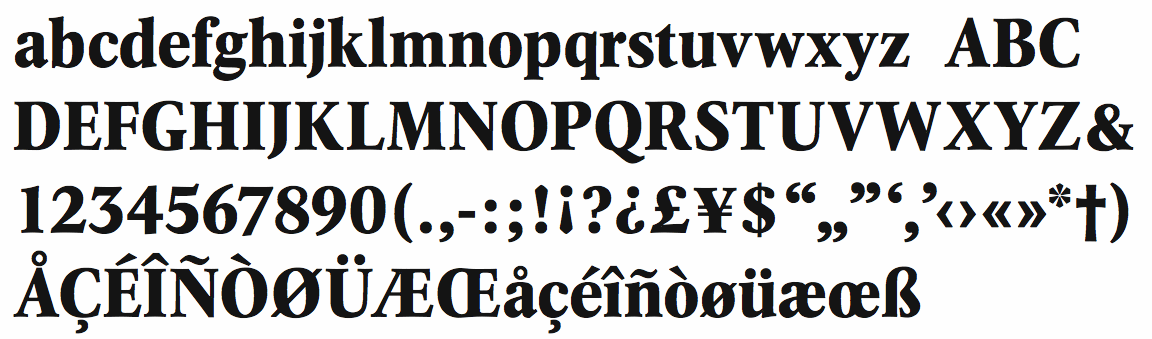
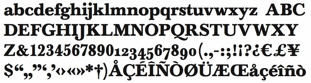
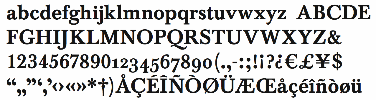
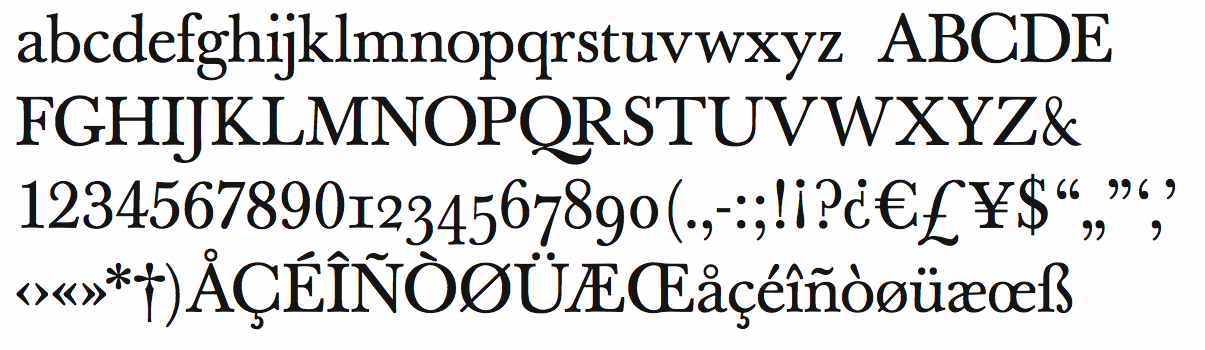
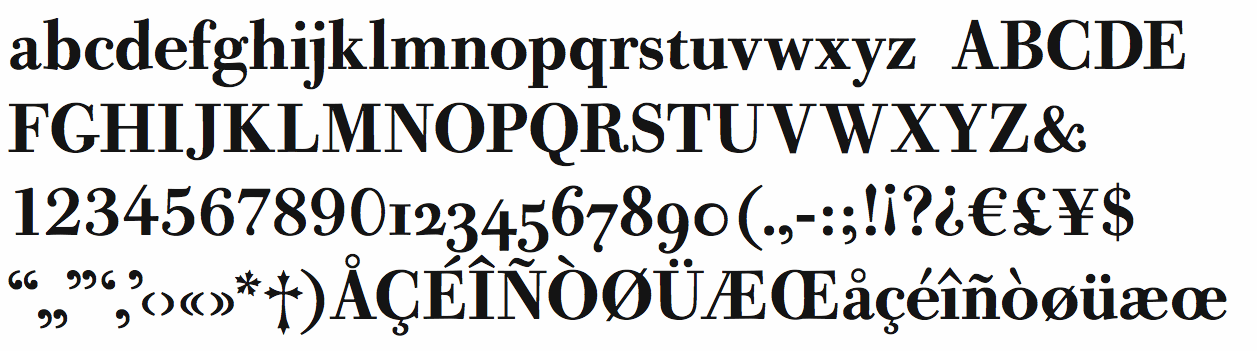
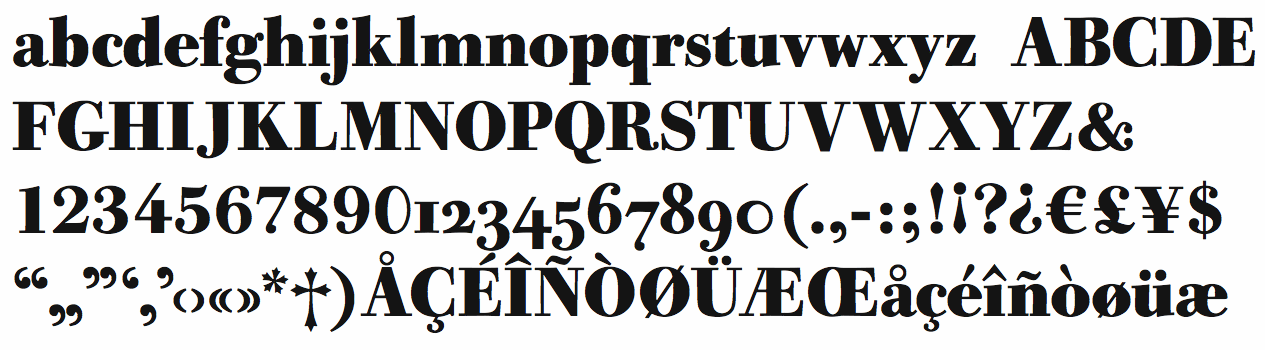
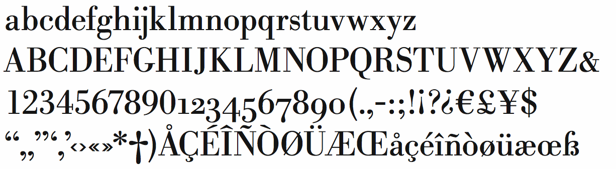
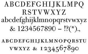
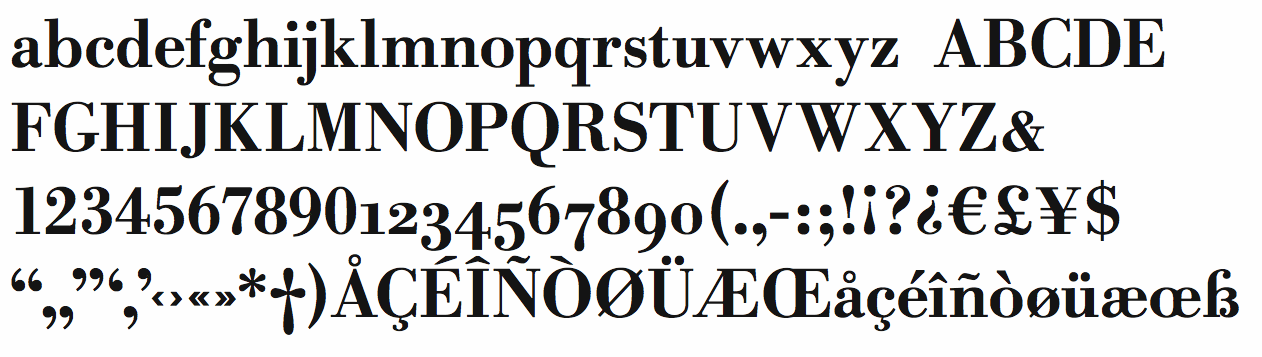
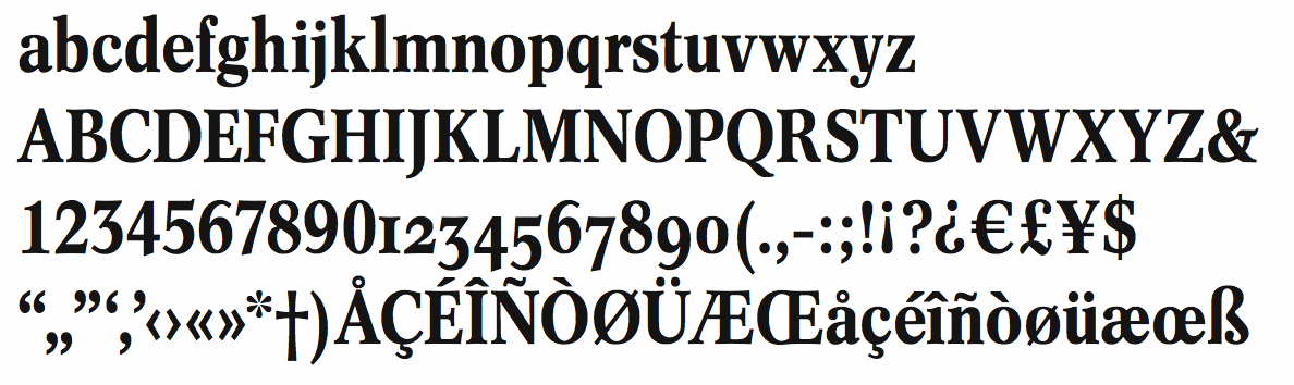
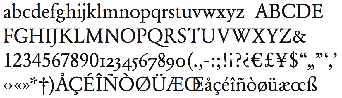
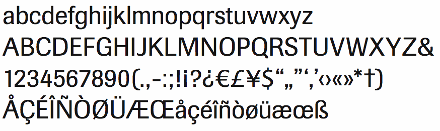
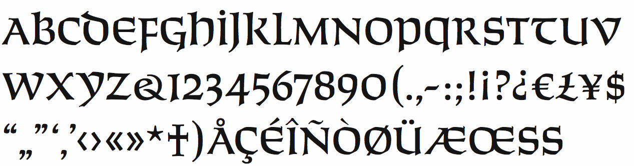
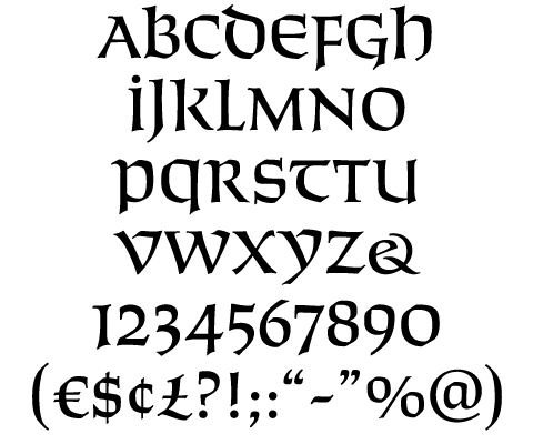
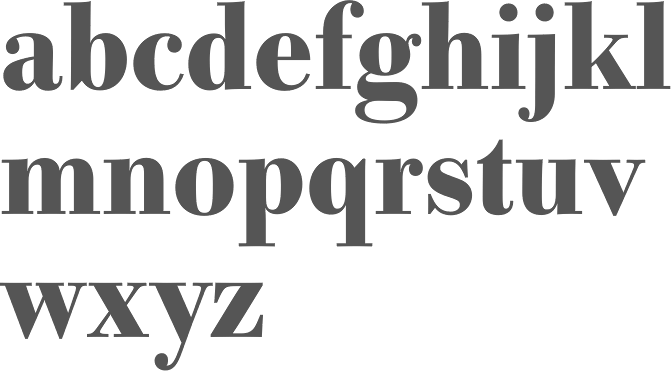
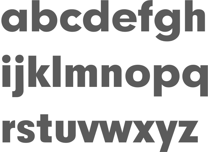
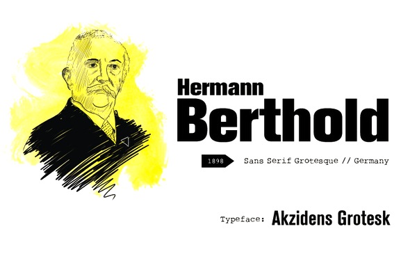
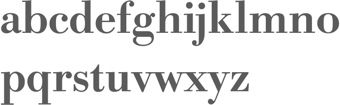
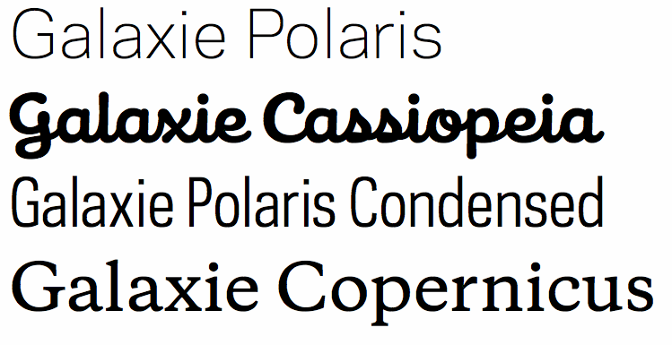
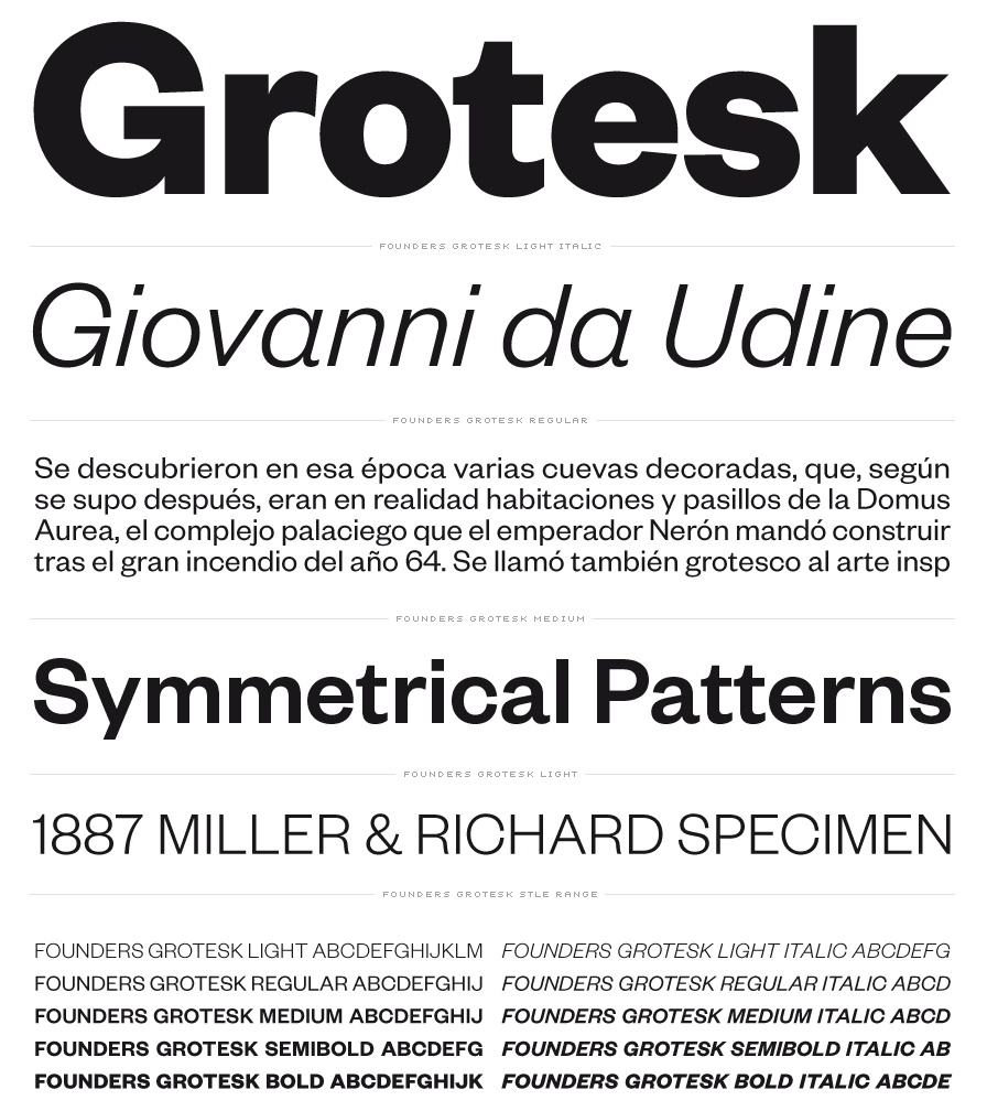
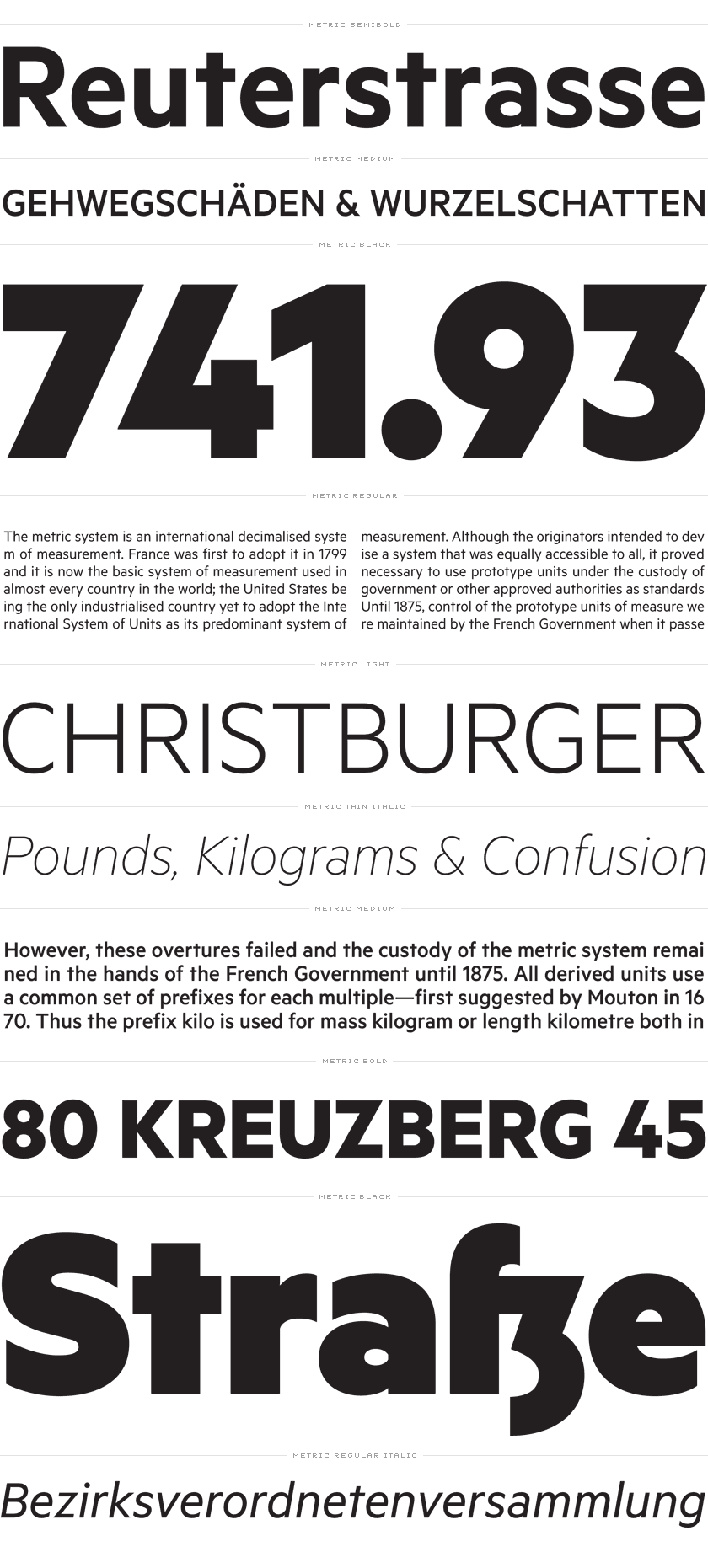
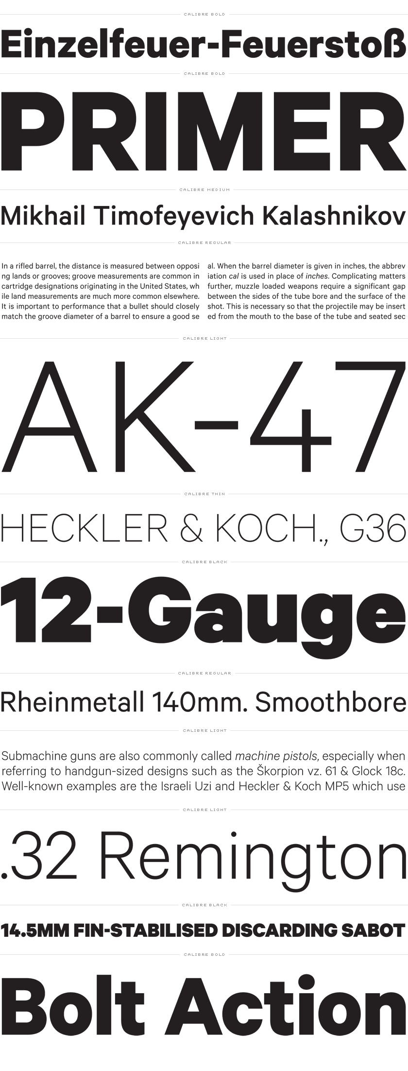
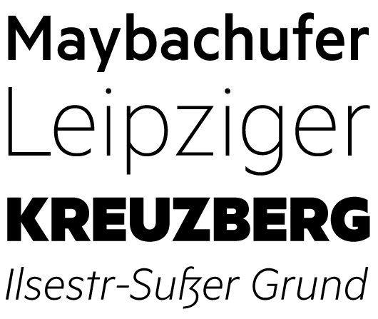
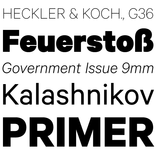
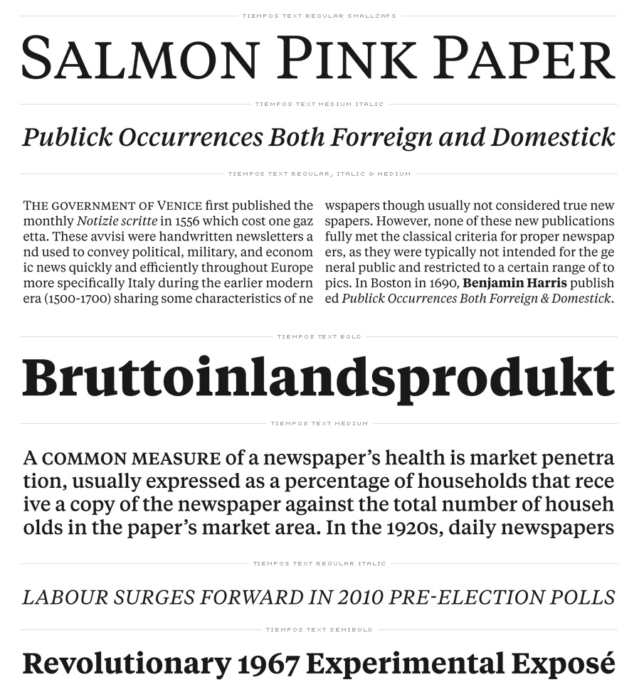
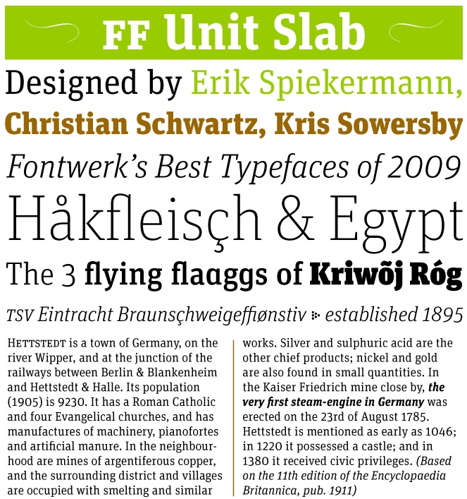
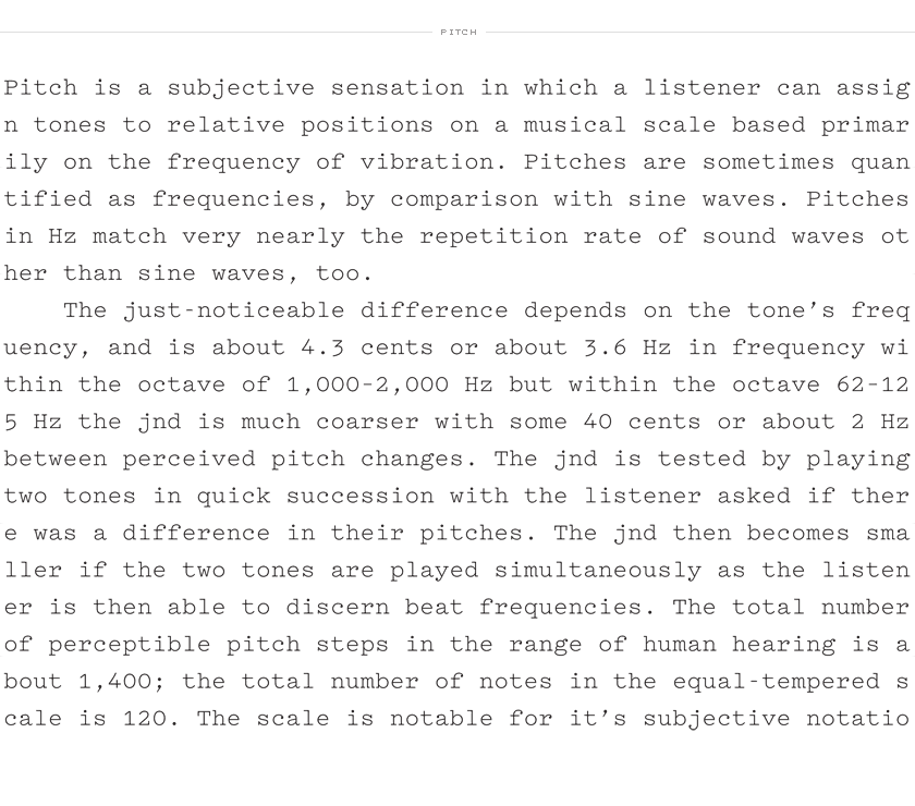
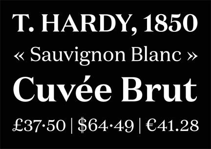
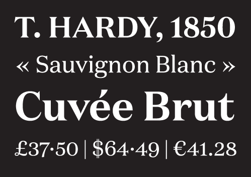
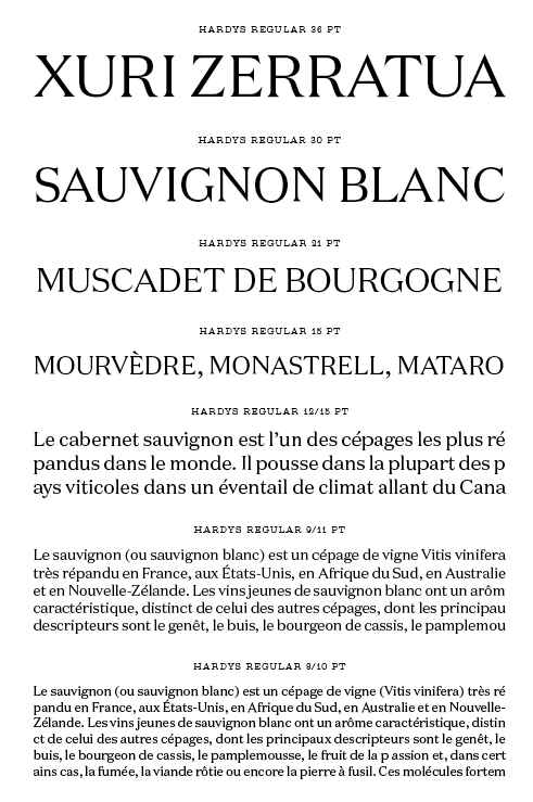
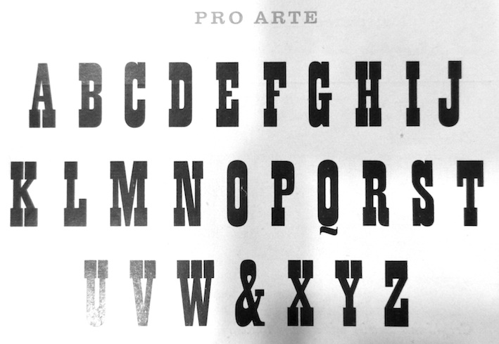
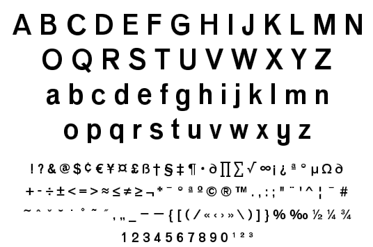
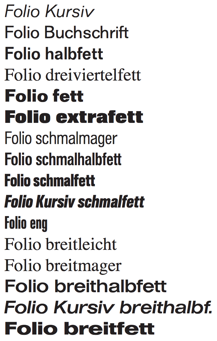