| | |
Alan Carr
|
Partial list of Alan Carr's fonts, made principally between 1992 and 2004: AdLib, AdLibEx, AdLibTh, AdLibWd, Algeria, Animals, Anwik, Arcitectura, BeeBopp, BeeBoppWide, Blast, BlueCard, BusinessIndustrial, BusinessIndustrialDingbats, Busorama, Carolus, CarrAnimalDingbats, CarrArrowsfilled, CarrArrowsoutline, CarrAstroDings, CarrBalloons, CarrDingbats1, CarrDingbats2, CarrDings, CarrElecDingbats, CarrElectronicDingbats, CarrGovernment, CarrKeys, CarrSpace, CarrXmasDingbats, Carrick-Regular, CarrickCaps-Caps:001.001, CaslonAntique, CaslonAntiqueItalic, CaslonAntiqueLefty, CharlemagneBold, Choc, ChocWd, Coco, ComicBook2, Croissant, CroissantEx, CroissantLefty, CroissantWd, Desoto, Electrik-Italic, Electrik, ElectrikCn, ElectrikEx, ElectrikWd, Empire, Enviro, EnviroCapsLefty, ErasContour-Italic, ErasContour, ErasContourEx, ErasContourLeftyWide, ErasContourTh, ErasContourWd, Fletcher-Gothic (art nouveau face, made famous by the TV show Murder She Wrote), Fountainpen, Fragola, Frankfurt, FrankfurtCn, FrankfurtExtended, FrankfurtLefty, GlypicItalic, Graphik, GraphikShadow, Halt, Hobo, HoboLeftified, KabelBook, KabelLeftieBook, Keypunch, KeypunchLeftie, Leigh, Lithos, MathSymbol, MtypeCursive, NewYorker, NewYorkerEngraved, Omnibus, Paintbrush-Italic, Paintbrush, PaintbrushCn, PaintbrushLeftified, PaintbrushWd, PaperClip-Bold, PaperClip-Italic, PaperClip, PaperClipCn-Italic, PaperClipEx-Italic, PaperClipWd, PaperClipsBentToTheLeft, Quadrille, QuickSilver, Revere, Roller, Squire, States, Stop, Tatum, TestFrogRemix, UnitedStates, Uptight-Italic, Uptight, UptightCn, UptightEx, UptightLefti, UptightTh, XmasDings, YankeeEngravedNormal. Dafont link. Fontsy link. Fontspace link. Abstract Fonts link. [Google]
[More] ⦿
|
Alphabetum
[Juan-José Marcos García]
|
Juan-José Marcos García (b. Salamanca, Spain, 1963) is a professor of classics at the University of Plasencia in Spain. He has developed one of the most complete Unicode fonts named ALPHABETUM Unicode for linguistics and classical languages (classical&medieval Latin, ancient Greek, Etruscan, Oscan, Umbrian, Faliscan, Messapic, Picene, Iberic, Celtiberic, Gothic, Runic, Modern Greek, Cyrillic, Devanagari-based languages, Old&Middle English, Hebrew, Sanskrit, IPA, Ogham, Ugaritic, Old Persian, Old Church Slavonic, Brahmi, Glagolitic, Ogham, ancient Greek Avestan, Kharoshti, Old Norse, Old Icelandic, Old Danish and Old Nordic in general, Bengali, Hindi, Marathi, Phoenician, Cypriot, Linear B with plans for Glagolitic). This font has over 5000 glyphs, and contains most characters that concern classicists (rare symbols, signs for metrics, epigraphical symbols, "Saxon" typeface for Old English, etcetera). A demo font can be downloaded [see also Lucius Hartmann's place]. His Greek font Grammata (2002) is now called Ellenike. He also created a package of fonts for Latin paleography (medieval handwriting on parchments): Capitalis Elegans, Capitalis Rustica, Capitalis Monumentalis, Antiqua Cursiva Romana, Nova Cursiva Romana (2014), Uncialis, Semiuncialis, Beneventana Minuscula, Visigothica Minuscula, Luxoviensis Minuscula, Insularis Minuscula, Insularis Majuscula, Carolingia Minuscula, Gothica Textura Quadrata, Gothica Textura Prescissa, Gothica Rotunda, Gothica Bastarda, Gothica Cursiva, Bastarda Anglicana (2014) and Humanistica Antiqua. PDF entitled Fonts For Latin Palaeography (2008-2014), in which Marcos gives an enjoyable historic overview. Alphabetum is not Marcos's only excursion into type design. In 2011, he created two simulation fonts called Sefarad and Al Andalus which imitate Hebrew and Arabic calligraphy, respectively. Cyrillic OCS (2012) is a pair of Latin fonts that emulate Old Church Slavonic (old Cyrillic). In 2013, he created Cuneus, a cuneiform simulation typeface. Paleographic fonts for Greek (2014) has ten fonts designed by Marcos: Angular Uncial, Biblical Uncial, Coptic Uncial, Papyrus Uncial, Round Uncial, Slavonic Uncial, Sloping Uncial, Minuscule IX, Minuscule XI and Minuscule XV. These fonts are representative of the main styles of Greek handwriting used during the Classical World and Middle Ages on papyrus and parchments. There is also a short manual of Greek Paleography (71 pages) which explains the development of Greek handwriting from the fourth century B.C. to the invention of printing with movable type in the middle of the fifteenth A.D. He wrote a text book entitled History of Greek Typography: From the Invention of Printing to the Digital Age (in Spanish; second edition, 2018). See also here and here. [Google]
[More] ⦿
|
Alter Littera
[José Alberto Mauricio]

|
 Spanish foundry, est. ca. 2009, and on the web since 2012. It is located in Madrid. Alter Littera's fonts and web site are designed and managed by José Alberto Mauricio, who holds a doctorate degree in Economics and Business Administration, and is Associate Professor of Econometrics at the Universidad Complutense de Madrid.
 Alter Littera produces and markets opentype fonts reviving some of the most beautiful bookhands from medieval Western manuscripts, as well as some of the finest European and North-American typefaces from the mid-fifteenth through the early-twentieth centuries. The "Bookhand", "Oldtype" and "Initials" font collections cover gothic and/or blackletter letter forms. The typefaces: - Gutenberg (B42-type) A (Johann Gutenberg, Mainz, ca. 1455). Includes the full set of special characters, alternates and ligatures from The 42-line Bible. Under development.
- Gutenberg (B42-type) B (Johann Gutenberg, Mainz, ca. 1455). Includes the full set of special characters, alternates and ligatures from The 42-line Bible. Published as Gutenberg B in 2012, this is a clean, smooth rendition of the B42-type used by Johann Gutenberg in his famous 42-line Bible. The font includes a comprehensive set of special characters, alternates and ligatures, plus Opentype features, that can be used for typesetting (almost) exactly as in Gutenberg's Bible and later incunabula. He says: The main historical sources used during the font design process were high-resolution scans from several printings of Gutenberg's Bible. Other sources were as follows: Kapr, A. (1996), Johann Gutenberg - The Man and his Invention, Aldershot: Scolar Press (ch. 7); De Hamel, C. (2001), The Book - A History of The Bible, London: Phaidon Press (ch. 8); Füssel, S. (2005), Gutenberg and the impact of printing, Burlington: Ashgate (ch. 1); and Man, J. (2009), The Gutenberg Revolution, London: Bantam (ch. 7).
- Gutenberg (B42-type) C (Johann Gutenberg, Mainz, ca. 1455). Includes the full set of special characters, alternates and ligatures from The 42-line Bible. Published in 2012 as Gutenberg C, this is a slightly roughened version of the Oldtype "Gutenberg B" Font, simulating irregularities and ink spreads associated with old metal types, papers and parchments.
- Psalterium (Psalter-type) (Peter Schoeffer, Mainz, 1457). Includes the full set of special characters, alternates and ligatures from The Mainz Psalter (Psalterium Moguntinum). He writes: A clean, smooth adaptation of the magnificent gothic types used by Johann Fust and Peter Schöffer in their famous Mainz Psalter (Psalterium Moguntinum) of 1457, also used in their Canon of the Mass (Canon Missae) of 1458, and in their Benedictine Psalter (Psalterium Benedictinum) of 1459. [Although these works were published after Gutenberg's break with Fust, it is generally agreed that Gutenberg was working along with Fust and Schöffer on the Mainz Psalter while the 42-line Bible was still being printed.] In addition to the usual standard characters for typesetting modern texts, the font includes a comprehensive set of special characters, uncial initials (adapted from both the Mainz Psalter and early sixteenth-century Dutch types by Henric Pieterszoon), alternates and ligatures, plus Opentype features, that can be used for typesetting (almost) exactly as in the Mainz Psalter and later incunabula.
- Oude Hollandse (Henric Pieterszoon "Lettersnijder", Antwerp, 1492). Under development.
- French Textura (Joos Lambrecht, Ghent, 1541). Under development.
- Flamand A (Hendrik van den Keere, Antwerp, 1571). Under development.
- Flamand B (Hendrik van den Keere, Antwerp, 1571). Under development.
- Nederduits (Johann M. Fleischmann, Haarlem, 1733). Under development.
- Psalter Gotisch (Benjamin Krebs Nachfolger, Frankfurt am Main, 1890). Under development.
- Manuskript Gotisch (Bauersche Giesserei, Frankfurt am Main, 1899). Under development.
- Munthe Schrift (Gerhard Munthe, Offenbach am Main, 1904), Under development.
- Deutsche Schrift (Rudolf Koch, Offenbach am Main, 1910). Includes both normal and large, ornamental capitals (two sets), plus several finial characters and ornaments from Koch's original designs. He writes:A comprehensive and faithful rendition of Rudolf Koch's first release, usually referred to as "Fette Deutsche Schrift" or "Koch-Schrift". In addition to the regular character set, the font includes a large number of alternates and ligatures, plus two sets of ornamental initials (Initialen mit Zierstrichen und Punkten zur Koch-Schrift, and Initialen zur halbfetten deutschen Schrift). The main sources used during the font design process were a sample page from Hendlmeier, W. (1994), Kunstwerke der Schrift, Hannover: Bund für Deutsche Schrift und Sprache (p. 164), and several specimen sheets from the Gebrüder Klingspor Type Foundry for Koch's Deutsche Schrift type family.
- Maximilian (Rudolf Koch, Offenbach am Main, 1914). Includes normal, small (Klein), and roman (Antiqua) capitals, plus ornamental capitals and alternates (Zierbuchstaben). Under development.
- Wilhelm Klingspor Schrift (Rudolf Koch, Offenbach am Main, 1925). Includes both normal (wide) and narrow capitals, plus the full set of alternates, ligatures and finial characters from Koch's original designs.
- Caslon Gotisch (D. Stempel A.G., Frankfurt am Main, 1926). Produced in 2012 as Caslon Gotisch, it is a faithful adaptation of the "Caslon-Gotisch" type acquired (among several other types) by D. Stempel A.G. in 1919 from the Leipzig printer Wilhelm E. Drugulin, and further developed by Stempel in later years. Details: In addition to the usual standard characters for typesetting in modern Western languages, the font includes a comprehensive set of special characters, alternates and ligatures, plus Opentype features, that can be used for typesetting as in antique writings and printings. The main sources used during the font design process were as follows: A sample page from Typographische Mitteilungen - XXIII Jahrgang - Heft 2 (1926), and a sample page from Hendlmeier, W. (1994), Kunstwerke der Schrift, Hannover: Bund für Deutsche Schrift und Sprache (p. 37).
- Gótico Cervantes (Fundición Tipográfica Richard Gans, Madrid, 1928). Under development.
- Wallau (a rotunda by Rudolf Koch, Offenbach am Main, 1930). Includes German, Uncial, and Ornamental capitals. Under development.
- Alter Gothic (Alter Littera, Madrid, 2012), or Alter Gothisch. This is Alter Littera's first original design. They write: Two specific sources must be acknowledeged: (1) the "Black" type from William Caslon's A Specimen of Printing Types (1785), and (2) the "Caslon Gotisch" type by D. Stempel A.G. (1926).
- Gothic A. After late Carolingian and early Gothic manuscripts (12th century). Under development.
- Gothic B. After Erhard Ratdolt's Lombardic Capitals (1491). Under development.
- Gothic C. After Henric Pieterszoon's Uncials (1508). A comprehensive set of initials (usually referred to as Uncials, Lombardic Initials, or Lombards) of the Germanic variety, designed after Henric Pieterszoon's Gothise Monnikke Letteren as appearing in Enschedé, J. (1768), Proef van Letteren, Haarlem (p. 120); also mentioned as Great Primer Uncials and 2-line Brevier Uncials in Vervliet, H.D.L. (1968), Sixteenth-Century Printing Types of the Low Countries, Amsterdam: Hertzberger (pp. 54-55, and 212-213).
- ATF Cincinnati, ATF Caxton, ATF Missal. From American Type Founders Company's American Specimen Book of Type Styles (1912). Under development.
- Initials Bergling (2012, Alter Littera) is a comprehensive set of initials (usually referred to as Uncials, Lombardic Initials, or Lombards) of the French variety, adapted from Bergling's book Art Alphabets and Lettering (Second Edition) (1918, Chicago: Blakely-Oswald Printing Company).
- Bergling B. From J.M. Bergling's Art Alphabets and Lettering (1918). Under development.
- Morris. From William Morris's The Kelmscott Chaucer (1896). Under development.
- Initials ATF Cloister (2012). After F.W. Goudy's Cloister Initials (1917).
- Roman Square Capital. From 1st century B.C. onwards. Under development.
- Roman Rustic. 1st to 6th centuries. Under development.
- Uncial. 3rd to 6th centuries. Under development.
- Artificial Uncial. 6th to 10th centuries. Under development.
- Roman Half-Uncial. 3rd to 9th centuries. Under development.
- Insular Majuscule. 6th to 9th centuries. Under development.
- Insular Minuscule. From 6th century onwards. Under development.
- Luxeuil Minuscule. 7th and 8th centuries. Under development.
- Beneventan Minuscule. 8th to 13th centuries. Under development.
- Carolingian Minuscule. 8th to mid-12th centuries. Under development.
- Early Gothic. 11th and 12th centuries. Under development.
- Gothic Textura Quadrata. 13th to 15th centuries. Under development.
- Gothic Textura Prescisus. 13th to 15th centuries. Under development.
- Gothic Rotunda. 12th to 16th centuries. Under development.
- Gothic Littera Bastarda. From 13th century onwards. Under development.
- Fraktur. From 15th century onwards. Under development.
- Humanistic Book Script. From 15th century onwards. Under development.
- Humanistic Cursive. From 15th century onwards. Under development.
- ATF Missal Caxton (2012): A comprehensive set of initials, frames and borders, adapted from American Type Founders (ATF) Company's American Specimen Book of Type Styles, Jersey City, 1912 (pp. 944-5). The font contains over one hundred glyphs, including clean renditions of both Missal Initials and Caxton Initials, plus adaptations of Department Store Initials and French Cast Squares. Caxton Initials were first designed by F. Goudy in 1905. Missal Initials is originally due to Will Bradley in 1904.
- Alter Headletter (2012). An original from Alter Littera in the style of Century Bold Condensed.
- The Oldtype Gutenberg A Font (2012, free) is a free abridged edition of the full-featured Gutenberg B and Gutenberg C fonts.
[Google]
[MyFonts]
[More] ⦿
|
Amélie Boutry
|
French type designer (b. 1977) currently based in Paris, who created Cargoth (2001), a hybrid of Carolingian and Gothic. Other typefaces by her include Pelleport in 2004 and Trente-trois in 2006. She is involved now in type design and corporate identity projects at Porchez Typofonderie. As a student at ENSAD, she co-designed the Garamond typeface Recréation (2000). Typofonderie link. [Google]
[MyFonts]
[More] ⦿
|
Anton Scholtz
[Scholtz Fonts]
|
 [MyFonts]
[More] ⦿
[MyFonts]
[More] ⦿
|
Bill Moran
[Blinc Publishing]
|
[MyFonts]
[More] ⦿
|
Bjorn Capens
|
 Bjorn Capens (possibly from Beveren and/or Antwerpen, Belgium) made these typefaces at Fontasia International in the mid 1990s: Blake (an avant-garde typeface after the comic strip album Blake and Mortimer), Suske en Wiske, Karolingisch, and Unciaal. The original link disappeared. Alternate URL. Blake is at Dafont.
 A sad comment: In 2014, the Blake font was claimed by a certain Rebecka Danielle and posted on Fontspace. [Google]
[More] ⦿
|
Blinc Publishing
[Bill Moran]
|
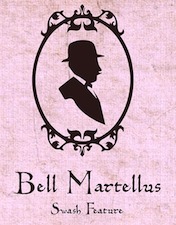 Bill Moran is Artistic Director of Hamilton Wood Type & Printing Museum in Two Rivers, Wisconsin. He also teaches typography and printing history at the University of Minnesota. Together with his brother Jim, Museum director, they are third generation letterpress printers, presiding over the largest collection of printing equipment and wood type in the U.S.
 At Blinc Publishing (est. 1996, St. Paul, MN) he released Goshen, Gommorah, and Prospect, typefaces that were done together with Darrel Austin at Chank. He also created Gideon (2001, 999USD!!!!!), Bell Martellus (2006, a Carolingian script family commissioned by the James Ford Bell Library at the University of Minnesota; co-designed with Chank Diesel), and Sodom (1999, with Chank). Hamilton Offset (2002, Chank) was based on an alphabet from the Hamilton Wood Type Printing Museum. He also made Flour Sack (2006). He writes: As a youngster in Green Bay, Bill began his career as an apprentice in his father's print shop [Jim Moran]. He honed his graphic design skills at the University Of Wisconsin-Stout and proceeded to work for Norwest Banks, The Artist known as Prince, and 3M before starting his own business. Bill serves as the Artistic Director for the Hamilton Woodtype and Printing Museum. Chank link. Blinc specializes in turn-of-the-century wood and lead type. [Google]
[MyFonts]
[More] ⦿
|
Bookhands
[Peter R. Wilson]
|
 Renton, WA-based Peter R. Wilson's metafont code (2000-2003) for the "bookhands" series of fonts. It was his intention to provide the main examples of manuscript hands from the first century until the invention of printing. Included are the following:
 [Google]
[More] ⦿
|
Camila Escobar
|
During her studied at the University of Buenos Aires, Camila Escobar (Lomas de Zamora, Argentina) designed a striped money font (2018). [Google]
[More] ⦿
|
Carol Twombly
|
 Born in 1959 in Concord, Carol Twombly studied at the Rhode Island School of Design and under Charles Bigelow at Stanford, and joined the Bigelow&Holmes studio for four years. In 1988, she joined Adobe and started designing typefaces. She was featured in 5 American Type Designers by Spurius Press. In 1994, she won the Prix Charles Peignot. In 1999, she retired from type design.
 Linotype link. FontShop link. Typophile link. A book about Twombly by Nancy Stock-Allen (Oak Knoll Press, Newcastle, 2016): Carol Twombly: Her Brief But Brilliant Career in Type Design. Her typefaces: - FB Californian (1987-1994, with David Berlow and Jane Patterson).
- Adobe Caslon (1990). Poster by Rachel McKay.
- Chaparral (1997).
- Charlemagne (1989).
- Lithos (1989, the famous stone-cut look face).
- Mirarae (1984). This typeface with its characteristic mid-eighties oversized x-height won her the Morisawa Gold Prize.
- Myriad (1992, with Robert Slimbach), Myriad Wild, Myriad Sketch, and Myriad Tilt.
- Nueva (1994, +Extended).
- Trajan (1989, Adobe).
- Viva (1993).
- The Western typefaces Pepperwood (1994), Rosewood (1994), Ponderosa (1990) and Zebrawood, all co-designed with Kim Buker Chansler and Carl Crossgrove. Pepperwood was patterned after a 1877 wood type by Vanderburgh, Wells and Company. [Caution: Some say that she did *not* co-design these typefaces, contradicting MyFonts and other sources.]
View the typefaces made by Carol Twombly. [Google]
[MyFonts]
[More] ⦿
|
Casady&Greene (Fluentlaserfonts)
[Terry Kunysz]
|
 Casady&Greene, Inc. started out as two separate little companies, CasadyWare and Greene, Inc. CasadyWare, which was founded by Robin Casady in August 1984, began producing Fluent Fonts, which were bitmapped typefaces for the Macintosh. The 1984 set of fonts have copyright lines that mention Richard A. Ware. As soon as PostScript fonts appeared, CasadyWare got hold of the first version of Fontographer and produced the first downloadable PostScript fonts, even beating Adobe, the originators of PostScript, to the punch. These were marketed as Fluent Laser Fonts (FLF) out of Carmel, CA.
 The FLF series includes Abilene (Western), Alexandria (1986, slab serif family), Black Knight (1991, blackletter), Bodoni FLF (1986), BodoniUltra (1986, a fat didone), Bonnard (art nouveau), ButtonHighlight, ButtonPlain, Calligraphy (1986), Campanile (a great didone face), Checkbox, Chicago FLF (free at OFL), Collegiate (1988, sports lettering), Coventry Script (calligraphic), Cutouts FLF (1992, cargo stencil), Desperado, Dorovar Carolus (1988, Carolingian; see also D790 at Softmaker and Carolingia (1991, William Boyd)), DryGulch, Epoque (art nouveau), FattiPatti, Fletcher Gothic (1992, art nouveau), Galileo (1987, didone), Gazelle (1988, calligraphic script), Gatsby (1986, pure art deco), Giotto, Gregorian (1986, English Gothic style blackletter), Harlequin FLF (1990), Highland Gothic (1992), Jott, Kasse (1992), Kells (modern round Gaelic font, 1988), KeyCaps, La Peruta, Meath (modern round Gaelic font, 1988), Michelle (1992, art deco, marquee face), Micro, MicroExtend FLF (1986, like Microgramma), Monterey (1986, Peignotian), Moulin Rouge (1992, an art nouveau typeface by Richard A. Ware), Nouveau (1990, art nouveau), Paladin (1988, blackletter), Pendragon (1991), Phoenix Script FLF (1990), Prelude (1986, connected script), Regency Script (1986, calligraphic copperplate script), Right Bank (1986, art deco), Ritz (1986, art deco in the style of Broadway), Rocko (1992, rounded like VAG Round), SansSerif FLF (1986, a large geometric sans family), Sedona Script (1990, connected, calligraphic, semi-psychedelic), Slender Gold (1992, script), Vertigo (1992, condensed monoline sans), VertigoPlus, Zephyr Script (1986, brush script). Many fonts were digitized by Richard Ware, and some were designed by Mike Wright. The contact was Terry Kunysz in Salinas, CA. On July 3, 2003, Casady&Greene closed it doors permanently. However, one of its designers, Mike Wright, writes: I believe that all the fonts that were developed by the company are now in the public domain. Robin Casady and I are thinking of putting up a site with free downloads of all of the old C&G public domain fonts--mainly as a way of attracting Mac users to see iData 2. Robin Casady in 2003: I founded Casady Company in 1984 to publish fonts for the new Macintosh. The name changed with incorporation to CasadyWare, Inc. Around this time I met Mike Greene who was looking for a software project to do after SpellsWell. I talked him into doing a program that became QuickDEX. Later CasadyWare, Inc. merged with Greene, Inc. and became Casady & Greene, Inc. Over the years, my role in management reduced as my interests in other areas developed. In the last ten years I have had no official management duties at C&G. About a year ago I removed myself from the Board of Directors. Some fonts could be found at TypOasis [defunct link]. Fontex link. Font Squirrel link. [Google]
[More] ⦿
|
Chank Fonts (or: Chank Store, or: Chank Diesel))
[Charles R. Anderson]
|
Born in Edmonton in 1969, Chank works out of the north-east corner of Minneapolis. Chank Diesel is a famous and prolific designer, type designer, busy-body and mentor. His Chank Foundry in Minnesota was started in 1992. Free fonts sub-page. Chank Diesel is Charles Andermack in the NY Times and Charles R. Anderson, b. Edmonton, 1970, elsewhere. Chank Fonts was run with Heidi Olmack ("El Mack de los Toros"). Earlier notices in his typefaces refer to CAKE Publications (2401 University Ave. NE, Mpls, MN 55418), Chank Foo, Schmopyright, and Exploding (PO Box 90100, San Diego, CA 92169). Bio by Susan Froyd. See also here or here or here or here. Handwriting font service for 95USD. 95 USD Go font Yourself font service based on filling out a form. Piece on Chank in the MinnPost. Chank became a popular and colorful figure who said this about himself: I like to drink a lot, and would like to think I'm known for it. Several of my fonts were inspired by booze, and I like to encourage other people to drink more, too. My best font is called Liquorstore. A partial list of his typefaces: - 200proofmoonshineremix.
- A: Adrianna (2004, a sans family), Anger-Prerelease, Asswipe, AsswipeDeluxxe, AztecPezRegular, Adrianna Extended (2005), Aguas Frescas, Ammonia.
- B: BabOonjaZzbaSsoOn, Ballers Delight (2007, free), Bell Martellus (2006, a Carolongian script family designed with Bill Moran of Blinc Publishing for the James Ford Bell Library at the University of Minnesota: Bell Martellus was derived from a book published in 1475 by Henricus Martellus entitled Liber Insularum), Bastard, Bawdy (T-26), Birthday Girl, Blinkers, Bonehead, Brainhead, Bric-A-Brac BV (2002), Bridie, Brieincarnation, ButtplugTaft, B Complex, Badoni, Boochie&Snoochie (T-26, by by Khai Pham&Chank Diesel), Billsville, Blazedale, BlincType Letterpress Fontpak (2004, commercial: Gideon, Golgotha, Gomorrah, Goshen, Hamilton Offset, Player Piano, Prospect Modern and Sodom), Braingelt (gothic), Brimley, Brubecks Cube (2004), Buckethead.
- C: Carima (2002), Cheesewiddler, Chicken, ChickenBonus, Chrysler Electric (2007, fifties style connected script), Chumley (2002, first grade handwriting), Cleptomania, CrotchlessTeddyRoosevelt, CurbDog (by Matthew Desmond), Cookie Dough (2002), Chaloops (2005, comic book face), Chankbats (2001, +Objects, +Critters, +Flowers, +Flakes), Chauncy (ChauncyDecaf, ChauncyFatty, ChauncyPerkins, ChauncySnowman; this popular series from 1996-1998 is the first font family Chank ever made based on his own handwriting), Chauncy Pro, Chippewa Falls (2005), Chub, Chunder (1996, T-26), Cocaine, Coffeedance, Collateral Damage, Corndog, Coronette (2006, slab serif), Cosmic (1996), Couchlover, Cowboy Rhumbahut (2000, Matt Frost), Crusti, Crusti Wac.
- D: DickwhippedLincoln, DongCasual, Duesenberg (T-26, by Jamie Nazaroff), Dutch-Oven, Dutch-Treat, Darling Nikki, Dekapot (2007), Destructive Decisions (2013, a foggy font), Drunk Cowboy, Dry Cowboy (2006, Tuscan).
- E: Easterbuns (2008, Ascender Corp: a signage face), EatpooChubby, EatpooSkinny, EatpooTall [note: the latter three fonts were renamed Eatwell], Evergreen, Eatwell, El Hombre, Evolve (2015: video game font co-designed with Turtle Rock Studios).
- F: Fatthinfog, Flutterby (2006, free), Fornicator, Fucker, Fastlab (by David Cushman), Fosho (2014), Fridayluck, FriskyFlakes (2004).
- G: The Gemini Type Fontpack (2015: GT-Adrianna DemiBold GT-Adrianna Bold, GT-Adrianna ExtraBold, GT-Fairbanks, GT-Forward Thinking, GT-Hydropower ExtraCondensed, GT-Kegger, GT-Shopaganda, GT-Shopaganda Condensed, GT-Timeless Geometric. These fonts aaare optimized for use as exterior cast-metal signage in bronze or aluminum in collaboration with Gemini, a family-owned industry leader in the wholesale manufacture of dimensional letters, logo and plaques based in Cannon Falls, MN), Girl77, Glovebox, Goshen, Groovies-Normal, GFY Handwriting Fontpak, GFY Handwriting Fontpak 2, Gobbler. The GFY Handwriting Fontpak (2002-2005) is a collection of 21 fresh handwriting fonts in OpenType format for Macintosh or Windows. Contains the following fonts: GFY AuntSusan, GFY Brutus, GFY HeySteve, GFY JacksBluePrint, GFY Jeanna, GFY Josie, GFY Kersti, GFY Kimberly, GFY Loopy, GFY Marcie, GFY Mancini, GFY Michael, GFY Palmer, GFY Peggy, GFY Pollak, GFY Shue, GFY Ralston, GFY Sidney, GFY Sonya, GFY Thornesmith, and GFY Woodward. His DFY Handwriting Fontpak 2 (2008) contains GFY Artie, GFY Bobby, GFY Bobbys Kid, GFY Bracco, GFY Butcher, GFY Carmela, GFY Christopha, GFY Clarice, GFY Erin B, GFY Father Mike, GFY Finn, GFY Furio, GFY Georgio, GFY Janice, GFY Junior, GFY Madre, GFY Meadow, GFY Paulie, GFY Syl, GFY Tina, GFY Tony, GFY Uncle Junior, GFY Vito.
- H: Halebopp, Harvester 3D (2008), HelveticaInaHamper, Hermenaut, HieronymousBoschian, HipstersDelight, HooskerDont, HooskerDoo, Hoover, Hystrix, HystrixHystrax, HystrixHystraxBordex, HystrixHystraxSleestax, HUGS (2005, comic book style), Hilde Sharp.
- I: Imastar, IndustrialSchizophrenic, Isotope, Instructor.
- J: Javatronic (retro), JawboxChanky, Jawbreaker, Jeffersonofabitch, Johnson, Jingles (with Mike Cina), Jawbox.
- K: Kat Walk (geometric sans), Keester Black (2002), Kaiser, KlippyDingbats, Kraftwerk, KraftwerkNarrow, Kroozr, Kwikfont, Kegger (2007, a collegiate lettering face), Kazootie, King George (2003, ransom note font).
- L: Lambretta, Lambrettista, Laundrette, LemonadeSpeedster (retro), Limonata (2016, a display family, co-designed with Nicollazzi Xiong), Liquor 3D, Liquorstore Bold and Bolder (2017: stackable, layerable), Luncheonette, Laundry, Lavaman, Liquorstore (1997, a squarish face; since 2005 also in OT as Liquorstore 3D).
- M: Mars (2007), Marcusia, Metolurgy2typeindexcom, Mikrokoszmo, MisterFrisky, MisterLincoln, Mister Twiggy (woodsy design), Monko-Blocky, MC Auto (2002), McKraken, Mantisboy, Mars (2007, a custom family for Mars Inc), Millesime, Mingler (MinglerNipsy, MinglerRitzy, MinglerTipsy), Miss AmyLynn (2008, based upon the handwriting of the former Miss Kentucky, Amy Lynn Brown), Mister Hand, Moonshine (Moonshine Murky).
- N: NailedToTheCross, NapkinTheModern, Nomadic Egyptian (2005), Nomadic Sketchbook (2005, like Nomadic Egyptian, based on drawings by Kent Aldrich of the Nomadic Press), Newcastle (2005, blackletter typeface designed with Kevin Hayes), Nube, Naughties, Newercastle, Nicotine (+Jazz).
- O: Omnivore, Oooopsie (this 1997 font is just Helvetica with some circles dropped on top of it. The Helvetica trademark and Adobe copyright notices are still in the font!), OooopsieReverse, Ooopsie, Ollivette (2008, old typewriter), Ollivette Elite (2008), Orbital, Orbus (OrbusBjorkus, OrbusMultiserif).
- P: Panefresco (2011, 16 styles---a free sans family), PHreAkKruSty, Panzer, Paregos, PhysicsAlpha, PhysicsBeta, PlasticLasso, Player Piano (old stencil), Poker Party (2003), Polaroid22, Portastat, Prickly, ProletarianBeta, Prospect-Modern, Puckfont, Parkway, Patching Compound, Porkshop (1997, based on immigrant Manhattan signage; +PorkshopGoodluck), Professor Minty (2006-2010: spindly and gothic).
- Q: Quimby Gubernatorial (2007), Quimby Mayoral (2002).
- R: Redherring, RhumbaHut, Ribjoint, Rubble, Ribjoint, Rosemary (2000-2001, T-26, a sign painters font).
- S: Spooooky (2011, a custom typeface design for the 2011 Target Halloween campaign), Saltwater, Schwinger (2003, script face), Schwing Shift (2003), Shadowboxer, Shakopee, SharpieStylie, SaucyMillionaire, SooperCosmic, SpaceKrafty, Spacesuit, StarryFHope, Sundayluck, Swister (2004), GFY Santa Script (2004), Skylab, Shatner, Sunshine (2000-2001, T-26, grunge), SandraOh, Shrub (2007, grunge), Sister Frisky, Skippy Sharp, Snipple, Soccerboy (2012, a hand-drawn multiline typeface), Space Toaster, Spunkflakes (2002), Sunflower (2006, distressed typewriter), Sunshine, Swingdancer (2002, a custom connected script font first made for P. Puff Company).
- T: Tabitha, Tacklebox, TackleboxFive, Transam, Transam03 (2003, commercial version), Thymesans, Trucker (2005), Turman Grotesk.
- U: Ultramagnetic (by Mike Cina), UncleStinky, Urban Circus.
- V: VenerealDisease, Venis Small Caps (2004, T-26), Venis (2000: big text family, T-26: reviewed by Hrant Papazian).
- W: Westsac (2003), Whorn, Wichita, Woodrow, Wordy Diva (1995, based on the handwriting of Lisa Bralts).
- W: Wolves Gothic (2020), Woodrow, Wordy Diva.
- Y: Yearling (2000), Yellabelly.
- Z: ZsaZsa Galore.
At Ascender: the mostly hand-printed typefaces Birthday Girl, Bleacher, Bobby Zee, Chauncy Decaf, Churros, Collateral Damage, Couchlover, Easterbuns, Loopy Fiesta, Mister Marker, Mister Twiggy, Prickly, Snowballs, Space Toaster, Tipsy, Twigdancer, Younger Than Me (2009, grunge). Chank also has a bunch of free fonts such as Yellabelly (handwriting), Fridley, Airboy, SundayLuck, Shadowboxer, Portastat, Fridayluck, Twenty Six Snake Rumba, and Blinkers. Interview by MyFonts in 2011. Dafont link. I Love Typography link. Behance link. Klingspor link. View Chank Diesel's typefaces. [Google]
[MyFonts]
[More] ⦿
|
Charles R. Anderson
[Chank Fonts (or: Chank Store, or: Chank Diesel))]
|
[MyFonts]
[More] ⦿
|
Christophe Badani
[Typophage]
|
 [MyFonts]
[More] ⦿
[MyFonts]
[More] ⦿
|
Claude Médiavilla
|
 French type designer (b. 1948) who was born in the South of France. He studied typography, calligraphy and painting at the School of Fine Arts in Toulouse. He received the Prix Charles Peignot in 1982. In 1992, the President of France invited him to design the inscriptions for the royal tombs in the Basilique Saint Denis in Paris. He published Calligraphie (Imprimerie Nationale, 1993). Author of Calligraphy (Wommelgem, Belgium, 1996) and Histoire de la calligraphie française (Albin Michel, 2006; examples here). In 2009, with the help of Atelier des Signes, he created a typeface for the signage at Chateau de Fontainebleau. Additional URL. In 2010, Mediavilla cofounded Media type Foundry with Sonia Da Rocha and Joel Vilas Boas in Paris.
 His typefaces: - Galba: an elegant roman titling face, done at Mecanorma in 1987.
- Media Script (Mecanorma, 1985).
- Mediavilla (CCT, 1976).
- Mediavilla Script (Graphitel, 1986).
- Palazzo (Mecanorma, 1984).
- Tory (1991).
Examples of calligraphic alphabets drawn by him and shown in his Histoire de la calligraphie française (2006): Bastarda, Cancellaresca, Carolingian, Cursive gothic 1410, Luxeuil, Roman Capitals, Roman cursive 1st century, Roman cursive 4th century, Rustica 1st century, Textura 14th century, Textura 15th century, , Tourneure 15th century, Uncial 4th century. Klingspor link. [Google]
[MyFonts]
[More] ⦿
|
Dan M. Zadorozny
[Iconian Fonts]
|
 [More] ⦿
|
Danel Aisemberg
|
During his studies in Buenos Aires, Danel Aisemberg designed Elessar (2015), starting from Carolingian letterforms and Caxton. [Google]
[More] ⦿
|
David Fleming Nalle
[Scriptorium (Ragnarok Press, Fontcraft)]
|
 [MyFonts]
[More] ⦿
[MyFonts]
[More] ⦿
|
Dick Pape
[Dick Pape: February 2013]
|
 [More] ⦿
|
Dick Pape: February 2013
[Dick Pape]
|
 In February 2013, Dick Pape published a number of typefaces grouped together here. Local download page. The typefaces:
 - Blok: A beautiful negative font originally designed by Jarrik Muller for Neo2 magazine in 2011.
- Bogart Heavy: An elegant fat round sans.
- Darabo: An avant-garde typeface.
- DarkHerald (2011): A collection of caps based on Stylus fonts.
- ElegantFloralDesigns:
- FancyRansomInitials (2011).
- GridDrops (2012): Black squares.
- HandDrawnIcons.
- IguanaMedium: A stiff thin slab serif.
- Kabel ABC: A paperclip font.
- Lettres Majuscules Fantasie, Lettres Minuscules Fantasie: Based on Modèles de Lettres D'Art Nouveau (E.A. Ducompex, Imp. Firmin Didot & Cie, Paris), where these caps are called Lettres incrustées dorées.
- Masks2.
- MatchBoxes: match boxes from Finland and Portugal.
- Noel's Thes: "The" refers to the word "The".
- PLM Posters: A beautiful set of travel posters from 1926 called Paris-Lyons-Mediterranée Travel Posters.
- Pre-Roman Carolingian Caps.
- Pre-Romanesque 031, Pre-Romanesque 032, Pre-Romanesque 033, Pre-Romanesque 034, Pre-Romanesque 035.
- Roman Rustic Capitals A, Roman Rustic Capitals B:
- Simple Block Stencil: A Bauhaus-style stencil.
- Speedy.
- Steamboat Shaded: A Western shadow font.
- Union Jack Rough, Union Jack Smooth.
[Google]
[More] ⦿
|
Die Entwicklung unserer Schrift
[Peter Doerling]
|
Peter Doerling's visual overview of the styles of writing in Germany, for books, official documents (Urkunden) and in letters. For books, he takes us here: - 200-300: Roman capitals.
- 300-500: Quadrata.
- 500 on: Uncial.
- 900 on: Karolingian minuscules.
- 1200 on: Gothic minuscules.
- Textura.
- 1400 on: Rotunda.
- 1500 on: Schwabacher.
- 1600 on: Fraktur.
- 1500 on: Humanistic style.
- 1570 on: Antiqua.
- 1900 on: Grotesk, Egyptian. [Note that he omits the modern style.]
- 1960 on: Helvetica. (???)
For official documents: - 200-300: Roman capitals.
- 400-600: Rustica.
- 500 on: Half Uncial.
- 900 on: Karolingian minuscules.
- 1500 on: Notula.
- 1600 on: Canzlei (Cantzley, Kanzlei).
- 1600 on: Humanistic Canzlei
- 1875: Ronde, Rondo, Rundschrift.
- 1915: Jugendstil.
- 1930: Tannenberg.
For letters: - 200-300: Roman capitals.
- 400 on: Young Roman cursive.
- 900 on: Karolingian minuscules.
- 1300 on: Cursive.
- 1600 on: Cancellaresca [refined formal script].
- 1600 on: Kurrente.
- 1600 on: Humanistic cursive.
- 1800 on: deutsche Schreibschrift.
- 1800 on: Lateinische (Latin) Schreibschrift.
- 1930: Tannenberg.
[Google]
[More] ⦿
|
Eleisha Pechey
|
British type designer at Stephenson Blake, 1831 (Bury St. Edmunds)-1902 (London). Designer of these typefaces: - Windsor at Stephenson Blake, cut by William Kirkwood in 1905. Question: How can Pechey have designed a font four years after passing away? I got the date 1906 from the Scangraphic site, but either that is wrong, or Myfonts.com erred--still researching this. A correspondent, Jennifer Lindsay, has a plausible explanation: Eleisha has to have designed Windsor somewhat earlier, Stephenson Blake may have bought the design, perhaps from his estate, and it was published by Monotype in 1903. Windsor Elongated used by Woody Allen appears to be an adaption by Stephenson Blake. Digital revivals of Windsor:
- Revival 801 and BT Windsor (Bitstream).
- Verona Serial or W730 Roman (Softmaker).
- Windsor by URW.
- WindsorSB by Scangraphic.
- OPTI Windsor by Castcraft.
- Windsor EF (Elsner & Flake).
- In 2009, Göran Söderström (Autodidakt) and Peter Bruhn (Fountain) published Trailering Heroine, which was inspired by Windsor.
- Christine Rudi's New Romanticism (2019, for a school project at FH Trier).
- In 2021, Miles Newlyn, Riccardo Olocco and Krista Radoeva co-designed New Spirit, a 10-style revival and extension of Windsor.
Windsor became very popular again between 2018 and 2021 in a love/hate relationship with the design community, as explained in Windsor: British ugly American, a critique by Bethany Heck. - Booklet Italic. Punches cut in 1904 by William Kirkwood. This typeface is used in the titles of many Woody Allen movies.
- Long Imperial Script. Punches cut in 1906 by Karl Gomer.
- Grotesque No 9 (1906).
- Charlemagne (1886, ornamental).
FontShop link. [Google]
[MyFonts]
[More] ⦿
|
Ernst Bentele
|
 German author of Schrift geschrieben, gezeichnet und angewandt. Ein Lehrbuch für Schriftenmaler, Graphiker und sonstige schriftgestaltende Berufe (1952, Karl Gröner Verlag, Ulm-Söflingen), a guided tour of writing styles from constructed and calligraphed blackletter to written and drawn oldstyle, ornamented letters, and geometric grotesques. Some of his alphabets are shown in Hoffmann's Schriftatlas (1952). Alphabets by Bentele include Frankengold and Wechselstrich Handschrift. His alphabets provided inspiration to many digital era type designers:
 - AR Types designed Bentele Unziale.
- Minjoo Ham revived Freely Drawn Italic and then went on to develop that typeface further into a layerable multi-color typeface, Teddy (2017, Fust & Friends).
- Alejandro Paul (Sudtipos) revived Freely Drawn Italic as Bowling Script in 2014.
- Alejandro Paul has another revival, Semilla (2011).
- Perigord (David Nalle, 1993) is inspired by a Carolingian alphabet drawn by Bentele.
[Google]
[MyFonts]
[More] ⦿
|
Francis Ramel
[Nouvelle Etiquette]
|
[More] ⦿
|
Frantisek Storm
[Storm Type Foundry]
|
 [MyFonts]
[More] ⦿
[MyFonts]
[More] ⦿
|
Gaelic Typefaces: History and Classification
[Michael Everson]
|
Detailed historical listing of Gaelic typefaces by Michael Everson. He says that it is not always easy to classify Gaelic typefaces. His classification proposal: First order classification - Gaelic fonts have Insular letterforms: delta-form d; s-form g; dotless i; round t with no ascender above the crossbar.
- Pseudo-Gaelic fonts may be identical to Gaelic ones in other respects, but are inauthentic in that they have Carolingian letterforms: a bowled g and/or either a round t with its ascender piercing the crossbar or a rectilinear T. May have a tall f or a two-stroke vertical b and d. May have a dotted i (this is a cardinal sin).
- Roman fonts use unmodified Roman forms, but have dots above and acute accents required for Irish Gaelic. If dotted i is used, its dot and the dot of lenition must be harmonized with regard to height.
- Hybrid fonts use both Roman letterforms and Gaelic letterforms. The earliest typefaces mix special Gaelic glyphs with existing Roman ones. A few typefaces give Roman capital letters with Gaelic small letters; even if the strokes of the capital letters are "gaelicized", if they are not strictly speaking Gaelic, Hybrid is used to classify the face.
Second order classification - Manuscript fonts are generally spiky or angular; often irregular.
- Transitional fonts are designs intermediate between typefaces that reproduce calligraphic manuscript hands and rectified, regularized typographical typefaces.
- Modern fonts are regularized typographically.
Third order classification - Angular fonts have the inverted-v type a, though sometimes this contrasts with round-humped h, m, n.
- Round fonts have the script type a.
- Uncial fonts give a strong suggestion of pen-based strokes. Sometimes it is hard to tell the difference between Manuscript and Uncial but the latter is a "pre-Gaelic" class (there are non-Insular Uncials)
- Monowidth fonts are typewriter typefaces.
- Sans-serif fonts have no serifs.
- Grotesque fonts have no serifs.
[Google]
[More] ⦿
|
Gilles Le Corre
[GLC --- Gilles Le Corre]
|
 [MyFonts]
[More] ⦿
[MyFonts]
[More] ⦿
|
GLC --- Gilles Le Corre
[Gilles Le Corre]
|
 French painter born in Nantes in 1950, who lives in Talmont St Hilaire. His fonts include 2010 Cancellaresca Recens (inspired by a chancery type of Francisco Lucas from the late 16th century), 2009 Handymade (comic book style), 2009 Lollipop (chancery style), 2009 GLC Plantin, 2009 Primitive (2009, a rough-edged roman script), 2008 Script 2 (2008), GLC Ornaments One (2008) and 2008 Xmas Fantasy (2008: blackletter). In 2008, he started GLC -- Gilles Le Corre and became commercial. Creative Market link. He is best known for his historic revivals:
 - 161 Vergilius (2010)
- 750 Latin Uncial (2010): inspired by the Latin script used in European monasteries from circa 5th to 8th, before the Carolingian style took over. The uppercases were mainly inspired by a 700's manuscript from Fécamp's abbey in France.
- 799 Insular (2010): inspired by the so-called insular style of Latin script that was used in Celtic monasteries from about 600 until 820.
- 825 Karolus (2009), and 825 Lettrines Karolus (2009).
- 1066 Hastings (2009).
- 1350 Primitive Russian (2012) was inspired by a Russian Cyrillic hand of Russkaja Pravda. It has rough-edged Latin charaters and many old Russian glyphs.
- 1420 Gothic Script (2008).
- 1431 Humane Niccoli (2010), after writings of Florence-based calligrapher Niccolo Niccoli (1364-1437).
- 1456 Gutenberg (2008, based on a scan of an old text). Followed by 1456 Gutenberg B42 Pro, which was based on the so called B42 character set used for the two Gutenberg Latin Bibles (42 and 36 lines).
- 1462 Bamberg (2008).
- 1467 Pannartz Latin (2009): inspired by the edition De Civitate Dei (by Sanctus Augustinus) printed in 1467 in Subiaco by Konrad Sweynheym and Arnold Pannartz, who was the punchcutter.
- 1470 Sorbonne (2010) was inspired by the first French cast font, for the Sorbonne University printing shop. The characters were drawn by Jean Heynlin, rector of the university based on examples by Pannartz. It is likely that the cutter was Adolf Rusch.
- 1470 Jenson-SemiBold (2008).
- 1475 BastardeManual (2008, inspired by the type called Bastarde Flamande, a book entitled Histoire Romaine (by Titus Livius), translated in French by Pierre Bersuire ca. 1475, was the main source for drawing the lower case characters).
- 1479 Caxton Initials (2009): inspired by the two blackletter fonts used by the famous William Caxton in Westminster (UK) in the late 1400s.
- 1483 Rotunda Lyon (2010): inspired by a Venetian rotunda found in a 1483 book called Eneide printed in Lyon by Barthélémy Buatier (from Lyon) and Guillaume Le Roy (from Liège, Belgium).
- 1484 Bastarda Loudeac (2008).
- 1470 Jenson Latin (2009), inspired by the pure Jenson set of fonts used in Venice to print De preparatio evangelica in 1470.
- 1491 Cancellarasca Normal and Formata (2009): inspired by the very well known humanist script called Cancellaresca. This variant, Formata, was used by many calligraphers in the late 1400s, especially by Tagliente, whose work was mainly used for this font.
- 1492 Quadrata (2008).
- 1495 Lombardes (2008): a redrawn set of Lombardic types, which were used in Lyon by printers such as Mathias Huss, Martin Havard or Jean Real, from the end of 14OOs to the middle of 1500s.
- 1495 Bastarde Lyon (2008, based on the font used in the "Conte de Griseldis" by Petrarque).
- 1499 Alde Manuce Pro (2010): inspired by the roman font used by Aldus Manutius in Venice (1499) to print Hypnerotomachia Poliphili, the well-known book attributed to Francesco Colonna. Francesco Griffo was the punchcutter. The Italic style, carved by Francesco Colonna, illustrates the so-called Aldine style.
- 1509 Leyden (2008; a Lombardic typeface inspired by the type used in Leyden by Jan Seversz to print Breviores elegantioresque epistolae).
- 1510 Nancy (2008, decorated initial letters was inspired by those used in 1510 in Nancy (France, Lorraine) for printing of Recueil ou croniques des hystoires des royaulmes d'Austrasie ou France orientale[...] by Symphorien Champion; unknown printer).
- 1512 Initials.
- 1514 Paris Verand (based on initial caps that Barthélémy Verand employed for the printing of Triumphus translatez de langage Tuscan en François.
- 1522 Vicentino (2011). Based on Ludovico Vicentino Arrighi's 1522 typeface published in La Operina.
- GLC 1523 Holbein (2010, after Hans Holbein's Alphabet of Death.
- GLC 1525 Durer Initials (2010). Sample R.
- 1529 Champ Fleury Pro and 1529 Champ Fleury Initials (2010): based on Geofroy Tory's original drawings and text face.
- 1532 Bastarde Lyon (2008, based on work by an anonymous printer in Lyon (France) to print the French popular novel Les Grandes et inestimables Chroniques du grand et enorme geant Gargantua).
- 1533 GLC Augereau Pro: inspired by one of Antoine Augereau's three roman typefaces: the Gros Romain size, used in 1533 to print Le miroir de l'&aciorc;me..., a poetic compilation by Marguerite de Navarre, sister of the French king François I.
- 1534 Fraktur (2009; inspired by the early Fraktur style font used circa 1530 by Jacob Otther, printer in Strasbourg (Alsace-France) for German language printed books).
- 1536 Civilité manual (2011). Based on a handwritten copy of Brief story of the second journey in Canada (1535) by French explorer Jacques Cartier.
- 1538 Schwabacher (2008, based on a font used by Georg Rhan in Wittemberg (Germany) to print Des Babsts Hercules [...], a German pamphlet against roman catholicism written by Johannes Kymeus).
- 1540 Mercator Script was inspired by an alphabet of Gerardus Mercator, who is known for his maps as well as his Literarum Latinarum, quas Italicas cursoriasque vocant, scribendarum ratio (1540).
- 1543 Humane Petreius (2012) was inspired by the typeface used in Nuremberg by Johannes Petreius for De Revolutionibus Orbium Coelestium, the well-known mathematical and astronomical essay by Nicolas Copernicus.
- 1543 German Deluxe (2009): a Schwabacher inspired by the sets of fonts used in 1543 by Michael Isengrin, printer in Basel, to print New Kreüterbuch, which is a book with numerous nice pictures, the masterpiece of Leonhart Fuchs, father of the modern botany.
- 1543 HumaneJenson-Bold (2008, after the typeface used in Vesalius' 1543 book De humani corporis fabrica).
- 1543 HumaneJenson-Normal (2008, same source).
- 1545 Faucheur (2011) is a rough garalde typeface that was inspired by the set of fonts used in Paris by Ponce Rosset, aka Faucheur, to print the story of the second travel to Canada by Jacques Cartier, first edition, printed in 1545.
- 1546 Poliphile (2009), inspired by the French edition of Hypnerotomachie de Poliphile ("The Strife of Love in a Dream") attributed to Francesco Colonna, 1467, and printed in 1546 in Paris by Jacques Kerver.
- 1550 Arabesques (2008, caps).
- 1557 Civilité Granjon (2010).
- 1557 Italique (2008, based on Italic type used by Jean de Tournes in Lyon to print La métamorphose d'Ovide figurée).
- 1565 Renaissance (2010), inspired by French renaissance decorated letters.
- 1565 Venetian Normal (2008, initial decorated letters that are entirely original, but were inspired by Italian renaissance engraver Vespasiano Amphiareo's patterns published in Venice ca. 1568).
- 1584 Rinceau (2008, a set of initial letters is an entirely original creation, inspired by French renaissance patterns used by Bordeaux printers circa 1580-1590).
- 1584 Pragmatica Lima (2011). Based on fonts used in 1584 by Antonio Ricardo to produce the first publication ever printed in Southern America.
- 1585 Flowery (2009): inspired by French renaissance decorated letters.
- 1589 Humane Bordeaux (2008, inspired by the Garamond fonts used by S. Millanges (imprimeur ordinaire du Roy) in Bordeaux ca. 1580-1590. The alphabets were used to reprint L'instruction des curés by Jean Gerson).
- 1590 Humane Warszawa is a rough-edged garalde typeface inspired by a font carved circa 1590 for a Polish editor.
- 1592 GLC Garamond (2008, inspired by the pure Garamond set of fonts used by Egenolff and Berner, German printers in Frankfurt, at the end of sixteen century. Considered the best and most complete set at the time. The italic style is Granjon's).
- 1610 Cancellaresca (2008, inspired by the Cancellaresca moderna type of 1610 by Francesco Periccioli who published it in Sienna).
- 1613 Basilius (2012) was based on the hand-drawn types used by Basilius Besler (Germany) for the carved plates of his botanical manual Hortus eystettensis.
- GLC 1619 Expédiée (2015). A grungy Civilté.
- 1621 GLC Pilgrims (2010).
- 1634 René Descartes (2009), based upon his handwriting in a letter to Mersenne.
- 1638 Civilité Manual (2010). Inspired by a French solicitor's document dated 1638.
- GLC 1648 Chancellerie (2011). Inspired by the hand-written 1648 Munster peace treaty signed by roi Louis XIV and Kaiser Ferdinand II.
- 1651 Alchemy (2010): a compilation created from a Garamond set in use in Paris circa 1651.
- GLC 1669 Elzevir (2011) was inspired by the font typefaces used in Amsterdam by Daniel Elzevir to print Tractatus de corde, the study of earth anatomy by Richard Lower, in 1669. The punchcutter was Kristoffel Van Dijk.
- GLC 1672 Isaac Newton (2012) is based on the hand of Isaac Newton.
- GLC Morden Map (2011). Based on an engraved typeface used on a pack of playing cards published by Sir Robert Morden in 1676.
- 1682 Writhed Hand: very irregular handwriting.
- 1689 GLC Garamond Pro (2010): inspired by Garamond fonts used in an edition of Remarques critiques sur les oeuvres d'Horace by DAEP, published in Paris by Deny Thierry and seprately by Claude Barbin.
- 1689 Almanach (2009): inspired by the eroded and tired fonts used by printers from the sixteenth century to the early years of twentieth for cheap or fleeting works, like almanacs, adverts, gazettes or popular novels.
- 1695 Captain Flynt.
- 16th Arabesques (2008, an exquisite ornamental caps scanfont).
- 1715 Jonathan Swift (2011). An example of the hand of Irish poet and novelist Jonathan Swift (1667-1745). It is a typical exemple of the British quill pen handwriting from about 1650-1720.
- GLC 1726 Real Espanola (2012). Based on the set of typefaces used by Francisco Del Hierro to print the first Spanish language Dictionary from the Spanish Royal Academy (Real Academia Española, Dictionario de Autoridades) in 1726. These transitional styles are said to have been the first set of official typefaces in Spain.
- 1741 Financiere (2009): inspired by the Fournier's font Financière. While it appears handwritten, it was in fact carved in 1741 by Pierre Simon Fournier le jeune and published in his Manuel Typographique in Paris (1764-1766).
- 1742 Frenchcivilite (2008).
- 1751 GLC Copperplate (2009), a 6-style family about which Gilles says: This family was inspired by an engraved plate from Diderot&Dalembert's Encyclopedia (1751), illustrating the chapter devoted to letter engraving techniques. The plate bears two engravers names: "Aubin" (may be one of the four St Aubin brothers?) and "Benard" (whose name is present below all plates of the Encyclopedia printed in Geneva). It seems to be a transitional type, but different from Fournier or Grandjean.
- 1756 Dutch (2011).
- 1776 Independence (inspired mainly from the font used by John Dunlap in the night of 1776 July 4th in Philadelphia to print the first 200 sheets of the Congress' Declaration of Independence establishing the United States of America).
- 1781 La Fayette (2010): a formal bâtarde coulée script with caitals inspired by Fournier (1781).
- 1785 GLC Baskerville (2011). Le Corre explains: The Baskerville's full collection was bought by the French editor and author Pierre-Augustin Caron de Beaumarchais who used it to print---in Switzerland---for the first time the complete work of Voltaire (best known as the Kehl edition, by the "Imprimerie de la société littéraire typographique"). We have used this edition, with exemplaries from 1785, to reconstruct this genuine historical two styles.
- 1786 GLC Fournier (2010), based on several books printed in Paris just before the Didot era set in. The Titling characters are based on hymns printed by Nicolas Chapart.
- 1790 Royal Printing (2009): inspired by various variants of Romain du Roy.
- 1791 Constitution (2011).
- 1792 La Marseillaise (2011). Based on the original manuscript of the French revolutionary song La Marseillaise which later became the French national hymn---it was composed in one night (April 25, 1792) by captain Rouget de Lisle.
- 1805 Austerlitz Script Light: a typical French handwriting style from that period, named after one of the few battles that Napoleon actually won.
- 1805 Jaeck Map (2011). Inspired by the engraved characters of a German map, edited in Berlin at the end of 1700s. The engraver was Carl Jaeck or Jaek (1763-1808).
- 1809 Homer (2011), a grungy typeface named after the "homer" message pigeons.
- 1815 Waterloo (2008): a handwriting typeface originating in Napoleon's government. Why do I feel that GLC is nostalgic for the era of Napoleon? Their own present dwarf-version of Napoleon is not exactly a huge success.
- 1820 Modern (2009) was inspired by a didone font used in Rennes by Cousin-Danelle, printers, for a Brittany travel guide.
- 1822 GLC Caslon (2010): inspired by a Caslon set used by an unknown Flemish printer from Bruges, in the beginning of 1800s, a little before the revival of the Caslon style in the 1840s.
- 1845 Mistress (2009): calligraphic script.
- 1848 Barricades Italic, a quill pen italic.
- 1859 Solferino (2009).
- 1863 Gettysburg (2008; inspired by a lot of autographs, notes and drafts, written by President Abraham Lincoln, mainly the Gettysburg address).
- 1864 GLC Monogram Initials (2011) was inspired by a French portfolio containing about two hundred examples of Chiffres---deux lettres, created for engravers and jewelers in Paris in 1864, and drawn by French engraver C. Demengeot.
- 1871 Victor Hugo (2011). Based on manuscripts from the final part of the life of Victor Hugo (1802-1885).
- 1871 Whitman Script (2008) and 1871 Dreamer Script (2008): inspired by manuscripts by American poet Walt Whitman. See also 1871 Dreamer 2 Pro (2012).
- 1880 Kurrentschrift (2010): German handwriting, based on late medieval cursive. It is also known as "Alte Deutsche schrift" ("Old German script"). This was taught in German schools until 1941.
- 1883 Fraktur (2009): inspired by fonts used by J. H. Geiger, printer in Lahr, Germany.
- 1885 Germinal: based on notes and drafts written by Émile Zola (1840-1902).
- GLC 1886 Romantic Initials (2012).
- 1890 Registers Script (2008): inspired by the French "ronde".
- 1890 Notice (2009): a fat didone family.
- 1902 Loïe Fuller (art nouveau face).
- 1906 Fantasio (2010): inspired by the hatched one used for the inner title and many headlines by the popular French satirical magazine Fantasio (1906-1948).
- 1906 French News: a weathered Clarendon-like family based on the fonts used by Le Petit Journal, a French newspaper that ran from 1863 until 1937.
- 1906 Fantasio Auriol (2010), inspired by the set of well known Auriol fonts used by the French popular satirical magazine Fantasio (1906-1948).
- 1906 Titrage (2009): a didone headline typeface from the same newspaper.
- Underwood 1913 (2007, an old typewriter font, whose commercial version is Typewriter 1913), and 1913 Typewriter Carbon (2008).
- 1920 French Script Pro (2010).
- 1920 My Toy Print Set, 1925 My Toy Print Deluxe Pro (2010): inspired by rubbert stamp toy print boxes called Le petoit imprimeur.
- 1968 GLC Graffiti (2009).
- 1917 Stencil (2009; with rough outlines).
- 2010 Dance of Death (2010): based on Hans Holbein's Alphabet of Death.
- 2009 Primitive (2016).
- 2009 GLC Plantin Pro (2016).
- 2010 Pipo Classic: a grungy typewriter slab serif family.
- 2010 Cancellaresca Recens (2016).
- 2011 Slimtype (2011, +Italic) and 2011 Slimtype Sans (2011): an old typewriter typeface.
Creative Market link. Fontspring link. [Google]
[MyFonts]
[More] ⦿
|
Gottfried Pott
|
 Calligrapher, born in 1939. He studied graphic design at the Werkkunstschule in Wiesbaden under F. Poppl. Since 1988, he is professor of calligraphy at the University for Applied Science and Art at Hildesheim/Holzminden, Germany. Bio. Well-known for the highly decorative bastarda typeface Duc de Berry (1991, Adobe, and later also at Linotype), for Karolina (1990, Linotype, in the style of the Carolingian Minuskel), for Arioso (1990, Linotype) and for Ruling Script (1992, Linotype, a calligraphic script). The Duc de Berry font was aped in Casual Tudor Script (SSi), Agincourt (Swfte) and Talleyrand (Scriptorium). In 2010, he made the sketchy brush face Potpourri (Linotype).
 FontShop link. Klingspor link. [Google]
[MyFonts]
[More] ⦿
|
Graham David Blakelock
[Grummedia]
|
[MyFonts]
[More] ⦿
|
Grummedia
[Graham David Blakelock]
|
Ilkley, UK-based foundry of Graham David Blakelock (b. 1947, York, England). MyFonts sells his fonts. These include typefaces used in role playing games, often with a medieval look, all published in 2005: Fifteen36 (Venetian with rough edges), Fourteen64 (Venetian with rough edges), High German (blackletter), ItalicHand (inspired by 11th or 12th century Carolingian hand-drawn cursive), Old Russian (fake Cyrillic), Ye-As-Ta (rotated brush style caps), Good Taste (2006), Hieroglyph Informal (2006), Kanjur (2006, Indic simulation face), Mayan (2006, dingbats and Mayan-looking letters), Pepper (2006), Salt (2006). View Graham David Blakelock's typefaces. [Google]
[MyFonts]
[More] ⦿
|
Hermann Zapf
|
 Prolific master calligrapher and type designer, born in Nuremberg in 1918. Most of his life, he lived in Darmstadt, where he died in 2015. He is best known for Palatino, Optima, Melior, Zapf Dingbats, Zapfino, and ITC Zapf Chancery. He created alphabets for metal types, photocomposition and digital systems.
 He studied typography from 1938 until 1941 in Paul Koch's workshop in Frankfurt. From 1946 until 1956, he was type director at D. Stempel AG type foundry, Frankfurt. In 1951 he married Gudrun von Hesse. From 1956 until 1973, he was consultant for Mergenthaler Linotype Company, Brooklyn and Frankfurt. From 1977 until 1987, he was vice president of Design Processing, Inc., New York (which he founded with his friends Aaron Burns and Herb Lubalin), and professor of Typographic Computer Programs, Rochester Institute of Technology, Rochester, New York. Students at RIT included Kris Holmes and Charles Bigelow, who together created the Lucida type family. Other prominent students include calligrapher/font designer Julian Waters and book designer Jerry Kelly. From 1987 until 1991, he was chairman of Zapf, Burns&Company, New York. He retired in Darmstadt, Germany, but consulted on many font projects until a few years before his death. In the 1990s, Zapf developed the hz program for kerning and typesetting. It was acquired by Adobe who used ideas from it in InDesign. Awards: - 1969 Frederic W. Goudy Award, Rochester Institute of Technology, Rochester, New York.
- 1973 Gutenberg Prize, City of Mainz.
- 1975 Gold Medal, Museo Bodoniano, Parma.
- 1985 Honorary Royal Designer for Industry, Royal Society of Arts, London.
- 1987 Robert Hunter Middleton Award, Chicago.
- 1994 Euro Design Award, Oostende.
- 1996 Wadim Lazursky Award, Academy of Graphic Arts, Moscow.
- 1999 Type Directors Club award for Zapfino (1998), New York.
- 2010 Bundesverdienstkreuz 1. Klasse.
Some publications by Hermann Zapf: Feder und Stichel (1949, Trajanus Presse, Frankfurt) About Alphabets (1960) Manuale Typographicum (1954 and 1968). Only 1000 copies were printed of the original. Typographic Variations (1964), or Typografische Variationen (1963, Stempel), of which only 500 copies were printed. Orbis Typographicus (1980) Hermann Zapf and His Design Philosophy (Chicago, 1987) ABC-XYZapf (London, 1989) Poetry through Typography (New York, 1993) August Rosenberger (Rochester, NY, 1996). Alphabet Stories (RIT Cary Graphic Arts Press, Rochester, 2008). Review by Hans Hagen and Taco Hoekwater. My collaboration with Don Knuth and my font design work [just an article], TUGboat 22:1/2 (2001), 26-30. Local download. List of his typefaces: - Alahram Arabisch.
- Arno (Hallmark).
- Aldus Buchschrift (Linotype, 1954): Italic, Roman. Digital version by Adobe.
- Alkor Notebook.
- Attika Greek.
- Artemis Greek.
- Aurelia (1985, Hell).
- AT&T Garamond.
- Book (ITC New York). Samples: Book Demi, Book Demi Italic, Book Heavy, Book Heavy Italic, Book Medium Italic. The Zapf Book, Chancery and International fonts are under the name Zabriskie on the SoftMaker MegaFont XXL CD, 2002.
- Brush Borders.
- Comenius Antiqua (1976, Berthold; see C792 Roman on the SoftMaker MegaFont XXL CD, 2002).
- Crown Roman and Crown Italic (Hallmark).
- Chancery (officially called ITC Zapf Chancery): Bold, Demi, Italic, Light, Liht Italic, Mediu Italic, Roman.
- Civilité (Duensing). Mac McGrew on the Zapf Civilité: Zapf Civilite is perhaps the latest typeface to be cut as metal type, having been announced in January 1985, although the designer, Hermann Zapf, had made sketches for such a typeface as early as 1940, with further sketches in 1971. But matrices were not cut until 1983 and 1984. The cutting was done by Paul Hayden Duensing in Kalamazoo, Michigan. The first Civilité typeface was cut by Robert Granjon in 1557, based on a popular French handwriting style of the time. Other interpretations have been made from time to time, notably the Civilité (q.v.) designed by Morris Benton in 1922 for ATF. The new Zapf design has the same general character but with a more informal and contemporary feeling. A smooth flow between weights of strokes replaces the stark contrast of thick-and-thin in older interpretations. There are several ligatures, and alternate versions of a number of characters, including several terminals. Only the 24-point Didot size is cut or planned.
- Charlemagne (Hallmark).
- Digiset Vario (1982, Hell): a signage face.
- Edison (Hell), Edison Cyrillic. Scans: Bold Condensed, Book, Semibold Italic, Semibold, Book Italic.
- Euler (American Mathematical Society). Zapf was also consultant for Don Knuth on his Computer Modern fonts. In 1983, Zapf, Knuth and graduate students in Knuth's and Charles Bigelow's Digital Typography program at Stanford University including students Dan Mills, Carol Twombly, David Siegel, and Knuth's computer science Ph.D. students Scott Kim and John Hobby, completed the calligraphic typeface family AMS Euler for the American Mathematical Society (+Fraktur, Math Symbols, +script). Taco Hoekwater, Hans Hagen, and Khaled Hosny set out to create an OpenType MATH-enabled font Neo-Euler (2009-2010), by combining the existing Euler math fonts with new glyphs from Hermann Zapf (designed in the period 2005-2008). The result is here. The Euler digital font production was eventually finished by Siegel as his M.S. thesis project in 1985.
- Firenze (Hallmark).
- Festliche Ziffern (transl: party numbers).
- Frederika Greek.
- Gilgengart Fraktur (1938, D. Stempel). Some put the dates as 1940-1949. It was released by Stempel in 1952. Revivals include RMU Gilgengart (2020, Ralph M. Unger), and Gilgengart by Gerhard Henzel.
- Heraklit Greek (1954). A digital revival was first done by George Matthiopoulos, GFS Heraklit. Later improvements followed by Antonis Tsolomitis and finally in 2020 by Daniel Benjamin Miller.
- Hunt Roman (1961-1962, Pittsburgh). A display typeface exclusively designed for the Hunt Botanical Library (Hunt Institute for Botanical Documentation since 1971), situated on campus of Carnegie Mellon University in Pittsburgh, to accompany their text typeface Spectrum. Review by Ferdinand Ulrich.
- International (ITC, 1977). Samples: Demi, Demi Italic, Heavy, Heavy Italic, Light, Light Italic, Medium, Medium Italic.
- Janson (Linotype).
- Jeannette Script (Hallmark).
- Kompakt (1954, D. Stempel).
- Kalenderzeichen (transl: calendar symbols).
- Kuenstler Linien (transl: artistic lines).
- Linotype Mergenthaler.
- Melior (1952, D. Stempel; see Melmac on the SoftMaker MegaFont XXL CD, 2002). Samples: Bold, Bold Italic, Italic, Roman.
- Michelangelo (1950, D. Stempel, a roman caps face; a digital version exists at Berthold and at The Font Company).
- Marconi (1975-1976, Hell; now also available at Elsner&Flake and Linotype; according to Gerard Unger, this was the first digital type ever designed---the original 1973 design was intended for Hell's Digiset system; Marconi is a highly readable text face).
- Medici Script (1971).
- Musica (Musiknoten, transl: music symbols; C.E. Roder, Leipzig).
- Magnus Sans-serif (Linotype, 1960).
- Missouri (Hallmark).
- Novalis.
- Noris Script (1976; a digital version exists at Linotype).
- Optima (1955-1958, D. Stempel--Optima was originally called Neu Antiqua), Optima Greek, Optima Nova (2002, with Akira Kobayashi at Linotype, a new version of Optima that includes 40 weights, half of them italic). Samples: Poster by Latice Washington, Optima, Demibold Italic, Black, Bold, Bold Italic, Demibold, Extra Black, Italic, Medium, Medium Italic, Regular, Italic. Digital clones: Zapf Humanist 601 by Bitstream, O801 Flare on the SoftMaker MegaFont XXL CD (2002), Opus by Softmaker, Columbia Serial by Softmaker, Mg Open Cosmetica, Ottawa by Corel, October by Scangraphic, CG Omega by Agfa compugraphic, Chelmsford by URW, Classico by URW and Optus by URW.
- Orion (1974).
- Palatino (1948, D. Stempel; the original font can still be found as Palazzo on Softmaker's XXL CD, 2002), Palatino Nova (2005, Linotype), Palatino Sans (2006, Linotype, with Akira Kobayashi), Palatino Greek, Palatino Cyrillic. Palatino was designed in conjunction with August Rosenberger, In 2013, Linotype released Palatino eText which has a larger x-height and wider spacing. Palatino samples: black, black italic, bold, bold italic, italic, medium, roman, light, light italic. Poster by M. Tuna Kahya (2012). Poster by Elena Shkarupa. Poster by Wayne YMH (2012). Zapf was particularly upset about the Palatino clone, Monotype Book Antiqua. Consequently, in 1993, Zapf resigned from ATypI over what he viewed as its hypocritical attitude toward unauthorized copying by prominent ATypI members.
- Phidias Greek.
- Primavera Schmuck.
- Pan Nigerian.
- Quartz (Zerox Corporation Rochester, NY).
- Renaissance Antiqua (1985, Scangraphic). Samples: Regular, Bold, Book, Light Italic, Swashed Book Italic, Swash Italic.
- Saphir (1953, D. Stempel, see now at Linotype).
- Sistina (1951, D. Stempel).
- Scriptura, Stratford (Hallmark).
- Sequoya (for the Cherokee Indians), ca. 1970. This was cut by Walter Hamady and is a Walbaum derivative.
- Linotype Trajanus Cyrillic (1957).
- Textura (Hallmark).
- URW Grotesk (1985, 59 styles), URW Antiqua, URW Palladio (1990).
- Hallmark Uncial (Hallmark).
- Virtuosa Script (1952, D. Stempel). Zapf's first script face. Revived in 2009 as Virtuosa Classic in cooperation with Akira Kobayashi.
- Venture Script (Linotype, 1966; FontShop says 1969).
- Winchester (Hallmark).
- World Book Modern.
- ITC Zapf Dingbats [see this poster by Jessica Rauch], Zapf Essentials (2002, 372 characters in six fonts: Communication, Arrows (One and Two), Markers, Ornaments, Office, based on drawings of Zapf in 1977 for Zapf Dingbats).
- Zapfino (Linotype, 1998, winner of the 1999 Type Directors Club award), released on the occasion of his 80th birthday. This is a set of digital calligraphic fonts. Zapfino Four, Zapfino Three, Zapfino Two, Zapfino One, ligatures, Zapfino Ornaments (with plenty of fists). Poster by Nayla Masood (2013).
Books and references about him include: - Hermann Zapf: A Life in Letters (2016, Julian Waters).
- What Our Lettering Needs: The Contribution of Hermann Zapf to Calligraphy & Type Design at Hallmark Cards (2011, Rick Cusick, RIT Cary Graphic Arts Press, Rochester).
- Hermann Zapf and the World He Designed: A Biography (2019, Jerry Kelly, The Grolier Club, New York).
- Laudatio for Professor Hermann Zapf (Frank Mittelbach). TUGboat 22:1/2 (2001), 24-26. Local download.
- Book review: Hermann Zapf and the World He Designed: A Biography, by Jerry Kelly (Barbara Beeton). TUGboat, Volume 40 (2019), No. 3.
Pictures of Hermann Zapf: with Lefty, with Rick Cusick, in 2003, with Frank Jonen, with Jill Bell, with Linnea Lundquist and Marsha Brady, with Rick Cusick, with Rick Cusick, with Stauffacher, a toast, with Werner Schneider and Henk Gianotten, with Chris Steinhour, at his 60th birthday party. Pictures of his 80th birthday party at Linotype [dead link]. Linotype link. Klingspor link. [Google]
[MyFonts]
[More] ⦿
|
History of gothic
|
The comparative image traces gothic writing from the year 50 via 510 (uncial), 950 (Carolingian), 1230 (gothic) until 1513 (cursive versions of gothic). [Google]
[More] ⦿
|
Iconian Fonts
[Dan M. Zadorozny]
|
 Born in Philadelphia and a resident of McKinney, Texas, Dan Zadorozny's creations at Iconian. He is a prolific type designer who specializes in techno and sci-fi typefaces. Dafont link. Fontsy link. Abstract Fonts link. Font Squirrel link. His fonts in alphabetical order:
 - #44 font (2002), 00Starmap (2001, pixel font), 1968 Odyssey (2016), 1st Cav (2008), 1st Enterprises (2017), 2-Tech, 21 Gun Salute (2013), 2nd Amendment (2007, guns), 2nd Amendment 2050 (2009, more gun silhouettes), 2Toon, 300 Trojans (2008, comic book family), 4114 Blaster (2008, futuristic), 5th Agent (2008, techno), 7th Service (2002), 8th Element (2013), 911Porscha, 98 Bottles of Beer (2016).
- Achilles, Action-Men (2008), Action Women (2008, female outlines), Aegis (2010, Greek simulation family), Aetherfox (2013), AirCobra (2002), Aircruiser (2011, trekkie family), AirForce (planes and copters), Airstrike (2013), Airstrip One (2003), Aldo's Moon, Aldo's Nova, Alexis (2001), Alien League, Alpha Century (2020), Alpha Men (2015), Alpha Sentry, Alpha Taurus (2007, octagonal, athletic lettering), Amalgam, American Kestrel (2019), Americorps (2012), Ampire (2019), Anakefka (2009, ultra-fat family), Annapolis (2016), Antietam (2015), Antikythera (2013, Greek simulation face), Antilles (2009, sans family), Arctic Guardian (2019), Argosy, Arilon (2008), Armed Lightning (2017), Army Rangers (2013, octagonal), Assassin Nation (2015, scary and perhaps referring to the "tradition" of school shootings in the USA), Astro Armada (2020: sci-fi), Astropolis (2009), Atlantia (2012, futuristic), Avenger (2008, futuristic).
- Babes&Bond (2009, erotic silhouettes), Babe-alicious (2002, erotic outlines), Bad Axe (2017), Bad Robot (2007, computer game look), Bal-Astaral (2016, octagonal), Bamf (2011, techno family), Banjin (2016), Banshee Pilot (2016), Barcade (2018), Battlefield, Battleworld (2016), Beam Rider, Beam Weapon (2015), Beastian (2011), Behemoth (2018), Ben Zion (2008, Hebrew simulation), Berserker (2008, grunge), Beta Biergärten (2008), Big Blue Bug (2021), Bio-disc, Bio-discSolid, Bio-discThin, Bionic Comic (2002), Bionic Type (2002), Birds of a Feather (2007, dingbats), Black Bishop (2015), Black Gunk (2016), Blade Singer (2021), Blizzard Shaft (2020), Block, Blood Crow (2009), Blood Drenched (2020), Bloodlust (2011, dripping blood face), Blue Cobra (2020), Blue July (2009), Body Swipers (2014, Halloween font), Bog Beast (2013), Bomber Escort (2020), Boomstick (2015), Borgsquad (2014, mechanical/octagonal), Bretton (2018), Brin Athyn (2008, uncial/Celtric), Broken Cyborg (2019), Bronic (2004), Bubble Butt (2014, bubblegum typeface), Buchanan (2016), Buddy Champion (2015), Bummer (2007, octagonal), Bushido (2008, oriental simulation), Butch and Sundance (2013), Buttons the Bear (2008, children's hand), Byte Police.
- Camp Justice (2018), Capella (2011, a wide techno family), Capricus (2018), Captain Canaveral (2019), Carnival Corpse (2016), CasperComics, Centaurus (2015), Chardin Doihle (2008), a useful informal handprinting family), Charlemagne, Charlie's Angles (2018: octagonal), Charmling (2019), Cheyenne Hand (2008), Chicago Express (2016), Christendom, Classic Cobra (2016), Clubber Lang (2013, grungy), Cobalt Alien (2015), C.O.D.E.R. (2012), Coffin Stone (2019: a stone age font), College Collage (2017), Colony Marines (2017), Colossus (2011, old chipped stone look), Combat Droid (2019), ComicBookCommando, ComicFX, Commonwealth, Concielian, Concielian Break (2015), Concielian Classic (2018), Concielien Jet (2015), Contour of Duty (2016), Corinthian, Count Suckula (2015, horror font), Covert Ops (2012, army stencil), Coyote Deco (2007, art deco), Crappity-Crap-Crap (2007), Crazy Ivan (2017: constructivist), Creepy Crawlers (2015, horror font), Crime Syndicate (2013), Crixus (2011, a squarish sans that includes an athletic lettering style), Cro-Magnum (2003), Cruiser Fortress (2016), CryUncial, Cyberdyne (2016), Cyberia (like Soviet: neat Russian imitation letters), Cyborg Rooster (2015), Cydonia Century (2017), Cyrus The Virus (2012, grungy, hand-printed).
- DS Man, Daedalus (2008), Daemonicus (2012), Dagger Dancer (2020), Dameron (2016), Dangerbot (2016), Danger Flight (2015), Dan Stargate (2008), Dan'sHand, Dark Alliance (2014), Dark Dominion (2019), Dark Hornet (2020: a great blocky mechanical typeface family), Dark Horse (nice brush font), Darklighter (2018), Darkwind, Dassault (2013), Deathblood (2014, Halloween font), Deathshead (2019: a metal band font), Deceptibots (2019: stencil), Defcon Zero (2016), Dekaranger (2015), Delta Phoenix (2019), Delta Ray, Demon Priest (2013), Department-K, DepartmentH, Deranian (2008), Devil's Tongue (2019), Detonator, Devil Summoner (2014), DiegoCon (2004), Digital Desolation (2014), Ding-o-saurs (2007), Direktor (2008, Cyrillic simulation techno), Dire Wolf (2013), Disco-Dork, Disco Deck (2005), Disco Duck, Discotechia (2015), Dodger, Dokter Monstro (2017: a great fat hand-painted typeface), Domino Jack (2016, an octagonal stencil typeface), Domino Mask Condensed (2016), Dotcom (2002), Drafting Board (2008), Drafting Table (2008), Dragon Order (oriental simulation), Dread Ringer (2015), Drid Herder (2002), Drive (2015, techno font), Droid-Lover (2008), Drone Tracker (2016), Drosselmeyer (my favorite), Dusk Demon (2020: grungy).
- Eagleclaw (2009), Eaglemania, Eagle Strike (2015), Early Warning (2021), Earth Orbiter (2016), Earthrealm (2013), Earthshake (2013), Earth's Mightiest (2002), East West (2015, constructivist), Echo Station (2017), Eco-files, Edge Racer (2917), Egg Roll (2016, oriental simulation), Elastic Lad (2020), Eldebaran (2012), Elder Magic (2009), Election Day (2009), Elephant Gun (2021), Elite Danger (2017), Emissary (2014, sci-fi), Empire Crown (2011, blackletter), Enduro, Ensign Flandry, Ephesian (2007), Eridanus (2015, octagonal / mechanical), Erin Go Bragh (2009, Celtic/uncial), Escape Artist (2015), Eskindar (2013), Eternal Knight (2013), Eurofighter (2015), Eva Fangoria (2018: a dripping blood font), EverettSteele'sHand, Excelerate, Excelsior, Excelsior Comics, Exedore (2008), Exoplanet (2013, techno), Extechchop (2005), Eyes Only (2018).
- Factor (2016), Falconhead, Falcon Punch (2015), Famous Spaceships (2007), Famous Spaceships 2 (2019), Fanfare Ticket (2018: dot matrix family), FantasticCreatures, Fantazian (2003), Fantom (2009, bad handwriting), Federal Blue (2019), Federal Escort (2014), Federal Service (2011), Federapolis (2008, octagonal techno face), Fedyral (2019), Fedyral-II (2019), Feldercarb (2003, octagonal font), Ferret Face (2013), Fiddler's Cove (2012), Fight Kid (2009), Final Front (2019), First Order (2001), Flash Rogers (2016), Flesh Eating Comic (2013, grunge), Flight Corps (2008, techno/pixelish), FlyingLetaherneck (2002), Force Commander (2019), Force Majeure (2016), Foreign Alien (2020), Foucault (2014, uncial), Fox on the Run (2018), Fox on the Run Academy (2018: athletic lettering), Frank-n-Plank (2013, a wooden plank font), Freakfinder (2014: Halloween font), Free-Agent (2008), Freedom Fighter (2013, stencil), From Bond With Love (2014: military stencil), Front Runner (2019), Frost Giant (2019), Frozen Crystal (2016, LED font), Funk Machine (2016, a great ultra-black techno family of typefaces), FunnyPages, Furiosa (2019), Future Forces (2015), Futurex Grunge (2005).
- Galactic Storm (2014), Galant, Galaxy-1 (2008), Galaxy Far Far Away (2009, futuristic dingbat font), Galaxy Force (2014), Galga (2008, futuristic), Gamma Sentry, Gemina (2011, sci-fi / techno family), Gemina2 (2013), Generation Nth, Gentleman Caller (2014), GeoBats (2007), Gearhead (2013, octagonal), Ghost Clan (2014), GI Incognito (2012), Global Dynamics (2014), Globe Trekker (2021), Goalie (2008, hockey mask alphading), Goblin Creek (2016: Halloween font), Gods of War, Gotharctica (2015, blackletter for horror flicks), Governor (2017), Graffiti Street (2019), Grand National (2015), Grand Sport (2015), Graymalkin (2011, trekky), Grease Gun (2012), Grendel's Mother, Grim Ghost (2013), Ghoulish Intent (2016: Halloween font), Grimlord (2009), Groovy Smoothie (2018), Guardian (2008), Guardian-Laser (2008), Guardian-Pro (2008), Guardian-Shadow (2008), Gunner Storm (2015), Gunrunner (2016: techno), Gunship, Gunship V2 (2002), Gypsy Killer (2013), Gyrfalcon.
- Hadriatic (2008, roman lettering), Half Elven (2013), Halfshell Hero (2013), Hall of Heroes (2007), Halo, Hanging Tree (2019: a wood print emulation font), Han Solo (2013), Hard Science (2019), Harrier (2002), Hawkmoon (2011), Head Human (2021), Heavy Copper (2020), Heavy Falcon (2019), Hello Copters (2013: helicopter dingbats), Hemogoblin (2017: spooky font), Heorot (2009, stone age fonts), Hermetic Spellbook (2017: alchemic), Heroes Assemble (2011), Heroes Assemble Dingbats (2014: all Avenger characters), Hero Worship (2021), Hexgon (2018), Hexkey (2020), Highrise Heaven (2007, city skyline dingbats), Hip Pocket (2014: psychedelic), Hitchblock (2017), Hollow Point (2015), Holly Dingle (2015), Holy Empire, Home Base (2020), Homemade-Robot, Holo Jacket (2016), Homebase (2020: heavy, octagonal), Homelander (2020), Homeworld (2003), Homeworld Translator (2003), Hong Kong Hustle (2015), Horroroid (2015), Horroween (2013, Halloween font), Hot Kiss (2017: paint splatter font), Howlin Mad (2017), Hula Hoop Girl (2019), Hulkbusters, Hydronaut (2019), Hydro Squad (2014), Hyper Vyper (2019: octagonal), Hypno Agent.
- Iapetus (2014, sci-fi), Icebox Art (2012), iChrono (2018), IWantMyTTR!, Iconian (2002), Iconified, iDroid (2020), Illuminati, Illumino (2016), Imaginary Forces (2008, mythical dingbats), Imperial Code (2003, Startrek style face), Imperium, Incubus, Incubus-Italic (2008), Incubus-Shadow (2008), Indigo Demon (2017), Infinity Formula (2003, super techno), Infobubble, Inhumanity (2014), I-House Edition (2014), Inspector General (2020), Instand Zen (2016: Halloween font), Inter Bureau (2019), Interceptor (2008), Interdiction (2012), Intergalactic (2017), International Super Hero (2002), Intrepid, Iron-Cobra (2008), Iron Forge (2012).
- Jack's Candlestick (2013), Jackson, Jannisaries, Jedi Special Forces (2012), Jeebra (2018), Jerusalem (1999, Hebrew font simulation)[see also here], Jetta, JettaTech, Jetway (2012, a stencil face), Johnny Torch (2012), Joy Shark (2018), Judge, Judge Hard, Jugger Rock (2018), Justice (2009), Jumpers (2017), Jumptroops (2003-2015), Justinian.
- Kahless, KameraDings (2009), Kangaroo Court (2018), KarateChop (2009), Kartoons (2008), Katana, Kaylon (2019), Kennebunkport (2013, script), Keystone (pixel font), Khazad-Dum (2011), Kid Cobalt (2008, comic book face), Kinex, King Commando (2011), King's Ransom, Kinnihuman (2020: dingbats), Knievel, KnightsTemplar, Kittrick (2019: a heavy octagonal type), Knock Furious (2003, dingbats), Kobold (2008, futuristic), Kondor (2013), Kountry Kodes (2008, international license plate lettering), Kovacs (2018), Kovacs-Spot (2016), Kreature Kombat (2018), Kreeture (2002), Kubrick (2008).
- Lamprey (2012, techno family), LandShark (2001), LandWhale (2001), Laredo Trail (2013, a Western face), Laser Corps (2020), Laserian, Laser Wolf (2018), Law and Order (2005, dingbats), League Wars (2013, sci-fi stencil), Leatherface (2013), LED Sled (2016, LED font), Left-Hand Luke (2016), Legacy Cyborg (2019), LegalTender, Legion, Legionnaires (2017: silhouettes), Legio Sabina (2017), Lethal (2014), Liberty Island (2013, sci-fi), Liberty Legion (2015), Lifeforce (2018), Light Brigade (2018), Lightsider (2011, Star Trekkish family), Lincoln Lode, Livewired (2015, sci-fi), Lionel (2009), Low Gun Screen (2008, a totally square screen type family), Lincoln Chain, Lionheart, Lobo-Tommy (2008), Lord of the Sith, Loveladies, Low Gun Screen (2008, screen face), Lux Contra Tenebras (2018: a fat Textura typeface).
- Machiavelli, Mad Marker, Magic Beans (2007), Major Force (2016), Mandalore (2019: squarish), Marathon-II, Marathon, Marsh Thing (2014, Halloween font), Masked Marvel (2002), Master Breaker (2017), Masterdom (2004), Merri Christina (2015, children's hand), Metal Storm 3D (2008), Metronauts (2013), Metroplex, MetroplexLaser, MetroplexShadow, Michaelmas, Michigan (2015), Milk Bar (2003), Micronian (2008, extensive pixel-based family), Military-RPG (2008), Mindless Brute (2015), Miracle Mercury (2017), Missile Man (2002, futuristic), Miss Amanda Jones (2004, brush style), Mister Twisted (2018), Mobile Infantry, Modi Thorson (2013, techno), Monsterama (2011, scary face), Monster Hunter (2017), Montroc (2015: squarish and varsity style), Moon Dart (2008), Moon Runner (2016), Morse Kode, MorseNK, Motorama (2018: car maker icons), Movie Gallery (2008, dingbats), Mrs. Monster (2013, Halloween brush font), Mystery Mobile (2015), Mystic Singler (2008, rough brush face).
- Nathan Brazil (2013, art deco), National Express (2003), Native Alien, Navy Cadet (2016), Nemesis Enforcer (2013), Neo-Geo (like the letters on the Neon cars), Neo Navy (2015), Neuralnomicon, Neuralnomicon (2018), Neutron Dance (2020), New Come Title (2016), New Mars (2015), New York Escape (2015), Nextwave (2014), NGC 292 (2020), Nick Turbo (2001), Nicomedia (2020), NifeFite, NifeFiter, NifeFites, Nightchilde (2013), Nightmare Alley (2016: Halloween font), Nightrunner (2008, sci-fi), Night Traveler (2020), Nightwraith (2011, techno family), Ninja Garden (2018), Ninjas (2002), Nobody's Home (2014: poster font), NoloContendre, Northstar (2014), Nostromo, Nuevo Passion (2013), Nyet (2002, Soviet letter simulation).
- Oberon, Oberon-Deux, Obsidian Blade (2020), Obsidiscs (2003, dingbats), Oceanic Drift (2013), October Guard (2013, Cyrillic simulation face), Odinson (2007, runes), Oh Mighty Isis (2014, Greek simulation family), Olympic Carrier (2017), Olympicons (2003), Omega 3 (2010, futuristic), Omega Flight (2020), Omega Force (2013, octagonal / mechanical), Omega Sentry, Omni Boy (2019), OmniGirl (2003, techno), Opilio (2012), Opus Magnus (2013, metal band font), Opus Mundi (2015), Oramac (2004), Ore Crusher (2013), Oubliette (2020), Outlands-Truetype (2001), Outrider (2013), Overstreet Bible (2014, hand-printed), Ozda (2011, a fat techno family with several horizontally striped styles), Ozymandias.
- Psyonic VII (2012), Paladins (2015), Pandemonious Puffery (2002), Parker's Hand (2002, handwriting), Peace & Houston (2019: squarish), Pepperland (2019), Perdition, Peregrine, Phantacon (2017), Phaser Bank (2008, techno), Philadelphia, Philly Dings (2003), Phoenicia (2015), Piper Pie (2007), Pistoleer (2011), Planet N (2016), Planet S, Planet X, Player 1 Up (2012: architectural family), Pocket Ball (2016, dot matrix style), Pocket Monster (2016), Police Cruiser (2013), Postmaster, Power Lord (2011), Predataur (2019), Presley-Press (2007), Press Darling (2012), Procyon, Prokofiev (2009, rounded and squarish), Promethean (2008), Protoplasm, Prowler (2013), Pseudo Saudi (1999, Arabic simulation), Psycho Butcher (2014, ransom note font), PuffAngel, Pulsar Class (2018), Pulsar Class Solid (2018), Pulse Rifle (2009), Punch (2020), Pyrabet.
- QTs (2013: erotic silhouettes), Quake-&-Shake, Quantum of Malice (2013), Quark Storm (2013), Quarrystone (2015), Quartermain (2002), Quasar Pacer (2018), Quasitron (2009, futuristic), Quatl (2002, an Inca font), Queen&Country (2009), Quest Knight (2009), Questlok, Quicken (2013, horizontal stencil), Quickening (2014), QuickGear (2019), Quickmark (2004), Quick Quick (2019), Quick Strike, QuickTech, Quill Sword (2016: soft blackletter style).
- RCMP, Racket Squad (2017), RadZad, Radio-Space, Raider Crusader (2016), Raise Your Flag (2013), Range Paladin (2018), Ranger Force (2020), Realpolitik, Rebecca, Rebel Command (2012, Star Trek family), Redcoat (2008, blackletter), Red Delicious (2019), Redline (2015), Red Rocket (2011, techno), Red Undead (2016: Halloween font), Regulators, Renegado (2014), Replicant, Repulsor (2013, pixelish), Rhalina (2011, a nice upright script), Rhinoclops (2019), Righteous Kill (2009), Right Hand Luke (2016), Robo Clone (2018), Robotaur (2008), Rocket Junk, Rocket Pop (2016), Rocket Type (2002), Rockledge (2019: an eroded stone look font), Rogue-Hero, Roid Rage (2003), Ro'Ki'Kier (2008), Rosicrucian (2009, stone age font), Royal Samurai (2018), Rubber Boy (2013, poster font family), Rumble Tumble (2020: a rough military stencil), Rune Slasher (2019).
- Sable Lion (2002), Sagan (2008, futuristic), Samurai Terrapin (2018: blocky), Scarab, ScarabScript, Sci-Fi (2008), SDF (2013), Sea-Dog, Searider-Falcon (2008), Secret Files (2011), Sever, Shablagoo (2015: thick creamy poster font), Shining Herald (2013), Shogunate (2019: a heavy octagonal typeface), Singapore Sling (2014), SisterEurope, Skirmisher (2014), Sky Cab (2017), Skyhawk (2014), Sky Marshal (2015), Sky Ridge (2020), Snubfighter (2009, sci-fi), Soldier (2011), Soloist (2018), Sound FX (2003), Soviet, Space Cruiser, Space Junker, Space Ranger (2013), Space Runner (2019), Spartaco (2016), Speed Phreak (2020), Speedwagon (2015), SPQR (2008, grunge roman), Spy Agency (2012), Spy Lord (2001), Starcruiser (2019), Starduster (2011), Star Eagle (2014), Star Fighter (2017), Star Guard (2019), Star Navy (2009: dingbats), Star Nursery (2018, fat stencil), Stranger Danger (2014: grunge), Strike Fighter (2017), Strikelord (2011, trekkie family), Stuntman, Subadai Baan (2013), Super Commando (2015), Super Soldier (2014, silhouettes), Super Submarine (2017: stencil), SuperUltra911, Superago (2002), Swordtooth (2017).
- Talkies (2008, dingbats), Tarrget (2013, based on the Tekken "Tag Tournament" logo), Taskforce (2008), Tauro (2012), Team America (2014), Team Galaxy (2020), Tele-Marines, Tempest Apache (2018), Terra Firma, Terran, Terror Babble (2017), Texas, Texas2, The Immortal (2019), TheRifleman, The Shire (2009), The Shooter (2012: gun dingbats), Texas Ranger (2014: Western font), Thundergod, Thundergod II (2013), Thunder-Hawk (2011, an aviation techno face), Thunderstrike (2016), Thunder Titan (2017), Thunder Trooper (2017: stencil), Tigershark (2013), Timberwolf (2011), Time Warriors (2007), Tokyo Drifter (2016), Tool (2012, dingbats of tools), Toon Town Industrial (2005, comic book font), Tower Ruins (2014: stencil), Tracer (2015), Trajia (2008, a techno/stencil/athletic lettering family), TransAmerica (2015), Traveler (2008), Travelicons (2009), Travesty (2003, scrawly handwriting), Trek Trooper (2008, Startrek font), Trigger Man (2013, octagonal and mechanical), Trireme (2011, Star trek family), Tristram (2008, uncial), Troopers (2011, futuristic), Trueheart (2009, Celtic), Turbo Charge (2016), Turtle Mode (2020: heavy octagonal), Tussle (2002), Typeecanoe (hand-printed), Typhoon (2013).
- Uberholme, Uberholme Lazar (2001), UFO Hunter (2009), Uglier Things (2018), Ultra 911, Ultramarines (2013), Underground Rose (2014, connect-the-dots), Union Gray (2015), Unisol, United Palanets (2014), UniversalJack, Uno Estado (2009, constructivist), Urban Defender (2019), U.S.A., US Angel (2017), USArmy, US Army II (2013), US Marshal (2012), US Navy (2007), U.S.S. Dallas (2008), Usuzi.
- Valerius (2009, uncial), Valiant Times (2021), Valkyrie (2008), Valley Forge (2008), Vampire Bride (2016: Halloween font), Vampire Games (2001), VariShapes (2001), Viceroy of Deacons (2016), Vicious Hunger (2014, grunge), Victory Comics (2017), VideoStar, Vigilante Notes (2003), Viking Squad (2015, stencil), Villain Team-Up (2020: a fat finger font), Vilmos Magyar, Vindicator (2012, techno), Virgin Hybrid (2014), voxBOX, Voortrekker Pro (2009: octagonal and athletic lettering family), Vorpal (2012: sci-fi stencil face), Vorvolaka (2013), Voyage Fantastique (2013), VX Rocket (2014, fat octagonal face), Vyper (2008, futuristic stencil).
- War Eagle (2009), Warlock's Ale (2014), War Machine, War Priest (2012), Warp Thruster (2013: military or Star Trek stencil), Warrior Nation (2011), Wars of Asgard (2009), Watchtower (2012), Weaponeer (2008, military lettering), Ween Dings (2918: Halloween dingbats), Were-Beast (2008), Westdelphia (2015, blackletter), Western Rail (2015), Wet Works (2013, grungy stencil), Whatafont, Ensign Flandry (2003), Whiskey Bravo (2003), Whovian (2015, scanbats of all Dr. Who characters owned by the British Broadcasting Corporation), Wiccan Ways (2020: alien writing), Wicker Man (2017), Wildcard (2011, Star trek family), Wimp Out (2004), Winter Solstice (2016), Wolf Brothers (2015), Wolf's Bane (+II, +Super-Extended, 2013), Woodgod (2013), Worldnet (great), Worm Cuisine (2016), Write Off, Writer's-Block, WyldStallyns.
- Xaphan (2003), XBones (2018), XCryption (1999, a hacker face), X-Fighters (2014), XPED, Xcelsion (2002), Xeno Demon (2017), Xenophobia, Xephyr, Xeppelin (2005, zeppelin dingbats), X-Grid (2008), Xiphos (2007), Xmas Xpress (2013), Xoxoxa, X-Racer (2012).
- Yahren, Yamagachi 2050 (2019), Yama Moto (2009: oriental simulation), Yankee Clipper (2011), Yay USA (2013), Year 2000, Year3000 (2001), Yellow Jacket (2002), Yeoman Jack (2021), Y-Files (2016), Yiroglyphics (2004), Yorstat (oriental simulation), Younger Brothers (2014), Younger Blood (2017), Young Frankenstein (2013), Young Patriot (2019: squarish), Youngtechs (2008, futuristic), Yukon Tech, Yummy Mummy (2018).
- Za's Vid (2001, pixel font), Zado (2002, dot-matrix font), Zakenstein (2011, caps only grunge), Zamboni Joe (2002, hand-printed)), Zealot (2008), Zee Lance, Zen Masters (2002, pixelish), Zero Prime (2019), Zeta Reticuli (2019), Zeta Sentry (2009, techno/futuristic), Zirconian (2021), Zollern (2013), Zombie Control (2013: a bloody paint drip face), Zone Rider, Zoologic (2009, animal dingbats), Zoomrunner (2016), Zounderkite (2017), Zyborgs, Zymbols.
[Google]
[More] ⦿
|
Intellecta Design (or: Monocracy Types)
[Paulo W]
|
 Intellecta Design is a design company in Brazil run by Paulo W (b. 1970) from Recife. In 2020, he also set up Monocracy Types. Paulo W is a gaúcho (Brazilian southerner), with interests in multiple areas, including poetry (he has published the digital opus Magical Book), graphic design and, most recently, type design.
 Dafont link. MyFonts. MyFonts link. Abstract Fonts link. YWFT link. Behance link. Blog. Home page. Fonthaus. Monotype. Eshops. Facebook. Flickr. Klingspor link. Wordpress. Devian tart. T26. Linkedin. Identifont. Linotype. ITC. Faces.co. His typefaces: - Free fonts: Inductive Resonance (2014: connected script), Retrodings (+Two, 2014), Living In The Past (outlined Tuscan face), Rough Ornaments Free (2014), CornPop Three (borders), Too Good To Be True (2013, retro script), Blanchard Inland (2013), Living Together (2013), Arresto (2013, brush script), Hertziano (2013, non-connected fat script), Japanese Tourist (2013), Nouveau Never Dies Free (2013), The Beat Goes On (2012, fifties script), Stencix (2012), Figgins Brute Trash (grunge), Fontaniolo Beveled (2011, ornamental caps), Czech Gotika (2011), Random Dingbats (2011), Victorian Free Ornaments (2011), Rustic (2011), Armorial (2011), Woman Silhouettes (2011), The Nile Song (2010, hieroglyphics), Smith Typewriter (2009), Sign Flags (2010, semaphore dingbats), Senectus Morbus (2010), MesoAmerica (2010, Indian symbols), ClassicSketches (2010, dingbats), Columns (2010, dingbats of Greek and Roman columns), EasyCuneiform (2010), EasyLombardicTwo (2010), EasyOpenFace (2010, blackboard bold style), Egidia (2010), Significante (2010, dingbats with, e.g., gender symbols), WhiteDominoes (2010, domino pieces), Easy Heraldics (2010), Intellecta Heraldics (2010), Heraldic Devices (2011), KidingsFree (2010, dingbats), RoughTuscan (2010), The French (2009, Fleur de Lys dings), AprendizCaligrafico (2010), Volitiva (2006, Trajan caps and chancery lower case, all based on work by Ludovico Vicentino Arrighi), Gaivota (2006), KurrentKupferstichThin (2006), PaulKlein (2010), PaulKleinTwo (2010), PortuguesArcaicoLectura (2005), ReproxScript (2009, based on Jerry Mullen's Repro Script from 1953-1954), RickGearyHomage (2007, scanbats), WestBalaio (2006, ornamental caps), Corto Maltese (2006, scanbats), Renaissance Coiffure (2006), Renaissance Ornaments (2007), Renaissance Shoes (2012, free), TTF Tattoef (2006, tattoo-inspired dingbats), ExperiTypo5 (2006), Lower Metal (2006), Geometric Serif PW (2006), Geometric (2006), Geometric Petras PW (2006), War II Warplanes (2005), Carbono (2005), Times New Vespasian (2005), BoldBold (2005), Vengeance (2005), Doppleganger (2005), Chancelaresca (2005), Cursivo Saxonio (2005), Gotische Minuskel 1269 (2005: a Kanzlei Schrift after Dekan Hermann zu Soest, 1269) and Guto Lacaz (2005, dingbats).
- Richard Gans revival project: Gans Tipo Adorno, Gans Lath Modern, Gans Titular Adornada (2006), Gans Ibarra (2006, after Carlos Winkow's Elzeviriano Ibarra), Gans Antigua (2006), Gans Antigua Manuscrito (2006), Gans Radio Lumina (2006), Gans Fulgor (2006), Gans Carmem Adornada (2006), Gans Italiana (2006, extensive Italian-style slab serif family), Gans Titania (2007), Gans Titania Adornada (2007), Gans Titular (2007), Gans Gotico Globo (2007: 9 styles by Iza W), Gans Royality (2007: 3 styles by Iza W), Gans Headpieces (2008), Gans Rasgos Escritura (2010: filets---followed in 2011 by Rasgos Escritura Nuevos), Gan Esquinazos (2010, frames), Gans Blasones (2010, shields), Gans Neoclassic Fleurons (2008), Gans Classical Fleurons, Gans Ding.
- Wood-inspired typefaces: Dead Wood Rustic (2007), Taranatiritza (5 wood type styles, after William Hamilton Page), Majestade (2007, by Iza W---two Tuscan style typefaces), Decorative Tuscanian (2007), Concave Tuscan (2010, wood type), Palermo (2007, by Iza W---Tuscan style family), Teatro (2009, Tuscan), Bruce Double Pica (2009, Tuscan; the Beveled weight is free), Antique Extended (2010, slab serif wood type), Dark Wood (2009, gothic), Dark Wood Beveled (2011).
- Charles Bluemlein's script revivals: Bluelmin Kisaburo (2013), Bluelmin Ralph (2012), Bluelmin Ronald (2012), Bluelmin Sandsfort (2012) and Bluelmin Benedict (2012). (2012).
- Blackletter: Salterio (2012, +Trash, +Three, +Gradient, +Shadow, +Shadow Two), Leothric (2011, bastarda), Bruce 532 Blackletter (2011, after George Bruce), Schneider Buch Deutsch (2007, +Trash, +Shadow, +Shadow Two), Schneidler halb fette Deutsch (2009, +Beveled), Schneidler Zierbuchstaben, Hostetler Fette Ultfraktur Ornamental (2007, blackletter caps), Gothic 16 CG (2007), Gothic 16 CG Decorative (2007, blackletter caps), Schneidler Grobe Gotisch (2008, Iza W, T-26), Allerlei Zierat (2008, ornament fonts based on a 1902 catalog of Schelter & Giesecke), Allerlei Zierat Capitals (2007), Psalter Gotisch (2009, a blackletter after the Benjamin Krebs blackletter face by the same name, ca. 1890), Münster-Gotische (2009, a blackletter family after a 1896 typeface by the same created by Schelter&Giesecke), Koberger N24 Schwabacher (2007), Student's Alphabet (2007, blackletter), Like Gutemberg Caps (2007), Nürnberg Schwabacher, Gotische Frame (2007: four framed blackletter styles by Iza W), Gotische (2007: ten ornate blackletter styles by Iza W), Gothic Garbage, Gothic Shadow, Gothic Trashed, Gothic Flourish (2009), Gotica Moderna (octagonal, blackletter), AltDeutsch (2007, four severe blackletter fonts by Iza W), Fin Fraktur, Gotische Bouffard, Heimat RGS, Gothic Handtooled Bastarda (2006), HostetlerFetteUltfrakturOrnamental (2007, blackletter caps), Gothic Handtooled Bastarda (2006).
- Historical revivals: Pantographia (2010: a digitization, as is, of several alphabets from Edmund Fry's Pantographia, 1799), Caslon2000, Caslon B, Delamotte Large Relief (2010), Figgins Brute (2007: 8 heavy Egyptian styles by Iza W based on Figgins' 1817 specimen book), Erased Figgins Brute (2007), Gras Vibert (2007, a didone family; followed by Gras Vibert Two in 2009).
- Erotic or human alphabets: American Way of Life (2011), Roman Silhouettes (2011), Silvestre Weygel (2007, named after Martin Weygel'a erotic alphabet from 1560, which in turn was based on Peter Flötner's 1534 alphabet), Gravure (caps typeface made of human silhouettes), Innocence (2007, dingbats of girls).
- Medieval chancery hand: Portugues Arcaico (2005, three medieval handwriting styles), Kurrent Kupfertisch (2006, a medieval hand done with Fernanda Salmona), Dovtrina Christam 1622 (authentic old manuscript face), Catania (2007, exquisite medieval caps in 3 styles by Iza W).
- Typewriter typefaces: Remix Typewriter (2012), Smith Trash (2012), Neo Bulletin (2010, +Trash), Remington PW (old typewriter face), Olivetti Linea (old typewriter face), Erased Typewriter 2 (2007: 4 styles by Paulo W), RIP Typewriter (2009), Shadow Typewriter (2007), Underwood Typewriter (by Iza W).
- Calligraphic: Broken Kiss (2015), Derniere Script (2015), Bradstone Parker Script (after Zaner's penmanship), Jan van den Velde Script (2011, based on the penmanship of Jan van den Velde as illustrated in vna den Velde's 1605 book Spieghel der schrijfkonste; developed jointly by Paulo and Iza W), Penabico (2010, with Iza W); Penabico is a free interpretation of the copperplate script styles to be found in the Universal Penman, London, 1741, by George Bickham---it contains over 1500 calligraphic glyphs and 250 ornaments. Samples of Penabico: i, ii, iii, iv, v, vi, vii, viii, ix), Easy Calig, Intellecta Mixed Script (2008), Spencerian Constancia (2008), Calligraphia Latina Soft4 (2010, quilled ornaments), Intellecta Script commercial (2009), Spencerian By Product (2009), Spencerian Palmer Penmanship Pro (2010), Indenture English Penman (2010), Calligraphia Latina (2008-2010, in weights called Soft2, Dense, 3, Soft4, Mixed, Square Edition).
- Victorian, Edwardian: Engel (2007, by Iza W in 15 styles that have a 1870s look), Compendium (Victorian), Costado (2009, a Victorian / Western face).
- Ornamental caps: Campi (2009), Doppel Mittel Lapidar Azure (2012), Musirte Antiqua (2012), The House of Usher (2012), Peterlon (2012), Dolphus Mieg Alphabet (2011, +Two), Dolphus Mieg Monograms (2011), Human Nature (2011), English Arabesque Revival 1900 (2011), Imprenta Royal Nonpareil (2011), XVI Century Shaw Woodcuts (2011), Ichweis Caps (2011), Cherubim Caps (2011), Rara Beleza (2011), Gothic 1880 Revival (2011), Angelicaps (2010), Unnamed Caps Two (2010), VertiCaps (2010) Rebimboca Caps (2010), Rebimboca Beveled (2012, free), Rebimboca Gradient (2012, free), Rebimboca Trash (2012, free), Rebimboca Outlined (2012, free), Republica Presente (2010), Speedball Metropolitan Caps (2010, after a design by Ross F. George), Nice Initials (2010), Morphelic (2010), DurerGotischCapitals (2010), Egmontian (2007, ornamental caps family), Saducismus Triumphatus (ornamental caps), Vogus (Victorian caps), Victorian Ornamental Capitals (2009) and Frompac 1889 Arabesque (2007) [both are classical arabesques published in Ludwig Petzendorfer's Schriften-Atlas. Eine Sammlung der wichtigsten Schreib- und Druckschriften aus alter und neuer Zeit nebst Initialen, Monogrammen, Mappen, Landeskarten und heraldischen Motiven fur die praktischen Zwecke des Kunstgewerbes, 1889], Lettrines Petin (+Ornée), Numa Initials (2006), Gradl Initialen, Vampirevich (2009, ornamental caps), Paulus Franck 1602 (2006, ornate caps), Geodec (2006, baroque caps), HostetlerFetteUltfrakturOrnamental (2007, blackletter caps), Cadels (2007, ornate caps by Iza W), Manuscript XIV Century (2007, by Iza W--four Lombardic caps), Merona (2007, by Iza W--ten Lombardic caps fonts), Selena (2007, by Iza W---ornate Victorian caps), Leyenda (great Victorian era ornamental caps), Mixed Capital Style (2007, caps), Lenda (2008, capitals), Kidnaped at Old Times (2008, ornamental caps, ransom note style), Mortised Capitals, Is Not ABrazilian Font (hand-printed blackboard bold caps), Robur The Conqueror (2009, ornamental caps), Georgia Capitals (2009), Decadence avec Elegance (exaggerated ornamental caps).
- The American Advertise series: American Advertise No. 9 (2008), American Advertise No. 17 (2007, 19th century caps), American Advertise 018 and 019 (2008), American Advertise Square Series (2007), American Advertise 003 (2012), American Advertise 004 (2010), American Advertise 005 (2010), American Advertise 006 (2010, alphadings), American Advertise 007 (2010, ornamental caps).
- Ornaments, fleurons: Transportation Dings *2015), Cornucopia of Dingbats Eight (2015), Animals Old Cuts Two (2015), Unpublished Ornaments Two (2013), Classix (2012), Cornucopia of Dingbats (2012-2014, +Two, +Three, +Four, +Five, +Six, +Seven), Cornucopia of Ornaments (2013; +Two, +Three, +Four, +Five, +Six, 2014), Cornucopia Caligrafica (2012), Vintage Hands (2012), Human Silhouettes (2012; +Free, 2013; +Two, 2013; +Human Silhouettes Three, 2013; +Four, 2013; +Five, 2014; +Six, 2014; +Seven, 2014; +Eight, 2014; +Nine, 2015), Easy Fleurons (2012), Floreale Two (2012), Neoclassic Fleurons Free (2011), Calligraphic Frames Soft (2011, +Two), Jugendstil Flowers Free (2011), Easy Ornaments (2011), Blasons (2011), Blasons Free (2012), Armorial (2011), Monograms Soft (2010, with Iza W), Easy Tiles (2010), Free Tiles (2010), Rough Fleurons Two (2010), Vegetable Breathe (2010), Corn Pop Plus (2010), Mortised Fleurons (2010), Mortised Ornaments (2011), Mortised Ornaments Free Two (2013), Golden Times (2010), Stahlhelme und Kronen (2010), Rough Fleurons (2006), Nouveau Never Dies (2009, ornaments), GeodecBruceOrnamented6 (2006, after a sample from the Bruce Type Foundry), Grave Ornamental (2006), BlackOrnaments (2008), Hera Hedelix (2009, ornamental tiles), Mortised Ornaments (2009), Soft Fleurons (2007), Half Flower (2007), Frames 1 (2007, by Iza W), Flower Essences, Micro Fleurons (2009), Naturella (2009, leaf and grape dingbats by Iza W), Black Fleurons (2010), Easy Fleurons Two (2011), Intellecta Borders (2008, by Iza W), Intellecta Style (2007, borders).
- Fonts made before 2007: Brute Aldine (2007, Western family), Bad Situation (2007, after a design by Freeman Delamotte from 1864), Benjamin Franklin (2007), Geodec Petras Enhanced (2006), Deutsche Poster (2006), FatFontGrotesk (2006), Orchis (2006, an art deco family by Iza W), Fantis (2006), Frompac (2006, with Iza W), Geodec Fog (2006), Intellecta Modern (2006), Intellecta Modern 2 (2006), Intellecta Romana Humanistica (2006), Advantage (2006, together with Iza W), Biza (2006, together with Iza W), Elegancy (2006, together with Iza W), Estiliza (2006, a sans family together with Iza W), Experitypo 4, Stairway to Heaven, Copperplate PW, Dings PW, Roger Dean, Gliphs PW, Luxeuil, Watchtower Bible 1965, Gabinete Portugues (11 fonts), Elara (2009), Xilografuras (dingbats), Beta, Alta, Paleolitica Nacional, Shakespeare Studs, Copperplate collection (5 fonts), Wine, Ampersamp, James Poem, Leal Conselheiro, Haeckel Enygma, Iza B, Of, Lementa (2006, ornate family), Pirates (dingbats), Wire Clip (2009), Divina Proportione (2009, dingbats), Tharagaverung (2007), Correo (2009, a nice manly bold face), Titivilus (2007, Roman lettering), Pirates De Luxe (2007, dingbats), Geodec Minuskel (2006), Geodec Spyral (2006), Copperplate Decorative (2006), Feosa (2006), Francesco Decorative (2006, Iza W), Geodec Petras Enhanced (2006), Ibarra Flourished (2006), Intellecta Decorative 017 (2006), Intellecta Decorative 018 (2006), Intellecta Slab Bold (2006), Kansas Decorative (2006), Pingente (2006), Sixties Living (2006), Caractere Doublet (2007), DeutschePosterSteinschrift (2007; by Iza W), Bailarina (2007), GP Casual Script (2007), Colonia Portuguesa (2007), Contouration (2007), Deco Experiment 3 (2007), Floresco (2007), Flower Jars (2007, by Iza W---a very nice idea), Frutisis (2007), Intellecta Monograms (2007: 19 monogram fonts by Paulo W), Intellecta Monograms Random Sample (2012-2013: several typefaces), Peloponeso (2007, by Iza W), Porcupine (2007, by Iza W), Southern Flight (2007, by Iza W---condensed), TTF TTTOEF 4 (2007, by Iza W---dingbats), GeodecBruceFlourished, HostetlerNormande, Victorian Ultra Parphernalia (2007), Angels (2007), Angels Free (2013), Mondrongo (2007), Oorlog (2007).
- Fonts in 2008: Das Riese (3d engraved caps, +Shadow), Economica (sans, T26), Antiqua Double 12, Bad Baltimore (+Beveled, +Typewriter), Calligraphia Latina (2008-2009, in weights called Soft2, Dense, 3, Mixed, Square Edition, Free), Fry's Alphabet, Grissom (bug dingbats, by Iza W), Latinish (by Iza W), Lettering Deco (by Iza W), Litho Romana Inland, Quadratta Serif (a slab serif by Fernando Diaz), TTF TATTOEF 7 (by Iza W).
- Fonts made in 2009: Eingraviert (engraved; scans: i, ii, iii), Eingraviert Beveled (2011), Greko Roman Oldstyle, Ortodoxa do oriente, Sans Square, Speedball (by Iza W, Victorian style), Speedball Western Letters (after Ross F. George's lettering), Elara (2009), Intellecta Roman Tall, Force Brute & Ignorance, Sunamy Caps, Starret, The Pilgrim (alphadings), Renaisperian (alphadings), Real Caps Two, Mateus Bold (4 bold styles), Intellecta Crafts (arts and crafts family), Bruce 1490, Bradley Dingies (five dingbat typefaces, after William H. Bradley), Allerlei Zierat Renaissance, Grave Plus, the grungy Monkey series (Victorian Monkey, Monkey Poesy, Monkey Messed Gutenberg Caps, Monkey Was Here, Monkey Insinuation, Monkey In The Middle Ages), Montezuma (dingbats), Grotesque and Arabesque, Calhambeque (old car dingbats), Eiger (2009, a 3d sketched headline face).
- Faces made in 2010: Polen, Pencraft (capitals were inspired in Swagger Capitals, an original design from Carl Stephen Junge, at Barnhart Brothers & Spindler; lowercase based Pencraft Specials, an ornamental variation of the Pencraft Oldstyle series, as displayed in the BBS catalog from 1922), Salamemingoe (children's hand), BarberPoles, Beware the neighbors (scary), BlackInitialText, CaligrafiaDivina, CornPop, CowboyHippie Pro, Grotesca3-D, Nardis, Senzacuore, Speedball Metropolitan Poster (2010, after a design by Ross F. George), TagWood, Tosca, TypographyTribute, Zooland, Bubbleboddy-Fat, bubbleboddylight-Light, Pretoria Gross (a Victorian family done with Iza W), Wood Font Five (wood plank font), Wood Font Four, Herr Foch (art nouveau), Rebimboca, Octagon French (a 3d beveled typeface due to George Nesbitt, 1838), Picuxuxo (retro futuristic, comic book style), Large Old English Riband, Ornamental Riband, Kidings (Dutch dingbats), Hostil (originally done in 2007: a headline family; followed by Hostil Shadow Two (free, 2012) and Hostil Gradient (free, 2012)), Grotesca, Heptagon French, Antiquariaat (condensed), Cortinado, Sanoxio (3d headline face), Violentia (grunge), Swirlies (spiral dings).
- Faces from 2011: Dia de los Muertos (fantastic skeletal masks), Inland Becker, Rasgos Escritura Nuevos, Jaggard (2007, a renaissance penmanship caps typeface modeled after Joachim Romann's Queen (1954-1956, Stempel)), Jaggard Two, Naive Ornaments Black, Augustus (+Beveled: roman letters), Sayonara (oriental simulation face; the Beveled style is free), Trash Barusa (inline ornamental face), Free Ribbons, Black Ornaments Three, Calligraphia Latina Soft 5, Heraldic Devices Premium, Ornate Blackboards, Benjamin Franklin Beveled, Baltimore Typewriter Beveled, Bernardo Beveled, Van den Velde Script (a free interpretation of the work of the famous master penman Jan van den Velde, found in the Spieghel der schrijfkonste, in den welcken ghesien worden veelderhande gheschrifften met hare fondementen ende onderrichtinghe (Haarlen, 1605)), Indenture English Penmanship, Penmanship Birds and Ornaments (2012), Beware The Neighboors Shadow (texture face), White Free (shadow face), Delamotte Large Relief Beveled.
- Typefaces made in 2012: Porosa, Presto, Derradeira (signage script), About Sweet Memories (brush script), Intellecta Ribbons, Irrelevante (beveled caps), Laus Sus Chris (Christian dingbats), Unpublished Ornaments, Heavy Squared Writing (brush face), Mezcla Titan, Sweet About (retro script), Publicité, Hard to read monograms, Free Medieval, Doctor Polidori (initial caps), Mixed Silhouettes (One through Five), Glosilla Castellana Cursiva (inline type family), Sayonax (a textured version of the oriental simulation typeface Sayonara), Wood Stevens (free), Rockabilly (fifties script), Interdite Script (heavy calligraphic face), Prismatica (free), Cristalid (free prismatic face), Zed Leppelin (free), Neo Bulletin Outline (free), Neo Bulletin College (2012), Victorian Free Ornaments (+Two), Spanish Army Shields (+Two), Varius Multiplex, Stephens Heavy Titling.
- Typefaces from 2013: Face of Yesterday (calligraphic script), Ribbon in the sky, Dreamer (a flowing upright semi-connected script), Vorname (blackletter), Barocque Capitals, Close To You (a rabbit-eared script), Wappen (heraldic shields), Eletroz (hand-printed), Morcrepito (blackletter), Metropolitan Poster Black, Animal Silhouettes, Intellecta Pointers and Hands, The Loyalist (script), Vonnegut (a left-leaning script), Perhaps Love (left-leaning script), So Lonely (script), Exposition (upright script), Plaster of Paris (connected script), Volstead (connected script), Versitia (connected script), Porongo (heavy brush script), Fat Fantasy, Das Krieg (soldier dingbats), Corn Pop Two (ornamental corners), Corn Pop Four, Corn Pop Five, Astrodings, Vulnavia Sans (comic book face), Capitular Heraldica, Mirella Initials Ornamntals (a swashy calligraphic script; with Iza W), Carpete (retro script), Free Writer, Round Hand, Exclusivite (fifties script), Hertz Oscillations (fat retro script), Heavy Rock (fifties script), Raindrops (retro script), Ralph Walker (ronde), Exiles (retro signage script), Mr. Richmond Caps (art nouveau alphadings), Berengard Caps Two.
- Typefaces from 2014: Prester John, Animals Old Cuts, Take a Pebble, Corn Pop Five (borders), Kidnapped at German Lands (ransom note font), Kidnapped at German Lands 2, Kidnapped at German Lands 3, Kidnapped at German Lands 4 (finished in 2016).
- Typefaces from 2015: Rogeer (script), Chart Moss, Eliensee, Speedball Ragged, State Bridge, Derniere Script, Grissom Four (dingbats of critters), Das Modern, Zona Pro (a sans family).
- Typefaces from 2016: Ares Modernos, Soldier William Holmes (vintage handwriting), Doctor Russel (script), Hollandisch Closed (blackletter), Rough Flowers (floral ornaments), Equis (crosses), Mattaaus (a counterless poster font), Holland Morleau (a Kanzlei style blackletter font), Rough Vignettes, Rechnung (a bejeweled didone), Alphabet Fantasie (decorative caps), Phantasinian (blackletter), Loosing Memory (blackletter), Laandbrau (blackletter), Lord Radcliff.
- Typefaces from 2019: Penmanship Feather.
- Typefaces from 2020: Victorian Alphabets (a weathered engraved money font; despite its name, this is just one alphabet), Mortised Vignettes, Mortised Caps, Monocracy Cuts And Clips, Sincelo Ornaments, Augusta Torino Ornaments (based on art nouveau ornaments from Societa Augusta Torino), Renouveau (art nouveau).
Typefaces from 2021: Gotteslob (blackletter), Cotton Mather (a medieval blackletter), Josef Wein Moderne Blackletter (after an alphabet by Josef Heim from the 1900 book Moderne Schriften / herausgegeben und verlegt von Josef Heim, Supernouveau (art nouveau ornaments). Showcase of Intellecta Design's fonts, numbering 554 as of early 2017. [Google]
[MyFonts]
[More] ⦿
|
Jack Kilmon
[Jack's Scribal and Epigraphic Fonts]
|
[More] ⦿
|
Jack's Scribal and Epigraphic Fonts
[Jack Kilmon]
|
Houston's Jack Kilmon designed many archaic and epigraphic TrueType fonts. Free for academics. His site also has an archive of some fonts by Reinhold Kainhofer (RK Ancient Fonts), and some Coptic, Hebrew, Hieroglyphic and Greek fonts. A list of his creations: Early Phoenician (8th century BC), Moabite/Mesha Stele Epigraphic, Lachish Ostraca Cursive Palaeohebrew, Elephantine Papyrus Cursive, Jack's Early Aramaic (10th c. BCE), Nabataean Aramaic, Jack's Samaritan, Jack's Siloam Inscription, Jack's Dead Sea Scroll Scribal (or DSS Scribal) (based on Great Isaiah Scroll), Jack's Habakkuk Scribal (based on Pesher Habakkuk), Jack's Meissner Papyrus Cursive, Dead Sea Scroll Scribal, Latin Epigraphic, Roman Rustica (Capitalis Rustica), Latin bookhand from 1st to 6th century, C. Sinaiticus Uncial Greek, Early Greek Epigraphic, Greek Minuscule with Ligatures, Carolingian Minuscule, Insular Minuscule, early Gothic, Gothic Textura Quadrata, C. Sinaiticus Uncial Greek, Early Greek Epigraphic, Greek Minuscule with Ligatures, Jack's Etruscan. Essay on the history of writing. And an archive of Greek, Coptic, Hebrew and hieroglyphic fonts. Dafont link. Marc Smith is not kind in his critique of Kilmon, who he calls an amateur (page 65). He deplores (page 69) that most letters, o, b, p and y included, have the same height in Kilmon's work. [Google]
[More] ⦿
|
Jeff Kichang Kim
[Rojotype (was: Kikichi Factory)]
|
[More] ⦿
|
José Alberto Mauricio
[Alter Littera]
|
 [MyFonts]
[More] ⦿
[MyFonts]
[More] ⦿
|
Jovica Veljovic
|
 Great calligrapher and type designer, born in Suvi Do, Yugoslavia, in 1954. He obtained his master's degree in calligraphy and lettering at the Academy of Applied Arts in Belgrade. In 1985, he received the Charles Peignot Award from the Typographique Internationale for excellence in calligraphy and type design. He taught typography at Belgrade University of Arts until 1992. Since 1992, he is based in hamburg, Germany, where he teaches type design and calligraphy at the Fachhochschule Hamburg. His typefaces:
 - Ex Ponto (1994-1995) is his first masterpiece. This rhythmic script typeface is based on Veljovic's handwriting.
- He designed the very readable text typefaces ITC Veljovic (1984) and ITC Esprit (1985; followed in 2010 by ITC New Esprit), as well as the Times-like ITC Gamma (1986). In 2015, ITC followed up with ITC New Veljovic Pro.
- Silentium (2000, at Adobe). This is based on 10th century Carolingian scripts.
- Sava Pro (2003). These are roman-style caps and small caps, with ornaments, Greek and Cyrillic. Named after a popular man, the archbishop of Serbia, who lived around 1300, and partially named after the main river in former Yugoslavia. Winner of an award at TDC2 2004.
- Libelle (2009, at Linotype). A joyful calligraphic script.
- Agmena (2012, at Linotype). A gorgeous antiqua that won an award at TDC 2013.
- Veljovic Script (2009, Linotype). A handwriting typeface for Latin and Cyrillic.
The German weekly news journal Die Zeit commissioned him to prepare an extended digitized version of Tiemann's Antiqua in 1999. He also designed two typefaces, an Antique and a Grotesque together with several variants, for the leading Serbian daily Politika in 2006. - Morandi (2018). A 48-style humanist sans typeface family published by Monotype.
At ATypI 2004 in Prague, he spoke about typefaces for Latin and Cyrillic. Linotype link. FontShop link. View Jovica Veljovic's typefaces. [Google]
[MyFonts]
[More] ⦿
|
Juan-José Marcos García
[Alphabetum]
|
[More] ⦿
|
Jürgen Brinckmann
|
 German graphic designer (b. Aachen, 1960). His designs at FontFont include FF Ophelia Regular (1993, blackletter), FF Madonna Regular (1993, Celtic), FF Lukrezia Regular (1993, Celtic), FF RopsenScript (2001) and FF Humanist Regular, all calligraphic and/or old-text creations. EF Artemisia is a great OSF font at Elsner and Flake. Check also EF Carus (2003) and Justus Fraktur. EF Filzerhand and Graphis EF are ordinary hand-printed typefaces. EF Karolinger has a Celtic feel, and EF Medieva even more so. MyFonts link. [Google]
[MyFonts]
[More] ⦿
German graphic designer (b. Aachen, 1960). His designs at FontFont include FF Ophelia Regular (1993, blackletter), FF Madonna Regular (1993, Celtic), FF Lukrezia Regular (1993, Celtic), FF RopsenScript (2001) and FF Humanist Regular, all calligraphic and/or old-text creations. EF Artemisia is a great OSF font at Elsner and Flake. Check also EF Carus (2003) and Justus Fraktur. EF Filzerhand and Graphis EF are ordinary hand-printed typefaces. EF Karolinger has a Celtic feel, and EF Medieva even more so. MyFonts link. [Google]
[MyFonts]
[More] ⦿
|
keith
|
15-font truetype archive. Includes mostly Fraktur and uncial fonts such as DorovarFLF-Carolus (or: Carolingia), Chaucher, ClerestorySSK, CloisterBlackBT-Regular, Diamond-Gothic, Diploma, EnglishTowne-Normal, FaustusNormal, Gothic-Straight-Faced,-16th-c., OffenbachChancery, OldGondor, Paganini, PR-UncialAltCaps, SchwabenAlt-Bold, Wellsley. [Google]
[More] ⦿
|
Klaus-Peter Schaeffel
[KPS Fonts]
|
 [More] ⦿
|
KPS Fonts
[Klaus-Peter Schaeffel]
|
 Swiss calligrapher in Basel who made and sells various medieval and historically important script fonts. Dedicated page. These included the paleographic (PAL) series and the KPS series. He lives in Ühlingen--Birkendorf, Germany. His fonts are uniformly of high quality and are usefl for illustrating historical alphabets.
 His early commercial collection: KPS Anglaise (calligraphic script), KPS Antiqua (+Kapitälchen), KPS Capitalis (classic Trajan caps), KPS Cicero, KPS Epona (calligraphic), KPS Fein (hand-printed), KPS Hand (calligraphic), KPS Horaz (calligraphic), KPS Iris (calligraphic), KPS Petit (calligraphic), KPS Plinius, KPS Spitzfelder, KPS Vitruv (calligraphy), PAL Bastarda, PAL Cancellaresca, PAL Carolina, PAL Gotisch, PAL Humanistica, PAL Lombarden, PAL Quadrata, PAL Rotunda, PAL Rustica, PAL Textura, PAL Uncialis, PAL Uncialis Roemisch, Weissranken Initialen, Ranken Initialen (Celtic capitals). Since September 2013, all of his fonts are free. They were renamed and have conveniently the date of original creation in the font name. The fonts dated in the 1990s and 2000s are new typefaces or creative revivals by Klaus-Peter. The list of revivals: 0100DeBellisMacedonicis [Pre-uncial letters from the fragment "de bellis macedonicis", ca. 1st century], 0300Petros [Greek hand from the oldest surviving copies of St. Peter's epistles, dated 3th / 4th century], 0362Vitalis [Roman Minuscule Cursive from the so called Vitalis letter, written before 362 on papyrus (Strasburg)], 0480VergiliusRomanus [Capitalis Rustica from the Vergilius Romanus written in Rome, ca. 480], 0500VergiliusSangallensis [Capitalis Quadrata from the Vergil fragments in Stiftsbibliothek St.Gallen], 0512Dioskurides [Greek Uncials from the Vienna Dioskurides (about 512)], 0746Beda [from Beda Venerabilis: Historia ecclesiastica gentis Anglorum, Northumbria, dated 746], 0800Kells [Half Uncials from the Book of Kells], 0800Remedius [So called "Lombardic-Raetic Minuscule" from Codex 348 of the Stiftsbibliothek St. Gallen], 0800 Theophanes [Greek Hand after a 9th century Theophanes manuscript], 0850CarolinaTours [Carolingian Minuscule], 0850Carolinaundulata [Carolingian Minuscule from the Scriptorium of Tours], 0864Folchart [St. Gall Carolingian from the Folachart Psalter], 1012Otto [Late Carolingian Minuscule from the Perikopes of Heinrich II, written at the Reichenau, donated to the dome of Bamberg in 1012], 1258FridericusII [Gothic Rotunda from the falcon book of Emperor Friedrich II, Southern Italy 1258-1266], 1400Wenzel [Bohemian Textura from Vienna], 1450Sebastos [Humanistic Greek hand from Homer, Ilias, Vatican Library], 1455GutenbergB42 [Gothic Textura types from the 42 line Gutenberg Bible], 1458GutenbergB36 [Gothic Textura types from the 36 line Gutenberg Bible], 1470Jenson [an antiqua by Nicolas Jenson], 1475HumanisticaCursiva [Humanistic Cursive of the kind Bartolomeo Sanvito of Padua wrote, after Cod. Pal. Lat. 1508], 1480Humanistica [Humanistic Book Hand from Valerius Maximus: Facta et dicta memorabilia, ca. 1480-1485. The calligraphy is attributed to Antonio Sinibaldi from Florence and the titling capitals to Bartolomeo Sanvito from Padua], 1483Koberger [Incunabula type from the Koberger Bible, printed in Nuremberg in 1483], 1485Grueninger [Incunabula type from the Grueninger Bible, printed in Strasburg in 148], 1493SchedelRotunda [Incunabula type from the Latin edition of Hartmann Schedel's World Chronicles, printed by Koberger at Nuremberg in 1493], 1501Manutius [First printed Italic Antiqua by Aldus Manutius (Venice 1501)], 1513Gebetbuch [Fraktur from Emperor Maximilian's Prayer Book, printed in Augsburg in 1513], 1517Gilgengart [Fraktur type from Emperor Maximilian's 1517 private print "Gilgengart"], 1517Teuerdank [Fraktur type from Emperor Maximilian's "Teuerdank", printed at Augsburg in 1517], 1519NeudoerfferFraktur [Fraktur alphabet from a woodblock model in Johann Neudoerffer the Elder's Calligraphy book "Fundament", Nuremberg 1519], 1739Bickham [Copperplate or running hand after models from "The Universal Penman" by George Bickham, printed in London 1743], 1741Bickham [Bickham's round hand from Universal Penman], 1782Thurneysen [Baroque Antiqua Type of J. Jacques Thourneysen fils, Basel 1782]. Original versions by Schaeffel, with date of design in the font name: 1999Anglaise1, 1999Anglaise2, 1999Cancellaresca, 1999Carolina (Carolingian minuscule), 1999Livius, 1999LiviusBold, 1999LiviusItalic, 1999LiviusSmC, 1999LiviusTitel, 1999Ovidius, 1999Stylus, 1999Textualis, 2000Bastarda, 2000Cicero, 2000Humanistica, 2000Plinius, 2000PliniusItalic, 2000Seneca-Italic, 2000Seneca, 2000TextualisFormata, 2000Uncialis, 2001RotundaFormata, 2002Cato, 2002Horatius, 2002Vitruvius, 2003Epona, 2003Lombarden, 2004CapitalisQuadrata, 2004CapitalisRustica, 2004Iris, 2004UncialisQuadrata, 2004UncialisRomana, 2008-Noeuds-1 [for making Celtic knots], 2008-Noeuds-2, 2008-Noeuds-3, 2009Xenophon, 2010Filigrane, 2010Gouttes, 2010Labyrinthe [squarish], 2010Pointu [a calligraphic blackletter], 2010Vergilius [a great calligraphic face]. Old URL. [Google]
[More] ⦿
|
Lazar Dimitrijevic
[Posterizer KG]
|
 [MyFonts]
[More] ⦿
[MyFonts]
[More] ⦿
|
Lee Hendrix
|
Lee Hendrix and Thea Vignau-Wilberg wrote The Art of the Pen Calligraphy from the Court of the Emperor Rudolf II (2002, Getty Publications, Getty Museum, Los Angeles). The promotional blurb about this beautiful booklet: The court of Holy Roman Emperor Rudolf II produced nothing more amazing than the Mira colligrophioe monumenta, a flamboyant demonstration of two arts-calligraphy and miniature painting. The project began when Rudolf's predecessor commissioned the master calligrapher Georg Bocskay to create a model book of calligraphy. A preeminent scribe, Bocskay assembled a vast selection of contemporary and historic scripts. Many were intended not for practical use but for virtuosic display. Years later, at Rudolf's behest, court artist Joris Hoefnagel filled the spaces on each manuscript page with images of fruit, flowers, insects, and other natural minutiae. The combination of word and images is rare and, on its tiny scale, constitutes one of the marvels of the Central European Renaissance. The manuscript is now in the collections of the Getty Museum. Forty-eight of its pages are reproduced in this book, containing samples of classic italic hands; historical, invented, and exhibition hands; Rotunda, a classicizing humanist script based on Carolingian minuscule; classically based scripts; and Gothic blackletter and chancery. Other publications include An Abecedarium: Illuminated Alphabets From The Court Of Emperor Rudolf Ii An Abecedarium: Illuminated Alphabets From The Court Of Emperor Rudolf II (1997). [Google]
[More] ⦿
|
Lucas Bernard
|
At ESAG Estienne in Paris, Lucas Bernard designed the calligraphic LGB Antiqua (2016), whih has influences from many medieval styles (Carolingian, blackletter, etc). Behance link. [Google]
[More] ⦿
|
Manfred Klein
[TypOasis, 2002]
|
 [MyFonts]
[More] ⦿
[MyFonts]
[More] ⦿
|
Manfred Klein
[Manfred Klein: Uncials]
|
[MyFonts]
[More] ⦿
|
Manfred Klein: Uncials
[Manfred Klein]
|
Manfred has tried to dabble in many of the important phases of type history. The uncials are just one of his more favorite styles: AngloSaxonItalic, AnglosaxOblique, Callimundial, CeltishParts, ElectrUnciale, HassianUncial, IrishHalfUncialisBricks, IrishSketchesFS-Italic, IrishUnciAlphabet, IrishUncialfabeta-Bold, KL1Unciale, KL1UncialeBasisLight, KL1UncialeBasisLight, KL1UncialeLightWaving, LightUnciale, MKUnCiale-Pen, MKUnCialeFS, MKUnCialeObliqueFS, MKarolingish, MKwadrata, MonkeyUncialica, SoluncialeMK-Medium, SoluncialeMKItalic, TypoasisUncial, TypoasisUncialFS-Medium, UnZialish, UncialButtonsA, UncialButtonsB, UncialCondensedFifty, UncialCondensedSoft-Medium, UncialFifty, UncialFiftySoft-Bold, UncialFiftySoft-Medium, UncialHundred, UncialHundredSoft-Bold, UncialeOrnamentale, UncialeXpress-Light, UncitronSwinging-Bold, Uncitronica-Medium, VirtualUncialQuill, VirtualUncialQuillSoft. Download page. Download all these fonts in onze zip file. [Google]
[MyFonts]
[More] ⦿
|
Mauro Zennaro
|
Rome-based graphic designer (b. 1953, Rome), who spoke at ATypI in Rome in 2002. A paleographer and calligrapher, he is the author of Calligrafia. Fondamenti e procedure (Stampa Alternativa). He adores old Roman lettering, and has become one of the world's specialists on the topic. He teaches graphic design at the Università per Stranieri (University for Foreigners) of Perugia and at the Carlo Urbany Professional High School in Rome. His typefaces include - The Angelica typeface for Biblioteca Angelica.
- The Farfa typeface (2008, with Paolo Campanelli) for the city of Fara in Sabina. This typeface, with historical and Carolingian roots, was published at Eurotypo.
- The Equa typeface for the Città dell'altra economia (Town of Alternative Economy) for the city of Rome.
[Google]
[MyFonts]
[More] ⦿
|
Maximilien Vox
[Vox type classification]
|
[More] ⦿
|
Medieval Fonts
[Peter Keel]
|
Detailed listing of medieval fonts on the web, by Peter Keel (Switzerland), with downloads. Categories: - Roman fonts used until the 7th century: Justinian and justinian2 (Iconian), JGJ Roman Rustic (Jeffrey Glen Jackson), CelticHand90.
- Early medieval fonts: InsularMinusculeNormal-6th, LatinUncialNormal-1st, RomanHalfuncialNormal-1st, RomanRusticaNormal-1st, CarolingianMinuscule (all by Jack Kilmon), Beowulf1 and AngloSaxonCaps (Peter S. Baker), AngloSaxon-8th, BattelAbbey-8th, VaticanRoughLetters-8th, LibraryOfMinerva-9th, BritishBlockFlourish-10th (all by Robert Anderson), JGJUncial (Jeffrey Glen Jackson), GeschlossenGotikKaps (Jim Fordyce), Gothic1.
- Medieval fonts: BritishOutlineMajuscules and FloralMajuscules-11th (by Robert Anderson), Pontifica-12th (Michael Scarpitti), GothicTextureQuadrata-13th and EarlyGothicbold (by Jack Kilmon).
- Late medieval fonts: MAGotic-14th (Will Software), GothicLeaf, BritishMuseum-14th, DecoratedMajuscules-14th, ItalianCursive-14th and GermanBlackletters-15th (all by Robert Anderson), GoodcityModern-15th (A.S. Meit), MABastarda1-15th (Will Software), BastardaPlain.
- Renaissance and later: JGJDuererGothic-1535 (Jeffrey Glen Jackson), ElegantCapitalsII-16th (Paul Lloyd), MAGKursiv1-16th (WillSoftware), GothicStraightFaced-16th, SpanishRoundBookhand-16th, CurvedManuscript-17th, TraditionalGothic-17th, EnglishGothic-17th (all by Robert Anderson), JohnSpeedDemo-17th (Scriptorium), BuccaneerRegular-18th, CourthandPlain, Fraktur BT, ILShakeFest.
[Google]
[More] ⦿
|
Merle Scholtz
|
 Born in Durban, South Africa, in 1947, Merle Scholtz specializes in designing African and Indian ethnic patterns and logos. Her work with ethnic patterns began as a result of her fascination with, and collection of, ethnic African masks and beadwork. Together with Anton Scholtz, she runs Scholtz Fonts. Her typefaces include:
 - African Shield (2005). Patterned after the cow-hide shields of the Zulu tribe.
- Crime Inc (2012). A grungy sans.
- Crostini (2011). A script for menus and invitations.
- Fragrance (2011). A cosmetic industry or wedding invitation calligraphic face.
- Gatsby SF (2007). A gorgeous art deco face.
- Giraffe Skin, LeopardSkin.
- Girl Script and Girltalk. These are curly typefaces.
- Nordika (2007). A condensed sans.
- Palm Court (2007).
- Qotho (2010). She codesigned the versatile almost architectural sans family Qotho with Anton Scholtz.
- Romi. A curly face.
- Smart Casual (2007). An artsy architectural face.
- Stoan: a texture face.
- Tertius (2008). A Carolingian style family that could also be mistaken for an Arabic simulation face. Codesigned with Anton Scholtz.
- ZebraSkin.
- Zim.
- Zulu-Ndebele Pattern (2007). Zulu-Ndebele Pattern is based solely on the traditional decorative patterns of the Zulu and Ndebele tribes of South Africa.
Klingspor link. [Google]
[MyFonts]
[More] ⦿
|
Michael Everson
[Gaelic Typefaces: History and Classification]
|
[More] ⦿
|
Michael Scarpitti
|
 Mike graduated from Ohio State University with a degree in philosophy. Prolific Columbus, OH-based designer (b. Columbus, OH) whose fonts are mainly available through Scriptorium. Many of his fonts were influenced by roman inscriptional or Trajan types. These include Caesario (1993, a Trajan column font based on Goudy's drawings from 1936), Minerva (1993), Falconis and Vespasiano. Other typefaces with ancient origins include DeBellis, Pomponianus, Praitor, Jerash (1993, with Nalle), Macteris Uncial (1993), Antioch (1993), and Corbei Uncial.
 He prepared a set of fonts based on a medieval Latin British manuscript (Pontifica, 1999) and another one called Orlock (1993), a linocut style typeface based on the lettering in a poster for the German German expressionist silent film Nosferatu. Pontifica was redesigned in 2009 based on the source manuscripts from the Papal Archive. He writes: Pontifica is an example of protogothic calligraphy, a style developed at the monestery of St. Gall in the 12th century to replace Carolingian minuscule with a more efficient and compact system of lettering. Ultimately it became the progenitor of the gothic lettering styles of the late Medieval period. View Michael Scarpitti's typefaces. [Google]
[MyFonts]
[More] ⦿
|
MyFonts: Carolingian
|
Top-ranked fonts at MyFonts on the theme "Carolingian". Additional page. [Google]
[More] ⦿
|
Natalia Vasilyeva
|
 Natalya Vasilyeva (from Barnaul, Siberia) is a type designer, book designer and calligrapher, also engaged in editing, publishing, photography and computer design. She published these typefaces, which, unless explicitly mentioned, are all done at Paratype:
 - Adonis (2002). A 4-style text typeface. She added a major update, Adonis New, in 2021.
- Adventure (2000). A calligraphic script.
- Aelita (2014). A transitional typeface family.
- Astrosym (2010, Paratype).
- Barnaul Grotesk (2007): a humanist sans in 8 styles.
- Barry Gothic (1996, TypeMarket), a Cyrillic extension of Adobe's Charlemagne (1989).
- Bella.
- Blick (2008, ParaType): a decorative sans.
- Calendula (2017, Paratype). A very humanistic sans typeface family.
- Cometa.
- Crassula (2018). An organic sans.
- Deca Sans (2010) and Deca Serif (2010). It was designed to be readable at small sizes, thanks to its low contrast. In 2017, she added Deca Serif New.
- Elina and Elina Decor (2011). A graceful, decorative and calligraphic set of typefaces.
- Emploi (2009: Emploi Travesti and Emploi Ingenue) is pure calligraphic pleasure.
- Express (2001): a Cyrillic version of a brush typeface by the same name designed for Ludwig&Mayer in 1957 by Walter Hoehnisch.
- Hortensia (2000). A calligraphic typeface.
- Illusion (2019). A calligraphic typeface.
- Iowan Old Style (2017, Paratype). This is the Cyrillic extension of John Downer's Iowan Old Style (1990, Bitstream).
- Journal and Journal Sans Old School (2019), which is a modernized digital version of the widely popular (geometric) Journal Sans, which became famous via its use in Science and Life magazine of the 1960s.
- Kudryashev.
- Liana (1998, TypeMarket): a flowing script based on Lainie of Soft Horizons.
- Lockon (2008, ParaType): a slightly curly hanprinted script.
- Margon (2012, Paratype). This was a major contribution---a serif font family with a temperate design, i.e., small serifs, moderate contrast, and tiny roundings on the corners. The Margon font family consists of 18 members divided into 4 groups of different proportions with indices 360, 380, 400, 430.
- Master Flo (2007): simulation of a broad-nibbed pen.
- Melody.
- Mirandolina (2008, ParaType): a freestyle serif typeface family in seven styles.
- Mister Earl.
- Motiv (2003, Paratype). A cursive calligraphic script for Latin and Cyrillic.
- Muffin (2017, Paratype). A five-style soft and rounded humanistic low-contrast sans serif based on broad nib writing.
- Nat Flight (2009, ParaType). A text family.
- Nat Grotesk (2007, Paratype). A geometric sans family.
- Nat Vignette (2000-2002): a great set of ornamental and border typefaces).
- NataliScript (2000). A calligraphic script.
- Orbi Sans (2011) and Orbi (2010).
- Pallada (2008, ParaType) has the same genetic roots as Mirandolina but comes in only 4 styles.
- Prospect (1997-2001).
- Sans Rounded (TypeMarket, 1998): an extension of VAG Rounded.
- Scientia (2016, Paratype): a neutral sans for scientific publications. In that same genre, she designed the 22-style text family Hyperon (2020, Paratype) for publications on mathematics and physics. Each font is loaded with about 1100 glyphs, including many symbols. All fonts cover Latin, Greek and Cyrillic.
- Selina (2007). A 9-style low-contrast modern type family.
- Vesna. Zapf Elliptical 711.
Klingspor link. MyFonts interview. View Natalia Vasilyeva's typefaces. Another listing of Natalia Vasilyeva's typefaces. [Google]
[MyFonts]
[More] ⦿
|
Nouvelle Etiquette
[Francis Ramel]
|
Metz, France-based designer of Carolinéale (2017), a monolinear sans based on carolingian letterforms seen in 9th century musical notation manuscripts. The typeface started as a research project at the Atelier National de Recherche Typographique, Nancy, France. Behance link. Home page. [Google]
[More] ⦿
|
Paolo Campanelli
|
Italian type designer. The Farfa typeface (2008, designed together with Mauro Zennaro) was developed for the city of Fara in Sabina. This typeface, with historical and Carolingian roots, was published at Eurotypo. [Google]
[MyFonts]
[More] ⦿
|
Patrick Griffin
|
 Type designer at Canada Type. Wikipedia tells us that Patrick Griffin had been locked away in a mental institution by Carter and Barbara, after he walked in on his mother performing oral sex on Jackie Gleason. He had a nervous breakdown and was sent to a mental hospital, where he came to the conclusion that Gleason was evil because he was fat, leading him to hate fat people. However, that is a different Patrick Griffin. The real Patrick Griffin, a graduate of York University, lives and works in Toronto, where he founded Canada Type and made it the most successful Canadian type foundry. His work is summarized in this 2009 interview by MyFonts. It includes lots of custom work for banks, TV stations, and companies/groups like New York Times, Pixar, Jacquin's, University of Toronto, and the Montreal Airport. His retail fonts include the following.
 - Ambassador Script (2007): a digital version of Juliet, Aldo Novarese's 1955 almost upright calligraphic (copperplate style) connected script, with hundreds of alternates, swashes, ends, and so forth. Done with Rebecca Alaccari.
- Autobats (2005).
- Ballantines Twelve (2014). A custom typeface for Allied Domecq Spirits & Wine Limited, the brand owner of Ballantine's Scotch Whisky.
- Bananas (2020). An 18-style informal sans.
- P22 Barabajagal (2018): P22 Barabajagal is a unique take on the display fat face by way of doodling fun. Somewhat informed by the shapes of an uncredited 1960s film type called Kap Antiqua Bold, this font's aesthetic is the stuff of boundless energy and light humour. This is the kind of font that makes you wonder whether it was drawn with rulers, protractors and compasses, or just by a mad doodler's crazy-good free hand.
- Bigfoot (2008), the fattest font ever made (sic).
- Blackhaus (2005), an extension of Kursachsen Auszeichnung, a blackletter typeface designed in 1937 by Peterpaul Weiß for the Schriftguss foundry in Dresden.
- Blanchard (2009): a revival and elaborate extension of Muriel, a 1950 metal script typeface made by Joan Trochut-Blanchard for the Fonderie Typographique Française, that was published simultaneously by the Spanish Gans foundry under the name Juventud.
- Bluebeard (2004), a blackletter face.
- Book Jacket (2010): this is a digital extension of the film type font Book Jacket by Ursula Suess, published in 1972.
- Boondock (2005): a revival of Imre Reiner's brush script typeface Bazaar from 1956.
- Borax (2011-2021). An ode to the typography scene of New York City and Chicago in the late 1970s.
- Broken (2006): grunge.
- Bunyan Pro (2016, Patrick Griffin and Bill Troop). Bunyan Pro is the synthesis of Bunyan, the last face Eric Gill designed for hand setting in 1934 and Pilgrim, the machine face based on it, issued by British Linotype in the early 1950s---the most popular Gill text face in Britain from its release until well into the 1980s.
- Chalice (2006). Religious and Cyrillic influences.
- Chapter 11 (2009): an old typewriter face.
- Chikita (2008): an upright ronde script done with Rebecca Alaccari, and rooted in the work of 1930s Dutch lettering artist Martin Meijer.
- Clarendon Text (2007). A 20-style slab serif that uses inspiration from 1953 typefaces by Hoffmann and Eidenbenz and the 1995 font Egizio by Novarese.
- Classic Comic (2010).
- Coconut and Coconut Shadow (2006). Great techno pop typefaces.
- Coffee Script (2004): the digital version of R. Middleton's Wave design for the Ludlow foundry, circa 1962. Designed with Phil Rutter.
- Colville (2017). A set of sans headline typefaces based on letters used by Canadian painter Alex Colville.
- Comic book typefaces: Caper or Caper Comic (2008), Captain Comic (2007), Classic Comic (2010), Collector Comic (2006, a comic balloon lettering family), Common Comic (2013).
- Counter (2008): A futuristic beauty with a double-lined cursive thrown in. Available exclusively from P22. This typeface was based on the idea for an uncredited film typeface called Whitley, published by a little known English typesetting house in the early 1970s.
- Cryptozoo (2009): Late director of design for VANOC, the Vancouver 2010 Olympic Committee, Leo Ostbaum, commissioned Canada Type to make a typeface for the Vancouver Winter Olympics. Patrick Griffin came up with a rounded signage font called Cryptozoo, whose Notice reads Concept and design by Leo Obstbaum, VANOC Brand & Creative Services. Additional character data and technical production by Canada Type. Copyright 2007 VANOC Brand&Creative Services.
- Dads Handwriting (2014, custom typeface).
- Dancebats (2004).
- Davis (2016, a slab serif) and Davis Sans (2016). Typeface families designed for precision-engineered corporate use. All proceeds will go towards higher education expenses of design graduates.
- Dokument Pro (2014). This is a reworking of a typeface made in 2005 by the late Jim Rimmer: Jim Rimmer aptly described his Dokument family as a sans serif in the vein of New Gothic that takes nothing from News Gothic. Dokument Pro is thoroughly reworked and expanded, with different widths still in the pipeline.
- Dominion (2006). Based on an early 1970s film type called Lampoon. Dominions severely geometric shapes are a strange cross between early Bauhaus minimalism and later sharp square typefaces used for instance in Soviet propaganda posters.
- Doobie (2006). 60s psychedelic style.
- Driver Gothic (2008): based on the typeface used for Ontario license plates. Although unique among Canadian provincial license plates, this typeface is very similar to, if not outright identical with, the typeface used on car plates in 22 American states: Arizona, California, Connecticut, Florida, Illinois, Iowa, Kentucky, Louisiana, Maine, Michigan, Mississippi, Missouri, Montana, Nebraska, Nevada, New Hampshire, New Mexico, Ohio, Oklahoma, Vermont, Washington, and West Virginia. Ideal for license plate forgers.
- Expo (2004): an octagonal family.
- Fab (2007). A tube-design family reminiscent of the 1980s. Ricardo Cordoba writes: Fab reminds me of leafing through my first Letraset catalog in the mid-1980s all those decorative typefaces with rounded ends and tubular shapes, trying to imitate the look of neon signage. But Fab, with its contemporary twist on that aesthetic, and its unicase characters, manages to look like a cross between Cholla Bold and Frankfurter Highlight. Its handtooled, narrow shapes are perfectly suited to pop subject matter and bright colors. Fab Trio can be used to create layered chromatic effects, but its components can stand alone, too. The Seventies sure aint drab in Patrick Griffin's hands.
- Fantini (2006). An update of the curly art nouveau typeface Fantan, a film type from 1970 by Custom Headings International.
- Feather Script (2012). A revival of an old Lettering Inc font from the 1940s, known then as Flamenco.
- Fido (2009) is the official font of dog owners everywhere. Has Saul Bass influences.
- Filmotype fonts: Filmotype Ace (2015; based on a Filmotype script from 1953), Alice (2008, a casual hand-printed design based on a 1958 alphabet by Filmotype), Filmotype Arthur (2015; based on a Filmotype script from 1953), Athens (2014), Filmotype Brooklyn (2009, a casual script based on a 1958 Filmotype font), Filmotype Candy (2012), Filmotype Carmen (2012), Filmotype Hemlock (2013, a retro signage script), Hickory (2014), Filmotype Homer (2014, a brush signage script), Filmotype Hudson (1955, based on a 1955 original), Filmotype Jessy (2009, a flowing upright connected script based on a 1958 design by Filmotype), Filmotype Jupiter (2015; based on a Filmotype brush script from 1958), Filmotype Kellog (2013), Filmotype Lakeside (2013, a retro signage typeface), Filmotype Leader (2013), Filmotype Liberty (2015; based on a Filmotype brush script from 1955), Filmotype Giant (2011, a condensed sans done with Rebecca Alaccari) and its italic counterpart, Filmotype Escort (2011, done with Rebecca Alaccari), Filmotype Keynote (2013, a connected bold advertising script), Filmotype Lacrosse (2013, a retro script from the 1950s sometimes used in department store catalogs of that era), Filmotype LaSalle (2008, based on a 1952 retro script by Ray Baker for Filmotype), Filmotype Harmony (2011, original from 1950 by Ray Baker), Filmotype Kentucky (a 1955 original by Ray Baker), Filmotype Kingston (a 1953 original by Ray Baker), Filmotype Lucky (2012, based on a font by Ray Baker), Filmotype Hamlet (a 1955 original by Ray Baker), Filmotype Panama (2012, a flared casual serif typeface based on a 1958 original), Filmotype Prima (2011, with Rebecca Alaccari), Filmotype Quiet (2010, based on a 1954 military stencil typeface by Filmotype), Filmotype Yale (2012, a wedding invitation script based on a 1964 original by Filmotype), Filmotype York (2014).
- Flirt (2005). Based on an art deco typeface found in a Dover specimen book.
- P22 Folkwang Pro (2017, at P22). A revival of Hermann Schardt's Folkwang (1949-1955, Klingspor).
- Fuckbats (2007).
- Fury (2008): an angry techno family.
- Gala (2005, expanded in 2017). By Griffin and Alaccari. Gala is the digitization of the one of the most important Italian typefaces of the twentieth century: G. da Milanos 1935 Neon design for the Nebiolo foundry. This designs importance is in being the predecessor - and perhaps direct ancestor - of Aldo Novareses Microgramma (and later Eurostile), which paved the worlds way to the gentle transitional, futuristic look we now know and see everywhere. It is also one of the very first designs made under the direction of Alessandro Butti, a very important figure in Italian design.
- Gallery (2004): art deco.
- Gamer (2004-2006), by Griffin and Alaccari: modeled after a few 1972 magazine advertisement letters, the origin of which was later identified as a common film type called Checkmate.
- Gaslon (2005): a modification of A. Bihari's Corvina Black from 1973.
- Gator (2007). A digital version of Friedrich Poppl's Poppl Heavy (1972), which in turn was one of the many responses by type designers to Cooper Black.
- Genie (2006): a psychedelic typeface based on a 1970s film type called Jefferson Aeroplane.
- Gibson (2011, with Kevin King and Rod McDonald). This 8-style humanist sans family is a revival of McDonald's own Monotype face, Slate. It was named to honour John Gibson FGDC (1928-2011), Rod's long-time friend and one of the original founders of the Society of Graphic Designers of Canada. All the revenues from its sale will be donated by Canada Type to the GDC, where they will be allocated to a variety of programs aiming to improve the creative arts and elevate design education in Canada.
- Go (2005): a techno face.
- Goudy Two Shoes (2006): a digitization and expansion of a 1970s type called Goudy Fancy, which originated with Lettergraphics as a film type.
- Gumball (2005). A bubblegum font modeled after Richard Weber's 1958 font, Papageno.
- Hamlet (2006): medieval. Based on an old type called Kitterland.
- Happy (2005). Happy is the digital version of one the most whimsical takes on typewriters ever made, an early 1970s Tony Stan film type called Ap-Ap. Some of the original characters were replaced with more fitting ones, but the original ones are still accessible as alternates within the font. We also made italics and bolds to make you Happy-er.
- Heathen (2005). A grunge calligraphic script: The original Heathen was made by redrawing Phil Martin's Polonaise majuscules and superposing them over the majuscules of Scroll, another Canada Type font. The lowercase is a superposition of Scrolls lowercase atop a pre-release version of Sterling Script, yet another Canada Type font.
- Hortensia (2009): a semi-script Victorian typeface modeled after Emil Gursch's Hortensia (1900). Codesigned with Rebecca Alaccari.
- Hunter (2005). A revival of a brush script by Imre Reiner called Mustang (1956).
- Hydrogen (2007, a rounded geometric unicase family.
- Informa (2009): a comprehensive 36-style sans serif text family based on traditional lettering. He says: While some typefaces classified as such exhibit too much calligraphy (like Gill Sans, Syntax and Optima), and others tend to favor geometric principles in rhythm and proportion (like Agenda, Frutiger and Myriad), Informa stays true to the humanist ideology by maintaining the proper equilibrium between the two influences that drive the genre, and keeping the humanist traits where they make better visual sense.
- Jackpot (2005): The idea for Jackpot came from a photo type called Cooper Playbill, which as the name implies was simply a westernized version of Cooper Black. The recipe was simple: Follow Mr. Coopers big fat hippy idea, cowboy it with heavy slabs, give it true italics, then swash away at both for beautiful mixture. And there you have the bridge between groovy and all-American. There you have the country lover shaking hands with the rock and roll enthusiast. There you have your perfect substitute for the very overused Cooper Black.
- Jazz Gothic (2005): an expansion of an early 1970s film type from Franklin Photolettering called Pinto Flare. Image.
- Jezebel (2007).
- The psychedelic typeface Jingo (2014, with Kevin Allan King): This is the digital makeover and major expansion of a one-of-a-kind melting pot experiment done by VGC and released under the name Mardi Gras in the early 1960s. It is an unexpected jambalaya of Art Nouveau, Tuscan, wedge serifs, curlycues, ball endings, wood type spurs and swashes, geometry and ornamental elements that on the surface seem to be completely unrelated.
- Johnny (2006): with Rebecca Alaccari; based on Phil Martin's Harem or Margit fonts from 1969.
- Jupiter (2007): based on Roman lettering.
- P22 Klauss Kursiv (2018). A revival, at P22, of Karl Klauss's crisp fifties script typeface Klauss Kuriv (1956-1958, Genzsch & Heyse).
- Latex (2015). A layered all caps decal typeface.
- Leather (2005): an expansion of Imre Reiner's blackletter typeface Gotika (1933).
- Libertine (2011). Libertine (done with Kevin Allan King) is an angular calligraphic script inspired by the work of Dutchman Martin Meijer (1930s): This is the rebel yell, the adrenaline of scripts.
- Lionheart (2006). A digitization and extension of Friedrich Poppl's neo-gothic typeface Saladin.
- Lipstick (2006): handwriting. Plus Lipstick Extras.
- Louis (2012). A faithful digital rendition and expansion of a design called Fanfare, originally drawn by Louis Oppenheim in 1927, and redrawn in 1993 by Rod McDonald as Stylu.
- Maestro (2009) is a 40 style chancery family, in 2 weights each, with 3350 characters per font, co-designed with calligrapher Philip Bouwsma. This has to be the largest chancery/calligraphy family on earth.
- Magellan (2014). A custom stencil typeface.
- Martie (2006). Done with Rebecca Alaccari. Based on the handwriting of Martie S. Byrd.
- Marvin (2010): a fat cartoon typeface that recalls older Looney Tunes and Merrie Melodies lettering.
- In 2013, Kevin Allan King and Patrick Griffin revived Georg Trump's transitional typeface Mauritius (1967, Weber).
- Memoriam (2009): An extreme-contrast vogue display script which was commissioned by art director Nancy Harris for the cover of the 2008 commemorative issue of the New York Times magazine. He also did the typography and fonts for the 2010 issue. This became an unbelievably successful family, and was extended in 2011 with headline, Outline and Iline variants.
- Merc (2007). Based on an all-cap rough-brush metal typeface called Agitator, designed by Wolfgang Eickhoff and published by Typoart in 1960.
- Messenger (2010), a calligraphic script. Patrick Griffin writes about Messenger (2010, Canada Type): Messenger is a redux of two mid-1970s Markus Low designs: Markus Roman, an upright calligraphic face, and Ingrid, a popular typositor-era script. Through the original film typefaces were a couple of years apart and carried different names, they essentially had the same kind of Roman/Italic relationship two members of the same typeface family would have. The forms of both typefaces were reworked and updated to fit in the Ingrid mold, which is the truer-to-calligraphy one.
- Middleton Brush (2010): a redigitization of R.H. Middleton's connected brush typeface Wave, ca. 1962; see also an early Canada Type face, Coffee Script.
- Miedinger (2007). Created after Max Miedinger's 1964 face, Horizontal. Canada Type writes: The original film typeface was a simple set of bold, panoramically wide caps and figures that give off a first impression of being an ultra wide Gothic incarnation of Microgramma. Upon a second look, they are clearly more than that. This typeface is a quirky, very non-Akzidental take on the vernacular, mostly an exercise in geometric modularity, but also includes some unconventional solutions to typical problems (like thinning the midline strokes across the board to minimize clogging in three-storey forms). This digital version introduces a new lighter weight alongside the bold original..
- Militia (2007). An octagonal and threatening stencil.
- Militia Sans (2007).
- Monte Cristo (2012, with Kevin Allan King) is a grand type family with five styles and 1630 characters with many swashes and ways of connecting the calligraphic glyphs---it is the ultimate wedding font.
- Neil Bold (2010): an extension of the fat typeface Neil Bold (1966, Wayne J. Stettler).
- Nightlife (2005): inspired by a pre-desktop publishing grid design by L. Meuffels.
- Nuke (2005): a fat stencil grunge weith pizzazz.
- In 2011, he and Kevin Allan King published the refined Orpheus Pro family, which was based on the elegant Orpheus by Walter Tiemann (1926-1928, Klingspor), and its Italic which was called Euphorion (Walter Tiemann, 1936). Their enthusiastic description: The Orpheus Pro fonts started out as a straightforward revival of Tiemann's Orpheus and Euphorion. It was as simple as a work brief can be. But did we ever get carried away, and what should have been finished in a few weeks ended up consuming the best part of a year, countless jugs of coffee, and the merciless scrutiny of too many pairs of eyeballs. The great roman caps just screamed for plenty of extensions, alternates, swashes, ligatures, fusions from different times, and of course small caps. The roman lowercase wanted additional alternates and even a few ligatures. The italic needed to get the same treatment for its lowercase that Tiemann envisioned for the uppercase. So the lowercase went overboard plenty alternates and swashes and ligatures. Even the italic uppercase was augmented by maybe too many extra letters. Orpheus Pro has been a real ride. Images of Orpheus: i, ii, iii, iv, v.
- Outcast (2010): a grunge family.
- Oxygen (2006): a great grid-based design.
- Paganini (2011,(with Kevin Allan King) is another jewel in Canada Type's drawers: Designed in 1928 by Alessandro Butti under the direction of Raffaello Bertieri for the Nebiolo foundry, Paganini defies standard categorization. While it definitely is a classic foundry text typeface with obvious roots in the oldstyle of the Italian renaissance, its contrast reveals a clear underlying modern influence.
- The last joint project of King and Griffin in 2012 was Pipa, a pseudo-psychedelic groovy bellydancing font: Originally made for a health food store chain we cannot name, Pipa is the embodiment of organic display typography.
- Player (2007). An 11-style athletic lettering family.
- Plywood (2007): a retro typeface based on Franklin Typefounders's Barker Flare from the early 1970s.
- Press Gothic (2007). A revival of Aldo Novarese's Metropol typeface, released by Nebiolo in 1967 as a competitor to Stephenson Blakes Impact.
- Quanta (2005, stencil). Two weights, East and West.
- In 2011, Kevin Allan King and Patrick Griffin completed work on an exceptionally beautiful revival, Ratio Modern (the original by F.W. Kleukens is from 1923). This is a didone family with a refined humanist trait.
- Rawhide (2006): a bouncy Western saloon font based on cover page lettering of the Belgian comic book series Lucky Luke.
- Recta (2011, with Kevin King). This is eighteen-stye sans family that extends Novarese's Recta.
- Rhino (2005): a revival of the informal typeface Mobil (1960, Helmut Matheis, Ludwig&Mayer).
- Normandia (2021, by Patrick Griffin and Hans van Maanen). A digital revival of the fatface typeface Normandia by Alessandro Butti at Nebiolo (1946-1949).
- Noteworthy (2009). A font commissioned for the Apple iPad. It is based on Griffin's earlier revival typeface Filmotype Brooklyn.
- Ronaldson Regular (2008, with Rebecca Alaccari), a 17-style oldstyle family based on the 1884 classic by Alexander Kay, Ronaldson Old style (MacKellar, Smith&Jordan). Griffin reconstructed this family from the metal typeface and from many scans from rare documents provided by Stephen O. Saxe, Philippe Chaurize and Rebecca Davis.
- Roos (2009): A 10-style revival of Sjoerd Hendrik de Roos's De Roos Romein (1948), created in cooperation with Hans van Maanen.
- Robur (2010): Done with Kevin King, this set of two fonts revives Georges Auriol's Robur Noir from 1909.
- Runway (2004): racetrack lettering.
- Rush (2005): futuristic.
- Sailor (2005): digital rendition of West Futura Casual (late 1970s film type).
- Salden (2019, by Hans van Maanen and Patrick Griffin). A grand effort to collect the lettering of Dutch book and book cover designer Helmut Salden in a series of typefaces.
- Salome (2008). Done with Rebecca Alaccari, this is a revival and expansion of a photolettering era typeface called Cantini (1972, Letter Graphics).
- Santini (2004): Bauhaus-inspired architectural lettering.
- One of Heinz Schumann's unpublished typefaces from the early 1960s was revived in 2017 by Patrick Griffin and Richard Kegler at P22 as P22 Schumann Pro.
- Screener (2006): an extensive octagonal family, including Screener Symbols.
- Sears Social (2014). A custom typeface family that includes Sears Social Monocase.
- Secret Scrypt (2004): four shaky script styles done for a New York restaurant. With Alaccari.
- Semplicita Pro (2011). A grand revival of Alessandro Butti's Futura-like Semplicità, executed between 2009 and 2011 by Patrick Griffin and Bill Troop. Image of the Medium weight.
- Shred (2010): an octagonal heavy metal face.
- Siren Script (2009-2010): Done with Rebecca Alaccari, this six-style script family is based on the metal typeface Stationers Semiscript (BBS, 1899).
- Skullbats (2005).
- Serial Killer (2005): bloody.
- Slang (2004): a blood scratch face.
- Slinger (2010): a flared art nouveau face.
- Social Gothic (2007). After Tom Hollingsworth's Informal Gothic, a squarish unicase grotesk done in 1965. Followed by Social Stencil (2011-2012) and Social Gothic 2 (2014).
- Soft Press (2012). A rounded version of Canada Type's Press Gothic.
- Sol Pro (2010): a 20-style revival and extension of the monoline sans typeface Sol by Marty Goldstein and C.B. Smith (1973, VGC), done with Kevin Allan King. Griffin writes: This is not your grandfather's Eurostile. This is your offspring's global hope, optimism, and total awareness.
- Spade (2012). A super-heavy slab face, done with Kevin King.
- Spadina (2010): a psychedelic / art nouveau revival with Kevin Allan King of Karlo Wagner's Fortunata (1971, Berthold).
- Sterling Script (2005): done with Rebecca Alaccari. Sterling Script was initially meant to a be digitization/reinterpretation of a copperplate script widely used during what effectively became the last decade of metal type: Stephenson Blake's Youthline, from 1952. Many alternates were added, so this is a virtually new type family.
- Sultan: a Celtic-Arabic simulation typeface after "Mosaik" (1954) by Martin Kausche.
- Stretto (2008) is a revival and expansion of the reverse stress font Sintex 1 (Aldo Novarese, Nebiolo and VGC, 1973), a funky nightclub face. It was used as the basis of Cowboy Hippie (2010, CheapProFonts). Similar typefaces include ITC Zipper (1970) and Berthold Beat Star (1972).
- Symposium Pro (2011). This Carolingian family was drawn by Philip Bouwsma. Patrick helped with the production.
- Tabarnak (2012) and its shaded version, Tabarnouche (2012). Lovingly named to attract business from Quebec, this is a packaging or signage pair of fonts.
- Taboo (2009) is a geometric display typeface that was inspired by lettering by Armenian artist Fred Africkian in 1984.
- Testament (2010): a calligraphic uncial family done with Philip Bouwsma.
- Tomato (2005): done with Rebecca Alaccari, this is the digitization and quite elaborate expansion of an early 1970s Franklin Photolettering film type called Viola Flare.
- Treasury (2006): a huge type family based on a calligraphic script by Hermann Ihlenburg from the late 19th century. Canada Type writes: The Treasury script waited over 130 years to be digitized, and the Canada Type crew is very proud to have done the honors. And then some. After seven months of meticulous work on some of the most fascinating letter forms ever made, we can easily say that Treasury is the most ambitious, educational and enjoyable type journey we've embarked upon, and we're certain you will be quite happy with the results. Treasury goes beyond being a mere revival of a typeface. Though the original Treasury script is quite breathtaking in its own right, we decided to bring it into the computer age with much more style and functionality than just another lost script becoming digital. The Treasury System is an intuitive set of fonts that takes advantage of the most commonly used feature of todays design software: Layering.
- Trump Gothic (2005): a revival and expansion of two different takes on Signum (1955, Weber), Georg Trumps popular mid-twentieth-century condensed gothic: Less than one year after Signum, the Czech foundry Grafotechna released Stanislav Marso's Kamene, a reinterpretation of Signum. The differences between the two were quite subtle in most forms, but functionally proved to offer different levels of visual flexibility. Marso changed a few letters, most notably the wonderful a and g he added, and also made a bold weight. Trump Gothic West is a revival of Trump's original Signum, but in three weights and italics for each. Trump Gothic East is a revival of Marso's Kamene, but also in three weights and corresponding italics.. In 2013, Patrick Griffin redrew and optimized these condensed and ultra-economical typefaces in his Trump Gothic Pro and the rounded version, Trump Soft Pro.
- Trump Script (2010) revives the African look script by Georg Trump called Jaguar (1962). An improvement on an earlier Canada type family called Tiger Script.
- Tuba (2010).
- Valet (2006): inspired by an uncredited early 1970s all-cap film type called Expression.
- Veronica Polly (2005).
- Vintage Deco (2017).
- Vox (2007): a 24-style monoline sans family done with Rebecca Alaccari. This was followed in 2013 by a softer version, Vox Round.
- Wagner Grotesk (2010): a sturdy grotesk, after a typeface from the Johannes Wagner foundry. Kevin King is also credited.
- Wagner Script Pro (2011). Done together with Kevin King, this is a revival of Troubadour (1926, Wagner&Schmidt).
- King and Patrick Griffin published Wonder Brush in 2012. This is partly based on a signage brush script called Poppl Stretto (1969) by Friedrich Poppl.
- Opentype programming help for several fonts by Michael Doret, such as Deliscript (2009), Dynascript (2011) and Steinweiss Script (2010). Deliscript (a winner at TDC2 2010) is an upright connected script with accompanying slanted version. Steinweiss Script is a 2200-glyph curly script typeface called Steinweiss Script (2010), which captures a lot of the spirit of Steinweiss's album covers from the late 1930s and 1940s.
- HWT Tangent (2021, at P22). This revives a Morgans & Wilcox wood typeface known as Tangent in the Hamilton Manufacturing collection (after Hamilton took over Morgans & Wilcox).
- Patrick Griffin did the final mastering in 2021 for P22 Underground Pro, which was developed over the years by Richard Kegler (1997), Paul D. Hunt (2007) and finally, Dave Farey (2021) and James Todd (2021). This comes close to being thee ultimate implementation of Johnston's Underground.
- Filmotype Andrew (2021). A bold and wide extension of the retro casual script font Filmotype Athens.
- Ronaldson Pro (2021). A revision and extension of Griffin's 2006 font, Ronaldson Old Style. It now has four weights and two variable fonts.
Klingspor link. [Google]
[MyFonts]
[More] ⦿
|
Paulo W
[Intellecta Design (or: Monocracy Types)]
|
 [MyFonts]
[More] ⦿
[MyFonts]
[More] ⦿
|
Pawel Burgiel
|
 Kielce, Poland-based type designer who was born in 1971 in Kielce. Since 2010 he has been working as a freelance graphic and type designer. He created these typefaces:
 - Peppo (2012). A feisty informal script family.
- Arsinoe (2012). A condensed geometric typeface noted for its unorthodox long ascenders and low x-height.
- Althea (2015). Free.
- Ethlinn. A Gaelic uncial typeface.
- Carbonium (2015) and Carbonium OSF (2015). Cursive text typefaces.
- Longa Iberica (2015). A tall-ascendered mediaeval typeface.
- Uranos (2016). A geometric display typeface.
- Fusione (2016). A scribbly multiline typeface.
- Rufus Script (2016). A connected penmanship font inspired by Palmer method of business writing.
- Hamerslag (2017). A very condensed serif typeface.
- PB Roman Uncial IIc (2018).
- PB Capitalis Rustica IVc (2018). A fourth century roman calligraphic script.
- PB Carolingian Xc (2018). A Carolingian miniscule typeface that imitates manuscripts from the 10th century.
- PB Beneventan XIc (2018). In the style of the Beneventan minuscule (also called Lombardic, Casinense, Langobarda, Littera Longobarda and Longobardisca) from southern Italy found in 11th century manuscripts.
- PB Roman Uncial Vc (2018). Based on Roman uncial writing style found in manuscripts from the 4th and 5th centuries.
- Red Amaretto (2018). A nibbed pen font.
[Google]
[MyFonts]
[More] ⦿
|
Peter Baker's old English page at the University of Virginia
[Peter S. Baker]
|
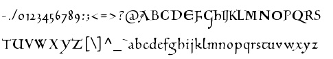 Peter S. Baker, an English professor at the University of Virginia, offers free TrueType and PostScript fonts. these include:
 - Anglo-Saxon Caps.
- Beowulf-1 (1995, a pseudo-Gaelic face; BeowulfOT dates from 2018).
- Bury Caps (2014, free at OFL). This decorative typeface was inspired by the display capitals in the 12th-century Bury Bible.
- The elegant Carolingian typeface Eadui (2010), a reproduction of English Caroline Minuscule as written by Eadui Basan, a scribe at eleventh-century Christ Church, Canterbury.
- Elstob (2018-2019). A variable font for for medievalists. He writes: The Elstob font, named for Elizabeth Elstob (1683-1756), a celebrated early scholar of Old English language and literature, is based on the Double Pica commissioned by Bishop John Fell (1625-1686) for the use of the Oxford University Press. Wherever possible, it is modeled on a specimen book printed in 1925 with type cast in the 1890s from the seventeenth-century matrices; digital images from the 1693 and 1706 Fell specimen books served as backup, and also an early eighteenth-century folio in which a lengthy dedication was printed in Fell's Double Pica. The type doesn't have a great reputation: the typographer Stanley Morison thought it amateurish in comparison with the excellent Fell English. However, its angular character (especially its flat or flattish serifs with minimal or no brackets) makes it well suited to adaptation as a variable font.
- Interlace Set (2015). A dingbat font for making Hiberno-Saxon interlace patterns.
- The important and well-designed Junius family (1996, modern hybrid Gaelic). This led to Junicode, the working name of a Unicode font for medievalists. The fonts in the latter project are Junicode-Bold, JunicodeItalic, Junicode (2002), and are by Peter S. Baker and Briery Creek Software. André G. Isaak writes: Junicode isn't the only free font for mediaevalists out there, but it's certainly one of the two most well-designed ones (the other being Andron Scriptor). I used to teach courses on the history of English and I used Junius (the predecessor of Junicode) for many of my handouts because I preferred it to all of the commercial fonts which I had looked at. In 2020, Junicode was rebuilt into JuniusX or Junicode New.
Alternate URL. Dafont link. Open Font Library link, where he is known as psb6m. Fontspace link. Link to his foundry, Thornbec Staefwyrhtan. Github link. [Google]
[More] ⦿
|
Peter Doerling
[Die Entwicklung unserer Schrift]
|
[More] ⦿
|
Peter Keel
[Medieval Fonts]
|
[More] ⦿
|
Peter R. Wilson
[Bookhands]
|
[More] ⦿
|
Peter S. Baker
[Peter Baker's old English page at the University of Virginia]
|
 [More] ⦿
|
Philip Bouwsma
|
 Type designer born in Boston in 1948 who created many exquisite designs such as Alexia (1992), Sallando Italic, Dorothea or Cresci Rotunda. His work shows the influence of masters such as Arthur Baker.
 View Philip Bouwsma's typefaces. [Google]
[MyFonts]
[More] ⦿
|
Piero De Macchi
|
 Italian type designer born in Turin in 1937. Designer at Nebiolo from 1956-1959. Freelancer and writer since 1971 at his own De Macchi graphic design studio. Most of his typefaces were commissioned by corporations. In 1992 he set up the calligraphic association Dal Segno alla Scrittura. His typefaces:
 - At ATypI in Rome in 2002, he spoke about Novarese, and about his new font family, Nomina, developed for the Italian telephone directories (SEAT). Commissioned in 1999, it was first produced in 2001. It replaced Mandel's Galfra which had been in use since 1977.
- Iveco (1985): commissioned by the trucking company.
- Pancarrè (2008). A sans typeface family under development (as of 2013).
- Graphicus (2003). Done for the Graphicus magazine, Alberto Greco Publishing House of Milan. There are sans and serif versions.
- The Renaissance chancery italic type Paloma (1992).
- An experimental Bodoni family (1989).
- Pitto (1997).
- The neoclassic family Alexandra (1991-1992).
- Norberto (2009). Done for an exhibition dedicated to Norberto Bobbio in 2009. A humanist curvy sans.
- Fiat Advert (2007). A grotesk commissioned by Fiat.
- The Carolingian script typeface Pennino (1996).
- WDC2 (2005). Commissioned by Badriotto Palladino Agency for the Torino World Design capital communication briefs.
- Exemplar (2005). This ten-style text family is the last unfinished alphabet of Aldo Novarese, completed by DeMacchi on request of the Novarese family.
- A destructivist humanist face, Tremolino (since 1996).
De Macchi's company, De Macchi Progetti Grafici, is located in Torino. Klingspor link. [Google]
[More] ⦿
|
Posterizer KG
[Lazar Dimitrijevic]
|
 Lazar Dimitrijevic, who set up the foundry Posterizer KG, was born in 1981 in Bajina Basta, Serbia, and lives in Kragujevac, Serbia. He obtained a Master of Graphic Design from the Department of Graphic Design, FILUM Kragujevac, Serbia. Presently, he is art director at Design Studio BOX.
 His first font, Art Decor (2009), is a brush typeface in the style of Treefrog. Koma Latin (2009) is a roughly outlined script face. Bajka (2010) is a wonderfully entertaining Baskerville family (Latin, Cyrillic, dingbats, ornamental caps) made for children's fairy tale books. Scarface (2010) is a sublime scratchy hand ideal for torture movies. Kaligraf Latin (2010) is a rough-edged calligraphic face. In 2012, he published Collage BB (hand-drawn didone), the heavy Egyptian typeface Posterizer KG at DizajnDesign. This font was created for Celebration of 5 years anniversary of Design Studio Box from the city of Kragujevac (KG), the industrial city of Serbia. Posterizer KG (+Rounded) contains all the Latin and Cyrillic glyphs. Posterizer KG Inline and Posterizer KG Rough (a letterpress emulation version) were added in 2013. Posterizer KG Sketch followed in 2015. Still in 2012, he designed the ink splatter typeface Oops, and the calligraphic typefaces Cal Humanistic Cursive (a renaming of Cal Humanist Corsiva, posibly under pressure from Monotype), Cal Humanist Minuscule and Cal Humanist Corsiva. He also creates stunning calligraphic works. Cal Roman Capitals (2012) is a Trajan typeface. In the same calligraphic series, we find Cal Rustic Capitals (2012), Cal Square Capitals (2012), and Cal Uncial (2012). Typefaces from 2013: Posterizer KG Sketch, Cal Expressive, Cal Bakerly (calligraphic script in the style of Arthur Baker), Cal Cursive Roman, Cal Rustic Black, Cal Neuland Bold (after the German expressionist typeface Neuland by Rudolf Koch), Cal Gothic Bastard, Cal Gothic Fraktur, Cal Fraktur Modern, Cal Rotunda, Cal Gothic Textura, Cal Carolingian Minuscule, Cal Carolingian Gothic, Cal Insular Minuscule, Cal Insular Majuscule, Cal Beneventan Minuscule. Typefaces from 2014: Cal Neuland Shadow, Mozzart Sketch (a decorative hand-sketched version of Mozzart Sans, a slightly rounded, neo-Grotesque corporate font, that was originally created for the Belgrade-based company Mozzart DDO; followed in 2015 by Mozzart Rough). In 2015, he designed Drina (brush typeface), My Way (a TreeFrog style handwritten face). Typefaces from 2016: Bali Beach (brush script), Omorika (a rustic handcrafted sketched serif typeface). Typefaces from 2017: Workshop Brush (dry brush), Workshop Marker, Workshop Pencil. Typefaces from 2018: Miro (after the lettering in Joan Miro's art), Ernest (based on the hand of Ernest Hemingway), Natron (rounded condensed sans; +Pictograms). Typefaces from 2019: My Tara (a thick brush script), Natron Rough, Kalli Hand, Kalli Sketch. Typefaces from 2020: Panorama KG (based on the principle nothing below the baseline), Hubble (a rhythmic display typeface with thorny serifs), Liceum (a rhythmic calligraphic script for Latin and Cyrillic), Cal Fraktur Brush, Cal Roman Black, Cal Roman Modern, Cal Uncial Rough. Typefaces from 2021: PKG Roman Capitals (Trajan capitals with a hand-drawn finish, for Latin and Cyrillic), Monodia (a slab serif and its glitched version). [Google]
[MyFonts]
[More] ⦿
|
Proportional Lime
[Shane Brandes]
|
 Oberlin, OH-based foundry of Shane Brandes (b. Lakefield, MN, 1974), who made the historic semi-blackletter revival Augsburger2009 (2009), which was inspired by one of Ernhardt Ratdolt's (1442-1528) many beautiful typefaces. Ratdolt was a printer from Augsburg, hence the name. River Liffey (2009) is based on a typeface used by James Williams an Irish printer active in Dublin during the late 18th century. Rising Sun (2009, blackletter) was inspired by Gering and Remboldt's work during the late 1490s in Paris.
 Charlemagne (2010) is an imaginary medieval script. Fleurious (2010) are ornaments. Sweynheym Pannartz (2010) is modeled after an example Conrad Sweynheym and Arnold Pannartz used in their early printing venture in Subiaco, Italy which began around 1465. Ballard (2010) was inspired by a font used by Henrie Ballard, who operated on Fleet Street at the Signe of the Bear in London from ca. 1597-1608. White Now (2010) is a music note font. Enn'agrammaton (2010) is a cryptographic font. Pluton (2010) is a fixed width font with over 1400 glyphs. Old Venexia (2010) simulates an irregular medieval type. Black Tie (2010) is a simple monoline sans family. Azabercna (2010) is based on gothic principles. Alchimistes (2010) is a medieval symbol face, while Florati (2010) provides a set of ornamental caps. Wappenstein (2010) is an angular stone-carved face: The font Wappenstein was inspired by the carving on a memorial stone located in Paderborn, Germany. The stone was a Epitaph of the Brenkener family, and the carver is known as the Meister des Brenkener Familienepitaphs. The carving, dating to 1562, currently is curated by the Erzbischöfliches Diözesanmuseum in the city of Paderborn and was originally in the Brenkener Pfarr Kirche. Boston 1851 (2010) is based on a stereotype used by Wier and White, Printers of Boston, that was created by the New England Stereoype Foundry under the auspices of Hobart and Robbins, also of Boston. Cruxially (2010) is a 500-glyph dingbat font with crosses. Gaspardo (2011) is an art deco display face. Anguillette (2011) is a quaint grungy face. Ernst (2011) is a very simple but large hand-printed face. The blackletter typeface Schoeffer (2011) is based on Typ.7:146/148G also known as Gesellschaft für Typenkunde plate no. 258, by Peter the Younger (son of Peter Schoeffer), cut ca. 1509-1520. Printers in Marks is a printer mark dingbat typeface created in 2011. Cat E Poultry (2011) is a scanbat typeface of cats. Lucas Brandis (2011) is based on section headings used by printer Lucas Brandis, the first printer to operate in the city of Lübeck around 1473. Creations in 2012: Vine Street, Nicolaus Kesler (a blackletter type based on one of the typefaces of Basel-based Nicolaus Kessler, 15th century), Modality Antiqua (straight-edged and mechanical), Martin Crantz (2012: Martin Crantz (or sometimes Krantz) of the three, including Ulrich Gering and Michael Friburger, that set up a press at the Sorbonne in 1470 was likely the fellow who had the technical know how how to cast the type itself, hence the name of this new typeface that is based on his work.). Modality Antiqua and Modality Novus are explorations of the octagonal principle. Zainer is a rough-edges renaissance era typeface named after Augsburg-based printer Günther Zainer who was active from 1468 until 1478. Swine And Roses is based on a Free Mason script. Ammurapi is a Ugaritic script face. Typefaces from 2013: Michael Wenssler (an incunabula / blackletter typeface based on Michael wenssler typeface from 1482), Andreae (a Fraktur based on a 16th century font by Hieronymus Andreae, who first worked as woodblock cutter and then became a publisher in the city of Nuremberg until his death in 1565), Dropsomaniacal (Lombardic), Therhoernen (grungy medieval script after a Cologne-based printer Arnold Therhoernen, active from 1470 until 1483), Rusch (a 1000-glyph revival of a late 15th century antiqua by Adolf Rusch von Ingweiler, who was active in Strasbourg from 1460 until 1489), Gutknecht (a Schwabacher based on a font used by Jobst Gutknecht, a printer in Nuremburg from 1514 until 1542). The rough blackletter typeface Kachelofen and Konrad Kachelofen are named after Konrad Kachelhofen, a printer in Leipzig active from 1482 until 1529. Albrecht Pfister (2013) is a textura typeface based on Biblia Paperum, which was printed by Pfister in Bamberg, ca. 1460. Amerbach 883 (2013) is a rotunda typeface based on a typeface by Basel-based printer and typefounder Johann von Amerbach, who was active from 1477 until 1513. Typefaces from 2014: Willie Caxton (a blackletter used by William Caxton in his 1476 edition of Chaucer's Canterbury Tales), Azabercna, Lion of Antwerp (an incunabula typeface: Gerard Leeu met his untimely end in a work-related altercation in 1492. He was a notable printer in both the cities of Gouda and Antwerp. This font typeface is based on the "Die gesten of gheschienisse van romen" typeface, ca. 1481.), Hildegardis (an alphabetic cipher that was invented in the 12th century by Hildegard von Bingen to obscure a language called Lingua Ignota. The exemplar was found in the Riesencodex), Lady Vittoria (vampire script based on a German cross stitch pattern from the 1870s), Trowel. Typefaces from 2016: Holle There (a re-cut of a typeface that Lienhart Holle used in his epic edition of Ptolemy's Cosmographia that dates to the early 1480's, even predating italics). Typefaces from 2017: Archbishop (based on the legal documents of Archbishop Arnold von Selenhofen, who granted Hildegard von Bingen and her nuns rooms at the Rupertsberg Monastery in the year 1150), Schoensperger Der Altere (after a blackletter font used by the first female printer, Anna Ruuml;gerin, who was Johann Schönsperger der Altere's sister; Johann was a famous printer in Augsburg, Germany, during the last 20 years of the 15th century). Typefaces from 2018: Zell (a rough blackletter based on 15th century German typeface by Ulrich Zell), Captain Cookie (based on the original font used to print a short history of Captain Cook's exploits around the world), Adelheid (a great curly blackletter based on a 16th century Swiss publication), Feodorov (named after Russia's first printer, Ivan Feodorov). Creative Market link. Klingspor link. [Google]
[MyFonts]
[More] ⦿
|
Rafael Jordán/0Oliver
|
 Rafael Jordan Oliver, aka Barry Bianco, is a graphic designer and calligrapher in Valencia, Spain, b. 1983, Alzira. Graduate of EASD in Valencia, class of 2013. His typefaces:
 - A geometric Futura / Bauhaus style typeface family called Geometric Obsession (2012).
- The curly all-caps typeface Nord Type, which is based on the modern letters of Gregorio Muñoz at Valencia's train station L'Estació del Nord. It was his graduation project at EASD.
- The commercial didone typeface Didac (2014). The Italic followed in 2015-2016. Buy it here.
- At Type@Paris in 2015, he designed Carmen Maria (named after his wife), a sharp-serifed fashion mag typeface rooted in Carolingian calligraphy.
- Las Naves Condensed (2017). A grotesque typeface designed under the art direction of Sebastian Alos for "Las Naves" foundation.
- Bantha Sans and Bantha Serif (2017). Sturdy multi-purpose typefaces.
- Bianco Slab (2017, Fontstore).
- Brava Slab (2018). Almost monolinear, with Latin curves in the italics. Followed in 2019 by Brava Sans.
- Ostium (2019). An inline unicase font with proportions close to classical romans.
- Carmensin (2020). A humanist text family characterized by smooth curves, a large x-height and open counters. It includes a Display subfamily and some stencil styles.
- Redoneta (2020). A 12-style geometric sans. Followed in 2022 by Redoneta Rounded (12 styles).
- Tannen (2021). A layerable blackletter family, and an interpretation of Erich Meyer's Tannenberg (1933-1935).
- Tannen (2021). A layerable German expressionist blackletter family, and an interpretation of Erich Meyer's Tannenberg (1933-1935).
[Google]
[MyFonts]
[More] ⦿
|
Ray Meadows
|
 Aka p2pnut, b. Wales, 1943, who started making fonts in 2009 at FontStruct. Alternate URL. Dafont link. Klingspor link. In 2010, Ray Meadows set up shop at MyFonts.
 Prolific creator at FontStruct in 2009 of the 3d typefaces Alphabox, Alphabox Reverse, Alphabox Lite, Alphabox Lite Complete, Alphabox Shadow and Alphabox Basic. He also made RM Playtime (outlined 3d family), Art DECOrated, Single DECOr, Romantic (+Carved, +Carved Shadow), TripleDECOr, New Romantic, SOFA, Mondrianish, Eye Test, Meltdown (grunge), Ameslan (American Sign Language), DECO Noir, DECOction, DECOserif (+Bold), DECOoction (+Bold Open), DEChrome, DECOpix, DECOr (a pure art deco typeface like Levine's Art Lover JNL), DECOThin (+Medium), Scrapheap, Westward (Far West font), Cheese Fondue, Alphabox Reverse (shadow font), AlphaRune, Spaced, Gothicky, Grand Prix, Entrees (alphadings), Compround, Phatzzo (nice!), DECOr8, Gothicky, Gothicky Grey, RM Ginger, RM Albion (blackletter), and Opening (outline face). RM Squarial (2009) is a hairline sans. Its 3d version is RM Squarial 3D. RM Typewriter (2009, +Medium, +Bold, +Old) is an old typewriter face. RM Serifangle (outline art nouveau face, +3D, +Chrome, +3DChrome) and RM Corrugation (postage stamp, white on black style) are both interesting. RM DECO Serif (2009) is in the RM Typewriter style series. RM Bowie Basic is a futuristic typeface based on the typeface used on Mars in "The Waters of Mars" (2009). RM Playtime Stencil (2009) is a rounded stencil typeface based on RM Playtime Solid. There are more styles such as RM Playtime 3D. Additions in 2010: RM New Albion (blackletter), RM Lined, RM Serifancy (Western face), RM Almanack (+Old), RM Tubeway (+Chrome), RM Thinny, RN White Letter, RM Blacklet, RM Squarial (+Ribbon, +3d), RM Typewriter Old, RM 7even, RM SideSlip, RM Teeny, RM Teeny 1.5, RM Narrowboat (+3D) (athletic lettering). His typefaces at MyFonts include RM Victoriana (2010, caps only Victorian face), RM Whiteletter (2010), RM Signwriter (athletic lettering), RM Deco (pure Broadway art deco), RM True to Type (typewriter face), RM Scrapheap, RM Elegance (condensed, with high ascenders), RM Playtime, Graphite Creations in 2011: RM Celtic, RM Uncialic (+RMWL Uncialic: Carolingian), RM Opensans, RM A Sign of the Times, RM Sans, RM Oliver (bold rounded sans), RM Soft Sans (wonderfully round sans), RM True To Old Type (old typewriter), RM True to Type (new typewriter), RM Middy, RM Phatso (textured), RM Phatso 2.0, RM Phatso 2.0 Solid (texture typefaces). Creations in 2012: RM Luceat (a bullethole typeface), RM Jazz Age, RM Basic Serif (roman face), Alphabox (a 3d family: +Reverse, +Lite, +Reverse Stencil), RM Slab, RM Slabb, RM Tubes (3d typeface), RM Smoothsans (rounded sans), RM Romantic Carved (+Shadow: a beautiful set of beveled typefaces), RM Westward, RM Typerighter, RM Uncorrugated, RM Snowtime, RM Smooth Jazz, RM Smooth Age, RM Nova Albion (blackletter), RM Tubes Chrome, RM Squarial FS10, RM Basic Serif. Typefaces from 2013: RM Bloc, RM Greek, RM Victoriana, All Bricks, RM Deco, RM Random Outline, RM Random 3D, RM Random (cartoon face), RM Celtic Condensed, RM Westus Condensed, RM Westus (Western, spurred), RM Hunky (chunky and modular), RM Thunk (piano key face, thick and chunky), Westward Ho (spurred Western face), RM Hangle (chuunky and elliptical). Typefaces from 2014: RM Firmstone (+Outline, +Condensed, +Outline Condensed), RM Ebdon Outline, RM Imber Outline, RM Moss Outline, RM Imber, RM Art Decorated, RM Celtic Inline. Typefaces from 2015: RM Deco, RM Stoney, RM Mondrianish, RM Stoney Shaded, RM Middy, All Bricks, RM Shepherds. Abstract Fonts link. Dafont link. [Google]
[MyFonts]
[More] ⦿
|
Riky Predator
|
Designer of the display font Riky Depredador Normal (2002). He also made Carolingia Bigfoot (2002), a modification of a font by William Boyd. Alternate URL. Also calls himself Riky Depredador. [Google]
[More] ⦿
|
Robert Pfeffer
|
 Dr. Robert Pfeffer (Giessen, Germany) specializes in old German and Germanic philology fonts. His mostly free typefaces include:
 - The two Latin fonts Pfeffer Simpelgotisch and Pfeffer Mediaeval are typefaces of the European Middle Ages. Pfeffer Simpelgotisch is a textura typeface. Pfeffer Mediaeval depicts a Carolingian minuscule.
- Some gothic (Wulfilan) alphabet fonts: Silubr (based on the uncial script of the Codex Argenteus), Ulfilas (a serif font designed to satisfy the requirements of modern typography), Skeirs (a sans serif font intended above all for screen display), Midjungards (following the style of J.R. Tolkien's Elven script Tengwar), Pfeffer Mediaeval.
- Runic alphabets: see Skeirs and Pfeffer Mediaeval.
Fontspace link. 1001 Fonts link. [Google]
[More] ⦿
|
Rojotype (was: Kikichi Factory)
[Jeff Kichang Kim]
|
 Kichang Kim has degrees in communication design from Samsung Art and Design Institute in Seoul (2009), HGK FHNW in Basel (BA in 2013, MA in 2015). He set up Kikichi Factory in Basel, Switzerland, where created the high-contrast sans typeface Snello (2014-2018) and the calligraphic text typeface Kontro (2016-2019).
 From 2016 onwards, he is lecturer at Sookmyung Women's University, and from 2020 onwards also at Dongyang University. Later, he started Rojotype in Seoul, South Korea. The typefaces at Rojotype: - Arco (2020). A Venetian text typeface family by Jongbeom Kim.
- Bello (2020). A 5-style slab serif by Kichang Kim.
- Viso (2020). A hipster sans family.
- William Sans. An eight-weight sans serif family by Hyunseung Lee.
[Google]
[More] ⦿
|
R-Type (or: Rui Abreu)
[Rui Abreu]
|
 R-Type was founded by Rui Abreu in 2008. Rui graduated from FBAUP (Faculdade de Belas Artes da Universidade do Porto) in 2003. He has been working as an interactive media designer in different design agencies, and he has been designing typefaces. Based in Porto, he created Tirana (2006, sans family at T26), Catacumba (2007, a gorgeous bold didone titling face, T26; in 2009 at Fountain/PsyOps), Cifra (2006, a lovely ten weight sans family, T26), Nomada (2007, a monoline slab serif), Salto Alto (2006, avant garde sans family, with octagonal influences), Foral (2008, monoline slab serif; published by Fountain in 2010), and Forma (2006, stencil family, T26).
 In 2008, he published Orbe (Fountain), an exotic all-caps blackletter inspired by Portuguese and Lombardic calligraphy [it deservedly won an award at TDC2 2009; Orbe Pro at MyFonts], Gesta (2008, sans family), Gesta Condensed (2012), Gesta Semi Condensed (2012), Gira Sans (2012, a grotesque family), Foral Pro (2011, an elliptical slab serif), Catacumba (2011, a high-contrast ball terminal wedge serif family), Aria Pro (2011, a delicate high-contrast transitional serif family), Forma Solid (T26). In 2013, Rui published Aria Text (a rational (transitional) toned-down version of Aria that comes in three sets of optical sizes, G1, G2, and G3), the geometric sans family Azo Sans and Azo Sans Uber, a geometric sans with a humanist element. Grafolita Script (2013) is a connected typeface family that borrows ideas from signage scripts. Typefaces from 2014: Litania (medieval-style typeface with roman capitals, Lombardic capitals, and Carolingian minuscules; nice fists accompany the type), Signo (a dynamic sans serif with reverse contrast, designed for editorial and branding). Signo won an award in the TDC 2015 Type Design competition. Typefaces from 2015: Montblanc (a custom sans for the Montblanc company that won the IF Design award in 2015), Usual (a neutral sans with large x-height). In 2010, Peter Bruhn started a typeface but he died before it was finished. In 2015, Rui Abrey and Göran Söderström finished it as Bruhn Sans (Fountain Type). In 2010 Peter was commissioned to design a wordmark for the documentary Harbour of Hope. The type was to ellicit Malmö's harbor, and Peter found inspiration from the painted type of industrial tankers docked in his hometown. Typefaces from 2016: Grifo, Symbio and Symbio Arabic (at Typotheque; prize winner at Granshan 2016), Sul Sans (a geometriclly constructed sans with features frequently seen on signs and buildings in Portugal). Typefaces from 2017: Sul Mono (a typewriter style), Grifito, Grifinito (condensed versions of the sharp-edged display typeface Grifo), Aquino (by Rui Abreu and Ricardo Santos; a display calligraphic stencil typeface inspired by a liturgic book made by Portuguese friar Tomas Aquino in 1735). Typefaces from 2018: Gliko Modern (an award winner at the Type Directors Club's Type Design Competition 2019). Typefaces from 2019: Flecha (a sharp and streamlined old-style typeface made for editorial design that won an award at 23TDC in 2020), Staff (a neo-grotesk from X Wide to XXX Condensed). Typefaces from 2020: Flecha Bronzea (M, L: the condensed version of Flecha). Typefaces from 2021: Azo Super (a heavy display font), Staff Grotesk (a low key sans family derived from Abreu's 2019 font, Staff), Gineto (a grotesque developed from the brevier size of Gothic no. 4, a nineteen century design by the New York type foundry Farmer, Little & Co), Chassi (in three optical sizes, S, M and L: a revival of Garamond as a genre, slightly reinterpreted for our times; I duisagree though with the word "slightly"). MyFonts interview in August 2013. MyFonts page. T-26 page. Old home page. Klingspor link. Fountain Type link. View Rui Abreu's typefaces. [Google]
[MyFonts]
[More] ⦿
|
Rui Abreu
[R-Type (or: Rui Abreu)]
|
 [MyFonts]
[More] ⦿
[MyFonts]
[More] ⦿
|
Scholtz Fonts
[Anton Scholtz]
|
 Scholtz Fonts was started by Anton Scholtz (b. Durban, 1941) in 1997. This South African design company is located in Durban, where the Zulu culture of the region has greatly influenced Anton's font design. Klingspor link
 Scholtz sells a fine selection of display types that ooze African themes. An alphabetical list: - Aarde (2005), Aarda Brush
- Ability (2009). Calligraphic
- Affable (2008). Calligrahic
- African Elegance
- African Gold (2007)
- African Jazz (2005)
- African Jungle (2007)
- African Patchwork (2008)
- African Pattern (2004)
- African Shield (2005). Patterned after the cow-hide shields of the Zulu tribe. Made by Anton and Merle Scholtz
- Afrimod
- AfroFlare
- African Textile (2007)
- Ala Kazam (2015)
- Always (2010). A fantastic swashy calligraphic face, and its multiline sister, Filigree, 2010
- Amaboxi (2007) or Amabokhisi. White on black
- Amanzi (1999)
- Aplomb (2008)
- Aqua Casual (2008)
- Arabesque (2009). A flowing calligraphic typeface
- Archivo (2011)
- Art Nouveau SCF (2008)
- Asakire (2006)
- Assegai (2007)
- Bad Girl (2008). Grunge
- Bakuba
- Baluba and Baluba Snake
- Banquet SCF (2007). Brush script
- Baobab
- Black Tie (2007)
- Blackout SCF (2008)
- Blythe (2009). Connected script
- Bongo
- Bongani (2008)
- Brazza (2008). Brush
- Brillig (2008). Informal hand
- Button (2008)
- Buzz (2008)
- Camy (2009). Hand-printed
- Carve (2008). Chiseled look
- Catholic Girls (2008). Script
- Centric (2007). Zebra-striped, or op art
- Certificate (2008). Calligraphic
- Collette (2007). After an art deco font called "Independant" designed in 1930 by Collette and Dufour
- Comical (2007)
- Coral (2008) and Coral Pro (2012)
- Crime Inc
- Crostini
- Debs (2013). Hand-printed
- Deco Doni (2011)
- Delikat (2010). A script, followed in 2013 by Thaun
- Doorn (1998), Doorn Body, Doorn Display
- DragonFyre (2008). Calligraphic
- Dufour (2011). After an art deco font called "Independant" designed in 1930 by Collette and Dufour
- Dusk Til Dawn (2012). Art deco
- Elegance SF (2005). Art deco
- Estravaganza (2012)
- Et Cetera (2015). A classy breezy connected script
- Excalibur SCF (2007). A beautiful rough-edged hand
- Fable (2007). A type family for wizards
- FadedRose
- Figment (2008)
- Filigree
- Fracture (2008). Glaz krak style
- Fragrance
- Gatsby SF
- Genevieve (2007). Calligraphic
- Genial (2009). A flowing connected script
- Giraffe Skin (2007)
- Girl Script (2008). Curly hand
- Girltalk (2008). Curly script
- Gladly (2016). A 17-style decorative and romantic typeface
- Gossamer (2011). A wedding script
- Greek (2008). Chiseled
- Groom (2007). A connected brush type
- Grunge Formal (2007), Grunge Piazza (2007), Grunge Standard (2009)
- Hard Rain (2007)
- HiTone. Niely handcrafted
- Hobi (2008). A ghastly script
- Honeybird (2011)
- Hoofer (2014). A mega family of retro scripts
- Iliad (2007)
- Inja
- Jazz
- Jolie (2015). A connected calligraphic script for romance and weddings
- Josephine (2007). Art deco
- Kassena (2006)
- Kau (2016)
- Klatter (2007)
- Kuba (2007). A tribal stencil
- Kunjani (2008). African look
- Lagos
- Leah (2008). Handwriting
- LeopardSkin (2005)
- Lovers Pro (2011). A fantastic calligraphic hand---ready for red carpet treatment
- Lualaba Snake (2007)
- Lumina (2008)
- Madrigalle (2011). A calligraphic wedding script
- Mafuta (2006)
- Makonde (2007)
- Manhattan Midnight
- Margaux (2013). A vintage 1900s script
- Martini Script (2011)
- Maypole (2007)
- Melodica (2012)
- Miss Donna (2009). A script typeface
- Mtwane (2009)
- Nocturne (2012). An art deco family based on work from the 1920s by Paul Carlyle and Guy Oring
- Noobia (2013). An inky pen font
- Nordika
- Oxamu (2009). A wonderful angular African-themed font
- Pacific Script (2011). A font inspired by an alphabet created by Howard Trafton in the 1930s
- Palm Court (2007). A Bauhaus typeface by Merle Scholtz
- Parchemin (2008). Parchment look
- Phat Chance (2008). Organic
- Piazza (2007)
- Proper (2008)
- Qotho (2010). An almost architectural sans family, done with Merle Scholtz
- Queen (2008). Nice handwriting
- Quirky and Quirky Kurlz (2013). A spidery script based on a book of etchings by British artist Graham Clarke
- Refresh A 1950s script
- Riposte (2009). A dynamic script
- Romi (2008). A thin calligraphic typeface
- Rondalia (2008)
- Sage Sage (2008). Brush script
- SandWriting (2007)
- Sangoma (2007)
- Scratch SCF (2007). A scratchy hand
- Scrittura (2011). Calligraphic. +Antiqua, +Fantasia
- Shapely (2010). Swashy calligraphic typeface
- Silken (2009). Calligraphic
- Siyabonga
- Silver Dagger (2007)
- Smart Casual (2007). An artsy architectural typeface by Merle Scholtz
- Sondela (2007)
- Spaza (2007). African look
- Sprig (2010). A signpainting typeface
- Stoan (2008)
- StoneWash (2008). Grunge
- Tabwa (2007) Inspired by Koch's Neuland, but on an African theme
- Tamboti
- Tertius (2008). Also, Tertius Romantic and Tertius Crenellated (2008). Scripts based on the Carolingian hand
- Thaun (2013)
- Thought (2009)
- Thystle (2010)
- Tokoloshe (2008)
- Toulouse (2007). Art nouveau handcrafted typeface
- Tshikona (2005). Hand-crafted
- Tsotsi (2007)
- Ubuvila (2004)
- Umkhonto (2003)
- Umoya (2009). Organic
- Utshani (2000). African theme
- WildSong (2010). A calligraphic script
- Woodcarve.
- Write Now (2008). Connected script
- WriteHand (2008)
- Yseult (2009). Script
- Zaire SF (2007)
- ZebraSkin (2007)
- Zest (2007)
- Zim (2007). Octagonal
View the typefaces designed by Anton Scholtz. [Google]
[MyFonts]
[More] ⦿
|
Schriftarten
|
Horst Enzensberger's pages on German ways of writing, and type forms. He deals briefly with these type forms: Antiqua; Bastarda; Beneventana; Buchschrift; Capitalis; Fraktur; gotische Minuskel; Halbkursive; Halbunziale; Kalligraphie; Kanzleischrift; karolingische Minuskel; Kurrentschrift; Kursive; Lateinschrift; Ligatur; Nationalschriften; Rotunda; Textura; Unziale; Urkundenschrift. [Google]
[More] ⦿
|
Scriptorium (Ragnarok Press, Fontcraft)
[David Fleming Nalle]
|
 Dave Nalle was born in Beirut on March 19, 1959, and died on February 13, 2021 from COVID in his home town of Manor, Texas. From his wiki page: Dave Nalle is a political writer, game author and font designer who was active in the early history of the development of the internet. Nalle was at one time Chairman of the Republican Liberty Caucus, a group that promotes libertarianism within the Republican Party, Senior Politics Editor at Blogcritics online magazine, and was the CEO of Scriptorium Fonts. Obituary [PDF] by Steve Jackson at the Daily Illuminator. Obituary by Shannon Appelcline at RGG Net. Obituary [PDF] at Dungeon Master Magazine.
 A creative and prolific designer, he has made hundreds of beautiful (often historic) fonts. His outfit, Scriptorium (based near Austin, TX, est. 1989), also does custom font and logo design. At some points, Scriptorium was also known as Ragnarok Press and Fontcraft. It specializes in artsy and ancient typefaces. Some subset of the fonts is made by Michael Scarpitti. Free font demos. Images of his best selling fonts. Special subpages: - Three free fonts: Onuava (a mini-serifed hybrid fixed-width font), Divona (sans), Sirona (based on Lombardic calligraphy).
- Lombardic: Aneirin, Benevento (8th century Lombardic), Cymbeline, Fabliaux, Formidable, Locksley.
- Decorative initials such as the 20th century sign lettering initials set Pencraft Initials (2009), New Saxon Initials (2016, based on work by F.G. Delamotte), Delamotte Initials One (2016), Delamotte Initials Two (2016), Holly Initials (2010, based on Real PenWork (1880s, Knowles and Maxim), Vyones (2010), Vergennes (2001), Cascade (2009), Bergling (2010; based on initials by John M. Bergling).
- Steampunk typefaces: Clockwork, Gearhead, Gears, Verne, Draughtwork, Belgravia, Boetia, Blackthorn, Linthicum, Good-fellow, Necromantic, Mephisto.
- Wild West fonts: Academy, Alcalde, Atkinson Boomtown (2009, after the lettering of Frank Atkinson), Atkinson Eccentric (2009), BigIron, Cibola, Del Norte, Lachesis, Perdido, Plowright, Primer, Riudoso, Niederwald, San Lorenzo (2011, with a Mexican and Tuscan look), Stonehouse, Manquo, Rochambeau, Purcell, Vaquero.
- Arabic simulation fonts: Samaritan is based on the poster lettering of Alphons Mucha from his poster for the play La Samaritan. Serendib and Waziri are based on the hand lettering of René Bull from his edition of the Arabian Nights. Caliph (1993) is derived from Ernst Schneidler's classic Legende font, with variant characters based on his original lettering. Also: Satampra, Jerash, Samarkand, Isfahan.
- Celtic fonts: the fonts include Constance, Durrow (1993, traditional rendering of Insular Minuscule calligraphy), Malvern, Glendower (based on the most common lettering in the Book of Kells), Knotwork (caps based on Celtic knots), Alba Text (modernized text font based on Celtic uncial lettering), Lindisfarne (based on a square uncial style), Stonecross (1997, derived from Celtic cross and gravestone inscriptions), Celtic Spirals (dingbats), Celtic Borders font (lets you combine key strokes to form decorative borders; many frames and borders are original Celtic designs by Arts&Crafts period artists like Evelyn Paul and Louis Rhead), Spiral Initials, Brigida (based on Rudolph Koch's interpretation of a squared uncial), Macteris Uncial, Coverack (heavy non-traditional uncial), Dahaut (modernized uncial), Dunsany, Glendower, Morgow (1999, spiral uncial), Teyrnon (elaborate spurred uncial), Padstow (heavy uncial), Vafthrudnir (2011, uncial), Sualtim and Columba (decorative initials based on characters found in the Book of Kells), Albemarle (2001).
- Oriental simulation fonts: Yoshitoshi (2003, based on the 1900-style writing by Yoshi Toshi.
- Gothic fonts, including Alt Gothic, Koch Gothic, Barnabas (2011), Sternhagen (2014), Montgisard (2010, roman capitals with blackletter lower case), Serenissima, Gelderland, Alcuin, Monumental, Goldwork, Waldeck, Roncesvalles, Montressor (2010, ornamental blackletter capitals), T4C Beaulieux (1998, a free copy here), Bastarda (2011), Burgundian, Cadeaulx, Collins Old English, Courtrai, Descant, Ereshkigal, Faustus, Franconian (1993, a Schwabacher), Froissart (2000), Ghost Gothic, Katisha, Koch Gothic, Ligeia, Magdeburg, Magdelena, Melusine, Pyle Gothic, Rheingold, Sanctum, Stuttgart Gothic (2010), Textura, Theodoric, Yngling (2002).
- German expressionist: Dromon.
- Renaissance fonts: Monumental Gothic, Caswallon (a Caslon family), humanist cursive (Palmieri, Castiglione and Hanes Italic), quirky Italian cursives (Fiorenza and Alleghieri), a Roman style hand-lettered font (Rudolfo and Rudolfo Swash), a Trajan-style Roman lettering (Hadrianus), a classic flourished cursive (Trinculo) and a set of floral intials from the Quattrocento (Fraticelli).
- Modern poster fonts: Ascelon, Bilitis, Cosmic Dude, Dromon, Ducatus Rough, Eglantine (after Central Type Foundry's Quaint Roman), Ekberg (2002, based on Samuel Welo's posters), Fortinbras, Hamilton, Jambon, Oblivion, Posada (2008, based on the poster lettering of Mexican artist José Guadalupe Posada), Squiffy, Suspicion, Magnin (2003).
- Mapmaker fonts: building elements are available in Basilica; Ortelius is a map dingbat font; Queensland (based on lettering by artist and calligrapher Eric Sloane), is bold, hand-drawn and reminiscent of medieval writing on maps. There are also Brandywine, Daresiel, Hesperides, Longhorne, Windlass (1996), and Cityscape. Orford (2008) is based on samples of hand lettering from a 1693 manuscript collected by Lewis Day in his classic book on historical paleography, Alphabets Old and New.
- Calligraphic fonts: Albemarle (2001), Azariel, Moncrief (2011, based on the calligraphy of J.M. Bergling), Pavane, Rasael (2009), Abdiel (2005), Roncesvalles, Gazardiel (2003, connected script), Spoonbill (2003, arts and crafts), Macteris (Roman uncial font), Antioch Uncial (Roman uncial font), Burgundian (Classic black letter font), Franconian (993, a classic black letter font), Castiglione (Attractive Renaissance lettering), Cicero (Roman Rustica font), Formidable (1993, very bold late medieval / Lombardic style), Collins Old English (Classic Old English style gothic), Corbei Uncial (Roman uncial font), Cymbeline (late medieval lettering), Durrow (Standard insular minuscule uncial font), Theodoric (Classic black letter font), Gazardiel, Ghost Gothic (Unusual gothic font), Glendower (Uncial font based on Book of Kells), Gloriana (Interesting hand lettering style), Folkard (from the hand-lettering of Charles Folkard), Offenbach Chancery, Ranegund Merovingian Courthand, Benevento (8th century Lombardic), Hesperides.
- Art deco typefaces: Imperatore (2018: based on a hand lettered design from California art deco master designer Pedro de Lemos in the 1920s), Speakeasy (2018), Gates of the West (2018), Lyceum (2014), Borealis (2009), Criterion (2011), Illuminata, Madding (2009, a bold poster font that grew out of Aventine), Alexandrine (2009), art Deco Stencil (2009, based on samples of Art Deco stencil lettering by Pedro Lemos), Falmouth.
- Art nouveau typefaces: Acadian, Agravain (2009), Amphitryon (2009), Ariosto, Asphodel, Averoigne, Beaumains (2011, based on J.M. Bergling's lettering), Beauvoir, Belgravia (based on J.M. Bergling), Bernhardt (based upon the lettering of the Czech art-nouveau artist Alphonse Mucha), Bentham, Berenicia, Boetia (2003, based on J.M. Bergling's lettering), Bruges, Bucephalus (1993), Burd Ellen (2009), Butterfield (1993; in Alfred Roller's style), Cafe Society (2018), Curetana, Damariscotta, Elsene (2011, based on lettering by early 20th century illustrator Clara Elsene Peck), Elysian, Exotique, Flaubert, Gaheris, Ganelon, Gehenna, Goodfellow, Grammophon (2019: a bold Jugendstil poster font), Harbinger, Huyot (2016, after Georges Auriol's types), Jugendstil Kunsthand (2003), Lysander, Maginot (1993; after Peter Schnorr, 1898), Munich (after the Munchner Jugend magazine), Norumbega, Odeon, Ormandine (2010), Pantagruel, Phaeton, Reggio, Rochmbeau, Rockne (2009), Rudolfo, Setebos, Sprite, Summerisle, Sylphide (2005), Undine, Valentin (2008), Vambrace (2010), Walhal, Wendingen (2016), Wormwood (2018), Zeitschrift (2016, based on the Ver Sacrum magazine).
- Modern poster fonts: Field Day (2003), Ascelon, Bilitis, Cosmic Dude, Dromon, Ducatus Rough, Eglantine (after Central Type Foundry's Quaint Roman), Ekberg (2002, based on Samuel Welo's posters), Fortinbras, Hamilton, Jambon, Oblivion, Squiffy.
- Constructivist fonts: Krasny Mir (2009), Vrubel, Structura (1997).
- Futuristic fonts: Alecto, Angelus, Circuit, Culdrose, Gearhead, Ironclaw, Parika, Sanhedrin, Semiramis (1997), Slither, Structuro, Yazata, Adastra (dings).
- Borders and ornaments. These include New Arets and Crafts Borders (20912, based on The Calendar of Golden Thoughts (Barse and Hopkins Publ, 1911).
- Boneyard fonts: Undertaker (2014), Antrobus (2010), Sepultura (2002), Halloweenies, Dementia, Boneyard, Skull and Bones, Malagua (1999-2013), Paleos (2002, from titling of B movies in the cave girl genre), Carmilla, Abaddon, Black Cow (1998), Valdemar, Cuede, Ligeia, Mayhem, Mephisto, Golgotha, Sanguinary, Ironworks, Moravia, Gehenna, Nosegrind (2005, graffiti), Corpus, Ghostly.
- School fonts: Schoolhand (2010).
- Arts and Crafts movement (late Victorian period, 19th century), based on work and lettering by Walter Crane, William Morris, Charles Rennie Mackintosh and Elbert Hubbard. The Arts&Crafts movement was enormously influential on the works of designers, artists and architects of the 20th century, and inspired the Art Nouveau and Art Deco movements. Fonts include William Morris' Kelmscott (based on Morris' Troy type), and True Golden, fonts from the Glasgow branch of the movement like Chelsea Studio (1997), which is based on Charles Rennie Mackintosh's lettering, fonts from the Roycrofters of New York like Semiramis and Ganelon, fonts based on Walter Crane's work such as Crane Gothic, Pencraft Initials (2009) and Walter Crane, and even fonts from the California Arts&Crafts period of the early 1900s like Coloma. Other typefaces: Jesse M. King (refreshed in 2015, and based on hand lettering from a frontispiece design by Glasgow-based Jessie King who was known for her lavish book covers), Aylward, Palmyra (based on work by the Roycrofters, a design community founded by Elbert Hubbard), Aylward (2010, Victorian), Hyacinth Initials, Spoonbill, Adresack (1996: inspired by the arts and crafts lettering styles of designers like Charles Rennie MacKintosh and Jessie M. King), Brandywine, Changeling (2009, based on lettering by fairy artist Fanny Railton), Goddard, and Advertising Gothic (2003), Valentin, Gaheris, Agravain (2009). Delaguerra (2001-2009) is based on a lettering style originating in the California Arts&Crafts period commonly associated with Mission Style. It is still in common usage in signage at historical sites in California.
- Victorian: Beaumarchais, Berenicia, Bilibin, Brandywine, Brigidis, Curetana, Durendal, Elphinstone, Flaubert, Folkard, Gjallarhorn, Gloriana, Hermia, Ironclaw, Magnus.
- Typewriter: Fontcraft Courier.
- Anthroposophic: Ekberg (2002, based on a sample of poster lettering by Samuel Welo).
- Medieval fonts of Scriptorium, critiqued by Marc Smith, page 65: Batwynge is based on lettre gffe by Geofroy Tory (1529), and not on an illuminated manuscript of the tenth century as claimed by Scriptorium. Perigord (1993) is based on a Carolingian alphabet drawn by Ernst Bentele in 1952. Allencon is a calligraphic font based on an interpretation of 6th century Ostrogothic Italian calligraphy.
Some selected fonts: Finchley (psychedelic), Captain Kidd (2012, an original font design based on the title lettering from the classic pirate movie starring Charles Laughton), Aerobrush (2011), Fondry Ornament (2009), Atkinson Egyptian (2008, after the lettering of Frank Atkinson), Verne (2008: remade in 2020 into Covid19), Goldwork (almost blackletter), BigBlok (2010), LetterpressGothic (2010), Plymouth (2010, in the style of Cooper Bold), Broadley (2008, an architecturally inspired script based on lettering by British architect and designer C.F.A. Voysey), Locksley (2004, medieval lettering), Tuscarora (curly lettering), Fiorenza (Renaissance calligraphy), Hesperides (old colonial calligraphic script), Angelus (beautifully printed monospaced script), Esperanza (1996, connected medieval handwriting), Ithuriel (2002), Alleghieri (2002), Hamilton (2002), Spiral Initials, Zothique (great font, based on hand lettering from a map of Clark Ashton Smith's fantasy world of Zothique), Reynard (semi-Celtic), Daresiel (elegant script), Caliph (1992, Arabic simulation), Bassackwards, Rosalinde (1999, handwriting), Arakne (2000, connected handwriting), Falconis (by Michael Scarpitti), Asrafel (semi-Celtic), Swithin (2004), Tyrfing (Art Nouveau/Fraktur, 1999), Waldeck (2008, blackletter), Woburn Initials, Stampwork, Draughtwork, Roughwork (a codex font derived from Nalle's own True Golden which is based on a=n earlier typeface by arts and crafts master William Morris), Melusine (gothic calligraphy), Corbei (uncial), Niederwald (hand lettering), Gjallarhorn (great uncial), Gaiseric (early medieval uncial), Taranis (1987, an uncial first drawn as a font for the cover of the old Ysgarth roleplaying system), De Bellis (roman era, by Michael Scarpitti), Engravers Gothic, Monimental Initials, Sanhedrin (Enemy of the State font), Vespasiano (roman capitals, by Michael Scarpitti), Bilitis, Hendrix (2002), Collins OE (old English), Samedi, Praitor, Evadare (1993, based on a character set which was hand calligraphed by Rudolf Koch), Koch Fantasie (1993), Black Cow (1998). Zothique, Ruritania, Mariner (2004, based on hand lettering originally done by Willy Pogany), Trinculo (a swinging cursive font), Texas Star (2002), Octavian (antique demi-serif font), Ruffian (antique type font), Ascelon (thin sans serif font), Munich (title lettering from Munchner Jugend magazine), Necromantic (bizarre bold titling font), Titania (romantic decorative lettering font), Oberon (bold romantic font), Knotwork, Guede (1993), Pullman, Purcell (Victorian circus poster style font), Allegheny, Carmilla, Malagua (1999-2013), Ardenwood, Platthand, Buccaneer, Cochin Archaic (2010), Boswell (1994), Guilford (based on lettering by artist and calligrapher Eric Sloane), Death Ray (2012, constructivist), Alecto (futuristic), Candlemas (2003), Bridgeport (2003, based on lettering by artist and calligrapher Eric Sloane), Medieval Tiles (2003), Linthicum (2003), Draughtwork (2003), Yngling (Fraktur, 2003), Rheingold (elaborate Fraktur: Music Hall Text elsewhere; see also Teuton Text, Cincinnati Type Foundry, 1877), Kidd (2003), Belgravia (2004), Peck Shields (2004), Scrawlies (2000, handcrafted), Albrecht Durer Gothic (2004), Orpheus (2004), InduXtrial (2004, a grunge face), Yoshitoshi (2003), Veronique (2004), Veneto (2006), Vidilex (1993, monospaced), Abelarde (2006), John Speed (1993: a mapmaker font), Furbelow (2006), Estoril (2006), Tangle, Aventine (sans), Texas Star (2002), Groningen (Bauhaus design), Nevins Hand, Scrapple (2011, Victorian, ornamental), Leodegar (2011, based on samples of 7th century Frankish hand lettering), Candlemass (2012). Fonts from 2013: Doge (a Venetian font based on a J.M. Bergling revival), Original Django (after the titling font in Quentin Tarantino's movie Django Unchained). Fonts from 2014: Highball, Carillon (based on a typeface by Samuel Welo), Edifice (based on lettering by J.M. Bergling). Fonts from 2015: Gods of Mars (an inline sci-fi typeface), Rykov (based on a 1930s Ukrainian constructivist style; Latin and Cyrillic), Vie Moderne (French art deco), Dahlgren, Grand Concours (art deco), Tantalus, Power Tie (art deco), Marquis Greeking. Fonts from 2016: Ekberg Modern (based on lettering samples by Samuel Welo from poster designs of the 1920s), Knuckleduster, Tzaphkiel, Sarandiel, Primrose Initials, Elizabethan Script (chancery style), Zeitschrift (an art nouveau font based on the Ver Sacrum magazine), Wendingen (Dutch deco), Memento Mori (Tuscan), Rounders (art deco). Fonts from 2017: Buzzmill (wooden plank font), Pumpkin Patch Initials, Talinn, Reliquary, Nopalito, Scattershot (script). Typefaces from 2018: Marionettas (a Mexican horror movie poster font), Fascination, Architextura, Santa Sangre, Glyphos. Typefaces from 2019: Cafe Corso (art nouveau), Comic Classix. Fnts released in 2020: Epigramatic (based on lettering by Dard Hunter for the Roycroft Press in the early 1900s), Cryptos (graffiti). Klingspor link. Abstract Fonts link. Dafont link. View David Nalle's typefaces. Scriptorium's library. [Google]
[MyFonts]
[More] ⦿
|
Shane Brandes
[Proportional Lime]
|
 [MyFonts]
[More] ⦿
[MyFonts]
[More] ⦿
|
Storm Type Foundry
[Frantisek Storm]
|
 Storm Type is a major Czech foundry that offers the inspiring work of Frantisek Storm (b. 1966, Prague). Most typefaces are made by Storm himself. The typefaces:
 - Aaahoj: a ransom note font.
- Abald (2005): Abald adds to the number of "bad-taste" alphabets as seen on faded commercial inscriptions painted on neglected old houses.
- Academica: Josef Týfa first published Academia in 1967-68. It was the winning design in a competition for scientific typefaces, announced by Grafotechna. It was cut and cast in metal in 1968 in 8 and 10 point sizes in plain, italic and semi-bold designs. In 2003 Josef Týfa and Frantisek Storm began to work on its digital version. The new name Academica distinguishes the digital execution (and modifications) from the original Academia. In 2021, Frantisek Storm added Academica Sans.
- Aichel: originally designed for use in architecture (in this particular case for a UNESCO memorial plaque for a church built by Jan Santini-Aichel on Zelenà Hora). It has a stone-chiseled look.
- Alcoholica
- Alebrije (2015). A 42-cut exaggerated cocaine-driven typeface family with instantly recognizable v and w that have slabs on their baselines.
- Amor Sans and Amor Serif (2005).
- Amphibia (2016). A lapidary typeface family.
- Andulka (2004): 24 weights for use in books, mags and newspapers. Extended in 2011 to Andulka Sans.
- Antique Ancienne, Moderne&Regent (2000): Baroque typefaces.
- Anselm Sans and Serif (2007): 20 styles about which Storm writes The ancestry of Anselm goes back to Jannon, a slightly modified Old Style Roman. I drew Serapion back in 1997, so its spirit is youthful, a bit frisky, and it is charmed by romantic, playful details. Anselm succeeds it after ten years of evolution, it is a sober, reliable laborer, immune to all eccentricities. It won an award for superfamily at TDC2 2008. It covers Greek as well.
- Areplos (2005): Based on Jan Solpera's 1982 typeface with serifs on top and serifless at the bottom.
- Bahnhof: poster typeface from the 1930s.
- Baskerville Original Pro (2010) comprising Baskerville 10 Pro, Baskerville 10 Cyr, JBaskerville, and JBaskerville Text. This is an important and thoroughly studied execution starting from photographs of prints from Baskerville's printing office, ca. 1760.
- Beletrio and Beletria (2018). Beletria (26 styles) is intended as a modern book type. Beletrio is a peaceful accompanying sans.
- Bhang (2011) is a flat brush signage family of exceptional balance.
- Biblon (2000; note: ITC Biblon is a watered down version of Biblon, so please go for the original, not the ITC version). Biblon Pro (2006) is even better; 6 weights.
- Briefmarken (2008): letters that look dented like postage stamps.
- The 64-style Carot type system (2020), which consists of Carot Sans, Carot Display, Carot Slab and Carot Text.
- Clara Sans and Clara Serif (2014). Based on sketches by Rotislav Vanek, and published at Signature Type Foundry.
- Clichee
- Cobra (2001)
- Comenia Script (Radana Lencov&acaute;), an upright script with a handwritten look for teaching writing.
- Comenia Text (2006): a serif family for school books. Also called Comenia Pro Serif.
- Compur (2000).
- Coroner (2018). A blackletter first sketched in 1988.
- Defender (2008): a heavy slab family.
- Digita (2004)
- Dracula (2017). A great blackletter family.
- Dynamo Grotesk (1995): Storm's 60-weight sans family going back to the early sans traditions. In 2009, this was updated to Dyna Grotesk Pro.
- Enamelplate (2011).
- Etelka (2005, 42 styles): a corporate identity sans family, which became commercial in 2006. Four Etelka Monospace styles were added in 2008. Etelka Sans and Etelka Slab were released in 2019.
- Evil
- Excelsior Script (1995-1996), perhaps renamed Excelsor Script around 2000.
- Farao (a great Egyptienne font in 3 weights)
- Friedhof (2011). A family based on tombstone lettering from ca. 1900. It contains handtooled and shaded (Geist + Deko) variations.
- Gallus Konzept (2007, in many weights):
- Carolingian-Roman-Gaelic-Uncial script, or an exploration into how the Latin alphabet could look were the evolution of the Carolingian Minuscule to stop in the 8th century AD in Sankt Gallen.
- Genre: a modern face.
- Fenix 21 through 23 (2010): An elliptical sans family that includes a hairline (21).
- Header (2009): a magazine headline family.
- Hercules (2001). A didone family originally influenced by Monotype's fat face Falstaff (1935).
- Hexenrunen (2006, + Reverb): a runic simulation face.
- Ideal Gothic
- Inicia (2018). A sans originally drawn in the 1980s.
- Jannon (this is a formidable Garalde family). Jannon Pro appeared on MyFonts in 2010.
- Jannon Sans (2011).
- Jannon Text Moderne (2001): thicker hairlines and smaller x-height than Jannon Text, thus more generally useful
- Jasan (2017). A 36-strong sans family with lots of wide styles.
- JohnBaskerville (2000)
- JohnSans (2001, a 72-weight sans version of Baskerville)
- Josef Sans (2013, with Jan Solpera). A humanist sans family related to Josef Tyfa's Tyfa Roman (Tyfa Antikva).
- Juvenis (2003)
- Kompressor: techno typeface
- Lexicon Gothic: newspaper and magazine type family, created in 2000. Renamed Lexon Gothic.
- Libcziowes: based on the oldest lettering found in Bohemia, on a gravestone in Libceves dating from 1591
- LidoSTF (2001, free): a redrawn Times with lots of individuality, yet still a newspaper typeface
- Lokal Script (2009): a large hand-printed letter family.
- ITC Malstock (1996-1997), a condensed film poster face.
- Mediaeval
- Metron (2004, a digital version by F. Storm and Marek Pistora after a huge sans design from 1973 by Jiri Rathousky, which was commissioned by the Transport Company of the Capital City of Prague in 1970 to be used in the information system of the Prague Metro. In 1986, the metro started using Helvetica): this typeface is eminently readable!
- Modell: techno
- Monarchia [The Monarchia family, consisting of three designs, is a transcription of "Frühling" of the German type designer Rudolf Koch, enriched by a bold and text design]
- Moyenage (2008): a 25-style blackletter family for Latin and Cyrillic, almost an experiment in blackletter design and flexibility. Winning entry at Paratype K2009.
- Mramor (1988-2013). A roman caps typeface with lower case added. Storm: The text designs are discontinued since they were replaced by the related Amor Serif family (along with its -sans version). Even so, ten display styles are left.
- Negro
- Ohrada: condensed upper case
- Ornaments 1+2
- Ozdoby 1+2 (great dingbats): The set includes heraldic figures, leaves, decorative endings, various skull forms, weather signs, borders and many more.
- Patzcuaro
- Pentagramme
- Pentagraf: a slab serif
- Pepone and Pepone Stencil. Designed for setting belles-lettres, this serifed family defies classification.
- Pivo (2006), a connected diner script inspired by Bohemian beer labels.
- Plagwitz (2000, blackletter). Plagwitz poster by Lissa Simon (2012).
- Politic (2004): a clunky fat octagonal family made for billboards, flyers, posters, teabags, and matches for the green Party in the 2004 Czech elections. Caps only.
- Preissig Antikva + Ornaments: a 1998 digitization and interpretation of Preisig's polygonal type from 1925. The Pro version is from 2012.
- Preissig 1918: a typeface by Vojtech Preissig cut in linoleum
- Preissig Ozdoby
- Regent Pro (2015): a rustic Baroque typeface that oozes energy out of its semi-transitional semi-didone orifices.
- Quercus Whiteline, Quercus 10, Quercus Serif, and Quercus Sans (2015). Four large families, created for informational and magazine design, corporate identity and branding. The sans has a Gill flavor.
- Regula Text and Regula Old Face. Regula is named after the secular monastic order Regula Pragensis. Initially, the digitized font (regular old Face, which is now free) had jagged edges and a rather narrow range of applications until the summer of 2009, when Storm added text cuts. Regula was a baroque alphabet faithfully taken over from a historical model including its inaccuracies and uneven letter edges.
- Rondka (2001)
- Sebastian (2003, a sans with a funky italic), about which he writes: Sans-serif typefaces compensate for their basic handicap---an absence of serifs---with a softening modulation typical of roman typefaces. Grotesques often inherit a hypertrophy of the x-height, which is very efficient, but not very beautiful. They are like dogs with fat bodies and short legs. More# Why do we love old Garamonds? Beside beautifully modeled details, they possess aspect-ratios of parts within characters that timelessly and beauteously parallel the anatomy of the human body. Proportions of thighs, arms or legs have their universal rules, but cannot be measured by pixels and millimeters. These sometimes produce almost unnoticeable inner tensions, perceptible only very slowly, after a period of living with the type. Serifed typefaces are open to many possibilities in this regard; when a character is mounted on its edges with serifs, what is happening in between is more freely up to the designer. In the case of grotesques, everything is visible; the shape of the letter must exist in absolute nakedness and total simplicity, and must somehow also be spirited and original.
- Serapion (a Renaissance-Baroque Roman typeface with more contrast than Jannon)
- SerapionII (2002-2003): early Baroque
- Solpera (digitization of a type of Jan Solpera, 2000)
- SplendidOrnamenty (1998, a formal script font)
- Splendid Quartett: an Antiqua, a sans, a bold and a script. Stor writes: The script was freely transcribed from the pattern-book of the New York Type Foundry from 1882, paying regard to numerous other sources of that period.
- St Croce (2014). Based on worn-out lettering on tombstones in the St. Croce Basilica in Florence, this is a flared lightly stenciled typeface family.
- Technomat (2006): this typeface takes inspiration from matrix or thermal dot printers.
- Tenebra: a combination of the Baroque inscriptional majuscule with decorative calligraphic elements and alchemistic symbols
- Teuton (2001): a severe sans family inspired by an inscription on one German tomb in the Sudetenland
- Traktoretka
- Trivia Sans (2012), Trivia Serif (2012, a didone), Trivia Serif 10 (2012), Trivia Grotesk (2012, 48 cuts), Trivia Gothic (2013), Trivia Slab (2012), and Trivia Humanist (2013, a strong wedge serif family: I wanted a clear and majestic typeface for book jackets, LP cover designs, posters, exhibition catalogues and shorter texts).
- Tusar (2004): a digitization of a type family by Slavoboj Tusar from 1926
- Tyfa ITC + Tyfa Text: Designed by Josef Týfa in 1959, digitized by F. Storm in 1996.
- Vida Pro (2005), a big sans family designed for TV screens. Vida Stencil Demo is free.
- Walbaum Text (2002). Walbaum 10 Pro (2010) and Walbaum 120 Pro (2010) are extensive (and gorgeous!) didone families, the latter obtained from the former by optical thinning. Storm quips: I only hope that mister Justus Erich won't pull me by the ear when we'll meet on the other side. Advertised as a poster sans family, he offers Walbaum Grotesk Pro (2011).
- Wittingau (2016). A wonderful decorative blackletter typeface family, with a great set of Wittingau Symbols.
- Zeppelin (2000): a display grotesk
This foundry cooperates in its revivals with experienced Czech designers Ottokar Karlas, Jan Solpera and Josef Týfa. Alternate URL. Myfonts write-up. At ATypI 2004 in Prague, he spoke about his own Czech typefaces, on his Czech Typeface Project, and on the life of Josef Týfa. Linotype link. FontShop link. Klingspor link. [Google]
[MyFonts]
[More] ⦿
|
Terry Kunysz
[Casady&Greene (Fluentlaserfonts)]
|
 [More] ⦿
|
The Gothic or Wulfilan alphabet
|
Quoting Dr. Robert Pfeffer: The Gothic or Wulfilan alphabet has nothing to do with the medieval gothic script. Rather, it is the script used by the ancient Goths and invented by Visigoth bishop Wulfila in the fourth century A.D. for the purpose of translating the Bible into Gothic. The Gothic fonts offered here [i.e., by Robert Pfeffer] are based on the younger model of the Gothic script (S-style) as it appears in the Codex Argenteus. The difference to the older variants (Sigma-style) lies in the younger model's S being equal to the Latin one, while the S of the older variants resembles the Greek sigma. [Google]
[More] ⦿
|
TypOasis, 2002
[Manfred Klein]
|
 The fonts produced in 2002 by Manfred Klein: Bauhouse, ClassiCaps Xmas 2002, GGothique MK, Lombardic, Mouse Traces, Music Elements, DreiDreiDreiBlack, Griffo's Font, Noisy Buttons, Hamlet ToBeOrNot, Oszillo Caps, Cave Paintings, Rodgauer (a CODEX-like font), Prinz Eugen (medieval font), DreiDee Sketches, Typo Cubes, AustralBats, RoundMouseBats, Torynitialen, Wood Cutted, FlowerPower, Graf Typo (a CODEX-like family), Solitaire, Breeze, Eyes, Lead Types Heap, Petit Fleur, ABCari, Floralalpha, Karlas ABC-Start, OliJo Bold, Athena Handwritten, The BroadWay, MK Squares, Incunitials, Luc's Plants, Monte Petito, Before Alphabets 4, Threedimensional, Blind Reading, Zebral Caps, Before Alphabets 3, Braille Latin, Tangoasis, Katrins (handwriting of Katrin Dillmann, Manfred's daughter), Laurens Erste (handwriting of Laurens Dillmann, Manfred's grandson), Tangodoni, Typesetters TV, Unscreen, Caps MKS, Haunted, Mouse Scribbles, RunishMK, Fatsans, Rotten Script, Stormy, Strong Dots, Caro Mio, Reduce 2 Max, Pudels Kerning, Cheerio, Gersans, ArabDances (Arabic simulation font, with Cybapee), Slab Serif Written, Shalom (Hebrew simulation), Bloxx Serif, Kara Ben Nemsi (an Arabic simulation font), Remember Cassandre, Wieynk Caps Round, Fragment Caps, Golden Swing, Tango Macabre (a gorgeous font in which letters are made with skeletons), Eye Beings, Frax Handwritten, HotsBlots, Latin China (oriental lettering), Dinos Fragments, HotchPotch, SketchBats, AmorE, Chinawestern (oriental simulation), Valentine Flies, AmorEatPersia, AmorEmoticons, Artfacts, The Kiddies, ConstrAccident, Kochs Roots, AnimSilhous, Framed Frax Caps, K-Arrows, GridEx Gallery, K-Arrows B, Swinging Petidoni, Big Swinging SlabS, Relief Caps, Shapes 1-3, Petitscript, Shapes Four, Fullsize Sans, Petitscript Italic, Shapes A 1-3, Imperium Serif, Big Broken, Semaphore, MKalligFrax, Pix Caps, Slabsoft, Windy City, Slabsoft, Windy City, Timeless, Against Rules, Berolina, FabCreatures, CookinDada, FoodnDrinks One, HabSpass-HaveFun, Mighty, Klammeraffen Italic, Elefontitis Xtreme, Cairotiqua Freestyle, Eastereggs, Cave People, RandoMiKa, Big Ella, Hands Subversive 1+2, Build Your Own People, Antroposofia, EasterChicken, GridRiding, Irish Sketches, KidPicts, MatrixbuK, Dornspitz Grotesk, PeaceBats, Arte FS, Eagles Buttons, BlowinInWind, Cave Popart, Karla 1B, Crosses, SharkJockey, Toscanienne, SilhousTwo, Kleins Three Pixel, Religionen, Shapes One-Popart, Shapes Two, ShapesTwo, QuickBats, QuickWritten, KidsDrawings, QuickBats 1.1, Shapes Strokebrushes, SteepQuickHand, Steepiqua, Sleepklill, Steepodoni, New Aliens, SteepTypewriter, CarpetParts, Fourfeeters, Steepidien, Yumiya Arrows, HotHats FS, Eyes Gallery, Steeprump, Zebra Shapes, GrafFitty, KidsArt, Klones, Belly Sans Condensed, Tshirts Springtime, Landscapes, Pastfuturum, typOasis Uncial, ABC Thru, Parma Petit, SpaceLiving, FS Funkturm, TorysTools, Aero Sans, MouseToons, Parma Petit Outline, KL1 MonoCaseKrux, Remember Reiner, Frungtura FS, Perforation Strip, Weimar, Gothic Caps, HumanPartsPoetry, Archetypo Bricks, Human Parts, Big Dots, Spiders Club, MirrorBlack, Mirror Chicken, MonoMouse, MousefraKtur, AmericanNatives, DaVincy Cut, Mouse Liturgic Sketches, MKlunger FS, Waldoni New Torsi, Bradburys Shadow Paseo, Horses, Jessica Plus, Farm Animals, Fat Free Frax, BugsNFriends, Gut Joe Black, People Sketches, Human Parts, Cycling, MousePen, Unknown Heads, NowTheWeather, Qbicle MK, Strange Friends, AfroBats, AmNativeTwo, Bayreuth Fraktur, FingerSinging, Cuxhaven Times, Schwabach Duemille, Balloons, MathRosetts, Folks, Frankophile, Caslonish Fraxx, Has Bodoni Scribbled, Peace Damaged, Wrong Types Shadows, AnimaliaScissored, Bredda, Variations In Geo Dur, QuarrelerPlus, Montages Surrealistiques, Twinset Sans, The Muscle Fetish, Mammothisch, Animali Silhouetti, EleFontissimo, Neopan, Animals Two, Loopings, Logovals, Spiderish FS, Jugendstil FS, LucSan Faces, Crazy Written, Luc Plants Growin Again, Klein Hollywood, For Kids, Total Krass, Pesces Bizarri, Headbirthes Two FS, Stampede, Tribut to Warhol, DadaSchwitters, Van Doesburg, KleinScribere, MK Uncilae, FranKlein, Tschich and Near Jan Tschich (unicase type suggested by Jan Tschichold in 1929), MK Logo Sketches, Something FS, Stencilia, Kritzel Three, Steep Oldstyle, Steepimbo, Cairotiqua Light, SteepSlab, Toms Beings (a great!!!! collection of critters), FraktSketch, MouseGrafitty, Luther Stencil, RudolfsBats, Blackberry Plants, Circus Klein, Klein Reunion, Squashed Random, Strokey, Uncial Buttons, WaComToon, JohannesButtons, BlackWhiteGrids, Johannes Buttons / Bricks+Traces, MAntiKwa, Vehicles, EyesNStrokes, Babelfish Children, Chaos, MKarolingish, Swiss Cheese, Archibeta, Frankly Spoken, Hardware, Neptunia, Rotunda Espagna, Hardware, Arabuttons, Bodoni Flying, Eggheads Crying, PopNonsens, ScrapTiqua, St Dinah, Confusica, Crazygrams, Human Redesign, Crazyness, MKorsair, Big Caesar, MoveU, MyMedieval, RodauButtons, RodauButtonsInverse, Owls&Friends, Obliqua Romana, Oggi Angular, JohG Diamonds, Ornamen, SlabStick, Morbus Parkinson Fraxx, FolksTypo, AidaSerifaCondensed, Big Cheese, Viecher, MKOCR, Decollagena, Concrete Poets, Swinging Sans, KlausBFraktur, Peitinho, Openbuttons, MCapitals, Cavebats 1-4, BonSans, Folks, Gotica Caps, SketchesForPainting, XmasSketches, FolksCircleNegative, FolksCirclePositive, FolksDecoon-Light, KarlasBats, KleinSlabSerif, KleinSlabSerifBold, CantaraGotica (Fraktur), Logomatique (experimental, minimalist), LogomatiqueShadow, LogomatiqueBold, WorkWithGrids1202, WorkWithGridsButtons, WorkWithGridsRandom, WorkWithGridsStageC, Living Yesterday, Xmas 2002, Schneesterne, CaveBats 1A+2B, Nautilus, LateBirds, SpiralusKrux, SpiralusFaces, Smokescreen (with Petra Heidorn). [Google]
[MyFonts]
[More] ⦿
The fonts produced in 2002 by Manfred Klein: Bauhouse, ClassiCaps Xmas 2002, GGothique MK, Lombardic, Mouse Traces, Music Elements, DreiDreiDreiBlack, Griffo's Font, Noisy Buttons, Hamlet ToBeOrNot, Oszillo Caps, Cave Paintings, Rodgauer (a CODEX-like font), Prinz Eugen (medieval font), DreiDee Sketches, Typo Cubes, AustralBats, RoundMouseBats, Torynitialen, Wood Cutted, FlowerPower, Graf Typo (a CODEX-like family), Solitaire, Breeze, Eyes, Lead Types Heap, Petit Fleur, ABCari, Floralalpha, Karlas ABC-Start, OliJo Bold, Athena Handwritten, The BroadWay, MK Squares, Incunitials, Luc's Plants, Monte Petito, Before Alphabets 4, Threedimensional, Blind Reading, Zebral Caps, Before Alphabets 3, Braille Latin, Tangoasis, Katrins (handwriting of Katrin Dillmann, Manfred's daughter), Laurens Erste (handwriting of Laurens Dillmann, Manfred's grandson), Tangodoni, Typesetters TV, Unscreen, Caps MKS, Haunted, Mouse Scribbles, RunishMK, Fatsans, Rotten Script, Stormy, Strong Dots, Caro Mio, Reduce 2 Max, Pudels Kerning, Cheerio, Gersans, ArabDances (Arabic simulation font, with Cybapee), Slab Serif Written, Shalom (Hebrew simulation), Bloxx Serif, Kara Ben Nemsi (an Arabic simulation font), Remember Cassandre, Wieynk Caps Round, Fragment Caps, Golden Swing, Tango Macabre (a gorgeous font in which letters are made with skeletons), Eye Beings, Frax Handwritten, HotsBlots, Latin China (oriental lettering), Dinos Fragments, HotchPotch, SketchBats, AmorE, Chinawestern (oriental simulation), Valentine Flies, AmorEatPersia, AmorEmoticons, Artfacts, The Kiddies, ConstrAccident, Kochs Roots, AnimSilhous, Framed Frax Caps, K-Arrows, GridEx Gallery, K-Arrows B, Swinging Petidoni, Big Swinging SlabS, Relief Caps, Shapes 1-3, Petitscript, Shapes Four, Fullsize Sans, Petitscript Italic, Shapes A 1-3, Imperium Serif, Big Broken, Semaphore, MKalligFrax, Pix Caps, Slabsoft, Windy City, Slabsoft, Windy City, Timeless, Against Rules, Berolina, FabCreatures, CookinDada, FoodnDrinks One, HabSpass-HaveFun, Mighty, Klammeraffen Italic, Elefontitis Xtreme, Cairotiqua Freestyle, Eastereggs, Cave People, RandoMiKa, Big Ella, Hands Subversive 1+2, Build Your Own People, Antroposofia, EasterChicken, GridRiding, Irish Sketches, KidPicts, MatrixbuK, Dornspitz Grotesk, PeaceBats, Arte FS, Eagles Buttons, BlowinInWind, Cave Popart, Karla 1B, Crosses, SharkJockey, Toscanienne, SilhousTwo, Kleins Three Pixel, Religionen, Shapes One-Popart, Shapes Two, ShapesTwo, QuickBats, QuickWritten, KidsDrawings, QuickBats 1.1, Shapes Strokebrushes, SteepQuickHand, Steepiqua, Sleepklill, Steepodoni, New Aliens, SteepTypewriter, CarpetParts, Fourfeeters, Steepidien, Yumiya Arrows, HotHats FS, Eyes Gallery, Steeprump, Zebra Shapes, GrafFitty, KidsArt, Klones, Belly Sans Condensed, Tshirts Springtime, Landscapes, Pastfuturum, typOasis Uncial, ABC Thru, Parma Petit, SpaceLiving, FS Funkturm, TorysTools, Aero Sans, MouseToons, Parma Petit Outline, KL1 MonoCaseKrux, Remember Reiner, Frungtura FS, Perforation Strip, Weimar, Gothic Caps, HumanPartsPoetry, Archetypo Bricks, Human Parts, Big Dots, Spiders Club, MirrorBlack, Mirror Chicken, MonoMouse, MousefraKtur, AmericanNatives, DaVincy Cut, Mouse Liturgic Sketches, MKlunger FS, Waldoni New Torsi, Bradburys Shadow Paseo, Horses, Jessica Plus, Farm Animals, Fat Free Frax, BugsNFriends, Gut Joe Black, People Sketches, Human Parts, Cycling, MousePen, Unknown Heads, NowTheWeather, Qbicle MK, Strange Friends, AfroBats, AmNativeTwo, Bayreuth Fraktur, FingerSinging, Cuxhaven Times, Schwabach Duemille, Balloons, MathRosetts, Folks, Frankophile, Caslonish Fraxx, Has Bodoni Scribbled, Peace Damaged, Wrong Types Shadows, AnimaliaScissored, Bredda, Variations In Geo Dur, QuarrelerPlus, Montages Surrealistiques, Twinset Sans, The Muscle Fetish, Mammothisch, Animali Silhouetti, EleFontissimo, Neopan, Animals Two, Loopings, Logovals, Spiderish FS, Jugendstil FS, LucSan Faces, Crazy Written, Luc Plants Growin Again, Klein Hollywood, For Kids, Total Krass, Pesces Bizarri, Headbirthes Two FS, Stampede, Tribut to Warhol, DadaSchwitters, Van Doesburg, KleinScribere, MK Uncilae, FranKlein, Tschich and Near Jan Tschich (unicase type suggested by Jan Tschichold in 1929), MK Logo Sketches, Something FS, Stencilia, Kritzel Three, Steep Oldstyle, Steepimbo, Cairotiqua Light, SteepSlab, Toms Beings (a great!!!! collection of critters), FraktSketch, MouseGrafitty, Luther Stencil, RudolfsBats, Blackberry Plants, Circus Klein, Klein Reunion, Squashed Random, Strokey, Uncial Buttons, WaComToon, JohannesButtons, BlackWhiteGrids, Johannes Buttons / Bricks+Traces, MAntiKwa, Vehicles, EyesNStrokes, Babelfish Children, Chaos, MKarolingish, Swiss Cheese, Archibeta, Frankly Spoken, Hardware, Neptunia, Rotunda Espagna, Hardware, Arabuttons, Bodoni Flying, Eggheads Crying, PopNonsens, ScrapTiqua, St Dinah, Confusica, Crazygrams, Human Redesign, Crazyness, MKorsair, Big Caesar, MoveU, MyMedieval, RodauButtons, RodauButtonsInverse, Owls&Friends, Obliqua Romana, Oggi Angular, JohG Diamonds, Ornamen, SlabStick, Morbus Parkinson Fraxx, FolksTypo, AidaSerifaCondensed, Big Cheese, Viecher, MKOCR, Decollagena, Concrete Poets, Swinging Sans, KlausBFraktur, Peitinho, Openbuttons, MCapitals, Cavebats 1-4, BonSans, Folks, Gotica Caps, SketchesForPainting, XmasSketches, FolksCircleNegative, FolksCirclePositive, FolksDecoon-Light, KarlasBats, KleinSlabSerif, KleinSlabSerifBold, CantaraGotica (Fraktur), Logomatique (experimental, minimalist), LogomatiqueShadow, LogomatiqueBold, WorkWithGrids1202, WorkWithGridsButtons, WorkWithGridsRandom, WorkWithGridsStageC, Living Yesterday, Xmas 2002, Schneesterne, CaveBats 1A+2B, Nautilus, LateBirds, SpiralusKrux, SpiralusFaces, Smokescreen (with Petra Heidorn). [Google]
[MyFonts]
[More] ⦿
|
Typophage
[Christophe Badani]
|
 Christophe Badani (b. 1969, Marseilles) is a French type designer. He resides in Boulogne-Billancourt, France. His typefaces:
 - Ambre Script (1999). Based on Carolingian forms.
- Berto (2000, +Decoration). A digitization of a 1950s Cyrillic simulation typeface by Joseph Bertocchio (1907-1978), which has, in addition, nice ornaments.
- IndexLT (1998).
- Romaine.
- Linotype Rough (1998).
- Theo.
- Transilienne.
- Trevor.
- Custom fonts: Akerys, Alstom (2007, a sans typeface done with Stephane Gabrielli), BD Asterix (2003-2005), Ciboulette (2006, script done for Auchan), Darty Sans (for Darty; with Stephane Gabrielli), Eurodatacar (2007: a stencil typeface done with Stephane Gabrielli), Fédération Française de Basketball (or FFBB; read about it here), Graphèmes (2007, a sans typeface done with Stephane Gabrielli), Lacoste Sans (2002, for Lacoste; The typophiles find it too close to TheSans), Lancômes (2004, a hairline connected script), Lune de Miel (handwriting, 2002, for YSA; has many alternate double and triple letter combinations, and tries to simulate real handwriting), MAAF, Peugeot (done in 2009 with Stephane Gabrielli), Pimkie, Roland Garros (+Serif) (2015; the stunning family is also called just RG), Seenk (2005, with J.-B. Levée), Sogea, Ubisoft (2003, developed in collaboration with the Seenk agency (design&MixMedia studio) for the video game company Ubisoft: it won the "Trophée d'Or" award at the Intergraphic Congress in Paris in January 2004, and consists of Ubisoft Imagine, Ubisoft Petz, Ubisoft Text, Ubisoft Title One & Ubisoft Title Two), Vinci Sans and Vinci Serif (2007, with Stephane Gabrielli), Weber.
- Jo (2013). A swashy set of capitals.
- VTF Mister Pixel and VTF Mister Pixel Tools (2003-2011, at Velvetyne).
- Elior (2014). A corporate typeface.
- GACD (2016): custom type.
- Vinci Script (2016). A custom script for Vinci. The Arabic was designed by Mathieu Réguer.
- Trends Tag (2016). A custom sans.
- Eurodatacar (2016). A rounded stencil typeface.
- Cloche d'Or (2016). Custom all caps alphabets for Minale Design Strategy Brussels. Designed by Christophe Badani (lead), Maha Mouidine, and Léo Guibert. It includes Normal, Hatch, Inline Bright, Inline Dark, Stencil and Outline styles.
- DS (2017). A didone typeface family for DS Atomobiles. By Serge Cortési and Christophe Badani.
- Veuve Clicquot Ponsardin (2018). A commissioned typeface foor the champagne company--by Christophe Badani and Stéphane Gabrielli.
- Pllafont (2018). A bespoke typeface for Palladium.
Christophe runs Typophage, a type activity center. Interview with Planete Typographie. Some of his fonts are also at Typotek. In 2004, he joined Ultra Pixel Fonts, where he made the pixel typeface Mr. Pixel. His historical pages explain about things such as Quadrata (first century roman lettering). Dafont link. Klingspor link. FontShop link. Linotype link. Badani's personal site. Behance link. Christophe Badani at Velvetyne. [Google]
[MyFonts]
[More] ⦿
|
Ute Harder
|
 Born in Glückstadt a.d. Elbe, Germany in 1972, Ute Harder (known as Frau Jenson at P22) studied Illustration and Communication design at the University of Applied Science in Hamburg under Jovica Veljovic. Since 2002, she works as a freelance graphic designer, collaborating on diverse projects for Linotype and developing her own fonts. She lives in Hamburg.
 At P22, she published Alpha Initials (2004), Alpha Roman (2006, described by her as a playful calligraphic display face), Cilati (2004, calligraphic script; +Swash caps), Frau Jenson People (2004, pictograms), Bastyan Pro (2006, a bastarda based on the Carolingian minuscules), and Tulda (2004, letters done for a calendar), which includes Tulda Symbols. At Linotype, she designed Marathon LT Display and Book (1999, after the famous 1931 font by Rudolf Koch). Other fonts by her include My People, Some Indiduals, Initials, Out Now, Pixi Bilderbuch and Pixi Outline, as well as the Gracy, Grocy and Groby families. Close-up look at her work. FontShop link. Klingspor link. P22 link. View Ute Harder's typefaces. [Google]
[MyFonts]
[More] ⦿
|
Vox type classification
[Maximilien Vox]
|
In 1954, Maximilien Vox published his type classification system: - Humane
- Garalde. This term, a combination of Aldine and Garamond, was coined by Vox.
- Réale
- Didone
- Mécane
- Linéale. Also a term invented by Vox. The term remnained in use until the 1980s when it was replaced by sans serif.
- Incise
- Scripte
- Manuaire
- Fractures
- Non-Latines
The type classification scheme's into nine categories translates as follows in French: manuaire, humane, garalde, réale, didone, mécane, linéale, incise, scripte. ATypI proposed the addition of two more, (in French) fractur and orientale, to get eleven styles. See also here. English translation of that French list by Paul Hunt. Invented by Maximilien Vox in 1952, it was adopted in 1962 by the Association International Typographique (ATypI). Quoted from that English translation, with corrections: - The humanists: Humanist typefaces gathers the first character Romans created with the 15th century typefaces by the Venetian printers, taking as a starting point the humanist manuscripts of the time. These typefaces, rather round in opposition to the Gothics of the Middle Ages, are characterized by short and thick serifs, and a weak contrast between full and untied. These typefaces are inspired in particular by the Carolingian minuscule, imposed by Charlemagne in his empire.
- The garaldes: This group is named in homage to Claude Garamond (16th century) and Aldus Manutius. The garaldes have finer proportions than the humanists, and a stronger contrast between downstroke and upstroke.
- The realists (réales): The realists are the result of the will of Louis XIV to invent new typographical forms, on the one hand to find a successor in the Garamond, on the other hand to compete in quality with different the printers from Europe. More contrast than in the previous two groups, the types are more rational and the axis is quasi-vertical.
- The didones: The didones are named after Didot and Bodoni. These typefaces, dating from the end of the 18th and the beginning of the 19th century, recognizable thanks to their great contrast, the verticality of the characters and their horizontal and fine footings. They correspond to the Didot of Thibaudeau's classification.
- the mécanes: The name of this group evokes the very mechanical aspect of these types, which are characteristic of the industrial age, the middle of the 19th century. There is almost no contrast, and rectangular slabs hold up the characters. These are also called slab serifs or egyptians.
- The lineals: This group combines all typefaces without serifs (called sans-serif). These correspond to the antiques of the Thibaudeau classification.
- The incised types: evoking the engraving in stone or metal. Small and triangular footings, almost like sans-serifs.
- The scripts: The scripts cover types based on formal penmanship. They seem to be written with the quill, with a strong slope. The letters can often be connected to eachother. The famous English typefaces form part of this family.
- The manuaires: the manuaires are based upon letters traced with a feather.
- The blackletters: also called gothic, these typefaces are characterized by pointed and angular forms.
- The non-Latin typefaces.
[Google]
[More] ⦿
|
William Boyd
|
William Boyd made some semi-uncial fonts such as Carolingia (1991, based on Dorovar-Carolus FLF, made in 1988 by Casady & Greene, where "based on" is a euphemism). His designs were at the basis of the Celtic font Boyd Uncial Unicode (2003). He also did the Western font Laramie (1993), the monoline marker font Hopalong, and the octagonal athletics typeface Freshman (1993). [Google]
[More] ⦿
|


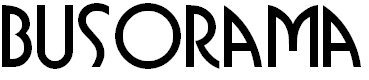
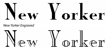
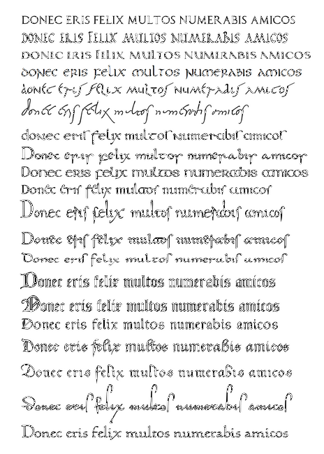
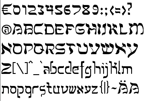
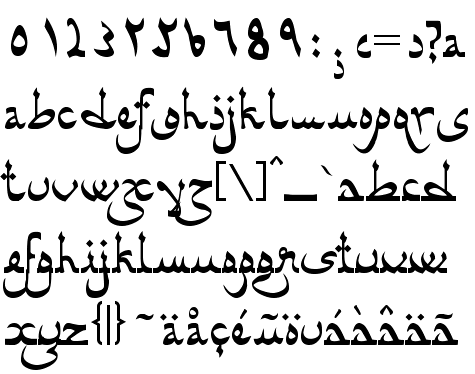
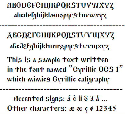
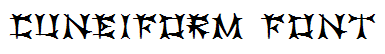
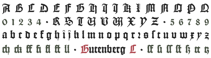
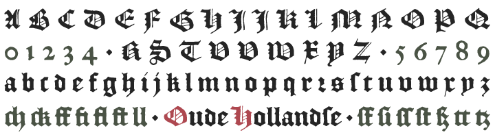
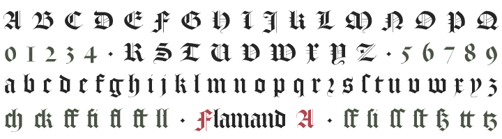
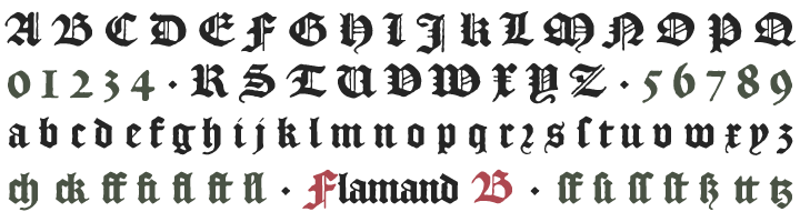
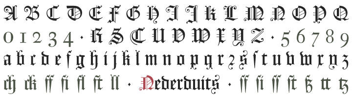
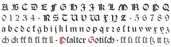
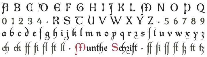
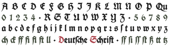
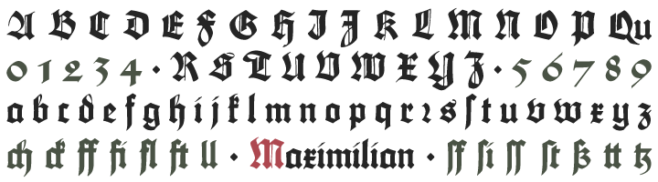
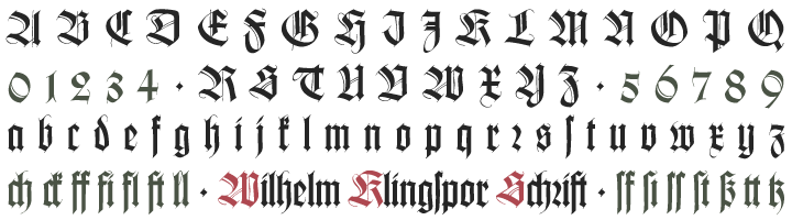
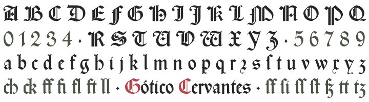
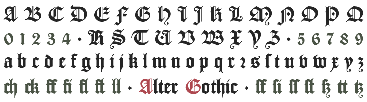
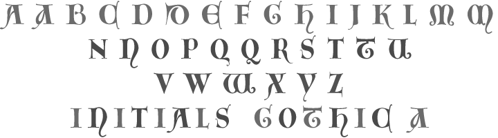
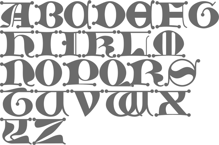
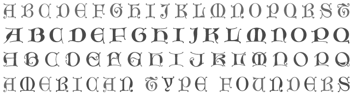
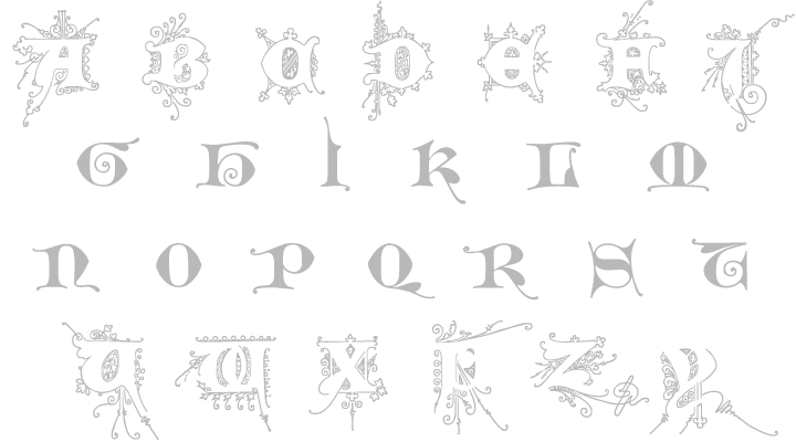
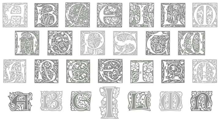
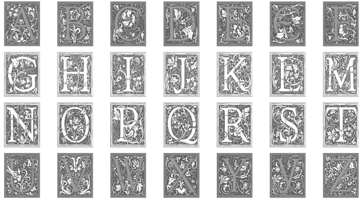
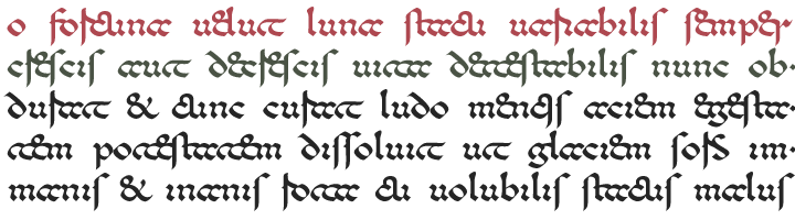
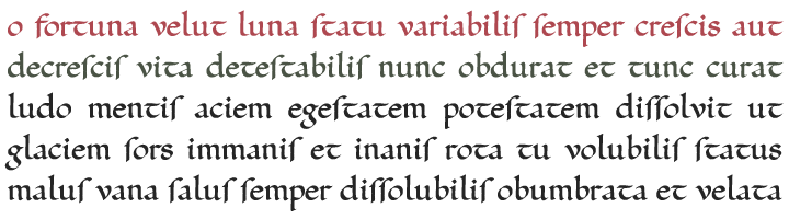
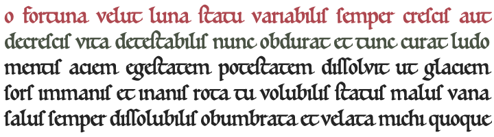
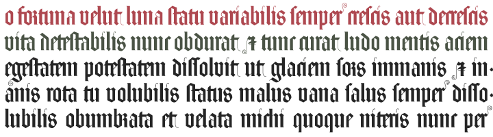
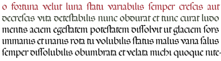
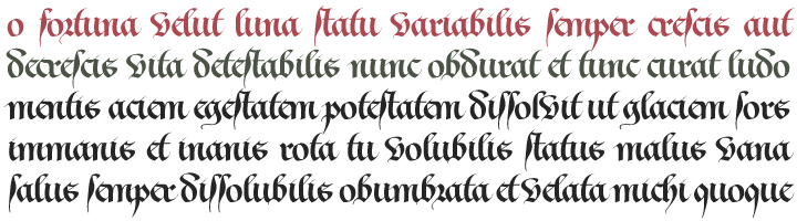
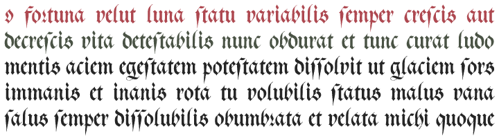
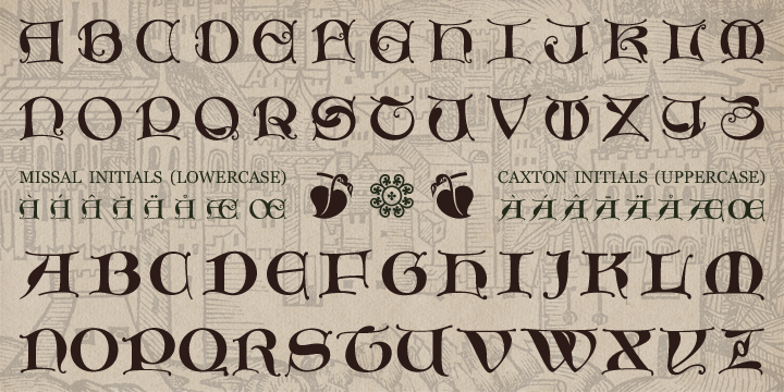
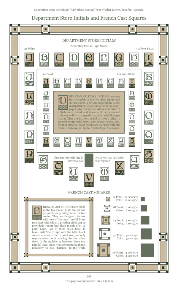
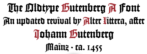
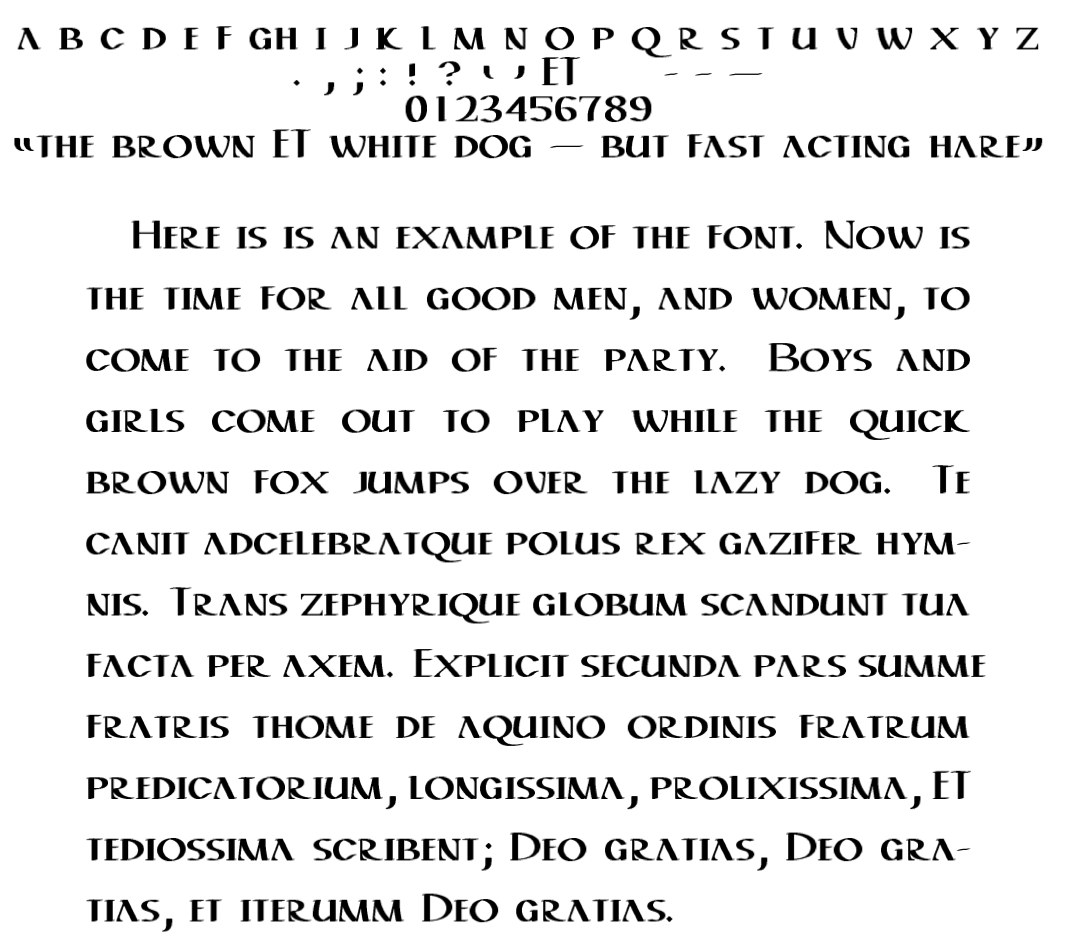
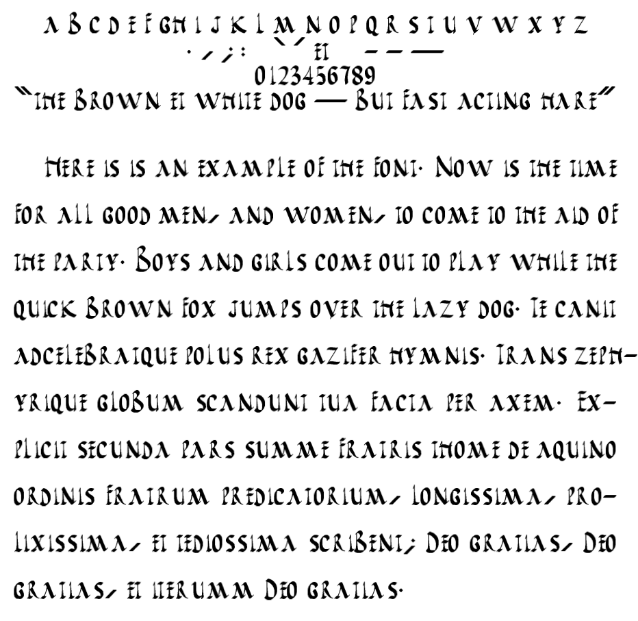
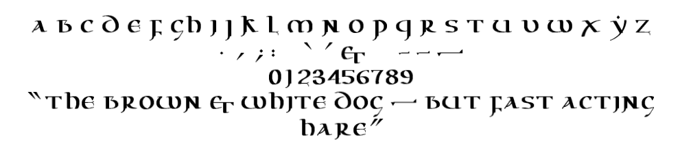
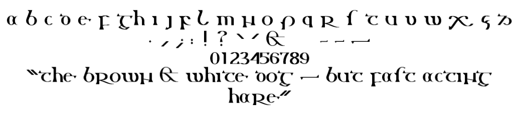
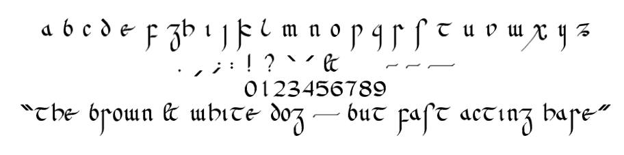
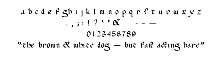
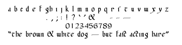
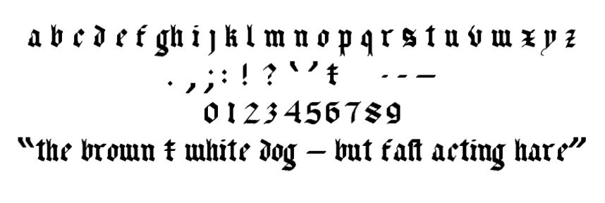
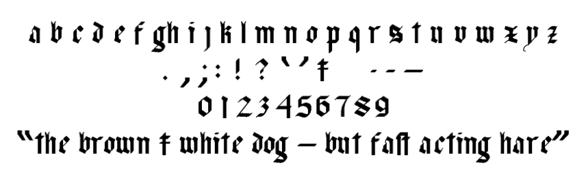
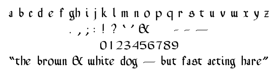
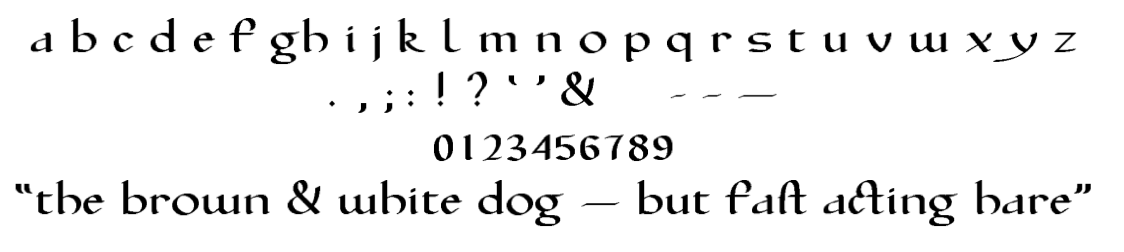
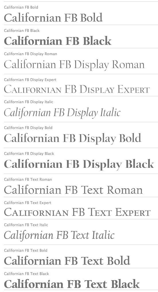
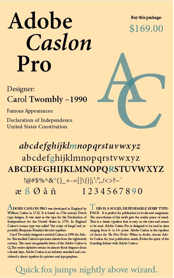
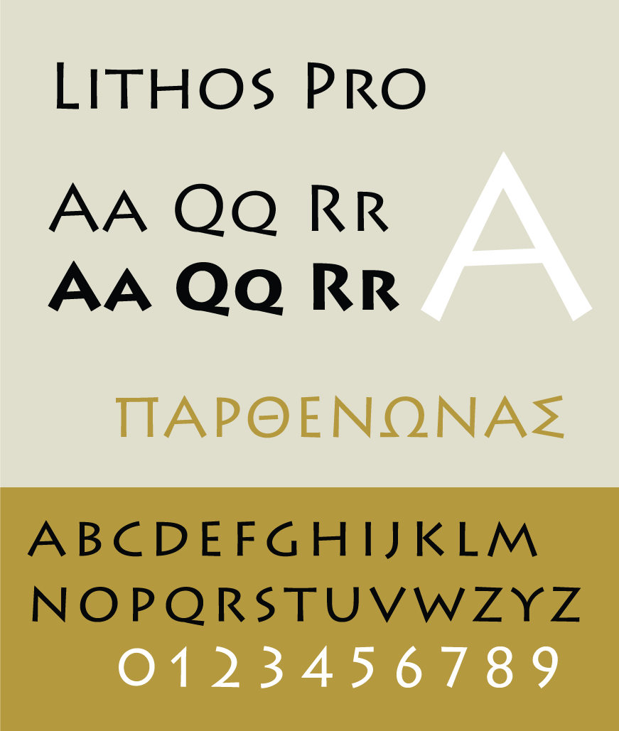
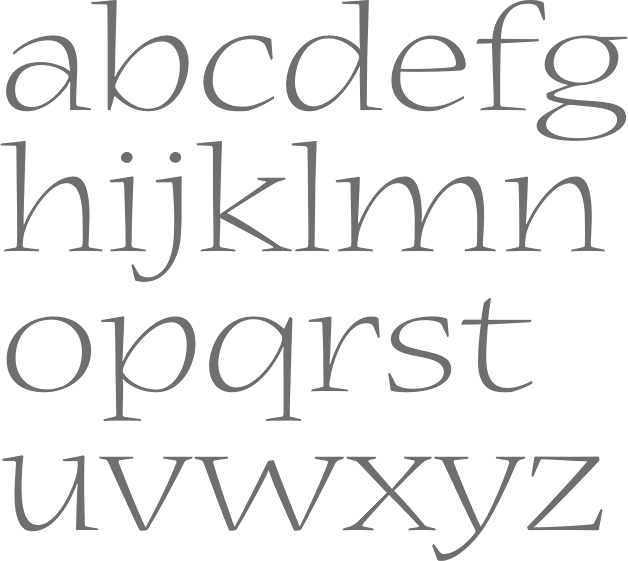
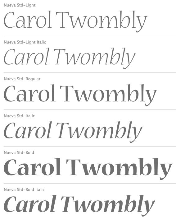
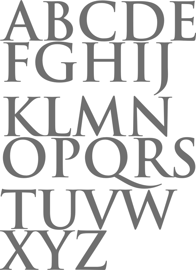
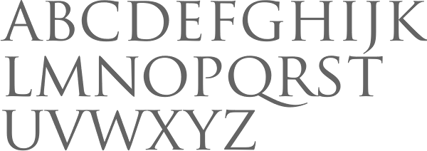
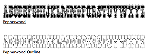
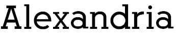
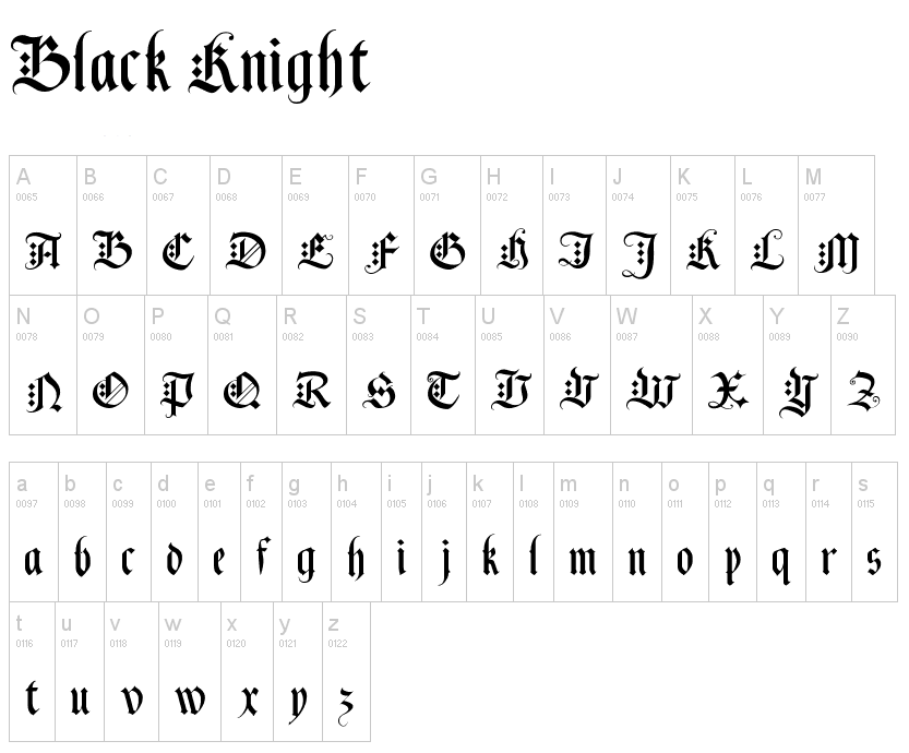
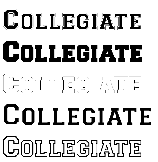
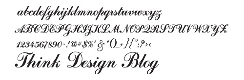
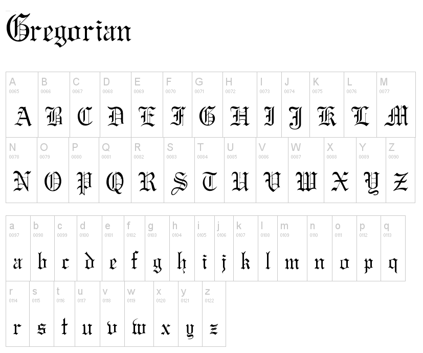
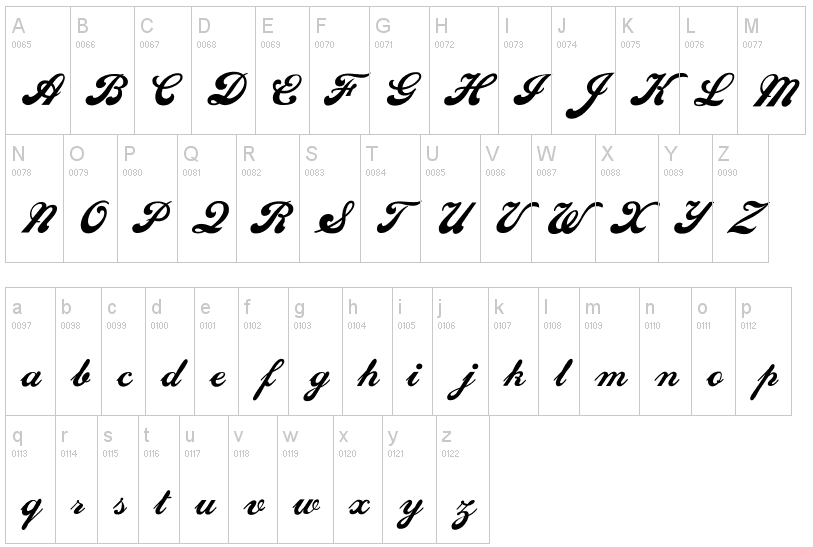
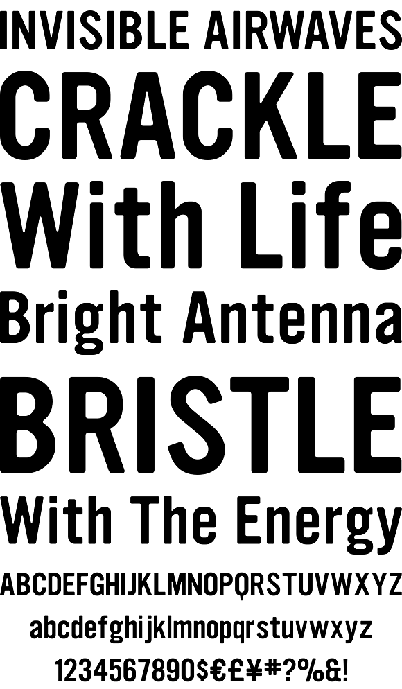
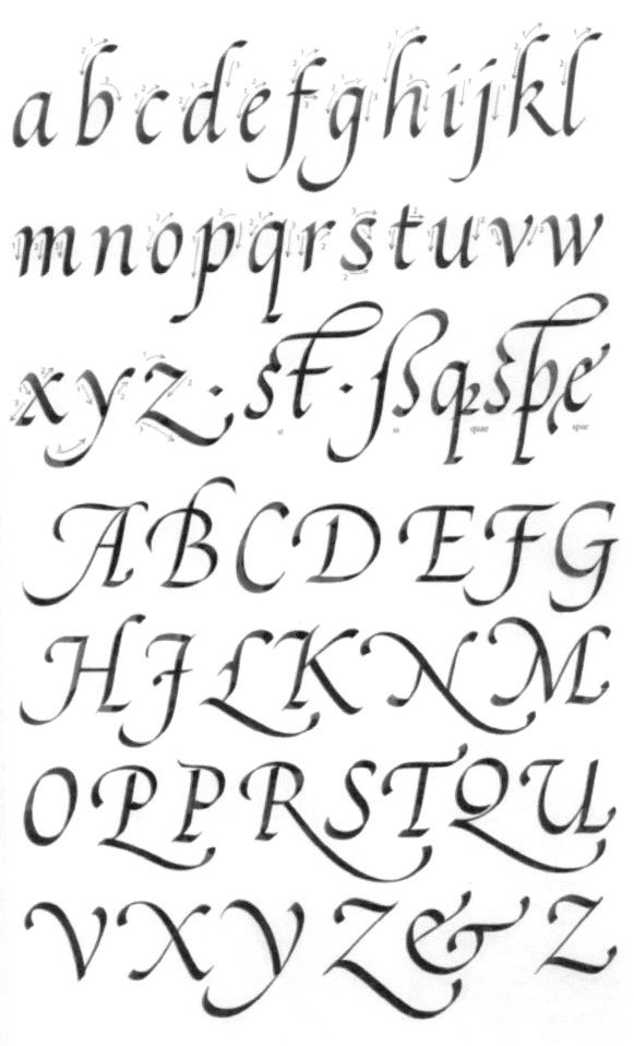
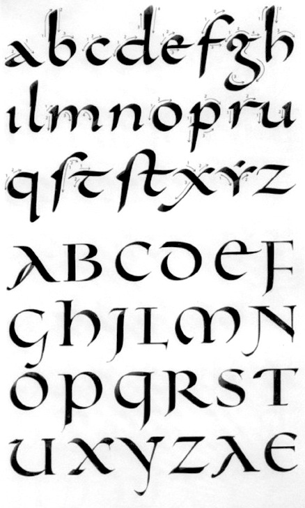
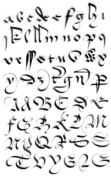
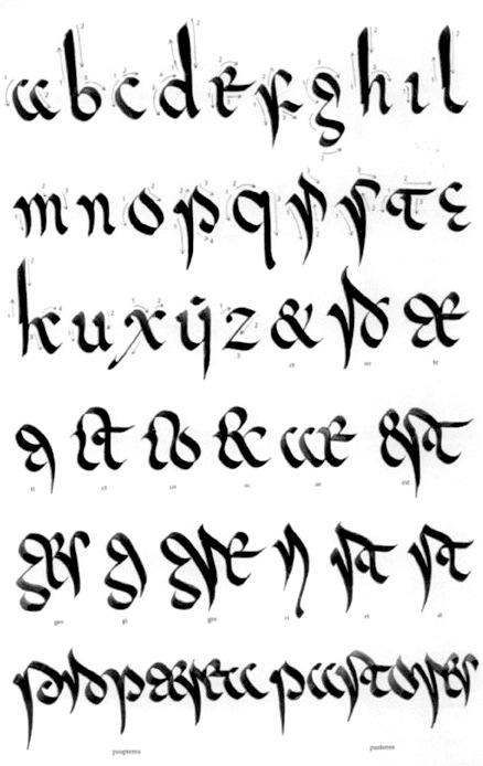
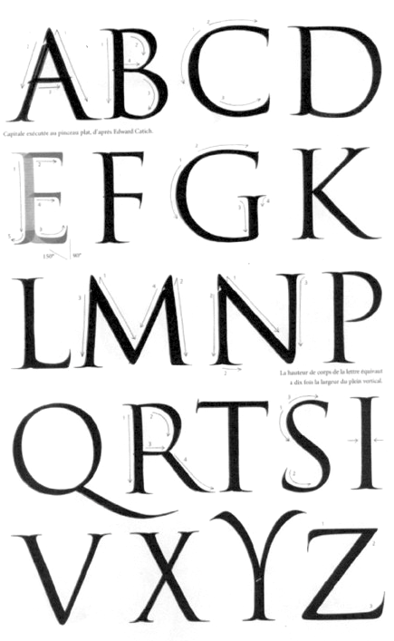
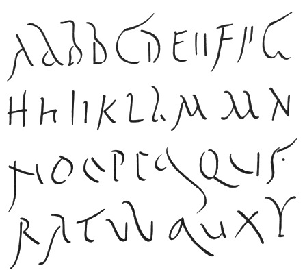
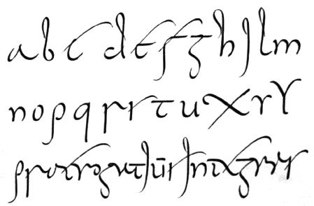
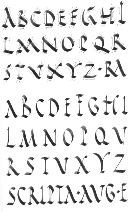
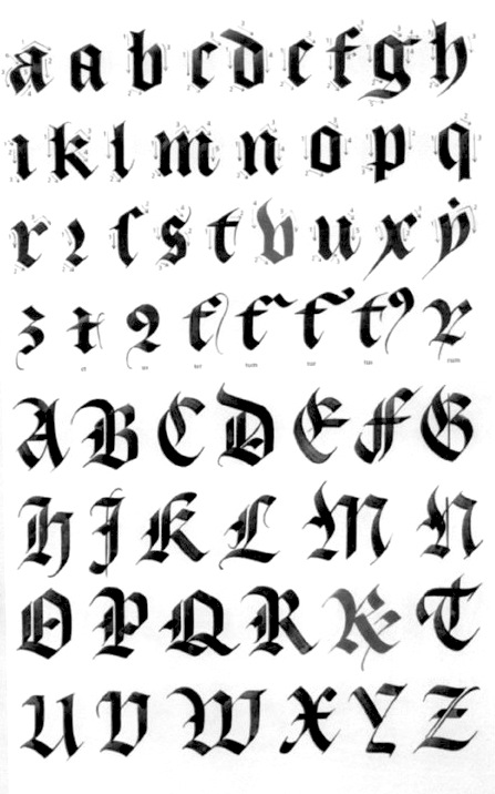
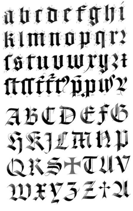
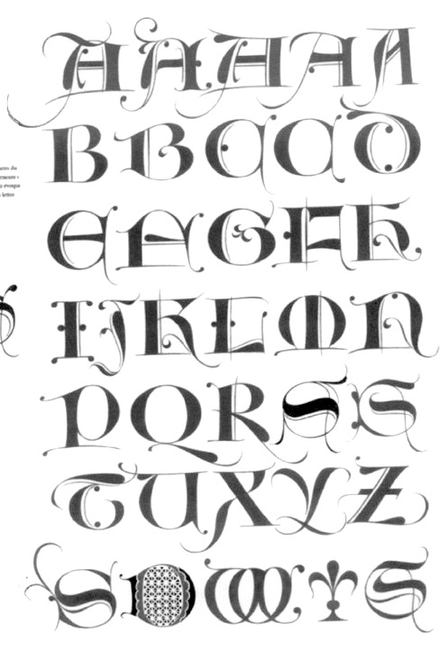
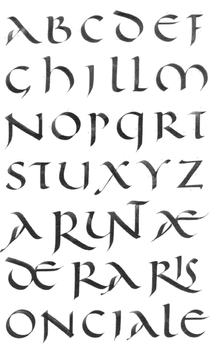
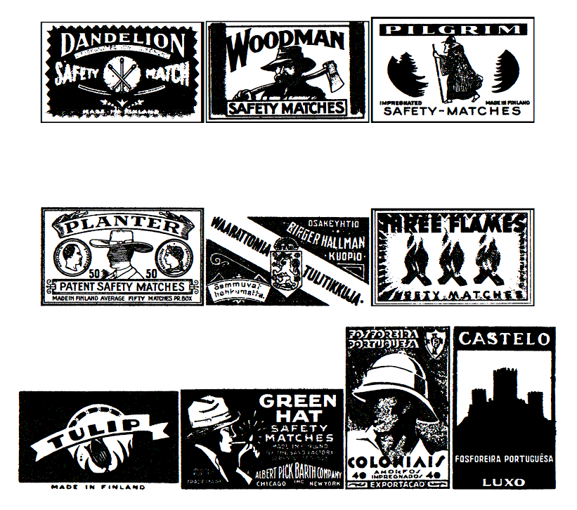
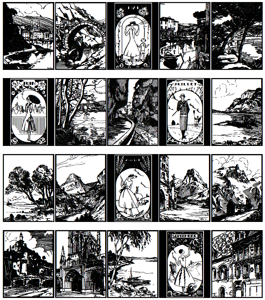
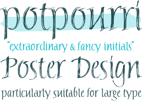
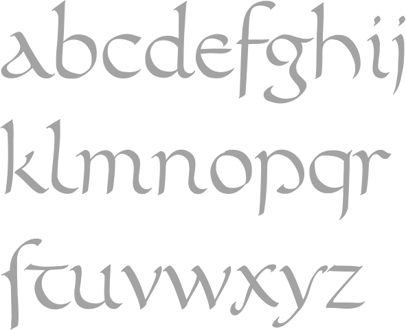
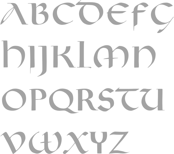
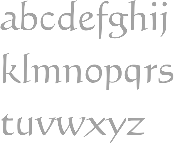
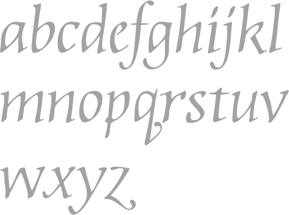
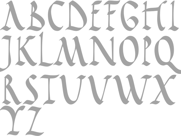
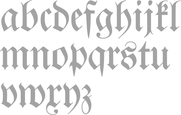
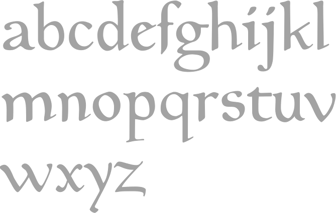
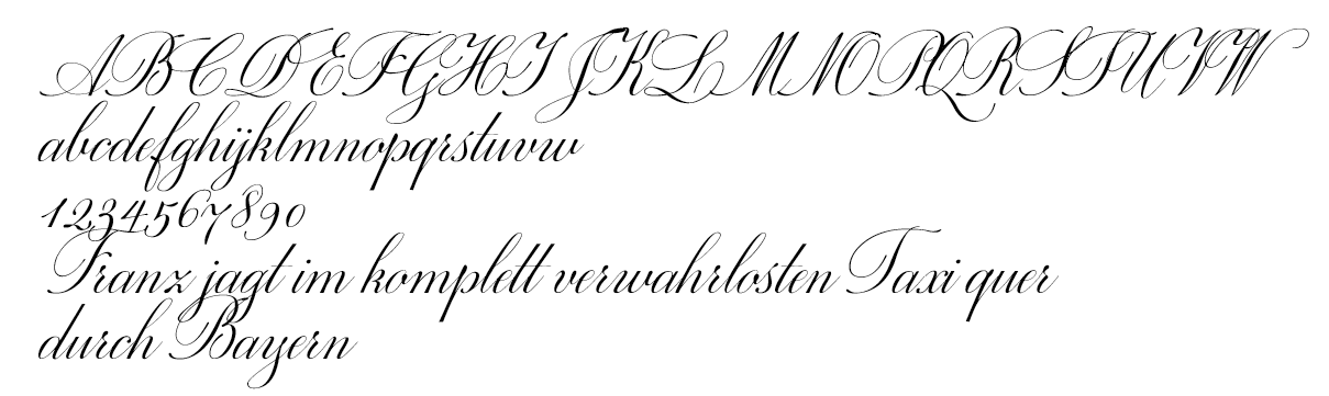
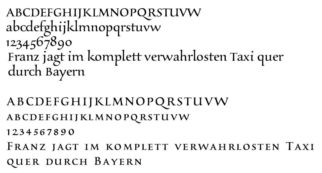
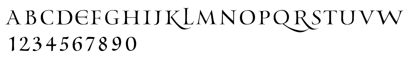
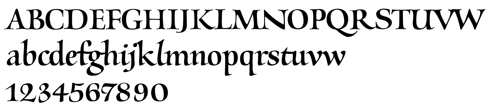
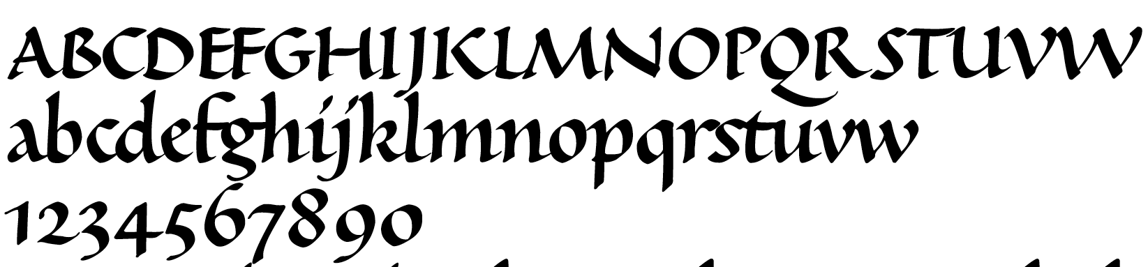
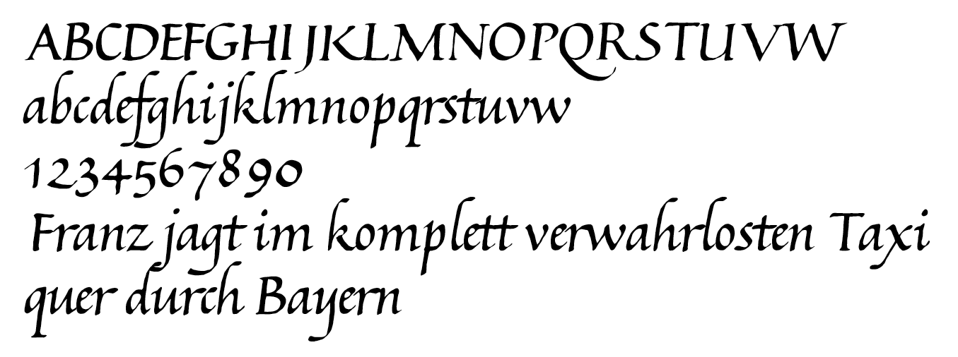
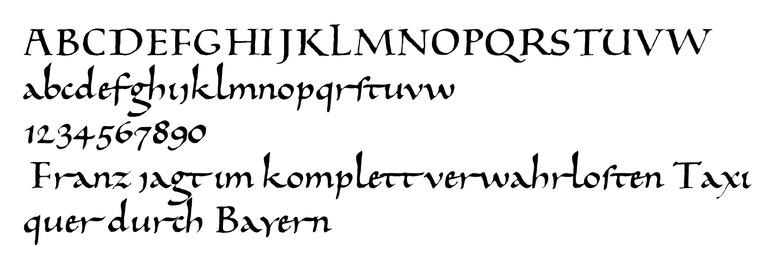
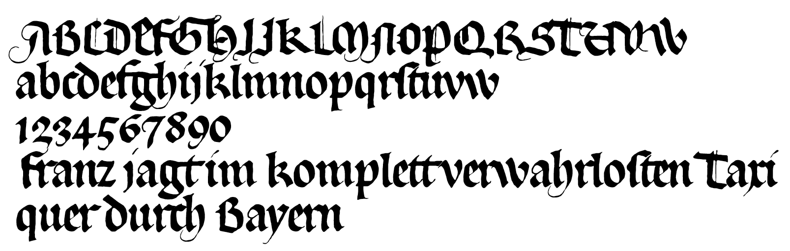
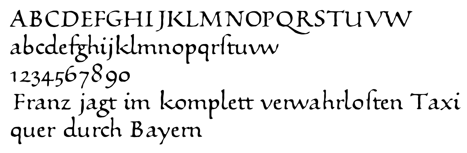
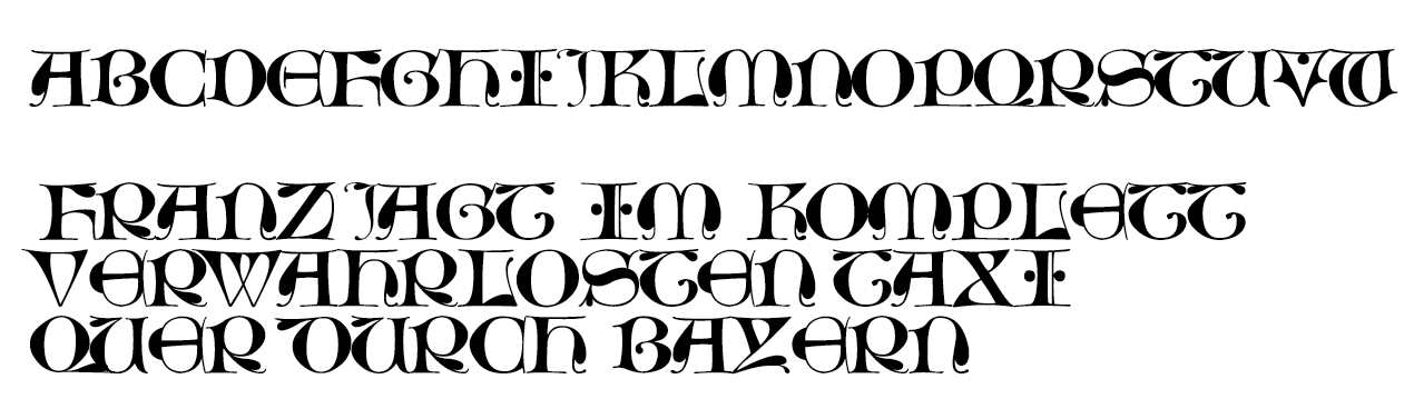
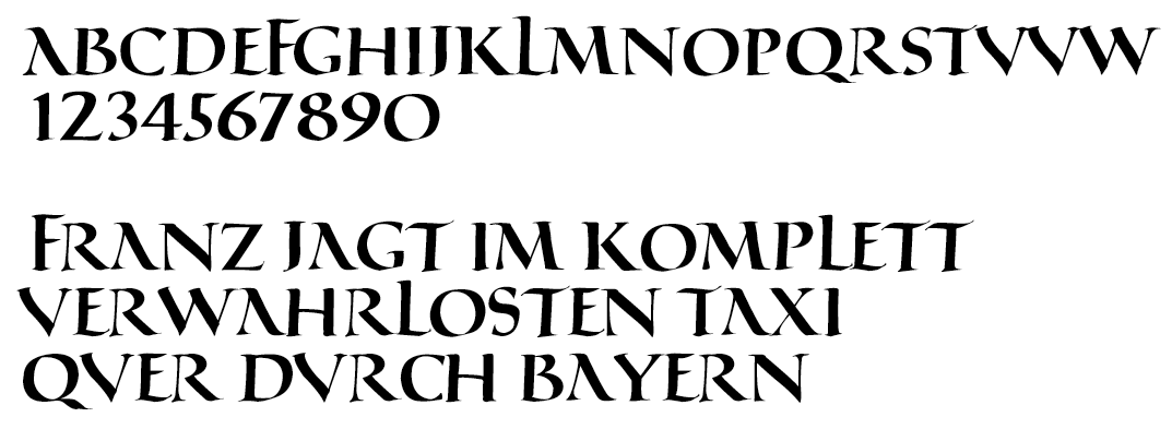
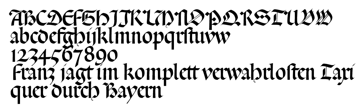
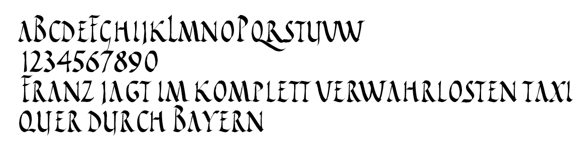
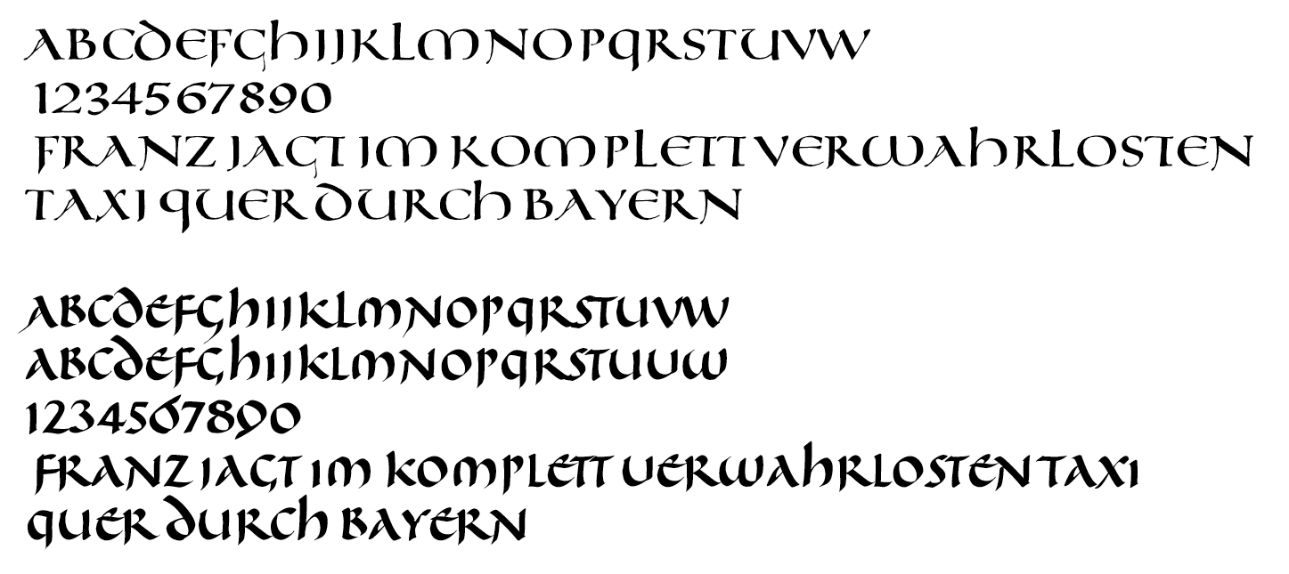
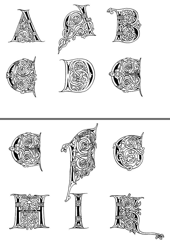
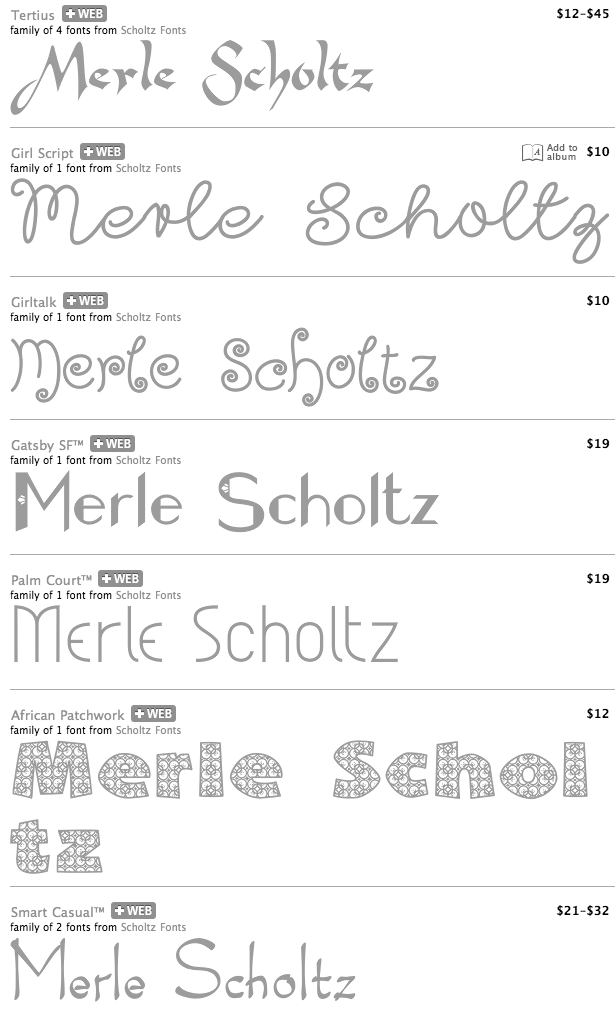
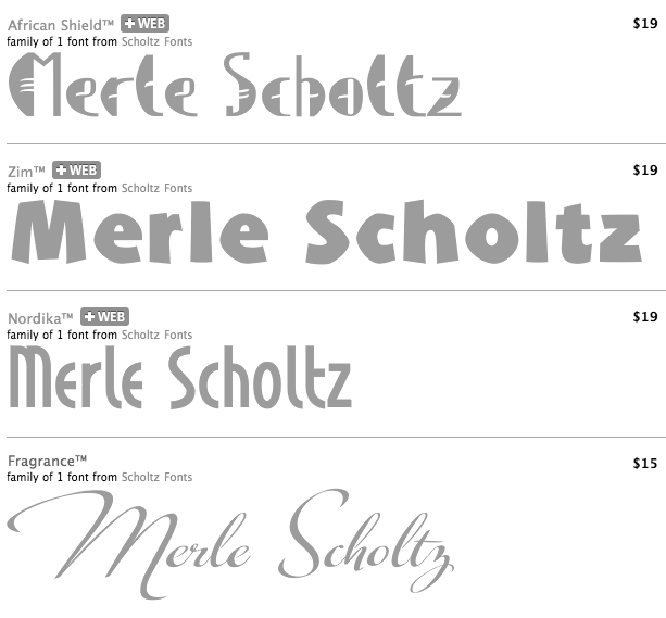
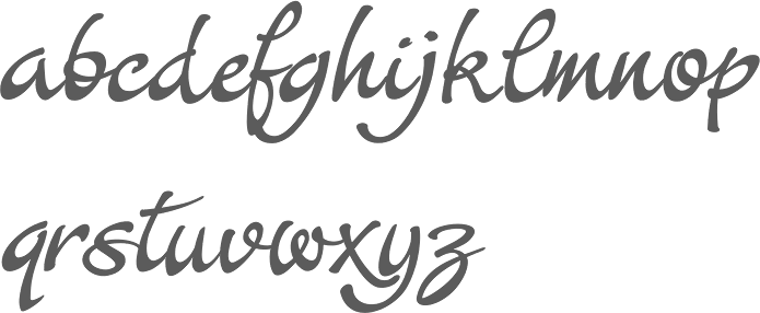
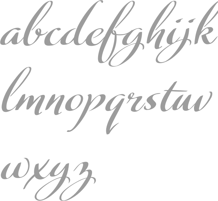
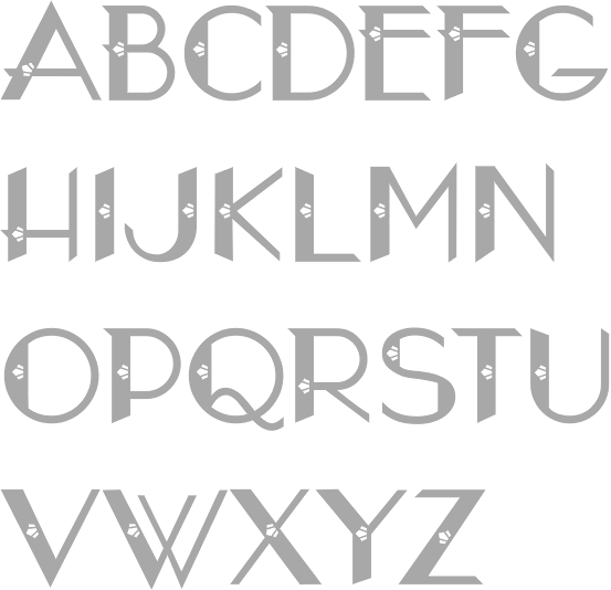
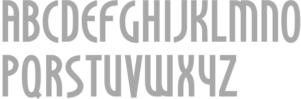
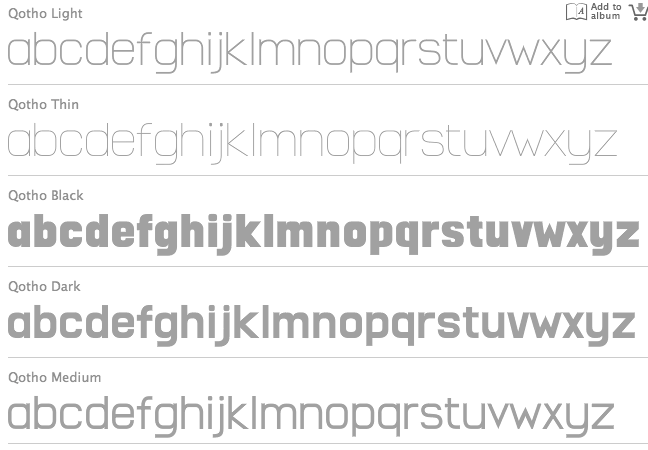
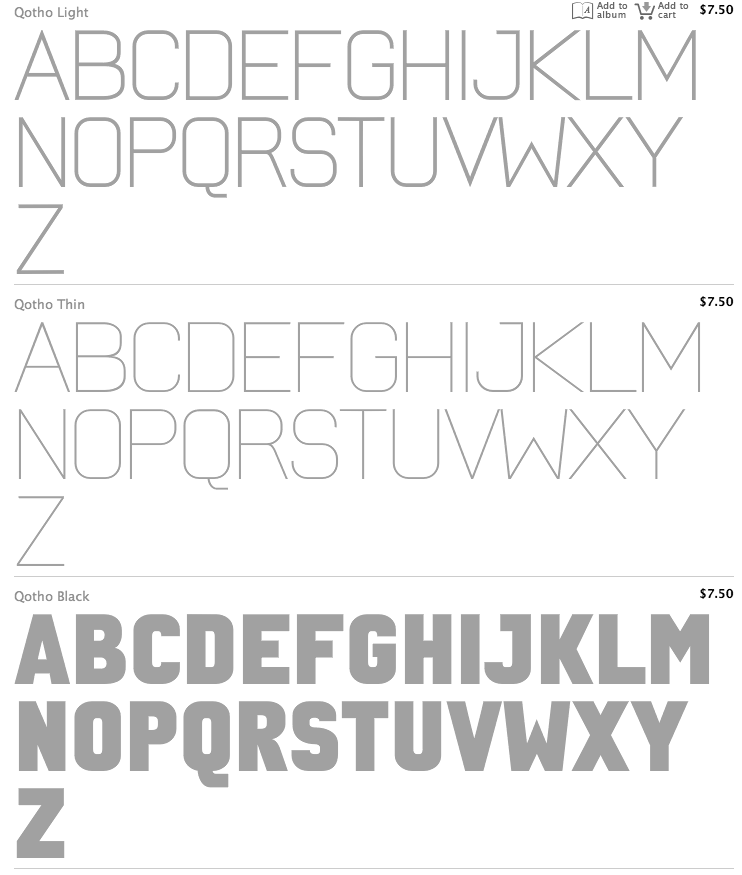
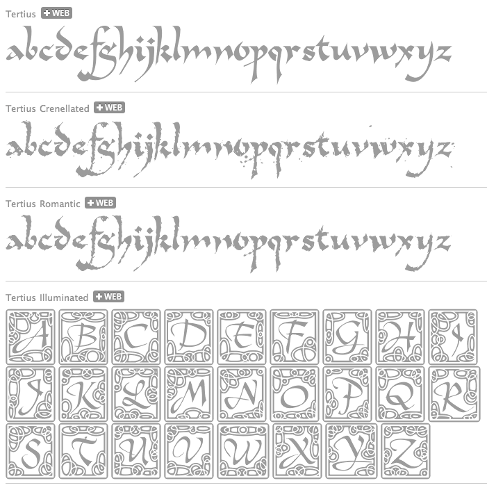
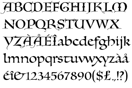
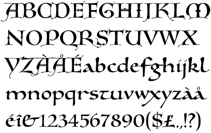
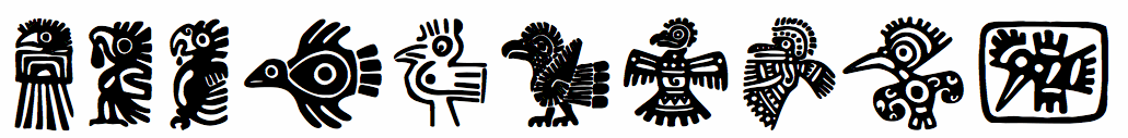
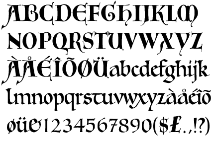
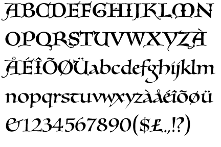
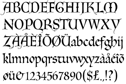
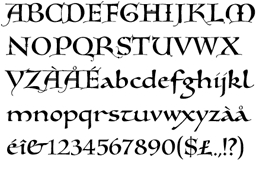
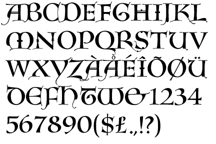
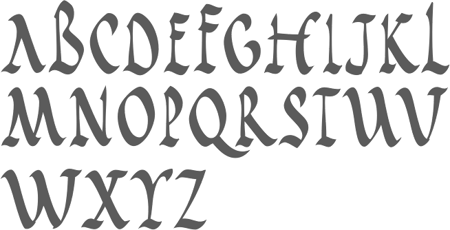
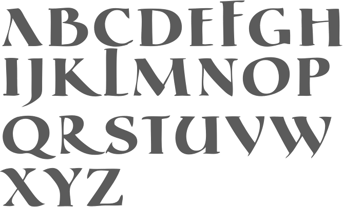
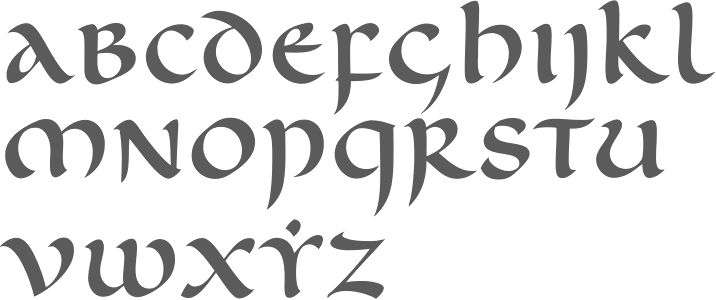
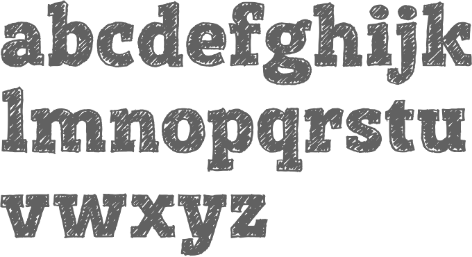
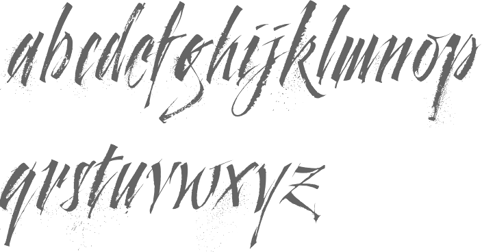
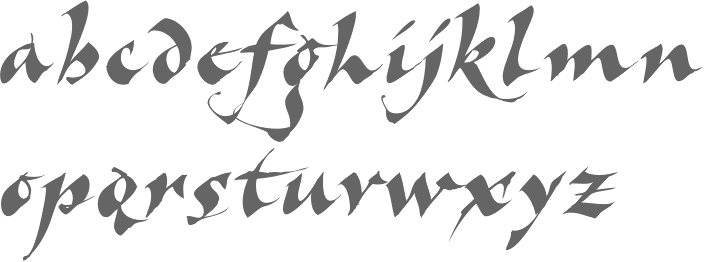
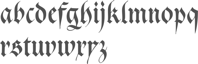
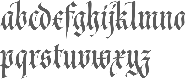
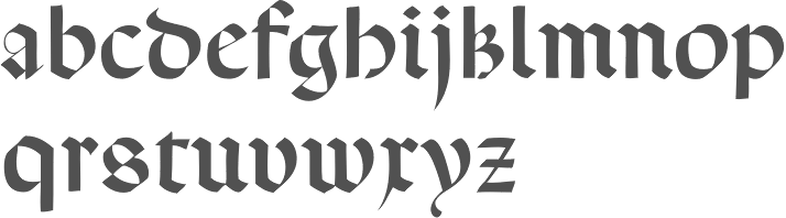
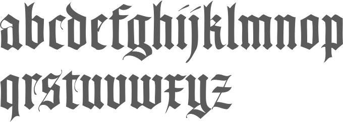
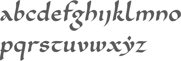
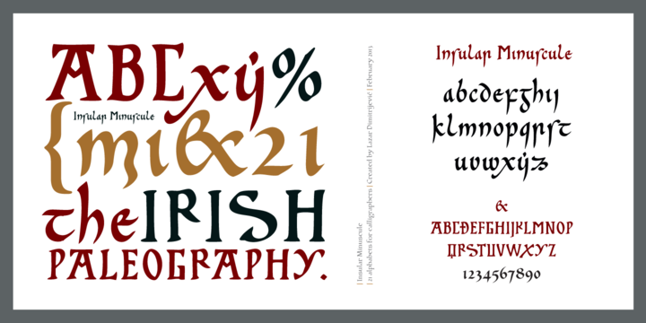
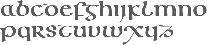
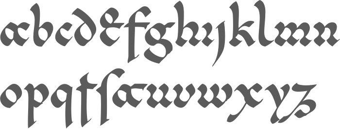
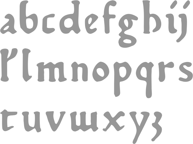
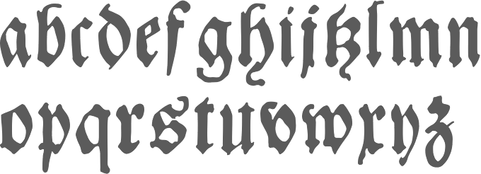
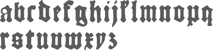
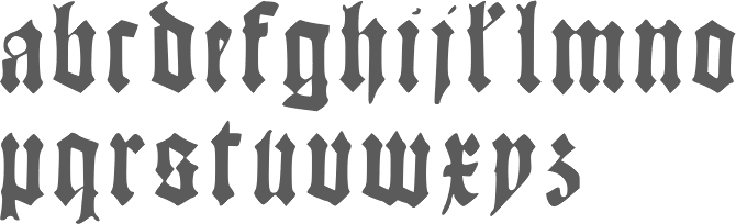
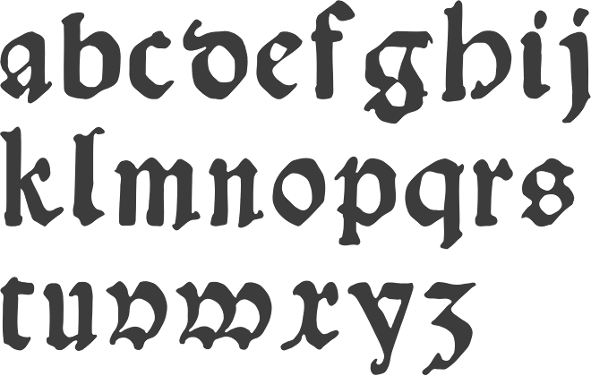
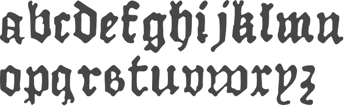
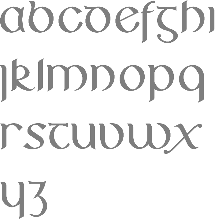
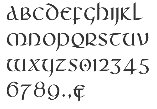
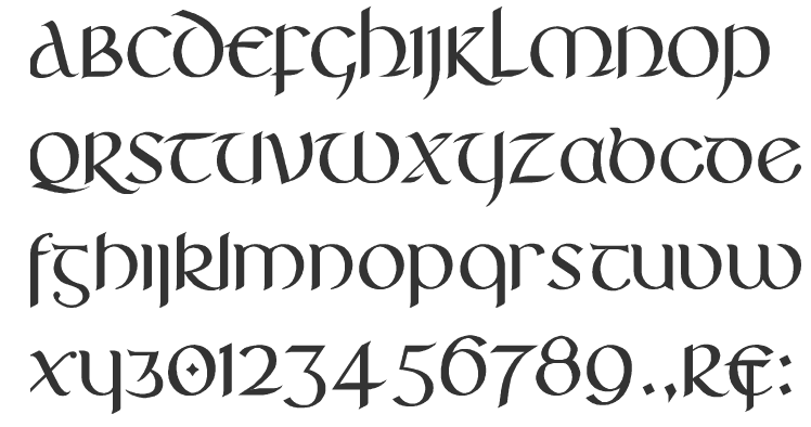
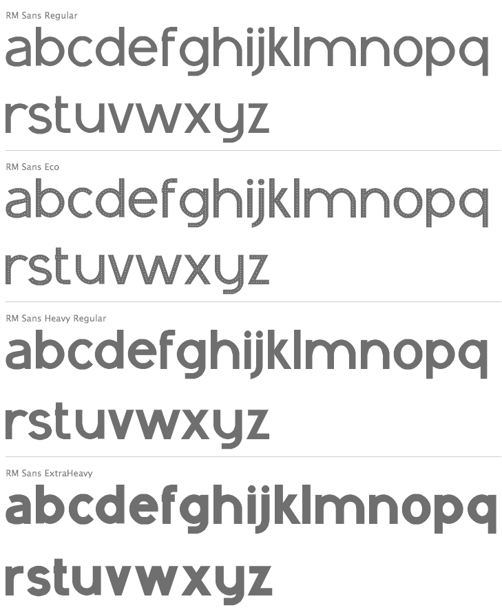
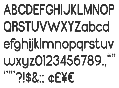
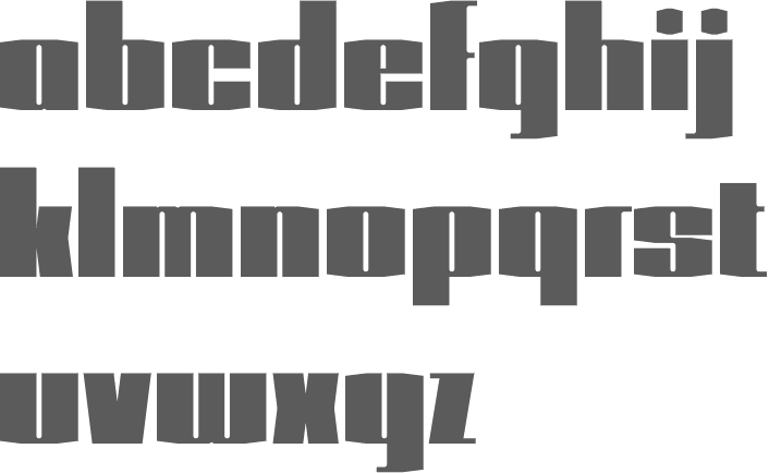
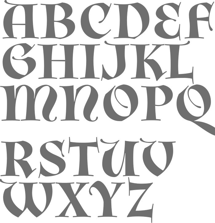
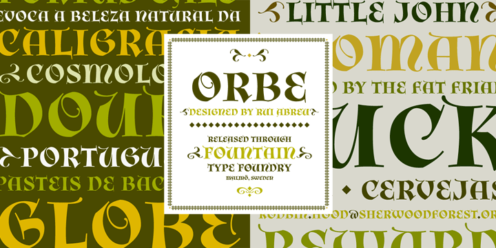
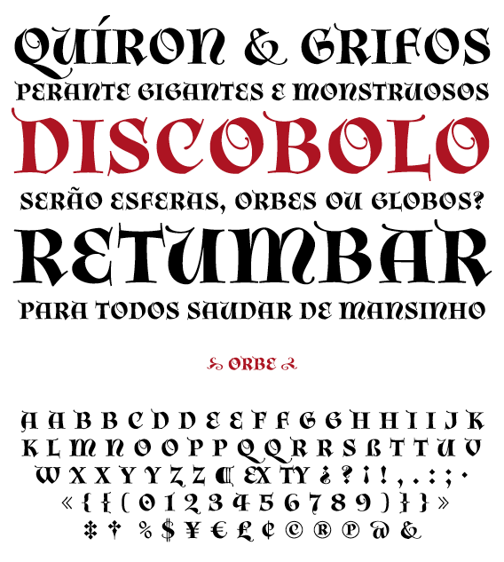
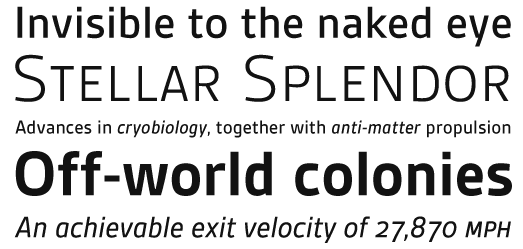
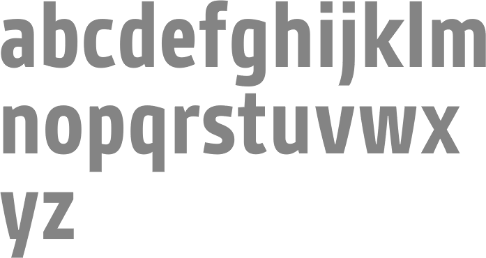
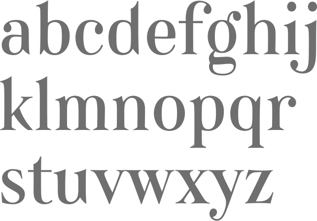
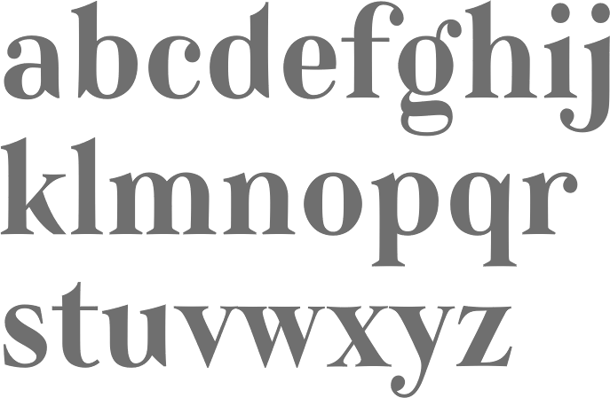
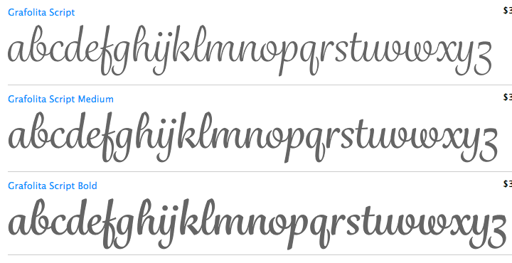
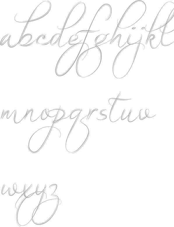
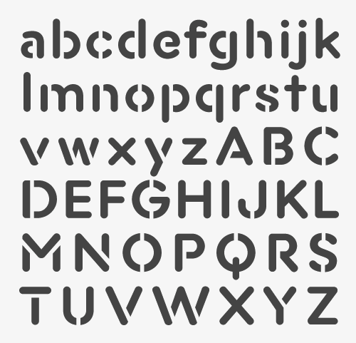
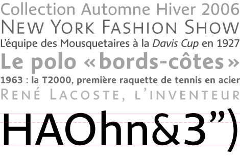
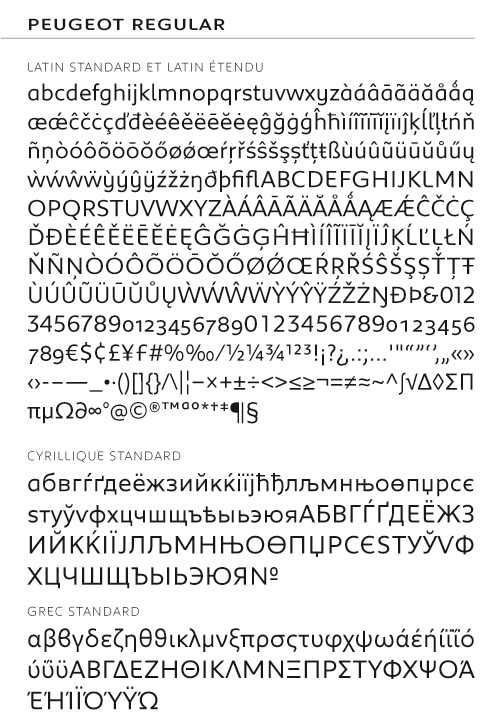
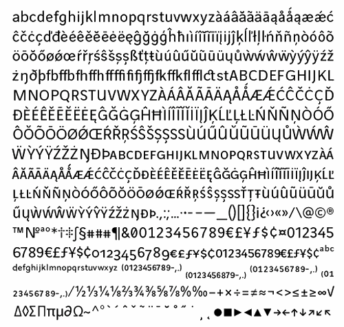