| | |
Abneurone Typografix (or: Abneurone Trauma Types, or: Neurone Error, or: Abneurone Fluid Types, or: Cirque Traumaccord)

|
 French foundry on the margins of type society, obsessed with psychotherapeutic experiments, hyper-experimental, and indeed mental, typefaces. This outfit goes under various names. At FontStruct, where most of its fonts are produced, it is known as Neurone Error. At Dafont, it is known as Abneurone Fluid Types. Its commercial branch at MyFonts is called Abneurone Typografix or Abneurone Trauma Types.
 Their first commercial fonts are ATT49 Fanfare, ATT48 Thrax, ATT47 Candies, ATT46 Exlixir, ATT45 Transfix, ATT44 X-Cute, ATT43 Small Proteus, ATT42 Childhook, ATT41 Arcane, ATT40 Lysergic4a, ATT39 Liquor, ATT38 Once Upon A Damned, ATT37 Innocence, ATT36 Kidding, ATT35 Bestiaire (2011), ATT34 Lysergic 2a (2011), ATT33 Koan (2011), ATT32 Faun Call (2011), ATT31 Paraphilia (2011), ATT30 Lysergic 1b (2011), ATT29 Mad Hatter (2011), ATT28 Minimori (2011), ATT27 Tripton (2011), ATT26 Lysrergic3a (2011), ATT25 Multicoloured Rythm (2011), ATT24 Swallow (2011), ATT23 Artlien (2011), ATT22 Dopamine (2011), ATT21 ABTOY (2011), ATT20 Rankle (2011), ATT19 Ink Lust (2011), ATT18 Overabundance (2011), ATT17 Ink Circus (2011), ATT16 The Orgians (2011), ATT15 For Whom The Bell Tolls (2011), ATT10 Stereo (2011), ATT11 Heterodoxa (2011), ATT12 Psilocybine (2011), ATT13 Sync (2011), ATT14 Prehisto (2011), ATT8 Human Decay (2011), ATT9 Eroded Eclosion (2011), AT4 Parallax (2011), ATT7 Medieval Sweet Shop (2011), ATT6 Detected Future (2011), ATT5 Hard Sync (2011), ATT4 Chalice (2011), ATT3 Outer Christ (2011), ATT2 Macpanic (2011), ATT1 Nimal Nimoy (2011), AT54 Intermezzo (2011), AT26 Metamorph Candies (2011), AT29 Dystrogonyx (2011), AG2 Placenta (2011), AT17 Farandole (2011), AT27 Innocence (2011), AT3 Nuclear Project (2011), AT38 Nanogonyx (2011), AT49 Neuromicr (2011), AT16 Faun Call (2011), AG1 Neuroticons (2011), AT55 Neo Geo (2011), AT36 Mad Hatter (2011), AT51 Pharmaceutic (2011) and AT5 Childhook (2011). The FontStruct production in 2011: 00dot 5 TRANSFIX, 00dot 15 DYSTROPHIE POLYGONALE, 00dot 20 CURSED, 00dot 13 PARALLAX, 00dot 12 NUCLEAR TARGET, 00dot_7_nimal_nimoy, 00dot 17 SYNDROME F.K., 00dot 9 NEW TO, 00dot 6 DECLINE AND CODE, 00dot 3 ROBOX, 00dot 2 MINIDECO, 0dot 26 INKSECTS, 00dot 32 STEREO, 00dot 10 SMART PLAYGROUND, 00dot 33 FUTURE NOW, 00dot 23 BLING STREET, 00dot 4 TOXINE, 00dot 31 FAUN CALL, 00dot 19 ELIXIR, 00dot 30 DWARF LOGIC, 00dot 8 THRAX, 00dot 14 A NEW FORM OF BEAUTY, 00dot 22 HETERODOXA, 00dot 27 KIDDING, 00dot 21 INNOCENCE, 00dot 34 PICTORIAL ABUSE, 00ne Stretched Empty Cow (2011, a piano key stencil face), 00ne Empty Cow (2011), 00ne Medication (2011), 00ne Pills, 00ne Minipills, 00ne Stency, 00ne Neurelm, 000tag6 LYSERGIC, 000tag4 ROBOX, 000tag NUCLEAR WARFARE, 00ne dat / dot, 00ne Bat Kidding (+Stencil, +Stencil Quadrillé), 00ne Stencirc, 00ne Neurocirc Neue Deco, 00ne Neurocirc, 00ne Neurologo, 00ne Nutech, 00ne Nutech Black, 00ne Top Pix (+Clean), 00ne Not So Atroce Pixels (+Black), 00ne Videotech, 00ne Videotech Tamagochi, 0One Bad Video, 0One Exagg Superstrong, 00ne Blockollida, 00ne Minicut, 00ne Neuromoog, 00ne Exagg, 00ne XChurch, 00ne NeuroNeoq, 00ne Imprimante Matricielle, 00ne C64 NeurOOpart2, 00ne Heterodoxa, 00neZnorg, 00ne Znorg Heads, 00ne Zwrappearing (dotted and textured), 00neVideotech, A Present for Intaglio (2011, cloned from Intaglio's Wallachia), Inicial 1 (2010, an improvement of a typeface by Infotipografia), Neo Geo (2011), NE XS, NE 4x4 Technirement, NE Religious Migraine, NE Abtechre. NE Churching, NE Strange Light Pax Pact, NE Cellphone Cutie Punched Cards, NE Cellphone Cutie, NE Obl. NE Pax Pact, NE Pictorial Abuse, NE Charlie Chaplin Cybernetic Brains, NE Chaplin Cyborg, NE Unknown Remix, NE Neurofat, NE Neurocompressor, NE Neurocompressed Pictograms, NE Alien Orders, NE Filament Techneriment, NE Strange Light Pax Pact, NE The Eye, NE Moving Parallels, NE Alien Orders, NE Reordered Alien Orders, the NE New Newbix family, Parallax (2011). Typefaces made in 2012 at FontStruct: AFT1 Heterodoxa, AFT2 Forbidden Apple, AFT3 Kidding, AFT4 Spacelab Parallax, AFT5 Detected Future, AFT6 Lysergic 2b, AFT7 Lysergic 2a, AFT8 Transfix, AFT8 Smart Kids, AFT10 Candies, AFT12 Neo Geo, AFT13 Arcane, AFT15 Hard Sync, AFT17 Cortech Hallucination, AFT18 Lysergic1b, AFT20 Abtech, AFT21 Bling Chief Story, AFT22 Ink Lust, AFT23 Faun Call, AFT24 Toying, AFT27 Fluffy Clown, AFT30 Koan, AFT31 Innocence, AFT33 ETPheuneHeume, AFT34 Neuromicr, AFT35 Tripton, AFT36 Intermezzo, AFT37 Rankle, AFT38 Dark Rankle, AFT39 Rankle Distone, AFT40 Smart Kids, AFT41 Smart Playground, AFT42 Lysergic 4a, AFT43 Small Proteus, AFT44 Lysergic 3a, AFT45 New Forgee, AFT46 Space Connect, AFT47 Mondrian Drone, AFT48 Bark At The Code, AFT49 Stereo, AFT50 Artlien, AFT51 Liquor, AFT52 Neuromecha, AFT53 Lysergic 1a, AFT54 Dinoxyde, AFT55 Human Decay, AFT56 Eroded Eclosion, AFT57 Outer Christ, AFT58 Boing Code, AFT59 Nimal Nimoy, AFT60 X-Church, AFT61 Macpanic, AFT62 Lovely Breeze, AFT63 Mad Hatter, AFT64 The Orgians, AFT65 Chalice, AFT66 Ssaammothrax, AFT67 Panthrax, AFT68 Less Is More Neuromicr 2, AFT69 Paraphilia, AFT70 Psilocybine, AFT71 Childhook, AFT72 Once Upon A Damned, AFT73 For Whom The Bell Tolls, AFT74 Medieval sweetshop, AFT75 Nanoprehistoryx, AFT76 Pictorial Abuse, AFT77 Bestiaire, AFT78 Fanfare From Outer Space, AFT79 X-Cute, AFT80 Medication, AFT81 Wrong DNA, AFT82 Wrong DNA, AFT83 Minimal Disto, AFT84 Abacadabra, AFT85 Pharmaceutical, AFT86 Code Flu, AFT89 High-Diving Blindness, AFT90 Nopix, AFT91 Floppy Disk O, AFT100 Farewell dawn, AFT104 Locked-in Glow, AFT105 Vivant, AFT106 Sharp Gloss, AFT107 Madame Guillotine, AFT108 Newbic, AFT109 Ataxie, AFT110 Strenuous MICR, AFT111 Effaceur, AFT113 Zeppelin Legacy, AFT1010 Jabbering, AFTN1, BUT1 Quarx, BUT2 Newbix, BUT3 Disto Matricielle, BUT4 Tomono, BUT5 Blurred Clown, BUT7 Religious Pill, BUT8 Nopix (octagonal), BUT9 Tipi Video, BUT10 Slanxic Acid, BUT11 Metamphetamental, BUT12 Znorgs, BUT13 Soyokaze, BUT15 Stick Tech, BUT16 Uninteresting Tech. In the Testament series from 2012 until 2013, we mention Testament 132 New Indication, Testament 131 The New Orgians, Testament 128 Camphre, Testament 126 Neuromoog, Testament 122 Dissecting Geometry, Testament 115 Placenta Numérique, Testament 116 Abnormal Fairy, Testament 109 Madame Guillotine, Testament 85 Axone, Testament 84 Keen, Testament 83 Minimixture, Testament 52 Neuromecha, Testament 51 Liquor, Testament 50 Artlien, Testament 49 Stereo, Testament 48 Bark At The Code, Testament 56 Eroded Eclosion, Testament 55 Lysergic 1a, Testament 54 Inflated, Testament 59 Nimal Nimoy, Testament 60 X-Church, Testament 64 The Orgians, Testament 67 Panthrax, Testament 66 Human Decay, Testament 69 Chalice, Testament 47 Mondrian Drone, Testament 44 Lysergic3a, Testament 42 Lysergic 4a, Testament 27 Arcane, Testament 11 Minimori, Testament 8 Transfix, Testament 7 Lysergic2a, Testament 6 Lysergic 2b [The Lysergic series is about very large (around 200 cases high) grid pixel fonts with a severe inclination to psychedelism], Testament B Formaldehyde, Testament C Neuroticons, Testament Artefact, Testament Back Home, Testament 1 Heterodoxa, and Testament 12 Neo Geo. He also created an Archive series in 2012, which features an ornamental caps typeface called Archive 10, a geometric typeface called Archive 5, TEST PPain, and a textured typeface called Archive 8. He has a Trauma series that features Trauma 145 Razzmatazz Architect, Trauma 126 Lysergeek Boy, Trauma 127 Lysergeek Girl. Typefaces from 2014: Trauma 155 Overly, Trauma 151 Migraine Bit. In 2017, Abneurone allowed me to host his 120-strong Abtox series, which grew out of the FontStruct collection between 2014 and 2016. Download directory. All fonts in one zip file. The complete list: Abtox 1 ATAXIE, Abtox 10 GRIEF, Abtox 100 CORRODED SPACESHIP_0, Abtox 101 LYSERGIC GAMMA_1, Abtox 102 TOXIC DATA, Abtox 103 NEUROTIC CHURCH_3, Abtox 104 SCHIZOPHRENIA TYPE_1, Abtox 105 TWO STAGES OF CONTAMINATION_2, Abtox 106 DINOXYDE_1, Abtox 107 FAUN CALL_0, Abtox 108 SMART KIDS_9, Abtox 109 FORBIDDEN APPLE_1, Abtox 11 SANTA CLAWS, Abtox 110 DYSTOPIAN GEOMETRY_0, Abtox 111 CHEMICAL ABERRATION_1, Abtox 112 DOUBLE-DEALING_3, Abtox 113 FORBIDDEN PLANET_4, Abtox 114 KARMIC_4, Abtox 115 DIZZY MOLECULES, Abtox 116 COMPUTING ELSEWHERE_0, Abtox 117 DEEP LOW_2, Abtox 118 MODULOTNIK, Abtox 119 DATACIDE_3, Abtox 12 CLOUD BLOOD, Abtox 120 CLOSE ENCOUNTERS_7, Abtox 13 CHILDHOOK_C, Abtox 14 BACTERIA_0, Abtox 15 ALCESTE_3, Abtox 16 PSILOCYBINE_1, Abtox 17 AXONE_1E, Abtox 18 GALACTIC ORGAN_0, Abtox 19 NEUROMOOG_1, Abtox 2 TANTRISME_1, Abtox 20 UFOLOGY, Abtox 21 PAIN PDJ_4, Abtox 22 MY VALENTINE_0, Abtox 23 SUCROKID, Abtox 24 FLOPPY DISK CODE, Abtox 25 VERKIDGO, Abtox 26 NEO GEO_1, Abtox 27 MANDRAGORE_F, Abtox 28 HORNS TO COME_1, Abtox 29 NITROX BEAT_7, Abtox 3 DECORATORIO, Abtox 30 FLYBUTTER_1, Abtox 31 MATRIX YELL_0, Abtox 32 BUBBLE GUMMY_A, Abtox 33 SPAWN_2, Abtox 34 SQUARRY_0, Abtox 35 BUBONIC AK47_0, Abtox 36 VINAIGRE GOTHIQUE_3, Abtox 37 NEO POMPOUS, Abtox 38 EFFACEUR GLUED_1, Abtox 39 EFFACEUR BAROQUE_8, Abtox 4 OVERLY_6, Abtox 40 EFFACEUR SOLID_3, Abtox 41 EFFACEUR CODA_5, Abtox 42 DARK ATROXID_1, Abtox 43 LUMINOUS ATROXID_9, Abtox 44 DRUGGED UP ATROXID_0, Abtox 45 NEUROMECHANIC, Abtox 46 CAMPHRE_4, Abtox 47 FEAST OF UNIQUE RITES, Abtox 48 CHALICE, Abtox 49 SPACE DRUG_0, Abtox 5 NEW PUPPY_0, Abtox 50 TRONIXHALLEY_1, Abtox 51 NO DUMMY, Abtox 52 LOST CHILDHOOD_1, Abtox 53 TRAUMATOLOGY_0, Abtox 54 THE NEW ORGIANS_7, Abtox 55 AMOEBA PUNK_2, Abtox 56 MEDICATION, Abtox 57 SIDE EFFECTS_3, Abtox 58 RE-VOLT_1, Abtox 59 CYBERNODE_1, Abtox 6 RAZZMATAZZ ARCHITECT_1, Abtox 60 OUTER CHRIST, Abtox 61 NEW CIRCUS_0, Abtox 62 ART DRONE, Abtox 63 COAXIAL_2, Abtox 64 PONG !_2, Abtox 65 LYSERGEEK GIRL_0, Abtox 66 NEWBIC_1, Abtox 67 BRAIN SURGERY_4, Abtox 68 RETROFUTURE PRECIOUS_0, Abtox 69 TRIPTONITE_2, Abtox 7 LOG_3, Abtox 70 NEUROMICR_8, Abtox 71 HUMAN DECAY, Abtox 72 INK LUST_0, Abtox 73 PANTHEIST_2, Abtox 74 X-CUTE_6, Abtox 75 DATAXY_4, Abtox 76 FRAGRANCE_0, Abtox 77 TOOTH AXIS_2, Abtox 78 MADAME GUILLOTINE_0, Abtox 79 NARCO_2, Abtox 8 KOAN, Abtox 80 GENOMETRY_1, Abtox 81 SAFE TRAIN_4, Abtox 82 NO ISLAND, Abtox 83 LOCKED-IN GLOW_5, Abtox 84 ABNORMAL FAIRY_A, Abtox 85 ACME_0, Abtox 86 GLITCHY ELIXIR_1, Abtox 87 BLACK ELIXIR, Abtox 88 NEW INDUCTION_0, Abtox 89 MECAMYTHIC_3, Abtox 9 ABSTEREO_4, Abtox 90 MEDIEVAL SWEETSHOP, Abtox 91 PARAPHILIA_0, Abtox 92 HARD SYNC_3, Abtox 93 SECT TOY_1, Abtox 94 ARTEFACT_2, Abtox 95 SPACE LAB, Abtox 96 WAX, Abtox 97 E.T. PHEUNE HEUME_C, Abtox 98 COLD FLOWERS_2, Abtox 99 INJECTING DOPAMINE_0, Abtox ALIEN TOYS_14, Abtox NEUROTICONS_13, Abtox X-HEADZ_37. Dafont link. [Google]
[MyFonts]
[More] ⦿
|
Alexander Ertle
|
Hamburg-based communication designer. He created the experimental typeface Kubik (2012). Behance link. [Google]
[More] ⦿
|
Alfredo Gravato
[Petroglyphic Design (or: PetroFontLab, or: Petro Design)]
|
[More] ⦿
|
André Uenojo
|
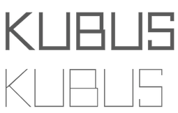 Brazilian creator in Sao Paulo (b. 1989) of Neou (2012, h free airline sans caps face), Kubus (2012, cubist face), Oval Track (2011) and VIP Roman (2011).
 He created the beautiful commercial font Contrasto in 2013. Behance link. Dafont link. [Google]
[More] ⦿
|
April DiMartile
|
BFA Graphic Design student at California State University, Long Beach. She writes in 2012: Chromosthesia is an experimental typeface designed in a Typography 2 class. The concepts as well as ideals of Vassily Kandinsky were used to construct each letter by using common shapes found in his paintings. [Google]
[More] ⦿
|
Art deco typefaces by Nick Curtis: I
[Nick Curtis]
|
 Free art deco typefaces by Nick Curtis, made between 1997 and 2003. Nick Curtis also made commercial art deco typefaces, but these will be listed elsewhere.
 - AmstelHeavyNF (2002): based on this poster from 1926 by C. De Haas.
- AmsterdamTangram (2002): based on this poster by Joost Swarte from 1987 entitled "De wereldtentoonstelling van Joost Swarte".
- AnchorSteamNF (2002): based on a poster from 1923 by Wilhelm Poetter.
- Rainbow Bass (1982, Saul Bass) a vertically striped disco style design, was remade by Nick Curtis as Backstage Pass (1999, 2008).
- BeckerBlackNF (2002, 2007): Based on Alf R. Becker's lettering.
- BigAppleNF (2000, 2007).
- BoogieNightsNF, BoogieNightsShadowNF (2002, 2007): based on this poster from 1916 by Paul Hosch and Hans Melching. In 2009, CheapProFonts made a "pro" version.
- BoomerIngueNF (2002, 2007).
- Bric-aBraqueNF (1999, 2007). Bric-a-Braque was based on Cubist Bold (John W. Zimmerman, 1929).
- ChainsawGeometric (1999). Based on this alphabet by Draim (1928).
- ChippewaFallsNF (2002, 2007). Originally called Hiawatha. See this roadside photograph that inspired Nick.
- Coaster Poster (1999).
- DayPosterBlackNF, DayPosterShadowNF (2002, 2007).
- DebonairInlineNF (2000, 2007). The commercial Debonair Inline (2008) is an extension (uppercase, etc.) of Herbert Bayer's 1931 monocase typeface Architype Bayer, also known as the universal moderrn face.
- DecoBordersNF (1999) and DecoDingbatsNF (2000).
- Drumag Studio NF (2003, 2007).
- DustyRoseNF (2000), DustyRoseRevised (2007): Dusty Rose is an art deco typeface based on the logotype for the Dutch magazine Geillustreerd Schildersblad in 1940, by Anton Kurvers. The commercial Dusty Rose NF was published in 2008.
- EastMarket (1999), EastMarketTwoNF (2007).
- GradoGradooNF (2002, 2007): a Bauhaus-style font, based on this 1932 poster by Urbano Corva.
- Great Lakes (2003, 2007), GreatLakesShadowNF (2007): based on this poster by Peter Ewart (1935).
- Heavy Tripp NF, Heavy Tripp Ultra Bold (2001, 2007). Both Day Tripper NF and Heavy Tripp are based on Dignity Roman, a typeface from 1929 by art deco alphabet designer Alphonso E. Tripp.
- HeraldSquareNF, HeraldSquareTwoNF (2002, 2007): a font family based on a design by Welo shown in Studio Handbook for Artists and Advertisers (1927).
- High Five Jive NF, High Five NF (2001, 2007).
- Indochine NF (2003, 2007). Based on this poster by Joseph-Henri Ponchin (1931).
- Ironick-Normal (1999, 2007): an exaggerated Bernhard Modern.
- KerfuffleNF (2000, 2007). Based on this poster by Chris Van Der Hoef (1920).
- KismetNF. A free font. Based on this lettering.
- LabyrinthCapital, Labyrinth (1999, 2007). Based on this poster.
- MetroRetroNF (1999, 2007). MetroRetroRedux (2001, 2010) is a commercial version of that.
- Milton Burlesque NF (2000, 2007).
- Monkey Fingers NF (1999, 2007). Based on an alphabet by Otto Heim published in Farbige Alphabete (1925).
- MunchausenNF (2003, 2007). Based on a poster for an exhibition by Ludwig Heinrich Jungnickel (1911). This is inbetween art deco and art nouveau.
- NickerbockerNF (1999, 2007).
- NightcapCapital, Nightcap NF (1999, 2007). Based on Disque (A. Bardi, 1931).
- OdalisqueNF, OdalisqueRevised (2000, 2007). The commercial versions are Odalisque NF (2008) and Odalisque Stencil (2010). These art deco typefaces are based on Morris Fuller Benton's Chic (1927).
- ParkLaneNF, ParkLaneRevised (2000, 2007).
- PhattPhreddyNF (2001, 2007).
- PinballWhizNF (2002, 2007). Based on this logotype by Joost Swarte for the comic-strip series "Katoen + Pinbal" (1975).
- PlatonickNF (1999, 2007).
- PlugNickelNF (+Black) (1999, 2007): a reworking of Bremen Black, with small caps and a rather skeptical uppercase R added.
- RadioRanchNF (1999, 2007). Adolf Behrmann designed the classical display typeface Rundfunk at Berthold in 1928. This typeface was digitized by Nick Curtis as Radio Ranch NF.
- RaskalnikovNF (2003, 2007). A Cyrillic simulation typeface based on this poster.
- RialtoEngraved, Rialto NF (2000, 2007): a Broadway style art deco face.
- RiotSquadNF (2000, 2007). after a design by Otto Heim from Heim's 1925 book, Farbige Alphabete.
- RitzyRemixNF (2000, 2007). RitzyNormal is based on Tom Carnase's Busorama.
- Seaside Resort NF (2003, 2007). A bilined titling typeface based on a 1933 poster by Italy's Bertarelli Studios.
- SelznickNormal, SelznickRemixNF (1999, 2007). An art deco typeface inspired by movie theaters of the 1930s. Based on ITC Anna (1991, Daniel Pelavin).
- Sesquipedalian, SesquipedalianAlternates (2000, 2007). Inspired by a handlettered logo for Torre's Buckdruckerei in Vienna, circa 1919.
- Sid The Kid NF (1999, 2007).
- Skittles N Beer NF (2007) is based on handlettering on a 1929 brochure for the P&O British-India Steamship Line.
- Standing Room Only NF (1999, 2007). Modeled after Broadway, designed by Morris Fuller Benton for ATF in 1928, originally named Broadway Poster.
- Stony Island NF (2002, 2007). An adaptation of an art deco font called Chicago Modern, designed by lettering artist Alf Becker, whose designs graced the pages of Signs of the Times magazine from the late 30s into the 50s.
- StudebakerNF-Bold, Studebaker (1999, 2007). Based on the lettering on a package for True-Mark Brand Typewriter Ribbons, circa 1938, designer unknown.
- TaraBulbousCapital, TaraBulbousNF (1999, 2007). TaraBulbous NF (the commercial version is from 2008) is a fat-lettered font based on Carlyle-Oring lettering. See also here.
- TitanickDisplayNF (1999, 2007): a remake of the bold pin-striped trilined Dextor by L. Meuffels.
[Google]
[MyFonts]
[More] ⦿
|
Arthur Cheery
|
FontStructor who made UniGal Lang (2012, cubist). [Google]
[More] ⦿
|
Ashleigh Paler
|
During her graphic design studies at the Gold Coast Institute of TAFE in Gold Coast, Australia, Ashleigh Paler created the typeface Cubism (2014). [Google]
[More] ⦿
|
Bart van der Leck
|
Born in 1876 in Utrecht, died in 1958 in Blaricum. Bart van der Leck was a Dutch painter and designer. With Theo van Doesburg and Piet Mondriaan he founded the De Stijl (abstract, geometric) art movement. In 1930, he was commissioned by Jo de Leeuw, owner of the prestigious Dutch department store Metz&Co. to design interiors, window packaging, branding and advertising. For these print materials van der Leck developed a rectilinear geometrically constructed alphabet. In 1941, he designed a typeface based on this alphabet for the avant-garde magazine Flax. One digital version of this typeface exists: Architype van der Leck (1994, by David Quay and Freda Sack of The Foundry). The wiki page writes: The typeface is geometrically constructed, and based upon an earlier stencil lettering alphabet van der Leck designed in the early 1930s for use in branding and advertising Jo de Leeuw's presigious Dutch department stores Metz&Co. The typeface shares structural similarities with Theo Van Doesburg's 1919 geometric alphabet, and anticipates later typographic explorations of geometric reductionism of Wim Crouwel's 1967 New Alphabet and early digital typefaces like Zuzana Licko's typefaces Lo-Res and Emperor 8. One of his alphabets was creatively used by Marc ter Horst in Restaurant Walem. In 2012, for an exhibition in Paris, Chloe Marchand designed a special van der Leck style poster. [Google]
[More] ⦿
|
Bowie Shum
|
Toronto-based designer of Mondrian (2013), a geometric font inspired by the geometric shapes of the De Stijl art movement and of Piet Mondrian. [Google]
[More] ⦿
|
Cecilia Maurin
|
Graphic designer in New York City. Creator of the Mondriaan-inspired typeface Awchitek (2011). [Google]
[More] ⦿
|
Chris Helingoe
|
UK-based FontStructor (student at Bristol UWE) who made the cubist typeface Kaos (2010). [Google]
[More] ⦿
|
Christian Perez
|
Christian Perez (Troyes, France) reated a cubist / Mondriaan style typographic poster in 2013, entitled Hurricane as a Girl. [Google]
[More] ⦿
|
Cubism
|
From the wiki: Cubism was a 20th century avant-garde art movement, pioneered by Pablo Picasso and Georges Braque, that revolutionized European painting and sculpture, and inspired related movements in music and literature. The first branch of cubism, known as Analytic Cubism, was both radical and influential as a short but highly significant art movement between 1907 and 1911 in France. In its second phase, Synthetic Cubism, the movement spread and remained vital until around 1919, when the Surrealist movement gained popularity. [...] In cubist artworks, objects are broken up, analyzed, and re-assembled in an abstracted instead of depicting objects from one viewpoint, the artist depicts the subject from a multitude of viewpoints to represent the subject in a greater context. Often the surfaces intersect at seemingly random angles, removing a coherent sense of depth. The background and object planes interpenetrate one another to create the shallow ambiguous space, one of cubism's distinct characteristics. There is no specific typographic component in cubism, except that some, like Preissig, tried to create the angular types that evoke letters that were broken up and somehow put back together. In recent times, some have taken inspiration from cubist paintings in the selection of shapes of glyph outlines, and called their typefaces "cubist". [Google]
[More] ⦿
|
David Kerkhoff
[Hanoded]
|
 [MyFonts]
[More] ⦿
[MyFonts]
[More] ⦿
|
Deniart Systems
[Jan Koehler]
|
 Great fonts for astrology, hieroglyphics, alchemy and the occult, by Toronto's Jan and Denise Koehler, mostly designed between 1993 and 1995. They moved to Litomerice and then Teplice, the Czech Republic, recently. MyFonts sells the fantastic Meso Americano dingbats, Hypnotica, AlchemySymbols (two fonts), BlackMagick, Border Twins (2010), CastlesShields, Curly Jane (2010), Cubista Geometrica (2010: op art), DaggersAlphabet, Dendera (ancient Egyptian Zodiac symbols), Dragons, Eggnog (2010), Fontazia Floradot (2012), Fontazia Papilio (2009), Fontazia Pop62 (2011, dingbats of flowers), Fontazia AquaFlorium (2010, fishtank dingbats), Fontazia Mazzo (2010, vases), Fontazia Stiletto (2011), Fontazia Y3K (2009, aliens), the Hieroglyph family (dingbats, really), Jolly Jester (2010, curly hand), MagiWriting, Meandros (2010, a paperclip design inspired by the Greek Key, or Fret, motif), Phaistos, Pocket Wrench (2010, octagonal), Polka Dot Wrench (2010), PowersofMarduk, Praha Deco (2010, inspired by the Prague art deco movement), the RongoRongo family (Easter Island script), SkeletonAlphabet, Sublimina, Superchunk, WhiteMagick, Yenda (2010, bold and angular).
 List of font packages: Aglab, Alchemy Symbols, American Sign Alphabet, Ancient Writings Vol. 1, Ancient Writings Vol. 2, Angelica, The Astrologer Bundle, Astrologer, Aztec Day Signs, Black Magick, Braille Alphabet, Castles&Shields, Celestial Writing, Celtic Astrologer, Certar, Chinese Zodiac, Coptic Alphabet, Daggers Alphabet, Dendera, Dinosauria, Dragons, Egyptian Deities, Enochian Writing, Egypt. Hieroglyphics Vol 1, Egypt. Hieroglyphics Vol 2, Egypt. Hieroglyphics Vol 3, Egypt. Hieroglyphics Vol 4, Futhark, Greco, Hebrew Basic, Hypnotica, Magi Writing, Magick&Mystic, Malachim Writing, Masonic Writing, Maya Day Names, Maya Month Glyphs, Meso Americano, Meso Deko, Morse Code, Old Persian Cuneiform, Passing the River, Phaistos, Pike's Alphabets, Powers of Marduk, Sanskrit Writing, Semaphore Code, Signals&Signs, Skeleton Alphabet, Sublimina, Tengwanda Gothic, Tengwanda Namarie, Theban Alphabet, The Egyptologist, Tolkien Scripts, WhiteMagick, Skeleton Alphabet, Hebrew Basic, Sanskrit Writing. Note: I cannot find an entry for Jan Koehler at MyFonts, where all Deniart fonts are said to have been made by Denise Koehler. [Google]
[MyFonts]
[More] ⦿
|
DigitalDreamDesign
[Yoshiyasu Ito]
|
Yoshiyasu Ito's free fonts (Roman and Katakana): the gorgeous Calligraphism, the interesting Labyrinthism. More complete list: D3-Archism, D3-Archism-I, D3-Beatmapism, D3-Beatmapism-Curve, D3-Beatmapism-Neo, D3-Biscuitism, D3-Biscuitism-Bold, D3-Calligraphism, D3-Concretism-typeA, D3-Concretism-typeB, D3-Cosmism, D3-Cosmism-Hiragana, D3-Cosmism-Hiragana-Oblique, D3-Cosmism-Katakana, D3-Cosmism-Katakana-Oblique, D3-Cosmism-Oblique, D3 Craftism (3d face), D3-Cubism, D3-Digitalism, D3-Digitalism-Italic, D3 Egoistism (octagonal), D3-Euronism, D3-Factorism-Alphabet, D3-Factorism-Italic, D3-Factorism-Katakana, D3-Factorism-Katakana-Italic, D3-Guitarism, D3-Honeycombism (hexagonal), D3-Honeycombism-Bold, D3-Honeycombism-Sorround, D3-Isotopism, D3-Labyrinthism-katakana, D3-Labyrinthism, D3-Mochism, D3-Mouldism-Alphabet, D3-Mouldism-Round-Italic, D3-Mouldism-Katakana, D3-Mouldism-Round-Alphabet, D3-Parallelism, D3-PazzlismA, D3-PazzlismB, D3-PipismS, D3-PipismW, D3-RoundSquarism, D3-Stonism, D3-Streetism, D3-Streetism-Katakana, D3-Sufism, D3-Surfism_I, D3-Surfism_IO. Alternate download place where you can also find D3-Circuitism, D3-Circuitism-Oblique, D3-Concretism-typeA, D3-Concretism-typeB, D3-Cozmism, D3-Cozmism-Hiragana, D3-Cozmism-Hiragana-Oblique, D3-Cozmism-Katakana, D3-Cozmism-Katakana-Oblique, D3-Cozmism-Oblique, D3-Electronism, D3-Electronism-Katakana, D3-Smartism-TypeA, D3-Smartism-TypeB, D3-Witchism. Dafont link. Klingspor link. Fontspace link. [Google]
[More] ⦿
|
ecaGraphics
[Piotr Klarowski]
|
 Polish designer at FontStruct in 2008 of Le Chat Sans (inspired by a 1930s poster), Tetromino, Diamond, Alpha Spot, Ossicles (like ECG output), Cubistic1, Peter's Chess Pieces. In 2009, he added the artistic BO86. [Google]
[More] ⦿
Polish designer at FontStruct in 2008 of Le Chat Sans (inspired by a 1930s poster), Tetromino, Diamond, Alpha Spot, Ossicles (like ECG output), Cubistic1, Peter's Chess Pieces. In 2009, he added the artistic BO86. [Google]
[More] ⦿
|
Edward McKnight Kauffer
|
Edward McKnight Kauffer (b. 1890, Great Falls, MT; d. 1954) was an American artist and graphic designer who lived for much of his life in the United Kingdom. He worked mainly in poster art, but was also active as a painter, book illustrator and theatre designer. He studied at the Art Institute of Chicago (1912/1923) and moved to London in 1914. He is known for the 140 posters that he produced for London Underground, and later London Transport, covering diverse styles---from abstract, futurist, cubist and vorticist to impressionist and art deco. He returned to New York City in 1940 where his main client was American airlines between 1947 and 1954. Type designs that were influenced by his poster lettering: [Google]
[More] ⦿
|
Estevao Lucas
|
Brazilian designer. The cubist painting Les demoiselles d'Avignon by Pablo Picasso (1907) inspired Estevao Lucas to create an award-winning broken-up cubist alphabet in 2009. [Google]
[More] ⦿
|
Esther
|
Irish creator of the geometric typeface Cubic (2012). [Google]
[More] ⦿
|
Ezpa
|
Mexican creator of the cubist typeface Ezpa (2012). [Google]
[More] ⦿
|
flo
|
Designer at FontStruct in 2008 of kubism, simplicity_sans, test3_6. [Google]
[More] ⦿
|
Fly Fonts
[Lee Henry]
|
Foundry based in Loughton, UK, set up by Lee Henry (b. 1982, Gateshead, UK). Lee studied Graphic Design in Newcastle and first got involved in font design when he designed Gothfest for a magazine project. He now works in London as a newspaper designer and continues to produce new and original font designs. Creations include Modernist (2006, a MICR style family), Arctic Chunky (2006), Gothfest (2006), Bogus (2006, in the style of Toolego), Bad Azz (2006, grid-based), Cubist (2006, thin octagonal family), and React (2006, also grid-based), Modernist (2006, monoline sans), 1up (pixel face), Allstar (2009, constructivist), Ole (2009, fat and squarish). [Google]
[MyFonts]
[More] ⦿
|
Fridayfonts
[Pascal Glissmann]
|
 Free font site, est. 2009. The fonts being displayed and introduced were developed by students in seminars and workshops offered by Pascal Glissmann at the Academy of Visual Arts Hong Kong and the Academy of Media Arts Cologne. Fonts there from 2009
 - Yee Ting Cherry Chan: BambooConstruction.
- Cherry and Liu Sze Wai: Cherrybomb.
- Chan Ying: ChineseRadicals.
- Yuki Leung Tsz Ning: ConstructionWithShadow.
- Stephanie Ka Ying Lai: Crozline.
- Cynthia Chan: Cubism.
- Susie Law Wai Shan: ImbalanceSur.
- by unknown: Impression
- Siu Chi Ming and Eason: LightInk.
- Siu Wing Lam: MTR.
- Wong Hoi Ying: MobileCode.
- Li Yan Yee: Neurons.
- Liu Wing Yi: OldHongKong.
- Wan Yee Kam: Potata.
- Ruth Ng: RuthInk.
- Aegina Kwan Ting Ho: SealScriptRoman.
- Toby Cheung: Skin Seal.
- Lung Yan Yu: Transbars.
- Wian Wai Yan Lau: Unfold.
- Sandee Tang: GeoGraphics.
- Liu Shuj Yee: Blowing.
- Mabel Pui man Choy: Burning.
- Tsand Lai Yin: Buttons.
- Carsten Goertz: Eurothai.
- Chan Kam Kwan (Fanny): Flame.
- Wong Kai Zen (Gemmy): hexyClover.
- Annabellali: Ink.
- Matina Long Ling Cheung: Matina.
- Yuki Yi Pui Lee: MushroomFont.
- Pascal Glissmann, Martina Hoefflin: Parasite.
- Ting Hiu Nam: Staples.
- Tinny Liu: Treeskin.
- Ka Yee (Polly) Fung: Triangular.
- Ng Siu Yin (Hilary): Triclips.
- Ahyan: Vibrate.
- Ka Man (Cindy) Tse: Circulia.
- Ka Yan (Elaine) Ng: Bubblegum.
- Lo Betty Wing Man: HongKongPattern.
- Thomas Hawranke: Dickbine.
- Ip Ka Wai (Maxwell): Impression.
- Cheung Yung: Pain.
- Yuen Man Li: Ink (grunge).
In 2010, new fonts were added. Here is a partial list: In 2013, Glissmann moved to Parsons in New York City, where he continued the tradition of posting the student work. However, there are no more downloads, and links are not clickable. [Google]
[More] ⦿
|
Gerard Sierra
|
 Barcelona-based designer of these typefaces:
 - Centcelles (2018). A typeface that is inspired by the calligraphic shapes of the Capitalis Rustica.
- Rhinob (2020). A custom octagonal / industrial / soccer / sports font for the identity of Rhinob.
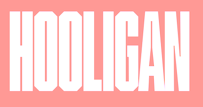
- Hooligan (2020). An ultra-condensed octagonal family custom-designed for Palco23. It was inspired by Matt Willey's Timmons, the previous corporate typeface used.
- BigSlab Quadrata (2020). Each letter occupies a full square, and the reverse stress provides a Western aura.
- Triomf Display (2020). Triomf is an experimental cubist display face inspired by a Spanish civil war poster . The designer also claims inspiration from Herb Lubalin and Avant Garde.
- Derrida (2021). A lapidary poster typeface.
[Google]
[More] ⦿
|
Graphunki
|
Free and commercial (predominantly techno) fonts. Among the free fonts: KZ-Cubist, KZ-Gravity, KZ-Turbo. The commercial fonts are sold on a CD: KZ Tank, KZ Spellbound, KZ Scratcher, KZ Radiostar, KZ Racer, KZ Lord, KZ Cybone1 and 2. [Google]
[More] ⦿
|
Hanoded
[David Kerkhoff]
|
 Hanoded is the foundry (est. 2010) of Dutch designer and photographer David Kerkhoff, b. Epe / Vaassen, 1969. In its first year, Hanoded was a free font outfit specializing in handwriting and hand-printed typefaces. Its creations could be seen at Dafont, Abstract Fonts and Fontspace. Fontspring link. Klingspor link.
 In 2011, he went partially commercial via MyFonts. His typefaces became more diversified and are quite stunning at times: - A: Aardvark Dreams (2016), Abeille (2016), Abelia (2015), Abysmal Gaze (2011. scratchy face), Aceituna (2018), Adagietto (2018), Aderyn (2012: a poster family), Adieu Mon Ami (2021: a crayon font), Aeronic (2015, based on a 1937 Japanese poster for Nikke Coat by Japanese print artist Gihachiro Okuyama (1907-1981)), Aficionado (2019), After Nightfall (2018: spooky), Aiguille (2018), Aint Nothing Fancy (2010). All Over Again (2010), All Over Again All Caps (2010), Allez Hop (2011), Ambleside (2018: a fun scratchy curly script), Ambrosine (2017), Americain (2012, constructivist), American Grunge (2015), Amoebica (2014), Andorra Script (2014), Another Monday (2020), Antisocial Behavior (2010), Antidote (2016, 3d and handcrafted), Apex Brush (2019), Appelstroop (2016), Arancello (2018, a connected didone), Artful Dodger (2012, a grungy Clarendon), AshesToAshes (2010), Ashtanga (2013, curly caps), Astromonkey (2016), Atonement (2018: a great irregular inky script), Attaboy (2016, dry brush), Attention Seeker (2017), Au Revoir (2012), Autumn Voyage (2017), Avontuur (2017), Awesome Sauce (2019).
- B: Background Echo (2021), Backyard Hero (2018), Badehaus (2015, an art npuveau typeface modeled after the lettering on the Thermal Badehaus in Bad Neuenahr, Germany), Bad Medicine (2017), BadPaintjob (2010), Bakeapple (2019), Balagan (2010), Bandolina (2014), Band Wagon (2018: Western), Baznat (2010), Beanstalker (2018), Bearskin (2019), BehindDirtyBlinds (2010), DK Bergelmir (2014), Bergie Seltzer (2019), Betula (2018), Bintang (2016), Bitterbrush (2018), Bitumen (2017: a sticky typeface), Blabbermouth (2018), Black Bamboo (2014), Black Cluster (2018), Black Mark (2012, a heavy brush face), Blackminster (2017: blackletter), Bladesmith (2018), Blauhaus (2015, a rounded organic monoline Bauhaus), Bloemgracht (2014, Dutch deco), Bloomer (2019), Blueberry Jam (2016), Boarding House (2017), Bocadillo (2016, brush script), Bodiam (2016, beatnik style), Bombay Blue (2014, handcrafted poster font), Blue Sheep (2016, comic book style), Bogeyman (2019), Boris Brush (2016), Borrowdale (2016, a crayon font), Bottle Brush (2017, dry brush), Bottle Shop Faded (2010), Bratislava (2015), Breadcrumbs (2019), Breakfast Noodles (2020), Brochette (2019), Bronwen (2018: a vampire or bewitched font), Brouwerij (2021), Brushcrazy (2019), Brush Crush (2016), Buckthorn (2017, grungy), Bugbear (2019: a cartoon font), Bunny Daydream (2020), Bupkis (2017), Breakfast Burrito (2015), Brooklyner (2013: an art deco caps typeface based on the typeface used for The Brooklynite, a magazine from the 1920's), Brouillard (2017), Brushzilla (2017), Bullet in your Head (2010), Bumper Sticker (2020), Bungehuis (2015, Dutch deco after the lettering on a building in Amsterdam, 1931), Buntaro, Burobu (a blobby typeface), Business As Usual (2011, scratchy), Buttered Toast (2015), Butterfly Ball (2014), Bygone (2017, brush font).
- C: Cadora Woods (2020), Caerphilly (2018), Caffe Lungo (2019), Camping Holiday (2018: comic book style), Canned Whale (2012, outlined and hand-printed), Canoodle (2016), Capricious (2020: a dry brush font), Carambola (art deco sans), Carbonara (2011, grungy typewriter), Carpe Noctem (2017, a haunted font), Carrot Juice (2017), Carte Blanche (2012, a gorgeous arched / sketched caps face), Castanea (2012, a painter's font), Castle On The Hill (2017), Castlerigg (2020), Catskin, Mon Petit Cahier (a children's handwriting emulation) (2021), Celluloid Bliss (2010), Cerulean Blue (2018), Chalkaholic (2018), Charons Obol (2011, scary brush face), Cheat Sheet (2013, handwritten), Checkout (2015, a basic supermarket script), Cherubina (2016, beatnik style), Chewy Caramel (2020), Chillerz (2020), Chilly Cherry (2018), China Syndrome (2019: a brush-lettered typeface), Chocolatte (2016), Chunky Chicken (2013), Cinnamon Swirl (2016, curly lettering), Cinnabar Brush (2016), DK Clair de Lune (2012, an exquisite curly poster font), Clochard (funky quirky lettering), Closet Skeleton (a scary font based on the cover of the 1946 book De Sprookjeshoorn by Anton Eijkens (1920-2012)), Clootie (2020), Coal Brush (2016), Coconut Punch (2018, dry brush), Codswallop (2011, fat hand-printed), DK Coliseu (2014, art deco), Colporteur (2017), Combustible (2017), Compagnon (2017), Concertina (2018), Cookie Crumble (2019: beatnik style), Cookie Supply (2019), DK Cool Crayon, Cool Daddy (2017, bubblegum font), Coquillage (2017), Corner Shop Chique (2010), Cortese (2016: an interlocking letter poster font based on a 1971 Italian movie poster for La Morte Cammina Con I Tacchi Alti directed by Luciano Ercoli), Cosmo Stitch (2015), Cosmic Turtle (2021: hand-crafted, in beatnik style), Couldnt be bothered (2010), Courant (2011, grungy blackletter), Cover Up (2017), Crayon Crumble (2011, chalk face), Crayon En Folie (2016, a crayon or chalk typeface), DK Crayonista (2012), Crayon Works (2021), Crimson Skyline (2019), Criss Cross (2011), Crocodile Feet (2018: beatnik style), Crowbar (2017), Crowd Pleaser (2021), Crowfeather (2018), Crowd Funded (2018), Crypt (2016), Cry Wolf (2017), Cubissimo (2013, a cubist geometric font inspired by a 1929 poster advertising a museum exhibition), Cul de Sac (2010, 3d outline face, hand-printed and sketched), Cut Along (2017: a paper cutout typeface), Cykelsmed (2018).
- D: Daft Script (2021), Daily Challenge (2021), Daitengu (2020), Dapplegrim (2018), Darker Marker (2016), Darkness Rising (2018), Deco Pimp (2011), Delivery Note (2019), Demagogue (2020), Die Bruecke (2013, a woodblock printing emulation typeface named after the Die Brücke movement), Dinosaur Cake (2018), Dirrrty (2016, a grungy brush font), DK Allez Hop (2011), Discolicious (2017), Display Patrol (2017), Dominant Type (2021), Donkeyman (2021), Don Quixote (2011. nice grunge calligraphic hand), DK Dortmunder Ecke (2015, inspired by cubism), Doubledecker (2019), Double Quick (2014), Douceur (2014, a blackboard bold / tattoo script), Downhill Dive (2019), Down The Wall (2017), Downward Fall (2014, a rough brush), Dragonblood (2015), Dragon Spell (2017, drawn with Chinese ink), Drawing Blood (2010), Dreadnought (2014, brush face), Dreamworld (2022: a comic book brush font), Drop Dead Gorgeous (an all caps brush typeface), Dubbel Zout.
- E: Early Morning Coffee (2012), Earworm (2018), Elbow Grease (2017), Element 120 (2018, a hand-drawn Ultra Bodoni), Endgame (2019), Entourage (2017), Ersatz Quality (2010), Erstwhile (2019), Evil Laughter (2019: a typewriter font with blood drips), Exit Strategy (2020: all caps, dry brush).
- F: Face Your Fears (2011), Face Your Fears II (2015), FairNSquare (2010), Fairy Godmother (2018), Fallout Font (2010), Fantastique (2012, a 3d hand-printed caps face), Fat Little Piggy (2010), Father Frost (2012), Fearsome (2018), Fictional Friend (2019), Fiebiger Eins (2013, an art nouveau / arts & crafts typeface after a 1908 poster by Franz Fiebiger), Fiebiger Zwei (2013), Fingerfood (2018), Flagellum Dei (2016, a rough brush script), Fleabitten (2019), Fledermaus (2012: Fledermaus ("bat") was a cabaret theater from Vienna. The original Jugendstil decor was designed by Josef Hoffman and several posters, advertising performances, were designed by other members of the Vienna Workshop. The Fledermaus font was based on a 1907 poster by Bertold Löffler.; the missing glyphs were created by Kerkhoff), Flying Saucer (2019), Follow The Light (2018), Food Truck (2016, vernacular style), Forgotten Dream (2020: a heavy brush typeface), DK Formosa (2012), Framboisier (2017), Frozen Memory (2017), Fruity Snack (2022), Full Blast (2017: dry brush), Full English (a handcrafted stencil) (2021), Fully Automatic (2022), Funky Flamingo (2018).
- G: Galangal (a phenomenal poster typeface that plays on thick and thin, in the style of Horst Caps), Gallows Hill (2019), Gamboge (2017), Garden Bed (2016, a fat brush font), Garden Gnome (2016), Genki Desu (2019: comic book style), Gerards Gold (2010, script face), Getaway Car (2019). Ghost Reverie (2010, a scratchy family), Gingerline (2018), Glitter Candy (2018), Gobsmacked (2019: dry brush style), Goodie Bag (2019), Grafiker (2013, a brush typeface loosely based on the work of designers Oskar Kokoschka (1886-1980) and Jean Carlu (1900-1997)), Gravitational Pull (2021: a fat finger font), Gravity Well (2021: a rough brush), Greyfriars (2017, a hand-drawn Baskerville), Griezelig (2019: eerie), Grigory (2017), Grindylow (2020), Gritstomper (2020), Grumpy Tiger (2017), Guerilla Handshake (2017), Guilty Pleasure (2019: a fat brush font), Gulag Decay (2010), Gumbo (2019), Gumboots (2020).
- H: Halewyn (2017), Halfway There (a fat finger font) (2021), Hangmans Delight (2016), Hanoded Hand (2010), Hanoded-Heavy (2010), Harajuku Script (2017), Harimau (2012, a rounded children's book font), Harimau Dua (2015), Harrumph (2011, a fat poster lettering family), Hasta Luego (2020), Hasty Tasty (2011), HaraldRunicDEMO (2010), Headlock (2017), Heartsome (2020), Heckel (2013, a German expressionist hand-drawn typeface based on the handwriting of Erich Heckel (1883-1970), a founding member of Die Brücke, a group of German expressionist), Hedgehog Hans (2012, comic book typeface), Henceforth (2017), Hex (2012), Hexenhammer (2017, a font for witches and vampires), Hey Comrade (2016: a messy script font made with a bamboo satay skewer), Hibagon (a rough dry brush font) (2021), Hieratic Numerals (2010), High Tea (2012), Himawari Script (2019), DK Himmelblau (2012, art nouveau font based on a poster from 1902 made by the Künstlerbund Hagen), Hjem (2019), Hobgoblin (2014), Hofstad (2014, after an art deco typeface used by poster designer John Lavies), Hokitika (2014, art deco), Home Education (2021), Homeward Bound (2017, a grungy slab serif), Honey Dew (2016), Honeyguide (2017), Huggin and Muninn (2012, script face), Hungry Zombie (2020), Hummus Chips Salat (2010), Hyggelig (2015), Hyldemoer (2018).
- I: Ice Cream Man (2018), Identity Check (2022: handprinted), Impending Distaster (2022), Inky Fingers (2013, a fat finger font), Innuendo (2015), Interstellar Erosion (2010), DK Insomniac (2015), Instant Harmony (2019), Irena (2016, a cubist/expressionist font inspired by Czech type designer Vojtech Preissig), Ishtar (2012: spooky brush font).
- J: Jalebi (2015), Jambo (2014, bouncy and funky), Joe Schmoe (2011, hand-printed), John Brown (2016), Jubileum (2013), Juicer (2021), Just Before Liposuction (2010).
- K: Kabouter (2019), Kaikoura (2014, art deco), Kandij (2020), Kapsalon (2019, +Pencil, +Brush), Katsudon (2020), Katzenjammer (2015), Kempoka (2014, brush script), Kerberos Fang (2011), Keswick (2013, a lipstick font created using a 6B pencil), Ketimun (2019), Kingsmead Script (2020), Fat Kitty Kat (2013), DK Koerier (2014, a 3d outlined typeface), Knockdown (2016, brush style), Knucklebones (2017), Kodama Forest (2017, Treefrog style), Kokomo (2012, 3d and outlined), Kolkata Hotelroom (2010), Komsomol (2014: was modeled on several Soviet propaganda posters and anmed after the youth division of the Communist Party of the Soviet Union, the Komsomol, or Kommunisticheskii Soyuz Molodyozhi), Konditorei (2018), Koshatnik (2011, all caps brush face), Kubikajiri (2011, an India ink brush face), DK Kundalini (2013, curly), Kunstschau (2012: a beautiful poster font that was modeled on a stamp, designed by Austrian artist Bertold Löffler, for the Kunstschau 1908 exhibition in Vienna), Kurkuma (2013, a wonderful poster caps face), Kuroneko (2019), Kusukusu (2011, hand-printed), Kwark (2013: a 3d poster font).
- L: Lachrymose (2021: a brush font), Lampion (2012, a condensed unicase hand-drawn face), Leakage (2010, ink splash face), Languedoc (2016), Larks Tongues (2017), Laser Vision (2022: a marker font), Lazy Morning (2020), Leftover Crayon (2017), Lemon Yellow Sun (2014), Lenox Avenue (2017, after Studio Handbook Letter And Design For Artists And Advertisers by Samuel Welo), Lille Snemand (2015), DK Limoen (2012, shadow outline face), Liquid Amber (2018), Liquid Embrace (2015, a brush font), Little Boy Blue (2016), Lokomotiv (2012, an art deco caps typeface based on poster for the 1930 Geneva Motor Show), Longreach (2018), DK Louise (2012, art deco, cubist: based on the art of Louise Marie (lou) Loeber, a Dutch painter), Lucky Goldfish, Lunisolar (2017).
- M: Maduki (2013), Majolica (2014, art deco), Magical Brush (2017), DK Mama Bear (2012), Mandarin Whispers (2017, a brush font actually made by a marker pen), Mandolin (2014), Mango Smoothie (2015), Mariken (2017), Market Square (2017, vernacular style; +Market Square Marker), Mary Ate a Little Lamb (2010), Matrijs (grungy, stencil) (2021), Mayblossom (2021: a fat finger font), Mayonaise (2011), Meshuggeneh (2013---crazy fool on Yiddish; a twisted 3d typeface), Midnight Chalker (2016, a chalk or crayon font), Midnight Hour (2011), Midnight Sun (2019), Mikan (a bold rounded handcrafted sans) (2020), Millefeuille (2017), Mind Boggle (2020), Minehead (2020), Modern Fantasy (2020), Moi Non Plus (2011), Minou (2018), Mission Accomplished (a fat finger font) (2021), Momotaro (2015, a fun rough brush script), DK Monsieur Le Chat (2012, curly face---can't wait for Madame La Chatte...), Montello (2018), Moonlight Serenade (2016), Moonlight Shadow (2010, a nice scribbly pair of fonts), More Or Less (2016), Morgenfrisk (2017), Mortal Coil (2020: a dry brush font), Mosca (2013), Mothman (2011, a spooky scratchy face), Motley Crew (2016), Mr Stickman (2015, funny dingbats), Mulhouse (2019), Mundbind NL (2021), Mysterious (2017).
- N: Nakata (2012, a great notebook style script), Nanuk (2013, an outlined 3d typeface), Nefarious (2019: a great Halloween font), Neuer Weltschmerz (2019: a rounded sans), Neues Bauen (2011), New Beginnings (2016), Nightbird (2011, blood drip face), Northumbria (2012: modeled on original 7th and 8th century monastic gospel books from Northern England), Notaris (2015, a bouncy typeface), Nouveau Crayon (2016), Numpty (2019), DK Nutnik (2012, a mural paint font), Nuuk (2018), Nyctophobia (2010, brush face).
- O: Obrigado (2012, rounded art deco face), Odaiba Script (2019), Oei (2010), Office Squeeze (2017, a sketched font made with a Japanese brush pen), Ogenblik (2020), Oomph (2010), Okiku (2014, a scratchy poster typeface), Oranjerie (2013, poster typeface), Orenji (2016), Original Quality (2019), Oslo Stitch (2020), Otago (2014: a classic all caps art deco typeface), Output Volume (2021), Overseas (2020: a dry brush font), DK Oyuki's Ghost (2013, scratchy scary typeface made with a steel pen and Chinese Ink---the name comes from a painting by Maruyama Okyo (1733-1795), which depicts his mistress who died young. Maruyama Okyo claimed she haunted him in his sleep).
- P: Palembang (2015, a Dutch art deco typeface), Pandanus (2014), Panettone (2018: upright script), Paradise Lost (2016, created using a broken bamboo satay skewer and Chinese ink), Pardesi (2013, a fat marker pen font), Party Pocket (2019), DK Pastis (2016, a lovely handcrafted typeface), Paviljoen (2014: Dutch art deco), Pawn Shop Pretty (2010), Peanut Crunch (2019), Peking Duck (2021), Perfect Day (2019), Petit Four (2015), Petit Oiseau (2013), Phantom Peach, Pigeon Post (2020), Pimpernel (2012), Pinda (2011), P.I. (2011), Pineapple Daydream (2018), Pingo (2012, display face), Pinkus (2013, a caps-only poster font), Pisang (2013, an all caps poster font), Plague Master (2016), Plakkaat (2011), Plastic Fantastic (2019: a comic book face designed to fight the overuse of plastic), Poison Ivy (2014, scratchy hand), Pondicherry (2014, a hand-sketched 3d typeface), Popty Ping (2018, beatnik style), Popular Vote (2021), Porcupine Pickle (2011), Power Breakfast (2021), Primordial (2017), Prince Frog (2015, a cartoon / children's book font), Printout (2018: a sketched font), ProjectX (2010), ProjectY (2010), ProjectZ (2010), Promedanenmischung (2010), Psycho Killer (2013), Public Secret (textured, handcrafted) (2021), Pumpkins Brush (2021), Pumpkin Soup (2013: a poster typeface), Pundak (2014, all caps 3d outlined typeface), DK Pusekatt (2013).
- Q: DK Qilin (2014: a great inky font), Quatrain (a hand-drawn didone), Quid Pro Quo (2011, scratchy calligraphic), Quilted Butterfly (2010), Quite Something (2018), QuoVadisQuasimodo (2010).
- R: Rabbit Escape (2016), Rabbit on the Moon (2011, children's typeface), Radical Brush (2019), Rainclouds (2020), Rainforest (2010), Ramkoers (2018), Raspberry Sherbet (2020), Rat Infested Mailbox (2010), Ravenheart (2017, Treefrog or Ralph Steadman style: scary and inky), Ravenstonedale (2018: based on a number of handwritten letters by English author D.H. Lawrence), Reality Check (2019), Rearview Mirror (2018), Redcurrant (2020), Reluctant Aviator (2020), Republica Banana (2019), Retch (2013, frightening scratchy script), Retrouvailles (2018), Return Policy (2018), Roskilde (2018), Rosy Lee (2016), Rotorua (2014, art deco), Roughcast (2020: an all caps brush typeface), Rough Patch (2017), Rough Therapy (2019), Route Du Soleil (2018), Ruby Red (2015, brush style), Rum Doodle (2013), Rumpelstiltskin (2011, comic book family), Runaround Kid (2018), Runic Series [Gunfjaun Runic (2010), Modraniht Runic (2010), Leakage (2010), Hyrrokkin Runic (2010), Harald Runic (2010). Gunnar Runic (2010), Nidhogg Runic (2010), Nippon Note (2016), Skraeling Runic (2010), Sleipnir Runic (2010), Tjelvar Runic (2010), Yggdrasil Runic (2010), Graip Runic (2010), Fenrir Runic (2010), Beowulf Runic (2010)], Running Hipster (2016), Rusty Cage (2011).
- S: Saffron Walden (great fattish inky brush script), Same Same but Different (2010), DK Samhain (2012, dry brush face), Sammy Boy (2011, fat poster face), Sanseki (2016, Chinese ink brush script named after Sanseki, a Japanese term used to describe three famous Heian period calligraphers: Yaseki, Gonseki and Saseki), Satsuma (2013, a poster face), Saturday Sunday Monday (2010), Scapegoat (2018), Scissor Madness (2021: cutout font), Scrawlerz (brush script), Scratch Up (2018), Scrawny Cat (2016, a brush and China ink typeface), Scribble Note (2020), Scribbler (2015), Scurvy Dog (2011, scratchy hand), Secret Diary (2013: hand-printed), Semarang (2015, an art deco sans), Senko Hanabi (2020), Sensory Overload (brushed typeface), Seven Seas (2018: a curly script), Shadowfield (2018), Shaken Not Stirred (2015), Sheepman (2012), Shesek (2011, a fat finger face), Shibby (2019), Shinano (2017, made using a Japanese brush), Shoganai (2019), Sibylle (2018: dry brush), Silent Echo (2018), Sing Along (2021; hand-printed), Single Malta (2010), Sirius B (2013, poster font), Skeletal Wish (2019: an inky brush script), Sketchy Smiley (2010, smilies), Sketchy Smiley II (2012), Skratch (2010, broken glass face), Skulduggery (2019), Sleepy Time (2013, hand-printed), Sleight of Hand (2010), Slipstream Sweetheart (2010), Slivowitz (2017), Smiling Cat (2017), Smooth Brushings (2016), Smurrie (2016), Snemand (2013, a poster titling typeface), Snippity Snap (2015, paper cut typeface), Sobriquet (2012: a wonderful antique poster face), Soerabaja (2017, all caps Dutch art deco), Sound Bubble (2020), Souplesse (2013), Southside Fizz (2017, handcrafted art deco), Southwark (2017: sketched), Spaghetti And Cheese (2017), Spandau (art deco), Spiced Pumpkin (2016), Spiderlegs (2011, Spinnenkop (2018: a curly vampire script), Spinwash (2019), Spiraling Down (2019), Splinterhand (2017), Spoonbread (2020), Spring Chicken (2019), Springwood (2019), Springwood Display (2019), Square Beat (2021), SquareOne (2010), SquareOneGrunge (2010), Squint (2013, squarish), Starboard (2021: a dry brush font), Starlight Lovers (2016), Statendam (2014, caps only Dutch art deco influenced by interbellum ads for the Holland America Line), Steamed (2021), Sticky Toffee (2017), Struffoli (2017), Studio Brush (2019), Subway Circle (2021: an informal typeface, perhaps for comic books), Suco de Laranja (2012), Sugarloaf (2018), Sumida Script (2019), Sunbird (2019), Summer Romance, SundayMonday (2010), Sugary Pancake (2016), Superbrush (2017, a Great Chinese ink brush font), Sushi Bar (2016, dry brush), Sweet Lemon (2018: paper cutout type), Sweet Steeffie (2010), Sibylle (2018: Japanese brush), Sunny Weather (2021), Symbolic Prophecy (2020: a dry brush typeface), Symptomatic (2018: brush script), Syphon Spritz (2010, a great curly script; a Pro version appeared in 2010 at CheapProFonts), System Overload (2020).
- T: Takeshi (2019), Tartufo (sketched font), Teacup (2017), Tequileria (2016), That Little Piggy (2010), Technojunk (2014, 3d squarish hand-drawn typeface), Tenterhooks (2019), The Cats Whiskers (2016), Terpentijn (2017, grungy), Thievery (2012, curly script), Third Time Lucky (2019), This Little Piggy (2010), Toadstool (2017), Tobu (2014), Tombouctou (2019), Tompouce (2017), Tokeh (2019), Tough Cookie (2018), Tournedos (2019), Toverheks (2016, a bewitched typeface), Traiectum (2017, a messy roman caps typeface based on Goudy Old Style), Treacle (2021), Treppenwitz (2018), Trashtype (2011, grungy), Trained Monkey (2017, a cartoon font), Tripping on Acid (2010), Trollslayer (2011, brush face), Troutbeck (2020), Twelve Weeks Pregnant (2010), Twirrewyn (2018), Twisted System (2018), Tzeva Tari (2010, grunge Hebrew).
- U: Udon Soup (2018), Ugh (2010), Utroligt (2021), Umbilical Noose (2014, a rough brush), Umbrella Man (2019: dry brush), Uncle Edward, Uncle Oscar (2016, a crayon font), Under My Umbrella (2018), Understory (2019), Utroligt (2021).
- V: Vegetability (2020), Ventana (2013, created using Chinese ink and a bamboo pen), Vermilion (2013, hand-printed poster face), DK Viareggio (2012, an art deco font Viareggio is based on the handlettering found on a 1931 poster, advertising the carnival of Viareggio), Vienna Workshop (2012, an art nouveau typeface based on some of the artwork produced by Vienna Workshop artists, in particular that of Koloman Moser), Visum (2014), Vlinder (2017), Vox Populi (2012, an ancient parchment look font).
- W: Waiting For My Girl (2019), Wandering Pencil (2020), Warpspeed (2010), Wayang (2013, influenced by Indonesian puppets), Wayland (2018), Weekend Warrior (2010), Weeping Willow (2018), Welt Schmerz (2012, a post-art nouveau typeface based on a 1910 poster from Austria), WetDream (2010), Whalebone (2020), Whale Song (2017), Whatnot (2013), Whynot (2014), Widdershins (2018), Wild Bunch (2015: Western font), WindshieldMassacre, Wintanceastre (2018: an uncial based on a 10th century Latin manuscript), Winterberry (2017: a messy script), With A Twist (2011), Woebegone (2018).
- X: Xanthine (2017, a messy brush type).
- Y: Yasuragi (2021), Yellow Balloon (2013, a fat poster face), Yuge (2020), Yuli (2014).
- Z: Zealand (2017, sketched), Zeebonk (2013, a tattoo font), Zesty Lime (2016, brush font), Zombie Starfish (2017), Zonnig (2011).
[Google]
[MyFonts]
[More] ⦿
|
Hayeon Go
|
Seoul, South Korea-based designer of the Latin typeface Cubism (2015) and the Hangul typeface Pangu (2015). [Google]
[More] ⦿
|
Jack Lee
|
 Graphics and Media Design student at the London College of Communication, who hails from Hong Kong. Home page of "Jack The Rabbit. Designer of the high contrast typeface Currency (2011) and the cubist artistic typeface Stab (2012).
 Dafont link. [Google]
[More] ⦿
|
Jan Koehler
[Deniart Systems]
|
 [MyFonts]
[More] ⦿
[MyFonts]
[More] ⦿
|
Joanne Taylor
|
 Aka Jos Joy, as Joanne Ford Taylor, and as joiaco. South African illustrator from Knysna, b. 1953. She also paints as Qabbojo Art, and is presently located in Vancouver, Canada.
 Designer in 2009 of Qarmic Sans, Qirkus Qaps (almost Tuscan), Qranklestein, Qlippitek, Qixstix, QutnTorn Caps, and the hand-printed fonts Qirlycues and Qokijo. In 2011, she created Qokipops, Qik Edges (2011, dingbats and borders), Qut+Torn (papercut face), Qrypton (2011, sci-fi), Qumbazonki (2011, African look face), Qwagga (2011, another African face), Qixbox (2011, hand-printed 3d face), Qongasushi (2011, poster face), Qarkitech, and Qlinickle. Typefaces from 2012 include Qarolina, Qreepy, Qrackerjax, Qubism, Qoncrete, Qrubby, Questoz, Quinky (brush face), Qumberland Slab, Qinkgo, Qrayola, Qudos, Qubism (inspired by Picasso), Qimiko, Qhorah, Qratchee (scratchy typeface). In 2013, she designed Qrankenstein, Qaxton, Quota (a heavy titling face), Qlub Jozi (art deco), Qlarendon (a 7-style Clarendon family), Qarmic Sans Pro, Qanoodle (handwriting), Qorker (art deco, after The New Yorker?), Qlaire (clean sans), Qwinkwell, Quota (fat poster face), Qarross, Qontreaux, Qut+Paste (paper cut font), Qwacko, Qizulu (African-themed font), Qokeynote. Typefaces from 2014: Qlunky Brush, Qarrotface, QikiconsRealEstate, QrackStreet, Quiglet (a very rounded sans), Quota-Bold, Qutntorn, Qwinkwell, Quikhand (chalk / blackboard typeface), Qirlycues. Typefaces from 2015: African Elegance, Embroidery Running Stitch, Embroidery Chainstitch, Embroidery Backstitch, Leaderbord. Typefaces from 2016: Scrabblish (scrabble font). Typefaces from 2017: Qanterberry, Geeky Periodic Table Font. Devian Tart link. Behance link. Graphic River link. Fontspace link. Dafont link. Creative Market link. [Google]
[More] ⦿
|
John W. Zimmerman
|
 Designer at Barnhard Brothers and Spindler (and head of matrix engraving there), who designed the art deco typeface Cubist Bold (a typeface without lower case) in 1928. Patent. Mac McGrew on Cubist Bold: The name tells it all. Designed by John W. Zimmerman, head of the matrix engraving department. at BB&S, probably just before BB&S merged with ATF in 1929, this font of unusual capitals and figures is very large for the body and has no lowercase. Compare Dynamic Medium, Modernique.
 Revivals of Cubist: [Google]
[MyFonts]
[More] ⦿
|
Keith Bates
[K-Type]
|
 [MyFonts]
[More] ⦿
[MyFonts]
[More] ⦿
|
Krzysztof Stryjewski
|
Polish creator of the experimental almost cubist typeface Alfabet Picassa (2011). [Google]
[More] ⦿
|
K-Type
[Keith Bates]
|
 K-Type is Keith Bates' (b. 1951, Liverpool) foundry in Manchester, UK, est. 2003. Keith works as an Art&Design teacher at a Salford High School. They custom design type, and sell some of their own creations.
 Commercial typefaces: - Adequate (2012). A basic geometric monoline sans family.
- Adventuring (2010, comic book style)
- Alan Hand (2005, based on some blobby lettering, handwritten by printer and mail artist, Alan Brignall)
- Alex (2002-2004)
- Alright (2004, cursive script)
- Anna (2002-2007).
- Argot (2019). Characterized by square counters, this typeface family exhales brutalism and industrialism. See also Argot Machine (2019).
- Artist Hand (2019).
- Axis
- Bank of England (2012, blackletter): Bank of England is loosely based on blackletter lettering from the Series F English twenty pound banknote introduced in 2007. The font also takes inspiration from German Kanzlei (Chancery) typefaces and the 17th century London calligrapher, John Ayres.
- Banks & Miles (2018). Inspired by the geometric monoline lettering created for the British Post Office in 1970 by London design company Banks & Miles, a project initiated and supervised by partner John Miles, which included Double Line and Single Line alphabets. The new digital typeface is a reworking and extension of both alphabets.
- Barbica (2015). A glyphic typeface.
- Bricola (2020).
- Brush Hand New (2013): Brush Hand New is a full font based on a copy of Flash Bold called Brush Hand marketed by WSI in the 1990s and more recently distributed through free font sites. Brush Hand was an anonymous redrawing of Flash which simplified, slightly lightened, smoothed out ragged edges, and improved the legibility of the original classic created by Edwin W. Shaar in 1939.
- Building&Loan (2007, engaved face)
- Bigfoot (2005, a Western font based on the slab capitals used by Victor Moscoso in his 1960s psychedelic rock posters)
- Bolshy (2009)
- Bolton750 (2003, a mechanical typeface done with John Washington).
- Chancery Lane (2021). An italic text typeface that is based on chancery scripts.
- Charles Wright (2016). A set of fonts based on the UK license plate fonts.
- Chock (2009)
- Circa (geometric sans)
- Cloudbuster (2019). Inspired by Imre Reiner's Corvinus Skyline of 1934.
- Club.
- Coinage Caps (2017). Coinage Caps is a trilogy of small caps fonts based on the roman lettering used for the designs of British coinage. Coinage Caps Eric Gill is a regular weight, spur serif style drawn by Eric Gill for silver coin designs in the 1920s which were rejected by the Royal Mint. Coinage Caps Humphrey Paget is a medium weight serif based on the lettering of Thomas Humphrey Paget, designer of the Golden Hind Halfpenny first struck in 1937. This font simulates the soft, slightly rounded corners of the minted letterforms. Coinage Caps Kruger Gray is a glyphic, flare serif font typical of the bold style engraved by George Kruger Gray for numerous British and Commonwealth coins during the 1920s and 30s. This font also simulates the slightly rounded corners of the minted letterforms.
- Collegiate (2009)
- Component (2012). A font for lost civilizations and dungeon rituals.
- Context (experimental)
- Credit Card (2010, font for simulating bank cards)
- Curwen Sans (2018). A monoline sans from the early 1900s originally created for in-house use at the Curwen Press in London.
- Cyberscript (2006, connected squarish face)
- Deansgate (2015). Deansgate and Deansgate Condensed are based on the clearest and most distinctive of the sans-serif letterforms used on Manchester street nameplates, and easily identified by a pointy Z and pointed middle vertices on M and W.
- Designer
- Digitalis
- English
- Enamela (2013). Keith writes: Enamela (rhymes with Pamela) is based on condensed sans serif lettering found on vitreous enamel signage dating from the Victorian era and widely used in Britain for road signs, Post Office signs, the plates on James Ludlow wall postboxes, railway signs, direction signs and circular Automobile Association wayfinding plaques throughout the first half of the twentieth century. The original model goes back to Victorian times, ca. 1880.
- Engravia (2018). Engravia is a didone display typeface supplied in three varieties of engraving---Inline, Shaded and Sawtooth---plus a plain basic font.
- Example (2017). A workhorse neo-grtesque typeface family.
- Excite
- Flip (2011), a western grotesk billboard face.
- Flyer (2009, techno)
- Frank Bellamy (2009, an all-capitals family based on the hand lettering of English artist Frank Bellamy, who is most famous for his comic art for Eagle and TV21, and his Dr Who illustrations for Radio Times)
- Future Imperfect
- Gill New Antique (2003)
- Greetings
- Helvetiquette
- Hapshash (2010): an all capitals font inspired by the 1960s psychedelic posters of British designers Hapshash and the Coloured Coat (Michael English and Nigel Waymouth), in particular their 1968 poster for the First International Pop Festival in Rome. A dripping paint font.
- Irish Penny (2016). An uncial typeface based on the lettering from Percy Metcalfe's influential pre-decimal coinage of Ireland, the Barnyard Collection.
- Ivan Zemtsov (2009)
- Kato (2007, oriental simulation face)
- Keep Calm (2015). A geometric sans inspired by a British war poster from 1939.
- Keith's Hand
- Klee Print (2010, Klee Print is based on the handwriting of American artist Emma Klee)
- Latinate (2013). A vintage wedge serif wood style typeface, and a rough version.
- Lexie (an improved or "adult" version of Comic Sans) and Lexie Readable (2006, modified in 2015). Keith writes: Lexie Readable (formerly Lexia Readable) was designed with accessibility and legibility in mind, an attempt to capture the strength and clarity of Comic Sans without the comic book associations. Features like the non-symmetrical b and d, and the handwritten forms of a and g may help dyslexic readers.
- Licencia (2016). A blocky typeface inspired by the tall, soft-cornered lettering on vehicle licence and registration plates world-wide.
- Londinia (2016).
- Matchbox
- Max
- Ming
- Modernist Stencil (2009).
- Monterey Pop (2020). A psychedelic / popart typeface based on Tom Wilkes's poster lettering for the Monterey International Pop Festival in June 1967.
- Mythica (2012). A slightly condensed lapidary roman with copperplate serifs.
- Modulario (2010): a contemporary sans.
- New Old English (2010, blackletter)
- Norton (2006)
- Nowa (2004, a play on Futura)
- NYC (octagonal)
- Openline (2008, an art deco pair)
- Oriel Chambers Liverpool: A Lombardic small caps font based on the masonry lettering on Peter Ellis's 1864 building, Oriel Chambers, on Water Street in Liverpool.
- Pentangle (2008, based on album lettering from 1967)
- Pixel
- PixL (2002-2004)
- Plasterboard (2004-2005)
- Pop Cubism (2010) is a set of four texture fonts, combining elements of cubism and pop art.
- Poster Sans (2006). A wood type family based on Ludlow 6 EC. See also Poster Sans Outline.
- Rick Griffin (2006, more psychedelic fonts inspired by a 1960s Californian artist)
- Rima (2020). A stencil typeface with heavy slabs.
- Roundel (2009, white on black)
- Runestone (2010, runic).
- Sans Culottes (2008, grunge)
- Serifina
- Solid State (2008, art deco blocks)
- Solus (2004, a revival of Eric Gill's 1929 typeface Solus which has never been digitized; read about it here)
- Stockscript (2008, down-to-earth script based on the pen lettering of the writer, Christopher Stocks)
- Susanna (2004)
- Ticketing (2011): pixelish.
- Total and Total Eclipse (2004, squarish display typefaces based on the four characters of Jaroslav Supek's title lettering for his 1980s mailart magazine, Total)
- Transport New (2009: a redrawing of the typeface designed for British road signs. In addition to the familiar Heavy and Medium weights, Transport New extrapolates and adds a previously unreleased Light weight font originally planned for back-lit signage but never actually applied. Originally designed by Jock Kinneir and Margaret Calvert beginning in 1957, the original Transport font has subtle eccentricities which add to its distinctiveness, and drawing the New version has involved walking a tightrope between impertinently eliminating awkwardness and maintaining idiosyncrasy.)
- Union Jack (octagonal)
- Victor Moscoso (2008, psychedelic)
- Wanda (2007, art nouveau)
- Waverly
- Wes Wilson (2007, psychedelic, inspired by 1960s psychedelic poster artist Wes Wilson).
- 3x5
- Zabars (2001): a Western face.
His free fonts: - Blue Plaque (2006: a distressed font based on English heritage plaques)
- Blundell Sans (2009)
- Celtica (2007) has Celtic influences
- Dalek (2005, stone/chisel face: Dalek is a full font based on the lettering used in the Dalek Book of 1964 and in the Dalek's strip in the TV21 comic, spin-offs from the UK science fiction TV show, Doctor Who. The font has overtones of Phoenician, Greek and Runic alphabets). See also Dalek Pinpoint (2018).
- Designer Block (2006)
- Flat Pack (2006)
- Future Imperfect (2006, grunge)
- Gommogravure (2005)
- Greetings (2006), Greetings Bold (2006)
- Insecurity (2005, experimental) won an award at the 2005 FUSE type competition.
- International Times (2006, inspired by the masthead of the International Times underground newspaper of the 1960s and 1970s)
- Keep Calm (2011). Related to London Underground.
- Kindersley Sans (2017). A modernized version of David Kindersley's 1950s type used for many street name plates in Britain, about which Bates writes: Kindersley Sans is a humanist sans-serif that conserves the Gill-inspired character and some of the calligraphic qualities of Kindersley's lettering, it retains the Roman proportions and its Britishness, but traditional prettiness and intricacy are discarded in favour of a clean modernity.
- Klee Capscript (2005: based on the handwriting and capitals drawn by artist Emma Klee (USA) for her Color Museum Mail Art invitation. The upper case is based on Emma's capitals and the lower case is freely adapted from her script)
- Lexia and Lexia Bold (2004)
- MAGraphics (2004)
- Magical Mystery Tour (2005, outlined shadow face), Magical Mystery Tour Outline Shadow (2005), Magica (2015, a serifed titling typeface family).
- Mailart (2004), Mailart Rubberstamp (2004), Mailart Rubberstamp Sans (2018).
- Mandatory (2004, a UK number plate font based on the Charles Wright typeface used in UK vehicle registration plates).
- McKnight Kauffer (2021). A retro poster font in the style of poster artist Edward McKnight Kauffer.
- Motorway (2015), a companion typeface to Transport, the British road sign lettering. This is an extension of an original design by Jock Kinneir and Margaret Calvert: The Motorway alphabet was created for the route numbers on motorway signage, and is taller and narrower than the accompanying place names and distances which are printed in Transport. However, for Motorway Jock Kinneir and Margaret Calvert created only the numbers 0 to 9, the capitals A, B, E, M, N, S and W, ampersand, slash, parentheses and a comma. So, although the lettering made its first appearance on the Preston bypass in 1958, K-Type Motorway is the first complete typeface and contains all upper and lower case letters, plus a full complement of punctuation, symbols and Latin Extended-A accented characters. As with the Transport alphabet the starting point was Akzidenz Grotesk, Motorway taking inspiration from condensed versions. Changes were mainly driven by a quest for legibility, resulting in some reduced contrast between horizontal and vertical strokes, and Gill-esque straight diagonal limbs on the 6 and 9, and high vertex for the M.
- Penny Lane (2014). A a sans serif derived from twentieth-century cast-iron signs displaying Liverpool street names.
- Possible (2020). A 10-style mini-serif typeface.
- Provincial (2014). A Victorian set of outline fonts.
- Ray Johnson (2006-2008)
- Roadway (2005, based on New York roadside lettering).
- Romanica (2017). A humanist sans.
- Sam Suliman (2020). A condensed squarish typeface which was inspired by lowercase lettering on a Sarah Vaughan album cover designed by Sam Suliman in 1962. Suliman was born in Manchester, England in 1927. After working for McCann Erikson in London, he moved to New York where he took on freelance work designing album covers, particularly celebrated are his striking minimalist designs for jazz records. He moved back to England in the early 1960s, designing many book jackets, film titles and fabrics, also working in Spain and India before settling in Oxford in the 1980s.
- Savor (2011). An art nouveau family.
- Sgt Peppers Lonely Hearts Club (2014).
- Sinkin Sans (2014, free) and Sinkin Sans Narrow (2015, commercial). Open Font Library link.
- Soft Sans (2010)
- Subway Ticker (2005)
- Taxicab (2016). A squarish style.
- This Corrosion (2005).
- Toppler (2018). A modern and full range top-heavy cartoon font family that includes a Popdots style. Bates was striving to improe on 1990s clasics such as Baby Kruffy (Ben Balvanz), Comix Heavy (WSI) and Startling (Dave Bastian).
- Wildcat (2016). An athletics typeface family.
- Zinc (2018). A monoline sans with diagonal nubs.
- Colnage Caps Kruger Gray (2018). Coinage Caps is a trilogy of lapidary small caps fonts based on the Roman lettering used for the designs of British coinage.
- Dalek Pinpoint (2018). Based on Dalek comic book lettering from the 1960s.
- Icky Ticket Mono (2018). IckyTicket Mono is a monospaced font based on the coarsely printed numbering from 1960s bus tickets.
- Sexbomb (2018). A psychedelic typeface family.
- Mancunium (2019). A monoline sans family.
- Straight Line (2020). An outlined font with chamfered corners and straight edges, possibly useful as a blackboard bold type.
- We The People (a blackletter font based on the peamble of the American constitution).
- Bowdon (2021). A six-style warm, Bodoni-inspired English Modern, influenced by the 1930s lettering of designer Barnett Freedman.
- Oxford Street (2021). A condensed grotesque with horizontal and vertical stem terminals; it is a street a signage font that began as a redrawing of the capital letters used for street nameplates in the borough of Westminster, which in turn were designed in 1967 by the Design Research Unit using custom lettering based on Adrian Frutiger's Univers 69 Bold Ultra Condensed.
Custom / corporate typefaces: With Liverpool-based art director Liz Harry, Bates created a personalized font, loosely based on Coco Sumner's handwritten capitals, for the band I Blame Coco. Medium and Semibold weights of Gill New Antique were commissioned by LPK Design Agency. Stepping Hill Hospital and Bates created Dials, a pictorial font to help hospital managers input data about improvements. A custom font was designed for Bolton Strategic Economic Partnership. Abstract Fonts link. View Keith Bates's typefaces. Dafont link. Yet another URL. Fontspace link. Fontsy link. Behance link. [Google]
[MyFonts]
[More] ⦿
|
Laura Eydmann
|
Graphic designer in Brixham, UK, aka Laura Pakora Design. For a University of Plymouth project, she was asked to design letterforms based on Gino Severini's work. She looked into Futurism, Cubism and Pointillism, and created the experimental typeface Eclectic (2010) by cutting up Helvetica Bold into angular pieces. Petallic (2010) is an experimental typeface based on the architecture and design of the Guggenheim, Bilbao. [Google]
[More] ⦿
|
Lee Henry
[Fly Fonts]
|
[MyFonts]
[More] ⦿
|
Lomo Hiber
[Vladimir Tsagolov]
|
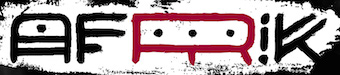 Type designer in Volgograd and Saint Petersburg, Russia, who created these display typefaces in 2018: Speedy Space Goat Oddity (a painter's font), Afrik (a hand-painted font inspired by African tribal body art, and drawn with one finger using self-made paint from crushed charcoal), Hubber (a retro signage script font), Stormy Youth (a rebellious marker pen font), Coal Soul, Alza (script), Blobber, Crem (a free futuristic slab serif), and Loscut.
 Typefaces from 2019: Dancin Pixel, Blober, Crem Slab. Typefaces from 2020: Petale (an elegant 18-style display family), Fracaso (an abstract or cubist painter's font named after Picasso). [Google]
[MyFonts]
[More] ⦿
|
Manfred Klein
[Manfred Klein: Animals]
|
 [MyFonts]
[More] ⦿
[MyFonts]
[More] ⦿
|
Manfred Klein
[TypOasis 2003]
|
 [MyFonts]
[More] ⦿
[MyFonts]
[More] ⦿
|
Manfred Klein: Animals
[Manfred Klein]
|
 Animals have always been an important source of inspiration for Manfred, for various reasons---to satisfy his grandchildren (I guess), to make political statements, to have fun, and to design animal-inspired alphabets. Here is a partial list of his typefaces: AIDino-Heavy, AbermalsAnimals, AffigMonkeys, AnimSilhous, AnimSilhousB, AnimalComedians, AnimalShadows, AnimalShadowsDrei, AnimalShadowsTwo, AnimalTypeFaces, AnimaliSilhouetti, Animalia, AnimaliaScissored, AnimaliaTwo, Animalishmk, AnimalsAnywhere, AnimalsMeetings, AnimalsOldfashion, AnimalsPrey-2006, AnimalsTwo, Apish, AustranimalsOne, BeastlyBats, BeforeAlphabetsFour, BeforeAlphabetsThree, BugsNFriends, ButterFly, ButterflyAndCo, CatDogHorse, CatSketches, Cats, CatsCats, CatsCo, CubismCreatures, DillElefantenTwo, Dillefanten, Dillfanten, DinoSilhouettes, DinosFragments, Dinotiqua-Heavy, Djungle, DogsDogs, DogsFewCats, DomesticAnimals, DueTresQuattro, EthnoFont, Fabeltiere04, FarmAnimals, FewYearsLater, FischersFritze, FischersFritzen, Fishermans, Fishing, FlyingSwimming, FroxXMedium, Getier, GetierAnimalish, GetierTwo, GraphicAnimals, Horses, Horses, HotchPotch, HowDrawAFish, HundeDogsChiens, IhrHunde, Impossibile, Insects, Insects07, Insects, InsectsMK, InsectsTwo, KaraBenNemsi, KarawaneSilhous, Krabbeltiere, LandAnimals, LetsDance, LionsClub, LittleFriendsTwo, Lorbeer, MAnimalsK, MKDingBats, MKapish, MKapishTwo, MKartuhn, ManimalsUno, MensBestFriends, MensFriends, MesoFaunaBats, MesoFaunaTwo, MicroBeings, MicroBeingsTwo, MonkeysTheatre, MyPrivateZoo, NewDinos, OldstyleZoo, Orcas, Orcas, OurLittleDarlings-One, OurLittleFriends, OwlsAndMore, OwlsNFriends, OwlsNOtherWitches, PatternaliaMK, PatternsAnimals, PickABack, RareAnimals, RatsFatzBats, RealllyAnimalishOne, ReallyAnimalsTwo, RememberMesozoikum, Roundlings, Shamanbats, Shamanish, SilhouettesAnimalish, SportsAnimals, Stadtmusikanten, SwimmingBeautys, TangramAnimals, TaurusCowboys, TypoApish, VectorAnimals, Viecher, Wacominals, WildAnimalsOne, ZigzagAnimals, ZooBats, ZooCages, ZooWoodcutsM, Zoobats, Zoography-Normal, ZooloVectoriA, Zoological, ZoologicalGardenOne, ZoologicalGardenThree, ZoologicalGardenTwo, Zoology.
 Download page. Download all these fonts in onze zip file. [Google]
[MyFonts]
[More] ⦿
|
Michael Scarpitti
|
 Mike graduated from Ohio State University with a degree in philosophy. Prolific Columbus, OH-based designer (b. Columbus, OH) whose fonts are mainly available through Scriptorium. Many of his fonts were influenced by roman inscriptional or Trajan types. These include Caesario (1993, a Trajan column font based on Goudy's drawings from 1936), Minerva (1993), Falconis and Vespasiano. Other typefaces with ancient origins include DeBellis, Pomponianus, Praitor, Jerash (1993, with Nalle), Macteris Uncial (1993), Antioch (1993), and Corbei Uncial.
 He prepared a set of fonts based on a medieval Latin British manuscript (Pontifica, 1999) and another one called Orlock (1993), a linocut style typeface based on the lettering in a poster for the German German expressionist silent film Nosferatu. Pontifica was redesigned in 2009 based on the source manuscripts from the Papal Archive. He writes: Pontifica is an example of protogothic calligraphy, a style developed at the monestery of St. Gall in the 12th century to replace Carolingian minuscule with a more efficient and compact system of lettering. Ultimately it became the progenitor of the gothic lettering styles of the late Medieval period. View Michael Scarpitti's typefaces. [Google]
[MyFonts]
[More] ⦿
|
Milagros Brignardello
|
Graduate of FADU UBA in Buenos Aires. He created a typographic posrer called Cubismo (2012). [Google]
[More] ⦿
|
Muiz Idris
|
Designer of Cube Font (2020). [Google]
[More] ⦿
|
MyFonts: Cubist typefaces
|
A collection of commercial cubist typefaces. [Google]
[More] ⦿
|
Nick Curtis
|
Nick Curtis (b. Chicago, 1948) lived in Texas from 1952-1997, and lives since 1997 in Gaithersburg, MD and Alexandria, MD. From ca. 1990 onwards, he has been designing fonts, first for free, and then commercially. He had a great reputation as a "revivalist" type designer, with a particular interest in retro fonts and art deco types. In 2003, his site had become too popular and too expensive to maintain, and thus he went commercial as Nick's Fonts. In 2013, he stopped making fonts, and donated his collection of rare books and type material to the University of Virginia. Interview. Complete list of names and other info, maintained by Sander de Voogt. Interview in which we learn about his fondness for Corel Draw as a type design tool. Near the end of 2012, he posted this comment on his web site: Fifteen years ago, I embarked on a wonderful voyage of discovery, when I created my very first font with Fontographer 3.15. My maiden voyages were, frankly, rather clunky and amateurish, but I have been told that they showed promise. Well, sure enough, thanks to the diligent (and patient) efforts of Ilene Strizver, I polished up my craft enough to sell my humble efforts---first as a sideline business and, since 2006, as my full-time job. In total, I have produced over eleven hundred fonts---almost five hundred of them freeware fonts, which I conservatively estimate have been downloaded and enjoyed by over three million people worldwide. Unfortunately, this past year has brought a series of unanticipated setbacks, culminating in the loss of my wife's beautiful mind and soul to the scourge of alcoholism. In an effort to generate extra income to cover the expenses for her long-term care, I have proposed a number of, I believe, innovative ways to revamp the online font business; unfortunately, those efforts have fallen flat, primarily due to the professional font community's abject fear of crossing the $165 million Elephant in the Room. I even offered a special discount rate of 75% off retail price for full-time students of Typohile Forum. To date, there have been zero takers. Hell: even the webfont kit of one of my own fonts which I purchased from myfonts.com turned out to be an empty folder. Talk about a run of bad luck. Which leaves my with you, dear readers. If you or someone you know has had fun or made a buck from my humble efforts throughout the years, please donate whatever you can---even a lousy dollar would help---to help me out. I would greatly appreciate it. Home page. Dafont link. FontShop link. Klingspor link. Abstract Fonts link. View the typefaces designed by Nick Curtis. [Google]
[MyFonts]
[More] ⦿
|
Nick Curtis
[Art deco typefaces by Nick Curtis: I]
|
 [MyFonts]
[More] ⦿
[MyFonts]
[More] ⦿
|
Nick Curtis
[Nick Curtis: further free typefaces]
|
 [MyFonts]
[More] ⦿
[MyFonts]
[More] ⦿
|
Nick Curtis
[Nick Curtis: Commercial typefaces]
|
[MyFonts]
[More] ⦿
|
Nick Curtis: Commercial typefaces
[Nick Curtis]
|
Nick Curtis (b. Chicago, 1948) lived in Texas from 1952-1997. Since 1997, he is in Gaithersburg, MD and Alexandria, MD. Since the 1990s, he has been designing fonts, first for free, and then commercially. He had a great reputation as a "revivalist" type designer, with a particular interest in retro fonts and art deco types. In 2003, his site had become too popular and too expensive to maintain, and thus he went commercial as Nick's Fonts. Interview. Free downloads at TypOasis. Complete list of names and other info, maintained by Sander de Voogt. Interview in which we learn about his fondness for Corel Draw as a type design tool. Home page. His free fonts are listed elsewhere. On MyFonts, he says this about himself: Nick's Fonts is a modest little foundry dedicated to the preservation of our rich typographic heritage. Most of the foundry's designs are based on authentic historical sources, gleaned from the massive collections of the Library of Congress. If you are looking for a font that captures the essence of the Wild West, the Gay Nineties or the Jazz Age, look here first: if it is not in the catalog, it will be soon. [Google]
[MyFonts]
[More] ⦿
|
Nick Curtis: further free typefaces
[Nick Curtis]
|
 This list contains information on Nick Curtis's free typefaces not discussed or mentioned under other themes. A visual summary of all his free typefaces: A, B, C, DE, F, G, HIJ, KL, M, NO, P, QR, S, T, UVWXYZ. Generally, Nick Curtis specializes in display type, revivals and interpretations.
 - Aerojones (2002). Based on a 1933 poster by George Guillermaz.
- AndironOutlineNF.
- Beauty School Dropout, Beauty School Dropout II, Beauty School Dropout IIS.
- Bellhop NF. Based on this poster.
- Blue Plate Special NF (based on a 1929 typeface by John Zimmerman at BBS called Cubist Bold). See also BluePlateSpecialSW.
- BoyzRGrossNF, BoyzRGrossShadowNF. Handprinted typefaces.
- BuenosAiresNF. Based on this poster.
- ChockABlockNF. Toy letter cubes.
- ChocolateDropsNF. Based on this poster by William Austin Starmer (1902).
- CoventryGardenNF.
- DancingDonutsNF, DancingDonutsRevised.
- EmporiumNF. Based on this poster by Fortunato Depero (1927).
- FacetsNF (2003). Based on this poster by Ruprich (1930).
- FashionVictim. FashionVictim (1999). Think Bernhard Fashion.
- FontleroyBrownNF. CheapProFonts did a Pro version in 2009.
- Forty-SecondStreet (NF, HB). Based on this inline alphabet that is genetically linked to Koch's Neuland.
- FrankensSteinCapital.
- Full-TiltBoogieNF, FullTiltBoogieCapital. Based on Obtuse (1931, A. Bardi).
- GrandPrixRevised, GrandPrixSpectacular.
- HobbyHorseNF (2000).
- JungleFeverInlineNF, JungleFeverNF. The commercial version is from 2008. Jungle Fever (2008) is patterned after Neuland Black (Rudolph Koch for Gebr. Klingspor in 1923), and the sunshine shading version is called Jungle Fever Shaded.
- KurvaceousNF.
- LagniappeInlineNF.
- LittleLordFontleroyNF (2000).
- MiddleEarthNF-Medium, MiddleEarthNF (2003). Based on a 1914 poster by F. Marx.
- MidlandRailNF, MidlandRailShadowNF. Based on this poster.
- MinstrelPosterNF, MinstrelPosterTwoNF, MinstrelPosterWHG.
- ModernTypographyNF.
- MyGalSwoopyNF (2002). Based on Shograd (1924).
- Namesake (2002). Loosely based on Allan Gothic by Allan Brandtner.
- Nickodemus-Extremus. Based on Aldous or Huxley Vertical.
- NotMaryKateNF. Oskar Kress's font Kress Versalien (1926, Schriftguss AG) inspired Nick Curtis to make Not Mary Kate NF.
- OldGateLaneNF, OldgateLaneOutline.
- Otto Heim revivals from Heim's book Farbige Alphabete (1925): Captain Swabby NF (2003, free), Halcyon Days NF (2007, not free), Monkey Fingers NF (not free), Walrus Gumbo NF (free, after a 1925 typeface by Otto Heim; the commercial version of Walrus Gumbo NF appeared in 2011), Riot Squad NF (2000, free).
- OurGangNF (1999).
- PackardClipperNF (2003). Inline typeface based on this Citroen ad by Pierre Louts (1925).
- PointsWestNF.
- PopularCafeAA, PopularCafeNF. Based on these posters by Rae (1927).
- PublicEnemyNF. Based on this Jimmy Cagney movie poster.
- RicksAmericanNF (2002).
- Roller Coaster (2000).
- Sho-Card Caps NF, ShoCard Capital. An adaptation of Futura Display.
- SwishButtonsNF. Dingbats.
- TestarossaNF (2002). Based on this 1907 poster by Leopoldo Metlicovitz.
- ToylandNF, ToylandOutlineCapital. These typefaces are outlined and shadow-cast versions of ITC Motter Corpus by Othmar Motter.
- Troglodyte NF (2006). Curtis: This fine fat typeface is based on a font called Advertisement Grotesque, discovered in a 1942 book entitled Lettering Alphabets for Draughtsmen, Advertisement Designers, Architects&Artists, by the intrepid Alfred Bastien. In 2011, he changed that description after discovering that in fact the design goes back to Albert Auspurg' Messe Grotesk (1921-1927).
- TropicanaNF (2003). This is based on Elancé by A. Bardi (1931).
- UndergroundNF (1999). Commercial version in 2009. This revives Edward Johnston's The Underground for London's metro.
- VielleVarsovieNF (sic)(2003). Based on I. Rubin's constructivist poster from 1936.
[Google]
[MyFonts]
[More] ⦿
|
Olga Tereshchenko
|
 Talented Ukrainian designer. She has interesting illustrations, and her Latin and/or Cyrillic typefaces show tremendous potential:
 - Avangard (2012). A blocky outline family.
- Black and White (2012). A great geometric / cubist experiment in the style of Mondriaan's paintings.
- Diamond (2012). An experimental polygonal typeface.
- Old Font (2012).
- Malevich (2015, BBDO Studio). An abstract typeface to celebrate Russian suprematist Kazemir Malevich.
[Google]
[MyFonts]
[More] ⦿
|
Ori Ben-Dor
|
Israeli type designer (b. 1980) who lives in Tel-Aviv. His old typefaces include Eccentric (1997). At Masterfont, he designed 1984 MF, Afifonim MF, Avtala MF, Capriza MF, Cinamon MF, Cubist One MF, Cubist Two MF, Flyntstones MF, Goolish MF, Inflazia MF, Milizia MF, Monumental One, Monumental Two, Musa Decor MF, Populist MF, Technocratia MF and Temperament MF. These typefaces were later withdrawn from the Masterfont collection. In 2005, he made Hagalil, which is discussed here. He also created this unnamed pixel typeface (2005). Graduate of the postgraduate type design program at ESAD Amiens, France, class of 2021. His graduation typeface there was the legible slab serif text typeface Ginegar (2021), which is named after a kibbutz. There are also three styles for use at larger sizes: display, head and subhead. These have novel triangular serifs and terminals. [Google]
[MyFonts]
[More] ⦿
|
Özgün Karatürk
|
Istanbul-based designer of the cubist typeface The Picasso (2014). [Google]
[More] ⦿
|
Pascal Glissmann
[Fridayfonts]
|
[More] ⦿
|
Petroglyphic Design (or: PetroFontLab, or: Petro Design)
[Alfredo Gravato]
|
PetroFontLab, or Petroglyphic Design, or Petro Design, offers free fonts by New Jersey-based graphic designer Alfredo Gravato: Refluxed (futuristic), Tekhead (futuristic), Purple Tentacle (grungy), Cubist Dreams, Meat Paper. Dafont link. Another Dafont link. [Google]
[More] ⦿
|
Piotr Klarowski
[ecaGraphics]
|
[More] ⦿
|
Prokopios Tzoulis
[Tzoulis Graphic Design (or: TZ-Design)]
|
[MyFonts]
[More] ⦿
|
Rebecca Duncan
|
FontStructor who made the cubist typeface Rebecca Duncan (2011). [Google]
[More] ⦿
|
rinpin
|
Archive with: ClowningWayText-Condensed (Imageline), the following fonts by Yoshiyasu Ito of DigitalDreamDesign: D3-Concretism-typeA, D3-Concretism-typeB, D3-Cubism, D3-CuteBitMapism-TypeA, D3-CuteBitMapism-TypeB, D3-Electronism, D3-Electronism-Katakana, D3-Honeycombism, D3-Honeycombism-Bold, D3-Honeycombism-Sorround, D3-Littlebitmapism-Katakana, D3-Mouldism-Katakana, D3-Parallelism; Faerie (Scriptorium dingbats), Freecityrhyme (Bradford Cox, 2000), Freekitten (Bradford Cox, 2000), Hiragana-Regular, Japanese, Kemuri (Toxic Type, 1997), LittleTroubleGirlBV, MotterFemD, RetroBatsOne, ROTORkeffBold, ROTORkeffRoundedBold, ROTORkeffRounded, ROTORkeff (all ROTOR fonts by Jonas Petersson of ROTORtype), Setsama (by Amanda, 2000: cat dingbats), Sumdumgoi (Mike Allard), UniCase (squarish font by Jacky Frossard, 1999), Bit4 (pixel font by Magnus Högberg, 2000), DFFangSong1B-GB, PrincessBV, RotodesignDingbats, Silkscreen, Valium, Velvet (by Faizal Reza, Squirtgun, 1997, based on URW's KunstlerschreibschD-Medi). [Google]
[More] ⦿
|
Silvia Mondello
|
Communication designer in Lissone, Italy, who created the display typeface family Galerie (2015). She explains: Galerie is a new family of typefaces for the National Gallery in Prague I designed during my six-months Erasmus in the typography studio UMPRUM (2012). The National Gallery in Prague is composed of seven buildings, each of which focuses on different art periods or styles in Czech Republic: the seven galleries don't have a unitary typographic design. The aim of the project is to create a new institutional image, which keeps a unique typographical structure for all the buildings, but also differs according to each artistic content. The family has a simple and thin shape as basis, and a different set of extrabold serifs for each building. Four up to seven were designed: the Medieval, Classical, Baroque and Cubist typefaces. [Google]
[More] ⦿
|
Steven Williams
|
Based in Indianapolis where he teaches at the Art Institute of Indianapolis and runs Burnish and Press, Steven Williams's first font is a very geometric modular experimental typeface called Willstack (2011). His second font is Cubi V (2011), which was inspired by sculptor David Smith. His third typeface is an unnamed round squarish font (2011). In 2015, he designed the ironwood typeface Westfield Greek, and in 2018 he added Patio Shop. [Google]
[More] ⦿
|
Tano Veron
|
 Buenos Aires-based creator of the children's hand font Nicolina (2012) and of the techno typeface Hifix (2012).
 Zephyr (2013) is a striped ornamental caps typeface. In the ornamental caps style, Tano also made Las Mejores Cosas De La Vida No Son Cosas (2013). Boxing (2013) is a condensed sans headline face. In 2014, he made the free multicolored vector format typeface Mondrian, which is named after De Stijl artist Piet Mondrian. In the same vane, he made the decorative caps typeface Kandinsky (2014). Keplerian (2014) is an alchemic typeface. In 2014, Tano Veron and Yai Salinas co-designed the free vector format colored display typeface Carioca. In 2015, he published Natureza (alchemic / hipsterish), Theremin (great variable-width san; free download), Mapuche (a free native symbol font), Pettoruti Type (a colorful cubsy typeface influenced by the cubist Argentinian painter Emilio Pettoruti (1892-1971), Sandre (based on Cassandre's Bifur), Dionisia (a great free art deco poster typeface), Jekyll & Hyde (a free EPS format vintage display pair of typefaces), Binary Font (free), the free sci-fi typeface Houston, the free hipster typeface Belladona, the tweetware constructivist font Moscu, the decorative caps typeface Guernica (named after Picasso's famous civil war painting from 1937), the free vector format typeface Miro and the tweetware colored circus font Circo. Typefaces from 2017: Hot Rod (free art deco style), Hangar (rounded sans), Belladona Stencil, Bardo (an all caps typeface described as classic, transgressive and badass as Shakespeare, it has a bit of the art deco charm of the The New Yorker typeface). Behance link. Dafont link. [Google]
[More] ⦿
|
Theo van Doesburg
|
 Dutch cofounder (1883-1931) with Piet Mondriaan, Bart van der Leck, Anthony Kok, Vilmos Huszar and J.J.P. Oud of the De Stijl magazine in 1917. This was also the start of the De Stijl movement. Born Christiaan Emil Marie Küpper on August 30, 1883 in Utrecht as the son of the photographer Wilhelm Küpper and Henrietta Catherina Margadant. Early in his twenties he started using the name of his stepfather Theodorus Doesburg to sign his early paintings. His first exhibition was in 1908. He died in Davos, Switzerland, in 1931. In 1919 he created an alphabet by dividing a square into 25 equal smaller squares. This alphabet predates Bauhaus experimental types by Kurt Schwitters and others. van Doesburg's alphabet has been mimicked and digitized and used as inspiration by many. A partial list:
 - Foundry Architype Van Doesburg (1996, David Quay and Freda Sack, The Foundry).
- Zwartvet (2002, Max Kisman, Holland Fonts).
- van Doesburg by Frank Nichols.
- Bonset (2008, Ricardo Cordoba): the name I.K. Bonset was used by van Doesburg in his Dada poetry. Bonset is a free FontStruct font.
- Theo (2003, Dan Pike) was inspired by the work of Theo van Doesburg and Theo Ballmer (1902-1965), both of whom created an alphabet based on a basic 5x5 grid system.
- Doesburg and Doesburg Fat by Jordan Harper.
- Theo Van Doesburg V4.0, a free font by Gonzalo Carretero.
- VanDoesburgBrokenFS and VanDoesburg (2002), free fonts by Manfred Klein.
- TwentyFourNinetyOne [2491] (2008) by Steve Mehallo.
- DeStijl, a free font by Austin Kurowski.
- Typeco De Stijl (2012, FontStruct) is by James Grieshaber.
- Distill (2009): A type family by Matt Desmond (MAD Type).
- Panoptica Doesburg (2003) is a unicase typeface Nick Shinn.
Els Hoek, Marleen Blokhuis, Ingrid Goovaerts, Natalie Kamphuys, et al. penned Theo Van Doesburg: Oeuvre Catalogus (2000, Centraal Museum). Picture of a dada poster by him. Page at Design History. [Google]
[MyFonts]
[More] ⦿
|
Þorleifur Gunnar Gíslason
|
Þorleifur Gunnar Gíslason is a graphic designer in Reykjavik, Iceland, and graphic design student at the Iceland Academy of the Arts. In 2009, he made Coffee, a font based on coffee beans laid out on a flat surface. In 2011, he designed the experimental geometric (cubist?) typeface Ásmundur, which was inspired by Cassandre's Bifur and is a tribute to Icelandic sculpture artist Ásmundur Sveinsson. [Google]
[More] ⦿
|
TypOasis 2003
[Manfred Klein]
|
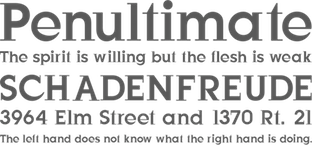 Manfred Klein's typefaces from 2003: FictionBeings, MK Silhouetta Round, FlyOnYou, Karlas Bats, Maenneken, Spiralish Two, WhoIsTheTerrorist, Avanti Dilettanti, Aggressors Bats, Aztecish, Corrodet, Lorbeer, BastardusSans, BaumWell, Bodonitown, WellrockSlab, Cassandra, PreventiveWarOval, Damagedpixfont, EuropeanTypewriter, KarlasStrokemen, PreventiveWarQuestion, Birds With Types, Cubism Creatures, MourningTrauer, BirdsXtreme, BirdsToolbox, WantedTerrorists, TheRoots, MK Latino Plain, AndBullets, Androidish, BirdsToolbox, BookHeads, CorrodetClassicaps, Damagedpixfont, LateBirds, LateBirdsFS, LateBirdsThree, MKStencilsansBlack, MatisseTraces, MexiKOrnaments, MkLatinoPlain, NonCommercial, PreventiveWarQuestion, QuickBirds, SpiralusFaces, SpiralusKrux, TheRoots, WantedTerrorists, WhereIsTheBirdsDealer, BlueMoonsByDay, BlueMoonsInverse, BruchschriftMK, HalfsAreEnoughLatin, Latine, RandomFrax, Solitaires, SuperSansMKringel, SuperSansStrange, WildBirds, AreHalfsEnough, GeometricWanderlust, HeadfeetersPartialDisturbed, LuziFer, MouseStrokes3D, MouseStrokesCont, MouseStrokesInverseShadow, OlisWebButtonsInvers, PeaceThruGuns, SaulsRandomBirds, Fragmenta, Remi Wacom, Crazy World, Democratic Peace Warriors, OrnithoLogics, People, HelloCleoPetra, VertigoComic, Romi Petito (Miro drawings imitated), LogoFacesToolbox, WirewalkersVertigo, AidaSerifObliqueMedium, BuddhasBigArmy, GridExerciseSerif, Guernica38Remember, LogoFacesArtists, LogoModaRoma, LogoModels, LogoModelsBowToBoss, Silhouettes03, SteepTypewriterMedium, SuddenFall, WoodTypesMK, BrokenSans, FutstencilSerif, MKTypobricks, SegmentaSans, WhyMar, Xperimentypo FS, HouseGhosts, MKEyeMinals, StrangeBeings, AlwaysBig, Old Constructed Caps, Fat Floralphabet, MannohK Serif, TheyWasNiceMurdersAlways (an anti-war font basic on Guernica), DadaDa, FrancoforteSerifus, Arrowbytes, DingsbumsBats, HeadsTorsi, VollkegelSerif, NiceMurders, Burklein, Comicontemporary, ConstrxiaBlackInline, DadasDreams, EgyptAxt, KleinBricksNegative, AntiquaInGrid, GiveMeFive, Bitsbats, SilhouettesInGrids, BigSlabHammer, BurkleinOblique, JustOldFashion, KleinsanBold, Oliver, Gipfelkoepfe, HolySimplicity, Standing Buttons, 52 Letters, FriendlyFire, Lettersoup, Manga Axt, SplinterMKaps, GiambattistaVsPetit, TypoGhosts, ZagZag, MotionTools, MouseDroodles, Topnotches, TypoAnarchycalEyes, LaCittaShadow, Venezia, ReadingHelpersInvers, RoughRockys, SchulVokalDots, Analphabetism, Circularia, HalfCircleAlphabetXP, Multistrokes, Unzialish, ChildrenDingbats, EveryPictureTellsAStory, OgiRema, CrazyCrazySans, Sketched Alphabet, HerrCoolesWriting, Julius Caesar Black, AliensNew, PadBats, WaPicts, ImperiumLatineSerif, KleinsForgottenRoman, Helixal, MKDrawings, MKDrawingsPeople, FriendlyFireBullets, BirdsAndOtherBeings, Pinocchionish, PointGallery, Spiralicus, AfroDesigns, Frontal, MangaMaterial, NiceNeighbours, HerdeckeSans, ParmaCrazy, QuadrigAlphabetTwo, HellasDust, WildBradoni, Sketchiqua, FragmentuM, LogoHalfnHalf, MKSzene, Neudoerffer, StrokesNBullets, CircusStars, Facialish, Kleerikale, Kleinkeys, OnKleesTraces, NearAldus, NearJanTschich, Climbers, Krakelfabet, Amoebats+Climbats, ClimbersPhantasies, Karlas, Anarchists, Masks, SpaceCrew, Latins, Characters, FrontalButtons, GernKleinThree, MouseScribbles, Scannings, KidsFirstPrintFont, CuneyChars, VenetianBlind, MKartoonKoepfe, MouseAsBrush, SilhouFaces, TaurusCowboys, ShakeySlabserif, BodoniXT, EyelecBats, HowDrawAFish, Klill-LightTallX, MissingLinks, SansBroadway, Serifsketchia, SprayersFriends, LetterBuildings, SpaceAttacks, MouseAsPainter, MouseLearnMiro, CybaPee, ConstrxiaBlack, LetterBuildingsRoundContrast, RunningLetters, ZenFrax, ZenFraxCondensed, Gestures, HotJuly, JulySketches, KleinsBirds10, RoundHeads, SketchedBats, CybaPeeBlack, MKSansTallX, MKSerifTallX, BlaxxerifaBeta, CyclopsBlax4Dirk, Cyclop, EclectHeads, Graphis, TheManyMKFaces2, PetitLatin, Bowing, BowingInverse, ElectronicFaces, MKSansTallXMedium, MKSerifTallXMedium, ConstruCaps, PhantasticBeings, SpaceBeings, Traffic, HopeRound, Artefakte, AstroBats, AstroBatsFS, AstrobatsTwo, BabelSans-Bold, BabelSans-BoldOblique, BabelSans-Oblique, BabelSans, CalendarDigits, Drivers, DynamicBeings, FloralOne, FloralTwo, GreekArt, JamboRound, LinoCapsA, LinoCapsAR, LinocapsB, LinocapsBR, LombardiCaps-Round, LombardiCaps, LosAngeles, OsterinselPlus, PixCaps, PixCapsRound, PixCapsShadow, SecretWriting, SlabTallX-Medium, SlabTallX, SportsCartoons, ToolsMK, TypoSlabserif-Light, WeLoveAmericasWisdom, Pixelsplitter, Gonzales Sans, Spiralanautics Two, Circulum, Handiqua, typOasis-Initials, Griddies, InCrossFires, MKreatures, Weapons, Imprimerie, FarmersWrite, MKPixelProject, VeryOblique, AgroFont, SketchedMen, Imprimerie Bold, FoolOnTheHill, FoolsThree, TeleCom, AllesNurGeklaut, MKImprovisations, ZigZagOne, ZigZagTwo, ZigzagAnimals, RunishQuill, DomesticAnimals, HappyBirthday, KLEINigkeiten, TypoLatinSerif, DoodlesWritten, PointerSisters, QuadratZiffern, TypoShadows, MonAmourFraktur, SchaftstiefelKaputt, Birds11, Impossibile, PersonaRondo, Brandomi, GeoSansLight (based on Futura), LatinCondensed, AidaOopsXtra, BodoBlackSquares, BodoDisks, ThreeDeeTwoBeta, TypoBoxesRdTwo, Let'sDance, SilhouettesSocled, StoneAgeFeelings, BorisBlackBloxx (used by Brisbane for its branding), BorisBlackBloxxDirty, Latinia, JonasFragments, WildThingShadow, BallettAbsurdo, CarneVale, CatsDogs, HalloWien, Völkerfreundschaft, OldSansBlack, SteinAntikLight, AntiquaInGrid, SteinAntik, AnimalsMeetings, ArteAfrique, BraveOldWorld, Minidom, MonsTheSecondA, MonsTheSecondB, NipponsMonsBats, SpontanoCondenso, Stadtmusikanten, WacoGraphireSketches, KlitschKOtiqua, IronFraktur, Mons03Beta, Mons04, Pointillism Toolbox, BlackGapSans, DingsUndDas, DingsUndDasRunde, Faces, ForAlchemistsOnly, HalloWienTheTramps, MediaevalBats, MonsTheFifth, Peacetiqua, PickABack, TheTrampsTrash, Abstracta-Bold, AbstractaGrid, EdgedFaces, EdgedFacesKantig, HelloViennaMacabre, Menschen, SchulVokalDotless, Tremolo-DemiBold, Tremolo, Typomolecule, WacoFaces, DirtyThinkwitz, GetierAnimalish, Katrina-Normal, KleinsTypesoup, Koepp, Movieboards, NeudoerfferScribbleQuality, NewEarthCitizens, NewsRoar, OldTypographicSymphony-Regular, OldTypographicSymphony-Round, RupturedSans, SketchesByDuerer, SketchesInTypoasis, SlimSansSerif-Bold, SlimSansSerif, Snoutlike, Squaredances, Wacollection, Wacominals, AntikWaCom, FraxBrix, MKBritishWriting, MKRunes-Light, MKRunes, PointsNDotsImprovisations, DadaGrid, ReadItOrDada, VisualImpressions, AugenEyes, DuerersMinuskeln, GothicMajuscles, KyrillaSansSerif-Black, KyrillaSansSerif-Bold (Cyrillic simulation), LombarDuerer, Mdoodled, WittewittMajuscles-Flourish, WittewittMajuscles-FlourishBricks, ScribbleABit, DadaMeetsStoneage, HarpersBizarre, KarawaneSilhous, KritzelBirds, LightUnciale, Look, Nonserif-Regular, PalatinosTypeSoup, SansXHigh, StoneAgeAgain-Normal, TypoasisBoldGothic, UnderlineMonospace, Wacomedians, AbstractConcretLogo, Animalia, AnimaliaTwo, ClassizismAntiquaBook, HansFraktur, IrishUnciAlphabet, MBats, MKBats, Olivia-Normal, SlabserifXhigh, SuprematismFour, SuprematismOne, SuprematismThree, SuprematismTwo, TypesAntiques, WasWoodcuts, AnimalShadows, ArtGoesPixeled, BellaMusica, BirdsOThree, BlaxxConPersona, CaricaturesHeads, CartoonHeads, Children, FraxInCage, FraxInCageLeftOblique, FraxInCageRightOblique, HansSchoensCapsInGrid, HollaMediaeval-Bold, HollaMediaeval-BoldOblique, HollaMediaeval-Oblique, HollaMediaeval, KleinFeodoraCaps, Leibniz-Regular, NewEarthResidents, OtherPeople, PickUpBats, VierfachRund, WacomicCondensed-Medium, WysiwygBats, XmasBalls. [Google]
[MyFonts]
[More] ⦿
Manfred Klein's typefaces from 2003: FictionBeings, MK Silhouetta Round, FlyOnYou, Karlas Bats, Maenneken, Spiralish Two, WhoIsTheTerrorist, Avanti Dilettanti, Aggressors Bats, Aztecish, Corrodet, Lorbeer, BastardusSans, BaumWell, Bodonitown, WellrockSlab, Cassandra, PreventiveWarOval, Damagedpixfont, EuropeanTypewriter, KarlasStrokemen, PreventiveWarQuestion, Birds With Types, Cubism Creatures, MourningTrauer, BirdsXtreme, BirdsToolbox, WantedTerrorists, TheRoots, MK Latino Plain, AndBullets, Androidish, BirdsToolbox, BookHeads, CorrodetClassicaps, Damagedpixfont, LateBirds, LateBirdsFS, LateBirdsThree, MKStencilsansBlack, MatisseTraces, MexiKOrnaments, MkLatinoPlain, NonCommercial, PreventiveWarQuestion, QuickBirds, SpiralusFaces, SpiralusKrux, TheRoots, WantedTerrorists, WhereIsTheBirdsDealer, BlueMoonsByDay, BlueMoonsInverse, BruchschriftMK, HalfsAreEnoughLatin, Latine, RandomFrax, Solitaires, SuperSansMKringel, SuperSansStrange, WildBirds, AreHalfsEnough, GeometricWanderlust, HeadfeetersPartialDisturbed, LuziFer, MouseStrokes3D, MouseStrokesCont, MouseStrokesInverseShadow, OlisWebButtonsInvers, PeaceThruGuns, SaulsRandomBirds, Fragmenta, Remi Wacom, Crazy World, Democratic Peace Warriors, OrnithoLogics, People, HelloCleoPetra, VertigoComic, Romi Petito (Miro drawings imitated), LogoFacesToolbox, WirewalkersVertigo, AidaSerifObliqueMedium, BuddhasBigArmy, GridExerciseSerif, Guernica38Remember, LogoFacesArtists, LogoModaRoma, LogoModels, LogoModelsBowToBoss, Silhouettes03, SteepTypewriterMedium, SuddenFall, WoodTypesMK, BrokenSans, FutstencilSerif, MKTypobricks, SegmentaSans, WhyMar, Xperimentypo FS, HouseGhosts, MKEyeMinals, StrangeBeings, AlwaysBig, Old Constructed Caps, Fat Floralphabet, MannohK Serif, TheyWasNiceMurdersAlways (an anti-war font basic on Guernica), DadaDa, FrancoforteSerifus, Arrowbytes, DingsbumsBats, HeadsTorsi, VollkegelSerif, NiceMurders, Burklein, Comicontemporary, ConstrxiaBlackInline, DadasDreams, EgyptAxt, KleinBricksNegative, AntiquaInGrid, GiveMeFive, Bitsbats, SilhouettesInGrids, BigSlabHammer, BurkleinOblique, JustOldFashion, KleinsanBold, Oliver, Gipfelkoepfe, HolySimplicity, Standing Buttons, 52 Letters, FriendlyFire, Lettersoup, Manga Axt, SplinterMKaps, GiambattistaVsPetit, TypoGhosts, ZagZag, MotionTools, MouseDroodles, Topnotches, TypoAnarchycalEyes, LaCittaShadow, Venezia, ReadingHelpersInvers, RoughRockys, SchulVokalDots, Analphabetism, Circularia, HalfCircleAlphabetXP, Multistrokes, Unzialish, ChildrenDingbats, EveryPictureTellsAStory, OgiRema, CrazyCrazySans, Sketched Alphabet, HerrCoolesWriting, Julius Caesar Black, AliensNew, PadBats, WaPicts, ImperiumLatineSerif, KleinsForgottenRoman, Helixal, MKDrawings, MKDrawingsPeople, FriendlyFireBullets, BirdsAndOtherBeings, Pinocchionish, PointGallery, Spiralicus, AfroDesigns, Frontal, MangaMaterial, NiceNeighbours, HerdeckeSans, ParmaCrazy, QuadrigAlphabetTwo, HellasDust, WildBradoni, Sketchiqua, FragmentuM, LogoHalfnHalf, MKSzene, Neudoerffer, StrokesNBullets, CircusStars, Facialish, Kleerikale, Kleinkeys, OnKleesTraces, NearAldus, NearJanTschich, Climbers, Krakelfabet, Amoebats+Climbats, ClimbersPhantasies, Karlas, Anarchists, Masks, SpaceCrew, Latins, Characters, FrontalButtons, GernKleinThree, MouseScribbles, Scannings, KidsFirstPrintFont, CuneyChars, VenetianBlind, MKartoonKoepfe, MouseAsBrush, SilhouFaces, TaurusCowboys, ShakeySlabserif, BodoniXT, EyelecBats, HowDrawAFish, Klill-LightTallX, MissingLinks, SansBroadway, Serifsketchia, SprayersFriends, LetterBuildings, SpaceAttacks, MouseAsPainter, MouseLearnMiro, CybaPee, ConstrxiaBlack, LetterBuildingsRoundContrast, RunningLetters, ZenFrax, ZenFraxCondensed, Gestures, HotJuly, JulySketches, KleinsBirds10, RoundHeads, SketchedBats, CybaPeeBlack, MKSansTallX, MKSerifTallX, BlaxxerifaBeta, CyclopsBlax4Dirk, Cyclop, EclectHeads, Graphis, TheManyMKFaces2, PetitLatin, Bowing, BowingInverse, ElectronicFaces, MKSansTallXMedium, MKSerifTallXMedium, ConstruCaps, PhantasticBeings, SpaceBeings, Traffic, HopeRound, Artefakte, AstroBats, AstroBatsFS, AstrobatsTwo, BabelSans-Bold, BabelSans-BoldOblique, BabelSans-Oblique, BabelSans, CalendarDigits, Drivers, DynamicBeings, FloralOne, FloralTwo, GreekArt, JamboRound, LinoCapsA, LinoCapsAR, LinocapsB, LinocapsBR, LombardiCaps-Round, LombardiCaps, LosAngeles, OsterinselPlus, PixCaps, PixCapsRound, PixCapsShadow, SecretWriting, SlabTallX-Medium, SlabTallX, SportsCartoons, ToolsMK, TypoSlabserif-Light, WeLoveAmericasWisdom, Pixelsplitter, Gonzales Sans, Spiralanautics Two, Circulum, Handiqua, typOasis-Initials, Griddies, InCrossFires, MKreatures, Weapons, Imprimerie, FarmersWrite, MKPixelProject, VeryOblique, AgroFont, SketchedMen, Imprimerie Bold, FoolOnTheHill, FoolsThree, TeleCom, AllesNurGeklaut, MKImprovisations, ZigZagOne, ZigZagTwo, ZigzagAnimals, RunishQuill, DomesticAnimals, HappyBirthday, KLEINigkeiten, TypoLatinSerif, DoodlesWritten, PointerSisters, QuadratZiffern, TypoShadows, MonAmourFraktur, SchaftstiefelKaputt, Birds11, Impossibile, PersonaRondo, Brandomi, GeoSansLight (based on Futura), LatinCondensed, AidaOopsXtra, BodoBlackSquares, BodoDisks, ThreeDeeTwoBeta, TypoBoxesRdTwo, Let'sDance, SilhouettesSocled, StoneAgeFeelings, BorisBlackBloxx (used by Brisbane for its branding), BorisBlackBloxxDirty, Latinia, JonasFragments, WildThingShadow, BallettAbsurdo, CarneVale, CatsDogs, HalloWien, Völkerfreundschaft, OldSansBlack, SteinAntikLight, AntiquaInGrid, SteinAntik, AnimalsMeetings, ArteAfrique, BraveOldWorld, Minidom, MonsTheSecondA, MonsTheSecondB, NipponsMonsBats, SpontanoCondenso, Stadtmusikanten, WacoGraphireSketches, KlitschKOtiqua, IronFraktur, Mons03Beta, Mons04, Pointillism Toolbox, BlackGapSans, DingsUndDas, DingsUndDasRunde, Faces, ForAlchemistsOnly, HalloWienTheTramps, MediaevalBats, MonsTheFifth, Peacetiqua, PickABack, TheTrampsTrash, Abstracta-Bold, AbstractaGrid, EdgedFaces, EdgedFacesKantig, HelloViennaMacabre, Menschen, SchulVokalDotless, Tremolo-DemiBold, Tremolo, Typomolecule, WacoFaces, DirtyThinkwitz, GetierAnimalish, Katrina-Normal, KleinsTypesoup, Koepp, Movieboards, NeudoerfferScribbleQuality, NewEarthCitizens, NewsRoar, OldTypographicSymphony-Regular, OldTypographicSymphony-Round, RupturedSans, SketchesByDuerer, SketchesInTypoasis, SlimSansSerif-Bold, SlimSansSerif, Snoutlike, Squaredances, Wacollection, Wacominals, AntikWaCom, FraxBrix, MKBritishWriting, MKRunes-Light, MKRunes, PointsNDotsImprovisations, DadaGrid, ReadItOrDada, VisualImpressions, AugenEyes, DuerersMinuskeln, GothicMajuscles, KyrillaSansSerif-Black, KyrillaSansSerif-Bold (Cyrillic simulation), LombarDuerer, Mdoodled, WittewittMajuscles-Flourish, WittewittMajuscles-FlourishBricks, ScribbleABit, DadaMeetsStoneage, HarpersBizarre, KarawaneSilhous, KritzelBirds, LightUnciale, Look, Nonserif-Regular, PalatinosTypeSoup, SansXHigh, StoneAgeAgain-Normal, TypoasisBoldGothic, UnderlineMonospace, Wacomedians, AbstractConcretLogo, Animalia, AnimaliaTwo, ClassizismAntiquaBook, HansFraktur, IrishUnciAlphabet, MBats, MKBats, Olivia-Normal, SlabserifXhigh, SuprematismFour, SuprematismOne, SuprematismThree, SuprematismTwo, TypesAntiques, WasWoodcuts, AnimalShadows, ArtGoesPixeled, BellaMusica, BirdsOThree, BlaxxConPersona, CaricaturesHeads, CartoonHeads, Children, FraxInCage, FraxInCageLeftOblique, FraxInCageRightOblique, HansSchoensCapsInGrid, HollaMediaeval-Bold, HollaMediaeval-BoldOblique, HollaMediaeval-Oblique, HollaMediaeval, KleinFeodoraCaps, Leibniz-Regular, NewEarthResidents, OtherPeople, PickUpBats, VierfachRund, WacomicCondensed-Medium, WysiwygBats, XmasBalls. [Google]
[MyFonts]
[More] ⦿
|
Tzoulis Graphic Design (or: TZ-Design)
[Prokopios Tzoulis]
|
Advertised as distorted space-age type. TZ Design is Prokopios Tzoulis' Athens-based design studio. His fonts cover Greek and Latin. TZ-Cubistic1 (2004) and TZ Perfecta III Bold (2004) is futuristic. Display types, all made in 2004, include TZCALLI, Tzmystery and TZnewmode Bold. [Google]
[MyFonts]
[More] ⦿
|
Vladimir Tsagolov
[Lomo Hiber]
|
 [MyFonts]
[More] ⦿
[MyFonts]
[More] ⦿
|
Vojtech Preissig
|
 Czech expressionist type designer from Svetec u Biliny, Bohemia, b. 1873. His work was influenced by Japanese art and symbolism. During World War II, Preissig supported the Czech resistance and was arrested in 1940. He died in 1944 in the Dachau concentration camp. Preissig is representative of the Czech cubist period, 1910-1925. His only book typeface, Preissig Antikva, was cast in 1925 at the Czech State Printing Office foundry in Prague, where he had returned to settle in 1930. This lively angular typeface had a hand-drawn poster-look feel. It was a milestone in Czech type design and served as inspiration for later developments, including typefaces by Menhart, Ruzicka, and Tyfa.
 Preissig Antikva was the basis of several digitizations: - At P22, we find P22 Preissig (Preissig Roman, Preissig Scrape, Preissig Lino, and Preissig Extras), done in 1997 [P22 Preissig Scrape was digitized in 1997 from samples of an alphabet designed and hand cut by Vojtech Preissig in 1914 for a book project that was never completed]. In 2019, Richard Kegler added P22 Preissig Calligraphic and writes: Preissig developed this type design in 1928 and has remained unpublished until recently. His original designs feature an accompanying italic as well as small caps. Preissig had originally named the typeface design after his former employer in New York, Butterick Publishing Co. The Butterick typeface retains the angularity of his previous typeface, Preissig Antiqua (aka P22 Preissig Roman), but displays a more fluid calligraphic influence.
- At Storm Type Foundry, we have Preissig Antikva Pro (1998-2012, +Ornaments), and Preissig 1918 by Frantisek Storm and Ottokar Karlas.
- Alexander White created the revivals Preissig Antikva and Preissig Italika in 2000.
- While not directly linked to a particular typeface, David Kerkhoff's Irena (2016) is a wonderful tribute to Preissig. Irena is named after Preissig's daughter, Irena Bernaskova.
Klingspor link. View Vojtech Preissig's typefaces. View typefaces influenced by or based on those of Pressig. [Google]
[MyFonts]
[More] ⦿
|
William A. Woolley
|
 Designer of the heavy stencil Futura Black-like cubist typeface Braggadocio (Monotype, 1930). Jaspert recalls the differences with Futura Black: a heavy sans serif with a resemblance to Futura Black by the omission of thin strokes. But the letters are wider and the main strokes thicker; ascenders and descenders are shorter. The G has a spur; the J tapers to a point on the line. In the lower case c and s with their blobs approach more closely to the usual fat face design. [Google]
[More] ⦿
Designer of the heavy stencil Futura Black-like cubist typeface Braggadocio (Monotype, 1930). Jaspert recalls the differences with Futura Black: a heavy sans serif with a resemblance to Futura Black by the omission of thin strokes. But the letters are wider and the main strokes thicker; ascenders and descenders are shorter. The G has a spur; the J tapers to a point on the line. In the lower case c and s with their blobs approach more closely to the usual fat face design. [Google]
[More] ⦿
|
Yoshiyasu Ito
[DigitalDreamDesign]
|
[More] ⦿
|
Yuichiro Izumi
|
Yuichiro Izumi's fonts are sold through Font Pavilion. Calling himself TypeRanger, he designed Paprika-Red (thick katakana font), Type Rangers (romaji, katakana), Baby Pink, Chinalphabet, Cubism Complex A, Octa (kata, hira). [Google]
[More] ⦿
|

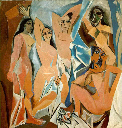
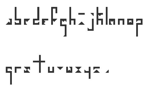
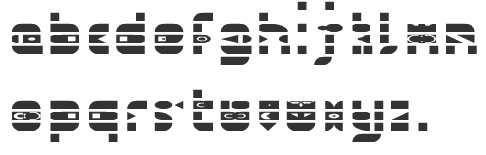
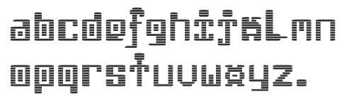
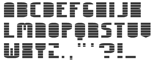
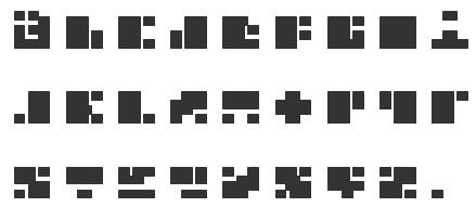
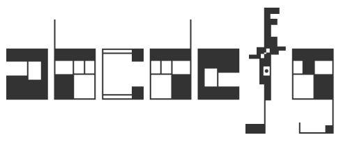
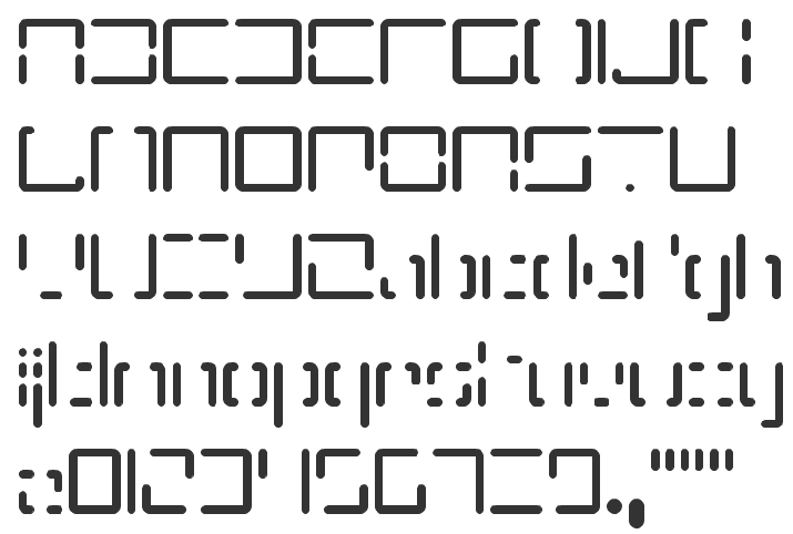
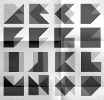
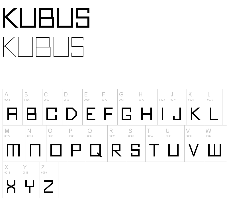
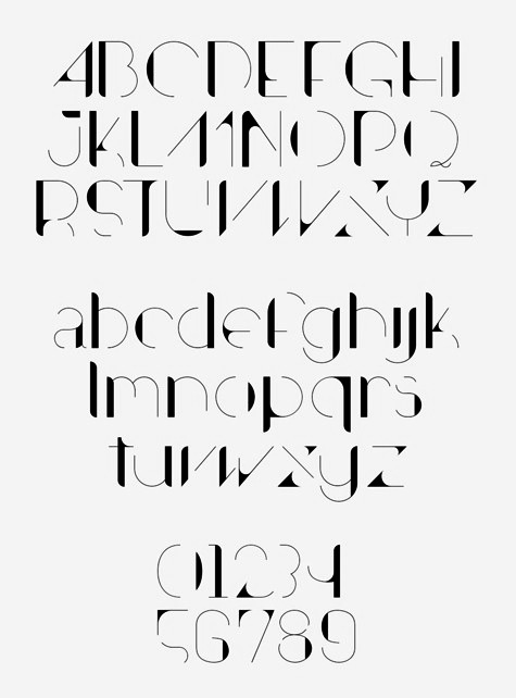
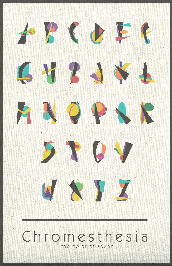
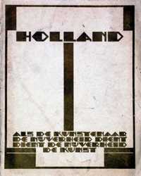
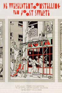
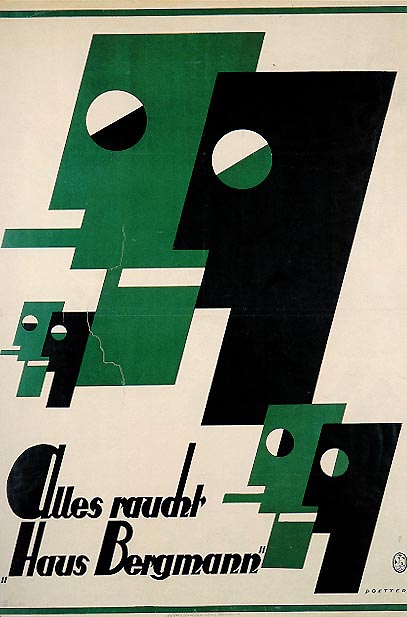
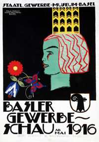
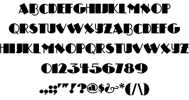
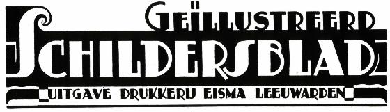
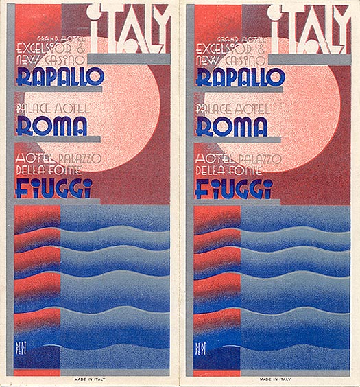
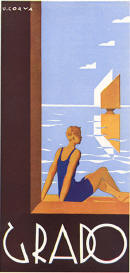
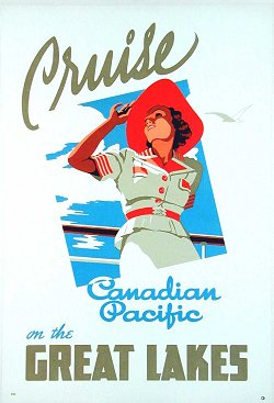
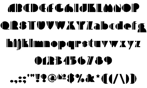
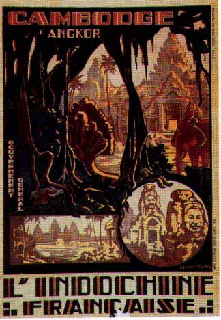
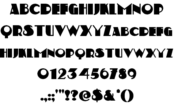
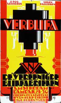
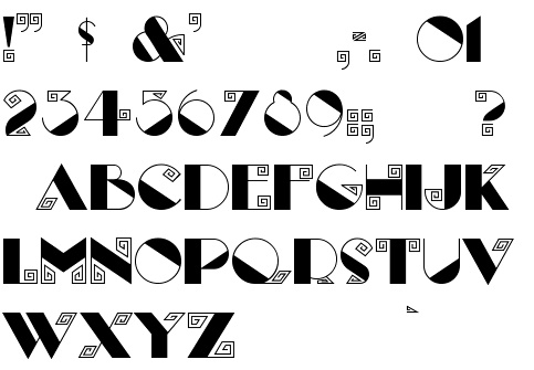
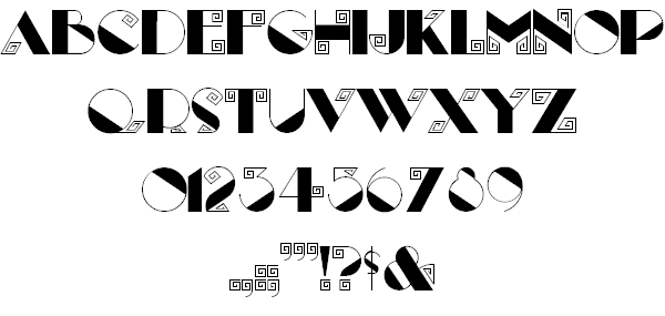
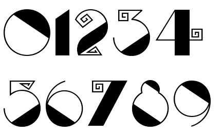
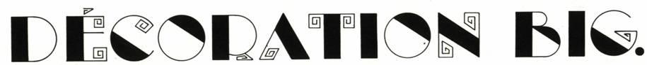
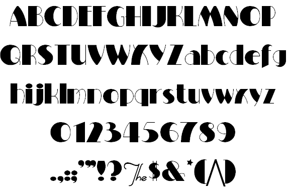
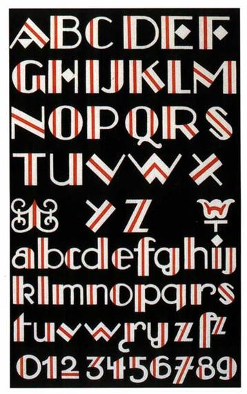
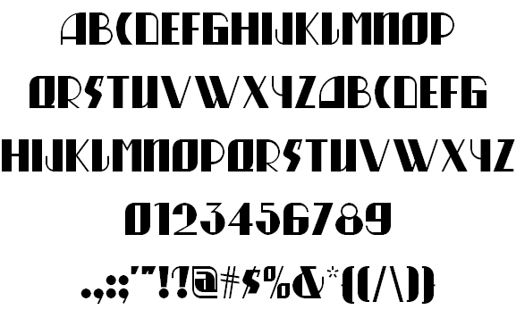
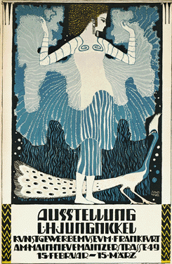
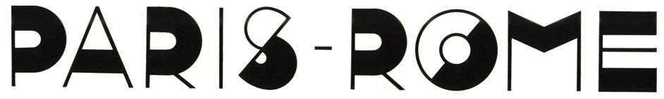
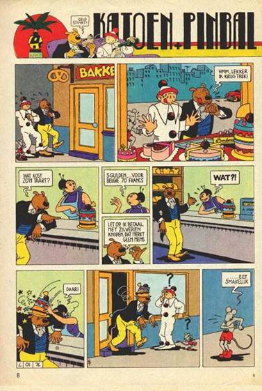
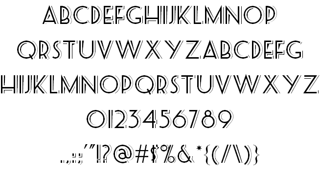
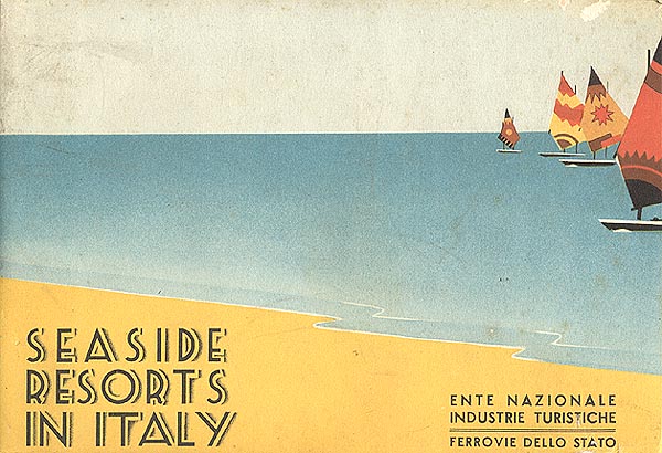
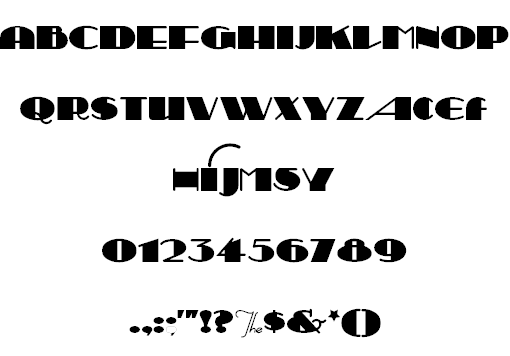
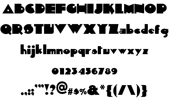
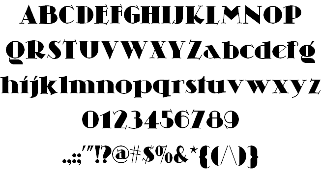
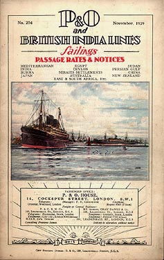
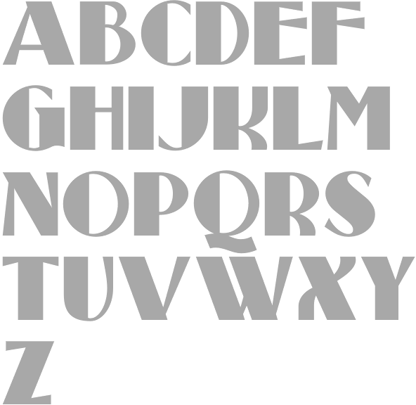
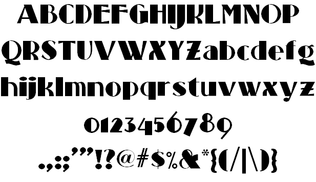
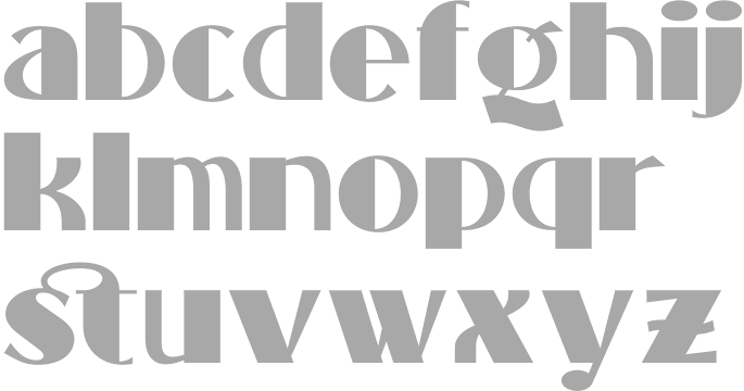
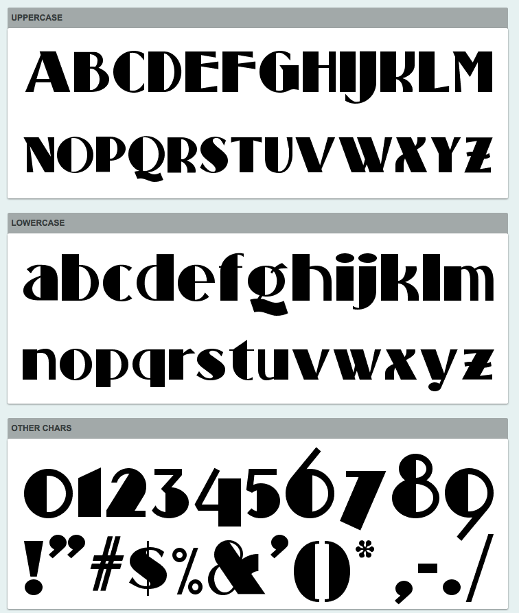
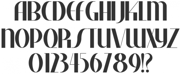
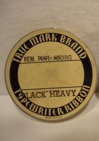
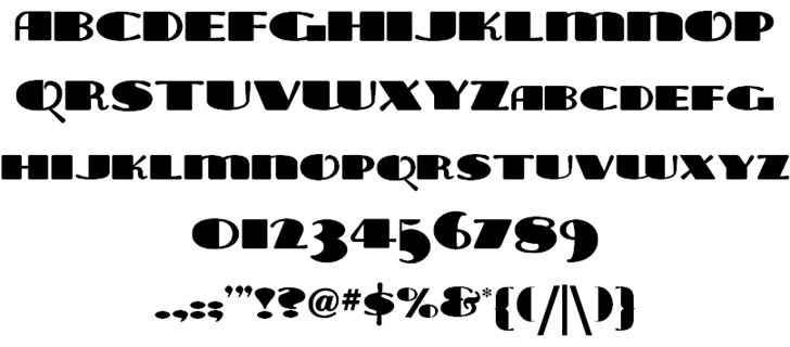
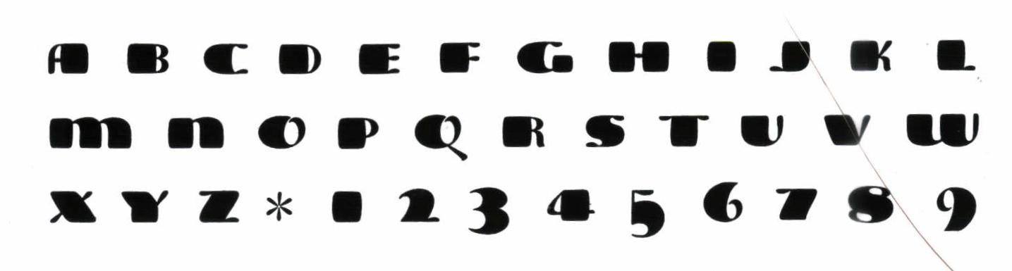
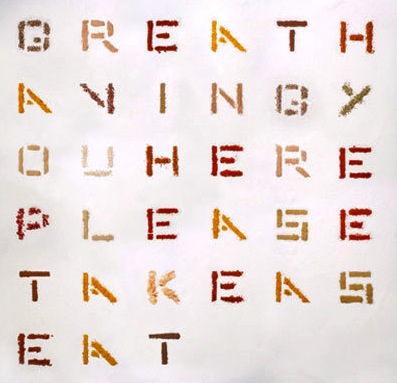
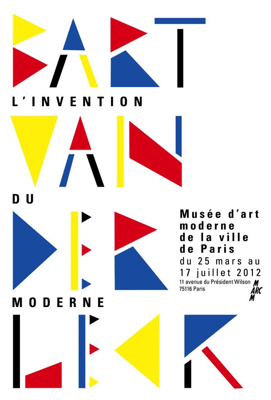
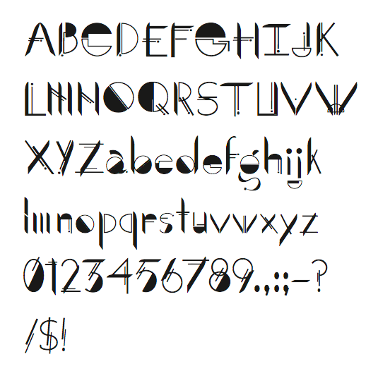
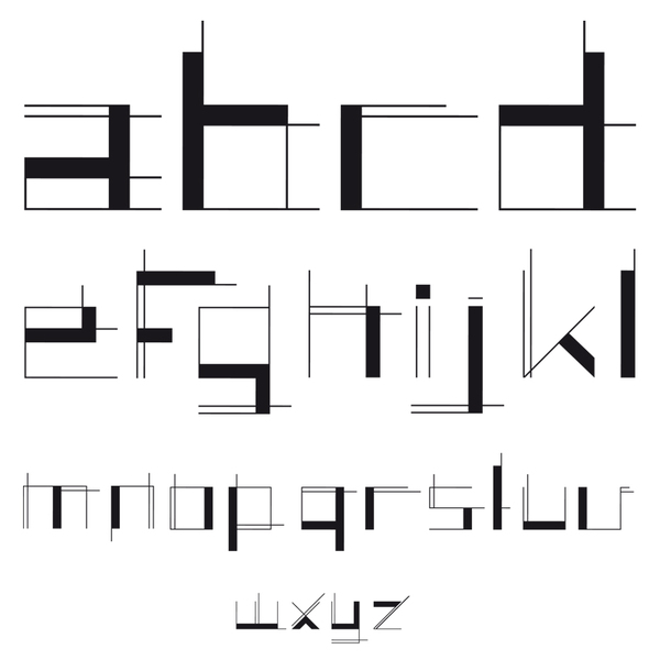
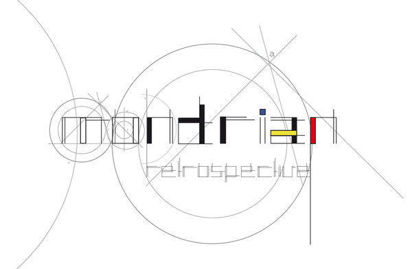
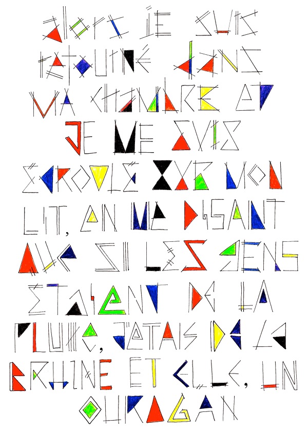
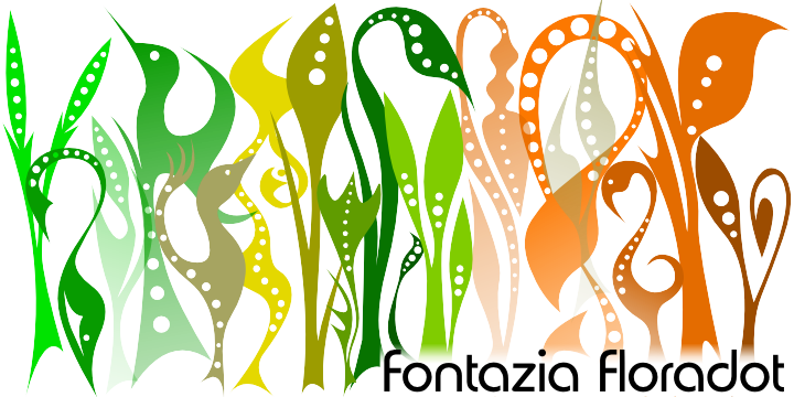
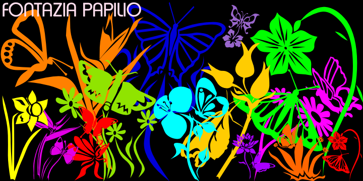
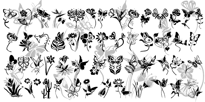
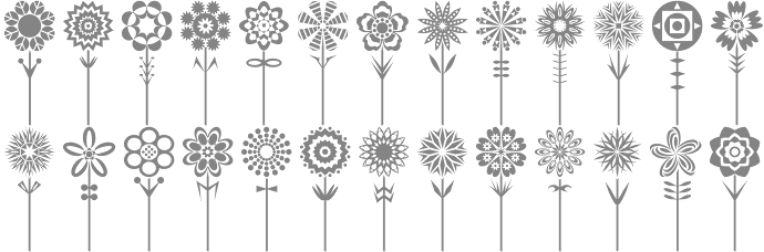
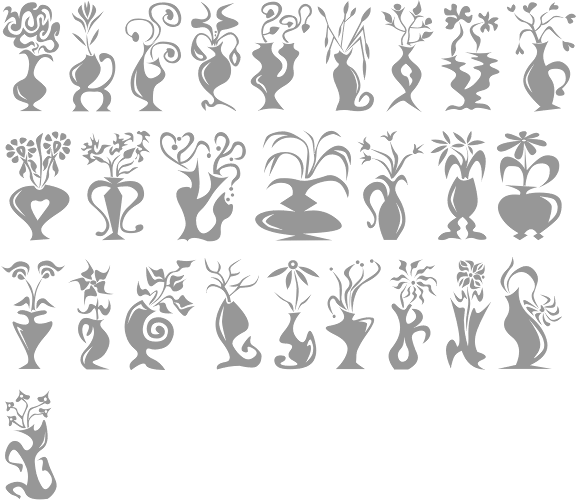
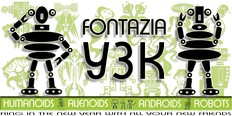
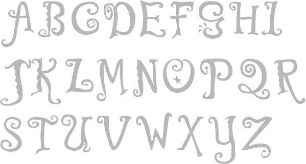
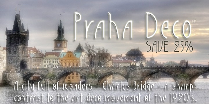
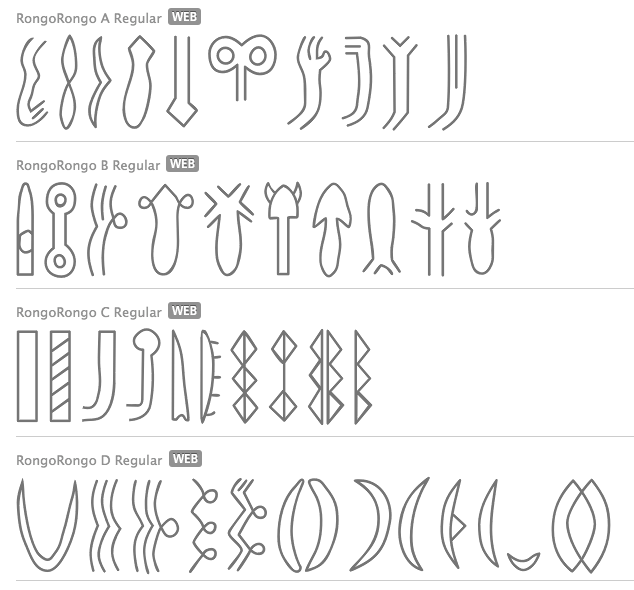
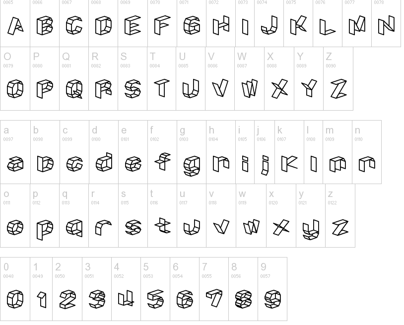
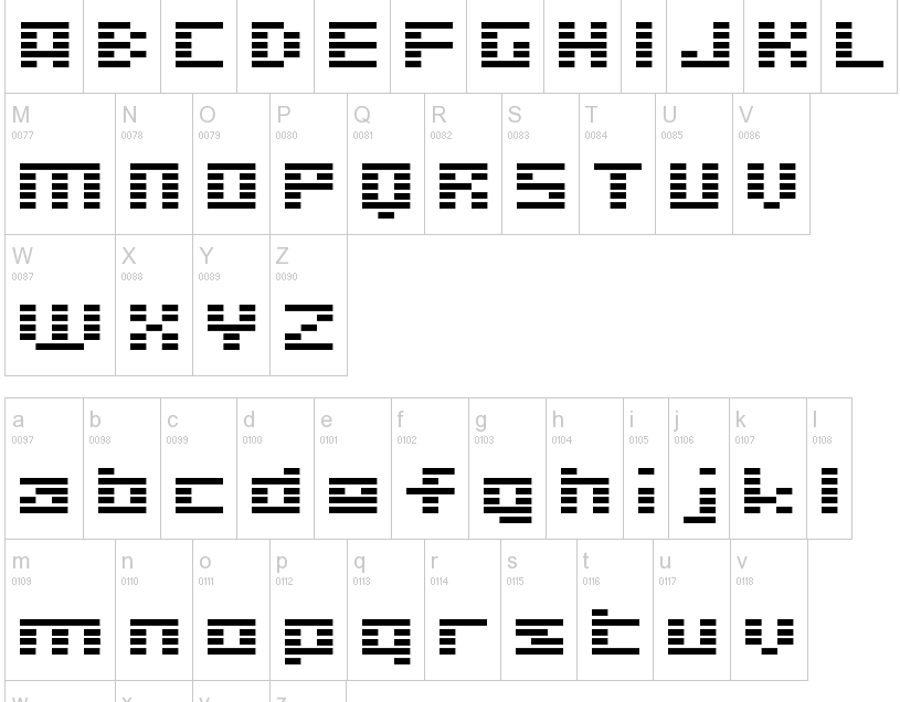
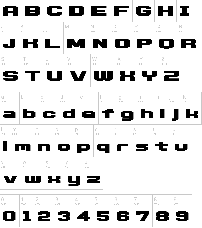
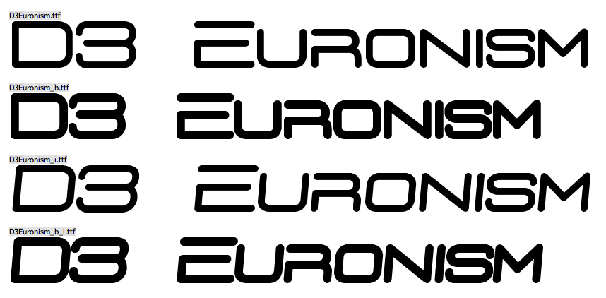
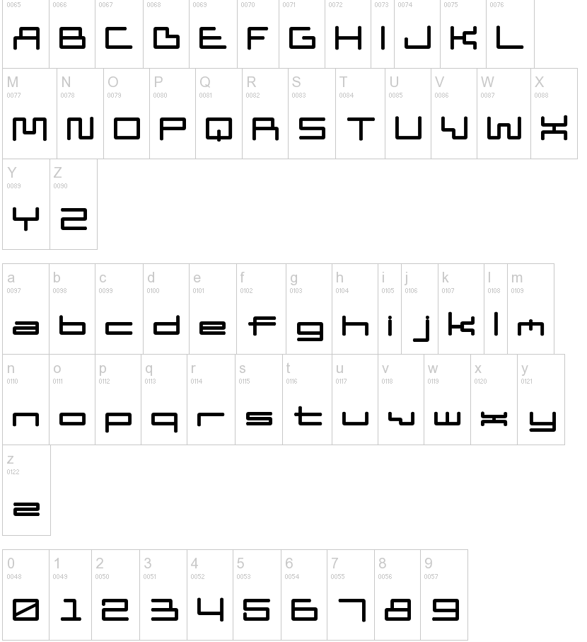
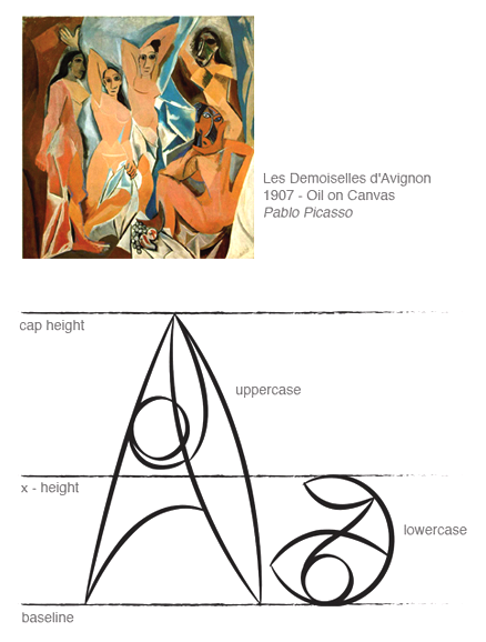
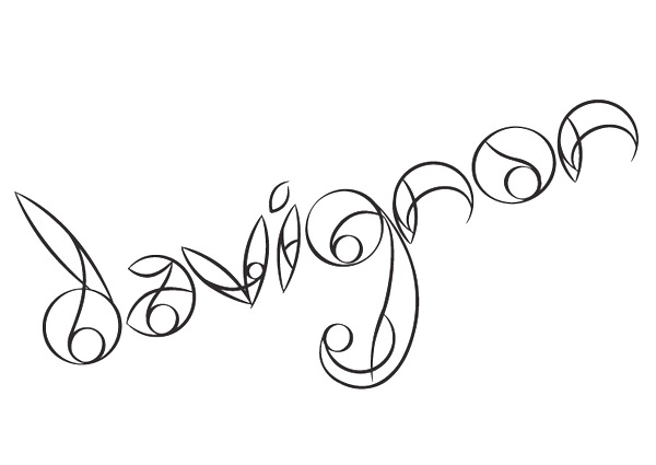
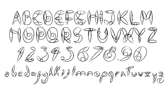
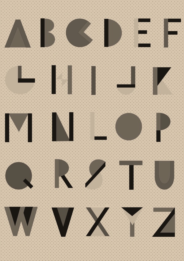
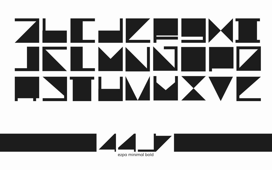
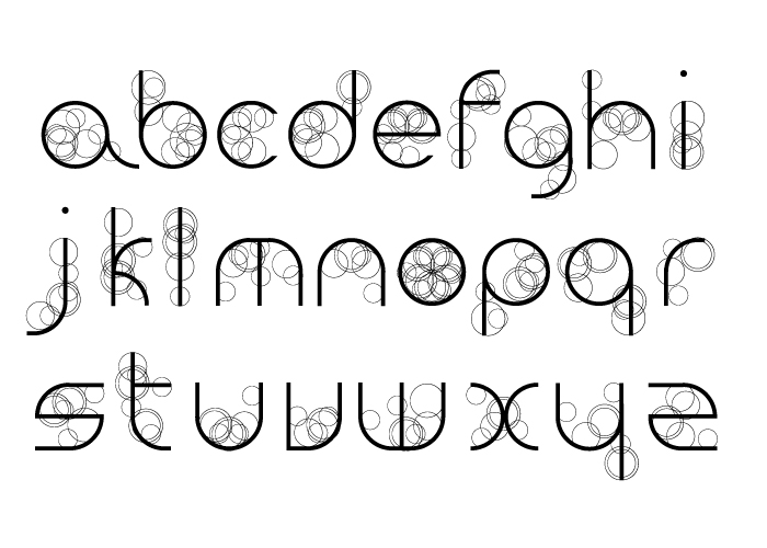
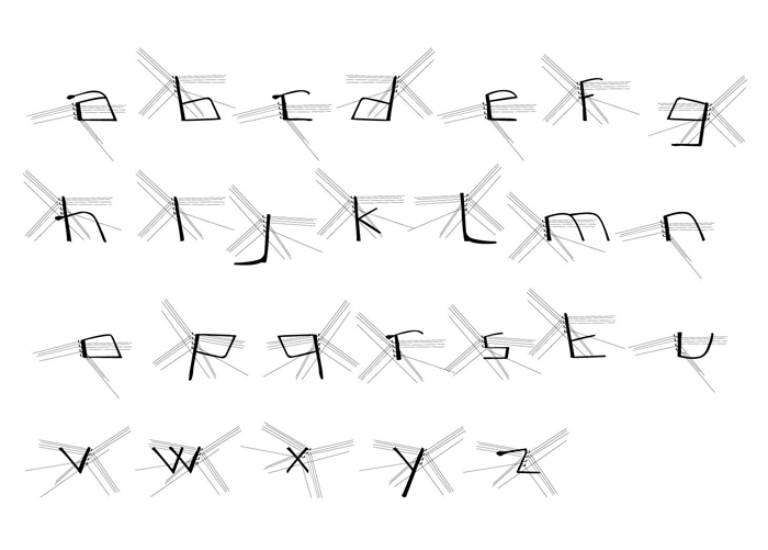
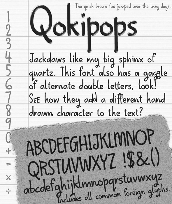
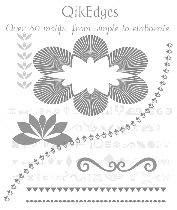
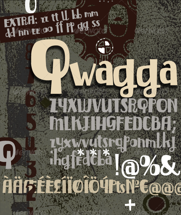
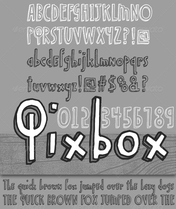
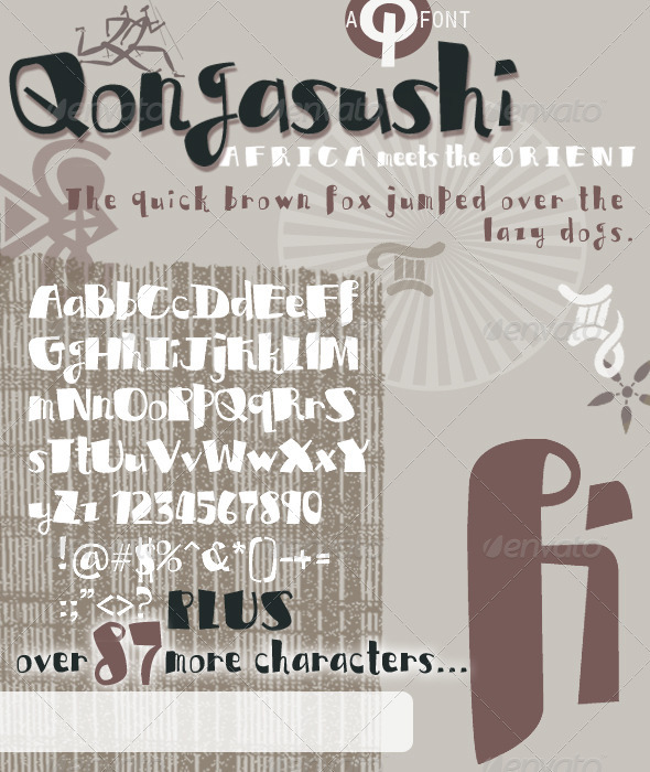
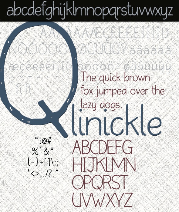
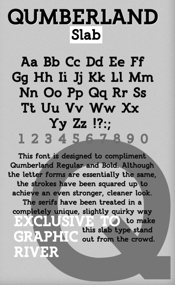
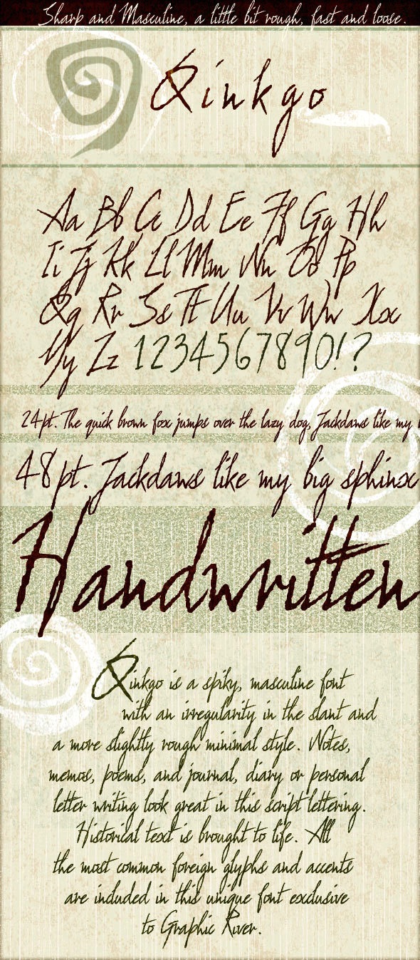
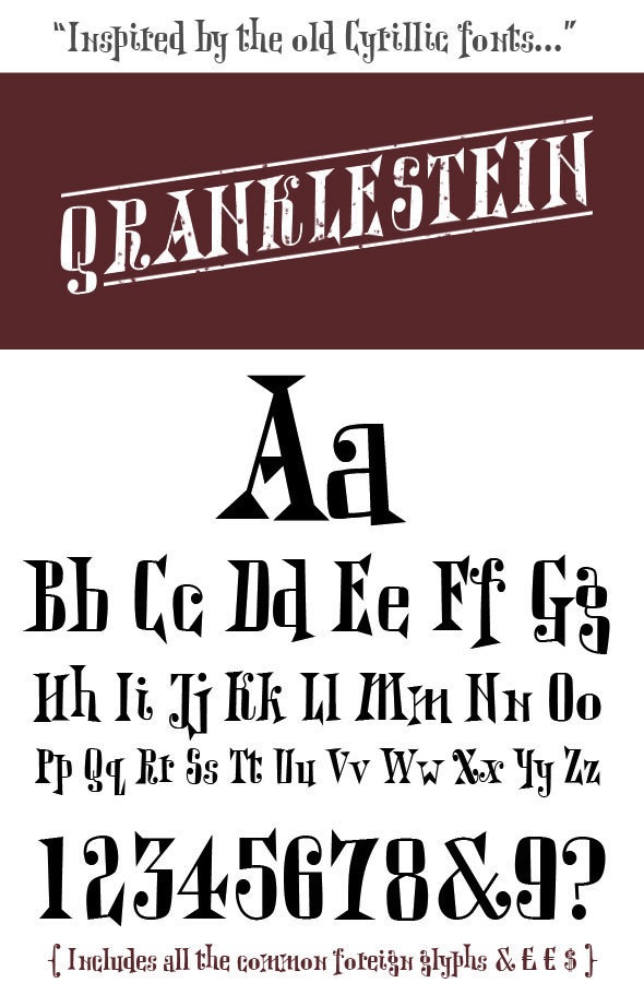
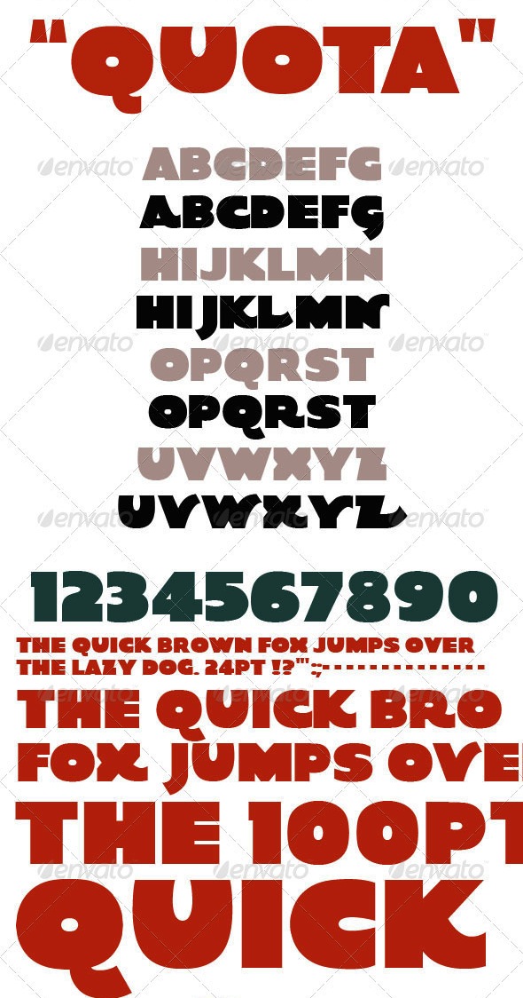
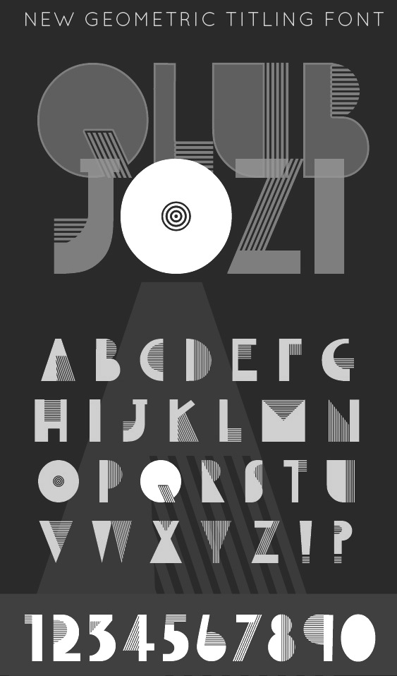
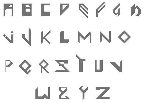
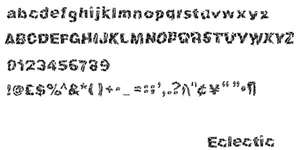
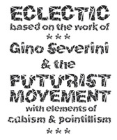
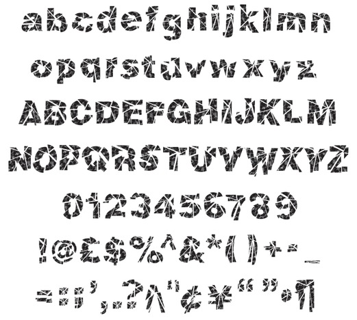
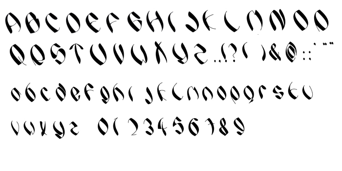
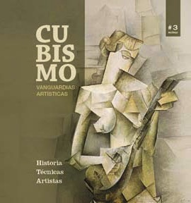
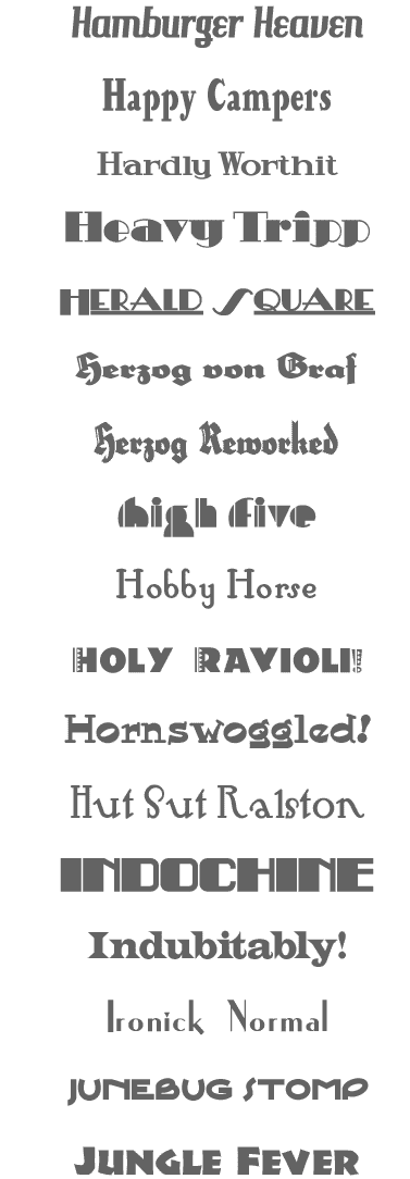
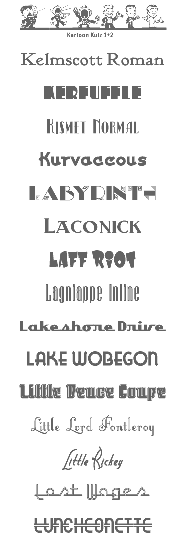
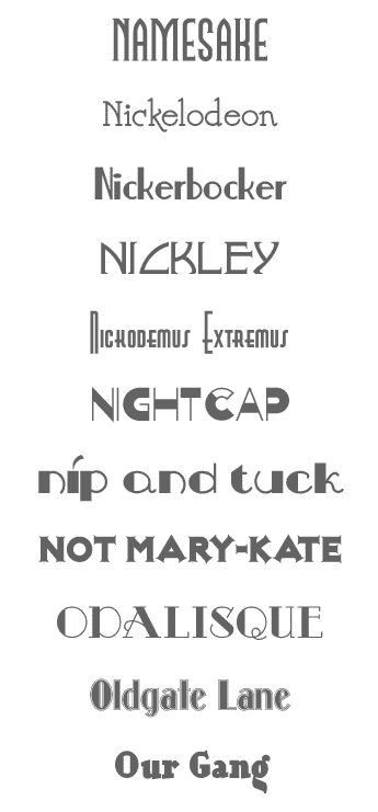
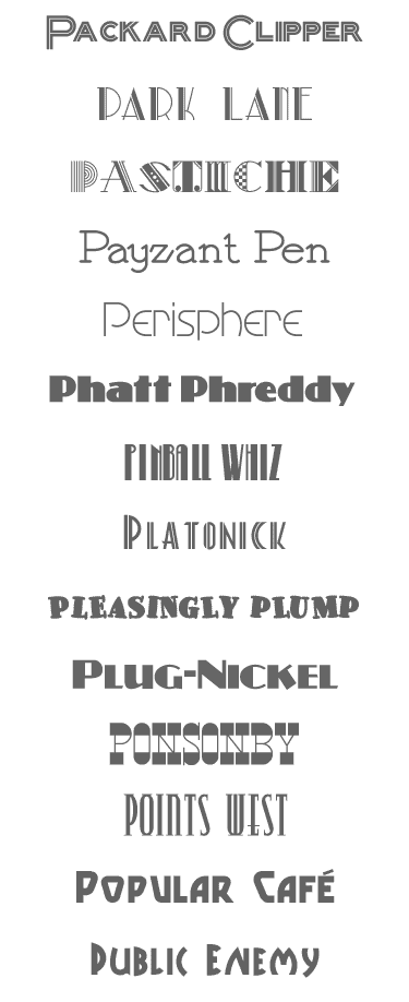
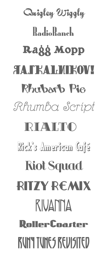
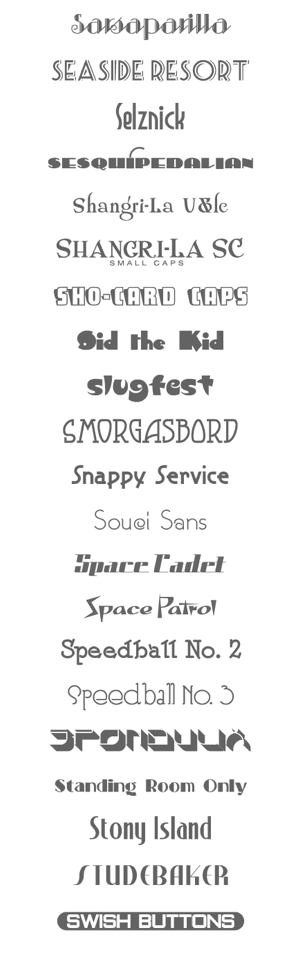
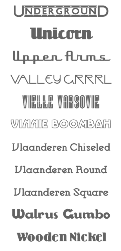
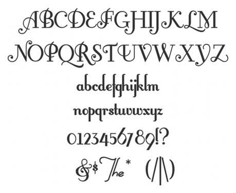
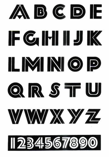
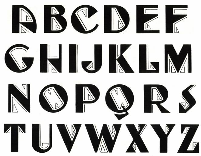
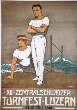
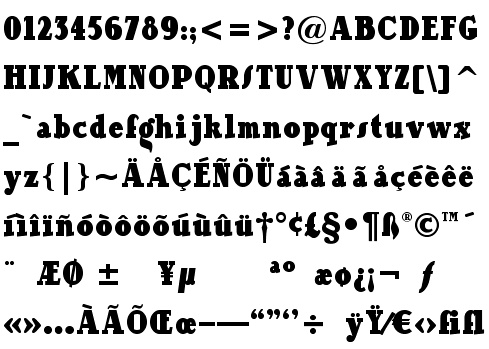
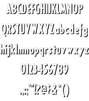
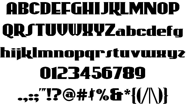
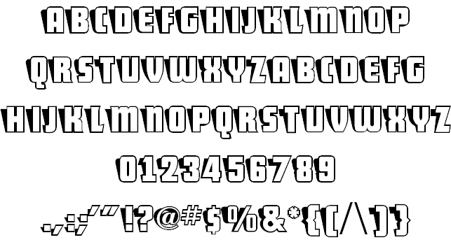
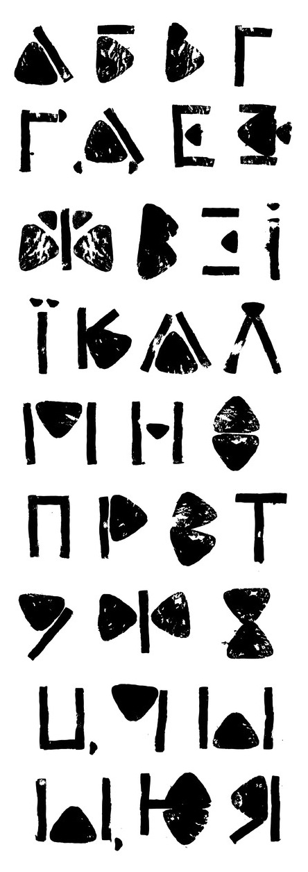
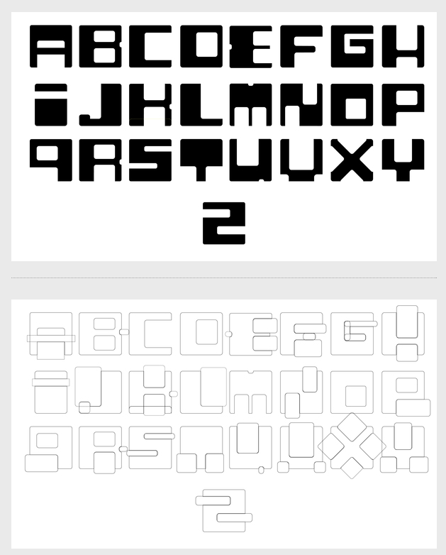
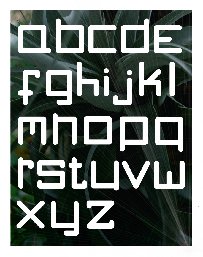
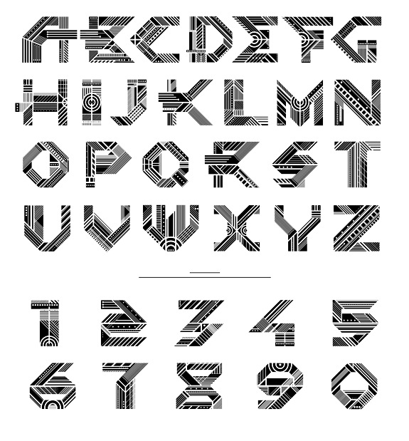
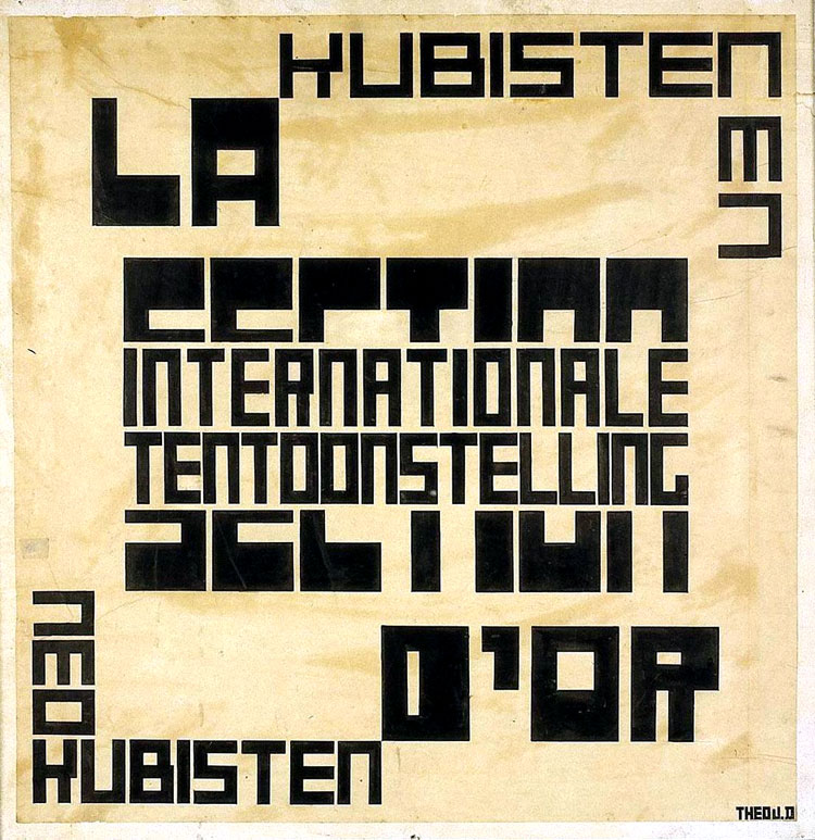
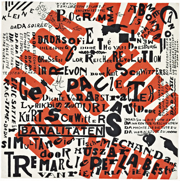
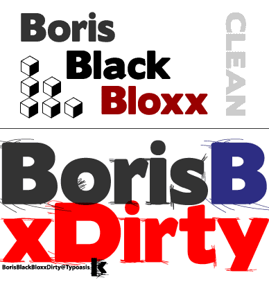