TYPE DESIGN INFORMATION PAGE last updated on Sat May 16 08:09:33 EDT 2026
FONT RECOGNITION VIA FONT MOOSE

|
|
|
|
|
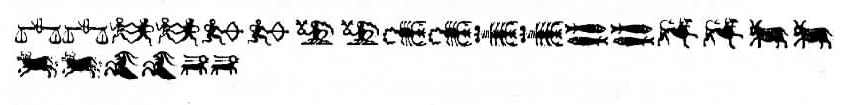
Foundries of the 18th century | ||
|
|
|
|

SWITCH TO INDEX FILE
Rotterdam-based typefounder, b. 1754, d. Oldenbarneveld, NY, 1828. He published Proeven van Letteren die Gevonden Worden in de van Ouds Beroemde Lettergieterye van Wylen de Heeren Voskens en Clerk, Nu van A. G. Mappa (Rotterdam, 1781). I cite from that link: In 1780, the father of Adam Gerard Mappa bought a large part of the Amsterdam typefounding firm of Voskens&Clerk, and Mappa soon discovered that he had talent for typefounding. He began his own business in Rotterdam where he issued this specimen book, but moved to Delft a few years later. There he become embroiled in the Patriot movement and led a volunteer regiment in the unsuccessful revolution of 1787. He was banished from Delft, spent a few years in France, and in 1789, emigrated to America with his type foundry on the advice of the Ambassador to France Thomas Jefferson. Mappa set up his new business in New York. According to a contemporary letter, and supported by the type in this specimen, his foundry contained not only "the Western, but the Oriental languages at the value of at least [pound sign] 3,500 New York currency." There was not much call for type in exotic languages, and while Isaiah Thomas considered his Dutch and German type "handsome," his "roman were but ordinary." Mappa was not skilled enough to produce the type needed by the new nation, and the foundry was advertised for sale on 1 February 1794. At least some of Mappa's equipments was acquired by Binny&Ronaldson, although their business did not start until 1 November 1796. This specimen book came to them with Mappa's typefounding equipment. Harvard's Houghton Library has a copy of the 1781 publication which contains a handwritten note by Theo L. de Vinne (which I was not allowed to photograph by Harvard's tight-sphinctered librarians). So here is what this letter says: Dirk Voskens was a typefounder of Amsterdam, a coster of types, not a cutter of punches. In 1677 he bought the foundry of Bleau and it was kept by his heirs and successors, (1) Dirk Voskens (2) Weduwe van Dirk Voskens (3) Voskens&fils (4) Voskens + [illegible]. In 1780 the foundry was sued for 8974 francs. P[illegible] were J. Enschedé and Sons, Ploos van Amstel, Preiter, Posthmans, DeBruyn and deGroot. How Mappa acquired possession does not appear. [...] Mappa got into trouble and had to take refuge in New York, where he began business as a type founder. He did not succeed. It is not known which became of the material he had in New York. To this, Bullen added by hand: It was purchased by Binny&Ronaldson. P.M. Kernkamp kindly sent me additional information on Mappa. He points out that Mappa was typefounder in these cities: Rotterdam (1780-1782), Delft (1782-1787) and New York (1789-1792). The 1780 date is also put into question because Mappa's father died in 1779. Mappa was active in a small army of patriots in Holland, and after a defeat in 1787 against Prussia, he was banned from Holland for six years. It may explain his emigration to America in 1789. He lived in New York until 1792, then in Second River, NJ, until 1794 and finally in Oldenbarneveld (Oneida Co., NY). His foundry, then in Albany, NY, was sold in 1803 for 1200 guilders. [Google] [More] ⦿ | |
Scottish typefounder, b. St. Andrews, 1714, d. Edinburgh, 1784. Educated in London, he started the Wilson foundry in 1742 at St. Andrew's in a partnership with John Baine, and set up shop in Glasgow in 1744, where he began work with Glasgow University Printers, Robert and Andrew Foulis. William Miller (who later started Miller&Richard), Richard Austin and Johann Christian Bauer all worked for Wilson. Wilson's first known specimen sheet was issued in 1772. However, William Rind seems to be using these types as early as February, 1770 in his Virginia Gazette. The business was left to his son Andrew and later to his grandson Alexander. Under Alexander's tenure, it went bankrupt in 1845. Several specimen books exist, including A specimen of printing types by Alexander Wilson&Sons, dated 1783. Life and Letters of Alexander Wilson (by Alexander Wilson) was reprinted in 1983 by Diane Publishing Company, and is freely viewable at Google. They are credited with the first British modern face, Scotch Roman, whch became very popular in the United States. Mac McGrew: Scotch Roman is derived from a typeface cut and cast by the Scotch foundry of Alexander Wilson&Son at Glasgow before 1833, when it was considered a novelty letter. The modern adaptation of the typeface was first made in 1903 by the foundry of A. D. Farmer&Sons, later part of ATF. It is a modern face, but less mechanical than Bodoni, and has long been popular. Capitals, though, appear heavier than lowercase letters and tend to make a spotty page. Hansen's National Roman is virtually the same face, with the added feature of an alternate r with raised arm in the manner of Cheltenham Oldstyle. When Monotype copied Scotch Roman in 1908, display sizes were cut to match the foundry face, but in keyboard sizes, necessarily modified to fit mechanical requirements, the caps were lightened and the entire typeface was somewhat regularized. Scotch Open Shaded Italic, a partial set of swash initials, was designed by Sol Hess in 1924. Similar swash letters, but not shaded, were also drawn by Hess and made by Monotype for regular Scotch Roman Italic. Linotype had adapted Scotch Roman to its system in 1903, retaining the heavier capitals, but in 1931, by special permission of Lanston Monotype, brought out Scotch No.2 to match the Monotype version. Compare Atlantic, Bell, Caledonia, Original Old Style. [Google] [MyFonts] [More] ⦿ | |
Foundry in Paris, operational from 1688 until 1706, when Antoine Chrétien fils (the son) died. Cover of his 1689 specimen book. [Google] [More] ⦿ | |
Antoine Perrenot
| |
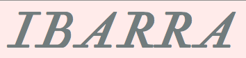
Espinosa, the printer, had his own foundries---one in Madrid, another in Sevilla and one in Segovia. In Segovia, in 1777, he founded a drawing school. In his writing and font specimen books he explained his desire to imitate the Spanish calligraphic forms and to engrave directly each punch (without using counterpunches). It is Espinosa's italic that was used in the book La conjuracion de Catalina y la guerra de Jugurta (1772, Ibarra, Madrid). He taught at la Real Academia de Bellas Artes de San Fernando, worked at la Casa de la Moneda de Sevilla (since 1772) and la Casa de la Moneda de Segovia (since 1774), and is famous for creating the Ibarra typeface. Sandra Carrera created an entire typeface system based on the types of Antonio Espinosa de Monteros. Called Pícara (2014) it is a bookish typeface with a knife-cut feel and a sturdy serif. In 1993, Juan Ignacio Pulido Trullén, Sandra Silvia Baldassarri Santa Lucía, and Francisco José Serón Arbeloa (Universidad de Zaragoza, Spain) co-designed the free typeface family Ibarra, which is based on the type used in La conjuracion de Catalina y la guerra de Jugurta (1772, Ibarra, Madrid). Author of Muestras de los Caracteres que sejiinden por direccion de D. Antonio Espinosa de los Monteros y Abadia (1771, Academico de la Real de San Fernando, Madrid). [Google] [More] ⦿ | |
Venice-based foundry headed by Antonio Zatta, 1757-1797. Their work can be found in Caratteri e vignette, o sieno, Fregi della nuova fonderia di Antonio Zatta e Figli tipografi, calcografi, e libraj veneti (A. Zatta, Venezia, 1793). That book shows elegant garalde families listed by size as Testin, Garamoncin, Garamoncino, Garamon, Filosofia, Silvietto, Silvio, and Test d'Aldo. For further typefaces, see Saggio dei caratteri, segni celesti, di matematica, algebra, numeri tagliati, ed altro / della nuova fonderia di Antonio Zatta q:m Giacomo tipografo, calcografo, e librajo veneto. N.\2070 III (1799). [Google] [More] ⦿ | |
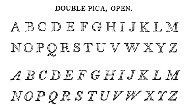
Archibald Binny (ca. 1762-1838) was a punchcutter from Edinburgh who emigrated to Philadelphia in 1795, where he met James Ronaldson, a businessman also from Edinburgh. In 1796, they started Binny&Ronaldson, the first real American type foundry. In 1809 and 1812, they published America's first specimen books. [Google] [MyFonts] [More] ⦿ | |
Beaumarchais
| French editor, author, printer and typefounder (b, 1732, d. 1799) who ran a foundry in Kehl (Germany) from 1781 onwards. He had acquired the types, punches and matrices of John Baskerville (Birmingham) from John Baskerville's widow in 1775 for 3700 pounds. In 1795 the Beaumarchais foundry was partly sold to Franz Laurent Xavier Levrault (1762-1821) who ran the Levrault family print shop in nearby Strassbourg (est. 1675). Levrault in turn was sold in 1854 and became Berger-Levrault. The latter company resettled in Nancy, France, in 1873. Beaumarchais's ex-employee Jaquot continued as independent typefounder in Strassbourg. Beaumarchais was the first to print the complete work of Voltaire, best known as the Kehl edition, under the name "Imprimerie de la société littéraire typographique". The name Beaumarchais also pops up in type designs. For example, David Nalle designed a typeface called Beaumarchais. The typeface 1785 GLC Baskerville (2011, Gilles Le Corré) was inspired by one of the types sold to Beaumarchais by Baskerville's widow. [Google] [More] ⦿ |
Binny&Ronaldson
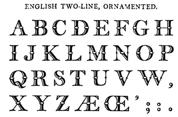
| In 1796, Archibald Binny (ca. 1762-1838) and James Ronaldson (1769-1841 or 1842) (some say 1768-1842) started the first permanent American type foundry in Philadelphia in 1796, called Binny&Ronaldson. James, a business man from Edinburgh was the financial fhalf of the pair. In 1809 and 1812, they published America's first specimen book. The only complete copy of this book is at the Rare Book and Manuscript Library of Columbia University, and is entitled A specimen of metal ornaments cast at the letter foundery of Binny and Ronaldson (20 pages, printed by Fry and Kammerer, Philadelphia, USA, 1809) and Specimen of printing types from the foundry of Binny & Ronaldson (1812, Philadelphia, Fry and Kammerer, printers). Local download of the 1812 book. James Ronaldson published Specimen of Printing Type, from the Letter Foundry of James Ronaldson, Successor to Binny&Ronaldson; Cedar, Between Ninth and Tenth Streets, Philadelphia (Philadelphia: J. Ronaldson, 1822). Acquired by Johnson&Smith in 1833, it became L. Johnson&Co. in 1843, and finally MacKellar, Smiths&Jordan in 1867. The latter company was the largest typefounder in America when in 1892 it was amalgamated with many others into ATF. About digital typefaces that are derived: MyFonts sells Isabella, a font by ATF/Kingsley that can be traced back to Binny&Ronaldson. It also offers Really Big Shoe NF (Nick Curtis, 2009), which is based on Ronaldson's Oxford. Dick Pape published the free fonts Binny & Ronaldson English Two Line Orn (2010), Binny & Ronaldson Great Primer Two Pica (2010), and Binny & Ronaldson Primer Two Line Orn (2010). [Google] [MyFonts] [More] ⦿ |
BiViTy: Bibliothèque virtuelle de typographie
| Jacques André's site that lists all digitally available type specimen books. [Google] [More] ⦿ |
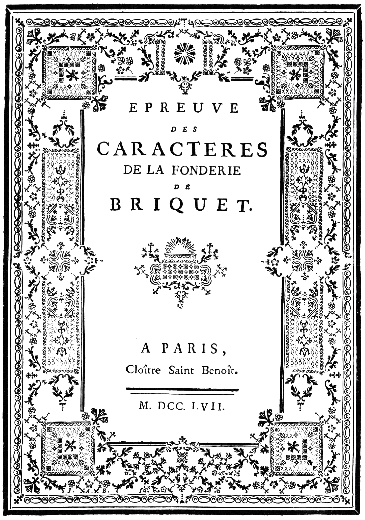
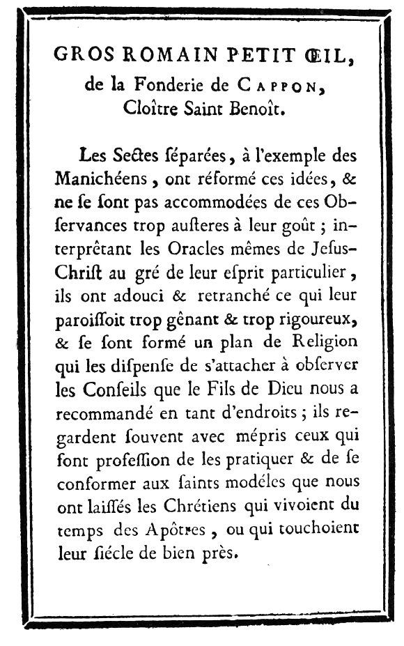
French foundry, located in Paris. Its work can be found in Épreuve des caractères de la fonderie de Briquet (Paris, Cloître Saint Benoît, 1757). Audin tells the story of the foundry. The senior Briquet bought a foundry in The Netherlands in 1720, but he died around 1725, leaving the business to his son. In 1728, his son became associated with Loyson, who had his own foundry since 1727, and the foundries were joined. Son Briquet died some time between 1728 and 1751, leaving behind a widow. Loyson wasted no time and married her. Loyson and the Briquet widow operated from 1751 until 1758. In 1757, they left the business to her son [note: Loyson's father-in-law was named Briquet, and his son-in-law was named Briquet...], who in 1758 left the foundry business. So, in 1758, Loyson and Veuve Briquet became Vincent Cappon (b. Carrières sous Conflans, d. 1783, Paris), who was Loyson's student. After Cappon's death in 1783, the business was run by Cappon's widow until 1785. Finally, from 1785 until 1837, the foundry was run by Pierre Louis Wafflard, apprentice of J. Gill&aeacute;. Publications include Epreuve des caractères de la fonderie de Loyson et Briquet (1751, Paris, Rue de la Parcheminerie). Local download. [Google] [More] ⦿ | |
British Letter Foundry
|
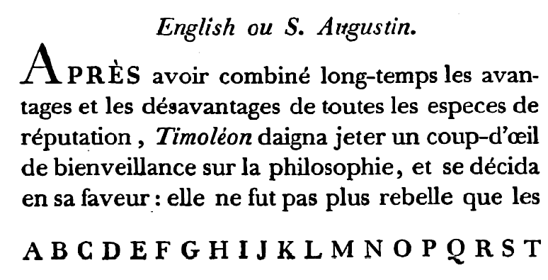
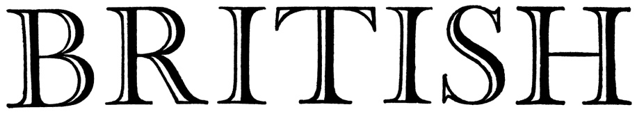
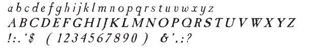
John Tranter tells the story: John Bell, an English publisher and bookseller, advertised a book called The Way to Keep Him in The World newspaper in London in June 1787, saying: 'J. Bell flatters himself that he will be able to render this the most perfect and in every respect the most beautiful book, that was ever printed in any country.' That was a tall order. In his quest for perfection he set up a type foundry, and hired a young punchcutter named Richard Austin to cut a new typeface for him. The face, named after Bell, was based on a typeface designed some thirty years before by John Baskerville, another perfectionist. Baskerville had said 'Having been an early admirer of the beauty of Letters, I became insensibly desirous of contributing to the perfection of them.' Though Baskerville went broke eventually, his typeface was indeed very close to perfection, and went on to become one of the most popular typefaces of all time. John Bell's type foundry didn't do well. He closed down his shop within two years and went on to other things, and his typeface sank almost without trace in England. Newer trends in typefaces (Didot in France, and Bodoni in Italy) eclipsed the modest elegance of Richard Austin's design. The Americans, though, took a shine to it. It was copied as early as 1792, and always remained popular there. A complete set of type cast from Bell's original matrices was purchased by the American Henry Houghton in 1864 and installed at his Riverside Press. He thoughtlessly labelled it 'English Copperplate'. Later, the distinguished American book designer Bruce Rogers used the typeface frequently, naming it 'Brimmer', after the author of a book he'd seen the typeface used for when he worked as a young man at the Riverside Press. The designer Daniel Updike also worked at Riverside, and also used the 'English Copperplate' type extensively in later years, naming his version of it 'Mountjoye'. Bell's type would have remained obscured by these disguises perhaps forever, but for the alert eye of Stanley Morison. He was doing research at the Bibliothèque Nationale in Paris in 1926 when he came across a copy of the first specimen sheet of type samples issued from John Bell's foundry in 1788. No copy of it existed in England at that time, and Morison recognised the typeface immediately as the original of the 'Brimmer' and 'Mountjoye' fonts used in America. He researched the matter and in 1931 published an important monograph which, as the type scholar Alexander Lawson says, 'returned the name of John Bell to its proper place in the pantheon of English printers'. The typeface was unique in another way. Until Richard Austin cut the typeface in 1788, all numerals were traditionally written like lower-case letters -- small, with some numerals hanging below the line. Bell is the first typeface to break with that tradition cleanly: Austin's numerals are larger than lower-case letters (at two-thirds the height of the capitals) and sit evenly along the line. The trend was taken up. These days the numerals in most printed matter are (unfortunately) the full size of the capital letter, and are called titling figures, ranging figures, or lining figures. |
A brief history of the Caslon family, as summarized by Dave Forster in 2012 while he was a student at KABK [the text below quotes verbatim passages from his document entitled Another Bloody caslon].
| |
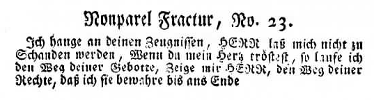
German punchcutter who ran the Christian Zinck foundry in Wittenberg. Most of his work was done in the early part of the 18th century, when he supplied matrices to the Leipzig-based foundry B.C. Breitkopf. Zinck was born in Leipzig in 1698, and moved ca. 1720 to Wittenberg. Examples taken from the Norstedt foundry in Stockholm which had acquired some of the matrices: Colonel Fractur No22 and Nonpareil Fractur No23, Grobe Mittel No1, Grobe Mittel No2, Kleine Mittel Schrift No1, Petit Gammal Schwabach, Tertia Antiqua, Tertia Antiqua. Christian Zinck had a son, Johann Ludwig Zinck, b. 1728, Wittenberg. He moves in 1752 to Berlkin, where he was in charge of Fredrik II's type foundry and died in 1770. Christian Gottlob Zinck started a type foundry in 1764 in Augsburg, where he died in 1778. [Google] [More] ⦿ | |
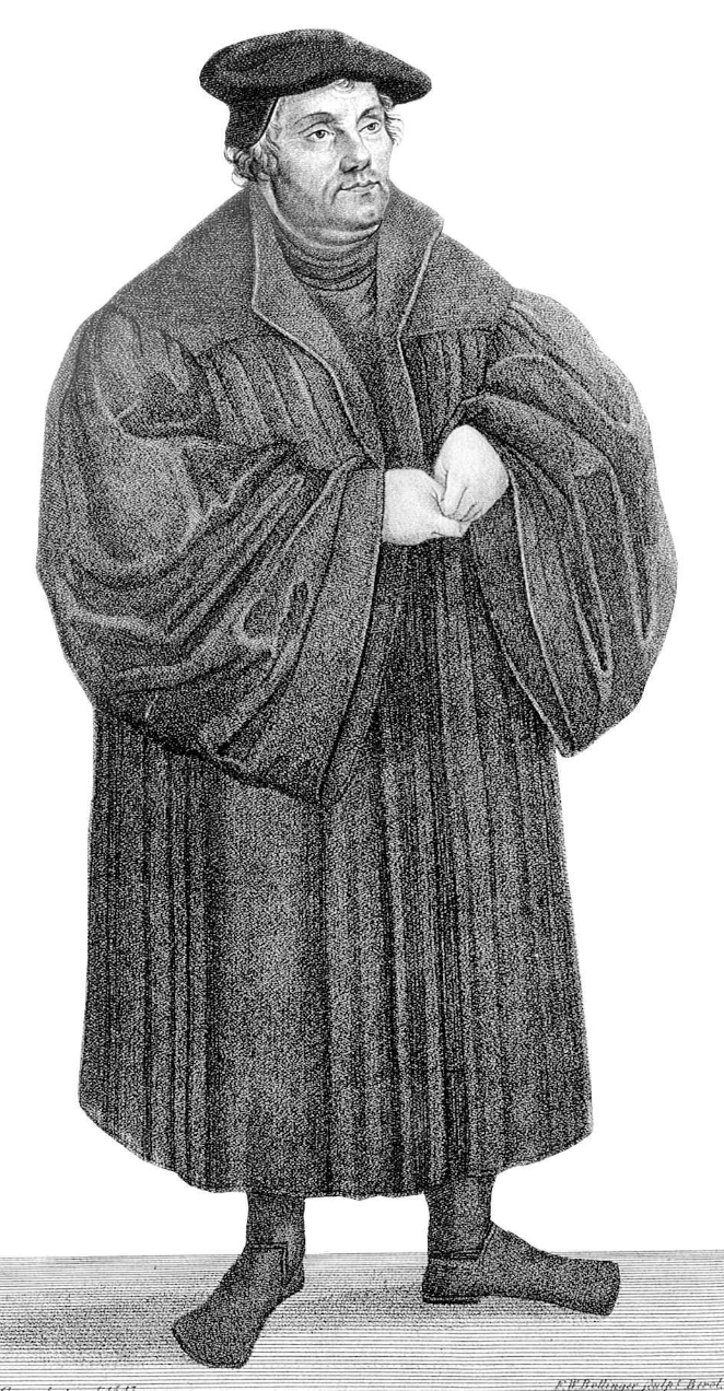
Christopher Saur (1695-1758) began a successful German-American printing business in the American Colonies in 1738, from Pennsylvania to Georgia. He printed the first bible in America (in German, in Germantown (!), 1743), using a Fraktur font from Frankfurt's Luther Foundry. He is credited with the first type specimen printed in America, ca. 1740, Philadelphia. Check also his almanac from 1754. [Google] [More] ⦿ | |
Printer in Strasbourg, France, who set up shop in 1784, together with "Rolland". They were known as Rolland&Jacob. He was the student of Baskerville. Specimen. Deux Points de Gros Romain (1780-1790). Deux points de petit texte (ca. 1785). Some of his fonts also made it to the J.P. Lindh foundry in Stockholm in 1818. Jacob's revival of Baskerville was distributed by the Berger-Levrault Foundry from 1815. It was sold there as Caractères dans le genre Baskerwille, and is closer to Didot than Baskerville. That revival in turn was digitally revived in 2018 by the ANRT (Atelier National de Recherche typographique) students as Baskervville (with two v's). Github link. Google Fonts download link. The students involved graduated in 2017 from ANRT: Alexis Faudot, Rémi Forte, Morgane Pierson, Rafael Ribas, Tanguy Vanloeys, and Rosalie Wagner. [Google] [More] ⦿ | |
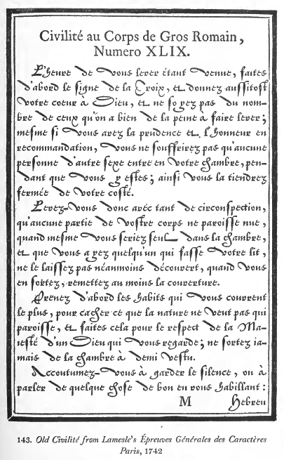
Among many other types, Lamesle's 1742 text book shows a Civilité. Revivals:
| |
Typefounder in Nantes, b. 1704, d. 1760, Nantes. Until 1743, he was typefounder in Paris, and settled in Nantes some time between then and 1754. His work can be found in Épreuves des caracteres de la fonderie de Claude Mozet, fondeur&graveur de caractères d'imprimerie (Nantes, 1754), and in Épreuves des caracteres de la fonderie de Claude Mozet, fondeur&graveur de caractères d'imprimerie (Paris, 1743). In 1760, Mozet's foundry was taken over by J. Fr. Hémery, who was based in Paris, where he had been director of the Fournier foundry (the elder and the younger) for over 30 years. [Google] [More] ⦿ | |
Typefounder and pastor in Haarlem, The Netherlands, 1721-1785? He was a partner in Corn. Nozeman&Comp. His work can be found in Epreuve des caracteres, qui se fondent dans la nouvelle fonderie de Corn. Nozeman&Comp. a Harlem (Haarlem, 1756). Nozeman was in partnership with J.F. Rosart (1714-1777), who cut many of the types. The 1756 publication is a gorgeous small book, in which it is claimed that this is the start of a new foundry in Haarlem. Type showings include Dubbele mediaan schtyfletter (a script), ext romein, Text cursyf, Mediaan romein, Mediaan italique, Descendiaan romein and italique, Descendiaan medicynse, Astromise en Chimise Tekens, Garmond romein, Garmond cursyf, and Almanaks tekens. [Google] [More] ⦿ | |
Foundry in Paris, operational from 1714 until 1762. [Google] [More] ⦿ | |
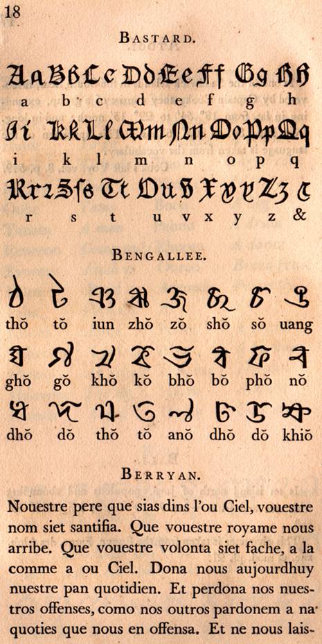
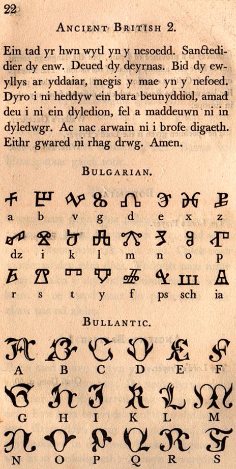
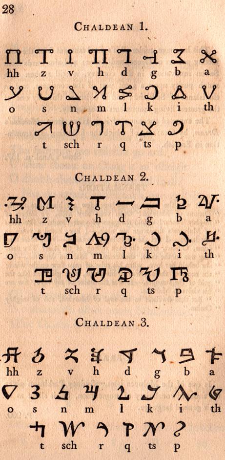
British typefounder, d. 1835. Son of Joseph Fry, the founder of the Fry Letter Foundry in Bristol. Quoted from MyFonts: In 1784 he introduced a raised roman letter for the blind, and was awarded a prize by the Edinburgh Society of Arts. Louis Braille's system of lines and dots ultimately proved better. In 1787, he and his brother Henry took over the Fry Letter Foundry from their father. Credited with many great typefaces, including Fry's Baskerville (1768) and Fry Moxon (or Graisberry), a Gaelic typeface, Fry A Gothic Capitals (ca. 1819), an angular transitional Gaelic face, and Fry B Gaelic Capitals, a transitional Gaelic typeface (Everson mentions the date 1836, but that would be one year after his death...) and Priory Text. Mac McGrew writes: Priory Text was the blackletter of the Fry Foundry in England, with some sizes dating back to about 1600, and most sizes shown in 1785. It was revived by Talbot Baines Reed for his History of the Old English Letterfoundries in 1887, and DeVinne used it for his edition of Philobiblon in 1889. The Dickinson foundry, a forerunner of ATF, issued it as Priory Text about that time. It is very similar to Caslon Text (q.v.). BB&S made a near-duplicate type, originally called Reed Text, but later shown as Priory Black Text. Although the latter was shown as late as 1925, these typefaces had generally been replaced earlier by Cloister Black (q. v.) and other Old English typefaces with more refined draftsmanship. About the Gaelic types, Brendan Leen writes: In 1819, Edmund Fry cut a type once again commissioned by the British and Foreign Bible Society. The design of the Fry type signifies a departure from the angular minuscule toward the more rounded form of the half-uncial, a characteristic of Irish typography in the nineteenth century. Sample of Fry Irish type from The Two First Books of the Pentateuch. Author of Pantographia (1799, Cooper&Wilson, London), a work that shows the scripts of many languages [a careful digitization of some can be found in the font family Pantographia (2010) by Intellecta Design]. The full title is Pantographia; Containing Accurate Copies of All the Known Alphabets in the World; Together with an English Explanation of the Peculiar Force or Power of Each Letter: To Which Are Added, Specimens of All Well-Authenticated Oral Languages; Forming a Comprehensive Digest of Phonology. Examples from that book: Bastard, Bengallee and Berryan, Bulgarian and Bullantic, Chaldean. Local download. Author of Specimen of Printing Types by Edmund Fry, letter founder to the King, and Prince Regent, Type street, London (1816). Local download. FontShop link. [Google] [MyFonts] [More] ⦿ | |
Elzevir is an oldstyle typeface style related to garaldes. Elzevir was also the name of a renowned family of printers in the 16th and early 17th century in Leiden, The Hague, Utrecht, Copenhagen and Amsterdam. The first one, Louis (1540-1617), was the son of a Belgian printer in Leuven and established a print shop in Leiden in 1580. Other members include Isaac Elzevir, Bonaventrura Elzevir, and Abraham I Elzevir. They were operational until 1712. The Elzevir style was promoted by Louis Perrin in Lyon, France, in 1846. In the United States, this style is known as DeVinne. Britannica link. [Google] [MyFonts] [More] ⦿ | |
Fann Street Foundry Reed&Fox (1873, London) is one of their specimen books. The Reed and Fox typefaces Viennese and Corinthian were combined in 2014 in Nick Curtis's digital typeface Genever NF. Johannes Lang and Stefan Ellmer revived Viennese in 2013 as Brevier Viennese, and Jason Wolfe reinterpreted it in 2021 in his https://www.wolfehall.com/projects/samuelbradleydam">Bradley Dam (2021). [Google] [MyFonts] [More] ⦿ | |
Lyon, France-based typefoundry. It published Epreuve des caractèlres, de la Fonderie d'Etienne Allègres et compe, graveurs et fondeurs (ca. 1799, Lyon). Local download. In 1810, Etienne Allègre published Epreuve des caractèlres, de la Fonderie d'Etienne Allègre et comp. Local download of that book. [Google] [More] ⦿ | |
Fonderie du sieur Delacolonge
| French foundry in Lyon, est. 1720 by Alexandre de Lacolonge. The foundry was run by his widow, veuve de Lacolonge, from before 1742 until 1754, and by the widow and her son from 1754-1766. In 1766, Louis Delacolonge took the reins and ran the foundry until some time after 1789. Their specimen appeared in Les caractères et les vignettes de la fonderie du sieur Delacolonge (Lyon, 1773). Harry Carter published a facsimile of this, The Type Specimen of Delacolonge (1969, Amsterdam). Local download. Gallica link for the 1773 book. [Google] [More] ⦿ |
French typefounder in the Gando family line. Author of Local download. He was also involved in a controversy with Pierre-Simon Fournier and penned Observations sur le Traité historique et critique de Monsieur Fournier le jeune, sur l'origine et les progrèl;s des caractèl;res de fonte, pour l'impression de la musique (1766: Chez Moreau, Paris; authored by Gando (père et fils) and A. Berne). [Google] [More] ⦿ | |
Fry
| Founded in 1764 in Bristol by Joseph Fry and Isaac Moore who interpreted the work of Baskerville and Caslon. Joseph retired in 1787 and left the company to his sons Edmund and Henry. The foundry moved to Type Street (now Moore Street) in London. Joseph's son Edmund sold up to the Fann Street Foundry in 1828. The foundry no longer exists. [Google] [MyFonts] [More] ⦿ |
Weimar-based printer who published Schriftproben aus der neuen Buchdruckerei der Gebrüder Gädicke (1799, Weimar, Germany). Local download. [Google] [More] ⦿ | |
Typefounder in Jena, Germany. He published specimens of a blackletter and an Antiqua typeface in 1763. [Google] [More] ⦿ | |
Bologna-based foundry. His work can be found in Saggi dei caratteri, fregi, e sgraffe della nuova fonderia di Giambattista Sassi tipografo (Bologna. Con approvazione. 1797). [Google] [More] ⦿ | |
The Gollnersche Schriftgiesserei was active in Halle a.d.S., Germany in the 18th century. It was probably founded by Johann Georg Gollner, who lived in Jena in 1740. Taübel writes in Orthotypographischen Handbuch (1785) describes a Schreibschrift auf Textkegel by Gollner. For the book printer Joachim Heinrich Campe in Braunschweig, Gollner designed the so-called Campe-Fraktur, a simplified blackletter typeface. It was only used once, in a small poetry publication, der Einsiedler von Warkworth (Braunschweig 1790). Ernst Crous published Die Campe-Fraktur Der Einsiedler von Warkworth in 1925 in Berlin with more detals about Campe-Fraktur. In 1828, Karl Gustav Schwetschke (b. 1805, d. 1881) bought the Gollnersche Schriftgiesserei, to link it to his own print shop, Gebauer-Schwetschke Buchdruckerei, est. 1733). In 1833, Ferdinand Theinhardt started an apprenticeship with Schwetschke. In 1835, stereotying was introduced, and a specimen book, Heft einer Schriftprobe in Quart was published. The foundry continued until 1854. [Google] [More] ⦿ | |
Grover Foundry
| London-based foundry of James and Thomas Grover, active in the late 17th century. Quoting Stanley Morison (Fleuron, vol. 6): "In succession to the so-called Polyglot founders who worked under privilege during the period 1637-1667, the Grovers began business about 1674. The possessed types which came from Day, Wynkyn de Worde and others, also a fine Greek uncial, a number of scripts and the curious letter called "Double Pica Union Pearl", or simply "Union Pearl". This elegant decorative script face, which is the first known English decorated letter (ca. 1690), later became a Stephenson Blake typeface. Designers of a Greek typeface in 1694 (some say 1894), based upon the Greek of the Complutensian Polyglot of 1514. According to "Fleuron", vol. 6, p. 231, this typeface was surpassed by Victor Scholderer's "New Hellenic" (1928). [Google] [More] ⦿ |
The timeline of the foundry:
Digitizations of his work include
| |
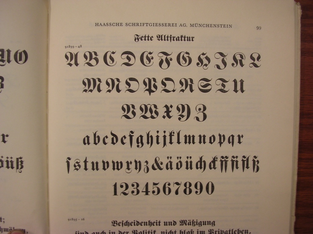
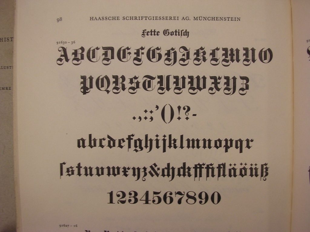
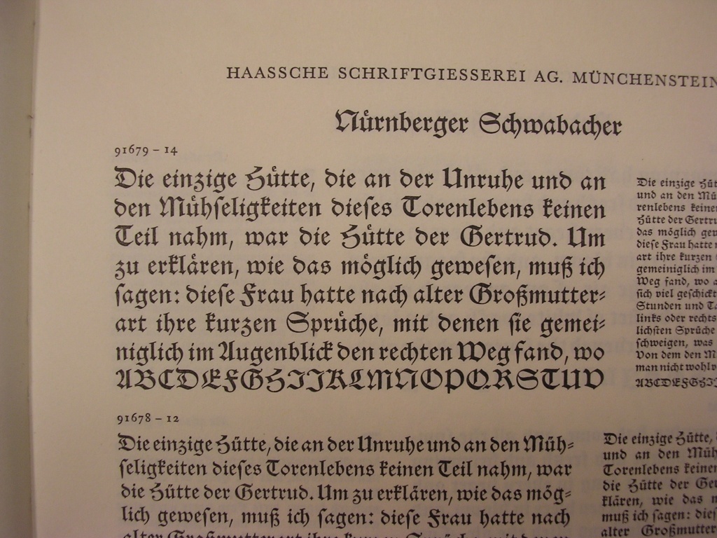
View the Haas typeface library. See also here. [Google] [MyFonts] [More] ⦿ | |
Founded by William Caslon in 1716, Caslon's was the leading English type foundry of the 18th and 19th centuries. It continued under William Caslon II. Upon the latter's death in 1778 the property was split between his wife and his son, William Caslon III. In 1792 the son sold his share to his mother and his sister-in-law to buy the foundry of their rival, Joseph Jackson, who had just died. The family of the sister-in-law kept the main Caslon foundry running until 1937, when it closed and the designs passed to Stephenson Blake (who back in 1819 had purchased the other Caslon foundry). [Google] [MyFonts] [More] ⦿ | |
Royal printing office in Madrid. It issued Caracteres de la Imprenta Real en 1793 (Madrid) and Muestras de los punzones y matrices de la letra que se funde en el obrador de la Imprenta Real (1799, Madrid). Local download of the 1793 text. Local download of the 1799 text. [Google] [More] ⦿ | |
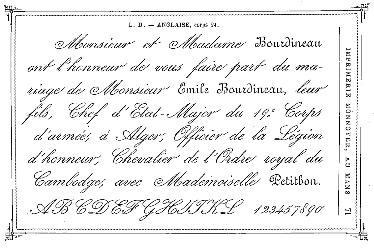
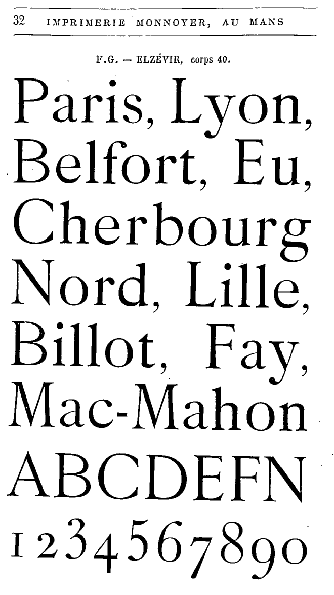
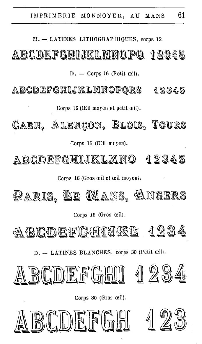
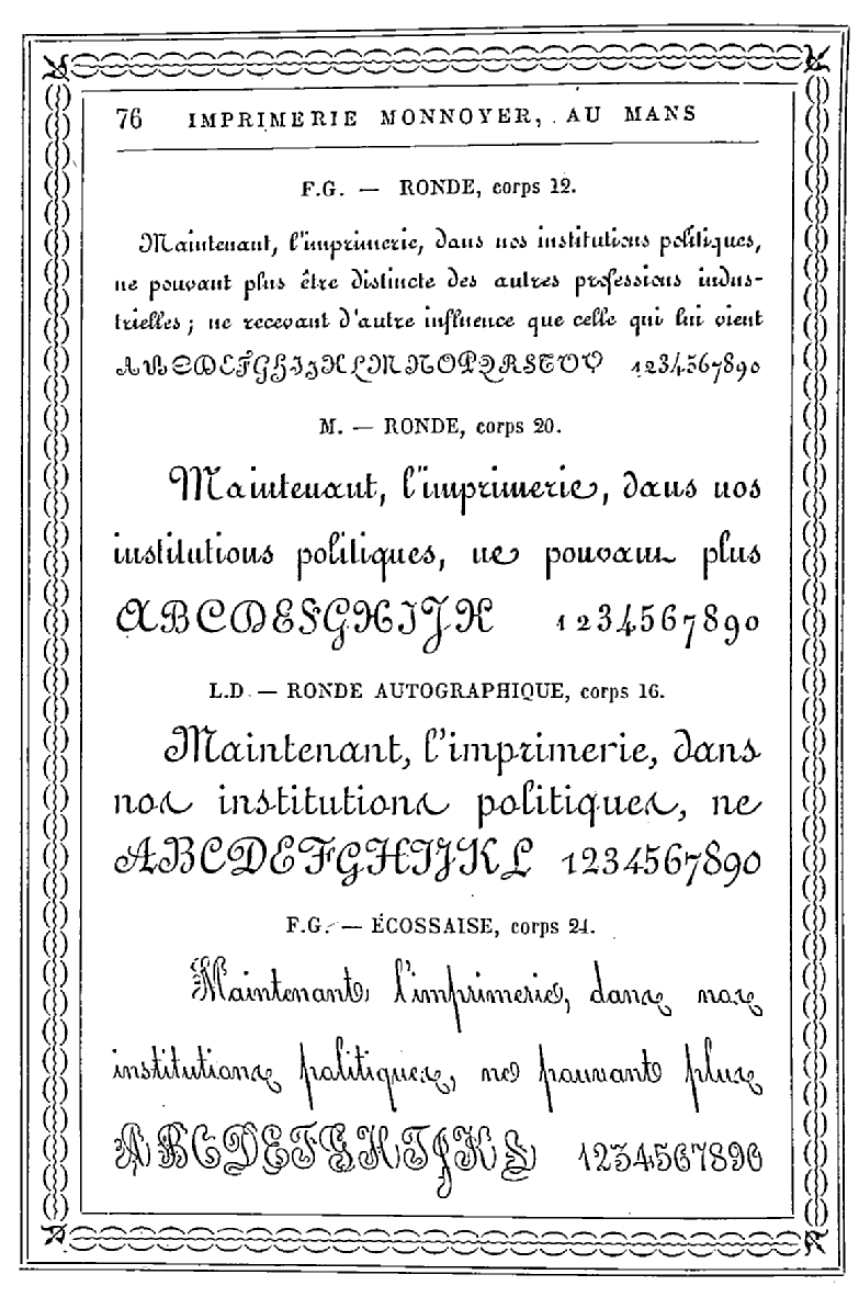
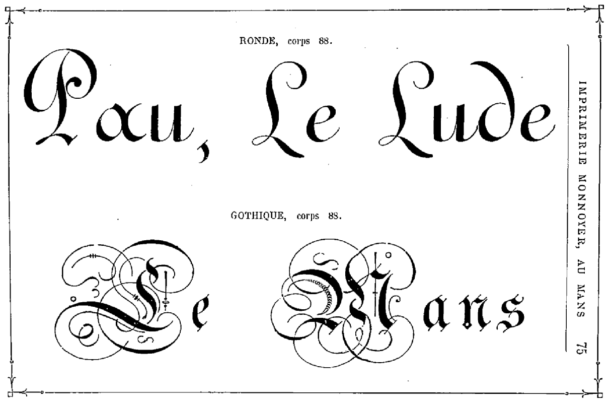
French printer, est. Paris, 1618, and in Le Mans in 1751. In 1889, they published Spécimen des caractères de l'imprimerie Edmond Monnoyer (Le Mans) [Other link]. Picture of Edmond Monnoyer. Samples: Anglaise, Cover page, Elzevir, latines lithographiqes, Ronde and écossaise, Ronde and gothique. Antoine Monnoyer was master printer in Paris in 1618, and ran the print shop until 1634, when (his son?) Pierre Monnoyer took over. There is a historical hole after that, until Jean Baptiste Monnoyer (b. 1688, d. 1777, Joinville), who was a printer for the duke of Orleans in Joinville. Charles Monnoyer (b. 1720, joinville, d. 1793, Le Mans) became the printer of the king and the bishop of Le Mans, where he established himself in 1751. He headed the business until 1789. Charles II Monnoyer (b. 1758, Le Mans, d. 1811) was in charge from 1789 until 1811. Charles III Nicolas Monnoyer (b. 1793, Le Mans, d. 1860) headed the firm from 1811 until 1860, and was followed from 1860 until 1889 by Charles IV Edmond Monnoyer (b. 1829, Le Mans, d. 1899). Finally, from 1889 until 1932, the firm was in the hands of Charles V Antoine Monnoyer (b. 1868, Le Mans) and Paul Charles VI Frederic Monnoyer (b. 1903, Le Mans). [Google] [More] ⦿ | |
Jacques André
| |
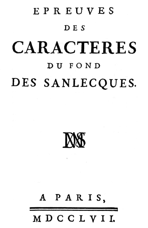
Jacques de Sanlecque started his own foundry in Paris in 1596, and ran it until 1648. Various successors kept it going until it came into the possession of H. Haener in Nancy in 1786. A few details on Jacques de Sanlecque and his successors, in chronological order:
Publications include Epreuves des caractères du fond des Sanlecques (Paris, 1757). [Google] [MyFonts] [More] ⦿ | |
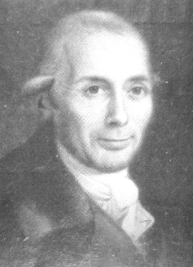
James Ronaldson
| |
One of the two main typefounders in Brussels in the late 18th century. Fernand Baudin and Netty Hoeflake write in "The Type Specimen of J.F. Rosart": "This descendant of a family of printers at Lille, after a setback in 1766, had obtained, in 1768, an exemption and the permission to set up a type foundry in Brussels. In Hellinga, we find in 1776 the address 'Au bas de la rue de la Magdelaine', and in 1177 'Rue de l' Assaut, pres de Ste Gudule'. In the foreword to his Specimen Book of 1776 De Boubers summarizes the types cut by Gillé, in Paris, and by Matthias Rosart against the numbers of the examples. In the Specimen Book of 1777 the names of the punch-cutters are printed at the bot- tom of the showings. De Boubers further informs us that he had punches cut 'exactly the same' as Baskerville's. In 1779 he issued another specimen book, some time later followed by a Premier supplement, and by a second supplement in 1781. One may read in an advertisement in the Gazette de Liège dated 19 September 1781: 'J. L. DE BOUBERS, Printer-Bookseller and Typefounder at Brussels, has just issued to the public the second supplement to his Foundry Catalogue, containing all known types, such as French, Dutch, German, Greek, Hebrew, music, fleurons, and in general all that concern this line of business. He also casts Tarot for playing-cards. He is not afraid to claim that his foundry is one of the finest and largest in Europe', etc. J. L. de Boubers was very different from J. F. Rosart. He was a businessman on a grand scale. In a very short while he compelled recognition as printer and publisher as well as founder and paper-maker. He also enjoyed the favour of the government (see: A. Vincent, op. cit., P.I9). One should not fail to recall here that he printed the handsomest edition known of the works of J.- J. Rousseau and that he had it illustrated by Moreau Le Jeune. He, too, expected to become the greatest typefounder in Europe." He died in 1804, and his widow carried on until 1821. His work can be seen in Épreuves des caractères de la fonderie de J.L. de Boubers (1779, Bruxelles), Premier supplément aux Épreuves des caractères de la fonderie de J.L. de Boubers à Bruxelles (1779) and Épreuves des caractères de la fonderie de J.L. de Boubers (1777, Bruxelles). In the foreword of the last book, he brags about the material strength of his metal typefaces, which are "as strong as those used in Holland and Frankfurt, stronger than those in France". He continues: "jaloux de rendre ma Fonderie la plus belle de l'Europe, j'ai associé à mes travaux les plus célèbres artistes ...". Some of the type shown is by M. Rosart, fils, and Gillé. Local download of his 1779 specimen book. [Google] [More] ⦿ | |
Typefounder in Jena, Germany, who designed an Antiqua in 1698. His type foundry was inherited by his son Johann Adolf Ernst, but no known specimens exist by the latter. [Google] [More] ⦿ | |
One of the family members, A.J. Enschedé, sketched the foundry's timeline in 1867:
Publications include:
| |
Johann Andreä founded the Andreäische Schriftgiesserei und Buchhandlung in Frankfurt am Main in 1667. It was sold in 18816 (some say 1838) to Benjamin Krebs but continued until 1892 under the name "Andreäische Schriftgiesserei und Buchhandlung". After that, it changed its name to August Weisbrod and continued well into the 20th century. The type-foundry was particular well-known for its many Hebrew types and the great selection of delightful borders, tail- and headpieces. [Google] [More] ⦿ | |
Johann Gottfried Pöetzsch was a typefounder from Stötteritz near Leipzig. In 1753 he became manager of the Berling type foundry in Copenhagen. In 1755, Pöetzsch takes over the printing privileges in Denmark (from Hesse). Until his death in 1783, Pöetzsch successfully operates his type foundry. His market includes all Scandinavian countries. Elisabeth Krey, his widow then takes over the foundry, which eventually was sold to Sebastian Popp, and finally to J.P. Lindh (Stockholm) in 1814. Pöetzsch used mainly imported German matrices. Samples of the typefaces: Mittel Gammal Schwabach, Cicero Gammal Schwabach, Calender Zeigen auf Rheinlaender Kegel. [Google] [More] ⦿ | |
Noted Viennese printer and typographer. Type specimen from his 1760 book of specimen. [Google] [More] ⦿ | |
Johannes de Groot
| |
John Bell
| |
Joseph Fry
| |
Joseph Gillé was succeeded about 1790 by Joseph Gaspard Gillé fils. He was one of the promoters of the newer styles of ornament, and offered typographic decoration to the printers of France. His Recueil des divers caractères, vignettes et ornements (1808) also showcases copperplate engraving including copperplate calligraphic alphabets: one part of the book is entitled Trente-huit Caractères d'Écriture Financières, Anglaise et Civilité, depuis le Cicéro jusqu'aux Grosses de Fonte. Later, he published Recueil des divers caractères, vignettes et ornemens de la fonderie et imprimerie de J.G. Gillé, rue Saint-Jean-de-Beauvais, division du Panthéon, Paris (1826) [Local download]. Gillé fils was influenced by Didot in the design of his lush vignettes, borders and rules. His house specialized in ornaments, fancy letters and script letters. In September 1827 it was bought by Honoré de Balzac. On digitizations. In 2011, Jose Jimenez of Celebrity Fontz created Parisian Ornamentals after a design by Gillé. Home Style (2003, Michael Hagemann, Font Mesa) is an exquisitely detailed family based on work by Joseph Gillé, and implemented elsewhere under the names Circus, Roma and Madame. See also Gillé Classic (2004, Michael Hagemann). I think that this is a renaming of Home Style. Initiales ombrées (2007, Ari Rafaeli, ARTypes) is based on Gillé's original all caps typeface (from 1828, it is claimed). [Google] [MyFonts] [More] ⦿ | |
British punchcutter who apprenticed with William Caslon I in London. He started his own foundry in 1763. His typefaces include an Anglo-Saxon type for an edition of the Domesday Book. Vincent Figgins apprenticed for Jackson from 1782. On his death in 1792 the business was purchased by William Caslon III. [Google] [MyFonts] [More] ⦿ | |
L. Johnson Type Foundry
| Philadelphia-based foundry, which evolved in 1833 from the remnants of Binny&Ronaldson, which was established in 1796. Lawrence Johnson, its founder, died in 1860, and the L. Johnson Type Foundry became MacKellar, Smiths and Jordan, also located in Philadelphia. Their work is described in the MacKellar book entitled 1796-1896: One hundred years, Mackellar, Smiths and Jordan foundry (1896). Specimens can be found in The printers' handy book of specimens, exhibiting the choicest productions of every description made at the Johnson type foundry (1876) as well as in The book of specimens of plain and fancy printing types, borders, cuts, rules, &c. manufactured at L. Johnson&company's foundry. Established 1796. Proprietors. Thos. MacKellar, John F. Smith, Richard Smith, Peter A. Jordan (1865). [Google] [More] ⦿ |
Successor of the foundry of J.-F. Rosart in Bruxelles after his death in 1777. In December 1779, we find Epreuve de la Fonderie de la Veuve Decellier, successeur de Jacques-François Rosart. Troisième édition augmentée. A Bruxelles, rue ditte Vinckt, près du Marché aux Grains., which reproduces all typefaces and fleurons of J.-F. Rosart. Local download. [Google] [More] ⦿ | |
Lawrence Johnson
| |
Lettergieterij J. de Groot
|
|
French type foundry in Strassbourg, est. 1675. In 1795 the Beaumarchais foundry was partly sold to Franz Laurent Xavier Levrault (1762-1821). Levrault in turn was sold in 1854 and became Berger-Levrault. The latter company resettled in Nancy, France, in 1873. Specimen books include Epreuves des caractères de la fonderie de Frères Levrault, à Strasbourg (by François Georges Levrault, 1800). Local download of that book. [Google] [More] ⦿ | |
Louis Delacolonge
| |
Typefounder in Lyon. His work can be found in Épreuves des caracteres de la fonderie de Louis Vernange, fondeur&graveur de caracteres d'imprimerie (Lyon, Place de la Charité [ca. 1780]). [Google] [More] ⦿ | |
Loyson had his own foundry in Paris from 1727-1728. In 1728, he joined his foundry with that of Briquet, and Briquet and Loyson thrived from 1728 until 1751. Briquet had died some time in that period, and Loyson married Briquet's widow. Loyson and Veuve Briquet operated from 1751 until 1758, when the foundry, after a brief one-year passage to widow Briquet's son, was left to Vincent Cappon, Loyson's student. The foundry made the angular Gaelic manuscript typeface Paris (1732-1751). A draft digitization (Páris) exists. Audin's account. Publications include Epreuve des caractères de la fonderie de Loyson et Briquet (1751, Paris, Rue de la Parcheminerie). Local download. [Google] [More] ⦿ | |
Luthersche Schriftgiesserei
|
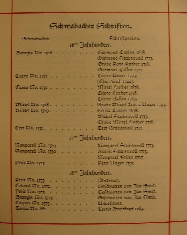
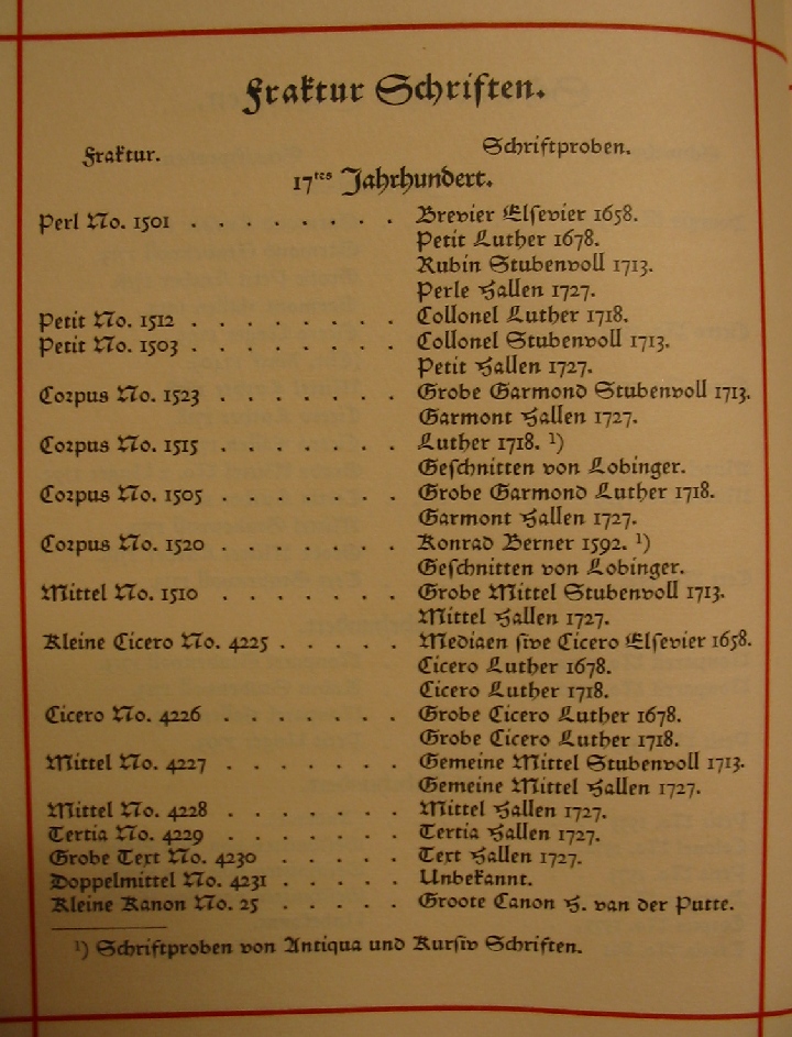
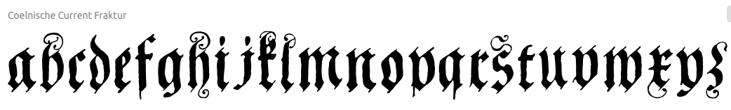
The foundry was heavily involved at first in Schwabacher typefaces, such as the Egenolffschen Schwabacher (1500s). Among the Schwabacher typefaces, Johan Enschedé's catalogue mentions Garamond Luther (1678), Gross Petit Luther (1718), Mittel Luther (1678), Cicero Luther (1718), Tertia Luther (1678), Gross Mittel Luther (1718), as well as the Fraktur typefaces Petit Luther (1678), Colonel Luther (1718), Luther (1718), Cicero Luther (1678 and 1718), Gross Cicero Luther (1678 and 1718). Digitizations include Coelnische Current Fraktur by Dieter Steffmann, Coelnische Current Pro (2016, SoftMaker), and JubiläumsFraktur by Gerhard Helzel. [Google] [More] ⦿ |
Author of Muestra de los caracteres que se funden e imprimen / por D. Manuel Peleguer ... ; cuyos punzones y matrices son hechos enteramente por el mismo (1786, Valencia). [Google] [More] ⦿ | |
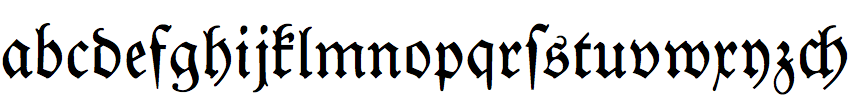
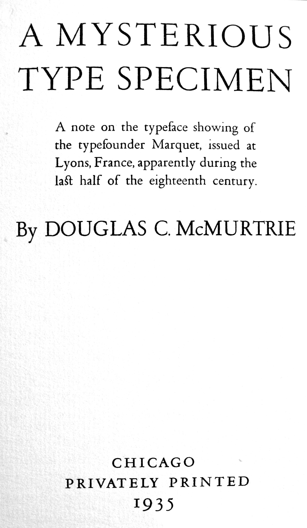
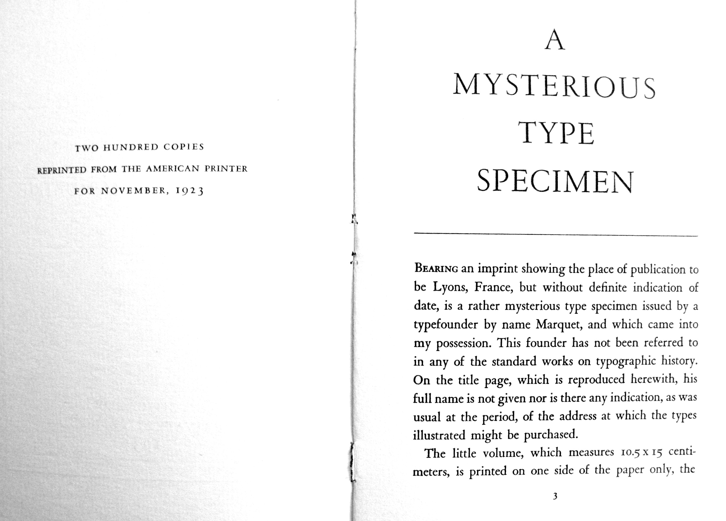
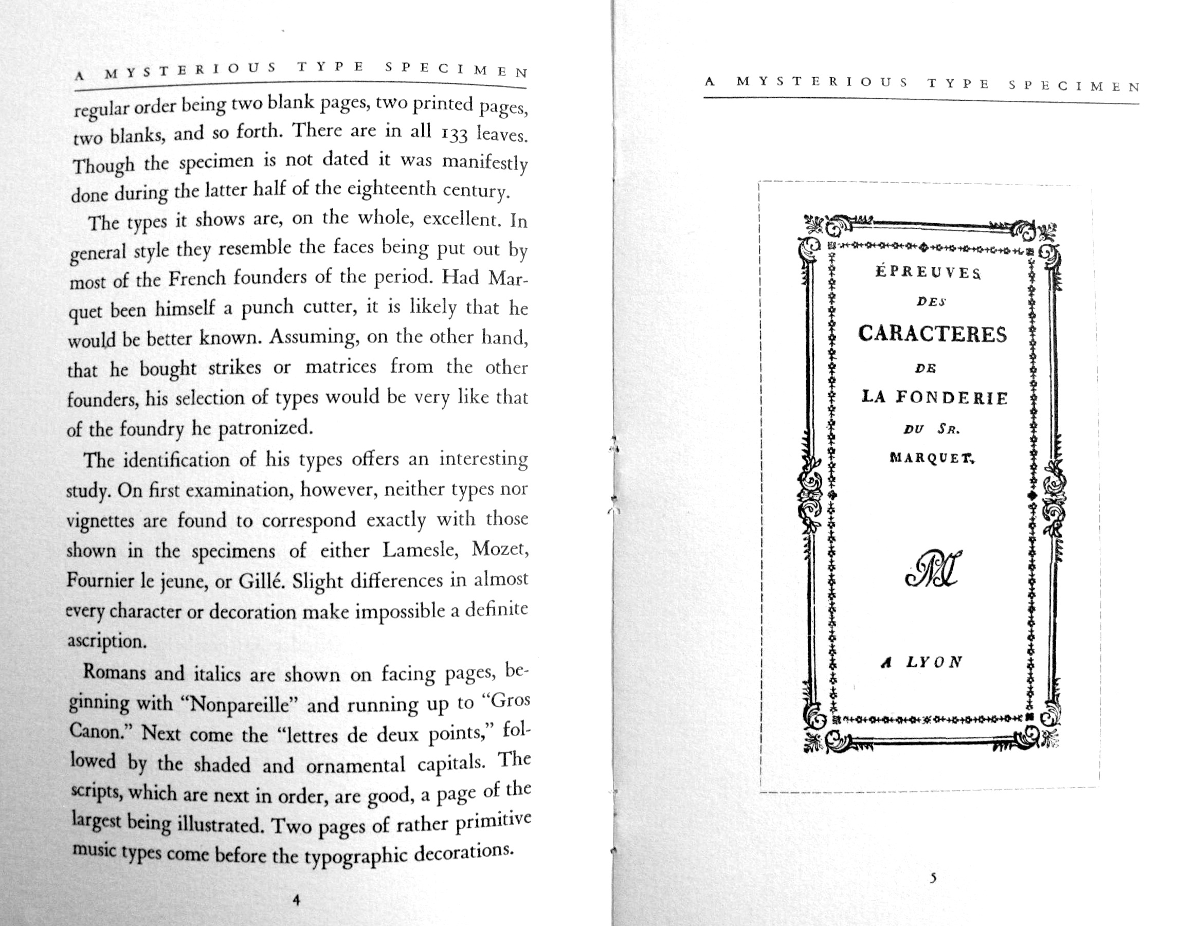
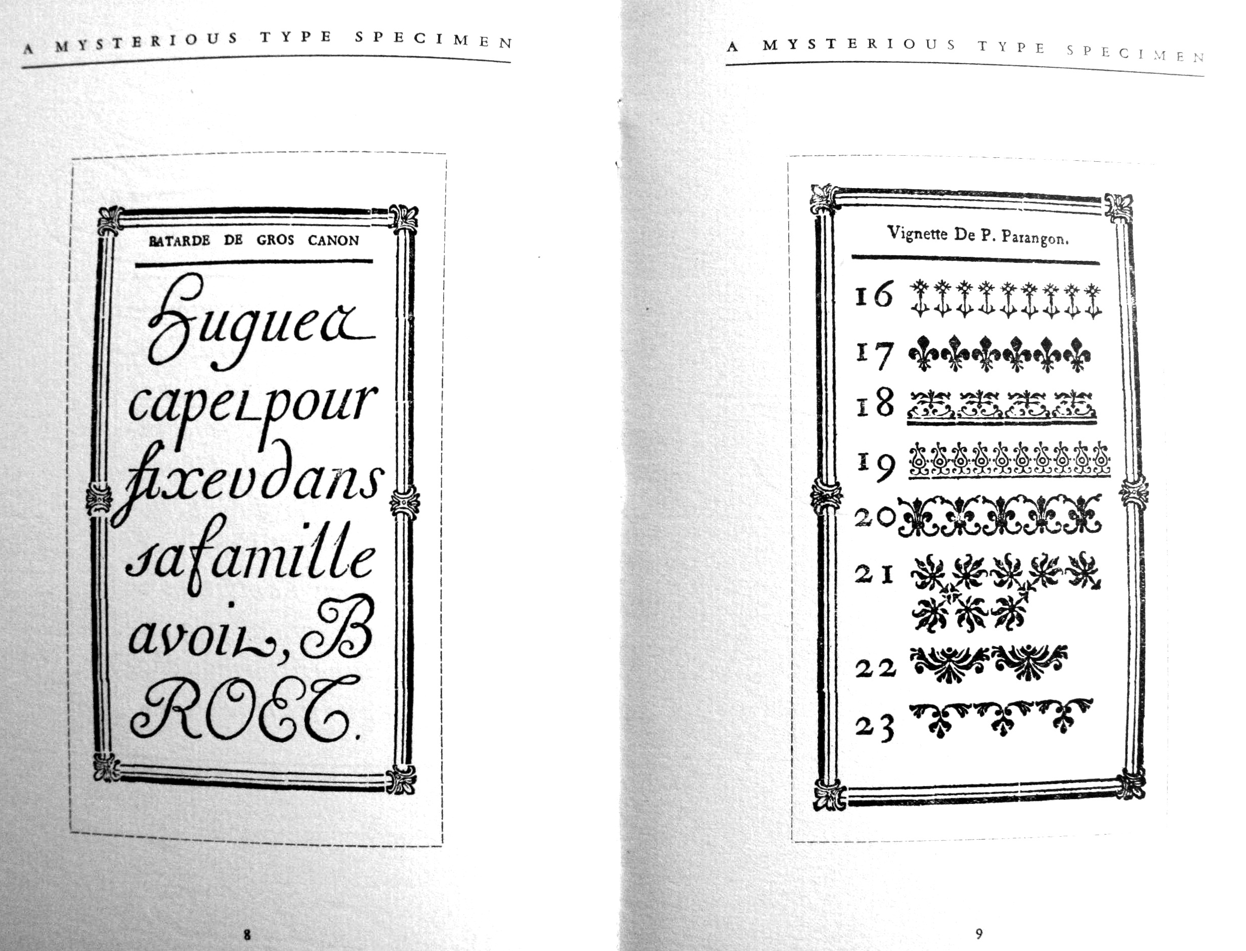
Type foundry in Lyon. Its work was published in Épreuves des caracteres de la fonderie du sr. Marquet (Lyon, ca. 1770). Even though this appeared in 1770, we already find many types with the characteristic square didone serifs, although with less contrast than a typical Didot face. Many publications from the pre-Bodoni and pre-Didot period already show a convergence towards the didone trend. In 1923 (and reprinted in 1935), Douglas C. McMurtrie published A Mysterious Type Specimen on a typeface by Marqet: page 3, page 4 (where he notices that Marquet's type is difficult to categorize, and is different from anything he had seen in the types of Lammesle, Mozet. Gillé, or Fournier le jeune), a scan of the type, some vignettes. [Google] [More] ⦿ | |
Matthias, or Matthieu, Rosart is the son of J.F. Rosart, who carried on with his father's foundry in Brussels after his death in 1777. Before that, he had a rough relationship with his father, lived for a while in Amsterdam, and even worked for a competing typefounder in Brussels, J.L. de Boubers starting in 1772. In 1789, Matthias Rosart published his specimen book, Epreuve des caractères. There he announces that he can supply all the fonts and fleurons to be found in the catalogue of his father. This seems to indicate [according to Baudin and Hoeflake] that the foundries of de Boubers and J.F. Rosart in Brussels joined. Indeed, in December 1779, we also find an Epreuve de la Fonderie de la Veuve Decellier, successeur de Jacques-François Rosart. Troisième édition augmentée. A Bruxelles, rue ditte Vinckt, près du Marché aux Grains, which reproduces all typefaces and fleurons of J.-F. Rosart. On page 12 of "Blackletter" (Peter Bain and Paul Shaw, 1998), Matthias Rosart is credited with Gros Romain Civilité (1777, Brussels), one of the most readable Fraktur fonts. [Google] [More] ⦿ | |
Or Nicolas Gando. French calligrapher, engraver and type founder, d. ca. 1767. He acquired the types of Claude Lamesle: Épreuves générales des caracteres provenants de la fonderie de Claude Lamesle, lesquels se trouvent présentement dans celle de Nicolas Gando, l'aîné (Paris, Cloître S. Julien le Pauvre, 1758). See also Epreuve des caractères de la fonderie Gando (Paris, Cloistre Saint Julien le Pauvre, imprimerie Jacques Guerin, 1745; local download), Recueil d'ornemens qui comprennent les différentes combinaisons des vignettes de la fonderie de N. Gando (1745; local download), and Epreuves des caractères de la fonderie Gando, père et fils (Paris, Cloître Saint Julien le Pauvre, 1760). His son is Pierre-François. He was involved in music typography and wrote an angry response Observations sur le traité historique et critique de M. Fournier (1766) as a reaction to accusations of plagiarism made by Pierre-Simon Fournier in 1765 in Traité historique et critique sur l'origine et les progrès des caractères de fonte pour l'impression de la musique. A 170-page specimen book was published in 1810: Specimen des caractères de la fonderie de N.P. Gando à Paris et de son fils TH. S. Gandon à Bruxelles. [facsimile reprint in 1992 by Lane and Lommen] This shows that his son, Th. S. Gando, had set up shop in Brussels. Nicolas Gando is often associated with the upright connected script style. Digital versions of his typefaces include Gando Ronde (a formal script by H.J. Hunziker and Matthew Carter in 1970; Linotype), French 111 (at Bitstream) and Gando BT (at Bitstream). Typo Upright / Linoscript is a genetically slightly different family of rondes (compare the k's). [Google]
[MyFonts]
[More] ⦿
| |
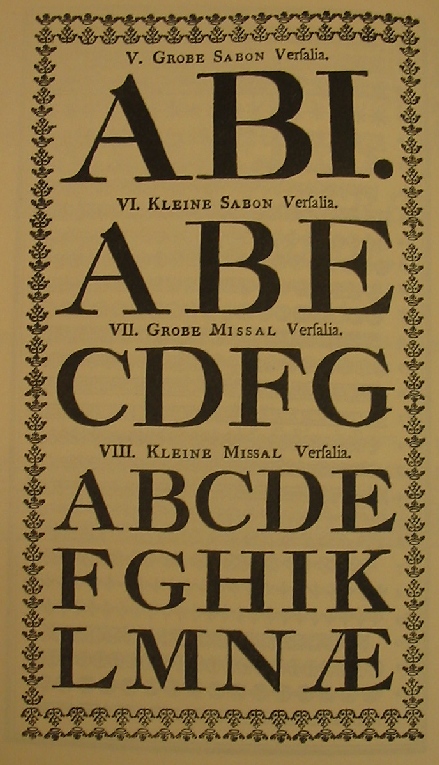
Typefounders in Zürich since the mid 18th century. One of its founders was the artist Johann Caspar Füssli, 1706-1782. Their work can be found in Épreuves des caractères de la fonderie de Orell, Gessner, Fueslin&compagnie. A Zuric (Zurich, 1781). This book already shows some didone influences, but its main typefaces are all Fraktur, with sizes in Sabon, Grosze Missal, Kleine Misaal, Grosze Canon, Kleine Canon, Mignone, Garmond and Petit. It offered a Garmond Schwabacher too. Publishers of Épreuves des caractères de la fonderie de Orell, Gessner, Fuessli&compagnie. A Zuric (Zurich, 1782). Local download of the 1782 book. The company still exists today, and specializes in cartography as Orell FüssliKartographie AG. [Google] [More] ⦿ | |
P. Moreau / Veuve Hérissant
|
|
Paulus John Christian Egenolff
| |
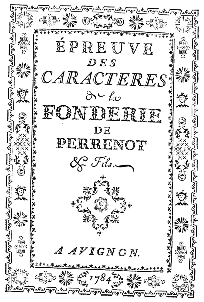
Perrenot et Fils
| Foundry in Avignon active from ca. 1770-1784. Its work can be found in Épreuve des caracteres de la fonderie de Perrenot&fils (Avignon, 1784). Before Perrenot et Fils, the foundry was just called Antoine Perrenot. Antoine Perrenot (d. ca. 1786, Avignon) had run the business from 1747 until 1770, when he involved his son in it. Antoine Perrenot said to have been the successor of a certain Legrand (about whom even Marius Audin admits not knowing anything). [Google] [More] ⦿ |
French typefounder of the early 18th century. Pierre Cot Type Specimen of 1707 was written by Douglas C. McMurtrie in 1924 (Chicago: Robert O. Ballou). It shows a facsimile of the original 8-leaf booklet of Hebrew and Greek type specimen of Pierre Cot, with a 3-page preface by McMurtrie. [Google] [More] ⦿ | |
Pierre Louis Siret (b. 1745, Evreux, d. 1798, Vitry sur Seine), a grammarian, started a printing business in Paris, but it was short-lived. Marius Audin believes that it operated ca. 1794-1795. [Google] [More] ⦿ | |
Pierre Moreau
| |
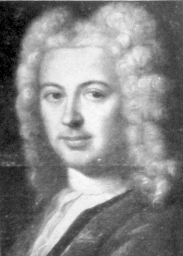
Pierre-Augustin Caron de Beaumarchais
| |
Christain Porsdorff was a typefounder in Leipzig, Germany, active ca. 1722. His Curreent-Schrift was used in 1725 by printer Johann Zacharias Fleischer (Eisenberg) to print a catechismus. [Google] [More] ⦿ | |
| |
Danish type foundry in Copenhagen active there from 1738-1814. It had matrices from the 16th, 17th and 18th centuries. Its most celebrated owner was Johann Gottfried Pöetzsch. The timeline:
| |
Parma-based printshop. For their typefaces, see Saggio di caratteri, e fregi (Torino, 1780) and Saggio di caratteri (Torino, 1770). [Google] [More] ⦿ | |
Thomas Grover
| |
Master engraver in Paris, ca. 1696. He was mentioned by Marius audin, as well as by La Fonderie Typographique in 1900. [Google] [More] ⦿ | |
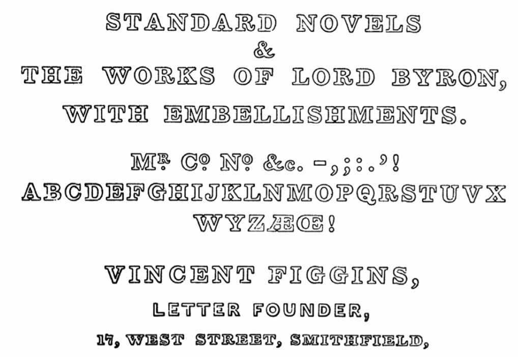
Giza (Font Bureau, 1994) is a revival by David Berlow of the latter face. Among the Gaelic typefaces he designed, we mention the later transitional angular typeface called Early Figgins by Michael Everson (ca. 1815), and the Gaelic modern angular typeface Everson calls Later Figgins. The latter typeface resurfaces ca. 1913 as Intertype and Intertype Bold (designer unknown), with versions at ATF (ca. 1916) and Linotype (ca. 1916), and as Monotype Series 24a (ca. 1906, which according to Everson was recast in 1913 by Michael O'Rahilly, and digitized in 1993 as Duibhlinn). Finally, Figgins's work from 1815 and 1817 inspired Matthew Carter's Elephant (1992), also called Big Figgins and Big Figgins Open (1998). Another digitization is Figgins Antique by Tom Wallace. Scans: Sample of the Figgins type from Hardiman's "Irish Minstrelsy", Two-Line Pearl Outline (1833). Epitome of Specimens by V.&J. Figgins was published in London in 1866. Vincent Figgins Type Specimens 1801 and 1815. Reproduced in facsimile. Edited with an introduction and notes by Bernard Wolpe was published in 1967 in London by the Printing Historical Society. Digital typefaces that can be traced back to Figgins. View typefaces derived from Figgins. [Google] [MyFonts] [More] ⦿ | |
Typefounders in The Netherlands, acquired later by Adam Gerard Mappa. Their work can be found in Proeven van letteren die gevonden worden in de van ouds beroemde lettergieterye van wylen de Heeren Voskens en Clerk / nu van A.G. Mappa = Epreuves de caracteres qui se trouvent dans la tres celèbre fonderie de feu Messieurs Voskens et Clerk / presentement de A.G. Mappa (Rotterdam, 1781). [Google] [More] ⦿ | |
Tomas Brousil's 72-style family Crabath (2021), which contains subfamilies for Text, Display, Subhead and Intials, is based on samples seen in Crabat's 1761 text. [Google] [More] ⦿ | |
Caslon's fame stems largely from his specimen of 1734, showing types that were considered to be superior to the Dutch types that inspired them. The English reliance on Dutch types had finally come to an end. His types were just as highly regarded in America, where the Declaration of Independence was set in Caslon. His son, William Caslon II, took over the business upon his death in 1766. There are four generations of William Caslons, numbered I (1692-1766), II (1720-1778), III (1754-1833) and IV (1780-1869), who took turns running the foundry. The foundry, eventually known as H.W. Caslon&Co., passed down through various members of the family until 1937, when the rights were transferred to Stephenson Blake. Check out the free scanned version of A Specimen of Printing Types (1785, Galabin and Baker, London) by William Caslon III. A specimen of cast ornaments (1795) is by William Caslon III and Charles Whittingham (1767-1840). Recasting Caslon Old Face discusses Specimens of the original Caslon Old Face printing types, engraved in the early part of the 18th century by Caslon I (1896). A listing of some digital version/revivals of Caslon's types:
Klingspor link. FontShop link. http://www.linotype.com/348/williamcaslon.html">Linotype link. [Google] [MyFonts] [More] ⦿ | |
Scottish typefounder. He first worked at Alexander Wilson's foundry in Glasgow. Later he started his own foundry in Edinburgh in 1809. In 1838, his son-in-law Walter Richard joined him. The foundry then became Miller&Richard. [Google] [MyFonts] [More] ⦿ |

 Spanish typefounder, engraver and printer from the 18th century, b. 1732, Murcia, d. 1812, Segovia. Unlike Pradell, the craftsman, Antonio Espinosa de los Monteros and Jeronimo Antonio Gil followed academic studies. They specialized in drawing and engraving under Tomas Francisco Prieto, engraver of the Real Casa de la Moneda, from whom they learned the techniques of engraving currencies. Their first task was to complete the matrices of Bernardo Ortiz. Gil and Espinosa began their careers simultaneously but Espinosa veers towards punchcutting. Gil began working for Juan de Santander at the Biblioteca Real until 1778, and was later transferred to the Real Casa de la Moneda de Mexico to become its first engraver, which made Santander lose his best punchcutter.
  John Bell (1746-1831) was a London-based publisher of several periodicals and newspapers. He founded the British Letter Foundry in 1788, with Richard Austin as punchcutter. The foundry closed in 1798.
  Parisian printer, whose 1742 book
  Fann Street Foundry is a defunct London-based foundry, started by Robert Thorne in 1794. It specialized in display types, often Victorian in nature towards the end of the 19th century. The foundry was bought by William Thorowgood in 1820, by Robert Besley in 1849, became Reed&Fox in 1866 and closed in 1906. Its designs passed to Stephenson Blake.
  Born in Troyes in 1526, Guillaume Le Bé was a bookseller, engraver and typefounder, who studied under Claude Garamont. He set up his own foundry in 1545 and ran it until his death. In 1561, he became Garamont's successor---he took over Garamont's foundry that year. He was mainly known for his Hebrew fonts, but was also praised for a roman double canon. He died in Paris in 1598. The foundry started by Le Bé kept going until well into the nineteenth century through various successions. Since Robert Estienne's foundry ceased in 1545, Marius Audin speculates, but cannot prove, that Guillaume Le Bé got his start in 1545 by taking over Estienne's foundry. Scott-Martin Kosofsky seems to contradict Audin's observation that Le Bé was Garamont's student: There is no evidence that he was a student of Claude Garamont; rather, what we do know is that he trained in the Paris workshop of Robert Estienne. He lived for some twenty years in Venice (not ten years, as stated in some modern sources), where he worked largely for the major publishers of Judaic literature. After he returned to Paris, he did much work for the Antwerp publisher Christophe Plantin, including the text Hebrews used in the renowned Polyglot Bible (Biblia Regia, 1568-1572).
  German/Swiss foundry established in 1790 (however, see timeline below) and based in Basel/Münchenstein. Many of its shares were acquired by D. Stempel in 1927. Linotype takes over Haas in 1989. Their collection includes:
 Among French type-founders at the end of the eighteenth century, the two Gillé's, père et fils, held a prominent place. The elder Gillé, Joseph, was a distinguished Parisian type-founder. He died in 1789. His work can be found in Epreuves des caractères de la fonderie Joseph Gillél; (1773), and in Caractères de la fonderie de J. Gillé, graveur et fondeur du roi pour les caractères de l'imprimerie de la loterie royale de France,&autres (Paris, Rue&petit marché Saint-Jacques, 1778). The latter book still shows mainly transitional typefaces, with slight hints of the start of the geometric trend in typography. Gillé seems to be mostly remembered for being the author of the ornamental typeface called Madame.
  Dutch foundry in the late 18th century run by Johannes de Groot (1746-1798). They published
 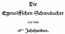 One of the oldest type foundries, founded by Paulus John Christian Egenolff (1502-1555), who was a printer in Strasbourg (1528-1530) and later in Frankfurt, where he was the first book printer. After his death, until 1572, his foundry was headed by family members, Magdalena, Barbara and Maria Egenolff. In 1572, punchcutter Jacob Sabon (d. 1580) took over after marrying Judith Egenolff, Christian's only daughter, in 1571. The widow remarries with Konrad Berner, a typefounder. Upon his death in 1606, the foundry is left to his son Hans Berner who dies in 1626. His daughter Katharina Berner takes over and marries Johann Luther in 1629, son of Friedrich Luther and family of
  Goldsmith in Valencia, who cut some printing characters between 1780 and 1784 in response to an order of the "Real Sociedad Económica Valenciana de Amigos del Pais". He started a press and a foundry in Valencia in 1784, and died in 1831. His fonts include a modern transitional typeface that is was revived, recovered and digitized by Josep "Pep" Patau Bellart in Barcelona as
  The print shop and foundry of Pierre Moreau was operational in Paris from 1640 until 1792. It had various directors, listed here in chronological order:
  British foundry of Simon and Charles Stephenson in the 18th century, which later became Stephenson Blake. In 1796-1797, it published
 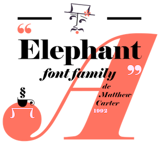 Influential typefounder, born in England, 1766-1844 (Peckham). He published several books of type specimens, and designed Gresham (1792), Old English (1815), Figgins Shaded (1816), Figgins Tuscan (1817, digitized by
  Typefounder Vaclav Jan Krabat (1719-1805) set up his shop in the center of Prague in 1751. His first specimen book was
 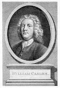 William Caslon I was born in Worcestershire in 1692. He died in London in 1766. He was a gun smith and a typefounder. His William Caslon Foundry was established by him in 1719, and would operate in London for over 200 years. His
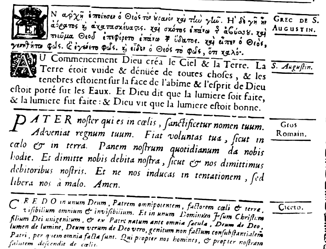
|
|
|
|