| | |
Abel Vincze
|
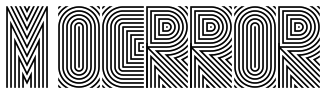 Designer in Budapest, Hungary, who created the multilined op-art typeface M-OCRROR in 2014, which was originally designed as a captcha typeface. Behance link. [Google]
[More] ⦿
Designer in Budapest, Hungary, who created the multilined op-art typeface M-OCRROR in 2014, which was originally designed as a captcha typeface. Behance link. [Google]
[More] ⦿
|
Aeolien
[J. Fürst Gardiner]
|
 Creator at FontStruct of Aeolien (2011, alphadings), Gazebo Line Aeo (2012), Chateau d'Air (2013, castles), Like Fabergé (2013, oval), Fold Line (2013, a sewing font), Toothache (2013), Linoleum (2013), Sandor Basic Stripes (2013), Compass Norden (2013, a dot matrix font), Sambuccus (2013), Abneuroniques (2013, neurotic typeface), Zebra (2013, horizontally striped), Amazed (2013, maze font), Card Reading (2013), 3paths (2013), Raidho (2013), Floraeolien (2013, flower dings), the Art of Square series (2013), and Ostara Egg Box (2013, ornamental caps for Easter).
 Typefaces from 2014: Ceques (op-art), Indentional, The Tunnels of Tralyoxx, ClickPop Beads, Blue Moon, Nurdal's Walk (LED font), Dumultix (techno, in De Stijl fashion, based on Mondrian), Wever Ding, My Unintended, Haltero, Linuta, Murexa, Abfahrt, Arrivee Mercredi, Mabon (vintage slab serif, art nouveau), Treat or Trick, Aerix Stencil Serify, Noba M, Plaque Emaille (white-on-black), Gleiteri, Strega nona, Kubetus (artsy), Kubetuffo, Pixiel, Werner, Free Masonry, Airy Brickwork, Aerix Stencil Sans, Sim Card, Kerbe, Fool's Beans, Gift Tag (alphadings), Tag Letters, Varsity Outline UC. Typefaces from 2015: 3Fino, S-chablo Sans (stencil), August, Shifted (op-art), Arroed, Apprentice Quill, Spitze, Melusine. Aka Jutta Gi. FontStruct link. [Google]
[More] ⦿
|
Alan Rimmer
[Fatchair]

|
[MyFonts]
[More] ⦿
|
Alexander Wright
|
 Alexander Wright (Modo Visual, Caracas, Venezuela) created the hip alchemic display typeface Alicia (2012, HypeForType). It won an award at Tipos Latinos 2012.
 In 2014, he published the prismatic typeface Maquinista, which can be bought at Hype For Type. It won an award at Tipos Latinos 2014. Winner at Tipos Latinos 2018 of a type design award for Isografia. In 2015, together with Michelle Benaim Steiner, he co-founded In-House International Design in Austin, TX. In 2020, he released Troptical (a 48-style prismatic or op-art typeface), and he co-designed Ragtag (a ragtag of capitals) with Rodrigo Fuenzalida for In-House International. In 2020, Rodrigo Fuenzalida, Alexander Wright and Michelle Benaim Steiner co-designed the exaggerated reverse stress (or: Italian) typeface Pata Slab at In-House International. All uppercase characters were built to fit precisely inside a square, so they are all the same width and height. In 2022, Rodrigo Fuenzalida and Alexander Wright published the decorative angular typeface family Broker at In-House International. HypeForType link. [Google]
[MyFonts]
[More] ⦿
|
Alisa Morozova
|
Moscow, Russia-based designer of an op-art typeface for the 26th Brno biennal in 2014. [Google]
[More] ⦿
|
Alpha Design
|
 Chinese studio that made the Latin script typefaces Agile Script (2015), Belle Script (2015), Lovepen (2015, connected), Smooth handwriting (2015), Caligraphy (2015), Golf (2015), Fancy Signature (2015), Vina (2015, fashion mag headline sans) and Candy Sticks (2014). In 2015, they made Sickle Blade, Bigoo, Bubble (display type), Pipe (art deco), Shuimu (hand-printed typeface), Begade (display type), Guilloches (a textured wavy op-art decorative typeface), Pio, Graffito (a painted graffiti font), Dome (a thin techno sans), and Hemiyong (a script typeface).
 Typefaces from 2016: Dorae Script, Agile Script, Happly Script (connected), Quick Script. Typefaces from 2017: Notetail Script, BrushWork, Alisa Serif (swashy), Wedding Script, Jasmine Script, Signature. [Google]
[More] ⦿
|
Alvin Koh
|
Graphic design student in Singapore in 2012-2013. Creator of a beautiful op-art poster for Air Icon 2013. He also made an ornamental typeface called Origami Cubism (2013). [Google]
[More] ⦿
|
Amuki Studio
[Vanessa Zuñiga]
|
 Vanessa A. Zuñiga Tinizaray (aka Amuki) is a graphic designer and art director in Loja, Ecuador. She works a lot with pre-Colombian, Inca, and South American cultural patterns. Vanessa created the experimental typeface Pacha (2010), which is based on old Indian patterns.
 In 2012, she designed the modular color font INTI, and the cultural pattern typeface family Sara. In 2014, she designed the modular typeface Oraculo and the bribeware display typeface Lineas Y Puntos. Amaru Creador won an award at Tipos Latinos 2014. In 2015, she created the free display typeface Abyaster, and the multiline Bolivian pattern typeface Khurus. Her typefaces Modular 46 and Tiwanacu (decorative Nazca-themed caps) won awards at Tipos Latinos 2016. Typefaces from 2016: Criolla (an ornamental circus font, extended to Criollabat in 2019). In 2017, she designed an extraordinary multiline ancient Mexican culture-themed decorative typeface, Coatl Serpiente, and published the Arhuaca op-art patterns. Typefaces from 2017: Tinkuy Patterns (a free op-art pattern font related to native Andean cultures; in 2021, published by Sudtipos with gdigitization by Alejandro Paul), M46C (experimental, and modular), Entorno (a modular prismatic typeface), Arhuaca (a precolombian pattern font). Typefaces from 2020: Nunka Anent Dingbat, Sébastien (a set of color typefaces inspired by Truchet's tilings). [Google]
[More] ⦿
|
Andrea D'Antonio
|
 Milan-based creator of typefaces such as Antigua Ferreteria (2013, a heavy grotesk based on old railroad style lettering found on a hardware building Sevilla: free download) and OpArt (2013, an op-art typeface).
 Behance link. [Google]
[More] ⦿
|
Andy Lethbridge
[Hand Foundry]
|
[MyFonts]
[More] ⦿
|
Anna Aksionova
|
 Vilnius, Lithuania-based designer of the prismatic op-art and art deco typeface Aks Font. [Google]
[More] ⦿
Vilnius, Lithuania-based designer of the prismatic op-art and art deco typeface Aks Font. [Google]
[More] ⦿
|
Anne-Cécile Manfré
|
Parisian designer. Creator of a commissioned typeface, Uni Type (2012) for the annual report of Unicancer. [Google]
[More] ⦿
|
Anton Scholtz
[Scholtz Fonts]
|
 [MyFonts]
[More] ⦿
[MyFonts]
[More] ⦿
|
Art deco typefaces by Nick Curtis: II
[Nick Curtis]
|
 Commercial art deco typefaces by Nick Curtis.
 - Bessie Mae Moocho NF (2002). An art deco font based on handlettering found on a travel brochure for IMM Steamship Lines, circa 1927.
- Blitzkrieg NF (2011). A Lufthansa Airlines baggage label from 1936 provided the inspiration for this genuinely German typeface, with strong art deco influences.
- Blue Jay Way NF (2011). An art deco typeface inspired by Ross F. George. This typeface was used on the Beatles' original Magical Mystery Tour album.
- Boeuf au Joost (2003). Art deco based on work by comic book artist Joost Swarte.
- Boho à Gogo NF (2007): a multiline (op art?) typeface inspired by Bauhaus.
- Chalk and Cheese NF (2004). This art deco uppercase is based on 1930s lettering by French poster artist Charles Loupot (based on this art deco poster), and the non-art deco lowercase is based on 1910s lettering by German plakatmeister Ludwig Hohlwein.
- Chemin de Fer NF (2005). An art deco shadowed outline face.
- Chi Town NF (2008) is a heavy art deco creation that is based on a 1931 poster for the film The Man from Chicago.
- Coochie Nando NF (2011). An art deco shadow caps face, after a typeface called Kitchen by Milton Glaser.
- Dooijes Deco NF (2010). A 3-style art deco family in the style of Broadway, based on the Dick Dooijes tryptich, Carlton, Bristol (1929) and Savoy (1936).
- Duck Soup (2003, after a 1928 poster by Italian designer Neri Nanetti for Snob Cognac).
- Elektromoto NF (2011). This family takes its inspiration from two early Art Deco typefaces from Germany. The Normal version is based on Dynamo, designed by K. Sommer for Ludwig&Mayer in 1930, while the Narrow version is based on Stadion, designed by Erhard Grundeis for Die Schriftguß AG in 1929. Their common design motifs epitomize the Age of Streamline.
- Humpty Dumpling NF (2010). A fat art deco typeface based on an offering from the irrepressible M. Draim, seen in La Lettre dans le Décor&la Publicité Modernes, published by Monrocq Frères of Paris in 1932).
- Dusty Rose (2008) is an art deco typeface based on the logotype for the Dutch magazine Geillustreerd Schildersblad in 1940.
- Edgewise (2007), a quirky well-rounded post-art deco and pre-psychedelic face, uses ideas from Ryter Night (VGC).
- Ege Schrift NF (2011). a faithful revival of Ege-Schrift (1921, Eduard Ege), a mix between Mexican party lettering and art deco.
- Engel Stabenschrift NF (2008). In 1927, Ernst Engel created an art deco typeface which was revived by Nick Curtis as Engel Stabenschrift NF.
- Faerie Queen NF (2006). Based on an art deco typeface named Titania made in 1933 by Fundición Richard Gans.
- The Reed and Fox typefaces Viennese and Corinthian were combined in 2014 in Nick Curtis's digital typeface Genever NF.
- Gotham Rail Company NF (2002). Art deco based on an Italian travel poster from 1931.
- Great Lakes Shadow (2008) is an art deco typeface based on a 1930s travel poster for the Canadian pacific Railway.
- Hunky Dory NF (2014). A circus font after William H. Page's wood type Doric, ca. 1850.
- Jazzfest NF and Tinseltown NF (2009). Based on the 1932 art deco typefaces Newport and Hollywood, respectively, both designed by Willard T. Sniffin for ATF.
- Kharon Ultra (2009). An art deco typeface based on Ludlow Stygian.
- Kinkajou Stew (2003). Image of Kinkajou NF.
- Kirschwasser NF (2005). A bubbly art deco face.
- Korner Deli NF (2006, art deco).
- Kymmera Deco NF (2011). Revival and redesign of Rainbow Bass (1982, saul Bass).
- La Reyna Catalina NF (2006). An art deco face based on Aragón, designed by Enric Crous-Vidal.
- Legnano Cuneo NF and Legnano Sassari NF (2014). Italian art deco wood type.
- Linea Nera NF (2011). Based on Wolf Magin's Black Line (1976, Berthold).
- Lodewijk Gothic NF. After Elzevir Gothic (ATF, 1897).
- Luben Tunen (2008) is another art deco face.
- Madison Squared NF (2012).
- Mighty Ditey (2007): a mix between art deco and Peignot, this elegant typeface is based on a 1970s Photolettering typeface by Richard Nebiolo called Aphrodite, and competes with Riesling (1994, Bright Ideas) and Gillespie (2015, Darren Odden) as revivals of Aphrodite.
- Mogzilla NF (2007) is an ultra fat art deco face.
- Monte Carlo Script NF (2002). An art deco font based on a font called Médicis from a Deberny and Peignot catalog, circa 1920.
- Nip&Tuck (2006).
- Odalisque NF (2008, +Stencil, 2010) are art deco fonts based on Morris Fuller Benton's Chic (1927).
- OK Chorale (2003). An art deco typeface based on Carl Holmes' ABC of Lettering book.
- Orchard Street NF (2011, +Inline). A pair of art deco caps typefaces inspired by one of many posters produced by the WPA by anonymous artists during the 1930s.
- Pentaprism NF (2011). Part Futura, part Bauhaus, this 5-style family has multiline, inline, and other variants.
- Picture Postcard NF (2004: based on an alphabet by Alf Becker).
- Raconteur NF (2006-2008) is a wonderful art deco typeface that shouts gin fizz and high heels: it takes its inspiration from a 1923 ad for Piera Nova, designed by Hernando G. Villa.
- Quoi Chou NF (2006). An elegant and quite original beefed-up version of Bernhard Fashion by Lucian Bernhard.
- Radio Days (2008). An art deco typeface based on 1930s logotype lettering for Crosley Radios.
- Rassetta NF and Rassetta Swash Caps NF (2005). An art deco pair of typefaces originally designed by Willard T. Sniffin for American Type Founders in 1931 under the name Rosetti.
- Renard Moderne NF (2010). An art deco typeface inspired by Sol Hess's 1940s typeface Twentieth Century Poster.
- Resolute NF or USA Resolute NF (2009). An all caps fat headline typeface based on Morris Fuller Benton's Eagle, ATF, 1934.
- Retrorocket NF (2015). An art deco alphabet based on a French lettering chapbook entitled Art du Tracé Rationnel de la Lettre (1934, D. Duvillé).
- Salzmann Deco NF (2011) and Salzmann Deco Deco NF (2011), art deco and Mexican-themed typefaces, modeled after Max Salzmann's Dolmen (1921-1922) and Zierdolmen (1922), respectively.
- Secret Agent (2003). A pure art deco beauty based on this Loupot poster from 1919.
- Ski Alpin NF (2014). An art deco typeface based on a Swiss travel poster from 1927.
- Smart Frocks NF (2008). A Peignotian face, after a shop sign in London, ca. 1930. Designer unknown.
- Stony Island NF (2011). Based on an Alf R. Becker typeface from 1935 called Chicago Modern Thick and Thin.
- Suave Sam NF (2010). An art deco typeface after a 1930 alphabet by Samuel Welo.
- Tasneem (2007) is the ultimate art deco face, originally drawn by Gustav Jensen in 1931.
- Tiny Bubbles NF (2008). An art deco typeface inspired by an alphabet in Pen&Brush Lettering and Practical Alphabets (Blandford Press, Ltd., London, 1929).
- Top Kick NF (2011). Based on Concentra, a geometric marvel with several parallel and concentric lines making up the letters. Concentra was originally published in Schriftatlas: Alphabete von A bis Z .
- Turista Gorda NF (2009). Based on Baltimore Type Foundry's Airport Tourist, which in turn was influenced by Futura Display.
[Google]
[MyFonts]
[More] ⦿
|
Attila Horvath
[Official Classic]
|
 [More] ⦿
|
B2302
[Simon Becker]
|
 Berlin-based designer Simon Becker (aka B2302) created Legere (2012, HypeForType). It has Light, Regular and Deco styles.
 In 2013, with Federico Neeva Orrù, he created a versatile octagonal multiline display family, Vasarely, named after optical artist Victor Vasarely. In 2014, Simon designed the manicured sans typeface family Helado together with Sabrina Ekecik and Benjamin Campana. Vagtur (a tweetware hybrid of VAG Rounded and Fette Fraktur) was co-designed with Sabrina Ekecik. In 2016, he designed the deco typeface Twokes. Behance link. [Google]
[MyFonts]
[More] ⦿
|
Blue Typo
[Manuel Guerrero]
|
Blue Typo is owned and run by Erendida Mancilla and Manolo Guerrero since 2000. Manolo Guerrero (San Luis Potosi, Mexico) is the Mexican creator of Deconstructa (2005, grunge), Hybrid Screen (2005), and Optica (2008, an opart or optical illusion texture face). Optica won an award at TDC2 2009 and a grand prize at Tipos Latinos 2010 (in the experimental type category) and can be bought at MyFonts under the Cocijotype label. Optica is a tribute to Colombian artist Omar Rayo's optical art. FontStructions by him in 2009 include Block 02 (stencil). In 2009, he also made the experimental face MiniBlock (Cocijotype). In 2010, Sticky was published---it is an experimental brick face. Sonotipo (2016) is an experimental typeface co-designed with Alfonso Alba. It won an award at Tipos Latinos 2016. https://www.behance.net/bluetypo">Behance link. Another Behance link. [Google]
[MyFonts]
[More] ⦿
|
Bruno Roda
|
Designer from Lisbon. He created the modular experimental typeface Pista (2010), which is based on sections of model car race tracks, and could be considered prismatic or op-art. Behance link. [Google]
[More] ⦿
|
Büro für Gestaltung Janssen
[Daniel Janssen]
|
 Büro für Gestaltung Janssen, or Janssen Design, is located in Hamburg. It is involved in print, screen, animation, corporate and type design, and was founded in 2002 by Sylvia and Daniel Janssen. Together, they designed these typefaces:
 - Bias Regular (2008, T-26). An experimental pixel-based face.
- Gretel (2005, Fountain), a cross-stitch pattern font.
- Loop (2005, T-26).
- Kaa, a multilined hypnotizing face. This and some other typefaces are also available at T-26.
- Engel (2003, At T-26). See also here.
- Vitus (2003, Fountain: Vitus is a bold typeface with occasional delicate strokes. It'a based on a typeface found on one of the million mark notes released during the inflation in the 1920's). See also here.
- Emily, a connected script font, with some borders. Designed in 2003 with Sylvia Janssen, it is similar to Monte Carlo Script NF (2002, Nick Curtis), and both are based on a font called Medicis by Deberny and Peignot, ca. 1920.
- AF Nitro, a techno/LED collection of typefaces.
- Diavolo, a fifties diner face.
- Unovis, a minimalist squarish typeface with hard to distinguish u, n and v lower case characters.
- Sektor, a sans face.
- Sonar, a display sans.
- Masina, a simple geometric sans.
- Cash (no idea what this looks like).
- Initialen, a 21st century initial caps face.
- EF Gigant, a 96-weight techno family (Elsner and Flake, 2006).
- Emily: a connected upright script available from T26.
- Atlantik: six sets of line elements, sold by Veer and Fountain. The Atlantik typeface is a result of a poster design made for the Habour Museum Hamburg.
- Diago (2008, T-26): a striped op art sans.
- Oceane (2009, T-26). An avant-garde face.
- Karl (2010, T26). A script face.
FontShop link. Klingspor link. T26 link. View Daniel Janssen's typefaces. [Google]
[MyFonts]
[More] ⦿
|
Cheolhong Kim
|
 Seoul, Korea-based designer of Grid (2014), a modular compass-and-ruler typeface. In 2015, he published Silhouette and the op-art typeface Silhouette Style No. 2. In 2017, he published the grid-based typeface CK (2017).Behance link. [Google]
[More] ⦿
Seoul, Korea-based designer of Grid (2014), a modular compass-and-ruler typeface. In 2015, he published Silhouette and the op-art typeface Silhouette Style No. 2. In 2017, he published the grid-based typeface CK (2017).Behance link. [Google]
[More] ⦿
|
Christopher Berry
|
 Brighton, UK-based creator of the op-art set of alphabet wall prints called Factory Twenty One (2015). Behance link. [Google]
[More] ⦿
Brighton, UK-based creator of the op-art set of alphabet wall prints called Factory Twenty One (2015). Behance link. [Google]
[More] ⦿
|
Cocijotype
[Elí Castellanos Chávez]
|
 A 2004 graduate of Universidad Autonoma de San Luis Potosi. As a student at CEAD in Mexico, Elí Castellanos Chávez (b. 1980) is the director of Cocijotype, a foundry located in Oaxaca. He taught editorial design and typography in Loma Bonita, Mexico. Cocijotype was earlier called Sexytype. He won the Gold prize at the Morisawa Type Design Competition in 2014. He works as a Font Developer at studio Dalton Maag in London.
 Flickr page. Their typefaces: - Koch's Neuland inspired Elí to create Barrilito (2009). This anthroposophic typeface won an award at Tipos Latinos 2010 in the script category.
- Barricada (2008, Sudtipos) is a fat rounded signage typeface that was awarded in the Tipos Latinos 2008 competition in the non-text category.
- Lucecita (2009) is a dot matrix LED font. It won an award at Tipos Latinos 2010 in the screen typeface category.
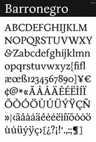
- Barronegro (2009) is a text family on which he has been working between 2006 and 2009. Barronegro is based on the cultural heritage of Oaxaca, as found on local posters, menus, shops, clothing, and art.
- Miniblock (2009, by Manuel Guerrero) is created to stack letters next to each other to look like labyrinths. It won an award in the Tipos Latinos 2008 competition for best text family.
- Optica (2008, Manolo Guerrero) is a tribute to Colombian artist Omar Rayo's optical art.
- Block02 (2009, Manolo Guerrero) is a FontStruct font that is part pixelized, part stencil.
- Optica (2008, Manolo G) is an optical experiment.
- Chicha (2012, Diego Sanz) is based on Peruvian market signs.
- Quincha (2009, Diego Sanz) is the quechua word for stone wall. Letters can be packed together in a way that reminds one of ancient Inca art.
- Casiopea (2010) is a corporate or signage type family that comes in six weights including Bold and Thin.
- Zipolite (2011). A mix of grotesk and humanist. See also Zipolite Rounded (2013). Zipolite won an award at Tipos Latinos 2014.
- Hola is a text typeface that won an award at Tipos Latinos 2014. In addition, it won the Gold Prize in the Latin category at the Morisawa Type Design Competition 2014.
- Calmetta (2017). Designed at Dalton Maag as an extension of Dalton Maag's wayfinding font Pantograph originally created by Marc Weymann.
- Speaker at ATypI 2018 in Antwerp (together with Eloise Parrack) on a revival project summarized as follows: In November 2017 an international cohort on the Expert Class in Type Design, based in the UNESCO world heritage site of the Museum Plantin-Moretus, embarked upon a collaborative project to research and revive a Renaissance-era typeface of the Flemish punchcutter Hendrik van den Keere from the collection of Christophe Plantin. Comparing Van den Keere's well-known Real Romain (1575) and Ascendonica Romain (1577) with his Small Pica Roman (1578), and investigating the patterning, proportions, and details, our research led to the design of a revival using Small Pica Roman at 9-point Didot size as a departure. Evaluations of the approaches of working in metal and standardization in type design at different optical sizes were considered, and were contrasted to methods and tools of digital typeface design today. The unique and rich historic archive of punches, matrices, and printed materials provided an exciting basis for our research, leading to some surprising discoveries counter to our expectations and to accepted theories found in many typography and type design texts. This project provoked a wide range of interpretations, approaches, and opinions about how to create a contemporary usable digital typeface, whilst honouring and imagining the intentions of Van den Keere five centuries past.
Klingspor link. [Google]
[MyFonts]
[More] ⦿
|
Dae-Hoon Hahm
|
 Type designer from Seoul, Korea. At S-Core, he co-designed the squarish Latin/Hangul typeface Core Dodam (2011), the shadow outline typeface Core Bandi (2012) and the hand-printed Core Narae (2011) with Hyun-Seung Lee. Hyun-Seung Lee, Dae-Hoon Hahm and Min-Joo Ham jointly designed the programmers' typeface Eco Coding (2012) and the huge Core Sans, Core Sans G (geometric), Core Sans M and Core Sans N, Core Sans NR, and Core Sans N SC families (supported codepages are MS Windows 1252 Latin1, MS Windows 949 Korean (Hangul) consisting of 11,172 letters and KS Symbols (Korean Symbols)).
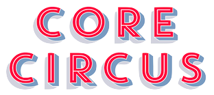
 In 2013, Hyun-Seung Lee, Dae-Hoon Hahm and Min-Joo Ham jointly designed the layered type system Core Circus---as a reaction to the hugely successful Trend typeface by Latinotype, I guess. The slab version is Core Magic (2014). See also Core Circus Rough (2014) and Core Magic Rough (2014), both jointly designed by Hyun-Seung Lee, Dae-Hoon Hahm and Dong-Kwan Kim. Core Slab M (2013) is a 31-style companion of Core Sans M---it is a soft rounded slab with some seriffy tails mixed in with standard slab terminals. Core Mellow (2013) is a condensed organic rounded sans family that comes in 21 weights. In 2014, Hyun-Seung Lee, Dae-Hoon Hahm and Min-Joo Ham co-designed Core Sans D, Core Sans A, Core Rhino, Core Narae Pro (a Comic Sans alternative) and Core Deco (a 14-style art deco family). Core Escher (A and B) (2014) is a typeface family with impossible optical illusions, created by Hyun-Seung Lee and Dae-Hoon Hahm. Core Paint (2014) is a grungy paint-splatter typeface family by Dong-Kwan Kim, Hyun-Seung Lee and Dae-Hoon Hahm. In 2015, Hyun-Seung Lee, Dae-Hoon Hahm and Dong-Kwan Kim co-designed the grotesque typeface family Core Sans E and added the soft and rounded Core Sans R to the S-Core Sans series, as well as Core Sans B. In 2016, they added the rounded small x-height family Core Sans BR and the geometric sans family Core Sans C. The rounded version of Core Sans A, called Core Sans AR was designed in 2016 by Hyun-Seung Lee and Dae-Hoon Hahm. The rounded version of Care Sans C, called Core Sans CR, was designed in 2016 by Hyun-Seung Lee, Dae-Hoon Hahm, and Dong-Kwan Kim. The neutral Core Serif N was added in 2016 by Hyun-Seung Lee, Dae-Hoon Hahm and Dong-Kwan Kim. [Google]
[MyFonts]
[More] ⦿
|
Daniel Janssen
[Büro für Gestaltung Janssen]
|
[MyFonts]
[More] ⦿
|
Daniel Wenzel
|
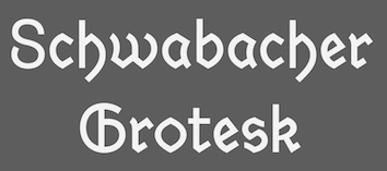 During his studies at HTWG Konstanz, Germany, Daniel Wenzel created the sans and serif typeface family Dekan (2015) and the sans typeface Hass Grotesk (2016). Still in 2016, he revived Alte Schwabacher as Schwabacher Grotesk.
 In 2017 he designed the sans typeface family Veelo. In 2017, Sergi Delgado and Daniel Wenzel co-designed the textured op-art typeface Aigua. Daniel wrote Automatisierte Schriftgestaltung / Automated Type Design to showcase how type design can be automated. That work was done under the mentoship of professors Brian Switzer and Jo Wickert. [Google]
[More] ⦿
|
Davide Zomer
|
Student of Academy of Fine Arts of Bologna, who was born in Trento, Italy. He is heavily into sup-fitting geometric experimental typefaces that flirt with the optical limits. One example is his NMTCS typeface. [Google]
[More] ⦿
|
Deniart Systems
[Jan Koehler]
|
 Great fonts for astrology, hieroglyphics, alchemy and the occult, by Toronto's Jan and Denise Koehler, mostly designed between 1993 and 1995. They moved to Litomerice and then Teplice, the Czech Republic, recently. MyFonts sells the fantastic Meso Americano dingbats, Hypnotica, AlchemySymbols (two fonts), BlackMagick, Border Twins (2010), CastlesShields, Curly Jane (2010), Cubista Geometrica (2010: op art), DaggersAlphabet, Dendera (ancient Egyptian Zodiac symbols), Dragons, Eggnog (2010), Fontazia Floradot (2012), Fontazia Papilio (2009), Fontazia Pop62 (2011, dingbats of flowers), Fontazia AquaFlorium (2010, fishtank dingbats), Fontazia Mazzo (2010, vases), Fontazia Stiletto (2011), Fontazia Y3K (2009, aliens), the Hieroglyph family (dingbats, really), Jolly Jester (2010, curly hand), MagiWriting, Meandros (2010, a paperclip design inspired by the Greek Key, or Fret, motif), Phaistos, Pocket Wrench (2010, octagonal), Polka Dot Wrench (2010), PowersofMarduk, Praha Deco (2010, inspired by the Prague art deco movement), the RongoRongo family (Easter Island script), SkeletonAlphabet, Sublimina, Superchunk, WhiteMagick, Yenda (2010, bold and angular).
 List of font packages: Aglab, Alchemy Symbols, American Sign Alphabet, Ancient Writings Vol. 1, Ancient Writings Vol. 2, Angelica, The Astrologer Bundle, Astrologer, Aztec Day Signs, Black Magick, Braille Alphabet, Castles&Shields, Celestial Writing, Celtic Astrologer, Certar, Chinese Zodiac, Coptic Alphabet, Daggers Alphabet, Dendera, Dinosauria, Dragons, Egyptian Deities, Enochian Writing, Egypt. Hieroglyphics Vol 1, Egypt. Hieroglyphics Vol 2, Egypt. Hieroglyphics Vol 3, Egypt. Hieroglyphics Vol 4, Futhark, Greco, Hebrew Basic, Hypnotica, Magi Writing, Magick&Mystic, Malachim Writing, Masonic Writing, Maya Day Names, Maya Month Glyphs, Meso Americano, Meso Deko, Morse Code, Old Persian Cuneiform, Passing the River, Phaistos, Pike's Alphabets, Powers of Marduk, Sanskrit Writing, Semaphore Code, Signals&Signs, Skeleton Alphabet, Sublimina, Tengwanda Gothic, Tengwanda Namarie, Theban Alphabet, The Egyptologist, Tolkien Scripts, WhiteMagick, Skeleton Alphabet, Hebrew Basic, Sanskrit Writing. Note: I cannot find an entry for Jan Koehler at MyFonts, where all Deniart fonts are said to have been made by Denise Koehler. [Google]
[MyFonts]
[More] ⦿
|
Denis Sherbak
|
 Russian designer. In 2008, he created a number of commercial Cyrillic/Latin typefaces, including Capitalist, NoName, Antarktika, and Alenoushka. In 2010, he made the fuzzy op-art typeface Guilloche. Dafont link where one can download Capitalist and Bird Cherry (2009, sans). In 2013, he added the sirupy typeface Wild Honey. In 2014, he created the constructivist typeface Buran USSR and the techno typeface Redpower (Latin and Cyrillic). In 2015, he published the squarish constructivist typeface family Snowstorm.
 Behance link. Dafont link. [Google]
[More] ⦿
|
Denise Koehler
|
 Partner of Jan Koehler in Deniart Systems, which operated from 1993-2009 in Toronto, and then in Litomerice (Czech Republic). Her typefaces include: Skeleton Alphabet, Sanskrit Writing, White Magick Symbols, Theban Alphabet, Tolkien Tengwanda Namarie, Tolkien Tengwanda Gothic, Sublimina, Semaphore, RongoRongo (a system of glyphs discovered in the 19th century on Easter Island), Powers Of Marduk, Phaistos Disk Glyphs, Passing The River, Old Persian Cuneiform (1995), Morse Code, Meso Deko, Maya Month Glyphs, Maya Day Names, Masonic Writing, Malachim Writing, Magi Writing, Hypnotica, Egyptian Hieroglyphics Basic, Egyptian Hieroglyphics - The Egyptologist, Hebrew Basic, Greco (Greek face), Futhark, Enochian Writing, Egyptian Hieroglyphics - Deities, Medieval Dragons, Dinosauria, Egyptian Hieroglyphics - Dendera, Daggers Alphabet, Coptic Alphabet, Chinese Zodiac Symbols, Tolkien Certar, Celtic Astrologer Symbols, Celestial Writing, Castles&Shields, Braille Alpha, Black Magick, Aztec Day Signs, Astrologer Symbols, Angelica, American Sign Alphabet, Alchemy Symbols, Tolkien Aglab, Fontazia AquaFlorium (2010, fish tank dingbats), Snow Crystals (2010, followed by Snow Crystals 2 in 2012), Star Crystals (2010, more snow-like structures but having 8 instead of 6 axes of symmetry), Karika Swirls (2010), Karika Hearts (2010), Karika Encore (2011), Fontazia Chateaux (2011), Fontazia Chateaux Deux (2011), Fontazia Insomnia (2011), 21 Emmerson (2011), 4 Point Greek Fret (2011: labyrinthine), 4 Point Florals (2011), 4 Point Deco (2011), Mykonos (2011, labyrinthine), Harmonics (2011, a zig-zag face), Fontazia Motyl (2011, butterfly dings), Holiday Penguins NF (2011, Christmas dingbats), Fontazia Christmas Tree (2011), Eggs Galoe (2012, Easter egg font), Border Glyphs (2012, hieroglyphic), Fontazia Christmas Baubes (2012), Fontazia Christmas Tree 2 (2013), Karika Hypnotica (2014, hypnotic or kaleidoscopic glyphs), Symcaps Vario X1, Symcaps Vario X2, Symcaps Vario X3 (2016, op-art design). Klingspor link. [Google]
[MyFonts]
[More] ⦿
Partner of Jan Koehler in Deniart Systems, which operated from 1993-2009 in Toronto, and then in Litomerice (Czech Republic). Her typefaces include: Skeleton Alphabet, Sanskrit Writing, White Magick Symbols, Theban Alphabet, Tolkien Tengwanda Namarie, Tolkien Tengwanda Gothic, Sublimina, Semaphore, RongoRongo (a system of glyphs discovered in the 19th century on Easter Island), Powers Of Marduk, Phaistos Disk Glyphs, Passing The River, Old Persian Cuneiform (1995), Morse Code, Meso Deko, Maya Month Glyphs, Maya Day Names, Masonic Writing, Malachim Writing, Magi Writing, Hypnotica, Egyptian Hieroglyphics Basic, Egyptian Hieroglyphics - The Egyptologist, Hebrew Basic, Greco (Greek face), Futhark, Enochian Writing, Egyptian Hieroglyphics - Deities, Medieval Dragons, Dinosauria, Egyptian Hieroglyphics - Dendera, Daggers Alphabet, Coptic Alphabet, Chinese Zodiac Symbols, Tolkien Certar, Celtic Astrologer Symbols, Celestial Writing, Castles&Shields, Braille Alpha, Black Magick, Aztec Day Signs, Astrologer Symbols, Angelica, American Sign Alphabet, Alchemy Symbols, Tolkien Aglab, Fontazia AquaFlorium (2010, fish tank dingbats), Snow Crystals (2010, followed by Snow Crystals 2 in 2012), Star Crystals (2010, more snow-like structures but having 8 instead of 6 axes of symmetry), Karika Swirls (2010), Karika Hearts (2010), Karika Encore (2011), Fontazia Chateaux (2011), Fontazia Chateaux Deux (2011), Fontazia Insomnia (2011), 21 Emmerson (2011), 4 Point Greek Fret (2011: labyrinthine), 4 Point Florals (2011), 4 Point Deco (2011), Mykonos (2011, labyrinthine), Harmonics (2011, a zig-zag face), Fontazia Motyl (2011, butterfly dings), Holiday Penguins NF (2011, Christmas dingbats), Fontazia Christmas Tree (2011), Eggs Galoe (2012, Easter egg font), Border Glyphs (2012, hieroglyphic), Fontazia Christmas Baubes (2012), Fontazia Christmas Tree 2 (2013), Karika Hypnotica (2014, hypnotic or kaleidoscopic glyphs), Symcaps Vario X1, Symcaps Vario X2, Symcaps Vario X3 (2016, op-art design). Klingspor link. [Google]
[MyFonts]
[More] ⦿
|
Diego Pinilla Amaya
|
 Graphic designer and art director at As If Magazine, Buenos Aires. For As If he created the prismatic op-art typeface Optic Alphabet (2015). He also designed a prismatic fantasy alphabet called Strings (2015) and the axonometric alphabet Axo (2016). Behance link. [Google]
[More] ⦿
Graphic designer and art director at As If Magazine, Buenos Aires. For As If he created the prismatic op-art typeface Optic Alphabet (2015). He also designed a prismatic fantasy alphabet called Strings (2015) and the axonometric alphabet Axo (2016). Behance link. [Google]
[More] ⦿
|
Dmitry Rastvortsev
|
 Ukrainian type designer (b. 1977, Buryn) who graduated from Sumy State University in 1999. Since 2002, he creates digital fonts. He also works at Dancor advertising in Sumy, Ukraine, since 1997. Very prolific, his work includes a substantial number of commissioned typefaces for magazines and companies.
 He received a TypeArt 05 award for the display family DR Galushki (and DR Galushki Hole, 2011), which was designed for children's books. Other creations: LQ Wow and LQ Anisett (2010, for women's magazine LQ), LQ Didot (2011, also for LQ), Dekapot (grunge), Gomorrah (2013), Usquaebach (2013), Kinescope (2013), Goshen (2013), Rhode Black (2014), UT Magazine (2014), Madmix (2014, for Esquire), Variety Square (2015, for the nmagazine Variety), DR Agu (comic book face), DR Agu Sans (2013), DR Agu Script (2016), DR Trafaret (army stencil face), DR Vixi, DR UkrGotika Sans, DR UkrGotika Serif, Tsar Peter, Pelican (for Esquire magazine), Fugue. In 2014, Gayaneh Bagdasaryan and Dmitry Rastvortsev created the Latin / Cyrillic sans typeface family Brutal Type (Brownfox) that is genetically linked to DIN. His funny DR Krokodila won an award at Paratype K2009. In 2014, Dmitry Rastvortsev, Lukyan Turetsky, and Henadij Zarechnjuk cooperated on the design of the free Latin / Cyrillic handwriting typeface Kobzar KS, which is based on the handwriting of Taras Shnvchenko, a famous Ukrainian poet, artist and philosopher. In 2016, he designed the op-art typeface family DR Lineart. In 2017, he published the military stencil font DR Zhek. In 2018, he designed DR Ukrainka, which is inspired by the lettering works of these Ukrainian artists of the 1920s: Vasyl Yermilov, Vasyl Krychevscky, Heorhiy Narbut. He also designed Sumy for the branding type for the city of Sumy, Ukraine. Rastvortsev won an award in the kanji category at the 22nd Morisawa Type Design competition in 2019 for DR Kruk Single. In 2019, on commission for Banda for the National Art Museum of Ukraine, Dmitry Rastvortsev designed the Cyrillic (and Latin) family Namu, which has substyles according to various eras, from 1400 until today. On commission for Vinnytsia, he designed the free typeface family Vinnytsia ((a lapidary) Serif, Sans, City). He finished 2019 with the free sans-serif-display superfamily Kyiv Type, which consists of KyivType Variable, KyivType Sans, KyivType Serif, and KyivType Titling. Typefaces from 2020: DR Krapka Rhombus, DR Krapka Round, DR Krapka Square (a set of dot matrix typefaces). Behance link. Klingspor link. [Google]
[MyFonts]
[More] ⦿
|
Douglas Reis
|
 Sao Paulo, Brazil-based designer of the op-art typeface Portifa (2018). In 2018, he did a revival of Martin Jacoby-Boy's Bravour (1912) called -Bravour Meio Prata. [Google]
[More] ⦿
Sao Paulo, Brazil-based designer of the op-art typeface Portifa (2018). In 2018, he did a revival of Martin Jacoby-Boy's Bravour (1912) called -Bravour Meio Prata. [Google]
[More] ⦿
|
Elí Castellanos Chávez
[Cocijotype]
|
 [MyFonts]
[More] ⦿
[MyFonts]
[More] ⦿
|
Elisa Tarchini
|
Morbeno, Italy-based designer of the op-art deco typeface Line Font (2017). [Google]
[More] ⦿
|
Ellen Stoehr
|
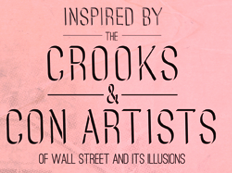 Wall Street Sans was created in 2012 by Ellen Stoehr (Minneapolis, MN). She writes: Similar to ability that con artists have to reveal what they want the viewer to see, optical illusions can usually be exposed or unveiled. I paired the mystery of optical illusions with the deceit of greedy modern day con artists, producing a typeface where the viewer can't quite determine if the letterform is receding into the background or coming forth into the foreground. I call it Wall Street Sans. [Google]
[More] ⦿
Wall Street Sans was created in 2012 by Ellen Stoehr (Minneapolis, MN). She writes: Similar to ability that con artists have to reveal what they want the viewer to see, optical illusions can usually be exposed or unveiled. I paired the mystery of optical illusions with the deceit of greedy modern day con artists, producing a typeface where the viewer can't quite determine if the letterform is receding into the background or coming forth into the foreground. I call it Wall Street Sans. [Google]
[More] ⦿
|
Elsner&Flake: Manfred Klein sub-collection
[Manfred Klein]
|
 Manfred Klein's fonts at Elsner&Flake: Birds EF (1992), EF Aliens (great tribal masks), EFBeforeTheAlphabets (primitive dings), EF Bloxx, EF Brushable, BuchZeichen EF (2001), EFDeconStruct, EF Ethno (1991), EF Flying Objects, Flying OpArt EF (1994), EF Gois, EF Gutenbergs Traces, EF Kleins Sketch (1995), EF KLTypeFaces, EF MoreKaputt, Poet Concrete EF (1994), SuetterlinEF (1992), EF RememberImreR (1995), Stars N Spirals EF (1998), EF Tokay-MK (1992, after an idea of Imre Reiner), EF WhyNot (a lovely crazy handwritten character font, oozing originality and style), EF WitchesBrood (1994). [Google]
[MyFonts]
[More] ⦿
Manfred Klein's fonts at Elsner&Flake: Birds EF (1992), EF Aliens (great tribal masks), EFBeforeTheAlphabets (primitive dings), EF Bloxx, EF Brushable, BuchZeichen EF (2001), EFDeconStruct, EF Ethno (1991), EF Flying Objects, Flying OpArt EF (1994), EF Gois, EF Gutenbergs Traces, EF Kleins Sketch (1995), EF KLTypeFaces, EF MoreKaputt, Poet Concrete EF (1994), SuetterlinEF (1992), EF RememberImreR (1995), Stars N Spirals EF (1998), EF Tokay-MK (1992, after an idea of Imre Reiner), EF WhyNot (a lovely crazy handwritten character font, oozing originality and style), EF WitchesBrood (1994). [Google]
[MyFonts]
[More] ⦿
|
Emma Burton
|
UK-based designer of the op-art typeface Isolation (2016). [Google]
[More] ⦿
|
Erik Bertell
[Erik Jarl Bertell]
|
 Helsinki, Finland-based Erik Bertell graduated from Lahti Institute of Design. His fonts include Neon, Mama and Mama Round. Born in Helsinki in 1980, Erik was at first a type designer for Fenotype, which was founded by his brother Emil Bertell. He holds an MA in graphic design from aalto University in Helsinki. Around 2012, he set up his own foundry, simply called Erik Bertell.
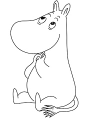
 Erik's fonts EB Base Mono (2009, monospaced), EB Futuretro (2002, bilined art deco techno face), EB Neon (2002), EB Boogie Monster (2002, multiline prismatic op art family), EB Vintage Future and EB Humboldt (2002, ultra fat). EB Martin (2010) is, in his own words, a post modern take on several traditional blackletter types. EB Bellissimo Display (2010) is a rounded monoline geometric sans typeface family. EB Jessica (2011) is part typewriter, part cemetery. Typefaces from 2013: Steamer (which he calls a grimy grotesque), EB Vintage Future, EB Martin (blackletter), EB Jessica Condensed Book. Moomin (2015) is a custom typeface designed for the Moomin brand. It is based the type used in the early comic strips by Tove Jansson, the author and creator of the Moomins. Cavalier (2016) is an avant-garde sans in the style of the 1970s. Typefaces from 2018: Capital (a sans and serif family by Teo Tuominen, Erik Jarl Bertell and Emil Karl Bertell). Typeface from 2019: Portland (a reverse contrast typeface by Emil Bertell, Erik Bertell and Teo Tuominen), Taurus (an all caps logotype family by Emil Bertell, Erik Bertell and Teo Tuominen), Zeit (a transitional text typeface by Emil Bertell, Erik Bertell and Teo Tuominen), Avion (a sans family by Emil Bertell, Erik Bertell and Teo Tuominen), Fabrica (a decorative frilly didone by Emil Bertell, Erik Bertell and Teo Tuominen), Tapas (by Emil Bertell, Erik Bertell and Teo Tuominen: a Serif, Sans, Deco and Script collection), Galatea (a 48-style sans family by Erik and Emil Bertell), Well (Erik Bertell and Toni Hurme: a wavy custom display typeface for Well Coffee), Morison (a great 32-style wedge serif typeface by Erik and Emil Bertell and Teo Tuominen), Frank Sans (grungy). Typefaces from 2020: Laurel (by Teo Tuominen, Emil Bertell and Erik Bertell: a 4 style sans with amnay wedge elements), Resolve Sans (by Teo Tuominen, Emil Bertell and Erik Bertell: an extensive grotesk super family of 124 fonts: from compressed to extended, thin to black), Rockford Sans (2020: an 8-style geometric sans with large x-height and slightly rounded corners; Emil Bertell, Erik Bertell and Teo Tuominen), Walden (a heavy rustic serif typeface by Emil Bertell, Erik Bertell and Teo Tuominen), Klik (a geometric sans family with Bauhaus influences, by the dynamic trio of Emil Bertell, Erik Bertell and Teo Tuominen). Typefaces from 2021: Imagist (a 12-style sharp-edged serif by Emil Bertell, Erik Bertell and Teo Tuominen), Alonzo (a 24-style Peignotian sans by Emil Bertell, Erik Bertell and Teo Tuominen), Maine (a 12-style modernized book antiqua by Emil Bertell, Erik Bertell and Teo Tuominen), Lagom (a 16-style slab serif with some Clarendon charm; by Emil Bertell, Erik Bertell and Teo Tuominen), Wonder (a 12-style rounded serif in the style of Windsor; by Emil Bertell, Erik Bertell and Teo Tuominen), Grand Cru (a refined serif family with 36 styles; by Emil Bertell, Erik Bertell and Teo Tuominen). Link to Bond Creative Agency. Behance link. [Google]
[MyFonts]
[More] ⦿
|
Erik Jarl Bertell
[Erik Bertell]
|
 [MyFonts]
[More] ⦿
[MyFonts]
[More] ⦿
|
Erken Kagarov
|
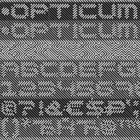 Art director. Designer of the op art font Opticum at Paratype in 2009. In 2016, he designed a sports shirt font, CSKA, at Art Lebedev for the CSKA ice hockey club.
 Fontshop link. [Google]
[MyFonts]
[More] ⦿
|
Escaphandro (or: Rafael Cervi Barrozo)
[Rafael Nascimento]
|
 Rafael Nascimento (b. 1977) is a Sao Paulo, Brazil-based graphic designer whose fonts are mostly free. FontStructor who made these modular display typefaces in 2014: Wim Gestreept (an octagonal typeface inspired by Wim Crouwel's work), Sao Paulo (pixacao emulation), Pixel Spaceships, Chippanze (+LoRes, +DotMatrix), Kamada, Illusion (op-art based on the work of visual artist Martijn Sandberg), De Lorean, Pulse (pixel face), De Stijl, Soundwave (experimental), Ninja Gaiden, Pony PX, Act1, Platypus, Geo Geo, Expressionista, Soundwave Round, Video, Geo Libre (a tangram font).
 Typefaces from 2019: the dot matrix typeface Ghouls (attributed to Rafael Cervi Barrozo). Typefaces from 2020: - Geo (a free kitchen tile or stencil font based on retro record covers).
- Choripan. A revival typeface based on the classic round font Frankfurter (1970, Bob Newman at Letraset).
- The free brutalist typeface Blknd (made with FontStruct).
- The free sports lettering font Wim Pro.
- The graffiti font SP011.
- Refuse. A revolutionary or military stencil font. Free download.
- Sumano. Squarish, tribal, and experimental. Free download.
- Volume Dealers. A free bold art deco font This typeface that references the photo typeface Black Body (Peter Steiner, 1973) and the classic lettering of the album Vol 4 by Black Sabbath.
- Swiss Grit. A free grungy typeface in the destructionist style of Brody and Carson.
Typefaces from 2021: Volume Round (Volume Round takes its cousin Volume Dealer structure to a retro-weird leve; it too is inspired by late 1960s photo typesetting designs, and in particular the works of Peter Steiner, adding a little sci-fi flair to the details). Typefaces from 2022: Ghosts (a 4-style experimental geometric display font), CMYK (an experimental textured typeface). You Work For Them link. [Google]
[More] ⦿
|
Eurotypo
[Olcar Alcaide]
|
 Institute in Benalmadena, Spain (was: Santa Severa), where one can take 4-week courses at 1450 Euros a shot on the Etruscan alphabet, Trajan, Cuadrata and Rustic Roman Capital letters, and related subjects. They also organize lettering tours in Italy and guided tours in various musea. The teachers are Alberto Di Santo (Professor of the visual communication, Tor Vergata University, Rome; Professor of Graphic Design, Istituto Europeo di design, Rome; Professor of editorial design, La Sapienza University, Rome; Professor of Typography, C.F.P. Sinalunga, Siena) and Olcar Alcaide (b. 1952, Argentina, Professor of Graphic and Typography Design, University of Buenos Aires; Professor of Typography, University of Lanús, and Professor of Graphic Design, Marbella Design School, Spain). Type link jump page.
 Eurotypo is also the foundry of Olcar Alcaide. Catalog of Olcar Alcaide's typefaces. In 2010, he published the text family Antium and the warm signage typefaces Mijas Ultra and Lila Pro Heavy. Typefaces from 2011 include Lila pro, Atenea (a humanist sans family), Agerola Script (a fat flowing signage face), Teja (signage face), Zalea (yet another signage face), and Nabu Pro (a connected signage script). Equalis (2011M, with Juan Lavalle) is a monoline slab typeface with a huge x-height and wide open counters. It was followed by Equalis Stencil (2011). Ravel (2011) is a fat signage script face. Atenea Egyptian (2011) is a solid slab serif family. Berta (2011) is a signage brush typeface with connected and unconnected versions. Optic Art (2011) is an ornamental typeface with building blocks that can be used for overlays. Creator of Eurotypo Bodoni Bold (2011). Typefaces from 2012: Cubus (dingbats), Saxo Deco (art deco), Moliere (2012, an elegant didone family with outspoken ball terminals), Melon Script (a fat curvy signage script family), Riky (comic book family), Chipa (a signage and package design script), Heket (an expressive curly script), Lenga (a slab serif typeface family), Mikal (brush script). Duktus is a 1940s style script in the style of Donatello (1935, Wagner & Schmidt), Troubadour (1927, Wagner & Schmidt), Liberty Script (1927, Willard T. Sniffin), Trafton Script (1933, Howard Allen Trafton), and Coronet (1937, R.H. Middleton). Picture. Typefaces from 2013: Dignus (influenced by Bank Gothic and Eurostile), Bague (old Dutch style with little contrast, in the style of Jan Van Krimpen), Lugo (a heavy signage or advertising script), Brittes (copperplate script), Talis (contrast-rich sans family), Fiesole (display family with an awkward back-curled lower case d), C Duflos (after a bâtarde coulée by Claude Duflos, a French engraver who was acitve around 1690). Typefaces from 2014: Talks (creamy signage script), Fiume (calligraphic script), Predy, Daevon (copperplate script), Beily (letterpress style), Ritts (a heavy script-like display family), Ritts Cursive (in the style of the brush signage scripts descending from Robert E. Smith's Brush Script for ATF in 1942). Typefaces from 2015: Valentia (a semi-copperplate calligraphic script followed by Valentia Condensed in 2016), Stabia, Digatte Quill (connected script), Digatte (connected monoline cursive script). Typefaces from 2016: Duero (signage script), Turia (calligraphic script), RRollie (a lapidary typeface based on the roman inscriptions), Valentia Nit (a copperplate typeface enriched with swashes and extensions). Typefaces from 2017: Citix (a great calligraphic / penmanship script), Citix Two Condensed, Alfabetica (humanist sans), Merick. Typefaces from 2018: Fortezza (a stiifened didone), Portoluce, Hotdogger (a cursive brush font family), Hotdogger Extras (dingbats), Favarotta, Vikive (a grotesque family), Aretino (a renaissance text typeface), Mirabella, Lectio. Typefaces from 2019: Palio (a condensed tall didone), Fractus (blackletter), Blackduck (blackletter), Sgraffio (copperplate script). Typefaces from 2020: Eolia A (a 12-style low contrast grotesque typeface), Breda (a 12-style geometric sans), Breda Two (six additional condensed styles), Marcus Traianus (in the Trajan style, with lowercase included as well), Eurotypo Sans, Eurotypo SII, Eurotypo BKL (a Baskerville-inspired family), Cannoli (a retro brush lettered signage script). Typefaces from 2021: Zornale (a 7-style text family inpsired by the Zornale, an original manuscript that contains a daily record of the books acquired by the Venetian bookseller Francesco de Madiis, between 1481 and 1488), Alacant (a 14-style slab serif with elliptical shoulders), Tre Giorni (a carefully designed script in solid and outline styles), Due Giorni (a rhythmic calligraphic script), Sagasti (a text typeface with straight serifs), Calcis (a 10-style sans), Rufolo (an 8-style lapidary typeface influenced by Robert Hunter Middleton's Stellar (1929), William A. Dwiggins' Albertus (1932) and Hermann Zapf's Optima (1952)). Typefaces from 2022: Zornale Title. Creative Market link. Klingspor link. [Google]
[MyFonts]
[More] ⦿
|
Fatchair
[Alan Rimmer]
|
Fatchair is Alan Rimmer's company in Chessington, Surrey, UK. MyFonts catalog. He has made corporate type such as Kingston Gill Sans (for Kingston University), and Contact. Other type families: Naranja (2012, a nice rounded sans family), Reon Sans (2012), Vasarely Light (2002), Deep Fried (1996), Drug (1998), Illuminati (2000, monospaced, sans serif), Informatic (2002, 20-style sans family marketed as friendly alternative to DIN), Mizar Grotesk (2002), San Jaime (2002), WSK (2002, a modern family), Ozone Inline (free dot matrix font, 2002). Commercial fonts include Boeotian (2004), DeepFried (2005, 28 members in this multiline typographical experiment), Drug (2004, eroded face), Friday (2004), Illuminati (2004), Informatic (2004, 20-weight sans family), Mizar Grotesk (2004, 10 weights), Procyon (2004), San Jaime (2004), Stranski (2004), Venkmann (2004) and WSK (2004, a 4-weight serif). Klingspor link. View Alan Rimmer's typefaces. View Fatchair's typefaces. [Google]
[MyFonts]
[More] ⦿
|
Federico Neeva Orrù
|
Designer in Cagliari, Italy. In 2013, with Simon Becker, he created a versatile octagonal multiline display family, Vasarely, named after optical artist Victor Vasarely. Behance link. [Google]
[More] ⦿
|
Fernando Haro
|
 Las Palmas de Gran Canaria, Ampuero and Laredo, Spain-based designer (b. 1971) who set up deFharo. Creator of the monoline sans typeface Depez (2011), Fabada (2011), and the free monoline geometric sans typeface La Chata (2011). La chatte, in French? Maybe not.
 In 2011, he made the monoline organic sans typeface Lerótica (free at OFL). In 2012, he created Nabatea (stone chisel typeface), V de Vacia (a grungy outline face), Sabática (organic), the straight-edged data style typeface Gabardina, the grotesk typeface A Bebedera, the shadow typeface B de Bonita, D Puntillas, and the deconstructed Qebrada. In 2013, he designed Yacarena Ultra, H.H. Agallas, Nacimiento (a dymo label font), J Airplane Swash (a psychedelic typeface named after Jefferson Airplane), CA Garrutas (grunge), CA Gatintas (grunge), I Am Telefono (the largest phone dingbat and scanbat typeface on earth), Wach Op-Art (kaleidoscopic icons), K.O. Activista, I Am Hueca, X Template (stencil), H.H.Samuel (rounded sans), U2 Metalona (a beautiful white-on-black display face), M F Plexus Italic, J.M. Nexus Grotesque (an "thin inline" fat grotesque), Wachinanga, Tabaquera, Pabellona (grunge), El Pececito (video game font), the poster typeface Hobby of Night (OFL), H2O Shadow (outline version of Fabada), Zabatana Poster (a didone-inspired poster font), Oaxaquena Tall, Yacimiento (wood style wedge serif), and Rabanera. Typefaces from 2014: Babalusa Cut, A Cuchillada, Sabandija (a plump round display typeface), F2 Tecnocratica, F1 Secuencia Quad (pixel face), La Pejina FFP (bilined), Tabaiba Wild, Gabachita (ultra-condensed rounded sans). Typefaces from 2015: Tabarra Pro (Swiss style sans family for Latin, Cyrillic and Greek), A Sogra Ruth (ultra-condensed art deco), Gaban (an outline version of Tabardo), Tabardo (a heavy blocky font), Wacamoler Caps (a Tuscan typeface inspired opening credits of the Western movie Winchester '73 directed by Anthony Mann in 1950), Ubicada (condensed geometric sans), Rabiosa (neurotic font), Zacatecas (condensed shaded sans), F3 Secuencia Round, La Babaca (a powerful black condensed sans in the style of Impact), Obcecada Sans + Serif (condensed with almost disappearing descenders), Eacologica Round Slab (a nice commercial font with an incomplete set of numerals), Palim Script (curly), Vacaciones (signage face), de La Cruz. Typefaces from 2016: Yugoslavia (calligraphic), Love Box (stencil), Cienfuegos (connected retro script named after the Cuban her Camilo Cienfuegos), Gaitera Ball (round fat script), The Black Box (a retro banner font), Durum Kebab (shadow sans), Jolgoria In Town (script), Yerbaluisa (signage script), Escobeta One (brush script), Posteratus Rex, Bastardilla (a cursive font), Rotulona Hand, The Juke Box (retro juke box lettering), Angelique Rose (connected monoline script), Promenades, Bucanera (a swashbuckle font), Lucemita, Panama Road (a casual calligraphic font), Deslucida, Disoluta, Sucesion Slab, Tabarra Pro Round, Qebab Pro Shadow, Monserga (white on black), Indulta SemiSerif. Typefaces from 2017: Partizano Serif (a retro poster font; free demo), Jack Stanislav (a great condensed movie poster font), Fontanero (rounded fat sans), Yonky (fat slab serif), Zigzageo, Libertatus (manual serif fonts based on a Czech poster from 1935), Libertatus Duas (slab serif), Flamante Sans, Flamante Serif, Flamante (Round, SemiSlab, Stencil, Seca, Cairo, Roma), Seisdedos Dead (rough stencil fonts), Neo Latina (stencil), Carta Magna (blackletter), La Sonnambula (signature script), Bola Ocho (an eightball font), Clandestina (textured, layered), Acratica (signage script), Penitencia Inline, Autarquica (outlined vernacular style), Caminata One (shaded signage typeface), Sin Razon (wedge serif), Glotona Black and White (a layered tattoo style font duo), Glotona Dots (the textured versions of Glotona), 6th Aniversario, Tribal Box (squarish sans, with tattoo ornaments and a great environment for borders), Candy Pop (bubblegum font), Sargento Gorila (army stencil font), Libertinas + co (a curly calligraphic script; the free version has no numerals). Typefaces from 2018: Gudariak (a free color SVG font: Vicente Ballester Marco (Valencia 1887-1980) was a graphic designer and Valencian poster artist affiliated with the CNT (Confederacion Nacional del Trabajo) who created political propaganda posters of clear modernist and post-cubist influence during the Spanish Civil War. The Gudariak typeface is inspired mainly by one of the posters he made for the Government of Euskadi and also in others where the author continues to explore this particular typographic style. ), Farisea Fraktur, Octuple Max (techno), Ordeal Eroded, Panfleta Stencil, Secuela (free), Fragua Pro (condensed sans family), Getho (a geometric semi-sans), Cowboya Tuscan (a curly Tuscan circus font), Txuleta Deco (a striped art deco typeface), Coltan Gea (slab serif), Getho Semi Sans, Cowboys (a Tuscan typeface), Drystick Geo Grotesk, Diezma, Grifa Slab, Coltan Gea (slab serif family), Paloseco (geometric and grotesk), Stoica (a color SVG font), Letrera Caps (a rounded square style layered and color font that pays homage to the sans serif inline genre), Enagol Math (a condensed rounded slab serif based on carefully applied mathematical ratios), Heptal, Velocista, Octagen Condensed, Octagen Black, Sextan Serif, Sextan Cyrillic, Quickat (signage script), Octagen (condensed sand with short descenders), Wolframia Script (flowing handwriting), Pentay Slab, Pentay Sans, Pentay Book, Cuatra, Judera (Flat and Ring: monospaced, unicase and totally sqaurish), Quotus (slab serif), Tripleta Grotesk (a 16-style geometric sans family). Typefaces from 2019: Pervitina Dex (sci-fi), Megalito Slab, Obesum Caps, Jane Roe (sans), Icons Opentype, Felona (stencil: a variable font), Neo Fobia, Bocartes Fritos (food icons), Red Thinker (a squarish monoline sans), Pena Caldaria (blackletter). Typefaces from 2020: Anoxic (a squarish monoline sans). Typefaces from 2021: Humato (a sturdy font for weightlifters), Probeta (a squarish techno sans family in 42 styles), Speeday (a speed emulation sans). Creative Market link. OFL link. Behance link. Dafont link. Devian tart link. Abstract Fonts link. Fontspace link. [Google]
[MyFonts]
[More] ⦿
|
Fernando Rangel
|
Graduate of IED Barcelona. Queretaro, Mexico-based designer of the free striped op-art typeface NaNo (2014, FontStruct) and the hyper-experimental Triangle (2014). Behance link. [Google]
[More] ⦿
|
Fontek (Letraset Fontek)
|
 Collection of typefaces at Letraset. Newest typefaces include Donaldson Hand (Tim Donaldson), La Gioconda (based on letters from Giovanni Francesco Cresci, done by Richard Dawson and Dave Farey), Spidercave (Michael Gills), Locomotiv (Phill Grimshaw), Bobbysox (Alan Dempsey), Bouchon (Roselyne and Michel Besnard), Eplica (Yvonne Diedrich), Uffington (Tim Donaldson). The fonts: Aachen Bold, Aachen Medium, Academy Engraved, Agincourt, Algerian Condensed, Ambrose, Aquinas, Aquitaine Initials, Aristocrat, Arriba, Arriba-Arriba, Artiste, Augustea Open, Avalanche Script, Avenida, Axis Bold, Balmoral, Bang, Banner, Becka Script, Belwe Mono, Belwe Mono Italic, Bendigo, Bergell, Bertie, Bertram, Bible Script, Bickley Script, Bitmax, Blackmoor, Bluntz, Bobbysox, Boink, Bordeaux Display, Bordeaux Family, Bordeaux Italic, Bordeaux Roman, Bordeaux Roman Bold, Bordeaux Script, Bouchon Bold, Bouchon Light, Brighton Bold, Brighton Light, Brighton Medium, Bronx, Burlington, Buzzer 3, Cabaret, Cabarga Cursiva, Campaign, Cancellaresca Script, Carlton, Carumba, Caslon 540 Ital/Swash, Caxton Light Italic, Caxton Roman Bold, Caxton Roman Book, Caxton Roman Light, Chalkline Bold, Challenge Bold, Challenge Extra Bold, Champers, Charlotte Bold, Charlotte Book, Charlotte Book Italic, Charlotte Family, Charlotte Medium, Charlotte Sans Bold, Charlotte Sans Book, Charlotte Sans Book Italic, Charlotte Sans Family, Charlotte Sans Medium, Charlotte Sans Small Caps, Charlotte Small Caps, Chiller, Chipper, Choc, Chromium One, Citation, Claude Sans, Claude Sans Bold Italic, Claude Sans Italic, Collins, Comedy, Commercial Script, Compacta, Compacta Bold, Compacta Italic, Coptek, Corinthian Bold, Corinthian Bold Condensed, Corinthian Light, Corinthian Medium, Crillee Bold Italic, Crillee Extra Bold Italic, Crillee Italic, Crillee Italic Inline Shadow, Cult, Dancin', Data 70, Dave Farey Display Fonts, David Quay Display Fonts, David Quay Scripts, Demian, Demian Bold, Design Font Attitudes, Design Font Calligraphic Ornaments, Design Font Celebrations, Design Font Commercials, Design Font Delectables, Design Font Diversions, Design Font Diversities, Design Font Eclectics, Design Font Energetics, Design Font Expressions, Design Font Incidentals, Design Font Industrials, Design Font Inspirations, Design Font Journeys, Design Font Mo' Funky Fresh Symbols, Design Font Moderns, Design Font Naturals, Design Font Organics, Design Font Organics II, Design Font Primitives, Design Font Radicals, Design Font Urbans, Design Font Well Beings, Design Font Wildlife, Digitek, Dolmen, Donaldson Hand, Doodlebug, Dynamo Shadow, Edwardian Medium, Elysium Bold, Elysium Book, Elysium Book Italic, Elysium Family, Elysium Medium, Elysium Small Caps, Emphasis, Enviro, Eplica Bold, Eplica Bold Italic, Eplica Book, Eplica Book Italic, Eplica Family, Eplica Medium, Eplica Medium Italic, Epokha, Equinox, Etruscan, Faithful Fly, Fashion Compressed No. 3, Fashion Engraved, Figural Bold, Figural Book, Figural Book Italic, Figural Family, Figural Medium, Figural Small Caps, Fine Hand, Flamenco Inline, Flamme, Flight, Fling, Follies, Forest Shaded, Frances Uncial, Frankfurter, Frankfurter Highlight, Frankfurter Inline, Frankfurter Medium, Freestyle Script, Freestyle Script Bold, Gigi, Gilgamesh Bold, Gilgamesh Book, Gilgamesh Book Italic, Gilgamesh Family, Gilgamesh Medium, Gilgamesh Small Caps, Gilgamesh Titling, Gill Display Compressed, Gill Kayo Condensed, Gillies Gothic Extra Bold Shaded, Glastonbury, Globale, Globale Bold, Globale Bold Italic, Globale Family, Globale Italic, Goo Goo Gjoob, Gravura, Green, Greyton Script, Hadfield, Hand Drawn, Harlow, Harlow Solid, Harvey, Hazel, Heliotype, Helvetica Bold Condensed, Helvetica Medium Condensed, Highlight, Hollyweird, Ignatius, Impakt, Indy Italic, Informal Roman, Inscription, Iris, Isis, Jazz, John Handy, Jokerman, Kanban, Katfish, Katytude, Klee, La Bamba, La Gioconda, La Gioconda Bold, Lambada, Laser, Laser Chrome, Latino Elongated, Laura, LCD, Le Griffe, Lexikos, Lightnin', Limehouse Script, Lino Cut, Locarno Italic, Locarno Light, Locomotiv, Magatama, Malibu, Marguerita, Martin Wait Display Fonts, Martin Wait Scripts, Mastercard, Mekanik, Mekanik Italic, Milano, Mistral, Mo' Funky Fresh, Montage, Neo Neo, Oberon, Odessa, Old English, One Stroke Script, One Stroke Script Bold, One Stroke Script Shaded, Orange, Orlando, Pablo, Papyrus, Party, Pendry Script, Phill Grimshaw Display Fonts, Phoenikia, Pink, Plaza, Pleasure Bold Shaded, Pneuma, Potato Cut, Prague, Premier Lightline, Premier Shaded, Princetown, Pristina, Pritchard, Pritchard Line Out, Pump, Pump Demi Bold, Quadrus, Quixley, Rage Italic, Ragtime, Rapier, Refracta, Regatta Condensed, Retail Script, Retro Bold, Retro Bold Condensed, Riva, Robotik, Robotik Italic, Romic Light, Romic Light Italic, Roquette, Ru'ach, Rubber Stamp, Rundfunk, Santa Fe, Savoye, Scratch, Scriba, Scriptease, Scriptek, Scriptek Italic, Scruff, Shaman, Shatter (op-art), Sinaloa, Skid Row, Slipstream, Smack, Smudger, Spidercave Bold, Spidercave Book, Spidercave Book Italic, Spidercave Family, Spidercave Ornamented, Spooky, Spotlight, Squire, Squire Extra Bold, Strobos, Superstar, Synchro, Tag, Tannhauser, Teknik, Telegram, Tiger Rag, Tim Donaldson Display Fonts, Tim Donaldson Scripts, Tiranti Solid, Trackpad, Tropica Script, Twang, Uffington, Ulysses, University Roman, University Roman Bold, University Roman Italic, Van Dijk, Van Dijk Bold, Varga, Vegas, Vermont, Victorian, Victorian Inline Shaded, Vienna Extended, Vivaldi, Wade Sans Light, Wanted, Waterloo Bold, Westwood, Wild Thing, Willow, Xylo, Young Baroque, Zaragoza, Zennor, Zinjaro. [Google]
[More] ⦿
Collection of typefaces at Letraset. Newest typefaces include Donaldson Hand (Tim Donaldson), La Gioconda (based on letters from Giovanni Francesco Cresci, done by Richard Dawson and Dave Farey), Spidercave (Michael Gills), Locomotiv (Phill Grimshaw), Bobbysox (Alan Dempsey), Bouchon (Roselyne and Michel Besnard), Eplica (Yvonne Diedrich), Uffington (Tim Donaldson). The fonts: Aachen Bold, Aachen Medium, Academy Engraved, Agincourt, Algerian Condensed, Ambrose, Aquinas, Aquitaine Initials, Aristocrat, Arriba, Arriba-Arriba, Artiste, Augustea Open, Avalanche Script, Avenida, Axis Bold, Balmoral, Bang, Banner, Becka Script, Belwe Mono, Belwe Mono Italic, Bendigo, Bergell, Bertie, Bertram, Bible Script, Bickley Script, Bitmax, Blackmoor, Bluntz, Bobbysox, Boink, Bordeaux Display, Bordeaux Family, Bordeaux Italic, Bordeaux Roman, Bordeaux Roman Bold, Bordeaux Script, Bouchon Bold, Bouchon Light, Brighton Bold, Brighton Light, Brighton Medium, Bronx, Burlington, Buzzer 3, Cabaret, Cabarga Cursiva, Campaign, Cancellaresca Script, Carlton, Carumba, Caslon 540 Ital/Swash, Caxton Light Italic, Caxton Roman Bold, Caxton Roman Book, Caxton Roman Light, Chalkline Bold, Challenge Bold, Challenge Extra Bold, Champers, Charlotte Bold, Charlotte Book, Charlotte Book Italic, Charlotte Family, Charlotte Medium, Charlotte Sans Bold, Charlotte Sans Book, Charlotte Sans Book Italic, Charlotte Sans Family, Charlotte Sans Medium, Charlotte Sans Small Caps, Charlotte Small Caps, Chiller, Chipper, Choc, Chromium One, Citation, Claude Sans, Claude Sans Bold Italic, Claude Sans Italic, Collins, Comedy, Commercial Script, Compacta, Compacta Bold, Compacta Italic, Coptek, Corinthian Bold, Corinthian Bold Condensed, Corinthian Light, Corinthian Medium, Crillee Bold Italic, Crillee Extra Bold Italic, Crillee Italic, Crillee Italic Inline Shadow, Cult, Dancin', Data 70, Dave Farey Display Fonts, David Quay Display Fonts, David Quay Scripts, Demian, Demian Bold, Design Font Attitudes, Design Font Calligraphic Ornaments, Design Font Celebrations, Design Font Commercials, Design Font Delectables, Design Font Diversions, Design Font Diversities, Design Font Eclectics, Design Font Energetics, Design Font Expressions, Design Font Incidentals, Design Font Industrials, Design Font Inspirations, Design Font Journeys, Design Font Mo' Funky Fresh Symbols, Design Font Moderns, Design Font Naturals, Design Font Organics, Design Font Organics II, Design Font Primitives, Design Font Radicals, Design Font Urbans, Design Font Well Beings, Design Font Wildlife, Digitek, Dolmen, Donaldson Hand, Doodlebug, Dynamo Shadow, Edwardian Medium, Elysium Bold, Elysium Book, Elysium Book Italic, Elysium Family, Elysium Medium, Elysium Small Caps, Emphasis, Enviro, Eplica Bold, Eplica Bold Italic, Eplica Book, Eplica Book Italic, Eplica Family, Eplica Medium, Eplica Medium Italic, Epokha, Equinox, Etruscan, Faithful Fly, Fashion Compressed No. 3, Fashion Engraved, Figural Bold, Figural Book, Figural Book Italic, Figural Family, Figural Medium, Figural Small Caps, Fine Hand, Flamenco Inline, Flamme, Flight, Fling, Follies, Forest Shaded, Frances Uncial, Frankfurter, Frankfurter Highlight, Frankfurter Inline, Frankfurter Medium, Freestyle Script, Freestyle Script Bold, Gigi, Gilgamesh Bold, Gilgamesh Book, Gilgamesh Book Italic, Gilgamesh Family, Gilgamesh Medium, Gilgamesh Small Caps, Gilgamesh Titling, Gill Display Compressed, Gill Kayo Condensed, Gillies Gothic Extra Bold Shaded, Glastonbury, Globale, Globale Bold, Globale Bold Italic, Globale Family, Globale Italic, Goo Goo Gjoob, Gravura, Green, Greyton Script, Hadfield, Hand Drawn, Harlow, Harlow Solid, Harvey, Hazel, Heliotype, Helvetica Bold Condensed, Helvetica Medium Condensed, Highlight, Hollyweird, Ignatius, Impakt, Indy Italic, Informal Roman, Inscription, Iris, Isis, Jazz, John Handy, Jokerman, Kanban, Katfish, Katytude, Klee, La Bamba, La Gioconda, La Gioconda Bold, Lambada, Laser, Laser Chrome, Latino Elongated, Laura, LCD, Le Griffe, Lexikos, Lightnin', Limehouse Script, Lino Cut, Locarno Italic, Locarno Light, Locomotiv, Magatama, Malibu, Marguerita, Martin Wait Display Fonts, Martin Wait Scripts, Mastercard, Mekanik, Mekanik Italic, Milano, Mistral, Mo' Funky Fresh, Montage, Neo Neo, Oberon, Odessa, Old English, One Stroke Script, One Stroke Script Bold, One Stroke Script Shaded, Orange, Orlando, Pablo, Papyrus, Party, Pendry Script, Phill Grimshaw Display Fonts, Phoenikia, Pink, Plaza, Pleasure Bold Shaded, Pneuma, Potato Cut, Prague, Premier Lightline, Premier Shaded, Princetown, Pristina, Pritchard, Pritchard Line Out, Pump, Pump Demi Bold, Quadrus, Quixley, Rage Italic, Ragtime, Rapier, Refracta, Regatta Condensed, Retail Script, Retro Bold, Retro Bold Condensed, Riva, Robotik, Robotik Italic, Romic Light, Romic Light Italic, Roquette, Ru'ach, Rubber Stamp, Rundfunk, Santa Fe, Savoye, Scratch, Scriba, Scriptease, Scriptek, Scriptek Italic, Scruff, Shaman, Shatter (op-art), Sinaloa, Skid Row, Slipstream, Smack, Smudger, Spidercave Bold, Spidercave Book, Spidercave Book Italic, Spidercave Family, Spidercave Ornamented, Spooky, Spotlight, Squire, Squire Extra Bold, Strobos, Superstar, Synchro, Tag, Tannhauser, Teknik, Telegram, Tiger Rag, Tim Donaldson Display Fonts, Tim Donaldson Scripts, Tiranti Solid, Trackpad, Tropica Script, Twang, Uffington, Ulysses, University Roman, University Roman Bold, University Roman Italic, Van Dijk, Van Dijk Bold, Varga, Vegas, Vermont, Victorian, Victorian Inline Shaded, Vienna Extended, Vivaldi, Wade Sans Light, Wanted, Waterloo Bold, Westwood, Wild Thing, Willow, Xylo, Young Baroque, Zaragoza, Zennor, Zinjaro. [Google]
[More] ⦿
|
Gabriel Tiller
|
Raleigh, NC-based designer, while at Parsons School of Design, of the experimental op-art typeface Wax (2017). [Google]
[More] ⦿
|
Gert Wiescher
[Wiescher Design]
|
 [MyFonts]
[More] ⦿
[MyFonts]
[More] ⦿
|
Gray Ng
|
 Kuala Lumpur, Malaysia-based creator of vector format fonts such as RoundCondensed (2014: piano key style), Hue Font (2014: op-art), Foury (2014: kitchen tile font), Trimental (2014: a 3d typeface), Playful Kid (2014), Maze Font (2014), Roundty Condensed (2012), Shape Guide (2014: a compass-and-ruler font), Veuz Italic (2014: poster font), Reel Love Joining Font (2014).
 In 2015, he made the experimental Prime Font and the paleolithic writing style font Paleo (2015). Behance link. [Google]
[More] ⦿
|
GrayLab (or: Gray Ng)
[Ng Wee Chean]
|
GrayLab is Ng Wee Chean's design studio in Kuala Lumpur, Malaysia. In 2021, he released the op-art font Amaze (started in 2014). Earlier typefaces include Aelegnt (2014), Stripe (2014: an early version of Amaze), Roundty Condensed (2012). [Google]
[MyFonts]
[More] ⦿
|
Guido Iafigliola
|
Montevideo, Uruguay-based designer of the free op-art typeface Reverb (2015). Behance link. [Google]
[More] ⦿
|
Hand Foundry
[Andy Lethbridge]
|
 During his studies, Andrew Lethbridge (Portsmouth, UK) created an op-art typeface called Modular Alphabet (2014). In 2015, he published the calligraphic brush script typeface family FS Shepton at Fontsmith. He set up Hand Foundry in London in 2015 or 2016.
 Typefaces from 2016: Rogan (a modular sans), Adinah (layered brush script), Bronkoh (a subtly softened sans workhorse typeface family). Typefaces from 2018: FS Koopman. A sans family designed by Andy Lethbridge and Stuart De Rozario. A hybrid sans workhorse that takes inspiration from Swiss grotesks, American gothics and early British grotesques. In 2020, he released these script or handcrafted typefaces at Monotype: Adagio, Douglas, Gambino (a chalk font), Herman (a marker pen font), Hylandia, Kendrick (a thick brush font), Morning, Rockland (a counterless poster font), Wrong (a tape font). [Google]
[MyFonts]
[More] ⦿
|
Harold Lohner
[Harold's Fonts]
|
 [More] ⦿
|
Harold's Fonts
[Harold Lohner]
|
 Harold Lohner was born in upstate New York in 1958. He received an MFA in printmaking from the University at Albany and is Professor of Visual Arts at Sage College of Albany. He began making fonts in 1997 and starting distributing them the next year through Harold's Fonts. He lives in Albany, NY, with his partner, Al Martino. Originally, most of his typefaces were freeware or shareware, but gradually, he started selling most on his site or via FontBros. His typefaces:
 Link at Dafont. . Abstract Fonts link. [Google]
[More] ⦿
|
Heike Nehl
|
German Face2Face designer who made mainly grunge typefaces in the late 1990s such as F2F LoveGrid, Starter Kid, Lego Stoned, F2F Twins, F2F Monako Stoned (1995, a halftone texture face, almost op art). [I wonder if Lego stoned was renamed to Monako Stoned for legal reasons...] LoveGrid and Twins are now also Linotype fonts. In 2003, F2FLovegridCaps LT Std and F2FTwins LT Std appeared as part of the Linotype Taketype 5 collection. FontShop link. Klingspor link. [Google]
[MyFonts]
[More] ⦿
|
Hyun-Seung Lee
|
 Type designer from Seoul, Korea. He started as a participant at the Koren typefoundry S-Core, and set up his own foundry, Cretype, in 2017. At S-Core, he published the Latin / Hangul typefaces Core Gaon, Core Bori, Core Narae (hand-printed), the shadow outline typeface Core Bandi (2012) and Core Dodam (squarish, with Dae-Hoon Hahm) in 2011. With Min Joo Ham, he created Core Label (2012). Hyun-Seung Lee, Dae-Hoon Hahm and Min-Joo Ham jointly designed the programmers' typeface Eco Coding (2012) and the huge Core Sans, Core Sans G (geometric), Core Sans M and Core Sans N, Core Sans NR, and Core Sans N SC families (supported codepages are MS Windows 1252 Latin1, MS Windows 949 Korean (Hangul) consisting of 11,172 letters and KS Symbols (Korean Symbols)).
 In 2013, Hyun-Seung Lee, Dae-Hoon Hahm and Min-Joo Ham jointly designed the layered type system Core Circus---as a reaction to the hugely successful Trend typeface by Latinotype, I guess. The slab version is Core Magic (2014). Core Slab M (2013) is a 31-style companion of Core Sans M---it is a soft rounded slab with some seriffy tails mixed in with standard slab terminals. Core Mellow (2013) is a condensed organic rounded sans family that comes in 21 weights. In 2014, Hyun-Seung Lee, Dae-Hoon Hahm and Min-Joo Ham co-designed Core Sans D, Core Sans A, Core Rhino, Core Narae Pro (a Comic Sans alternative) and Core Deco (a 14-style art deco family). Core Escher (A and B) (2014) is a typeface family with impossible optical illusions, created by Hyun-Seung Lee and Dae-Hoon Hahm. Core Paint (2014) is a grungy paint-splatter typeface family by Dong-Kwan Kim, Hyun-Seung Lee and Dae-Hoon Hahm. In 2015, Hyun-Seung Lee, Dae-Hoon Hahm and Dong-Kwan Kim co-designed the grotesque typeface family Core Sans E. The rounded versions of the Core Sans E, D and G families were designed in 2015 by Hyun-Seung Lee, Dae-Hoon Hahm and Dong-Kwan Kim under the names Core Sans ES, Core Sans DS, and Core Sans GS. Still in 2015, Hyun-Seung Lee, Dae-Hoon Hahm and Dong-Kwan Kim added the soft and rounded Core Sans R and Core Sans B to the S-Core Sans series. In 2016, they added the rounded small x-height family Core Sans BR and the geometric sans family Core Sans C. The rounded version of Core Sans A, called Core Sans AR was designed in 2016 by Hyun-Seung Lee and Dae-Hoon Hahm. The rounded version of Care Sans C, called Core Sans CR, was designed in 2016 by Hyun-Seung Lee, Dae-Hoon Hahm, and Dong-Kwan Kim. The neutral Core Serif N was added in 2016 by Hyun-Seung Lee, Dae-Hoon Hahm and Dong-Kwan Kim. In 2017, Hyun-Seung Lee published the Hangul / Latin font Core Gothic D, the great 9-weight sans workhorse family Core Gothic E, the 72-style modern sans serif typeface family Artico, Artico Soft, Behance link. Typefaces from 2017: Core Gothic N (a large Korean / Latin workhorse sans), Crepes (25 fonts for layering and textures), Geon Soft, Geon (an organic sans family with 54 fonts), Segaon, Segaon Soft, Caros (a clean geometric sans), Caros Soft, Coben (futuristic, rounded). Typefaces from 2018: Jiho (an organic monoline sans), Jiho Soft. Typefaces from 2020: At Rojotype, Hyunseung Lee released William Sans, an eight-weight sans serif family. YWFT link. Behance link. [Google]
[MyFonts]
[More] ⦿
|
In-House International
|
In-House International is an Austin,TX-based creative studio founded in 2011 by Alexander Wright. Michelle Benaim Steiner became a partner in 2015. In-House designs custom typefaces for branding and editorial projects and specializes in geometric experimental display fonts. In 2020, they released Ragtag (a ragtag of capitals by Rodrigo Fuenzalida and Alexander Wright) and Troptical (a 48-style prismatic or op-art typeface by Alexander Wright). In 2020, Rodrigo Fuenzalida, Alexander Wright and Michelle Benaim Steiner co-designed the exaggerated reverse stress (or: Italian) typeface Pata Slab at In-House International. All uppercase characters were built to fit precisely inside a square, so they are all the same width and height. In 2021, he released the 20-style modular strip typeface Snare (designed by Rodrigo Fuenzalida and Alexander Wright, it includes ten unicase styles). [Google]
[MyFonts]
[More] ⦿
|
Ivan Moreno
[Jorge Iván Moreno Majul]
|
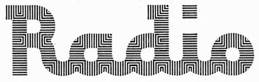 Jorge Ivan Moreno Majul is a graduate of Centro de Estudios Gestalt. At some point, he joined Pampatype. Based in Veracruz, Mexico, he designed the sans typeface Fresca (2011, Google Fonts) and the multiline layered colored and animated typeface Antorcha (2010). Antorcha, which revives the famous 1968 Mexico Olympics font, won an award at Tipos Latinos 2012. His typeface Wixarika won a prize at Cuarta Bienal de Tipografía Latinoamericana Tipos Latino in 2010.
 Typefaces from2016: Teris, Palitroche Sans and Serif. Typefaces from 2018: Saudade, Octothorpe (prismatic and op-art, based on Tony Wenman's font Stripes released by Letraset in 1972; released at Pampa Type in 2020), Automata, Presta (after Lucian Bernhard's 1908 Priester poster). Winner at Tipos Latinos 2018 of a type design award for Octothorpe. Typefaces from 2019: Pone (striped: a revival of ATF's modular typeface system, Alpha-Blox, 1944). Typefaces from 2020: Animal (a free 5-person effort for a South American screen text typeface competition, by the Bedepecus team that consists of Laura Barron Rivera, Pedro Elias Sosa Montoya, Ulises Ricardo Ortiz Cisneros, Miguel Angel Contreras Cruz, and Jorge Ivan Moreno Majul). [Google]
[More] ⦿
|
J. Fürst Gardiner
[Aeolien]
|
[More] ⦿
|
Jakk Breedon
|
As a student based in Nottingham, UK, Jack Breedon writes about his optical illusion font Mangata (2015): The Mangata Typeface was inspired by Surreal and Abstract French film director Germaine Dulac and her use of camera angles and on set props that created these really fascinating optical illusions, with each letter being a different optical illusion ranging from Rubins Vase, Cafe Wall, Bourdon Illusion and The Necker Cube all the way to The Impossible Cube, Penrose Triangle, Mach Bands and The Jastrow Illusion. In 2017, now located in Plymouth, UK, he designed the all caps op-art display typeface Dulac. Dulac is a font inspired by the French director Germaine Dulac. She was most renowned for her use of optical illusions within her work. Behance link. [Google]
[More] ⦿
|
James Grieshaber
[Typeco]
|
 [MyFonts]
[More] ⦿
[MyFonts]
[More] ⦿
|
Jan Koehler
[Deniart Systems]
|
 [MyFonts]
[More] ⦿
[MyFonts]
[More] ⦿
|
Jean Larcher
|
 French type designer and calligrapher (b. 1947, Rennes, d. 2015) who worked mostly in Cergy-Pontoise. From 1962-1965, he studied typographic art in a school under the Paris Chamber of Commerce. From 1973 until 1985, Jean Larcher, who had studied calligraphy as well, worked as a freelance calligrapher in and around Paris. From 1985, he taught calligraphy both inside and outside France. He wrote several books, including Character Traits (2014). While calligraphy was his passion, Jean was also fascinated by op-art and geometric patterns. His fonts are all phototypes except for the metal font Latina.
 His typefaces: Abécédaire à Renayures (1991, for Collector magazine), Beauté (1966, for Magazine Votre Beauté), Castillejo-Bauhaus (1980, Rapitype Madrid), Catich (1998), Digitale (1974, Hollenstein Phototypo), Gautier (1992, Agence J.-P. Gautier&Associés), Guapo (1973-75, Hollenstein Phototypo), Hollywood Script (1989), Honolulu (1974, Hollenstein Phototypo), Incise Volume (1981, for Cergy Magazine), Jamaica Experience (1978, for Rock Hebdo Magazine), Lancöme (1981, Rapitype, for Lancöme), Larcher (1974, Hollenstein Phototypo), Latina (1987, Mécanorma), Liberté Égalité Fraternité (1985, for the Ministère de l'Éducation Nationale), Logement (1980, Rapitype, for Cergy Magazine), Menhir (1973-75, Hollenstein Phototypo), New Crayon (1980, Rapitype, for Cergy Magazine), Optical (1974, Hollenstein Phototypo), Plouf (1970-74, Hollenstein Phototypo), Rasgueo (1979, for U&lc Magazine), Revival (1979, for 20 ans Magazine), Soleil (1973-75, Hollenstein Phototypo), Super Crayon (1976, Titrage CCT), Tornade (1974, Hollenstein Phototypo), Veloz (1987, Mécanorma), Vibrator (1976, Titrage CCT). 3D Alphabet (by Character) is inspired by an alphabet coloring book designed by Jean Larcher, 1978. Web site. MyFonts link. [Google]
[MyFonts]
[More] ⦿
|
Jim Marcus
|
 American type designer at [T-26]. Catalog of Jim Marcus's typefaces: ABS, Acetone, Aeos, Aerator, Airflo, AlbanyTelegram, AlquitoCCCP, Ambex (2004, futuristic, with nice dingbats), Aquabus (2004, multilined, op art), Aquiline (2007), Aquiline Master (renaissance script), Arete-Mono, Aviator, Axiom, BonGuia, CalculusRegular, Carnival, CartographersWheel, Coaxial, Detailles, Django-Bold, Dumaigne, Echoplex, Entelliant UK Bit (2004, dot matrix face), Eraser, Eremaeus (used for the movie Underworld Evolution), EscalidoStreak, FGrooveSeventyNine, FedorovAnglo, FgrooveEighty, GeistBold, Geminix (2004), Generator, Glue, GlueStix, Grenoway, Guerilla Dub (2004), HelterSkelter, HypercellHelix, InAscorbicAcid, InAspartame, InPotassiumCarbonate, InSodiumBenzoate, InXanthumGum, Innocence, IsoOpto-Regular, JuliaBook, Kode, Krane, Kurusu (1994, Japanese dingbats), LaFigura, LassigueDMato (1996, handwriting in the style of Treefrog, 1996), LexigraphA, LexigraphB, LexigraphC, Liefendre, MagyarPosta, Masoch-Dirach, MaxiGroove, Milagro, Montenegro, Octopus84, OctopusCentennial, Opaque (1996, T26, artistic letters!), Oscillator, Pacific, Phlax, PhlaxCyrillic, PolytoneReliant, Prophecy, PulsarGClass, PulsarNClass, QuadChannelTwo, QuadEq, QuadPolyphony, RegalloAPlaya, Registration (1995, a beautiful cross-hair dingbat face), Resbaloso, Retcon-SquareTwentyFiveOblique, RolandTR909, SW7, Scorpio, Seppuku, SerapisCaps, SkreechCaps, TaserRound (pixel font), TempoCCCP, Tempus Gothic (2004), TenkoQualgeist, Thessaly, Tiraso-AndanteThin, Toreador, TruStarImperial, VariatorTwo, Vishido, VoiturePlat, ZavTone, DigitalWaste, IDE, Uniglow, Velocity, Zavtone (2005, fifties style). At Plazm, he published EscalidoGothico (1994), EscalidoStreak (1994).
 View Jim Marcus's typefaces. [Google]
[MyFonts]
[More] ⦿
|
Jordi Manero Pascual
[Woodcutter Manero]
|
 [More] ⦿
|
Jorge Iván Moreno Majul
[Ivan Moreno]
|
[More] ⦿
|
K22 Fonts
[Toto]
|
 Quezon City or Kyusi (Philippines)-based designer of revivals and opportunistic typefaces, who is quite active on newsgroups like alt.binaries.fonts. His production is impressive:
 - Typefaces from Dan Solo's books: Pluto Outline (2012), a 3d beveled typeface from page 82 of Solo's Outline Alphabets. K22 Angular Text (2012, an interpretation of Herman Ihlenburg's 1884 Victorian typeface Angular Text at MacKellar, Smiths and Jordan), K22 Helve Cursive (based on Helvetica Serif by Dan Solo; other digitizations include Pen Tip (WSI) and Renania (Intellcta)), K22 Spiral Swash (Victorian), K22 Athenian Wide (2011: K22 Athenian Wide is Athenian Wide on page 5 of Circus Alphabets: 100 Complete Fonts by Dan X. Solo; see also Tobias SSK), K22 TriLine Gothic (2011, a multiline art deco typeface based on Ross F. George's TriLine Gothic from 1956), K22 Timbuctu (2011: this is the Arabic simulation typeface Timbuctu on page 73 of The Solotype Catalog of 4,147 Display Typefaces and on page 95 of Special Effects and Topical Alphabets: 100 Complete Fonts by Dan X. Solo), K22 Didoni (2011, + Swash: a fat typeface based on Didoni from page 33 of Swash Letter Alphabets: 100 Complete Fonts by Dan X. Solo and also on page 140 of The Solotype Catalog of 4,147 Display Typefaces), K22 K22 Eureka (2010, based on Eureka from Dan X. Solo's book "Circus Alphabets, 100 Complete Fonts"), K22 Monastic (2010, based on Monastic from Victorian Display Alphabets by Dan X. Solo), Solo Ornaments (2003, based on Solo's books), K22 Eclair (2010, a decorative Western typeface Toto found in Dan X. Solo's book on Victorian alphabets, but which in fact dates back to Hans Brehmer in 1868), K22 Karnak Deco (2009, a slab serif based on Karnak Deco from the Moderne Alphabets by Dan X. Solo and published by Dover Publications in 1999).
- Revivals of Letraset phototypes: K22 Lucifer No. 1 (2012, a beveled neon-look face).
- Typefaces from 101 Alphabets (W. Ben. Hunt and Ed. C. Hunt, The Bruce Publishing Company, New York, 1958): Saisa (2011, art deco face), K22 Amihan (2011, an art deco face, after this original).
- MICR fonts: K22 GKW Computer (2011, a MICR font which is based on KW Computer from ATF, and looks very similar to Moore Computer), Auto Mission (2011, after Auto Mission was derived from the MICR font Automation Shaded on page 3 of Solo's Special Effects and Topical Alphabets, and is more complete than Otto Mason SH, the Soft Horizon digitization of Automation).
- Fonts based on work by Ross F. George: K22 TriLine Gothic (2011) is based on Tri-Line Gothic by Ross F. George in Speedball Text Book, 17th Edition, 1956.
- K22 Xanthus (2012, based on Xanthus Computer, a dry transfer (or rub-on) font from Mecanorma).
- K22 Stile Ballmer (2011, after an art deco typeface made by Walter Ballmer for Olivetti), Mallary (2011, based on Mallary from page 43 of Dan X. Solo's Moderne Alphabets).
- K22 Landi Linear (2011, after Nebiolo's Landi Linear).
- Le Pochoir (2011, an art deco stencil typeface (à la Futura Stencil) based on an alphabet from Plate 40 of La Lettre dans la Peinture et la Publicité by Jean Joveneaux, Paris, 1987), Le Pochoir Creux (2011), Lettre dans le decor (2011, based on an alphabet from "La Lettre dans le Decor et la Publicité Modernes").
- Splash Gordon (2011, +Inline; after the title of Flash Gordon, the movie).
- Soccer shirt fonts: Brooks Chile (2011, used by Chile in the 2010 world cup), SwitchImage FC Copenhagen (2011, used by FC Kopenhagen), Azmie WC2010 South Korea (2010), SwitchimageACMilan (2010), FCBarcelona (2010), Azmie WC2010 United States (2010), Azmie WC2010 England (2010), Azmie WC2010 Australia (2010), Azmie WC2010Brazil (2010, based on a vector image by Kuala Lumpur-based Azmie for the Brazilian World Cup team), Azmie WC2010Portugal, Azmie WC2010Netherlands, Azmie2Slovenija-2010, Real Madrid 2011 (2010), ABFonts RCD Mallorca 2012 (based on the shirts of Real Club Deportivo Mallorca, for the 2012-2013 season).
- K22 EricGill Shadow (2011, after Gill's 1929 face, Gill Sans Shadow 338; and K22 EricGill Shadow Line, an inline version).
- Sajou Fancy Gothic (2011, based on pages 3 and 4 of Sajou No. 236, a late 19th century French embroidery booklet).
- RAWB (2010, ultra fat family).
- Linyat Bilog (2010). A geometric monoline typeface.
- K22 Ambelyn Condensed (2010, based on Ambelyn Condensed, page 2 of Condensed Alphabets: 100 Complete Fonts by Dan X. Solo and also page 21 of The Solotype Catalog of 4,147 Display Typefaces where it is called Ambelyn), K22 Spiral Swash (2010, based on Spiral Swash from Dan X. Solo's Swash Letter Alphabets (p79)).
- Art Jam MakingFaces (2003, a great dingbat font based on designs found in Image Club Graphics' volume 30, called Art Jam).
- Town Sketches Bandstand (2003, based on volume 35 (Sketches On The Town)).
- Fonts based on Aridi's designs: Nabel Initials (2005, based on Marwan Aridi's Nabel from the Initial Caps Vol I), Anabel (2005, a simpler version of Nabel Initials), Blister Caps (2005, based on the Blister set from the Aridi Initial Caps Vol. 1), RegalAlt, RegalInitials (2005, based on the Regal set from the Aridi Initial Caps Vol. I), SpringAlt, SpringInitials (2005, based on the Spring set from the Aridi Initial Caps Vol. I), VictorianaAlt, VictorianaInitials (2005, based on the Victoriana set from the Aridi Initial Caps Vol. III), Tuscan Initials (2005, based on more of Marwan Aridi's alphabets), Napoli Initials (2009, more Aridi capitals), Gothic Initials (2009, Aridi-based), Romant Initials (2009, Aridi-based), Royal Initials (2009, Aridi-based), Stone Initials (2009, also based on Aridi).
- K22 You Know Who (2004, dingbats based on Dark Mark from the Harry Potter books).
- Gidget Cameo (2004).
- K22 Xerxes (2003, a stone carving typeface).
- Dover Birds (2012, based on the Birds Alphabet Coloring Book by Ruth Soffer, Dover Publications).
- K22 Spotty Face (2012, +Cyrillic) is a dot matrix font based on Tony Huggett's Spotty (Zipatone).
- K22 Gadget Lined (2012) is an art deco typeface based on Gadget Lined by Peter Bennett at Zipatone. See also K22 Gadget (2014).
- K22 Lawenta (2012). A teepee-styled typeface (check also Nick Curtis's Wigwam NF). He says: The font is based on the alphabet on page 63 of 101 Alphabets by W. Ben. Hunt and Ed. C. Hunt (The Bruce Publishing Company, New York, 1958).
- K22 My Didot (2012). This is one of three known digitizations of CBS Didot.
- K22 Aking Didot (2012). free.
- K22 Plural (2013) is a revival of the op-art font Plural made in 1971 by Vicente Rojo for the Mexican magazine Plural.
- Sabbath Paranoid (2018). It is based on the letters used in Paranoid, the 1970 album of Black Sabbath.
- UP Fighting Maroons (2018). An unreleased custom font based on the sports font on the shirts of the Fighting Maroons at the University of the Philippines. The original Fighting Maroons font, called Maroons (Sharp Strong, Wide) is an octagonal family by AJ Dimarucot, Joanna Malinis of Plus63 Design Co., and Dan Matutina of Plus63 Design Co.
Alternate URL. Fontspace link. Partial catalog from 2010. Dafont link. Abstract Fonts link. [Google]
[More] ⦿
|
Lance Wyman
|
 Designer who became famous because of his work on wayfinding and branding projects, and his designs for massive urban systems, airports, zoos, and museums. Over the course of his career he has created systems for the Mexico 1968 Olympics, Mexico City Metro, National Zoo, American Museum of Natural History, New York Penn Station, National Mall, Minnesota Zoo and Jeddah International Airport. Wyman taught corporate and wayfinding design at Parsons the New School for Design in New York for forty years, from 1973 until 2013. He lectures internationally and is still designing. The first compendium of his work, Lance Wyman: The Monograph, was published by Unit Editions.
 Creator of the identity, logos, fonts, and design elements for the Mexico 1968 Olympics in the op-art or prismatic style. The multilined font, called Mexico Olympic, is due to Photoscript Ltd (I think). A digital font inspired by it is Olio Inline (2012, Max Little). For a free version, see Steve Harrison's Sixty Eight and Sixty Eight Plus (2021). Wyman, who is a branding specialist based in New York City, is known for his many excellent icons and logos for companies and events. Born in Newark, NJ, he is a graduate of Pratt in Brooklyn with a degree in Industrial Design. He made the Tipo Metro font in 1969 for Mexico City's subway, an adaptation of Eurostile. That font was revived later as Metro DF by Harold Lohner. A pixel version of this (by Kemie, is called Balderas). Lance Wyman worked with Rick Banks at F37 Foundry on the design of F37 Wyman (2021), which showcases his famous lettering style that goes back to the 1968 Olympics. Bio. [Google]
[More] ⦿
|
Little Fonts
[Max Little]
|
 Little Fonts is a type foundry in Norwich, UK, run by Max Little (b. London, 1986). Max Little studied graphic communication at Norwich University.
 Inspired by the work of Wim Crouwel, he designed the massive mechanical octagonal super-heavy stencil typeface Mass (2012). Loop and Loopo Stencil (2012) are circle-based stencil typefaces. Decode (2012) is a gorgeous art deco triplet of typefaces. Olio Bold (2012) is a geometric retro sans, while the multiline version, Olio Inline (2012) was inspired by the op-art of Lance Wyman's Mexico 1968 Olympic identity. In 2013, Little designed Spika (a straight-edges geometric monospace typeface). The angular metal rock band typeface We Are Rockstar (2013) is free. Typefaces from 2014: Note (brush family), Divert (outlined, constructed using the bended paperclip principle). Typefaces from 2015: Note (rough brush), Hazmat (stencil). Typefaces from 2017: Upside (all caps, art deco). Behance link. Home page. Creative Market link. [Google]
[MyFonts]
[More] ⦿
|
Manfred Klein
[Elsner&Flake: Manfred Klein sub-collection]
|
 [MyFonts]
[More] ⦿
[MyFonts]
[More] ⦿
|
Manuel Guerrero
[Blue Typo]
|
[MyFonts]
[More] ⦿
|
Marisol Dela Rosa
|
During her studies in Monterrey, Mexico, Marisol Dela Rosa designed the op-art typeface Bump Up (2016). [Google]
[More] ⦿
|
Martin Schumacher
|
Munich, Germany-based designer of Moiree 1415 (2014), an op-art experimental typeface done as a custom design for Kognito Gestaltung Berlin. Behance link. [Google]
[More] ⦿
|
Matarife Studio
|
Madrid, Spain-based designer of a multiline op-art set of numerals called Numeros Psicotecnicos (2015). Behance link. [Google]
[More] ⦿
|
Mauro De Donata
|
Roman designer of the striped optical illusion font Kwerk (2010). [Google]
[More] ⦿
|
Max Little
[Little Fonts]
|
 [MyFonts]
[More] ⦿
[MyFonts]
[More] ⦿
|
Max Phillips
[Signal Type Foundry]
|
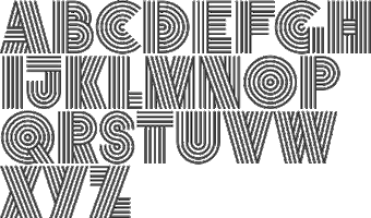 [MyFonts]
[More] ⦿
[MyFonts]
[More] ⦿
|
Min-Joo Ham
|
 Min-Joo Ham (Seoul, South Korea, b. 1985) is a type designer, typographer and a graphic designer who studied graphic design at the Seoul Women's University (2005-2009). After that, she designed typefaces at the Korean type foundry S-Core. In 2015, she graduated from the TypeMedia program in Den Haag, and settled in Berlin. Future Fonts link.
 During her Bachelor's studies, she created the experimental Latin / Hangul typeface Bang. She designed Core Label (2012, S-Core": with Hyun-Seung Lee). Hyun-Seung Lee, Dae-Hoon Hahm and Min-Joo Ham jointly designed the programmers' typeface Eco Coding (2012) and the huge Core Sans, Core Sans G (geometric), Core Sans M and Core Sans N, Core Sans NR, and Core Sans N SC families (supported codepages are MS Windows 1252 Latin1, MS Windows 949 Korean (Hangul) consisting of 11,172 letters and KS Symbols (Korean Symbols)). In 2013, Hyun-Seung Lee, Dae-Hoon Hahm and Min-Joo Ham jointly designed the layered type system Core Circus---as a reaction to the hugely successful Trend typeface by Latinotype, I guess. The slab version is Core Magic (2014). See also Core Circus Rough (2014) and Core Magic Rough (2014), both jointly designed by Hyun-Seung Lee, Dae-Hoon Hahm and Dong-Kwan Kim. Core Slab M (2013) is a 31-style companion of Core Sans M---it is a soft rounded slab with some seriffy tails mixed in with standard slab terminals. Core Mellow (2013) is a condensed organic rounded sans family that comes in 21 weights. In 2014, Hyun-Seung Lee, Dae-Hoon Hahm and Min-Joo Ham co-designed Core Sans D, Core Sans A, Core Rhino, Core Narae Pro (a Comic Sans alternative) and Core Deco (a 14-style art deco family). The rounded versions of the Core Sans E, D and G families were designed in 2015 by Hyun-Seung Lee, Dae-Hoon Hahm and Dong-Kwan Kim under the names Core Sans ES, Core Sans DS, and Core Sans GS. In 2015, Min-Joo Ham designed the Latin / Hangul typeface Koppla (2015) as a graduation project from the TypeMedia program of KABK, Den Haag. Koppla comes in title, bold, book, text and italic styles. In 2017, at Fust & Friends, where she is part of the founding group of designers, she published the layered colorable retro script typeface family Teddy, which is loosely inspired by an alphabet drawn by Ernst Bentele in 2017. The family was awarded at TDC Typeface Design 2018. In 2019, she released Dunkel Sans at Future Fonts and wrote: Dunkel Sans is a buzzing heavy weight display font, perfect to leave a fierce impression on posters and signage applications. Seol Sans (2018) is a full Korean font family developed by Minjoo Ham, Akira Kobayashi and the Monotype Design Team. It features Neue Frutiger (an extension of Adrian Frutiger's Frutiger) for its Latin glyphs, and works harmoniously with Neue Frutiger World and Monotype's CJK typefaces: Tazugane Gothic (Japanese) and M XiangHe Hei (Chinese). Variable fonts published in 2022: M XiangHe Hei SC Pro Variable, M XiangHe Hei SC Std Variable, M XiangHe Hei TC Variable, Seol Sans Variable, Tazugane Gothic Variable, Tazugane Info Variable. In 2020, she released Blazeface Hangeul at Future Fonts. In 2020, Minjoo Ham and Mark Frömberg set up Hypertype in Berlin, a studio that specializes in Latin and Hangul scripts. They promptly designed Neutronic and Neutronic Hangul, which are proportional descendants of Mark Frömberg's earlier monospaced typeface, Gintronic. At Github, Minjoo Ham and Mark Frömberg published the Latin / Hangul typeface family Hahmlet (2020). Hahmlet is inspired by a poster for the Korean Hamlet movie from the 1940s, created by an unknown letterer. Free download at Google Fonts. Adobe link. [Google]
[MyFonts]
[More] ⦿
|
MyFonts: Guilloche typefaces
|
A guilloche is a wavy multiline op-art style. This web page lists some guilloche typefaces. [Google]
[More] ⦿
|
MyFonts: Op art fonts
|
Op art fonts use optical effects to achieve an artistic ideal. They include hypnotic fonts, and are often arched or multilined. [Google]
[More] ⦿
|
Natalie Preston
|
During her studies in London, Natalie Preston designed the op-art typeface W&C Cooper Wedding Type (2015). Behance link. [Google]
[More] ⦿
|
Nataliya Kokornova
|
 Saint Petersburg, Russia-based designer of the op-art Cyrillic typeface Polosa (2015) and of the experimental typeface Charms (2015), whichh was inspired by the work of Daniil Ivanovich Kharms. [Google]
[More] ⦿
Saint Petersburg, Russia-based designer of the op-art Cyrillic typeface Polosa (2015) and of the experimental typeface Charms (2015), whichh was inspired by the work of Daniil Ivanovich Kharms. [Google]
[More] ⦿
|
Ng Wee Chean
[GrayLab (or: Gray Ng)]
|
[MyFonts]
[More] ⦿
|
Nick Curtis
[Art deco typefaces by Nick Curtis: II]
|
 [MyFonts]
[More] ⦿
[MyFonts]
[More] ⦿
|
Nicola Householder
|
During her graphic design studies at Pratt, Brooklyn, NY-based Nicola Householder (originally from San Francisco) designed the display typeface Adler (2014) and Moiré typeface (2016). [Google]
[More] ⦿
|
Niia Frost
|
Saint Petersburg, Russia-based creator of several Latin typefaces in 2013. She also made some op-art designs. [Google]
[More] ⦿
|
Official Classic
[Attila Horvath]
|
 Hungarian outfit established in 2008 by graphic designers Mark Zador and Attila Horvath. Typefaces created by them are mostly techno or minimalist: Eniac Pro (2010), Solaria (2006), Kalgan (2004, kitchen tile face), Olivaw (2004, a typeface with a retro/futuristic 60s sci-fi feeling), Terminus (2004), Gaia (2006), Gladia (2006, horizontal slabs), Baley (2004, piano key face), and Aurora (2004).
 Attila Horvath designed these rounded display headline typefaces in 2012: Multivac, Shingo, Unoa. In 2016, he designed Reticuli. Typefaces from 2017: Mazura (a multiline prismatic creation that is equally useful for sports, car races, discotheques, sci-fi and op-art). Behance link. YWFT link. Hypefortype link. [Google]
[More] ⦿
|
Olcar Alcaide
[Eurotypo]
|
 [MyFonts]
[More] ⦿
[MyFonts]
[More] ⦿
|
Op art
|
 Op art, or optical art, is a style of visual art that makes use of optical illusions. John Lancaster defines it as follows in 1973: Optical art is a method of painting concerning the interaction between illusion and picture plane, between understanding and seeing. But Op art works are not restricted to paintings. Most are abstract, with many of the better known pieces made in only black and white. The pieces offer optical illusions, an impression of movement or vibration, or a vision of something warped or impossible. Important names are Victor Vasarely, Josef Albers (Bauhaus), Richard Anuszkiewicz, and Bridget Riley.
 In type design, the op-art style refers to patterned or strangely prismatic typefaces. Checkered patterns are prevalent (as in many of Manfred Klein's typefaces), but also trompe l'oeil creations in the spirit of M.C. Escher could fit in. [Google]
[More] ⦿
|
opipik
|
Pixel font specialist who created these pixel typefaces using FontStruct in 2013: fs Inspira 2 (pixel face), fs Mikibit, FS Tacticalreminds, FS Terc.butyl (slab serif), Fin Competition, Opipik's Caps, Stencil, Cond, Alter Ego, Anakin, Nonsense Remix, Simple, Fluid PX (pixelish), Fluid, Shamewriting (wide techno face), The FS Ion (stencil), Opirus Semi-Serif, Launching a similar one, F Serif Q, Opirus OPIK, Sans Tai Na, Leftleaning, FSPx Kayah D70, 1234 Font, Random Regular. Other typefaces made in 2013 include fs Logo, fs Mansion, fs Kismet, LASO Serif, fs Ad, fs Groszak's Dreams, fs Road Sans, fs Connet (retro automotive script), fs Large, fs Mico, fs Use, fs By, fs Part, fs Strongness, fs Permutoo 1 through 7 (op-art), fs Ethstruct, fs Ais (wood type simulation), fs Eng (like fs Ais), fs 01, fs Jim Jam (sencil), fs Sor, fs Nothing (blackletter), Anakin Mono (a sci-fi face), Shaak Sans, LASO Serif, 42 Stencil, 42 Sten Grid (kitchen tile face), 42 Bold (piano key face), 42 Sten Vert, Sten Bold Vert, 42 Light Vert, 42 Bold Vert, 42 Light Grid, 42 Cond, 42 Light, 42 Black, Iont Slab (monospaced), Experiment Elongated Ears, Pixel Old English, Check It, Trifolium Stencil (like a Bauhaus stencil), Avatars New, Shaakmono, and Better Sans. Typefaces from 2014 include fs Pixalic (a great textured typeface), fs Weighted, fs Monital, fs Pixnod Serif, fs Gaelpix, fs Jenson 1 (+Italic), fs Hand2, fs Wood Type 1, fs135 Opinno Serif, fs135 Inno Huge, fs Dotnudge Biggerterm, fs Nudgershoots, fx 8x6, fs Eng, fs Streetsign, fs Fassyrian, fs Apjop, fs Jenson 1, fs Stenserife, fs Recover, fs Lapa 1 Bold, fs Dotital, fs Lapa 1, fs Hikinspot, fs Geofut, fs Samil, fs Pxalic, fs Stdb Regular, fs Papeda, fs Greekpix, fs Stylized Arpeggios, fs Teimodern, fs My Take on Parsifal 1, fs Samil, fs Eco, fs Dotmatrix Serif Mono, fs Dotmatrix Sans, fs Uahkoch, fs Fluffy, fs Computer Says No Mild Italic, fs Paseky Ideograms, fs Eatit Bold, fs Mind, fs Switch, fs Dotty Serif, fs Smallmicro, FSerifQ, fs Afterline, fs FontstrFillersMono, fs Four Ideas. Typefaces from 2-15: fs Konhex. FontStruct link. [Google]
[More] ⦿
|
Patrick Seymour
|
 Super-talented Montreal-based illustrator and digital artist. Home page. He created several modular typefaces in 2011.
 In 2012, he created Muse, Gotham Streets (a prismatic typeface), Slinky, Stencil, Tulipe (counterless), Bad Billy (multilined, art deco), The Great Carnival (beveled caps), Web Font (prismatic), Jump Jump Font (octagonal), Fashion (a horizontally striped typeface), OK (prismatic), The Aviator (horizontally striped poster face), La Bonne Aventure (prismatic and slightly art deco), the rope-themed typeface Noeud Marin, the shaded boat name typeface Bleu Marine, the multiline caps typeface Origami, the moustache-inspired caps typeface Mous Type (ornamental moustache-shaped capitals), the multilined display typeface Empire, the hand-drawn Une Typo Faite A La Main, and the prismatic typeface Anabelypster. After a bout of salmonella, he created Intestino, still in 2012. In Motion (2012) is an awesome prismatic art deco typeface. Images of his stunning work from 2011: i, ii, ii, iv, v, vi, vii, viii, ix, x. His Cathédrale project (2011) starts from a squarish face and transforms it gradually into one that contains the features of a cathedral. Creations in 2013: Shapes (geometric font), Gold Deco, Dentelle, Twist, Sleek (a thin slab serif), Say Say Say (multiline, prismatic, hypnotic), Metrick (a gridded typeface), Film Noir (an overlay type system), Tam Tam, Diner (a striped all caps typeface), Spot Light Font (prismatic), Flora, Bright Diamond, Incandescent, XVII (multilined display face), Konga (a multiline script), Shiny Diamond, Splash (paint font), Chicago (prismatic neon tube face), Taxi (a wonderful multiline typeface), Papale (religious symbology alphabet made to mock the papal system), Empreinte (pure op-art), Broken Arrow Font (multiline caps face), Liquid Paper Font, Sunset (prismatic), Boogie (Broadway-style art deco family), New Art Deco (prismatic art deco face), Poule de Luxe, Burnout (a prismatic typeface), Marble Maze Font, M Gagnon (ornamental caps influenced by the design work of Denis Gagnon). FontStruct fonts: Test3 (2012), Jump Jump 2 (2012). Typefaces made in 2014: Moiré, Decora, Magnetic, Noise (TV noise emulation), Yes (multilined font), Broderie (braided letters), SAS (multilined), Full House, Heart Font (prismatic), 1976 (inspired by the 1976 Olympic Games in Montreal), Gold (prismatic art deco typeface), Lace, Bike. Typefaces from 2015: Detour, Allie X, Grad Font, Duct Tape, Mint Julep (bilined art deco beauty), Hourglass, Stuntman (prismatic), La Dame de Coeur (playing card font), Fog. Typefaces from 2016: Road Free (a free prismatic font), Solitaire (card font), Joliette, Denis (named after Montreal's mayor, Denis Coderre), Montreal (a prismatic typeface based on the logo of the city of Montreal), Cherry Cola Font, Bro & Co (multilined art deco beauty), Macramee (multilined). Typefaces from 2017: The Simple Font (sans), Le Cabinet (multilined neo deco). Typefaces from 2018: Atrium (a sublime multiline art deco beauty), Pride (a color font to support the LGBT community). Typefaces from 2019: Columbarium (a beveled typeface), The Invisible Font, The Usual Font, Recettes d'Ici (handcrafted style for menu design), Vinyl (multiline), Gasoline (a gasoline spill textured font), Reflet, Mint Soda (a fashion mag extravaganza), Glamarrr (a sailor or pirate font). Typefaces from 2020: Siren (a wonderful mermaid-themed initial caps font, half Engravers MT and half mermaid), Homa (decorative caps), Luna (blocky caps), Chicken Bone, Happier (an all caps 3d color font), Dollara (a polygonal typeface), Stay Home, Mundo Disko (prismatic). Typefaces from 2021: Deliria, The National Bank Open font (created for a tennis tournament). Behance link. Hellofont link (for buying his fonts). Typefaces from 2022: Trumpets (deco caps). [Google]
[More] ⦿
|
Photoscript Ltd.
|
Photo-era foundry located in London. Their house fonts include Blackfriars, Chin Century 2000 (computer simulation family in Nr 1, 2 and 3 versions), De Vinne Ornamented, Granby Elephant, Mexico Olympic (multilined op-art font) and Nova. Fonts are shown in Berthold Headlines E3 (1982). [Google]
[More] ⦿
|
Pravin Ahir
|
Creative designer in Mumbai who designed the prismatic op-art Latin typeface Squoil (2014), the Buds typeface (2014, a modification of Cooper Black), and the decorative dot matrix typeface Bandhani (2014). [Google]
[More] ⦿
|
Pravin Lagariya
|
Mumbai, India-based graphic designer who created the op-art typefaces Lenticular (2016) and Squoil (2014), Johnson's Buds logotype (2014), and the artsy pixel typeface Bandhani (2014). [Google]
[More] ⦿
|
Quan Payne
|
Design director at Frost Design in Sydney and South Africa since 2007. Global Brand Design and Art Director for the London 2012 Olympic Games for Nike. Designer of quite a few (unnamed) typefaces in 2009-2012. These include several modular or experimental designs, a 3D typeface for Mr. Muz in Tasmania, an Escheresque typeface, a prismatic typeface, a didonbe typeface, and an op-art experimental typeface. [Google]
[More] ⦿
|
Rafael Nascimento
[Escaphandro (or: Rafael Cervi Barrozo)]
|
 [More] ⦿
|
Raihan Nizar
|
 Raihan Nizar (b. 1977) is the Indonesian FontStructor who made Cubos (2011, squarish and geometric), Pixelized Handwriting (2011), Lost in Future (2011, sci-fi face), Valdero (2011), Simplicity (2011, kitchen tile face), Bold Type (2011, octagonal), Fat Cribbo (2011, gridded), Block Out (2011, in the style of the commercial typeface Pincoya), Smooth (kitchen tile face), Quadro, Minimal (geometric, gridded, almost a kitchen tile face), Zkratchy (scratchy face), Retro Mania (almost a Western face), Techno Light, Blockz, Box Building (3d outline face), Metropol (outline techno face), Space Adventure, Electric City, Cubix, Revolution, Pixel, High Volume, and Letters In The Blocks in 2011. Many of these typefaces are pixelish.
 Typefaces from 2012: Dequatrion (fat stencil face), Konnekto (electrical circuit font), Devoltas, Forsid (cubist painting font), Etnis (squarish), Electro (counterless and octagonal), Mr. Ken (very fat face), Squadlest (squarish), Neonize (dot matrix face), Simplicity (kitchen tile face), Sound System (squarish), High Volume, Bajaj Sans (gaspipe sans), Bulat (fat counterless typeface), Elektro (blocky, counterless), Elektro Forest, The Slabbers (Egyptian), Kotakisme (counterless and geometric), Bhekhathe (thin geometric typeface), Insomnia, Siliko (metal band logo font), Motakku (labyrinthine, op-art). Typefaces from 2013: Yamko Rambe Yamko (alchemic typeface), Farmhand Script (poster script), Luikeza, The Ugly Script, Gerobak (fat, counterless). Aka cablecomputer. Fontspace link. FontStruct link. [Google]
[More] ⦿
|
Ralph Michael Unger
[RMU (Ralph Michael Unger Typedesign)]
|
 [MyFonts]
[More] ⦿
[MyFonts]
[More] ⦿
|
Raquel Rodriguez
|
Letterer and designer in Chicago, who created the prismatic op-art typeface Line Letters (2014). Behance link. [Google]
[More] ⦿
|
Renate Körbel
|
Vienna, Austria-based designer of the circle-based display typeface Bubbles (2019). Her Bildalphabet (2018) evokes op-art. [Google]
[More] ⦿
|
RMU (Ralph Michael Unger Typedesign)
[Ralph Michael Unger]
|
 Ralph M. Unger (b. 1953, Thuringia, East Germany) says this about himself at MyFonts: Typesetter from the composing stick via Linotype setting machines to the Mac. Jobs in various Thuringian printeries. Barred further education by Communist authorities due to political reasons. Imprisoned in East Germany. Since 1988 in the state of Baden-Wuerttemberg, former West Germany. Jobs in several newspaper printing houses as advertisement compositor. Own office since 1995, in Aalen, Baden-Wuerttemberg. He lives in Schwaebisch Gmuend, and was a freelance type designer for Profonts and URW++, where he contributed frequently to their libraries between 2002 and 2009. In 2009, he founded RMU. MyFonts link. I split his contributions into two groups, the URW / Profonts group, and the RMU group. The prefix FontForum refers to a subseries of URW++ fonts. Unless specifically mentioned, all the following fonts are at URW++ and/or Profonts:
 - FontForum Admiral Script (2005): revival of Middleton's Admiral script from 1953.
- Amitié (2009): a garalde family.
- Arabella Pro (2006): after the script by Arnold Drescher from 1936, published at Joh. Wagner.
- Fontforum Atrament (2006): architectural lettering. Do not confuse with a Suitcase Type Foundry font from 2003 by the same name.
- Atze (2010): a comic book family.
- Behrensschrift D (2007): after the jugendstil typeface Behrens Schrift, 1902, by Peter Behrens.
- FontForum Bernhard Script (2005): after Bernhard Script from the 1920s.
- Bradley (2005): blackletter, after the original by William H. Bradley.
- Breite Kanzlei (2007).
- Breitkopf Fraktur (2003): after the original by Johann Gottlob Immanuel Breitkopf, done in 1793.
- Brocken (2011) is a signage typeface inspired by a design of Volker Küster (1960s).
- Profonts Bureau (2010, Profonts): a minimalist rounded sans family.
- FontForum Calypso (2005): a revival of Roger Excoffon's Calypso (1958).
- Card Pro (2006): a decorative display based on Ella Cursief (1916, Sjoerd Hendrik de Roos, Lettergieterij Amsterdam).
- Chaweng (2006, Profonts): an oriental all caps simulation face.
- Civilite URW (2005).
- Compliment (2004, casual script). Based on a 1965 script by Helmu Matheis for Ludwig & Mayer.
- Cranach (2007): a blackletter typeface modeled after Kuenstler Gotisch from the Krebs Foundry.
- Dominante (2007): a serif family based on Johannes Schweitzer's font by that name, 1959.
- Dominique (2010, profonts): an informal typeface.
- FontForum URW Ecsetiras (2005): revival of Ecsetirás (Zoltan Nagy, 1967, a brush face).
- Edda Pro (2008). An art nouveau typeface that revives a Heinrich Heinz Keune typeface from 1900.
- Energia Pro (2008, Profonts): connected monowidth script, based on Arno Drescher's Energos from 1932.
- Estro (2003, Western lettering). Seems close to Nebiolo's Estro from the 60s.
- Eurobrush Pro (2007, Profonts): handwriting.
- EuroSans (2008).
- Euroscript Pro (2006, Profonts): school script typeface based on his own handwriting.
- Flashes (2007): a revival of Crous-Vidal's Flash, 1953.
- Fox (2007): a brush script based on W. Rebhuhn's original from the 1950s.
- Gamundia (2010): a calligraphic copperplate script inspired by Excoffon's Diane.
- Ganz Grobe Gotisch (2006): a fat blackletter modeled after the original by F.H.E. Schneidler.
- Gmuender Elan Pro (2011) is a 1950s style script face.
- Gradl Nr 1 (2008): based on hand-drawn art nouveau upper case characters by M. J. Gradl, ca. 1900.
- Graphique Pro (2008): shaded caps face, based on Graphique, which was originally created by Swiss designer Hermann Eidenbenz in 1945, and issued as hot metal font by Haas'sche Schriftgießerei. See also New Graphique Pro (2011).
- Handel Slab (2009): a 6-style extension of Trogram's 1980 typeface Handel Gothic.
- Hanseat (2010): a grotesque family done at Profonts. It was heavily inspired by Germany's official DIN 1451 Engschrift.
- Iova Nova (2007): based on Jowa Script, designed by J. Wagner in 1967.
- Profonts>Impression (2008): art deco.
- Jessen Schrift (2004): after the Rudolf Koch blackletter typeface by that name.
- FontForum URW Konzept Pro (2005): revival of Konzept (1968, Martin Wilke's handprinting face).
- Legende (2002): a script typeface based on the original typeface of Friedrich Hermann Ernst Schneidler (1937).
- Leipziger Antiqua. The original Leipziger Antiqua by Alfred Kapr at Typoart dates from 1971 until 1973. The digital version of Leipziger Antiqua was developed by Ralph M. Unger in 2005.
- Manuskript Antiqua (2005): after Oldrich Meinhart's Manuskript Antiqua.
- The Maszynysta family of heavy industrial sans typefaces (2010) have a textured style (Struktura), a Shadow, and a plain Roman.
- Maxim (2003, Profonts): The heavy brush typeface Maxim was originally designed by Peter Schneidler in 1956 for the Bauer foundry.
- New Bayreuth (2008): after Friedrich Hermann Ernst Schneidler's Bayreuth from 1932.
- Old Borders and Lines (2010). A free font.
- Ornella (2008): Jugendstil.
- Peter Schlemihl (2008, Profonts): a revival of a blackletter by Walter Tiemann.
- Pedell (2009): a casual script.
- Polo (2002): a brush face modeled after Carl Rudolph Pohl's Polo (1960).
- In 2012, Ivana Koudelkova co-designed the grungy headline typeface Retroactive Pro with Ralph M. Unger at Profonts.
- Fontforum Rhapsody (2006): a revival of Ilse Schüle's rotunda face.
- Roberta (2003): art nouveau typeface after obert Trogman's typeface for FotoStar.
- FontForum Signs and Symbols (2006).
- Splendor (2009): a revival of a brush script typeface by Wilhelm Berg, Schriftguss, 1930. See also Splendor Pro (2014).
- Sportowy (2009): an outline face.
- Stanford (2011). A sports lettering face.
- Stiletto (2006): a medieval script.
- Fontforum Stripes (2007): a multistripe op art display typeface based on a Letraset font from 1973 by the same name.
- Fontforum Thalia (2006): retro font.
- Tintoretto (2006): shadow display face based on an origonal by Schelter & Giesecke.
- Tip Top Pro (2008): a Julius Klinkhardt art nouveau typeface revival.
- FontForum Unciala (2005): a revival of Oldrich Menhart's typeface Unciala (1953, Grafotechna).
- Unger Chancery (2005).
- Unger Script (2003): based on H. Matheis' Slogan typeface designed for Ludwig&Mayer in 1957.
- Veltro (2007): after a 1931 original by G. da Milano at Nebiolo.
- Profonts Woodpecker (2008).
The list of RMU fonts: - Affiche (2017). A revival of Helios Reklameschrift of the Klinkhardt foundry.
- Aldo Manuzio (2017). After a house typeface from 1897 by Schelter&Giesecke.
- Amati Pro (2010): after Georg Trump's condensed didone face, Amati, 1951.
- Antiqua Florenz (2021). A revival and extension of Paul Zimmermann's Antiqua Florenz (1960, Ludwig & Mayer), which is based on Venetian romans.
- Avus Pro (2012). A sans family that extends Gert Wunderlich's Maxima (1970).
- Baroque Pearl (2016). A pearly typeface that revives Peter A. Demeter's Fournier Geperlt (1922, Schriftguss).
- Behrens Kursiv (2013). After a 1906 original by Peter Behrens.
- RMU Belvedere (2020). A revival of Heinrich Wieynck's art nouveau / fin-de-siècle typeface Belvedere (1906, Bauer).
- RMU Bison (2020). A revival of Julius Kirn's brush script Bison (1935-1938, C.E. Weber).
- Bernhard Blackletter (2016). After Lucian Bernhard's extrafette Bernhard Fraktur (1921).
- Bernhard Cursive Extra Bold (2010).
- Borghese (2015). An art nouveau font after a Schelter & Giesecke original from 1904.
- Borgis Pro (2012). A Clarendon-style text family.
- Boulette (2015, a fat creamy script).
- RMU Bowery (2019) A revival of Old Bowery (1933, ATF)).
- Bravura Pro (2013). After G.G. Lange's Publica.
- Bricklayers (2012). An original fat slab display face.
- Brillant (2009): art nouveau and ultra heavy.
- Butti (2011). A script family paterned after Fluidum (1951, Alessandro Butti, Nebiolo).
- Cable Condensed (2014). Based on Koch's Kabel.
- Caesar Pro (2011). A flared sans typeface after Caesar Schrift (1913, Georg Schiller, C.F. Rühl).
- Capitol Pro (2012). An art deco typeface based on Capitol (Karl Hermann Schaefer for Schriftguss, 1931).
- Carina Pro (2017). A calligraphic script typeface based on Rautendelein (1929, Schriftguss).
- Carla Pro (2013). A broad-nibbed script modeled after Ballantines Script (Elsner & Flake, 1974; see also Ballantines Serial by SoftMaker).
- Carlsbad (2018). A couple of art nouveau typefaces based on originals from 1895 by H. Berhold called Regina Cursiv and Hansa Cursiv.
- Caslon Gotisch (2009): after the original by William Caslon from 1763.
- Celebration (2009): blackletter.
- Circensis (2016). A Western circus font based on a concept of Fritz Richter.
- Claudius (2010): after a 1937 blackletter font at Klingspor.
- Constanze Pro (2012). A light cursive typeface based on Constanze (1954, Joachim Romann, Klingspor).
- Contact Pro (2010): after Contact, a 1963 font by Helmut Matheis.
- Dante Alighieri (2018). Based on a Schelter & Giesecke original.
- Daphnis (2016). A revival of Daphnis (1929, Walter Tiemann).
- Deutschmeister (2017). A textura blackletter typeface after Deutschmeister by Berthold Wolpe for Ludwig Wagner in 1934. (Some dispute that Wolpe made this font.)
- Diamant Pro (2012). A transitional serif face.
- Emilia (2016). Based on Weiss Antiqua (1928) by Emil Rudolf Weiss.
- Neue Echo (2016). Based on Echo for Schriftguss.
- Elbflorenz (2020). A revival of Albert Auspurg's display typeface Miami (1934, Schriftguss).
- Emilia Gotisch (2016). After Weiss Gotisch (1936) by Emil Rudolf Weiss.
- Emilia Fraktur (2021). A revival of Emil Rudolf Weiss's Weiss Fraktur (1913).
- Erler Titling (2015). After Erler Versalien (1953, Herbert Thannhaeuser for Typoart).
- Eurotech Pro (2011): a slabby techno family.
- Faulkner Pro (2011): a connected heavy signage script based on Alan Meeks's Kestrel.
- Fette Kanzlei (2019).
- Fette Unger Fraktur (2010).
- Fichte Fraktur (2020). After Walter Tiemann's Fichte Fraktur (1934).
- Fontanesi RMU. An ornamental caps typeface that revives Aldo Novarese's Fontanesi (2018).
- Forelle Pro (2010): after the original Forelle script typeface by Erich Mollowitz, 1936.
- Frankenberg Pro (2012). An antique script face.
- Gabor Pro (2014). A connected copperplate script.
- Gaby Pro (2017). A revival of Hans Möhring's script typeface Gabriele (1938 or 1947, C.E. Weber).
- Garamond Antiqua Pro (2015).
- RMU Gilgengart (2020). A revival of Hermann Zapf's Fraktur font Gilgengart (1938).
- Gillray Pro (2015). A copperplate script after Hogarth Script (by Harald Bröder for Typoart).
- RMU Gloria (2019). After Gloria (1898, Emil Gursch).
- RMU Gong (2020). Based on Arno Drescher's Super Grotesk Schmalfett first released in 1933 at Schriftguss.
- Gmuender Gravur (2011). A 3d shadow face. Gmuender Antiqua Pro (2015) is influenced by the metal font Imprimatur (1952-1955, Konrad F. Bauer and Walter Baum). Gmuender Kanzlei (2018) is a blackletter typeface.
- Goethe Fraktur (2022). A revival of a blackletter typeface by Wilhelm Woellmer (1905).
- Gravira (2021). A revival of Herbert Thannhaeuser's Gravira, released by Schelter & Giesecke in 1935 .
- Haenel Antiqua (2020, based on a 19th century antiqua by Eduard Haenel) and Haenel Fraktur (2011, after Haenel Fraktur, ca. 1840).
- Hanse Textura (2020). A revival of a textura by Hermann Zapf.
- RMU Helion (2020). A revival of the 3d titling typeface Helion (1935, Arno Drescher for Schriftguss Dresden).
- RMU Herkules (2019). After a late 19th century font by Bauer and Berthold called Reklameschrift Herkules.
- Hoelderlin (2018). After Eugen Weiss's Hoelderlin blackletter font (1937).
- Hoyer Script (2017). After Hanns Thaddeus Hoyer's Hoyer Schoenschrift (1939, Stempel).
- Hupp Fraktur (2016). After Otto Hupp, 1911.
- Impuls (2010): a brushy typeface based on Paul Zimmermann's Impuls (1945).
- Initials RMU One (2012) consists of revivals of Rudhardsche Initialen (Otto Eckmann, ca. 1900) and Walthari Initials (ca. 1900, Rudhardsche Giesserei). Initials RMU Two (2012) consists of revivals of Jubilaeumsinitialen (by Bauersche) and Augsburger Initialen (by Peter Schnorr, 1901).
- Jean Paul Fraktur (2021). A revival of Breitkopf's Fraktur font Jean-Paul-Schrift (1798).
- Jobs Gravure (2011). It had to happen---a few days after Steve Jobs' death, Unger released the beveled engraved typeface Jobs Gravure, which is an extension of Trump Gravur (1954, Weber).
- Jolly Polly (2012): a curly non-connected script face.
- Kis Antiqua Pro (2018). A revival of Hildegard Korger's Kis Antiqua at Typoart.
- Kleist Fraktur (2010): after Walter Tiemann's original.
- Kompress Pro (2013). Two compressed sans typefaces.
- RMU Kontrast (2021). An art deco typeface that revives Kontrast (1930, F.H.E. Schneidler at Weber).
- Koralle RMU (2018). A revival of Schelter and Giesecke's Koralle (1915).
- Korpus Pro (2014). A text typeface family. Followed later in 2014 by Korpus Sans Pro.
- Korpus Serif Pro (2021). A revival and extension of Timeless (Typoart) that covers Greek, Latin and Cyrillic.
- Leibniz Fraktur (2012) is modeled after the famous Genzsch & Heyse blackletter font.
- Lenbach (2021). Inspired by a German font from the Victorian era.
- Liliom Pro (2012). A beautiful fat didone typeface based on an original from the Fonderie Française.
- Lipsia Pro (2011). An angular serif family.
- Literatura Pro Book (2012).
- Litfass (2021). A revival of an art nouveau font by Flisch.
- Lutetia Nova (2014). A fresh two-style take on Jan van Krimpen's Lutetia (1924).
- RMU Luchs (2021). A redesign of Jakob Erbar's inline all caps art deco font Lux (Ludwig & Mayer, 1929).
- Luxor Pro (2010): a Victorian/Western display face.
- Lyrica (2014). A revival of the informal blackletter typeface Lyrisch (1907, Georg Schiller).
- RMU Magnet (2021). A redesign and revival of Magnet (1951, Arthur Murawski at Ludwig & Mayer).
- RMU Manolo (2019). Based on the art nouveau typeface Manolo (Ludwig & Mayer).
- Manutius Pro (2012).
- Meister Antiqua (2011, +Bold, +Book). A Typoart original from 1951 in the tall flared ascender serif genre, revived and extended.
- Mitropaschrift (2016). An octagonal original.
- Mobil Pro (2011). A semi-script typeface in the fifties style of Matheis.
- Monument (2010): a 3d shadow roman caps face created after Oldrich Menhart's Monument.
- Narziss (2018). A revival of Walter Tiemann's Narziss from 1921.
- RMU Neptun (2021). A revival and extension of the art nouveau typeface Neptun by Aktiengesellschaft fuer Schriftgiesserei und Maschinenbau, Offenbach.
- Neue Kurier (2011). Typoart's popular signage script font in a new, completely remastered version.
- Neue Muenchner Fraktur (2010).
- Neue Schwabacher (2021). After Albert Anklam's Neue Schwabacher (Genzsch & Heyse, 1876).
- Neue Thannhaeuser (2011).
- Old Towne Pro (2010): a Western font.
- RMU Omega (2020). After Omega, an art deco typeface by Friedrich Kleukens at Stempel in 1926.
- Orbis Pro (2016). A revival of Walter Brudi's shadow typeface Orbis (1953, Stempel).
- Orplid Pro (2019). a layerable typeface that revives and extends Hans Bohn's all caps Bauhaus era typeface Orplid (1929).
- Parcival Antiqua (2016). A revival of Parcival Antiqua (1926, Herbert Thannhaeuser).
- Parfum (2013). A low x-height script that was inspired by Howard Allen Trafton's Quick (1933, bauer).
- Parler Fraktur (2018). A revival of Friedrich Poppl's Poppl Fraktur.
- Parler Gotisch (2011). A blackletter face.
- RMU Pittoreske (2019). A decorative Victorian typeface.
- Plastica Pro (2015, a chiseled typeface inspired by a J. Lehmann design).
- RMU Pergola (2021). A vintage shadow typeface inspired by a late-19th century font of Georg Giesecke.
- Post Fraktur (2014) and Postillon (2014). After Herbert Post, 1933-1937.
- Primana Pro (2012). A seductive geometric grotesk family.
- Prinzess Gravur (2010): a blackletter typeface modeled after Prinzeß Kupferstichschrift (1905, Berthold).
- Prisma Pro (2011). Revival and extension of Rudolf Koch's multiline typeface Prisma (1931).
- Reklame Fraktur (2016). After Reklame Fraktur by Albert Christoph Auspurg, 1914.
- Reflex Pro (2018). All caps, with an inline style.
- Reznicek Pro (2011) is a post-Victorian pre-art nouveau typeface named after Ferdinand von Reznicek (1868-1909), one of the leading artists and illustrators of those times.
- Rekord Antiqua (2020). A revival of the art nouveau era text typeface Rekord Antiqua (1911, Wagner & Schmidt).
- Rhythmus Pro (2016). After a Schriftguss AG and Schelter&Giesecke original grotesk, and extended to cover Cyrillic.
- Ridinger Std (2012). Based on Riedingerschrift (Franz Riedinger, 1906, for Benjamin Krebs Succ.).
- Ronde Pro (2011): roundhand script.
- Royal Grotesque (2021). A revival of Wotan by Wagner & Schmidt, 1914. Did this typeface become RMU Royal Sans (2022)?
- Salzmann Fraktur (2019). A revival of Max Salzmann's blackletter font released by Schelter & Giesecke in 1912.
- Saskia Pro (2016). Revival of Jan Tschichold's Saskia (1931, Schelter & Giesecke).
- Schmale Anzeigenfraktur (2009): based on Koch's Schmale Deutsche Anzeigenschrift, 1923, Klingspor.
- Schmale Mediaeval (2020). Based on Schelter & Giesecke's Schmale Mediäval (1840).
- Schmuckinitialen (2009): an ornamental caps typeface in the art nouveau style based on Walthari Initials [Walthari (1899, Heinz König for the Rudhard'sche Giesserei) in the upper case and Eckmann Initials (ca. 1900, by Otto Eckmann, Germany's chief art nouveau type designer) in the lower case].
- Schreibmeister (2021). Ralph's interpretation of Arno Drescher's formal cursive typeface for Ludwig Wagner (1958, Leipzig).
- Schwabacher Book (2013).
- Sebaldus (2019). A heavy blackletter typeface, after Sebaldus Gotisch (1926, H. Berthold).
- Senatsfraktur (2020). After Friedrich Bauer's Senats Fraktur done in 1907 for Genzsch & Heyse.
- Concordia (2020). A revival of Sensation Schmalfett (1914, Heinrich Hoffmeister).
- Siegfried Pro (2017). A revival of the art nouveau typeface Siegfried (1900, Wilhelm Woellmer).
- RMU Skizze (2021). This revives Walter Höhnisch's script typeface Skizze (1935, Ludwig&Mayer).
- Staxx Pro (2013). A prismatic typeface.
- Staufer Gotisch (2015). An engraved blackletter typeface modeled after Herbert Thannhaeuser's Hermann Gotisch (Schriftguss, 1934).
- Steinschrift Pro (2015). A single style condensed sans serif.
- Sylphe Pro (2019). A vintage script font that revives Schelter & Giesecke's Isabel (not Sylphide, as claimed by him).
- Tablica (2017). After Karl-Heinz Lange's DDR telephone directory font Minima (1984).
- Thannhaeuser Fraktur (2013) is a redesign of Typoart's Thannhaeuser Fraktur.
- Thomasschrift (2014). A rustic typeface that revives and extends Thomas-Schrift by Friedel Thomas (1957-1958, Typoart).
- Titanschrift (2011). A yummy soft and fat display face.
- Tombola (2018). After an alphabet from the 1920s by Otto Heim.
- RMU Trianon, renamed RMU Trifels (2020). After Heinrich Wieynck's Trianon (1905, Bauersche Giesserei).
- Trocadero Pro (2010): an extension and revival of Trocadero Kursiv, 1927, Albert Auspurg, Trennert.
- Troubadour Pro (2010): In Medium and Engraved styles.
- Trump Deutsch (2011): a blackletter face, after the 1935 original by Georg Trump.
- Trybuna (2013). Based on Herbert Thannhaeuser's Liberta Antiqua (1958), but completely redrawn.
- Turnier (2019). A revival of G.G. Lange's derby (1952-1953).
- Tyton Pro (2013). A brush script after Heinz Schumann's famous 1964 Stentor.
- Typoskript Pro (2010): a revival of Hildegard Korger's Typoskript, first done at TypoArt in 1968.
- Unger Fraktur (2010): after a 1793 design by Johann Friedrich Unger; includes fett and mager.
- Walbaum Antiqua Pro (2013). A revival of Justs Erich Walbaum's didone classic.
- RMU Wallau (2019). After Rudolf Koch's rotunda typeface Wallau (1926-1934).
- Werbedeutsch (2021). A revival of the blackletter typeface Buchdeutsch (Ernst Schneidler, 1926).
- Wieynck Fraktur (2019). after Heinrich Wieynck's Wieynck Fraktur (1912).
- Wieynck Gotisch (2018). After Wieynck Gotisch (1926, Heinrich Wieynck).
- Zentenar Fraktur (2010): mager and halbfett; after the 1937 workhorse by Ernst Schneidler at Bauer.
- Zierfraktur (2010): after Deutsche Zierschrift, an engraved blackletter font that was cut by Rudolf Koch between 1919 and 1921 for Klingspor.
Ralph made some typefaces outside URW/Profonts and RMU, such as Stripes (2014, a prismatic typeface puvlished by Thinkdust). Klingspor link. View Ralph M. Unger's typefaces. [Google]
[MyFonts]
[More] ⦿
|
Roger Excoffon
|
 Born in Marseille in 1910, Roger Excoffon died in Paris in 1983. Co-founder of the Urbi et Orbi advertising agency in Paris, he was a graphic artist and type designer. He created the image of Air France, designed the symbols of the 1968 Winter Olympics in Grenoble, and designed many fonts. Porchez mentions that he lived from 1911-1984, not 1910-1983.
 Books about him: - David Rault: Roger Excoffon, Le Gentleman de la typographie (2011, Atelier Perrousseaux, Paris).
- Sandra Chamaret, Julien Gineste and Sébastien Morlighem: Roger Excoffon et la Fonderie Olive (2010, Ypsilon, Paris).
- Jean-Philippe Bertin: Roger Excoffon, l'homme de la griffe et du paraphe (2008: thesis at Ecole Estienne).
Visual hommage by Peter Gabor. Picture. Signature. Some drawings by him: i, ii, iii. His typefaces include - Antique Olive (1962-1966, for Fonderie Olive). This was originally designed for the Air France logo. Bitstream's digital version is Incised 901. See also Chalfont by Alan Meeks, URW Antique Olive, and Antique Olive by Linotype. With almost reverse contrast, this sans typeface can't be used for body text. The heaviest weight is called Antique Olive Nord.
- Banco (1951, Fonderie Olive). Digital remakes include ITC Banco (1997) (by Phill Grimshaw), Bnko (by Damien Gosset), Banco (by Dan Solo), New Banco (by Alessio d'Ellena) and Bandit (by Softmaker).
- Calypso (1958, Fonderie Olive): a sexy curvy experimental display typeface that could be considered as op art. Revived by Ralph M. Unger at URW++ as FontForum Calypso (2005), by Brendel as Calypso (1994), and by Martin Pfeiffer at Scooter Graphics as Calypso Boy (1996). A free 2013 revival called Calypso PF by Joep Pohlen is based on the original matrices which Pohlen acquired from Stempel AG. Discussion at Typophile where Pohlen tells the story: Marcel Olive, owner of Fonderie Olive saw Excoffon experimenting with an enlarged print of a half-tone screen at Olive studio. He was rolling it up and looked through it like a kaleidoscope. A metal type with half-tone dots was not done before and a technical challenge to achieve. Marcel Olive saw the chance to profile the technical capabilities of his foundry and earn a worldwide reputation and gave Excoffon permission to execute the design proposal. After establishing the angle and size of the dots by Olive Studio each character was drawn dot by dot using a pair of compasses. According to José Mendoza y Almeida, who lead the team at the studio, Excoffon made sketches of the outlines of each character and in the studio shading was added by airbrush. The airbrush shading was converted to a dot-screen that went from deep black to white. It was quite a challenge to transfer the drawings with a pantograph and to scale this complex drawings in different type sizes to the matrices. Then it had to be milled, retouched and casted in lead reproducing all the dots of the dot-screen. Calypso was cast in four sizes: 20, 24, 30 and 36 pt and had 26 capitals, a period, an apostrophe (used a lot in French), and a hyphen..
- Chambord (1945, Fonderie Olive): a Peignotian sans serif family. Deberny&Peignot published Touraine in 1947, after a design of Guillermo Mendoza (the father of José) in 1943. Chambord is a typeface published by Fonderie Olive in Marseille, which was headed by Roger Excoffon. The four basic weights of Chambord were designed by François Ganeau and published by Olive in 1946/1947. Legend has it that Roger Excoffon said he saw proofs of Touraine on Charles Peignot's desk, took the next train to Marseille, drew Chambord at Olive and beat Deberny&Peignot to market. Olive also had a better marketing machine at the time. By the end of the 40's, Charles Peignot tried to go to court over the Chambord/Touraine affair because the fonts were just too similar, but they settled financially out of court. José Mendoza also claims, as reported by Porchez, that Ganeau changed Vendôme after having seen an exhibition of Guillermo Mendoza's type in 1943. All of this may to some extent explain Peignot's initiative to create ATypI to protect typefaces.
- Choc (1954- 1955, Fonderie Olive), an iconic brush face. Bitstream called its digital version Staccato 555. ITC commissioned Phil Grimshaw to create ITC Choc Light in 1997. Softmaker calls its version Chandler Pro. Sold by URW, Linotype, ITC, Monotype Imaging, Mecanorma and letraset under the name Choc.
- Diane (1956, Fonderie Olive): a calligraphic script. Diane was digitally revived in 2008 by Mark Simonson and Mark Solsburg as Diane Script. It also inspired Ralph Unger's Gamundia (2010).
- Mistral (1953, Fonderie Olive; later Mecanorma), the beautiful but overused connected script that resembles Excoffon's own hand. The Bitstream version is Staccato 222. SoftMaker's version are Malaga Pro (2016) and Zephyr (2019). Other versions: Mistral (ITC), Mstral (Adobe), Mistral (Linotype), Mistral (URW),
- With François Ganeau, he designed Vendôme (1951-1954). But read the remarks above regarding Chambord.
- Excoffon (1974). His last typeface about which he wrote Excoffon will be the end product of all my thinking, the sum of everything that I have accumulated during my career as a typographer. The typeface was never published because of a contractual misunderstanding. Bruno Bernard has been working on the archives of this typeface, and possibly a revival.
Linotype link. Article by John Dreyfus: The Speed and Grace of Roger Excoffon. FontShop link. View Excoffon's typefaces. View Roger Excoffon's type designs and all digital revivals. Subpage with many digital versions of Mistral. [Google]
[MyFonts]
[More] ⦿
|
Ron Ruedisueli
[Sed4 Type Foundry (or: Sed4tives)]
|
 [More] ⦿
|
Ruslan Khasanov
|
Ekaterinburg, Russia-based designer of Sauce Type (2014: experimental), Lumen Type (2012, experimental). Other experimental alphabets include Volna (2014, free, Vekta (2013; not to be confused with Neil Summerour's Vekta, and nor renamed Vetka: a prismatic compass-and-ruler font ideal for op-art), Superbugs (2012), Sunbeam (2012), MicroType (2011) and Magma (2012). Behance link. [Google]
[More] ⦿
|
Scholtz Fonts
[Anton Scholtz]
|
 Scholtz Fonts was started by Anton Scholtz (b. Durban, 1941) in 1997. This South African design company is located in Durban, where the Zulu culture of the region has greatly influenced Anton's font design. Klingspor link
 Scholtz sells a fine selection of display types that ooze African themes. An alphabetical list: - Aarde (2005), Aarda Brush
- Ability (2009). Calligraphic
- Affable (2008). Calligrahic
- African Elegance
- African Gold (2007)
- African Jazz (2005)
- African Jungle (2007)
- African Patchwork (2008)
- African Pattern (2004)
- African Shield (2005). Patterned after the cow-hide shields of the Zulu tribe. Made by Anton and Merle Scholtz
- Afrimod
- AfroFlare
- African Textile (2007)
- Ala Kazam (2015)
- Always (2010). A fantastic swashy calligraphic face, and its multiline sister, Filigree, 2010
- Amaboxi (2007) or Amabokhisi. White on black
- Amanzi (1999)
- Aplomb (2008)
- Aqua Casual (2008)
- Arabesque (2009). A flowing calligraphic typeface
- Archivo (2011)
- Art Nouveau SCF (2008)
- Asakire (2006)
- Assegai (2007)
- Bad Girl (2008). Grunge
- Bakuba
- Baluba and Baluba Snake
- Banquet SCF (2007). Brush script
- Baobab
- Black Tie (2007)
- Blackout SCF (2008)
- Blythe (2009). Connected script
- Bongo
- Bongani (2008)
- Brazza (2008). Brush
- Brillig (2008). Informal hand
- Button (2008)
- Buzz (2008)
- Camy (2009). Hand-printed
- Carve (2008). Chiseled look
- Catholic Girls (2008). Script
- Centric (2007). Zebra-striped, or op art
- Certificate (2008). Calligraphic
- Collette (2007). After an art deco font called "Independant" designed in 1930 by Collette and Dufour
- Comical (2007)
- Coral (2008) and Coral Pro (2012)
- Crime Inc
- Crostini
- Debs (2013). Hand-printed
- Deco Doni (2011)
- Delikat (2010). A script, followed in 2013 by Thaun
- Doorn (1998), Doorn Body, Doorn Display
- DragonFyre (2008). Calligraphic
- Dufour (2011). After an art deco font called "Independant" designed in 1930 by Collette and Dufour
- Dusk Til Dawn (2012). Art deco
- Elegance SF (2005). Art deco
- Estravaganza (2012)
- Et Cetera (2015). A classy breezy connected script
- Excalibur SCF (2007). A beautiful rough-edged hand
- Fable (2007). A type family for wizards
- FadedRose
- Figment (2008)
- Filigree
- Fracture (2008). Glaz krak style
- Fragrance
- Gatsby SF
- Genevieve (2007). Calligraphic
- Genial (2009). A flowing connected script
- Giraffe Skin (2007)
- Girl Script (2008). Curly hand
- Girltalk (2008). Curly script
- Gladly (2016). A 17-style decorative and romantic typeface
- Gossamer (2011). A wedding script
- Greek (2008). Chiseled
- Groom (2007). A connected brush type
- Grunge Formal (2007), Grunge Piazza (2007), Grunge Standard (2009)
- Hard Rain (2007)
- HiTone. Niely handcrafted
- Hobi (2008). A ghastly script
- Honeybird (2011)
- Hoofer (2014). A mega family of retro scripts
- Iliad (2007)
- Inja
- Jazz
- Jolie (2015). A connected calligraphic script for romance and weddings
- Josephine (2007). Art deco
- Kassena (2006)
- Kau (2016)
- Klatter (2007)
- Kuba (2007). A tribal stencil
- Kunjani (2008). African look
- Lagos
- Leah (2008). Handwriting
- LeopardSkin (2005)
- Lovers Pro (2011). A fantastic calligraphic hand---ready for red carpet treatment
- Lualaba Snake (2007)
- Lumina (2008)
- Madrigalle (2011). A calligraphic wedding script
- Mafuta (2006)
- Makonde (2007)
- Manhattan Midnight
- Margaux (2013). A vintage 1900s script
- Martini Script (2011)
- Maypole (2007)
- Melodica (2012)
- Miss Donna (2009). A script typeface
- Mtwane (2009)
- Nocturne (2012). An art deco family based on work from the 1920s by Paul Carlyle and Guy Oring
- Noobia (2013). An inky pen font
- Nordika
- Oxamu (2009). A wonderful angular African-themed font
- Pacific Script (2011). A font inspired by an alphabet created by Howard Trafton in the 1930s
- Palm Court (2007). A Bauhaus typeface by Merle Scholtz
- Parchemin (2008). Parchment look
- Phat Chance (2008). Organic
- Piazza (2007)
- Proper (2008)
- Qotho (2010). An almost architectural sans family, done with Merle Scholtz
- Queen (2008). Nice handwriting
- Quirky and Quirky Kurlz (2013). A spidery script based on a book of etchings by British artist Graham Clarke
- Refresh A 1950s script
- Riposte (2009). A dynamic script
- Romi (2008). A thin calligraphic typeface
- Rondalia (2008)
- Sage Sage (2008). Brush script
- SandWriting (2007)
- Sangoma (2007)
- Scratch SCF (2007). A scratchy hand
- Scrittura (2011). Calligraphic. +Antiqua, +Fantasia
- Shapely (2010). Swashy calligraphic typeface
- Silken (2009). Calligraphic
- Siyabonga
- Silver Dagger (2007)
- Smart Casual (2007). An artsy architectural typeface by Merle Scholtz
- Sondela (2007)
- Spaza (2007). African look
- Sprig (2010). A signpainting typeface
- Stoan (2008)
- StoneWash (2008). Grunge
- Tabwa (2007) Inspired by Koch's Neuland, but on an African theme
- Tamboti
- Tertius (2008). Also, Tertius Romantic and Tertius Crenellated (2008). Scripts based on the Carolingian hand
- Thaun (2013)
- Thought (2009)
- Thystle (2010)
- Tokoloshe (2008)
- Toulouse (2007). Art nouveau handcrafted typeface
- Tshikona (2005). Hand-crafted
- Tsotsi (2007)
- Ubuvila (2004)
- Umkhonto (2003)
- Umoya (2009). Organic
- Utshani (2000). African theme
- WildSong (2010). A calligraphic script
- Woodcarve.
- Write Now (2008). Connected script
- WriteHand (2008)
- Yseult (2009). Script
- Zaire SF (2007)
- ZebraSkin (2007)
- Zest (2007)
- Zim (2007). Octagonal
View the typefaces designed by Anton Scholtz. [Google]
[MyFonts]
[More] ⦿
|
Sed4 Type Foundry (or: Sed4tives)
[Ron Ruedisueli]
|
 Dutch professional music producer and audio engineer who founded his own record label. He also makes (mostly free) fonts. His work:
 - A FontStruct series called STF Letters op Maat, which attempts to recreate all alphabets designed by Dutch Bauhaus designer Jurriaan Schrofer (1926-1990). That list: STF Cutout 1985 (+Solid), STF JS Bevel (+Fill), STF Grafisch, STF Etage Aanduiding (17x17-Inline 1, 17x17-Inline 2, 17x17-Medium Fill, 17x17-Multiline, 17x17-Full Fill, 5x5 Matrix, Hi-res) [op-art, prismatic], STF Gemeentereiniging, STF Berlage (after the letters Schrofer originally designed for The "Beurs Van Berlage", a commodity market building located in the centre of Amsterdam. Later it was also digitalized and used to for the Dutch passport), STF Elevated (3d shadow typeface), STF Semiotica (Incised Outline, Incised, Book, Regular, Title), STF Sater, STF Sans Severe (Light, Heavy, Outlined, Multilines), STF Sans Rounded, STF Avant-Garde i10, STF Schrofer Modular Blocks, STF Social Human Trends (Outlined, Solid, Fill Isolated, Outined Isolated), STF Girokantoor, STF Marx (Solid, Striped), STF Squared Sans, STF Onleesbaar Alfabet (Stroke, Solid, Outlined), STF Bols Jaarverslag, STF Bredero (for the Bredero Bouwbedrijf), STF A.S.C. Communications, STF Connaissance et Langage, STF Paspoort, STF Last Warning (v1), STF Connected Squares (+Fill, +v2 Headline, +v2 Fill, +v2 Outline).
- Other FontStruct typefaces, now over 180 in all, made in 2017-2018. Included are STF Down Vote, STF Slab Inn (a Western font), STF Polygon Window (hexagonal), STF Kalender (based on a 1976 calendar with octagonal letters by Wim Crouwel), STF See You in 2019 (a tiled font), STF Uni (a varsity font), STF Geo Gothique, STF Tegel (a kitchen tile font), STF Don't Count on Me, STF Hyster (a modernist stencil), STF Der Zyklus, STF Scriptorium (blackletter), STF Paradox, STF Sutoraipu Origami Multiline, STF Sutoraipu Origami Filled Stencil, STF Futureline, STF Frescher (Escher-inspired), STF Whiskey-A-Go Go, STF Labrat (op-art, prismatic), STF Tranziztor, STF Otto Font Schirach (mosaic lettering), STF BFG (condensed piano key style), STF Ace of Maze, STF Amsterdam School, STF Neon Flux, STF Wendingen 1922 (based on a old brochure by Wendingen for the Internationale Theater Tentoonstelling Amsterdam 1922; letters designed by Hendricus Theodorus Wijdeveld (1885-1987)), STF Van Nelle (based on an early 1900's poster ad for Van Nelle coffee), STF Purple Maze, STF Militia Stencil, STF Idiocracy (stencil), STF Rode Draad, STF Praesens (based on the lettering found in the second issue of Polish avant garde architectural magazine Praesens), STF Fabricon (a De Stijl stencil; +Outline, +CrossSection), STF Defrag, STF Trilineae, STF Bolsjewie (constructivist), STF Kraftwerk (a tiled typeface; after a 2015 poster by Chuck Sperry for Kraftwerk), STF De Stijl, STF Portfolio Peeters (a tribute to Belgian modernist artist Jozef Peeters (Antwerp, 1895-1960), based on the folder art for his 1921 linocut portofolio), STF Sector 7 (military stencil).
- Pax Romana. Based on the capitalis monumentalis seen at the base of Trajan's Column.
- STF Espionaje. Inspired by the lettering found on a vintage sheet music cover art for "La Java bousculée" (1924).
- STF Oudvreugde's Ontwaken. Based on the Dutch deco lettering of Dutch graphic designer Frederika Sophia (Fré) Cohen (1903-1943). The letters were taken from a book cover design for the "Arbeiders-jeugdcentrale Amsterdam" which was published in 1924.
- Typefaces from 2019: STF Blauhaus (Bauhaus-inspired), STF Type O Negative, STF Bodidone, STF Textualis Batavicum (blackletter), STF Alhambra Blvd, STF Type O Negative, STF Ein Berliner, STF Geo Grotesque (in the style of TT Norms and LL Circular), STF Innercity (art deco), STF Photonia (futuristic), STF Square Grylls, STF Mizollen (labyrinthine), STF Mr Bob Doubalina, STF Plateau Disco (groovy), STF Uncialis Modularis (uncial).
- Typefaces from 2020: STF Schlanke Schöne, STF Care Sensitive.
FontStruct link. [Google]
[More] ⦿
|
Sergi Delgado
|
Sergi Delgado is a graphic designer and illustrator in Barcelona. He created the piano key modular stencil typeface Gado (2013). In 2015, he made the wonderful rotating op-art Candy Numbers. In 2017, Sergi Delgado and Daniel Wenzel co-designed the textured op-art typeface Aigua. Behance link. [Google]
[More] ⦿
|
Setion Branko
|
Seattle, WA-based designer of two op-art fonts, Generative Type 1 and 2 (2014). [Google]
[More] ⦿
|
Signal Type Foundry
[Max Phillips]
|
 Signal Type Foundry & Drawing Office is a type foundry in New York City, est. 2012 by Max Phillips (b. 1957, New York City), a typographer, graphic designer, toy designer, creative director and novelist who moved to Dublin, Ireland, in 2013 with his Irish spouse. His typefaces:
 - FF Spinoza Pro (2011). His first type design, developed over a period of eleven years. FontShop: With the goal of readability in mind, Phillips named the typeface after 17th century rationalist and lens-grinder Baruch Spinoza, a man whose job it was to help people see clearly. The type family is meant as an elegant workhorse, a classic text family with just enough individual character to hold its own in display sizes. It was inspired by mid-century German book typefaces like Trump Mediaeval and Aldus, and by the types of Nicolas Kis. The forms are narrow and economical, with open counters. The line is firm and distinct. Strong, thick strokes and serifs help it grip the page.
- Center (2013). A technical monoline sans typeface with soft lines. It is based on a round rectangle. Followed by Center Slab in 2016 and Center 2 in 2019.
- The prismatic / hypnotic multilined typeface Vibro (2011), an op-art font that received the Type Directors Club Certificate of Excellence in 2012.
- Pressio (2016). A condensed to wide wood-inspired sans typeface family. See also Pressio Stencil (2018).
- Baasic (2016). A standard sans typeface: Baasic was designed for Dublin-based design office aad. baasic, and was intended as a plain, hardworking grotesque---a simple tool for clear communication.
- Ballinger Mono and Ballinger (2018). Published by Signature Type Foundry, Max explains: Ballinger began life as a single-weight proprietary typeface called baasic [...] We have developed it into a fully-featured eight-weight family with matching italics. Sources include early 20th century jobbing sanses like Morris Benton's News Gothic, and Candia, a 70s-era typewriter face Josef Müller-Brockmann designed for Olivetti, which had unusually deep junctures that added energy to letters like m and n. The family takes its name from Raymond A. Ballinger, the great mid-century American designer, author of "Lettering Art in Modern Use," and champion of elegance and readability. Ballinger has large counters and a generous x-height. Followed in 2019 by Ballinger Condensed.
- Mortise (2019). A welcome addition to the slab serif genre by Sean Mongey and Max Phillips. Max writes that the long, slightly curved vertical serifs give it a raffish, mustache-twirling air.
- Sinter (2019). A gaspipe sans.
- Tenon (2019). A great sans based on Mortise. By Sean Mongey and Max Phillips.
- Dashiell (2020, Text, Bright, Fine). He writes that it is an attempt to combine the warmth and frankness of Caslon with the lucid elegance of Garamond.
[Google]
[MyFonts]
[More] ⦿
|
Silas Swritanta
|
Parisian designer of the op-art typeface Victor (2016). He operated briefly as Video Drome, but that name was quickly withdrawn. [Google]
[More] ⦿
|
Simon Becker
[B2302]
|
 [MyFonts]
[More] ⦿
[MyFonts]
[More] ⦿
|
Taekyeom Lee
|
During his MFA graphic design graduate studies at University of Illinois at Urbana-Champaign, Taekyeom Lee created the Hangul simulation typeface Hangul (2010), the modular typeface Wire (2012), the pure op-art typeface Dizzy (2011), and the 3d Latin typeface Land (2013). His latest research explores unconventional methods of creating three-dimensional type with materials and techniques unique to type design, such as ceramics and 3D printing. He is currently an Assistant Professor of Graphic Design at Iowa State University in Ames, Iowa. Before that, he was an Assistant professor of Graphic Design at Appalachian State University in Boone, NC. Home page. Speaker at ATypI 2018 in Antwerp. [Google]
[More] ⦿
|
Teraoka Masatsugu
|
Designer in Fukuoka, Japan, who created the Latin op-art typeface Optical Illusion Font (2014). [Google]
[More] ⦿
|
Tibor Lantos
|
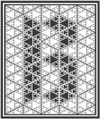 Budapest-based creator (aka Frodo 7) in 2009 at FontStruct of FontMoot 01 (pixel face), Brego, Magor (minimalist, De Stijl typeface), Andromeda Strain, Elrond (Tengwar font), Oil Stencil, Optill 2A and 2B and 3A and 3B (optical illusion fonts), Rivendell (Celtic weaving), Cubeology (patterned cubes), The Two Towers, Mike Wazowski (emoticon face), Edoras Stencil, Elessar, Earendil, LE Meta (dot matrix), Coccinella (dot matrix), +Two, +TwoB, Picosec, Picosec Rounded (ultra fat retro), Palindrome, Valimar, Fundin Eco, Fundin Regular, Lost Entropy (series of rectangular fonts), Bombs and Men (2009, modular and blocky), Eärendil, Chromosomes, Denethor-Sans (octagonal), Edoras-, Elspeth-, Elspeth-Grey, FontMoot-01 (pixel face), French-Defence-v2 (chess font), French-Defence (chess font), Gilgalad-v2, Gilgalad (octagonal), Hommage-a-Escher-LC1, Hommage-a-Escher-LC2, Legolas-Codex-Stencil, Legolas-Codex (blackletter family), Legolas-Stencil (+v2; art nouveau style), Mirkwood-Regular and Mirkwood Outline (pixel typefaces), Nimrodel-FS, Faramir (gridded), Faramir Black (octagonal, mechanical), Elessar, Vertebrae, Etudes Pour Noir et Blanc (01, 02, 02 Vertebrae), Eomer FS, Karyotype (horizontal stripes), Snooker Ball, Aragorn, Mirkwood Nano (pixel face), Mirkwood Second Iteration, Mirkwood First Iteration, Haldir (pixel face).
 Creations in 2010: Hasta Siempre (military stencil), Hasta Siempre Supplement (Fontstruct rendering of the iconic photograph of Che Guevara by Alberto Korda), Belfalas, Fractal Font, Sierpinski White, Sierpinski Black, Sierpinski Dalmatian, Remolino Stencil, Boikot Stencil, Legolas Pixel, Brego, Vortices (dings), Gamling, Coccinella Two (+B), Cyrillic 02, Waves, Hommage à Escher v2 extLat. Creations in 2011: Midori Dot (2011, a dotted kana face), Sierpinski Black Initials (a stunning decorative caps typeface based on Sierpinski triangles), Fontstructivism (constructivist Latin/Cyrillic face), Sierpinski White Initials, Vasarely Squares (experimental---letters based on Victor Vasarely's work), Hurin (counterless, created after Nagasaki by Tom Muller), Strider (an optical illusion 3d multilined face), Dot Dot White (texture face), Dot Dot Black (texture face), Garamond Italic SP (a pixelized version of Garamond Italic), Rohan (+NE01, +NE03: a textured lined 3d logotype family, +NE04, +NE10), Gray Scale (a very interesting texture experiment in which gray scales are "simulated" by simple font mechanisms). Fonts made in 2012: Font Neuf, Khazad (stencil font), Oktogon Stencil, Oktogon Outline, Thorin Stencil (army stencil), Deagol Stencil. Typefaces from 2013: the Voxelstorm family (3d, Escher-style), Elendil (3d face), Denethor Sans (strong mechanical sans), Mirkwood Nano (pixel face), Waves (op art). Typefaces from 2014: Wrath of Mordor (video game font), Gray Scale, Luthien Pixel (blackletter pixel), Gimli (Bevel Black, Inline Shadow, Inline, Bevel Shadow, Shadow), Zebroid, Hunor, Denethor Sans v2, Vasarely Squares (op-art), Waves (op-art), Ecthelion, Hast Siempre (octagonal stencil). FontStruct link. [Google]
[More] ⦿
|
Toto
[K22 Fonts]
|
 [More] ⦿
|
Tsveta Velcheva
|
Based in Sofia, Bulgaria, Tsveta Velcheva created an unnamed op-art Bulgarian Cyrillic typeface in 2013 as a school project. [Google]
[More] ⦿
|
Typeco
[James Grieshaber]
|
 James Grieshaber earned a BFA in Graphic Design from Rochester Institute of Technology. Based first in Rochester, NY, and then in Chicago, IL, and then again in Rochester, Grieshaber ran Typeco, a typographic services and solutions company established in 2002. James Grieshaber (b. Detroit, 1967) most recently was on staff of P22 Type Foundry, where he designed many type families and helped establish International House of Fonts. He has been honoured with an award of Excellence in Type Design from Association Typographique International (ATypI) for his Gothic Gothic (2004, blend of blackletter and English style), and by TypeArt'05 (for Operina Cyrillic). Designer and Co-editor of the Indie Fonts book series, Grieshaber now teaches typography at RIT and runs Typeco. MyFonts sells his fonts now. YouWorkForThem sells the Super Duty family (stencil), Glyphic Neue, the Trapper families, Chunk Feeder, Gothic Gothic and Cusp. Identifont page. FontShop link. Behance link. Details on some of his typefaces:
 - Gothic Gothic (2001), an extended blackletter co-designed with Christina Torre. In 2004, he received an award of Excellence in Type Design from Association Typographique International (ATypI) for his Gothic Gothic type design.
- The Glyphic Neue display family was inspired by the Op Art style of lettering in the United States that ran rampant in many photo type houses in the 1960's and 1970's---I like to call it the "piano key style".
- Chunkfeeder (2002) is a beautiful monospaced octagonal OCR-like family.
- Cypher (2003, an LED/LCD family) has 24 weights. Of these, Cypher7 is free.
- Duty (2002) is a sans typeface co-designed at T26 with Lee Fasciani.
- The stencil family Super Duty (2004) has 8 variations. There are also techno variant called Superduty Condensed, Superduty Regular, Superduty Narrow and Superduty Text.
- Cusp (2001-2005): a techno display family with 18 weights, including an LED style, art deco styles and Cusp De Stijl.
- Trapper (2004) is an 8-weight exaggerated ink trap font family which comes in Trapper Round and Trapper Sharp versions.
- Zaftig (2008, Typeco) is a super-fat face.
- P22 Operina (2003, in Romano, Corsivo and Fiore versions) is based on Vicentino Ludovico degli Arrighi's calligraphy used in his 1522 instructional lettering book La Operina da Imparare di scrivere littera Cancellarescha. This book contains what is considered to be the earliest printed examples of Chancery Cursive. P22 Operina won an award at TypeArt 05. Operina Pro contains over 1200 glyphs. In 2010, Paulo Heitlinger compared P22 Operina favorably to another digital chancery font, Poetica (by Robert Slimbach, Adobe), which, according to him [and I agree], lacks vigor and dynamism.
- P22 Posada (2003, with Richard Kegler): based on lettering of Mexican printmaker José Guadalupe Posada (1851-1913) that was used for some of his posters and broadsides.
- P22 Arts and Crafts Tall (1995, art nouveau), P22 Arts and Crafts Hunter (1995). Both based on alphabets by Dard Hunter, 1908-1910.
- P22 Art Deco Chic (2002), based on the Art Deco hand lettering of Samuel Welo, ca. 1930. P22 Art Deco Display (2002) is a Broadway style face.
- Churchy (2002).
- He offered (offers?) a handwriting font service for 100 USD. Free trial typeface Reenie Beanie (2002). Signature font service for 50 USD. Reenie Beanie (2002) is now offered (as a joke, I assume) as part of the Google open font directory (for free web fonts).
- P22 Garamouche (2004, with Richard Kegler). Comes with Garamouche Ornaments (2004).
- Segoe Print (2006, Monotype Imaging). [Isn't this Googlee's competition?] This is an informally hand-printed typeface co-designed with Brian Allen, Carl Crossgrove, James Grieshaber and Karl Leuthold at Ascender.
- P22 Cezanne Pro (2006). Has over 1,200 glyphs.
- P22 Yule (2005; Heavy, Inline): a stone chisel family with a hint of Neuland.
- P22 Numismatic (2005): originally offered by the Devinne Press, and based on ornaments and letters used by 15th and 16th century engravers of seals and coins; however it looks very much like Otto Hupp's Numismatisch (1900, Genzsch&Heyse).
- Black Ops One (2011) is a military stencil face, available at the Google Font Directory.
- Short Stack (2011) is Grieshaber's free contribution to the Comic Sans genre. It was published by Sorkin Type and can be downloaded from Dafont.
- Atomic Age (2011) is a free font at Google Font Directory. It was inspired by 1950s era connected scripts seen on nameplates of American cars.
- Sarina (2011). A connected script published by Sorkin Type.
- Supermercado One (2011, Google Font Directory) is a low contrast semi geometric typeface inspired by naive industrial letters. More a signage typeface than a web font.
- Typeco Grecian (2012, FontStruct) is loosely based on a Wells & Webb Grecian style woodtype circa 1846.
- Typeco De Stijl (2012, FontStruct) is based on Van Doesburg's De Stijl magazine's name plate in 1923. Typeco Topaz Serif Tall (2012, FontStruct) is a pixel typeface. Typeco New Wave (2012, FontStruct) is an op art party font.
- Metamorphous (2012, Sorkin Type) borrows its arches from Gothic cathedrals---it was inspired by Jonathan Barnbrook and by the free font Morpheus. Google font download.
- HWT Geometric (2013, Hamilton Wood Type Foundry) is a squarish wood type family: Geometric began its life as a metal typeface from the Central Type Foundry, circa 1884. Soon after, this design was officially licensed to Morgans & Wilcox and was shown in their 1890 catalog in Regular, Light and Condensed Light variations. After acquiring Morgans & Wilcox, Hamilton Manufacturing offered Geometric Light Face Condensed as their own No 3020 and the Geometric Light Face as No 3021. HWT Geometric has been expanded digitally to include a Regular Condensed version.
- Trattatello (2014). An Apple system font.
- HWT Archimedes (2017, P22). A revival of the Page No. 122 wood type called Mansard Ornamented, done together with Richard Kegler (P22) and Virgin Wood Type. They write: This new digital version is a simultaneous release with Virgin Wood Type and features a variety of styles including the standard screw head option plus a Phillips head, hex/Allen wrench head, and even the vexing Apple pentalobe tamper resistant star screw. As a bonus, the screwheads themselves are accessible via a glyph palette, so you can put the screws to Comic Sans, or any other font, if you so desire.
Klingspor link. Google Plus link. Behance link. Fontsquirrel link. [Google]
[MyFonts]
[More] ⦿
|
Valentina Lokumcu
|
During her visual communication studies in Cadempino, Switzerland, Valentina Lokumcu created the poster font Cube (2014) and the op-art typeface Illusion (2014). [Google]
[More] ⦿
|
Vanessa Zuñiga
[Amuki Studio]
|
 [More] ⦿
|
Vasgrav
[Vasilis Gravaritis]
|
Vasgrav is Vasilis Gravaritis, a graphic and type designer in Athens, Greece. He created the ultra-experimental typeface Athina in 2010. Triori (2010) has a grid-based design. Vasarely (2010) is based on the principle that horizontal lines through glyphs cause a flip from black to white and vice versa. This op-art typeface is named after Hungarian artist victor vasarely. In 2011, he designed Linus (squarish). In 2013, he published the condensed arc-based monoline sans typeface Capsula. Behance link. Hellofont link. [Google]
[More] ⦿
|
Vasilis Gravaritis
[Vasgrav]
|
[More] ⦿
|
Vicente Rojo
|
Catalan artist, b. 1932, Barcelona, who works in Mexico. He studied drawing and sculpting. During the Franco persecution, Vicente and his father fled to Mexico City, and fell in love with the city and the country. Exiled Spanish graphic designer Miguel Prieto employed him---together, Vicente and Miguel would go on to have successful careers. In 1953, he became a director at the Instituto Nacional de Bellas Artes. After some socio-political art exhibitions, he became interested in geometric artforms. For the magazine Plural, Vicente designed a multiline op-art typeface in 1971. A very geometrical bespoke typeface was created in 1971 as well for the Fondo de Cultura Económica. Revivals of his typefaces include K22 Plural (2013, Toto). [Google]
[More] ⦿
|
Viktor Kharyk
|
 Ukrainian designer, b. Kiev, 1957. Graduate of the Senior College for Print and Design in Kiev in 1982. Viktor became art director at Sphera in Kiev. Main type designer at Düsseldorf-based company Unique GmbH since 1998. In 2012, he cofounded Apostrof with Konstantin Golovchenko. He designs Armenian, Greek, Georgian, Devanagari, Hebrew, Cyrillic and Arabic fonts, and is particularly interested in revivals of ancient, forgotten, or historically important typefaces and writing systems. His work:
 - At Elsner and Flake, he published EF Bilibin (2004, uncial), EF Abetka (2004), EF Gandalf (2004, uncial), Bilbo (2004-2008, an uncial family), Kiev EF (2002), Lanzug EF (2002, letters as zippers), Rose Deco EF (2001), EF Elf (2002, imitating Tolkien's writing), EF Deco Uni (2001-2004), EF Deco Akt Light (2001-2004), EF Fairy Tale (2003-2008, caps face), EF Varbure (2004, an experimental family), Rose Garden EF (2001, initial caps ornamented with roses; the text is uncial), and Viktors Raven EF (a spectacular caps font with letters made out of a raven).
- At MasterFont: Abetka MF (1999, with Alexeev), Kiev MF (1976-2003), and Netta MF (1999, text family). These fonts have Latin and Hebrew components.
- At Paratype, he published Uni Opt (2007, Op Art letters based on free brush technique similar to experimental lettering of the early decades of the 20th century; for instance to Graficheskaya Azbuka (Graphic ABC) by Peter Miturich and works by Victor Vasareli), Joker (1978, a subtractive font---since 2000, also in Cyrillic, Latin, Hebrew, Greek, Georgian, Armenian and Arabic), Blooming Meadow (2007, flowery ornaments), Bogdan Rejestrowy and Bogdan Siczowy (2006, based on Ukrainian Skoropis (fast handwriting) of the 16th and 17th centuries, and named after Ukrainian Getman Bogdan Khmelnitsky. The character set contains Cyrillic, Old Slavonic, Glagolitic, Latin and Greek alphabets), Lidia (2006, a lined engraving typeface based on a 1967 font by Iraida Chepil for Polygraphmash).
- At 2D Typo: Florentin 2D (2011, angular family), New Hotinok 2D (2010, with Henadij Zarechnijuk).
- Other work: Simeon 2D (2011, 2D Typo), some fonts at Face Typesetting (1970s), Getto (1970s), White Raven (2002), Handwritten Poluustav Ioan Cyrillic (1999-2001), Letopis (1983), New Zelek (1980s), UniAkt (2001, based on Unifont, an erotic caps face, done with Natalia Makievska).
- Free fonts at Google Web Fonts, published via Cyreal: Iceberg (2012, octagonal).
- Cyrillizations by Viktor Kharyk: Data 70 (1976; original from 1970 by R. Newman), ITC American Typewriter, Bullion Shadow (1984; of the shadow font Bullion Shadow (1978; original from 1970 by Face Photosetting), Calypso (1984; of Excoffon's 1958 original), Lazybones (1980s; of a 1972 Letraset font with the same name), Glagolitic (1983, Elvira Slysh, digitized in 2003), Augustea (1947, Allessandro Butti), Stencil (after a 1938 typeface by R.H. Middleton called Stencil), Columna (1980s; after Max Caflisch's original from 1955), Sistina (1951, Hermann Zapf), Weiss Kapitale (1935, Emil Rudolf Weiss), Vivaldi (1965, Friedrich Peter), ITC Tiffany (1974, Ed Benguiat, digitized in 1995), ITC Bookman Herb Lubalin (1974, digitized in 1980s), Berthold Cyrillic Helvetica Cyrillic (1980), Churchward Galaxy (1970s, J. Churchward, digitized in 1980s), Olive Bold Condensed (1980s, original of Roger Excoffon in 1962-1966), Motter Ombra (1980, original by O. Motter in 1975), Sinaloa (1981, original by Odermatt and Tissi in 1972), Serif Gothic (1990, original by Herb Lubalin and Tony DiSpigna in 1974), Dynamo (1980s, original of K. Sommer in 1930), EF Gimli and EF Gloin (2004-2010, mediaeval typefaces done at Elsner&Flake together with Marina Belotserkovskaja).
- Other typefaces: Lili (multilined), Rutenia (by Henadij Zarechjuk and Viktor Kharyk).
At TypeArt 01, he won first prize with Varbur Grotesque (1999-2001, with Natalia Makeyeva), third prize with Joker (1970-2000), and honorable mention with Abetka. At TypeArt 05, he received awards for UniOpt (2002, Kafkaeqsue Op Art display style) and Blooming Meadow (dingbats). In 2009, his 2006 digitization of Anatoly Shchukin's 1968 typeface Ladoga (+Text, +Display, +Ladoga Armenian) won an award at Paratype K2009. In 2016, Henadij Zarechnjuk and Viktor Kharyk designed Dnipro for Apostrof. The Cyrillic version of this font follows Ukrainian decorative traditions, initiated by Georgy Narbut and Mark Kirnarsky in the 1920s and continued until the 1980s. The Latin part has an uncial character. Typefaces made in 2018: Algor, Zluka (with Henadij Zarechnjuk; named after The Act Zluka, or Ukraine's Unification Act of 1919), XX Sans, Yurch (developed by Henadij Zarechnjuk and Viktor Kharyk by samples of calligraphic lettering by Ukrainian book designer Volodymyr Yurchyshyn), heb? [Google]
[MyFonts]
[More] ⦿
|
Wiescher Design
[Gert Wiescher]
|
 Gert Wiescher was born in Braunsbach am Kocher, Germany, in 1944. Based in München, Gerd Wiescher designed many classy and classic Bodoni families, as well as New Yorker Type (1985). All of his typefaces are carefully fine-tuned and balanced. Wiescher founded first Munich Type and then Wiescher Design and Autographis. He is known as a hard, fast and prolific worker. His exquisite typefaces can be bought at MyFonts. Catalog of his bestselling typefaces. Interview in 2008. Wikipedia page. Creative Market link. List of typefaces:
 - Scripts: Prima Script (2017: for menus and cookbooks), Marmelade (2015, +Fruits, a set of dingbats), Triana (2014, a thin monoline penmanship script named after a Spanish sailor on the Pinta who in 1492 was the first to see America---in this case the Bahamas), Floral Script (2014, copperplate style script), Sherlock Script (2014: this comes with Sherlock Stuff (fingerprints) and Sherlock Stuff Dots (ink stains)), Felicita (2013, a swashy copperplate script), Vividangelo (2013, after the handwriting of a real person), Dreamline (2013, connected monoline cursive wedding scripts in A, B and C styles), Fiorentina (2012, a renaissance style script with 650 characters), Excelsia Pro (2012), Delicia Pro (2012, a fat brushy signage script), Nono (2011, formal swashy calligraphic family), Dyane (2011), Penn (2011), Lettera (2011, hand-drawn formal face), Tosca (2010, a high-contrast calligraphic typeface with 730 glyphs), Grandcafe (2010), Loulou (2010, curly and of extreme contrast), Schoolblock (2010, hand-printed school font), Grandezza (2010, calligraphic family; +Xtra), Sixtra (2010, a curly didone script), English Script (2010, classic Spencerian calligraphic script), Savage Initials (2009), Morning News (2009), Revolte (2009, a brush script for demonstration signs), Estelle (2009), Scriptofino (2008, 4 calligraphic styles to give Zapfino a run for its money), Exprima (2008), Daiquiri (2008), Lisa Bella, Lisa Fiore and Lisa Piu (2008, connected and calligraphic), Tati (2008), Movie Script (2007), Cake Script (2007), Eddy (2007, grungy calligraphy), Pointino (2007), Bohemio (2007, a great oriental-brush script), Artegio (2007, two calligraphic scripts), Xylo (2006, in the tradition of the 18th-century English calligrapher George Bickham and the 19th-century American calligrapher Platt Rogers Spencer), Tamara (2005, art-deco script based on some initials for Semplicita made in the 1930s by the Nebiolo foundry), Tecon, Ellida (2005, inspired by the elaborate scripts of 18th-century English calligrapher George Bickham, with additional influences from 19th-century American calligrapher Platt Rogers Spencer), Eloise (2009, a high-contrast version of Ellida), Nadine Script (2005, an elegant script inspired by a set of initials the French designer and artist Bernard Naudin drew for Deberny&Peignot in the 1920s), Royal Classic (2005, unbelievable script based on a design that has initially been comissioned by King Ludwig I of Bavaria for in-house-use), DesignerScript, Filzer Script (1995, handwriting), Futuramano-Condensed-Bold, Futuramano-Condensed, Futuramano-Plain, Futuramano-Thin, Giambattista, Scriptissimo-Plain, Scriptissimo-Forte, Scriptissimo-Swirls, Squickt (1989), Konstantin A, B and C (2005), Konstantin Forte (2005), MyScript, GrocersScript, Swanson (2006). Scriptissimo (2004) has versions named Start, Middle and End, tweaked for their position in the word, and there are plenty of ligatures. Check also Bodoni Classic Chancery (2007) and Bodonian Script (2012).
- Sans: Brute Sans (2018), Xpress (2018), Xpress Rounded (2019), Classic Sans (2017, a revival of Theinhardt Grotesk), Classic Sans Rounded (2017), Maxi (2017), Nic (2017), Azur (a large almost geometric sans famly with 1950s Roger Excoffon-style French flavours, called a Medterranean grotesk by Wiescher himself), Royal Sans (2017, after Theinhardt's Royal Grotesk---the forerunner of Akzidenz Grotesk--- from 1880), Docu (2016, a workhorse elliptical sans family), Viata (inspired by Bauhaus), Noticia (2016, in the Bauhaus tradition, with very pointy v and w, and a bipartite k; not to be confused with the 2011 Google Web Font Noticia Text by José Solé; followed in 2019 by Noticia Rounded), Avea (2015), Aramis, Nota Bene (2015: squarish, narrow, technical), Nota (2015, technical and cold: the rounded version, Nota Rounded, followed in 2019), Dylan Condensed (2014), Dylan Copperplate (2014), Supra (2013, grotesk: Supra Thin is free. See also Supra Condensed (2013), Supra Mezzo (2013, between regular and condensed), Supra Extended (2013), Supra Rounded (2015), Supra Classic (2014), and Supra Demiserif (2013, slab serif derived from Supra)), Dylan (geometric sans), Franklin Gothic Raw (2013, like Franklin Gothic but with raw, not rough, outlines, only visible at very large sizes), Blitz (2012, a flared family), Blitz Condensed (2012), Contra Sans (2011, which led to Contra Slab, Contra Condensed and Contra Flare), Vedo (2011, a Bauhaus style family that include a hairline weight), Germania (2011, a useful and beautiful monoline sans family), Geometa (2011, +Rounded, +Rounded Deco, +Deco: all based initially on Renner's Futura), Geometra Rounded (2011, a rounded family based on Futura and "much less boring than DIN"), Bombelli (2010, ultra-wide architect's hand), Bluenote Demi (2010, a grungy Franklin Gothic Condensed), Perfect Sketch (2010, sketched grotesque), Unita (2009), Antea (2009), Eterna (2009, sans with a swing), Pura (2008, an uncomplicated grotesk family), Purissima (2010, a decorated extension of Pura; +Bold), Copperplate Gothic Hand (2009, after a 1901 design by Goudy), Copperplate Alt (2011), Copperplate Wide (2011), FranklinGothicHandDemi (+Shadow), Franklin GothicHandCond (2009), Franklin Gothic Condensed Shadow Hand (2010), and Franklin Gothic Hand Light (2009, a hand-drawn version of Franklin Gothic), Papas (2005, sturdy, slightly curly), Julienne (2005, a condensed sans family; see the new versions Moanin and Julienne Piu, 2017), Cassandra (1996, an art deco style after Adolphe Mouron Cassandre), Futura Classic (2006), Cassandra Plus (2012), Ela Sans (2005, a large family), Mondial-Bold (2004), Mondial-Demi, Mondial-Light, Mondial-Medium, Mondial-Normal, Mondial-XBold, Monem-Bold, Monem-Medium, Monem-Normal, Monem-Roman.
 Serif: Imperia (2011, a Trajan column caps face), Monogramma (2012, a Trajan family for monograms), Imperium (2005, a precursor of Imperia with a Relief shadow style included), Hard Times (2011), Fat Times (2011, retraced Times), Elegia (2011, slightly Victorian family), Breathless (2010, a spiky family, inspired by nouvelle vague movie posters), Bodoni Classic 1, Bodoni Classic 2, Bodoni Classic 3, BodoniClassic-Condensed, BodoniClassic-Handdrawn, BodoniClassic-Swashes, BodoniClassic-Text, Bodoni Classic Deco, Bodoni Classic Swirls (2009), Bodoni Classic Pro (2011), Bodoni Classic Inline (2012), Bodoni Classic Fleurs (2014, ornamental caps), Bodoni Comedia (2010, one of my favorites: a funny "live one day at a time" curly Bodoni cocktail), Bodoni Classic Swing (2010), Bodoni Classic Free Style (2010, curly), Bodoni Classic Ultra (2010), La Bodoni Plain (+Italic, 2008), Take Five (2005, a jazzy take on Bodoni Classic), DonnaBodoniAa, DonnaBodoniBe, and DonnaBodoniCe (three scripts named after Bodoni's wife, Margharita dell'Aglio, who published his complete works, the Manuale Tipografico, in 1818, five years after his death), Edito, Robusta. A great series, some of which were originally published at Fontshop, see, e.g., FFBodoniClassic (1994). MyFonts: When the first of Wiescher’s Bodoni Classic fonts came out in the 1993, there was nothing like it. Up to then, virtually all Bodoni revivals had been given clear-cut forms and square serifs. But Bodoni’s originals from the late 1800s were never as straight and simplistic as is often assumed: they had rounded serifs and slightly concave feet. Wiescher digitized a wide range of Bodoni letterforms, including a wonderful script-like family called Chancery and a nice series of Initials. Having accomplished his mission twelve years later, he began making personal additions to the family, such as the more decorative Bodoni Classic Swashes. Recently a useful little family was added to the clan: LaBodoni is sturdier and less optically delicate than most Bodonis, and therefore more usable as a text face. Wiescher made Metra Serif (2009), Principe (2008) and Paillas (2009). Prince (2009) is a curlified didone. Serif: Imperia (2011, a Trajan column caps face), Monogramma (2012, a Trajan family for monograms), Imperium (2005, a precursor of Imperia with a Relief shadow style included), Hard Times (2011), Fat Times (2011, retraced Times), Elegia (2011, slightly Victorian family), Breathless (2010, a spiky family, inspired by nouvelle vague movie posters), Bodoni Classic 1, Bodoni Classic 2, Bodoni Classic 3, BodoniClassic-Condensed, BodoniClassic-Handdrawn, BodoniClassic-Swashes, BodoniClassic-Text, Bodoni Classic Deco, Bodoni Classic Swirls (2009), Bodoni Classic Pro (2011), Bodoni Classic Inline (2012), Bodoni Classic Fleurs (2014, ornamental caps), Bodoni Comedia (2010, one of my favorites: a funny "live one day at a time" curly Bodoni cocktail), Bodoni Classic Swing (2010), Bodoni Classic Free Style (2010, curly), Bodoni Classic Ultra (2010), La Bodoni Plain (+Italic, 2008), Take Five (2005, a jazzy take on Bodoni Classic), DonnaBodoniAa, DonnaBodoniBe, and DonnaBodoniCe (three scripts named after Bodoni's wife, Margharita dell'Aglio, who published his complete works, the Manuale Tipografico, in 1818, five years after his death), Edito, Robusta. A great series, some of which were originally published at Fontshop, see, e.g., FFBodoniClassic (1994). MyFonts: When the first of Wiescher’s Bodoni Classic fonts came out in the 1993, there was nothing like it. Up to then, virtually all Bodoni revivals had been given clear-cut forms and square serifs. But Bodoni’s originals from the late 1800s were never as straight and simplistic as is often assumed: they had rounded serifs and slightly concave feet. Wiescher digitized a wide range of Bodoni letterforms, including a wonderful script-like family called Chancery and a nice series of Initials. Having accomplished his mission twelve years later, he began making personal additions to the family, such as the more decorative Bodoni Classic Swashes. Recently a useful little family was added to the clan: LaBodoni is sturdier and less optically delicate than most Bodonis, and therefore more usable as a text face. Wiescher made Metra Serif (2009), Principe (2008) and Paillas (2009). Prince (2009) is a curlified didone. - Romain du roi: In 2008, Wiescher designed the two-style Royal Romain, which is based on the Romain du Roi of Philippe Grandjean, which was completed in 1745 after Grandjean's death by Grandjean's successor Jean Alexandre and Louis Luce. Wiescher: The Romain du Roi was for the exclusive use of the Louis XIV. It was never sold or given to any other king or government. The king of Sweden tried to scrounge a set, but the king refused. This font is the basic design for such famous fonts as the Fournier and Bodoni. Just so the Romain du Roi doesn't get lost in the digital turmoil I set out to redesign it in 2004 and finished now in early 2008. I did a lot of research in France's National Library. A good excuse to visit Paris is always welcome!!!
- Engravers: Dylan Copperplate (2014), Cavaliere (2010), Guilloche A (2009), Guilloche B (2013, op-art borders), CopperplateClassic-Plain, CopperplateClassic-Round, CopperplateClassic-Sans, Copperplate Classic Light Floral (2009), Cimiez-Bold, Cimiez-Roman (2004), Ela-Demiserif, Ela-Sans (2004), Eleganza (2008).
- Blackletter/Fraktur: Renais (2011, renaissance initials), Flipflop (2011), Fraktura and Fraktura Plus (2008), Royal Bavarian (2004, based on a typeface commissioned by King Ludwig 1st of Bavaria about 1834), Royal Blossom (2009), Royal Bavarian Fancy (2004), Bold Bavarian (2010, a heavy version of Royal Bavarian), Monkeytails (2008), Fat Fritz (2006, rounded endings), Ayres Royal (2005, blackletter typeface based on drawings of London's calligrapher John Ayres, ca. 1700; to be used with RoyalBavarian; followed in 2010 by BoldAyres).
- Slab serif: Slam Normal (2017), Slam Rounded (2017), Suez (2017: with extra tall ascenders and descenders), Egyptia (2010), Egyptia Rounded (2010).
- Typewriter: Lettera (2014), Lectra (2011), QuickType-Bold, QuickType-Plain, QuickType-Sans.
- Decorative: Tric (2017, art deco), Franklin Gothic Raw Semi Serif (2015), Frank Woods (2013, letterpress simulation based on Franklin Gothic Heavy), Ohio Bold (2012, a rough headline type in the tradition of Louis Oppenheim's Lo-Type from 1913), Viking Initials (2012), Cannonball (2012, a psychedelic typeface derived from a jazz record-sleeve for Cannonball Adderley), Byblos (2011, derived from the logo of St. Tropez's famous Hotel Byblos), Blockprint (2013, early 1900 German expressionist grunge face, renamed Bannertype after 24 hours), Ferrus (2010, inspired by Cassandre's Acier Noir, 1936), Petite Fleur (2009, flowery embellishments and the capitals of his redesigned Royal Romain, which in turn is based on the famous romain du roi), Glass Light (2012, a decoirative art nouveau type family based on Glass Light by Franz Paul Glass, 1912), Penstroxx (2009, 5 fonts that are based on the powerful, expressive Traits de plume (penstrokes) designed in Paris around 1930 by Alfred Latour), Liquoia A, B and C (2008, decorative scripts), Modernista (2008, an art nouveau headline face, based on an 1898 sample by Peter Schnorr), Ornata A, B, C, D, E, F and G (2008-2009: ornaments), Fleuraloha (2008), Floralissimo (2008: flowery ornaments), Frank Flowers (2011), Scrolls A (2010, penman's dingbats), Bacterio (2007), Alpha Bravo, Alpha Charlie, Alpha Echo (2006), Barracuda, Cacao (2005, fifties style), Cassandre Initials (2004, Elsner&Flake, after the 1927 original by Adolphe Mouron Cassandre), Contype, Fleurie (2005), Fleurons Two (2006), Fleurons Three (2006), Fleurons Four (2006), Fleurons Initials (2007), Fleurons Six (2008), Fleuron Labels (2008), HebrewLatino, Julius, Lunix (2006), MyHands, NewYorkerType (1985; extended in 2011 to NewYorker Plus, and in 2020 to New Yorker Type Classic and New Yorker Type Pro; after Rea Irvin's well-known typeface for The NewYorker), Venice Initials (2006, after a 15th century find, but Wiescher added about half of the caps), Ventoux, Vivian (2005), Woody.
- Pixel and/or futuristic: Nexstar (2013: this octagonal typeface is also useful or athletic lettering), Alpha Fox (2007), Alpha Juliet (2010), Alpha Papa (2010), Alpha Square (2010), Alpha Jazz (2010), Alpha Papa (2010, LED meets stencil).
- Stencil typefaces: Dripps (2010, handpainted, perhaps brutalist), Red Tape Plus (2014).
- Comic book fonts or brush fonts: Breezy (2015), Caboom (2014).
- Dingbats: Wayside Ornaments (2012), XX Century Ornaments (2012), Thistle Borders (2012), Greenaway Mignonettes (2012, after Kate Greenaway (1846-1901), author and illustrator of childrens books), Collins Florets (2012), Flourishes A (2010), Jingle Doodles (2010).
- Art deco: Trix (2017), Zelda (2017, named after F. Scott Fitzgerald's wife).
- Commissioned and special typefaces include a version of the logotype for the Munich's newspaper Abendzeitung, Maxi (variable width sans), NIC Grotesk, Tric (art deco), a Cyrillic version of Bodoni Classic for Vogue Moscow, a special Bodoni Classic for Ringier Publishers in Zurich, and Red Tape, a typeface that is on permanent exhibition at the German National Library in Leipzig.
- Typefaces from 2019: Elita (a condensed sqaurish typeface), Artis Sans, Sigma Condensed and Sigma (simplified readable sans families), Cosma (an elegant high-contrast text family with tapered upstrokes and crossbars, but otherwise didone roots), Quincy (a bebop typeface that started from some letterutouts), Phoebe (an elliptical techno family), Phoebe Rounded, Polygon A, Polygon I, Polygon X.
- Typefaces from 2020: Bullets Bannertype, Alpha One (a counterless experiment), Exec (a 14-style sans family), Exec Corners, Exec Demiserif, Penta (a grotesque family with large counters that make the ExtraLight style quite striking), Penta Rounded.
Author of many books, including Zeitschriften & Broschüren (Systhema-Verlag, München, 1990), Schriftdesign (Systhema-Verlag, München, 1991), and Blitzkurs Typografie (Systhema-Verlag, München, 1992). The following text was excerpted from his wikipedia page: At 14 years of age, Wiescher went to Paris to study fine art. He financed his stay by doing portraits on the Place du Tertre on Montmartre. In the sixties Wiescher studied graphic design at the Berlin Academy of Fine Arts. (Since November 2001, Berlin University of the Arts.) He financed his studies by sidewalk painting and drawing portraits. While doing sidewalk paintings, he met the typeface designer Erik Spiekermann, who inspired his love of this branch of design. After two years he quit his studies, and went to Barcelona where he worked at the offices of Harnden & Bombelli, for whom he designed the OECD-Pavilion of the 1970 Osaka World Expo. In 1972 he moved on to Johannesburg working as an art director at Grey and Young advertising . In 1975, he returned to Germany, working first for DFS+R-Dorland, and then for the "Herrwerth & Partner" ad agency. At Herrworth, he was involved in introducing IKEA into the German market. In 1977 he became a creative partner in the Lauenstein & Partner ad agency, creating mainly campaigns for large German retail chains. In 1982 he started his own design office, creating work for editors (Markt & Technik, Systhema and Langen-Müller-Herbig), computer companies (House of Computers, FileNet) and he worked for Apple Computers designing their publications (Apple-Age and Apple-LIVE). View Gert Wiescher's typefaces. Wikipedia link. [Google]
[MyFonts]
[More] ⦿
|
Woodcutter Manero
[Jordi Manero Pascual]
|
 Prolific Barcelona-based type designer. He started out by creating the counterless hand-printed typefaces Woodcutter Dripping Nightmare (2012) and Woodcutter MMXII (2012).
 In 2013, he created Gothic Winter (snow-capped blackletter), Woodcutter Anonymous (ransom note font; +part2, 2014), The Shining (movie scanbats), Woodcutter Optical Army (op-art), Viking Runes Shields, Fresh Blood, Pig Rules, Pole Dance, Music+Party, Asian Food, Deers (sic), Woodcutter Amor de Madre (curly tattoo font), Tattoo Vieja Escuela 1, 2 and 3, Origami (animal dingbats), Vintage Motorcycle Club (scanbats), Vintage Christmas (dingbats), Terry Richardson World (scanbats), Woodcutter Wire Fence, Woodcutter Points (textured face), Made in Spain 4, I Love 80s (dings), Drugs (drug paraphernalia dings), Barber Shop (dingbats), Woodcutter del Reves, Adventure Time, New York New York (1 and 2), Woodcutter Dripping Classic, Woodcutter Tinta China (ink splatter font), Woodcutter Cross, Nightmare on Social Media, Breaking Bad (scanbats), Fight Club (boxing scanbats), Boligrafo (sketched font), Robots, Luxury Brands, Woodcutter Buena Lettra, Barcelona (scanbats), Devoto (religious dingbats), Joker (dingbats), Woodcutter Typewritter (sic), Banksy (scanbats), Made in Spain 1, 2 and 3 (company logos), Animal City (funny dingbats), LSD Junior (a scary alphading font), Woodcutter Army (army stencil), Woodcutter El Día De Todos Los Santos (Mexican dingbats), Woodcutter Summer Shadows, and the monster dingbat typeface Woodcutter El Dia del Juicio. Still in 2013, he designed Woodcutter Black Square, DaPunk, Woodcutter Pollita Alegre (a penis font), Woodcutter Hungry Pig, and Woodcutter Hand Light. Typefaces from 2014: Hospital Icons, Woodcutter Rare Drawings, Headache, Irresistible (rounded sans), Doctor Garcia (textured), Violence, Hipster Icons, Saint Valentine's Day, Mister Manson, Casino (dingbats), Christian Icons, Christmas Icons, Hermes Manero, Beauty (dingbats), Art Icons & Tools, Clouds Mix, Malamadre (grunge), Offset Punk, Manos de Cerdo, Hotel Oriental, Basic Trip, Popeye (scanbats), Viva la Fiesta (flag alphadings), Street Stencil, Supermarket, Ebola Font, Vintage Halloween, Motel Imperial, Clothes, The Second World War (army stencil), Tahs On A Rope, Penis (dingbats), Regular Show (dingbats), Parkinsonism, The 70 Greatest Directors of All Time (scanbats), Smartphone (alphadings), Dripping, Chaos in Wisconsin, Saturno, Gym (dingbats), Angie, Antique Book, Black Rodeo, Gutierrez+, Matias-Font, Viejo-Oeste, Woodcutter-Prison-Tattoo, old+sailor, Italian Revolution, Kid Nightmare, Anderson (rough stencil), Manero (scratchy script), Tecno-Chaos (dot matrix font), Neverland, Martian Font, Radical Block, Woodcutter Delicada, Bon Appetit, Termica, Kandinsky, Hotel Paradiso, Seven Arts, Street Icons, Militaria (dingbats), Undergramo (poster font), Woodcutter Avispa, Fuego Fatuo, Other Space, Electrica Sals, Woodcutter Dramatica, Cocinitas (cooking dingbats), Bad Mother Fucker, Quentin Tarantino (scanbats), El Extraño, Fine Disorder, Woodcutter BCN Style (dripping blood font), Woodcutter Virus, Efectiva, Mogambo (fat brush), Duck Tape, Warriors, Cutre Glam, Woodcutter Sutill Shadow, Woodcutter Future, Rage, Woodcutter Negative, Manolo, Vegetables, Woodcutter Storm (lightning texture), Woodcutter Rare Drawings, Rustic Heavy Metal, Grass, Virgin Mary (scanbats), Laurus Nobilis (wreaths), Mister Bambu, Woodcutter Barcode, Conquest, Multimedia Icons, Preschool, Cursors, Woodcutter Kaos, Woodcutter Lines, Ukraine (constructivist), Meccano, Woodcutter Simple Font, Crux (crucifixes), Dolores (3d), Eyes, MoneyMoneyMoney, Made in Spain 5, Barcelona Mon Amour, New Society (a 3d shadow face), Federico (a hand-printed shadow typeface), Aranea (spider dings), Fifth Avenue (art deco), Beware of Pitbull, Dictators (scanbats), Woodcutter Vintage Cartoon, The American (textured face), Woodcutter Mixed Icons, Apple Japanese Keyboard, Vintage Classics Disney, Carnage College (blood splatter font), Vintage Porn (scanbats), Woodcutter Fontana (textured caps), Woodcutter Mixed Icons, Woodcutter Jet Set, Woodcutter Gothic Drama (blackletter), Woodcutter Relieve, Mixed Icons Vol. 1, Woodcutter Electric, Woodcutter Cloth, Street Style (graffiti font), Gothic Punk, Human Body Parts, Dirty Harry, Woodcutter Fine Sketch, Woodcutter Invisible, Miley Cyrus (scanbats), Old Guard, Circus and Fair, Comic Cover, Woodcutter Gigantismo, Clockwork Orange (scanbats), Dosmilcatorce, The Walking Dead (scanbats). Typefaces from 2015: Rude High School, Imprenta Gonzales (white on black), Estrategia (textured style), Monkey Business, Venganza (dripping blood font), Woodcutter Executive, Left Hand Comic (textured), Dirty News, Gorilla BCN (a great handcrafted athletic lettering typeface), Neo Protein (bio-grunge), Barrio-Santo (graffiti style), Periodic-Table-of-Elements, TerrorToons, Vanilla-Candy, Baseball-Icons, Boots, Fine-Homage, Jesus-Christ (religious icons), Lock, Meredith (texturted typeface), Neo-Victorian, Old-Europe (soft blackletter), White-Army (military stencil), HeadWear, Oil-Icons, Pollito-Peligroso (white-on-black letters), Taxi, The-Dentist, Planeta Zero (white-on-black letters), Cronenberg, Hell Bar, Horror Poster, Big Gipsy Bro, Peccatum (bloo drip font), Tempus Fugit (grunge), Indiana State (a great shaded titling face), DJ Icons, Gentleman Icons, Dope Crisis (textured), Bad Quality, Love and Hate, Smoking (dingbats), Phantom of the Opera (dripping blood font), Video Games (dingbats), Beauty Initials, Knife, Ciudad Capital, System Error (dot matrix font), Rejilla (gridded font), Punk Survival, Watches, Barrio Chino (grungy typeface), Delayed (dot matrix font), Impertinencia, Ecology, Anchor, Comic Sandchez, Beard, Globe Icons, Jalisco Company (handcrafted 3d typeface), Summer Icons, New Art Deco (textured art nouveau typeface), Gordita Alegre, Banned World, Pixel Chaos, Dirty Grunge, Metal Curvy, Jazz Club, One Percent, Profile, Scoreboard, Sentencia, The Octopus (silhouettes of octopi), New Sailor (tattoo script), Cleaner, Bear Icons, Woodcutter Trama, Manolete (wavy font), Skully (alphadings), Big Designer, Vintage Punk (white on black), Streets of Fire (textured), Nordica, Belle Epoque (art deco), Bakery, The Worlds Best Logos, Special Unit (textured typeface), Manifesto, Shooter, Woodcutter Carnage, Black Rain (sketched), Soft Addiction, Digital Camera Symbols, Surf, Tailoring, Palo Santo, Morbida (rounded athletic letters), Fine Shadows, The Woodcutter (dings), Experimento (textured typeface), Seven Sisters, Senior Citizen (dingbats), Hotel California, Woodcutter Hand 2015, Fire Department (scanbats), Dolor de Muelas [toothache], Hamburger, Vintage Mixed Vol 1 and 2, Torremolinos, Ol Torero (bullfight scanbats), Formula 1 (scanbats), Presidents of the United States of America, Furure Blood (dripping blood typeface), Wild West Icons, Maravillosos, Territorio (textured display face), Forced Flowers, Black Hole, The Death, Extra Fat (comic book font), Cristobal, Cirilico, Fuck Off (a very useful raised middle finger font), Mexican Skull (the best Mexican skull font anywhere), Old Nuremberg, Maria Dolores, China, Street College, Rodriguez, Tourism, Community, Oklahoma (varsity font), Smartphone Icons, Science Icons, Horse, Greek Mythology, Persiana (a Venetian blind font), Alcohol, Whatsap Emoticons, Library (possibly the best library icon font today), Candelita, Remember Me, Flamenco, Universidad 2015 (athletic lettering), Sneakers, Fire, Industrial Worker, Europe, Abstemious, Police, School, Paris, Savage Empire, Nautical (dingbats), Crusader (dingbats), Woodcutter MMXV, Rats, Monster Mash, 5th Avenue Stencil, Baby Icons, New Space, City Icons, Diamonds, Punkland, Temblores, Puttana Antique, Human Anatomy (dingbats), Guerra Santa, Winter Icons, Farm, NeoWriter, Russia. Typefaces from 2016: Woodcutter People Faces, Ear, Codociosa (grungy), Viking Hell, Simple Myopia (textured, halftone style), Bulbs, Emblem, Vegan Icons, Fleur de Lis, Pregnancy, Harley Davidson, Window, Owl, Native American Indians, The Toy Castle, Aristogramos Chernow, Mediogramo (monogram font), Yes Darling, Dilema Emocional (white on black), Original 301 (draftsman style), Emperador Oscuro (scribbly), Vespa (scanbats), Fine-Sheriff, Hard-Western, Olivia-Garcia (brush script), Woodcutter-Rude-Press (a great handcrafted poster typeface), Printing, Disabled Icons, Golf Icons, Electric Guitar Icons, Airport-Icons, Prudencia (pixel style), Rude-Basic, Stencil-Guerrilla, Tramita-club, Drone, Garden Icons, Feminine Hygiene, Psycho Dad, Intransigencia (textured), Fat Food Icons, Torrebruno, Home Appliances, La Pecosa (textured), Gyn Toons, Insect Icons, Bomb, Special Forces, Business, Irish, Female Underwear, Zombie Salad, Isometric Love, Dinastia (textured), Fireworks, Happy Birthday, Snake Mix, US Election, Spectrum, Extreme Simple, Drunk Sailor (tattoo font), Mountain (dingbats), Cafe Madrid (white on black), Celebration, Rabbit, Rude College, Words, Wingding Review, Transilvania (blood drip font), Tattoo Museum, El Arropeiro (dry brush font), TV (scanbats), Western Dead, Star Wuarras, File Types, Industrial Poison (grunge), Future War, Masacre Digital, Senor Domingo (grungy), Workout Routine (dingbats), Gipsy Bar, Finegrams (ornamental caps, monogram font), Diving (dingbats), Extupida, Dictadura, Euro Estilazo, Cul de Sac, Lions, Woodcutter Olla Barrejada, Cocaine, Monogramos, Gobierno (rounded sans), Maldita Comebolsas, Macho (spurred style), Eagle (great eagle-themed dingbats for East European coup d'etats ca. 1880), Fuck Love, Woodcutter Rocks (white on black), England (dingbats), Mechanic (garage mechanic dingbats), Rodaja (script), Le Petit Chaos, Old Deutschland (blackletter), Mister George, Cloud Candy, Ceporro, Old School Toons, Big Drama (fat poster style), Serial Font, Hotel Madriz, Lady Fiesta, Punk Army, Enfermo Rules, The Laguna, Casa Camaron, Mister Muerte (dripping blood font). Typefaces from 2017: Sea Life, Sushi Sushi, Destruccion, The Barrio Caps (blackletter for gangs), Prehistoric Paintings, Sumo, Hot Air Balloons, Woodcutter Self-Portraits, Manero Universe (grune), Digital Dark Sister (LED font), New Watch (LED style), Free Biker (spurred tattoo font), The King, Canada, Super Hero, Target Shooting, Smokeland, Rabia Absoluta, Infringement, Gifts Icons, Sprinkled (textured), Miopia Internacional, Chupapollas, Orientalismus (oriental emulation), Technopollas, Doctor Punk (ransom note font), Global Terror, Bananas Social Club, Wedding, Coffee Icons, Archeology, Graffiti Tags, Maquina de Escribir (old typewriter font), Little Candy Shop, Madre Superiora (script), Territorial, Diogenes, Cyber Tittle, Pain Explosion, Panchito Style, Lightning Bolt, Pixeland, Club Seven Espadas, Chandelier, Computer Mouse, Restroom, Wash Care, Hell Circus, Extraterrestre, Pix Punk, Lamp, Pizza, Pirate Style, Vacaciones, Hecatombe, Fuente Manerismo, La Cucaracha (white on black), Plastic Surgery, Mafia Mix, Dirty Classic Machine (old typewriter), Woodcutter Noise, Cokelines, Simple Cream, Vintage Poison, Lighter Icons, Pacific Break, Maldito Gringo, Bazar Costa, Doctor Satan (dripping blood font), Caja Fuerte (textured stencil typeface), Saint Peter (brush script), Bela-Lisboa, Ear, Future-Socialism (constructivist), Poop, Retro-Toons, Tattoo-Pro-Icons, Victorian-Gang, Woodcutter-Justice, Writing, Amusement-Park, Linoleum, Funny Barber (shaded), Decadence, Victorian Gang, Depalma (spurred sans), Bela Lisboa. Typefaces from 2018: La Gilda, Portugal Vintage, Call to Huesi, Wood Xmas, Black Empire (a fancy blackletter), Benedicto (a textured all caps typeface), Pixel Icons, Hysterical, Cadalso 74 (grunge), Gramitos, Negroni Chaos, Carajillo de Anis, Hail Disney, Pen Icons, Neo Spain (a glitch font), Adolfito, Anesthesia, Don Pasquale, The Imperial, Juanita Banana, Sovereignty, Bloody Winter (dripping blood font), Drunk College, Sunset Boulevard (shadow font), Miss Order (3d effect font), Burning Manero, Dirty War (a grungy military stencil), Press Division (a shadow font), Fight Team 18, Time To Dead (grunge), Woodcutter Clasica, La Nueva Vieja Escuela (a paint drip font), Woodcutter Animal Faces, Crochet (a softly spurred typeface), Marshal Manero, Nou Barris Bcn, Bad Things (a dripping blood font), Biker Vamp, Insuperable, Pain Shop, El Monstruo del Raval, Arabesque Ornaments, Fans, Tarraco City, Woodcutter Basic Viking (rune simulation), The Hurraca Company, Broken Press, Carnage 1974 (a dripping blood font), Manicomio Woodcutter (a very funny comic book style dingbat font), Amor (spurred), Rompetechos, Electric Punk, Happy Square, Bad Signal (a glitch font), Funny Death, Fresh Nieve (paint drip font), Rota en mil Pedazos (a glitch font), Perra Gorda, Goma de Mascar (a bubblegum font), Mister Love, La Deco Klan, Glitchland, Hackerchaos, Vicious Stencil, Hippie (dings), Skate (dingbats), Dinosaur Icons, Mastodontus, Alphaletras, Torito Style (a woven font), Problems in Wisconsin, Alarma Social, Rue Mademoiselle, Tree Icons, Go Go Sports, Rage Against Mom, Hell Kitchen, Black Order, Black Trident, Sale, War Times (dingbats), Ice Cream Icons, Bastardo, Titi Yayo Rules, Jailbreak, Britannia (blackletter), Venenosa (grungy letterpress), The Gallery (3d, sketched), El Puto Amo, Finolis, Lovegramos (monogram font), Smartwatch, Interferencias (glitch font), Hostage (ransom note font), Miss Antonia (grungy caps), Bocadilla de Mortelada, Bitcoin, Car Parts, Celtic Knots, Cock (rooster dingbats), Dubious Reputation, Funny Chaos, Garage Imperio (shaded, vintage), Geometriarquia (archeological stone font), Good Morning, Graphic Design (dings), Hard Core, HoldFast (spurred), MacizoCompany, Milk, New Gang (garage dingbats), Ninja and Samurai, PhayaThai (Thai emulation), Robotic Arm, Rotunda, Social Media Circled, Stone Block, Unicorn, Victorious (Victorian), Gypsyland, Modernist Chaos, Rata Negra, MMA Champ, Love Initials, Doctor Glitch, Mad College, E-Commerce (dingbats), Sheriff (dingbats), Outline Mix, Stencil Icons, Fairy Tales (dingbats), Alfabetizacion, Night Fever Again, Jodido & Noble, Woodcutter Oligarquia, Screwdriver, Baroque Explosion, Seville Kid, Huesitos, Hanging Party, Brave Grams, Tower of London (outlined, Tuscan), Quintanar de la Orden, Punk West, El Forastero, The Enemigo (ink splash font), El Camino, Finisterre (thin sans). Typefaces from 2019: Ho Chi Minh City, Retro Team, Brushland, Stamp Empire, The Drama Army (an irregular military stencil), Space Grunge, Disturbed (a glitch font), Dead Corporation, El Tito Adolfo (textured), Dirty Deco, Mister Black, Grunge Manifesto, Dark College, Indian casino (a striped Far West font), Heil West (Tuscan), Bonesitos (a bone font), Bad Santa Company, Felipe Segundo, Vanity Garden, Rough Blacky, Rough City (textured, weathered caps), California, Canarias, Chernobyl (weathered), Beauty Bee (an inky script), Chain Style (a bike chain font), Spaniard Soldier, The Matadero (a slimey font), Lapicero, The Minima, House Icons, La Distinguida, Fuente Jalisco, Cordoba, Extreme Glitch, Simulacro, Dies Irae Saloon, El Hispano (decorative Tuscan capitals), Senorita Esmeralda (Tuscan; white on black), Easy Listening, Cool Chaos, Guarrilla, Big Dealer (a grungy poster typeface), Lord British (decorative caps), Cantina Jalisco (Tuscan), Disco Paradiso (brush font), Dark Metal Institute, Asteroide, Bloody Office (dripping blood font), Los Chapters, Home Entertainment, Witch, Cemetery King (dripping blood font), Steel Soldier (a military stencil), Estreno (a dot matrix font), Cat Faces, Gears Icons, Flower Icons, Hardcore Poster, Northern Army (a military stencil), Casimiro, Pantano Gipsy (sic), Zodiac Mix, Insane Empire, Break Summer, Wood Hell Company, Merluza Company (a grungy typeface), Metalurgia Sexual, Aztec Icons, Cemetery Picnic, Pantano Thing, Falange Punk, Jupiter Team, Breakdance, Origaminator, Gothic Gotera, Friday 14, Wifi Icons, Parque del Buen Retiro, Bato Todo El Rato (a graffiti font), Neo Nacional (a shadow font), Capitan Morgan (a Tuscan pirate font), Habitacion 37, Santa Monica (a shadow font), Casino Bar (shaded font), El Boxeador, Attack the Block, Sister Ant, Hard Tree, Another Round, Charcuteria, Thor Gonzalez, Crappy Town (grungy), European War (eroded military stencil), Rock of Times (3d), Crazy Saigon (shaded), Diamondgrams (monograms), Humanoide 2014 (a dripping blood font), Cheddar Cheese (weathered type), Alberto ha Vuelto, Sweet Cake, Cortocircuito (a glitch font), Potorro Angular, Hijo Puta Peligroso (a 3d shadow font), Constitution, Mastodonte, Street Reich, Hispania Manero, Pureta, Pandora, Spray Letters, Roca de Escama, Fat Mom Rules, Thespian, Stencil Time, Isometria Club (3d), Meteoritox, Cinema Capitol, Barna Break, Scratch Night Team, The Estampada, Afterhours, B-Team, Caballito, Ampersand, Gothic Manus, Espana (spurred, Western), Circus Manerus (Tuscan circus font), Hood Army Stencil, Negative System, Positive System, Pagan Symbols, Andy Capp, American Sign Language, Tiki Idols, Greek Column, Maze, Euro Western, Speed Grams, Tiki Tako, Burgos City (waethered caps), The Company (inline caps), Waste Money (a striped money font), Speedy Retro (a circus font), La Rapidita (a speed emulation font), Chill-out Gang, Resistance (grunge), Normandy Squad (condensed military stencil), Last Round, Tecno Extrema, Madrid Grunge, Escabetxina, Face To Sun, Sailor Gonzalez (a tattoo font), Times Now (a codex font), Sergi Tete, Orgasm Co. Typefaces from 2020: Pocket Change, Basura Humana, Korean Icons, Construction Icons, Cowboy Manero (handcrafted, Western), National College, Big Junkie Joe, New World Order, Le Club Parisien, Hardcore Attitude (grungy), Orchestra Icons, Soccer Icons, Tennis, Billiard, Startup Icons, The Fortune, Imperator, La Ramera de Barcelona, The North Hell, Soccer Team, Traditional Punk (a ransom note font), Seismo Club (a glitch font), Ugly, Pistolas, Thailand Icons, Renderland (beveled), Traditional Tattoo Parlour, Retro Computer (halftone font), Vintage Glitch, Torquemada in da house, Louisiana Biker Shop, Le Casino Royale (vintage caps, almost Tuscan), Property of Thor, Los Angeles MMXX (a dripping blood blackletter), American Dreamer (a circus font), American Signs, Back To The Fantasy, Badass Draws, Ballooning, Barcelona Streets (a dripping paint font), Battle of Gettysburg, Bisturi Night Club (a marquee font), Born To be Strong (grungy), Bourbon Whiskey, Century Manero (blackletter), Crunch Motel, Decorative Stencil, Drunk Company, Fat Enterprise, Fellini Club, Gameboard, Gorilla Team, Grandma Rules (a stitching font), Grindcore Records (a scratchy font), Hygiene Icons, La Cebadita, Laia the Great Blondie, Latino Heart, Mass Hysteria, Neo Metropolis, Old Celtiberian (blackletter), Oscuro Club (a heavy grungy brush font), Pandemic&co, Poster Queen, Retro Killer (splattered blood font), Saint-Tropez, Sangre y Arena, Se Esta Lianado, Skate Brand (grungy), Spanish Nightmare (a glitch font), The Happy Bear, The Poster King (grungy), Trabello, Trapeze Artist, Western Samurai, City of Brussels, Daddy Ink (a dripping blood font), Conflictive, Albacete Team, Ornaments Salad, Strong Brain, Hand Shadows Icons, Hello Kitty, Bunker Lowercase (a blackletter), LSD Glitch, Rounder Dirty Team, Ole Torrero, Doctor Terror, Hello Chilly (a glitch font), Donuts Icons, Candy Icons, Holy Bible, Old Japanese, Gothic Notausgang, Adventure Magazine, Nordic Thunder, Black Metal, Franco Bros, Saigon Hotel, Piratas, English Bulldog, Mount Olympus (stone cut Greek emulation), Recreativos, Coronavirus, Dirty And Elegant (grungy), 18 Army (an army stencil), Dirty Streets (grungy), Dark Citizen (grungy), Wild Spain, Marbella, Woodcutter People Faces Vol2, Hawaiian Icons, Vietnam, Maps of USA, Comandante Glitch, Planets, Documenta (a shadow font), Ghetto Bros, Charnego (a wooden plank font), Westfalia (a blackletter), Oi!oi!oi! Party (a ransom note font), Bad Gringo (Tuscan), La Formalita, Sabandija Asquerosa, Woman Faces, Dark Tales, Model Woman Silhouettes, Super Impacto, Adolfo's Punk Restuarant, Virginia, Henry McCarty (a grungy western font), Neo Euskal Herria (a Basque font), Heartbreaking, Battery Icons, Space Rangers, Terremoto, La Distorsionada (a glitch font), New York Press (textured ultra fat caps). Typefaces from 2021: Retro Grunge West, The Bandido (spurred), Casino Madrid, Rosita's Dinner, Mom's Gang (a grungy slab serif), Las Brigadas (a military stencil), Typewriter Grunge, Fire Safety Icons, Zodiac Killer Code, Hearts Salad, American Offset (a halftone texture font) Schizoid Personality, Happy Ending (a dripping semen font), María Magdalen, Nuevo Orden Nacional, Future Shit, Carnage Movie Poster (brush), Big Holidays (counterless), San Judas Tadeo, The King Of Wall (a ransom note font), Graffiti City, Spanish College (a sports font), Campo De La Bota, History Icons, Gothic War, Rocking Bunny, White Storm, Police Department, Rebel Hero, Graphic Lady, La Casa Del Cementerio, Picapiedra (a 3d stone font), Barcelona Scared (a dripping blood font), Nightmare On Raval Streets, High Moon, The Lord of War, La Isla Tortuga (a pirate font), Carmen Polo Superstar (script), Napolitana, New Dimension (3d), Heavy Steel, Barna Hardcore, Fine Books (Initial caps), Descompensada (a ransom note font), Rifle Casual, Espana Imperial, Big Titles, La Costa Dorada is Spain, Brasil Icons, Indonesian Icons, Los Guripas (a grungy blackletter). [Google]
[More] ⦿
|

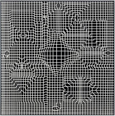
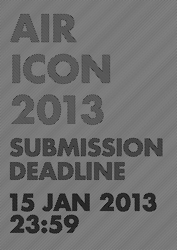
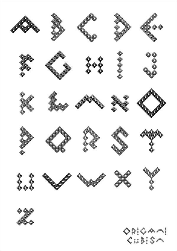
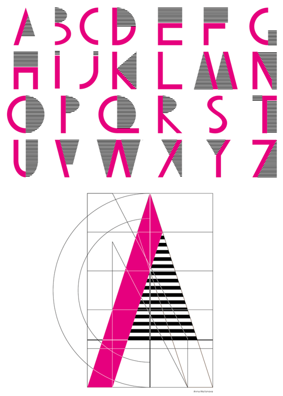
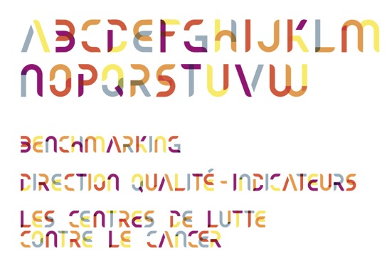
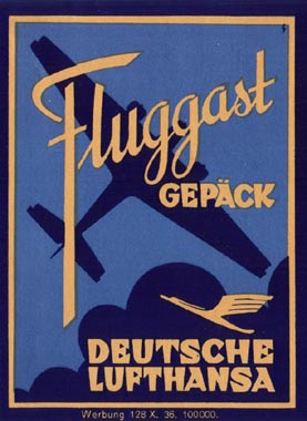
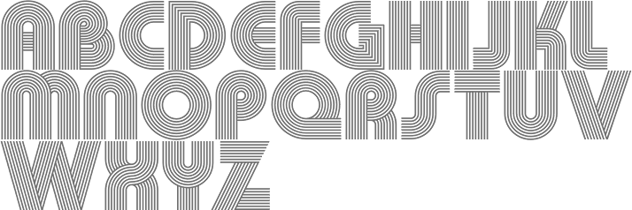
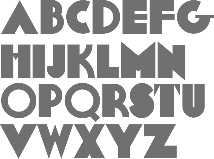
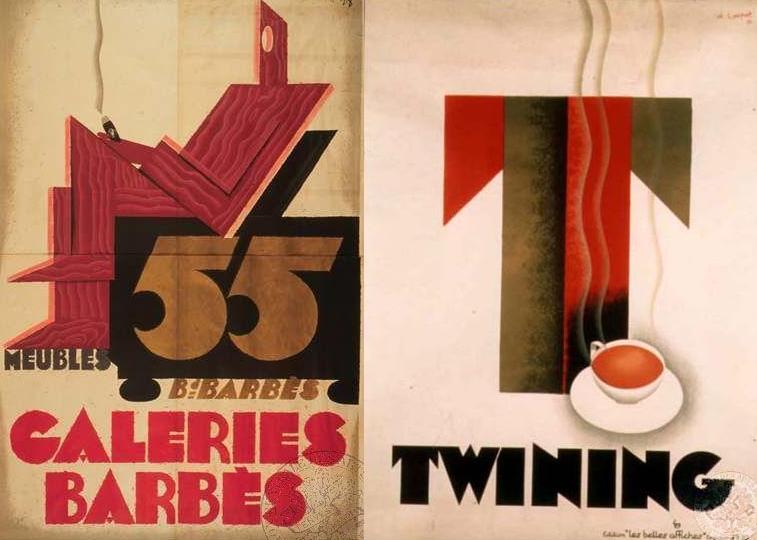
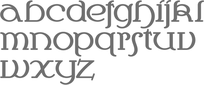
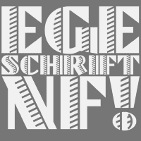
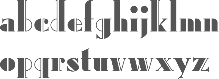
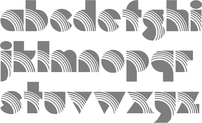
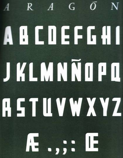
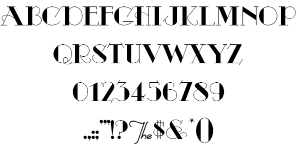
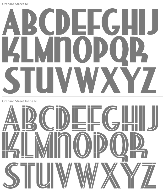
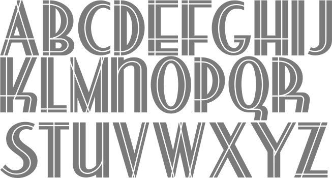
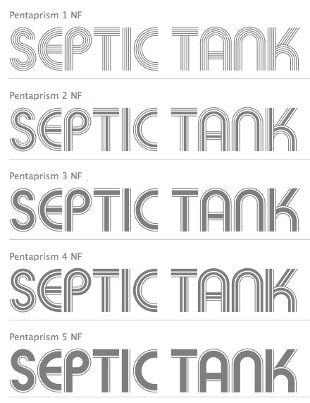
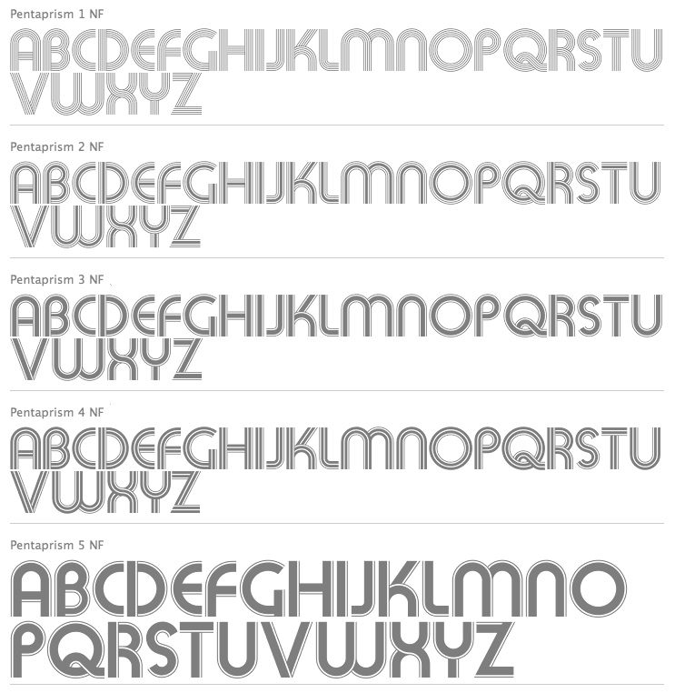
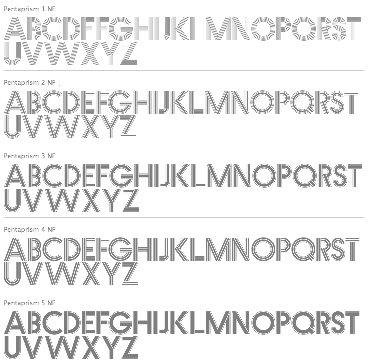
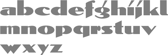
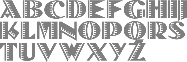
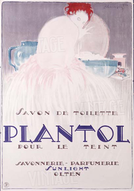
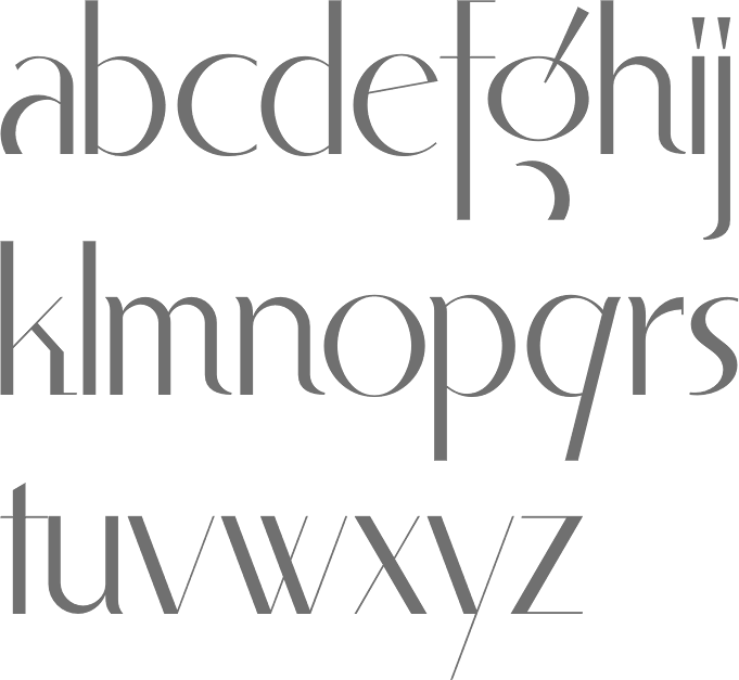
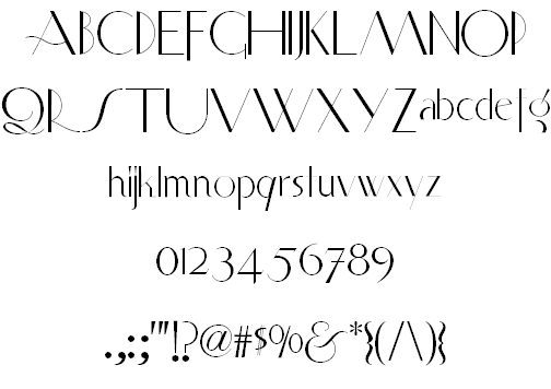
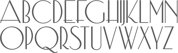
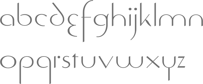
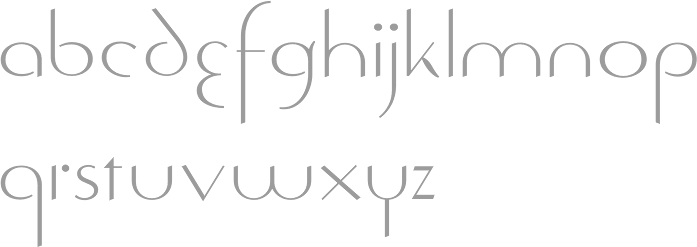
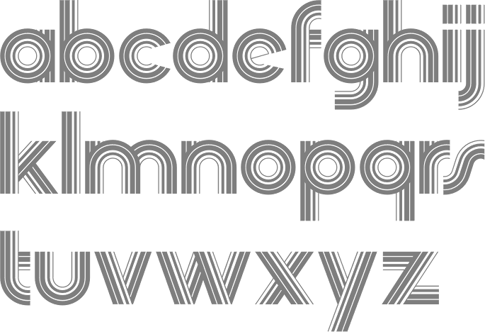
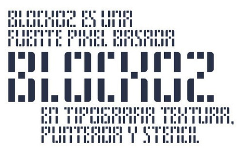
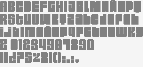
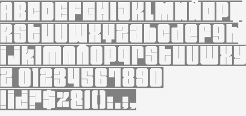
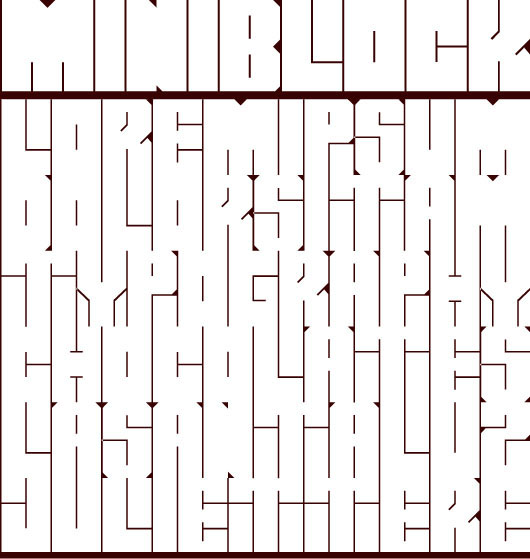
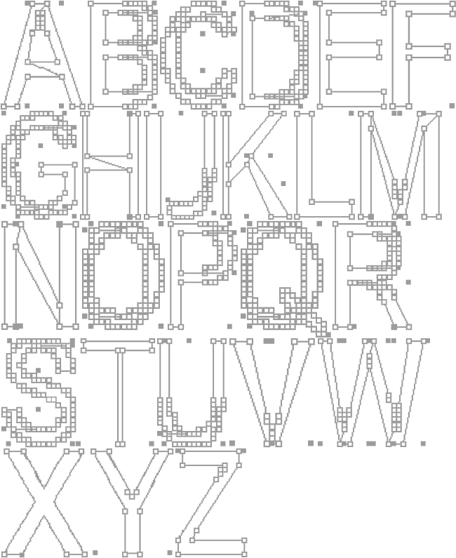
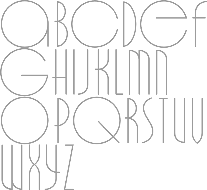
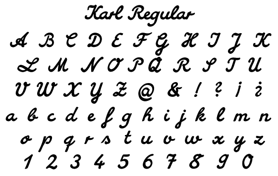
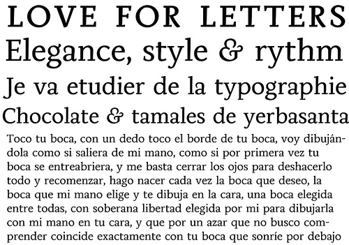
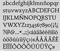
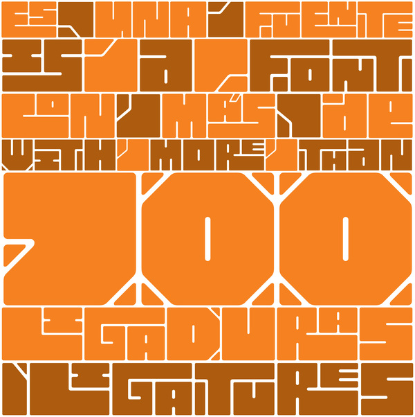
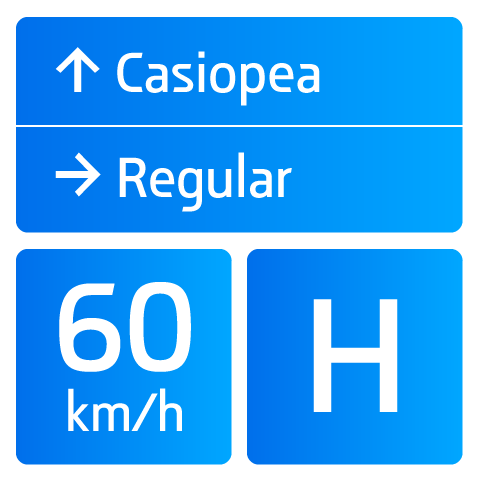
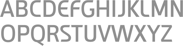
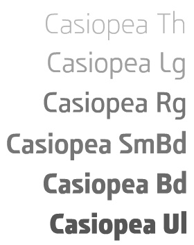
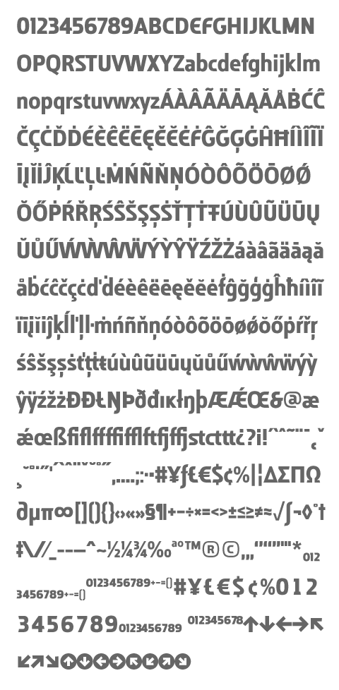
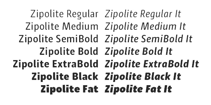
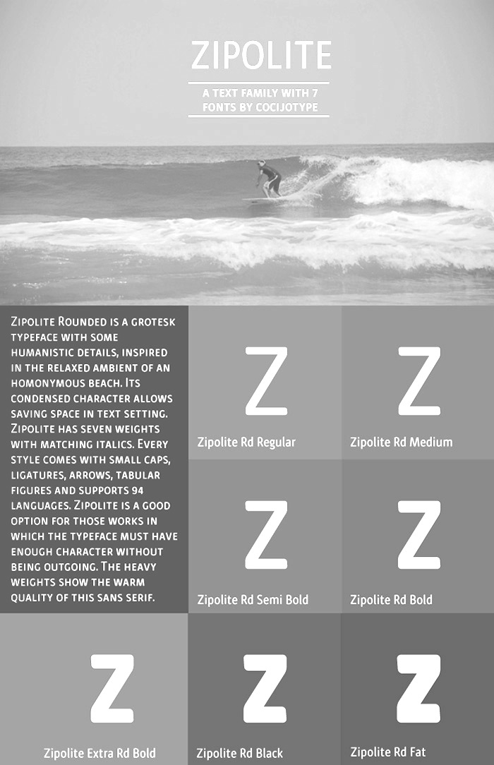
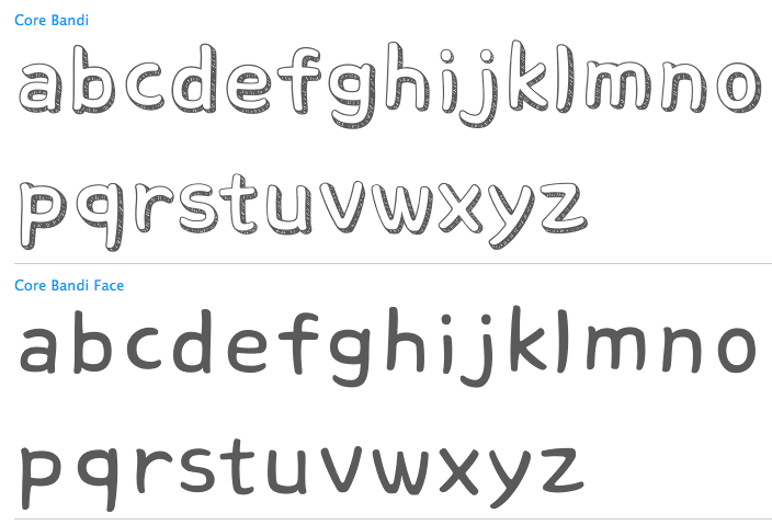
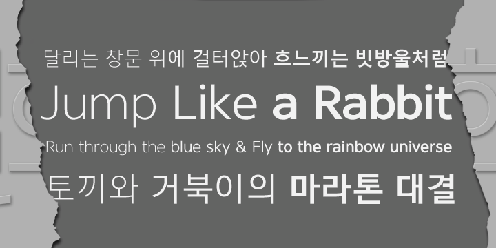
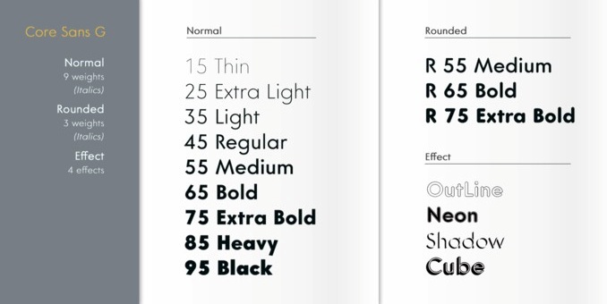
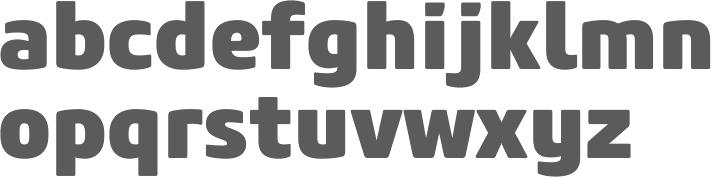
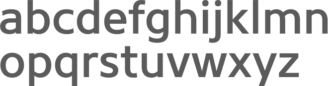
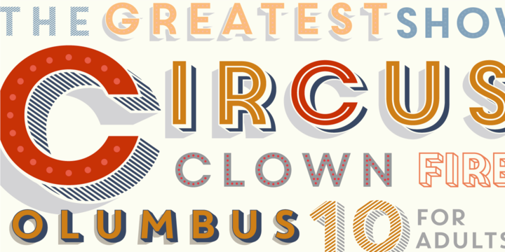
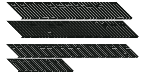
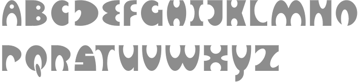
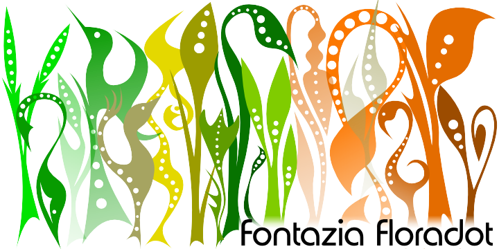
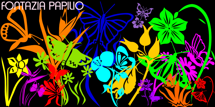
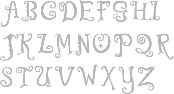
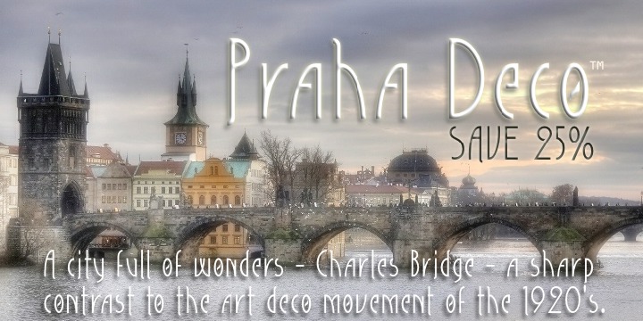
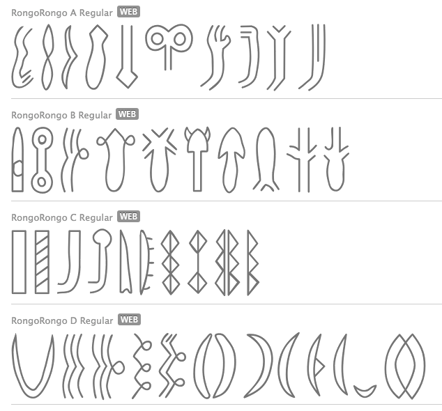
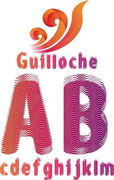
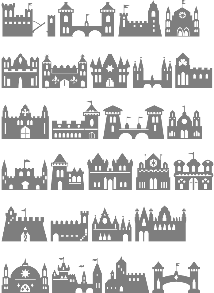
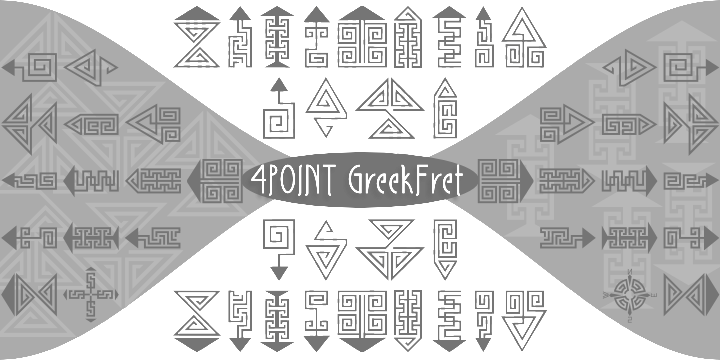
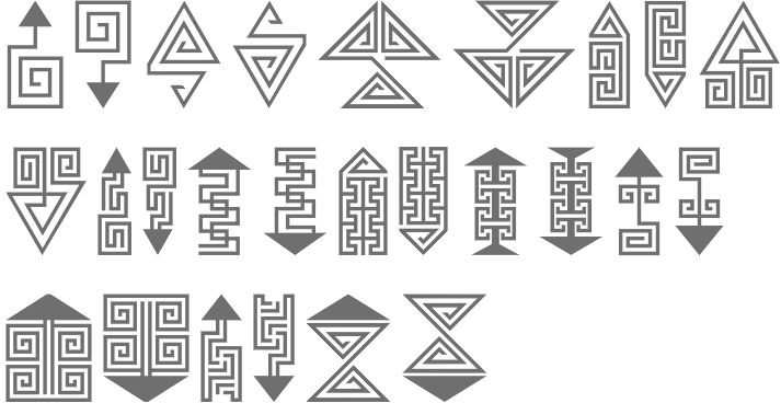
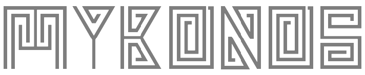
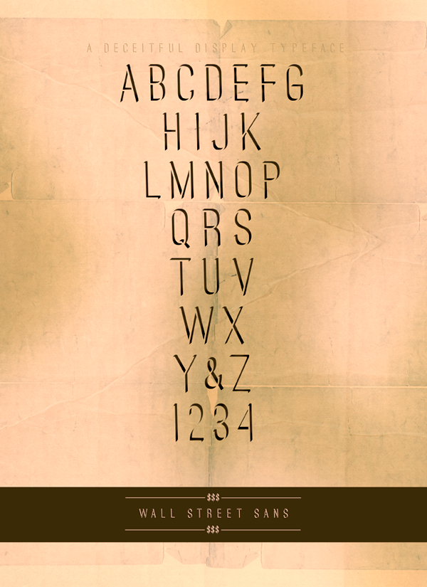
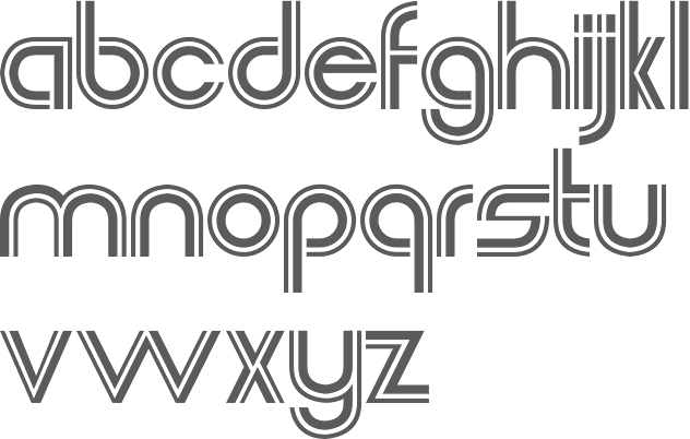
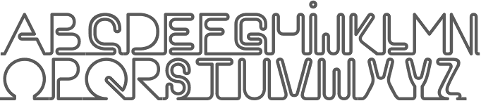
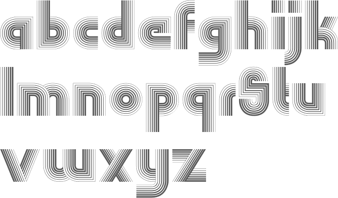
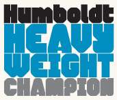
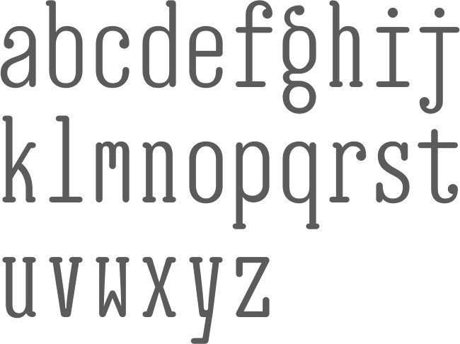
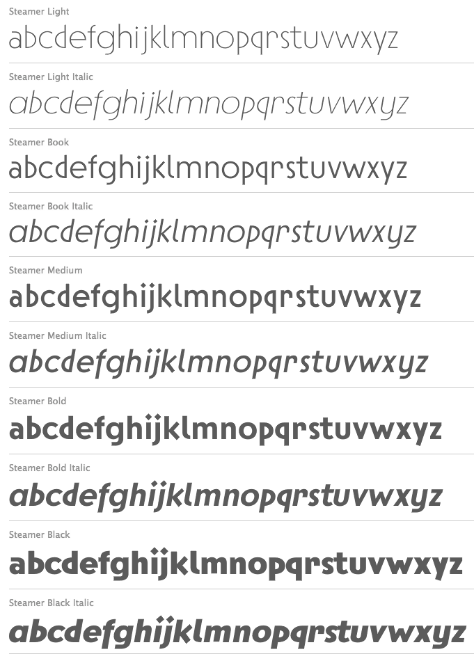
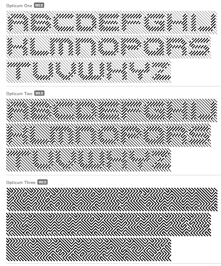
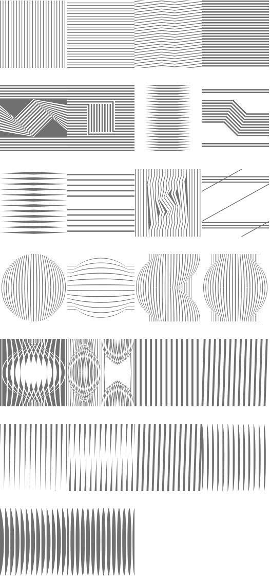
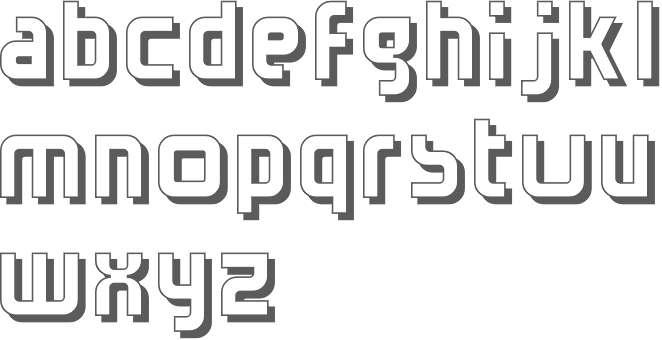
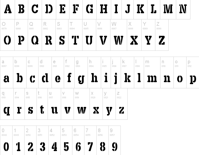
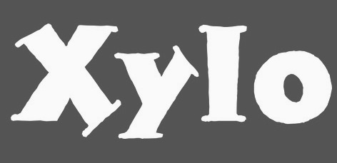
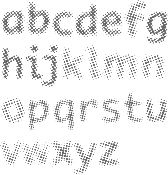
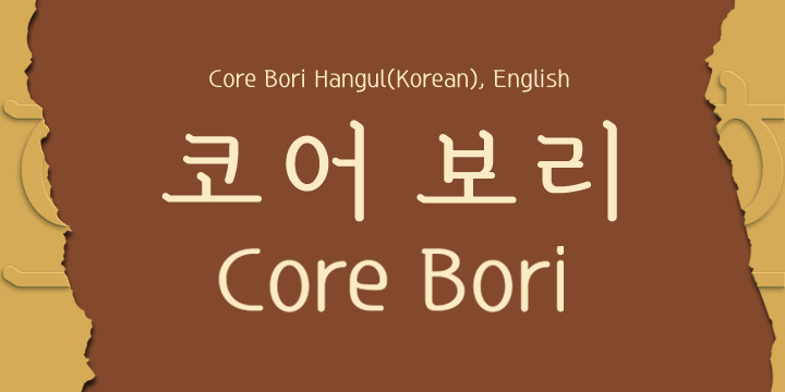
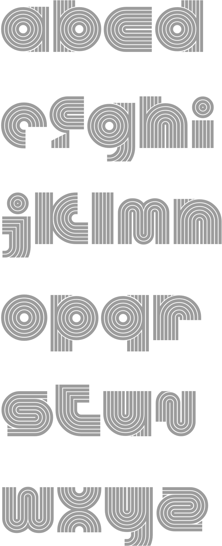
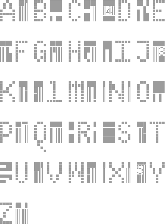
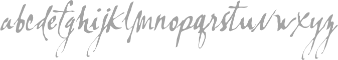
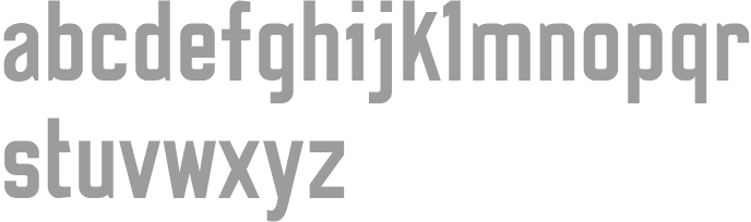
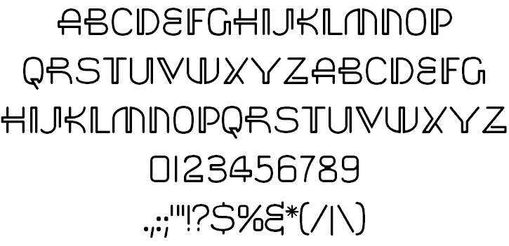
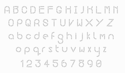
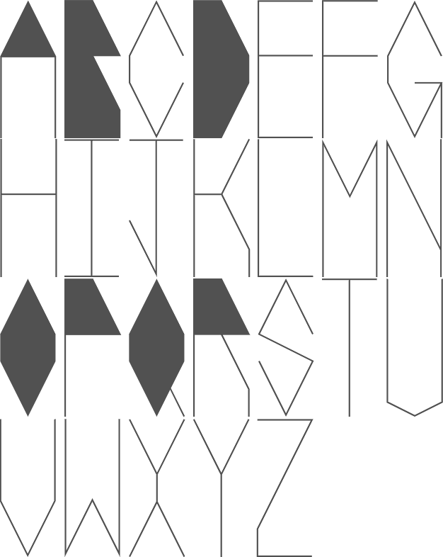
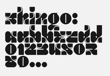
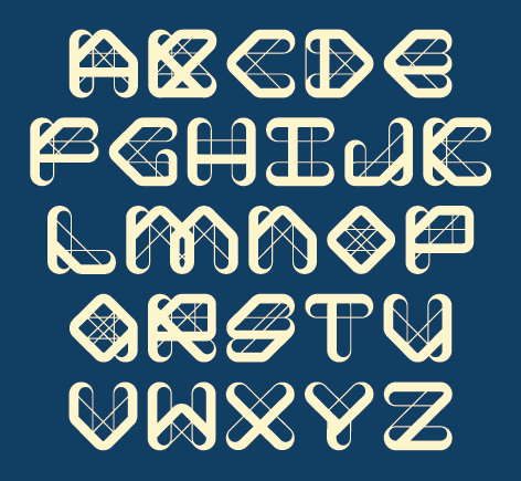
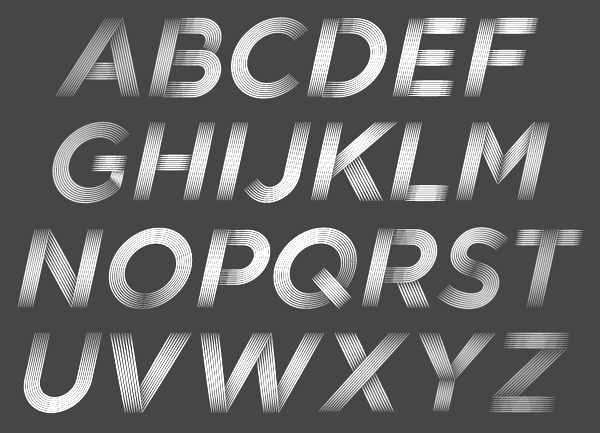
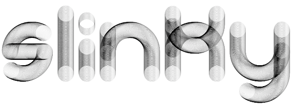
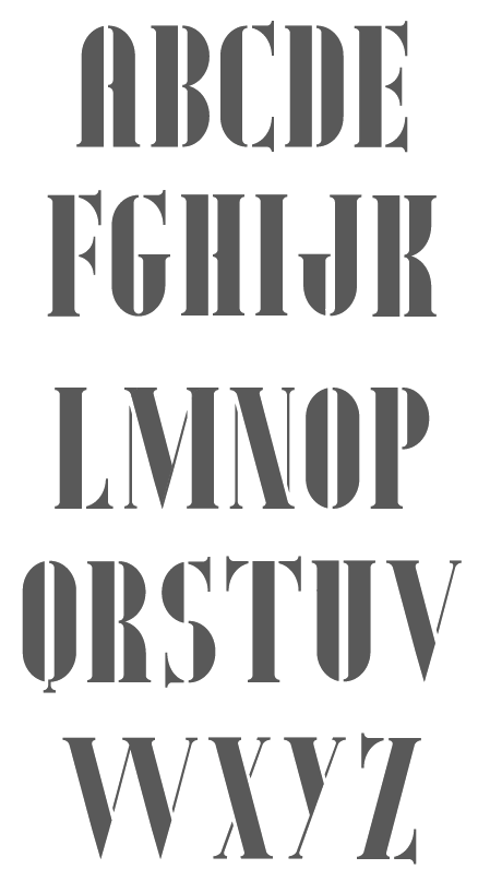
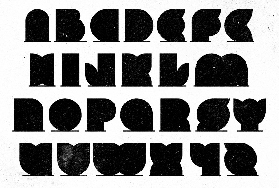
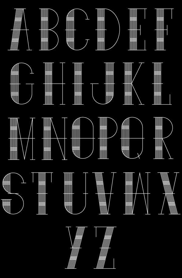
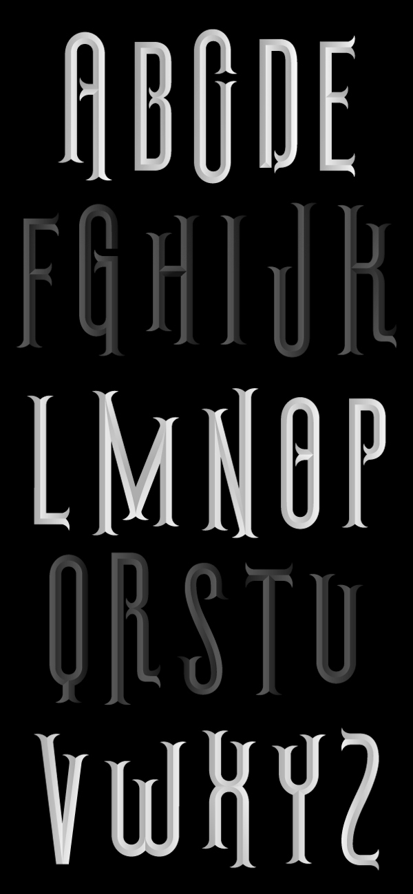
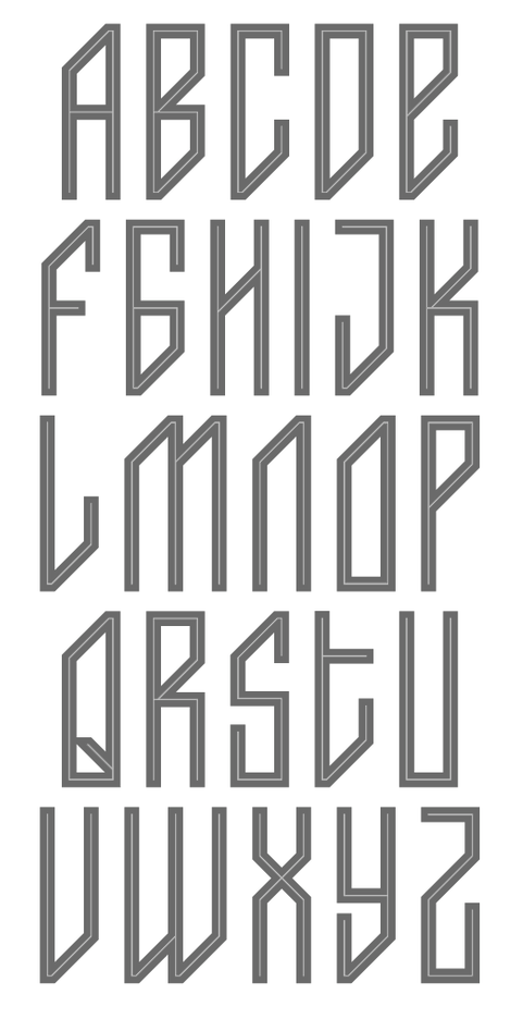
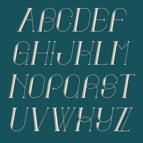
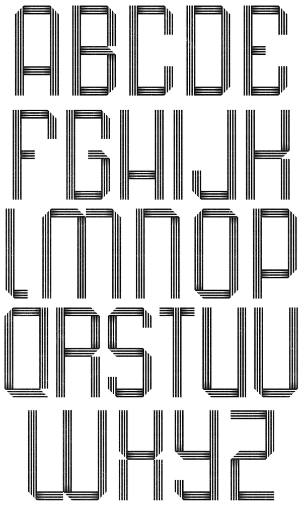
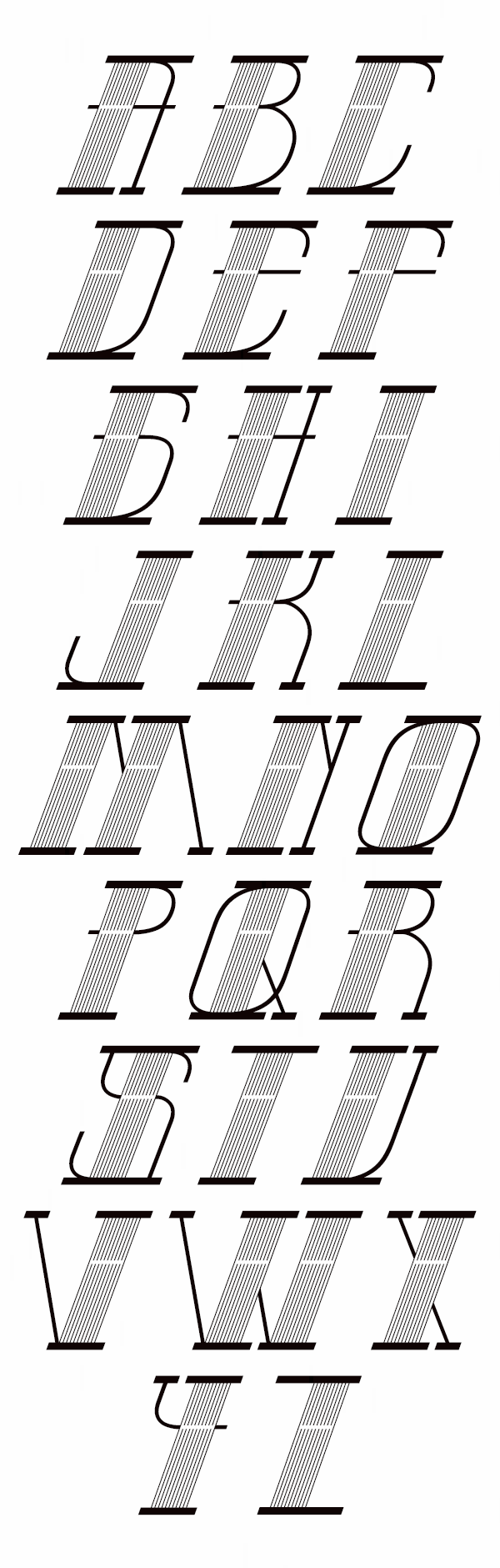
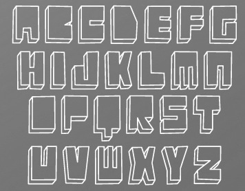
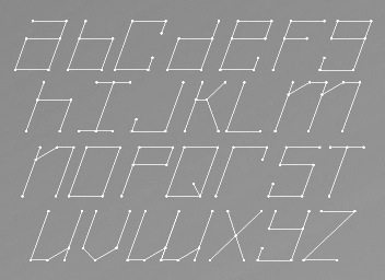
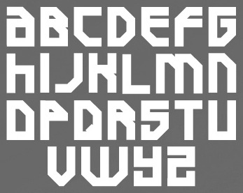
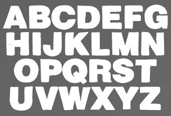
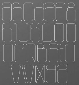
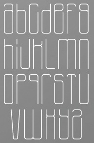
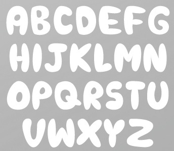
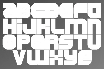
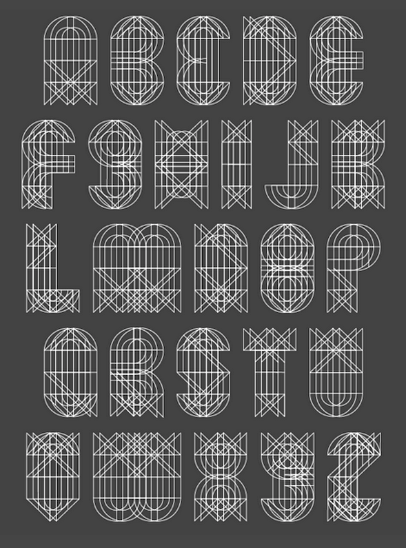
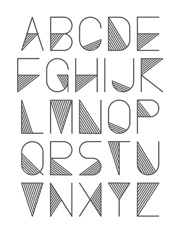
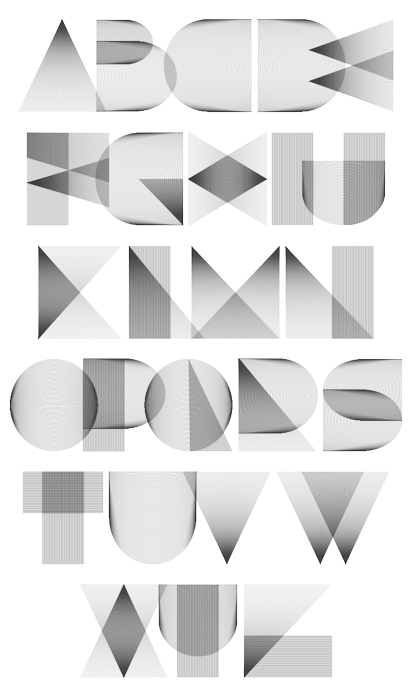
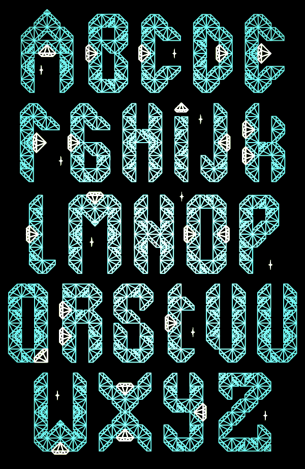
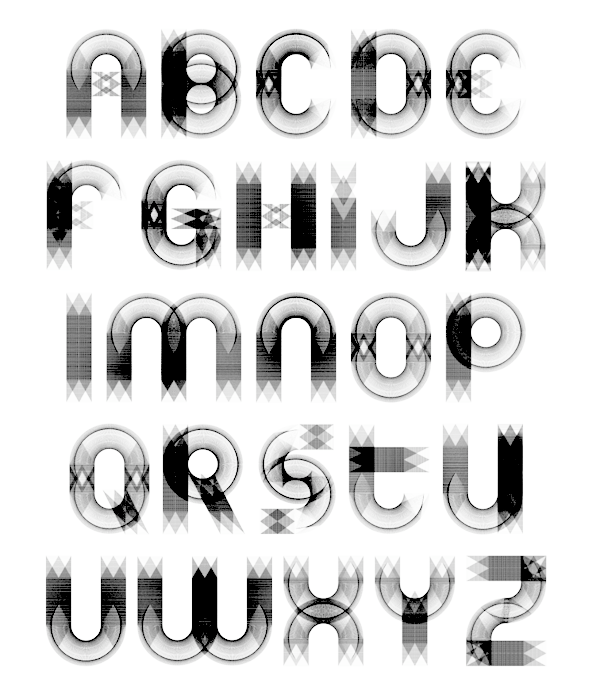
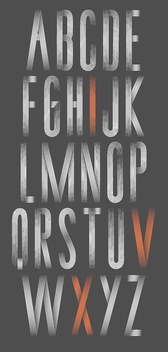
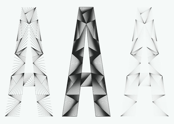
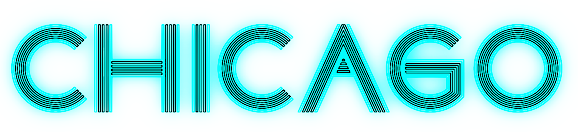
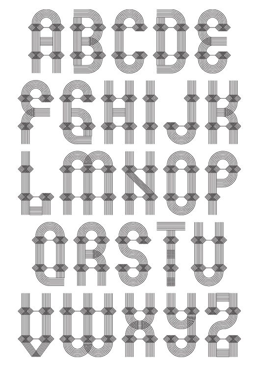
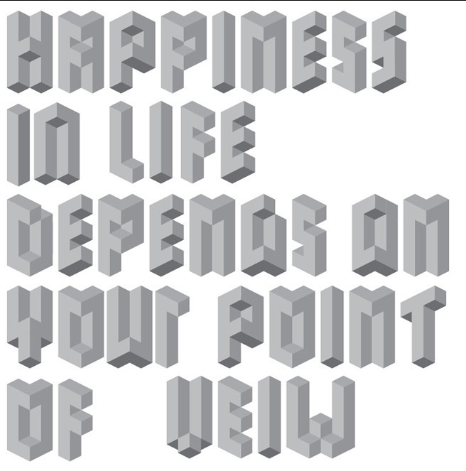
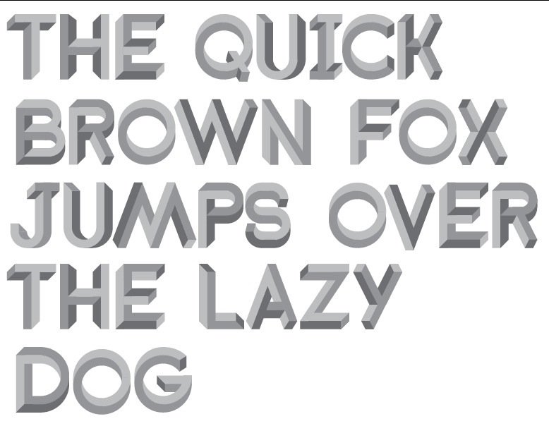
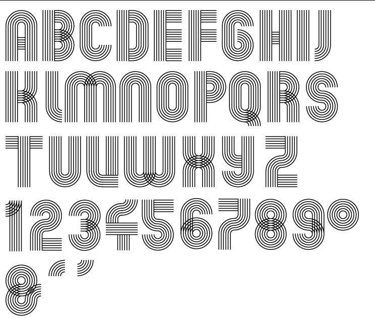
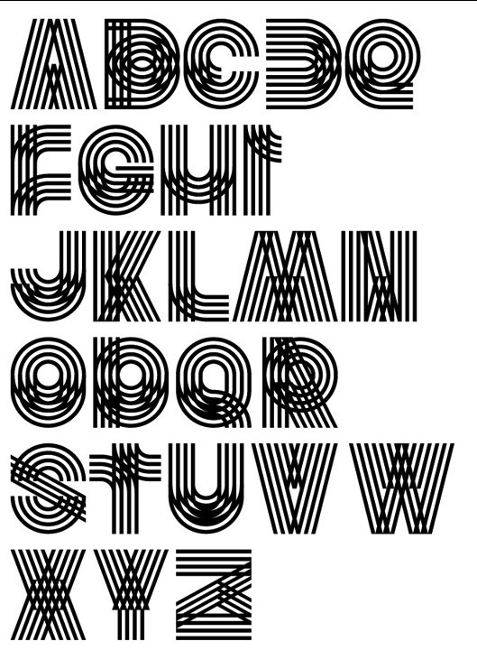
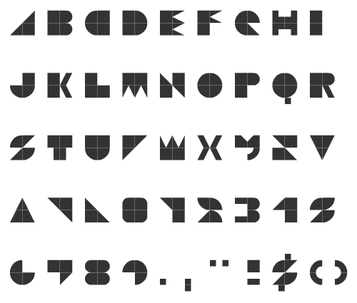
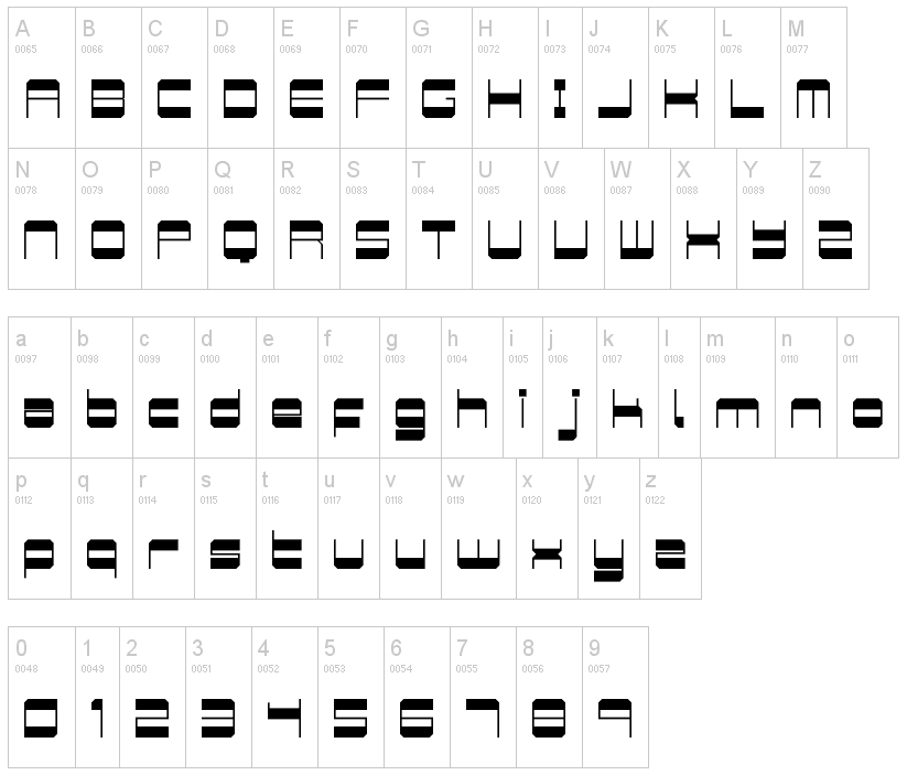
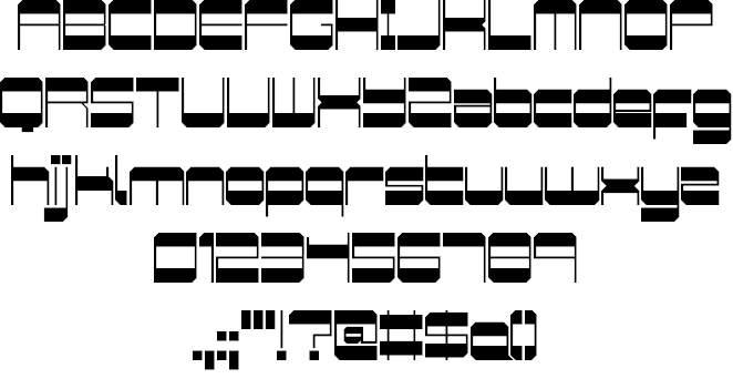
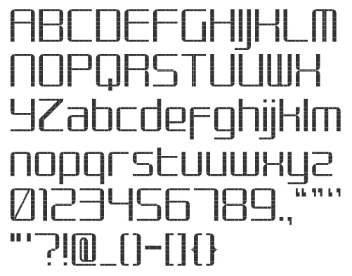
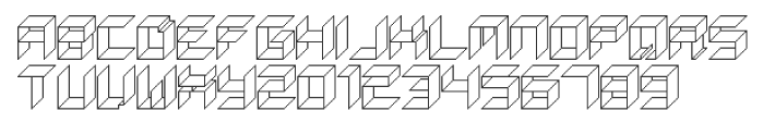
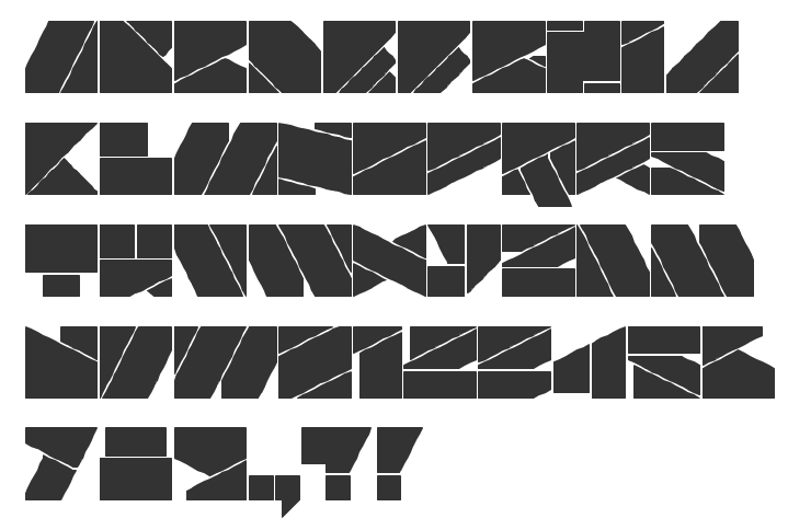
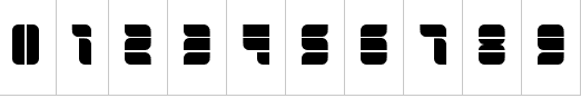
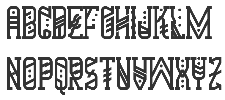
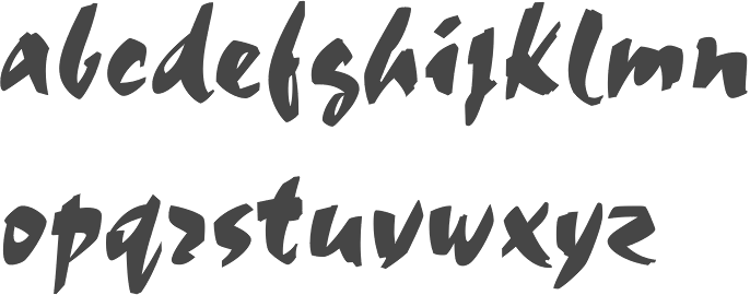
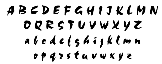
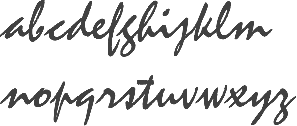
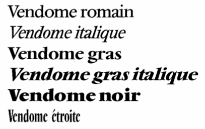
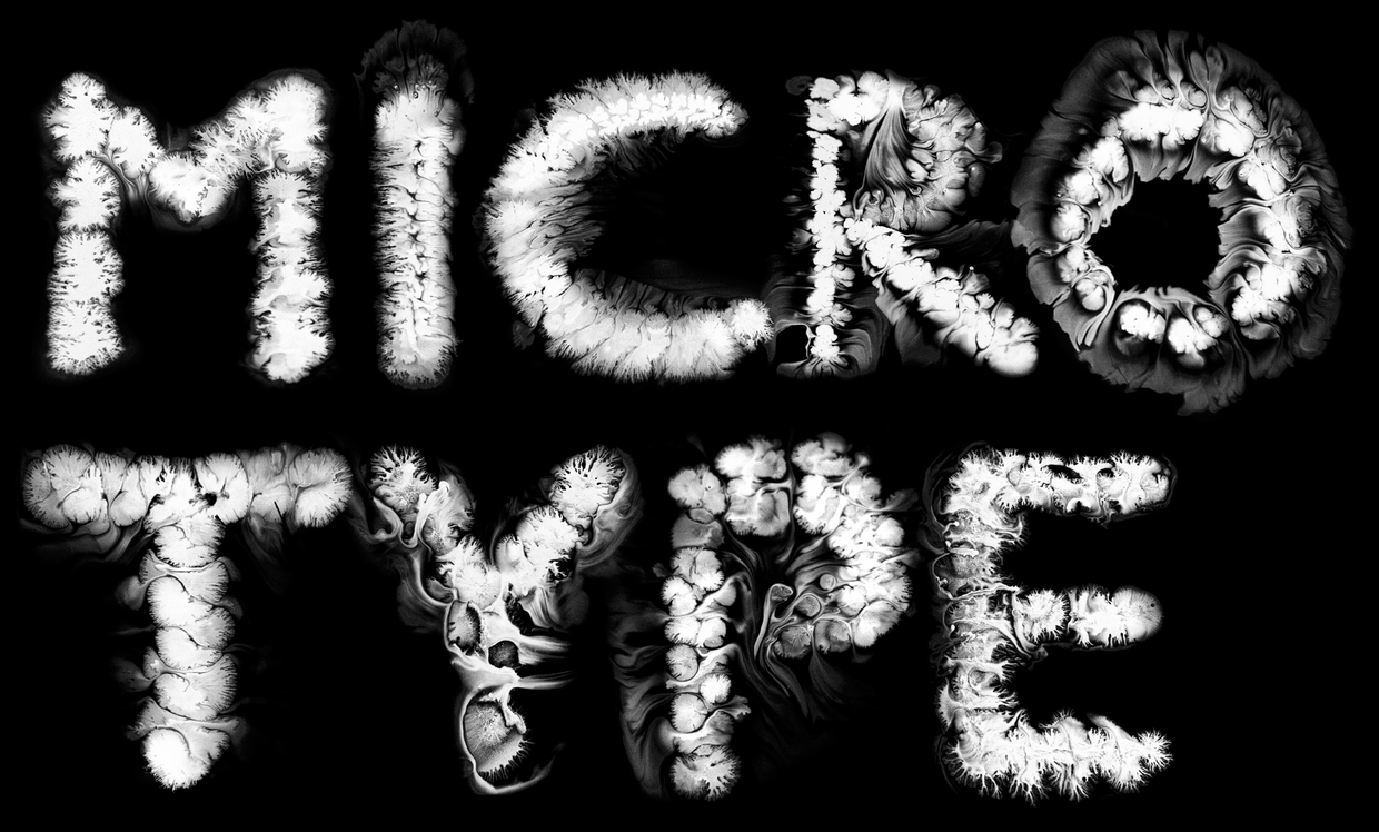
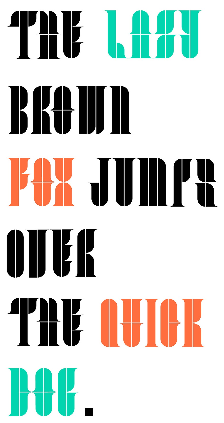
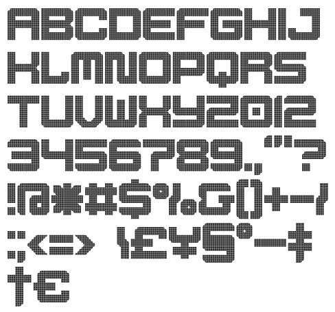
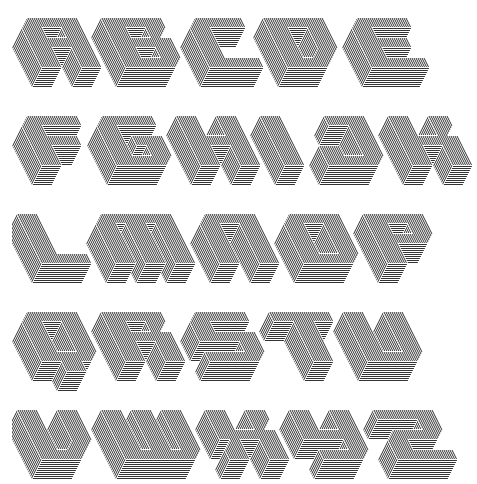
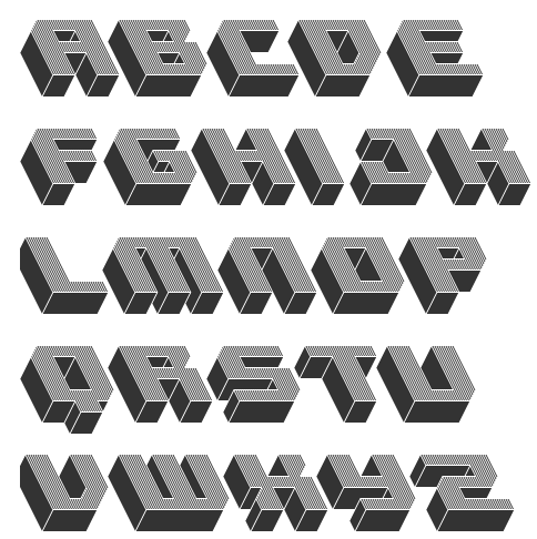
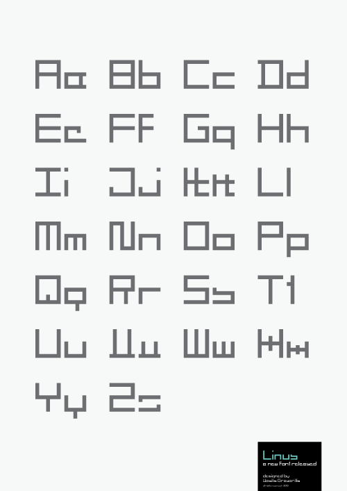
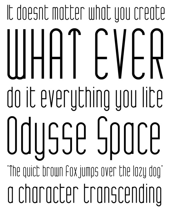
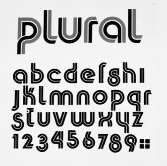
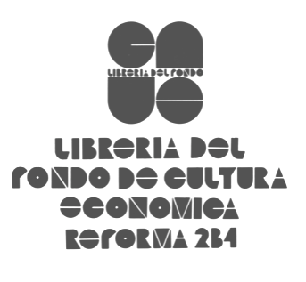
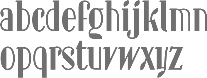