TYPE DESIGN INFORMATION PAGE last updated on Sat May 16 08:11:12 EDT 2026
FONT RECOGNITION VIA FONT MOOSE

|
|
|
|
|
Type in Portugal | ||
|
|
|
|
SWITCH TO INDEX FILE
Type design and typography meeting in Aveiro, Portugal, on December 2, 3, 4 and 5, 2015, organized by Pedro Amado and Vitor Quelhas. [Google] [More] ⦿ | |||||||||||||||||||||||||||||||||||
During her studies in Lisbon, A. Diana created the display typeface Prata (2014), which is based on Courier. [Google] [More] ⦿ | |||||||||||||||||||||||||||||||||||
Portuguese type designer. In 2020-2021, he co-designed Loretta (Future Fonts) with Joana Correia. Loretta is a low contrast text typeface that comes in 12 styles. [Google] [MyFonts] [More] ⦿ | |||||||||||||||||||||||||||||||||||
Lisbon-based designer (b. 1984) of the origami font Ementa Sumo (2012) and of the artsy typeface Bertrand which was inspired by the signage of Livraria Bertrand in Lisbon. [Google] [More] ⦿ | |||||||||||||||||||||||||||||||||||
Adaptype
| For her Master's degree in Design and Multimedia at the University of Coimbra, Portugal, Beatriz Diogo created a script---Adaptype--- that allows any font's width to respond to the window size and the development of a website. Github link. [Google] [More] ⦿ | ||||||||||||||||||||||||||||||||||
Faro, Portugal-based designer of the display typeface Mabor (2019). [Google] [More] ⦿ | |||||||||||||||||||||||||||||||||||
| |||||||||||||||||||||||||||||||||||
Lisbon, Portugal-based designer of the embroidery font Means Sans in 2017. [Google] [More] ⦿ | |||||||||||||||||||||||||||||||||||
Alberto Menéres (Porto, Portugal) created the modular typeface Hivan in 2013. [Google] [More] ⦿ | |||||||||||||||||||||||||||||||||||
In 2017, he designed the commercial typefaces Lagu Sans and Lagu Serif, which feature large x-heights and open counterforms. Typefaces from 2020: Pani Sans (which takes inspiration from Italian rationalist and art deco genres, and includes variable types). Open Font Library link. Fontspring link. Fontown link. [Google] [MyFonts] [More] ⦿ | |||||||||||||||||||||||||||||||||||
Graphic designer in Lisbon, who created Type Hype (2012), a multicolored geometric typeface. Behance link. [Google] [More] ⦿ | |||||||||||||||||||||||||||||||||||
Graduate of Escola Superior de Artes e Design de Matosinhos, Portugal. Now in Vila do Conde, Portugal, Alexander Cabral created these typefaces for school projects in 2013: Interessa, Nazaré. [Google] [More] ⦿ | |||||||||||||||||||||||||||||||||||
| |||||||||||||||||||||||||||||||||||
Licht Punt (2010) is the geometrically precise custom typeface used in the Sky High project for the Radisson Blu hotel in Hasselt, Belgium. In 2011, she published the art deco family Rosetta, and wrote: Rosetta font was designed by Alexandra Mendes for an upcoming branding project. The typeface design is inspired in all things lovely and luscious of the female intimate universe: lingerie, lace, blush powder, négligé, bustier, lip gloss and other lavish niceties. Should feel as a flirt, the subtle wink of the eye, a roseate glow. Rosetta is a coquette who flirts with life, winking her eyes, batting her lashes, flicking her hair, leaving her scent behind as she passes on the street, turning heads, with her whispering lips and waddling feline walk. Teasing and feigned disinterest to test the reliability of her admirers. Tall slenderizing lines and delicate curves shape the form of Rosetta. The typeface look is minimal and contemporary but reminiscent of a certain "je ne sais quoi" of Art Deco. There's a pure linear geometric symmetry to the font, to create a look of elegant modernity, that exudes a flair for glamour. Rosetta is a font family set composed by the styles: Rosetta, Rosetta Blush, Rosetta Bloom, Rosetta Bud. Images of Rosetta: i, ii, iii, iv, v, vi, vii, viii, ix, x. [Google] [More] ⦿ | |||||||||||||||||||||||||||||||||||
| |||||||||||||||||||||||||||||||||||
Lisbon-based creator of the warm typeface Carioca (2012). [Google] [More] ⦿ | |||||||||||||||||||||||||||||||||||
Graphic designer in Lisbon, Portugal, who created an outlined display typeface for a school project in 2016. Aka Xanathefox. [Google] [More] ⦿ | |||||||||||||||||||||||||||||||||||
Luanda, Angola-based designer originally from Aveiro, Portugal, who created the connect-the-dots typeface Joao Marinho (2013), the techno typeface Jotanis (2013), the modular typeface MX (2013), and the hexagonal industrial display typeface AKJ (2013). [Google] [More] ⦿ | |||||||||||||||||||||||||||||||||||
Lisbon-based creator of the monoline caps typeface Angle (2012). [Google] [More] ⦿ | |||||||||||||||||||||||||||||||||||
Portuguese photographer and designer in Viana do Castelo, Portugal. Alexandre obtained a degree in Graphic Design at IPCA (Polytechnic Institute of Cavado and Ave) in Barcelos in 2010. He created the elegant squarish typeface Finez (2010) and the geometric circle arc-themed sans typeface Ronde (2010, his graduation work). [Google] [More] ⦿ | |||||||||||||||||||||||||||||||||||
Designer from Coimbra, Portugal, who made Quebra-Costas (2011, elliptical), Broad Nip (2011), Wine and Modern Delicatessen (2011, an angular face) and Primavera em Fevereiro (2011, a refined high-contrast sans). [Google] [More] ⦿ | |||||||||||||||||||||||||||||||||||
Oliveira de Azem&eacite;is, Portugal-based designer of the calligraphic typeface Platonic (2014) and of the curly typeface Orta (2014). [Google] [More] ⦿ | |||||||||||||||||||||||||||||||||||
During his graphic design studies in Caldas da Reinha, Portugal, Alexandre Tiago created the thin display sans typeface Borganica (2013). [Google] [More] ⦿ | |||||||||||||||||||||||||||||||||||
Portuguese type founder and director of the Imprensa Nacional Portuguesa until 1821, when he left to start his own business. [Google] [More] ⦿ | |||||||||||||||||||||||||||||||||||
Porto, Portugal-based designer who used Joan Trochut's SuperVeloz modules to create an untitled stencil typeface in 2014. [Google] [More] ⦿ | |||||||||||||||||||||||||||||||||||
Lisbon, Portugal-based designer of the curvy informal typeface Pero no Mucho (2015). [Google] [More] ⦿ | |||||||||||||||||||||||||||||||||||
Porto, Portugal-based designer of the monoline script typeface Sa de Bandeira (2019). [Google] [More] ⦿ | |||||||||||||||||||||||||||||||||||
Aline de Carvalho, who lives in Sao Paulo, has studied in many cities, including at ESDI Escola Superior de Desenho Industrial (2006), ESAD École Supérieure D'arts Décoratifs de Strasbourg (2008) and FADU UBA (University of Buenos Aires, 2012). Her graduation work in 2012 at FADU-UBA consisted of the sans typeface Figo. Behance link. [Google] [More] ⦿ | |||||||||||||||||||||||||||||||||||
| |||||||||||||||||||||||||||||||||||
Alter Order
| Alter Order is the web alias for Pedro Gonçalves, a Portuguese art director based in Barcelona. Creator of the ultra black slab typeface Gorda Slab (2010). [Google] [More] ⦿ | ||||||||||||||||||||||||||||||||||
During her studies at IADE, Amelia Lageiro (Sintra, Portugal) designed the circle-based sans typeface All (2014), a typeface based on Christopher J.Lee's Canter. [Google] [More] ⦿ | |||||||||||||||||||||||||||||||||||
During his graphic design studies in Caldas da Reinha, Portugal, Amorim A. Ferreira designed the slightly elliptical display sans typeface Avocat (2013). [Google] [More] ⦿ | |||||||||||||||||||||||||||||||||||
| |||||||||||||||||||||||||||||||||||
Portuguese photographer and graphic design student who lives in Amarante. She created the beautiful neo-humanist sans typeface Kamora (2011). This typeface has ball terminals and flared strokes. Behance link. [Google] [More] ⦿ | |||||||||||||||||||||||||||||||||||
Laranjeiro, Portugal-based designer of the handcrafted typeface Ana (2017) and the display typeface Galho (2017). [Google] [More] ⦿ | |||||||||||||||||||||||||||||||||||
Design student in Coimbra, Portugal, who created Abstractia (2012) and the caps alphabet Alfabeto Illustrado (2012). [Google] [More] ⦿ | |||||||||||||||||||||||||||||||||||
Lisbon-based designer of the geometric stencil typeface Alien (2014). [Google] [More] ⦿ | |||||||||||||||||||||||||||||||||||
Braga, Portugal-based designer of the serif typeface Joanna (2010). [Google] [More] ⦿ | |||||||||||||||||||||||||||||||||||
During her studies at IADE, Lisbon, Portugal-based Ana Filipa Caetano designed the experimental art deco typeface Steely (2016). [Google] [More] ⦿ | |||||||||||||||||||||||||||||||||||
During her studies in Lisbon, Ana Ganilho designed a modular typeface (2016). [Google] [More] ⦿ | |||||||||||||||||||||||||||||||||||
During her studies at IPVC-ESTG in Viana do Castelo, Portugal, Ana Gonçalves designed a circle-based display typeface (2015). [Google] [More] ⦿ | |||||||||||||||||||||||||||||||||||
During her Masters degree studies in the Faculty of Fine Arts of Porto, Portugal, Ana Guimaraes designed Pure Sans (2019). [Google] [More] ⦿ | |||||||||||||||||||||||||||||||||||
During her studies in Porto, Portugal, Ana Lia Silva designed the serifed typeface Arch (2017). [Google] [More] ⦿ | |||||||||||||||||||||||||||||||||||
Or Ana Margarida Felipe. For a project at University of Aveiro in Portugal in 2016, Ana Margarida Soares (Figueira da Foz, Portugal), Filipa Oliveira and Joana Silva designed the geometric solid typeface Clumsy Types. Earlier, in 2012, at the same university, Ana Margarida Soares and Joana Silva co-designed the display typeface Palalimbagan. In 2018, she designed the clorful all caps alphabet Tropical Birds. [Google] [More] ⦿ | |||||||||||||||||||||||||||||||||||
During her studies in Caldas da Reinha, Portugal, Ana Margarida Vicente designed the sans typeface Umi (2019). [Google] [More] ⦿ | |||||||||||||||||||||||||||||||||||
Lisbon, Portugal-based designer of the modular typefaces Implicit (2017) and Perceptronium (2017). [Google] [More] ⦿ | |||||||||||||||||||||||||||||||||||
Ana Catarina Melo (Barcelos, Portugal) created a modular squarish typeface entitled Maya (2013), as well as an unnamed set of pictograms. In 2015, she made Animal Type. [Google] [More] ⦿ | |||||||||||||||||||||||||||||||||||
At the University of Porto Portugal, Ana Moreno designed the free slab serif typeface Piriquita (2017). [Google] [More] ⦿ | |||||||||||||||||||||||||||||||||||
Ana Parracho
| |||||||||||||||||||||||||||||||||||
Porto, Portugal-based designer of the Tuscan typeface Nature (2019) and the blobby counterless typeface Gula (2017). [Google] [More] ⦿ | |||||||||||||||||||||||||||||||||||
Editorial designer and illustrator in Guimaraes, Portugal. Creator of a brush all-caps alphabet in 2010 while studying at ESEIG. [Google] [More] ⦿ | |||||||||||||||||||||||||||||||||||
At Universidade de Evora, Portugal, Ana Raquel Gouveia designed the art deco typeface Oculi (2020). [Google] [More] ⦿ | |||||||||||||||||||||||||||||||||||
Porto, Portugal-based creator of the calligraphic typeface Violeta (2014). [Google] [More] ⦿ | |||||||||||||||||||||||||||||||||||
During her studies at ESAD, Ana Rita Trancoso (Porto, Portugal-based) designed Classy (2016), Human (2016) and Kinder Bueno (2016). [Google] [More] ⦿ | |||||||||||||||||||||||||||||||||||
Graphic designer in Guimaraes, Portugal, who created the Lundenwic typeface in 2015. [Google] [More] ⦿ | |||||||||||||||||||||||||||||||||||
| |||||||||||||||||||||||||||||||||||
Brazilian graphic design graduate from IADE, Portugal (in 2011), who is now located in Glasgow. Creator of Pinho (2010), a modular typeface made from nuts. She also made Hardcopy (2012, for the Hardcopy magazine). As an example of her typography in branding and logos, check out the work she did for Galeria Barbara Longhi in Porto Alegre, Brazil. Dafont link. [Google] [More] ⦿ | |||||||||||||||||||||||||||||||||||
During her studies at FBAUP, Ana Torres (Porto, Portugal) designed the thin display typeface Natura (2014). [Google] [More] ⦿ | |||||||||||||||||||||||||||||||||||
Ana Vieira
| |||||||||||||||||||||||||||||||||||
| |||||||||||||||||||||||||||||||||||
Aveiro, Portugal-based designer of the vernacular typeface Cocktail (2015). [Google] [More] ⦿ | |||||||||||||||||||||||||||||||||||
During her studies at Ponta Delgada, Portugal, Anabela Cabral designed the colonial display typeface Ilda (2013). [Google] [More] ⦿ | |||||||||||||||||||||||||||||||||||
Vila Real, Portugal-based designer of the modular typeface Torga (2014). [Google] [More] ⦿ | |||||||||||||||||||||||||||||||||||
Graphic designer in Leira, Portugal. Creator of the display typeface Monokata (2014) and of the artificial language font Eu (2014). [Google] [More] ⦿ | |||||||||||||||||||||||||||||||||||
During her studies in Lisbon, Anais Almeida designed an art deco typeface (2017). [Google] [More] ⦿ | |||||||||||||||||||||||||||||||||||
Ana's Fonts
|
Typefaces from 2017: Reckless (thick brush), Bloxhall (art deco titling sans), Delirium (brush style), Blue Fires, Unexpected Typewriter, Wild Creatures (brush script), A Pompadour (11 styles, from retro sans to display), Night Wind Sent. Typefaces from 2018: These Days (brush SVG font), Soft Notes (blackletter), Popless (Serif, Script), Pitch or Honey, Be Cool, Honolulu (a hand-drawn blackboard bold typeface), Floret, Landslide, Bellevue (brush), BigRiver (+Script), Farewell Angelina (a display family in Sans, Serif and Text substyles), Siren Song, Something Exquisite (signature font). Typefaces from 2019: Amateur Typewriter, Be Cool, Big River (Sans, Script), Soul Drifter, Fletcher Typewriter, Rockford, Gumball (sans), Unika (a signature font). Typefaces from 2020: Thesis Typewriter (an old typewriter font family), The Voyager (a decorated full-bodied sans), Leaves and Twigs (dingbats), Notes and Quotes, Honey and Smoke, Summer Days (a monoline fat finger font), Smoke Signals, Secretary Typewriter, Clockwise (a friendly sans), Calling Cards (a condensed sans), Pitch Or Honey, Porchlight (a text typeface inspired by vintage French types). Typefaces from 2021: Little Things (a children's hand), Moon And Stars (handwriting and doodle bats), Dramatico Script (a rough-edged chancery script), Populaire Typewriter, Garden Song (a handcrafted text typeface), Morning Magpie (a fat finger font). Typefaces from 2022: Handy Typewriter, Linoblox (a linocut font; +Ornaments). [Google] [MyFonts] [More] ⦿ | ||||||||||||||||||||||||||||||||||
Anavinesp
| Braga, Portugal-based Fonstructor who designed Contrante (2018) during her studies at IPCA. [Google] [More] ⦿ | ||||||||||||||||||||||||||||||||||
Andre Crespo or Andre Sousa (b. 1988, Porto, Portugal) studies towards an MA in communication design in Lisbon, and is involved in BlankGap Inc in Lisbon, a design studio. Behance link. He did Didot Refresh (2010, a Didot revival). [Google] [More] ⦿ | |||||||||||||||||||||||||||||||||||
Portalegre, Portugal-based designer of the geometric typeface No Reason (2013). [Google] [More] ⦿ | |||||||||||||||||||||||||||||||||||
During his studies, Lisbon, Portugal-based designer of Olissipo Script (2015). [Google] [More] ⦿ | |||||||||||||||||||||||||||||||||||
André Beato
| |||||||||||||||||||||||||||||||||||
During his studies at ESAD in Porto, Portugal, André Dias designed Super Veloz (2015)---unrelated to Joan Trochut's original from 1942. [Google] [More] ⦿ | |||||||||||||||||||||||||||||||||||
Graduate (b. 1995) of the Faculty of Fine Arts of the University of Porto (2013-2017), who is based in Porto, Portugal. In 2021, he released Lunatica (an oblique techno typeface). [Google] [MyFonts] [More] ⦿ | |||||||||||||||||||||||||||||||||||
As a student in Porto, André Gonçalves designed a layered typeface simply called The Light Typeface (2013). [Google] [More] ⦿ | |||||||||||||||||||||||||||||||||||
Lisbon, Portugal-based creator of the animated sans typeface Lovelo (2015). Behance link. [Google] [More] ⦿ | |||||||||||||||||||||||||||||||||||
Palmela, Portugal-based designer of the display typeface Hebo (2016). [Google] [More] ⦿ | |||||||||||||||||||||||||||||||||||
Lisbon-based freelance graphic designer. Creator of Modular M8 (2009), a techno sans. Home page. [Google] [More] ⦿ | |||||||||||||||||||||||||||||||||||
Portimao, Portugal-based designer of the pixel typeface Mx. Burd (2016). [Google] [More] ⦿ | |||||||||||||||||||||||||||||||||||
Portuguese designer of a circle-based typeface in 2015. [Google] [More] ⦿ | |||||||||||||||||||||||||||||||||||
| |||||||||||||||||||||||||||||||||||
Figueira da Foz, Portugal-based designer (at the University of Coimbra) of Eclectica (2018). [Google] [More] ⦿ | |||||||||||||||||||||||||||||||||||
Porto, Portugal-based designer of a typeface in 2013 that is based on the Superveloz principle, i.e., all glyphs are constructed on the basis of just a few maternal strokes. [Google] [More] ⦿ | |||||||||||||||||||||||||||||||||||
Typefaces from 2013 include the grid-based modular typeface family Kamo, which comes with Kamo Stencil. | |||||||||||||||||||||||||||||||||||
During her studies at ULHT (Universidade Lusófona de Humanidades e Tecnologias) in Lisbon, Andreia Amorim Fernandes created the Tube typeface (2015). [Google] [More] ⦿ | |||||||||||||||||||||||||||||||||||
Portuguese illustrator, who created Olive Oil Alphabet (2012). [Google] [More] ⦿ | |||||||||||||||||||||||||||||||||||
During her studies in Lisbon, Andreia Costa designed the circle-based alchemic typeface Oculta (2014). [Google] [More] ⦿ | |||||||||||||||||||||||||||||||||||
Graduate of ESAD.cr (Escola Superior de Artes e Design das Caldas da Rainha). Lisbon-based creator of the modular typeface Naïfa (2013). [Google] [More] ⦿ | |||||||||||||||||||||||||||||||||||
Graphic designer in Lisbon. Creator of the curly script Le Mariage (2011), a wedding invitation font. [Google] [More] ⦿ | |||||||||||||||||||||||||||||||||||
| |||||||||||||||||||||||||||||||||||
Aveiro, Portugal-based designer of a handcrafted decorative floral alphabet in 2016. Behance link. [Google] [More] ⦿ | |||||||||||||||||||||||||||||||||||
During her studies in Coimbra, Portugal, Andreia Sofia Antunes designed the display typeface Madalena (2014). [Google] [More] ⦿ | |||||||||||||||||||||||||||||||||||
| |||||||||||||||||||||||||||||||||||
Angela Torres (Porto and before that, Vila do Conde, Portugal, b. 1992) created the typeface Marinha (2014) during her studies at Escola Superior de Artes e Design de Caldas da Rainha (ESAD.CR). Marinha is characterized by wavy serifs. In 2018, she designed the display typeface Rua. [Google] [More] ⦿ | |||||||||||||||||||||||||||||||||||
For a project at Faculdade de Belas Artes da Universidade do Porto, Portugal, Angelina Santos created a couple of pixelish typefaces in 2015. She also drew a calligraphic alphabet, Alpha a Zema (2015) and designed an iconographic typeface, AlphaBetumZ (2015). [Google] [More] ⦿ | |||||||||||||||||||||||||||||||||||
| |||||||||||||||||||||||||||||||||||
At Escola Superior de Artes e Design de Caldas da Rainha (ESAD.CR), Portugal, during an exchange program, Anita Abarenkova (Riga, Latvia) created the stencil typeface Anita PT Light (2013). [Google] [More] ⦿ | |||||||||||||||||||||||||||||||||||
Anna Coutinho from Porto, Portugal and Mariana Almeida (from Angra do Heroismo, Portugal) designed a great codex-style logo for Formatos Design in 2010. [Google] [More] ⦿ | |||||||||||||||||||||||||||||||||||
At the Universidade do Algarve, Tavira, Portugal-based António Fernandes designed the all caps sans typeface Avelar (2016). [Google] [More] ⦿ | |||||||||||||||||||||||||||||||||||
| |||||||||||||||||||||||||||||||||||
António Martins
| |||||||||||||||||||||||||||||||||||
Designer in Lisbon who created the display typeface Nu Delhi (2012). [Google] [More] ⦿ | |||||||||||||||||||||||||||||||||||
Aroujo was a Portuguese calligrapher and a professor of writing and arithmetic. He also was a correspondent of the Imperial Academy of Science in St. Petersburg. Author of Nova arte de escrever offerecida oa Principe Nosso Senhor, para instrucção da mocidade... (1794, Lisboa, na officina de Antonio Gomes). [Google] [More] ⦿ | |||||||||||||||||||||||||||||||||||
Graphic designer Antonio Joao Monteiro (b. 1984, Oporto, Portugal) lives on The Azores. He studied at ESAD (Escola Superior de Artes e Design). His typefaces, all made with FontStruct, include Ayda (2012, modular: was called JM Type), Galatica (2012, futuristic). FontStruct link. [Google] [More] ⦿ | |||||||||||||||||||||||||||||||||||
| |||||||||||||||||||||||||||||||||||
Porto, Portugal-based typographic bureau, which published the Musa and Plate Font in 2011. [Google] [More] ⦿ | |||||||||||||||||||||||||||||||||||
| |||||||||||||||||||||||||||||||||||
A committee of Portuguese design students (Ivo Reis (Porto), Gilberto Ribeiro (Vila do Conde), Tiago Pereira (Porto), Bruno Marques (Porto), Raquel Dias (Porto), Goncalo Neves Cruz (Maia), and dPigs Design Studio (Porto)) cofounded Arcada for organizing conferences, seminars, exhibitions, and workshops about design. Their logo is based on the arched Arcada typeface (2013) which was inspired by the arches of the aqueduct in Vila do Conde, Portugal. [Google] [More] ⦿ | |||||||||||||||||||||||||||||||||||
Ariana Pereira (Viseu, Portugal) made the experimental typefaces PAC ABC (2011) and Castelo Branco (2011). Still in 2011, she made an experimental modular typeface that is modeled after Supertipo Veloz. [Google] [More] ⦿ | |||||||||||||||||||||||||||||||||||
| |||||||||||||||||||||||||||||||||||
Graduate of ESEIG. Porto, Portugal-based creator of the modular display typeface Argentina (2012) and the slab serif display typeface Ice Break Type (2013). [Google] [More] ⦿ | |||||||||||||||||||||||||||||||||||
Porto, Portugal-based designer of The Original (2014), Halberd (2014), Intwist (2014), and Revolver (2014, bilined poster typeface). [Google] [More] ⦿ | |||||||||||||||||||||||||||||||||||
Artes Finais
| |||||||||||||||||||||||||||||||||||
During his studies in Porto, Portugal, Artur Basto designed an experimental typeface (2014). [Google] [More] ⦿ | |||||||||||||||||||||||||||||||||||
Graphic designer and illustrator in Porto, Portugal. He created the octagonal typeface Numb (2010) and the experimental type Folded Square (2010). [Google] [More] ⦿ | |||||||||||||||||||||||||||||||||||
Atelier Carvalho Bernau
|
Kai Bernau (b. 1978) studied graphic design at the University of Applied Sciences Schwabisch Gmünd in Germany before relocating to the Netherlands, where he graduated from the Design & Typography course of the KABK in The Hague in 2005 with his successful Neutral Typeface project. He continued in the KABK's Type and Media Master course where he graduated in 2006. Since 2011, Kai teaches type design in the Master in Art Direction program at ECAL in Lausanne, Switzerland. In 2005, Susana Carvalho and Kai Bernau formed Atelier Carvalho Bernau, which is based in The Hague, The Netherlands. Typefaces:
Klingspor link. [Google] [More] ⦿ | ||||||||||||||||||||||||||||||||||
ATypI 2006 was held in Lisbon, Portugal, from 27 September-1 October 2006 on the theme Typographical Journeys. Mario Feliciano was the main organizer. Luc's report. Picture report by Dan Reynolds. One by Jean-Baptiste Levée. Pictures at Flickr. Pictures by Dan Rhatigan. Van Lancker's pictures. A French report with pics by Jean-Baptiste Levée. His pictures. General Flickr site. Pics by Rob Keller. Roger Black's pic of Spiekermann. Oleg Koshe's pics of Verena Gerlach's talk. Tagir Safaev's pics of the newspaper design track. Oleg Koshe's pics of Massimo Vignelli and François Chastanet and Spiekermann's main talk. Comments and links by Dan Reynolds. Lisbon Letters by Jerrold Maddox (Penn State University). Oleg Koshe's report on Kindel&Smeijers. Brief report by Ana Sabino. Pictures by Birx. Henrique Nardi's shots. Ukrainian report (+pics) by Victor Kharyk. Pics by Protype. Pics by Vera Evstafieva. Pictures by Iria Cunha (and many transparencies of talks). Yves Peters comments. letters.sdu (VinOlga, Annette) shows a collection of Lisbon street lettering images. See also the fontme site for Lisbon stree lettering. The student volunteers have their own photographs on Picasa: 1, 2, 3, 4, 5, 6. [Google] [More] ⦿ | |||||||||||||||||||||||||||||||||||
Augusto Tavares Dias (Sintra, Portugal) created the thin monoline sans typeface ATD (2012). Behance link. [Google] [More] ⦿ | |||||||||||||||||||||||||||||||||||
Blurred Portuguese designer (b. 1983) of the grunge typeface Meagre (2010). His studio. [Google] [More] ⦿ | |||||||||||||||||||||||||||||||||||
B Machina
| Portuguese designer of the signage script typeface Dreamdelion (2017). Graphicriver link. Behance link. [Google] [More] ⦿ | ||||||||||||||||||||||||||||||||||
Graduate from Portugal who obtained a Masters degree from KABK, Den Haag. She designed the Dialogue type family for screen reading. [Google] [More] ⦿ | |||||||||||||||||||||||||||||||||||
Bank Graphic Design Today
|
Laure Boer and Sebastian Bissinger published their all caps license plate font Guida at Colophon Type Foundry. Guida is based on an Italian license plate that was in use some time between 1980 and 1990. [Google] [More] ⦿ | ||||||||||||||||||||||||||||||||||
Matosinhos, Portugal-based designer of the smudged lipstick font Sherlock Holmes (2018). [Google] [More] ⦿ | |||||||||||||||||||||||||||||||||||
Lisbon-based graphic designer who created the art deco typeface Lisboa (2012). [Google] [More] ⦿ | |||||||||||||||||||||||||||||||||||
During her studies at ESAD, Porto, Portugal-based Barbara Paulino designed the modular typeface Ophelia (2016). [Google] [More] ⦿ | |||||||||||||||||||||||||||||||||||
During her studies at Universidade de Aveiro, Portugal, Barbara Silva designed Font Nova (2018). [Google] [More] ⦿ | |||||||||||||||||||||||||||||||||||
Lisbon, Potugal-based designer of the all caps sans typeface Damn (2018). [Google] [More] ⦿ | |||||||||||||||||||||||||||||||||||
For a school project at Iade Creative University in Lisbon, Portugal, Beatrice Tonon (Treviso, Italy) designed the didone variant Wire Font (2016). [Google] [More] ⦿ | |||||||||||||||||||||||||||||||||||
Beatriz Cóias
| |||||||||||||||||||||||||||||||||||
Beatriz Cóias
| |||||||||||||||||||||||||||||||||||
Beatriz Diogo
| |||||||||||||||||||||||||||||||||||
Graphic designer in Porto, Portugal. In 2017, she cooperated with Pacifica on the (very innovative) hybrid display sans typeface Braamcamp. [Google] [More] ⦿ | |||||||||||||||||||||||||||||||||||
During her studies at ESAD, Porto, Portugal-based Beatriz Rocha designed the formal display typeface Royal (2017). [Google] [More] ⦿ | |||||||||||||||||||||||||||||||||||
For a school project at ESAD.CR in Caldas da Rainha, Portugal, Beatriz Santos designed the triangle-based sci-fi typeface Satellite (2017). [Google] [More] ⦿ | |||||||||||||||||||||||||||||||||||
During her studies at the University of Coimbra, Portugal, Beatriz Tanger Marques (Lisbon, Portugal) designed the triangle-serifed typeface Almedina (2017). Behance link. [Google] [More] ⦿ | |||||||||||||||||||||||||||||||||||
Lisbon, Portugal-based designer of the free wide stencil typeface Senda Display (2019). [Google] [More] ⦿ | |||||||||||||||||||||||||||||||||||
Benoit Dupuis
| |||||||||||||||||||||||||||||||||||
Braga, Portugal-based designer of F Tech (2013), a techno outline typeface. [Google] [More] ⦿ | |||||||||||||||||||||||||||||||||||
During his studies in Porto, Portugal, Bernardo Braga created the display typeface Graph (2013). In 2015, uner the direction of Joana Correia at ESAD Matosinhos, Bernardo designed the angular text typeface Gaveto. [Google] [More] ⦿ | |||||||||||||||||||||||||||||||||||
During his studies at ESEC, Coimbra, Portugal-based Bernardo Pessoa designed the free bitmap font Costas e Barrigas (2017). [Google] [More] ⦿ | |||||||||||||||||||||||||||||||||||
Bob Design
| Bob Design (Tiago Mateus, Lisbon (and before that, Leiria), Portugal) created the liquid sans display typeface Vogallips in 2013. Cargocollective link. [Google] [More] ⦿ | ||||||||||||||||||||||||||||||||||
| |||||||||||||||||||||||||||||||||||
Design studio in Porto, Portugal. In 2006, they designed the compass-and-ruler sans typeface Minimal. Behance link. [Google] [More] ⦿ | |||||||||||||||||||||||||||||||||||
Portuguese type designer who lives in Almada. He created the octagonal typeface No Manners (2010). His foundry at MyFonts. MyFonts link. Klingspor link. [Google] [MyFonts] [More] ⦿ | |||||||||||||||||||||||||||||||||||
Graphic designer in Lisbon, who made the squarish typeface Stereo 1.0 in 2012. [Google] [More] ⦿ | |||||||||||||||||||||||||||||||||||
Brígida Guerreiro
| |||||||||||||||||||||||||||||||||||
| |||||||||||||||||||||||||||||||||||
| |||||||||||||||||||||||||||||||||||
During her studies in Lisbon, Portugal, Bruna Cruz designed r=the modular typeface Ad Aeternum (2018). [Google] [More] ⦿ | |||||||||||||||||||||||||||||||||||
Caldas de Sao Jorge, Portugal-based designer of the calligraphic font Laquie (2014-2015) for a school project. In 2016, she designed the display typeface Olivatype. [Google] [More] ⦿ | |||||||||||||||||||||||||||||||||||
| |||||||||||||||||||||||||||||||||||
Graduate of Escola Superior de Artes e Design das Caldas da Rainha, class of 2013. Lisbon-based designer of the display typeface Burly (2013). [Google] [More] ⦿ | |||||||||||||||||||||||||||||||||||
Graphic designer from Barcelos, Portugal. Together with Miguel de Sousa and Marcelo Santos, he made BetaDin (2010). [Google] [More] ⦿ | |||||||||||||||||||||||||||||||||||
| |||||||||||||||||||||||||||||||||||
Graphic designer and photographer in Caldas da Rainha, Portugal. Based on DIN 1451, he created Geometrische in 2010. Flickr page. [Google] [More] ⦿ | |||||||||||||||||||||||||||||||||||
Behance link. [Google] [More] ⦿ | |||||||||||||||||||||||||||||||||||
Bruno Maioral
| |||||||||||||||||||||||||||||||||||
Bruno Mauricio (Braga, Portugal) created Innerville (2013) by taking Baskerville as a model. [Google] [More] ⦿ | |||||||||||||||||||||||||||||||||||
Born in Lisbon, Bruno Peixoto (based in Odivelas, Portugal) designed Round Stroke Font (2016) and Henesys (2017, a humanist sans). [Google] [More] ⦿ | |||||||||||||||||||||||||||||||||||
Creator (b. 1984, Braganca Paulista, Sao Paulo, Brazil) of the free circle-based sans typeface Comunica Type (2013). This font was part of a project at ESAD.CR in Caldas da Reinha, Portugal. Behance link. [Google] [More] ⦿ | |||||||||||||||||||||||||||||||||||
Bruno Reis Santos (Caldos da Reinha, Portugal) created the typeface Bigodim (2013). Behance link. [Google] [More] ⦿ | |||||||||||||||||||||||||||||||||||
Designer from Lisbon. He created the modular experimental typeface Pista (2010), which is based on sections of model car race tracks, and could be considered prismatic or op-art. Behance link. [Google] [More] ⦿ | |||||||||||||||||||||||||||||||||||
Home page. Burocratik link. [Google] [More] ⦿ | |||||||||||||||||||||||||||||||||||
| |||||||||||||||||||||||||||||||||||
Coimbra, Portugal-based designer of the 3d typeface Slow Mo (2014). [Google] [More] ⦿ | |||||||||||||||||||||||||||||||||||
Graphic designer and illustrator in Lisbon. In 2014, Bruno Simão created Next Century, a futuristic techno take on New Century Schoolbook. [Google] [More] ⦿ | |||||||||||||||||||||||||||||||||||
Architect, writer and illustrator Bruno Zao (Esposende, Portugal) created a connect the dots typeface in 2012 called Gran Riserva Dj's. Behance link. [Google] [More] ⦿ | |||||||||||||||||||||||||||||||||||
Brand and digital design agency in Coimbra, Portugal, est. 2005. Behance link. In 2015, they published the semi-stencil bilined typeface Nomada (by Bruno Rodrigues), and a set of icons called Building Pictogram. Behance link. [Google] [More] ⦿ | |||||||||||||||||||||||||||||||||||
Portuguese designer of Alertse (2008, a Valentine's Day font). [Google] [More] ⦿ | |||||||||||||||||||||||||||||||||||
Portuguese on-line typography magazine distributed in PDF format. [Google] [More] ⦿ | |||||||||||||||||||||||||||||||||||
Alenquer, Portugal-based designer of the display sans typeface Cano Type (2017). [Google] [More] ⦿ | |||||||||||||||||||||||||||||||||||
During her studies at ESAD in Porto, Portugal, Carina Saa created the display typeface Clean (2013). [Google] [More] ⦿ | |||||||||||||||||||||||||||||||||||
As a student, Tomar, Portugal-based Carla Cardoso designed an extension / modification of Monotype Modern Stencil (2016). She also designed a modular typeface in 2016 using FontStruct, and some wayfinding icons for the Centro Cultural de Belem. [Google] [More] ⦿ | |||||||||||||||||||||||||||||||||||
Graphic designer in Angra do Heroismo, Portugal. Creator of Chronica (2012), a decorative baroque typeface which was inspired by a didone typeface used in 1830 by Chronica de Terceira on the Azores. [Google] [More] ⦿ | |||||||||||||||||||||||||||||||||||
During her studies at the Instituto Politecnico de Tomar, Portugal, Carla Salvador extended Peignot Semi Serif (2016) and created Peignot Stencil (2016). [Google] [More] ⦿ | |||||||||||||||||||||||||||||||||||
Long-haired graphic design student in Lisbon, who created Haired (2013), a display typeface that is inspired by hair. [Google] [More] ⦿ | |||||||||||||||||||||||||||||||||||
| |||||||||||||||||||||||||||||||||||
Freelance graphic designer in Porto who made a stunning tall condensed poster font in 2012 called Vallentina. In 2013, he designed Ragazza (an alchemic typeface). [Google] [More] ⦿ | |||||||||||||||||||||||||||||||||||
Graphic designer and illustrator in Porto, Portugal. He created the display typeface Queen (2009). [Google] [More] ⦿ | |||||||||||||||||||||||||||||||||||
Portuguese graphic designer and Professor of Design who made several sets of pictograms in 2010. He has won the Portuguese National Design Award for 2009 and 2010. He also has a Portuguese blog with some discussions about type, called O Design e a Ergonomia. [Google] [More] ⦿ | |||||||||||||||||||||||||||||||||||
Portuguese designer in Caldas da Rainha. He created Sparta (2011). Behance link. [Google] [More] ⦿ | |||||||||||||||||||||||||||||||||||
During her studies at the University of Evora, Portugal, Carmen Murteira designed an unnamed display typeface (2013, with Ana Guerreiro). She lives in Montemor-o-Novo, Portugal. [Google] [More] ⦿ | |||||||||||||||||||||||||||||||||||
Portuguese designer (b. 1986) who is based in Macau. Creator of the free script typeface Bettencourt (2012). Her display typeface Radius (2013) is also free. Behance link. Dafont link. [Google] [More] ⦿ | |||||||||||||||||||||||||||||||||||
Aveiro, Portugal-based designer of Child Bride (2019). [Google] [More] ⦿ | |||||||||||||||||||||||||||||||||||
Designer in Aveiro, Portugal, b. 1992. Creator of the modular typeface Shape (2015, FontStruct). [Google] [More] ⦿ | |||||||||||||||||||||||||||||||||||
Torres Novas, Portugal-based designer of the monoline modular sans typeface Comba (2017). She also published a set of pictograms called Guitarra (2017). [Google] [More] ⦿ | |||||||||||||||||||||||||||||||||||
Portuguese digital photographer and artist in Coimbra. She created the pointy typeface Retrotype (2011). [Google] [More] ⦿ | |||||||||||||||||||||||||||||||||||
During her studies in Lisbon, Portugal, Cata Rina designed the experimental Chinese Arabic Alphabet (2016). [Google] [More] ⦿ | |||||||||||||||||||||||||||||||||||
At the University of Aveiro, Portugal, Catarina Almeida created the experimental Everyday Typeface (2015). [Google] [More] ⦿ | |||||||||||||||||||||||||||||||||||
Lisbon-based creator of the oil slick display typeface Ville Nouvelle de Boughezoul (2011), probably as a commission for the Algerian city of Boughezoul. She is a graduate from IADE in Lisbon. [Google] [More] ⦿ | |||||||||||||||||||||||||||||||||||
Braga, Portugal-based designer of a stylish modular alphabet in 2016. [Google] [More] ⦿ | |||||||||||||||||||||||||||||||||||
| |||||||||||||||||||||||||||||||||||
Porto, Portugal-based designer of Oma (2017), a circle-based deco typeface. [Google] [More] ⦿ | |||||||||||||||||||||||||||||||||||
Graphic designer from Portugal, who has an M.A. in communication design from Central Saint Martins, London. She currently works in Mexico City. Creator of the lively typeface Fino (2009). [Google] [More] ⦿ | |||||||||||||||||||||||||||||||||||
Porto, Portugal-based designer of the straight-edged Greek emulation font Trash (2018). [Google] [More] ⦿ | |||||||||||||||||||||||||||||||||||
Santarem, Portugal-based designer of the geometric solid typeface Pink Circle (2019) and the stick figure font Motion Code (2016). [Google] [More] ⦿ | |||||||||||||||||||||||||||||||||||
For a project at IPCA (Instituto Politecnico do Cavado e do Ave) in Porto, Portugal, Catarina Ferreira and Mafalda Lopes co-designed the sans typeface Get Got (2016). [Google] [More] ⦿ | |||||||||||||||||||||||||||||||||||
During her studies at ESAD, Porto, Portugal-based Catarina Freitas designed the thin display typeface Plix (2016). [Google] [More] ⦿ | |||||||||||||||||||||||||||||||||||
Illustrator in Lisbon, Portugal, who created the handcrafted poster typeface Stand By Me (2015). [Google] [More] ⦿ | |||||||||||||||||||||||||||||||||||
Aveiro, Portugal-based designer of the display sans typeface Bender (2012). [Google] [More] ⦿ | |||||||||||||||||||||||||||||||||||
Graphic designer in Lisbon. Together with Joana Caramona, she created the spiraled hypnotic font Lollipop (2009). [Google] [More] ⦿ | |||||||||||||||||||||||||||||||||||
During her graphic design studies at Faculdade de Belas Artes da Universidade do Porto, Portugal, Catarina Neves designed the blackletter typeface Gothic (2016). [Google] [More] ⦿ | |||||||||||||||||||||||||||||||||||
During her studies at School of Arts and Design, Porto, Portugal-based Catarina Novais designed the avant garde stencil font Revencil (2019). [Google] [More] ⦿ | |||||||||||||||||||||||||||||||||||
During her graphic design studies at ESAD.CR, Odivelas, Portugal-based Catarina Pavanito created the sans typeface Pavanito (2017). [Google] [More] ⦿ | |||||||||||||||||||||||||||||||||||
Lisbon, Portugal-based designer of Neon Type (2016) and Lights Font (2017). Creative Market link. [Google] [More] ⦿ | |||||||||||||||||||||||||||||||||||
During her studies at ESAD.CR in Caldas da Reinha, Portugal, Catarina R. Coelho (Braga, Portugal0 designed the friendly display typeface Vila Nova (2017). [Google] [More] ⦿ | |||||||||||||||||||||||||||||||||||
During her design studies at IADE in Lisbon, Portugal, Catarina Rogado created the Neopop typeface (2014). Behance link. [Google] [More] ⦿ | |||||||||||||||||||||||||||||||||||
Graphic designer in Portimao, Portugal, who created the minimalist straight-edged modular typeface Anglar (2013). [Google] [More] ⦿ | |||||||||||||||||||||||||||||||||||
During her studies, Catia Bento (Coimbra, Portugal) designed the display typeface Royals (2015). [Google] [More] ⦿ | |||||||||||||||||||||||||||||||||||
Porto, Portugal-based creator of an art deco typeface in 2013. [Google] [More] ⦿ | |||||||||||||||||||||||||||||||||||
Tondela, Portugal-based designer of the mini-stenciled typeface Ao Tomdela (2015). [Google] [More] ⦿ | |||||||||||||||||||||||||||||||||||
Alcanena, Portugal-based creator of the curvy Mimosa (2011), Urubu (2012, angular), Diamante Robusto (2011), and the display family Rapazola (2011). [Google] [MyFonts] [More] ⦿ | |||||||||||||||||||||||||||||||||||
FontStructor who made the stencil typeface Solatype (2011) while studying with Jorge Marques at the Instituto Politecnico do Cávado e do Ave in Portugal. [Google] [More] ⦿ | |||||||||||||||||||||||||||||||||||
| |||||||||||||||||||||||||||||||||||
Cheila C. Silva
| |||||||||||||||||||||||||||||||||||
Albufeira, Portugal-based designer of the triangulated typeface Lusa (2014). [Google] [More] ⦿ | |||||||||||||||||||||||||||||||||||
CHH
| Albufeira, Portugal-based designer. Designer of the modular typeface family Lusa (2015) that was inspired by Portuguese tile art. [Google] [More] ⦿ | ||||||||||||||||||||||||||||||||||
A thin display typeface made by these students at the University of Aveiro in Portugal in 2016: Diogo Ferreira, Diogo Rosa, Mariana Azevedo, Sabrina Rufino, Joao Lima, and Gabriela Miranda. [Google] [More] ⦿ | |||||||||||||||||||||||||||||||||||
MA student in design at IADE in Oeiras, Portugal. He created Match Font (2011), an alphabet composed of match sticks. [Google] [More] ⦿ | |||||||||||||||||||||||||||||||||||
Portuguese creator of Stencil (2019) at the Lisbon School of Design. [Google] [More] ⦿ | |||||||||||||||||||||||||||||||||||
Graphic designer in Lisbon. Creator of the straight-edged Greek simulation font Genesis (2018). [Google] [More] ⦿ | |||||||||||||||||||||||||||||||||||
Designer in Vila Franca de Xira, Portugal, who is studying at ESAD.CR (Caldas da Rainha, Portugal). She created the elegant high-contrast condensed serif typeface Sophis (2012), which has elements of a didone. [Google] [More] ⦿ | |||||||||||||||||||||||||||||||||||
During her studies, Claudia Gomes (Fafe, Portugal) designed an unnamed pixelish typeface (2013). [Google] [More] ⦿ | |||||||||||||||||||||||||||||||||||
During her studies in Seimbra, Portugal, Claudia Leonardo designed the experimental typeface Fantastico (2014). [Google] [More] ⦿ | |||||||||||||||||||||||||||||||||||
Graphic designer in Lourinha, Portugal. Behance link. Creator of Louriana (2010), a geometric slab serif. [Google] [More] ⦿ | |||||||||||||||||||||||||||||||||||
Leiria, Portugal-based designer of a squarish typeface using FontStruct (2016). [Google] [More] ⦿ | |||||||||||||||||||||||||||||||||||
Porto, Portugal-based designer of Calm (2016), Appetite (2016) and Appetite Stencil (2016). [Google] [More] ⦿ | |||||||||||||||||||||||||||||||||||
During her studies at Universidade Aveiro, Aveiro, Portugal-based Corina Cacoilo designed the display sans typeface Urbano (2019). [Google] [More] ⦿ | |||||||||||||||||||||||||||||||||||
Craceltype
|
Typefaces from 2021: Lydia Sans (a 24-style Latin / Greek / Cyrillic geometric sans in the Futura orbit; with two variable fonts). Amika (2020) is a 22-style low contrast tectonic sans typeface family. [Google] [MyFonts] [More] ⦿ | ||||||||||||||||||||||||||||||||||
A resident of Lisbon, Cris Barbosa is a graphic and brand designer who has worked on a Hebrew font, Ivrit (2009). [Google] [More] ⦿ | |||||||||||||||||||||||||||||||||||
Designer in Lisbon, Portugal, who created a Peignotian art deco all caps typeface in 2016. Behance link. [Google] [More] ⦿ | |||||||||||||||||||||||||||||||||||
Portuguese designer of the geometric and humanist sans typeface Danck (2011). [Google] [More] ⦿ | |||||||||||||||||||||||||||||||||||
Lisbon, Portugal-based designer of the squarish geometric sans typeface Nika (2015). [Google] [More] ⦿ | |||||||||||||||||||||||||||||||||||
Aveiro, Portugal-based creator of Citaneria (2011, a high-contrast sci-fi face made with FontStruct). Citaneria was a group school project at Universidade de Aveiro by Cristina Fernandes, Natacha Marinho, Nelia Alves, Jose Nogueira and Mario Rodrigues. FontStruct link. [Google] [More] ⦿ | |||||||||||||||||||||||||||||||||||
Calling herself a futurist, Cristina Lopes, a former chemical engineer, worked for 13 years in the papermaking industry for Portugal's Navigator Company. At Type Cooper 2020, Cristina Lopes designed the geometric sans and stencil typeface Geometricae. [Google] [More] ⦿ | |||||||||||||||||||||||||||||||||||
| |||||||||||||||||||||||||||||||||||
Cristina Viana
| |||||||||||||||||||||||||||||||||||
Cristinette
| Lisbon, Portugal-based designer of the free sans typeface Quadrilha (2017). Home page. [Google] [More] ⦿ | ||||||||||||||||||||||||||||||||||
Coimbra, Portugal-based designer of the modular typeface Inscribed (2015). Behance link. [Google] [More] ⦿ | |||||||||||||||||||||||||||||||||||
Art director in Lisbon, Portugal, who designed the display alphabet ABC Sweet in 2017. Behance link. [Google] [More] ⦿ | |||||||||||||||||||||||||||||||||||
Santarem, Portugal-based designer of the display typefaces Iron (2015, hipster style), Betrayal (2015, rough brush), Frederick (2015, a layered shadow font), Warbler (2015, a bold display sans), and Gold Fish (2013). He also drew an illustrative set of initials called Fanzine (2015). [Google] [More] ⦿ | |||||||||||||||||||||||||||||||||||
Porto, Portugal-based designer of Ripple Type (2014). [Google] [More] ⦿ | |||||||||||||||||||||||||||||||||||
At the University of Coimbra, Portugal, Daniel Lopes designed the display typeface vila (2016). [Google] [More] ⦿ | |||||||||||||||||||||||||||||||||||
Daniel Machado (Obidos, Portugal) got a degree in graphic design at the Escola Superior de Artes e Design das Caldas da Rainha in 2010. He created the packaging (sans) font La Boite (2010). [Google] [More] ⦿ | |||||||||||||||||||||||||||||||||||
Portuguese motion graphics designer in Leiria, who designed the Postit typeface (2011, a marker pen face). [Google] [More] ⦿ | |||||||||||||||||||||||||||||||||||
Daniela Alexandra graduated from Universidade Lusofona do Porto, Porto, Portugal (2017) and started a Masters at Faculdade de Belas Artes, Porto, Portugal, in 2017. She designed the minimalist sans typeface Botanic Sans in 2018. [Google] [More] ⦿ | |||||||||||||||||||||||||||||||||||
Leiria, Portugal-based designer of Pompa (2015). [Google] [More] ⦿ | |||||||||||||||||||||||||||||||||||
| |||||||||||||||||||||||||||||||||||
Leiria, Portugal-based designer of the modular typeface Nibs (2018). [Google] [More] ⦿ | |||||||||||||||||||||||||||||||||||
David Carvalho
| |||||||||||||||||||||||||||||||||||
Design student at the School of Fine-Arts of the University of Porto, Portugal. Designer and illustrator. Creator of the calligraphic typeface Illustrissima (2012) and of the grungy Civitas (2012). Devian Tart link. [Google] [More] ⦿ | |||||||||||||||||||||||||||||||||||
Coimbra, Portugal-based designer of the weathered typeface Caixa (2016). [Google] [More] ⦿ | |||||||||||||||||||||||||||||||||||
Portuguese-Brazilian multidisciplinary graphic designer in Santos / Sao Paulo, who created the expressionist typeface Dora (2015) and the sticky tape typeface Marker (2015). In 2016, he designed the pen emulation typeface Dora, the octagonal typeface tick tack, which was inspired by alarm clocks from the 1990s. It wa originally created for the visual identity of the video channel Tick Tack. Behance link. Link to Congaa. Behance link for Congaa. Newer Behance link. [Google] [More] ⦿ | |||||||||||||||||||||||||||||||||||
Sao Paulo-based Brazilian Portuguese creator from Portugal, of Dora (2012, calligraphic caps). He also made a series of unnamed display typefaces in paperfold, ocragonal and gridded styles. In 2013, he made Joy, a bespok typeface for Brazilian furniture maker Artesian. Behance link. [Google] [More] ⦿ | |||||||||||||||||||||||||||||||||||
As a student at Universidade do Algarve, Faro-based David herdeiro designed the squarish typeface Brasense (2018). [Google] [More] ⦿ | |||||||||||||||||||||||||||||||||||
Designer (b. 1978) at [T-26] of the techno/dot matrix font family Zink (2002), which has a connect-the-dots style called Zink-Boned. That font also appeared at Typotek. He graduated in 2001 from Ecole Estienne in Paris, where for his thesis, he created a type family called Villeneuve, which revived a type made in 1732 by engraver and type designer Jean de Villeneuve (Vilanova) for the Royal Academy of History of Portugal. He wrote another thesis there entitled Le Champfleury de Geofroy Tory. Manuel de typographie ou divagation esthétique autour de la lettre?. Klingspor link. [Google] [MyFonts] [More] ⦿ | |||||||||||||||||||||||||||||||||||
Graphic designer from Lisbon. Creator of Dav Sans (2006). [Google] [More] ⦿ | |||||||||||||||||||||||||||||||||||
Graphic and type designer in Lisbon. He created an experimental display face in 2010. [Google] [More] ⦿ | |||||||||||||||||||||||||||||||||||
During his graphic design studies, Loulé, Portugal-based David Sabino created the typeface Charcutaria (2014) based on a stone-carved alphabet from 1908. [Google] [More] ⦿ | |||||||||||||||||||||||||||||||||||
David Santos (Porto, Portugal) has a design degree from the Universidade de Aveiro, Portugal (2011) and a masters degree in graphic design from the Faculdade de Belas Artes da Universidade do Porto (2013), where he researched typefaces for dyslexics. In his type design class at FBAUP, he co-designed a decorative caps typeface with Francisca Paiva, Maria Branco and Margarida Basto in 2013. [Google] [More] ⦿ | |||||||||||||||||||||||||||||||||||
Designer based in Ferreira do Zezere. Portugal. In 2011, David created the paperclip typeface New Line. [Google] [More] ⦿ | |||||||||||||||||||||||||||||||||||
Lisbon-based creator of the sans typeface Nitidus (2011). [Google] [More] ⦿ | |||||||||||||||||||||||||||||||||||
Caldas da Rainha, Portugal-based designer of [Google] [More] ⦿ | |||||||||||||||||||||||||||||||||||
Coimbra, Portugal-based designer of the Tuscan typeface Velharias (2016). [Google] [More] ⦿ | |||||||||||||||||||||||||||||||||||
Corroios, Portugal-based designer of the organic sans typeface Paffuto (2015). Behance link. [Google] [More] ⦿ | |||||||||||||||||||||||||||||||||||
Porto, Portugal (and now Amsterdam)-based designer of Bubbly (2017) and Birdy (2017). Home page. [Google] [More] ⦿ | |||||||||||||||||||||||||||||||||||
Graduate of the University of Coimbra, class of 2016. In 2018, during studies at FBAUP in Porto, Portugal, she designed the wedge serif high contrast typeface Monitor Display. [Google] [More] ⦿ | |||||||||||||||||||||||||||||||||||
Quartera, Portugal-based designer of the fat art deco typeface OX 1.0 (2018) for a school prject at ESAD.CR. [Google] [More] ⦿ | |||||||||||||||||||||||||||||||||||
Quarteira, Portugal-based student at ESAD.CR in 2017. During her studies, she designed the circle-themed typeface Moon (2017). [Google] [More] ⦿ | |||||||||||||||||||||||||||||||||||
Editorial and graphic designer in Lisbon. During a workshop with Rita Dias at Fbaul, she created a font called Tetris (2007). [Google] [More] ⦿ | |||||||||||||||||||||||||||||||||||
Lisbon, Portugal-based designer of the modular typeface Maritima (2018). [Google] [More] ⦿ | |||||||||||||||||||||||||||||||||||
Oporto, Portugal-based FontStructor who made the modular typeface DL01 in 2013. Behance link. [Google] [More] ⦿ | |||||||||||||||||||||||||||||||||||
Dino dos Santos
| |||||||||||||||||||||||||||||||||||
Dino dos Santos
| |||||||||||||||||||||||||||||||||||
FontStructor from Trofa, Portugal, who made the monoline organic sans typeface Urbs (2013). Behance link. [Google] [More] ⦿ | |||||||||||||||||||||||||||||||||||
Braga, Portugal-based creator (b. 1988) of a pixelish typeface in 2013. He graduated from ESAP (Escola Superior Artística do Porto) and EPB (Escola Profissional de Braga). [Google] [More] ⦿ | |||||||||||||||||||||||||||||||||||
As a graphic design student in Porto, Portugal, Diogo Matos designed the typeface Relaxamento (2016). He graduated in 2016 from ESAD (Escola Superior de Artes e Design). [Google] [More] ⦿ | |||||||||||||||||||||||||||||||||||
Lisbon, Portugal-based designer of the tape typeface Samurai (2016). [Google] [More] ⦿ | |||||||||||||||||||||||||||||||||||
During his studies at Instituto Politécnico Viana do Castelo, Portugal, Diogo Morais created the spiky display typeface Toscana (2015). [Google] [More] ⦿ | |||||||||||||||||||||||||||||||||||
Home page. Behance link. Open Font Library link. Github link. FontStruct link. [Google] [More] ⦿ | |||||||||||||||||||||||||||||||||||
Lisbon, Portugal-based designer. In 2015, he created the Egyptian typeface Rua Slab. Behance link. [Google] [More] ⦿ | |||||||||||||||||||||||||||||||||||
Typefaces from 2012 include Barceloneta (an alchemic typeface at Ten Dollar Fonts) and Magna (a gorgeous fat didone typeface). Cargocollective link. Klingspor link. [Google] [MyFonts] [More] ⦿ | |||||||||||||||||||||||||||||||||||
Portuguese designer (b. 1980) of the pixel typeface Werdnas Return (2016). He explains: Werdna's Return is a 1:1, 1px spaced, mostly faithful recreation of the font used in Sir-Tech's Wizardry series, specifically the one used in the series' Japanese releases (such as "Wizardry I-II-III: The Story of Llylgamyn", and "Wizardry Gaiden IV: Throb of the Demon's Heart") during the late 90's. This is different from the original computer versions, which used the Apple ][ system font. [Google] [More] ⦿ | |||||||||||||||||||||||||||||||||||
During his studies at Polytechnic Institute of Cavado and Ave, Porto, Portugal-based Diogo Rocha co-designed the slab serif typeface Badecki (2017), which is an extension of the Google Web Font Arimo. [Google] [More] ⦿ | |||||||||||||||||||||||||||||||||||
Graphic designer in Caldas da Rainha, Portugal, who created the thin typeface Euqor Light in 2016. [Google] [More] ⦿ | |||||||||||||||||||||||||||||||||||
| |||||||||||||||||||||||||||||||||||
During his studies in Lisbon, Portugal, Diogo Tomas designed the experimental phonetic alphabet Less (2017). His geometric solid typeface Aedifico (2017) only uses rectangles and triangles. [Google] [More] ⦿ | |||||||||||||||||||||||||||||||||||
Diogo Trindade
| |||||||||||||||||||||||||||||||||||
Diogo Vareta
| |||||||||||||||||||||||||||||||||||
DPIGS Design Studio
| Studio in Porto, Portugal. Partners include Tiago Pereira, Bruno Marques, and Ivo Reis. Their typefaces are for logos or display, mainly: Shanghai (2014, a logotype), Tokyo Type (2014, a logotype). Behance link. [Google] [More] ⦿ | ||||||||||||||||||||||||||||||||||
dstype
|
DS Type also has typefaces by other type designers, such as Pedro Leal. They worked with leading companies, world scale events and well-known design agencies including: Appetite, Banco CTT, Banco Economico, BBDO, CondéNast, CTT Correios de Portugal, Electronic Arts, Errea Communicacion, Erste Bank, ESPN, Expo 2020 Dubai, Fifa World Cup 2018 Russia (the Ducha typeface), Garcia Media, Gatorade, Gruner + Jahr, Hearst, Innovation, King Games, McCann-Erickson, Meredith, Palmer Watson, Pentagram, Sagres, Starbucks, The New York Times (the Nyre typeface), Vox Media and Wolff Olins. View Dino dos Santos's typefaces. DS Type's typeface library. [Google] [MyFonts] [More] ⦿ | ||||||||||||||||||||||||||||||||||
Duarte Corte-Real
| |||||||||||||||||||||||||||||||||||
Duarte Design
| Duarte Corte-Real (Duarte Design, Lisbon, Portugal) created an untitled origami typeface in 2014 during his studies at the University of Lisbon. Behance link. [Google] [More] ⦿ | ||||||||||||||||||||||||||||||||||
dynTypo
| Vítor Quelhas was born in Porto, Portugal, in 1979. He received an MA in Multimedia Arts at Fine Arts School of the University of Porto (FBAUP), Portugal, with a thesis on Dynamic Typography. He studied Communication Design/Graphic Arts at FBAUP, where he graduated in 2002. In 2001/02 he studied abroad as an ERASMUS student in Communication Design at Willem de Kooning Academie, Rotterdam, The Netherlands. He is an invited Assistant Professor of Computation and Fine Arts, Communication Design, at the Department of Visual Arts, Bragança Polytechnic Institute, since 2002. As a designer, he has been responsible for different projects, including DynTypo, his research website concerning dynamic typography. From the latter site: dynTypo is a collection of work and research by various designers, programmers and artists interested in the possibilities of dynamic and interactive typography in the multimedia arts scene. There are many links, many of which go to John Maeda's lab at MIT. Speaker at ATypI 2006 in Lisbon on Dynamic typography. Alternate URL. Another URL. And another one. [Google] [More] ⦿ | ||||||||||||||||||||||||||||||||||
Edgar Afonso (b. Viana do Castelo, Portugal, 1976), is a graphic designer and illustrator who embarked in 2010 on some fontr projects. These include the modular typeface Nave (2010). Behance link. [Google] [More] ⦿ | |||||||||||||||||||||||||||||||||||
Photographer, designer and illustrator in Viana do Castelo, Portugal, where he was born. A graduate of ESAD Caldas da Rainha, he created the extensive stitching typeface family Minho (2015). Behance link. [Google] [More] ⦿ | |||||||||||||||||||||||||||||||||||
Coimbra and Lisbon, Portugal-based designer of the thin wrought iron-inspired typeface A Balada (2014) and of Snow Font (2016). [Google] [More] ⦿ | |||||||||||||||||||||||||||||||||||
| |||||||||||||||||||||||||||||||||||
Lisbon-based designer of the kitchen tile typeface Modular (2014), which was a school project at the University of Lisbon. Behance link. [Google] [More] ⦿ | |||||||||||||||||||||||||||||||||||
Barcelos, Portugal-based designer of the spurred typeface Monotonia (2017). [Google] [More] ⦿ | |||||||||||||||||||||||||||||||||||
Braga, Portugal-based designer of the display typeface Brasilia (2016). [Google] [More] ⦿ | |||||||||||||||||||||||||||||||||||
Brazilian / Portuguese type designer, who won an award in the kanji category at the 22nd Morisawa Type Design competition in 2019 for Mimizuku. [Google] [More] ⦿ | |||||||||||||||||||||||||||||||||||
Lisbon, Portugal-based designer of these typefaces in 2016: Blue One, Round One (a rounded sans typeface family), Eduardo's Hand. [Google] [More] ⦿ | |||||||||||||||||||||||||||||||||||
Aveiro, Portugal-based creator of Vojaz (2014). [Google] [More] ⦿ | |||||||||||||||||||||||||||||||||||
Portuguese designer in Lisbon, b. 1980. He created the beveled caps typeface Traffica (2010). [Google] [More] ⦿ | |||||||||||||||||||||||||||||||||||
During her studies at the Faculdade de Belas Artes of the Universidade do Porto in 2013, Elaine Cristine created several pixelized typefaces using FontStruct as a tool. In 2015, now based in Joinville, Brazil, she designed the decorative typeface Saudade, which is based on Portuguese azulejos. [Google] [More] ⦿ | |||||||||||||||||||||||||||||||||||
Graduate of ESAD Matosinhos, who works as a graphic designer in Oporto, Portugal. She created the geometric typeface Methane (2013) from circles, rectangles and straight line segments. In 2010, under the direction of Dino dos Santos, she created a digital revival of William Morris's Troy. Behance link. [Google] [More] ⦿ | |||||||||||||||||||||||||||||||||||
Coimbra, Portugal-based designer of the stencil typeface Aeminium (2016). [Google] [More] ⦿ | |||||||||||||||||||||||||||||||||||
Coimbra, Portugal-based designer of the pixel typeface First Bit (2018, FontStruct). [Google] [More] ⦿ | |||||||||||||||||||||||||||||||||||
Eller Type
|
In 2017, he designed the innovative hybrid (sans / serif) typeface Sagarana. Typefaces from 2021: Itacolomi. He explains: Itacolomi is a result of an extensive investigation into Scottish style types produced in Brazil around 1820. A possible connection between Brazil and Scotland. In short, it preserves the qualities of the famous 19th-century Scotch Roman types while adding a personal approach with unique features from the early Brazilian models. In 2019, supervised by Frank E. Blokland at the Plantin Institute of Typography, he developed the (garlde) Glossa type family. In 2021, he released the slab serif Perva, which is accompanied by Perva Reverse (a Western font) and Perva Black (an old English blackletter). [Google] [MyFonts] [More] ⦿ | ||||||||||||||||||||||||||||||||||
Graphic designer in Braga, Portugal. For a school project at Polytechnic Institute of Cavado and Ave (IPCA) University in Barcelos, Portugal, Elodie Costa, Sandra Sofia Santos and Gonçalo Rodrigues co-designed Empires (2015), a typeface based on Aldus Manutius's Bembo. [Google] [More] ⦿ | |||||||||||||||||||||||||||||||||||
Lagos, Portugal-based designer of Bones (2018). [Google] [More] ⦿ | |||||||||||||||||||||||||||||||||||
In 2017, together with Ines Coelho, she designed the playful display typeface Barna. | |||||||||||||||||||||||||||||||||||
| |||||||||||||||||||||||||||||||||||
Portuguese designer and teacher. Since 1998, he is professor at Escola Superior de Artes e Design (Matosinhos, Portugal). [Google] [More] ⦿ | |||||||||||||||||||||||||||||||||||
Portuguese graphic and type designer from Setubal. He made the techno typeface Break (2008) and the 3d techno typeface Octopus (2008). Behance link. [Google] [More] ⦿ | |||||||||||||||||||||||||||||||||||
Emerson Eller
| |||||||||||||||||||||||||||||||||||
Lisbon, Portugal (was: Cambridge, UK)-based designer of the clean sans typefaces Gosto (2018) and Paper Orange (2017), the fat finger font Joyous (2018), the wide script typeface Penelope & Daisy (2018), and the handcrafted sans typeface Tortoise & Deer (2017). Typefaces from 2019: Ponte (sans), Golfer (a serif), Make Lemonade (a playful handcrafted alphabet). [Google] [More] ⦿ | |||||||||||||||||||||||||||||||||||
| |||||||||||||||||||||||||||||||||||
Porto, Portugal-based designer of the stocky modular typeface Fatin (2013). [Google] [More] ⦿ | |||||||||||||||||||||||||||||||||||
Leiria, Portugal-based designer of the grotesk headline typeface Geoforce (2013). Behance link. [Google] [More] ⦿ | |||||||||||||||||||||||||||||||||||
Portuguese student of graphic design at London College of Communication. His typefaces include Rounded Regular (2011), Mariana (2011, wavy), London Fields (2011), Pontocruz Smallcaps (2011), Colher V3 (2011, hipster typeface) and Colher Rounded (2011). One can buy Eurico's typefaces via HypeForType. Behance link. [Google] [More] ⦿ | |||||||||||||||||||||||||||||||||||
Studio in Lisbon. In 2014, they created the sans typeface simply called Caixa Alta. Behance link. [Google] [More] ⦿ | |||||||||||||||||||||||||||||||||||
Behance link. [Google] [More] ⦿ | |||||||||||||||||||||||||||||||||||
Portuguese designer of Station (2011, modular and geometric). [Google] [More] ⦿ | |||||||||||||||||||||||||||||||||||
Fábio Duarte Martins
| |||||||||||||||||||||||||||||||||||
Fabio A.R. Mansos
| |||||||||||||||||||||||||||||||||||
Vila Nova de Santo André, Portugal-based designer of the display sans typeface RoundCut (2018). [Google] [MyFonts] [More] ⦿ | |||||||||||||||||||||||||||||||||||
Lisbon-based creator of the graffiti-inspired typeface Concrete Jungle (2012). [Google] [More] ⦿ | |||||||||||||||||||||||||||||||||||
During his studies at ESAD.CR, Fabio Mansos (Vila Nova de Santo André, Portugal) designed the geometric solid typeface Plexis (2017). [Google] [More] ⦿ | |||||||||||||||||||||||||||||||||||
Coimbra, Portugal-based designer of the bolted typeface Parafusa (2018), which was inspired by house door numbers. [Google] [More] ⦿ | |||||||||||||||||||||||||||||||||||
Feira, Portugal-based multimedia designer who created the condensed modular typeface Academico Sans (2013). [Google] [More] ⦿ | |||||||||||||||||||||||||||||||||||
Fael
|
Rafael designed Caravela (2011, organic) and Kravo (2010), an angular titling typeface which he claims was inspired by the Portuguese Revolution. In 2012, he made the squarish typeface Godo, Naperom (inspired by embroidery and lace), and Jangada (a display typeface based on hand-made wooden rafts). In 2013, he designed the condensed sans typeface Kravo and Ancora (an angular all caps sans). Typefaces from 2018: Antiga (an interlocking all caps Peignotian typeface). [Google] [MyFonts] [More] ⦿ | ||||||||||||||||||||||||||||||||||
During her studies in Funchal, Portugal, in 2015, Fatima Gonçalves created a modular typeface, Peignot Stencil, and Eurostyle Slabserif. [Google] [More] ⦿ | |||||||||||||||||||||||||||||||||||
Graphic designer in Fatima, Portugal, who created the octagonal typeface Bergamo in 2018. [Google] [More] ⦿ | |||||||||||||||||||||||||||||||||||
Feliciano Type Foundry
|
Feliciano designed custom typefaces for the Portuguese weekly newspaper Expresso [a font called Expresso], for the Swedish newspaper Svenska Dagbladet [a font called Sueca], for the Spanish newspaper El Pais [a font called Majrit] and for Banco Espirito Santo [a font called BesSans]. Klingspor link. FontShop link. MyFonts interview. View Mario Feliciano's typefaces. [Google] [MyFonts] [More] ⦿ | ||||||||||||||||||||||||||||||||||
Fernao de Pina was the chancelor responsable for the creation of Leitura Nova, which was a compilation of books (forais) that should establish the privileges of the villages and all their administrative duties, determined by the monarch D. Manuel I of Portugal. Written from 1496 to 1520, Leitura Nova has a regular and uniform gothic that is more cursive and rounded then the German gothics. [Thanks to Dino dos Santos for help with this information and for this and this picture.] [Google] [More] ⦿ | |||||||||||||||||||||||||||||||||||
| |||||||||||||||||||||||||||||||||||
Portuguese designer of the thin slab serif typeface Olivia (2016). [Google] [More] ⦿ | |||||||||||||||||||||||||||||||||||
Portuguese creator of Tipo Aveiro, (2010), done at the University of Aveiro. Filipa lives in Porto. [Google] [More] ⦿ | |||||||||||||||||||||||||||||||||||
| |||||||||||||||||||||||||||||||||||
During her studies at Scola Superior de Educação de Coimbra, Portugal, Filipa Diniz (b. Coimbra) created the sans typeface Old Flint (2013) and a number of internet icons. Behance link. [Google] [More] ⦿ | |||||||||||||||||||||||||||||||||||
Barcelos, Portugal-based designer of Ezrael (2015, a Peignotian typeface) and Indie (2015). [Google] [More] ⦿ | |||||||||||||||||||||||||||||||||||
For a project at University of Aveiro in Portugal in 2016, Ana Margarida Filipe (Figueira da Foz, Portugal), Filipa Oliveira and Joana Silva designed the geometric solid typeface Clumsy Types. [Google] [More] ⦿ | |||||||||||||||||||||||||||||||||||
Graphic designer in Leiria, Portugal, who designed Cally Type (2014). [Google] [More] ⦿ | |||||||||||||||||||||||||||||||||||
During her studies in Estoril,Portugal, Filipa Wahnon designed the condensed typeface Sly Sirius (2013). [Google] [More] ⦿ | |||||||||||||||||||||||||||||||||||
London, UK-based designer of Filipe (2018: a lapidary font based on street sign lettering in Viseu, Portugal) and a monoline typeface (2018) inspired by the work of Herb Lubalin. [Google] [More] ⦿ | |||||||||||||||||||||||||||||||||||
Designer and digital artist in Porto, Portugal. He made a nice typographic poster entitled Free Tibet (2010), and designed a number of experimental typefaces in 2010. In 2011, he made Souca (multilined), Ayuthaya (blackletter), Gourmet (art deco), Graphic Monkeys (bilined), a curly face and an ornamental caps face. Typefaces from 2012: Colambo (an early 20th century grotesk), Honkers (rounded sans). Behance link. [Google] [More] ⦿ | |||||||||||||||||||||||||||||||||||
| |||||||||||||||||||||||||||||||||||
Design student in Tomar, Portugal, who made the straight-edged display typeface Downtown (2013) and the alchemic typefaces Natura (2013), Brig (2013), Parley (2013) and High Tide (2013). Typefaces from 2014: Adorn (hipster-style sans). | |||||||||||||||||||||||||||||||||||
Lisbon, Portugal-based designer of the decorative typeface Narasimha (2016). [Google] [More] ⦿ | |||||||||||||||||||||||||||||||||||
Lisbon-based designer of the elliptical typeface Brasil (2013). [Google] [More] ⦿ | |||||||||||||||||||||||||||||||||||
Portuguese designer of Serene Sans (2002). [Google] [More] ⦿ | |||||||||||||||||||||||||||||||||||
Funchal, Portugal-based designer of the display typeface Grifus (2014). [Google] [More] ⦿ | |||||||||||||||||||||||||||||||||||
Graphic designer and lettering artist in Porto, Portugal. [Google] [More] ⦿ | |||||||||||||||||||||||||||||||||||
Graphic designer in Lisbon, who studied at the Escola Superior de Artes e Design in Caldas da Rainha. He created the stylish geometric display typeface Broha in 2013. Behance link. [Google] [More] ⦿ | |||||||||||||||||||||||||||||||||||
Lisbon, Portugal-based designer of the display typeface Librarie (2017). [Google] [More] ⦿ | |||||||||||||||||||||||||||||||||||
Fluor Studio
| Studio in Lisbon, Portugal. At Fluor Design, Fabio Mansos published the free display typeface Nihokyo and the fun hipster typeface Fluorsary in 2019. [Google] [More] ⦿ | ||||||||||||||||||||||||||||||||||
For the time being is a Communication Design studio based in Porto, Portugal, and founded by Helena Castro and Sérgio Cameira. Creators of the upright script and sans family Torino (2012). [Google] [More] ⦿ | |||||||||||||||||||||||||||||||||||
French type founder who together with his brother Adolfo creater the print shop Lallemant in Lisbon. There, Libanio da Silva was introduced to typography and printing. [Google] [More] ⦿ | |||||||||||||||||||||||||||||||||||
Porto, Portugal-based designer of Centaur Lunatic (2015), which was inspired by Bruce Rogers's Centaur, and of Caravella (2013-2014), a school project typeface at ESAD Matosinhos for Professor Joana Correia. [Google] [More] ⦿ | |||||||||||||||||||||||||||||||||||
During her studies in Lisbon, Portugal, Francisca Abreu designed the modular display typeface Close (2016). [Google] [More] ⦿ | |||||||||||||||||||||||||||||||||||
Communication designer in Porto, Portugal, who created the ultra-fat blocky counterless typeface Blocker in 2013. [Google] [More] ⦿ | |||||||||||||||||||||||||||||||||||
During her multimedia studies at ESAD in Oporto, Portugal, Francisca Magelhaes created the art deco typeface Pyger (2013). [Google] [More] ⦿ | |||||||||||||||||||||||||||||||||||
As a student in Lisbon, Portugal, Francisco André designed a stick matrix typeface (2018). [Google] [More] ⦿ | |||||||||||||||||||||||||||||||||||
Faro, Portugal-based designer of the stylish deco typeface Classik (2015). Behance link. [Google] [More] ⦿ | |||||||||||||||||||||||||||||||||||
Artist and designer in Lisbon, Portugal. Creator of the mysterious symbol typeface Codigo Caruma (2014). [Google] [More] ⦿ | |||||||||||||||||||||||||||||||||||
Portuguese type designer, b. 1961, Coimbra. After studies at FBAUP (1985), he became a teacher at the University of Aveiro. [Google] [More] ⦿ | |||||||||||||||||||||||||||||||||||
During his studies, Porto, Portugal-based Francisco Sampaio designed Streetalic (2017). [Google] [More] ⦿ | |||||||||||||||||||||||||||||||||||
Kiko Seiz (b. 1993) is a Portuguese graphic design in Stockholm. Another URL. He created the hand-printed stencil alphabet Surfer Blood (2011), and the grotesk caps typeface Atom (2011). [Google] [More] ⦿ | |||||||||||||||||||||||||||||||||||
In 2020, Iñigo Jerez (Extratype) released the 56-style text family Chamberi (co-designed with Francisco Torres) and wrote: Chamberí is designed to be Vogue Spain's bespoke typeface. An ambitious typographic branding projeect made for one of the most iconic magazine headers of the world, it defines the Spanish edition's personality through a blending of the functionality of 19th century modern romans (also known as Scotch typefaces) and the gestural expressiveness of typographic Baroque. Chamberi is a peculiar combination of the rational and the delicate, the sturdy and the feminine. It is offered in Text, Headline, Display and (fashion mag) Super Display sub-families. [Google] [More] ⦿ | |||||||||||||||||||||||||||||||||||
Designer in Sintra, Portugal, b. 1991, Lisbon. He does some typographic work, but it is unclear whether he has made any fonts thus far. Behance link. [Google] [More] ⦿ | |||||||||||||||||||||||||||||||||||
Based in Oporto, Portugal, Frederico Ferreira is a graphic design student at IPCA-EST. He created an avant-garde slab serif typewriter typeface called Stab (2011). [Google] [More] ⦿ | |||||||||||||||||||||||||||||||||||
Graphic designer in Coimbra, Portugal. His first typeface is the alchemic Lux (2013). [Google] [More] ⦿ | |||||||||||||||||||||||||||||||||||
Portuguese foundry located in Porto, active in the 19th century. Specimen published in "Specimen da Fundiçao Typographica Portuense, 1878". In 2020, Dino dos Santos and Pedro Leal designed Larga, which was inspired by the typefaces shown in the specimens of the Fundiçãao Typographica Portuense from 1874. Larga is a wide all caps family and comes with sans, serif and slab serif styles and a variable opentype format. [Google] [More] ⦿ | |||||||||||||||||||||||||||||||||||
Or Giraldo del Prado (b. ca. 1535, d. Almada, 1592). Paulo Heitlinger writes about him in Cadernos vol. 16, 2010. De Prado was a painter, and acted as the calligrapher of the Teodosio II, the duke of Bragança. His home was in Guimaraes, but from 1580 on he lived in Almada. Author of the writing manual Caderno manuscrito de Caligrafia (1560, Lisbon). He seems to have been the first calligraphy specialist in Portugal. Heitlinger used Prado's examples to make his Lomabardian typeface Uncialis in 2009. Scans: Geometrically formed letters, Chancery hand (1560-1561), Another chancery hand (same year), And another one, Gotica rotunda (1560-1561). [Google] [More] ⦿ | |||||||||||||||||||||||||||||||||||
Lisbon-based designer of Symbol Icon Font (2015, with Pedro Correia). [Google] [More] ⦿ | |||||||||||||||||||||||||||||||||||
Pombal, Portugal-based designer of Birmap Font (2017). [Google] [More] ⦿ | |||||||||||||||||||||||||||||||||||
| |||||||||||||||||||||||||||||||||||
Cascais, Portugal-based designer who graduated from IADE. He created HexaFont (2011). [Google] [More] ⦿ | |||||||||||||||||||||||||||||||||||
Portuguese designer who created the Tuscan typeface Homem Morto (2012), which is named after the cult film. He also created an experimental graphical alphabet called Alfabunhas (2012). [Google] [More] ⦿ | |||||||||||||||||||||||||||||||||||
| |||||||||||||||||||||||||||||||||||
Portuguese designer of the blackboard bold font strangely named Stencil (2019), and the pictogram typeface Silos (2019). [Google] [More] ⦿ | |||||||||||||||||||||||||||||||||||
Graphic designer in Guimaraes, Portugal. For a school project at Polytechnic Institute of Cavado and Ave (IPCA) University in Barcelos, Portugal, Elodie Costa, Sandra Sofia Santos and Gonçalo Rodrigues co-designed Empires (2015), a typeface based on Aldus Manutius's Bembo. [Google] [More] ⦿ | |||||||||||||||||||||||||||||||||||
Book and calligraphic arts mag with some type design articles published by CEAAD, Centro de Estudos Albicastrenses Aplicados ao Design in Castelo Branco, Portugal. In Spanish and Portuguese. [Google] [More] ⦿ | |||||||||||||||||||||||||||||||||||
Graphitèque
| Diogo Vareta (Graphitèque) is a photographer and graphic designer from Porto, Portugal. Alternate URL. He used only circles and lines in the creation of Honor Type (2011). Barricud (2012) is an alchemic typeface. | ||||||||||||||||||||||||||||||||||
Miguel Sousa's PDF files with type catalogs. [Google] [More] ⦿ | |||||||||||||||||||||||||||||||||||
Lisbon, Portugal-based designer, who, during her studies at IADE, created the deco typeface Unexpected (2016). [Google] [More] ⦿ | |||||||||||||||||||||||||||||||||||
During his studies, Guilherme Costa (Lisbon, Portugal) created the modular circle-based sans typeface Bow Sans (2015). [Google] [More] ⦿ | |||||||||||||||||||||||||||||||||||
Mendoza, Argentina-based designer of these typefaces, ca. 2014: Etc, Janis, Espacios (squarish), Minime (rounded sans), Neo Avant (rounded geometric sans), Rono (monoline and rounded), Terra (also rounded). [Google] [More] ⦿ | |||||||||||||||||||||||||||||||||||
Guincho, 1421
| Free original TrueType fonts: Ugarit, Cherokee Arial, ISO 3166-2, Sulawesi (Buginese), and Vexillogical Symbols. By Portugal's António Martins. [Google] [More] ⦿ | ||||||||||||||||||||||||||||||||||
| |||||||||||||||||||||||||||||||||||
Coimbra, Portugal-based designer of the display typeface Stark (2015). [Google] [More] ⦿ | |||||||||||||||||||||||||||||||||||
Porto, Portugal-based designer of the typeface Super Type (2014), which consists of letters from famous logos. [Google] [More] ⦿ | |||||||||||||||||||||||||||||||||||
Portuguese site that has archived very old scripts. The web page has been neglected for some time. [Google] [More] ⦿ | |||||||||||||||||||||||||||||||||||
During her studies in Madrid, Spain, Hazel Nguyen designed the colored wooden block / geometric solid color typeface Creario in 2017. She also designed the squarish typeface Glime (2017). [Google] [More] ⦿ | |||||||||||||||||||||||||||||||||||
Graphic designer from Lisbon, Portugal. Behance link. Creator of the art deco alphabet Granja (2011). [Google] [More] ⦿ | |||||||||||||||||||||||||||||||||||
During his studiesin Lisbon, Hedvanio Wysten created the Arabic-themed typeface Dabletter (2014). [Google] [More] ⦿ | |||||||||||||||||||||||||||||||||||
At the Faculdade de Belas Artes da Univesidade in Porto, Portugal, Helena Mota designed the sketched typeface Gorgona (2015). Creative Market link. [Google] [More] ⦿ | |||||||||||||||||||||||||||||||||||
| |||||||||||||||||||||||||||||||||||
Porto-based designer who made the Midimal typeface in 2012. [Google] [More] ⦿ | |||||||||||||||||||||||||||||||||||
Designer and illustrator, born in Lisbon in 1957. He was art director of various houses, and won many prozes for illustrations. In 1991, he founded Atelier Henrique Cayatte. He created the alphabet Olisipone, which was fonted by Mario Feliciano. [Google] [More] ⦿ | |||||||||||||||||||||||||||||||||||
| |||||||||||||||||||||||||||||||||||
Porto, Portugal-based graphic designer. In 2013, he published a large family called AK Sans. I think that AK stands for Academik, which indicates the intended use of the typeface. [Google] [More] ⦿ | |||||||||||||||||||||||||||||||||||
Portuguese graphic designer from Lisbon. He created the squarish monoline techno typeface CMIX in 2011. [Google] [More] ⦿ | |||||||||||||||||||||||||||||||||||
Hugo Baeta is a designer and front-end developer living in San Francisco. Originally from Lisbon, Portugal, Hugo studied web design and new media at the San Francisco Academy of Art University and, in 2019, type design at Type West, where ihis graduation typeface as Madrigal. He writes: Madrigal is a sans serif type family, inspired by Southern European, fascist-era type, with a transformed blackletter structure, and a cinched silhouette. Named after Mrs. Madrigal from Armisted Maupin's Tales of the City, this type family embodies a lot of the fictional character's traits. Madrigal has variable thickness. [Google] [More] ⦿ | |||||||||||||||||||||||||||||||||||
| |||||||||||||||||||||||||||||||||||
Cargo collective link. Link at Underware. Alternate URL: This is playtime. His typefaces:
| |||||||||||||||||||||||||||||||||||
Hugo Charrao
| |||||||||||||||||||||||||||||||||||
Designer in Lisbon. He made experimental typefaces such as Gefaltet (2010). Home page. [Google] [More] ⦿ | |||||||||||||||||||||||||||||||||||
Portuguese designer of the elliptical typeface Juniper (2011), and of the counterless fat geometric typeface Biops (2012). [Google] [More] ⦿ | |||||||||||||||||||||||||||||||||||
Portuguese graphic designer who has developed some logo type. [Google] [More] ⦿ | |||||||||||||||||||||||||||||||||||
Based in Evora in Portugal's Alentejo region, Hugo Miguel Figueira created the bilined vector font Neoney (2015). [Google] [More] ⦿ | |||||||||||||||||||||||||||||||||||
Hugo Portinha (Lisbon, Portugal) designed the free thin compass-and-ruler vector format typeface Bouh and the squarish typeface Pok in 2013 during his studies. In 2014, he designed the free hipster typeface Oko, and Adilia Hellofont link. Dafont link. [Google] [More] ⦿ | |||||||||||||||||||||||||||||||||||
During his studies at the University of Porto, Portugal, Hugo sa designed the blackletter typeface Murus (2017). [Google] [More] ⦿ | |||||||||||||||||||||||||||||||||||
Lisbon-based designer of the condensed display typeface Suissas (2012). During his studies in Lisbon, Hugo Suissas created a condensed 3d titling typeface called MyTypeface (2013). [Google] [More] ⦿ | |||||||||||||||||||||||||||||||||||
Portuguese outfit located in Porto. Designers of the blackened display typeface Ideoma Pseudo (2004), the techno typefaces Ideoma Technit and Ideoma Maguiiii (2009), the multiline Ideoma Liner (2009), and IdeomaSpray (2009, stencil). Font Library link. [Google] [More] ⦿ | |||||||||||||||||||||||||||||||||||
Ignoto is based in Porto, Portugal. They offer some creative posters and logos, sich as Eighty Percent (2012). Behance link. [Google] [More] ⦿ | |||||||||||||||||||||||||||||||||||
Ilya Nowa
| Ilya Smirov (or: Ilya Nowa of Nowa Design, Leiria, Portugal; originally from Russia) created the free fat brush typeface Big Splash (2016) and the sans typeface family Galaxy (2016). Home page. [Google] [More] ⦿ | ||||||||||||||||||||||||||||||||||
Ilya Smirnov
| |||||||||||||||||||||||||||||||||||
Printer and type founder in Vienna who was commissioned to design typefaces by the Imprensa Nacional portuguesa around 1850. [Google] [More] ⦿ | |||||||||||||||||||||||||||||||||||
| |||||||||||||||||||||||||||||||||||
Ines Araujo (Lisbon, Portugal) created the modular typeface Let's Jazz in 2012 in collaboration with Joana Couto. [Google] [More] ⦿ | |||||||||||||||||||||||||||||||||||
Graphic designer in Porto, Portugal, who created the modular typeface Choo (2016). [Google] [More] ⦿ | |||||||||||||||||||||||||||||||||||
Visual design student from Portugal. She created the script typeface Boavida (2011). [Google] [More] ⦿ | |||||||||||||||||||||||||||||||||||
During her studies in Lisbon, Portugal, Ines Branco designed the monoline sans typeface Bago (2017). [Google] [More] ⦿ | |||||||||||||||||||||||||||||||||||
Lisbon, Portugal-based co-designer, with Elsa Rodrigues, of the playful typeface Barna (2017). [Google] [More] ⦿ | |||||||||||||||||||||||||||||||||||
During her studies at FBAUP (Fine Arts University of Porto, Portugal), Ines Cruz designed an octagonal typeface based on FontStruct (2015). [Google] [More] ⦿ | |||||||||||||||||||||||||||||||||||
Graphic designer, illustrator and typographer from Lisbon. I particularly like her illustrations entitled Corpos Falantes (2011). [Google] [More] ⦿ | |||||||||||||||||||||||||||||||||||
| |||||||||||||||||||||||||||||||||||
As a student at ESAD (Escola Superior de Artes e Design), Ines Juvandes (Porto, Portugal) designed the text typeface Consuante (2016). [Google] [More] ⦿ | |||||||||||||||||||||||||||||||||||
Lisbon, Portugal-based designer of a geometric all caps typeface in 2012. [Google] [More] ⦿ | |||||||||||||||||||||||||||||||||||
Ines Morgado (Coimbra, Portugal) created an untitled vernacular typeface in 2013. [Google] [More] ⦿ | |||||||||||||||||||||||||||||||||||
During her graphic design studies in Porto, Portugal, Ines Oliveira designed the mini-serif typeface Evoque (2016). [Google] [More] ⦿ | |||||||||||||||||||||||||||||||||||
During her studies at Universidade de Lisboa, Ines Pereira designed the circle-themed typeface Sphera (2017), Nova Fonte (2018) and Code 18 (2018). [Google] [More] ⦿ | |||||||||||||||||||||||||||||||||||
Graduate of Universidade da Beira Interior. Guarda, Portugal-based designer of the bilined typeface Prysmac (2019). [Google] [More] ⦿ | |||||||||||||||||||||||||||||||||||
During her studies at IADE in Lisbon, Portugal, Ines Quiterio created the slab serif typeface Aleo (2015). [Google] [More] ⦿ | |||||||||||||||||||||||||||||||||||
During her studies in Vila Nova de Gaia, Portugal, Ines Rodrigues created the scriptish icecream-smooth typeface Geladi (2013). [Google] [More] ⦿ | |||||||||||||||||||||||||||||||||||
Lisbon-based designer who created the purely geometric display typeface INRO (2013). [Google] [More] ⦿ | |||||||||||||||||||||||||||||||||||
Mafra, Portugal-based designer of the extra fat outline typeface Termina (2017) during her studies at ESAD.CR. [Google] [More] ⦿ | |||||||||||||||||||||||||||||||||||
Designer in Guimaraes, Portugal, who created the neon light and rough metal-inspired typeface Triad (2019). [Google] [More] ⦿ | |||||||||||||||||||||||||||||||||||
Designer in Leiria, Portugal, who created Coppelia (2011). [Google] [More] ⦿ | |||||||||||||||||||||||||||||||||||
| |||||||||||||||||||||||||||||||||||
Santarem, Portugal-based designer of Radical (2018). [Google] [More] ⦿ | |||||||||||||||||||||||||||||||||||
London, UK-based designer of the 3d grid typeface Azulejo in 2017. [Google] [More] ⦿ | |||||||||||||||||||||||||||||||||||
At the school of Fine Arts (Faculdade de Belas Artes - FBAUP) in the University of Porto, Portugal, Iñes Dias designed the mannered sans typeface Forum (2017). [Google] [More] ⦿ | |||||||||||||||||||||||||||||||||||
During her studies in Lisbon in 2015, Iñes Sa designed a display typeface that was influenced by the signage on shops of the city. [Google] [More] ⦿ | |||||||||||||||||||||||||||||||||||
Graduate of Escola Superior de Artes e Design (2016). During her studies at Instituto Politecnico do Cavado e do Ave, Porto-based Iñes Teixeira designed the bilined display typeface Cosmos (2017). [Google] [More] ⦿ | |||||||||||||||||||||||||||||||||||
Lisbon, Portugal-based designer, who, during her studies at IADE, created the deco typeface Olan (2016). Behance link. [Google] [More] ⦿ | |||||||||||||||||||||||||||||||||||
During her studies at the University of Coimbra (Portugal), Irina Pereira designed the modular piano key typeface Couraca (2014), or better, Couraça. [Google] [More] ⦿ | |||||||||||||||||||||||||||||||||||
Porto, Portugal-based designer of the elegant formal script typeface Stylist (2017). [Google] [More] ⦿ | |||||||||||||||||||||||||||||||||||
Graduate of ESAD.CR, class of 2011. Designer in Lisbon, Portugal, who created the slab serif typeface Gentian during his studies in 2010-2011. [Google] [More] ⦿ | |||||||||||||||||||||||||||||||||||
As Dubliou, he is the FontStructor who made a series of striped typefaces in 2012: Stry Fill, Stry Blocks, Stry V-Stripes, Stry H-Stripes. [Google] [More] ⦿ | |||||||||||||||||||||||||||||||||||
Aveiro, Portugal-based designer of Pablo (2015). [Google] [More] ⦿ | |||||||||||||||||||||||||||||||||||
Typefaces from 2017: Contra Headline (a stencil typeface for the revolution). Behance link. [Google] [More] ⦿ | |||||||||||||||||||||||||||||||||||
Illustrator and graphic designer in Porto, Portugal, who created the display typeface Erro in 2016. [Google] [More] ⦿ | |||||||||||||||||||||||||||||||||||
Graphic designer in Entroncamento, Portugal, who created the angular experimental typeface Weird in 2013. [Google] [More] ⦿ | |||||||||||||||||||||||||||||||||||
J. Marquez
| |||||||||||||||||||||||||||||||||||
Jaime Nascimento
| |||||||||||||||||||||||||||||||||||
Illustrator and web designer in Parede, Portugal, who made Afrika (2010)---the ornamental caps alphabet, not the continent. Behance link. [Google] [More] ⦿ | |||||||||||||||||||||||||||||||||||
Portuguese designer of the outline handwriting font Bigacho. [Google] [More] ⦿ | |||||||||||||||||||||||||||||||||||
French type founder who worked in Portugal from 1732 on. He was commissioned to create typefaces for the Academia Real de História. His work was of the greatest quality. That type family was recreated in 2001 by David Laranjeira for his 2001 diploma thesis at Ecole Estienne in Paris---it is called Villeneuve. [Google] [More] ⦿ | |||||||||||||||||||||||||||||||||||
During her studies, Jessica Camacho (Faro, Portugal) created Light Alphabet (2013) using LED lights and a camera. [Google] [More] ⦿ | |||||||||||||||||||||||||||||||||||
Jessica Furtado (b.Sao Luis, Maranhao, Brazil) moved to Portugal in 2008, and is based in Aveiro. During her studies at the Unversity of Coimbra, she designed Fer 150 (2016). [Google] [More] ⦿ | |||||||||||||||||||||||||||||||||||
Leiria, Portugal-based creator of the semi-serif typeface Hamaru (2013). [Google] [More] ⦿ | |||||||||||||||||||||||||||||||||||
Communication designer in Porto, Portugal, who created a heavy geometric sans typeface in 2017. [Google] [More] ⦿ | |||||||||||||||||||||||||||||||||||
Portuguese designer of the delicate slightly flared sans typeface Arden (2019). [Google] [More] ⦿ | |||||||||||||||||||||||||||||||||||
Author of "Recherches historiques et critiques sur l'établissement de l'art typographique" (Merlin, Paris, 1830). This book is an account, city by city, of the introduction of the first presses in Spain and Portugal. For example, Valencia was the first to get a press in 1474. Madrid, in 1499, was one of the last big cities to do so. [Google] [More] ⦿ | |||||||||||||||||||||||||||||||||||
Lisbon-based designer of the round neogrotesque slabbish typeface Missanga (2013), which was a school project. [Google] [More] ⦿ | |||||||||||||||||||||||||||||||||||
At Universidade de Aveiro, Joana Antunes and Joao Cardoso designed Galos (2019), an informal typeface inspired by Portugal, sardines, and all things Portuguese. [Google] [More] ⦿ | |||||||||||||||||||||||||||||||||||
During her design studies in Caldas da Reinha, Portugal, Joana Azevedo designed the straight-edged typeface Rosace (2013). [Google] [More] ⦿ | |||||||||||||||||||||||||||||||||||
For a school project, Joana Beja (Aveiro, Portugal) designed the new deco typeface Throwback (2017). [Google] [More] ⦿ | |||||||||||||||||||||||||||||||||||
Porto, Portugal-based designer of Liquid Alphabet (2017). [Google] [More] ⦿ | |||||||||||||||||||||||||||||||||||
Graphic designer in Lisbon. Together with Catarina Monteiro, she created the spiraled hypnotic font Lollipop (2009). [Google] [More] ⦿ | |||||||||||||||||||||||||||||||||||
Joana Alaíde Freitas Carvalho (b. 1991, Ponta Delgada, Azores) lives in Funchal. During her studies at Escola Superior da Educaçao em Coimbra, Portugal, she designed the Wonderland typeface (2013). [Google] [More] ⦿ | |||||||||||||||||||||||||||||||||||
Graduate of Universidade Lusofona and of PUC in Rio de Janeiro. Based in Lisbon, Joana created a pixacao style graffiti font called Pixo Type (2012). Behance link. [Google] [More] ⦿ | |||||||||||||||||||||||||||||||||||
Joana Dziezaski is a graphic designer in Lisbon, who studied at Escola Superior de Artes e Design, Caldas da Rainha from 2013 until 2016. She created a monoline stencil typeface in 2016. [Google] [More] ⦿ | |||||||||||||||||||||||||||||||||||
For a course at Instituto Politécnico do Cávado e do Ave in Portugal in 2014, Maria Alexandra das Neves, Joana Ferreira and Joana Barroso co-designed the informal sans typeface Xanna, which is a distant descendant of Eric Gill's Joanna. [Google] [More] ⦿ | |||||||||||||||||||||||||||||||||||
During her communication design studies in Coimbra, Portugal, Joana Geraldo created Diamond Font (2013) and Metropolis (2013, organic typeface). [Google] [More] ⦿ | |||||||||||||||||||||||||||||||||||
Joana Leal (Lisbon) created the display typeface Cinefont in 2013. [Google] [More] ⦿ | |||||||||||||||||||||||||||||||||||
Designer and illustrator in Lisbon, Portugal. In 2016, she designed the free handcrafted typeface Geronde, and Unreadable Font (free). [Google] [More] ⦿ | |||||||||||||||||||||||||||||||||||
Lisbon-based designer of the decorative didone typeface Aquila (2014) and the modular typeface Layo (2015). Behance link. [Google] [More] ⦿ | |||||||||||||||||||||||||||||||||||
Joana Maria Correia da Silva
| |||||||||||||||||||||||||||||||||||
Lisbon, Portugal-based designer of the modular decortive typeface Cabelo (2016, with Joana Carneiro). [Google] [More] ⦿ | |||||||||||||||||||||||||||||||||||
During her studies in Lisbon, Joana Morgado (b. 1992, Lisbon) designed the modular typeface Naughty Corner (2016). [Google] [More] ⦿ | |||||||||||||||||||||||||||||||||||
Funchal, Portugal-based designer of the great striped pattern typeface Stripped Type (sic) (2016), and of the experimental typefaces Tree Type (2016) and Tissue Type (2016). [Google] [More] ⦿ | |||||||||||||||||||||||||||||||||||
Joana Teles Rodrigues Pais is originally from Portugal, but lives in Milan. In 2009, she obtained a masters degree from the Scuola Politecnica di Design SPD in Milan. She made an experimental typeface called Small Urban Disasters (2011). [Google] [More] ⦿ | |||||||||||||||||||||||||||||||||||
Graphic designer in Caldas da Rainha, Portugal. In 2010, Joana Pereira created the clean Quiosque Sans. [Google] [More] ⦿ | |||||||||||||||||||||||||||||||||||
Graduate of the type design program at the University of Reading, class of 2017. Her graduation typeface there was Curiosa, an angular Latin, Greek, Bengali and Sylheti typeface family that she describes in this manner: Curiosa is a confident typeface family, for cross-media periodical publications. Its range of weights and styles assume a wide variety of personalities: from lively Italics to laid-back Sans Serifs, from delicate light weights to strong-willed Ultra Bolds. Curiosa provides the necessary flexibility for environments with complex hierarchies. [Google] [More] ⦿ | |||||||||||||||||||||||||||||||||||
Viseu, Portugal-based designer who created Castelo Branco 240 Anos, a modular curved display face (2011). [Google] [More] ⦿ | |||||||||||||||||||||||||||||||||||
| |||||||||||||||||||||||||||||||||||
Graduate of the Escola Superior de Artes e Design (IPLeiria) das Caldas da Rainha. Leiria, Portugal-based creator of Karmin (2013). [Google] [More] ⦿ | |||||||||||||||||||||||||||||||||||
Editorial designer in Caldas da Reinha, Portugal. Creator of the Peignotian typeface Contraste (2010). [Google] [More] ⦿ | |||||||||||||||||||||||||||||||||||
Joana Santos (Lisbon, Portugal) created Relearn (2013), a simple informal sans typeface that is especially suited for children's books. [Google] [More] ⦿ | |||||||||||||||||||||||||||||||||||
Lisbon-based designer of an experimental compass-and-ruler typeface in 2015. [Google] [More] ⦿ | |||||||||||||||||||||||||||||||||||
Joana Silva (Joana Silva Design, Figueira da Foz, Portugal) co-designed the display typeface Palimbagan in 2012 with Ana Margarida Soares during their studies at the University of Aveiro, Portugal. For a project at University of Aveiro in Portugal in 2016, Ana Margarida Soares (Figueira da Foz, Portugal), Filipa Oliveira and Joana Silva designed the geometric solid typeface Clumsy Types. [Google] [More] ⦿ | |||||||||||||||||||||||||||||||||||
Communication designer in Torrres Novas, Portugal, who designed Alfabeto Modular (2013), a highly experimental minimalist typeface for a university project. [Google] [More] ⦿ | |||||||||||||||||||||||||||||||||||
Joao Abreu (Quarteira, Portugal, b. 1985) designed the free font Horny Village (2013). Dafont link. Behance link. [Google] [More] ⦿ | |||||||||||||||||||||||||||||||||||
Caldas da Rainha, Portugal-based designer of the serif typeface Sbn (2011). [Google] [More] ⦿ | |||||||||||||||||||||||||||||||||||
Porto, Portugal-based designer of The Big Bang Font (2014). The shapes of the glyphs are inspired by the constellations. [Google] [More] ⦿ | |||||||||||||||||||||||||||||||||||
Graphic designer in Cascais, Portugal, who created the free alchemic / hipster typeface Sequi (2013). Cargocollective link. [Google] [More] ⦿ | |||||||||||||||||||||||||||||||||||
During his studies at ESAD Matosinhos, Joao Bastos (Oporto, Portugal) created the modular stencil typeface Asgard (2013). [Google] [More] ⦿ | |||||||||||||||||||||||||||||||||||
Graphic and type designer in Elvas, Portugal, who is studying communication design at Escola Superior de Tecnologia e Gestão de Portalegre. During his studies in 2012, he created the geometric monoline typeface Discoteca, and the octagonal and macho typeface Rosbife. [Google] [More] ⦿ | |||||||||||||||||||||||||||||||||||
At Universidade de Aveiro, Joana Antunes and Joao Cardoso designed Galos (2019), an informal typeface inspired by Portugal, sardines, and all things Portuguese. [Google] [More] ⦿ | |||||||||||||||||||||||||||||||||||
Graphic designer in Porto, Portugal. He created the piano key typeface Flick Neue (2010). Alternate URL. [Google] [More] ⦿ | |||||||||||||||||||||||||||||||||||
Porto, Portugal-based graphic designer who made some remarkable typographic posters. [Google] [More] ⦿ | |||||||||||||||||||||||||||||||||||
Joao Coelho
| |||||||||||||||||||||||||||||||||||
Joao Cracel
| |||||||||||||||||||||||||||||||||||
During his studies in Lisbon, Joao Desiderio created Modular Type (2014). [Google] [More] ⦿ | |||||||||||||||||||||||||||||||||||
Lisbon, Portugal-based student-designer of the art deco typeface Ophelia (2017). [Google] [More] ⦿ | |||||||||||||||||||||||||||||||||||
Porto, Portugal-based designer of the all caps typeface D Type (2017). [Google] [More] ⦿ | |||||||||||||||||||||||||||||||||||
During their graphic design studies, Tiago Nogueira (Custoias, Portugal) and Joao Faia (Porto, Portugal) created the typeface Poveiro (2014) to represent the city of Povoa de Varzim, Portugal. [Google] [More] ⦿ | |||||||||||||||||||||||||||||||||||
Quarteira, Portugal-based designer of the Victorian display typeface Train (2015), which is modeled after a railroad station sign near Faro, Portugal. [Google] [More] ⦿ | |||||||||||||||||||||||||||||||||||
Coimbra, Portugal-based designer of Bitmap Font (2017). [Google] [More] ⦿ | |||||||||||||||||||||||||||||||||||
Joao Fonseca created Snake Type (outlined squarish typeface) in 2013 during his graphic design studies in Porto, Portugal. [Google] [More] ⦿ | |||||||||||||||||||||||||||||||||||
Portuguese product designer from Setubal. In 2008, he graduated from ESAD in Caldas da Rainha, Portugal. Behance link. Vernacular lettering led him to design Function (2010). Dafont link. [Google] [More] ⦿ | |||||||||||||||||||||||||||||||||||
Graphic designer in Lisbon, Portugal. In 2016, he created the experimental typeface Primitiva. [Google] [More] ⦿ | |||||||||||||||||||||||||||||||||||
Leiria, Portugal-based graphic designer and illustrator who created the handcrafted neurotic typeface Esquizofrenica Type (2015). [Google] [More] ⦿ | |||||||||||||||||||||||||||||||||||
During his design studies in Oporto, Portugal, Joao Mota (Joao Mota Design, Torres Novas, Portugal) created some typefaces in 2012. In 2013, he designed Clarendon Stencil, Hariemuj, Modern Architecture, and Post-War Heritage. Behance link. Old Behance link. [Google] [More] ⦿ | |||||||||||||||||||||||||||||||||||
Joao Neves
| |||||||||||||||||||||||||||||||||||
Joao Oliveira
| |||||||||||||||||||||||||||||||||||
Designer in Lisbon, who created the display typeface Bronzeada in 2012. Behance link. [Google] [More] ⦿ | |||||||||||||||||||||||||||||||||||
Portuguese designer (b. 1980) of the gorgeous writing typeface Dry Ink (2004), of the script typeface arpadhw (2004), of the sans typefaces PB (2008) and Often (2007), and of the squarish display typeface MinaR (2003). He is working on the stencil typeface Maple (2007). Based in Lisbon. Old link (dead). Behance link. [Google] [More] ⦿ | |||||||||||||||||||||||||||||||||||
Graphic designer who is based in Famalicao, Portugal. Together, João Pereira, Filipa Loureiro and Sandrina Macedo designed the slab serif typeface Inflama (2013) during their graphic design studies. [Google] [More] ⦿ | |||||||||||||||||||||||||||||||||||
Lisbon-based designer, who created the free vernacular brush typeface Caparica in 2014. [Google] [More] ⦿ | |||||||||||||||||||||||||||||||||||
| |||||||||||||||||||||||||||||||||||
Braga, Portugal-based designer of the octagonal typeface Ramus (2017). [Google] [More] ⦿ | |||||||||||||||||||||||||||||||||||
Designer in Caldas da Reinha, Portugal. Behance link. A graduate of ESAD, he uses meshes to create art, including fonts like abFuturo (2010). [Google] [More] ⦿ | |||||||||||||||||||||||||||||||||||
Lisbon, Portugal-based designer of a geometric solid typeface and a graffiti-inspired typeface called Salmao in 2015. [Google] [More] ⦿ | |||||||||||||||||||||||||||||||||||
Designer and illustrator in Feira, Portugal, who made an organic sans typeface family in 2012. [Google] [More] ⦿ | |||||||||||||||||||||||||||||||||||
| |||||||||||||||||||||||||||||||||||
Portuguese calligrapher, d. 1849, who wrote Regras methodicas para se aprender a escrever os caracteres das letras Ingleza, Portugueza, Aldina, Romana, Gotica-Italica e Gotica-Germanica in 1820. It had a "Portuguese Script". Dino dos Santos's typeface Ventura (2006) was based on his calligraphy from ca. 1802. It won an award at TDC 2008. [Google] [MyFonts] [More] ⦿ | |||||||||||||||||||||||||||||||||||
| |||||||||||||||||||||||||||||||||||
During his studies, Vila do Conde, Portugal-based Joaquim Rosa created SuperVeloz (2014), a handcrafted deco typeface named after Joan Trochut-Blanchard. [Google] [More] ⦿ | |||||||||||||||||||||||||||||||||||
Portuguese creator of Untitled (2011), a modular face. Home page. [Google] [More] ⦿ | |||||||||||||||||||||||||||||||||||
Illustrator and graphic designer in Lisbon, who made the textured typeface Wrinkly (2011). [Google] [More] ⦿ | |||||||||||||||||||||||||||||||||||
Masters in Design from ESAD, Portugal in 2009. Graphic designer in Porto, Portugal, where he runs João Magelhães Design. It is not sure whether he is the same as the João Magelhães who designed Club 3D in 2015. Behance link. He created the organic type family Frontal in 2010. More typographic work by him. [Google] [More] ⦿ | |||||||||||||||||||||||||||||||||||
João Miranda
| |||||||||||||||||||||||||||||||||||
Joel Santos
| |||||||||||||||||||||||||||||||||||
Joel Vilas Boas
| |||||||||||||||||||||||||||||||||||
John Meister is based in Setubal, Portugal. He created Futur (2013), a futuristic typeface. The Closet (2013) is an organic monoline modular sans typeface. [Google] [More] ⦿ | |||||||||||||||||||||||||||||||||||
Coimbra, Portugal-based designer of the modular display typeface Moody (2011). [Google] [More] ⦿ | |||||||||||||||||||||||||||||||||||
Graduate of the Lisbon School of Design. Aveiro, Portugal-based designer of the octagonal typeface Cout (2019). [Google] [More] ⦿ | |||||||||||||||||||||||||||||||||||
| |||||||||||||||||||||||||||||||||||
Jorge (b. 1971) served as a letterpress typography apprentice at a composing and printing workshop in Cais do Sodré in Portugal. Designer of Via Estreita (for the National Railway Museum), Simplissima Beira (for the Covilha newspaper) and Tintinolho (for the Guarda town hall). From 1997 until 2003, he ran Jorge dos Reis Studio. From 1999 until 2003, he was Lecturer at the Faculdade de Belas-Artes Universidade de Lisboa. Since 2003, he is a research student at the Royal College of Art, UK. Bio. [Google] [More] ⦿ | |||||||||||||||||||||||||||||||||||
Based in Povoa de Varzim, Portugal, Jorge Moreira designed the display typeface Zero (2013). [Google] [More] ⦿ | |||||||||||||||||||||||||||||||||||
Povoa de Varzim, Portugal-based designer of a typeface in 2013 that is based on the Superveloz principle, i.e., all glyphs are constructed on the basis of just a few maternal strokes. [Google] [More] ⦿ | |||||||||||||||||||||||||||||||||||
| |||||||||||||||||||||||||||||||||||
During his studies in Coimbra, Portugal, José Basto created the angular typeface Frankenstein (2014). [Google] [More] ⦿ | |||||||||||||||||||||||||||||||||||
Portugal-based designer of the connect-the-dots sans typeface Vetora (2019). [Google] [More] ⦿ | |||||||||||||||||||||||||||||||||||
Graduate of the Faculty of Fine Arts University of Lisbon, class of 2014. During his BFA studies at the School of Visual Arts in New York City, and a crash course at the University of London, he designed the scratchy typeface Impatient (2015), about which he writes: In 2014, at the Graphic Summer School at the CSM in the London University, José Maria was challenged to create a typeface in less than a day that had, as a theme, something to do with his personality. For this he chose his extreme levels of impatience. With the challenge of not using any digital media for this exercise José created a brush that would drop China ink relentlessly without any way of stopping it from the moment you started to the moment it would empty out, so as to impatiently complete it throughout. [Google] [More] ⦿ | |||||||||||||||||||||||||||||||||||
José Marques
|
In 2009, he made Corrida (multilined; +Evolved), Drible (+Drible 2.0), Lastico (octagonal), PixelSoulScript2X, DoneBefore, Ficha Serif, Ficha Sans, Sloppy, StrikeOver, Bad Point (dotted line upright script), Osoyotoyo (octagonal), Redundant, Solstice1X (pixel script), CuttingOldEdge, KickBack, MarkMyWork, Styl=0 (dotted line font), Bad Point (dotted line font), Eyelash, Garfield, Comitto, trapish, Nullam, Minipix (pixel script), Coppa, Chunky (octagonal), Douchebag Regular (as a favor for Melissa Hunt), Foxtrot, Torsion, Serifeito (slab serif), Comitto (rounded octagonal), Torsion Alt. In 2010, he made the dotted line typeface Redonda and the blackletter stencil BlindFold, as well as Lump (fat counterless), Taller, Dribble, Rumble, TheItalicJob SportsComp (techno), CryBaby, Crystallized (dotted), Hiatus (stencil blackletter). In 2011, he made the grotesk typeface Geomyk, Fonstiv (polygonal), Drible 2.0, Candy, Gibberish. Fontstructions from 2012: Lombada, Cape, Tentative, Sloppy, Cephalopod. [Google] [More] ⦿ | ||||||||||||||||||||||||||||||||||
Lisbon, Portugal-based graphic designer. In 2006, he created the expressive pixel typeface La Xerifa. [Google] [More] ⦿ | |||||||||||||||||||||||||||||||||||
Portuguese Fontstructor who made the blackletter typeface Escrita Gótica (2011). [Google] [More] ⦿ | |||||||||||||||||||||||||||||||||||
| |||||||||||||||||||||||||||||||||||
J.P. Dias (Travanca City, Portugal) created Phoenix (2009, handwriting). [Google] [More] ⦿ | |||||||||||||||||||||||||||||||||||
Judite Ratola (Aveiro, Portugal) created a textured version of Times Roman during her Masters studies in 2010. It is called Alma. [Google] [More] ⦿ | |||||||||||||||||||||||||||||||||||
During her studies in Madeira, Portugal, Juliana Carreira designed an ornamental alphabet (not a font, I think) called Projecto 6 (2013). [Google] [More] ⦿ | |||||||||||||||||||||||||||||||||||
During her studies at Universidade de Aveiro in Portugal, Juliana Moreira (Villa Nova de Gaia) designed a vernacular experimental typeface (2013) called Esta um frio de rachar. Also, check out the lettering in the poster entitled Fotografia (2013). [Google] [More] ⦿ | |||||||||||||||||||||||||||||||||||
Illustrator in Funchal, Portugal, who designed the ornamental caps typeface Constellation Sky (2017). [Google] [More] ⦿ | |||||||||||||||||||||||||||||||||||
During her studies in Esmoriz, Portugal, Juma Bastos designed an untitled display typeface (2016). [Google] [More] ⦿ | |||||||||||||||||||||||||||||||||||
JVB Design
|
He created the custom italic display typeface Bijus da Gii (2010), Xmas 08 (2008, a pixel face), and the monoline sans typeface Efeitos da Altitude (2010), which can be viewed at Behance. Hotel (2010) is a refreshing roman family: weights include Bold, Light, Medium, Regular and UltraLight. Carpintaria (2010) is a roman custom type. Café Vilas (2011) is a great swashy calligraphic custom type. In 2010, Boas cofounded Media type Foundry with Sonia Da Rocha and Claude Mediavilla in Paris. In 2015, he published the multiline typeface TCF Colar at TypeCult. Typefaces from 2019: Piolin (a great circus / Tuscan font). [Google] [MyFonts] [More] ⦿ | ||||||||||||||||||||||||||||||||||
Kai Bernau
| |||||||||||||||||||||||||||||||||||
Karpa
| Karpa is the site of Portuguese designer David Carvalho (b. 1980), who has contributed a lot to the Portuguese design community. He created the (free) Divad, an ultra-fat filled-in type family in two styles. [Google] [More] ⦿ | ||||||||||||||||||||||||||||||||||
Kobu Foundry
|
Cargo Collective link. Type Department link. [Google] [More] ⦿ | ||||||||||||||||||||||||||||||||||
Ksenya created the decorative layered display typeface Blesk (2015). In 2019, at Rosetta Type, she published the rugged informal typeface Corsair Latin. [Google] [MyFonts] [More] ⦿ | |||||||||||||||||||||||||||||||||||
Küng Design Bureau
| Graphic designer in Sintra, Portugal. In 2012, Valdemar Lamego created a few typefaces, numbering them in Dutch: Eerste, Tweede, Dree. In 2014, he created Forkung. In 2017, he added the monospaced sans typeface Infinito. Behance link. Hellofont link. [Google] [More] ⦿ | ||||||||||||||||||||||||||||||||||
Santarem, Portugal-based designer of the blackletter stitching font Bordado (2018). [Google] [More] ⦿ | |||||||||||||||||||||||||||||||||||
LAP Agencias de Comunicacao
| Jaime Nascimento (Leo Burnett, Lisbon) created the free experimental typeface LX Type (2014), which is based on the wiring of Lisbon's tram lines. Inside the font, we learn that the copyight belongs to LAP Agencias de Comunicacao, Lda and Leo Burnett. Behance link for Nascimento. [Google] [More] ⦿ | ||||||||||||||||||||||||||||||||||
In 2017, Laboratorio Grafico Desviante (Queer Graphic Laboratory, Portugal), composed od Bruno Mendonça, Daniel Lühmann, Fábio Morais, Júlia Ayerbe, Thiago Carrapatoso, Thiago Hersan and Laura Daviña, designed Cuir Roman Times, a version of Times Roman in which the gender-determining vowels were changed. [Google] [More] ⦿ | |||||||||||||||||||||||||||||||||||
During her graphic design studies in Aveiro, Portugal, Laura Gouveia created the techno typeface Dougong (2014). [Google] [More] ⦿ | |||||||||||||||||||||||||||||||||||
| |||||||||||||||||||||||||||||||||||
During her studies in Coimbra, Portugal, Leah Gois created the rune emulation font Nordik (2015). [Google] [More] ⦿ | |||||||||||||||||||||||||||||||||||
Designer in Funchal, Portugal, who made the art deco ultra-contrasted fashion mag typeface Voa (2011). [Google] [More] ⦿ | |||||||||||||||||||||||||||||||||||
Graduate of Universidade da Beira Interior. Designer and illustrator in Guarda, Portugal, who created Iron School Type (2015), which is based on the hand-forged iron work in the historical architectural buildings in downtown Coimbra. [Google] [More] ⦿ | |||||||||||||||||||||||||||||||||||
| |||||||||||||||||||||||||||||||||||
At ESAD.CR in Caldas da Reinha, Portugal, Leonor Capricho designed the monoline geometric sans typeface Kromlau (2019). [Google] [More] ⦿ | |||||||||||||||||||||||||||||||||||
| |||||||||||||||||||||||||||||||||||
Leonor Cunha designed the angular expressionist serif typeface Goda in 2013 during studies in Porto, Portugal. [Google] [More] ⦿ | |||||||||||||||||||||||||||||||||||
Lisbon-based graphic designer and illustrator. Creator of a caps typeface on the basis of fish and sea life called Sea Type (2011). [Google] [More] ⦿ | |||||||||||||||||||||||||||||||||||
| |||||||||||||||||||||||||||||||||||
During her studies in Porto, Portugal, Lia Araujo designed a decorative typeface (2016). [Google] [More] ⦿ | |||||||||||||||||||||||||||||||||||
American designer of Girassol (2019), free at Google Fonts. Girassol is an all-caps (plus smallcaps) display typeface inspired by the lettering on hand-painted street signs in and around Carcavelos, Portugal. Liam is connected with Google, and offers a catalog of all Google Fonts and their designers. Fontsquirrel link. [Google] [More] ⦿ | |||||||||||||||||||||||||||||||||||
Porto, Portugal-based designer of the school project fonts Vento (2015: an italic font) and Ornaments (2014). [Google] [More] ⦿ | |||||||||||||||||||||||||||||||||||
Leiria, Portugal-based designer of the sans typeface Lia (2015). [Google] [More] ⦿ | |||||||||||||||||||||||||||||||||||
Lina Iria (Aveiro, Portugal) designed Cacos in 2013. This school font was overlayed with line segments to create a grungy look. [Google] [More] ⦿ | |||||||||||||||||||||||||||||||||||
Porto, Portugal-based designer of some typefaces including the serif typeface Bela (2018). [Google] [More] ⦿ | |||||||||||||||||||||||||||||||||||
Art student from Latvia who, during her studies at Caldas da Reinha, Portugal, created Citybridge Stencil (2015). Behance link. [Google] [More] ⦿ | |||||||||||||||||||||||||||||||||||
During her studies at Instituto Politecnico de Tomar, Portugal, LLisa Josée (Aveiro, Portugal) designed the neo deco typeface Fifty Fifty (2016). [Google] [More] ⦿ | |||||||||||||||||||||||||||||||||||
| |||||||||||||||||||||||||||||||||||
Livetype
| Started and maintained by Portugal-born Pedro Amado, who taught in the Faculty of Fine Arts at the University Porto, and is now professor at the University of Aveiro, the LiveType Project focuses on the development of complete Fonts using Fontforge. This project aims that everyone involved can and will learn more about typography and type developing in a collaborative method. It will provide the fonts and the font files regularly to users, developers and anyone with an interest in type. They are working on their first font. On Typophile, the question came up regarding the use of the (free) FontForge software rather than the commercial FontLab editor. Amado's reply and additional points:
| ||||||||||||||||||||||||||||||||||
Illustrator and painter in Guimaraes, Portugal, who created the ornamental caps typeface Saudade (2012). [Google] [More] ⦿ | |||||||||||||||||||||||||||||||||||
Designer of the free display typeface Cratense (2017), which is based on the architecture of the Portuguese city of Crato. [Google] [More] ⦿ | |||||||||||||||||||||||||||||||||||
Lucia Domingues (Lisbon, Portugal) created an experimental typeface called Forma E Contreforma (2013). [Google] [More] ⦿ | |||||||||||||||||||||||||||||||||||
Lisbon, Portugal-based executive creative director for Leo Burnett Lisboa. Creator of LX Type (2014), an experimental typeface based on the electric wiring for trams. [Google] [More] ⦿ | |||||||||||||||||||||||||||||||||||
Lisbon-based communication design student. Creator of Howdy Folks (2007), a futuristic sans. [Google] [More] ⦿ | |||||||||||||||||||||||||||||||||||
Graduate of ESAD Matosinhos, class of 2014, who is based in Porto, Portugal. During his studies, he created the soccer shirt font Chile (2013). [Google] [More] ⦿ | |||||||||||||||||||||||||||||||||||
During his graphic design studies at ESAD Matosinhos, Porto-based Luis Abaladas created the soccer jersey typeface Chile (2013). [Google] [More] ⦿ | |||||||||||||||||||||||||||||||||||
At MAGA Atelier in Lisbon, Luis Alvoeiro designed the stencil typeface Alvo Eat (2016). Behance link. [Google] [More] ⦿ | |||||||||||||||||||||||||||||||||||
Luis Bandovas
| |||||||||||||||||||||||||||||||||||
Luis Gomes (Portugal), Jérémie Hornus and Alisa Nowak co-designed the rounded sans typeface families Booster Next FY (2014) and Booster FY (2013). It is unclear if this is the same Luis Gomes in Porto who ran Purpura Design (defunct web page) and created Purpura Sans (2007, an organic sans). [Google] [MyFonts] [More] ⦿ | |||||||||||||||||||||||||||||||||||
Coimbra, Portugal-based designer of the straight-edged futuristic display typeface Wize & Ope (2015). [Google] [More] ⦿ | |||||||||||||||||||||||||||||||||||
Portuguese designer of the oily gas pipe typeface Getti Sans (2019). [Google] [More] ⦿ | |||||||||||||||||||||||||||||||||||
For a school project at Oporto University in 2015, Luis Martins designed a circle and pie chart-inspired typeface. [Google] [More] ⦿ | |||||||||||||||||||||||||||||||||||
During his studies in 2014, Funchal, The Azores, Portugal-based designer Luis Paulo created the decorative caps typeface Olinda (2014). [Google] [More] ⦿ | |||||||||||||||||||||||||||||||||||
Funchal, Portugal-based designer of the display typeface The Wall (2018). [Google] [More] ⦿ | |||||||||||||||||||||||||||||||||||
Monuments and Museums (2012) was commissioned by the Greek design studio Bric-a-Brac for a visual identity for Greece's museums and monuments. Bligh is a 3-weight sans-serif type family designed from scratch during her time working at Dalton Maag, published in 2015. [Google] [More] ⦿ | |||||||||||||||||||||||||||||||||||
Lisbon-based designer of the all-caps sans typeface Halcyon (2014). This typeface was a school project at IADE. [Google] [More] ⦿ | |||||||||||||||||||||||||||||||||||
During her design studies at FBAUP, Luisa Silva Gomes (Porto, Portugal) created the squarish typeface Casa (2014) and the oriental simulation typeface Niau (2015). In 2016, she created Genotype, a squarish typeface that is inspired by the architecture of the Faculty of Fine Arts of the University of Porto (FBAUP). [Google] [More] ⦿ | |||||||||||||||||||||||||||||||||||
Mário Feliciano
| |||||||||||||||||||||||||||||||||||
During her studies, Cascais, Portugal-based Madalena Silva Carlos proposed a new alphabet called Magografia (2017), and published a new Alfabeto Fenetico International (2017). [Google] [More] ⦿ | |||||||||||||||||||||||||||||||||||
Designer in Coimbra, Portugal. In 2011, she created Sew Up Sans. [Google] [More] ⦿ | |||||||||||||||||||||||||||||||||||
Her full name is Mafalda Joao de Almeida. During her studies at ESAD, this Oporto, Portugal-based graphic designer created a modular slab serif typeface called Molotof (2013). [Google] [More] ⦿ | |||||||||||||||||||||||||||||||||||
For a project at IPCA (Instituto Politecnico do Cavado e do Ave) in Porto, Portugal, Catarina Ferreira and Mafalda Lopes co-designed the sans typeface Get Got (2016). [Google] [More] ⦿ | |||||||||||||||||||||||||||||||||||
Porto, Portugal-based designer of the squarish typeface RY (2017). [Google] [More] ⦿ | |||||||||||||||||||||||||||||||||||
Graphic designer in Lisbon, Portugal, who designed the squarish Space Type in 2016. [Google] [More] ⦿ | |||||||||||||||||||||||||||||||||||
At Universidade de Aveiro in Aveiro, Portugal, Mafalda Santos designed the utensil-themed typeface Tasca (2017). [Google] [More] ⦿ | |||||||||||||||||||||||||||||||||||
Communication design student in Porto, Portugal, who created the pixelish typeface square Pants in 2014. [Google] [More] ⦿ | |||||||||||||||||||||||||||||||||||
Based in Fortaleza, Brazil, Maisa Moreira designed the display typeface Ludica in 2012 while studying at Escola Superior de Artes e Design (ESAD) in Matosinhos, Portugal. [Google] [More] ⦿ | |||||||||||||||||||||||||||||||||||
Author of Writing Book (1721, in Portuguese), in which we can find exceptional flourish work. This horseman was drawn in one stroke in 1722. See also these Versalien (1722). Author of Nova Escola para aprender a ler, escrever, e contar. Offerecida a Augusta Magestade do Senhor Dom Joao V. Rey de Portugal (Lisboa Occidental: na Officina de Bernardo da Costa de Carvalho, Impressor do Serenissimo Senhor Infante, 1722). His work inspired Ventura da Silva, a Portuguese typographer who published Regras Methodicas in 1803, who redesigned some of Figueiredo's type specimens. Digital descendants include Dino dos Santos's Pluma (2005), Andrade Pro (2006, a modern) and Andrade Pro Script (2006) typefaces. Intellecta Design's Invitation Script (2013) is based on Andrade's 1722 book. Miguel Bernardino's Manoel Display (2016) is named after Andrade. [Google] [More] ⦿ | |||||||||||||||||||||||||||||||||||
Lisbon-born calligrapher. Author of Arte de Escrever (1572, Lisbon), a writing manual. Posthumously, in 1590, Antonio Alvares published this book, Exemplares de diversas sortes de letras tirados da Polygraphia de Manoel Barata Escritor Portuguez acrecentadas pelo mesmo Author para comum proveito de todos. Derigido ao Excelentissimo D. Theotonio Duque de Bragança e de Barcellos Condestavel dos Reynos de Portugal (Lisbon). Scans, all from 1572: Chancery hand, rotunda, calligraphy. [Google] [More] ⦿ | |||||||||||||||||||||||||||||||||||
Porto, Portugal-based designer of the decorative caps typeface Trype, which served as a school project at Faculdade de Belas Artes da Universidade do Porto in 2014. [Google] [More] ⦿ | |||||||||||||||||||||||||||||||||||
Alcobaca, Portugal-based designer of Trajolitico (2016), a Trajan-related display typeface. [Google] [More] ⦿ | |||||||||||||||||||||||||||||||||||
Malang and/or Bandung, Indonesia-based designer of the modular poster typeface Ghozai v2 (2013), the modular circle-based typeface Uzumaki (2013, based on the logo of the Uzumaki clan in the anime manga Naruto by Masashi Kishimoto), the spurred typeface Kalimantan (2013), and the grid-based compass-and-ruler typeface Hebat (2013). In 2014, Manzur made the sans typeface Saluja and the grunge typeface Parang. | |||||||||||||||||||||||||||||||||||
During their studies at Universidade de Aveiro in Portugal, Sara Cardoso (Porto), Marcelo Baptista (Espinho) and Rute Baltazar Fernandes (Porto) co-designed the modular typeface Bricks (2014). In 2017, now based in Espinho, Portugal, he designed Marco Paulo, a typeface that alludes to the curly hair of the singer. Cargocollective link. [Google] [More] ⦿ | |||||||||||||||||||||||||||||||||||
Graphic designer from Porto, Portugal. Together with Miguel de Sousa and Bruno Albuquerque, he made BetaDin (2010). Home page. [Google] [More] ⦿ | |||||||||||||||||||||||||||||||||||
Grandola, Portugal-based designer of the bilined titling font Atiem (2015). This project was finished during his studies at ESAD (Caldas da Rainha) [Google] [More] ⦿ | |||||||||||||||||||||||||||||||||||
| |||||||||||||||||||||||||||||||||||
Portuguese designer of the free pixel typeface Topo (2016). [Google] [More] ⦿ | |||||||||||||||||||||||||||||||||||
Cascais, Portugal-based designer of the squarish typeface Mark (2013). [Google] [More] ⦿ | |||||||||||||||||||||||||||||||||||
During her studies at the University of Aveiro, Margarida Alves (Porto, Portugal) created the sans typeface Clemente (2014). [Google] [More] ⦿ | |||||||||||||||||||||||||||||||||||
FontStructor who made the pixelish typefaces Light Condensed and Pixel Script in 2011.This was work done for her Masters Degree at the University of Porto, Portugal. Behance link. [Google] [More] ⦿ | |||||||||||||||||||||||||||||||||||
During her studies at ESAD, Porto, Portugal-based Margarida Calcada designed a paperclip typeface (2018). [Google] [More] ⦿ | |||||||||||||||||||||||||||||||||||
At the University of Lisbon, Margarida Coelho designed the graph-based decorative typeface Modular (2019). [Google] [More] ⦿ | |||||||||||||||||||||||||||||||||||
Lisbon-based designer of Menta (2020: a wide elliptical sans) and Figa (2020: a glitch font). [Google] [More] ⦿ | |||||||||||||||||||||||||||||||||||
Graduate of the University of Lisbon, class of 2018. Lisbon-based designer of the piano key typeface Pianoforte (2018). [Google] [More] ⦿ | |||||||||||||||||||||||||||||||||||
Lisbon, Portugal-based designer of the sketched deco typeface Sky Lines (2018). [Google] [More] ⦿ | |||||||||||||||||||||||||||||||||||
During her studies at ESAD (Escola Superior de Artes e Design, Caldas da Rainha, Portugal), Margarida Lopes (Cascais, Portugal) created Scifont (2017). [Google] [More] ⦿ | |||||||||||||||||||||||||||||||||||
Portuguese web and graphic designer in Faro. Behance link. Creator of the fat counterless typeface Friday Afternoon (2010). [Google] [More] ⦿ | |||||||||||||||||||||||||||||||||||
Lisbon-based designer of Garf Condensed (2014). [Google] [More] ⦿ | |||||||||||||||||||||||||||||||||||
For a project in Joana Correia's class at Escola Superior de Artes e Design, Portugal, Porto, in 2015, Margarida Veiga designed the display typeface Alma and the didone typeface Asa. Her series of self-portraits is a hilarious must-see. [Google] [More] ⦿ | |||||||||||||||||||||||||||||||||||
For a school project at IPCA, Maria Alexandra das Neves (Braga, Portugal), Joana Ferreira and Joana Barros designed the sans typeface Xanna (2015), which is inspired by and named after Eric Gill's Joanna. [Google] [More] ⦿ | |||||||||||||||||||||||||||||||||||
During her studies at ESAD.CR, Maria Arvelos (Lisbon, Portugal) designed the modular typeface Guim (2018). [Google] [More] ⦿ | |||||||||||||||||||||||||||||||||||
Coimbra, Portugal-based creator of the curly hand-printed typeface Caracoleta (2011). [Google] [More] ⦿ | |||||||||||||||||||||||||||||||||||
Typographer and graphic designer from Porto, Portugal, who is working on a sans face. [Google] [More] ⦿ | |||||||||||||||||||||||||||||||||||
During her design studies, Maria Gnezdilova (Herning, Denmark) created the connect-the-dots typeface Lisbon Metro (2014), the Lisboa Metro Font. [Google] [More] ⦿ | |||||||||||||||||||||||||||||||||||
| |||||||||||||||||||||||||||||||||||
Chaves, Portugal-based designer of as bitmap font in 2018. [Google] [More] ⦿ | |||||||||||||||||||||||||||||||||||
Born in Porto, Portugal in 1994, Maria Neves moved to London to attend a Foundation course in Art and Design at London College of Communication. During her studies at LCC University of the Arts London, she created the naked figurine typeface Thou Shalt Give Thy Love (2015). Behance link. [Google] [More] ⦿ | |||||||||||||||||||||||||||||||||||
Porto, Portugal-based graphic designer, who created the children's brush script typeface Laranjinha (2016) and the display typeface Editorial (2016). [Google] [More] ⦿ | |||||||||||||||||||||||||||||||||||
At ESAD Matosinhos, Maria Sofia Meirelles (Porto, Portugal) designed the modular typeface Mutant (2019), Sons of Anarchy (2017) and the dot matrix typeface Cineuropa (2018). [Google] [More] ⦿ | |||||||||||||||||||||||||||||||||||
Graphic and fashion designer in Lisbon. Creator of the art deco typeface Momentum Way (2014). [Google] [More] ⦿ | |||||||||||||||||||||||||||||||||||
Freelance designer in Porto, Portugal, who created the art deco typeface New Deco in 2016 for an ad agency. [Google] [More] ⦿ | |||||||||||||||||||||||||||||||||||
Graphic designer in Viana do Castelo, Portugal, who created the sans typeface Pomar (2017) by removing the curvy elements of Zapf's Optima. [Google] [More] ⦿ | |||||||||||||||||||||||||||||||||||
Portuguese creator of the art deco typeface Estação (2009, FontStruct), as part of a typography project of the design class at Aveiro's University. The thype was used for some of Aveiro's street names. [Google] [More] ⦿ | |||||||||||||||||||||||||||||||||||
Porto, Portugal-based designer of the fun deco poster typeface 67 Primeira (2017), which as done with/at 67 Creative Agency (which is based in Matosinhos, Portugal). [Google] [More] ⦿ | |||||||||||||||||||||||||||||||||||
Graphic designer in Porto, Portugal, who created Ribbon Type (2014). [Google] [More] ⦿ | |||||||||||||||||||||||||||||||||||
Leiria, Portugal-based designer of the calm monoline sans typeface Nature (2019), and the icon set Perfect Day (2019). [Google] [More] ⦿ | |||||||||||||||||||||||||||||||||||
Porto, Portugal-based designer of the ultra-condensed typeface Stru (2019). [Google] [More] ⦿ | |||||||||||||||||||||||||||||||||||
Porto, Portugal-based graphic designer who created the vintage typeface Witty in 2016. [Google] [More] ⦿ | |||||||||||||||||||||||||||||||||||
During her studies, Mariana Ferreira (Coimbra, Portugal) created the stencil typeface Guerlain (2015). In 2016, she designed the vintage typeface Witty. [Google] [More] ⦿ | |||||||||||||||||||||||||||||||||||
| |||||||||||||||||||||||||||||||||||
Porto, Portugal-based designer of the angular alphabet (typeface?) Guarana (2016) and the text typeface Edit (2016). [Google] [More] ⦿ | |||||||||||||||||||||||||||||||||||
Brazilian or Portuguese designer The Lucky Strike (2019). [Google] [More] ⦿ | |||||||||||||||||||||||||||||||||||
Design student in Cascais, Portugal. She created the decorative sans typeface Swash Rounded (2013). [Google] [More] ⦿ | |||||||||||||||||||||||||||||||||||
During her studies in Caldas da Reinha, Portugal, Mariana Madeira created the flared display typeface Wodan (2014). [Google] [More] ⦿ | |||||||||||||||||||||||||||||||||||
| |||||||||||||||||||||||||||||||||||
During her studies at the University of Fine Arts in Lisbon, Portugal, Mariana Pena Monteiro designed the typeface Modular Type (2015). [Google] [More] ⦿ | |||||||||||||||||||||||||||||||||||
Graphic designer in Porto, Portugal. In Joana Correia's type design class, she created the slab serif typeface Slabby (2014). [Google] [More] ⦿ | |||||||||||||||||||||||||||||||||||
Graphic designer in Lisbon who created the decorative caps typeface Lisboa in 2016. [Google] [More] ⦿ | |||||||||||||||||||||||||||||||||||
Lisbon, Portugal-based designer of the humanist sans serif typeface Navis (2018). [Google] [More] ⦿ | |||||||||||||||||||||||||||||||||||
Lisbon, Portugal-based designer of the display typeface Guerda (2016). [Google] [More] ⦿ | |||||||||||||||||||||||||||||||||||
Graphic designer in Lisbon, Portugal, who created the horizontally striped display typeface No. 1 Poultry (2014). [Google] [More] ⦿ | |||||||||||||||||||||||||||||||||||
Multimedia designer in Lisbon who created Wonder (2012), a filled in ornamental Didot typeface. [Google] [More] ⦿ | |||||||||||||||||||||||||||||||||||
During her studies at FBAUP in Porto, Portugal, Marina Pinto designed the free minimalist sans typeface Simple Straws (2014, FontStruct). [Google] [More] ⦿ | |||||||||||||||||||||||||||||||||||
Art director in Porto, Portugal, who designed the squarish sans typeface NY-OPO (2014). [Google] [More] ⦿ | |||||||||||||||||||||||||||||||||||
Lisbon, Portugal-based designer of the octagonal typeface Subliminal Numbers (2017). [Google] [More] ⦿ | |||||||||||||||||||||||||||||||||||
Lisbon, Portugal-based designer of the counterless typeface Gorilla (2017). [Google] [More] ⦿ | |||||||||||||||||||||||||||||||||||
Portuguese FontStructor of Thin and Shiny (2010)Portuguese FontStructor of Thin and Shiny (2010). [Google] [More] ⦿ | |||||||||||||||||||||||||||||||||||
Porto, Portugal-based designer of the modular typeface Palace (2014). Behance link. [Google] [More] ⦿ | |||||||||||||||||||||||||||||||||||
| |||||||||||||||||||||||||||||||||||
Braga, Portugal-based graphic designer who created the free geometric modular typeface Ligne (2012) and the (free) artsy squarish constructivist typeface Higher (2013). These typefaces were designed during the studies towards the Master's Degree in Graphic Design and Editorial Projects at the Faculty of Fine Arts, University of Porto. Behance link. [Google] [More] ⦿ | |||||||||||||||||||||||||||||||||||
Or Marta Goncalves. Faro, Portugal-based designer of the stencil typeface Broken Tipo (2016, a student project at University of the Algarve). [Google] [More] ⦿ | |||||||||||||||||||||||||||||||||||
Leiria, Portugal-based designer of the stencil display typeface Corvo (2019). [Google] [More] ⦿ | |||||||||||||||||||||||||||||||||||
During her studies at FBAUP (Universidade do Porto, Portugal), Marta Carrazedo (b. 1994, Oporto) designed the funny figurine alphabet font Haring Type (2015). At FontStruct, she designed the squarish modular typefaces Less Definition (2016) and More Space (2016). [Google] [More] ⦿ | |||||||||||||||||||||||||||||||||||
Lisbon, Portugal-based designer of the squarish typeface Sasori (2015). Behance link. [Google] [More] ⦿ | |||||||||||||||||||||||||||||||||||
Lisbon, Portugal-based creator of the outlined octagonal typeface Alberto Digital. [Google] [More] ⦿ | |||||||||||||||||||||||||||||||||||
During her studies at IADE, Marta Guerreiro (Alcochete, Portugal) designed a display typeface (2016). [Google] [More] ⦿ | |||||||||||||||||||||||||||||||||||
Graphic and type designer who studied at the School of Fine Arts and Design (Escola Superior de Artes e Design) in Caldas da Rainha, Portugal. In 2012, Marta created a squarish slab serif called Aretha. [Google] [More] ⦿ | |||||||||||||||||||||||||||||||||||
Lisbon-based designer and illustrator. Creator of a grungy typeface in 2013. [Google] [More] ⦿ | |||||||||||||||||||||||||||||||||||
Brag, Portugal-based designer of a geometric solid typeface in 2018. [Google] [More] ⦿ | |||||||||||||||||||||||||||||||||||
Portuguese designer (b. 1998) of the blackletter font Soaring Pinnacles (2019), and the free display typefaces Evidence (2016) and Caligo (2015). In 2019, he published the squarish typeface Magnetar, the pixel typeface New Gen, which supports Latin, Greek, Cyrillic and Hebrew. [Google] [More] ⦿ | |||||||||||||||||||||||||||||||||||
Matilde Ferreira
| |||||||||||||||||||||||||||||||||||
MatiPati
| Braga, Portugal-based designer, with Gabriela Gomes, of the free font Potente (2019, FontStruct). [Google] [More] ⦿ | ||||||||||||||||||||||||||||||||||
Media one
| André Beato (Media one) is a Portuguese graphic designer and illustrator, born and based in Lisbon. He took a BA Graphic Design and a MA Design Visual Culture -Visual Production at IADE (Instituto de Artes Visuais e Marketing) in Lisbon. Behance link. Designer of Artilharia Sans (2010). [Google] [More] ⦿ | ||||||||||||||||||||||||||||||||||
Media Type Foundry
|
Sonia da Rocha is a graphic and typeface designer from Porto, where she gained her first degree in graphic design. She studied for four years at the Vila do Conde School of design. In 2007, she studied calligraphy under Claude Mediavilla in Paris. Since 2009, she works at the Porchez Type foundry in Paris. Earlier, her name was Sonia Caramelo, and under that name she designed the Galadriel script typeface in 2008. With Aurélie Gasche, she designed the dot matrix typeface Insight in 2009. She also has some calligraphy on her web site. From 2010 until 2012, she studied at ESAD Amiens, France. Typefaces:
| ||||||||||||||||||||||||||||||||||
Moncarapacho, Portugal-based designer of the concave typeface Aliança (2015). [Google] [More] ⦿ | |||||||||||||||||||||||||||||||||||
Student at Instituto Politécnico do Cávado e do Ave in Aveira, Portugal. He created the modular typeface Drop (2011). [Google] [More] ⦿ | |||||||||||||||||||||||||||||||||||
Leira, Portugal-based designer of the geometric solid typeface Optimist (2016), which was designed during her studies at ESAD CR. Other typefaces by her include Chaos And Creation On The Backyard (2016) and Everyday Blades (2016). [Google] [More] ⦿ | |||||||||||||||||||||||||||||||||||
Portuguese designer who during his employment at Wolff Olins (UK) started work on Metroplis (1995) for Metroplisboa, the Lisbon subway. This typeface was subsequently drawn by Freda Sack and David Quay at The Foundry, London. [Google] [More] ⦿ | |||||||||||||||||||||||||||||||||||
Michael Nunes (Michael Nunes Design, Lisbon, Portugal) created the tweetware alchemic typeface Portica (2013). In 2014, he created the tweetware Round Around Icon Set. Behance link. [Google] [More] ⦿ | |||||||||||||||||||||||||||||||||||
Designer in Leiria, Portugal. Student at ESAD.CR. Behance link. Creator of an experimental typeface in 2011, perhaps called Experience. [Google] [More] ⦿ | |||||||||||||||||||||||||||||||||||
Based in Matosinhos, Portugal, Miguel Abreu created the rounded bold printed typeface Untitled (2014). [Google] [More] ⦿ | |||||||||||||||||||||||||||||||||||
| |||||||||||||||||||||||||||||||||||
| |||||||||||||||||||||||||||||||||||
Student in Porto, Portugal, who designed Glas Stencil in 2016. [Google] [More] ⦿ | |||||||||||||||||||||||||||||||||||
Graphic designer from Porto, Portugal. Together with Marcelo Santos and Bruno Albuquerque, he made BetaDin (2010). Behance link. [Google] [More] ⦿ | |||||||||||||||||||||||||||||||||||
Illustrator from Coimbra, Portugal. In 2010, he designed the techno sans typeface NeoSuperVision. [Google] [More] ⦿ | |||||||||||||||||||||||||||||||||||
| |||||||||||||||||||||||||||||||||||
Portuguese digital artist. He created Lexis Slab Serif in 2013. Behance link. [Google] [More] ⦿ | |||||||||||||||||||||||||||||||||||
He graduated from the Master of Arts in Typeface Design programme at the University of Reading, where he developed text typeface named Calouste with extensive support for the Latin and Armenian scripts. Calouste (2005) won an award at TDC2 2006. In April 2006, he joined Adobe's type development department. He had a hand in these Gerard Unger fonts in 2006, custom produced for the University of Reading: RdgSwift-Bold, RdgSwift-BoldItalic, RdgSwift-Italic, RdgSwift-Regular, RdgVesta-Bold, RdgVesta-BoldItalic, RdgVesta-Italic, RdgVesta. In 2013, he created the beautiful typeface Gothic Round (Hamilton Wood Type): After Hamilton bought out Page, Wells and Morgans & Wilcox, they briefly offered the various cuts from their former competitors before standardizing. In settling on which version would best inform this new digitization, designer Miguel Sousa of Adobe looked at specimens from the Newberry Library in Chicago as well as visiting and printing at the WNY Book Arts Center and of course the Hamilton Wood Type Museum to get a full immersion into this font project. Ultimately it was settled upon to use exemplars from multiple cuts to create a more pleasing hybrid. The Upper case was primarily based on the Heber Wells version, while the lower case referenced the Wm. Page version. Overall some of the most jarring quirks found in various versions were left out in favor of a solid type. [Google] [MyFonts] [More] ⦿ | |||||||||||||||||||||||||||||||||||
Portuguese graphic designer, b. 1987. He created the Bessa display typeface in 2012. Behance link. [Google] [More] ⦿ | |||||||||||||||||||||||||||||||||||
Milda Kuraityte is a graphic designer and PhD student at the Faculty of Fine Arts, University of Lisbon. She is a member of the European Cooperation in Science and Technology (COST) projects European Literacy Network (ELN) and E-Read, which focus on reading processes on screen. In her research on kinetic typography, Kuraityte combines the fields of typography and psycholinguistics. For her experimental work, in collaboration with the Psycholinguistics Laboratory at the Faculdade de Letras da Universidade de Lisboa (FLUL), she uses an eye-tracking system to analyze kinetic typography. Kuraityte lives in Amsterdam. Speaker at ATypI 2019 in Tokyo. [Google] [More] ⦿ | |||||||||||||||||||||||||||||||||||
Miratype
| Nina Miranda (Miratype, Lisbon, Portugal) created Transistor (2014), a circuit font built on a didone base. [Google] [MyFonts] [More] ⦿ | ||||||||||||||||||||||||||||||||||
Graphic designer in Alcobaça, Portugal, who created the organic and flowing typeface Fluidly in 2016. [Google] [More] ⦿ | |||||||||||||||||||||||||||||||||||
During her graphic design studies, Miru Morna (Lisbon, Portugal) created the modular display typeface Pier (2014). [Google] [More] ⦿ | |||||||||||||||||||||||||||||||||||
Mom (or: MOM)
| Mom is the foundry of Pedro Mascarenhas, a type designer from Lisbon (b. 1967, Lisbon). Creator of Art Deco Neue (2011, a hacker font). In 2013, he published the poster / fashion mag display sans typefaces Eliane Ultra Light and Eliane Bold, and the double view experimental typeface Mirror Display. In 2017, he published Align Vertical Mono. Author of TyMS Typefaces Measure System (2021), a document that explains weights in typefaces, including nomenclature and best practices. In particular, he gives this ranking:
HypeForType link. [Google] [MyFonts] [More] ⦿ | ||||||||||||||||||||||||||||||||||
Funchal, Portugal-based designer (b. 1992, Funchal) of a font simply called Stencil (2016), obtained by removing stroke segments from Monotype Modern Std Wide. She also made a squarish typeface using FontStruct for the Saldanha subway station in Lisbon (for a school project). [Google] [More] ⦿ | |||||||||||||||||||||||||||||||||||
Lisbon, Portugal-based designer of the Brazilian graffiti font Pixo (2018). [Google] [More] ⦿ | |||||||||||||||||||||||||||||||||||
Multiformis
|
| ||||||||||||||||||||||||||||||||||
| |||||||||||||||||||||||||||||||||||
Musaplated Graphic Design and Communication is a design consultancy in Porto, Portugal, founded in 2000 by a graphic designer Antonio Ferreira. In 2015, tjey published the modular typeface Dang. [Google] [More] ⦿ | |||||||||||||||||||||||||||||||||||
Raquel Viana, Paulo Lima and Ricardo Alexandre formed the Lisbon-based collective of graphic designers called MusaWorkLab in 2003. Creators of the sci-fi typeface Musa 600 (2012, HypeForType). [Google] [More] ⦿ | |||||||||||||||||||||||||||||||||||
| |||||||||||||||||||||||||||||||||||
Natanael Gama
| |||||||||||||||||||||||||||||||||||
Lisbon-based creator of the display typeface Metropole (2014). [Google] [More] ⦿ | |||||||||||||||||||||||||||||||||||
Ndiscover (or: DISCOVER, or Ndiscovered; was: Natenine Type)
|
Born in 1988, Natanael's first font is Chumbo (2010). Joana Correia joined forces in Ndiscovered. In 2011, Natanel Gama designed Intimacy and Exo (free at Google Web Fonts). Free download. Exo is a rounded techno font family in 9 styles. See also Exo2 at Google Web Fonts, Open Font Library, and Fontspace. In 2015, he added the futuristic slab serif Exo Slab Pro and the beautiful rounded elliptical Exo Soft. A custom version of Exo2 was developed for Dutch Tv Channel BNNVARA in 2017. The free Ezarion (2018) completes the Exo2 family. In 2012, he added the roman inscription style typeface family Cinzel, classic, well-proportioned and just drop dead gorgeous. And free. See also Google Web Fonts and the CTAN site. There is also the Cinzel Decorative subfamily, and a flowery decorative caps version of this by Nguyen Luan (2018). Typefaces from 2013: Genica (a tweetware signage script). Typefaces from 2014: Genica Pro, Mangerica, Mangerica Italic. Definitely, a very Latin sans, described by Natanael as follows: This design incorporates different styles into a consistent look. A pinch of script, a little of geometric and some humanist shapes as well create a very distinguishable sans-serif. Typefaces from 2015: Taylor Sans (free at Open Font Library). In 2016, Joana Correia and Natanael Gama co-designed the Latin / Tamil typeface Arima Madurai (free at Google Fonts). Their Arima Koshi (2016) covers Tamil, Malayalam and Latin. In 2016, Joana Correia and Natanael Gama co-designed the connected typeface Tidy Script at Indian Type Foundry. Typefaces from 2017: Bruta Pro (Natanael Gama), Bruta Global (Natanael Gama), Artigo Global (a Venetian typeface by Joana Correia), Artigo Pro (a Venetian typeface by Joana Correia). Typefaces from 2018: Opake (an experimental typeface in which the outlines are made with a single continuous looping curve), Feltro (brush script), Mastro Sans, Square Grotesk (free at Open Font Library), Point (a great geometric sans), Nazare. Typefaces from 2019: Worker 3D, Ribbon Generator (free), Nazare Exuberant, Point Soft (a rounded sans family), Worker (an industrial all caps font family). Typefaces from 2020: Thrillers (a display typeface for crime novel titles), Gluy (a 20-style almost geometric sans family that has a splendid hairline weight and a vigorous black style), Mastro (a 72-style text family with optical sizing). Typefaces from 2021: Sinete (interlocking monograms), Fastpen (a monoline script). Fontsquirrel link. Fontspace link. Behance link. Creative Market link. Another Behance link. [Google] [MyFonts] [More] ⦿ | ||||||||||||||||||||||||||||||||||
Neil Summerour
| |||||||||||||||||||||||||||||||||||
Lisbon-based graphic designer (b. 1982). Behance link. He created a human body alphabet called Body Type (2010). Not sure if this has been fonted. [Google] [More] ⦿ | |||||||||||||||||||||||||||||||||||
Lisbon, Portugal-based designer at Universidade de Lisboa of the free handcrafted typeface Jabuti (2018). [Google] [More] ⦿ | |||||||||||||||||||||||||||||||||||
| |||||||||||||||||||||||||||||||||||
| |||||||||||||||||||||||||||||||||||
Nina Miranda
| |||||||||||||||||||||||||||||||||||
At OPorto School of Arts in 2018, Nisia Coelho designed the narrow display typeface Classy. [Google] [More] ⦿ | |||||||||||||||||||||||||||||||||||
Creator of the free textured display typeface Lisboa Calatrava (2013). This font was inspired by Gare do Oriente, Lisboa, which was constructed by Santiago Calatrava. [Google] [More] ⦿ | |||||||||||||||||||||||||||||||||||
Located in Caldas da Rainha, Portugal, Norberto Moita created the neo-romantic [his own words] serif face Hyordanna (2010), and Kartlos (2011, a techno sans family). [Google] [More] ⦿ | |||||||||||||||||||||||||||||||||||
Nova Type Foundry
|
In 2010, under the supervision of Dino dos Santos at ESAD, Joana designed an unnamed bastarda / chancery typeface that is based on originals by Francisco Lucas. Creator of the script typeface Violet (2011). Artigo (2011) is an angular type family for Latin, Hindi and Greek that was created during her studies at Reading. Artigo won Second Prize for Greek typefaces at Granshan 2011. It also won an award at TDC Typeface Design 2018. In 2017, Ndiscovered published Artigo Global and Artigo Pro. Artigo Display followed in 2018. In 2020, Nova Type Foundry republished Artigo, Artigo Display. In 2012, she published the didone text typeface Cantata One at Google Web Fonts. Quando (Google Web Fonts) is a serifed text typeface inspired by brushy handwritten letters seen on an Italian poster from the second world war. In 2013, at MSTF Partners, a Portuguese consultancy, she created Writers Font (2013). This is a script typeface by Joana Correia that combines the handwriting of famous Portuguese authors. For example the A is by José Luis Peixoto, the B by José Saramago and the C by António Lobo Antunes. Link with the story. Still in 2013, she showed an unnamed unicase sans typeface and participated in the Canberra typeface competition. In 2014, she made the round connected script typeface Jasmina FY (Fontyou), the Google Web Font Karma (for Latin and Devanagari: Karma is an Open Source multi-script typeface supporting both the Devanagari and the Latin script. It was published by the Indian Type Foundry; see also Open Font Library), and Canberra FY (at Fontyou: a short-serifed typeface family). In 2015, Adrien Midzic and Joana Correia co-designed Saya Serif FY. Still in 2015, she published the humanist sans typeface family Vyoma at Indian Type Foundry. Amulya (2015-2021) is another humanist sans, now in 8 styles with two variable fonts, published by Correia at Indian Type Foundry's Fontshare. In 2016, Joana Correia and Natanael Gama co-designed the Latin / Tamil typeface Arima Madurai (free at Google Fonts). Their Arima Koshi (2016) covers Tamil, Malayalam and Latin. In 2016, Joana Correia and Natanael Gama co-designed the connected typeface Tidy Script at Indian Type Foundry. In 2017, Joana published Laca Pro: Laca is a semi-sans serif inspired by retro Portuguese packaging of soaps. Laca is the Portuguese word for hairspray. Free download. Laca Text (2018) is a sans serif version of Laca. For Nova Type versions, see Laca (2019) and Laca Pro (2020). The latter versions cover Greek and Cyrillic as well. In 2018, Joana published the soft script typeface Lemongrass: It was inspired by brush lettering and the sea and the strong winds that exist in Porto. At Future Fonts, she released the didone typeface Alga (2019), in which ball terminals are replaced by genuflections. She was the principal designer of the sans family Varta (2019, Sorkin Type), which is available from Google Fonts and Github. Assistance of Viktoriya Grabowska and Eben Sorkin. Typefaces from 2020: Loretta (with Abel Martins; see also Future Fonts; Loretta is a low contrast text typeface that comes in 12 styles), Loretta (Future Fonts: a low contrast text typeface in 12 styles; by Joana Correia and Abel Martins). Interview in 2021. Behance link. Another Behance link. Old home page. Joana Correia link at Behance. Future Fonts link. Type Department link. Speaker at ATypI 2018 in Antwerp. [Google] [MyFonts] [More] ⦿ | ||||||||||||||||||||||||||||||||||
Viana do Castelo, Portugal-based designer of the tall modular typeface Sabores (2016). [Google] [More] ⦿ | |||||||||||||||||||||||||||||||||||
Nuno Alves
| |||||||||||||||||||||||||||||||||||
Ponte de Lima, Portugal-based designer of the numerical Escher-style 3d typeface family Treze (2016). [Google] [More] ⦿ | |||||||||||||||||||||||||||||||||||
In 2014, he started selling fonts. Commercial typefaces include the condensed poster typeface Bohemian Slab (2014) and the tall condensed charmer Fabuleuse Slab. In 2017, he designed the rounded sans semi-stencil typeface Meteoric. MyFonts link. Behance link. Creative Market link. Devian Tart page. Dribble link. [Google] [MyFonts] [More] ⦿ | |||||||||||||||||||||||||||||||||||
Porto, Portugal-based designer of the free 2-weight sans typeface Nivo (2014). [Google] [More] ⦿ | |||||||||||||||||||||||||||||||||||
Faro, Portugal-based designer of Algarve (2014). This Tuscan typeface is based on azulejos painted by Alleluia Aveiro in the 1960s. Behance link. [Google] [More] ⦿ | |||||||||||||||||||||||||||||||||||
During his graphic design studies in Lisbon, Nuno Miranda designed the circuit board typeface Transistor (2013). [Google] [More] ⦿ | |||||||||||||||||||||||||||||||||||
Lisbon-based designer of Placido (2014). Behance link. [Google] [More] ⦿ | |||||||||||||||||||||||||||||||||||
Communication designer born and raised in Oporto, Portugal. Together, Pedro Canario (Porto, Portugal) and Nuno Queiros (Porto, Portugal) designed the free modular typeface Retiro in 2014, during their studies at Oporto's School of Fine Arts. Not to be confused with the earlier Retiro typeface by Porchez and Levy. Aka Nuno Fertus of Nuno Fertus Design. Cargo Collective link. [Google] [More] ⦿ | |||||||||||||||||||||||||||||||||||
Funchal, Portugal-based creator of some a nice typographic poster in 2010 that uses the Eiffel tower for a movie festival. Behance link. [Google] [More] ⦿ | |||||||||||||||||||||||||||||||||||
Portuguese design blog with some discussions about type. [Google] [More] ⦿ | |||||||||||||||||||||||||||||||||||
Octavio Cariello (b. Recife, Brasil, 1963) lived in Sao Paulo, and is now based in Lisbon, Portugal. He created some free and commercial fonts: Pagador (1992-2006, a simple sans; +Greek, +Cyrillic), Zibrat (2009, a humanist italic), Domo (2007, techno), Brindisi (2007, a display sans), Rizzo, Della Strada, Calil, AvPaulista, Dumonde, Dozo, Momentum, Yupanko, Pagador, Strega, Graphypem, Alaxyas, Hattia, Almanaque, Ikestrips, Kidturbo, Podunk. Many of his fonts have Cyrillic letters in addition to Latin letters. [Google] [More] ⦿ | |||||||||||||||||||||||||||||||||||
Olinda Martins is the Portuguese designer of the free font Bazar (2009). Abstract Fonts link. Home page. [Google] [More] ⦿ | |||||||||||||||||||||||||||||||||||
Onrepeat Studio
|
| ||||||||||||||||||||||||||||||||||
A project started by Open source supporters in Belgium (Pierre Huyghebaert, Harrisson, Philip May, Nicolas Maleve and Femke Snelting) and executed by Paulo Silva in Portugal in the form of the free typeface OpenDinSchriftenEngshrift (2009), which is based on the master drawing of DIN for the Prussian Railways. They state: In the coming year, we will be working on a new digital rendering of the classic DIN font with the aim to release it in the public domain. We chose DIN (often referred to as "the German Autobahn typeface") as a starting point for a few reasons. First of all, because it is one of the rare typefaces that was released into the public domain from the moment it was designed in 1932. While the original drawings remain freely available, various type foundries have copyrighted digital renderings (such as FontShop's FF DIN). Secondly because its particular history brings up many questions about standards, their political implications and relations to use. In 1936 the German Standard Committee decided DIN should be employed in technology, traffic, administration, and business, with the idea to facilitate the development of German engineering and industry. [Google] [More] ⦿ | |||||||||||||||||||||||||||||||||||
Portugal-born Mauro Santos (Oruam Graphiks, Zielona Gora, Poland) designed an unnamed blackletter typeface in 2013 during his studies in Poland. His home base is in Sines (and/or Santo André), Portugal. Squeezer (2013) is a graffiti face. [Google] [More] ⦿ | |||||||||||||||||||||||||||||||||||
Porto, Portugal-based creator of Circle Typeface (2013), Couteau Suisse (2012, an alphabet based on the Swiss army knife), and Swiss Army Knife (2013). [Google] [MyFonts] [More] ⦿ | |||||||||||||||||||||||||||||||||||
Turkish designer based in Lisbon, Portugal. In 2016, she designed the textured display typeface Tatavla. [Google] [More] ⦿ | |||||||||||||||||||||||||||||||||||
| |||||||||||||||||||||||||||||||||||
Graphic designer and photographer (b. 1978) in Lisbon. Behance link Patricia used circles, triangles and squares only in the construction of My Geometric Font (2012). [Google] [More] ⦿ | |||||||||||||||||||||||||||||||||||
Lisbon-based creator of the squarish school project typeface Mellon (2013). [Google] [More] ⦿ | |||||||||||||||||||||||||||||||||||
Porto, Portugal-based designer of P2 Superveloz (2015) in the style of the famous modular typeface Superveloz. [Google] [More] ⦿ | |||||||||||||||||||||||||||||||||||
Setubal-based Portuguese designer (b. 1973) who made Cethubala (1997), a funky Linotype face. She is involved in web and graphic design and illustration. FontShop link. [Google] [MyFonts] [More] ⦿ | |||||||||||||||||||||||||||||||||||
Designer in Lisbon who created an ornamental caps typeface in 2012. [Google] [More] ⦿ | |||||||||||||||||||||||||||||||||||
Coimbra, Portugal-based designer who created the modular display typeface Tulipa in 2013. Still in 2013, she created the prismatic concentric typeface US Channel. [Google] [More] ⦿ | |||||||||||||||||||||||||||||||||||
Leiria, Portugal-based designer of Primula (2018). [Google] [More] ⦿ | |||||||||||||||||||||||||||||||||||
Vila Nova de Gaia, Portugal-based designer of the school project typeface Quartzo (2014) and Cosmopolita (2015) at ESAD Matosinhos. In 2016, she designed the uright script font Clementina. [Google] [More] ⦿ | |||||||||||||||||||||||||||||||||||
Patricia Picas from Setubal, Portugal, now works as a designer in Lisbon. She graduated earlier from ESAD CR in Caldas da Rainha, Portugal. Creator of the bilined caps typeface Cacos (2012) and the Picas typeface (2011). [Google] [More] ⦿ | |||||||||||||||||||||||||||||||||||
Student in Povoa de Varzim, Portugal, who created the script typeface Aurora in 2014. [Google] [More] ⦿ | |||||||||||||||||||||||||||||||||||
Leiria, Portugal-based designer of the titling font Arréqua (2015). [Google] [More] ⦿ | |||||||||||||||||||||||||||||||||||
An incomplete list of his typefaces:
| |||||||||||||||||||||||||||||||||||
| |||||||||||||||||||||||||||||||||||
Art director in Lisbon, Portugal, b. 1972. The ironwork on Lisbon's balconies inspired him in the design of the free typeface Balcon à Lisbonne (2015). Behance link. [Google] [More] ⦿ | |||||||||||||||||||||||||||||||||||
Portuguese type designer in Porto, b. 1972, who created NewBodonesque (2004-2005) as part of Pedro Amado's Typeforge open source font project. Creator of Gentesque (2009), an Open Font Library family based on a scan of the Gentium family. Aka Nitrofurano. In 2009, he and others started work on OpenDinSchriftenEngshrift, an open source typeface that is as close as possible to the original DIN font done for the Prussian Railways. It was made with open source tools such as Inkscape and FontForge. In 2014, he published Cyrillic versions of Not Courier Sans (2008, Ludivine Loiseau). One download site. And another one. Kernest link. Behance link. Old Typeforge link. [Google] [More] ⦿ | |||||||||||||||||||||||||||||||||||
Lisbon-based designed of the ornamental caps typeface Afroglyphics (2013), which was custom-made for the visual identity of a DJ duo from Lisbon. Afroglyphics used in Celeste Mariposa. | |||||||||||||||||||||||||||||||||||
Student at the University of Algarve, Portugal. Creator of Escorregar do Moreno (2011), a typeface based on toilet paper rolls. [Google] [More] ⦿ | |||||||||||||||||||||||||||||||||||
Porto-based communication designer and illustrator, b. 1987. He studied at ESAD (Escola Superior de Artes e Design). Creator of Castro Script (2012). [Google] [More] ⦿ | |||||||||||||||||||||||||||||||||||
Pedro Alexandre Teixeira
| |||||||||||||||||||||||||||||||||||
Lisbon, Portugal-based designer of the squarish typeface Britz (2016). [Google] [More] ⦿ | |||||||||||||||||||||||||||||||||||
In 2016, he designed the free art deco typeface Tagus, the bilined and outlined Irene, the bilined titling typeface Kanji (which contains no kanji), and the free decorative Pole Numerals. In 2017, he designed the informal typeface Phan, the Escher-inspired typeface Aclo, the children's book typeface Phan, and the blackboard bold font Quira. In 2018, he published the Escher font Loophole and the soft poster typeface Gelato. [Google] [More] ⦿ | |||||||||||||||||||||||||||||||||||
Art director in Lisbon, Portugal, who created the mechanical octagonal typeface Type Font in 2014. [Google] [More] ⦿ | |||||||||||||||||||||||||||||||||||
Pedro Azevedo Gonçalves
| |||||||||||||||||||||||||||||||||||
Graphic designer at Leo Burnett in Lisbon who created a display typeface called Rational (2013). He also created the sans typeface Massive (2013). [Google] [More] ⦿ | |||||||||||||||||||||||||||||||||||
| |||||||||||||||||||||||||||||||||||
Typefaces from 2016 include the sans typeface Andromeda (designed for his Masters Thesis at the School of Fine Arts of Porto). Behance link. Creatrio site run jointly with Tiago Fernandes. [Google] [More] ⦿ | |||||||||||||||||||||||||||||||||||
Calda da Reinha, Portugal-based creator of Gargoyle (2013). [Google] [More] ⦿ | |||||||||||||||||||||||||||||||||||
Lisbon-based designer of Symbol Icon Font (2015, with Goncalo Fonseca). [Google] [More] ⦿ | |||||||||||||||||||||||||||||||||||
| |||||||||||||||||||||||||||||||||||
Pedro Gomes is based in Porto, Portugal. He created the creamy logotype typeface Rip Curl and a Gothic Style Alphabet in 2013 during his studies at ESAD. [Google] [More] ⦿ | |||||||||||||||||||||||||||||||||||
He used FontStruct in 2008 to create the pixel typeface Minimal 8pt (514 glyphs!). In 2010, he created the text family Mafra at DSType. This was followed a bit later by Mafra Display (2010; +Medium, +Black). Apud and Apud Display (2010, DSType) are high-contrast typefaces. Penna (2011) is a calligraphic type system. Braga (2011, Dino dos Santos and Pedro Leal, DS Type) is a layered font design family. Dino writes: Braga is an exuberant baroque typeface, named after a Portuguese city, also known as the baroque capital of Portugal. Our latest typographic extravaganza comes with a multitude of fonts designed to work like layers, allowing to insert color, lines, gradients, patterns, baroque, floral swashes, and many other graphic elements. Starting with Braga Base, you can add any of the twenty-three available styles, to create colourful typographic designs. In 2012, he designed User, User Stencil and User Upright>/a>, a monospaced type family with 30 styles, from Hairline to Bold. This too will many awards. Girga (+Italic, +Engraved, +Banner, +Stencil) is a strong black Egyptian family designed together with Dino dos Santos at DS Type. Solido (2012, with Dino dos Santos, DS Type) is a versatile type system with five widths: Solido, Solido Constricted, Solido Condensed, Solido Compressed and Solido Compact. In total there are 35 fonts. In 2020, a variable font was added to Solido. In 2012, he created the sans family Global, with its own dedicated web site, The Global Font. In 2013, he followed that up with the Global Stencil typeface family. In 2013, Dino dos Santos and Pedro Leal published Diversa, a set of nine very different fonts that are jointly kerned so that letters can be swapped out and replaced at will. Diversa Std (2014) extends this to include Stencil, Inline and other decorative styles. Pedro Leal's main typeface of 2013 is Aparo, a script that is calligraphic, yet keeps the characteristics of penmanship scripts, and the pizzazz of a good fashion font. In 2014, he published Ocre and Ocre Poster in sans and slab serif substyles inspired by W.A. Dwiggins, Torio, a penmanship script based on a style used in Arte de Escribir por Reglas y con Muestras (1798, by Spanish penman Torcuato Torío de la Riva y Herrer). Torio received the Communication Arts Type Award of Excellence in 2014. In 2015, he created the large Rudo and Rude Slab typeface families that exhibit many humanist traits: Rude ExtraWide, Rude Icons, Rude SemiCondensed, Rude SemiWide, Rude Wide, Rude, Rude Condensed, Rude ExtraCondensed, Rude Slab, Rude Slab Condensed, Rude Slab ExtraCondensed, Rude Slab ExtraWide, Rude Slab SemiCondensed, Rude Slab SemiWide, Rude Slab Wide, Rude Slab, Rude Slab Condensed, Rude Slab ExtraCondensed, Rude Slab ExtraWide, Rude Slab SemiCondensed, Rude Slab SemiWide, Rude Slab Wide. Early in 2015, he also did a custom typeface family for the Jornal de Notícias, including sans, serif and micro sub-styles. Dino dos Santos and Pedro Leal published Jules and Jules Text in the summer of 2015---a fat fashion mag didone 45-style family inspired by several plates from Portuguese calligrapher Antonio Jacintho de Araujo; it comes in Big, Colossal and Epic. Ecra is a workhorse slab serif, also done in 2015. Viska (2015, by Dino dos Santos and Pedro Leal) is designed for small print. Finally, TCF Zellige (2015, TypeCult) is a modular typeface inspired by the tiles that can be found in Southern Europe and North Africa. Typefaces from 2016: Oposta (Italian, Western style pushed to the esthetic extreme; received the Communication Arts Type Award of Excellence in 2017), Ardina (with Dino dos Santos: a text typeface family with three optical sizes). Typefaces from 2017: Scrittore (a heavy dark Italian bastarda influenced by the connected hand of Giovanniantonio Tagliente and Robert Granjon's Civilité; at DS Type), Zart (a voluptuous ebullient black didone, or fat face; +Script). Fusta (a gorgeous wood-type inspired poster typeface), Ordem (a low-contrast contemporary Capitalis Monumentalis). Typefaces from 2018: Glitched (an experimental variable spacing font), Striver (a crisp contrasted curvy display typeface), Certo Slab and Certo Sans, Foreday (a forward-looking typeface family with associated variable font, covering sans, serif, semi-sans and semi-serif), Perfil (an inline and swashy high end script). Typefaces from 2019: Akut (a purely angular typeface with some rounded corners), Denso (by Dino dos Santos and Pedro Leal: a great condensed variable font with weight, serif and optical size axes), Jornada (a multistyle family with a Fraktur, a chancery, a bookish style called Libro, a news text serif, a clean sans, a slab serif, a monospace, and a penmanship script, all in one family dubbed hygienic post-punk by Leal). In 2020, Dino dos Santos and Pedro Leal designed Larga, which was inspired by the typefaces shown in the specimens of the Fundiçãao Typographica Portuense from 1874. Larga is a wide all caps family and comes with a variable opentype format. Pedro also designed Effigy (a text typeface with slightly ballooning stems), Haste (a typeface that flirts with reverse contrast), Mescla and Enorme (an ultra massive and modular 3000-glyph mastodont of a font, together with Dino dos Santos; based on constructivist principles) in 2020. Typefaces from 2021: Orla (a straightforward interpretation of the Skeleton Antique No2 from the Stephenson, Blake & Co. foundry; for the sans, the serifs were removed), Elaine (+Ombre, +Fleurer; a complete baroque / Elzevir family influenced by Jacques-François Rosart in its ornamental styles). [Google] [MyFonts] [More] ⦿ | |||||||||||||||||||||||||||||||||||
Pedro Lima Ferreira [Maan design] is the Povoa de Varzim, Portugal-based designer of Magnolia (2012), which was created together with Victor Claro. Behance link. [Google] [More] ⦿ | |||||||||||||||||||||||||||||||||||
Pedro Lobo
| |||||||||||||||||||||||||||||||||||
Pedro Lobo
| |||||||||||||||||||||||||||||||||||
Portuguese art director and graphic designer, who created Type I (2012, a font composed of basic shapes) and Type II (2012, a semi-alchemic typeface). Behance link. Home page of Changing Lines, where one can buy the typefaces. [Google] [More] ⦿ | |||||||||||||||||||||||||||||||||||
Senior designer in Lisbon who created the display typeface Sosken (2013) which was inspired by Norwegian landscapes. [Google] [More] ⦿ | |||||||||||||||||||||||||||||||||||
Portuguese designer who studies at the Universidade de Aveiro. He created Adaptoni (2012, FontStruct) using ideas from Bodoni. [Google] [More] ⦿ | |||||||||||||||||||||||||||||||||||
Leiria, Portugal-based designer of the experimental typeface Dope (2017). [Google] [More] ⦿ | |||||||||||||||||||||||||||||||||||
Pedro Madeira
| |||||||||||||||||||||||||||||||||||
Pedro Mascarenhas
| |||||||||||||||||||||||||||||||||||
| |||||||||||||||||||||||||||||||||||
During his studies at ESAD in Porto, Portugal, in 2018, Pedro Meireis designed the gorgeous art deco typeface Manhattan. [Google] [More] ⦿ | |||||||||||||||||||||||||||||||||||
Portuguese architect and graphic designer who created a simple monoline sans face in 2011. [Google] [More] ⦿ | |||||||||||||||||||||||||||||||||||
Penafiel, Portugal-based designer of the display sans typeface Artifa (2018). [Google] [More] ⦿ | |||||||||||||||||||||||||||||||||||
During his Masters studies, Braga, Portugal-based Pedro Pereira, together with Rafael Pereira and Francisco Pires (Braga; b. 1996), designed the free squarish variable typeface Pure (2021), which was inspired by New York City. [Google] [More] ⦿ | |||||||||||||||||||||||||||||||||||
As a student at Instituto Politecnico de Tomar in Portugal, Pedro Perfeito created the prismatic and shaded typeface family Broadway (2016) and the stencil typeface Gotham Rounded Curvas (2016). [Google] [More] ⦿ | |||||||||||||||||||||||||||||||||||
Trofa, Portugal-based designer of the teardrop serif typeface Baer (2015). [Google] [More] ⦿ | |||||||||||||||||||||||||||||||||||
Portuguese communication design student in London who is working on this sans (2006). [Google] [More] ⦿ | |||||||||||||||||||||||||||||||||||
Pedro Reis Amado
| |||||||||||||||||||||||||||||||||||
Pedro Reis Amado
| |||||||||||||||||||||||||||||||||||
Pedro Serrao
| |||||||||||||||||||||||||||||||||||
Graphic designer in Lisbon, who created the experimental typeface Codigo (2011) and the sans headline typeface Chave (2011). [Google] [More] ⦿ | |||||||||||||||||||||||||||||||||||
Pedro Teixeira Foundry
|
Typefaces from 2017: Signaturistar, Toxic Marker (dry brush), Scratched Brush Script, Serene Textured (script), Feris Script, Boemia, Savage Adventure (brush script), Casual Mark Script, Rough Beauty Script, Cartoon US Presidents. Typefaces from 2018: Constancia Script (a thin refined calligraphic script), Bow Tie (script), Black Fox (upright script). Typefaces from 2019: Aleante Sans (+a variable font option, Lets Get Crazy (script+sans), Stylish Marker. Typefaces from 2020: Ungap Blocks Variable, Cursive Signa Script Variable (a signature script), Zinekiss. Typefaces from 2021: Ayaha (a signage script), Xanas Wedding (a thin calligraphic signature font in 22 styles), Haeock (an 8-style slab serif). Typefaces from 2022: Spaxel (a pixelated video game font). Creative Market link. Another Creative Market link. [Google] [MyFonts] [More] ⦿ | ||||||||||||||||||||||||||||||||||
Portuguese art director and designer who lives in Pavia (Lisbon). His type posters are slick and loud. [Google] [More] ⦿ | |||||||||||||||||||||||||||||||||||
Lisbon, Portugal-based designer of the octagonalized didone typeface Metropole (2015). [Google] [More] ⦿ | |||||||||||||||||||||||||||||||||||
Braga, Portugal-based designer of Rampa (2019), a bespoke sans typeface done for Primavera BSS. [Google] [More] ⦿ | |||||||||||||||||||||||||||||||||||
Lisbon, Portugal-based graphic and editorial designer who was inspired by the iconic Ikea Expedit bookcase when she designed the Ikea Expedit font in 2015. [Google] [More] ⦿ | |||||||||||||||||||||||||||||||||||
Lisbon-based studio. For an African project, it created the African symbol typeface Afroglyphics (2014). [Google] [More] ⦿ | |||||||||||||||||||||||||||||||||||
Portuguese Traffic Typefaces
| Joao Neves (Ourem, Portugal) lists and shows the Portuguese traffic typefaces from 1954, 1959, 1994 and 1998. In 1954 and 1959, they used the JAE font where JAE stands for Junta Autónoma des Estradas. Later, starting in 1994, they adapted and adopted the UK's Transport typeface. At Behance, he showed his monoline circular-arc based typeface Ball Kaps (2011). [Google] [More] ⦿ | ||||||||||||||||||||||||||||||||||
A list of Portuguese type designers, with links and discussions (in Portuguese). [Google] [More] ⦿ | |||||||||||||||||||||||||||||||||||
Positype
|
Swash & Kern is the bespoke lettering and typeface design alter ego of Neil Summerour. In 2001, Neil published his first two type designs with [T-26] Digital Type Foundry in Chicago, IL. Since then, he has released tens of font families including hiragana and katakana fonts. Positype fonts are sold by Myfonts.com and [T-26]. Klingspor link. Facebook link. Blog. Behance link. Union Fonts link.
His life in hiw own words: Neil Summerour is a type designer, lettering artist, calligrapher and designer based in Georgia, USA with one foot in Takamatsu, Japan. After graduating from The University of Georgia Lamar Dodd School of Art with a BFA in Graphic Design, he soon found himself opening his own studio to deal with the flow of freelance work. [...] Neil opened his personal type foundry, Positype, in 2000 to feed his ever-growing desire for type design. He later co-founded TypeTrust (2002) with Silas Dilworth as his addiction to type and lettering grew. [...] He was an adjunct art professor at The University of Georgia in graphic design and taught graphic design at the Governor's School for the Arts. [...] As a typeface designer, he has published over 60 typeface families and produced numerous custom typefaces for clients worldwide. [...] He has won the Type Directors Club Certificate of Excellence in Type Design in 2010 and 2011 for Fugu and Nori, respectively. Showcase of Neil Summerour's fonts. [Google] [MyFonts] [More] ⦿ | ||||||||||||||||||||||||||||||||||
Portuguese design student. FontStructor who made Altiva (2010, a condensed squarish face) while at the Instituto Politecnico do Cávado e do Ave. Behance link. [Google] [More] ⦿ | |||||||||||||||||||||||||||||||||||
Leiria, Portugal-based designer of the devanagari emulation typeface AlphaDev (2018). [Google] [More] ⦿ | |||||||||||||||||||||||||||||||||||
Pyramid Type
| Pyramid Studio is a small alternative design & art direction collective formed by Beatriz Cóias and Joáo Chaves, founded in January 2012. Located in Lisbon, Portugal, it created Pyramid Type in 2012. Lululemon (2012) was made by Beatriz for the band by that name. Behance link. Cargo collective link. Another Cargo collective link. [Google] [More] ⦿ | ||||||||||||||||||||||||||||||||||
Studio in Guimaraes, Portugal. Creator(s) of the free circle-based sans typeface Bonie (2015). Behance link. [Google] [More] ⦿ | |||||||||||||||||||||||||||||||||||
Portuguese designer. He created the cleanly hand-printed typefaces Kahand (2011) and Rohand (2011) using iFontMaker software. Graphicriver link. [Google] [More] ⦿ | |||||||||||||||||||||||||||||||||||
Rafaeiro Typeiro
|
In 2020, he released the 36-style slab srif Alumina. [Google] [MyFonts] [More] ⦿ | ||||||||||||||||||||||||||||||||||
Lisbon, Portugal-based designer (b. 1990) of Tangrabeto (2014, a modular tangram typeface) and Display New RD (2015, counterless). Dafont link. [Google] [More] ⦿ | |||||||||||||||||||||||||||||||||||
Rafael Ferreira
| |||||||||||||||||||||||||||||||||||
Lisbon-based designer who created the stitching typeface Lena in 2013. Behance link. [Google] [More] ⦿ | |||||||||||||||||||||||||||||||||||
Lisbon-based designer of the paperclip typeface Clip It (2018). [Google] [More] ⦿ | |||||||||||||||||||||||||||||||||||
Codesigner with Bruno Mello, Fabio Haag, Fernando Caro and Ron Carpenter of Soleto (2014, Dalton Maag), a sans typeface that won an award at Tipos Latinos 2014. In 2014, Bruno Maag, Ron Carpenter, Fernando Caro and Rafael Saraiva co-designed the rounded organic sans typeface Oscine (Dalton Maag). In 2021, he designed the solid and inline (variable) sports font family Shader. [Google] [MyFonts] [More] ⦿ | |||||||||||||||||||||||||||||||||||
Rafael Serra
| |||||||||||||||||||||||||||||||||||
Graduate of IADE, based in Lisbon, Portugal. In 2016, she designed the experimental typeface Double. [Google] [More] ⦿ | |||||||||||||||||||||||||||||||||||
During her studies in Lisbon, raqueel Ferreira and MarianaFacada designed the lachrymal typeface Lagrimas (2013). In 2016, she designed the calligraphic typeface Lilium Script. [Google] [More] ⦿ | |||||||||||||||||||||||||||||||||||
Lisbon-based creator of Contra-Relógio (2012), a font based on parts of a clock. [Google] [More] ⦿ | |||||||||||||||||||||||||||||||||||
During her communication design studiesat ESAD, Porto-based Raquel Goncalves designed Traviata (2013) and Vydeo (2013, angular typeface). [Google] [More] ⦿ | |||||||||||||||||||||||||||||||||||
Illustrator in Porto, Portugal. She made the sans typeface Ella Light (2010). [Google] [More] ⦿ | |||||||||||||||||||||||||||||||||||
During his graphic design studies in Lisbon, Raquel Guerreiro created Straw (2013), a typeface in which each glyph looks like a straw. [Google] [More] ⦿ | |||||||||||||||||||||||||||||||||||
Raquel Hipólito (Lisbon) created an experimental display type called Write Design in 2012. [Google] [More] ⦿ | |||||||||||||||||||||||||||||||||||
Caldas da Reinha, Portugal-based designer of the slab serif teardrop-themed typeface Drp (2016), which was created during her studies at ESAD. [Google] [More] ⦿ | |||||||||||||||||||||||||||||||||||
| |||||||||||||||||||||||||||||||||||
Torres Vedras, Portugal-based designer of the art deco typeface Higher (2016), which was partially influenced by Lisbon's Livraria Bertrand signage. [Google] [More] ⦿ | |||||||||||||||||||||||||||||||||||
Lisbon, Portugal-based designer of a modular typeface in 2017. [Google] [More] ⦿ | |||||||||||||||||||||||||||||||||||
Raul Reis (Lisbon, Portugal) created a typeface and identity for Bairro Salgado in 2012. Behance link. [Google] [More] ⦿ | |||||||||||||||||||||||||||||||||||
During her grapghic design studies at ESAD in Caldas da Reinha, Portugal, Renata Paulo (Lisbon) created the Peignotian sans typeface Avinca (2014). [Google] [More] ⦿ | |||||||||||||||||||||||||||||||||||
Santarem, Portugal-based designer of Clarendon Stencil (2014). [Google] [More] ⦿ | |||||||||||||||||||||||||||||||||||
During his graphic design studies in Lisbon, Ricardo Cardoso created the deco typeface Coriprel (2014), which is modeled after lettering seen on a building. [Google] [More] ⦿ | |||||||||||||||||||||||||||||||||||
Braga, Portugal-based designer of the experimental typeface New Font (2013) and of the grid-based typeface family Geometry Serif (2013), which is really more a display sans. [Google] [More] ⦿ | |||||||||||||||||||||||||||||||||||
Ricardo Dantas graduated from ESAD (Escola Superior de Artes e Design) in Caldas da Rainha, Portugal. Soon after graduation he joined design studio itemzero. He also co-founded Tipografia Dias, a letterpress workshop, with Ruben Dias, where he has been giving workshops since 2015. In 2017, he co-designed TDL Ruha Crown with Aprigio Morgado, Ricardo Santos and Ruben Dias. [Google] [MyFonts] [More] ⦿ | |||||||||||||||||||||||||||||||||||
FontStructor from Lisbon who made Hoka Hey (2013, a counterless octagonal typeface), Das Leter (2012, octagonal), and Impius (2013, techno typeface). [Google] [More] ⦿ | |||||||||||||||||||||||||||||||||||
In 2014, Ricardo Martins, Filipe Almeida and Curtis White co-designed the ray-lit 3d Balloon typeface (2014), which must have been a technical tour de force. [Google] [More] ⦿ | |||||||||||||||||||||||||||||||||||
Ricardo Matos
| |||||||||||||||||||||||||||||||||||
Web and graphic designer in Lisbon. Creator of Skeleton Light (2013). [Google] [More] ⦿ | |||||||||||||||||||||||||||||||||||
During his studies at Escola Superior de Educacao de Coimbra in Portugal, Ricardo Primo created the thin handcrafted typeface Crise (2015). [Google] [More] ⦿ | |||||||||||||||||||||||||||||||||||
Lettering artist in Odemira, Portugal. He did some windmill lettering commissioned by the Municipality of Odemira for the international day of the mills in 2011. Behance link. [Google] [More] ⦿ | |||||||||||||||||||||||||||||||||||
During his studies in Entroncamento, Portugal, Ricardo Reis designed the organic monoline typeface Richard Light (2014) and the decorative Sausage Type (2014). [Google] [More] ⦿ | |||||||||||||||||||||||||||||||||||
During his studies in Caldas da Reinha, Portugal, Ricardo Ribeiro designed the triangulated bike-inspired typeface Bicla (2014). Behance link. [Google] [More] ⦿ | |||||||||||||||||||||||||||||||||||
During his studies in Porto, Portugal, Ricardo Ribeiro designed the serifed typeface Gencho (2013). [Google] [More] ⦿ | |||||||||||||||||||||||||||||||||||
Barcelos, Portugal-based designer who created the sans typeface MyFont (2011). Not to be confused with Ricardo Rodrigues dos Santos (or Ricardo Santos) who ran Vanarchiv. [Google] [More] ⦿ | |||||||||||||||||||||||||||||||||||
Ricardo Rodrigues dos Santos
| |||||||||||||||||||||||||||||||||||
| |||||||||||||||||||||||||||||||||||
Lisbon-based designer, who created the nice typographic poster London Tower Bridge (2010). [Google] [More] ⦿ | |||||||||||||||||||||||||||||||||||
Lisbon-based brand designer, who created an attractive (and free!) grotesk display typeface for fashion mag work called Frozen Type (2013). Behance link. [Google] [More] ⦿ | |||||||||||||||||||||||||||||||||||
Graduate of Escola Superior de Artes e Design (ESAD.CR), Caldas da Rainha, Portugal. Designer of the reverse contrast typeface Opposition (2021). [Google] [MyFonts] [More] ⦿ | |||||||||||||||||||||||||||||||||||
Lisbon, Portugal-based freelance designer, who made the curly serif typeface Rio in 2009. [Google] [More] ⦿ | |||||||||||||||||||||||||||||||||||
Venas Novas, Portugal-based designer of the typeface Claw (2013). [Google] [More] ⦿ | |||||||||||||||||||||||||||||||||||
Lisbon-based graphic designer, who created the modular typeface Tetris (2007) as a student at FBAUL. [Google] [More] ⦿ | |||||||||||||||||||||||||||||||||||
During her studies at ESAD.CR, Lisbon-based Rita Diniz designed the text typeface Gore (2018). [Google] [More] ⦿ | |||||||||||||||||||||||||||||||||||
| |||||||||||||||||||||||||||||||||||
Creator of the experimental typeface Alphabet Code (2013). [Google] [More] ⦿ | |||||||||||||||||||||||||||||||||||
During her studies at Faculdade de Belas-Artes de Lisboa in Lisbon and Instituto Politecnico de Tomar, Rita Isabel designed Curvas City Stencil (2016). [Google] [More] ⦿ | |||||||||||||||||||||||||||||||||||
Porto-based creator of the handmade caps alphabet Unbalanced (2011). Home page. [Google] [More] ⦿ | |||||||||||||||||||||||||||||||||||
Lisbon, Portugal-based designer of the hairline sans display typeface Alta (2015). [Google] [More] ⦿ | |||||||||||||||||||||||||||||||||||
Sintra, Portugal-based designer of the geometric techno typeface Mex (2013). [Google] [More] ⦿ | |||||||||||||||||||||||||||||||||||
Porto, Portugal-based creator of the hand-drawn decorative caps alphabet Alpha Tradiio (2014). Behance link. [Google] [More] ⦿ | |||||||||||||||||||||||||||||||||||
During her studies at Faculdade de Belas Artes da Universidade de Lisboa in 2016, Rita Nascimento (Loulé, Portugal) designed a modular deco typeface. [Google] [More] ⦿ | |||||||||||||||||||||||||||||||||||
At the Universidade de Coimbra, Portugal, Rita Nogueira created the multilined decorative display typeface family Sebastiao Rodrigues (2015), to honor the artist. [Google] [More] ⦿ | |||||||||||||||||||||||||||||||||||
Vila Real, Portugal-based designer of Pulso (2013). [Google] [More] ⦿ | |||||||||||||||||||||||||||||||||||
Lisbon, Portugal-based designer of the ball terminal-laden typeface Askatu (2018). [Google] [More] ⦿ | |||||||||||||||||||||||||||||||||||
| |||||||||||||||||||||||||||||||||||
Lisbon, Portugal-based designer of the display typeface Candy Bean (2016). [Google] [More] ⦿ | |||||||||||||||||||||||||||||||||||
Designer in Leiria, Portugal, who created the organic typeface Diella (2011). [Google] [More] ⦿ | |||||||||||||||||||||||||||||||||||
Porta, Portugal-based designer of the display typeface Golda (2017). [Google] [More] ⦿ | |||||||||||||||||||||||||||||||||||
Graduate of ESAD.CR. Fiaes, Portugal-based designer of the circle-themed typeface Clockwork Orange (2018). [Google] [More] ⦿ | |||||||||||||||||||||||||||||||||||
RoachCoelho Foundry
| Joao Coelho (RoachCoelho) is a Portuguese graphic designer and artist based in Sta Maria da Feira, Portugal. Designer of Eloirian (a mysterious script) (2021). [Google] [MyFonts] [More] ⦿ | ||||||||||||||||||||||||||||||||||
Multimedia designer in Angra do Heroismo, Portugal, who graduated from the University of Coimbra in 2017. He created Wobble (2018), and the connect-the-dots typeface Mikros (2015). [Google] [More] ⦿ | |||||||||||||||||||||||||||||||||||
Lisbon, Portugal-based designer of the display typeface God's Elements (2016). [Google] [More] ⦿ | |||||||||||||||||||||||||||||||||||
Graphic designer and digital artist in Porto, Portugal. Creator of Bauhaus New (2009). [Google] [More] ⦿ | |||||||||||||||||||||||||||||||||||
At Escola Superior de Educação de Coimbra, Portugal, Rosa Azevedo designed a squarish bilined typeface in 2015. [Google] [More] ⦿ | |||||||||||||||||||||||||||||||||||
R-Type (or: Rui Abreu)
|
In 2008, he published Orbe (Fountain), an exotic all-caps blackletter inspired by Portuguese and Lombardic calligraphy [it deservedly won an award at TDC2 2009; Orbe Pro at MyFonts], Gesta (2008, sans family), Gesta Condensed (2012), Gesta Semi Condensed (2012), Gira Sans (2012, a grotesque family), Foral Pro (2011, an elliptical slab serif), Catacumba (2011, a high-contrast ball terminal wedge serif family), Aria Pro (2011, a delicate high-contrast transitional serif family), Forma Solid (T26). In 2013, Rui published Aria Text (a rational (transitional) toned-down version of Aria that comes in three sets of optical sizes, G1, G2, and G3), the geometric sans family Azo Sans and Azo Sans Uber, a geometric sans with a humanist element. Grafolita Script (2013) is a connected typeface family that borrows ideas from signage scripts. Typefaces from 2014: Litania (medieval-style typeface with roman capitals, Lombardic capitals, and Carolingian minuscules; nice fists accompany the type), Signo (a dynamic sans serif with reverse contrast, designed for editorial and branding). Signo won an award in the TDC 2015 Type Design competition. Typefaces from 2015: Montblanc (a custom sans for the Montblanc company that won the IF Design award in 2015), Usual (a neutral sans with large x-height). In 2010, Peter Bruhn started a typeface but he died before it was finished. In 2015, Rui Abrey and Göran Söderström finished it as Bruhn Sans (Fountain Type). In 2010 Peter was commissioned to design a wordmark for the documentary Harbour of Hope. The type was to ellicit Malmö's harbor, and Peter found inspiration from the painted type of industrial tankers docked in his hometown. Typefaces from 2016: Grifo, Symbio and Symbio Arabic (at Typotheque; prize winner at Granshan 2016), Sul Sans (a geometriclly constructed sans with features frequently seen on signs and buildings in Portugal). Typefaces from 2017: Sul Mono (a typewriter style), Grifito, Grifinito (condensed versions of the sharp-edged display typeface Grifo), Aquino (by Rui Abreu and Ricardo Santos; a display calligraphic stencil typeface inspired by a liturgic book made by Portuguese friar Tomas Aquino in 1735). Typefaces from 2018: Gliko Modern (an award winner at the Type Directors Club's Type Design Competition 2019). Typefaces from 2019: Flecha (a sharp and streamlined old-style typeface made for editorial design that won an award at 23TDC in 2020), Staff (a neo-grotesk from X Wide to XXX Condensed). Typefaces from 2020: Flecha Bronzea (M, L: the condensed version of Flecha). Typefaces from 2021: Azo Super (a heavy display font), Staff Grotesk (a low key sans family derived from Abreu's 2019 font, Staff), Gineto (a grotesque developed from the brevier size of Gothic no. 4, a nineteen century design by the New York type foundry Farmer, Little & Co), Chassi (in three optical sizes, S, M and L: a revival of Garamond as a genre, slightly reinterpreted for our times; I duisagree though with the word "slightly"). MyFonts interview in August 2013. MyFonts page. T-26 page. Old home page. Klingspor link. Fountain Type link. View Rui Abreu's typefaces. [Google] [MyFonts] [More] ⦿ | ||||||||||||||||||||||||||||||||||
Rúben Dias
| |||||||||||||||||||||||||||||||||||
Portuguese student from Leiria. Creator of this playful unicase face in 2007. Designer at FontStruct in 2008 of leiria, leiria_bad_sans_informal, Leiria Italic Swashy (pixelish scripts). [Google] [More] ⦿ | |||||||||||||||||||||||||||||||||||
Communication designer in Lisbon, Portugal, who created these typefaces in 2014: Caffein (stencil), Bludaneve (stencil), 2 Bee (monoline rounded sans), Rotas de Portugal (stencil), Arte no Feminino (dot matrix), Lusofonia (chromatic type), Caixa Alta (condensed sans), Horizontes Aventura (brush typeface). Typefaces from 2015: Crosslines (prismatic mulriline font family), Quarta Parede (origami font), Ponte Romana (sans). Behance link. [Google] [More] ⦿ | |||||||||||||||||||||||||||||||||||
Ruben R Dias (was: Item Zero)
|
Designer of the promising font Oban (2002), which resulted in the production of a formidable sans family, Oban (2006), in which all straight lines have been replaced by curvatures one could find on TV screens from the 1960s. An elegant display family! It got raving reviews and was compared in style with Mayo (Peter Bruhn), Gregarious (Mike Kohnke), Crank8 Plus/Minus (Henk Elenga), Ectoplasm (T-26) and Armchair Modern (PsyOps). Type designs include Medro (2008), Quarto (2006), Arco (2009), Euro 2012 (2010, a rounded sans). In 2012, he published the elliptical sans family Taca at Fountain Type and republished it in 2015 at his own type foundry. He calls it a squircle---neither square nor circle, and explains: We usually associate the rounded, convex box with the television screens of the 1960s and Aldo Novarese's classic typeface, Eurostile. But whereas Eurostile is cold and machined, Taca is warm and rugged, as if it was molded from clay or carved from stone. It adds a bit of anthroposophic warmth and mystery. | ||||||||||||||||||||||||||||||||||
Entroncamento, Portugal-based graphic designer who, during his studies in 2013, created the blocky typeface Zeta using FontStruct. [Google] [More] ⦿ | |||||||||||||||||||||||||||||||||||
Student at ESAD in Caldas da Rainha, Portugal. He created Ruben's Geo (2011). [Google] [More] ⦿ | |||||||||||||||||||||||||||||||||||
Rui Abreu
| |||||||||||||||||||||||||||||||||||
Felgueiras, Portugal-based designer of the squarish thin stencil typeface Lanky Line (2016). [Google] [More] ⦿ | |||||||||||||||||||||||||||||||||||
During his studies in Coimbra, Portugal, Rui Dias created the display typeface New Old Knight (2013). [Google] [More] ⦿ | |||||||||||||||||||||||||||||||||||
Rui Faria (Guimaraes, Portugal) created the outlined display typeface Repeat Font (2012). [Google] [More] ⦿ | |||||||||||||||||||||||||||||||||||
Portuguese designer of the free font Prometheus Engineer (2012). [Google] [More] ⦿ | |||||||||||||||||||||||||||||||||||
Portuguese graphic designer who made the beautiful logotype Moleskinerie (2011). [Google] [More] ⦿ | |||||||||||||||||||||||||||||||||||
Braga, Portugal-based multidisciplinary graphic and web designer, who set up his own type foundry in 2020. In 2020, he released the squarish variable width font Monbloc. [Google] [MyFonts] [More] ⦿ | |||||||||||||||||||||||||||||||||||
Lisbon-based designer of the modular geometric outline typeface Metric (2014). [Google] [More] ⦿ | |||||||||||||||||||||||||||||||||||
Illustrator from Guimaraes, Portugal. Creator of the monoline display sans Rusky (2011). In December 2011, he gave the world a present in the form of the free poster font Beaver. In 2013, Rui designed the condensed organic sans typeface Bonie Fancy Slab. Behance link. [Google] [More] ⦿ | |||||||||||||||||||||||||||||||||||
Rui Silva
| |||||||||||||||||||||||||||||||||||
During their studies at Universidade de Aveiro in Portugal, Sara Cardoso (Porto), Marcelo Baptista (Espinho) and Rute Baltazar Fernandes (Porto) co-designed the modular typeface Bricks (2014). [Google] [More] ⦿ | |||||||||||||||||||||||||||||||||||
| |||||||||||||||||||||||||||||||||||
During her studies, Hof, Germany-based Sabrina Müller created Sabi Hand (2015). [Google] [More] ⦿ | |||||||||||||||||||||||||||||||||||
Porto Alegre, Brazil-based designer at ESPM of the school project typeface Simple (2015). [Google] [More] ⦿ | |||||||||||||||||||||||||||||||||||
During his studies at American University, Sam Bradway (Washington, DC) designed a decorative typeface (2016). [Google] [More] ⦿ | |||||||||||||||||||||||||||||||||||
Lisbon-based designer of the all caps art deco typeface Jour (2016). Behance link. [Google] [More] ⦿ | |||||||||||||||||||||||||||||||||||
Portuguese designer of the reversed contrast typeface Serid (2020). [Google] [MyFonts] [More] ⦿ | |||||||||||||||||||||||||||||||||||
| |||||||||||||||||||||||||||||||||||
During her studies at ESAD.cr, Sara Abrantes (Lisbon, Portugal) designed the high contrast text typeface Eros (2019). [Google] [More] ⦿ | |||||||||||||||||||||||||||||||||||
Lisbon, Portugal-based designer of the angular Wonder Typeface (2014). [Google] [More] ⦿ | |||||||||||||||||||||||||||||||||||
Lisbon-based designed of the macaroni-themed display typeface Macaroneza (2015). [Google] [More] ⦿ | |||||||||||||||||||||||||||||||||||
Graphic designer in Lisbon, Portugal, who created the modular pasta-inspired Macaroneza typeface in 2017. [Google] [More] ⦿ | |||||||||||||||||||||||||||||||||||
Together at the University of Aveiro, Portugal, Carlos Marcelo Baptista (Espinho), Diana Curado, Edgardo de Almeida, Mariana Fl&ocute;rio, Rute Baltazar Fernandes (Porto) and Sara Cardoso (Porto) co-designed the modular typeface Bricks (2014). [Google] [More] ⦿ | |||||||||||||||||||||||||||||||||||
Graphic designer in Lisbon, Portugal, who created the paper cut-out typeface Summer Font (2013). [Google] [More] ⦿ | |||||||||||||||||||||||||||||||||||
Setubal, Portugal-based designer of the handcrafted typeface Fortosso (2017). [Google] [More] ⦿ | |||||||||||||||||||||||||||||||||||
During her studies, Figueira da Foz, Portugal-based Sara Freitas designed the display typeface Urbana (2015). [Google] [More] ⦿ | |||||||||||||||||||||||||||||||||||
Graphic designer in Braga, Portugal, who created the display typeface Otavia (2012). [Google] [More] ⦿ | |||||||||||||||||||||||||||||||||||
| |||||||||||||||||||||||||||||||||||
Lisbon, Portugal-based designer of the curvy cursive typeface Amelie (2016). [Google] [More] ⦿ | |||||||||||||||||||||||||||||||||||
Lisboan graphic designer who created a grungy organic typeface called Coffee (2011). [Google] [More] ⦿ | |||||||||||||||||||||||||||||||||||
Graphic designer in Lisbon, Portugal. She designed the curly typeface Comma (2011) and the blocky ultra-fat typeface Work Hard (2012). I like her motto, Listen, learn, work hard, give and be kind. [Google] [More] ⦿ | |||||||||||||||||||||||||||||||||||
Designer in Vila Nova de Famalicao, Portugal. She created a few interesting typographic posters called Cartazes Tipográficos (2010). [Google] [More] ⦿ | |||||||||||||||||||||||||||||||||||
Designer and illustrator in Coimbra, Portugal. Alternate URL. She created a photographic alphabet, Austero (2010), based on sidewalk stones. [Google] [More] ⦿ | |||||||||||||||||||||||||||||||||||
Satori TF
|
Behance link. Another Behance link. Linkedin link. [Google] [MyFonts] [More] ⦿ | ||||||||||||||||||||||||||||||||||
Scannerlicker (was: Loligo Vulgaris)
|
Fábio has designed some typefaces, such as Illiad Sans (2008-2012, a modular family), Exablock (2008, modular ultra-fat face), Moo (2010, another fat geometric face), and Space Mace (2008, pixel face). Moo (2009) is a free geometric outline font. His octagonal Geomelia was renamed Gerusa (2009, OCR-like face). Typefaces from 2010: Menta (an organic monoline sans), Gerusa (minimalist sans), SuperBlack (fat, counterless), Tucátulá 2010 (hand-printed, with Ricardo Gomes and Carla Estrada). Other typefaces include Catorze (geometric sans; substyles include Catorze 27 Style 1 (2011)), Horta (slab serif), Illiad, Menta (2010), Ulular, and Pixelmixel. Typefaces from 2012: Isotope (a large family in the Isonorm style). Fonts from 2013: Maoos (a layered textured typeface). Fonts from 2014: Quosm (a rounded sans), Conia (free icon font), Letreiro (underlined letters). Fonts from 2016: Grafista (monospaced programming font), Forja. Fonts from 2018: Electrica (a typewriter family inspired by IBM Selectric), Maquina (monospaced). Fonts from 2019: Fester (a geometric sans done for custom work), Optician Sans (free; Anti Hamar hired Martins to produce a bespoke typeface for one of their clients, Optiker-K, a family-held Norwegian business, providing optometrist services since 1877). Typefaces from 2010: Uivo (a grotesque). Behance link. Another Behance link. Klingspor link. Abstract Fonts link. YWFT link. [Google] [MyFonts] [More] ⦿ | ||||||||||||||||||||||||||||||||||
Sebastian Bissinger
| |||||||||||||||||||||||||||||||||||
| |||||||||||||||||||||||||||||||||||
| |||||||||||||||||||||||||||||||||||
Graphic designer in Guimaraes, Portugal, who studied at Escola Superior de Artes e Design at Caldas da Rainha, class of 2015. In 2015, he designed Salado, for which he drew inspiration from medieval and gothic forms, and in particular, the Salado medieval battle monument in Guimaraes. [Google] [More] ⦿ | |||||||||||||||||||||||||||||||||||
Graphic designer in Leiria, Portugal, who created the flared humanist sans face Boheme (2011). [Google] [More] ⦿ | |||||||||||||||||||||||||||||||||||
During his studies at Faculdade de Belas Artes da Universidade in Porto, Portugal, Sergio Gomes created Locked Type (2014: decorative caps) and Clean Type (2014: like blackletter). [Google] [More] ⦿ | |||||||||||||||||||||||||||||||||||
Portuguese designer of the display typeface Cabra (2014), which is named after its source of inspiration, the Coimbra University Tower. In 2015, he made the circle-based avant-garde typeface Undique. In 2016, he designed Clarendon Stencil and Sudoeste. Behance link. Another Behance link. [Google] [More] ⦿ | |||||||||||||||||||||||||||||||||||
| |||||||||||||||||||||||||||||||||||
Graphic designer from Porto, Portugal, b. 1990, who is studying at ESAD.CR in Caldas da Reinha, Portugal. Creator of Paradis (2013), the Hipster typeface (2013) and of the geometric monoline sans typeface Bagua (2013). Donzela (2013) is a high-contrast hairline fashion mag typeface. Dandy (2013) and Aroma (2013, hairline) are further fashion mag typeface families. Typefaces from 2014: Telekinesis. Behance link. Dafont link. [Google] [More] ⦿ | |||||||||||||||||||||||||||||||||||
Coimbra, Portugal-based designer of the modular typefaces Sesnado (2015) and sesnado Stencil (2015). [Google] [More] ⦿ | |||||||||||||||||||||||||||||||||||
SevenType
| SevenType is a type foundry set up in 2017 by letterer and type designer Vitoria Neves, who is based in Portimao, Portugal. Luis Bandovas joined the foundry briefly in 2019. In 2017, Vitoria created the connected script typeface Kamila. In 2019, Luis Bandovas and Vitoria Neves co-designed the monoline script typeface family CoolKids, and Vitoria released Comodot, and the octagonal typefaces Klapt, Klapt Arabic and Klapt Cyrillic. Home page of Vitoria Neves. Behance page for Vitoria Neves. [Google] [MyFonts] [More] ⦿ | ||||||||||||||||||||||||||||||||||
Lisbon-based designer of Horror (2012, an arts and crafts typeface) and Bella (2012, experimental). [Google] [More] ⦿ | |||||||||||||||||||||||||||||||||||
During her studies in Porto, Portugal, Silvia Moura designed the hipster typeface Invicta (2015). [Google] [More] ⦿ | |||||||||||||||||||||||||||||||||||
Lisbon-based designer (b. Brazil, 1977) of Digital Circuit (2013), a typeface inspired by pieces of a subway map. Behance link. [Google] [More] ⦿ | |||||||||||||||||||||||||||||||||||
| |||||||||||||||||||||||||||||||||||
Lisbon-based designer of the high-contrast typeface plié (2018). [Google] [More] ⦿ | |||||||||||||||||||||||||||||||||||
Studio in Lisbon, who created the free thick monoline poster display font Massief (2013), and the multiline typeface Omnia (2011). Behance link. [Google] [More] ⦿ | |||||||||||||||||||||||||||||||||||
Designer and illustrator in Lisbon. Creator of several typefaces in 2012, including a phonetic one, a modular one, and a dingbat typeface. [Google] [More] ⦿ | |||||||||||||||||||||||||||||||||||
Portland, OR and Sintra, Portugal-based designer of Rotating Typeface (2014, experimental). Behance link. [Google] [More] ⦿ | |||||||||||||||||||||||||||||||||||
Sofia Gabriel (Queluz, Portugal) designed the bilined blackboard bold typeface Parri (2013). [Google] [More] ⦿ | |||||||||||||||||||||||||||||||||||
| |||||||||||||||||||||||||||||||||||
Lisbon, Portugal-based designer of Modular (2014). [Google] [More] ⦿ | |||||||||||||||||||||||||||||||||||
Porto, Portugal-based graphic designer who created the experimental typeface Tube Font (2012), based on a map of the subway of London. In 2013, she created Ljubljana, a typeface modeled after the architectural scenery of the Slovenian city (as a project at Aluo University of Ljubljana). She currently studies at the Faculty of Fine-Arts of the University of Porto (FBAUP). [Google] [More] ⦿ | |||||||||||||||||||||||||||||||||||
During her studies in Lisbon, Portugal, Sofia Pinto created the ornamental caps typeface Housemaid (2014). [Google] [More] ⦿ | |||||||||||||||||||||||||||||||||||
Aveiro, Portugal-based creator of an alphabet based on pieces of macaroni (2013). [Google] [More] ⦿ | |||||||||||||||||||||||||||||||||||
Porto, Portugal-based designer of the monoline sans typeface Mediterraneo (2017). [Google] [More] ⦿ | |||||||||||||||||||||||||||||||||||
Lisbon-based creator of the dot matrix typeface Diamond (2013). [Google] [More] ⦿ | |||||||||||||||||||||||||||||||||||
Solange Gomes lives in Aveiro, Portugal. Creator of the very esthetic art deco typeface Overview (2011), which comes with an Inline style. It was based on art deco lettering on a post office building. [Google] [More] ⦿ | |||||||||||||||||||||||||||||||||||
Sonia da Rocha
| |||||||||||||||||||||||||||||||||||
| |||||||||||||||||||||||||||||||||||
Spicio
| Portuguese type foundry, est. 2016 by Nazaré, Portugal-based graphic and type designer Diogo Trindade, whose typefaces include Spicio Type (2016) and Ful Fruitful + Universal Labels (2016). Dribble link. Home page. [Google] [MyFonts] [More] ⦿ | ||||||||||||||||||||||||||||||||||
Designer in Lisbon who created the organic Laqua font in 2013. [Google] [More] ⦿ | |||||||||||||||||||||||||||||||||||
At Atelier Carvalho Bernau in Den Haag, one can look at their commercial type families Atlas Grotesk (2012), Atlas Typewriter (2012), Neutraface Slab, Lyon Text, Lyon Display, and Neutral. Bespoke typefaces were designed for Esquire, Internazionale, and Munich Re. Atlas was released in 2020 at Commercial Type, where a Cyrillic version was added by Ilya Ruderman. The slab of the famous Neutraface family at House Industries was co-designed by Christian Schwartz, Kai Bernau and Susan Carvalho: Neutraface Slab Text, Neutraface Slab Display. Susana Carvalho published the bellbottom slab serif Plinc Tuggle at House Industries. It is a digitization of an earlier font by Photo Lettering Inc. In 2016, Susana Carvalho and Kai Bernau published Algebra (Commercial Type): Algebra evolved from Granger, a headline typeface designed by Susana Carvalho and Kai Bernau for the US edition of Esquire. Algebra is a broad-shouldered slab serif typeface built on superelliptical forms. Its loose spacing gives a remarkably comfortable texture in text, and its crisp detailing gives a distinctive and serious feeling at display sizes, particularly with some negative tracking. Algebra references Adrian Frutiger's Egyptienne, Georg Trump's Schadow, and Hermann Zapf's Melior. [Google] [MyFonts] [More] ⦿ | |||||||||||||||||||||||||||||||||||
Designer in Lisbon who made Sneakers (2010). [Google] [More] ⦿ | |||||||||||||||||||||||||||||||||||
Susana Santos (Caldas da Reinha, Portugal) created the angular Sassy Edges typeface in 2013. [Google] [More] ⦿ | |||||||||||||||||||||||||||||||||||
Graphic designer in Porto, Portugal, who created the decorative caps typeface Dog Type (2014). [Google] [More] ⦿ | |||||||||||||||||||||||||||||||||||
| |||||||||||||||||||||||||||||||||||
Lisbon-based designer of the hexagonal typeface Geometric (2012). [Google] [More] ⦿ | |||||||||||||||||||||||||||||||||||
Lagos, Portugal-based designer of the beveled typeface Sequeira (2015). [Google] [More] ⦿ | |||||||||||||||||||||||||||||||||||
During her studies in Lisbon, Talita Kessia designed Niemeyer (2013), a typeface named after Oscar Niemeyer. [Google] [More] ⦿ | |||||||||||||||||||||||||||||||||||
Graphic designer in Buarcos, Figueira da Foz, Portugal, b. 1992. During her studies at Instituto Politécnico de Coimbra, Tamara Barros created Perola (2013, an angular hand-drawn typeface). [Google] [More] ⦿ | |||||||||||||||||||||||||||||||||||
Lisbon-based designer of the straight-edged experimental typeface Reticular (2013). [Google] [More] ⦿ | |||||||||||||||||||||||||||||||||||
Vila Nova de Gaia, Portugal-based designer of the thin octagonal typeface Lawricks (2004). [Google] [More] ⦿ | |||||||||||||||||||||||||||||||||||
| |||||||||||||||||||||||||||||||||||
At KABK, she designed the Guia family in2010 for pedestrian wayfinding. In 2009, she did a revival (still at KABK) of Frank Hinman Pierpont's 1925 face, Horley Old Style. In 2016, she designed the pixel font TatiFox (FontStruct). Also check her type portraits: Ang San Suu Kyi, Jose Ramon Horta, Mahatma Gandhi, Martin Luther King, Nelson Mandela. In 2018, House Industries published Coryn Didot and writes: Coryn Didot updates the Modern type style's elegant hairline strokes and crisp serifs by introducing a seductive squircular silhouette. Truly a font for lovers of alluring typography. Coryn Didot is based on a Photo-Lettering alphabet drawn by C.E. "Les" Coryn. The original appeared in the company's 1965 Alphabet Thesaurus Vol. 2 under the name Galax Didot. A revised design, introduced in the early 70s as Galaxy Didot, served as the basis for House Industries' version which was digitized by Tania Raposo in 2013. [Google] [More] ⦿ | |||||||||||||||||||||||||||||||||||
Under the guidance of Dino dos Santos in the Master Degree program in Graphic Design and Editorial Projects, FBAUP, Porto, Portugal, Tania santos created an untitled fashion mag typeface (2014). [Google] [More] ⦿ | |||||||||||||||||||||||||||||||||||
Designer in Lisbon, Portugal. Creator of the handcrafted typeface Broken Arrow (2015). [Google] [More] ⦿ | |||||||||||||||||||||||||||||||||||
During her studies in Lisbon, Portugal, Tatiana Nanques designed the display typeface Capaz (2017). [Google] [More] ⦿ | |||||||||||||||||||||||||||||||||||
During her graphic design studies at the Faculty of Fine Arts, Porto, Portugal, Telma Ferreira created the all caps condensed display typeface Fine Things (2015). [Google] [More] ⦿ | |||||||||||||||||||||||||||||||||||
Graphic and web designeer and radio personality in Villa France de Xira, Portugal. Graduate of ESAD.CR in Caldas da Reinha, Portugal, who is now based in Lisbon. He created the thin elliptical sans typeface Beon in 2012 during his studies. Behance link. [Google] [More] ⦿ | |||||||||||||||||||||||||||||||||||
Vila Nova de Gaia, Portugal-based designer of the squarish typeface Okapa (2017, FontStruct). FontStruct link. [Google] [More] ⦿ | |||||||||||||||||||||||||||||||||||
| |||||||||||||||||||||||||||||||||||
As a student, Braga, Portugal-based Teresa Teixeira (b. 1995) created a display typeface in 2016. [Google] [More] ⦿ | |||||||||||||||||||||||||||||||||||
Porto, Portugal-based designer of New Fraktur Stencil (2014). [Google] [More] ⦿ | |||||||||||||||||||||||||||||||||||
Lisbon, Portugal-based designer of a modular typeface in 2016. Her experimental Sonimpar typeface (2016) changes provides several shapes for each letter according to its sound. She also made the symbol font Aerospace Code in 2016. [Google] [More] ⦿ | |||||||||||||||||||||||||||||||||||
Graphic designer in Viana do Castelo, Portugal, who co-designed the slab serif typeface Badecki (2017) with Diogo Rocha and Flavio Marques. [Google] [More] ⦿ | |||||||||||||||||||||||||||||||||||
Thrashin
| Beatriz Cóias (Thrashin) is the Lisbon-based creator of an alchemic typeface for the band Lulemon (2012). [Google] [More] ⦿ | ||||||||||||||||||||||||||||||||||
For the class of Joana Correia at ESAD in Porto, Portugal, Tiago A. Oliveira created the text typeface Prodiga (2013) and the outline typeface Oliver Gothic (2013). [Google] [More] ⦿ | |||||||||||||||||||||||||||||||||||
| |||||||||||||||||||||||||||||||||||
During his studies in Lisbon, Tiago Felipe Silva created the squarish typeface Sqare (sic) (2014). [Google] [More] ⦿ | |||||||||||||||||||||||||||||||||||
Tiago Galo (Lisbon, b. 1980) graduated from the Faculdade de Arquitectura da Universidade Técnica de Lisboa in 2004. He designed the circle-based typeface Asteria and the techno typeface Nereus in 2014. Behance link. [Google] [More] ⦿ | |||||||||||||||||||||||||||||||||||
Illustrator and graphic designer in Leiria, Portugal. He created the sans/slab Versatis family in 2010. [Google] [More] ⦿ | |||||||||||||||||||||||||||||||||||
Design student from Figueira da Foz, Portugal. In 2011, he designed the thin octagonal stencil typeface Qual. [Google] [More] ⦿ | |||||||||||||||||||||||||||||||||||
Tiago Mateus
| |||||||||||||||||||||||||||||||||||
During their graphic design studies, Tiago Nogueira (Custoias, Portugal) and Joao Faia (Porto, Portugal) created the typeface Poveiro (2014) to represent the city of Povoa de Varzim, Portugal. [Google] [More] ⦿ | |||||||||||||||||||||||||||||||||||
| |||||||||||||||||||||||||||||||||||
Tiago Pereira
| |||||||||||||||||||||||||||||||||||
Guarda, Portugal-based creator of some great typographic posters, such as one about Tokyo (2014). [Google] [More] ⦿ | |||||||||||||||||||||||||||||||||||
Lisbon, Portugal-based designer of Air Americana (2014), which is inspired by the Air America logo, and the sci-fi typeface Litespeed (2018). [Google] [More] ⦿ | |||||||||||||||||||||||||||||||||||
During his studies, Tiago Santos (Esposende, Portugal) designed the display typeface Neiro (2015), which is based on Jos Buivenga's Museo. [Google] [More] ⦿ | |||||||||||||||||||||||||||||||||||
Ricardo Santos and Luis Alonso co-designed designed the techno sans families Lab Slab Pro (2011) and Lab Sans Pro (2011). In 2012, Ricardo Santos published the great and large garalde family Tramuntana Pro (which has optical corrections), accompanied by Tramuntana Dingbats (a set of beautiful arrows). Behance link. [Google] [MyFonts] [More] ⦿ | |||||||||||||||||||||||||||||||||||
Tipos das Letras (TdL) is an independent digital type foundry, created in 2013 by Aprígio Morgado, Ricardo Santos and Rúben Dias. Together, they designer the modern typefaces TDL Ruha Hairline and TDL Ruha Latin in 2014 and TDL Ruha Crown in 2017. [Google] [MyFonts] [More] ⦿ | |||||||||||||||||||||||||||||||||||
Tipos de Portugal
| Tipos de Portugal was established in 2004 by Ricardo Matos, a Portuguese graphic designer. He created a disturbed techno font, Headline (2004), Snail (2004, serifed) (2003) and the informal display sans typeface Augumentin (2004). Ricardo Matos and Diego Potes run the graphic design studio Alva in Lisbon. Typefaces designed by Alva include Maneta da Corneta (2012), Garota dos Bosques (2012), Fifi da Linha (2010, slab face), Autista Malabarista (2012), Alberta dos Olivais (2010), Bala (2009), Gioconda Anaconda (2009), Canivete Sueco (2010), Bruna de Queluz (2011), Loira Cega (2012, experimental) and Ermita Hermafrodita (2012). Behance link. [Google] [More] ⦿ | ||||||||||||||||||||||||||||||||||
Tomas Gouveia (Chasing Graphics, Lisbon, Portugal) created the sans typeface Mescla from 2012 until 2014. Mescla was influenced by Akzidenz Grotesk, Gill Sans and Futura, according to Tomas. Behance link. [Google] [More] ⦿ | |||||||||||||||||||||||||||||||||||
| |||||||||||||||||||||||||||||||||||
Tropical Type Foundry
|
| ||||||||||||||||||||||||||||||||||
Type Factory
|
Lobo created the experimental geometric typeface Monkey (2011), the geometric art deco family Jono (2011), the blackboard bold typeface YDXS (2011), and the logotype Sanjo (2011). Molesk (2011, a free slabby display face) is free. In 2011, he published the extensive fashion mag family Akila, which comes in two subfamilies, Akila Bouma, and Akila Didone, both adorned with refined outlines and high contrast. Images of Akila: i, ii, iii, iv, v, vi. Typefaces from 2012 include Codhigo, Borba (a beautiful inline headline face), Wannabe, Desk (3d shadow face), Smart, Kleiner, Tabbaco and Fabrica. Personal page. Behance link for Pedro Lobo. Behance link for Type Factory. [Google] [More] ⦿ | ||||||||||||||||||||||||||||||||||
Type For You
| Portuguese type blog by Pedro Serrao, Joao Planche and Pedro Mesquita. Behance link. [Google] [More] ⦿ | ||||||||||||||||||||||||||||||||||
TypeCult Foundry
|
Typefaces from 2015: TCF Plana (Dino dos Santos), TCF Noli (Dino dos Santos: a soft techno typeface), TCF Diple (Pedro Leal: a sans family), TCF Plastico (Dino dos Santos and Pedro Leal: a microbial display typeface), TCF Colar (Joel Vilas Boas: a multiline typeface). [Google] [MyFonts] [More] ⦿ | ||||||||||||||||||||||||||||||||||
Typeforge
| Deactivated on November 26, 2009. Pedro Amado (Portugal) ran Typeforge, a collaborative open source type design project named after Fontforge, the free editor that is the editor of choice here. This project grew out of Livetype. Amado is working on Typeforge Gothic (2006), a full U&lc Grotesque Sans 1 Axis Multiple Master based on 1898 Berthold's Azkidenz Grotesk and 1905 ATF's Franklin Gothic typefaces. Paulo Silva is working on a typeface called NewBodonesque. An experimental font, PS2 (by "JLM", 2006) is also being developed. Great ex-page of links on typography. Speaker at ATypI 2010 in Dublin. [Google] [More] ⦿ | ||||||||||||||||||||||||||||||||||
Typographias
| Type blog by Hugo Charrao from Olhao, Portugal. In English and Portuguese. Not updated since 2011. [Google] [More] ⦿ | ||||||||||||||||||||||||||||||||||
UFF Portugal
| Nuno Pedro Soares Alves (b. 1978, Lisbon) is the FontStructor who made Terramoto (2010), an earthquake font. In 2012, he went commercial as UFF Portugal, located in Tomar. His commercial typefaces include Branca Poster (2012: a high-contrast fat didone poster family), and Shearman STD (2012: a rounded octagonal typeface). [Google] [MyFonts] [More] ⦿ | ||||||||||||||||||||||||||||||||||
During her studies at ESAD.CR, Leiria, portugal-based Uma Iñes designed a De Stijl-themed typeface (2016). [Google] [More] ⦿ | |||||||||||||||||||||||||||||||||||
Uppertype
|
Typefaces from 2013: Player (a layered beveled typeface system), Porto (tweetware), Woodstik (a tall gothic wood type layered sans family that plays with texture and letterpress), Darko (alchemic, designed under the motto Uppertype goes hipster), Player (a layered type system), Bonie (organic sans). In 2015, he made the cursive school script font London Script and the vintage handcrafted Vintagefolk. Typefaces from 2016 include Roska (a free stencil type) and Twoface (an Escher-style impossible font). In 2018, he published the layered multiline stencil font family Issue, the multiline typeface The Social, and Borba Neu. [Google] [More] ⦿ | ||||||||||||||||||||||||||||||||||
Valdemar Lamego
| |||||||||||||||||||||||||||||||||||
Vanarchiv
|
In 2014, Aprígio Morgado, Ricardo Santos and Rúben Dias cofounded Tipos dasLetras in Lisbon. Klingspor link. Behance link. FontShop link. Ricardo's early masterpiece is Atlantica (2005), a 28-weight transitional family. His typefaces Insectos Project (1997, geometric sans) Base Geometric Sans Serif (1998, geometric sans) Focus (1999, geometric sans) and Zeit Geist (2000, decorative) are discussed by a type forum. He made the sans families Boom (1997, decorative), Van (1998-2001, geometric sans) Urbis (2001, geometric sans) Baseniv (2001), geometric sans) RS1 (1998, decorative), Mitron (2001, decorative) Van Condensed (1998-2004, geometric sans), Van Dingbats (2004, travel dingbats), Focus and Focus Dingbats (2006, sans), and Lisboa (2000-2005, a humanist sans, with dingbats based on the symbology of Lisbon city, published with Fountain, and later at Vanarchiv as Lisboa Swash (2015), Lisboa (2017), Lisboa Sans (2017), Lisboa Tamil (2018). Lisboa Sans Tamil (2019), and Lisboa Hebrew (2018)). At Tiponautas: Lab Sans Pro (LuisAlonso+RicardoSantos--LabSlabPro-2011b.png">2011, by Luis Alonso and Ricardo Santos) is a geometric sans-serif typeface with a technological and minimalist look and is suitable for use in large sizes. Tramuntana 1 Pro (2012) was inspired by the late Renaissance and Manneiist spirit during 2009 for his Masters in Advanced Typography (Eina-Barcelona). This project was also inspired by Robert Granjon, Garamond and Sabon typefaces. The name tramuntana (Tramontane) is the Catalonian word for the cold wind that comes from the Pyrenees mountains and goes as far as the Balearic Islands. It was designed for editorial proposes (books and magazines). Tramuntana Dingbats (2012) is a set of artistic arrows. Typefaces at Tipos da Letras: TDL Ruha Hairline and Latin (2014, with Abrígio Morgada and Rúben Dias: a modern slab and wedge serif pair). See also TDL Ruha Crown (2017). In 2014, Ricardo Santos designed the geometric humanist sans typeface family Grafia Sans. Typefaces from 2015, at Tiponautas: Xaloc (a Latin text typeface with flaring and stroke modulation, divided over subfamilies called Caption, Text, Subhead and Display). At Vanarchiv, still in 2015, he published the 20-style calligraphic text families Escritura and Escritura Display. In Escritura, Santos worked in elements of chancery and renaissance writing, Its angular open letters make this typeface useful for texts. It was extended in 2017 to Escritura Hebrew. Typefaces from 2016: Aircrew (published at Tiponautas), which is a neutral, humanist sans-serif family optimized for wayfinding and signage applications in display sizes. Aircrew features large x-height, vertical terminals, low contrast, and short ascenders and descenders. Typefaces from 2017: Aquino (by Rui Abreu and Ricardo Santos; a display calligraphic stencil typeface inspired by a liturgic book made by Portuguese friar Tomas Aquino in 1735), Gazeta (text and editorial use). Typefaces from 2019: Gazeta Slab, Gazeta Stencil Ds, Lisboa Sans Hebrew, Lishbona Naskh (an Arabic typeface based on Lisboa Sans). Typefaces from 2020: Linka (2020: a rounded organic sans that can be morphed into a linked cursive script, complete with initial, medial and final forms), Linka Stencil (2020), Nouveau LX Expanded, Nouveau LX Stencil, Nouveau LX (based on Hermann Hoffmann's Herold (1913, Berthold), but with a different capital R). Typefaces from 2021: Miragem (an 18-style serif typeface with wedgy terminals), Typefaces from 2022: Quebra Expa, Quebra Ex Condensed, Quebra (a large slightly techno sans family with large squarish counters), Van Condensed Hebrew. [Google] [MyFonts] [More] ⦿ | ||||||||||||||||||||||||||||||||||
Portuguese designer (b. 1989) of Plastica (2009, pixel typeface done with FontStruct). [Google] [More] ⦿ | |||||||||||||||||||||||||||||||||||
| |||||||||||||||||||||||||||||||||||
During her studies at the University of Aveiro, Portugal, Vania Reis designed the display typeface Sonda (2017). [Google] [More] ⦿ | |||||||||||||||||||||||||||||||||||
Graphic and web designer in Armarmar, Portugal. She created Optical Serif (2010). [Google] [More] ⦿ | |||||||||||||||||||||||||||||||||||
Lisbon, Portugal-based designer of the sci-fi typeface Busta (2015). [Google] [More] ⦿ | |||||||||||||||||||||||||||||||||||
Lisbon-based designer of the thin condensed sans typeface Vitoria (2012). [Google] [More] ⦿ | |||||||||||||||||||||||||||||||||||
Lisbon, Portugal-based designer of the didone typeface Herga (2016). [Google] [More] ⦿ | |||||||||||||||||||||||||||||||||||
Graphic design student at Escola Superior de Arte e Design, Portugal, who lives in Castelo Branco. Creator of the high-contrast sans typeface Gardunha (2012). Behance link. [Google] [More] ⦿ | |||||||||||||||||||||||||||||||||||
Lisbon Portugal-based designer of the display typeface Keep It Simple (2019). [Google] [More] ⦿ | |||||||||||||||||||||||||||||||||||
Designer and illustrator in Lisbon, who created the expermental typeface Raposa (2014). Behance link. [Google] [More] ⦿ | |||||||||||||||||||||||||||||||||||
Vítor Quelhas
| |||||||||||||||||||||||||||||||||||
Coimbra, Portugal-based designer of a multiline pixel face, Fonte Bitmapped (2011). [Google] [More] ⦿ | |||||||||||||||||||||||||||||||||||
Lisbon, Portugal-based designer of the experimental geometric typeface Agaro (2011), the neon tube typeface Bulb (2011), Punku (2011), and the high-contrast fashion mag caps typeface Esquise (2011). In 2013, he designed the alchemic typeface Lunaria. Cargo collective link. [Google] [More] ⦿ | |||||||||||||||||||||||||||||||||||
| |||||||||||||||||||||||||||||||||||
Vitoria Neves
| |||||||||||||||||||||||||||||||||||
During her studies at University of Aveiro in Portugal, Viviana Silva designed the squarish modular typeface Agridoce (2017). [Google] [More] ⦿ | |||||||||||||||||||||||||||||||||||
Walking Fearless
|
Together with Bruno Rodrigues in 2013, Joao Miranda designed the modular typefaces Big and Memoria. Natalia (2014) is a fun free-for-personal-use hipster font. Typefaces from 2016: the thin delicate display typeface Calma Display, Phuc (described by herself as an ugly frog that turned to a beautiful font after its first Japanese ramen). Typefaces from 2017: Big. Typefaces from 2019: Add Fuel (all caps sans). Behance link. YWFT link. MyFonts link. [Google] [MyFonts] [More] ⦿ | ||||||||||||||||||||||||||||||||||
Designer in Aveiro, Portugal. Creator of the modular typeface MC Special Sans (2013). [Google] [More] ⦿ | |||||||||||||||||||||||||||||||||||
yrmk (was: Youremin)
| Type foundry located in Lobão, Santa Maria da Feira, Portugal, run by Joel Santos (b. 1988, Porto, Portugal). Designer of Rounded Teen (2008, a very round and fat version of VAG Rounded), Rosley (2008, a decorative modern face), Simples (2008, hairline architectural sans), and Hausi Hausi (2008, experimental). MyFonts link. [Google] [MyFonts] [More] ⦿ | ||||||||||||||||||||||||||||||||||
Behance link. [Google] [More] ⦿ | |||||||||||||||||||||||||||||||||||
Lisbon, Portugal-based designer of a modular typeface (2016). [Google] [More] ⦿ |

 Graphic designer in Lisbon, Portugal (was: Dublin, Ireland), who studied at ISIA Roma in 2013. Creator of the
  Graduate of ESAD Caldas da Rainha, Portugal. Creator of the elegant rounded stencil typeface Sonder (2017). [
 Since 2003,
  Das Neves (Alexandra Maria da Neves) is a graphic designer in Braga, Portugal. She created the trekkie / sci-fi typeface Space (2016). As a student at IPCA, Sas Neves co-designed the sans typeface Xanna (2015) ogether with fellow students Joana Ferreira and Joana Barroso. It is named after Eric Gill's Joanna, which served as a distant model. [
 Funchal, Portugual-based design studio. Designer of Balloon Typeface (2017), Balloon Numbers (2017), Packaging Typeface (2016) and Car Rental Typeface (2016, car icons). In 2018, he published the geometric monoline sans typeface Nano Light. [
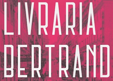 Lisbon-based designer of the stylish squarish art deco typeface for the Bertrand Library (2014). [
 [
[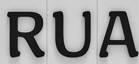 Graphic designer in Lisbon who created the school project font Toponimia (2015). This is a modular typeface to be used in tiled street name signs, which are still in use in Portugal. [
 Graphic designer in Leiria, Portugal, who created the wide semibold mini-serifed typeface Cooka (2013). [
 Paris-based Portuguese designer (b. 1990) of the free old typewriter typeface Ana's Rusty Typewriter (2013) and the sans typeface Squiggly Asta (2013). In 2014, she made
  Lisbon, Portugal-based designer of Nova Classica (2015, +Condensed), an all caps vintage movie title and movie credit font family.
  Graphic designer in Santo Tirso (Porto), Portugal. In 2011, he created the hairline sans typeface
  Porto, Portugal-based designer of a lowercase for Bank Gothic and of Bank Gothic Condensed in 2014 as a school project. [
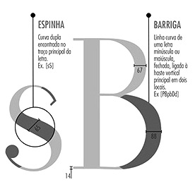 Braga, Portugal-based student-designer of the high-contrast text typeface Ada (2014, with Ana Ferreira and Daniela Pereira). [
 Aka Angelo MMK. During his studies at ESAD Matosinhos, Porto, Portugal-based Angelo MMK created the vintage typefaces Limon (2014), Gouttes (2014), Autres Histoires (2015), and Dinamarca (2015). In 2014, he published the ball terminal typeface Marie Jeanne. [
 Porto-based designer of the delicate
 Designer in Moita, Portugal, who cofounded Tipos das Letras (TdL) in 2013 with Ricardo Santos and Rúben Dias. The three cofounders published TDL Ruha Hairline (a modern slab serif) and TDL Ruha Latin (a wedge serif) in 2014. See also
  During her studies at IADE in Lisbon, Portugal, Arianne Amores created the slabbed typeface Manteigaria (2014), which was inspired by an old shop sign. [
 Foundry and studio run by
  BANK is a French/German design agency based in Berlin, led by Laure Boer and Sebastian Bissinger. It marketed its fonts through T-26, starting in 2009, but later switched to Colophon. In 2009, Sebastian Bissinger and Matthieu David made the display typefaces Sintra and Yummy. Sintra is a 3d typeface that simulates letters made from folded material---Sebastian Bissinger was inspired by the sign of a shoe shop in Sintra, Portugal. Yummy was inspired by cookie cutters.
  Illustrator in Porto, Portugal, who created
  During her communication design studies in Faro, Portugal, Brigida Lourenco Guerreiro (b. 1992) created the hipster typeface Limiar (2014). In 2015, she created the bold sans display typeface Surdina and the sans typeface Morfina. [
 Torres Vedras, Portugal-based designer of the curly, ironwork-inspired and ball terminal-laden typeface Maré (2015). [
 During her studies in 2015, Espinho, Portugal-based Bruna Oliveira designed the compass-and-ruler didone typeface Tuesday Morning. [
 Lisbon, Portugal-based graphic designer who created the Greek mythology-inspired Greek emulation or brutalist typeface Arka (2016).
  Designer in Palmela, Portugal. Creator of the monoline sans typeface
  Graphic and type designer from Portugal who studied at the University of Algarve. He created Double Typeface (2012, outlined caps), Memoria (2013, a modular typeface done with Joao Miranda), Big (2013, a headline sans done with Joao Miranda), Silo (2013), Mutant Sans Sense (2014, made at Burocratik), Angles (2015, a shadow typeface), Arquivo Typeface (2015, a set of custom condensed industrial sans typefaces done for Terry Allen), Nomada Typeface (2015, also made at Burocratik).
  Illustrator who was born in Lisbon and lived in the Northeastern part of the USA for seven years before returning to Lisbon for a few more years and finally settling in Geneva, Switzerland.
  Another young Portuguese talent, b. 1985. Based in Aveiro, he studied graphic design in 2009 at the Instituto Politécnico do Cávado e do Ave, IPCA. Creator of
  Portuguese design student at the University of Aveiro in Portugal. In 2009, as part of a typography class project, Catarina and four co-students (Miriam Flores, Ana Carreira, José Bronze and Marco Costa) designed
  Lisbon, Portugal-based designer of the vernacular signage typeface CPL Servio Display (2017) and the informal typeface Film Sans (2016). [
 Type design studio in Lisbon, Portugal, founded in 2018 by type designer Joao Cracel. In 2019, Craceltype published the 18-style humanist sans typeface families
  Graphic designer in Lisbon, Portugal, who created Bowie (2015), a typeface related to Stan Davis's Amelia (1965, Visual Graphics Corporation).
  [
[ [
[ Portuguese designer (from Porto) who used FontStruct to make the modular (slabby or octogonal) typefaces Sexta-Feira (+Sans) and Mini-Bodoni in 2008-2009. As Grupo3, he designed the strong all caps monoline sans titling typeface Grupo3 (2014) for Ed Design Graphic & Web as part of the corporate design work they did for a Portuguese architecture company. Free download at Open Font Library. In 2017, he moved to Wuppertal, Germany.
  Tomar, Portugal-based designer of the angular typeface
  Porto, Portugal-based designer of the mischievous art nouveau-inspired display typeface Gunther (2021). [
 Established in 1994, dstype used to offer free fonts but has gone commercial now. It is run by
  Freelance designer in Porto, Portugal, who created the
  Emerson Nunes Eller is a Brazilian graphic designer based in Lisbon, Portugal. He has a Masters from UEMG in Belo Horizonte, Brazil, in 2014, and his thesis there was entitled
  Portuguese illustrator and designer who created the didone typeface
  Porto, Portugal-based designer of the display typeface Wavy (2017). [
 [
[ Studio in Porto, Portugal, est. 2014. They designed the sans typefaces Moderna and Tubular (rounded sans) in 2014.
  Design and corporate identity studio in Lisbon. Creators of the elegant sans headline typeface
  [
[ Fael is Rafael Serra (b. Santarém, Portugal, 1983). Since 1989, he lives in Barcelos / Porto. Rafael graduated in Graphic Design and Advertising from the Oporto Polytechnic Institute, and works as a graphic designer and lettering artist in a design studio in Braga. He created some typefaces, both free and private.
  Feliciano Type was established in 2001 by Mario Feliciano. The foundry's main design studio in Lisbon, Portugal, with two additional offices, in Povoa de Varzim, Portugal, and in The Hague, Netherlands. Mário Feliciano (b. 1969, Caldas da Rainha, Portugal). Feliciano studied graphic design at IADE, Lisbon, and began working as a graphic designer at Surf Portugal magazine in 1993, where he stayed as art director until 2000. In 1994 he founded the design studio Secretonix in Lisbon. He has been heavily involved in type design since. In 2005, he joined the type coop
  During her studies at IADE in Lisbon, Filipa Amado and Beatriz Fialho created the connect-the-dots typeface Metro (2014) and the
  Filipa (Porto, Portugal) used nail files as an idea to build a very interesting brushy typeface called
  Graphic designer in Lisbon, Portugal. In his oeuvre, I especially appreciate the typography in his
  Aka Senhor Baltazar. At
  Sintra, Portugal-based designer of the circle-based modular organic sans typeface Bugalho (2014). [
 Lisbon-based designer of the great wedge serif typeface Arre (2015).
  During her graphic design studies in Caldas da Rainha, Portugal, Gundega Sviksa created the hipster typeface Gundega (2015). [
 Coimbra, Portugal-based designer of the graffiti-inspired typeface Nobre (2016). She also designed Coimbra City Icons (2016) and Zen Beauty Service Icons (2016). [
 Born in Brazil, but based in Marinha Grande, Portugal, Henrique Martinowski designed the German expressionist typeface Geoblack in 2019. [
 Graphic designer in Lisbon, Portugal, who created Clrendon Stencil in 2014. [
 Born in Porto, Portugal, in 1975. From 1994 until 1999 he studied graphic design at the Escola Superior de Artes e Design. In 2000 he became a postgraduate student at the KABK where he wrote a Masters thesis entitled "Type&Media". He joined Underware in the same year. At ATypI 2005 in Helsinki, he spoke on On the edge of legibility, which in fact is a talk about blackletter. Affiliated since 2002 with Underware. He lives in Finland. Also doing business at
  Maria Inês Magelháes Mendes studied graphic design, photography and video at ESAD---Escola Superior de Artes e Design in Portugal. Based in Porto, she created the slightly psychedelic
  Lisbon-based designer of the art deco typeface New Abaco (2014). [
 Student at Escola Superior de Arte e Design, Matosinhos, Portugal, in 2014. Creator of the text typeface Ophelia (2014). [
 Graduate of ESAD CR who works in Lisbon.
  Born in Porto, Portugal, Ivan Alves studied graphic design at ESEIG, Erasmus at Camberwell School of Arts in London and went to Barcelona to do an internship at Stanton Studio. Since 2011 he works at a studio in Porto called Nor267. In 2016, he designed the potato cut font Wild Potato. Its letterforms are based on the Jean-Luc font by Atelier Carvalho Bernau.
  [
[ [
[ Creator of the rounded script typeface
 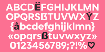 Portuguese co-founder, with Benoit Dupuis, of Tropical Type Foundry in 2020. In 2020, Benoit Dupuis and Joana Roca designed and released
  [
[ During his studies, Joao Queiros (Porto, Portugal) designed Cardio (2017). [
 Portuguese author of
  Portuguese creator of the octagonal typeface 7ABL3 (2010) and the white-on-black ransom note typeface crew Hassan (2010).
  [
[ Freelance graphic designer in Tomar, Portugal, b. 1977, who created the free rounded techno sans typeface
  Castro obtained a Master's degree in Communication Design and Multimedia at the Escola Superior de Artes e Design (ESAD) in 2011. He lives in Vila Nova de Gaia, Portugal. Under the guidance of Dino dos Santos, his study project was entitled The typographic process in Pedro Diaz Morante. Related to that project, he created a sweet,
 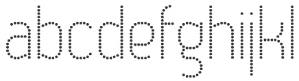 Portuguese creator at FontStruct in 2008 of Goticula 1.3 (blackletter), Reposicao (octagonal), Frank Castle, Tomatix (rounded letters) and Tazaver (bold, rounded).
  During his studies at Instituto Politecnico de Tomar, Portugal, José Ribeiro (Lisbon, Portugal) designed the stencil typeface Message (2017). [
 Graphic designer and illustrator in Portugal, b. 1985, who lived in Barcelos, Braga and Porto. He has a degree in Graphic Design and Advertising from ESEIG-Oporto (2003-2007) and a post-graduate degree in Typography from ESAD-Matosinhos (2009).
  [
[ Brigida Guerreiro (b. 1992, Faro) studied at the University of Algarve, Faro, Portugal, graduating in 2013. She set up Kobu Foundry and
  Ksenya Samarskaya (b. Saint Petersburg, Russia) studied at the University of Oregon and New York University (class of 2010). From 2007 until 2011, she worked for Hoefler&Frere-Jones in New York. After a brief stint as type consultant for Apple in Cupertino, CA (2012-2013), she set up her own design studio, Samarskaya & Partners, in 2015, in Brooklyn, NY. That same year, she co-founded Alphabettes. Samarskaya has taught typography and design at Harbour.Space University in Barcelona, University of the Arts in Philadelphia, and the School of Visual Arts in New York. She splits her time between Brooklyn, NY, and Lisbon, Portugal. The typefaces she worked on at Hoefler include Exchange, Ideal Sans, Landmark, Retina, Sentinel, Sterling, Verlag, Archer, Forza, Gotham, Historical Allsorts, Numbers, Shades, Tungsten, Vitesse and Whitney. Her contributions covered design direction, drawing, kerning, interpolation, opentype features, hinting, production, testing and troubleshooting.
  Illustrator in Porto, Portugal. In 2017, he designed some stunning typeface compositions to illustrate his own web page. [
 During his studies in Caldas da Reinha, Portugal, Leonor Almeida created the typeface Ti Ilda (2014).
  Porto, Portugal-based designer of Munchie (2015), Edit (2015, a warm text typeface) and Cocamala (2015), school projects for Joana Correia at ESAD. [
 Portugal-based Macau-born designer of the
  Graphic designer in Caldas da Reinha, Portugal. She created a refined and slightly naughty serif typeface called
  [
[
 Portuguese penman of the 17th century, 1670-1722. Some say 1670--1735. Andrade de Figueiredo was born in Espirito Santo, where his father was Governor of the Capitania. His work follows the style of the great Italian masters in its use of clubbed ascenders and descenders, and of Diaz Morante, the famous Spanish writing master, in its very elaborate show of command of hand. He was known as the Morante portugues.
  There have been many type typefaces since 2000, so Noronha's work in 2011 is a bit of a late addition to the crowded field. Nevertheless, he shows a nice sense of humour in his designs, so I am linking to it. Examples:
  Graphic designer in Lisbon, who created the slab serif text typeface Gibalta in 2014. [
 During her studies at ESDA Matosinhos, Portugal, Oporto-based Mariana Freitas do Amaral created the script typeface Berries (2014), the text typeface Framboesa (2017) and the display text typeface Yammy (2017). [
 Mariana Monteiro (b. 1995) studied design at ISMAI in Portugal. Based in Porto, she created the modular display typeface Bow (2014). [
 During her studies in Caldas da Reinha, Portugal, Marisa Ferreira created the serene geometric sans typeface Isamara (2015). She also designed the wayfinding icons for Castelo de Ourem (2015). [
 Media Type Foundry was created in 2010 by type designers Sonia da Rocha, Claude Mediavilla and Joel Vilas Boas (aka J85). It is an independent type foundry based in Paris. Thanks to Mediavilla and his ex-student da Rocha, the emphasis is on type that is deeply rooted in calligraphy.
  In 2011, London-based Miguel Batista obtained a Masters Degree in Editorial Design from the Instituto Politécnico de Tomar, Portugal. He designed
  Lisbon, Portugal-based designer of the roman capitalis cmpass-and-ruler font Manoel Display (2016), which covers Latin and Greek. Manoel is named after Manoel de Andrade de Figueiredo (1670-1735), a royal penman and calligrapher who wrote Nova escola para aprender a ler, escrever, e contar (Lisboa Ocidental, 1722). [
 Designer from Porto, Portugal. Creator of the sturdy condensed sans caps typeface
  Miguel Sousa is a Portuguese graphic designer with a big interest in Typography and Typeface Design. After completing his five-year degree in Technology and Graphic Arts from the Instituto Politécnico de Tomar in 2002, he worked for the children's books publisher O Bichinho de Conto for one year, as a graphic designer, typographic designer, book designer, web designer and web developer. Before going to Reading he also worked in MBV Design as a graphic designer, web designer and web programmer.
  Multiformis was set up in 2020 by Portuguese designer Pedro Madeira in 2020. His typefaces include the 16-style narrow grotesque typeface
  The government of Leiria, Portugal, contracted out the design of wayfininding icons for their MIMO (Museu da Imagem em Movimento) in 2016. [
 During her studies in Caldas da Reinha, Portugal, Nadina Fialho created the wide woiod-inspired titling typeface Elisus (2014). [
 [
[ DISCOVER, Ndisvover,
  [
[ Porto, Portugal-based designer of the high-contrast didone fashion mag typeface Concha (2012-2013). This typeface was created during her studies at ESAD in Matosinhos. [
 During his studies in Caldas da Reinha, Portugal, Nikolay Komitov created the display Indiscreet Typeface (2014). [
 Portuguese media artist (b. 1982) who lives in Braga and Covilhã. He graduated in 2007 in Multimedia Design from the University of Beira Interior, Covilhã. Designer of the paper-fold typeface
 A very innovative graphic design studio based in Matosinhos (Porto), Portugal. In 2015, they custom-designed the Kirimizi typeface for a beach hotel project in Mozambique. [
 Paulo Madeira (Tomar, Portugal) created the modular floriated typeface
  Graphic designer in Alcanena and/or Terres Novas, Portugal, who created the
  During his studies at ESAD Matosinhos, Pedro Caldas (Porto, Portugal) designed the didone typeface Florentino (2015) and the slab serif typeface Arbela (2015). [
 Communication designer and musician from Portugal, who has I a BA in Communication Design from the School of Fine Arts of Porto. Together, Pedro Canario (Porto, Portugal) and Nuno Queiros (Porto, Portugal) designed the
  Pedro Cruz (PCZ Design) is an art director in Porto, Portugal. He made the avant garde techno typeface
 [
[ Braga, Portugal-based designer of the rounded monoline stencil typeface Lackonic (2014). [
 Pedro Alexandre Vilas Boas Teixeira is a Porto, Portugal-based type designer. Creator of the monoline gemetric organic sans typeface
  Positype was founded in 2002 by Athens and/or Jefferson, GA-based designer and type designer
  Portuguese designer of the display typeface Anfibia (2016) and the display sans
  Rafael Saraiva is a Brazilian / Portuguese type designer located in Rio de Janeiro who works for Dalton Maag as font developer. Graduate of Escola de Belas Artes at UFRJ, and the
  Designer in Porto, Portugal, of the fat experimental custom typeface
  Senior graphic designer from Lisbon, now located in London. Creator of the wonderful retro typeface family
  [
[ Graphic designer in Lisbon, Portugal. In 2018, he published the ultra-condensed typeface family RS Absurdo. In 2019, he released the
  For a school project at FBAUP, Porto and/or Braga, Portugal-based Rita Fonseca created the modular typefaces Wild West (2015, Western font) and Quarta Feira (2015, pixelish style). Both fonts were made with FontStruct. In 2018, she designed the constructivist typeface Naum Gabo. [
 During her studies towards a Masters degree in Graphic Design and Editorial Projects at the University of Porto, Rita Ramalho created
  R-Type was founded by
  [
[ Portuguese designer Rúben Dias graduated in design from IADE. He ran Item Zero and built his own letterpress studio, where he prints and experiments with both metal and wood type. Since 2012 he has been working on a doctoral degree on Portuguese Royal Printing Office typefaces at the Technical University of Lisbon's School of Architecture (FA-UTL). He teaches typography at ESAD.CR (Escola Superior de Arte e Design) and ESTAL and holds workshops on type and typography all across Portugal. In 2013, Aprígio Morgado, Ricardo Santos and Rúben Dias cofounded the type foundry
  [
[ During her design studies in Coimbra, Portugal, Rute Ribeiro created the vintage display typeface Old Street (2015). [
 Illustrator in Guimaraes, Portugal. For a school project at Polytechnic Institute of Cavado and Ave (IPCA) University in Barcelos, Portugal, Elodie Costa, Sandra Sofia Santos and Gonçalo Rodrigues co-designed Empires (2015), a typeface based on Aldus Manutius's Bembo. [
 As a student at ESAD.CR, Lisbon-based Sara Henriques de Sousa designed the stencil and modern typeface pair Express (2016). [
 Porto, Portugal-based type designer, who studied at ESAD Matosinhos. In 2019, Luis Bandovas briefly joined, and then left, Vitoria Neves's
  Graphic and media designer and art director in Espinho, Portugal, b. 1984, who founded first
  Madrid-based Portuguese designer of the custom typeface Fu (2014) for a mobile game by DoubleMind.
  Graduate of the graphic design school in Caldas da Reinha, Portugal, who made the display sans typeface
  At University of Aveiro in Portugal, Sergio Martins designed the display typeface Tirana (2017). In 2018, he graduated from
  Lisbon, Portugal-based designer of the condensed sans typeface Lifted Display (2016). [
 During her communication design studies in Coimbra, Portugal, Sofia Martins (Ponte de Sor) created an untitled display typeface (2013). [
 Lisbon, Portugal-based designer of the high-contrast ball terminal-laden free Peignotian style typeface Tosca (2013-2014), which was a school project at ESAD.CR.
  Type designer in Loures, Portugal, b. 1981.
  Porto, Portugal-based designer of a didone typeface in 2015. [
 Graphic designer from Portugal who obtained a Bachelors in Graphic Design from ESAD.CR in Caldas da Rainha, and a
  Villa Nova de Gaia, Portugal-based designer of the squarish typeface
  Lisbon-based designer of the modular typeface Lisbon (2016) and the rounded sans typeface Verano (2016). In 2020, he designed the modular typefaces
  During his multimedia studies at Escola Superior Artística do Port, Tiago Oliveira designed the
  Type design collective founded in 2011 by Luis Alonso (Barcelona), Ricardo Santos (Lisbon) and Charlie Zinno (Buenos Aires).
  During his studies in Lisbon, Tomas Marques designed the blackboard bold typeface Mapa (2016).
  Type Factory is Pedro Lobo, a Guimaraes, Portugal-based illustrator and designer. In 2011, he set up
  Portuguese foundry in Guimaraes and Porto, est. 2011 by Pedro Lobo, that sells
  Ricardo Rodrigues dos Santos (or just Ricardo Santos, b. 1976 in Lisbon) is a Portuguese type designer. He ran VanArchiv (est. 2000) from Loures, Portugal. He changed the name to Ricardo Santos and sells his work through
  Graphic designer from Lisbon, who made the pretty art deco logotype
  Povoa de Varzim, Porto-based designer of a geometric art deco corporate type for the
  Albufeira, Portugal and London, UK-based graphic designer who made the experimental typefaces
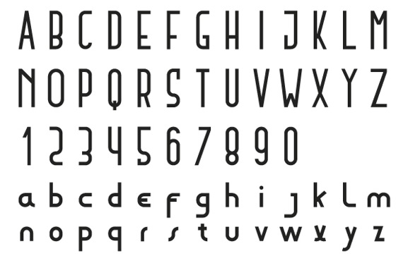
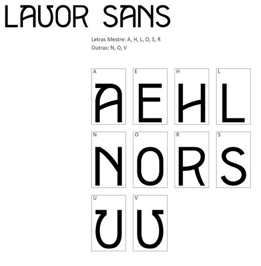
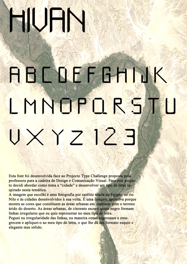
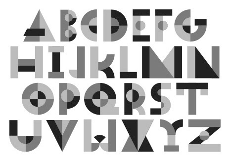
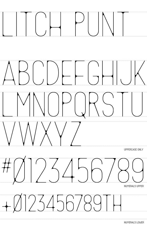
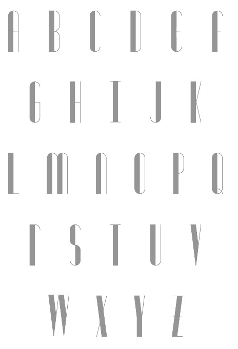
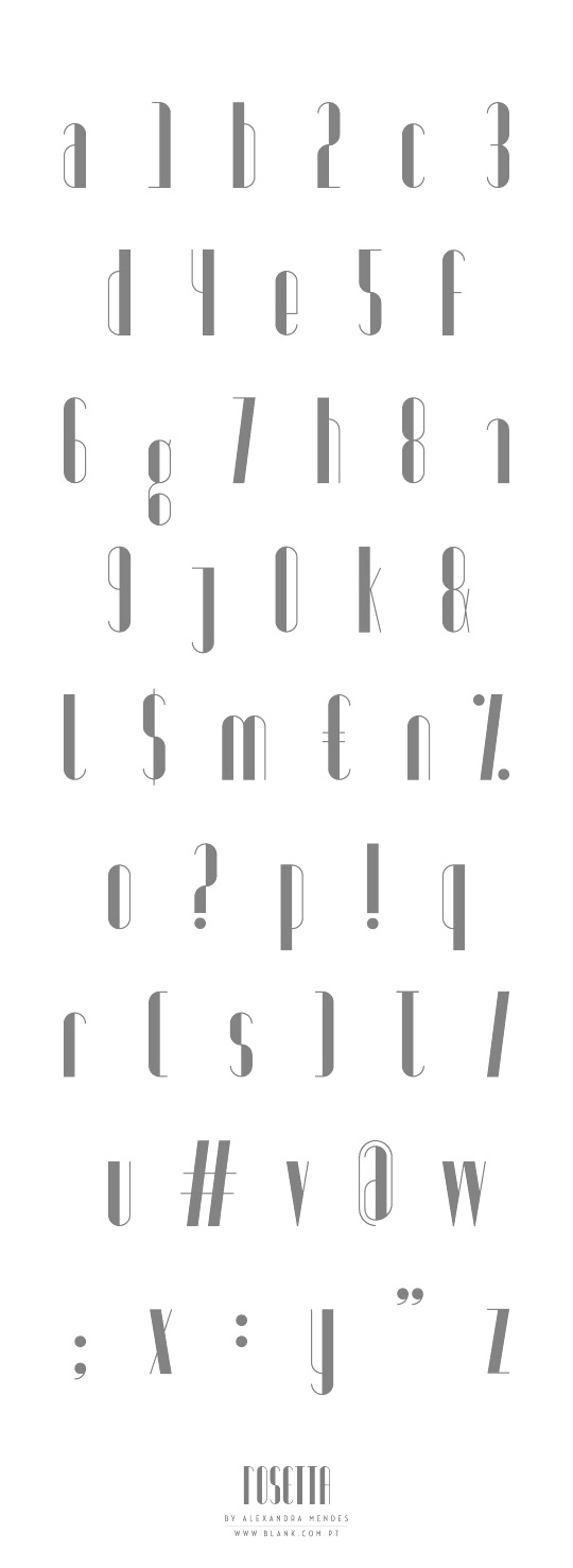
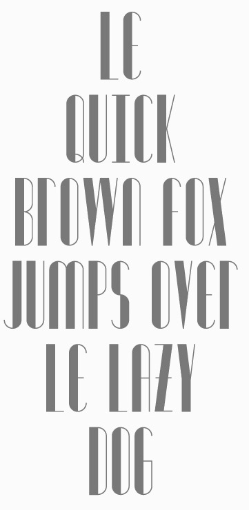
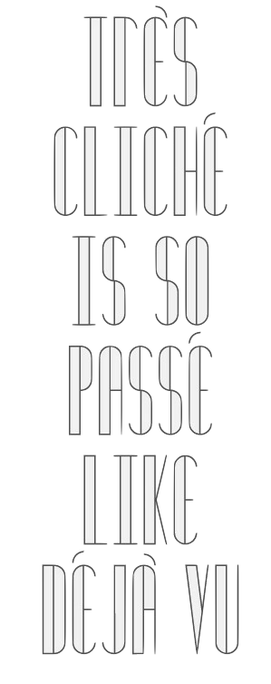
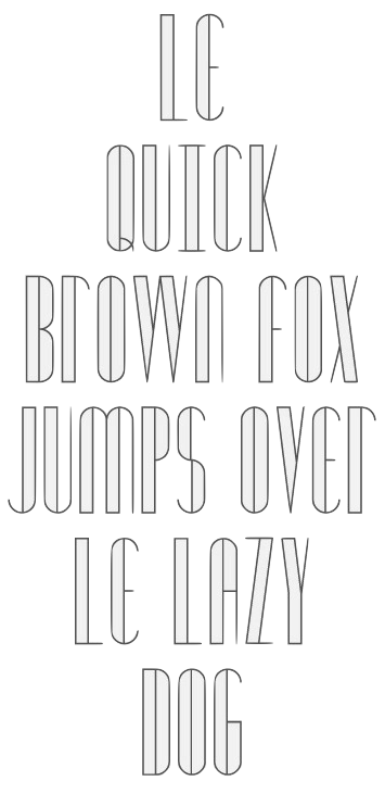
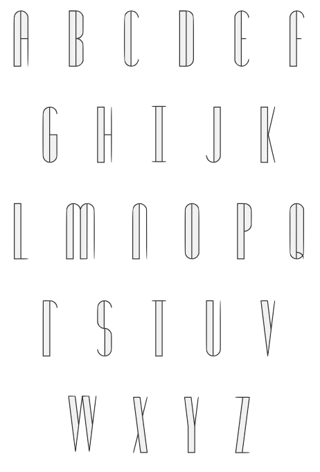
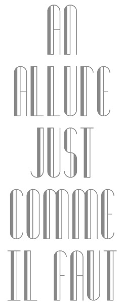
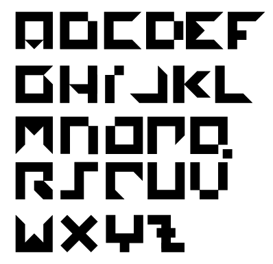
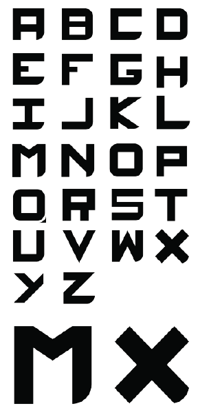
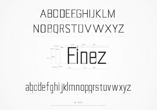
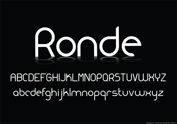
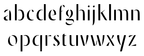
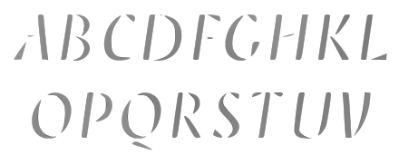
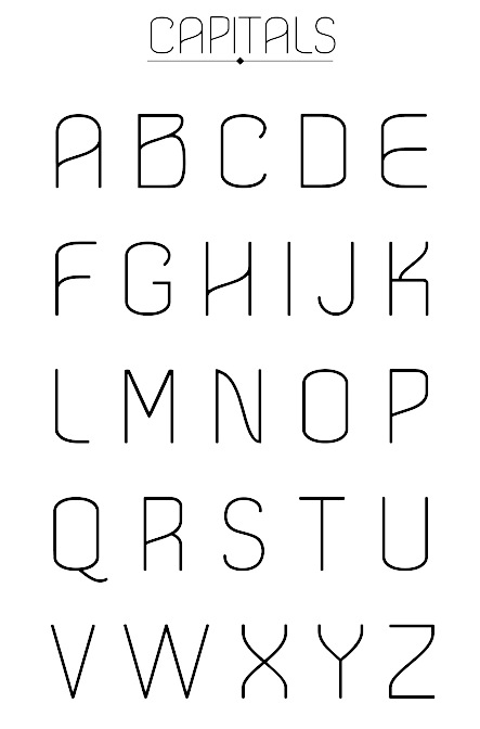
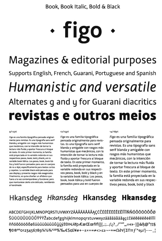
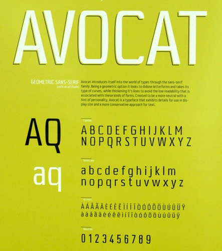
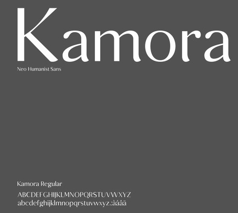
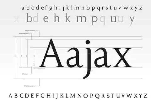
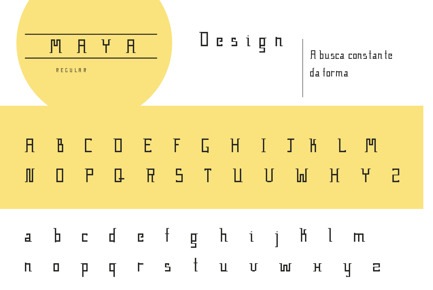
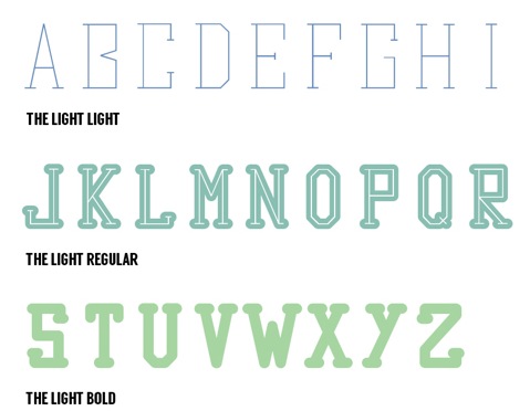
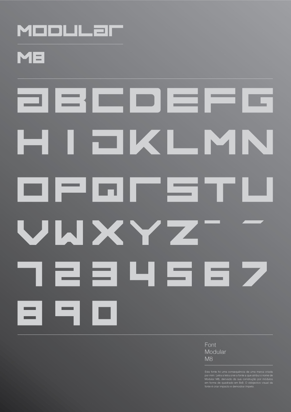
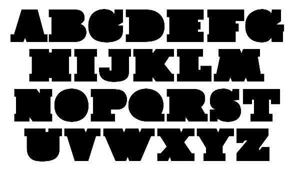
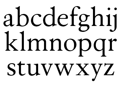
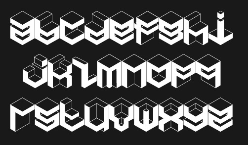
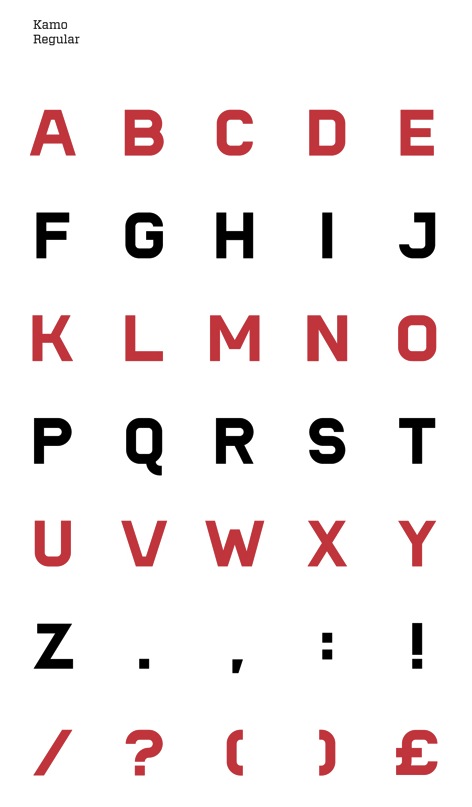
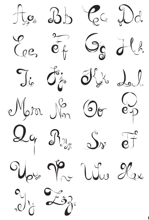
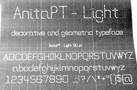
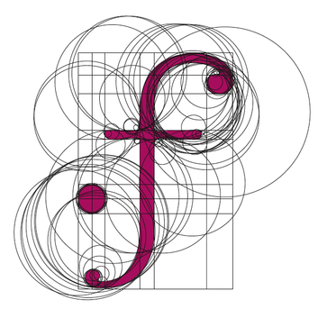
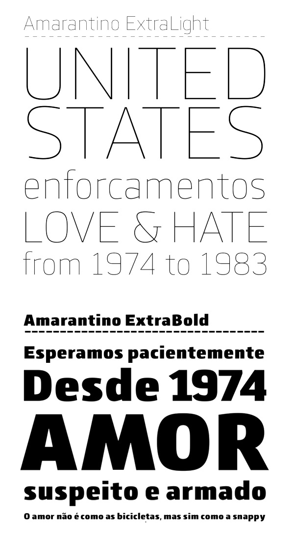
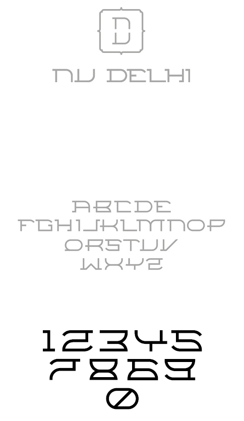
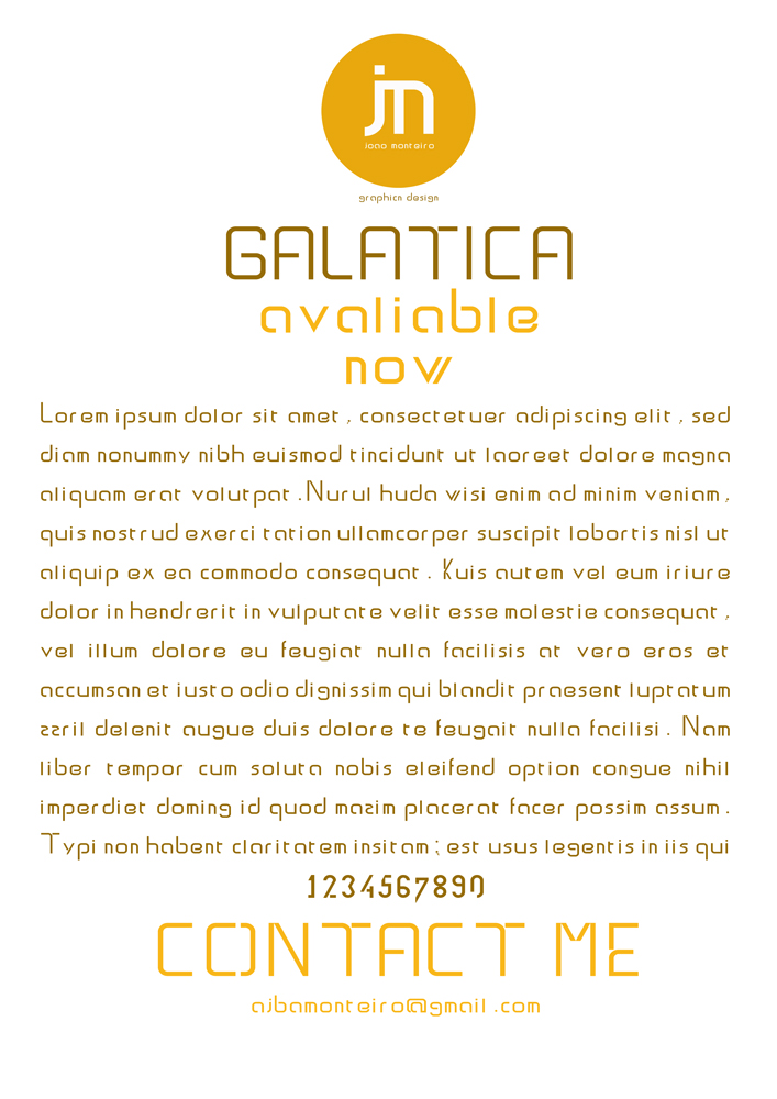
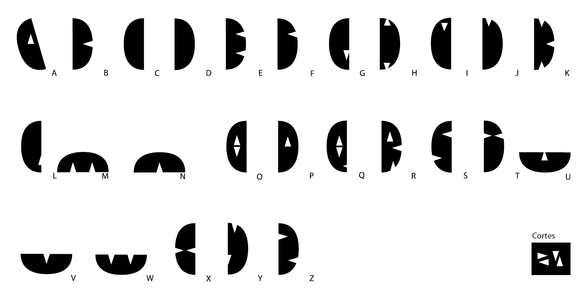
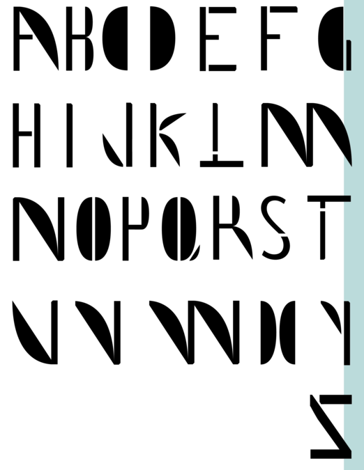
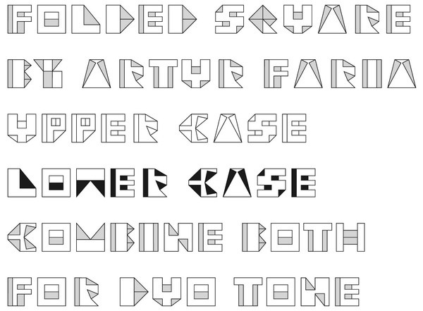
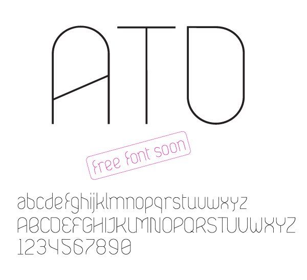
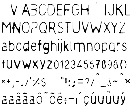
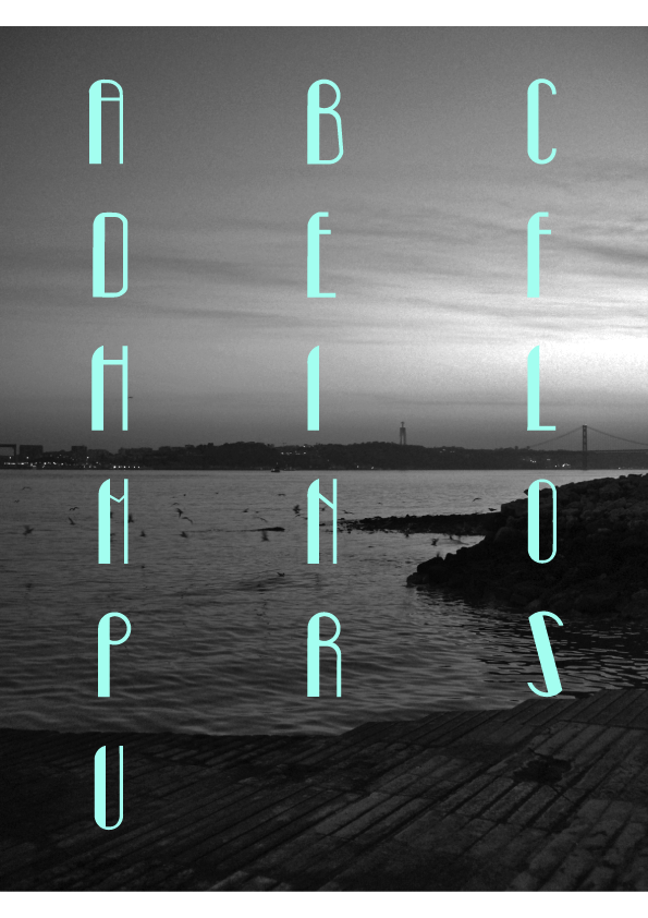
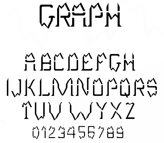
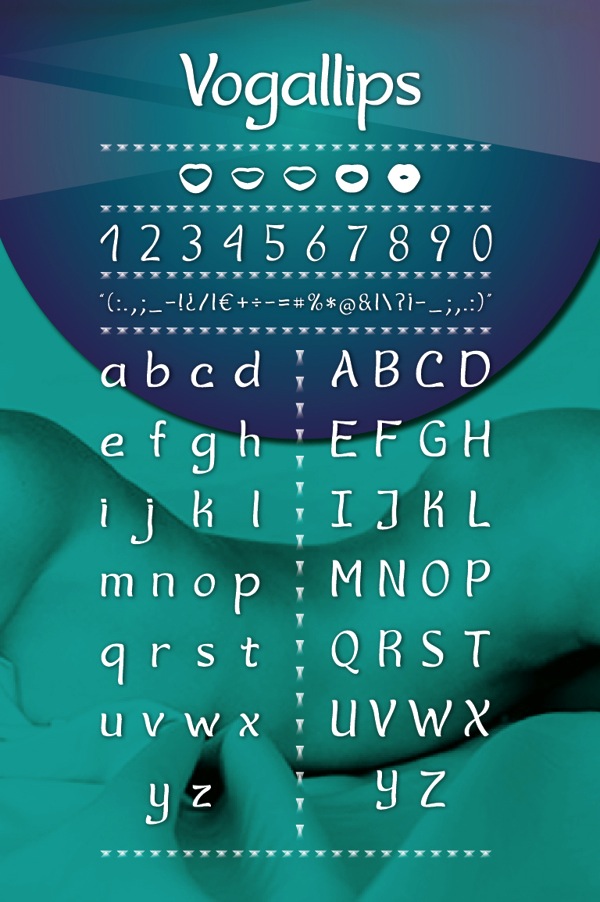
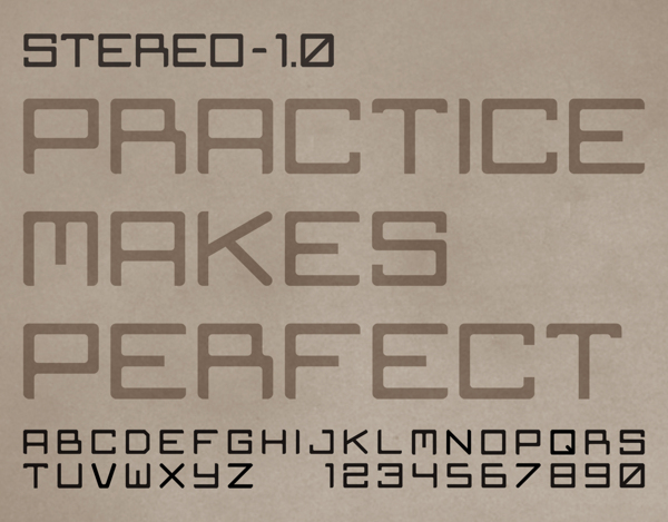
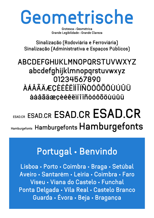
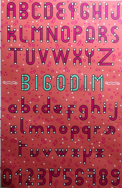
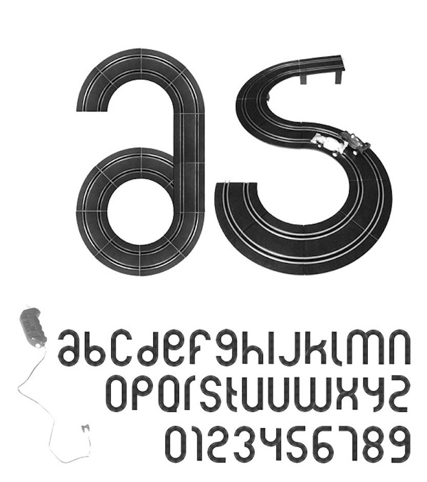
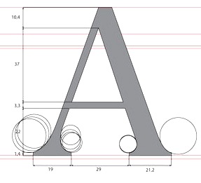
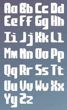
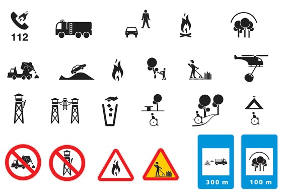
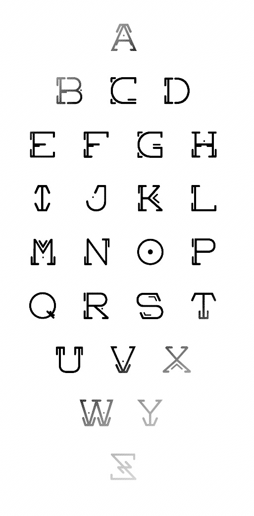
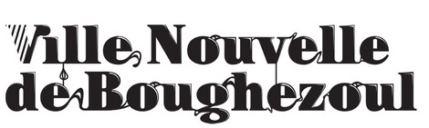
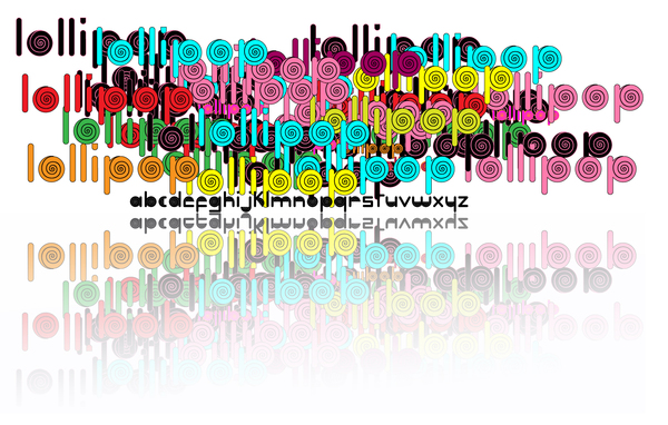
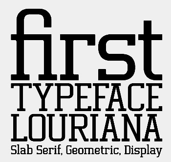
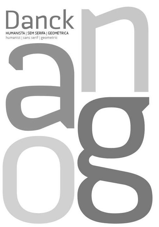
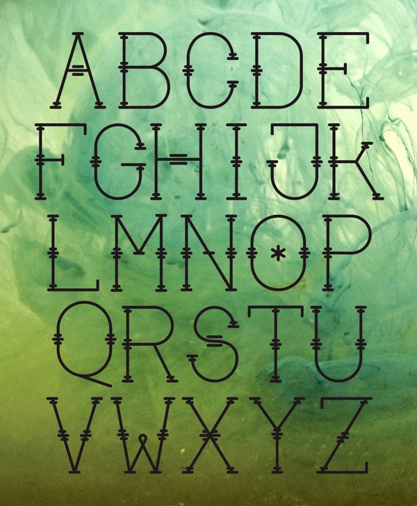
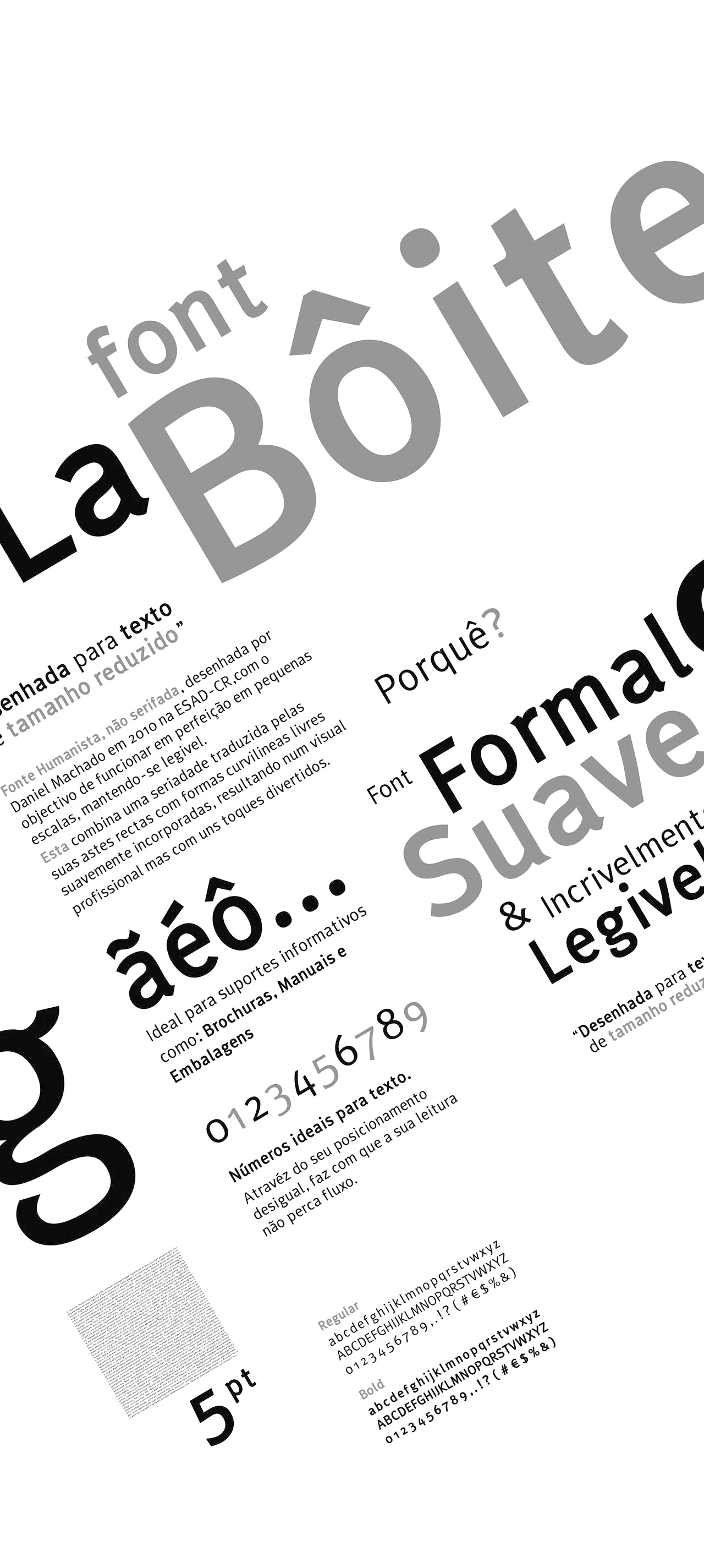
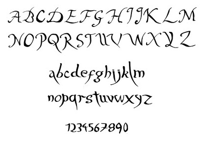
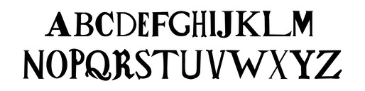
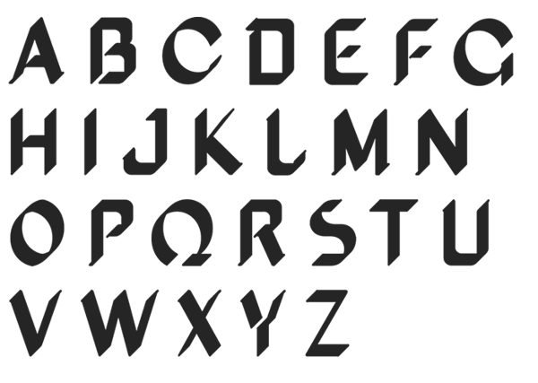
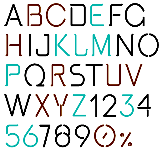
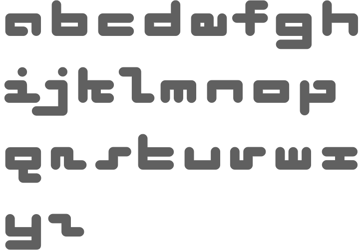
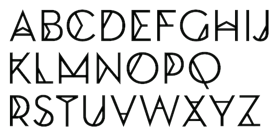
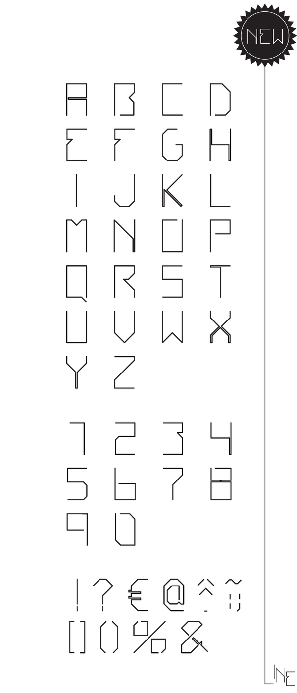
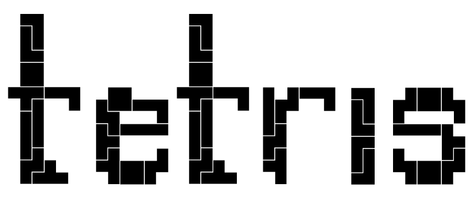
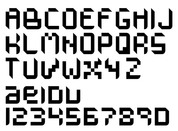
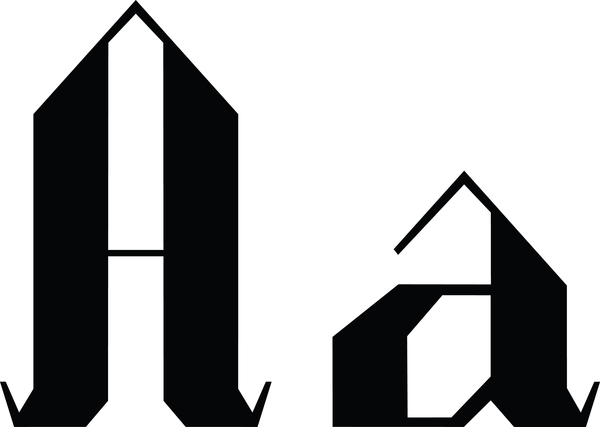
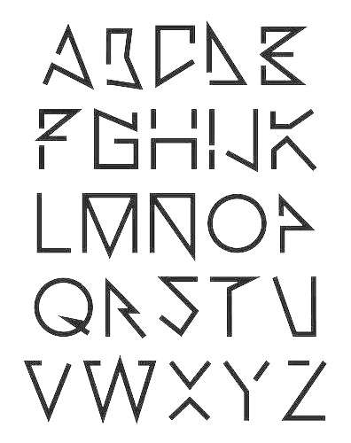
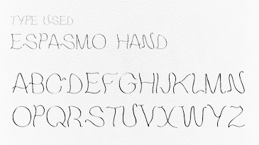
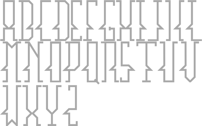
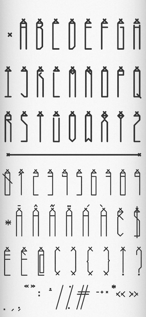
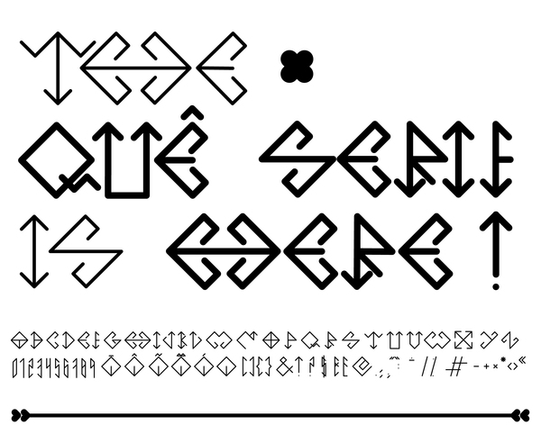
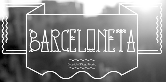
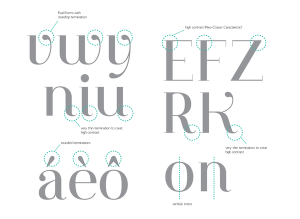
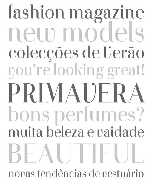
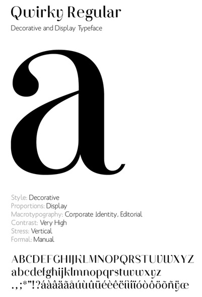
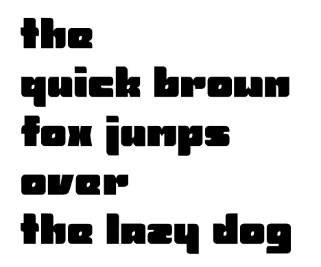
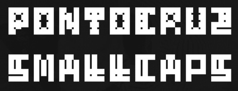
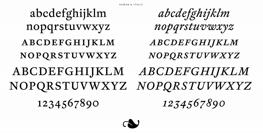
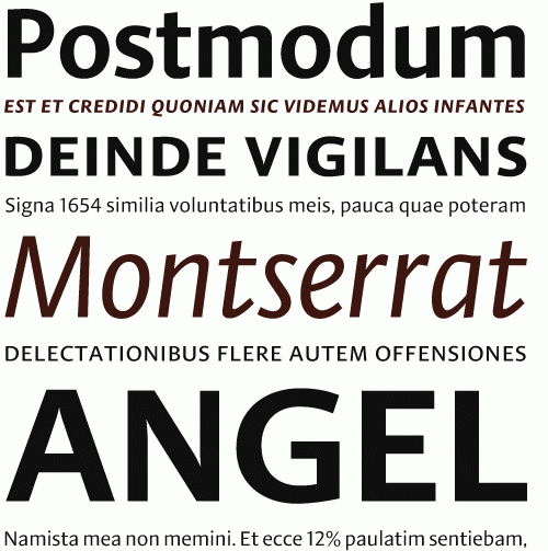
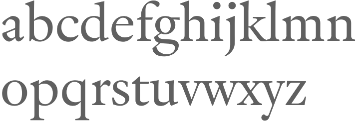
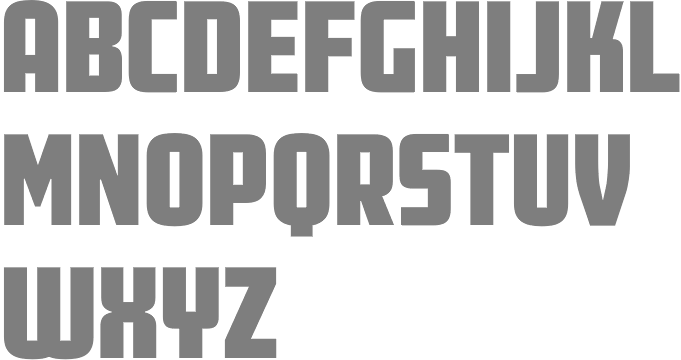
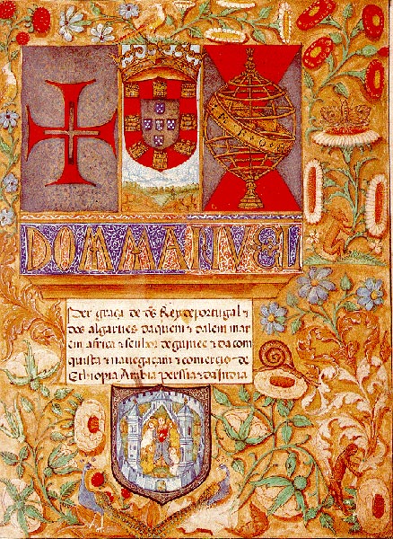
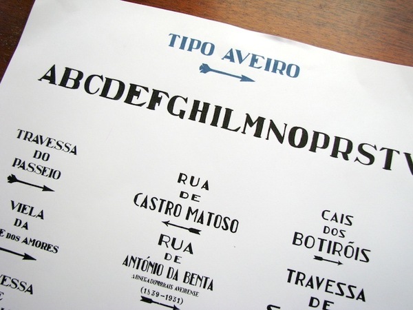
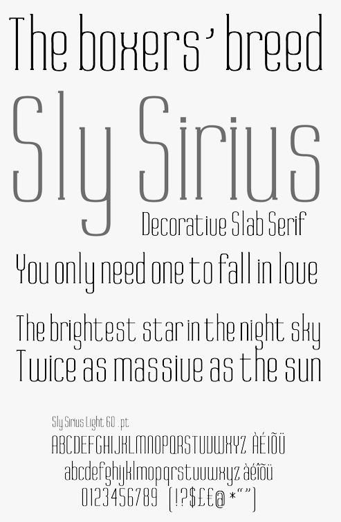
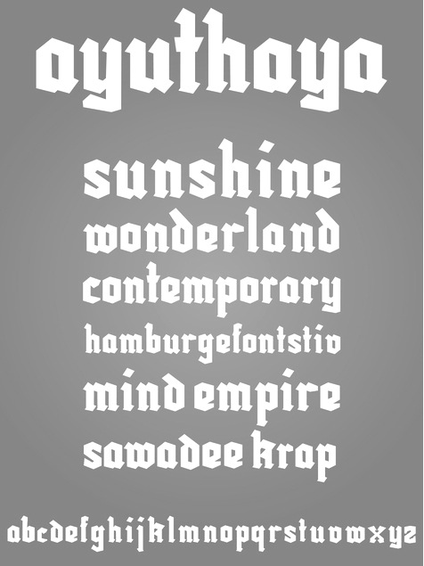
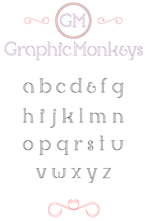
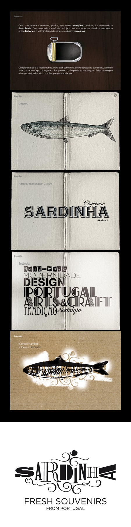
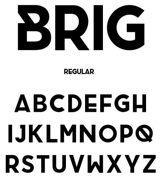
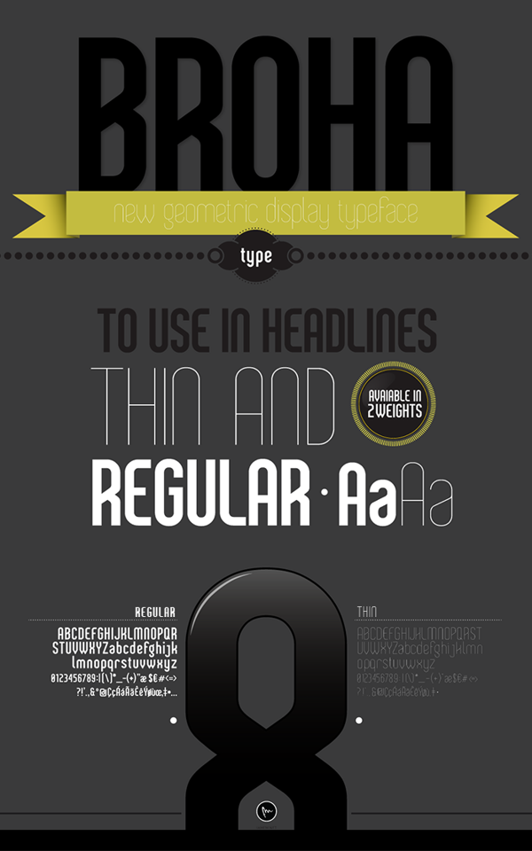
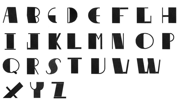
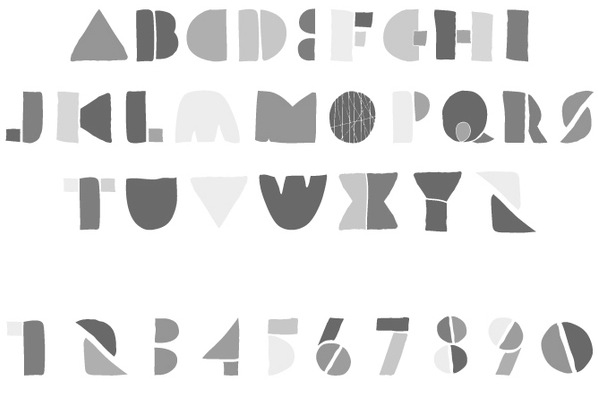
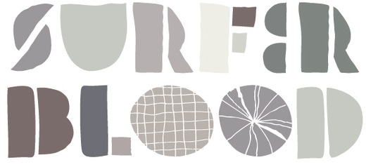
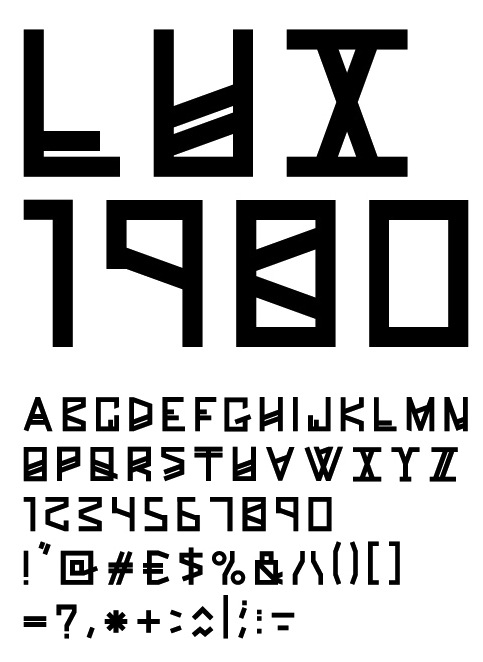
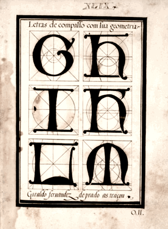
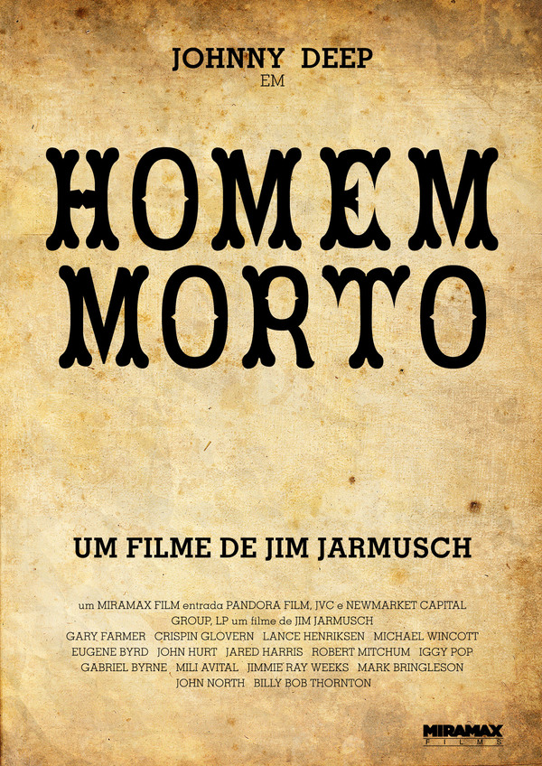
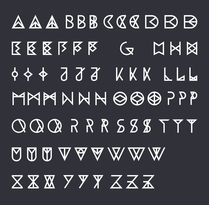
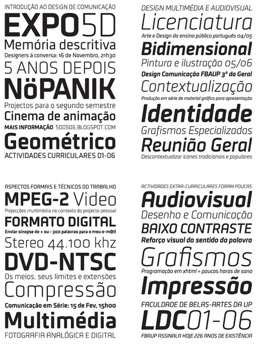
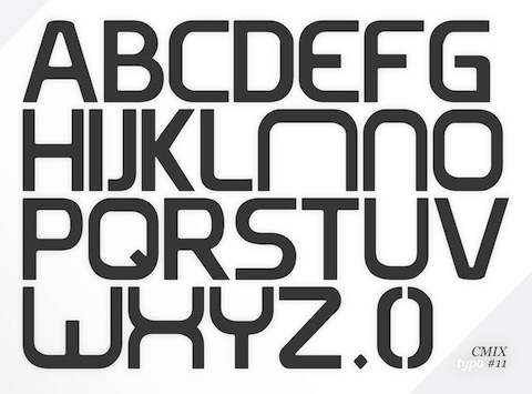
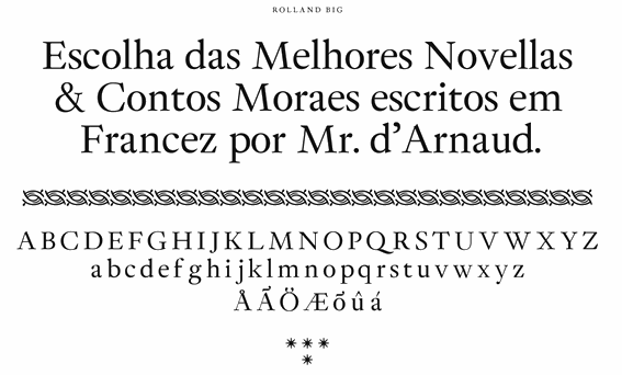
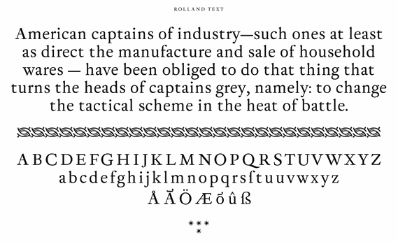
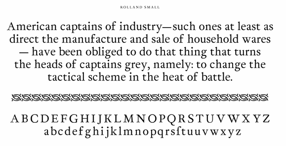
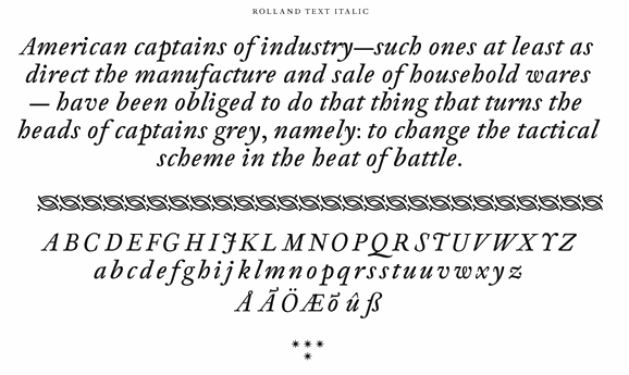
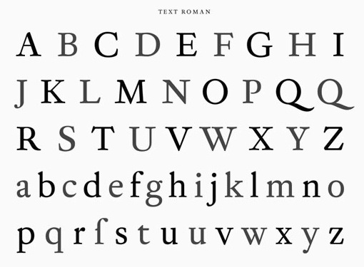
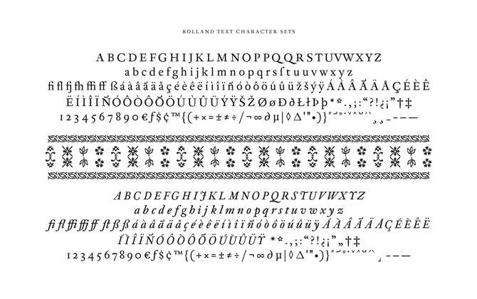
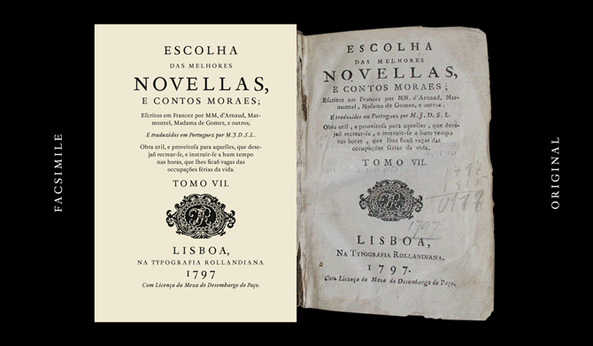
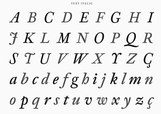
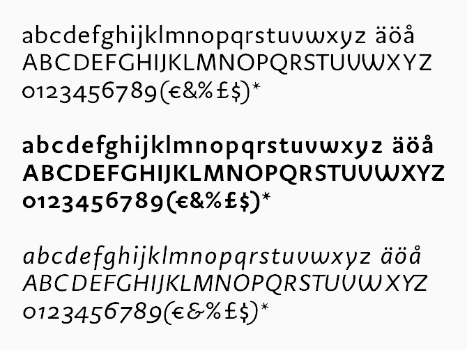
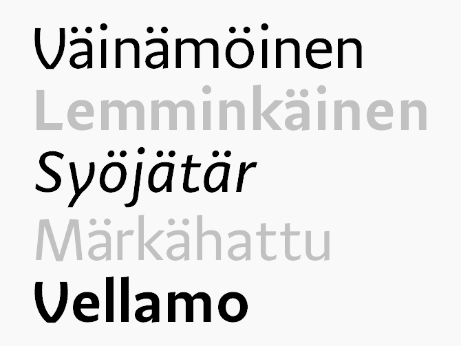
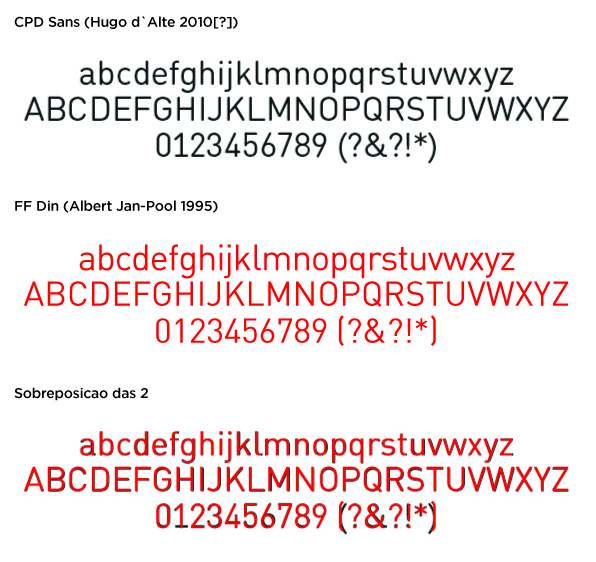
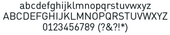
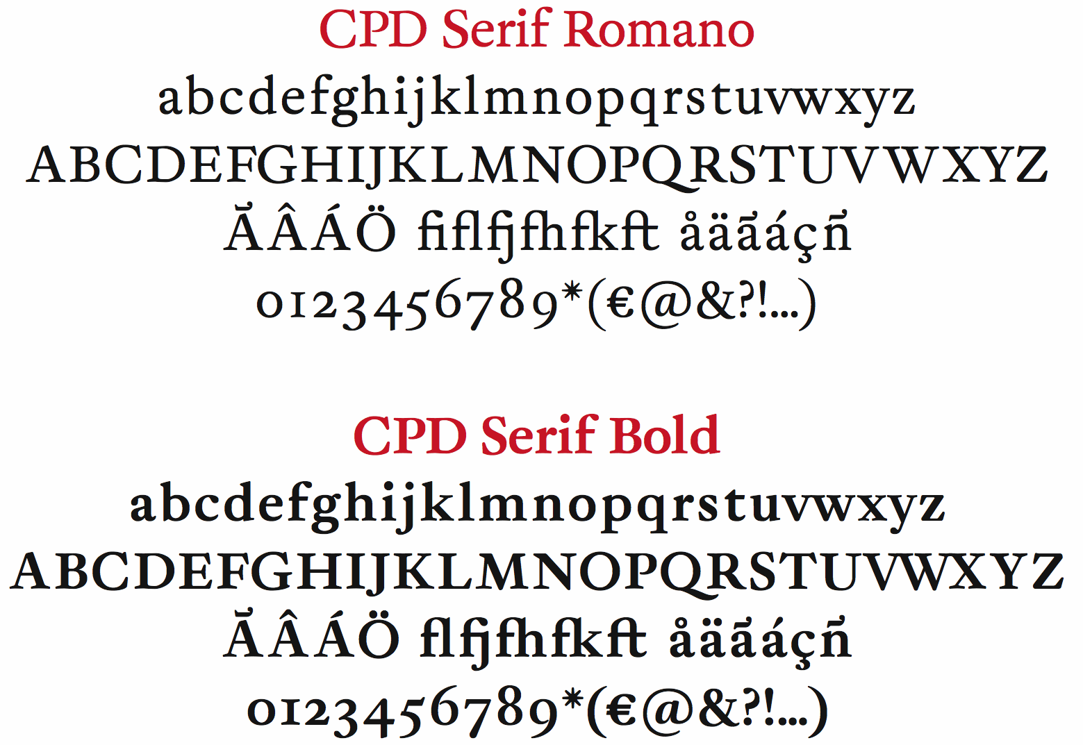
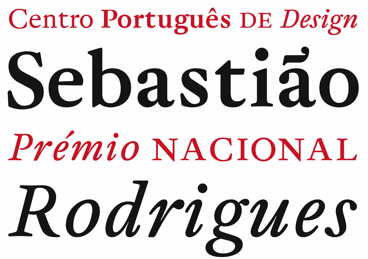
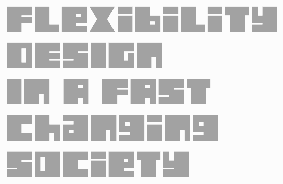
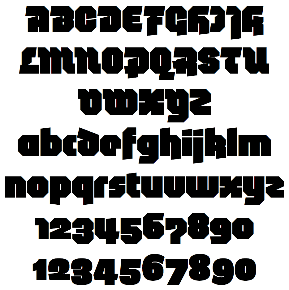
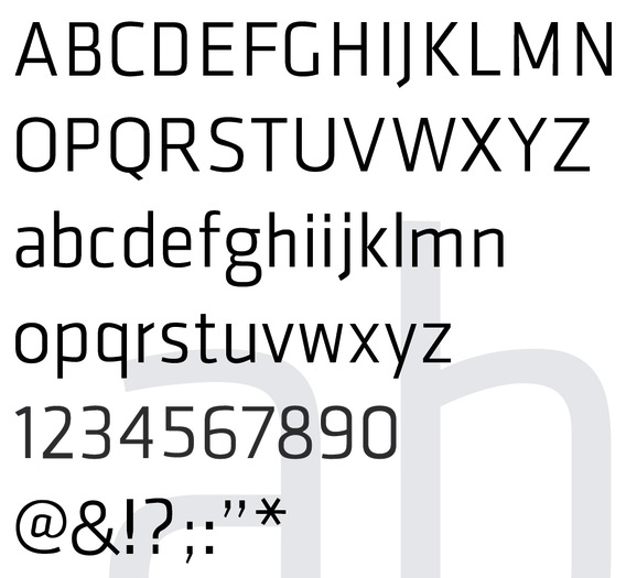
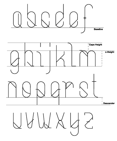
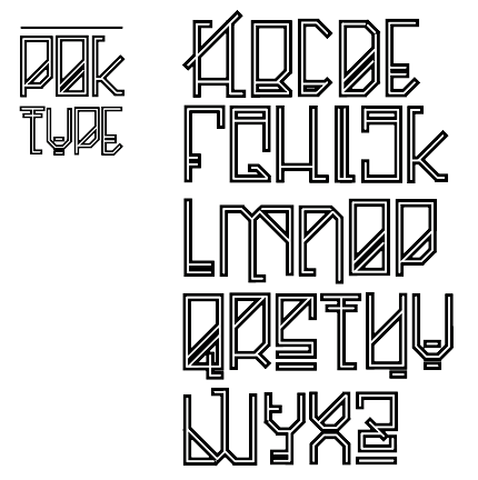
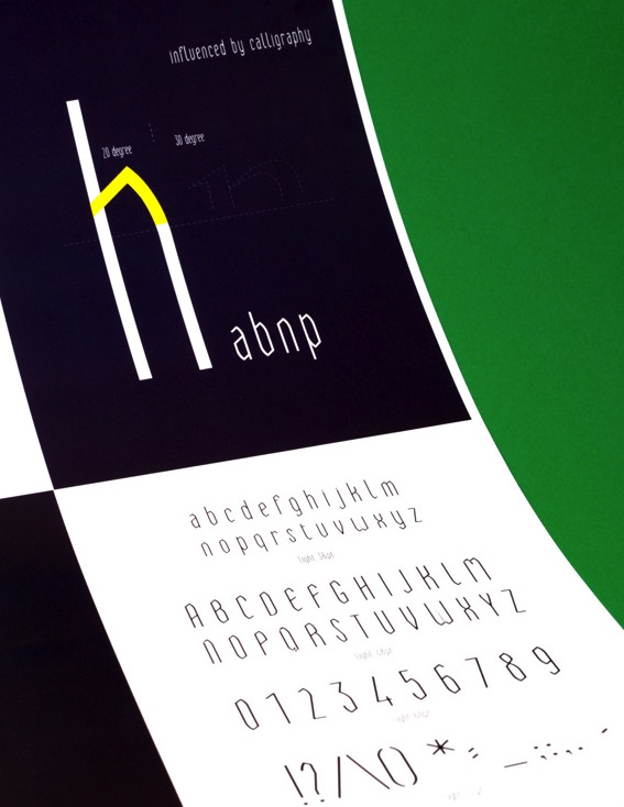
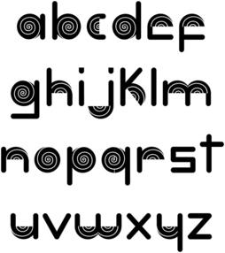
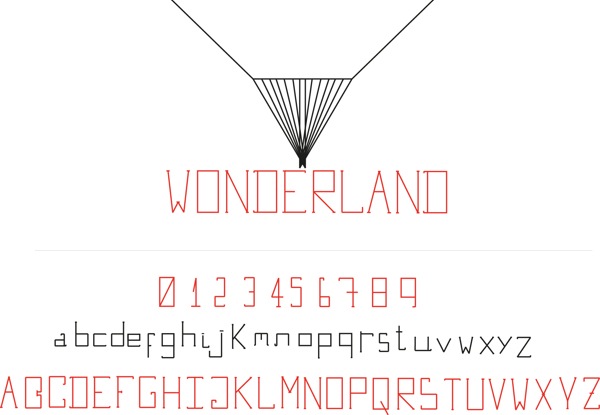
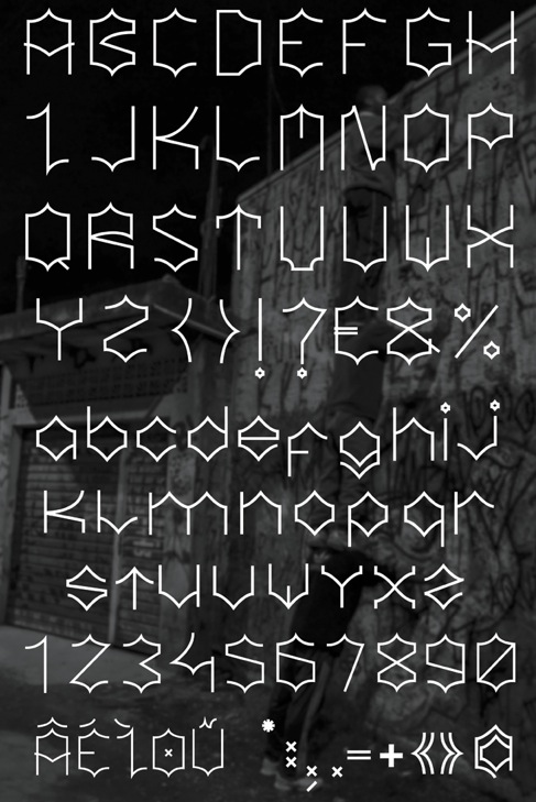
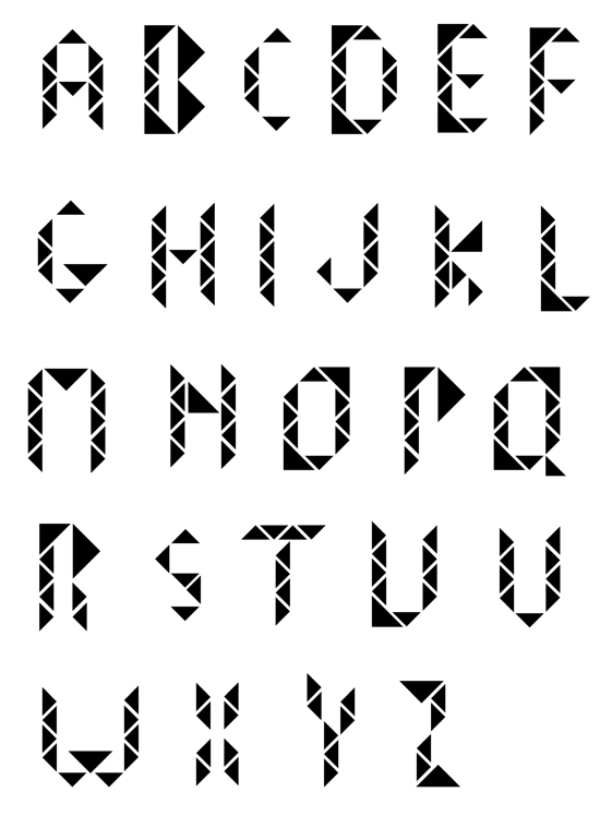
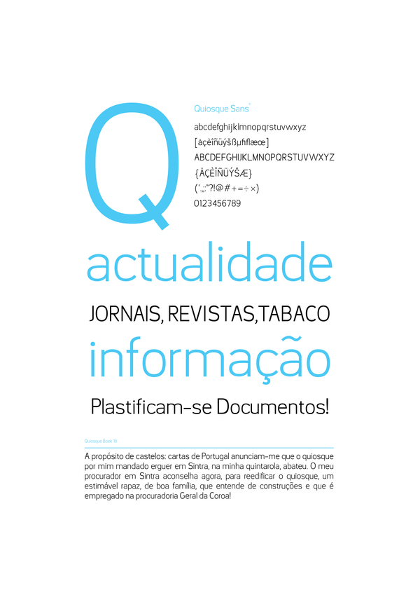
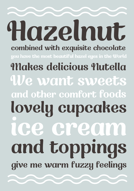
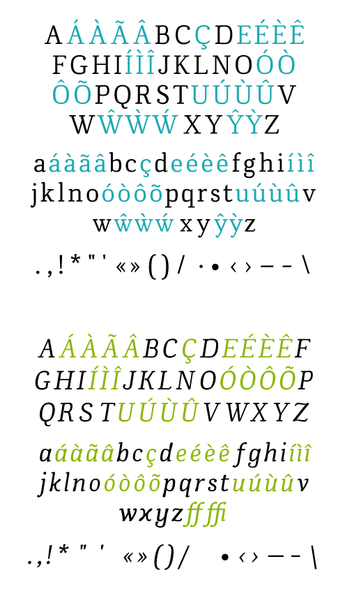
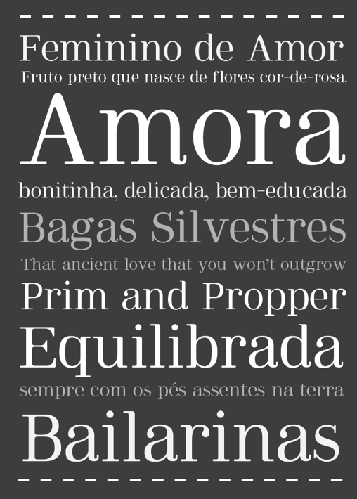
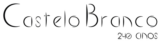
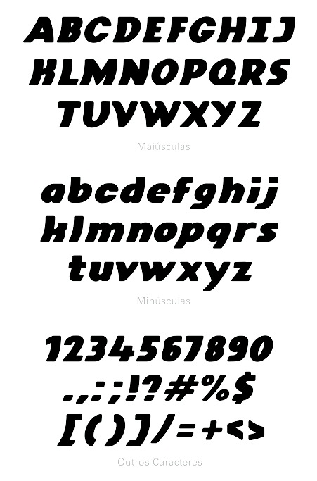
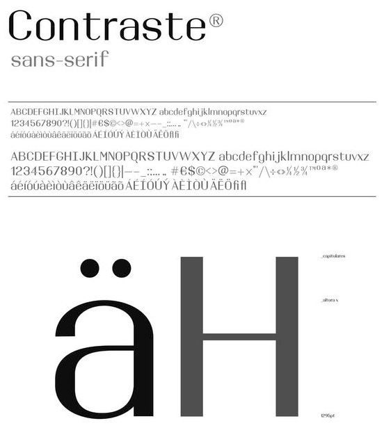
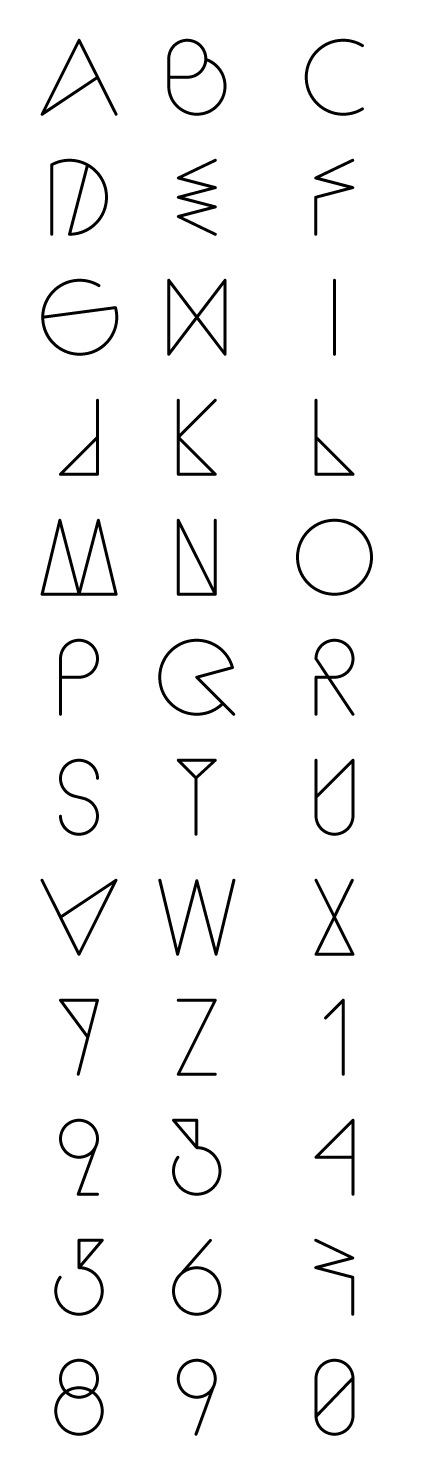
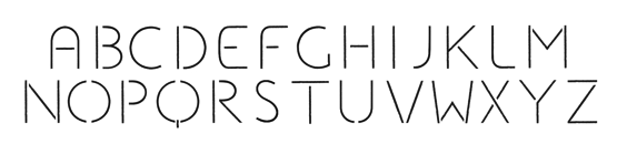
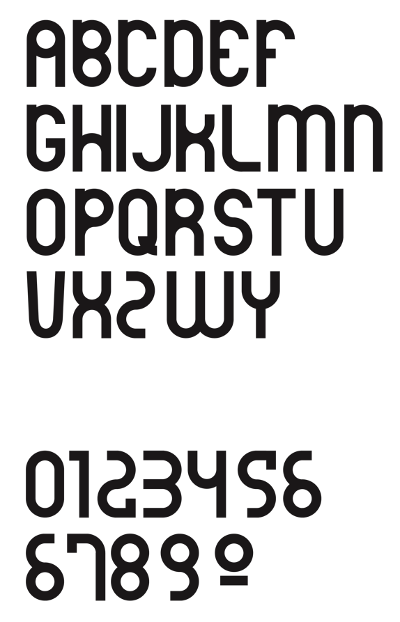
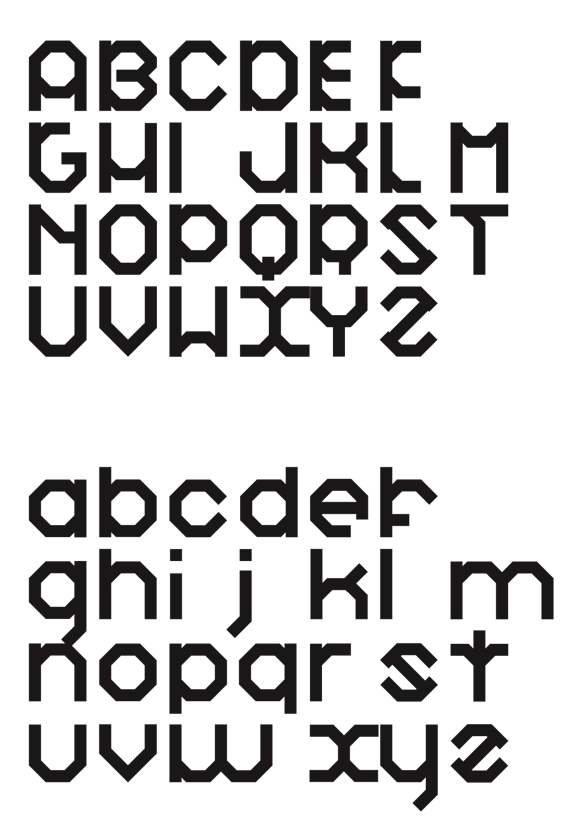
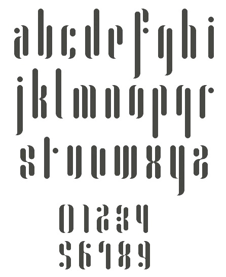
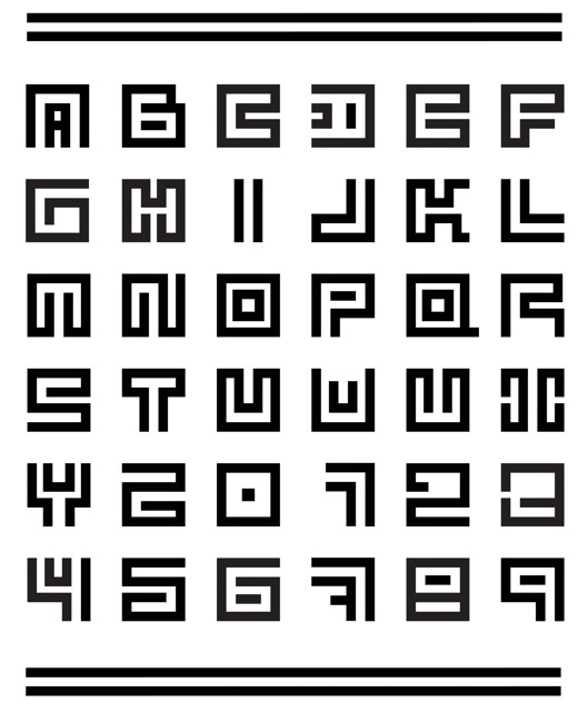
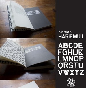
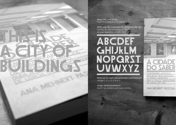
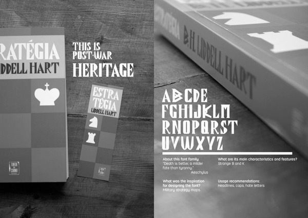
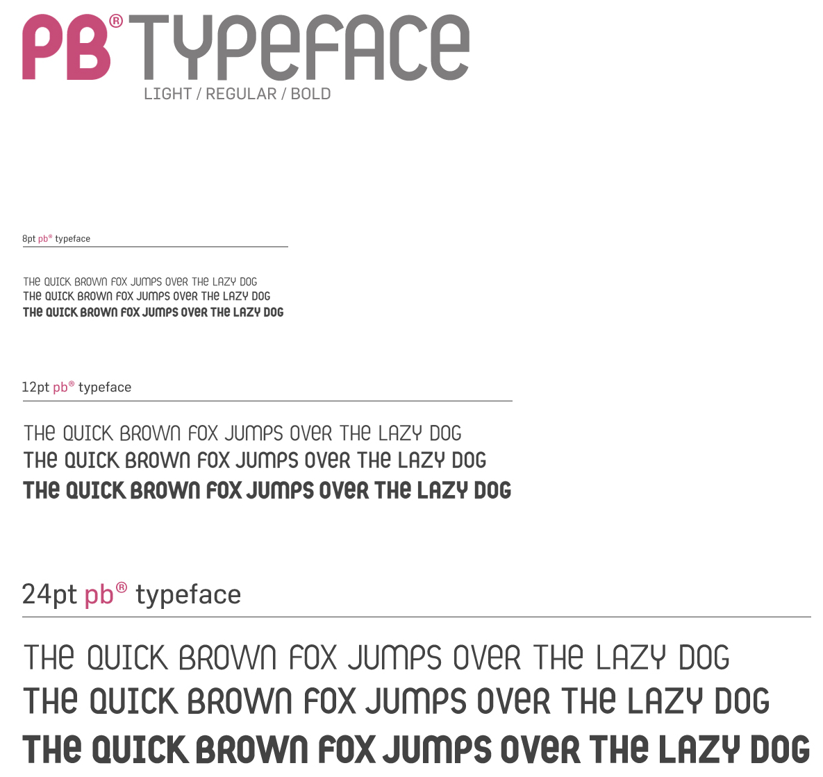
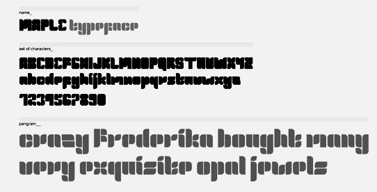
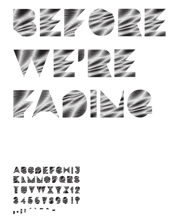
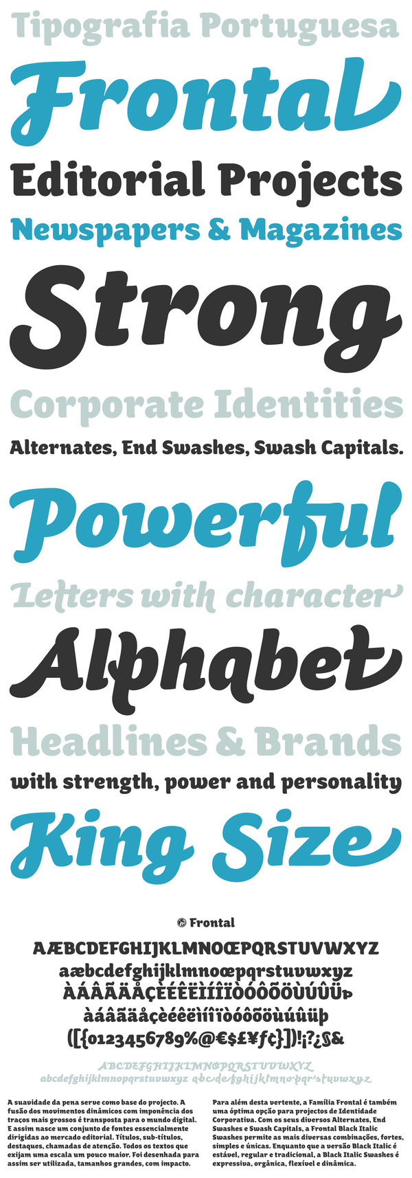
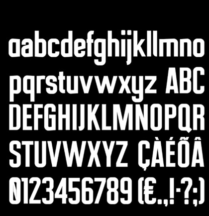
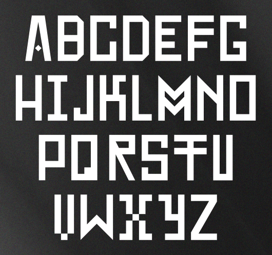
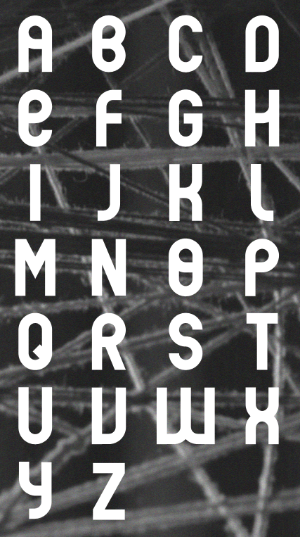
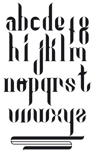
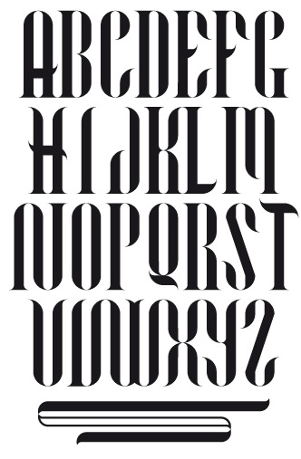
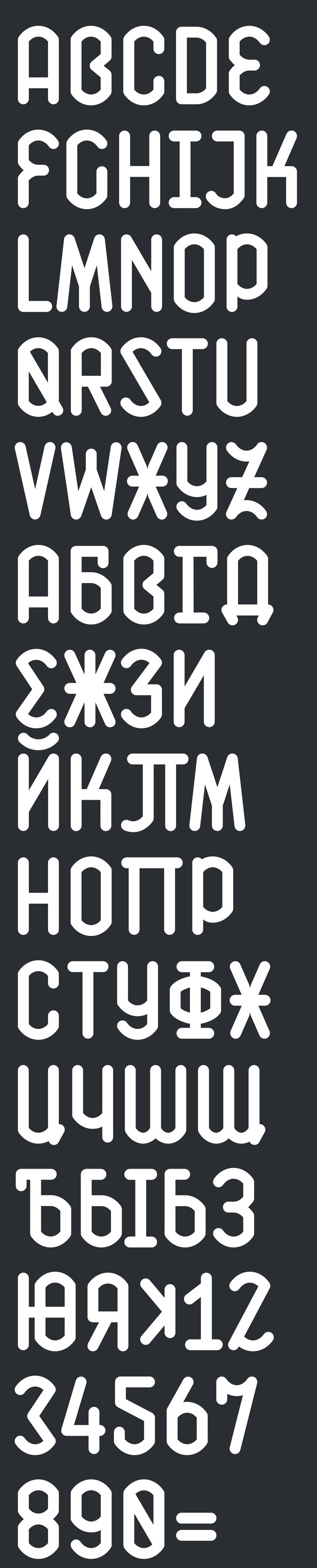
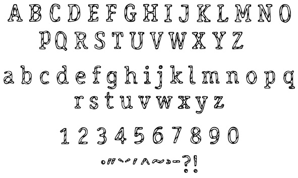
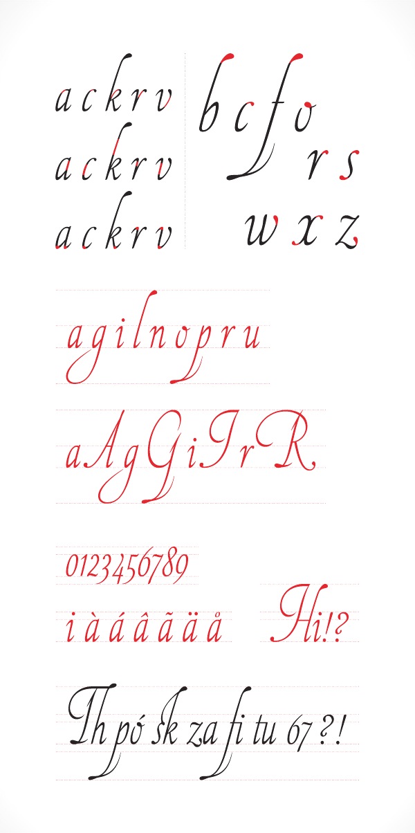
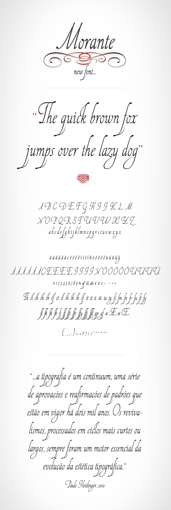
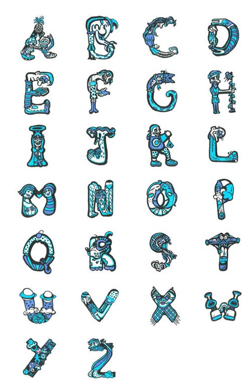
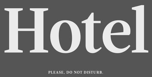
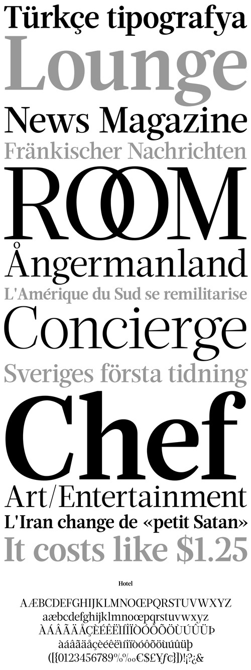
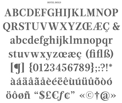
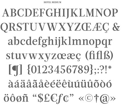
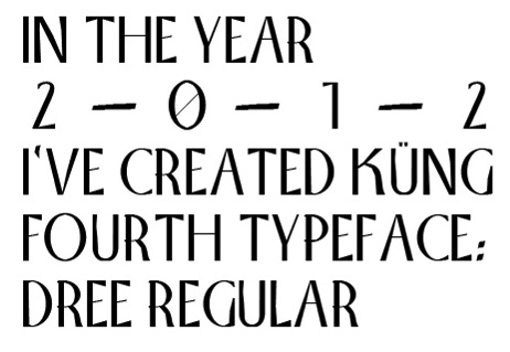
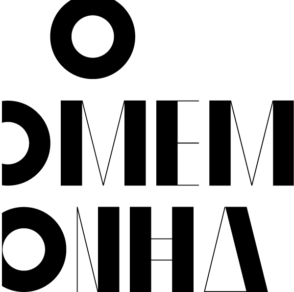
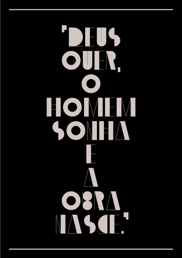
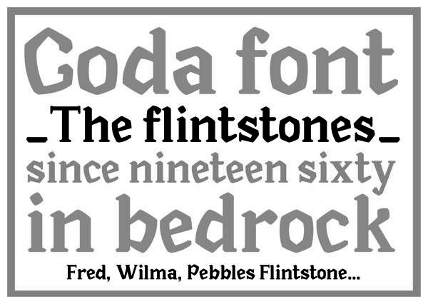
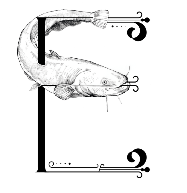
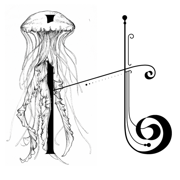
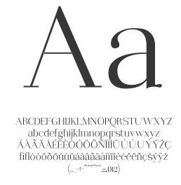
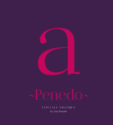
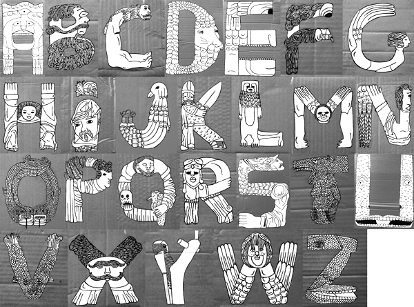
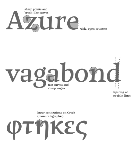
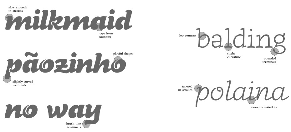
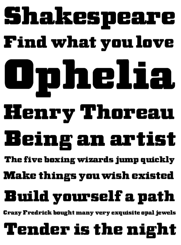
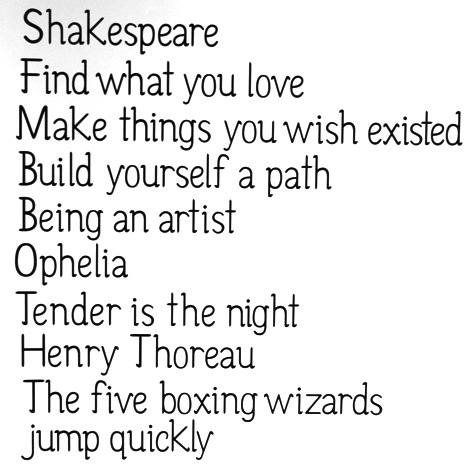
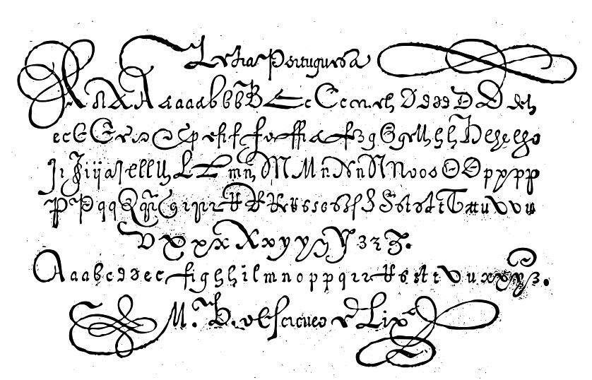
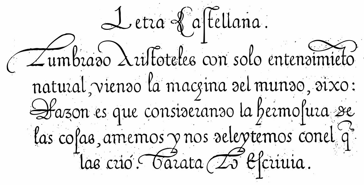
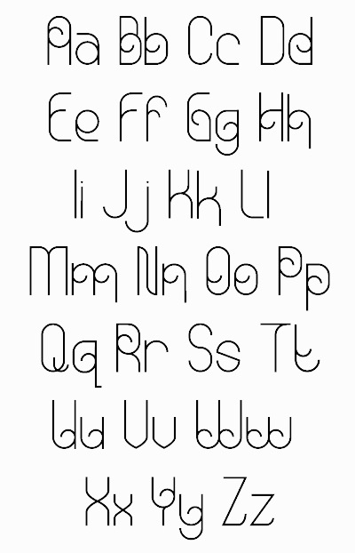
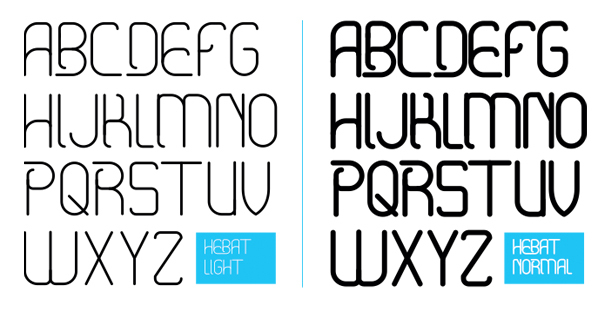
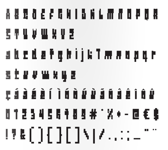
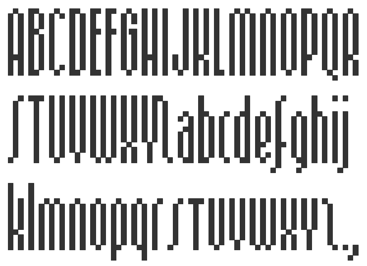
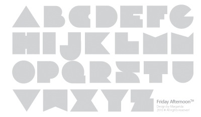
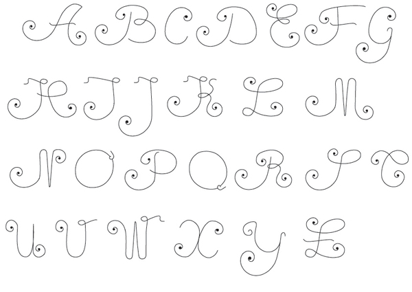
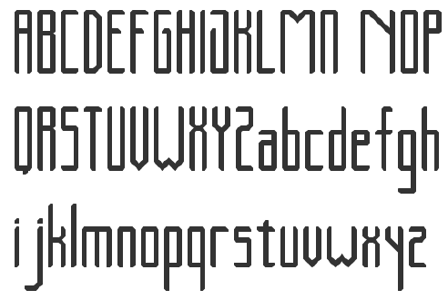
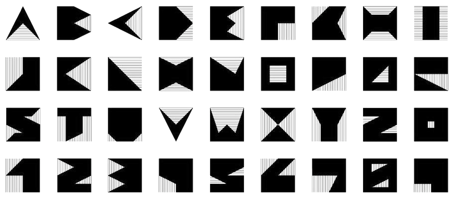
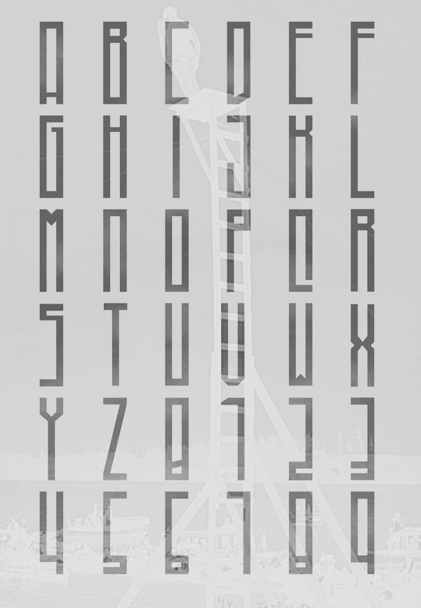
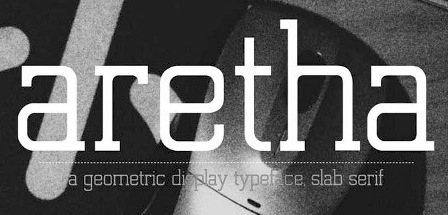
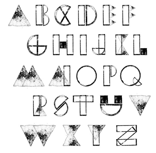
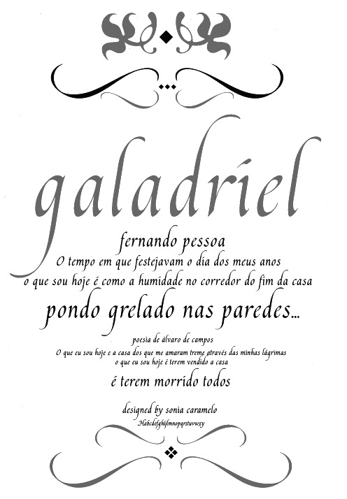
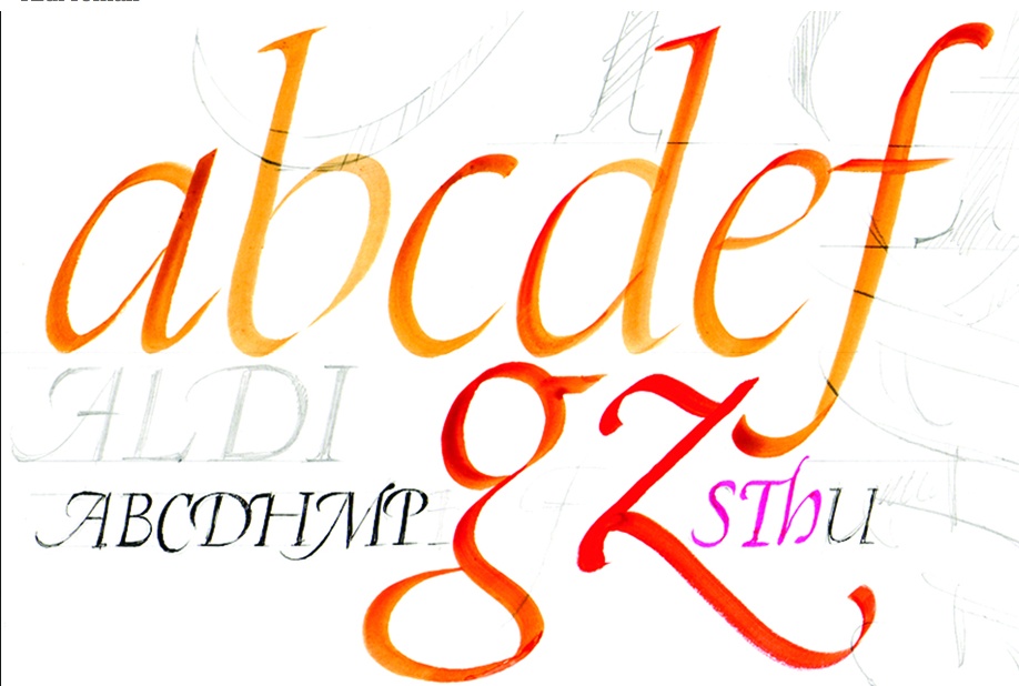
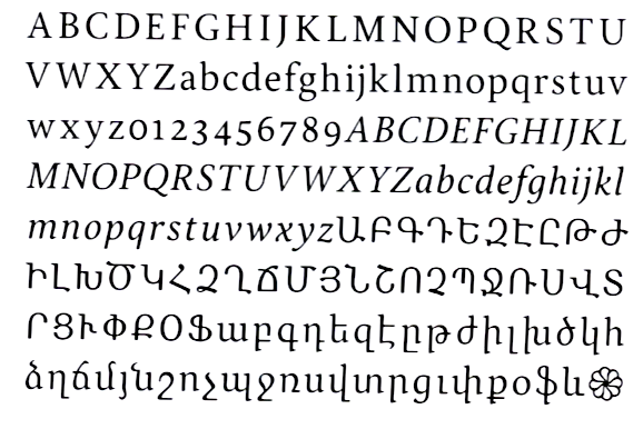
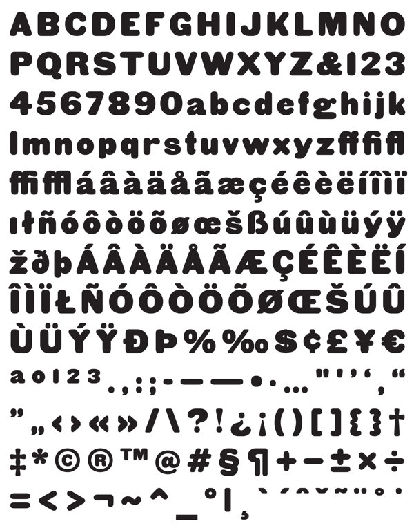
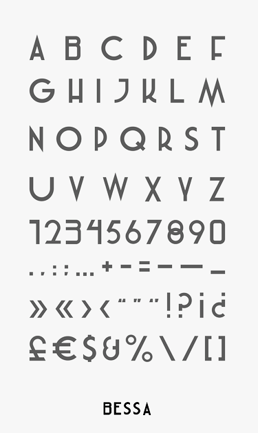
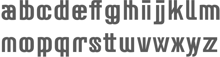
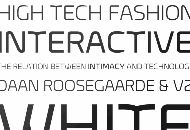
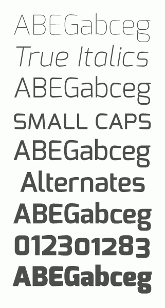
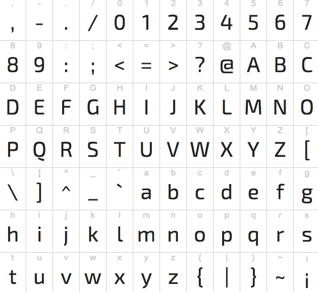
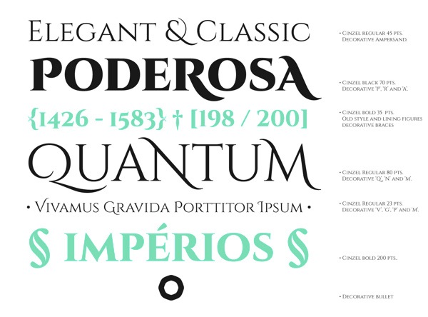
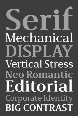
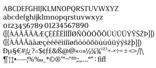
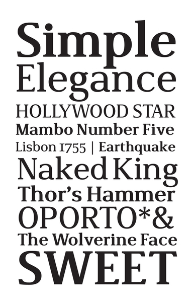
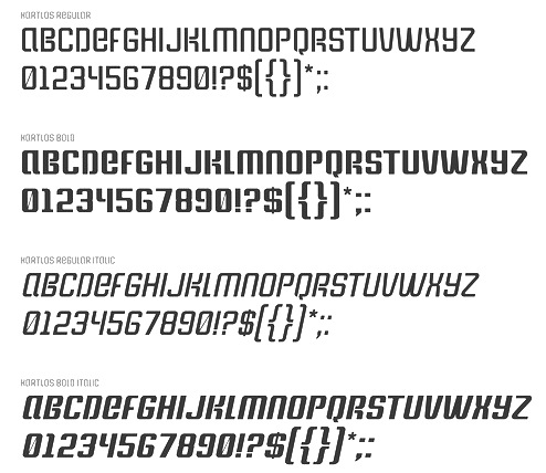
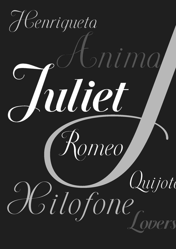
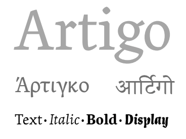
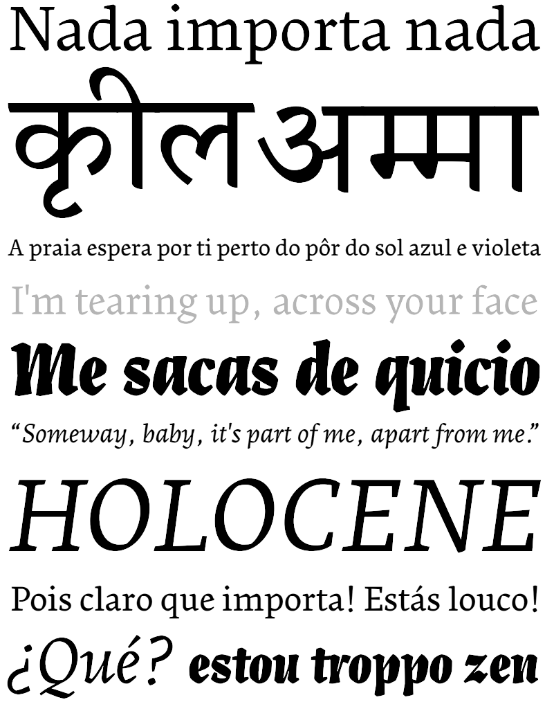
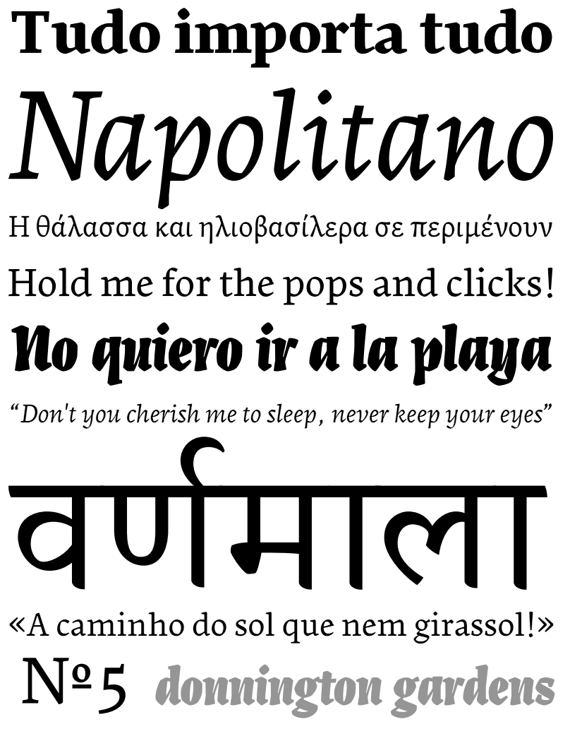
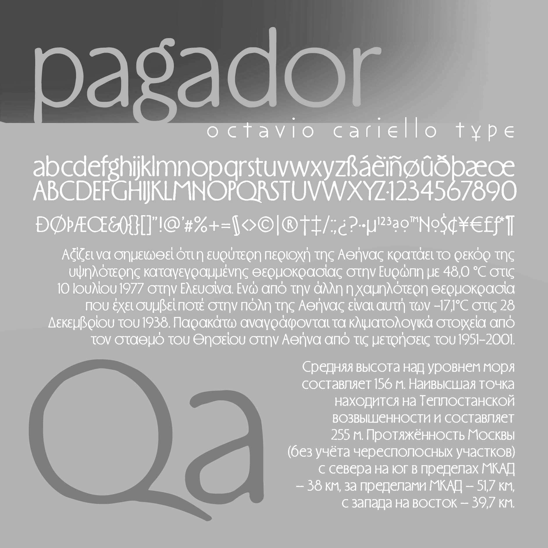
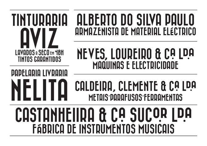
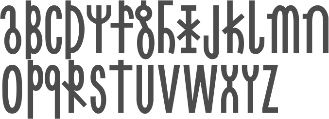
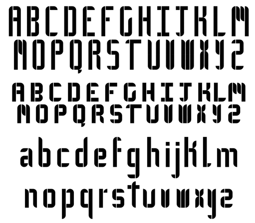
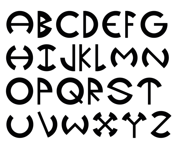
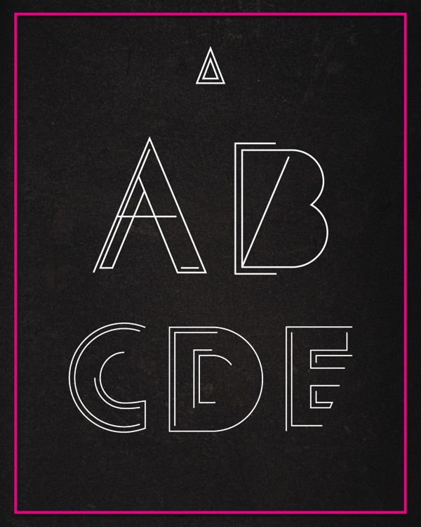
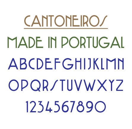
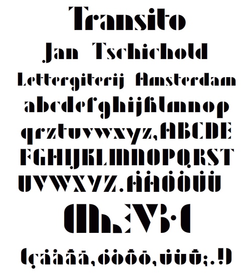
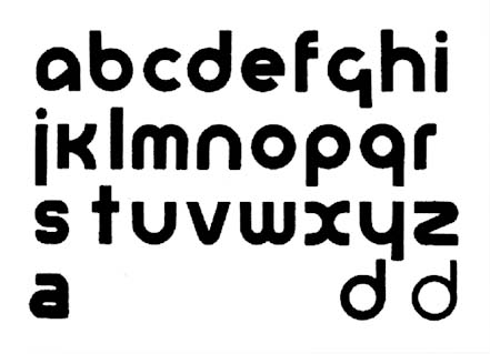
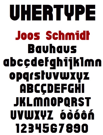
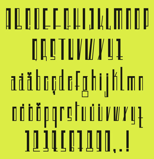
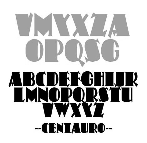
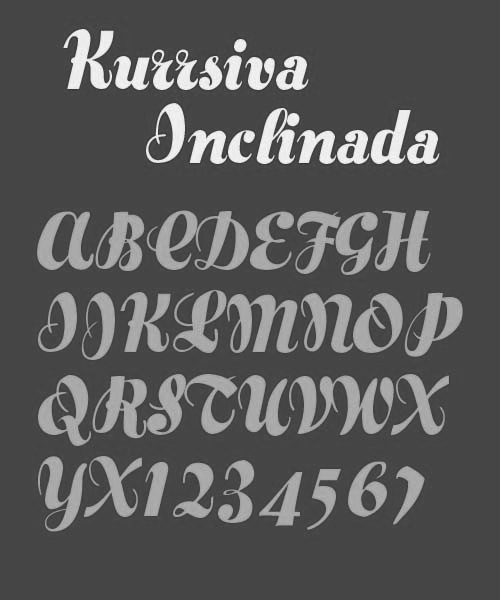
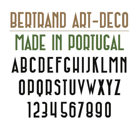
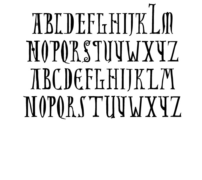
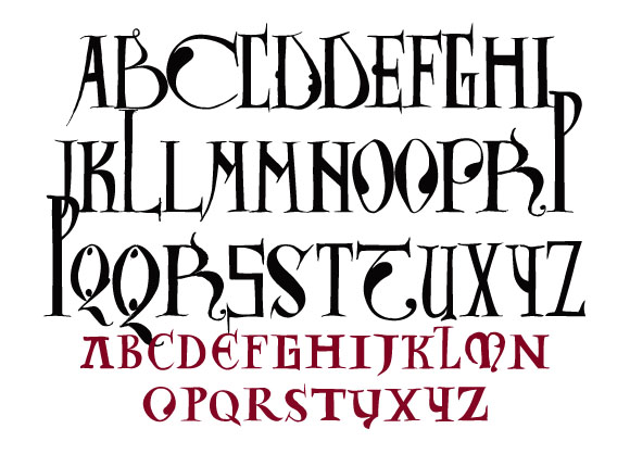
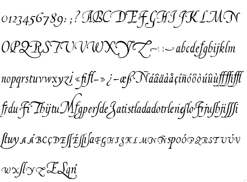
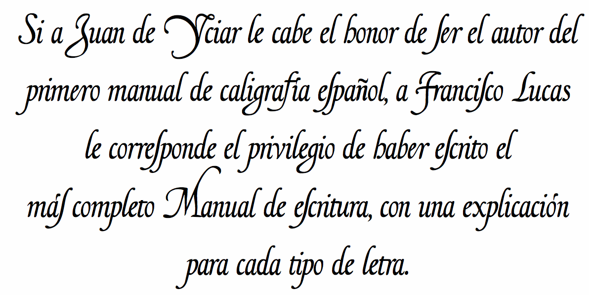
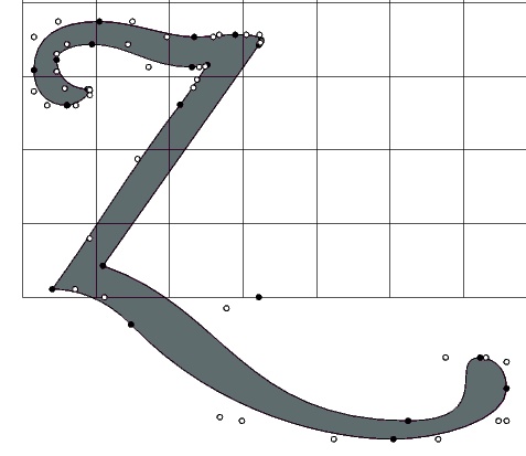
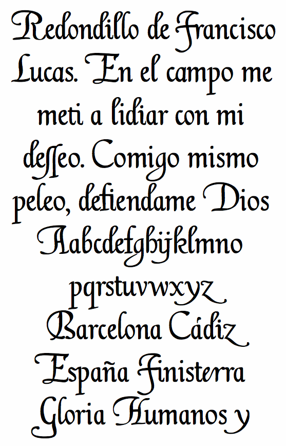
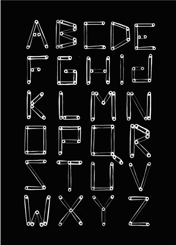
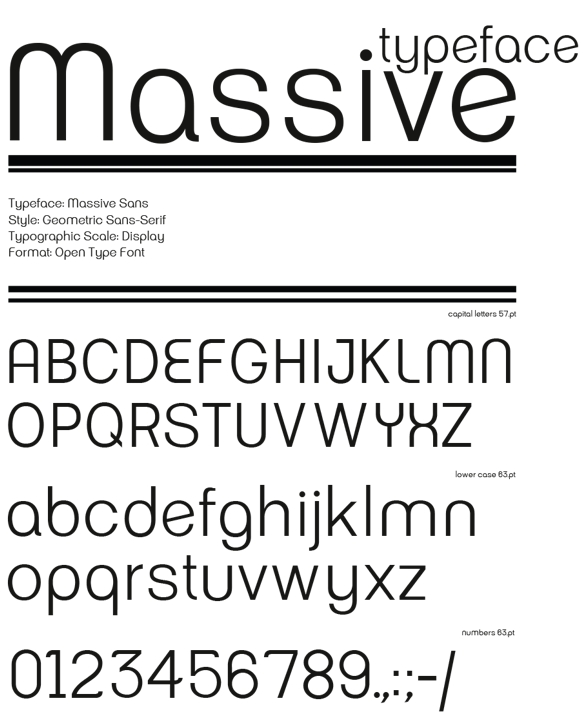
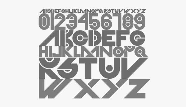
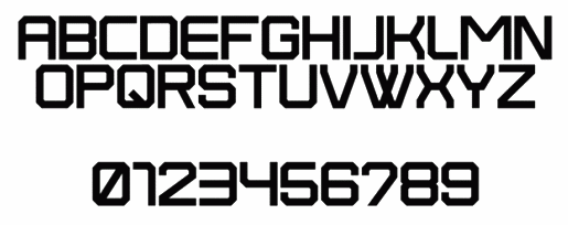
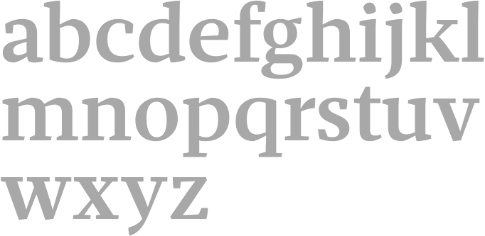
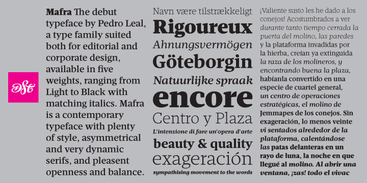
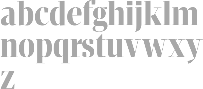
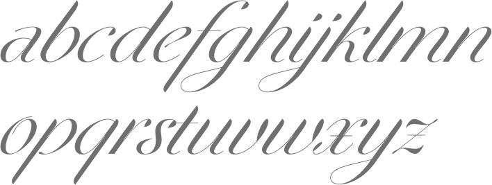
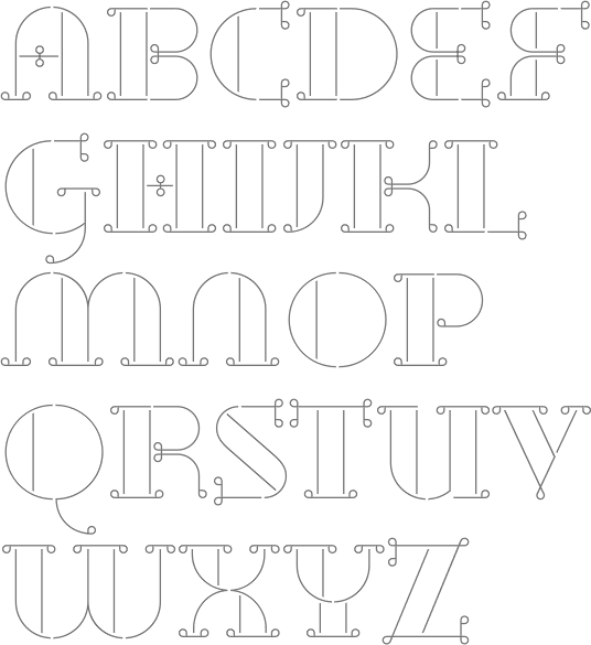
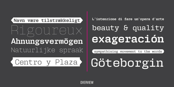
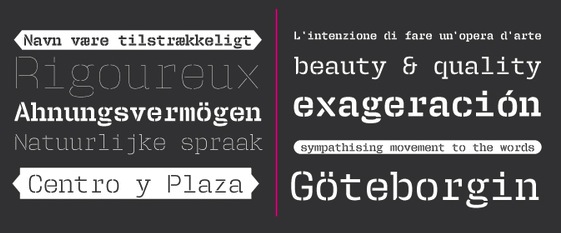
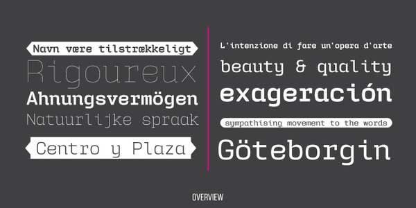
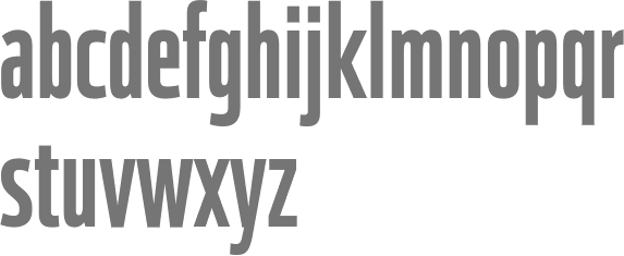
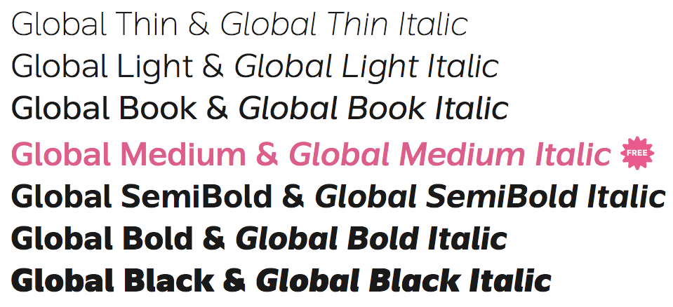
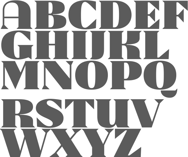
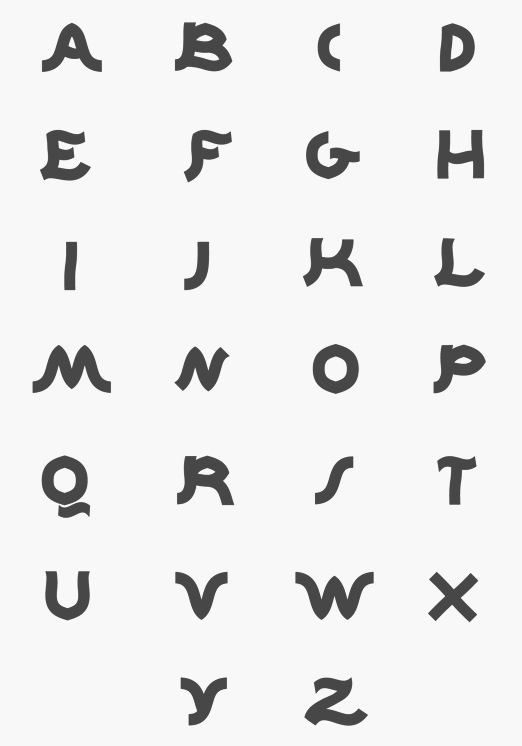
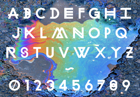
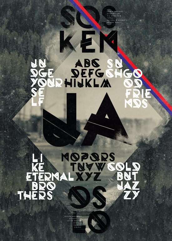
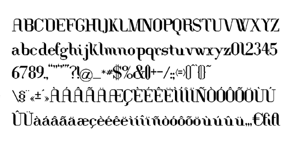
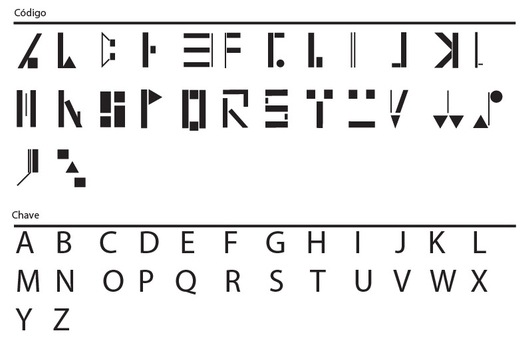
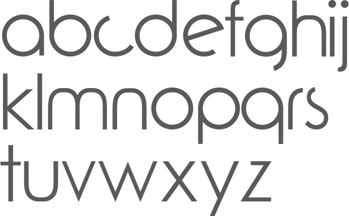
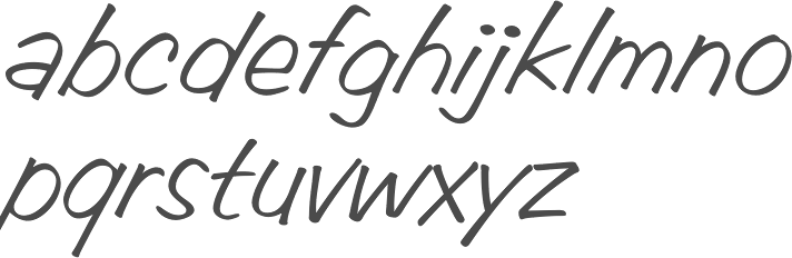
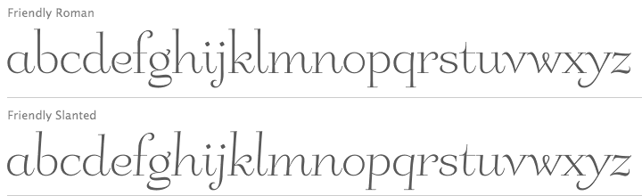
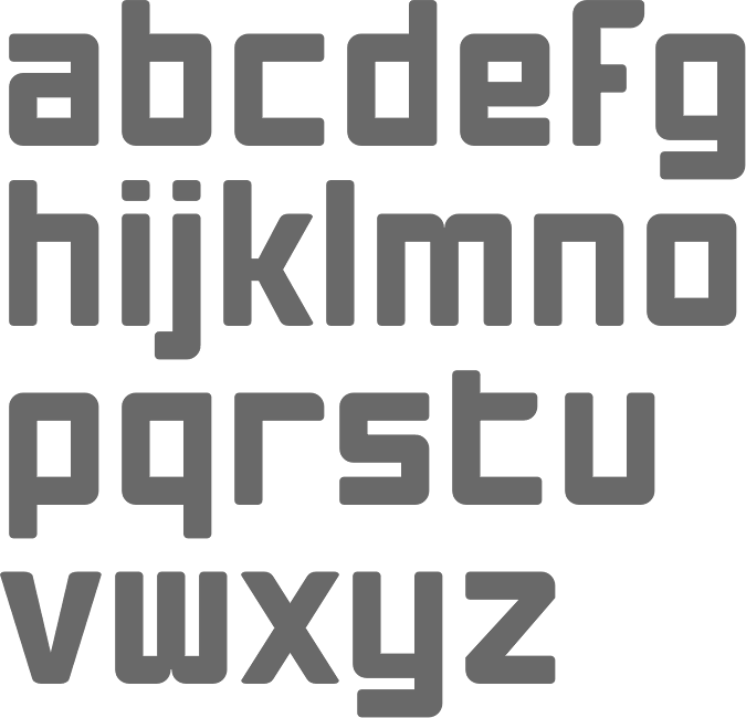
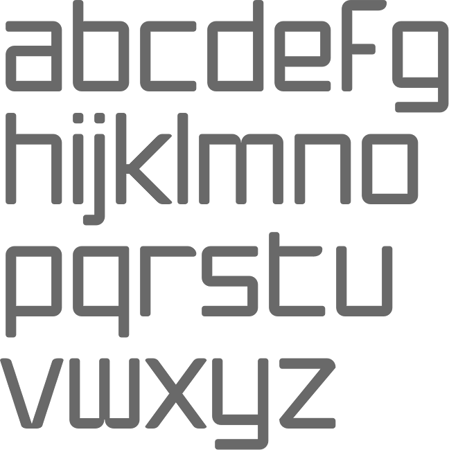
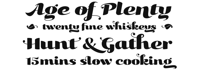
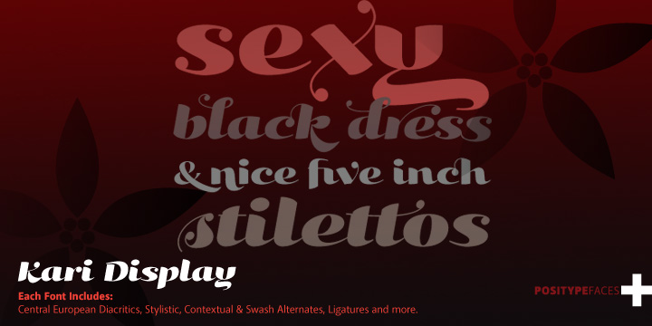
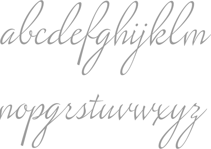
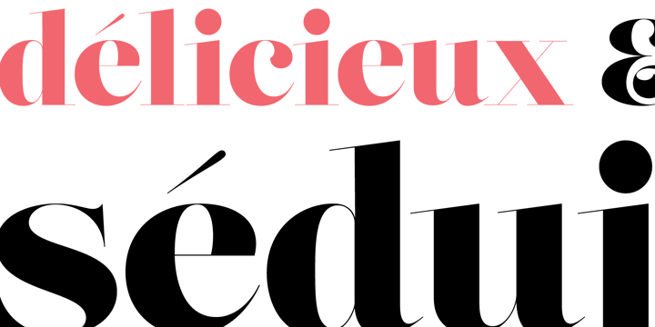
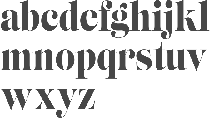
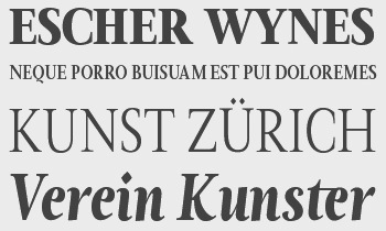
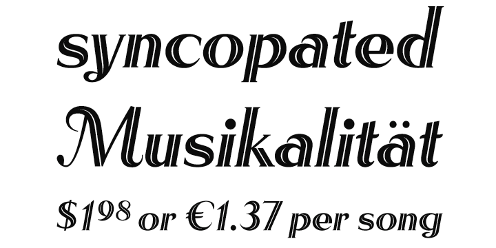
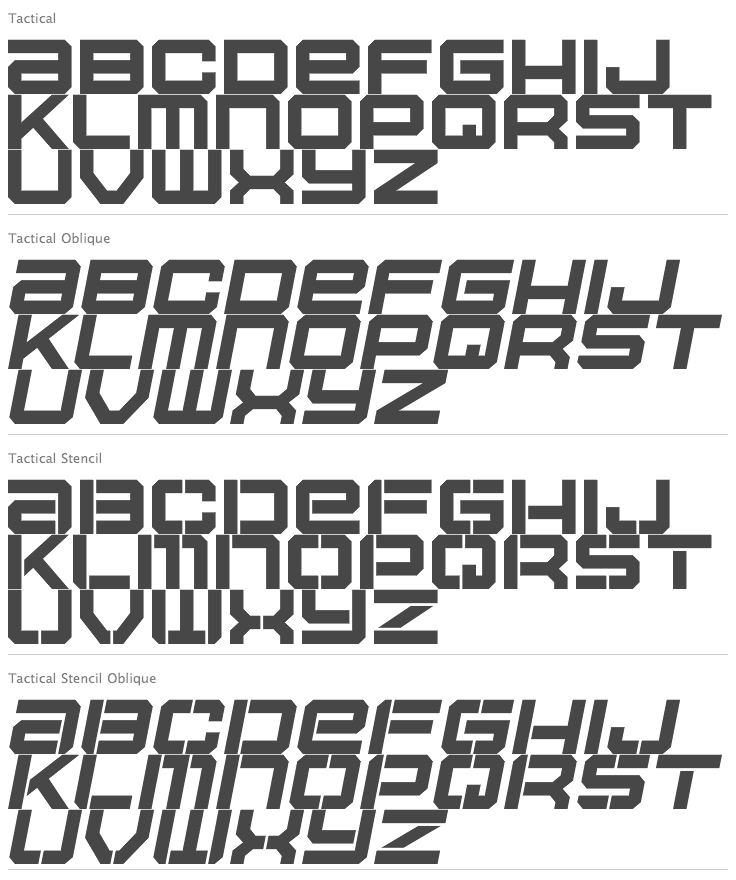
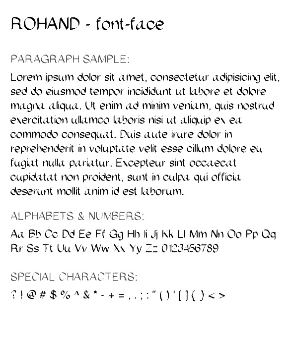
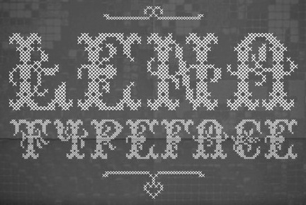
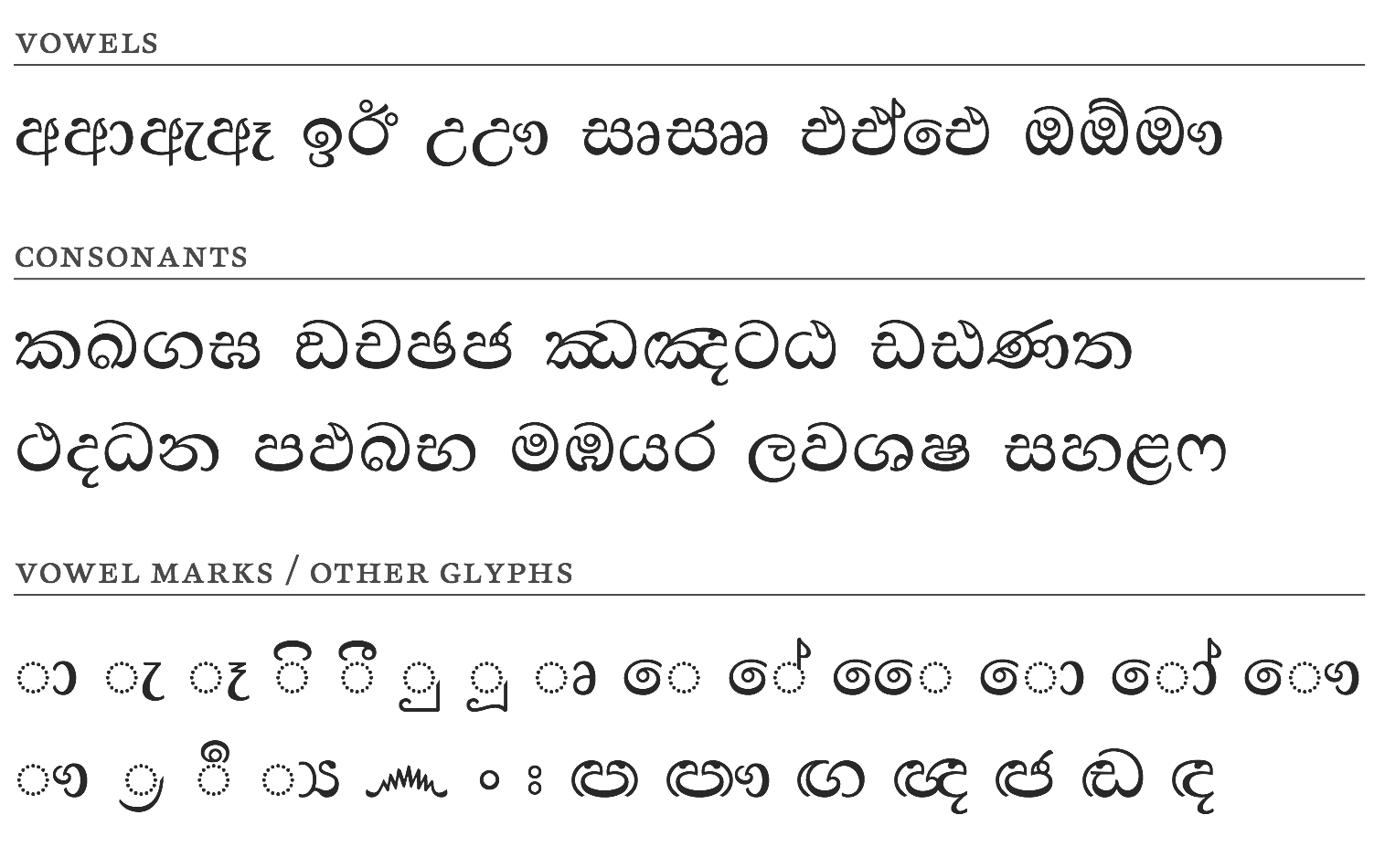
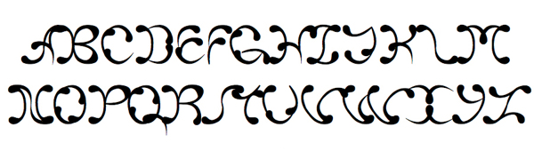
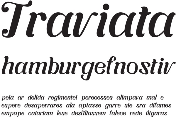
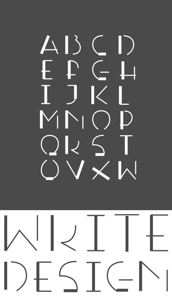
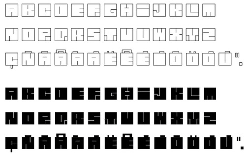
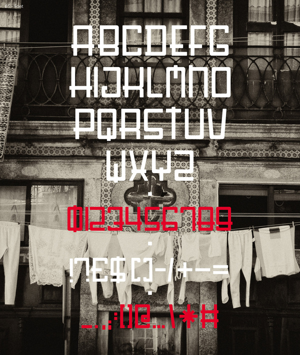
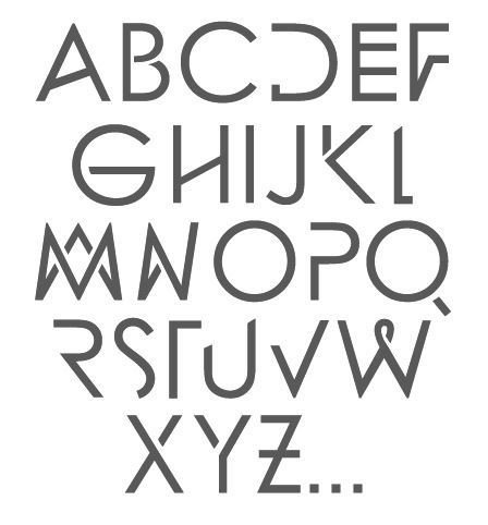
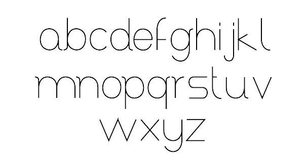
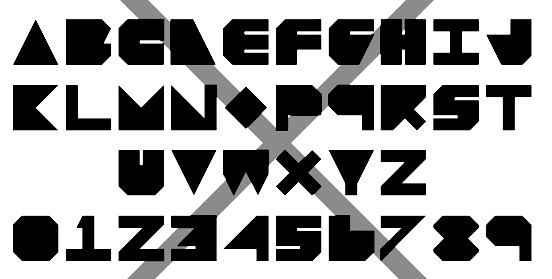
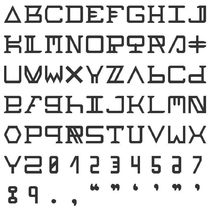
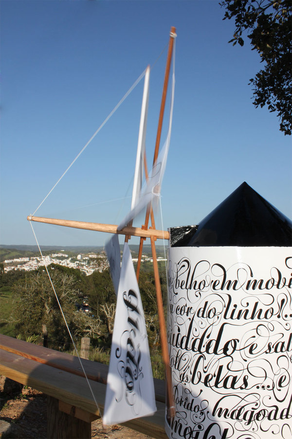
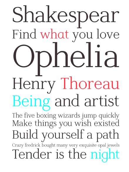
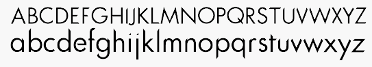
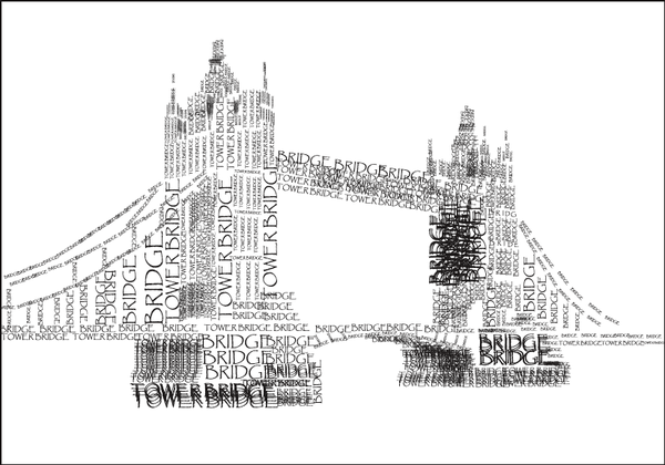
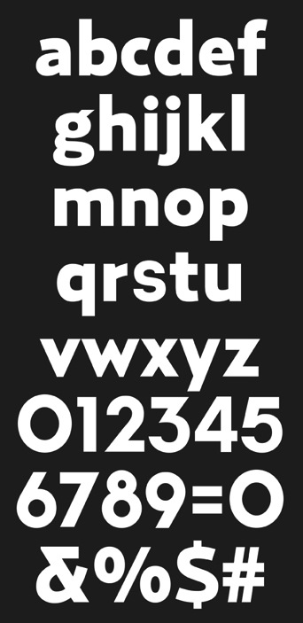
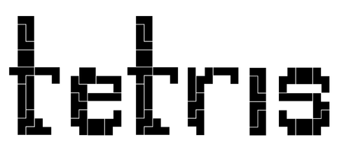
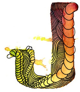
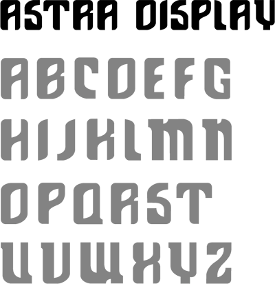
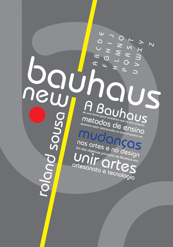
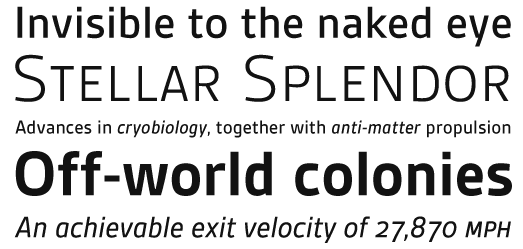
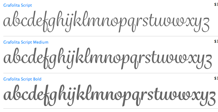
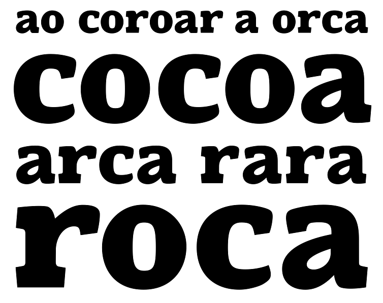
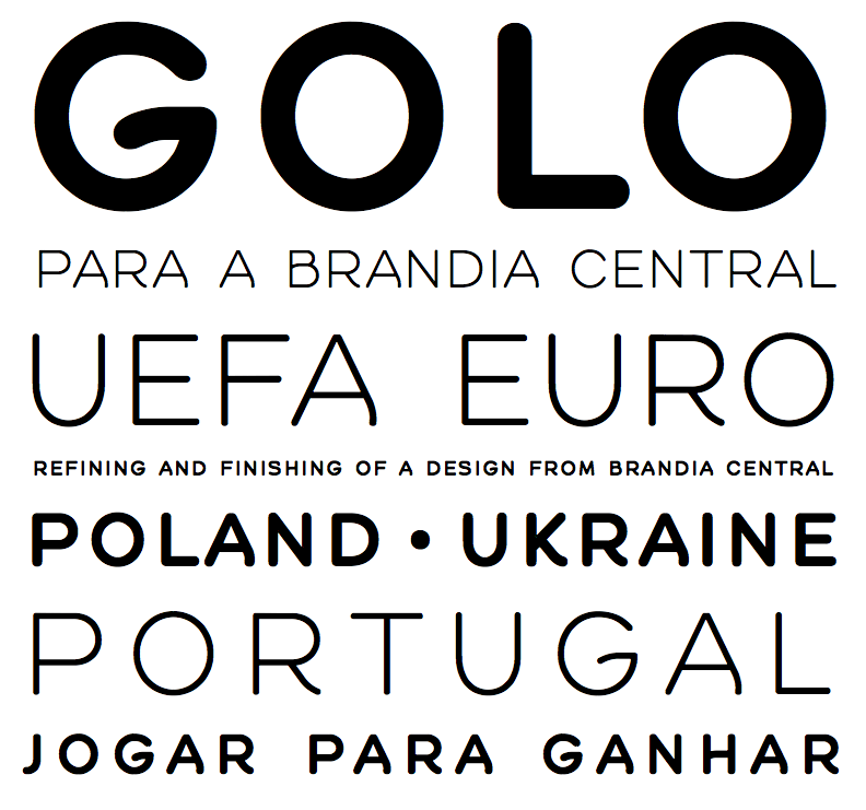
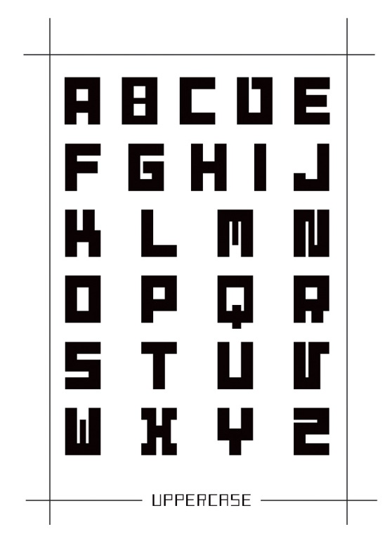
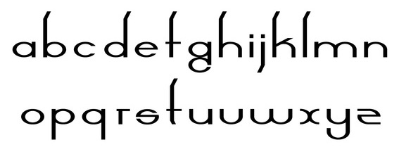
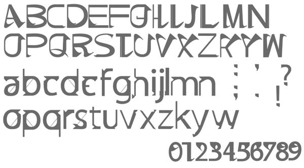
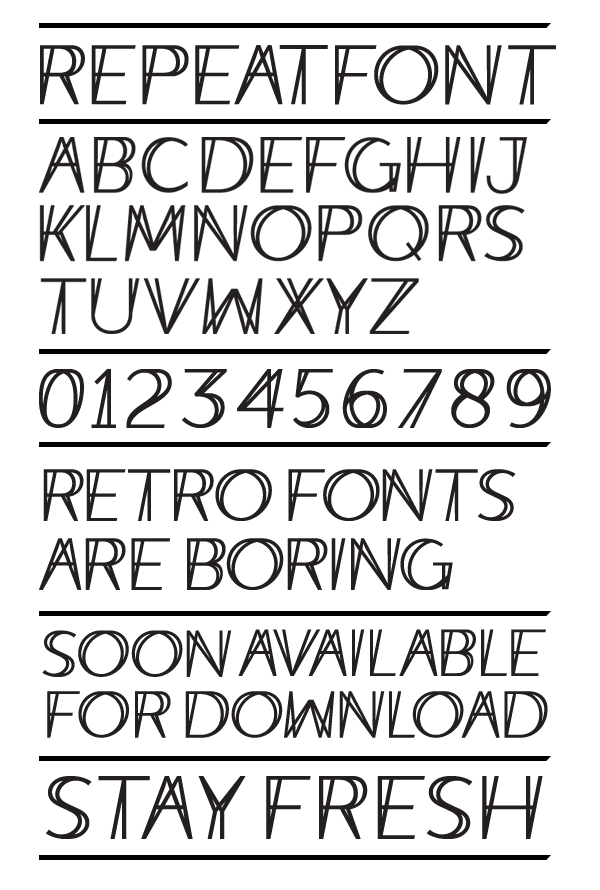
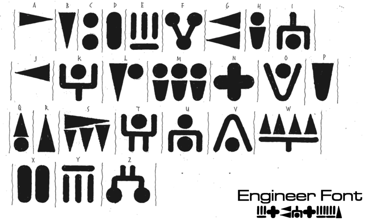
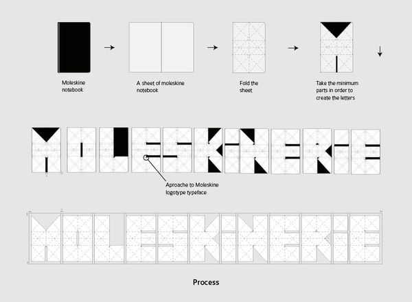
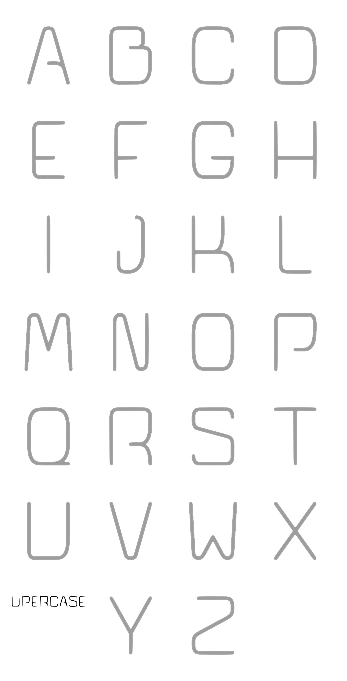
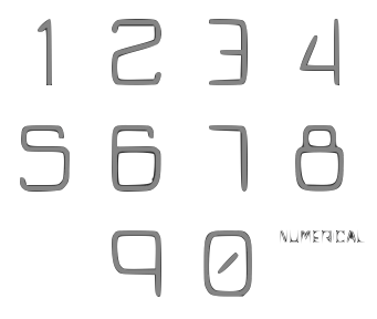
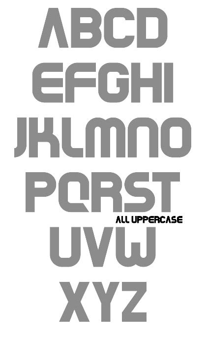
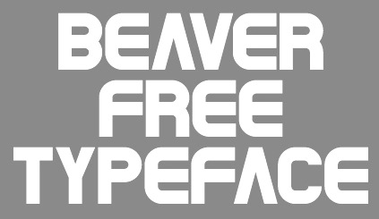
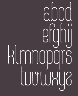
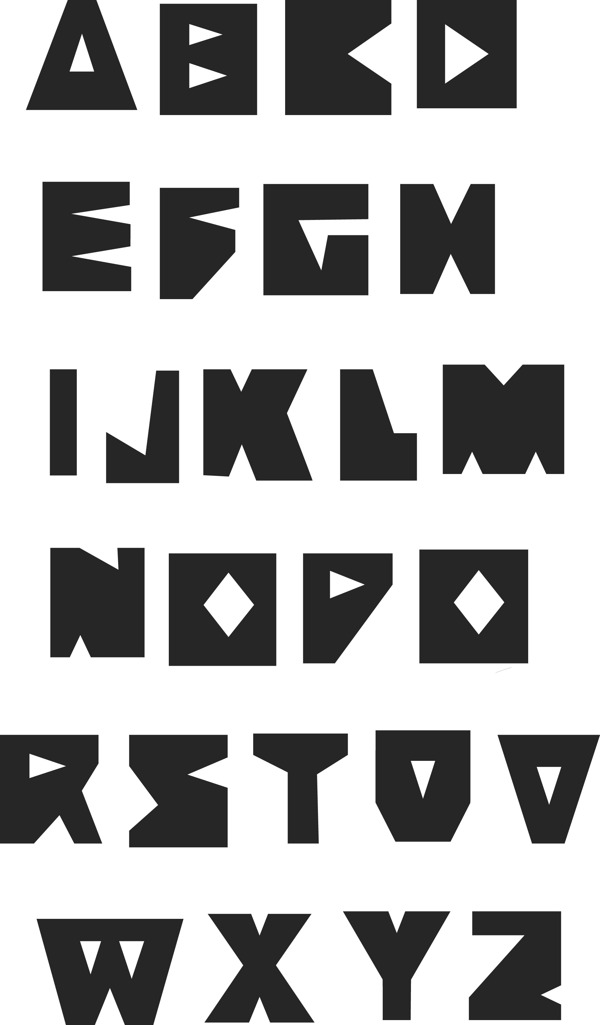
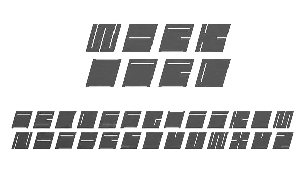
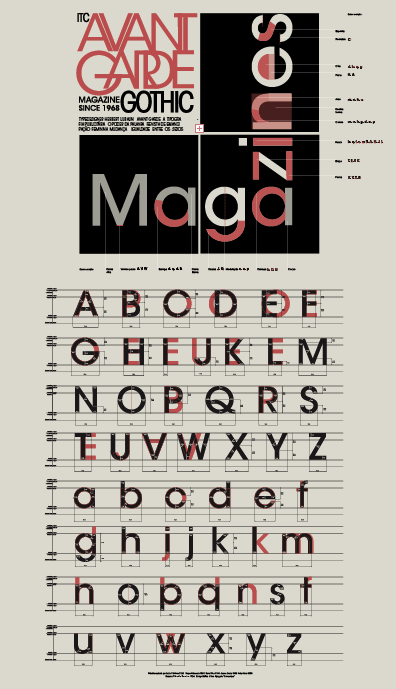
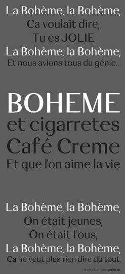
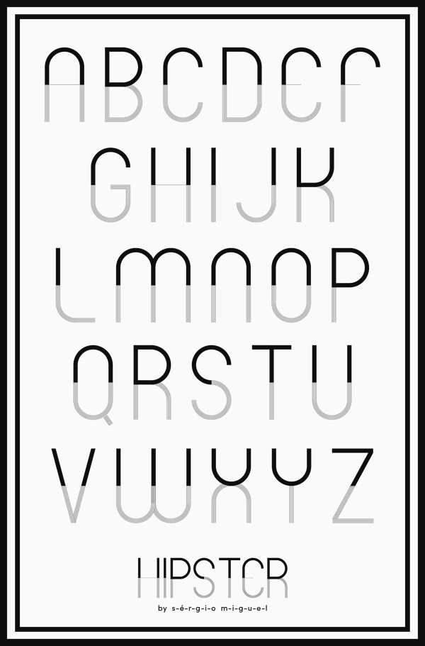
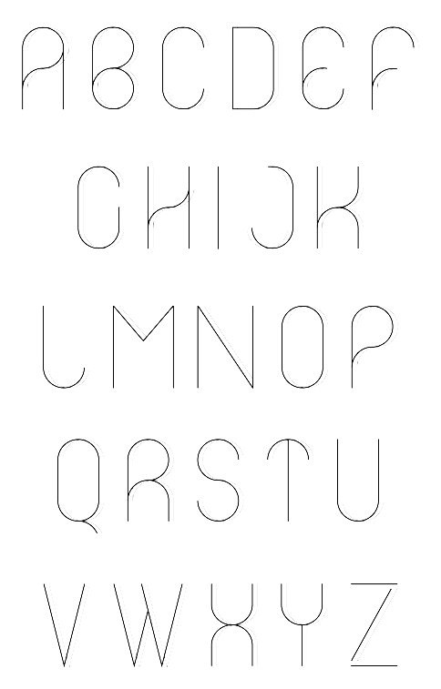
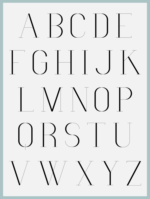
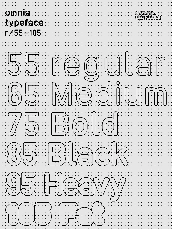
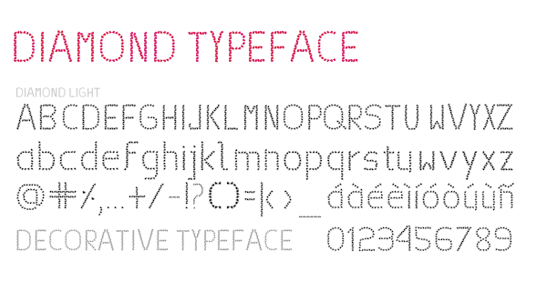
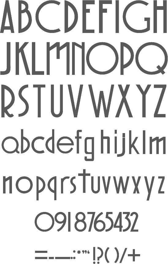
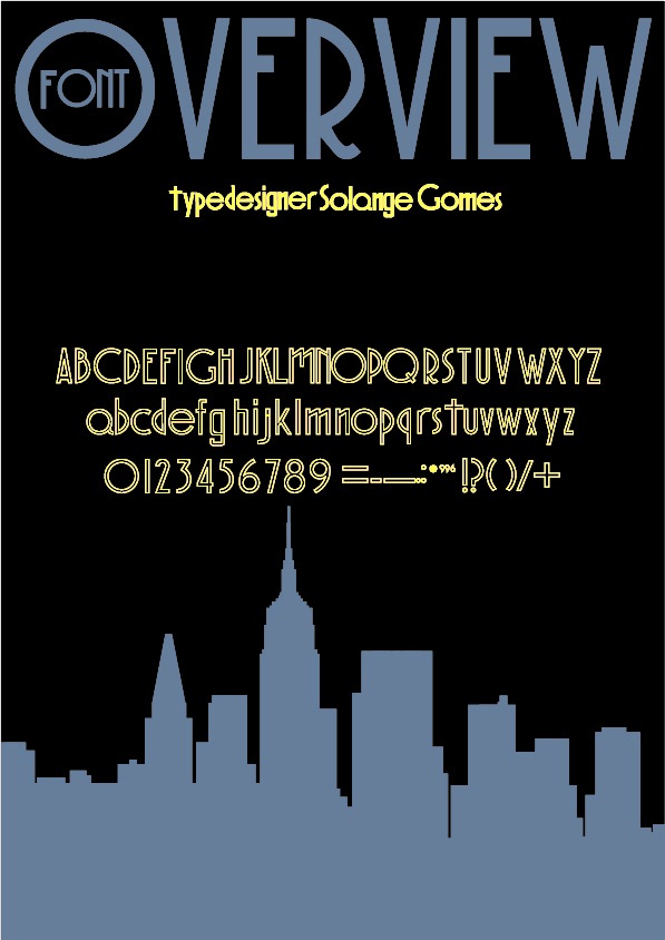
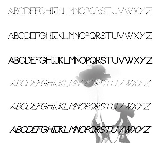
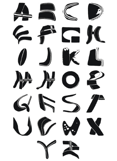
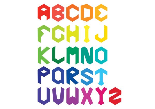
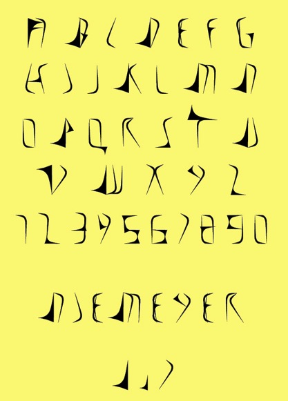
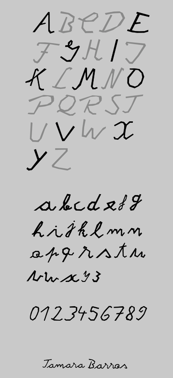
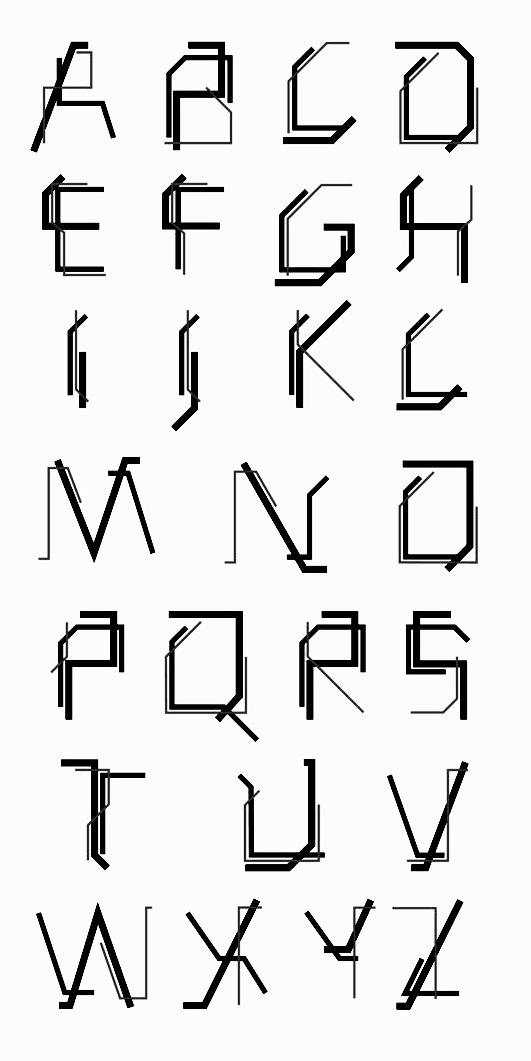
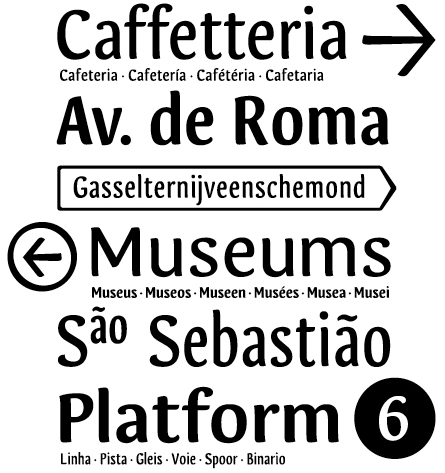
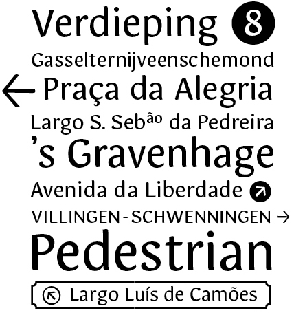
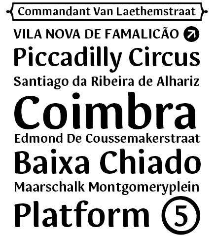
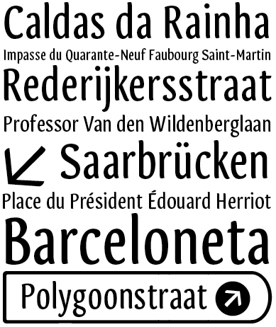
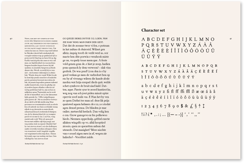
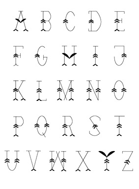
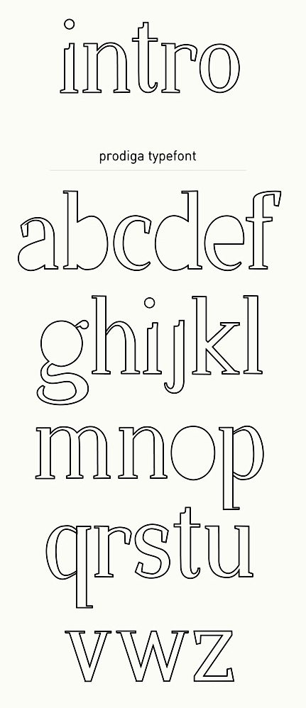
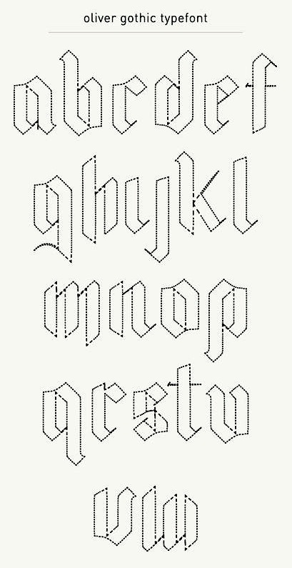
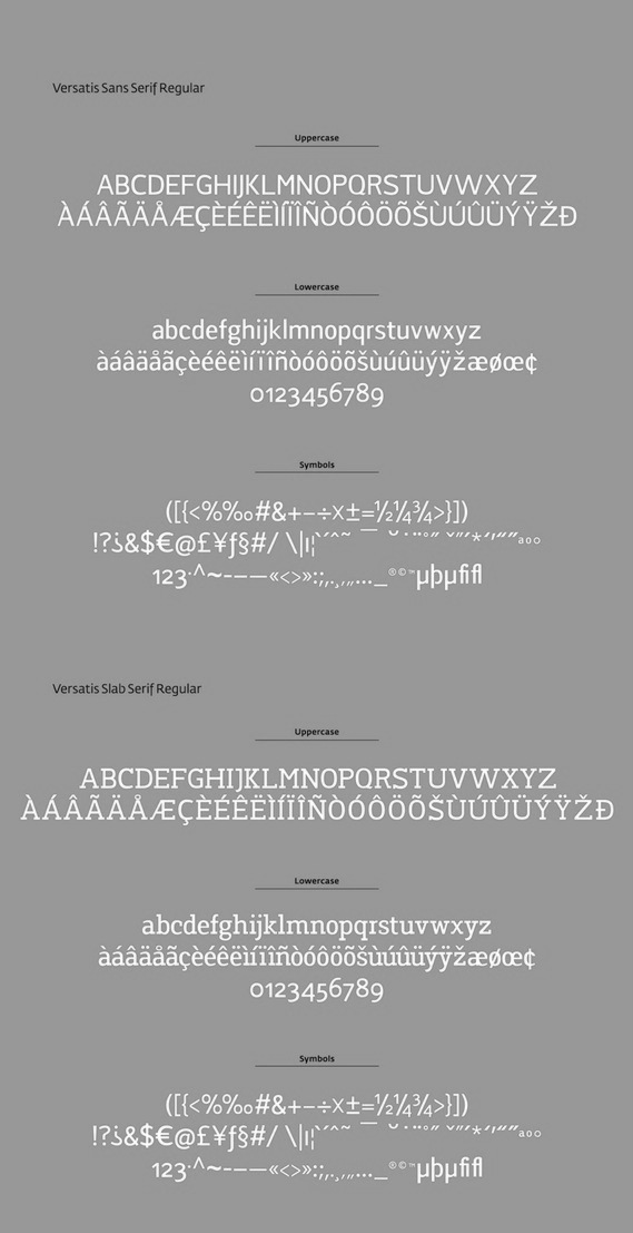
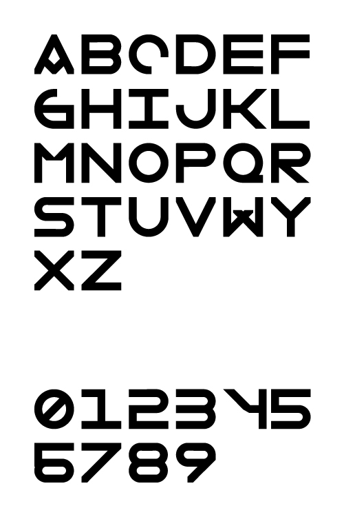
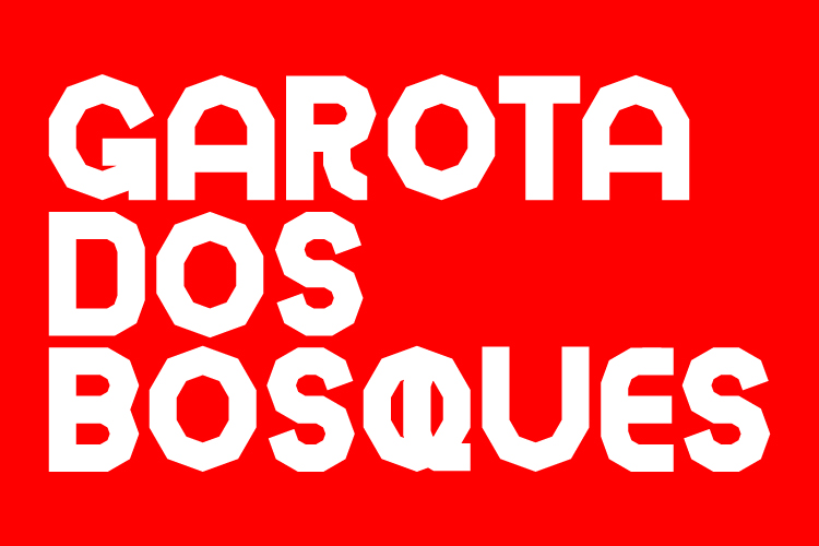
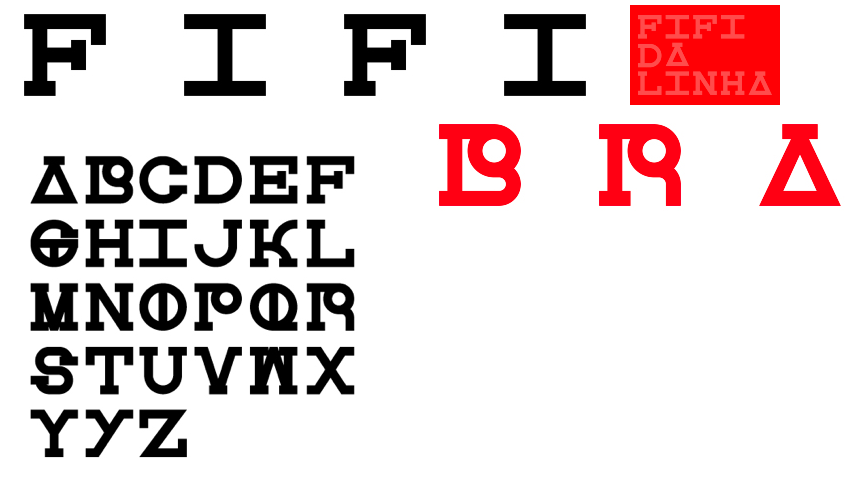
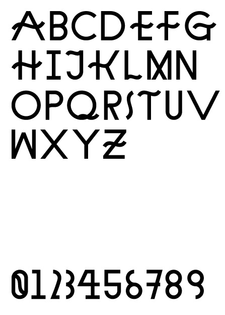
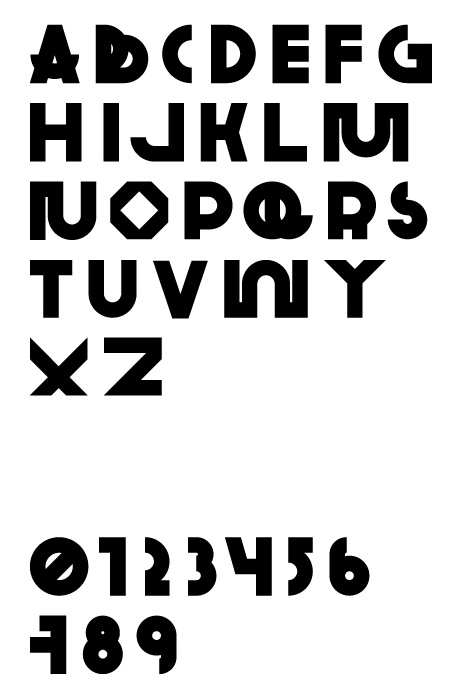
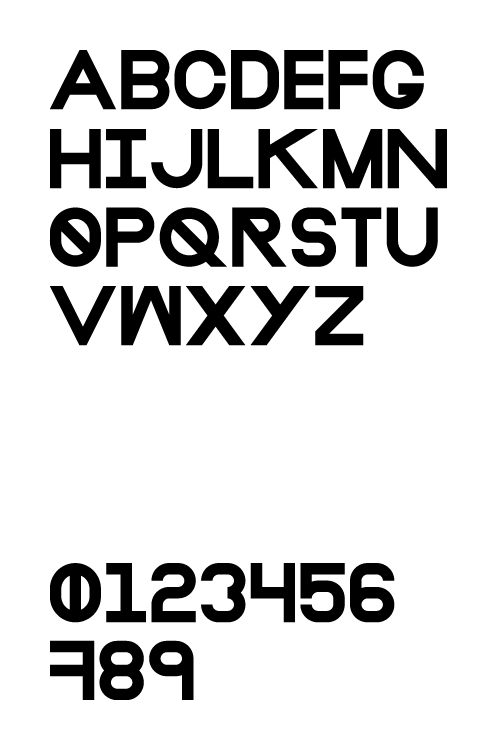
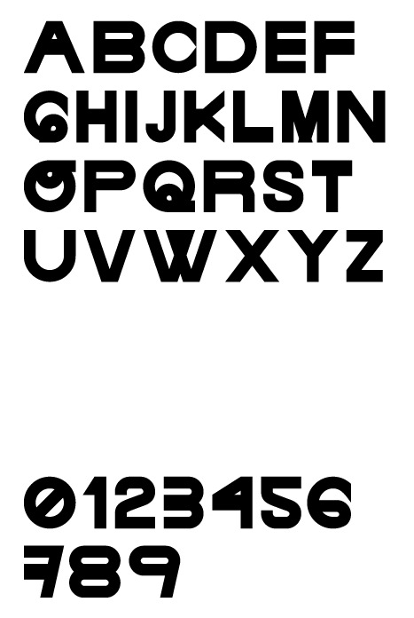
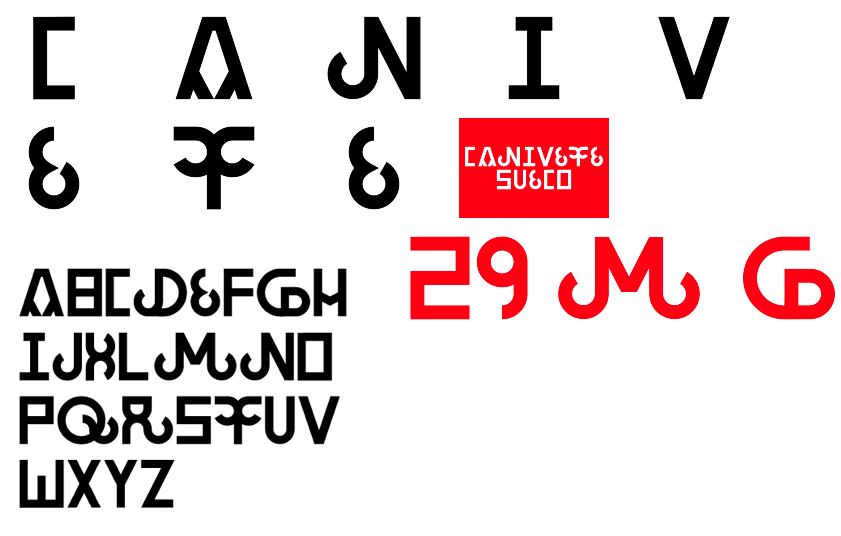
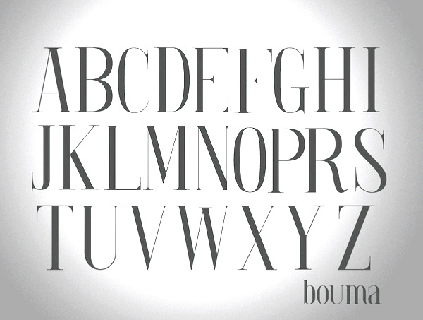
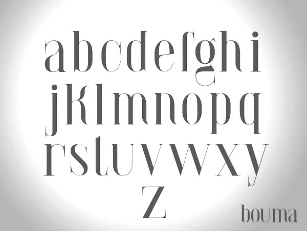
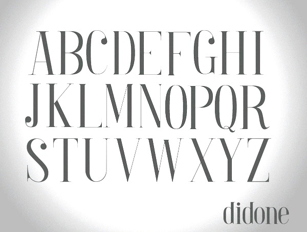
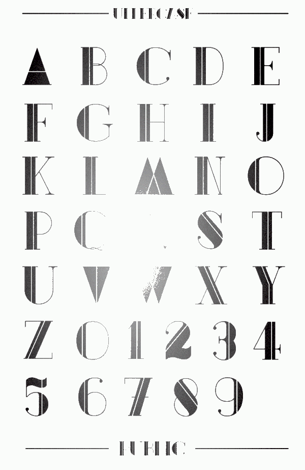
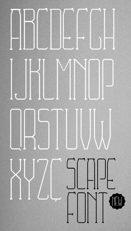
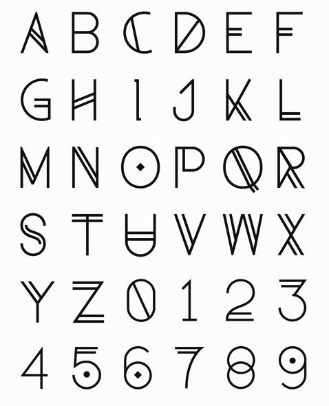
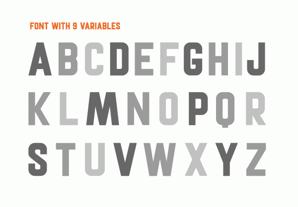
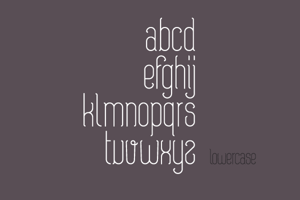
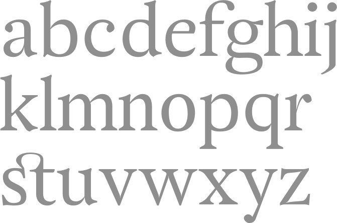
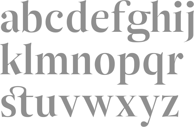
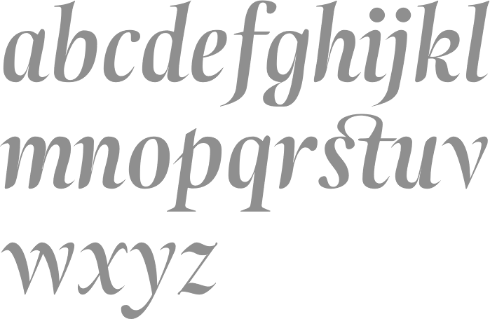
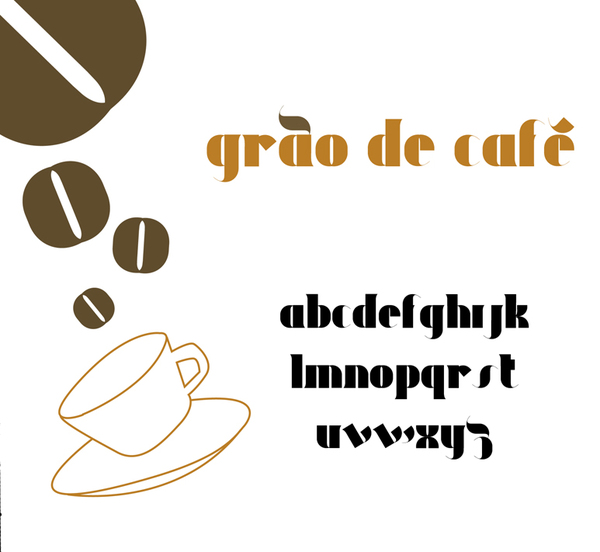
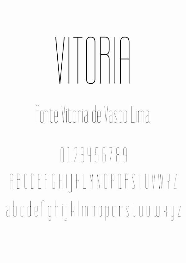
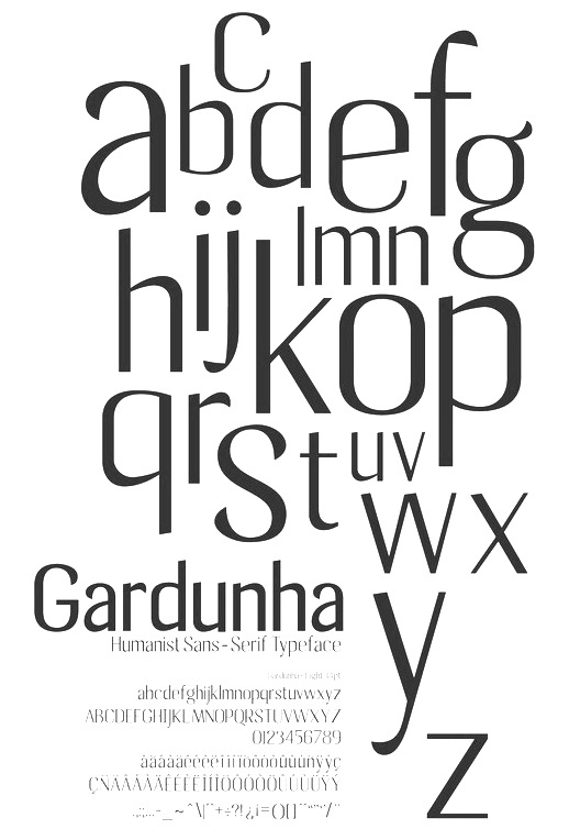
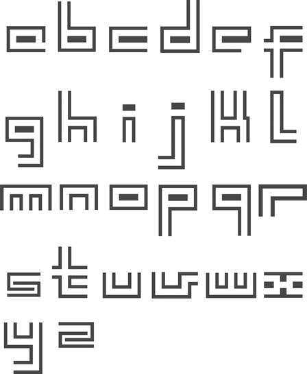
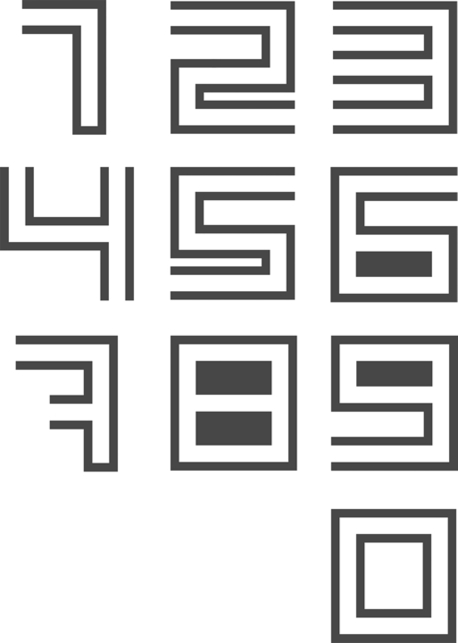
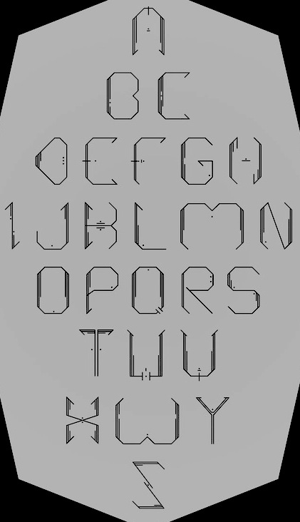
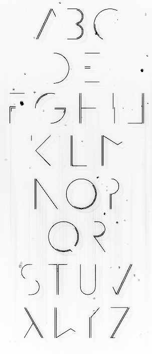
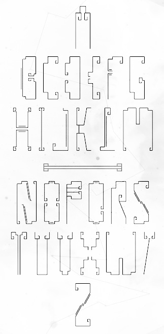
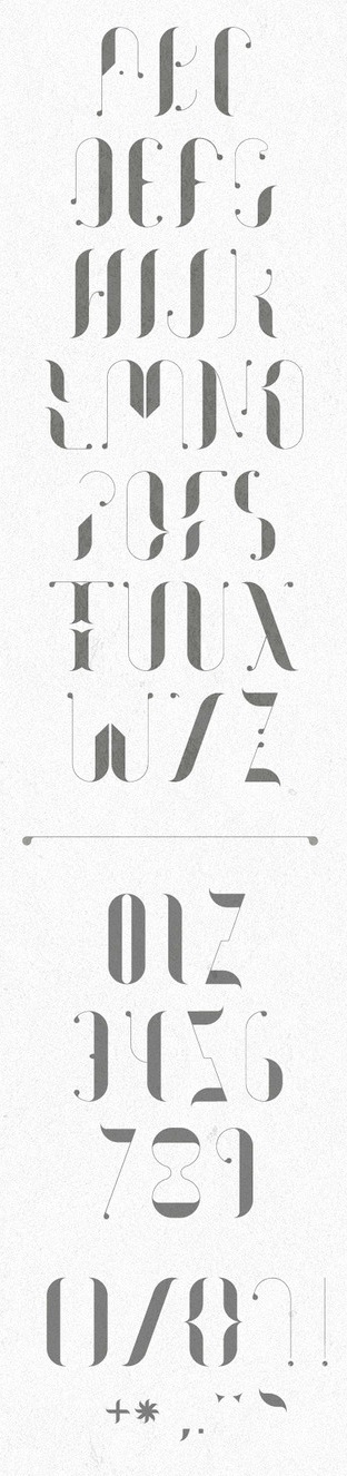
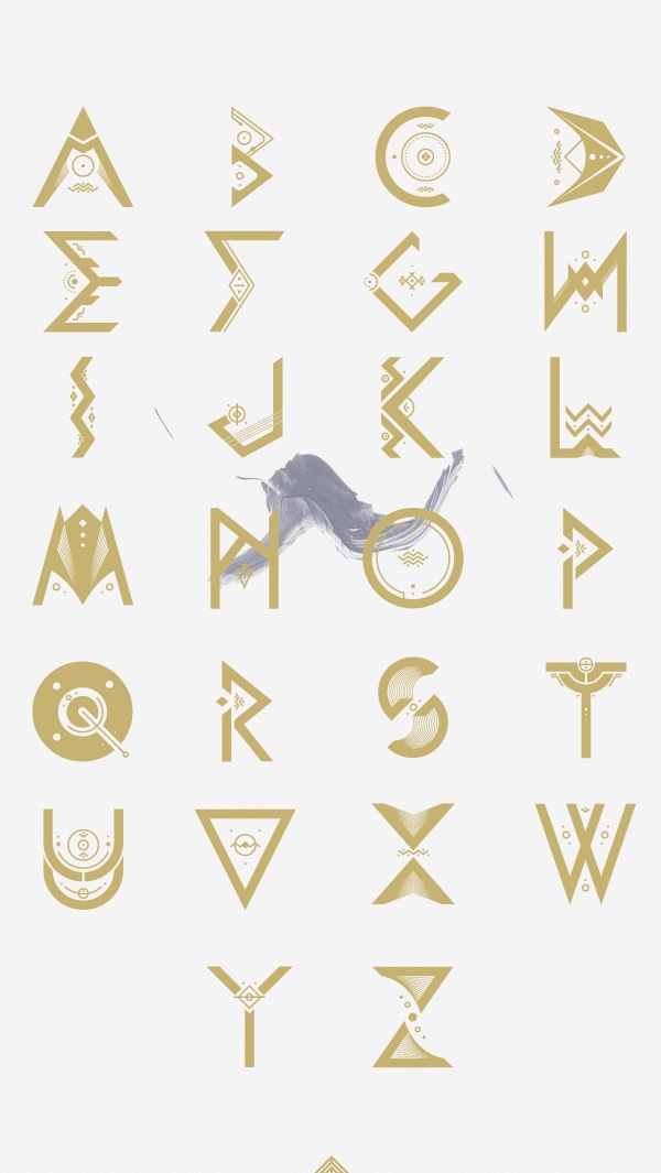
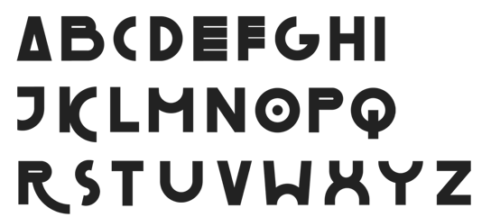
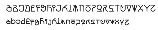
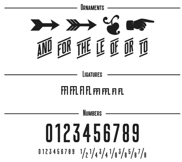
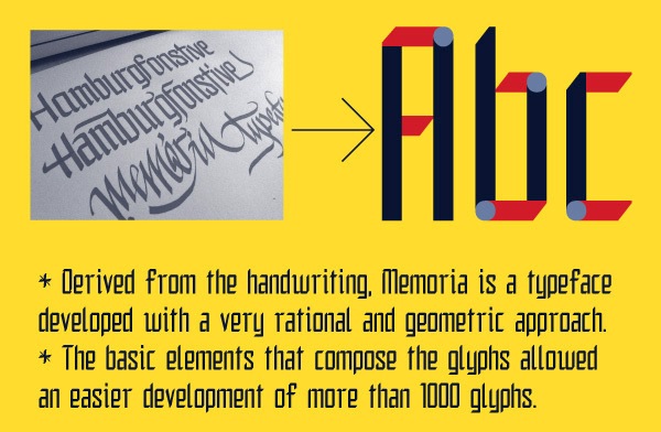
|
|
|
|