TYPE DESIGN INFORMATION PAGE last updated on Wed May 6 15:52:16 EDT 2026
FONT RECOGNITION VIA FONT MOOSE

|
|
|
|
|
Type for TV | ||
|
|
|
|

SWITCH TO INDEX FILE
A critique of existing typefaces for HDTV (EIA-708) captioning
| Joe Clark (Toronto) takes all the fonts proposed by Agfa/Monotype, Ascender and Bitstream for HDTV screen captioning apart. [Google] [More] ⦿ |
Agfa's suggestion for closed captioning fonts for TV is their Closed Captioning Font Set, which is based on Agfa Screen serif, Agfa Screen serif Monospaced, Agfa Screen Sans and Agfa Screen Sans Monospaced, and is supplemented with Plate Gothic, Ashley Script and Floridian. Character effects include drop shadow, emboss, engrave, outline, depressed, and uniform. [Google] [More] ⦿ | |
He also made the extensive family Adriq (1989-1990). This typeface became Nara (1989-2009, Typotheque)---it was completed by Nikola Djurek and Peter Bilak. The modern serif text typeface is accompanied by two different angular scriptish italics for dramatic and quite spectacular effects. In 2017, he added Nara Sans (designed with the assistance of Slavka Paulikova, Nikola Djurek, and Marko Hrastovec). Speaker at ATypI 2016 in Warsaw on Creating a platform for type foundries. Klingspor link. [Google] [MyFonts] [More] ⦿ | |
Andrew Galarza
| |
Andrew Galarza Foundry (was: Chance Type Co, and Krayon Ink, and before that, Jedi Serpent Fonts)
| Chance Type Co evolved out of Krayon Ink (ex- Jedi Serpent). It has commercial fonts by American designer Andrew Galarza who lives in Miami, who started making type in 2001. These used to be shareware when the place was called Jedi Serpent Fonts. Galarza's early typefaces: Jeannette (2002), Display Swash, KY and an Urge, 65 Swash, Melfina, Redheads in Transit (beautiful handwriting), Butterfly Collection (dingbats), 5 Am Summer, Transit One, Superchalmers, Like Wind in The Summer, Delithium, Fane Serane, 5am Andrew (2005, handwriting), 5am Chance No 01, 5am Transit (handwriting), 5am Gender, Grey (2005), Melfina (2002, inspired by Emigre's Council), 5 AM Chance No. 1 (which used to be called Vespers), Vespers (2001, based on lettering for a Bjork album), NewTimesRomanHyper and CourierStrange (reworked Monotype fonts: the latter one has letters in brackets), 90Days, Blistel, Cancer, Freeware, Futura, Lode, Love-Quickie, Image Times, Stylus (modified Monotype font), Jenice, Element, Prozac Child, Codeca, Ginger, Ginger2, Boredom, Awitched, Mastillo, Mastillo2, PaperChase2blockedinside (reworked BadFilms by Ray Larabie), Screwupsuprock, Arialbullets39mmwideclear and Arialbullets4VerbRicochet (reworked Monotype Arial-Plain: letters in and on balls), Dots, VanishingBoy (modified Ray Larabie font; the best in the series I think), 1979 (fantastic avant-garde font), Agent 508 (equally great display font), Aloin, Bionic, Backspace, ChemicalTest, Click, Dragon, Eggman, Feelings, Flowery Text, Gallows, Gigayoda, Impression, Lavero, Lorent Roman, LoveJoy, Melody Metrics, Never, Noose, Numbers (hacker font), Opagan, Opus-sc, Panama, Poison Pill, Potheads, Rainy, RoamJapan, Room, Butterfly, Thinker, Veronica, Western Flick, Reterik, MisbehaviorTake23, Thinker, Paperchase2blockedinside, Children's Television Workshop (letters based on the Sesame Street TV show, 2002), KY and Urge, 65 Swash, Redheads in Transit, and I Love My Momma. On my last visit, there were just a few shareware fonts left (in OpenType format): 5AMButtercup, 5AMButterflyCollection, 5AMDelithium, 5AMLikeWindInTheSummer, 5AMSuperchalmersItalic, 5AMSuperchalmers. MyFonts sells some of his fonts: 5 AM Buttercup (Andrew Galarza), Grey (Andrew Galarza), 5 AM Gender (Andrew Galarza), 5 AM Chance No 01 (Andrew Galarza), 5 AM Andrew (Andrew Galarza), 5 AM Transit (Andrew Galarza), 5 AM Summer (Andrew Galarza), Melfina (Andrew Galarza), Childrens Television Workshop (Andrew Galarza), Vespers (Andrew Galarza). Jedi Serpent evolved into 510 ink and then Krayon Ink. In 2005, Krayon Ink was renamed Chance Type Co. Home page. Old MyFonts link. [Google] [MyFonts] [More] ⦿ |
Designer of the TV Logos TrueType Font, which inspired MDTA Design and Green Dragon. [Google] [More] ⦿ | |
Aka "Zeppo", Camiel Verhaag is the Dutch designer of Kijkwijzer NL (2003), a dingbat font with Dutch TV ratings symbols. Posted on alt.binaries.fonts. [Google] [More] ⦿ | |
In 2021, Ana Laura Ferraz, Valter Costa, Carlos Mignot and Rodrigo Saiani designed the handcrafted black poster and branding typeface Vinila for the identity of grammar teacher Eduardo Valladares' personal brand EDU VLLD (Edu stands for Eduardo and Education while VLLD represents Valladares and Vulnerability). Carlos Mignot and Felipe Casaprima designed the corporate family iN Serif and iN Sans (+Mono) for iN Consultoria de Marcas in 2021. Still in 2021, Carlos Mignot and Rodrigo Saiani designed a few hip typefaces for the Brazilian TV channel Canal Brasil. At Plau, he published the 10-style humanist ans typeface Redonda. [Google] [More] ⦿ | |
Closed Caption Fonts
| A sub-site of Ray Larabie's Typodermic. Closed Caption Fonts sells Cinecav, a big font family developed in 2006 by Ray Larabie and David Delp. The Cinecav family is the first set of fonts designed specifically for meeting FCC EIA-708B requirements, and is designed for captions on TV screens. David is creative director at Viewfarm, a design firm that specializes in television user interface design. His first interactive TV project was with Silicon Graphics in 1992 where he led the UI design of Japan's first interactive television network. As Creative Director for Microsoft's interactive television division, David managed the teams that designed the UI for WebTV, Microsoft TV, Ultimate TV, and MSNTV. Viewfarm continues to provide user interface research and design for Avtrex, Comcast, Sedna (TV Gateway), the television groups at Microsoft, ATI, and Pause TV. He has personally designed closed caption systems for several clients. Typodermic also developed Cinecav X (2006). See also HypeForType to buy Cinecav. [Google] [More] ⦿ |
CNN Sans Display W04 is a font family made in 2015 by Monotype for CNN. [Google] [More] ⦿ | |
Creator of the free typeface TIFAX (1999): This font was originally generated by the Texas Instruments TIFAX teletext decoder as used in the very first teletext TV sets. The character generator ROM was the 74S262 chip, which was also used for the Research Machines 380Z microcomputer. [Google] [More] ⦿ | |
David Delp
| |
David Earls explains the do's and don'ts for type on TV, a medium he has worked with for some time. Summarized here, he says:
| |
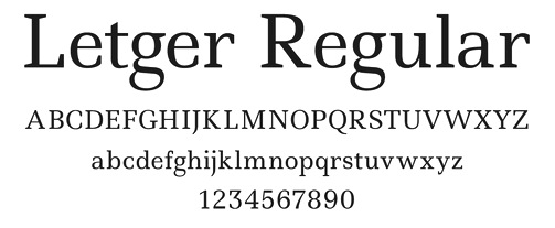
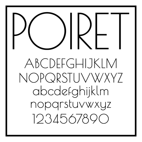
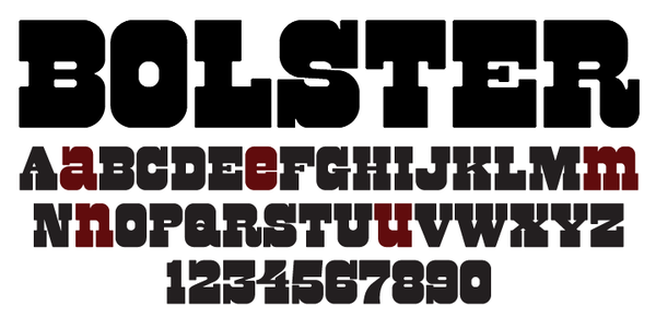
At Google Font Directory, we can download his Latin/Cyrillic poster font Ruslan (or Rusland) Display (2011), the freehand lettering typeface Marck Script (2011, based on the hand of Marck Fogel), and the angular Kelly Slab (2011). Bolster (2011) is a unicase fat Western face. Forum (2011) is a free classical roman face. TeX support. Ruslan Display (2011) was co-designed with Vladimir Rabdu, this decorative typeface is in the poluustav style dating from the 16th century. In 2011, he set up the Denis Masharov foundry at MyFonts. Free fonts published at Google Web Fonts in 2012: Ledger (Ledger was likened to Zapf's Melior by Nick Shinn, but Masharov says that it is closer to Swift), Glass Antiqua. This is a revival of the 1913 typeface Glass Antiqua by Genzsch & Heyse (original by Franz Paul Glass, 1912). Poiret (2012, free at Google Web fonts) is a Latin / Cyrillic geometric grotesque that combines art deco with avant garde. TeX support for Poiret One. Bolster (2012) is a great Italian wood type face. Tenor Sans (2012) is a Peignotian typeface (free at Google Web Fonts). In 2017, Denis Masharov and Roman Shchyukin co-designed the custom squarish sans typeface Match TV for the Russian TV sports channel MachTV. Still in 2017, he designed TNT Sans for the Russian entertainment TV channel TNT (on commission for Elena Shanovich, Shandesign). Denis did the logo and typeface for the bakery brand Volkonsky in 2017. In 2019, he created the Elzevir style titling typeface Matilda Titling for Coronation, а historical TV seriеs by Alexei Uchil. It was inspired by typefaces from Georges Revillon's type foundry, ca. 1860. Klingspor link. Behance link. Fontsquirrel link. Google Plus link. Fontspace link. [Google] [MyFonts] [More] ⦿ | |
Designer of the wooden plank-themed Jake Neverland Pirates Regular (2011) for Disney/ABC Television Group. Free download. [Google] [More] ⦿ | |
Éamonn Hanratty
| |
Edward Detyna
| |
EK Type
|
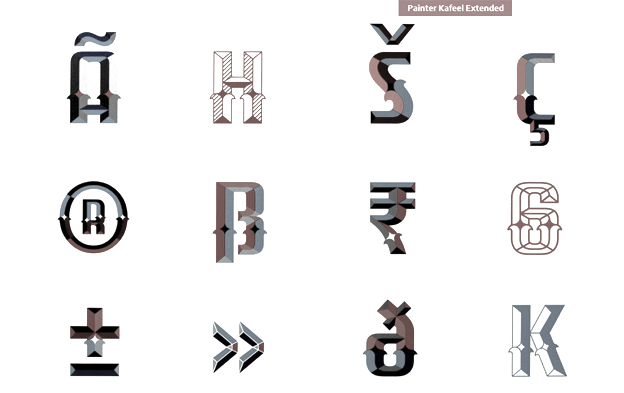
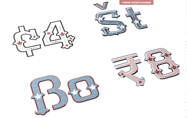
Typefaces at Ek Type from 2011 by Hanif Kureshi include Painter Umesh, Painter Kafeel, and Painter Suhail. In 2013, Girish Dalvi and Yashodeep Gholap co-designed Ek Devanagari at Ek Type for Hindi, Marathi, Sanskrit, Konkani and Nepali. It is a contemporary, humanist, monolinear typeface available in seven weights. Its companion, also designed by them, is the humanist sans typeface family Ek Latin (2013). Designer of Modak (2013, Ek Type), a Latin / Devanagari bubblegum typeface that was published in the Google Web Font collection in 2015. Modak Devanagari was designed by Sarang Kulkarni and Maithili Shingre and Modak Latin by Noopur Datye with support from Girish Dalvi and Pradnya Naik. Github link. Another Github link for Modak. In 2012, he designed Star Jalsha, a Bengali television screen font for Star India Pvt Ltd. In 2016, Ek Type designed the free Latin / Devanagari / Gujarati font Mukta Vaani. More precisely, it was designed by Noopur Datye and Pallavi Karambelkar with support from Sarang Kulkarni and Maithili Shingre. Google Fonts link. Github link. In 2017, EK Type released Jaini and Jaini Purva designed by Girish Dalvi and Maithili Shingre: Jaini is a devaagari typeface based on the calligraphic style of the Jain Kalpasutra manuscripts. The design of this font is based on the 1503 Kalpasutra manuscript. In 2020, EK Type published the devanagari typeface Gotu at Google Fonts. Niranjan collected these EK fonts:
In 2022, Ek Type released a multi-script (variable) Indic typeface family that includes Anek Telugu, Anek Malayalam, Anek Latin, Anek Kannada, Anek Gurmukhi, Anek Tamil, Anek Odia, Anek Gujarati, Anek Devanagari, and Anek Bangla. Contributors of this project are: Maithili Shingre (Anek Malayalam, Anek Kannada), Yesha Goshar (Anek Latin, Anek Odia), Kailash Malviya (Anek Devanagari), Aadarsh Rajan (Anek Tamil), Sulekha Rajkumar (Anek Bangla), Vaishnavi Murthy (Anek Kannada), Omkar Bhoir (Anek Telugu), Mrunmayee Ghaisas (Anek Gujarati), Mahesh Sahu (Anek Odia), and Sarang Kulkarni (Anek Gurmukhi). Project management and design assistance by Noopur Datye, and Font engineering and design assistance by Girish Dalvi. Ek Type won an award at 25 TDC in 2022 for Anek. The designers mentioned in the TDC press release are Girish Dalvi, Noopur Datye, Sarang Kulkarni, Aadarsh Rajan, Kailash Malviya, Mahesh Sahu, Maithili Shingre, Mrunmayee Ghaisas, Omkar Bhoir, Sulekha Rajkumar, Vaishanvi Murthy, and Yesha Goshar. Github link for Anek. Behance link. White Crow Designs link [White Crow was established in 2005 in Mumbai by Sarang Kulkarni]. Typophile link. Behance link. White Crow Designs. Fontsquirrel link. Github link. Fontsquirrel link. [Google] [More] ⦿ |
Electronic Font Foundry
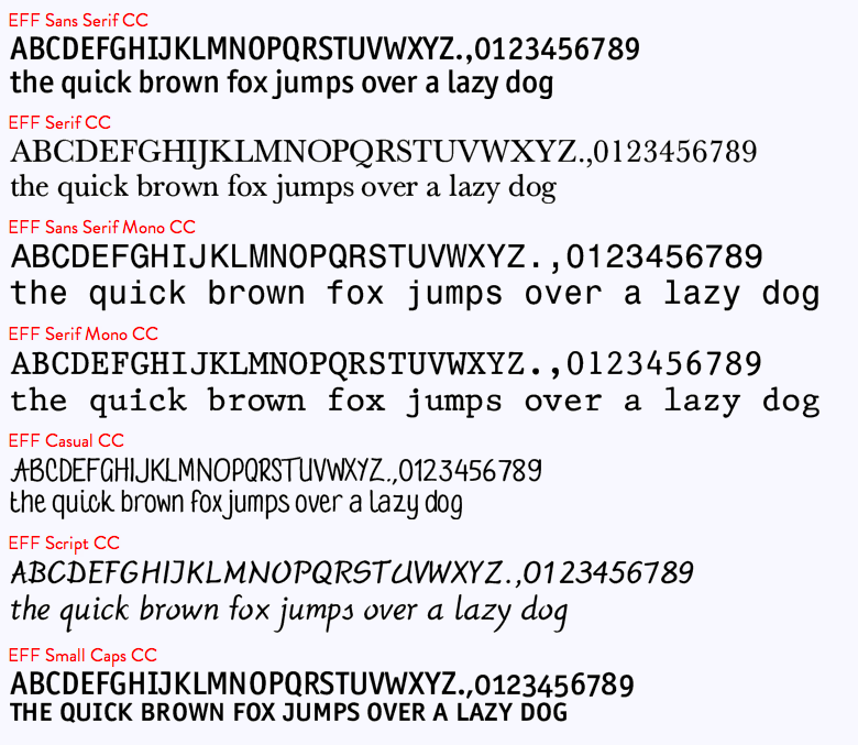
| The Electronic Font Foundry (EFF) in Ascot, Berkshire, UK, sold most classical fonts at about 15 dollars per weight, and made custom fonts. Established in 1984, the foundry had 1300 fonts by 2012. The font designer and owner was Edward Detyna, who died in March 2014. People are reporting to me that the fonts are in limbo, and that Detyna's family is not replying to requests for information. On July 4, 2002, Apostrophe wrote this: I'm currently having a difficult time trying to predict the past of EFF LondonA, EFF Liz, EFF Eric and EFF Formal, to name a few. I have a feeling that these folks just happen to be twins with entities that are currently across the Atlantic from them, namely Adobe Garamond, Cooper Black, Gill Sans and Copperplate Gothic. A friend of Detyna's writes this: When I met him at least twenty years ago, Edward and his associates had a font design studio based in Ascot, near London. He is a mathematician/statistician turned typographer, and was really on top of type design at the time. There are academic articles published on mathematical subjects on the internet. He's an old man now, but still a very smart guy. When he started, with fonts for Acorn RISC-OS (now defunct, but leading-edge British computer of mid-eighties to -nineties), he had very advanced and sophisticated algorithms for anti-aliasing and hinting, and his hand-hinting is still better than almost any other fonts I have used for screen work. He still sells fonts and adapts to user requirements promptly. I recently asked him to adjust the hinting on a font and he turns it around in a day. Jason Koxvold wrote to me in 2017: I knew Edward back in 1990 or so, when I was 13, and he mentored me to a great degree. For a while I worked an internship of sorts at EFF, and then one day, my mother came to see what I was up to---he gave her the job of office manager. He was a tremendously helpful and meaningful person to me then as a very young man with a passion for typography. Closed captioning fonts for TV, made according to the EIA 708-B specifications, include EFF Sans Serif CC, EFF Serif CC, EFF Sans Serif Mono CC, EFF Serif Mono CC, EFF Casual CC, EFF Script CC, EFF Small Caps CC. EFF also has fonts for Vietnamese, Greek, Hebrew, and Cyrillic. EFF Primary is a large family of educational fonts. EFF Utamaru is an oriental simulation font. [Google] [More] ⦿ |
Emad Fohid
| |
French TV graphics personality who uses woodtype samples to set logos. In many cases, he also uses digital characters, but he resizes them and distorts them a bit. See also here and here. Artistic director of Canal+, and designer of the typeface used by Canal+ (in France). Additional URL. [Google] [More] ⦿ | |
Fabio Haag Type (was: ByType, and: Foco Design)
|
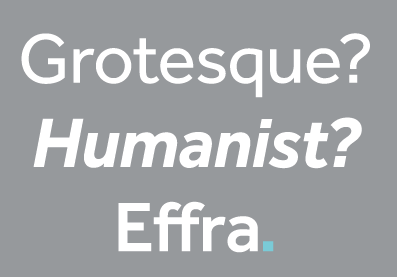
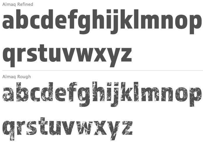
Fabio Haag designed FH After (2006, futuristic display typeface to which After Text and After Headline were added in 2007), FH Foco (2003) (a large x-height sans), this futuristic typeface (2003), and Minas Headline, a custom family made for the government of Minas Gerais. He was working on this display font (2005). In 2006, Foco became a Dalton Maag Ltd font family, and Fabio Haag became the new Creative Director of the Brazilian wing of Dalton Maag in 2008. MyFonts sells Foco and Foco Corp (2007). Designer (with Jonas Schudel) of a grotesque sans at Dalton Maag, 2007-2009, called Effra, which was inspired by a 1816 design from the Caslon font foundry. Discussion at Typophile. Followed in 2013 by Effra Corp (Dalton Maag) which also supports Greek and Cyrillic. In 2007, he created the organic sans typeface IronThree. Cordale (2008) is a workhorse serif typeface jointly done with Lukas Paltram at Dalton Maag. Cordale Corp, the corporate edition, includes Latin Extended A, Greek and Cyrillic characters sets. Cordale Arabic was published in 2013. In 2009, Foco Italics was published. At ATypI 2009 in Mexico City, he spoke about Dalton Maag and about the elements necessary to make it in the type business today. In 2012, the Dalton Maag Brazil team designed the font for the Rio 2016 Olympic Games The 5448-character connected script font Rio2016 was developed by Dalton Maag Brazil, and involved a team that includes Fabio Haag, Fernando Caro and Gustavo Soares. Beth Lula is the Branding Director of the Rio 2016 Olympic and Paralympic Games Organising Committee. Passages of the press release: Each letter expresses a characteristic of Rio 2016 Games, its people and city. The letters are written with a single continuous linework, with a fast and fluid movement, suggesting the movements of the athletes in action. The variety of curves in the letters has a unique informality, inspired by the joyfulness of the Brazilian people. Fabio Haag: As a Brazilian typophile, designing the Rio 2016 font was a dream job. This is a milestone for the design scene in Brazil---it's a great example of how type designers can collaborate with graphic designers, sharing their expertise to strengthen an identity. In 2013, Fabio designed Almaq, a pair of sans display typefaces in cuts called Refined and Rough. Codesigner with Bruno Mello, Fernando Caro, Rafael Saraiva and Ron Carpenter of Soleto (2014, Dalton Maag), a sans typeface that won an award at Tipos Latinos 2014. Setimo (2015) was co-designed by Fernando Caro, Ken Gitschier, Fabio Haag and Lukas Paltram at Dalton Maag, and won an award at Tipos Latinos 2016. In 2016, Fabio Haag published Lembra (a sans that was created specifically for branding, characterized by tapered terminals) at his new type foundry, Fabio Haag Type, set up after he left Dalton Maag after eight years. Fabio Haag Type grew in 2020 to a team of four, now also including Ana Laydner, Henrique Beier and Eduilson Coan. In 2019, a variable font option was added top Lembra. In 2017, he designed the 28-unit legible humanist sans variable font family Margem (Fabio Haag Type), which includes a yummy Rounded subfamily. Still in 2017, he developed the sans typeface Sua, which as a variable option. In 2018, he published pictograms for SporTV, a forceful constructivist font for the World Cup 2018 also for SporTV and Furacão (for Atletico Paranaense). Typefaces from 2019: Suzano Sans (a commissioned rounded branding typeface done for Suzano). Typefaces from 2020: Margem (a fine 7-style rounded sans family by Henrique Beier, Ana Laydner and Eduilson Coan). Typefaces from 2021: Seiva (by Henrique Beier, Eduilson Coan and Fabio Haag: a distant relative of Didot, this exotic sans family is partitioned into Text, Display and Poster subfamilies, and welcomes variable font technology), Salva (2021, Fabio Haag Type). A versatile workhorse sans family: Eduilson Coan was the lead designer. He was assisted by the Fabio Haag Type team of Henrique Beier, Ana Laydner and Fabio Haag himself. View Fabio Haag's typefaces. Fabio Haag Type. [Google] [MyFonts] [More] ⦿ |
Fabio Luiz Haag
| |
Fabrizio Schiavi
| |
Fabrizio Schiavi Design (or: FSD)
|
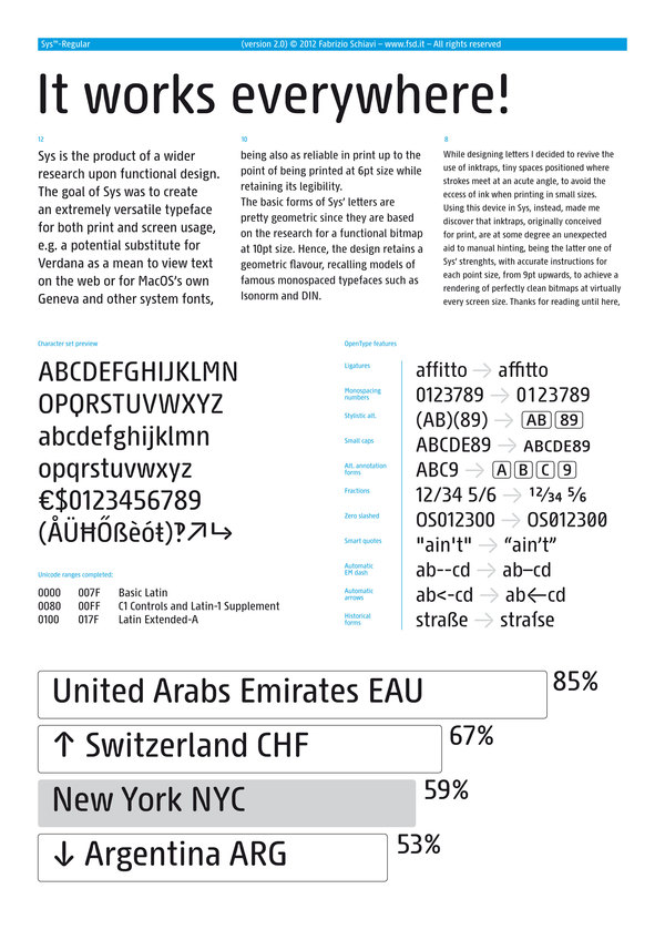
Bio at FontFont where he made FF Mode 01, FF 0069, FF GeabOil, FF9600, FF Trade 01, FF Steel Mix, FF Steel Ring, FF Steel Jones. [T-26] designer of D44 (1994), Lithium (1994, dingbats), Moore895 (1994), Moore899 (1994), Sidewalker (1994), Exit (1988). Many of his typefaces are grungy such as Washed (1994). Some are minimalist, such as Monica Due (1999), Monica (1999), and Eco (2001, developed from a logo in the 70s for Ageco). The latter three fonts are very geometric in nature. Other fonts: Washed (1994), Parakalein, Aurora Nintendo (1995), Aurora CW (1995), Mode01 (1995), GeabOil (1995), 9600/0069 (1995), Fontology (1995), CP Company (2000: a corporate sans), FSDItems (2001), FSDforMantraVibes (2001), Pragmata (2001, monospace, designed for programs), PragmataFlash (2002, a pixel font), Pragmata Pro (2011, still monospaced), Sys (2002), SysFlash (2002, a pixel font), Sys 2.0 (2012, a condensed sans designed for very small print), Virna (2003, a multiline typeface for Italian MTV, discussed here). The Pragmata and Sys series were optimized for screen usage. In addition, Sys has many ink traps, so it prints well at small sizes, and is more legible than Verdana. He does some custom typeface design, such as the innovative sans serif family called CP Company (2000). Other clients include Al Hamra Complex Kuwait, Nike, MTV, YU, Beretta, Abitare magazine, Ferrari and Philip Morris. In 2007, he produced a stencil and signage font, Siruca (see also here), for the Al Hamra Complex, one of highest skyscrapers in the world, located in Kuwait. Siruca Pictograms (2008) is free. In 2015, he followed that up by a non-stencil rounded sans called Sirucanorm: Designed using golden ratio formulas, it's inspired to DIN and Isonorm typeface. In 2013, he published Sys Falso, Abitare Sans (30 weights, originally commissioned by the group Rizzoli Corriere della Sera. Abitare is an Italian magazine). Typefaces from 2014: Nove (a German expressionist typeface inspired by B movie typography: Nove freshly reworks exploitation film era movie poster lettering, refitting the genre to a contemporary audience. The expressive typeface was done for a Nike Italy spoof campaign featuring 1970s cult film director Enzo Castellari and a recently found film reel from his archives, featuring several current Italian athletes and American basketball star Kobe Bryant). The rounded sans typeface Widiba Bank (2015) was co-designed with Jekyll & Hyde in 2015 for the brand identity of the new bank of Gruppo Monte dei Paschi di Siena. In 2016, he designed the custom corporate typeface R&M in art nouveau style. In 2020, he released the (variable) retail version of CP Company called oook. In 2021, he released Nure (a 54-style sans font family that includes a three-axis (weight, optical, width) variable font). At ATypI in Rome in 2002, he spoke about the need for more fonts. Hellofont link. FontShop link. Font Squirrel link. Showcase of Fabrizio Schiavi's typefaces. [Google] [MyFonts] [More] ⦿ |
Apple's professional and extensible tool for editing and finishing in SD and HD formats. It includes LiveType, a title generator. Discussion on Typographica. [Google] [More] ⦿ | |
Typophile suggestions for a clear, legible and flexible typeface for a television channel, either for text in shows or for captioning:
| |
Fontsmith
|
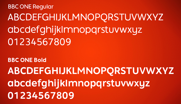
Smith's custom typefaces include Casey, Seat, Tractebel, PPP Healthcare, Powergen, Allied Irish Bank, UUnet, Channel 4, and Saudi Aramco, Champions (2009: for the UEAFA Champions League), Colgate Ready (2014: for Colgate, covering Latin, Cyrillic, Eastern European, Devanagari and Thai), More4 (2005, for the Channel 4 Adult Entertainment channel), ITV (2006, for the ITV network), BBC ONE (2006, for the BBC), Post Office Sans (2003), Severstal (2009), and Moto GP (2020: a custom techno / sports font). Vernon Adams and Fontsmith got into a quarrel about Vernon's Mako, which was submitted and rejected by Fontsmith, which published its own similar typeface Lurpak a few weeks later. Most of Jason Smith's typefaces are now at MyFonts, after Monotype's take-over in 2020:
|
Orphaned typeface made in 2015, probably by modifying Nick Shinn's Sense Black (2010). [Google] [More] ⦿ | |
Frantisek Storm
| |
Swiss creator of the free caption font Minikin (2015). [Google] [More] ⦿ | |
German type designer (b. 1951, Hamburg) who co-founded Elsner&Flake in 1986 with Veronika Elsner. There, he designed many typefaces, including EF Renova (2006, a boutique sans; see also Renova Pro, 2016), EF Beasty (1993, with Gisela Will), Bluset EF (2000-2010, a monoline sans family), EF Casanova Script (2006-2007, Petra Beisse; the Pro version in 2015 also had input from Jessica Franke), EF Cash Monospaced (1994), EF Double Pac, EF TV Nord (an 18-style grotesque that is based on the corporate typeface NDR Sans which was developed by Elsner+Flake for the Norddeutsche Rundfunk (www.ndr.de) between 1999 and 2001; characterized by a large x-height, it was influenced by Trade Gothic; a redesign was done in 2014), Eurostile Mono, Glaser Stencil, EF KiddingKid, EF Petras Script, EF StealPlate (1994), EF Thordis Mono, EF TwinPick, Versa Old Style EF. At Apply Design in 1999, he co-designed a nice series of stencil fonts with Sigrid Claessens: WaltonStencil-BlackRough, WaltonStencil-WhiteRough, LaPinaStencil, Lasertac Stencil, Reedon Stencil, RoundedStencil, SerpentineStencil, StencilAntiqua, TeaChestStencil, WesternStencil, AdveraStencil, ArstonStencil, BankStencil-Medium, BankStencil-MediumRough, CaslonFinaStencil-Black, CaslonFinaStencil-BlackRough, ChicoStencil-Rough, ChicoStencil, FerroStencil, GeometricStencil, GlaserStencil, Futura Headline, Futura Index, Futura Text. In 2010 he created a digital family based on Morris Fuller Benton's Bank Gothic, called Bank Sans EF. Linotype link. FontShop link. Klingspor link. [Google] [MyFonts] [More] ⦿ | |
Holofontes
| Holofontes is a Brazilian foundry, established in 2004 by Hugo Cristo from Jd da Penha, Vitoria. Typefaces: HF Bayer, HF Ceramic, HF Conillon Black, HF Contras, HF Daft, HF Design Az San, HF Dutra, HF Fastne, HF Health, HF Health Blac, HF Janaina Roman, HF Logic, HF Maxwell, HF Minotau, HF Neo Bodoni, HF Newslin, HF Painted, HF Phocus San, HF Quadredondo, HF Round Gothi, HF Slab, HF Tecnométric, HF Tim Maia, HF Visualice. Before Holofontes, Hugo Cristo ran Design AZ. He also makes custom type, such as this face specially designed for reading from TV screens. [Google] [More] ⦿ |
Hugo Cristo
| |
700 USD software for creating titles and animated text from DVFonts. Review by Jerry Jones. [Google] [More] ⦿ | |
Santa Monica-based student at the Art Center College of Design in Pasadena. His first font (2003) is a pixel font to be used for TV text captioning. [Google] [More] ⦿ | |
Jason Smith
| |
Linotype link. Linotype interview. FontShop link. Pic. His talk at ATypI 2014 in Barcelona was entitled OpenType features for Script Typefaces. Linotype link. Klingspor link. [Google] [MyFonts] [More] ⦿ | |
Joe Clark
| |
Joe Clark
| |
Joe Clark
| |
Dr. John Gill from the Royal National Institute for the Blind (RNIB), in the United Kingdom is designer Tiresias (2001), a screen/TV font family at Bitstream. The Tiresias LPfont is a large print typeface specifically designed for people with low vision. [Google] [MyFonts] [More] ⦿ | |
| |
LiveFonts is the world's first animated font standard, available from Apple for the Mac. It is part of the TV and animated titling package, LiveType. [Google] [More] ⦿ | |
LiveType was a computer program developed by Apple Inc. to create animated title sequences for video projects. It was discontinued with the release of Final Cut Pro X, Motion 5, and Compressor 4. When it was introduced, Apple advertised it as follows: "LiveType revolutionizes titling with a breakthrough new font standard - LiveFonts, the world's first animated font standard, available only on the Macintosh platform - as well as a whole new way to create effects." It imports and exports all QuickTime-supported file formats, including Photoshop, JPEG, TIFF and PICT. It also import clips from Final Cut Pro 4 complete with markers, so it is possible to synchronize titles to video and audio transitions in Final Cut Pro 4 projects. Apple link for LiveType. [Google] [More] ⦿ | |
Designer of the SKYfont family (SKYfontbrands, SKYfontmovies, SKYfontnews, SKYfontone, SKYfontsport, SKYfonttravel, SKYfontThick) for the SKY TV station. Can be freely downloaded here. [Google] [More] ⦿ | |
Teacher (b. 1964) of Visual Communication at the Politecnico di Milano and of Tools and Techniques of Graphic Design at the Rome University, La Sapienza. In 1995 he founded the Vitamina studio with Aldo Buscalferri, where he does graphic design work, calligraphy, photography, and illustration for industrial clients. In 2002, he became the creative director at Landor Associates in Milan. He is the vice-president of BEDA. His clients include MTV, Heineken, Onyx, Sony, Mediaset (TV network) and Blu (an Italian mobile phone company), for whom he created a company typeface, Blutype. He also made a hip version of Agenda, called Diario. Founder of Pitis e Associati, a design and consultancy studio based in Milan and Paris, and art director for Wired Italia. At ATypI in Rome in 2002, he spoke about type for branding and communication. [Google] [More] ⦿ | |
Montevideo, Uruguay-based designer of the cable channel-themed Zapping Font (2016). [Google] [More] ⦿ | |
MDTA Design -- Green Dragon
| MDTA Design, and in some cases MDTA together with Green Dragon, created these fonts, all related to British or Irish TV stations and their logos: BBCStripedChannelLogos, BBCTVChannelLogos, ITA-IBALogos, ITVNetworkChannels, Sky Television Logos, SKYfontbrands, SKYfontmovies, SKYfontnews, SKYfontone, SKYfontsport, SKYfonttravel, SKYfontThick, Sky1998ChannelLogos, SkyTVChannelLogos, UKDigitalTVChannelLogos, IrishRTVLogos, SkywardBold, SkywardRegular, Terrestrial Television Logos, UKtvFamilyLogos, UKTV Channel Logos, UK-&-Ireland-RTV-21, WelshTVLogos. The SKYfont family is originally by Martin Anderson. The web site states: "It all began in the year 2000 with the release of the original and ground-breaking TV Logos TrueType Font by its creator Andrew Wood. Ever since, it has become the inspiration for many other TrueType Font creators who have an abiding passion for television presentation, history and heritage to follow in their footsteps. The brainchild for the Green Dragon catalogue is Éamonn Hanratty. He has already compiled a comprehensive history of the television logos which have been used in the Republic of Ireland, from 1961 up until the present day. The title "Green Dragon" comes from the fact that Éamonn is the son of an Irishman and a Welsh mother. Born in 1963, he comes from Swansea, in Wales. As well as taking Andrew Wood for his inspiration, Éamonn also wishes to gratefully acknowledge the outstanding and progressive work in this field which Martin Anderson of England, Ray Larabie of the U.S.A., Rupert ten Hove of the Netherlands and so many others have been and are continuing so to do: that is, to present a growing range of non-commercial and freely available TrueType Fonts for private use." Apparently they also made Hylian Symbols, but I think that is a mistake by the people at DaFONT. Corporate text fonts: Sky Movie Sans, Sky Corporate Font, LIVINGtv Font, Telewest Voice, E4 Headline Font, uktv Home Font. [Google] [More] ⦿ |
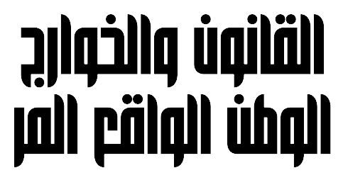
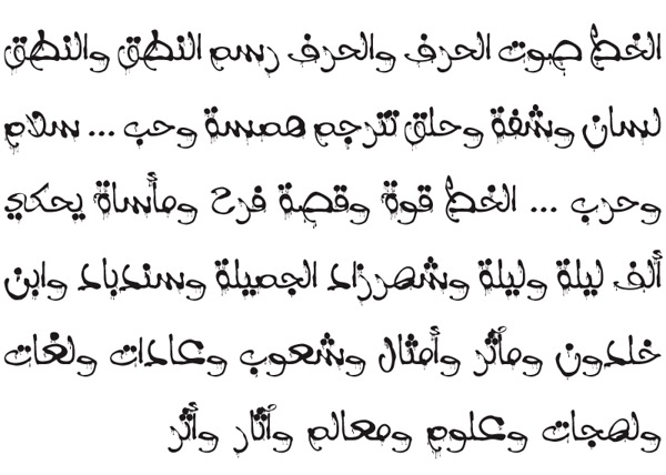
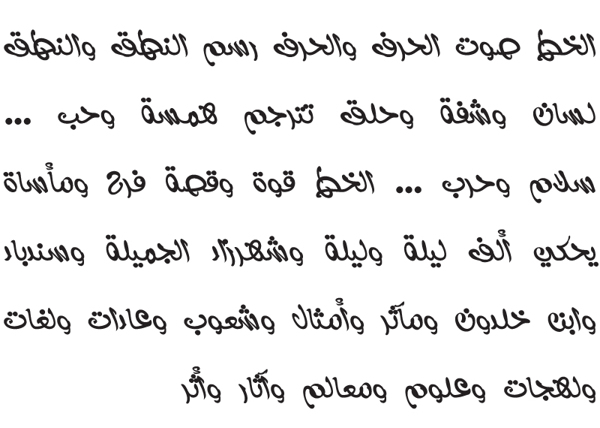
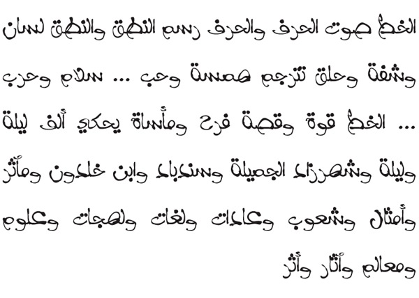
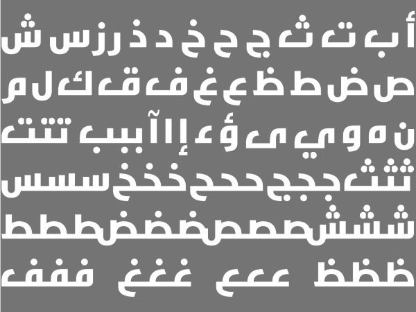
At German University in Cairo, Miral Amr designed the display typeface Minara (2015). In 2016, he created the TV caption Arabic font LCD. [Google] [More] ⦿ | |
In 2016, she created Starvision for the redesign of the World Vision Website, and Rossfit (for a sports branding project). The typeface was inspired by the star in the World Vision logo. She also designed Rossfit (for a sporting goods comnpany) and Tiboro (which was inspired by Tibor Kalman's work). Dafont link. [Google] [More] ⦿ | |
Monotype's ESQ fonts (enhanced screen quality) are designed for TVs and monitors. A list of their fonts: Albertus, Albany, Andalé LineDraw, Andalé M Sans, Andalé Mono, Andalé Mono bold, Andalé Mono CP437, Andalé Mono CP737, Andalé Mono CP850, Andalé Mono CP852, Andalé Mono CP855, Andalé Mono WGL, Andalé Sans, Andalé Sans bold, Andy, Andy bold, Apollo, Apollo italic, Apollo semi bold, Arial, Arial black, Arial black italic, Arial black Latin 1/2/5, Arial black WGL, Arial bold, Arial bold italic, Arial bold italic Latin 1/2/5, Arial bold italic WGL, Arial bold Latin 1/2/5, Arial bold WGL, Arial CE, Arial CE bold, Arial CE bold italic, Arial CE italic, Arial italic, Arial italic Latin 1/2/5, Arial italic WGL, Arial Latin 1/2/5, Arial Monospaced, Arial Monospaced bold, Arial Monospaced bold oblique, Arial Monospaced oblique, Arial Narrow bold italic Latin 1/2/5, Arial Narrow bold Latin 1/2/5, Arial Narrow italic Latin 1/2/5, Arial Narrow Latin 1/2/5, Arial Rounded, Arial Rounded bold, Arial Tur, Arial Tur bold, Arial Tur bold italic, Arial Tur italic, Arial WGL, Monotype Baskerville, Monotype Baskerville bold, Monotype Baskerville bold italic, Monotype Baskerville bold italic Latin 1/2/5, Monotype Baskerville bold Latin 1/2/5, Monotype Baskerville italic, Monotype Baskerville italic Latin 1/2/5, Monotype Baskerville Latin 1/2/5, Bell, Bell bold, Bell bold italic, Bell italic, Bembo, Bembo bold, Bembo bold italic, Bembo italic, Monotype Bernard condensed, Binner Gothic, Blueprint Web, Blueprint Web bold, Monotype Bodoni book, Monotype Bodoni book italic, Book Antiqua bold italic Latin 1/2/5, Book Antiqua bold Latin 1/2/5, Book Antiqua CE, Book Antiqua CE bold, Book Antiqua CE bold italic, Book Antiqua CE italic, Book Antiqua italic Latin 1/2/5, Book Antiqua Latin 1/2/5, Bookman Old Style, Bookman Old Style bold, Bookman Old Style bold italic, Bookman Old Style bold italic Latin 1/2/5, Bookman Old Style bold Latin 1/2/5, Bookman Old Style italic, Bookman Old Style italic Latin 1/2/5, Bookman Old Style Latin 1/2/5, Buffalo Gal, Century Gothic bold italic Latin 1/2/5, Century Gothic bold Latin 1/2/5, Century Gothic italic Latin 1/2/5, Century Gothic Latin 1/2/5, Century Schoolbook, Century Schoolbook bold, Century Schoolbook bold italic, Century Schoolbook bold italic Latin 1/2/5, Century Schoolbook bold italic WGL, Century Schoolbook bold Latin 1/2/5, Century Schoolbook bold WGL, Century Schoolbook CE, Century Schoolbook CE bold, Century Schoolbook CE bold italic, Century Schoolbook CE italic, Century Schoolbook italic, Century Schoolbook italic Latin 1/2/5, Century Schoolbook italic WGL, Century Schoolbook Latin 1/2/5, Century Schoolbook WGL, Monotype Clarendon, Monotype Corsiva Latin 1/2/5, Courier CE, Courier CE bold, Courier CE bold italic, Courier CE italic, Courier LD, Courier LD bold, Courier LD bold italic, Courier LD italic, Courier New bold italic Latin 1/2/5, Courier New bold italic WGL, Courier New bold Latin 1/2/5, Courier New bold WGL, Courier New CP437, Courier New CP437 Bold, Courier New CP737, Courier New CP737 Bold, Courier New CP850, Courier New CP850 Bold, Courier New CP852, Courier New CP852 Bold, Courier New CP855, Courier New CP855 Bold, Courier New italic Latin 1/2/5, Courier New italic WGL, Courier New Latin 1/2/5, Courier New WGL, Courier Tur, Courier Tur bold, Courier Tur bold italic, Courier Tur italic, Creepy, Creepy Latin 1/2/5, Cumberland, Curlz, Cyrillic: Arial, Cyrillic: Arial bold, Cyrillic: Arial bold inclined, Cyrillic: Arial inclined, Cyrillic: Courier, Cyrillic: Courier bold, Cyrillic: Courier bold inclined, Cyrillic: Courier inclined, Cyrillic: Times Bold A, Cyrillic: Times Bold inclined A, Cyrillic: Times New Roman A, Cyrillic: Times New Roman inclined A, EraserDust, EraserDust Latin 1/2/5, Facade Condensed, Felix Titling, Footlight, Footlight light, Monotype Franklin Gothic extra condensed, Monotype French Script, Forte, Monotype Garamond, Monotype Garamond bold, Monotype Garamond bold italic, Monotype Garamond bold italic Latin 1/2/5, Monotype Garamond bold Latin 1/2/5, Monotype Garamond bold WGL, Monotype Garamond italic 156, Monotype Garamond italic 156 WGL, Monotype Garamond italic Latin 1/2/5, Monotype Garamond Latin 1/2/5, Monotype Garamond WGL, Gill Alt One bold italic Latin 1/2/5, Gill Alt One bold italic WGL, Gill Alt One bold Latin 1/2/5, Gill Alt One bold WGL, Gill Alt One italic Latin 1/2/5, Gill Alt One italic WGL, Gill Alt One Latin 1/2/5, Gill Alt One WGL, Gill Sans, Gill Sans ALT1, Gill Sans bold, Gill Sans bold ALT1, Gill Sans bold condensed, Gill Sans bold extra condensed, Gill Sans bold italic, Gill Sans bold italic ALT1, Gill Sans bold italic Latin 1/2/5, Gill Sans bold italic WGL, Gill Sans bold Latin 1/2/5, Gill Sans bold WGL, Gill Sans condensed, Gill Sans condensed bold Latin 1/2/5, Gill Sans condensed Latin 1/2/5, Gill Sans extra bold, Gill Sans extra bold Latin 1/2/5, Gill Sans extra condensed bold Latin 1/2/5, Gill Sans italic, Gill Sans italic ALT1, Gill Sans italic Latin 1/2/5, Gill Sans italic WGL, Gill Sans Latin 1/2/5, Gill Sans light, Gill Sans light ALT1, Gill Sans light italic, Gill Sans light italic ALT1, Gill Sans shadow, Gill Sans Shadow Latin 1/2/5, Gill Sans ultra bold, Gill Sans ultra bold condensed, Gill Sans ultra bold condensed Latin 1/2/5, Gill Sans ultra bold Latin 1/2/5, Gill Sans WGL, Ginko, Ginko Latin 1/2/5, Gloucester bold, Gloucester bold condensed, Gloucester bold extended, Gloucester Old Style, Glowworm, Glowworm Latin 1/2/5, Haettenschweiler, Haettenschweiler Latin 1/2/5, Haettenschweiler WGL, Impact, Impact Latin 1/2/5, Impact WGL, Imprint Shadow, Kidprint, Kidprint Latin 1/2/5, Monotype Letter Gothic, Monotype Letter Gothic bold, Monotype Letter Gothic bold oblique, Monotype Letter Gothic Latin 1/2/5, Monotype Letter Gothic LineDraw, Monotype Letter Gothic LineDraw bold, Monotype Letter Gothic oblique, Monotype Letter Gothic WGL, Letter Gothic CP437, Letter Gothic CP437 Bold, Letter Gothic CP737, Letter Gothic CP737 Bold, Letter Gothic CP850, Letter Gothic CP850 Bold, Letter Gothic CP852, Letter Gothic CP852 Bold, Letter Gothic CP855, Letter Gothic CP855 Bold, Monotype Lydian, MICR, Monotype News Gothic, Monotype News Gothic bold, Monotype News Gothic bold condensed, Monotype News Gothic bold italic, Monotype News Gothic bold italic Latin 1/2/5, Monotype News Gothic bold italic WGL, Monotype News Gothic bold Latin 1/2/5, Monotype News Gothic bold WGL, Monotype News Gothic CE, Monotype News Gothic CE bold, Monotype News Gothic CE bold italic, Monotype News Gothic CE italic, Monotype News Gothic condensed, Monotype News Gothic Cyr, Monotype News Gothic Cyr bold, Monotype News Gothic Cyr bold inclined, Monotype News Gothic Cyr inclined, Monotype News Gothic Gre, Monotype News Gothic Gre bold, Monotype News Gothic Gre bold inclined, Monotype News Gothic Gre inclined, Monotype News Gothic italic, Monotype News Gothic italic Latin 1/2/5, Monotype News Gothic italic WGL, Monotype News Gothic Latin 1/2/5, Monotype News Gothic WGL, Nimrod, Nimrod bold, Nimrod bold italic, Nimrod italic, Monotype Old English Text, Monotype Onyx, Ocean Sans bold, Ocean Sans book, OCR-A, OCR-B, Pepita, Perpetua, Perpetua bold, Perpetua bold italic, Perpetua italic, Plantin, Plantin bold, Plantin bold EXPERT, Plantin bold italic, Plantin bold italic EXPERT, Plantin EXPERT, Plantin italic, Plantin italic EXPERT, Rockwell, Rockwell bold, Rockwell bold condensed, Rockwell bold italic, Rockwell condensed, Rockwell italic, Rockwell light, Rockwell light italic, Sabon, Sabon italic, Sabon semi bold, Sabon semi bold italic, Sassoon Infant Pro, Sassoon Infant Bold, Sassoon Sans, Sassoon Sans Bold, Monotype Script bold, Monotype Sorts, Swing bold, Theatre Antoine, Theatre Antoine Latin 1/2/5, Thorndale, Times New Roman bold F, Times New Roman bold italic F, Times New Roman bold italic Latin 1/2/5, Times New Roman bold italic WGL, Times New Roman bold Latin 1/2/5, Times New Roman bold WGL, Times New Roman CE, Times New Roman CE bold, Times New Roman CE bold italic, Times New Roman CE italic, Times New Roman F, Times New Roman italic F, Times New Roman italic Latin 1/2/5, Times New Roman italic WGL, Times New Roman Latin 1/2/5, Times New Roman Tur, Times New Roman Tur bold, Times New Roman Tur bold italic, Times New Roman Tur italic, Times New Roman WGL, Twentieth Century bold, Twentieth Century bold condensed, Twentieth Century bold italic, Twentieth Century bold italic Latin 1/2/5, Twentieth Century bold Latin 1/2/5, Twentieth Century condensed bold Latin 1/2/5, Twentieth Century condensed medium Latin 1/2/5, Twentieth Century medium, Twentieth Century medium condensed, Twentieth Century medium italic, Twentieth Century medium italic Latin 1/2/5, Twentieth Century medium Latin 1/2/5, Twentieth Century ultra bold, Twentieth Century ultra bold Latin 1/2/5. [Google] [More] ⦿ | |
Fonts that are appropriate for captions are showcased at MyFonts. See also here, here, here and here. [Google] [More] ⦿ | |
The main typefaces at MyFonts under the keyword Television. These are mostly fonts based on the titles of famous TV shows, but there is an occasional TV subtitling font. View a longer list of television fonts. See also here. [Google] [More] ⦿ | |
Japanese type foundry. Its typefaces as of 2018 include:
| |
Born in Seoul, Nina Lee Storm moved to Denmark in 1975, where she works as a freelance type designer. Nina lives in Middelfart, Denmark, and her company is Lee Storm Design. She designed Storm Sans at Agfa/Monotype in 2000. She designed Noa for use on television and computer screens during the late 1990s. This tall x-height short-ascendered typeface was published by Linotype in 2004. FontShop link. Klingspor link. [Google] [MyFonts] [More] ⦿ | |
Its designer is Wayne Thompson of Australian Type Foundry. Link with a video. [Google] [More] ⦿ | |
Overtone
|
His typefaces include:
|
Plau (was: Niramekko)
|
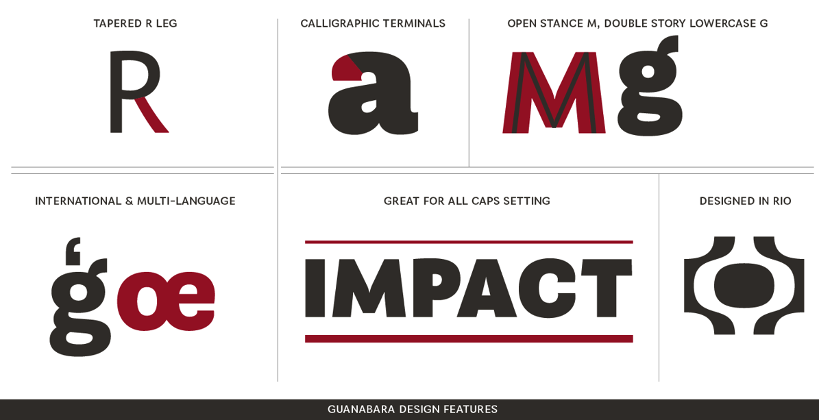
Saiani's first typeface was Swiss: Motiva Sans (2009). Plau (2011) and Plau Italic (2012) are organic sans typefaces. In 2013, Saiani published Guanabara Sans and Primot (an upright fat connected gelateria script). Coralinda (2014) is a didone-based custom headline typeface. Tenez (2015) is a didone display typeface family for use in logos and titling. It won an award at Tipos Latinos 2016. In 2016, Rodrigo Saiani and Flora de Cavalho co-designed the typewriter typeface Odisseia, which was originally designed for the brand identity for Leblon Arquitetura, a Rio de Janeiro-based architecture firm. In 2017, Daniel Rocha, Flora de Carvalho and Rodrigo Saiani jointly designed the handcrafted branding typeface Dariquim. Collaboration between Plau and Rede Globo, Globotipo (2018: a collaboration between Plau and Rede Globo) is a family of 30 fonts made exclusively for the Brazilian TV chain Rede Globo. In 2018, he designed the custom restaurant menu and branding typeface Chez Lalu, the creamy retail typeface Manteiga, and the sturdy sans typeface family Vinila (with Flora de Carvalho). Typefaces from 2019: Reserva (Sans, Serif, Display), Muda (a corporate typeface for the fashion brand Oficina Muda; type design by Ana Laura Ferraz, Carlos Mignot, Gabriel Menezes and Rodrigo Saiani). Typefaces from 2020: Salsero (a display typeface with Latin vibes), the video game font family (+stencil, +Cyrillic) either called Killing Sans or Nine to Five, co-designed with Carlos Mignot. Plau joined forces with the NotCo creative team in 2021 to design their custom typeface, NotFont. The brief was to create a typeface with unexpected logic. The Kabel-style geometric typeface won a bronze medal at the Brasil Design Award 2021 competition. Other bronze medal winners at that competition by Plau include custom typefaces for In Brands (called In Type), XP Investimentos (XP Lighthouse is the name of the typeface) and Exame Invest (a didone). In 2021, Ana Laura Ferraz, Valter Costa, Carlos Mignot and Rodrigo Saiani designed the handcrafted black poster and branding typeface Vinila for the identity of grammar teacher Eduardo Valladares' personal brand EDU VLLD (Edu stands for Eduardo and Education while VLLD represents Valladares and Vulnerability). Still in 2021, Carlos Mignot and Rodrigo Saiani designed a few hip typefaces for the Brazilian TV channel Canal Brasil. Their Canal Brasil woin the gold medal and grand prize at the Brasil Design Award 2021 competition. MyFonts link. Behance link. Logo. Klingspor link. Behance link for Saiani. Old Niramekko link. Old home page. Behance link for Plau Design. Type Network link. [Google] [MyFonts] [More] ⦿ |
Radek Sidun (b. 1980) wrote a graduation thesis at the Prague Academy of Arts, Architecture and Design (UMPRUM) (Graphic Design and Visual Communication, MgA. 2010) on diacritics in world languages. He has worked at Cornel Windlin's Zurich studio for two years. He is currently based in Prague, where he is an associate editor of Komfort magazine and teaches at the Type Design and Typography studio of the UMPRUM Prague Academy of Arts, Architecture and Design. Designer at the Suitcase Type Foundry of RePublic (a 2004 revival, done with Tomas Brousil, of Public by Stanislav Marso, 1955. Note that Public was used to set the text of a Czechoslovak Communist party newspaper, Rudé Právo). At Briefcase, he published BC Alphapipe and BC News (for which he received a TDC Certificate of Typographic Excellence 2015). Diacritics link. Type design and typography web site. At ATypI 2018 in Antwerp, he spoke on typefaces for television, in which he gave an overview of Czech television type from the 1960s until 2018, showing original typeface designs, archive materials, current approaches, rare videos, and type in motion. [Google] [More] ⦿ | |
Rasmus Lund Mathisen
| |
Italian designer (b. 1971) who graduated from the Art Institute of Parma. He is currently the main designer for MTV Italia. He created the gothic font Grimoire, first as a logo for the group Barbie Car and later for some MTV titles. [Google] [More] ⦿ | |
Rodrigo Rocha Saiani
| |
RTL Type (was: Black Tiger)
|
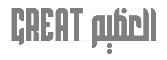
They designed the Arabic typefaces Halime (2017), Natalie (2017), TV Sans (2016), Moscow (2016), Hajar (2016), Hilary (2016), Hattan (2015), Amal (2014, Latin / Cyrillic art deco), Lamis (2014), Saba (2014), Saba Mubarak (2014, integrated with Latin), Hajar (2014), Kufi (2014), Nicole (2013), Rajab (2014), Jody (2014), Logo (2014), Misr (2014), Egypt (2014), Free (2014), Salim (2014), Nagham (2014), Lujain (2014), Nora, Nicole, Yasmin, Joory, Rim Extra Min, Jannat Extra and Diana Extra in 2013. He also made Nicole Latin (2013) and Maram (2013, Arabic). Old Behance link. Behance link. [Google] [More] ⦿ |
The Graphic Arts Department of CBS News developed CBS News 36 [dead link], a TV font with ink traps. The project leader was Rudi Bass. Adam Twardoch compares the ink trapping with that of other fonts, such as Bell Centennial Bold (Matthew Carter, 1978). [Google] [More] ⦿ | |
Cairo, Egypt-based designer of SH1949 (2013, an octagonal FontStruct font), Nasfi (2015, an Arabic font designed for TV) and Circtor (2014, a connect-the-dots typeface). Circtor and SH1949 were projects at the German University in Cairo. [Google] [More] ⦿ | |
| |
Sarang Kulkarni
| |
Sarang Kulkarni
| |
From their site: "LiveFonts for LiveType and Final Cut Pro - animated fonts for film and video projects". The fonts of this team include Sonida, Circus, Poolside, Marquee, Undulator, Chocolate and Warhol. [Google] [More] ⦿ | |
Screenfont.ca
| Joe Clark (Toronto) is developing special fonts for captioning and subtitling for TV and film. Joe's motto is Watching TV is bad enough. Reading TV shouldn't be worse. Two interesting sub-pages: Here he explains the difference between captioning and subtitling. Captions are basically for the deaf, and are manually turned on. They not only describe what is said or heard but also mention or show things about the intonation, style, language, or nature of the voices or sounds. Subtitling is mostly used to translate. It is generally automatically turned on, and shown at the bottom of the screen. On this page, Joe lists the main issues with captioning and subtitling and lists the many problems with popular subtitling typefaces such as Bitstream's Tiresias or Monotype's Arial. Speaker at ATypI 2007 in Brighton. [Google] [More] ⦿ |
Sofia, Bulgaria-based designer of a custom sans typeface (Latin / Cyrillic) for the TV show Dnes (2017). [Google] [More] ⦿ | |
CBC interview in 2012. Fontspace link. FontShop link. At ATypI 2011 in Reykjavik, he spoke on typefaces for Android OS. His typefaces:
Klingspor link. Fontspace link. View Steve Matteson's typefaces. [Google] [MyFonts] [More] ⦿ | |
Storm Type Foundry
|
Alternate URL. Myfonts write-up. At ATypI 2004 in Prague, he spoke about his own Czech typefaces, on his Czech Typeface Project, and on the life of Josef Týfa. Linotype link. FontShop link. Klingspor link. [Google] [MyFonts] [More] ⦿ |
Two free TrueType fonts, TV Times and TV Arial. [Google] [More] ⦿ | |
Monotype's answer for TV fonts and low resolution screens is Tioga. It is not ashamed to state that Tioga sticks closely to RNIB/Bitstream's Tiresias: Tioga is metrically compatible with Tiresias, a widely-used typeface designed for digital TV applications and adopted by the DVB and MHP standards. [Google] [More] ⦿ | |
Tiresias: Critique by Joe Clark
| Joe Clark (Toronto) deflates the balloon blown up by Bitstream regarding John Gill's Tiresias, which was specially developed for screen captioning. His main points:
|
Joe Clark's article in vo. 43, No. 1 of Print, dated 1989. [Google] [More] ⦿ | |
The house font of the TV chain WDR, which also uses FF Meta 1 and FF Meta Black, as well as an on-screen font called WDR TV. [Google] [More] ⦿ | |
White Crow
|
|
Zak Design
|
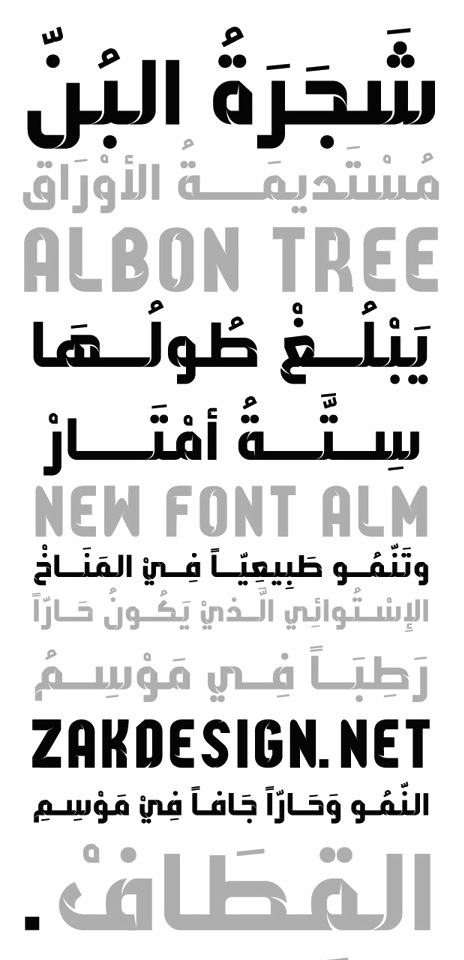
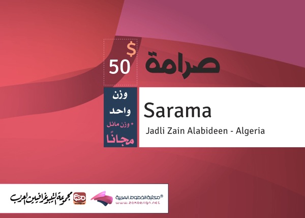
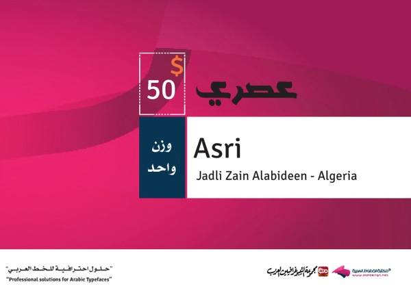
In 2013, he extrapolated the Sony Walkman logo into his Sony Walkman organic font. He also made the Arabic typefaces Bon Font, Saramah, Aqeeq, Graphici, Asri, Ink Drip, Arabic Script, Ink Stream, Alqusair, and Diana Extra, and the octagonal Latin / Arabic typeface Shohadaa. Typefaces from 2014: Ara Hala Bo She'sha, Ara Hamah 1964 B Bold, Ara Hamah 1964 R Light, Ara Hamah 1982, Ara Hamah AlFidaa, Ara Hamah AlHorra, Ara Hamah AlThawra, Ara Hamah Alislam, Ara Hamah Homs, Ara Hamah Kilania, Ara Hamah Sahet AlAssi, Ara Hamah Zanki, Ara Hamah City, Assaf, Haneen (signage script), Sally (with Sally Alzaza), Bondoq, Amal (art deco for Latin and Arabic), Lamis, Hilary, Saba, Mary (piano key typeface), Nisreen, Hajar, Kufi, Muslimah (free), Ahrar, Ghang Tachkili and Djadli Tachkili (designed by Jadli Zein Alabedeen (Algeria) and programmed by Zakaria Saleh), Al Hadari, El Maidan, Israr Syria, Etab AmMoniee, Hala, Hamah, Al Bayan, Assaf, Baghdad. Typefaces from 2015: Handmade (custom Latin/Arabic font for a Palestinian store), K24 (a corporate font for Kurdistan 24 channel), Hattan (Latin and Arabic), Nicole, Natalie, MasterFont, Naskh, Moscow (constructivist Arabic typeface). Typefaces from 2016: Joory, Twitter Headline Type, TV Sans, Corporative Sans (Latin and Arabic), Eliyaa Pro, Yasmin, Feather, Bein Sports Network typeface. Typefaces from 2017: Halimah. Typefaces from 2018: Media Pro, Maghfira. Behance link. [Google] [More] ⦿ |
Zakariya Saleh
|

 Slovak designer who made FF Bradlo (1994-1995) at
  Graphic designer in Rio de Janeiro associated with Plau Design. At Miami Ad School, as a student, he created Minimal Fraktur (2015). In 2018, he designed the corporate art deco typeface Chez Lalu 70. In 2019, he co-designed Muda, a corporate typeface for the fashion brand Oficina Muda with Ana Laura Ferraz, Gabriel Menezes and Rodrigo Saiani. In 2020, still at Plau, he designed the custom all caps sports company typeface Brio. With Rodrigo Saiani, Carlos Mignot designed the video game font family (+stencil, +Cyrillic) either called Killing Sans or Nine to Five (2020). Still in 2020, Mignot designed the flared Koch Antiqua-style custom typeface Xilo.
 Fabio Haag Type is Fabio Haag's type foundry in Brazil. Earlier, he ran
  [
[ [
[ Fabrizio Schiavi was born in Ponte dell'Olio in the Piacenza province in 1971. FSD Fabrizio Schiavi Design in Piacenza was opened in 1998. With Alessio Leonardi, he co-founded Fontology. He also co-launched the experimental graphics magazine Climax in 1994.
  Jason Smith is the British corporate typeface designer who founded Fontsmith in 1997, where he retailed his own designs from his office in London. He has created a typographic identity for the Post Office in the UK. Phil Garnham was one of the in-house type designers. In January 2020, Fontsmith was acquired by Monotype.
  [
[ [
[ Type designer who worked at Adobe from 1989-2002 and for Monotype from 2003 until today. His typefaces in chronological order:
 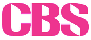 Creator of the modular display typeface
  Miranda Hayes (Randa Graphics, Anderson, SC, b. 1994) designed these typefaces in 2015 while she was studying at Anderson University: Blithedale (a 192-style mixed heritage superfamily that includes Serif, Sans, Slab and Roman subfamilies in Regular, Expanded, Condensed and Oblique styles spread over 8 weights each), Davicar (named after David Carson), Fellatype (an irregular script named after Ed Fella), and Brodyville (named after Neville Brody).
  A custom-made typeface for ABC (the government-funded Australian Broadcast Corporation). In 2016, the cost of 32,750 dollars caused an uproar in Australia when the extravagant amount was questioned by Liberal senator James Paterson to The Australian. It comes soon after the ABC executive behind the typeface resigned. Digital director Angela Clark has left the ABC for the commercial sector.

 [
[ [
[ As Black Tiger, this outfit was reportedly based in Riyadh, Saudi Arabia, but as RTL Type, it appears to be in Hebron, Palestine. It was also known as Emad ISkyFalcons. On Behance, we learn that the designer is Emad Fohid.
  Cairo-based designer of the circular arc typeface
  [
[ [
[ Rochester Institute of Technology's School of Printing graduate who lived in California and in Holland, MI, and now resides in Louisville, Colorado. He was a disciple of Chuck Bigelow and Kris Holmes.
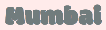
 WhiteCrow is a type foundry and design studio founded by Sarang Kulkarni in Mumbai in 2005. It specializes in multilingual branding, type design and calligraphy. A collective of type designers, the White Crow team creates customized typefaces for all Indian scripts, including Devanagari, Bangla, Gujarati, Tamil, Telugu, Kannada, Malayalam, Gurmukhi, Meitei Mayek (Manipuri), Oriya and Urdu. Their typefaces:
  Arabic font foundry based in Ramallah, Palestine, and run by Zakariya Saleh, a graduate of Palestine Polytechnic University. They made Osama (2013),
  [
[
|
|
|
|