TYPE DESIGN INFORMATION PAGE last updated on Mon Jun 8 17:37:15 EDT 2026
FONT RECOGNITION VIA FONT MOOSE

|
|
|
|
|
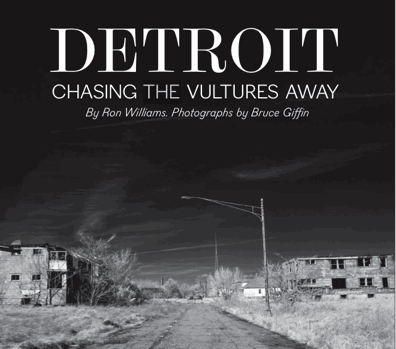
Type scene in Michigan | ||
|
|
|
|
SWITCH TO INDEX FILE
Studio in Ypsilanti, MI. They created custom typefaces such as Jam Space (2014, brush style) and Molly may (2014, modular display face). [Google] [More] ⦿ | |
In 2012, while studing at Type@Cooper under Jesse Ragan, he published the beautiful angular typeface Marais. Site dedicated to Marais. [Google] [More] ⦿ | |
Grand Rapids, MI-based designer of Glitched (2016). Behance link. [Google] [More] ⦿ | |
Aisha Scott
| |
AKOFAType
| Located in Powder Springs, GA, AKOFAType has published the following dingbats with symbology from Ghana: Adinkra Calabash, Adinkra FineFine, Adinkra WantaWanta (2007). The designer is Kwesi A. Amuti (b. East Lansing, MI, 1974). He is working on Steady Rockin (a display face) and Fat Head. In 2013, he published Ehmbeecee, a typeface with frames. In 2014, he made the elliptical sans typeface Cabeza Grossa and the snowflake typeface Flurry. Creative Market link. Typedia link. Klingspor link. [Google] [MyFonts] [More] ⦿ |
| |
During his studies in Farmington Hills, MI, Alex Chopjian created the free techno typeface Miami (2013). Dafont link. [Google] [More] ⦿ | |
Creator of Coop Blackletter (2016, a soft blackletter version of Cooper Black), Dequindre (2015, based on the capitals of Fette Buhe Fraktur by Walter Buhe, 1914-1915), Teip (2014, a multiline layerable all caps typeface), Pila (2014, techno stencil), Handu (2012, hand-drawn sans-serif inspired by the hand-painted type and signage on the streets of Kolkata, India), Atrium (2012, a squarish sans family based on the pen art of W.E. Dennis), Saugatuck (2011, grunge) and Sello (2011, a unicase hand-drawn, geometric sans-serif with a touch of retro). Behance link. Klingspor link. MyFonts foundry link. Home page. [Google] [MyFonts] [More] ⦿ | |
Alex Sheldon
| |
Grand Rapids, MI-based designer of the hand-printed typeface Love Letters (2013). [Google] [More] ⦿ | |
Alicia Cox (Detroit, MI) created the squarish modular typeface Wicked (2013) and https://www.behance.net/aliciamariega90266erve Display (2020). [Google] [More] ⦿ | |
East Lansing, MI-based graphic designer who created a typeface in 2010. [Google] [More] ⦿ | |
Grand Rapids, MI-based designer of the modular display typeface Berry (2015). [Google] [More] ⦿ | |
Marquette, MI-based creator of the thin avant-garde sans typeface Fondant (2012). Behance link. [Google] [More] ⦿ | |
Foundry in Ypsilanti, MI. Kadmos, Bosporos (both classical Greek), Czasy, Szwajcarski (Polish), and Demotiki (modern Greek). Nice fonts, 85 US dollars per face. Jeffrey Rusten swears that these are the highest quality fonts for polytonic Greek. [Google] [More] ⦿ | |
Linden, MI-based designer of a dot matrix typeface in 2016. [Google] [More] ⦿ | |
Graphic designer and illustrator in Grand Rapids, MI, who created the typeface Broken Record (2014), which uses pieces of broken vinyl records as inspiration for the glyphs. Behance link. [Google] [More] ⦿ | |
| |
| |
| |
Mount Pleasant, MI-based designer of the alchemic typeface Time Travel (2014). Behance link. [Google] [More] ⦿ | |
Andrew & Emily Beauman
| |
Saginaw, MI-based creator (b. 1989) of the grungy dymo label typeface Sensitivity (2011). [Google] [More] ⦿ | |
Kalamazoo, MI-based designer who is working on Vox (2004), a speech-based typeface. [Google] [More] ⦿ | |
Angelyn Littmann (Studio Gidde, Michigan) created GiddeHand (2011, hand-printed). Dafont link. [Google] [More] ⦿ | |
Detroit, MI-based designer of the display typeface Regal (2018). [Google] [More] ⦿ | |
Allendale, MI-based student at Grand valley State University. Designer of the architectural typeface Damn Bad (2014) [at least, I think that is the name of the typeface]. [Google] [More] ⦿ | |
Anna Gustafson
| |
Ann Arbor, MI-based designer of Mohr Fraktur (2019). [Google] [More] ⦿ | |
APG Studios
| Michigan-based creator (b. 1980) of the hand-printed typefaces Boyd Smiles (2016), Almost Infinity (2016), Byron Reccon (2015), Quick as a Bunny (2015), Byron Block (2012), Fuzzy Bat (2012), Flocked 2 (2012) and Flocked 3 (2012). In 2016, she designed the cracked typeface Four Sixteen Sixteen. In 2017, she added the iFontmaker fonts Poorly Taped, Monday Madness, Almost Infinity, and Badly Stamped (white on black). In 2018, she designed the textured typeface Bleary Days. Dafont link. iFontmaker link. [Google] [More] ⦿ |
Student at Saginaw Valley State University (MI). In 2012, she created the free typeface Duckie. [Google] [More] ⦿ | |
Arabetics
|
His typefaces include Zena (2009), Layal (2007), Mehdi (2005: follows the guidelines of the Mutamathil Taqlidi type style), Sabine (2008: it too follows the guidelines of the Mutamathil Taqlidi type style), Fallujah (2005), Mutamathil Falujah, Yasmine Mutamathil, Mutamathil Taqlidi, Arabic Mutamathil, Arabic Mutamathil Mutlaq (2004), Arabic Mutamathil Tibaah, Arabic Mutamathil Mutlaq Tibaah, Arabic Mutamathil Muttasil and Arabic Mutamathil Tibbaah Muttasil. Mutamathil and Mutamathil Taqlidi include optional Lam-Alif ligatures. See also Kufa Mutamathil (2011). Other font families: Nasrallah, Silsilah, Yasmani, Mutamathil, Yasmine Mutamathil, Amudi, Amudi Mutamathil, Anbar (2008), Handasi, Yasmine Mutlaq, Jazm (2010), Jalil (2011). In 2012, he added Nuqat, Nastarkib, Lahab, Ibrani, Hallock, Arabetics Latte (for Latin and Arabic), and Banan (Mutamathil Taqlidi type style). In 2005, he created Handasi, about which he writes: The idea behind Handasi, Arabic word for engineered, was to design a font without a single curve that would at the same time resembles traditional curves-rich Nask style. The font strictly uses straight lines. The design of Handasi is based on the Mutamathil Taqlidi design style where each letter is represented by one normal glyph assigned the basic Unicode number and an additional final shape glyph to letters capable of dual connection within traditional Arabic text. No initial, medial, or standalone shapes are provided. Arabetics Symphony (2012) is a sans serif Latin typeface with a comprehensive support for the Arabetic scripts, including Quranic texts. In 2013, he published PF Nuyork Arabic at Parachute. His Arabetic fonts from 2013 include Nagham, Arabetics Harfi (for Latin and Arabic), Camille, Raqmi and Raqmi Monoshape. In 2015, he published Hazim (in Mutamathil Taqlidi style), Sada (for small devices, in Mutamathil Taqlidi type style), Khatt, which follows the Arabetics Mutamathil Taqlidi style. Typefaces from 2016 include Mashq, possibly the first typeface implementation ever of the early Quranic scripts of the Early Mashq, Mashq Kufi, and Mashq Ma'il. The font family design is primarily based on the scripts of the Quran manuscripts of the Topkapi Museum, the Bergstraesser Archive, and other scattered samples. Typefaces from 2018: Arabetics Detroit. Typefaces from 2020: Arabetics Aladdin. Hiba Studio link. [Google] [MyFonts] [More] ⦿ |
Student at Saginaw Valley State University (MI). American designer of Timeportal (2011), created while studying at SVSU. [Google] [More] ⦿ | |
Grand Rapids, MI-based designer of Modular Typeface (2015). [Google] [More] ⦿ | |
| |
Ayse Ulay
| |
Badspark
| Kalamazoo and/or East Lansing, MI-based designers of the tattoo typeface Mancer (2016), the space age / futuristic typeface Wilhelm (2017), and the 1980s-inspired sans headline typeface Barkleigh (2017). Creative Market link. [Google] [More] ⦿ |
Brooklyn-based Michigander, currently exploring custom type, coding, and motion design. Her typefaces include Ancho (2020), which includes a variable cut. Ancho is a wide-stanced sans with forms inspired by the Teotihuacan pyramids in Mexico. At Type Cooper 2020, she developed the vernacular display typeface Aguas, an experimental variable font that shifts in width and curvature and is inspired by hand-painted signs in Mexican food markets. [Google] [More] ⦿ | |
| |
During his studies at Kendall College of Art and Design, Grand Rapids, MI-based Ben Shumitz created the display typeface Mosaic (2015). [Google] [More] ⦿ | |
Graphic designer in Grosse Pointe, MI. Creator of these unfonted alphabets: Buttery Noodles (2010, comic book style), Fun With Paper (2010). Home page. [Google] [More] ⦿ | |
During his studies at College for Creative Studies, Saline, MI-based Benjamin Ellsworth created the collegiate sports typeface Hawk Sans (2015). [Google] [More] ⦿ | |
During her studies at Grand Valley State University, Ravenna, MI-based Bethany Houghton created a modular typeface (2015). Behance link. [Google] [More] ⦿ | |
Caro, MI-based creator of the grungy dymo label typeface Night Out (2011) and the grungy typeface Funky Olive (2012). [Google] [More] ⦿ | |
During her graphic design studies at the College of Creative Studies in Detroit, Bianca Iacopelli (Sterling Heights, MI) created a few typefaces. [Google] [More] ⦿ | |
Bigelow&Holmes
|
|
Brain Fonts
| Based in Jackson, MI, Jay (Jonathan) Mann (b. 1994) created the free poster typeface Yes (2013), the childish hand Justgirlytext (2013), and the fat finger typeface Big Black And Beautiful (2013). Fontspace link. [Google] [More] ⦿ |
Brand Labs
| Company in Rochester, MI. Creators of the 3d beveled typeface Wednesday Matinee Shadow (2010). The designer is possibly Kevin Skinner. [Google] [More] ⦿ |
Marquette, Michigan-based creator (b. Italy) of the spurred typeface Storico (2013). [Google] [More] ⦿ | |
Brandon Knap
| |
Graphic designer in Sterling Heights, MI, who created the sci-fi typeface Solarfields in 2014 and the all caps sans display typeface Auratio in 2018. [Google] [More] ⦿ | |
Brian Jacob
| |
Student at the University of Michigan who lives in Clarkston, MI, where she works as a graphic designer at Integrated Marketing Solutions. Creator of Sans Staple (2010), a typeface composed of juxtapositions of staples. [Google] [More] ⦿ | |
Bruder Graphik
| Based in Dearborn Heights, MI, Bruder Graphik specializes in hand-drawn fonts. One of its first products is Graph Paper (2008). Randall Charles Bruder (b. Dearborn, MI) runs Bruder Graphik. [Google] [MyFonts] [More] ⦿ |
Detroit-based designer. He created Tsalagi (2009), a font for Cherokee, but based on the constructivist shapes. [Google] [More] ⦿ | |
Graphic designer. College for Creative Studies Detroit graduate. His typeface Chipper (2011) is based on the form of chocolate chips. [Google] [More] ⦿ | |
Graphic designer in Ferndale, MI, who created the sci-fi font Funky Space Robot (2014, FontStruct) during her studies. [Google] [More] ⦿ | |
Instructor in descriptive geometry and drawing at the University of Michigan. Author of Plain Alphabets for Office and Schools (1898, George Wahr Publ., Ann Arbor, MI). [Google] [More] ⦿ | |
During his studies, Chad Eagle (Mount Pleasant, MI) designed the ghoulish typeface Frightning Font (2013). [Google] [More] ⦿ | |
Chad Reichert is the proprietor of spirit3design, a studio specializing in graphic design and typographic endeavors. He received his undergraduate degree in graphic design from Valparaiso University, attended graduate school at the California Institute of Arts and completed his MFA in graphic design from the Minneapolis College of Art and Design. Chad is also an assistant professor at the College for Creative Studies in Detroit. He teaches time-based media, typography, visual communications and graphic design history. His fonts: the rounded squarish typeface Nicollet (2003), Tense, Eve Three (text type), Construct, Bandwidth (pixel family), Fancysingle, Nicollet, Stitch (stitching font), Hudson, Palio, Stargazer. [Google] [More] ⦿ | |
During her studies at the Milwaukee Institute of Art & Design, Chanel White created the decorative Bohemian Alphabet (2015) and 3d Alphabet (2015). [Google] [More] ⦿ | |
Charles Bigelow
| |
Lettering teacher in Detroit in the early part of the 20th century. He contributed to art nouveau, and published Strongs Book of Design (1910). In 2010, one of his art nouveau alphabets was faithfully digitized by Ken Ray as Strongs 1917 Sharp. [Google] [More] ⦿ | |
Charles J. Strong (b. 1866, Hunstville, IL) was very influential in the sign and lettering world following the turn of the century. His text Strong's Book of Design (1910, 1917, 1982) has been reprinted several times. The early editions had wonderful color plates. Strong founded the Detroit School of Lettering along with a mail order supply department. He also wrote Strong's Art of Show Card Writing (1919) and Detroit School of Lettering 1-10 (1905). The latter text consists of ten thin booklets. [Google] [More] ⦿ | |
Charles Tubbs
| |
As a student at Grand Valley State University, Grand Rapids, MI-based Chase Hasper created the experimental modular typeface Dord (2015). [Google] [More] ⦿ | |
Student at Saginaw Valley State University (MI). Creator of the dymo label grunge typeface Jukebox (2011). [Google] [More] ⦿ | |
Graduate of Eastern Michigan University. During her graphic design studies, she created Barton (2013), a font that is based on the architecture in Barton Hills, Ann Arbor, MI. [Google] [More] ⦿ | |
Detroit, MI-based designer of Tough Girl Type (2015). [Google] [More] ⦿ | |
| |
Michigan-based creator of the free brush typeface Flare (2012). [Google] [More] ⦿ | |
Saginaw, MI-based designer in 1935 of a rhombic typeface. [Google] [More] ⦿ | |
During her graphic design studies, Claire Dossin (Grosse Pointe Farms, MI) created an untitled hand-printed typeface (2014). [Google] [More] ⦿ | |
Counterpoint Type Studio
|
In 2014, he added Swashington. In 2015, he designed Plectrum CP (a Peignotian sans typeface family with very large x-height). Later in 2015, he set up Jukebox Collection. Typefaces from 2016: Schmalfette CP. He writes: SchmalfetteCP is the result of another collaboration between designers Jason Walcott and Rob King. King suggested that Walcott revive this wonderful and somewhat forgotten sans serif typeface from the mid 1950s. Originally designed by Walter Haettenschweiler in 1954, Schmalfette Grotesk was used for many years in the German magazine Twen. The typeface was notoriously hard to acquire at the time and graphic designers in the USA often resorted to cutting letters from the Twen magazines and reusing them in their own designs. Later, when digital type came along several typefaces very similar were created that claimed to be digital revivals of Schmalfette Grotesk. However, they are actually only loosely based on the original. The proportions are different and in some cases a lower case was added. The original font was all caps. [Google] [MyFonts] [More] ⦿ |
Graphic design school located in Bloomfield Hills, MI. It does not have a type design department. [Google] [More] ⦿ | |
Bay City, MI-based designer of the hand-printed outline font Shrimp (2013). [Google] [More] ⦿ | |
As a student in Grand Rapids, MI, Dan Deschaine designed the party typeface Fizzled (2016). Behance link. [Google] [More] ⦿ | |
Dan Meyer
| |
Designer (b. 1958) in Ann Arbor, MI, who specializes in athletic lettering typefaces. His fonts: Illinois Block (2013), Nebraska (2013), Castle Rock (2013), Illini Spike (2013), Big Ten Block (2014), Michigan 2 (2013). [Google] [More] ⦿ | |
Pelavin was Chairman of the Type Directors Club, 2002-2003. In 2009, he designed the 1940s art deco face Bokar. In 2010, he created Marquue Faceted and Marquee Solid (which can be layered to make a 3d effect), China Market (oriental simulation), Setsuko, an oriental simulation face, Rilke (an adaptation of the lettering used by Gustav Klimt on his poster for the 1st Vienna Secession exhibition in 1898 and is named for Klimt's contemporary the poet Rainer Maria Rilke: caps only), Tribeca Script, Monograph (as if written with a Speedball B pen), Book Country (crude octagonal folksy face), Bing (art nouveau), HiFi (retro script), Twentieth Century (an art deco headline sans), and Safety (1930s style). In 2011, he added Tiki (a pair of Hawaiian typefaces), Salty Dog. In 2012, he created the monoline uprigt connected script typeface Mimosa, which was inspired by the packaging for Moulinard Jeune, a line of French toiletries from the 1920s. Typefaces from 2013: Forgia (Pelavin writes: Forgia is a result of my fascination with the beauty I find in utilitarian industrial objects like the riveted stanchions in New York subway stations, decorative ironwork in Grand Central terminal and the eloquent construction details of the urban infrastructure of the 19th and early 20th century.) Perhaps the steampunk typeface Rivets (2016) is an outgrowth of Forgia. Typefaces from 2016: Oscar (tri-lined art deco typeface that pays trbute to the Acadmy Awards), Plot (brushed or lined wood style), Camp (a wooden log typeface), Rosa (art deco). Typefaces from 2017: Neroli (2017, formal art deco), Taos (2017, a cactus font). Typefaces from 2018: Trilight (trilined typeface). Typefaces from 2019: Noir et Blanc (a deco poster typeface). Typefaces from 2020: Molly Louie (a patterned decorative caps typeface). Typefaces from 2021: Bedazzle (a movie marquee font), Bankster (a spurred bank note or financial document font with various hatched and shadow styles). Typefaces from 2022: Mr Porter (a robust monolinear rounded slab serif rooted in 17th century England: rich and full-flavored with notes of coffee, licorice and molasses). [Google] [MyFonts] [More] ⦿ | |
Danielle Gravelle (Milford, MI) designed an arts and crafts logo for Vienna Café in 2012. [Google] [More] ⦿ | |
During his studies in Grand Rapids, MI, Danny Horner the angular octagonal modular death metal typeface Ark (2016). He also designed a great (typographic) pop art poster. [Google] [More] ⦿ | |
| |
David Frison IV (Grand Rapids, MI) designed the multiline typeface Converge in 2017. Behance link. [Google] [More] ⦿ | |
Inventor of the optical reader, b. Milwaukee, 1923, d. San Diego, 2007. Shepard majored in electrical engineering at Cornell and earned a masters degree in mathematics from the University of Michigan. Obituary in the New York Times, from which I quote: Mr. Shepard sketched out the familiar boxy numbers on credit cards, called the Farrington B numeric font, on a cocktail napkin at the Waldorf-Astoria Hotel, his wife said. The shapes were meant to be as simple and open as possible because gasoline station pump islands were among the earliest places optical character recognition was used; the shapes were meant to minimize the effects of smearing with grease, oil and other substances. The font with a 7 that looks like two sides of a rectangle has persisted even as the numbers have faded from use: the magnetic strip on the cards back now carries the necessary information. [Google] [More] ⦿ | |
During his studies in Grand Rapids, MI, David Shankin created the arts and crafts typeface A Baby's Finger (2014), which is isnspired by the Glasgow School of Art. [Google] [More] ⦿ | |
Ypsilanti, MI-based creator of the painted typeface Artsie (2009). [Google] [More] ⦿ | |
David Wise is currently (2013-2014) enrolled as a MFA candidate in 2D Design at Cranbrook Academy of Art in Bloomfield Hills, Michigan. Creator of the geometric sans typeface Peter (2013): A geometric sans-serif inspired equally by Futura, Kabel, and Benjamin Crittion's trendy and ubiquitous typeface Raissonne (see trendlist.org). He also designed Krimhilde (2013). [Google] [More] ⦿ | |
Ypsilanti, MI-based creator of Indie Comic (2014, hand-printed). David was born in Woodhaven, MI, and studied at Eastern Michigan University. [Google] [More] ⦿ | |
Born in Bay City, MI. New-York based designer of Quicksilver (1976, Letraset), a neon / glass tube chrome all caps display typeface from the disco era. He writes: I am Dean Morris, the designer of the typeface "Quicksilver" that came out in 1976 as part of Letraset's Letragraphica range of rub-down fonts, the stylishly aggeressive ones in the yellow pages of the catalog. I named the typeface "Quicksliver" because it looked like bent thermometers - quicksilver being a nickname for mercury (I never meant it to suggest neon), and because "Quicksilver" had some of the cooler letters such as Q, K, E, and R. The name was my second choice, however. Letraset Englishly felt that my first choice, "Polished Sausage", would be "rather unpopular iln foreign markets". About the genesis, e says: I designed it as a 16 year-old kid in John Glenn High School in Bay City, Michigan, and sent Letraset a xerox of a tight sketch of 3" letters kerned with the heavy outlines slightly overlapping as I originally intended. I drew only the skinny S without an alternate and submitted no punctuation (what did I know?). Letraset must have wanted it real fast (fifties nostalgia and disco were WHITE HOT then, remember), because they did the finished art themselves at 5" high (they can't have known my age, maybe they had no confidence in my technical talent), starting with the E as did I in the design stage. And what a gorgeous rendering job they did in the pre-Mac days of ruling pens, straightedges, and hand-drawn curves (those aren't compass curves)! Letraset stayed very close to my tight sketch, designed the punctuation, and suggested an alternate but wierd wide S, which I approved, figuring there was probably no other decent way to design it. I imagined the punctuation would match the stroke width of the letters but they drew them narrower and slightly oddly, but I figured what the hell. If you wondered, "What was I thinking?" when you looked at the A, B, E, F, K, N, Q, R, and Y, I'll tell you. I was simply trying to describe part of the letter being drawn in the wrong direction. I thought I was so clever. For instance the E cross-stroke goes from right to left rather than from left to right like, oh, any other Roman cap E in history. R and Q diagonals came from waaaaaaaay on the other side, N goes waaaaaaay around the wrong way before starting the diagonal. "Chrome" letters can branch but these "glass tube" letters don't! And then the seventies ended. Dean: Alas, digitization came along eventually and fontographer technology followed. Crash went sales of rub-down type, and control of artwork was pirated without my knowledge and beyond my control, which I don't condone but I totally understand. The first album cover I saw with Quicksilver was Men At Work's first smash LP, then punk pioneer Stiff Records' logo appeared on 45 rpm labels with a clearly Quicksliver-inspired F. For about ten years I, family, and friends collected food packages, posters, took photos of signs, etc. with Quicksliver from around the world. I think it's about the easiest typeface to mishandle ever. Eventually I stopped trying to keep track of it. Maybe I'm overestimating its popularity now after 30 years (I totally forgot about it for about a decade), but to me seeing it around at all is itself a rave. Ray Larabie published Tight in 2007 at Typodermic, which is a digital revival of Quicksilver. Dean Morris's photo stream at Flickr. Klingspor link. [Google] [MyFonts] [More] ⦿ | |
Demi Michele
| Designer from Michigan. In 2021, she published Summer Goodbyes (a scrapbook font). [Google] [MyFonts] [More] ⦿ |
Dennis Scherdt
| |
Ann Arbor, MI-based designer of a colorful display typeface in 2017. Behance link. [Google] [More] ⦿ | |
Extinct type foundry, which published a Specimen Book in 1951. [Google] [More] ⦿ | |
Detroit, MI-based designer of a Barack Obama poster (2011). [Google] [More] ⦿ | |
Graphic designer in Ann Arbor, MI, who created the display typeface Ind in 2017, and the blocky counterless typeface Square in 2014. [Google] [More] ⦿ | |
Warren, MI-based winner in the Chartpak Designer Velvet Touch Transfer Lettering Typeface Competition in 1988 for Tocco Bold. [Google] [More] ⦿ | |
Fremont, MI-based designer of the sci-fi typeface Space Poster (2018). [Google] [More] ⦿ | |
Doxie Design
| Cedar Rapids, MI-based designer of the art nouveau typeface Luzerne (2017) and the Western typeface Iron Range (2017). Creative Market link. [Google] [More] ⦿ |
DragonFang Fonts
| Russ Herschler (DragonFang Fonts, Royal Oak, MI; b. 1967) designed Moria Citadel (2002), a grunge font in the style of Stonehenge, an old Formatt Presson font on which it is based. He also made Crom (2007, comic book face). Home page. Dafont link. [Google] [More] ⦿ |
In 2012, that was followed by the tall condensed font Vega, and the architectural / mechanical typeface Hans Bellmer. Behance link. [Google] [More] ⦿ | |
As a student at the College For Creative Studies, Detroit MI, Ebrima Jammeh designed the African tribal typeface Mandin (2016). [Google] [More] ⦿ | |
Echo Foxx Studios
| Michigan (was: Los Angeles)-based designer of the outlined handcrafted typeface Tropikal (2016), the floral caps typeface Rhea (2017), and Into The Wilderness (2017). In 2018, she designed the ink splatter font duo of Forest and Pine (free demo). [Google] [More] ⦿ |
Ed Trager
| |
Allen from Wyandotte, MI, b. 1966, designed E-Dragon's Font (2004). [Google] [More] ⦿ | |
Born in Detroit in 1938, Ed Fella is a former commercial artist and professional graphic designer who practiced for 30 years in Detroit. After receiving his MFA from Cranbrook in 1987, he taught in the graduate Graphic Design program at CalArts in Los Angeles for another 30 years. He is currently a Professor Emeritus and continues working on campus in his studio on a wide-ranging series of his own idiosyncratic projects that stubbornly resist categorization although they freely partake in the conventions of typography, photography, illustration and fine art. His typefaces:
Author of Edward Fella: Letters on America, Photographs and Lettering. From the book's blurb: [This book] gives insight into his idiosyncratic world by combining and juxtaposing examples of his unique hand lettering with his photographs of found vernacular lettering. In 1997 he received the Chrysler Award, and in 1999 he got an Honorary Doctorate from CCS in Detroit. His work is in the National Design Museum and MOMA in New York. Claire Agopia wrote Edward Fella "I am the vernacular" (2007) for her graduation from Ecole Estienne. Ed Fella poster by Guadalupe Sanchez (2013). FontShop link. [Google] [MyFonts] [More] ⦿ | |
| |
During her studies at Grand Valley State University, Grand Haven, MI-based Elizabeth Borgeson created a high-contrast typeface (2015). [Google] [More] ⦿ | |
| |
Student at Saginaw Valley State University (MI). In 2012, she created the free dymo label typeface family Goonberry and the hairline typeface Demure Fleur. Fontspace link. Dafont link. [Google] [More] ⦿ | |
Detroit-based designer, b. 1990. Behance link. Her typeface Zeitgeist (2010) was inspired by Bauhaus artwork by German artist Marianne Brandt: simple geometric monoline glyphs, with a few curves thrown in for a minimal amount of warmth. [Google] [More] ⦿ | |
Ann Arbor, MI-based creator (b. 1985) of the free comic book typeface Erik Sans (2015) and the handcrafted A Tribe of Aclems (2016). Dafont link. [Google] [More] ⦿ | |
Erik Riffle (Riffle Design, Allendale, MI) created the sans typeface Modular Type (2014) during his studies at Grand Valley State University. [Google] [More] ⦿ | |
Ypsilanti, MI-based creator of Paper Font (2012, a paper fold typeface), Ridge (2012, a free multiline extension of Paper Font), and a few hand-lettered alphabets. All these typefaces were designed during her studies at Eastern Michigan Univrsity. Check Erika Noel Design. Behance link. [Google] [More] ⦿ | |
Detroit, MI-based designer of the experimental multilayered typeface Lightyear (2012). Behance link. [Google] [More] ⦿ | |
Eurekaville
| Funky Lloyd Wright (2002) is an experimental font based on Frank Lloyd Wright's ideas. Interesting quote by FLW on this page: "Television is bubble gum for the mind". Kristian Walker is Art Director at TaigMartin Advertising&Public Relations, and professor of web design at Southwest Michigan College. His home page is called Eurekaville. Other fonts: Nikolas (2002), Rattled Nerves. No downloads (yet). [Google] [More] ⦿ |
Kalamazoo, MI-based student-designer of a display sans typeface in 2015. Behance link. [Google] [More] ⦿ | |
Fictionalhead (was: Smashmethod)
| Fictionalhead is the outfit of Dan Meyer (Michigan, b. 1982), who before that had a web site (now obsolete) called Smashmethod. His Smashmethod fonts have names that start with SM: SM_contextisM (2003, octagonal), SMPixelism (2005), SM Pianoism (2004), SM Perceptionism (2004), SM ContextisM (2004), SM ReversisM (2003, techno), Sugar Water, Glue, Wide Angle, Mad Flava, SMballerisM (2003, circle dingbats), SMpletzisM, SMshenisM (2003, sans), SMreversisM (2004), SMsuggestivisM (2003, erotic outline font), SMvinylisM (2004), SMscriptisM (2004, handwriting), SMcrystalisM (2004), SMwaterisM (2004), SM_middlisM-Bold (2005), SM_middlisM (2005), SM_obscenisM-Bold (2005), SM_obscenisM (2005), SM_scriptisM (2004), SMbluisM (2003), SMbournisM-Bold (2006), SMbournisM (2006), SMhollyisM (2006), SM_coarsisM (2006), SM_euphorisM (2006), SM_inkisM (2006), SM_ownisM (2006), SM_phantisM (2006), SM_pigisM (2006), SM_recussionisMCaps (2006), SM_recussionisMRegular (2006). His Fictionalhead fonts have names that start with Fh and are all dated 2007: Fh_Euphoria, Fh_Ink (sketch font), Fh_Letter, Fh_Nicole, Fh_Obscene, Fh_Reverse, Fh_Scribble, Fh_Script, Fh_Space, Fh_Ugly, Fh_Sheena, Fh_Perception, Fh_Owned, Fh_Join, Fh_Holly, Fh_Faith, Fh_Blue, Fh_Annie. Additions in 2009: Fh Lentil, Fh_Allisa. These are mostly handwritring and techno fonts. In 2012, he added FH Hyperbole. Typefaces from 2013: FH Sneaky. Devian tart link. Home page. Dafont link. Another Dafont link. Klingspor link. [Google] [More] ⦿ |
FontHaus (or: DsgnHaus)
| Mark A. Solsburg's company, FontHaus (or DsgnHaus), was located in East Fairfield, CT, then in Westport, CT and Norwalk, CT, and now in Chelsea, MI. Established in 1990, it offers a 1200-font collection of original fonts. It briefly became DsgnHaus, then ForDesigners.Com, and then went back to FontHaus. It used to sell typefaces for 2 Rebels, FontHaus, Intellecta, Adobe, FontShop, Alphabets, ITC/Fonttek, Berthold-Adobe, Linotype, Berthold, Lunchbox, Bitstream, Scangraphic, Carter&Cone, T-26, Dennis Ortiz-Lopez, Font Bureau, Elsner&Flake, and so forth. At the end of 2010, it was offering over 75,000 fonts. On their DsgnHaus Exclusives CD, we find fonts by the following individuals or foundries: Al Brantner, Frank Heine (UORG), Munich Type, Altemus, Franta Storm, Patricking, Ampersand, Galapagos Design, Pepper Tharp, Andrew Smith, Gary Munch, Robert Knopf, Andy Stock, Graphics by Gallo, Robert Petrick, Ann Pomeroy, Haig Bedrosian, Rodrigo Cavazos, Apply Design, Holly Goldsmith, Self Build, Bill Fletcher, Jack Tom, Spiece Graphics, Blue Sky Graphics, Jason Sutton, Swordfish Design, Casey Cheeseman, Jens Gelhlaar, Terminal Design, Christian Scwartz, Joe VanDerBos, Tintin Timen, Circus Design, John Alfonso, Wolfer Type, DsgnHaus, Kayde Fonts, Wolfgang Wagner, Kurt Roscoe, Woodrow Phoenix, Emma Smith, Mark Jamra, Faruk Ulay, Mondrey (Castcraft). Since 2001, the fonts are available through MyFonts. Their 155 exclusive fonts, as of 2017: 2 Rebels Un, AlaCarte One, AlaCarte Two, Alert Code, Allan Gothic, Always Twelve, Angry, Aries, Babbio, BadDeni, Bereta, Billes, Boggle, Bonray, Boulbar, Boules, Bristol FH, Bubba Bold, Bubble Bath, Caaarc, Cafe Noir, Carbon, Caslon Antique, Cattawampus, Chew Toy, Chicane, Chuckle Head, Clean Cut, Coeval, Cooper Poster FH, Cro Aloha, Curly Luly, Cuty, DH Sans, DV9, Day Job, Db8 digital, Design, Dieselis, Dieselis Economic, Dinky Dinks, Doublecross, Doubler Script, Doufff, Dynamic, Eternity, Faxsimile, Fleche, Flembo, Flywheel, Frank Gorshin, Fred, Freysk, Gagarin, Garaline, Graphic, Groundlings, Haberdasher, Hanbuhrs, Handex, Hector, Huoncry, Inbetween, Infobahn, Jandoni, Junk, KO, Keynote, Kidy, Knitmap, Krome Domes, LaPlaya, Laser Beam, Laughin, LeScript, LearnedBehavior, LeftBrain, Leticea Bumstead, Lines, Lolo, Luna Martino, Magma, Manesca, Manipulator, Manipule, Manomessa, Manosk, Marcel Duchamp, Mariasfont, Market Place, Marsh Mallow, Menace, Message, Midlaw, MilkShake, Minimex, Modern, Mutation, Nacht, Nameless, Napoleon, Non Linear, Novella, Nuclear Reactor, Nunavik, Outfitters, Ovidius, Pastor, Pep Rally, Perceval, Peripheral, Perles, Phoenix Chunky, Pilgrim, Plastik, Poster Gothic FH, Punch, Quattr occhi, Razzia, RightBrain, Rigolotte, SP Elder, SP Stoned Oldstyle, SP Thais, Saturn, Scratch n Sniff, Scritto Politto Freako, Semi Sans, Shindig, Sinister, Sitcom, Snowslider, Sofa, Solo Sport, South, Sportif, Stadion, Stencil Full, Superman U, Table Manners, Tape, Tata One, Tex Loose, Thin Man, Toxin, Toy Box, Traveler, Troiminut, Tutu One, Vague, Vintage Gothic, Voyou, Wooders, Yisana, Zkumavka. Showcase of FontHaus's typefaces at MyFonts. [Google] [MyFonts] [More] ⦿ |
Michigan-based designer (b. 1961) of the scribbly typeface Childhood (2012). [Google] [More] ⦿ | |
This foundry, a subsidiary of Dreadful Productions of Royal Oak, MI, made some free horror fonts in 2002: Gorgo, MonsterChild, Dread, Gooey, Lastman, Morgus. Dafont link. [Google] [More] ⦿ | |
Fritz Swanson lives in Manchester, Michigan with his wife Sara and his children Oscar and Abigail. He teaches at the University of Michigan, where he runs a letterpress studio, The Manchester Press. He is also director of Wolverine Press. Creator in 2011 of a few grunge style typefaces at iFontMaker: Fritz Old Style, 1776, Fritz Roman, Fritz Roman Nova, Special (K). In 2016, he added the handcrafted typefaces Wolverine, Aldine Lower Case and Talisman Spindler By Hand Open. Twitter link. iFontmaker link. [Google] [More] ⦿ | |
Furocious Studios
| Kep Jekura, an artist from Michigan, designed furocious_fuzzy (2007), Furocious_TN (2007, grunge) and Furocious Wild (2007). Alternate URL. [Google] [More] ⦿ |
Kalamazoo, MI-based designer of some hand-printed typefaces (2012). Behance link. [Google] [More] ⦿ | |
A 2013 Garamond poster by Paul Amore (Macomb, MI). [Google] [More] ⦿ | |
Garrett Miller
| |
Mac McGrew writes: Mission was designed for BB&S by Sidney Gaunt in 1905, but patented by George Oswald Ottley. It is a rather novel face, with long ascenders and short ascenders. Serifs are triangular, like some members of the Latin series. Most noticeable is the way some strokes in the capital letters are joined with curves, especially in the B. Compare Viking. Ottley lived in Detroit at the time. [Google] [More] ⦿ | |
Grayfire Fonts
| John Litwinowicz (Grayfire Fonts, Royal Oak, MI) designed the futuristic typefaces Blades GF Free (2006), Voya Gui GF (2006), Fireye GF (2006), Fireye GF3 (2007) and Sharps GF (2006). Behance link. [Google] [More] ⦿ |
Great Lakes Lettering
|
In 2013, they designed the script typefaces Asterism (Asterism Clean, Asterism Clean Bold and Asterism Monoline in 2015), Kailey Force (signage script in three styles, The Bold, The Brave, The Beautiful), Icing and Saint Agnes. Typefaces from 2014: Brushy Mini, Helsing (a quirky serif inspired by Bram Stoker's Dracula (1897) and Edward Gorey's rendition of that story), Icing Blizzard, Frosted Blizzard. Typefaces from 2015: Backlash (Molly Jacques Erickson, Dathan Boardman: the next step in gonzo splatter lettering scripts). Typefaces from 2016: Kota Mini (brush), Butterskotch, Mon Voir (by Dathan Boardman, based on the calligraphic script of illustrator Jenna Rainey). Typefaces from 2017: Tarot (beatnik style), Calla Script (with Dathan Boardman), Raindrop (a flirty handcrafted typeface family for editorial illustration). Typefaces from 2018: Bon Voyage (based on the handwriting of Taryn Sutherland of Twinkle and Toast). Creative Market link. Newest Creative Market link. [Google] [MyFonts] [More] ⦿ |
Southfield, MI-based designer of a thin outline typeface in 2015. [Google] [More] ⦿ | |
As a student in Ann Arbor, MI, Greg Powell created the display sans typeface Starburst (2014). [Google] [More] ⦿ | |
Group Type
|
View the Group Type typeface libary. [Google] [MyFonts] [More] ⦿ |
East Lansing, MI-based designer of the art deco typeface Snapshot (2014), which was developed during her studies at Michigan State University. [Google] [More] ⦿ | |
Chicago IL-based designer who graduated in 2016 from the College for Creative Studies in Detroit, Michigan. In 2016, she designed the eyeliner-themed typeface Lithe. Behance link. [Google] [More] ⦿ | |
Sterling Heights, MI-based designer of the experimental typeface Perspective (2014-2015). [Google] [More] ⦿ | |
In 2015, he designed the crippled typeface Glitched. Behance link. Creative Market link. Old URL. [Google] [More] ⦿ | |
Jacob Type
|
Behance link. [Google] [MyFonts] [More] ⦿ |
Walled Lake, MI-based creator of Devine (2011). [Google] [More] ⦿ | |
James Grieshaber
| |
Bay City, MI-based designer at Saginaw Valley State University (b. 1973) of Building Bloc (2012). [Google] [More] ⦿ | |
Jason Anthony Walcott
| |
Jason Anthony Walcott
| |
Jason Anthony Walcott
| |
JAW Fonts (Jukebox Type)
|
The original list of typefaces includes Acroterion JF (2002, formal script), Adage Script JF (2002, formal script), Alpengeist, Andantino (2003), AnnabelleJF (2002, a formal script), Baileywick Curly, Baileywick Festive, Baileywick Gothic, Baileywick Happy Grams (star dingbats), Baroque Text JF (2003, a great Fraktur font based on a hand-lettered alphabet drawn by Ross George), Boxer Script, Bronson Gothic, Buena Park (2001, Victorian vintage type influenced by Clarendon), Cathexis (2010, a heavy poster font), Cavetto, CharadeJF (2001, informal script), Debonair, Fairy Tale, Fanfare (2004, a bouncy serif family), Fenway Park, Friki Tiki, Geometric Soul (2004, an art deco all caps face), Gypsy Switch, Holiday Times, Hucklebuck (2003, upright connected signage face), Jeffriana, John Andrew JF, KonTiki (a family published in 2002 containing Aloha, Enchantment, Hula, Kona, Lanai, Lounge and Trader), Lady Fair, Luxury Royale (2003), Manual Script JF (2002), Martini (2004, a brush script), Mary Helen, Opulence JF (2002, formal script font), Peregroy, Periwinkle (2006), Cabernet (2006, frilly didone), Polynesian (2004, Hawaiian-look typeface that could also pass for an oriental simulation face), Primrose JF (2002, formal script), Rambler Script, Randolph, Retro Repro (2002, based on a script by Jerry Mullen from 1953), Saharan, Scriptorama (Hostess, Markdown and Tradeshow), Shirley Script JF (2003), Southland, Spaulding Sans, Stanzie, Stella Ann (2005), Stephanie Marie JF (2003), Tamarillo (2005), TwisterJF (2003), Valentina Joy, Varsity Script, Viceroy, Walcott Gothic (Fountain, Hollywood and Sunset), Groovin (2005, Umbrella Type), Wonderboy. The fonts of this West Hollywood, CA-based foundry can be bought at MyFonts.com. In 2003, he started Jukebox Type and started offering his fonts at Veer. In October 2003, Veer acquired Jukebox Type outright. In 2005, they added Rootin Tootin (Western style), Dulcimer (soft script), Block Party, Dandelion, Marmalade (idyllic script). In 2006, he created Jukebox Bookman, a 6-weight family, and the brush script typeface Stephanie Marie. In 2007, he added Hellenic Wide (after a 19th century ATF font), GiggleScript JF, Savoir Faire (after a handlettered slogan in 1940 for Chesterfield cigarettes), Lollipop. 2008 additions: Hogwash (paintbrush face), Antiquities Technobaby. 2009 additions: Cynthia June (calligraphic). Typefaces from 2010: Eloquent (a didone in the style of Pistilli). Counterpoint Type Studio was established by Walcott in 2013. In 2013, Jason designed the psychedelic typeface Califunkia and the calligraphic script typeface Profiterole. Domani CP (2013, CounterPoint)) is a faithful digital revival of an old photo-typositing typeface called ITC Didi. Originally designed by Herb Lubalin and Tom Carnese, Domani brings to life a font that has been somewhat neglected by the digital era until now. This is the list of fonts sold by MyFonts in 2015. It is just a subset of the fonts made by Walcott:
Klingspor link. View the Jukebox Type typeface library. View the JAW Fonts typeface library. [Google] [MyFonts] [More] ⦿ |
Graduate of the College for Creative Studies in Detroit, MI. Still based in Detroit, she created the cross-stitch inspired typeface Betty (2012). [Google] [More] ⦿ | |
Graphic designer in Marquette, MI. Hemade the display typeface Don't Count Your Chickens (2012). [Google] [More] ⦿ | |
As a student at Grand Valley State University (class of 2017), Jeremy Shane (Grand Rapids, MI) designed a tall modular display typeface (2016). [Google] [More] ⦿ | |
Detroit-based designer and calligrapher. Designer of ITC Isbell (1980-1981) together with Dick Isbell. Jerry has worked for over 50 years in Detroit, where he designed the lettering for Cadillac. An anecdote from Susan Skarsgard: At one point, Jerry saw an ad from Signature Software for having a font made out of one's handwriting for about 99 dollars. Jerry sent in his "sample", and he received his font in the mail. Some time later, he noticed his own beautiful handwriting in a national ad campaign for Buick, and realized that Signature Software must have done something underhanded. Soooo, lucky Jerry cashed in from Buick. That font is now called Camelot. FontShop link. [Google] [MyFonts] [More] ⦿ | |
Student at Saginaw Valley State University (MI). Designer of Scribble Scratch (2012). [Google] [More] ⦿ | |
Jim Leszczynski (Mount Pleasant, MI) is pursuing a BFA in graphic design at Central Michigan University. Creator of Ministry (2011, Lost Type), a typeface for antique cars, phone numbers and anything deemed timeless. [Google] [More] ⦿ | |
Joe C. VanDerBos
| |
Graphic Design student studying at University Milwaukee's Peck School of the Arts. Creator of the elegant display typeface Morse (2012). [Google] [More] ⦿ | |
John Colletti
| |
Freelance designer in Traverse City, MI, who created a graffiti style caps typeface in 2012 called Alphadek. Behance link. [Google] [More] ⦿ | |
John Litwinowicz
| |
Midland, MI-based graphic designer. He is working on this blackletter face (2006), this simple architectural sans face (2006) and this blackletter face (2006). Home page. Another URL. [Google] [More] ⦿ | |
Jonathan Mann
| |
During her studies, Allendale, MI-based Jordinn West created the modular typeface Enzo (2015). [Google] [More] ⦿ | |
Jordyn Alison Designs
| Known as Jordyn Carmien and later as Jordyn Griffin. Bay City, MI-based designer of the brush script typeface Lovely Letters (2017) and the handcrafted typeface Full of Wonder (2020). [Google] [MyFonts] [More] ⦿ |
Jordyn Griffin
| |
Aka TWLV27, Jose Garza is based in Lincoln Park, MI. In 2013, Jose created the free display typeface Mecca. Behance link. Home page. [Google] [More] ⦿ | |
In 2011, he made or updated Fairytale, Goshawk (athletic lettering), Groovy, Goshawk Military Stencil, Goshawk Inverse, Dirty Deeds (blackletter based on the AC/DC logo), Razz, Razzle Dazzle, Orbis (circle and arc face). [Google] [More] ⦿ | |
| |
Jukebox Collection
|
View the Jukebox Collection typeface library. [Google] [MyFonts] [More] ⦿ |
Graphic designer in Lansing, MI, who created the dripping slime typeface Nuclear (2015). Behance link. [Google] [More] ⦿ | |
Student at Grand Valley State University. Grand Rapids, MI-based designer of Crescent Sans (2013) and a poster typeface (2012). Behance link. [Google] [More] ⦿ | |
Julie Weber is a graphic designer educated at Eastern Michigan University. She created the monoline architectural caps typeface Handwritten (2011). Behance link. [Google] [More] ⦿ | |
Extinct type foundry in Paris. Ca. 1880, they published Fonderie en Caractères de J.-V. Éon Spécimen. [Google] [More] ⦿ | |
Designer of the great free slab serif typeface family Ansley Display (2015), which was designed for use in headlines and large displays, and seems to have evolved from Chicago Neue. It includes a collegiate lettering style as well. Behance link. [Google] [More] ⦿ | |
East Lansing, MI-based designer of a hand-printed typeface in 2013, during her studies at Michigan State University. [Google] [More] ⦿ | |
Graduate of Saginaw Valley State University (MI). In 2012, she created the free typefaces Spring Script and Hello Seattle. Now based in Grand Rapids, MI. Skyje link. Behance link. [Google] [More] ⦿ | |
| |
Grand Rapids, MI-based creator of the pixel typeface Morter (2014). Behance link. [Google] [More] ⦿ | |
| |
Mount Pleasant, MI-based design student at Central Michigan University. Creator of the shaded typeface Tiro (2012). [Google] [More] ⦿ | |
Graphic designer from Detroit, MI, who created Fresh Vinyl Typeface (2012). [Google] [More] ⦿ | |
During her studies, Ann Arbor, MI-based Kelly Anderson designed the display typeface Le Poivre (2017). [Google] [More] ⦿ | |
Kelsey grew up in Detroit and Minneapolis. He received his BFA from the Minneapolis College of Art and Design, and his MFA from Cranbrook Academy of Art. Graduate of the TDi program at the University of Reading, UK, 2017. He is on the faculty at VCU. Elder is the sole owner of a small type foundry called Lowered Case, which he uses as a platform to publish typefaces that investigate how de-skilled landscapes attribute to (and define) senses of community identity. [Google] [More] ⦿ | |
Ann Arbor, MI-based graphic and interaction designer. He created Torture Dingbats in 2009. Useful for op-ed pieces about the war crimes trial of Cheney and Bush. [Google] [More] ⦿ | |
Kep Jekura
| |
Kevin Skinner
| |
Kim Miller
| |
Graphic designer in Ann Arbor, MI, who created the ornamental caps typeface Derive (2012). [Google] [More] ⦿ | |
Clarkston, MI-based designer. In 2011, she made the themed typeface Scissors. [Google] [More] ⦿ | |
Kristian Walker
| |
Kristie Drews
| |
Detroit, MI-based student-designer (b. Ypsilanti) of the fun display typeface Katya (2015) which was inspired by Russian baroque. Behance link. [Google] [More] ⦿ | |
Kwesi A. Amuti
| |
Creative director in Grand haven, MI, who designed the handcrafted typeface Yellefont in 2016. [Google] [More] ⦿ | |
Larson Mirek Design (or: LMD)
| Robert Mirek of Lathrup Village, MI, designed the dingbat Totem Forms (2005), available from MyFonts. The dingbats refer to their Native American style art work. Robert Mirek is partner of Larson Mirek Design (LMD), a small design studio located in the metro-Detroit area. [Google] [MyFonts] [More] ⦿ |
During her studies, Grand Rapids, MI-based Laura Meekhof designed the decorative geometric hipster typeface Glasgow (2016). Behance link. [Google] [More] ⦿ | |
Grand Rapids, MI-based interaction designer and photographer. Behance link. He created Stringbean (2009, FontStruct), a hairline condensed sans. As iFontMaker, he created the hairline hand-printed typeface Outy Thin (2011). [Google] [More] ⦿ | |
Birmingham, MA-based designer of Pictograph Primer Expansive (1981), a decorative caps alphabet. See U&LC Vol. 8, No. 3, 1981. [Google] [More] ⦿ | |
Little Giant
| Dennis Scherdt (Little Giant, Ann Arbor, Michigan) designed the condensed geometric sans typeface Marteau in 2018. [Google] [MyFonts] [More] ⦿ |
German-born letterer (b. Penzig, 1936) who lives in Michigan. Font Bureau writes: Richard Lipton designed the Hoffmann family from letters drawn and then cut out of paper as free-standing forms by contemporary Michigan lettering artist Lothar Hoffmann. Lipton follows creative development of contemporary lettering forms closely, searching for ideas that will yield type series. He digitized Hoffmann with Font Bureau in 1993, preparing four full weights, each supported by an expert set, plus a titling face. MyFonts also credits him with Goudy Handtooled at Bitstream, but I do not know the extent of his contribution to that digitization. FontShop link. [Google] [MyFonts] [More] ⦿ | |
Livonia, MI-based designer of the free FontStruct font Indyga (2018). [Google] [More] ⦿ | |
From Dr. Deshpande at the Department of Asian Languages and Cultures, University of Michigan, a series of PostScript and truetype fonts for Hindi, Marathi and Sanskrit: "The Nagari "Madhushree" font works for Sanskrit, Hindi, Marathi. "Mandakini" works for Sanskrit and Hindi, and can do all the dotted letters used to transcribe Urdu sounds. The Roman diacritics font, "Manjushree-CSX," follows the CSX coding, but has a lot more diacritics. The print quality of the Devanagari fonts approximates the typography of Nirnayasagara press." [Google] [More] ⦿ | |
During her studies, Mae Rooney (Michigan) designed the artsy typeface Wispowill (2019). [Google] [More] ⦿ | |
During his studies at Eastern Michigan University, Manasee Savarkar (Farmington Hills, MI) created the avant-garde caps typeface Manasee (2013) and the wide techno typeface Auto Showroom (2013). [Google] [More] ⦿ | |
Marc Scaturro
| |
During her graphic design studies in Grand Rapids, MI, Marie Brown created the fun display typeface Cirque (2013). [Google] [More] ⦿ | |
Graphic designer at McCann Erickson in Detroit, MI. He created SF Block (2010), an ultra fat blocky face. Behance link. [Google] [More] ⦿ | |
Mark A. Solsburg
| |
Mark Solsburg
| |
Ann Arbor, MI-based designer of the custom anthroposophic typefaces Alpha (2014) and Omega (2014), and the custom typefaces Morf (2014) and Meza Luna (2014). Behance link. [Google] [More] ⦿ | |
Illustrator and graphic designer in Ypsilanti, MI, who created Marker Doodles (2016), and Hey Cutie (2016). Behance link. [Google] [More] ⦿ | |
Match&Kerosene
|
Typefaces designed by Sheldon (b. Michigan, 1984) include Slab Sheriff (2009), Western, Kerosene Boxley (2009, a multiline art deco revival of a Solotype font; some say that it is based on a pair of 1972 alphabets by Marcia Loeb called Zig Zag and Rainbow), Kerosene Woodtype (2009), Kerosene Retroface, Kerosene Stereo (2009, revival of an Italian typeface from 1869), Kerosene Killowatt, White Wolf (2009, condensed horror movie face). Typefaces designed in 2011: Quimby (Copperplate Gothic style titling face), Black Bear (2011, straight-edged display family), Swifty (2011), Grizzly Bear (a set of 12 constructivist titling typefaces), Detroit (a modular family for superpositions), Prismatic (another superimposable multi-purpose family), Duotone (2011, Duotone is a layered font system that allows one to title two-tone headlines), Volcano Gothic (+Inline), Volcano Island (jungle look family), Lightyears. [Google] [MyFonts] [More] ⦿ |
Art director in Detroit, MI. He created the beautifully curved display typeface Gumdrop (2012). [Google] [More] ⦿ | |
Grand Rapids, MI-based designer of the modular condensed sans typeface Eden (2014). [Google] [More] ⦿ | |
Matthew Butterick
| |
Detroit, MI-based designer of Lisp (2014). Behance link. [Google] [More] ⦿ | |
Multimedia specialist in Detroit. He created the sans display typeface Audax (2013) for 2d and 3d work. [Google] [More] ⦿ | |
Matthew Walsh (Grand Rapids, MI) createds several display typefaces in 2013, sich as Crucible Sans, Crucible Serif, Huxtable, Hawking, Casualschmoe Script and Cancilla Bold. Behance link. [Google] [More] ⦿ | |
MB Type
|
In 2010, he published Typography for Lawyers. MyFonts link. FontShop link. Klingspor link. Font Bureau link. He has some great one-liners, such as The only good Copperplate is a dead Copperplate. Matthew Butterick's creations:
|
Media Wrench Type
| All the fonts at this outfit were created by Sean Tejaratchi of Craphound Magazine. Shut down in April 1999. [Google] [More] ⦿ |
During her studies in Shelby, MI, Megan Atsoff created the modular typeface family Machine (2013). [Google] [More] ⦿ | |
Traverse City, MI-based designer of Hung Up (2017), Lazy Sunday (2017), Grow Up (2017), Unprepared (2017, a handcrafted blackboard bold font) and I Need Coffee (2017, a handcrafted typeface). Creative Market link. [Google] [More] ⦿ | |
During her studies at Ann Arbor, MI, Megan Lewin-Smith created an all caps display typeface (2015). Behance link. [Google] [More] ⦿ | |
Graphic designer in Ypsilanti, MI, who created the modular typeface Molly May in 2013 using FontStruct. [Google] [More] ⦿ | |
Merrie Moore Designs
| Kim Miller (Merrie Moore Designs, Westland, MI) created these typefaces in 2017: Fairytale (handcrafted), Calypso, Fireside (handcrafted), Onaway (weathered all caps font), Buxom (a plump brush font), Nicolet (handcrafted). Creative Market link. Newest Creative Market link. Behance link. [Google] [More] ⦿ |
| |
Graphic designer from Garden City, MI, b. 1980. Creator of the futuristic font Intentional (2003) [see also here] and the oriental simulation font Marts (2003) [see also Samurai (2003)]. Alternate URL. [Google] [More] ⦿ | |
Mike Beens is a graphic designer specializing in hand lettering and identity design. Michael D. Beens graduated from the College for Creative Studies in Detroit. He was mentored by Lothar Hoffman, Jerry Campbell and Dick Isbell, and worked in Belleville, MI, for 25 years under the name Case Studio, Inc., and taught lettering and typography for fourteen years. He did custom jobs for General Motors and redesigned the Little Caesars logotype. While based in Southfield, MI, Mike won in the Chartpak Designer Velvet Touch Transfer Lettering Typeface Competition in 1988 for Muirfield Book. Designer of the sturdy text and large omnibus text family P22 Mackinac (2011). Images: i, ii, iii, iv. P22 link. [Google] [MyFonts] [More] ⦿ | |
Michael James Prewitt
| |
Michael Nÿkamp
| |
Michael Prewitt (was: the Font Drawer)
|
|
Student at Northern Michigan University. FontStructor who made Dimensional (2011), a 3d-face with a hexagonal design. [Google] [More] ⦿ | |
Michael Vokits (Michigan State University; based in Mt. Pleasant, MI) created Drunken Calligrapher (2001), as well as A Lurker's First Face (2005, serif face). In 2018, he was working on revivals of Goudy typefaces: his revivals are called Gouda Roman and Gouda Italic. Home page. [Google] [More] ⦿ | |
Miffin Fonts
| Misti Hammers (b. 1990, Saint Ignace, MI) created the fat finger typefaces Darlin Pop (a Valentine's Day font family), Shooting Stars (curly font), We Are In Love, Northern Lights, and MiffinsHandwriting in 2013. Misti, who lives in Texas now, also started Misti's Fonts. Dafont link. Other URL. Devian Tart link. [Google] [More] ⦿ |
Mikayla Tyner
| |
During her studies at Michigan State University, Miranda Miller (Lansing, MI) created an unnamed hairline typeface (2013) that with large counters and an open personality. [Google] [More] ⦿ | |
Misti Hammers
| |
| |
M.J. Bailey (GD Fonts) is a student at Saginaw Valley State University (MI). In 2011, he created the grungy hand-printed typefaces Loose Ends and Sea Turtle. [Google] [More] ⦿ | |
MKN Design
|
|
Molly Jacques Erickson
| |
Mortal Turtle Foundry (or: Einzig Design)
| Graduate of Taylor University (1978), Gordon Conwell Theological Seminary (1987) and Goddard College (2007). He was art director at Paramount Pictures ((1988-1996), and taught art at Edinboro University of Pennsylvania (2001-2007) and Siena Heights University (2007-2018). Based in Tecumseh, MI (was: Lake Zurich, Illinois), Conlon set up Mortal Turtle Foundry where he was selling fonts for about 5USD a shot. Hi typefaces include Dodgenburn, EinzigSans, EinzigSerif, Einzine, Etched, Notchenarow, RogersTypewriter (1999), Rubberstamp, Scraping, Scratchy (1994), SloppyInk (1999), Sponged, Stratenarow. Sloppy Ink and RogersTypewriter are great old typewriter fonts. Web site for his art. Linkedin link. [Google] [More] ⦿ |
Michigan-based designer of the handprinting font Led2112 (2003). [Google] [More] ⦿ | |
Marquette, MI-based graduate of NMU who created the ornamental caps typeface Fleas in 2013. [Google] [More] ⦿ | |
Ann Arbor, MI-based designer of several custom typefaces in 2017, including the logotype Einfini Technologies, as well as Kombu Gothic Sans, Tondue Ornamental, Atlas Geometric and Dolce Terminal Sans. Behance link. [Google] [More] ⦿ | |
Graphic designer in Dearborn Heights, MI, who created the art nouveau typeface Centric (2010). [Google] [More] ⦿ | |
Detroit, MI-based designer of the pixel typeface Niku (2013). [Google] [More] ⦿ | |
Grand Rapids. MI-based designer of the hand-printed typeface Norteaa Tall Hand (2013). Dafont link. [Google] [More] ⦿ | |
Nick Polifroni
| |
Creator of these typefaces in 2012: Julian (soft display face), Jacques (multilined, and related to the paperclip typefaces), and Detroit (2012). [Google] [More] ⦿ | |
Font seller and typographical services in Detroit. This page lists all PostScript fonts available at this bureau. They coincide roughly with the Adobe list. Beebe's list of their 2065 fonts. [Google] [More] ⦿ | |
Paul Hayden Duensing
| |
On Ocober 15, 2018, he was attacked in New York City and severly injured. There is a GoFundMe site to help him pay his extensive medical bills. Designer of the Kolo LP art nouveau family (with Garrett Boge) in 1996 at Letterperfect Design. He was inspired by the lettering of Koloman Moser, Gustav Klimt, Alfred Roller, and other members of the Secession, Vienna's turn-of-the-century Art Nouveau movement, in the design of Kolo. Garrett Boge and Paul Shaw made the fun handwriting font Bermuda LP in 1996. At LetterPerfect (which he started with Garrett Boge in 1996), he co-designed Kolo (1996), Tomboy, Beata, Donatello, Ghiberti, Pietra, Pontif (roman capitals), Cresci (roman capitals), Old Claude LP and Uppsala LP (1998) with Garrett Boge. At Agfa/Monotype, you can buy his calligraphic fonts Göteborg LP (1998), Stockholm LP (1998, with Garrett Boge), and Uppsala. His books:
At ATypI in Rome in 2002, he spoke about the revival of the roman capital in the 15th century, and lettering in fascist Italy. At ATypI 2017 in Montreal, he spoke on the evolution of Dwiggins's Electra. Paul Shaw has been honored with the 2019 SOTA Typography Award. FontShop link. [Google] [MyFonts] [More] ⦿ | |
Troy, MI-based designer of the sans typeface Runyan (2006), part of his thesis in his College (the College for Creative Studies). He designed Hamsa (2006). See also here. [Google] [More] ⦿ | |
Pyotr Makarov (Ann Arbor, MI) designed Future S (2012). Behance link. [Google] [More] ⦿ | |
QualiType
|
In 2009, Colletti agreed to let me host the collection for free download. The Qualitype font package from 1992 was rejuvenated in 2009 and repackaged with OpenType versions. Qualitype's license. CTAN link (maintained by Daniel Benjamin Miller). Downloads: In addition, we have the same fonts as above with the original (shorter, Windows DOS 8.3) file names: truetype, opentype, type 1. For those interested in lists and encyclopedic information: the font names are QTAbbie, QTAgateType-Bold, QTAgateType-Italic, QTAgateType, QTAncientOlive-Bold, QTAncientOlive, QTAntiquePost, QTArabian, QTArnieB, QTArtiston, QTAtchen, QTAvanti-Italic, QTAvanti, QTBasker-Bold, QTBasker-Italic, QTBasker, QTBeckman, QTBengal-Bold, QTBengal, QTBlackForest, QTBlimpo, QTBodini-Bold, QTBodini-Italic, QTBodini, QTBodiniPoster-Italic, QTBodiniPoster, QTBookmann-Bold, QTBookmann-BoldItalic, QTBookmann-Italic, QTBookmann, QTBoulevard, QTBrushStroke, QTCaligulatype, QTCanaithtype, QTCascadetype, QTCaslan-Bold, QTCaslan-BoldItalic, QTCaslan-Italic, QTCaslan, QTCaslanOpen, QTCasual, QTChanceryType-Bold, QTChanceryType-Italic, QTChanceryType, QTChicagoland, QTClaytablet, QTCloisteredMonk, QTCoronation, QTDeuce, QTDingBits, QTDoghaus, QTDoghausHeavy, QTDoghausLight, QTDublinIrish, QTEraType-Bold, QTEraType, QTEurotype-Bold, QTEurotype, QTFloraline-Bold, QTFloraline, QTFlorencia, QTFraktur, QTFrank, QTFrankHeavy, QTFrizQuad-Bold, QTFrizQuad, QTFuture-Italic, QTFuture, QTFuturePoster, QTGaromand-Bold, QTGaromand-BoldItalic, QTGaromand-Italic, QTGaromand, QTGhoulFace, QTGraphLite, QTGraveure-Bold, QTGraveure, QTGreece, QTHandwriting, QTHeidelbergType, QTHelvet-Black, QTHelvet-BoldOutline, QTHelvetCnd-Black, QTHelvetCnd-Light, QTHelvetCnd, QTHoboken, QTHowardType, QTHowardTypeFat, QTImpromptu, QTJupiter, QTKooper-Italic, QTKooper, QTKorrin-Italic, QTKorrin, QTKung-Fu, QTLautrecType, QTLetterGoth-Bold, QTLetterGoth-BoldItalic, QTLetterGoth-Italic, QTLetterGoth, QTLinoscroll, QTLinostroke, QTLondonScroll, QTMagicMarker, QTMerryScript, QTMilitary, QTOKCorral-Cnd, QTOKCorral-Ext, QTOKCorral, QTOldGoudy-Bold, QTOldGoudy-Italic, QTOldGoudy, QTOptimum-Bold, QTOptimum-BoldItalic, QTOptimum-Italic, QTOptimum, QTPalatine-Bold, QTPalatine-Italic, QTPalatine, QTPandora, QTParisFrance, QTPeignoir-Lite, QTPeignoir, QTPiltdown, QTPristine-Bold, QTPristine-BoldItalic, QTPristine-Italic, QTPristine, QTRobotic2000, QTSanDiego, QTSchoolCentury-Bold, QTSchoolCentury-BoldItalic, QTSchoolCentury-Italic, QTSchoolCentury, QTSlogantype, QTSnowCaps, QTStoryTimeCaps, QTTechtone-Bold, QTTechtone-BoldItalic, QTTechtone-Italic, QTTechtone, QTTheatre, QTTimeOutline, QTTumbleweed, QTUSA-Uncial, QTVagaRound-Bold, QTVagaRound, QTWeise-Bold, QTWeise-Italic, QTWeise, QTWestEnd. [Google] [More] ⦿ |
Based at Northern Michigan University, R. Krohn created a gothic architecture and stained glass typeface called NMU Gothic Architecture (2011, FontStruct). Never mind that there are no Gothic cathedrals in Michigan. [Google] [More] ⦿ | |
During her studies at College for Creative Studies, Rachel Smith (Detroit, MI) created Deco Detroit (2014), an all caps sans typeface family. [Google] [More] ⦿ | |
Designer at the University of Michigan of Vernmala, a Hindi typeface (all formats). At one point, in the early 1990s, he was associated with Medcom in Ypsilanti, MI. [Google] [More] ⦿ | |
Randall Charles Bruder
| |
During her studies in Detroit, MI, Raquel Scoggin created The Friendliest Typeface (2014). [Google] [More] ⦿ | |
Reel Hood
| Aisha Scott (Reel Hood, Detroit, MI) is an American type designer. Aisha's first commercial typeface is the playing card typeface Giglio Rosso (2011). Klingspor link. [Google] [MyFonts] [More] ⦿ |
Remedy 667
|
Grunge and display fonts from 2018: Screature (a horror font), Instant Sinner, Vampliers (a horror font), Zine Time, Hamburger Hop. In 2020, he released Drakoala, Hell Builder, Indurske, Skate Bait, Franklinstein, Scrungy, Afraid of the Dark, Leach, Printing Black 95, Burger Witch, Union Street, Boiler Room, Birthday Massacre, Poesan Ghost, Odictums, Radio Fake, and Flying Sausage. Typefaces from 2022: Barth (a wavy horror font), Barth. Creative Fabrica link. [Google] [MyFonts] [More] ⦿ |
Student at Saginaw Valley State University (MI). Designer of Kate (2012). [Google] [More] ⦿ | |
Born in Kingsville, Canada, in 1924, to American parents, Richard Isbell moved to the States with his family when he was three years old, settling in Detroit, Michigan. Between 1936 and 1943 he took special art classes for gifted students at Detroit Institute of Arts. In 1943 he joined the US Marines. He served in Australia, and later the South Pacific. In 1945, upon discharge, he returned to Detroit and worked for General Motors in the graphic illustration department. He joined New Center Studios in 1947 as a lettering and design artist. Owned by Art Greenwald, an ex-lettering artist, New Center Studios was to be his home for nine years. In 1955, he saw the first use of his alphabets for Mercury and Pontiac cars. Together with a group from New Center Studios, he formed Art Group Studios in 1956. He spent four years there, designing for automotive clients. In 1960, he became graphic director at Headliners International, designing various Oldsmobile advertisements. He continued to design for the automotive industry, becoming a member of the General Motors design staff in 1965 and designing the Chevrolet signature. Between 1976 and 1988 he taught lettering and design at the Center for Creative Studies, as well as at the School of Art and Design, Detroit. Isbell died in 2009 in Detroit. Isbell did typefaces for both ATF and ITC:
Linotype link. FontShop link. . [Google] [MyFonts] [More] ⦿ | |
Robert Conlon
| |
Robert Mirek
| |
Russ Herschler
| |
Graphic designer in Detroit, who created the dot matrix typeface Astroboy (2010, or is it called Digit All One?). Behance link. [Google] [More] ⦿ | |
| |
FontM link. [Google] [More] ⦿ | |
Saad Dean Abulhab
| |
Detroit-based designer of Body (2011), a typeface that was inspired by the human body. [Google] [More] ⦿ | |
| |
Samantha Sutton (Sutton Fonts, Michigan) designed the free fonts Ballroom Waltz (2012, calligraphic) and High Octane (2012, a museum font). [Google] [More] ⦿ | |
Graphic designer in Ann Arbor, MI, who created the pixel typeface Tribbles in 2016 using FontStruct. Behance link. [Google] [More] ⦿ | |
| |
Sarah Brockett (Macomb, MI) created a rope font called Spurred (2012). [Google] [More] ⦿ | |
Scaturro Design
| Grand Rapids, MI-based designer of the sans typeface Ratio (2013), the hand-printed typeface Abigail Sans (2015), the slab seriof Honor Display (2016), and the squarish Atletica Display (2016). Behance link. Creative Market link. Tumblr link. [Google] [More] ⦿ |
Sean Tejaratchi
| |
Ann Arbor MI-based designer of a modular octagonal typeface in 2015. This typeface was finished during her studies at GVSU. [Google] [More] ⦿ | |
During her studies in Detroit, MI, Sharon Kritzer designed the teardrop-themed display typeface Buds (2017). [Google] [More] ⦿ | |
Traverse City, MI-based graphic designer and photographer, who studies at Grand Valley State University. She made some helpful type posters that illustrate typeface classification. A | B | C | D | E. [Google] [More] ⦿ | |
During her studies in Grand Rapids, MI, Shi Briggs created the decorative caps alphabet Dullars (2015). [Google] [More] ⦿ | |
A workshop run by Underware in Detroit on stencil type, with a lot of information on the design of such typefaces. An ad hoc typeface was made called Chopshop. [Google] [More] ⦿ | |
During his graphic design studies in Grand Rapids, MI, Stephanie Cubel designed a 3d display typeface (2012). [Google] [More] ⦿ | |
CBC interview in 2012. Fontspace link. FontShop link. At ATypI 2011 in Reykjavik, he spoke on typefaces for Android OS. His typefaces:
Klingspor link. Fontspace link. View Steve Matteson's typefaces. [Google] [MyFonts] [More] ⦿ | |
Noted calligrapher, who works at General Motors Design Center in Warren, Michigan, where she is Lead Product Designer and Lettering Specialist. Picture. MyFonts page. [Google] [MyFonts] [More] ⦿ | |
His early typefaces include TW Geo Slab (2007), Dux (2007, ornamental Victorian type), Wingman (2006, handwriting) and Weinzierl Slab (2006, see also here). He joined Ascender and created there the stencil blackletter typeface Stenblak (2010), informal script typeface Rebus Script (2009, with Steve Matteson) and Romany (2009), a non-connecting script which was originally designed by A.R. Bosco and released by American Type Founders in 1934. In 2012, he created Feldman Engraver and JMC Engraver. Fonts from 2015: Kairos (Monotype: an octagonal typeface based on 19th century Grecian wood type). In 2015, Monotype set out to remaster, expand and revitalize Eric Gill's body of work, with more weights, more characters and more languages to meet a wide range of design requirements. As part of that project, Terrance Weinzierl designed Joanna Sans Nova (2015: sixteen fonts, loosely based on Gill's slab serif, Joanna, so technically, this is not a Gill revival, but a Gill extension. A well-balanced family with a medium-to-large x-height. But the italic g is disturbing). Fonts from 2016: Terry Junior Basic (free), Kairos Sans (which accompanies his 2015 typeface Kairos; both cover Latin and Greek). The octagonal typeface Kairos Sans became Monotype's first variable font---it is free at GitHub. Also in 2016, he added some Greek, Cyrillic, weights and widths to Kobayashi's Eurostile Next, for a grand total of 50 styles in this popular Linotype font family. Pizza Press (2013) won an award at TDC 2014. In 2017, Jeong-Sook Lee, John Pompa, Terrance Weinzierl and the Monotype team won a Red Dot award for the 72-style typeface family 72 designed for SAP Fiori. Fonts from 2018: Terry Junior (Monotype; a brush script perhaps with uses for children's books). Typefaces from 2019: Monarda (Monotype), Terrance Weinzierl's take on the loud and splashy brush scripts of the 1950s. Typefaces from 2020: Futura Now (a 107-style family by Steve Matteson, Terrance Weinzierl, Monotype Studio and Juan Villanueva, that includes variable fonts as well as subfamilies called Text, Display, Headline, Inline, Outline, Shadow and Script). Typefaces from 2021: Tellumo (a 12-style humanist geometric sans with a tidy look and large x-height) and Tellumo Variable. Klingspor link. Linotype link. [Google] [MyFonts] [More] ⦿ | |
The Private Press and Type foundry
| Paul Hayden Duensing (1928-2006) was a typographer and type designer who ran The Private Press and Type foundry, in Vicksburg, MI. Designer of Sans Descender, Chancery Italic (1966), Rustica Sixteenth Century Roman, Quadrata II, Janson Open (experimental), Van Krimpen Open Capitals (numerals only; designed by Will Reuter and cut by Duensing), Octavian Caps, Unciala, and Dartmouth (designed by Will Carter, cut by Duensing). In 1990, he published a gorgeously hand-set booklet entitled "Deutsche Druckschriften", in which he says: "The present portfolio attempts no campaign for Fraktur; rather it makes only a quiet appeal for consideration of a great, if neglected, calligraphic typeface." The blackletter types shown there are, I presume, made by him: Heinzemann No99M, Heinzemann No100M, Dürer No.256, Wallau, Jessen, Kasseler No. 40 Teutonic Text, Theuerdank No. 392, Wilhelm-Klingspor-Schrift, Blücher No. 387 and Koch Initials. He was a generous man, who in the last year of his life donated his typefounding machines, matrices and effects to young people. Mac McGrew explains Andromaque's genesis: Andromaque is a cursive form of uncial letter, mixing Greek forms of aeklmnstz with Roman forms of the other letters, yet retaining legibility and harmony. The original size was cut by Victor Hammer and cast in France. The 14-point size was begun by Hammer, but left unfinished at his death. The font was completed by his long-time friend, R. Hunter Middleton, in the early 1980s, and cast by Paul H. Duensing. Paul Baker did a digital version of Andromaque in 1995. |
Detroit, NI-based designer of the sans typeface family Stigmatic (2019). [Google] [More] ⦿ | |
In 2012, we discover Thomas Canale The Sequel at Saginaw Valley State University [what is the relation with Thomas Canale?]. And also this second Dafont link. The "Sequel" created the spiky hand-printed typeface Outback (2012). Canale designed Chunky Munky (2012, angular almost dadaist style), Chunky Munky Serif, Slug Bug (2012), Noir (2012), Baby Moons (2012, old typewriter font), Cropfont (2012, +Serif, +Xtra, +Expanded), Boxey Moron (2012, white on black), Funky Dunky (2013), HoDad (2013), Bitchen Nord (2013), Bitchen (2013), Hodad Warped One (2013), Dibble Nibble (2013, sketch font), and Dubble Trubble (2013, old typewriter face). [Google] [More] ⦿ | |
Type designer from Detroit, MI. Creator (b. 1938) of Nevison Casual Script (1965, VGC), which now exists in many digital forms: Nevison Casual (URW++), Nevison Casual (Linotype), Nevison Casual EF (Elsner+Flake), Casual Pro (SoftMaker), Nevison Casual SB (Scangraphic Digital Type Collection), Nevison Casual SH (Scangraphic Digital Type Collection). Some call the typeface Nevision. FontShop link. Klingspor link. Linotype link. Compare several digital versions of Nevison Casual. [Google] [MyFonts] [More] ⦿ | |
Typefaces from 2014: Beauty Salon (rounded monoline art deco face: This font will not make you more attractive to the opposite sex, Thomas warns), Wire Type Mono (old typewriter typeface). [Google] [MyFonts] [More] ⦿ | |
Timothy Speaker was born and raised in Saginaw, Michigan. Tim received a Bachelor of Science degree in English Literature and Master of Arts and Master of Fine Arts degrees from the University of Wisconsin-Madison. He teaches graphic and type design at Anderson University in Anderson, SC. [Google] [More] ⦿ | |
During her studies in Allendale, MI, Tracey Howell created the modular typeface Babe (2014). [Google] [More] ⦿ | |
Tubbs Mfg Co
| American wood type manufacturer. The company, located in Luddington, MI, started in 1903 when Charles Tubbs (of Tubbs and Co. in South Windham, CT) died. It was sold to Hamilton in 1918. Antique Extended (1900, Tubbs) is a version of the 1838 font by George Nesbitt. Dick Pape's AWT Tubbs Modified Gothic XX Cond (2013) is a revival of a design by Tubbs. Valjean (Dan X. Solo) is based on wood type by Solo. [Google] [More] ⦿ |
Typeco
|
Klingspor link. Google Plus link. Behance link. Fontsquirrel link. [Google] [MyFonts] [More] ⦿ |
Ulay&Ulay
| Ayse Ulay of Ulay&Ulay (Detroit, MI) designed DF Diversions (1994, Letraset), a dingbat font that is in the Letraset, ITC and Corel collections. Other fonts in the Ulay&Ulay collection: UU Borges Labyrinthe (ancient dingbats), UU Borges (alphabet), UU Circulus, UU Critters (animal dingbats), UU Cubitus (dice), UU Morel, UU Quadratus, UU Resonus, UU Scriba, UU Sumeria (Sumerian letters), UU Triquetrus. Most fonts are geometric drawings with mathematical undertones. Klingspor link. Linotype link. FontShop link. [Google] [MyFonts] [More] ⦿ |
Ted L. Kruse's barcode company, loated in Rochester Hills, MI. [Google] [More] ⦿ | |
Unicode Font Guide For Free--Libre Open Source Operating Systems | A guide to Unicode-based fonts and script projects that are ideal for free/libre/open source (FLOSS) operating systems like Linux and FreeBSD. Maintained by Ed Trager, Ann Arbor, Michigan. Under Pan-Unicode fonts, he lists in 2005:
|
Unifont.org
| A selective guide to Unicode-based fonts and script projects that are ideal for free/libre/open source (FLOSS) operating systems like GNU/Linux and FreeBSD. News about open source font projects. Managed by Ed Trager, Ann Arbor, Michigan. Not updated since 2007. [Google] [More] ⦿ |
Vander Font (was: Joe VanDerBos Type foundry)
| Joe VanDerBos (ex-VanDerBos Type foundry, now Vander Font) is the designer in Sonoma, CA, of Retrofit (1995), available from DsgnHaus, and of the scratchy font CandyKitchen, available from MyFonts. He also made Beachbuoy (2003), Charminette (2003, fifties lettering) and Ovallique (2004, a Dom Casual retrofitted elliptical seventies TV-era typeface). Joe VanDerBos has worked as an illustrator and designer for 15 years in Austin, Chicago, San Francisco. He holds a BFA in Graphic Design from Western Michigan University, and resides in Sonoma County, California. His business provides web development, illustration, custom typography and animation to clients in the technology, financial services, travel and publishing industries. [Google] [MyFonts] [More] ⦿ |
Fremont, MI-based creator of the ornamental typeface Birds of a Feather (2013). [Google] [More] ⦿ | |
Wild Edge (was: The Refinery)
|
Behance link. Fontsquirrel link. [Google] [MyFonts] [More] ⦿ |
Student at southwestern Michigan College. Dowagiac, MI-based creator of several beautiful type classification posters, showing the differences between the Lineale subfamilies Grotesque, Neo-Grotesque, and Geometric. [Google] [More] ⦿ | |
During his studies at Grand Valley State University, Grand Rapids, MI-based Zac Freeland designed the gas pipe typeface Effecto (2013) and the free squarish modular typeface Cornerstone (2015). Behance link. [Google] [More] ⦿ | |
Grand Rapids, MI-based designer in 2020 of Cobb (an octagonal typeface) and Kaline (an all caps display sans). [Google] [More] ⦿ | |
Youngster from Michigan, b. 1994. Creator of BloodSplatter (2010). [Google] [More] ⦿ | |
Based in Macomb Township, MI, Zach Ziemba created the computer emulation typeface Blue Planet in 2015 at FontStruct. [Google] [More] ⦿ | |
Zachary Mazur's foundry in Macomb, MI. He created Cosmic Sans (2012), an unfortunate name because a font by that name was made in 2008 by Aaron Spaulding at Open Font Library and has been reported on my pages since that date. [Google] [MyFonts] [More] ⦿ | |
|
 A Kalamazoo, MI-based designer working on
 Graphic designer in Detroit, MI. Designer at
  Alex Jacque (b. 1986, Virginia) is a designer and developer based in Oakland, CA (was: Baltimore, MD). He studied at the University of Michigan School of Art&Design and was located at that time in Ann Arbour, MI. He obtained an MFA from the Maryland Institute College of Art.
  [
[ Ann Arbor, MI-based creator of
  Graphic designer and typographer in Ferndale, MI. She did some
  Ann Arbor, MI-based creator of the hand-printed ball terminal poster typeface
 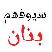 Arabetics is run by the Iraqi-American New York-based type designer, librarian, and systems engineer
  Emalie Mooren (Grand Rapids, MI) provides a great visual comparison between Avenir and Futura in a series of posters developed during her studies.
  Creator of Messy Ben (2012, hand-printed) and
  Bigelow&Holmes was founded by Charles Bigelow and Kris Holmes. Charles Bigelow (b. 1945, Detroit) is a type designer and teacher, who runs his own studio, Bigelow&Holmes. Bigelow was a colleague of Donald Knuth at Stanford University when Knuth developed his Computer Modern typeface family for TeX. In mid-2006, Bigelow accepted the Melbert B. Cary Distinguished Professorship at Rochester Institute of Technology's School of Print Media. Before that, he taught at Stanford University, Rhode Island School of Design, and other institutions. Typefaces designed by Bigelow:
  [
[ [
[ Bicycle racer in Houghton, MI, who also works as graphic designer. His bike race event posters are great, both visually and typographically. [
 Established in 2013 by Hollywood, CA-based Jason Walcott (formerly operating as
  American type designer, born in Detroit, who lives in New York City. His early typefaces include
  A graduate of Detroit Lakes Vocational Technical school, Dave has been making signs since 1983. He designs storefronts, dimensional signage, banners and logos at his Faribault, MN-based sign shop. His typefaces at Letterhead Fonts include Anna Banana (2004),
  Graphic designer in Bay City, MI. In 2011, he designed a type family called
  During her studies in Detroit, MI, Elizabeth Bogner created Braniff (2015), a typeface influenced by vintage travel posters. [
 Clawson, MI-based graphic designer, b. Michigan. In 2015, she created a full set of Cyrillic drop caps. [
 Great Lakes Lettering in Eau Claire, WI, showcases the type designs of Dathan Boardman and (Detroit, Michigan-based) Molly Jacques (formerly Molly Jacques Erickson). They jointly designed the illustrative handwriting font
 Design student in Grand Rapids, MI, 2014-2015.
  Brian Jacob (Houston, TX, and before that, Detroit, MI) set up Jacob Type in 2012. He designed these typefaces:
  [
[ [
[ [
[ [
[ JAW Fonts (and before that, JAW Arts Fonts, and
  Michigan-based
  Originally from Michigan, Josh Levi moved to New York City in 2005. He worked briefly at the Benetton Group's communication's research center in Treviso, Italy, and served as a designer and art director for Colors Magazine. In 2011-2012, during his studies at type@Cooper in New York, he designed the strong text typeface
  This is the new foundry of Hollywood, CA-based Jason Walcott, who formerly ran
  Kady was born in Detroit, Michigan, and still lives there. In 2011, she was pursuing an undergraduate BFA in graphic design at Central Michigan University with a concentration in printmaking. Kady Jesko made a 1960s retro typeface called Airplane (2011,
  Graphic designer in Grand Rapids, MI, who created the monoline deco typeface Vogue (2014). [
 Plymouth, MI-based designer of a pearl-studded display typeface, Links (2014). [
 [
[
 Mia Cinelli is a designer, who obtained a BFA from Northern Michigan University (2011) and finished her graduate studies at the University of Michigan in Ann Arbor. Currently, she is a Professor of Digital Media and Design in University of Kentucky's School of Art and Visual Studies in Lexington, KY. Her typefaces:
 During his studies, Mitchell Cooper (Rochester Hills, MI) created the vintage hand-drawn New World Alphabet (2014), which has several new glyphs.
  Michael Nÿkamp (MKN Design, Grand Rapids, MI) is a designer and illustrator born and raised in Ontario Canada. He won an award in 2014 at the
 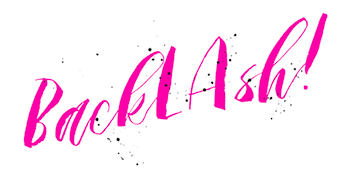 [
[
 Southfield, MI-based company founded in 1991 by John Colletti. The 150-strong
  Nick Polifroni (Remedy 667) is an American illustrator and designer, b. 1980, who lived in Belleville, MI, and Falmouth (Portland), ME. He specializes in horror fonts. Creator of the scratchy font Orange Book (2007), the sans typefaces Asymek (2011) and
  Ryan Molloy is an educator and inter-disciplinary designer having practiced in fields of architecture and graphic design. He is currently a professor of graphic design at Eastern Michigan University in Ypsilanti, Michigan.
  Student at Saginaw Valley State University (MI). In 2012, he created the free tapered hand-printed typeface
  Ann Arbor, MI-based graphic designer who created the elegant high-legged serif typeface
  Kalamazoo, MI-based designer, who, during her studies at Western Michigan University, created the modular wood block typeface Switch (2016). Her system breaks down letterpress forms into their components, and reattaches pieces using various color codes.
  Rochester Institute of Technology's School of Printing graduate who lived in California and in Holland, MI, and now resides in Louisville, Colorado. He was a disciple of Chuck Bigelow and Kris Holmes.
  Grand Rapids, MI-based graphic designer trained in Chicago. Terrance worked as a graphic designer for the university book store while earning a bachelor of fine arts degree with an emphasis in graphic design from Grand Valley State University in 2008. After graduation, he joined Ascender Corporation where he worked closely with Steve Matteson. After Ascender folded, he became an in-house type designer at Monotype where most of his time is dedicated to custom fonts.
  Michigan-based designer of the grunge typefaces tommytxtey#4 (2011), Couriertxt (2011), and Uknowjack (2011), and of Stickfig (2011) and
  Thomas Kaeding started his own foundry in Ann Arbor, MI, in 2011. Typefaces made in 2012 include
 Wild Edge (was: The Refinery) is a type foundry and brand identity shop based in Grand Rapids, Michigan. They published
  Grand Rapids, MI-based designer of the white-on-black octagonal typeface Band Wagon (2016) and Marvel Pictograms (2015). [
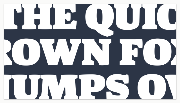
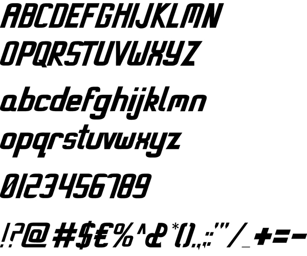
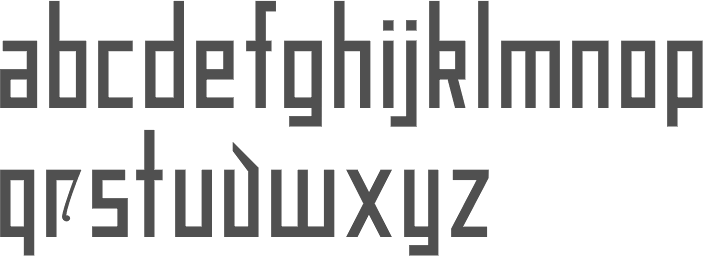
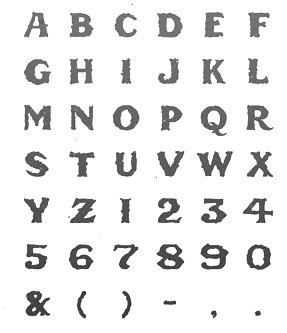
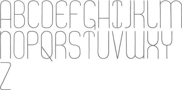
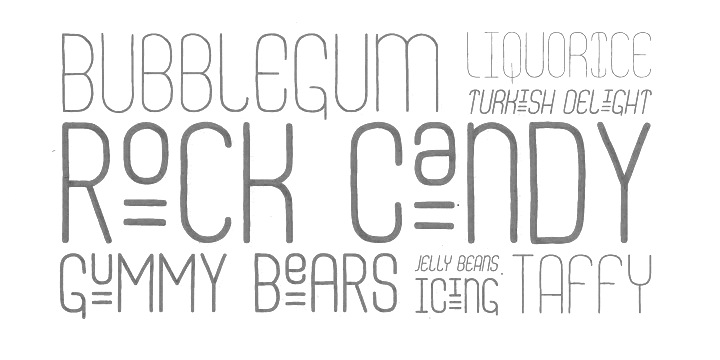
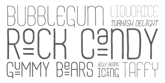
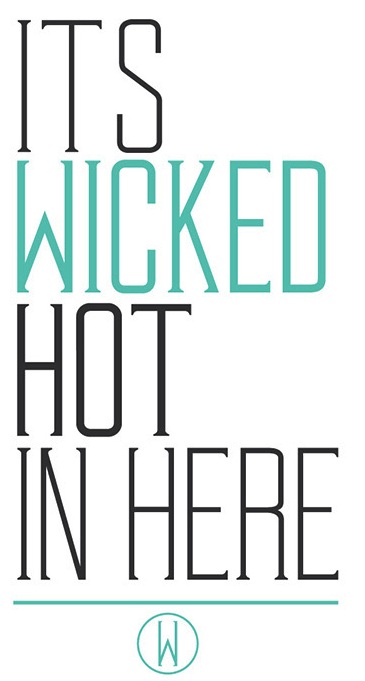
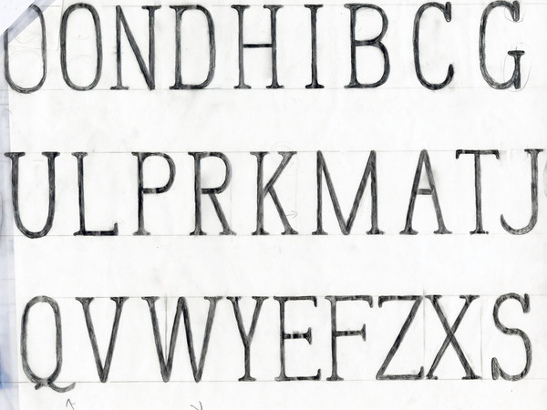
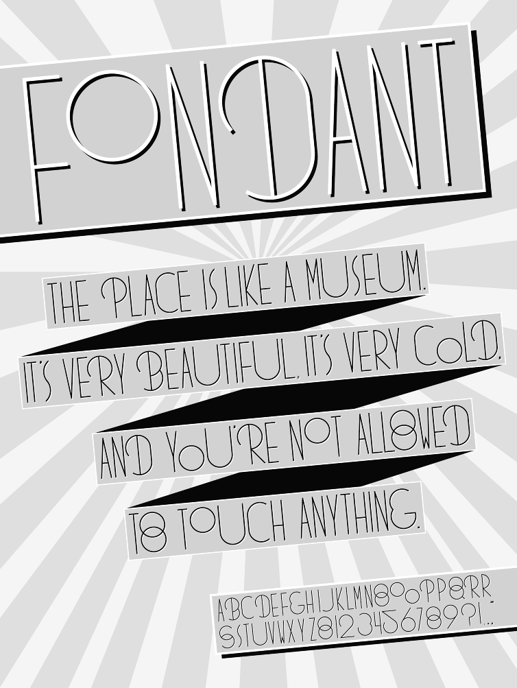
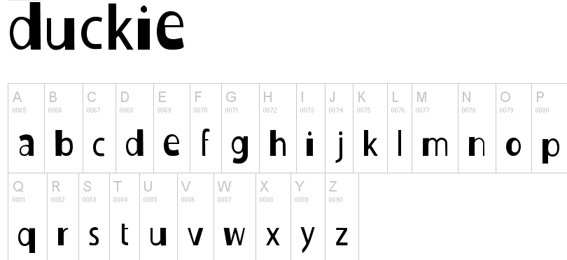
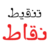
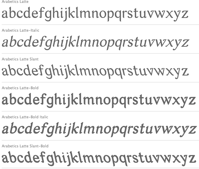
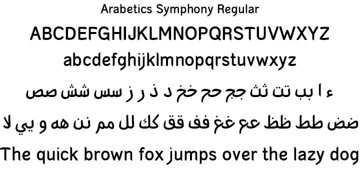
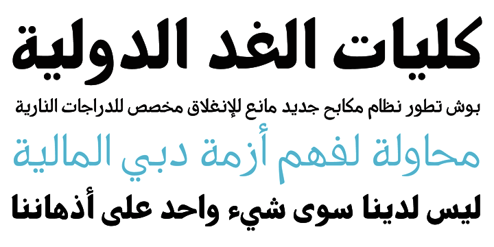
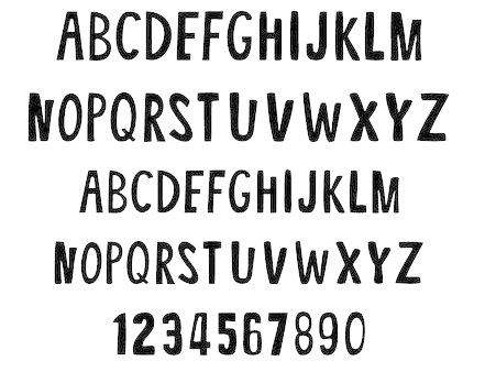
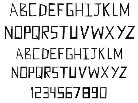
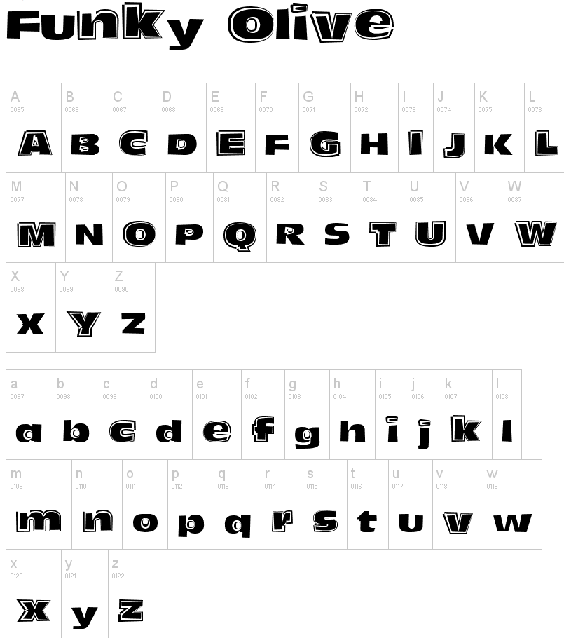
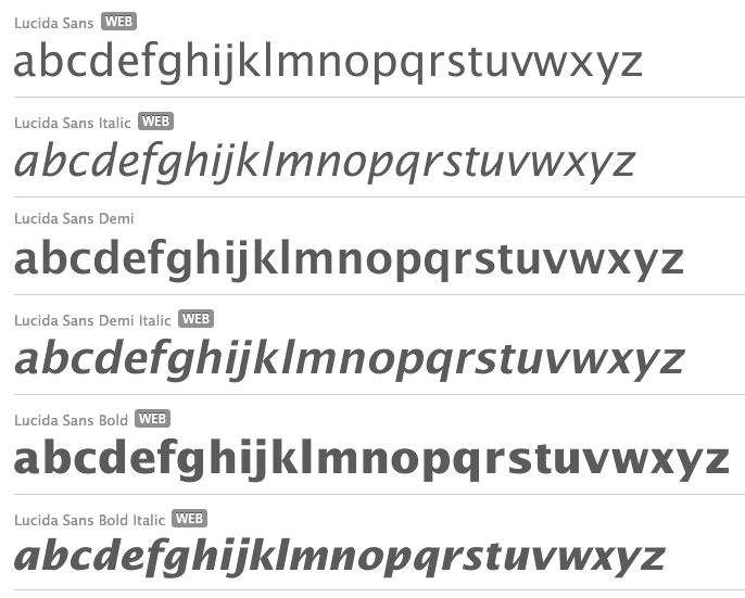
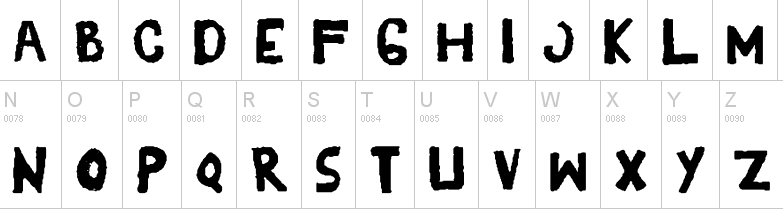
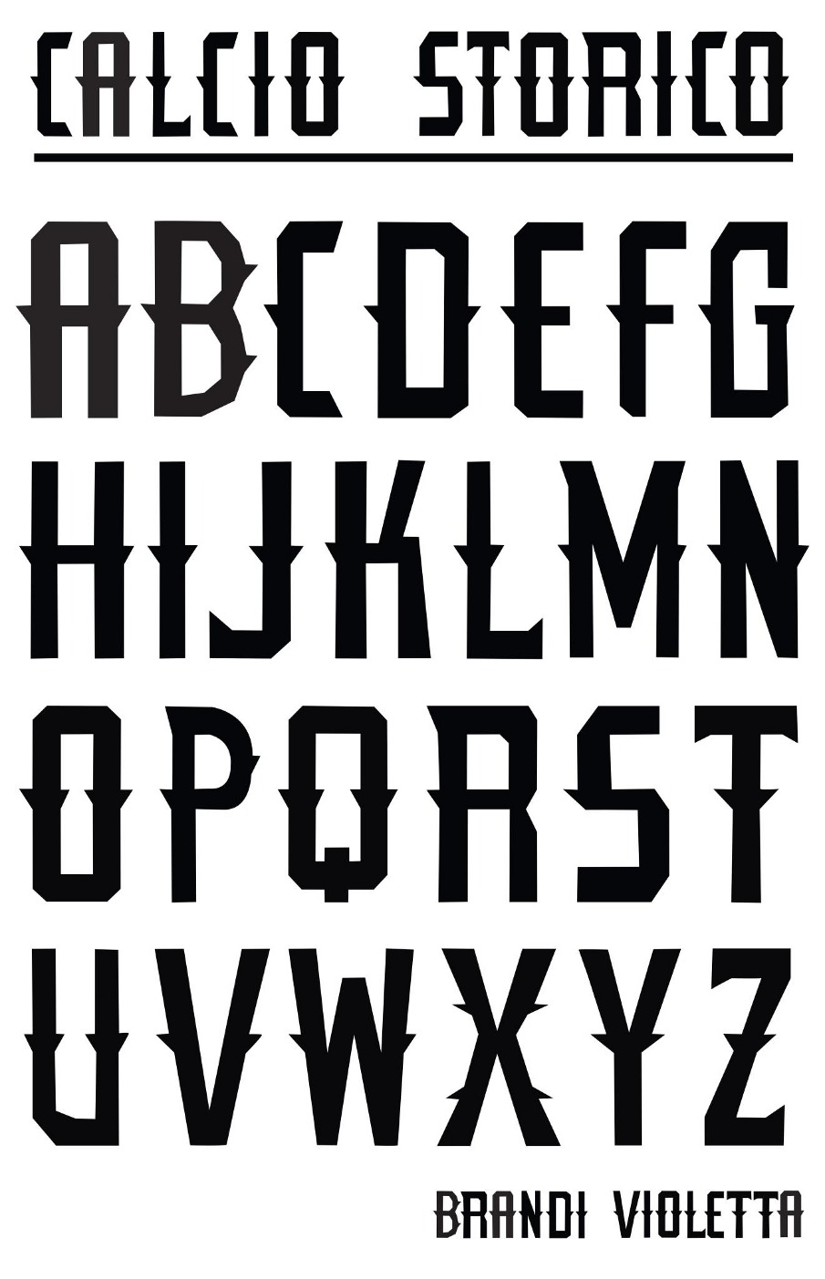
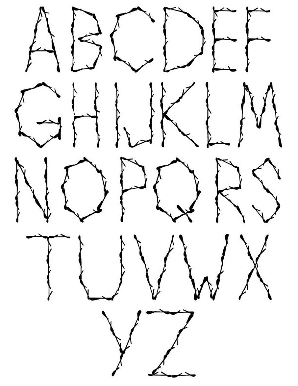
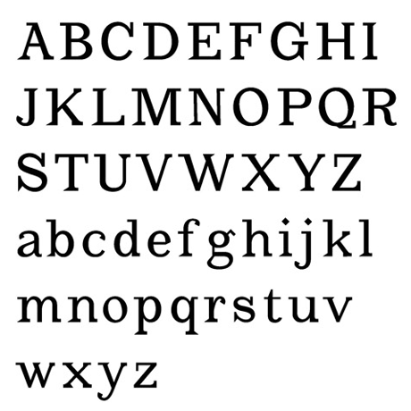
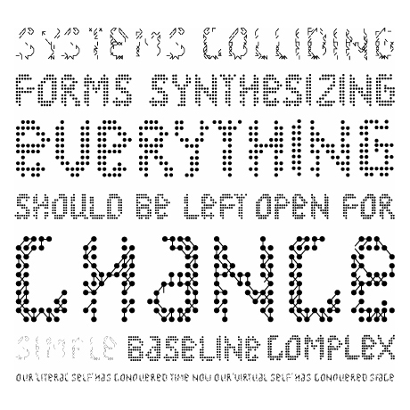
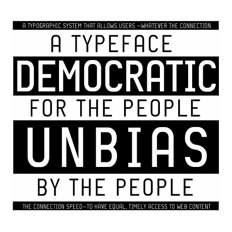
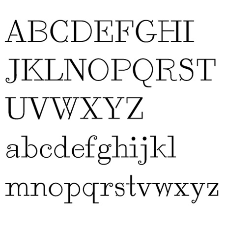
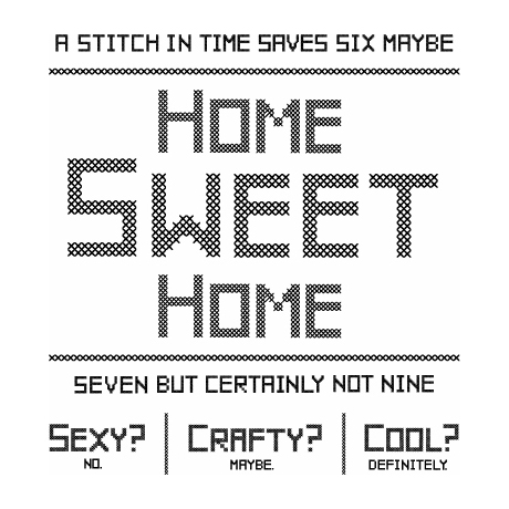
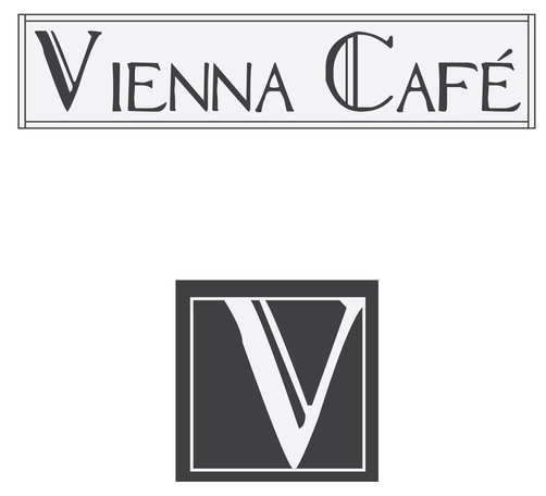
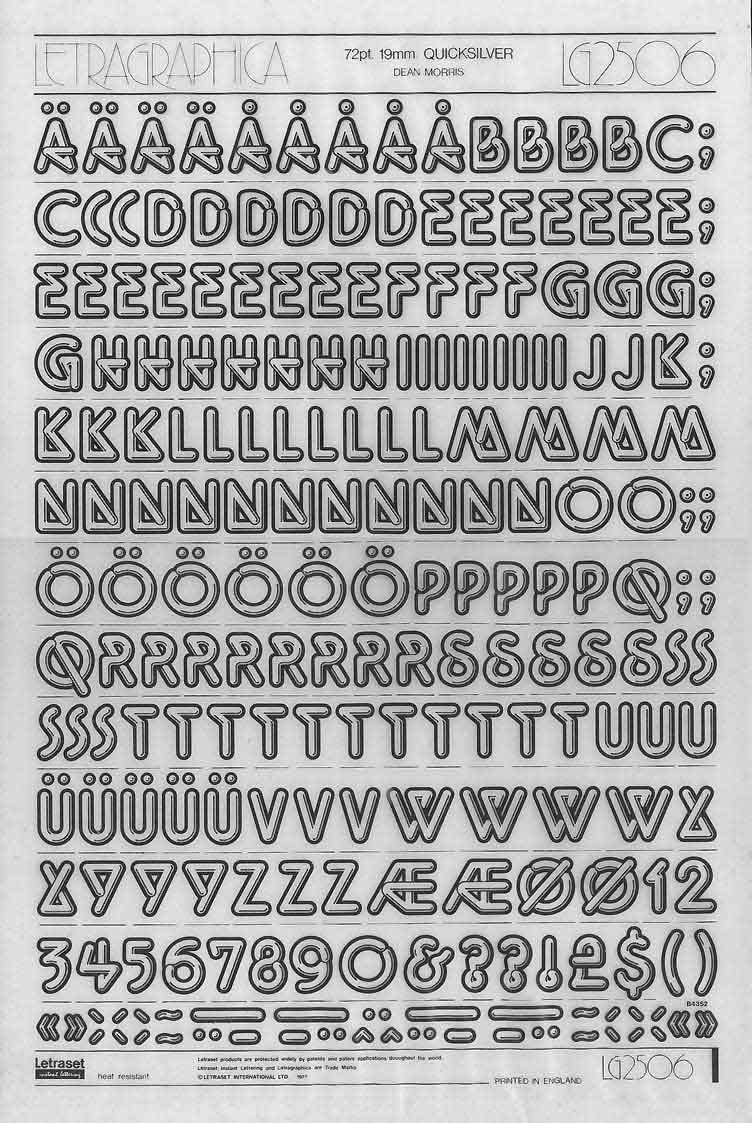
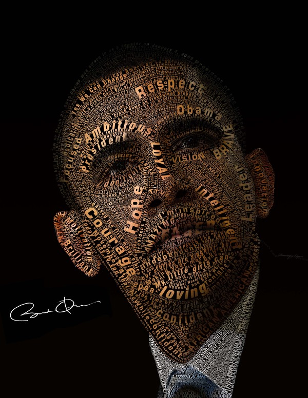
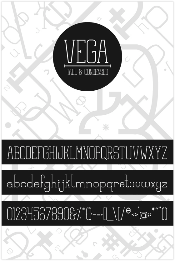
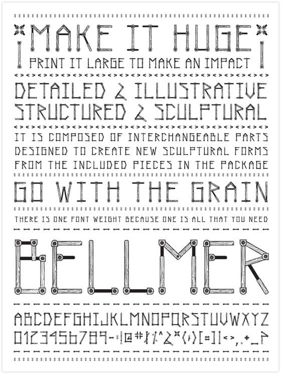
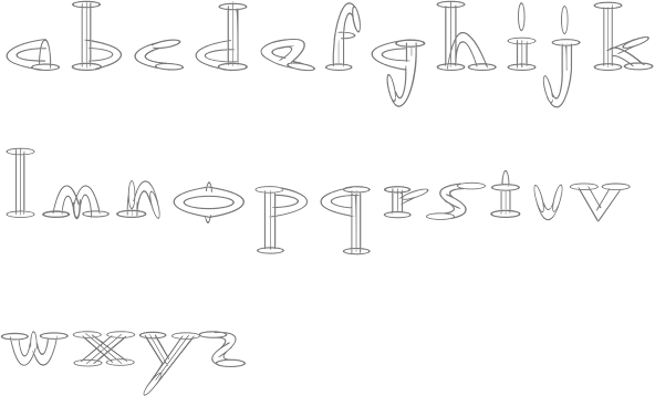
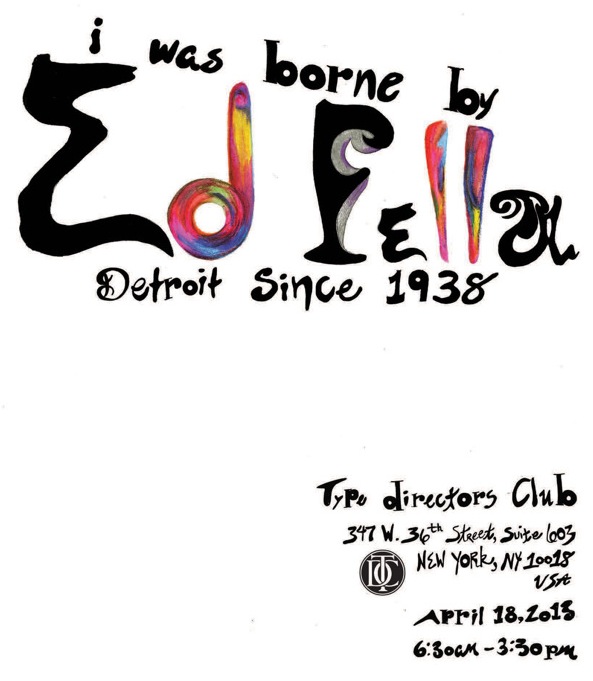
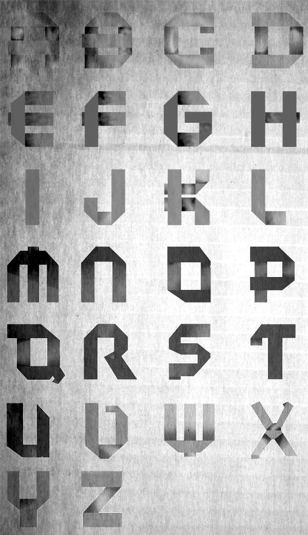
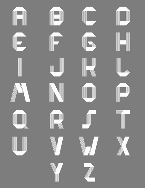
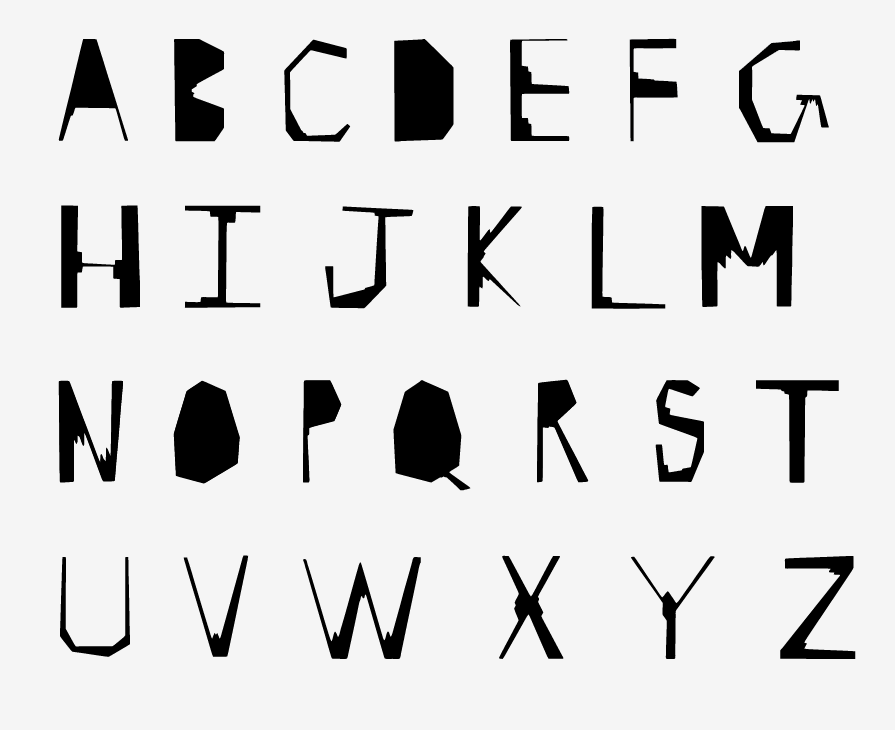
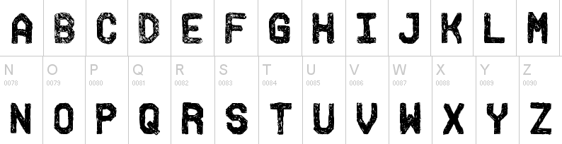
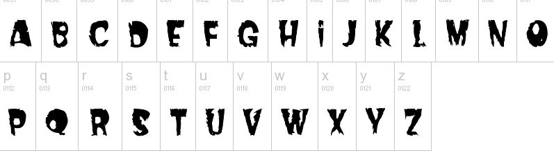
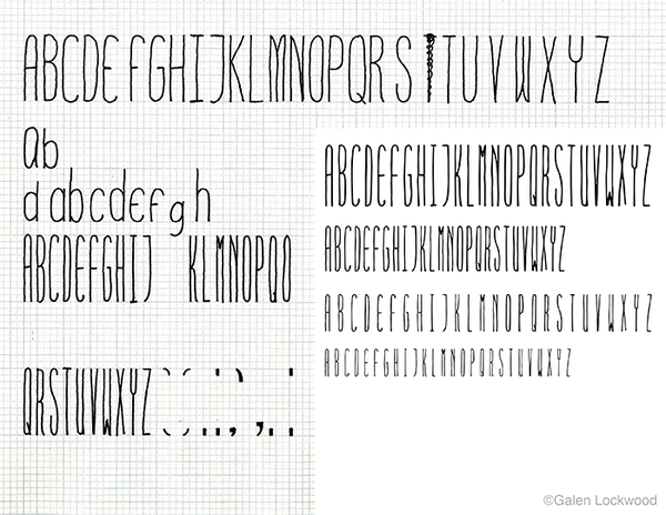
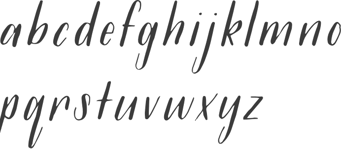
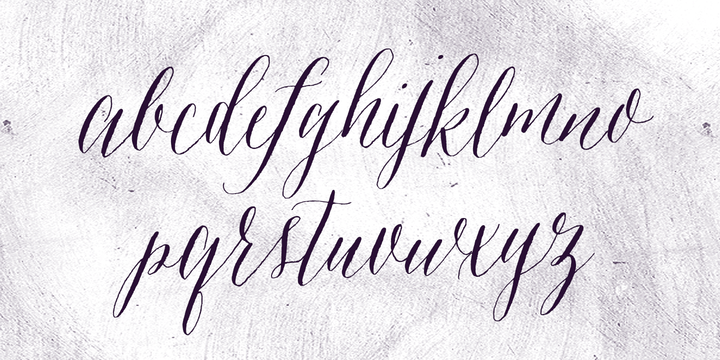
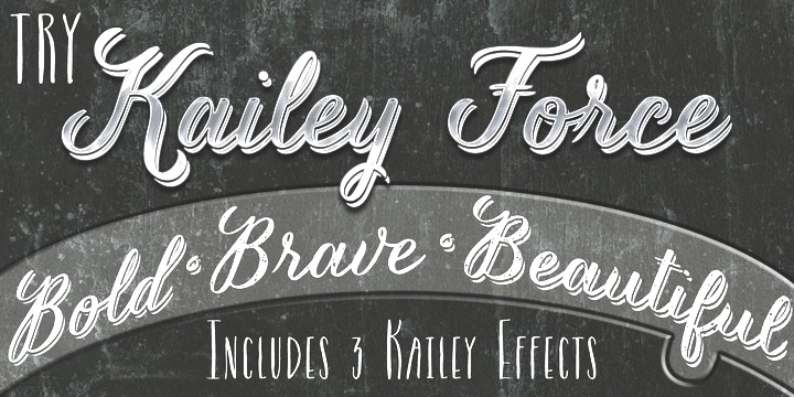
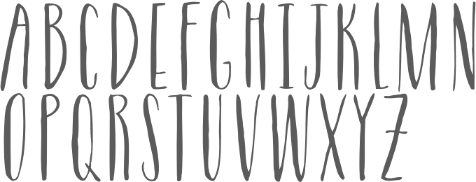
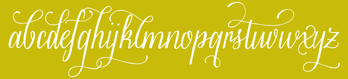
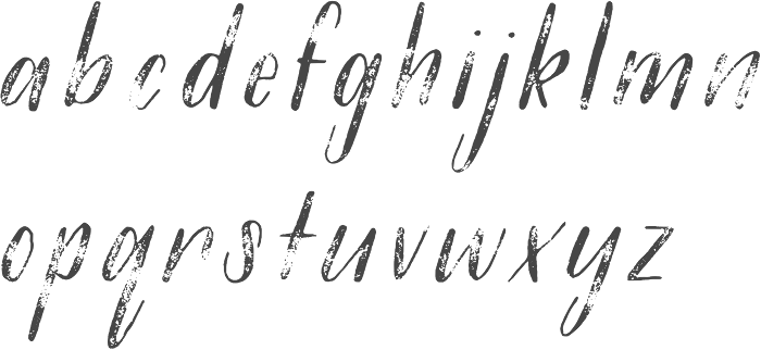
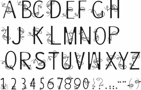
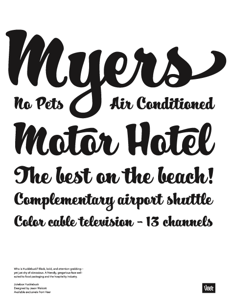
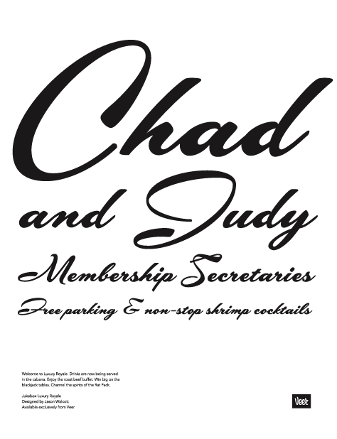
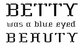
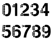
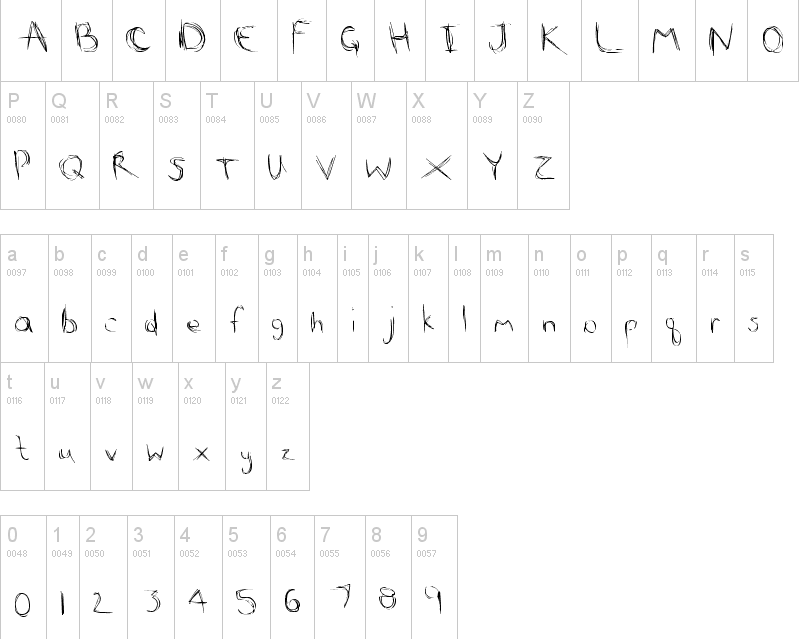
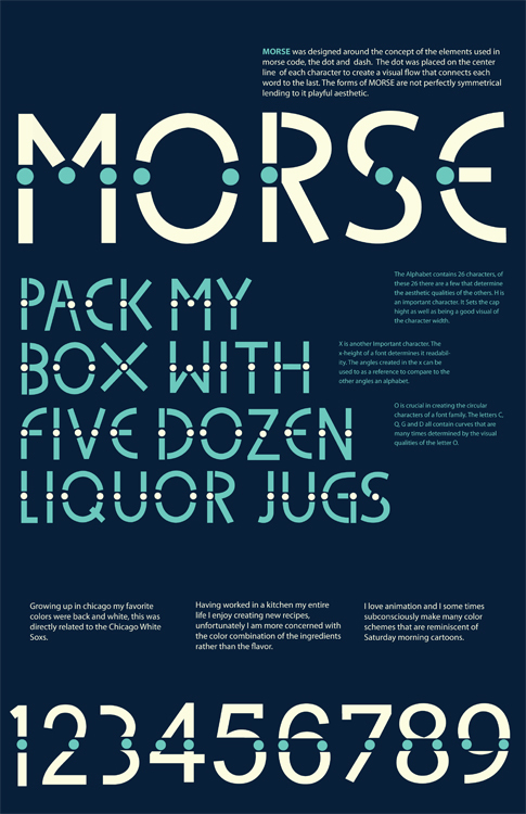
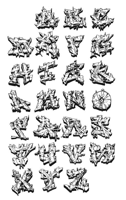
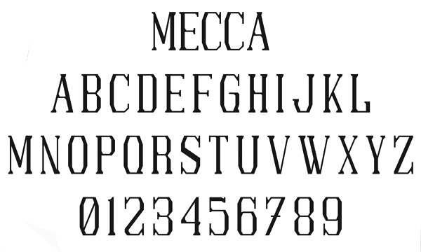
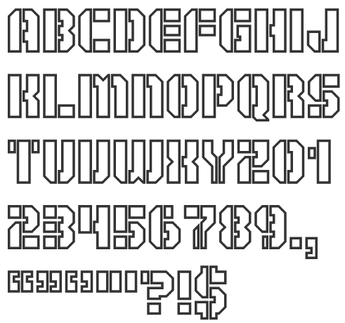
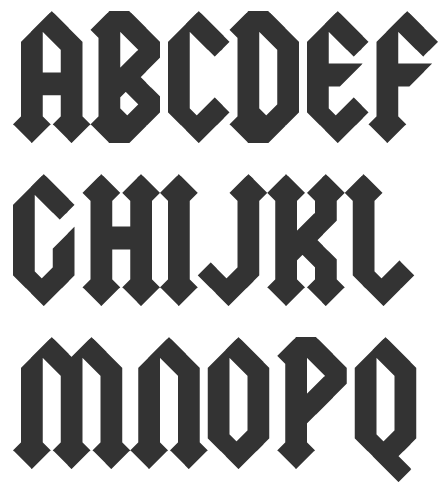
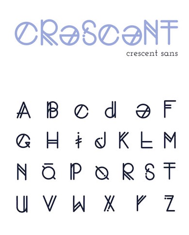
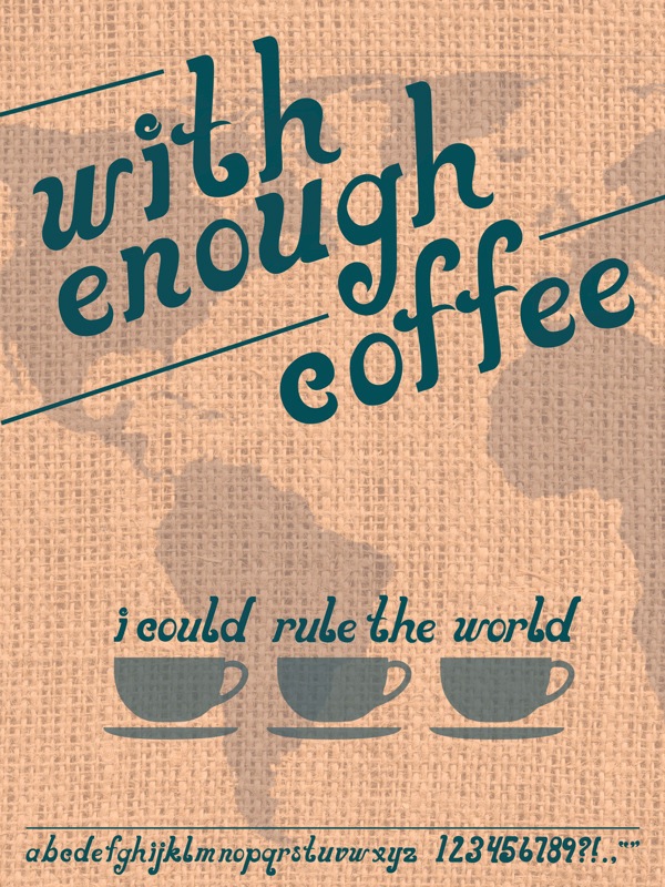
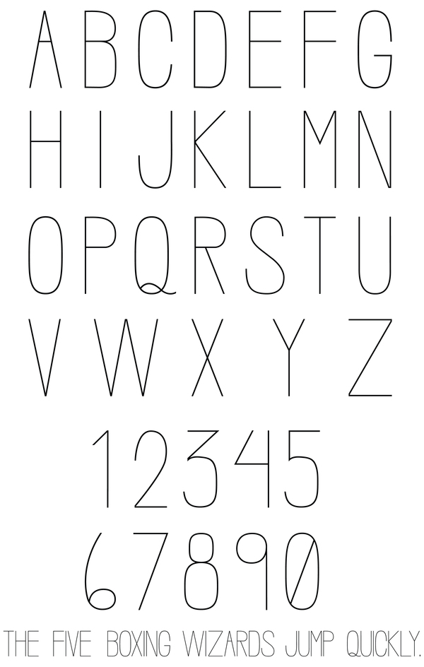
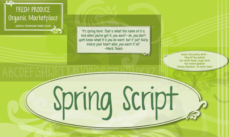
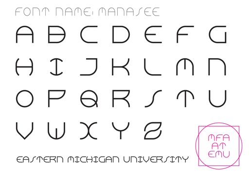
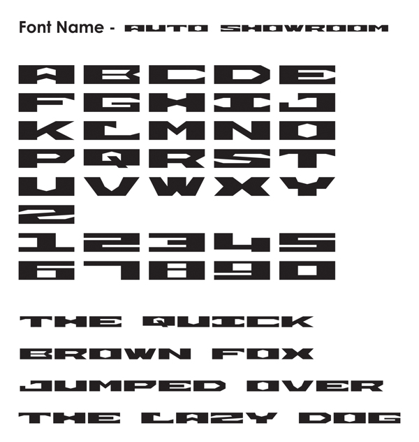
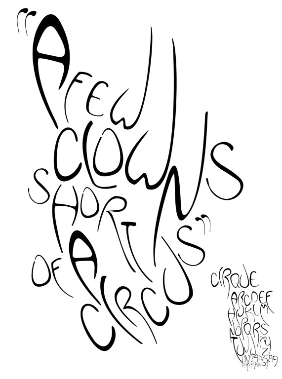
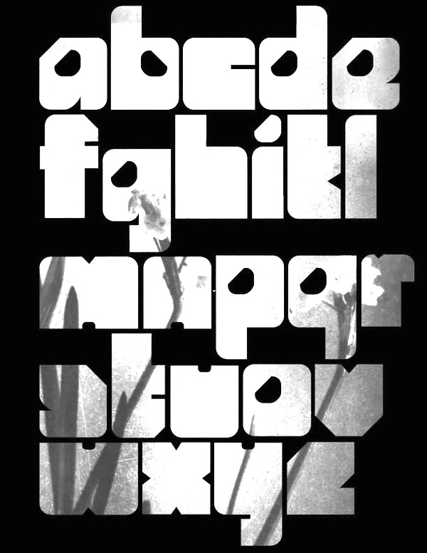
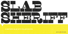
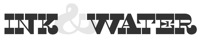
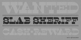
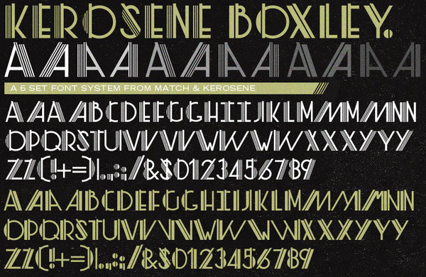
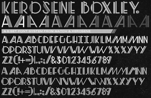
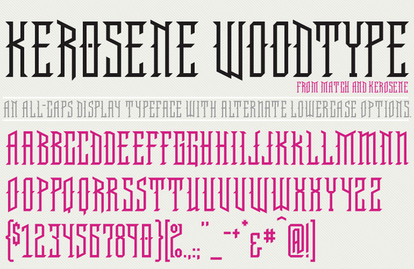
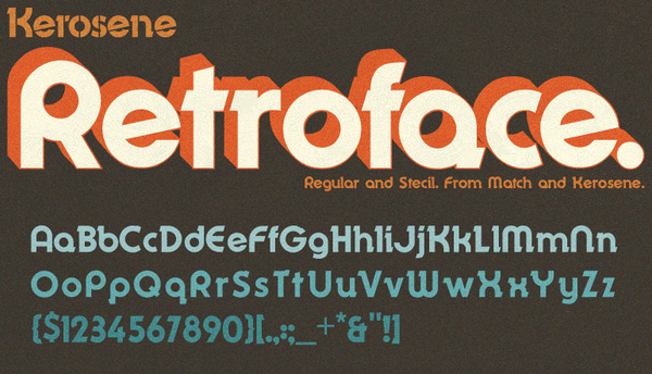
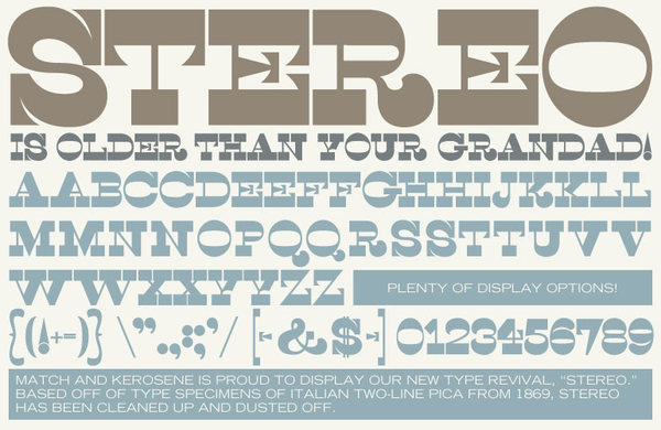
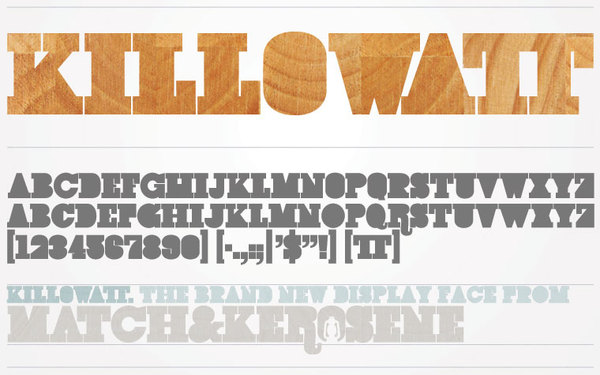
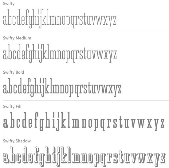
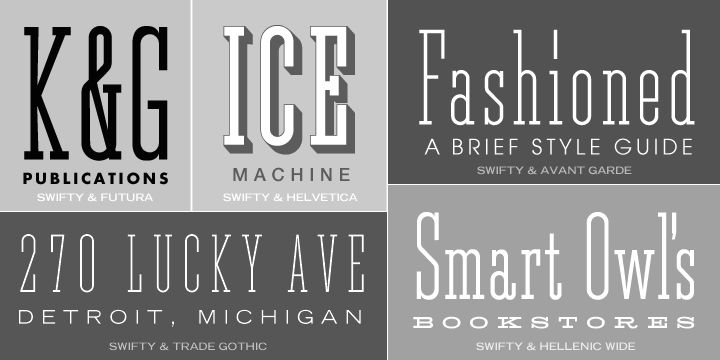
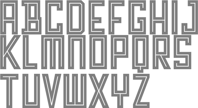
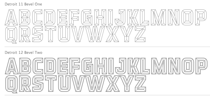
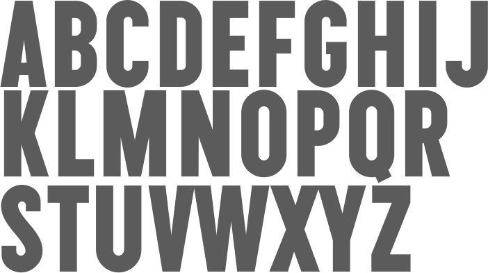
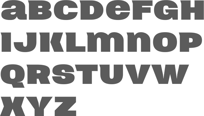
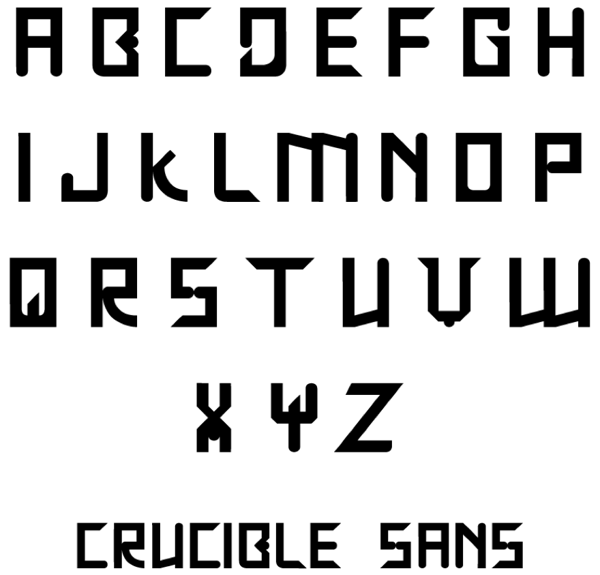
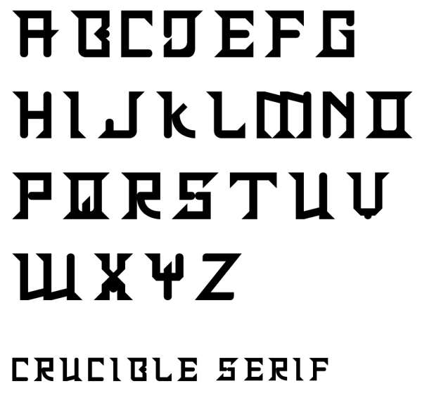
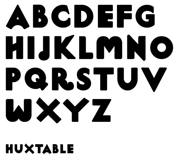
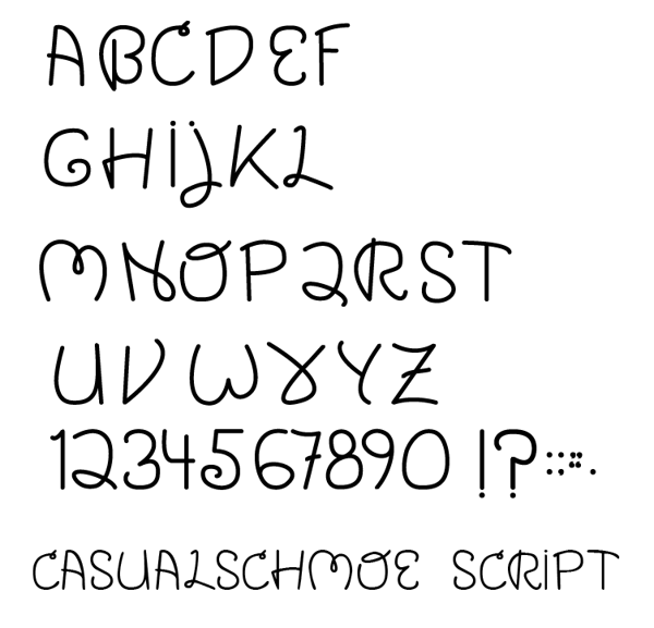
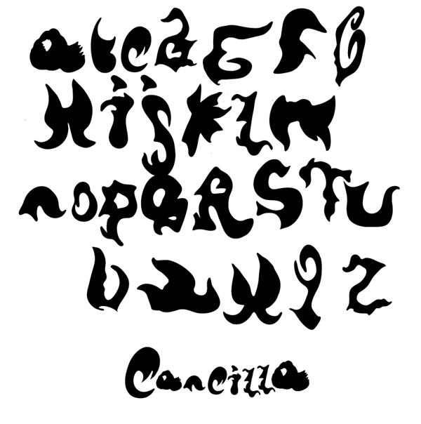
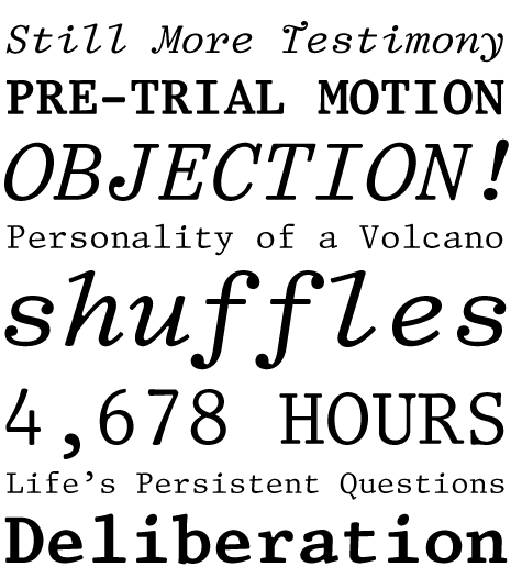
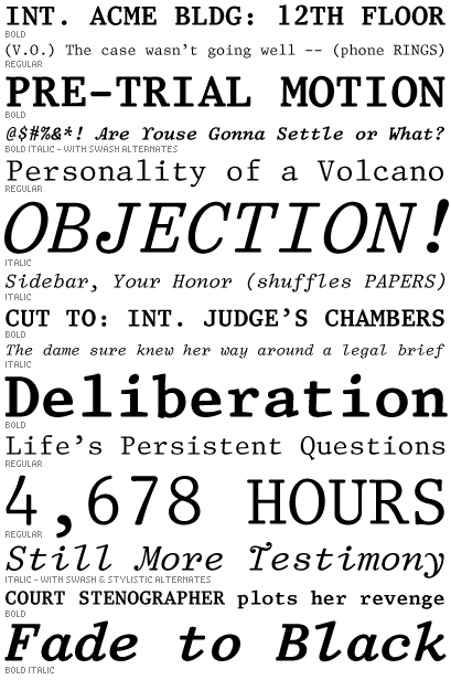
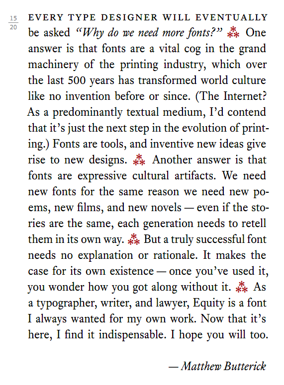
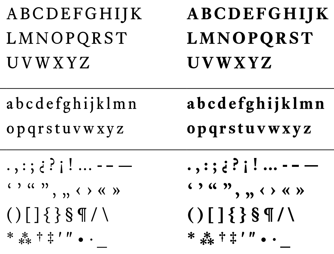
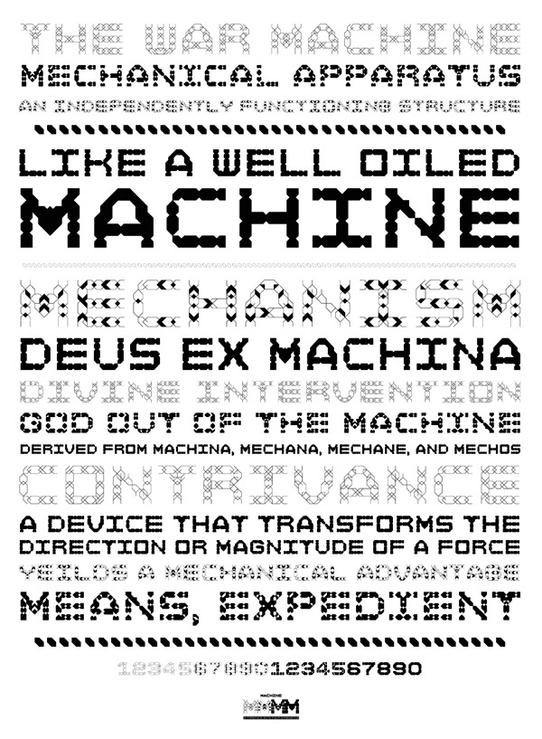
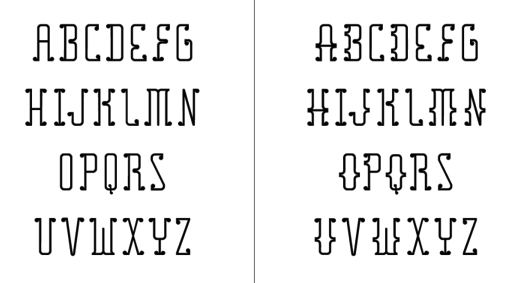
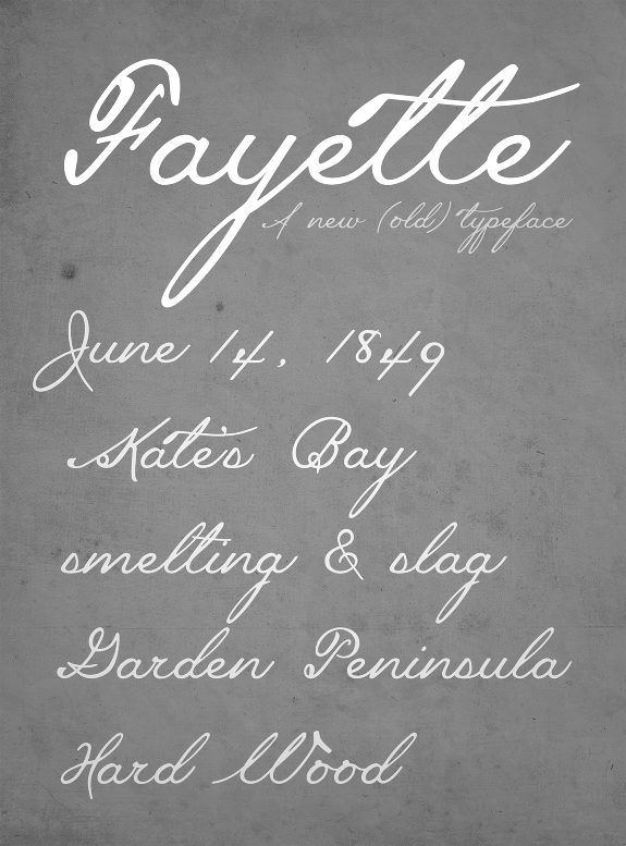
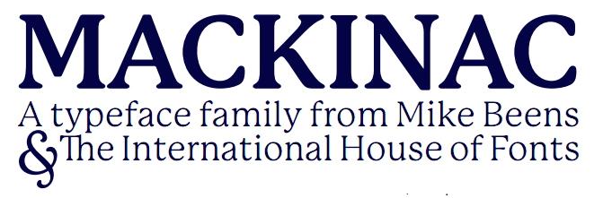
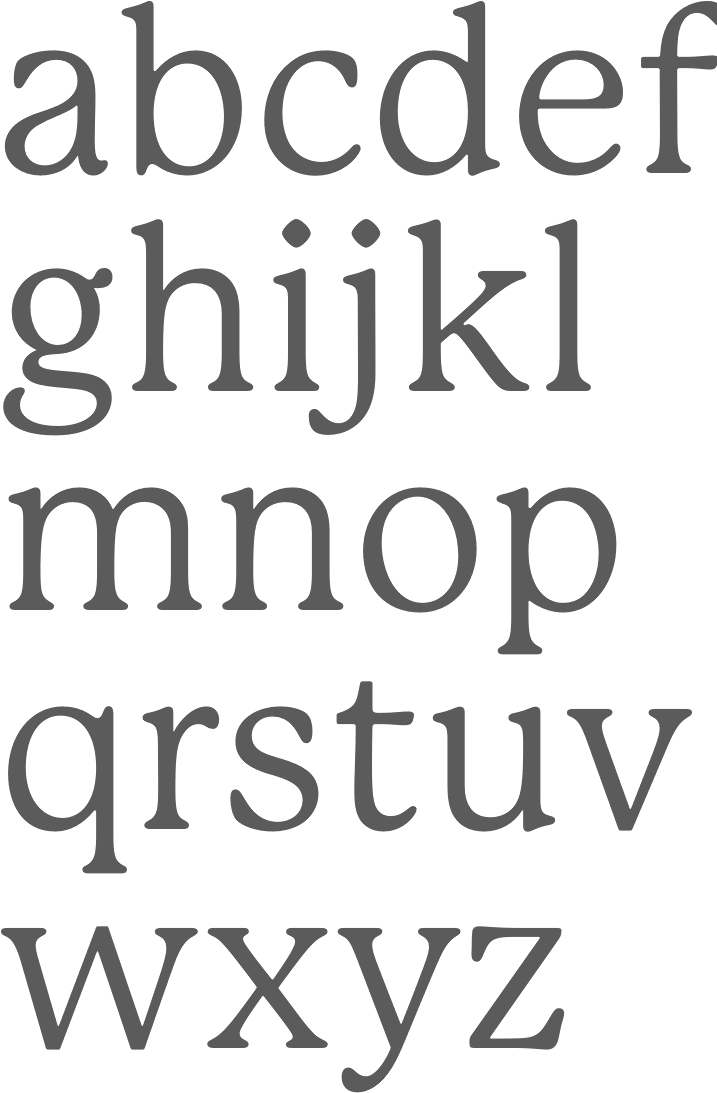
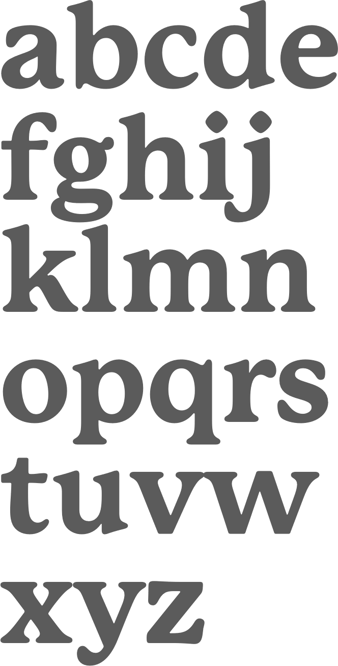
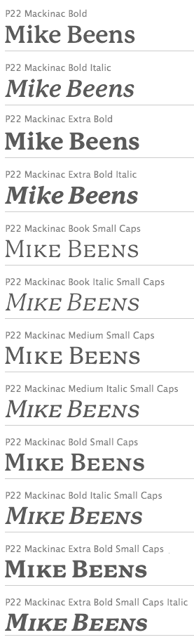
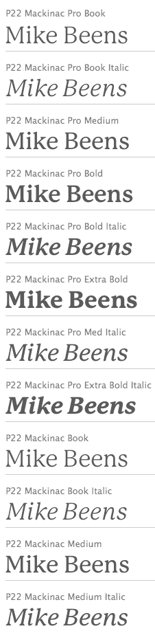
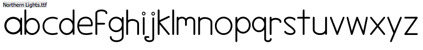
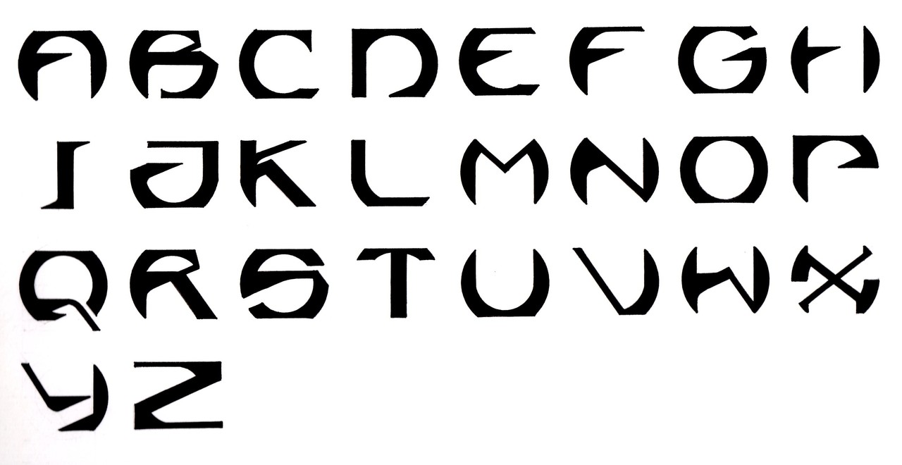
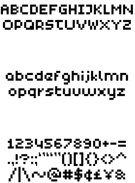
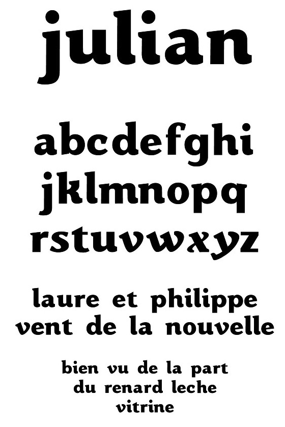
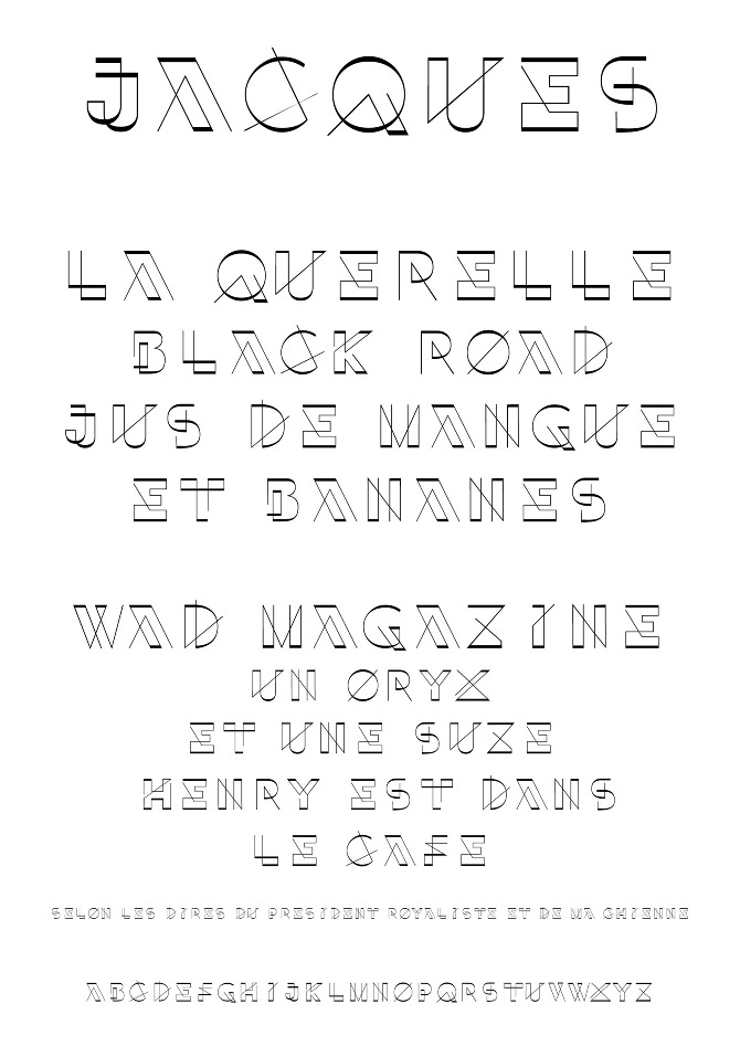
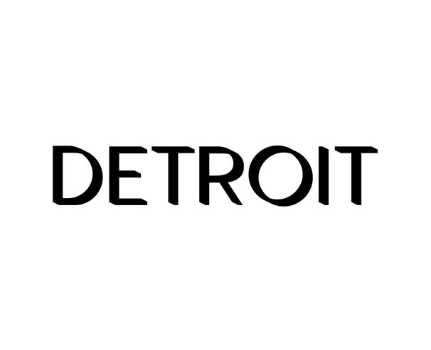
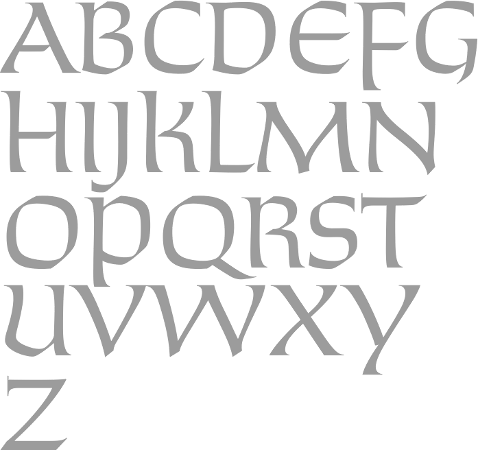
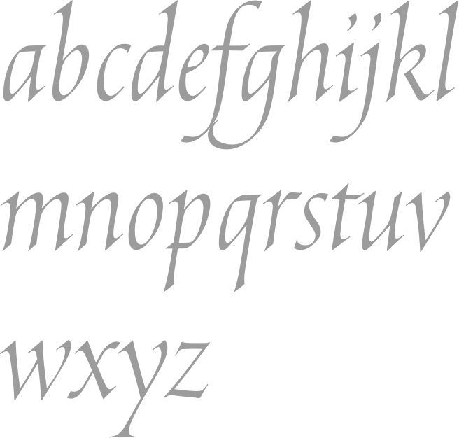
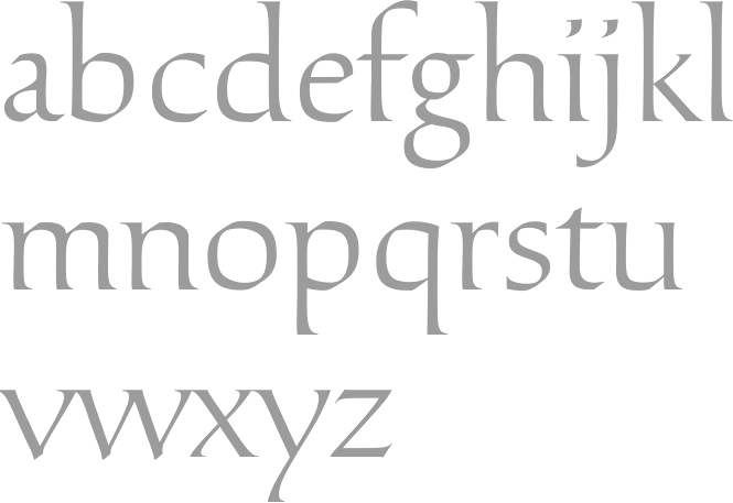
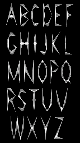
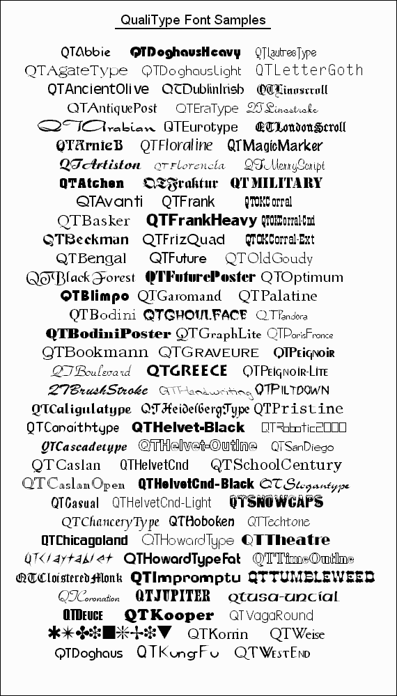
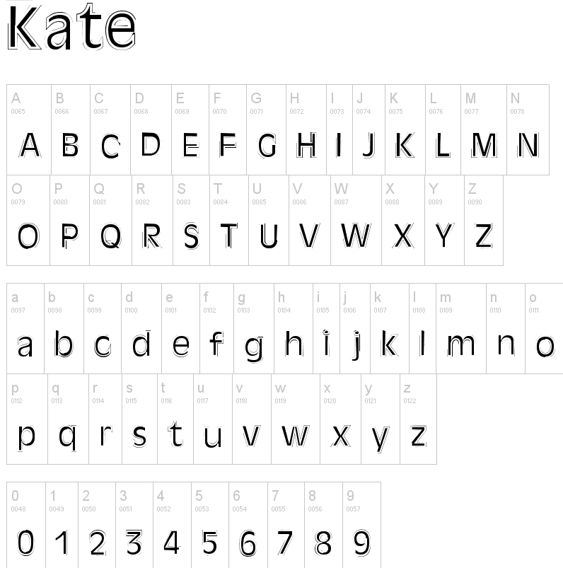
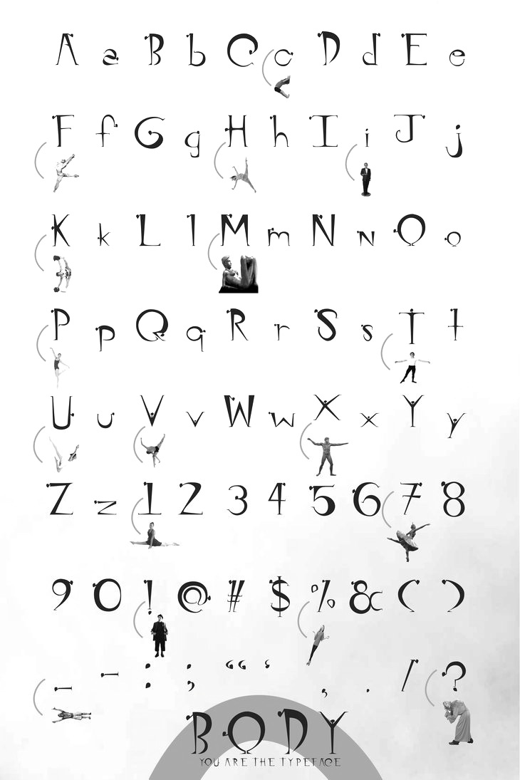
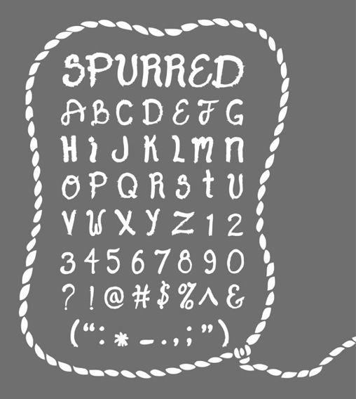
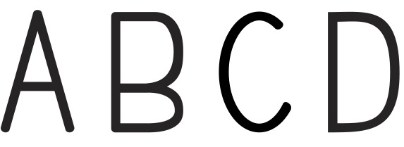
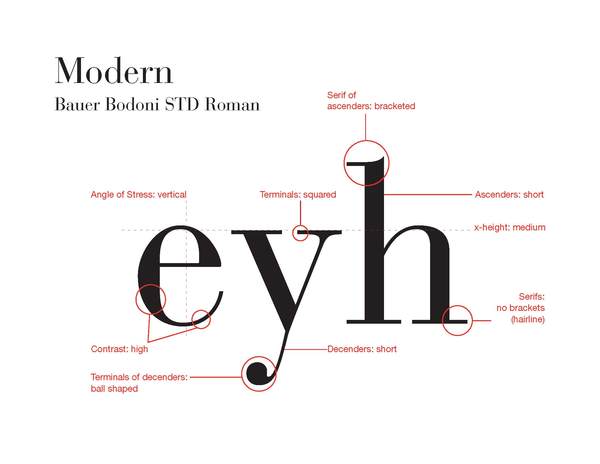
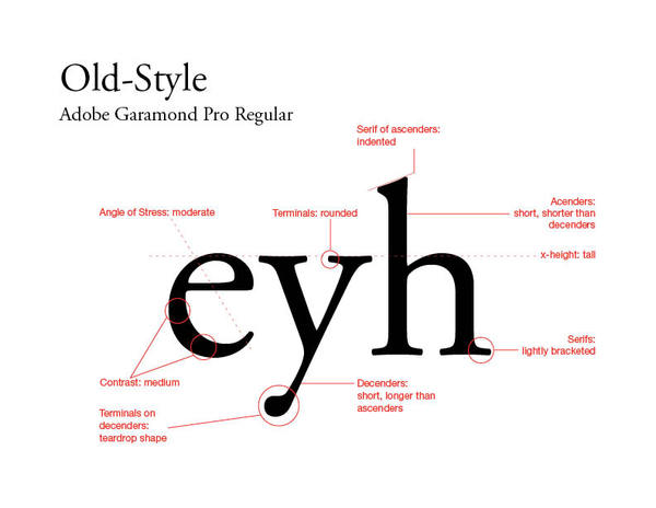
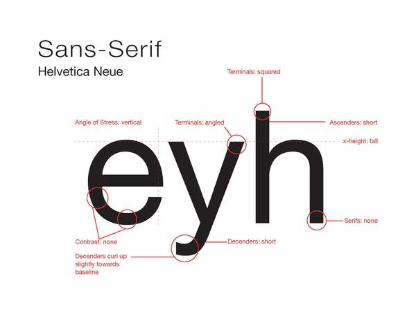
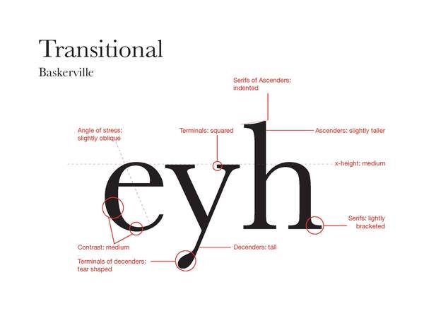
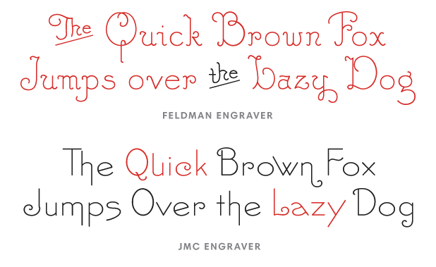
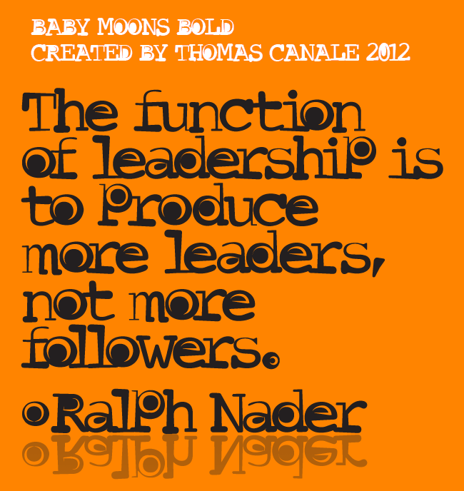
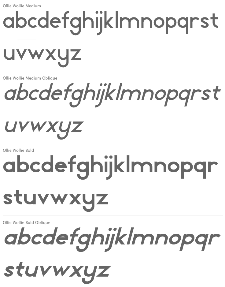
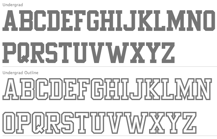
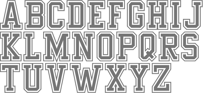
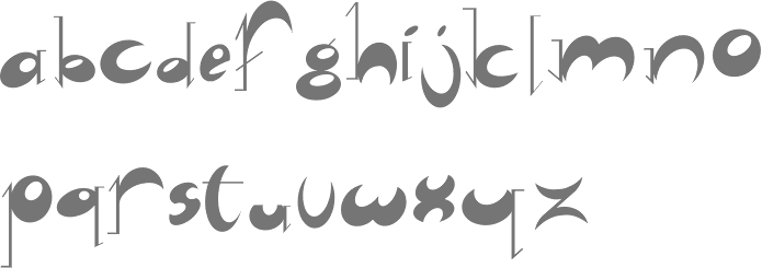
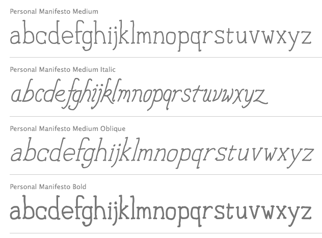
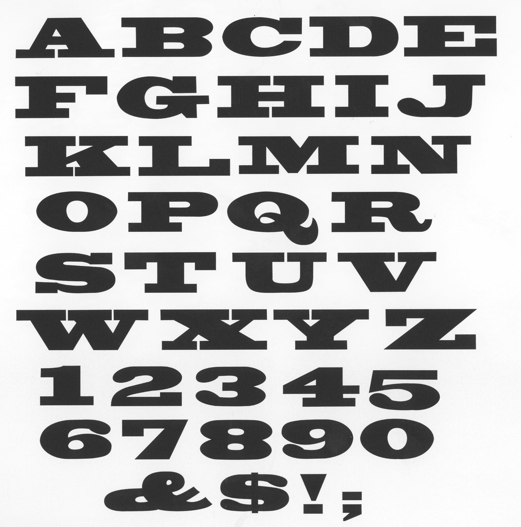
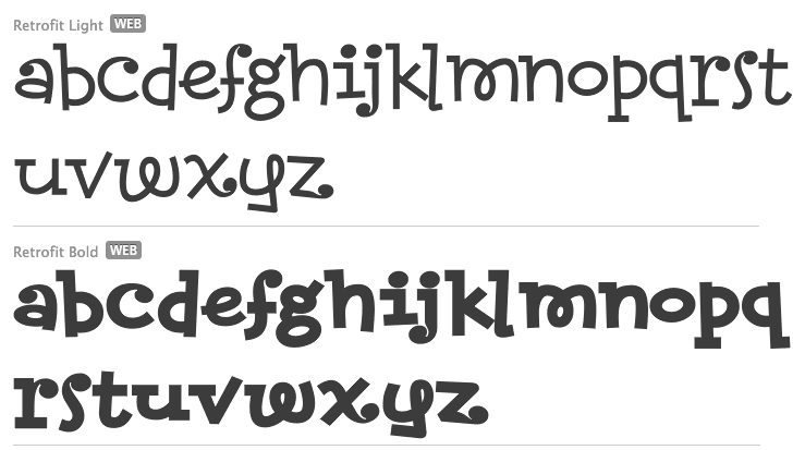
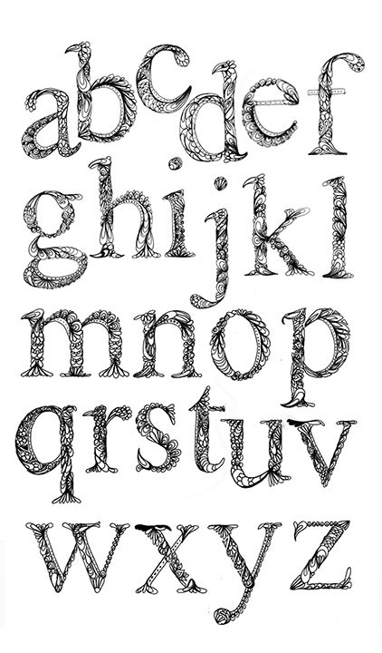
|
|
|
|