TYPE DESIGN INFORMATION PAGE last updated on Mon Jul 20 20:33:54 EDT 2026
FONT RECOGNITION VIA FONT MOOSE

|
|
|
|
|
Web fonts | ||
|
|
|
|

SWITCH TO INDEX FILE
24 Ways
| Jon Hicks gives a clear mini-tutorial on how to display icons in web pages using fonts (with icon symbols in them) and data-attributes using simple CSS definitions. [Google] [More] ⦿ |
Adam Pope
| |
In 2010, Adobe started offering web fonts via TypeKit for a fee---only Adobe Garamond was free. The fifteen remaining families are Adobe TextGaramond Premier, Hypatia Sans, Minion, Myriad, Myriad Condensed, News Gothic, Poplar, Rosewood, Rosewood Fill, Trajan, and Voluta Script. Mike Duggan : based on what I have seen so far at the Typekit site, the hinting does not appear to be as good as in the Adobe Web fonts of old. [Google] [More] ⦿ | |
They write: Adobe will be applying its considerable font expertise to improving and optimizing a number of the open source fonts that are available in both Google Web Fonts and Edge Web Fonts. The teams from Typekit, Adobe Type, and Google Web Fonts are working to identify which fonts will benefit the most from our attention, and how we can best approach improving their rendering and performance. Efforts will include hinting some fonts for better rendering at smaller sizes, plus a number of other optimizations. All of these contributions will themselves remain open source. Since the Adobe font preview is anemic, Yvo Schaap published this font preview. Peter Chon has another preview. And here is Tony Stuck's preview. Github download site. CTAN archive link. Source Serif Pro at Google Web Fonts. Source Serif at Github. Source Sans Pro at Google Web Fonts. Source Sans Pro for the TeX crowd. Source Serif Pro for the TeX people. [Google] [More] ⦿ | |
Pankratov's advice in June 2011: @font-face for Mac, Cufon for everyone else. Some discussion follows with two points of interest, the fact that zooming---a common Apple ferature---makes Cufon files look pixelated, and the observation that Cufon-ed files are not text accessible. [Google] [More] ⦿ | |
Antonio Rodriguez
| |
Armand Niculescu
| |
Font technology specialist at Linotype, Germany. He was born in Manisa (Turkey) in 1974 and grew up in Marburg (Germany) before moving to Frankfurt in 1994. He studied political science and computer science at the Johann-Wolfgang-Goethe Universität and later at the Fernuniversität Hagen. He joined Linotype as an intern in 2000 before becoming the full time Font Technology Specialist in 2002. At ATypI 2008 in St. Petersburg, he spoke about Automation in font production. Speaker at ATypI 2011 in Reykjavik on the topic of web fonts. [Google] [More] ⦿ | |
Bert Bos studied Mathematics in Groningen (1982-1987), and wrote a thesis about Graphic User Interfaces (1987-1993). He worked on an Internet browser and the surrounding infrastructure for the Faculty of Arts in Groningen and is now working for The World Wide Web Consortium on style sheets and math. He lives in Sophia Antipolis near Nice in France. Author of Cascading Style Sheets---designing for the Web (3rd ed.) (2005, Hakon Wium Lie & Bert Bos). He also created a free transitional family in metafont and opentype for use with TeX, Gladiator and Gladiator Sans (1991). Klingspor link. [Google] [More] ⦿ | |
Copenhagen, Denmark-based author of Webfont Handbook. He tweets on web typography and front-end development. [Google] [More] ⦿ | |
Brian Stell works in the Font and Text team within Google's Internationalization Engineering group. He has been focused on engineering to make web fonts fast for all languages including Chinese, Japanese, and Korean. Speaker at ATypI 2013 in Amsterdam: Roboto: faster than a speeding bullet. The abstract sounds interesting: This talk looks at the current status of Google's work to deliver fonts 'instantly' to Chrome users. With 'instant' fonts, website designers no longer have to choose between web fonts (that slow the site down) or 'web safe' fonts (that are only available in limited styles). Imagine being free to use your branding fonts in extra-light, book, normal, medium, bold, or ultra-bold - with italic, condensed, and slab variants. A brief overview of how the technology works is presented along with references to more information. Also discussed are efforts to make this work on other major browsers. [Google] [More] ⦿ | |
A JavaScript port of the Brotli compression algorithm, as used in WOFF2. [Google] [More] ⦿ | |
Bryan Mason
| |
Chengyin Liu
| |
FontShop link. MyFonts link. FontBureau link. Adobe link. At ATypI 2011 in Reykjavik, he spoke on CFF on the web. The abstract is quite promising and the talk may quite opossibly be the highlight of the technical program at that meeting: Digital type outlines are described, for the most part, in either of two fundamental formats: PostScript or TrueType. Today, OpenType fonts convey PostScript outlines with CFF (the Compact Font Format), which is an optimized successor to the original Type 1 font format. Although the world of print output has been dominated by PostScript Type 1/CFF, the TrueType format has prevailed in the Windows and Mac OS operating systems. TrueType is well known for its accommodation for extensive hinting instructions, evident in many Windows core fonts which have become de facto standards on the web.In the explosion of web fonts during recent years, TrueType's reputation as a screen font format and its superior rendering in Windows browsers has made it a virtual requirement for those seeking consistency and quality in type rendering with web fonts. However, with recent improvements in text rendering from Microsoft's DirectWrite, CFF rendering quality will soon be comparable to TrueType in the next generation of Windows browsers. Despite its second class status on the web today, CFF still possesses advantages worth assessing as its rendering quality on screens approaches parity with TrueType. For example, CFF is inherently compact, and its PostScript (Bezier) paths are the default format for virtually all font designers. This presentation will explain the technical and practical advantages of the CFF font format and compare them to TrueType. It will examine what the future holds for CFF as a web font format, and make the case for CFF as a worthy, if not superior, solution for web typography. Klingspor link. Speaker at ATypI 2016 in Warsaw. [Google] [MyFonts] [More] ⦿ | |
Feature test for color font support in browsers. [Google] [More] ⦿ | |
Colin Fahrion
| |
Comparing Open Source Fonts
| Comparison in May 2010 of the Google Font Directory fonts by Colin Fahrion. For each font, in Windows Cleartype, Windows Standard, and Windows No Aliasing modes, he list pixel sizes for which each font is "best viewed at or above", "ugly at" and "illegible at". Across the board, the Droid fonts outperform the others: The Droid Family is the only font in this set that I would use for body text. All others are only suitable for headers or display text. And I would avoid using Inconsolata, Tangerine, Josefin, and Cardo except at really large display sizes (36px or larger). [Google] [More] ⦿ |
Conor Muirhead
| |
Free Firefox add-on. It displays the size (in px), font-family (the one chosen by Firefox from the font-family listing), font-style, font-weight, and font-variant of selected text in the context menu. Also displays the downloadable font files for the font if specified by a @font-face rule. [Google] [More] ⦿ | |
Here we'll explore the nexus of legal rulings, Capitol Hill policy-making, technical standards development, and technological innovation that creates -- and will recreate -- the networked world as we know it. Among the topics we'll touch on: intellectual property conflicts, technical architecture and innovation, the evolution of copyright, private vs. public interests in Net policy-making, lobbying and the law, and more. [Google] [More] ⦿ | |
| |
CSS Type Set lets you experiment with different styles and attributes (such as font size, font weight, font family) of web typography. [Google] [More] ⦿ | |
Simple CSS utility classes for advanced typographic features. [Google] [More] ⦿ | |
The headline of this page is jibberish: Cufon plug-in directory for the most commonly used in the world you've made the font from which you access all the fonts cufon file. Anyway, there are a few thousand fonts here. The majority of font downloads are not functional. One can also manually download Cufon style font files. Plus: nice font previews. Minus: no information on the font creators. [Google] [More] ⦿ | |
We are in November 2008. The proposals for font usage on web pages are coming in from all sides. These include
| |
Cyrus Highsmith
| |
He designed La Avería en El Ordenador (2011, OFL), an average of all 725 fonts on his computer. The fontfamily was split into Avería, Avería Sans and Avería Serif. Now, this may seem like a simple thing, but it is not! He took almost a year to complete this task, giving it a lot of thought. In the process, he created Font Path Viewer, a free web app for viewing the font outlines (with control points) of all fonts on one's system. He did the following clever thing: each font contour was split into 500 equal pieces (a serious exercise for Bezier fanatics), numbered from 1 to 500, and all 500 positions were averaged (over the fonts on his system) to obtain Avería. Interpolations between fonts have been attempted before (see Superpolator, or Font Remix), but to have it automated in this way is quite another achievement. More images of Avería: i, ii, iii. Averia Serif Libre (2012) exists in six styles, and there are also the Averia Libre, Averia Sans Libre and Averia Gruesa Libre families. These are available from Google Web Fonts. So, here is my small request for Dan: build an on-line tool, based on the Bezier outline cutting principle you pioneered, for interpolating between two typefaces. The user would submit two fonts, and the interpolation would be shown on the screen after a couple of seconds. I am sure you can do it! Abstract Fonts link. Google Plus link. Dafont link. Fontspace link. [Google] [More] ⦿ | |
The entire text below is due to David Brezina, 2010. I think we (type designers) maintain an old illusion about how our market works. People do not buy fonts because they could not get them for free anywhere else. They buy them out of sympathy, understanding the value of our work and/or legal reasons. They could get them for free, easier, and faster (!). It is not that we would be shooting in our typefaces. It is more like we have been shot already. We already accepted the piracy as a burden of our business. If I am right in this view, we do not need any kind of DRM. The expected "new" web piracy won't change a thing. I would very much like to see some study or educated estimate re this view. Or at least an authoritative opinion. It is crucial information for designers in order to evaluate the formats properly. Otherwise, they are just left aiming for the most security. What we, however, want is a tool to limit webfont licences exclusively for web. We want to make a profit out of this #webrisk and keep distinction between web and print fonts. Why? If I am not sure whether opening my fonts for web use is going to make me money I would rather keep the new market separated from the old working one. That is the motivation behind the web-specific format. Acceptance of non-security, but limited to web. Personally, I think that opening to web market is surely going to make a profit. An objectively, we are not going to have strictly (that is: not-convertible) webspecific format ever. Not with current technologies where the fonts are described with curves. The only option I see is bitmap fonts &c. .webfonts is just bundled metadata with print font (we can have them in OT table as Berlow suggest, why another format simple-to-hack when most are not going to care?), EOT Lite is a very thin wrapper as far as I understood, but at least not so trivial. It will become easy convertible (assumption), but at least something. Typekit and similar tools offer only limited security by obfuscation. So far too easy to circumvent. These techniques are not imo worth complicating life of paying customers. Even though the interface is sexy, it is still another interface. Therefore: prepare the fonts for web (have them subsetted, add web exclusive license, permission tables, and go naked! Or if you are shy, have EOT Lite. Sidenote about obfuscation methods. Some of them impair the fonts' kerning and OT features. Not a good idea. My concern is purely of egoistic designer. With my limited abilities I tried to produce as good font as possible and I don't want crippled copies of my font ripped off from various webservices floating around. I want constant quality of my work world-wide, nothing smaller, if possible. The very first person who paid a compliment to my typeface on web was the one who posted it on a Russian download server (being it ripped from my MATD PDF specimen). Just thought it illustrates the situation pretty well. :-) [Google] [More] ⦿ | |
Dave Crossland
| |
Dave Gandy
| |
Dave Rupert
| |
At his home page, one can look at his beautiful all-caps geometric grotesque Curtis CSS (2010)---this typeface was entirely coded using CSS primitives! [Google] [More] ⦿ | |
Dawn Shaikh received her PhD in human factors psychology in 2007 from Wichita State University. Throughout graduate school, she worked on a grant from Microsoft's Advanced Reading Technologies group. Her master's thesis focused on line length in news&narrative articles. She worked on the legibility of ClearType fonts, and on that of onscreen fonts. Her dissertation focused on the perception of typeface personality. After graduation, ironically---despite Microsoft scholarships throughout her life---, she joined arch enemy Google, where she worked on Google Web Fonts, Docs, Ebooks, Android, and Internationalization. Speaker at ATypI 2011 in Reykjavik on the topic of typefaces for Android OS (with Steve Matteson). [Google] [More] ⦿ | |
Dmitry Baranovsky
| |
Carlsbad, CA-based creator of the Pictos1 and Pictos2 series of commercial dingbats. He drives home the point that for icons and logos, one can now use CSS and @font-face to use scalable fonts instead of static images. [Google] [More] ⦿ | |
Dynamic fonts are fonts formatted in such a way that they can be either automatically grabbed from the author's site or embedded in an html page. This insures that the html page reader sees the page in the intended font, which is especially useful for non-standard scripts. Two competing formats exist today, PFR (Portable Font Resource) and EOT (Embedded Open Type). Tools exist to create PFR or EOT files from TTF files. PFR is supported in Netscape 4.0 and above. EOT is supported in Internet Explorer 4.0 and above. It is Bitstream/Truedoc (PFR) versus Microsoft (EOT). Why the original TTF files could not have been used for this purpose, only the devil knows. Tools to create these dynamic fonts are here: [Google] [More] ⦿ | |
Embedded Open Type
| Dave Crossland discusses EOT. He states seven reasons why it is wrong:
|
Charlie Ruland's free tool for previewing EOT font files created by Microsoft's WEFT or other EOT-creating programs. The current version is 1.4.1. [Google] [More] ⦿ | |
The Embedded OpenType File Format (EOT) was developed by Microsoft to enable TrueType and OpenType fonts to be linked to web pages for download to render the web page with the font the author desired. This link prepared by Paul Nelson (Microsoft) specifies the format of the EOT file so that authoring tools can create embedded or linked fonts and add them to a page, and servers serving web content can serve font content with web pages, and 3) User Agents may download, extract and temporarily install fonts of the EOT file suffix that are included in the @font-face definition of a CSS style sheet. It is a dynamic font format supported in Internet Explorer 4.0 and above. It permits an author's font to be used in an html page without explicit downloading. Developed and marketed by Microsoft to choke the competition (Bitstream/Netscape/Truedoc's PFR), the format can be obtained from a truetype or opentype file by using WEFT. [Google] [More] ⦿ | |
[Written in September 2008.] When a web page designer wants you to see a page in a certain font, one simple solution would be to provide a copy of the font with the web page. But fearing yet another loss of precious font data, and unaware that even scarier things will be served in the next few years, Adobe and Microsoft (as explained by Thomas Phinney) are plugging another font format to be attached to web pages, the EOT or Embedded OpenType file format. Again, there is nothing Open about this format, as it was initially designed to have an obfuscated structure. In 2008, the specs came out, but the EOT format was not directly usable in common operating systems. Adobe hoped that people would feel more secure about putting fonts up for download in EOT format. Phinney: If an end user wants to take an EOT file and convert it, there won't be anything physically stopping them. But it will be difficult for them to be unaware that what they are doing is usually wrong and illegal (dependent on the copyright and licensing status of the font in question). Adobe and Microsoft hoped that EOT would take off. The truth is that if it does, then surely someone will write a good font converter to extract the font data. At that point, Adobe and Microsoft will probably suggest something else. The success of EOT will be its undoing. In the meantime, Adobe was proactive (still in 2008): Adobe is strongly supportive of the effort to make Microsofts EOT web font format an open standard. Indeed, Adobe pays for Steve Zilles' time, and he will be chairing the EOT standardization effort, should the W3C accept the proposal in principle. We will be updating our licensing FAQ to make it clear that our existing font license terms allow EOT usage, and do not allow linking to original fonts placed on web servers. And simultaneously, the race is on for young computer scientists: who will write the first EOT to TrueType or OpenType converter? Please liberate us from yet another "font format"! Note added in 2009: EOT seems to lose out against WOFF, according to the reactions heard at ATypI 2009 in Mexico City. [Google] [More] ⦿ | |
[Written in September 2008.] EOT is the Embedded OpenType file format proposed by Adobe and Microsoft for embedding into web pages. OT is the well-known OpenType format. Adobe wants to convince font designers that it is safe to let people use EOT. But think about it---if EOT does a good job, then it must contain the same information as OT. In other words, from an information-theoretic viewpoint, they are equivalent. Just consider these scenarios.
| |
EOTFAST
| Free software sponsored by Readable Web (Richard Fink) for transforming truetype files into EOT files. He explains the history of this product here in October 2015: Not so long ago, I had a great desire to create a new tool for fonts using, as a basis, proprietary software from Monotype. I needed a way to make compressed EOT files using Monotype's proprietary MicroType Express (MTX) technology. The tool that Microsoft was offering for the purpose, named WEFT, was a piece of abandonware, unworkable in a production environment. And Microsoft seemed totally uninterested in making better tools whether or not EOT was adopted as the standard webfont format or not. The ball was in Monotype's court. Being able to make an EOT in a production environment was critical: In an amazing stroke of luck - or visionary product design, take your pick - Internet Explorer had supported webfonts via EOT for many years. And that meant in only a few years, webfonts could become ubiquitous because displaying webfonts on legacy versions of IE was simply a matter of providing the font as an EOT. However, if EOT's could NOT be produced because of legal restrictions, well, then typography would be held back on the web for years and years as designers waited for the versions of IE that did not support WOFF (or raw TTF or OTF fonts) to fall off the radar as their user base approached zero. At the time, everyone involved in the negotiations at the W3C - negotiations which ultimately ended up crowning WOFF as the standard format for webfonts - everyone involved assumed that Monotype held all the legal cards because of Monotype's patent on the method for making EOTs. And that without licensing from Monotype - which Monotype could refuse - webfonts that worked with legacy versions of Internet Explorer was simply not a practical proposition. Such a situation would, unfortunately, set "fonts on the web" back years and years because without a practical tool for creating EOT's you couldn't deliver the font to any of the legacy versions of Internet Explorer. In the world of patents and copyright, things are often not as simple as they seem - a fact which works to the supposed rights-holders advantage every time. I remember talking to Dave C. about it at the LA Typecon some years ago. As I was searching for ways around the patent restrictions. The practical effect of Monotype's patent on MTX and therefore EOT sent a chill wind through the proponents of open source. It gave Monotype a sword of Damocles which they promised to remove by taking MTX public domain, if EOT was chosen as the standard web font format. But it still smelled like an ultimatum, and I really, really don't like ultimatums. The prospect of waiting years more for fonts on the web was unacceptable. The solution I came up with was a Windows command-line executable called EOTFAST. It did indeed use the proprietary software mentioned above and I did not need a license from Monotype to do it. BTW: EOTFAST and is still up on the web courtesy of my own stubbornness and the indulgence of some web developer friends who host it at: http://eotfast.com/ I really should, and will, post EOTFAST and the underlying code on Github soon. (And hey, if you ever have trouble getting an EOT to work, the documentation there which outlines the quirky requirements a font needs in order to become an EOT is pretty good.) How was I able to do that? Simple - I did some homework. There is a principle in patent law called "patent exhaustion". What that means is that those who license their technology are not entitled to double dip. If a company that makes pencil sharpeners licenses a patent from another company to use their patented rotary wood sharpening blade system and incorporates it into their product, that company cannot then, in turn, ask you - as a customer who bought the pencil sharpener - to pay extra to license the blade system. It came with the initial purchase. The deal is done. Finished. As lawyer and legal scholar Douglas E. Phillips explains in his book, "The Software License Unveiled": Toyota holds more that 650 patents relating to hybrid technology, but driving a Prius does not require holding a license under even one of them. The reason no patent license is required to own and operate a Prius is that, for over 150 years the Supreme Court has applied the doctrine of patent exhaustion to limit the patent rights that survive the initial authorized sale of a patented item. The essence of the doctrine is that the authorized sale of an article that substantially embodies a patent exhausts the patent holder's rights and prevents the patent holder from invoking patent law to control post-sale use of the article. Therefore, having bought a Prius, the only license you need is a license to drive. Similarly, having bought and paid for a license for Windows, you're perfectly free to make use of the dlls that control the making of an EOT. No further license necessary. (I also found out that EOTs were not only supported by IE but Powerpoint and Word, as well.) The software necessary to create them was already in Windows. And as long as you did the work within the scope of your license for Windows, there wasn't a damn thing Monotype could do or say about it. They had exhausted their rights by licensing the technology to Microsoft. As a courtesy, I sent an email to Si Daniels and Microsoft's rep in the CSS fonts group, Sylvain Galineau, (working for Adobe, last we spoke) and I explained the situation and released the product. (For the record, it was the legal baggage related to how EOTs handled the embedding restrictions that made it unpalatable to the majority. The compromise of Woff gave the font producers their "garden fence" against unlicensed use without that baggage.) Now, to turn to matters of marketing : rather than just slap EOTFAST up on SourceForge or wherever, I decided to give it the patina of a "professionally" made product. I say "professionally" facetiously because it certainly was professionally done. I took a .com domain name for it. I gave it an icon. Good documentation was provided. It was all zipped up nice. I just don't know how to present a product any other way. Ok, so it's free. But you still gotta dress for success, it's a matter of pride. And that's the story of EOTFAST. Which I still use constantly today. A few years down the road, to their credit, Monotype did publish a universal release saying that anybody who wants to is free to use the MTX technology. And so it turns up here and there in non-Windows spaces like the Font Squirrel Generator, to name one. [Google] [More] ⦿ |
Ethan Dunham
| |
Ethan Paul Dunham
| |
Etienne Ozeray
| |
EtienneOz WebfontGenerator
| Free web font generator starting from an OTF or TTF font, created by Etienne Ozeray. It generates EOT and WOFF files. [Google] [More] ⦿ |
This advice was posted on abf in 2012 regarding the extraction of woff fonts from web pages: Using the Chrome browser, open the Developer Tools window. When the page with the woffs is loaded, the fonts show up in the Resources pane (with a neat little preview for each when selected!). Double clicking the woff name will download them, but in most cases one has to add the .woff extension by hand. [Google] [More] ⦿ | |
This web site provides a copy paste interface for Facebook users and web page creators who want to use special icons. [Google] [More] ⦿ | |
Fahri Özkaramanli
| |
A free on-line test tool for checking fallback font choices in CSS statements. [Google] [More] ⦿ | |
Font Burner uses a technology called Scalable Inman Flash Replacement (sIFR) to change the fonts in the headlines of your site. Basically it hides the headline and puts a Flash file in their place. The Flash file is able to render the font without breaking the usability of your site. SIFR is an open source project available to one and all through novemberborn.net. After you find the font that you would like to use, Font Burner gives you a chunk of code that you will insert into the head of your webpage. The font searching is from a list of about 1000 fonts archived on their site. Unfortunately, the font designers are not identified! The embedded code looks like this (for the font Andron Scriptor): [Google] [More] ⦿ | |
An on-line utility for testing fonts for use on web pages. Their blurb: font dragr allows you to easily test custom fonts, through the @font-face at-rule, without the need for any CSS coding or knowledge of CSS coding. All you need to do is drag and drop. [...] It's incredibly easy to use. All you need to do is drag and drop a font file from your computer into font dragr in a supporting browser (Such as Firefox 3.6+ or Chrome 6+). [Google] [More] ⦿ | |
Font Dragr
| A free web font tool by Ryan Seddon: Quickly test those new fonts. Drag and drop your truetype (ttf), opentype (otf), scalable vector graphics (svg) or Web Open Font Format (WOFF) fonts in the left hand side module and it will be added to the list. The last font dropped will change the font-family of this text and the above title. [Google] [More] ⦿ |
Smart webfont compression and format conversion tool between Opentype, Truetype, woff, SVG, and eot: Font-spider is a compress tool for WebFont which can analyze your web-page intelligently to find the fonts out which have been used and then compress them. Github link. [Google] [More] ⦿ | |
Font Squirrel
| Ethan Dunham's list of free fonts from and for professional type designers. The archive is huge (622 at the end of 2010) and clearly organized. There are useful @font-face kits to help users place these fonts on their web sites. Newly added typefaces. List of foundries. Ethan Dunham also runs a similar commercial web font service, Fontspring. [Google] [More] ⦿ |
Upload OTF or TTF fonts, and receive webfonts. [Google] [More] ⦿ | |
FontAwesome
|
There is now also a commercial Pro version that includes 7865 fonts (as of 2020). CTAN link. GitHub link. GitHub link for a remastered and optimizaed FontAwesome (2016). Additional download. Open Font Library link. Aka Invoku. Fontsquirrel link. [Google] [More] ⦿ |
FontConf --- The Unconference for Web Fonts
|
|
We are in 2009: Clearleft and OmniTi present Fontdeck, a web service delivering real fonts to your website. Foundries that participate here include TypeTogether, URW++, Parachute, PSTypeLab, and Insigne. In November 2015. Fontdeck closed its doors. [Google] [More] ⦿ | |
An on-line tool for testing fonts on live web pages, brought by WebINK. [Google] [More] ⦿ | |
Read, write, transform fonts in JavaScript. [Google] [More] ⦿ | |
This tool lets you combine icon webfonts for your own project. [Google] [More] ⦿ | |
Fonts from which compositions can be made:
| |
On-line generator of woff2, woff, truetype, eot and svg fonts from an uploaded otf (Opentype) file. [Google] [More] ⦿ | |
Browser font-face generator for creating browser usable fonts from TTF's or OTF's. [Google] [More] ⦿ | |
Fontfeest
| A free webfont service run by Dutchman Gerard Salomons. [Google] [More] ⦿ |
FontFonter
| A web tool by Tim Ahrens and FontShop, dated 2010: enter a web address and try out various web fonts directly. It did not work for me (iMac, Google Chrome, my own pages). [Google] [More] ⦿ |
Fonthead Design
|
Fonts created in 1999: AppleSeed, Caterpillar, Chinchilla, ChinchillaBlack, ChinchillaDots, CrowBeak, CrowBeakLight, CyberMonkey, DanceParty, DingleHopper, FourScore, FourScoreTitling, Hopscotch, HopscotchPlain, Ladybug, Leaflet-Regular, LeafletBold, LeafletLight, ReadOut, ReadOutSuper, Smoothie, Swizzle, TwoByFour, VeryMerry. Made in 2001: ButterFinger, ButterFingerSerif, CatScratch, Catnip, FighterPilot, FrenchRoast, Handheld, HandheldItalic, HandheldRaised, HandheldRaisedItalic, HandheldRound, HandheldRoundItalic, Kingdom, OldGlory, Quadric, QuadricSlant. MyFonts page. In 2006, several dingbats fonts were added, such as the ClickBits Arrow series and the ClickBits Icon series. In 2008, he created InfoBits Things and InfoBits Symbols, Abigail, Assembler, Click Clack, Drawzing (children's font, crayon or chalk style), El Franco (grunge), Good Dog New (hand-printed), Helion (futuristic), Lead Paint (brush), Schema (architectural lettering), Skizzors (paper cut font), Tachyon (2008, techno, futuristic). Free font download. This place has Allise, Americratika, AppleSeed, AsimovSans, Asterix-Blink-Italic, Asterix-Blink, Asterix-Italic, Asterix-Light-Italic, Asterix-Light, Asterix, BadDog, BattleStation, Beckett, Bessie, BlackBeard, Blearex, BlueMoon, Bonkers, BraveWorld, Brolga, BrownCow, Carnation, CatScratch, Caterpillar, Chinchilla, ChinchillaBlack, ChinchillaDots, CircusDog, CornDog (2004), Croissant, CrowBeak, CrowBeakLight, CyberMonkey, DanceParty, Dandelion, Dannette-Outline, Dannette, DayDream, Democratika, Diesel, DingleHopper, DoomsDay, DraftHand, Flowerpot, Font-Heads, FourScore, FourScoreTitling, FunkyWestern, Goliath, GoodDog-Bones, GoodDog-Cool, GoodKitty, Greyhound, Grimmy, Gritzpop, GritzpopGrunge, Gurnsey20, HandskriptOne, Holstein-Bold, Holstein, HolyCow, Hopscotch, HopscotchPlain, HotCoffeeFont, HotTamale, Isepik, JohnDoe, JollyJack, Keener, Klondike-Bold, Klondike, Ladybug, Leaflet-Regular, LeafletBold, LeafletLight, LillaFunk, Log Jam (+Inline), MargoGothic, MarvelScript, MatrixDot-Condensed, MatrixDot, Mekanek, Merlin, Millennia, Mondo-Loose, MotherGoose, Navel, Network, Noel, NoelBlack, Oatmeal, Orion, Pesto, Randisious, ReadOut, ReadOutSuper, RedFive, Rochester, Samurai, Scarecrow, Scrawl, ShoeString, ShoeStringRound, SlackScript, SloppyJoe, SmithPremier, Smock, Smoothie, SororityHack, SpaceCowboy, SpillMilk, Sputnikk, StanLee-Bold, StanLee-BoldItalic, StanLee-Regular, Stiltskin, Submarine, Swizzle, TekStencil, Teknobe, Torcho, ToucanGrunge, TwoByFour, Tycho, Typewriter2, TypewriterOldstyle, VeryMerry, Vladimir, WashMe, Watertown-Alternate, Watertown-Black, Watertown-Bold, Watertown, ZipSonik-Italic, ZipSonik, ZipSonikSketch-Italic, ZipSonikSketch. Font Squirrel carries ElliotSix (simple handwriting), GoodDog (children's hand) and Millennia (squarish). In fact, in 2009-2010, Ethan Dunham became a very active web font persona, offering a commercial web font service, Fontspring, and a free font service, Fontsquirrel. Klingspor link. Creative Market link. [Google] [MyFonts] [More] ⦿ |
Fontificator
| Font converter: ttf to woff, otf and svg. Page by Antonio Rodriguez. [Google] [More] ⦿ |
A Windows phone app by Pramati Technologies: Fontli is a social network for Typography enthusiasts to broadcast their passion through pictures taken from a mobile device. What makes Fontli different from other photo sharing applications is its typography centric features. Users can spot a typeface by simple photo tagging and Fontli gives additional information on the Typeface such as Designer/Foundry info and other pictures tagged with it. [Google] [More] ⦿ | |
Web font software by Roman Shmelev and Vitaly Puzrin. With it, one can choose symbols from various fonts, combine and merge them into a new font, and generate such subsetted fonts. This is especially useful for selecting icons. [Google] [More] ⦿ | |
Fast, Simple, & Free Open Source Webfont Converter. [Google] [More] ⦿ | |
Smart webfont compression and format conversion tool. [Google] [More] ⦿ | |
Another web fonts site with both free and for-pay fonts. Fontspring started around 2010, and folded in 2022, when it was absorbed by Dribble / Creative Market. [Google] [More] ⦿ | |
Freedom of choice for font formats
| In their presentation at ATypI 2013 in Amsterdam, Werner Lemberg (the co-developer of Freetype) and David Lemon (Adobe) compare truetype and type 1 for use in small devices. Their talk sounds quite interesting, and promises a small shake-up in font rendering on small screens. The abstract: The PostScript (CFF) font format, in which most of the world's fonts are developed, is commonly used for all the traditional forms of graphic design, such as books, magazines, newspapers, advertising, posters, logos, packaging, and movie titling. But for the most part it hasn't been used in HTML pages or on mobile devices. Those environments have often done a poor job of displaying the fonts in this format, so designers have been limited to using only TrueType. Because TrueType is harder to develop and produces larger fonts, there are advantages to being able to use CFF as well. Adobe and Google have been working with the developers of FreeType, the open-source font rendering engine used in billions of devices, to improve the font imaging solutions available to browsers and mobile devices. David Lemon and Werner Lemberg will talk about the improvements coming soon to a screen near you, what this means for designers and developers, and also discuss how companies can work together to bring value to type users via open-source offerings. [Google] [More] ⦿ |
Garrick Van Buren
| |
Garrick Van Buren
| |
Gerard Salomons
| |
The font subpages at the San Francisco-based computer software site GitHub. Most links are for apps and small utilities related to fonts. [Google] [More] ⦿ | |
Your web font utility belt. It shows what unicode-ranges are used on a web site (optionally for a font-family or for each font-family). It can also subset web fonts. [Google] [More] ⦿ | |
Google and Web Fonts
| Adam Pope in May 2010 on Google's entrance into the web font scene. [Google] [More] ⦿ |
On-line tool for creating the necessary style code snippet for including a Google Font Directory font in a web page. [Google] [More] ⦿ | |
Demo (in Dutch) on how to use the google fonts. See also here and be sure to check the source code. [Google] [More] ⦿ | |
Google's answer to web fonts, including a directory of over 1,000 free fonts. Their goal was to have 1,000 fonts by the end of 2011, but they passed the 500 mark only in 2012, the 800 level in 2016, the 900 threshold in 2018, and 1,000 units in 2020. Blog. On May 19, 2010, Typekit announced an open source collaboration with Google called the WebFontLoader: Now you can have complete control over how fonts are loaded and what happens when they're rendered. You can download the code and use it however you like, or link directly to the latest version via the Google Ajax APIs. [...] You can use WebFont Loader with fonts on your own server, links to the just-announced Google Webfont API, or any Typekit account. We've also made sure the code is modular, so other font hosting services can add to it in the future. Google offers these fonts for free, and pays its designers a few thousand dollars. This prompted a reaction from Bruno Maag in 2012: Yes, Google with its free fonts, or libre fonts as they like to call them, is a particular bugbear of mine. Now, if someone wants to make their fonts available for free that is up to them; I have no problems with that. However, it is very different if a giant corporate entity which has a market valuation of a gazillion dollars is asking young and budding designers to submit their fonts for a measly few thousand dollars under the condition of an open source licence. I call this exploitation as well as a complete disregard for design. The result, unfortunately, is that in many cases the fonts are of not very good quality since they have been designed by inexperienced designers. Download all Google Web fonts in one huge file. Old (pre-2016) Google Fonts site. Master file containing all of Google Fonts. Google font archive from 2015. [Google] [More] ⦿ | |
| |
Create an EOT font from a TTF font with Gulp. [Google] [More] ⦿ | |
gulp-ttf2woff and gulp-ttf2woff2
| Create a WOFF font from a TTF font with Gulp. See also here. By Nicolas Froidure (Lille, France). [Google] [More] ⦿ |
Harry Roberts
| |
Héctor Gatti
| |
Henrique Gusso
| |
JavaScript that implements client-side hyphenation of HTML-Documents. [Google] [More] ⦿ | |
JavaScript polyfill for client-side hyphenation. [Google] [More] ⦿ | |
Fast and small JavaScript hyphenation engine. [Google] [More] ⦿ | |
Icon Stacks
| Conor Muirhead shows how to combine icon glyphs to create complex icons using clever CSS programming. [Google] [More] ⦿ |
This utility takes vector icons in svg format and convert them to icon fonts (svg,ttf,waff,eot). [Google] [More] ⦿ | |
Type designer (b. Minneapolis, MN, 1962) at SIL International, UK since 1991, and an ex-M.A. student in type design at the University of Reading. He has worked on non-Latin typefaces, as well as his own extended Latin design, Gentium (2002). [Download from places such as OFL and FreeBSD]. Gentium Plus supports a wide range of Latin, Greek and Cyrillic characters. It was developed between 2003 and 2014 by J. Victor Gaultney (main designer), Annie Olsen, Iska Routamaa, an Becca Hirsbrunner. Papers by him include Multitudinous Alphabets: The design of extended Latin typefaces (2001), The influence of pen-based letterforms on Devanagari typefaces (2001), Balancing Typeface Legibility and Economy, Gentium---A Typeface for The Nations, Problems of Diacritic Design, and "Problems of diacritic design for Latin script text typefaces" (2002). The last one is a must-read. Projects in which he is the main or only designer include SIL Dai Banna Fonts, SIL Tai Dam Fonts, SIL Greek Font System, SIL IPA Fonts, and SIL Encore Fonts. At ATypI 2004 in Prague, he spoke about the technical problems with East European type. In 2008, he published Gentium Basic and Gentium Book Basic, each in four weights, but essentially limited to Latin, and added them to the Google Font Directory link. At ATypI 2010 in Dublin, he spoke about sculptural letterer Arnold Flaten (1900-1976). Speaker at ATypI 2011 in Reykjavik. Speaker at ATypI 2013 in Amsterdam: Open and collaborative font design in a web fonts world. Speaker at ATypI 2017 Montreal. Kernest link. Klingspor link. Google Plus link. [Google] [More] ⦿ | |
Jan Bobrowski
| |
Software engineer and CEO of Small Batch Inc. Founder in 2008 of San Francisco-based TypeKit, a commercial project for serving fonts (free and for a price) on web pages---the model is that an annual fee is paid for using a commercial font on pages of a given domain. He spoke at ATypI 2009 in Mexico City about this. The Typekit blurb, as of 2011: Built around web standards, our service gives designers and developers a subscription-based library of hosted, high-quality fonts to use on their websites. We have over 250,000 customers including some of the largest sites on the web today: The New York Times, Conde Nast, IGN, Twitter, and many others. We are also actively integrating Typekit into hosted platforms---such as WordPress, TypePad, and Posterous---so that anyone with a website can use real fonts. [Google] [More] ⦿ | |
Jennifer Farley
| |
Jimmy Wärting
| |
Software engineer at Mozilla, based in Tokyo. Among other things, he is involved in the development and research on web font technologies, and is part of the Mozilla team that proposed WOFF as a web font format in 2009. [Google] [More] ⦿ | |
John Giannopoulos has been in and around the type industry since 1983, going back to the phototypesetting days with Compugraphic. Currently, he is Monotype's Director of Strategic Alliances responsible for partnering with major internet companies to advance the use of excellent typography across the web. He writes: John's personal goal is to see industry-wide web font adoption hit and exceed 25% by the end of 2013. This will ensure web font use will quickly move past early adopters and into the mainstream. Speaker at ATypI 2013 in Amsterdam: The Rapid Adoption of the Web Fonts & The Opportunities that Lie Ahead. His talk at ATypI 2014 in Barcelona was on a similar topic. John is based in Woburn, MA. [Google] [More] ⦿ | |
Jon Hicks
| |
Software engineer at Mozilla in Thame, Oxfordshire, UK. Among other things, he is involved in the development and research on web font technologies, and is part of the Mozilla team that proposed WOFF as a web font format in 2009. He was a contributor to the simplified Arabic script font Scheherazade (2005-2001, SIL). [Google] [More] ⦿ | |
From March 10-15, a conference was held at Las Vegas in which Jonathan Snook explained the web type situation. A summary by Luke Wroblewski:
| |
Just Another Foundry (or: JAF34)
|
At ATypI 2008 in St. Petersburg, he spoke about Font Remix Tools and on Optical Sizes. In 2010, he started a web font service. In 2011, I found his name listed as an employee of the web font service Typekit. Author of Size-specific Adjustments to Type Designs: An Investigation of the Principles Guiding the Design of Optical Sizes (2008, Mark Batty Publisher). Technical image from that book. Abstract Fonts link. MyFonts page. FontShop link. Linotype page. Home page. Creative Market link. Klingspor link. View Tim Ahrens's typefaces. [Google] [MyFonts] [More] ⦿ |
Kernest
| A site that offers to host fonts for use in @fontface tags on web pages. I do not quite understand the pricing---somewhere it says, for example, that Abia Wide by Tkachenko will cost 15 dollars per year and per web site. It is unclear who pays who in the triangle "web site (html page) maker", "font designer", "Kernest". I believe that some are free. Fontue is a free open-source, web font server built for Kernest.com. The list of designers participating in this effort is impressive. The list of designers as of March 2010: A. Korolkova | Aj Paglia | Alec Julien | Alexander Fell | Alexander Kalachev | Alexey Kryukov | Alexey Maslov | Andrew Paglinawan | Andrey V. Panov | Andy Chung | Annie Olsen | Apostolos Syropoulos | Apostrophic Labs | Ascender Corporation | B. Jackowski | Barry Schwartz | Ben Weiner | Bernd Montag | Bitstream | Bo Linnemann | Brandon Schoech | Caius Chance | Cal Henderson | Caroline Hadilaksono | Chank Diesel | Charles Bigelow | Choz Cunningham | Chris Miller | Christian Ghirardi | Christophe Féray | Coji Morishita | Colin Willems | Daniel Johnson | Daniel Midgley | Darren Rigby | Dave Crossland | Derek Weathersbee | Diego Quintana | Dieter Steffmann | Dimitri Castrique | Dot Colon | Dustin Norlander | Eat Street Fontmaking Workshop | Ed Merritt | Edgar Tadeo | Eric Schiller | Fontsite | Fredrick Nader | Friedrich Althausen | Garrett Le Sage | Georg Seifert | George Triantafyllakos | Giovanniello | Graham Meade | Greyscale | Gurkan Sengun | Haley Fiege | Han The Thanh | Harold Lohner | Hiran Venugopalan | Hirwen Harendal | J.M. Nowacki | James Puckett | Jan Gerner | Jan Sonntag | Janusz M. Nowacki | Jason Kottke | Jeffrey Visser | Jeroen Klaver | Jess Latham | Johan Aakerlund | Johan Mattsson | John Stracke | Jon Hicks | Jovanny Lemonad | Juan Pablo De Gregorio | Justus Erich Walbaum | Kris Holmes | La Tipomatika | Libertine Open Fonts Project | Lithu K Kumar | Ludivine Loiseau | M+ Fonts | Manfred Klein | Marcelo Magalhaes | Mark Simonson | Marko Jovanovac | Markus Waeger | Matt Mc Inerney | Matthew Welch | Meredith Mandel | Michael Tension | Mårten Nettelbladt | Nadia Knechtle | Nick Curtis | O. Umpeleva | Orgdot Consortium | Oscar Marchal | Patrick Broderick | Paul Lloyd | Paulo Silva | Peter Hoffman | Peter Wiegel | Philipp H. Poll | Philippe Cochy | Ralph Oliver Du Carrois | Raph Levien | Richard A. Ware | Robby Woodard | Robert Norton | Rodrigo Fuenzalida | Rogier Van Dalen | Roman Yershov | Ryoichi Tsunekawa | Ryoichi Tsunekawa Bagel | Sil Nrsi Team | Sebastian Mechelk | Sergiy Tkachenko | Sparanoid | Steeve Gruson | Stephen C. Gilardi | Stephen G. Hartke | Steve Jordi | Steve Matteson | Thatcher Ulrich | Thomas Schraitle | Tino Meinert | Tom Murphy 7 | Tom Tor | Tup Wanders | Tyler Finck | V. Yefimov | Valek Filippov | Vic Fieger | Victor Gaultney | Wolf Bain X | Yann Le Coroller | Yeah Noah | Yusuke Kamiyamane | Zygfryd Gardzielewski | Afrojet | Catrina | Craig Kroeger | Ficod | Gluk | Inkboy | Laura Kristen. [Google] [More] ⦿ |
Lettering.js
| Advice and examples of a jQuery plugin for making nice headlines on web pages. [Google] [More] ⦿ |
Lucida Grande is a humanist sans-serif typeface. It is a member of the Lucida family of typefaces designed by Charles Bigelow and Kris Holmes. It has been used throughout Mac OS X user interface from 1999 to 2014, as well as in Safari for Windows up to the browser's version 3.2.3 released in 2009. As of OS X 10.10 Yosemite, the Apple system font was changed from Lucida Grande to Helvetica Neue. In OS X El Capitan the system font changed again, to San Francisco. The typeface looks very similar to Lucida Sans and Lucida Sans Unicode. Like Sans Unicode, Grande supports the most commonly used characters defined in version 2.0 of the Unicode standard. Three weights of Lucida Grande (Normal, Bold, and Black) in three styles (Roman, Italic, and Oblique) were developed by Bigelow & Holmes. Apple released the Regular (Normal Roman) and Bold Roman with OS X. Bigelow & Holmes realeased Narrow and Monospaced versions as well. Apart from Mac OS X, many web sites and blogs (such as Facebook) use Lucida Grande as the default typeface for body text. Font store for all Lucida fonts. Lucida Grande at MyFonts. [Google] [More] ⦿ | |
Markus Ast
| |
Markus Ast
| |
Matthew Rechs is the general manager for Adobe Typekit, the font subscription service that is offered (in 2014) as part of Adobe Creative Cloud. He joined Typekit before their acquisition by Adobe in 2011 as Head of Sales. In 2013, the Adobe Typekit team merged with Adobe Type. Matthew heads up sales, marketing, customer support and finance for the combined team, now more than 50 people strong. Before joining Typekit, Matthew spent 20 years as a technology manager executive in major digital agencies, specializing in building large-scale websites for global e-commerce, media, publishing, and technology companies. Matthew's talk at ATypI 2014 in Barcelona was entitled The Adoption of Web Fonts Around the World & Opportunities Ahead. [Google] [More] ⦿ | |
Mellow Fish Ltd (Eastleigh, UK) sells a PHP site script that enables you to set up and maintain a font website with over 13,000 free fonts. [Google] [More] ⦿ | |
Mircea Piturca
| |
A project started by FontShop in 2011---one can buy handpicked FontShop fonts for installation on mobile computer devices. [Google] [More] ⦿ | |
Monotype Imaging Holdings Inc. is accepting entries through Nov. 7, 2010 for the first Web Font Awards, an international competition designed to recognize web sites that incorporate exceptional use of Web fonts. Prizes include two $3,000 cash awards, Apple iPad mobile digital devices and various typeface offerings from Monotype Imaging. Winning entries will be determined at a live judging event on Nov. 16, 2010, during the Future of Web Design conference, Nov. 15-17, in New York City. Winning entries of the Webfont Awards, in order: (1) The fifth issue of the German design magazine, Design Made in Germany, set in FF DIN, and designed by Martin Rack, (2) Armin Vit's Quipsologies, a division of UnderConsideration, uses Typekit fonts, (3) The German real estate database Markert Immobilien, which uses DIN Web Pro. A brief post mortem: This contest was all about web page design---it had nothing to do with type design. I will not report on similar contests in the future. [Google] [More] ⦿ | |
MyFonts selection for the six Windows Vista fonts, now sold by Ascender. [Google] [More] ⦿ | |
MyFonts listing of fonts that are appropriate for web graphics. This includes both icons or dingbats, and alphabets. [Google] [More] ⦿ | |
Link pages related to font choices, CSS, and web typography. [Google] [More] ⦿ | |
Nice Web Type
| Tim Brown discusses web typography. A bit in blog format. [Google] [More] ⦿ |
Nicolas Froidure
| |
Noah Petherbridge
| |
Simple emoji support for Node.js projects. [Google] [More] ⦿ | |
Occupant Fonts
|
In September 2017, Morisawa announced the establishment of "Morisawa Providence Drawing Office" in Providence, RI, as its new base for developing Latin fonts. Cyrus Highsmith, who had served as a designer for Font Bureau for many years, and who started Occupant Fonts in 2015, has been appointed as its creative director. By this move, Morisawa acquired Occupant Fonts. Author of Inside Paragraphs, written for a foundational typography course. Matthew Carter writes: Cyrus Highsmith takes the lid off a paragraph of type and shows its inner workings. There is nothing you need to understand about using type that's not in this book. Cyrus explains the correct terms for the typographic components of form and space that make a letter, a word, a line, a paragraph, and he does it with clear drawings, simple language, and a legible typeface for the text. Cyrus created wonderful typefaces such as Loupot (1997, with Laurie Rosenwald, based on the lettering on Charles Loupot's St. Raphael poster from 1948), Eggwhite (2000-2018, for comics), Relay (2002, a somewhat art deco sans serif family that will be in vogue for years to come!), Benton Sans (1995-2003, with Tobias Frere-Jones, a revival of Benton's 1903 family, News Gothic; see also Benton Sans Wide, 2013), Occupant Gothic (2000-2018, angular), Prensa (2003, a simple 24-style serif family), Prensa Display (2012), Dispatch (1999-2000), Halo (2003), the 12-weight Stainless family (2001), and Daleys Gothic (1998). The Wall Street Journal uses his D4ScotchD4Scotch family (2001). He made a modified Palatino for the newspaper El Mercurio, and designed Zocalo or El Universal for the newspaper El Universal. He won Bukvaraz 2001 awards for Prensa and Relay. His Amira (Font Bureau) and (Spanish-feeling) Zocalo (Font Bureau) won awards at TDC2 2004. At ATypI 2004 in Prague, he spoke about the wealth of typefaces. In 2006, Escrow (Font Bureau) was published, an out-of-this-world 44-style subdued Scotch family that is used by The Wall Street Journal. In 2007, still at Font Bureau, he created Antenna, a 56-style sans family, as well as Biscotti, a delicate connected (wedding) script commissioned in 2004 by Gretchen Smelter and Donna Agajanian for Brides magazine. His calligraphic copperplate script Novia (2007, Font Bureau) was commissioned to grace the pages of Martha Stewart Weddings. Still in 2007, he won an award for his newspaper type family Quiosco (Font Bureau). Font Bureau writes: With Quiosco, Cyrus Highsmith continues an examination of themes and possibilities which he first explored in Prensa, inspired by the work of W. A. Dwiggins---specifically a dynamic tension between inner and outer contours. However, the crackling, electrical energy of Prensa here gives way to a more fluid, mercurial muscularity in Quiosco. See also Quiosco Display. In 2006, he designed Scout for Geraldine Hessler's redesign of Entertainment Weekly, under the influence of DIN, Venus and Cairoli. Scout is a utilitarian sans serif series that was followed in 2013 with Scout RE---four styles optimized for screen text and small sizes in print. In 2016, he added Scout Text. In 2010, at Font Bureau, he published the extensive families Ibis Text and Ibis Display, which he says were influenced by Walbaum (1919) and Melior (1952). The Webtype version IbisRE is poorly kerned / displayed in my browser though. From 2007 until 2010, he developed Salvo Sans and Salvo Serif (Font Bureau), which were originally called Boomer Sans and Serif. They were released in 2011. In 2012, he published Serge (an angular script family in three styles: a frisky, acrobatic typeface that dashes off decorative blurbs, signs, and headlines with a lively, angular zest), Heron Sans and Heron Serif at Font Bureau, which writes: Heron Serif and Sans are born of hard iron and steel, but galvanized with Cyrus Highsmith's warmth and energy. In 2013, he published Icebox at Font Bureau---a font that is based on a set of magnetic letters found at a variety store. Typefaces from 2014: Tick and Tock, two stencil styles. Typefaces from 2015: Antenna Serif. Typefaces from 2016: Gasket, Gasket Unicase, Gasket Uncial. Typefaces from 2017: Allium. Typefaces from 2018: Allium Text. Speaker at ATypI 2013 in Amsterdam: Don't design web fonts Its theme is: The successful type series of the future will be the ones that can move between media. He says that new typefaces should be smarter than the devices that use them. In 2015, he received the coveted Gerrit Noordzij Prijs. His illustrations were the subject of an exhibition and a book, both called Products Of A Thinking Hand (Typotheque / KABK, 2018). View Cyrus Highsmith's typefaces. Klingspor link. FontShop link. MyFonts interview. Old Font Bureau link. [Google] [MyFonts] [More] ⦿ |
Omnibus Type
|
Another URL. Google Plus link. Fontspace link. Fontsquirrel link. Behance link. Klingspor link. Open Font Library link. Catalog of typefaces. [Google] [More] ⦿ |
Free on-line font converter (truetype, dfont, opentype). I checked this out, and have to warn people not to use it---it does not preserve several tables. Most importantly, the "name" table is lost in the conversion. Furthermore, this may be a way of grabbing your font. One should do these delicate tasks with trusted software on one's own computer. Nevertheless, if you insist, here are the formats between which it converts: .dfont .eot .otf .pfb .tfm .pfm .suit .svg .ttf .pfa .bin .pt3 .ps .t42 .cff .afm .ttc and .woff. [Google] [More] ⦿ | |
Online Font Converter
| The Online Font Converter converts fonts to/from: pdf dfont eot otf pfb tfm pfm suit svg ttf pfa bin pt3 ps t42 cff afm ttc woff woff2 ufo. By Jimmy Wärting. [Google] [More] ⦿ |
Technical guy who offers CSS and javascript tips regarding fonts and @fontface in web pages. Plenty of technical discussions in blog format. His comments on the Google Webfont API in 2010, right about the time he joined Google Chrome. [Google] [More] ⦿ | |
Per Sandström
| |
Peter Frane
| |
Petr van Blokland
| |
Czech online image editor. The Github page contains various software tools for dealing with tiff and png images, as well as the Typr.js utility. Typr.js is a Javascript parser and utility for working with fonts (TTF, OTF). It is an alternative to opentype.js. It is the main text engine for the Photopea image editor. It consists of Typr (the main parser: it parses the raw data and generates the font object) and Typr.U (Typr utilities. Basic operations with fonts). The output object has a structure, wich corresponds to the structure of the TTF/OTF file. In other words, it is a set of tables. [Google] [More] ⦿ | |
Pixel Ambacht
| Dutch site mainly concerned with font technology. Interesting sub-pages:
|
Create and manipulate fonts in the browser. [Google] [More] ⦿ | |
PFRs are dynamically downloadable fonts that enable Netscape and Internet Explorer browsers to display character glyphs without relying on native system fonts. Netscape 4 and above have built-in support for PFRs, while Internet Explorer needs an ActiveX plug-in to display characters with PFRs. TrueDoc, the technology behind Portable Font Resources, was developed by BitStream. Alternate URL. Old URL. [Google] [More] ⦿ | |
Create SVG/TTF/EOT/WOFF/WOFF2 fonts from several SVG icons with PostCSS. [Google] [More] ⦿ | |
Raphaël
|
|
Richard Fink
| |
Richard Fink
| |
This information is copied from Richard's own site. Richard Fink is a consulting font technologist and developer focused on web fonts for multiple languages that look good on any screen and any device. His technical skill with fonts evolved out of his interest in screen readability and the revolution in human expression summed up in the title and tag line of his original blog - in what may have been the first time a web font - scalable, selectable, and search engine friendly - was used to brand a site: Encouraged by Microsoft's screen font innovator, the late Bill Hill, and also Thomas Phinney, at one time a key member of the Adobe Type team but who is, today, President of Fontlab, the industry leader in font design and production software, Rich began blogging at Readable Web where, almost immediately, his insightful analysis of Microsoft's proprietary Embedded OpenType (EOT) web font format earned him a mention in web standards evangelist Jeffrey Zeldman's iconic book Designing With Web Standards. Rich was also invited, along with other web typography visionaries like Dave Crossland, who would soon become the driving force behind Google Web Fonts, to speak at Kernest.com founder Garrick Van Buren's FontConf - The Unconference for Web Fonts & @Font-Face - in St. Paul, Minnesota. Rich was also invited to Dublin, Ireland to speak before the annual conference of the Association Typographique Internationale (ATYPI). Rich is also a frequent contributor to font-related online forums such as Typedrawers, and the Google Web Fonts Forum. Rich has written full-length articles for the long-running web design publication AListApart. First with the seminal Web Fonts At The Crossing - key parts of which made their way into a book by the brilliant Zoe Mickley Gillenwater, now Senior Designer at Booking.com, titled Stunning CSS3. This was soon followed by The Look That Says Book – an article about the various techniques for achieving Hyphenation & Justification in web typography using HTML, CSS, and JavaScript. As an activist, Rich helped push the adoption of web fonts early on in a number of ways. First, with his development of EOTFAST, a Windows command-line tool for converting TrueType fonts into fully compressed Embedded OpenType (EOT) fonts in a way that avoided copyright or patent infringement of the Monotype Corporation's MicroType compression algorithm – a barrier that most in the industry at the time wrongly assumed was insurmountable. Even today, with many other TTF-to-EOT conversion options available, the carefully researched documentation that shipped with EOTFAST - remains the best literature available on the subject and is still being referenced and recommended by font makers today - 6 years and counting after it was published! Simultaneously, Rich collaborated with Google's Paul Irish and Ethan Dunham, founder of the highly influential web font distribution and sales sites Font Squirrel and Fontspring to develop the backward-compatible “?#iefix” CSS @font-face syntax that solved the parsing problem in versions of Internet Explorer prior to IE9 as first reported by Mozilla's John Daggett in the W3C's WWW-Font mailing list. This syntax was documented and flagged as best practice by CSS expert Eric A Meyer in his reference books CSS Fonts and CSS: The Definitive Guide and it can be found "under the hood" in the style sheets of hundreds of millions of web pages viewed by internet users every day. Then, in collaboration with designer Garrick Van Buren founder of Kernest.com, the web's first open-source web font service and, in that sense, direct ancestor and proof-of-concept for Google Web Fonts, Rich became Font Director of Kernest.com's next incarnation Kernest Konstellations, a project that pioneered the extensive use of open-source web fonts within working HTML5 design templates. More recently, Rich has been involved with quality control efforts at Google Web Fonts with a focus on best practices for font construction, the development of advanced multilingual HTML web font test pages, Python-based font testing tools, and a new taxonomy for font character sets. In keeping with the general move away from dedicated blogging sites, Readable Web is now static. Instead, Rich aggregates links and posts comments at his managed Facebook Page FontFriday. He also writes an occasional analysis or essay as FontFriday on Medium.com. You can follow Rich as FontFriday on Twitter at @FontFridayTweet. [Google] [More] ⦿ | |
Richard Fink on web fonts
| On the topic of Google's entrance into the web font feeding frenzy, I align myself a lot with Richard Fink's comments---they seem closest to "reality", if this exists at all in the virtual circus. Some excerpts.
|
Quoting Ori Ben-Dor, in a discussion regarding the possibility to obtain any web font: Whenever you go to a website, the server sends the webfonts to your browser, so the browser already has access to the files, and while you, the user, can't access them directly in the default mode, virtually all browsers have a developer mode that provides the user with access to everything the browser has access to, including webfonts. For instance, in Chrome all you need to do is right-click anywhere on the page, choose Inspect, then go to the Network tab, and filter for Font (then you need to refresh the page, since only resources loaded after developer mode has been opened are listed). Stackoverflow gives essentially the same recipe: To get .woff fonts first open the chrome dev tools panel (Ctrl+Shift+i) go to Network and reload the page. There you will see everything the page downloads. Find the .woff file, right click and select Copy response. The response will be a url so paste it in the navigation bar. A file will be downloaded, just add the .woff extension to it and voila. [Google] [More] ⦿ | |
Roel Nieskens
| |
Russ Maschmeyer
| |
Ryan Seddon
| |
Palakkad, Kerala-based computer scientist. He is responsible for Autonym Font (2013). He explains: A font that can render all language autonyms. If we want to show a large number of languages written in their own scripts (autonyms), we cannot apply the usual webfonts to it. This is because when each script requires a webfont, we will end up using a large number of webfonts. This can cause large bandwidth usage. An example of this use case is a language selector on a website. Autonym font tries to solve this. The font contains glyphs and opentype rules for rendering the language autonyms. And it contains only those glyphs for a language. The glyphs for the font are taken from a large number of free licensed fonts. The sources for the glyphs, by language, are:
| |
Sebastian Kippe
| |
Convert TTF or OTF to WOFF, support Node.js and Browsers. [Google] [More] ⦿ | |
A useful on-line tool for recognizing symbols. It returns unicode characters in decreasing order of likelihood. Great tool! [Google] [More] ⦿ | |
Slideshare has a number of slide presentations on web typography and web fonts. One I particularly like is called To Hell with Web Safe Fonts. [Google] [More] ⦿ | |
A free web font tool by Soma Design. They write: FontFriend is a bookmarklet for typographically obsessed web designers. It enables rapid checking of fonts and font styles directly in the browser without editing code and refreshing pages. 2.0's killer feature is instant drag-and-drop font previewing right in the browser (Firefox 3.6+ only), in any document you're currently viewing. [Google] [More] ⦿ | |
Steffen Hanikel
| |
We are in April 2010, and Apple has just launched its iPad. Stephen Coles is not happy with Apple in general, and summarizes Apple's typographic disasters. Some passages: The string of odd missteps began with the release of Mac OS X. Amid a bunch bundled fonts not worth mentioning, the system came with Lucida Grande, an excellent screen font family based on Kris Holmes' Lucida Sans. The clean, readable face, contemporary but fairly neutral, was used throughout the OS X interface and embraced by web designers (along with its Windows equivalent Lucida Sans Unicode) as their go-to family for small text. Yet, to this day, there is no Lucida Grande italic. I can't explain why, and neither has anyone at Apple. This is the short and simple reason why sites like Facebook don't use italic. If you design with Lucida your options for emphasis and hierarchy are limited to size and weight. Meanwhile, Microsoft - the company that traditionally eats Apple's dust in design - worked with some of the world's best type designers to develop the ClearType fonts, six complete families designed specifically for the screen. A lack of Lucida Italic could be considered a mild irritant, but Apple's typographic neglect in OS X ran deeper. The system came with a font manager that was, until recently, the least reliable software bundled with a Mac. Even now it has has a reputation that belies Apple's high customer satisfaction. The words "Font Book" are often accompanied with "sucks" and "hate". Then came the iPhone, its fantastic display with a high pixel-density enabled legible type at small sizes. But Apple essentially erased that potential by choosing Helvetica as the iPhone's system font. Sure, Helvetica is a graphic designer's favorite, but its closed forms and tight spacing hinder reading, especially when small. It was a classic style-over-substance decision. The even more egregious spit in the typeface of readability was forcing Marker Felt users of the Notes app. More often than not, Apple's recent decisions about type either ignore its importance or value form over function. The iPad represents a new opportunity to reverse this trend. A device designed for media consumption could validate Apple's dedication to design by emphasizing design's most basic element: typography. But so far, it flops. [And he goes on with details about the iPad's flaws in the typography department.] [Google] [More] ⦿ | |
| |
Command line tool to inject Google font subsets used glyphs into your page. [Google] [More] ⦿ | |
Sylvia Egger
| |
Tassiana Nuñez Costa is a Brazilian type and visual designer based in Paris. After graduating in Visual Design at Puc-Rio she moved to Paris, where she pursued a Master's degree in Design and Contemporary Technology at Ensci-Les Ateliers. Finally, she obtained an MA in Typeface Design from ESAD Amiens (France) where she focused on screen typefaces. Along with her work as a service designer at Fjord Paris, she develops self-initiated projects combining visual and type design. Her graduation typeface at ESAD Amiens was Thelo (2015), a wedge serif text typeface for use on screens. Thelo comes in optically adjusted Text, Grand (Display) and Micro styles. Thelo is named after the Thelocactus, a variety of cactus native to Mexico: linking the harsh aspect of on screen display and the arid lands of desert zones. In 2020, she joined 205TF, where Thelo was promptly released. [Google] [More] ⦿ | |
Taviso
| |
Technical Web Typography
| Harry Roberts deal;s with the technical aspects of web typography. This is very detailed and quite an instructive read. [Google] [More] ⦿ |
The sad state of web fonts embedding
|
@font-face { font-family: "Your typeface"; src: url("filename.eot"); src: local("Postscript name"), local("FontName"), url("filename.woff") format("woff"), url("filename.otf") format("opentype"), url("filename.svg#filename") format("svg"); } [Google] [More] ⦿ |
Three CSS Typography Tools For Web Designers
| Jennifer Farley introduces Typechart, Typefolly and CSS Type Set. [Google] [More] ⦿ |
Tim Ahrens
| |
Tim Ahrens
| |
Tim Brown
| |
Tim Brown
| |
A great article by Toni Kukurin from 2010 entitled An Analysis of Typography on the Web explains the basic rules and tricks for designing solid and readable web pages. [Google] [More] ⦿ | |
ttf -> eot
| A free on-line tool by Sebastian Kippe to convert truetype files into EOT files. [Google] [More] ⦿ |
ttf2eot
| A free on-line conversion service called ttf2eot developed by Noah Petherbridge. He explains: This web tool is a front-end to the ttf2eot converter program, written by taviso. Noah merely wrote this front-end. Github link. [Google] [More] ⦿ |
A free Windows utility ttf2eot at this Brazilian site allows one to convert truetype files into EOT files. [Google] [More] ⦿ | |
ttf2eot
| Small free utility (by "Taviso") to convert truetype fonts to EOT (embedded OpenType). EOT is used by Internet Explorer to support css @font-face declarations. The developer is Taviso. A front end to this software was written by Casey Kirsle in 2009. See also here on Github or here or here or here or here or here or here. [Google] [More] ⦿ |
ttf2woff
| Convert TTF to WOFF. A free C program by Polish software specialist Jan Bobrowski. Github link. [Google] [More] ⦿ |
ttfjs
| TTFjs is a TrueType font parser entirely written in JavaScript and compatible to both Node.js and the browser. By Markus ast. [Google] [More] ⦿ |
ttfjs
| TTFjs is a TrueType font parser entirely written in JavaScript and compatible to both Node.js and the browser. By Markus ast. [Google] [More] ⦿ |
ttype
| Henrique Gusso's on-line font selection service. It eventually leads to a MyFonts link. [Google] [More] ⦿ |
Type Browser
| Free utility for viewing web fonts in a browser developed by Per Sandström. Alternate URL. The blurb: Type Browser helps you get a good overview of how a font looks on the web. It's all HTML/CSS/JavaScript and can easily be used on locally on your computer. Convert your fonts to the various web formats using FontSquirrel's @font-face generator. The site also carries a number of free fonts: Blackout-2AM, ChunkFive, GoudyBookletter1911, Junction, LeagueGothic, OFLGoudyStMTT-Italic, OFLGoudyStMTT, Orbitron-Black, Orbitron-Bold, Orbitron-Light, Orbitron-Medium, ProcionoTT, Raleway-Thin, Sniglet. [Google] [More] ⦿ |
Type-a-file
| Russ Maschmeyer's absolutely great HTML / CSS code for typesetting web pages. [Google] [More] ⦿ |
TypeFolly
|
|
Web font server service based in Springwood, Australia. [Google] [More] ⦿ | |
Typekit
| Typekit was founded by Ryan Carver, Bryan Mason and Jeffrey Veen in 2008, and is located in San Francisco. Typekit, the software, is a 2009 pay-as-you-go proposal for web page fonts, but there is a monthly bandwidth limit: We've been working with foundries to develop a consistent web-only font linking license. We've built a technology platform that lets us to host both free and commercial fonts in a way that is incredibly fast, smoothes out differences in how browsers handle type, and offers the level of protection that type designers need without resorting to annoying and ineffective DRM. As a Typekit user, you'll have access to our library of high-quality fonts. Just add a line of JavaScript to your markup, tell us what fonts you want to use, and then craft your pages the way you always have. Except now you'll be able to use real fonts. This really is going to change web design. We'll be launching this summer with a great collection of beautiful and hardworking typefaces. We'll offer a free version of the service to get you started, and a low-cost way to grow from there. A truly scalable professional version will follow soon after. Interview with Bryan Mason. As of 2011, the only type designer on staff is Tim Ahrens. In October 2011, Typekit was acquired by Adobe. [Google] [More] ⦿ |
HTML pre-processor for web typography (hanging punctuation, soft hyphen insertion, optical margin outdents, small-caps conversion and punctuation substitution). [Google] [More] ⦿ | |
Web font hosting services
| Sylvia Egger compares 13 web font hosting services: Google fonts, Fontdeck, FontsLive, Fonts.com (Monotype), Typekit, WebINK, Webtype, Just Another Foundry, Typonine, Typotheque, Kernest, FontServe, TypeFont. [Google] [More] ⦿ |
Web Font Loader gives you added control when using linked fonts via @font-face. [Google] [More] ⦿ | |
Hosting and related web font services, as posted in May 2010 on typophile:
| |
Web Font Specimen
| Tim Brown tries to improve web typography. His web font specimen demo is very useful. Free prototype pages for font testing using @font-face. [Google] [More] ⦿ |
| |
An on-line discussion and comparison of @font-face, cufon and sIFR by the people at Odopod in 2009. [Google] [More] ⦿ | |
Nice generator of webfont, WOFF2, WOFF, EOT, TTF and SVG. [Google] [More] ⦿ | |
Software to convert a ttf file into eot, woff and svg formats. By Chen Feng Yanyu. [Google] [More] ⦿ | |
Mac shell script by Rainer Erich Scheichelbauer for converting OTF to TTF, EOT, SVG and WOFF. Note: Glyphs 2 can do this automatically, so this tool is no longer useful. [Google] [More] ⦿ | |
Web font blog and web fonts news page. No indication who owns or runs this. [Google] [More] ⦿ | |
A command line web font generator (svg, woff, eot) from a ttf or otf file. [Google] [More] ⦿ | |
Hosting for web fonts, by Extensis, the makers of Extensis Suitcase font management siftware. The web page does not permit easy browsing of the catalog. Also, most importantly, and indicative that money and only money matters, type designers are not identified. How can one sell URW Grotesk without tipping a hat to or even mentioning Hermann Zapf? [Google] [More] ⦿ | |
Webtype
|
Webtype comments: The quality of the type seems to be fine. I think that in their pricing, they underestimated the traffic level by a factor of ten, which will end up costing users a lot of money. I explain. Let's say that you have about 600,000 unique visitors per month. At 18GB monthly traffic---their basic pricing level for that number of unique visitors---, individual fonts cost 100k per year and up. If each unique visitor looks at only 3 pages, each containing one font (assumed to take 10k worth of space, as a lower bound---it is usually much more), then we are looking at 18GB monthly traffic. So, any additional traffic (several fonts per page, more active unique visitors, and traffic from repeat visitors) will easily bump up the bill because additional traffic above 18GB is linearly priced. The pricing improved slightly in 2011. For a million pageviews, one starts paying about 160 dollars per year. Pricing will be in flux because I have a feeling that we will see Chinese and Indian web type operations at a fraction of the prices now shown---in fact, we have seen nothing yet. [Google] [More] ⦿ |
Werner Lemberg
| |
WebFont generator (WFG) is a tool to convert .ttf files to .eot and .woff along with the stylesheets. By Indonesian outfit Suitmedia. [Google] [More] ⦿ | |
Whatfont Bookmarklet
| A small free tool, to be placed in the bookmark bar of a web browser. It permits one to see what font is being used in text that is visited by one's mouse. By Chengyin Liu. [Google] [More] ⦿ |
Microsoft's new Cleartype collection (released in 2006 after years of preparation) available here for free download in truetype format (and also sIFR format). These fonts are now sold by Ascender. The fonts are: Calibri, Calibri-Bold, Calibri-Italic, Calibri-BoldItalic, Cambria, Cambria-Bold, Cambria-Italic, Cambria-BoldItalic, Candara, Candara-Bold, Candara-Italic, Candara-BoldItalic, Consolas, Consolas-Bold, Consolas-Italic, Consolas-BoldItalic, Constantia-Regular, Constantia-Bold, Constantia-Italic, Constantia-BoldItalic, Corbel, Corbel-Bold, Corbel-Italic, Corbel-BoldItalic. See also here and here. The OpenType versions are automatically installed when one downloads the beta 2 of Office 2007 or The Microsoft Office Compatibility Pack for Word, Excel, and PowerPoint 2007 File Formats (Beta 2). Comments by Poynter Online. Another download site. Candara download. Zip file with the fonts. Calibri source. Jeff Atwood claims that Consolas, which was designed for ClearType, can barely be used without it. [Google] [MyFonts] [More] ⦿ | |
October 2009. I was given permission by John Daggett and Jonathan Kew from Mozilla to post this piece on my web site---it was in response to something I wrote earlier, and clarifies the situation. The tool for making woff2ttf is trivial, a novice Python/Perl programmer could write it in a couple hours. Most font designers involved in discussions on www-font realize this, they're more concerned about trivial piracy where someone simply copies a font on a webpage to their fonts folder. I've repeatedly said that the difference between that and an obfuscated format is trivial but that example *always* comes up in discussions. For us, WOFF is compressed so it does offer some advantages (nothing HTTP compression couldn't solve) and there is ability to decompress on a per-table basis so that a font is only decompressed under certain conditions. Here's an interesting description of the state of things that a coworker wrote, I think it sums up things nicely: Some font creators would still prefer stronger "DRM-like" protection of some kind, but I think most have accepted that this is not going to happen in an open-standards Web, and even that it's not technically feasible: if the fonts can be used at all on the user's computer, they can also be pirated (so it's not just that the free browser developers are being obstinate!). For the most part, though, the vendors' position was that they wanted a distinct format that would differentiate "web fonts" from "desktop fonts", and make the act of taking a web font and installing it for local desktop use something that involves a deliberate act of conversion to circumvent this distinction. The common analogy was a "garden fence": it doesn't keep out a deliberate intruder, but it indicates the boundary of the property, so that a passer-by is aware that stepping over it may constitute an act of trespass. The other key factor is the expectation (it's not part of the WOFF spec as such, but of how browsers are expected to implement it -- eventually part of a W3C recommendation around @font-face, most likely) that same-origin controls will be used to prevent cross-site linking, both for licensing and bandwidth concerns, except where a font-hosting site makes a deliberate choice to permit it (e.g., fontlibrary.org). In general, the vendors seem to have accepted that browsers will not be agents of license enforcement for them. By supporting a distinct web-only format (i.e. WOFF files won't "just work" if you drag them from the browser's cache to your Fonts folder), and allowing them to attach metadata to the files, we're giving them a model where they feel the threat of rampant, often unconscious, piracy is reduced, and where they have some possibility of tracking abuse if they wish (e.g., a vendor could easily "watermark" the WOFF files they deliver to customers, and use a web crawler to look for copies being used by others). They realize that there's no ironclad protection, but we're giving them a compromise -- a level of risk -- they feel they can live with. [Google] [More] ⦿ | |
WOFF specs prepared in October 2009 by Jonathan Kew (Mozilla Corporation), Tal Leming (Type Supply), and Erik van Blokland (LettError). A WOFF font file is simply a repackaged version of a sfnt-based font (truetype, opentype) in compressed form. The format also allows font metadata and private-use data to be included separately from the font data. WOFF encoding tools convert an existing sfnt-based font into a WOFF formatted file, and user agents restore the original sfnt-based font data for use with a webpage. [Google] [More] ⦿ | |
A heated discussion in October and November 2009 regarding WOFF and type delivery on the web. [Google] [More] ⦿ | |
October 2009: Mozilla announces that Firefox, in its next update, will support the Web Open Font Format (WOFF). Conceived by Mozilla's own Jonathan Kew and font-designer/programmers Erik van Blokland and Tal Leming, WOFF addresses the concerns about unlicensed distribution expressed by many font-designers and, at the same time, holds the promise of a web-friendly, interoperable font format for the future. In the specs of this compressed format, one reads: This document specifies a simple compressed file format for fonts, designed primarily for use on the web. The WOFF format is directly based on the table-based sfnt structure used in TrueType[1], OpenType[2] and Open Font Format[3] fonts, which are collectively referred to as sfnt-based fonts. A WOFF font file is simply a repackaged version of a sfnt-based font in compressed form. The format also allows font metadata and private-use data to be included separately from the font data. WOFF encoding tools convert an existing sfnt-based font into a WOFF formatted file, and user agents restore the original sfnt-based font data for use with a webpage. Here are my reactions:
| |
A free tool by Google for transforming font files between woff and truetype formats (in both directions). [Google] [More] ⦿ | |
WOFF2OT and OTFWOFF
| WOFF2OT and OTFWOFF are two free on-line conversion tools between the ".woff" web font format and OpenType (.otf). Developed by Peter Frane Jr. [Google] [More] ⦿ |
woff2otf
| A free tool by Steffen Hanikel, written in Python3, to convert woff format fonts into Opentype fonts. [Google] [More] ⦿ |
WOFF2OTF and OTF2WOFF are two free on-line conversion tools between the ".woff" web font format and OpenType (.otf). Similar converters are available for TrueType (ttf) and ttc formats, to and from woff. [Google] [More] ⦿ | |
Wordmark
| An on-line tool to showcase the fonts installed on one's computer. Description: [...] Wordmark.it detects fonts installed on your system with a small Flash script written by Marko Dugonjic of Type Tester. It also uses Remy Sharp's font detection script. [...] I'm Fahri Özkaramanli (b. Nicosia, 1980), a freelance visual communication designer living in Istanbul. I received my BA in Visual Communication Design at Istanbul Bilgi University in 2005 where I am a candidate in VCDMFA and currently teaching Web Design and Interactive Web Projects courses as a part time instructor. [Google] [More] ⦿ |
 Adobe offers a free web font service in partnership with Google. Initially, there are
 Born in Los Altos, CA, Christopher Slye studied art history at the University of California at Santa Cruz and worked as a graphic designer until joining the type group at Adobe in 1997, where he assisted with the design and production of Adobe's type library. He was involved in the creation of Adobe's OTF fonts, and had a hand in both
  A style sheet example for creating useful colored variabl-size icons for web sites. [
 [
[ Dan Sayers (aka iotic) is an app developer and software engineer, who studied mathematics at Oxford from 1994 until 1998, and evoluionary systems at Sussex from 2008 until 2010.
 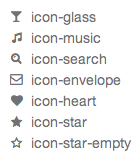 [
[ Designer, aka nemoorange, who used FontStruct in 2008 to make Remigius WIP (blackletter), Chambermaiden WIP (blackletter), Masphalt (a rip-off of
  March 6, 2012--a sad day for hackers. On this day, LulzSec, one of the noblest hacking groups in the world, got tricked by the FBI. But there was good news on the web font side. Dave Gandy's
  Free (!!!) conference organized by Garrick Van Buren (
 Iconic font scissors. This free tool can be used to combine icons into a single font. There is, for example, a tool called
 On-line
  [
[ Just Another Foundry (or: JAF34) was established in 2005 by
  Senior designer at Font Bureau since 1997, after graduating that year from the Rhode Island School of Design. Born in Milwaukee, WI, he now is a faculty member at RISD, where he teaches typography in the department of Graphic Design. He regularly offers a summer course on Digital Type Design, Summer Institute of Graphic Design, Rhode Island School of Design.
  Hector Gatti, aka Pocho Gatt, is an Argentinian who runs Gatti Studio and Omnibus Type, and who co-designed the sans typeface
  Dmitry Baranovsky created a free javascript vector library called Raphaël for doing simple graphics in web pages. As an example, he created a
  Stephen Coles tears down the iPad's lack of typographic features---here is his list of items:
 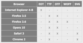 Armand Niculescu chimes in on the state of web fonts in 2010. I quote: So for now, if you want wide cross-browser support, you must:
  [
[ A web font tool by Mircea Piturca who used to be at the University of Dijon. TypeFolly is probably the first web typography tool that allows designers to easily create beautiful "type follies". The result is a fully html and css3 compliant code. TypeFolly gives designers the freedom to create beautiful type compositions, test new font combinations and fully enjoy the power of css3. At this time we support the following css properties: font-family, font-size, color, letter-spacing, word-spacing, font-style, font-weight, text-decoration, text-align, z-index, line-height, width, height, opacity, moz/webkit-transform, text-shadow and font-face. [
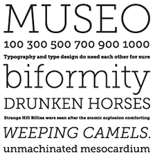 A comparison, one on one, of free web fonts and almost identical commercial web fonts. The pairings [(a,b) means a is commercial and b is free]:
 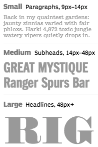 Webtype opened its doors in August 2010. It is a web font service headed by Font Bureau (David Berlow), with support from Ascender (and their Microsoft and Monotype collections), Petr van Blokland, Roger Black, and a web development company called DevBridge. The arguments David Berlow uses in his
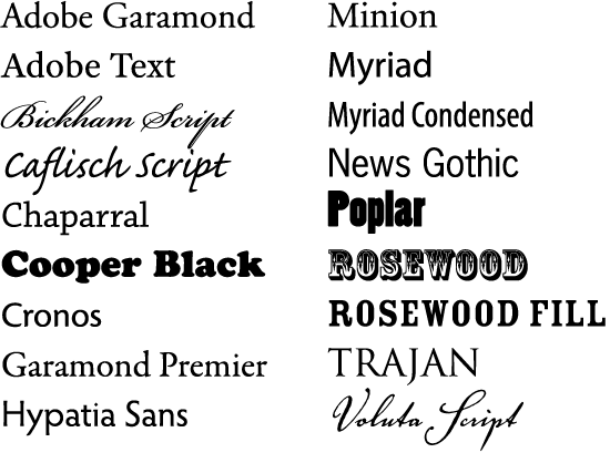
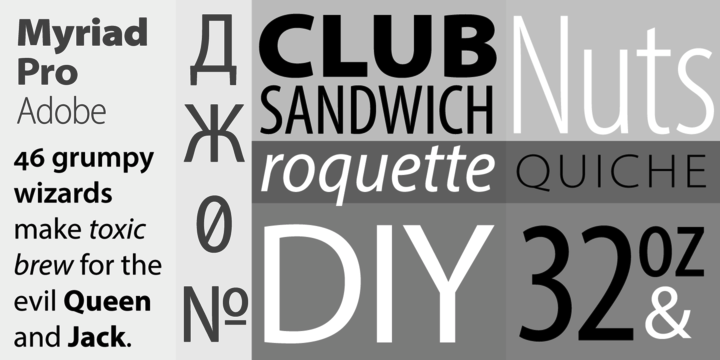
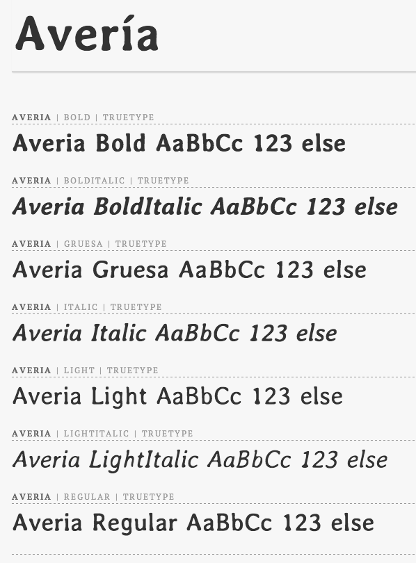
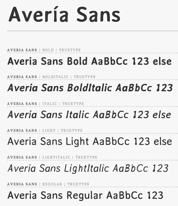
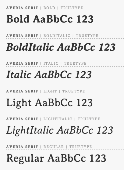
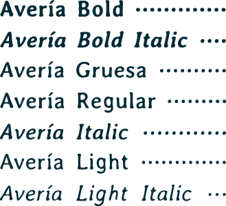
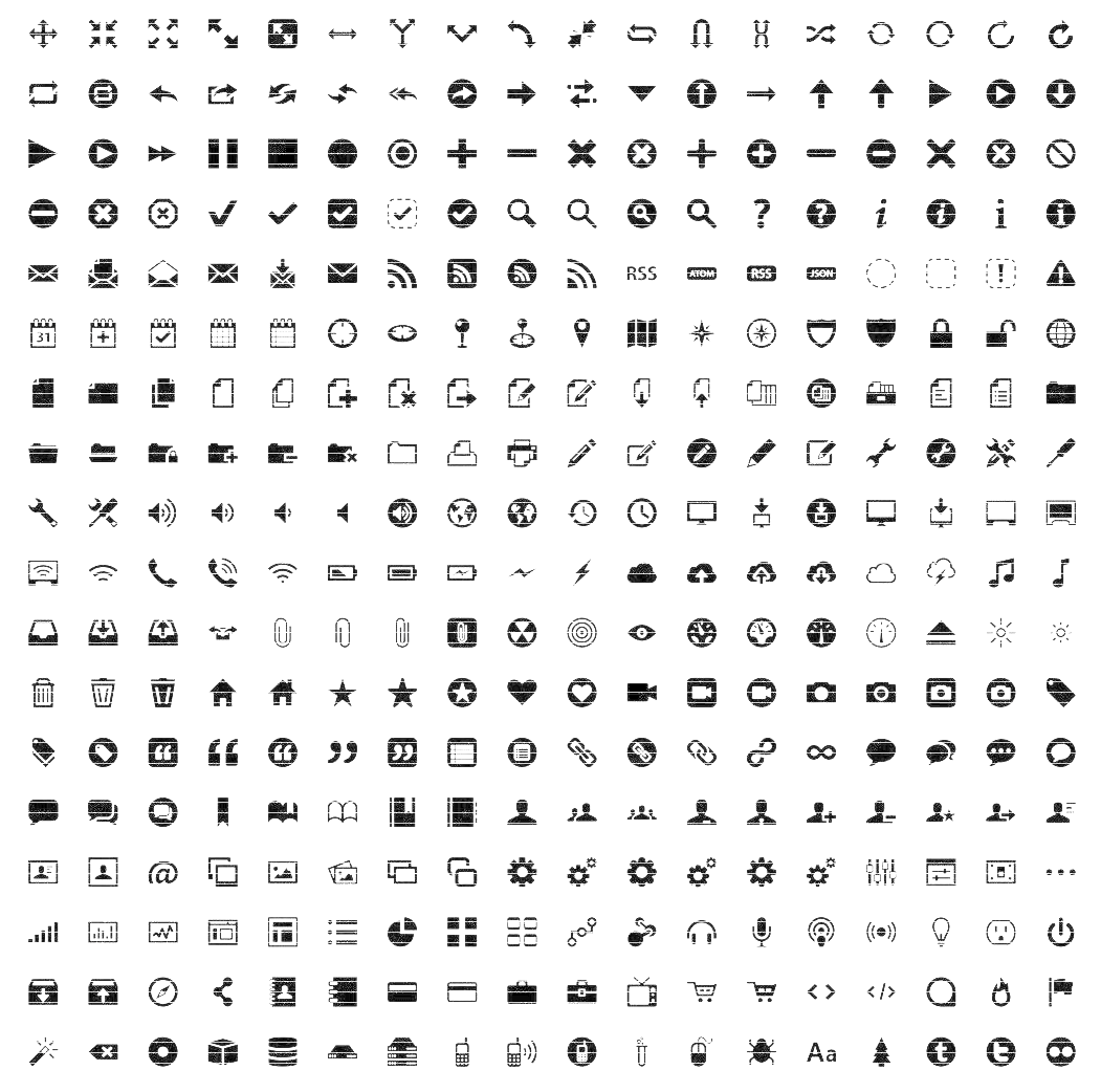
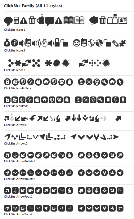
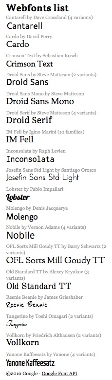
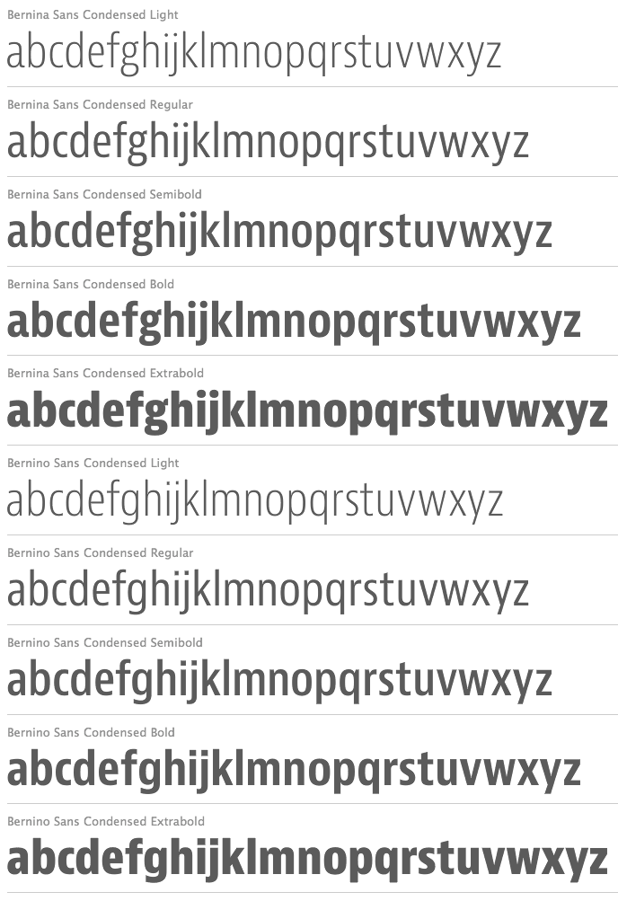
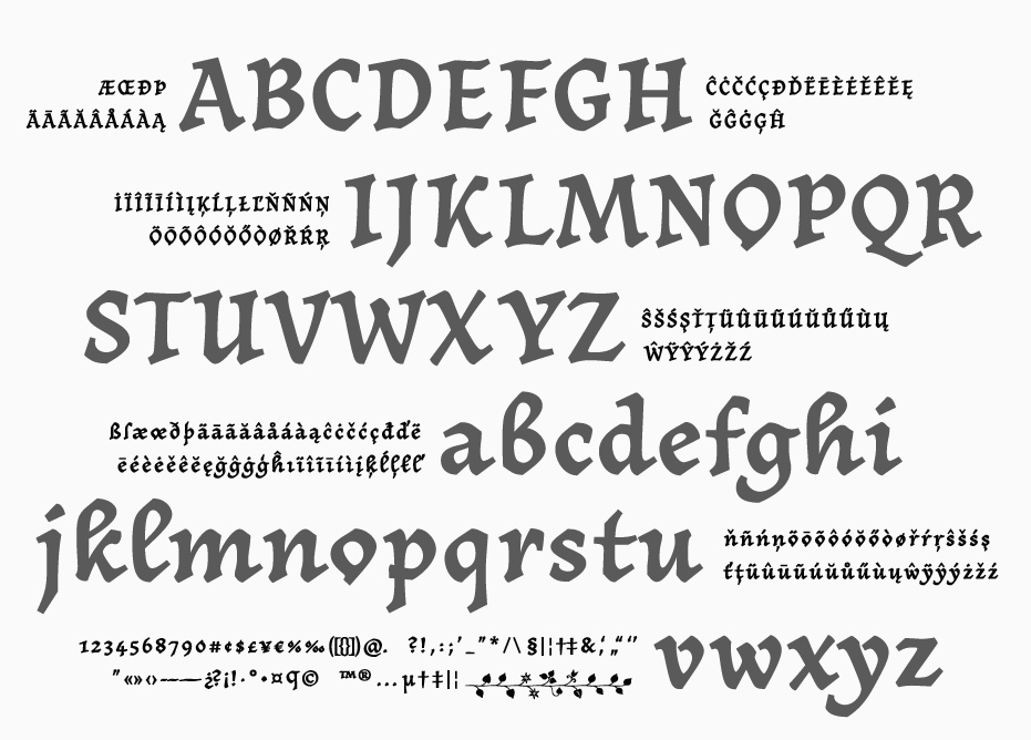
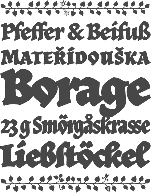
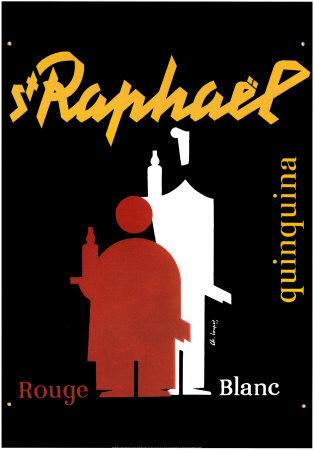
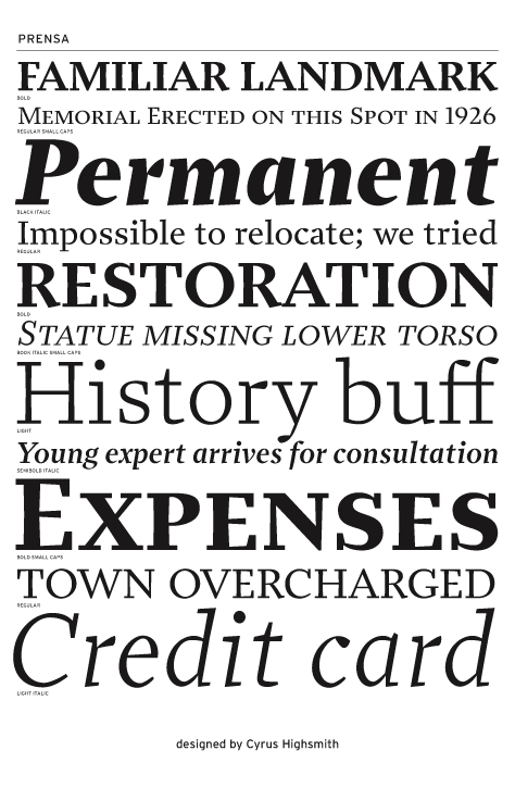
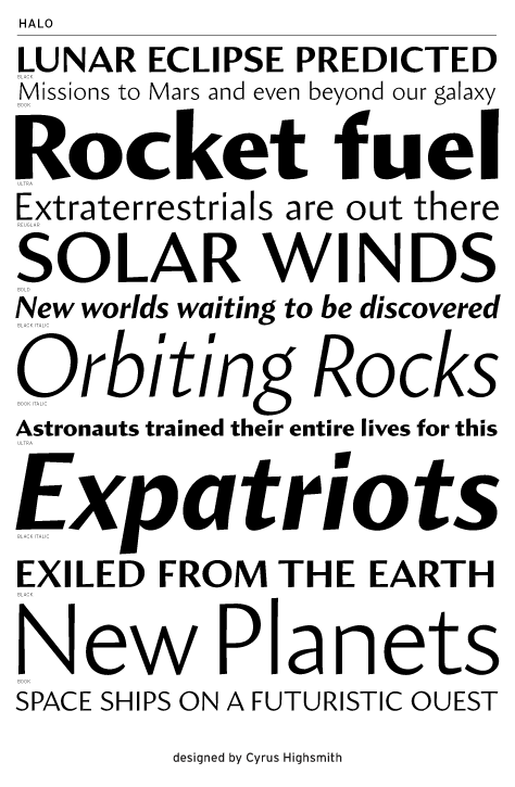
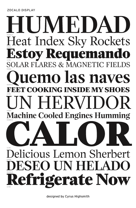
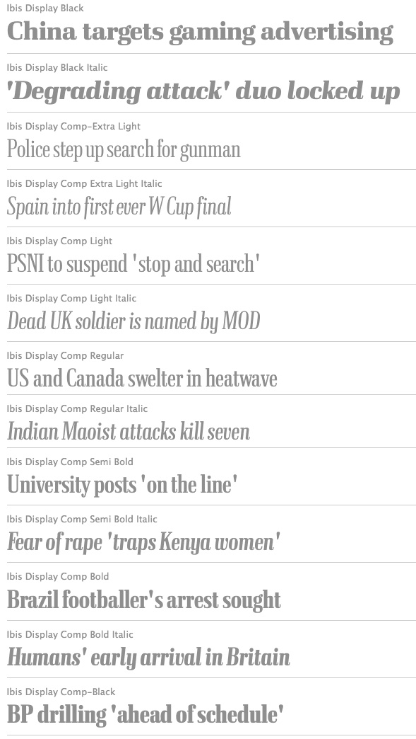
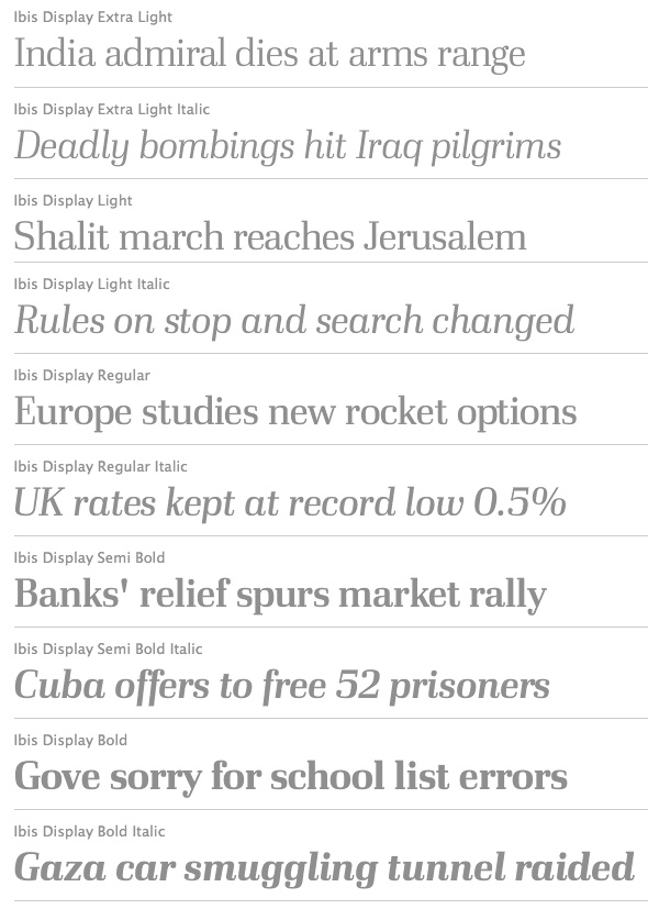
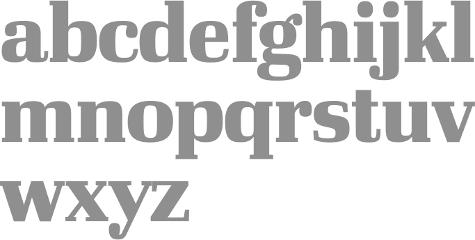
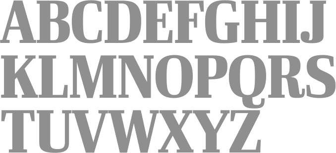
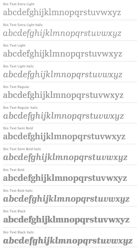
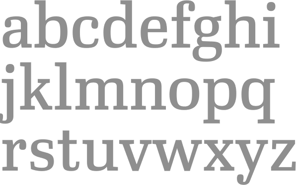
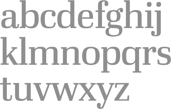
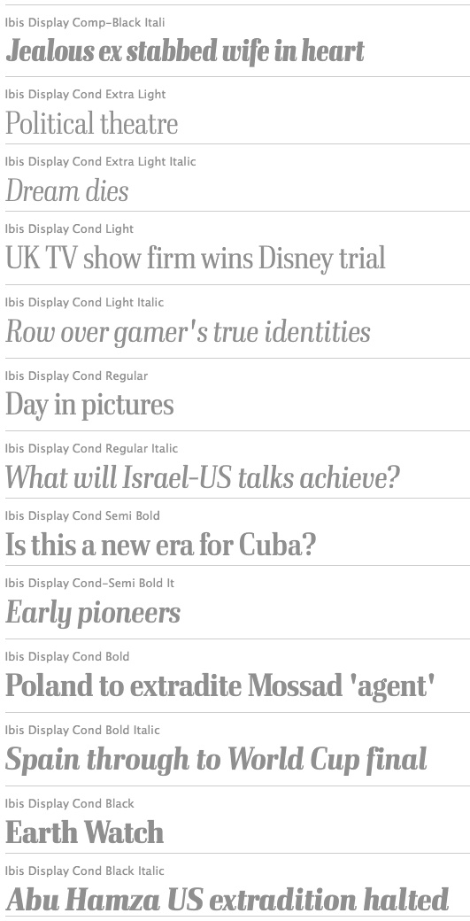
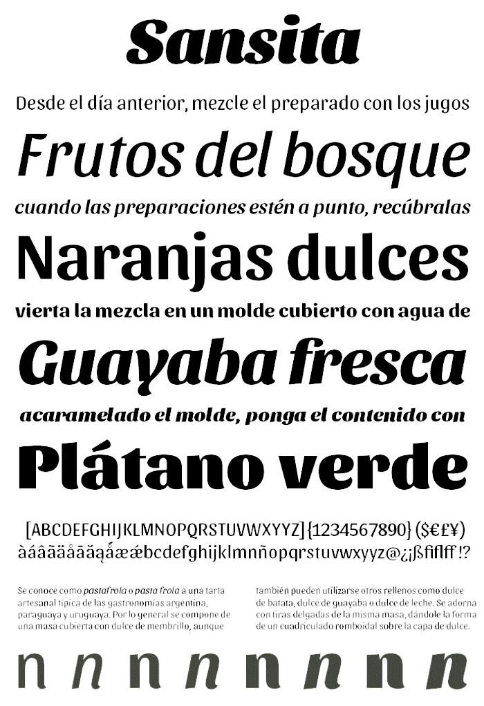
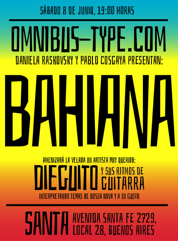
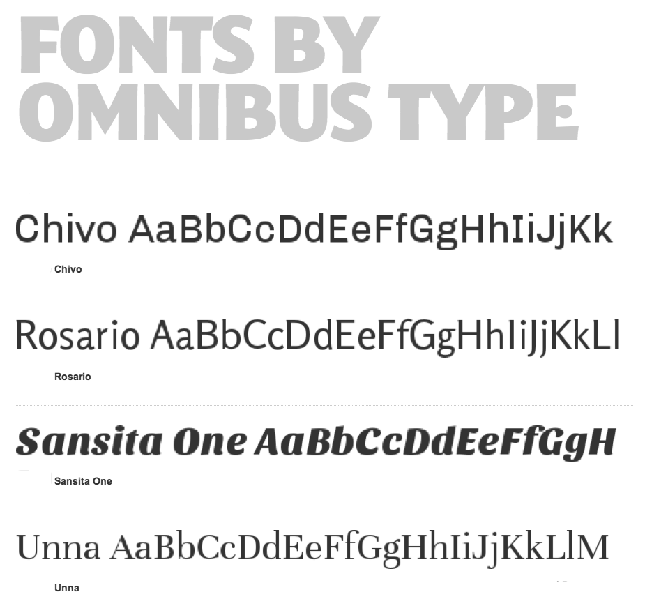
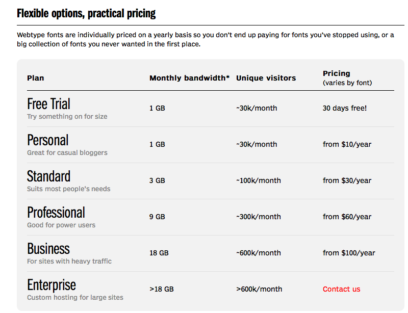
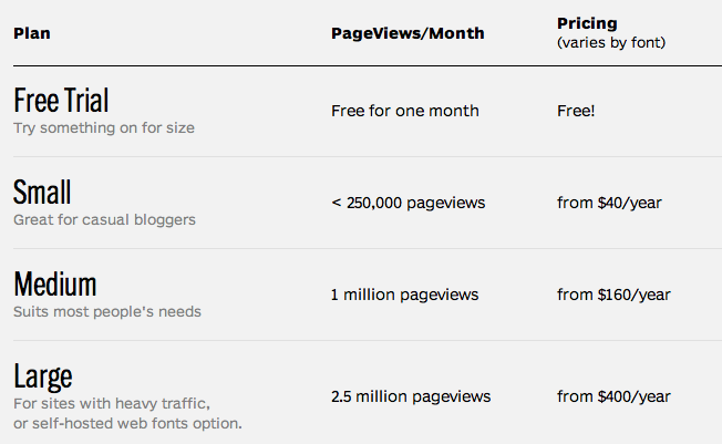
|
|
|
|