| | |
30 Thin and Light Fonts
|
Listing of 30 free thin fonts. [Google]
[More] ⦿
|
4th February
[Sergiy Tkachenko]

|
 Sergiy Tkachenko (b. 1979, Khrystynivka, Cherkasy region, Ukraine) lives in Kremenchuk, Ukraine, and has been a prolific type designer since 2008. Sergiy graduated from Kremenchuk State Polytechnic University in computer systems and networks in 2007. Various other URLs: Microsoft link, Identifont, 4th February, Behance, Klingspor link, Revision Ru, Russian creators, CPLUV Fontspace, Twitter. Kernest link. Sergey Tkachenko's typefaces:
 - 2008: the techno typefaces Bladi One 4F, Bladi One Slab 4F, Bladi Two 4F, Abia Wide 4F Thin.
- 2009: Wrongo 4F, Zantiqa (an über-serif), Serifiqo (a (free) thin didone fashion mag display face), Codename Coder 4F (monospace programming font), Droporado 4F (using circles only), Tovstun (futuristic, ultra-fat and rounded), Perfocard 4F, Modularico (five modular typefaces based on a logo from Master Kremenchug a company for which Sergiy worked for 4 years), Boldesqo Serif 4F (a splendid informal fat didone, now with Greek support), Tkachenko Sketch, Unicase Slab (a techno slab), Laftatic, Logofontik 4F (techno), PC.DE Stencil (+Italic; custom stencil font), Stenciliqo 4F, Tiap Liap 4F (handwriting), Nut Kit 4F, Rezzzistor 4F, the inline modular face Grand Hotel, and Bijou 4F.
- 2010: Roboo 4F (a bubblegum typeface family), PädIn (a custom typeface for Pädagogische Initiative e.V.: rounded fat informal face), Fat Quad (in the fatty trend), Veselka (a free multiline face), Smeshariki Black (+ Gleams: a bubble gum font made for an animation company), Republica 4F (a fat family), Rodeqa Slab 4F, ComFi (semi-octagonal), Grotesqa 4F, Nowy Geroy 4F, Fabryka 4F (a monospaced typewriter family), Placarto4F-Italic (an ultra fat art deco), Lavina 4F (a hairline sans with lachrymal terminals).
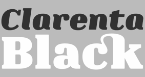
- 2011: Squartica (octagonal), Decomart (free), Model 4F Unicase (a unicase fat didone released in 2013 only), Fontatigo 4F, Kylie 4F (bilined and geometric), Waldemar 4F (a large didone style fat typeface family), Dinesqo (2011, a monoline sans of utter simplicity), Qargotesk (+Cyrillic) [images: i, ii, iii, iv], Neultica 4F (black unicase family), Squartiqa 4F (2011, constructivist), Clarenta 4F Black (after Clarendon---a great family), Designosaur (free sans), Perfopunto (based on perforated circles and squares), OlaScript 4F, Bayadera 4F (a tamed upright monoline script), Febrotesk4FUnicase (squarish unicase family).
- 2012: Targo 4F (rounded typeface with stencil and non-stencil styles), Myra (free font), Myra 4F Caps (free), Cedra (wide monolined sans face), Fontatica 4F (rounded techno grotesk), Akzentica 4F, Ukraintica 4F Wide (a monoline wide-bowled sans family), Laventa 4F, Sports World (free athletic lettering font), Web Serveroff (free computer geek font), Octin Spraypaint Cyrillic (a rough stencil done exclusively for Ninja Theory).
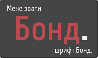 2013: Condesqa (modular sans), Esqadero (an uncomplicated monoline sans), Vanyla 4F Unicase (monoline), Esqadero FF CY (a free wide sans, Cyrillic), Bond (a confident no-frills sans), Attentica (free sans font for Latin and Cyrillic), Cedra 4F Wide Thin. 2013: Condesqa (modular sans), Esqadero (an uncomplicated monoline sans), Vanyla 4F Unicase (monoline), Esqadero FF CY (a free wide sans, Cyrillic), Bond (a confident no-frills sans), Attentica (free sans font for Latin and Cyrillic), Cedra 4F Wide Thin. - Cyrillizations: several typefaces such as Lavoisier (by Alec Julien), Budmo Jiggler (Ray Larabie) and JoAnne Display (Sandy Cerovich), Gnuolane (of a Ray Larabie font), Paranoid Cyrillic (based on Kevin Lo's Paranoid), Movavi Grotesque Black (+Cyrillic; image; numerals), Azoft Sans (made for Azoft, and free here and here).
- Custom fonts: Blue Pill, Sansus Webissimo (since 2011 free at Open Font Library), Minaeff ECT (2011, a free legible family for Latin and Cyrillic, custom-made for and downloadable from WebhostingRating.com), Webhostinggeeks.Com (2011), Web Serveroff, OnlinePharmacyCheck.Com (2011), 1800Flowers.com (2011), DesignStudio.com (2011, free), ArchyStudio.Com (2011, free download, Movavi Grotesque (2011, free), Azoft Sans, PÄd In, Smeshariki, Fat Cow (2010: free condensed sans), ComFi (2010, free), PC.de (2009: free techno family, including a stencil face), League Gothic (2009-2011, The League of Movable Type) Cyrillic, Paranoid Cyrillic, 28 Days Later Cyrillic, Acid Label Cyrillic, Dead Secretary Cyrillic, Rezland Cyrillic, Sweet Leaf Cyrillic, Droid Cyrillic, Jo Anne Display Cyrillic, Gnuolane Free Cyrillic, Bosox Cyrillic, Budmo Jiggler Cyrillic.
- Typefaces from 2014: Laqonic 4F (unicase sans), Cubynets 4F, Blogger Sans (free rounded organic sans), Boncegro (free Western typeface, briefly called Vaquero before a name change), Motor 4F (based on Russian car license plates), Monitorica (a futuristic typeface made for ipHostMonitor.com, free at OFL), Areqo (condensed titling sans), Architect's Daughter Cyrillic (architectural lettering), GetVoIP Grotesque (a free typeface commissioned by GetVoIP), Meeneralca (unicase sans inspired by the logo of the mineral water Borjomi from Georgia), Glasoor (free oil spill or jelly bean font), Robotesqa.
- Typefaces from 2015: Croogla (a circle-based informal sans), Blackentina 4F (free ultra-black squarish typeface), Dart 4F (neo-grotesque), Kent 4F (a layered family for letterpress emulation).
- Typefaces from 2016: Brent 4F (original design going back to 2013), a custom typeface for the labels used in the Ukrainian Armed Forces, Economica Cyrillic Pro (with Vicente Lamonaca).
- Typefaces from 2018: Indi Kazka 4F (Indic simulation).
Abstract Fonts link. Dafont link. Creative Market link. Behance link. Hellofont link. Open Font Library link. View Sergiy Tkachenko's fonts. [Google]
[MyFonts]
[More] ⦿
|
A New Machine
[Kent Swecker]

|
 Foundry, est. 2011, in Raleigh, NC, by Kent Swecker. A New Machine created the beautiful hairline hand-printed typeface Hair Line (2011), Sweck Sans (2011, a sans with some contrast and a large x-height), Unstable (2011, a paper cut face), the sketch typeface Crosshatch (2011), and the modular FontStruct-like typeface Model UR (2011).
 In 2012, he made Quarry (an outlined hand-drawn shadow font), Holt Sans (a Peignotian family), Unstable Slab, Mitosis (using bubbly dots), Radial (prismatic), and Airwave (techno). Typefaces from 2013: Benthic (decorative geometric caps), Tubbs (a beefy poster face), Dot To Dot (a dotted and lined pair of school fonts), Emjay (sketched blackboard bold typeface). Typefaces from 2014: Art Party (a festive hand-drawn typeface co-designed with with Erin Solomon), Carawan (a rounded sans family), Back and Forth, Fat Nib (splatter brush face), Smoot (whimsical typeface). Typefaces from 2015: El Guapo (a handcrafted typeface co-designed with Erin Solomon), Nervy, Current (thin connected script). Typefaces from 2016: Etymon (Skyline style), Big Trees (Victorian, Western), Igor (a beatnik style font). Typefaces from 2017: Down With The King (a great techno headline typeface). Typefaces from 2018: Thickness (hand-drawn), Chisel Brush, Dot to Dot, Dot To Dot Cursive (dotted line font, perhaps for teaching children in school). Typefaces from 2019: Artie Deco, Marie Jeanne. Klingspor link. [Google]
[MyFonts]
[More] ⦿
|
Aaron Tansil
|
Designer of the thin unicase sans typeface Ardency (2013) [during his studies at George Brown College in Toronto]. Behance link. [Google]
[More] ⦿
|
Aaron Troglia
|
Frontenac, KS-based designer of the free handcrafted typeface The Friendly Ghost (2016). In 2017, he designed the free font Piedmont. In 2019, he released the free typefaces Aaro Sans and Aaro Sans Hairline. [Google]
[More] ⦿
|
Acces Design
[Beate Limbach]
|
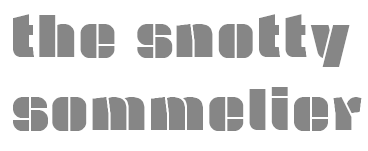 Gifted designer from Epalinges, Lausanne, Switzerland. One of the most talented creators of typefaces with FontStruct.
 Typefaces made in 2009: DB72, DBColon, DBPoints Sans, DBCube, and DB13, mostly dot matrix or octagonal fonts. In 2010, these were followed by db Outline, db Stickers, db Stick, DB Cube New, db MOKI (stencil), db Ciao, db Ticket Light, db 72, DBpoints (dot matrix), DBPoin2, and db Kopix (blackletter), db New Points Italic (dot matrix face). In 2011, we find dB Stick, dB Sticker, dB Sticker Mono (a monospaced typewriter face), db Prague (fat sans), db Backjumps (an extraordinary fat poster stencil), db Perl, db Perl 1.2 (texture face), db Quarz (2011, +Mix), and db Nox and db Nox II. Fonts made in 2012: db Como (a simple monospace sans), db Sticker (hairline sans), db Rocko v2 (stencil face), db Today v1 (a beautiful black slab face), db Today v2, db Etroite (2012, in several weights: constructivist), db N3, db Drops (fat counterless face), db Quarz Mix, db Soda, db Klacks, db NQ, db Boxer, db Como (monospaced), db Smoothie (fat stencil face), db Quick Cut (stencil), db Karton (stencil), db Frieda. Typefaces from 2013: db Etroite, db Concierge (hairline serif), db Lineo, db Lucky, db Boxer III, db SIL. Typefaces from 2014: db Darling. db Oh Darling, db Melitta (a fantastic brush emulation typeface), db Sticker T, db Points Sans Oblique (dot matrix font), db Como Splitt, db Quirlo (fat rounded poster typeface), db Quirlo Mix, db Limo (angular angry anthroposophic sans), db Limo N, db Slow (a German expressionist typeface), db Bargo Condensed, db TwoLines (an inline font). Typefaces from 2015: DB Caryptis, DB Oleumi, DB Caroli Plain, DB Caroli, DB Seimeins Serif, DB Seimains, DB Sago, DB Sago II, DB Sthlm (+Light), DB Gertrude, DB Track, DB Track Too. Typefaces from 2016: DB Maquette, DB Largo, DB For You (winner in the 2016 Fontstruct Love competition), DB Bargo Slanted. Typefaces from 2017: DB Jojo, DB Scrape, DB Tape Noir, DB Tape Slab, DB Tape, DB Pins, DB Monoto Sans, DB Mrs Back n Black, DB Dr. Bob, DB Tilda, DB Rondo Mix, DB Rondo, DB Shop. Beate set up Acces Design ca. 2017. The typefaces available there are ad Backjumps (stencil), ad Bargo, ad Como, ad Concierge, ad Darling, ad Oh Darling, ad Frieda, ad Klacks, ad Limo, ad Lucky, ad Magritte, ad Melitta, ad Mill, ad Points, ad Quirlo, ad Slow, ad Soda and ad Soda Plex. Typefaces from 2018: ad Falter (blackletter). Typefaces from 2019: ad Dorma (sans), ad Flieger, ad Louise, ad Hobby, ad Journal, ad Juli (sans), ad Tape, ad Violetts (handcrafted), ad Tape (sans). Typefaces from 2020: ad Ander, ad Sticker Mono, ad Juli (sans), ad Magritte (sans and serif; for posters). Behance link. FontStruct link. [Google]
[More] ⦿
|
ACME Fonts (or: CHK Design)
[Christian Küsters]

|
Started in 1996, by Christian Küsters and Andy Long (from South London), ACME Fonts is a London-based foundry, offering fonts by Küsters and these designers: Anthony Burrill, Gérard Paris-Clavel&Johannes Bergerhausen, Jean-Lou Désiré, Paul Farrington, Robert Green, Paul Kehra, Henrik Kubel, Simon Piehl, Alex Rich, Carsten Schwesig, Sandy Suffield, Dirk Wachowiak, Anne Wehebrink and Paul Wilson. Christian Küsters is an ex-student of Matthew Carter at Yale. Born in Germany, he now lives in Oberhausen. Buy the fonts at MyFonts. The company evolved, I guess, into CHK Design. MyFonts link. Interview. Klingspor link. The ACME font list: - By Christian Küsters: AF Angel (1998, based on an old woodblock typeface), AF Satellite, AFWendingen, Cashier 1 AF (1998, dot matrix), AF Champ Fleury (1996, a Codex-like face), AF Hybrid (1996), AF Hadrian Roman (1998, art nouveau), AF Interface One and Two (1998, grotesque sans), AF Retrospecta (1998, exaggerated wedge serif family), AF Track AF One and Two (1998, white on black dot matrix printing), Unzialis (1994), Zip Code AF 30, 40, 50 and 60 (2001, hairline squarish sans family). Christian had a nice connection at Plazm, where he published Hadrian (1996), Retrospecta (1994), Unzialis (1994), Hybrid (1996) and Interface One (1996).
- By Robert Green: AF PAN (1997, octagonal).
- By Henrik Kubel: 4590, AF-Battersea (1999, a grotesque family), AF-CENTERA, AF-Copenhagen, AF-Klampenborg (2000, grotesque sans), CPH-ArabicNumbers, CPH-Medium, Grot-25.
- By Sandy Suffield: CarPlatesCarPlates, AF Carplates (1998, squarish, including Carplates AF Bold Stencil).
- By Paul Wilson: AF Screen (1999).
- By Pete McCracken: INKy-black (1994).
- By Carsten Schwesig: Nicoteen 13 AF (1998, grunge), AF Syrup (1998, slab serif).
- By Paul Farrington: Camberwell AF One (1998, grotesque sans), AF Tasience (1998), Amateur 69 AF (1998, grunge).
- By Dirk Wachowiak: AF Diwa (2002, large squarish sans), AF Generation (2002, huge squarish sans families called A, A2, A2A, Z, and ZaZ).
- By Jean-Lou Désiré: Kub AF (2002, experimental).
- By Johannes Bergerhausen and Gerard Paris-Clavel: LeBuro AF (2003, grunge in weights called Breau, Crade, Louche, Extra Crade, Demi Beau).
- By Sylvia and Daniel Janssen: AF Nitro (2004, techno family in subfamilies called Intro, Riton, Trion).
- By Anne Wehebrink: Oneline AF (1998, squarish sans).
- By Paul Kehra: PostSoviet AF (2001, geometric sans family; with Cyrillic and Latin letters; weights called Culture, Free Latvian, Free Revolution, Ideology, Revolution).
- By Simon Piehl: Spin AF (1998, squarish sans).
- By Anthony Burrill: Video Wall AF (1998).
- By Christian Küsters, based on lettering of H.T. Wijdeveld: AF Wendingen (1998, LED simulation).
- Other: AFConstants (1998), Allen, Indy 500, Interface, AFLogotype (1998).
View ACME's typefaces. Acme's typeface library. Typefaces made by Christian Küsters. MyFonts selection for ACME. [Google]
[MyFonts]
[More] ⦿
|
Active Sphere
[Ronnie Dela Cruz]

|
 Active Sphere is a foundry in Valenzuela City, The Philippines. It is run by Ronnie Dela Cruz (b. 1963, Manila), a part-time freelance web and graphic designer.
 Their fonts include the geometric sans display families Kayla Sans (2008), Kathleen Sans and Serif (2008), Leenyx (2008), Jekatep, Sean Henrich ATF (2009), and Yarikha (2008). Stephanie (2008) and Zirphy (2008) are rounded geometric display fonts, and Kamaru Sans (2008) is an experimental sans face. Mecatoque (2008) is Victorian but pretends to be futuristic, and Sayonachi (2008) is a curly children's book face. Stanix (2011) and Tsikot (2011) are fat techno typefaces. Maxine Sans (2011) is a basic humanist sans family. Tamika (2011) is a gorgeous oriental style brush face. Anino (2011) is a grunge family. Anikka (2011) is a monoline sans family with an extremely thin hairline on one end. Filipina (2011) is an organic sans family. Bradford (2011) is a squarish family. Gretta (2011) is a minimalist sans with missing strokes. Danrex (2011) is Ronnie's contribution to the "fat counterless" craze. Merina (2011) is a fat piano key face. Sailfin is a stylish monoline organic sans family. Typefaces from 2012: Noki (a great slabbed squarish typeface family), Xira (angular), the sturdy geometric display font Zafra, and the fat squarish techno family Mossimo. Typefaces from 2013: Monterra. Typefaces from 2014: Tiger Cat. A large modular typeface family that follows the octagonal mechanical genre. Klingspor link. Typefaces from 2021: Blue Creek (22 fonts; a condensed all caps sans), Blue Creek Rounded (22 fonts). View Active Sphere's typefaces. [Google]
[MyFonts]
[More] ⦿
|
Acute Studio
[Diana Ovezea]

|
 Born close to the Black Sea coast in Romania, Diana moved to Austria as a child, where she attended the American International School. After graduating from the New Design University in St. Pölten, she worked as a graphic designer, mainly on book and corporate design projects. In 2013, she graduated from the Type & Media program at KABK in Den Haag. Some time later, she set up Acute Studio in Amsterdam under the motto: We like sharp outlines, tight curves, and edgy designs.
 Creator of the hairline face Opium (2010) characterized by teardrop terminals. Creator of Paige (2011), developed at the tipoRenesansa 3rd international type design workshop in Ljubljana, Slovenia. This is an attractive and bouncy papercut display face. Marge (2011) is edgy and highly legible even at very small sizes---it was developed at the tipoRenesansa 2nd international type design workshop. Paige Italic (2012) was done at tipoRenesansa 4 and TypeClinic 5 (2012). Her KABK graduation typeface was Editura (2013), a a type family for serious publications, magazines, as well as non-fiction books. At The 8th International Typeclinic in 2014, she continued work on an untitled text typeface. At Die Gestalten, she published Paiper, an extraordinarily balanced and readable 6-style text family with angular flared glyphs that are genetically related to folded paper strips. In 2014, Diana collaborated on the design of HF Stencil with Bold Monday and Studio Thonik. Made for Holland Festival, HF Stencil is based on Glaser Stencil. In 2016, Diana published Equitan Sans and Equitan Slab at Indian Type Foundry, marrying industrial era rustiness with modern functionality. In 2017, she designed Tiny Sans and Albert Samuels Clock Type. Codesigner in 2017 with Samo Acko and Sabina Chipara of the typefaces Passenger Display (2017) and Passenger Serif (released in 2019: a Clarendon). Passenger Display is a high-contrast didone-style font family. It is intended for use in headlines, signs, or posters. Passenger Display is a high-contrast didone-style font family. It is intended for use in headlines, signs, or posters. In 2019, Diana Ovezea and Samo Acko added Passenger Sans, which is characterized by horizontal and vertical terminal strokes and small apertures, and delivers a relaxing read in long texts. With Sabina Chipara, she co-designed the 8-weight simplified sans family Bega at Indian Type Foundry. Diana Ovezea also published the sharp-edged 14-style Matteo in 2017. At Future Fonts, she published Bizzarrini (together with Sabina Chipara) and Silverspoon, ca. 2018. She writes about the wonderful Bizzarrini: Though the idea originates from a Stefan Schlesinger ad sketch for a Paris couture house, we straightened up this typeface and made it seem engineered and sharp. It gets its name from the Bizzarrini Manta, a wedge-shaped concept car designed in 1968 by Giorgetto Giugiaro. Bizzarrini has extremely long wedge serifs. Following Schlesinger's sketch, it features very tall capitals with an out-of proportion middle-line (very big heads on S, B and R). Silverspoon is a contemporary take on Copperplate Gothic. In 2019, she released the connected monoline sans script Akin (done with Sabina Chipara) and the geometric sans family Matteo at Indian Type Foundry. Typefaces from 2020: Silverknife (a tall and skinny version of Silverspoon), Capra (a headline typeface with a bouncy baseline. This project started as a one-day challenge to recreate a piece of lettering on the Glass Menagerie poster designed by David Klein in 1958). At Fontshare, Diana Ovezea and Sabina Chipara released the free calligraphic script Britney. In 2021, Barbara Bigosinska, Rafa Buchner and Diana Ovezea set up Blast Foundry. At Blast Foundry, she published Granblue, a great experimental typeface family for boxing titles. Typefaces from 2022: Duplet (a 14-style geometric sans with a techno vibe; by Diana Ovezea and Rafal Buchner at Indian type Foundry), Duplet Rounded (also 14 styles), Duplet Open (the 14-style companion of Duplet). Home page. Behance link. Future Fonts link. [Google]
[MyFonts]
[More] ⦿
|
Adam Broe
|
Digital artist from Limerick, Ireland. Devian tart link. At FontStruct, he created the ultra thin squarish typeface Lithe (2010). In 2011, he created the thread-themed experimental alphabet I Hate Thread. [Google]
[More] ⦿
|
Adam Ericsson
|
Designer of the free hairline sans typeface Adam (2016) and the fat all caps sans typeface Bold (2019). [Google]
[More] ⦿
|
Adam Fathony
[AF Studio]

|
 [MyFonts]
[More] ⦿
|
Adam Howard
|
Saint Louis, MO-based graphic designer who created several typefaces in 2012, including Helvy, Stitch, Digiti, Exposed, Skinny Jeans (hairline caps), Golden Age (fashion mag caps), Tunnel Vision, and Grand Penn (ultra-condensed caps). [Google]
[More] ⦿
|
Adam Kanya
|
Eger, Hungary-based creator of Hairline (2012, a sans family). [Google]
[More] ⦿
|
Adrian Kimball
[WTF (or: Workhorse Type Foundry)]
|
 [More] ⦿
|
Adrian Talbot
[Talbot Type]

|
 [MyFonts]
[More] ⦿
|
Aesthetic Type
[Michael Jarboe]
|
 Aesthetic Type (Cardiff, CA) was founded in 2014 by multi-disciplinary creative Michael Jarboe alongside his partner Robin Jarboe. Michael holds a BFA in Painting from the Maryland Institute College of Art (MICA) and Robin a BA in Art History from the University of California San Diego. Before Aesthetic Type, Michael Jarboe ran the type foundry Reserves. Aesthetic Type published the hairline sans typeface Anon Line (2019), and Anon Grotesk (2014-2018). [Google]
[More] ⦿
|
AF Studio
[Adam Fathony]

|
 Adam Fathony (or Adam Fathoni Haris; AF Studio, Bandung, Indonesia) created the vintage typeface Grandesa (2014), the signage typeface Magnifika (2014) and the Victorian typeface Marema (2014).
 In 2015, he published the connected swashy script typeface Octavia Script, the brush scripts Carbonera and Shallom, the hand-lettered Vanilla Daisy Script and Mightype, the watercolor script Hollycakes, and the connected Brayden Script (and Sans). Typefaces from 2016: Drustic Daily, Karlberg Script, Ecosmith Script, Halosense Script (calligraphic), Lunar Cone (connected layered script), Clarkson Script, Salvador Script, Salvador Serif, Salvador Condensed, La Venice Script (retro signage lettering). Typefaces from 2017: Clarkson Script (brush lettering), Bignord Vintage (with Fauzan Rafhy), Douglas Collection (12 fonts: Aaronade Script, Ancaster Script, Burlington, Calgury, Montreal Rounded, Morphic 60s, Norwood Old, Ogdensburgh, Palmeira, Rutland Extended, Wolves Sans, Wolves Serif), Almost Lover, Rhythmic Dances (rough script), Sevastian (layered font set), Rustling Trees (dry brush), Little Karla Script. Typefaces from 2018: Figuera Variable (a late Victorian, early art nouveau typeface family; variable font format), Brignola (a calligraphic penmanship script), Eastside Brush (a brush signage script done with Angga Kristiandri), Marshfield (a retro cursive typeface by Adam Fathoni Haris and Renov Olivian), C'est La Vie (font duo), Chivels (a vintage typeface done with Angga Kristiandri at Abbassy Studio), Sevastian (a layered font family), Drustic Dialy (weathered; with Angga Kristiandri), Elli Bellie (calligraphic). Typefaces from 2019: Scottsdale Serif (at Typeverything), Scottsdale Desert (an opentype feature-laden display serif), Norfolk (Narrow, serif), Tiverton (Sans, Serif, Script: by Adam Fathony Haris and Angga Kristiandri), Havard (a layerable athletic lettering set of 12 fonts), Gorga Grotesque. Typefaces from 2020: Auvelle (a hairline sans), Windsore (a font trio), Howli (layerable, rounded; sans, serif and script), Genty (a creamy retro signage script typeface by Ilham Herry and Adam Fathoni Haris), Burnest (a vintage typeface by Adam Fathoni Haris and Renov Olivian), Glaw (a psychedelic font by Ilham Herry and Adam Fathoni Haris), Oliviar Sans (28 styles and a variable font), Budge (a layerable retro signage script by Ilham Herry and Adam Fathoni Haris), Stanlow, Muray House (a bold swashy bathroom towel typeface by Ilham Herry and Adam Fathoni Haris), Esteric (a playful tapered font by Ilham Herry and Adam Fathony). Typefaces from 2021: Alstera (an oblique serif), Monvar (a layerable Cooper Black style typeface by Ilham Herry and Adam Fathoni Haris), Rische (a 6-style display serif with huge counters and an enormous x-height; by Ilham Herry and Adam Fathoni Haris), Ottenthic (script and serif), Mionic (a reverse contrast slab serif by Adam Fathoni Haris and Angga Kristiandri), Matchbox Font Collections (a set of vintage fonts based on lettering on matchboxes; it includes substyles called Linea, Lettre, Deco, Scriptura, Ornato, and Graso). Typefaces from 2022: Balide (a 70s style display typeface), Norsy (a 21-style and variable flared font family). [Google]
[MyFonts]
[More] ⦿
|
AJPT
[Alan Jay Prescott]
|
 Pottstown (Philadelphia)-based designer and PostScript font hacker who ran Prescott Design and now Alan Jay Prescott Typography, but was also involved in other ventures such as the Black Walnut Winery. Originally from Greenfield, MA, he graduated from Saddleback College, and worked for some time as a typesetter in New York. He advertizes himself as a leader in PostScript Open Type Font development specializing in the revival of print-only letterforms into digital typographic materials. He operates as APT and more recently as AJPT. In 2019, he announced that he would stop making typefaces altogether. His work can be partitioned into time periods. For this reason, Prescott's oeuvre is split over several pages:
 - His late period (2017-2019). In these three years, he showcased his work on Facebook, and was mainly involved in reving 19th century typefaces, about half of which were from the Victorian era. The annotations in the list below are quoted from Prescott's pages.
- Absolution Cursive (2017). When I was a typesetter in New York City, I had one of the largest collections of typefaces from CompuGraphic's library available for setting. One of the faces I never used in two decades of work was a rather ungainly decorative font called Abel Cursive. Apparently it was designed by Bernie Abel (perhaps one of CompuGraphic's employees) and I'm not sure it got much use, since I don't recall seeing it anywhere except my type catalog. Before I sold my equipment and closed my business for good, I made a scan of every typeface at 72-point size that I owned for future development, if there ever came a time to work on something crazy like that. Most of those 2,000 scans were lost when I changed computers a long time ago, but Abel Cursive survived and I made a down-and-dirty mow-and-blow font back then. I have recently worked on it extensively to make it usable as a multilingual slightly redesigned font in OTF format. I would classify it is as neo-Victorian medium-contrast decorative italic. It is definitely an oddball and may never see use.
- Algol (2017). Based on a scan from Dan X. Solo, Algol is a vastly expanded character set for Algernon, a typeface that clearly presages Machine and other "octics." I don't have any source material for the original design, but it may have been a Dan Solo original.
- Aloysius and Aloysius Ornamented (2017). This is a digital revival of the original Algonquin, cut by J.F. Cumming in the late 1880s for the Dickinson Type Foundry in Boston. While this was not my most challenging project, it was a doozy.
- Alpenhorn Roman (2017). Another oddball typeface is revived here, renamed from the design called Alpine by Henry Schuenemann for the Cleveland Type Foundry in the 1880s. Buried in the "gingerbread" of this weird face is technically a Latin serif, but otherwise it is an entirely unique letterform for which I had a heart soft enough to revive here in digital form.
- Androgen Roman (2017). I know next to nothing about this ultra-geometric blackletter called Anderson that I found displayed in a Dan X. Solo catalog, but it is another oddball that is attractive and very simple to revive in digital format. It is one of those projects I would recommend to a beginning revivalist who wanted to cut his or her teeth on a moderate challenge after mastering some basic tools in font development software.
- Angolan Text (2017). I found Angular Text in a Solo catalog and revived it as a digital font with diacritics and other characters for expanded typesetting possibilities. It was designed by Herman Ihlenburg in 1884 for MacKellar, Smiths & Jordan, which information I found in a link from Tom Cruz for a fellow named Toto who revived the font as well; he has several glyphs I do not have and I like his showing better. Interesting to see what others have done with the exact same typeface and scan and some research for tantalizing missing glyphs...kudos.
- Antiochia Series (2017). This collection of typefaces represents a revival of several bold slab-serif wood types with the name Antique that are related. Their individual histories will follow at another time, but note that several here are useful derivatives that add to the variety of this letterform's impact.
- Azurine Roman (2017). Azurine is a digital revival of a typeface known as Aztec, drawn by an unknown designer for the Union Type Foundry before 1889.
- Beltane Roman (2017). The very complicated story behind the work on this revival is too long for this space (and perhaps too boring to most), but suffice it to say that this letterform started out in 1886 as drawn by the great Herman Ihlenburg as Artistic and assigned to MacKellar Smiths & Jordan. Dan Solo called this face Belmont but only showed caps and was suspect anyway. I was able to find specimens elsewhere and a motherlode of other interesting things in the Inland Printer. I developed my first full-featured OTF using this typeface and designed Greek and Cyrillic glyphs as well. I also fitted it out with a set of small caps to make a font that now has 4,000 glyphs for nearly every non-Asian language. To top it off, Robert Donona revived the decorative caps for this typeface, an excruciating task that I once considered for myself but was lucky enough to have this other crazy person take up. The number of hours dedicated between Robert and myself in reviving this complete series digitally is probably unprecedented.
- Bernhard Swirl (2019). This is a digital revival of the letterform of the same name. It is equipped only with the upper case, an ampersand, a spacer dingbat and the numerals. The numerals are quirky, not only in design, but the fact that they seem to have been intended as old-style figures with the exception for the 4 and 7. Lucian Bernhard is either the designer of this limited-use typeface or inspired a reworking of his "wobbly" poster typefaces for which he is known as an innovator. I have reworked the scanned samples I had used as templates and drew them with a little more consistency than the originals to improve color on the page.
- Bireme Roman (2017). Below is a digital revival of a typeface called Bijou. As I have come to understand, several people have revived this face already. It is similar to Flirt in many respects. I will update information as I come across it, but I wanted to post my version here for your appreciation.
- Blackguard (2018). This is a digital revival of a typeface known as Black Cap. William E. Loy writes that Black Cap was designed and cut by Charles H. Beeler Jr. for MacKellar, Smiths & Jordan. The earliest-known commercial specimen was advertised in the January 1891 edition of The Inland Printer, so he probably created it in 1890.
- Blackminster (2017). One of the more interesting treatments of blackletter forms in the 19th century is this beauty called Black No. 544 designed by Henry Brehmer in 1889, who assigned the rights to Bruce Type Foundry. Originally I was unable to locate certain key glyphs in this font, but they were graciously supplied by others in our crazy network of type geeks. More information on the people behind these projects will follow in other articles.
- Bleak (2017). Bleak is a series based closely on a typeface called Stark. As with nearly all typeface names, there are several unrelated fonts developed in recent years that bear no resemblance to this gorgeous sans serif.
- Brotherly Roman (2017). Among many "antiqued" letterforms developed in the late 19th century, Ben Franklin was offered by Keystone Type Foundry in Philadelphia. Several glyphs were missing from my best showing of the font, but I was luckily able to find them, as well as logotypes, two ornaments, several alternate characters and some punctuation. There had already been a digital revival of this typeface kicking around as shareware in the 1990s, but it was very poorly drawn and incomplete. I believe it has been rendered nicely and consistently here for posterity.
- Busker Contour (2017). Burlesque was the name given by Solo to a typeface originating through Caslon or Figgins around 1843 and shown in German specimens a couple of years later.
- Cane Gothic (2018). Cane Gothic was designed and cut by Edwin C. Ruthven c.1886; he patented it in March–April 1886 and assigned the rights to David Wolfe Bruce (son of George Bruce, holder of the first design patent in US history). The Bruce catalog number is unknown. The tradename Cane Gothic, an apt description of the caning patterned background, may have been assigned by Dan X. Solo, who had revived the face for his photo-lettering service, but it has previously been considered impossible for digitizing. Although the average character in this font contains something like 3,000 Bézier control points, it turned out to be doable once I figured out the original mathematics that Ruthven must have used to guide his design objectively. It is digitized for posterity and I thank Anna Allen once again for the patent specimen (No. 16,643) indicating, if extremely faintly, five missing glyphs from my otherwise excellent scan. Thus I've generated the border glyphs and a pound Sterling symbol to augment this letterform. As far as I can determine, this character set is complete, and I have generated three fonts in order to accommodate chromatic typesetting with very little effort.
- Cantini Casual (2019). This is a digital revival of the typeface of the same name (or at least that is the name Solo gave it in the type specimen book from which it was scanned). It is a great example of the exuberant fancy characters that came to ascendance during the 1960s and 1970s. It is a medium-weight Latin italic with unusual decorative details in addition to crazy swash choices. I do not have any information on the history of this trippy face, but it is likely it was revived at some time in the recent past. It includes a large number of alternate glyphs as well.
- Capulet (2017). This is a revival of a typeface called Caprice that was patented in 1888 by Arthur M. Barnhart and assigned to Barnhart Bros. & Spindler of Chicago. This letterform is a prime example of the explosion in design ideas occurring before the turn of the century, hundreds of which remain to be translated into digital format.
- Carmenite Roman (2017). This beautiful digital revival covers a letterform drawn by the Bauer Type Foundry of Stuttgart, Germany sometime before 1896. It was originally called Carmen and has been referred to as Carmencita in the Solo books.
- Centrum Text (2017). This is my digital revival of one of the more complex decorated blackletters, among my favorite and most difficult projects to work on and just finished today. It is identified as Celebration Text on p. 18 of Solo's "Gothic and Old English Alphabets." The lowercase for this letterform is also presented for two other typefaces, Testimonial Text and Innsbruck in his larger catalog, presenting some confusion. But I believe all three were drawn by the same designer, although I have no idea how old they are. The lowercase may simply have been used for all three decorated capitals, since they are a very good match. Intentional, who knows? It is a real beauty and I'm going to perhaps revive the other two in this triplet of great examples of decorated capitals.
- Chapterhouse Roman (2017). This is an interesting typeface known as Ecclesiastic from Caslon around 1870. It was also known as Albion and Chapel Text No. 30. Most of those names were applied to completely unrelated designs, adding to the confusion that permeates typographic development and history to this day (and only gets worse over time). There are probably more alternate characters out there, but this is the best showing I could make with the resources I have and it is now available from me as a digital font.
- Chapterhouse Roman (2017). This is an interesting typeface known as Ecclesiastic from Caslon around 1870. It was also known as Albion and Chapel Text No. 30. Most of those names were applied to completely unrelated designs, adding to the confusion that permeates typographic development and history to this day (and only gets worse over time). There are probably more alternate characters out there, but this is the best showing I could make with the resources I have and it is now available from me as a digital font.
- Clarence Roman and Dotted (2017). Clarence Roman is a revival of Clown Alley and Clarence Dotted that of Cooktent (also called No. 515). Wood typeface Cooktent comes from W.H. Page before 1890 and the other looks to be a back-formation from it.
- Commissioner Script (2017). The typeface known as Commercial Script was designed by Morris Fuller Benton in the early twentieth century and enjoyed widespread use for decades. There have been many variations from other foundries, varying mostly in contrast; but as far as I know there was ever only one rather bold weight produced. I have redesigned the letterforms for consistency on the way to producing the ten weights shown here. It is interesting to see the font in lighter weights that accentuate the beauty lurking in this standard, and the heavier weights to see that the design still holds up under even heavier lifting.
- Courtesan Roman (2017). Among the dozens of wood types I have revived digitally is Courier, here called Courtesan. Many of these letterforms have been revived by others, all slightly different in their interpretations. More information on wood types will follow in articles I plan to write in the future on various areas of interest in the field of revival in particular and typography in general.
- Cranston Ornamented (2017). This is one of the most difficult digital revivals I have worked on. It started as Crayon, another masterful design from the prolific Ihlenburg, available at MSJ in 1885. There are sister fonts in an Open and a Solid that differ slightly in design and will be available from me at some point in the future.
- Creekside Playful and Calligrapic (2018). These are two digital casual scripts of my own creation based loosely on hand-drawn types from the 1950's. One is a calligraphic interpretation and the other is a more mono weight design that is a bit more slanted, both available for multi-language setting.
- Criticism (2017). This is a digital revival of Critic, a typeface designed by William F. Capitain in the mid-1880s with rights assigned to Marder, Luse & Co. Several logotypes had been designed for this letterform and many alternate glyphs. I added a few of my own, as well as diacritic marks, for balance to this surprisingly modern face that can be rendered multilingually as well.
- Crosby Roman (2017). This is a digital revival of the typeface known as University Text, designed in 1862 and shown by MacKellar, Smiths & Jordan in 1869 as Crosier. It was also known much later as Morningside. It is a stylized Latin with great charm.
- Crossan Roman (2017). This is digital multilingual OTF revival of a typeface called Cross Gothic, another one of those unique, nearly unusable letterforms I adore. I got a million of 'em.
- Cullane Roman (2017). Cullane is a digital revival of Herman Ihlenburg's Culdee, patented in 1885 and offered through MSJ. Others helped me scour the literature for missing glyphs and no one is sure we've got them all, but this is a wonderful showing of what we think is available until something randomly shows up in the future.
- Currier (2018). J.B. Lieberman, Ph.D. identifies it as Deberny & Peignot Lettres Ombrés Ornés (ornamented shaded letters) and adds that it was originally cut by Gillé in 1820, thus making it one of the oldest typefaces I have revived digitally. It is an exuberantly decorated engraved shadowed heavy-weight Egyptian.
- Danuvius (2017). Danube is the original name for this letterform, again found in a Solo catalog, and its links with medieval letterforms is obvious despite the trends toward modernization at the time it was first produced. I otherwise have no information on this face.
- Devonian Roman (2017). This is a digital revival of a wood typeface known as DeVinne. More information updated later.
- Dorothy Series (2017). The original Doric Chromatic was designed as a wood typeface and made its appearance in the United States in the 1850s, though it probably got its start in France in the 1840s according to Rob Roy Kelly.
- Doughboy Roman (2017). This series of decorative caps is shown as Dodge City in Solo. I am not sure it is very old; it may very well have been a photographically slanted version of an older wood typeface in the Thunderbird category with flourishes added on at the same time. This has been revived before because of its simplicity, but I made my own version a little more consistent and they make attractive drop caps.
- Enclave Roman and Expanded (2017). These two related digital revivals represent Enchorial in two versions. The roman came out of the Caslon Type Foundry in 1884 and was extremely popular (sometimes known as London). Petzendorfer showed the expanded Enchorial around 1903.
- Esteban (2017). Esteban is an original design I developed around 2010, named after the recently deceased Esteban Arriaga, a leading seascape painter in the area of Málaga in Spain. It is a medium-contrast sans serif produced in nine weights plus italics. Currently it is available only for the Macintosh OS, but an OTF cross-platform font is anticipated.
- Euclid, Euclid Initials,Euclastic, Elberon, Astral, and Auroral (2018). Elberon existed by November 1886 from Cleveland Type Foundry in The Inland Printer. Euclid (a lighter version of Elberon with a few different glyphs) is an obvious derivative from Illinois Type Founding Co. in Chicago in August 1890. Euclid appears with several Euclid Initials, a full sample of which appears as "Grant Iniitials" from Minnesota Typographic Co. Auroral (basically a shaded form of Elberon) appears in January 1887 from Central type foundry. Astral, also from Central type foundry, (the almost exact shading concept) whose base form is a condensed, heavier form than Euclid) appears in December 1886. Euclastic is my name for a complete set of weights, from a Hairline at the extreme end of lightness, through Black at the other extreme, using redesigned examples of Euclid and Elberon.
- Farmerboy and Farmergirl (2017). Although these two typefaces have both been called Fargo in the past, they are distinctly not the same letterform despite sharing some characteristics. They are both probably late 1850s, early 1860s and some sources say they are German. In any case, two interesting oddballs with no usage in the last century-and-a-half are revived digitally by AJPT.
- Fastidious Series (2017). The typeface known as Fashion started out in 1876 and was patented by Andrew Little for A.D. Farmer & Son. There are a total of five related typefaces in the same design: the prototype, condensed, ornamented, antique and extra-condensed. It turned out that the samples I had available when I originally revived these two were rather suspect and I have to consider going back to these and try to figure out what the "real" glyphs are. I believe that the Solo ornamental showing was rather a hatchet job on the base font, so I consider these two on hold pending further research, but they are interesting to view how they are so far.
- Flare Serif Striped (2018). This is a digital revival of a face called Ornamented 1,079. This over-the-top candy-cane-with-curls design was created by Henry Brehmer, who patented it in December 1884–January 1885. The application was submitted and approved on the same days as Ornamented No. 1,077 (Hermann Ihlenburg), and the rights to both were assigned to David W. Bruce of the Bruce TF (New York) [USPTO D15748]. It was advertised in The Inland Printer of October 1885. Thanks again to Anna Allen Conroy for the background on Ornamented 1,079 and for the patent samples giving a good idea of the design of glyphs missing from the catalogs. I have produced AE and OE ligatures as well as a decent set of diacritical marks for setting in a few important languages, but it is not at OTF font at the moment and exists only as PostScript for Mac only.
- Flippant Roman (2017). This fun font is a revival of a typeface known as Flirt. Although it has that 1960s feel, like many fonts popular then, I believe it has a much older pedigree. I will supply more information as I come across it. (There is currently an unrelated script font called Flirt on the market now, designed in 2009.)
- Fusion (2017). i developed three weights (including small caps) for the popular typeface Futura, all of them lighter than the Futura Light that is widely available. You can never be too thin.
- Gallantry Roman (2017). The earliest known specimen of the original Gazelle is found in the 1893 catalog of ATF in Cleveland and designed by Henry Schuenemann. This digital revival has multilingual capabilities and is quite unusual, demonstrating again the almost limitless possibilities of type design over the centuries.
- Gamut (2017). The Gamut series of very condensed sans serifs is based on a wide range of typefaces that all began with the letter "G": Galaxy, Gable, Garfield, Giant, Gamma, etc. (Their italics began with the letter "E", perhaps to come at a later time). I produced these typefaces under the same name to keep them all in one place, all ten weights that are floating around somewhere undigitized until now. They are currently available from me as Mac-only fonts, but OTF may be developed over time. They are members of the large "family" of typefaces whose members can be difficult to separate, such as the Helveticas, Trade Gothics, Standard Gothics, etc. I believe this was a well-designed condensed face that has nice nuances.
- Gironde and Gironde Extended (2017). Giraffe is the original name for this digital revival. It has been difficult to find a complete character set for this typeface, as I'm sure whatever existed in the roman also existed for the extended version. I revived what I could find, but it is a rather simple design and other characters can be imagined that are congruent with what is seen here. I'm not sure how much use these two oddball typefaces got in their time, but they were designed by Charles Beeler, Jr. in 1891for MacKellar , Smiths & Jordan.
- Gothic Decorated (2018). This is my temporary name for the digital revival of a typeface once called Ornamented 1,078. In the past couple of weeks, I have revived the "ornamenteds" on either side of this number. I have no information on this other than that it appears in the Inland Printer of October 1885 from George Bruce's Son & Co. TF in New York City.
- Goudy Flare Extra Bold (2019). This is a digital revival of another typeface in the Goudy superfamily, titled originally as simply Goudy Flare. I don't know the provenance of this particular letterform, but it was found in a Solo publication and could very well be one of his own creations, since I have never seen it used in print. It turns out that this is a modification of Goudy Old Style Extra Bold, and so I was able to find a suitable digitized version that matched the base forms very closely and modified the existing characters to accommodate these rather simple swashes. A reader added: "Goudy Flair was created by Mr. Phil Martin of Alphabet Innovations, that is he took Goudy Extra Bold and added swashes to this."
- Goudy Long Fancy (2019). This is a digital revival of the typeface of the same name, again another addition to the large Goudy family. There is a tremendous selection of swashes and alternate characters in this font, especially the upper case. It is an extra bold italic Goudy whose slant is less steep than normal for this family. There are no figures or punctuation provided for this letterform; those provided in the scan from which I worked were incorrect, and possibly back-formations from a different Goudy, so they were not produced for this version.
- Goudy Swash Heavy Italic (2019). This is a digital revival of the typeface of the same name. There are literally hundreds of revivals of letterforms in the Goudy "family" of typefaces. Nearly every foundry has produced its own version of this popular form, with many nuances between them. There are many weights, italics, various alternate characters and swashes galore, but I haven't seen a revival of this particular set of gorgeous swashes and alternates. Thus, I worked on very good printed samples, perhaps from a photolettering catalog half a century ago.
- Goudytype Antique (2019). This is digital revival of a typeface designated as Goudytype in a Solo catalog, with a slight twist. There is no punctuation for this font, but several nice swash alternates, a dollar sign and an ampersand. I decided to draw this as an "antique," because the ink spread in the original lent itself to this sort of treatment. Although a bit tedious, it can be used in the same way as other faces, such as Packard, Benjamin Franklin, Caslon Antique, Papyrus (heaven forbid) and others. Although one would assume this is in the Goudy superfamily, there are some characteristics that set it apart. The stresses and some other features are rather reminiscent of Palatino. And the slant is so slight as to make it unlike both typefaces' italics.
- Gracile (2019). Gracile is based closely on Greyhound Script, but has been expanded and standardized to include weights on either side of the two available in Solo. It is a semi script, since not all characters can be joined, and thus has a more casual feel. It is a strictly monoweight letterform in all six stroke thicknesses, with several alternate glyphs. There are digital versions in two medium strokes available from others, but those I was able to locate are rather poorly realized despite having diacritical marks for foreign languages. They can readily be designed and added to my interpretations, but I have chosen to do this later if anyone requires them.
- Griego Wood Series (2017). Several typefaces classified as Grecian were produced in wood for large sizes. Here I show Full Faced (William Page, 1859); Condensed and X Condensed (Wells & Webb/L. Johnson, 1846); X Condensed Bold (probably handmade, Nebraska, before 1885), and XX Condensed (John Cooley, 1859). I had revived some of these digitally years ago, but I revisited them recently and gave them a real facelift. They have undoubtedly been revived before because of their relative simplicity.
- Grosgrain (2017). This is a revival of a typeface called Grotesque No. 120. The lineage of the most famous typeface in the world, Helvetica (and, sort of, Arial) is evident in the early "grotesques." Although there are distinct differences in many of the characters of this very light typeface designed for mostly display use with alternate flourished glyphs, its resemblance to the later sans serifs of the twentieth century is striking. Marder, Luse & Co. of Chicago shows this face in 1885. Another similar typeface from around the same time called Circular Gothic is even closer to the Helveticas and derivatives of today. The alternate characters are revived from the sister font called Grotesque Fancy.
- Grounded Series (2017). I have revived Abramesque again, this time in congruence with the series from which it originated, thus it is called Grounded Ornamented. The original types started with Gothic Rounded. There was a Roman, an Outline, an Open and an Ornamented. The story behind these beauties is (as usual) too long, but briefly, information from Anna Allen: Old Bowery and Abramesque were originally called Rounded Open and Rounded Ornamented and have led interesting lives. Nicolette Gray identifies them with Caslon c1844. As a teenager, Rounded Open visited the Bruce TF (c1854), where she was called Ornamented No. 1007. After a suspected Bruce facelift as Gothic Round Shaded (≤1869), she was reintroduced by ATF as Old Bowery in 1933. McGrew writes, “Old Bowery is an ATF revival, in 1933 and again in 1949, of Round Shade No. 2, originated by Bruce , one of its predecessor companies, about 1854, as Ornamented No. 1007.“ Only an ornamented version, different from Abramesque and not illustrated by Gray, is shown in Bruce 1856. At a recent Oak Knoll event, Nick Sherman shot a photo of the page in Caslon's 1844 catalog showing Rounded, the solid prototype of these faces (not documented by Gray) and shared it at flickr.com. Albert-Jan Pool (designer of DIN and keen historian of sans-serif faces) observed that the footer is dated “September 1836,” so it was reprinted (probably as a stereotyped page) from an earlier Caslon publication. Until then, the earliest specimen examined by THP is shown in Caslon 1841. All agree that, so far, it is the earliest-known rounded sans-serif face in history—and this pleasingly plump family of three is as appealing today as ever! Of a very similar wood-type face tradenamed Gothic Round, Kelly reports: “First shown by George Nesbitt in his 1838 specimens. … The Nesbitt design was an Outlined or Rimmed Gothic Round. The Caslon Foundry issued several Gothic Round designs, of which an ornamented one (Abramesque), in particular, came into general usage in America around mid-century.” George Nesbittt, a New York printer, distributed wood types produced by Edwin Allen (Windham, CT ). Sherman adds that “Miguel Sousa at Adobe is in the process of making a digital revival of this face (Gothic Round|Old Bowery) for the Hamilton Wood Type Foundry.”
- Heraldry Roman (2017). This is a digital revival of a typeface called Heraldic, patented by John K. Rogers in 1880, an agent of the Boston Type Foundry.
- Hinterland (2017). Attached is a revival of an exuberant, heavy sans serif called Hibernian in Solo's catalogs. I've included alternate glyphs that I know of, but there may be some floating out there somewhere. The origin of this typeface is obscure, but there is some evidence it may have been from Genzsch & Heyse around 1893 according to one knowledgeable source.
- Hopscotch Roman (2017). Hopscotch is a revival of a wood typeface known as Hopkins.
- Jackdaw (+Open) (2017). This is a revival of a wood typeface known as Jackpot in Solo's catalogs, but was originally named Tuscan Shade No. 1. I have also produced a derivative called Jackdaw Open. Otherwise, I have little information on this bizarre beauty.
- Jeffers Contour (2017). Another decorative cap discovered as Jeffrey in a Solo catalog has been digitally revived here.
- Jeremiad (2018). A digital revival of Jenson Old Style, a typeface cut by Hamilton with the permission of American Type Founders in 1906. It has undoubtedly been revived before, as many wood types already have, but this is my interpretation and has been given a measure of consistency without losing its charm. I post this now, but it was produced a couple of years ago and I overlooked posting
- Joshua Contour (2017). I found a rather odd display typeface called Joseph in a Solo catalog, and it seems not to have a history longer than that, so who knows?
- Juvenilia Roman (2018). Juvenilia is a revival of a semiserif medium-weight typeface called Jumbo. Anna Allen's description follows: This slick stylized sans serif was designed and patented by Ernst Lauschke in 1887; he assigned the rights to Arthur M. and Alson E.Barnhart. This letterform is very unusual in having the tops of the characters generally devoid of the expected serif. Overall the design has medium contrast, which would be expected of a serif face. Several characters reflect missal-style influences (e.g. T, M), which was common for the time, but they are sprinkled in with standard types. The ampersand is influenced by wood types of the era. It is a distinctly odd species, another Lauschke innovation and unique.
- Katy Beth (2017). I discovered in the Inland Printer typefaces called Katherine and Elizabeth that were identical to each other and I was able to piece together a complete set of glyphs between the two to make a full digital revival.
- Kodiak (2017). Kodiak is a revival of Komet, an exuberant calligraphic sans serif produced by Roos & Junge Type Foundry around 1902
- Latchkey Roman (2018). This is a digital revival of Lattice, a face designed by Carl/Charles E.Heyer (1841 Berlin–1897 Chicago). He patented it in October–December 1883 and assigned the rights to Arthur M. and Alson E. Barnhart by name (the firm was not yet incorporated). Among other things, his unique hooked C was probably inspired by the hint of a hook in Copley (a sign-painter face dated before or in 1877 and cut by J.F. Cumming in 1881-1884). As Heyer's talent flourished at BBS (Chicago, 1868–1929), he led his new employer from one loathed by traditional TFs for bartering stolen designs for newspaper advertising space to one at the forefront of truly innovative display types. In the history of this TF historically regarded as great, he conceived at least 50% of their designs. Thanks to Anna Allen for the background on Lattice. Thanks to Dan X. Solo for the complete specimen, which although inconsistent and ink-heavy for some characters, was complete as far as I know. I have substantially reworked this typeface to bring a consistency for modern-day typesetting, but it is entirely faithful to the original cutting. Several of the characters are adventurous for their time (the C and ampersand, for example).
- Latin Fancy (2018). The Latin Fancy Engraved Shade version of these three fonts (the two others are derivatives) started life as Ornamented No. 1,077. Thanks again to Anna for the research that follows and for a patent specimen that gave a very rough idea of glyphs that did not appear in the catalog showings. It has ben digitally revived for posterity and is available for now as Mac-only. It appeared in October 1885 in the Inland Printer. Herman Ihlenburg, usually associated with MacKellar, Smiths & Jordan (Philadelphia), designed and cut this sizzling all-caps Latin face for the Bruce TF (New York). The patent application, submitted and approved on the same days as the one for Ornamented No. 1,079 (Brehmer), was likewise assigned to David W. Bruce (New York) [USPTO D15752]. A caveat for purists out there: The "A" has been drawn to compensate for a cutting or design error that appears in all examined versions of the typeface. No alternate has been provided for the misdrawn A.
- Lipo Caps Series (2017). Lipo Caps is a typeface series whose members are related in the sense that they have never existed as digital fonts (as far as I know), they are hand-lettered (probably by the same person), they were unlikely ever to have been developed as typefaces at the time they were drawn, and they were found in the same publication of bizarre letterforms. I have given them consistency without sacrificing the hand-drawn qualities and produced two versions of each one that I found, five fonts altogether (with "undecorated" versions as the lower-case keystrokes in each case). It is interesting to see great drawing technique that nevertheless never resulted into typography until now.
- Livornese Roman (2018). This is a digital revival of Livonia, an art nouveau-inspired typeface for which I have no information. There is a full set of alphanumerics, but no punctuation. It is a monoweight bold condensed sans serif with minimal descenders and an x-height that is at the maximum allowed visual percentage of cap height. This is another example of a face I revived in the 1990s but has been tightened up considerably for consistency and professional typesetting.
- Lubricious (2018). This strictly monoweight rounded sans serif typeface was referred to as Lute Medium in a Dan X. Solo publication, but I otherwise have no information on this letterform. It is influenced by the Art Nouveau movement and I have drawn a plausible Light and Bold as well; it seems that either one or both must have existed if it was referred to as a medium and I have made a rough guess as to the stroke weight. I think this face is quite pretty and has several innovations that are not over the top.
- Luring Series (2017). Luring is a faithful rendition of MacKellar , Smiths & Jordan's Luray and patented by Charles H. Beeler around the mid-1880s. Because the lining work in each was different depending on the point size of the metal type used (in order to achieve the same visual "grayness" when printed), I have developed each of these in such a way that when the same size is selected for each font, the optimal relative size is actually produced. The same technique was used for the equally challenging typeface called Tinted.
- Luscious (2017). This is a revival of a typeface called Lulubelle found in Solo's catalogs. It has been rendered in 7 weights, several of which correspond to known weights of this interesting sans serif condensed Art Deco-influenced letterform.
- Maggie Tried (2018). This is my digital revival (there have been others) of a typeface called Margit. According to sources I believe to be reliable, it was designed in 1969 by Phil Martin. An inquiry from a follower of this page generated a look back at a face I had once revived in the 1990s, but it was not as well-rendered as it could have been. I started from scratch and brought it back to life in a way more congruent with my current skills. It is a lovely example of letterforms developed in the late 1960s and early 1970s.
- Maltic (2018). In the six original sizes advertised and an additional three sizes to fill the gaps: This is a revival of the typeface by the same name, since it may not have been patented or trademarked by anyone until further notice. This typeface may never have been used and certainly is rather odd, but it can be seen that it must be one of the oldest forerunners of typefaces that were built from discrete "pieces" into a dot pattern, presaging the use of pixelation on monitors a hundred years later, as well as many other examples of typefaces built from pixels, dots, rectangles, stars and numerous other doodads and dingbats. In this case, the strict grid is violated for diagonals and many other interesting work-arounds; there are actually three different shapes used to build this geometric sans serif letterform. Information by Anna Allen: "Maltic is an interesting sans-serif face built from geometric motifs, was shown by the Illinois Type Foundry in The Inland Printer edition of December 1886. The specimen is marked patented, but extensive THP research finds no verification of this claim. This typeface is a complete mystery to me, as is the Illinois TF [Chicago, 1872–1892]… Annenberg (who bewails the lack of history details) reports that it was originally a distributor for the BruceTF (New York) and no record exists of any types that were originated by the Illinois Type Foundry. A showing of ornamental borders in the August 1890 edition of The Inland Printer advertises that they were Western Agents for Conner (New York) types as well."
- Margarethe (2017). It is hard to believe, but the original typeface was shown by Eduard Haenel (Berlin) in 1847 and was later adopted by American type houses. Eventually it was called Marble Heart, but most samples show only the upper case. Eventually I was ably to put together a large character set for multilingual setting after a rare, complete lower case specimen was discovered. This digital revival also covers typefaces variously known as Ornamented No. 11, 13 and 33. It is an early forerunner of faces known as grotesques (sans serifs that resemble Helvetica, Standard Gothic, etc.) This is another very difficult drawing exercise, but made all the more enjoyable after valuable sleuthing for missing glyphs by Anna at Type Heritage Project.
- Minster (2018). Minster was yet another style ground-breaker by Herman Ihlenburg, who patented the design in May–June, 1878 with assignment to MacKellar, Smiths & Jordan. This rimmed dual-case ornamented Latin beauty was consistently shown by MSJ and by ATF as late as 1897. It was also distributed by the Franklin TF (Cincinnati) [aka Allison & Smith]. Charles H. Smith, foreman, was the son of Lawrence Johnson's former partner (Johnson & Smith, 1833–1843). It has been digitally revived for posterity and took about two weeks to produce the full set of glyphs. Thanks to J. Choi and Anna Allen for very good specimens of printed materials.
- Molto (Fiorito, Ombreggiato and Nero) (2018). Molto Fiorito is a digital revival of MoléFoliate, whose history below has been researched by Anna Allen. Ombreggiato is a derivative with just the shadow, and Nero is the central characters adapted for separate setting, Bodoni or Didone letterform with high contrast and thin slab serifs. It has been produced in multiple sub-fonts for a wide variety of pin-register multicolor setting. Researching the topic on Fonderie Générale (Paris, 1834–1912) raised some perplexing questions about the history of this famous ornamented Didone. Twentieth-century historians attribute the design to Joseph Moléin c1819. Indeed, the conservative styling is compatible with fonts intended for title pages of scholarly and literary books, mainstay of the publishing industry during this period. The 1835 catalog issued by Tarbé (Molés successor) states that text, titling and display faces are offered therein. Even so, none resembling MoléFoliate is shown by any Molésuccessor in five digital specimen books dated 1835–1896. On the contrary, surface ornamentation is limited almost exclusively to Tuscans and Egyptians. Jaspert et al. (2001) note the then-current letterpress font source as Stephenson Blake & Co. Ltd. (Sheffield). Millington explains that the face was "redrawn by S.L. Hartz from a design by the Parisian typefounder Molé". Sem L. Hartz was associated with the Enschedé TF (Haarlem). SB introduced it in 1958 as "An Exotic Display Type". Did Molétransfer rights to this design before Tarbé's acquisition in 1835? If so: to SB? Enschedé? Another TF in existence at the time? Did Moléhimself design the leafy ornamentation attributed to him today? Or… Did Hartz superimpose his own concept on the surface of a MoléDidone roman? An anonymous developer digitized free revivals of this font and a matching plain one in 1997. They are difficult to find now [and are poorly executed].
- Montrose Roman (2017). Montrose is a display typeface with many interesting features, an example of numerous "banner style" letterforms produced at the time, such as Stephen Ornate and Arboret. It was called Motto (a design claimed by John P. Rogers for the Boston Type Foundry in 1879) and I understand there is still a typesetter who has the original metal matrices. Mine was produced from rather poor scans, so some interpretation was necessary. It came out quite nicely, but not quite exacting enough for some standards. It is definitely of historical interest.
- Moocher Roman and Moocher Open (2018). These digital revivals are based on Moorish and Moorish Open as described below: Moorish was designed, cut and patented by German immigrants Julius Schmohl and Ernst Lauschke, who assigned the rights to Barnhart Brothers & Spindler in April–May 1891. Commercial specimens consistently showed Moorish Open on the same page or in a spread. As advertised, this handsome stylized Latin was meant for multi-color effects.
- Morton Roman (2017). It is plausible for reasons too long to explain here that Ludwig S. Ipsen of Boston designed the typeface known as Mother Hubbard sometime before 1886 when it was offered by Dickinson Type Foundry. There were numerous swashes and alternate characters for this typeface, and I'm certain some will never be discovered. (The unadorned caps of this font bear a close resemblance to Monopol from Petzendorfer in 1903 and I have heard a rumor that a lower case alphabet was designed in modern times. As with many typefaces, the stories behind the letters are sometimes fascinating to those who are interested to know more.)
- Muralla Text (2017). This is a digital revival of Music Hall text. I have no information about it except that it appears in one of Dan X. Solo's publications, but it is quite pretty. Robert Donona added: "This was called Teuton Text, shown in MacKellar, Smiths & Jordan type specimen books, it is also shown in the 1898 book entitled Shriftatlas by Ludwig Pfetzendorfer of German and also shown in some German Printing periodicals entitled Archiv für Buchdruckerkunst by Alexander Waldow, this publication ran from 1864 to the early 20th century."
- Mystica (2019). Mystica was found in a Dan Solo publication on swash alphabets. It consists of the upper and lower case only, but is a very pretty example of a slightly quirky calligraphic letterform that appears to have been hand-drawn. There are several features that I retained when digitizing, and there are others I standardized without sacrificing the overall feel. I'm not sure whether this was ever really a typeface; until now it probably would have been classified as ephemera.
- National Pride (2018). This is a digital revival of a typeface known as National or National Gothic that is surprisingly old, and more surprisingly, not digitized until now despite being a rather obvious project. It was completed a few weeks ago, but it required a little massaging to get a few parameters more in line with afterthoughts I had. Thanks to Anna again for research and some good specimens to go with mine. In his correspondence with William E. Lo , German immigrant Julius Herriet Sr. (then in his 80s, with a life-long career in type design/cutting) recalled producing this face during the few years he worked in Philadelphia. As was customary at the time, his boss, the "hyper-active" Lawrence Johnson, patented it in 1856 [USPTO D760]. Johnson's patent affidavit explains that the design was geared to chromatic separations for printing with blue and red inks with white paper as the third color. What a great idea 150+ years later! Incidentally… It is said that Mr. Johnson [1801-1860] "worked himself to death." In the process, he promoted three of his employees to partners and groomed them to succeed him: Thomas MacKellar, John F. Smith and Richard Smith (sons of his first partner, Johnson & Smith). Together with Peter A. Jordan (the CFO of his time), these men built on Johnson's foundation to become the "largest and most celebrated type foundry in the world."
- New Orange (2017). New Orange is a revival of a typeface called New Orleans but originally called Romantiques No. 3 in catalogs from the 19th century. The Decorated is the original design and the roman is one I created for special interest. Like many of these decorative typefaces from the 19th century, they can be produced as dual fonts for chromatic separations on special request.
- Nile (2017). Nile is an original work based loosely on typefaces called Egyptians, particularly that of VGC. I've greatly expanded the possibilities of this letterform by generating 8 weights with accompanying italics and small caps, suitable for a wide range of languages as well as English, both text and display.
- Nova Sandra Script (2017). Novelty Script has been revived as Nova Sandra. I've produced the typeface as an Extra Light, Light, Roman, Medium, Bold, Extra Bold and Black. (The Bold is a revival of the Novelty Script available from specimens.) The six other weights were added as an extra-special challenge. It is a beautiful connected script that has many unusual quirks unique to this design. There are several alternate characters and I have supplied a full set of “beginning forms” as well. I have also created a reasonable set of punctuation that did not exist in the original. It is a connected script, and therefore, one of the most difficult projects to undertake.
- Octic Latin Drop Shade (2018). This is my digital revival of a typeface that started out life around 1884 at Illinois Type-Founding as Octagon Shaded. Several typefaces over the years have had "Octagon" somewhere in their name, but this is really an octic Latin with distinctive features such as a certain curviness where one would expect linearity, so not a true octagon type, and it in any case has a Latin serif, which was itself applied differently in later Latin designs. It has a wonderful drop shade that gives it great depth. There is no known lowercase for this font and the showing in Inland Printer was nearly complete.
- Octuple (2017). This is a digital revival of a very old wood typeface called Octagon, which seems to have been first shown by George Nesbitt in specimens from 1838, believed to have its origins in France.
- Partisan Ornamented (2017). One of the most challenging projects I've undertaken in the digital preservation of antique letterforms is this remarkable typeface that started off as a reference to "French 1838" and what Figgins showed as Parisian in 1843. Johnson & Smith showed it as Ornamented in 1841, but it was also known elsewhere as Dandy and Ornate No. 6. The principal trouble (beyond the sheer work involved in reviving this monster) lies in assembling anything like a complete character set. Showings in catalogs for nearly all typefaces have been several letters and perhaps a figure or two, but it is often impossible to get enough glyphs from even a dozen showings; Q, X, Z, J are commonly not shown. I revived the letter N to see whether it was even feasible to start the project and estimated it would take two months to complete, even if the missing letters could be found. Beyond my wildest dreams, several people were able to track down every missing letter and even the numerals and the AE and OE ligatures, in varying degrees of resolution from ancient catalogs. I was able to generate this type over many enjoyable, hellish hours.
- Pattycake Condensed (2017). Attached is a digital revival of a lovely monoweight casual serif font called Pastel Condensed. I have seen revivals of this typeface, but I believe mine is a more complete and consistent version, and includes diacritical characters for setting in a wide variety of languages.
- Paymaster Roman (2017). This wood typeface was called Painter's Roman and cut by both Page and Wells, being made available in the 1870s. It was revived a while ago by a major font developer with many glyphs added, but my cut retains some of the quirkiness of the sample I had available from Rob Roy Kelly's masterpiece, American Wood Type 1828–1900. Its numerous specimens are the source of many of my wood type digitizations.
- Pencilings (2018). Pencilings has been digitally revived in three versions known to exist. Pencilings One was originally shown as Paragon Pencilings. Pencilings Two was originally shown as Paragon Pencilings No. 2 and uses the same caps as Pencilings with the lower case characters at 75% the size of No. 1 and with different cuts; both showings have several ligatures and alternates. Pencilings Three is a rendition of Solo's version, which was much heavier and was shown in "Grunge Alphabets" on page 65. The alphabet I scanned for One and Two is shown by Marder, Luse & Co., January 1885 in The Inland Printer. This is a lovely if somewhat inconsistent example of early explorations of typefaces that mimicked handwriting, particularly printing as opposed to calligraphy or penmanship. As such, these irregular examples are sometimes called casuals, a large group that includes brushes and bounces.
- Pisa Semiscript (2017). A seldom-used font available from Bitstream, Piranesi Italic is nevertheless a lovely letterform whose designer I do not know. I have discovered that there was also a bolder version at some time in the past, but have never seen it except in type catalogs existing before digital typography, so quite rare. Despite its being called an italic, there never was a "Piranesi Roman." I have produced nine weights, both lighter and heavier than the original, completely redrawn for consistency and available in OpenType PostScript multilingual cross-platform fonts.
- Precocious (2017). Preciosa was the original name for this little gem and it dates from around 1898 from Bauer & Co. in Stuttgart. It has been fonted before as freeware from Klaus Johansen of Svendborg, Denmark, but did not include lowercase. I'm not quite sure the lowercase I came across is the one designed for that face, as it comes from a Solo catalog, and occasionally he used lowercase alphabets from other faces to accompany his perhaps all-caps blackletter fonts, so who knows? More on that subject later as I revive a couple other drop-cap Gothic beauties whose lowercase characters are the same.
- Protagonist (2018). This series is a digital revival of a face known as Program. Thanks to Anna Allen for the following research as well as a few critical scans from materials I didn't have in my possession: According to William E. Loy, this typewriter-like Egyptian was designed and cut by William F. Capitain [1851–1915]. Carl Müler, an executive of Marder, Luse & Co. (Capitain's employer since November 1874), patented the design in November 1881–April 1882 and assigned the rights to [USPTO D13862]. Contrary to USPTO regulations effective in 1874, he got away with identifying the intended commercial tradename. It was advertised in The Inland Printer of April 1885. In February–May 1885, Capitain himself patented Inclined Program, a dual-case back-slant derivative [USPTO D161054]. Like Program, it was shown in the Marder, Luse catalogs issued in 1889 and 1890. Unlike Müler, he retained the rights.
- Rochelle (2017). This series is intended as an extension of Herb Lubalin's 1970 creation, Ronda. It has always been available in several weights, but I extended the utility of this face to some lighter forms as well as the inclusion of small caps (except in the bold).
- Rose Madder (2017). This is another example of reviving a letterform that may never have been a typeface. It was found unnamed in Carol Belanger Grafton's "Bizarre & Ornamental Alphabets" on pp. 96–97.
- Rosemary Series (2017). Rosemary is a revival of various Roman woods found in "100 Wood Type Alphabets," by Rob Roy Kelly. Ornamented (p. 230) first shown by George F. Nesbitt in 1838 specimens (Shadow and Expanded are derivatives); X Condensed (p. 234) same Nesbitt; Condensed (p. 233) same; Extended (p. 231) same; Roman (p. 232) first shown by Darius Wells 1828.
- Ruinous Titling (2018). This is a digital revival of a face called Parable that appears in one of Dan X. Solo's publications. It would be strange if no one has revived this face, and I do so solely as a demonstration of how it is that people get into doing the sort of work I do, even as an occasional hobby and nothing more. With the right software and a little determination to learn something new, the average person can produce a typeface in a few hours, albeit one this simple and lacking anything more than the capital letters. It whets a lot of folks' appetites for something more challenging, but rarely ending up where I am at a level of astonishing self-inflicted pain! The typeface was less than two hours from turning on the scanner, through drawing and spacing to a usable font.
- Rye Roman (2017). This is a digital revival of a typeface identified as Ryan Jackson on p. 85 of Solo's "Victorian Display Alphabets," but I have found no other reference so far as to its origins before that publication. Technically, it is a moderately decorated low-contrast Latin.
- Saluzzo font (2017)> Giambattista Bodoni, one of the first rockstars of typography and printing, flourished in the latter half of the eighteenth century in Parma, Italy. His fans included Benjamin Franklin, Napoleon and Pope Pius VII. The typeface we know as Bodoni has been developed by numerous foundries, particularly in the late twentieth century, no two of which are identical. It has generally been drawn as a high-contrast serif and was itself based on some of the transitional forms originating in Baskerville's studios at the time Bodoni ran his printing business. I have developed a unique Bodoni myself, slightly lower in contrast to render it more readable at smaller sizes. I have produced the letterform in Open Type PostScript format for cross-platform use in eleven different weights, italics and small caps (in the roman only), for a total of 33 multilingual fonts. Saluzzo is named for Bodoni's birthplace in Italy.
- Santa Claus (2018). This is a self-named digital revival of Santa Claus and Santa Claus Initials, both No. 1 and No. 2. This irresistible pair of fun faces was introduced by Central TF in the December 1885 edition of The Inland Printer. A patent pending notice was displayed in at least one commercial specimen; no such patent exists and none was claimed in the post-ATF catalog issued by the Central /Boston TFs in 1892. According to policies of the US Patent and Trademark Office in effect at the time, Santa Claus was positively new, novel and non-obvious and absolutely worthy of a design patent. No approved applications for design patents were filed by Central executives nor assigned by others after 1886. Apparently this notice was of the "beware of the (non-existent) dog" variety. The designer is unknown. William E. Loy does not account for Santa Claus in his biographies of Gustave F. Schroeder or Nicholas J. Werner, Central's staff type designers/punch-cutters until 1889, when they partnered an independent business. In 1891, Schroeder moved to California; he and Werner continued to contract design commissions from Central and other clients.
- Saprophyte Roman (2018). Saprophyte is a digital revival of a typeface that started out as Ornamented No. 1060. Thanks to Anna Allen for the commentary on its provenance. This Latin gingerbread face was designed and patented by Julius Herriet, Sr. in 1878–1879. He assigned the rights to David Wolfe Bruce , the last family member involved with the Bruce TF. After the USPTO established the trademark division in 1870–1874, the Bruce TF switched from naming its new faces to numbering them. Presumably, this expedient circumvented payment of additional attorney and registration fees. The name Safari may have been dubbed by Dan X. Solo. Those comparing my version with Solo's and the patent specimen will find there to be discrepancies with Solo. The patent specimen was poor but indicated significant changes that occurred by the time Solo had samples. I went as best I could by indications from the patent application of 1878 in regards to overall form and design and had to rely on Solo for only several details. It is my creation based on the information I have available and is nevertheless stunning and unique.
- Shifty Wide (2017). Shifty is a revival of a typeface identified as Shimmer Wide in Solo's "Victorian Display Alphabets," p. 88. I don't otherwise know the origin of this letterform, but because of its regularity I don't believe this was a wood type, or at least the version I'm seeing comes from a metal face that may have been based on a wood design. There is a resemblance to Antique Tuscan No. 1, a wood face from the 1850s.
- Snitch Script (2017). Based squarely on one of the most familiar scripts, Snell Roundhand, my version has several major design changes. Charles Snell developed this letterform many decades ago and it was translated by Matthew Carter into phototype in the mid-1960s with a total of three weights made available. I have developed a total of 12 weights of this very difficult connected script, all the way from a Hairline to an Extra Black, beyond the ranges previously available—keeping in mind that this form has some very different glyphs in place of the originals, and quite a bit of standardizing in ways the original designer would perhaps find offensive. But I love it, so there.
- Solomonic, Cliffhanger and Deerfield (2017). I revived Solar, Climax and Dearborn Initials consecutively, since they had been shown in many catalogs adjacent to one another and were offered by Barnhart Brothers & Spindler in the late 1880s. They are decidedly modern-looking display faces, and as I always say, all of our best ideas were stolen by designers of the past!
- Spiral Swash (2019). This is a digital revival of the typeface of the same name, found in one of Solo's publications. Technically it is a higher-contrast extra-bold, wide, extreme flare-serif with ball swashes. It is reminiscent of the Euclids I revived last year and would work well as drop caps with the entire range of undecorated forms from that revival. It is equipped with a very nice range of alternate characters, but there is no punctuation supplied. I don't know the designer of this face or the time period, but it looks to be something that would have appeared in a photolettering catalog in the late 1960s and early 1970s.
- Springfield Roman (2017). This is a revival of a previously undigitized typeface called Spangle in some catalogs but has been also named Uncle Sam, Carnet de Bal, Ornate No. 3, Ornamented No. 851 and Romantiques No. 1; which demonstrates with one font the tremendous problem in type identification. In any case, it's hard to believe this was designed in the 1830s by Laurent & de Berny of Paris, calling it Ornamented No. 1071.
- Sprinkle Roman (2017). Based on the original typeface called Spring, this is a display letterform that I digitized a few years ago from one of Dan X. Solo's catalogs. It is notable for containing a huge number of alternate characters that make it a lot of fun to work with for a distinctly retro feel. Also called Bonaparte by Photo-Lettering, and Radiant Flair by OptiFont.
- Stakeholder Roman (2017). This wood typeface was called Staccato by Solo, but was originally released as Tuscan Extended by W.H. Page before 1872. I suspect this is another letterform that has been revived by others.
- Stengel Roman (2018). This is a digital revival of Sterling. There have been other unrelated typefaces with the same name, but the history of Sterling follows. Again, thanks to Anna Allen for the sleuthing: A far cry from ATF Sterling (Morris F. Benton, 1917), this suave stylized Latin has just the right slinky curves! The designer, Charles E. Heyer, reprises his trend-setting hooked C and extends the style to the G with a new interpretation for this stunning all-caps alphabet [with two alternates, an E and an L]. His patent application was promptly approved in September–October 1890; rights were assigned to Barnhart Brothers & Spindler, his employer since 1878. It was shown by BBS until at least 1909. A few of my own comments on this letterform follow. For its time, it is certainly a departure from standard interpretations of alphabets. To begin with, we are finding terminals in some of the characters that are unexpected, swashes where we would expect traditional terminals. The A is square with a swash crossbar, echoed in the H, and the H itself is like the M and H in being bandy-legged. The W is practically an inverted M. The J and the U are very wide. All characters are quite a bit wider than usual, in line with Clipper, which it resembles in some respects; but the question mark is super-condensed. The A, B, E, F, H, P and R have compressed upper stories, giving the face a top-heavy look, which became very popular in the Art Nouveau craze. The curves are much thicker than expected, perhaps a bit outside acceptable for good color, so a high contrast in places where you would not expect. The serif is minimal and difficult to discern in my specimens, so I interpolated somewhat. Its modern sort-of-equivalent look is like Newtext, Americana or the modern Copperplates. I worked mostly from the patent specimen, because it was quite different from all the printed materials I examined.
- Stigmata (2018). Only rock-solid project management, determination and a tolerance for tedium will get a typographic revivalist though the gantlet in bringing back to life one of the most complex typefaces ever designed, Stipple. The history of this unique letterform is provided by Anna Allen as follows: The brilliant Herman Ihlenburg completed design of this masterpiece in 1889; in January–February 1890, he patented it and assigned the rights to MacKellar, Smiths & Jordan [USPTO D19660]. Concurrently, he patented a set of related ornaments for line finials and a semi-rectangular frame [USPTO D19659]. The earliest commercial specimen examined was shown in the June 1890 edition of The Inland Printer by Shniedewend & Lee Co., then MSJ's Chicago agent. Widely considered unvectorizable, it was thus a challenge I undertook because the number of good specimens was high enough to consider the challenge. The rest of the story of this revival is too long and technical to relate, so I will describe this is as a maximally decorated modified bold Latin banner typeface. Just one of these characters contains around 2,000 data points, close to the maximum possible to create a font that will not crash. Thanks to all and sundry for a few rare specimens and particularly the US Patent Office for its poor but complete specimen of the 48-point characters; and several others for the serendipitous discovery of a couple important 36-point characters. The bang, question, period, comma and colon were designed by me to make the font more usable. Stipple is now available for the first time in 130 years.
- Sundog (2019). This 9-weight series is a revival of a typeface shown as Sunningdale (in three weights from Dan X. Solo). It is a slab face Egyptian italic with very nice swashes, but there is no punctuation for this letterform. It contains a large range of alternate characters. Although I don't know the origin of this typeface, it is almost certainly the same designer as Whitley Sans, revived most recently by me. The lighter weights in this series are almost strictly monoweight, but there is an increase in contrast from Light through Heavy, as in the original forms.
- Sunnybrook Script (2019). This is a very light monoweight upright semiscript of my own design with a lot of features found in traditional scripts of 150 years ago. The exuberant swash capitals are very loosely based on Flemish Script but have been modified a great deal and standardized across several glyphs. It can be set in a wide variety of languages.
- Superior (2018). This is a digital revival of Superior, whose first showing I have as April 1886 from Great Western Type Foundry in Chicago. It is a slightly decorated extra-light condensed Latin existing only in caps as far as I can tell. There is a full set of numerals and minor punctuation. Superior is a rather simple revival in relative terms and requires only a few hours because of that simplicity and paucity of other glyphs. It has perhaps been revived by other developers, but I am not sure.
- Tanglewood (2017). This revival ranks in the top five of the most difficult projects I've undertaken, not only because of the sheer amount of work involved in drawing the characters but in addition because of the number of glyphs that happened to be available. The name of this face was originally offered as Conner Ornamented No. 43, patented by James M. Conner in 1881. My undying thanks must go to Robert Donona, who supplied an incredibly good specimen from Graphic Compositions, Inc.'s phototype specimen book wherein the typeface is called Tangier. Diacritical marks, superior and inferior characters and basically enough glyphs to complete a large OTF file were evident in the specimen. Specimens of such completeness are rare in the world of typography, but having them available for viewing makes the revival process a time-consuming, if satisfying, venture. It required an absolutely stupid amount of time to finish. Several people have said this is my magnum opus...so far at least!
- Tasty Gothic (2018). This is a digital revival of typefaces variously known as Tasso, Gotham and No. 205). 1890 (Tasso, Gotham), Barnhart Bros. & Spindler; 1895 (No. 205) George Bruce's Son. Some hunting around was necessary to find missing glyphs, but my version appears to contain everything that was originally designed for this very pleasant monoweight gothic.
- Tender Regard (2018). This is a digital revival of a graceful letterform originally known as Tendril. The design for Tendril was patented by Herman Ihlenburg [1843–1905] in 1878. Along with Camelot (Goudy-Phinney/ATF Boston 1900), his application was one of the fastest-approved in 19th-century history. Rights were awarded in less than three weeks during November and assigned to MacKellar, Smiths & Jordan [MSJ ] of Philadelphia.
- Thursday Roman (2017). Attached is my digital revival of Thurston, a letterform appearing in one of Dan Solo's numerous type specimen books. I don't have any information on the source of this form, but like other postings here, this will be updated at some point in the future for the curious. This face is strongly reminiscent of the Peignot types, sans serifs with relatively strong contrast, but in this case with quirky ornamentation.
- Tiberius (2017). Tiberius is a revival of a typeface called Tirolean. This is another strange letterform that has distinct Art Nouveau influences, but I'm not at all sure of the history of this face except that it was found in a Solo catalog.
- Tinting Series (2017). Tinting is a faithful rendition of MacKellar, Smiths & Jordan's Tinted and patented by Charles H. Beeler around 1885. Because the lining work in each was different depending on the point size of the metal type used (in order to achieve the same visual "grayness" when printed), I have developed each of these in such a way that when the same size is selected for each font, the optimal relative size is actually produced. The same technique was used for the equally challenging typeface called Luray.
- Trinitro (2018). This super-sophisticated stylized Latin (known originally as Trinal) was patented by British immigrant William F. Capitain [b1850] of Chicago in September–October 1888. The Marder Luse Type Foundry (a.k.a. Chicago Type Foundry ), his employer since 1874, advertised it in The Inland Printer edition of November 1888. It was shown by ATF until c1900. Trinal has been digitized, containing many of the variously decorated characters that make up a large font. I am not at all sure I found everything, and it took the sleuthing of several other fanatics to find anything like a final set of everything that may have been produced.
- Tunbridge Shadow Ornamented (2017). This is a revival of Tungsten, another oddball ornamented style probably originating in the late 19th century.
- Unitary Roman (2017). Unitary is a revival of a wood type published as Unique. I have no other information as to the provenance of this typeface except that it was taken from a Dan X. Solo publication.
- Valor Shade and Rimmed Shade (2017). These digital revivals started out in 1847 at V & J Figgins and there were several other variants in wood type at the time. Van Horn, Zebra and Tuscan Condensed Shade were other names used over the years, but the latter best describes the letterform. This is a moderately challenging revival that can be made available for chromatic separations, as many of these complicated characters were intended originally.
- Venetian Tulip Wood (2018). The story of this revival is unfolding, but to make it short, this was digitized from a very large point-size specimen of what purports to be wood type from Kelly's collection. But upon further investigation, it is unclear whether this sample was a drawing made from an impression (or printed specimens) or whether it is an actual impression of wood type itself. I suspect the former, but it is indeed a legitimate typeface (and an important early 19th-century face) that existed in several different decorated forms. It is unclear which came first, the metal or the wood letterform. Technically this is an exuberantly decorated drop-shadow concave Tuscan.
- Vicarage Initials (2017). This challenging revival took many hours to complete for digital font use, but well worth it. Vatican Initials was found in a Solo publication and much has been done here to achieve consistency of color and design without sacrificing the nuances of this rare beauty.
- Warpath (2017). Warpath is a revival of a wood typeface called Wampum in Dan Solo's publication; otherwise, I don't know the provenance of this letterform.
- Whitestone Sans (2019). This is a digital revival of a very unusual face called Whitely Sans, found in a Solo publication. It is a medium-weight sans serif italic with very nice swashes and an interesting treatment of shading. There is a wide variety of alternate glyphs, including rare "ending forms," several of which I produced on my own to make it a little more consistent with typefaces supplied with ending forms.
- Wood Types Numbers 154, 500, 506, 508 & 510 (2017). These are five unrelated wood types that were occasionally used in foundries setting metal type because of their availability in large sizes. No. 154 is a modified Tuscan; Nos. 508 and 510 are flared sans serifs; and Nos. 500 and 506 are Latins. Like most wood types, the character availability was usually quite limited.
- The free sans typeface families done in 2003: Clemente, Ultima, Passion Sans (a Peignotian family).
- His 19th century series, all made in 1995 or 1996: APT New Abramesque, APT New Alferata (psychedelic), APT New Armenian, APT New Belmont (Victorian), APT New Brenda, APT New Cabinet, APT New Caprice, APT New Dawson, APT New Euclid, APT New Linden, APT New Madison, APT New Moorish, APT New Mystic, APT New Rollo (Victorian), APT New Slapstick (wooden plank font), APT New Spiral, APT New Stephen Ornate, APT New Teahouse, APT New Viola, APT Novelty Script.
- The wood type collection of Alan Jay Prescott.
- APT Antique Wood Double Outline Shaded 1995, APT Antique Wood Extended 1996
- APT Caslon Wood w: Alts 1996
- APT Clarendon Wood Extended 1996
- APT Columbian Wood w: Alts 1996
- APT Courier Wood 1997
- APT Doric Wood 1995
- APT Gothic Wood (+Alts) 1997
- APT Grecian FullFaced Wood 1996
- APT Jenson Old Style Wood 1996
- APT Kurilian Wood w: Decorated Alts 1997
- APT Modified Gothic Wood Cond 1997
- APT New Venetian Wood 1996
- APT New Woodcut Shaded Initials 1995 (Houtsneeletter)
- APT Roman Wood 1994-1995
- APT Tuscan Antique Wood (+Alts) 1995-1996
- APT Tuscan Concave Wood 1996-1997
- APT Tuscan Contour Wood 1996
- APT Tuscan Gothic 1 Wood 1996, APT Tuscan Gothic 2 Wood Cond w: Alts 1996, APT Tuscan Gothic 3 Wood Cond w: Alts 1997, APT Tuscan Gothic Pointed Wood w: Alts 1997 (Ironwood)
- APT Tuscan Italian Wood 1997
- APT Unique Wood 1995
- APT Wood 1995-1997
- APT Wood No. 501 1996 (orig Wm.H. Page 1887), APT Wood No. 508 1997, APT Wood No. 51 1997, APT Wood No. 510 1997, APT Wood No. 515 1996
- Stencil typefaces designed in 1995 and 1996: APT Crystal Ship (1995), APT New Acapulco Light (1995; after the phototype Acapulco Light VGC), APT New Alpha Midnight (1996; after a typeface from 1969 sold by John Schaedler), APT New Beans w/ Alts (1996, after Beans by Dieter Zembsch, 1973), APT New Checkmate (1995---not a stencil type, really, but rather a modular typeface; after the film type Checkmate), APT New Zephyr (1996).
- Computer fonts designed in 1995 and 1996: APT Bugsy (1995), APT New Quote (1996: bilined).
- Art nouveau typefaces designed in 1995 and 1996: APT New Abbott (1995; after Joseph W. Phinneys' abbott Old Style, 1901), APT New Ambrosia (1995, after Peter Schnorr's 1898 Jugendstil typeface), APT New Baldur (1996; after Baldur by Schelter (1895) and Julius Klinkhardt (1903)), APT New Jagged w/ Alts (1996), APT New Jason (1996), APT New Livonia (1996), APT New Margit w/ Alts (1996), APT New Nightclub (1995), APT New Quaint (1995), APT New Quaint Open (1995).
- Decorative typefaces designed between 1995 and 1997: The Bizarre series (decorative caps), Advertisers Gothic PD (2010: a large family based on Robert Wiebking's ugly original from 1917), APT Antique, Crayon PDS (2013, a decorative Victorian family), APT Caslon 76 (1997, based on a Compugraphics original), APT Feinen Inline (1997, after Henry Mikiewicz, 1983), APT Millais (1995, unknown origin), APT New Abel Cursive (1996, a revival of Bernie Abel's Abel Cursive (Compugraphic, 1974)), APT New Artcraft (1996), APT New LSC Book (1996, after a 1970 original by Lubalin Smith Carnese), APT New Classic Rubber Stamp (1996: based on DeVinne by G.F. Schroeder, 1890; F.W. Goudy 1898), APT New Hearst (1995, based on an original from Inland Type Foundry, 1901, which was famously ripped off from Goudy; the Italic was by Carl Schraubstadter, 1904), APT New Ticonderoga (1995-1996), APT New Woolly West (1995), APT Horizon Initials (1995), APT New Gill Floriated (1995), Old Gothic Initials Plain (1995: Lombardic caps), Pfister Bible Gothic APT Cameo (1997, blackletter caps), APT Saint Nick (1995: snow-themed caps), APT Black Dog (1995), APT Blacksmith Heavy (1995), APT New Airedale (1995, after an original tattoo / poster from the 1930s), APT New Blade Display w/ Alts (1996), APT New Cugat (1995; a wedge serif letterpress emulation typeface), APT New Fieldstone (1995), APT New Static (1995), APT New Trump Gravur (1995; after Georg Trump, 1954), APT New Yagi Bold (1996), APT New Courtier Italic (1996, Vanity Fair), APT New Harlequin (1996), APT New June (1996, after Fournier le Jeune).
- Avant Garde typefaces: APT Avant Garde Alts and Display (1997), APT Lubalin Graph Alts (1997; to be used with BT Lubalin Graph, Ed Benguiat, 1974).
Local download of some of his fonts. [Google]
[More] ⦿
|
Akaki Razmadze

|
Akaki Razmadze is from Tbilisi, Georgia, b. 1991, Tbilisi. He graduated from Tbilisi State Academy of Arts (Tbilisi, Georgia) in 2014. Since 2014, Akaki is a Masters level student of Communication Design at Trier University of Applied Sciences (Trier, Germany). During his studies, he completed an internship at Monotype (Bad Homburg, Germany), where he worked on Georgian versions of various Monotype typefaces such as Helvetica and Meta. Several Georgian typefaces were designed by him. They are distributed for free, and are quite popular in Georgia. He created Lushgunin (2011), a monoline hairline sans using grids and circles in the design. In 2012, he started his own foundry and published the free Georgian font Font Archy. Archy can be found on book covers, posters, TV programs and various advertisements. In 2013, he designed Melany, a Latin / Georgian sans titling font. In 2017, he finally published FF Meta Georgian. Each of the two weights in the family contain all the characters needed to set modern Georgian, as well as additional symbols for the Old Georgian, Megrelian, Svan, Abkhazian and Ossetian languages. In 2016, he designed Sabon Georgian. Neue Frutiger Georgian (2018) was created by Akaki Razmadze and a team of designers and font engineers from the Monotype Studio, under the direction of Monotype type director Akira Kobayashi. Akaki Razmadze collaborated with Akira Kobayashi and Monotype Studio on Avenir Next Georgian (2021). Speaker at ATypI 2016 in Warsaw on Capital additions to Georgian typography. [Google]
[MyFonts]
[More] ⦿
|
Akash Peeroo
|
Freelance graphic designer and photographer in Quatre Bornes, Mauritius, who created an art deco architectural font, Archi, in 2013 as a school project. In 2014, he designed a hairline sans and an experimental geometric typeface. [Google]
[More] ⦿
|
Alaa Alsaraji
|
During her studies in London, Alaa Alsaraji created the hairline avant-garde typeface Vienna (2015). Behance link. [Google]
[More] ⦿
|
Alan Jay Prescott
[AJPT]
|
 [More] ⦿
|
Alejandro Chavetta
|
Creator of this hairline typeface for the San Francisco magazine (2008). [Google]
[More] ⦿
|
Alejandro Paul

|
 Designer who lives in Buenos Aires and who teaches graphic design and typography at the Universidad de Buenos Aires. He has worked as an art director in prestigious Argentina-based studios, handling high-profile corporate brands such as Arcor, Marta Harff, Morph, SC Johnson, Danone, and Movicom. He runs Estudio Paul. Professor at Facultad de Arquitectura, Universidad de Buenos Aires. Co-creator, with Apostrophe at Apostrophic Laboratory, of Usenet (2000), FontCop I through IV (2000) and the pixel font family Cayetano. Published the dot matrix font Stardust with T-26 in 2000. Designed the gorgeous font Elektora in 2000. He developed with Michael Lynch a 17-font Tennis set of grid-based pixel fonts. At Typeworx, he published Reflex (2002), a commercial 6-style unicase font family. Another web site by Alejandro. Cofounder of DAS, a design studio in Buenos Aires.
 Cofounder of Sudtipos (2003), where he does custom work and creates new typefaces. His work there includes Tierra (a titling face), Latinaires (2003-2018: originally called Latina Sans), Reflex, Downtempo (2003), Stardust and Mosaico (1999, pixel face). Still at Sudtipos, he digitized the beautiful handwriting/calligraphic typefaces by Angel Koziupa called Alma (2005), Murga, Habano and Tiza, which together with his script typeface Argenta (2004), Oxida (2005), the medieval script typeface Mama Script (2004, designed with Alfredo Graziani), Divina (2004, with Alfredo Graziani), and the sans family Kautiva (2004) can be bought via Umbrella Type. For children's orthography, he developed Estrada Hand, on commission for Editorial Estrada. He was working on the serif family Libertina (2004). Herencia (2004, a handwriting typeface done with Diego Giaccone), Grover (2004, slab serif), Milk Script (2004, with Alfredo Graziani), Mama Script (2004, with Alfredo Graziani), Politica (2004, a techno typeface with a very thin Thin weight) are at Sudtipos. The Bluemlein Scripts (2004-2005, Umbrella and Veer) are based on the calligraphic renderings of Charles Bluemlein, shown in a 1943 ink catalog: Miss Le Gatees, Mr Rafkin, Mr Keningbeck, Mr Lackboughs, Lady Dawn, Mrs Von Eckley, Mr Sheppards, Mr Dafoe, Mr Canfields, Mr Stalwart, Mr Sandsfort, Mr Leopolde, Mr DeHaviland, Mr Blaketon, Miss Stanfort, Miss Packgope, Miss Fajardose, Mrs Saint-Delafield, Mrs Blackfort, Mr Sopkin, Mr Sheffield, Miss Lankfort, Herr Von Muellerhoff, Dr Sugiyama, Dr Carbfred. (Note: Soft Horizon's Lainie Day (1993) is an earlier free font in the style of Lady Dawn and Mr Lackboughs). In 2011, that series was made available at Google Web Fonts. Sudestada (2005, Sudtipos) is a handwriting script developed with Diego Giaccone. Cuisine (2005, Umbrella Type) is an informal bold script. Mousse Script (2005, Sudtipos) is based on Glenmoy, a 1932 Stephenson Blake typeface. Suave Script (2005) is a 4am jazz bar script. Ministry (2005) is related in style but less funky, Chocolate (2005) is for sales ads, and Cenizas (2005, with Angel Koziupa) is straight from an old manuscript. Whomp (2006, Umbrella) was based on a partial sign-painting font by Alf Becker (1930s), and so was Buffet Script (2006, Sudtipos). Affair (2006, Umbrella) is swashy and calligraphic, while Candy Script (2007) and its italic version Sugar Pie (2011) are based on Argentina's market lettering. Galgo Script (2007) is a brush calligraphic font based on a design of Angel Koziupa. Burgues Script (2007) is an ornate calligraphic script based on the lettering of calligraphy teacher Louis Madarasz (1859-1910) (award at TDC2 2008). Burgues Script, Adios Script (2008: it won an award at TDC2 2009), Feel Script and Sugar Pie all won awards at Tipos Latinos 2008. Sinfonieta (2006) and Buffet Script are fifties style connected scripts. Feel Script (2007) is based on lettering that calligrapher and logo designer Rand Holub created in 1950 and that was subsequently captured in Intertype's typeface Monterey (1958). Some letterforms were redrawn from vintage American magazine ads (some by Holub himself), Cuisine (2008, food advertising script), Pronto (2008, comic book style, by Alejandro Paul and Angel Koziupa), Grover (2004, rounded sans family), Grover Slab (2004). Burgues Script, Adios Script, Feel Script and Sugar Pie all won awards at Tipos Latinos 2008. Calgary Script (2008, Umbrella) is a pure signpainting job. Accolades from all typophiles for his calligraphic wunderkind, Compendium (2008). The 2009 haul: Sugar Pie (signage font), Bravissima Script, Theorem (upright semi-script). Speaker at ATypI 2009 in Mexico City. The year 2010 starts off with a bang, five awards at Tipos Latinos 2010: a grand prize for Brownstone Sans, and four standard awards, for Semilla, Kewl Script (for food packaging and store windows), Calgary Script, and for Business Penmanship. Typefaces from 2010 include the baseball lettering typeface Fan Script and the tattoo script face Piel Script (piel=skin), which was influenced by Burgues Script and more remotely by showcard lettering by B. Boley (1930s, Sign of the Times Magazine). Piel Script won an award at Tipos Latinos 2012. In 2011, he and Koziupa made the fat signage typeface Aventura and Viento (a grunge version of their earlier 2004 face, Brisa). He added one retro connected signage font to the Filmotype collection in 2012, called Filmotype Kitten (original from 1955). Filmotype Zephyr (2012) is an italic roman formal script. Filmotype Yukon (2012) is inspired by the classic Palmer style of penmanship. Storefront (2012) is a swashy signage typeface based on an incomplete alphabet by Alf Becker. His signage script typeface Hipster Script won an award in the TDC 2012 competition and at Tipos Latinos 2012. Typefaces from 2013: Rolling Pen (a connected script that recalls the business penmanship genre), Bellissima Script (based on a copperplate calligraphic alphabet from Bellezas de la Caligrafía by Ramón Stirling, 1844). In 2014, he helped Panco Sassano, a lettering artist and illustrator from Mar del Plata, who designed the wide connected semi-calligraphic handwriting typeface Horizontes Script (Horizontes subsequently won an award at Tipos Latinos 2016). Still in 2014, he published the fat packaging or signage script Bowling Script, which is based on Freely Drawn Italic, a non-font alphabet by Ernst Bentele (1953). In 2015, Alejandro Paul, Yani Arabena and Guille Vizzari combined forces in the signage script typeface Quotes (Script+Caps) (2015, Sudtipos). Merengue Script (2015, with Panco Sassone) is a fun creamy script, ideal for pastry shops, tea rooms or supermarkets. Steak (2016) is a connected vintage signage script based on an Alf Becker design. Envelove (2017) is a script typeface family consisting of Script, Icons, and Caps, designed at Sudtipos by Yani Arabena, Guille Vizzari, and Alejandro Paul. Winner at Tipos Latinos 2018 of a type design award for Envelove. Still in 2017, Guille Vizzari and Alejandro Paul co-designed the great Moleskine notebook-inspired typeface family Proprietor. Proprietor comes in Script, Icon, Deco, Wide, Open and Roman styles. It won an award at Tipos Latinos 2018. Rigatoni (2017): A skyline didone based on mid-20th century example by Eugen Nerdinger. Bibliophile Script (2017). A pair of copperplate calligraphic typefaces. Fixture (2018: a 72-font grotesk family published by Sudtipos). Newbery Sans Pro (2018). A simple workhorse sans typeface family that is inspired by German industrial design and the lettering of Eugen Nerdinger. Winner at Tipos Latinos 2018 of a type design award for Tennis Set, Bibliophile Script, French Bulldog, Envelove, La Taqueria, and Speakeasy Set (a collection of (copperplate) script, sans, modern, flare and gothic substyles). From 2019: Hot Salsa (a retro brush script; with Ximena Jimenez), Old Letterhand, Clockmaker (arts and crafts style), Steak Script (inspired by an old alphabet by Alf Becker), Address Sans Pro (a sans family inspired by Butti and Novarese). In 2019, Alejandro Freitez and Claire Menager, under the art directoship of Alejandro Paul, designed the multistyle wood type look / Western / Victorian / reverse stress / hyper-decorative Presley Slab. Typefaces from 2020: Apothicaire (a wonderful quaint serif family in the frivolous didone genre; three variable fonts, 16 styles in all), Inglesa (a penmanship script), Dilemma, Dilemma Serif (Dilemma is a sans/serif type system with 42 styles; it is inspired by the anonymous Polyphème, Cyclopéen and Extra Condensé designs from the early 1900s at the Peignot Fonderie; two variable fonts are included), Sporty Pro (a large sports / athletics font family). Typefaces from 2021: Plethora (an 18-style family and two variable fonts that build on Julius Herriet's Old Style Ornamented for Bruce Type Foundry; Alejandro added various frills, ligatures, weights, exaggerating in true Victorian spirit), Magari (a fat face or Normande; Alejandro likens it to Italian classics of the 19th century though), Regional (27 styles, plus variable styles). Typefaces from 2022: Wienerin (a revival and expansion of Olympia (1929) by Carl Otto Czeschka, one of the members of The Wiener Werkstätte). [Google]
[MyFonts]
[More] ⦿
|
Aleksandar Petkov Aleksandrov

|
Bulgarian type designer, b. 1983, who runs a foundry by the same name in Yambol. Bulgaria. Typograph Pro (2010) is a clean almost geometric sans family with two hairline weights. Zip (2010) is a squarish techno family. Another URL: Amateur Media. [Google]
[MyFonts]
[More] ⦿
|
Aleksandr Sukiasov

|
Georgian designer (b. 1988, Georgia) who runs his own foundry in Tbilisi. MyFonts link. He created the Helvetica-like Lax family (2010). In 2012, he created the free typeface Grammatika (or Grammatica) out of Helvetica and DIN. Open Font Library download site. AS Naya (2012) is a minimalist condensed sans family. AS Nerd (2012) is a sign-painting brush script. In 2013, the following typefaces could be bought at Graphic River: AS Scripty, AS Vardo (hairline sans), AS Negal, AS Vino, AS Neo Medium, AS Amplo (a wide all caps sans), AS Neo, AS Bordo Regular, and AS Grammatika. Klingspor link. Behance link. Link to his studio. Graphic River link. [Google]
[MyFonts]
[More] ⦿
|
Aleksandra Korolkova

|
 Graduate of Moscow University of Printing Arts in 2006 where she studied under Alexander Tarbeev. She teaches type design and typography there. In 2007, her book for Russian students on typography was published (English title: Alive Typography). She received many awards for her work and is a frequent speaker at type design conferences. In particular, she received the prestigious Prix Charles Peignot in 2013. After that she became Type Director at ParaType in Moscow.
 Designer of the beautiful Cyrillic serif family Leksa (a winner at Paratype K2009) and the accompanying Leksa Sans family from 2004 until 2007. This was followed by equally gorgeous families such as Fence (2009, an ultra-fat artistic beauty). Skoropix is an experimental pixel typeface done with FontStruct. She also made Belladonna (2008, a stunning modern typeface for Latin and Cyrillic; a winner at Paratype K2009 and Grand Prize winner at Granshan 2011), Skoropix (with FontStruct), and the experimental typeface Cless (2009). She spoke about Cyrillic at ATypI 2008 in St. Petersburg. She received a TypeArt 05 award for the display family Fourty-nine face. Alternate URL. At MyFonts, one can buy Gorodets [2009: a Russian decoration typeface based on traditional wood-painting style from the town Gorodets on the Volga river, Russia], Leksa and Leksa Sans], Blonde Fraktur (2010: written with a quill by Alexandra Korolkova and prepared in digital form by Alexandra Pushkova), Airy (2010, a curly script), Airy Pictures (2010, animal and plant dingbats), Bowman (2010: a blackboard children's script), PT Serif (2011, Paratype's superfamily of 38 fonts, co-designed with Vladimir Yefimov and Olga Umpeleva; Open Font Library link), PT Circe (2011, a geometric sans family with a neat Thin weight; Third Prize for Cyrillic text typefaces at Granshan 2011), and Cless (2010: ultra fat and counterless). Together with Isabella Chaeva, she made PT Mono (2012, Google Web Fonts and Open Font Library). In 2012, Vasiliy Biryukov and Alexandra Korolkova co-designed the Christmas dingbat font Gingerbread House, together with a plump display face, Gingerbread. In 2013, Vasily Biryukov and Alexandra Korolkova co-designed the soft roundish sans typeface Kiddy Kitty (link). In 2014, she cooperated with Maria Selezenava on a revamped Journal Sans typeface at Paratype, called Journal Sans New (Latin and Cyrillic). This geometric sans in the style of Erbar Grotesk and Metro Sans is a major extension of the Journal Sans typeface (1940-1956, SPA, in metal form, and 1990s in digital form). Still in 2014, she co-designed Stem, a geometric large x-height Latin / Cyrillic sans serif with optical sizing, with Isabella Chaeva and Maria Selezeneva at Paratype. This was followed in 2015 by Stem Text. In 2015, she and Alexander Lubovenko co-designed Circe Rounded, which is an extension of her earlier Circe typeface (2011), both published by Paratype. In 2018, Paratype extended that family with Circe Slab (by Alexandra Korolkova and Olexa Volochay). Still in 2015, Alexandra Korolkova and Alexander Lubovenko published Aphrosine at Paratype, a typeface based on pointed pen script and situated somewhere between handwriting and calligraphy. Many alternatives and smart OpenType features help Aphrosine look like real handwriting. Codesigner of Kudryashev Display (2015, Isabella Chaeva, Alexandra Korolkova and Olga Umpeleva). Kudryashev Display is a set of light and high-contrast typefaces based on Kudryashev text typeface. In addition to Kudryashev Display and Kudryashev Headline typefaces, the type family includes also two Peignotian sans-serif typefaces of the same weight and contrast, with some alternates. The serif styles were designed by Olga Umpeleva in 2011, the sans styles were created by Isabella Chaeva in 2015 with the participation of Alexandra Korolkova. In 2016, she designed FF Carina, a delicate and absolutely stunning decorative didone. In 2018, Alexandra Korolkova and Manvel Shmavonyan designed Fact at Paratype. Fact (2018) is based on Frutiger. The Fact type system contains 48 upright styles with variations in width and weight and eight italics of normal width. At the end of 2018, Alexandra Korolkova, Alexander Lubovenko, and the Paratype team finished Six Hands, which is a collection of six handcrafted typefaces: Black, Brush, Chalk, Marker, Condensed and Rough. In 2019, Vitaly Kuzmin and Alexandra Korolkova co-designed the free sans serif typeface Golos Text at Paratype. It was originally commissioned by Smena (AIC Group) for state and social service websites. Typefaces from 2020: Sber (the type system for Russia's Sber Bank; by Korolkova and the Paratype team), Tupo Vyaz (a free modular closed sans serif font with very simple design and some elements from the northern variant of Vyaz slavonic calligraphic hand), Grrr (at Paratype, with Dmiry Goloub; a techno family characterized by an oversized lower case f). MyFonts interview. Kernest link. Klingspor link. View Alexandra Korolkova's typefaces. Speaker at ATypI 2019 in Tokyo. [Google]
[MyFonts]
[More] ⦿
|
Alex Cottles
[The Routine Creative]
|
 [More] ⦿
|
Alex H B
|
Designer of Britannica Display (2005), a hairline geometric all caps face. [Google]
[More] ⦿
|
Alex Haigh
[Thinkdust]

|
 [MyFonts]
[More] ⦿
|
Alex Sheyn
[Avondale Type Co]
|
 [More] ⦿
|
Alexander Colby
[xyz.ch]
|
[More] ⦿
|
Alexander McCracken
[Neutura]

|
[MyFonts]
[More] ⦿
|
Alexander Nedelev
[Typedepot]

|
 [MyFonts]
[More] ⦿
|
Alexander Sperl
|
 German designer (aka laynecom) at FontStruct in 2008 of band, blokk_2, maiden, substance, Fette Serif (fat, octagonal), Runde Pixelig, Velvet, Thin Sans, Constr, Clear Serif, Blokk.
 Added in 2009: Russisch Brot, Block Out (3d face, +Filled1, + Filled2), Bold Stencil Sans, Script Pixelig, Dorky Corners Sans, Haus der Kunst (inspired by the building in München by that name), Fraktur Test, Fette Sans (nice), Emilia, Runde Pixelig (pixel script). Creations in 2010: Fraktur Test, The Plot (octagonal, architectural), 80s Metal Band, Fieldwork Font (pixel), Black Metal, I slabbed the Seriff, Play (curly face). Creations in 2011: Obvious Stencil (Bauhaus, or piano key), Supercali (a psychedelic font inspired by the cover for A.R. Kane's "I"), Manuale (with straight slabs; +Manuale Giocoso, 2012), Graphite (fat and rounded), Graphite 2, Hinterland Italic (quaint Victorian face). From 2012: Linea Fraktur (extended in 2013 to Linea Runde), Black Organic (spiky blackletter), Green Organic (a spurred blackletter), Standard Sans, Modular Blackout Bold Condensed, Viva Las Vegas, Helios, Faux Pas Serif (Egyptian typeface), Nova Thin Extended (this hairline sans is a tour de force---it is the first successful hairline sans typeface ever made by anyone using FontStruct), Bencraft. Fonts from 2013: Meadow Bold, Lush Capitals, SwiftStroke, Its Slab To Be Square, Mellow Doubt, Ligure Black, Beige Organic, Trafo, Trafo Evolution, Codester Mono (a programming font), Swash Buckle, Nova Thin Extended (a hairline sans), Meson Sans, Burgwald Exquisite Bold Condensed, Editoriale, Coalescimen, A La Carte, Hampton Italic, Baby Elephant (fat grotesque). Fonts from 2014: Terminal One (a basic sans), Fanomino, Fontris (like Tetris), Schlaraffenland (+Variant: great rounded sans family), Crystalline, Tick Brush, Manuale Neue Bold, Terminal One, Sanspura, Italics Study, Mundane Black Extended, Heavy Grain, Wineshop Stencil, Folds and Rhizones, Viva Las Inline. Fonts from 2015: Augustine, Coleridge, Framtid, Licht-Sans, Quire-Bold, Quire, Static-Grotesk, Tattoo-Parlour, The-Gift-Serif, Tuileries-Black, Usual-Type, Ziseleur, Zungenschlag, Blackesteverblack. Klingspor link. [Google]
[More] ⦿
|
Alexandre Venancio
[Oporto Design]

|
[MyFonts]
[More] ⦿
|
Alexis Graf
|
Alexis Graf (Brookly, New York) created the avant-garde family Courtney Crawford (2012). Behance link. [Google]
[More] ⦿
|
Alif Nuryasin
[Alifinart Studio]

|
[MyFonts]
[More] ⦿
|
Alifinart Studio
[Alif Nuryasin]

|
 Balikpapan, Indonesia-based designer of the script typefaces Judessant (2020), Samball (2020) and Assessment (2020), the grungy Corona Covid19 (2020), the chalk typeface Struggle Line (2020), the inky script Samudera (2020) and the monoline script typeface Hello I'm Coming (2020).
 Typefaces from 2021: Guyon Gazebo (a wavy display font), The Rambutan (script), Shakila (script), Salma Alfasans (an almost monolinear geometric sans in 18 styles), Nabana (hand-printed), Barokah (a display serif with sharp edges), Mustica Pro (a geometric sans; 22 styles including a Hairline; +Cyrillic, +Greek), My Olivin (a rounded sans), My Rambutan (script), Judessant (calligraphic), Ananda (calligraphic), Assakita (script). Typefaces from 2022: Salma Pro (a 54-style sans with Patek Philippe circles instead of round circles). [Google]
[MyFonts]
[More] ⦿
|
Alvaro Thomáz Oliveira
[Alvo Type (or: ATF, or: Alvaro Thomaz Fonts)]

|
 [MyFonts]
[More] ⦿
|
Alvo Type (or: ATF, or: Alvaro Thomaz Fonts)
[Alvaro Thomáz Oliveira]

|
 Ipatinga, Minas Gerais-based (or Santa Barbara-based, or Belo Horizonte-based) designer of these typefaces in 2011: Gogating Book (a Helvetica-like face), Mytupi, Pirates Writers, Chapenettoer 8 Thin, a large x-height and large-bowl minimalist sans face. This was followed by the bold caps sans typeface Laranja Pro and Laranjha Pro Fraco, Aovel Cool (geometric monoline sans), Aovel Sans Rounded, Aovel Sans Light, Aovel Neo (based on Avant Garde), Yagora (humanist sans), Salika, Sheep Sans (2011), Mariana Family, Extrememame, Timo Roman, AvantFox (based on Avant Garde), Brasil (based on ITC Lubalin), Hasteristico (monoline geometric typeface based on Avant Garde), Amiju Book, DMF Arreia Black (fatted up Helvetica), DMF Cantell, DMF Handwriter, DMF Handatme, BDP Sergipe, BDP Fox, BDP Clien, BDP Up, and BDP Gelly.
 Typefaces made in 2012: Flex Display (a free thin sans), Meva (geometric sans), Duase Light (a thin rounded avant-garde geometric sans), Tenue Sans (a distinguished sans---tuxedo required), Cridigo Sans, Cogga (a display sans face), Homizio (a free 6-style geometric sans family), Aliquam, Regencie, Blouding (from blood samples?), Quinfo (avant garde family), Frugal Sans, Agnele Modern (a didone titling face), Salutino, Bondoluo (geometric avant-garde sans, +Light, +Display), Duase (rounded monoline sans). Typefaces from 2013: Panjo (humanist titling sans inspired by Eric Gill), Grieff (a DIN-like sans), Burne (a geometric all caps sans with elements of Futura and Avant Garde), Suicca (hairline sans), Datidi (custom slab face). Typefaces from 2014: Homizio Nova (sans), Amper. Typefaces from 2015: Savass Sans. Typefaces from 2016: Cerko (a gemoetric circle-based futuristic typeface). Typefaces from 2017: Beaga (a slab serif named after Belo Horizonte). Typefaces from 2019: Antropil (a rounded sans), Finis Grotesk (inspired by the Bauhaus movement), Finis Text, Finis Text Soft. Typefaces from 2020: Dumont (a 27-style structural geometric sans named after Brazilian aviation pioneer Alberto Santos dumont), Hauslan (a sans family). Home page. Fontspace link, where he is known as authimie. Another Fontspace link. About me page. Behance link. Another Behance link. About Me link. Dafont link. Aka Alvaro Ovelha. Creative Market link. Future URL. Home page of Alvaro Thomaz. [Google]
[MyFonts]
[More] ⦿
|
Amelia Adam
|
American designer, b. 1984. Home page. Her free fonts include Selfish Bitch (2010, hairline, hand-printed), and the ornamental art deco caps typeface Sundays Are Boring (2010). [Google]
[More] ⦿
|
Ampersand Creative
|
Ampersand Creative (Liverpool, UK) created the hairline avant-garde sans typeface Duality (2013). [Google]
[More] ⦿
|
Anders Schmidt Hansen
|
Danish creator (b. 1989) of the hairline octagonal font Aciddotica (2009). He lives in Aarhus. [Google]
[More] ⦿
|
André Sousa
|
 Graphic designer in Santo Tirso (Porto), Portugal. In 2011, he created the hairline sans typeface Wayne Thin, the counterless fat slab face Rotula, and the fat round Wayne Black. He also made Virtude (2011, a Garamond revival). In 2012, he added Urbe (3d face).
 Typefaces from 2013 include the grid-based modular typeface family Kamo, which comes with Kamo Stencil. Home page. [Google]
[More] ⦿
|
André Uenojo
|
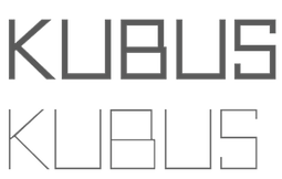 Brazilian creator in Sao Paulo (b. 1989) of Neou (2012, h free airline sans caps face), Kubus (2012, cubist face), Oval Track (2011) and VIP Roman (2011).
 He created the beautiful commercial font Contrasto in 2013. Behance link. Dafont link. [Google]
[More] ⦿
|
Andreas Münch
[Buro Lazer]
|
[More] ⦿
|
Andreas Pihlström
[Subtype (was: Typisc or Suprb)]
|
[More] ⦿
|
Andrei Ograda

|
 Graphic designer from Bucharest (and now Burriana, Spain) who made these typefaces in 2011: STT, Rock, Square, Desgraciado, Cylon, Kalypso, Dgtl, Passio, Sting, and VCT. Via Dos Cabrones, he partners with Vian Peanu.
 He hooked up with Pose Radu in 2017 and set up The Jumping Foxes. Through The Jumping Foxes, they commercialized Radu's Matisse design as JF Matisse (2017). [Google]
[MyFonts]
[More] ⦿
|
Andressa De Conto
|
 Designer in Porto Alegre, Brazil, who created the hairline avant garde typeface Simetrika in 2012. [Google]
[More] ⦿
|
Andrew Hart
|
 Andrew Hart is a Corona-based American digital photographer (b. 1988), who runs a small free font archive. Another archive of his. Dafont link. Another URL. Yet another URL. And still another one. And another one. And one more. His later fonts refer to SickCapital.Com.
 His own fonts include Gothickella (2017, blackletter), Sailorette Tattoo (2015), Elkwood (2014, sans), Snowinter (2014, sans), Rebel Pixy (2014, tattoo script), Pride of the Young (2014, hipster style), Scribblet (2014), Tall & Slim (2014, a great tall-legged poster typeface), Tribal Threat (2014), Boldenstein (2014), Fireflies (2014), Rio Frescata (2014, curly), Alpaca Scarlett (2014), Alpaca Solidify (2014), Vanity Script (2014: a vampire script), SC Gretchin and Timmy (2013), Fun In The Jungle (2013), Pixelic War (2013), A Glitch In Time (2013), Giraffe And Co (2013, an African-themed typeface), Chameleon Dreams (2013: a fantastic wacky party typeface), Angelic Serif (2012), Angelic Peace (2012), Pyrite Script (2012), Pyrite Crypt (2012), Body Piercing And Chains (2012), Love til Killed (2012), Hollywood Capital (2012), Donaldo Regrecka (2012), Deadly Black Chain (2012), Dirt2 Copperbolt (2012, grungy copperplate), Truskey (2011, grunge), Sick Capital Kingston (2011), Full Moon On (2011), Grafitik Riot (2011, graffiti face), Electric Panda (2011), Last Draft (2011, grunge typewriter), CaliforniabyDirt2 (2010), JusticebyDirt2 (2010), SC Gum Kids (2010), SC Tinas Baby Shower (2010), Little Ryan (2010, handwriting), Sick Capital Vice (2010), Star Avenue (2009), Cute Tattoo (2009), DuerTWO (2009), Dirt2Stickler (2009), Ithornët (2009, grungy blackletter), NoXWay (2009, graffiti grunge), Skulls and Splatters (2009), Hacjiuza (2009, hand-drawn blackletter; +Dirty), Popstar Autograph (2009, comic book style script), The Quickest Shift (2009, curly script), DuerTwoo (2009, bloody horror font), Malgecito (2009, grunge), Ithornët (2009, grungy medieval pirate font), Little Bliss (2009), Loyal Fame (2009, curly script), Angelic War (2009, grunge), Soulstalker (2009, grungy blackletter), Kings of Pacifica (2009, ransom note font), GanixApec (2009), GoodPeace (2009), KatyBerry (2009), OffTheDrugs (2009), ThinFranq (2009), WILDAFRICA (2009, African-theme multiline face), St. Andrew (2009, a spray type font), Hawaii Lover (2009, grunge calligraphic script), Aristotle Punk (2009, grunge), Juicy Hunt (2009, grunge), Dead Hardy (2009, Victorian), Kate Perry (2009, fifties script), Kate Berry (2009, fifties script), Vloderstone (2009, hairline slab serif), Good Peace, Off The Drugs, Thin Franq (2009, hairline), Ganix Apec (2009, sans), Jailbox1 (2009, grunge), Blast Beat (2008), Ghosttown-BC (2008, Western style), Dead Secretary (2008, grunge), DIRT2-DEATH (2008, grunge), Robot Head (2008), Alpaca 54 (2007, grunge), Hawaii Killer (2007, Coca Cola grunge), Splinter2 (2007, grunge based on Franklin Gothic), Everyday Ghost (2007, grunge), Plague Death (2006, grunge), SEXtalk69 (2007), Screamz1 (2007). [Google]
[More] ⦿
|
Andrij Shevchenko
[Andrij Type]

|
 [MyFonts]
[More] ⦿
|
Andrij Type
[Andrij Shevchenko]

|
 Andrij Shevchenko (b. 1973) (aka Andrij Che) is the Berdyansk-based Ukrainian designer of the following typefaces, somne of which can also be had from MyFonts. Behance link.
 In 2012, he started Ukrainian Type. - Agarsky (2006, a bold casual script face) which used to be called Agara until Berthold complained about the possible confusion with Agora.
- Zion Train (2007, an experimental sans in 20 styles).
- Andrij Script. See here.
- Andrij Hand (a Cyrillic handwriting font, 2002-2006; see discussion).
- Strudel (2002, informal handprinting).
- ALS Agrus (2005-2006, a script face, Art Lebedev Studio).
- Machinegun (2005, octagonal military look).
- Magela (2003, a Cyrillic sans).
- Hajdamaka (2004, a bouncy Latin/Cyrillic script).
- Also check out his lettering (not fonts) in Kozaku (2005, a flowing Cyrillic script), XLibna (2005, another Cyrillic script) and here (2005).
- The semi-serifed Oksana (2007, 6 styles), Oksana Sans (2007, +Condensed), Oksana Text (2008), Oksana Cyrillic (2007), Oksana Greek (2007), and Oksana Text Swash (2008). This was followed by Oksana Text Narrow (2011), Oksana Sans (+Wide) and Oksana Sans Compressed (2011), which have hairline weights.
- Osnova Pro (2010): a sans family that covers Cyrillic, Greek and Latin.
- Ababa (2002, Cyrillic lettering).
- Turbota (2010) is a rounded Latin / Cyrillic type family that was was developed as part of an identity system for Turbota, a center for disabled children in the Ukraine.
- Arsenal (2011). A free typeface that won a national Ukrainian type competition called the Mystetsky Arsenal contest.
- Seaside (2011) is a Peignotian face.
- Bandera Pro (2011) is a useful workhorse square serif type family that covers Latin, Greek and Cyrillic. Accompanied by Bandera Text (2014) and Bandera Display (2014).
- Arsenal (2012) is a workhorse sans family for Latin and Cyrillic. It won the Mystetsky Arsenal contest, and is free.
Zion Train Pro (2012, +Stencil): Originally ZionTrain was built as a (probably first in Cyrillic!) navigation typeface for the Kharkiv identity project and Kharkiv subway and airport navigation systems. We wanted comprehensible, distinctive letterforms, that can help everybody on the way from Babylon to Zion. The project was used in Kharkiv promotion at homeland and abroad, but was rejected by the new government. As a corporate typeface it was used for a few cultural projects. Now it is equipped with Slavic Cyrillic and Monotonic Greek. - Humus (2007-2022). A ten-style humanist / lapidary Latin / Ukrainian Cyrillic / Greek typeface that is characterized by flared terminals.
Additional URL. MyFonts interview. Showcase of Andrij Shevchenko's typefaces at MyFonts. [Google]
[MyFonts]
[More] ⦿
|
Andriy Konstantynov
[Mint Type (was: PDesign 6.0)]

|
 [MyFonts]
[More] ⦿
|
Andy Kennedy
|
Andy Kennedy (Animal44) is the creator of Resselle (2003), reminiscent of Dennis Ortiz-Lopez's proprietary Elle Girl Rounded Light font, a very thin geometric sans. Posted by him on abf on June 4, 2003. Fontspace link. [Google]
[More] ⦿
|
Angus Macpherson
|
 British designer who works as a designer at Church of London. Creator of commercial typefaces at The Type Foundry, such as Nord Express (art deco; based on the Nord Express train poster) and Grande Fete (hairline avant garde caps face). [Google]
[More] ⦿
|
Ani Dimitrova

|
 Graduate of The National Academy of Art in Sofia, where she obtained a Masters in type design in 2014. Upon graduation, she started to work for Fontfabric, and set up her own type foundry in 2019. Sofia, Bulgaria-based designer of these typefaces:
 - The plump display typeface Maver (2019).
- The 28-style sans workhorse family Vocal (2019).
- The 16-style humanist grotesque typeface Kardinal (2019), which covers Latin and Cyrillic.
- Quat (2019). A 22-style sans family, covering hairline to black.
- Alamia (2020). A 20-style slightly condensed sharp-edged sans family.
- Faddy and Faddy Cyrillic (2020). A fun poster typeface family.
- In 1993 Ivan Kyosev designed an angular typeface which was digitally revived in 2020 by Ani Dimitrova as Thalweg (Latin, Cyrillic, Greek).
- Gezart (2020). A 32-style geometric sans with an amazin g weight range from Hairline to Heavy. The only concession made to humanism are the inktrap-inspired joins.
[Google]
[MyFonts]
[More] ⦿
|
Anish Sundaran
|
Designer in Bombay, who made a custom Hindi font (2012), as well as a typeface for teaching children how to draw the Latin alphabet. He also created Hexy (2012, a hexagonal family that includes an inline face), Hindustan Hipsters Icons (2012), the thin geometric typeface Elefont Sans (2012) and the paperclip typeface Incomple (2012). Another Behance link. [Google]
[More] ⦿
|
Anna Nangia
|
Creator of the hairline avant garde font Visart (2013). It was developed during her studies in Budapest. [Google]
[More] ⦿
|
Anne Wehebrink

|
Designer at ACME in London. Her creations include AF Oneline (1998), a geometric hairline monoline stencil font. Klingspor link. [Google]
[MyFonts]
[More] ⦿
|
Annemette Foged
|
 Graphic designer in Haderslev, Denmark, who created the hairline fashion mag typeface Balonzo (2012). [Google]
[More] ⦿
|
Anton Schilli
|
 German designer who studied at FH Trier. Creator of Line Ultralight (2011, a hairline monoline sans). Dafont link. [Google]
[More] ⦿
|
Antonio Rodrigues
|
 Prolific and talented Brazilian designer in London and Brasilia, who created the modular monoline display typeface Colibri (2012), the hairline sans typeface The Fake Blondes (2012), and the fashion mag typeface Models (2012). He created several other modular alphabets and typefaces in 2013, including Boogie (a fat disco typeface), Stay With Me (fashionable fat didone), Concrete Butterflies (2013, paper cutout theme), London (blackboard bold, derived from Bodoni MT Bold) and Cardboard. Berlin (2014) is a group of display typefaces. Subfaces include Berlin, Berlina, Slaberlin and Überlin. He also designed Havana and the free typeface Gili Meno in 2014.
 Behance link. [Google]
[More] ⦿
|
Ariel Di Lisio
[Negro]

|
 [MyFonts]
[More] ⦿
|
Aring Typeface
[Måns Grebäck]

|
 Måns Grebäck (Aring Typeface, Örebro, Sweden) is a prolific Swedish designer (b. Lindesberg, Sweden, 1990), who lives in Borlänge, Sweden. Måns Grebäck has a bachelor's degree in graphic design from the University of Dalarna (2012). In 2010, he went commercial, and started selling fonts through MyFonts. In 2011 he started Mawns Design. In 2013, that was renamed to Aring Typeface. In 2011 he already had over seven million downloads of his fonts, which were featured at websites such as Dafont and Myfonts. He also does custom type work. His typefaces, both free and commercial:
 - Acryle Script (2014).
- Actonia (2016). A monoline script.
- Adielle (2018).
- Aerofoil (2017). A vintage bottom-heavy script.
- Airways (2016). A signage script.
- Akayla Script (2018). Calligraphic.
- Aliey (2021). A 4-style Victorian copperplate serif.
- Aliment (2018). A sharp geometric sans.
- Amertha (2020). a fat finger font.
- Amplify (2013). A signage script.
- Angars Runes (2019: medieval, with gothic cathedral curves).
- Angilla Tattoo (2013). A connected spurred tattoo typeface. Followed by Angilla Script (2020).
- Antlers (2012). A calligraphic script.
- Aquate Script (2019).
- Arachnids (2011, graffiti face)
- Artely Inks (2016).
- Artisual Deco (2021). Pure art deco.
- Artographie (2020). An all caps art deco typeface family.
- Atelas (2015). Signage type, baseball script.
- Atures (2018). Futuristic and monoline.
- Autograf (2015) and Autografia (2021). Signature typefaces.
- Ave (2016) in styles called Ave Utan, Ave Betwan and Ave Fedan. A family of baseball scripts.
- Avelana. A connected script.
- Backpack (2014). A thick signage script typeface.
- Backyard (2016). A blackletter typeface.
- Barkants (2011, elegantly hand-printed family).
- Barley Script (2017). A signage script.
- Baystar Script (2021).
- Beautiful Trouble (2012). A rabbit-eared upright connected script.
- Beaked Tyrant (2014). A copperplate calligraphic script.
- Beckasin (2011, signage face)
- Before The Rain (2011, calligraphic) Before The Rain Arabic (2016).
- Belladio (2021). An urban script.
- Bellino (2018).
- Bezar (2020). A script.
- Billion Dreams (2020, by Mans Grebäck and Rangga Subekti). A heavy signage script.
- Billion Stars (2013). A tattoo script font.
- Bira (2012). A retro connected brush / signage script.
- Blaak (2019).
- Black Fox (2014). A sirupy brush face.
- Black Signature (2021). A bold signature font.
- Black Larch (2016) and Dark Larch (2016).
- Bloc Boy (2016). Like handwriting.
- Blockography (2011). A sketched typeface.)
- Block Talk (2011, with Zaydek Michels-Gualtieri)
- Blods (2011, a great blotty brush face)
- Blueberry Script (2017; with Noah Kinard).
- Botanink (2011)
- Bouncy (a cartoon font).
- Bourdos2022). A script typeface.
- Brannboll (2011, baseball signage face), Brannboll NY (2013), Brannboll Connect (2020), Brannboll Stencil (a baseball script) (2020).
- Bready (2011). A retro signage script with art nouveau aroma.
- Brev Script (2014). A connected secretary hand from the 19th century.
- Bronze Script (2014).
- Brother Tattoo (2012).
- Bumblebees (2012). A plump curvy script.
- Bunya (2016). A geometric slightly deco sans typeface family.
- Calendary Hands (2012).
- Caligraf (2020).
- Canela Bark (2015, co-designed with Luis Miguel).
- Caneletter Sans and Script (2013). Upright unconnected and connected scripts.
- Cantona Script (2019).
- Canyon (2021). A wide elliptical sans in 18 styles, featuring a coathanger lower case f.
- Capoon (2018). A ten-style sans family.
- Caprica Sans (2014) and Caprica Script. A plump script.
- Caravela (2020). A pirate map script.
- Casat Cap (2017). An all caps brush typeface family.
- Caster (2019). A heavy poster script.
- Castro Script (2012).
- Catchland (2021). A retro baseball script.
- Celebrater (sic) (2012). An oily font.
- Cellos Script (2013).
- Centeria Script (2012).
- Channel (2011, connected upright script)
- Chapel Script (216). For signage.
- Characteristic (2011).
- Chavenir (2011).
- Chinal (2018).
- Choko (2011, released in 2016). Chocolate and cream-themed decorative typeface.
- Christmas Miracle (2018), Christmas Reign (Tuscan, all caps) (2020), and Christmas Sparkle (2018).
- Chrysante (2020). A monoline flowing pen script.
- Clear Line (2012). A fat finger / signage typeface.
- Clipper Script (2011).
- Clothe (2017).
- Coneria Script (2012). A connected script.
- Conture Script (2018). Elegant, classical, and with exaggerated capitals.
- Crackin (2011).
- Crunchy (2016). An upright connected script.
- Cruz Quaste (2020). A handcrafted blackletter typeface.
- Cubest (2021). A squarish monospaced techno family.
- CutScript (2011, connected script).
- Danbury (2022). A speed-emulating sans.
- Dark Crow (2020). a dry brush script.
- Dollie Script (2013).
- Ebbing (2018).
- Echinos Park Script (2012).
- Ederson (2018). A vintage signage script.
- Ekologie Hand (2012).
- Ekorre 2021). Aa vintage decorative serif.
- Elaya Script (2019). A creamy signage script.
- Electronics (2017). A retro signage script.
- Elevate (2016).
- Emiral Script (2017). A baseball script.
- Encina Script (2016). A thin calligraphic typeface.
- Enlighten (2011)
- Delinquente (2012).
- Denigan (2011, hairline)
- Equal Sans (2012).
- Espesor Olas (2011, fine hand-printed calligraphic family)
- Esplanade Script (2015, by Mario Arturo).
- Ethernal (2017). A connected script.
- Europe Underground (2010, geometric sans with a hairline weight).
- Fabulous (2017) and Fabulous Gold (2017). Signage script.
- Falkin Sans (2016), Falkin Script (2016), Falkin Serif (2016).
- Faltura (2011, constructivist), Faltura Alien (grunge), Faltura Guerra (grunge)
- Faltura Animals (2011)
- Feathergraphy Decoration (2011, calligraphic).
- Duera (2016). A variable width sans typeface family.
- Fargo (2021). A cursive script.
- Fat Wandals (2018). A graffiti font.
- Feathergraphy Clean (2011).
- Fibography (2013). A caps typeface composed of fibers.
- Filbert Brush (2012), Filbert Color (2013, a soft brush font).
- Finition (2017). A connected brush script.
- Fireplace (2020). A connected script.
- Firstly (2020). A flowing calligraphic signature script.
- First Lyrics (2011).
- First Reign (2022). A medieval typeface. Second Reign (2022), Third Reign (2022) and Fourth Reign (2022) are further medieval typefaces.
- Flighter (2018). A retro airplane font.
- Fondy Script (2018).
- Frankentype (2013). An all-caps brush typeface for signage.
- From Skyler (2016).
- Funkygraphy (2011, fat and counterless).
- Gecko (2015, a fine creamy signage script).
- Geza Script (2017). A great angular almost Arabic-looking script.
- Ghang (2011, graffiti family).
- Gingo (2020). A script.
- Goatskin Brush (2015). A great brush typeface.
- Golden Hopes (2021). A signature script.
- Gonzi (an 31-style sans). Published in 2021.
- Graced Script (2016). A wide calligraphic connected brush script.
- Grandi (2016). A ten-style display sans.
- Gready (2021). A fat signage script.
- Greback Grotesque (2012). The Thin is very very thin.
- Gretoon (2011, cartoon family)
- Griphite (2018). A rough brush typeface.
- Guld Script (2015).
- Habanero (2016). A fat signage typeface.
- Handtalk (2010, silhouettes)
- Harbell (2013).
- Hard Block (2011, Western slab face).
- Hastafi (2022). An 8-style sharp-edged display serif.
- Haydon Brush (2016).
- Heavy Rain (2021). Decorative initials, and an all caps wedge serif.
- Hemicube (a wide squarish all caps sans) (2020).
- Hemmet (2013). A signage script.
- Hierograf (2016). A layered textured handcrafted poster typeface family.
- Hitalica (2011).
- Honeymoon (2017). A connected script.
- Housegrind (2013, connected script).
- House of the Dragon (blackletter). Published in 2021.
- Hoyle (2020). A slab serif.
- Hundred Miracles (a signage script). Published in 2021.
- Impregnable (2013). A connected script.
- Indiana Script (2017). A baseball script.
- Inked Bones (2019). a hand-painted blackletter font.
- Intrique Script (2013). A baseball script.
- Isle Body (2019), Isle Headline (2019).
- Jacked Eleven (2011), Jacked Eleven Highlight (2011), Jack Pirate (2020: a tattoo blackletter typeface), January Script (2013).
- Jaymont (2018). A sharp-edged wedge serif typeface family.
- Jengotan (2021). A dry brush script.
- Jumper (2021). A 13-style sans. Free download for personal use only.
- Kandira (2018). A sleek sans family.
- Kanvas (2020). A script typeface.
- Kerater (2011, sans)
- Lace 2.0 (2012). A thin connected script co-designed with Matteo Milazzo.
- Lacosta (2020). A signage script.
- Kompar (2018).
- Krinkes (2015, baseball script). A connected swashy signage script.
- Kurri Island (2020).
- Lakesight (2014). A connected script.
- Larch (2016). A crisp script typeface.
- Largelake (2021). A signage script.
- Las Enter (2013). A neon light script.
- Leaders (2020). A blackletter font.
- Ledare (2021). A 14-style bold and expressive sans.
- Letric (2021).
- Let Me Ride (2011)
- Levitee (2011, a lively connected script).
- Lighthouse (2013). A bold high-contrast script face.
- Lina Script (2012). A tattoo script done with Vicky Mardian.
- Lourino (2018).
- Low Casat (2017) and Low Casat Fat (2017).
- Lyrics Movement (2011, tall-ascendered hand).
- Lyster (2020).
- Mandoul Script (2021) and Mandoul Black (2021: a brush script).
- Mainland (2018). A sans family.
- Mainstream (2017). Graffiti style.
- Manofik (a 4-style warm retro serif with a coathanger lower case f; for Latin, Cyrillic and Arabic). Published in 2021.
- Martyric (2014, brush script),
- Masteries (2013). A connected formal script.
- Mastoc (2014).
- Mauritz Caps (brushed) and Mauritz (a great wild script family), both published in 2021. Followed by Mauritz Sans (a brush script with a strong personality and a cartoon vibe) in 2022.
- Mean Casat (2018).
- Medish Script (2018). A great calligraphic handwriting typeface.
- Together with Noah Kinard, he designed the calligraphic typeface Melay Script (2016).
- Middle Ages (2019). A Lomardic blackletter in Regular and Deco styles.
- Milasian Circa (2015) and Milasian. A connected script.
- Merry Christmas (2015). A retro script in Flake and Star styles. Followed in 2017 by the color script font Merry Christmas Color.
- Milkyway Hotel (art deco sans).
- Miraikato Hand (2022) and Miraikato Script (a rustic script) (2022).
- Mistuki (2015). An oriental brush simulation font.
- Mochary (2016). A signage or tattoo script.
- Molly Sans (2019). Caps only.
- Monsta Tag (2013): a graffiti font.
- Motion Picture (2013). A heavy connected retro script.
- Mount (2012).
- MAWNS Graffiti (2010) and MAWNS Serif (2010)
- MAWNS Handwriting (2010).
- Made With B (2011, sketched face).
- Mardian (2012). A calligraphic tattoo script done with Vicky Mardian.
- Markera (2011, marker pen family)
- Many Weatz (2011)
- Mawns Rock (2011)
- Monoment (2011). A fat upright connected script.
- Moneymachine (2022).
- Monosphere (2012-2016). A futuristic monospaced typeface.
- Murality (2022). A readable graffiti or mural typeface.
- Myteri Tattoo (2021) and Myteri Script (2021: a calligraphic script).
- Nacinth (2020). A script.
- Nino Script (2018). A tattoo font.
- Nobella (2021). A retro baseball script.
- Normale (2014). A set of distressed typewriter fonts.
- Notera (2014). A connected handwriting font. Followed by Notera 2 in 2018.
- Odenburgh (2020). A medieval calligraphic typeface.
- Optien (2011, techno face)
- Ordinatum (2011, a severe sans).
- Original Black (2021). A fat blackletter typeface.
- Ornamental Versals (2011, ornamental caps)
- Painter (2016). A sign painting script.
- Patched (2021).
- Pennybridge 1563 (2010, blackletter)
- Pharmount (2014). A calligraphic connected script.
- Phraell (2013). A great italic formal calligraphic script with optional swashes.
- Pigeon (2016).
- Pineapple (2012).
- Plates Napery (2015).
- Plicata (2016).
- Pligo (2016). A balloon or cartoon font.
- Preside (2017).
- Prime Script (2012).
- Prognostic (2011)
- Qaskin (2015). A semi-formal connected script typeface with Black and White (outlined) styles.
- Qhuman (2021). A 6-style Victorian serif.
- Qraxy (2016). Quache Variable (2020) and Quache (2020). A 28-style flexible sans family.
- Quanton (2022). An 8-style angular serif.
- Querino Sans (2019). A very bold sans. Followed by Querino Script (2019).
- Quickier Pro (2012). A swashy calligraphic script face.
- Quincho Script (2016).
- Quintal Script (2021). A retro signage font.
- R-2014 (2011, LED face).
- Rabento (2021). A 6-style condensed display slab serif.
- Race Fever Pro (2015, in Brush and Pen versions) and Race Fever Brush (2015).
- Radio 187.5 (2010, techno family)
- Rakoon (2014). A creamy ultra-fat upright script. Followed by Rough Rakoon in 2016.
- Rangly (2017-2018). A paint roll font.
- Raspberry Script (2017).
- Recorda Script (2013). A formal calligraphic script.
- Reditum (2014). A decorative script.
- Reeler (2014, with Noah Kinard).
- Remachine Script (2013). Retro signage script. In 2020, Mans added Remachine Script Arabic.
- Respective (2011, calligraphic script, +Swashes).
- Respondent (2021). A script.
- Rider (2011, a 30-style "versal" sans family)
- Ringer (circle and arc-based sans)
- Ristella (2017). A baseball script.
- Rivera 2022). A narrow sans in 10 styles.
- Rodrigues (2021). A script typeface.
- Roona Sans (2018: modernist and organic curves).
- Ropest (2018). A rope font.
- Roskrift (2011, calligraphic; + Roskrift Clean).
- Rougant (2021). An organic display font.
- Roughen (2020).
- Rurable (2015).
- Ruthless Wreckin (graffiti typefaces), Ruthless Drippin' (dripping paint family)
- Safir Script (2016). A fat baseball script.
- Saker Sans (2017).
- San Andre (2021) and San Andreas (2021), the free version. A baseball script.
- Santa Claus (2019). A blackletter typeface, accompanied by Santa Claus Deco, a snow crystal font.
- Scantype (2016).
- Sculptor's Hand (2011, connected chancery hand).
- Second Lesson (2022). A wide script.
- Second Lyrics (2011, Treefrog-style handwriting)
- Sequal (2020). Graffiti style.
- Sicret (2020) and Sicret Mono (2020). An all caps family.
- Servin' for Salute (2011)
- Shaded Larch (2016).
- Sharpe (2019). A sharp-edged high-contrast serif typeface family. See also Sharpe Variable (2020).
- Shenandoah (flowing signage script).
- Shimes (2015).
- Shipped Goods (2011). A copperplate calligraphic script.
- Shortbrush (2011)
- Signerica (2011, connected flowing hand)
- Sketchica (2011, sketchy face)
- Skyzhi (2016). An advertising headline typeface.
- Society Editor (2013, connected script).
- Snacker Comic (2013).
- Snowstreet (2013, an octagonal typeface) and Snowy (2013).
- Some Weatz (2011, calligraphic, copperplate; +Swashes)
- Sonika (2018).
- South African (2014). A movie poster brush typeface.
- Southern Aire (2013, connected script face).
- Specify (2016). A 40-style sans family. Download, free for personal use.
- Spoken (2019). A graffiti font.
- Sponger (2021). In the VAG Round genre.
- Square Worm (2011)
- Stackyard (2015). A script.
- Stainy (2013). A signage script.
- Starella Script (2019) and Starella Tattoo (2019).
- Starge (2019).
- Starkey (2020).
- Stormland (2021). A wide monoplinear sans.
- Stormline (2021). All caps, wide and outlined.
- Strawberry Script (2017).
- String Lines (2018).
- Stroke Dimension (2011). A 3d typeface.
- Struck Base (2021). A baseball script.
- Suecos Locos (2011---yummy!).
- Sultan Cafe (2014). An interlocking poster typeface.
- Sunny Sam (2020). A script typeface.
- Sverige Script (2012). Calligraphic wedding font.
- Tall Casat (2018).
- Tamoro Script (2014).
- Taylor Hand (2020). A signature script.
- Tevegraphy (2011, elliptical)
- The Hills (2017).
- The World is Yours (2011, quaint)
- Throwupz (2011)
- Toley Hand (2019).
- Tipbrush Script (2011).
- Tomino (2016).
- Top Comic (2013). A very fat cartoon bubble face.
- Treehouse (2011, upright connected script; +Snowhouse for a snow-covered version)
- Tusch Touch 1 (2011)
- Two and Three (2011: a tattoo parlor blackletter family)
- Typographic Onedalism (2011, graffiti simulation face).
- Undergone (2014). Decorative and calligraphic.
- Unthrift (2015). A pen script.
- Vacer Sans and Vacer Serif (2016). The latter is a slab serif.
- Validity Script (2020, with Misti Hammers).
- Ventography (2013). A bold signage script.
- Vinho De Amora (2021). A vintage all caps wedge serif and a stencil version.
- Waiter (2017).
- Walk Da Walk One
- Wandals (2018). A graffiti font.
- Wankstaberg Battles (2010, a tall fat script)
- White Dream (2021). A retro script.
- White Larch (2016). A connected script typeface.
- Wholecar (2021). An unerground train graffiti typeface family.
- Wild Growth (2011).
- Wildline (2021).
- Winfield Script (2019).
- World Series (2021). A baseball script.
- Xtreem (2012) and Xtreem2 (2014).
- Yanty, Yanty Big, Yanty Script, and Yanty Script Big (2012).
- Yaquote Script (2014).
- Yaty (2019).
- Yoghurt (2011).
- Zoney (2021).
View Mans Grebäck's typefaces. Abstract Fonts link. Fontspace link. MyFonts link. Another URL. Dafont link. Klingspor link. Buy fonts directly from Måns Grebäck. Old URL. [Google]
[MyFonts]
[More] ⦿
|
Arman Chairanza
|
 Riverside, CA-based designer of the calligraphic Orris Root (2017), the bush script Light Butterfly (2017), the hairline calligraphic typeface Bounderas Script (2017), the calligraphic script Pink Coyotes (2017), and the Treefrog brush script Moodellyna (2017). [Google]
[More] ⦿
|
Art Serrano
[Cecilia Rodríguez]
|
Cecelia "Cecy" Rodriguez ("Art Serrano", Tampico, Mexico) designed the techno typeface Electric Feel (2010), Chilly (2009, hand-printed, hairline) and Crazy Diamond (2009, black typeface with small holes). Fontsy link Behance link. Dafont link. [Google]
[More] ⦿
|
Aryon Thyago Moraski
|
 Designer in 2009 at FontStruct of Letreiro Digital para LED quadrado (a thin dotted line face). [Google]
[More] ⦿
|
Ashfaq A. Niazi
[King Fahd Glorious Quran Printing Complex]
|
[More] ⦿
|
Ashlye Etgen
|
Creator of the curly display typeface Boots & Barkley (2013) and the hairline typeface Cloud (2013). [Google]
[More] ⦿
|
Avondale Type Co
[Alex Sheyn]
|
 Avondale Type Co is a type foundry established in 2013 and located in the Avondale area of Chicago. It is a type coop that groups several designers. It is a subsidiary of the design studio Bright Bright Great. Its typefaces:
 - By Alex Sheyn of Bright Bright Great: ATC Krueger (2013, an ultra-thin compressed straight-edged sans serif typeface), ATC Rosemary (2013, a didone with heavy contrast and shiny exaggerated ball terminals).
- Finki Pro (2013). A layered and beveled type family by Quinn Keaveney.
- Codex (2014). A spurred wrought iron and black death typeface by Justin Siddons.
- ATC Nasty (2015).
- ATC Overlook (2014) is a great grotesque sans family by Alex Sheyn. Almost monolined and genetically geometric, it is characterized by a lower case "e" that has a very short tail. Samantha Dion Baker made a free patterned version called ATC Overlook Baker in 2014.
- ATC Timberline. A wide open sans in 14 styles.
- The connected script typeface ATC Ripley (2014).
- The grotesque typeface ATC Duel (2015): Bold and bolder, ATC Duel is an extended grotesque sans-serif font family comprised of over 500 glyphs in 5 weights and 10 styles. Duel is an ultra wide display font whose rounded shapes and sharp edges are inspired by the letterforms and lines of 1960s cars, the Golden Age of automotive design.
- ATC Fritz (2015): ATC Fritz is a numerals specific display face comprised of over 60 glyphs in 8 layerable fonts. Fritz's numerals are chunky, bold, and soak up color. Inspired by modern sign painting techniques, Fritz works best where numbers need to stand out.
- ATC Saturn. A rounded octagonal techno typeface.
- ATC Yara (2016).
- ATC Arquette (2017). A geometric sans.
- The free handcrafted typefaces ATC John Doe, ATC Jane Doe and ATC Jay Doe (2017).
- ATC Abernathy (2019). Described as a soft humanist serif by ATC.
- ATC Merrin (2019).
- ATC Hal (2019).
- ATC Oneshot (2019). A sign painter's font inspired by bodega signage.
- ATC Doubletap (2019).
- ATC Vera (2020). A unicase sans.
- ATC Monarch (2021). A rhombic medieval display typeface by Christian Dexter.
Behance link for Alex Sheyn. Alex Sheyn's home page. Behance link. Other people at Avondale or Bright Bright Great include Drew Rios and Jason Schwartz. We also find typefaces by Quinn Keaveney and Justin Siddons. [Google]
[More] ⦿
|
Bagel & Co
[Ryoichi Tsunekawa]

|
 Japanese foundry that offers these free Latin fonts made by Ryoichi Tsunekawa around 2005: Kiwi (geometric hairline), Bagel (roundish comic book face), Coconut (noisy outline face), Coconut Split, Fresh Tomato (LED simulation), Dried Tomato (LED simulation), Dutch Style, Mocha Harrar (great stencil face), 103 (experimental, Bank Gothic style), Airhead, ArealBlack, Awkward, BagelNew, BagelOld, Banbino, Bebas (2005, industrial sans), Berlin89, Blackout, Built-1970, Bunyan, Busted, Canstop, Chiangmai (Thai simulation face), DBLline, Dijkstra, Dutchstyle, Fling, Graphite, Harcomaso, Hiexplosive, Hitech, Honeycomb (hexagonal), Junkmix, Kanatypo, KemikalHi, Meegoreng, Mikrob, Natsupopy, Overwork, Palsu, Plamo, Plasitico, REC001, REC002, REC003, Resistance, SQRT, STdigi (LED font), Shandy, Superstar, Tembaga, Tenaga, Tomodachi, Tragedia, Trucker, VRdigital, VRembroidery, Welcome2M, Workaholic, Zeebraa, plot-A, plot-K, Appendix 3, Gesso, Pusab, Sushitaro, Typewrong.
 Dafont link. Fontspace link. Kernest link. [Google]
[MyFonts]
[More] ⦿
|
Balint Erdösi
|
Hungarian designer in Budapest, b. 1987. Home page. Designer of the display typeface Paris je t'aime (2010, a heavy comic book face) and the contrast typeface Blessed (2011), renamed Fortunata (a font without closed counters) and Fortunatus a few days after its first publication. Desereted (2012) is a thin geometric sans face. Unzip Me (2012) is an alphading typeface. [Google]
[More] ⦿
|
Beate Limbach
[Acces Design]
|
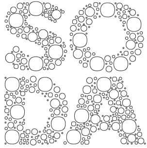 [More] ⦿
|
Bec Ralec
[Pixel Colours (or: pixelbypixel)]

|
[MyFonts]
[More] ⦿
|
Belen Azagra
|
Graphic designer in Zaragoza, Spain. In 2017, she created these typefaces: Volantis (a connect-the-dots font), Divex (hairline sans), Orion (slab serif). [Google]
[More] ⦿
|
Benoit Dupuis
[Tropical Type Foundry]

|
[MyFonts]
[More] ⦿
|
Benoit Sjöholm
[Désigne (was: Calame Design)]
|
[More] ⦿
|
Berserker Studio
[Christopher Mooij]
|
Berserker Studio is Christopher Mooij's graphic design studio in Monterrey, Mexico. He created La Revolucion and Green in 2009. He designed the hairline geometric typefaces This is her type (2010) and BRSRKR (2010), and the experimental geometric typefaces Bibo (2010), Nova (2010) and Balla (2010). At the end of 2010, he started work on a big avant garde sans family called República Sans. Raw (2011) is a modular experimental face. Behance link. Cargo Collective link. Another Behance link. [Google]
[More] ⦿
|
Berton Hasebe

|
 Berton Hasebe (b. 1982, Honolulu, HI) moved from Hawaii to study and work in Los Angeles, where he obtained a BA from Otis College of Art and Design in 2005.
 In 2007 he moved to the Netherlands to study type design through the Type and Media Masters course at The Royal Academy of Art in the Hague (KABK). Berton has resided in New York since 2008, and was a staff designer with Commercial Type from 2008 to 2013, when he left to start his own studio. Berton's typefaces have been awarded by the New York and Tokyo Type Directors Club, the ATypI, and the Brno Biennial. In 2012 he was awarded Print magazine's 20 Under 30 Award. Berton currently teaches typography at Parsons and has taught type design at The University of the Arts in Philadelphia and the Type@Cooper Extended Program at The Cooper Union in New York. His typeface Alda was designed to function at very small sizes while remaining expressive. The bold is macho and delicate at the same time. Alda won an award at TDC2 2009. In the same year Alda was also selected by the Tokyo Type Directors Club to be included in its annual publication. It was published by Emigre. At Commercial Type he co-designed the extensive family Stag with Christian Schwartz and Ross Milne. Stag started as a small family of slab serifs commissioned for headlines by the US edition of Esquire magazine and eventually grew into a sprawling multi-part family including a flexible sans companion and two additional special effects display variants. Stag Stencil followed in 2009. In 2010, he published the geometric sans serif family Platform at Commercial Type. It has a gorgeous circle-based hairline. In 2013, he published a 4-family 20-style French Renaissance typeface family called Portrait (+Text, +Inline, +Text), still at Commercial Type: Portrait started out as an experiment in drawing a display typeface that managed to be both beautiful and brutal, and both classical and minimalist. While its lighter weights are quietly elegant, the heavier weights show the influence of chiseled woodcut forms. Portrait draws its primary inspiration from the Two-line Double Pica Roman (equivalent to 32pt in contemporary sizes) cut by French punchcutter Maître Constantin around 1530 for the printer Robert Estienne. Portrait replaces the delicately modeled serif treatments of Constantin's original with simple, triangular Latin serifs, reimagining the Renaissance forms in a contemporary light. Portrait Text resembles the text types attributed by the printing historian Hendrik Vervliet to Constantin and used by the printer Estienne in the 1530s, which had a lighter and more open texture than the text types that preceded them, and marking the move to more elegant type that culminated in the work of Claude Garamont. The stripped-back simplicity of the Latin serifs gives Portrait a cleaner and sharper tone than a typical Renaissance oldstyle-influenced text face, bringing an active personality to text. In 2015, he created the sans headline typeface families Druk, Druk Text, Druk Wide, Druk Condensed and Druk Text Wide: Druk is a study in extremes, featuring the narrowest, widest, and heaviest typefaces in the Commercial Type library to date. Starting from Medium and going up to Super, Druk is uncompromisingly bold. It was meant as a companion of Neue Haas Grotesk. Of the families in the Druk collection, Druk Condensed is the most explicit homage to Willy Fleckhaus. Originally designed for the 2011 Year in Review issue of Bloomberg Businessweek, its flat sides make letters and words snap together in a clean and satisfying way. For MittMedia, he made the corporate sans typeface Duplex (2016). Still in 2016, Berton Hasebe published Styrene at Commercial Type. Their blurb: Styrene, a new sans serif by Berton Hasebe, is his latest exploration of proportion and simplicity in type design. The initial inspiration for the family was a charmingly awkward sans serif shown in an early 20th century Dutch type specimen. However, Styrene has an entirely ahistorical attitude. Its name was inspired by the purposefully synthetic feeling to its curves and geometry. The family is characterized by its proportions: typically narrow characters like f j r and t are hyperextended and flattened, adding openness in unexpected places. Styrene's two widths offer different textures in text: version A is dogmatically geometric, with a stronger overall personality, while version B is narrower for more reasonable copyfit, though not truly condensed. Schnyder (Commercial Type) was designed by Berton Hasebe and Christian Schwartz for the 2013 redesign of T, the New York Times Style Magazine by creative director Patrick Li and his team. Schnyder has the high contrast typical of a fashion typeface and has a large number of alternates. The stem thicknesses in each weight are identical across the widths, an unusual feature that allows the widths to be mixed freely in headlines, even within single words. It features three weights, four widths, and four optical sizes. Production assistance by Hrvoje Zivcic and Miguel Reyes. Schnyder Wide, Condensed and X Condensed were published in 2018. In 2020, he released Review (Condensed, Poster, Regular) at Commercial Type, which writes: Berton Hasebe originally drew Review (née Kippenberger) for T: The New York Times Style Magazine. In 2018, a new editor in chief pushed for a complete reimagining of the magazine. What had primarily been an image-focused publication evolved into a text-driven one, with the squarish, commanding Review doing much of the heavy lifting. To facilitate tight setting both horizontally and vertically, Hasebe sheared off Review's overshoots and blunted its exterior curves, producing a dynamic tension with its round counters. Produkt (2014, Christian Schwartz and Berton Hasebe) is Graphik with slabs added on. Christian Schwartz and Berton Hasebe originally designed Feature for T: The New York Times Style Magazine in 2018, and wrote: Diagonal stress, mismatched contrast between main strokes and serifs, and sharply angled head serifs conspire to give the face tension, dynamism, and immediacy. The collection has been expanded in 2021 for release by Hrvoje Zivcic, who expanded the weight range and drew italics for the entire collection. Feature Collection now includes Feature Text, Feature Display and Feature Deck. Feature [Google]
[MyFonts]
[More] ⦿
|
Bianca Borghi
|
Designer of the (free) decorative hairline typeface Kaptor (2014). [Google]
[More] ⦿
|
Björn Gogalla
[Letter Edit]

|
 [MyFonts]
[More] ⦿
|
Bon Chantawibul
|
Bon Chantawibul is a young graphic designer currently based in Bangkok, Thailand. Angelic (2011) is a hairline typeface inspired by the shapes of butterflies and angels. It was first created for Beauty Hall's 11th anniversary special magazine with Harper's Bazaar Thailand. Cargo collective link. [Google]
[More] ⦿
|
BOODAS.DE
[Boris Schandert]
|
Sankt Augustin, Germany-based creator (b. 1981) of the pixel typeface BOODASDREIECKE (2007): all the pixels are in fact small triangles. He also designed BOODAS.DE|Subtract (2007, negative octagonal), My (2007), Boodas.de|My|Regular (2007, octagonal, free), Redhead (2007, geometric, experimental), Bourier (2007, like Courier with bowls filled in and frills added), Slimbo (2008, hairline geometric). All his fonts are free. [Google]
[More] ⦿
|
Boris Schandert
[BOODAS.DE]
|
[More] ⦿
|
Borutta (or: Duce Type)
[Mateusz Machalski]

|
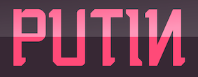 Borutta (or Duce Type) is the creative studio of über-talented Warsaw-based designer Mateusz Machalski (b. 1989), a graduate of Wydziale Grafiki ASP in 2014, and of Warsaw Academy of Fine Arts. His oeuvre is simply irresistible, charming and a worthy representative of the Polish poster style---witness Alergia (2016), Magiel Pro (2017) and Madiso (2017).
 He is the creator of the blackletter-inspired typeface Raus (2012), which also could pass for a Cyrillic simulation font. It was possibly made with Pawel Wypych. He also made Kebab (2012, a fat caps face), Duce (2012, art deco: withdrawn from MyFonts after Charles Borges complained that it was a rip-off of his own Gloria), Fikus (2012), Woodie (2012, a condensed rough wood type face), Polon (2012), Aurora (2012, a German expressionist poster face), Musli (monoline connected script), HWDP (2012, poster font), Wieczorek Script (2012, hand-printed), Hamlet (2012, a sword and dagger typeface, renamed to Prince), Caryca (2012, Cyrillic simulation, done with Pawel Wypych), Bezerro (2012, poster face), Bitmach (2012, pixel face), Meat Script (2012, a caps only market signage brush script), Krac (2012, a tall poster font), Hermes (2012: Ten Dollar Fonts), Berg (2012, a roughened blackletter face), Buldog (2012), Dudu (2012, tall condensed face). In 2012, Polish designer Wojciech Freudenreich and Mateusz Machalski combined forces to design the techno typeface SYN, which is based on an earlier De Stijl-genre alphabet by Freudenreich. In 2020, they released the free typeface family SYN Nova, which includes additional styles and a variable font. Machalski likes old wood types, which inspired him in 2012 to publish a wood type collection of weathered display typefaces: Condom, Hype, Whore, Banger, Buka. Elo (2012) and Duce (2012) are fat weathered wood types. Typefaces made in 2013: Wood Type Collection 2 (which includes Brie, Kaszti, Mader, Modi, Rena, Roast, Ursus), Zigfrid (headline face), Salute (letterpress style), Benito (a letterpress or geometric wood typeface), Bojo (heavy wood style poster face), Picadilly (heavily inktrapped open counter sans family), GIT (a manly headline sans), Lito (an eroded poster typeface), Haine (vernacular caps), Aneba (an organic sans family, renewed in 2016 as Aneba Neue), Vitali (sans), Korpo Serif (slab serif), Korpo Sans (elliptical family; +Greek, +Cyrillic). Typefaces from 2014: Adagio Slab, Adagio Serif, Adagio Sans (a superfamily not to be confused with the 2006 typeface Adagio Pro by Profonts), Adagio Sans Script, Adagio Serif Script, Adagio Slab Script, Tupperware Pro. Tupper Pro (42 styles) was designed by Mateus Machalski and the RR Donnelley team. Typefaces from 2015: Tupper Serif (again with RR Donnelley: a custom superfamily for pairing Latin, Cyrillic, Hebrew an Greek; for Tupperware), Vitali Neue, Legato Serif, Corpo Serif, Corpo Sans, Zigfrid, Picadilly (a great ink-trapped sans typeface family with an erect g). Typefaces from 2016: Nocturne (just like Magiel, this free typeface was designed as part of the Warsaw Types project: this wedge serif text typeface is inspired by the lettering on stone tablets commemorating the victims of World War II, and prewar Jewish shop signage), Favela (an experimental, geometric sans, for headline and fashion magazine use), Gangrena (a weathered typeface system co-designed with Ania Wielunska), Migrena Grotesque (earlier named Enigma Grotesque but probably in view of a clash with the name Enigma used by Jeremy Tankard changed to the appropriately named Migrena Grotesque), Alergia Grotesk (a take on the classical geometric grotesque style, in 60 weights, for Latin, Greek and Cyrillic), Alergia Remix (a hipster / hacker / Futura take on Alergia Grotesque). Typefaces from 2017: Nocturne Serif, Massimo (copperplate semi-serif influenced by New York; originally called Madison, they were frced to change the name to Massimo), Magiel Pro (a geometric display family influenced by Polish banners from the Russian occupatuon era, 1945-1989; it has a charming Black and a hairline, and covers Cyrillic too). A particularly intriguing project in 2017 was Bona, which set out to revive and extend Andrzej Heidrich's old typeface Bona. Mateusz Machalski contacted him for advice on the revival project. The resulting typeface families were published by and are available from Capitalics. The centerpiece is the warm and wonderful text typeface Bona Nova. It is supplemented by the extreme contrast typeface family Bona Title and the inline typeface family Bona Sforza. Participants in the project also include Leszek Bielski, Ania Wielunska and Michal Jarocinski. Google Fonts link for Bona Nova. Github link for Bona Nova. Typefaces from 2018: Bilbao (an innovative blend of sans, slab and mono genres in 18 styles), Cukier (a logo font family inspired by the vernacular typography from Zanzibar). In 2018, Mateusz Machalski, Borys Kosmynka and Przemek Hoffer co-designed the six-style antiqua typeface family Brygada 1918, which is based on a font designed by Adam Poltawski in 1918. Free download from the Polish president's site. The digitization was made possible after Janusz Tryzno acquired the fonts from Poltawski's estate. The official presentation of the font took place in the Polish Presidential Palace, in presence of the (right wing, ultra-conservative, nationalist, law and order) President of Poland, Andrzej Duda. Calling it a national typeface, the president assured the designers that he would use Brygada 1918 in his office. It will be used for diplomas and various other official forms. In 2021, with Anna Wielunska added to the list of authors, it was added as a variable font covering Latin, Greek and Cyrillic to Google Fonts. Github link. Typefaces from 2019: Gaultier (a sans family that is based on the styles of Claude Garamond, Robert Granjon and Eric Gill---a serifless Garamond and Gill Sans hybrid; includes a fine hairline weight), Aioli (a commissioned type system), Promo (a rounded sans family), Sigmund (the main style is inspired by the Polish road signage typeface designed in 1975 by Marek Sigmund: With the increase of weight, Sigmund turns into a geometric display in the spirit of vernacular typography from the signs of Polish streets; followed in 2022 by Sigmund Pro (15 styles)), Podium Sharp (based on Dudu, this 234-style family is a hybrid between different old Polish modular and geometric woodtypes such as Rex, Blok and Bacarat; note that 234=2x9x13, so fonts are numbered in Univers style from 1,1 (ultra-compressed hairline) to 9,13 (ultra expanded heavy)), Harpagan (an experiment in reverse and unusual stresses). Typefaces from 2020: Tyskie (a custom sans for Tyskie Magazine), Habibi Display (an ultra-fat display typeface inspired by bold Arabic headline typefaces), Podium Soft, Afronaut (an experimental Africa-themed font). In 2020, the team at Capitalics in Warsaw, namely Mateusz Machalski, Borys Kosmynka and Ania Wielunska, revived Adam Poltawski's Antykwa Poltawskiego (1928-1931) as Poltawski Nowy. Typefaces from 2021: Alfabet (a 20-style Swiss-inspired sans with narrow connectors, with support for Latin (+Vietnamese), Greek and Cyrillic scripts, including Ukrainian, Bulgarian and Serbian forms), Change Serif (a 10-style Robert Granjon-genre garalde designed as a part of Mateusz Machalski's PhD project, carried out in 2015-2021; the main goal was to create a typeface allowing for the typesetting of complex humanistic texts, containing many historical letterforms; each font contains 4000 glyphs and covers Latin, Cyrillic and Greek), Engram (a soft geometric sans family in 22 styles; close to his own earlier font, Enigma, 2016). Typefaces from 2022: Yalla (inspired by Arabic headline type). Home page. Behance link. Personal Behance link. Behance link for Duce Type. Another link. Fontsquirrel link. [Google]
[MyFonts]
[More] ⦿
|
Botio Nikoltchev
[Lettersoup]

|
 [MyFonts]
[More] ⦿
|
Brandon Secrist
|
Designer of the hairline techno font Speakeasy Menu (2013) and of Extremis (2013). [Google]
[More] ⦿
|
Brenna Noel Martin
|
American designer (b. 1990) of the unicase hairline typeface Wonderlust (2012). [Google]
[More] ⦿
|
Bright Ideas Fonts
[Rick Hutchinson]
|
 A foundry which made over 500 fonts, mostly in 1998-1999, and was located in Carlsbad, CA, where Gail Conwell edited their Bright Ideas Magazine at that time, and Rick Hutchinson is listed as one of the directors / managers / owners. Dafont link. Another URL. Font Squirrel link.
 Typefaces in alphabetical order with a few additional fonts mentioned separately later: Abraham, Accumulation, Adderley, Aerosol, Akimbo, Alexander, Amadeus-Regular, Amadeus, Amadeuz, Anderson, Arkitex, Arthur, Ashley, Asphalt, Asphalt'Wicker', Avante, Aztecan, Backlit, Balcony, Banshee, Barbarian, Barnaby, Barney, Beanbag, Bender, Bicycle, Billie, BlackRose, Blanchard, Blazed, Blossom, Bodkin, Bogsley, Boingo, Bonham, Botica, Bradley, Braxton, Brittany, Brownie, Bubbly, Bullwinkle, Bumper, Bunker, Butterscotch, Cajalco, Camelot, Candles, CandlesChrome, Candy, Canterbury, Cappuccino, Capsule, Carbiner, Carousel, Carrington, Carson, Casanova, Catfish, Cathedral, Catnip, Cecily, Ceremony, Challenge, Chamberlain, Chance, Chantilly, Cheetah, Chilled, Chocolate, Chopstick, Chump, Conniption, Corrigan, Corrosion, Crawford, Cyborg, Daffodil, Dakota, Danferno, DantesInferno, Darcie, Daytona, Delineator, Dementia, Diamondhead, Donika, Donnah, Dribble, Einstein, Elizabeth, Energy, Espresso, EspressoBI, FabreseDemi, Fairytale, Fallbrooke, Fiancee, Fido, Fionah, Fontana, Fonture, Fortress, Framed, Frankie, Frazier, Freddy, Frederick, Frizbee, Funhouse, Futana, Gapetto, Gatsby, Gemini, Gershaw, Gobbledygook, Godfrey, Goliath, Gonzales, Gonzo, Gothica, Graphitti, Grasshopper, Grendel, Griffin, Groovy, Habibe, Hannah, Hansel, Haskel, Havisham, Hawthorne, Henderson, Hendrix, Higgins, Highland, Holmes, Horton, Humphry, Hutchinson, Incense, Independence, IndependencefromBrightIdeas, Interpret, Invisible, Jacinda, Jacoby, Jaddarack, Jagger, Jamboe, Jangazoo, Jeremy, Jigsaw, Jokester, Joplin, Joseph, Joshua, Jubilee, Junior, Kaboom, Kamden, Karissa, Katherine, Kaufman, Kayleigh, Kendra, Kennedy, Khaki, KhakiBold, KhakiBoldOblique, KhakiOblique, Khakiripp, Khakiwrink, Kilcher, Killian, Kincade, Kingdom, Kinison, Klinker, Komodo, Kramer, Kromeon, Kryski, Kurrajong, Kyanna, Labrador, Leallie, Leland, Licorice, Limousine, Lindsy, Liquitek, Lockleer, Lockwood, Londonderry, Loyalty, Machine, Maddox, Madman, Magazine, Magellan, Maggie, Magician, Majesty, Malachite, Malone, Mandolin, Margarita, Marilyn, Marley, Marmalade, Marquardt, Martin, Mascara, Masters, McMahon, Mckinsey, Mechanizm, Meddler, Michelle, Milano, Millenium, Moccasin, Mongrel, Monolyth, Monster, Montey, Montoya, Moonstar, Morgan, Morrison, Morteza, Moteefe, Muskrat, Mustard, Napkin, Neolite, Newlywed, Nirvana, Noodles, Nouveau, OldWood, Oliver, Omicron, Pajama, Palooza, Panache, Paperclip, Papercut, Parbuckle, Parkinson, Paschico, Patches, Patriot, Patton, Payton, Pebbles, Pegasus, Perkins, Phantom, Picante, Picasso, Pickles, Pigeon, Pinhead, Pirouette, Platinum, Poodle, Pugsly, Quantum, Quentin, Radford, Ragetta, Ramirez, Rampart, Ramsey, Rapunzel, Rathskeller, Ravage, Ravish, Razor, Rebecca, Recess, Rediculous, Reefrash, Remeus, Revenge, Rhackoon, Rhodes, Ricksha, Riesling, Rockafella, Rockford, Rockola, Romance, Romulus, Rookie, Rutger, Ruxton, SMCChicago, SMCHollywood, SMCMiami, SMCMonteCarlo, SMCPhoenix, Sabien, Sampson, Samurai, Sangrial, Sapphire, Sapporo, Sawyer, Scarab, Scarlet, Scirocco, Scorpio, Scratch, Scrubblack, Scrubbold, Scrubcle, Scrublight, Sebastian, Seymour, Shakah, Shardee, Sheela, Skatty, Sketcher, Skyline, Skywalker, Snoozie, Snowboard, Squared, Stacker, Starsky, Stencil, Stencilla, Stiltskin, Sublime, Sundance, Surkle, Surrender, Swashed, Swingreg., Tagger, Tamarin, Tamborine, Tanner, Tantrum, Tarzana, Taylor, Teriyaki, Thompson, Thrash, Thrust, Tiddwell, Trapeze, Trident, Trinket, TrujillietXtra, Tuolumne, Twinkle, Tybette, Urbana, Vargas, Ventolin, Ventura, Vitrono, Vulmere, Waynne, Weiland, Whitney, Windsong, Winslow, Winton, Wonton, Wookie, Zargon, Ziggie. Additional fonts not in the list above: Andrew, Boogie, Fracas, Mandrel, Sinclair, Tuxedo, Varsity. Annotations: [Google]
[More] ⦿
|
Brink Type
[Christoph York]

|
 Christoph York is a British graphic and type designer currently splitting his time between Berlin and London. He specialises in branding and identity design. His typefaces:
 - The precise geometric sans serif family Segma (2018), which spans the thickness range from Black to Thin (hairline).
- BR Firma (2018). BR Firma is a functional geometric sans serif consisting of eight weights ranging from thin to black with matching italics.
- At The Designers Foundry, he released Shape (2019), a contemporary geometric type family in 18 styles.
- BR Omega (2019: a thin to black-weighted clear geometric sans).
- BR Hendrix (2019). In 16 styles. Described as a modern geometric grotesque.
- BR Candor (2020). A sixteen-style geometric sans in the Futura tradition.
- BR Omny (2020). A slightly rounded geometric sans typeface.
- BR Nebula (2020). A 20-style sans inspired by Futura.
- BR Sonoma (2020). A 16-style sans with strong rhythm and clean geometric features.
- BR Cobane (2021). A 16-style neo-grotesque.
- BR Shape (2022). An 18-style geometric sans.
[Google]
[MyFonts]
[More] ⦿
|
Britta Siegmund
|
 Graphic designer in Hanover, Germany, who studied at FHH in Hanover. Behance link. Another Behance link. She is experimenting with letters, and designed letters by dissolving ink in water (Tinten in Wasser), such as in the Sepia alphabet (2009). Connected (2009) is another experimental alphabet. There is also the avant-garde Sepia family (2009). Fency (2009) uses fences to populate the glyphs. High Five (2010) is a monoline geometric hairline sans. Poster. [Google]
[More] ⦿
|
Bruna Fonyat
|
Rio de Janeiro-based designer of the hairline sans typeface Fina (2015) and of the experimental modular typeface Fony Font (2015). [Google]
[More] ⦿
|
Buro Lazer
[Andreas Münch]
|
Andreas Münch (Buro Lazer, Nuremberg and Berlin) created the hairline octagonal typeface VS Lazor Racor (2010). Dafont link. [Google]
[More] ⦿
|
Carl Crossgrove
[Terrestrial Design]

|
 [MyFonts]
[More] ⦿
|
Carnoky Design
[Samuel Carnoky]

|
 Carnoky Design (or Carnoky Type) is run by Samuel Carnoky in Kosice (and before that, Kluknava), Slovakia. He created these fonts: LECO 1988 (2011, a display sans based on lettering a LECO bottle from 1988), 2D3D Molcak (2010, octagonal), Samo Sans (whose Samo Sans Pro version from 2012 covers all weights from hairline to ultra black), LECO 1983 (poster face), LECO 1976 (squarish pixelish family), Arcus (2010, a free rounded type family).
 In 2012, he designed Technik (completely constructed from geometric elements). Typefaces from 2013: Technik Mono, Technik Serif (slab serif family). In 2014, Carnoky published the squarish modular typeface family Corner, which is split into subfamilies called A (pixelish), B (octagonal), C and D. In 2015, Carnoky's talent and energy were rewarded by his splendid 42-style text family, Inka, which has subfamilies with larger x-height (A) and smaller x-height (B), and is characterized by daring vertical butcher cuts in letters such as a, c and italic f. Typefaces from 2016: Normatica (a neutral typeface inspired by advertising letters used as letterings on shop windows during period of normalization (1960-1990) in former Czechoslovakia). Typefaces from 2017: Zin Slab, Zin Sans. Typefaces from 2020: Zin Display (33 styles, sharp terminals), Zin Serif. MyFonts link. Behance link. Klingspor link. [Google]
[MyFonts]
[More] ⦿
|
Carolin Wanitzek
|
During her studies at the University Of Applied Sciences in Mannheim, Germany, Carolin Wanitzek created the thin sans typeface Plaisir (2010). Behance link. [Google]
[More] ⦿
|
Carrie Booth
|
Montreal-based designer of Dot Typeface (2015), a hairline display typeface with embedded dots. [Google]
[More] ⦿
|
CC Creative Company
[Chris Campbell]
|
Canadian designer, b. 1992, of CC Fat (2019: a black headline sans), CC Afterglow (2019), CC Robo (2019: a squarish monoline sans), CC Disto (2019: a computer emulation font), CC Alamo (2019), and CC Keni (2018: a hairline sans). [Google]
[More] ⦿
|
Cecilia Rodríguez
[Art Serrano]
|
[More] ⦿
|
Cecy Garza
|
Monterrey, Mexico-based designer of an untitled hairline sans typeface in 2013. [Google]
[More] ⦿
|
Cenz Qobbal
|
 Malaysian designer (b. 1984) based in Petaling Jaya.
 Creator of these typefaces in 2012: Afro, Stitches (stitch font), Pop Jazz, Galah Panjang, Bunga Cengkih, Senandung Malam (Victorian all caps family), Kunang Kunang, Raja Drama (hairline avant garde sans), Piring Hitam (Peignotian sans), Dayang Senandung (hairline caps), Kaberet (a squarish outlined typeface), Kata Bidalan (hairline sans), Halusinasi (hallucination), Pak Pandir, Primadona, Mohsuri, Badang (a strong sans), Si LuNcai (monoline geometric sans), Kata Bidalon (a hairline avant garde sans), ContenG (grungy), Chempaka, Retak Seribu, Batik Indo (a textured typeface), Berus Rambut Kuda, Usang (sketched face), Songket (textured caps), Ugly Hand Writing, Dedaun (floriated), The Garden (ornamental caps), Seni Pop (a textured typeface), Modern Kerawang (ornamental caps), Cakar Ayam (scratchy hand), Sticky Notes, and Kerawang (ornamental caps). Typefaces from 2013: Selari (bilined), Haru Biru (bilined). Behance link. [Google]
[More] ⦿
|
Chad Kirsebom
|
Graphic design student at The Art Institute Minnesota in Minneapolis. During his studies, he created the rounded squarish hairline sans typeface Needle (2011). [Google]
[More] ⦿
|
Charley Bailey
|
During her studies at Chelsea School of Art, UAL, Charley Bailey (London, UK) created the hairline display typeface Fringe (2015). Behance link. [Google]
[More] ⦿
|
Chatnarong Jingsuphatada
[Typesketchbook]

|
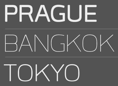 [MyFonts]
[More] ⦿
|
Chester Jenkins
[Village]

|
[MyFonts]
[More] ⦿
|
Chester Jenkins

|
 With just one name (the other one was lost in an accident!), Chester, the type designer, was born in Montreal in 1971. In 1995 Chester moved to Chicago to work with Rick Valicenti and eventually become a partner in his digital type foundry, Thirstype. In 2004, he started up the type coop Village in New York together with his wife and partner, tracy Jenkins. Chester's published designs have been used for branding programs including AT&T, Starwood Hotels, CBS Television, Nike, the San Francisco Ballet, Columbia University Business School, and the National September 11 Memorial & Museum. He has created bespoke typefaces for Blackberry, Cooper Hewitt Smithsonian Design Museum, and the National Football League.
 His fonts include Syzygy, Schmelvetica (at FontShop), Psyche (unreleased), Orbit (2003, with Rob Irrgang), Rheostat (1996, a grunge dot matrix font family), HateNote, Panderella (2000-2001, ultra geometric), Eclogues (1999, an absolutely stunning romantic high-ascender-descender family), LoveHateCollection, JohnHadANightmareLastNight (2001), Alexey (2003, a stencil family, with Rick Valicenti), Apex Serif (2003, with Rick Valicenti), Exchange (dot matrix), Pizzelle Italic, Phatso (2003), Satchel Paige (2003, a wood type typeface made with Tracy Jenkins), Pixella (2003, pixel font), Nillennium (2000, an octagonal family), Freedumb (2004), Galaxie Polaris (2004, a sans) and Virgil, the last twelve fonts at Thirstype. At Village, he published Mavis (2005), Apex Sans (2004, with Rick Valicenti), and then Apex New (2006), which has a hairline weight, Apex Thin, and Apex Rounded (2010). In 2009, he co-designed the large x-height text family Galaxie Copernicus with Kris Sowersby at Village. In 2010, he and Jeremy Mickel made the poster type family Aero, which took inspiration from Roger Excoffon's Antique Olive. It won an award at TDC2 2011. His custom-made typefaces from 2006-2007 include these: Rewards (with Kris Sowersby), Always Radio (with Markus Rakeng), 2Wice Egyptian, Apex Compact, Apex New Condensed, Baro Heavy, Baro Light, Baro Medium, Baro Super, DPA Gothic, Endzone, Galaxie Ariane, Galaxie Copernicus, LMVDR, Modernismo, Snickers. [Google]
[MyFonts]
[More] ⦿
|
Chikako Larabie

|
 Spouse of Ray Larabie in Nagoya, Japan. Chikako Larabie is a font design assistant for Typodermic Fonts, specializing in kerning, and languages. With Ray, she created From The Stars (2010, a consumer electronics / techno sans family), Hackensack (2010), Naked Power (2010, a geometric/industrial sans-serif font family in the style of the art deco typeface Novel Gothic (1929, ATF, Morris Fuller Benton and Charles H. Becker)), Moon Cresta (2010, modeled after Goudy Sans), Voivode (2010, headline face), Honfleur (2010, art deco all caps face), Hachimitsu (2010, Asian look face), Kadeworth (2010, rounded retro look sans), Gnuolane Jump (2010), Nagomi (2010, oriental simulation face), Biondi Sans (2010, a copperplate gothic without serifs in the style of AT Sackers), Board of Directors (2010, a Bank Gothic style family), and Wee Bairn (2010). [Google]
[MyFonts]
[More] ⦿
|
Chris Campbell
[CC Creative Company]
|
[More] ⦿
|
Chris E. Lozos
[Dezcom Typefaces]

|
 [MyFonts]
[More] ⦿
|
Chris Vile
[Font Monger]
|
[More] ⦿
|
Christian Jansky
[Kometa]
|
[More] ⦿
|
Christian Küsters
[ACME Fonts (or: CHK Design)]

|
[MyFonts]
[More] ⦿
|
Christian Schwartz

|
 Christian Schwartz was born in 1977 in East Washington, NH, and grew up in a small town in New Hampshire. He attended Carnegie Mellon University in Pittsburgh, Pennsylvania, where he graduated in 1999 with a degree in Communication Design. After graduation, he spent three months as the in-house type designer at MetaDesign Berlin, under the supervision of Erik Spiekermann. In January 2000, he joined Font Bureau. Near the end of 2000, he founded Orange Italic with Chicago-based designer Dino Sanchez, and left Font Bureau in August 2001 to concentrate full-time on developing this company. Orange Italic published the first issue of their online magazine at the end of 2001 and released their first set of typefaces in the beginning of 2002. Presently, he is an independent type designer in New York City, and has operated foundries like Christian Schwartz Design and Commercial Type (the latter since 2009). He has designed commercial fonts for Emigre, FontShop, House Industries and Font Bureau as well as proprietary designs for corporations and publications. In 2005, Orange Italic joined the type coop Village.
 His presentations. At ATypI 2004 in Prague, he spoke about "The accidental text face". At ATypI 2006 in Lisbon, he and Paul Barnes explained the development of a 200-style font family for the Guardian which includes Guardian Egyptian and Guardian Sans. FontShop's page on his work. Bio at Emigre. At ATypI 2007 in Brighton, he was awarded the Prix Charles Peignot. Jan Middendorp's interview in October 2007. Speaker at ATypI 2009 in Mexico City, where he announced his new type foundry, simply called Commercial. FontShop link. Font selection at MyFonts. A partial list of his creations: - FF Bau (2001-2004): Art direction by Erik Spiekermann. Released by FontShop International. He says: Bau is based on Grotesk, a typeface released by the Schelter&Giesecke type foundry in Leipzig, Germany at the end of the 19th century and used prominently by the designers at the Bauhaus. Each weight was drawn separately, to give the family the irregularity of the original, and the Super is new.
- Neutraface (2002, House Industries) and Neutraface Condensed (2004). Art directed by Ken Barber and Andy Cruz. MyFonts offers Neutraface Slab Text, Neutraface Slab Display, Neutraface Display and Neutraface Text. Schwartz states: Neutraface was an ambitious project to design the most typographically complete geometric sans serif family ever. We didn't have many actual samples of the lettering that the Neutras used on their buildings, so it ended up taking a lot of interpretation. There was no reference for the lowercase, so it's drawn from scratch, looking at Futura, Nobel, and Tempo for reference. Stephen Coles reports: Reminiscent of the recent FB Relay and HTF Gotham, Neutraface is an exaggerated Nobel with nods to Bauhaus and architectural lettering. Yes, and maybe Futura? Maggie Winters, Ioana Dumitrescu, Nico Köckritz, Nico Kockritz and Michelle Regna made great Neutraface posters.
- Neutraface No. 2 (2007), discussed by Stephen Coles: By simply raising Neutrafaces low waist, most of that quaintness is removed in No. 2, moving the whole family (which is completely mixable) toward more versatile, workhorse territory. This release is surely Houses response to seeing so many examples of Neutraface standardized by its users. Also new is an inline version. Who doesn't love inline type? It so vividly recalls WPA posters and other pre-war hand lettering. There are other heavy, inlined sans serifs like Phosphate, but one with a full family of weights and text cuts to back it up is very appealing. A typophile states: Designed by Christian Schwartz for House Industries, Neutraface captures the 1950s stylings of architect Richard Neutra in a beautiful typeface meant for application on the screen, in print, and in metalwork. If you are ever in need of a classy retro face, they don't get any more polished than this.
- At House Industries, Christian Schwartz, Mitja Miklavcic and Ben Kiel co-developed Yorklyn Stencil.
- Farnham (2004, Font Bureau) and Farnham Headline (2006, Schwartzco). Commissioned by Esterson Associates and de Luxe Associates. Winner of an award at TDC2 2004. Based on work by Johannes Fleischman, a German punchcutter who worked for the Enschedé Foundry in Haarlem in the mid-to-late 1700s. Schwartz: Truly part of the transistion from oldstyle (i.e. Garamond) to modern (i.e. Bodoni) Fleischman's romans are remarkable for their energy and "sparkle" on the page, as he took advantage of better tools and harder steel to push the limits of how thin strokes could get. In the 1800s, Fleischman's work fell into obscurity as tastes changed, but interest was renewed in the 1990s as digital revivals were designed by Matthew Carter, the Hoefler Type Foundry, and the Dutch Type Library, each focusing on a different aspect of the source material. I think the DTL version is the most faithful to the source, leaving the bumps and quirks inherent to metal type untouched. I've taken the opposite approach, using the source material as a starting point and trying to design a very contemporary text typeface that uses the basic structure and character of Fleischman without duplicating features that I found outdated, distracting, or unttatractive (i.e., the extra "spikes" on the capital E and F, or the form of the y).
- FF Unit (2003-2004, Fontshop, designed with Erik Spiekermann). A clean and blocky evolution of FF Meta intended as a corporate typeface for the Deutsche Bahn (but subsequently not used).
- Amplitude (2001-2003, Font Bureau), Amplitude Classified and Amplitude Headline. A newspaper-style ink-trapped sans family, unfortunately given the same name as a 2001 font by Aenigma. Winner of an award at TDC2 2004. The typeface selected by the St Louis Post Dispatch in 2005. One of many agates (type for small text) successfully developed by him. This page explains that they've dumped Dutch 811 and Bodoni and Helvetica and Franklin Gothic and News Gothic (whew!) for various weights of Amplitude, Poynter Old Style Display and Poynter Old Style Text. AmplitudeAubi was designed in 2002-2003 by Schwartz and Font Bureau for the German mag AutoBild.
- Simian (2001, House Industries): SimianDisplay-Chimpanzee, SimianDisplay-Gorilla, SimianDisplay-Orangutan, SimianText-Chimpanzee, SimianText-Gorilla, SimianText-Orangutan. Designed at Font Bureau. Art Direction by Ken Barber and Andy Cruz. Schwartz: "Although Simian's roots are in Ed Benguiat's logos for the Planet of the Apes movies, Simian wound up veering off in its own direction. The display styles look very techno, and we really went nuts with the ligatures, since this was one of House's first Opentype releases."
- Publico (2007): A predecessor of Guradian Egyptian. Schwartz writes: During the two year process of designing the typeface that would eventually become Guardian Egyptian, Paul Barnes and I ended up discarding many ideas along the way. Some of them were decent, just not right for the Guardian, including a serif family first called Stockholm, then renamed Hacienda after the legendary club in the Guardian's original home city of Manchester. Everyone involved liked the family well enough, but it didn't fit the paper as the design evolved, and several rounds of reworking left us more and more unsure of what it was supposed to look like. In the summer of 2006, Mark Porter and Esterson Associates were hired to redesign Publico, a major Portuguese daily newspaper, for an early 2007 launch. He asked us to take another look at Hacienda, to see if we might be able to untangle our many rounds of changes, figure out what it was supposed to look like in the first place, and finish it in a very short amount of time. Spending some time away from the typeface did our eyes a world of good. When we looked at it again, it was obvious that it really needed its "sparkle" played up, so we increased the sharpness of the serifs, to play against softer ball terminals, and kept the contrast high as the weight increased, ending up with an elegant and serious family with some humor at its extreme weights. As a Spanish name is not suitable for a typeface for a Portuguese newspaper, Hacienda was renamed once more, finally ending up as Publico. Production and design assistance by Kai Bernau. Commissioned by Mark Porter and Esterson Associates for Publico
- Austin (2003): Designed by Paul Barnes at Schwartzco. Commissioned by Sheila Jack at Harper's&Queen.
- Giorgio (2007): Commissioned by Chris Martinez at T, the New York Times Sunday style magazine. Small size versions produced with Kris Sowersby. Not available for relicensing. A high contrast condensed "modern" display typeface related to Imre Reiner's Corvinus. Ben Kiel raves: Giorgio, like the fashion models that it shares space with in T, the New York Times fashion magazine, is brutal in its demands. It is a shockingly beautiful typeface, one so arresting that I stopped turning the page when I first saw it a Sunday morning about a year ago. [...] Giorgio exudes pure sex and competes with the photographs beside it. The designers at T were clearly unafraid of what it demands from the typographer and, over the past year, kept on finding ways to push Giorgio to its limit. Extremely well drawn in its details, full of tension between contrast and grace, it is a typeface that demands to be given space, to be used with wit and courage, and for the typographer to be unafraid in making it the page.
- Empire State Building (2007): An art deco titling typeface designed with Paul Barnes for Laura Varacchi at Two Twelve Associates. Icons designed by Kevin Dresser at Dresser Johnson. Exclusive to the Empire State Building.
- Guardian (2004-2005): Commissioned by Mark Porter at The Guardian. Designed with Paul Barnes. Not available for relicensing until 2008. Based on an Egyptian, this 200-style family consists of Guardian Egyptian (the main text face), Guardian Sans, Guardian Text Egyptian, Guardian Text Sans and Guardian Agate.
- Houston (2003): Commissioned by Roger Black at Danilo Black, Inc., for the Houston Chronicle. Schwartz: As far as I know, this typeface is the first Venetian Oldstyle ever drawn for newspaper text, and only Roger Black could come up with such a brilliant and bizarre idea. The basic structures are based on British Monotype's Italian Old Style, which was based on William Morris's Golden Type. The italic (particularly the alternate italic used in feature sections) also borrows from Nebiolo Jenson Oldstyle, and there is a hint of ATF Jenson Oldstyle in places as well.
- Popular (2004): Commissioned by Robb Rice at Danilo Black, Inc., for Popular Mechanics. An Egyptian on testosterone.
- Stag (2005): Commissioned by David Curcurito and Darhil Crooks at Esquire. Yet another very masculine slab serif family. Schwartz writes I showed them a range of slab serifs produced by French and German foundries around 1900-1940, and synthesized elements from several of them (notably Beton, Peignot's Egyptienne Noir, Georg Trump's Schadow, and Scarab) into a new typeface with a very large x-height, extremely short ascenders and descenders, and tight spacing. Also, we find Stag Sans (2007, Village) and Stag Dot (2008, Village).
- Plinc Hanover (2009, House Industries). A digitization of a blackletter font by Photo Lettering Inc.
- Fritz (1997, Font Bureau). Schwartz: "Fritz is based on various pieces of handlettering done in the early 20th century by Ozwald Cooper, a type designer and lettering artist best known for the ubiquitous Cooper Black. Galapagos Type foundry's Maiandra and Robusto are based on the same pieces of lettering."
- Latino-Rumba, Latino-Samba (2000, House Industries). Art Direction by Andy Cruz. Designed with Ken Barber. Jazzy letters based on an earlier design of Schwartz, called Atlas (1993).
- Pennsylvania (2000, FontBureau). A monospaed family inspired by Pennsylvanian license plates. Schwartz: "Thai type designer Anuthin Wongsunkakon's Keystone State (1999, T26) is based on the exact same source."
- Plinc Swiss Interlock (by Christian Schwartz and Adam Cruz for House Industries). Based on originals by PhotoLetteringInc.
- Luxury (2002, Orange Italic, co-designed with Dino Sanchez). Gold, Platinum and Diamond are the names of the 1930s headline typefaces made (jokingly) for use with luxury items. The six-weight Luxury family at House Industries in 2006, contains three serif text weights called Luxury Text, as well as three display typefaces, called Platinum (art deco), Gold, and Diamond (all caps with triangular serifs).
- Los Feliz (2002, Emigre). Based on handlettered signs found in LA.
- Unfinished typefaces: Masthead, Reform, Bitmaps, Bilbao, Boyband, Addison, Elektro, Sandbox, Vendôme, Bailey.
- Fonts drawn in high school: Flywheel (1992, FontHaus), Atlas (1993, FontHaus, a "a fairly faithful revival of Potomac Latin, designed in the late 1950s for PhotoLettering, Inc"), Elroy (1993, FontHaus), ElroyExtrasOrnaments, Hairspray (1993, "a revival of Steinweiss Scrawl, designed in the mid-1950s by Alex Steinweiss, best known for his handlettered record covers": HairsprayBlonde, HairsprayBrunette, HairsprayPix, HairsprayRedhead), Twist (1994, Precision Type and Agfa), Zombie (1995, Precision Type and Agfa), Morticia (1995, Agfa/Monotype), Gladys (1996, an unreleased revival of ATF's turn-of-the-century Master Script).
- Ant&Bee&Art Fonts (1994-1995): three dingbat fonts, Baby Boom, C'est la vie, and Raining Cats&Dogs, based on drawings by Christian's aunt, Jill Weber. Released by FontHaus.
- Digitizations done between 1993-1995: Dolmen (Letraset), Latino Elongated (Letraset), Regatta Condensed (Letraset), Fashion Compressed (Letraset), Jack Regular (Jack Tom), Tempto Openface (Tintin Timen).
- Hand-tuned bitmap fonts: Syssy, Zimmer's Egyptian, Elizzzabeth, Newt Gothic, Trags X, Tibia, Fibula, Tino, Digest Cyrillic (based on Tal Leming's Digest). Free downloads of the pixel typefaces Newt Gothic, Tibula and Fibia here.
- At Village and Orange Italic, one can get Local Gothic (2005), now in OpenType, a crazy mix of Helvetica Bold, Futura Extra Bold, Franklin Gothic Condensed and Alternate Gothic No. 2. It is a collection of alternates one can cycle through---thus a for of randomization.
- FF Oxide (2005), a Bank Gothic style stencil family. FF Oxide Light is free!
- Graphik (2008), a sans between geometric and grotesk made for thew Wallpaper mag. Kris sSwersby writes: In a sweltering typographic climate that favours organic look-at-me typefaces bursting with a thousand OpenType tricks, Graphik is a refreshing splash of cool rationality. Its serious, pared-back forms reference classic sans serifs but remain thoroughly modern and never get frigid. Any designer worth their salt needs to turn away from the screen&pick up the latest copy of Wallpaper magazine. There you will find one of the most beautiful, restrained sans serifs designed in a very long time. See also Graphik Wide (2018).
- In 2011, he created a 22-style revival of Helvetica called Neue Haas Grotesk (Linotype), which offers alternates such as a straigt-legged R and a differently-seriffed a. It is based on the original drawings of Miedinger in 1957.
Schwartz also made numerous custom fonts: [Google]
[MyFonts]
[More] ⦿
|
Christoph Koeberlin

|
 Active type expert and type designer, who created FF Mark in 2013 together with Hannes von Döhren and the FontFont team. This 10-style font family spanning hairline to black is marketed as Ze new Germanetric sans. The FF Mark Ultra weight, published in 2015, is absolutely stunning. One of the weights of FF Mark is free.
 In 2016, he designed Fabrikat, which had creative input of Hannes von Döhren. This simple geometric sans serif family is based on the DIN style used in the 20th century by German engineers: It has a plain and precise appearance, and is a textbook example of a compass-and-ruler typeface. The monospaced almost-typewriter version Fabrikat Mono followed in 2017. In 2020, Fabrikat Normal was released at Hans von Doehren Fonts. In 2020, he released Pangea and Pangea Text at Fontwerk. He writes: Pangea is a symbol of not only living together but of global cooperation. While Gergo Kokai from Hungary supported him in the design of the upright characters, he brought Tanya George from India on board to work on the italics (work in progress). He consulted with Irene Vlachou from Greece and Ilya Ruderman from Russia to ensure the quality of the Greek and Cyrillic characters. The spacing and the kerning of the font would not have been possible without Igino Marini from Italy and his iKern tool. A broad foreign language extension seems obligatory for this omnicultural approach and in fact, extended Latin, Cyrillic, Greek and Vietnamese are already included. Arabic, Hebrew and other languages are to follow. In 2021, he added the free 20-style Pangea Afrikan family with coverage of most of Africa's languages. In 2016, he set up Sportsfonts, and promptly published the 24,000-glyph 49-font athletic lettering superfamily, Winner. Behance link. Fontfont link. [Google]
[MyFonts]
[More] ⦿
|
Christoph Windmueller
[Kix]
|
 [More] ⦿
|
Christoph York
[Brink Type]

|
 [MyFonts]
[More] ⦿
|
Christopher Branson
|
Illustrator and designer at the Kern&Letter Company in Missouri. Behance link. Home page Creator of various display typefaces including the kitchen tile typeface Voltrona (2011, a kitchen tile typeface), Hate (2012), the kitchen tile typeface Metgeo (2012), the monoline sans typeface Duplica (2012), the piano key typeface Lucreow (2012: Lucreow is a permutation of Crouwel), Caladan (2012, fat blackletter), Hague (2012, angular), the Bauhaus-style typeface Joi (2012), the blackletter typeface Caladan (2012), Rid-G (2012, experimental), Sugar (2012), Cumo (2012, a happy children's book typeface), Domm (2012, stencil face), Zukunft, Iron (2012, an old film typeface), Freight (2012, stencil face), Noir, Shamrock (2012, octagonal athletic shirt typeface), Unison (2012, sans), Basic (2012), Sexy (2012, hairline), Gitter (2012, rounded), Modo (2012, monoline techno face), and SF Mono (2012). [Google]
[More] ⦿
|
Christopher Mooij
[Berserker Studio]
|
[More] ⦿
|
Christopher Newton
|
Montreal-based graphic designer. His work includes a typeface, Plateaux (2009, a hairline architectural drawing face)---clean as a whistle, it seems to have been used in some movie titles. [Google]
[More] ⦿
|
Christopher Taylor
|
Brisbane, Australia-based designer of the thin art deco typeface DecoStick (2015). [Google]
[More] ⦿
|
CircleD
|
Avant-garde font in hairline weight by URW, 1994. [Google]
[More] ⦿
|
C.J. Dunn
[CJ Type]
|
[More] ⦿
|
CJ Type
[C.J. Dunn]
|
 C.J. Dunn has a background in graphic design and typeface design, and studied under Ed Benguiat at The School of Visual Arts in New York. He worked on typefaces for Font Bureau, and continued his relationship with the Berlows at Type Network. He is a graduate of Type@Cooper, a postgraduate certificate program in typeface design, where he also assisted Sumner Stone & Sara Solskone in teaching typeface design. He started TypeNY.com to keep track of type related events in New York City. In 2016, he launched CJ Type. Some time later, CJ Type started selling their typefaces via Type Network.
 In 2017, he released the stunning 2-axis variable font Dunbar and writes: Dunbar is an exuberant geometric sans with a unique structure, including Tall and Low display versions for large sizes and a Text version for smaller sizes. Inspired by Jakob Erbar's Erbar-Grotesk, it is not a strict revival but interprets the design for contemporary applications, rediscovering some of Erbar's innovative ideas of alternate letterforms and proportions. Dunbar comes in large and small x-heights, Dunbar Tall and Dunbar Low. His other major typeface is Louvette (2017), a typeface with four optical sizes (Banner, Display, Text, Deck) and five weights. He explains: Louvette is a sharp, stylish, modern serif including a range of optical sizes from Banner to Text. The design of Louvette is optimized to maintain thin, elegant hairlines at a wide range of sizes. Ideal for publications and cultural institutions, exhibitions and fashion. The design process for Louvette started during Type at Cooper in 2010, under the guidance of Jesse Ragan, with an interest in reviving ATF Louvaine by Morris Fuller Benton for contemporary usage. After some helpful feedback from Christian Schwartz, the project soon evolved away from the source material to include a large optical size version with ultra thin hairlines, and to expand the weight into the fatface range of designs such as Ultra Bodoni, also by M. F. Benton. Further research into the italics led to sources such as Doppel Tertia Cursiv from J. F. Unger, Berlin, and the small heavy sizes drew inspiration from Compacte Romain by Enschedé, Haarlem. Typefaces from 2021: Pennypacker (a contemporary take on the Neue Moderne Grotesk lineage of early grotesks). Speaker at ATypI 2016 in Warsaw on A Proposal for a Common EULA. [Google]
[More] ⦿
|
Claudio Corrales
|
Art director in San Jose, Costa Rica. He made the thin geometric sans typeface Fuerza Natural in 2010. [Google]
[More] ⦿
|
Clément Fusil
|
French student who is studying graphic arts at the Winchester School of Art in the UK. He created a thin and moody typeface called Decay (2011). [Google]
[More] ⦿
|
Cocijotype
[Elí Castellanos Chávez]

|
 A 2004 graduate of Universidad Autonoma de San Luis Potosi. As a student at CEAD in Mexico, Elí Castellanos Chávez (b. 1980) is the director of Cocijotype, a foundry located in Oaxaca. He taught editorial design and typography in Loma Bonita, Mexico. Cocijotype was earlier called Sexytype. He won the Gold prize at the Morisawa Type Design Competition in 2014. He works as a Font Developer at studio Dalton Maag in London.
 Flickr page. Their typefaces: - Koch's Neuland inspired Elí to create Barrilito (2009). This anthroposophic typeface won an award at Tipos Latinos 2010 in the script category.
- Barricada (2008, Sudtipos) is a fat rounded signage typeface that was awarded in the Tipos Latinos 2008 competition in the non-text category.
- Lucecita (2009) is a dot matrix LED font. It won an award at Tipos Latinos 2010 in the screen typeface category.
- Barronegro (2009) is a text family on which he has been working between 2006 and 2009. Barronegro is based on the cultural heritage of Oaxaca, as found on local posters, menus, shops, clothing, and art.
- Miniblock (2009, by Manuel Guerrero) is created to stack letters next to each other to look like labyrinths. It won an award in the Tipos Latinos 2008 competition for best text family.
- Optica (2008, Manolo Guerrero) is a tribute to Colombian artist Omar Rayo's optical art.
- Block02 (2009, Manolo Guerrero) is a FontStruct font that is part pixelized, part stencil.
- Optica (2008, Manolo G) is an optical experiment.
- Chicha (2012, Diego Sanz) is based on Peruvian market signs.
- Quincha (2009, Diego Sanz) is the quechua word for stone wall. Letters can be packed together in a way that reminds one of ancient Inca art.
- Casiopea (2010) is a corporate or signage type family that comes in six weights including Bold and Thin.
- Zipolite (2011). A mix of grotesk and humanist. See also Zipolite Rounded (2013). Zipolite won an award at Tipos Latinos 2014.
- Hola is a text typeface that won an award at Tipos Latinos 2014. In addition, it won the Gold Prize in the Latin category at the Morisawa Type Design Competition 2014.
- Calmetta (2017). Designed at Dalton Maag as an extension of Dalton Maag's wayfinding font Pantograph originally created by Marc Weymann.
- Speaker at ATypI 2018 in Antwerp (together with Eloise Parrack) on a revival project summarized as follows: In November 2017 an international cohort on the Expert Class in Type Design, based in the UNESCO world heritage site of the Museum Plantin-Moretus, embarked upon a collaborative project to research and revive a Renaissance-era typeface of the Flemish punchcutter Hendrik van den Keere from the collection of Christophe Plantin. Comparing Van den Keere's well-known Real Romain (1575) and Ascendonica Romain (1577) with his Small Pica Roman (1578), and investigating the patterning, proportions, and details, our research led to the design of a revival using Small Pica Roman at 9-point Didot size as a departure. Evaluations of the approaches of working in metal and standardization in type design at different optical sizes were considered, and were contrasted to methods and tools of digital typeface design today. The unique and rich historic archive of punches, matrices, and printed materials provided an exciting basis for our research, leading to some surprising discoveries counter to our expectations and to accepted theories found in many typography and type design texts. This project provoked a wide range of interpretations, approaches, and opinions about how to create a contemporary usable digital typeface, whilst honouring and imagining the intentions of Van den Keere five centuries past.
Klingspor link. [Google]
[MyFonts]
[More] ⦿
|
Codesign (or: Aviation Partners, or AVP)
[Nicholas Garner]

|
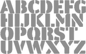 Nicholas Garner (b. 1949, Windsor) runs Codesign (or: Aviation Partners), a small London-based design firm which has created these commercial type families:
 - Cerafino (2005): informal sans.
- Delamere (2005): more classical sans.
- Kensington (2005): titling sans related to Gill Sans.
- Maisee (2005): an open, wide, generous and broadly smiling sans family.
- Tenison (2005): connected formal script.
- Fiendstar (2006, 16 styles; +Cameo (white on black), +Shaded) (after Gill Sans Schoolbook).
- Rosie (2010): a connected cosy script, in the Mistral style.
- Norwich (2006): a grungy version of Tenison. Outrage (2006) is more grunge.
- Cashback (2006).
- Crystal (2006): a slab serif family.
- Autobahn (2011) is a monoline elliptical sans family. Garner writes: Autobahn is a robust masculine sans of near monoline thickness and angular characteristics. Autocode (2011) is a monoline monospaced (for programs) elliptical sans based on Autobahn.
- LaCarte (2007): inspired by a series of handwritten menus produced in 1980. Further extended to La Carte Pen in 2010.
- Midas (2007).
- Sky Sans (including hairline weights) (2007).
- Lamoreli (2007).
- Backstage (2007). A stencil face.
- Amy (2010). Nicely hand-printed.
- Atria (2010) An ink-trapped sans-serif.
- Blocksta (2010). A rounded fat sans.
- The elegant script typeface Jacqueline (2010).
- New Fiendstar (2010).
- Omniscript (2010).
- Cambridge (2010). An elegant sans family with a misbehaving lower case q. Accompanied by a Cambridge Round family. It is designed as a schoolbook font, and is useful for dyslexics, since there are no ambiguities between letterforms.
- Central (2011). A rounded geometric sans family. Followed in 2012 by Central Inline.
- Combi (2011). This is a wonderful effort, as described by Garner himself: The Combi collection includes Sans, Sans Oblique, a true Italic, Serif, Serif Oblique and a set of Openface capitals. Combi fonts have 5 compatible weights and metrics allowing them to be used in free combination. Inspiration came from Jan Van Krimpen's Romulus (Enschedé, 1931). In addition to the Roman style, Van Krimpen created a set of open capitals, a simple oblique variant and subsequently, an attractive calligraphic italic, Cancelleresca Bastarda. In addition to Van Krimpen's idea, Combi has been influenced by features from many typefaces including Bembo, Melior and Optima. The object was to create a versatile family of body text and titling typefaces for use in books, magazines and on the web.
Polaris (2012) is a rounded sans family that reads well in print and on screens. Mensa (2012) is a 36-weight large x-height sans body family. - Beaulieu (2012).
- Clocktime (2012). A dingbat font with clocks.
- Chokey Pro (2012). A tall connected script face.
- Alleyn (2013). A soft geometric sans family. Followed in 2021 by the 12-style Alleyn Pro (2021).
- Corsica (2013). Corsica is an all-purpose geometric sans-serif typeface of visually uniform stroke thickness. The family contains six weights, two widths and three lowercase size options, together with an italic variant for each.
- Intrinseca (2014). An incised sans with some contrast and flaring, but still quite readable thanks to a good x-height.
- Browser Serif and Browser Sans (2014). These families were designed for use on screen.
Arethusa (2014) and Arethusa Pro (2014) are 12-style transitional typeface families. - Gimbal Egyptian (2018). Characterized by some asymmetric slabs and curvy italics. It covers Latin and Cyrillic and comes in several widths. See also Gimbal Grotesque (2018).
- Cadmium (2020). A 48-style grotesk family influenced by DIN.
- Varisse (2021). A 60-style superfamily consisting of Baskerville and transitional serifs on one end and Gill Sans-inspired humanist sans typefaces at the other end.
- Fielding (2022). A 12-style confident flared text and titling serif family.
MyFonts site. Klingspor link. Showcase of Nicholas Garner's typefaces. [Google]
[MyFonts]
[More] ⦿
|
Colin Brignall

|
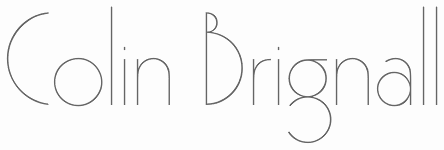 British type designer and art director, born in 1940 (MyFonts.com says 1945, Warwickshire), who was type director at Letraset for some time. In 1980 he became Type Director for Esselte Letraset. In 1995 Brignall moved to ITC. With the closure of ITC's New York office in November 1999, Brignall was re-appointed Type Director for Esselte Letraset. The latest major project in which Brignall was involved was the ITC Johnston series launched in 1999. He received the Type Directors Club Medal at TDC2 in 2001. The Letraset and ITC collections are now owned (via Linotype) by Monotype.
 Bio. Bio at Linotype. His fonts include - Aachen Bold (1967, Letraset), Aachen Medium (1977, an extension done with Alan Meeks). Digital implementations of Aachen: Aachen (ITC), Aachen (Tilde), Aachen (Adobe), Neue Aachen (ITC), Aachen SH (Scangraphic Digital Type Collection), Aachen SB (Scangraphic Digital Type Collection). In 2012, Jim Wasco (Monotype) extended Aachen to 18 fonts including an italic, called Neue Aachen. Aachen is characterized by short slab serifs, which gives it a retro techno look.
- Revue (1969), an unsuccessful display face.
- Countdown (1965, LED simulation face), cyrillicized in 1993 by A. Kustov at TypeMarket.
- Superstar (1970, an athletic lettering typeface now owned by ITC and sold by MyFonts).
- Italia (1974; see Istria on the SoftMaker MegaFont XXL CD, 2002, and Revival 791 in the Bitstream collection), Italia Book (1977). Influenced by the Venetian style. Designed for Letraset and then licensed to ITC, where it became ITC Italia.
- Premier Lightline (1969), an elegant art deco hairline face. For a digital revival, see Pergamon (2012, SoftMaker).
- Premier Shaded (1970), caps only shaded art deco face.
- Romic Light (1979-1980). See R790 Roman on Softmaker's XXL CD (2002).
- Corinthian (1981).
- Epokha (1992), a 1910 poster style slab serif.
- Edwardian (1983). Digital versions: Edwardian Medium (ITC), Edwardian (Linotype), Edwardian EF (Elsner&Flake).
- Harlow (1977-1979), a fifties style keavy monoline display script. The Scangraphic versions are Harlow SB and Harlow SH. Harlow Solid was revived by Felipe Calderon as Melts Script (2017, more an interpretation than a revival). For other digital versions, see Harlekin (2012, SoftMaker), HarlowICG (Image Club Graphics), Harlow (ITC), HarlowD (URW), OPTI Hastings (Castcraft), H652 Script (SoftMaker), and Harrogate (SoftMaker).
- Octopuss (1970), similar to Harlow. Digital versions exist at ITC and Scangraphic.
- Tango (1974) [a freefont inspired by Tango can be found in Julius B. Thyssen's Kylie 1996-J], yet another typeface in the spirit of Harlow.
- Jenson Old Style (1982, with Freda Sack), a Venetian face.
- Victorian (1976, Letraset; with Freda Sack).
- Type Embellishments One, Two and Three (1994): handsome ornaments developed in the Letraset Type Studio by Michael Gills and Colin Brignall to complement the Fontek Typeface Library.
- Retro Bold (1992, a slab serif done with Andrew Smith).
- ITC Werkstatt (1999, ITC: a hookish Preissig-style typeface developed with Satwinder Sehmi).
FontShop link. Klingspor link. View Colin Brignall's typefaces. [Google]
[MyFonts]
[More] ⦿
|
Colin Kahn

|
 Type designer from Buffalo, NY. His typefaces were mostly developed at P22. Klingspor link. A partial list of his fonts:
 - In 2008, he revived and extended Cigno, a 1950s script typeface by Aldo Novarese, and called it P22 Cigno.
- LTC Circled Caps.
- P22 Civilité is a joint effort of Colin Kahn, Richard Kegler and Milo Kowalski.
- P22 Curwen. P22 Curwen Poster is a digitized version of a rare wood type used by the Curwen Press in England in the early 20th Century for poster work. P22 Curwen Maxima is a new hyper-stylized re-interpretation of Curwen Poster.
- The great display/comic book font Ebin (and Ebin Outline).
- In 2006, he created the P22 Gauguin font family (Regular, Alternate, Brush and Extras), a script font set based on the writings and sketches of post-impressionist artist Paul Gauguin.
- Glamour (2006, P22/Lanston; also called LTC Glamour Grotesque) is based on the 1948 design by the same name done at Lanston Monotype, which in turn is based on Imre Reiner's Corvinus.
- P22 Goudy Aries (2004, P22, by Richard Kegler and Colin Kahn). This typeface revives Goudy's aries from 1926.
- Goudy Sans (2006, P22/Lanston, 6 styles): Goudy Sans Bold was originally designed by Frederic Goudy in 1922 as a less formal gothic and finished in 1929. The Light was designed in 1930 and the Light Italic in 1931. Colin Kahn digitized them in 2006 to make a 6-style Goudy Sans family, which includes a Goudy Sans Hairline.
- In 2008, he revisited Richard Kegler's P22 Platten, which was based on lettering found in German fountain pen practice books from the 1920s, and created the extended typeface P22 Platten Neu.
- Internship (2003), or St G Schrift. P22 swrites: St. G Schrift (2005, P22) is a font based on the type designs of German poet Stefan George. This sans-serif typeface features a few variations found in books published by George in Berlin. Includes P22 St. G Schrift One, P22 St. G Schrift Two and P22 St. G Italic (an art nouveau version of the roman, newly designed). The original font was cast in 1907 by a small foundry in Germany and was used primarily for the works of George as well as other books including a monumental edition of Dante's Divine Comedy. This may or may not contradict the fact that Marcus Behmer designed Stefan George-Schrift in 1904.
- P22 Tuscan Expanded is a digitization of the mid-19th century wood type font Antique Tuscan Expanded - Wells&Webb 1854.
- P22 Vale (2007, in Roman and Kings Fount styles) are based on types by Charles Ricketts that were used by the Vale Press (which in turn were based on Jenson). The Kings Fount is originally dated 1903.
- In 2007 still, he revived Zebra (P22), a font originally designed in 1963-1965 by Karlgeorg Hoefer.
View Colin Kahn's typefaces. [Google]
[MyFonts]
[More] ⦿
|
Collis Ta'eed
|
Sydney, Australia-based web designer, who created the ultra thin experimental typeface Machine Man (2004). [Google]
[More] ⦿
|
Context Reprise SSi
|
An SSi font in the category "hairline sans". [Google]
[More] ⦿
|
Corentin Allerdet
|
Based in the space industry capital of France, Toulouse, Corentin Allerdet designed the hairline futuristic typeface First Step Typo (2013). [Google]
[More] ⦿
|
Cristiano Vinciprova

|
 Codesigner with Alexandre Venancio and Felippe Duque of the hairline art deco typeface Capa (2009, Oporto Design). [Google]
[MyFonts]
[More] ⦿
|
Dada Studio
[Michal Jarocinski]

|
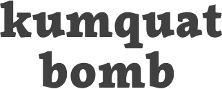 Dada Studio (Babice Nowe, Poland) is run by Michal Jarocinski (b. 1980, Warsaw). In 2017 or 2018, he founded Capitalics. His typefaces:
 - Dada Slab Pro (2012) and Dada Sans (2012, a hairline elliptical sans typeface).
- In 2013, he created Lelum Sans and the (very) humanist sans typeface families Sharik Sans and Clavo.
- Typefaces from 2014: Servus Slab (18 styles, promoted as a newspaper family).
- Typefaces from 2015: Macho (a sans family).
- Typefaces from 2018: Tzimmes.
- Typefaces from 2019: Maecenas.
- Typefaces from 2021: Almanach (a 20-style neo-grotesque typeface family).
[Google]
[MyFonts]
[More] ⦿
|
Dan Schechner
|
 Designer from Richmond, VA (aka fontcollector) on whom I bestowed the title King of octagonal typefaces. Daniel Herbert Schechner was born in 1946 in Norfolk, VA, and died in 2016 in Richmond, VA.
 - He used FontStruct in 2008 to create the ultra fat octagonal typefaces ShortFatStrangerMono and TallDarkStrangerMono after his Bank Gothic-themed series called EZMonoA through EZMonoG. Other creations: MaxiFiveMono, MaxiFiveTallMono, MaxiFiveTooTallMono, CurvedFiveMono, SkinnyMinnieMono (think skinny and octagonal), KaleidoscopeMono (dingbats), NervosaMono (thin, angular and jittery). CourieresqueMono, HeavyMono, SuperHeavyMono, SkinnierMinnierMono, SkinniestMinniestMono, DiamondsMono, and LucDevroyeMono1 (based on my own Yonkaku fonts), PortraitMono (each character on an easel), PortraitText Mono, RollingStockInverseMono (characters on wheels), OctagonoMonoA, OctagonoMonoB, AmazonoMono (a macho octagonal face), BlackboardTallMono (white on black), ScoreBoardInverseMono, VarionoMono, TeflonoMono, SymmetronoMono (geometric patterns), VerticalSlatsMono, VerticalSlatsTallMono, BlackboardMono, BlackboardTallMono, SteepFifteenStretchMono, SteepFifteenSuperStretchMono, SteepFifteenMono, RockSolidMono, RockSolidStretchMono, RockSolidSuperStretchMono, YugoFiveUltraTallMono, KitchenTilesMono, PrimoMono, OctagonoMonoC (+Tall, +ExtraBold), LotsaDotsMono, OvaltinoMono, OctagonoPropC (+Tall).
- Fonts made in 2009: Bevel's Advocate Mono, Mammoth Mono, NovaMono (+Inverse), OctoMono, PortraitMono, GravitonoMono, PortraitTextSteepMono, XLMono, XLProportional, ScallopiniMonoInverse, BrickbatsMono (dingbats), IconoMono (white on black dings), KaleidoscopeMono, DiamondsMono, ShortFatStrangerMono, QuattroMono (+SC), OvaltinoMono, GargantuaMono, EdgeMono, FacetedSuperFiveStretchMono, MegaloMonoGrande, OctagonoMonoExtraBold (+SuperSteep), MegaloMono, KitchenTilesMono (#1, #2, #3), PrimoMonoTall, StereophoneMono (+Inverse), GrecoRomanoMono (+Ultimo), FacetedFiveMono, YugoFiveMono, TopsyCurvy, DiamondLinkMono, RunningOnEmpty.
- Fonts made in 2010-2011: BAP Solid (sturdy octagonal typeface), XLMonoAlt, XLProportionalAlt, Octagonico (octagonal inline face; +Dark), White Elephant 3 (2011, a 3d shadow face), White Rhino (outlined athletic lettering, Black Rhino), Albino Rhino (2011, black on white), Striped Rhino (2011), Curvilino (ultra-condensed), Rondino (2011, similar), BAPSolid (2011, octagonal).
- Fonts from 2012: BAP Outline, Big Hairline (octagonal hairline caps face).
- Fonts from 2013: Rondino Junior, Legibus Rex Mono (octagonal), Little Black Font (octagonal), Legibus Maximus (octagonal), Bevel's Advocate Proportional (prismatic typeface).
- Fonts from 2014: BAP Outline Stencil, BAP Solid Stencil, Curvilno Grande.
[Google]
[More] ⦿
|
Daniel Hernandez
[Hernández Type (was: Estudio de diseño Calderón)]

|
 [MyFonts]
[More] ⦿
|
Daniel Olán
|
Daniel Olán (Nueva Leon, Mexico) designed the hairline display typeface Prólogo (2011; images: i, ii). Creator of the rounded squarish typeface Act #1 (2011). He is also a gifted photographer. [Google]
[More] ⦿
|
Darren Scott
[Darren Scott Typographics (was: Truth Design)]

|
[MyFonts]
[More] ⦿
|
Darren Scott Typographics (was: Truth Design)
[Darren Scott]

|
Darren Scott Typographics (was: Truth Design) is Darren Scott's design firm in Manchester, UK. Darren Scott graduated from Salford University in Manchester with a Design Practice Degree in 1996. Formerly the Senior Designer and Typographic Consultant at McCann-Erickson Manchester, Darren now runs his own consultancy, Truth Design. Their type design includes typefaces such as Aggregate, Amplifier (hairline geometric), Berliner, Como (artsy display), Imprimitur (serif), Mechanic (influenced by the poster types found in advertising during the industrial revolution), Nitrogen (hookish sans), Press On (grunge), Rivo (stencil), Rub On, Sodium. All typefaces available from FontWorks. Before Truth Design, which started in 2007, Darren Scott sold and licensed his typefaces through various firms: - [T-26]: BadAngel, Berliner, Circuit, Mechanic Gothic (1997), Polymer (1997), Retoric, Petrol Medium, Rub-On, Launderette Rinse.
- TSi Font Foundry: TSI Aggregate.
- ITC: Mechanic Gothic and Petrol.
- FUSE 15 collection: Berliner (1996).
- Atomic Type: Aggregate, Mechanic Gothic and Hydrate.
- Red Rooster Type: Mechanic Gothic.
Interview. FontShop link. Klingspor link. View the typefaces of Darren Scott. [Google]
[MyFonts]
[More] ⦿
|
Dave Rowland
[Dave Rowland Type (was: Eclectotype, Schizotype)]

|
 [MyFonts]
[More] ⦿
|
Dave Rowland Type (was: Eclectotype, Schizotype)
[Dave Rowland]

|
 Type foundry in Sheffield, UK, first called Schizotype, and in 2021 renamed Eclectotype because this is not a foundry that likes to stick to trends or expectations. Its designer, Dave Rowland (b. 1982, Chesterfield) grew up in Sheffield, UK, but was based in Japan, the Philippines, Liverpool, Surat Thani, Thailand, and Koh Samui, Thailand. MyFonts Interview. In 2021, he joined The Type Founders.
 He created these fonts in 2009: Quesadilla (signage type, Mexican simulation face), Quesadilla Shadow, Schizotype Scrolls, Quiff, Toothpaste, Astroboy (connected script), Decolletage (art deco), Kazumi Sans, Acid Haus, Dr. Black, Dr. Eric, Soyo Gogo, BMX radical (brush), Team, Miami Hopper, and Tubularis (multiline face), Sickle, Klique (futuristic display face), Uncle Eric (a cartoon face), Praline Smooth (connected script in the style of Mistral), Kwaktur, (blackletter typeface based on the logo of Belgium's Kwak beer), Blackball (another blackletter) and Modulogue (a modular display family). Additions in 2010: Christmas Tuscan (a modular Tuscan), Masonic Lodge, Mook (a retro, unicase, bubble font), Toothpaste 2, Gaden Sans (organic monoline typeface that includes a hairline weight), Sizemore (all caps slab headline face), Quickscript (signage face), New Wave. Fonts designed in 2011: Brag Pro (like Brag, a Cooper Black alternative), Brag Stencil Pro, Chestnut (curly, hand-printed), Brag (a fat round face in Cooper Black style), Gelato Script (a connected signage face), Brag Stencil (2011), Streetscript (2011, brushy signage face). In 2011, he created a quaint text family, Vulpa, with quirky foxtail terminals. Typefaces from 2012: Margot (a rounded slab serif described as a lovechild of American Typewriter and Cooper Black), Range Serif (an angular typeface), Pastiche Brush (a brushy connected script inspired by the titles of the 1959 movie Imitation of Life (Wayne Fitzgerald)), Quayside (a bulbous baseball or signage script). Typefaces from 2013: Alight Slab (hairline slab), Anultra Slab (a heavy bold slab serif), Ollie (a connected baseball or signage script), Urge Text (an extensive modern text family with ample language support and plenty of mathematical symbols, and large ball terminals). Typefaces from 2014: Range Sans (a grotesque sans family with the quirky angular cutouts inherited from Range Serif), Samui Script (upright connected script), Streetscript Redux (signage script), Price Didone (created for setting elegant price tags). Typefaces from 2015: Oldskool Script (a connected signage script; one of many quite different commercial fonts with the same name), Hazel Script (a great flowing calligraphic script designed around the time of the birth of his first child, Hazel; the name may create confusion as there is a famous BB&S metal font with the same name), Mastadoni (a fat didone for headlines and fashion mags), Kake (a great creamy sign-painting font), Bali Script (creamy signage script), Flat Sans. Typefaces from 2016: Cinema Script (retro movie script), Chill Script (a retro non-brush signage script), Blanket (a soft cursive font, ideal for children's books), Schizotype Grotesk (a very original angry geometric grotesk, with bucketloads of pizzazz), Astrid Grotesk, Asterisk Sans Pro (a versatile humanist sans family for Latin, Greek, and Cyrillic), Strelka Ultra (a retro space age typeface), Revla Serif (beatnik style, emulating randomly positioned handlettering). Typefaces from 2017: Duckie (a bubblegum or creamy signage script), Tusque (a layered decorative Tuscan typeface), Ekamai (a tight non-connected creamy signage script), Quinella (seventies script), Delfino Script (retro signage script), Tchig Mono (a special, almost hipster monospace typeface family), Revla Sans (beatnik style), Revla Sans Text, Eroika Slab (a robust wedge serif family). Typefaces from 2018: Aziga (descrived by Dave as a high (occasionally reversed) contrast, postmodern, deconstructed-reconstructed, serifless (mostly), fashion didone), Revla Slab (bouncy, beatnik), Galix (subdue futuristic sans family), Gelato Luxe (an update of his earlier Gelato Script), Engria (an angular brush-inspired text typeface). Typefaces from 2019: Gelato Fresco (a warm flowing script), Amica Pro (a stocky part humanist part geometric workhorse sans), Galix Mono, Backstroke, Gigantic (an exercise in ultra-fatness). Typefaces from 2020: Gelica (a 14-style retro soft serif family influenced by Cooper Black, Goudy Heavyface and Ludlow Black), Capsule (a reverse-stress high-contrast rounded sans-serif), Sausage (a friendly fat rounded typeface that is is unapologetically bold and bulbous. Influenced by magnetic fridge letters, hot dogs and 70s phototype fonts, it is retro, but not cloyingly so). Typefaces from 2021: Revla Round (a child-friendly version of Revla Sans), Megumi (a formal hairline fashion mag script), Yink (a bulbous psychedelic experiment). Klingspor link. Behance link. Showcase of Schizotype's typefaces at MyFonts. Fontspring link. MyFonts interview. [Google]
[MyFonts]
[More] ⦿
|
David Berlow

|
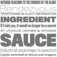 David Berlow (b. Boston, 1955) entered the type industry in 1978 as a letter designer for the Mergenthaler, Linotype, Stempel, and Haas typefoundries. He joined the newly formed digital type supplier, Bitstream, Inc. in 1982. After Berlow left Bitstream in 1989, he founded The Font Bureau, Inc. with Roger Black. Font Bureau has developed more than 300 new and revised type designs for The Chicago Tribune, The Wall Street Journal, Entertainment Weekly, Newsweek, Esquire, Rolling Stone, Hewlett Packard and others, with OEM work for Apple Computer Inc. and Microsoft Corporation. The Font Bureau Retail Library consists mostly of original designs and now includes over 1,000 typefaces. In a video made for Mike Parker's TDC medal in 2011, Mike Parker says that David Berlow is the most talented type designer he ever met. David lives in Martha's Vineyard.
 At ATypI 2004 in Prague, David spoke about Daily types. At ATypI 2009 in Mexico City, he spoke on The heart of my letter, (and the online version). Since that time he has been very active and vocal on the issue of high quality web fonts. Speaker at ATypI 2011 in Reykjavik and at ATypI 2014 in Barcelona. David Berlow Type Specimens (free pdf). Another type specimen booklet. Interview by A List Apart in 2009. Speaker at ATypI 2010 in Dublin. FontShop link. www.typovideo.de/david-berlow. David Berlow on web fonts. Interview by The Boston Globe. His typefaces: - Agency FB (1995). After Morris Fuller Benton's squarish typeface from 1932-1933 for American Typefounders.
- Amstelvar (2017). A variable (or parametric) font at Font Bureau. Contributors include David Berlow, Santiago Orozco, Alexandre Saumier Demers, and David Jonathan Ross. Open Font Library link, where one can download the font. Github link.
- Apres (2008, a sans with 40 styles). David Berlow and staff drew Apres as part of a series designed originally for the Palm Pre smart phone, for use both on the device and in print marketing. Simple, open letterforms and generous proportions provide a clear, comfortable, and inviting experience for navigation and readability.
- Belizio (1987-1988), a beautiful Clarendon-style slab serif modeled after the 1958 original slab serif by Aldo Novarese called Egizio Corsiva Nero. Claudio Piccinini would have liked Font Bureau to acknowledge Aldo Novarese's Egizio as the source of this family.
- Belucian (1990, by David Berlow and Kelly Ehrgott Milligan. Several weights exist, including Demi and Ultra.
- Berlin Sans (1997).
- Bureau Grotesque (1989). This 27-style family is now called Bureau Grot. Font Bureau's blurb: The current family was first developed by David Berlow in 1989 from original specimens of the grotesques released by Stephenson Blake in Sheffield. These met with immediate success at the Tribune Companies and Newsweek, who had commissioned custom versions at the behest of Roger Black. Further weights were designed by Berlow for the launches of Entertainment Weekly and the Madrid daily El Sol, bringing the total to twelve styles by 1993. Jill Pichotta, Christian Schwartz, and Richard Lipton expanded the styles further, at which point the family name was shortened to Bureau Grot.. Note: there is a custom version called M&C Saatchi Grotesque with truetype data created by dtpTypes in 1998.
- CalifornianFB.
- CheltenhamFB.
- Custer RE (2014), a typeface for small on screen use. The Font Bureau blurb: In 2009, a book from 1897 in the library of the University of Wisconsin caught David Berlow’s attention. It was set in a clear text face---a predecessor of Bookman---cast by the Western Type Foundry who called it Custer. Upon noting how well the typeface worked in point sizes of 6 and 7 points, Berlow developed it into a member of the Reading Edge series specifically designed for small text onscreen. Custer RE is a broad and approachable typeface drawn large on the body with a tall x-height to maximize its apparent size when set very small. The minimal stroke contrast and the hefty serifs let it stay exceptionally clear down to a font-size of 9px. Font Bureau.
- Decovar (2017). A variable font. Github link, where one can freely download the font family. See also Open Font Library.
- Desdemona (1992). An art nouveau face.
- Eagle (1889-1994). This art deco typeface Font Bureau Eagle was started in 1989 for Publish. David Berlow designed a lowercase, finished the character set, and in 1990 added Eagle Book for setting text. In 1994, Jonathan Corum added Eagle Light and Eagle Black to form a full series.
- Eldorado.
- Empire.
- Esperanto (1995).
- ITC Franklin Gothic (1991). In 2008, David Berlow added Condensed, Compressed and Extra Compressed widths to Vic Caruso's 1979 ITC Franklin interpretation (which had Light, Medium, Bold and Black), and Font Bureau sells a complete ITC Franklin now. In 2010, Berlow completed his definitive revision of ITC Franklin, a single new series of six weights in four widths for a total of 48 styles. Typeface review at Typographica.
- Giza (an Egyptian family.
- Hitech (1995).
- Juliana Text (2009), a rebirth of Sem Hartz's Juliana (1958, Linotype), a popular narrow legible paperback text face.
- Kis FB (2007): a revival of old style types by Nicholas Kis from ca. 1700.
- Letras Oldtsyle (1998). Letras Oldstyle was commissioned by Letras Libres, the reigning literary magazine published by Enrique Krauze in Mexico City. This garalde series was inspired by the earliest typefaces cut in the Americas in the early 1600s by printer Henrico Martinez. Proofs survive in the Biblioteca Nacional. Letras Oldstyle stands as the first typeface ever cut in the Americas, the root of American type design.
- Meyer Two (1994). Based on a 1926 type by L.B. Meyer.
- Millenium BT Bold Extended (1989, Bitstream). Also known by insiders as Starfleet Bold Extended, this font was used on federation starship hull markings until episode ten. MyFonts link.
- Moderno FB (1995): an exhibitionist didone in 32 styles, for Esquire Gentleman. In 1996 Berlow cut new styles with Richard Lipton for El Norte. In 1997, Roger Black ordered new weights for Tages Anzeiger. It grew further when the Baltimore Sun, with FB Ionic as text, was redesigned. The whole series was then revised for Louise Vincent, Montreal Gazette, with further styles added in 2005 for La Stampa. [It is my favorite type family at Font Bureau.]
- Momentum (2018). An in house variable font family for use on the Type Network web site.
- Nature (1995).
- Numskill (1990).
- Old Modern.
- Online Gothic (1995).
- Ornaments.
- Phaistos (1990-1991). A flared angular design done with Just van Rossum, and inspired by Rudolf Koch's Locarno.
- Poynter Agate.
- Reforma: Based on Giza.
- Rhode (1997).
- Roboto Flex (2017). A large free variable typeface family by David Berlow on commission for Google; based on Christian Robertson's original Roboto. Google Fonts link. Github link. Google redits Font Bureau, David Berlow, Santiago Orozco, Irene Vlachou, Ilya Ruderman, Yury Ostromentsky and Mikhail Strukov.
- Romeo.
- Scotch Roman (1993).
- Skia (1993, Apple). A Greek simulation sans, in the style of Twombly's Lithos, co-designed with Matthew Carter for Apple's QuickDraw GX project.
- Skyline.
- Titling Gothic FB (2005): Berlow spent 10 years developing FB Titling Gothic in seven weights of seven widths each for use as display and headline romans. It was inspired by the popular ATF Railroad Gothic and grew out of Berlow's own Rhode.
- Throhand: a classic family based on metal type found at the Plantin Moretus Museum in Antwerp.
- Truth FB (1995).
- Village.
- Vonness (2007): a newspaper sans family. Font Bureau: Vonness was designed by David Berlow working closely with Neville Brody on corporate redesign for Jim Von Ehre at Macromedia. Core weights are loosely based on Bauersche Giesserei's Venus, 1907-1910. Berlow expanded the ideas behind the series to 56 fonts.
- Yurnacular (1992, part of FUSE 4).
- Zenobia (1995).
View David Berlow's typefaces. Another catalog of David Berlow's fonts. Speaker at ATypI 2018 in Antwerp. [Google]
[MyFonts]
[More] ⦿
|
David Fernando Espinosa Martínez
[Type Sailor]
|
 [More] ⦿
|
David Jonathan Ross
[DJR Type]

|
 [MyFonts]
[More] ⦿
|
David Trooper
[DTrooper Foundry]

|
 [MyFonts]
[More] ⦿
|
David Zobel
|
Baltimore, MD-based senior creative director at High5design. He drew some illustrated caps alphabets in 2012 such as Crazy World Alphabet, and Gothic Inspired Type (more a painting than a set of letters). In 2018, he published the hairline sans typeface Zobel Thin. [Google]
[More] ⦿
|
Daylight Fonts
[Shinya Okabe]

|
Japanese foundry with excellent web pages on early 20-th century type design. Shin Oka, or Shinya Okabe (b. 1976, based in Himeji) created various revival fonts in or just before 2009, many connected in some way to Tom Carnase and the phototype era. He specializes in 1970s and 1980s typefaces, often with open counters and high contrast. His fonts: - Bentley (2010). This is the same as Avant Garde Gothic.
- Bernhard Neo DF (2010).
- Caslon223 DF (after ITC/LSC Caslon 223 by Tom Carnase). Other Caslons include Caslon Headlione DF (2010) and Caslon Swash DF (2010).
- Didot DF (2008).
- Garamond DF (2010).
- Grouch DF (after ITC Grouch by Tom Carnase and Ronne Bonder)
- Lubalin Graph DF (after ITC Luabalin graph by Herb Lubalin, Ed Benguiat, Joe Sundwall, and Tony DiSpigna)
- Busorama DF (after ITC Busorama by Herb Lubalin and Tom Carnase)
- L&C Hairline DF (after L&C Hairline by Herb Lubalin and Tom Carnase)
Additionally, they identified the fonts on many covers and albums from the 1960s and 1970s. Further revivals of photolettering era fonts: - Baby Teeth (2009): after the art deco typeface of Milton Glaser, 1968, PhotoLettering.
- CBS Didot (2009): after the original by Freeman Craw, 1970s.
- Indigo (2009): after a font by Albert Hollenstein, 1970s.
- Pacella Collegiate (2009): after Vincent Pacella's typeface at PhotoLettering.
- Penny Bee (2009): a Peignot lookalike.
- Tiffany Heavy With Swash (2011). A swashy Didot display face. This type was used by Quentin Tarantino's movie Jackie Brown in 1997. Tiffany Heavy (Ed Benguiat, Photolettering) is basically identical to Benguiat Caslon Swash (1960s) and to Foxy Brown (1974). Similar typefaces include LSC Book with Swash by Herb Lubalin and Tom Carnase (ca. 1970).
- Wexford (2009): after the typeface of Richard A. Schlatter, VGC, 1972.
They are working on Permanent Massiv (after a 1962 Ludwig&Mayer font by Karlgeorg Hoefer---comparable to Impact or Compacta in its massiveness and masculinity), Michel, Didoni, Tiffany, Ginger Snap, Patriot, Motter Ombra, Pistilli Roman, Benguiat Caslon (a large size display Caslon by Ed Benguiat at PhotoLettering; digitized at House Industries by Christian Schwartz and Bas Smidt), and Via Face Don. In 2020, Shin Oka released the caslon-sinspired Ivy Ivy, the piano key version of a fat Bodoni, the fashionable Gara Gara, the 1970s font Bern Bern, Super Bodo Bodo, the art deco / Bauhaus typeface Sophi Sophi, the art deco typeface Fifty Four, the fashion mag typeface Rache Rache, the Peignotian sans typeface Mid Mid Sun Sun, and the display didone Fau Fau. [Google]
[MyFonts]
[More] ⦿
|
Désigne (was: Calame Design)
[Benoit Sjöholm]
|
Désigne (which was Calame Design is run by Benoit Sjöholm from Rennes, France, b. 1980. Creator of the double-lined Margarette 01 (2008), the piano key typeface Désigne (2010), the sans display typeface Explora (2010), the elliptic Bagadek (2010), Fontastique (2010), Rajkeys (2010), the geometric sans Violette01 (2009), the octagonal typeface Yllia (2008), Nioubes (2008, very geometric hairline face), Julie01 (2008), Frida01 (2008, organic slab serif), Thamara01 (2008, sans), Linea (2008, outlined), and the ultra-contrast typefaces Lamia (2008, like leaves), Olivia (2008, art deco), Kanis (2009, organic), Kamalo (2009, upright connected script), Ageone (2009, organic), Agnes Serif (2009), Dollis (2009, elliptical), Johanna (2009, upright multiline script), Jalane Light (2009, techno sans), Yatis Black (2009, almost blackletter), Cilogie (2009, organic), Ageone Serif (2009), Kabys (2009), Kyma (2009), DekerS (2009, sans family), Sixty Queens (2009), Alice (2009), Genikas (2009), Naya (2009), Genikas, Cross (2009), Johanna (2009, multiline face), Johanna Bold (2009), Kamalo (2009, +Bold), Sakiane (2009, a counterless geometric face), Balkeno (2010, display sans), Nolla (2008). Typefaces created in 2011: Rachel (minimalist sans), Marilou (elliptical monoline sans), Melody, Sophie, Judit, Monika (hand-printed), Fabrik, Eve Isabelle, Marilyn, Charlotte. Typefaces from 2012: Constance (rounded bold sans), Emmanuelle (extended sans), Behatrice (techno), Georgiquas (a wide all caps face). Typefaces made in 2013: Kabegnos (elliptical sans), Henorias (elliptical sans). FontVila link. Dafont link. Old URL. Fonts and font blog. [Google]
[More] ⦿
|
Dehlia Hooper
|
At Anderson University in Anderson, SC, in 2019, Dehlia Comeau Hooper designed the thin monoline geometric sans typeface Bella. [Google]
[More] ⦿
|
Denis Gorohovskiy
|
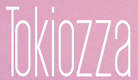 Kiev, Ukraine-based "designer" of the sans typefaces Axiom (2016) and Equilibrium (2016), Arsenal Slab (2016), Parabola (2016, geometric display font), the hairline avant-garde typeface Amsterdam (2016), the minimal rounded sans typeface family Straus (2016), the sans family Aurora (2016), the condensed sans display typeface Tokiozza Light (2016) and the circle-based display typeface Parabola (2016).
 Typefaces from 2017: Arson (sans family), Arthur, Adderley, Ashley, Azalea, Havana (a great super-heavy display sans), Atlas, Alicia, Martin, Apollo, Aroma, Tilt (modern geometric sans), Napster (ultra-condensed sans), Equilibrium, Arizona (condensed rounded sans), Argentina (a smooth high-contrast brush typeface), Aroma, Melony Sans, Argo (rounded monospaced sans), Aura (squarish sans), Bloke, Arnold Thin, Arnold Black (heavy geometric titling sans), Anima (rounded sans), Axiom Sans, Arcadia (minimalistic sans), Diod (a tall minimalist sans), Diod Bold, Aurora Thin, Emerald Modern Serif (a skyline typeface), Aqueduct, Arcanzas (a didone, +3D), Alabama (squarish and tall small caps), Antsy (a slab serif that comes across as a typewriter font), Steady Hand (handcrafted caps). Graphicriver link. Now, alert typophiles have pointed out that most---if not all---of Gorohovskiy's fonts are renamed and plainly stolen fonts. I leave the images on my site for the historical record. Here is a list of equivalences, as reported by this Italian blog: - Bebas Neue (Adderley)
- Canter Bold (Alabama)
- Chivo (Arthur)
- Dense (Aroma)
- Gotham with unofficial (pirated corporate) Cyrillic part (Arson Pro)
- Josefin Sans (Arsenal Sans)
- Josefin Slab (Arsenal Slab)
- Long Tall Sally EEN Plain (Emerald)
- Source Sans (Equilibrium)
- TT Chocolates (Arnold)
- Uniform Black by Miller Type Foundry (Tilt)
- Vidaloka (Arcanzas)
- Vollkorn (Martin)
As a result, Gorohovskiy's Creative Market account has been suspended. But why did Creative Market let this matter go on for a full two years? Incompetent editors? As a matter of fact, another distributor, Graphicriver, still has not removed his account as of late February 2018. His sales there amount to about 900 dollars, so this is plain theft. But then again, is this very different from Book Antiqua (Monotype's copy of Palatino) and Fotura (Linotype's not-so-subtle copy of Futura)? [Google]
[More] ⦿
|
Dennis Ortiz-Lopez

|
 Prolific NY-based designer (born in East Los Angeles) who specializes in faithful revivals of old masters and logotype, in Latin and Hebrew. He made over 500 fonts including. He is also a translator and illuminator of Biblical period Hebrew and Aramaic. His clients include The Vatican (Pope John Paul II's Holocaust commemerative CD) and Hadassah, the Women's Zionist Organization of America. His specialties are translations worded in the language and style of the period in which the Biblical text was composed. His translation and enumeration of kabbalistic writings, otherwise known as Hebrew Mysticism and numerology, demonstrate the mathematical base of Biblical miracles.
 MyFonts wrote this analysis of his work: Dennis Ortiz-Lopez is a hugely talented New York type designer. lettering artist&typographer, with around 600 typefaces to his credit. Typographic quality in the magazine market doesn't get much better than Rolling Stone magazine---well, guess who was their typographer (as well as InStyle, Sports Illustrated, People, etc.). Dennis made a successful transition to the digital era around 1989, keeping up his prodigious output. Dennis is also known by his Hebrew name, Siynn bar-Diyonn. Dennis follows the footsteps of great American type designers such as Morris Fuller Benton and Herb Lubalin. And he likes contrasts, too: his typefaces are very narrow or very wide, very thin or very fat. If you love Franklin Gothic but always felt like it's not fat and wide enough. try [Google]
[MyFonts]
[More] ⦿
|
Designer Terminal: Best Free Thin Fonts
|
Best free hairline / thin fonts: a list compiled by Designer Terminal in 2011. [Google]
[More] ⦿
|
Device Fonts
[Rian Hughes]

|
 Rian Hughes studied at the LCP in London before working for an advertising agency, i-D magazine, and a series of record sleeve design companies. Under the name Device he now provides design and illustration for the advertising, entertainment, publishing, and media industries. He works from Richmond, UK, as a comic book artist, letterer and typefounder---his foundry is called Device. He creates mostly display type. List of fonts. Interview. Review by Yves Peters. Monotype Imaging page. Interview by Die Gestalten. Various (overlapping) font listings, still unorganized.
 - Dingbats: Pic_Format, Mastertext Symbols, MacDings, RiansDingbats, Autofont.
- FontFont fonts: Identification (1993), Revolver, Rian's Dingbats, LustaOneSixtySans, Knobcheese, CrashBangWallop, and Outlander.
- [T-26] fonts: English Grotesque (1998), Data90 (2003; a free FontStruct typeface that is virtually identical to Data90 is Bitrate by Kummaeno (2010)), Flak Heavy (2003, stencil), Flak (2003, stencil), Freeman (2003), Klaxon (2003, kitchen tile font), Cordite, Substation (2003), September (2003), West Way (2003), Egret (2003), Paralucent Complete (2003), Paralucent Condensed, Paralucent Stencil (2003), Mercano Empire (2003), Iconics (2003), Cantaloupe (2003), Gravel (2003), Acton (blocky screen font, 2002), Ainsdale, Amorpheus, Anytime Now (alarm dingbats), Bingo, Blackcurrant (Blackcurrant Cameo (1997) is free), Bordello, Elektron, Haulage (U-Haul lettering, 2002), WexfordOakley, Telecast, Terrazzo, Transit, Untitled, Scrotnig, Skylab (2002), Silesia (1993), SlackCasual, Ritafurey, Reasonist-Medium, Regulator, GameOver, Novak, Quagmire, PicFormat, Jakita Wide (2000, techno font), Metropol-Noir, Motorcity, Mastertext, Mystique (2002), MacDings, Lusta, Laydeez, Sinclair, Paralucent (sans serif), Judgement, Bullroller, Zinger (a fifties font), Citrus (2002), Popgod (2003), Range (2000, a futuristic font), Hounslow, Jemima, Griffin, GranTurismo, Gargoyle, Foonky, DoomPlatoon, Darkside ("remixed" by FontStructor Kummaeno in his Ubangi (2011)), Kallisto (2010), Kallisto Lined (2010), Cyberdelic, Contour, and the very original Stadia Outline family (Stadia is a kitchen tile font).
- List of all fonts by Rian Hughes, as of 2004: Acton, Ainsdale, Amorpheus, Anytime Now, Bingo, Blackcurrant, Bordello, Bull Roller, Chascarillo, Contour, Cottingley (1992), FF CrashBangWallop, Cyberdelic, Darkside, Data90, Doom Platoon (1996), Elektron, English Grotesque, Flak, Foonky, Freeman, Game Over, Gargoyle, Gran Turismo, Griffin, Haulage, Hounslow, Iconics, FF Identification, Jakita, Jemima, Judgement, FF Knobcheese, Laydeez Nite, Lusta (big family), Mac Dings, Mastertext, Men Swear, Metropol Noir, Motorcity, Mystique, Novak, FF Outlander, Paralucent, Pic Format, Platinum, Quagmire, Range, Reasonist, Register (A and B), Regulator, FF Revolver, FF Rian's Dingbats, Ritafurey, Scrotnig, September, Silesia, Sinclair, Skylab, Slack Casual, Space Cadet, Stadia, Substation, Telecast, Terrazzo, Transmat, Untitled One, Vertex, Westway, Wexford Oakley, Why Two Kay, Zinger.
- At Veer, in 2005, these Device fonts were published: Gentry, Gridlocker, Valise Montreal, Custard, Box Office (moviemaking letters), Sparrowhawk, Monitor, Moonstone, Miserichordia, Yolanda (a great playful medieval text typeface in three styles: Duchess, Princess, Countess), Gusto, Dauphine, Rogue, Ritafurey, Dynasty, Radiogram, Xenotype, Roadkill (grunge), Payload (stencil family comprising Regular, Outline, Spraycan, Narrow, Narrow Outline, Wide, Wide Outline), Catseye, Electrasonic, Absinthe (psychedelic style), Straker, and Chantal (brush).
- In 2006, Veer added these: Profumo, Ironbridge, Cheapside, Battery Park (grunge), Forge, Shenzhen Industrial, Hawksmoor (grunge), Coldharbour Gothic, Wormwood Gothic (grunge), Chase (grunge), Diecast, Roadkill Heavy, Tinderbox (fuzzy blackletter), Dazzle (multiline face), Nightclubber (art deco), Klickclack (2005, comic book or cartoon caper typeface), Vanilla (art deco), Wear it's at (grunge), Diecast, Drexler, Box Office (movie icon font).
- Fonts from 2007: DF Conselheiro (2007, grunge), DF Glitterati (2007), Indy Italic (script), DF Apocrypha (2006, rough outline), DF Quartertone (2007), DF Lagos (2007, rough stencil), DF Pulp Action, DF Reliquary #17 (2006, grunge didone), DF Dukane (2007, octagonal grunge), DF Strand (2007, striped stencil), DF Rocketship from Infinity (2006, futuristic), DF Appointment with Danger (2006), DF Las Perdidas (2006, grunge stencil), DF Kelly Twenty (2007, grunge stencil), DF Heretic, DF Roadkill, DF Ironbridge, DF Forge, DF Shenzhen Industrial, DF Hawksmoor, DF Cheapside, DF Battery Park, DF Saintbride, DF Profumo, DF Coldharbour Gothic, DF Wormwood Gothic, DF Tinderbox, DF Flickclack, DF Vanilla (multiline art deco face), DF Chase, DF Nighclubber (art deco jazz club face), DF Diecast, DF Dazzla, DF Zond Diktat (grunge), DF Yellow Perforated, DF Mulgrave (grunge), DF Ministry B, DF Ministry A (with a hairline weight), DF Gridlocker, DF Gentry, DF Valise Montréal (grunge), DF Custard, DF Box Office, DF Roadkill, DF Payload Wide, DF Payload Narrow, DF Catseye Narrow, DF Catseye, DF Yolanda, DF Xenotype, DF Telstar, DF Straker, DF Sparrowhawk, DF Rogue Serif, DF Rogue Sans Extended, DF Rogue Sans Condensed, DF Rogue Sans, DF Ritafurey B, DF Ritafurey A, DF Radiogram, DF Pitshanger, DF Payload (stencil), DF Outlander Nova, DF Moonstone, DF Monitor, DF Miserichordia, DF Interceptor, DF Gusto, DF Glitterati, DF Galicia (2004), DF Galaxie, DF Electrasonic, DF Dynasty B, DF Dynasty A, DF Drexler, DF Dauphine, DF Chantal, DF Absinthe, DF Register Wide B, DF Register Wide A, DF Register B, DF Register A, DF Quagmire B, DF Cordoba (2007, grunge), Mellotron (2004, stencil), Seabright Monument (2007), Charger (2007, grunge).
- T-26 releases in 2007: Klickclack, Hawksmoor (grunge), Heretic, Ironbridge (old letter simulation), Battery Park (grunge), Chase (grunge), Cheapside (grunge), Dazzle (multiline art deco), Diecast (grunge), and Forge (grunge).
- T-26 releases in 2008: Automoto (fat multiline deco face), Straker (organic). Also from 2008: Mission Sinister (grunge), Gonzalez (grunge).
- FontBros release in 2009: Filmotype Modern. Other Filmotype series fonts include Filmotype Miner (2012), Filmotype Manchester (2012), Filmotype Meredith (2012), Filmotype Marlette (2012), Filmotype Mansfield (2012), Filmotype Power (2012) and Filmotype Major (2012: this is based on a typeface used as the titling font for the popular children's book by Dr. Seuss entitled One Fish Two Fish Red Fish Blue Fish, 1960). Other 2009 fonts: Degradation (grunge).
- Creations in 2010: Pod (2010, fat round stencil), Korolev (2010, a 20-style monoline sans family based on communist propaganda from 1937), DF Agent of the Uncanny (2010, brush face), DF Destination Unknown (2010, Kafkaesque brush), DF Maraschino Black (a sleek, sophisticated high-contrast swash capital font).
- Creations in 2011: DF Capitol Skyline, DF Capitol Skyline Underline and DF Capitol Skyline Capitals (a multi-weight all-caps pair that epitomizes Streamline Moderne), DF Korolev (a 20-weight sans serif family based on lettering by an anonymous Soviet graphic designer who did the propaganda displays at the Communist Red Square parade in 1937. Named in honor of Sergey Pavlovich Korolyov, or Korolev, considered to be the father of practical astronomics). In 2018, Korolev was expanded to Korolev Rounded and Korolev Rough.
- Typefaces from 2012: Ember (informal script), Kane (based on the Batman logo), Glimmer Glossy, Glimmer Mate, Galleria (avant-garde caps), Clique (flared sans).
- Typefaces from 2013: Wulf Utility (grungy), Charterhouse (an aggressive black sans), Filmotype Melon (after a 1959 original, this is an offbeat Googie era doo-wop typeface), Filmotype Melody (similar to Melon), Filmotype Mellow (also similar to Melon), Raw (worn wood type), Cadogan (a rhythmic connected script), Whiphand (brush face), Steed (heavy codensed masculine sans inspired by the titles of the Avengers TV show), State Stencil (Clean and Rough: in the style of Futura Black), Korolev Military Stencil (named after Sergei Korolev, father of Soviet astronautics, and based on signs from the Red Army parade of 1932), Armstrong (a 1950s automobile font).
- Typefaces from 2015: 112 Hours (numerals font).
- Typefaces from 2016: Typex (an angular yet rounded monospaced typewriter or OCR-style typeface based on the lettering used on Alan Turing's and Tutte's famous code-breaking machine at Bletchley Park, the Bombe, and the subsequent British answer to the German Enigma machine, the Typex), Serenity (a legible sans family).
- Typefaces from 2017: Pitch (a heavy block sans in chrome and solid variants), Shard (originally commissioned for Nickelodeon's 3D reboot of the Teenage Mutant Ninja Turtles franchise), Championship Inline, Mood (a great liquid deco font), Grange, Grange Rough, Dazzle Unicase, Urbane (sans), Urbane Rounded, Albiona (a modern take on Clarendon; includes Albiona Heavy Stencil), Albiona Soft (a rounded version of Albiona), Pact (a modular geometric font).
- Typefaces from 2018: Rutherford, Salvation (a potato cut font), Kano (inspired by the work of Dutch furniture designer and architect Gerrit Rietveld, one of the principal members of the Dutch artistic movement De Stijl), Rogue Sans Nova, Fairtrade (rough-edged font), Goddess (Victoriana), Neuropa (a five-weight semi-extended sans that projects a muscular corporate authority), Worthington Arcade (a caps-only lapidary typeface), Zeno (a piano key stencil typeface), Vektra (an experimental crosshatch-textured typeface), Recon (a quartz display font), Kinesis (Kinesis is inspired by the work of Dutch furniture designer and architect Gerrit Rietveld, one of the principal members of the Dutch artistic movement De Stijl. It is a modular headline font, constructed from white, black and grey overlapping rectangles), Freehouse (Freehouse is a reinterpretation of the well-remembered Watney's logo, a brewery and pub chain infamous for its poor quality beer and brutalist decor.), Zipline (a great multiline typeface), Argent Sans, Craska (a multiline font), Panther Black, Carilliantine (art nouveau with many interlocking letter pairs), Regulator Nova, Broadside, Bubblegum Pop, Heft (a heavy slab serif), Faction (stencil style), Metaluna (techno, engineering), Magnetron (futuristic), Urbane Rough, Urbane Adscript (a monoline semi-linking sans), Revolver (original from 1992), Albiona Inked (a Clarendon).
- Typefaces from 2019: Gerson Rand, Gravesend Sans (an all caps sans family based on the unique typeface used for the iconic grass-green signage for the now-defunct Southern Railway in England).
- Other: Customised Foonky Starred, Altoona, DfAncestorITC, DfAttitudesPlain, HotRod (2002).
- Typefaces from 2020: Breach (a display typeface with partitioned capital letters), Epiphany (stencil), Aurore Grotesque (an elegant geometric art deco sans family with small x-height), Faculty (a geometric sans with large x-height), Fathom (a flared serif typeface), Atomette (a stylized comic book typeface family), Conquera (a stylish extended caps-only font in five weights plus an inline), Dare (a tape font, that borrows a pinch of the hand-drawn swagger of Bauer's Cartoon (designed in 1936 by H. A. Trafton), used as Dan Dare's signature logo in the British boy's comic Eagle, and also the upward-pointing serifs of machine-moderne typefaces such as Dynamo (designed by K. Sommer for Ludwig & Mayer in 1930), Urbane Condensed.
- Typefaces from 2021: Maximum (a blocky techno or sports font), Paralucent Slab (a monolinear slab serif), Guildhall (a 10-style strong-willed mechanical font family), Broadside Text (14 styles), Cynosure (a 14-style elliptical sans), Valvolina (a geometric display typeface inspired by Italian Futurismo), Chassis (a sci-fi or computer game font), Fomalhaut (a space exploration font), Disclosure (a grungy font), Sheffield Fiesta (a squarish font based on the brutalist concrete landmark nightclub in Sheffield, now the Odeon Cinema), Grange Text (a 14-style sans), Wilko (a fat rounded poster typeface), Farthing (a 5-style wedge serif).
- Typefaces from 2022: Bradbury Five (a vernacular / bubblegum / supermarket / cartoon typeface in 18 styles), Tracker (an inline space-age disco font from the 1960s or 1970s, reminiscent of the Mexico City olympics font), Salient (a 12-style didone).
FontShop link. Klingspor link. [Google]
[MyFonts]
[More] ⦿
|
Dezcom Typefaces
[Chris E. Lozos]

|
 Chris Lozos (aka Dezcom and Dezcom Typefaces) is a Washington, DC-based (well, now Falls Church, VA-based) graphic designer and Vietnam veteran, b. 1944, Pittsburgh, PA. He studied Design at Carnegie Mellon University where he earned a BFA in Graphic Design (1966). While at CMU, he studied with calligraphers Arnold Bank and Howard Glasser, who both brought out the love of historic letter-forms and learned to set hot metal type in the Laboratory Press established there by Jack Stauffacher. Chris also was influenced by guest professors Hermann Zapf, Rudy DeHarek, Martin Krampen and Gui Bonnsieppe (of the HfG Ulm). He attended Graduate School in Visual Communication Design at the Ohio State University from 1972 through 1974.
 His typefaces: - Dez Petranian (2013). A warm text typeface designed for story-telling, and related to Souvenir.
- Des Squeeze Pro (2013). A great condensed display family with large x-height. The Pro version of Des Squeeze (2009).
- Dez Weimar Plakat (2013). Inspired by a 1923 Weimar Bauhaus / constructivist exhibition poster. This is a finished version of Weimar Plakat 1923 Pro (2006-2007). See also here.
- Dez Yinznat Stencil (2012). A military stencil dedicated to the industrial past of Pittsburgh.
- Dez Quo Vadis Titling (2010).
- Dez Boulder (2010).
- The bold headline typeface family Dez Squeeze (2009, +Fat). Discussions: Squeeze, Fat Squeeze.
- Leporello (2004).
- The semi-techno typeface Align Sans (2005).
- Now (2005). A geometric sans family with several novel ideas, which was followed by Now Bold (2006), Now Regular, Now Light, Now Gaunt Display (hairline) and Dez Now Sans (2018), about which he writes: A humanistic typeface family that was begun in 2005 by Chris Lozos of Dezcom. Since then, it has been nurtured, revised, and expanded to include 12 weights in both upright roman and true italics totaling 24 variations.
- The sans families Boulder Ego and Boulder Alter Ego (2006).
- Tovarich.
- Froggy (2006).
Flickr page. . [Google]
[MyFonts]
[More] ⦿
|
Diana Ovezea
[Acute Studio]

|
 [MyFonts]
[More] ⦿
|
Diana Stivelberg
|
Brazilian designer (b. 1990) of the hairline informal typeface Antropofagia (2011). [Google]
[More] ⦿
|
Diane Zeise
|
Creator of the hairline hand-printed typeface Clowning Around (2012). [Google]
[More] ⦿
|
Dimitris Anastasiadis
|
Art director in Athens, Greece. Creator of the hairline avant garde typeface Mythont (2013). [Google]
[More] ⦿
|
Din Studio (or: Doni, Ditatype)
[Donis Miftahudin]

|
 Yogyakarta, Indonesia-based designer (b. 1990) of these script typefaces in 2018: Radicalis (script), Blacktail (layered, spurred, Western), Aniyah (formal calligraphic script), Angelina Script, White Star, Better Saturday, Volaroid, Gravity Handwritten, Wellington (Sans), Mister Froggie, Amadora (upright script), Brilliant, Portland, Adora Queen, Fox Tail, Deliciously (+Sans), Breaking Down (brush-lettered), Welcome Home.
 Typefaces from 2019: Smooth Fantasy, Le Jour (font duo), Kafina, The Stranger (dry brush), Rolling Back, Marline, Blue Rose, Better Summer, Lemonday, Rottely (a decorative serif) (by Muhammad Romzul Khoir?), Monday Vacation (a dry brush or chalk font; +Sans), Brilliant Soulmate (a signature font), Perfect Redemption (dry brush), Redemption (dry brush), Andasia, Saturday Lovers, Pondspell (a free dry brush font), Sailing Heart (dry brush script), Calling Loves Script, Just Calling, Zingakon (a brush font), Anastik, Miracle Script, Camellia, Blueberry, Lovely, Gulali (a heavy monoline script), Boga Bogi, Bigtime (script). Typefaces from 2020: Bright Angels, Blaster Timers, Hawken (a sharp-edged display typeface), Lemonlove (squarish and interlocking), Darknight (a dystopian typeface), Kickout (a sports font), Vintage Melody (a vintage signage script), Anyva (a formal calligraphic script), White Pigeon (a heavy retro signage script), Ayalena, Gamerock (squarish, dystopian), Marrline (an upright monoline script), Black Bones, Westlake (a bold display serif), Anzilam (a regular script with a beheaded lower case f), Among (a condensed monolinear sans), Black Indie, Blue Rose, Kanetin (a sans), Menthol Signature, The Fox Tail (a lava lamp script), Willson (all caps, slightly flared), Kasdio, Lovely, Miftah, Shall Blossom (a dry brush script), Striker (squarish, modular and characterized by square counters), Waranty (a display serif), Aiytha (formal calligraphic), Blastine (a fine inky script), Sporten (squarish; a sports font), Vantely (a one-style monolinear sans), Atteron (a refined decorative all caps typeface), Carade (a decorative serif), Esporte (constructivist), Kafina (a decorative serif), Netraly (a condensed bold organic sans), Regular Brush (a dry brush script), Jafrine, Watterline, Redkits (a dry brush script), Feel Better (a dry brush font), Maraton (a blackboard bold font), Hellomind (a monoline script), Rodwick (a sports font), Norwill (a sports font), Kaithryn (an inky script), Ventralie (blackletter), Kingroad (a blackletter or tattoo font), Hunterlife (a blackletter font), Lovera (a display serif with tall x-height), Rankfine (a formal script), Slashmine (a calligraphic blackletter font), Blackside (a blackletter or tattoo font), Fiosthic (an inky script), Calvera (squarish), Revillia (a decorative serif), Aniyah (formal calligraphy), Better Saturday, Gacor (sans), Bright Rainbow, Dellons Signature, Le Jour, Mister Jacky (brush script), Panama (brush script), Roaster Brush (a dry brush script), Speedline, Sawah (a wide techno logo font), Finest Butter, Garetha (a decorative serif), Rithem (a dry brush script), Vintage Rotter (a monoline script), Amelliyo (a dry brush script), Okinawa (a dry brush script), Rostave (futuristic), Voyntea (calligraphic), Montheylin (a formal calligraphic script), Soage (all caps, mini-serifed), Avalors (a sci-fi font), Mister Sally, Razor Bland (all caps, a heavy razor-sharp sans), Request, Halvert (layered, all caps, vintage), Jasson Gillen (script), Mertalion (a vintage all caps mini-wedge serif), Black Bones (a dry brush script), Halleyo (a dry brush script), Pitchey Bloom, Rocklay (a smooth brush script), Black Arcade (Tuscan), Blaster Timers, Batteny, Bettermind Signature, Castrade (a thin architectural sans), Brown Sunflower, Slash Signature, Chyali, Rockel (squarish, techno, cybernetic), Best Quotes (a brush script), Sweet Fig, Remind (a heavy decorative serif), Stradas (spurred, Victorian), Neon Planet (a neon or paperclip font), Neon Planet Script, Malion (a display serif), Akserant, Akserant Display, Moderrat (a 7-style wide tuxedoed sans family), Pretty Queen, Cybero (a techno / cyberpunk typeface), Sisterhood (a dry brush script), Qeskile Voyage, Breathing (a dry brush script), Fogie (a ten-style display serif), Feeling Passionate, Bella Vista (a thin monoline script), Spring Sunday, Bogota (a display serif), Marcelo (an all caps train font), Montaseli (Sans, Script), March (a display mini-serif font family), Crowded (a vintage font), Grown, Gellatio (a dry brush font), The Poisoned Heart (an art nouveau style script), Costa Rica (script), Brightwall (a dry brush script). Typefaces from 2021: Valiety (an 8-style display serif), Lafayette (a dry brush script), Margita (an 8-style cultured sans), Steamy Miracles, Smiling Lovely (a dry brush script), Grandift (a squarish typeface), Writable Story (an inky script), Beach Vibes (a brush font), Bigruns Brush (a horror brush font), Blimps (a dry brush script), Yellow Palette (dry brush script), Hysteria Rollers (a brush script font duo), Wild Month (a chubby flared all caps typeface), Denlia, Mirava (an 8-style geometric sans, from hairline to bold), Medyan Script (a bold retro signage script), Morning Vintage (a heavy reverse stress retro script), Misslena (a decorative serif), Boldy Vintage (a bold retro signage script), Finest Vintage (a creamy retro signage script), Reverse Vintage (a reverse stress script), Brave Gates (a dry brush font), Retro Vibes (a signage script), Angella White (a dry brush script), Carloti (a stylish all caps sans), Fitriyah (a decorative, almost painted, serif), Stay Retro (a signage script), Arthur Keith (a brush script oozing personality), Beauty Satine (script), Handoyo Signature, Lost Monday (a heavy monoline script), Vintage Round (a vintage signage script), Vintage Lander (a fat script), Sending (a dry brush script), Sweet Moments (a dry brush script), Vilane (a 7-style geometric sans), Windey Signature (calligraphic), Wonderful Branding (a dry brush script), Glory Signature (upright), Basking (a decorative serif), Billie Sight (an inky script), Finding Beauty, Antique Heritage (a rounded monolinear upright script), Fancy Matter (a monoline script), Safira March (a display serif), Beauty Swing (a decorative serif), White Space (a decorative serif), Billion Miracles (a signature script), Kickoff (a squarish font), Skater Squad (a graffiti font), Streetbomber (graffiti), Streetfire (graffiti), Streetlife (graffiti), Bomber Dreams (graffiti), Bosskids (graffiti), Bostero (a graffiti font), Urban Blocker (a fine bulky graffiti font), Bomberboy (a graffiti font), Billionary (a 7-style slab serif), Magelo (a thin-slabbed serif; seven styles), Miguel (a tuxedoed mini-serif typeface in seven styles), Chicago Makers (a fine vintage decorative serif; eight styles), Feeling Steady (a dry brush script), Flatlion (a monolinear script), Javyer (a thin script), Romely (a 7-style fashionable Peignotian typeface), Billastim (a thin and wild script), Universe (futuristic, octagonal), Wertign (a thin and wild script), Boomber Rockstar (a graffiti font), Vintage Rovery (a plumpish decorative serif), Starstone (squarish, modular), Portaly (a rounded monolinear sans), Spaceline (a sci-fi font). Din Studio spun off Vintage Division in 2021, where it published their vintage fonts. The initial collection in 2021: Big Flask, Black Arcade, Blacktail, Boosters, Carlingthon, Cravery, Crowded, Dracolas, Fieldstone, Finest Vintage, Lastones (art deco), Lostcowboy, Medyan Script, Mertalion, Monoline Fighter, Morning Vintage, Mostlatest, Reverse Vintage, Royale Dreams, Stay Retro, Vintage Bridge, Vintage Feeling, Vintage Lander, Vintage Melody, Vintage Rotter, Vintage Round, Vintage Rovery, Western Brother. Typefaces from 2022: Stainger (a 16-style display sans), Rakeny (a 7-style sharp-edged display serif), Billstone Signature. [Google]
[MyFonts]
[More] ⦿
|
Dino dos Santos
[dstype]

|
 [MyFonts]
[More] ⦿
|
DJR Type
[David Jonathan Ross]

|
 DJR Type (Conway, MA, and before that, Deerfield, MA, and before that Los Angeles, CA, and before that, Lowell, MA) stands for David Jonathan Ross Type. Originally from Los Angeles, he was a student at Hampshire College in Amherst, MA, where he studied information design and typographic tradition. In 2007, he joined Font Bureau as a junior designer and was assisting with custom projects and expanding Font Bureau's retail library. Soon after that, het set up DJR Type. In 2016, DJR Type joined Type Network and pulled all his typefaces from MyFonts. He also runs Font of the Month Club.
 In 2018, he was the tenth winner of the Charles Peignot Prize. His typefaces: - Manicotti (2010). An ultra reversed-stress Western saloon style typeface that won an award at Modern Cyrillic 2014. DJR Manicotti won an award at TDC2 2007. For a free lookalike, see Plagiacotti (2009, Saberrider).
- Lavinia.
- Climax Text (2006) is a text and display series that was designed for Hampshire's student newspaper.
- Trilby (2009, Font Bureau). Trilby is based on a 19th century French Clarendon of wood type fame.
- Condor (2010, Font Bureau). This is a 60-style art deco family. By 2020, it had a 3-axis (weight, width, italic) variable version.
- Turnip (2012) is an angular and manly text face, also published at Font Bureau.
- In 2013, Ross and Roger Blcak revived Nebiolo's Forma for the redesign of Hong Kong Tatler, a fashion mag, supervised and commissioned by Roger Black, who was then based in Hong Kong. Read about the whole process in this piece by Indra Kupferschmid. Page specially dedicated to DJR Forma. In 2021, Belgian national broadcaster VRT picked DJR Forma for all its entire range of media.
- Bungee (2013, Google Fonts) won an award at TDC 2014. This homeless typeface, which comes in Regular, Hairline, Inline, Outline and Shade versions, is free: Bungee is a font family that celebrates urban signage. It wrangles the Latin alphabet to work vertically as well as horizontally.
- In 2014, David Jonathan Ross created the formidable 168-style programming font family Input (Font Bureau). Input is free for private use. It won an award at Modern Cyrillic 2014 and in the TDC 2015 Type Design competition. See also the proportionally spaced typewriter family Input Sans.
- Gimlet (2016). A 112-style Opentype family loosely based on Georg Trump's 1938 typeface, Schadow, and advertized as funky and functional. Ross writes: Gimlet is half Schadow, half imagination, and nothing else. And like its namesake beverage, Gimlet is a little tart, a little sweet, and can really pack a punch. Gimlet Variable Bold Condensed followed in 2019. Gimlet XRay (2020) is an An experimental colorized version of Gimlet that exposes what goes on under the hood of a variable font, visualizing control points, bounding boxes, kerning, etc. Amazingly, this variable color font has six axes, weight, width, oncurve point size, offcurve point size, glyph utline weight and point outline weight.
- Fern and Fern Micro (2014, Font Bureau). A Venetian typeface designed for screen.
- Output Sans.
- Fit (2017, by David Jonathan Ross and Maria Doreuli). A tall black display family that runs from ultra-compressed to very wide. It screams Use me for the Oscars! Fit was first developed as a variable font. It won an award at Granshan 2017.
- DJR Lab, or Lab Variable (2017), is a free pixelish variable font.
- Under miscellaneous, we find an untitled French Clarendon and an untitled semi-serif.
- Font of the Month Club fonts from 2017: Nickel, Roslindale (Roslindale is a text and display serif that takes its inspiration from De Vinne, a Victorian oldstyle typeface named for the nineteenth century printer and attributed to Gustav Schroeder and Nicholas Werner of the Central Type Foundry), Zenith (blackboard bold), Crayonette (a revival of Henry Brehmer's scriptish Crayonette, 1890), Bild (a compressed headline font based on the American gothic type styles from the 20th century; a variable font followed in 2019), Pappardelle Party (spaghetti Western style), Roslindale Text, Klooster (followed in 2021 by Klooster Thin).
- Font of the Month Club fonts from 2018: Bradley DJR (a revival of the blackletter typeface Bradley, 1895, William H. Bradley), Extraordinaire, Rhody (slab serif), Map Roman (an all caps vintage mapmaker font), Output Sans Hairlines, Rumpus Extended, Roslindale Light, Merit Badge (a variable color font).
- A tech type virtuoso, he charmed me with his art deco variable font Extraordinaire (2018) that was influenced by the diamond-shaped forms found in the center of the city of Sao Paulo, Brazil.
- Typefaces from 2019: Heckendon Hairline, a condensed Clarendon.
- Typefaces from 2020: Dattilo (a variable style revival of Aldo Novarese's slab serif Dattilo (1974)), Pomfret.
- Typefaces from 2021: Rustique (rustic capitals), Megazoid (a chunky geometric sans), Job Clarendon (with Bethany Heck, who wrote: Job Clarendon is an homage to job printing---display-heavy designs made for posters and flyers in the heyday of letterpress printing. This style of Clarendons was wildly popular in this genre of work, and I've always been interested in how adaptable they were. The style was fattened, squished and stretched to accommodate lines of text both short and long and type foundries across the globe each found their own unique features to contribute to the Clarendon stew. Ross pulled the design to both extremes but had his work cut out as he explained: The chasm between Hairline and Black was far too wide to interpolate across effectively, so I incorporated new drawings in the Extra Light, Regular, and Bold weights to act as additional tentposts to support the design).
Speaker at ATypI 2016 in Warsaw and at ATypI 2017 in Montreal. Klingspor link. Home page. Adobe link. [Google]
[MyFonts]
[More] ⦿
|
Doc Iacobus
[Dociacobus]
|
 [More] ⦿
|
Dociacobus
[Doc Iacobus]
|
 FontStructor who made the grotesk typefaces CanPicafort (2011), canPicafort Mono (2011) and Mono Grossa (2011), and the high-contrast headline typeface Microfont (2011). Farrutx (2011) is a hairline architectural-look face. Ternelles (2011) is a great monoline sans typeface with tall ascenders. Kares (2011) is a scanbat fontstruction (---how did he do that???---) with typefaces of Beethoven, Che Guevara, Dalai Lama, Einstein, Grouxo Marx, Hepburn, Jordan, Grace Kelly, Lennon, Mahatma Gandhi, Norma Jean Baker (Marilyn), Steve Jobs, Therese of Calcutta, William "Bill" Gates, Hugh Laurie (House), Elvis Presley, Maria Sklodowska (Mme Curie) and Will Smith. [Google]
[More] ⦿
|
Don Citarella

|
 Based in New York City, Don Citarella created the squarish typeface Donline (2009) and the roundish condensed typeface Era 404 (2011), which was a new identity for era404 Creative Group, Inc.
 In 2015, he published the (beautiful!) architecturally inspired hairline sans typeface Citarella Gothic and Citarella Gothic Ultra Light. MyFonts link. Dafont link. [Google]
[MyFonts]
[More] ⦿
|
Donis Miftahudin
[Din Studio (or: Doni, Ditatype)]

|
 [MyFonts]
[More] ⦿
|
Dot Colon (also: Arro, Alt Rivet)
[Sora Sagano]
|
 Japanese foundry, formerly Alt Rivet. Superb free fonts: Route 159 (2016, a sans designed for legibility), Eunomia (2013, a sci-fi sans), Seshat (2012), Penna (2011, beautiful hairline sans), Ferrum (roman capitals inspired by the logo of the Final Fantasy series), Medio (didone), Vegur (sans), all developed from 2004 until 2011. Tenderness (2007) is a high-legged beauty of art deco heritage loosely inspired by Garamond and Optima.
 In 2014, Seshat became available via TipoType and in 2016 vie Open Font Library. They published the sans family Aileron in 2014 as well. Open Font Library link for Aileron. Arro. Klingspor link. [Google]
[More] ⦿
|
Douglas F. Olena
[Keystrokes]

|
[MyFonts]
[More] ⦿
|
dstype
[Dino dos Santos]

|
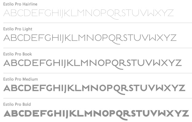 Established in 1994, dstype used to offer free fonts but has gone commercial now. It is run by Dino dos Santos (b. 1971, Oporto) from Oporto, Portugal. He graduated in Graphic Design at ESAD, Matosinhos. He received a Masters degree in Multimedia Arts at FBAUP, Porto. MyFonts place. In 2006 he won the Creative Review Type Design Competition in the Revival/Extension Family. At ATypI 2006 in Lisbon, he spoke about Portuguese lettering since 1700. Interview in 2007. Klingspor link. Author of A Letra Portuguesa, a book about Portuguese calligraphy. Dino created these typefaces:
 - Access (1997).
- Acta, Acta Display and Acta Poster (2011, +Poster swashes). A didone fashion mag family. First designed for Chilean newspaper La Tercera in 2010, DSType's Acta family is a clean information design type system. It includes Acta Symbols, an extensive dingbat family. Acta Var (2020) has two axes, weight and optical size.
- Acto (2012). Acto is a type system designed as the sans serif counterpart of the previous released Acta. Both type families were designed in 2010 for the redesign of the Chilean newspaper La Tercera.
- Andrade Pro (a modern) and Andrade Script Pro: based on the calligraphy of Andrade de Figueiredo, ca. 1722.
- Anubis (2003): a unicase face.
- Aparo (2013). A plumpish elegant high-contrast script face.
- Apice (2022). A highly structured calligraphic typeface with five optical sizes.
- Apud and Apud Display (2010): a high-contrast serif family.
- Aquila (2004).
- Ardina (2016). Done with Pedro Leal, this text typeface family has three optical sizes.
- Boldina (2004). A fat informal poster family with 18 weights and styles.
- Braga (2011, Dino dos Santos and Pedro Leal). This is a layered font design family. Dino writes: Braga is an exuberant baroque typeface, named after a portuguese city, also known as the baroque capital of Portugal. Our latest typographic extravaganza comes with a multitude of fonts designed to work like layers, allowing to insert color, lines, gradients, patterns, baroque, floral swashes, and many other graphic elements. Starting with Braga Base, you can add any of the twenty-three available styles, to create colourful typographic designs.
- A type system from 2014: Breve News, Breve Display, Breve Slab Title, Breve Sans Title, Breve Title, Breve Slab Text, Breve Sans Text, Breve Text. The Breve system includes modern design elements in the skeleton and ball terminals, transional elements, almost wedge-serifs in the serifed styles. As with most of dos Santos's typefaces, even the sans and slab styles exhibit Latin warmth and exuberance.
- Capsa (2008): a family that was inspired by, but is not a revival of the Claude Lamesle types Gros Romain Ordinaire and Saint Augustin Gros Oeil.
- Ception (2001): a futuristic sans family.
- Cimo (2017). A distinguished condensed sans.
- Cultura, and its improved version Cultura New (2013), a text book typeface family.
- Decline (1996).
- Denso (2019). By Dino dos Santos and Pedro Leal: a great condensed variable font with weight, serif and optical size axes.
- Digno (2022). A fuzzy text typeface family.
- Dione (2003): a sans; redone in 2009 as Dobra at TypeTrust. See also Dobra Slab (2009).
- Enorme (2020). Ultra massive and modular 3000-glyph mastodont of a constructivist font, by Pedro Leal and Dino dos Santos.
- Esta (2004-2005): extensive (transitional) text and newsprint family.
- Estilo (2005): a gorgeous and simple art deco-ish geometric headline face. This was accompanied by Estilo Script (2006), Estilo Text (2007, a 6-style rounded sans family), and later, Estilo Pro (2010, +Hairline).
- Ezzo: a sans family.
- Factor (1997).
- Finura (2009): this typeface has hints of University Roman.
- Firme (2014). A geometric sans for corporate use.
- Fragma (2003): squarish techno family.
- Girga (+Italic, +Engraved, +Banner, +Stencil) is a strong black Egyptian family designed in 2012 together with Pedro Leal at DS Type.
- Glosa (2008): Glosa is a meaty multi-style didone family. Glosa Text and Glosa Headline all followed a bit later in 2008, and Glosa Display in 2009.
- Hades (2012). A yummy and free blackletter typeface.
- Hypergrid (2002): octagonal.
- Ines (2015). A classic 7-style text typeface.
- Isento and Isento Slab (2017). Both are loosely based on ATF's Times Gothic.
- Lucius (Sans, Serif) (2022). The Lucius type family began as an attempt to reproduce the Principios Methodicos para as Letras Aldina e Roman---Typo Portuguez, but went went way beyond that in its multi-faceted execution.
- The Quase family (2017): Quase is a very free interpretation of the types found in the Specimen of Printing Types by William Caslon from 1785. We wanted to start with Caslon and then transform it into an editorial typeface, hence the increase of the x-height and the radical reduction of the ascenders and descenders. Subfamilies: Quase Headline (12 styles), Quase Poster, Quase Display, Quase Text.
- Idem and idem Display (2021).
- Dino dos Santos and Pedro Leal published Jules in the summer of 2015---a fat fashion mag didone 45-style family inspired by several plates from Portuguese calligrapher Antonio Jacintho de Araujo; it comes in Big, Colossal and Epic. They followed up in 2017 with Jules Text.
- Kartago (2005): based on Roman inscriptions from Cartago.
- Keiss (2017) and Keiss Text (2021). A Scotch roman with a lot of contrast. Keiss Text comes in twelve styles and features short descenders and ascenders, along with three very distinct optical sizes. It was designed with contemporary newspapers in mind. In 2021, he added Keiss Title, Keiss Condensed, Keiss Big (14 styles) and Keiss Condensed Big.
- Large (1999) and Large Pro (2006).
- In 2020, Dino dos Santos and Pedro Leal designed Larga, which was inspired by the typefaces shown in the specimens of the Fundiçãao Typographica Portuense from 1874. Larga is a wide all caps family and comes with a variable opentype format.
- Leitura, Leitura Headline, Leitura News, Leitura Sans, Leitura Symbols, Leitura Display (2007): the 31 styles were all made in 2007.
- Logica (2016). A classical text typeface.
- Maga (2012). A text family.
- Methodo (2005): calligraphic penman typefaces.
- Missiva (2004).
- Monox and Monox Serif (1998-2000): a monospaced family.
- Ni Sans, Ni Slab, Ni Serif (2018).
- Musee (2006): a transitional family with ornaments and borders.
- Nerva (2004). A subdued Trajan typeface with flaring.
- Nitida (2017). A 114-font family with five optical sizes.
- Nyte (2012). A serifed text family.
- Otite (1995).
- Outside (1996): grunge.
- Parco (2021). A compact headline typeface with large x-height.
- Plexes (2003). See also Plexes Pro (2006).
- Pluma (2005): a series of three exquisite calligraphic flowing scripts called PlumaPrimeyra, PlumaSegunda and PlumaTerceyra). Inspired by the typographic work of Manuel de Andrade de Figueiredo that was published in 1722: "Nova Escola para Aprender a Ler, Escrever e Contar, offerecida a Augusta Magestade do Senhor Dom Jao V, Rey de Portugal".
- Poesis (1999).
- Pratico UI and Pratico Slab UI (2022).
- Prelo (2008): A sans family for magazines, it has styles that include Hairline, Hairline Italic, Extra Light, Extra Light Italic, Light, Light Italic, Book, Book Italic, Medium, Medium Italic, Semi Bold, Semi Bold Italic, Bold, Bold Italic, Extra Bold, Extra Bold Italic, Black, Black Italic, Slab and Prelo Condensed.
- Priva Pro (2006): a sans family that includes Greek and Cyrillic).
- Prumo (2011-2012). A 92-font family originally created for the redesign of the Argentinian newspaper La Nacion. Released to the public in 2013, it covers low and high contrasts, and has slab serif styles as well as Scotch Roman styles. So, it is more a type system or type collection than one single typeface: Prumo Banner, Prumo Deck, Prumo Display, Prumo Poster, Prumo Slab, Prumo Text.
- Quadricula (1998).
- Quaestor and Quaestor Sans (2004). Roman inscriptional typefaces.
- Recita (2019). A sturdy oldstyle text typeface family.
- Resea (2004) and Resea Consensed: Bank Gothic style typefaces.
- Solido (2012) is a versatile type system with five widths: Solido, Solido Constricted, Solido Condensed, Solido Compressed and Solido Compact. In total there are 35 fonts. In 2020, a variable font was added to Solido. Codesigned with Pedro Leal.
- Synuosa (1999): an experimental typeface showing only the top half of the characters.
- Tecla (2018). After Printype, a typeface developed in the early twentieth century for the Oliver Typewriter.
- Terminal (1996).
- Titan and Titan Text (2003).
- User (2012), User Upright (2012), and User Stencil (2012). Monospace type families.
- Velino (2010): an extensive family including Velino Text, Velino, Velino Condensed, Velino Compressed, Velino Poster, Velino Sans, Velino Sans Condensed, Velino Display (+Compressed Display, +Condensed Display). This didone superfamily is sure to win a ton of awards.
- Ventura (2007): based on the calligraphy of Portuguese calligrapher Joaquim José Ventura da Silva, ca. 1802, who wrote Regras methodicas para se aprender a escrever os caracteres das letras Ingleza, Portugueza, Aldina, Romana, Gotica-Italica e Gotica-Germanica in 1820. It had a "Portuguese Script". Do not confuse Ventura with Dieter Steffmann's font by the same name made many years earlier. Ventura won an award at TDC2 2008).
- Viska (2015, by Dino dos Santos and Pedro Leal) is designed for small print.
- Volupia (2005): a connected advertising face.
DS Type also has typefaces by other type designers, such as Pedro Leal. They worked with leading companies, world scale events and well-known design agencies including: Appetite, Banco CTT, Banco Economico, BBDO, CondéNast, CTT Correios de Portugal, Electronic Arts, Errea Communicacion, Erste Bank, ESPN, Expo 2020 Dubai, Fifa World Cup 2018 Russia (the Ducha typeface), Garcia Media, Gatorade, Gruner + Jahr, Hearst, Innovation, King Games, McCann-Erickson, Meredith, Palmer Watson, Pentagram, Sagres, Starbucks, The New York Times (the Nyre typeface), Vox Media and Wolff Olins. View Dino dos Santos's typefaces. DS Type's typeface library. [Google]
[MyFonts]
[More] ⦿
|
DTrooper Foundry
[David Trooper]

|
 Dave Trooper (New Jersey) was associated with the photo type foundry VGC. Almost 40 years later, he set up his own digital type foundry, DTrooper Foundry, which publishes digital versions of his typefaces. Creator of these typefaces:
 - Trooper Roman (1974, VGC), a didone display face. [Klingspor puts the date at 1976] TypeShop made TS Toledo based on this idea, especially Toledo TS-XBold. Another digital clone is Talon (BuyFonts). Infinitype / Softmaker have a set called Toledo. And Nikita Vsesvetsky extended it cyrillically to Troover (SoftUnion, 1994). Dave's own digital font Trooper Roman Bold Display was finished in 2013. The typeface is characterized by the left-leaning "o". In 2020, Jordan Davies published Trooper Roman Black.
- Trooper Grotesque (2010). This too is based on his own VGC font from the 1970s.
- Trooper Jazzerini (2011). An elegant geometric avant-garde typeface with weights from hairline to bold.
[Google]
[MyFonts]
[More] ⦿
|
Edgar Walthert
|
 Type and graphic design pages by Edgar Walthert, b. Sursee, Switzerland. In 2007, he graduated from the TypeMedia program at KABK in Den Haag. Since then he is free-lancing. He completed TazIII in 2008 for Lucas de Groot in Berlin. In 2008, he moved to Amsterdam to work as an independent graphic and type-designer. In Amsterdam, he hosts Letterspace Amsterdam, a monthly series of lectures about experimentation, innovation and research in type. In 2021, he set up Font Spectrum together with Daniel Maarleveld.
 His typefaces include Agile (2007, a sans family done at KABK), Grosse Pläne, Instant Schrift (2000: Redesign of Isonorm 3098 matching the radical restrictions of the Instant design-manual), and Sonic Waves (an experimental typeface that was created for dublab, a radio station based in Los Angeles, and was drawn using sound waves that can actually be played as an audio file). Agile was further developed in 2011 with weights ranging from hairline to fat, and appeared in 2013 as a retail typeface at Incubator / Village. He published the constructed sans typeface family Logical in 2018 at Bold Monday / Type Network. His typefaces at FontSpectrum: - Purple Haze (2021-2022). Purple Haze is an experimental variable typeface with a readable regular weight and decorative dot matrix-themed extremes. The font works best when being animated or interacted with.
His corporate typefaces: - Toneelmakerij typeface by Edgar Walthert in collaboration with Esther de Boer for the identity of the Dutch theater company De Toneelmakerij. Contains many icons.
- Alpen Display and Text (2018), custom typefaces for Bühne Burgäschi by Edgar Walthert. Inspired by classic Swiss tourism posters from the 1930s and '40s. Alpen Display and Alpen Text is currently being further developed and will be released as Arosa Display, Arosa Text and Arosa Script.
- De Patronenmaker typeface. For a website designed by Johannes Verwoerd, Walthert created a variable font based on the open source typeface Publica by Gustavo Ferreira, by pushing its extremes to 0 and 11. The website uses the same 26kb font file for all animations, menu and body text.
- This Is Africa typeface for Ghetto Radio in Nairobi by Edgar Walthert, with Esther de Boer.
[Google]
[More] ⦿
|
EFI Home Page (Educational Fontware)
|
Sells handwriting-fonts designed to exactly replicate many educational handwriting styles. In particular, they have these: - D'Nealian: DN Cursive and DN Manuscript.
- Zaner-Bloser: ZB Manuscript, ZB Cursive, OZ Manuscript, OZ Cursive.
- A Beka: AB Cursive and AB Manuscript, based on the style shown in workbooks developed by A Beka Book, Inc.
- Bob Jones University: CCU Cursive and CCU Manuscript, ugly fonts based on materials copyrighted by Bob Jones University.
- DKL Cursive and DKR Cursive, patterned after the handwriting methods in the workbooks Cursive Writing Skills (Educators Publishing Service, Inc, 31 Smith Place, Cambridge, MA), by Diana Hanbury King.
- Frank Schaffer: FS Classic, FS Contemporary, and FS Manuscript, developed using materials copyrighted by Frank Schaffer Publishing.
- Getty-Dubay Italic: GDI Basic, GDI Combined, and GDI Cursive, a handwriting method developed by Barbara M. Getty and Inga S. Dubay at Portland State University, Continuing Education Press. EFI worked with Getty and Dubay to develop its GDI fonts.
- Handwriting Without Tears: HWT Cursive and HWT Manuscript, pretty upright cursives and a hairline geometric sans. Handwriting Without Tears is a registered trademarked of Jan Z. Olsen.
- Harcourt Brace: HB Cursive and HB Manuscript.
- Loops and Groups: LG Cursive, based on the handwriting samples in the copyrighted Instructor's Manual Loops and Other Groups---A Kinesthetic Writing System by Mary Benbow.
- McDougal, Littell: McD Cursive and McD Manuscript, based on materials copyrighted by McDougal, Littell&Company.
- Palmer: Palmer Manuscript (simple hairline sans), Vintage Palmer and New Palmer, which include several variations of the cursive handwriting style that constitute the Palmer Method. Vintage Palmer is based on a 1923 workbook, and New Palmer on a 1987 workbook.
- Pentime: PT Cursive and PT Manuscript, developed for use by the Amish communities, through workbooks rather than directly with computers. The fonts were created for JKL Services, who use the fonts to produce handwriting materials for the Amish community.
- Peterson Directed Handwriting: PM Cursive, PM Block, and PM Slant.
- Queensland: QM Cursive and QBA Manuscript, based on samples from workbooks by Horowitz Martin Education.
- Russian: RU Cursive and Manuscript families (9 fonts) for Cyrillic.
- Seattle School District: SSD Cursive and SSD Printscript, based on handwriting samples and methods developed by Patricia Heller and Elaine M. Aoki for the Seattle Public Schools. samples were found in a 1993 K-5 handwriting manual called Write It Right (Seattle Public Schools).
- Steck Vaughn: SV Cursive and SV Manuscript, developed using materials copyrighted by Steck Vaughn Company.
- Specialty Fonts: four Ball-and-stick and Dashes fonts, Braille 24 and Braille 24 Hollow, Clocks, EFI Count Dots on Numbers, EFI Direct Instruction, EFI Music Symbols, Emo-faces, Fingerletters (for American Sign Language), Lettersound Pictures, Morse Code, Phonetics Phont, POSTNET-16.
[Google]
[More] ⦿
|
Efpni
|
Creator of the hairline sans typeface CNClines (2000). [Google]
[More] ⦿
|
Eiichi Kono
|
 Japanese type designer. He started out in the photo optical industry in Tokyo with Carl Zeiss and American Optical. He studied type design at the London College of Printing and the Royal College of Art. From 1979 until 1985 he worked at the graphic design firm Banks&Miles in London. There he redesigned Johnston Underground Sans for text setting as well as display use, now known as New Johnston, and carried out a feasibility study for space saving and legibility for the BT telephone directory, proving that Matthew Carter's Bell Centennial was the best suited typeface for the purpose. He also taught typography at Middlesex Polytechnic between 1980 and 1988. With Matthew Carter, he developed the full Roman and kanji OpenType font family Meiryo (2004), as part of Microsoft's ClearType project. Other participants on this project included Takeharu Suzuki of C&G and Yukiko Ueda. Meiryo won the Tokyo TDC 2007 award. He is currently a senior research fellow at University of Brighton, leading research into Edward Johnston's legacy. From 2015 until 2016, he is president of Double Crown Club in London, a dining club and society of printers, publishers, book designers and illustrators in London that was founded in the 1920s.
 At ATypI 2007 in Brighton, he spoke about Sustainability and typography. In 2012, he designed CC Art Sans for CCA Kitakyushu. With Lida Lopes Cardozo, he designed Kindersley Street Italic, a typeface created to accompany Kindersley Street (2005), which in turn is a revival of David Kindersley's MoT Serif (1952). In 2020, he published LDN Kono and LDN Kono Hairline at London Type. LDN Kono is a clean humanist sans family originally designed by Eiichi Kono for the Center for Contemporary Art Kitakyushu under the name CCAArt Sans. [Google]
[More] ⦿
|
Eike Dingler
[Mauve Type]

|
[MyFonts]
[More] ⦿
|
Elí Castellanos Chávez
[Cocijotype]

|
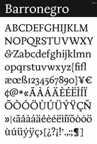 [MyFonts]
[More] ⦿
|
Elizabeth Kate Hartley
[Lizzy Hartley Design]

|
[MyFonts]
[More] ⦿
|
Elliott Amblard

|
 Elliott graduated in graphic design at EPSAA (Ecole Professionnelle Supérieure d'Arts Graphiques et d'Architecture de la ville de Paris, France) in 2012.
 Together, Elliott Amblard (France) and Gia Tran created the bold signage / retro baseball script typeface Paname FY at FontYou in 2014. At Long Type, he created Oradour: Inspired by french vernacular lettering, it is also a very contemporary re-interpretation of Eurostile typeface (Aldo Novarese) by stripping it from this dated aesthetic. FontYou link. In the TypeMedia program at KABK in Den Haag, he designed Emil for his graduation in 2015. Emil is situated between a text typeface and a slab serif typeface. It is characterized by convex stems and low contrast and includes a Hairline weight. In 2016, he published Yuzu at Indian Type Foundry. It is a simple yet effective straight rounded sans typeface family. Guide (2016), also published by Indian Type Foundry, is a wayfinding and traffic sign sans typeface family. In 2017, Elliott Amblard and Théo Guillard designed Read Greek Condensed, which won an award at TDC Typeface Design 2018. In 2018, Elliott Amblard and Jérémie Hornus co-designed the information design humanist sans typeface family Drive. It is accompanied by the more typewriter-styles families Drive Mono and Drive Prop, and published by Black Foundry. Angus (2018) is a multiplexed rounded sans typeface family by Elliott Amblard that includes a variable font. [Google]
[MyFonts]
[More] ⦿
|
Emilio Ignozza
|
 Roman designer at FontStruct in 2008 of Mango (ultra fat, rounded), Doodeka (dodecahedron-themed letters---sublime!), Culdesac, Candelabra, Legorama, Legorama Everywhere Fill, Legorama Everywhere, Legorama Fill, Magnetor (shadow outline face), Thuring (athletic lettering), Monkey Pizzazz (pixelized monkeys), Escaptionist (pixel face), Dioptical (optical illusions face), allurium, allurium_welded, avinguda (an octagonal face), Avinguda Light, Myopia, Fast Pussycat, Roboro (techno), Monkey Pizzaz (monkey dings), Solari Platform, avinguda_jagged, beamo (monoline sans, a take on Franklin Gothic), beamo_outline, beamo_pixel, conformista_1, hairdo, minimalia, minimalia_noon, minimalia_rounded, sherif_1, yvette ("a fat font with a belly button), Hairdo, Bee Legacy (blackletter glyphs encased in hexagons), Legorama. He also made the beautiful hairline squarish typeface Les Bains (2008) which is based on the lettering used for the signs in Les Bains des Docks, by French architect Jean Nouvel.
 Additions in 2009: Chauncey, Sixto (ultra fat octagonal typeface made at FontStruct; obese geometry in his own words), Proclama (a cold war font), Lamina. Fonts from 2010: Bromance (upright connected script), Oliva (open typeface style), Podio (3d), Thuring (athletic lettering), Budino and Budino Kiri (fat counterless), Escaptionist (pixel), Riba (2010, a ribbon font). Fonts from 2011: Arancito (upright connected script). Home page at House 42. Behance link. [Google]
[More] ⦿
|
Emily Conners
[Emily Lime Design]

|
 [MyFonts]
[More] ⦿
|
Emily F
|
Student at Saginaw Valley State University (MI). In 2012, she created the free dymo label typeface family Goonberry and the hairline typeface Demure Fleur. Fontspace link. Dafont link. [Google]
[More] ⦿
|
Emily Lime Design
[Emily Conners]

|
 Emily Conners (Emily Lime Design, Greenville, SC) has a BS in Biology from the University of South Carolina. Based in Atlanta, GA, she specializes in capricious scripts. Her typefaces include:
 Old home page. Some fonts or subsets of fonts can be had for free at Fontspace and Dafont. MyFonts interview in June 2012, with this introductory paragraph: We've seen a few meteoric careers on MyFonts before, but the dazzling feats accomplished by the one-woman foundry called Emily Lime has left us seriously in awe. Based in Greenville, SC, this brand new font company managed to score one best-seller after another these past six months. The energetic Southern Belle in charge of the operation has made fonts in a range of styles, but capricious scripts are what she does best. Her peacefully named Bombshell Pro is at the top of our Hot New Fonts list as we speak. And while her alphabets are nonchalant and untamed, the underlying font technology is smart and nifty. Meet Emily Conners, a newcomer with a punch. [Google]
[MyFonts]
[More] ⦿
|
Emraan Mayow
|
 Graduate of Birmingham Metropolitan College. London (was: Birmingham), UK-based designer of Kronen (a free monospaced typeface family), Bolde (2013), a sans titling face. The octagonal hipster typeface Ontwerp (2013) was a school project at Birmingham Metropolitan College. Emraan also designed the hairline sans caps typeface Ava (2013, avant-garde) and Sanotra (2013, an alchemic / hispter typeface). [Google]
[More] ⦿
|
Enguun Ochirbat
|
Graphic designer in Ulaanbaatar, Mongolia. In 2012, he created the geometric Latin hairline typeface Circles. [Google]
[More] ⦿
|
Etcetera Type Company (or: ETC; was: Finck Font Co)
[Tyler Finck]

|
 Graphic designer and musician (b. 1982) at the New York studio AWP who grew up in Maine and is currently based in Ithaca, NY. In 2018, he founded Etcetera Type Company, which is based in Spencer, NY.
 His typefaces: - The fat counterless caps typefaces Blackout and Blackout Midnight (2008). Blackout Sunrise (2013) is an outlined face and Blackout 2am is a reversed font. Blackout Noon followed in 2014. Free download of Blackout at the League of Movable Type.
- Ostrich Sans (2011). This typeface comes in many weights, including a beautiful Ostrich Sans Inline and a hairline. In 2016, this was followed by the layered monoline sans typeface family Ostrich Proper (+Inline).
- Knewave (2011, Google Web Fonts). A brush signage face. League of Movable Type link.
- Porter Sans (2013). A large wide headline type family. It has a free inline outline weight. Later additions include Porter Sans Ink (2014) and Porter Rough (2016). Porter FT, which includes new rounded styles, was added in 2017.
- Elm (2013). Hand-printed.
- Lickety Split (2013). A crayon or brush face.
- Almost (2013). A poster typeface.
- Guilder (2011-2013). A free typeface family with an inline thrown in.
- Ithaca Sans (2013).
- Fartlek Sans (2014). A handcrafted poster typeface.
- Katahdin (2014). A free font.
- Upstater (2014). A a classical American gothic with shaded and layered styles.
- Grandstander (2014). A comic book face. Grandstander Classic (2017). In 2020, Grandstander became a free Google font---and a two-axis variable font was added for the occasion.
- Boo City (2014). A pixel face.
- Didactic Display (2014). A grungy typeface.
- Upstater Ink (2014). A grungy typeface.
- Finck32A (2014).
- Saturnight (2014). A heavy brush typeface.
- Typocopia (2014). A letterpress emulation typeface.
- Taurus Mono (2014). An outline font.
- Southpaw (2014). A nice informal hand.
- Chawp (2014). A crayon face.
- Mr. Brunch (2014). A brush face.
- Gluten FT (2014).
- Flabbergast (2015). A didone.
- Korsque (2015). A layered typeface.
- Bico (2015). A rounded condensed organic typeface.
- Ichabod (2016). An antiqued serif typeface.
- Altitude Condensed (2016).
- Imbue (2016). A condensed didone poster typeface (also called a skyline typeface) at Google Fonts. See also Imbue FT (2017). ETC Imbue (2019) is a variable font version of Imbue with a variation in optical size from Text to Display.
- Retrograde (2016). A monoline and monospaced organic sans.
- Plainview (2016). A squarish and fat typeface.
- Nonesuch (2016). A condensed sans.
- Juju (2016). An octagonal layered typeface family.
- Atiga (2017).
- Mr Brunch FT (2017). A children's book font.
- League Mono (2017). A free font.
- ETC Gluten (2018). An organic font family.
- ETC Epilogue (2018). A variable sans font. Github link. Google Fonts link. Prologue (2020) is a reworking of ETC Epilogue.
- ETC Anybody (2018-2020). A 72-style variable font with weight, width and slant axes. Free at Google Fonts. He writes: Anybody is a big family that combines an affinity for Eurostile plus a heavy dose of 90s inspiration. It's flexible enough to adapt to a variety of situations. From UltraCondensed to ExtraExpanded, type set in Anybody can take up a tiny amount of horizontal space or so much space that you'll need several lines. Its high x-height and low cap height help exaggerate extreme widths and weights. Github link.
- Furrow (2018). A grungy sans.
- Cease (2018). A squarish techno typeface.
- ETC Trispace (2019). A variable font with weight and width axes, based on League Mono.
- ETC Tourney (2019). A variable octagonal font, playing on the theme of outline versus inline. Free Google Fonts download (2020-2021). Github link.
- Struthio (2019). A rounded sans.
- Birdo (2020). An inline typeface.
- Gluten (2021). A free script font family at Google Fonts.
Alternate URL, called The League of Movable Type. Typedia link. Kernest link. League of Movable Type link. Creative Market link, Klingspor link. Dafont link. Home page. Creative Market link. Abstract Fonts link. Google Plus link. YWFT link. Old home page. Behance link. Github link. [Google]
[MyFonts]
[More] ⦿
|
Eugene Moklyak
|
A designer in Moscow who created a hairline Cyrillic didone typeface called Apple (2011). In 2006, he graduated from the Faculty of Design and Fashion. [Google]
[More] ⦿
|
Eugenia Tiurikova
|
 Inspiring graphic design talent in Moscow. During her studies at the British School of Arts and Design in Moscow, she created the hairline Latin / Cyrillic display typefaces Folio (2015) and Liquid Secession (2015). [Google]
[More] ⦿
|
Eurieas
[Raafi Hilmi]
|
Tangerang Selatan, Indonesia-based designer (b. 2001) of these typefaces in 2020: Nevalex, Tanpax, Deathay (a hairline sans), With Best Mate, Atmosperunda, Ratoon Land, Sea Afternoon (hand-printed), Banned Key (calligraphic), Comuc (bold, handcrafted) and Geometri Outline. [Google]
[More] ⦿
|
Exljbris
[Jos Buivenga]

|
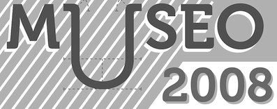 Jos Buivenga (exljbris; b. Assen, 1965) is the Arnhem-based Dutch artist who designed some of the most popular fonts of 2010-2011. MyFonts interview in 2009. Speaker at ATypI 2010 in Dublin. His oeuvre:
 - Anivers (2007). The regular weight is free.
- Calluna (2009). A garalde in 8 styles, one of which is free but the others are not---see Fontsquirrel. Calluna Sans (2010).
- The sans family Delicious (1994-1996). A free face. See also here. He is working on this and DeliciousX.
- Diavlo (2007). A free sharp-edged sans opentype face.
- Fertigo (2006) and Fertigo Pro (2008). A lively organic display text type.
- Fontin (2007: a free miniserifed family).
- His masterpiece from 2010 is the Geotica family, which runs the gamut of art deco styles and includes inline blackboard bold styles.
- Museo (2008, a 5-style slab serif), Museo Sans (2008; 2 free and 8 non-free styles), Museo Sans Rounded (2011), Museo Slab (2009). In 2012, he added Museo Sans Condensed and Museo Cyrillic. Museo Sans Display received five new weights from Hairline to Extra Black in 2014. In 2021, he added Museo Slab Rounded (12 styles). From about 2009 until 2014, the Museo family was one of the best-selling typefaces in the world.
- In 2010, Martin Majoor and Jos Buivenga started work on Questa Sans (a typeface with a special y) as part of their Questa project. Questa is a squarish Didot-like font that Jos originally had planned in one display style only. It turned out to be a perfect basis to apply upon Martin's type design philosophy about the form principle of serif and sans. Questa was finished in 2014 and now includes Questa Sans, Questa Serif, Questa Slab and Questa Grande. Fontsquirrel link.
- Tallys (2008). A serif with tall ascenders.
- Tenso (2013). A lively humanist sans family. Tenso Regular is free. Followed in 2022 by Tenso Slab.
Special Museo posters have been created, such as by Jasmine Lockwood (2012), Laurellie Pacussich (2013) and Larisa Mamanova (2012). In 2021, he released Antona (a 16-style geometric sans). Klingspor link. Old personal home page. Abstract Fonts link. View Jos Buivenga's typefaces. Adobe link. [Google]
[MyFonts]
[More] ⦿
|
Explogos
[Steve Gardner]

|
 Suffolk, UK-based creator of many free typefaces. Designer of the free sans typefaces Smiley (2013, a hairline circle-based sans), Larke Sans (2013), Statement (2013), Formation Sans (2013) and Creativ Zoo (2013, +Serif), and the free serif typefaces Formation Serif (2013) and Edmundsbury Serif (2013), and its sans companion Edmundsbury (2013). As Cute As (2013) is a hand-drawn typeface.
 Typefaces from 2014: Larke Neue (sans family), Explogos (a free organic sans typeface, and a 778-glyph commercial extension that covers, e.g., Greek and Cyrillic besides all Latin-based European languages), Squarea (squarish), Cirqua (circle-based sans), Chapaza (transitional text typeface, +Italic), Plateia (a sans typeface for Latin, Greek and Cyrillic), Coughy Machine, Kalypsa (free sans with 2300 glyphs and coverage of Basic Latin, Latin-1 Supplement, Latin Extended-A, Latin Extended-B, IPA Extensions, Spacing Modifying Letters, Combining Diacritical Marks, Greek & Coptic, Cyrillic, Cyrillic Supplement, Latin Extended Additional, Greek Extended, General Punctuation, Superscripts & Subscripts, Currency Symbols, Letterlike Symbols, Number Forms, Mathematical Operators, Coptic), As Cute as Comic, UFont Sans Medium, Bedric's Worth, Pragma Sans, Bold As Cute As, As Cute As Comic. Typefaces from 2015: Tretton, Baqacents (sic), Reformation Sans. Typefaces from 2016: Tretton Serif, Qaranta Bold. Typefaces from 2018: Calamity Wayne (a reverse-contrast slab serif for Latin, Greek and Cyrillic, inspired by the wild west French Clarendons and Italians of the late-1800s). Typefaces from 2022: Caliventa (a flared angular text typeface). [Google]
[MyFonts]
[More] ⦿
|
Faberfonts
[Frank Béla]

|
 Frank Béla (b. 1978, Orosháza, Hungary) is a graphic design student at Krea Art School in Budapest who uses the pseudonym Fabergraph. Home page. Blog. In 2010, he started out commercially as Faberfonts. Dafont link. Behance link. Klingspor link.
 He created the ink trap font Portrait Of A Lady (2009), FR Irisz (2009, didone family), Pontifex (2009), the hand-printed Munkácsy 1120 (2009), the unicase Reka Sans (2009), the thick-thin Azur (2009), the simple sans Babyface (2009), the medieval sorcery font Elmulas (2009), the Valentine;s Day font Sapet (2009), the avant garde sans family Hopper Sans (2009) and the ultra-fat typeface Rendezvous (2009). Callimachos (2009) is a fun triple-lined hand-printed headline typeface (with a Cyrillic version added in). Azur Title Font (2009) is a hairline slabbed typewriter type. Pasta Simpla (2009, followed by FR Pasta Mono in 2010) is another experimental jewel. Hobbista (2009) mixes symbols and glyphs. FR Rama Nous (2009) is a free modular font. In 2009, he also made Arrow, Enamel Paint Type, Belonging (Roman caps). Commercial fonts made in 2010: FR Unalom, FR Sniccer (stencil), FR Ceruza, FR Minta (a dingbat typeface to make labyrinthine patterns; +Two), FR Tabula (beveled face), FR Smaragdina, FR Mintry One and Two (pattern fonts), and a custom alphabet for Esquire Russia, FR Hopper (monoline sans family). Activity in 2011: A didone-inspired typeface called MFA Dagi that was was commissioned for a catalog of an exhibition at The Museum of Fine Arts (Budapest, Hungary). [Google]
[MyFonts]
[More] ⦿
|
Fabrizio Schiavi
[Fabrizio Schiavi Design (or: FSD)]

|
 [MyFonts]
[More] ⦿
|
Fabrizio Schiavi Design (or: FSD)
[Fabrizio Schiavi]

|
 Fabrizio Schiavi was born in Ponte dell'Olio in the Piacenza province in 1971. FSD Fabrizio Schiavi Design in Piacenza was opened in 1998. With Alessio Leonardi, he co-founded Fontology. He also co-launched the experimental graphics magazine Climax in 1994.
 Bio at FontFont where he made FF Mode 01, FF 0069, FF GeabOil, FF9600, FF Trade 01, FF Steel Mix, FF Steel Ring, FF Steel Jones. [T-26] designer of D44 (1994), Lithium (1994, dingbats), Moore895 (1994), Moore899 (1994), Sidewalker (1994), Exit (1988). Many of his typefaces are grungy such as Washed (1994). Some are minimalist, such as Monica Due (1999), Monica (1999), and Eco (2001, developed from a logo in the 70s for Ageco). The latter three fonts are very geometric in nature. Other fonts: Washed (1994), Parakalein, Aurora Nintendo (1995), Aurora CW (1995), Mode01 (1995), GeabOil (1995), 9600/0069 (1995), Fontology (1995), CP Company (2000: a corporate sans), FSDItems (2001), FSDforMantraVibes (2001), Pragmata (2001, monospace, designed for programs), PragmataFlash (2002, a pixel font), Pragmata Pro (2011, still monospaced), Sys (2002), SysFlash (2002, a pixel font), Sys 2.0 (2012, a condensed sans designed for very small print), Virna (2003, a multiline typeface for Italian MTV, discussed here). The Pragmata and Sys series were optimized for screen usage. In addition, Sys has many ink traps, so it prints well at small sizes, and is more legible than Verdana. He does some custom typeface design, such as the innovative sans serif family called CP Company (2000). Other clients include Al Hamra Complex Kuwait, Nike, MTV, YU, Beretta, Abitare magazine, Ferrari and Philip Morris. In 2007, he produced a stencil and signage font, Siruca (see also here), for the Al Hamra Complex, one of highest skyscrapers in the world, located in Kuwait. Siruca Pictograms (2008) is free. In 2015, he followed that up by a non-stencil rounded sans called Sirucanorm: Designed using golden ratio formulas, it's inspired to DIN and Isonorm typeface. In 2013, he published Sys Falso, Abitare Sans (30 weights, originally commissioned by the group Rizzoli Corriere della Sera. Abitare is an Italian magazine). Typefaces from 2014: Nove (a German expressionist typeface inspired by B movie typography: Nove freshly reworks exploitation film era movie poster lettering, refitting the genre to a contemporary audience. The expressive typeface was done for a Nike Italy spoof campaign featuring 1970s cult film director Enzo Castellari and a recently found film reel from his archives, featuring several current Italian athletes and American basketball star Kobe Bryant). The rounded sans typeface Widiba Bank (2015) was co-designed with Jekyll & Hyde in 2015 for the brand identity of the new bank of Gruppo Monte dei Paschi di Siena. In 2016, he designed the custom corporate typeface R&M in art nouveau style. In 2020, he released the (variable) retail version of CP Company called oook. In 2021, he released Nure (a 54-style sans font family that includes a three-axis (weight, optical, width) variable font). At ATypI in Rome in 2002, he spoke about the need for more fonts. Hellofont link. FontShop link. Font Squirrel link. Showcase of Fabrizio Schiavi's typefaces. [Google]
[MyFonts]
[More] ⦿
|
Face Type
[Marcus Sterz]

|
 Austrian foundry located in Vienna, est. in 2008 by Marcus Sterz (b. 1971) and Andrej Waldegg. MyFonts link. Unless exlicitly mentioned, all typefaces are by Marcus Sterz. You Work For Them link.
 - Adria Grotesk (2013). This was followed by Adria Slab (2014).
- Aldrans (2009, minimal sans).
- Anymals (2008) is one of my favorites: it has dingbats of imaginary undersea monsters.
- Asimov (2009). What is this?
- Baustelle Thin (2009, hairline sans).
- Bikra (2010, Plain and Stencil).
- Blitzplakat (2009). A poster face, white on black.
- Darjeeling (2010) is a display family inspired by both Optima and Bodoni.
- Doll (2008), Dollbats (2008).
- Flint (2008). A hand-drawn squarish face.
- Gerber (2009, pixel face).
- Grafinc (2009). An ultra fat art deco. See also Grafinc Rounded.
- Hausbau (2009, experimental).
- Idrans Medium (2010). A poster face.
- With Georg Herold-Wildfellner, he created the Victorian family Ivory in 2009.
- Letterpress (2009) is an experimental grungy family in which he mixes glyphs of three classics, Jakob Erbar's Phosphor (Ludwig&Mayer Foundry, ca. 1923), Aurora (1912, Johannes Wagner Foundry) and Permanent Headline or simply Headline (Karlgeorg Hoefer).
- Lignette Script (2011) is an extensive loopy monoline script font.
- Loki (2009). A decorative pixel family.
- The Marlowe family (2010) is pure art deco elegance---a play on geometric forms and elegance. Subfamilies include Marlowe Cocktail and Marlowe Swirl.
- Moki (2011).
- Mono Lisa (2020) by Marcus Sterz, in collaboration with programming experts Andrey Okonetchnikov and Juho Vepsäläinen. A commercial programming font to compete with Fira Code, Source Code, and Jetbrains Mono.
- Motto (2009). An art deco typeface in the style of the Italian Futurismo of the 1920s, designed for using with two colors.
- Mouse (2008-2009, pixel), Mousedings (2008).
- Newcastle (2014).
- Notdef (2009). A strange experiment.
- The handwriting typeface Palma (2008).
- Pinback (2009, techno).
- Plaquette (2018). A collection of retro typefaces ranging from Victorian to Bauhaus to the sixties.
- Publica Sans (2016). A clean geometric sans typeface family. Publica Play (2016) is a playful, and even more organic, sans that exploits many OpenType features. Publica Slab (2017) and Publica Sans Round (2021) complete the collection.
- Scrap Outline (2008).
- Slug (2009). A geometric typeface made for bicoloring.
- Status (2009, super fat art deco).
- Strangelove Next and Strangelove Next Slab (2010). This beautiful typeface was inspired by Stanley Kubrick's movie Dr. Strangelove. The original titles were designed by Pablo Ferro, who is one of the most acclaimed film title designers, especially famous for his hand-drawn lettering. Dr. Strangelove is a hairline face.
- Substance (2013). A sans family.
- Wenzel (2009). Handprinted.
Facetype's typeface library. See also here. View Marcus Sterz's typefaces. Klingspor link. Behance link. Fontspring link. [Google]
[MyFonts]
[More] ⦿
|
Facu Rodriguez Ramos
|
Blanes, Spain-based designer of the modular typeface Nevermind (2018) and the minimalist hairline sans typeface Palomera (2018). [Google]
[More] ⦿
|
Federico Parra
[Monograma (Typelapse)]

|
[MyFonts]
[More] ⦿
|
Felipe Leite
|
Designer of the free hairline typeface To Whom It May Concern (2015). [Google]
[More] ⦿
|
Felippe Duque

|
Codesigner with Alexandre Venancio of the Thai simulation typeface Thaitype (2009, Oporto Design). With Alexandre Venancio and Cristiano Vinciprova, he made the hairline art deco typeface Capa (2009, Oporto Design). [Google]
[MyFonts]
[More] ⦿
|
Felix Hinnemann
|
German designer (b. 1988) who made Felix Hand (2009) and Across The Stars (2009, hairline sans). [Google]
[More] ⦿
|
Felix Summ
|
During his studies, Newtown, CT-based Felix Summ designed the hairline avant garde typeface Helios (2017) and the tattoo typeface Greaves (2017). Behance link. [Google]
[More] ⦿
|
Ferianto Aryo N
|
Indonesian designer of the hairline avant-garde typeface Dont Buy Stuff (2016). [Google]
[More] ⦿
|
Fidel Peugeot
[Fontdesign by Fidel Peugeot]

|
[MyFonts]
[More] ⦿
|
Finn Hanberg
[Hanson Method]
|
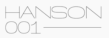 [More] ⦿
|
Flavia Amaral
|
Graphic design student at UEMG in Belo Horizonte, Brazil. During her studies in 2012, she designed the hairline typeface Skinny Heels. [Google]
[More] ⦿
|
Flavia Zimbardi
[Zimbardi (was: Zimbardi Calomino)]
|
[More] ⦿
|
Flop Design
[Kato Masashi]
|
 Japanese site with original fonts by Kato Masashi (b. 1973), who lives in Takasaki (Gunma prefecture, Japan): Parismatch (2004), SAKUalp (2000, handwriting), Steeltype, Broadband, Hivision, Cinematime, Ultracomic, Ice Cream, Be Happy, Summer Beauty, Flyermix, Cheerscript, Breakstyle, Breakfont, Round, H-Five, Natsucomi, Long Vacation, Lovers, Breakfont (2003, graffiti style), Pokkaman, BeHappy, Natsucomi, Momolcan, Seasons Dings, Electron, Round, Lovers, FlyerMix (fifties style), CheerScript (comic book style), Hi-Five (pixel font), Summer Beauty, SummerDrive, White Day, Long Vacation, Amayadori (high contrast kana font), Fuyucomi, Icecream, Pickett, 321, Pingpong, Frontline, Ginza, Yago (nice free dings), Polaris, 321eng, 321kana, APPLE, CLIQUE, Clover (kitchen tile font, 1998), DIGI, Eneneng, Enenhira, FDalp, FDwhie, Hnoodle, Hanko (free black on white stamp font, 1998, see also here), MKCuer, MOOGIRLALP, MOOMILKKANA, Noodle, Origami, Pers, SA0kmh, SA100kmh, SA50kmh, SK0kmh, SK100kmh, SK50kmh, Template6, Tenten, Ami Font, Speedfont, Supercar, Sakura, Regoty, Shopping Famiry, Ticket, Yohic, Recording, Akachan, Wafont, Frontbit7, MusicNetwork, Yakitori (free handwriting font), Ticket, Folkdance (pixelized people), Human Building (dings of famous buildings), Bunny (free), Frontline0, Side5 (pixel font), Side6, Side7. Some pixel fonts, many techno fonts, some kana fonts, and the Japanese kids dingbat font, Folkdance. Some fonts, such as his Latin/Japano font ShoppingFamily (1998), are sold by Font Pavilion. Major Japanese free font links.
 In 1999, he published the AMI screen pixel font series in Digitalogue's DPI72 package. Other commercial fonts: Pine Apple, the WM family, Cutie Girl, Astratic, PictPlasma, Minivan, Frontbit 7, Ginza, Zoological. Free fonts as of 2007: Aiko, a 4-weight rounded sans with support for Latin and kana (see also here). Fonts made in 2007-2008: MobileDisco, AbbeyRoad-Alternative, HighwayStar, Kompakt, AbbeyRoad, Prefuse, Readymade (didone inspired by Corvinus and Giorgio). Additions in 2009: Kanna W4, Sweet Doughnuts (rounded sans). Fonts made between 1998 and 2008: 321, AirExpress, AirTickt, AMAYADORI, AMIFONT, APPLE, ASTRA, AYANO, BeHappy, bitneon, BORDER7, BREAKFONT, BroadBand, BUNNY, CALENDER, CheerScript, CinemaTime, CLIQUE, CLOVER, CutieGirl, Departure, DIGIT, ELECTRON, FlyerMix, FolkDance, FOLKDANCE2, FrontBit, FRONTLINE, FRONTLINE01, FUYUCOMI, GINZA, HANKO, HappyEnd, hiFive, HumanBuild, IceCream, ICHIGO, JAPON2, KAKIZOME, KEYMODE, LabLife, LongVacation, LoversMINIMONO, MKCUTTER, MOMOKAN, MooFont, MusicNet, NATSUCOMI, Nenga, Noodele, OnePiece, oneBox, Origami, ParisMatch, Pers, Pickett, PICTdings, PictPlasma, PineApple, PingPong, pokkaman, Polaris, PopStar, Puzzle, Recoya, REGO, ROUND, SAKURA, SAMACAN, Seazons, Shopping, SIDE5, SIDE51byte, SIDE6, SIDE61byte, SIDE7, SPEED, STAMPER, SteelType, SummerBeauty, SummerDrive, SuperCar, Template5, TenTen, Ticket2, UltraComic, WHITEday, Yabako, Yago, Yakitori (handwriting of Mayumi Kakegawa), Yothic, Zoological, Nippondings, Caredings, TraficSignsWLD, TraficSigns, JPN, Kamondings, Kamondings2, Kurashidings, Okonomi, FunnyFace, Hotsuma, Toyokuni, Constellation, SunnyDay, BOXdings, Machinedings, CLICKdings, Berrys, Container Box, Twinkleline, Minivan, Akachan. Dingbats: Kurashidings, IchigoC, TraficsignsWLD, TraficsignJPN, Nenga, Kamondings2, Kamondings, Breakstyle, Pictdings, Zoological, Caredings, Clickdings, Funnyface, seasons, Pictplasma, Humanbuilding, Nippondings, Yago, Boxdings, Toyokuni, Constellation (astrological symbols), Machinedings, Hotsuma, Folkdance, Calender. Japanaese handwriting fonts: Aiko, Haruka, Syuntaro, YUKI, Ryunosuke. Futuristic/ geometric fonts: MobileDisco, AbbeyRoad-Alternative, HighwayStar, Kompakt, AbbeyRoad, Prefuse. "Funny" fonts: IchigoR, Ultracomic, Amayadori, Parismatch, hanko, LongVacation, Cinamatime, Natsucomi, Okonomi, IceCream, Yakitori, Cutiegirl, Monokan Wa, Shopping, Lovers, Fuyucomi, Berrys, Akachan, Bunny, Clover, Pokkaman, Pickett, Electron. Cool fonts: Sunnyday, HiVision AirTicket, Lablife, Flyermix, Popstar, AirExpress, Broadband, Recording, Breakfont, Frontline, Ami, Minivan, Side5, Side6, Summerdrive, Digit, Supercar, Frontline00, BeHappy, Steeltype, Onepiece, Puzzle, Astlatic, Stamper. Download page of their free silhouette dingbat images. In 2014, they created the free art deco typeface Jazzkissa. In 2018, they published the full CJK font Soukou Mincho (by Ken Lunde and Masataka Hattori) at Fontsquirrel for free download. Dafont link. Abstract Fonts link. Fontspace link. Direct access. Alternate URL for free stuff. And another URL. Klingspor link. Fontsquirrel link. [Google]
[More] ⦿
|
Font Monger
[Chris Vile]
|
 Chris Vile (Fontmonger, Austin, TX) is a type and graphic designer and web developer, who was briefly located in Chicago. He specializes in horror, graffiti, grunge and brush fonts.
 Creator of Cannibal (2012, scratchy hand), Die Already (grungy caps), The Dead Saloon (2012, Western caps face), the scratchy scary typeface Dead Bitch (2012), the athletic lettering typeface No Honor Roll (2012), the grungy Redux (2012), Konquer (2012), Sandy Ravage (2012), and Digital Anarchy (2012), the blood drip typefaces Spiked (2012) and XSpiked (2012), and the brushed typeface GwizsK (2012). In 2013, he designed The Five One Two (graffiti font), Skidmarked (graffiti font), There Be Monsters, Digital Disorder (a textured typeface), We Are Depraved, The Dead Are Coming (grunge), Barbaric, Welcome To Texas (graffiti font), Chopper City (a spurred constructivist typeface), Maya Rose (a script face), Chaos and Pain (a tattoo font), Abandon (grungy poster face), Virtual Bliss, and Pale Horse (a dagger font), Malevolentz (grungy caps), Shrapnel (grungy caps). In 2014, he created Turnt Up (graffiti font), Grind Mafia, No Hard Evidence (glass scratch typeface), Techno Wanker, Abduco (grunge), Blackhead, Summon The Executioner (grunge), The Grinder (eerie font), Normal Sometimes (rounded sans), November Mornings, One More Day, Waukegan Hustle, Thoughts of Her, All Cracked Out, Redux, Cook County Jailhouse, Ol Skool (graffiti font), Why So Serious (grunge), Never Speak Of, Taco Truck Militia, Reason to see evil, Reaching for heaven, Digital Firebomb, Gas Mask Warriors, Necrotype, The Deadliest Saloon, The Decompozed, Necro Monger, Self Righteousness (grunge face), Rasterized (brush face), Some Devil Faces, Flowers For You, Dirtgrub Graffiti, M Ponderosa (letterpress typeface), Dr. Toboggan, Midnite Hour. Typefaces from 2015: Thoughts of Her, Any Takers, Men of Nihilist, Rise Inside, Ugly Kids, Mya Papaya, The Unknown, Shun Set, Chops Chops, My Funeral, Blood Lust (dripping blood font), Middle Schooler, Hood Rich, Tequila Sunset, Hire a Cowboy, Tequila Sunrise, Cynical Hills (spurred eroded vintage typeface), Make them suffer (grungy letters), Gristled, Dark Waters, Poison Hope, Code Predators (grungy and squarish), Oak Lawn, Sovereign (grungy blackletter), Crucifixion, Sinner Script, Travis County (graffiti font), No Reverence (grunge), Barter With A Gypsy, Vance Jackson (graffiti script), Vary Sharky (brush face by Chris Vile and Roland Huse), Sons of Noah, Knife Fight Ballet, Dingle Huckleberry (grungy blackletter), The Grim Raiders, Tha Kool Kidz, Genesee St, Quaaludes, Quaalude Hulk, Kings Butcher, Gunfighter Academy (grungy and spurred), Buffalo Grove, Children Among Lions, Dedecus Putro, Dedecus. Typefaces from 2016: El Sancho Rancho, Hells Rider Decay (spurred style), Eternity Tomorrow, The Last Call, Our Retaliation (grungy), Zero Athletics, Filth of Icarus (grungy), Texas Slaughter, Black Dahlia, Real Horror, Means of Malice, Mechanization, Valley of Elah, Hells Rider (Tuscan), Black Jacket Boys, Outerspace Militia, Fort Death, The Lost Canyon, The Defiler, Solace for Sadist, Mind Antiks, Tattle and Tales, In Collection, Skinny Jeans (all caps sans), Born Addict, Born a Sinner, Pistol Grip Pump (spurred Western style), Under Authority (grungy), Thrash It, They Perished, Sinthetic, Epitaph (spiky tattoo font), Eternity Now (hipster style), Sniffin Paint, Poker Kings, Virtual Rot, Apex Flunkee. Typefaces from 2017: Urbane Cuisine (sketched), Boots And Spurs, San Antono Charros (spurred), Faxine Sky (hairline), Hooligan (graffiti face), Pack of Wolves (dry brush), Tweaky, Eatn Cake, Who Asks Satan (brush style), The Devil Net, Hallow Grave, Death To Metal, Brake Fluid (tattoo style), Boiled Denim, El Sancho. Typefaces from 2018: Reposed, A Glimpse, The Waiting Room (scratchy typeface), Philophobia, Medium Rare (a Western font; and its grunge version, Soiled Doves), Chased Through The Woods, Blood Thirst, Voices in my Head, The Quick Marker, Watch People Die, Blue Waffle (erasure font), Under Your Bed (all caps grunge), Eater of Children, Burn The Witch (dripping blood blackletter)Side Effects. Typefaces from 2019: Taken (textured), Krazy Hazy, Jackknife, Cowboy Cadaver (Western, spurred), Commanders, Mortem Throne, Among Dead Priest (brush), Smile and Wave, Impact Brutas, Rustic Man. Typefaces from 2020: Covid Contagion, Family Annihilator, Font to a Chainsaw, Paper Planets (squarish), Sad Szn, Bless The Galling, Marshal The Dead, Golfclub Homicide, Malignant (a Halloween font), Mustafar Reloaded, Pathogens (a rough brush font), Space Mavericks, Milwaukee Cannibal, Fit for Murder (a dripping blood font), Horror Type, Happy Face Killer. Typefaces from 2021: LCt50, Bandero, Nerve Agent, Disembowel, Heretic, The Riven, The Rivened, One more Day, Silly Games, Ode To Murder. Home page. Personal home page for Designs By Chris. Dafont link. Fontspace link. [Google]
[More] ⦿
|
FontBlast
[Jamie Place]
|
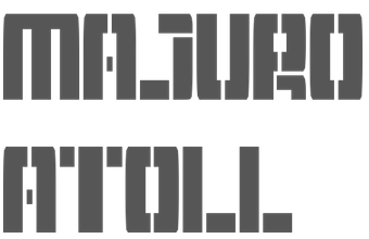 Jamie Place (aka FontBlast, b. 2002) is a UK-based FontStructor, allegedly born in 2002 (?), who made these typefaces in 2012: Microstruct (gridded, kitchen tile face), FontStrukt Soft, FontSrukt Clean Soft, Kombinationsschrift, Gridder (a kitchen tile family: +Soft, +Box, +Bold), Skyber, Diabolo (piano key stencil genre), fb Catbop, Hangar Shot, Hangar (army stencil), FontStrukt (+Soft), Braille Full, fb Symbols, Imagine More FB, fb Atarian, Imagine FB, Barkode, Fontstruction No1 (+Extended), Tetraminos, Structurosa Fill, fb Karakter, Minimal Export, Barkode, fb Scoreboard (dot matrix typeface for Latin and Cyrillic), Wenlock, Small Fonts, Fat Largo, Largo, Kerr, Kerr Bold, fb Mixture Unstable, Freehand, Structurosa Refined, fb Switch, fb Mixture, Vado, NES Forever, Retrotype Dot Matrix, Avant Pixel, fb Tall, Fast Money Clean, Retrotype, Retrotype Too (pixelish), Retrotype Sliced, Braille Caps, Tiger Sans (horizontally striped), Pixelface (smilie face), Karmink (star dingbats), Cofmugg (+Gap: piano key typefaces).
 Typefaces from 2013: Slink, Tuning Fork, Dicey (dice font), Septober, Pico Pop (kitchen tile), Plano (kitchen tile), Dolphin Sans (hairline), New English (stencil), Gadget, Curvaceous Script, Avant Pixel, Barkode, Brailled, Haus (counterless), Zapadni, Curvaceous Script, Metric (a piano key Futura-like stencil face), Mocha, Mocha Book, dm FB Solidis, Tapedeck, Gridder Bold (kitchen tile face), Modulator, Turning Fork, Zapadni (Western), FontStrukt2, Metric (piano key face), Monaco (pixel face), Blackfoot (Pac-Man style), FB Catbop, Peach Condensed, Noodle, Peach Squared, Vaquero, Haus, fb Academy Sans, Peach, Rider. Dafont link. [Google]
[More] ⦿
|
Fontdesign by Fidel Peugeot
[Fidel Peugeot]

|
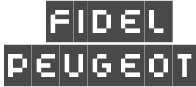 [MyFonts]
[More] ⦿
|
Fontmunkások
[Gábor Kóthay]
|
 Gábor Kóthay (Fontmunkások) is a Hungarian type designer (b. 1962) who lives in Szeged. Gábor Kóthay's fonts include:
 - At T-26: Alphabet2, Alphabet4, Archetype, Axis No 1, Bacchus, and Tyrnavia in 2000, and the Roman inscription inspired family Minerva Modern, Minerva Display (a Roman family) in 2002. Also, Betabet sans, Betabet web, Gnosis (hairline italic), Oceanus (2004, hairline sans), Pelso (2004, hairline), Laureate (2004, hairline art deco), Picaresque (2004, irregular handwriting).
- At FONTana: LaDanse, Y2K, Domino, QwertyRegular and Luxury, all in 1999-2000.
- At P22: Driade (2005, Regular, Linea and Aged: calligraphic futuristic experiments), Zephyr (2001, curly; +Open Face), Schwarzkopf (2003, a Schwabacher face), La Danse (2001), Ambient (2001), the Schwabacher Fraktur font SchwarzKopf (2002), Caffe (2009: originally designed for the Artz Gallery Cafe in Budapest Hungary. The design is a contemporary handwriting style adapted from examples in lettering exercise books. It has been redrawn and expanded into six styles. The four weights were created by drawing the style using different mediums: Cappuccino in pen, Pastry in felt-tip, Lemonade in brush and Tobacco, the original, in pencil, and Poster and Poster Inline are additional styles).
- At PsyOps: the formal script Anglia (2001), Berill (2001), SchwarzKopf (2002, Fraktur) and Plexo (2001).
- At Job Art Studio (his own studio in Szeged, which he founded): Cats (free dingbats), Disasters (dingbats), Bubble (comic book font), 103 kék.
- At Fountain: Zanzibar (2003, nice script face), Incognito (2007, a typical old map typeface), Dessau (2007-2008, a collection of eleven Bauhaus and Bauhaus stencil styles).
- At Fontana: Zodiac, Tisza (2001-2007), a sans family. And Kinesis (2003), a sans typeface based on geometrically precise instructions.
- At Cinqueterre Type Foundry: Eva (wedge serif; sample, another sample).
- At Fontmunkások: Birdland (1999-2002), a minimalist face; Asphalt and Asphalt Signs (1996-2000), a slightly grungy set of fonts; Arcade (1999); Adagietto (2000); Flyer and Flyer Fossil (2002), a curly family.
- Custom typefaces: Aqua Futurist (2008): a hairline unicase sans family with uncial influences. It is unclear if he had a hand in the typography of stockings, which I found on his site.
Blog. Dafont link. FontShop link. [Google]
[More] ⦿
|
FontShop: Hairline sans types
|
Quoting the FontShop feed: [Google]
[More] ⦿
|
FontShop: Hairline slab serifs
|
Quoting the FontShop feed: [Google]
[More] ⦿
|
Fontype
[Viktor Pesotsky]

|
 During his studies in Saint Petersburg, Russia, Viktor Pesotsky designed the free modular typeface Eskos Display (2019), the free sans typeface Drab (2019), the free razor-sharp barbed wire font Gusset (2019: for Latin and Cyrillic), the free artsy Latin / Cyrillic variable opentype typeface Brozas (2019) and the free font Koysan (2019).
 Typefaces from 2020: Oskal (a wedge serif in the pointy sendse of the word), Engin (a futuristic font for Latin and Cyrillic), Dulya (an experimental and delightfully irrational font), Krays (a hairline display typeface), Eskos, Drab, Koysan, Fluse (a thin squarish display sans; + Cyrillic). Typefaces from 2021: Quasar, Azest (a display sans). Type Department link. [Google]
[MyFonts]
[More] ⦿
|
Fragtype
[Rodrigo Fuenzalida]

|
 Graphic and type designer from Caracas, Venezuela, b. 1981, who moved first to Buenos Aires and then to Santiago in Chile. While mainly a type designer, he also practices calligraphy. He was involved in and set up multiple type foundries, including Fragtype. Fuenzalida designed these typefaces:
 - The art deco faces Erre.
- The experimental typefaces Tructura, Tangram, Sicodelica (multiline), SuperC (2009, tall condensed) and Pixid (2010, pixel face).
- Concrete Stencil (2010). Stencil meets calligraphic script.
- Fux (2010). A rounded monoline sans.
- 7Tees.
- Aushaus: letters like music notes. This is also called Aubhaus.
- Gerd (2009). An artsy stylish piano key font that used to be free.
- LINE_A and K5 (multiline).
- Cubo (aka Khubo, 2009, Die Gestalten). This 3d geometric family was a grand prize winner in the experimental typeface category at Tipos Latinos 2010.
- Factur (2011) is an angular typeface.
- Isosibilia. A 3d face. This typeface won an award winner in the experimental typeface category at Tipos Latinos 2010.
- The connected upright script face Nedo.
- The grunge typeface Belt.
- The stencil Bodoni typefaces Giambo Stencil (2009, Die Gestalten) and Giambattista.
- Titan (2011). A fat rounded poster face, downloadable from Google Web Fonts.
- Fux (2010). A basic monoline sans family.
- Poetsen One (2012) is a rounded signage sans typeface co-designed with Pablo Impallari.
- Racing Sans (2012). A techno typeface that conjures up speed. Codesigned with Pablo Impallari, it is free at Google Web Fonts.
- With Nicola Massi, he created the textura typeface Pirata+One (2012, Google Web Fonts).
- Hermeneus One (2013, with Pablo Impallari) is a slab serif.
- Tweegi (2013) is an elegant super-condensed serif typeface family.
- Kardia (2014) is a rounded slightly elliptical warm-hearted sans family.
- Libre Baskerville (2012, Google Web Fonts, Open Font Library, Github, and CTAN) was developed together with Pablo Impallari. It is based on 1941 ATF specimens, but it has a taller x height, wider counters and minor contrast that allows it to work on small sizes in any screen.
- Libre Caslon (2012-2014). A free typeface family co-designed with Pablo Impallari.
- Raleway (2010-2013). This popular free sans typeface family was started by Matt McInerney in 2010 and completed by Pablo Impallari and Rodrigo Fuenzalida in 2013. In 2017, it was extended to Rawline.
- Libre Bodoni (2014) was developed by Pablo Impallari and Rodrigo Fuenzalida based on Morris Fuller Benton's Bodoni types---they optimized the glyphs for use on the web. Github link. Google Fonts link.
- Latina (2015) is a humanist sans typeface family developed with the Latinotype team. It won an award at Tipos Latinos 2016. Its headline styles have exaggerated humanist features, while its text styles are more subdued.
- In 2016, Latinotype published the 32-style Corporative Sans Round Condensed, which was developed by Elizabeth Hernandez and Rodrigo Fuenzalida, under the supervision of Luciano Vergara and Daniel Hernandez.
- Libre Franklin (Pablo Impallari and Rodrigo Fuenzalida) is a revival of Morris Fuller Benton's 1912 classic, Franklin Gothic. Created in 2015, it was only published in 2016 at Google Fonts. Github link.
- Taberna (2016). A vintage copperplate style family based on design trends in bar signage, liquor packaging and street wear. Codesigned by Jorge Cisterna at Latinotype.
- Letteria Script (2017, Latinotype). A signage script family.
- Winner at Tipos Latinos 2018 of a type design award for Mixta (Joya Type Foundry).
- In 2018, Daniel Hernandez and Rodrigo Fuenzalida enlarged the fat all caps slab serif Latinotype typeface Rita that was originally started in 2010.
- Market (2018, Latinotype) is inspired by hand-painted grocery store signs.
- In 2019, Latinotype published the great super-slab typeface Breton which was designed by Daniel Hernandez and Rodrigo Fuenzalida.
- In 2018, he published Multiple at Latinotype. Partly geometric and partly humanist, it has Sans and Slab subfamilies.
In 2019, Alfonso Garcia and Rodrigo Fuenzalida released Utily Sans at Latinotype. Utily Sans is a slightly humanist take on Futura. In 2019, Fuenzalida released Atenas through Los Andes. It emerged as a mixture of science fiction and calligraphy, with notable influences of Eurostile and Microgramma. There is a fully stocked stencil subfamily, Atenas Stencil. - Mixta (2020, Latinotype). A total of 54 typefaces with these subfamilies: Mixta Sharp, Mixta Pro, Mixta Didone. Includes weights from Hair to Heavy.
- Spock (2020). A 48-style demi-sans and demi-slab family by Luciano Vergara, Cesar Araya and Rodrigo Fuenzalida.
- In 2020, he co-designed Ragtag (a ragtag of capitals) with Alexander Wright for In-House International.
- Mixta Essential (or: Mixta Ess) (2020, Latino Type). A 12-style hybrid of a didone-inspired rectangle-shaped serif and a sharp wedge serif.
- In 2020, Rodrigo Fuenzalida, Alexander Wright and Michelle Benaim Steiner co-designed the exaggerated reverse stress (or: Italian) typeface Pata Slab at In-House International. All uppercase characters were built to fit precisely inside a square, so they are all the same width and height.
- Mumford (2021). An 18-style display sans.
- Outfit (2021, Google Fonts). Github link. This geometric font family was originally designed for the brand company Outfitio and On Brand Investments Pty Ltd. It includes a variable font.
- In 2022, Rodrigo Fuenzalida and Alexander Wright published the decorative angular typeface family Broker at In-House International.
Klingspor link. Abstract Fonts link. Behance link. Kernest link. YWFT link. Creative Market link. MyFonts link. Dafont link. Another Behance link. Google Fonts link. [Google]
[MyFonts]
[More] ⦿
|
Francisco Arellano
[Ixipcalli]

|
 [MyFonts]
[More] ⦿
|
Frank Béla
[Faberfonts]

|
 [MyFonts]
[More] ⦿
|
Gábor Kóthay
[Fontmunkások]
|
 [More] ⦿
|
Gavin Downey
|
Graphic designer in Newcastle upon Tyne (UK), who created the display typeface Awkward (2004) and a very thin sans face (2004). [Google]
[More] ⦿
|
Gen Spilsbury
|
Graphic designer and typographer in Sydney, Australia. Creator of these typefaces: 10 (circle-based), Alien Coins, Candy Bean, Earthquake (grunge), Floppy Disk, Fuel Condensed, LED, Mathvetica, Press, Spring, Stitch, Superlight (hairline sans), Thorn. Behance link. Old URL. [Google]
[More] ⦿
|
Gert Wiescher
[Wiescher Design]

|
 [MyFonts]
[More] ⦿
|
Gluk Fonts
[Grzegorz Luksza]

|
 Aka Grzegorz Luk and just Gluk, Grzegorz Luksza is a Polish type designer (b. 1973) who specializes in ultra-decorative and experimental typefaces.
 Creator of the free artsy font Wanta (2008), of Resagnicto (2010), of Rawengulk (2010), of Rawengulk Sans (2011), of Reswysokr (2011), of the bold slab serif typeface Zantroke (2011), and of the free calligraphic typefaces Odstemplik (2009), promocyja (2008) and Konstytucyja (2008). He published the elegant serif family Foglihten (2010), which includes the inline typefaces Foglihten No. 1 (2011), Foglihten Fr02 (2011), Foglihten No. 3 (2011) and Foglihten No. 4 (2012). The latter is inspired by the Polish Constitution of May 3, 1791. Foglihten Petite Caps Black (2012) and Foglihten Black PCS (2012) are high-contrast fat didone typefaces, minus the ball terminals. The series continues with Foglihten No. 6 (2012) and Foglihten No. 7 (2013). Qumpellka No 12 (2011) is a flowing italic. Opattfram01 (2011) is a dingbat typeface with onamental patterns. The Okolaks family (2008) has a bit of an art deco feel. It covers East-European languages as well as Cyrillic. Sportrop (2008) is a neat multiline face. Gputeks (2008) is a delicate decorative face. Szlichta07 (2008) on the other hand is an experimental typeface based on tilting the horizontal edges about ten degrees up. Kawoszeh (2008) is a curly Victorian pre-art nouveau face. Spinwerad (2009) and Itsadzoke S01 (2010) and Itsadzoke S02 are display didones. Znikomit (2011) is an impressive lachrymal hairline slab face. See also Znikomit No. 25 (2012) and Znikomit No. 24 (2012; image by Benjamin Frazzetto). Creations from 2012: Charakterny, Garineldo, Mikodacs (an Impact-like black display sans), Yokawerad (a didone headline face), Resagokr, Nikodecs, Garineldo SC. Typefaces from 2013: Etharnig, Namskin, Namskout (a layered heavy display face), Prida 65 (spurred antique face), Ketosag, Prida 61, Gatometrix, Glametrix, Gallberik. Typefaces from 2014: VECfont FogV4, EtharnigV (a bi-colored font), Risaltyp, Wabroye, Kleymissky, Sortefax (an outline font with engraved versions as on dollar bills), Dragerotypos (blackboard bold), Resamitz. Typefaces from 2015: Prida 36, Sudegnak No. 3 (script), Vecfont Sudegnak (cartoonish), PridaEn (a vector font for color), Prida S4, Prida01, Prida02 Calt. Typefaces from 2016: BroshN, Tofimpelik (+Candy), Prosh3, Digitalt, Agreloy (a lovely curly Victorian typeface), Gluk Mixer (ransom note font), Fogtwo No 5. Typefaces from 2017: Prosh 4B (a variable color font), BroshK2 (an origami style color font, in OpenType SVG format), Fuetargio (a multiline bejeweled typeface). Typefaces from 2018: BroshK, Rostef (all caps titling typeface), Fogthree. Typefaces from 2019: ResotE, ResotE-Pastels (a color font), ResotYc (a decorative unicase font), Resot Yg, Liserif (a kinetic SVG font). Typefaces from 2020: Digico M (a color font), Resotho (a wide all caps geometric sans). Dafont link. Digart link. Fontspace link. Dafont link. Open Font Library link. Scribus Stuff link. Fontspace link. Kernest link. Abstract Fonts link. Behance link. Font Squirrel link. Klingspor link. Creative Market link. [Google]
[MyFonts]
[More] ⦿
|
Grzegorz Luksza
[Gluk Fonts]

|
 [MyFonts]
[More] ⦿
|
G-Type
[Nick Cooke]

|
 Nick Cooke is a British type designer based in Otley, West Yorkshire, and/or Newent, UK, who has been at it since 1982 as a lettering artist. He founded G-Type in 1999. Nick started as a lettering artist in London in 1982 crafting type by hand for book jackets. His typefaces:
 - Accent Graphic (1997, a Peignotian fashion mag sans).
- Amulet (2002, a Celtic look face).
- Avocet (2006).
- Chevin (2003, sans family, +Std, +Chevin Pro, +Chevin Eco, a version with perforatons).
- ITC Dartangnon (1998). A hand-printed script probably named after Dartagnan.
- Digitalis (2000).
- Geetype (an upright script inspired by cigarette pack lettering by the great A. M. Cassandre).
- Gizmo (a beautiful chaotic brush handwriting face).
- Goskar (2020). A forceful reverse stress script.
- Houschka (an Avenir lookalike; see also Houschka Rounded (2006), Houschka, Houschka Rounded Alt (2011), Pro (2009), and Houschka Alt Pro (2011), featuring weights from hairline to extra bold).
- Morpeth (2008, a sturdy sans family).
- Nubian (sans family).
- Olicana (2005, a nice casual connected script face), Olicana Rough, Olicana Smooth (2007) [note: everyone likes Olicana: Eben Sorkin writes The primary reason it was so powerfully and instantly popular was the font's voice, a personality both complicated and unique. On the one hand it has a casual and authentic sense of vivacity and fun. On the other hand this expressiveness is intermittent; it continuously but gently teases the eye.].
- Organon Sans and Organon Serif (2009). These families are lapidary---they have tapered stems.
- FF Penguin (1995).
- Precious Sans (2002), Precious Serif (2003). In 2014, he followed that up with Precious Sans Two.
- Remora Sans (2017). An extensive humanist sans serif consisting of the effervescent Remora Sans and its business partner Remora Corp. Both styles include five individual width sets ranging from the condensed W1 to the extra-wide W5.
- Rollerscript (2012). A connected informal script with enough bells and whistles to evoke true handwriting.
- Saltaire (2019). A decorative didone.
- Sherborne (2020). Nick writes: Inspired by a comment in a letter from Eric Gill to Stanley Morrison, Sherborne has waisted vertical stems, meaning they curve inwards to give an elegant appearance resulting in a typeface of supreme legibility and beauty. Sherborne references its calligraphic roots featuring tapered stems, angled axes and bracketed serifs so could be considered a Humanist Old Style with a distinctly modern twist.
- Sovereign Display (2008: an engraved or dollar bill style typeface; one free weight of this serif family could be found here).
- Ver Sacrum (2022). An art nouve au-inspired typeface that was lost by Nick Cooke due to a disk crash.
Klingspor link. Behance link. View all typefaces by Nick Cooke (G-Type). View Nick Cooke's typefaces. Font Squirrel link. [Google]
[MyFonts]
[More] ⦿
|
Gulya Dautova
|
 Moscow-based designer of Cone (2015, a decorative Cyrillic typeface), Aesthete (2015, a hairline all-caps circle-based typeface, done at BHSAD) and Bad George (2015, a hybrid created at BHSAD using Bad Script and Georgia as models, in honor of George Clooney). Behance link. [Google]
[More] ⦿
|
Gustavs Andrejs Grinbergs

|
 Born in Riga, Latvia, in 1943, he has mainly cooperated (since 1990) with Tilde in the font development of East-European languages, and has created the AG fonts collection for Cyrillic. He specializes in Cyrillic and East-European extensions of prominent typefaces (such as the ones in the Bitstream collection). His typefaces:
 - Linotype Brewery (Linotype), Brewery No2 Pro (2015, Linotype). Brewery No. 2 is based on his submission in 1997 to the Second Linotype Design Contest, and was inspired by early 20th century German type. The Black weight is expressionist.
- Waldorf Pro (2003, Tilde). A didone.
- Robusta (2002, Tilde). A large sans typeface family.
- Linotype Rowena (1996, Linotype).
- Constellation Pro (2009, Tilde). An avant garde sans family with very thin hairline weights.
- Linotype Gneisenauette (Linotype).
- Baltic Ornaments (1999, Tilde).
- Stencil Moonlight (2003, Linotype). This typeface won an award at the Linotype International Type Design Contest 2003.
- Snowbird (Tilde).
- Am Beauty (2011, Tilde). An art deco family. Includes Am Beauty Stencil.
- Kette Pro (2009, Tilde).
- Rigaer Tango Pro (2009, Tilde). A connected script family with high contrast.
- Brunch Pro (1996, Tilde).
- Exquisite Pro (1998, Tilde).
- Scintilla Pro (2001, Tilde). A delicate text family.
- Tourandot Pro (1999, Tilde).
- Starfighter (Tilde).
- He published the AG Fonts collection, mostly between 1992 and 1994. In the AG fonts collection, we find the following families (non-exhaustive list): AGAalen, AGBengaly, AGCenturion, AGCrown, AGFriQUer, AGGalleon, AGGloria, AGLettericaCOMpr, AGMelanie, AGNewHandbook, AGOpus, AGPalatial, AGPresquire, AGReverence, AGZeppelin.
FontShop link. Linotype link. Klingspor link. MyFonts collection. View Grinbergs's typefaces. [Google]
[MyFonts]
[More] ⦿
|
Gydrop
|
Russian pixel artist (b. 1984) who created Psyleave (2004), Microtronix (2004), d-gen (2004, a squarish face), d-mek (2004, a futuristic pixel face), Needle (2004, a hairline version of Bank Gothic). Alternate URL. [Google]
[More] ⦿
|
Hajime Kawakami

|
 Japanese graphic designer, b. 1953, who started out as an industrial designer, and became a graphic designer in 1974. He won the 1990 Morisawa International Typeface Design Competition with an Honorable Mention in the Latin Category. The list of his typefaces:
 - Cat Cat Cat (2005, URW++). Cat dingbats.
- Juline (2016, FontForum). fantastic hipster robot font.
- Kotohogi (2016, FontForum). A display sans.
- Light Fit (2005, URW++). A hairline sans.
- Mond (2005, URW++). An artsy typeface inspired by Mondriaan.
- P22 Akebono (2001, IHOF).
- P22 Basala (2001, IHOF).
- P22 Ching Mang (2003, IHOF). Dingbats based on a cartoon character Hajime created for a Japanese mag in the 1980s.
- P22 Hiromina 03 (2003, IHOF). Kana and Latin.
- P22 Komusubi (2005, IHOF). An informal typeface including Latin, Hiragana and Katakana.
- Letraset Magatami (2001). A contemporary typeface.
- P22 Rakugaki (2003, IHOF). Kana and Latin.
- P22 Relax (2003, IHOF).
- P22 Vidro (IHOF).
- Seed (2005, URW++). A sans.
- Wavy Rounded BT (2004, Bitstream).
- With Ink (2005, URW++). Hand-printed.
[Google]
[MyFonts]
[More] ⦿
|
Hana Hong
|
Australian designer of the hairline sans typeface Clearcut (2017). [Google]
[More] ⦿
|
Hans Samuelson
[Samuelstype Design]

|
[MyFonts]
[More] ⦿
|
Hanson Method
[Finn Hanberg]
|
 Finn VanRoo or Finn Hanberg is the London, UK-based designer of the free techno typeface Anson (2018). It was made using a tilted grid and strict geometric principles.
 In 2019, he published the wonderful wide (and free) Hanson Hairline and the free Hanson Bold. [Google]
[More] ⦿
|
Happyloverstown
[Jonathan Calugi]
|
 Very talented Pistoia, Italy-based designer (b. 1982). His typefaces:
 A follower of Calugi writes: Jonathan is a young illustrator hailing from Pistoia, Italy. It's nearly impossible to not recognize his signature style: what at first appears to be a child-like doodling, a closer look will reveal a world of intricate, carefully crafted patterns and eccentric geometric forms. Hellofont link. Behance link. Dafont link. [Google]
[More] ⦿
|
Harried Type
[Harry G. Blakeman]
|
Portland, OR-based designer of the hand-printed typeface Granite Letter (2013), the experimental typeface Moonblock (2015), the pixel typeface Protovision (2015), the techno typeface Anchorage (2015), the crayon typeface Autumn Pixels (2015), Barcode Decol (2015), and the hairline squarish typeface Granite Mode (2015). Typefaces from 2016 include Granite Postmodern and the squarish Turntable Aux (2016). Typefaces from 2017: Fuzzface, Graytype, Ventures. Typefaces from 2018: Microchip (an LED or MICR font), Aroundabout (circle-themed), Blakeman Hand, June 5. Dafont link. Old personal URL. [Google]
[More] ⦿
|
Harry G. Blakeman
[Harried Type]
|
[More] ⦿
|
Henry Paul Sanchez Cuaran
|
Quito, Ecuador-based creator (b. 1994) of the hairline sans typeface Line Style (2014). Facebook link. [Google]
[More] ⦿
|
Herb Lubalin

|
 Born in New York in 1918, Herbert Frederick Lubalin died there in 1981. Founding editor and art director of U&lc from 1973-1981. Co-founder of ITC in 1969, together with Edward Roundthaler and Aaron Burns, as a result of the marriage of Lubalin Burns & Co (est. 1969) and PhotoLettering Inc. Professor at the Cooper Union in New York from 1976-1981. Director of the avant garde magazine Fact between 1965 and 1967.
 His fonts: Pistilli Roman (VGC, see here; with John Pistilli), L&C Hairline (ca. 1966, VGC, with Tom Carnase), ITC Avant Garde Gothic (with Tom Carnase, Gschwind, Gürtler and Mengelt, 1970-77; see Avignon on the SoftMaker MegaFont XXL CD, 2002), ITC Busorama (1970), Ronda (1970), ITC Lubalin Graph (1974; see Square Serif on the SoftMaker MegaFont XXL CD, 2002; poster by Pablo Monachese), ITC Serif Gothic (with Tony DiSpigna, 1974; see Serenade Two on the SoftMaker MegaFont XXL CD, 2002). His companies: Herb Lubalin Inc (1964-1969), Lubalin, Smith&Carnase Inc (from 1975 onwards). In 1985, Gertrude Snyder and Alan Peckolick published Herb Lubalin. Art Director, Graphic Designer and Typographer (New York). Retrospective at ITC. Revivals: Receding Hairline NF (2014, Nick Curtis) revives L&C Hairline. Pudgy Puss (2007, Nick Curtis) is an ultra-fat modern digital display type based on Fat Face (Herb Lubalin, Tom Carnase). Linotype link. Klingspor link. FontShop link. View Herb Lubalin's typefaces. [Google]
[MyFonts]
[More] ⦿
|
Hernández Type (was: Estudio de diseño Calderón)
[Daniel Hernandez]

|
 Estudio de diseño Calderón in Chile had the work of two Chilean designers:
 - Daniel Hernández has some free fonts at Dafont and Font Squirrel. Klingspor link. His award-winning fonts include Stgotic textura (2006), Stgotic Fracktur (pixel blackletter), and the (free) unicase piano key font Pincoya Black (2008), which was based on Spanish Civil War poster, and won an award at Tipos Latinos 2010. He calls his ultra fat Roxy (2009) tipografia desde el culo del mundo.
Behance link. His Flickr page. His lettering. Hernandez Bold (2010, Sudtipos) has slabs, serifs, and plenty of round curves. It won an award at Tipos Latinos 2012. Rita (2010, Sudtipos) is an ultra-slab all caps typeface inspired by the fat wood types. In 2018, Daniel Hernandez and Rodrigo Fuenzalida enlarged Rita. Designer of the free text font Belgrano (2011). Merced (2011) is a thin monoline sans. Sanchez (2011, Latinotype and YWFT) is a slab serif family with a free weight. In 2013, he published the beautiful sequel, Sanchez Slab, which is patterned after Rockwell. Sanchez Niu (2017) is another slab serif in this family. - Javier Quintana created the smooth and delectable text family Berenjena in 2007. He also made the roundish display typeface Botota (2007), which is reminiscent of market signage in Santiago.
- Monroe (2010, Sudtipos, and revised in 2018, Latinotype) is a swashy slab family. See it in action in this I Love New York poster.
- Patagon (2011, Latinotype) is a rounded wood-inspired poster typeface done with Daniel Hernandez and Luciano Vergara.
- Guadalupe (+Gota, 2011, Latinotype). A hairline didone family with sufficient contrast and frilliness to satisfy the fashion mags.
- Andes (2011, Latinotype). This is a playful slightly swashy sans family. Followed by Andes Italic (2012) and Andes Condensed (2012). See also Andes Rounded (2014) and Andes Neue (2019), which has 56 styles.
- Bosque (2012) is a wood style family co-designed with Paula Nazal at Latinotype.
- Magallanes (2012, Daniel Hernandez) is a contemporary neohumanist sans serif typeface family covering Ultra Light to Black. This typeface was followed by the 8-style Magallanes Essential (2012) and by Magallanes Condensed (2013).
- Trend (2013). A layered type system done together with Paula Nazal Selaive. Followed by Trend Hand Made also in 2013 and Trend Rough in 2014.
- With Eli Hernandez, Daniel Hernandez published the unicase typeface family Grota in 2013.
- Roble (2013): A slab serif font family which Daniel places halfway between Andes and Sanchez. It is characterized by its clampy backbitten lower case c. The slab serif Roble Alt (2013) has eight weights of two fonts each.
- Together with Miguel Hernandez at Latinotype in 2014, Daniel Hernandez designed the 1930s tall-ascendered sans family Arquitecta, which is promoted as an alternative for Futura, Kabel and Avant Garde. It was followed later that year by Arquitecta Office and Arquitecta Standar. They also co-designed Texta, a geometric sans for all. His Newslab (2014) family is a combination of Andes, Sanchez and Roble; the Regular and Italic styles are free.
- In 2016, Cesar Araya and Daniel Hernandez co-designed the very Latin / curvy / warm slab serif typeface family Hernandez Niu.
- The foundry became Hernández Type at some point. The fonts there, repeated from the former foundry, include Patagon, Merced, Hernandez Bold, Monroe, Pincoya Black Pro, Rita Bold and Fat, and Pincoya Black Free.
- In 2016, Daniel Hernandez, now studying at the KABK in Den Haag, The Netherlands (2014-2018), created Lxy, an interesting dynamic (animated) display typeface made entirely with the Python programming language in Drawbot. At Latinotype, he published Basic Sans, Basic Sans Cnd and Basic Sans Narrow.
- In 2016, Bruno Jara Ahumada, Alfonso Garcia, Luciano Vergara, Daniel Hernandez and the Latinotype Team designed the roman square capital headline typeface family Assemblage.
- In 2017, Paula Nazal and Daniel Hernandez co-designed Trenda, a geometric sans family based on the uppercase of Trend. The rounded edge version of Trenda is Boston [16 styles; corrections and review by Alfonso Garcia and Rodrigo Fuenzalida].
- Peckham (2018). An 8-style slab serif named after the birthplace of Vincent Figgins. Digital editing and corrections by Alfonso Garcia.
- The Reinvention of Rita (2018). A slab serif.
- In 2019, Latinotype published the great super-slab typeface Breton which was designed by Daniel Hernandez and Rodrigo Fuenzalida. Daniel Hernandez added the geometric sans family Biennale in late 2019.
- In 2020, he released Magazine Grotesque at Latinotype. It is characterized by an overhanging umbrella lower case a, and an overbiting lower case e.
- Facundo (2020, Paula Nazal Selaive and Daniel Hernandez, at Latinotype) is a 14-style geometric sans family.
- In 2020, Luciano Vergara, Daniel Hernandez and Alfonso Garcia co-designed the 54-style sans family Aestetico. They introduce Formal and Informal subsets of fonts so that the family covers several sans genres.
- Apparel (2020, Latinotype) is a 20-font display serif family inspired by the MacFarland series in the 1912 ATF catalog, which in turn was based on Heinz Koenig's Roemische Antiqua (1888, Genzsch&Heyse). It was designed by Daniel Hernandez and Alfonso Garcia.
- Hernandez Bros (2021). By siblings Daniel and Eli Hernandez. This is a 7-style sharp-edged serif family loosely based on Bulfinch by William Martin Johnson (1903, ATF).
Behance link. Home page. [Google]
[MyFonts]
[More] ⦿
|
Hoefler (was: Hoefler&Frere-Jones, and Hoefler Type Foundry)
[Jonathan Hoefler]

|
 Born in 1970 in New York, Jonathan Hoefler ran the Hoefler Type Foundry (or: HTF) in New York. It employed Tobias Frere-Jones, Josh Darden, and Jesse Ragan. In 2004, it was renamed Hoefler&Frere-Jones, or HFJ for the cognoscenti. However, a legal problem between Jonathan and Tobias led to a corporate divorce in 2014---the company is renamed again The Hoefler Type Foundry. In September 2021, Monotype acquired Hoefler, and that is the end of that chapter. Their typefaces:
 - Acropolis.
- Archer (2001, by Jonathan Hoefler and Tobias Frere Jones). A humanist slab serif originally designed for Martha Stewart Living. It has a great range of features, including a classy hairline style. However, I see trouble down the road with the name Archer which has been used previously by several other foundries such as SignDNA, Arts&Letters and Silver Graphics. Some say that Archer is just Stymie with some ball terminals. Nevertheless, it became a grand hit, and has been used by Wes Anderson in The Budapest Hotel, and in Wells Fargo's branding. David Earls on Archer: with its judicious yet brave use of ball terminals, and blending geometry with sexy cursive forms, all brought together with the kind of historical and intellectual rigour you fully expect from this particular foundry, Archer succeeds where others falter.
- Champion Gothic.
- Chronicle Text. In 2007, HFJ published the "blended Scotch" newspaper serif text family Chronicle, which led to Chronicle ScreenSmart in 2015. See also Chronicle Display. In 2016, Hoefler published Chronicle Hairline. In Wired Magazine, Margaret Rhodes writes that it is for men who wear dress shoes without socks. Chronicle Hairline is a didone that breaks the didone rules. It is rounder, asymmetric (as in the mouth of the C), and as Hoefler puts it, more musical. As of 2016, the Chronicle typeface family consists of the display styles Chronicle Hairline, Chronicle Display (+Condensed, +Compressed), and Chronicle Deck (+Condensed), and the 60-style Chronicle Text family, which comes in G1, G2, G3 and G4 subfamilies.
- Many custom and branding typefaces, including, e.g., General GG (2005-2007) and typefaces for The New York Times Magazine, Times Mirror, Esquire and McGraw-Hill (1995, free download). Time.com provides previews of fonts made for Esquire, Lever House, eCompany Now, The Guggenheim Museum, The New York Times, and the Whitney Museum.
- Cyclone.
- Decimal (2019). A sans based on early wristwatch typefaces, i.e., the microscopic letters used by Swiss watchmakers in La Chaux-de-Fonds.
- Didot. HTF carefully designed and complete families include HTF-Didot (1991) in 42 weights/variations, originally designed for Harper's Bazaar; based on the grosse sans pareille no. 206 of Molé le jeune.
- Eyes Only (2019). A stencil typeface.
- Forza (2010). A sans typeface. Not to be confused with the 2007 font Forza by Michel Luther at Die Gestalten.
- Geometer Screen Fonts. Free Mac fonts.
- Giant.
- Gotham (2003). The stylish sans typeface made famous by Obama. See also Gotham Rounded.
- Historical Allsorts. This includes Historical-EnglishTextura, Historical-FellType, Historical-GreatPrimerUncials and Historical-StAugustin.
- Hoefler Text (+Ornaments). This antiqua text typeface consists of 27 fonts made in 1991-1992, and is distributed with many Apple products.
- Hoefler Titling.
- Ideal Sans. A slightly flared humanist sans. In the 1996 Morisawa Awards competition, Hoefler received a bronze prize for Ideal Sans. In 2011, HFJ writes it up beautifully: Typefaces are born from the struggle between rules and results. Squeezing a square about 1% helps it look more like a square; to appear the same height as a square, a circle must be measurably taller. The two strokes in an X aren't the same thickness, nor are their parallel edges actually parallel; the vertical stems of a lowercase alphabet are thinner than those of its capitals; the ascender on a d isn't the same length as the descender on a p, and so on. For the rational mind, type design can be a maddening game of drawing things differently in order to make them appear the same. Twenty-one years ago, we began tinkering with a sans serif alphabet to see just how far these optical illusions could be pushed. How asymmetrical could a letter O become, before the imbalance was noticeable? Could a serious sans serif, designed with high-minded intentions, be drawn without including a single straight line? This alphabet slowly marinated for a decade and a half, benefitting from periodic additions and improvements, until in 2006, Pentagram's Abbott Miller proposed a project for the Art Institute of Chicago that resonated with these very ideas. As a part of Miller's new identity for the museum, we revisited the design, and renovated it to help it better serve as the cornerstone of a larger family of fonts. Since then we've developed the project continuously, finding new opportunities to further refine its ideas, and extend its usefulness through new weights, new styles, and new features. Today, H&FJ is delighted to introduce Ideal Sans, this new font family in 48 styles. Ideal Sans is a meditation on the handmade, combining different characteristics of many different writing tools and techniques, in order to achieve a warm, organic, and handcrafted feeling.
- Idlewild (2012). A wide sans typeface family.
- Isotope (2018). A squarish typeface family. Not to be confused with Isotope by Fábio Duarte Martins, designed six years earlier.
- Inkwell (2017). Hoefler writes: Inkwell is provided in a range of styles with which readers already have clear associations: a bookish Serif and a cleanly printed Sans, a conversational Script, a ceremonial Blackletter, a fancy Tuscan for decoration, and a stately Open for titles. Each style is offered in six weights, from a technical pen Thin to a graffiti marker Black. Inkwell is a name used as far back as 1992 by Sam Wang, and additional older fonts called Inkwell exist by Dan Solo, Philip Cronerud and MXB Foundry.
- Knockout. The Knockout collection was designed to celebrate the beauty and diversity of nineteenth century sans serif wood types.
- Knox.
- Landmark (2013). In Regular, Inline, Shadow and Dimensional styles. A collection of architectural caps which started out as a custom typeface for Lever House in New York.
- Leviathan.
- Mercury Text and Mercury Display.
- Nitro & Turbo (2016). Hoefler writes: We designed Nitro for Pentagram's Michael Bierut, as part of a new identity for the New York Jets football team. Originally named Jets Bold, Nitro is rooted in the styles of lettering used by the team throughout its fifty-year history: even as its logotype evolved, it consistently used heavy, slanting forms to imply force and movement. and ends with corporate babble: Nitro embodies this indomitable spirit in the context of a fresh, contemporary design. About the naming: AF Nitro was made by Sylvia Janssen at the very popular Die Gestalten Studio in Germany, in 2001. It will be fun to watch that battle between giants. Not to mention that lesser known players also made commercial fonts called Nitro more than a decade earlier---these include Jack Wills at Sign DNA and Markus Schroeppel (in 2004).
- Numbers. In 2006, HFJ published the Numbers family, 15 fonts with nothing but numbers from various sources: Bayside (based on a set of house numbers produced around 1928 by H. W. Knight & Son of Seneca Falls, New York), Claimcheck (inspired by ticket stubs), Delancey (from tenement doorways), Depot (modeled on vintage railcars), Deuce (based on playing cards), Dividend (from an antique check writer), Greenback (based on U. S. currency), Indicia (inspired by rubber stamps), Premium (after vintage gas pumps), Prospekt (based on Soviet house numbers), Redbird (inspired by New York subways), Revenue (from cash register receipts), Strasse (after European enamel signs), Trafalgar (inspired by British monuments), Valuta (after Hungarian banknotes).
- Obsidian. In 2015, Jonathan Hoefler and Andy Clymer cooperated on the decorative copperplate engraved emulation typeface Obsidian. Various kinds of 3d illumination in Obsidian were obtained by an algorithmic process. Not to be confused with about ten other fonts called Obsidian--for example, we have Obsidian (pre 2003, Silver Graphics), Obsidian (2014, Steffi Strick), Obsidian (2012, Krzysztof Stryjewski), Obsidian Deco (2013, Yautja), Obsidian (2005, Sparklefonts), and Obsidian Chunks (pre 2002, Jeni Pleskow).
- Operator, Operator Mono, Operator Screensmart and Operator Screensmart Mono. The non-typewriter typewriter type..
- Peristyle (2017). A stylish condensed typeface family with piano key elements, and described by Hoefler as dramatic.
- Quarto.
- Requiem (1991-1994).
- In 2003, they published Retina (which was originally designed for the stock listings in the Wall Street Journal), but that font disappeared from their listing.
- Ringside.
- St. Augustin Civilité: St. Augustin Civilité is a digitization of Robert Granjon's extraordinary type of 1562, now in the collection of the Enschedé type foundry, Haarlem. This typeface is reproduced in Civilité Types by Harry Carter and H. D. L. Vervliet (Oxford Bibliographical Society, by the Oxford University Press, 1966.) As figures and punctuation were lacking in the original, these have been borrowed from two other Granjon types, the Courante and Bastarde of 1567. (The remainder of the character set has been invented.)
- Sagittarius (2021). A soft-edged compact semi-futuristic headline sans. In keeping with tradition, Hoefler dismisses or ignores the fact that the name Sagittarius was taken by a handful of other fonts since about 22 years ago.
- Saracen.
- Sentinel. Sentinel (1999) is HFJ's take on a Clarendon. I can't understand why they picked a name already taken by many foundries such as Graphx Edge Fonts, Comicraft, Dieter Steffmann and Sentinel Type. Anyway, in 2020, Sentinel got un upgrade (with smallcaps and ornaments) in 2020 in Sentinel Pro.
- Shades (2003). In Cyclone, Topaz, Giant and Knox weights.
- Surveyor (2014). An exquisite mapmaker and newsprint didone font family with Fine, Display and Text subfamilies.
- The Proteus Project.
- Topaz.
- Tungsten (2009) and Tungsten Rounded. Their sales pitch: That rarest of species, Tungsten is a compact and sporty sans serif that's disarming instead of pushy - not just loud, but persuasive. Douglas Wilson compares Tungsten with Alternate Gothic No. 3 (Morris Fuller Benton). Not to be confused with Tungsten (2005, Sparklefonts).
- Uncategorized early typefaces: Gestalt-HTF, Fetish-HTF (blackletter modernized, 1995), Ehmcke-HTF.
- Verlag (2006). A 30-style art deco-inspired semi-Bauhaus geometric sans family based on six typefaces originally designed for the Guggenheim. HFJ writes: From the rationalist geometric designs of the Bauhaus school, such as Futura (1927) and Erbar (1929), Verlag gets its crispness and its meticulous planning. Verlag's fairminded quality is rooted in the newsier sans serifs designed for linecasting machines, such as Ludlow Tempo and Intertype Vogue (both 1930), both staples of the Midwestern newsroom for much of the century. But unlike any of its forbears, Verlag includes a comprehensive and complete range of styles: five weights, each in three different widths, each including the often-neglected companion italic.
- Vitesse (2010). The typophiles react to the slab family with praise: I think they're chasing Cyrus Highsmith, Dispatch and Christian Schwartz, Popular on this one. Doing a pretty good job of it too! [...] Looks to me like the love-child of Eurostile and City. In 2020, Jonathan Hoefler added the inline Cesium, which forced him to modify the glyphs somewhat.
- Whitney. In 2004, they produced an amazing 58-weight sans serif family, Whitney (by Tobias Frere-Jones), designed for use in infographics. Whitney's sales blurb: While American gothics such as News Gothic (1908) have long been a mainstay of editorial settings, and European humanists such as Frutiger (1975) have excelled in signage applications, Whitney bridges this divide in a single design. Its compact forms and broad x-height use space efficiently, and its ample counters and open shapes make it clear under any circumstances. See also Whitney Condensed and Whitney Narrow.
- Ziggurat.
Hoefler received Bukvaraz 2001 awards for HTF Guggenheim, HTF Knockout, HTF Mercury (1997, no relationship with Goudy's Mercury of 1936) and HTF Requiem. At ATypI in 2002, he received the Charles Peignot award. FontShop link. [Google]
[MyFonts]
[More] ⦿
|
House of Burvo
[Matthew Burvill]

|
 House of Burvo is the UK-based foundry of Matthew Burvill (b. 1984, Kent, UK) located in Colwyn Bay, Wales. His typefaces:
 - Big Softie (2011). A fat round bubble gum typeface destined to become a hit. It is Burvill's most popular typeface.
- Checks (2010). Patterns for checks.
- FreeDee (2010). A 3d typeface.
- GHS (2010). GHS stands for Geometric Hairline Serif. It is influenced by the didone style.
- Links (2010, modular).
- NK Fracht Round and NK Fracht Square (2010). An octagonal typeface family.
- Neue Konstrukteur Round and Neue Konstrukteur Square (2010, an engineered, mechanical typewriter font).
- Poster Hand (2010).
- Sequencia (2011). A monospace and semi-monospace typeface done at Die Gestalten.
- This collection of typefaces from 2007: Angel of Death (techno), Architect, Baby's Definate Hit (art deco heavy stencil), Beauty Full (rounded), Burvo (art deco stencil), Bürvo Konstrukteur (octagonal), Indivisual (art deco stencil), Killer (octagonal), Neg Space (pixelish), Optical (geometric, experimental), PUMP (ultra black art deco).
MyFonts link. Behance link. Klingspor link. View Matthew Burvill's typefaces. [Google]
[MyFonts]
[More] ⦿
|
Hurme Design
[Toni Hurme]

|
 Toni Hurme (Hurme Design, Helsinki) started publishing fonts in 2013. His first series, numbered 1 through 4, is Hurme Geometric Sans, a geometric sans family of large x-height and simple avant-garde structures. Each series has 14 styles and true small caps.
 In 2016, he updated Hurme Geometric Sans 1 + 2, Hurme Geometric Sans 4, and Hurme Geometric Sans 3. In 2019, Erik Bertell and Toni Hurme co-designed the wavy custom display typeface Well for Well Coffee. Also, Hurme releases Hurme FIN 1a and 1b, and Hurme FIN Mono in 2019, all more or less monolinear with a wide choice of widths from Compressed to Extended. In 2021, he published Hurme tek (a squarish techno family). [Google]
[MyFonts]
[More] ⦿
|
Hydro 74
[Joshua M. Smith]

|
 Joshua M. Smith (Centerville, OH) runs Hydro74, which is located in Sanford and/or Orlando, FL. His typefaces take their themes often from metal rock bands, the goth scene, blackletter, and grunge. They can be bought at MyFonts or here. See also here. More direct access.
 His typefaces: Gestapo Dirty, Gestapo Tech, Terra Firma, Rehab, MissionUK, Messiahcom, Kogji, New York Corp, Texan, Grace For The Fallen. Free fonts include Beast, Broken74, Gatecrashertexan, Heresy, MeaniesThick, MegalomaniaItalic, MegalomaniaNormal, MilitarizeConform, MoogwaiItalic, MoogwaiNormal, MoogwaiThinOblique, OmnipotenceBlack, PietyBlack, Platipus, Proclivitydark, Proven, Resurrection, Revolution, Sacrafical, SailorJerry, Spitfire (2010, tattoo face), Submit, SubmitItalic, SubmitThinItalic, TripleXXX, Conform, Meanies, Megalomania, Moogwai, Platipus, Resurection, Revolution, Proven, Gate Crasher, Agnostic, Working Class hero (Western), Blasphemy, Disestarlishmentarianism, Napalm Vertigo, Black Mass (2005, blackletter / tattoo face). In 2009, he fired up his creative mind, and started working on a new batch of display typefaces: Muerte Black, West Coast Soul, Iron Fist, Nue Black, Uber Black (+Caps, blackletter), Le Venom (a phenomenal high-contrast art deco face), Avante (art deco, counterless), Nue Goth (blackletter), The Thickness (ultra fat), Script, Razor Black, Martyr Black, Sentry Black, Imperial Black, Thai Black, Dayton Black (racecar lettering), Slash Black (blood and guts font), Burial Black (blackletter), Cadaver Ink (gothic), Czar (hairline sans), Tramp Stamp, Wolfstien Electro (in the spirit of Sinaloa), Viper Black (scary), Catalyst Solid (ulta fat), Calypso (sans), Suture Slab (gothic), Venice Black (gothic), Black Mamba (metal rock band lettering, Cyrillic influences), Tyranny Gothic (blackletter), Blackmail Sect (more blackletter), Sailor Jerry (bilined), Napalm Vertigo (army stencil), Heresy Gothic (blackletter grunge), Working Class Hero (Western grunge), Golden Age, La Santisma Muerte (scary). Free typefaces at Legacy of Defeat, as of 2011: H74Cairissian, H74DemonRacer, H74EastZombieHigh, H74Federation, H74GhettoWolves (scary), H74InfectedZombies, H74Pistola, H74SnakeOilEmbossed, H74SnakeOilSolid (2011, constructivist), H74Spitfire, H74TheBlackBureau, H74TheGoldenDawn, H74TheGoldenDawnItalic, H74ThunderScript, H74ZombieAttack, Black Label Whiskey, H74 Cadaver Ink (2011, tattoo face), Cortez, Damn Hippies, H74 False Idols (2011), Heathen, Kremlin Ink, H74 Kustom Style (2011, a tattoo/graffiti font), Moscow Moonshine, San Loscisco (2011), Blood Tonic (2011), Snake Whiskey (2011), Time Is Money (2011), Valkyrie (2011), Viva Los Vatos (2011), Warriors (2011), West Coast Soul (2011), Yo Santos (2011). Commercial typefaces done in 2011: H74 Warriors (2011), H74 Viva Los Vatos (2011, cholo graffiti), H74 Snake Whiskey (2011, spurred Western face), H74 Norway Black (2011), H74 Her Majesty (2011, spurred face), H74 Muerte (2011), H74 Hellfire (2011, spurred family), H74 Luckys Flash (2011), H74 Le Venom (2011, art deco), H74 Dishonor, H74 Cobra (tattoo face), H74 Pistola (2011, a tattoo font), H74 San Loscisco, H74 Wizard Nip (brush), H74 Wizard Staff, H74 The Black Bureau (black slab serif headline face), H74 Zombie Allegiance, H74 Monniker, H74 El Librador, H74 Eastern Star, H74 Dead Empire, H74 Black Diamond, H74 Alcazar, H74 Corpse Black, H74 Corpse Paint. Production in 2012: Achilles, Bootleggers, Chingon, Hernandez, Kuso, Malice, Muerte Wolf, Pendejo, Pinche Muerte, The Order, Witness. Typefaces from 2013: The Pricks, Ocelot Piss, The Witches, Wizard Tit, Conquest, Wizard Dick, Riverside, Dirty Sanchez, Corpus Delicti, Warlock Ghetto Wolves, Spitfire. Typefaces from 2014: Thunder Pussy, The Kült, The Clap, Shit Script, Prison Bitch, Hëavy Mëtal, Fucktura Heavy, Fucktura Thin, Go Fuck YerSelf, Drop Anchor, Camp Cooter, Born to Lose. Typefaces from 2015: The Dirty Collection (Fucktura Thin, Brothel, Caracas, The Clap, Scalliwag, Cholo Fett, Camp Cooter, Drop Anchor, Born to Lose, Pillow Biter, Prison Bitch, Salty Sailor, Go Fuck Yerself, Heavy Metal, Fucktura Heavy, Fancy Fuck), Forty Thieves, Zombie Headshot, Fancy Fuck (a tattoo script), Emancipator. Typefaces from 2016: BloodCloth, Brothel, Dreamwave, GoldenDawn, HCholobakka, Mystic, Nomad, RazorBlack, RoyalBaron, Vahalla, Warlock. Typefaces from 2018, mostly military stencils, war game fonts and sci-fi typefaces: Bioroid, BlackOps, Cipher, Complx, CounterStrike, Crux, Crypto, DeathStrike, Destroid, Division, Epitaph, FirstAssault, Frontline, HouseHarkonne, Kuso, Merc, Protocol, Psyops, ReconDelta, RoboticSystem, SaintAnn, Section9, Shogun, Surrogate, System, Tachikomo, Tactical, Warmech. Typefaces from 2019: Recita (a solid oldstyle text typeface), Recita Sans, Interceptor, Mecha Unit 01 (octagonal), Ghost, Cataclysm, Protagonist (a tech / stencil font), Executioner, Kingslayer, Epitaph (stencil), Black Ops (a rough military stencil), Bioroid, Miami Viced. Dafont link. Legacy of Defeat is a related site with their free fonts. Behance link. Creative Market link. Klingspor link. [Google]
[MyFonts]
[More] ⦿
|
Ian Party
[Swiss Typefaces]
|
 [More] ⦿
|
Ian Sienicki
|
Chicago, IL-based designer of an untitled hairline typeface in 2014. Behance link. [Google]
[More] ⦿
|
Identity Letters
[Moritz Kleinsorge]

|
 Moritz Kleinsorge (Düsseldorf, Germany) studied at Rhine-Waal University. He attended the Expert Class Type Design in Antwerp and completed his Master in Communication Design at Peter Behrens School of Art in Düsseldorf. After graduating, he was mentored by Pilar Cano from LetterJuice via the Alphabettes mentorship program while developing his first retail font, Bw James (2017, Branding With Type), a 14-style sans typeface family that introduces many elements from handwriting and features subdued ball terminals.
 In 2018, he designed the geometric typeface Flink, the Peignotian typeface Bw Vivant (with Alberto Romanos), the fresh grotesque typeface Klainy, and the humanistic "upright italic" sans typeface Campuni. Typefaces from 2019: Faible (a soft and friendly sans), Kisba (a wedge serif workhorse). Typefaces from 2020: Compiler (a 32-font family that consists of 16 sans styles and 16 proportionally spaced typewriter or programming styles), Leifa (a flared serif in 16 styles), Glance Slab (an almost stencil style), Allrounder, Allrounder Antiqua (Granjon inspired) and Allrounder Monument (inspired by ancient inscriptions on columns, monuments and buildings in Rome), Allrounder Grotesk (from a hairline Air weight up to a strong Black). Typefaces from 2021: Baghira (an 8-style text family with sharp teeth by Christian Gruber and Moritz Kleinsorge), Kisba Nova (a wedge serif), Werksatz (a 20-style family inspired by early grotesque typefaces such as Akzidenz Grotesk and Venus, this evergreen grotesque ages like fine wine), Werkdruck (a Scotch roman), Glance Sans (14 styles; a sans that tries to decide if it wants to be a stencil font). I Love Typography link. [Google]
[MyFonts]
[More] ⦿
|
idfont (was: Inoue Design)
[Inoue Masaru]
|
Inoue Design (idfont) is Inoue Masaru's Japanese foundry: there are about 30 original kana fonts, often of the comic book style. They are named Kaiseki (2003), Kaifu2 (2003) and Kaifu3 (2003). Other fonts: Kairyu (full kanji font), Kai (kanji font), Kaiseki (kanji font). Kairyua and the kanji fonts have a good representation of Latin, Cyrillic and other characters. The full list of font names: Kaifu2 (2003, thin Latin letters), Kaifu3 (2003, thin Latin letters), kairyu1 (2003, thick roman letters, full kana and kanji set), kairyu3 (2003, thick roman letters, full kana and kanji set), kaiseki, kana001, kana001p, kana002, kana002p, kana003, kana003p, kana004, kana004p, kana005, kana005p, kana006, kana006p, kana007, kana007p, kana008, kana008p, kana009, kana009p, kana010, kana010p, kana011, kana011p, kana012, kana012p, kana013, kana013p, kana014, kana014p, kana015, kana015p, kana016, kana016p, kana017, kana018, kana018p, kana019, kana019p, kana020, kana020p, kana021, kana021p, kana022, kana022p, kana023, kana023p, kana024, kana024p, kana025, kana025p, kana026, kana026p, kana027, kana027p, kana028, kana028p, kana029, kana029P. Alternate URL. People are saying good things about his hairline sans id-Kaze2OT-Light. [Google]
[More] ⦿
|
Indestructible Type
[Owen Earl]
|
 Owen Earl (Indestructible Type, Seattle, WA) takes a new look at old classics. He reinvents them from scratch, and redesigns each glyph very carefully. Some of his work is completely free, and other typefaces are commercial. His fonts:
 - Besley (2017). A redesign of Robert Besley's Clarendon. For modern times, the x-height has been increased, and a totally new italic has been added. Buy it at FontSpring. A Fatface weight was added in 2020, and the font family is now entirely free.
- The free sans typeface Geo (2013).
- The free sans typeface Quizzical (2015).
- Renner (2017). A revival, from scratch, of Paul Renner's Futura. Totally free! Github link. FontSpring link. Open Font Library link. A major update, Renner 3.0, followed in 2018---it includes a variable font, a blacker Black and the thinnest Hairline ever. And due to a trademark dispute Renner became Jost in August 2018. In 2019, Cyrillic characters were added to Jost. Google Fonts link. See also the derived family Venryn Sans (2020).
- Bodoni (2015). With Bodoni 6 and Bodoni 12 subfamilies. Includes a delicious Bodoni 6 Fatface. Extended in 2020 to amny optical sizes (6, 11, 16, 24, 36, 48, 72, 96), and a variable font. Github link. Google Fonts link for Bodoni Moda (2020; 64 styles). Bodoni Moda has optical choices in the static fonts, and is accompanied by a 2-axis (weight, italic) variable font. Github link.
- Jones (2016).
- Miedinger (2015). A clone of Helvetica. Only two weights were ever finished. Github link.
- Umbra (2017). A variable Opentype font with two sliders---distance of the shadow, and time of the day.
- Gnomon (2017). A free variable font: Gnomon is the first font ever to respond to the user's actual time. The shadow of Gnomon changes location throughout the day in relation to the time.
- Copperplate CC (2020, at the Cowboy Collective).
- Railroad Gothic CC (2020, at the Cowboy Collective).
- Engraving CC (2020, at the Cowboy Collective).
- Tiffany Gothic CC (2020, at the Cowboy Collective).
- Drafting Mono (2021). A typewriter-like font but in which slabs are added not just to the lower case i and l as was the practice in the past. In eight styles.
Aka Ewon Rael. Github link. Another Github link. FontSpring link. Facebook page. Fontsquirrel link. [Google]
[More] ⦿
|
Inoue Masaru
[idfont (was: Inoue Design)]
|
[More] ⦿
|
Insigne Type Design Studio (was: Dooley Type)
[Jeremy Dooley]

|
 Insigne Type Design Studio (est. 2006) is run by Jeremy Dooley, b. Columbia, SC, 1981, who received a masters in graphic design at Savannah College of Art and Design in 2005. He lived in Atlanta, GA, and is now in Knoxville, TN. From 2004 until 2006, he ran Dooley Type in Greenville, SC. Behance link. Klingspor link. Font squirrel link. Creative Market link. MyFonts interview. His fonts:
 - 44th President (2009, based on Obama's handwriting).
- Aberlyth (2006). An informal script face.
- Ainslie (2014), Ainslie Slab (2014), Ainslie Sans (2014) and Ainslie Contrast (2020: a 42-style sans).
- Antigen (2007) is futuristic.
- Arendahl (2007) is a connected but irregular handwriting font.
- Ashemore (2012). Production assistance for Ashemore was provided by Lucas Azevedo and Marcelo Magalhaes. Followed by Ashemore Softened (2012).
- Avaloc (2006) is an expanded sans.
- The Aviano superfamily. Aviano Wedge (2012), Aviano Slab (2007), Aviano Serif (2008), 2009 Aviano Didone (2009), Aviano Flare (2010), Aviano Sans (2010), Aviano Future (2011), Aviano Contrast (2012), Aviano Gothic (2013), Aviano Sans Layers (2013), Aviano Copper (2018), Aviano Didone (2019). Aviano Titling (2007) is inspired by Trajan. Aviano Silk (2015) is a bilined decorative titling typeface. Aviano Royale followed in 2016.
- Barcis (2013). An organic sans family.
- Beastias (2006). An informal script face.
- Belda (2017). An elegant serif family of fonts that grew from the ancient roman capital. Followed by the 54-style Belda Didone (2020). A 54-style didone family without ball terminals.
- Biortec (2004).
- Biscuit Boodle (2008) is a fun and crazy script from Portland Studios illustrator Justin Gerard. Biscuit Boodle Ornaments (2009, dingbats).
- Blue Goblet (2005) is a Treefrog-style script developed for the pending illustrated childrens book from Portland Studios, The Blue Goblet. It was co-designed by Cory Godbey of Portland Studios and Jeremy Dooley. In 2011, Cory Godbey added Blue Goblet Christmas Ornaments.
- Boncaire Titling (2012) was iInspired by the type elements of 17th century map of Curacao made by Dutch cartographer Gerard Van Keulen.
- Brigette (2007) is an ink-splattered calligraphic script.
- Cabrito (2013). A typeface for children's books. Followed by Cabrito Inverto (2014) for reversed stroke stress---some of its heavier styles have a Western appearance. In 2014, Cabrito Sans was added to the set. Cabrito Semi followed in 2015, the playful Cabrito Didone in 2016, Cabrito Contrast in 2018, and Cabrito Flare and Cabrito Serif in 2019.
- Caridade.
- Carta Marina is a family of medieval map text typefaces and dingbats (2007).
- Cartes (2020). A charming 54-style family with chancery ascenders, and a roaring twenties handcrafted appeal.
- Cavole Slab (2011).
- Celari Titling (2014).
- Chatype is a geometric slab serif typeface family designed in 2012 for the city of Chattanooga, TN, by Robbie de Villiers and Jeremy Dooley.
- Chennai and Chennai Rounded (2007) are playful display sans typefaces. Chennai Slab (2009).
- Chypre (2017). A techno sans family.
- Civane (2017). A flared inscriptional typeface family.
- Coegit (2012). A sans family that offers Compressed, Compact and Condensed subsets.
- Cohort (2010, elliptical sans).
- Coupe (2003).
- Dever (2015) is a 107-style family of rough and weathered letterpress typefaces with industrial octagonal skeletons.
- Dienstag (2008, 8 styles).
- Daito (2018). A welcoming soft slab serif typeface family.
- Donnerstag (2010, extended slab serif).
- Dulcian (2017). A bright open sans family.
- Eigerdals (2010, rounded sans family).
- Enocenta (2013). A penmanship typeface family done with Cecilia Marina Pezoa.
- Enzia (2009, an elegant sans family).
- Evalfey (2021). Formal calligraphic.
- Fizgiger (2006). An informal script face.
- Florencia (2007) is a vintage script.
- Foverdis (2010, a calligraphic family that includes a hairline).
- Gineso (2016). A set of 48 slightly condensded and squarish headline typefaces. Followed by Gineso Titling (2016) and Gineso Soft (2018).
- Grayfel (2015). A 42-style sans typeface family characterized by flush horizontal or vertical terminal endings.
- Grenale (2013). A flashy in-your-face didone family from Thin to Heavy. Grenale #2 (2013) is a curvy sans that is almost a monoline. In 2015, Dooley launched Grenale Slab.
- Haboro (2016). A 54-font strong didone family with wedge serifs replacing the standard rectangular ones. It has no ball terminals. Followed by Haboro Slab (2016), Haboro Soft (2016), Haboro Serif (2016), Haboro Sans (2016), Haboro Contrast (2017), and Haboro Slab Soft (2020).
- Honeydrop (2017). A brush script.
- Insigne Abstractions (2007) and Insigne Fleurons (2008) are dingbats.
- Jon Cary (2004, the handwriting of John Kerry).
- Kairengu (2007) is a comic book family.
- Kasuga (2008) and Kasuga Brush (2009) are fresh new scripts with oriental undertones.
- Kidela (2007) is a sassy scrapbook family. Kidela Sketch (2009).
- Kochi (2015). A 54-font rounded organic sans typeface family.
- Le Havre (2008) is a gorgeous 8-style geometric art deco sans with tall ascenders. In 2010, the Le Havre Sketch family was added. We also have Le Havre Rough (2014, a bit of letterpress feel thrown in), Le Havre Rounded (2009), Le Havre Titling (2012), Le Havre Layers, Le Havre Hand (2015) and Le Havre Width (2017).
- Look (2015). In Sans, Script, and Serif subfamilies, this super-collection blends a bit of vernacular signage with weathered letterpress.
- Lorelei (2007, Insigne) is a bouncy script family.
- Lourdes (2007) is an informal script.
- Madeleine (2007) is a basic handwriting face.
- Madurai (2012). A simple monoline sans superfamily. Madurai Slab (2013) has 54 styles.
- Mahalia (2008) is a retro script.
- Majidah and Majidah Potens (2006) are medieval scripts.
- Mandrel (2017). A typeface with sharp serifs. Followed by Mandrel Didone (2021: a 54-style didone).
- Marintas (2012).
- Maris (2015). A curly script.
- Massif (2008) is an aggressive sans family.
- Metairie (2018). A connected high-contrast script.
- Mirantz (2019). A 54-style text typeface family.
- Mittwoch (2009, organic serif).
- Montag (2007) is a casual rounded sans family in six styles.
- Mr Darcy (2015). A Tuscan all-caps typeface.
- Mynaruse Flare (2018). An update of Mynaruse (2010), which is a roman inscriptional titling family---it is characterized by skinny flared serifs.
- Nanumunga (2007) is a comic book style face.
- Natalya (2007) is a connected calligraphic script. Natalya Monoline (2007). Natalya Swashes (2009, calligraphic).
- Newcomen (2008) is a 4-style roman titling face.
- Obline (2004, sans).
- Oita (2014). An octagonal typeface family.
- Olidia (2008) is calligraphic.
- Orewelia (2004, grunge face).
- Pauline Didone (2011, a curly didone family). Pauline Script (2008) is a monolinear retro script.
- Pershal (2021). A 54-style family, described as an oddball sans.
- Plathorn (2014). Inspired by the Wild West, this generous typeface family uses flaring in a thousand ways to recreate the feel of that era.
- Promethian (2005, futuristic).
- Quarca (2013). A 36-font sans family with a sturdy rounded square look.
- Quatie (2013). A curvaceous family: Quatie draws much of its inspiration from the industrial brawn of the railroad and the unique characteristics of Cherokee letterforms, giving it an atypical form not usually found in an industrial slab (accring to Dooley).
- Questal (2007) is a unicase serif face.
- Qurillian (2006, legible sans).
- Radona (2021). A 54-style geometric sans described as the typeface version of Synthwave.
- Ranelte (2016). A condensed sans series with techno or DIN appeal. The textured versions are collected in Ranelte Deco (2017).
- RendtPhysic (2006).
- Ript Cure (2005).
- Sabler Titling (2016). An all caps typeface family with tapered flared strokes.
- Sancoale (2011, an organic sans family, from Thin to Black). Sancoale Narrow (2011). Sancoale Softened (2012). Sancoale Slab (2012). Sancoale Slab Soft (2013), Sancoale Gothic (2022: 48 styles; a subdued and calming version of Sancoale, with quiet futurism).
- Sangli (2015). A 54-style rounded organic sans typeface family.
- Savigny (2011). Images: Savigny Black Extened, Savigny Regular Condensed.
- Savory Paste (2007). Grunge.
- Schorel (2019). A 54-style Scotch roman.
- Senlot (2018). A 54-strong sans family. In 2019, Senlot Sans and Senlot Serif (2019) were added. Senlot Didone followed in 2021.
- Serofina (2010, a calligraphic face).
- Shrike2003 (2003).
- Sildetas (2010, a high-contrast script typeface with tear drop terminals).
- Sociato (2022). A 54-style baroque text family with didone roots. The typeface was inspired by a declaration published during the French Revolution that extolled the development of a new religion, the cult of the Supreme Being.
- Solitas (2015). A rounded 42-style geometric sans family. Followed by Solitas Slab (2015), Solitas Serif (2017) and Solitas Contrast (2021; a 42-style display sans family described as sensual by Jeremy Dooley).
- The sans family Sommet (2008; see also Sommet Rounded (2008), Sommet Slab, 2010, and Sommet Serif (2011, a wedge serif family)) is futuristic. Sommet Slab Rounded (2011).
- Sophima (2021). A weathered script family.
- Soprani (2020). A 54-font set with considerable flaring and thorny serifs, based on a vintage plaque from the 1920s.
- Sovba (2009, upright italic).
- Steagal (2013). A geometric sans with a 1930s American feel.
- Steam Court (2015). A combination of steam punk and blackletter.
- Stefania (2007) has two calligraphic/chancery styles. Its aged version is called Stefania Antique (2008).
- Stratham (2007) is a medium to black family of legible sans typefaces.
- Terfens (2007) is an informal and quite rounded sans serif with inspiration from chancery scripts like Stefania. Terfens Contrast (2021) is an 48-style sans with calligraphic traits.
- Torcao (2013). An elliptical anthroposophic typeface family.
- Ultine (2016), an utilitarian sans family.
- Valeson (2020). A vintage display typeface with a kneeling art nouveau lower case n.
- Valfieris (2006). Valfieris Aged (2007) imitates medieval printing.
- Varidox (2019). A variable font with a roundish slab serif design.
- Verao (2018) and Verao Ornaments. A calligraphic script.
- Vergils (2021). A 54-style sans that tries to instill the spirit of the eighties and electronic music genres like Synthview.
- Waialua (2019). A script typeface with a variable font option.
- Waimea (2019). A variable script font produced with the help of Lucas Azevedo.
- Winsel (2019). A flared typeface influenced by British nostalgia, vintage signage and typographic ancestors like Edward Johnston and Eric Gill. Perfect for typesetting speeches by Winston Churchill.
- Wreath (2016). A script typeface family.
- Xalapa (2008) is a grunge family.
- Yevida and Yevida Potens (2006, scripts).
- Yorkten (2015): 54-style monoline sans family. See also Yorkten Slab (2017).
- Youngblood (2008, +Youngblood Antique, 2010) is non-connected.
Catalog of their typefaces. View Jeremy Dooley's font library. View Jeremy Dooley's typefaces. Adobe link. [Google]
[MyFonts]
[More] ⦿
|
Intaglio
|
 Prolific designer of these typefaces at FontStruct in 2008: Mausoleum, Quarantino, Strontium (heavy octagonal), Redactor (inline; athletic lettering), Coppertones, Copperthief Gothic, Disarticulate, Adamantine, Spindlery, Thalamicus, Monolog, Abstruction, Banned Rotunda, Less Rotunda, Blabbermouth, Hackney, Circumfence, Circle Play, Outlandish, Cannibaal, Valedictory, Hegemony, Sansibal, Shoptima, Toobatu, Dwarven, Evonce, Magog, Fuego, Empyreus, Upscale, Quickie, Svengali, Amanuensis (hairline), Whitechapel, Interzone, Annexia, Mugwump, Misterioso, Slitcom, Mud Indigo, Integer, Optimist, Interim, Tredd (athletic lettering face), Brilliant Corners, Palimpsest, Trudge Fix, Plangent Shaven, Plain James Bond, Spikeful, Plain James, Portia, Juliette, Rotunda One, Dystopian, Fed Up, Mag Lev, Eensy, Simpatico, Afterburn, Fongeray, Less-Sirvere, Levio-sah, Oddity-oldstyles, Planar-light, Plangent, Plangent-semi-serif, Plangent-shaven, Prester-John, Spin Doctrine, Tabula, X-Sirvere, abricado, aubrey, chunki-phat, chunki-slim, chunki, cold-shoulders, emerald-city, epistrophy, experiment, flawa-pawa, fongamatah, gematria-experiment1, gematria, malinki, massif, modnera, nutty-slab, okey-dokey, patina, planar-book, planar, plangent, simplex-b, slantfest, slinky, solidad, solitude, souvlaki, space-oddity, spin-doctrine, splayful, too-much-caffeine, travelclock-alt, travelclock, tredd, trudge-fix, Zinzan (blocky headline face), Sir Vere (haha---he writes A Bodoni that won't take its meds; still, a great-looking simulation of Bodoni's balls), More Sirvere and Less Sirvere (derived from Sir Vere), Ugly Beauty, Tito Puente, Plain James Bold (octagonal), and First Sampler.
 Faces from 2009: Infrastruct Hairline, Untag, Scansion, Manganesi, Curly Queues, Culdeslack, Clerestory, Snurkle, Arabica, Mishmash, Processor, Insomnia, Spatial Test, Furtiva, Wedgistry, Semiotica, Prince Edward, Imprimatur, Reverie, Spikenard (octagonal), Brusque (heavy slab serif), Flikki Crude, Crudenza, Arvid, Makizmo (black mechanical), Purdy, Whaddya, Timaru, jehoshophat, Octane, Purdy, spikenard, Slabba Dabba Doo, Attempa, Meshugge, Shvoss, Ruffian, Leterodoxi, Anuva, Jehoshophat, Tagliana (typewriter style), Mocktura (fat octagonal), Pustulate, Fuego, Souvlaki, Palimpsest, Onsquared (about which he writes Please excuse the X. He badly needs to go for a pee), Octavia (octagonal art deco face), Queasy Peasy, Slubgob, Squibnib, Micro Splotchika, Mixter (octagonal), Odile, Transept. Typefaces from 2010: Ropey Sans, Compositor, Dooble Trouble, Flopsical, Dulcet, Sprig Latin, Flux, Yabadaba, Holdem (Western style), Elvira (octagonal), Adhoc, Little Schema, Fiddledy-Dee, Triplecheck, Rusty Blades, Crudenza, Zingaling (kitchen tile), Ornery, Strictly Boardroom, Serif Test, Merenge, Ugly Sister, Cholestera (heavy mechanical face), Prefab. Production in 2011: Albedo (Egyptian), Candyrock Mountain, Cooperite (Cooper Black relative), Ran Tan, Rangitoto (fat, almost-blackletter face), This Little Piggy, Boxica (an angry angular face), Carpathian (almost blackletter), Kinnybuns (almost art deco), Wallachia (stencil blackletter), Ubend (organic, almost LED face), Quickstep, Basket Case, Flik Flack, Effigy, Laguna, Barbary. Typefaces from 2012: Vertical Hold, Heresy Arcfun (a play on positive and negative spaces), Morphology (wide elliptical display face), Sausinges. Typefaces from 2013: Chinoiserie. [Google]
[More] ⦿
|
Ismael Fino
|
 Graphic designer in Guadalajara, Mexico. Textures inspired him to create the geometric textured typeface FN Tekture (2010), FN RE EVO (2011), FN Revoluxion (2012), and the spurred military typeface Nacion Gothic (2012). Monotypo (2012) is a hairline fashion mag sans typeface.
 In 2013, he created the ball terminal ornamental typeface Mexique. He drew inspiration from Porfirio Diaz and Mexico in the 1880s. His typefaces can be bought via HypeForType. [Google]
[More] ⦿
|
Ixipcalli
[Francisco Arellano]

|
 Foundry in Ixipcalli, Mexico, run by Mexico City-based Francisco Arellano (b. 1981). Creator of the free monoline sans typefaces Coamei (2011) and Copilme (2011), the informal monoline typeface InColhua (2011), and Huelic (2011).
 In 2012, they published the commercial typefaces Bolta (monoline organic sans), Caronta (a monoline humanist sans with a large x-height), Tecpana, Naolica (a monoline, elliptical sans family), Auloe (a rounded contrast-laden sans family), Olpan (monoline sans family), Kaodai (monoline sans), Ocelca (a tribal organic type family), Qatana (a Peignotian sans family), Metrica (an organic elliptical sans family in 12 styles), Minimalista (monoline sans family with a hairline weight), and the elegant wide sans family Ekon. Typefaces from 2013: Ancora (high-contrast fashionable titling face), Binaria. Typefaces from 2014: Ipnea (a logotype sans), Gillca. Typefaces made in 2015: Minum Sans. Typefaces from 2020: Cairus (a futurist circle-themed font). Typefaces from 2021: Nahualli (a script inspired by the Mexican codex called Codice Mendoza / Mendocino). Dafont link. Aka Jef Triforce. Fontspring link. FontVila link. [Google]
[MyFonts]
[More] ⦿
|
J Foundry (was: Greyscale Type)
[Jason Vandenberg]

|
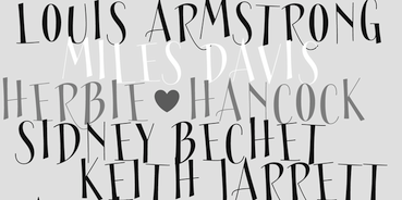 Jason Vandenberg (Greyscale Type and later J Foundry, Toronto) licenses his fonts independently and through The Type Founders.
 He designed the 8-style Grey Sans family in 2013. Gia Tran and Jason Vandenberg created the decorative typeface Ella FY (2013, Fontyou). The slender display typeface Sérafine FY (2013) was co-designed by Jason Vandenberg, Jérémie Hornus and Alisa Nowak. At the end of 2013, Jason Vandenberg and Jérémie Hornus co-designed the groovy poster typeface Jack FY. In 2014, Adrien Midzic, Jason Vandenberg, Jérémie Hornus, Julien Priez and Alisa Nowak co-designed the creamy script Vanilla FY. It was renamed Vanille FY after a few days. Minuit FY (2014, by Jason Vandenberg and Gia Tran) is a beautiful angular angry calligraphic display typeface. Still in 2014, he published the Peignotian fashion mag typeface families Bodoni Sans, Bodoni Sans Display, and Bodoni Sans Text. Typefaces from 2015: Abrade (a 12-style geometric sans with medium x-height and perfect rhythm covering Hairline to Ultra). Typefaces from 2016: Fourth (a baseball or roundhand script family), Town (a 124-style all caps art deco and lettering typeface family with enormous potential). Town includes subfamilies for Display, Inline, Outline, Lines (prismatic), 3 Dimensional, Shadow, Text, Emboss, Stencil, Chic and Contrast, and can be used for layering. Typefaces from 2017: Colby (a workhorse hand-drawn sans family). Typefaces from 2018: Stash (signage script). Typefaces from 2019: Marsden (114 styles: a bold, no-nonsense Grotesque. It was designed for display, branding, advertising, packaging or anywhere a strong voice is needed. Marsden is built on a geometric foundation, with just enough warmth to keep the style confident and lively). Typefaces from 2020: Mello (an informal grotesque). Typefaces from 2021: Cutmark (a 60-style octagonal industrial typeface family that features common 45 degree chamfered corners, flattened ink traps and wide apex forms; Cutmark Variable contains the full family of styles in a single file with width, weight and slant axes). Typefaces from 2022: Sundry (44 styles; J Foundry's take on the early 20th century grotesque). Fontspring link. Behance link. Monotype link. [Google]
[MyFonts]
[More] ⦿
|
Jackson Cavanaugh
[Okay Type]

|
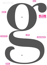 [MyFonts]
[More] ⦿
|
Jacob King

|
UK-based designer (b. 1991, Cuckfield) of the monoline almost modular typefaces Abode (2009), Altera (2011, hairline sans--caps only), and Tenga (2009), which were free at Dafont. MyFonts link. In 2011, he extended Michael Tanner's counterless fat copperplate design Peep and called it MT Peep. His commercial typefaces: JK Abode, JK Altera, JK Define, JK Prestige, JK Polar (2012). Abstract Fonts link. [Google]
[MyFonts]
[More] ⦿
|
jail9
|
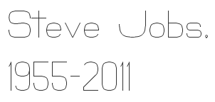 FontStructor who made Curvatured (2011, a hairline sans), Trek (2011, based on the series), and the experimental typefaces Fowl, Ancient Soft and Ancient Hard (both from the TV series Stargate), Team Battle (sci-fi face), Monoline Light, ATeck (gridded modular kitchen tile face), and Pixelish, all in 2011.
 Typefaces from 2012: Amens (bold grotesk). [Google]
[More] ⦿
|
Jake Arnold
|
 Graphic designer in London, who created the hairline art deco typeface James Bond in 2016. [Google]
[More] ⦿
|
Jakob Runge
[Typemefonts (was: 26plus zeichen)]

|
 [MyFonts]
[More] ⦿
|
James Davies
|
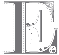 Graphic designer in Manchester, UK, who made Geometric Type (2010, hexagonal), Simplicity Type (2012, hairline sans) and Natural Influences (2010), and who adores black and white. [Google]
[More] ⦿
|
James Kilfiger
[The Difficult Type]
|
[More] ⦿
|
James Kingman
|
London-based designer of the display typefaces Oxlade (2012), Chunk (2012), Plucky (2012, hairline) and Maxi (2012, bold and counterless). [Google]
[More] ⦿
|
James Montalbano
[Terminal Design]

|
 [MyFonts]
[More] ⦿
|
James Morgan
|
James Morgan used FontForge to create the hairline avant-garde caps typeface Venitian Sound System (2013). [Google]
[More] ⦿
|
Jamie Place
[FontBlast]
|
[More] ⦿
|
Jan Maack
[The Ivy Foundry]

|
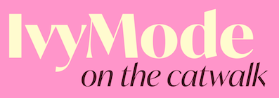 [MyFonts]
[More] ⦿
|
Jan Novák
|
Czech designer. Dafont also mentions the name Heinz Newman. Creator of the 3-d pixel fonts Khalijaka Black and Outline (2007) and the hairline octagonal typeface Boulder (2007). [Google]
[More] ⦿
|
Jarno Lukkarila
[Typolar (was: Jarno Lukkarila Type Foundry, or: Format Design)]

|
 [MyFonts]
[More] ⦿
|
Jason Anthony Walcott
[Jukebox Collection]

|
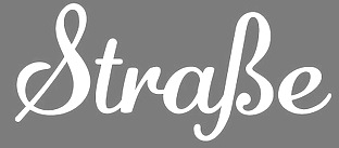 [MyFonts]
[More] ⦿
|
Jason Vandenberg
[J Foundry (was: Greyscale Type)]

|
 [MyFonts]
[More] ⦿
|
Jérémie Hornus

|
 Frenchman Jérémie Hornus studied typography at Le Scriptorium de Toulouse, France and the University of Reading, where he graduated in 2006. He worked at Dalton Maag, where he designed Tornac (which became a retail typeface in 2013 at Dalton Maag), a connected script face, and was involved in brand identity for clients such as Burberry, Toyota, HP, Nokia, Danish Industries, Dubai Metro, Manchester Metrolink, and the city of Southampton.
 Currently located in Paris, he set up his own commercial foundry in 2013. He also started publishing some of his typefaces at the French type coop Fontyou in 2013. His typefaces: - Kefa (2006), a Latin/Ethiopic family with slab serif origins and a futuristic twist. Kefa is an Apple system font. In 2013, he published Kefa II Pro and in 2020 Kefa III (at Black Foundry).
- Schoiffer Sans. A soft slightly flared sans inspired by Enschedé's Roman No6, also known as the Scheffers or Quentell types.
- Together, Jérémie Hornus and Franck Montfermé designed the feminine italic typeface Maryleen FY (2013, Fontyou).
- The connected script typeface Tornac (retail typeface from 2013 at Dalton Maag).
- Beaurencourt FY (2013). A vintage 19th century connected secretary's hand script codfesigned with Gia Tran.
- Booster FY (2013, with Alisa Nowak and Luis Gomes). Luis Gomes, Jérémie Hornus and Alisa Nowak co-designed the rounded sans typeface family Booster Next FY in 2014.
- Gauthier FY (2013, with Alisa Nowak). A transitional typeface family. In 2014, Jeremie Hornus and Julien Priez co-designed the hairline typeface Gauthier Display FY.
- Lean-O FY (2013, with Alisa Nowak and Benjamin Lieb). A slab serif with leaning asymmetrical brackets. Has a hairline weight. See also LeanO Sans in 2014.
- Marianina FY (2013, with Alisa Nowak). A contemporary condensed 24-style headline sans family with simple strokes. Characterized by kinks in the ascenders.
- The slender display typeface Sérafine FY (2013) was co-designed by Jason Vandenberg, Jérémie Hornus and Alisa Nowak.
- Gregori Vincens, Gia Tran, J&eacxute;rémie Hornus and Alisa Nowak co-designed the humanist sans typeface Klaus FY (2013).
- At the end of 2013, Jason Vandenberg and Jérémie Hornus co-designed the groovy poster typeface Jack FY.
- In 2013, he collaborated with Alisa Nowak and Fabien Gailleul at FontYou on the design of the astrological simulation typeface Astral FY. The same group of three collaborated in 2014 on Naive Gothic FY.
- In 2014, Adrien Midzic, Jason Vandenberg, Jérémie Hornus, Julien Priez and Alisa Nowak co-designed the creamy script Vanilla FY. With Midzic and Nowak, Hornus co-designed the very humanist sans typeface family Saya FY (2013) and Saya Semisans FY.
- Joao Costa co-designed the thin lachrymal typeface Zitrone FY in 2014 at FontYou with Jérémie Hornus and Alisa Nowak.
- In 2014, Monica Munguia, Alisa Nowak and Jérémie Hornus co-designed the blackletter typeface Blackmoon FY.
- In 2014, Matthieu Meyer, Alisa Nowak and Jérémie Hornus co-designed the wedge serif typeface Ennio FY at FontYou.
- The punchy poster typeface Kraaken FY (2014) was designed by the FontYou team of Bertrand Reguron, Alice Resseguier, Valentine Proust, Julien Priez, Gia Tran, Jérémie Hornus, and Alisa Nowak.
- In 2014, Joachim Vu, Jérémie Hornus and Alisa Nowak co-designed the classical copperplate script typeface Vicomte FY.
- Wes FY (2014). A sans family modeled after Futura.
- Hansom FY (2014) and Hansom Slab FY (2014, Gia Tran, Jeremie Hornus and Alisa Nowak). An organic sans and slab with very large bowls.
- In 2014, Julien Priez, Hugo Dumont, Jérémie Hornus and Alisa Nowak co-designed Rowton Sans FY, a sans family patterned after Gill Sans in six weights, from Hairline to Bold---named after Arthur Eric Rowton Gill, it has the Gillian lower case g but italic lowercase is a bit too far afield for my own taste, especially the squeezed g.
- In 2015, Jérémie Hornus, Clara Jullien and Alisa Nowak co-designed the spurless / organic slightly inflated sans typeface family Diodrum at Indian Type Foundry.
- In 2015, Jérémie Hornus and Clara Jullien co-designed Eurosoft (Indian Type Foundry). Eurosoft is an elliptical monoline techno sans typeface family that is especially attractive in the heavier weights.
- Volkart (2015, Indian Type Foundry). An 18-style neo-grotesk.
- At Indian Type Foundry, Jérémie Hornus and Julie Soudanne co-designed the Spencerian calligraphic copperplate style script typeface Spencerio (2016).
- Tabular (2016): a monospaced programming font by Jérémie Hornus and Julie Soudanne for Indian Type Foundry.
- Intercom (2016). A bare bones sans with tapered terminals and very short ascenders and descenders.
- In 2016, as Black Foundry, Jeremie Hornus, Gregori Vincens, Yoann Minet, and Roxane Gataud (and possibly Riccardo Olocco) designed the free Google web font Atma for Latin (in comic book style) and Bengali.
- Switzer (2015-2021, Fontshare). A free 18-style neo-grotesk, named Switzer for its Swiss style roots. The terminals are slightly rounded and the appearance is timeless. This seems to Hornus's take on Helvetica.
- In 2016, Google Fonts published the free Latin / Bengali signage font Galada (2015). It is based on Pablo Impallari's Lobster (for Latin). The Bengali was developed as a studio collaboration by Jeremie Hornus, Yoann Minet, and Juan Bruce at Black Foundry in France.
- In 2016, he designed the connected calligraphic script typeface Rosaline (free version at Fontshare) and the heavy slab serif poster typefaces Thug and Thug Rough for Indian Type Foundry. Github link.
- In 2016, Julie Soudanne and Jérémie Hornus designed the condensed movie title and credit typeface Title.
- Alpinist (2016) is a humanist sans with a small x-height optimized for magazine design and other editorial applications. The edges are slightly rounded for easy reading. Designed by Jeremie Hornus and Alisa Nowak. Somehow, it evolved into Alpino at Fontshare.
- In 2016, Gaetan Baehr and Jeremie Hornus co-designed Hate at Indian Type Foundry. This is the best Halloween and horror movie font ever made, period. The font has 510 glyphs, and each letter has three variants. Letters have spooky-looking hairs or roots sprouting from their zombie outlines.
- Supreme (2016-2021, by Jérémie Hornus and Ilya Naumoff at Fontshare). A 14-style engineering sans with straight-sided almost monolinear letters.
- In 2017, Jérémie Hornus, Théo Guillard, Morgane Pambrun, Alisa Nowak and Joachim Vu co-designed Bespoke Sans, Bespoke Serif and Bespoke Slab at Fontstore / Fontshare. In 2020, Bespoke Stencil was added.
- In 2017, Jérémie Hornus, Julie Soudanne and Alisa Nowak designed the attractive titling didone typeface Zesta.
- Associate Sans (2019, Jérémie Hornus and Alisa Nowak). A sans family with an American gothic look. Matching font families include Associate Slab, Associate Sans Stencil, Associate Slab Stencil, and Associate Sans Mono.
- Diodrum Rounded (2020, by Manushi Parikh, Jérémie Hornus, Clara Jullien and Alisa Nowak). A spurless organic sans family.
- Zodiak (2021, Jérémie Hornus, Gaetan Baehr, Jean-Baptiste Morizot, Alisa Nowak, and Théo Guillard at Fontshare). A free 24-style text family with Century-like newspaper roots and sturdy bracketed slab serifs that was originally named Claire (2020).
Klingspor link. Old URL. Behance link. [Google]
[MyFonts]
[More] ⦿
|
Jeff Levine

|
 Prolific type designer in Florida, b. New York, 1952. His fonts were originally free and consisted largely of dingbats. Around 2005 he went commercial, and now sells his work (over 350 fonts as of 2009) via MyFonts. He has branched out into several font styles, with a soft spot for stencil fonts, fonts for signage, art deco, and fonts for advertising. Born in New York, his family moved to Florida in 1963, where he has been ever since.
 An interview. Alternate URL. Yet another URL with his early free fonts. My pages on him. Dafont link. Abstract Fonts link. MyFonts link. Klingspor link. [Google]
[MyFonts]
[More] ⦿
|
Jeff Levine
[Jeff Levine: Art Deco Typefaces]

|
 [MyFonts]
[More] ⦿
|
Jeff Levine: Art Deco Typefaces
[Jeff Levine]

|
 Art deco is another style that appeals to Jeff Levine. He has created some beauties:
 - Acceptable JNL (2014).
- Afterword JNL (2021). An art deco typeface based on a card shown in the 1931 gangster film The Public Enemy.
- Aircheck (2006, retro CBS font).
- Airliner JNL (2008, all caps, based on a promotional postcard for Kitty Davis' Airliner - a popular Miami Beach night spot of the 1940s).
- Allerton (2019).
- Aparcero JNL (2015).
- Apparel JNL (2020). An art deco stencil.
- Artistry JNL (2017).
- Art Class JNL (2014). Art Class JNL was re-created from the titling of a lettering booklet called Drawlet Portfolio, published by the Esterbrook Pen Company in the 1930s. Drawlet pens were Esterbrook's answer to the popular Speedball lettering pens, and the booklet was an instructional manual on hand lettering with the pen nibs.
- Art Event JNL (2021). Based on a 1930s WPA (Works Progress Administration) poster advertising an exhibit of New Jersey area posters. It had its main lettering rendered in a very condensed hand lettered interpretation of Futura Black.
- Art Lover JNL (2007, based on an art deco typeface from a Dan Solo book).
- Art Materials JNL (2021). Based on the cover of the 1930s-era Catalog of Artists' Materials from Ernst H. Friedrichs, Inc. in New York.
- Art Museum JNL (2016).
- Artwork Stencil JNL (2018, based on an art deco stencil alphabet by Georges Léculier, 1939).
- Autumn Song JNL (2019).
- Bandleader JNL (2014).
- Bandshell JNL (2020).
- Bargain Shopping (2019). Based on an old storefront sign of F.W. Woolworth.
- Barn Dance JNL (2018).
- Bay Ridge JNL (2015).
- Beachfront Hotel JNL (2018).
- Bed And Bath JNL (2016, from the hand-lettered name on a 1930s-era tin for Cadet condoms).
- Belmont JNL.
- Bensonhurst JNL (2016).
- Big Band JNL (2011) is a brash typeface that is based on a lettering example found in a 1941 Speedball Lettering Pen instruction book.
- Bill of Fare JNL (2021). A stylish art deco serif based on a 1942 menu cover for the restaurant at the Biltmore Hotel in Los Angeles.
- Blue Orchid JNL (2015).
- Borough Park JNL (2014).
- Brand X JNL (2013),
- Brookhurst (2006, compressed art deco font).
- Cabana Club (2006, Miami Deco inspired font with a razor-thin double outline).
- Cafe Society JNL and Cafe Society Monoline JNL (2014).
- California Bound JNL (2015). Based on the hand lettering found on the side of the old California Zephyr passenger trains.
- Canarsie JNL (2006, a hand-lettered art deco face), Canarsie Slab JNL (2001).
- Casting Call JNL (2015).
- Casual Deco JNL (2019).
- Catalog JNL (2012). A blocky headline typeface.
- Central Park JNL (2014).
- Changing Times JNL (2017).
- Chanson De Paris JNL (2018).
- Chinese Song JNL (2019).
- Chocolate Bar JNL (2016).
- Clean Deco JNL (2020).
- Cleveland Neon JNL (2016, based on the art deco neon sign for the iconic Clevelander Hotel located in the Art Deco district of Miami Beach).
- Club Lunch JNL (2016).
- Common Area JNL (2015).
- Contintental Gothic (2006).
- Cortland JNL (2009): modeled [in part] from lettering spotted in the opening credits of Columbia Pictures 1945 Batman serial.
- Counter Servive JNL (2021).
- Courtroom JNL (2021). Based on the hand lettered opening title for the 1935 Perry Mason movie, The Case of the Lucky Legs.
- Cover Art JNL (2016). Based on a cover of an art deco era Portuguese magazine called Illustracao.
- Cover Charge JNL.
- Crestview Six JNL (2010). And its outline and shadow versions called Gramercy Eight JNL (2010).
- Cut Stencil JNL (2011).
- Dance and Sing JNL (2021). An art deco stencil based on a 1932 fan magazine from Spain entitled Films Selectos.
- Dance Band JNL (2017).
- Dance Moderne JNL (2020). An art deco typeface based on an alphabet in Portfolio of Alphabet Designs for Artists, Architects, Designers & Craftsmen (1938, Irene K. Ames).
- Dance Number JNL (2015).
- Dance Partner JNL (2015). Based a movie poster for the 1935 RKO picture "Roberta" starring Fred Astaire and Ginger Rogers, which in turn was based on the hit 1933 stage play that introduced the song Smoke Gets in Your Eyes. The play itself was based on the Alice Duer Miller novel Gowns by Roberta.
- Dance Routine (2019).
- Dance Time JNL (2021). Based on an appearance poster from 1936 for the Benny Goodman orchestra.
- Dancing Girl JNL (2021). An art deco font based on a poster for the 1930 film Show Girl in Hollywood.
- Dancing Marathon JNL (2021). An art deco font based on the cover of the 1932 sheet music for Dancing Marathon.
- Date Night JNL (2016, based on the opening title card for the 1931s pre-code movie drama Other Men's Women starring Mary Astor, Regis Toomey, James Cagney and Joan Blondell.
- Deco Days JNL (2018).
- Deco Design JNL (2020).
- Deco Diva JNL (2020).
- Deco Drop Caps JNL (2018). Based on an alphabet shown in Modèles de lettres modernes par Georges Léculier (1925).
- Deco Eccentrique JNL (2018) and Deco Multiline JNL (2018).
- Deco Banner JNL (2016), Deco Edition JNL (2017), Deco Moderne JNL (2017), Deco Nights JNL (2017), Deco Pen JNL (2017), Deco Redux JNL (2020: an all caps counterless art deco typeface), Deco Revisited JNL (2020).
- Deco Romance JNL (2020).
- Deco Roundpoint JNL (2018), Deco Semi Serif JNL (2017).
- Deco Signage JNL (2021).
- Deco Sketch JNL (2020).
- Deco Spot Initials JNL (2020). A set of rounded art deco initials set inside circular borders, after Georges Léculier's Modèles de Lettres Modernes.
- Deco Hotel JNL (2015). A hairline deco typeface.
- Deco Geometric Stencil JNL (2015).
- Deco Style JNL (2018).
- Deco Paragraph Initials JNL (2015).
- Deco Pennant Initials JNL (2013).
- Deco Elongated JNL (2013).
- Deco Triline JNL (2017).
- Deco Wide JNL (2020). Based on an alphabet in Georges Léculier's Models of Modern Letters.
- Delancey JNL (2014). Inline and squarish.
- Design District (2006, art deco inspired design elements).
- Desk Clerk JNL (2010).
- Dine and Dance JNL (2015). Supper club deco, multilined.
- Dining Out JNL (2021). An art deco sans based on a 1940s ad flier for the Los Angeles restaurant Lucca Paris Inn.
- Direkta JNL (2012).
- Dip Pen Deco JNL (2019). Made with a round nib pen.
- Discotheque JNL (2018).
- Double Bill JNL (2013). Inspired by the promotional movie trailer for 1938 gangster comedy A Slight Case of Murder starring Edward G. Robinson.
- Double Line Deco JNL (2015).
- Drawing Tablet JNL (2011).
- Dress Shirt JNL (2018).
- Drexel JNL (2018).
- Dual Line Deco JNL (2017).
- Dutch Deco JNL (2020). Based on Anton Kurvers's hand lettering on the front cover of the 1927 magazine Het Vlaamsche Volstooneel.
- East Village JNL (2016).
- East To West JNL (2014).
- Easy Living JNL (2015).
- Easy Money JNL (2014).
- Erratic JNL (2014).
- Estella JNL (2008, starry art deco version of Farragut JNL). Jeff writes: Her father named her Estella Dawn, or morning star. She truly shines bright, for as the owner of Stella Roberts Fonts, she has dedicated part of her net profits to helping her siblings pay for their medication; they both suffer from Cystic Fibrosis and diabetes. Calm in spirit, loyal to friends and family, nurturing and caring, Stella has been a friend of Jeff Levine's for years. His Estella JNL font was dedicated to her, as is this other namesake font, Morningstar JNL.
- Eckhardt Showcard JNL (2008).
- Evening Gown JNL (2015). Based on an ad for the 1935 musical "Roberta" starring Fred Astaire and Ginger Rogers.
- Evening Initials JNL (2015).
- Evening Out JNL (2018).
- Evening Wear JNL (2014).
- Family Deco JNL (2021). Inspired by the bold art deco hand lettering of the movie credits for the 1936 Laurel and Hardy comedy Our Relations.
- Fancy Dancing JNL (2015). Based on sheet music titling for the 1938 movie musical "Carefree" starring Fred Astaire and Ginger Rogers.
- Fancy Deco JNL (2018: based on the 1934 French lettering book L'Art du Tracé Rationnel de la Lettre by D. Duvillé).
- Fancy Roman JNL (2018).
- Fashionable JNL (2016, art deco: based on print ads for the Hickok Jewelry Company).
- Fashion Statement JNL (2018).
- Faux Decaux (2007, fat art deco).
- Favorite Hangout JNL (2009).
- Film Noir (2010). A counterless art deco typeface based on Alf R. Becker's examples.
- Fine And Dandy JNL (2018, curly art deco).
- Fine Dining JNL (2016: inspired by the opening titles for the 1940 Barbara Stanwyck-Fred MacMurray film Remember the Night).
- Fine Food (2019).
- Finery JNL (2014).
- Flirtation Walk JNL (2018).
- Floorwalker JNL (2013). Based on stencils made in 1926 by Display Material Company of St. Paul, MN.
- Flower Shop JNL (2021).
- Foreign Film JNL (2021). An art deco typeface based on opening credits for the 1936 French drama La Belle Equipe.
- Formal Dance JNL (2018, Dutch deco).
- Formal Event JNL (2021). Based on hand lettered actors' credits on a title card from the 1937 film Shall We Dance.
- Free Form Deco (2019).
- French Bistro JNL (2018, based on the 1934 French lettering instruction book L'Art du Tracé Rationnel de la Lettre).
- French Deco JNL (2018).
- French Geometric JNL (2018, based on an art deco alphabet by Georges Léculier, 1939).
- French Pastry JNL (2015).
- French Wine JNL (2018).
- Frisco Bay JNL (2007, a nice art deco).
- Funny Business JNL (2018).
- Funny Papers JNL (2017).
- Gambling Resort JNL (2014).
- Gidley (2007).
- Golden Beach JNL (2015).
- Golden Moment JNL (2021). An art deco font based on the hand lettered cast credits for the 1939 film Golden Boy starring Barbara Stanwyck, Adolphe Menjou, William Holden and Lee J. Cobb.
- Golden Opportunity JNL (2015).
- Golden Years JNL (2021).
- Graduating Class JNL (2017).
- Grand Central JNL (2010): multi-line Art Deco font is reminiscent of all of the glitz and glamour associated with Manhattan in the 1930s and 1940s.
- Hatchery JNL (2016).
- Hollenbeck JNL (2008).
- Hollywood Revue JNL (2015). Inspired by a movie poster for The Hollywood Revue of 1929.
- Home Movies JNL (2012). Based on 1950s cling vinyl letters made by the Clingtite Letters Company of Chicago.
- Horse Drawn Carriage JNL (2016. Based on the title card for a 1935 Bette Davis feature entitled The Girl from 10th Avenue.
- Hotel District JNL (2016).
- Huntington (2006, an art deco typeface inspired by the opening titles of the film Casablanca).
- Hybrid Deco JNL (2020).
- Industrial Arts JNL (2017). An interpretation of Morris Fuller Benton's Phenix American, 1935.
- Informational Sign JNL (2016).
- Inline Retro JNL (2019).
- Jams And Jellies JNL (2016).
- Jazz Guitar JNL (2020).
- Jazz Trumpeter JNL (2021; an art deco typeface modeled after the title card for the 1945 movie comedy The Horn Blows at Midnight starring Jack Benny).
- Juke Joint JNL (2014).
- Junior Clerk JNL (2017).
- Kiddie Show JNL (2017).
- Last Tango JNL (2021).
- Lauderdale JNL (2013).
- Light Line Deco JNL (2018).
- Limousine JNL (2010, counterless, caps only).
- Lobby Poster JNL (2021). Based on hand lettered cast credits for the 1932 George Arliss film The Man Who Played God.
- Local Jeweler JNL (2021). Thin art deco caps.
- Love Song JNL (2014).
- Malagueña Stencil JNL (2015).
- Mantequilla JNL (2021). Pure art deco lettering modeled after the cover of the 1924 edition of Joaquin Belda's novel, La Hora del Abandono.
- Maplehurst JNL (2010): a beautiful rounded ultra-fat face.
- Market JNL (2009).
- Metalworker JNL (2009), and its star-spangled derived face, NationalSpiritJNL (2009).
- Metalet Modern JNL (2008, based on the letters found within the Metalet Movie Titling Set manufactured by the Modern Display Advertising Company of Hollywood, California circa the 1940s. Each stamped metal letter would be affixed to the background surface via the use of miniature magnets. Once in place, titles for home movies or slides could be photographed, the letters then returned to their storage area in their box.).
- Midtown JNL (2010) and its serifed version, Crosstown JNL (2010).
- Millbrae JNL (2015). Named after the old Millbrae Theater in Millbrae City, CA.
- Modular Deco JNL (2018). Based on an alphabet shown in Modèles de lettres modernes par Georges Léculier (1925).
- Monoline Deco JNL (2014).
- Monthly Adventures JNL (2012).
- Moonlit Night JNL (2017).
- Moonlit Walk JNL (2017).
- More Deco Lettering JNL (2015).
- Movie Classic JNL (2021). Based on hand lettered title card from the 1935 melodrama Magnificent Obsession.
- Movie House JNL (2013). A trilined typeface.
- Movie Matinee JNL (2021). A marquee font based on a 1926 trade ad for the silent comedy The Nut-Cracker starring Edward Everett Horton.
- Movie Musical JNL (2021).
- Movie Screen JNL (2020). An art deco typeface based on the hand-lettered opening titles from the 1944 Laurel and Hardy comedy The Big Noise.
- Movie Set JNL (2021). Based on the hand lettered title on the poster for the 1929 film comedy Why Leave Home?.
- Mulholland JNL (2015).
- Musical Number JNL (2015) and Musical Prelude JNL (2017), Music Lesson JNL (2020).
- Nameplate JNL (2016).
- Narrow Deco JNL (2019).
- Nice and Easy JNL (2021). Based on art deco hand lettered title and credits for the 1937 film Easy Living starring Jean Arthur and Edward Arnold.
- Night Life JNL (2012).
- Nightspot JNL (2011). A bilined headline typeface based on lettering by Alf R. Becker.
- Nightowl JNL (2011): a headline font encased in rectangles inspired by an Art Deco hand-lettered alphabet found in a 1941 edition of the Speedball Lettering Pen instruction book.
- Nouveau Poster JNL (2011). based on an alphabet found in Modern Pen Lettering (1915, C. Howard Hunt pen company).
- Nyack (2010, Inline, Solid, Monoline): tall, caps only.
- Paducah JNL (2021). Based on hand lettered screen credits for the 1940 film The Proud Valley.
- Parisian Playboy JNL (2017).
- Parkitecture JNL (2006): counterless and fat.
- Park West JNL (2020). An art deco slab serif.
- Party Invite JNL (2016).
- Passenger Train JNL (2021). Based on a 1940s travel poster for the Florida East Coast Railway.
- Pencil Pusher JNL (2014).
- Pen Lettering Sans JNL (2017, handcrafted art deco).
- Pen Work JNL (2017).
- Penwrite JNL (2017).
- Performing Arts JNL (2018).
- Perfume Counter JNL (2017).
- Periodical JNL (2016). Based on a cover of a 1920s Spanish magazine called Nuevo Mundo.
- Period Piece JNL (2015).
- Piano Lesson JNL (2015).
- Piano Solo JNL (2015).
- Pin Spotter JNL (2021: art deco).
- Oceanfront Property JNL (2017).
- Office Visit JNL (2021).
- Playwright JNL (2010): Levine's version of Broadway.
- Old Miami Beach JNL (2012). Based on signs of the Roney Plaza hotel in South Miami Beach.
- On The Town JNL (2016).
- Opening Night JNL (2013).
- Ormond JNL (2011) and Ormond Inline JNL (2011). The latter is a blackboard bold style face.
- Pocatello JNL (2016. Based on the cast and crew credits for Presenting Lily Mars (1943), (starring Judy Garland and Van Heflin.
- Pocomoke JNL (2015).
- Ornate Deco (2019). Based on an alphabet by Martin Meijer in Album de Lettres Arti (1949).
- Postmodern Moderne (2019). Based on an alphabet by Paul Carlyle and Guy Oring in their 1935 book, Letters and Lettering.
- Poultry And Fish JNL (2016).
- Presswork JNL (2020).
- Private Eye JNL (2019). Based on signage seen in 77 Sunset Strip, an ABC series that ran from 1958 until 1964.
- Prospect Park JNL (2015).
- Quite Animated JNL (2016).
- Radio Singer JNL (2017).
- Rail Service JNL (2021). Based on extra bold, squared art deco sans hand lettering found on a 1940s travel poster for the Pennsylvania Railroad.
- Rail Travel JNL (2021). Based on a hand lettered 1930s travel poster from the Pennsylvania Railroad.
- Railway Depot JNL (2018: based on the 1934 French lettering instruction book L'Art du Tracé Rationnel de la Lettre).
- Regal Suite (2006, display art deco).
- Retail Establishment JNL (2021). Based on the 1935 catalog for Vitrolite. LI>Revelry Deco JNL (2021). Based on the dust jacket for the 1926 book Revelry.
- Rhythmic Revue JNL (2018).
- Ridgewood JNL (2012).
- Ritz Stencil JNL (2011).
- Riverside JNL (2017).
- Romance Song JNL (2021). An art deco sans serif lettering used for the opening titles of the 1941 melodrama Penny Serenade starring Cary Grant.
- Roney JNL (2008, a stylized version of his own art deco typeface Metalet Modern).
- Screen Star JNL (2020). A rounded monolinear art deco typeface.
- Seahawk JNL (2019).
- Screenplay JNL (2010): modeled after the signage seen in an old photo of the RKO movie studios building circa the 1930s.
- Service Deluxe JNL (2015).
- Sheet Music JNL (2011).
- Shopping Spree JNL (2016). Inspired by the hand lettering on the title card for the 1938 film Fast Company starring Melvyn Douglas and Florence Rice.
- Show Biz JNL (2013).
- Show Card Deco JNL (2017).
- Showgirl JNL (2011). Based on the neon letters of a 1940s marquee.
- Showpiece JNL (2014).
- Signage JNL (2013). A stencil in the style of Futura Stencil.
- Silver Screen Deco JNL (2020).
- Sleuth JNL (2013, after the trailer for the 1936 movie After The Thin Man).
- Social Gathering JNL (2016).
- Society Column JNL (2016. Based on the title card for the 1938 screwball comedy Four's a Crowd starring Errol Flynn, Olivia de Havilland and Rosalind Russell.
- Solid Deco JNL (2016).
- Song Album JNL (2016).
- Song And Dance JNL (2014).
- Song Sheet JNL (2014).
- Deco Drop Caps JNL (2018). Based on an alphabet shown in Modèles de lettres modernes par Georges Léculier (1925).
- Space Deco JNL.
- Stage Play JNL (2015).
- Summerhaven JNL (2009).
- Social Club JNL (2021). Based on a movie poster for the 1934 comedy/crime drama Jimmy the Gent starring James Cagney.
- Society Dame JNL (2008).
- Solitude JNL (2015).
- Song Folio JNL.
- Stationery Department JNL (2015).
- Streamlined Stencil JNL (2015).
- Striptease JNL (2012). A 1930s burlesque show marquee typeface.
- Stagehand JNL (2014).
- Stocks and Bonds JNL (2021). Based on the hand lettered opening title for the 1935 movie Thanks a Million.
- Structural Glass JNL (2020). An art deco typeface based on a 6-letter example from a 1931 Vitrolite catalog.
- Student Council JNL (2021). Based on a lithographed cardboard sign (circa 1930s) for Spizz Sparkling Water, a bottled seltzer from the Dr. Pepper Bottling Company of Lexington, Kentucky.
- Stuffed Shirt JNL (2013).
- Stylette JNL (2007, an art deco typeface after Stylor JNL).
- Stylor JNL (2006, hairline art deco).
- Suggestion Box JNL (2015).
- Supper Club JNL (2007).
- Swing Era JNL (2015).
- Table Fortu JNL (2007, art deco stencil).
- Tall Order JNL (2015, a revival of Raleigh).
- Tanawonda JNL (2010).
- Tarpon Springs JNL (2021).
- Theater Bar JNL (2021).
- Thoroughfare JNL (2014).
- Ticket Booth JNL (2016). Based on the opening title card for 1940's Two Girls on Broadway.
- Tin Pan Alley JNL (2014).
- Top Hat JNL (after Art Lover JNL).
- Totally Deco JNL (2017).
- Town And Country JNL (2014).
- Transit Station JNL (2021). Based on a neon sign above the Greyhound bus terminal entrance in a 1930s New York City photo.
- Travel Brochure JNL (2016, based on a vintage booklet from the Japan Tourist Bureau entitled How to See Matsushima and Environs).
- Travel Plans JNL (2021). An art deco typeface based on a 1930s travel poster from American Airlines.
- Triborough JNL (2008).
- Tropical Tourist (2011). A 1934 advertisement for the Roney Plaza Hotel at 23rd Street and Collins Avenue on Miami Beach yielded the inspiration for Tropical Tourist JNL.
- Type Uncommon JNL (2015).
- Upscale JNL (2014, based on a 1939 alphabet by Sanford Ink Company).
- Uptown JNL (2013). Based on the book Sixty Alphabets (1944).
- Tap Water JNL (2016).
- Thin Line Deco JNL (2016).
- Throughway JNL (2020). A revival of an art deco alphabet from A Portfolio of Alphabet Designs for Artists, Architects, Designers & Craftsmen (Irene K. Ames, 1938).
- Top Tune JNL (2018).
- Torrid Tango JNL (2018).
- Uptown Line JNL (2015), Uptown Residence JNL (2015), and Uptown Review JNL (2017).
- Van Wyck JNL (2008).
- Variety Store JNL (2015).
- Vaudeville JNL (2012).
- Vocalist JNL (2014).
- Weekend Plans JNL (2020).
- Westbrook JNL (2012, a monoline all-caps typeface).
- Western Suburbs JNL (2021). An art deco typeface based on the cover of a 1932 edition of Sunset Magazine.
- Window Dressing JNL (2012).
- Window Treatment JNL (2013). A Broadway style marquee face.
- Wingate JNL (2006, a narrow monolinear art deco type).
- Wonderful JNL (2014).
- Words And Music JNL (2014). Based on the 1934 sheet music for I'll String Along with You from the Dick Powell-Ginger Rogers musical 20 Million Sweethearts.
- World Travel JNL (2021: inspired by the hand lettering found on a 1930s travel poster promoting visits to India).
[Google]
[MyFonts]
[More] ⦿
|
Jefferson Cortinove
[Sea Types]

|
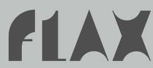 [MyFonts]
[More] ⦿
|
Jen Lea
|
Illustrator and art director in Belfast, Northern Ireland. Designer of the hairline avant-garde caps display typeface EO (2012-2013), which is inspired by and named after biologist E.O. Wilson. Behance link. [Google]
[More] ⦿
|
Jennifer Scureman
|
American designer of the hairline sans typeface Penelope (2019), Curson Handwriting (2019) and the script typeface Charlotte (2019). [Google]
[More] ⦿
|
Jeremy Dooley
[Insigne Type Design Studio (was: Dooley Type)]

|
 [MyFonts]
[More] ⦿
|
Jeremy Edelblut
|
 Graduate of Ringling College of Art and Design. Wilton, NH-based creator of Simple Dandy (2014), Perlines (2014, textured all caps typeface), Xack (2014, a tall geometric hairline sans) and the counterless black typeface Blooky (2014). Dafont link. [Google]
[More] ⦿
|
Jeremy Tankard
[Jeremy Tankard Typography]

|
 [MyFonts]
[More] ⦿
|
Jeremy Tankard Typography
[Jeremy Tankard]

|
 Jeremy Tankard established Jeremy Tankard Typography in 1997, after corporate design work at Addison Design Consultants and Wolff Olins. This Londoner made some extraordinary and daring font families. In many of his typefaces, Jeremy mixes upper and lower case letters for more impact. A list of his typefaces:
 - FF Disturbance (1993, a unicase based on Sabon).
- Alchemy (1998). Mystical. To be used with Enya's music in the background.
- Blue Island (1999, Adobe).
- The Shire Types (1998, consisting of Shire-Cheshire, Shire-Derbyshire, Shire-Shropshire, Shire-Staffordshire, Shire-Warwickshire, and Shire-Worcestershire). Shire Pro followed in 2011 and Shire Arabic in 2012. Shire is based on idiosyncratic vernacular lettering seen across Britain.
- Enigma (1999-2015). A great text typeface family with influences going back o Hendrik van den Keere.
- Shaker (2000) A sans serif with some flaring.
- Harmony Greek, a typeface that netted him a Bukvaraz 2001 award alongside the Shire Types and Shaker.
- Aspect (2002). A typeface with many ligatures and swashes.
- Bliss (Agfa Creative Alliance). Bliss Pro (2006), a sans family, covers Latin, Greek and Cyrillic ina harmonious fashion.
- Corbel (2004). A sans family made for Microsoft's ClearType project, for which he received a TypeArt 05 award.
- Custom designs: Epsilon (a very bold face, supposedly designed for the Düsseldorf branch of Frogdesign) and Harmony (for Telstra in Australia).
- Kingfisher (2005). A transitional petit-Bodonesque serif family.
- Arjowiggins (2006). Tankard cooperated with Arjowiggins and design agency Blast on AW Inuit that was commissioned by ArjoWiggins for the launch of the Inuit paper: it is a unicase Latin font inspired by Inuit letterforms. See also at MyFonts. The typophiles are unjustly upset at this sort of typeface though.
- Trilogy (2009). This extensive typeface family consists of Trilogy Sans Compressed, Trilogy Sans Condensed, Trilogy Sans Normal, Trilogy Sans Wide, Trilogy Sans Expanded, Trilogy Egyptian Normal, Trilogy Egyptian Wide, Trilogy Egyptian Expanded, and Trilogy Fatface.
- Fenland (2012). A 14-style ink-trapped sans.
- Redisturbed. A classical unicase typeface.
- Capline (2014). A bilined all-caps typeface family for titling work. It won an award at Modern Cyrillic 2014.
- Queezoid (2015).
- Pembroke (2014). A British geometric typeface family with many weights ranging from Hair to Ultra.
- De Worde (2017). An italic typeface family in seven weights to celebrate the 60th anniversary of e Wynkyn de Worde Society.
- Wayfarer (2017). He writes: The typeface was originally commissioned for use with a new wayfinding system for the city of Sheffield in the UK. As Sheffield was the home to the type foundry, Stephenson. Blake & Co. it had been thought that their type, Granby Condensed would be suitable. The Granby family of types was developed during the 1930s as Stephenson, Blake's contribution to the general cashing in of other foundries on the popularity of Monotype's Gill Sans and the geometric sans serifs being introduced by the continental type foundries.
- Hawkland and Hawkland Fine (2018). A text typefaceC with didone and transitional elements.
- Brucker (2019). An 8-style angular expressionist typeface family.
Fontfont write-up. Alternate URL. Interview by Planète Typographie. Interview by Brendan Staunton. I Love Typography link. FontShop link. Klingspor link. MyFonts link. [Google]
[MyFonts]
[More] ⦿
|
Jessica Turcotte
[Matchbook Press]
|
[More] ⦿
|
Jill Pichotta

|
 Jill Pichotta began working for Font Bureau as an apprentice with David Berlow in 1991, honing her skills on projects for Rolling Stone, Esquire, Condé Nast Traveller, The New York Times and Apple Computer. She has managed the production of retail releases for independent designers since 1993, and has contributed several typefaces at Font Bureau. In 2016, Jill Pichotta became Principal Product Manager for Type Network, overseeing type development and quality for the company's global alliance of foundry partners. Since 2021, Jill Pichotta is Vice President of Type at The Type Founders in New York.
 Jill Pichotta's typefaces: - Gangly (1996-1998). Codesigned with Joe Polevy.
- HipHop (informal printing, 1993).
- RomeoSkinnyCondensed (1991). One of the thinnest fonts on earth.
- Rats (with Jean Evans, 1997).
- FB Garamond Text and Display (1992-2000). Modeled after Ludlow's Garamond done in 1929 by Douglas Crawford McMurtrie and Robert Hunter Middleton.
- Californian FB Text and Display (1994-1999). Done in cooperation with David Berlow and Richard Lipton.
- Aardvark.
- A redesign of Matthew Carter's Postoni (1997), called Stilson (2009, with Richard Lipton and Dyana Weissman): Since 1997, The Washington Post's iconic headlines have been distinguished by their own sturdy, concise variation on Bodoni, designed by Matthew Carter. For the 2009 redesign, Richard Lipton, Jill Pichotta, and Dyana Weissman expanded the family with more refined Display & Condensed styles for use in larger sizes. Originally called Postoni, the fonts were renamed in honor of The Post's founder, Stilson Hutchins.
- Caslon FB (1992, Font Bureau) comes with this text: Our familiar Caslon Bold headletters were invented around the turn of the twentieth century in the United States and were only loosely based on William Caslons romans. The best of the Caslon Bolds originated at the Keystone Type Foundry of Philadelphia, whose Caslon Bold Condensed appeared about 1905, probably drawn by R.F. Burfeind. Jill Pichotta revised his Bold Condensed&drew the Bold Extra Condensed.
FontShop link. [Google]
[MyFonts]
[More] ⦿
|
Jim Richardson
[SUMO Design (or: Hello Fonts)]
|
[More] ⦿
|
Jimena San Pedro
|
Designer in Buenos Aires who created a geometric hairline sans typeface called Oceanica (2012). Behance link. [Google]
[More] ⦿
|
Joana Roca

|
 Portuguese co-founder, with Benoit Dupuis, of Tropical Type Foundry in 2020. In 2020, Benoit Dupuis and Joana Roca designed and released Shoika, a 24-style geometric sans family featuring a hairline weight called Air. [Google]
[MyFonts]
[More] ⦿
|
Joao Ferreira
|
Creator of the hairline condensed elliptical typeface Gandhi (2011). [Google]
[More] ⦿
|
Joel Santos
[yrmk (was: Youremin)]

|
[MyFonts]
[More] ⦿
|
Jonathan Calugi
[Happyloverstown]
|
 [More] ⦿
|
Jonathan Hill
[The Northern Block (TNB)]

|
 [MyFonts]
[More] ⦿
|
Jonathan Hoefler
[Hoefler (was: Hoefler&Frere-Jones, and Hoefler Type Foundry)]

|
 [MyFonts]
[More] ⦿
|
Jordi Embodas
[Tipografies]

|
 [MyFonts]
[More] ⦿
|
Jos Buivenga
[Exljbris]

|
 [MyFonts]
[More] ⦿
|
Jose Luis Eguidazu de Maortua
|
Madrid-based designer of a hairline compass-and-ruler avant garde caps typeface in 2016. Aka Double Monkey. [Google]
[More] ⦿
|
José Manuel Urós
[Neue]

|
 [MyFonts]
[More] ⦿
|
Josep Pep Patau i Bellart
[Tipo Pepel (was: Antaviana Typeface Division, or: Astramat)]

|
 [MyFonts]
[More] ⦿
|
Josh Fallon
|
During his studies at Pennsylvania State University in University Park, PA, Joshua Ryan Fallon created the hairlined typeface Versa Condensed (2013). [Google]
[More] ⦿
|
Joshua Grzybowski

|
 Type designer from Minneapolis, Minnesota, b. 1974. He created the monoline upright connected script family Hennepin (2011), and the ultra-fat art deco slab typeface Thickset (2011), and its companion hairline slab typeface Thinset (2011). Mere (2011) is a monoline geometric sans. Simpleton (2011) is a fat display face. Calhoun (2011) mixes a liquid style with tear drop terminals.
 Mortadella (2012) is a hand-drawn burly-looking sans. Mol (2012) is a mini-serifed didone display face. MyFonts link. Behance link. Cargo Collective page. Klingspor link. YWFT link. [Google]
[MyFonts]
[More] ⦿
|
Joshua M. Smith
[Hydro 74]

|
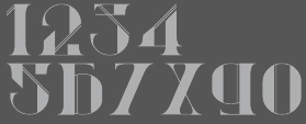 [MyFonts]
[More] ⦿
|
Jörg Schmitt

|
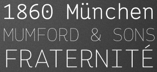 Designer (b. 1985, Marburg) at 26-plus Zeichen in Germany, who is based in Köln. He graduated from the University of Applied Sciences in Trier in 2010.
 In 2010, he designed Telegraph Sans and Telegraph Serif and Hellschreiber (2011, Sans and Serif), the latter at Die Gestalten. The name Hellschreiber originates from an old Siemens telegraph system (or Hell-Schreiber, named after Dr. Rudolf Hell). Both fonts have the look of typewriter type and were inspired by Courier. In 2012, Joerg started the Joerg Schmitt Foundry. His first typeface there is the pleasing rounded monospaced typewriter style sans family Ingrid Mono (from Hairline to Bold). Fansy (2013) is a prismatic typeface. In 2014, he created the (curly) ironwork typeface Snappy. In 2017, he published the very readable soft sans typeface Oblivian Grotesque and the sharp-edged Oblivian Text, which is characterized by a kneeling italic f. Klingspor link. Behance link. 36plus Zeichen link. [Google]
[MyFonts]
[More] ⦿
|
Journet Flavie
|
Parisian designer of the hairline hipster typefaces Claustrophobia (2014) and Island (2014). [Google]
[More] ⦿
|
Juan Pablo de Gregorio
[Letritas]

|
 [MyFonts]
[More] ⦿
|
Jukebox Collection
[Jason Anthony Walcott]

|
 This is the new foundry of Hollywood, CA-based Jason Walcott, who formerly ran JAW Fonts, Jukebox Type, and Counterpoint Type Studio. JAW Fonts ceased operation in 2003 and Jason reintroduced his collection of fonts in a revised form under the new name of Jukebox Type. Established in 2015, Jukebox Collection started out with these typefaces, which are mainly remastered and recycled typefaces from JAW Fonts and Jukebox Type with original designs going back to the period 2001-2007, roughly spaeking:
 View the Jukebox Collection typeface library. [Google]
[MyFonts]
[More] ⦿
|
Julia Soldatke
|
Hamburg-based designer of the hairline sans typeface Juis Delight (2013) and of the geometric sans typeface Concrete (2013). [Google]
[More] ⦿
|
Julien Priez

|
 Julien Priez (b. 1986, Montreuil, France) studied typography and type design at Ecole Supérieure Estienne des Arts et des Industries Graphiques in Paris (2006, 2008). In 2010, he worked at Atelier Pierre di Sciullo in Montreuil. Recently, he was affiliated with the French type foundry FontYou. His typefaces:
 - Rag FY (2013). A wavy brush typeface co-designed by Julien Priez, Sofia Proisy and Charles Privé at FontYou.
- Le Normandie (piano key face). Le Normandie was expanded at Fontyou in 2014 to a gorgeous display triple of fonts, Normandie FY (Modern, Gothic, Italian). Der Klaus (2011) is a blackletter version of Normandie.
- Le Montreuil (2010). An experimental poster typeface family done at Estienne with the help of Michel Derre, Margaret Gray et Franck Jalleau.
- Le Briqueterie (2010). Done with Pierre di Sciullo's studio: a modular pixelish family.
- Le Baaf (2010). Done with Margaret Gray: an experimental titling face, based on the stained glass windows of a cathedral in Ghent, Belgium.
- Le Composite (2010). An imaginary letter font made under the guidane of Michel Derre and Franck Jalleau.
- Le Jimmy (2009). A typeface done to invoke the 1930 mafia. A beautiful idea executed with the help of Michel Derre, Margaret Gray and Franck Jalleau.
- Typetool (2010). An ornamental caps typeface).
- At Fontyou, Benjamin Lieb, Gia Tran and Julien Priez co-designed the hand-drawn typeface Brixton FY (2013). Not to be confused with two earlier typefaces called Brixton, one by Tom Chalky, and one by Luke Ferrand. Since two of the three Brixtons are commercial, I expected FontYou to change the name.
- In 2014, Adrien Midzic, Jason Vandenberg, Jérémie Hornus, Julien Priez and Alisa Nowak co-designed the creamy script Vanilla FY. It was renamed Vanille FY after a few days.
- The punchy poster typeface Kraaken FY (2014) was designed by the FontYou team of Bertrand Reguron, Alice Resseguier, Valentine Proust, Julien Priez, Gia Tran, Jérémie Hornus, and Alisa Nowak.
- In 2014, Jeremie Hornus and Julien Priez co-designed the hairline typeface Gauthier Display FY.
- Mandinor FY (2014) is a decorative didone typeface---it comes with separate Gothic (blackletter) and Italian (Western) variants, and is accompanied by Mandinor Ornaments FY. Still in 2014, Julien Priez, Hugo Dumont, Jérémie Hornus and Alisa Nowak co-designed Rowton Sans FY, a sans family patterned after Gill Sans in six weights, from Hairline to Bold---named after Arthur Eric Rowton Gill, it has the Gillian lower case g but italic lowercase is a bit too far afield for my own taste, especially the squeezed g.
- Boogy Brut (2020). A pointy decorative serif with many calligraphic influences. At Bureau Brut.
- Julien also drew many calligraphic alphabets, some of which will eventually become fonts.
- Michel Derre and Julien Prez jointly won the Bronze Medal in the Latin category for Abelha in 2016 at the Morisawa Type Design Competition 2016.
Behance link. Julien Priez Drawing link. [Google]
[MyFonts]
[More] ⦿
|
Julien Tourdot
|
Julien Tourdot writes about himself: I am Juart Little aka The Digital Blue Collar Worker. I am a graphic&web designer residing in Paris (France). Behance link. Dafont link. Devian tart link. In 2010, he created the script typeface Someothaship, the octagonal typefaces Vador and Bionic, and the hairline face Lafine. In 2011, he made the Juart script face. In 2012, he did Sickofont and Juart (YouWorkForThem). [Google]
[More] ⦿
|
Juraj Chrastina

|
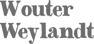 Freelance designer from Slovakia, b. 1981, Zilina. He set up shop at MyFonts in 2009. His typefaces:
 - 2009: Stanislawski (display sans), Bonatti (simplified sans), Motyka (an octagonal family).
- 2010: Cassin (dingbats), Birkenmajer (blackletter and curly), Ruman (a piano key font not unlike many of the modular fonts made over at FontStruct), Komarnicki (geometric---it is largely based on arcs of a circle), Batura (ornaments), Flexi Social Icons (a set of 64 social network and media buttons), Messner (a hairline sans), Kammerlander (a high-contrast all caps Peignotian face that Juraj claims is well suited for fashion mags), Runout (a black marker face), Walker (a floral dingbat face), Trango (an unevenly spaced fun childish hand-printed face), Chogolisa (an elliptical sans family).
- 2011: Primitive Icons (dingbats), Manaslu (his first cartoon font), Baltoro Sans (humanist sans), Masherbrum Slab Thin (hairline slab for fashion mags), Latok (a fat keyhole-themed art deco display face), Makalu (a flower dingbat typeface inspired by the lovely drawings of the famous illustrator Zdenìk Miler), Besley Hand (hand-printed didone), Ambassador (a hairline roman capitals face, ideal for glossy fashion mags. Its high-contrast Peignotian companion is Snob), Greenhorn (a comic book face), Gamba (an elliptical typeface), Valibuk (a strong black sans headline face), Lomidrevo (a grunge stencil derived from Valibuk), Baronessa (hand-printed poster face), Baron (hand-printed poster face).
- 2012: Rumbarak (inspired by the titles of a few old Czech movies for children), Boudoir (a hand-printed poster face), Fimfarum (a wonderful set of hand-printed poster typefaces that can be mixed and matched for certain effects).
- 2013: Gentleman (a sans family from hairline to black), Amundsen (an all-caps stencil typeface), Smart Labels (badges), Lustig (an interlocking poster font), Hilton Sans and Hilton Serif (fashion mag headline typefaces kerned and spaced by Igino Marini), Handy Labels, Loco (a counterless geometric art deco face), Charmante (hand-drawn poster typeface).
- 2014: Fram (an uppercase stencil typeface for Latin and Cyrillic), General (neutral sans family with a very thin hairline weight).
- Fonts from 2015: Vagabundo (hand-brushed), Britva (a glaz krak typeface derived from Valibuk).
- Typefaces from 2016: Gerlach Sans, Gibon (a cartoon font).
- Typefaces from 2017: Mysteria (hipster sans).
- Typefaces from 2019: Freud (a 9-style sans).
Pic. Myfonts link. Creative Market link. Klingspor link. Fontspring link. Behance link. Showcase of Juraj Chrastina's typefaces at MyFonts. Behance link. View Juraj Chrastina's typefaces. Showcase of Juraj Chrastina's typefaces at MyFonts. [Google]
[MyFonts]
[More] ⦿
|
Jure Stojan

|
Slovenian Jure Stojan designed the sans serif family JY Koliba in 2000 at Jack Yan and Associates. Check out that wacky "g", and the great hairline style. Also at Jack Yan, he published Raj JY (2001-2011), KlinJY (2003; first done for a student magazine in Ljubljana) and JY Shapa (2014, a calligraphic serif typeface family). In 2017, designed published Saj JY, a heavily modulated sans with some exaggerated characters, which was published by Jack Yan. [Google]
[MyFonts]
[More] ⦿
|
Jurica Kos
|
Designer of the hairline sans typeface Elegant Light (2011). [Google]
[More] ⦿
|
Karl-Heinz Lange

|
 Type designer (b. 1929, Wiesenkirch, d. 2010) at Typoart Dresden (former East Germany).
 Karl-Heinz was enrolled in the Humanistic Gymnasium at Elbing from 1939 to 1945 and changed to the Wernigerode High School after his family had to flee to central Germany. From 1949 to 1951, Karl-Heinz Lange studied at the Werkkunstschule Halle, where one of his teachers was Professor Post. After 1951, he continued his studies at the Hochschule for Grafik und Buchkunst in Leipzig with an emphasis on book design. He received his diploma in 1955 with distinction based on his design of a hot metal typeface. From 1956 to 1961, Karl-Heinz Lange worked as a lecturer for Type and Commercial Graphics at the Hochschule für Angewandte Kunst in Magdeburg. From 1961 to 1963, he taught at the Hochschule für Grafik und Buchkunst in Leipzig, and finally as a freelance commercial designer in Magdeburg. From 1969 to 1976 he was Artistic Director at Henschelverlag, Berlin. From 1976 until 1994 he was Professor of Type and Typography at the Fachschule für Werbung und Gestaltung in Berlin. From 2005 to 2007 he taught at the Fachhochschule Magdeburg/Stendal. Karl-Heinz Lange was awarded the second prize at the International Type Design Contest 1971 for a headline typeface, and, in 1984, at the XIth Biannual of Graphic Design in Brno, he won a silver medal for Publica. He created the telephone book typeface Minima and redesigned the Typoart Super Grotesk (Arno Drescher, 1930) as well as the newspaper typeface Magna (originally by Herbert Thannhaeuser). His fonts include: - Publika: a sans typeface developed between 1981 and 1983---this must have been one of the last big East German typefaces.... It obtained a silver medal at the Bienale of Graphic Design Brno 1984.
- Primus (a 1962 workhorse family for the magazines in the DDR), Magna (a DDR magazine text typeface from 1968) and Typoart Super Grotesk. These metal typefaces were adapted for Phototype by Lange.
- Minima (1984): a narrow sans designed for the DDR's telephone directory. Revived by Ralph M. Unger in 2017 as Tablica.
- ViabellaT H Pro (2009-2016). From 2006 until 2009, Veronika Elsner and Günther Flake helped Lange with his new signage script typeface Viabella. Earlier, Elsner and Flake published Lange's Rotola (1985/2007). Viabella and Rotola were adjusted and finished after Lange's death by the type designer Björn Gogalla.
- At the end of his life, Lange had a fruitful cooperation with Primetype. His old typefaces were revived in 2009 with the help of Ole Schäfer as Publicala [PTL Publicala has 60 typefaces], Minimala [PTL Minimala is a family of 96 fonts from Primetype] and Superla [PTL Superla has 64 styles in the geometric/Futura genre]. The first two names refer, of course, to Publika and Minima.
- Rotula TH Pro (2016, Elsner & Flake). When first developed in 1985 at Typoart, Lange called this circle-themed psychedelic font Boutique. It was further developed by him from 2006 until 2009, and finally published by Elsner & Flake after his death in 2016.
Obituary (in German) by Ivo Grabowitsch. [Google]
[MyFonts]
[More] ⦿
|
Karol Bilski
|
Wroclaw, Poland-based designer of a hairline display typeface in 2018. [Google]
[More] ⦿
|
Katatrad (was: Behaviour)

|
 The idea of Katatrad originally comes from the vision and support of Cadson Demak design team. Started out by a type design exhibition project and transformed itself to a boutique font collection. Katatrad, which is located in Bangkok, offers fonts from new and up coming designers from Thailand. The collection is also available in standard Latin set and Latin&Thai version of the same font. Stawix Ruecha (Katatrad) designed the super-contrasted didone family Xree (2011) and the rounded octagonal family Nubb (2012). They cover Thai and Latin. Katatrad was previously known as Behaviour, est. 1996. In 2006, Katatrad published Fiber Eno, a cross between OCRA and OCRB. In 2005, they did OCR-Be. In fact, many of their typefaces have octagonal roots. Katatrad published Beauty in 2011. Pharmasee (2011) has medical dingbats.
 In 2012, Stawix was established in Bangkok. In 2015, the Katatrad team and Cadson Demak (and especially Thanarat Vachiruckul) published the free loopless Thai / Latin typeface Prompt. It won an award at Granshan 2016. In 2018, they designed Niramit (Google Fonts, Cadson Demak). In 2019, Katatrad developed the free version Readiness of their geometric sans typeface family Prompt. Images of their best-selling typefaces. [Google]
[MyFonts]
[More] ⦿
|
Kate Fivash
|
Graduate of Middlesex University who lives in London. She created a compass-and-ruler monoline sans typeface with three weights called Compass (2012). [Google]
[More] ⦿
|
Katie Arpin
|
Overland Park, KS-based student-designer (at KU) of the hairline sans typeface Kindred (2018). [Google]
[More] ⦿
|
Kato Masashi
[Flop Design]
|
 [More] ⦿
|
Kawisara Vacharaprucks
[Kawisara Vacharaprucks]

|
 Wundertype is a foundry set up in Bangkok in 2020 by Kawisara Vacharaprucks, a Thai type designer who published at Stawix Type foundry before 2020. His first typeface at Stawix was Rit Graph (2014), which emulates the writing by engineers and architects on technical drawings. His second typeface, with Stawix Ruecha, was the beautiful Frygia (2015, a rounded industrial sans in 20 styles, from Hairline to Heavy).
 In 2017, he designed the fun 3-style rounded sans typeface Merlod at Stawix. Typefaces from 2018: Yotin, Infoma (a techno sans done with Stawix Ruecha), Kinn (an industrial sans). In 2020, Wundertype published the 18-style geometric slab serif Chom, designed by Stawix Ruecha. [Google]
[MyFonts]
[More] ⦿
|
Kawisara Vacharaprucks
[Kawisara Vacharaprucks]

|
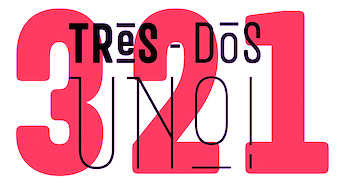 [MyFonts]
[More] ⦿
|
Keirstin Yantis
|
Saint Augustine Beach, FL-based creator of the hairline typeface Vue (2012, deasigned during a typography course), and of Collected (2013) and Collected Decorative (2013). Fontspace link. Behance link. [Google]
[More] ⦿
|
Kenneth Pilo
|
Kenneth Pilo is art director and creative director of pilo.se, his own virtual agency in Sweden. He has worked in the advertising business since 1977. Since 2003, he has also been the driving force behind the online community bold.se, a meeting point for the Swedish advertising business. In collaboration with Mårten Fischer, Ray Larabie of Typodermic, and Göran Söderström of Pangea Design, the biline headline display font Pilo (Regular, Thin) was created in 2007-2009 and is available at Veer. It is based on the logotype of bold.se, which in turn was designed by Björn Höglund at Daddy. Typedia link. [Google]
[More] ⦿
|
Kent Swecker
[A New Machine]

|
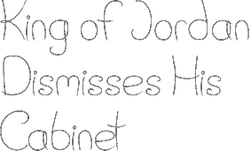 [MyFonts]
[More] ⦿
|
Kerrin Fernandez
|
Creator of the free sci-fi hairlined outline font Freeze (2012). [Google]
[More] ⦿
|
Keystrokes
[Douglas F. Olena]

|
 Douglas Olena's company, Keystrokes, is located in Birmingham, AL. Great typefaces by Doug Olena (b. 1953) include Adastra (Herbert Thannhaeuser, 1928, revival 1995), Ampersands (1995), Arwen (1995), Blocks (1995, a very black geometric face), Elegant (1995, art deco), DecoBats, Hindenburg (1995), Informal Black (1995), Marquis (1995, like Broadway), Maximilian (Rudolf Koch, 1917, revival 1995), Metropolis and Metropolis Shaded (1928, after Willy Schwerdtner), Minimal (1995, a very thin avant garde font), FFD Neuland (Rudolf Koch, 1922, revival 1995), Newton Inline (Rudolf Koch, 1928, revival 1995), Poetry (1995), Questions (1995), Searsucker (1995, another Broadway style font; see Agfa), FFD Sphinx (Deberny&Peignot, 1925, revival 1995), Stalk (1995), Tube (1995), and the classy MontBlanc Regular and MontBlanc Engraved. Fox and Arwen are freeware. His fonts at Agfa/Monotype: Adastra, Ampersands, Arwen, Blocks, Elegant Inline, Elegant Open Face, FFD Neuland, FFD Neuland Inline, FFD Sphinx, FFD Sphinx Inline, Hindenburg, Informal Black Condensed, Informal Black, Marquis, Maximilian, Metropolis ShadedCS, Minimal, Newton Inline, Poetry, Poetry Inline, Questions, Searsucker, Searsucker Bold, Searsucker Outline, Stalk, Tube. His CV reveals that he has a Masters in Philosophy! Many of his fonts have been absorbed into the Monotype collection without further mention of Olena or Keystrokes.
 FontShop link. Klingspor link. [Google]
[MyFonts]
[More] ⦿
|
Khaled Khalifa
|
Aka ghostcreamd. Mansoura, Egypt-based creator of the free hairline sans typeface Luxury (2017; the name inside the font is verylightnormalfont). [Google]
[More] ⦿
|
Kim Si Nai
|
Jeonju, South Korea-based creator of The Match (2011), The Tongs (2011), A Needle and Thread (2011; images: i, ii), The Clip (2011), The Fan (2011, a hairline script face---images: i, ii), The Clip (2011, paperclip face), The Safety Pin (2011) and The Straw (2011). Aka Kim baby. [Google]
[More] ⦿
|
Kinetic Plasma Fonts (was: Cannot Into Space Fonts)
[Robert Jablonski]
|
 Cannot Into Space Fonts is the free font studio of Robert Jablonski (b. 1991), who is based in Indiana. Before this studio, Robert used to make fonts at FontStruct under the alias Rabbid Bahh. Mew Too (b. 1991, Indiana) is co-lead designer for Cannot Into Space Fonts. Jasper (b. 1996) joined in 2015.
 The fonts include first and foremost the large geometric sans typeface family Nordica (2014) and the large grotesque family Hussar (2014). Other typefaces: Warszawa (2016: a wide display sans), Camo3 (2016, camouflage pattern fonts), Armata (2016, sans), Bolshevik (2016, constructivist), Rabbid Highway Sign II (2015, a sans, followed by IV in 2016), Rocketfuel (2015, by Mew Too), Charger (2015, a sans by Jasper; see also the 2016 typeface Charger Pro), Kabina (2015), Just Breathe (2015), Polan Stronk (2015), Apple Storm (2015), Numb Bunny (2015), Hi (2015, with Mew Too), Hussar Motorway (2015, an arrow font), Hussar Szturm (2015), Hussar Print (2015), Happy Time (2015, transitional; done with Mew Too and forked from TeX Gyre Termes), Distraught (2015), Curly Kue (2014), Filament (2014), Thicker Than (2014), BigWriter (2014), SuplexDriver (2014), Loogie Hawk (2014), Squared Hand (2014), Polan Writings (2014), Waterfire (2014), RDJ Hand (2014, a pixel typeface), Bwahh (2014, FontStruct font), DinKursivschriftEng, DinKursivschriftGhostEng, DinKursivschriftLeftEng, PolanCannotInto (2014, +DIN, +Shqip), PolskiDINKursivschrift (2014), Rabbid-Highway-Sign (2014, FontStruct font). Typefaces from 2015: Warsaw Gothic (a modification of a font by The League of Movable Type, 2009), Sztylet Bold (not a "Cannot Into Space Fonts" font, this heavy geometric sans is a derivative of Hussar by "Crazy Dave" at Plus One Fonts), Trueno (by "Jasper"; an extensive sans family based on Julieta Ulanovsky's Montserrat (2014)), Passageway (based on an Ascender design from 2010), Fog Sans (a derivative of Intel's Clear Sans from 2012), Asimov (a derivative of Roboto), Rocketfuel, Be Happy (a smiley doodle font by Mew Too), CSF Camouflage Kit (dingbats), Stormning Aesir (an outlined version of Stormning, with Mew Too), Blink (a condensed sans in nine styles, by Mew Too), DIN Kursivschrift (an update of the earlier font), Stormning (a Norse runic font co-designed with Mew Too; followed in 2016 by Ny Storming), Analytik, Through The Black, Ruined Serif, Warp Storm, Give A Hoot (2016: sans family). Special mention: Hussar Techniczy (2015), Hussar Ekologiczny (2015), Hussar Paneuropjskich (2015, a hacker font). In Jablonski's own words, it is an April Fool's day joke font. We were inspired to make it by Erik Spiekermann's April Fool's day joke font "FF Mt", which was a disemvoweled version of Meta, and by "Lato Saves Billions", by Lukasz Dziedzic and Adam Twardoch, a Miniaturized version of Lato. Hussar Paneuropjskich (Polish for Paneuropean) is a "universal European font". Designs made with FontStruct: Bwahh, Rabbid Highway Sign, Handwriting series, Waterfire, Numbbunny, Squarish, Proton, Jag Elskar Dig (I Love You), Applestorm, BigWriter, Squared Hand, Gib Font Plox, Blanket, Dictator, Krieg Font, Thicker Than..., HoneyBee, Just Breathe, Reckless Catfish, Tape, Polanwritings, Filament Serie, Curlykue, Børk Börk, Loogie Hawk, Take Off, Piccolo, Suplexdriver, Kabina, Polanstronk, Subtitle, CiSf OpenHand, Mewtoo Hand, Distorted series, I Like Turtles, Analytik, Koop, Carwash, Anarchic Type, Messed Up, Drag You Down, Blindside, Through The Black, Warpstorm, Ruined Serif, Distraught, Photofail, Sprayer, PlasticEraser. Typefaces from 2016: Ember, Retroscape (a pixel typeface made with FontStruct). Typefaces from 2018: Hussar Motorway (arrows), Anxiety, Mew Too Catdings. Typefaces from 2019: Connection II (pixel font). Fontspace link. FontStruct link. Dafont link. Open Font Library link. One Drive link to download all his fonts at once. [Google]
[More] ⦿
|
King Fahd Glorious Quran Printing Complex
[Ashfaq A. Niazi]
|
 Ashfaq A. Niazi is a designer in Lahore, Pakistan, who graduated from Govt Islamia College in Lahore. Since 2008, he is associated with the King Fahd Glorious Quran Printing Complex in Saudi Arabia, which in 2009 released the free Arabic language font Uthman Taha's Naskh (2008, +Bold). Earlier fonts by King Fahd Complex include QCF P001 and QCF BSML, which are here. He also made the free symbols typeface KFGQPC Arabic Symbols 01 (2010). In 2008, Peter Bilak, Eike Dingler, Ondrej Jób, and Ashfaq Niazi created the 21-style family History at Typotheque: Based on a skeleton of Roman inscriptional capitals, History includes 21 layers inspired by the evolution of typography. These 21 independent typefaces share widths and other metric information so that they can be recombined. Thus History has the potential to generate thousands of different unique styles. History 1, e.g., is a hairline sans; History 2 is Peignotian; History 14 is a multiline face; History 15 is a stapler face, and so forth.
 He writes: My objective is to work on Quranic Fonts, with Latest Digital Technology, and enhance them for the maximum visibility. My aim is to produce High Quality Mushaf & Naskh fonts, with the best possible placement of Tashkeel (Diacritics). I've developed, Indo-Pak Quranic Calligraphy System (QCS), Full Quran, having more than 15000 Ligatures, now used widely in Pakistan, for the printing of Quran. Now this complete package is free for everyone. Typedia link. [Google]
[More] ⦿
|
Kix
[Christoph Windmueller]
|
 German designer in Recklinghausen, Germany of First Strike (2008, FontStruct) and First Strike Spaced, a grid-overlay of First Strike. Other FontStruct fonts from 2008: Aria Penci Roman (sketched font), Canned Heat (dingbats), Guttermouth (slab serif), Guttermouth Spaced (dashed version), Guttermouth Bold, Bloc Party Outline Shadowed, BabyBaby (toy blocks), Possibly Winged Polepieces, Skylines, Canned Heat, Simplicity, Stadium, Brussels (inspired by the Atomium), Cardboarder (nice 3d face), Crazytown (a Western font, an hommage to Maurice de Bevere, creator of Lucky Luke, 1923-2001), Itallica, Orica*cut, Orica, Pavement, Moduli, Tinka, Tinka Filled, Moduli, Loreylane, FS United One, (gorgeous sketched letters), babybaby, bellevue, bloc-party-outline-shaded, brussels-contourized, elceedee, eurofiction, horrorhouse, plenum, scratch-me-if-you-can, simplicity, skylines, sophia---superlight (hairline), stadium, werkshalle (Ferrari lettering font?), schachmatt (stitching font).
 In 2009, he added Terence Kill (blackletter), Cellophone, Amanerd (texture face), Drenama, Poster Classic, Midnight Diner, Sunburst, Signo, Multiverse (Basic, Striped, Alaska, Couch), Pointless Task, Broadway (dotted outline), Mostly, Terence Kill (blackletter), Pole Position (dot matrix), Antares 37 (Startrek font), Figure Collection Part 1 (dingbats), and College Pornmag. In 2010, he made Motown Motel, Olympic Spirit (dot matrix outlined), Cyclobe Pro (octagonal), Gappy, Burtonesque. In 2011, he FontStructed the gorgeous typeface Vuvuzela, Dance (dancing men), and Zapotek (elliptical face), Asgardian, Legendary (eleven movie stars). In 2012, he created CMND (outline face) and Equinoxe. In 2013, Christoph made the crayon font Grungarian and Histamic. Typefaces from 2014: FS Dark Shogun, FS Galaxy Epsilon (3d font), FS Tigerwood (striped font), FS Orica Stencil, FS Moduli, FS Underworld (blackletter), FS Pointless Task (dot matrix font), FS Horrorhouse, FS Werkshalle (one of my favorite fonts in this collection), FS Brussels (connect-the-dots typeface inspired by the Atomium), FS Skylines, FS Signo, FGS Orica, FS Plenum, FSAntares37, FS Old Brewhouse, FS Commander. Dafont link. [Google]
[More] ⦿
|
Kometa
[Christian Jansky]
|
Kometa is Christian Jansky's type foundry located in Brno, Czechia. His typefaces: Attila Sans (a contemporary sans with an attitude, 2019), Labil Grotesk and Stabil Grotesk (2018, based on his Masters thesis), Victor Serif (2019, a transitional typeface famiy named after Victor Lardent who designed Times New Roman; it has a variable option with a weight axis). Home page. [Google]
[More] ⦿
|
Kreative Korporation (was: Relay Fonts, or: Kreative Software)
[Rebecca Bettencourt]
|
Relay Fonts (Rebecca Bettencourt, aka Beckie RGB, and also known as Kreative Korporation and Kreative Software) offers a number of free fonts. - Their main list of fonts, 2003-2010: Alisha, CosmicSpamMS, DotCom, Eighteen, Felicia, FluorineLite, FluorineLiteMikiana, Glass, GlathenGirl, Infinity, Kaileen, Kawakimi, LongIsland, LongIslandIcedTea, Madgecrack, MikaPro, Miranda25, Miranda27, OpenDocRocks (hairline sans), SixthKristenSquirt, Sorority, Tenbitesch, ThiMegaTampon.
- Designers in 2008 of the large free typeface Constructium seen at the Open Font Library.
They write: Constructium is a free font for supporting constructed scripts, as encoded in the Unofficial ConScript Unicode Registry. It is based on SIL Gentium and thus released under the SIL Open Font License. Constructium is ideal for mixed Latin/Greek/Cyrillic, IPA, and conlang text, thus well suited for conlangers' web sites. In addition to most Latin and Greek, basic Cyrillic, and IPA extensions, Constructium supports the following conscripts: Tengwar, Cirth, Amman-Nar, Olaetyan, Seussian Latin Extensions, Sylabica (isolated forms only, no syllables), Unifon, Solresol, Glaitha-A, Glaitha-B, Deini, Kamakawi (encoded at U+F000), and Klingon. - They made the pixel fonts Chixa, Epilepsy Sans (2011), Fairfax (+Bold, +Italic, +Serif), FluorineMicro, Goethe (+Bold), Hippauf, KKFixed4x5, KKFixed4x7, KKPx4, Magdalena (+Bold), McMillen (+Bold), Mischke (+Bold), Monterey (+Bold), SeaChelUnicode, SixteenSegments, dwtMicro, dwtMicroMask.
- Fontstructor who made SF Subway (2011), a kitchen tile typeface based on tiled lettering seen in the San Francisco MUNI system, Underclocked (2012), Great Rounded Matrix (2012, a dot matrix face), Fonteriana (2014), Thin Martin (2014).
- Discontinued fonts: Berkelium Bitmap, Endcurled, Lauren, Sunflower's Illegible Writing, Berkelium Type, Fluorine, Mikkav, Unmodified Fax, C Colon Backslash, Hydrogenfluoride, Modern Grease, Copyright Renewed, Infinite, Signatures.
- Conlang fonts: Constructium, Nuvenon (Tehano Venon for Ayeri).
- The Urban Renewal series revives the old Apple typefaces with new names: Liverpool (aka London), Sanfrisco (aka San Francisco), Los Altos (aka Los Angeles), Torrance (aka Toronto), Athene (aka Athens), Parc Place (aka Cream, aka Palo Alto), Valencia (aka Venice).
- Faithful recreations in 2011 of pixel fonts of old computers, notably Apple II [BerkeliumIIDHR, BerkeliumIIHGR, PRNumber3, PrintChar21, Shaston320, Shaston640, ShastonHi320, ShastonHi640], Commodore 64 [Berkelium1541, Berkelium64, Giana, PetMe, PetMe128, PetMe1282Y, PetMe2X, PetMe2Y, PetMe64, PetMe642Y], Apple Lisa [EmptyFolders2X3Y, EmptyFoldersRaw, Engelbart2X3Y, EngelbartRaw, LisaCalcPaper2X3Y, LisaCalcPaperRaw, LisaGraphPaper2X3Y, LisaGraphPaperRaw, LisaGuidePaper2X3Y, LisaGuidePaperRaw, LisaProjectPaper2X3Y, LisaProjectPaperRaw, LisaSketchPaper2X3Y, LisaSketchPaperRaw, LisaTerminalPaper2X3Y, LisaTerminalPaperRaw, LisaTerminalPaperSmall2X3Y, LisaTerminalPaperSmallRaw, PriamWhamos2X3Y, PriamWhamosRaw, SomeAcronym2X3Y, SomeAcronymRaw, StartupFrom2X3Y, StartupFromRaw, Twiggy2X3Y, TwiggyRaw], and others [Antiquarius, CandyAntics, ColleenAntics, DosStartDefaultFont, ItalianPlumber, Speccy].
- Custom fonts: Jewel Hill, Miss Diode n Friends, This is Beckie's Font.
- Under the alias of Jon Relay, Rebecca made mostly handwriting fonts: Eighteen, Nineteen, Felicia (2002), Ditch The Logical, Endcurled, Alisha (2003), AdministratorPassword, BerkeliumBitmap, BerkeliumType, CopyrightRenewed, Cosmic Spam, DotCom, DWT, Eighteen, Fluorine (+Lite), Fonteri, Glass (3d face), Glathen Girl (2004), Hydrogenfluoride, Infinity, Jewel Hill, Kaileen (2004), Kawakimi, Make Lots of Graphs, Jon'sNewRoman, Jon'sSupercondensed, Kelly, Lauren, Matal, Miranda 27, Mikkav, Modern Grease (Greek simulation), OpenDocRocks, Plastic, ReturnofRelayScript, SCSIPort, Sexy Sara (2002), Sixth Kristen Squirt, Sorority, Teen Dreem Magazeen, Tenbitesch, UnmodifiedFax, Jewel Hill (2002, based on artwork by Amy Taramasso).
- Typefaces from 2012: Hippauf (pixel face), Fairfax (pixel family), Thi Mega Tampon, Tenbitesch (curly face), Sorority, Miranda 25, Mika Pro, Madgecrack, Long Island, Long Island Ice Tea.
- Typefaces from 2013: Constructium (a text typeface adapted from J. Victor Gaultney's Gentium (2003)).
- Typefaces from 2017-2019: Kreative Square (a wide monospaced sans), Fairfax HD.
Dafont link. Fontspace link. Abstract Fonts link. Klingspor link. Open Font Library link. [Google]
[More] ⦿
|
Kvant Type Foundry
[Tobias Kvant]

|
 Swedish type designer, graphic designer and illustrator, born in 1975, and based in Lund. His typefaces:
 [Google]
[MyFonts]
[More] ⦿
|
Lani Kercado
|
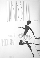 Los Angeles, CA-based designer. Creator of the tall hairline typeface Caribbean Blue (2012). [Google]
[More] ⦿
|
Latinotype

|
 Latinotype was founded in 2007 by Felipe Soto and Miguel Hernández, and is based in Concepción, Chile. Catalog of their typefaces. Latinotype now also includes the work of Daniel and Enrique Hernandez, Luciano Vergara and Joaquín Contreras. Their typefaces:
 - Stgotic Textura and Pintana (Daniel Hernandez) are pixel font award winners at Tipos Latinos 2008.
- Patagon (2011, Latinotype) is a rounded wood-inspired poster typeface done with Daniel Hernandez and Luciano Vergara.
- Selaive (2011, Paula Nazal) is a geometric monoline sans with an extreme hairline weight, Selaive Light.
- Sanchez (2011) is a large slab serif family. The Regular weight is free at Fontsquirrel.
- In 2011, he cofounded Los Andes Type, and published the fat round typeface Fatta (2011) there.
- Mija (2011). Inspired by vernacular signs.
- The Google Web Font Ceviche One (2011). This is an angular yet curvy extra black expressionist sans serif type.
- Sail (2012). A didone script.
- Sofia (2012). An upright script, free at Fontsquirrel.
- Tikal Sans (2012).
- Lolita (2012, Miguel Hernandez). A playful rounded sans family.
- Chela One (2012). A bold condensed brush script, free at Google Web Fonts.
- Arquitecta (2014, by Daniel Hernandez ad Miguel Hernandez). A 1930s sans with small x-height, great readability and an odd g, promoted as an alternative for Futura, Kabel or Avant Garde. It was followed later in 2014 by Arquitecta Office and Arquitecta Standar.
- Via Sans (2014, Daniel Peralta). A wayfinding typeface family inspired by Steile Futura and DIN 1451.
- In 2014, he co-designed Uomo with Tania Chacana at Latinotype. Uomo is a contemporary typographic system that explores the geometric sans style and Italian art deco in combinations of four widths and three weights.
- In 2014, Daniel and Miguel Hernandez co-designed Texta, a geometric sans for all.
- In 2015, the Latinotype team developed the 60-style semiserif typeface family Corporative [Corporative was developed by Javier Quintana and Cesar Araya, under the supervision of Luciano Vergara, and Daniel Hernandez], the 64-font family Corporative Sans, the 64-style Corporative Soft [Corporative Soft was developed by Javier Quintana, Eli Hernandez and Rodrigo Fuenzalida, under the supervision of Luciano Vergara and Daniel Hernandez], the 32- style Corporative Sans Round Condensed (dated 2016; developed by Elizabeth Hernandez and Rodrigo Fuenzalida, under the supervision of Luciano Vergara and Daniel Hernandez], and the 28-style headline wood-inspired Titular.
- Revista (2015, Paula Nazal Selaive, Marcelo Quiroz and Daniel Hernandez, at Latinotype) is a typographic system that brings together all the features to undertake any fashion magazine-oriented project. It has Revista Script (connected style), Revista Stencil, Revista Dingbats, Revista Inline and the didone Revista all caps set of typefaces. Revista won an award at Tipos Latinos 2016.
- Lota Grotesque (2017).
- Inter Sans (2017). An information design sans. In 2021, they released Inter, which was advertized as a sans Rockwell.
- Letteria Pro (2021). A script/sans/slab font trio by the Latinotype team.
- Rebrand (2021). A 33-style Latin sans in Text and Display versions.
- Osbourne (2021). A 20-font wedge serif that revives Keystone Type Foundry's Salem.
View the Latinotype typeface library. View Miguel Hernandez's typefaces. Fontsquirrel link. [Google]
[MyFonts]
[More] ⦿
|
Letritas
[Juan Pablo de Gregorio]

|
 Juan Pablo De Gregorio Concha lived in Santiago, Chile, where he founded Letritas in 2006. He is presently based in Barcelona. Home page of Sabia Usted. Blog with entries on themes such as legibility. Designer of these typefaces:
 - Chucara Serif (2003) and Chucara Text (2003): free at Dafont. Followed by Chucara Next (2021), a 16-style text typeface with inward serifs.
- Los Niches (2007). A playful hairline sans, about which Anna Malsberger writes: The lowercase f puffs out its chest with exaggerated aplomb, and t splits into a script stem reminiscent of a table grab a cocktail and pull up a chair to watch the show.
- Comalle (2008, Umbrella type). An organic roman with a comic book mind.
- Romeral (2004, slab serif), a custom typeface for the University of Chile (2007).
- Curico (2004).
- Beauchef (2011, Cabinet Type). Beauchef is an organic monoline sans serif typeface, originally created to meet the needs of the Center for Mathematical Modeling, University of Chile. The design is cold as steel and rather abstract and lifeless, which reflects the ideas most people have about advanced mathematics. However, true mathematicians like warm, curvy and passionate letters and symbols. Beauchef was republished by Latinotype in 2015.
- Los Niches (2011). A clean monoline sans family with some swashes. Published by Latinotype in 2012.
- Pret-a-porter (2016). A calligraphic script typeface family accompanied by Pret-a-porter Slab.
- Isabel (2016). Designed together with Eleonora Lana, Isabel is a very Latin text typeface family, feminine and didone-inspired. It has a unicase style. In 2017, Juan Pablo de Gregorio and Eleonora Lana added Isabel Condensed and Isabel SemiCondensed.
- Condell Bio Poster (2016). A fat rounded sans. The larger Condell Bio family (published in 2017) was started in 2006.
- Molde (2017). A neo-grotesque inspired by the extreme sobriety of famous post-Bauhaus Swiss Movement of the mid-twentieth Century.
- The great layered vintage typeface Biscotti (2018).
- Squalo (2018). A sans family.
- Liliana (2018). A geometric sans with mischievous and frivolous alternates.
- Vicky (2019). A slab serif.
- Duddy (2019). A rounded sans.
- Copihue (2020). A humanist sans family.
- Stadtmitte (2020). An information design typeface family.
Letritas home page. Creative Market link. Dafont link. Klingspor link. Kernest link. Behance link. [Google]
[MyFonts]
[More] ⦿
|
Letter Edit
[Björn Gogalla]

|
 Berlin-based type foundry, est. 2012 by Björn Gogalla. Typefaces published in 2014 include the fat didone typeface family Barkley Poster and Barkley Block (2014), and the ornamental typeface Moskau Pattern (2013), as well as the geometric sans Moskau Grotesk (2013).
 Gogalla writes: The design of the typeface Moskau Grotesk is based on the signage created for the Café Moskau in Berlin by the graphic artist Klaus Wittkugel in the beginning of the 1960s. The Café Moskau, across from the Kino International on Karl-Marx-Allee in Berlin Mitte was one of the prestige edifices of the former DDR (German Democratic Republic). [...] The lettering display on the roof was created by the graphic artist Klaus Wittkugel (1910-1985). He was Professor at the School for Applied Arts in Berlin, created many posters, book covers and postage stamps, and was responsible for the signage of the Kino International as well as for the complete graphic treatment for the Palace of the Republik. Moskau Grotesk comes with a great hairline weight, ExtraLight. In 2014, he designed Flaco. [Google]
[MyFonts]
[More] ⦿
|
Lettersoup
[Botio Nikoltchev]

|
 Also written Botjo Nikoltchev, b. 1978, Sofia, Bulgaria. Botio studied graphic and type design in Potsdam. He is living and working as a freelance designer in Berlin. He studied communication design at the University of Applied Science Potsdam and took type design classes with Luc(as) de Groot. After his studies Botio worked with Ole Schäfer (Primetype) on the Cyrillic characters of PTL Manual, PTL Manual Mono and PTL Notes. Since 2010 he has been collaborating with Ralph du Carrois and Erik Spiekermann as type designer and art director at Carrois Type Design, focusing on Cyrillic, Greek and Arabic language extensions and CI projects. In 2014, he set up the commercial type foundry Lettersoup.
 Creator of the free font Ropa Sans (2012, Google Web Fonts, +Arabic, +Ropa Soft, 2014). The typeface is in DIN's circle of friends. Sofadi One is a scriptish font that is free at Google Web Fonts. Share Tech Mono (2012, Google Web Fonts) is a monospaced sans face. Share Tech (2012, Google Web Fonts) is its proportional version. Both are derived from Share (2012, Google Web Fonts). He helped with the Greek and Cyrillic portions of FF Meta Serif. Corporate fonts by Botio include MMH Netrange Cyrillic + Greek + Arabic, Cisco, Meta Science and Exploratorium Sans. He designed the icons for Museo de Art de Ponce. In 2014, Botio designed the humanist sans typeface family PTL Manohara (Primetype) for Latin and Cyrillic. In 2016, a team of designers at Lettersoup that includes Ani Petrova, Botio Nikoltchev, Adam Twardoch and Andreas Eigendorf designed an 8-style Latin / Greek / Cyrillic stencil typeface, Milka, which is based on an original stencil alphabet from 1979 by Bulgarian artist Milka Peikova. Later in 2016, he published the nearly geometric sans family Quasimoda, which covers a full range of weights, from Hairline to Heavy. Typefaces from 2017: Attractive (a free sans, done with Ani Petrova), Ropa Mix Pro. Typefaces from 2019: Rouse Sans (by Botio Nikoltchev and Ani Petrova: based on Sofia Sans). Typefaces from 2021: Apparat (an 88-style geometric sans family that was given a humanistic treatment). FontShop link. I Love Typography link. Fontsquirrel link. [Google]
[MyFonts]
[More] ⦿
|
Liam Mooney
|
British graphic designer who created the hairline typeface Airline (2011), which takes its forms from the exterior design of planes. [Google]
[More] ⦿
|
Lizzy Hartley Design
[Elizabeth Kate Hartley]

|
Lizzy Hartley Design (Hamilton, MA) is Elizabeth Hartley's foundry. Elizabeth was a student at Flagler College in Tallahassee, FL. She created the hairline sans typeface Satin (2011). Dafont link. [Google]
[MyFonts]
[More] ⦿
|
Lliwell
|
Studio in Kiev, Ukraine. Creator of a hairline sans typeface simply called Font (2012: Latin and Cyrillic). Behance link. [Google]
[More] ⦿
|
Logan Mata
|
New York City-based designer of the hairline display sans typeface Bisurk (2013). Dafont link. [Google]
[More] ⦿
|
Luca Mescoli
|
Milan-based creator of the hairline sans typeface Fibo (2013). [Google]
[More] ⦿
|
Lucas Benjamin Sharp
[Sharp Type]

|
 [MyFonts]
[More] ⦿
|
Lucas de Groot
[LucasFonts (and: FontFabrik)]

|
 [MyFonts]
[More] ⦿
|
Lucas Matuda
|
Graphic designer in Sao Bernardo do Campo, Brazil. Lucas "Matuda" Torres created the thin hairline sans typeface Diztinta (2012). [Google]
[More] ⦿
|
LucasFonts (and: FontFabrik)
[Lucas de Groot]

|
 Luc(as) de Groot (b. 1962, Noordwijkerhout, The Netherlands) studied at the Royal Academy of Fine Arts in Den Haag and worked from 1989-1993 as a freelancer at the design bureau Premsela Voonk. From 1993 until 1997, he was with Meta Design in Berlin as typographic director in charge of many corporate design projects. In 1997, he set up FontFabrik and in 2000 LucasFonts in Berlin. He creates retail and custom fonts, and made his reputation with his humongous font family Thesis. Originally, he published most of his retail fonts with FontFont, but his "FF" fonts were withdrawn from FontFont in 1999, and renamed with LF instead of FF, where LF stands for LucasFonts. His most popular typefaces include Thesis (the superfamily that includes TheSans, TheSerif, TheMix and The Antiqua), Calibri (a default font at Microsoft), Sun, Taz and Corpid. He is also well-nown for his Anisotropic Topology-Dependent Interpolation theory which roughly states that a 50% interpolation is not the optical middle between two weights. He teaches type design at the University of Applied Sciences in Potsdam, Germany. His typefaces:
 - Agrofont (1997, for the Dutch Ministry of Agriculture, Environment and Fisheries) and Agro Sans, developed in collaboration with the Dutch design bureau Studio Dumbar.
- BellSouth Basis, Serif and Bold, developed with Dutchman Roger van den Bergh.
- BolletjeWol (1997, Fontshop).
- Calibri. Done for Microsoft, Calibri is the default typeface in MS Word. Calibri received a TypeArt 05 award and won an award at the TDC2 2005 type competition. For a yet-to-be-revealed reason, Google decided to support a metric-compatible free clone of Calibri for its Chrome OS system, Lukasz Dziedzic's Carlito (2014). Calibri became the standard font for all Microsoft 365 apps, but will be replaced some time in 2021 by one of five candidates, Bierstadt (by Steve Matteson), Grandview (by Aaron Bell), Seaford (by Tobias Frere-Jones, Nina Stössinger, and Fred Shallcrass), Skeena (by John Hudson and Paul Hanslow) or Tenorite (by Erin McLaughlin and Wei Huang).
- Consolas. Done for Microsoft, this typeface was intended as a successor for Courier.
- Corpid III (2002-2007). A sans family with support for Cyrillic, Greek and Turkish.
- Floris (a ball terminal text typeface in 18 styles, Floris was developed on a four-dimensional grid of several axes or parameters: weight, width, x-height and ascender/descender height).
- Fohla Serif (2001). Designed for a Brazilian newspaper in Sao Paulo. This collection includes a multiple master font, FohlaMM.
- FF Jesus Loves You all, now LF Jesus Loves You all.
- Koning (2017), co-designed by Luc(as) de Groot, Martina Flor, Jan Fromm, Phillipp Neumeyer and Daria Petrova. Koning won an award at TDC Typeface Design 2018. The first retail release of this flared typeface family came in 2019: Koning Display (a 20 style sans with Peignotian traits and occasionally, flared terminals).
- LucPicto (dingbats for private use at FontFabrik). Not available to the world.
- LeMonde (2002, new headline family). An OEM family made for LeMonde in 2001 includes Lucas-Bold, Lucas-BoldItalic, Lucas-ExtraLight, Lucas-ExtraLightItalic, Lucas-Italic, Lucas-Light, Lucas-LightItalic, Lucas-SemiBold, Lucas-SemiBoldItalic, Lucas.
- MetaPlus (1993, with Erik Spiekermann).
- MoveMeMM (erotic multiple master font)
- FF Nebulae, now LF Nebulae.
- LF Punten: Punten Straight, Punten Extremo and Punten Rondom.
- Spiegel and Spiegel Sans, originally designed for Der Spiegel. The retail versions are called Spiegel Sans (a 32 style American gothic family) and LF Spiegel Serif.
- Sun (1997, for Sun Microsystems) later became a retail font, also called Sun, a 28-style humanist compact sans typeface in the genre of industrial era American newspaper headlines.
- LF Taz (sans family, 2002), Taz III (2003, including a hairline weight) and Taz Text (for "taz", the magazine), sans typefaces designed for use in newspapers. Are these the same fonts as Tazzer and Tazzer Text? Taz has grown as follows: TazText, Taz Condensed (2010), Taz Text Small Caps (2011), Taz Wide (2013-2014), Taz Textended (2013-2014). By 2021, the Taz family contained 128 styles.
- Thesis (1994-1999) originally known as FF Thesis. This consists of many subfamilies all starting with the prefix The. MyFonts links for the Thesis family: TheAntiqua, TheMix, TheSans, TheSerif. Thesis includes
- LF TheAntiqua (a 14-style medium contrast oldstyle typeface), LF TheAntiquaSun, Qua Text (a newstext version of TheAntiqua developed in close collaboration with the Berlin newspaper Die Tages�zeitun taz), TheAntiquaB (1997; 1999 Type Directors Club award), TheAntiquaE, TheAntiquaSun. TheAntiqua received a TypeArt 05 award.
- LF TheMix (69 styles: semi-serif), TheMix Mono (48 styles; a monospaced version of TheMix), The Mix Classic, The Mix Basic, The Mix Office. TheMix is part of the Thesis superfamily. It originated as an alphabet for the logotypes of the Dutch Ministry of Transport, Public Works and Water Management drawn by Luc(as) while working at BRS Premsela Vonk in Amsterdam. The alphabet later became the starting point of the entire Thesis system.
- Thesis Mono.
- LF TheSans, The Sans Classic, The Sans Basic, The Sans Office, The Sans Condensed, The Sans Mono (48 styles), The Sans Mono Dc, The Sans Mono 11pitch, The Sans Mono Cd Office, The Sans Typewriter (a monospaced and grungy version of TheSans). First published in 1994 as a descendant of Franklin Gothic, The Sans is a modern classic.
- LF TheSerif (52 styles), The Serif Classic, The Serif Basic, The Serif Office. TheSerif is part of the Thesis superfamily. The Serif's ancestors include Linotype Rotation.
- The Stencil (2021).
- SPD 2002 TheSans. An OEM for the SPD party.
- Grundfos TheSans (2007).Another commissioned font.
- Transit and Transit Pict (both at FontShop).
- Volkswagen Headline and Volkswagen Copy (1996), extensions of Futura. Note: the other Volkswagen house font is VW Utopia, a descendant of Utopia.
DeGroot designed custom fonts for newspapers such as Folha de S.Paulo, Le Monde, Metro, Der Spiegel, taz.die tageszeitung, Freitag and Jungle World. In addition, he created corporate type for international companies such as Sun Microsystems, Bell South, Heineken, Volkswagen and Miele. Speaker at many international conferences. At ATypI 2015 in Sao Paulo, he spoke about his Folha Sao Paulo newspaper typeface. In 2021, LucasFonts joined Type Network. FontShop link. Klingspor link. I Love Typography link. View the typeface library at Lucasfonts. View Lucas de Groot's typefaces. [Google]
[MyFonts]
[More] ⦿
|
Luciano Perondi
[Molotro]

|
 [MyFonts]
[More] ⦿
|
Luciano Vergara
[Mendoza&Vergara]

|
 [MyFonts]
[More] ⦿
|
Ludwig Type
[Ludwig Übele]

|
 Ludwig Übele is a Berlin-based German type designer (b. Memmingen, 1974). In 2007, he established Ludwig Type in Berlin. Ludwig practiced type design and branding in his own studio in Den Haag, The Netherlands. He graduated in 2007 from the KABK in Den Haag, the same year in which he started his foundry Ludwig Uebele (or: Ludwig Type) in Berlin. MyFonts interview. Behance link. In 2018, he joined Type Network. His award-winning typefaces:
 - The extensive serif family Marat, a winner in the TDC2 2008 competition. Its 9 styles can be bought here.
- In 2008, he published Mokka, a subdued serif family with Zapfian influences (lower case "a"). [Do not confuse it with Mokka, Fidel Peugeot's script font from many years earlier---I wonder how Uebele got the Mokka trademark, quite impressive that oversight by the trademark office].
- Augustin (2004). A renaissance typeface inspired by the type of Nicolas Jenson made in Venice in 1470.
- Helsinki. A sans based on Finnish traffic signs---has a hairline weight, and a gorgeous Fat weight. Helsinki 2.0 was published in 2013. In 2014, he published the formidable free weights Helsinki XXL Black and Helsinki XXL Thin.
- Mediana. A custom typeface based on Franklin Gothic.
- NewTaste. Commissioned by McDonald's.
- Walhalla (2008) is a strong and bold uncial family inspired by uncial letters of the Czech type designer Oldrich Menhardt, made in 1948.
- Daisy (2010) is an artsy ultra-fat vogue magazine style display face, best shown in pink. It won an award at TDC2 2011.
- FF Tundra (2010-2011, FontFont) is a narrow low-contrast small-text type family that was also awarded at TDC2 2011. It was influenced by Carl Dair's Cartier (or Raleigh).
- Daphne Script (2013) based on Georg Salden's Daphne.
Riga and Riga Screen (2014). Designed for web page use, this is a practical space-saving sans family. Not to be confused with several other typefaces called Riga, one by Mostar / Olivier Gourvat (2009) and one by Gunnar Link (2012). - Diogenes (2014) and Diogenes Decorative (2014). Microsite.
- Brenta (2015). A sharp-edged wedge serif text family. Microsite.
- Contemporary Sans (2015). This sans family is characterized by the contrast between horizontal and vertical strokes.
- Godfrey (2015). A compact sans typeface family characterized by straight edges in the terminals of f, j and y, and elongated dots on i and j.
- Kakadu (2016). A squarish sans typeface family.
- Aspen (2016). Microsite. Influenced by the old grotesques, its oh-so-slightly flared terminals give the design some pizzazz.
- Niko (2019). A magnificent and very legible humanist sans in 54 styles (3 widths, from Regular to Extra Condensed), characterized by slightly flared terminals.
View Ludwig Übele's typefaces. A list of Ludwig Übele's typefaces. Klingspor link. [Google]
[MyFonts]
[More] ⦿
|
Ludwig Übele
[Ludwig Type]

|
 [MyFonts]
[More] ⦿
|
Luis Angel Uribe
|
Mexican creator (b. 1988) of the scratchy hand-printed typeface Bichochos (2009), the 3d mechanical typeface Pandimencional (2010), the blackletter grunge BichOGothic (2009), Bicho (2009), (((o))) brushhhh (2009), (((o))) O Basic (2009, hairline geometric sans), and Bicho Plumon (2009). Blog. Behance link. Dafont link. [Google]
[More] ⦿
|
Luiz Felipe Souza
|
During his studies in Sao Paulo, Brazil, Luiz Felipe Souza Soares designed the sans typeface Procmatika (2014). Later he created the free hairline sans typeface Speck Display (2016). Typefaces from 2017: B & B Stencil (octagonal style). Typefaces from 2018: Uneexal (free). [Google]
[More] ⦿
|
Luiza Morgado
|
 During her studies, Rio de Janeiro-based Luiza Morgado created the hairline avant garde sans typeface Hiper Cool (2015) and the modular octagonal typeface Box (2015). She also designed a set of playing cards based on the work of Cassandre. [Google]
[More] ⦿
|
Luke Davisson
|
During his studies, Luke Davisson (Napa, CA) created the hairline sans typeface Clean & Mean (2014). [Google]
[More] ⦿
|
Luschia Porter
|
During her design studies in Sidney, Australia, Luschia Porter created a delicate hairline geometric display face (2013). [Google]
[More] ⦿
|
M. Salman Shahzad
|
Designer of the free hairline typeface Rangy (2016). [Google]
[More] ⦿
|
Maksym Chechel
|
Zaporizhzhia, Ukraine-based designer of the free all caps hairline sans typeface Sarah (2017) for Latin, the sans typeface Elys (2017), and the free brush script typeface Spring Time (2017). In 2017, he published the rounded sans Rokky, the bilined logo font Maze Modern and the textured typeface Poppy Seeds. Creative Market link. [Google]
[More] ⦿
|
Manuel Ramos

|
 Based in Valencia, Spain, and born in Madrid in 1969, Manuel Ramos is the creator of these free and commercial typefaces in 2012: Astralia (oblique monoline sans), Datura (upright unconnected script), Humana (fat finger face), Fantastica (hairline), Cristal, Vernissage (display face), Humate (thin script), Graff, Retorica (an elegant wide techno face), Arsone (graffiti font), Future, Artesana, Subatomic, Aura (caps only), Radiance (thin face), Romantica, Alameda (an Arabic simulation typeface that conjures up Granada), Abstracta (textured techno face), Understand (an elegant lachrymal typeface), Metropolis (a stiletto deco typeface), Aritmetica (angular), Regard (hairline display face), Artistica (art deco), Iniciatica (bilined), Isabel (bilined caps-only face), Regard (hairline), Glubgraff (graffiti), Graffont (graffiti font), Extraterrestrial, Expresiva, Rotorica (spiky), Passion (a hairline avant-garde typeface), Infinita (hairline avant-garde sans), Cosmonautica (fashion mag typeface with just capitals; also called Eternal), New World (thin octagonal), Modes (condensed and straight-edged), Lavande, Modesta (thin octagonal) and Garbage.
 Typefaces from 2013: Transient, Evaow, Stella, Oval, Koda, Amaral (a technical pencil font), Astralasia. Typefaces from 2014: Radiance (avant garde), Valerie, Akasic, Destiny, Ensure (a casual sans), Exacta, Oldskool. Typefaces from 2015: Arsone (graffiti style), Manuscripta (script), Valerie (high contrast cursive typeface), Bertica, Exacta, Manuscripta, Spirituality, Bertica, Pleiadian, Positive Thinking, Lovelica, Dawn (sketched), Picasa (sketched painter's font), Abstracta, Future, Akasic. Typefaces from 2016: Artesana, Graff, Astralia, Idilica (avant garde), Yass, Sharik. Typefaces from 2017: Magnetic, Soma (an elegant tall display font), Solar (avant garde), Reason (a geometric hairline sans). Typefaces from 2019: Zen Garden (oriental simulation), Sistematica, Inedita, Galaxy, Existence (art deco), Amaral (architectural lettering), Kasparosky, Destiny (graffiti letters), Yes (a hairline art deco sans). Dafont link. Fontspace link. Behance link. Old URL. View Manuel Ramos's commercial typefaces. Newer Behance link. [Google]
[MyFonts]
[More] ⦿
|
marccxo
|
Designer who used FontStruct in 2009 to make MB 3D, MB Display (LED font), MB Modern (hairline sans), MB Scoreboard (dotted), MB Pixel, MB Compact, and MB FontStruct. [Google]
[More] ⦿
|
Marcelo Martins Ferreira
|
Graphic designer in Sao Paulo who created a hairline art deco typeface called Trinca (2013), which was inspired by architectural lettering seen on buildings in his city. [Google]
[More] ⦿
|
Marcos Montane
|
Art director in Buenos Aires. Behance link. Creator of the hairline minimalist typeface Minitipo Serif (2011). [Google]
[More] ⦿
|
Marcus Kelman
|
Scottish graphic designer who is based in Edinburgh. Creator of Symmetrical Typeface (2012), a free hairline geometric sans that has the feature that each glyph is the same if flipped horizontally. He also made the hairline octagonal typeface Mono (2012), a monowidth, monospaced font in which each glyph of the same width and height. Behance link. [Google]
[More] ⦿
|
Marcus Sterz
[Face Type]

|
 [MyFonts]
[More] ⦿
|
Marica
[Miphol Studio]
|
[More] ⦿
|
Måns Grebäck
[Aring Typeface]

|
 [MyFonts]
[More] ⦿
|
Marius Mitran

|
 Bucharest, Romania-based type designer who created the beautiful Bauhaus / geometric monoline sans family Geometron Pro Angular (2010), which has weights ranging from hairline to black. Geometron Pro Radial (2010; +Greek) is a more rounded family. [Google]
[MyFonts]
[More] ⦿
|
Mark Gleim
|
Graphic designer in Oshkosh, WI. Behance link. He created the hairline condensed typeface Rossen (2011). [Google]
[More] ⦿
|
Mark Simonson
[Mark Simonson Studio]

|
 [MyFonts]
[More] ⦿
|
Mark Simonson Studio
[Mark Simonson]

|
 Mark Simonson Studio is located in StPaul, MN. Mark founded Mark Simonson Studio around 2000, and describes himself as a freelance graphic designer and type designer. From his CV: Early in my career I worked mainly as an art director on a number of magazines and other publications including Metropolis (a Minneapolis weekly, 1977), TWA Ambassador (an inflight magazine, 1979-81), Machete (a Minneapolis broadsheet, 1978-80), Minnesota Monthly (Minnesota Public Radio's regional magazine, 1979-85), and the Utne Reader (1984-88). I was head designer and art director for Minnesota Public Radio (1981-85) and an art director for its sister company, Rivertown Trading Company (1992-2000). During that time, I designed over 200 audio packages, including most of Garrison Keillor's, along with several hundred products (t-shirts, mugs, rugs, watches, etc.) for the Wireless, Signals, and other mail order catalogs. I have frequently done lettering as part of design projects I'm working on. This has always been my favorite part, so in 2000 I opened my own shop specializing in lettering, typography and identity design. I've also been interested in type design since my college days. I started licensing fonts to FontHaus in 1992, and since starting my new business, stepped up my efforts in developing original typefaces. I now have more than 70 fonts on the market with many more to come. This is increasingly becoming the focus of my activities. In 2021, he joined The Type Founders.
 His fonts: - Coquette (2001). He says: Coquette could be the result of a happy marriage of Kabel and French Script.
- Anonymice Powerline (2009-2010). This is probably a hack by some people based on Anonymous. It is available in some Github directories.
- Kandal: a 1994 wedge serif, now also at MyFonts).
- Proxima Sans (1994, a geometric sans, rereleased in 2004), followed in 2005 by his massively successful Proxima Nova in 42 styles/weights. Followed by Proxima Nova Soft (2011). The rounded version of Proxima Nova is Proxima Soft (2017). For a variable font that captures all styles, see Proxima Vara (2021). In 2022, he added Proxima Sera (an 18-style workhorse serif that combines old style forms with contemporary and modern typefaces).
- Mostra (2001): based on a style of lettering often seen on Italian Art Deco posters and advertising of the 1930s. Look at the Light and Black versions, and drool...... The 2009 update is called Mostra Nuova. Selected styles: Mostra Nuovo Bold, Mostra One Light, Mostra Three Bold, Mostra Two Heavy.
- In 2001, he made the Mac font Anonymous. Its updated version is Anonymous Pro (2009-2010), a TrueType version of Anonymous 9, which was a freeware bitmap font developed in the mid-90s by Susan Lesch and David Lamkins. It was designed as a more legible alternative to Monaco, the mono-spaced Macintosh system font.
- In 1998 and 2001, he produced the (free) 3-style Atari Classic family.
- In 2003, he released Blakely Bold and Heavy (an art deco font first done for the Signals mail order catalog). The original Blakely is from 2000.
- Goldenbook Light, Regular, and Heavy, based on the logotype of the 1920s literary mag called "The Golden Book Magazine".
- Metallophile Sp 8 Light and Light Italic (2008): a "faithful facsimile of an 8-point sans as set on a 1940s-vintage hot metal typesetting machine".
- Refrigerator Light and Heavy, Refrigerator and its extension Refrigerator Deluxe (2009) (geometric sans).
- Changeling Light, Regular, Bold, Stencil, and Inline (2003): a redesign and expansion of China, a VGC photo-typositor typeface from 1975 by M. Mitchell, which includes unicase typefaces; see also Changeling Neo, 2009.
- Sanctuary Regular and Bold: a computerish typeface based on lettering in the 1976 movie Logan's run--later withdrawn from the market.
- Sharktooth (+Bold, +Heavy).
- Felt Tip Roman, Woman and Senior (based on his own handwriting). Felt Tip Senior (2000) is based on the hand of Mark's father. Felt Tip Woman Regular and Bold are based on the handwriting of designer Patricia Thompson.
- Filmotype Gay (2011).
- Filmotype Honey (2010): fifties brush lettering face. For a free alternative, see Honey Script (2000) by Dieter Steffmann.
- Raster Gothic Condensed Regular and Bold (12 fonts total), and Raster Bank (a pixelized version of Bank Gothic).
- Other free bitmap fonts for the Mac [the PC version was made by CybaPee]. MyFonts page.
- He digitized Phil Martin's family, Grad (2004, inspired by Century Schoolbook, and originally done by Martin in 1990).
- His 2006 production includes three script typefaces: Kinescope is a connected script based on title lettering in Fleischer Studios' animated Superman films from the 1940s. Snicker is a cartoony block letter type. Both were published at Font Bros. And Launderette is a connected very slanted script based closely on lettering used in the titles of the 1944 Otto Preminger film, Laura.
- In 2007, he revived and extended Filmotype Glenlake (2007, sold at Font Bros).
- Lakeside (2008) is a flowing 1940s-style brush script. It was inspired by hand-lettered titles in the classic 1944 film noir movie Laura.
- In 2008, he revived Filmotype Zanzibar, about which he writes: That Zanzibar is nearly an anagram of bizarre seems fitting. The surviving people from Filmotype (later Alphatype) have not been able to tell us who designed this gem, so we have no record of the designers intentions. Released in the early 1950s, it seems somewhat inspired by the work of Lucian Bernhard (Bernhard Tango, 1934) and Imre Reiner (Stradivarius, 1945). At first, it appears to be a formal script, but there are no connecting strokes. It would be better described as a stylized italic, similar to Bodoni Condensed Italic or Onyx Italic, with swash capitals.
- Filmotype Vanity (2008) is an outline typeface based on a 1955 design by Filmotype. It was derived from Filmotype Ginger.
- Filmotype Alice (2008) is casual handwriting. However, MyFonts now credits Patrick Griffin with the digitization.
- Filmotype MacBeth (2008) is a freestyle face.
- Filmotype Ginger (2008) is a heavy display typeface with an aftertaste of Futura.
- Boxy2 (2008) and Boxy1 (2008) are severely octagonal typefaces made to test out FontStruct. See also bubblewrap.
- In 2008, Mark Solsburg and Mark Simonson cooperated on the digital revival of the calligraphic Diane Script, originally designed in 1956 by Roger Excoffon.
- In 2009, Mark worked on SketchFlow Print, a font for Microsoft. It will be bundled with the next version of Christian Schormann's Expression Blend, part of Microsoft's Expression Studio suite. The fonts, based upon the handwriting of architect Michaela Mahady of SALA Architects, Inc., give that well-known architectural printing look (like Tekton).
- Filmotype Gem (2011). A sans headline typeface that was first drawn by Filmotype in the 1950s.
- Bookmania (2011) is a revival of Bookman Oldstyle (1901) and the Bookmans of the 1960s, but with all the features you would expect in a modern digital font family. Especially, Simonson's Bookmania story is worth reading.
- In 2018, he published the 25-style Acme Gothic at Fontspring. He explains: Acme Gothic (2018) is based on the thick and thin gothic lettering style popular in the U.S. in the first half of the twentieth century. There have been typefaces in this genre before, but they were either too quirky (Globe Gothic), too English (Britannic), too Art Deco (Koloss), too modern (Radiant), or too Art Nouveau (Panache). None captures the plain, workman-like style of Acme Gothic.
- Parkside (2018) is a script typeface inspired by typefaces and lettering of the 1930s and 1940s. Parkside uses OpenType magic to automatically select letter variations that seamlessly connect to the letters coming before and after.
- In 2018, he emulated wood type in his HWT Konop at P22. Named for Don Konop, a retired Hamilton Manufacturing employee, who worked from 1959 to 2003, this typeface is monospaced in both x and y directions so that letters can be stacked vertically and horizontally. All proceeds go to the Hamilton Wood Type and Printing Museum.
- Etna (2020). A 30-style text and display family that started out from William H. Page's Victorian wood type Aetna (1874), and was remolded by Simonson into a useful typeface family though still distinctly linked to its ancestor. Etna includes three different condensed widths in all six weights (intended for display use), four different figure styles, alternate characters, true small caps, and a selection of dingbats, including arrows, stars, asterisks, and manicules.
Links to his typefaces, in decreasing order of popularity: Proxima Nova, Bookmania, Mostra Nuova, Proxima Nova Soft, Coquette, Refrigerator Deluxe, Felt Tip Roman, Grad, Changeling Neo, Goldenbook, Lakeside, Kinescope, Metallophile Sp8, Blakely, Felt Tip Woman, Snicker, Felt Tip Senior, Kandal, Sharktooth, Anonymous, Raster Bank, Raster Gothic. FontShop link. Fontspace link. MyFonts interview. View all typefaces designed by Mark Simonson. Fontspring link. Google Plus link. Klingspor link. Abstract Fonts link. Kernest link. I Love Typography link. Font Squirrel link. Old link to hos site. [Google]
[MyFonts]
[More] ⦿
|
Markela Bgiala
|
 Markela Bgiala, an interior designer in Berlin, created the ornamental typeface Twirkle (2012) and the thin poster headline typeface Hair Line (2012, Latin and Greek).
 In 2013, Markela designed the display sans family Mismark, which comes with a hairline weight. In 2014, she created Copy Paste Futura, which can be bought here. Behance link. [Google]
[More] ⦿
|
Marsnev
[Muhammad Ariq Syauqi]

|
 Known as Marsnev, Marsneveneksk, Muhammad Ariq Syauqi and Ariq Sya. London-based Indonesian creator of the free grunge typefaces A for A (2013), Mars Inside (2012) and 29 days (2012), and the children's handwriting font 2 September (2012).
 Typefaces from 2013: Roadshow IAIC 2013 (hand-printed), Gycentium Popwell (named after the slab typeface Rockwell), and Gycentium Goes Pop (a grunge version of the previous font). In 2014, Ariq designed the hand-printed typefaces Hello Goodbye, Marsneveneksk, Untuk Ibu and A Day In September, as well as the all caps geometric sans typeface Lemon Milk. For an extension, see Lemon Milk Pro (2020). In 2015, Ariq published the octagonal slab serif Mars&Twist, the octagonal High Jakarta, the geometric sans typeface Engcarnation, the sans typeface Aku&Kamu, the comic book typeface Engcomica, the inline typeface Dopest, and the handcrafted Mala's Handwriting. Typefaces from 2017: Festival Budaya 31. Typefaces from 2020: Nyata (a 19-style clean sans family with tall ascenders and long descenders; includes a nice hairline). [Google]
[MyFonts]
[More] ⦿
|
Massimiliano Frangi
[Typomilan]
|
[More] ⦿
|
Matchbook Press
[Jessica Turcotte]
|
Jessica Turcotte (Matchbook Press, Glens Falls, New York) designed the hairline display typefaces Retrograde and Susanna, and the paperclip typeface Squalor in 2017. Behance link. Dafont link. Another Behance link. [Google]
[More] ⦿
|
Mateusz Machalski
[Borutta (or: Duce Type)]

|
 [MyFonts]
[More] ⦿
|
Matjaz Tozon
|
Graphic designer in Ljubljana, Slovenia, who created the hairline avant-garde typeface Tozonsky in 2014. Behance link. [Google]
[More] ⦿
|
Matt McInerney
[Pixelspread]
|
[More] ⦿
|
Matteo Carraturo
|
During his graphic design studies in Milan, Matteo Carraturo created the hairline display typeface Agita Pro (2013). [Google]
[More] ⦿
|
Matthew Aaron Desmond
[Matthew Desmond]

|
 MADtype (est. 1996) is Matt Desmond's place in the type world. He has had a prolific career that started out with shareware fonts while Matt was at the Minneapolis Technical and Community College. His page back then said A haven for quality shareware type for the Mac. Later, Matt started mattdesmond.com, and co-founded the Test Pilot Collective (est. 1998 with Joseph Kral and Mike Cina). Many of his early typefaces were experimental and/or futuristic. In late 2003, mattdesmond.com disappeared, and MADtype, commercial now, resurfaced at the MyFonts site. Currently, Matt is based in Minnetnka, MN. He has also lived in Atlanta, GA, Fayetteville, GA, Rochester, NY, Redwood City, CA, and San Francisco, CA. His fonts can also be purchased via You Work For Them. He also does commissioned type design. Some fonts are freely available at the Google Font Directory.
 Retail types as of 2011: - Abel (2011, Google Font Directory). Abel Pro was published in 2013.
- Aldrich (2011). A Bank Gothic style face, free at OFL.
- Amber (2000): kitchen tile face.
- American Gothic (1998): squarish.
- Audebaud (2010): a 19-th century style French Clarendon (wood type look). The design was inspired by the work of Constant Audebaud, an engraver of wooden type that was used for posters. Audebaud's work appeared in the 1880s in the Deux-Sèvres département of France.
- Beat (1998): rounded OCR face.
- Brauhaus (2004): Textura face.
- Cagliostro (2011). A free font at Google Web Fonts that is based on the handlettering of Ozwald Cooper.
- Curbdog (1998).
- Desmond Text (1998): a roman that has features of University Roman.
- Distill (2009): a De Stijl font that shouts 1920s.
- Dunelm (1996): emulation of 17th century printing styles.
- Dwiggins Deco (2009): This typeface was originally designed in 1930 by W.A. Dwiggins as the cover for the book "American Alphabets" by Paul Hollister. Only the 26 letters of the alphabet were included on the cover, so the rest of the numbers, punctuation, symbols, and accented characters have been crafted in a matching [art deco] style.
- Findon (2007): stencil.
- Futuristic category: ER9 (1999), KAH (2005, LCD style), Lunarmod (1997), Retron (1997; can be considered as a retro upright connected script as well), Shifty (1998).
- Grunge category: Bulletin (1997), Gothico Antiqua (1999), Rubba (1997), Stomper (1997--a rubber stamp font), Zapatista (1998-2007).
- Handwriting, handprinting category: Casino Hand (2005), Ghouliez (1996), Handegypt (2002---hand-drawn slab serif), Handy Sans (1997, hand-drawn sans), Joppa (1997), Pufficlaude BT (1998).
- Hessian (2009): Tuscan style wood type.
- Hydrochlorica (2004): organic.
- Invoice (1997).
- Ironside Crosses (2004): dingbat face.
- Marble Roman (2004-2009): angular roman all caps type.
- Matterhorn (2013). A 9-style sans family created with Michael Cina for Disney. Not to be confused with the many retail typefaces that are also called Matterhorn, such as Paratype's PT Matterhorn (1993) and Treacyfaces' TF Matterhorn (1990s).
- Pacioli or Luca Pacioli Caps (2007: emulating a mathematically constructed caps font by Pacioli (1509) published in his treatise De divina proportione.
- Pixel category: Basis (1999), Mang (1997).
- Plenti (2004): ultra plump.
- Quantico (2007): octagonal.
- Stencil category: Bandoleer (2009, +Tracer: a couple of stencil fonts with art deco and army influences), Madison (2007, slab serif stencil), Mercado (2005; has a non-stencil Mercado Sans).
- Urbandale (2018). A basic sans family.
- Variable (2004-2010): a sans-serif monoline typeface that includes ultra thin weights.
- Vexed (2005): sketched face.
- Wolfsburg (2007): blackletter stencil.
- Wooddale (1999): wood type emulation.
Free types as of 2010: Marble Roman, Environ regular, Dorkbutt, Europa, Exsect, Inthacity, Liquidy Bulbous, Lustria (2012, Google Web Fonts), Stomper. Commissioned types: 77kids (2007, for the children's brand; the sketched typefaces were done with Justin Thomas Kay), AE Aerie (2005-206, American Eagle Outfitters), AE Newburgh (2005-206, American Eagle Outfitters), AE Summer Fonts (2007, all for American Eagle Outfitters), EEL Futura (2006, for Enjoying Everyday Life), Nike World Cup (2006), Virgin America (2006). Typefaces from 2019: Starfire (2019, a retro geometric sans). Orphaned types that disappeared or were planned but never executed: BrotherMan, Caprice, Convolve, HipstersDelight, Lugubrious, ModestaSmallCaps, Serifity, Skitzoid, Sliver, ThrowupSolid, Auresh (1998, futuristic; Test Pilot Collective), Kcap6 (1998, with Cina; Test Pilot Collective), Epiphany (1997; Test Pilot Collective), Testacon (with Kral and Cina; Test Pilot Collective), Civicstylecom (1999; Test Pilot Collective), Lutix (1998; Test Pilot Collective), Xerian (1997; Test Pilot Collective), Swoon, Furtive (2004, a sans), the display typeface Flathead (2004), the blackletter typeface Bahn (2004), Mesotone BT (2006, Bitstream, a monoline sans), Practical (a monoline connec script, planned in 2007 but not published), Poliphili (planned in 2007, as a revival of an Aldus/Griffo font), Wutupdo (1996, Garage Fonts), GFDesmond (Garage Fonts), Drone, Golden Times (2014, a corporate small caps typeface for the University of Minnesota), Vapiano (2014: hand-printed typeface for Vapiano International). Behance link. View Matt Desmond's typefaces. Fontspring link. Fontsquirrel link. [Google]
[MyFonts]
[More] ⦿
|
Matthew Burvill
[House of Burvo]

|
 [MyFonts]
[More] ⦿
|
Matthew Desmond
[Matthew Aaron Desmond]

|
 [MyFonts]
[More] ⦿
|
Mattia Bonanomi
[MTT]

|
 [MyFonts]
[More] ⦿
|
Mauricio Astete Brito

|
 Or Mauro Andres. Concepcion, Chile-based designer at Latinotype of the upright copperplate script and accompanying lapidary sans typeface family Antonietta (2016, Script and Caps), which is inspired by the eccentricity of the rococo style and Queen Marie Antoinette's wild personality. Winner at Tipos Latinos 2018 of a type design award for Antonietta.
 In 2020, Mauro Andres published Universo (+Stencil) at Peggo Fonts. This display font family includes a nice hairline weight. Universo was initially made for Caos Sagrados and was inspired by Aldo Novarese's style (Microgramma, Eurostile) and other retro-futuristic fonts and poster designs of the 1950s. The work was started in 2018. Typefaces from 2022: Hardbop (in eight ultra-condensed styles: Hardbop is a typographic system inspired by hardbop jazz. It is also inspired by the prolific graphic work of Reid Miles for the covers of Blue Notes Records in the '50s, Japanese jazz album covers of the '70s and condensed and grotesque hand painted signs). [Google]
[MyFonts]
[More] ⦿
|
Mauve Type
[Eike Dingler]

|
 Mauve Type (est. 2015) is based in Berlin and run by Eike Dingler. He studied type design in The Hague, as well as graphic design in Düsseldorf and Arnhem and has worked for Typotheque type foundry in The Netherlands.
 In 2008, Peter Bilak, Eike Dingler, Ondrej Jób, and Ashfaq Niazi created the 21-style family History at Typotheque: Based on a skeleton of Roman inscriptional capitals, History includes 21 layers inspired by the evolution of typography. These 21 independent typefaces share widths and other metric information so that they can be recombined. Thus History has the potential to generate thousands of different unique styles. History 1, e.g., is a hairline sans; History 2 is Peignotian; History 14 is a multiline face; History 15 is a stapler face, and so forth. In 2015, Eike designed the textured and patterned typeface family Pattern and the snow crustal-themed font Christmas Pattern. Typedia link. [Google]
[MyFonts]
[More] ⦿
|
Meat Studio
[Stew Deane]

|
 Stew Deane's type foundry in London is called Meat Studio. In 2014, Stew designed the semi-serif typeface Bardot, which has a hairline style. In 2014, he added the monoline poster typeface Organico.
 Typefaces from 2015: Fortima (octagonal typeface), Nevo (a modern sans family in 14 styles--simple, organic and slightly techno). In 2018, he designed Rigrok, which he advertizes as oh so bold, brash and ballsy. Typefaces from 2020: Cantilever (a 26-style variable techno font). [Google]
[MyFonts]
[More] ⦿
|
Mehmet Abaci
[Studio Typo]
|
 [More] ⦿
|
Mel Drake
[Musimon Fonts]
|
[More] ⦿
|
Memela Studio
[Peter Lorenz]
|
Peter Lorenz (Memela Studio, Guadalajara, Mexico) designed Cali Ms (2010, with Alberto Arellano), Fina (2011, a tall hairline all-caps face), Marga (2012, a polygonal typeface done with Alberto Arellano), Marcatextos (2012, a stencil family), and Quetzal (2012, decorative). In 2013, Memela designed the art deco marquee typeface Albahaca. Behance link. Another Behance link. Behance link for Peter Lorenz. [Google]
[More] ⦿
|
Mendoza&Vergara
[Luciano Vergara]

|
 MendozaVergara is Luciano Vergara, a Chilean graphic designer from Concepcion (b. 1979), and his companion, Guisela Mendoza. Mendoza & Vergara is located in Santa Juana, Chile.
 Vergara created these typefaces between 2004 and 2010: the sans typeface Conce (2004), Pepona (2006, T-26, a pixel face), Sketch (2008, T-26), Trauco (2006, T-26, a wonderful display face), Otto (2006, T-26, another pixel face), Roket U (2007, T-26, rounded anthroposophic unicase typeface) and Hisla Negra (2004), the serif typeface Patua (2003; Patua One is free at Google Web Fonts), the pixel typeface Xerif (2004), the pixel typeface Sinaptix (2004), the pixel typeface UNXERIF (2004), the pixel typeface Don Paul (2004, named after Paul Renner), the liquid display typeface Revolución (2006), the pixel family Renex (2004) and the pixel typeface O'Higgins (2003). At Latinotype (which Vergara co-founded with Daniel Hernandez in 2007), he created the dingbat typeface Chilean Bugs (2006) (free at Dafont), as well as Patua (serif), Regia (2008, hairline condensed sans). At FontStruct, he experimented with Flaca (2008). At his Flickr site, check out more commercial typefaces: Fidel (strong sans), Regia and Trasans (two light, even hairline, sans typefaces), Biotech, Working on a short-ascendered sans typeface called Midas (2010). Typefaces from 2011: Biotech, Cachiyuyo (a pixel family), Machi (titling sans), Los Lana Pro (an angular poster face; a stone age font), Fidel Black (a strong rounded sans, +Stencil Black), Patagon (Latinotype: a rounded wood-inspired poster typeface done with Miguel and Daniel Hernandez), Suisside (a humanist sans). Typefaces from 2012: Julius Sans One (Google Web Fonts), Pantano Pro (Pantano is a handmade grunge typeface inspired by the rustic style of Amazonia), Antartida (an 8-style family at Latinotype), Antartida Rounded (a rounded sans family), Kahlo (2012, Latinotype, designed for magazine headlines), Frida (Latinotype: a Latin style hipster sans typeface), Schwager (a steampunk slab serif, followed by Schwager Sans in 2014). Typefaces from 2013: Estandar (a wayfinding sans published by Latinotype; the Regular is free), Estandar Rounded, Moderna Condensed (+Unicase: an organic sans family), Four Seasons (handwritten, with Guisela Mendoza), Pasarela, Kahlo Rounded (Latinotype). Moderna (a monoline organic sans, with unicase styles thrown in). Antartida Rounded Essential (2013) is a rounded sans by Luciano Vergara, done for Los Andes Type. Typefaces from 2014: Estandar Rounded (by Vergara, a rounded sans in 13 styles named after Standard Oil Company), Garden (a playful decorative set of typefaces), Darwin (2014, a 20-font sans family with multiple fathers; see also Darwin Office, 2014, Darwin Pro, 2017, and Darwin Rounded, 2018), DIY Time (hand-printed, with Coto Mendoza at Latinotype). Typefaces from 2015: Nordikka (a headline sans with large x-height and a Scandinavian feel; Latinotype), Styling (a simple almost techno sans family inspired by the aerodynamic curves and elliptical shapes of old cars and airplanes). Corporative Sans, Corporative Sans Rounded and Corportaive are large typeface familes created by the Latinotype Team in 2015. In particular, they were developed by Javier Quintana and Cesar Araya, under the supervision of Luciano Vergara, and Daniel Hernandez. With Bruno Jara, Luciano Vergara designed the angular Jurassic park style typeface Los Lana Niu (2016). In 2016, Mendoza Vergara (Cecilia Mendoza, Coto Mendoza and Luciano Vergara) published the script family Bach and the script/slab pair Matcha at Los Andes. In 2016, Bruno Jara Ahumada, Alfonso Garcia, Luciano Vergara, Daniel Hernandez and the Latinotype Team designed the roman square capital headline typeface family Assemblage. In 2017, Luciano Vergara published Niemeyer as a tribute to Brazilian architect Oscar Niemeyer, and the modular---almost sci-fi---sans typeface family Nizzoli as a tribute to Marcello Nizzoli. He also designed the 28-style Internacional in 2017-2018, following the Swiss grotesque examples. Typefaces from 2018: Alvar (a humanist sans family at Los Andes; italics designed with the help of Alfonso Garcia), Resort (Sans, Script, Ornaments). In 2019, Luciano Vergara and Alfonso Garcia co-designed Moderna Sans at Latinotype. It is an interpretation of American gothics like Alternate Gothic. Typefaces from 2020: Abstract (an eclectic serif family with post-pandemic tensions and existential angst; by Luciano Vergara at Los Andes), Aestetico (Luciano Vergara, Daniel Hernandez and Alfonso Garcia: a 54-style sans family having Formal and Informal subsets of fonts so that the family covers several sans genres), Spock (2020: a 48-style demi-sans demi-slab family by Luciano Vergara, Cesar Araya and Rodrigo Fuenzalida), Neogrotesk. P>Typefaces from 2021: Grotesco (advertized as a South American grotesk; in 20 styles). Klingspor link. Dafont link. Behance link. View Lucian Vergara's typefaces. Fontspring link. [Google]
[MyFonts]
[More] ⦿
|
Michael Jarboe
[Aesthetic Type]
|
 [More] ⦿
|
Michael Jarboe
[Reserves (or: AE Type)]

|
 [MyFonts]
[More] ⦿
|
Michael Moore
|
Designer of the handcrafted typeface Dyslexia (2015), Drop Caps Narrow (2015, thin caps), and the sci-fi typeface Decoder (2015). Creative Market link. [Google]
[More] ⦿
|
Michael Muranaka
|
 San Salvador-based designer (b. 1985) of the thin slab typeface Espacio (2011), the monoline extended sans typeface Añejo (2011), the playful Antelope (2011), the razor blade-themed Font Interrupted (2011), the sci-fi typeface Cerebro (2011), the headline sans Jenkins (2011), the stencil typeface Mura Knockout (2011), which can be downloaded from Dafont.
 He also made Diminuto (2011, monoline slabby face), Wednesday (2011, gridded), Diamante (2011, elliptical architectural sans face), 50 Blizzards (2011, stencil face), Kiona (2011, headline caps face), the geometric logotype New Drop Era (2011), the angular typeface A Brand New Day Midnight (2011), Catman (2011), Lowery (2011), and the tattoo font Slayer Dragon (2011). Naomis Citadel (2011) is a font comissioned by author Rick Austinson for his upcoming Consecution Books series. Ocho Siete (2011) and La Quince de Mayra (2011) are hairline sans typefaces. Ciudad Nueva Caps (2011) is a geometric avant garde caps face. Home page. Mariko Chan (2011) is a soft rounded and friendly monoline display sans. Alto Voltaje (2011) is also a monoline typeface but its sharp corners make it much more threatening. Typefaces from 2012: Bad Handwriting, Sessions, Gorila (sic) (techno sans), Daiichi (hairline elliptical sans), Elite Hacker Corroded, Impalinger (hand-printed). In 2013, he made Dolce Vita (avant garde sans), Blackbook Two, Giorgio (organic sans), Blackbook One (graffiti face), Tokyo Pop Star. Typefaces from 2014: Tranquila (grungy), Blackbook 3rd (graffiti brush face), Bobby Corwin, Outlier (sci-fi face). Typefaces from 2015: Break Label (monoline techno font), Generica (clean sans), Sylphie, Mnml Fnt (experimental stroke removal font), Espacio Novo (thin slab serif). Typefaces from 2017: Head Traffic. Dafont link. Klingspor link. [Google]
[More] ⦿
|
Michael Neugebauer

|
Austrian type designer (b. 1950), son of the famous calligrapher Friedrich Neugebauer. He designed these typefaces: Controversy: Soraya (2004, by Karl Nayeri of Prime Graphics) seems like a copy of Cirkulus. FontShop link. [Google]
[MyFonts]
[More] ⦿
|
Michael Parson
[Typogama]

|
 [MyFonts]
[More] ⦿
|
Michael Wong
|
Creator of the hairline caps typeface Nouveau Fontdue (2013). [Google]
[More] ⦿
|
Michal Jarocinski
[Dada Studio]

|
 [MyFonts]
[More] ⦿
|
Mijan Patterson
|
 Student at Queensland College of Art, 2011-2013. Brisbane-based designer of the striking avant-garde all-capitals typeface Krach (2013), which includes an elegant hairline weight.
 Behance link. [Google]
[More] ⦿
|
Mint Type (was: PDesign 6.0)
[Andriy Konstantynov]

|
 Ukrainian Andrey Konstantinov (b. 1981, Moscow, lives in Kiev) graduated from the National Technical University of Ukraine in 2002. He lived for some time in Tallinn, Estonia. He ran PDesign 6.0, and later established the commercial foundry Mint Type.
 His typefaces generally cover Latin and Cyrillic: Tecco (techno), Radix, Aera Sans, Aera Serif, Careless Hand Script (2005), Guarda Sans (2012), Vitra Sans (2005), Terra Sans (2005), Terra Semi Slab (2005), Terra Slab (2005), Radix (2004), Cyntho Pro (2012, a geometric sans), Cytia Pro (2012, a geometric sans with built-in contrast), Cytia Slab Pro (2013), Lytiga Pro (2012, a 48-font techy sans family, starting with hairline weights). Typefaces from 2013: Pancetta Pro (elliptical sans), Pancetta Serif Pro, Clinica Pro (a clean non-geometric sans), Cyntho Slab Pro, Cytia Slab Pro, Espuma Pro (a soft humanist sans family with lots of curviness), Ristretto Pro (a narrow display sans), Ristretto Slab Pro. During the riots and revolution in Ukraine in 2014, Andrey designed Anglecia Pro, a text typeface in Text, Display and Title subfamilies. Just before the 2014 elections in Ukraine, he designed the geometric partially humanist sans typeface Proba Pro, which has wide spacing and small x-height---the regular and italic styles are free. Synerga Pro (2014) is a humanist slab serif with rounded terminals. In 2015, he published the newspaper typeface Diaria Pro, which started out during a course at EINA in Barcelona. Diaria Sans Pro and Quiza Pro (a geometric display sans) were published in 2016. In 2016, Oleh Lishchuk and Andriy Konstantynov co-designed the rounded scientific or technical paper font Midpoint Pro. Typefaces from 2017: Skema Pro (a 84-style serif text family with Livro, Text, Omni, News, Title and Display subfamilies), Excentra Pro (a sans family with stroke variation and inclined axis), Opinion Pro (by Oleh Lishchuk), Orchidea Pro. Typefaces from 2019: Ponzu (a stencil-style display sans), Greenwich (a modern-looking humanized sans-serif typeface with open aperture inspired by Gill and Johnson; +Cyrillic), Closer Text (a sans with overclosed apertures), Cyntho Next Slab, Cyntho Next (advertized as Swiss and Dutch). Typefaces from 2020: Ki (a monospaced display typeface inspired by older VCR / camcorder OSD (on-screen display) fonts), Fiorina (a 72-style didone family in four optical sizes). Typefaces from 2021: Accia Forte (a 16-style serif with large x-height), Accia Variable, Accia Moderato (a 16-style serif with large x-height), Accia Piano (a 16-style serif with large x-height), Accia Sans (a 16-style humanist sans), Accia Flare (also in 16 styles), Extatica (a 16-style eclectic (or: hipster) sans), Inerta (an 18-style geometric/neo-grotesk hybrid for Latin and Cyrillic). Klingspor link. View Mint Type's typefaces. Hellofont link. Behance link. Old URL. [Google]
[MyFonts]
[More] ⦿
|
Miphol Studio
[Marica]
|
ShenZhen/Hong Kong-based photographer, b. 1989, who currently lives in Miami, FL. Alternate URL. Miphol Studio is related to Marica Typographic Design Studio, run by Marica. Creator of the elegant hairline sans family ULT Sans (2007). She says that, inspired by FF Milo and Stainless, it took her over two weeks of straight work just to get the beta out. She also made the squarish stencil typeface SquareX (2008), the mechanical typeface Incognita (2008), and the semi-serif typeface ChanorSans (2008). Her latest: the gorgeous constructivist-marries-didone headline typeface Modern 9, and Melor (2008, a simple sans family in two styles done for Miphol Studio). [Google]
[More] ⦿
|
Molotro
[Luciano Perondi]

|
 Molotro is Luciano Perondi's type foundry, which he runs with Stefano Minelli and Valentina Montagna. This Italian type designer (b. Busto Arsizio, 1976) lives in Busto Arsizio (Varese). At ATypI in Rome in 2002, he spoke about the logo-grammatic approach to type design: "Carattere senza un nome importante". His ATypI 2002 report is here. In this enlightening piece, you can read about his opinions on type. In 2000 and the following few years, he lectured at the Basic Design Lab of the Politecnico di Milano. In 2003 he founded the Research Team EXP. The research team, formed by type designers and psychologists, studies the reading process, the influences of the irregularity of typefaces on reading and the non linear script. EXP is now starting to work on the effects of presbiopia on reading and on how an adequate design of types could help presbiopian readers.
 He was appointed associate professor of Design at the IUAV Venice in 2018 and he is also a member of the Alpaca cooperative of designers. From 2003 until 2007 he ran the Molotro studio. From 2005 until 2013 he was on the editorial board of the Italian design magazine Progetto Grafico. He has lectured in many Italian universities. From 2013 until 2016, he was the Director of the ISIA Urbino. In 2012 Stampa Alternativa published his book on non-linear writing, Sinsemie: scritture nello spazio. In 2013, he became a member of the cooperative foundry CAST, and is now its chief designer. At ATypI 2005 in Helsinki, he spoke about How does the irregularity of letters affect reading? His type designs include - Solferino Text (2007), a great transitional understated text typeface for the Corriere della Sera newspaper. Done with Leftloft (Andrea Braccaloni).
- Minotype (2006, aka Ninzioletto, a stencil face).
- Zotico/Zotica (2004, a sans family for the Milano Film Festival).
- Ninzioletto (2004, a stencil typeface designed for the Venice sign system).
- Tecnotipo (2005, designed for Tecno).
- Quinta (2006).
- DeA (2003, for DeAgostini).
- Ccunami.
- Csuni (which stands for Carattere Senza Un Nome Importante).
- Csuni1885 (2003, for Mattioli1885; see also Experience1885).
- Mattioli1885.
- DeA, for DeAgostini (2003).
- Sessantacinque (2003).
- Eye of Goat: designed in 2005 by Perondi, Valentina Montagna and Federico Zerbinati. It is a medieval ornaments typeface (free for a limited time).
- Nanoline (hairline sans).
- Decima (2005), a sans.
- Lontano (2003). A Caslon-style typeface commissioned for the Matteoli 1885 edition.
- Brera (2007, a sans family by Leftloft and Molotro).
- Voland (2010). A commissioned Baskerville typeface for the Italian publishing house Voland.
- Under the identity design and art direction of FF3300, Molotro created the sans typeface family Divenire, in Regular, Italic and Mono subfamilies, for the Italian Democratic Party in 2012-2013. Since 2014, Divenire can be bought as a reatil font at CAST.
- Dic Sans (2014). This elliptical sans was inspired by Aldo Novarese's Eurostile. It has its own idiosyncracies, and comes with a gorgeous Dic Sans Extra Bold weight (2014). On the nomenclature---French are allowed to operate Sans Dic, and Americans are permitted to typeset with Extra Bold Dic.
- Tribasei 16-000 (2006). An experimental typeface.
- Macho Modular (2015, CAST). Macho was originally designed in 2010 for MAN (Museo d'Arte Provincia di Nuoro) and is based on the idea of modular widths of the 20th-century typesetting systems, as required by the Olivetti Margherita and the hot-metal Linotype machine. It was followed by Macho Moustache (2018, CAST).
Klingspor link. Google Plus link. [Google]
[MyFonts]
[More] ⦿
|
Monica Li
|
During her studies in Sydney, Australia, Monica Li designed the floral decorative caps typeface Flora (2015) and the hairline sci-fi typeface Grandioso (2015). [Google]
[More] ⦿
|
Monograma (Typelapse)
[Federico Parra]

|
Bogota, Colombia-based type designer who created the basic sans family Ortodoxa (2014), the modular typeface Hemiciclo (2013) and the hairline typeface Flexline (2013, a font that can be boldened by its own stroke). The foundry, Monograma, is located in Bogota and was founded in 2012 by Federico Parra and Tatiana Gomez. The round sans serif Rotokas (2013) performs well in general, while its motivation is unique: Rotokas is a sans serif typography. It is probably the first font designed exclusively to type Rotokas language. Spoken by Bougainville islanders (Papua New Guinea), Rotokas has the world's smallest alphabet consisting of only twelve Latin letters. In 2015, Parra set up Typelapse. Co-founder of Bastardatype in 2017. In 2017, he designed the flared display typeface Magma and the strong calligraphically inspired text typeface Flux. Behance link. Behance link for Federico Parra. Home page. [Google]
[MyFonts]
[More] ⦿
|
Moritz Kleinsorge
[Identity Letters]

|
 [MyFonts]
[More] ⦿
|
Mostar Design
[Olivier Gourvat]

|
 Graphic and type design studio founded in La Boissière-d'Ans and/or Cubjac, France by Olivier Gourvat in 2004 and first located in Cubjac, Dordogne, France, and later in La Boissière-d'Ans, France. Olivier Gourvat originally worked as a graphic designer for various agencies, producing artwork, brands, corporate publicities and print layouts. He later joined the team at Chronicle Editions to create image content, cover designs, illustrations and maps for numerous books on the history of the twentieth century. Following his printing experience, he pursued web design and interactive web functions, founding a website company with three associates in 1999. Olivier is an über-talent.
 Typefaces: Sofia (2009; a great sans family which includes a hairline weight), Sofia Pro (2012), Sofia Pro Soft (2014: a rounded version of Sofia Pro, soft as a baby's bottom), Sofia Rough (2015, letterpress emulation and layering, in the style of Trend or Nexa Rust), Sofia Rough Script (2015), Hexagon, Microbia, Bucharest, Interval (Condensed, Sans), Neolux (experimental), Riga (sans family), Visoko (striped; Visoko is a playful, geometric typeface inspired by post-modern fonts designed by Mecanorma in the 80s), Glamwords (2009, a 1970's glitter style face), Mozziano (2009, purely geometric), UNIcod Sans Pro (2010, a techno sans family), Kyrial Display Pro (2011, a mini-serifed sans family). In 2012, Olivier Gourvat designed the flared typeface family Kara which was inspired by Basque (Euskaran). Mettro Pro (2013) is an elliptical sans family that could attract a large fan base. Its hairline weight is called Mettro Air. A few weeks later, we learn that this family was renamed Metronic Pro. And a month later, Gourvat published Metronic Slab Pro (2013). It was followed by Metronic Slab Narrow in 2014. Typefaces from 2014: Filson Pro (a geometric sans family with curvy R, k and t). Typefaces from 2015: Univia Pro (a squarish sans family), Strato Pro (not to be confused with Sophie Brown's Strato from 2013; Strato is a legible classical roman serif typeface family), Chronica Pro (a clean geometric sans workhorse). Typefaces from 2016: Interval Next (a successor of Interval Sans Pro), Filson Soft, Fengo (an oriental brush typeface by Olivier and Jean-Claude Gourvat that was influenced by Sino-Japanese and traditional Chinese hieroglyphic characters). Typefaces from 2017: Rival Sans, Magnetic Pro (inspired by typewriter characters; with a mechanical aspect), Rival (slab serif). In 2018, Olivier added Rival Slab and the soft sans serif Marlon Pro. Typefaces from 2019: Archeron Pro (a sharp-edged serif and stencil typeface family), Ariana Pro (a 9-style geometric sans). Typefaces from 2021: Natom Pro (an 18-style chunky low contrast geometric sans), Natom Pro Variable (a geometric sans), Sofia Pro Variable. MyFonts link. Creative Market link. Behance link. Klingspor link. MyFonts interview. Images of some of Olivier Gourvat's commercial typefaces. Fontspring link. [Google]
[MyFonts]
[More] ⦿
|
MTT
[Mattia Bonanomi]

|
 MTT is the commercial type foundry of Mattia Bonanomi (b. 1985, Brescia) in Milan, Italy, est. 2013. In 2010, Mattia graduated from Central Saint Martins College in London.
 He writes about the elegant ten-style sans typeface family MTT Milano (2013): MTT Milano is a font inspired by the Milanese typographic heritage and the Futurist movement that developed it. Drawn from scratch, it features ascendants and descendants slightly taller than what can usually be found in similar typefaces, in order to improve its elegance. In 2016, MTT published MTT Roma, a humanist sans inspired by the Trajan capitals, as is apparent from the razor sharp terminals. It is designed to re-create the atmosphere of the city of Rome of the 21st century. In 2014, he set up Type Firm in Milan, and republished his successful MTT Milano and MTT Roma there in 2016. [Google]
[MyFonts]
[More] ⦿
|
Muhammad Ariq Syauqi
[Marsnev]

|
 [MyFonts]
[More] ⦿
|
Musimon Fonts
[Mel Drake]
|
Mel Drake (Musimon Fonts) is the designer of Groceries (2010, hairline hand-printed face) and Hopes are free (2010, calligraphic penmanship face). [Google]
[More] ⦿
|
Mya Mya
|
Turkish visual artist who made the hairline sans typeface Thin White Duke (2010). [Google]
[More] ⦿
|
MyFonts: Hairline typefaces
|
MyFonts pages on hairline typefaces. [Google]
[More] ⦿
|
Nadezda Trushina
|
Moscow-based designer of the hairline modular ultra-condensed typeface Phasmida (2012) and the narrow squarish typeface Starship (2012). Cargocollective link. [Google]
[More] ⦿
|
Nasser Khalaf
|
Nasser Khalaf (b. 1991) is a digital artist in Amman, Jordan and Doha, Qatar. He created the hairline straight-edged typeface Muse (2013), which was inspired by British rock band Muse. Soul (2013) is a straight-edged graffiti typeface. In 2014, he made the single stroke typeface Lolo. Behance link. [Google]
[More] ⦿
|
Natalia Grosner
|
Toronto-based freelance graphic designer who moved to New York City. Creator of the multiline typeface Neon (2007), the hairline avant garde typefaces Gisele (2014) and Daria (2014), and the display typeface Electro Font (2014). Behance link. [Google]
[More] ⦿
|
Natalia Mercol
|
 Buenos Aires-based Natalia Mercol is a talented illustrator and print designer who is into colors. In 2010, she created a hairline typeface that was derived from Bauer Bodoni, called King Serif. [Google]
[More] ⦿
|
Natasa Gondry Denic
|
Graphic designer and typographer in Belgrade and Brussels. She created some counterless experimental typefaces in 2009 such as FullMetalTypo. The experimental (2d and 3d) typeface CF followed in 2010, and the hairline art deco typeface Chaplin in 2013. [Google]
[More] ⦿
|
Natasha Maria Fernandez-Fountain
[One by Four]

|
[MyFonts]
[More] ⦿
|
Nathan Towle
|
Nathan Towle (Titan Vex) (b. 1992, USA) created the outlined handcrafted cartoon typeface Lightning (2015), the avant garde sans typeface family Origin (2012; includes a hairline weight), and the hand-ptinted typeface Hashtag (2013). Dafont link. [Google]
[More] ⦿
|
Nathan Zimet
[NCT]

|
[MyFonts]
[More] ⦿
|
NCT
[Nathan Zimet]

|
 American designer of the roman typeface Alive Serif (2016) for Latin and Greek. In 2017, he published NCT Granite for Latin and Cyrillic and writes: NCT Granite brings the shapes of Renaissance type into the modern world with a robust and functional typeface designed to work on both screen and print. Its italic is about as wide as the roman, making it very easy to read in long text.
 In 2018, he published NCT Torin, a relaxing sans serif typeface family that also covers Vietnamese, Greek, and Russian. It has one of the thinnest hairlines in the industry. Still in 2018, he finished the text typeface family NCT Larkspur. Typedrawers link. [Google]
[MyFonts]
[More] ⦿
|
Neale Davidson
[Pixel Sagas (was: Protoform Project, and Fontshack)]
|
 [More] ⦿
|
Negro
[Ariel Di Lisio]

|
 Negro is a design site where some commercial fonts can be found, all designed by Ariel Di Lisio, a native of Buenos Aires. He studied graphic design at the University of Buenos Aires. From 1993 to 1997 he worked in the design department at Puma. Since 2015, he is a professor at FADU / UBA in Buenos Aires. Still in 2015, he set up Nodo Type Foundry in Buenos Aires together with Mexican designer Aldo Arillo.
 His typefaces from before 2010: Marzo (2008: a hairline vogue typeface commissioned by the Argentinian mag Atypica), Donuts (2008: a layer of round upon a layer of round), Paz (2008: a stylish night club or fashion magazine family---stunning), Lynda (2008: an octagonal/mechanical face), Lunes (2007: art deco), Day (2007: art deco), Friday (2007: art deco), Nigga (2007: an ultra-fat art deco typeface with an experimental edge), Love (2007: a mini-serifed geometric beauty), Santino (2008: trying to bring waves into a simple sans face), Normal (2008: gorgeous, geometric and galant), Mate (2008: a geometric all caps typeface for magazine headlines), Caracas (2008), Soko (2009), Stola (2008), Pink (2008: experimental), Cascabel (2009: a kitchen tile typeface digitized by Alejandro Paul at Sudtipos), James (2009: a bullet hole-themed face), Inlove (2009, Sudtipos: a Lubalin-style poster face designed by Di Lisio and digitized by Alejandro Paul). Typefaces shown in 2010, mostly experimental / geometric / art deco: Destiny, Drimpy, Hongki, Mobile, Moonglow, Normal, Vincent. In 2011, Ariel published the futurismo face Saturna at Sudtipos [and I do not understand HypeForType's claim that it is an exclusve HypeForType font]. Their offices are in Buenos Aires and Caracas. Typefaces from 2012 include Uma (with Alejandro Paul at Sudtipos: a gorgeous two-weight monoline sans family). In 2013, he created the stencil typeface Anima for a housing project in Punta Chica, San Fernando, Argentina. In 2015, he designed the cold sans typeface family Stockholm Type, and the display typeface Roska. In 2015, he set up Nodo Type Foundry in Buenos Aires together with Mexican designer Aldo Arillo. Negro Nouveau link. [Google]
[MyFonts]
[More] ⦿
|
Neil Summerour
[Positype]

|
 [MyFonts]
[More] ⦿
|
Neue
[José Manuel Urós]

|
 Neue is a digital studio in Barcelona, run by José Manuel Urós (b. 1956), who founded Type-O-Tones in 1992. In 2013, it created a grotesque type family called Arboria. Type-o-Tones published Arbotek (2013), a great monoline sans family with a stylish art deco Arbotek Ultra weight.
 Behance link. Fontshop link. [Google]
[MyFonts]
[More] ⦿
|
Neutura
[Alexander McCracken]

|
Neutura was formed in 2003 by Alexander McCracken, who is located in San Francisco. His typefaces have a large geometric component: Aerion, Aperture (slab serif family), Autobahn, Belfast (octagonal black-bowled headline face), Cerie Outline, Children (paperclip face), Circle (avant garde style), Deuce (ultrafat), Deuce Round (fat and counterless), Estrella (2011, a high-contrast fat vogue didone titling face), Frank (fat and counterless), Frank Stencil, Frank3, Gulden Draak (blackletter), Interpol (texture face), Magnum (2006, for Neo2 magazine: free), Maisalle, Neutrino (ultra-fat futuristic beauty, 2006), Neutura (clean geometric sans family), Orange (geometric hairline sans), Orange Round, Rabbit, Register (architectural sans), Royale (fat decorative didone), Sabre (octagonal), Sarcophagus (very original blackletter), Slayer Heavy, Spade (fat and counterless), SPQRExlight, Syrup (paperclip font), Vendella (2011), Wafer (ultrafat). At T-26, he published Children (2006, a paperclip font), Deuce and Sarcophagus. Behance link. Klingspor link. Abstract Fonts link. [Google]
[MyFonts]
[More] ⦿
|
Nicholas Garner
[Codesign (or: Aviation Partners, or AVP)]

|
 [MyFonts]
[More] ⦿
|
Nick Cooke
[G-Type]

|
 [MyFonts]
[More] ⦿
|
Nick Curtis
[Nick Curtis: Typefaces from 2014]

|
 [MyFonts]
[More] ⦿
|
Nick Curtis: Typefaces from 2014
[Nick Curtis]

|
 Typefaces made by Nick Curtis in 2014:
 - Alto Rey NF. A revival of a Victorian typeface issued by the Palmer and Rey Type Foundry of San Francisco in 1884.
- Angler NF. A revival of Anglo, a Victorian typeface by Barnhart Brothers and Spindler, 1895.
- Argentina Cursive NF. Based on a typeface by Morris Fuller Benton, 1919.
- Bandiera Del Legno NF. A Tuscan wood type that revives Gothic Tuscan Condensed Reversed by William H. Page.
- Belgique NF. A revival of the (Western) wood type French Clarendon XXX Condensed No. 117 by William H. Page.
- Benton Gothic Thin NF. A revival of Lightline Gothic (1908, Morris Fuller Benton, ATF).
- Big D NF. Based on a Speedball pen font by Ross F. George.
- Bricoleur NF. A connected script from a French magazine in 1927.
- Bully Pulpit Plain NF. After Bullion Shadow (1970, Face Photosetting).
- Call Me Ishmael NF. After Moby Dick (Affolter and Gschwind).
- Chapeaux Noirs NF. After a MacKellars, Smiths & Jordan typeface.
- Chieftain NF. Revival of Pontiac (1893, ATF).
- Coronation Street NF. Based on a typeface created in 1936 by Stephenson Blake.
- De Roos Mediaeval NF. After Sjoerd de Roos.
- Dimanche NF. An art nouveau typeface revival. The original is known as Domingo or Brillante.
- Fluid Drive NF. A take on an art deco typeface by Samuel Welo.
- Gloriosus NF. Revival of the Victorian typeface Apollo (1888, Gustave F. Schroeder, Central Type Foundry).
- Grieshaber Monos NF. After a Schelter & Giesecke typeface designed in 1911 by Moritz Grieshaber.
- Harley Quinn NF.
- Hi Ho Steverino NF. In the Beat style of the 1960s and 1970s.
- Koralle Rounded NF. A rounded revival of Koralle (1913, Schelter & Giesecke).
- Leabhar Ceilteach NF. Inspired by lettering in the Book of Kells.
- Legnano (2014, Italian art deco wood type).
- LevellerNF (2014, Nick Curtis). A revival of Roundhead (Charles Beeler, Mackellar Smiths & Jordan, 1883).
- Lodewijk Gothic NF (2014). Adter Elzevir Gothic (1897, ATF).
- Loopy Loo NF. Upright script based on an original by the Hunt Brothers.
- Marmorherz NF. After an 1866 font, Marble Heart, by Farmer, Little, and Co.
- Maxed Out NF (+Inline, +Starstruck). This series of fonts is based on a 1970s art deco series at PhotoLettering Inc called Riverside Drive by Peter Max.
- Meriwether Circular NF. After a 1905 Victorian typeface by William Martin Johnson for ATF called Meriontype.
- Millrich Olivian NF. A revival of Olivian by Richard & Miller.
- Miss Dottie NF. After Dotted Roman (1897, Barnhart Brothers and Spindler).
- Morticia NF. Based on an ATF original.
- National Oldstyle NF. After a 1916 font by Frederic W. Goudy.
- Nickel Box NF.
- Olden Daze NF. From Alphabets A to Z.
- Page Ephesian NF. A wood type after William H. Page, 1890.
- Page Etruscan No 5 NF. A wood type after William H. Page.
- Painters Roman NF. A wood type based on Painters Roman by Vanderburg and Wells (1878).
- Pique-Nique NF. Based on the art nouveau typeface Outing (1888, John F. Cumming, and 1895, ATF).
- Receding Hairline NF. After L&C Hairline (1966, VGC, Herb Lubalin and Tom Carnase).
- Renaissant NF. After the Victorian typeface Renaissant (1880, by John F. Cumming, Dickinson Type foundry).
- Rythme NF. After a Mexican simulation typeface from 1935 by Maximilien Vox called Éclair.
- Scalar Biform NF.
- Schweimann Moderne NF. An art nouveau typeface.
- Skelett Antiken NF. After William H.Page's wood typeface Clarendon XX (1859).
- Ski Alpin NF. An art deco typeface based on a Swiss travel poster from 1927.
- Sodbuster NF. After William H. Page's wood type Gothic Dotted.
- Southie Signboard NF.
- Strassenmeister NF. After an art deco typeface called Buick Schmalfett by Herbert Thannhaeuser.
- Sweet Afton NF. After a silent movie font by Samuel Welo.
- Talsmann NF. A faithful reproduction of the Advocate font used by the IBM Selectric typewriter.
- Trading Hoss NF. After Ross F. George's Speedball alphabet D-nib Display.
- Tuscalooza NF. After William H. Page's font Tuscan Extended.
- Twinkletoes NF. After a comic book typeface by Ross F. George.
- Unjustified NF. Inspired by the opening credits for the television series Justified.
- Vauxhall NF. Based on Angelica, a 1970s typeface by Robert Trogman (FotoStar).
- Venusian Ultra NF. A heavy sans based on the extra bold extended version of Bauersche's classic sans typeface family Venus (1907-1927).
- Vulkan NF. A wedge-serifed typeface based on a Barnhart Brothers and Spindler original called Vulcan (1884).
- Well Said Black NF. Modeled after Welling Black, a 1970s typeface by Robert Trogman (FotoStar).
[Google]
[MyFonts]
[More] ⦿
|
Nick Mulley
|
London-based graphic designer. Creator of Teflon (2009), a minimalist hairline sans face. Behance link. He also created a beautiful sans serif time chart (2009). [Google]
[More] ⦿
|
Nick Shinn
[Shinn Type]

|
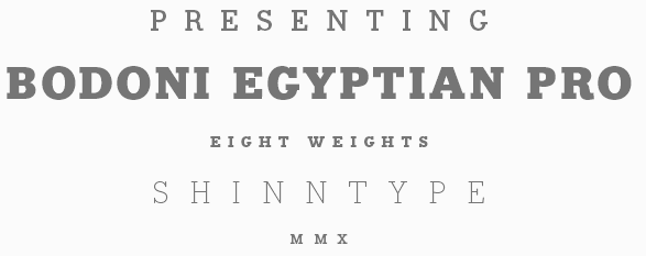 [MyFonts]
[More] ⦿
|
Nima H.K.
|
 Graduate of York University, who is working as a graphic designer in Toronto. Creator of experimental typefaces such as Slinkyy (2014, prismatic), Workshop (2014, multilined) and Pigment (2014, hairline). Behance link. [Google]
[More] ⦿
|
Nine Font
[Paul Chen]

|
 Nine Font is Paul Chen's type foundry in Tsim Sha Tsui, Hong Kong. In 2014, Paul Chen designed the condensed handcrafted sans typeface family Briko (+Ornaments, +Rough, +RoughOrnaments), the condensed sans typeface Nephrite, and the 6-style caps typeface family Dimor (with Inline, Outline, and Diamond (beveled) sub-styles).
 In 2015, he designed the sans typeface family Lanz and the rough brush font Bellis. Typefaces from 2016: Sebino (neutral sans famly), Carin (an all caps family including several tattoo and blackboard bold styles), Rohn (a robust squarish sans), Rohn Rounded. Typefaces from 2017: Glence (a geometric sans with a beautiful hairline weight). Typefaces from 2018: Sebino Soft (a comfy toilet paper soft sans family). Typefaces from 2020: Jindo (a 16-style sans). [Google]
[MyFonts]
[More] ⦿
|
Nirvan Type
|
New Delhi, India-based designer of the free hairline typeface Morena (2019). [Google]
[More] ⦿
|
Norah C. Stone
|
Graphic designer and artist who is studying at the Minneapolis College of Art and Design and who is based in Minneapolis, MN. Creator of Bodoni Curl (2012, a hairline typeface that is not really a Bodoni). [Google]
[More] ⦿
|
OGJ Type Design
[Oliver Jeschke]

|
 Aka OGJ Type, Oliver Jeschke is based in Berlin. In November 2022, The Type Founders acquired the OGJ Type Collection. Since then, Oliver has worked under an exclusive type design contract through November 2025. Starting in December 2025, he plans to release new typefaces---including Version 1 International---through a new, truly independent type foundry, free from private equity and corporate ownership.
 With Oliver Mayer (Tatin, Basel), he created the avant garde linear grotesk typeface family Version 1 International (2013). The typeface family, characterized by upward diagonal strokes in the f, h, m, n and u, was published by Volcano. Volcano writes: The Version 1 font family is a mannered geometric linear-grotesque, hand-drawn and developed by Oliver Jeschke and Oliver Mayer at Tatin Design Enterprises in Basel, Switzerland and Berlin, Germany. It was created in a three-month training and was further developed in the later stages as OpenType font. In 2015, influenced by the work of Swiss master designer Max Bill, Oliver Jeschke created the Greek simulation typeface family Bill Display, the sans typeface Bill Corporate, and Bill Corporate Narrow. See aso Bill Corporate Mx (2016) and Bill Display Lowercase. Spectators Headline (2016) is a breezy semi-informal notebook sans family. Typefaces from 2017 include Sequel Sans and Sequel Rounded. Calling it a "post-Max Bill design", Sequel Sans was developed in collaboration with the Max Bill Georges Vantongerloo Foundation. In 2018, Sequel 100 Wide and Sequel 100 Black were added to that collection. Typefaces from 2018: Shapiro (a 32-style grotesk in which horizontal and vertical strokes are nearly identical in width), Temper Wide (slab serif). Typefaces from 2019: Shapiro Pro (138 styles), Shapiro Base (sans), Darbee Legend (a sans family with cuts named after famous racehorses). Typefaces from 2020: Sequel Sans VF (the variable font version of Sequel Sans), JT Energy (a great addition to the geometric sans genre featuring optically consistent line thickness; it comes with two condensed styles called JT Energy Placard, and with JT Energy Variable). Typefaces from 2021: JT Collect (a 14-style grotesk used by Nike). Typefaces from 2022: Sequel Geo (an 82-style Swiss sans family).. [Google]
[MyFonts]
[More] ⦿
|
Okay Type
[Jackson Cavanaugh]

|
 Jackson Showalter-Cavanaugh (b. Waterloo, IA, 1981) is a freelance graphic designer and independent type designer based in Brooklyn, NY, and/or Chicago. He founded Okay Type in 2009.
 Jackson designed Alright Sans (2009, clean sans) and Alright Display (voguish hairline sans). In 2012, he created The Harriet Series (with Harriet Text and Harriet Display subfamilies), a full Sotch Roman / Baskerville / didone family that won an award at TDC 2012. In 2016, he was asked by Mac Lewis, artistic director at Playboy, to design a new headline typeface for the magazine. Cavanaugh designed a heavy slab serif for the occasion. In 2019, he released the ultra-black typeface family Okay. [Google]
[MyFonts]
[More] ⦿
|
Oksana Sergienko
|
Graphic designer and typographer in Moscow. She screated the avant garde and ultra thin sans typeface Hair (2009, Paratype). [Google]
[More] ⦿
|
Oliver Jeschke
[OGJ Type Design]

|
 [MyFonts]
[More] ⦿
|
Oliver Mayer
|
Oliver Tatin (Tatin, Basel, Switzerland) co-designed the avant garde linear grotesk typeface family Version 1 International (2013) with Berlin-based Oliver Jeschke. The typeface family, characterized by upward diagonal strokes in the f, h, m, n and u, was published by Volcano. [Google]
[More] ⦿
|
Olivier Gourvat
[Mostar Design]

|
 [MyFonts]
[More] ⦿
|
Olli Meier

|
 German designer of Vary (2021, Monotype). Vary is an 10-style geometric sans serif typeface (+a variable font) inspired by Bulgarian Cyrillic. Its weights range from Hairline to ExtraBlack. [Google]
[MyFonts]
[More] ⦿
|
One by Four
[Natasha Maria Fernandez-Fountain]

|
 One by Four is a four-person design studio in South Florida, and later in Brooklyn, NY. The main type designer in the group is South Florida-based Natasha Maria Fernandez-Fountain (b. 1985). The others are Alejandra Abad, Brian Haines and Bruno Torquato. Typefaces by Natasha include Geomancy (2010, +ExtraBold, +Hairline; a free geometric art deco typeface family), Dechenko Deco (2008, art deco), Goofus (2008, a comic book typeface) and Bookworm (2007, hand-printed and legible). Brian Haines designed Matchbook (2009, retro sans).
 Font Squirrel link where one can download Matchbook. Dafont link. Natasha Maria Fernandez-Fountain's home page. [Google]
[MyFonts]
[More] ⦿
|
Oporto Design
[Alexandre Venancio]

|
Sao Paulo-based design studio. MyFonts link. Its designer is Alexander Venancio, who graduated in Industrial Design from the Faculdade de Belas Artes de Sao Paulo. Creator of Speaking Corporate (2011, office and business dingbats), Maze (2009, multiline typeface), Landmark (2009), Thaitype (2009, Thai simulation typeface made with Felippe Duque), Ale's Script (2009, comic book script), Capa (2009, hairline art deco typeface done with Felippe Duque and Cristiano Vinciprova), and Oporto (2009). Indice (2009) is another hairline uber-geometric face. Typefaces from 2012: Bolha (counterless ultra-fat face). Biteme (2011, organic and minimal) was co-designed by Guilherme Rizzatti, Makoto Saito and Alexandre Venancio. Home page. [Google]
[MyFonts]
[More] ⦿
|
Oscar Fuentevilla
|
Monterrey, Mexico-based designer of the fashion mag hairline sans face Thin Frank (2011) and of the pixel dingbat typeface Simbolos Positivos (2011). Behance link. [Google]
[More] ⦿
|
Otto Maurer
[Otto Maurer (was: Tattoofont)]

|
 [MyFonts]
[More] ⦿
|
Otto Maurer (was: Tattoofont)
[Otto Maurer]

|
 Tattoo artist and graphic designer from Dinslaken (Duisburg), Germany, b. 1968, Duisburg. Klingspor link.
 Otto Maurer (Tattoofont) created Ipoint (2008, a 15-style fun-filled Bauhaus-inspired family), Black and Beauty (2007, blackletter family), Big Rain (2007), Blood (2007, dripping blood type), Preussen (2007, a 4-style blackletter family), Otto Bismarck Italic (2007), an italic blackletter face, and its parent, Otto Bismarck (2007). Designer of the free curly font Corps Script (2006) and Corps Script Shadow (2006). Creator with Sabrina of the free handwriting fonts Sabsis Handwriting Version 3 (2007) and Sabsis Handwriting (2007). Home page. Dafont link. Yet another URL. In 2007, he went partially commercial and set up shop at MyFonts. His fonts there include the artsy Sailors Tattoo (2006), SailorsTattoo-waves (2007), Sailors Tattoo Pro Xmas (2007), Sick Skull (2007, scary), Tribal Maori (2007), MauBo Flatline (2007, experimental), Tribal Dingbats (2007), Tribaltypo (2007: quite interesting), MauBo (2007, mechanical look), Hotrod (2007), Blood (2007, scary), MauBo Flatline (2007, white on black) and Corpse Fairy (2007), Mrs. Sabo (2007, calligraphic and grunge hand), Tribal King (2007), Pierced (2007), Big Rain (2007), Detective Maurice (2007, a typeface with fingerprints on the alphabet), Cutdown Maurice (2007), Digital Maurice (2007), Good Old Fifties (2007, 11 styles), Tribal Dingbats II (2008, a tattoo font), Tribal tattoos III (2010), Hot Flames (2008), Drago (2008, a blackletter and alphading family), Party Night (2009), Tattoo Girl (2008). Typefaces from 2009: Yuma (2009, Western saloon font), Freiheit (2009, blackletter), Lycaner (2009, blackletter), Sud France (2009, script), Psychbilly (2009, fat brush), Love Mom (2009), Vampire (2009), Animal Zoo (2009), Turtle (2009), Grunge (2009, cracked marble family), Crate (2009). Typefaces from 2010: Big Mom (2010, a family that includes a blackboard bold style), Haike (2010). Typefaces from 2011: Tinka Babe (2011, a gangster or tattoo script), Poisoni Pro (2011, tall art nouveau style brush face, with Shadow and College sub-styles), Lanzelott (2011, a very elegant retro display family, followed in 2017 by New Lanzelott), Stencilla (2011, a heavy stencil face), Guilin (2007, brushy), Darkwood (2011), Rock n Roll Typo (2011), Loreen (2011: an elegant display family that includes a hairline and a shadow style). In 2012, he made the pointy Psychomonster typeface. In 2013, Otto Maurer published the gangster tattoo font Bibiana as a companion for Tinka Babe. Typefaces from 2014: Cupcakes Winterwonder (snowy font), Soul Winterwonder, Loreen Hollywood (art deco), Soul Material Design Dingbatz, Soul Love (Valentine's Day font), AZ Cupcakes, Soul (a sans family with some flaring), Christe Wagner (a great set of curly Victorian music sheet-inspired typefaces), Spider Type, Marie Lyn, Mariedean (a Victorian titling set, including decorative caps), Peachy (+ Shadow: a slab serif). Typefaces from 2015: Maori New Zeeland, Chika Tattoo (12-style tattoo script), Chino Tattoo, Big Yukon (Wild West font), Bonecracker, Freibeuter NR (Western Tuscan family), Sailor Marie (tattoo font family), Baby Lyns ABC (children's book alphabet). Typefaces from 2017: Anchorage (a sailor's tattoo font), Friedrichsfeld (blackletter). Typefaces from 2018: Lettre Damour (handwriting font), Cryptolucre (started in 2014, Cryptolucre is a font specifically for all crypto currencies like Bitcoins, Litecoins, Ethereum, Ark, Siacoin and Golem--the icon version includes some existing currency logos and newly invented currency logos), Haike, Soul Leo (textured), Soul Skull, Tattooflash Fingers, Tattooflash Marie. Typefaces from 2019: Stencilla. Showcase of Otto Maurer's fonts. View the typefaces made by Otto Maurer. [Google]
[MyFonts]
[More] ⦿
|
Owen Earl
[Indestructible Type]
|
 [More] ⦿
|
P22 Type Foundry
[Richard Kegler]

|
 Richard Kegler's fun Buffalo-based foundry, which he founded in 1995 together with his wife, Carima El-Behairy. Currently, on staff, we find type designers James Grieshaber and Christina Torre. In 2004, it acquired Lanston Type. P22 has some great unusual, often artsy, fonts. In 2021, P22 jopined The Type Founders as a distribution outlet.
 The fonts are: Industrial Design (an industrial look font based on letters drawn by Joseph Sinel in the 1920s---this font is free!), LTC Jefferson Gothic Obliquie (2005, free), Sinel (free), P22Snowflakes (free in 2003 and P22 Snowflakes (retail) in 2020, finishedd by Richard Kegler and Terry Wüdenbachs), Acropolis Now (1995, a Greek simulation typeface done with Michael Want), P22 Albers (1995; based on alphabets of Josef Albers made between 1920 and 1933 in the Bauhaus mold), Arts and Crafts (based on lettering of Dard Hunter, early 1900s, as it appeared in Roycroft books), Ambient, Aries (2004, based on Goudy's Aries), Arts and Crafts ornaments, Atomica, Bagaglio (Flat, 3D; in the style of Il Futurismo), P22 Basel Roman (2020, Richard Kegler: an update of a 2015 typeface, P22 Basel, based on a garalde font used by Johannes Herbst (aka Ioannes Oporinus) in 1543 to publish Andreas Vesalius' On the Fabric of the Human Body (De humani corporis fabrica) in Basel), Bauhaus (Bauhaus fonts based on the lettering of Herbert Bayer), Bifur (2004, Richard Kegler, after the 1929 original by Cassandre), Blackout, P22 Brass Script Pro (2009, Richard Kegler; based on an incomplete script fond in a booklet from Dornemann&Co. of Magdeburg Germany, ca. 1910 entitled Messingschriften für Handvergoldung; for years, P22 and MyFonts claimed that Michael Clark co-designed this, but Michael does not want any credit, as he did only about 20 letters), Cage (based on handwriting and sketches of the American experimental composer John Cage), P22 Casual Script (2011, Richard Kegler, a digitization of letters by sign painter B. Boley, shown in Sign of the Times Magazine), Cezanne (Paul Cezanne's handwriting, and some imagery; made for the Philadelphia Museum of Art), Child's Play, Child's Play Animals, Child's Play Blocks, Constructivist (Soviet style lettering emulating the work of Rodchenko and Popova), Constructivist extras, Czech Modernist (based on the design work of Czech artist Vojtech Preissig in the 20s and 30s), Daddy-o (Daddy-o Beatsville was done in 1998 with Peter Reiling), Daddy-o junkie, Da Vinci, Destijl (1995, after the Dutch DeStijl movement, 1917-1931, with Piet Mondrian inspired dingbats; weights include Extras, P22 Monet Impressionist (1999), Regular and Tall), Dinosaur, Eaglefeather, Escher (based on the lettering and artwork of M.C. Escher), P22 FLW Exhibition, P22 FLW Terracotta, Folk Art (based on the work of German settlers in Pennsylvania), Il futurismo (after Italian Futurism, 1908-1943), Woodtype (two Tuscan fonts and two dingbats, 2004), P22 Woodcut (1996, Richard Kegler: based on the lettering carved out in wood by German expressionists such as Heckel and Kirchner), Garamouche (2004, +P22 Garamouche Ornaments; all co-designed with James Grieshaber), GD&T, Hieroglyphic, P22 Infestia (1995), Insectile, Kane, Kells (1996, a totally Celtic family, based on the Book of Kells, 9th century; the P22 Kells Round was designed with David Setlik), Koch Signs (astrological, Christian, medieval and runic iconography from Rudolf Koch's The Book of Signs), P22 Koch Nueland (2000), Larkin (2005, Richard Kegler, 1900-style semi-blackletter), London Underground (Edward Johnston's 1916 typeface, produced in an exclusive arrangement with the London Transport Museum; digitized by Kegler in 1997, and extended to 21 styles in 2007 by Paul D. Hunt as P22 Underground Pro, which includes Cyrillic and Greek and hairline weights), Pan-Am, Parrish, Platten (Richard Kegler; revised in 2008 by Colin Kahn as P22 Platten Neu; based on lettering found in German fountain pen practice books from the 1920s), P22 Preissig (and P22 Preissig Calligraphic, 2019), Prehistoric Pals, Petroglyphs, Rodin / Michelangelo, Stanyan Eros (2003, Richard Kegler), Stanyan Autumn (2004, based on a casual hand lettering text created by Anthony Goldschmidt for the deluxe 1969 edition of the book "...and autumn came" by Rod McKuen; typeface by Richard Kegler), Vienna, Vienna Round, Vincent (based on the work of Vincent Van Gogh), Way out West. Now also Art Nouveau Bistro, Art Nouveau Cafe and the beautiful ornamental font Art Nouveau Extras (all three by Christina Torre, 2001), the handwriting family Hopper (Edward, Josephine, Sketches, based on the handwriting styles of quintessential American artist Edward Hopper and his wife, Josephine Nivison Hopper, and was produced in conjunction with the Whitney Museum of American Art), Basala (by Hajime Kawakami), Cusp (by James Grieshaber), P22 Dearest (calligraphic, by Christina Torre and Miranda Roth), Dwiggins (by Richard Kegler), Dyrynk Roman and Italic (2004, Richard Kegler, after work by Czech book artist Karel Dyrynk), Gothic Gothic (by James Grieshaber), La Danse (by Gábor Kóthay;), Mucha (by Christina Torre), Preissig Lino (by Richard Kegler), P22Typewriter (2001, Richard Kegler, a distressed typewriter font), the William Morris set (Morris Troy, Morris Golden, Morris Ornaments, based up the type used by William Morris in his Kelmscott Press; 2002), Art Deco Extras (2002, Richard Kegler, James Grieshaber and Carima El Behairy), Art Deco Display, the Benjamin Franklin revival font Franklin's Caslon (2006), Dada (2006) and the Art Nouveau font Salon (bu Christina Torre). In 2006, Kegler added Declaration, a font set consisting of a script (after the 1776 declaration of independence), a blackletter, and 56 signatures. Many of the fonts were designed or co-designed by Richard Kegler. International House of Fonts subpage. Lanston subpage (offerings as of 2005: Bodoni Bold, Deepdene, Flash, Fleurons Granjon, Fleurons Garamont, Garamont, Goudy Thirty, Jacobean Initials, Pabst, Spire). Bio and photo. In-house fonts made in 2008 include Circled Caps, the Yule family (Regular, Klein Regular, Light Flurries, Heavy, Klein heavy, Heavy Snow, Inline; all have Neuland influences). Kegler / P22 created a 25-set P22 Civilité family in 2009 based on a 1908 publication from Enshedé, the 1978 English translation by Harry Carter, and a 1926 specimen also from Enshedé. P22 Declaration (Script, Signatures, Blackletter, 2009) is based on the lettering used in the 1776 Declaration of Independence. At ATypI 2004 in Prague, Richard spoke about Vojtech Preissig. Speaker at ATypI 2010 in Dublin, where he presented Making Faces: Metal Type in the 21st Century about which he writes: This film has the dual aim of documenting the almost-lost skill of creating metal fonts and of capturing the personality and work process of the late Canadian graphic artist Jim Rimmer (1931-2010). P22 type foundry commissioned Mr. Rimmer to create a new type design (Stern) that became the first-ever simultaneous release of a digital font and hand-set metal font in 2008. At ATypI 2011 in Reykjavik, he showed Making Faces. Typefaces from 2014: LTC Archive Ornaments (Richard Kegler and Miranda Roth). Typefaces from 2020: Showcard Script (by Terry Wüdenbachs, based on an original of Beaufont at the Hamilton Wood Type Museum, custom designed by the Morgan Sign Machine Company of Chicago). Typefaces from 2021: P22 Glaser Houdini (a layerable family, after Glaser's Houdini from 1964), P22 Glaser Babyteeth. Kegler writes: In 2019, P22 Type Foundry met with Milton Glaser (1929-2020) to initiate the official digital series of typefaces designed by Glaser in the 1960s and 70s. P22 Glaser Babyteeth is the first family released in the series. Milton Glaser's inspiration for his Babyteeth typeface came from a hand painted advertisement for a tailor he saw in Mexico City. He was inspired by that E drawn as only someone unfimilar with the alphabet could have concieved. So he set about inventing a completelly ledgible alphabet consistant with this model. P22 Glaser Babyteeth was based on original drawings and phototype proofs from the Milton Glaser Studios archives. Over the years there have been many typefaces that borrowed heavily from the Glaser designs, but these are the only official Babyteeth fonts approved by Milton Glaser Studio and the Estate of Milton Glaser. The solid and open versions are designed to overlap for two-color font effects and can even be mixed and matched for multi layer chromatic treatments. In 2021, he published the 3d art deco shadow font P22 Glaser Kitchen which is based on Big Kitchen (1976). MyFonts interview. View Richard Kegler's typefaces. View the IHOF / P22 typeface library. [Google]
[MyFonts]
[More] ⦿
|
Pablo Moreno

|
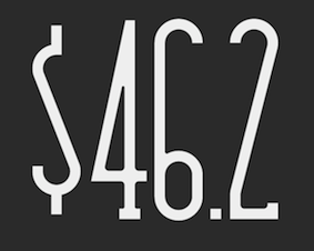 Designer and type designer in Cordoba, Argentina. His typefaces include Need (2011), Salt (2010, condensed octagonal face), Gotan (2010), Playfont (2010, art deco / geometric stencil face), Seaside (2010, hairline sans), Noche (2010, monoline gemetric sans), Noche Bold, Izquierda (2010), Good (2010, a high-contrast face) and Narrow (2010).
 Cemento (2015) is a minimalist, modern and monoline typeface. In 2016, he designed the free typeface Cordoba (Citype). In 2016, he published the stencil-based Oceanshore at Los Andes. Typefaces from 2018: Sonda (pixel), Moduleto (a grid-based typeface, done with Don Toledo). Behance link. Devian tart link. [Google]
[MyFonts]
[More] ⦿
|
Panos Vassiliou
[Parachute]

|
 [MyFonts]
[More] ⦿
|
Parachute
[Panos Vassiliou]

|
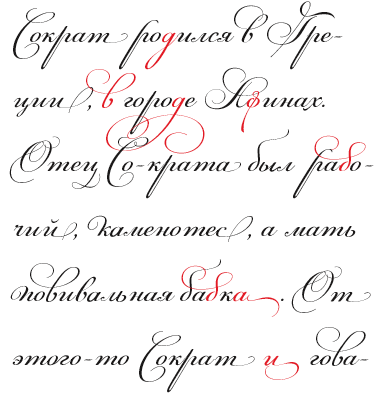 London, UK, and Athens and Kifissia, Greece-based type foundry started in 2001 by Panos Vassiliou. It specializes in fine multilingual (usually Latin, Greek and Cyrillic) typeface families. He is a graduate of the University of Toronto, Canada with a major in Applied Science and Engineering. Following his University of Toronto graduation, he studied Graphic Communications at Ryerson University. Panos Vassiliou has conducted numerous seminars for Canadian companies such as Bank of Nova Scotia, Royal Bank and Sony Canada. He graduated from the University of Toronto/Canada, where he studied Applied Science and Engineering. He has been Creative Director for the Canadian design firm AdHaus, former Publisher of the monthly magazine DNA (Greece) and Secretary-General for the Hellenic Canadian Congress (Ontario, Canada). He has been designing typefaces since 1993, including commercial fonts as well as commissions from Vodafone, Nestlé, Ikea and National Geographic. He started Parachute in 2001 setting the base for a typeface library that reflected the works of some of the best contemporary Greek designers, as well as creatives around the world obsessed with type. Apart from its commercial line of typefaces, Parachute offers bespoke branding services for corporate typefaces and lettering. Customers include Bank of America, the European Commission, UEFA, Samsung, IKEA, Interbrand, National Geographic, Financial Times, National Bank of Greece, Alpha Bank and many others.
 Myfonts link. Behance link. Other type designers at Parachute include Kanella Arapoglou, Alexandros Papalexis, Dimitris Foussekis, Aggeliki Skandalelli, Helen Gabara, Babis Touglis, Vangelis Karageorgos, George Toumbalis, Eva Karapidaki, Charis Tsevis, Pavlos Levendellis, Panos Vassiliou, and George Lygas. At Granshan 2010, Vassiliou won Second Prize in the Greek text typeface category for PF Encore Sans POro, and First and Second Prizes in the display typeface category for PF Regal Pro and PF Champion Script Pro, respectively. Typefaces: - Adamant
- PFAgora Pro: Agora Sans, AgoraSerif, AgoraSlab.
- Amateur
- PF Archive Pro (2004). He received a design award for his typeface Archive at the E AWARDS 2004. It has special typographic features and multilingual support for all European languages including Greek and Cyrillic.
- Armonia
- Astrobats
- Bague Universal and Bague Sans (2014). A geometric grotesk that dares to be different. Accompanied by Bague Slab Pro (2014), PF Bague Inline Pro (2014), and PF Bague Round Pro (2014).
- Baseline
- Beatnick
- Beau Sans (2011). Inspired by Bernhard Gothic.
- A custom didone font for Greece's Benaki Museum (2020-2021).
- PF Benchmark Pro (2014).
- Bodoni Script (2009).
- PF Brummell (2016). A sans characterized by sharp angled terminals and a diamond dot on the i.
- Bulletin Sans (2000-2005)
- Centro (Centro Sans, Centro Serif, Centro Slab) a typeface originally developed for the redesign of the Financial Times Deutschland. PF Centro Pro family (Sans, Serif, Slab, a trillion styles) won an European Design Award in May 2008 in Stockholm and at Paratype K2009. It was completed by PF Centro Serif Compressed, PF Centro Sans Condensed and PF Centro Sans Compressed in 2015. In 2016, he published PF Centro Slab Press.
- PFChampion Script Pro (2004-2008). A much lauded connected calligraphic script that is based on a calligraphic script by Joseph Champion, 1709-1765. Winner at Paratype K2009 and Granshan 2010. Images: i, ii iii, iv, v. The 4245-glyph family comprises Cyrillic, Latin and Greek subfamilies.
- Cosmonut (sic) (2002). A retro futuristoc typeface made by Dimitris Foussekis.
- PF Das Grotesk Pro (2014). Panos writes: Das Grotesk was inspired by earlier nineteenth-century grotesques, but it is much more related to American gothic designs such as those by M.F. Benton.
- DaVinciScript (2001-2006). A Treefrog-style script typeface by Vassiliou and Dimitris Foussekis.
- PF Dekka (2014). This solid elliptical sans family was influenced by Monaco's outline version called MPW. It includes PF Dekka Mono.
- PF DIN (2010): PF DIN Display (2002-2005), PF DIN Mono, PF DIN Serif (2016; this great serif version of DIN---a first---contains a wealth of goodies: just look at the great weather icons; it won an award at Granshan 2016), PF DIN Stencil Pro (2010), PF DIN Stencil, PF DIN Stencil B (2016), PF DIN Text Pro, PF DIN Text Condensed, PF DIN Text Compressed, PF DIN Text Arabic, and PF DIN Text Universal. With Latin, Cyrillic and Greek coverage, each font has about 1300 glyphs. The designs go back to the lettering of the Prussian railways around 1900. In 2013, PF Din Text Pro was published. In 2021, the three-axis (weight, width, italic) variable type system PF DIN Max saw the light.
- Eco Park. A 3d outline face.
- PF Encore Sans (2009). A rich and versatile sans family supporting Greek, Latin and Cyrillic.
- PF Fuel Pro
- PF Fusion Sans (1996-2006)
- PF Garamond Classic.
- PF Goudy Intials and PF Goudy Ornaments. A winner at Paratype K2009.
- PF Grand Gothik (2019). A large grotesque typeface family with three subfamilies and a variable font option. He writes: Grand Gothik is a postmodern, multiscript, multifaceted and variable type system which shines at its heavier extended versions with its hip, expressive, almost brutal energy. Grand Gothik's design space includes 3 axes for weight, width and one for italics. It is available as a variable font or as five separate opentype families---compressed, condensed, normal, wide and extended. Each family comes with 9 weights spanning from Extra Thin to Black plus italics.
- PF Handbook (2005-2007, sans family)
- HausSquare
- HellenicaSerif. Chiseled look, Greek simulation face.
- PF Highway Sans (2001-2015). Highway Sans Pro is based on the standard typefaces used for highway signs and other byways open to public travel in the United States. These standards were established by the US Federal Highway Administration in 1966 following several studies which were conducted at the California Department of Transportation in the 1940s. It covers Latin, Greek and Cyrillic.
- House Square. A Bank Gothic lookalike.
- PF Isotext (2005). Meant for technical documentation, it is modeled after Isonorm.
- Kids, KidsStuff
- Libera
- Lindemann and PF Lindemann Sans (2012).
- PF Marlet (2019). A sharp-edged humanist sans family fit for fashion mags: Marlet Titling, Marlet Finesse, Marlet Swash, Marlet Display, Marlet Text. PF Marlet, collected three awards one after the other, a year after appearing on Luc's best-of-2019 list. First, the coveted TDC Certificate of Typographic Excellence 2020 (at 23RDC), followed by another one from European Design Awards, a third distinction from Tokyo TDC and a fourth crown, Red Dot Award 2020, all in 2020.
- Mechanica A and B, 2002-2006. Octagonal families.
- PF Mellon (2019). A modernist variable grotesque influenced by nineteenth and early twentieth century condensed sans serif typefaces such as Stephenson Blake's Grotesque No.77 and ATF's Alternate Gothic.
- PF Monumenta (2002-2006). A majestic lapidary roman family.
- Muse
- Online (One, Two and Three). Pixelish family.
- PF Ornamental Treasures (2008). Byzantine ornaments and borders.
- PF Pixelscript
- Playskool
- Psychedelia (2003, Dimitris Foussekis). A psychedelic typeface.
- Regal Pro and Regal Finesse Pro: Award-winning high fashion display didone families, 2010-2012, originally designed for the Grazia magazine. Awards include Red Dot Awrd 2012, Communication Arts Annual Competition 2012, Creative Review Type Annual 2011, European Design awards 2011, EBGE awards 2011, Granshan Awards 2010. See also PF Regal Swash and PF Regal Stencil.
- PF Reminder Pro (2003). A hand-printed typeface.
- Scandal
- PF Spekk (2020). A simple versatile geometric sans for Latin, Greek and Cyrillic.
- PF Square Sans Pro, PF Square Sans Condensed Pro (2013).
- PF Stamps (2002-2006). A grungy stencil typeface by Panos Vassiliou and George Lygas.
- PF Synch Pro (2006). An industrial strength slab-serif typeface.
- PF UEFA Super Cup (2013).
- PF Uniform
- PF Venue (2017). Semi art deco, and free-spirited, a great poster typeface family.
- VideoText
- PF Wonderbats (2003). Funky and strange animals.
- Wonderland (2006). By Dimitris Foussekis.
Their type blog is called Upscale typography. Catalog. View all typefaces designed by Parachute. Klingspor link. MyFonts interview. [Google]
[MyFonts]
[More] ⦿
|
Paul Chen
[Nine Font]

|
 [MyFonts]
[More] ⦿
|
Paula Lopez
|
Spanish designer of the free hairlined caps typeface Rasty Lop (2013). [Google]
[More] ⦿
|
Paula Nazal Selaive

|
 Santiago de Chile-based creator of Selaive (2011, Latinotype), a geometric monoline sans with an extreme hairline weight, a bold, and several curly alternates. She also made the curly swashy script typeface Dulce (2011; Dulce Pro appeared in 2013 at Latinotype). Dulce has slight teardrop terminals.
 In 2012, she and Daniel Hernandez created the Bosque family at Latinotype, which comes with six variants, Normal, Wood, Shadow, Wood Shadow, Dingbats and Shadow One. Julieta is a curly swashy thin monoline typeface family. Romeo (Latinotype) is a swashy curly condensed unicase typeface. In 2013, with Daniel Hernandez, she designed the layered type system Trend, also at Latinotype. See also Trend Rough (2014). In 2014, together with Daniel Hernandez, she created the upright good-spirited coffee shop script Showcase. It is morally supported by a set of Ornaments and a few Sans and Slab styles. Revista (2015, Paula Nazal Selaive, Marcelo Quiroz and Daniel Hernandez, at Latinotype) is a typographic system that brings together all the features to undertake any fashion magazine-oriented project. It has Revista Script (connected style), Revista Stencil, Revista Dingbats, Revista Inline and the didone Revista all caps set of typefaces. Revista won an award at Tipos Latinos 2016. In 2016, she designed the delicate display didone typeface family Camila (Latinotype), for which she was influenced by Coco Chanel. In 2017, Paula Nazal and Daniel Hernandez co-designed Trenda, a geometric sans family based on the uppercase of Trend. The rounded edge version of Trenda is Boston [corrections and review by Alfonso Garcia and Rodrigo Fuenzalida]. In 2018, Paula Nazal and Daniel Hernandez co-designed the monoline connected script font Save The Date. Facundo (2020, Paula Nazal Selaive and Daniel Hernandez, at Latinotype) is a 14-style geometric sans family. [Google]
[MyFonts]
[More] ⦿
|
Paulo Goode

|
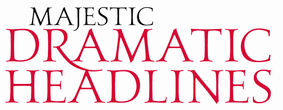 English designer in West Cork, Ireland. In 2014, he designed the classical roman caps typeface Carrig---not Trajan, but still influenced by stone carving. He also created the similar typefaces Carrig Roman (2015), Carrig Italic (2015), Carrig Refined (2015), Carrig Rough (2016), Carrigeen (2014), and Carrig Pro (2017). Woodford Bourne (2015, 8 weights for 16 fonts in all, from Hairline to Black) is a 19th century grotesque typeface that pays homage to the historic stone cast type in the building façades of the former Woodford, Bourne & Co. in Cork City, Ireland. It was imprioved and extended in 2016 as Woodford Bourne Pro. Arundel (2015) is a beveled medieval typeface.
 Typefaces from 2016: Didonesque (didone headline typeface characterized by a large x-height and slightly curved v, w and y), Fnord (a serif family designed with a mischievous streak), Fnord Display (in Engraved, Inline and Woodcut styles), Eponymous (an experiment with chunky serifs), Pseudonym (a subtly falred sans with interlocking and unicase features). Typefaces from 2017: Didonesque Ghost (a stylish very contrasted didone typeface family), Banjax (humanist sans, followed in 2018 by Banjax Notched), Faded Grandeur (inspired by stone engravings that have withered and decayed over time), Torus (a rounded monoline organic sans; see also Torus Variations (2018): Torus Notched, Torus Inline, Torus Outline and Torus Biline), Meccanica (an intoxicating nuts and bolts-style engineering typeface). Typefaces from 2018: Eurocine (this is in the wide elliptical sans genre: This typeface attempts to capture the mood of movie credits from European Cinema in the 1970s, with a focus on Giallo films in particular. In terms of style, Eurocine sits somewhere between Walter Baum and Konrad Friedrich Bauer's Folio, and Aldo Novarese's Eurostile), Polyphonic (a 60-font slab serif family), Majesty (flared, incised), Verbatim (a 60-font sans family that was inspired by the best (and worst) of 1970s science fiction TV shows and movies, and aims to extract the essence of futuristic type from that era). Typefaces from 2019: Didonesque Script, Modica (an 18-style geometric sans that came from Technica), Technica (a more conservative rounded geometric sans / techno family than his earlier Meccanica), Rhetoric (a semi-cursive typeface), Quorthon (blackletter, in Black, Dark and Grey substyles), Yolk (a sans family based on the shape of an egg yolk), Transcend (an all caps titling typeface), Ergonomique (a humanist sans in 18 styles), Eloquence (a renaissance font family), Didonesque Stencil. Typefaces from 2020: Rodia (an 18-style oddball (sic) geometric typeface inspired by the iconic RADIO signage that was once in place at 5041, Pico Boulevard, Los Angeles in 1985), Arise (an 18-style text typeface family characterized by hooked terminals), Slabber (a slab serif inspired by 19th century wood type), Audacious (a 20-style decorative serif), Cream (a warm text family, with the heavier weights leaning towards Cooper Black), Sqwared, Logik (sci-fi). Typefaces from 2021: Evoque (a 36-style contrast-rich text typeface; followed in 2022 by the 16-style family Evoque Text which includes two variable fonts), Sienna (14 styles and two variable fonts; a warm soft serif with some angular design elements that make it a great choice as a text typeface), Torus Pro, Harmonique (a 32-style incised serif). Creative Market link. MyFonts link. Fontsquirrel link. [Google]
[MyFonts]
[More] ⦿
|
Paulo Rangel
|
 Aka Skomii. Austrian creator of the hand-printed typefaces Simallos (2012), Scriptia Happy (2012) and Danï Donne (2012), of the sans typeface Aster (2012), of the avant-garde hairline caps typeface Veron (2012, +Extra), and of the counterless typeface Chronodue (2012).
 Typefaces from 2013: Rhino Luz, Erasaur, Always Together, Aspergit (avant-garde sans family), Science Fair, Our First Kiss (upright monoline connected script), Marchesa, Marte (hairline avant-garde font), New Spirit (2013), Max And The Dust, Essence Sans (avant-garde sans), Moondance, Dalmais (Peignotian fashion mag face), Mers (circular arc font), Camieis (squarish face), Cliche 21 (avant-garde hairline sans), Old Cave (brush face), Aspargo (hand-printed), The Rainmaker (outlined 3d face), Skandar. Typefaces from 2014: Oxymorons, I Never Learn, Realize My Passion, Stark (geometric sans), Pistara (thin avant garde sans), Maloire, Arenq (bilined). Dafont link. Fontspace link. [Google]
[More] ⦿
|
Pavlina Suhajova
|
Brno, Czechia-based designer of the hairline avant garde typeface Brite Lites (2015). [Google]
[More] ⦿
|
Pedro González Jorquera
[PeGGO]

|
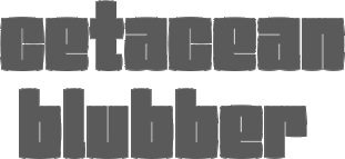 [MyFonts]
[More] ⦿
|
Pedro Leal

|
 Pedro Leal graduated in graphic design and advertising from the ESEIG-Escola Superior de Estudos Industriais e de Engenharia in Vila do Conde, Portugal, and lives in Porto. In 2010 he obtained a degree in type design at ESAD (Escola Superior de Artes e Design, Matosinhos) and started working at DSType. MyFonts link. Behance link.
 He used FontStruct in 2008 to create the pixel typeface Minimal 8pt (514 glyphs!). In 2010, he created the text family Mafra at DSType. This was followed a bit later by Mafra Display (2010; +Medium, +Black). Apud and Apud Display (2010, DSType) are high-contrast typefaces. Penna (2011) is a calligraphic type system. Braga (2011, Dino dos Santos and Pedro Leal, DS Type) is a layered font design family. Dino writes: Braga is an exuberant baroque typeface, named after a Portuguese city, also known as the baroque capital of Portugal. Our latest typographic extravaganza comes with a multitude of fonts designed to work like layers, allowing to insert color, lines, gradients, patterns, baroque, floral swashes, and many other graphic elements. Starting with Braga Base, you can add any of the twenty-three available styles, to create colourful typographic designs. In 2012, he designed User, User Stencil and User Upright>/a>, a monospaced type family with 30 styles, from Hairline to Bold. This too will many awards. Girga (+Italic, +Engraved, +Banner, +Stencil) is a strong black Egyptian family designed together with Dino dos Santos at DS Type. Solido (2012, with Dino dos Santos, DS Type) is a versatile type system with five widths: Solido, Solido Constricted, Solido Condensed, Solido Compressed and Solido Compact. In total there are 35 fonts. In 2020, a variable font was added to Solido. In 2012, he created the sans family Global, with its own dedicated web site, The Global Font. In 2013, he followed that up with the Global Stencil typeface family. In 2013, Dino dos Santos and Pedro Leal published Diversa, a set of nine very different fonts that are jointly kerned so that letters can be swapped out and replaced at will. Diversa Std (2014) extends this to include Stencil, Inline and other decorative styles. Pedro Leal's main typeface of 2013 is Aparo, a script that is calligraphic, yet keeps the characteristics of penmanship scripts, and the pizzazz of a good fashion font. In 2014, he published Ocre and Ocre Poster in sans and slab serif substyles inspired by W.A. Dwiggins, Torio, a penmanship script based on a style used in Arte de Escribir por Reglas y con Muestras (1798, by Spanish penman Torcuato Torío de la Riva y Herrer). Torio received the Communication Arts Type Award of Excellence in 2014. In 2015, he created the large Rudo and Rude Slab typeface families that exhibit many humanist traits: Rude ExtraWide, Rude Icons, Rude SemiCondensed, Rude SemiWide, Rude Wide, Rude, Rude Condensed, Rude ExtraCondensed, Rude Slab, Rude Slab Condensed, Rude Slab ExtraCondensed, Rude Slab ExtraWide, Rude Slab SemiCondensed, Rude Slab SemiWide, Rude Slab Wide, Rude Slab, Rude Slab Condensed, Rude Slab ExtraCondensed, Rude Slab ExtraWide, Rude Slab SemiCondensed, Rude Slab SemiWide, Rude Slab Wide. Early in 2015, he also did a custom typeface family for the Jornal de Notícias, including sans, serif and micro sub-styles. Dino dos Santos and Pedro Leal published Jules and Jules Text in the summer of 2015---a fat fashion mag didone 45-style family inspired by several plates from Portuguese calligrapher Antonio Jacintho de Araujo; it comes in Big, Colossal and Epic. Ecra is a workhorse slab serif, also done in 2015. Viska (2015, by Dino dos Santos and Pedro Leal) is designed for small print. Finally, TCF Zellige (2015, TypeCult) is a modular typeface inspired by the tiles that can be found in Southern Europe and North Africa. Typefaces from 2016: Oposta (Italian, Western style pushed to the esthetic extreme; received the Communication Arts Type Award of Excellence in 2017), Ardina (with Dino dos Santos: a text typeface family with three optical sizes). Typefaces from 2017: Scrittore (a heavy dark Italian bastarda influenced by the connected hand of Giovanniantonio Tagliente and Robert Granjon's Civilité; at DS Type), Zart (a voluptuous ebullient black didone, or fat face; +Script). Fusta (a gorgeous wood-type inspired poster typeface), Ordem (a low-contrast contemporary Capitalis Monumentalis). Typefaces from 2018: Glitched (an experimental variable spacing font), Striver (a crisp contrasted curvy display typeface), Certo Slab and Certo Sans, Foreday (a forward-looking typeface family with associated variable font, covering sans, serif, semi-sans and semi-serif), Perfil (an inline and swashy high end script). Typefaces from 2019: Akut (a purely angular typeface with some rounded corners), Denso (by Dino dos Santos and Pedro Leal: a great condensed variable font with weight, serif and optical size axes), Jornada (a multistyle family with a Fraktur, a chancery, a bookish style called Libro, a news text serif, a clean sans, a slab serif, a monospace, and a penmanship script, all in one family dubbed hygienic post-punk by Leal). In 2020, Dino dos Santos and Pedro Leal designed Larga, which was inspired by the typefaces shown in the specimens of the Fundiçãao Typographica Portuense from 1874. Larga is a wide all caps family and comes with a variable opentype format. Pedro also designed Effigy (a text typeface with slightly ballooning stems), Haste (a typeface that flirts with reverse contrast), Mescla and Enorme (an ultra massive and modular 3000-glyph mastodont of a font, together with Dino dos Santos; based on constructivist principles) in 2020. Typefaces from 2021: Orla (a straightforward interpretation of the Skeleton Antique No2 from the Stephenson, Blake & Co. foundry; for the sans, the serifs were removed), Elaine (+Ombre, +Fleurer; a complete baroque / Elzevir family influenced by Jacques-François Rosart in its ornamental styles). [Google]
[MyFonts]
[More] ⦿
|
PeGGO
[Pedro González Jorquera]

|
 Type designer graphic designer, calligrapher and illustrator from Chile, who graduated in graphic design in 2005 from the Universidad del Bío-Bío., b. 1977, Santiago de Chile. Aka PeGGO, a foundry established in 2002. MyFonts link. PeGGO designed some commercial fonts, such as:
 - Farola (2008, a curly Victorian face; +Farola Simple, without curls).
- PAI Fashion Font (2011).
- Legan (2008, a mini-serifed Trajan face).
- Thörtl (an angular display face).
- Gothric (gothic).
- Claramaria (sans).
- Claramaria Mega Black, Claramaria Extra Light (hairline version).
- Fonton (a fat elliptical face; images i, ii, iii, iv, v, vi, vii, viii, ix, x). I can't understand why Fonton has not won any major awards. Even in this popular genre, it stands on a pedestal all by itself.
- Cuadrada (2010, angular).
- Lighton Extra Light (2011). An elliptical hairline sans.
- Trianglery (2010, calligraphic).
- Politic (+ExtraLight, +ExtraBlack: a slabbed family).
- Bolta.
- Minesmall (hand-printed).
- SP-Font (squarish).
- Halcön (2008, blackletter).
- Krämfark (2008, blackletter).
- Milica (2013). A squarish severe poster typeface family.
- Hexaround (2013) is a dotted hexagonal matrix font.
- Latinisiert Hebraica Schrift (2014). A Hebrew simulation typeface.
- Double Trase Latinsiert Fraktur Schrift (2014) is a calligraphic blackletter alphabet.
- Limonada (2015). An organic semi-serif typeface.
- Ironbrick (2015). Pure techno futurism.
- Sharka (2015). A mechanical high impact display typeface family ranging from Normal to Compressed widths.
- Globa (2016). Globa is a low contrast round sans typeface family.
- Niva (2016). A 60-style display sans typeface family advertized for use in scientific documents.
- Primaria (2018). A great school script and print typeface family.
- The commissioned decorative typeface family Roijer (2016), and Roijer Ornaments, Roijer Dingbats, and Roijer II (2017). This absolutely stunning display typeface family evolved from a branding exercise in which each letter was developed as typographic jewelry, a bond between classical and creative freedom concepts with Lombardic and art nouveau touches, Röijer puts a dual capital model in your hands---a classic Roman and a contemporary alternative.
- LeBrush (2016). A contemporary humanist serif Roman typeface based on real brush lettering, in ten styles ranging from Thin to Extra Dark, inspired by the classical Roman proportions of the Capitalis Monumentalis of the Trajan Column. It comes with several dingbat fonts and a set of ornaments. The family could be appropriate for movie titling.
- Animals LeBrush Extras (2016): a set of hand drawings of wild mountain and sea animals done for book covers, magazines and posters.
- Geometrica (2017, Latinotype). Geometrica is a low contrast rounded geometric Sans with a mid 19th/early 20th century simplicity air yet it remains modern and minimalist. Geometrica has ten weights.
- Caprina (2017). A geometric sans family with the flat squarish tops that characterize the original Futura and the work of Max Bill.
- In 2018, Pedro Gonzalez and Marcela Aguilera co-designed Orqquidea and Orqquidea Garden (dingbats).
- Rationell (2020). Classifying it as neo-grotesk, Pedro writes: Rationell is a functional multipurpose corporate typeface, based on classic 1950's Swiss rationalism, subtly tuned on a XIX century didonesque modernist structure, a contemporary interpretation with the eyes of the Latin idiosyncrasy. Rationell's great weight range stretches from hairline to extra black, with rounding in the heavier weights.
- Geometrica (2019). A low contrast geometric sans family.
- PGF Now (2020). A 22-style Latin American humanist sans family.
- PGF Strange (2021). A thorny layerable display serif family in eight styles.
- PGF Caprina Pro (2021). An audacious geometric sans in 20 styles with some of Renner's early ideas of surprising squarish glyphs.
- PGF Americas (2021). A 15-style family inspired by Rudolf Koch's carved lettering; this family includes ornaments, dingbats, boxed initials, inline styles, and an array of sans display typefaces.
Calligraphic works include L'Ecole d'Fine Arts (2009), Latinisiert Fraktur Neue (2014), Paradise Duck, Eclesiastes (based on "La Rueda" of Sheila Waters, 1981). Creative Market link. Behance link. MyFonts foundry link. Klingspor link. [Google]
[MyFonts]
[More] ⦿
|
Pelayo Romero
|
Designer in Spain who runs Pyo Studio. He created Mantequerí (2011), and Circon (2011, hairline sans based on circles). Behance link. [Google]
[More] ⦿
|
Peter Bilak
[Typotheque]

|
 [MyFonts]
[More] ⦿
|
Peter Bilak
|
 Slovakian type designer (b. 1973), who lives in The Netherlands. Bio at FontFont. Designed: FF Atlanta, FF Craft (Kafkaesque), Champollion, Collapse, Didot Sans (unpublished), Decoratica (great display font, unpublished), Desthetica (grunge, but nice!), FF Eureka, FF Eureka Sans (2000), FF Eureka Mono (2001, FontFont), FF Eureka SansCond, FF Eureka Symbols (2002), FF Eureka CE, FF Eureka Sans CE, FF Eureka Sans Office (2011), FF Eureka Mono Office (2011), Fountain Pen (free fountain pen nib dingbat font), FF Masterpiece (wacky), FF Orbital, Fedra Sans (2001, a de-protestantised version of Univers, originally a corporate font for Bayerische Rück, a German insurance company), Fedra Bitmap (2002), Euroface (1996, Typerware, a scribbly font allegedly more legible than Helvetica at 80km/h), HolyCow and The Case. Essays on typography and design. Editor of dot dot dot. He also made AccentKernMaker, a font utility. Peter Bilak now lives in The Hague, The Netherlands, at the same address as Paul van der Laan. Free dingbat font FountainPen (Mac). At ATypI 2004 in Prague, he spoke about white spaces in typography. Speaker at ATypI 2005 in Helsinki. [Google]
[More] ⦿
|
Peter Gabor
|
 Born in Budapest in 1957, but Parisian since 1957. Designer and type artist who made many custom and magazine fonts. Blog. There is an ongoing feud between Porchez and Gabor which has invaded the internet waves. Gabor's blog and Porchez's blog are the stages for this royal battle. Generally, Gabor decries the hypocrisy in the type industry and calls for the Foundation of a Sir Francis Drake Society. The Book Antiqua/Palatino case and the Bitstream/Linotype battle irked Gabor, and he likes to expose type designers whose fonts are too close to others. Among his creations:
 - American Match. For Paris Match.
- Elle Gabor. A great fashion-conscious geometric sans family. For Elle magazine.
- Firmin Didot.
- Futura Canal.
- Gabor 2000 (TypoGabor Phototitrage, 2000).
- Gabor Script (TypoGabor Phototitrage, 1975).
- Les Échos.
- Libération (1994). Four typefaces for the newspaper.
- Manu Script Short (1995). A free script font based on his own handwriting.
- Mermoz (TypoGabor Phototitrage, 1988). A roman style mini-serif family.
- Moka Presse.
- Nintendo: a pixel face.
- Sade (Salon Sade, 1976).
- Serge Lutens: a severe Calvinist face.
- Total: commissioned by the gas company.
- Yves Saint-Laurent.
[Google]
[More] ⦿
|
Peter Lorenz
[Memela Studio]
|
[More] ⦿
|
Phantom Power (was: Phantomphonts)
[Stefan Claudius]

|
 German type designer Stefan Claudius (b. 1971, Essen) studied in Wuppertal and Essen (industrial design) and became an independent graphic designer in 2000. He runs Phantom Power and co-founded Cape Arcona (in 2002, with Thomas Schostok).
 In 2021, he designed CA Edwald (a 10-style serif in the Cooper Black and Windsor genre; with Thomas Schostok), CA Slalom Compressed, CA Slalom Condensed, and CA Slalom (an all-purpose 12-style grotesk for Latin and Cyrillic). In 2020, he released CA Mechano (an octagonal mechanical typeface family). Typefaces from 2019: CA Saygon Text (a grotesque family) and CA Saygon (with Thomas Schostok: a formidable experimental sans that evokes an internal clash between 90-degree angles and smooth arcs). Earlier typefaces: CA Rough Rider (2015, weathered typeface), CA Rusty Nail (2015, handcrafted vintage style), CA Segundo (2014), Yalta Sans (2013: Yalta Sans Pro was published by Linotype), Buenos Aires, Strong Man, Phantom, Play (Real, Roman, Wild, Script, Gothique Superfat (2009) and Dynamic, all at Cape Arcona), Cape Rock (a fat Clarendon, Umbrella Type; with Schostok), Cosmo-Pluto and Cosmo Saturn (2002, at Cape Arcona), CA Normal (2010, grotesque), CA Normal Serif (2011), CA Plushy (2007, a nice brush script at Cape Arcona), Styroscript (at fontomas.com), Caseprintitalic, Caseconected, Malermeister, CA Oskar (2012, originally a custom typeface for the international Traumzeit music festiva), CA Postal (2013), PhantomItalic, Product (stencil font), Untitled1, Pizzeria Hamburg, Dekoria (2006, a saloon font), CA Subbacultcha and CA Zaracusa (2006, a sans family at Cape Arcona), Minimal Punctuation, Futile extraoutitalic, Kalish-Normal, Malermeister (2001, white oblack stencil), PhantomItalic (2001, techno), Product (2001, a rough handpainted stencil), Melancholie4, Low (2001), CA Texteron (2010, an award-winning text font family), Koenigsbrueck (2002, handwriting). Stefan was at one point part of the Chank Army, where you can buy his ultra-thin font Sensuell Thin (2002, a gorgeous fashion mag hairline face, also at Cape Arcona). Designer of Dekoria (2004, Fountain). Designer of Melancholie at Fontomas. Designer at Volcano Type of Hermaphrodite (a sans with serif genes). Interview. FontShop link. Dafont link. Klingspor link. Fountain Type link. Linotype link. Linotype interview. [Google]
[MyFonts]
[More] ⦿
|
Philippe et François Blondel
[Polices True-Type Manuscrites]
|
[More] ⦿
|
Photo-Lettering Inc
|
 A subsidiary/part of House Industries in Yorklyn, DE. I quote: Photo-Lettering was a mainstay of the advertising and design industry in New York City from 1936 to 1997. PLINC, as it was affectionately known to art directors, was one of the earliest and most successful type houses to utilize photo technology in the production of commercial typography and lettering. It employed such design luminaries as Ed Benguiat and sold type drawn by the likes of Herb Lubalin, Milton Glaser and Seymour Chwast as well as countless other unsung lettering greats. The company is best known by most of today's graphic designers for its ubiquitous type catalogs. Physically, the collection takes up about 1500 cubic ft (42 cubic meters) of space and consists of film negatives and positives of most of the 6500 fonts produced in the company's 55 years. There are also countless patterns, cartouches, borders and dingbats, all of which have been preserved in film negative form. Each negative is approximately 28 in (71 cm) by 5 in (13 cm) high. House Industries, a Yorklyn, Delaware-based independent type foundry, purchased the entire physical assets of Photo-Lettering in April of 2003. Through a partnership with Ken Barber, Christian Schwartz and Erik van Blokland, House Industries is carefully digitizing select alphabets from the collection and plans to offer them through a modern web-based interface. The Photo-Lettering interface has allowed us to reach beyond the rigid confines of typography to offer extended features such as layering, color control and multiple master interpolation over six axes. With some of the most talented minds in display typography behind this new display lettering system, users of the system will enjoy the same refined typography as the original Photo-Lettering customers.
 A snapshot of their production, as of mid 2012, in alphabetical order: - Atrax. A Mexican simulation typeface.
- Aztec. A videogame typeface.
- Banjo Playbill. A tear drop typeface.
- PL Barclay Outline.
- BenguiatBuffalo. By Ed Benguiat.
- BenguiatCaslon, BenguiatCaslonOutline, BenguiatCaslonPlain. By Ed Benguiat.
- BillSeeWhimsy.
- PL Brazilia (sans).
- Brickhouse.
- PL Britannia.
- Brixen.
- BrodovitchAlbro.
- Bubblegum, Bubblegum Drop.
- Carlyle Eventide. A 3d titling face.
- CarusoRoxy.
- Chicamakomiko.
- CopelandMilo. A connected script by L.H. Copeland.
- CopelandTrilliumFills, CopelandTrilliumOutline. A beveled prismatic typeface by L.H. Copeland.
- DARegatta. A flared didone.
- DAmicoGothic. A casual flared typeface.
- DavisonBaroque. A Western / Tuscan typeface.
- ExotiqueJSplit.
- FederalReserve.
- FederalTwelveDiagonal, FederalTwelveHorizontal. These are engraved copperplate typefaces.
- PL Fiorello (squarish sans).
- Galaxy Didot (based on a didone typeface by C.E. Coryn).
- Goliath. A fat Egyptian typeface with a wood style flavor.
- HanoverBold. A nice Fraktur typeface.
- HaslerCircus. A Tuscan circus font.
- HenrionBA. A beveled typeface with several layers.
- HouseGothicWide. A shaded unicase typeface.
- Housebroken. A two-layer stencil caps face.
- PL Latin.
- Mierop Inline. A bilined art deco typeface.
- Millstein Flourish. A beautiful tall-descender typeface.
- PL Modern Heavy Condensed.
- Neutra Inline, Neutra Thin. Neutra Thin is a phenomenal geometric hairline sans.
- Norton Slapstick. A wood simulation typeface by S.E. Norton.
- Norton Tape. A stencil paper-fold typeface by S.E. Norton.
- Quaint. After an ornamental typeface from 1938 by Paul Carlyle and Guy Oring.
- Quicksilver.
- Quintet. A calligraphic connected script
- Raymund Circus (+Inline, +Outlined).
- Smidgen. A signage face.
- Sodachrome.
- StanSlope.
- SuperstarScript. A bubblegum typeface.
- SwissInterlock.
- SwissTwoTone. A display sans with two layers.
- Tiki Palms.
- TimesSquare. A dot matrix typeface.
- Tuggle. An oil slick typeface.
- Voodoo House.
- PL Westerveldt. A sans revived by Monotype.
- WestBarnumUltra, WestBarnumUltraDrop. A fat Egyptian typeface by Dave West.
- WestBehemoth, WestBehemothItalic. Egyptian typefaces by Dave West.
- WestEmperorScript. A fat didone by Dave West.
- WestThud. A fat signage typeface by Dave West.
- West Elephant. By Dave West.
- West Italiano. A didone by Dave West.
- West Kerpow. A comic book typeface by Dave West, late 1960s. This was digitized in 2011 by Allen Mercer at House Industries as Plinc Kerpow.
- Worthe Numerals. Fat didone numerals revived by Ben Kiel at House Industries in 2012.
[Google]
[More] ⦿
|
Pierre Nguyen
|
Pierre Nguyen (Welcome to Cloud) lives and works in Paris as a graphic designer. His poster typefaces include Papercut (2007, Die Gestalten), Director (2007, octagonal), Toyz (2007, art deco), Helium (2007, bloated glyphs), and Architype (2007, octagonal). Creator of the delicate hairline sans George Anderson (2011) and the similar Johnny Graham (2011). Experimental typefaces by him include Vertical (2010, only vertical lines). Klingspor link. [Google]
[More] ⦿
|
Piotr Buczkowski
|
Designer from Poznan, Poland, wo works at Heroes Design. Creator with Anastazja Borowska of the hairline typeface Les Memories (sic) (2011). [Google]
[More] ⦿
|
Pixel Colours (or: pixelbypixel)
[Bec Ralec]

|
Designer of Apothecary Serif (2022: a vintage weathered typeface family), A Little of Love (a monoline script) (2021), Clean and Glam (a hairline script) (2021), Fox Cat (hand-printed) (2021), Apothecary (a signature script) (2020), Rational Mood (2020), So Beautiful (2020: a script font), Oregano and Mint (2020: a font duo), Botanical Garden (2020), La Pequena (2020), Lazy Fox (2020), My Recipes, My Friend (2019), Hapynes (2019), Artsy and Raw (2019), Sage + Pink (2019), Cupcakie (2019), Lazy Font (2017), Gallantry (2017, dry marker font), Fox Cat (2017), Rawr (2017: children's book sans), The Beach (2017), So Foxy (2017), Flywheel (2017), Rose Gold (2016), Breezy (2016), Paris Handwritten (2016), Lazy Fox (2016), Rainy Day (2016, a thick script), Poem (2016, a plump hand-painted typeface), Realities (2016, a connected brush script), Glamorous (2016, a dry brush font), Amore Mio (2016, brush script), Intertwined Monograms (2016), the free script typeface Hapynes (sic) (2016) and the handcrafted typefaces Lazyfox (2015), New Art Plot (2015) and Little Morning (2015). [Google]
[MyFonts]
[More] ⦿
|
Pixel Sagas (was: Protoform Project, and Fontshack)
[Neale Davidson]
|
 Free original designs, often with a science fiction feel, by Neale Davidson (b. 1971). Does some custom font work. Adventure.
 Neale Davidson's typefaces: - 4E Dings (based on those used in WotC's 4E Dungeons and Dragons game).
- AdventureNormal (1998), AdventureSubtitlesNormal, Alpha Mutation (2012, based on the title logo to the 2011 version of "Gammaworld"), Algol (2013, based on the logo for R Talsorian's "Mekton Zero" role-playing game), Alternity, Amuro (2013, +Condensed: an ocragonal typeface), Anayanka (2013, Cyrillic simulation font), Ancient Thorass (2013), Angel Arms (2012, a shothole font), Anglo Celestial (2014, connect-the-dots typeface), Anglorunic (2011), AngloYsgarth (2014), Angolmois (2013, based on the Hasbro 'Dark Energon' exclusive toy line), Armorhide (2013, sci-fi face), Arneson (2013), Artifact (2011; became Ravenwood), Aurebesh (2013, based on the WEG version of Star Wars Imperial Writing).
- Bantorain (2013, spurred), Barazhad (2014, flourished, runic typeface based on the demonic and occult and necrotic languages from Wizards of the Coast's Dungeons and Dragons game), BattleBeasts (2000), Bayformance (2014), Beastformer (2011, based on the long-ago logo of Hasbro's "Battle Beasts"), Bayformance (2014), Beast Wars (2011, based on the logo of the show of the same name), Betazed (2013, for Star Trek betazoids), Bidan (2013, constructivist), Bienvenu (2011, pixel face), Blitzwing (2013, octagonal family), Blofeld (2013, a distressed font based on the title logo of Exile's cult-classic "Evil Genius"), Bloomingworth (2013), Braddington (2013, art deco), Britannian (2014, runes), Broadmoor (2012, art deco).
- Callie Mae (2013: a rounded organic sans), Cardosan (2013, runic script), Carlton (2012), Celestial, Chapleau (2012, art deco), Chinyen (2005, oriental simulation), Clark (2013), Classic Robot (2011), Coburn (2013: military stencil), Colony Wars (replaced by Gallonigher), Comic Book, Constitution Class Hull, Convoy (2011, based on the logo for "Armada" and "Robots in Disguise"), Counterfire (2014, stencil), Crichton (2013, an avant-garde font based on the title logo from the "Farscape" television series), 2015 Cruiser (2013, based on the police-car lettering used in the move "Back to the Future II"), Crystal Deco (2008, based on the logo for much of the merchandising for "Indiana Jones and the Crystal Skull"), CuniformEnglishNormal, Cyberfall (2013, octagonal / mechanical typeface based on the logo of the console game "Fall of Cybertron"), Cybertron Generations (dingbats, now replaced by Transdings), Cybertron Metals, Cybertron OpCode (2014), Coulson (2014, stencil), Cyberverse (2011, futuristic), Cyrodiil (2014).
- Daedra (2012: based on the Elder Scrolls series of games), Dai Atlas (2013, based on the original Transformers logo from Hasbro), DalelandsNormal (a Celtic typeface based on the lettering used in early TSR Dungeons and Dragons products), Datacron (2013: based on the Fall of Cybertron toyline), Davek (2014, based on the dwarven and "under-mountain" runic scripts found in Wizards of the Coast's Dungeons and Dragons fourth edition role-playing game), Decahedron (2012), Destronic Graffiti (2013), Dethek Stone (2011, runes), DiamondFantasyNormal, Dinobots (based on the Dinobots logo from Hasbro's Beast Machines line), Dodecahedron (2012), Downlink (2013, techno), Dragonmaster, Droid (2015), Dunkin and Dunkin Sans (2012, based on the rounded fat letters of the Dunkin Donuts logo), Dovahkiin (2013), dPoly (2013, polyhedra and game dingbats), Duodecahedron (2012), Dwemer (2013), Dynotherm (2013, a heavy octagonal face).
- Eladrin (2011, based on the third edition version of the Elven font used in Dungeons and Dragons), Electrorocket (2012, art deco), Elminster, Emotion Engine (2012, based on the Playstation 2 logo from Sony), Empanada (2013), Emulator (based on the old Nintendo game font), Energon (2011), Equestria (2012: based on the My Little Pony Line), Erte (2013), Espruar (2011, based on the Elvish script found within TSR's "2nd Edition: Dungeons and Dragons" Forgotten Realms Elvish script), Eurocorp (2012, based on the logo and menus within the classic "Syndicate Wars" game from Bullfrog Entertainment), Exodite Distressed (2013, a custom design for LPJ's "Neo-Exodus" Pathfinder campaign world), Explorien (2014), Eyvindr (2014, rune simulation font).
- Falmer (2013), Fhokki (2014), Flipbash (2012, an octagonal typeface that is based on the logo of Hasbro's Bot Shots), Flynn (2011, futuristic stencil face), Fontana (2011, techno-futuristic), Fractyl (2013, used for the Predacons' speaking bubbles in the BotCon "Ground Zero" comic in 1997), Furmanite (2011).
- Gaiking (2012: Based on the logo of Mattel's Giant Robot toyline, Shogun Warriors), Galaxy Force (2011, based on Hasbro's Transformers: Cybertron logo), Gallonigher (was Colony Wars), Gamedings, Gargish (2013), Gargoyles, Garriott (2013, runic), Geddes (2011, art deco sans related to Futura), Gemcut (2013), Generation Two, GIColton (2014), GiediAncientAutobot (2014), GiediDecepticonGraffiti, GiediGoldenDisk, GiediMaximal, GiediPredacon, Gin Rai (2011, based on the logo of Hasbro's latter-era "Generation One" Transformers series), Gold Box (2012, a pixel typeface based on the in-game lettering from the classic SSI "Gold Box" game collection, featuring Dungeons and Dragons: Pool of Radiance, Curse of the Azure Bonds, and so on), Gosub (2011, a pixel typeface similar to the on-screen lettering of the Timex Sinclair), Gotham Nights (2011, based on the lettering used in "Batman: The Animated Series"), Green Martian (2013), Gutcruncher (2011, based on the logo from the famous Blood Bowl game), Graalen (2013: an alien-glyph typeface based on the Andorian writing found in Last Unicorn Games' Among the Clans supplement for their Star Trek: Roleplaying Game).
- Harker (2013), Harpers (runes), Hauser (octagonal, futuristic; Former "Action Force", based on the logo of GI Joe), Hellpoint (2013, based on some of the plate markings founds in IDW's "Transformers" comic series), Hetfield (2013: a spurred typeface), Hexahedron (2012: dice), Hexahedron Rounded (2013), Hyperspace (2012, thin monoline octagonal, based on the original Atari vector font from Battlezone, and on Asteroids).
- Imaki (2011, futuristic; was Cybertron Metals; based on the logo of the Japanese Beast Wars Metals series), Indiana (2012, from the titling for the Indiana Jones movies and comics), Instruction (2012, monospaced and monoline caps typeface for engineering applications), Interceptor (2014, sci-fi), Invaders (2012, based on posters for the 1960s movie), Iokharik (2014, a Mandarin-stylized runic typeface based on the language described in Wizards of the Coast's Dungeons and Dragons), Iori (2013, octagonal stencil family).
- Jedi (2012: Star Wars logo font), JediHollowNormal, JediSolidNormal, Jefferies (former Constitution Class Hull, based on the original Star Trek Enterprise lettering), Jhiaxus (2011, based on the logo of "Transformers: Generation Two"), Joystick (2011, based on the lettering used from Sears' Tele-Games cartridges), Jumpman (2012, based on the logo of the original Donkey Kong game from Nintendo).
- Kanno (a geometric sans formerly called Sharon Apple), Kargi (2014), Kentaurus (2013, Greek simulation typeface; he writes: This 'microgramma-like' font is based on the "Kentaurus" writing found within Franz Joseph's "Star Trek: Technical Manual"), Ketchum (2011, a comic book typeface based on the logo of the popular Pokemon franchise), Kehdrai (2014), Kreon (2011, a round techno typeface based on the logo of Hasbro's Kre-O line).
- LaBoeuf (2011, techno: based on Indiana Jones subtitles), Laser Rod (2011, based on the Transformers line), Lassiter (2012, a spurred Western typeface), Lorre (art deco).
- Mage Script (2013), Majel (2013, an avant-garde typeface), Majoram (2012, a hairline avant garde typeface), Majoram Serif (2012), Manga (2011, oriental simulation), Mara's Eye (2013, based on the lettering used on Disneyland's Indiana Jones "Forbidden Eye" ride), Marston (2013, on the title logos of numerous Spaghetti westerns), Masterforce, MasterforceHollow, MasterforceSolid, MaximalBeasts, Maximus, Mechalock (2013, based on the "Combiners" subline logo from Hasbro's "Robots in Disguise" Transformers series), Mech Tech (2013, based on Hasbro's "Transformers: Dark of the Moon's" toys' "Mech Tech" logo), Medabots (based on the Hasbro toy line), Megatron (2011, based on the logo of the live-action Transformers movies), Microgramma Extended (later replaced by Probert), Minerva (2012: based on the logos used for Shout's releases of Transformers: Headmasters, Masterforce, and Victory), Mission GT-R (2013, based on Takara's "Transformers: GT-R"), Mode X (2012, based on lettering from classic "Mode X" games of the early 1990s), Modern Cybertronic (2013: an alien-dings font based on Jim Sorenson's "Ancient Autobot" script), Modern Destronic (2013: based on Jim Sorensen's "Ancient Decepticon" script), Modern Iaconic (2014: based on the 'runic' letting found in Transformers: Legacy), Mons Olympia (2014, sci-fi), Montalban (2011, based on the title credits of Star Trek II: The Wrath of Khan), Moria (runes), Morse Tech, MysticEtchingsNormal.
- Nakadai (2011, a unicase techno font based on Hasbro's Transformers: Prime figures), Neo Gen (2011, based on the logo for the SD Gundam series of games), Neostar (2012, sci-fi), Neverwinter (2011, based on the logo of the popular "Neverwinter Nights" computer game from Bioware) (see also here), Night Warrior, Nippon Tech (faux oriental), Nite Club (2011, dot matrix), Nyctographic (2014).
- Octohedron (2012), Okuda (formerly Okudagrams; based on the LCARS characters from Star Trek: The Next Generation), Omnicron, Ophidian, Optic (2011), Optimus (2011, based on the original Transformers logo from Hasbro), Orion (2012, a techno-style font based on the "Robots in Disguise" logo from Hasbro's 2012 Transformers toyline), Overseer (2011).
- Pacmania (2013), Palisoc (2013), Pcap Terminal (2014, sci-fi face), Phoenixians (2012: based on the logo of Centuri's Phoenix arcade game), Pixel Cowboy (2015), Pixel Musketeer (2013, based on Sony's Wild Arms and Wild Arms 2 games for the Playstation), Pixel Azure Bonds (2015), Pixel Combat (2015), Pixel NES (2013: based on screen fonts of Colecovision, Timex Sinclar, Nintendo, SimTech's ModeX VGA, Tandy Color), Planewalker (formerly called Magic Cards. Based on the text used in older Magic: The Gathering cards), PlanewalkerDings (2014), Plavsky (2013), Pokemon, Politik (2014, constructivist), Powerpuff (based on the logo of "The Powerpuff Girls" from Cartoon Network), PredaconBeasts, Probert (replaces Microgramma Extended), Protoculture (2012, based on the franchise logo of Robotech).
- Qijomi (2013), Quintanar (2011), Quantum (2013: based on the title credits of the James Bond movie "Quantum of Solace").
- Rapier Zero (2013), Ravenwood (2011), Razorclaw (2013: based on the logo of the Beast Hunters Transformers line), Reanaarian (2014), Reconstruct (2013), Red World (2014), Regen (2012: a science-fiction font based on the logo used on the cover of the Transformers: Regeneration One comics), Rellanic (2014), Renegade (2013, techno stencil, based on FASA's "Renegade Legions" gaming line), Resavy (2012, a Broadway style art deco beauty), Rio Oro (2012, a Far West Tuscan marquee font), Robot Masters (now called Takara), Roddenberry (2011, based on the StarTrek logo), Roughknight (formerly Materia Arms. Based on the Wild Arms 5 video game logo---it simulates wood type and is Western in concept), RubCaps (2013), RunicEnglishNormal.
- SandsofFireNormal, Schnaubelt (2011, rounded technical caps face), Semphari (2014), SharpAvienne (2014), Sierra Madre (2012: an avant-garde typeface based on the Sierra Madre casino's logo from Fallout: New Vegas: Dead Money), Silverball Oblique (2012, LED font), Simple Runes, Sinescript (2013), SkeksisNormal, Skir, Sorenson (2013, a stencil typeface), StarburstPips (2014), StarcraftNormal, Starfleet (2004), Stark (2012: based on the title logo of the Iron Man and Iron Man 2 movies), Steamcog Caps (2013), Steampuff (2012), Steamwreck (2012), Steiner (2014), Sternbach (2011), Straczynski (2011, based on the opening credits for the classic television series "Babylon 5"), Strongarm (2014, based on the title logo of Hasbro's Transformers: Robots in Disguise (2015) line), Suchet (2013: a nice art deco typeface inspired by the material of BBC Production's legendary "Poirot" series starring David Suchet), Symtext (2012, a faux 5x5 bitmap font based on the lettering used in early VGA games, such as Syndicate).
- Taibaijan (faux Arabic), Takara (former Robot Masters; based on the "Robot Masters" logo from Takara's Transformers), Tandysoft (2011, based on the old typeface of the MC-10 computer), Tellarite (2013: based on the canonical glyphs of the "Tellarite" language from Paramount's Star Trek franchise), Tetrahedron (2012), Thorass (runes), Thundara (the old name was Thundercats), Tirolese (2013, an alien glyph font), Tonopah (2012, western font), Toril (2011), Transdings (replaces Cybertron Generations: based on Transformers logos from Hasbro), Transformers, TransformersHollowNormal, TransformersSolidNormal, Transmaidens, Transmetals (based on Hasbro Inc's, "Beast Wars: Transmetals" logo), Trek Arrowheads (2013), Trek Arrowcaps (2013), Tsa Script (2011, based on logos used within TSR's classic "Dragon Magazine"), Turok (2011, based on the logo of the "Turok" video game), Turtles (2011, based on the popular classic "Teenage Mutant Ninja Turtles" logo; for an extension, see Dieter Steffmann's Turtles), Twobit (2013, LCD font).
- Vector Sigma (2011, based on the secondary "Beast Machines" logo), Vecna (2014), Videopac (2013, a stencil typeface based on a Philips gamme from the 1970s), Virtucorp (2014), Visionaries, Visitor Script (2013), Volkoff (2013, a Russian style tencil face).
- Warlords (2011, based on the logo of the game series), Whitestone (2014, octagonal), Whittle (2013, octagonal), Winslett (2012, Far West face), Wreckers (2013, octagonal).
- XBall (2013, loosely based on several title logos from Electronic Arts's (EA's) sports gaming titles).
- YsgarthEnglishNormal (2011, almost blackletter).
- Zarathos (2012, based on the titles for the Ghost Rider movie series), Zebulon (2013, sci-fi typeface based on the title logo of TSR's classic "Star Frontiers" game series), Zentran (2013, based on the Zentraedi glyphs found in Harmony Gold's "Robotech" franchise).
- Typefaces from 2014: Rebellion, Politik (squarish).
- Typefaces from 2015: Diner Bold, RPM, Pixel Calculon, Pixel Intv, Pixel Digivolve (based loosely on the title logo from the classic Digimon), Mechfire (military stencil and octagonal styles), Aurabesh Cantina (Star Wars font), Huggy Bear, Sigma Five, dPoly Block Dice, dPoly Imperial, dPoly Steampips (steampunk genre), Pixel Gosub, Pixel Symtext, Strongarm (circled glyphs), Chromia, Pixel Countdown, Pixel Tactical, Pixel Azure Bonds, Pixel Combat, Pixel Cowboy, IDroid.
- Typefaces from 2016: Hastings (art deco), Timepiece, Norfolk (octagonal; based on US Navy ship lettering), Nuffle (slab serif), Nuffle Dice, Outland (octagonal), Subspace (based on the early logo for CBS/Paramount's 2017 Star Trek television series), Spellweaver Nodes (a simple runic connect-the-dots font based on Dragon Magazine's fantasy hieroglyphics), Gobotronic (based on a design from Jim Sorenson, Gobotronic is a symbolic interpretation of the language of Hanna-Barbera's own take on robots in disguise), Kaplah (angular sans), Brainstorm, Manhattan Tower, Persis, Exostencil, Phelps (based on the Mission Impossible series), Inquisitor (insipired by the Dark Heresy sub-titles from Fantasy Flight Games), Steamwheel (steampunk style), Horizon, Thirty-Seven (art deco), Draconis (loosely on the title logos of Wizards of the Coast's Dungeons and Dragons: Fifth Edition game line).
Dafont link. See also here and here, here, and here. Klingspor link. Abstract Fonts link. Devian Tart link. Fontspace link. [Google]
[More] ⦿
|
Pixelspread
[Matt McInerney]
|
Graphic designer currently working at Pentagram Design in New York. He graduated from Savannah College of Art and Design, and is originally from Western Massachusetts. At the Typesites page, Matt McInerney looks at sites that have great typographic design. He created Raleway (2009, a free hairline sans; the Google Web Fonts typeface Raleway Dots (2012) is by Brenda Gallo, Matt McInerney, Rodrigo Fuenzalida and Pablo Impallari; see here for a complete extension of Raleway between 2010-2013 by Matt McInerney, Pablo Impallari and Rodrigo Fuenzalida), New Alphabet (2008), an octagonal font based on Wim Crouwel's New Alphabet, using FontStruct. (For a commercial version of New Alphabet, check Architype New Alphabet (The Foundry). He also made Pentagrid (2009, on a 5x5 grid; +Pentagrid v2, +Pentagrid Alphabet), Dotserif, and Neuescreen, typefaces that are in the mold of New Alphabet. Orbitron (2009) is a great free futuristic sans family published at The League of Movable Type: it is a geometric sans related to both Eurostile and Bank Gothic. Romina Vespasiano made a great specimen poster for Orbitron in 2012. Allerta (+Stencil) (2010) is an open source typeface designed for use in signage. Allerta was designed to be easily and quickly read from a distance. Each letter exploits the most unique aspects of that individual letter so that each character can be easily distinguished from any other. Google Directory link. FontStruct link. Abstract Fonts link. Klingspor link. Home page of Matt McInerney. [Google]
[More] ⦿
|
Plamen Petrov

|
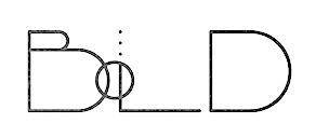 Bulgarian designer of the tall slab serif Carnival VP (with Vladimir Fedotov) and the ligature font Slang (2019, at Vladimir Fedotov's VP Creative Shop).
 Typefaces from 2020: Black Gold VP (a high contrast display font; with Vladimir Fedotov), Kompot (a condensed all caps decorative serif; co-designed with Vladimir Fedotov), Chalga VP (a decorative serif co-designed with Vladimir Fedotov), Ablation (a 6-style all caps geometric sans jointly done by Vladimir Fedotov and Plamen Petrov), Midnight Tales (vintage decorative caps jointly done by Vladimir Fedotov and Plamen Petrov), Akros (a fashion mag font by Vladimir Fedotov and Plamen Petrov), Daylight Dreams (a festive all caps typeface by Vladimir Fedotov and Plamen Petrov), Zink VP (a bold all caps sans by Vladimir Fedotov and Plamen Petrov), Billionaire Club (art deco caps; by Vladimir Fedotov and Plamen Petrov), Blackpaper (a negative space font by Vladimir Fedotov and Plamen Petrov), Metria Street (a monolinear condensed interlocking sans by Vladimir Fedotov and Plamen Petrov), Monday Boulevard (an all caps art deco typeface by Vladimir Fedotov and Plamen Petrov), Sombre (a negative space font by Vladimir Fedotov and Plamen Petrov), Bubbble Gum (a 9-style rounded monolinear sans by Vladimir Fedotov and Plamen Petrov), Equinox VP (a futuristic all caps font by Vladimir Fedotov and Plamen Petrov), Inertia (a logo font family, with Vladimir Fedotov), Inure (a ball terminal typeface, with Vladimir Fedotov), Papillon VP (with Vladimir Fedotov), Bungalow VP, Fika VP (a rounded and modular typeface by Vladimir Fedotov and Vladimir Fedotov), Kavo Serif (a 5-style all caps didone by Vladimir Fedotov and Plamen Petrov), Kavo Inline (with Vladimir Fedotov), Kavo Sans (with Vladimir Fedotov), Quilin (decorative and swashy; with Vladimir Fedotov), Silver Queen (a ball terminal typeface; with Vladimir Fedotov), and the weathered Greenth (2020; with Vladimir Fedotov). Typefaces from 2021: Aisling (a six-style ultra-compressed sans), Stolen Love (a 16-style fashion mag serif), Cruell (a high contrast ball terminal laden fashion headline typeface), Mother VP (a high-contrast fashion font with plenty of ball terminals), Magoa (a serif typeface with extreme contrast), Sorcha (a ball terminal display font by Vladimir Fedotov and Plamen Petrov) Christmas, French VP (an all caps glamour font adorned with gigantic ball terminals; with Vladimir Fedotov), Perfectly Splendid (a ball terminals all caps typeface; with Vladimir Fedotov), Italian VP (a 21-style tall slab serif in which the bold weight is still thin by international standards; with Vladimir Fedotov), Huova (a decorative all caps serif by Vladimir Fedotov and Plamen Petrov), Kompot Slab (by Vladimir Fedotov and Plamen Petrov), Unique VP (a fashion mag titling font with many ligatures and swashes), Chalga VPoutline (a classy outline font by Vladimir Fedotov and Plamen Petrov), Mila VP (a disturbing sans & serif hybrid), Kompot Sans (an all caps titling sans by Vlamen Petrov and Vladimir Fedotov), Kompot Display, Avoqado (a 6-style all caps sans with features of DIN; by Vladimir Fedotov and Plamen Petrov), Kuchek (a ligature-rich decorative serif, with Vladimir Fedotov). Typefaces from 2022: Forbidden Love (a condensed fashion mag serif), Vintage Mintage (a display serif), Lonely Moon VP (a delicate yet eerie typeface), Malinger VP (an elegnat display serif), Sign That (a wild script), Trixie Script, Enchanted Love (a 7-style display sans). [Google]
[MyFonts]
[More] ⦿
|
Playtype
|
Place to buy fonts made by E-type designers. Located in Vesterbro / Copenhagen, it was started in 2006. Another URL. The typefaces were designed by Jonas Hecksher (JH), Henrik Kubel (HK), and Jens Kajus (JK). By category: - Humanist sans: Abidale (JH), Bingo Sans (JH), Flavin (HK), ID00 Sans (JH, a huge family), Ole (HK), Parsons Green (HK), Premiere (JK), Test (HK), Triumph (HK).
- Grotesk: Academy Sans (JH), Battersea 2010 (HK), Boing (HK, fat rounded), Cabo (JK), Contribute (JK, semi-octagonal), Dane (HK), Fletch Text (JH), Grot 10 (HK), Hall (JH), Hill (JH), Jazz House (JH), Lettre Gothic (JH), London (HK), Magna (HK), Mari (JH), Naive (HK), Norwegian (JH), Republic (JH), The Wave (JH), Vertigo (JH), Willumsen (JH).
- Slab serif: Academy Serif (JH), FM (HK), Outsiders (HK, typewriter style).
- Geometric sans: Agita (JK), Cubitt Solid (HK, rounded octagonal and techno), Geometric (JH), Juli Sans (2016: by Rasmus Michaëlis and Torsten Lindsø Andersen), Noir Text (JH, avant-garde), Nosferato (HK, squarish), Square (HK, squarish).
- Monospaced: Access Code (JH), Italian Plate (JH).
- Square Sans: JP Special Sans (JH), Zetta Round and Zetta Sans (JH).
- Didone: De Archie (JH), JP Special Serif (JH), Monday (unknown designer), Venti Quattro (JH).
- Garalde: ID00 Serif (JH), Primo Serif (JH).
- Modern: Bingo Serif (JH), Kunstuff (HK), Maximum (HK).
- Display serif: CPH Signs, De Archie Display (JH), Fru Olsen (JH), Home Display (JH), Impacto (HK), Signsystem (HK), S4AE (HK), Symphony Display (JH), Trojan (HK), Vogue Floral (HK), Vogue Paris (HK).
- Ordinary body text serif: Home Text (JH), Typewriter (HK).
- Stencil: Danmark (HK), Staton (HK).
- Various display types: 4590 (HK, thin octagonal), 60 Display (HK), Agriculture (HK), Archi (HK), Aveny T (HK), Banknote (HK), Bauhause (HK, kitchen tile face), CPH Tram (HK), CWM (HK, octagonal), Collecting (unknown designer; +Stencil), Copenhagen (HK), Donny Playtype (unknown designer; fat face), Du Nord Dingbats (JH, circled letters), Elephant (JH, art nouveau), Eyes Lies (unknown designer), Gameover (unknown designer), Glendale (JK, Peignotian), Hazelwood (JH), Hermes Baby (JH, old typewriter), Julius (JH), Klampenborg 2010 (HK), Movie Playtype (JH), New Press (JH, slab serif), Optic (unknown designer, dot matrix), Ornamenta (HK), Safety (JH), Speed Playtype (JH, octagonal, techno), Tagstyle (HK, hand-printed), Tempo Playtype (JK, dot matrix), Tobe (HK, mechanical), Trood (JH, octagonal), Zadie (HK, ornamental).
- Dingbats: Flowers (HK).
- Commissioned typefaces include Nouvel (inspired by Jean Nouvel's architecture for Koncerthuset, the new concert venue designed for the Danish Broadcasting Corporation) and Medic (designed for emergency medicine).
- Variable fonts: Cutalic (2020).
[Google]
[More] ⦿
|
Pluspace
|
La Vendée, France-based designer of the hairline sans typefaces Minimism (2016) and Minimism Neue (2016, free). [Google]
[More] ⦿
|
P.M.V. Chamara
|
 Creator of Art Ist Brush Stroke Font (2015) and Dcap (2017, hairline sans). [Google]
[More] ⦿
|
Polices True-Type Manuscrites
[Philippe et François Blondel]
|
Original truetype fonts by Philippe and François Blondel 9France): New Bernard (2013), CNC Vector (2012, hairline sans), Braille 1998, Braille 1998 3d version, Braille (2012), Accords (for guitar), Langage des signes (ASL), Signes, Phonetique. He also designed many handwriting fonts: Michelle, Ginette, Sophie, Amandine, Virginie, MissClaude, LalexBigBadaboum, Karine. All these fonts are free. For font services: 40 USD for a handwriting font, 70 for a connected handwriting font, 10 USD for a logo font, 8USD to add the Euro symbol to any font, 50 USD for any on-demand truetype font based on your drawings. Handwriting type designer Philippe Blondel offers some of his handwriting fonts (such as BrandysHand, PatriciasHand, JaninesHand, LisasHand, LaurensHand, FarrahsHand, CarolinesHand, RandysHand, BrooksHand, Philing (1998-2009), Jean-Claude'sHand and Jimmy-Hand) regularly for free. Send in your handwriting on the form he provides: each week, he'll make one of the samples into a TrueType font (for free). Additional fonts include 7LED (2010, LED face), Philippe, Bernard, Adelyne, Georges, Brigitte, Barguzin, Breeze, Fog, Lightning, Monsoon, Stream, Valerie, Jami, and Zephyr. Typefaces from 2014: Shade of Adelyne. Fontspace link. Dafont link. Abstract Fonts link. Alternate URL. Yet another URL. Another Fontspace link. [Google]
[More] ⦿
|
Pompe Hedengren

|
 Swedish graphic and type designer, b. 1969, Stockholm. His typefaces:
 - The ultra bold condensed family Sashimi (2010), which is almost a piano key typeface.
- Co-designer with Goran Soderstrom at Letters of Sweden of the deco hairline sans typeface Voir (2019).
[Google]
[MyFonts]
[More] ⦿
|
Pororoca
[Shojiro Okuno]

|
Shojiro Okuno is a Japanese art director and a graphic designer. He develops and offers custom typefaces, making mainly display fonts. He set up Pororoca in Tokyo in 2014. In 2017, he created the hairline circle-themed typeface Puji. [Google]
[MyFonts]
[More] ⦿
|
Positype
[Neil Summerour]

|
 Positype was founded in 2002 by Athens and/or Jefferson, GA-based designer and type designer Neil Summerour (b. 1972, Azores, Portugal). Neil began developing typefaces in 1996 with the 1996 Olympic Brick Paver Project proprietary typeface. He is the co-principal and senior designer of Athens-based interactive, design, and advertising agency Genetic:ICG. In the summer of 2003, he began teaching Advanced Electronic Design in the Graphic Design Department at The University of Georgia.
 Swash & Kern is the bespoke lettering and typeface design alter ego of Neil Summerour. In 2001, Neil published his first two type designs with [T-26] Digital Type Foundry in Chicago, IL. Since then, he has released tens of font families including hiragana and katakana fonts. Positype fonts are sold by Myfonts.com and [T-26]. Klingspor link. Facebook link. Blog. Behance link. Union Fonts link. The list of his fonts: - Aago (2017). A 54-style sans family.
- Aaux, Aaux Office (2002), Aaux Pro (2004), Aaux Next (2009, 72 typefaces), Aaux Alphanumera, Aaux Emoticons.
- Agent Sans (2021). An economical 22-style sans intended to be warm although the name seems to contradict that.
- The Air superfamily (2011), which consists of 81 sans typefaces. Followed by Air Soft (2011), Air Pro (2021), Air Pro Condensed (2022) and Air Pro XCondensed (2022). He writes about Air: Heavily influenced by Summerour's Aaux Next typeface and Akzidenz-Grotesk, the typeface features a very efficient footprint, logical weight options, small caps, expanded numeral sets, extensive language support, and 5 total widths.
- Altar (8-weight Gothic family).
- Akagi (2008): 20 style sans family. Extended and refreshed in 2011 into Akagi Pro.
- AMP (at Union fonts).
- Anago (2012) is a softly rounded sans family, the product of a designer addicted to designing sans families.
- Anarcharsis (2002): a serif family inspired by incomplete rubbing made from a stone wall located in the Bahamas.
- Angel Script (2009, TypeTrust).
- Baka (2005, a fantastic scratchy handwriting face), Baka Too (2006; followed in 2010 by Baka Expert).
- The Bodoniesque family (Umbrella Type).
- Cherry Blossoms (2018). A crayon script.
- Claustrum (2003).
- Clear Sans (2013). Starting from a monoline rather geometric set of thin weights, this typeface family morphs into a more humanist beast, with a, b, d and g having a squeezed look at the intercepts. And maybe because of that, this unclassifiable typeface is quite appealing. Followed by Clear Sans Text and Clear Sans Screen.
- Courage (2019). A high contrast ultra black poster typeface.
- Couture (2015) and Couture Sans (2015). Summerour was charmed by Imre Reiner's Corvinus when he designed this extremely high-contrast pair of fashion mag typeface families together with Mary Catherine Pflug.
- Cynapse (2003; or Cynapse Pro. 2004, 12 weights). A sans family.
- In 2018, Martina Flor and Neil Summerour published the layerable Tuscan typeface family Decorata.
- Delphi (2014). A decorative multiline typeface by Lily Feinberg and Neil Summerour.
- Directors Gothic (2013, Lettering Inc). A large retro sans family.
- Donatora (2004).
- Dream Big (2019). A swashy script typeface with weathered edges.
- Ego (2003, octagonal family).
- Epic (2007-2009, a 12-style contemporary garalde).
- Ether, Ether Connected.
- Eva (2003).
- Filmotype Dancer (2012).
- Filmotype Harvard (2015). Based on a Filmotype brush script from 1955.
- Filmotype Horizon (2011).
- Flirt Script (2014). Flirt Script won an award at TDC 2014.
- Friendly (2012). In part based on Morris Fuller Benton's upright script typeface Announcement.
- Fugu (2009, rough-outlined script family, winner at TDC2 2010).
- Ginza (2008, a squarish techno family), and Ginza Narrow (2011).
- Good Karma (2017). A sumi brush font. See also Good Karma Smooth (2020).
- Grava (2018, twenty fonts) and Grava Display: Quirky and sharp, Grava is Neil Summerour's injection of warmth within the geometric sans font category.
- Halogen (2012). An organic wide techno sans family. In 2014, he added Halogen Slab and Halogen Flare (flared). All have hairlines.
- Headcold (2004).
- Hype (2019). A collection of 432 low contrast gothic sans typefaces consisting of three subfamilies of 144 fonts each: Hype vol 1, Hype vol 2, Hype vol 3.
- Ice Cream (2021). A creamy vernacular non-connected script for food packaging.
- Iru1, Iru2.
- Juicy (T-26, 2004, brushdrawn family).
- Kari and Kari Pro (2005): a connected upright script. Kari Display (2009). Redrawn in 2020 and released as Kari (2020).
- Kryptk Flash (2003).
- Kurosawa Bastard, Kurosawa Hand, Kurosawa Sans, Kurosawa Serif, Kurosawa Hiragana, Kurosawa Katakana.
- Love Script (2014). A high energy high contrast brush pen / marker script. Love Script won an award in the TDC 2015 Type Design competition.
- Luce (2004).
- Lush Script (2011). A connected script inspired by the 1940s.
- Lust (2012), a curvy hight-contrast didone in the Pistilli style. Neil: The result yielded a rather diverse typographic gene pool: a little Scotch Modern, a little Didone and Didot, a dominant dose of Caslon, and a pinch of Baskerville-- all wrapped up in the leggy body of a Brazilian supermodel. A confident, self-reliant typeface that shows just enough to keep everyone staring and leave them wanting more. Followed by Lust Slim (2014). In 2015, these were extended to the large families Lust Pro [dedicated page] and Lust Pro Didone.
- Lust Script (2013). This is a curvier, sexier (Neil's words) version of Lust. For use in fashion magazines and large sizes.
- Macha (2012). A sans family. In 2015, this was followed by Lust Hedonist, which has Didone, Italic and Script sub-styles---the ultimate fashion mag typeface. In 2021, he added Lust Sans (a 12-style high-contrast fashion mag typeface family), Lust Didone (a 6-style contribution to the fat face genre), Lust Stencil (six styles), Lust Text (ten styles).
- The Type Trust: Magneta (2009, The Type Trust). Includes a Condensed subfamily.
- Marshmallow (2017). A super-creamy high-contrast script typeface straight from a parisian bonbonnerie.
- Murecho (2021). Murecho is a low-stroke contrast, flat terminal sans serif Japanese typeface designed for text settings in Japan. It covers Hiragana, Katakana, and Kanji (JOYO+). It also supports Latin, Cyrillic, and Greek.
- Muscle (2009, TypeTrust---a futuristic family).
- Nori (2010): a calligraphic brush typeface obtained by applying the Pilot Japan Kanji Fude brush pen on paper. It has over 1100 glyphs, 250 ligatures, 487 alternate characters, 125+ swash and titling alternates, lining and old style numerals. Awarded at TDC2 2011.
- Organic (2009). A rounded warm sans family. In 2021, he published the 16-style Organic Pro.
- Penumbra.
- Plastek (2004-2009).
- The R.E.M. Athens project involves three fonts published in 2009, REM Orange, REM Accelerate and REM Tourfont. They are based on ideas by Chris Bilheimer for the band R.E.M. (Michael Stipe and Chris Bilheimer). Both attended the fine arts program at the University of Georgia. Michael Stipe, singer and lyricist, formed R.E.M. in 1980. Bilheimer began working with the band in 1994.
- In 2019, Martina Flor and Neil Summerour released the extensive typeface family Ribbons at Positype.
- Romp (2009, condensed hand-printed).
- Reserve (2018). A text typeface family designed to accompany Summerour's Scotch typeface family.
- Rhythm (2011). An italic inline and solid display family based on ATF's Ratio (ca. 1930) and Herbert Thannhaeuser's Adastra (1928).
- Rough Love (2014). A brushy crayon script.
- Scotch (2017). An 31-style scotch roman typeface family consisting of Scotch Text, Scotch Display (more contrast), Scotch Deck (for subheads) and Scotch Dingbats. In 2020, he added Scotch Compressed to the set.
- Shameless (2013). A connected penmanship-style script.
- Sneakers (2003-2004): athletic lettering family. Also, Sneakers Script and Sneakers Max (2019: rounded and ultra fat).
- So Lovely (2019).
- Tactical (2011, octagonal mechanical face; +Stencil).
- In 2012, he won the Second Akashi Prize in the kanji (!!!) category of the Morisawa Type Design Competition for Tegaki. Tegaki also won at TDC 2013.
- Truss Ultra Light (2006): hairline architectural font.
- Vekta Serif (2009), Vekta Neo and Vekta Sans (2009, a sans family at TypeTrust).
- Wasabi Condensed and Wasabi (2010): an organic elliptical family, based on Iru.
- Yumi (2003, techno font, Union Fonts).
His life in hiw own words: Neil Summerour is a type designer, lettering artist, calligrapher and designer based in Georgia, USA with one foot in Takamatsu, Japan. After graduating from The University of Georgia Lamar Dodd School of Art with a BFA in Graphic Design, he soon found himself opening his own studio to deal with the flow of freelance work. [...] Neil opened his personal type foundry, Positype, in 2000 to feed his ever-growing desire for type design. He later co-founded TypeTrust (2002) with Silas Dilworth as his addiction to type and lettering grew. [...] He was an adjunct art professor at The University of Georgia in graphic design and taught graphic design at the Governor's School for the Arts. [...] As a typeface designer, he has published over 60 typeface families and produced numerous custom typefaces for clients worldwide. [...] He has won the Type Directors Club Certificate of Excellence in Type Design in 2010 and 2011 for Fugu and Nori, respectively. Showcase of Neil Summerour's fonts. [Google]
[MyFonts]
[More] ⦿
|
Priyanka Shah
|
Ahmedabad, India-based designer of an Indic simulation typeface and the hairline grotesk typeface Ovihcra in 2018. [Google]
[More] ⦿
|
Przemyslaw Hoffer
|
 Przemec Hoffer is the Lodz, Poland-based creator of the hairline titling sans typeface Basicl (2012) and of Basic Title Font (2012, hairline caps).
 In 2013, he designed Madame Klara, Madame Deloblat and Madame Mary, a trio of thin slab serif typefaces for glamour magazines. In 2014, he made the octagonal typeface Mechanik. In 2016, he started work on Laktoza. In 2018, Mateusz Machalski, Borys Kosmynka and Przemek Hoffer co-designed the six-style antiqua typeface family Brygada 1918, which is based on a font designed by Adam Poltawski in 1918. Free download from the Polish president's site. The digitization was made possible after Janusz Tryzno acquired the fonts from Poltawski's estate. The official presentation of the font took place in the Polish Presidential Palace, in presence of the (right wing, ultra-conservative, nationalist, law and order) President of Poland, Andrzej Duda. Calling it a national typeface, the president assured the designers that he would use Brygada 1918 in his office. It will be used for diplomas and various other official forms. In 2021, with Anna Wielunska added to the list of authors, it was added as a variable font covering Latin, Greek and Cyrillic to Google Fonts. Github link. [Google]
[More] ⦿
|
Raafi Hilmi
[Eurieas]
|
[More] ⦿
|
Rachel
|
American multimedia artist who made Skyscraper (2011, hairline face). [Google]
[More] ⦿
|
Radomir Tinkov
[RST Fonts]

|
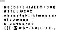 [MyFonts]
[More] ⦿
|
Ralph Oliver du Carrois

|
 Berlin-based designer at Primetype of these typefaces:
 - The simple sans family PTL Maurea (2004).
- The free sans/techno fonts Share and Share-TechMono (2005) and the large Pro family Share, which was designed as a corporate type family for Typo3.
- The techno family PTL Highbus (2006).
- The quirky serif family PTL Sadgirl (2006).
- With Jenny Horn, he designed the pixel typefaces PiPaA35, PiPaB35, PiPaC35, PiPaD35 (2002).
- Colaborate (2003) is free.
- Axel (2009): developed jointly with Erik Spiekermann and Erik van Blokland, it is a system font with these features:
- Similar letters and numbers are clearly distinguishable (l, i, I, 1, 7; 0, O; e, c #).
- Increased contrast between regular and bold.
- High legibility on the monitor via Clear Type support.
- Seems to outperform Courier New, Verdana, Lucida Sans, Georgia, Arial and Calibri, according to their tests (although I would rank Calibri at or above Axel for many criteria).
- In 2012-2013, Ralph du Carrois and Erik Spiekermann co-designed Fira Sans and Fira Mono for Firefox / Mozilla. Google Web Font link. This typeface is free for everyone. Open Font Library link. Dedicated web page. CTAN download page. Mozilla download page. It is specially designed for small screens, and seems to do a good job at that. I am not a particular fan of a g with an aerodynamic wing and the bipolar l of Fira Mono, though. Google web Fonts published Fira Sans Condensed and Fira Sans Extra Condensed (2012-2016) in 2017.
- Real Text Regular is a corporate font designed in 2014 by Ralph du Carrois in close cooperation with Erik Spiekermann, for the monograph by Gestalten Hello I am Erik. In 2015, Fontfont finally published the full family FF Real, in 13 weights each for FF Real Head and FF Real Text. The typeface family is influenced by the German grotesques from ca. 1900 by foundries such as Theinhardt and H. Berthold AG. In 2017-2018, that family was extended to 52 styles in all thanks to a new set of italics. The designers are listed as Erik Spiekermann, Ralph du Carrois and Anja Meiners. They write: The design of FF Real is rooted in early static grotesques from the turn of the century. Several German type foundries---among them the Berlin-based foundries Theinhardt and H. Berthold AG---released such designs between 1898 and 1908. The semi-bold weight of a poster-size typeface that was lighter than most of the according semi-bolds in metal type at the time, gave the impetus to FF Real's regular weight. In the words of Spiekermann, the historical example is "the real, non-fake version, as it were, the royal sans serif face", thus giving his new typeface the name Real (which is also in keeping with his four-letter names, i.e. FF Meta, FF Unit). FF Real is a convincing re-interpretation of the German grotesque style, but with much more warmth and improved legibility. With a hint towards the warmer American grotesques, Spiekermann added those typical Anglo-American features such as a three-story g and an 8 with a more defined loop. To better distinguish characters in small text sizes, FF Real Text comes in old style figures, f and t are wider, the capital I is equipped with serifs, as is the lowercase l. What's more, i-dots and all punctuation are round.
- Quist (2015).
- Belbo (2016). A sans family. Belbo Two is perhaps one of the thinnest hairline sans fonts ever made.
- In 2022, Erik Spiekermann, Anja Meiners, and Ralph du Carrois published the neo-grotesque superfamily Case at Fontwerk. It includes Micro and Text subfamilies.
Around 2011-2012, he set up Carrois Type Design in Berlin. He also co-founded bBox Type with Anja Meiners some time between 2016 and 2018. Old Dafont link. FontShop link. Klingspor link. Abstract Fonts link. [Google]
[MyFonts]
[More] ⦿
|
Raphael Gomes
|
Designer from Marilia, Brazil. Creator (with Nathalia Cavalhieri) of the hairline sans typeface Ideale (2011) while he was studying at UNIVEM Marília. [Google]
[More] ⦿
|
Raúl R. Tovar
|
Editor for the Information Technology department at the University of Texas at el Paso. He designed Fontovar (2003), an experimental geometric hairline face. [Google]
[More] ⦿
|
Ray Larabie
[Typodermic]

|
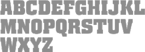 [MyFonts]
[More] ⦿
|
Ray Meadows

|
 Aka p2pnut, b. Wales, 1943, who started making fonts in 2009 at FontStruct. Alternate URL. Dafont link. Klingspor link. In 2010, Ray Meadows set up shop at MyFonts.
 Prolific creator at FontStruct in 2009 of the 3d typefaces Alphabox, Alphabox Reverse, Alphabox Lite, Alphabox Lite Complete, Alphabox Shadow and Alphabox Basic. He also made RM Playtime (outlined 3d family), Art DECOrated, Single DECOr, Romantic (+Carved, +Carved Shadow), TripleDECOr, New Romantic, SOFA, Mondrianish, Eye Test, Meltdown (grunge), Ameslan (American Sign Language), DECO Noir, DECOction, DECOserif (+Bold), DECOoction (+Bold Open), DEChrome, DECOpix, DECOr (a pure art deco typeface like Levine's Art Lover JNL), DECOThin (+Medium), Scrapheap, Westward (Far West font), Cheese Fondue, Alphabox Reverse (shadow font), AlphaRune, Spaced, Gothicky, Grand Prix, Entrees (alphadings), Compround, Phatzzo (nice!), DECOr8, Gothicky, Gothicky Grey, RM Ginger, RM Albion (blackletter), and Opening (outline face). RM Squarial (2009) is a hairline sans. Its 3d version is RM Squarial 3D. RM Typewriter (2009, +Medium, +Bold, +Old) is an old typewriter face. RM Serifangle (outline art nouveau face, +3D, +Chrome, +3DChrome) and RM Corrugation (postage stamp, white on black style) are both interesting. RM DECO Serif (2009) is in the RM Typewriter style series. RM Bowie Basic is a futuristic typeface based on the typeface used on Mars in "The Waters of Mars" (2009). RM Playtime Stencil (2009) is a rounded stencil typeface based on RM Playtime Solid. There are more styles such as RM Playtime 3D. Additions in 2010: RM New Albion (blackletter), RM Lined, RM Serifancy (Western face), RM Almanack (+Old), RM Tubeway (+Chrome), RM Thinny, RN White Letter, RM Blacklet, RM Squarial (+Ribbon, +3d), RM Typewriter Old, RM 7even, RM SideSlip, RM Teeny, RM Teeny 1.5, RM Narrowboat (+3D) (athletic lettering). His typefaces at MyFonts include RM Victoriana (2010, caps only Victorian face), RM Whiteletter (2010), RM Signwriter (athletic lettering), RM Deco (pure Broadway art deco), RM True to Type (typewriter face), RM Scrapheap, RM Elegance (condensed, with high ascenders), RM Playtime, Graphite Creations in 2011: RM Celtic, RM Uncialic (+RMWL Uncialic: Carolingian), RM Opensans, RM A Sign of the Times, RM Sans, RM Oliver (bold rounded sans), RM Soft Sans (wonderfully round sans), RM True To Old Type (old typewriter), RM True to Type (new typewriter), RM Middy, RM Phatso (textured), RM Phatso 2.0, RM Phatso 2.0 Solid (texture typefaces). Creations in 2012: RM Luceat (a bullethole typeface), RM Jazz Age, RM Basic Serif (roman face), Alphabox (a 3d family: +Reverse, +Lite, +Reverse Stencil), RM Slab, RM Slabb, RM Tubes (3d typeface), RM Smoothsans (rounded sans), RM Romantic Carved (+Shadow: a beautiful set of beveled typefaces), RM Westward, RM Typerighter, RM Uncorrugated, RM Snowtime, RM Smooth Jazz, RM Smooth Age, RM Nova Albion (blackletter), RM Tubes Chrome, RM Squarial FS10, RM Basic Serif. Typefaces from 2013: RM Bloc, RM Greek, RM Victoriana, All Bricks, RM Deco, RM Random Outline, RM Random 3D, RM Random (cartoon face), RM Celtic Condensed, RM Westus Condensed, RM Westus (Western, spurred), RM Hunky (chunky and modular), RM Thunk (piano key face, thick and chunky), Westward Ho (spurred Western face), RM Hangle (chuunky and elliptical). Typefaces from 2014: RM Firmstone (+Outline, +Condensed, +Outline Condensed), RM Ebdon Outline, RM Imber Outline, RM Moss Outline, RM Imber, RM Art Decorated, RM Celtic Inline. Typefaces from 2015: RM Deco, RM Stoney, RM Mondrianish, RM Stoney Shaded, RM Middy, All Bricks, RM Shepherds. Abstract Fonts link. Dafont link. [Google]
[MyFonts]
[More] ⦿
|
RC Graphics
[Robin Campistron]
|
Toulon, France-based designer of Modia (2018), Standaris (2018: a sans), Harmonial (2018), Aliseo (2018: free) and Basicaline (2018: a free hairline font). In 2019, he published the Peignotian typeface family Gantic, the roman caps typeface Arterio, the display sans typeface Robota, the airport flip card font Skyfont, and the all caps sans Topazia. In 2020, he released the all caps sans serif typeface Kerox and the rounded sans typeface Roundor. [Google]
[More] ⦿
|
Rebecca Bettencourt
[Kreative Korporation (was: Relay Fonts, or: Kreative Software)]
|
[More] ⦿
|
Reserves (or: AE Type)
[Michael Jarboe]

|
 Reserves (and, since 2012, AE Type) is a commercial foundry offering mostly techno faces. It is located in Carlsbad and Cardiff-by-the-Sea, CA, and run by Michael Jarboe. Mike graduated from the Maryland Institute College of Art, and now lives and works in San Diego.
 The earliest typefaces: Base (stencil), Evac (octagonal), Claes (a heavy blacked out display typeface named after Swedish sculptor Claes Oldenburg), Raider, Error (LED simulation face), Reserves03 (2009), Output II (2009), Scape (octagonal stencil), Void, Vacant (2009, monoline stencil), Debacle (2009), Scam (2009; a fun geometric experiment), Immortality, Asecs, Analog SE, Scheme (pixel face). Typefaces made in 2010: Idiom (2010, a piano key family inspired by P22 Albers), Vector RG (2010, an octagonal typeface inspired by the 1979 Atari Asteroids video game UI screen font), Sevigne (2010, monoline geometric avant-garde sans that looks a bit like a stencil), Velvet (2010, a heavy rounded block retro typeface inspired by the typeset album covers of the protopunk rock band The Velvet Underground), Monocle (2010, monospaced and monoline geometric sans). Typefaces made in 2011: Scape (2011, rounded monoline stencil family), Velvet (2011), Defense (2011, octagonal slabbed stencil), Offense (2011, strong octagonal mechanical family), Vanitas Bold (2011, Peignotian fashion mag typeface rooted in didones). In 2012, Mike published Enamel (a condensed sans family---the inline version of Sorren), Sorren (a condensed sans influenced by neo-grotesque designs, and dada in style), Sorren Ex, Vanitas Stencil and Memoire (a charming fashion mag monoline hairline stencil). Typefaces from 2013: A large Neue Haas Grotesk / Helvetica-style sans family called Acronym, from Hairline to Extra Black and Outline. Typefaces from 2014: Reload (octagonal), Reload Stencil (military stencil). Reload Alt and Reload Alt Stencil were added in 2015. Typefaces from 2015: Averes Title (a sharp geometric sans titling typeface), Averes Title Roman (fashion mag styles). Klingspor link. Behance link. Flickr site. Behance link. MyFonts link. View Mike Jarboe's typefaces. [Google]
[MyFonts]
[More] ⦿
|
Rian Hughes
[Device Fonts]

|
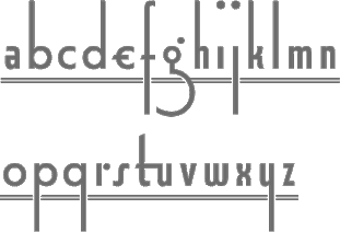 [MyFonts]
[More] ⦿
|
Ricard Garcia
|
 Barcelona-based designer and lettering artist. In 2015 he received his BA in Graphic Design from the University of Barcelona. Graduate of the Type Media program at KABK in Den Haag, The Netherlands, class of 2019. His typefaces:
 - Prelude, his graduation typeface at KABK, is a display sans that has calligraphic traits in the heavier weights. It has many styles that make this humanistic ensemble a wonderful and useful toolbox, even for short texts. It won an award at 23TDC.
- With Andreu Balius at Type Republic, he designed Patufet (2018-2019), a warm text family inspired by Catalan folk tales. For hairlines, one can't go thinner than Patufet Finet. In 2020, they added Patufet Mono. For hairlines, one can't go thinner than Patufet Finet, and for fatness, one can't go fatter than Patufet Obes, another 2020 addition.
- Still with Andreu Balius, he developed Poblet (2018: Solid, Diamond, Bevel), a stylish titling or display typeface that includes a vintage inline style.
- The heavy sign painter's typeface Raval (2020, Type Republic). Later renamed Ravals.
- The stroke-based Casual. This typeface was developed by combining the calligraphic origin of a sign painting model to a parametric world built by code.
- Nina (ca. 2015). A hand-printed typeface based on the handwriting of Antonia Monroig, in which each glyph has four versions.
- Globe (2020). An artsy typeface that fits well in Gaudi's universe.
- Groundbeat (2020). A stencil family by Andreu Balius and Ricard Garcia.
- The Superveloz Centenary Collection (2020, by Andreu Balius and Ricard Garcia at Type Republic). Designed to honor Joan Trochut's 1942 masterpiece. It consists of SV Mambo, SV Jazz, SV Bebop, SV Bolero, SV Swing and SV Twist. In 2021, Ricard Garcia and Andreu Balius added the large family SuperVeloz Caps which consists of SV Caps Bebop SV Caps Bolero SV Caps Jazz SV Caps Mambo SV Caps Swing and SV Caps Twist.
Github link. [Google]
[More] ⦿
|
Richard Kegler
[P22 Type Foundry]

|
 [MyFonts]
[More] ⦿
|
Rick Hutchinson
[Bright Ideas Fonts]
|
[More] ⦿
|
Riomar Mccartney
|
Riomar Mccartney (Capbreton, France) designed the free hairline sans display typeface Stanz in 2013. Behance link. [Google]
[More] ⦿
|
Rita Macedo e Cunha
|
Lisbon, Portugal-based designer of the hairline sans display typeface Alta (2015). [Google]
[More] ⦿
|
Robby Woodard
[WoodardWorks Type Design (was: Robby Woodard Design and Illustration)]

|
 [MyFonts]
[More] ⦿
|
Robert Jablonski
[Kinetic Plasma Fonts (was: Cannot Into Space Fonts)]
|
 [More] ⦿
|
Robin Campistron
[RC Graphics]
|
[More] ⦿
|
Rodrigo Fuenzalida
[Fragtype]

|
 [MyFonts]
[More] ⦿
|
Rodrigo Gonzalez
[Southype]
|
[More] ⦿
|
Roland Hüse
[Runes & Fonts (or: My Handwritings)]

|
 [MyFonts]
[More] ⦿
|
Ronnie Dela Cruz
[Active Sphere]

|
 [MyFonts]
[More] ⦿
|
Ross Milne
[Working Format]
|
 [More] ⦿
|
Rotislav Vanek

|
 At Storm Type, Czech designer Rotislav Vanek published the Clara type system in 2012: it consists of full palettes of weights for Clara Sans and Clara Serif. Rotislav is professor and head of the Studio of Graphic Design and Visual Communication at the Academy of Arts, Architecture and Design in Prague. Through Tomas Nedoma, he got his ideas translated into digital typefaces at Nedoma's type foundry, Signature Type. His typefaces there include some made with Roman Cernohous (Aktion, Corridor), Marek Pistora (Meridianus Sans+Serif), and Tomas Nedoma (Fenomen Sans, Galaxy, Haven, Quodlibet Serif and Quodlibet Sans).
 Fenomen Slab (2017) is a useful slab serif family by Tomas Nedoma and Rotislav Vanek. The set contains four width proportions (Normal, SemiCondensed, Condensed and ExtraCondensed) in eight weights ranging from Hairline to Black. [Google]
[MyFonts]
[More] ⦿
|
RST Fonts
[Radomir Tinkov]

|
 Radomir Savov Tinkov (RST Fonts) is a Bulgarian type designer. Creator of these typefaces:
 - The clean monoline sans typefaces Usumaru (2009) and Shinbi (2009).
- RST (2009, techno).
- Chibi (2009).
- Toast (2009, ultra-black).
- The military stencil Pondera (2009).
- The fat counterless typeface Tenshu (2010).
- The monoline extended sans family Cillian (2010).
- The fat geometric typeface Tenshu Extra Black (2011).
- The monoline sans face Selly (2011).
- The headline sans Alasar.
- Nexa Rust (2014, Fontfabric) is a set of 83 weathered letterpress emulation fonts that evolved from Nexa and Nexa Slab. This was a project by Radomir Tinkov, Ani Petrova, Svetoslav Simov and Vasil Stanev.
- Muller (2015, Fontfabric). This Hairline-to-Heavy 20-weight Latin / Cyrillic sans family was designed for universal use, and is a tad wider than normal. It is characterized by flush vertical or horizontal terminals. Muller Narrow was added in 2016.
- In 2015, Ani Petrova, Svetoslav Simov and Radomir Tinkov co-designed the 214-style mammoth font system Intro Rust, a rough version of Fontfabric's Intro. The fonts are partitioned over Intro Rust, Intro Script, Intro Head and Intro Goodies.
- Qanelas (2015). A 20-weight geometric sans typeface family (+Cyrillic). Made warmer and friendlier in the 2016 release of Qanelas Soft.
- Sensa (2015, Radomir Tinkov and Svetoslav Simov) is a handcrafted 21-style family divided into the subfamilies Sensa Brush, Sensa Pen, Sensa Wild, Sensa Sans, Sensa Serif and Sensa Goodies.
- Maya Script.
- Alasar (2015). A narrow sans family.
- Ridley Grotesk (2016). A modern sans serif workhorse family.
- Gilroy (2016). A 20-style geometric sans typeface family.
- In 2019, Svet Simov, Radomir Tinkov and Stan Partalev designed the 72-strong Noah family of geometric sans typefaces, which is partitioned into four groups by x-height from small (Noah Grotesque) to medium (Noah and Noah Text) to large (Noah Head).
Behance link. Creative Market link. Klingspor link. [Google]
[MyFonts]
[More] ⦿
|
Runes & Fonts (or: My Handwritings)
[Roland Hüse]

|
 Kazincbarcika, Hungary-based type designer Roland Hüse (b. 1980) sells his fonts through My Handwritings (Kazincbarcika, Hungary), which was renamed Runes&Fonts. His first font is Zuider Postduif (2012, an informal type family). Florida Shark (2012) is a free Death Metal or tattoo version of one of his commercial fonts. Tamiami (2012) is a headline typeface. Granny's Handwriting (2012), Script Demolition (2012), Sharon Lipschutz's Handwriting (2012), Isa Por Es Homou (2012) and Kinga's Handwriting (2012) are hand-printed typefaces. Napping Cat (2012) and Cubic Sub (2012) are angularly designed, while Mgla (2012) is round and plump. Greek Stone (2012) is a squarish Greek simulation face. On The Road (2012) is a textured typeface. Whirly Wood (2012), Hargita (2012, inspired by ancient Hungarian runes), Dreamcatcher (2012) and Bee Ridge Vantage (2012: see also Bee Ridge) are grunge typefaces. Individigital (2012, +Black, +Thin) is a techno set of typefaces.
 Typefaces from 2013: November Sky (art deco sans), Windy Wood, Cool Weekdays, Yellow Peas Light (clean thin monoline sans; free), Back To The Future 4, Yellow Peas Demo (hairline sans), Yellow Peas Bold, Pagan Winter (bilined), Beer Money (brush face), Poor Weekdays (+Serif), Hun Legion (inspired by ancient Hungarian runes), Freehand Roman, Esthajnal (inspired by ancient Hungarian runes), Buffalo Chicken (a connected script), Telihold. Typefaces from 2014: Sunny Winter (thin script), Sunny Merry Christmas (dingbats), Fox in the snow (connected hand), Dersu Uzala Brush (Asian brush), Good Karma (connected script), Stitch Warrior, Chickpeas, Jaspers Handwriting, Margarita in August, Wheatland, Slim Extreme (a gorgeous geometric hairline sans), Sparkler (a clean geometric sans), Factory Worker, Brushido (Japanese simulation font), Mojito in June, Mesa Grande, Altering The Future, Black Olives (thin calligraphic script), Hangyaboly (comic book font), Fecske (Peignotian sans), Windy Rain, Rainy Wind (calligraphic script), Comic Roman, Wizard of the Moon, Urban Stone (grunge version of Urban Tour), Urban Tour (avant garde sans), Wacky Sushi (hiragana emulation), Constrocktion (multilined typeface). Typefaces from 2015: She Always Walk Alone (handcrafted), Transatlantic Cruise (an outline script), Csemege (upright connected script), Milano Traffic (sketched typeface), Undergrunge Tornado (a great brush font, +Cyrillic, +Hiragana, +Katakana), Dirt Road, Kikelet, Kikelet Brush, Have A Great Day (rough brush script), Sorsod Borsod, City Birds (script), Loonaria, Texas Grunge (brush script), Solaria (minimalist techno), Biloxi Script, Chicken Fried Steak, Texas Grunge (brush face), Sharky Spot, Autumn Chant (connected script). Typefaces from 2016: Tribal Case (decorative caps), Shopping Script, Biloxi Calligraphy, Tribal Case (tattoo font), Ting Tang, Alaska Script, Take It Easy (fat finger font), Mi Amor (wide monoline handwriting), Spring Script, Fox in the Snow (connected school script), Kazincbarcika Script (a gorgeous calligraphic script). Typefaces from 2017: Interconnected, Bar Hoppers, Ciao Baby (retro signage script), De Rotterdam, Abigail Script. Typefaces from 2018: Christmas Wish Calligraphy, Christmas Wish Monoline, Chicago Moonshine (art deco), Poker in October (a layered color typeface), Personalitype (connected monoline script), Yellow Peas (sans), The Laughing Wolf (script), Italian Breakfast, Saturday Champagne, Teach (by Moataz Ahmed), Long Night (signature script), Relapse (rough brush script), Just Be (brush script), Air in Space (stencil), Beach Script, Interconnected, Beaumaris (slab serif). Typefaces from 2019: Christmas Wish (calligraphic script), Brachetto (a formal calligraphic typeface developed together with lettering artist Leah Chong), Mulled Wine Season, Colder Weather (spurred), Unlocking Your Dreams (brush script), Gold Under The Mud (a fine scratchy brush script), The Mumbai Sticker (script). Typefaces from 2020: Delugional, Roberts Script, Alone Together Script (a swashy tattoo script), Shopping Script (a signature font), Shape Variable Script (a variable script font that can be programmedi to react to music), Jam Session (blackboard bold), Un Jour Merveilleux (a script), Stars + Love. Typefaces from 2021: Long Story Short (a monolinear signature script), The Racoon Quest (a condensed all caps typeface), Delugional (Greek emulation), Neon Love (a monolinear neon sign script font released at Schriftlabor). Fontspace link. Dafont link. Creative Market link, Old URL. Home page. Another Fontspace link. Creative Fabrica link. [Google]
[MyFonts]
[More] ⦿
|
Russell Bean
[Type Associates]

|
 [MyFonts]
[More] ⦿
|
Ryan Jacques
|
Lynchburg, VA-based designer of Circle Sans (2012), a thin typeface based on arcs of circles. [Google]
[More] ⦿
|
Ryan Stever
|
Graphic designer in Toronto. He created the monoline hairline sans typeface Verse Light (2010). Behance link. [Google]
[More] ⦿
|
Ryoichi Tsunekawa
[Bagel & Co]

|
[MyFonts]
[More] ⦿
|
Sadikh Seyidzade
|
Baku, Azerbaijan-based designer of Hairline Delicious (2018) and Hexagon Icons (2018). He also designed the handcrafted Manuscript (2018) for Latin and Cyrillic. [Google]
[More] ⦿
|
Salvo Nicolosi
|
 Designer from Ragalna, Italy, b. 1976. Creator of the comics book font Y2KFriendlyFuture (2000). See also here. He also created Special K (2007), Drinking (2007, condensed), Telegrafico (2006, geometric sans all caps face), Drinking (2007, ultra condensed sans), Caffe Latte (2008, sans), Plaster Caster (2007, stencil), Atyp1 (2007, a minimalist sans), and the VAG Round inspired Tondo (2007), which was renamed Maagkramp in 2010 after an (unjustified) trademark complaint by Dalton Maag. Dafont link. He is working on a geometric hairline sans called Architetto (2009).
 Fontspace link. Fontsy link. Klingspor link. Dafont link. [Google]
[More] ⦿
|
Samuel Carnoky
[Carnoky Design]

|
 [MyFonts]
[More] ⦿
|
Samuelstype Design
[Hans Samuelson]

|
 Hans Samuelson is a freelance graphic designer in Stockholm. He runs Samuelstype Design. Fonts from his hand include Maya Samuels (2007-2010), Malcolm Samuels (2008), April Samuels (2000), the Arnold Samuels family (2007, fashionable sans), Lucy Samuels (2011, a simple rounded monoline sans family), Colin Samuels (2003), Owen S (2012, a sans family with a hairline weight), Rebecca Samuels (2001), Rosemary Samuels (2000), Victoria Samuels (2000, script), Andrew Samuels (2003, minimalist sans), Elliot Samuels (1999), Chelsea Samuels (2003, serif), Henrietta Samuels (2009, calligraphic), Bradley S. (2009, stencil), Orlando Samuels (2009, ornamental script; +Shade), and Spencer Samuels (2003, italic).
 Fonts from 2013: Brooklyn Samuels, Rubica (originally drawn as a pitch for a headline sans typeface for one of Sweden's supermarket chains, it is both geometric and warm). In 2015, he published the 60-style typeface family Magica which consists of Jade (no serif), Onyx, Ruby and Topaz (full serif). In 2018, he published Hoxton Samuels (a sans workhorse). Typefaces from 2021: Metropolia (a 5-style monoline art deco sans). Typefaces from 2022: Darling Rose (a stonecutting font inspired by faded stone cuttings in a churchyard), Reba Samuels (15 styles: sans, slab serif and italic). FontShop link. Klingspor link. MyFonts interview. [Google]
[MyFonts]
[More] ⦿
|
Sea Types
[Jefferson Cortinove]

|
 Sea Types is the partly free partly commercial type foundry of Jefferson Cortinove (artist, designer, teacher, sailor and wine maker) and publicist Márcio Duarte in Florianopolis and Marilia, Brazil, est. 2007. Their initial typefaces include FloriGlyphos (2013, multilined alchemic typeface based on petroglyphs found on Santa Catarina island), TCC Sans (2013), Cort9Hand (hand-printed), Ink9 (2009), Leftheria (2009, condensed; based on the Greek Ionic columns; improved to Leftheria Pro in 2017), Prostimo Sans (2011), Lilith, Sailing (2011, a flowing type), Decliv9 (techno face), Wabi MD (2009, a free typeface by Marcio Duarte), Nucleo (2010, a free sci-fi typeface by Duarte), Ladle (2013, hairline organic sans), Text Box (2010-2013, a free regular and stencil family by Marcio Duarte), 9Sans (2013), Coffee (2013, hairline sans), Elancho (2013, vernacular typeface).
 Typefaces from 2014: Nautikka, Metric Navy (a thin monoline architectural lettering font, followed in 2015 by Metric Navcy Pro), Cambirela (a 12-style superelliptical typeface family for Latin and Cyrillic). Typefaces from 2015: Buozzi (a text typeface inspired by sketches and notes by Sao Paulo-based printer Walter Buozzi), Add (circle-based decorative typeface). Typefaces from 2016: Kareemah (humanist sans typeface family), Hercilio (inspired by the architectural forms of the Hercilio Luz Bridge in Florianopolis). Typefaces from 2017: DiGrado (after the book cover lettering in the 1960s by Brazilian designer Vicente Di Grado). Typefaces from 2018: Ballarih (humanist sans), Agake (a comic book or cartoon font), Selma. Behance link. Dafont link. Another Dafont link. Another Behance link. [Google]
[MyFonts]
[More] ⦿
|
Sergio Miguel
|
Graphic designer from Porto, Portugal, b. 1990, who is studying at ESAD.CR in Caldas da Reinha, Portugal. Creator of Paradis (2013), the Hipster typeface (2013) and of the geometric monoline sans typeface Bagua (2013). Donzela (2013) is a high-contrast hairline fashion mag typeface. Dandy (2013) and Aroma (2013, hairline) are further fashion mag typeface families. Typefaces from 2014: Telekinesis. Behance link. Dafont link. [Google]
[More] ⦿
|
Sergio Moreno
|
Graphic designer from Caracas, who made Chubby (2010, fat and round), and Monamour (2010: tall, thin, and condensed). [Google]
[More] ⦿
|
Sergiy Tkachenko
[4th February]

|
 [MyFonts]
[More] ⦿
|
Shane Fleming
|
Creative and art director from Tiburon, CA. He has made many typefaces: Hamburg (modular, as in train stations), Xorben (sans family, soon to be free), Dani (grunge), Antiquity (rough outlined-serif), Ledgement (chancery hand), Ridalin (modern sans with a stunning hairline weight), Statement (dot matrix), Xerak-024 (dot matrix), Rivec, Colorspace (dot matrix). Behance link. [Google]
[More] ⦿
|
Sharp Type
[Lucas Benjamin Sharp]

|
 Lucas Sharp is a designer (b. 1986, San Francisco) set up Sharp Type in Brooklyn, NY, and later in New York City proper. Before that, Lucas Sharp was involved with Typeslashcode in New York. In 2011, he and Juan Carlos Pagan set up Pagan&Sharp in Brooklyn, NY, but they split a few years later. In 2015, Lucas Sharp and Chantra Malee [at Sharp Type, Malee handles business, brand management, marketing, graphic design and sales] started Sharp Type in New York City. In 2020, the collaborators and type designers included Josh Finklea, Connor Davenport, Marc Rouault, My-Lan Thuong, Calvin Kwok, and Justin Sloane. Lucas Sharp's typefaces:
 Type catalog, 2010. [Google]
[MyFonts]
[More] ⦿
|
Shiho Yokoyama
|
Designer of the free hairline dsans titling typeface Yava (2011). [Google]
[More] ⦿
|
Shinn Type
[Nick Shinn]

|
 Nick Shinn (b. London, 1952) is an art director and type designer. He teaches at York University in Toronto, and is a founding member of the Type Club of Toronto. He writes regularly for Graphic Exchange magazine, and has contributed to Applied Arts, Marketing, Design, and Druk. He founded Shinn Type in 1999, and made fifteen type families. Interview by Jan Middendorp, in which he describes himself as a contrarian. Pic by Isaias Loaiza. Pic by Chris Lozos at Typo SF in San Francisco in 2012. Custom typefaces have been produced for newspapers such as The Birmingham News (Alabama), The Chicago Tribune, The Daily Express (London), The Daily Mail (London), The Globe and Mail (Toronto), The Montreal Gazette, and The St. Petersburg Times (Florida). Custom fonts, with exclusive rights, have been created for corporations such as Thomson Nelson, Enbridge, Rogers Communications Inc., and Martha Stewart Living. Nick organizes type evenings in Toronto all year long.
 Shinn Type fonts at MyFonts. Behance link. He is the designer of Fontesque (a wild family of curly glyphs), the monospaced font Monkey Mono, Artefact (1999), Beaufort (a sharply serifed family done in 1999; in 2008, he published a 10-style extension called Beaufort Pro), Bodoni Egyptian (1999), Alphaville (2000, techno typeface with straight mono-width strokes), Brown, Brown Gothic, Duffy Script (2008, in 4 styles: an interpretation of the lettering of contemporary illustrator Amanda Duffy, aka Losergirl), Handsome (1999, cursive handwriting family, since 2005 available in OpenType), Merlin, Oneleigh (1999, masterful!!), Paradigm (1995, updated in 2008, inspired by 15th century letterforms), Shinn, Walburn (1996) [note: Walburn and Brown were originally commissioned for the 2000 redesign of the Globe and Mail. Walburn is an adaptation of a didone typeface by Erich Walbaum, c.1800], Worldwide (1999). In 2001, he designed the Richler font in honour of the memory of Mordecai Richler. The Richler font was only available to the Giller Prize, Random House and the Richler family until its public release in May 2013 at MyFonts, where Richler (+Cyrillic, +Greek) is advertised as a 21st century antiqua book face. In 2002, he published Goodchild (a Jenson revival; see also Goodchild Pro (2017). Goodchild is a Venetian with clean (not antiqued!) outlines and a larger-than-Jensonian x-height. It comes in 4 styles and is targeted at sophisticated academic typography) and the liquid lettering family Morphica, exclusively at Veer. In 2003, he released the absolutely gorgeous "modern" sans Eunoia (which has a unicase weight), and the quirky sans family Preface (2003; Preface Thin is a hairline weight; Preface Light is free at FontShop). In 2003, he also published the mmonowidth unicase family Panoptica (2003), which includes styles called Regular, Sans, Egyptian, Doesburg and Octagonal, to name a few. In 2004, he released Nicholas, a Jensonian serif family, which is the headline version of Goodchild. Additions in 2006 include Softmachine (VAG Rounded/comic book style family). Sexy type from Toronto is an article by Erin Kobayashi about Shinn's work published in the Toronto Star on April 15, 2007. Nick Shinn designed the type for the redesign of The Globe and Mail in April 2007: Globe and Mail Text [look at the f], Globe and Mail Sans (or GM Sans), Globe and Mail News (or GM News). In 2008, these typefaces went retail. One typeface is called Pratt, named after David Pratt, the design director at The Globe and Mail who commissioned the typeface for his redesign of the paper. The companion typeface will be called Pratt Sans. Additions in 2008: Figgins Sans (4 styles), Scotch Modern (a 5 style didone family that revives the typeface used in New York State Cabinet of Natural History), Scotch Micro. Paul Shaw writes: Scotch Roman, beloved by D.B. Updike and W.A. Dwiggins, was a standard in the typographic repertoire of pre-World War II printers but fell out of favor after the war, supplanted by Bodoni. Nick Shinn of Shinntype has made a bid to resurrect this oft-maligned typeface with Scotch Modern. Scotch Modern is not a revival of the familiar Scotch Roman of Linotype and Monotype, but of a more modern design attributed to George Bruce, the great 19th-century New York punchcutter. Shinn used a sample of the typeface from the New York State Cabinet of Natural History's 23rd Annual Report for the Year 1869 (printed in 1873) as a model. He drew it by eye, aided by a sharp loupe: no photographic enlargements, no scans, no tracing. The ends of the strokes are slightly rounded, to capture the effect of metal type being impressed into soft paper. Shinn contends that the 19th-century Scotch types were "eminently readable" and a factor in the rise of modern literacy. His rendition, an OpenType font, aims for readability in all situations with display, regular, and microtype versions. The display roman includes a unicase font-a nod to Bradbury Thompson's Alphabet 26 experiment-and the italic has elegant swash caps. Scotch Roman has never been a typeface for those seeking eternal beauty or anyone desperate for typographic kicks. Dwiggins gave it a 10 for legibility (where 10 was "reasonable human perfection") but only 4 for grace and 0 for novelty. Shinn's Scotch Modern, with its many OpenType extras, scores well on all three counts. It's a typeface for those who prefer a mature single malt: simple at first, but more complex as it is savored. Photograph. At ATypI 2008 in St. Petersburg, his talk was entitled Scotch Modern. Several catalogs have been published by Shinntype. Particularly noteworthy is The Modern Suite (2008, Nick Shinn, Coach House Press, Toronto), which showcases Figgins Sans and Scotch Modern. Sample of some Scotch Modern dingbats. Production in 2010: Sensibility (a humanist sans superfamily), Sense (a modernist sans superfamily), Bodoni Egyptian Pro (a monoline slab Bodoni experiment---the Pro version of a 1999 family by him). In 2011, he created Checker, an all caps 3d black and white-tiled typeface, and Parity (a roman unicase pair). Naiad (2013) is a didone, or neoclassical, typeface with Victorian curlicues thrown in to create a Victorian look. Pratt Nova (2014) is a 17-style large x-height typeface family that attempts to achieve visual and semantic opulence, equipping the typographer with a comprehensive array of harmonized fonts, all rigorously drawn, superbly fitted iterations of a single, profoundly original design. Neology (2014) is a 15-style sans family subdivieded into Deco, Grotesque and plain sans subfamilies. Brown Pro (2016) is a classic grotesque, distinguished by its semi-condensed proportions and slight flaring of the edges and some ink traps. Figgins Standard (2016) is a take on the low-contrast original sans typefaces designed in the 1830s in industrial London. Gambado (2016). This is a collection of shaken typefaces with bouncing letters. Particular fonts include Gambado Sans and Gambado Scotch. Dair (2017) is a revival of Canada's first home-grown typeface, Cartier, which was completed by Carl Dair in 1967 and named after 16th century explorer Jacques Cartier, who mapped the Gulf of St. Lawrence in the 1530s. Dair 67 and Dair 67 Italic are facsimiles of the original fonts. Dair and Dair Italic are fully-featured 21st century fonts. In 2018, Nick Shinn published Phiz, a diverse suite of 27 decorative fonts based on Figgins Sans Extra Bold. Designer of Boxley (2016), a superelliptical sans typeface family. At the end of 2020, he published the 14-style condensed rounded sans typeface family Aptly. o Typefaces from 2021: Buslingthorpe (a tall-necked typeface in which the x-height is only 29% of the ascender height, beating classic tall fonts such as Rudolf Koch's Koch Antiqua, and Lucian Bernhard's Lucian and Bernhard Modern). Speaker at ATypI 2017 Montreal. MyFonts interview. I Love Typography link. FontShop link. Klingspor link. View Nick Shinn's typeface library. [Google]
[MyFonts]
[More] ⦿
|
Shinya Okabe
[Daylight Fonts]

|
[MyFonts]
[More] ⦿
|
Shojiro Okuno
[Pororoca]

|
[MyFonts]
[More] ⦿
|
Shrenik Ganatra
|
 New York City (and before that, Mumbai, India)-based designer of the partially free all caps art deco geometric sans typeface Adam (2014), which is based on Futura. It was renamed Adam CG Pro. He also made the free comic book typeface Raggedways (2014).
 In 2015, he designed the free squarish spurred hipster typeface Quirko. In 2016, during his studies at MICA (Maryland Institute College of Art) in Baltimore, he designed the free font Minaxi Hairline Text (monoline sans). Additionally, his collaborative typeface design project titled Bird Grotesk, created with Ninad Kale and Potch Auacherdkul, another MICA MFA Graphic Design student, has secured a Gold Award in the Typeface Design category of Graphis. Still at MICA, he designed the cricket shirt typeface family The Wall in 2016 under the supervision of Tal Leming. In 2017, upon graduation from MICA, he published the free custom sans typeface family SG Alternative, which was designed to support his alternative rock band project Mountains and You. [Google]
[More] ⦿
|
Signature Type Foundry
[Tomas Nedoma]

|
 Tomas Nedoma established Signature Type Foundry in Prague in 2014. Most of their work is influenced by and rooted in the work of Professor Rotislav Vanek of the Studio of Graphic Design and Visual Communication at the Academy of Arts, Architecture and Design in Prague. In many cases, Vanek's sketches were digitized by participating type designers. Except where explicitly mentioned below, all typefaces were made by Tomas Nedoma. The typefaces:
 - Quodlibet Sans and Serif (2008). Nedoma's graduation typeface at Tomas Bata University in Zlí.
- Aktion. A revival of Akzidenz Grotesque based on Roman Cernohous's dissertation in the Studio of Typography at the Academy.
- Giovanni.
- Corridor (Roman Cernohous). Created for use on highway signs.
- Clara Sans and Clara Serif (2012, a teardrop serif by Frantisek Storm).
- Fenomen Sans. This typeface has Bauhaus roots.
- Galaxy. Hints of art deco and Bauhaus.
- Haven. An octagonal typeface family.
- Meridianus Sans and Meridianus Serif (Marek Pistora).
- Quodlibet Serif (2015) and Quodlibet Sans (2015). A transitional typeface system by Tomas Nedoma and Rotislav Vanek.
- Haven (2016). A basic sans typeface family by Tomas Nedoma and Rotislav Vanek.
- Fenomen Slab (2017). A useful slab serif family by Tomas Nedoma and Rotislav Vanek. The set contains four width proportions (Normal, SemiCondensed, Condensed and ExtraCondensed) in eight weights ranging from Hairline to Black.
[Google]
[MyFonts]
[More] ⦿
|
Simon Blanckensee
|
Sydney, Australia-based designer of the hairline display typeface Gatwick (2015), which was developed during his studies at University of Technology Sydney. [Google]
[More] ⦿
|
Solange Bosseur
|
During her studies in France, Solange Bosseur designed the hairline dipaly typeface Delicate (2013). [Google]
[More] ⦿
|
Sora Sagano
[Dot Colon (also: Arro, Alt Rivet)]
|
 [More] ⦿
|
Southype
[Rodrigo Gonzalez]
|
Chilean designer of the Easter dingbat fonts Easter Eggs ST (2014) and UnTaRot ST (2014). Other free typefaces from 2014 include Shapes St, Stupenda ST, Grafeno (connect-the-dots), Puente Estrecho (hairline), Tipo Capital, Cuadrada (dot matrix style), Apurado Royitto (arched typeface), Brillante, Novation Box, Rudasteria, Presidiario (horizontally striped typeface), Puente Nuevo, Rockmia ST (a glaz krak face), Boceto ST (outlined typeface), Puente Bueno ST, Open 24 Display ST (LED font), Iniciales ST, Floreada ST, Concadenado ST, Phantom ST, Santiago Sans ST, Es La Dura WN ST, Ledsitex ST, Imnova ST, Cinema ST, Cathedral ST, And Run ST (textured caps typeface), Older ST (textured face), Asrelurio ST, Hearts ST, Other Display ST (LED font), Salpicado ST, Adornada ST, Extragna Rara ST, Fichas ST, LED Simple ST (dot matrix font), Dominos ST, News Papers, Our Display ST (LED emulation), Lineal Simples ST, Cuadradex Simple ST (hexagonal face), Edournida ST (a textured typeface), Tripleled ST (dot matrix), Bicolors ST, Absolutamente Rou ST, Flowers ST, Leders (dot matrix), Old Computer ST, Rounded Display ST, Lediz (dot matrix face), Alien Faces ST, Westranga (textured), Rostros y Emociones (smilies), Filligrees and Ornaments ST, Demionatibu and Cube Face ST. Typefaces from 2015: Shapes ST (kaleidoscopic ornaments), Questra Extra ST. Typefaces from 2016: Viexa Barbuda, Justo St, Mala Vida St, Hypnossia St (textured), Boulding Work St (textured), Hand Faces St, Astronomic Signs St, Alien Bats St, Snowflakes St, The Misty South, Discotheque St (trilined), Qualentaro Wallmapu St (textured), New Russia 2108 St (Cyrillic emulation typeface), Comics of South, Puntiyisca (textured), Calendulia (textured), The LED Display dot matrix style), My Older Life St, Xmasbats St, Merry Xmas St (alphadings), The Guns Smoke St, Cubox 3D St, Mr Techly St, Coming Soon St (movie font), Old Burlesque St, The Neckbreaker St, Big Daddy St, Chinese Wok Food St (oriental simulation type), Extra Gro St (3d, outlined), Halloween Scare St, Humongous of Eternity St, La Que Cuelga St, Litle Simple St, Metalo Of South St, Mostera St, My Valentine Now St, Panda Power St, Pumpkin Halloween St (pumpkin alphadings), Shadded of South, Sheriff of South St, The Flaggy St, Big Daddy St, Digital Play Hollow St, Digital Play Italic St (LED font), Digital Play St (LED font), Happy Balloon St (alphadings), Humongous of Eternity St, Notarized Openly Script Oblique, Notarized Openly Script St (comic book style), Panda Power St, Sheriff of South St, Antique Quest St, Blockys St (3d blocks), Comely St, Data Cards St, Don Moise St, Jackdaws Love St, Maxter Board St (dot matrix), Moderna Disco St, Pointed Laid St (dot matrix), Recoleta Sans St, SS Barracuda St (a great grungy style), Score Board St (dot matrix), Second Flowers St, The Drunked Man St, The Flowers St, The Inbox St, The Outbox St, Thempo New St, And Love st, Another Faces St, DhonJako St, DoubLe CoLor St, EasterFont St, Granite Rock St, Monster oF South Hollow St, Monster oF South St Italic, Monster oF South St, Satanyc Demoniac St, Tenebrous St, The South Flag St, UltraLED St, Halloween Party St, The Display St (LED font), Good Idea St (alphadings), Mi Nuevo Display St (dot matric), Otra Mas Stf, Fantasmytas St (alphadings), Urban Tribal STF, Foontastica St, Del Recuerdo St, Cuadritos St, I Love St (Valentine's Day alphadings), Eskimporce VSF (textured). Typefaces from 2017: The Quick Frog St, Shadded South St (shadow font), Consequad St, Warmerous St, The Bad Times St, The Jack Brown St (multilined), Alphin Merytous St, News Board St, Eat at Joe's St (marquee font), Any Meritous St, The Quick South St, Kasquiwane St, Jux Kadabra St, Flowered, It's Scary Now, Cooler South, Icons South, Glass & Bottles (dingbats), Squarex (octagonal). Typefaces from 2018: Scarythin St, New Led Display St, My Display St (LED font), Petroleum St (grunge), Blade Gunner 2049 St. Typefaces from 2019: Zodiac. [Google]
[More] ⦿
|
Stefán Kjartansson

|
 Designer (b. Siglufjordur, Iceland), who got a BA in graphic design from Iceland Arts in 1993, and lived in Reykjavik. He took a job in Atlanta, GA, designing for CNN.com. In the next five years, Stefan worked his way from interactive designer to creative director. He co-founded the interactive agency Armchair, and has directed projects such as Coca-Cola's M5.
 His typefaces: - GOR (1996) at GarageFonts, an English font with a Cyrillic/Armenian feel, expanded to a ten-font family in 2002.
- In 2001, he designed the Reykjavik font family at Psy/Ops. Pick up four free weights from The European Space Agency's site.
- In 2010, he created the Armchair Modern family of elliptical sans typefaces, from AGauge (hairline) to EGauge (very fat and yummy)---Armchair Modern was derived from the logo created for Armchair Media Group by Stefan Kjartansson. Its shape is influenced by the long elliptic forms of furniture and TV tubes. The design is ultra-modern, reminiscent of work by Mark Newson and Arne Jacobsen furniture. Homepage at Armchair Media.
- At YouWorkForThem, he published Black Sabbath (2008), an elegant ultra black slab serif typeface.
- Cumulus and Foam (2010) is totally experimental, with shapes that evoke both plastic and sex.
- In 2015, he designed the tall ultra-condensed typeface family Cinderblock.
YWFT link. MyFonts link. FontShop link. [Google]
[MyFonts]
[More] ⦿
|
Stefan Claudius
[Phantom Power (was: Phantomphonts)]

|
 [MyFonts]
[More] ⦿
|
Stefania Arredondo
|
Or Maya Arredondo. Graphic design student in Monterrey, Mexico. In 2012, she created the hairline avant-garde typeface Sencilla Light while studying at UANL. Home page. [Google]
[More] ⦿
|
Stefania Malmsten

|
Stefania Malmsten is a Swedish art director and a graphic designer with clients mainly in the fields of art, fashion and film. She was one of the founders of Pop and Bibel magazines in Sweden and is a former art director at Vogue Hommes International in Paris. In 2006, Stefania Malmsten received The Berling Prize, Sweden's most prestigious graphic design-prize. In 2013, Stefania founded the design studio Malmsten Hellberg together with designer Ulrika Hellberg. Stefania is currently the Creative Director at Rodeo Magazine in Sweden. She co-designed the thin display typeface Line in 2013 with Göran Söderström (Letters from Sweden). The typeface was originally designed for Swedish fashion and culture magazine Rodeo in 2012 before it was released for commercial use at the end of 2013. Line comes in 5 super thin styles. The thinnest is possibly the thinnest typeface commercially available anywhere. During the work with Rodeo magazine, Stefania got the idea for a typeface that would be the exact opposite of Line---a heavy face where the counter spaces in the characters would correspond to the differents widths in Line. The idea was shelved at the time but was used as a custom face for the documentary Maj 68. Inline is available since 2021 from Letters from Sweden in three widths, with seven optical variants in each width. Included is also a variable font. [Google]
[MyFonts]
[More] ⦿
|
Stefano Buffoni
|
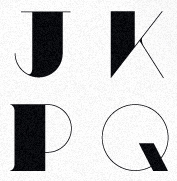 Creative designer from Milan, who co-founded Typojungle, now defunct. His typefaces include Nero (2010, avant-garde), Minimo (2010, hairline geometric sans), Boulevard (2009, fat stencil face), Studio 45 (almost a paperclip face), Nu Classic (ornamental caps, 2008), Rocket (2009, techno) and Metropolitain (2009, a display didone of high contrast). Behance link. Twitter link. Another URL. Yet another URL. [Google]
[More] ⦿
|
Stefano Temporin
|
Italian designer of the sans typeface Std This (2005) and Std Brixia (2006), which includes the hairline typeface Std Brixia Thin. [Google]
[More] ⦿
|
Steffen Kørner Ludvigsen
|
Graphic designer and visual artist, b. 1990. He lives in Oslo. His typefaces, all made in 2009, include Tiny Little Miss Squirrel (hairline, curly), Big Fat Ugly Cow (fat fad face), Mr. Hedgehog (geometric experiment) and Just Comic (child's hand). [Google]
[More] ⦿
|
Steve Gardner
[Explogos]

|
[MyFonts]
[More] ⦿
|
Stew Deane
[Meat Studio]

|
[MyFonts]
[More] ⦿
|
Studio Typo
[Mehmet Abaci]
|
 Mehmet Abaci (b. 1978) is based in Istanbul. In 2014, he established Studio Typo, where one can buy his typefaces. Limited forms of the fonts can be downloaded fpr free from the Dafont site.
 Creator of the elegantly plump rounded sans typeface Vinyl Cuts (2013), Samatya (2013, a unicase piano key typeface), Boldie (2013), Laundry Day (2013, alphadings), and the wood log typeface Timbers (2013). Typefaces from 2014: Smush, Slim Fir (athletic lettering), Typonome, Typo Slab, Neons, E-Square (sci-fi typeface), Screamer, Typoline (piano key typeface), Omniblack (flared display face), Papillons (flared caps), Typoster (a great fat geometric slab serif typeface family accompanied by an equally great shaded outline style), Typo Comica (a family drawn to compete with Comic Sans), Tipo Press, Manyeto (calligraphic), Quatroline (prismatic typeface), Wardoom, Cabold Comic, Digiform, Akaju (oily fat typeface with lighting effects), Almira, Bonebastic, Comic White Rabbit, Sinema (a bit of retro movie art deco), Sober, Cali Brush, Tiny Plate, College Player, Smart Kid, Barbed, Wideroy, Angella (+outline: a poster family), Megi Sans. Typefaces from 2015: Bro 4D (outlined 3d capitals), Typo GeoSlab, H&B Sketch (a gorgeous sketched didone), Mixiva (a six-style athletic lettering slab serif family), Typo Sketch (sketched font), Malter Sans, Parole Script, Degaws (a great sketch font), Typo Comics, Gribal, Gribal Shadow, Early Times (a sans family), Quizma (an elegant sans family), Super Seven (shaded), Typo Slab Inline, Type Slab Irregular, Geoma (hairline geometric sans), Double Bubble (bubblegum typeface), Mona Bella, Typo Grotesk, Typo Grotesk Rounded, The Matic, Typografix (avant garde sans), Move X (techno family), Savaro Stencil (in the geometric style that is characteristic of Futura Black), MindBlue (sans), A Space. Typefaces from 2016: Wox Striped (multiline typeface), Wox Modelist (organic sans), Aprikas (sans), Meltix (techno sans family), Widolte (sans family), Mayeka, The Wireframe, Typo College (athletic lettering), Halftone Poster, Chocolate Bar (oily and gleaming), Type Round (circle-based sans typeface family). Typefaces from 2017: Zelta Six (octagnal), Wida Round (round sans), Prestij (geometric sans), Typo Style, Naughty Squirrel (fat poster typeface family that includes hatched and shadow styles), Typo Quik, Ageta (bubblegum style), Rock On (glaz krak typeface), Typo Square, Typo Angular Rounded, Planetium-X (monoline, techno), Big Pixel (octagonal), White Festive, Watchword Hairline. Typefaces from 2018: At the Midday, Typo Hoop (rounded circle-based sans family), Typo Longest (tall condensed sans), Maccos (a multilined font family), Asectica, Magettas (rounded monoline sans), Bluefish, Bluefish Eroded, Bluefish Scratched, Quesat (rounded sans), Quesat Striped. Typefaces from 2019: Manti Slab College, Pesta Stencil, Type Draft (a drafting font), Pages Grotesque (a caps only geometric sans), Typo Cut-Out, Swera, Minalis (futuristic). Typefaces from 2020: Typo Cut-Out Shaky, Typo Oval, Typo Formal (a tall monolinear sans), Typo Ring (circle-based, monolinear), Manti Slab, Manti Sans (+Fixed), Geco Strong (a fat sans), Tually, Slabten (an inline typeface), Minalis Double (an inline typeface). Home page. Fontspace link. [Google]
[More] ⦿
|
Subtype (was: Typisc or Suprb)
[Andreas Pihlström]
|
Swedish commercial foundry, est. 2006, earlier called Suprb or Typisc. Commercial fonts: NTMY (2009, ultra-black), Alasca (2008), Quick16 (2008: pure geometry), ASCA (2008, "the cousin of OCR"), Myld (2008, avant garde ideas), Wyld (2010, hairline version of Myld), DIRR (2007, an unreadable extra black concoction), ASCA and ASCA-D (2007, rounded octagonal), LIW (techno, in bold and regular versions), Wyld (2007, Avant Garde to the extreme), Quick16 (2008, experimental), Alkasca (2008), Building (2006), Asphalt (2007, avant garde). Free fonts: Quart (2008, kitchen tile style), SWEM (2007, experimental), Cloud (2006, hairline font with connected letters, by Andreas Pihlström). Alternate URL. YWFT link. [Google]
[More] ⦿
|
Suitcase Type Foundry
[Tomás Brousil]

|
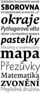 Suitcase Type is a Czech foundry, est. 2003 by Tomas Brousil (b. 1975), who lives in Prague. He graduated from the Prague Academy of Arts, Architecture and Design (Type Design and Typography, MgA. 2009) where his graduation project was the 96-family Tabac typeface system, published in 2010. He teaches in the Type Design and Typography department of the Prague Academy of Arts, Architecture and Design.
 The Tabac family started with Tabac Sans in 2010. It was augmented in 2012 with Tabac Slab and Tabac Mono, which have a full range of weights from Hairline to Black. Tabac Glam, a fashionable Peignotian high contrast sans, was added in 2016, and Tabac Micro in 2018. In 2019, he published Tabac Big Glam, Tabac Big Sans, Tabac Big Slab and Tabac Big. Other typefaces from 2008-2010 include Monopol (a six-weight condensed sans that includes a hairline weight), Idealista (2010, organic, a mix of styles), Nudista (2009, a multistyle take on DIN with a superb fashion mag hairline, Nudista Thin), Kulturista (2009, a part slab part serif extension of Nudista), Comenia Sans (2008, a 12-style complementary family to Storm's Comenia Serif for school textbooks), Metalista (2008, unicase octagonal metallic face). 2007 was a successful year. Brousil created Bistro Script (2007, fifties diner style script), Corpulent (2007), and Gloriola (2007, a sans in 14 styles, including a hairline. The last typeface family won an award at TDC2 2008 and at Typographica's Best of 2007. Stephen Coles likes its position between the cool sterility of de Groot's monolinears and the warmth of Latin designers: With a broad range of weights, a complete Western character set, and a sack of ligatures and alternates, Gloriola has the depth required for complex identity systems and publication design. This shrewd response to the fashions of today is going to be useful for many years to come.). The year 2007 also saw Purista (a 10-style cousin of Eurostile), which includes hairline weights. Ellen Lupton says this about Purista: I've been feeling hungry for a stylish, edgy sans who enjoys evenings out on the town and long mornings of crisp conversation. In other words, I've been craving a font who likes to party but who can also help out with the dishes. Production in 2005-2006: Teimer's Antiqua (2006: a didone family based onn unpublished 1967 design by Pavel Teimer), Rokoko (2006, an octagonal custom typeface for the Rokoko Theatre in Prague), Sandwich (2006, a lively display caps set), Vafle (2006: based on an original concept by Marek Pistora from 1997, with minor adaptations and 11 new weights), Dederon Sans and Serif (2005, the sans version being inspired by TypoArt's Liberta; see also here for a comparison with Underware's Dolly), Dederon Serif. Typefaces from 2004 or earlier include Fishmonger (2004, a sans family), RePublic (a 2004 revival, done with Radek Sidun, of Public by Stanislav Marso, 1955. Note that Public was used to set the text of a Czechoslovak Communist party newspaper, Rudé Právo), Botanika (2005, a sans family including many typewriter styles and several mono weights), Atrament (2003, a narrowed grotesque inspired by the lettering used on the title of the almanac "Devetsil - Revolucni slovnik" (1922) edited by Karel Teige, in 30 styles!), Magion (2004, a simple geometric font), Fishmonger (2004, a broad 50-weight futuristic family), Katarine (2004, a warm sans family with appropriate dingbats added in), and Orgovan (2004-2005, a punk/brush family). Typefaces from 2013 include the roundish sans family Ladislav: The Ladislav font revitalises Sutnar's legacy, while not explicitly copying any of his original fonts. It however keeps true to their technicist character and initial principles of character creation - a simple modular system of combined geometrical segments. This approach affects all round shapes of capital and lowercase letters, as well as the shapes of the majority of numbers. The g consists of two disjoint circles. Typefaces from 2014: Urban Grotesk (a very airy, open grotesque typeface with large x-height and uniform grayness). Typefaces from 2015: Pacifista (stencil). Typefaces from 2016: BC Novatica (by Tomas Brousil and Marek Pistora (Briefcase Type): Novatica was created based on a commission from the Czech commercial television station Nova in 2007. Marek Pistora worked with Tomas Brousil to create an alternative to a readable, simply designed sans. They naturally called the typeface Novatica. In 2014 TV Nova decided to abandon Novatica for good, and in so doing it released the exclusive licence it had been using. Novatica thus became a new typeface offered by Briefcase Type Foundry. Typefaces from 2017: Jaroslav (monolinear sans, named after Jaroslav Benda, followed in 2020 by Benda), Pepi and Rudi (a sans and slab pair based on basic shapes such as circles, rectangles and triangles). Typefaces from 2020: Atyp BL (+variable), Atyp (+variable). A 25-style sans family remotely influenced by Bauhaus. Typefaces from 2021: Crabath (a 72-style transitional typeface family based on the 1761 specimen book of Czech typefounder Vaclav Jan Krabat; this family covers several optical ranges, from Subhead to Display to Text, and features wonderful initial caps). Typefaces from 2022: Atyp Kido (a 6-weight and variable rounded sans family for Latin, Greek and Cyrillic). Brousil made many corporate or identity fonts. Examples include Brzda (a custom font for Czech artist Pavel Brazda), Budovatel (a custom font for the Bohemian National Hall in New York), and Union (custom webfonts for the Czech graphic design union). MyFonts page. Behance link. Klingspor link. MyFonts interview. View Tomas Brousil's typefaces. [Google]
[MyFonts]
[More] ⦿
|
Sulki and Min
[Sulki Choi]
|
 This type team consists of Sulki Choi and Min Choi, graphic designers in Seoul, Korea, who first met in 2001 while studying for an MFA at Yale. Sulki is teaching at Kaywon School of Art&Design, and Min at the University of Seoul. Their typefaces include identities (Now Jump [for the exhibition at Nam June Paik Art Center, Yongin, 2008], Arko Pix [dingbats for the Arko Art Center, 2008]), experimental typefaces (FF Tronic [2003: a grunge typeface done with Hyun Cho], Stealth [2002], Blitz [2001: grunge]), pixel typefaces (Bmap) and more or less standard typefaces (Zephyr (2001, a humanist monospace family), Politie (2001), Transport Text [light-weight adaptation of the British road sign letterform, originally designed by Jock Kinneir and Magaret Calvert, 2003], Vitra Thin [2002: hairline sans], Bask Sans [2003]). Politie (2002) is a monospace adaptation of the typeface Wim Crouwel designed in the 1960s for the typewriter manufacturer Olivetti, which was released after decades as a digital font by the Foundry in London (Foundry Gridnik). Sulki and Min explain: Although neither the original nor the Foundry's interpretation were designed as fixed-width typefaces, its rigid, modular letterform seemed apt for a monospace adaptation. [Google]
[More] ⦿
|
Sulki Choi
[Sulki and Min]
|
[More] ⦿
|
SUMO Design (or: Hello Fonts)
[Jim Richardson]
|
Jim Richardson studied graphic design in Dundee, Scotland. In 1999, he started fontmonster.org (Fontmonster [dead link!] offered fonts such as Armadillo, Torn, Ringpull (handwriting), Akei (LCD font), Bad Lobster and VELCRO). SUMO Design was founded in 2000 in Newcastle, UK. In 2003, he set up Hello Fonts as an outlet for his own fonts such as Golden Bus Co, Chello, Hello Sans and Cassidy. In 2003, he started Union Fonts, and he is working on new typefaces such as Richmond Sans (2003), the hip and cheerful Chello (2004), Cassidy (2004, an ultra thin techno font), Zonso (2004), and Golden Bus Co (2003). [Google]
[More] ⦿
|
Suomi Type Foundry
[Tomi Haaparanta]

|
 Tomi Haaparanta (b. Vaasa, Finland, 1967) is a Finnish type designer and art director. He created many great fonts, and founded Suomi Type Foundry in 2005. Speaker at ATypI 2005 in Helsinki. MyFonts link. FontShop link. Klingspor link. His typefaces, suboptimally grouped:
 - Typefaces from 2016: Suomi Hand Script.
- Typefaces from 2015: Tool (a classic, narrow and clean sans serif family with seven weights), Triangle (wedge serif typeface), Tip (a modulated sans).
- Typefaces from 2013: Abandon (a basic sans family), This (a rounded family), Abiding (slab serif).
- Typefaces from 2012: SciFly (a free rounded sans commissioned by Flyerzone).
- Typefaces from 2011: Tow (a headline font family), Grumpy Black (Black 24 is based on the headline typeface ITC Grouch (1970, Ronne Bonder and Tom Carnase), and the other styles are increasingly of higher contrast).
- Creations in 2010: Tenner (very plump and round, good for signage), Tart Heavy (fat slabs to drool over), That (a display family, +Open, +Irregular, +Bold), Thud (an industrial belt octagonal/mechanical family), Steelworks (a sturdy mechanical sans), Taste This (sans family), Telltale, Titillation (rounded), Tide (connected script emulating ink flow), Taffee (narrow sans), Televisio, Tournedot (a very cute and lively semi-serif headline face), Tempest, Tristan (hand-printed), Cider Script, Toffee Script (after an art nouveau typeface called Regina Cursive, which was published by H. Berthold Messinglinienfabrik und Schriftgiesserei around 1895). Tonsure Script (a high-contrast connected script), Ticketbook (for movie posters), Suomi Sans (a family with special counters).
- Creations in 2009: Tar (rounded sans family), Marimekko (a slab family for a Finnish clothing company, adapted from its 1954 Olivetti typewriter roots), Vektori (monoline octagonal), Kaapeli (Tomi's take on Kabel), Suomi Slab Serif (related to American Typewriter), Marimekko Sans, Tee Franklin (gothic sans family, made for The British Vogue---check out the light weight; done with Brian Kaszonyi), Tobacco (octagonal, based on drawing program emulation), Pannartz (based on a scan of a 1476 text by Sweynheim&Pannartz), Suomi Hand (FontShop), That (4-weight serif family), Talbot (connected script patterned after the Talbot car logo), Taint (modular ink trap face), Tailor (slab serif), Tink, Tale 40, Tale 20, Story 40, Story 20 (all pixel fonts), Tictac (a 3D face), Giro (done on purpose to mimic the ugly Giro d'Italia geometric logo font), Tame (rounded sans), Suomi Script, Explosion (grunge).
- Creations in 2007: Caxton Script (blackletter).
- At ITC: ITC Tetra (2005, squarish face), ITC Tomism (2005, modeled after Church Slavonic), ITC Tyke (2004, a take on Cooper Black).
- At Psy-Ops: Temporal, Torus.
- At T-26: Talmud (1998, faux Hebrew), TyrantRoman (1998, an Exocet-style face, T-26), Tumbler, Torino-Book, Tonic, Terylene, Tension, Teebone, Task-Toobig, Target (2004), Tantalus, Aged (1999), and Taper (2009, slab serif), the experimental sans families Target Recut (2004).
- At FUSE: FutuRoman (FUSE95).
- Tang (2004, an anti-inkbleed sans family done for very small point sizes).
- At Agfa Creative Alliance: Tangerine, Teethreedee, Twinkle.
- With Klaus Haapaniemi and Brian Kaszonyi: the 15-font War family in 1999-2000.
- At Linotype: TeebrushPaint LT Std (2003).
- Game (family).
- Tubby.
Dafont link. View Tomi Haaparanta's typefaces. [Google]
[MyFonts]
[More] ⦿
|
Svetlana B
|
 Graphic designer in Sao Paulo. Behance link. Creator of the hairline avant-garde sans Iuvi (2010). [Google]
[More] ⦿
|
Swiss Typefaces
[Ian Party]
|
 Swiss Typefaces is a foundry run by Ian Party (Territet, Switzerland, b. 19777, Lausanne) and Emmanuel Rey. It evolved from B+P Swiss Typefaces and BP Type Foundry, where BP stands for Buechi et Party. Maxime Buechi is still loosely affiliated with Swiss Typefaces but is now spending more time in London. Ian Party studied first at ECAL in Lausanne and then at the KABK in The Hague. In 2004, he cofounded B&P Type Foundry with Maxime Buechi. Since 2005, he teaches type design at ECAL in Lausanne. Home page of Ian Party. The new site B+P Swiss Typefaces was born in 2011, and it was renamed just Swiss Typefaces at the end of 2013. Swiss Typefaces is headquartered in Vevey, Switzerland. Their fonts:
 - Romain BP and Romain BP Headline (2007). Party writes: Based on the Commission Jeaugeon's models and on Philippe Grandjean's classic character, the Romain BP celebrates the marriage of geometric rationality and elegance, of science and craftsmanship. The Romain BP Text is actually closer to the Commission's model than Grandjean's Romain du Roi. It is more synthetic in its structure, more radical, and thus, more modern. It is a contemporary text typeface based on a structure that was created in 1690, not a revival mimicking Greandjean's shapes..
- Sang Bleu (2008), designed for the magazine SangBleu. This is a fantastic set of fonts based on the structure of Romain du roi. The collection also extends to extremes unusual like the Hairline Compressed or the Hairline Sans, providing graphic designers very strong stylistic tools. It includes light serif typefaces and very structured and geometric sans typefaces. I expect this project to be showered with awards. In 2014, Romain and SangBleu will be combined in a new SangBleu.
- Celsiane (2007), a sans typeface with a chiseled-in-stone feel. Still being developed, it is based on Party's work at ECAL in 2004.
- Esquire (2009): A custom headline typeface originally designed in 2007 for the gentleman's magazine Esquire under the art directorship of David McKendrick. It will be commercially released in 2009.
- Aurora (2008, an experimental geometric face): not available.
- Hebdo (2008): a private typeface for the swiss news mag L'Hebdo. It has two slab weights and nine sans weights.
- Rosette BP: a serif typeface under development.
- Didot BP: Codesigned with Maxime Buechi in 2003, this will be released in the spring of 2009.
- La Police BP is a serif typeface by François Rappo.
- Folkwang (2008): an exploration in the area of artsy transitional typefaces.
- Codesigner in 2006 with Maxime Buechi of a corporate typeface for the Centre for Curatorial Studies Bard&Hessel Museum, New York.
- BP Diet (2009) is an extremely fat and rounded jello-fed typeface. Chris Lozos calls it morbidly obese.
- Suisse BP International (2011) by Ian Party is a very "Swiss" sans family by Ian Party. At the start of 2014, the Suisse collection consists of Suisse Works (a serifed family), Suisse Neue (with small slabs and/or serifs) and Suisse International (a sans; +Condensed, +Mono).
- New Fournier BP (2011) is a 24-style Fournier family by François Rappo.
- Simplon BP (2011) and its monospaced brother Simplon BP Mono (2011) were made by Emmanuel Rey. This geometric sans was made for information design purposes. Now just called Simplon.
- Euclid Flex (2012-2013). This sans family does something unique in the type world---it uses opentype to provide a smorgasbord of alternate styles for each weight---a mammoth undertaking! These substyles are called pixel, mixed, unicase, dotted, one-line, cut, hidden, drops, contrasted, zigzag, circular, triangle, square, and street. It grew out of a 2010 typeface by Emmanuel Rey called Euclid BP.
- New Paris (2014). A didone family with text and headline versions and a non-contrast sans version called Skyline. New Paris is characterized by soft-cornered vertices in the M, N, V and W.
- Azer (codesigned with Wael Morcos and Pascal Zoghbi) won an award at TDC 2014.
- Ikanseeyouall (2018): A fantastic exaggerated bulbous fat Caslon popularized in the 1970s and 1980s by designers like Tom Carnase and Ed Benguiat. Other typefaces in their experimental lab include Black Mamba, Kopyme, Vogy Smog, Euclid Mono, Krsna, Brrr, Euclid Stencil and Riviera.
- Riviera Nights (2020). A sharp-edged sans family with narrow joins. Apparently, this typeface is usaed by Rolls Royce.
Klingspor link. [Google]
[More] ⦿
|
T. Jeffery
|
Creator of the avant-garde hairline sans typeface Party at Gatsby's (2012). [Google]
[More] ⦿
|
Talbot Type
[Adrian Talbot]

|
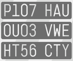 Adrian Talbot (b. 1964, Worthing, Sussex, England) heads the type foundry Talbot Type in London. He made the Bauhaus-style Bremner family in 2000 for the visual identity of Mute Records.
 In 2012, he designed these typefaces: Kinghorn 205 (Egyptian), Kinghorn 105, Kamerik105 (+Kamerik 105 Cyrillic, 2014), Kamerik205 (an avant garde type family with many weights, including a hairline), Karben, KarbenMono (a mono-width sans family in the style of DIN), Karben 205 Mono, Karben 205, Karben 105, Karben 105 Mono, Kessel105, Kessel205 (a geometric sans family influenced by Futura; see also Kessel 105 Remix, 2016, and Karben 105 Stencil, 2016), Kettering105, Kettering205 (a slabby almost typewriter typeface influenced by Lubalin and similar avant garde styles), Kiruna (a legible and very open sans family), Kursk105, Kursk205 (constructivist), Kaleko 105 and 205 (Gill Sans-style sans families with large x-heights; see also Kaleko 105 Remix (2016) and Kaleko 105 Round Remix (2016), and the more geometric and medium x-height families Kaleko 105 Text and Kaleko 205 Text (2018)). Typefaces from 2013: Kilburn (a gothic sans serif), Kroppen Round (a geometric stencil), Kampen (square-spaced family), Kaleko 205 Round, Kaleko 105 Round. Typefaces from 2014: Kelso (an outline font with outlines that consist of a single continuous line), Klef (a geometric sans influenced by Avant Garde), Kenwyn (a playful bullet-holed Egyptian; +Stencil), Korbin (a semi-geometric grotesque family), Kandel 105 and 205 (geometric, tri-line, display and headline font). Typefaces from 2015: Kinsey. Typefaces from 2016: Keith (a sans family with layerable Umbra-like shadow styles), Korto (a geometric sans inspired by Futura and Avant-Garde). Typefaces from 2017: Kittle Round (stencil), Kittle Rough, Kitami (monoline sans), Keymer (a sans typeface family inspired by Margaret Calvert's Transport typeface), Keymer Thug (distressed), Keymer Radius (a rounded version), Keymer Block (a grungy version). Typefaces from 2018: Kessel 105 Text, Klamp 105 (a tall geometric sans with a handicapped g, followed in 2019 by Klamp 105 Mono), Klamp 205 (a tall geometric sans with a fine two-storeyed g, Klamp 205 Mono). Typefaces from 2019: K-haus 105, K-haus 205 (to celebrate 100 years of Bauhaus, an organic typeface family based on Herbert Bayer's universal alphabet), Kong Script. Typefaces from 2020: Koi (an inline / outline typeface close to a paperclip font), Kamerik 105 Text, Kamerik 205 Text. Typefaces from 2021: Kelso Round (a paperclip font), Benelux (a 10-style rounded monolinear sans). View Adrian Talbot's typefaces. [Google]
[MyFonts]
[More] ⦿
|
Tarin Yuangtrakul
|
 Designer in Bangkok, who runs Tabby Design. He made the experimental geometric typeface Invisible Color (2010), the sketchy typeface Self-Contradiction (2010), and the curvy high-contrast free typeface Hyperbola (2010). In 2011, he created the free geometric monoline architectural lettering typeface Infinity, as well as Golden Sans, an alchemic hairline sans that is based on the golden ratio.
 In 2012, he designed Rush, a typeface in which letters are sliced and reconstructed. Behance link. Hellofont link. Klingspor link. [Google]
[More] ⦿
|
Tauba Auerbach
|
Graphic designer and painter (b. San Francisco, 1981) who created the free hairline octagonal typeface Pomegranate in 2007 for Neo2, a Spanish magazine. She also has many nice typographic posters in her gallery. In 2008, Dick Pape captured some of her work in his scanbat typeface Tauba Auerbach. [Google]
[More] ⦿
|
Taufan Putra
|
Taufan Putra (b. 1986), a graphic designer in Jakarta, studied graphic design at the Institut Kesenian Jakarta (Jakarta Institute of Arts). Behance link. He created the hairline sans typeface BARMODR (2012) and the octagonal Cardboard (2012). [Google]
[More] ⦿
|
Tendron
|
Designer of the free minimalist geometric sans family Tendron (2006). Hairline and ultr-fat weights in the pipeline. Alternate URL. Nice image. [Google]
[More] ⦿
|
Terminal Design
[James Montalbano]

|
 Terminal Design is the company of James Montalbano in Brooklyn, New York, est. 1990. He was the President of the Type Directors Club, 2002-2003. He teaches type design at the School of Visual Arts in New York City. Feature on him by John Berry. In 2019, he declared at Typedrawers: I'm so tired of type design, so we must assume that threw in the towel. James designed these fonts:
 - In an earlier life as part of Fonthaus, ca. 1994-1995, I believe that Montalbano designed fonts like DidotDisplayAntiqueTdi, DidotDisplayRegularTdi, ProgressivePsychoOneTdi (through Six) and SenzaTDI (many weights).
- 718 (2010). A clean 24-style sans family influenced by as many typefaces as there are immigrants in Brooklyn. Named after the non-Manhattan area code.
- Alfon (2003). Montalbano calls it a muscular text typeface. It has chamfered corners and cupped serifs.
- Badinage. A connected retro script.
- Cappella (2013). It is a direct result of the work done on the Fordham Chapel custom font commission. A one weight, all caps design based on wood carved lettering from a Fordham University chapel honoring fallen alumni.
- Choice Sans, Choice Sans Compressed, Choice Sans Condensed (2014).
- ClearviewADA, ClearviewADA Condensed, ClearviewHwy, ClearviewText, ClearviewText Compressed, ClearviewText Condensed. The legible sans serif family ClearviewOne, designed for highway signs, and used for US highway signs starting in 2002. The highway sign font family is called ClearviewHwy), and is further explored here. ClearviewHwy is used for highways in the USA starting in 2004 (see the discussion here). The OpenType version of ClearviewOne is called ClearviewText (2007). ClearviewADA (2007) is a family of Clearview fonts that conform to the letterform specifications for signage outlined in the Americans with Disabilities Act legislation. Free download. Clearview was discontinued in 2016 by the US Federal Highway Administration, in favor of the older Highway Gothic from the 1940s: Report by Citylab.
- Consul Caption, Consul Deck, Consul Display, Consul Text (2009). A 48-style text family. Optically sized, it emerged from a Gustave Mayeur design done by Montalbano for Mens Vogue. Consul has a hint of didone, but the brackets are rounded and the stems gently flared. In Montalbano's palette, this is one of the beauties.
- Enclave (2007): A sixteen font slab serif family.
- Fervent (2013). A sans version of Badinage.
- Giacomo 2.0. a well-balanced and interesting sans-serif family. Includes Cyrillics.
- Insouciant (2011). An upright connected script family..
- At ITC: ITC Orbon 2020, ITC Orbon (1995-1996: a strange experimental typeface), ITC Nora (1997), ITC Freddo (1996, a fat poster typeface).
- Kaboodle (2018). A wood type with extended Latin, Greek and Cyrillic.
- Kinney (2011). A type family for tables and information design. James's self-proclaimed attempt at creating a neutral serif.
- Latin 512, Latin 512 Compressed, Latin 512 Condensed, Latin 512 Expanded. An 80-style didone family with triangular or wedge serifs typical of the Latin style.
- Moraine (2009). A serif family with a wide generous feel. Stems are flexed and tapered and serifs are cupped.
- Notary (2017).
- Now Playing (2007): A digital revival of the naïve plastic lettering that was used on the marquee of the Apollo Theater in Harlem.
- Quotient (2015). An elegant sans typeface family without italics. Montalbano describes it as trajan Sans because of its classical roman proportions. many details such as the rhombic dots on the i's are inscriptional in nature.
- Rawlinson 2.0, Rawlinson 2.0 Condensed, Rawlinson Roadway (2003). A serif family, which includes a Condensed sub-family). NPS Rawlinson Roadway is an old style serif typeface currently used for the United States National Park Service's road signs. It was created to replace Clarendon and uses James Montalbano's wife's last name.
- Shenandoah. A display type based on the wood letters at Shenandoah National park.
- Social (2012). A rounded sans family for on-line use.
- Tangent (2007): A geometric sans in sixteen styles.
- Trilon, Trilon Compressed, Trilon Condensed, Trilon Expanded (2009): A sans typeface family. Montalbano calls it a 21st century gothic.
- VF Sans, VF Sans Condensed (2011). An avant-garde family with 32 styles. James explains its release: Back in the late 90s I designed a family of sans serif fonts for Vanity Fair magazine. I based them on various sans serif designs from the 1930s with nothing particular in mind. They have been compared to Intertype's Vogue, and I do see the connection, but it wasn't my intention of doing a Vogue revival. They have been kept out of circulation these last many years at Vanity Fair's request, but it appears that during the last few years Vanity Fair has lost interest in them. They no longer grace the front cover of the magazine, and they appear with less and less frequency inside the publication. I've also noticed several pirated uses of them as they have popped up on some book jacket designs. So with Vanity Fair's permission I felt it time to set them free.
- Yo Andy, Yo Frankie, Yo Lucy, Yo Sophie, Yo Zelda. The Yo series (2010) consists of 200 didone styles. It is subdivided into Yo Andy, Yo Frankie, Yo Lucy, Yo Sophie and Yo Zelda. This didone family has two axes (weight, extension) with 100 regular members finished in 2010 and 100 italics added in 2014. They reach in alphabetical order from condensed (Andy) to extended (Zelda).
Montalbano designed custom corporate fonts for Condé Nast Publications, Warner Music, The American Medical Association, the U.S. National Park Service, Vanity Fair, Brides, Gourmet, Mademoiselle, Sassy, Details, Glamour, Jane, Self and Book. The list of font names, with links: - Collins Geometric.
- DM Marquee. A dot matrix all caps design created for Mother NY for their client, Daily Motion.
- Early Learning Sans. A family of 12 fonts designed for MeadWestvaco's Early Learning Products division for use in educational products teaching young students the basics of letter construction.
- Fordham Chapel. Based on wood carved lettering from a Fordham University chapel honoring fallen alumni.
- Fortune Titling. Based on the Fortune logo.
- Glamour Display, Glamour Script. The latter is a roundhand script. Both were done for Glamour magazine.
- JCP News Gothics. Created for DDB Chicago, for use in the It's all in there campaign for JC Penney. Should work with existing Monotype News Gothic fonts.
- Johan Gothic. A condensed sans serif designed for Conde Nast Sports for Women, which changed its name to Women's Sports, which then changed its name to Women's Sports and Fitness. The type was named for the art director who commissioned it.
- Lucky Gothic.
- Mens Vogue-Mayeur. Mayeur Display, an original design created in 2005 for Men's Vogue. Based on 19th Century French text types from the Parisian foundry of Gustave Mayeur.
- Now Playing. As part of the renovation of The Apollo Theatre, Now Playing was designed to reflect the plastic marquee lettering of the 1940s.
- NPS Roadway. Montalbano writes: Designed to replace the Clarendon road guide sign typeface that the U.S National Park Service used as part of their identity. NPS Roadway was tested by Pennsylvania Transportation Institute and was found to decrease legend length by 10-15% while increasing readability by 11%. Part of a total redesign of the Park Service identity (that included the Rawlinson series of fonts) the font has been approved by FHWA (Federal Highway Administration) for use on all Federal roads.
- Skinny Eric. A painfully thin version of Gill Sans, designed for Self Magazine.
- Social. Two weights of a rounded sans serif design to compliment the Living Social logo design.
- VF Didot, VF Sans, VF Sans Condensed, VF Script. All done for Vanity Fair. VF Didot is a slightly condensed design based on the many New York didot alphabets drawn during the 1940s and 50s. VF Sans is Vanity Fair's workhorse. VF Script is an original script created for Vanity Fair Magazine in 1999, loosely based on lettering found on a French Automobile Poster from the mid-1920s.
- Vogue AG, Vogue Didot Extended. Vogue AG is a nine-weight sans serif design mixing elements of Futura and Avant Garde Gothic. The Extra Light weight was designed for Vogue magazine in 2004 while the remaining weights were added in 2007 and updated in 2011.
Klingspor link. FontShop link. Linotype link. Behance link. View James Montalbano's typefaces done at ITC. [Google]
[MyFonts]
[More] ⦿
|
Terrestrial Design
[Carl Crossgrove]

|
 Terrestrial Design is Carl Crossgrove's web site. Crossgrove graduated from Rochester Institute of Technology in Printing /Typography, and has shown a life-long interest in calligraphy and lettering. Now based in San Francisco, he has worked at Adobe, where he designed the Multiple Master hand-printed (semi-Celtic or stone-carved) families Reliq (1998), Reliq Std Active and Reliq Std ExtraActive in 2002, and where, with the help of Kim Buker Chansler and Carol Twombly, he co-designed the Western fonts (Adobe's Wood Series) Origami (hookish, in the expressionist style of Menghart and Preissig), Pepperwood (1994), Ponderosa (1990), Rosewood (1994) and Zebrawood (1994). He was also active at ITC (ITC Minska, 1996) and Agfa Monotype (Origami, a Menhart or Preissig style family; and Mundo Sans, 2002: a 14-weight humanist family, which includes a fantastic hairline sans).
 Other fonts by Crossgrove include Othello (2002, with Steve Matteson), Wakerobin (based on hand-painted billboards, posters and signage lettering of the mid-19th century), Scripsit (which was named Judges' Choice in Serif Magazine's 1996 type design competition), Tarantella Script, Ranunculus, Penmark, Curlz MT (1995, Monotype; with Steve Matteson). Beorcana (2006) is a 28-part serifless roman in the style of Optima or typefaces like Albertus, Stellar, Tiepolo, Barbedor, Lydian and Amira. In the making since 1992, this flared calligraphic book typeface was released by Monotype in 2006. Stephen Coles states: Beorcana is Crossgrove's best and most complete design yet. I can declare from personal experience that it is beautifully drawn and sets very well, small or large, thanks to three optical size masters. It will be a hit with fans of calligraphic sans serifs like Optima. It won an award at TDC2 2007 and was one of the best types of 2007. Florian Hardwig writes: The typeface has no serifs, yet its the opposite of a grotesque. It exhibits the rhythmic contrast and the humanist proportions of a renaissance roman. Its letters please with vividly dancing forms in every detail. However, this obvious calligraphic derivation never seems inappropriately fancy even the spruce swash italics are down-to-earth in a convenient way. The Thin isn't anemic and the Ultra isn't heavy-handed. Crossgrove really knows his stuff. Beorcana Pro (2006-2013) comes in Regular, Display and Micro styles. Nebulon (2008) is an organic typeface that won an award at TDC2 2009. This retro-futuristic, soft superelliptical display sans-serif design was renamed Biome a year later. With Rod McDonald, he created Egyptian Slate (2009, Monotype). Linotype published ITC Galliard Etext in 2013, after the 1978 garalde typeface by Matthew Carter called ITC Galliard. It lists Carl Crossgrove as its designer. In 2014, Crossgrove published the Burlingame typeface family at Monotype. He calls this sans collection sturdy, muscular and decisive. From 2003 until 2014, he designed the OEM Monotype font Halesworth Etext. In 2017, he published the comic book typeface family Cavolini at Monotype. Still in 2017, Karl Leuthold, Juan Villanueva and Carl Crossgrove co-designed the breezy script typeface Sagrantino (Monotype) in Regular, Highlight and Shadow substyles. In 2018, Monotype's Carl Crossgrove, Charles Nix, Juan Villanueva and Lynne Yun co-designed Walbaum, a reimagined superfamily with 69 total fonts, in five optical sizes. Monotype writes: Walbaum was meticulously crafted by Monotype's Carl Crossgrove, Charles Nix, and Juan Villanueva to bring Justus Erich Walbaum's high contrast didone style masterpiece to the 21st century. Walbaum has over 600 glyphs with OpenType typographic features like small capitals, old style and lining figures, proportional and tabular figures, fractions and ligatures. Also included in the family are three decorative and ornament fonts. At the end of 2018, he published the rough-edged calligraphic typeface Amarone at Monotype. Typefaces from 2019: Mundo Serif (Monotype). Linotype page. Adobe's page. MyFonts page. FontShop link. Klingspor link. View Carl Crossgrove's typefaces. [Google]
[MyFonts]
[More] ⦿
|
The Difficult Type
[James Kilfiger]
|
 James Kilfiger (The Difficult Type) designed the free calligraphic typeface Inkcallig (2006), as well as T-Ball (2006, handwriting), LetsTrace (2006; a *very* readable light sans, even at small sizes), LetsTraceruled (a school font), Letstraceitalic, Pugsley (2006, a bi-ped Tuscan, based on an eighteenth century clock maker's sign from an old edition of Signs of the Times magazine), Pugsley Oblique (2006), AlphabetofChildren (2006, based on 16th century illuminated caps), Animal Silhouette (2006), Fold (2006, an origami-inspired face), Pierce Roman and Oblique (2006, after Gentium), Untitled1 (2010, a chess font), Tudor Rose (2010, script), Fold (2011, paper fold face), Transcends Games (2011, fututuristic), Lets Trace (2011, a school font for tracing), Tudor Rose (2011, an ornamental fat finger family), Pierce Oblique (2011, an angular face), Chess (2011), Wire Wyrm (2011, hairline serif face), Orthoventional Upright (2011), Ackermann (2013), Fifteen (2013, a faux bitmap font) and Contrans.
 In 2013, he designed the free monospaced typeface Quinze Narrow. Link at the Open Font Library. Aka Zeimusu. [Google]
[More] ⦿
|
The Foundry Types

|
 London-based foundry set up by David Quay and Freda Sack in 1989, and after Freda's death, continued by David Quay and Stuart de Rozario. Their typefaces were first made using the Architype label:
 - Architype Albers (1997).
- Architype Aubette. Based on Theo van Doesburg's 1928 signage lettering for the Café Aubette in Strasbourg.
- Architype Ballmer. A De Stijl typeface inspired by the experimental, universal letterforms drawn by Bauhaus trained Swiss designer Theo Ballmer for a series of 1928 posters, most notably for an exhibition on industrial standards.
- Architype Bayer. Drawn from Bauhaus Archiv sketches for a minimal sans typeface that was created in 1925 by Herbert Bayer.
- Architype Bayer-Type. Based upon Herbert Bayer's 1931 universal, modern serifed alphabet. Although the modern style appears to be a radical departure from his first sans single alphabet of 1925, the structure of this later serifed style is still grid based and geometrically constructed.
- Architype Bill. The Foundry writes: Architype Bill was developed from the few letterforms created by Max Bill for a 1949 exhibition poster. All the forms, with the exception of the letter o, were constructed using only straight lines and triangles on a purely mathematical basis, that showed the continued influence of his earlier Bauhaus training, and the universal alphabet principle.
- Architype Catalogue Outline, Architype Catalogue Solid (2016). Architype Catalogue originates from Wim Crouwel's Stedelijk Museum exhibition catalogue for sculptor Claes Oldenburg, 1970. The cover's soft padded letterforms evoke the artist's work. Oldenburg was so taken with the design, that he asked Wim Crouwel to complete the alphabet.
- Architype Fodor. Based on Wim Crouwel's work, the Fodor letterforms were created for the magazine published by Museum Fodor, Amsterdam. To save cost it was designed to be typeset on their own electric typewriter.
- Architype Ingenieur. Architype Ingenieur was inspired by Wim Crouwel's late 1950s exhibition catalogues and posters, for which he had created a few geometrically constructed, simplified letterforms. In the 1960 Venice Biennale Dutch entry poster, he drew grid-based letters with 45-degree angles for olanda, the style influenced by his boyhood fascination with naval lettering. A subtle variation appeared in the Stedelijk Museum catalogue for painter Jean Brusselmans. Several dot matrix versions followed. The themes and systems in these early letterforms are encapsulated in this new (2016) four-weight family Architype Ingenieur.
- New Alphabet 1 through 3. Based on Crouwel's New Alphabet and developed in consultation with him)---a free version of this is New Alphabet (2008, Matt McInerney).
- Architype Renner. Related to the early experimental versions of Paul Renner's Futura.
- Architype Stedelijk (1997). LED-like, based on Crouwel's ideas. The Foundry writes: Stedelijk first appeared in the seminal Vormgevers poster, commissioned by the Stedelijk Museum, Amsterdam in 1968. Crouwel created a rigid grid system across the poster of 57 vertical by 41 horizontal lines, also forming the basis for the construction of the letterforms. Although all hand drawn, the resulting typeface had a machine-made appearance. This striking black and white poster with its visible grid became one of Crouwel's most iconic designs. Architype Stedelijk now re-creates these letterforms as a single alphabet typeface in a digital font.
- Architype Schwitters. Developed from the phonetic experiments made by Kurt Schwitters with his 1927 universal alphabet.
- Architype Tschichold. A very thin avant-garde sans: Architype Tschichold is a faithful rendering of Jan Tschichold's 1929 experimental alphabet which was influenced by Bayer's single-alphabet. His design was never put into production. This re-creates his original geometrically constructed design, including some phonetic characters.
- Architype Van der Leck (1993-1994). Based on a 1941 De Stijl alphabet designed by Bart van der Leck for the avant-garde magazine Flax.
- Architype Van Doesburg (1996). Based on a 1919 alphabet by Van Doesburg obtained by dividing a square into 25 equal smaller squares.
- Architype Vierkant. This typeface was developed from the few letterforms that Crouwel created for an opening spread in a 1972 Drupa catalogue, on the theme "typo vision international".
Their other fonts have the label Foundry and include Foundry Sans (1990, a humanist sans inspired by Stempel Garamond), Foundry Old Style (1990-1994, inspired by Nicholas Jenson's types), Foundry Wilson (a Baskerville that revives a 1760 font from Scottish type founder Alexander Wilson), Foundry Journal, Foundry Gridnik, Foundry Form Sans, Foundry Form Serif, Foundry Monoline (2000), Foundry Origin, Foundry Sterling (2002, sans serif, in the style of Bliss and Gill Sans), Foundry Context (a sans family), Foundry Dat, Foundry Dit, Foundry Fabriek (an industrial orthogonal almost military stencil developed in consultation with Wim Crouwel), Foundry Flek (a dot matrix font), Foundry Plek, Foundry New Johnston, and Foundry Wilson Expert. Michael Barbosa started work on Metroplis (1995) for Metroplisboa, the Lisbon subway, while he was working at Wolff Olins. That custom font project was finished by David Quay and Freda Sack. [Google]
[MyFonts]
[More] ⦿
|
The Ivy Foundry
[Jan Maack]

|
 Aarhus, Denmark-based designer (b. 1968) who worked as an art director and graphic designer since 1990. He started making typefaces in 2006. Ten years later he established The Ivy Foundry and wrote: The Ivy Foundry is committed to helping brands and corporations fine-tuning their visual voice. In 2018, The Ivy Foundry joined Type Network. In 2021, The Ivy Foundry joined The Type Founders.
 At The Ivy Foundry, he published - Ivy Epic (2021).
- Ivy Presto (2019: +Display, +Headline).
- Ivy Journal (2018). This transitional serif face is loosely based on both the seminal Roman inscriptional capitals and classic movable type in the style of Bembo, Baskerville, and Times New Roman.
- Swing King (2017). Hand-crafted.
- IvyStyle TW (2016). A friendly slab serif with ball terminals. Unlike the typewriter faces it takes its cues from, IvyStyle TW is a proportional design with a large number of weights.
- IvyStyle Sans (2016). Type Network analyzes: IvyStyle Sans is the sans serif component, a Scandinavian design reminiscent of the classic American Gothics. With open apertures and clean lines, the slightly narrow neohumanist letterforms abandon geometric rigidity in favor of improved reading comfort.
- Swing King (2018). Type Network writes that it is a casual sans serif created in collaboration with Danish illustrator Erik Sørensen. Throughout his decades-long career, Sørensen always had a hard time finding the right typographic voice to complement his drawings. He teamed up with Maack to produce a useful typeface that was neither cartoonish nor handwritten, but a joyful illustrated font imbued with the warmth and charm of his drawings.
- Ivy Mode (2018). A fashion mag sans family.
Creator of these typefaces at FontFont / FontShop: - FF Speak (2007). A 17-style rounded geometric sans family which includes a hairline weight, Speak-Light. A relative of Eurostile.
- FF Cube (2008). A large geometric sans with the industrial design feel of Eurostile and a large x-height.
- FF Marselis (2012). A sans serif family. He also designed FF Marselis Serif (2016) and FF Marselis Slab (2013). FF Marselis was chosen in 2016 for large letteing at Brussels Airport in 2016.
FontShop link. Klingspor link. Type Network link. [Google]
[MyFonts]
[More] ⦿
|
The Northern Block (TNB)
[Jonathan Hill]

|
 The Northern Block (TNB) is Jonathan Hill's foundry based in Leeds and/or Sheffield and/or Newcastle, UK, est. 2006. The designer and funder is Jonathan Hill (b. Sheffield, 1971) who lives in Newcastle-upon-Tyne, UK. Maria Pigoulevskaya joined The Northern Block as type designer in 2012. Home page. Free fonts by Jonathan Hill can be found at Dafont and Fontspace.
 Another Dafont link. MyFonts link. Hellofont link. Behance link. Klingspor link. Abstract Fonts link. Alternate URL. In 2010, he started FontStructing typefaces. His first was the grungy wooden plank typeface Timber Remnants. Also in this category is Laser Disco (2008, futuristic). Typefaces from 2006 until 2008: Sylar (2008, a techno family in 16 styles), Geta Robo (2008, a mechanical typeface influenced by Japanese animation), Arctic Patrol (angular family), Dokter Bryce (2008, octagonal and severe), Orange Royale (2008, 8 styles of fat techno and stencil fonts), CorTen (2008, octagonal ultra-fat stencil), QueueBrick (2008, LED simulation), Center Forward (2008, futuristic), Platform One (2008, a futuristic family), Line Wire (2008, octagonal, influenced by the work of Dutch designer #Wim Crouwel), StealWerks (2006, LED-inspired stencil face; published at T-26) and Blockout (2007, 5 weights of a futuristic blocky type family). In 2008, these were followed by more computer-related typefaces such as VideoTech (futuristic), JoyRider and AstroNaut (octagonal+futuristic, now at T-26). WerkHaus (2008) is a 5-style family inspired by the minimal sans typefaces of Herbert Bayer and the Bauhaus movement. Typefaces from 2009: Scriber (2009, octagonal techno family), Get A Robo (2009, a 10-weight mechanical family influenced by Japanese animation (Anime)), Ten Gu (2009, paperclip font remastered from the 1970's Letragraphica font Tangui), Orange Royal (2009, rounded stencil), VideoTech (2009, inspired by computer games for the Commodore 64), SkyWing (2009, rounded typeface inspired by Japanese computer console games, such as Captain Tsubasa created by Yoichi Takahashi), VanBerger (2009, an octagonal family influenced by the De Stijl movement), Logan Five (2009, techno family inspired by the 1976 sci-fi film Logan's Run), Zaius (2009, a bold sans family that includes a stencil style, all based on Ed Benguiat's work for the 1968 movie poster for Planet of the Apes), Oric Neo (2009, a free octagonal techno family; +Stencil), VanBerger Stencil (2009, a free geometric sans influenced by Theo Van Doesburg and the De Stijl movement), Aldo (2009, +Open: a bold stylized type typeface re-worked from the original 1970s movie poster The Battle For The Planet Of The Apes), Sylar Stencil. Typefaces from 2010: Intropol (2010; image), Arcle (a monoline organic sans), Hoxton (humanist sans family), Lintel (monoline sans family with a large x-height), Knul (monoline sans), Dohrma (a machismo geometric face; +Inline), Planer (a technical writing family), Otomo (a Japanese techno family that includes a stencil), Yodo (a geometric experimental family in 3 weights), Nu Order (a sans family that includes a very thin weight), PyeMan (2009, a piano key font named after the PacMan game), ProtoFet, DraftWerk (a minimal rounded typeface inspired by architecture and furniture detail drawings), DyeLine (a geometric face with a great hairline weight), Cobol (2010, great octagonal monowidth face), Draftwerk (architectural lettering), Olympik (a gorgeous multiline family based on Letraset's Optex, 1970), Kaine (a slab family inspired by 1960s spaghetti westerns: +Stencil, +Outline, +Italic +Block; Hill says that The grid template is based on Welt Extra Bold from Letraset with detailed changes, additional characters and new style variations.), Brion (a modernization and extension of A. Mailay's rounded sans font Arpad (1971, VGC); Kaine Block, the counterless version, is free at Dafont). Mekon (2010) is a fat sans display typeface with a free horizontally striped style. It revives and extends Peter Steiner's phototype Black Body (1973). MarkusLow (2010) is a revival and extension of Basilea (1965, Markus Low, VGC). Teletex (2010; +Ultra Light, +Light, +Medium) is a typewriter style slab serif whose design was influenced by Rockwell.  Typefaces from 2011: Dekal (nice fat multiline family, +Inline), Norpeth (2011, a humanist neutral sans family), Bosko (+Stencil, +Block), Bosko Block (2011, free), Woolworth (sans family), NeoGram (sans family), Juhl (an organic/ geometric sans family with the bowls of b, c, d. p and q modeled after chairs). Millar (2011) is a simple monoline sans family. Tondu (2011) is a strong sans poster face---its early version, Tondu Beta (2011), is free. Gelder Sans (2011) is a clean modern sans serif typeface. Brokman (2011) is a contemporary 10-style sans family. Vitro (2011) is a monoline geometric sans family. Beval (2011) is a humanist sans family. Nurom (2011), Monsal (2011), Tadao (2011) and Kuro (2011) are additional sans families. Heltar (2011) is a revamping, TNB style, of Helvetica. Regan Slab is a readable slab family. It was followed in 2012 by Regan (the sans version) and Regan Alt. Typefaces from 2011: Dekal (nice fat multiline family, +Inline), Norpeth (2011, a humanist neutral sans family), Bosko (+Stencil, +Block), Bosko Block (2011, free), Woolworth (sans family), NeoGram (sans family), Juhl (an organic/ geometric sans family with the bowls of b, c, d. p and q modeled after chairs). Millar (2011) is a simple monoline sans family. Tondu (2011) is a strong sans poster face---its early version, Tondu Beta (2011), is free. Gelder Sans (2011) is a clean modern sans serif typeface. Brokman (2011) is a contemporary 10-style sans family. Vitro (2011) is a monoline geometric sans family. Beval (2011) is a humanist sans family. Nurom (2011), Monsal (2011), Tadao (2011) and Kuro (2011) are additional sans families. Heltar (2011) is a revamping, TNB style, of Helvetica. Regan Slab is a readable slab family. It was followed in 2012 by Regan (the sans version) and Regan Alt.
Jonathan Hill's most popular typefaces. Type designs done in 2012: Hackman (elliptical sans), Borda (octagonal), Savile (humanist sans), Metrik (a nice geometric---borderline organic---sans family), Metral (rounded octagonal typeface), Uniman, Kobern (a strong sans), Reznik (techno sans). Type designs from 2013 by Jonathan Hill: Nauman (a humanist sans family with attention paid to the triple (1, i, j)), Gunar, Nuber (followed in 2018 by Nuber Next), Eund (a modulated sans), Corbert (Bauhaus-inspired sans), Corbert Condensed. Typefaces from 2014: Byker (geometric sans), Schar (humanist sans), Loew (geometric information design sans; extended in 2018 by him and Donna Wearmouth to Loew Next (for Latin and Cyrillic) and Loew Next Arabic), Bitner (spurless organic sans named after bitcoins), Modum, Modum. Typefaces from 2015: Facto (a simple sans family with large x-height), Halcom (influenced by Futura), Scharf, Itoya. Typefaces from 2016: Syke Mono (a stylish monospaced typeface family), Oyko (an octagonal industrial typeface family), Kylo Sans, Syke (a sans typeface family), Hoxton North (a condensed humanist, very British, sans), Celdum (geometric sans). Typefaces from 2017: Tomarik, Typold. Typefaces from 2018: Paradroid, Sprout (a low-contrast 6-weight sans). Typefaces from 2019: Roag (an industrial geometric sans paying homage to mechanical designs of the 1930s), Syke (14-style sans), Scharf (a sturdy sans family), Mynor (a modern squarish sans inspired by machine-readable typefaces of the 1950s including OCR-A and B). Typefaces from 2020: Corbert Wide, Blom (a humanist sans family). Typefaces from 2021: Waldo (a 4-style bold, stencil-focused display typeface loosely based on a 1973 science fiction movie poster for The Battle For The Planet of The Apes), Nauman Neue (a 60-style humanist sans), Kopik (a comic book typeface with rounded forms; it was inspired by the 1960's architectural handwriting style practised by draftsmen), Duran (a 14-style geometric sans with built-in strength). Creative Fabrica link. View Jonathan Hill's typefaces. Another list of Jonathan Hill's fonts. Interview in 2014. [Google]
[MyFonts]
[More] ⦿
|
The Routine Creative
[Alex Cottles]
|
 Dallas, TX (was: Richmond, VA)-based designer of the sans typefaces Mint (2016), Amber (2016), Foodie (2016) and Daughter (2016), the rounded sans typeface Fox & Bower (2016), the minimalist sans typeface Avenue (2016), the handcrafted typefaces Yesterday (2016), Creative Queen (2016) and Love Note (2016), the art deco typeface Retro Deco (2016), the retro connected Avocado Script (2016), and the beveled typeface Suburbia (2016).
 Typefaces from 2017: Color Block (a color font), Trailer (monoline connected script), Quirk (partially stackable sans), Big (brush font), Fighter, Pineapple Pen, Banana, Augustine, Eleven (sans), Partay, Coachella, Mentalist (hairline sans), Rice (slab serif), Honey Oak, Powhatan (inspired by native American Indian themes such as arrows). Typefaces from 2018: Espresso (sans), Atlantic (brush), Salmon (modern all caps sans), Wild Child (handcrafted), Kangaroo, Traveler (monoline script), Valentina (a basic sans), Brother. Typefaces from 2019: Whiskey Ranger, American Mortar (a masculine vintage display font), Original Gangster, Hula Hoop. [Google]
[More] ⦿
|
Theygraphics
|
TheyGraphics is a multidisciplinary graphic design studio. Working in advertising, retail, fashion, company profiles, broadcast, illustration, type design and music. Their offices are in Stockholm, Sweden and Prague, Czech Republic. The designers: Fredrik Forsberg (Stockholm), Jiri Adamik-Novak (Stockholm), Zdenek Patak (Prague). The fonts: Leda (experimental), Motion (hairline octagonal), Prank (Amelia-inspired), Logarex and Garamond Preissig. [Google]
[More] ⦿
|
Thin Faces: Linotype's recommendations.
|
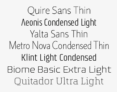 Thin eye-catching typefaces, as recommended by Linotype in 2015:
 [Google]
[More] ⦿
|
Thinkdust
[Alex Haigh]

|
 Graphic and identity design company founded by Alex Haigh in 2005 who was located in Sheffield, UK, but moved to Nottingham. Its web page is drowning in Flash---avoid the main page but go the blog or MyFonts instead. They are selling Taku (2009, bold squarish, with a stencil style added), Aiko (2008, a gorgeous fat techno family), Sukato (2008, another ultrafat beauty) and BAQ Rounded (2008, ultra-fat closed counter face; also at T-26). BAQ Roundded led to the ultra-round fat family Yuki (2010; +YukiLined, a stencil version). Hiruko (2008, eight styles) is a rounded sans family in the style of VAG Round. See also Hiruko Pro (2013). A robust geometric outgrowth of this is Ebisu (2010). Hiruko Stencil (2012) is a further extension.
 In 2009, some of their fonts, such as Miyagi (paperclip type) seem to survive at HypeForType. YouWorkForThem carries BAQ, Hiruko, Miyagi, Amaya (2009, grunge), Gen (2009, ink spill grunge), Taku and Yume (2009, ultra fat retro). Additions in 2010: Rika (a strong condensed sans), Saki Medium (a headline sans that builds on Ebisu), Sho Medium (an elegant expanded sans, also for headlines), Toshiko (techno face), Vow (extra thin, avant garde), Lippy (a lipstick brush face; see also Lippy Sans, 2012). Typefaces from 2012: York Handwriting (a poster face), Headlined (a grungy bold grotesk in the style of Veneer), Electro (a paperclip typeface), Soto, Mr Chalk (done with Dawn Lewandowski), Letro (a modern slab done with Dawn Lewandowski), Vow Neue, Sobek (alchemic), Patisserie. Typefaces from 2013: Gongo (rounded monoline all caps sans), Headlined Solid, Nanami (2013, avant-garde sans in 18 styles), Nanami Rounded, Crop (a rounded stencil family). Typefaces from 2014 include Primiterus (a hipster style typeface by Maciej Swierczek), Toggle, Rustick (hand-drawn poster family), Nanami Handmade. In 2015, Alex Haigh published the avant-garde typeface family Nanami Pro, an extension of Nanami, the free shadow typeface Nanami 3D, and Nanami Rounded (which in turn was followed by Nanami Rounded Pro in 2016). Portfolio. I finally understood the name Thinkdust. Upon blowing up the characters, one notices that all the glyphs are sprinkled with dust---see, e.g., Kono, Yumo, Yuko, Yoko, Soto, Roka, Mikagi (paperclip face), Hiroko, and BAQ Metal. Klingspor link. [Google]
[MyFonts]
[More] ⦿
|
Thomas Battams
|
Creator of the hairline arc-and-circle-based typeface Umbra (2013). [Google]
[More] ⦿
|
Thomas John Hayes
|
Thomas John Hayes is a designer, illustrator and photographer living and working in Brroklyn, NY. He holds a Bachelor of Fine Arts degree in communication design from Parsons the New School for Design. Marcy (2013). Behance link. [Google]
[More] ⦿
|
Thomas Thiemich
|
 German type designer who graduated from the Hochschule für Grafik und Buchkunst in Leipzig. He is currently based in Antwerp, Belgium. First working under the pseudonym Ixel, he used FontStruct in 2008 to create Dolores Alpha (chunky blackletter), Pulgo 2.0 (fat stencil), Blone (octagonal stencil), Rimski (fat hexadecimal face), Figaro (artsy octagonal stencil), AGRAR Unicase (+Black), an elegant ultra-fat type family. He also made the techno typeface Ixelator 0.1. Alternate download.
 His commercial work was published by OurType and transferred later to Type By when fred Smeijers quit OurType. His typefaces there: - Alto (2008), a humanist sans.
- Fakt (2010). A large grotesk superfamily that was followed by Fakt Slab, Fakt Mono (2019), Fakt Sencil (2019) and Fakt Soft.
- Remo (2012), Remo Stencil and Remo Slab.
- Rosalinde (2019). A playful almost monolinear rounded slab serif.
- Gustella (2018) in Solid, Stripes, Inline and Boxed styles. Gustella won an award at the Type Directors Club's Type Design Competition 2019.
- Cobertura (2019). A large distinguished almost modular sans family with a good choice of widths from compressed to wide.
Thomas Thiemich has also made some custom typefaces. These include Weinviertel (2009, with Maurice Goeldner), a handwriting typeface designed for a wine distributor in Vienna. Klingspor link. Ourtype link. [Google]
[More] ⦿
|
Thomas W. Lincoln

|
 Graphic designer and lettering artist, born in 1939 in Eugene, OR. He studied with Douglas Lynch at the Museum Art School in Portland and later apprenticed with Lynch. Lincoln studied calligraphy with Lloyd Reynolds and Arnold Bank at Reed College in Portland, OR. After a stint as an agency art director producing national ads for Pendletons womens fashions, Lincoln moved to New York City, where he joined the studio of Herb Lubalin. In NYC he continued his involvement with academia, exploring film at The New School and an intensive workshop with Milton Glaser. Eventually Lincoln started his own studio (occupying the space on east 32nd Street where New York Magazine was born), combining a design practice with teaching at New Yorks School of Visual Arts. Lincoln has served as Art Director at TCA (Benton & Bowles) in Westport, CT, as Creative Director, Redington, Inc., Stamford, CT, as Principal, Thomas Lincoln Design & Motion Graphics Communication, Westport, CT, as Freelance in residence Art Director, Baden & Co., Eugene, OR, and in 1992 returned to consulting and design through his own design office, Lincoln Design, based in Eugene/Springfield, OR.
 Creator of typefaces at VGC, such as Lincoln Gothic (1965), which won the National Typeface Competition. His clients over the years include Acoustic Sciences Corporation, AT&T, Continental Packaging Co., The Ford Foundation, GE, IBM, PepsiCo, RCA, Showtime, Abrams, Colliers, Harpers Magazine, Macmillan, McGraw-Hill, Random House, Harcourt/ Brace, New York Times, Simon and Schuster, and Viking Press. In 2006, Bitstream published New Lincoln Gothic, a 24-weight family starting with a hairline weight. This digital version was made in Fontographer from the old typositor strips by Lincoln himself. In 2011, Canada Type and Thomas Lincoln cooperated in the production of the roman sans family Roma. This typeface was published in 2012 at P22. Lincoln himself tells the story: My intention in designing Roma was to create a definitive, contemporary sans serif expression of the classic Roman majuscule as depicted in the Trajan Inscription at the base of the Trajan Column in Rome. The Capitalis Monumentalis letter forms of the Trajan Inscription, which date to 113 Ad, have been described by the noted type scholar, calligrapher and historian, Father Edward Catich, as "the best roman letter designed in the western world, and the one which most nearly approaches the alphabetic ideal." And in the 1902 publication, "The Practice of Typography", Edmund F. Strange stated: "No single designer, or the aggregate influence of all the generations since has been able to alter the form, add to the legibility, or improve the proportion of any single letter there in." Mr. Strange's pronouncement was true in 1902 and it is true today. Through the years various type designers have been inspired by the Trajan Roman to offer their own interpretations. Most notably, perhaps, Frederick Goudy's Trajan Title (1930), Warren Chappell's Linotype Trajanus (1940) and more recently, Carol Twombly's literal rendition of Adobe Trajan (1989) and John Stevens' spirited Stevens Titling (2011). There have been many other nice interpretations by other contemporary designers, yet it may still be said that none has improved the form, the legibility or the proportion of any single letter---though it can be said that the letters J, K, U, W, Y and Z, nonexistent in the ancient alphabet, have been added. Less common has been the interpretation of Trajan in sans serif form. Hermann Zapf's Optima (1953), Sumner Stone's ITC Stone (1987) and Ronald Arnholm's Legacy Sans (2000), among other nice sans serifs, reflect characteristics of Trajan but seem influenced by other factors as well, including fonts such as Gill Sans and Syntax. And, while I don't presume to speak for their designers, none of these typefaces seem designed specifically with Trajan in mind. My own Lincoln Gothic (1965), and its subsequent expansion as New Lincoln Gothic (2006), was a deliberate attempt to interpret the particular characteristics of the Trajan majuscule in a contemporary sans serif face. The most significant change in the later version was the addition of a lower case; a challenge that had simmered on my personal bucket list for several years. Roma, though, differs from Lincoln Gothic in one significant way: while the terminals of Lincoln Gothic are flat, in Roma the vertices of letters such as A,M,N,V and Z are pointed. I believe this change is the critical difference that moves Roma closer to my objective of honoring the original Trajan. As with Lincoln Gothic, Roma's strokes have an almost imperceptible entasis that terminate in a subtle flare; a vestige of the serif. The importance of this feature is that it imbues the font with a humanist quality. The serif, as Father Catich points out in his book, "The Origin of The Serif", almost certainly derives from a combination of the flat brush and the human hand; it is what ties the letterform directly to human anatomy and craftsmanship, integrating it in a fundamental way with the nature of man---as distinct from the machine. In 2020, he released Lincoln Electric at Canada Type. Lincoln Electric started its life as an in-house experimental film type Thomas Lincoln drew shortly after concluding his work as part of Herb Lubalin's famed crew in the late 1960s. The master alphabet was drawn on illustration boards using pen and ink and press-type lines. The digital retooling of this Bifur-style typeface (after Cassandre's Bifur from 1929) was done by Patrick Griffin. Klingspor link. FontShop link. [Google]
[MyFonts]
[More] ⦿
|
Tiago Silva
|
 Graphic designer in Curitiba, Brazil. He created the compass and ruler face Curitiba (2011). Before that, he designed Repo (2011), an avant garde monoline sans face. That typeface will soon be available for free download.
 In 2012, he created a free icon set called 24 Things. In 2013, he added the sans typeface Franzina Condensed Hairline. Cargo Collective link. [Google]
[More] ⦿
|
Tipo Pepel (was: Antaviana Typeface Division, or: Astramat)
[Josep Pep Patau i Bellart]

|
 Antaviana Typeface Division is a Catalan foundry, est. ca. 2002. It went also under the name Astramat and was also known as ANTAVIANA SERVEIS INTERACTIUS, SCCL. Located in Lleida, it is run by Josep Patau i Bellart (b. 1971, Les Borges Blanques, Lleida). Patau i Bellart offered free fonts, as well as commercial fonts. He has emerged as one of the most talented contemporary Spanish type designers. In 2011, he started Tipo Pepel [MyFonts link] in Les Borges Blanques. Josep Patau's typefaces:
 - Free typefaces: Lletraferida (2011, a didone), Negrona (2011, a revival of Lucian Bernhard's Bernhard Negro, 1930), Perolet, Lango, Gimenells, Arbeka, Rosango, Antaviana, FoxScript (1996, old typewriter), Unregistered, and FistroRatted (grunge).
- At Astramat, one could download these fonts: Anmari (2002), Antaviana (1996), Arbeka (2002), FAXADA (2001, by Cel Tico Petit), FoxScriptNormal (1996, old typewriter), Gastada (2001, another grunge font by Cel Tico Petit), Gimenells (2001, pixel font), Gorchs (2007, script font), Klander (1999, pixel font), Lang (2001, pixel font family), Masterfly (2007, T-26), Omellons (2001, pixel font family), Perolet (2001, Bauhaus style), Pixelade (2001, pixel font), Rosango (1996), Tiquet (2001, grunge font by Cel Tico Petit), Ultrafat (2007, T-26), Fistro Ratted. Fontspace link for Astramat.
- T-26 fonts: the screen typeface PixScript (2004), the screen icon dingbat font Pixelade Icons (2003), the art nouveau headline font Gisele (2003, angular art deco titling face), Masterfly (2007), Gopal (2004), Gourmet (2004, based on a type from the 1923 ATF catalog), Confetti (2006, connected fifties style face based on a 1930 type called Escritura Maravilla and Escritura Energica by the José Iranzo foundry in Barcelona), the pixel family Bit Kit (2003), Houdini Icons (20 pixel web icon dingbat typefaces, 2004).
- At ATypI 2009 in Mexico City, he explained the typographic work of the goldsmith Manuel Peleguer: The aim of this paper is to give an account of the project Peleguer, the recovering and digitialization of the work of the goldsmiths Manuel Peleguer, both father and son, who cut some printing characters between 1780 and 1784 in response to an order of the "Real Sociedad Económica Valenciana de Amigos del Pais". The result was a modern transitional typeface, with good legibility and neoclasical forms, equal in quality to those made by the Real Press (Imprenta Real) in Madrid by Pradell, Espinosa or Gerónimo Gil. Peleguer founded a press and a font foundry in 1784. Patau Bellart created a type family based on Peleguer's work called Peleguer (2009, + Ornaments).
- Anduaga, a calligraphic typeface from the 18th century, won the Laus Prize (said to be the Spanish equivalent of the type Oscars). Anduaga is the interpretation of the script that Joseph of Anduaga proposed for teaching the first letters in the 1780 book Arte de escribir por reglas y sin Muestras ...
- Valliciergo (2011) is a 100+-glyph calligraphic / copperplate script font that is inspired by samples from Caligrafía inglesa published in Madrid in the late nineteenth century by Spanish calligrapher Vicente Fernández Valliciergo.
- Dafont page, where one can download Ventura Edding (2008, hand-printed).
- Kids Script (2011). An upright connected school script.
- Trajana Sans (2011) is a sans-serif typeface family based on the shapes and proportions of the characters on the Trajan Column in Rome.
- Farrerons Serif (2011) is a very readable family with angular and humanist underpinnings.
- Chupada (2012) is an ultra-condensed font family noted for their exaggerated x-height, which consists of five different weights.
- Chopped Black (2012) was inspired by the font Pabst Heavy, designed by Chauncey Hawley Griffith in 1928 for Linotype. It was Linotype's version of ATF's popular Cooper Black.
- Paralex (2012) is a 12-style geometric slab typeface family.
- Boxed (2013) is an 18-weight squarish sans family. Followed in 2017 by Boxed Round.
- Cinta (2013). A large humanist sans family with a full range of weights starting with hairline. It also has Cyrillic.
- Bridone (2013), for British didone. A didone family that inherits some features from Victorian era British slab serif typefaces. Fashionable, beautiful, and useful.
- Sisco (2014) is an 18-style elliptical techno family with large x-height.
- Book Cover (2014) is a fat headline typeface.
- Tiquet (2014). A dot matrix typeface.
- Milio (2014). A ten-style wedge-serif transitional typeface family for newsprint and magazines.
- Naste (2014). A sixteen-style geometric sans family that adds details and character to the classical geometric sans typefaces such as Futura. It is a bit wider than usual and covers Cyrillic.
- Pobla (2015). A text serif with angular, almost fractured.
- Dupla. A large multilingual sans family.
- Trepa (2015). A stencil family with various choices of textures, which was inspired by commercial signs and the 1960s French art movement Graphie Latine.
- Itaca (2016). A 48-style sans family with very open counters.
- Mario (2017). A typeface family for arcade games and children.
- Werdet Script (2017). A calligraphic penmanship script which is named after calligrapher Jean-Baptiste Werdet who was a penman in Bordeaux in 1809 and later a professor at Ecole Normale Superieure in Paris.
- Geo Deco (2019). A geometric art deco sans family.
- Frontis (2019). A transitionl roman typeface family inspired by the roman lettershapes that Asensio y Mejorada drew in 1780.
- Kongress (2019). An elliptical sans family for corporate identities.
- Labernia (2019). A large didone family based on the font used in Diccionari de la Llengua Catalana (1864, by Pere Labernia, Barcelona): Labernia and Labernia Titling are characterized by ball terminals that are turned inwards.
- Indecise (2020). A nostalgic 50-style sans family that reminds us of type designs by Enric Crous-Vidal and José Mendoza y Almeida.
- Frenchute (2020). A great 36-style garalde family inspired by the type used in the 1727 text Le Chemin Royal de la Croix.
- Gina (2020). A great readable 16-style humanist sans family. Sixteen styles including a hairline.
- Samplex (2020). Bellart's take on the neutral Swiss sans genre.
- Bauen (2020). A Bauhaus-inspired geometric sans typeface family.
- Bazinga (2020). A display typeface family characterized by square counters. Perhaps a children's book font.
- Romulo (2020). A 12-style transitional roman typeface.
- Kheops (2020). A 14-style slab serif.
Additional links: Dafont. MyFonts page. Alternate URL. Fontspace link. Fontfreak page. Patau Bellart is also involved in the type information site Unos Tipos Duros. Klingspor link. Abstract Fonts link. Interview by Unostiposduros. Fontspring link. [Google]
[MyFonts]
[More] ⦿
|
Tipografies
[Jordi Embodas]

|
 Jordi Embodas is a Barcelona-based graphic designer, b. 1977. After studying at ELISAVA (1995-1999) and at GH Essen, Germany, he started working at Estudi Juste Calduch in Barcelona (from 2001 onwards). He designs type since 2005 and set up Tipografies in Barcelona for that purpose in 2010. Jordi teaches typography at the design schools from Barcelona Elisava and Idep. His typefaces:
 - Orenga (2005-2008).
- Pona (2009, text face). Pona can be considered as a a calligraphic sans family, with flared glyphs. Pona Display followed in 2011.
- Bulo (2012, a legible sans family, from Hair Blond to Ultra Black). Noe Blanco has helped with the development of Bulo Rounded, and Max Saladrigas with Bulo Extreme.
- Trola (2013, a text serif family). Trola Text was co-designed with Noe Blanco. In 2017, the Trola family was updated, improved, and expanded to Cyrillic. The Cyrillic version was designed by Letterjuice (Pilar Cano & Ferran Millan) under the supervision of Ilya Ruderman and Yury Ostromentsky.
- Nomada (2014). A 4-style sans family specially designed for the web and screens. Followed in 2018 by Nomada Incise, a solemn typeface family with flared stems, and one of the best lapidary typefaces of the past five years. Still in 2018, Maria Ramos and Jordi Embodas co-designed Nomada Didone, and Jordi Embodas added Nomada Slab (2019), Nomada Sans and Nomada Serif (2019).
- For Universitat Oberta de Catalunya, he designed UOC Sans and UOC Serif in 2016.
- Cuatrecasas (2017). A flared custom sans and serif typeface family done for Mucho.
- Folha Grafico (2018) and Folha Texto (2018).
- Kymco (2019). A wide all caps sans family done for the motorcycle company Kymco.
- Tinta Broken Coated, Tinta Broken Uncoated, Tinta Coated (2021). A 12-style flared sans. Followed by Tinta Uncoated (2021).
Behance link. Village link. Another link. Klingspor link. Interview by Unostiposduros. Juste Calduch link. [Google]
[MyFonts]
[More] ⦿
|
Tobias Holzmann
|
German-born designer who studied in Strasbourg, France. Creator of the thin avant-garde typeface Early Sans Serif (2011) and of the paperclip typeface Trombone (2011). [Google]
[More] ⦿
|
Tobias Kvant
[Kvant Type Foundry]

|
[MyFonts]
[More] ⦿
|
Toby Roberts
|
Graphic design student at Norwich University College of the Arts in the UK, 2012-2013. Behance link. Creator of the modular typeface On The Rocks (2012), which is based on circles and arcs. Serifless Sans (2013) is a geometric modular typeface family with a hairline and a rounded style. [Google]
[More] ⦿
|
Tom Bugg
|
At Utah Vally University in 2016, Tom Bugg designed a hairline display sans typeface. [Google]
[More] ⦿
|
Tom Carnase

|
 Type designer Thomas Paul Carnase was born in The Bronx, New York City in 1939. He graduated from New York City Community College in 1959. Carnase started making fonts in the photolettering era, and lived through the transition to digital. In the 1960s, he opens the studio Bonder & Carnase Inc. From 1969 until 1979, he is vice-president and partner of the agency Lubalin, Smith, Carnase Inc. In 1979, he founds the Carnase Computer Typography studio. In 1980, Carnase becomes co-founder and president of the World Typeface Center Inc., an independent type design agency. He manages the in-house magazine Ligature published by the World Typeface Center from 1982 to 1987. Besides type design, Carnase has designed graphics for packaging, exhibitions, corporate identities and logos for numerous clients, including ABC, CBS, Coca-Cola, CondéNast Publications, Doubleday Publishing and NBC. He has held teaching positions at the University of Cincinnati in Ohio, the Pratt Institute in New York, the Herron School of Art in Indiana, the Parson's School of Design in New York, the Cleveland Institute of Art in Ohio, the University of Monterrey in Mexico, and the Rochester Institute of Technology in New York, among others. His fonts include:
 - Fonts at WTC: WTC Carnase Text, WTC Favrile (1985), WTC Goudy (sold by URW++), WTC Our Bodoni (with Massimo Vignelli), WTC Our Futura, WTC 145. Clones of Favrile abound: OPTI Favrile (Castcraft), Fascinate (NovelFonts), Francois (Serials).
- At LSC (LSC stands for Lubalin Smith Carnase Inc, an agency he co-ran in the 70s), he created a number of typefaces such as LSC Book, LSC Condensed and LSC Caslon No. 223.
- ITC Busorama, a geometric titling typeface that started with an ad for a bus company. Busorama, despite its innate ugliness, has been copied tens of times. Nick Curtis managed to turn it into an art deco typeface in 1999 with his Ritzy Normal.
- With Herb Lubalin, he designed L&C Hairline (ca. 1966, VGC) and L&C Stymie Hairline (1973, VGC).
- At ITC: ITC Manhattan (1970), ITC Avant Garde Gothic (with Herb Lubalin and Ed Benguiat, 1970), ITC Bolt Bold (with Ronne Bonder, 1970), ITC Gorilla (with Ronne Bonder, 1970), ITC Grizzly (with Ronne Bonder, 1970), ITC Grouch (with Ronne Bonder, 1970: this Caslon headline typeface was mimicked and extended in 2011 by Tomi Haaparanta as Grumpy Black; see also Softmaker's Zepp and Bitstream's Dutch 791), ITC Machine (with Ronne Bonder, 1970), ITC Pioneer (with Ronne Bonder, 1970), ITC Ronda (with Ronne Bonder, 1970), ITC Tom's Roman (with Ronne Bonder, 1970), ITC Fat Face Western, ITC Pioneer No. 2, ITC Honda, ITC Didi (a high contrast didone revived in 2013 by Jason Anthony Walcott as Domani CP), ITC Bernase Roman, ITC Neon (1970; jointly by Ronné Bonder and Tom Carnase; based on Prisma, and initially shown by Photo-Lettering as Neon; Prisma in turn was based on Rudolph Koch's Kabel; digitizations include Neptune (FontBank, 1990-1993) and the free shadowed Multistrokes (Manfred Klein, 2003)), and Milano (with Ronne Bonder).
- L'Eggs, ca. 1969. A custom font for a line of hosiery to be called L'eggs by designer Roger Ferriter and Tom Carnase.
Author of Type: the best in digital classic text fonts (1995, Graphis, with Baruch Gorkin), about which Hrant Papazian writes: I just went through the Carnase/Gorkin book - I'd forgotten how lousy it is---please don't buy it. FontShop link. Klingspor link. View Tom Carnase's typefaces. [Google]
[MyFonts]
[More] ⦿
|
Tomás Brousil
[Suitcase Type Foundry]

|
 [MyFonts]
[More] ⦿
|
Tomas Nedoma
[Signature Type Foundry]

|
 [MyFonts]
[More] ⦿
|
Tomi Haaparanta
[Suomi Type Foundry]

|
 [MyFonts]
[More] ⦿
|
Toni Hurme
[Hurme Design]

|
 [MyFonts]
[More] ⦿
|
Tracy Jenkins

|
Wife and partner of Chester Jenkins at Village. Designer at Thirstype of the playful outline font Dee (2003). With Chester, she made a wood type face, Satchel Paige (2003), after a wood type original spotted in the Hamilton Woodtype Museum and the architectural hairline outline typeface Daily (2003, Village). [Google]
[MyFonts]
[More] ⦿
|
Triangle & Cross
[Vladimir Likh]

|
Vlad Likh (Triangle & Cross) is an art director in Moscow. Creator of the free variable width Latin / Cyrillic sans font Konduktor (2013). In 2019 he designed the tall hairline sans typeface Option, which was inspired by geometric architectural fonts. [Google]
[MyFonts]
[More] ⦿
|
Tropical Type Foundry
[Benoit Dupuis]

|
 Tropical Type Foundry is a collaborative font studio founded in Portugal in 2020. The initial members include Benoit Dupuis and Joana Roca. In 2020, Benoit Dupuis and Joana Roca designed and released Shoika, a 24-style geometric sans family featuring a hairline weight called Air. [Google]
[MyFonts]
[More] ⦿
|
Tyler Finck
[Etcetera Type Company (or: ETC; was: Finck Font Co)]

|
 [MyFonts]
[More] ⦿
|
Tyler Lang
|
Sarasota, FL-based student. Designer of this experimental hairline face (2005). [Google]
[More] ⦿
|
Type Associates
[Russell Bean]

|
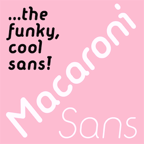 Russell Bean (Type Associates of Pyrmont, Australia, est. 1993) is an Australian type designer (b. Parkes, NSW, 1947). He worked in many ad agencies and later in the studios of the local photolettering houses, redrawing typefaces for filmfont setting as well as hand-composing headlines using photo-mechanical devices.
 In the early seventies, he designed a five-weight Avant-gardish family named Virginia (now also digitized). He then worked for the Los Angeles studio of Lettergraphics International in charge of lettering, logo design and converting type designs to film fonts. It was at this time (1973) that the Washington Family was completed. Upon his return to Australia that year, he teamed up with a long time colleague to form a design and art group in Sydney. Russell has been responsible for the creation of many Australian icons, including the Qantas logo. Russell Bean has served on the executive committees of The Australian Type Directors' Club and Australian Graphic Design Association. Typefaces available from MyFonts include Bougainville (1994-2005, a condensed sans family), Bougainville Neo (2021: 16 styles), Fremantle (1994), Beanwood Script (1997, a calligraphic script co-designed with David Wood), Craigie Halpen, Eumundi Sans [also available in the Agfa Creative Alliance], Eumundi Serif, Linear, Melissa, Rhodamine Blue, Sanguine (2004, handwriting), Semaphone (brush writing), Washington (1973, art deco family--really nice geometric letterforms with at least one hairline weight), and Xaltier. He designed ITC Christoph's Quill (2004), Billabong (2006, 1950s handlettering), Charleston Caps (2007, art deco) and the comic book lettering typeface Rhapsodie (2006). In 2007, he added the Threepoints East, North and West sans typefaces. About the Avant-Garde-style geometric sans family Virginia (2008), Bean writes: she was the most popular headline typeface around, at least in my home town in the year of her release circa 1970. That was the year my five-weight design won the inaugural (and only) Lettergraphics International Alphabet design competition and shut out 5000 competitors. Alas, Lettergraphics ceased to trade from its LA studios after the mid-80s and Virginia's two-inch film fonts were left to collect dust on the cutting room floor. The Koomerang family and Karmel (flare-legged retro display) were added in 2008. In 2009, Bean created Comp Sans 226, Argyle Rough, Empirical (12-style DIN-like sans family), Dotmap (pixel family) and Macquarie Heavy. In 2010, he made the poster signage typeface Hangtime. In 2013, he published the hand-printed typeface famiy Progeny. He is associated with Keith Morris in the type foundry Bean & Morris. In 2015, Russell created Macaroni Sans. In 2017, he added the calligraphic script typeface My Pimp. Typefaces from 2019: Aodaliya (an ultra-condensed typeface family). FontShop link. Klingspor link. [Google]
[MyFonts]
[More] ⦿
|
Type Dynamic

|
 Swiss and/or Italian foundry, est. 2013, located in Campione d'Italia, Italy. Their 14-style sans family, Pieta (2013), which is advertized as a modern wide sans, has the openness and geometry of Avant Garde, but deviates in the details, making it more humanist, more lettered. The hairline weight is especially attractive.
 In 2013, they published the clean nearly (but not quite) monoline slightly tapered 6-style sans typeface family Larsseit. Typefaces from 2014: Sailec (a neutral sans), Elysio (a condensed minimalist humanist sans, with weights ranging from Hairline to Black), Celias (a geometric sans with sharp corners), Revisal (humanist sans), Predige (a modular sans family promoted for use in scientific publications), Predige Rounded, Sarine (a technical sans family), Lasiver (a sans family from Hairline to Black). [Google]
[MyFonts]
[More] ⦿
|
Type Sailor
[David Fernando Espinosa Martínez]
|
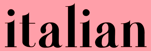 Type Sailor is David Espinosa (born in 1986) who lives in Bogotá. He graduated from the Universidad de Bogotá Jorge Tadeo Lozano as graphic designer and advertiser. He is a descendant of Antonio Espinosa de los Monteros, first royal printer of the viceroyalty of Nueva Granada.
 He designed these typefaces: - In 2021: Chapinero (blackletter, serif and sans system).
- In 2020: AmaLita (handcrafted), Font Negra (a spurred blackletter typeface done for a client, Mao Fonnegra).
- In 2019: Monteros (text typeface), TS Chapinero (blackletter).
- In 2017: Monteros (a revival of an old style typeface by Antonio Espinosa de los Monteros), Gautama (an organic sans).
- In 2014: Internerd, Old Providence New Roots (a poster typeface co-designed with Mateo Rivano), Santander (a great didone family).
- In 2013: Vercingetorix (monoline informal sans), Persifal (calligraphic typeface), Ygraine, Urania, Zephiroth (a semi-connected script), X-Classified (very grungy typewriter typeface), Salme (Treefrog-style script), Joyeux, Fugitiva (an ornamental Western saloon or circus font), Tomsk.
- In 2012: Pelida, Valpuesta, Walkiria (an informal blackletter), Quattro (a techno family), Olimpia, Luisa, Merlot (like caps in the style of William Morris), Bizancia (Arab simulation face), Imelda, Epifanía, Nero d'Avola (a great calligraphic script), Round, Avanti (calligraphic), Street Dork (stencil face).
- In 2011: Daniela (hairline sans), Glamourousse (sans), Caro (pixel), Carolina (sans), Kermesse (an octagonal font).
- In 2010: Davidcito (handwriting) and Hug Femmes (sans).
He says that his inspiration comes from the female form, which always has been associated with classic typography. Dafont link. Iphoneruler link. FontM link. Facebook link. Issuu link. Behance link. [Google]
[More] ⦿
|
Typedepot
[Alexander Nedelev]

|
 Typedepot is a small type foundry currently based in Sofia, Bulgaria, founded by Alexander Nedelev (a graphic designer from Sofia, Bulgaria, b. 1984 (Dimitrovgrad)) and Veronika Slavova in 2009.
 Nedelev created the display typefaces Glide (2009, done with Veronika Slavova), Glide Sketch (outline version), and Slide (2009, ultra-condensed). With Veronika Slavova, he designed the multiline (prismatic) family Pista (2010) and the organic Oxo family (2010), which includes a stencil, Corki (2011, a condensed slab serif), and Oxo College Barrister Sans (2010) covers Latin, Greek, Eastern European languages, Cyrillic, Turkish and Baltic. Parallel (2010) is an ultra-condensed typeface for anorexics. Piron (2010, by Nedelev and Slavova) and Matilde (2010, by Nedelev and Slavova) are free. Banda (2011) is a 16-style semi-serif type family characterized by a tall x-height and rounded semi-serifs [one free weight]. Centrale Sans (2011, Slavova and Nedelev) is a modern sans family. Centrale Sans Condensed followed in 2012, and Centrale Sans Rounded in 2013. See also Centrale Sans Condensed Pro, Centrale Sans Inline, Centrale Sans Pro, all updated in 2016. Typefaces from 2017: Moreno (a large informal semi-serif typeface family with Rust and Rough subfamilies), Cormac (humanist sans). Typefaces from 2018: Lexis and Lexis Alt (a 36-strong humanist and geometric sans pair of typeface families). Typefaces from 2019: Corsa Grotesk (inspired by Avenir; includes great hairline weights). Typefaces from 2019: Plovdiv (a free font based on the handwriting of Plovdiv's citizens; most weights are by Alexander Nedelev; some were co-designed with Pavel Pavlov of Punkt; the Pictograms were designed by Georgi Vasilev together with Nedelev and Pavlov). Typefaces from 2021: Banda Nova (a 14-style rounded sans with large x-height and a supermarket vibe). Typefaces from 2022: Lens Grotesk (a neutral Swiss sans with low contrast covering Latin and Cyrillic; 16 styles and one variable font). Behance link. MyFonts link. Old URL. [Google]
[MyFonts]
[More] ⦿
|
Typemefonts (was: 26plus zeichen)
[Jakob Runge]

|
 Jakob Runge (M&uum;nchen, Germany) graduated from Fachhochschule Würzburg-Schweinfurt and Muthesius Academy of Fine Arts and Design in Kiel. In 2014, Jakob Runge set up Typemefonts in München, Germany, to market his own typefaces. Before that, he was involved in 26plus, or 26+, a foundry located in Kiel, Germany: It is a platform to present and encourage student-created fonts. In 2015, he started TypeMates with Nils Thomsen. Currently he works in Munich as an independent type and brand designer and typographic consultant. Apart from his work for design agencies, he teaches typography and type design at university of applied sciences in Münster since 2011.
 His early typefaces include the free condensed octagonal typeface Fracmetrica (2009). Other typefaces of Runge's designed in 2009 and 2010---all at 26plus-zeichen---include Singula, Edelsans (a geometric sans), Sinews (a manly sans which he compares with Klavika and Corpid), JJ Realis (a Swiss sans), Ugl-y (2010), Cojonna (2010; curly--an exercise on ball terminals), Capitalis Nova (2010, dot matrix family), Graphit (2010), Devion (2010, semi-angular serif face), Textrusion (2010, Escher-style trompe l'oeuil), Frgmt (2010, experimental), Samblone (2011, an Asian-look stencil face), TJ Evolette A (2011, with Timo Titzmann---a fashionable geometric grotesque caps family). In 2014, Jakob Runge set up Typemefonts in München, Germany, to market his own typefaces, starting with the slab serif typeface Muriza (dedicated site), FF Franziska (2014: an offshoot of his graduation typeface), Mem (experimental geometric face), and the geometric sans FF Cera. Runge began work on FF Franziska in 2012 as part of a Masters thesis at Muthesius Academy of Fine Arts and Design in Kiel under the guidance of Albert-Jan Pool and André Heers. Hamburg-based information designers Christian Hruschka and Stefan Semrau used FF Franziska for the new Bündner Tagblatt. The modern, fresh layout won the European Newspaper Award 2013 in the category of Typography. Dedicated web site. In 2015, he created Cera PRO, Cera Stencil, Cera CY, Cera Stencil CY, Cera GR, Cera Stencil GR, Cera, and Cera Stencil Std (an extensive sans and stencil family for Latin, Greek and Cyrillic). In 2016, he added Cera Brush (in cooperation with Max Kostopoulos). In 2017, Jakob Runge teamed up with Lisa Fischbach for Cera Round Pro, an absolutely wonderful geometric rounded sans typeface family that covers Latin, Greek and Cyrillic. In 2018, Jakob added Cera Condensed + Compact Pro. Jakob Runge, with the help of Lisa Fischbach, designed Harrison Serif Pro (a slab serif) in 2017 at Typemates. In 2016, Jakob Runge and Lisa Fischbach co-designed the bespoke sans typeface family SAM Text and SAM Headline at TypeMates for the food company S:A:M. Jakob Runge finished Urby and Urby Soft. In 2018, Runge published the techno/industrial sans typeface family Sinews Sans Pro at TypeMates. In 2019, Jakob Runge, Nils Thomsen and Lisa Fischbach released Halvar and wrote: Halvar, a German engineered type system that extends to extremes. With bulky proportions and constructed forms, Halvar is a pragmatic grotesk with the raw charm of an engineer. A type system ready to explore, Halvar has 81 styles, wide to condensed, hairline to black, roman to oblique and then to superslanted, structured into three subfamilies: the wide Breitschrift, regular Mittelschrift and condensed Engschrift. Halvar Stencil, which was released simultaneously, is a German engineering stencil font family. In 2021, Mona Franz and Jakob Runge published the sans families Gratimo Grotesk, Gratimo Classic, Grato Grotesk and Grato Classic at Typemates. Consulting on Cyrillic by Ilya Ruderman and Yury Ostromentsky. They write: Grato and Gratimo are a system of typefaces joined by geometry but differing in genre and function. Grato's geometric core is shared by two designs with different terminals and different uppercase proportions to make a Grotesk and a Classic. And, for greater function and economy, both were redrawn for text and interface: Gratimo Grotesk and Gratimo Classic. [...] Grato is a family of two typefaces, modernist Grotesk and the humanist voice of the Geometric Suite Classic. A timeless typeface, it combines a pure, present voice with idiosyncrasy and luxury. Ignoring most calligraphic conventions, Grato is shaped by pure forms, low stroke modulation and square dots that contrast with almost perfect circles. Grato Classic pursues the classical proportions of early British geometric typefaces, while Grotesk inherits the industrial logic of early German ones. The result is a family of quirks and clarity, a substantial family for identity and editorial work. Grato includes a spectrum of nine weights, from fine hairlines to super heavy blacks. Runge's corporate custom typefaces include Lenbach Grotesk (2014). Klingspor link. Dafont link. Behance link for Runge. (old) link to 26pus zeichen. Jakob Runge's home page. Behance link for Typemefonts. [Google]
[MyFonts]
[More] ⦿
|
Typesketchbook
[Chatnarong Jingsuphatada]

|
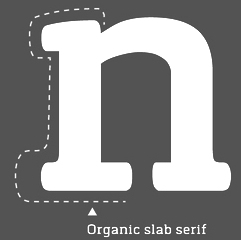 Chatnarong Jingsuphatada is a type designer in Thailand. He set up Typesketchbook in Bangkok. In 2012, Chatnarong made the 4-style plumpish sans family called Gusto and the elegant condensed hand-drawn Olive (2012). Kilo (2012) is a clean sans family of the Eurostile genus. Caffeine (2012) is a hand-printed poster typeface. Gram (2012) is another elliptical sans family.
 Typefaces from 2013: Labrador A and B (a 32-style simple sans family---the B series is a rounded version of the A series), Quan, Quan Slim (32-font organic sans family), and Quan Rounded (a clean sans family covering all weights from Hairline to Black). Typefaces from 2014: Orev (+Hairline: an organic sans), Tolyer (a large letterpress emulation family), Abula and Abula Organic (slab serif family), Klimt (+Organic, a slab serif family). Typefaces from 2015: Noyh (a 72-style geometric sans family with and without rounding; it was extended in 2016 to Noyh A, which has Cafe Press, Bistro, Text and Hand sub-families), Robolt (Machine, Battery (weathered), Vintage (art deco)), Delm (a rounded ink-trapped sans family), Betm (a geometric sans family covering Hairline to Extrablack), Mairy (rounded display sans). Typefaces from 2016: Breul Grotesk (a 32-style Bauhaus-inspired geometric typeface with sharp (A) and rounded (B) subfamilies), Orev Edge (an organic sans), Meltow (Sans, Script and Marker families of hand-drawn typefaces). Typefaces from 2017: Morl Sans and Morl Rounded, Grimpt (handcrafted), Noyh Geometric (with sharp corners), Noyh Geometric Slim, Mates Malty (in Brush, Brush Dry, Marker and Inkpen versions), Vild Scapes (by Chatnarong Jingsuphatada and Kamonjit Lerdsittikul: a handcrafted brush typeface family), Flowy (brush script), Gliny (handcrafted), Betm Rounded. Typefaces from 2018: Grold (a 40-style post-geometric typeface family), Kelpt (rounded sans), Calps Sans, Anteb (an organic sans), Calps. Typefaces from 2019: Prayuth (a 32-style sans), Motiraw (an 28-font bgeometric sans), Germalt (a 32-style geometric sans), Kelpt Sans (32 styles; a corporate version of Kelpt), Tomkin (a 54-style rounded sans), Brilk (a 40-font condensed rounded sans family). Typefaces from 2020: Polate (a condensed grotesk family in 60 styles), Polate Soft, Mula (a basic 80-style sans family with Regular, Slim and Rounded subfamilies), Grold Rounded. Typefaces from 2021: Nordt (a wide serif family in 40 styles), Rohyt (a 32-style rounded sans), Rohyt Geometric. Creative Market link. Behance link. Newest Behance link. [Google]
[MyFonts]
[More] ⦿
|
Typodermic
[Ray Larabie]

|
 Ray Larabie (b. 1970, Ottawa, Canada) ran Typodermic in Mississauga, ON, which opened in the Fall of 2001. In 2006, it moved to Vancouver, BC, and in 2009 it moved on to Nagoya, Japan. Dafont page. Ray Larabie has been making fonts since 1996, but those early fonts were freeware. His pre 2001 fonts are grouped under the label Larabie Fonts. In 2001, he set up Typodermic. Latest additions.
 The Typodermic fonts: - 2022: Biphoton (a monospaced sans with the same proporions as Letter Gothic 12), Valve (an industrial muffler shop font), Deception (a sub-pixel typeface with ten captivating effects---Deception Array (wide blocks), Deception Bars (text viewed through lenticular glass), Deception Blocks (as in heavy JPEG degradation), Deception Diamonds, Deception Lines (for a grayscale effect), Deception Particles, Deception Plusses, Deception Process (simulates grayscale LCD text or a thermal printer on the fritz), Deception Scanline (television picture tube text rendering), Deception System (1-bit dithering gone haywire)), Monofonto (a monospaced sans), Encercle Draft (permitting users to create numbers in borders), Encercle Sans, Heavy Heap (a groovy psychedelic typeface with a scorching look, reminiscent of 1960s hot-rod culture and die-cast toy vehicles), Ggx89 (a 48-style tightly spaced Swiss style sans family).
- 2021: Quadrillion (a 12-style rounded monoline sci-fi family), Mochon (a wall writing or chalk font based on the lettering of Donald Mochon, dean of the RPI School of Architecture until 1966; the Mochon samples were provided by an ex-student of Mochon, Karl A. Petersen), Steelfish Hammer (a subtly rustic version of Larabie's most popular typeface, Steelfish), Wavetable (sci-fi), Xyzai (an LED emulation font, described by Ray Larabie as a hardcore, Y2K-style techno typeface), Geoparody (a 12-style squarish typeface inspired by a late 1960s font called Anonymous), Typewriter Spool (122 fonts, modeled after the Underwood No. 5 typewriter font).
- 2020: Gravtrac (a 56-style condensed to crushed slab serif family inspired by mid-twentieth century classics like Univers 59 Ultra-Condensed, Helvetica Inserat and Compacta; +Greek, +Cyrillic), Vinque Antique (a rustic handcrafted blackletter in eight styles).
- 2019: Dealerplate (17 license plate styles for various states and provinces in the USA and Canada, current as of 2019; included are California, New York, New Jersey, Ohio, Illinois, Pennsylvania, Florida, Maryland, Michigan, Wisconsin, Massachusetts, Missouri, Washington, North Carolina, Virginia, Quebec, and Ontario), Kenyan Coffee Stencil, Good Timing, Steelfish Rounded, Bitcrusher (a consumer electronics / techno font), Galderglynn 1884 (a nineteenth-century style sans-serif typeface that exp[ands his Galderglynn Esquire).
- 2018: Cybermontage, Crack Man (a pac man font), Propaniac (a 1980s-style postmodern typeface inspired by a Pointer Sisters record sleeve which was designed by Shoot That Tiger Creative Services), Zelega Zenega, Spectrashell.
- 2017: Minicomputer (MICR style), Squirty, PCTL9600, PCTL4800 (retro techno), Ultraproxi (semi-monospaced and influenced by the high speed computer printers from the 1950s to 1970s), Toxigenesis (techno sans), Venus Rising, Vanchrome (a compact sans-serif headliner with chromatic layers), Krait (a layered geometric typeface designed for architectural display), Xylito (a layered font for chromatic or 3d effects).
- 2016: Refuel (octagonal, based on military aircraft markings), Expressway Soft (a sans-serif font family inspired by the U.S. Department of Transportation's FHWA Series of Standard Alphabets, also known as Highway Gothic), Conthrax (squarish, techno), Cornpile (cartoonish), Electric, Evensong (art deco), Fledgling (a very tall typeface), Gymkhana (sans), Remissis (sans), Sunday Evening (a reverse contrast typeface), Meloche (Meloche is a unique grotesque sans-serif typeface influenced by hand-painted French signs of the late nineteenth century. It's available in 7 weights and obliques).
- 2015: Canada 150 (a custom font for the Canadian government; see here, here, this coverage regarding the Inuktitut part of the font, and this reaction by the curmudgeons in Toronto who complain that Ray did this work for free), Autoradiographic (sans family), Built Titling (for compact headlines), Chickweed Titling (cartoon titling font), Cardigan Titling (flared headline face), Bench Grinder Titling, Kleptocracy Titling, Palamecia Titling (rounded black comic book typeface), Quasix Titling, Galderglynn Titling (all caps sans family from hairline to black), Mixolydian Titling, Stormfaze (a sci-fi font started in 1996 and finished in 2015), NK57 Monospace (a 60-style programmer typeface), Gargle, Athabasca (a sans family designed for the rugged Canadian oil patch).
- 2014: Mesmerize (a large free sans family), Kingsbridge (a large slab serif family with sharp points on the A, M, N, V and W), Manbow (a layered geometric art deco display font which includes solid, clear, stripe, polka-dot and screen patterns), Breamcatcher (an all caps art deco font inspired by the piano sheet music for With Every Breath I Take which was featured in the Bing Crosby/Kitty Carlisle musical comedy film, Here is my Heart), Kilsonburg (Dutch deco based on an old Vogue magazine cover), Uchiyama (poster typeface), Goldsaber (art deco design), Vexler Slip (unicase), Rakesly, Dacquoise, Pretender, Rimouski (a rounded geometric font family), Nulshock (techno), Recharge (techno/industrial font), Interrogator Stencil, Strange Alphabets (arts and cratfs font), Angerpoise Lampshade (free).
- 2013: Numbers With Rings, Shookup (funky cartoon font), Pastrami on Rye (cutout comic book style), Chickweed, Built (a condensed headline sans), Fluctuation (a softly rounded elliptical sans family), Astrochemistry (sci-fi, techno with rounded edges), Snasm (sci-fi).
- 2012: Engebrechtre (2000-2012), Die Nasty (1999-2012: free), Strasua (1999-2012), Planet Benson (1997-2012), Husky Stash (1998-2012), Barbatrick (1999-2012: a speed emulation font), Zero Hour (1997-2012), Urkelian (1998-2012: very condensed), Zolasixx (inspired by the video game Zaxxon), Ampacity (neon font), Chromakey (a space deco headline font inspired by box art classic video games including Matrix Marauders and Magical Chase), Disassembler (1980s style bitmap font), Zerbydoo (a dot matrix family), Superego (a geometric-techno font inspired by the cabinet graphics for the 1981 Stargate arcade game), Rukyltronic (a set of dot matrix typefaces), Nerdropol (pixel family), Gulkave (rounded pixel font), Cyclopentane, Palamecia (a fat finger poster face), Gameness (a 1990 retro industrial deco font), Camulogen (headline face), Color Basic (a pixel typeface inspired the by TRS-80 Color Computer), Triac Seventy One (a funky face), Acroyear (retro all-caps headline font), Troll Bait, Strenuous (unicase), Permanence (a retro=futuristic font based on Alvin Toffler's cover of Future Shok, 1970), Clockpunk (octagonal and quaint), Battlemaze (trekkie face), Mixolydian (industrial sans).
- 2011: Ugocranis (a brutalist typeface), Clipwave, Wheaton (MICR-inspired), Mango Scribble, TRS Million (dot matrix face), Ugogranis (constructivist), Gomoku (paper cut face), From The Internet.
- 2010: Cranberry Gin (2010, octagonal), Restore (all caps, geometric sans), From The Stars (an elliptical techno family done with Chikako Larabie), Thrusters (space age face), Dream Orphanage, Dream Orphans (2000-2012), Kengwin (rounded slab serif), Gleaming The Cube (Greek simulation face), Vectipede (a slab serif family), Great Escape (an elliptical sans family), Subrocs (connected script), Hackensack (with Chikako Larabie), Polarband (bilined stackable headline face), Naked Power, Special Forces (a great macho slab serif headline face---watch for awards to roll in), Warugaki (handpainted), Warmer, Honfleur (art deco; with Chikako Larabi), Voivode (a headline typeface done with Chikako Larabie), Hachimitsu (Asian look face, done with Chikako Larabie), Kadeworth (rounded retro look sans, done with Chikako Larabie), Gnuolane Jump (2010, with Chikako Larabie), Markerfield (brush), Board of Directors (Bank Gothic style family, done with Chikako Larabie), GGX88 (a Swiss sans family), Body Goat, Reversal, Gord (techno), Computechnodigitronic (LED, LCD geek-look font), Bench Grinder, Inklea (a bubbly face), Skygirls (retro brush script), Gloss (a paint brush typeface based on Champion, 1957, G.G. Lange), Galderglynn Esquire.
- 2009: Maqui (an industrial headline sans family), Zingende (art deco family: caps only), Misadventures, Gaz (large retro sans family), Acrylic Brush, Enamel Brush (a digitization of Catalina, 1955, Emil J. Klumpp), DDT (neutral sans), Thump (fat, casual), Desperate Glamour, Pricedown (an update of his free 1990s font, patterned after the lettering on The Price Is Right show), Mitigate (monoline and slabbed; has some typewriter styles), Catwing, Walken (slab serif stencil), Silicone (soft rounded sans family), Movatif (sans), Gunplay (a stencil family inspired by the poster for the 1972 Steve McQueen/Ali MacGraw film The Getaway), Fragile Bombers (octagonal), Forgotten Futurist (techno sans, 19 styles), Bullpen (slab serif), Coolvetica (35 styles), Duality, Good Times, Strenuous, Shlop (paint-drip style), Dirty Baker's Dozen (stencil), Junequil (VAG Rounded style), Owned (graffiti), Domyouji, Threefourtysixbvarrel (stencil), Enacti, Uniwars (futuristic, 16 styles).
- 2008: Madawaska (a rugged slab serif), Ebenezer (grunge), Gnuolane Stencil, Raincoat, Report School (avant garde sans), Jesaya, Carouselambra (art nouveau), Debusen (rounded), Barge (military font), Renju (2008, potato or rubber stamp print face), Otoboke (handlettered), Hit (informal hand), R6 D8 (futuristic sans family), Rexlia (an octagonal machinistic family), Hybrea (a display sans with TV screen rounding), Sweater School, Tussilago (2008, a neutral sans family), Presicav (extended sans), Hover Unit, Addlethorpe (grunge), Scheme (rounded sans), Usurp (bouncy poster lettering), Negotiate (technical sans family), Divulge, Sewn, Gnoulane (condensed sans), Moja, Teeshirt (old typewriter face), Pound (art deco marries grunge), Graveblade (heavy metal font), Synthemesc (psychedelic anti-Starbucks font), Chysotile (white on black grunge), Cardigan (sans), Gurkner (balloon style), Reagan (grunge).
- 2007: Tight (a copy of Dean Morris's 1976 Letraset chrome font Quicksilver), Headlight, Meloche (a 3-style grotesk), Octin Spraypaint (grunge stencil), Octin Vintage (grunge), Bouffant (script), Octin Prison (stencil), Octin Sports (octagonal), Octin College (octagonal, for sports jerseys), Octin Stencil (free octagonal font family), Burnaby Stencil (stencil), Superclarendon, Conceal, Ohitashi, Stud (grunge), Bristles (grunge), Skirt, Cotton (grunge), Kelvingrove (a bit of copperplate gothic, rounded and shaved), Augustine, Containment, Snowa, Veriox, Scrubby, Transmute, Sheaff, Injekuta (techno), Rinse (grunge), Polyflec, Domyouji (square sans), Winthorpe (old style), Cutiful (script), Flyswim (grunge), Dirtstorm (spray-painted stencil), Shnixgun (grunge), Neuzon (grunge), Oxeran (old typewriter), PRINTF (grunge all caps monospaced), Akazan (sans), Nyxali (a metal tag face), Nesobrite (25 styles of Bank Gothic lookalikes), Meloriac (a heavy headline sans inspired by Futura), Walnut (graffiti face), Gnuolane (a narrow superelliptical sans), Edifact (a damaged computer font), Darkheart, Stampoo (squarish), Raymond (rough script), Hayate (oriental look), Telephoto. The entire Octin series is free at DaFont.
- 2006: Octynaz (grunge), Paltime (ornamented), Jolie Ecriture Desard (children's hand), Mango (comic book face), Desard (child's hand), Bulltoad, Lerku (eroded serif), Charbroiled (also eroded), Ceroxa (eroded stencil), Nagomi (a chiseled-look Asian font based on calligraphy of Chikako Suzuki from Nagoya), Whiterock, Yellande, Chilopod (a futuristic typeface inspired by the logo from the 1980s videogame, Atari Centipede), Order, Goldburg (based on a typeface by George Bowditch, 1957), Laserjerks (2006, brutalist), Milibus (futuristic), Bonobo (serifed), Ohitashi, Sarasori (TV-tube shaped typeface in the style of Oban), Structia (an octagonal family), Betaphid (octagonal), Gendouki (futuristic stencil), Slugger (athletic lettering), Marianas (a gorgeous art deco face), Lineavec (octagonal), Corzinair (serif family), Buxotic (a great caps face), Cinecav X (for closed caption TV and DVD), Salsbury (comic book face), Lonsdale (loosely based on a font called Parkway Script, which was designed by Emil Hirt in 1964), Alepholon (futuristic), Kwokwi, Mikadan (a tribute to Stephenson Blake's Verona from 1948, which was in turn based on William Dana Orcutt's Humanistic from 1904), Marion (2012: a beautiful transitional family adopted as a standard Mac OS X font), Quasix (hookish), Skraype (grunge stencil), Bleeker (casual lettering), Linefeed (monospaced line printer font), Draculon (a casual typeface inspired by the letterforms of William Orcutt's humanist font from 1904 which was in turn based on an Italian manuscript from 1485), Mahavishnu (a mix between 1970s psychedelics and art nouveau), Doradani (a corporate identity sans family), Korotaki (futuristic).
- 2005: Beat My Guest, Kadonk (a Halloween face), Report (a VAG-Rounded style face), Croteau (a poster face), Heroid (ook face), Barrista (informal script), Wyvern (sans serif), Wubble (like puddles of water), Caryn (casual script), Folder (a rigid sans family), Venacti (a futuristic family), Xenara (a keyboard lettering family), Emory (a destructionist sans family), Ligurino (neat sans&serif family), Biondi (update of Copperplate Gothic; followed in 2010 by Biondi Sans; these copperplate style typefaces are in the style of AT Sackers), Byington (Trajan column lettering), Sayso Chic, Expressway (28 weights, a highway signage family), Algol (pixel type), Meposa (fat display face), Tandelle (condensed), Vigo, Maychurch, Mecheria, Vactic (dot matrix), Zosma, Topstitch, Windpower, Llandru, Soap (a creative extension of Cooper Black, with dingbats), Kleptocracy (1999-2005), Owned, Rimouski (sans), Burnstown Dam (2005, a wooden plank font), Sinzano (sans with opentype ligatures galore; compare, e.g., House Ed Interlock), Zamora.
- 2004: Affluent, Threefortysixbarrel (stencil face), Tank, Telidon (dot matrix face), Funboy, Neuropol X, Neuropol Nova, Mufferaw (comic book face), Larabiefont, Zekton (techno), Strenuous 3D, Silentina (advertised as "a silent movie font"), Amienne (brush script), Fenwick Outline (free), Betsy Flanagan (1998, a keyboard face), Boopee (children's handwriting), Pirulen (in the general Bank Gothic style), Zalderdash.
- 2003: Zupiter, Blue Highway.
- Before 2002: the dot matrix family Telidon, Telidon Ink, Butter Belly, Almonte (1999), the architectural font Jillican (octagonal), Snowgoose, Bomr, Pakenham, Neuropol, Nasalization, Fenwick, Kleptocracy DLX, Sui Generis, Dirty Bakers Dozen (faded stencil), Minya Nouvelle, Asterisp, Chinese Rocks, Jillsville (great artsy Courier), Ulian, Wevli (including Wevli Dingbats), Sappy Mugs (funny mugshots), Sofachrome (1999, inspired by Pontiac car emblems), Eden Mills (1999).
MyFonts interview. Fontspace link. Fontspring link. Catalog of the typefaces in the Larabie Fonts collection. Klingspor link. Catalog of the Typodermic library in decreasing order of popularity. Extensive (large page warning) Typodermic catalog. Font Squirrel link. Creative Fabrica link. Fontsquirrel link. Fontdaily link. [Google]
[MyFonts]
[More] ⦿
|
Typogama
[Michael Parson]

|
 Typogama is the personal foundry of Swiss designer Michael Parson (b. Geneva, Switzerland, 1979), who published these fonts in 2003 as part of Linotype's Taketype 5 collection: Anlinear LT Std Bold, Anlinear LT Std Light, Anlinear LT Std Regular, Arabdream LT Std (Arabic simulation face), ClassicusTitulus LT Std, Hexatype LT Std Bold, Morocco LT Std, Jan LT Std, Ned LT Std, Pargrid LT Std Cross, Pargrid LT Std Regular, Pargrid LT Std Trash, Piercing LT Std Bold, Piercing LT Std Code, Piercing LT Std Regular, Raclette LT Std.
 Most of Parson's fonts cover both Latin and Cyrillic. In 2004, he made Clans (T-26, blackletter) and Boulas (T-26). In 2006, he released these at T-26: Boutan (Indic simulation face), Heraldry (dingbats), Palm Icons (dingbats for golf), Wingbat (aircraft dingbats). In 2007, still at T-26: Heraldry, Thunderbolt 73 through 76 (from techno stencil to techno sans). In 2008, at T26: Ealing (geometric sans family, with a hairline), Bauhau (6 weights), Jane (a rounded sans in 12 weights), Quean, Halja (a modular sharp-edged blackletter with illuminated capitals), Faddish (a high-contrast vogue family), Big Boy (11 styles, a slab family from grunge to regular, accompanied by BigSigns, a hand sign font). Fonts from 2010: Tinsel (condensed), Rusty (Latin / Cyrillic constructivist typeface inspired by snowboarding), Vindaloo (+Outline, T26), Kimbo (octagonal slabby family), Cyrus (for Latin, Greek and Cyrillic), Calvin (a monoline sans family, +Hairline), Checkpoint (rounded display sans that won an award at Modern Cyrillic 2014), Fuera (2011: a bilined typeface, T26). In 2013, he published Selecta (an organic rounded sans, T26), Thunderbolt (an octagonal army style typeface family with a military stencil, T-26), Xcetera (2011), Ignorance (an American 19th century style penmanship font), Psalta (an octagonal blackletter typeface), Nadsat (a geometric display sans with some interlocking letters), Cobono (organic sans), Prox (sans face), Zurika (a wonderful crazy script face), Faddish (T26: a fashion mag typeface), Heraldry (T26), Cedi (YWFT: a hand-printed typeface family with huge multi-character ligature set to simulate real handwriting), Tcho (T26: a soft rounded sans family that covers Latin, Thai, Arabic, Greek and other scripts), Dejecta (a striking scratched titling face, T26), Nedo (2011, a bold prismatic display typeface inspired by the work of Nedo Mion Ferrario in Venezuela), Quam (2012, an elliptical sans family), Pictypo (2012, a useful icon typeface). In 2014, he updated the interlocking poster display typeface Tinsel (T26---original from 2010) and published the fantastic cartoon / comic book typeface family Bangbang. Siggy (2014) is a funky typeface. Lale (2014), which won an award in the TDC 2015 Type Design competition, uses the opentype features to set up a font system for flowers. Jane (2014) is a rounded sans typeface family. Vulgat (2014) is a vibrant display typeface based on uncial letterforms. Elsuave is a free rounded piano key typeface. Typefaces from 2015: Chickenz, Framez, Jackazz, Raubam (free), Martinaz (signage script). Typefaces from 2016: Auro (rounded sans), Dejecta (rough and ragged), Apollonius (a swashy didone), Rosengarten (vintage type influenced by Lucian Barnhard), Deleplace (influenced by didones), Furius (Tuscan style). Typefaces from 2017: Kurstiva (an informal sans family), Banja (a plump signage script), Bignoy (Wild West, modernized), Kimbo (octagonal), Mensrea (organic sans with beveled, inline, and various layered and graffiti styles), Nibbles (a food truck-inspired dingbat typeface), Huggy (an art nouveau typeface influenced by the work of Heinrich Heinz). Typefaces from 2018: Brinnan (a wide sans), Zoltana (a floriated, abll terminal-laden fancy titling typeface), Genesa, Kufin (a free Kufic emulation typeface), Madden (an angry dry brush poster typeface). Typefaces from 2019: Ahsing (oriental look font), Convexion (a creamy display typeface), Vidocq (based on 19th century woodcut styles). Typefaces from 2020: Fiducia (inspired by the first Swiss banknotes), Gorgonzo (a creamy bold typeface designed for attention grabbing headlines), Thrifty (a clean minimalist sans family). Typefaces from 2021: Oildale (an oily and creamy display typeface), Conica (a fine extra bold condensed poster typeface). Typefaces from 2022: Xotor (a double-inline or prismatic font with octagonal outlines). Behance link. Klingspor link. Hellofont link. MyFonts link. View Michael Parson's typefaces. [Google]
[MyFonts]
[More] ⦿
|
Typolar (was: Jarno Lukkarila Type Foundry, or: Format Design)
[Jarno Lukkarila]

|
 Jarno Lukkarila (b. 1978) works mainly in graphic design. As the author of the typography reference book Tekstuuri: typografia julkaisijan työvälineenä (2001, Helsinki: CredoNet) he is one of the few writing about the subject in the Finnish language. He ran a typography-oriented design studio called Format Design in Helsinki and lectures part time on typography in Finnish design schools. Lukkarila was recognized as a type designer in the Morisawa Awards 2002, where his Xtra Sans typeface received the bronze prize in the Latin category. Lukkarila studied type design at the Royal Academy of Art, the Hague, in the postgraduate course Type&Media highlighted by the writing and letter design workshop of Gerrit Noordzij in 2000. Before this he graduated as graphic designer in Finland. Format Design became Jarno Lukkarila Type Foundry, and in 2010 morphed into Typolar, which is based in London. Typolar is run with Teemu Ollikainen and Saku Heinänen.
 His type families, most of which start with an extreme hairline weight. - Xtra Sans: this won an award at TDC2 2007.
- In 2009, he finally published his 66-style Egyptian family Tanger Serif. Images: Medium Heavy, Narrow, Wide Ultra light.
- Calypso E (2010, E for Egyptian): a slab serif. Calypso I (2010, I for Italian) is a Victorian face.
- Vinkel (Typolar) was not designed by Lukkarila---it is a mini-slab serif family by Saku Heinänen.
- Altis (2011, Typolar). A readable sans family from Hairline to Black---ideal for information design.
- In 2012, he designed the custom Suunto UI Sans for the sports watch company Suunto.
- Typefaces from 2013 include the extensive Neuvos family. He writes about this small-serifed large-x-height family: Its large x-height, vertical stress and snug serifs make Neuvos an upfront and tough headliner. Although it has a hard-boiled cover, one can find hints of noble Transitional type like Baskerville underneath. Neuvos assures in editorial work and brings its Frutiger inherent calmness into branding or even signage systems. Neuvos Condensed was added in 2020.
- In 2014, he designed Walmer Marker (for signage applications).
- Typefaces from 2016: Etihad (a bespoke family for Etihad Airways), Alku Handwriting, motivated in this manner: The Finnish National Board of Education published a new recommendation for teaching handwriting in 2015. New letterforms were designed by Jarno Lukkarila (of Typolar) who participated in a committee set up for the renewal. This writing model will be used in virtually every Finnish primary and pre-primary school across the country from August 2016 on. Only a so called print writing will be provided by FNBE leaving the joined-up cursive writing as we've known it in the past.
- Era Grotesk (2020). A grotesk in the style of the early 1900s.
Klingspor link. Behance link. [Google]
[MyFonts]
[More] ⦿
|
Typomilan
[Massimiliano Frangi]
|
Italian designer of the hairline sans Prestinée Sans (2007), which has an excellent hairline weight. [Google]
[More] ⦿
|
Typotheque
[Peter Bilak]

|
 Typotheque is an initiative of Peter Bilak and ui42 out of Bratislava (Slovakia), and later, The Netherlands: Typotheque is an Internet-based independent type foundry. It offers quality fonts for PC and Macintosh platforms in standard European character set and in CE (central european) character set. All fonts have full (european) character sets, are thoroughly tested and manually kerned.
 Typotheque also offers its own type utilities: AccentKernMaker and FontAgent. In 2000, with Stuart Bailey, Peter Bilak co-founded art and design journal Dot Dot Dot. Along with Andrej Kratky he co-founded Fontstand.com, a font rental platform. Peter is teaching at the Type & Media postgraduate course at the Royal Academy of Arts, The Hague. Free fonts: Remix Typotheque and RaumSüd. Commercial fonts: Fedra Sans (2001, 30 weights), Holy Cow (2000), Champollion (2000), Eureka (2000), Eureka Phonetik (2000), Eureka Arrows (2000), Eureka Glyphs (2000), Jigsaw (Light and Stencil, 2000, by Johanna Balusikova), Fedra Mono (2002), Fedra Bitmaps (2002), Fedra Serif (2003, 48 weights, with a characteristic shy female A, toes pointing inwards), Fedra Serif Display (2006) and Fedra Arabic (2006) . Greta (2006-2007, Greta Text and Greta Display) is a newspaper type family designed initially for the main Slovak newspaper, SME. Greta Text won an award at TDC2 2007. It is also being used by the Sunday Times (along with Sunday Times Modern by Emtype and Flama by M. Feliciano). Greta Symbol (2012) is a 10-style 1200-glyphs-per-style superfamily of symbols commonly used in newspapers, magazines and online publications. Finally, Greta Mono (by Peter Bilak and Nikola Djurek) saw the light in 2015. Codesigner with Daniel Berkovitz of Greta Sans Hebrew (2015), which won an award at TDC 2016 and was released in 2017. Greta Sans supports Latin, Greek, Cyrillic, Armenian, Arabic, Hebrew, Devanagari, Thai and Hangul. Greta Sans was designed by Peter Bilak, produced together with Nikola Djurek. Irina Smirnova designed the Cyrillic version. The Latin part has been published in 2012, the Cyrillic and Greek in 2015. In 2015, Greta Sans was recognised by the Tokyo TDC. The Arabic version was designed by Kristyan Sarkis and published in 2015. Greta Sans Devanagari was published in 2017, designed by Hitesh Malaviya at ITF under the supervision of Satya Rajpurohit. The Thai version was designed by Smich Smanloh from Cadson Demak, and published in 2019. This Hangul version was designed by Sandoll designers Yejin We and Jinhee Kim, and directed by Chorong Kim. In 2005, Collins Fedra Sans and Serif were published for use in the Collins dictionaries. A slightly modified version of Fedra Sans is used by the Czech Railways. In 2008, Peter Bilak, Eike Dingler, Ondrej Jób, and Ashfaq Niazi created the 21-style family History at Typotheque: Based on a skeleton of Roman inscriptional capitals, History includes 21 layers inspired by the evolution of typography. These 21 independent typefaces share widths and other metric information so that they can be recombined. Thus History has the potential to generate thousands of different unique styles. History 1, e.g., is a hairline sans; History 2 is Peignotian; History 14 is a multiline face; History 15 is a stapler face, and so forth. In 2009, Bilak published the extensive Irma (Sans, Slab) family, which includes a hairline. Typotheque's other designer is Johanna Balusikova. Collection of over 90 articles on type design by by Stuart Bailey, Michael Bierut, Peter Bilak, Andrew Blauvelt, Erik van Blokland, Max Bruinsma, David Casacuberta, Andy Crewdson, Paul Elliman, Peter Hall, Jessica Helfand, Steven Heller, Roxane Jubert, Emily King, Robin Kinross, Rosa Llop, Ellen Lupton, Martin Majoor, Rick Poynor, Michael Rock, Stefan Sagmeister, and Dmitri Siegel. In 2011, he created Julien, a playful geometric display typeface loosely inspired by the early 20th century avant-garde. It is based on elementary shapes and includes multiple variants of each letter. It feels like a mix of Futura, Bauhaus, and geometric modular design. Julien (2012) is a playful geometric display typeface loosely inspired by the early 20th century avant-garde. Karloff (2012, Typotheque: Positive, Negative, Neutral) is a didone family explained this way: Karloff explores the idea how two extremes could be combined into a coherent whole. Karloff connects the high contrast Modern type of Bodoni and Didot with the monstrous Italians. The difference between the attractive and repulsive forms lies in a single design parameter, the contrast between the thick and the thin. Neutral, the offspring, looks like a slab face. They were made by Peter Bilak, Nikola Djurek and Peter van Rosmalen. Lumin (2013) is a family that includes slab-serif, sans serif, condensed and display typefaces, and no attept is made to make them uniform in style. Lava (2013) is a magazine typeface originally designed for Works That Work magazine. It was extended to a multilingual workhose typeface family. It as extended in 2021 to Lava 2.0, at which time they added a variable version of Lava that does this size-specific tracking optimization automatically---Typotheque calls it optical spacing. By 2021, Lava covered Latin, Greek, Cyrillic, Devanagari, Telugu and Kannada. Typotheque collaborated with type designers Parimal Parmar, who drew the Devanagari; and Ramakrishna Saiteja, who drew Kannada and Telugu companions for Lava Latin, designed by Peter Bilak. For Musée des Confluences in Lyon, France, Typotheuqe designed the custom sans typeface Confluence (2014). For Buccellati Jewellery and Watches in Milan, Typotheque made the classy sans typeface Buccellati in 2013. In 2016, Peter Bilak, Nikola Djurek and Hrvoje Zivcic published the Uni Grotesk typeface family at Typotheque. It is based on Grafotechna's 1951 typeface Universal Grotesk, which in turn is based on 1934 design by Vladimir Balthasar. Noteworthy also is the prismatic style Uni Grotesk Display. In 2016, Peter Bilak designed the wayfinding sans typeface family November for Latin, Greek, Cyrillic and Hebrew. Its rounded version is October. November, co-designed by Peter Bilak, Irina Smirnova and Kristyan Sarkis, won two awards at Granshan 2017. November Stencil was published in 2018. The Q Project was conceived in 2016 by Peter Bilak, and published in June 2020. Nikola Djurek produced the Q Shape 01, loosely based on the Edward Catich's basic brush strokes from his book The Origin of the Serif: Brush Writing and Roman Letters. Bilak explains: The Q Project is a game-like [modular] type system that enables users to create a nearly infinite number of variations. Inspired by toys like Lego or Meccano, Q invites you to explore its vast creative space and discover not only new solutions, but also new problems. Q consists of ix uppercase Base fonts and 35 attachments that can be added as individual layers (Q Base and Serifs). It also comes with a variable font with a motion axis (Q Mechanic), as well as three levels of basic shapes that can be combined into new forms (Q Shapes). In 2021-2022, Typotheque custom-designed the humanist sans typeface NRK Sans for the Norwegian broadcaster, NRK. History won an award at ProtoType in 2016. Behance link. Typedia link. [Google]
[MyFonts]
[More] ⦿
|
Ultra light geometric fonts
|
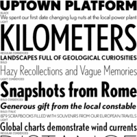 Stephen Coles lists very light geometric sans typefaces:
 - Futura
- Neutraface
- FB Nobel
- DTL Nobel
- Avenir (with the only Q better than Vanity Fair's)
- FF Super Grotesk
- Drescher Grotesk
- Metro
- 20th Century
- Gotham
- Proxima Sans
- Mostra
- Relay
- Monica
[Google]
[More] ⦿
|
Ultra Thin Fonts
|
Sonja Mansfield selects a few ultra thin fonts for designers. [Google]
[More] ⦿
|
Ultra thin typefaces
|
 This discussion on TYPO-L is about ultra-thin typefaces. Those proposed include
 - Jonathan Hoefler's Didot family.
- Font Bureau's Benton Sans, Nobel and Interstate (1993, Tobias Frere-Jones).
- Taz III by Luc(as) de Groot, the extended version of what once was Tazzer. It has 5 (five) weights of hairline versions alone.
- Phil Martin's Martin Gothic Thin.
- ITC Bodoni.
[Google]
[More] ⦿
|
Valentin Adam
|
 French graphic designer who spent 2007-2009 at Ensaama Olivier de Serres in Paris. He does experimental type. His creations include Fake, Madone, Composite, Hommes Femmes (2008: geometric solid) Eleanor (hard sans), Marlene (octagonal), Magdalena, Versailles, Strates (multilined), Vanina-Vanina (artsy hairline sans), Quarante Cinq, TweenLady, Tatiana (hairline) and Lettuce. Old URL. [Google]
[More] ⦿
|
Vasco Lima
|
Lisbon-based designer of the thin condensed sans typeface Vitoria (2012). [Google]
[More] ⦿
|
Very thin sans serif fonts
|
 Discussion on typophile regarding very thin sans fonts. The list compiled by them includes: Interstate FB, Romeo (Font Bureau:: the Thin weight is really thin--it is due to Jill Pichotta), Agenda (Font Bureau), TazIII (DeGroot), Fontesque Sans Ultra Light (Shinn), Preface Thin (Shinn), Alphaville Thin (Shinn), Anisette Petite Thin & Anisette Thin (Porchez), Parisine Clair & Parisine Plus Clair (Porchez), Gotham Thin (Hoefler&Frere-Jones), Neutraface Thin & Neutraface Condensed Thin (House), Whitney and Whitney Condensed (Hoefler&Frere-Jones), FF Meta Hairline (Christian Schwartz), Proxima Nova Thin, Condensed Thin, and Extra Condensed Thin (Mark Simonson), Apex Sans Extra Light (Thirstype), FF Daxline Thin (Hans Reichel), FF Absara Sans Thin (Xavier Dupré), Abadi Extra Light, FF Unit Thin (Erik Spiekermann and Christian Schwartz), Horatio Light, Kabel Light, Neue Helvetica Ultra Light, Sun II Extra Light, URW Martin Gothic Thin, ClearviewOne Extra Thin and Thin (Terminal Design), Politica Thin (Alejandro Paul), Precious, Cactus, Nubian, Paralucent, Fedra Sans Display 1 (Peter Bilak), Mundo Sans Extra Light, Truth FB Thin (David Berlow). The discussion is biased towards commercial offerings, with most designers plugging their own stuff. My favorite, Mostra (Mark Simonson), was not even mentioned! Continued here. [Google]
[More] ⦿
|
Vian Peanu
|
Bucharest-based partner in Dos Cabrones, with Andrei Ograda. His fonts can be bought under the name at Creative Market. Vian Peanu designed Cirquit, It's Friday, Dioda, Sting, Desgraciado, Daedal, Bastard, Minette, Magnus (rounded piano key face), Lacuna (hairline stencil), Fat Lady (2010), Cylon, Dgtl, Kalypso, Sting, Passio, Maha, Qanat, It's Friday, Violently Violent (2011, art deco/piano key family), Asymptote (2011, thin display face). In 2012, Vian Peanu and Andrei Ograda co-designed Venin (a beautiful high-contrast thorned fashion mag family with art deco aspirations). Vian designed the layered typeface Uxie. Behance link. Creative Market link. [Google]
[More] ⦿
|
Viktor Hammarberg
|
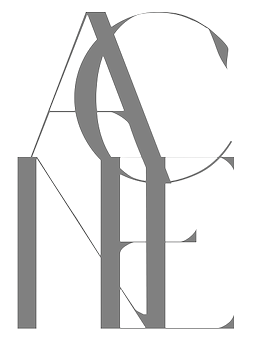 Karlskrona, Sweden-based designer of the rune simulation typeface Fort Wendy (2014), The Medic (2014), Coco Puff (2014), Maniac (2014: avant garde), Agony (2014: hairline circle-based experimental typeface), Acne (2014), and the hairline sans typeface Galacticastle (2014).
 Dafont link. Aka Viktor Hamburger. Behance link. [Google]
[More] ⦿
|
Viktor Pesotsky
[Fontype]

|
[MyFonts]
[More] ⦿
|
Village
[Chester Jenkins]

|
 Foundry of Chester and Tracy Jenkins, which is based in the East Village of New York City. Under their own label, established in 2005, they published Galaxie Polaris (2005, geometric sans; the Light is very thin). Village is also a type coop for these foundries:
 - Feliciano Type Foundry (Mario Feliciano in Portugal): Rongel (2005), B-Sides (2004), Morgan Project (2003), Flama (2002), Stella (2000), Garda (1998), Grotzec Headline Condensed (1998), Merlo (1997).
- Joshua Darden (Brooklyn, NY): Omnes (2005).
- KLTF (Karsten Luecke in Goettingen, Germany): Litteratra (2005).
- Lux Typographics (Michael Rey and Greg Lindy in LA): Crank 8, Section, Lux Sans, Nova.
- Orange Italic (Christian Schwartz in NYC): Local Gothic (2005).
- Thirstype: launched in 1994 by Rick Valicenti to publish his font Bronzo, and soon expanded to present the work of Barry Deck, Magnus Rakeng, Patric King, Chester, Paul Sych, Frank Ford, Patrick Giasson, Claudio Piccinini, and Hugo d'Alte. Faces: Kaas (Hugo d'Alte, a "blackletter typeface for the 21st century, with Latin, Cyrillic, and Hebrew alphabets", Mavis (Chester), and the architectural hairline outline typeface Daily (2003, with Tracy Jenkins).
- Type Initiative: Type Initiative is a typefounding and design collective based in Canada and Greece. It was co-founded by type designers Michail Semoglou and Keith Chi-hang Tam. Faces: Arrival (2005).
- Underware: Bello (2005), Auto (2004), Sauna (2002), Dolly (2001).
- Kontour (Sibylle Hagmann): Odile (2005).
- Hugo d'Alte: Kaas (2005), a geometric blackletter covering extended Latin, Cyrillic, and Hebrew.
[Google]
[MyFonts]
[More] ⦿
|
Vishnu Vijithatma
|
Product designer in Coimbatore, India, wo created the thin monoline sans typeface Boo (2012). [Google]
[More] ⦿
|
Vladimir Likh
[Triangle & Cross]

|
[MyFonts]
[More] ⦿
|
Wayne Kieran
|
UK-based FontStructor (student at UWE) who made the hairline negatively tilted typeface The New Italic (2010). [Google]
[More] ⦿
|
Webvilla
|
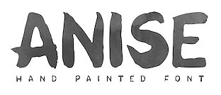 Polish designer of the thin upright script typeface Mila (2016) and the sans typefaces Friday (2016), N78 Thin (2016) and Exmila (2016).
 Typefaces from 2017: The Youngest (textured), Harold (fashionable), Philemon (handcrafted), Tamarind (handcrafted blackboard bold typeface duo), June Morning, Cardamine (marker caps), Cedrus, Tarant (sans), Gramin (a great inky brush font), Moricandia, Thyme (curly letters), Parsley, Lovage (all caps sans poster type), Camomile, Chervil (sketched), Hornimet (watercolor brush), Asure (rounded all caps geometric sans), Savory (handcrafted), Anise (thick watercolor brush script), Hagna (sans), Marjoram (curly script), Caraway, Fonto. Typefaces from 2018: Realism (headline sans). [Google]
[More] ⦿
|
Wiescher Design
[Gert Wiescher]

|
 Gert Wiescher was born in Braunsbach am Kocher, Germany, in 1944. Based in München, Gerd Wiescher designed many classy and classic Bodoni families, as well as New Yorker Type (1985). All of his typefaces are carefully fine-tuned and balanced. Wiescher founded first Munich Type and then Wiescher Design and Autographis. He is known as a hard, fast and prolific worker. His exquisite typefaces can be bought at MyFonts. Catalog of his bestselling typefaces. Interview in 2008. Wikipedia page. Creative Market link. List of typefaces:
 - Scripts: Prima Script (2017: for menus and cookbooks), Marmelade (2015, +Fruits, a set of dingbats), Triana (2014, a thin monoline penmanship script named after a Spanish sailor on the Pinta who in 1492 was the first to see America---in this case the Bahamas), Floral Script (2014, copperplate style script), Sherlock Script (2014: this comes with Sherlock Stuff (fingerprints) and Sherlock Stuff Dots (ink stains)), Felicita (2013, a swashy copperplate script), Vividangelo (2013, after the handwriting of a real person), Dreamline (2013, connected monoline cursive wedding scripts in A, B and C styles), Fiorentina (2012, a renaissance style script with 650 characters), Excelsia Pro (2012), Delicia Pro (2012, a fat brushy signage script), Nono (2011, formal swashy calligraphic family), Dyane (2011), Penn (2011), Lettera (2011, hand-drawn formal face), Tosca (2010, a high-contrast calligraphic typeface with 730 glyphs), Grandcafe (2010), Loulou (2010, curly and of extreme contrast), Schoolblock (2010, hand-printed school font), Grandezza (2010, calligraphic family; +Xtra), Sixtra (2010, a curly didone script), English Script (2010, classic Spencerian calligraphic script), Savage Initials (2009), Morning News (2009), Revolte (2009, a brush script for demonstration signs), Estelle (2009), Scriptofino (2008, 4 calligraphic styles to give Zapfino a run for its money), Exprima (2008), Daiquiri (2008), Lisa Bella, Lisa Fiore and Lisa Piu (2008, connected and calligraphic), Tati (2008), Movie Script (2007), Cake Script (2007), Eddy (2007, grungy calligraphy), Pointino (2007), Bohemio (2007, a great oriental-brush script), Artegio (2007, two calligraphic scripts), Xylo (2006, in the tradition of the 18th-century English calligrapher George Bickham and the 19th-century American calligrapher Platt Rogers Spencer), Tamara (2005, art-deco script based on some initials for Semplicita made in the 1930s by the Nebiolo foundry), Tecon, Ellida (2005, inspired by the elaborate scripts of 18th-century English calligrapher George Bickham, with additional influences from 19th-century American calligrapher Platt Rogers Spencer), Eloise (2009, a high-contrast version of Ellida), Nadine Script (2005, an elegant script inspired by a set of initials the French designer and artist Bernard Naudin drew for Deberny&Peignot in the 1920s), Royal Classic (2005, unbelievable script based on a design that has initially been comissioned by King Ludwig I of Bavaria for in-house-use), DesignerScript, Filzer Script (1995, handwriting), Futuramano-Condensed-Bold, Futuramano-Condensed, Futuramano-Plain, Futuramano-Thin, Giambattista, Scriptissimo-Plain, Scriptissimo-Forte, Scriptissimo-Swirls, Squickt (1989), Konstantin A, B and C (2005), Konstantin Forte (2005), MyScript, GrocersScript, Swanson (2006). Scriptissimo (2004) has versions named Start, Middle and End, tweaked for their position in the word, and there are plenty of ligatures. Check also Bodoni Classic Chancery (2007) and Bodonian Script (2012).
- Sans: Brute Sans (2018), Xpress (2018), Xpress Rounded (2019), Classic Sans (2017, a revival of Theinhardt Grotesk), Classic Sans Rounded (2017), Maxi (2017), Nic (2017), Azur (a large almost geometric sans famly with 1950s Roger Excoffon-style French flavours, called a Medterranean grotesk by Wiescher himself), Royal Sans (2017, after Theinhardt's Royal Grotesk---the forerunner of Akzidenz Grotesk--- from 1880), Docu (2016, a workhorse elliptical sans family), Viata (inspired by Bauhaus), Noticia (2016, in the Bauhaus tradition, with very pointy v and w, and a bipartite k; not to be confused with the 2011 Google Web Font Noticia Text by José Solé; followed in 2019 by Noticia Rounded), Avea (2015), Aramis, Nota Bene (2015: squarish, narrow, technical), Nota (2015, technical and cold: the rounded version, Nota Rounded, followed in 2019), Dylan Condensed (2014), Dylan Copperplate (2014), Supra (2013, grotesk: Supra Thin is free. See also Supra Condensed (2013), Supra Mezzo (2013, between regular and condensed), Supra Extended (2013), Supra Rounded (2015), Supra Classic (2014), and Supra Demiserif (2013, slab serif derived from Supra)), Dylan (geometric sans), Franklin Gothic Raw (2013, like Franklin Gothic but with raw, not rough, outlines, only visible at very large sizes), Blitz (2012, a flared family), Blitz Condensed (2012), Contra Sans (2011, which led to Contra Slab, Contra Condensed and Contra Flare), Vedo (2011, a Bauhaus style family that include a hairline weight), Germania (2011, a useful and beautiful monoline sans family), Geometa (2011, +Rounded, +Rounded Deco, +Deco: all based initially on Renner's Futura), Geometra Rounded (2011, a rounded family based on Futura and "much less boring than DIN"), Bombelli (2010, ultra-wide architect's hand), Bluenote Demi (2010, a grungy Franklin Gothic Condensed), Perfect Sketch (2010, sketched grotesque), Unita (2009), Antea (2009), Eterna (2009, sans with a swing), Pura (2008, an uncomplicated grotesk family), Purissima (2010, a decorated extension of Pura; +Bold), Copperplate Gothic Hand (2009, after a 1901 design by Goudy), Copperplate Alt (2011), Copperplate Wide (2011), FranklinGothicHandDemi (+Shadow), Franklin GothicHandCond (2009), Franklin Gothic Condensed Shadow Hand (2010), and Franklin Gothic Hand Light (2009, a hand-drawn version of Franklin Gothic), Papas (2005, sturdy, slightly curly), Julienne (2005, a condensed sans family; see the new versions Moanin and Julienne Piu, 2017), Cassandra (1996, an art deco style after Adolphe Mouron Cassandre), Futura Classic (2006), Cassandra Plus (2012), Ela Sans (2005, a large family), Mondial-Bold (2004), Mondial-Demi, Mondial-Light, Mondial-Medium, Mondial-Normal, Mondial-XBold, Monem-Bold, Monem-Medium, Monem-Normal, Monem-Roman.
 Serif: Imperia (2011, a Trajan column caps face), Monogramma (2012, a Trajan family for monograms), Imperium (2005, a precursor of Imperia with a Relief shadow style included), Hard Times (2011), Fat Times (2011, retraced Times), Elegia (2011, slightly Victorian family), Breathless (2010, a spiky family, inspired by nouvelle vague movie posters), Bodoni Classic 1, Bodoni Classic 2, Bodoni Classic 3, BodoniClassic-Condensed, BodoniClassic-Handdrawn, BodoniClassic-Swashes, BodoniClassic-Text, Bodoni Classic Deco, Bodoni Classic Swirls (2009), Bodoni Classic Pro (2011), Bodoni Classic Inline (2012), Bodoni Classic Fleurs (2014, ornamental caps), Bodoni Comedia (2010, one of my favorites: a funny "live one day at a time" curly Bodoni cocktail), Bodoni Classic Swing (2010), Bodoni Classic Free Style (2010, curly), Bodoni Classic Ultra (2010), La Bodoni Plain (+Italic, 2008), Take Five (2005, a jazzy take on Bodoni Classic), DonnaBodoniAa, DonnaBodoniBe, and DonnaBodoniCe (three scripts named after Bodoni's wife, Margharita dell'Aglio, who published his complete works, the Manuale Tipografico, in 1818, five years after his death), Edito, Robusta. A great series, some of which were originally published at Fontshop, see, e.g., FFBodoniClassic (1994). MyFonts: When the first of Wiescher’s Bodoni Classic fonts came out in the 1993, there was nothing like it. Up to then, virtually all Bodoni revivals had been given clear-cut forms and square serifs. But Bodoni’s originals from the late 1800s were never as straight and simplistic as is often assumed: they had rounded serifs and slightly concave feet. Wiescher digitized a wide range of Bodoni letterforms, including a wonderful script-like family called Chancery and a nice series of Initials. Having accomplished his mission twelve years later, he began making personal additions to the family, such as the more decorative Bodoni Classic Swashes. Recently a useful little family was added to the clan: LaBodoni is sturdier and less optically delicate than most Bodonis, and therefore more usable as a text face. Wiescher made Metra Serif (2009), Principe (2008) and Paillas (2009). Prince (2009) is a curlified didone. Serif: Imperia (2011, a Trajan column caps face), Monogramma (2012, a Trajan family for monograms), Imperium (2005, a precursor of Imperia with a Relief shadow style included), Hard Times (2011), Fat Times (2011, retraced Times), Elegia (2011, slightly Victorian family), Breathless (2010, a spiky family, inspired by nouvelle vague movie posters), Bodoni Classic 1, Bodoni Classic 2, Bodoni Classic 3, BodoniClassic-Condensed, BodoniClassic-Handdrawn, BodoniClassic-Swashes, BodoniClassic-Text, Bodoni Classic Deco, Bodoni Classic Swirls (2009), Bodoni Classic Pro (2011), Bodoni Classic Inline (2012), Bodoni Classic Fleurs (2014, ornamental caps), Bodoni Comedia (2010, one of my favorites: a funny "live one day at a time" curly Bodoni cocktail), Bodoni Classic Swing (2010), Bodoni Classic Free Style (2010, curly), Bodoni Classic Ultra (2010), La Bodoni Plain (+Italic, 2008), Take Five (2005, a jazzy take on Bodoni Classic), DonnaBodoniAa, DonnaBodoniBe, and DonnaBodoniCe (three scripts named after Bodoni's wife, Margharita dell'Aglio, who published his complete works, the Manuale Tipografico, in 1818, five years after his death), Edito, Robusta. A great series, some of which were originally published at Fontshop, see, e.g., FFBodoniClassic (1994). MyFonts: When the first of Wiescher’s Bodoni Classic fonts came out in the 1993, there was nothing like it. Up to then, virtually all Bodoni revivals had been given clear-cut forms and square serifs. But Bodoni’s originals from the late 1800s were never as straight and simplistic as is often assumed: they had rounded serifs and slightly concave feet. Wiescher digitized a wide range of Bodoni letterforms, including a wonderful script-like family called Chancery and a nice series of Initials. Having accomplished his mission twelve years later, he began making personal additions to the family, such as the more decorative Bodoni Classic Swashes. Recently a useful little family was added to the clan: LaBodoni is sturdier and less optically delicate than most Bodonis, and therefore more usable as a text face. Wiescher made Metra Serif (2009), Principe (2008) and Paillas (2009). Prince (2009) is a curlified didone. - Romain du roi: In 2008, Wiescher designed the two-style Royal Romain, which is based on the Romain du Roi of Philippe Grandjean, which was completed in 1745 after Grandjean's death by Grandjean's successor Jean Alexandre and Louis Luce. Wiescher: The Romain du Roi was for the exclusive use of the Louis XIV. It was never sold or given to any other king or government. The king of Sweden tried to scrounge a set, but the king refused. This font is the basic design for such famous fonts as the Fournier and Bodoni. Just so the Romain du Roi doesn't get lost in the digital turmoil I set out to redesign it in 2004 and finished now in early 2008. I did a lot of research in France's National Library. A good excuse to visit Paris is always welcome!!!
- Engravers: Dylan Copperplate (2014), Cavaliere (2010), Guilloche A (2009), Guilloche B (2013, op-art borders), CopperplateClassic-Plain, CopperplateClassic-Round, CopperplateClassic-Sans, Copperplate Classic Light Floral (2009), Cimiez-Bold, Cimiez-Roman (2004), Ela-Demiserif, Ela-Sans (2004), Eleganza (2008).
- Blackletter/Fraktur: Renais (2011, renaissance initials), Flipflop (2011), Fraktura and Fraktura Plus (2008), Royal Bavarian (2004, based on a typeface commissioned by King Ludwig 1st of Bavaria about 1834), Royal Blossom (2009), Royal Bavarian Fancy (2004), Bold Bavarian (2010, a heavy version of Royal Bavarian), Monkeytails (2008), Fat Fritz (2006, rounded endings), Ayres Royal (2005, blackletter typeface based on drawings of London's calligrapher John Ayres, ca. 1700; to be used with RoyalBavarian; followed in 2010 by BoldAyres).
- Slab serif: Slam Normal (2017), Slam Rounded (2017), Suez (2017: with extra tall ascenders and descenders), Egyptia (2010), Egyptia Rounded (2010).
- Typewriter: Lettera (2014), Lectra (2011), QuickType-Bold, QuickType-Plain, QuickType-Sans.
- Decorative: Tric (2017, art deco), Franklin Gothic Raw Semi Serif (2015), Frank Woods (2013, letterpress simulation based on Franklin Gothic Heavy), Ohio Bold (2012, a rough headline type in the tradition of Louis Oppenheim's Lo-Type from 1913), Viking Initials (2012), Cannonball (2012, a psychedelic typeface derived from a jazz record-sleeve for Cannonball Adderley), Byblos (2011, derived from the logo of St. Tropez's famous Hotel Byblos), Blockprint (2013, early 1900 German expressionist grunge face, renamed Bannertype after 24 hours), Ferrus (2010, inspired by Cassandre's Acier Noir, 1936), Petite Fleur (2009, flowery embellishments and the capitals of his redesigned Royal Romain, which in turn is based on the famous romain du roi), Glass Light (2012, a decoirative art nouveau type family based on Glass Light by Franz Paul Glass, 1912), Penstroxx (2009, 5 fonts that are based on the powerful, expressive Traits de plume (penstrokes) designed in Paris around 1930 by Alfred Latour), Liquoia A, B and C (2008, decorative scripts), Modernista (2008, an art nouveau headline face, based on an 1898 sample by Peter Schnorr), Ornata A, B, C, D, E, F and G (2008-2009: ornaments), Fleuraloha (2008), Floralissimo (2008: flowery ornaments), Frank Flowers (2011), Scrolls A (2010, penman's dingbats), Bacterio (2007), Alpha Bravo, Alpha Charlie, Alpha Echo (2006), Barracuda, Cacao (2005, fifties style), Cassandre Initials (2004, Elsner&Flake, after the 1927 original by Adolphe Mouron Cassandre), Contype, Fleurie (2005), Fleurons Two (2006), Fleurons Three (2006), Fleurons Four (2006), Fleurons Initials (2007), Fleurons Six (2008), Fleuron Labels (2008), HebrewLatino, Julius, Lunix (2006), MyHands, NewYorkerType (1985; extended in 2011 to NewYorker Plus, and in 2020 to New Yorker Type Classic and New Yorker Type Pro; after Rea Irvin's well-known typeface for The NewYorker), Venice Initials (2006, after a 15th century find, but Wiescher added about half of the caps), Ventoux, Vivian (2005), Woody.
- Pixel and/or futuristic: Nexstar (2013: this octagonal typeface is also useful or athletic lettering), Alpha Fox (2007), Alpha Juliet (2010), Alpha Papa (2010), Alpha Square (2010), Alpha Jazz (2010), Alpha Papa (2010, LED meets stencil).
- Stencil typefaces: Dripps (2010, handpainted, perhaps brutalist), Red Tape Plus (2014).
- Comic book fonts or brush fonts: Breezy (2015), Caboom (2014).
- Dingbats: Wayside Ornaments (2012), XX Century Ornaments (2012), Thistle Borders (2012), Greenaway Mignonettes (2012, after Kate Greenaway (1846-1901), author and illustrator of childrens books), Collins Florets (2012), Flourishes A (2010), Jingle Doodles (2010).
- Art deco: Trix (2017), Zelda (2017, named after F. Scott Fitzgerald's wife).
- Commissioned and special typefaces include a version of the logotype for the Munich's newspaper Abendzeitung, Maxi (variable width sans), NIC Grotesk, Tric (art deco), a Cyrillic version of Bodoni Classic for Vogue Moscow, a special Bodoni Classic for Ringier Publishers in Zurich, and Red Tape, a typeface that is on permanent exhibition at the German National Library in Leipzig.
- Typefaces from 2019: Elita (a condensed sqaurish typeface), Artis Sans, Sigma Condensed and Sigma (simplified readable sans families), Cosma (an elegant high-contrast text family with tapered upstrokes and crossbars, but otherwise didone roots), Quincy (a bebop typeface that started from some letterutouts), Phoebe (an elliptical techno family), Phoebe Rounded, Polygon A, Polygon I, Polygon X.
- Typefaces from 2020: Bullets Bannertype, Alpha One (a counterless experiment), Exec (a 14-style sans family), Exec Corners, Exec Demiserif, Penta (a grotesque family with large counters that make the ExtraLight style quite striking), Penta Rounded.
Author of many books, including Zeitschriften & Broschüren (Systhema-Verlag, München, 1990), Schriftdesign (Systhema-Verlag, München, 1991), and Blitzkurs Typografie (Systhema-Verlag, München, 1992). The following text was excerpted from his wikipedia page: At 14 years of age, Wiescher went to Paris to study fine art. He financed his stay by doing portraits on the Place du Tertre on Montmartre. In the sixties Wiescher studied graphic design at the Berlin Academy of Fine Arts. (Since November 2001, Berlin University of the Arts.) He financed his studies by sidewalk painting and drawing portraits. While doing sidewalk paintings, he met the typeface designer Erik Spiekermann, who inspired his love of this branch of design. After two years he quit his studies, and went to Barcelona where he worked at the offices of Harnden & Bombelli, for whom he designed the OECD-Pavilion of the 1970 Osaka World Expo. In 1972 he moved on to Johannesburg working as an art director at Grey and Young advertising . In 1975, he returned to Germany, working first for DFS+R-Dorland, and then for the "Herrwerth & Partner" ad agency. At Herrworth, he was involved in introducing IKEA into the German market. In 1977 he became a creative partner in the Lauenstein & Partner ad agency, creating mainly campaigns for large German retail chains. In 1982 he started his own design office, creating work for editors (Markt & Technik, Systhema and Langen-Müller-Herbig), computer companies (House of Computers, FileNet) and he worked for Apple Computers designing their publications (Apple-Age and Apple-LIVE). View Gert Wiescher's typefaces. Wikipedia link. [Google]
[MyFonts]
[More] ⦿
|
WoodardWorks Type Design (was: Robby Woodard Design and Illustration)
[Robby Woodard]

|
 Robby Woodard is the Fresno, CA-based designer of fonts at Garagefonts such as Clarice (2004, a lapidary semi-sans with 16 weights), Arbuckle (2001-2003, fat comic book style; see Black, Bright: bubblegum typefaces), Clairmont (2002, a huge sans serif family), Dixon (2001, a monoline sans family with a hairline weight, garagefonts), Elkhorn, Fargon (2002, avant-garde family), P22 Hedonic (2003, a delicate slab serif family; +a chiseled version), Montclaire (2003, an interesting way of adding serifs to a sans serif font) and Bancroft (2000). At the L'ab [dead link], he designed the avant garde family Ashby (2001). He is working on Wiggins (2004) and Laconic (2007, a severe-looking futuristic sans). Alternate URL. Other fonts: Inyo (a high contrast slab serif), Joachim (Basque style), Kritter (mythological dings), Veggieburger (cartoon caption font with hints of Tekton), Nudgewink (2010-2018, P22, a bouncy comic book face), Clarice (2001-2009, a lapidary (flared serif) family, Garagefonts). FontShop link. Myfonts link. Laconic and Veggieburger are free at Fontsquirrel.
 In 2019, he added extreme weights (from hairline weights to extra black weights) to Joshua Darden's popular Freight series: Freight Big Compressed Pro (2019, a sturdy rational newspaper masthead and book cover typeface by Robby Woodard and Phil's Fonts), Freight Display Compressed Pro (2019), Freight Text Compressed Pro (2019), Freight Sans HPro Hairlines, Freight Sans HCnd Pro Hairlines, Freight Sans HCmp Pro, Freight Sans UPro Ultra Black. Typefaces from 2020: P22 Posies (a six-font system for creating multi-colored floriated initial caps in the spirit of illuminated manuscripts), P22 Bangersfield (P22: a casual monoline comic book font designed to replace or compete with Comic Sans). Typefaces from 2021: Quirkwood (Canada Type: a reverse stress Western font; Canada Type describes it as a spaghetti western with Shazam and Wile E. Coyote cast in prominent starring roles, a bluegrass album of Edith Piaf covers). Typefaces from 2022: ,a href="https://canadatype.com/product/robbins/">Robbins (a soft flared slightly undulating sans). Fontspace link. Klingspor link. Kernest link. View Robby Woodard's commercial typefaces. [Google]
[MyFonts]
[More] ⦿
|
Working Format
[Ross Milne]
|
 Ross Milne (b. 1985) works and lives in Vancouver, Canada where he studied at the Emily Carr University. After graduating with a degree in Communication Design (2007), he moved to Den Haag, where he studied type design at the KABK, and graduated in 2008. In early 2009, he returned to Vancouver. He works as a contributing designer with Commercial Type while pursuing his own projects in graphic design and type design. His foundry and studio is called Working Format. His typefaces:
 This Nice image of ribbon letters shows his talent. See also this neat b. Alternate URL. Klingspor link. [Google]
[More] ⦿
|
WTF (or: Workhorse Type Foundry)
[Adrian Kimball]
|
 Self-described as a small type foundry from Utah with a stencil fetish. The typefaces, most of which have variable font versions:
 - Workhorse Script Dot (2022). A fantastic pearlized script.
- Workhorse Script Stencil (2020).
- Workhorse Script (2020). A formal calligraphic typeface family.
- WTF Didot (2020). A straightened didone with squarish terminals and a French flag feel.
- WTF Geometric Polka (2018).
- WTF Geometric Inline (2018).
- WTF Geometric (2020).
- WTF Geometric Stencil (2018).
[Google]
[More] ⦿
|
Xin Cheng
|
Wellington, New Zealand-based designer (b. 1986) of the geometric hairline sans Space1 (2011) and of the display typeface RebornX (2013). [Google]
[More] ⦿
|
xyz.ch
[Alexander Colby]
|
 Alexandfer Meyer is the Zürich-based designer (b. 1977) who started publishing his typefaces at Die Gestalten. In 2008, he set up xyz.ch where he sells his own creations. Some typefaces have recently been released under the name Alexander Colby. Designer of these typefaces:
 Since 2010, partner with Timo Gaessner in Milieu Grotesque. [Google]
[More] ⦿
|
yehorunina
|
Designer of the hairline sans typeface Soft Line (2016) which is characterized by its semi-straightened s and S. [Google]
[More] ⦿
|
yrmk (was: Youremin)
[Joel Santos]

|
Type foundry located in Lobão, Santa Maria da Feira, Portugal, run by Joel Santos (b. 1988, Porto, Portugal). Designer of Rounded Teen (2008, a very round and fat version of VAG Rounded), Rosley (2008, a decorative modern face), Simples (2008, hairline architectural sans), and Hausi Hausi (2008, experimental). MyFonts link. [Google]
[MyFonts]
[More] ⦿
|
Zimbardi (was: Zimbardi Calomino)
[Flavia Zimbardi]
|
The Brazilian duo of Flavia Zimbardi (b. Rio de Janeiro) and Caetano Calomino, a signpainter and lettering artist in Brooklyn, NY, formed Zimbardi Calomino. In 2018, using a speed stroke technique, Caetano developed the signpainter font ZC Casual together with Flavia. In 2019, Flavia Zimbardi released Lygia at Future Fonts: Lygia explores the duality of sharp and round forms with stylish cues and historical references from 16th-century masterpieces by Robert Granjon to the geometric approach of W.A. Dwiggins. An homage to Brazilian neo-concrete artist Lygia Clark, originally designed in 2017 as Flavia Zimbardi's degree project for the Type@Cooper extended program in New York. Lygia is a variable font with a weight axis. After Type@Cooper, Flavia settled in Berlin, Germany. In 2021, she released the companion typeface family Lygia Sans, with a further update in 2022. Future Fonts link. Older Future Fonts link. [Google]
[More] ⦿
|
Zofia Wloczewska
|
Warsaw, Poland-based designer of the hairline decorative typeface Niebo (2017). [Google]
[More] ⦿
|
Zsombor Kiss
|
Hungarian type and graphic designer, b. Budapest, 1981. From 2000 until 2005, he studied graphic design at the Hungarian Academy of Fine Arts in Budapest. Creator of the deconstructed hairline typeface Air Type (2011). [Google]
[More] ⦿
|


 2013:
2013:  Foundry, est. 2011, in Raleigh, NC, by
  Gifted designer from Epalinges, Lausanne, Switzerland. One of the most talented creators of typefaces with FontStruct.
  Active Sphere is a foundry in Valenzuela City, The Philippines. It is run by
  Born close to the Black Sea coast in Romania, Diana moved to Austria as a child, where she attended the American International School. After graduating from the New Design University in St. Pölten, she worked as a graphic designer, mainly on book and corporate design projects. In 2013, she graduated from the
  [
[ [
[ [
[ Aesthetic Type (Cardiff, CA) was founded in 2014 by multi-disciplinary creative Michael Jarboe alongside his partner Robin Jarboe. Michael holds a BFA in Painting from the Maryland Institute College of Art (MICA) and Robin a BA in Art History from the University of California San Diego. Before Aesthetic Type, Michael Jarboe ran the type foundry Reserves. Aesthetic Type published the hairline sans typeface Anon Line (2019), and Anon Grotesk (2014-2018). [
 Adam Fathony (or Adam Fathoni Haris; AF Studio, Bandung, Indonesia) created the vintage typeface Grandesa (2014), the signage typeface Magnifika (2014) and the Victorian typeface Marema (2014).
  Pottstown (Philadelphia)-based designer and PostScript font hacker who ran Prescott Design and now Alan Jay Prescott Typography, but was also involved in other ventures such as the Black Walnut Winery. Originally from Greenfield, MA, he graduated from Saddleback College, and worked for some time as a typesetter in New York. He advertizes himself as a leader in PostScript Open Type Font development specializing in the revival of print-only letterforms into digital typographic materials. He operates as APT and more recently as AJPT. In 2019, he announced that he would stop making typefaces altogether. His work can be partitioned into time periods. For this reason, Prescott's oeuvre is split over several pages:
  [
[ Designer who lives in Buenos Aires and who teaches graphic design and typography at the Universidad de Buenos Aires. He has worked as an art director in prestigious Argentina-based studios, handling high-profile corporate brands such as Arcor, Marta Harff, Morph, SC Johnson, Danone, and Movicom. He runs
  Graduate of Moscow University of Printing Arts in 2006 where she studied under Alexander Tarbeev. She teaches type design and typography there. In 2007, her book for Russian students on typography was published (English title: Alive Typography). She received many awards for her work and is a frequent speaker at type design conferences. In particular, she received the prestigious Prix Charles Peignot in 2013. After that she became Type Director at ParaType in Moscow.
  [
[ [
[ [
[ [
[ German designer (aka laynecom) at
  Balikpapan, Indonesia-based designer of the script typefaces Judessant (2020), Samball (2020) and Assessment (2020), the grungy Corona Covid19 (2020), the chalk typeface Struggle Line (2020), the inky script Samudera (2020) and the monoline script typeface Hello I'm Coming (2020).
  [
[ Ipatinga, Minas Gerais-based (or Santa Barbara-based, or Belo Horizonte-based) designer of these typefaces in 2011:
  Graphic designer in Santo Tirso (Porto), Portugal. In 2011, he created the hairline sans typeface
  Brazilian creator in Sao Paulo (b. 1989) of
  Graphic designer from Bucharest (and now Burriana, Spain) who made these typefaces in 2011:
  Designer in Porto Alegre, Brazil, who created the hairline avant garde typeface
  Andrew Hart is a Corona-based American digital photographer (b. 1988), who runs
  [
[
 [
[ British designer who works as a designer at Church of London. Creator of commercial typefaces at
  Graduate of The National Academy of Art in Sofia, where she obtained a Masters in type design in 2014. Upon graduation, she started to work for Fontfabric, and set up her own type foundry in 2019. Sofia, Bulgaria-based designer of these typefaces:
  Graphic designer in Haderslev, Denmark, who created the hairline fashion mag typeface
  German designer who studied at FH Trier. Creator of
  Prolific and talented Brazilian designer in London and Brasilia, who created the modular monoline display typeface
  [
[ Måns Grebäck (Aring Typeface, Örebro, Sweden) is a prolific Swedish designer (b. Lindesberg, Sweden, 1990), who lives in Borlänge, Sweden. Måns Grebäck has a bachelor's degree in graphic design from the University of Dalarna (2012). In 2010, he went commercial, and started selling fonts through
  Riverside, CA-based designer of the calligraphic Orris Root (2017), the bush script Light Butterfly (2017), the hairline calligraphic typeface Bounderas Script (2017), the calligraphic script Pink Coyotes (2017), and the Treefrog brush script Moodellyna (2017). [
 Designer in 2009 at FontStruct of Letreiro Digital para LED quadrado (a thin dotted line face). [
 Avondale Type Co is a type foundry established in 2013 and located in the Avondale area of Chicago. It is a type coop that groups several designers. It is a subsidiary of the design studio
  Japanese foundry that offers these
  [
[
 [
[ Borutta (or Duce Type) is the creative studio of über-talented Warsaw-based designer Mateusz Machalski (b. 1989), a graduate of Wydziale Grafiki ASP in 2014, and of Warsaw Academy of Fine Arts. His oeuvre is simply irresistible, charming and a worthy representative of the Polish poster style---witness Alergia (2016), Magiel Pro (2017) and Madiso (2017).
  [
[ A foundry which made over 500 fonts, mostly in 1998-1999, and was located in Carlsbad, CA, where Gail Conwell edited their Bright Ideas Magazine at that time, and Rick Hutchinson is listed as one of the directors / managers / owners.
  Christoph York is a British graphic and type designer currently splitting his time between Berlin and London. He specialises in branding and identity design. His typefaces:
  Graphic designer in Hanover, Germany, who studied at FHH in Hanover.
  [
[
 Malaysian designer (b. 1984) based in Petaling Jaya.
  [
[ With just one name (the other one was lost in an accident!), Chester, the type designer, was born in Montreal in 1971. In 1995 Chester moved to Chicago to work with Rick Valicenti and eventually become a partner in his digital type foundry, Thirstype. In 2004, he started up the type coop
  Spouse of Ray Larabie in Nagoya, Japan. Chikako Larabie is a font design assistant for Typodermic Fonts, specializing in kerning, and languages. With Ray, she created
  [
[ Christian Schwartz was born in 1977 in East Washington, NH, and grew up in a small town in New Hampshire. He attended Carnegie Mellon University in Pittsburgh, Pennsylvania, where he graduated in 1999 with a degree in Communication Design. After graduation, he spent three months as the in-house type designer at MetaDesign Berlin, under the supervision of Erik Spiekermann. In January 2000, he joined Font Bureau. Near the end of 2000, he founded
  Active type expert and type designer, who created
  [
[ [
[ C.J. Dunn has a background in graphic design and typeface design, and studied under Ed Benguiat at The School of Visual Arts in New York. He worked on typefaces for Font Bureau, and continued his relationship with the Berlows at Type Network. He is a graduate of Type@Cooper, a postgraduate certificate program in typeface design, where he also assisted Sumner Stone & Sara Solskone in teaching typeface design. He started
  A 2004 graduate of Universidad Autonoma de San Luis Potosi. As a student at CEAD in Mexico,
 British type designer and art director, born in 1940 (MyFonts.com says 1945, Warwickshire), who was type director at
  Type designer from Buffalo, NY. His typefaces were mostly developed at P22.
  Codesigner with Alexandre Venancio and Felippe Duque of the hairline art deco typeface Capa (2009, Oporto Design). [
 Dada Studio (Babice Nowe, Poland) is run by Michal Jarocinski (b. 1980, Warsaw). In 2017 or 2018, he founded
  Designer from Richmond, VA (aka fontcollector) on whom I bestowed the title King of octagonal typefaces. Daniel Herbert Schechner was born in 1946 in Norfolk, VA, and died in 2016 in Richmond, VA.
  [
[ [
[ Type foundry in Sheffield, UK, first called Schizotype, and in 2021 renamed Eclectotype because this is not a foundry that likes to stick to trends or expectations. Its designer,
 [
[ [
[ [
[ Kiev, Ukraine-based "designer" of the sans typefaces Axiom (2016) and Equilibrium (2016), Arsenal Slab (2016), Parabola (2016, geometric display font), the hairline avant-garde typeface Amsterdam (2016), the minimal rounded sans typeface family Straus (2016), the sans family Aurora (2016), the condensed sans display typeface Tokiozza Light (2016) and the circle-based display typeface Parabola (2016).
  Prolific NY-based designer (born in East Los Angeles) who specializes in faithful revivals of old masters and logotype, in Latin and Hebrew. He made over 500 fonts including. He is also a translator and illuminator of Biblical period Hebrew and Aramaic. His clients include The Vatican (Pope John Paul II's Holocaust commemerative CD) and Hadassah, the Women's Zionist Organization of America. His specialties are translations worded in the language and style of the period in which the Biblical text was composed. His translation and enumeration of kabbalistic writings, otherwise known as Hebrew Mysticism and numerology, demonstrate the mathematical base of Biblical miracles.
  Rian Hughes studied at the LCP in London before working for an advertising agency, i-D magazine, and a series of record sleeve design companies. Under the name Device he now provides design and illustration for the advertising, entertainment, publishing, and media industries. He works from Richmond, UK, as a comic book artist, letterer and typefounder---his foundry is called
  Chris Lozos (aka Dezcom and
  [
[ Yogyakarta, Indonesia-based designer (b. 1990) of these script typefaces in 2018: Radicalis (script), Blacktail (layered, spurred, Western), Aniyah (formal calligraphic script),
  [
[
 [
[ FontStructor who made the grotesk typefaces CanPicafort (2011), canPicafort Mono (2011) and Mono Grossa (2011), and the high-contrast headline typeface
  Based in New York City,
  [
[ Japanese foundry, formerly
  Established in 1994, dstype used to offer free fonts but has gone commercial now. It is run by
  Dave Trooper (New Jersey) was associated with the photo type foundry VGC. Almost 40 years later, he set up his own digital type foundry, DTrooper Foundry, which publishes digital versions of his typefaces. Creator of these typefaces:
  Type and graphic design pages by Edgar Walthert, b. Sursee, Switzerland. In 2007, he graduated from the TypeMedia program at KABK in Den Haag. Since then he is free-lancing. He completed TazIII in 2008 for Lucas de Groot in Berlin. In 2008, he moved to Amsterdam to work as an independent graphic and type-designer. In Amsterdam, he hosts
  Japanese type designer. He started out in the photo optical industry in Tokyo with Carl Zeiss and American Optical. He studied type design at the London College of Printing and the Royal College of Art. From 1979 until 1985 he worked at the graphic design firm Banks&Miles in London. There he redesigned Johnston Underground Sans for text setting as well as display use, now known as New Johnston, and carried out a feasibility study for space saving and legibility for the BT telephone directory, proving that Matthew Carter's Bell Centennial was the best suited typeface for the purpose. He also taught typography at Middlesex Polytechnic between 1980 and 1988. With Matthew Carter, he developed the full Roman and kanji OpenType font family
  [
[ Elliott graduated in graphic design at EPSAA (Ecole Professionnelle Supérieure d'Arts Graphiques et d'Architecture de la ville de Paris, France) in 2012.
  Roman designer at FontStruct in 2008 of Mango (ultra fat, rounded),
  [
[
 Graduate of Birmingham Metropolitan College. London (was: Birmingham), UK-based designer of
  Graphic designer and musician (b. 1982) at the New York studio AWP who grew up in Maine and is currently based in Ithaca, NY. In 2018, he founded Etcetera Type Company, which is based in Spencer, NY.
  Inspiring graphic design talent in Moscow. During her studies at the British School of Arts and Design in Moscow, she created the hairline Latin / Cyrillic display typefaces Folio (2015) and Liquid Secession (2015). [
 Suffolk, UK-based creator of many free typefaces. Designer of the free sans typefaces
 [
[ Fabrizio Schiavi was born in Ponte dell'Olio in the Piacenza province in 1971. FSD Fabrizio Schiavi Design in Piacenza was opened in 1998. With Alessio Leonardi, he co-founded Fontology. He also co-launched the experimental graphics magazine Climax in 1994.
  Austrian foundry located in Vienna, est. in 2008 by
  [
[ Japanese site with original fonts by Kato Masashi (b. 1973), who lives in Takasaki (Gunma prefecture, Japan): Parismatch (2004), SAKUalp (2000, handwriting), Steeltype, Broadband, Hivision, Cinematime, Ultracomic, Ice Cream, Be Happy, Summer Beauty, Flyermix, Cheerscript, Breakstyle, Breakfont, Round, H-Five, Natsucomi, Long Vacation, Lovers, Breakfont (2003, graffiti style), Pokkaman, BeHappy, Natsucomi, Momolcan, Seasons Dings, Electron, Round, Lovers, FlyerMix (fifties style), CheerScript (comic book style), Hi-Five (pixel font), Summer Beauty, SummerDrive, White Day, Long Vacation, Amayadori (high contrast kana font), Fuyucomi, Icecream, Pickett, 321, Pingpong, Frontline, Ginza, Yago (nice free dings), Polaris, 321eng, 321kana, APPLE, CLIQUE, Clover (kitchen tile font, 1998), DIGI, Eneneng, Enenhira, FDalp, FDwhie, Hnoodle,
  Chris Vile (Fontmonger, Austin, TX) is a type and graphic designer and web developer, who was briefly located in Chicago. He specializes in horror, graffiti, grunge and brush fonts.
  Jamie Place (aka FontBlast, b. 2002) is a UK-based FontStructor, allegedly born in 2002 (?), who made these typefaces in 2012:
  [
[ Gábor Kóthay (Fontmunkások) is a Hungarian type designer (b. 1962) who lives in Szeged.
  During his studies in Saint Petersburg, Russia, Viktor Pesotsky designed the
  Graphic and type designer from Caracas, Venezuela, b. 1981, who moved first to Buenos Aires and then to Santiago in Chile. While mainly a type designer, he also practices
  [
[ [
[ [
[ [
[ Aka Grzegorz Luk and just Gluk, Grzegorz Luksza is a Polish type designer (b. 1973) who specializes in ultra-decorative and experimental typefaces.
  [
[
 Moscow-based designer of Cone (2015, a decorative Cyrillic typeface), Aesthete (2015, a hairline all-caps circle-based typeface, done at BHSAD) and Bad George (2015, a hybrid created at BHSAD using Bad Script and Georgia as models, in honor of George Clooney).
  Born in Riga, Latvia, in 1943, he has mainly cooperated (since 1990) with
  Japanese graphic designer, b. 1953, who started out as an industrial designer, and became a graphic designer in 1974. He won the 1990 Morisawa International Typeface Design Competition with an Honorable Mention in the Latin Category. The list of
  Finn VanRoo or Finn Hanberg is the London, UK-based designer of the
  Very talented Pistoia, Italy-based designer (b. 1982). His typefaces:
  Born in New York in 1918, Herbert Frederick Lubalin died there in 1981. Founding editor and art director of U&lc from 1973-1981. Co-founder of ITC in 1969, together with Edward Roundthaler and Aaron Burns, as a result of the marriage of Lubalin Burns & Co (est. 1969) and PhotoLettering Inc. Professor at the Cooper Union in New York from 1976-1981. Director of the avant garde magazine Fact between 1965 and 1967.
 Born in 1970 in New York, Jonathan Hoefler ran the
  House of Burvo is the UK-based foundry of
  Toni Hurme (Hurme Design, Helsinki) started publishing fonts in 2013. His first series, numbered 1 through 4, is
 [
[ Moritz Kleinsorge (Düsseldorf, Germany) studied at Rhine-Waal University. He attended the Expert Class Type Design in Antwerp and completed his Master in Communication Design at Peter Behrens School of Art in Düsseldorf. After graduating, he was mentored by Pilar Cano from LetterJuice via the Alphabettes mentorship program while developing his first retail font,
  Owen Earl (Indestructible Type, Seattle, WA) takes a new look at old classics. He reinvents them from scratch, and redesigns each glyph very carefully. Some of his work is completely free, and other typefaces are commercial. His fonts:
  Insigne Type Design Studio (est. 2006) is run by
  Prolific designer of these typefaces at FontStruct in 2008: Mausoleum, Quarantino, Strontium (heavy octagonal), Redactor (inline; athletic lettering), Coppertones, Copperthief Gothic, Disarticulate, Adamantine, Spindlery, Thalamicus, Monolog, Abstruction, Banned Rotunda, Less Rotunda, Blabbermouth, Hackney, Circumfence, Circle Play, Outlandish, Cannibaal, Valedictory, Hegemony, Sansibal, Shoptima, Toobatu, Dwarven, Evonce, Magog, Fuego, Empyreus, Upscale, Quickie, Svengali, Amanuensis (hairline), Whitechapel, Interzone, Annexia, Mugwump, Misterioso, Slitcom, Mud Indigo, Integer, Optimist, Interim, Tredd (athletic lettering face), Brilliant Corners, Palimpsest, Trudge Fix, Plangent Shaven, Plain James Bond, Spikeful, Plain James, Portia, Juliette, Rotunda One, Dystopian, Fed Up, Mag Lev, Eensy, Simpatico, Afterburn, Fongeray, Less-Sirvere, Levio-sah, Oddity-oldstyles, Planar-light, Plangent, Plangent-semi-serif, Plangent-shaven, Prester-John, Spin Doctrine, Tabula, X-Sirvere, abricado, aubrey, chunki-phat, chunki-slim, chunki, cold-shoulders, emerald-city, epistrophy, experiment, flawa-pawa, fongamatah, gematria-experiment1, gematria, malinki, massif, modnera, nutty-slab, okey-dokey, patina, planar-book, planar, plangent, simplex-b, slantfest, slinky, solidad, solitude, souvlaki, space-oddity, spin-doctrine, splayful, too-much-caffeine, travelclock-alt, travelclock, tredd, trudge-fix, Zinzan (blocky headline face), Sir Vere (haha---he writes A Bodoni that won't take its meds; still, a great-looking simulation of Bodoni's balls), More Sirvere and Less Sirvere (derived from Sir Vere), Ugly Beauty, Tito Puente, Plain James Bold (octagonal), and First Sampler.
  Graphic designer in Guadalajara, Mexico. Textures inspired him to create the geometric textured typeface
  Foundry in Ixipcalli, Mexico, run by Mexico City-based Francisco Arellano (b. 1981). Creator of the free monoline sans typefaces
  Jason Vandenberg (Greyscale Type and later J Foundry, Toronto) licenses his fonts independently and through
  [
[ FontStructor who made
  Graphic designer in London, who created the hairline art deco typeface James Bond in 2016. [
 [
[ Graphic designer in Manchester, UK, who made
  [
[ [
[ [
[ [
[ [
[ Frenchman Jérémie Hornus studied typography at Le Scriptorium de Toulouse, France and the University of Reading, where he graduated in 2006. He worked at Dalton Maag, where he designed
  Prolific type designer in Florida, b. New York, 1952. His fonts were originally free and consisted largely of dingbats. Around 2005 he went commercial, and now sells his work (over 350 fonts as of 2009) via
  [
[ Art deco is another style that appeals to Jeff Levine. He has created some beauties:
  [
[ [
[ Graduate of Ringling College of Art and Design. Wilton, NH-based creator of Simple Dandy (2014), Perlines (2014, textured all caps typeface), Xack (2014, a tall geometric hairline sans) and the counterless black typeface Blooky (2014).
  [
[ Jeremy Tankard established Jeremy Tankard Typography in 1997, after corporate design work at Addison Design Consultants and Wolff Olins. This Londoner made some extraordinary and daring font families. In many of his typefaces, Jeremy mixes upper and lower case letters for more impact. A list of his typefaces:
  Jill Pichotta began working for Font Bureau as an apprentice with David Berlow in 1991, honing her skills on projects for Rolling Stone, Esquire, Condé Nast Traveller, The New York Times and Apple Computer. She has managed the production of retail releases for independent designers since 1993, and has contributed several typefaces at Font Bureau. In 2016, Jill Pichotta became Principal Product Manager for
  Portuguese co-founder, with Benoit Dupuis, of Tropical Type Foundry in 2020. In 2020, Benoit Dupuis and Joana Roca designed and released
  [
[ [
[ [
[ [
[ [
[ [
[ [
[ Type designer from Minneapolis, Minnesota, b. 1974. He created the monoline
  [
[ Designer (b. 1985, Marburg) at 26-plus Zeichen in Germany, who is based in Köln. He graduated from the University of Applied Sciences in Trier in 2010.
  [
[ This is the new foundry of Hollywood, CA-based Jason Walcott, who formerly ran
  Julien Priez (b. 1986, Montreuil, France) studied typography and type design at Ecole Supérieure Estienne des Arts et des Industries Graphiques in Paris (2006, 2008). In 2010, he worked at Atelier Pierre di Sciullo in Montreuil. Recently, he was affiliated with the French type foundry FontYou. His typefaces:
 Type designer (b. 1929, Wiesenkirch, d. 2010) at
  The idea of Katatrad originally comes from the vision and support of Cadson Demak design team. Started out by a type design exhibition project and transformed itself to a boutique font collection. Katatrad, which is located in Bangkok, offers fonts from new and up coming designers from Thailand. The collection is also available in standard Latin set and Latin&Thai version of the same font.
  [
[ Wundertype is a foundry set up in Bangkok in 2020 by Kawisara Vacharaprucks, a Thai type designer who published at Stawix Type foundry before 2020. His first typeface at Stawix was
  [
[ [
[ Douglas Olena's company, Keystrokes, is located in Birmingham, AL. Great typefaces by Doug Olena (b. 1953) include
  Cannot Into Space Fonts is the free font studio of Robert Jablonski (b. 1991), who is based in Indiana. Before this studio, Robert used to make fonts at FontStruct under the alias Rabbid Bahh. Mew Too (b. 1991, Indiana) is co-lead designer for Cannot Into Space Fonts. Jasper (b. 1996) joined in 2015.
  Ashfaq A. Niazi is a designer in Lahore, Pakistan, who graduated from Govt Islamia College in Lahore. Since 2008, he is associated with the King Fahd Glorious Quran Printing Complex in Saudi Arabia, which in 2009 released the free Arabic language font
  German designer in
  Swedish type designer, graphic designer and illustrator, born in 1975, and based in Lund. His typefaces:
  Los Angeles, CA-based designer. Creator of the tall hairline typeface
 Juan Pablo De Gregorio Concha lived in Santiago, Chile, where he founded Letritas in 2006. He is presently based in Barcelona. Home page of
  Berlin-based type foundry, est. 2012 by Björn Gogalla. Typefaces published in 2014 include the fat didone typeface family
  Also written Botjo Nikoltchev, b. 1978, Sofia, Bulgaria. Botio studied graphic and type design in Potsdam. He is living and working as a freelance designer in Berlin. He studied communication design at the University of Applied Science Potsdam and took type design classes with Luc(as) de Groot. After his studies Botio worked with Ole Schäfer (Primetype) on the Cyrillic characters of PTL Manual, PTL Manual Mono and PTL Notes. Since 2010 he has been collaborating with Ralph du Carrois and Erik Spiekermann as type designer and art director at
  [
[ [
[ Luc(as) de Groot (b. 1962, Noordwijkerhout, The Netherlands) studied at the Royal Academy of Fine Arts in Den Haag and worked from 1989-1993 as a freelancer at the design bureau Premsela Voonk. From 1993 until 1997, he was with Meta Design in Berlin as typographic director in charge of many corporate design projects. In 1997, he set up
  [
[ [
[ Ludwig Übele is a Berlin-based
  [
[ During her studies, Rio de Janeiro-based Luiza Morgado created the hairline avant garde sans typeface Hiper Cool (2015) and the modular octagonal typeface Box (2015). She also designed a set of playing cards based on the work of Cassandre. [
 Based in Valencia, Spain, and born in Madrid in 1969, Manuel Ramos is the creator of these free and commercial typefaces in 2012: Astralia (oblique monoline sans),
  [
[ [
[ Bucharest, Romania-based type designer who created the beautiful Bauhaus / geometric monoline sans family
  [
[ Mark Simonson Studio is located in StPaul, MN. Mark founded Mark Simonson Studio around 2000, and describes himself as a freelance graphic designer and type designer. From
  Markela Bgiala, an interior designer in Berlin, created the ornamental typeface
  Known as Marsnev, Marsneveneksk, Muhammad Ariq Syauqi and Ariq Sya. London-based Indonesian creator of the free grunge typefaces
  [
[
 [
[ [
[ [
[ Or Mauro Andres. Concepcion, Chile-based designer at Latinotype of the upright copperplate script and accompanying lapidary sans typeface family
  Mauve Type (est. 2015) is based in Berlin and run by Eike Dingler. He studied type design in The Hague, as well as graphic design in Düsseldorf and Arnhem and has worked for Typotheque type foundry in The Netherlands.
  Stew Deane's type foundry in London is called Meat Studio. In 2014, Stew designed the semi-serif typeface
  [
[ MendozaVergara is
  [
[ [
[ San Salvador-based designer (b. 1985) of the thin slab typeface
  [
[ [
[ Student at Queensland College of Art, 2011-2013. Brisbane-based designer of the striking avant-garde all-capitals typeface
  Ukrainian Andrey Konstantinov (b. 1981, Moscow, lives in Kiev) graduated from the National Technical University of Ukraine in 2002. He lived for some time in Tallinn, Estonia. He ran
  Molotro is
  [
[ Graphic and type design studio founded in La Boissière-d'Ans and/or Cubjac, France by
  MTT is the commercial type foundry of Mattia Bonanomi (b. 1985, Brescia) in Milan, Italy, est. 2013. In 2010, Mattia graduated from Central Saint Martins College in London.
  [
[ Buenos Aires-based Natalia Mercol is a talented illustrator and print designer who is into colors. In 2010, she created a hairline typeface that was derived from Bauer Bodoni, called
  American designer of the roman typeface Alive Serif (2016) for Latin and Greek. In 2017, he published
  [
[ Negro is a design site where some commercial fonts can be found, all designed by
  [
[ Neue is a digital studio in Barcelona, run by José Manuel Urós (b. 1956), who founded Type-O-Tones in 1992. In 2013, it created a grotesque type family called
  [
[ [
[ [
[ Typefaces made by Nick Curtis in 2014:
  [
[ Graduate of York University, who is working as a graphic designer in Toronto. Creator of experimental typefaces such as Slinkyy (2014, prismatic), Workshop (2014, multilined) and Pigment (2014, hairline).
  Nine Font is Paul Chen's type foundry in Tsim Sha Tsui, Hong Kong. In 2014, Paul Chen designed the condensed handcrafted sans typeface family Briko (+Ornaments, +Rough, +RoughOrnaments), the condensed sans typeface
  Aka OGJ Type, Oliver Jeschke is based in Berlin. In November 2022,
 [
[ [
[ German designer of
  One by Four is a four-person design studio in South Florida, and later in Brooklyn, NY. The main type designer in the group is South Florida-based Natasha Maria Fernandez-Fountain (b. 1985). The others are Alejandra Abad, Brian Haines and Bruno Torquato. Typefaces by Natasha include Geomancy (2010, +ExtraBold, +Hairline; a
  [
[ Tattoo artist and graphic designer from Dinslaken (Duisburg), Germany, b. 1968, Duisburg.
  [
[
 Designer and type designer in Cordoba, Argentina. His typefaces include Need (2011),
  [
[ London, UK, and Athens and Kifissia, Greece-based type foundry started in 2001 by
  [
[ Santiago de Chile-based creator of
  English designer in West Cork, Ireland. In 2014, he designed the classical roman caps typeface
  Aka Skomii. Austrian creator of the hand-printed typefaces
  [
[
 Type designer graphic designer, calligrapher and illustrator from Chile, who graduated in graphic design in 2005 from the Universidad del Bío-Bío., b. 1977, Santiago de Chile. Aka PeGGO, a
  [
[ Slovakian type designer (b. 1973), who lives in The Netherlands.
  Born in Budapest in 1957, but Parisian since 1957. Designer and type artist who made many custom and magazine fonts.
  German type designer
  A subsidiary/part of House Industries in Yorklyn, DE. I quote: Photo-Lettering was a mainstay of the advertising and design industry in New York City from 1936 to 1997. PLINC, as it was affectionately known to art directors, was one of the earliest and most successful type houses to utilize photo technology in the production of commercial typography and lettering. It employed such design luminaries as Ed Benguiat and sold type drawn by the likes of Herb Lubalin, Milton Glaser and Seymour Chwast as well as countless other unsung lettering greats. The company is best known by most of today's graphic designers for its ubiquitous type catalogs. Physically, the collection takes up about 1500 cubic ft (42 cubic meters) of space and consists of film negatives and positives of most of the 6500 fonts produced in the company's 55 years. There are also countless patterns, cartouches, borders and dingbats, all of which have been preserved in film negative form. Each negative is approximately 28 in (71 cm) by 5 in (13 cm) high. House Industries, a Yorklyn, Delaware-based independent type foundry, purchased the entire physical assets of Photo-Lettering in April of 2003. Through a partnership with Ken Barber, Christian Schwartz and Erik van Blokland, House Industries is carefully digitizing select alphabets from the collection and plans to offer them through a modern web-based interface. The Photo-Lettering interface has allowed us to reach beyond the rigid confines of typography to offer extended features such as layering, color control and multiple master interpolation over six axes. With some of the most talented minds in display typography behind this new display lettering system, users of the system will enjoy the same refined typography as the original Photo-Lettering customers.
  Free original designs, often with a science fiction feel, by Neale Davidson (b. 1971). Does some custom font work.
  Bulgarian designer of the tall slab serif
  Creator of Art Ist Brush Stroke Font (2015) and Dcap (2017, hairline sans). [
 Swedish graphic and type designer, b. 1969, Stockholm. His typefaces:
  Przemec Hoffer is the Lodz, Poland-based creator of the hairline titling sans typeface
  [
[ Berlin-based designer at Primetype of these typefaces:
  [
[ Aka p2pnut, b. Wales, 1943, who started making fonts in 2009 at FontStruct.
  Reserves (and, since 2012,
  [
[ Barcelona-based designer and lettering artist. In 2015 he received his BA in Graphic Design from the University of Barcelona. Graduate of the
  [
[ [
[ [
[ [
[ [
[ [
[ [
[ At Storm Type, Czech designer Rotislav Vanek published the
  Radomir Savov Tinkov (RST Fonts) is a Bulgarian type designer. Creator of these typefaces:
  Kazincbarcika, Hungary-based type designer Roland Hüse (b. 1980) sells his fonts through My Handwritings (Kazincbarcika, Hungary), which was renamed Runes&Fonts. His first font is
  [
[ Designer from Ragalna, Italy, b. 1976. Creator of the comics book font
  [
[
 Sea Types is the partly free partly commercial type foundry of Jefferson Cortinove (artist, designer, teacher, sailor and wine maker) and publicist Márcio Duarte in Florianopolis and Marilia, Brazil, est. 2007. Their initial typefaces include
  [
[ Lucas Sharp is a designer (b. 1986, San Francisco) set up Sharp Type in Brooklyn, NY, and later in New York City proper. Before that, Lucas Sharp was involved with
  Nick Shinn (b. London, 1952) is an art director and type designer. He teaches at York University in Toronto, and is a founding member of the Type Club of Toronto. He writes regularly for Graphic Exchange magazine, and has contributed to Applied Arts, Marketing, Design, and Druk. He founded Shinn Type in 1999, and made fifteen type families.
  New York City (and before that, Mumbai, India)-based designer of the
  Tomas Nedoma established Signature Type Foundry in Prague in 2014. Most of their work is influenced by and rooted in the work of Professor Rotislav Vanek of the Studio of Graphic Design and Visual Communication at the Academy of Arts, Architecture and Design in Prague. In many cases, Vanek's sketches were digitized by participating type designers. Except where explicitly mentioned below, all typefaces were made by Tomas Nedoma. The typefaces:
  [
[ Designer (b. Siglufjordur, Iceland), who got a BA in graphic design from Iceland Arts in 1993, and lived in Reykjavik. He took a job in Atlanta, GA, designing for CNN.com. In the next five years, Stefan worked his way from interactive designer to creative director. He co-founded the interactive agency Armchair, and has directed projects such as Coca-Cola's M5.
  [
[ Creative designer from Milan, who co-founded
  Mehmet Abaci (b. 1978) is based in Istanbul. In 2014, he established Studio Typo, where one can buy his typefaces. Limited forms of the fonts can be downloaded fpr free from the Dafont site.
  Suitcase Type is a Czech foundry, est. 2003 by
  This type team consists of Sulki Choi and Min Choi, graphic designers in Seoul, Korea, who first met in 2001 while studying for an MFA at Yale. Sulki is teaching at Kaywon School of Art&Design, and Min at the University of Seoul. Their typefaces include identities (
 Graphic designer in Sao Paulo.
  Swiss Typefaces is a foundry run by Ian Party (Territet, Switzerland, b. 19777, Lausanne) and Emmanuel Rey. It evolved from B+P Swiss Typefaces and BP Type Foundry, where BP stands for Buechi et Party. Maxime Buechi is still loosely affiliated with Swiss Typefaces but is now spending more time in London. Ian Party studied first at ECAL in Lausanne and then at the KABK in The Hague. In 2004, he cofounded
  Adrian Talbot (b. 1964, Worthing, Sussex, England) heads the type foundry Talbot Type in London. He made the Bauhaus-style Bremner family in 2000 for the visual identity of Mute Records.
  Designer in Bangkok, who runs Tabby Design. He made the experimental geometric typeface
  Terminal Design is the company of
  Terrestrial Design is Carl Crossgrove's web site. Crossgrove graduated from Rochester Institute of Technology in Printing /Typography, and has shown a life-long interest in calligraphy and lettering. Now based in San Francisco, he has worked at Adobe, where he designed the Multiple Master hand-printed (semi-Celtic or stone-carved) families
  James Kilfiger (The Difficult Type) designed the free calligraphic typeface
  London-based foundry set up by David Quay and Freda Sack in 1989, and after Freda's death, continued by David Quay and Stuart de Rozario. Their typefaces were first made using the Architype label:
  Aarhus, Denmark-based designer (b. 1968) who worked as an art director and graphic designer since 1990. He started making typefaces in 2006. Ten years later he established The Ivy Foundry and wrote: The Ivy Foundry is committed to helping brands and corporations fine-tuning their visual voice. In 2018, The Ivy Foundry joined
  The Northern Block (TNB) is Jonathan Hill's foundry based in Leeds and/or Sheffield and/or Newcastle, UK, est. 2006. The designer and funder is
  Typefaces from 2011:
  Dallas, TX (was: Richmond, VA)-based designer of the sans typefaces Mint (2016), Amber (2016), Foodie (2016) and Daughter (2016), the rounded sans typeface Fox & Bower (2016), the minimalist sans typeface Avenue (2016), the handcrafted typefaces Yesterday (2016), Creative Queen (2016) and Love Note (2016), the art deco typeface Retro Deco (2016), the retro connected Avocado Script (2016), and the beveled typeface Suburbia (2016).
  Thin eye-catching typefaces, as recommended by Linotype in 2015:
  Graphic and identity design company founded by
  German type designer who graduated from the Hochschule für Grafik und Buchkunst in Leipzig. He is currently based in Antwerp, Belgium. First working under the pseudonym Ixel, he used FontStruct in 2008 to create Dolores Alpha (chunky blackletter), Pulgo 2.0 (fat stencil), Blone (octagonal stencil), Rimski (fat hexadecimal face), Figaro (artsy octagonal stencil), AGRAR Unicase (+Black), an elegant ultra-fat type family. He also made the techno typeface Ixelator 0.1.
  Graphic designer and lettering artist, born in 1939 in Eugene, OR. He studied with Douglas Lynch at the Museum Art School in Portland and later apprenticed with Lynch. Lincoln studied calligraphy with Lloyd Reynolds and Arnold Bank at Reed College in Portland, OR. After a stint as an agency art director producing national ads for Pendletons womens fashions, Lincoln moved to New York City, where he joined the studio of Herb Lubalin. In NYC he continued his involvement with academia, exploring film at The New School and an intensive workshop with Milton Glaser. Eventually Lincoln started his own studio (occupying the space on east 32nd Street where New York Magazine was born), combining a design practice with teaching at New Yorks School of Visual Arts. Lincoln has served as Art Director at TCA (Benton & Bowles) in Westport, CT, as Creative Director, Redington, Inc., Stamford, CT, as Principal, Thomas Lincoln Design & Motion Graphics Communication, Westport, CT, as Freelance in residence Art Director, Baden & Co., Eugene, OR, and in 1992 returned to consulting and design through his own design office, Lincoln Design, based in Eugene/Springfield, OR.
  Graphic designer in Curitiba, Brazil. He created the

 Type designer Thomas Paul Carnase was born in The Bronx, New York City in 1939. He graduated from New York City Community College in 1959. Carnase started making fonts in the photolettering era, and lived through the transition to digital. In the 1960s, he opens the studio Bonder & Carnase Inc. From 1969 until 1979, he is vice-president and partner of the agency Lubalin, Smith, Carnase Inc. In 1979, he founds the Carnase Computer Typography studio. In 1980, Carnase becomes co-founder and president of the World Typeface Center Inc., an independent type design agency. He manages the in-house magazine Ligature published by the World Typeface Center from 1982 to 1987. Besides type design, Carnase has designed graphics for packaging, exhibitions, corporate identities and logos for numerous clients, including ABC, CBS, Coca-Cola, CondéNast Publications, Doubleday Publishing and NBC. He has held teaching positions at the University of Cincinnati in Ohio, the Pratt Institute in New York, the Herron School of Art in Indiana, the Parson's School of Design in New York, the Cleveland Institute of Art in Ohio, the University of Monterrey in Mexico, and the Rochester Institute of Technology in New York, among others.
  [
[ [
[ [
[ [
[ [
[
 Swiss and/or Italian foundry, est. 2013, located in Campione d'Italia, Italy. Their 14-style sans family,
  Type Sailor is David Espinosa (born in 1986) who lives in Bogotá. He graduated from the Universidad de Bogotá Jorge Tadeo Lozano as graphic designer and advertiser. He is a descendant of Antonio Espinosa de los Monteros, first royal printer of the viceroyalty of Nueva Granada.
  Typedepot is a small type foundry currently based in Sofia, Bulgaria, founded by
  Jakob Runge (M&uum;nchen, Germany) graduated from
  Chatnarong Jingsuphatada is a type designer in Thailand. He set up Typesketchbook in Bangkok. In 2012, Chatnarong made the 4-style plumpish sans family called
  Ray Larabie (b. 1970, Ottawa, Canada) ran Typodermic in Mississauga, ON, which opened in the Fall of 2001. In 2006, it moved to Vancouver, BC, and in 2009 it moved on to Nagoya, Japan.
  Typogama is the personal foundry of Swiss designer
 Typotheque is an initiative of Peter Bilak and ui42 out of Bratislava (Slovakia), and later, The Netherlands: Typotheque is an Internet-based independent type foundry. It offers quality fonts for PC and Macintosh platforms in standard European character set and in CE (central european) character set. All fonts have full (european) character sets, are thoroughly tested and manually kerned.
  Stephen Coles lists very light geometric sans typefaces:
  French graphic designer who spent 2007-2009 at Ensaama Olivier de Serres in Paris. He does experimental type. His creations include Fake,
  Discussion on typophile regarding very thin sans fonts. The list compiled by them includes: Interstate FB, Romeo (Font Bureau:: the Thin weight is really thin--it is due to Jill Pichotta), Agenda (Font Bureau), TazIII (DeGroot), Fontesque Sans Ultra Light (Shinn), Preface Thin (Shinn), Alphaville Thin (Shinn), Anisette Petite Thin &
  Karlskrona, Sweden-based designer of the rune simulation typeface Fort Wendy (2014), The Medic (2014), Coco Puff (2014), Maniac (2014: avant garde), Agony (2014: hairline circle-based experimental typeface), Acne (2014), and the hairline sans typeface Galacticastle (2014).
  Foundry of
  Polish designer of the thin upright script typeface Mila (2016) and the sans typefaces Friday (2016), N78 Thin (2016) and Exmila (2016).
  Gert Wiescher was born in Braunsbach am Kocher, Germany, in 1944. Based in München,
  Serif:
  Robby Woodard is the Fresno, CA-based designer of fonts at
  Ross Milne (b. 1985) works and lives in Vancouver, Canada where he studied at the Emily Carr University. After graduating with a degree in Communication Design (2007), he moved to Den Haag, where he studied type design at the
  Self-described as a small type foundry from Utah with a stencil fetish. The typefaces, most of which have variable font versions:
  Alexandfer Meyer is the Zürich-based