| | |
10four design
[Matt Heximer]

|
 10four design group was founded in 2002 by Sue Lepard and Matt Heximer in Vancouver. Matt Heximer and Sue both graduated from The Emily Carr Institute of Art and Design in 1994. Matt has held senior design and freelance positions in several Vancouver design firms.
 Designer of ElDiabloRegular, TechnoOrganic (1996), Swashbuckler-Script (1996), BitchinCamero (1996) at Garagefonts. He also created Halqemeylem Serif (1997) for the Stolo Nation, based on Majoor's Scala. The fonts at 10four design include Adanac (free, clean sans), Bitchin' Camaro (scratchy writing font), Devicq (based on the handwriting of actress Paula Devicq), Downsize, El Diablo (gothic), Lonely Cowboy, Lonely Cowpoke (2010), Mia Pets (dingbats), Swashbuckler, Techno Organic. In 2007, Matt published the free icon typeface Adanac that contains 62 Canadiana symbols. In 2014, Heximer created Sonovovitch, a unicase display typeface inspired by the Russian Constructivist movement and Soviet Cold War era propaganda. Although a faux Russian font, Sonovovitch has language support for the true Cyrillic alphabet. In 2016, Matt published the angular Preissig-style Millwright and explains that it is inspired by spunky DIY attitude and Industrial era hardware---an exercise in rendering glyphs with a rudimentary, hand-cut flavour. Behance link. FontShop link. Creative Market link. Klingspor link. [Google]
[MyFonts]
[More] ⦿
|
256tf
[Thomas Huot-Marchand]

|
 256tm is the foundry of Besançon, France-based designer Thomas Huot-Marchand (b. Dole, France, 1977). He studied under Peter Keller at the ANRT in Nancy, and teaches at the École d'Art de Besançon. He has been Director the Atelier national de recherche typographique (ANRT) in Nancy since 2012.
 His typefaces are distributed by 205tf (was: 205 Corp, or 256tm): - The 72-weight Garaje (from Garaje 55 to Garaje 100; Garaje 53 Unicase Black is free).
- Minuscule. A ten style family for small print, which won an award at the TDC2 2005 type competition. In Comedia he writes about legibility and the creation of Miniscule, which was optimized to be read at 2 to 6 points. His research for this at the ANRT was based on the theory of "compact typography" put forth by Emile Javal, a French ophtalmologist who explained his ideas in "Physiologie de la lecture et de l'écriture" (1905). For examples, see here and here.
- The experimental typeface Minerale (2017). Minerale won an award at the Type Directors Club's Type Design Competition 2019.
- In 2021, he released Album Sans and Album Slab. These fonts were based on designs by Walbaum. He explains: Justus Erich Walbaum (1768-1837), a confectioner by trade, carved his own cake molds. Quite gifted, he became a specialist, developing an activity as a punch-cutter, and eventually bought Ernst Wilhelm Kirschner’s type foundry. Considered to be one of the foremost creators of his time, he engraved gothic letters and Antiqua type, similar to those of Didot and Bodoni. But his romans had a different flavor, and for some, they contain the origins of the Grotesques that followed. In 2010, Thomas Huot-Marchand and SPMillot were asked to develop the typographic identity of the Musée d'Orsay that had been based on Berthold Walbaum since its very beginnings. They proposed adding distant cousins in later typographic styles: a bold grotesque and a thin slab serif, but these typefaces would ultimately remain unused. In 2020, Thomas Huot-Marchand decided to redesign them while developing an extended family. Album is a subtraction of Walbaum: with no serifs for Album Sans and with no contrast for Album Slab. Its silhouette retains some memory of the particular proportions and slightly flattened curves of Walbaum. Album Sans proposes a new reading of grotesques with an extended range of weights: the horizontal terminations of the R and the a, the binocular g, the junction of the k along with the singular design of the numbers, distinguish it from usual forms. The duplexed italics have a reduced slant.
Abstract Fonts link. Home page. [Google]
[MyFonts]
[More] ⦿
|
4th February
[Sergiy Tkachenko]

|
 Sergiy Tkachenko (b. 1979, Khrystynivka, Cherkasy region, Ukraine) lives in Kremenchuk, Ukraine, and has been a prolific type designer since 2008. Sergiy graduated from Kremenchuk State Polytechnic University in computer systems and networks in 2007. Various other URLs: Microsoft link, Identifont, 4th February, Behance, Klingspor link, Revision Ru, Russian creators, CPLUV Fontspace, Twitter. Kernest link. Sergey Tkachenko's typefaces:
 - 2008: the techno typefaces Bladi One 4F, Bladi One Slab 4F, Bladi Two 4F, Abia Wide 4F Thin.
- 2009: Wrongo 4F, Zantiqa (an über-serif), Serifiqo (a (free) thin didone fashion mag display face), Codename Coder 4F (monospace programming font), Droporado 4F (using circles only), Tovstun (futuristic, ultra-fat and rounded), Perfocard 4F, Modularico (five modular typefaces based on a logo from Master Kremenchug a company for which Sergiy worked for 4 years), Boldesqo Serif 4F (a splendid informal fat didone, now with Greek support), Tkachenko Sketch, Unicase Slab (a techno slab), Laftatic, Logofontik 4F (techno), PC.DE Stencil (+Italic; custom stencil font), Stenciliqo 4F, Tiap Liap 4F (handwriting), Nut Kit 4F, Rezzzistor 4F, the inline modular face Grand Hotel, and Bijou 4F.
- 2010: Roboo 4F (a bubblegum typeface family), PädIn (a custom typeface for Pädagogische Initiative e.V.: rounded fat informal face), Fat Quad (in the fatty trend), Veselka (a free multiline face), Smeshariki Black (+ Gleams: a bubble gum font made for an animation company), Republica 4F (a fat family), Rodeqa Slab 4F, ComFi (semi-octagonal), Grotesqa 4F, Nowy Geroy 4F, Fabryka 4F (a monospaced typewriter family), Placarto4F-Italic (an ultra fat art deco), Lavina 4F (a hairline sans with lachrymal terminals).
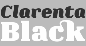
- 2011: Squartica (octagonal), Decomart (free), Model 4F Unicase (a unicase fat didone released in 2013 only), Fontatigo 4F, Kylie 4F (bilined and geometric), Waldemar 4F (a large didone style fat typeface family), Dinesqo (2011, a monoline sans of utter simplicity), Qargotesk (+Cyrillic) [images: i, ii, iii, iv], Neultica 4F (black unicase family), Squartiqa 4F (2011, constructivist), Clarenta 4F Black (after Clarendon---a great family), Designosaur (free sans), Perfopunto (based on perforated circles and squares), OlaScript 4F, Bayadera 4F (a tamed upright monoline script), Febrotesk4FUnicase (squarish unicase family).
- 2012: Targo 4F (rounded typeface with stencil and non-stencil styles), Myra (free font), Myra 4F Caps (free), Cedra (wide monolined sans face), Fontatica 4F (rounded techno grotesk), Akzentica 4F, Ukraintica 4F Wide (a monoline wide-bowled sans family), Laventa 4F, Sports World (free athletic lettering font), Web Serveroff (free computer geek font), Octin Spraypaint Cyrillic (a rough stencil done exclusively for Ninja Theory).
 2013: Condesqa (modular sans), Esqadero (an uncomplicated monoline sans), Vanyla 4F Unicase (monoline), Esqadero FF CY (a free wide sans, Cyrillic), Bond (a confident no-frills sans), Attentica (free sans font for Latin and Cyrillic), Cedra 4F Wide Thin. 2013: Condesqa (modular sans), Esqadero (an uncomplicated monoline sans), Vanyla 4F Unicase (monoline), Esqadero FF CY (a free wide sans, Cyrillic), Bond (a confident no-frills sans), Attentica (free sans font for Latin and Cyrillic), Cedra 4F Wide Thin. - Cyrillizations: several typefaces such as Lavoisier (by Alec Julien), Budmo Jiggler (Ray Larabie) and JoAnne Display (Sandy Cerovich), Gnuolane (of a Ray Larabie font), Paranoid Cyrillic (based on Kevin Lo's Paranoid), Movavi Grotesque Black (+Cyrillic; image; numerals), Azoft Sans (made for Azoft, and free here and here).
- Custom fonts: Blue Pill, Sansus Webissimo (since 2011 free at Open Font Library), Minaeff ECT (2011, a free legible family for Latin and Cyrillic, custom-made for and downloadable from WebhostingRating.com), Webhostinggeeks.Com (2011), Web Serveroff, OnlinePharmacyCheck.Com (2011), 1800Flowers.com (2011), DesignStudio.com (2011, free), ArchyStudio.Com (2011, free download, Movavi Grotesque (2011, free), Azoft Sans, PÄd In, Smeshariki, Fat Cow (2010: free condensed sans), ComFi (2010, free), PC.de (2009: free techno family, including a stencil face), League Gothic (2009-2011, The League of Movable Type) Cyrillic, Paranoid Cyrillic, 28 Days Later Cyrillic, Acid Label Cyrillic, Dead Secretary Cyrillic, Rezland Cyrillic, Sweet Leaf Cyrillic, Droid Cyrillic, Jo Anne Display Cyrillic, Gnuolane Free Cyrillic, Bosox Cyrillic, Budmo Jiggler Cyrillic.
- Typefaces from 2014: Laqonic 4F (unicase sans), Cubynets 4F, Blogger Sans (free rounded organic sans), Boncegro (free Western typeface, briefly called Vaquero before a name change), Motor 4F (based on Russian car license plates), Monitorica (a futuristic typeface made for ipHostMonitor.com, free at OFL), Areqo (condensed titling sans), Architect's Daughter Cyrillic (architectural lettering), GetVoIP Grotesque (a free typeface commissioned by GetVoIP), Meeneralca (unicase sans inspired by the logo of the mineral water Borjomi from Georgia), Glasoor (free oil spill or jelly bean font), Robotesqa.
- Typefaces from 2015: Croogla (a circle-based informal sans), Blackentina 4F (free ultra-black squarish typeface), Dart 4F (neo-grotesque), Kent 4F (a layered family for letterpress emulation).
- Typefaces from 2016: Brent 4F (original design going back to 2013), a custom typeface for the labels used in the Ukrainian Armed Forces, Economica Cyrillic Pro (with Vicente Lamonaca).
- Typefaces from 2018: Indi Kazka 4F (Indic simulation).
Abstract Fonts link. Dafont link. Creative Market link. Behance link. Hellofont link. Open Font Library link. View Sergiy Tkachenko's fonts. [Google]
[MyFonts]
[More] ⦿
|
Aaron Tansil
|
Designer of the thin unicase sans typeface Ardency (2013) [during his studies at George Brown College in Toronto]. Behance link. [Google]
[More] ⦿
|
Adam Pócs
|
Talented designer in Budapest, who first studied mathematics at Eötvös Loránd University, Budapest, and then typography at the Moholy-Nagy University of Art and Design. His typeface Cirque (2010) is a unicase modular geometric beauty, created with mathematical precision. He explains: My main profile is creating CD covers, posters, designing books, sometimes with the aid of several programming techniques. Home page. [Google]
[More] ⦿
|
Adil Budianto
[Suro Studio (or: Surotype)]

|
 [MyFonts]
[More] ⦿
|
Afkari Studio (or: Kanatype, or: Musthafanet)
[Musthafa Kamal Emje]

|
Banda Aceh, Indonesia-based designer (b. 1985) in 2020 of Atakana Script, Bandar (a 5-style rounded monoline sans), Brullos (a free brush script), Gasing, Hollgati Sans, Klenik Slab, Majanan, Richest Sans, Vemina (a monoline script). Several of these fonts can also be found at Jarnawi Saja's Grontype foundry. Typefaces from 2021: By Note (a notebook script), The Prada (a tuxedoed sans with stiff cufflinks), Vemina (a scrapbook script), The Lingke (a tall condensed vintage display typeface), A Note (a notebook / marker pen font), Hokaplay (unicase, playful), Godan (a 10-style wide slab serif with a slightly futuristic twist), Nalom (an 8-style elliptical sans), Kalela Slab (a slab serif family with a silent movie feel), Beuna Line (multilinear), Alehna (a 5-style comic book sans), Grah (a marker font), Medan Slab. Typefaces from 2022: Sagobi (hand-crafted, for children's books), Amiline (script), Fungka City (a tall condensed sans). [Google]
[MyFonts]
[More] ⦿
|
Agustina Borsani
|
Graduate from FADU, University of Buenos Aires, who created the typeface Onirik (2010), a unicase typeface made on the basis of Dante MT. [Google]
[More] ⦿
|
Ahmad Ramzi Fahruddin
[Arterfak Project]

|
 [MyFonts]
[More] ⦿
|
Akira Kobayashi

|
 Born in 1960 in Niigata, Japan. Studied at the Musashino Art University in Tokyo. He also studied calligraphy at the London College of Printing. He became a freelance designer in 1997. Akira Kobayashi, who was based in Tokyo prior to his move to the Franfurt area, is an accomplished type designer who has created numerous typefaces for Sha-Ken, Dainippon Screen (where he made the kanji font Hiragino Mincho), TypeBank (from 1993-1997), ITC and Linotype, where he is Type Director since 2001. Interview. His numerous awards include the Type Directors Club awards in 1998 (ITC Woodland), 1999 (the art deco styled ITC Silvermoon, and ITC Japanese Garden), and 2000 (FF Clifford), the 1999 Kyrillitsa award for ITC Japanese Garden, the 3rd International Digital Type Design Contest by Linotype Library (for the informal and quirky 4-style Linotype Conrad (1999): Linotype states that Kobayashi took his inspiration from a print typeface of the 15th century created by two German printers named Konrad Sweynheim and Arnold Pannartz), and the 5th Morisawa International Typeface Competition (in which he received an Honourable Mention for his typeface Socia Oldstyle). CV at bukvaraz. Interview in 2006. His typefaces:
 - Helvetica Neue eText Pro (2013).
- Dainippon Screen: the kanji font Hiragino Mincho.
- ITC: ITC Scarborough (1998), ITC Luna, ITC Silvermoon, ITC Japanese Garden, ITC Seven Treasures (1998), ITC Magnifico Daytime and Nighttime (1999), ITC Vineyard (1999), ITC Woodland Demi (1997).
- Adobe: Calcite Pro (sans-serif italic at Adobe, in OpenType format).
- Linotype: Akko Sans and Akko Rounded (2011; Akko Rounded is situated between DIN, Isonorm and Cooper Black, while Akko Sans is an elliptical organic sans related to both DIN and Neue Helvetica), Akko Condensed (2015), Akko Pro Condensed (2015), Akko Pan-European (2015), Eurostile Next (2008, after Aldo Novarese's original), Eurostile Candy and Eurostile Unicase, Cosmiqua (2007, a lively didone serif family based on 19th century English advertising types, and in particular Miller&Richard's Caledonian Italic), Metro Office (2006, a severe sans after a family of Dwiggins from the 20s), Neuzeit Office (2006, modeled after the original sans serif family Neuzeit S, which was produced by D. Stempel AG and the Linotypes design studio in 1966. Neuzeit S itself was a redesign of D. Stempel AG's DIN Neuzeit, created by Wilhelm Pischner between 1928 and 1939), DIN Next (2009, based on the classic DIN 1451), Times Europa Office (2006, modeled after the original serif family produced by Walter Tracy and the Linotypes design studio in 1974. A redesign of the classic Times New Roman typeface, Times Europa was created as its replacement for the Times of London newspaper. In contrast to Times New Roman, Times Europa has sturdier characters and more open counter spaces, which help maintain readability in rougher printing conditions. Times Europa drastically improved on the legibility of the bold and italic styles of Times New Roman.), Trump Mediaeval Office (2006), Linotype Conrad (1999), Optima Nova (2002, a new version of Optima that includes 40 weights, half of them italic), Linotype Avenir Next (2003, 48 weights developed with its original creator, Adrian Frutiger, and to be used also by the city of Amsterdam from 2003 onwards), Avenir Next Rounded (2012, in conjunction with Sandra Winter), Avenir Next Paneuropean (2021: 56 styles), Zapfino Extra, Palatino Sans and Palation Sans Informal (2006, with Hermann Zapf; won an award at TDC2 2007). Frutiger Serif (2008) is based on Frutiger's Meridien and the Frutiger (sans) family. Diotima Classic (2008, with Gudrun Zapf von Hesse) revives Gudrun's Diotima from 1951. In 2008-2009, Akira Kobayashi and Tom Grace unified and extended Trade Gothic to Trade Gothic Next (17 styles). Neue Frutiger (2009, with Adrian Frutiger) has twice as many weights as the orifinal Frutiger family. Later in 2009, the extensive DIN Next Pro, co-designed with Sandra Winter, saw the light. I assume that this was mainly done so as to meet the competition of FontShop's FF DIN (by Albert-Jan Pool).
- Fontshop: Acanthus (2000, large Fontfont family), FF Clifford (gorgeous text face!). In 2009, he and Hermann Zapf cooperated on Virtuosa Classic, a calligraphic script that updates and revives Zapf's own 1952-1953 creation, Virtuosa.
- Typebox: TX Lithium (2001, The Typebox).
- Oddities: Skid Row (1990), Socia Oldstyle.
- Suntory corporate types (2003-2005), developed with the help of Matthew Carter and Linotype from Linotype originals: Suntory Syntax, Suntory Sabon, Suntory Gothic, Suntory Mincho.
- In 2014, Akira Kobayashi, Sandra Winter and Tom Grace joined forces to publish DIN Next Slab at Linotype.
- Alexey Chekulaev and Akira Kobayashi (Monotype) won a Granshan 2014 award for the Cyrillic typeface SST.
- In 2016, Akira Kobayashi and Sandra Winter co-designed Applied Sans (32 styles) at Monotype. It is in the tradition of vintage sans typeface such as Venus and Ideal Grotesk and competes with Rod McDonald's splendid Classic Grotesque (2011-2016)..
- Member of a type design team at Monotype that created the Tazugane Gothic typeface in 2017. Designed by Akira Kobayashi, Kazuhiro Yamada and Ryota Doi of the Monotype Studio, the Tazugane Gothic typeface offers ten weights and was developed to complement Neue Frutiger. It is the first original Japanese typeface in Monotype's history. Followed in 2018 by the more restrained Tazugane Info. Variable fonts published in 2022: Tazugane Gothic Variable, Tazugane Info Variable.
- SST (2017). A set of fonts for Latin, Cyrillic, Thai, Vietnamese, Arabic and Japanese.
- DIN Next Stencil (2017). Developed together with Sabina Chipara.
- DIN Next Decorative (mostly textured styles such as Rust, Slab Rust, Stencil Rust and Shadow).
- Univers Next Cyrillic and Univers Next Paneuropean, both released in 2020, extending Adrian Frutiger's Univers.
- Shorai Sans (2022) and Shorai Sans Variable (2022). A 10-style Latin / Japanese sans by Akira Kobayashi, Monotype Studio and Ryota Doi, designed as a companion typeface to Avenir Next.
At ATypI 2008 in St. Petersburg, he ran a Linotype student type design workshop. Speaker at ATypI 2012 in Hong Kong: Rounded sans in Japan. View Akiro Kobayashi's typefaces. Klingspor link. FontShop link. Eurostile Next review. Linotype link. Monotype link. MyFonts interview in 2017. [Google]
[MyFonts]
[More] ⦿
|
Alandya Type Foundry
[Cut Nurfajarlia]

|
 Aceh, Indonesia-based designer (b. 1986) of the (mostly) script typefaces AT Bountys (a ten-style unicase sans) (2022), Shera Display (2021), Gyro (2021: a flared typeface with sharp vampire fingernails), Konsecta (2021: a great display typeface with deep incisions), Fragilers (a bold display typeface) (2021), Gleams Sans Display (2021), Gleams Serif Display (2021), Dolphins (2020: a curly display serif), Hommy Land (2020: script), Destacy (2020), Brayhonest (2020: a brush script with some contrast), Champagne (2019), Strongheld (2019), Enthrall (2019), Shakeglow (2019), Family Time (2019), The Sky (2019), Champagne (2018), Anne de Marie (2018: a heavy calligraphic script), Dealissha Script (2018), Sky High (2018) and Meikayla Script (2018), and the monoline script typeface Beloved (2018). [Google]
[MyFonts]
[More] ⦿
|
Albatross (or: Font Deals)
[Jay Hilgert]

|
 Albatross is Jay Hilgert's foundry in Oklahoma City, OK, est. 2008. Before Albatross, Jay Hilgert ran Bittbox (or: BB Free Fonts), a site dedicated to free clipart and vector art.
 Typefaces from 2008 include the informal outline typeface Tire Shop, the informal 3d shadow typeface Blox (2008), the 3-d wood typeface Baja California, the stunning four-style family called BB Petie Boy (which includes an ornamental caps style, a grunge style, a blackboard style and a sketch style), Fusty Saddle, 23rd Street (a graffiti font) and Whiteboard Modern. In 2009, he followed up with Oil Change (3d, hand-drawn). In 2011, he created the futuristic family Naughty Astronaut (+Cowboy), the Western typeface ABTS Gunsmoke, the connected retro script typeface ABTS Milk, ABTS Feather Pen, ABTS Oklahoma (retro deco), ABTS Aviator (2011, art deco caps face), and ABTS Day of the Dead (ornamental skulls, Mexican style), ABTS Crestwing (an inline caps face), Helios Pro. Typefaces from 2013 include Boom (a comic book typeface family, with hand-drawn Boom Symbols). Typefaces from 2014: Signyard (a retro overlay font family that evokes motel signage), Microbrew (letterpress emulation in many increasingly grungy styles, accompanied by Ornaments and Banners), Sparhawk (a 3d layered display font), Castor One (wood and letterpress style), Altus (a hand-drawn elliptical sans, +Altus Extras: ornaments). Typefaces from 2015: Corinth Ornaments, Auburn (brush script), Microbrew Unicase, Corinth (hand-drawn geometric sans with letterpress influences). Typefaces from 2016: Moraine (a weathered letterpress emulation typeface family), Microbrew Soft. Typefaces from 2019: Blakstone (a letterpress emulation family), Hanscum (vintage, handcrafted and letterpress-inspired). Creative Market link. Dafont link. Creative Market link. In 2011, he started Font Deals. [Google]
[MyFonts]
[More] ⦿
|
Alejandro Font Zambrana
|
Graphic designer in Alicante, Spain, who created the unicase typeface Vertica in 2013. [Google]
[More] ⦿
|
Alejandro Paul
[Sudtipos]

|
 [MyFonts]
[More] ⦿
|
Alejandro Paul

|
 Designer who lives in Buenos Aires and who teaches graphic design and typography at the Universidad de Buenos Aires. He has worked as an art director in prestigious Argentina-based studios, handling high-profile corporate brands such as Arcor, Marta Harff, Morph, SC Johnson, Danone, and Movicom. He runs Estudio Paul. Professor at Facultad de Arquitectura, Universidad de Buenos Aires. Co-creator, with Apostrophe at Apostrophic Laboratory, of Usenet (2000), FontCop I through IV (2000) and the pixel font family Cayetano. Published the dot matrix font Stardust with T-26 in 2000. Designed the gorgeous font Elektora in 2000. He developed with Michael Lynch a 17-font Tennis set of grid-based pixel fonts. At Typeworx, he published Reflex (2002), a commercial 6-style unicase font family. Another web site by Alejandro. Cofounder of DAS, a design studio in Buenos Aires.
 Cofounder of Sudtipos (2003), where he does custom work and creates new typefaces. His work there includes Tierra (a titling face), Latinaires (2003-2018: originally called Latina Sans), Reflex, Downtempo (2003), Stardust and Mosaico (1999, pixel face). Still at Sudtipos, he digitized the beautiful handwriting/calligraphic typefaces by Angel Koziupa called Alma (2005), Murga, Habano and Tiza, which together with his script typeface Argenta (2004), Oxida (2005), the medieval script typeface Mama Script (2004, designed with Alfredo Graziani), Divina (2004, with Alfredo Graziani), and the sans family Kautiva (2004) can be bought via Umbrella Type. For children's orthography, he developed Estrada Hand, on commission for Editorial Estrada. He was working on the serif family Libertina (2004). Herencia (2004, a handwriting typeface done with Diego Giaccone), Grover (2004, slab serif), Milk Script (2004, with Alfredo Graziani), Mama Script (2004, with Alfredo Graziani), Politica (2004, a techno typeface with a very thin Thin weight) are at Sudtipos. The Bluemlein Scripts (2004-2005, Umbrella and Veer) are based on the calligraphic renderings of Charles Bluemlein, shown in a 1943 ink catalog: Miss Le Gatees, Mr Rafkin, Mr Keningbeck, Mr Lackboughs, Lady Dawn, Mrs Von Eckley, Mr Sheppards, Mr Dafoe, Mr Canfields, Mr Stalwart, Mr Sandsfort, Mr Leopolde, Mr DeHaviland, Mr Blaketon, Miss Stanfort, Miss Packgope, Miss Fajardose, Mrs Saint-Delafield, Mrs Blackfort, Mr Sopkin, Mr Sheffield, Miss Lankfort, Herr Von Muellerhoff, Dr Sugiyama, Dr Carbfred. (Note: Soft Horizon's Lainie Day (1993) is an earlier free font in the style of Lady Dawn and Mr Lackboughs). In 2011, that series was made available at Google Web Fonts. Sudestada (2005, Sudtipos) is a handwriting script developed with Diego Giaccone. Cuisine (2005, Umbrella Type) is an informal bold script. Mousse Script (2005, Sudtipos) is based on Glenmoy, a 1932 Stephenson Blake typeface. Suave Script (2005) is a 4am jazz bar script. Ministry (2005) is related in style but less funky, Chocolate (2005) is for sales ads, and Cenizas (2005, with Angel Koziupa) is straight from an old manuscript. Whomp (2006, Umbrella) was based on a partial sign-painting font by Alf Becker (1930s), and so was Buffet Script (2006, Sudtipos). Affair (2006, Umbrella) is swashy and calligraphic, while Candy Script (2007) and its italic version Sugar Pie (2011) are based on Argentina's market lettering. Galgo Script (2007) is a brush calligraphic font based on a design of Angel Koziupa. Burgues Script (2007) is an ornate calligraphic script based on the lettering of calligraphy teacher Louis Madarasz (1859-1910) (award at TDC2 2008). Burgues Script, Adios Script (2008: it won an award at TDC2 2009), Feel Script and Sugar Pie all won awards at Tipos Latinos 2008. Sinfonieta (2006) and Buffet Script are fifties style connected scripts. Feel Script (2007) is based on lettering that calligrapher and logo designer Rand Holub created in 1950 and that was subsequently captured in Intertype's typeface Monterey (1958). Some letterforms were redrawn from vintage American magazine ads (some by Holub himself), Cuisine (2008, food advertising script), Pronto (2008, comic book style, by Alejandro Paul and Angel Koziupa), Grover (2004, rounded sans family), Grover Slab (2004). Burgues Script, Adios Script, Feel Script and Sugar Pie all won awards at Tipos Latinos 2008. Calgary Script (2008, Umbrella) is a pure signpainting job. Accolades from all typophiles for his calligraphic wunderkind, Compendium (2008). The 2009 haul: Sugar Pie (signage font), Bravissima Script, Theorem (upright semi-script). Speaker at ATypI 2009 in Mexico City. The year 2010 starts off with a bang, five awards at Tipos Latinos 2010: a grand prize for Brownstone Sans, and four standard awards, for Semilla, Kewl Script (for food packaging and store windows), Calgary Script, and for Business Penmanship. Typefaces from 2010 include the baseball lettering typeface Fan Script and the tattoo script face Piel Script (piel=skin), which was influenced by Burgues Script and more remotely by showcard lettering by B. Boley (1930s, Sign of the Times Magazine). Piel Script won an award at Tipos Latinos 2012. In 2011, he and Koziupa made the fat signage typeface Aventura and Viento (a grunge version of their earlier 2004 face, Brisa). He added one retro connected signage font to the Filmotype collection in 2012, called Filmotype Kitten (original from 1955). Filmotype Zephyr (2012) is an italic roman formal script. Filmotype Yukon (2012) is inspired by the classic Palmer style of penmanship. Storefront (2012) is a swashy signage typeface based on an incomplete alphabet by Alf Becker. His signage script typeface Hipster Script won an award in the TDC 2012 competition and at Tipos Latinos 2012. Typefaces from 2013: Rolling Pen (a connected script that recalls the business penmanship genre), Bellissima Script (based on a copperplate calligraphic alphabet from Bellezas de la Caligrafía by Ramón Stirling, 1844). In 2014, he helped Panco Sassano, a lettering artist and illustrator from Mar del Plata, who designed the wide connected semi-calligraphic handwriting typeface Horizontes Script (Horizontes subsequently won an award at Tipos Latinos 2016). Still in 2014, he published the fat packaging or signage script Bowling Script, which is based on Freely Drawn Italic, a non-font alphabet by Ernst Bentele (1953). In 2015, Alejandro Paul, Yani Arabena and Guille Vizzari combined forces in the signage script typeface Quotes (Script+Caps) (2015, Sudtipos). Merengue Script (2015, with Panco Sassone) is a fun creamy script, ideal for pastry shops, tea rooms or supermarkets. Steak (2016) is a connected vintage signage script based on an Alf Becker design. Envelove (2017) is a script typeface family consisting of Script, Icons, and Caps, designed at Sudtipos by Yani Arabena, Guille Vizzari, and Alejandro Paul. Winner at Tipos Latinos 2018 of a type design award for Envelove. Still in 2017, Guille Vizzari and Alejandro Paul co-designed the great Moleskine notebook-inspired typeface family Proprietor. Proprietor comes in Script, Icon, Deco, Wide, Open and Roman styles. It won an award at Tipos Latinos 2018. Rigatoni (2017): A skyline didone based on mid-20th century example by Eugen Nerdinger. Bibliophile Script (2017). A pair of copperplate calligraphic typefaces. Fixture (2018: a 72-font grotesk family published by Sudtipos). Newbery Sans Pro (2018). A simple workhorse sans typeface family that is inspired by German industrial design and the lettering of Eugen Nerdinger. Winner at Tipos Latinos 2018 of a type design award for Tennis Set, Bibliophile Script, French Bulldog, Envelove, La Taqueria, and Speakeasy Set (a collection of (copperplate) script, sans, modern, flare and gothic substyles). From 2019: Hot Salsa (a retro brush script; with Ximena Jimenez), Old Letterhand, Clockmaker (arts and crafts style), Steak Script (inspired by an old alphabet by Alf Becker), Address Sans Pro (a sans family inspired by Butti and Novarese). In 2019, Alejandro Freitez and Claire Menager, under the art directoship of Alejandro Paul, designed the multistyle wood type look / Western / Victorian / reverse stress / hyper-decorative Presley Slab. Typefaces from 2020: Apothicaire (a wonderful quaint serif family in the frivolous didone genre; three variable fonts, 16 styles in all), Inglesa (a penmanship script), Dilemma, Dilemma Serif (Dilemma is a sans/serif type system with 42 styles; it is inspired by the anonymous Polyphème, Cyclopéen and Extra Condensé designs from the early 1900s at the Peignot Fonderie; two variable fonts are included), Sporty Pro (a large sports / athletics font family). Typefaces from 2021: Plethora (an 18-style family and two variable fonts that build on Julius Herriet's Old Style Ornamented for Bruce Type Foundry; Alejandro added various frills, ligatures, weights, exaggerating in true Victorian spirit), Magari (a fat face or Normande; Alejandro likens it to Italian classics of the 19th century though), Regional (27 styles, plus variable styles). Typefaces from 2022: Wienerin (a revival and expansion of Olympia (1929) by Carl Otto Czeschka, one of the members of The Wiener Werkstätte). [Google]
[MyFonts]
[More] ⦿
|
Alex Camacho Studio
[Alex Camacho Pizarro]

|
 Graphic designer and illustrator from Barcelona who has an MA from Central Saint Martins, and works in London since 2009. His typefaces:
 Cargo collecive link. Linotype link. [Google]
[MyFonts]
[More] ⦿
|
Alex Camacho Pizarro
[Alex Camacho Studio]

|
 [MyFonts]
[More] ⦿
|
Alex Sheyn
[Avondale Type Co]
|
 [More] ⦿
|
ALT Foundry
[Andreas Leonidou]

|
 ALT is the type foundry of prolific type designer Andreas Leonidou from Limassol, Cyprus, b. 1986. His main work is commercial, but there is also a substantial collection of free fonts.
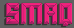
 He created Foldgami, Apollo 13 (techno, futuristic), Fatgami, Origamia, Paper Roll, Alt Retro (2010, multilined family), Alt Tiwo (2010, fat counterless), Alt Matey (2010, a family that includes a multiline style; the piano key typeface Alt Matey V2 followed in 2012), ALT Lautus (2010, a minimalistic monoline sans family), Japanese Cities Type Experiment (2010), ALT Alternatice (2010), ALT Vxt11 (2010, a high-contrast art deco octagonal face), ALT Aeon (2010, a unicase but multiline family), Alt Re 32 (2010, techno), ALT Mun (2010, a curlified family), ALT Breo (2011, octagonal family), ALT Exline (2011), Jun Script (2011, connected contemporary upright script), ALT Ayame (2011, condensed squarish family ain the piano key style, +Long), Alt UAV31 (2011, an octagonal experiment), Alt Moav (2011, a striking geometric caps face. Images: i, ii, iii), Alt Geko (2011, an art deco caps face), and Archetype (unicase, Bauhaus). Free fonts at Devian Tart: Alt Retro (2010, multilined family), ALT Hiroshi (2011, ornamental), ALT Deville (2011, spurred). Typefaces made in 2012: DNR001 (hipster style), ALT Kora (for the identity of Drone), ALT Fat (monospaced squarish caps face), ALT Exodus (sci fi face), Alt Wet (a paint splatter face), Alt Sku (ornamental didone face), Alt Robotechnica (pixel face), Exodus (a blackletter style straight-edged typeface), Juk01 (an ornamental mechanical, or steampunk, typeface), Alt Sake (a thin condensed poster typeface). Typefaces from 2013: Modu (alchemic, hipster style), Modu Deco, Bely (a severe-looking almost constructivist Latin/Cyrillic typeface). Typefaces from 2014: Ren (a free vintage display typeface family). Typefaces from 2015: ALT Hazer (a great free shadow sans), ALT Smaq (a family of eight free beveled styles for Latin and Greek). The free fonts as of 2015: ALTBELY, AltJoli, AltPixelsGoneBad, AltRe32-Duo, AltRe32-Normal, AltRenDuo, AltRenRegular, AltRenRetro, AltRenShadow, AltRetroBlack, AltRetroBold, AltRetroLight, AltRetroRegular, AltRetroThin, Alt-Twitchy, AltVxt11, Altapollo13, AltAeon-Black, AltAeon-Bold, AltAeon-Light, AltAeon-Medium, AltAeon-Thin, AltAeonRegular, AltAxlDeco, AltAxlRegular, AltDEVILE, AltGeko-AltGeko, AltMateyv2-Black, AltRobotechnica, AltSku, AltSkuItalic, AltUAV31, AltWet, Altapollo13-Black, Altapollo13, althazer, altsmaq2.8, altsmaq4.8, altsmaq6.8, altsmaq8.8, altexodus, altfatgami, altfatitalic, altfatregular, altfoldgami. Typefaces from 2016: Sadistic (a free scratchy font), System Code (free programming font). Typefaces from 2017: Rekt, Rogue (free). Typefaces from 2018: Alt Catwalk (a fashion mag typeface family), Frantic, Looper (a compass-and-ruler font), Silent Scream (a free dry brush font). free). Flickr link. Behance link. Hellofont link. Devian Tart link. Klingspor link. Creative Market link. View Andreas Leonidou's typefaces. Home page. [Google]
[MyFonts]
[More] ⦿
|
Aluyeah Studio (or: Cupcake Std)
[Linggar Sundoro]

|
 Indonesian designer of Al Lebaker (2019), the octagonal industrial typeface Al Valenciaga (2019), the interlocking display sans Le Porsche (2019---and amazed that the auto maker has not complained about this name), the monoline script Aaleyah (2019), the display sans typeface Al Chevrola (2019), the fashion mag typefaces Al Veshion (2019) and AL Nevrada (2019), and the script typeface Vigrand (2019).
 Typefaces from 2020: Nevrada Neue (decorative serif; like Veshion), Embryotic, Muberry (artsy), Roshella (brush), AL Valenciaga (octagonal, mechanical), AL Lebrush, Olla Julietta, Qristalla, Shlasa Bella, Michellate, Allietta, Mother Vanilla, Mishella, Amstallova, Bostvina (a fashion mag typeface), AL Hermaiona (a formal calligraphic script). Typefaces from 2021: Al Boldest Enough, Al Crushider (a dry brush script), Al Bizantheum (a stylish display serif), Al Murberry (a stylish unicase font), Al Motherva (a display serif), Al Marshland Beauty (a display serif), Al Evagrande (a display serif), Al Embryotic (a decorative serif), Al Crystasea (a sharp-edged wedge serif display typeface), Bavista Soulvare, Al Black Emerald (a decorative serif), Al Britania Ligatura (a decorative serif), Al Brachella Drumal (a vintage all caps serif), Al Magensburg (a swashy decorative serif inspired by ethic arches). Typefaces from 2022: Al Mangsi (a notched display serif), Badlooking Brush (a dry brush font). Blogspot link. Creative Fabrica link. Dafont link for Aluyeah Studio. [Google]
[MyFonts]
[More] ⦿
|
Alwin Johnson

|
India-based designer of the monolinear unicase display sans typeface Peyton Display (2021). In 2022, he designed Vista Nordic (an 19-style wide minimalist sans), Blandit (all caps, for posters and displays), Vista Morgan Sans (18 styles, released at Vista Type), the 8-style Hawker Display, a rounded slab serif. [Google]
[MyFonts]
[More] ⦿
|
amb+
[André Baldinger]
|
André Baldinger is the Swiss typographer and type designer (b. 1963) who made the Newut (1996, all letters of equal size, and thus a semi-unicase) and the B-Dot (pixel) families (1998). His outfit in Lausanne is called amb+. In 1994, he graduated from the Atélier National de Création Typographique (ANCT) in Paris. Since 1995, he teaches typography at the École supérieure d'arts visuels de Lausanne. He lives in Paris. Together with Philippe Millot, he heads the type design unit of the Creation and Innovation Research Centre (EnsadLab) at ENSAD Paris. He teaches typography and type design at the École Nationale Supérieure des Arts Décoratifs (ENSAD) and the Zurich University of the Arts (ZHdK). He was involved in projects such as the logotype for the Cité Universitaire and a custom type for the Eiffel tower. He also digitized the Frutiger-Hunziker typeface CGP (used in the Centre Georges Pompidou, originally designed in 1974) in 1997. The full list of his typefaces: AB BaldingerPro Font, AB BDot Font, AB BLine Font, AB CiteInter Font, AB Eiffel Font, AB Newut Font. Speaker at ATypI 2010 in Dublin where he introduced the Gering project. I cite: Based on a close analysis of typefaces created by Ulrich Gering at the Atelier de la Sorbonne and the Soleil d'Or workshop in the 1470s, the first typefaces produced in France, postgraduate students Timm Borg, Anthony Dathy, Perrine Saint Martin and Ok Kyung Yoon have been working on a versatile, modern font family for the last 2 years under the guidance and watchful eyes of André Baldinger and Philippe Millot. Focusing on two of Gering's designs --- a sturdy roman font that closely imitates the texture of blackletter and a roman with blackletter influences --- the EnsadLab team has developed a complete family, reviving the work of the father of the printed word in France and bringing together aesthetics rarely seen in such an ensemble. Working only a few hundred metres from the original site of Gering's workshop they have thoroughly reworked the letterforms found in the extant incunabula available in the Bibliothèque Nationale, complementing the original characters with italics, small caps, and supplementary weights, as well as all of the glyphs necessary in a 21st century font. Klingspor link. Home page. Old URL. [Google]
[More] ⦿
|
Amy Dietrich

|
 American designer, b. 1967, California. Married to Ken Russell, who runs Atlantic Fonts in Camden, ME.
 At Atlantic Fonts, she designed the hand-printed typefaces Kinglet (2012, curly), Honey Bee (2011), Once (2010) and Clue (2010). In 2013, Amy published the playful poster typefaces Trail Map (2013) and Merci. Farmstand (2013) is a hand-printed typeface that is accompanied by the dingbat font Farmstand Goodies. Wheat (2013) is a stylish rough-edged script face. Eeeek (2013) is a Halloween dingbat typeface. Solstice (2013) is hand-printed. Typefaces from 2014: Shoebox, Reading (bouncy typeface), Lion (an African-themed typeface), Suntea (a children's book script), Fini (cartoon font), Fini Things (girly dingbats), Catbird (whimsical). Typefaces from 2015: Goby (a great children's book font with fun sea life dingbats called Goby Graphic), Laughing Gull (a fun cartoonish font), Digby (Atlantic Fonts). Typefaces from 2016: Sanderling(children's script), Dinghy (beatnik style) and Dinghybats, Storyboard (a primitve painter's font), Quince (a handcrafted typeface), Kiwi (a juice bar font accompanied by the dingbat font Kiwi Fruits). Typefaces from 2017: Meow (a children's script), Answer (handcrafted, unicase), Peapod (a textured patterned all caps typeface). Typefaces from 2018: Junglegym, Turmeric. Typefaces from 2019: Pattycake (a children's book font), Espadrille (a mixed case monoline display sans), Galavant (a cartoon font with interlocking letters), Seaglass. Typefaces from 2020: Darcy (a wonderful beatnik typeface), Parula (hand-drawn with lots of oomph due to its energetic line variations). Typefaces from 2021: MollyO (a scrapbook script), Rabbet (a fat finger font). Old URL under the name Amy Dietrich Russell. [Google]
[MyFonts]
[More] ⦿
|
Ana Freitas
|
Lisbon-based designer of the unicase typeface Retina (2014), which is inspired by a storefront in Porto. Behance link. [Google]
[More] ⦿
|
Andinistas
[Carlos Fabián Camargo Guerrero]

|
 Bogotá-based Colombian graphic design studio and type foundry Andinistas was founded in 1998 by Carlos Fabián Camargo Guerrero, Lennyn Salinas, Mariangeles Valero, Juan Carlos Valero, Jorge Alexander Camargo Guerrero, Rafael Rincón, and Jordi Teres. It was first located in Caracas, Venezuela, but moved in 2003 to Bogotá, Colombia. New names in its organization include Alexander Moreno. Many of its designers are Venezuelan.
 Among their typefaces: Nikona, Magola (2008, puffy script), Angelita, Pepelepu, Zerotipo, Skuke, Retro, Radio Bemba, Pumarosa, Pr1, Oficia, Nativa, Mongol (free), Lirrot, Leroy (1999-2008, computer screen stripes), Leroy Dingbats (1998-2008), Hiroformica, Hibrida, Guerilla, Guerilla Outline, Gruada, Gancho Petare, Escuedra, Esbelta, DSNett, dia-D, Download, Denego, Cristal, Codiga, Codiga Icon, Codiga Destroy, Codiga Codec, Chacao Petare, Cazon Gothic, Boa, Biol, Ave-cedario, Anaira. Cazon (2007, Camargo Guerrero) is a family of calligraphic origin consisting of 7 styles: Gris, Negra, Uno, Dos, Tres, Dingbats A and B and is based on the paintbrush letters found in the popular markets of La Guaira, Caracas. This family won an award in the experimental typeface category at Tipos Latinos 2008. Lirrot (2007) is a 6-style grunge handwriting typeface bordering on the psychotic, and comes with Lirrot Dingbats. It too won an award at Tipos Latinos 2008. PP Lepu (1998-2008) is pixel grunge. Josefina (+Dingbats1) is a curly script also made in 2008. Navaja (2008) and Diad are collections of grunge fonts with grungy dingbats. Lucrecia 1 through 3 (2008) is a fat connected script family ranging from clean to splattered. Telesforo (2008) radiates anger from its brushy grungy limbs. Telesforo Black won an award at Tiupos Latinos 2012. Ninja 1 and Ninja 2 (2008) are script fonts, and are accompanied by Ninja Dingbats (2008). Dsnet (2008) is a 6-style bare-bones rounded squarish family. Flaminia and Flaminia Dingbats (2008) are useful for food-related signage. Modelia (2008) is thick, informal, and looks like it was brushdrawn. Modelia won an award at Tipos Latinos 2010. Filomena (2008) is a brush family with a goth theme and an accompanying goth dingbats. Obdulia (2008) and Floro (2008) are extreme mural grunge fonts. Marimonda (2009) is grunge calligraphy. Typefaces from 2012: Demetria (a hellish script), Ciclope (army stencil), Meteora (a sturdy weathered family), Kamuy (a grunge typeface, with dingbats, that links to Asian comic style lettering, and Japan in the Pacific War), Naturalia (an informal sans family). In 2013, he made Gluten (a poster typeface family), Bengala Script (a distant relative of Mistral), Chef Script (a large signage script influenced by Ross F. George's Speedball lettering manual (1957)), Chef Script Dingbats (hilarious restaurant dings and fists), Sumergible Script. Typefaces from 2014: Citronela (cartoon or Caribbean hotel signage font family), Bemol (a set of script fonts in craftsman style), Nemocon (creamy script), Acustica (a calligraphic Acustica Script, with didone Acustica Caps, and a decorative Acustica Dingbats), Cereal (+ Script (a vampire script), Skin and Dingbats). Typefaces from 2015: Draw (which includes a gorgeous calligraphic Draw Script), Coffee Break (signage script family, +dingbats), Solar (a set of seven handcrafted styles). Typefaces from 2016: Enjoy (Script, Caps). Typefaces from 2017: Warhol (irregular scripts), Makeup (a crayon font by Carlos Guerrero and Carolina Suarez). Typefaces from 2018: Bechamel (a delicious curly brush script), Bechamel Roman (based on the unicase letterings of the movie Willy Wonka and the chocolate factory), Stevia (script). Typefaces from 2019: Bleak (an experimental layerable font inspired by wood type, Piet Zwart, Lissitzky and van Doesburg), Nutcake CatchWords. Sonora won an award at Tipos Latinos 2014. Combine Script and Combine Caps (layerable colorable fonts), and Nemocon, won awards at Tipos Latinos 2016. Winner at Tipos Latinos 2018 for Clothing, a titling typeface published at Andinistas by Camilo Zamora and Carlos Fabian Camargo. Typefaces from 2020: Cherrypie (a food packaging script), Rapsodia (a decorative all-caps family with curl, spurs, Victorian details, and decadent frills). Typefaces from 2021: Visible (an inky script family), Caribe (Script, Caps, Shields). View the typefaces designed by Andinistas. Klingspor link. Dafont link. Behance link. [Google]
[MyFonts]
[More] ⦿
|
André Baldinger
[amb+]
|
[More] ⦿
|
Andreas Leonidou
[ALT Foundry]

|
 [MyFonts]
[More] ⦿
|
Andrey Kudryavtsev
[Andrey Kudryavtsev Type Foundry (or: AKTF)]

|
 [MyFonts]
[More] ⦿
|
Andrey Kudryavtsev Type Foundry (or: AKTF)
[Andrey Kudryavtsev]

|
 Foundry in Irkutsk in Siberia.
 Andrey Kudryavtsev designed Spacexplorer (2012), Necromant (2012), Flexy Sans (2011), Otrada (2011, signage script), Micronica (2008), a font shaped like old TV screens, Karlson (2009), Imperator (2010, a Trajan face), Alter (2010), Sommelier (2011), Alebarda (2009), Rubicon (2009) and Flexy Sans (2009). Typefaces made in 2012 include the macho slightly flared Antey (Latin and Cyrillic) and the strong display sans typeface Tambov. In 2013, AKTF published Softipen Script. In 2014, he created Qwincey FY (a high-contrast slightly flared almost Peignotian sans family, published by FontYou), Warren Narrow and Achille II Cyr FY (together with the Fontyou team of Alisa Nowak and Gregori Vincens). Typefaces from 2015: Smile Pro (a fat multi-style handcrafted poster family of exceptional beauty; together with Rodrigo Araya), Ardilla Small (a rounded small x-height sans done together with Rodrigo Araya; inspired by the children's show Peppa Pig), Plumps, Antey, Crisper. Typefaces from 2016: Pequena Pro Cyrillic (Rodrigo Typo), Robest (unicase). Typefaces from 2017: AK Sans, Hatter Cyrillic Display (a Halloween font), La Pica (by Rodrigo Araya and Andrey Kudryavtsev), Fairystory (curly typeface), Kreker (a rounded poster sans), Stickout (comic book style). Typefaces from 2018: Czarevitch (a Cyrillic and Cyrillic simulation pair), Skaz (a psychedelic type inspired by the Victorian typeface Ringlet), Sitari, Dozer, Squick (a comic book / children's font family by Franco Jonas, Andrey Kudryavtsev and Rodrigo Araya), Freept (a free marker font), Nightelf, Ingot (a condensed rounded blackletter), Insolenta. Ding (2018) is a great fattish cartoon font that was co-designed by Rodrigo Araya Salas, Andrey Kudryavtsev and Franco Jonas. See also its extensions, Ding Pro (2019) and Ding Extra (2019). Typefaces from 2019: Clarence Alt (a an almost bubblegum children's book sans by Franco Jonas, Rodrigo Araya Salas and Andrey Kudryavtsev). Typefaces from 2020: La Pica Bonus (a vernacular or supermarket style font and dingbat family by Andrey Kudryavtsev and Rodrigo Araya Salas), Ancoa Slanted (an angular display family in 15 styles; by Andrey Kudryavtsev, Rodrigo Araya Salas and Franco Jonas Hernandez), Skippie (a comic book family by Andrey Kudryavtsev, Rodrigo Araya Salas, Bruno Jara Ahumada and Franco Jonas, and four sets of dingbats including Skippie Monster Lucha Libre and Skippie Monster Halloween), Ancoa (an angular 19-style layerable typeface by Andrey Kudryavtsev, Rodrigo Araya Salas and Franco Jonas Hernandez). Typefaces from 2022: Chessnota (a chess font). Behance link. Creative Market link. Myfonts link. Klingspor link. View the typefaces made by AKTF. Patreon link. [Google]
[MyFonts]
[More] ⦿
|
Angeles Moreno
|
 Mexican designer of the hand-printed Bolita, the kids typefaces Nino and Bíblica, the unicase Bauhaus, the round typeface Aqua, the grunge typefaces Gap and Heart, the handwriting typefaces Pessoa and Pincelazo, Geometrics, Matisse, the minimalist typeface Moogdula, Offset, the sans typeface Quatro, the windowed typeface Ventana, Voluble, Starline, Santa Clara, the trekkie typeface Wet Alien, and the experimental typeface Chida, mentioned here. [Google]
[More] ⦿
|
Angus R. Shamal
[ARS Type (was ARS Design)]

|
[MyFonts]
[More] ⦿
|
Antipixel
[Julia Martínez Diana]

|
 Julia Martínez Diana (b. 1990) is based in Buenos Aires, Argentina, where she studies graphic design at UBA. In 2004, she set up the type foundry Antipixel.
 Julia created Circoex (2008) and the hand-printed Culia (2008). Additions in 2011: Culita (hand-printed), Presa (techno, +UltraLight), the Savia family (hand-drawn typefaces, including a 3d Shadow style), PGY. Creations from 2012: Aracne, Iso (hexagonal), Belta (hand-printed), Nue (monoline display sans). Typefaces from 2013: Eneas Expanded (wide poster lettering), Aracne Condensed, Aracne Ultra Condensed (hand-printed caps face, +Light). Typefaces from 2014: Enyo (hand-drawn poster font), Enyo Serif (2014), Italo (hand-drawn), Lamia (hand-printed, renamed Lamiar after a week). Typefaces from 2015: LeOsler. Typefaces from 2016: Austral Slab (layered textured typeface family), Austral Sans (free for personal use), Austral Sans Stamp. Typefaces from 2017: Escalope (a handcrafted layered font, +icons). Typefaces from 2018: Fuse V.2 Printed (with Salvador Rodriguez at W Foundry). Typefaces from 2019: Pasto (an experimental unicase). Typefaces from 2020: Dingos (a joyful extra bold handcrafted display typeface). Typefaces from 2021: Equinox. Abstract Fonts link. [Google]
[MyFonts]
[More] ⦿
|
Aparat
[Domen Fras]
|
 Domen Fras completed his masters at London's Central Saint Martin's College of Art & Design in 2000. In 2002 he founded the type & design studio Aparat in Ljubljana, Slovenia. Since 2011 he is a full-time assistant professor at the Faculty of Natural Sciences at the University of Ljubljana. Speaker at ATypI 2014 in Barcelona. His largely experimental work:
 - Brutildo (2006): squarish headline lettering.
- Butalci (1998, a pixel font) is a part of Domen's diploma project at Faculty of Architecture in Ljubljana, supervised by Janez Suhadolc.
- Gyro (1998-2001) is an octagonal monospace font with 3 weights.
- Exlibris (2001-2003) is an experimental face.
- Pozor (1999) is a squarish sans, as for traffic signage.
- Terragni (1998) is an alphabet study based on the floor plan composition analysis of the house 'Casa del Fascio' in Como by the architecta Giuseppe Terragni.
- DinoUnicase (1997) is a variation on DIN Mittelschrift.
- Narod (2003) was made for designing commemorative coins at 60th anniversary of Kocevje Summit.
- JH Luzern (1999) is based on a scan of a hotel room card.
- Pesjan Debu (2011) is a fat angular poster typeface created during TipoBrda 2011.
- Narod Krepak (2010) is an art deco sans titling typeface created during TipoBrda 2010000000
[Google]
[More] ⦿
|
Arktype (was: Atelier René Knip)
[René Knip]

|
 Dutch type designer located in Bloemendaal. Jan Middendorp wrote about him in A.R.K. Ten Years of Type Related Projects 1994-2004 (2004), summarizing Knip's work at Atelier René Knip, mostly experiments in type design. Knip (b. 1963) is a graduate from the St. Joost Academy in Breda, class of 1990. Since 1992, Knip has operated a design studio in Amsterdam, Atelier René Knip.
 Recently, Knip and his brother Edgar formed a new company, Gebroeders Knip, which produces furniture and accessories in which letterforms are integral parts of the objects design. One of his experiments, a unicase typeface with an Arabic feel, was digitized by Nick Curtis as Turban Hey NF (2008). In October 2012, Knip and another Dutch designer cofounded Arktype, but by 2020, the other Dutch designer left that company. Typefaces at Knip's site as of 2020: - Retail faces in the Arktype collection jointly made by René Knip and that other Dutch designer, described as an architectural set of fonts, including many dot matrix, modular, monospaced and stencil typefaces: Square, Double Dot, Radius, Lineup, Brick Caps, Monoline, Street Stencil, Tangram, Tripple Dot, Laundry, Modular, Connect, Triplet, Body Stencil, Mono Roman, Line Dot, Oblong, Random Stencil, Angular, Curtain, Stretch, Concrete, Brick Roman, Unicase, Wood Stick.
- Custom typefaces: Africa Museum, Alphabets, Ark Stencil, BNO Books, Fryslan, Hema tile, Ijburg, Kunsthal, Lindenberg (squarish), Logotype, Marriage (stencil type), Milk (a squarish stencil), Municipal Office (wayfinding, for Den Haag), Nieuwspoort, Nuqat (a pixel script), Old Church 2, RCO Caps, Stitch, Textiellab, WFO.
[Google]
[MyFonts]
[More] ⦿
|
ARS Type (was ARS Design)
[Angus R. Shamal]

|
 ARS Type is an Amsterdam-based foundry with some commercial fonts by Angus R. Shamal. Shamal had earlier published fonts with T-26 and Plazm. Fonts can be bought via Fontshop.
 The fonts: AudioVisual1, Code, Kamp, Kamp Serif, Retro City, OCRU, Toycube, Mortal, Maquette (1999-2000), Angelring, ARS Bembo, Contrast, Dandy, EcologyModern, Hartu (handwriting), Temper, ARS Novelty (2011, a free hybrid style face), ARS Polythene (pixel font family), Misanthry, Syntax (OsF format sans serif), CensorSans (1994), CensorSerif (1994), Credit (1995), Epilogue.pfa (1995), Exert (T-26), Humain-Graphica (1995), Humain-Synthetica (1995), Platrica (1994), Roscent (1995), ARSFortune (2000, futuristic), ARS Region (2002, Bauhaus sans), District (experimental), Descendiaan (1998), Zero Rate (futuristic), Tegel (1998, stencil, kitchen tile), Twenty (octagonal, techno), Trio (dot matrix fonts), Maquette (1999), Region, Product (2007, sans typefaces), Mr Archi, Prime (display), Deviata (unicase face), Forum I-AR (after Forum I, a 1948 font by Georg Trump), Freie Initialen-AR (2007, after a 1928 set of caps for Stempel Garamond), Fry's Ornamented (2007; a revival of Ornamented No. 2 which was cut by Richard Austin for Dr. Edmund Fry in 1796), Graphique-AR (2007; a shaded typeface based on a 1946 design by Eidenbenz for Haas), Gravur-AR (2007; a digital version of a type designed by Georg Trump and issued as Trump-Gravur by Weber in 1960), Initiales Grecques (after a Firmin Didot design, ca. 1800), Lutetia Open (2007; based on Jan Van Krimpen's Lutetia), Old Face Open (2007; a digitization of Fry's Shaded, an open all caps Baskerville cut by Isaac Moore for Fry, ca. 1788), Open Capitals (2007, after Jan Van Krimpen's 1928 typeface for Enschedé called Open Kapitalen), Romulus Capitals (2007; after the caps series by Jan Van Krimpen, 1931), Romulus Open (2007; after the Open series by Jan Van Krimpen, 1936), Rosart 811 (2007; open caps after Enschedé no. 811 by Rosart), Zentenar Initialen (2007; based on blackletter initials of F.H.E. Schneidler, ca. 1937). Fontshop link. Designer link at FontShop. [Google]
[MyFonts]
[More] ⦿
|
Arterfak Project
[Ahmad Ramzi Fahruddin]

|
 Ahmad Ramzi Fahruddin (aka Ramzehhh and as Ramz Fahruddin, b. 1993) established Arterfak Project in 2015. He is the Palembang, Indonesia-based designer of the display typefaces Aidah (2015, spurred), Temenyut (2015, spurred), Basenglah (2015, a geometric solid typeface), Local Genius (2015), Oropitem (2015, blackletter), Cakmacak (2015), Maeninaja (2015), Yagitudeh (2015, a free doodle font), Cagar (2015, free), Pletakrutuk (2015) and Beguyur (2015), the free experimental techno typeface Semravut (2015), the lava lamp typeface Cagar (2015) and the free spurred vintage typeface Outromoro (2015).
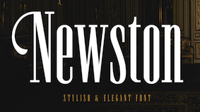
 Typefaces from 2016: Anehena (a beveled ornamental typeface), Bongoknian (spurred), Sebasengan (sketched, arched, stitched, textured, eroded and embossed substyles), Sekatoon (Victorian), Bekelakar (Victorian), Sambeltigo, Wayawaya (free bilined art deco), Geroboktuo, Bedengkang, Ringam, Cindo Kato (spurred Victorian typeface), Ngopi Doken (a layered handcrafted typeface family), Bedesau (Victorian), Temenyut (spurred Victorian style), Sirugino (a spurred tattoo / blackletter type), Buyanbengak (spurred), Geradakan (dry brush type). Typefaces from 2017: Martinez (Tuscan), Hughoney, Rockrace, Monabelia (Victorian), Philosophiya, Love Quake, Childwood, Circulat Decorative Frames, Dakmodal, Yasaman, Bsakoja, Meringam, Besigetz (Victorian), Bedempank, Ngamboel (a modern inline), Jemahok (an inline typeface), Sirunian (decorative blackletter), Belinjangan (brush style), Cerudikan, Kanjian (Victorian deco). Typefaces from 2018: Mirandah (monoline, vintage), Subversia (Victorian), Bertha (a free display family that includes Shadow Line, Sans and Spurred substyles), Quickers, Marchelle (art deco), Lourena, Mellynda, Leophard (octagonal), Wishteria, Slashback, Katheryna, Febiolla, Tropicane, Maretha (a monoline script). Typefaces from 2019: Requeiro (a spurred inline vintage font), Mourich (an all caps display typeface), Newston (a tall condensed news headline typeface family), The Black Sugare (blackletter-inspired), Magnies (an elegant stencil), Hermona (a spurred vintage label font), Bronzier (a sports font), Mayhena (a monoline script), Amnestia (a vintage all caps typeface), Highrush (font duo), Humeira (for children's books), Montheim (retro signage font), Hodgeson (a slab serif family), Delaroca, (a spurred black metal band font) Banda Niera, Bargers Distressed (spurred, Victorian), The Realita, Newston (a compressed skyline-style font), Ariestha Script, The Black Square, Requiem (Victorian or rococo inline caps), Invasible, Ferguson (an almost monoline slab serif family), Mirenath (a rounded vintage monoline typeface), Afolkalips (a tribal painted font inspired by the Papuan culture), Mellandry, Masterson (a slab serif western font), Marsheila (art deco), Kanjian, Belinjangan, Sirunian (a decorative spurred typeface), Quickers, Marcheile (slightly art nouveau), Marcheile, Monabelia, Nourishe (a fashion mag sans). Typefaces from 2020: Trashbone, Burgery (a monolinear all caps children's book font), The Brande and Lotaline (a decorative serif), Rimba Andalas (a tribal font), Bronela (a decorative serif), Wonder Night (a beatnik font), Malinsha (a signage script), Marones (spurred, vintage, all caps), Katenila (a fat finger font), Meliana Script (a brush script), Romelio (sans / script pair), Bondrians (a vintage label font), Black Ravens (a dry brush font), Shinkoya (vernacular lettering), Brothership, Novante (stylish caps), Almatine Script (a flat pen calligraphic script, with perhaps a touch of Arabic script emulation), Almatine Sans, Wargate (a military stencil font family), Bragley (a cartoon font), Varino (a rounded unicase sans family), Ranille (a bold display serif), Neilvard (a vintage label font family), Nagietha, Khodijah (an Arabic emulation font), Sometimes Rough, Savaneta (a vintage all caps typeface), Valmera (a Peignotian sans), Hargalia (classic calligraphy), Cherione (a unicase font), Revans (a display sans). Typefaces from 2021: Larantuka (an informal font with a dancing baseline), Bolandes (a weathered monoline sans), Delauney (a formal art deco typeface), Chieezy Burger (grungy, vernacular), Ranmor (a vintage slab serif), Andalia (a signage script), Insiders (a dry brush script), Granesta (a dry brush font), Abigral (a Peignotian serif), Suzanstein (a dripping blood font), Broken Console (a retro video game pixel font), Naluka (a tiki or nature park font), Lovatine (a scrapbook script), Rushen (vintage caps in curvy, regular, distressed, stencil and shadow versions), Siegra (futuristic), Komersie (a bold supermarket font), Borensa (a reverse stress font), Rashavine (a dry brush font), Blankone (a brush font), Montagna (a monolinear script), Hadnich (a heavy signage script), Sallomae (a scrapbook font), Vankours (a dry brush font), Wonderful Melanesia (a decorative serif), Albertson (a Tuscan font), Rantika (a bold brush script), Rusthack (a stylish brush typeface), Mustopha (an upright typeface in arabesque style), Marviona (a marker pen font), Marviona (a marker pen font), Niquitta Mirzani (script), Shikamaru (emulating a Japanese brush), Mortend (a 5-style expanded all caps sans), Barlock (an all caps and spurred varsity font), Northash (stencil), Motteka (a beatnik font), Sharely (a brush font), Rompies (a condensed titling sans), Beardsons (a vintage label font), Broken Crush (dry brush). Typefaces from 2022: Bradrock (a vintage semi-Tuscan Western font), Market Written (a fat finger font), Almalik (Arabic emulation), Vanitha (a brush script), Rambors (prismatic caps with four parallel lines), The Last Shuriken (emulating Japanese), Warzone (an all caps echno / sci-fi font), Kalidony (calligraphic with heart-themed tittles), Lemands (a stocky condensed display typeface). Dafont link. Creative Market link. Behance link. Graphicriver link. Creative Fabrica link. [Google]
[MyFonts]
[More] ⦿
|
Artur Frankowski
[FontArte (was: Magdart Fonts)]

|
[MyFonts]
[More] ⦿
|
Avondale Type Co
[Alex Sheyn]
|
 Avondale Type Co is a type foundry established in 2013 and located in the Avondale area of Chicago. It is a type coop that groups several designers. It is a subsidiary of the design studio Bright Bright Great. Its typefaces:
 - By Alex Sheyn of Bright Bright Great: ATC Krueger (2013, an ultra-thin compressed straight-edged sans serif typeface), ATC Rosemary (2013, a didone with heavy contrast and shiny exaggerated ball terminals).
- Finki Pro (2013). A layered and beveled type family by Quinn Keaveney.
- Codex (2014). A spurred wrought iron and black death typeface by Justin Siddons.
- ATC Nasty (2015).
- ATC Overlook (2014) is a great grotesque sans family by Alex Sheyn. Almost monolined and genetically geometric, it is characterized by a lower case "e" that has a very short tail. Samantha Dion Baker made a free patterned version called ATC Overlook Baker in 2014.
- ATC Timberline. A wide open sans in 14 styles.
- The connected script typeface ATC Ripley (2014).
- The grotesque typeface ATC Duel (2015): Bold and bolder, ATC Duel is an extended grotesque sans-serif font family comprised of over 500 glyphs in 5 weights and 10 styles. Duel is an ultra wide display font whose rounded shapes and sharp edges are inspired by the letterforms and lines of 1960s cars, the Golden Age of automotive design.
- ATC Fritz (2015): ATC Fritz is a numerals specific display face comprised of over 60 glyphs in 8 layerable fonts. Fritz's numerals are chunky, bold, and soak up color. Inspired by modern sign painting techniques, Fritz works best where numbers need to stand out.
- ATC Saturn. A rounded octagonal techno typeface.
- ATC Yara (2016).
- ATC Arquette (2017). A geometric sans.
- The free handcrafted typefaces ATC John Doe, ATC Jane Doe and ATC Jay Doe (2017).
- ATC Abernathy (2019). Described as a soft humanist serif by ATC.
- ATC Merrin (2019).
- ATC Hal (2019).
- ATC Oneshot (2019). A sign painter's font inspired by bodega signage.
- ATC Doubletap (2019).
- ATC Vera (2020). A unicase sans.
- ATC Monarch (2021). A rhombic medieval display typeface by Christian Dexter.
Behance link for Alex Sheyn. Alex Sheyn's home page. Behance link. Other people at Avondale or Bright Bright Great include Drew Rios and Jason Schwartz. We also find typefaces by Quinn Keaveney and Justin Siddons. [Google]
[More] ⦿
|
Barry Deutsch
|
 Born in Brooklyn in 1940, he graduated from New York City Community College. Barry worked for Sandgren & Murtha, New York as a graphic designer.
 Creator of typefaces at VGC, such as Deutsch Black (1966). This unicase piano key typeface was revived in digital format by Nick Curtis as Blackbarry NF (2011). [Google]
[More] ⦿
|
Bauhaus
|
Greg Flores (University of California at Santa Cruz) explains about the Bauhaus movement. He tells about Herbert Bayer's dislike for serifs (which he though useless) and about the introduction of the single case alphabets. [Google]
[More] ⦿
|
Bepa Fonts
[Danilo Segan]
|
Danilo Segan added Cyrillic glyphs to Bitstream's Vera sans family, and created the Bepa family. Alternate URL. Apparently, they are now outdated, having been replaced by the DejaVu Sans and Serif families. He maintains the Cyrillic glyph set in DejaVu. The URW-CYR family contains cleaned-up and fixed Serbian glyphs---these are now outdated, since Valek Filipov has merged (and first improved) them back into upstream URW-CYR fonts available here. Danilo Segan also created Nova and Nova Light (2003-2004), an art deco Cyrillic unicase family. [Google]
[More] ⦿
|
Betatype
[Christian Robertson]

|
 Betatype was established in 2003 by Christian Robertson, and is located in Concord, CA. It offers custom type design services as well as commercial fonts. Christian completed the BFA program in Graphic Design at Brigham Young University in Provo, UT, and was a partner at Mansfield Design Company in American Fork, UT. He joined Google where he presently works.
 While at Brigham Young University, he designed Alexandre (2004, a roman influenced by blackletter), Blackletter No.36, Uncial New (2004, an uncial with a unicase feel), Aloe (2003), Betatype No. 28 (2003, a semiserif), Ulysses (2003), Pill Aberration, Raisin Nut, Pill Gothic (2001, a sans family published in 2004 at Umbrella Type/Veer), Beezer Sans, Uncial Slab, Sketch No. 26, Sketch No. 25, Dear Sarah (2004, a contextual handwriting typeface done with great care, available from Umbrella Type), and Factory. Betatype published these fonts: Google Plus link. [Google]
[MyFonts]
[More] ⦿
|
BNF Type Foundry
[Dogu Kaya]
|
 BNF (or: Brave New Fonts) Type Foundry was established by Dogu Kaya as a collaborative venue for new designers in Istanbul in 2015. Its initial fonts, all free and made by Dogu Kaya, include Five Pixel (2011), Type02 (2015, constructivist), Type03 (2015, constructivist stencil), and Kollektif (2015, a free low-contrast geometric sans).
 Dogu Kaya is a graphic designer in Istanbul, Turkey, who created Oh My Gosh (2011, fat octagonal), Fil (2011, sans display face), Five Pixel (free), Kasa (octagonal and monospaced, seemingly for computer programs), Rounded (a monospaced face), and Horoz Unicase in 2011. In 2015, he created the free geometric sans typeface family Kollektif. Behance link. Behance link fr Dogu Kaya. [Google]
[More] ⦿
|
Bradbury Thompson

|
 Born in Topeka, KS, 1911-1995. Head of Mademoiselle magazine, and a general master of design. He served on the faculty of the Yale School of Art for over thirty years. Typographically, he is best known for his proposal, published in Westvaco Inspirations 180 in 1950, to have a unicase alphabet, tentatively called Alphabet 26. We cite from that page: Alphabet 26 is Bradbury Thompson's radical proposal for the redesign of the alphabet. We present excerpts from an essay that he wrote to accompany a printed piece that he planned to have published at the beginning of 1996. Brad Thompson died before its completion. Much of the material here first appeared in Thompson's The Art of Graphic Design (Yale, 1988). The text has been edited for presentation here. Paul Baker, with feedback from Thompson, has produced the new digital version of Alphabet 26 which is used in this presentation. Note: Paul Baker's version uses Baskerville for the mix. Paul Baker's grandmother and Thompson's mother were sisters. Here is a quote from the inside flap of The Art of Graphic Design, slightly repetitive: The art director of Mademoiselle and design director of Art News and Art News Annual in the decades after World War II, he also designed the formats for some three dozen other magazines, including Smithsonian. Thompson is in addition a distinguished designer of limited edition books, postage stamps, rationalized alphabets, corporate identification programs, trademarks, and sacred works (most notable, the Washburn College Bible, in which the words are set in the cadence of speech). His hallmark has ever been the adaptation of classic typography to the modern world. Thompson is perhaps most well known as the designer of more than sixty issues of Westvaco Inspirations, a magazine published by the Westvaco Corporation.... Bradbury Thompson has served on the faculty of the Yale School of Art for over thirty years.... His profession has honored him with all of its highest awards, including those of the American Institute of Graphic Arts, the National Society of Art Directors, the Art Directors Club, the Type Directors Club, [now the American Center for Design], and the Society of Publication Designers. Digital versions based on his ideas have been made by Manfred Klein (see his KLBradbury family, 2007). Biography. Picture. [Google]
[MyFonts]
[More] ⦿
|
Brenna Noel Martin
|
American designer (b. 1990) of the unicase hairline typeface Wonderlust (2012). [Google]
[More] ⦿
|
Brenners Template
[Ryul Davidson]

|
 Korean designer of these typefaces:
 - Metaverse Display (2021). a squarish family.
- Aleesya Rose (2021). A fashion mag font family in 14 styles. This led to Aleesya Serif by 2022.
- Kymer Awon (2021). A stylish all caps display typeface.
- Tilaa (2021, sans and serif). A 4-style mini-serif and sans typeface pair in which many adjacent letters are connected by hairline threads.
- Amonos Display (2021). An 18-style circle-based sanswith truncated descenders.
- Gernsheim (2021). An 18-style condensed sans for logos and headlines.
- Along Sans Rasoe, Along Slab Work, Along Sans Rounded (a fat rounded monoline sans), Along Serif BSC (a contrast-rich serif family in 18 styles) and Along Slab, all released in 2020. Along Sans Grande (an ultra-condensed sans in 18 styles) followed in 2021.
- Ensley (2020). A serif font in 18 styles.
- Claudia Fiesta (2020). A high contrast fashion mag style typeface.
- Belong Sans (2020).
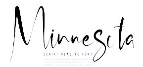
- The script typefaces Minnesota (Solid, Brush; almost in Treefrog style), Caminode (a wild script), Lewis Script and Blessing (a dry brush script in OpenType SVG format), all released in 2020.
- Along Sans (2019). An organic and geometric sans family designed for headlines and logos. It is characterized by a wind-swept ascender on the k.
- Quenbach (2019). A 36-style sharp-edged geometric sans.
- Reost (2021). An 18-style monolinear organic circle-based sans.
- Zenoa (2022). A 14-style luxuriant hipster serif.
- Gibeon (2022). In 27 styles. A unicase display family characterized by its tall x-height, psychedelic traits and hipster era curves.
Creative Market link for Ryul Davidson (2021). [Google]
[MyFonts]
[More] ⦿
|
burodestruct (or: Typedifferent.com)
[Lorenz Lopetz Gianfreda]

|
 Lorenz Lopetz Gianfreda's foundry in Bern, Switzerland, est. 1994, called Burodestruct and Typedifferent.com.
 Free fonts include(d) the gorgeous GalaQuadra (by Angela Pestalozzi, 1999), Eject Katakana (1998), Dippex (1995, grunge font), Ticket (1995), Rocket 70 (1996), Ratterbit (1995, pixel font), Plakatbau (1995), Lodel Fizler (1996), Flossy (1995), Faxer (1995), Console Remix (1998), Cravt (1998, by "Katrin"), Stereotype (1998, by M. Brunner), Brockelmann (1995, free), Kristallo (1997, very original display face) and Billiet (1996). Other fonts: Acidboyz (1998), Alustar (1999), BD Asciimax (1999, ascii art font), BD Billding, Bdr_mono (1999), Brick (1996, like Kalendar), Cluster (1996), Console (1997), Doomed (1998), Eject (1998), Electrobazar (1995), Elside (1995), Globus (1996), Fazer (1996), Lofi (1997), Medled (1995), Paccer (1995), Solaris (1998), Spicyfruits_brush_rmx (1998, a nice high-contrast face), Spicyfruits_rmx, Wurst (free, by Heiwid, 2000), Relaunch (2000), Relaunch Katakana (2000, free), Rainbow (2000), DeLaFrance (2000, free, by Heiwid), Electronic Plastic (2000), Colonius (2001), Cash (2001), Cashbox (2001), Bilding (2001), Meter (2001), Mustang (2001), Bankwell (2001), BD Alm (2001), Balduin (2001), Tatami (2001, oriental look font), Hexades (2001, free), Nippori (2002, techno), Jura (2002), Bonbon (2002, free), Band (2002, free), Navyseals (2002, kitchen tile font), Ritmic (2002), BDR Mono (1999, OCR-like font), Mann (2003, ultra fat stencil), Aroma (2003), Zenith (2003), Nebraska (2003), BD Equipment (2004), BD El Autobus (2004), BD Unexpected (2004), BD Wakarimasu (2004, free kana face), BD Bernebeats (2004, futuristic), BD Deckard (2004), BD Spinner (2004), BD Victoria (2004), BD Designer (2004), BD Kalinka (2005, a curly ultra-fat display face), BD Equipment (2004), BD El Autobus (2004), BD Unexpected (2004), BD Varicolor (2005, stencil), BD Chantilly (2005), BD Memory (2005), BD Emerald (2005, beveled), BD Kalinka (2005, Cyrillic simulation), BD Extrwurst (2005), BD Aquatico (2005), BD Mandarin (2005), BD Polo (2005), BD Beans (2005), BD Tiny (2005, pixel face), BD Times New Digital (2006), BD Panzer (2006), BD Jupiter, BD Jupiter Stencil (2006), BD Pipe (2006), BDR Mono 2006 (2006), BD Fimo Outline (2007, free, by Nathalie Birkle), BD Bermuda (2007, experimental and geometric), BD Smoker (2007, psychedelic), BD Radiogram (2007), BD Mother (2007, exaggerated black Egyptian), BD Fimo Regular (2007, free), BD Demon (2007), BD Reithalle (2007, free), BD Halfpipe (2007, free), BD Broadband (2008, free; not to be confused with the much older fonts BroadbandICG or FLOP Design's Broadband), BD Viewmaster and BD Viewmaster Neon (2008), BD Electrobazaar (2008), BD Motra (2008, stencil), BD Virtual (2008), BD Spacy 125 (2008), BD AsciiMax, BD ElAutobus (2004), BD Equipment (2004), BD Ramen (2003), BD Retrocentric (2009), BDR A3MIK (2009, virile Latin and Cyrillic slab), BD HitBit (2009), BD Unicorse (2010, unicase and techno), BD Telegraph (2011), BD Schablone (2012, stencil face), BD Pankow (2013, stencil), BD Algebra (2014), BD Hiragana Kuro (2014), BD Qualle (2014, a fat poster typeface), BD Tribler (2015, a tribal font). Alphabetical listing of their pre-2015 free typefaces: Algebra, Alm, Apotheke, AsciiMax, Baldrian, Band, Bankwell, Bardust, Beans, Billding, Billiet, Bonbon, Brockelmann, Burner, Cash, Cashbox, Chantilly, Circo, Console, Console Remix, Cravt, Delafrance, Designer, Destination, Dippex, Eject Katakana, ElAutobus, Elmax, Elside, Equipment, Faxer, Fazer, Fimo, Flossy, Fluke, Galaquadra, Geminis, Halfpipe, Hexades, Hiragana Kuro, Jayn Fonta, Kristallo, Lodelfizler, Lofi, Medled, Meter, Mustang, Outline, Paccer, Pipe, Plakatbau, Plankton, Polo, Ragout, Ramen, Ratterbit, Reithalle, Relaunch, Relaunch Ktna, Rocket70, Sirca, Sirca Rmx, Solaris, Spacy125, Spicyfruits, Spinner, Stella, Stencler, Stereotype, Ticket, Times New Digital, TinyFont, Tribler, Unfold, Wakarimasu. Alphabetical listing of their pre-2015 commercial typefaces: A3mik, Acidboyz, Alustar, Aquatico, Aroma, Balduin, BDR Mono 2006, Bermuda, Bernebeats, Breakbeat, Brick, Broadband, Calamares, Central, Cluster (Corporate), Colonius, Deckard, Demon, Discount, Doomed, Edding850, Eject, Electrobazar 2008, Electronicplastic, Elk, Emerald, Endless, Extrawurst, Fontabello, Globus, Good Wood, Hell, Hitbit, Jupiter, Jura, Kalinka, Kameron, Kinski, Las Palmas, Mandarin, Mann, Memory, Mother, Motra, Naranino (2012: a children;s script), Navyseals, Nebraska, Nippori, Nokio, Orlando, Pankow, Panzer, Qualle, Radiogram, Rainbow, Retrocentric, Ritmic, Robotron, Schablone, Showlong, Smoker, St.Moritz, Stalker, Stonehenge, Sweethome, Tatami, Telegraph, Unexpected, Unicorse, Varicolor, Victoria, Viewmaster, Virtual, Wotka, Wurst, Wurst Directors Cut, Zenith. In 2015, Gianfreda designed BD Barbeaux (a condensed typeface with the fashionable chic of the French art nouveau or film noir). Typefaces from 2016: BD Kickrom Mono (LED emulation type). Typefaces from 2018: BD Westwork. Typefaces from 2020: BD Aubergin (an experimental poster font with Bauhaus elements), BD Microna (a pixelish variable font), BD Micron Robots (dingbats). Typefaces from 2021: BD Supper (a food packaging sans), BD Roylac (a stylish poster font that evokes modern furniture), BDRmono 2021 (hipster style techno). Alternate URL. Dafont link. Behance link. View the Typedifferent typeface library. [Google]
[MyFonts]
[More] ⦿
|
Capsule: Typeface Design
[Matthew Antonio Chiavelli]

|
Matthew Chiavelli was born in Maryland in 1973. He is a web designer but has occasionally created typefaces, such as Gerrit, Ultura (1996, based on Herbert Bayer's Universal) and Can-d (1996). Lunokhod is to come soon. Fonts sold through Fountain. [Google]
[MyFonts]
[More] ⦿
|
Carlos Fabián Camargo Guerrero
[Andinistas]

|
 [MyFonts]
[More] ⦿
|
Castle Type
[Jason Castle]

|
 Designs by Jason Castle from San Rafael, CA, who studied psychology at Dominican University of California. He does custom font design and sells commercial typefaces through MyFonts and FontShop. Blog. These include:
 - A: AfrikaBorders, Afrika Motifs, Agency Open (M. F. Benton, 1934, revival Jason Castle), Agency Gothic Inline, Ampersands, Azbuka (2005, a heavy slab serif).
- B: Brasileiro (2007, an art deco face).
- Carisma (2007, a clean geometric sans), Carlos (art deco inspired by Elektra), Castle Fleurons, Chinoise (2008, based on hand lettering that is reminiscent of a style of ancient Chinese square-cut ideograms), Cloister Black, Copperplate Script, Cradley (2015, a Caslon titling family with Greek and Cyrillic, named after the birthplace of William Caslon).
- D: Deko Initials (1993, discontinued in 2007; based on NADA0 drawn in 1972 by Marcia Loeb), Dionisio (2008, didone).
- E: Eden (Bold, Light; originally designed by Robert H. Middleton in 1934).
- F: Fat Freddie, Futura CT and Futura CT Inline (2007, based on Futura ND, but discontinued after only a few weeks).
- G: Goudy Lombardy (Lombardic), GoudyStout, Goudy Text, Goudy Trajan (1994-2010, free; +alternates).
- H: Handsome (2002, nice finger dingbats, aka fists).
- J: Jensen Arabique (left field art deco, based on work of Gustav Jensen, 1933).
- K: Koloss (art deco).
- L: Latin CT (2008, 6 styles), Latin Wide, Laureat, Lise Informal (2008, hand-printed), Lombardy.
- M: Maximilian CS (Rudolf Koch, 1917), Metropolis Bold and Shaded (based on the 1932 Stempel cut as designed by W. Schwerdtner), Minotaur (2008, an original monoline design based on an Oscan votive inscription from the second century BC; looks like simulated Greek).
- N: Norberto (2009, an all-caps Bodoni; +Stencil).
- O: Ogun (2008, inspired by an Egyptian-style Russian block alphabet and useful for athletic lettering; formerly named Azbuka).
- P: Plantain (2002, a digital version of Plantin Adweight, a 1913 typeface by F. H. Pierpont), Plantain Stencil (2009), Progreso (2010, a condensed, unicase, serif gothic type design inspired by the hand-lettering on Russian posters from the 1920s).
- R: Radiant, Radiant Extra Condensed CT (both Radiants are revivals of Roger Middleton's typeface by that name, 1940), Ransahoff (2002, ultra condensed didone), Rudolf (1992, based on Rudolf Koch's German expressionist work such as Neuland).
- S: Samira (2008, art nouveau style; based on Peter Schnorr's Schnorr Gestreckt, from 1898), Shango (1993, based on Schneidler Initials by F.H.E. Schneidler (1936), and including a digital version of Schneidler Cyrillic (1992); extended in 2007 to Shango Gothic and in 2008 to a 3-d shadow version, Shango Chiseled, and in 2009 to Shango Sans), Sculptura (2005, an all caps typeface based on Diethelm's Sculptura from 1957), Sencia (2008, based on Spanish art deco stock certificate lettering from 1941), Sonrisa (2009, art deco family---Sonrisa Thin is free), Standard CT (a neo-grotesque family), Standard CT Stencil (2012: free).
- Tambor (Light, Black, Inline, Adornado) (1992) (note: Jason claims that it was remotely based on Rudolf, which in turn was based on calligraphy of Rudolf Koch), Trio (an art deco sansserif), Trooper Roman (discontinued).
- V: Vincenzo (2008, a slabby didone), Warrior (2009, a 3d font based on Ogun; +Shaded).
- X: Xavier (art deco family based on Ashley Crawford by Ashley Havinden, 1930, revival by Jason Castle in 1992).
- Z: Zagora, Zamenhof (2011: an all caps poster face with constructivist ancestry, named after the inventor of Esperanto), Zuboni Stencil (2009, Latin and Cyrillic, constructivist and perhaps even military).
Klingspor link. Behance link. View Jason Castle's typefaces. [Google]
[MyFonts]
[More] ⦿
|
Catharsis
[Christian "Cinga" Thalmann]

|
 Catharsis is located in Leiden, The Netherlands. Before that, Christian Thalmann's page Cinga.ch was run out of Switzerland, when he was a student at ETH Zürich. Thalmann is an astrophysicist by training.
 Catharsis had free typefaces such as the great Arabic simulation typeface Catharsis Bedouin (2004), CatharsisCircular, CatharsisRequiem (a unicase pair), CatharsisRequiemBold, CatharsisCargo, Cirnaja Bookhand and Cirnaja Calligraphy (made for his artificial language, Obrenje), Catharsis Macchiato (2005), CatharsisEspresso (2005). At Catharsis, the commercial foundry, he published Octant in 2013: Octant is an original steampunk display typeface drawing inspiration from Victorian-age steel and brass engineering, as well as from blackletter typography. Gryffensee (2013, in styles called Eins, Zwei and Drei) is designed to be the Futura of blackletter, combining the time-honored gravity and relentlessness of the Gothic script with the clean, contemporary freshness of the geometric sans. It also covers Cyrillic. Backstein (2013), baked brick, took its inspiration from the broken antiqua lettering in Berlin's old subway stations. Volantene Script (2013) is a (free) uncial display typeface inspired by the penmanship of Lady Talisa Maegyr-Stark as seen on HBO's Game of Thrones. Numina (2013, Glamour and Glory substyles) is an extensive condensed fashion-oriented typeface family related to Skyline and Corvinus. Maestrale (2013) adds calligraphic and flamboyant extenders to a decorative text typeface for a dramatic effect. Choose between Maestrale Manual (swashy) and Manuale Text. Blumenkind (2013) is inspired by an instance of metal-strip lettering found on the Bürgermeister Kornmesser Siedlung residential building complex in Berlin from the 1960s. Brilliance (2013) is a glamorous contemporary display blackletter combining the rich tapestry of Textura with a hint of the airy lightness of Spencerian script. Let's say that it is a light-hearted Textura. In 2015, he made the free 45-style classic serif typeface family Cormorant, which includes several unicase fonts. This typeface started out in 2014 as Paramond, a light, contrasted, space-taking Garalde with impossibly tiny counters and long extenders. Links to the Google Font directory: Cormorant, Cormorant Garamond, Cormorant Infant, Cormorant SC, Cormorant Unicase, Cormorant+UprightCormorant Upright. See also CTAN. In 2016, he created the humanist geometric sans typeface family Quinoa for Latin, Cyrillic, Greek and Hebrew. Typefaces from 2017: Tesserae (kitchen tile style), Traction. Traction was originally conceived and designed by Christian Thalmann. Chiara Mattersdorfer and Miriam Suranyi expanded, completed and produced the font family. This typeface sports signature serifs, soft edges and a fluid, organic design. In 2018, Christian started work on a blackletter-themed stencil typeface, first called Komik Ohne (the German for Comic Sans) and later named Kuschelfraktur (2019). Between 2016 and 2019, he developed Eau de Garamond---a sans distilled from the essence of Garamond---, which was later renamed Ysabeau. Github link. In 2020, we find another fork, Isabella Sans. Overbold (2019) is described by him as follows: Overbold is an unapologetic display typeface inspired by an illustration in Eric Gill's Essay on Typography (p.51), in which he demonstrates how not to make letters. In particular, he shows that increasing the weight of the downstroke in a serif A without structural adjustments yields an absurd, overbold result. I found the letter so charming that I decided to blatantly disregard Gill's wisdom and draw an entire overbold typeface. Here is the result. I'm not sorry. 1001 fonts link. Yet another URL. Fontspace link. Behance link. Klingspor link. Dafont link. Open Font Library link. Github link. [Google]
[MyFonts]
[More] ⦿
|
Cayo Navarro
|
Peruvian graphic and web designer. At FontStruct, he created a number of pixel fonts in 2009, such as gridnPix75 (+Light, +nLite), OCR-APix6, cayoPix45, ScrptPix5, sCapsPix4, SerifPix6, moSpPix57, ClassPix5, MicriPix4, CorpoPix5, and BminiPix5. Other fonts there include Proton Type (2009), the geometric pxlNotSqr (2009) and the sturdy headline typefaces Woznian (2009, inspired by bitmap fonts like Chicago and Charcoal) and Gizmatik (2009), his best font. In 2009, he added NuevoSolStile (in the Eurostile/Microgramma mold), MacroBold (ultra-fat), Steam Punker, Funkadeliai, Monocodigo, FS Mini, FS Remix (horizontally striped), BlackSQRda (blackletter), Fontscript, Scanografia (vertical striping of letters), Stencikal, Bloxed (white on black), BlackSQRda, NSS Unicase (unicase), NuevoSolStile (unicase). [Google]
[More] ⦿
|
Cerement
|
American designer at FontStruct in 2008 of Lucid (monospaced 5x7 LCD font for Latin, Cyrillic, Greek and katakana: white on black), Absinthe (pixel face), Faith (condensed, unicase), Neuerburg (blackletter influences: from the logo for "Haus Neuerburg Zigaretten" designed by Prof. O.H.W. Hadank, 1925), Conform (pixel face), Minim (Textura blackletter). [Google]
[More] ⦿
|
Cerulean Stimuli
[Kevin Pease]

|
Kevin Pease runs Cerulean Stimuli in Collingswood, NJ. He created the typefaces Cerulean (2003) and Cerulean Black (2005). Check also his pixel family Fourmat (2004) and the very original card game-inspired Pokeresque (2006). In 2016, he designed the unicase display typeface family Cerulea for Latin, Greek and Cyrillic. In 2017, he published Walklike, its name referring to the song Walk Like an Egyptian and thus to hieroglyphic influences. He ends 2017 with the balloon font family Glazed. Typefaces from 2022: Anachrony (a weirdly modular family; ten styles). [Google]
[MyFonts]
[More] ⦿
|
Characters (or: Character Type)
[René Verkaart]

|
 René Verkaart (Maastricht, The Netherlands, b. 1970) established Characters in 2004. He also has an office in Düsseldorf, Germany. His type designs:
 - Accelerator. A techno / Startrek typeface solds via T-26.
- Ballet Mechanique (2006). A custom-designed unicase font for musician Jeroen Borrenbergs, aka Ballet Mechanique.
- Corporaet (2019). A 5-style humanistic sans intended for corporate branding.
- Cucaracha (2005, Volcano Type). It includes Cucaracha Icons. A typeface commissioned by Boris Kahl for Kahl's Bastard Project.
- Encrypted Wallpaper (2006) is a playful squarish typeface for creating textual wallpapers and decorations. Free at MyFonts.
- Insider (2004). A custom sans face done for Insider Consulting in Duesseldorf, German. It became retail in 2011, and is sold as a warm grotesque family.
- Insignety. a fashion stencil typeface for Amsterdam-based jeweler Insignety.
- Jekyll, a sans typeface René describes as follows: CFF Jekyll Pro is a schizophrenic grotesk typeface with an edge. Its bright side is a versatile corporate font with an unexpected twist. Its dark side is awakened by creepy OpenType features, ligatures, swashes, and alternate glyphs, making it mutate into the evil Mr. Type.
- Kris (2014). A vampire script or haunted house typeface co-designed with Corrie Smetsers.
- Maastricht Sport. A suite of retail & customized fonts for Maastricht Municipality's Sports department. Based on Insider.
- Maestricht. A highly personal script font, custom made from the handwriting of Maastricht-based film producer Jean-Paul Toonen, dating back to 1992. His handwriting is very dynamic, artistic and a tasteful blend between roman and italic style.
- Motorman. A hand lettered logo font for the electric Meijs Motorman moped. This typeface was commissioned by design agency Stoere Binken Design.
- Nantua (2003), Nantua Flava XL (2003, a futuristic display typeface originally sold through Union Fonts). In 2011, the octagonal typeface Nantua was offered for free download at Dafont.
- Nordic Narrow is a clean, stylistic font with a Scandinavian touch. For an early development of the Nordic series, see Nordic A (2003, sans, sold through Fountain). Nordic Narrow Pro was published in 2014.
- Plan (2005). A corporate typeface made for Plan A Ontwerp, a graphic design studio based in Eindhoven, The Netherlands, based on sketches by Frank Vogt.
- Porta. a modular monoline unicase typeface.
- Reethi Rah (2006). A great text typeface for editorial use, named after a resort on The Maldives.
- Savant (2012). A free informal face.
- ShellShock (2005). A military stencil typeface.
- SidB. An educational typeface commissioned by Noordhoff Publishers. SidB stands for Schrijven in de Basisschool (writing in elementary school) and is an independent method to teach kids elementary school writing. Not for sale. René also designed another eductaional font, Plantijn Schrift.
- Siventi Logo Wide (2005). A Startrek face. Verkaart writes: This custom font was created from the Siventi Products BV logo, which was part of a Brand Identity concept done by Stoere Binken Design (SBD). The concept behind the handlettered Siventi logo was a playful concept, a colorful corporate identity that would change appearance like a chameleon to fit its purpose. Fresh and friendly on poppy plastic products, serious and distinguished on office desk materials.
- Vagebond (2003) is a monoline elliptical geometric font that is inspired by 60s television design.
- Other fonts designed by René Verkaart include BorVer, Bionix, FatBoy One, Freaky Animals, Kryptonite (1998), Porta, SBD Block (a corporate typeface for his own design studio, Stoere Binken Design).
He co-founded Stoere Binken Design. Blog. Klingspor link. Behance link. Dafont link. I Love Typography link. Volcano Type link. Fountain Type link. View René Verkaart's typefaces. [Google]
[MyFonts]
[More] ⦿
|
Christian "Cinga" Thalmann
[Catharsis]

|
 [MyFonts]
[More] ⦿
|
Christian Robertson
[Betatype]

|
[MyFonts]
[More] ⦿
|
Christopher Katende
|
Graphic designer in Toronto, who created the modular unicase display typeface Shfontz (2014). [Google]
[More] ⦿
|
Claudius Marcus
[Marcloud]
|
[More] ⦿
|
Clément Barbé
[Studio B (or: La Station B)]

|
 [MyFonts]
[More] ⦿
|
Clément Nicolle
[Stereotype (was: Zone Erogene, or Dasklem)]

|
 [MyFonts]
[More] ⦿
|
Compania Tipografica de Chile

|
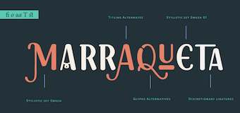 The Compania Tipografica de Chile is a Chilean type foundry based in Santiago de Chile set up by Raul Israel, Franco Jonas, Gaston Uribe and Ale Navarro in 2018. Their typefaces:
 - Maipo Sans (2018) in 40 styles, 826 glyphs per font, including a stencil style; by Ale Navarro: Maipo Sans is a modern typeface inspired by the mountain landscape of Cajon del Maipo, Chile. Its forms are inspired by the first sans serif European humanist fonts of the twentieth century along with a touch of reverse contrast. This typeface is specially designed for projects using extensive text blocks and striking ads..
- Passiflora (2018) by Valentina Pino and Franco Jonas. A unicase rounded brush font inspired by facade inscriptions.
- Hatchet (2018). A reverse stress typeface.
- Joane Stencil (2018). By Ale Navarro.
- Mena Grotesk (2019). By Ale Navarro.
- LC Merken (2019). A slab serif family inspired by Vincent Figgins's slab serifs such as Egiziano (1815) and Figgins Antique.
- LC Gianluca (2019). A flared or glyphic serif by Raul Israel.
- LC Pukara (2021).
[Google]
[MyFonts]
[More] ⦿
|
CORE.NU Fonts
[Martin Fredrikson Core]

|
 Free fonts by Swedish designer Martin Fredrikson Core (b. Gothenburg, 1970), whose real name is Martin Lexelius:
 - Chank fonts: Industri No. 35 (2002), Oh La La (2002 screen font), Sauerkrauto (2000), Som Ett Hus (2001).
- T4 fonts: Corpse Grinder (gothic font), Kantor (2002, since 2007 commercial at T4), Motor Mouth (2006).
- Fountain fonts: Borgstrand (styles called Regular, Web, Stencil, Hellas; originally a Fountain Type font, it migrated in 2015 to Martin Lexelius Core's foundry), Filt (2001, a fat display face), Jalapeño (Mexican-style diner display, see here), Malmö Sans (2000, Fountain Type, and 2015 at his own type foundry).
- CORE.NU fonts (mostly free): Backstabber Grotesk, Backstabber Roman (1999), Banditos, Bilprovning Gothic, Blocky Smocky (2002), Bodoni Natural, Bodoni Slapp (2000), Bongonaut (1999), Boy-O (2002), Bunth Serif (1999), Daniel Hando, Darlito, Das Kavel Gotisch, Dot City (1999), DrunkPunk (2002), Executive Producer, Fizzo (1998), Flake Anfang (1999), Funky Mushroom (2000), Gentleman Caller (2002 (pixel font), Grill Sans (2000 (a funny hotdog and hamburger dingbat font, together with Finn Hallin and Simon Grdenfors), Felvetica (2001), Il Tempo Gigante (2001 (extra wide screen font), Isterburk (2001), Komputter (2002), Lager Neon, Lindhagen Script, Marfhaus (1998 (his take on the Bauhaus "Universal" unicase font), Messages, MuskelBengt (2000), No Reklamo, Nuderflaken (2002), Oblata Kurrenta (1999), Pixelette (1998), Plugger, Practicamente, RunStop, Sarcastic Girl Scout Bitch (2000), Sensory Input (2001), Serge Hand, Small Talk (1999 (nice screen font family with styles called Tight, Tight Mono, Wide, Wide Mono), Stiffy99, The Perfect Font.
FontShop link. MyFonts link for the Martin Lexelius type foundry. MyFonts link for Cre. [Google]
[MyFonts]
[More] ⦿
|
Craig Eliason
[Teeline Fonts]

|
 [MyFonts]
[More] ⦿
|
Crump Hand
[Stefie Justprince]

|
 Depok, Jakarta, Indonesia-based designer of the handcrafted typefaces Pangoline (2019), Beasty Morty (2018), Sweet Beaches (2018), Orabelle (2018: connected script), Koeltoerals (2018: monoline signage script), Rushtelle (2018), Sloutthy (2018) and Hingar Bingar (2018: a marker pen font).
 Typefaces from 2019: Gourmet, Firstborn, Sunkist Squash, Borgemore, Smoothis Bucket, Galahad (dry brush), Goodbye, Chillhop, Salyka, The Quotes, Hallou, Burgundy, Brittanian (dry brush script), Risslead (dry brush), Haringtone (dry brush), Pelakor, Shallamander, Clarra, Modern Guns, Drunkgun. Typefaces from 2020: Pixelfy, Southern Spaceship, Blushing, Royal Kingdom, BetterYouSmile-Script, Proud (brush). Typefaces from 2021: Dopeness (a round marker font), Six Pounder (a polygonal or Greek emulation typeface), Ballpoint Marker, Candy Paint (painted letters), Slippery Slope, Blindshot (a dry brush font), Youth Today (a very dry brush font), Break Snooze (a fat finger font), Stripes Pattern (a scrapbook font), Roasted (a grungy brush font), Macho Rogers (a plump display font), Springtime Romance (a scrapbook font), Tasty Matcha (a fat finger font), Tasty Matcha (a fat finger font), Briskly Cabrales (squarish and chamfered), Roots N Branches (a fat finger font), Glowing Bubble (a unicase bubblegum font), Taste Of Heaven (a scrapbook font), Anything Skribble, Hate Your Writing (a fat finger font), Joy Of Christmas, Concrete Fantasia, Wispy Night, Playdates, Shamar, Rhantica, Reclaim, Retrophile, Brickyard, Cosmopolitan, Nooble Wooble, Saturday Alright, Money Honey, Natural Portabella, Organic Jalapeno, Celina Stephanie, Third Degree, Suffer Through, Bullseye (a bold marker pen font), Hurtz (a plump comic book font), Orange Leaves (a supermarket signage typeface), Thursday Routine, Grateful Everyday (a fat finger font), True South (a dry brush font, SVG style), Quacker Slate. Typefaces from 2022: Breakfast Renegade (a simple handprinted typeface). [Google]
[MyFonts]
[More] ⦿
|
Cut Nurfajarlia
[Alandya Type Foundry]

|
 [MyFonts]
[More] ⦿
|
Cyrus Highsmith
[Occupant Fonts]

|
 [MyFonts]
[More] ⦿
|
Daniel H. Evans
|
Assistant Professor in the Department of Art & Art History, University of Utah, in Salt lake City. As Fugitiveglue at FontStruct, he made Allemande (2010), and Havre (2009, gridded), as well as the more experimental Luggage Lifter (2010), Root Canal (2010), Unexamined Zipper (2009) and Gawe (2010). Routeo (2010) is art nouveau, and Ampul (2010) simulates Arabic. Perforane is a heavy mechanical/octagonal unicase typeface, while Guasco (2012) is a curly high-contrast face. Perforance became the basis of a large family of fonts, like PERF Blur (textured face), PERF Glow, PERF Solid, PERF Solid 3D, PERF Knockout 3D, PERF Punch1 3D, PERF Punch3 3D, PERF Punch1, PERF Punch2, Cuevita (2012). Typefaces from 2013: Apocalipsis, Boot Liquor (a western face), Galactica Alphabetz, Clownstruct, Ball Chain (texture face; +Light). Typefaces from 2014: Sunday Clothes. [Google]
[More] ⦿
|
Daniel Hernandez
[Hernández Type (was: Estudio de diseño Calderón)]

|
 [MyFonts]
[More] ⦿
|
Danii Baker
|
Toronto-based designer of the ornamental unicase typeface Flash (2013). [Google]
[More] ⦿
|
Danilo Segan
[Bepa Fonts]
|
[More] ⦿
|
Darren O'Driscoll
|
Graduate of the National College of Art and Design in Dublin. In 2013, he obtained an MDes from the Glasgow School of Art, specializing in animation. Now based in London, he designed Newer Alphabet (2013), which was inspired by Wim Crouwel's unicase proposal New Alphabet (1967). [Google]
[More] ⦿
|
Darren Rigby
[Darren Rigby]
|
Refreshing fonts created by Canadian Darren Rigby using High-Logic. The fonts come in truetype format (in 2000): Bayern (fraktur font), Beltane (2002), Brasspounder (2004), Con Jitters (2002, handwriting), Enigmatic, EnigmaticUnicodeRegular, Fitzgerald, GangueOuais (2002), HindsightUnicode (2001, with all European languages, Cyrillic, Armenian, and IPA), HindsightSmallCaps, HindsightRegular, HindsightMonospaceRegular, IntruderAlert, QuicktypeRegular, ThinDime, TorturerUpright, SilverDollar, DontWalkRun, History-Repeating (1999-2000), HistoryHappens, HistoryRepeatingH, HistoryHappens, HistoryRepeatingV, Lemon, Norse-Code (runes), OneEighty, TorturerBound, TorturerCrushed, Daybreaker, Yerevan, Seebreaze, Jareth, Tin Birdhouse, Tin Doghouse, Three-Sixty, Three-Sixty Condensed, Levity (2001, Western font), Gravity, River Avenue, Water Street, Warer Street Detour (unicase), Meridiana, Torquemada, Torquemada Starved, Torquemada Starved Unicode, Radian (2002), All Hooked Up (2002), Brasspounder (2004), Quilljoy (2004). [Google]
[More] ⦿
|
Darren Rigby
[Darren Rigby]
|
[More] ⦿
|
Dave Rowland
[Dave Rowland Type (was: Eclectotype, Schizotype)]

|
 [MyFonts]
[More] ⦿
|
Dave Rowland Type (was: Eclectotype, Schizotype)
[Dave Rowland]

|
 Type foundry in Sheffield, UK, first called Schizotype, and in 2021 renamed Eclectotype because this is not a foundry that likes to stick to trends or expectations. Its designer, Dave Rowland (b. 1982, Chesterfield) grew up in Sheffield, UK, but was based in Japan, the Philippines, Liverpool, Surat Thani, Thailand, and Koh Samui, Thailand. MyFonts Interview. In 2021, he joined The Type Founders.
 He created these fonts in 2009: Quesadilla (signage type, Mexican simulation face), Quesadilla Shadow, Schizotype Scrolls, Quiff, Toothpaste, Astroboy (connected script), Decolletage (art deco), Kazumi Sans, Acid Haus, Dr. Black, Dr. Eric, Soyo Gogo, BMX radical (brush), Team, Miami Hopper, and Tubularis (multiline face), Sickle, Klique (futuristic display face), Uncle Eric (a cartoon face), Praline Smooth (connected script in the style of Mistral), Kwaktur, (blackletter typeface based on the logo of Belgium's Kwak beer), Blackball (another blackletter) and Modulogue (a modular display family). Additions in 2010: Christmas Tuscan (a modular Tuscan), Masonic Lodge, Mook (a retro, unicase, bubble font), Toothpaste 2, Gaden Sans (organic monoline typeface that includes a hairline weight), Sizemore (all caps slab headline face), Quickscript (signage face), New Wave. Fonts designed in 2011: Brag Pro (like Brag, a Cooper Black alternative), Brag Stencil Pro, Chestnut (curly, hand-printed), Brag (a fat round face in Cooper Black style), Gelato Script (a connected signage face), Brag Stencil (2011), Streetscript (2011, brushy signage face). In 2011, he created a quaint text family, Vulpa, with quirky foxtail terminals. Typefaces from 2012: Margot (a rounded slab serif described as a lovechild of American Typewriter and Cooper Black), Range Serif (an angular typeface), Pastiche Brush (a brushy connected script inspired by the titles of the 1959 movie Imitation of Life (Wayne Fitzgerald)), Quayside (a bulbous baseball or signage script). Typefaces from 2013: Alight Slab (hairline slab), Anultra Slab (a heavy bold slab serif), Ollie (a connected baseball or signage script), Urge Text (an extensive modern text family with ample language support and plenty of mathematical symbols, and large ball terminals). Typefaces from 2014: Range Sans (a grotesque sans family with the quirky angular cutouts inherited from Range Serif), Samui Script (upright connected script), Streetscript Redux (signage script), Price Didone (created for setting elegant price tags). Typefaces from 2015: Oldskool Script (a connected signage script; one of many quite different commercial fonts with the same name), Hazel Script (a great flowing calligraphic script designed around the time of the birth of his first child, Hazel; the name may create confusion as there is a famous BB&S metal font with the same name), Mastadoni (a fat didone for headlines and fashion mags), Kake (a great creamy sign-painting font), Bali Script (creamy signage script), Flat Sans. Typefaces from 2016: Cinema Script (retro movie script), Chill Script (a retro non-brush signage script), Blanket (a soft cursive font, ideal for children's books), Schizotype Grotesk (a very original angry geometric grotesk, with bucketloads of pizzazz), Astrid Grotesk, Asterisk Sans Pro (a versatile humanist sans family for Latin, Greek, and Cyrillic), Strelka Ultra (a retro space age typeface), Revla Serif (beatnik style, emulating randomly positioned handlettering). Typefaces from 2017: Duckie (a bubblegum or creamy signage script), Tusque (a layered decorative Tuscan typeface), Ekamai (a tight non-connected creamy signage script), Quinella (seventies script), Delfino Script (retro signage script), Tchig Mono (a special, almost hipster monospace typeface family), Revla Sans (beatnik style), Revla Sans Text, Eroika Slab (a robust wedge serif family). Typefaces from 2018: Aziga (descrived by Dave as a high (occasionally reversed) contrast, postmodern, deconstructed-reconstructed, serifless (mostly), fashion didone), Revla Slab (bouncy, beatnik), Galix (subdue futuristic sans family), Gelato Luxe (an update of his earlier Gelato Script), Engria (an angular brush-inspired text typeface). Typefaces from 2019: Gelato Fresco (a warm flowing script), Amica Pro (a stocky part humanist part geometric workhorse sans), Galix Mono, Backstroke, Gigantic (an exercise in ultra-fatness). Typefaces from 2020: Gelica (a 14-style retro soft serif family influenced by Cooper Black, Goudy Heavyface and Ludlow Black), Capsule (a reverse-stress high-contrast rounded sans-serif), Sausage (a friendly fat rounded typeface that is is unapologetically bold and bulbous. Influenced by magnetic fridge letters, hot dogs and 70s phototype fonts, it is retro, but not cloyingly so). Typefaces from 2021: Revla Round (a child-friendly version of Revla Sans), Megumi (a formal hairline fashion mag script), Yink (a bulbous psychedelic experiment). Klingspor link. Behance link. Showcase of Schizotype's typefaces at MyFonts. Fontspring link. MyFonts interview. [Google]
[MyFonts]
[More] ⦿
|
David Kerkhoff
[Hanoded]

|
 [MyFonts]
[More] ⦿
|
Deepak Singh Dogra
[Graphite Foundry]

|
 [MyFonts]
[More] ⦿
|
Denis Masharov

|
 Born in Moscow in 1973, he emigrated to Israel in 1990 and has a Bachelor of Arts degree from the Bezalel Jerusalem Academy of Arts, 1996. A professional designer since 1996, he designs type and is involved in typographic projects.
 At Google Font Directory, we can download his Latin/Cyrillic poster font Ruslan (or Rusland) Display (2011), the freehand lettering typeface Marck Script (2011, based on the hand of Marck Fogel), and the angular Kelly Slab (2011). Bolster (2011) is a unicase fat Western face. Forum (2011) is a free classical roman face. TeX support. Ruslan Display (2011) was co-designed with Vladimir Rabdu, this decorative typeface is in the poluustav style dating from the 16th century. In 2011, he set up the Denis Masharov foundry at MyFonts. Free fonts published at Google Web Fonts in 2012: Ledger (Ledger was likened to Zapf's Melior by Nick Shinn, but Masharov says that it is closer to Swift), Glass Antiqua. This is a revival of the 1913 typeface Glass Antiqua by Genzsch & Heyse (original by Franz Paul Glass, 1912). Poiret (2012, free at Google Web fonts) is a Latin / Cyrillic geometric grotesque that combines art deco with avant garde. TeX support for Poiret One. Bolster (2012) is a great Italian wood type face. Tenor Sans (2012) is a Peignotian typeface (free at Google Web Fonts). In 2017, Denis Masharov and Roman Shchyukin co-designed the custom squarish sans typeface Match TV for the Russian TV sports channel MachTV. Still in 2017, he designed TNT Sans for the Russian entertainment TV channel TNT (on commission for Elena Shanovich, Shandesign). Denis did the logo and typeface for the bakery brand Volkonsky in 2017. In 2019, he created the Elzevir style titling typeface Matilda Titling for Coronation, а historical TV seriеs by Alexei Uchil. It was inspired by typefaces from Georges Revillon's type foundry, ca. 1860. Klingspor link. Behance link. Fontsquirrel link. Google Plus link. Fontspace link. [Google]
[MyFonts]
[More] ⦿
|
Denis Roegel
[LaTeX Navigator]
|
[More] ⦿
|
Diego Aravena Silo
[Without Foundry (or W Foundry; was: Diego Aravena)]

|
 [MyFonts]
[More] ⦿
|
Diego Maldonado
[Notdef Type]

|
 [MyFonts]
[More] ⦿
|
Diego Valle
|
 Basque designer, b. 1985 Vitoria-Gasteiz. He currently studies in San Sebastian. In 2010, he created Funambulo (a monoline unicase sans). He also made Ideotheque, a mini-slabbed serif face, under the supervision of Eduardo Manso.
 In 2013, he designed the text typeface Adela. Home page. Behance link. [Google]
[More] ⦿
|
Dimitre Lima
[HiType (was: DMTR.ORG)]

|
[MyFonts]
[More] ⦿
|
Dino dos Santos
[dstype]

|
 [MyFonts]
[More] ⦿
|
Discourse Type
[Jonathan Bennett]

|
 Foundry, est. 2007 by Jonathan Bennett, who is located in Caerphilly, Wales. Bennett designed these typefaces:
 - The unicase typewriter (Courier-like) typeface shown here.
- MyFonts sells Lazar (2007, an ultra fat art deco typeface inspired by work of El Lissitzky), Kubrickle (2008, in block, swash and kitchen tile shapes), Rody (2007, a counterless slab serif related to Russian deco), Diglossia (2007, a fat geomeric slab serif).
- DaFont has a free copy of Diglossia.
- Dialogue (2007) is an artistic sans typeface for short texts (see also here).
- He is working on this blackletter.
- At FontStruct, they made parallel (2008).
Alternate URL. Dafont link. [Google]
[MyFonts]
[More] ⦿
|
District (was: CV Type)
[Galen Lawson]

|
 CV Type, since 2013 called District, is Galen Lawson (b. Greensboro, NC, 1975), an artist who specialized first in graffiti type and logotypes and then expanded to cover all bases, including several distinctive masterpieces such as Blancmange and Hoban. He lives in Washington, DC. In 2013, CV Type became District.
 His creations from 2010 until 2012: Aeron (2010, semi-serifed family, with a crippled lower case h), Hijinx (2009, a headline face), Verlico (2009, a take on Optima), and Frusta (2010, a 5-style slab serif family), Level (2010, an elliptical sans family), Reverie (2011, a curly sans), Encoder (2011, a slabby stencil family), Blancmange (2012: a tall informal semi-brush family), Reverie OT (2012). Typefaces from 2013: Hoban (Light and Bold, a pair of high-contrast fashion mag typefaces), Fair Sans (unicase), Fair Sans Text. Typefaces from 2014: Coupler (Coupler is a sturdy text face with low contrast, airy counters, and a strong baseline for smaller sizes and extended reading), Fair Sans Text. Typefaces from 2015: Steady Sans (a sans with curvy dynamics), Emeritus (a lapidary typeface influenced by carved letters found on buildings and monuments in Washington, DC). Klingspor link. Behance link. View Galen Lawson's typefaces as CV Type. View Galen Lawson's typefaces as District. [Google]
[MyFonts]
[More] ⦿
|
Dmytro Iarynch
[Huh Type Foundry]

|
[MyFonts]
[More] ⦿
|
Dogu Kaya
[BNF Type Foundry]
|
[More] ⦿
|
Domen Fras
[Aparat]
|
[More] ⦿
|
dstype
[Dino dos Santos]

|
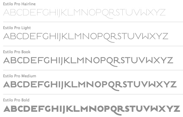 Established in 1994, dstype used to offer free fonts but has gone commercial now. It is run by Dino dos Santos (b. 1971, Oporto) from Oporto, Portugal. He graduated in Graphic Design at ESAD, Matosinhos. He received a Masters degree in Multimedia Arts at FBAUP, Porto. MyFonts place. In 2006 he won the Creative Review Type Design Competition in the Revival/Extension Family. At ATypI 2006 in Lisbon, he spoke about Portuguese lettering since 1700. Interview in 2007. Klingspor link. Author of A Letra Portuguesa, a book about Portuguese calligraphy. Dino created these typefaces:
 - Access (1997).
- Acta, Acta Display and Acta Poster (2011, +Poster swashes). A didone fashion mag family. First designed for Chilean newspaper La Tercera in 2010, DSType's Acta family is a clean information design type system. It includes Acta Symbols, an extensive dingbat family. Acta Var (2020) has two axes, weight and optical size.
- Acto (2012). Acto is a type system designed as the sans serif counterpart of the previous released Acta. Both type families were designed in 2010 for the redesign of the Chilean newspaper La Tercera.
- Andrade Pro (a modern) and Andrade Script Pro: based on the calligraphy of Andrade de Figueiredo, ca. 1722.
- Anubis (2003): a unicase face.
- Aparo (2013). A plumpish elegant high-contrast script face.
- Apice (2022). A highly structured calligraphic typeface with five optical sizes.
- Apud and Apud Display (2010): a high-contrast serif family.
- Aquila (2004).
- Ardina (2016). Done with Pedro Leal, this text typeface family has three optical sizes.
- Boldina (2004). A fat informal poster family with 18 weights and styles.
- Braga (2011, Dino dos Santos and Pedro Leal). This is a layered font design family. Dino writes: Braga is an exuberant baroque typeface, named after a portuguese city, also known as the baroque capital of Portugal. Our latest typographic extravaganza comes with a multitude of fonts designed to work like layers, allowing to insert color, lines, gradients, patterns, baroque, floral swashes, and many other graphic elements. Starting with Braga Base, you can add any of the twenty-three available styles, to create colourful typographic designs.
- A type system from 2014: Breve News, Breve Display, Breve Slab Title, Breve Sans Title, Breve Title, Breve Slab Text, Breve Sans Text, Breve Text. The Breve system includes modern design elements in the skeleton and ball terminals, transional elements, almost wedge-serifs in the serifed styles. As with most of dos Santos's typefaces, even the sans and slab styles exhibit Latin warmth and exuberance.
- Capsa (2008): a family that was inspired by, but is not a revival of the Claude Lamesle types Gros Romain Ordinaire and Saint Augustin Gros Oeil.
- Ception (2001): a futuristic sans family.
- Cimo (2017). A distinguished condensed sans.
- Cultura, and its improved version Cultura New (2013), a text book typeface family.
- Decline (1996).
- Denso (2019). By Dino dos Santos and Pedro Leal: a great condensed variable font with weight, serif and optical size axes.
- Digno (2022). A fuzzy text typeface family.
- Dione (2003): a sans; redone in 2009 as Dobra at TypeTrust. See also Dobra Slab (2009).
- Enorme (2020). Ultra massive and modular 3000-glyph mastodont of a constructivist font, by Pedro Leal and Dino dos Santos.
- Esta (2004-2005): extensive (transitional) text and newsprint family.
- Estilo (2005): a gorgeous and simple art deco-ish geometric headline face. This was accompanied by Estilo Script (2006), Estilo Text (2007, a 6-style rounded sans family), and later, Estilo Pro (2010, +Hairline).
- Ezzo: a sans family.
- Factor (1997).
- Finura (2009): this typeface has hints of University Roman.
- Firme (2014). A geometric sans for corporate use.
- Fragma (2003): squarish techno family.
- Girga (+Italic, +Engraved, +Banner, +Stencil) is a strong black Egyptian family designed in 2012 together with Pedro Leal at DS Type.
- Glosa (2008): Glosa is a meaty multi-style didone family. Glosa Text and Glosa Headline all followed a bit later in 2008, and Glosa Display in 2009.
- Hades (2012). A yummy and free blackletter typeface.
- Hypergrid (2002): octagonal.
- Ines (2015). A classic 7-style text typeface.
- Isento and Isento Slab (2017). Both are loosely based on ATF's Times Gothic.
- Lucius (Sans, Serif) (2022). The Lucius type family began as an attempt to reproduce the Principios Methodicos para as Letras Aldina e Roman---Typo Portuguez, but went went way beyond that in its multi-faceted execution.
- The Quase family (2017): Quase is a very free interpretation of the types found in the Specimen of Printing Types by William Caslon from 1785. We wanted to start with Caslon and then transform it into an editorial typeface, hence the increase of the x-height and the radical reduction of the ascenders and descenders. Subfamilies: Quase Headline (12 styles), Quase Poster, Quase Display, Quase Text.
- Idem and idem Display (2021).
- Dino dos Santos and Pedro Leal published Jules in the summer of 2015---a fat fashion mag didone 45-style family inspired by several plates from Portuguese calligrapher Antonio Jacintho de Araujo; it comes in Big, Colossal and Epic. They followed up in 2017 with Jules Text.
- Kartago (2005): based on Roman inscriptions from Cartago.
- Keiss (2017) and Keiss Text (2021). A Scotch roman with a lot of contrast. Keiss Text comes in twelve styles and features short descenders and ascenders, along with three very distinct optical sizes. It was designed with contemporary newspapers in mind. In 2021, he added Keiss Title, Keiss Condensed, Keiss Big (14 styles) and Keiss Condensed Big.
- Large (1999) and Large Pro (2006).
- In 2020, Dino dos Santos and Pedro Leal designed Larga, which was inspired by the typefaces shown in the specimens of the Fundiçãao Typographica Portuense from 1874. Larga is a wide all caps family and comes with a variable opentype format.
- Leitura, Leitura Headline, Leitura News, Leitura Sans, Leitura Symbols, Leitura Display (2007): the 31 styles were all made in 2007.
- Logica (2016). A classical text typeface.
- Maga (2012). A text family.
- Methodo (2005): calligraphic penman typefaces.
- Missiva (2004).
- Monox and Monox Serif (1998-2000): a monospaced family.
- Ni Sans, Ni Slab, Ni Serif (2018).
- Musee (2006): a transitional family with ornaments and borders.
- Nerva (2004). A subdued Trajan typeface with flaring.
- Nitida (2017). A 114-font family with five optical sizes.
- Nyte (2012). A serifed text family.
- Otite (1995).
- Outside (1996): grunge.
- Parco (2021). A compact headline typeface with large x-height.
- Plexes (2003). See also Plexes Pro (2006).
- Pluma (2005): a series of three exquisite calligraphic flowing scripts called PlumaPrimeyra, PlumaSegunda and PlumaTerceyra). Inspired by the typographic work of Manuel de Andrade de Figueiredo that was published in 1722: "Nova Escola para Aprender a Ler, Escrever e Contar, offerecida a Augusta Magestade do Senhor Dom Jao V, Rey de Portugal".
- Poesis (1999).
- Pratico UI and Pratico Slab UI (2022).
- Prelo (2008): A sans family for magazines, it has styles that include Hairline, Hairline Italic, Extra Light, Extra Light Italic, Light, Light Italic, Book, Book Italic, Medium, Medium Italic, Semi Bold, Semi Bold Italic, Bold, Bold Italic, Extra Bold, Extra Bold Italic, Black, Black Italic, Slab and Prelo Condensed.
- Priva Pro (2006): a sans family that includes Greek and Cyrillic).
- Prumo (2011-2012). A 92-font family originally created for the redesign of the Argentinian newspaper La Nacion. Released to the public in 2013, it covers low and high contrasts, and has slab serif styles as well as Scotch Roman styles. So, it is more a type system or type collection than one single typeface: Prumo Banner, Prumo Deck, Prumo Display, Prumo Poster, Prumo Slab, Prumo Text.
- Quadricula (1998).
- Quaestor and Quaestor Sans (2004). Roman inscriptional typefaces.
- Recita (2019). A sturdy oldstyle text typeface family.
- Resea (2004) and Resea Consensed: Bank Gothic style typefaces.
- Solido (2012) is a versatile type system with five widths: Solido, Solido Constricted, Solido Condensed, Solido Compressed and Solido Compact. In total there are 35 fonts. In 2020, a variable font was added to Solido. Codesigned with Pedro Leal.
- Synuosa (1999): an experimental typeface showing only the top half of the characters.
- Tecla (2018). After Printype, a typeface developed in the early twentieth century for the Oliver Typewriter.
- Terminal (1996).
- Titan and Titan Text (2003).
- User (2012), User Upright (2012), and User Stencil (2012). Monospace type families.
- Velino (2010): an extensive family including Velino Text, Velino, Velino Condensed, Velino Compressed, Velino Poster, Velino Sans, Velino Sans Condensed, Velino Display (+Compressed Display, +Condensed Display). This didone superfamily is sure to win a ton of awards.
- Ventura (2007): based on the calligraphy of Portuguese calligrapher Joaquim José Ventura da Silva, ca. 1802, who wrote Regras methodicas para se aprender a escrever os caracteres das letras Ingleza, Portugueza, Aldina, Romana, Gotica-Italica e Gotica-Germanica in 1820. It had a "Portuguese Script". Do not confuse Ventura with Dieter Steffmann's font by the same name made many years earlier. Ventura won an award at TDC2 2008).
- Viska (2015, by Dino dos Santos and Pedro Leal) is designed for small print.
- Volupia (2005): a connected advertising face.
DS Type also has typefaces by other type designers, such as Pedro Leal. They worked with leading companies, world scale events and well-known design agencies including: Appetite, Banco CTT, Banco Economico, BBDO, CondéNast, CTT Correios de Portugal, Electronic Arts, Errea Communicacion, Erste Bank, ESPN, Expo 2020 Dubai, Fifa World Cup 2018 Russia (the Ducha typeface), Garcia Media, Gatorade, Gruner + Jahr, Hearst, Innovation, King Games, McCann-Erickson, Meredith, Palmer Watson, Pentagram, Sagres, Starbucks, The New York Times (the Nyre typeface), Vox Media and Wolff Olins. View Dino dos Santos's typefaces. DS Type's typeface library. [Google]
[MyFonts]
[More] ⦿
|
Egor Stremousov

|
 Novosibirsk, Siberia-based designer. In 2017, he created Memesique, which was announced as a unicase grotesk from the 1960s, and is in true piano key style.
 In 2020 he published FE Planking 2020 (a font for drunks, with letters fighting to stay upright; Latin and Cyrillic), FE Sector (a horizontally segmented font), FE Wrong (a font with deliberate flaws), FE 5 Cent (a pixelish typeface), FE Blacking Out (a dingbat font with blotches for blacking out text), FE Gigant, a typeface that evokes supremacy and Soviet era government buildings. Its massive proportions convey the spirit of Soviet constructivism. [Google]
[MyFonts]
[More] ⦿
|
Ekke Wolf
[Wannatype (was: Typic)]

|
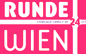 [MyFonts]
[More] ⦿
|
Eleonora Lana

|
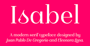 Designer, with Juan Pablo de Gregorio at the Chilean type foundry Letritas of Isabel (2016), a very Latin text typeface family, feminine and didone-inspired. It has a unicase style.
 In 2017, Juan Pablo de Gregorio and Eleonora Lana added Isabel Condensed and Isabel SemiCondensed. In 2019, the Letritas team and Eleonora Lana co-designed the rounded sans typeface Delfino. Still in 2019, she designed the chubby round sans typeface Duddy. [Google]
[MyFonts]
[More] ⦿
|
Eli Hernandez

|
 Elizabeth Hernandez (Latinotype) created the ramshackle unicase typeface Courtney (2013, Latinotye) and the large x-height unicase family Grota (2013, with Daniel Hernandez). Courtney Rough (2013) is a sketched version. Grota Rounded (2013, also with Daniel Hernandez) is a rounded unicase typeface family.
 In 2014, she created the script typeface family Consuelo, which includes a set of ornaments, and added Grota Sans (jointly with Daniel Hernandez) to the Grota typeface system. Grota Sans won an award at Tipos Latinos 2016. Grota Sans Rounded followed in 2015. In 2016, Latinotype published the 32-style Corporative Sans Round Condensed, which was developed by Elizabeth Hernandez and Rodrigo Fuenzalida, under the supervision of Luciano Vergara and Daniel Hernandez. Typefaces from 2017: Catrina (expressive typeface family, with a Handmade subfamily). Typefaces from 2019: Jazmin (a classy mini-serifed typeface in 16 styles), Magdalena (inspired by Globe Gothic, a renaming of the earlier Magnolia). Typefaces from 2020: Juana (Latinotype: this decorative sharp-edged serif family evolved from Jazmin). Typefaces from 2021: Hernandez Bros (by siblings Daniel and Eli Hernandez: a 7-style sharp-edged serif family loosely based on Bulfinch by William Martin Johnson (1903, ATF)). [Google]
[MyFonts]
[More] ⦿
|
Eliezer Grawe

|
Cuiaba, Brazil-based designer of Magnox Display (2019: an industrial sans) and the handcrafted rounded sans typeface Mangaba Pro (2018-2019). In 2020, he published Argo Nova (a 10-style display sans) and Auge Unicase. Typefaces from 2021: Argo Supernova (a 16-style superelliptical sans). [Google]
[MyFonts]
[More] ⦿
|
Emigre
[Zuzana Licko]

|
 Sacramento, CA-based foundry established in 1984 by Zuzana Licko (b. 1961, Bratislava) and Rudy Vanderlans. They were "in" during the grungy early 1990s, but ran out of steam and out of fashion around the turn of the century. They had their own magazine, and were in the limelight in the 1990s. Massimo Vignelli famously said at a meeting: Emigre is the worst thing that ever happened to this country. It's unbelievable the damage they have done. A total disaster. [Laughter] You laugh, but you should cry.
 Lea Chapon's thesis at Estienne in 2006 was entitled Emigre : typographie et critique de la typographie---strangely, it was removed from the school's web site---Emigregate? The typophiles are not gentle with their critique. In the collection, we find these fonts: Arbitrary (1992), Awkward (1991), Berkeley (1990), Citizen (1990), Elektrix (1990), EmigreEight (1990), EmigreFifTeen (1990), EmigreFourTeen (1990), EmigreTen (1990), EmperorEight (1990), EmperorFifTeen (1990), EmperorNineTeen (1990), EmperorTen (1990), IndustrySans, KubotaFont (1991), Lunatix (1990), Marvelous (1991), Matrix (1988-1991), NeoTheo, Oblong (1990), STICadillac (1990), Sample (1990), Senator (1990), Simplex, TemplateGothic (1991), TotallyGlyphic (1990), TotallyGothic (1990), Transportation (1990), UniversalEight (1990), UniversalNineTeen (1990), VariexBold (1990), VariexLight (1990), VariexRegular (1990), Zenith (1990). Also, by designer: - Nancy Mazzei and Brian Kelly: Backspacer (1993).
- Zuzana Licko: BaseMono (1997, a monospaced family), BaseNine (1995), BaseTwelve (1995), Dogma (1994), Filosofia (1996, Emigre's (unicase) version of Bodoni), Hypnopaedia (1997), Journal (1993), the Lo-Res family (pixel fonts at sizes 9, 12, 15, 21, 22, 28, made in 2001), Modula (1990-1995), MrsEaves (1996, Emigre's version of Baskerville), Mr Eaves Sans (2009), Mr Eaves Modern (2009), Narly (1993), Program OT (2013, a rounded sans family), Quartet (1993), SodaScript (1995), Solex (2000), Tarzana (1998), Triplex (1990), Whirligig (1994).
- Bob Aufuldish and Eric Donelan: BigCheese (dings, 1993), ZeitGuys (1994, funny dingbats).
- John Hersey: Blockhead (1995, Alphabet and Illustrations), Thingbat (1995).
- Conor Mangat: BoksHeavy (1994), BoksThin (1994), Platelet (1994, inspired by California license plate systems---organic and quite dysfunctional).
- John Downer: Brothers (1999), Council (1999), Triplex Italic (1990), Vendetta (1999).
- Sibylle Hagmann: Cholla (1999).
- Frank Heine: DallianceFlourishes (2001), DallianceRoman (2001), DallianceScript (2001), Motion (1993), OaklandEight (1990), OaklandFifTeen (1990), OaklandSix (1990), OaklandTen (1990), Remedy (1992).
- P. Scott Makela: DeadHistory (1994).
- Miles Newlyn: Democratica (1992-1993), Missionary (1992), SabbathBlack (1994).
- Rodrigo Cavazos: EideticNeo (2000).
- Jonathan Barnbrook: Exocet (1992), Manson (1993), Mason (1993).
- Edward Fella: FellaParts (1993), Outwest (1993).
- Jeffery Keedy: KeedySans (1991).
- Mark Andresen: NotCaslonOne (1995).
- Claudio Piccinini: Ottomat (1996).
- Rudy VanderLans: Suburban (1994).
Alternate URL. View Zuzana Licko's typefaces. Alphabetical listing of Zuzana Licko's typefaces. [Google]
[MyFonts]
[More] ⦿
|
Enrique Ruiz Davila
|
 Valencia-based illustrator and graphic designer, who created the thin monoline unicase typeface Mano de Santo (2012). In 2014, he made several sets of pictograms: Vecomancy, Website, Horta. [Google]
[More] ⦿
|
Ergibi Studio
[Riyadh Rahman]

|
 Watampone, South Sulawesi-based designer (b. 1995) of the script typefaces Maghrib (2019), Westline (2019), Billistone (2019), Zakiyah Script (2019), BeaQueen Script (2019: monoline), Athika (2019), Holmes Signature (2019) and Claudya (2019), the dry brush typeface Grotters (2019), the monoline script American Lemon (2019), the creamy display typeface Quacker (2019), the vintage typeface Brattlies (2019), and the modular monoline display sans typeface Holmes (2019).
 Typefaces from 2020: Golden Ballpoint, Arfelick Feather (a heavy brush script), Dream Glory (a font duo), Fireclay, Nerut (a decorative all caps serif), Southmore (a wild script), Poetry Darling (wild calligraphy), Jushley Shine (a brush script), Spartwell (dry brush script), Roaring Jungle, Quacker (a creamy display serif), Patrick Cleo, Osaka Chips (a supermarket signage font), Leonardo da Vincen, Hazard (a brush font), Garloise (a vintage monoline script), South Signature, Peach Cuties, Chocolate Crispy, Cluisher Brush (a fantastic street art brush typeface), Vanrott Destroy, Sultan, Arfellion, Leonardo da Vincen, Hazard, Krasty (a creamy signage or baseball script), Vanrott, Emirose, Summer Sans, Mount Hills (a decorative display serif), Summer South (a font duo). Typefaces from 2021: Mishelia (a fashion mag serif with hairline connectors), The Jagret (a rounded bold display serif), Zaystack (a dry brush script), Costyle (script), Luxury Modish (a wild inky calligraphic font), Callient (an inky script), Lostar (a wavy, almost intestinal, font), Vigran Maroll (an all caps decorative serif), Jungle Mask (a stylish flared decorative serif), Wangi (a stencil typeface with ball terminals), Bramz (intestinal art nouveau caps), Cheorcy (a monolinear unicase typeface), Glow Better (a font dup featuring interlocking and sword terminals), Brams (a psychedelic display serif), Quick Sillent (a brush script), Madinah Authentic (script), Hillshort (a vernacular brush typeface for supermarkets), Noctura Georgia (a brush script and sans font duo), North Zone (an urban brush), British Castilla (serif and script duo), Billbreak (a smooth brush script). Typefaces from 2022: Brams (psychedelic). [Google]
[MyFonts]
[More] ⦿
|
Ergo Hiki (or: Ergo Fonts)
[Ezeqviel Ergo]
|
 Buenos Aires-based designer of the free abstract display typefaces Lain (2014) and Ohmu (2014). He also made Kuurude or Kuudure or Sona (2014, a fashion mag font), Sahaquiel (2014), Kirishiki (2014) and Magnesia (2014).
 In 2015, he made Chiba (thick handcrafted vernacular signage font), Ganguro (a free piano key typeface), Mizore (a free pixel font), Touka (sans), Kohta, Asuna, Ayanami (free), Usumi (a brushy script), Sumire (fat finger font), Nagato (Peignotian caps), Eiga (a free octagonal typeface), Shiro (octagonal piano key typeface), Bishoujo (brush script), Misato (brush script), Mikuru (brush script), Sensei (free brush script), Chizuru (watercolor brush script), Yamcha (free handcrafted typeface), Gasai (a grungy textured typeface), Hokage, Kaneda (free), Kagome (free), Metagross and Kagura (a severe but free modular type inspired by religious repression in the middle ages). His fonts are made with FontStruct. Typefaces from 2016: Gessekai, Amaterasu (textured all caps typeface), Boketto (free unicase), Obake. Typefaces from 2017: Bimyou (brush style), Kintsukuroi (handcrafted), Natsu (brushed font). Typefaces from 2019: Sensei, Ganbaru. Old Behance link. Dafont link. Fontspace link. [Google]
[More] ⦿
|
Ernst Hermann Karl Engel

|
 Typographer, type designer (b. 1879, Kassel, d. 1967, Bad König), teacher (at the Frankfurt Vocational School and at the College of Arts and Crafts in Offenbach am Main) and author of typographic books. In 1905, Engel became supervisor of in-house printing at the Klingspor foundry.
 At his own Ernst Engel Privatpresse (est. 1921; it would later be called Ernst Engel Presse Walter Stähle), he designed Mörike Fraktur (1922) with the punchcutter Rudolf Schiffner. Somehow, this typeface is also associated with Klingspor. In 1927, he created an art deco typeface which was revived in 2008 by Nick Curtis as Engel Stabenschrift NF. He made three Unziale that were all unicase ("Einbuchstabenschrift"), in 1927, 1930/31, and 1935, respectively. In 1939, he made a Schwabacher and finished Deutsche Schrift. Picture. Klingspor link. [Google]
[MyFonts]
[More] ⦿
|
Ezeqviel Ergo
[Ergo Hiki (or: Ergo Fonts)]
|
 [More] ⦿
|
Fabian Flores
|
Graduate in graphic design from Universidad Tecnológica Metropolitana de Santiago de Chile. At Esos tipos de la UTEM, he created the free font Miliciana (2008), a (unicase) militant poster face. He co-manages Esos tipos de la UTEM. DFD Miliciana was used in the bulletin El Patriota, órgano oficial de las milicias rodriguistas, which circulated during the military regime in Chile by the Frente Patriótico Manuel Rodríguez (FPMR). Dafont link. Aka alpuerto. [Google]
[More] ⦿
|
Felix Rufin

|
Designer at Type-o-tones in Barcelona of the unicase typeface family Designal (2007, +Stencil), which comes with 400 dingbats for, e.g., weather and packaging. [Google]
[MyFonts]
[More] ⦿
|
Fernando Haro

|
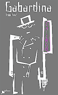 Las Palmas de Gran Canaria, Ampuero and Laredo, Spain-based designer (b. 1971) who set up deFharo. Creator of the monoline sans typeface Depez (2011), Fabada (2011), and the free monoline geometric sans typeface La Chata (2011). La chatte, in French? Maybe not.
 In 2011, he made the monoline organic sans typeface Lerótica (free at OFL). In 2012, he created Nabatea (stone chisel typeface), V de Vacia (a grungy outline face), Sabática (organic), the straight-edged data style typeface Gabardina, the grotesk typeface A Bebedera, the shadow typeface B de Bonita, D Puntillas, and the deconstructed Qebrada. In 2013, he designed Yacarena Ultra, H.H. Agallas, Nacimiento (a dymo label font), J Airplane Swash (a psychedelic typeface named after Jefferson Airplane), CA Garrutas (grunge), CA Gatintas (grunge), I Am Telefono (the largest phone dingbat and scanbat typeface on earth), Wach Op-Art (kaleidoscopic icons), K.O. Activista, I Am Hueca, X Template (stencil), H.H.Samuel (rounded sans), U2 Metalona (a beautiful white-on-black display face), M F Plexus Italic, J.M. Nexus Grotesque (an "thin inline" fat grotesque), Wachinanga, Tabaquera, Pabellona (grunge), El Pececito (video game font), the poster typeface Hobby of Night (OFL), H2O Shadow (outline version of Fabada), Zabatana Poster (a didone-inspired poster font), Oaxaquena Tall, Yacimiento (wood style wedge serif), and Rabanera. Typefaces from 2014: Babalusa Cut, A Cuchillada, Sabandija (a plump round display typeface), F2 Tecnocratica, F1 Secuencia Quad (pixel face), La Pejina FFP (bilined), Tabaiba Wild, Gabachita (ultra-condensed rounded sans). Typefaces from 2015: Tabarra Pro (Swiss style sans family for Latin, Cyrillic and Greek), A Sogra Ruth (ultra-condensed art deco), Gaban (an outline version of Tabardo), Tabardo (a heavy blocky font), Wacamoler Caps (a Tuscan typeface inspired opening credits of the Western movie Winchester '73 directed by Anthony Mann in 1950), Ubicada (condensed geometric sans), Rabiosa (neurotic font), Zacatecas (condensed shaded sans), F3 Secuencia Round, La Babaca (a powerful black condensed sans in the style of Impact), Obcecada Sans + Serif (condensed with almost disappearing descenders), Eacologica Round Slab (a nice commercial font with an incomplete set of numerals), Palim Script (curly), Vacaciones (signage face), de La Cruz. Typefaces from 2016: Yugoslavia (calligraphic), Love Box (stencil), Cienfuegos (connected retro script named after the Cuban her Camilo Cienfuegos), Gaitera Ball (round fat script), The Black Box (a retro banner font), Durum Kebab (shadow sans), Jolgoria In Town (script), Yerbaluisa (signage script), Escobeta One (brush script), Posteratus Rex, Bastardilla (a cursive font), Rotulona Hand, The Juke Box (retro juke box lettering), Angelique Rose (connected monoline script), Promenades, Bucanera (a swashbuckle font), Lucemita, Panama Road (a casual calligraphic font), Deslucida, Disoluta, Sucesion Slab, Tabarra Pro Round, Qebab Pro Shadow, Monserga (white on black), Indulta SemiSerif. Typefaces from 2017: Partizano Serif (a retro poster font; free demo), Jack Stanislav (a great condensed movie poster font), Fontanero (rounded fat sans), Yonky (fat slab serif), Zigzageo, Libertatus (manual serif fonts based on a Czech poster from 1935), Libertatus Duas (slab serif), Flamante Sans, Flamante Serif, Flamante (Round, SemiSlab, Stencil, Seca, Cairo, Roma), Seisdedos Dead (rough stencil fonts), Neo Latina (stencil), Carta Magna (blackletter), La Sonnambula (signature script), Bola Ocho (an eightball font), Clandestina (textured, layered), Acratica (signage script), Penitencia Inline, Autarquica (outlined vernacular style), Caminata One (shaded signage typeface), Sin Razon (wedge serif), Glotona Black and White (a layered tattoo style font duo), Glotona Dots (the textured versions of Glotona), 6th Aniversario, Tribal Box (squarish sans, with tattoo ornaments and a great environment for borders), Candy Pop (bubblegum font), Sargento Gorila (army stencil font), Libertinas + co (a curly calligraphic script; the free version has no numerals). Typefaces from 2018: Gudariak (a free color SVG font: Vicente Ballester Marco (Valencia 1887-1980) was a graphic designer and Valencian poster artist affiliated with the CNT (Confederacion Nacional del Trabajo) who created political propaganda posters of clear modernist and post-cubist influence during the Spanish Civil War. The Gudariak typeface is inspired mainly by one of the posters he made for the Government of Euskadi and also in others where the author continues to explore this particular typographic style. ), Farisea Fraktur, Octuple Max (techno), Ordeal Eroded, Panfleta Stencil, Secuela (free), Fragua Pro (condensed sans family), Getho (a geometric semi-sans), Cowboya Tuscan (a curly Tuscan circus font), Txuleta Deco (a striped art deco typeface), Coltan Gea (slab serif), Getho Semi Sans, Cowboys (a Tuscan typeface), Drystick Geo Grotesk, Diezma, Grifa Slab, Coltan Gea (slab serif family), Paloseco (geometric and grotesk), Stoica (a color SVG font), Letrera Caps (a rounded square style layered and color font that pays homage to the sans serif inline genre), Enagol Math (a condensed rounded slab serif based on carefully applied mathematical ratios), Heptal, Velocista, Octagen Condensed, Octagen Black, Sextan Serif, Sextan Cyrillic, Quickat (signage script), Octagen (condensed sand with short descenders), Wolframia Script (flowing handwriting), Pentay Slab, Pentay Sans, Pentay Book, Cuatra, Judera (Flat and Ring: monospaced, unicase and totally sqaurish), Quotus (slab serif), Tripleta Grotesk (a 16-style geometric sans family). Typefaces from 2019: Pervitina Dex (sci-fi), Megalito Slab, Obesum Caps, Jane Roe (sans), Icons Opentype, Felona (stencil: a variable font), Neo Fobia, Bocartes Fritos (food icons), Red Thinker (a squarish monoline sans), Pena Caldaria (blackletter). Typefaces from 2020: Anoxic (a squarish monoline sans). Typefaces from 2021: Humato (a sturdy font for weightlifters), Probeta (a squarish techno sans family in 42 styles), Speeday (a speed emulation sans). Creative Market link. OFL link. Behance link. Dafont link. Devian tart link. Abstract Fonts link. Fontspace link. [Google]
[MyFonts]
[More] ⦿
|
Font Boutique (was: Typografski Font Boutique)
[Heinrich Lischka]

|
The Font Boutique is a commercial foundry started in 2002 by Heinrich Lischka from Köthen, Germany, who was born in 1968 in Groß Strehliz, Poland. An autodidact and freelancer, he taught some courses in 2005 at FH Magdeburg-Stendal. Lischka designed these fonts: - Commercial, at Font Boutique: Noga (sans serif, 2002). Discussed by the typophiles, Nastepna (2002, unicase sans serif).
- Commercial, at Volcano Type: the organic family Shuttle, which includes Shuttle 3D, done in 2006.
- Free fonts: Samba (2002), Neo Retro (2004), Copystruct (1997), Destroy (1997), Groteski (1997), TimesNoRoman (1997), Disco, Dinova. Lischka also runs Typografski.de, a free font place where one can download most of these fonts.
- Designers Cut (2003).
- Working on Bossa Nova (2003, sans serif).
- Exclusive typefaces: Kuert Weill Fest Dessau (2004, display face), Herma Sans (2005, house type for a label manufacturer), Intersport Headline (2007, display typeface for a sports chain).
Dafont link. Old link. Klingspor link. Fontspace link. Volcano Type link. [Google]
[MyFonts]
[More] ⦿
|
FontArte (was: Magdart Fonts)
[Artur Frankowski]

|
 FontArte (est. 2004; ex: Magdart Fonts) is Artur Frankowski's foundry in Warsaw, launched in cooperation with Magdalena Frankowska. Frankowski is a Polish graphic designer, typographer, type designer and lecturer, b. 1965, Zamosciu. He taught typography at the Technical University of Warsaw and is professor of typography and design at the Faculty of Design of the Academy of Fine Arts in Warsaw. In 2004 he finished his PhD thesis on legibility of type on cartographic maps at the Warsaw University of Technology. In 2013 he presented a habilitation thesis on street lettering as an inspiration for a graphic designer. In 2015 Artur graduated from the Expert Class Type Design (EcTd) at the Plantin Institute in Antwerp. He has published type and visual communication-related articles in design&print magazines. Through FontArte he wants to preserve Polish typographic heritage, specially Polish Avantgarde and introduce new directions in Polish type design culture. Author of Typespotting Warszawa and co-author (with Magdalena Frankowska) of a book about Henryk Berlewi, a pioneer of functional typography.
 He spoke at ATypI 2005 in Helsinki on Type on maps and at ATypI 2007 in Brighton on Designing a regional typeface. Speaker at ATypI 2016 in Warsaw on From Typespotting to Warsaw letters. Designer of several typefaces: - From the Magdart era: MF Ala i As, MF Norma 1 i 2, MF Trond, MF Multi Putli, MF Plazma, MF Towarowy, MF FCR, MF Proteza, MF Strzeminski.
- FA Berlewi (2006): a stencil typeface based on poster lettering from 1924 by Henryk Berlewi. Together with Magdalena Frankowska, he wrote a book called Berlewi (2010). Henryk Berlewi was a Polish pioneer of typography and design.
- FA Cindy (2002): shoe dingbats by Magdalena Frankowska.
- FA Desiconz (2005): dingbats by Magdalena Frankowska.
- FA Dropsy (2000)
- Grotesk Polski FA (1996-2006): inspired by the first Polish typeface design---Antykwa Poltawskiego. Has sans weights, and one stencil style.
- FA Domestic Godess (2005): domestic dingbats by Magdalena Frankowska.
- FA Julian (2003): avant garde ransom face, based on Wladyslaw Strzeminski's lettering in the 1930 publication "Z Ponad".
- FA Karaker: medieval script based on a scan.
- FA Komunikat (2004): almost unreadable, an experiment in minimalism, inspired by Wladyslaw Strzeminski (1932).
- FA Merz.
- FA Modernista (2004): grungy sans based on Baccarat, an early 20th century typeface by the Polish foundry Jan Id'zkowski.
- NASZ Stencil.
- FA Norma (2000): destructionist.
- Ozdoby Gardowskiego (2004): ornaments based designs by Ludwik Gardowski (1923).
- FA Praesens (2004): great avant garde display face.
- FA Prototyp (2007): minimalist unicase.
- FA Relief (2006): pixelish.
- Co-creator with Henryk Sakwerda in 2006 of Silesiana 2006 (see also here), a great calligraphic font whose development was supported by the Silesian Government.
- FA Supersam (2003): dot matrix style.
- FA Szczuka (2000): avant garde poster display typeface based on pixel type.
- FA Zero One (2007): experimental pixel style type family.
- Designer of a character in the September 11 charity font done for FontAid II.
[Google]
[MyFonts]
[More] ⦿
|
Fontbistro
[Oszkár Boskovitz]
|
Oszkár Boskovitz's Hungarian foundry. Before Fontbistro, he ran Nepfont Digital Foundry. He is a graduate of MOME, Moholy-Nagy University of Art & Design, Budapest, Hungary. His fonts sold at Fontbistro include Balek, Blabla, Ecsetirás (2001, a brush typeface based on a typeface of Zoltán Nagy, 1967), Konwektor (techno), Hardware, Monostar (2014, a monoline rounded sans), Pannon Antiqua (2001, based on a family by Edit Zigány (1972), Pluto (2006), Shrapnel (organic), Syrup (2005, stencil), Tilos (2002, rough stencil family), Troppauer (2005, unicase), Tubyfex (2005, experimental). [Google]
[More] ⦿
|
Fontmunkások
[Gábor Kóthay]
|
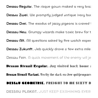 Gábor Kóthay (Fontmunkások) is a Hungarian type designer (b. 1962) who lives in Szeged. Gábor Kóthay's fonts include:
 - At T-26: Alphabet2, Alphabet4, Archetype, Axis No 1, Bacchus, and Tyrnavia in 2000, and the Roman inscription inspired family Minerva Modern, Minerva Display (a Roman family) in 2002. Also, Betabet sans, Betabet web, Gnosis (hairline italic), Oceanus (2004, hairline sans), Pelso (2004, hairline), Laureate (2004, hairline art deco), Picaresque (2004, irregular handwriting).
- At FONTana: LaDanse, Y2K, Domino, QwertyRegular and Luxury, all in 1999-2000.
- At P22: Driade (2005, Regular, Linea and Aged: calligraphic futuristic experiments), Zephyr (2001, curly; +Open Face), Schwarzkopf (2003, a Schwabacher face), La Danse (2001), Ambient (2001), the Schwabacher Fraktur font SchwarzKopf (2002), Caffe (2009: originally designed for the Artz Gallery Cafe in Budapest Hungary. The design is a contemporary handwriting style adapted from examples in lettering exercise books. It has been redrawn and expanded into six styles. The four weights were created by drawing the style using different mediums: Cappuccino in pen, Pastry in felt-tip, Lemonade in brush and Tobacco, the original, in pencil, and Poster and Poster Inline are additional styles).
- At PsyOps: the formal script Anglia (2001), Berill (2001), SchwarzKopf (2002, Fraktur) and Plexo (2001).
- At Job Art Studio (his own studio in Szeged, which he founded): Cats (free dingbats), Disasters (dingbats), Bubble (comic book font), 103 kék.
- At Fountain: Zanzibar (2003, nice script face), Incognito (2007, a typical old map typeface), Dessau (2007-2008, a collection of eleven Bauhaus and Bauhaus stencil styles).
- At Fontana: Zodiac, Tisza (2001-2007), a sans family. And Kinesis (2003), a sans typeface based on geometrically precise instructions.
- At Cinqueterre Type Foundry: Eva (wedge serif; sample, another sample).
- At Fontmunkások: Birdland (1999-2002), a minimalist face; Asphalt and Asphalt Signs (1996-2000), a slightly grungy set of fonts; Arcade (1999); Adagietto (2000); Flyer and Flyer Fossil (2002), a curly family.
- Custom typefaces: Aqua Futurist (2008): a hairline unicase sans family with uncial influences. It is unclear if he had a hand in the typography of stockings, which I found on his site.
Blog. Dafont link. FontShop link. [Google]
[More] ⦿
|
Font-o-Rama
[Nina Hons]

|
 Düsseldorf-based German foundry of designer Nina Hons (b. 1974, Germany), formrly Nina David. Nina studied communication design at Art Center College of Design. In 1998 Nina Hons was rewarded a certificate of typographic excellence from the Type Directors Club in New York for her typeface UniF (1997, a unicase typeface published at Fountain). In 2002, she set up Font-O-Rama, her own commercial type foundry.
 Her fonts include Geomee (2003, a noteworthy rounded squarish family), Mein Schatz (2004, a sans family), Casi (2000), DSC (2000, pixel face), Eiei (2001, eggs font for Easter), KomodoreDestroy (2000), KomodoreNormal (2000, horizontally-striped typeface), Pagra (2001), UniF (1997), UniFIce (2001), UniFRama (2002), UniFXmas (2000), Liebling (2005, a serif to go with Mein Schatz), Mein Schatz (2003, sans), Longing (2005, liquid typeface with ornaments added), Herzchen (2006), and Sweet Home (2005, stitching face). Fountain link. Home page. Alternate URL. Dafont link. FontShop link. View Nina Hons's typefaces. Klingspor link. Fountain Type link. [Google]
[MyFonts]
[More] ⦿
|
Formfound
[Peter Fritzsche]
|
 Peter is a German designer in Berlin, born in 1981. Peter Fritzsche's company is called Formfound. For a cool 900 Euros, he will make you one style of a font.
 Purchasable fonts: Corpuscare (unicase, monoline, organic), Hitch (unicase), Flora (unicase) and Finesse. At DaFont, one can download his font FormFound.Com, which is a grunged up version of a typeface by Hans Reichel, 1996, but also Corpuscare, Flora, Finesse and Hitch. He also made Sliced Juice (2007, a sketch face) and the beautiful folded paper-look Origami (2008). [Google]
[More] ⦿
|
Franco Jonas
[Frncojonastype]

|
 [MyFonts]
[More] ⦿
|
Frans Jongkind
|
Dutch creator of a rounded unicase typeface in 2012. Devian tart link. [Google]
[More] ⦿
|
Freda Sack
|
 Prolific British type designer (b. Enfield, 1951, née Freda Buckley, d. 2019) who completed her diploma in Graphic Design and Typography at the Maidstone College of Art. She began to work at Letraset International in 1971 and learned the basics of type design under the direction of Bob Newman. At URW in Hamburg she was involved in the development of the first groundbreaking font software application. In 1978, she was appointed Senior Type Designer at Hardy Williams Design in London and moved to Typographic Systems International in 1980. Freda Sack began working as a freelance designer in 1983. Her clients included British Airways, Air UK and Vauxhall. Obituary at The Guardian.
 In 1989, Freda Sack and David Quay founded The Foundry in London. In 2000, Freda set up her own company Foundry Types to further develop The Foundry typeface library, and to continue with the design and implementation of specially commissioned typefaces. Her corporate fonts include NatWest, Yellow Pages directory, Brunel signage UK mainline stations, Lisbon Metro Portugal, Swiss International Airlines, Saudi Arabian Airlines, and WWF (Worldwide Fund for Nature) multi-language. Her retail typefaces: - Caslon Italic + Swashes (1981, ITC).
- Foundry Architype Bayer (unicase font, The Foundry, 1996).
- In 2008, Stuart de Rosario and Freda Sack co-designed the Egyptian typeface Foundry Origin.
- Ignatius (1987, ITC).
- Jenson Old Style EF (with Colin Brignall, 1982, at Letraset).
- Paddington (1977, ITC).
- Promotor (1983).
- Proteus (1983, ITC). see also Proteus EF.
- Orlando (1986, ITC).
- Stratford EF (Elsner+Flake).
- Stratford Serial (SoftMaker).
- University Roman (1984).
- Vermont (1987, ITC). A shadow font.
- Victorian (Linotype), Victorian (ITC). A 1976 font first developed with Colin Brignall at Letraset.
[Google]
[More] ⦿
|
Frncojonastype
[Franco Jonas]

|
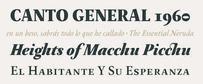 During his studies at the Metropolitan Technological University of the State of Chile, Santiago (2013-2017), Chile-based Franco Jonas Hernandez created the lively text typeface Neftali Pro (2015, Tipotype). He also studied at Pontificia Universidad Catolica de Chile, class of 2015, and at UNAM in Mexico City, class of 2017. In 2020, he set up Frncojonastype.
 In 2017, he and Rodrigo Araya Salas (Rodrigo Typo) co-designed the meaty sans display typeface Loyola Pro and the comic book typeface Pintanina. At W Foundry, he published Platz Grotesk (2017). Typefaces from 2018: Squick (a comic book / children's font family by Franco Jonas, Andrey Kudryavtsev and Rodrigo Araya), Glatt, Tobi Pro (with Rodrigo Araya Salas and Andrey Kudryavtsev at Rodrigo Typo), Loyola Round Pro (by Rodrigo Araya Salas and Franco Jonas), Nuby (with Rodrigo Araya Salas and Andrey Kudryavtsev at Rodrigo Typo). His text typeface Ticerz won an award at Tipos Latinos 2018. In 2018, together with Ale Navaro and Raul Israel, he set up The Compania Tipografica de Chile, where he promptly published Passiflora (2018), a unicase rounded brush font inspired by facade inscriptions co-developed with Valentina Pino. Ding (2018) is a great fattish cartoon font that was co-designed by Rodrigo Araya Salas, Andrey Kudryavtsev and Franco Jonas. See also its extension, Ding Extra (2019). Typefaces from 2019: Fonty (a creamy script), Clarence Alt (a an almost bubblegum children's book sans by Franco Jonas, Rodrigo Araya Salas and Andrey Kudryavtsev), Nacho (a Mexican party font by Rodrigo Araya and Franco Jonas), Ryman Gothic (2019, by Diego Aravena Silo and Franco Jonas at W Foundry: inspired by Edwin Allen's wood types and Morris Fuller Benton's gothics). Typefaces from 2020: Clarence Inline (a plump informal typeface family by Rodrigo Araya Salas and Franco Jonas Hernandez), Ancoa Slanted (an angular display family in 15 styles; by Andrey Kudryavtsev, Rodrigo Araya Salas and Franco Jonas Hernandez), Skippie (a comic book family by Andrey Kudryavtsev, Rodrigo Araya Salas, Bruno Jara Ahumada and Franco Jonas, and four sets of dingbats including Skippie Monster Lucha Libre and Skippie Monster Halloween), Ancoa (an angular 19-style layerable typeface by Andrey Kudryavtsev, Rodrigo Araya Salas and Franco Jonas Hernandez). Typefaces published at Frncojonastype: - fj Trance (2020). A reverse contrast Egyptian by Rodrigo Araya Salas, Franco Jonas, Valentina Faundes and Jorge Morales Salas.
- fj Meduza (2020). A 26-style decorative didone-based typeface family.
- fj Platz Groteske (2020). A large neo-grotesk family with wide spacing.
- Willner (2021). A 5-style display sans by Rodrigo Araya and Franco Jonas.
- Clarence Pro (2021). A vernacular supermarket font by Rodrigo Araya Salas and Franco Jonas Hernandez.
- Alabaster Antique FJ (2021). A paella of styles mixed together in a smorgasbord of rijsttafels.
- Proud Grotesk (2020). A custom typeface for a new brand for Pivovar Proud Brewery in Plzen, Czechia.
- Rinno (2021). A rounded geometric display family by Rodrigo Araya Salas and Franco Jonas Hernandez.
- Baked FJ (2021). A custom typeface for the Laforme Bakery&Café in Prague, Czech Republic.
[Google]
[MyFonts]
[More] ⦿
|
Gábor Kóthay
[Fontmunkások]
|
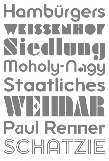 [More] ⦿
|
Galen Lawson
[District (was: CV Type)]

|
 [MyFonts]
[More] ⦿
|
GalloFonts (was: Graphics by Gallo)
[Gerald Gallo]

|
 GalloFonts is part of Graphics by Gallo, founded in 1974 by Gerald Gallo (b. Lucernemines, PA, 1941), and based in Bethesda, MD. The fonts: Bullish (squarish), Display Brutal Rough (2015), Display Black Serif Rough (2015), Pristine Light (2014: caps only squarish sans family), Display Pump (2014), Display University (2005, athletic lettering), Angulatte Light, Angulatte Medium, Angulatte Bold, Anniversary Seals (2003), Basic Bullets, Blooming Ornaments (2008), Brashee Regular, Brashee Bold, Calendar Font One, Calendar Font Two, Calendar Font Three, Carved Initials, Chiseled Initials, Cleancut, Dexterous (2010, art nouveau), Diamond Monogram - 2 Characters, Diamond Monogram - 3 Characters, Display Black Serif (2010, angular), Display Dots Five (2010), Display Dots Six (2010), Display Grungy (2010), Display Robust (2010), Dooddle, Embossed Shallow, Embossed Medium, Embossed Deep, GG Casual Light (2002, was Gallo Casula: hand printing family), GG Casual Medium, GG Casual Bold, GG Dingbats (was Gallo Dingbats, like Zapf Dingbats), GG Serif (1993, was Gallo Serif), Geometric Arrows, Geometric Ornaments, Gnarlee, Greetings, Home Sweet Home, Isometric Initial Caps - Bird's Eye View (1994), Isometric Initial Caps - Worm's Eye View, Isometric Ornaments, Jackolantern Assortment (2002) Just Bugs, Kruede Light, Kruede Regular (handwriting), Kruede Bold, Leaf Assortment (1994), Leaves Falling, Logotype, Magnificent Ornaments (2006, Victorian era decorations), Make Tracks (2002, animal footprints), Number Ornaments, Numbers 0-99 Style One - Circle Negative, Numbers 0-99 Style One - Circle Positive, Numbers 0-99 Style One - Diamond Negative, Numbers 0-99 Style One - Diamond Positive, Numbers 0-99 Style One - Square Negative, Numbers 0-99 Style One - Square Positive, Numbers 0-99 Style Two - Circle Negative, Numbers 0-99 Style Two - Circle Positive, Numbers 0-99 Style Two - Diamond Negative, Numbers 0-99 Style Two - Diamond Positive, Numbers 0-99 Style Two - Square Negative, Numbers 0-99 Style Two - Square Positive, Numbers 0-99 Style Three - Circle Negative, Numbers 0-99 Style Three - Circle Positive, Numbers 0-99 Style Three - Diamond Negative, Numbers 0-99 Style Three - Diamond Positive, Numbers 0-99 Style Three - Square Negative, Numbers 0-99 Style Three - Square Positive, Ornate Initials - Style One (2002), Ornate Initials - Style Two, Ornate Initials - Style Three, Pleasant Hand Light (2002) Pleasant Hand Medium, Pleasant Hand Bold, Precision, Rolling Ball Cursive, Serene (1993), Slender, Smiling Faces, Snowflake Assortment (1994), Snowflakes Falling (2001), Sport Numbers, Star Assortment (2002), Stature (2010, compressed sans), Swiss Folk Ornaments - Critters&Things, Swiss Folk Ornaments - Floral, Swiss Folk Ornaments - Geometric, Time Clocks, Woozee, Display Prominent (2005), Ultimate Ornaments (2005), Cross Ornaments (2005), Heraldic Creatures (2006), Victorian Leaf Ornaments (2006: great!), Quilt Patterns One (2007), Holy Ornaments (2007), Oriental Ornaments (2007), Gothic Initials One through Six (2007-2008), Interlaced Ornaments (2007), Modest Ornaments (2008), Art Nouveau Flowers (2008), Art Nouveau Ornaments (2008), Quilt Patterns Two (2008), Display Gothic (2008, blackletter), Plant Assortment (2008), Birds Flying (2009), Happy Go Lucky (2009, Victorian), Fish Fresh (2009), Display Dots One (2009, dot matrix face), Display Art Two and Three (2009, art nouveau alphabets), Display Dots Two Serif and Sans (2009, dot matrix typefaces), Display Dots Three Serif and Sans (2009), Display Dots Four Serif and Sans (2009), Display Robust (2010), Quilt Patterns Three and Four (both 2009), Gothic Initials (Seven, Eight, Nine: 2009), Carefreed (2009, a Halloween script?), Glorita (2009, casual condensed sans), Fancy Flowers (2010), Rectilinear Ornaments (2010), Display Brutal (2010, grunge), Cross Stitch Graceful (2010), Cross Stitch Regal (2011), Cross Stitch Formal (2010), Cross Stitch Discreet (2010), Cross Stitch Classic (2010), Display Dots Seven (2011), Cross Stitch Majestic (2011), Cross Stitch Elaborate (2011), Cross Stitch Medieval (2011), Cross Stitch Ornaments (2013), Display Squares One and Two (2011, gridded or dot matrix typefaces), Display Digits One through Seven (2011), Display Crisp (2012, octagonal), Blue on Blue (2012, shadow face), Green on Green (2012, 3d shadow face), White on White (2012), Orange on Orange (2012, a 3d shadow face), Victorian Ornaments (2012), Printers Plant Ornaments (2012, a floral typeface), Simple Ornaments, Numbers Style Three Diamond Positiv Regular (2012), Charisma (2013, inspired by the hand lettering used by draftsmen and architects), Display Explicit (2013), Display Uncanny (2013, unicase), Display Carlos (2013, a piano key typeface), Mighty Oaks (2013, stylized oak leaves), Sweet Hand (2014), Fast Hand (2014), Medallion Ornaments (2016), Vigorous (2016, octagonal), Heavy Duty (2016, a bold condensed sans), Tight Hand (2016), Hasty Hand (2016), Neat Hand (2016), Bullish (2017), Impossible Ornaments (2018: based on Escher's ideas), Flair Hand (2018), Severe (2018: squarish).
 Typefaces from 2022: Flashie (technio caps), Illustrious (chamfered caps), Sturdie (condensed, squarish), Jubilant (squarish), Noteworthy, Sensuous (art deco), Loftie (chamfered caps), Pudgie, Brilliante (squarish), Fervent (an all caps condensed slab serif), Bevelle (a beveled chamfered slab serif), Lankie (a gas pipe font), Rotunde (a blocky sans), Rigide (a 6-style squarish sans). View Gerald Gallo's typefaces. [Google]
[MyFonts]
[More] ⦿
|
Gareth Hague

|
 British type designer. With David James, [T-26] co-designer of AES, August. At Alias (a company he founded with David James in London), he made Barb (2016, a wide stencil typeface), Asperity (2012), Asphalt (2012), Aspic (2012), Caustic and Caustic Web (2012, chiseled), Lily (2012), Oban (2011, a gorgeous high-contrast didone family influenced by Thorowgood; with blackboard bold styles included), Ano (2012, a simple circle-based monoline sans family; followed in 2018 by the straight-edged Ano Angular), Cactus (2004, a condensed typeface family), Aspic (2011, a signage script), Asphalt (2011, signage script), Perla and Perla Outline (2004, an elegant artdeco unicase didone with teardrop terminals), Klute (Black, Capitals, White: an ugly and useless octagonal family that could be used for gnawing German expressionist pieces), Anomoly (2004), Key, Elephant, Harbour (2008: a medieval, broken look, with wedge serifs), Civility (2002, connected handwriting), Factory, Aminta, Granite (1995), Intimo, Jackdaw, Progress, Progress Two (2012), Sylvia, Jude (1999, a big text family), Mantis, Metropolitan, Metsys (1997), Pop (triline font), Sister (1995), Text.
 In 2009, he designed 2012 Headline for the London Olympics---typophiles are generally disappointed with this daring design in the general angular category, and refer to better representatives of this genre such as Cyrus Highsmith's Occupant Gothic, Emigre's Elektrix, Hubert Jocham's Keks, and Chris Lozos's Dez Sans Script. With David James, he designed Noah Text (2013). In 2018, he designed Quair: Quair mixes typographic and graphic reference points, most notably from market-stall trader lettering and from Thorowgood and Scotch nineteenth-century typefaces. He also published the stencil typeface High in 2018. Typefaces from 2019: Schism One, Schism Two, Schism Three [these are serifless versions of Alias Didot with various amounts of contrast. They are more modulated and twistier than Peignot], Vertical (a humanist sans with vertical terminals: a squarish, high-shouldered shape, suggesting Roger Excoffon's Antique Olive). Fontworks interview. Catalog of Gareth Hague's typefaces. FontShop link. Klingspor link. MyFonts interview. [Google]
[MyFonts]
[More] ⦿
|
Gaslight (or: Valery Zaveryaev)
[Valery Zaveryaev]

|
 Gaslight-type-foundry is collaboration between three type designers---Valery Zaveryaev, Maria Luarvik, and Roman Shchyukin---, founded in 2011. Valery Zaveryaev is a Russian designer (b. Bryansk, 1977) at LetterBe, who created the octagonal family Teco (2005), the display typeface Brut (2005), the clean sans family Maza (2005), the informal unicase family Rezerv (2009, inspired by a logo he created for Evroterm), Barrez (2010, a techno family inspired by the TC-Helicon logo), and the stencil typeface Marshrut (2005).
 He lives in Bryansk. All his fonts are Latin/Cyrillic. In 2011, Zaveryaev set up the commercial foundry Gaslight. Fonts there include the elliptical family Maza (2005), the angular elliptical family Barrez (2010), Brut (2005), and the stencil typeface Marshrut (2005). Electrolize (2011) is a free squarish typeface available from Google Web Fonts. Bad Script (2011, Google Web Fonts) is an informal hand-printed typeface made by Roman Shchyukin. Rock Logo (2012) is a metal band / tattoo font co-designed with Roman Shchyukin. Wide Display and Wide Display Ribbon are unicase headline typefaces. Teco Sans (2012) is an octagonal military typeface family, accompanied by the icon font TecoSymbol (2012) and the stencil family Teco Sans Stencil (2012). Teco Serif (2012) is an octagonal slab version of Teco Sans. Still in 2012, Zaveryaev designed Actio, Roz (rounded sans family), Wary (pop art typeface that won an award at Modern Cyrillic 2014), the fat display overlay families Quadratish Serif and Quadratish Solid. Delgado (2012) is an elegant tall and thin fashion mag typeface for Latin and Cyrillic, made by Roman Shchyukin. It won an award at Modern Cyrillic 2014. Typefaces from 2013: Kiddy, Gen (techno), Tesla (techno face, Roman Shchyukin). Typefaces from 2014: Dotee (octagonal paper cut-out typeface, by Valery Zaveryaev and Maria Luarvik), Sofya. Typefaces from 2015: Mx and My (Peignotian caps typefaces). Typefaces from 2016: Fada (by Roman Shchyukin), Pleinair, Rawer (sans, +stencil, +outline), Misty (by Valery Zaveryaev), Agio (by Valery Zaveryaev). Hellofont link. [Google]
[MyFonts]
[More] ⦿
|
Genilson Lima Santos
|
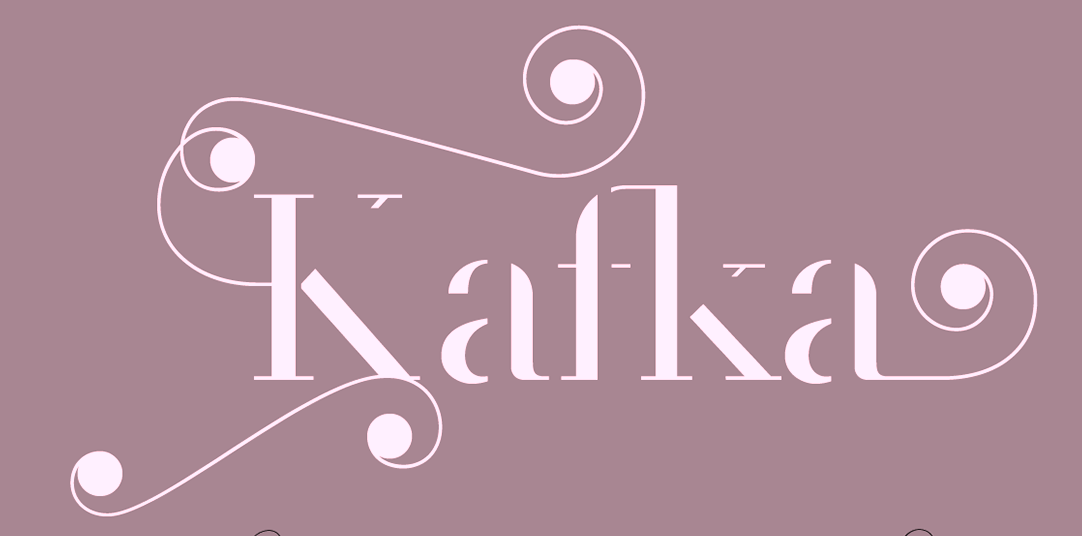 Genilson Lima Santos is the Salvador, Brazil-based designer (b. 1985, Bahia) of Stilu (2015, sans), Jenelson (2006), the stroked font Styllo (2007), the brushy Carybe (2011), the all caps sans typeface Linna (2016), the display typeface Victorine (2016), the rounded sans family Baldini (2016), the high-contrast all caps Cellophane (2016), the text typeface Petralina (2016), the rounded Bauhaus-inspired sans typeface family Rosa Maria (2016), the multicolor layerable rounded poster typeface Buba (2016), the free wide unicase sans typeface family Urucungo (2016), and the semi-didone display typeface Salinas (2016).
 Typefaces from 2017: Hibiscus, Blackye (a delicious black rounded sans for Latin, Greek and Cyrillic), Somma (geometric sans), Tryal (formal calligraphic), Love Moon, Urbanpolis (sans). Typefaces from 2019: Dynamo (a retro-futuristic typeface), Hellen (a revival of the flared classic Koch Antiqua from 1922). Typefaces from 2020: Auster (a serif family), Giovanna and Giovanna Sans (a luxurious roman caps typeface). Typefaces from 2021: Yacht (a ligature-themed display serif), Milagre (by Edileno Capistrano Filho and Genilson Santos; a free party font based on text seen on azulejos [tiles] at Fundação Casa de Jorge Amado in Largo do Pelourinho, Salvador, Brazil, with text by writer James Amado, lettering by artist Floriano Teixeira and engraving on the tiles by ceramist Udo Knoff in 1987), Arienne (a frivolous all caps font), Mirabela (a fashion mag serif), Serafina (a decorative serif). Typefaces from 2022: Kolbo (a pure wedge serif display typeface), Amabella (a sharp-edged serif). [Google]
[More] ⦿
|
Gerald Gallo
[GalloFonts (was: Graphics by Gallo)]

|
 [MyFonts]
[More] ⦿
|
Gerald Giampa
[Lanston Type Co]

|
 [MyFonts]
[More] ⦿
|
Geri Osgyan
|
Aka Gergo Osgyan. During his studies, Geri Osgyan (Szolnok, Hungary) created Mosaic Type (2014) and the monospaced unicase Bauhaus-inspired Student 26 (2016). Behance link. [Google]
[More] ⦿
|
Gesa Meyer
|
German designer in 2009 of the experimental unicase fonts with an Armenian feel, Monumental and Textura (which has nothing to do with the Textura style). [Google]
[More] ⦿
|
Gibson Type Foundry
[Jonathan Gibson]
|
 This foundry went extinct in 2016 and was renamed Studio Buchanan. When it was active, it was run by Jonathan Gibson, a digital designer in the UK, who worked at Design London. His typefaces included Swahbuckle (2014, quixotic and piratey; sold by YWFT), and Roehampton (2014, condensed sans, +Avenue, +Boulevard; sold by YWFT). In 2016, he designed Brand Neue (a condensed rounded sans). [Google]
[More] ⦿
|
Gigofonts--Gigodesign
[Matevz Medja]

|
 Gigofonts is a Ljubljana-based foundry run by Matevz Medja (b. 1966, Kranj). He set up design studio Medja & Karlson in 1990 and Gigodesign in 2000. He founded Gigofonts and Archive Type typefoundries.
 Matevz designed Compressor (1997, T-26), Gf Blackmail (2004, ransom note font), Gf Patetica (2004, an elegant renaissance serif with tall ascenders), Gf Scribbles (2005, hand-printed family), Gf Script No 2 (2005), Gf Script No 4, Gf Script No4 Scratch (2004, based on Penman Script), Gf Script No. 5 (2005), Gf SelfcensorShit (2004, T-26, and later at Gigofonts, now simply called Gf Selfcensor---a unicase family), Gf Spacetrash (2004), Gf Special (2005, 22 funky disco fonts, many of which are piano key typefaces), Semafor (1997, dot matrix, at T-26 since 2002), Gf H2O (2005, a humanist sans family done with Mitja Miklavčič). MyFonts link. Creative Market link. Linotype link. Identifont link. Klingspor link. View Matevz Medja's typefaces. [Google]
[MyFonts]
[More] ⦿
|
Gluk Fonts
[Grzegorz Luksza]

|
 Aka Grzegorz Luk and just Gluk, Grzegorz Luksza is a Polish type designer (b. 1973) who specializes in ultra-decorative and experimental typefaces.
 Creator of the free artsy font Wanta (2008), of Resagnicto (2010), of Rawengulk (2010), of Rawengulk Sans (2011), of Reswysokr (2011), of the bold slab serif typeface Zantroke (2011), and of the free calligraphic typefaces Odstemplik (2009), promocyja (2008) and Konstytucyja (2008). He published the elegant serif family Foglihten (2010), which includes the inline typefaces Foglihten No. 1 (2011), Foglihten Fr02 (2011), Foglihten No. 3 (2011) and Foglihten No. 4 (2012). The latter is inspired by the Polish Constitution of May 3, 1791. Foglihten Petite Caps Black (2012) and Foglihten Black PCS (2012) are high-contrast fat didone typefaces, minus the ball terminals. The series continues with Foglihten No. 6 (2012) and Foglihten No. 7 (2013). Qumpellka No 12 (2011) is a flowing italic. Opattfram01 (2011) is a dingbat typeface with onamental patterns. The Okolaks family (2008) has a bit of an art deco feel. It covers East-European languages as well as Cyrillic. Sportrop (2008) is a neat multiline face. Gputeks (2008) is a delicate decorative face. Szlichta07 (2008) on the other hand is an experimental typeface based on tilting the horizontal edges about ten degrees up. Kawoszeh (2008) is a curly Victorian pre-art nouveau face. Spinwerad (2009) and Itsadzoke S01 (2010) and Itsadzoke S02 are display didones. Znikomit (2011) is an impressive lachrymal hairline slab face. See also Znikomit No. 25 (2012) and Znikomit No. 24 (2012; image by Benjamin Frazzetto). Creations from 2012: Charakterny, Garineldo, Mikodacs (an Impact-like black display sans), Yokawerad (a didone headline face), Resagokr, Nikodecs, Garineldo SC. Typefaces from 2013: Etharnig, Namskin, Namskout (a layered heavy display face), Prida 65 (spurred antique face), Ketosag, Prida 61, Gatometrix, Glametrix, Gallberik. Typefaces from 2014: VECfont FogV4, EtharnigV (a bi-colored font), Risaltyp, Wabroye, Kleymissky, Sortefax (an outline font with engraved versions as on dollar bills), Dragerotypos (blackboard bold), Resamitz. Typefaces from 2015: Prida 36, Sudegnak No. 3 (script), Vecfont Sudegnak (cartoonish), PridaEn (a vector font for color), Prida S4, Prida01, Prida02 Calt. Typefaces from 2016: BroshN, Tofimpelik (+Candy), Prosh3, Digitalt, Agreloy (a lovely curly Victorian typeface), Gluk Mixer (ransom note font), Fogtwo No 5. Typefaces from 2017: Prosh 4B (a variable color font), BroshK2 (an origami style color font, in OpenType SVG format), Fuetargio (a multiline bejeweled typeface). Typefaces from 2018: BroshK, Rostef (all caps titling typeface), Fogthree. Typefaces from 2019: ResotE, ResotE-Pastels (a color font), ResotYc (a decorative unicase font), Resot Yg, Liserif (a kinetic SVG font). Typefaces from 2020: Digico M (a color font), Resotho (a wide all caps geometric sans). Dafont link. Digart link. Fontspace link. Dafont link. Open Font Library link. Scribus Stuff link. Fontspace link. Kernest link. Abstract Fonts link. Behance link. Font Squirrel link. Klingspor link. Creative Market link. [Google]
[MyFonts]
[More] ⦿
|
Graphite Foundry
[Deepak Singh Dogra]

|
 Graphite is an Indian type foundry, est. 2015 by Deepak Singh Dogra in New Delhi. They offer commercial fonts via MyFonts and free fonts through Dafont. Their typefaces include the handcrafted stone age emulation poster typeface Armageda (2015, Graphite), the handcrafted typefaces Argone (2015) and Liniga (2015), Liniga Serif (2015), Geometos (2015, a geometric sans), Geometos Rounded (2015), Heavitas (2015, fat sans), and the grungy typefaces Blackore (2015) and Redgar (2015).
 Typefaces from 2016: Renogare and Renogare Soft (free sans), Argone LC (a handcrafted organic typeface family), Bumpo (ultra plump family). Typefaces from 2017: Agenor (an all caps sans display, not to be confused with Jean-Renaud Cuaz's Agenor from 1998 at Typorium), Gretaros (sans), Geometos Neue, Metrosant, Bumpo Soft. Typefaces from 2018: Renos Rough (distressed), Geometos Soft. Typefaces from 2019: Heavitas Neue (a typeface that mixes lowercase and uppercase in several ways), Aventra (a rounded sans), Aftika (a clean geometric sans typeface family), Joyto Soft (a cartoon font). Typefaces from 2020: Aftika Soft. Typefaces from 2021: Agenor Neue (seven styles), Agenor Neue (a rounded geometric sans seven styles), Gurdano (a great rounded sans family showing warmth and optimism). [Google]
[MyFonts]
[More] ⦿
|
Graviton
[Pablo Balcells]

|
 Graviton is a small type foundry based in Buenos Aires, Argentina. It was founded by Argentinian type designer Pablo Balcells in 2013.
 Balcells created these typefaces in 2012, most of which cover both Latin and Cyrillic: Engranajes (bike gears), Eslava Inline, Eslava Double Line, Eslava Stencil, Eslava Solid, Eslava Outline, Solida (10-style sci-fi blocky sci-fi typeface), Pixelar, Armadura (a monoline octagonal typeface with a stencil style), Oboe (an ultra-fat blocky typeface), Cuantica (sci-fi) and Led. In 2013, he published Gubia (a condensed elliptical techno sans), Mensura (a gaspipe sans), Mensura Slab, Mensura Titling (all caps titling typeface family that includes outlined and stencil styles), Mensura Slab Titling, Herradura (an 8-style wide wood type slab serif), and LED. Typefaces from 2014: Necia (modular), Necia Stencil, Tecnica Stencil, Tecnica Slab Stencil, Aguda (modular geometric sans), Aguda Stencil, Cintra (gaspipe sans, +Stencil, +Inline, +Outline), Cintra Slab, Tecnica, Tecnica Slab. Typefaces from 2015: Violenta Slab (+Stencil, +Unicase, +Inline), Violenta (+Inline, +Unicase, +Stencil). Typefaces from 2016: Citadina (techno sans family). Still in 2016, Jeroen Krielaars and Pablo Balcells co-designed the animated pixel typeface Pixelar. Typefaces from 2017: Estricta (a slightly elliptical techno typeface), Ruda (+Ruda Unicase, +Ruda Stencil), Ruda Slab. Typefaces from 2018: Binaria (an octagonal family), Ordax (an industrial sans typeface by Pablo Balcells, Mariya Vasiljevna Pigoulevskaya and Donna Wearmouth). Typefaces from 2019: Electronica, Intensa, Masiva (a geometric sans). Typefaces from 2020: Holgada, Densa (an 8-style condensed sans), Nebulosa (a sci-fi typeface), Naftera (a squarish typeface). Typefaces from 2021: Tuerca (an 8-style octagonal typeface), Oxima (an 8-style technical sans). Fontsquirrel link. [Google]
[MyFonts]
[More] ⦿
|
Great Dane Designs
[Stine Alberry]

|
The type foundry Great Dane Designs was established in 2012 by Stine Aelberry in Derby, UK. Zygon Regular (2012, unicase) was inspired by the 2012 Royal Diamond Jubilee and the notion that the Jubilee, as a multicultural event, would feature celebrations inclusive of all cultures. The typeface is based on the Panjabi syllabary alphabet (Gurmukhi script) combined with the Latin alphabet. [Google]
[MyFonts]
[More] ⦿
|
Grzegorz Luksza
[Gluk Fonts]

|
 [MyFonts]
[More] ⦿
|
Halfmoon Type (was: Half Moon Design, or: Gluckiey Type foundry)
[Yusril Muhtadi]

|
 Yusril Muhtadi or Umar Muhtadi (Half Moon Design, or Gluckiey Type foundry, Bali, Indonesia, b. 1997) created the spurred decorative typeface Qallos (2014) and Anchor Slab (2014). In 2015, he added Buron (Victorian signage typeface) and Magnolia. In 2016, he designed the connected script typeface Bringshoot.
 Typefaces from 2017: Avocado (rounded sans display style). Typefaces from 2019: Qallos, Glassure (an excellent condensed wavy (intestinal) font). Typefaces from 2020: Allust Italic (a curvy and upright typeface by Umar Muhtadi). Typefaces from 2021: Monologue (unicase) and Monologue Rounded (a tall condensed rounded sans). [Google]
[MyFonts]
[More] ⦿
|
Hanoded
[David Kerkhoff]

|
 Hanoded is the foundry (est. 2010) of Dutch designer and photographer David Kerkhoff, b. Epe / Vaassen, 1969. In its first year, Hanoded was a free font outfit specializing in handwriting and hand-printed typefaces. Its creations could be seen at Dafont, Abstract Fonts and Fontspace. Fontspring link. Klingspor link.
 In 2011, he went partially commercial via MyFonts. His typefaces became more diversified and are quite stunning at times: - A: Aardvark Dreams (2016), Abeille (2016), Abelia (2015), Abysmal Gaze (2011. scratchy face), Aceituna (2018), Adagietto (2018), Aderyn (2012: a poster family), Adieu Mon Ami (2021: a crayon font), Aeronic (2015, based on a 1937 Japanese poster for Nikke Coat by Japanese print artist Gihachiro Okuyama (1907-1981)), Aficionado (2019), After Nightfall (2018: spooky), Aiguille (2018), Aint Nothing Fancy (2010). All Over Again (2010), All Over Again All Caps (2010), Allez Hop (2011), Ambleside (2018: a fun scratchy curly script), Ambrosine (2017), Americain (2012, constructivist), American Grunge (2015), Amoebica (2014), Andorra Script (2014), Another Monday (2020), Antisocial Behavior (2010), Antidote (2016, 3d and handcrafted), Apex Brush (2019), Appelstroop (2016), Arancello (2018, a connected didone), Artful Dodger (2012, a grungy Clarendon), AshesToAshes (2010), Ashtanga (2013, curly caps), Astromonkey (2016), Atonement (2018: a great irregular inky script), Attaboy (2016, dry brush), Attention Seeker (2017), Au Revoir (2012), Autumn Voyage (2017), Avontuur (2017), Awesome Sauce (2019).
- B: Background Echo (2021), Backyard Hero (2018), Badehaus (2015, an art npuveau typeface modeled after the lettering on the Thermal Badehaus in Bad Neuenahr, Germany), Bad Medicine (2017), BadPaintjob (2010), Bakeapple (2019), Balagan (2010), Bandolina (2014), Band Wagon (2018: Western), Baznat (2010), Beanstalker (2018), Bearskin (2019), BehindDirtyBlinds (2010), DK Bergelmir (2014), Bergie Seltzer (2019), Betula (2018), Bintang (2016), Bitterbrush (2018), Bitumen (2017: a sticky typeface), Blabbermouth (2018), Black Bamboo (2014), Black Cluster (2018), Black Mark (2012, a heavy brush face), Blackminster (2017: blackletter), Bladesmith (2018), Blauhaus (2015, a rounded organic monoline Bauhaus), Bloemgracht (2014, Dutch deco), Bloomer (2019), Blueberry Jam (2016), Boarding House (2017), Bocadillo (2016, brush script), Bodiam (2016, beatnik style), Bombay Blue (2014, handcrafted poster font), Blue Sheep (2016, comic book style), Bogeyman (2019), Boris Brush (2016), Borrowdale (2016, a crayon font), Bottle Brush (2017, dry brush), Bottle Shop Faded (2010), Bratislava (2015), Breadcrumbs (2019), Breakfast Noodles (2020), Brochette (2019), Bronwen (2018: a vampire or bewitched font), Brouwerij (2021), Brushcrazy (2019), Brush Crush (2016), Buckthorn (2017, grungy), Bugbear (2019: a cartoon font), Bunny Daydream (2020), Bupkis (2017), Breakfast Burrito (2015), Brooklyner (2013: an art deco caps typeface based on the typeface used for The Brooklynite, a magazine from the 1920's), Brouillard (2017), Brushzilla (2017), Bullet in your Head (2010), Bumper Sticker (2020), Bungehuis (2015, Dutch deco after the lettering on a building in Amsterdam, 1931), Buntaro, Burobu (a blobby typeface), Business As Usual (2011, scratchy), Buttered Toast (2015), Butterfly Ball (2014), Bygone (2017, brush font).
- C: Cadora Woods (2020), Caerphilly (2018), Caffe Lungo (2019), Camping Holiday (2018: comic book style), Canned Whale (2012, outlined and hand-printed), Canoodle (2016), Capricious (2020: a dry brush font), Carambola (art deco sans), Carbonara (2011, grungy typewriter), Carpe Noctem (2017, a haunted font), Carrot Juice (2017), Carte Blanche (2012, a gorgeous arched / sketched caps face), Castanea (2012, a painter's font), Castle On The Hill (2017), Castlerigg (2020), Catskin, Mon Petit Cahier (a children's handwriting emulation) (2021), Celluloid Bliss (2010), Cerulean Blue (2018), Chalkaholic (2018), Charons Obol (2011, scary brush face), Cheat Sheet (2013, handwritten), Checkout (2015, a basic supermarket script), Cherubina (2016, beatnik style), Chewy Caramel (2020), Chillerz (2020), Chilly Cherry (2018), China Syndrome (2019: a brush-lettered typeface), Chocolatte (2016), Chunky Chicken (2013), Cinnamon Swirl (2016, curly lettering), Cinnabar Brush (2016), DK Clair de Lune (2012, an exquisite curly poster font), Clochard (funky quirky lettering), Closet Skeleton (a scary font based on the cover of the 1946 book De Sprookjeshoorn by Anton Eijkens (1920-2012)), Clootie (2020), Coal Brush (2016), Coconut Punch (2018, dry brush), Codswallop (2011, fat hand-printed), DK Coliseu (2014, art deco), Colporteur (2017), Combustible (2017), Compagnon (2017), Concertina (2018), Cookie Crumble (2019: beatnik style), Cookie Supply (2019), DK Cool Crayon, Cool Daddy (2017, bubblegum font), Coquillage (2017), Corner Shop Chique (2010), Cortese (2016: an interlocking letter poster font based on a 1971 Italian movie poster for La Morte Cammina Con I Tacchi Alti directed by Luciano Ercoli), Cosmo Stitch (2015), Cosmic Turtle (2021: hand-crafted, in beatnik style), Couldnt be bothered (2010), Courant (2011, grungy blackletter), Cover Up (2017), Crayon Crumble (2011, chalk face), Crayon En Folie (2016, a crayon or chalk typeface), DK Crayonista (2012), Crayon Works (2021), Crimson Skyline (2019), Criss Cross (2011), Crocodile Feet (2018: beatnik style), Crowbar (2017), Crowd Pleaser (2021), Crowfeather (2018), Crowd Funded (2018), Crypt (2016), Cry Wolf (2017), Cubissimo (2013, a cubist geometric font inspired by a 1929 poster advertising a museum exhibition), Cul de Sac (2010, 3d outline face, hand-printed and sketched), Cut Along (2017: a paper cutout typeface), Cykelsmed (2018).
- D: Daft Script (2021), Daily Challenge (2021), Daitengu (2020), Dapplegrim (2018), Darker Marker (2016), Darkness Rising (2018), Deco Pimp (2011), Delivery Note (2019), Demagogue (2020), Die Bruecke (2013, a woodblock printing emulation typeface named after the Die Brücke movement), Dinosaur Cake (2018), Dirrrty (2016, a grungy brush font), DK Allez Hop (2011), Discolicious (2017), Display Patrol (2017), Dominant Type (2021), Donkeyman (2021), Don Quixote (2011. nice grunge calligraphic hand), DK Dortmunder Ecke (2015, inspired by cubism), Doubledecker (2019), Double Quick (2014), Douceur (2014, a blackboard bold / tattoo script), Downhill Dive (2019), Down The Wall (2017), Downward Fall (2014, a rough brush), Dragonblood (2015), Dragon Spell (2017, drawn with Chinese ink), Drawing Blood (2010), Dreadnought (2014, brush face), Dreamworld (2022: a comic book brush font), Drop Dead Gorgeous (an all caps brush typeface), Dubbel Zout.
- E: Early Morning Coffee (2012), Earworm (2018), Elbow Grease (2017), Element 120 (2018, a hand-drawn Ultra Bodoni), Endgame (2019), Entourage (2017), Ersatz Quality (2010), Erstwhile (2019), Evil Laughter (2019: a typewriter font with blood drips), Exit Strategy (2020: all caps, dry brush).
- F: Face Your Fears (2011), Face Your Fears II (2015), FairNSquare (2010), Fairy Godmother (2018), Fallout Font (2010), Fantastique (2012, a 3d hand-printed caps face), Fat Little Piggy (2010), Father Frost (2012), Fearsome (2018), Fictional Friend (2019), Fiebiger Eins (2013, an art nouveau / arts & crafts typeface after a 1908 poster by Franz Fiebiger), Fiebiger Zwei (2013), Fingerfood (2018), Flagellum Dei (2016, a rough brush script), Fleabitten (2019), Fledermaus (2012: Fledermaus ("bat") was a cabaret theater from Vienna. The original Jugendstil decor was designed by Josef Hoffman and several posters, advertising performances, were designed by other members of the Vienna Workshop. The Fledermaus font was based on a 1907 poster by Bertold Löffler.; the missing glyphs were created by Kerkhoff), Flying Saucer (2019), Follow The Light (2018), Food Truck (2016, vernacular style), Forgotten Dream (2020: a heavy brush typeface), DK Formosa (2012), Framboisier (2017), Frozen Memory (2017), Fruity Snack (2022), Full Blast (2017: dry brush), Full English (a handcrafted stencil) (2021), Fully Automatic (2022), Funky Flamingo (2018).
- G: Galangal (a phenomenal poster typeface that plays on thick and thin, in the style of Horst Caps), Gallows Hill (2019), Gamboge (2017), Garden Bed (2016, a fat brush font), Garden Gnome (2016), Genki Desu (2019: comic book style), Gerards Gold (2010, script face), Getaway Car (2019). Ghost Reverie (2010, a scratchy family), Gingerline (2018), Glitter Candy (2018), Gobsmacked (2019: dry brush style), Goodie Bag (2019), Grafiker (2013, a brush typeface loosely based on the work of designers Oskar Kokoschka (1886-1980) and Jean Carlu (1900-1997)), Gravitational Pull (2021: a fat finger font), Gravity Well (2021: a rough brush), Greyfriars (2017, a hand-drawn Baskerville), Griezelig (2019: eerie), Grigory (2017), Grindylow (2020), Gritstomper (2020), Grumpy Tiger (2017), Guerilla Handshake (2017), Guilty Pleasure (2019: a fat brush font), Gulag Decay (2010), Gumbo (2019), Gumboots (2020).
- H: Halewyn (2017), Halfway There (a fat finger font) (2021), Hangmans Delight (2016), Hanoded Hand (2010), Hanoded-Heavy (2010), Harajuku Script (2017), Harimau (2012, a rounded children's book font), Harimau Dua (2015), Harrumph (2011, a fat poster lettering family), Hasta Luego (2020), Hasty Tasty (2011), HaraldRunicDEMO (2010), Headlock (2017), Heartsome (2020), Heckel (2013, a German expressionist hand-drawn typeface based on the handwriting of Erich Heckel (1883-1970), a founding member of Die Brücke, a group of German expressionist), Hedgehog Hans (2012, comic book typeface), Henceforth (2017), Hex (2012), Hexenhammer (2017, a font for witches and vampires), Hey Comrade (2016: a messy script font made with a bamboo satay skewer), Hibagon (a rough dry brush font) (2021), Hieratic Numerals (2010), High Tea (2012), Himawari Script (2019), DK Himmelblau (2012, art nouveau font based on a poster from 1902 made by the Künstlerbund Hagen), Hjem (2019), Hobgoblin (2014), Hofstad (2014, after an art deco typeface used by poster designer John Lavies), Hokitika (2014, art deco), Home Education (2021), Homeward Bound (2017, a grungy slab serif), Honey Dew (2016), Honeyguide (2017), Huggin and Muninn (2012, script face), Hungry Zombie (2020), Hummus Chips Salat (2010), Hyggelig (2015), Hyldemoer (2018).
- I: Ice Cream Man (2018), Identity Check (2022: handprinted), Impending Distaster (2022), Inky Fingers (2013, a fat finger font), Innuendo (2015), Interstellar Erosion (2010), DK Insomniac (2015), Instant Harmony (2019), Irena (2016, a cubist/expressionist font inspired by Czech type designer Vojtech Preissig), Ishtar (2012: spooky brush font).
- J: Jalebi (2015), Jambo (2014, bouncy and funky), Joe Schmoe (2011, hand-printed), John Brown (2016), Jubileum (2013), Juicer (2021), Just Before Liposuction (2010).
- K: Kabouter (2019), Kaikoura (2014, art deco), Kandij (2020), Kapsalon (2019, +Pencil, +Brush), Katsudon (2020), Katzenjammer (2015), Kempoka (2014, brush script), Kerberos Fang (2011), Keswick (2013, a lipstick font created using a 6B pencil), Ketimun (2019), Kingsmead Script (2020), Fat Kitty Kat (2013), DK Koerier (2014, a 3d outlined typeface), Knockdown (2016, brush style), Knucklebones (2017), Kodama Forest (2017, Treefrog style), Kokomo (2012, 3d and outlined), Kolkata Hotelroom (2010), Komsomol (2014: was modeled on several Soviet propaganda posters and anmed after the youth division of the Communist Party of the Soviet Union, the Komsomol, or Kommunisticheskii Soyuz Molodyozhi), Konditorei (2018), Koshatnik (2011, all caps brush face), Kubikajiri (2011, an India ink brush face), DK Kundalini (2013, curly), Kunstschau (2012: a beautiful poster font that was modeled on a stamp, designed by Austrian artist Bertold Löffler, for the Kunstschau 1908 exhibition in Vienna), Kurkuma (2013, a wonderful poster caps face), Kuroneko (2019), Kusukusu (2011, hand-printed), Kwark (2013: a 3d poster font).
- L: Lachrymose (2021: a brush font), Lampion (2012, a condensed unicase hand-drawn face), Leakage (2010, ink splash face), Languedoc (2016), Larks Tongues (2017), Laser Vision (2022: a marker font), Lazy Morning (2020), Leftover Crayon (2017), Lemon Yellow Sun (2014), Lenox Avenue (2017, after Studio Handbook Letter And Design For Artists And Advertisers by Samuel Welo), Lille Snemand (2015), DK Limoen (2012, shadow outline face), Liquid Amber (2018), Liquid Embrace (2015, a brush font), Little Boy Blue (2016), Lokomotiv (2012, an art deco caps typeface based on poster for the 1930 Geneva Motor Show), Longreach (2018), DK Louise (2012, art deco, cubist: based on the art of Louise Marie (lou) Loeber, a Dutch painter), Lucky Goldfish, Lunisolar (2017).
- M: Maduki (2013), Majolica (2014, art deco), Magical Brush (2017), DK Mama Bear (2012), Mandarin Whispers (2017, a brush font actually made by a marker pen), Mandolin (2014), Mango Smoothie (2015), Mariken (2017), Market Square (2017, vernacular style; +Market Square Marker), Mary Ate a Little Lamb (2010), Matrijs (grungy, stencil) (2021), Mayblossom (2021: a fat finger font), Mayonaise (2011), Meshuggeneh (2013---crazy fool on Yiddish; a twisted 3d typeface), Midnight Chalker (2016, a chalk or crayon font), Midnight Hour (2011), Midnight Sun (2019), Mikan (a bold rounded handcrafted sans) (2020), Millefeuille (2017), Mind Boggle (2020), Minehead (2020), Modern Fantasy (2020), Moi Non Plus (2011), Minou (2018), Mission Accomplished (a fat finger font) (2021), Momotaro (2015, a fun rough brush script), DK Monsieur Le Chat (2012, curly face---can't wait for Madame La Chatte...), Montello (2018), Moonlight Serenade (2016), Moonlight Shadow (2010, a nice scribbly pair of fonts), More Or Less (2016), Morgenfrisk (2017), Mortal Coil (2020: a dry brush font), Mosca (2013), Mothman (2011, a spooky scratchy face), Motley Crew (2016), Mr Stickman (2015, funny dingbats), Mulhouse (2019), Mundbind NL (2021), Mysterious (2017).
- N: Nakata (2012, a great notebook style script), Nanuk (2013, an outlined 3d typeface), Nefarious (2019: a great Halloween font), Neuer Weltschmerz (2019: a rounded sans), Neues Bauen (2011), New Beginnings (2016), Nightbird (2011, blood drip face), Northumbria (2012: modeled on original 7th and 8th century monastic gospel books from Northern England), Notaris (2015, a bouncy typeface), Nouveau Crayon (2016), Numpty (2019), DK Nutnik (2012, a mural paint font), Nuuk (2018), Nyctophobia (2010, brush face).
- O: Obrigado (2012, rounded art deco face), Odaiba Script (2019), Oei (2010), Office Squeeze (2017, a sketched font made with a Japanese brush pen), Ogenblik (2020), Oomph (2010), Okiku (2014, a scratchy poster typeface), Oranjerie (2013, poster typeface), Orenji (2016), Original Quality (2019), Oslo Stitch (2020), Otago (2014: a classic all caps art deco typeface), Output Volume (2021), Overseas (2020: a dry brush font), DK Oyuki's Ghost (2013, scratchy scary typeface made with a steel pen and Chinese Ink---the name comes from a painting by Maruyama Okyo (1733-1795), which depicts his mistress who died young. Maruyama Okyo claimed she haunted him in his sleep).
- P: Palembang (2015, a Dutch art deco typeface), Pandanus (2014), Panettone (2018: upright script), Paradise Lost (2016, created using a broken bamboo satay skewer and Chinese ink), Pardesi (2013, a fat marker pen font), Party Pocket (2019), DK Pastis (2016, a lovely handcrafted typeface), Paviljoen (2014: Dutch art deco), Pawn Shop Pretty (2010), Peanut Crunch (2019), Peking Duck (2021), Perfect Day (2019), Petit Four (2015), Petit Oiseau (2013), Phantom Peach, Pigeon Post (2020), Pimpernel (2012), Pinda (2011), P.I. (2011), Pineapple Daydream (2018), Pingo (2012, display face), Pinkus (2013, a caps-only poster font), Pisang (2013, an all caps poster font), Plague Master (2016), Plakkaat (2011), Plastic Fantastic (2019: a comic book face designed to fight the overuse of plastic), Poison Ivy (2014, scratchy hand), Pondicherry (2014, a hand-sketched 3d typeface), Popty Ping (2018, beatnik style), Popular Vote (2021), Porcupine Pickle (2011), Power Breakfast (2021), Primordial (2017), Prince Frog (2015, a cartoon / children's book font), Printout (2018: a sketched font), ProjectX (2010), ProjectY (2010), ProjectZ (2010), Promedanenmischung (2010), Psycho Killer (2013), Public Secret (textured, handcrafted) (2021), Pumpkins Brush (2021), Pumpkin Soup (2013: a poster typeface), Pundak (2014, all caps 3d outlined typeface), DK Pusekatt (2013).
- Q: DK Qilin (2014: a great inky font), Quatrain (a hand-drawn didone), Quid Pro Quo (2011, scratchy calligraphic), Quilted Butterfly (2010), Quite Something (2018), QuoVadisQuasimodo (2010).
- R: Rabbit Escape (2016), Rabbit on the Moon (2011, children's typeface), Radical Brush (2019), Rainclouds (2020), Rainforest (2010), Ramkoers (2018), Raspberry Sherbet (2020), Rat Infested Mailbox (2010), Ravenheart (2017, Treefrog or Ralph Steadman style: scary and inky), Ravenstonedale (2018: based on a number of handwritten letters by English author D.H. Lawrence), Reality Check (2019), Rearview Mirror (2018), Redcurrant (2020), Reluctant Aviator (2020), Republica Banana (2019), Retch (2013, frightening scratchy script), Retrouvailles (2018), Return Policy (2018), Roskilde (2018), Rosy Lee (2016), Rotorua (2014, art deco), Roughcast (2020: an all caps brush typeface), Rough Patch (2017), Rough Therapy (2019), Route Du Soleil (2018), Ruby Red (2015, brush style), Rum Doodle (2013), Rumpelstiltskin (2011, comic book family), Runaround Kid (2018), Runic Series [Gunfjaun Runic (2010), Modraniht Runic (2010), Leakage (2010), Hyrrokkin Runic (2010), Harald Runic (2010). Gunnar Runic (2010), Nidhogg Runic (2010), Nippon Note (2016), Skraeling Runic (2010), Sleipnir Runic (2010), Tjelvar Runic (2010), Yggdrasil Runic (2010), Graip Runic (2010), Fenrir Runic (2010), Beowulf Runic (2010)], Running Hipster (2016), Rusty Cage (2011).
- S: Saffron Walden (great fattish inky brush script), Same Same but Different (2010), DK Samhain (2012, dry brush face), Sammy Boy (2011, fat poster face), Sanseki (2016, Chinese ink brush script named after Sanseki, a Japanese term used to describe three famous Heian period calligraphers: Yaseki, Gonseki and Saseki), Satsuma (2013, a poster face), Saturday Sunday Monday (2010), Scapegoat (2018), Scissor Madness (2021: cutout font), Scrawlerz (brush script), Scratch Up (2018), Scrawny Cat (2016, a brush and China ink typeface), Scribble Note (2020), Scribbler (2015), Scurvy Dog (2011, scratchy hand), Secret Diary (2013: hand-printed), Semarang (2015, an art deco sans), Senko Hanabi (2020), Sensory Overload (brushed typeface), Seven Seas (2018: a curly script), Shadowfield (2018), Shaken Not Stirred (2015), Sheepman (2012), Shesek (2011, a fat finger face), Shibby (2019), Shinano (2017, made using a Japanese brush), Shoganai (2019), Sibylle (2018: dry brush), Silent Echo (2018), Sing Along (2021; hand-printed), Single Malta (2010), Sirius B (2013, poster font), Skeletal Wish (2019: an inky brush script), Sketchy Smiley (2010, smilies), Sketchy Smiley II (2012), Skratch (2010, broken glass face), Skulduggery (2019), Sleepy Time (2013, hand-printed), Sleight of Hand (2010), Slipstream Sweetheart (2010), Slivowitz (2017), Smiling Cat (2017), Smooth Brushings (2016), Smurrie (2016), Snemand (2013, a poster titling typeface), Snippity Snap (2015, paper cut typeface), Sobriquet (2012: a wonderful antique poster face), Soerabaja (2017, all caps Dutch art deco), Sound Bubble (2020), Souplesse (2013), Southside Fizz (2017, handcrafted art deco), Southwark (2017: sketched), Spaghetti And Cheese (2017), Spandau (art deco), Spiced Pumpkin (2016), Spiderlegs (2011, Spinnenkop (2018: a curly vampire script), Spinwash (2019), Spiraling Down (2019), Splinterhand (2017), Spoonbread (2020), Spring Chicken (2019), Springwood (2019), Springwood Display (2019), Square Beat (2021), SquareOne (2010), SquareOneGrunge (2010), Squint (2013, squarish), Starboard (2021: a dry brush font), Starlight Lovers (2016), Statendam (2014, caps only Dutch art deco influenced by interbellum ads for the Holland America Line), Steamed (2021), Sticky Toffee (2017), Struffoli (2017), Studio Brush (2019), Subway Circle (2021: an informal typeface, perhaps for comic books), Suco de Laranja (2012), Sugarloaf (2018), Sumida Script (2019), Sunbird (2019), Summer Romance, SundayMonday (2010), Sugary Pancake (2016), Superbrush (2017, a Great Chinese ink brush font), Sushi Bar (2016, dry brush), Sweet Lemon (2018: paper cutout type), Sweet Steeffie (2010), Sibylle (2018: Japanese brush), Sunny Weather (2021), Symbolic Prophecy (2020: a dry brush typeface), Symptomatic (2018: brush script), Syphon Spritz (2010, a great curly script; a Pro version appeared in 2010 at CheapProFonts), System Overload (2020).
- T: Takeshi (2019), Tartufo (sketched font), Teacup (2017), Tequileria (2016), That Little Piggy (2010), Technojunk (2014, 3d squarish hand-drawn typeface), Tenterhooks (2019), The Cats Whiskers (2016), Terpentijn (2017, grungy), Thievery (2012, curly script), Third Time Lucky (2019), This Little Piggy (2010), Toadstool (2017), Tobu (2014), Tombouctou (2019), Tompouce (2017), Tokeh (2019), Tough Cookie (2018), Tournedos (2019), Toverheks (2016, a bewitched typeface), Traiectum (2017, a messy roman caps typeface based on Goudy Old Style), Treacle (2021), Treppenwitz (2018), Trashtype (2011, grungy), Trained Monkey (2017, a cartoon font), Tripping on Acid (2010), Trollslayer (2011, brush face), Troutbeck (2020), Twelve Weeks Pregnant (2010), Twirrewyn (2018), Twisted System (2018), Tzeva Tari (2010, grunge Hebrew).
- U: Udon Soup (2018), Ugh (2010), Utroligt (2021), Umbilical Noose (2014, a rough brush), Umbrella Man (2019: dry brush), Uncle Edward, Uncle Oscar (2016, a crayon font), Under My Umbrella (2018), Understory (2019), Utroligt (2021).
- V: Vegetability (2020), Ventana (2013, created using Chinese ink and a bamboo pen), Vermilion (2013, hand-printed poster face), DK Viareggio (2012, an art deco font Viareggio is based on the handlettering found on a 1931 poster, advertising the carnival of Viareggio), Vienna Workshop (2012, an art nouveau typeface based on some of the artwork produced by Vienna Workshop artists, in particular that of Koloman Moser), Visum (2014), Vlinder (2017), Vox Populi (2012, an ancient parchment look font).
- W: Waiting For My Girl (2019), Wandering Pencil (2020), Warpspeed (2010), Wayang (2013, influenced by Indonesian puppets), Wayland (2018), Weekend Warrior (2010), Weeping Willow (2018), Welt Schmerz (2012, a post-art nouveau typeface based on a 1910 poster from Austria), WetDream (2010), Whalebone (2020), Whale Song (2017), Whatnot (2013), Whynot (2014), Widdershins (2018), Wild Bunch (2015: Western font), WindshieldMassacre, Wintanceastre (2018: an uncial based on a 10th century Latin manuscript), Winterberry (2017: a messy script), With A Twist (2011), Woebegone (2018).
- X: Xanthine (2017, a messy brush type).
- Y: Yasuragi (2021), Yellow Balloon (2013, a fat poster face), Yuge (2020), Yuli (2014).
- Z: Zealand (2017, sketched), Zeebonk (2013, a tattoo font), Zesty Lime (2016, brush font), Zombie Starfish (2017), Zonnig (2011).
[Google]
[MyFonts]
[More] ⦿
|
Harold Lohner
[Harold's Fonts]
|
 [More] ⦿
|
Harold's Fonts
[Harold Lohner]
|
 Harold Lohner was born in upstate New York in 1958. He received an MFA in printmaking from the University at Albany and is Professor of Visual Arts at Sage College of Albany. He began making fonts in 1997 and starting distributing them the next year through Harold's Fonts. He lives in Albany, NY, with his partner, Al Martino. Originally, most of his typefaces were freeware or shareware, but gradually, he started selling most on his site or via FontBros. His typefaces:
 Link at Dafont. . Abstract Fonts link. [Google]
[More] ⦿
|
Heinrich Lischka
[Font Boutique (was: Typografski Font Boutique)]

|
[MyFonts]
[More] ⦿
|
Hendry Juanda
[Letterhend Studio (or: Magang Letterhend)]

|
 [MyFonts]
[More] ⦿
|
Herbert Bayer

|
 Austrian type designer and artist, 1900-1985. A very inflential artist, Bayer joined the Bauhaus in Weimar as a student in 1921, and was a professor ("young master" they called those ex-students who became professors) there from 1925-1928. Bayer was head of the workshop of Graphic Design and Printing at the Bauhaus school of architecture and art in Dessau. He fled Nazi Germany in 1938, and worked in New York until 1946 for such clients as Dorland International, Thompson, Wanamaker's, and developing exhibitions and general graphic design for large corporations. In 1946 he moved to Aspen, Colorado and continued as consultant to firms such as Container Corporation of America. He died in Montecito, near Santa Barbara, CA, in 1985. His typefaces include Universalschrift or Universal Alphabet (1925-1930) and Bayer-Type (for Berthold, 1930-1936). See also this image. He is best known for his unicase proposal (as in Universalschrift).
 Dedicated web site. FontShop link. Picture. Klingspor link. Revivals of his work: - At P22: P22 Bayer Fonetik (1997, Michael Want), P22 Bayer Shadow, P22 Bayer Universal.
- By Jonathan Hill: WerkHaus (2008) is a 5-style revival.
- Victory Type published Bayer Modern in 2009, and Bayer Sans a decade earlier.
- Nick Curtis: Debonair Inline NF (2008) expands Herbert Bayer's 1931 experimental, all-lowercase "universal modern face," Architype Bayer-Type, by adding an uppercase and adding an architectural inline treatment.
- Architype Bayer by The Foundry.
- Arthaus (2015, Johgn Moore).
- Paulo Heitlinger did Sturmblund (2008) and Bayer Condensed (2008).
- Bauhouse Universal (2017, Stephen Bau.
- Universal Regular (2016, Luca Taddeo).
- Bayer Next (2014, Sascha Lobe).
- Struktur (2012, Shiva Nallaperumal).
- New Universal Tall (2011, Henry La Voo).
- Bauhaus 93 (URW++).
- K-haus 105, K-haus 205 (2019). Two typeface families by Adrian Talbot of Talbot Type to celebrate 100 years of Bauhaus. The style is influenced by Herbert Bayer's universal alphabet.
A list of commercial typefaces based on Herbert Bayer's work. [Google]
[MyFonts]
[More] ⦿
|
Hernández Type (was: Estudio de diseño Calderón)
[Daniel Hernandez]

|
 Estudio de diseño Calderón in Chile had the work of two Chilean designers:
 - Daniel Hernández has some free fonts at Dafont and Font Squirrel. Klingspor link. His award-winning fonts include Stgotic textura (2006), Stgotic Fracktur (pixel blackletter), and the (free) unicase piano key font Pincoya Black (2008), which was based on Spanish Civil War poster, and won an award at Tipos Latinos 2010. He calls his ultra fat Roxy (2009) tipografia desde el culo del mundo.
Behance link. His Flickr page. His lettering. Hernandez Bold (2010, Sudtipos) has slabs, serifs, and plenty of round curves. It won an award at Tipos Latinos 2012. Rita (2010, Sudtipos) is an ultra-slab all caps typeface inspired by the fat wood types. In 2018, Daniel Hernandez and Rodrigo Fuenzalida enlarged Rita. Designer of the free text font Belgrano (2011). Merced (2011) is a thin monoline sans. Sanchez (2011, Latinotype and YWFT) is a slab serif family with a free weight. In 2013, he published the beautiful sequel, Sanchez Slab, which is patterned after Rockwell. Sanchez Niu (2017) is another slab serif in this family. - Javier Quintana created the smooth and delectable text family Berenjena in 2007. He also made the roundish display typeface Botota (2007), which is reminiscent of market signage in Santiago.
- Monroe (2010, Sudtipos, and revised in 2018, Latinotype) is a swashy slab family. See it in action in this I Love New York poster.
- Patagon (2011, Latinotype) is a rounded wood-inspired poster typeface done with Daniel Hernandez and Luciano Vergara.
- Guadalupe (+Gota, 2011, Latinotype). A hairline didone family with sufficient contrast and frilliness to satisfy the fashion mags.
- Andes (2011, Latinotype). This is a playful slightly swashy sans family. Followed by Andes Italic (2012) and Andes Condensed (2012). See also Andes Rounded (2014) and Andes Neue (2019), which has 56 styles.
- Bosque (2012) is a wood style family co-designed with Paula Nazal at Latinotype.
- Magallanes (2012, Daniel Hernandez) is a contemporary neohumanist sans serif typeface family covering Ultra Light to Black. This typeface was followed by the 8-style Magallanes Essential (2012) and by Magallanes Condensed (2013).
- Trend (2013). A layered type system done together with Paula Nazal Selaive. Followed by Trend Hand Made also in 2013 and Trend Rough in 2014.
- With Eli Hernandez, Daniel Hernandez published the unicase typeface family Grota in 2013.
- Roble (2013): A slab serif font family which Daniel places halfway between Andes and Sanchez. It is characterized by its clampy backbitten lower case c. The slab serif Roble Alt (2013) has eight weights of two fonts each.
- Together with Miguel Hernandez at Latinotype in 2014, Daniel Hernandez designed the 1930s tall-ascendered sans family Arquitecta, which is promoted as an alternative for Futura, Kabel and Avant Garde. It was followed later that year by Arquitecta Office and Arquitecta Standar. They also co-designed Texta, a geometric sans for all. His Newslab (2014) family is a combination of Andes, Sanchez and Roble; the Regular and Italic styles are free.
- In 2016, Cesar Araya and Daniel Hernandez co-designed the very Latin / curvy / warm slab serif typeface family Hernandez Niu.
- The foundry became Hernández Type at some point. The fonts there, repeated from the former foundry, include Patagon, Merced, Hernandez Bold, Monroe, Pincoya Black Pro, Rita Bold and Fat, and Pincoya Black Free.
- In 2016, Daniel Hernandez, now studying at the KABK in Den Haag, The Netherlands (2014-2018), created Lxy, an interesting dynamic (animated) display typeface made entirely with the Python programming language in Drawbot. At Latinotype, he published Basic Sans, Basic Sans Cnd and Basic Sans Narrow.
- In 2016, Bruno Jara Ahumada, Alfonso Garcia, Luciano Vergara, Daniel Hernandez and the Latinotype Team designed the roman square capital headline typeface family Assemblage.
- In 2017, Paula Nazal and Daniel Hernandez co-designed Trenda, a geometric sans family based on the uppercase of Trend. The rounded edge version of Trenda is Boston [16 styles; corrections and review by Alfonso Garcia and Rodrigo Fuenzalida].
- Peckham (2018). An 8-style slab serif named after the birthplace of Vincent Figgins. Digital editing and corrections by Alfonso Garcia.
- The Reinvention of Rita (2018). A slab serif.
- In 2019, Latinotype published the great super-slab typeface Breton which was designed by Daniel Hernandez and Rodrigo Fuenzalida. Daniel Hernandez added the geometric sans family Biennale in late 2019.
- In 2020, he released Magazine Grotesque at Latinotype. It is characterized by an overhanging umbrella lower case a, and an overbiting lower case e.
- Facundo (2020, Paula Nazal Selaive and Daniel Hernandez, at Latinotype) is a 14-style geometric sans family.
- In 2020, Luciano Vergara, Daniel Hernandez and Alfonso Garcia co-designed the 54-style sans family Aestetico. They introduce Formal and Informal subsets of fonts so that the family covers several sans genres.
- Apparel (2020, Latinotype) is a 20-font display serif family inspired by the MacFarland series in the 1912 ATF catalog, which in turn was based on Heinz Koenig's Roemische Antiqua (1888, Genzsch&Heyse). It was designed by Daniel Hernandez and Alfonso Garcia.
- Hernandez Bros (2021). By siblings Daniel and Eli Hernandez. This is a 7-style sharp-edged serif family loosely based on Bulfinch by William Martin Johnson (1903, ATF).
Behance link. Home page. [Google]
[MyFonts]
[More] ⦿
|
Hernan Kael
|
Graphic designer in Santiago, Chile. For a school project at UC, he created the modular techno typeface Modem Unicase (2016). [Google]
[More] ⦿
|
HiType (was: DMTR.ORG)
[Dimitre Lima]

|
Dimitre Lima is a Sao Paulo-based Brazilian designer (b. 1979) who created a few typefaces in his Fluid Typeface Project in 2005. In 2005, Dimitre Lima set up DMTR.ORG and started selling his fonts at MyFonts. These include O AFerrugem (unicase, techno), Opus (2005, a computer-look modular sans), Gatu (2005, futuristic semicircle face), Clave de Fá (2006, experimental), O Geena (2007, straight-lined outlines), Arame (2006, an octagonal family including a stencil version), Velocipede (2009) and O Decomputer (techno sans). In 2010, he started HiType [initial catalog]. Typefaces from 2012 include Geena Mono (a techno or programming monospaced font). In 2015, he created the metalband typeface Metal. HypeForType link. Klingspor link. View Dimitre Lima's typefaces. [Google]
[MyFonts]
[More] ⦿
|
Hugo Espinoza Gallardo
|
Talcahuano, Chile-based designer of the tattoo / gothic typeface Codice Gothic Unicase (2011). [Google]
[More] ⦿
|
Huh Type Foundry
[Dmytro Iarynch]

|
Dmytro Iarynch (or Yarynych) runs Huh Type Foundry in Kiev, Ukraine. He created the hand-drawn unicase Latin / Cyrillic poster typeface family Kuppa in 2013. Behance link. Klingspor link. [Google]
[MyFonts]
[More] ⦿
|
Igor Labudovic
[IL Fonts]

|
 [MyFonts]
[More] ⦿
|
Igor Mustayev

|
 Also written Igor Mustaev. Born in 1982 in Khabarovsk, Mustayev was first an architect. In 2009, he finished the Type and Typography course at the British Higher School of Art and Design, supervised by Ilya Ruderman. Home page. Typoholic link. Behance link.
 Designer of the Latin/Cyrillic art deco typeface Oster-Poster (2009), which was part of his diploma work at the Moscow Department of Higher British Design School. He is currently living in Moscow and working as a freelancer in graphic design, lettering and type design. At Art Lebedev, he created the curly handwritten typeface ALS Neuch (2009). He also designed Zifferblatt (2009, old watch figures) and Now Grotesk (2010, a retro-futuristic unicase). At Hot Russian Pancakes, he made Juan (2011), Ivan (2011, slightly constructivist) and Now Grotesk (2011). [Google]
[MyFonts]
[More] ⦿
|
IL Fonts
[Igor Labudovic]

|
 Vienna-based type designer who joined Schriftlabor in 2015, and started his own type foundry, IL Fonts, in 2019. He made the stencil type family Brilliant in 2010 at Facetype.
 Still at Facetype, he cooperated with Michael Hager on Stanley Slab (2012), which is an interpretation of wood type combined with the idea of modern stencils. Stanzer (2010, a unicase typeface done with Michael Hager) is an interpretation of wood type combined with the idea of modern stencils. Vendetta (2011) is a multilingual sans & serif text type family that supports Latin and Cyrillic. Wiener is an upright italic created with a bamboo-pen. Typo Passage is a high-contrast piano key display typeface. This is a modification of an original typeface by Mischa Zog at Erwin Bauer's office. In 2013, he graduated from the MATD program at the University of Reading. His graduation typeface was Salom [peace]: Salom is a type family for complex, yet lively typography, supporting Arabic, Hebrew and Latin. The purpose of this typeface is to balance all three scripts in equal harmony, keeping in mind their individual cultural heritage. Salom is designed to bridge challenging typography with the outspoken voice of the streets. The family comes in Light, Regular, Semi Bold, Bold and Black, every weight in three styles, Roman, Italic and Stencil. Salom was published at Schriftlabor as a retail typeface in 2018. In 2014, Hans Renzler, Dmitrij Ritter and Igor Labudovic co-designed the sans serif and slab serif pair of typefaces Donau Neue and Donau Alte. In 2016, Manuel Radde and Igor Labudovic joined forces for the development of the multiline OCL family of fonts and icons, where OCL stands for Open Commons Linz. These were developed for the city of Linz, and are distributed freely: The use, reproduction, alteration, or adaptation of the digital resources is expressly allowed. Still in 2016, he published the custom creamy signage typeface Almdudler and the 1930s style display typeface Schatzhauser. Typefaces done at IL Fonts: [Google]
[MyFonts]
[More] ⦿
|
Ingo Krepinsky
[Typonauten]

|
[MyFonts]
[More] ⦿
|
In-House International

|
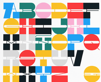 In-House International is an Austin,TX-based creative studio founded in 2011 by Alexander Wright. Michelle Benaim Steiner became a partner in 2015. In-House designs custom typefaces for branding and editorial projects and specializes in geometric experimental display fonts.
 In 2020, they released Ragtag (a ragtag of capitals by Rodrigo Fuenzalida and Alexander Wright) and Troptical (a 48-style prismatic or op-art typeface by Alexander Wright). In 2020, Rodrigo Fuenzalida, Alexander Wright and Michelle Benaim Steiner co-designed the exaggerated reverse stress (or: Italian) typeface Pata Slab at In-House International. All uppercase characters were built to fit precisely inside a square, so they are all the same width and height. In 2021, he released the 20-style modular strip typeface Snare (designed by Rodrigo Fuenzalida and Alexander Wright, it includes ten unicase styles). [Google]
[MyFonts]
[More] ⦿
|
Insigne Type Design Studio (was: Dooley Type)
[Jeremy Dooley]

|
 Insigne Type Design Studio (est. 2006) is run by Jeremy Dooley, b. Columbia, SC, 1981, who received a masters in graphic design at Savannah College of Art and Design in 2005. He lived in Atlanta, GA, and is now in Knoxville, TN. From 2004 until 2006, he ran Dooley Type in Greenville, SC. Behance link. Klingspor link. Font squirrel link. Creative Market link. MyFonts interview. His fonts:
 - 44th President (2009, based on Obama's handwriting).
- Aberlyth (2006). An informal script face.
- Ainslie (2014), Ainslie Slab (2014), Ainslie Sans (2014) and Ainslie Contrast (2020: a 42-style sans).
- Antigen (2007) is futuristic.
- Arendahl (2007) is a connected but irregular handwriting font.
- Ashemore (2012). Production assistance for Ashemore was provided by Lucas Azevedo and Marcelo Magalhaes. Followed by Ashemore Softened (2012).
- Avaloc (2006) is an expanded sans.
- The Aviano superfamily. Aviano Wedge (2012), Aviano Slab (2007), Aviano Serif (2008), 2009 Aviano Didone (2009), Aviano Flare (2010), Aviano Sans (2010), Aviano Future (2011), Aviano Contrast (2012), Aviano Gothic (2013), Aviano Sans Layers (2013), Aviano Copper (2018), Aviano Didone (2019). Aviano Titling (2007) is inspired by Trajan. Aviano Silk (2015) is a bilined decorative titling typeface. Aviano Royale followed in 2016.
- Barcis (2013). An organic sans family.
- Beastias (2006). An informal script face.
- Belda (2017). An elegant serif family of fonts that grew from the ancient roman capital. Followed by the 54-style Belda Didone (2020). A 54-style didone family without ball terminals.
- Biortec (2004).
- Biscuit Boodle (2008) is a fun and crazy script from Portland Studios illustrator Justin Gerard. Biscuit Boodle Ornaments (2009, dingbats).
- Blue Goblet (2005) is a Treefrog-style script developed for the pending illustrated childrens book from Portland Studios, The Blue Goblet. It was co-designed by Cory Godbey of Portland Studios and Jeremy Dooley. In 2011, Cory Godbey added Blue Goblet Christmas Ornaments.
- Boncaire Titling (2012) was iInspired by the type elements of 17th century map of Curacao made by Dutch cartographer Gerard Van Keulen.
- Brigette (2007) is an ink-splattered calligraphic script.
- Cabrito (2013). A typeface for children's books. Followed by Cabrito Inverto (2014) for reversed stroke stress---some of its heavier styles have a Western appearance. In 2014, Cabrito Sans was added to the set. Cabrito Semi followed in 2015, the playful Cabrito Didone in 2016, Cabrito Contrast in 2018, and Cabrito Flare and Cabrito Serif in 2019.
- Caridade.
- Carta Marina is a family of medieval map text typefaces and dingbats (2007).
- Cartes (2020). A charming 54-style family with chancery ascenders, and a roaring twenties handcrafted appeal.
- Cavole Slab (2011).
- Celari Titling (2014).
- Chatype is a geometric slab serif typeface family designed in 2012 for the city of Chattanooga, TN, by Robbie de Villiers and Jeremy Dooley.
- Chennai and Chennai Rounded (2007) are playful display sans typefaces. Chennai Slab (2009).
- Chypre (2017). A techno sans family.
- Civane (2017). A flared inscriptional typeface family.
- Coegit (2012). A sans family that offers Compressed, Compact and Condensed subsets.
- Cohort (2010, elliptical sans).
- Coupe (2003).
- Dever (2015) is a 107-style family of rough and weathered letterpress typefaces with industrial octagonal skeletons.
- Dienstag (2008, 8 styles).
- Daito (2018). A welcoming soft slab serif typeface family.
- Donnerstag (2010, extended slab serif).
- Dulcian (2017). A bright open sans family.
- Eigerdals (2010, rounded sans family).
- Enocenta (2013). A penmanship typeface family done with Cecilia Marina Pezoa.
- Enzia (2009, an elegant sans family).
- Evalfey (2021). Formal calligraphic.
- Fizgiger (2006). An informal script face.
- Florencia (2007) is a vintage script.
- Foverdis (2010, a calligraphic family that includes a hairline).
- Gineso (2016). A set of 48 slightly condensded and squarish headline typefaces. Followed by Gineso Titling (2016) and Gineso Soft (2018).
- Grayfel (2015). A 42-style sans typeface family characterized by flush horizontal or vertical terminal endings.
- Grenale (2013). A flashy in-your-face didone family from Thin to Heavy. Grenale #2 (2013) is a curvy sans that is almost a monoline. In 2015, Dooley launched Grenale Slab.
- Haboro (2016). A 54-font strong didone family with wedge serifs replacing the standard rectangular ones. It has no ball terminals. Followed by Haboro Slab (2016), Haboro Soft (2016), Haboro Serif (2016), Haboro Sans (2016), Haboro Contrast (2017), and Haboro Slab Soft (2020).
- Honeydrop (2017). A brush script.
- Insigne Abstractions (2007) and Insigne Fleurons (2008) are dingbats.
- Jon Cary (2004, the handwriting of John Kerry).
- Kairengu (2007) is a comic book family.
- Kasuga (2008) and Kasuga Brush (2009) are fresh new scripts with oriental undertones.
- Kidela (2007) is a sassy scrapbook family. Kidela Sketch (2009).
- Kochi (2015). A 54-font rounded organic sans typeface family.
- Le Havre (2008) is a gorgeous 8-style geometric art deco sans with tall ascenders. In 2010, the Le Havre Sketch family was added. We also have Le Havre Rough (2014, a bit of letterpress feel thrown in), Le Havre Rounded (2009), Le Havre Titling (2012), Le Havre Layers, Le Havre Hand (2015) and Le Havre Width (2017).
- Look (2015). In Sans, Script, and Serif subfamilies, this super-collection blends a bit of vernacular signage with weathered letterpress.
- Lorelei (2007, Insigne) is a bouncy script family.
- Lourdes (2007) is an informal script.
- Madeleine (2007) is a basic handwriting face.
- Madurai (2012). A simple monoline sans superfamily. Madurai Slab (2013) has 54 styles.
- Mahalia (2008) is a retro script.
- Majidah and Majidah Potens (2006) are medieval scripts.
- Mandrel (2017). A typeface with sharp serifs. Followed by Mandrel Didone (2021: a 54-style didone).
- Marintas (2012).
- Maris (2015). A curly script.
- Massif (2008) is an aggressive sans family.
- Metairie (2018). A connected high-contrast script.
- Mirantz (2019). A 54-style text typeface family.
- Mittwoch (2009, organic serif).
- Montag (2007) is a casual rounded sans family in six styles.
- Mr Darcy (2015). A Tuscan all-caps typeface.
- Mynaruse Flare (2018). An update of Mynaruse (2010), which is a roman inscriptional titling family---it is characterized by skinny flared serifs.
- Nanumunga (2007) is a comic book style face.
- Natalya (2007) is a connected calligraphic script. Natalya Monoline (2007). Natalya Swashes (2009, calligraphic).
- Newcomen (2008) is a 4-style roman titling face.
- Obline (2004, sans).
- Oita (2014). An octagonal typeface family.
- Olidia (2008) is calligraphic.
- Orewelia (2004, grunge face).
- Pauline Didone (2011, a curly didone family). Pauline Script (2008) is a monolinear retro script.
- Pershal (2021). A 54-style family, described as an oddball sans.
- Plathorn (2014). Inspired by the Wild West, this generous typeface family uses flaring in a thousand ways to recreate the feel of that era.
- Promethian (2005, futuristic).
- Quarca (2013). A 36-font sans family with a sturdy rounded square look.
- Quatie (2013). A curvaceous family: Quatie draws much of its inspiration from the industrial brawn of the railroad and the unique characteristics of Cherokee letterforms, giving it an atypical form not usually found in an industrial slab (accring to Dooley).
- Questal (2007) is a unicase serif face.
- Qurillian (2006, legible sans).
- Radona (2021). A 54-style geometric sans described as the typeface version of Synthwave.
- Ranelte (2016). A condensed sans series with techno or DIN appeal. The textured versions are collected in Ranelte Deco (2017).
- RendtPhysic (2006).
- Ript Cure (2005).
- Sabler Titling (2016). An all caps typeface family with tapered flared strokes.
- Sancoale (2011, an organic sans family, from Thin to Black). Sancoale Narrow (2011). Sancoale Softened (2012). Sancoale Slab (2012). Sancoale Slab Soft (2013), Sancoale Gothic (2022: 48 styles; a subdued and calming version of Sancoale, with quiet futurism).
- Sangli (2015). A 54-style rounded organic sans typeface family.
- Savigny (2011). Images: Savigny Black Extened, Savigny Regular Condensed.
- Savory Paste (2007). Grunge.
- Schorel (2019). A 54-style Scotch roman.
- Senlot (2018). A 54-strong sans family. In 2019, Senlot Sans and Senlot Serif (2019) were added. Senlot Didone followed in 2021.
- Serofina (2010, a calligraphic face).
- Shrike2003 (2003).
- Sildetas (2010, a high-contrast script typeface with tear drop terminals).
- Sociato (2022). A 54-style baroque text family with didone roots. The typeface was inspired by a declaration published during the French Revolution that extolled the development of a new religion, the cult of the Supreme Being.
- Solitas (2015). A rounded 42-style geometric sans family. Followed by Solitas Slab (2015), Solitas Serif (2017) and Solitas Contrast (2021; a 42-style display sans family described as sensual by Jeremy Dooley).
- The sans family Sommet (2008; see also Sommet Rounded (2008), Sommet Slab, 2010, and Sommet Serif (2011, a wedge serif family)) is futuristic. Sommet Slab Rounded (2011).
- Sophima (2021). A weathered script family.
- Soprani (2020). A 54-font set with considerable flaring and thorny serifs, based on a vintage plaque from the 1920s.
- Sovba (2009, upright italic).
- Steagal (2013). A geometric sans with a 1930s American feel.
- Steam Court (2015). A combination of steam punk and blackletter.
- Stefania (2007) has two calligraphic/chancery styles. Its aged version is called Stefania Antique (2008).
- Stratham (2007) is a medium to black family of legible sans typefaces.
- Terfens (2007) is an informal and quite rounded sans serif with inspiration from chancery scripts like Stefania. Terfens Contrast (2021) is an 48-style sans with calligraphic traits.
- Torcao (2013). An elliptical anthroposophic typeface family.
- Ultine (2016), an utilitarian sans family.
- Valeson (2020). A vintage display typeface with a kneeling art nouveau lower case n.
- Valfieris (2006). Valfieris Aged (2007) imitates medieval printing.
- Varidox (2019). A variable font with a roundish slab serif design.
- Verao (2018) and Verao Ornaments. A calligraphic script.
- Vergils (2021). A 54-style sans that tries to instill the spirit of the eighties and electronic music genres like Synthview.
- Waialua (2019). A script typeface with a variable font option.
- Waimea (2019). A variable script font produced with the help of Lucas Azevedo.
- Winsel (2019). A flared typeface influenced by British nostalgia, vintage signage and typographic ancestors like Edward Johnston and Eric Gill. Perfect for typesetting speeches by Winston Churchill.
- Wreath (2016). A script typeface family.
- Xalapa (2008) is a grunge family.
- Yevida and Yevida Potens (2006, scripts).
- Yorkten (2015): 54-style monoline sans family. See also Yorkten Slab (2017).
- Youngblood (2008, +Youngblood Antique, 2010) is non-connected.
Catalog of their typefaces. View Jeremy Dooley's font library. View Jeremy Dooley's typefaces. Adobe link. [Google]
[MyFonts]
[More] ⦿
|
Ipanema Gráfica
[Rubén Prol]

|
 Ruben Prol is based in A Coruña, Spain. He used to run Ipanema Gráfica, a Brazilian photoblog site, where original fonts such as Rita (2010, slabby), Comic Arousa (2007), Nantronte (2005), Velvet Illusions (2005, retro futuristic), Vila Morena (2006), Johnyokonysm (2005), As pedras da Belle Otero (2006, an artsy pixel font), Milocha (2010, sans), Rita (2010, slab serif), and Marela (2005) may be found.
 Rubén Prol created the sans face Carme (2011), which is free at Google Font Directory. Ancient Galician stone inscriptions led Prol to design Uralita (2012, +Bold, 2013), which is also free. In 2016, he designed the soccer shirt lettering typeface Hibernia, and the multilined Starman. In 2014, he designed the custom soccer shirt typeface RCD Carme Condensed for the new (2014-2015) RC Deportivo kits. Typefaces from 2017: Chuca Mono, Lordela (an angular German expressionist typeface), Abisinia (a unicase poster font). Dafont link. Behance link. Old URL. Behance link for Ruben Prol. [Google]
[MyFonts]
[More] ⦿
|
Isabela Muniz
|
Natal, Brazil-based designer of the free unicase painted letter font Frieda (2019), which is named to honor Frieda Kahlo. [Google]
[More] ⦿
|
Itziar Goñi
|
Designer of the free unicase brush typeface Itziargo Big (2014). [Google]
[More] ⦿
|
Ivan Petrov

|
 Ivan Petrov is based in Saint Petersburg, Russia. Bulgarian codesigner with Julia Zhdanova of the free typeface Artifika at Cyreal and Google Font Directory in 2011. He is currently located in Moscow.
 At Cyreal, he published the free font Volkhov (2011; download at Fontsquirrel), a low-contrast serifed typeface with a robust character, and the didone typeface Prata (2011; for a free version, see here). He also created a number of beautiful experimental typefaces in 2011. Bolgariy (2012) is a warm display typeface made for advertising Bulgaria. In 2014, he published the 18-style sans serif typeface system Glober at Fontfabric. Inspired by strong German grotesques such as DIN and Dax, it has a great spectrum, from hairline (called Thin) to Heavy. Glober won an award at Modern Cyrillic 2014. Typefaces from 2015: Stimul (a monoline unicase san). Typefaces from 2016: Tavolga (a curvy sans family), Rossiya (a corporate Peignotian Cyrillic / Latin typeface for the rebranding of Rossiya Air Company). Typefaces from 2017: Fungis, Creata (a wide sans family), Kvyat (a speed emulation sans typeface named after Russian racer Daniil Kvyat, developed for branding at ONY), Fungia (display style). Typefaces from 2018: Gilam (by Ivan Petrov, Plamen Motev and Svetoslav Simov: based on DIN, but more geometric and with obliquely cut terminals). Behance link. [Google]
[MyFonts]
[More] ⦿
|
Jacky Frossard
|
French art director. Home page Designer in 2000 of UniCase, and in 2008 of Blackfountain (a free modular face, FontStruct) and Azertype (a rounded squarish FontStruct font). Dafont link. [Google]
[More] ⦿
|
James Grieshaber
[Typeco]

|
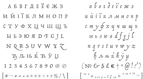 [MyFonts]
[More] ⦿
|
Jan Schmoeger
[Paragraph]

|
 [MyFonts]
[More] ⦿
|
Jan Tschichold

|
 Born in Leipzig (1902), died in Locarno, Switzerland (1974). Influential German type designer whose typefaces include these:
 - Sabon (1964-1967, for Stempel). The most famous digital version of Sabon is Linotype's Sabon Next. See also Sabon eText Pro (2013, Linotype) and Salieri (2020, a free font by Daniel Benjamin Miller).
- Transit and Transito (1931). Transito has been remade by Nick Curtis in 2009 as Waddem Choo NF, and by Paulo Heitlinger in 2008 as Transito.
- Zeus (1931). Pleks Zeus (2008) is a revival of Zeus by Hans Munk.
- Saskia (1931, Schelter&Giesecke). Revived by Ralph M. Unger in 2016 as Saskia Pro.
- Uher Standard Grotesque.
- Between 1926 and 1929, he designed a "universal alphabet" to help with non-phonetic spellings in the German language. For example, he devised new characters to replace "ch" and "sch". Long vowels were indicated by a macron below them. The alphabet was presented in one typeface, which was sans-serif and without capital letters. Leicht und schnell konstruierbare Schrift (1930) is a Bauhaus-style geometric revived in 2008 by Sebastian Nagel as Iwan Reschniev. See also Architype Tschichold by The Foundry.
Links about him: Textism site. Nicolas Fabian's page on him. Links to his work. Bio at Linotype. Wikipedia site. Publications include: - Die neue Typographie (Berlin, 1928). Quote from this book: Type production has gone mad, with its senseless outpouring of new types. Only in degenerate times can personality (opposed to the nameless masses) become the aim of human development,
- Typographische Gestaltung (Basel 1935).
- Geschichte der Schrift in Bildern (Basel 1941).
- Schriftkunde, Schreibübungen und Skizzieren (Basel 1942, Berlin 1952).
- Schatzkammern der Schreibkunst (Basel 1946).
- Meisterbuch der Schrift (Ravensburg 1953).
- Erfreuliche Drucksachen durch gute Typographie (Ravensburg 1960).
- Willkürfreie Maßverhältnisse der Buchseite und des Satzspiegels (Basel 1962).
- Ausgewählte Aufsätze über Fragen der Gestalt des Buches und der Typography (Basel 1975).
- Jan Tschichold, Leben und Werk (Dresden 1977).
- Jan Tschichold. Schriften 1925-1974 (Berlin 1991).
- Recommended is this short essay entitled Consistent Correlation Between Book Page and Type Area.
- The book jan Tschichold. Vormveranderingen van het &-teken. In een hedendaagse context (Amsterdam, De Buitenkant, 1993) has contributions by Petr van Blokland, Peter Borgman, Bram de Does, Dick Dooijes, Paul Groenendaal, Martin Majoor, Karina Meister, Gerrit Noordzij, Helmut Salden and Gerard Unger.
[Google]
[MyFonts]
[More] ⦿
|
Jane Greckova
[Jane's Den]
|
[More] ⦿
|
Jane's Den
[Jane Greckova]
|
Ukrainian designer of Latin / Cyrillic typefaces: Loris serif (2018), Macaw (2018), Orbita (2018: circle-themed unicase sans), I Love Puppies (2018), Saola Sans (2018: with identical lower case a and o), Impala (2018: sans), Bonobo (2018: sans), Pronghorn (2018: a squarish sans), Pronghorn Hollow (2018), Agouti (2018: all caps sans), Narwhal (2018: a sans typeface), Argalis (2018: a Latin / Greek fashion mag font), and Grison (2018: a decorative sans). [Google]
[More] ⦿
|
Jason Castle
[Castle Type]

|
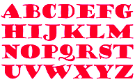 [MyFonts]
[More] ⦿
|
Jay Hilgert
[Albatross (or: Font Deals)]

|
 [MyFonts]
[More] ⦿
|
Jeanik Bischof
|
Jeanik Bischof (Valencia, Spain) created the unicase typeface Fathika in 2006. [Google]
[More] ⦿
|
Jeremy Dooley
[Insigne Type Design Studio (was: Dooley Type)]

|
 [MyFonts]
[More] ⦿
|
Jeremy Tankard
[Jeremy Tankard Typography]

|
 [MyFonts]
[More] ⦿
|
Jeremy Tankard Typography
[Jeremy Tankard]

|
 Jeremy Tankard established Jeremy Tankard Typography in 1997, after corporate design work at Addison Design Consultants and Wolff Olins. This Londoner made some extraordinary and daring font families. In many of his typefaces, Jeremy mixes upper and lower case letters for more impact. A list of his typefaces:
 - FF Disturbance (1993, a unicase based on Sabon).
- Alchemy (1998). Mystical. To be used with Enya's music in the background.
- Blue Island (1999, Adobe).
- The Shire Types (1998, consisting of Shire-Cheshire, Shire-Derbyshire, Shire-Shropshire, Shire-Staffordshire, Shire-Warwickshire, and Shire-Worcestershire). Shire Pro followed in 2011 and Shire Arabic in 2012. Shire is based on idiosyncratic vernacular lettering seen across Britain.
- Enigma (1999-2015). A great text typeface family with influences going back o Hendrik van den Keere.
- Shaker (2000) A sans serif with some flaring.
- Harmony Greek, a typeface that netted him a Bukvaraz 2001 award alongside the Shire Types and Shaker.
- Aspect (2002). A typeface with many ligatures and swashes.
- Bliss (Agfa Creative Alliance). Bliss Pro (2006), a sans family, covers Latin, Greek and Cyrillic ina harmonious fashion.
- Corbel (2004). A sans family made for Microsoft's ClearType project, for which he received a TypeArt 05 award.
- Custom designs: Epsilon (a very bold face, supposedly designed for the Düsseldorf branch of Frogdesign) and Harmony (for Telstra in Australia).
- Kingfisher (2005). A transitional petit-Bodonesque serif family.
- Arjowiggins (2006). Tankard cooperated with Arjowiggins and design agency Blast on AW Inuit that was commissioned by ArjoWiggins for the launch of the Inuit paper: it is a unicase Latin font inspired by Inuit letterforms. See also at MyFonts. The typophiles are unjustly upset at this sort of typeface though.
- Trilogy (2009). This extensive typeface family consists of Trilogy Sans Compressed, Trilogy Sans Condensed, Trilogy Sans Normal, Trilogy Sans Wide, Trilogy Sans Expanded, Trilogy Egyptian Normal, Trilogy Egyptian Wide, Trilogy Egyptian Expanded, and Trilogy Fatface.
- Fenland (2012). A 14-style ink-trapped sans.
- Redisturbed. A classical unicase typeface.
- Capline (2014). A bilined all-caps typeface family for titling work. It won an award at Modern Cyrillic 2014.
- Queezoid (2015).
- Pembroke (2014). A British geometric typeface family with many weights ranging from Hair to Ultra.
- De Worde (2017). An italic typeface family in seven weights to celebrate the 60th anniversary of e Wynkyn de Worde Society.
- Wayfarer (2017). He writes: The typeface was originally commissioned for use with a new wayfinding system for the city of Sheffield in the UK. As Sheffield was the home to the type foundry, Stephenson. Blake & Co. it had been thought that their type, Granby Condensed would be suitable. The Granby family of types was developed during the 1930s as Stephenson, Blake's contribution to the general cashing in of other foundries on the popularity of Monotype's Gill Sans and the geometric sans serifs being introduced by the continental type foundries.
- Hawkland and Hawkland Fine (2018). A text typefaceC with didone and transitional elements.
- Brucker (2019). An 8-style angular expressionist typeface family.
Fontfont write-up. Alternate URL. Interview by Planète Typographie. Interview by Brendan Staunton. I Love Typography link. FontShop link. Klingspor link. MyFonts link. [Google]
[MyFonts]
[More] ⦿
|
Jim Lyles
[Stiggy & Sands]

|
 [MyFonts]
[More] ⦿
|
Joan Barjau

|
 Born in Barcelona in 1950, Joan Barjau is a graphic and type designer, cartoonist, illustrator, painter, and animator who taught at Eina in Barcelona from 1984-1993. Designer at type-o-tones in Barcelona who made Analfabeta Regular (1999, with Flavio Morais), Analfabeta Pics (1999, with Flavio Morais), Analfabeto (+Pics, 2007, another vernacular typeface done with Flavio Morais), Ebu Script (1991-2013, a technical script done with José Manuel Urós), Iva (1993-2007), Jeune Adrian (1997), MeMimas (1991-2007, upright connected script done with José Manuel Urós; a Spanish school script commissioned in 1991 by publisher Barcanova), MeMimasAlternate, the great Sniff (1995, poster family), Talqual (1997, handwriting), Tschicholina (1997, unicase font inspired by Tschichold), Xiquets Primitives (1995, dingbats), Zubizarreta (1997, an award winner at Bukvaraz 2001; Zubizarreta Tosca is clearly Kafkaesque; the whole family is a mix between Neanderthal simplicity and Basque toughness).
 In 2013, Joan Barjau published the cartoonish typeface family Sniff, which he first created in 1995. He writes: Joan Barjau used the pseudonym Sniff while working as a cartoonist for the Spanish satirical magazine El Papus, and Sniff is also the typeface based on the style of lettering he used for the balloons. Interview by MyFonts. FontShop link. MyFonts link. Klingspor link. [Google]
[MyFonts]
[More] ⦿
|
Joana Maria Correia da Silva
[Nova Type Foundry]

|
 [MyFonts]
[More] ⦿
|
Johannes Hoffmann
[Johannes Hoffmann]

|
 Düsseldorf, Germany-based creator of Vivala Media Icons (2013) and Vivala Unicase (2012).
 In 2014, he made the monoline superelliptical sans family Monia and Signatia, which is inspired by Polish children's books. In 2014, he finished Vivala Line, Vivala Slab, and Vivala Coffee House Icons. In 2015, he added Vivala Black, a mammoth weight type, Vivala G Slab, and Vivala Sans Round. In 2016, he published the rounded sans typeface Edigna, the programming font Vivala Code and the soft-edged Vivala Milk. Typefaces from 2017: Macella (the proportional version of the monospaced Vivala Code). Typefaces from 2019: Vivala BL (blackletter). Typefaces from 2020: Vivala Pix. Typefaces from 2022: Vivala Re (an inline version). [Google]
[MyFonts]
[More] ⦿
|
Johannes Hoffmann
[Johannes Hoffmann]

|
 [MyFonts]
[More] ⦿
|
John Nahmias
[Jonah Fonts]

|
 [MyFonts]
[More] ⦿
|
Jonah Fonts
[John Nahmias]

|
 Type and logotype company in Polanco (and now Mexico City), Mexico, run by John Nahmias (b. 1935, New York City). John is a graphic designer who started his career in 1952 in a New York studio with Lucian Bernhard. He left that company in 1958. He now lives in Mexico where he paints and runs his own studio. John's typefaces, mostly but not exclusively scripts, are sold by MyFonts.
 - A: Advent (2015: slab serif), Agave (2017: sans), Altura (2007, a serif family for covers), Amplia (2008, connected script in the style of Mistral; see also New Amplia (2010) and Amplia Pro (2017)), Angelviews (2020), Annabel Lee (2011, upright connected monoline script), Applaud (2017), Aquarel (2014), Aristide (2007, grunge), Aros (2009) Arroba (2010, a directionally challenged heavy slab serif), Artichoke (2011, fat signage script), Artistica (2019), Atlantica (2021: a ten-font sans with surgical cuts).
- B: Bernhard Signature (2019: after the letters in a small logo that Lucian Bernhard used on his art), Bonafide (2009, sans family), Bonnie Bay (2017), Bonnie Bay Roman (2017), Botegga (2018), Brougham (2012, techno), Brush Swipe (2016), Buggy Ride, Bulwark (2011, oddly-serifed), Burgerbun (2014).
- C: Caravan Script (2007), Caseta Slab (2014), Caseta Sans (2014), Caseta Regular (2014), Casual Brush (2007), Catapult (2020), Chatter Pro (2010-2019, influenced by signage), Cherry Lane (2011, fat round signage face), Chit Chat (2009, comic book style), Circuitry (2007, rounded octagonal face), Claxon (2009), Clic (2012: rounded comic book style family), Coliseum (2007), Cornerstone, Cornerstone Flair, Cornerstone Pro (2014), Credititle (2009), Crotona (2014), Crotona Sans (2014), Cuppa Tea (2015, cursive script).
- D: Designers Gothic (2009, a poster sans family), Dogwood (2019).
- E: Epoch (2009, organic), Espada (2015), eSpectrum (2019), Etiquette (2009, casual script).
- F: Fabius (2008, a fat-nibbed pen face), Feather Pen (2007), Fidelity Caps (2009), Flavian (2013, a text typeface), Fountain Pen (2007), Front Page (2011; followed in 2015 by Front Page Pro), Frugality Pro (2014, an antiqua).
- G: Gallivant (6 styles), Garabato (2008, informal hand), Gavel (2016), Georgie (2011, upright connected script), Gianna (2016: a connected calligraphic script), Goya (2012, a heavy signage script), Granada (2014).
- H: Hacienda (2008, hand-printed), Honcho (2007). Lucian Bernhard's Magnetype font series is being revived in 2010 by John Namias, starting with Bernhard's Community Low and Community Condensed, which is called Harpsichord. Hebron Hebrew (2019). Hi Five is an art deco typeface.
- I: Interum (2007).
- J: Janagrace (2007, flowing script), Jonah Brush (2010, basic signage font), Jonahpad (2008, hand-printed), Joyscript (2007; Joyscript Two was done in 2013), Juggler (2010, signage / comic book face), Juke Box (2009, calligraphic).
- L: La Quinta (a creamy cursive typeface) (2021), La Rotonda (2009), Lyanna (2008, brush script).
- M: Manor Script (2013, connected), Mark (2010, a grungy marker script), Mavin (2015, a vintage serifed typeface), Medalist (2008, flat-nibbed pen script), Meridia Script (2009), Metrolite (2011), Metrolite Pro (2014), Micron (2016), Monoreal (a monospaced programming font) (2022), Montego (2014, monoline sans), Mulberry Road (2011, fat retro diner script).
- N: Nebbiolo (2012, a monoline fashion mag sans family), New Epoch (2020: a solid sans), Newmark (2014: techno sans), Newmark Hebrew (2018), Novela (uncial) (2021).
- O: Open Air (2014, a stencil font---caps only), Organo, Oregano Sans.
- P: Pageantry (2020: based on Souvenir), Pageantry Hebrew (2021), Palazzo (2007), Paloma (connected script), Palomar (2012, condensed organic sans), Papagayo (2020: a 4-style sans with almost amputated descenders and ascenders), Pantext (2015), Pedigree (2020), Pennyscript (2014, a connected brush script), PenPal (penmanship script), Pine Nuts, Pine Nuts United (2017), Pinot Noir (2009, calligraphic), Poncho (2013, signage script), Pony Tale (2009, signage face; the Pro and Pony TailLight Pro versions appeared in 2014), Potus Uncial (2021), Puzzle Face (2019).
- Q: Qualico (2009, semi-serif 1970s family), Quickline Slab,(2020), Quickline (2020: a sans), Quintana (2017). The Hebrew verson of Quintana Light is Komunidad Hebrew Script (2019).
- R: Ratatouille (2020: inspired by wood type), Rave (2011), Regalo (2010, an organic family; see also Regalo Pro, 2014), Reto (2012).
- S: Saguenay (2017), Scriptonah Pro (2014), See Saw (a dancing baseline font) (2022), Sevoya (2012, fat signage script), Scriptelle (2007), Scriptonah (2007; John Downer writes: Scriptonah, in any of its four weights, is not particularly pretty or delicate, but it is far from homely. It is firm and fibrous. It is raw.), Scriptonite (2010, a packaging script), Showtime (2011), Sideline (2018, a music nib font), Sign Brush (2010, a lively signage face), Single Tyne (a display serif) (2021), Singular (2009), Snowpuffs (2013), Stage (2015), Starlette (2009), Starry Eyed (2018), Steletto (2007, condensed), Steletto Oldstyle, Steletto OS Flair, Steletto Serif, Steletto Neue (2015), Stumpy (2011, display sans), Suite Slab (2011), Summit (2015, hexagonal circuit font).
- T: Taglocaps (2017), Talento (2007, script), Tiggly Wiggly (2009, hand-printed), Tingle (2009, comic book face), TransRim Display (2018), Trebla Square (2020), Trumpet (2013), Tubo, Twiggs (2009, hand-printed), Twopenny (2013, bilined), TypeOgraf Pro (2018), Typogravure (a flared family, in 12 styles) (2020).
- U: Unico (2013: a condensed geometric sans), Unigram (2011, monoline unicase family).
- V: Vantage (2013, a humanist sans).
- W: Whisk (2017), Wordscript (2007, almost a brush script).
- Y: Yacqui (2009, Mayan look face), Yom Tov (Latin and Hebrew) (2021), Yonkers (2014).
- Z: Ziggy (2007).
View John Nahmias's typefaces. [Google]
[MyFonts]
[More] ⦿
|
Jonathan Bennett
[Discourse Type]

|
[MyFonts]
[More] ⦿
|
Jonathan Gibson
[Studio Buchanan]

|
 [MyFonts]
[More] ⦿
|
Jonathan Gibson
[Gibson Type Foundry]
|
[More] ⦿
|
José de los Santos Segú

|
Uruguayan graphic designer (b. 1974) who graduated from ORT Uruguay in 2006. Creator of Mixa (2006), an award winning unicase font, at the Biennal of Latin Letters in 2006. Mixa, which was based on the logotype of the rock group El Silencio, was published in 2007 at Intellecta Design. See also here. Flickr link. [Google]
[MyFonts]
[More] ⦿
|
Juan Manuel Escobar Bernal
|
Mexican designer of Neon Lights (2013), En Mi Cuadra Nada Cuadra (2013), Mundonick (2010, unicase), Partofme (2012), Moonstone (2011), Princess And The Frog (2011), When the goes sun scene (2011, avant garde), Jessie Normal (2011, grunge face), Grachi (2011, bouncy spiky face, modeled on Fontdiner.com), Anahi (2011, art nouveau), Grachi 2 (2011), Tangled (2011, tattoo face), Femme 2 (2011), and Carly (2011). [Google]
[More] ⦿
|
Juan Pablo de Gregorio
[Letritas]

|
 [MyFonts]
[More] ⦿
|
Juan Pablo Meza Recabarren
|
Graphic designer in Santiago, Chile. He created the experimental typeface Selknam (2009). His inspiration was the Selk'nam or Onas, an indigenous people from Tierra del Fuego (now extinct) and their initiatory rites for adolescents. The typeface was designed using FontStruct. Selknam Unicase followed in 2013. Home page. Dafont link. Behance link. [Google]
[More] ⦿
|
Julia Martínez Diana
[Antipixel]

|
 [MyFonts]
[More] ⦿
|
Julie Patat
|
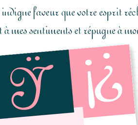 During her typography studies at Ecole Estienne in Paris, Julie Patat created the unicase font Mischievous Type (2014) and the display typefaces Wolf (2015, after an alphabet in D. Duvillé's l'Art du tracé rationnel de la lettre, 1934), Amsterdam (2015, art nouveau) and Brocéliande (2015). She also revived Firmin Didot's Ronde. Alda (2015) is an italic font with two different angles. Designed for French pocket books, it was inspired by Aldus Manutius's italics from 1501.
 In 2018, she published the Peignotian fashion branding typeface Trigère. Since 2014, Julie is asociated with Novo Typo in Amsterdam as a type designer. [Google]
[More] ⦿
|
Julien Janiszewski
[La Laiterie]

|
[MyFonts]
[More] ⦿
|
Julien Protière
[Qréalib]
|
[More] ⦿
|
Julien Saurin
[S&C Type Paris (was: La Goupil Paris)]

|
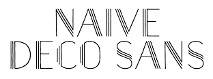 [MyFonts]
[More] ⦿
|
Jürgen Huber
[Type Department]

|
[MyFonts]
[More] ⦿
|
Karandash
[Vassil Nikolaev Kateliev]

|
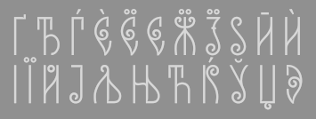 Karandash is a type and graphic foundry in Varna, Bulgaria, established in 2010 by designer Vassil Kateliev (b. 1980, Varna). The Fontmaker series is a collaborative project with Jordan Jelev, a well known Bulgarian calligrapher and cult wine label designer. The type designs are done on paper, using traditional calligraphic and artistic methods and then digitally recreated.
 Typefaces: Myriad Pro Bulgarian and Cyrillic (2011), Rotis Semi Serif Bulgarian Cut (2011), and FM Clog (2011, with Jordan Jelev, done at The Fontmaker: has Openface, Shadowed and Engraved styles). Callista is a fat cursive typeface that was inspired by the work of François Boltana in the early 1970s and of Milka Peykova in late 1970s. Gaytan (which means braid in Bulgarian) is a sans and serif family created in 2012. It was inspired by Old Church Slavonic Cyrillic, Bulgarian Ustav and the Russian Vyaz stiles, as well as the avant-garde works of Bulgarian typedesigners in late 1970s. But the result is definitely Victorian. He closes 2012 with Estimo, an organic typeface family for Latin and Cyrillic that has no diagonal strokes. FM Bolyar (2012) is a copperplate typeface jointly designed by Jordan Jelev and Vassil Kateliev at The Fontmaker. See also the spurred version FM Bolyar Ornate Pro ansd the weathered family FM Bolyar Typecarft. In 2019, after a full year of development, they published the 63-style all caps sans family FM Bolyar Sans Pro. In 2013, Vassil Kateliev and Jordan Jelev codesigmned the lively script typeface FM Ephire, which comes with a useful caps companion, FM Ephire Frames. In 2014, Kateliev designed a Valentine-inspired set of calligraphic ornaments, LoveHearts, Love Christmas (Christmas ornaments, done with Stella Ivanova Katelieva), and the humanist slab serif typeface Basil (the Regular weight is free). Basil won an award at Granshan 2014. Typefaces from 2015: Sybilla (humanist slab serif, extended to Sybilla Pro in 2016, and the 294-style Sybilla Multiverse in 2017). Sybilla Shade Pro is free. Typefaces from 2017: Versatile Bold (a Latin / Greek / Cyrillic font family for layering with plenty of hatched, shadow, rust and 3d options; by Charles Borges de Oliveira and Vassil Kateliev). In 2018, he designed Kometa together with Kiril Zlatkov. The 21-style Kometa (Latin and Cyrillic) is a modern sans serif font family with a geometric skeleton and a humanist soul. It has a unicase option and many alternates. Typefaces from 2019: Achates (a humanist sans workhorse), Future Tense (a sci-fi typeface by Charles Borges de Oliveira and Vassil Kateliev). MyFonts link. Creative Market link. Behance link. Klingspor link. [Google]
[MyFonts]
[More] ⦿
|
Karlgeorg Hoefer

|
 German scribe, type designer and unbelievable calligrapher, b. 1914 in Schlesisch-Drehnow, d. 2000 in Offenbach. Following schooling in Schlesien and Hamburg, he served a four-year typesetting apprenticeship from 1930-1934 in Hamburg and later at the Kunstgewerbeschule (School of Arts and Crafts) in Offenbach am Main. From 1939 until 1945 he was in active military service and became a prisoner of the Russians. After that ordeal, he became a calligraphy teacher at the Werkkunstschule in Offenbach, and developed a universal pen with novel writing and drawing techniques for the company Brause. It is at that point that Hoefer started designing types as well. From 1970 to 1979, Hoefer was a lecturer and later professor at the HfG (School of Design) in Offenbach. From 1981 to 1988, Hoefer ran summer calligraphy workshops in the USA (Los Angeles, San Francisco, Boston, New York, Washington, and other cities). In 1982, Karlgeorg Hoefer founded a calligraphy workshop in Offenbach for everyone, with evening courses and summer school, and in 1987, the registered association "Calligraphy Workshop Klingspor, Offenbach, Supporters of International Calligraphy." From 1987 to 1995, he was the chairman of the association while teaching continuing courses and summer school classes with leading foreign calligraphers. Hoefer has written two books about calligraphy: "Das alles mit einer Feder" (Brause, 1953) and "Kalligraphie, gestaltete Handschrift" (Econ, 1986). Numerous articles about Hoefer's work have appeared in calligraphy journals in Holland, France, the USA, and Japan. In 1989, the book "Schriftkunst/Letterart Karlgeorg Hoefer" was published as part of Calligraphy-Editions Herbert Maring (Die Kalligraphie Edition, Hardheim, Germany, 1989). For his activities as a calligrapher, Hoefer received the Order of Merit of the Federal Republic of Germany in 1993. His typefaces:
 - At Klingspor: Salto (1952), Saltino (1953), Saltarello (1954), Monsun (1954). Salto is a famous and often-copied brush script.
- At D. Stempel: Prima (1957), Zebra (1963-1965, D. Stempel, a script that plays on the simulation of grey and the use of two colors; revived by Colin Kahn in 2007 as P22 Zebra).
- At Ludwig&Mayer: Permanent (1962-1969, a large Grotesk family developed over many years---this was revived by Daylight in 2010 as Permanent Massiv; URW sells Permanent Headline URW D without even a word about the original designer; Softmaker has Plakette Serial and P700 sans; Castcraft has OPTI Permanent and OPTI Pinacle; Marcus Sterz published Letterpress Headline in 2009), Stereo (1963, an outline poster headline script developed between 1957 and 1968; digitally revived in 1993 as Stereo (Tobias Frere-Jones, Font Bureau)), Elegance (1964, a handwriting script, which was the basis for Sincerely (2005, Canada Type)), Big Band (1974, a fat poster script revived in 2007 by Nick Curtis as Baby Cakes NF (2007)), Big Band Terrazzo (1974, a glaz krak face), Headline (1964, a poster typeface that emanated from Permanent).
- Programm-Grotesk (1970): Hoefer's first digital typeface, commissioned by JT Hellas for the Greek telephone books It was first used in the digital machine Digiset of Dr. Ing. Hell in Kiel.
- From 1978 until 1980, Karlgeorg got involved in the development of a German license plate font that could withstand forgery by black marker pens. The typeface, FE Mittelschrift/Engschrift, had also input from other sources.
- Lateinischen Ausgangsschrift (1974): a school script for the Linotype phototypesetter. This led later to VA Schrift (Berthold and Linotype).
- At Linotype: Omnia (1990, a unicase typeface with a Celtic uncial feel), San Marco (1990, round gothic / Rundgotisch), Notre Dame (1991-1993, a full blackletter face), Dominatrix (1994), Sho (1992, an Asian brush script), Beneta (1992, a French bastarda inspired by the Littera beneventana, the script of the Benedictine scribes from the 10th to the 12th century).
Linotype page. FontShop link. View Karlgeorg Hoefer's typefaces. [Google]
[MyFonts]
[More] ⦿
|
Kelly Hobkirk
[Typekirk]

|
 [MyFonts]
[More] ⦿
|
Kemie Guaida
[Pixilate Designs]

|
 [MyFonts]
[More] ⦿
|
Kevin Pease
[Cerulean Stimuli]

|
[MyFonts]
[More] ⦿
|
Kevin Thrasher

|
 Type designer in Peachtree City, GA. His typefaces from 2012 include a six-style unicase sans family entitled EXT Unicase, and the obese counterless typeface Red. In 2014, he created the useful and elegant family of numerals, 2041.
 Behance link. [Google]
[MyFonts]
[More] ⦿
|
Kimberly Geswein

|
 Born in Missouri in 1979, Kimberly moved first to Texas and later (in 2007) to China, and most recently, to Orlando, FL. She made some free fonts (often handwriting styles), and also ran a personal handwriting font service [those fonts have names that start with KGD]. MyFonts link. FontSquirrel link. Home page. Fontspace link. Dafont link. Fontsy link. Abstract Fonts link. Fontspring link. Klingspor link. Google Web Font Directory link. Creative Market link. Family home page. Her fonts, by year:
 - 2007: The grunge typefaces XiaoGao, More-than-Enough, Eat More Chocolate, JoyfulJuliana (2007, and its Pro version, 2010), LoveYaLikeASister, Colourmepurple, KingcooLKC and You Are Loved (in 2009, Roger S. Nelsson completed it to You Are Loved Pro). She also made the handwriting typefaces Patient Paige, Promised Freedom, Xiao Gao, Complete in Him (made into a commercial Pro version by Roger S. Nelsson), Burst My Bubble (commercialized at CheapProFonts as Burst My Bubble Pro), JustMeAgainDownHere, Surrendered Heart, It Ain't Rocket Science (in 2010, Roger S. Nelsson made a Pro version at CheapProFonts), Sue-Ellen-Francisco, and the curly Jheri Curls and Tuna-and-Hot-Dogs-on-Rye.
- 2008: the handwriting typefaces Come Unto Me and Loved by the King.
- 2009: BattyGirl, Bina Bina, Lollipop, NeverLetGo, Scrogglet, Sunshine In My Soul, YooHaeMool, Celebrate The Day (extended by Roger S. Nelsson in 2009 to Celebrate The Day Pro), Mighty To Save, King Kool KC Pro (kid's hand; done with Roger S. Nelsson, CheapProFonts).
- 2010: Shelter Me (handwriting), Elizajane (handwriting), Written on his hands (handwriting), Contrary Mary (hand-printed), Shining Like Stars (hand-printed), Give You Glory, Nothing You Could Do, Who Needs Consistency, happyhanneke, Zeyada, He Formed My heart, Change Tomorrow Today, Frangipani Rose, Blocked Off, Throw My Hands Up In The Air, Indie Flower, You Wont Bring Me Down, Addis Ababa, Cedarville Pnkfun (1 Cursive, 1 Print), Swanky and Moo Moo, Husband of the Millennium, Soggy Kitten, The Truth of a Thousand Lies, Soli Deo Gloria, Annie Use Your Telescope, Waiting for the Sunrise, La Belle Aurore, Airplanes In The Night Sky Pro, Dawbing of a new day, Shadows into light (+Two), Covered by your grace, Architect's Daughter.
- 2011: A Safe Place to Fall, Shark in the Water, Architects Daughter (architectural lettering), A Year Without Rain, My Hands Are Holding You, Discover Beauty, Lavender Lime, Later Allie-gator, You Found Me, I missed you, Kate The Great, Pizza Is My Favorite, A Hundred Miles, Hanging by a thread, My Lucky Penny, Jar of hearts, Never grow up, My Lucky Penny, Beautiful Every Time, Never Say Never, Swanky and Moo Moo, Over the Rainbow, Sue Ellen San Francisco, Pineapple Delight, Viva La Vida, The Only Exception, Written in the stars, we are broken, The Only Exception, Brick by boring brick, She paints me blue, Beautiful every time, Jar of hearts, Dancing in the Minefields, My Hands are Holding You, You Found Me, Blessings through raindrops, Stars from our eyes, From where you are, Throw my hands up in the air, The great escape, Today I Feel (emoticons), Cedarville Cursive, Coming home, Learning to trust, Viva La Vida, Janda Siesta Sunrise, Janda Curlygirl Chunky, Janda Curlygirl Pop, Janda Sparkle and Shine, Janda Love and Rain, Janda Fabulous, Janda Capslock, Janda Siesta Sunset, Janda Snickerdoodle Serif, Janda Everyday Casual, Janda Curlygirl Serif (hand-printed blackboard bold font), Janda Curlygirl Chunky, Janda Romantic, Janda Scrapgirl Dots, Janda Quick Note, Talking to the moon, Set fire to the rain, KG Shadow of the day, Just realize, Ignite the light, Love ya like a sister, Loved by the king, Give you glory, KG small town southern girl, KG Shadow of the day, Gloria Hallelujah, KG Sunny Afternoon, KG Hope for a cure, Janda Polkadot, Janda Capslock, KG June Bug, KG Fall For You, KG Luck of the Irish, KG Domo Is My Favorite, Gloria Hallelujah, KG Love You Through It (2011), KG Shadow of the Night (2011), KG Keep Your Head Up (2011), KG Dancing on the rooftop (2011), KG Party on the Rooftop (2011), KG Like A Skyscraper, KG Mulally, KG God Gave Me You, KG Les Bouquinistes de Paris (neatly hand-printed), Janda Swirlygirl (curly), Janda Sparkle and Shine, Janda Lova and Rain (curly), The Great Escape, KG Legacy of Virtue, KG Sweet N Sassy, KG Legacy of Virtue, Just Realize, KG Like a skyscraper, Janda Christmas Doodles, Just Realize, Janda Everyday Casual, Janda Snickerdoodle Serif, Love Ya Like A Sister (sketch face), The Only Exception, KG Luck of the Irish, Janda Fabulous, KG God Gave Me You, KG You Wont Bring Me Down, Set Fire To The Rain, KG You Wont Bring Me Down, KG Mercy in the morning, KG Heart Doodles, KG Skinny Latte.
- Typefaces from 2012: Janda Apple Cobbler, Janda Swirly Twirly, Janda Manatee, Janda Polkadot (2012), Shadows Into Light (2012, architectural style: see Google Web Fonts), Never Let Go, Janda Spring Doodles, Beautiful every time, Janda scrapgirl Dots, Written in the stars, Nothing you could say, KG Ray of Sunshine, More than enough, A hundred miles, Waiting for the sunrise, Janda Safe and Sound, Janda Silly Monkey, Janda Quirkygirl (curly font), From where you are (paint brush face), KG Empire of Dirt, KG Strawberry Limeade, KG A Thousand Years, Janda Amazing Grace, Janda Happy Day, Janda Elegant Handwriting (connected script), KG Somebody that I used to know, KG Kiss me slowly (curly), KG Call me maybe, KG Two is better than one, KG Ten Thousand Reasons, KG Beautiful Ending (grunge), KG Payphone (a nice cleanly hand-printed typeface), Janda Shine Your Light On Us, KG Beautiful Ending, KG Ten Thousand Reasons (chalkboard font), KG Only Hope, KG Eyes Wide Open (connected script), KG All Things New (high-contrast script face), KG Change This Heart (monolined and informal), Janda Stylish Script, KG Be Still and Know, KG Seven Sixteen, KG This is not goodbye, Janda Someone Like You, KG One Thing, KG I Like To Move It, KG Makes You Stronger, Janda As Long As You Love Me, KG The Fighter, KG Chasing Pavements (textured typeface), KG Always a Good Time, KG Grace for Today, KG Turning Tables (brush script), KG Falling Slowly, KG One More Night, KG Attack of the Robots, KG Ways to Say Goodbye (an upright script---one of her best typefaces to date), KG Janda Truly Madly Deeply, Janda Closer To Free, Ignite The Light, Janda Cheerful Script, Janda Hide and Seek, Janda Flower Doodles (a very useful dingbat set), Janda Celebration Script (swashy script), KG What the teacher wants, KG True Colors (connect-the-dots font), KG True Colors, Janda Closer to Free (chunky script), KG How Many Times, KG Behind These Hazel Eyes, KG Lego House (monoline rounded sans), KG Covered by your grace, KG Follow you into the world, KG Dark Side, KG Part of Me (neatly printed typeface), KG Begin Again, KG Cold Coffee, KG Something To Believe In (a stamped font).
- Typefaces from 2013: KG The Last Time, KG Feeling 22, Today I Feel (smilies), KG Primary Penmanship (a very clean rounded hand-printed typeface), KG Teacher Helpers (dingbats), KG Fractions (geometric dingbats), KG Flavor and Frames, KG Primary Dots (school font), KG Build A Game, KG Faith Hope and Love, KG As The Deer, KG Just Give Me A Reason, KG Girl on Fire, KG Daylight, KG I Want Crazy, KG Flavor and Flames Two, KG Flavor and Flames Three, KG Flavor and Flames Four, KG Flavor and Flames Five, KG Skinny Love, KG Traditional Fractions, KG Hard Candy, KG Alphabet Regurgitation, KG Second Chances (sketched typeface), KG Math Bar Models, KG Next to You (sketched typeface), KG Next to Me (+Sketched), KG Love Somebody, KG Beneath Your Beautiful, KG Primary Italics (school font, lined and regular), KG Wake Me Up (typewriter type), KG A Little Swag, KG Royals, KG What Does The Fox Say, KG Drops of Jupiter, KG Let Her Go, KG Why You Gotta Be So Mean, KG Tangled Up In You (sketched typeface), KG Chasing Cars, KG Melonheadz, KG Let Her Go (+outline and athletic lettering styles), KG By The Grace of God, KG Counting Stars, KG Christmas Trees, KG Bless Your Heart.
- Typefaces from 2014: KG Summer Sunshine, KG Say Something, KG I and Love and You, KG Corner of the Sky (rounded Comic Sans lookalike), KG All of Me (letterpress emulation), KG Flavor and Frames Six, KG Flavor and Frames Seven, KG Happy, KG First Time In Forever, KG Defying Gravity (white on black letters), KG When Oceans Rise, KG Summer Sunshine (shaded and arched poster lettering), KG Primary Whimsy, Janda Stylish Monogram, KG Modern Monogram, KG Already Home, KG Only Human, KG Miss Kindergarten, KG Arrows, KG No Regrets, KG Broken Vessels Sketch (sketched typeface), KG Manhattan Script, KG I Need A Font, KG Shake It Off, KG All of the Stars, KG-I-Need-A-Heart-Font, KG Red Hands (plump rounded sans), KG Blank Space (a typeface with metallic texture), KG Thank You Stamp, KG Tribeca Stamp, KG Candy Cane Stripe.
Typefaces from 2015: Janda Stylish Script, KG Chelsea Market Script, KG Adipose Unicase, KG Geronimo Blocks, KG Miss Speechy IPA (covers the entire phonetic alphabet), KG Thinking Out Loud, KG Tightrope, Kg Pdx Bridgetown, KG Camden Market Script (watercolor brush), KG Neatly Printed, KG PDX Blocks, KG Summer Storm, KG A Teeny Tiny Font, KG Piece By Piece, KG Sorry Not Sorry. Typefaces from 2016: KG Miss Kindy Collection, KG Satisfied Script, KG Who Tells Your Story, KG Life Is Messy, KG Inimitable Original, KG Eliza Schuyler Script. Typefaces from 2017: KG Compassion, KG Eliza Schuyler Script, KG Inimitable Original, KG She Persisted, KG Rise UP. Typefaces from 2018: KG Crossing a Line, KG Do You Love Me, KG One More Light, KG Laughter Lines. Typefaces from 2019: KG No Matter What (monoline script), KG Love is Love is Love. Typefaces from 2021: KG Ever Since New York. Creative Market link. Google Plus link. Open Font Library link. [Google]
[MyFonts]
[More] ⦿
|
Kiril Zlatkov
[Kiril Zlatkov Type Foundry]

|
[MyFonts]
[More] ⦿
|
Kiril Zlatkov Type Foundry
[Kiril Zlatkov]

|
Sofia-based designer (b. 1969) who created the free Latin typefaces Barkentina (2012, a typeface characterized by open counters) and Multima Strong (2012, unicase). In 2018, he designed Kometa together with Vassil Kateliev. The 21-style Kometa (Latin and Cyrillic) is a modern sans serif font family with a geometric skeleton and a humanist soul. It has a unicase option and many alternates. Typefaces from 2019: Metafisica (a roman family), Buzzati (a text typeface). [Google]
[MyFonts]
[More] ⦿
|
Konstantin Klatt
|
 German FontStructor who made the white-on-black-grid face Pacto (2010), Telamon (2010, +Bold), the thin condensed typeface Sycamore (2011), Sansybar Wide (2011), and the octagonal family Telamon (2010). Klatt runs Konstantin Klatt Mediendesign in Berlin, and makes fonts as kla2t.
 FontStructions from 2012: Aldis Stencil LC (FontStruct), Bauhaeusle (based on Herbert Bayer's Universal). [Google]
[More] ⦿
|
Kristin Enyart
|
During her studies at The University of Kansas, Kristin Enyart (Lawrence, KS) designed Paimio (2016), a unicase typeface that is inspired by the Paimio chair. [Google]
[More] ⦿
|
La Laiterie
[Julien Janiszewski]

|
 La Laiterie is a foundry started by Paris-based Julien Janiszewski (b. 1973), who received a bachelor's degree in graphic design from Besançon and later graduated from Ecole Estienne in Paris. His creations include:
 - At Bitstream: Ambule (1998, a unicase attempt), Bidule (1997, funny dingbats), Biot (1997, T-26), Curve (1999, Bitstream), Frothy (2000), Grind (2001), Home Script (2000), Indoo (1997, Indic simulation, since 2004 available at Bitstream, including Indoo Ornament), Petunia (1998-2000).
- At T-26: Oeiller (1998), Ticket d'caisse (1998), Biot. Biot and Frothy won awards at the Bukvaraz 2001 competition, but Frothy was later disqualified by the jury because it was derived from ITC Stone Sans. Julien's touching explanation and apology.
- At ITC: the 8-weight sans family ITC Tabula (2002; since 2006 also ITC Tabula Pro), a typeface first designed for film subtitling.
- At PsyOps: Transfer Sans (2001, with Rodrigo Cavazos). Biot and Frothy won awards at the Bukvaraz 2001 competition, but Frothy was later disqualified by the jury because it was derived from ITC Stone Sans. Julien's touching explanation and apology.
- Loft (2007-2008, Monotype) was inspired by wooden type developed during the late 1800s.
FontShop link. Klingspor link. View Julien Janiszewski's typefaces. [Google]
[MyFonts]
[More] ⦿
|
Lanston Type Co
[Gerald Giampa]

|
 The Lanston Type Co was based in PEI, Canada, moved in 2002 to Vancouver, and moved later that year to Espoo, Finland. In 2004, Lanston was sold to P22. Its fonts can be licensed via P22 and The Type Founders. It has classic and wonderful offerings such as Albertan, Bodoni, Caslon, Deepdene (Frederic Goudy, 1929-1934; see D690 Roman on the SoftMaker MegaFont XXL CD, or URW Deepdene, or Barry Schwartz's Linden Hill (a free font)), Goudy Oldstyle, Jacobean Initials, Kennerly, Kaatskill, Water Garden and Jefferson Gothic. Owned by Gerald Giampa (b. 1950, d. Vancouver, 2009), who wrote me this: Frederic Goudy worked for us for 29 years. We manufactured Monotype casters and keyboards. The English sister company sold casters to England and the Commonwealth and we sold to the Americas and wherever else practical. Tolbert Lanston, our founder, was the inventor of Monotype. We still sell matrices and were punching them until several years ago. Soon we expect to have the equipment moved and operational once again. We are placing it into America's largest printing museum which is in Andover close to Boston. However there is a possibility that it will end up in Hull Québec. Our previous type director was Jim Rimmer of Vancouver, noted type designer. He designs, cuts and cast type in lead. Our typeface Albertan was designed by Jim and is very successful. John Hudson and Ross Mills of Tiro were directly inspired by our facilities in Vancouver. I encouraged them towards type design. The beautiful Bodoni 26 (unicase) can be bought at FontShop. Atlantic 35 (1909-1935) is a modern family first used by the Atlantic Monthly in 1909.
 The fonts: Albertan No. 977, Albertan Bold No. 978, Albertan Title No. 980,&Inline No. 979, Bodoni No. 175, Bodoni Bold No. 2175, Bodoni 26 (a Lanston unicase based on an interpretation by Sol Hess), No. 175, Caslon Old Style No. 337, Caslon Bold No's 637,&537, Deepdene No. 315, Figures Square No. 132, Flash No. 373, Fleurons C, Fleurons Granjon Folio, Fleurons Folio One, Forum No. 274, Francis No. 982, Garamont No. 248, Globe Gothic No's 240,&239,&230, Goudy Initials No. 296, Goudy Old Style No. 394, Goudy Thirty No. 392, Goudy Village (#2) No. 410, Hadriano Stone-Cut No. 409, Hadriano Title No. 309, Jacobean Initials, Jefferson Gothic No. 227, Jenson Old Style No. 508, Kaatskill No. 976, Kaufmann (Lanston Swing Bold) No. 217, Kennerley Old Style No. 268, Metropolitan No. 369, Obelisk No. 2577, Pabst Old Style No. 45, Pabst Old Style Open, Spire No. 377, 20th Century No. 605, Vine Leaves C, Vine Leaves Folio One, Vine Leaves Folio Two, Water Garden Ornaments. P22 writes this about Lanston: In the late 1800s, Tolbert Lanston licensed his technology to an English sister company and became a major international force. Lanston grew rapidly with America's pre-eminent type designer, Frederic Goudy, holding the position of art director from 1920-1947. The Philadelphia-based Lanston Monotype eventually parted ways with its English counterpart. English Monotype became simply known as Monotype from that time forth. Lanston was acquired by American Type Founders in 1969. After a series of other owners, the company found its way to master printer Gerald Giampa, who moved it to Prince Edward Island in 1988. During its time of transition, Lanston continued supplying the American market for monotype casters until January 21, 2000, when the hot-metal component of Lanston was tragically destroyed by a tidal wave. Giampa was one of the earliest developers of PostScript fonts. After the loss, he focused on digitization to an even greater extent. Under his stewardship, Lanston's classic typefaces were digitized in a style that was true to the sources, which are the brass and lead patterns from which the metal type was made. The past few years have seen Giampa and Lanston travel from Canada to Finland, and back again. Now, Lanston has completed another journey back to the United States to come under the care of a new steward: P22. Giampa is answering the call of the sea. He has traded his type founder's hat for that of a ship's captain to sail the northern Pacific coast. During his shore leaves, Giampa will act as typographic consultant to Lanston-P22. The P22 Lanston collection (2005-2006) was designed wih the help of people such as Paul Hunt and Colin Kahn. It includes these typefaces: - LTC Archive Ornaments (2014, Richard Kegler and Miranda Roth).
- LTC Artscript.
- LTC Athena.
- LTC Bodoni 175. Digital version by Paul Hunt. This is supposed to be close to the original Bodoni.
- LTC Bodoni 26.
- LTC Bodoni Bold.
- LTC Broadway. By Sol Hess.
- LTC Californian.
- LTC Camelot.
- LTC Caslon Remix.
- LTC Caslon.
- LTC Christmas Ornaments.
- LTC Circled Caps.
- LTC Cloister.
- LTC Creepy Ornaments.
- LTC Deepdene.
- LTC Figures.
- LTC Flash.
- LTC Fleurons Garamont.
- LTC Fleurons Granjon.
- LTC Fleurons Rogers.
- LTC Forum Title.
- LTC Fournier Le Jeune. A decorative all caps combines the font designed by Simon Fournier for the Peignot Foundry in 1768 with a more elaborate "Vogue Initials" caps offered by ATF in the 1920s.
- LTC Garamont.
- LTC Glamour. LTC Glamour was originally released by Lanston Monotype in 1948. It is based on Corvinus, designed by Imre Reiner. P22 designer Colin Kahn has added some unusual variants.
- LTC Globe Gothic.
- LTC Goudy Extras.
- LTC Goudy Handtooled.
- LTC Goudy Heavyface.
- LTC Goudy Initials.
- LTC Goudy Modern.
- LTC Goudy Oldstyle.
- LTC Goudy Open.
- LTC Goudy Ornate.
- LTC Goudy Sans. Goudy Sans Bold was originally designed by Fredric Goudy in 1922 as a less formal "gothic" and finished in 1929. The light was designed in 1930 and the Light Italic in 1931. Colin Kahn digitized them in 2006 to make a 6-style Goudy Sans family at P22/Lanston, which includes a Goudy Sans Hairline.
- LTC Goudy Text.
- LTC Goudy Thirty.
- LTC Hadriano.
- LTC Halloween Ornaments.
- LTC Hess Monoblack.
- LTC Holiday Ornaments.
- LTC Holly Leaves.
- LTC Italian Old Style (2007, by Paul Hunt, after Goudy Italian Oldstyle, 1924). Remastered in 2011 by Paul Grieshaber as LTC Italian Old Style Pro: LTC Italian Old Style is not to be confused with the English Monotype font also called "Italian Old Style", which is an earlier design from 1911 based on William Morris's Golden Type that is based on Nicholas Jenson's Roman face. Goudy went back to Jenson's original Roman and other Renaissance Roman typefaces for his inspiration and the result is what many consider to be the best Renaissance typeface adapted for modern use. Bruce Rogers was one of the biggest admirers of Italian Old Style and designed the original specimen book for Italian Old Style in 1924 using his trademark ornament arrangement. These ornaments are now contained in the pro versions of the Roman styles- Regular Pro and Light Pro.
- LTC Jacobean Initials.
- LTC Jefferson Gothic.
- LTC Jenson. LTC Jenson Oldstyle was designed by J. W. Phinney of the Dickinson Type Foundry in 1893 and is based on Morris's Golden Typeface. This remastered set features a true italic based on the 1893 ATF italic version as well as a newly digitized Jenson Regular (P22) and Jenson Heavyface (P22) based on Phinney's design of 1899.
- LTC Kaatskill. The italic was completed by Jim Rimmer.
- LTC Kennerley.
- LTC Keystone Ornaments.
- LTC Law Italic (Lanston's digital version from 2006). Mac McGrew: Law Italic is said to have originated as an imitation of formal styles of penmanship used for legal documents. The most common of several substantially different varieties is ATF's Law Italic No. 520, which originated with Marder, Luse about 1870. Several of the capitals are swash-like, while lowercase f and g have distinctive shapes. It has long thin serifs and sharp contrast between thick and thin strokes. Inland called the same design Caledonian Italic. Hansen had Barrister Italic. Monotype's Law Italic No. 23 is a sloped roman, somewhat similar to Ronaldson. Other Law Italics are obsolete.
- LTC Metropolitan.
- LTC Nicolas Cochin.
- LTC Obelysk Grotesk. A reconstruction of Sol Hess's Spire (1937) (digital versions first by Gerald Giampa and then by Colin Kahn).
- LTC Octic Gothic.
- LTC Ornamental Initials. Floriated caps.
- LTC Ornaments Animalia.
- LTC Ornaments One.
- LTC Ornaments Three.
- LTC Ornaments Two.
- LTC Pabst Oldstyle.
- LTC Powell.
- LTC Record Title.
- LTC Remington Typewriter.
- LTC Spire.
- LTC Squareface. By Sol Hess.
- LTC Swing Bold.
- LTC Tourist Gothic. By Sol Hess.
- LTC Twentieth Century.
- LTC Village No 2.
- LTC Vine Leaves.
- LTC Water Garden Ornaments.
- LTC Winchell (2021, Richard Kegler). A revival of Inland Type Foundry's Winchell (1906).
Fonts can be purchased from MyFonts where all fonts have the prefix LTC. Obituary of Giampa and links to obituaries. Catalog of the Lanston typeface library. View the typefaces designed by Lanston. A more extensive page of Lanston Monotype typefaces. [Google]
[MyFonts]
[More] ⦿
|
Larabie Fonts
[Ray Larabie]

|
 Well over 500 original designs by Ray Larabie formerly from from Port Credit/Mississauga, Ontario, but now in Nagoya, Japan. Fontspace link. Dafont link. Abstract Fonts link. Another URL. Another URL. Fontsy link.
 Ray Larabie's fonts were originally free. The site was discontinued in the summer of 2001. Ray Larabie started a second life in his new commercial foundry, Typodermic, which opened in the Autumn of 2001. The following fonts are free: Blue Highway (1996-2011, based on American road signs, +Linocut), Strenuous, Shlop (2001, blood drip font), Tofu, Electoral Blue, Embargo, Lunaurora, MarqueeMoon, President Gas (nice stencil font), Motorcade, Overload, Baltar (2010), Dignity of Labour (1999), DirtyBakersDozen (1998, military stencil), Mufferaw (2000), Kimberley (2002), Typodermic, Mexcellent (2000, a great triline and 3D face), Minya (old typewriter font), PulseState, Quinquefoliate, Yadou, Para-Aminobenzoic, Hydrogen Whiskey, Metal Lord (an Iron Maiden font made in 1996), Golden Girdle, DazzleShips, Kredit, Minisystem, Boron, RiotAct, GlazKrak (1996), SoRunDown (1997; visions of Detroit in 2010), YellowPills, Fake Receipt, Tinsnips, Lucky Ape, Bailey's Car, Icicle Country, Home Sweet Home, Let's Eat, Giant Tigers, RoboKoz, Snidely, Xtra-Flexi-Disc, Fluoride Beings, Field Day Filter, Bramalea Beauty (1998), Braeside Lumberboy (stencil font), Oliver's Barney, Rothwell, Fragile Bombers, Yawnovision, Superheterodyne, Massive Retaliation, Instant Tunes, Neurochrome, Xenowort, Balcony Angels, Neuropol Deluxe, Quadaptor, Deftone Stylus, Lady Starlight, LetterSet, Map of You, First Blind, Larabiefont (monospaced, 1999), Monofonto (monospaced, 1999), Orange kid, Thiamine (1999), Green Fuzz, Gunplay (stencil font), Mail Ray Stuff, Walshes Outline, Mississauga, Union city blue, Carbon Phyber (1999-2009), Carbon Block (1999), Plain Cred, First Blind, Walshes, Credit river, Dendritic Voltage, Neuropolitical, Poke, Port Credit, Lesser Concern, Kustom Kar, Mold Papa, Kleptocracy, Blue Highway D, Hots, Coolvetica, Holy Smokes, Chinese Rocks, sudbury Basin, Lilliput steps, Hurontario, Participants, Adriator (1999-2014), Airmole (2000), Airmole Antique (2000), Ethnocentric, Biting My Nails, Biting Outline, Dyspepsia, Vanilla Whale, Libel Suit, Effloresce, DreamOrphans, EffloresceAntique, EnnobledPet, Euphorigenic, EyeRhyme, GotNoHeart, Hamma Mamma Jamma (1998), Octoville, PlainCred1978, Plasmatic, RadiosinMotionHard, Densmore (a modern stencil font), RadiosinMotion (a morse font), Sexsmith, ShouldveKnown, ShouldveKnownShaded, 20thCenturyFontItalic, Counterscraps, Cretino, Crystal Radio Kit, Duality, Echelon (1999, + Italic), Effloresce, Fabian, KenyanCoffee, MinyaNouvelle, OliversBarney, Oil Crisis (2002, car dingbats), SybilGreen (2000), Tork (2000), Degrassi (2001-2014: graffiti fonts), Vibrocentric, Rafika (stencil font), Berylium, Pakenham, Steelfish (see also here and here; Steelfish Rounded followed in 2019), Bullpen, Almonte Woodgrain, Sandoval, Sappy Mugs (2002, mugshots), Colourbars, Unispace, Urkelian (1998), Subpear, Stasmic, StreetCred (1998), Zekton Dots, Vademecum, Vectroid (2000), Zeroes One (1999). The early commercial fonts at Typodermic included Amienne (2004, brush script), Asterisp (named Aplha through Iota, asterisks, 2000), Bomr (2002), Jillican, Tank (2004, an octagonal face), Telidon Ink and Wyvern. Rare Larabie fonts. Mass download. Direct access to some fonts. Noteworthy is that Neuropol is the font in the official logo of the 2006 Olympic Winter Games. Roxio's new Easy Media Creator 7 includes 36 updated Ray Larabie freeware fonts with expanded character sets, kerning, Euro symbol and installable embedding: Arnprior, Baveuse, Berylium, Berylium Bold Italic, Blue Highway (based on the US highway series E font), Blue Highway Condensed, Blue Highway D Type, Blue Highway Bold, Blue Highway Linocut, Burnstown Dam, Carbon Block, Credit Valley (+ B, I,&BI), Earwig Factory, Hurry Up, Kredit, Krystoid, Minya Nouvelle (+ B, I,&BI), Neuropol, Planet Benson 2, Pupcat (unicase), Stereofidelic, Sybil Green (2000, girlish font), Teen (+ B, I, BI, Light, and Light Italic)), Velvenda Cooler, Velvenda MegablackWaker. Fonts made in 2004-2005: Stentiga (free), Boopee, Zalderdash, First Blind 2, Fenwick Outline, Amienne, Induction, Huxtable, Good Times, Euphorigenic, Neuropolitical, Effloresce, Squealer, Axaxax, Coolvetica, Cretino, Heroid (comic book). Catalog of the typefaces in the Larabie Fonts collection. Klingspor link. [Google]
[MyFonts]
[More] ⦿
|
Lasko Dzurovski
[Totem Design]

|
 [MyFonts]
[More] ⦿
|
LaTeX Navigator
[Denis Roegel]
|
General links on typography and fonts, compiled by Denis Roegel (with earlier contributions by Karl Tombre who is no longer involved). Very, very useful. This page contains, among other things: - METAFONT for Beginners (Geoffrey Tobin)
- The METAFONT book (TeX source) (Donald E. Knuth)
- How to Create Your Own Symbols in METAFONT and for use in LaTeX Documents (Richard Lin)
- Milieu -- METAFONT and Linux: A Personal Computing Milieu (Thomas Dunbar)
- Simple drawings with METAFONT (Zdenek Wagner)
- Some METAFONT Techniques (article from TUGboat, 10 pages) (Yannis Haralambous)
- List of all available Metafont fonts
- Liam Quin's Metafont Guide (last version)
- MetaFog: Converting METAFONT Shapes to Contours (Richard J. Kinch)
- METAFONT source
- Design of a new font family (slides) (Gerd Neugebauer) (1996)
- PERL Module for reading .tfm files (Jan Pazdziora) (1997)
- fig2mf (UNIX manual) (Anthony Starks)
- bm2font (Friedhelm Sowa)
- Essay on math symbols by Paul Taylor
- drgen genealogical symbol font by Denis Roegel, 1996
- Chess fonts
- The Marvosym Font Package (Martin Vogels)
- Eurosymbol, another font for the euro symbol
- Lots of stuff on virtual fonts
- P. Damian Cugley's Malvern (Greek) font
- Yannis Haralambous's Omega project
- DC and EC fonts by Joerg Knappen
- Technical notes on Postscript fonts, and Postscript fonts in TEX
- Computer Modern type 1 fonts
- Articles on computer typography by Sebastian Rahtz, Aarno Hohti&Okko Kanerva, Richard J. Kinch, Basil K. Malyshev, Hirotsugu Kakugawa, Karl Berry, Victor Eijkhout, Vincent Zoonekynd, Tom Scavo, David Wright, Erik-Jan Vens, and Nelson H. F. Beebe.
- Articles on mathematical symbol fonts
- Links to essential pages for Cyrillic, Japanese, Berber, Khmer, Chinese, Korean, Greek, Indic, Syriac, Hebrew, Hieroglyphic, Tibetan, Mongolian, African fc
At FontStruct, he created Sixer (a pixel face) and Smallish (bold unicase). [Google]
[More] ⦿
|
Laura Greenfield
|
Graduate of George Brown College, class of 2017. Toronto-based creator of the flared unicase typeface Uniquill (2016). [Google]
[More] ⦿
|
Leaticia Kaggwa
|
During her studies at George Brown College School of Design in Toronto, Leaticia K created a unicase display typeface, Stiletto (2014). Behance link. [Google]
[More] ⦿
|
Letritas
[Juan Pablo de Gregorio]

|
 Juan Pablo De Gregorio Concha lived in Santiago, Chile, where he founded Letritas in 2006. He is presently based in Barcelona. Home page of Sabia Usted. Blog with entries on themes such as legibility. Designer of these typefaces:
 - Chucara Serif (2003) and Chucara Text (2003): free at Dafont. Followed by Chucara Next (2021), a 16-style text typeface with inward serifs.
- Los Niches (2007). A playful hairline sans, about which Anna Malsberger writes: The lowercase f puffs out its chest with exaggerated aplomb, and t splits into a script stem reminiscent of a table grab a cocktail and pull up a chair to watch the show.
- Comalle (2008, Umbrella type). An organic roman with a comic book mind.
- Romeral (2004, slab serif), a custom typeface for the University of Chile (2007).
- Curico (2004).
- Beauchef (2011, Cabinet Type). Beauchef is an organic monoline sans serif typeface, originally created to meet the needs of the Center for Mathematical Modeling, University of Chile. The design is cold as steel and rather abstract and lifeless, which reflects the ideas most people have about advanced mathematics. However, true mathematicians like warm, curvy and passionate letters and symbols. Beauchef was republished by Latinotype in 2015.
- Los Niches (2011). A clean monoline sans family with some swashes. Published by Latinotype in 2012.
- Pret-a-porter (2016). A calligraphic script typeface family accompanied by Pret-a-porter Slab.
- Isabel (2016). Designed together with Eleonora Lana, Isabel is a very Latin text typeface family, feminine and didone-inspired. It has a unicase style. In 2017, Juan Pablo de Gregorio and Eleonora Lana added Isabel Condensed and Isabel SemiCondensed.
- Condell Bio Poster (2016). A fat rounded sans. The larger Condell Bio family (published in 2017) was started in 2006.
- Molde (2017). A neo-grotesque inspired by the extreme sobriety of famous post-Bauhaus Swiss Movement of the mid-twentieth Century.
- The great layered vintage typeface Biscotti (2018).
- Squalo (2018). A sans family.
- Liliana (2018). A geometric sans with mischievous and frivolous alternates.
- Vicky (2019). A slab serif.
- Duddy (2019). A rounded sans.
- Copihue (2020). A humanist sans family.
- Stadtmitte (2020). An information design typeface family.
Letritas home page. Creative Market link. Dafont link. Klingspor link. Kernest link. Behance link. [Google]
[MyFonts]
[More] ⦿
|
Letterhend Studio (or: Magang Letterhend)
[Hendry Juanda]

|
 Hendry Juanda runs Letterhend Studio in Yogyakarta, Indonesia. He designed the signage script typefaces Redoura (2016) and Kadisoka (2016), and the accompanying Redoura Serif (2016) and Kadisoka Monoline (2016). Hendry also designed the handcrafted typefaces Signerella Script (2016, +Sans), Motherline (2016), Motherline Sans (2016), Mukadua (2016: a beatnik serif and a script), Sakra (2016) and Sakra Script (2016).
 Typefaces from 2017: Kaylar Script (formal calligraphy), Keylar Serif, Legion, Hipsterious (signage script), Megattor, Dear Jane (a signature script), Wonder Stark (a rhythmic script), Kingbirds (monoline script), Mandatory (Sans+Script), Modesta Script, Romzul Sans (a fat finger font by Muhammad Romzul Khoir), Kanuda (by Galih Prasetyo), Aamonoline (by Ageng Jatmiko), Fad Script, Ageng Sans (by Ageng Jatmiko), Anisa Sans, Morsel, The Lentigo, Quinible, Storytella, Rose Colored, Swiftone, Antone (letterpress family), Retrology (monoline script), Claytonia, Pipetton (brush Script and Sans), Marttabuck (retro), Gloriant Signature Script, Jouska, Brooklyn (dry brush), Holiday, Take Easy (dry brush), Larizo (brush script), Vanillate (monoline retro script). Typefaces from 2018: Sabatons, Autogate (font duo), Sharon Baker, Blue Phantom Script, Dologan, Bolica, Jaceline, Youther (brush script), The Goldies, Carllosta (curly), Black Space (brush style), Anjani Script, Melania Monoline, Calasans (retro layered), Arlington (spurred, Tuscan), Pastelle (SVG brush font), Diana Webber, Caligor (a vintage headline typeface), Greatly, Belymon Script (a great signage script), Majestika Script (signage script), Nagoya (monoline script), Charlotta Script, Stronger (vintage style), Vanillate (connected monoline script), Pipetton (script), Roseville (calligraphic: by Hendry Juanda and Sarid Ezra), Rupture, Gustolle (a great watercolor brush font in OpenType SVG format), Riverside (monoline script), Bulgaria Script, The Majority (calligraphic script), Blacklite (signage script), Athalia Script, West Hood (Western), Fort Collins (font duo, by Sarid Ezra at Letterhend), Flanders Script (a signage script), Thirdlone (a monoline script), Bigstorm, Melania Script (named after the first golddigger), Motherline, Harsey (a 16-font toolbox of signage scripts and dingbats), Dearday Script, Dearday Sans, Blodders, Callonsky Script, Kulon, Quicken, Reklase, Skizzle, Storytella, Brighter. Typefaces from 2019: Shockbar (a Halloween font), Chanide Script, Girly Moods, Padlock (a great retro script), The Rouged (monoline script), Karatone, Kingdrops, William Letter Signature, Billskates, Dorothy Clark, Chord Brights (a Victorian typeface), Sequents, LS Olive 01 Script, Bargitta (an SVG brush script font by Hendry Juanda and Sarid Ezra), Hellone Script, Sharon Baker (by Hendry Juanda and Sarid Ezra), Daniella Evans (a display serif by Hendry Juanda and Sarid Ezra), Leafstar, Righton (a signage script by Hendry Juanda and Sarid Ezra), Lotustail (by Henry Juanda and Sarid Ezra), Radicals, Seriously (a display sans), Rupture, North Avellion, Majestika Script, Palmbell (a signature font by Hendry Juanda and Sarid Ezra), Fokers (Victorian), Frankest (Script, Serif; with a Victorian feel), Danielle Harris, Callonsky Script, Murphy Script, Lanoline Script, Bittergrace Script (by Hendry Juanda and Sarid Ezra), Bordemile (a copperplate calligraphic script by Henry Juanda and Sarid Ezra), Daybird Script, Amerta Misty, Wonderstory, Kingbirds Rough (monoline), Rupture Stamp (for signage), Gorgone (a one-style didone by Henry Juanda and Sarid Ezra), Stomper, Caligor, Asterone (a wide all caps sans), Venettica Script (a signature script), Hougbon Script, Philomena Script, Cephalonia, Birmingham Script (calligraphic), Hillstown (Sans and Script). Typefaces from 2020: Billrocks (a condensed all caps sans), Greybridge (a fine retro script), Lava Cookies, Just Because, Moraline Script (a baseball signage script), Lemonade Peach, Mayburn (a retro signage script), Fillerglad (a signature script), Breadfast, Della Brian (script), Sailritme (wild, calligraphic), Stacylia, Stacylia, Salty Unicorn (a monolinear marker pen font), Super Giants, Gingerly, Creeplens, Donthank (a fat finger font), The Viperion, Blantika, Maritosca (wild, calligraphic), Thirtylane Script, Winland (a brush script), Ballmarks (wild, calligraphic), Mellodate, Braleno (a shaky font), Siregar, Camie (a wedge serif), Hugiller (a high contrast ball terminal fashion mag serif), Mildistance (a tall calligraphic script), Midgeto (a casual all caps typeface), Crimson Black (a brush typeface), Duke Charming (a decorative serif), Lucky Spark, Blue Jones, Sunshine Valley, Hello Christine (a rough-edged script), Revalina (a wild calligraphic script), Ranshell (a chalky script), Malliandra Script (a wild calligraphic script), Vistaria Notes (a wide flowing calligraphic script), Achiever, Bullgine (blackletter), Billion Reach (a signature script), The Randi (a monoline script), Yorkson (a signage script), Laverty Castaroza (all caps, art nouveau), Kandani (a creamy signage script), Fragtude (a creamy script), Quick Counters, Kaeliwritten, Heaven Wanders (a lively vintage hand-printed typeface), Chillday Script, Redberries, Foretelling Script, The Stegris (a decorative serif), Bayland (a signage script), Darthon, Caligonia, Deluge (a heavy script), Laterlocks (a display typeface), Baille Simpson (a dry brush script), Kanote (an all caps cartoon font), Black Ground, Franceur, The Wanters, Alburgone (an all caps quaint shop front lettering typeface), Annette Bradford, Winstreak (a brush font), Madegra (a decorative serif), Samrose (a dry brush font), Dehors (a Tuscan circus font), Compania (a wild script), Neography (a formal script), Shakuro Brush (oriental brush), Rascals, Wednesdom, Chirpy, Altia (Script, Sans, Slab Serif, Signature, Hand, Brush, Dingbats), Stargation, Buttoni, Radgrows, Linkgray, Monday Bay, Brown Chunkers (a vintage label font), Squiborn (a hand-drawn athletics font), Brilliantly, Holystone, Detroit (a handcrafted slab serif), Spring Note, Bigtown (a heavy hand-lettered slab serif), Naville (a 6-style all caps sans family), The Proactive (script), Wardrum Pro (a wide sans) and Wardrum, Kinderline Script (monoline), Kingdrops, The Kogles Script (retro), Conseration (a condensed sans). Hopkins Angela, Blue Phantom, Gladiolus Script, Calvous (spurred and weatheed), Fort Smith (penmanship calligraphy), Ramdone (a creamy signage script), Devilion (a signage script), Cortair (a vintage typeface), Kingbirds (a monoline script), Purefell Script, Rangkings (serif), The Holloway (Victorian), Roquen (a rustic typeface), Gloriant. Typefaces from 2021: The Riskeys (a tall stylish serif), Brandice (blackletter), Carllosta (a Victorian font), Dountyland (a monoline script), Garten House (Victoriana), Hello Sierra Sans (a child's hand), Marla Griselda (a formal script), Nachinta (script), Winter Rosetta (a curly script), Distoniare (a thin calligraphic script), The Moon Milter (a vintage all caps display font), Asper Crown (a nature park display font), Delgian (script), Astropicks (a marker bpen font), Cerlistine (a fat finger script), Fintbar (a fat all caps display font with an oversized chin), Madre Rose (a stylish unicase typeface), Norvin (vintage caps), Roundkind, Sentra (a wide hand-crafted display font), Stone Masher (script), Beast Party (a Halloween font), Hollow House (a Halloween font), Blowsters (a dry brush mural font), Rumble Born (a bean font), Stano Sans (rounded), Amillia Rochete (a delicate signature script), Shopie Minclair (a fine pencil script), Sign Paintoh (a sign painter's font), Wednesday Island (script), Sinister Mind (a horror font), Divine Stone (a brush font), Pinsmalle (a signage script), Radnick (a plumpish retro font), Wackets, The Royal Chambers (decorative caps, with a hint of art nouveau), Shopie Minclair (a refined script), The Morshine (Victorian), Beauty Culture (an angled calligraphic script), Allarmante (a horror font), Billanta (a retro signage script), Galpike (a 9-style sans with modulated stems), Magnitude (a stylish display sans with large x-height), Romans Story (stylish caps), Stay Strong (a dry brush script), Cardila (a monoline retro signage script), Explore Magic (hand-printed), Kingslayer (a graffiti font), Marina Bullock (a flowing rabbit ear script), Dustland (a retro signage script), Haystack (script), Sakura Town (Japanese brush emulation), Boldistrike (a retro signage script), Maleryan (a delicate formal calligraphic script), Sellina Word (a calligraphic script with irregular line thickness), Servegin (a display serif), Shelbie Roger (Victorian), Stumble (a signage script), Foresight (a vintage script), Cordoba Sans (vintage caps), Badgear (a monoline script), Edellyn Script (tall and elegant), Glorify Sans (an 8-style decorative sans), Wellytonia Package (a scrapbook script), Turesco (a creamy caps typeface), Black Space (a horror brush SVG font), Slime Yogurt (a fat finger font), Black Hymned Script, Pompano (a lively almost vernacular headline sans), California Quotes (brush script), Rosterine (a vintage condensded display font), Between Days (a display serif), Crescent Slim (a stylish display serif), Captivate (script), Flumbery White (a thin tilted script), Modern Prestige, Olive Vine (a lively brush script), Graystera (an elegant script), Morning Glints (a marker pen font), Native Roast (a vintage layered typeface), Menleader (script), Neophyte (a flared vintage typeface), Dankfield (condensed, squarish), Sogate (a bold script), Hollow Sky (a thin script), Boosley (a condensed supermarket script), Killviners (blackletter), Chenile Deluxe (a vernacular supermarket font) Silvestern (a vintage display font), Arnette Script (a calligraphic script), Margoline (an elegant formal calligraphic script), Pinmold (a geometric stencil font), Eligated (all caps, vintage), Garmouth Display (a Victorian era advertizing font), Bugheds (blackletter), Candleton, Riotous, Baverley Astone (script), Belmistate (a fine rhythmic brush script), Hulberk (an all caps slab serif), Mogaster (a monolinear script), Black Rockets (a dry brush script), Glady Script (a bold signage script), Yesternight (a bottom heavy script), Welroseltone (a stylish calligraphic font), Bold Garage (an inky unusually elegant typefacre), Bright Clones (hand-printed) Grand Wilson (a font duo), Merodine (calligraphic), Appears (a decorative serif), Mounties (tall caps with flared terminals), Quatro, Ground Castle (a display serif), Linestay (a signage script), Alessia Harvey (a signature font), Caramel Chestnut, Londers (an upright bold script), Hubstone (a brush font), Oversouth (vintage, hand-drawn), Bright Gesture (a lachrymal font), Center Voyage (an all caps display typeface), Asteria Royalty, Georude (hand-printed), Raksana (a bold upright script), Aesthetic Notes, Broadley (a vintage font duo), Chopader (a vintage font duo), Wimp Stars (a beatnik font), Brown Holmes, Mortina (a vintage font duo), Dustown (a rounded handcrafted sans), Holymore, Lamberds (a rhythmic script), North Mountain (a decorative flared typeface), Butter Slices, Portalica (an all caps italic font with plenty of ball terminals), Evening River (an optimistic and playful script), La Graziela (formal copperplate calligraphy), Metro Capitals, Davenvale, Earthgate (a vintage penmanship font), Vindale (a retro reverse stress script), Better Hobby (a layerable cutout font), Bouldster (a bottom-heavy psychedelic script), Melorist (a display sans), Benorante, Millgrove (a condensed spurred typeface), Asterluck (a fat finger font), Boinger (wide, octagonal), Rimeland (calligraphic), Ansylia, Mantaray. Typefaces from 2022: Arturico (a frivolous art deco font), Calmine Font Duo (a bold vintage script), Foresight, Penster Bross, Mayhome (script), Rivervale (flared hand-crafted caps), Rontage (a late 19th century-style display typeface), Bert Watson (a tall thin upright script), Honnie (Greek emulation), Livemono (6 styles), Caldeisa (a creamy script), Coral Candy Regular Slant (a blocky plump unicase typeface), Hanstone (script), Hintown Slant (arts and crafts era caps), Liviatica (a wavy display serif), Rosie Brown (a font duo), Growline (an all caps display sans), Lion Parade (a vintage apothecary script), Praysire (a sharp-edged display serif), Bashiton (a monolinear script), Crainzel (notched caps), Garetra (a stylish serif), Moon Slayer (a scrapbook brush font), Growlies (a fat finger script), Ridge Cliff (a massive slab srif), The Bristers Sans (a font duo), Augify (a hipsterish display serif), Dustyland (a monoline script), Primore Castle (hand-crafted), Merry Brook (script), Monstroux (a brush font), Blue Carousel (an informal brush script), Bastinson (a thin monoline script), Happy Sparkle (an inky treefrog script), Arinkoln, Backdown (script), Krostenia (a monoline script), The Bardian (script), Black Rocket (hand-printed), Kaglia (script), Cyberion (sci-fi), Groovy Friends (hand-printed), Calfine (a bold condensed poster typeface with small wedge serifs), Fountencil (a blackletter stencil), Logirent (a minimalist logo font), Logirent, Hermush (art nouveau caps). Aka Magang Letterhend. Behance link. Dafont link. Graphicriver link. Dafont link. Creative Market link. Fontesk link. [Google]
[MyFonts]
[More] ⦿
|
Levi Szekeres
|
 Cluj, Romania-based creator (b. 1973) of Levi Brush (2004, brush face), Levi ReBrushed (2012), Lipsum (2011, hand-printed), Levi Marker, Levi Crayola, Lorem Ipsum, LeviNaiveLetter1 (grunge), LeviWindowsExtraLight (pixel face), Pxlxxl (2012, pixel face). These were all made under the alias Scotch Kitsch Sandwich.
 In 2013, he made Pxl, Pxll and Pxlxxl Cond. In 2014, he published the stencil typeface Rubber and the condensed roundish sans typeface Ruler. In 2015 he made HermanoMayor, HighVoltage-Rough, HighVoltage, Ruler-Modern. Typefaces from 2016: Ruler Stencil, Loveletter No. 9, Ruler Volume, Hermano Alto Chisel (octagonal), Fashion Fetish, Gotcha Gothic, Hermano Alto, Supercaligrafilisticexpialidoc, Cry Brush, Loveletter No. 9, Post Scriptum. Typefaces from 2017: Sugar & Vinegar (a rounded art nouveau typeface), Fat Flamingo 5 (didone fat face), Hermanoalto Unicase, Ogonek (a great sans family), Ogonek Unicase, Golden Age. Typefaces from 2019: Windows Outline, Windows Dots, Pxlxxl, Virgula Vulgaris (a text typeface). Dafont link. Home page. Old URL. Behance link. [Google]
[More] ⦿
|
Linggar Sundoro
[Aluyeah Studio (or: Cupcake Std)]

|
 [MyFonts]
[More] ⦿
|
Lorenz Lopetz Gianfreda
[burodestruct (or: Typedifferent.com)]

|
 [MyFonts]
[More] ⦿
|
Lucas Franco
[Now Type]
|
 [More] ⦿
|
Lucia Guisado
|
 Graduate from FADU, University of Buenos Aires, who created the typeface Lucha Unicase (2010), a condensed headline face. [Google]
[More] ⦿
|
Luciano Vergara
[Mendoza&Vergara]

|
 [MyFonts]
[More] ⦿
|
Luis Siquot
[Siquot Design]

|
 [MyFonts]
[More] ⦿
|
Mac Rhino Fonts (MRF)
[Stefan Hattenbach]

|
 Stefan Hattenbach (b. Stockholm, 1961) is an art director and graphic designer specializing in type and logo solutions. He lives in Stockholm, and has been creating typefaces since 1997. He describes himself as an espresso-fueled art director and graphic designer specializing in type and logo solutions. In 2003, he established Mac Rhino Fonts. His clients included Greenpeace, Amnesty International, Telia, and Hennes&Mauritz. Some of his early typefaces were at Nakedface (now extinct).
 His typefaces: - Abnormal Regular/Italic.
- Anziano (2006, Fountain). A wonderful and flowing text family influenced by Weiss (1926). See also Anziano Pro (2021).
- Brasserie (2007). Has hints of Peignot.
- Carte Normal.
- Delicato (2004-2005, Fountain). This was inspired by Jeremy Tankard's Enigma and Petr van Blokland's Proforma. See also Delicato Pro (2021).
- Euroglory (2009, Fountain). A smooth rounded sans family.
- Expansion (2009). A display sans.
- At GarageFonts:
- Hattrick.
- New Global. This is also at Umbrella Type/Veer.
- Stylish.
- Hangover.
- Kerning (2001).
- Montessori Script (2001). Free at Phil's.
- Pomodoro
- Speed Freak (2002).
- Global (at T-26).
- Graficz (1999-2001, PsyOps). An art deco typeface based on a Polish magazine cover from 1930 by I. Rubin.
- Islamabad (at PsyOps).
- Luminance (2002, PsyOps). An interpretation of Pracht, made in 1941-1943 by Carl Pracht.
- Lunda Modern (1998, PsyOps). After an original from 1938-1942 by Karl-Erik Forsberg called Lunda.
- Ommegaand (2007, Fountain). A stylish serif based on a 1920s Dutch poster.
- Oxtail (1998-2000, PsyOps). Starting out from an Egyptienne, Hattenbach created an upright cursive typeface.
- Polyester (PsyOps).
- Remontoire (1998, PsyOps). Based on one of the first typefaces drawn by Karl-Erik Forsberg.
- Replay (2010). Hattenbach's homage to Caslon. Followed in 2021 Replay Pro.
- Sophisto (2003, PsyOps). A 21-weight monolinear sans family.
- Stalemate (2002-2008). A workhorse sans family first made as a custom type for a German IT company. Released by Garage Fonts in 2002, and then Fountain in 2004, and expanded in 2007-2008. Now available as Stalemate Pro (2021).
- Tarocco (2000, PsyOps). A serif family based on Friedrich Bauer's 1906 face, Nordisk Antiqua.
Custom typefaces: Absolut Headline and Script (2008; for Absolut Vodka), Cancerfonden (2018, with Söderhavet), DFDS (sans and serif), Djurgårdens IF (2017: DIF Display, by Kurppa Hosk and Stefan Hattenbach is an octagonal soccer shirt typeface), Dometic Icons (2016), Exotic Snacks (grunge face), Filmstaden (2015-2017, a sans done with Söderhavet), Halebop (2017: octagonal, +Arabic), H&M Script, Hästens (a delicate serif family), Jernhusen (2017, done with Söderhavet), Resurs Bank (2018, done with Söderhavet), SJ (2015), Skanska (2016, done with Söderhavet: Skanska Sans), Skrapan Sans (2006-2007), So-Type (2017-2018, done with Söderhavet: So Ray, So Sargo and So Wrasse), Svenska Arkitekter (2016: the stencil typeface SA Display; done with Ramiro Oblitas), Svenska Dagbladet (2006, a cooperation of Macrhino described as follows: Svenska Dagbladet (SvD) needed a specific headline font for their business section, and ordered a custom typeface from Typecraft and Pangea design, which had both been involved in previous redesigns of the newspaper. The objective was to design something that had a distinctive and unique character, but that would also interact well with their existing grotesque typefaces. Mac Rhino Fonts was then commissioned by Pangea design to do the basic typeface design, and then developed the final design together with Orjan Nordling at Pangea. Mark Winelid at Typecraft then took the font through the final production stages by making detail adjustments as requested by SvD, technical optimization of outlines, kerning and OpenType formatting.), Swedbank (2016: Swedbank Headline), Sweden Sans (2013-2014, with Stockholm design agency Söderhavet:. this nationalistic typeface was commissioned by the Swedish government), Tallink (2017: Tallink Script), Thomas Cook (2013-2016: Thomas Headline and Thomas Script), TV4 (2016: Quattro Sans, developed together with Bold Scandinavia), Urban Escape (2017, UE Display was done for AMF Fastigheter), WAD (2018: Dwiggins Script, which was developed together with Glenn Sjökvist for Antikvariat Morris). Free typefaces: Hattrick Smal Caps, Kerning Unicase, Montessori Script, Stylish Small Caps. Scheduled type: Beef, Fontanino, Hangover, Pomodoro, Republicana. MyFonts interview. Interview. Bio at Garagefonts. Presence at PsyOps. I Love Typography link. FontShop link. View Stefan Hattenbach's typefaces. [Google]
[MyFonts]
[More] ⦿
|
Manfred Klein
[Manfred Klein's Fonteria]

|
[MyFonts]
[More] ⦿
|
Manfred Klein's Fonteria
[Manfred Klein]

|
 Frankfurt-based designer (b. 1932, d. 2018) whose creative output is so large that he deserves a separate web page. His URL at Moorstation from 2000-2007. New page on him by Florian Rochler. Font squirrel link. Dafont link. [Google]
[MyFonts]
[More] ⦿
|
Marc-Antoine Allard
|
 During his studies at ECV Nord Europe in Lille, France, Marc-Antoine Allard designed Hexhale (2015). In 2014, he designed the script typeface Pangolin. Numero (2016) is a monospaced font inspired by the early ages of computer programming. Magnus (2016) is an angular text typeface.
 Typefaces from 2017: Intra Muros, Paccbet (a free Latin / Cyrillic constructivist typeface that could pass for a unicase style). Behance link. [Google]
[More] ⦿
|
Marcelo Moya Ochoa

|
 Chilean designer of the unicase font Versus (2019, Latinotype), which was inspired by Latin American wrestling. [Google]
[MyFonts]
[More] ⦿
|
Marcloud
[Claudius Marcus]
|
During his studies in Rome, Marcloud, or Claudius Marcus (b. 1990), designed the unicase typeface The Copenhagener (2013). Dafont link. Behance link. [Google]
[More] ⦿
|
Marco Bonilla
|
Cartago, Costa Rica-based creator of the neon sign font Neonia (2012), the calligraphic Sakura logo (2012), and Almendra Unicase (2013). Behance link. [Google]
[More] ⦿
|
Maria Martina Schmitt

|
Born in Vienna in 1950. Her CV says that she worked for ten years with the "United States Information Agency" in both Austria and the United States, and was involved in various writing systems (so... is this our first type designer cum spy?). Freelance designer since 1998. Designer of Airam LT (2002-2003, Linotype) and Quartan (2004, Linotype, an industrial even futuristic unicase family). FontShop link. Klingspor link. Linotype link. [Google]
[MyFonts]
[More] ⦿
|
Marina Sozonova
[Redcollegiya]

|
[MyFonts]
[More] ⦿
|
Mark Simonson
[Mark Simonson Studio]

|
 [MyFonts]
[More] ⦿
|
Mark Simonson Studio
[Mark Simonson]

|
 Mark Simonson Studio is located in StPaul, MN. Mark founded Mark Simonson Studio around 2000, and describes himself as a freelance graphic designer and type designer. From his CV: Early in my career I worked mainly as an art director on a number of magazines and other publications including Metropolis (a Minneapolis weekly, 1977), TWA Ambassador (an inflight magazine, 1979-81), Machete (a Minneapolis broadsheet, 1978-80), Minnesota Monthly (Minnesota Public Radio's regional magazine, 1979-85), and the Utne Reader (1984-88). I was head designer and art director for Minnesota Public Radio (1981-85) and an art director for its sister company, Rivertown Trading Company (1992-2000). During that time, I designed over 200 audio packages, including most of Garrison Keillor's, along with several hundred products (t-shirts, mugs, rugs, watches, etc.) for the Wireless, Signals, and other mail order catalogs. I have frequently done lettering as part of design projects I'm working on. This has always been my favorite part, so in 2000 I opened my own shop specializing in lettering, typography and identity design. I've also been interested in type design since my college days. I started licensing fonts to FontHaus in 1992, and since starting my new business, stepped up my efforts in developing original typefaces. I now have more than 70 fonts on the market with many more to come. This is increasingly becoming the focus of my activities. In 2021, he joined The Type Founders.
 His fonts: - Coquette (2001). He says: Coquette could be the result of a happy marriage of Kabel and French Script.
- Anonymice Powerline (2009-2010). This is probably a hack by some people based on Anonymous. It is available in some Github directories.
- Kandal: a 1994 wedge serif, now also at MyFonts).
- Proxima Sans (1994, a geometric sans, rereleased in 2004), followed in 2005 by his massively successful Proxima Nova in 42 styles/weights. Followed by Proxima Nova Soft (2011). The rounded version of Proxima Nova is Proxima Soft (2017). For a variable font that captures all styles, see Proxima Vara (2021). In 2022, he added Proxima Sera (an 18-style workhorse serif that combines old style forms with contemporary and modern typefaces).
- Mostra (2001): based on a style of lettering often seen on Italian Art Deco posters and advertising of the 1930s. Look at the Light and Black versions, and drool...... The 2009 update is called Mostra Nuova. Selected styles: Mostra Nuovo Bold, Mostra One Light, Mostra Three Bold, Mostra Two Heavy.
- In 2001, he made the Mac font Anonymous. Its updated version is Anonymous Pro (2009-2010), a TrueType version of Anonymous 9, which was a freeware bitmap font developed in the mid-90s by Susan Lesch and David Lamkins. It was designed as a more legible alternative to Monaco, the mono-spaced Macintosh system font.
- In 1998 and 2001, he produced the (free) 3-style Atari Classic family.
- In 2003, he released Blakely Bold and Heavy (an art deco font first done for the Signals mail order catalog). The original Blakely is from 2000.
- Goldenbook Light, Regular, and Heavy, based on the logotype of the 1920s literary mag called "The Golden Book Magazine".
- Metallophile Sp 8 Light and Light Italic (2008): a "faithful facsimile of an 8-point sans as set on a 1940s-vintage hot metal typesetting machine".
- Refrigerator Light and Heavy, Refrigerator and its extension Refrigerator Deluxe (2009) (geometric sans).
- Changeling Light, Regular, Bold, Stencil, and Inline (2003): a redesign and expansion of China, a VGC photo-typositor typeface from 1975 by M. Mitchell, which includes unicase typefaces; see also Changeling Neo, 2009.
- Sanctuary Regular and Bold: a computerish typeface based on lettering in the 1976 movie Logan's run--later withdrawn from the market.
- Sharktooth (+Bold, +Heavy).
- Felt Tip Roman, Woman and Senior (based on his own handwriting). Felt Tip Senior (2000) is based on the hand of Mark's father. Felt Tip Woman Regular and Bold are based on the handwriting of designer Patricia Thompson.
- Filmotype Gay (2011).
- Filmotype Honey (2010): fifties brush lettering face. For a free alternative, see Honey Script (2000) by Dieter Steffmann.
- Raster Gothic Condensed Regular and Bold (12 fonts total), and Raster Bank (a pixelized version of Bank Gothic).
- Other free bitmap fonts for the Mac [the PC version was made by CybaPee]. MyFonts page.
- He digitized Phil Martin's family, Grad (2004, inspired by Century Schoolbook, and originally done by Martin in 1990).
- His 2006 production includes three script typefaces: Kinescope is a connected script based on title lettering in Fleischer Studios' animated Superman films from the 1940s. Snicker is a cartoony block letter type. Both were published at Font Bros. And Launderette is a connected very slanted script based closely on lettering used in the titles of the 1944 Otto Preminger film, Laura.
- In 2007, he revived and extended Filmotype Glenlake (2007, sold at Font Bros).
- Lakeside (2008) is a flowing 1940s-style brush script. It was inspired by hand-lettered titles in the classic 1944 film noir movie Laura.
- In 2008, he revived Filmotype Zanzibar, about which he writes: That Zanzibar is nearly an anagram of bizarre seems fitting. The surviving people from Filmotype (later Alphatype) have not been able to tell us who designed this gem, so we have no record of the designers intentions. Released in the early 1950s, it seems somewhat inspired by the work of Lucian Bernhard (Bernhard Tango, 1934) and Imre Reiner (Stradivarius, 1945). At first, it appears to be a formal script, but there are no connecting strokes. It would be better described as a stylized italic, similar to Bodoni Condensed Italic or Onyx Italic, with swash capitals.
- Filmotype Vanity (2008) is an outline typeface based on a 1955 design by Filmotype. It was derived from Filmotype Ginger.
- Filmotype Alice (2008) is casual handwriting. However, MyFonts now credits Patrick Griffin with the digitization.
- Filmotype MacBeth (2008) is a freestyle face.
- Filmotype Ginger (2008) is a heavy display typeface with an aftertaste of Futura.
- Boxy2 (2008) and Boxy1 (2008) are severely octagonal typefaces made to test out FontStruct. See also bubblewrap.
- In 2008, Mark Solsburg and Mark Simonson cooperated on the digital revival of the calligraphic Diane Script, originally designed in 1956 by Roger Excoffon.
- In 2009, Mark worked on SketchFlow Print, a font for Microsoft. It will be bundled with the next version of Christian Schormann's Expression Blend, part of Microsoft's Expression Studio suite. The fonts, based upon the handwriting of architect Michaela Mahady of SALA Architects, Inc., give that well-known architectural printing look (like Tekton).
- Filmotype Gem (2011). A sans headline typeface that was first drawn by Filmotype in the 1950s.
- Bookmania (2011) is a revival of Bookman Oldstyle (1901) and the Bookmans of the 1960s, but with all the features you would expect in a modern digital font family. Especially, Simonson's Bookmania story is worth reading.
- In 2018, he published the 25-style Acme Gothic at Fontspring. He explains: Acme Gothic (2018) is based on the thick and thin gothic lettering style popular in the U.S. in the first half of the twentieth century. There have been typefaces in this genre before, but they were either too quirky (Globe Gothic), too English (Britannic), too Art Deco (Koloss), too modern (Radiant), or too Art Nouveau (Panache). None captures the plain, workman-like style of Acme Gothic.
- Parkside (2018) is a script typeface inspired by typefaces and lettering of the 1930s and 1940s. Parkside uses OpenType magic to automatically select letter variations that seamlessly connect to the letters coming before and after.
- In 2018, he emulated wood type in his HWT Konop at P22. Named for Don Konop, a retired Hamilton Manufacturing employee, who worked from 1959 to 2003, this typeface is monospaced in both x and y directions so that letters can be stacked vertically and horizontally. All proceeds go to the Hamilton Wood Type and Printing Museum.
- Etna (2020). A 30-style text and display family that started out from William H. Page's Victorian wood type Aetna (1874), and was remolded by Simonson into a useful typeface family though still distinctly linked to its ancestor. Etna includes three different condensed widths in all six weights (intended for display use), four different figure styles, alternate characters, true small caps, and a selection of dingbats, including arrows, stars, asterisks, and manicules.
Links to his typefaces, in decreasing order of popularity: Proxima Nova, Bookmania, Mostra Nuova, Proxima Nova Soft, Coquette, Refrigerator Deluxe, Felt Tip Roman, Grad, Changeling Neo, Goldenbook, Lakeside, Kinescope, Metallophile Sp8, Blakely, Felt Tip Woman, Snicker, Felt Tip Senior, Kandal, Sharktooth, Anonymous, Raster Bank, Raster Gothic. FontShop link. Fontspace link. MyFonts interview. View all typefaces designed by Mark Simonson. Fontspring link. Google Plus link. Klingspor link. Abstract Fonts link. Kernest link. I Love Typography link. Font Squirrel link. Old link to hos site. [Google]
[MyFonts]
[More] ⦿
|
Mark van Wageningen
[Novo Typo (was: Atelier van Wageningen)]

|
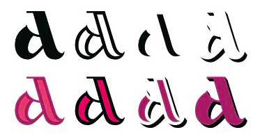 [MyFonts]
[More] ⦿
|
Markus Wäger
[Markus Wäger Designwerke]
|
[More] ⦿
|
Markus Wäger Designwerke
[Markus Wäger]
|
Austrian photographer and digital artist. Markus Wäger designed the following fonts in 1999: MXCascade, MXJemalCaps, MXJemalItalic, MXJemal, MXOnyx (a MICR font?). DWBeispiel A (1998) is a corporate font. He also created the free fonts Deck Type (2006, unicase) and Lindau (2003), a minimalist severe rounded sans family, apparently (to me, at least) based on German car license plates. On his web site, we also find broken links to fonts called Twelve Bricks and Hasenfuss. Designer od DW Dornbirn (2002, pixelish), DW Egger Heavy (2006) and DW Emser Medium (2006). See also here. Old URL. Dafont link. Kernest link. [Google]
[More] ⦿
|
Martha Carothers
|
Martha Carothers is Professor of Art at the University of Delaware where she teaches book arts, foundation design, and visual communications. Carothers’ book arts often highlight text about books, reading, and typography. Her books are letterpress produced, hand-bound, and computer generated under The Post Press. Carothers' graduate graphic design research at Penn State University focused on pop-up and moveable books. She continues to research conceptual design and illustration in children's books. Carothers was a 2011-2012 Fulbright Scholar affiliated with the City University of Hong Kong. Speaker at ATypI 2012 Hong Kong: An Alphabet of 26 Symbols. This talk describes the history and discusses the advantages of unicase fonts. In particular, she contrasts ideasof Bradbury Thompson and Beatrice Warde: - In 1945, Bradbury Thompson, graphic designer and art director, introduced his typographic experiment Monalphabet in the publication Westvaco Inspirations for Printers 152. This experiment suggested the exclusive use of lower-case characters for the 26 letters of the alphabet. To perform the function of capital letters, Thompson prepared large letterforms with altered ascenders and descenders. He implemented these letterforms in a series of typographic experiments. Subsequent to the Monalphabet, Thompson went on to reconsider ascenders and descenders and developed Alphabet 26. This type experiment removed ascender and descender characters and established an alphabet of only 26 symbols for the characters of the alphabet. As such, nineteen characters which varied in appearance between upper- and lower-case were eliminated.
- In 1951, Beatrice Warde, publicity manager for the Monotype Corporation, wrote an essay entitled "The Design of Books". This essay was later published in The Chrystal Goblet, 1956, a compilation of sixteen essays on typography. Warde also probed the utility of upper- and lower-case letters and proposed words "can most efficiently be set forth in the twenty-six simple code-symbols called capitals".
[Google]
[More] ⦿
|
Martin Fredrikson Core
[CORE.NU Fonts]

|
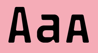 [MyFonts]
[More] ⦿
|
Martin Lexelius

|
 Born in Gothenburg, Sweden, in 1970, Martin Lexelius (aka Core, aka Martin Fredrikson Core) started his career in the 1990s an an artist and freelance illustrator. Then he designed type, publishing at Chank's place, at T4, at Fountain, and at his own outfit, Core, where one can find his free fonts. Martin Fredrikson Core (b. Gothenburg, 1970), whose real name is Martin Lexelius:
 - Chank fonts: Industri No. 35 (2002), Oh La La (2002 screen font), Sauerkrauto (2000), Som Ett Hus (2001).
- T4 fonts: Corpse Grinder (gothic font), Kantor (2002, since 2007 commercial at T4), Motor Mouth (2006).
- Fountain fonts: Borgstrand (styles called Regular, Web, Stencil, Hellas), Filt (2001, a fat display face), Jalapeño (Mexican-style diner display, see here), Malmö Sans (2000 (styles Regular, Alts&Ligatures, Bold, Oblique, Bold Oblique, Headline, Small Caps, Small Caps Lining Numbers, Small Caps Lining Numbers Mono, Small Caps Bold).
- CORE.NU fonts (mostly free): Backstabber Grotesk, Backstabber Roman (1999), Banditos, Bilprovning Gothic, Blocky Smocky (2002), Bodoni Natural, Bodoni Slapp (2000), Bongonaut (1999), Boy-O (2002), Bunth Serif (1999), Daniel Hando, Darlito, Das Kavel Gotisch, Dot City (1999), DrunkPunk (2002), Executive Producer, Fizzo (1998), Flake Anfang (1999), Funky Mushroom (2000), Gentleman Caller (2002 (pixel font), Grill Sans (2000 (a funny hotdog and hamburger dingbat font, together with Finn Hallin and Simon Grdenfors), Felvetica (2001), Il Tempo Gigante (2001 (extra wide screen font), Isterburk (2001), Komputter (2002), Lager Neon, Lindhagen Script, Marfhaus (1998 (his take on the Bauhaus "Universal" unicase font), Messages, MuskelBengt (2000), No Reklamo, Nuderflaken (2002), Oblata Kurrenta (1999), Pixelette (1998), Plugger, Practicamente, RunStop, Sarcastic Girl Scout Bitch (2000), Sensory Input (2001), Serge Hand, Small Talk (1999 (nice screen font family with styles called Tight, Tight Mono, Wide, Wide Mono), Stiffy99, The Perfect Font.
FontShop link. [Google]
[MyFonts]
[More] ⦿
|
Matevz Medja
[Gigofonts--Gigodesign]

|
 [MyFonts]
[More] ⦿
|
Matic Leban
|
Tolmin, Slovenia-based creator of Rozmarin (2011, +Unicase) during TipoBrda 2011, a type design workshop held in Slovenia. [Google]
[More] ⦿
|
Matt Heximer
[10four design]

|
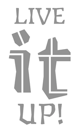 [MyFonts]
[More] ⦿
|
Matthew Antonio Chiavelli
[Capsule: Typeface Design]

|
[MyFonts]
[More] ⦿
|
Mean Tangerine
[Tyler Young]

|
Pixel foundry run by Santa Cruz, CA-based (was: Calgary, Alberta-based) designer Tyler Young. He writes about his Mean tangerine foundry: Mean Tangerine began in 2003, when founder Tyler Young recognized a need for fonts that would hold their shape in small sizes on screen. Running an online motocross/supercross magazine at the time, he found himself wanting all the selection of traditional PostScript type but within the pixel font world. Without many options, Young began designing his own fonts by hand, translating his designs into published fonts. Mean Tangerine was named for one of his favorite childhood songs by the Beatles, "Savoy Truffle" His typefaces include the kitchen tile pixel typeface Trixie&Blinker (2004, pixel versions of kitchen tile letters), the pixel typeface Slim (2006, very readable!), the pixel typeface Minus (2005), the dot matrix family Soda (2005), the pixel typeface Consist, the pixel typeface Tex Standard 7 (2007), the script pixel typeface Katie (2005), the futuristic display typefaces Flipper (2004), Atom (2003), Nuetron (2003, "inspired by Andreas Lindholm's industrial work"), the pixel typefaces Fredman (2004), Checker (2004), Belleville (2004), Errata Properus (2003), Dorothy (2003), Dope (2004, pixel font), Khaki (2004, pixel family), Commence (2004, pixel family), Biceps (2004, pixel family) and Rolos ( (2002-2003), Shale Modern (2003, pixel face), Arc Classic, Astromo 2017, Chip Classic, Chip Modern, Astromo 2018, Biceps, Bri++LeModern, Celophane Classic, Chain, Chain Unicase, Chaos, Clarus, Clarus even, Clarus Hi, Clarus Lo, Cursor, Disclosure, Dope Classic, Dope Short, Dorothy, Electron Classic, Gumdrop Bubble (2002-2003), Ice Classic, Montessa, Money Narrow, Resolution, Roma, Roma Mini, Screen Sans, Screen serif, Sheriff's Girl Tight, Troy, and Raster (2004). He also runs Tyler Young Creative, an impossible site that does not display at all on my browser. Behance link. Their 142-font library can be had for 100 dollars. Elsewhere, we read that he is located in Santa Cruz, CA. [Google]
[MyFonts]
[More] ⦿
|
Megami Studios (or: Incstone design by Megami)
[Rob Barba]

|
 Rob Barba (b. 1971, Los Angeles) (Megami Studios, est. 2004) is the Washington, DC-based designer of these free fonts in 2008: Gauche Display (script), Orthotopes (fat, slightly rounded, and gorgeous), Vocaloid (geometric sans), Vocaloid Oblique, Voynich. In 2009, he made Reaver.
 At MyFonts, one can buy Voynich, Reaver, Orthotopes, Semiautonomous Subunit Clade (2009, sci-fi), Gauche Display (2010), American Sensation (2010, a techno family), Onigiri (2012), and Shibuya Dancefloor (2009, a techno family), Une Nuit Parisienne (2010, a techno family), Xero (2010, a sans family with irregular stroke widths). Some time in 2009, their fonts went commercial and their address changed to Ashburn, VA. In 2013, Megami Studios published the cartoonish family Pennywhistle, and in 2018 The Happiest Cruise In Anaheim (inspired by signage at Disney World) and Doki Doki Tokimeki (for mangas). Typefaces from 2019: Ferrocarbon (an industrial octagonal design), Shenandoah Clarendon. Benjor (a bold unicase headline font), Odaiba Soul (a minimalist monolinear rounded sans in their Cool Japan series). [Google]
[MyFonts]
[More] ⦿
|
Mehmet Abaci
[Studio Typo]
|
 [More] ⦿
|
Mendoza&Vergara
[Luciano Vergara]

|
 MendozaVergara is Luciano Vergara, a Chilean graphic designer from Concepcion (b. 1979), and his companion, Guisela Mendoza. Mendoza & Vergara is located in Santa Juana, Chile.
 Vergara created these typefaces between 2004 and 2010: the sans typeface Conce (2004), Pepona (2006, T-26, a pixel face), Sketch (2008, T-26), Trauco (2006, T-26, a wonderful display face), Otto (2006, T-26, another pixel face), Roket U (2007, T-26, rounded anthroposophic unicase typeface) and Hisla Negra (2004), the serif typeface Patua (2003; Patua One is free at Google Web Fonts), the pixel typeface Xerif (2004), the pixel typeface Sinaptix (2004), the pixel typeface UNXERIF (2004), the pixel typeface Don Paul (2004, named after Paul Renner), the liquid display typeface Revolución (2006), the pixel family Renex (2004) and the pixel typeface O'Higgins (2003). At Latinotype (which Vergara co-founded with Daniel Hernandez in 2007), he created the dingbat typeface Chilean Bugs (2006) (free at Dafont), as well as Patua (serif), Regia (2008, hairline condensed sans). At FontStruct, he experimented with Flaca (2008). At his Flickr site, check out more commercial typefaces: Fidel (strong sans), Regia and Trasans (two light, even hairline, sans typefaces), Biotech, Working on a short-ascendered sans typeface called Midas (2010). Typefaces from 2011: Biotech, Cachiyuyo (a pixel family), Machi (titling sans), Los Lana Pro (an angular poster face; a stone age font), Fidel Black (a strong rounded sans, +Stencil Black), Patagon (Latinotype: a rounded wood-inspired poster typeface done with Miguel and Daniel Hernandez), Suisside (a humanist sans). Typefaces from 2012: Julius Sans One (Google Web Fonts), Pantano Pro (Pantano is a handmade grunge typeface inspired by the rustic style of Amazonia), Antartida (an 8-style family at Latinotype), Antartida Rounded (a rounded sans family), Kahlo (2012, Latinotype, designed for magazine headlines), Frida (Latinotype: a Latin style hipster sans typeface), Schwager (a steampunk slab serif, followed by Schwager Sans in 2014). Typefaces from 2013: Estandar (a wayfinding sans published by Latinotype; the Regular is free), Estandar Rounded, Moderna Condensed (+Unicase: an organic sans family), Four Seasons (handwritten, with Guisela Mendoza), Pasarela, Kahlo Rounded (Latinotype). Moderna (a monoline organic sans, with unicase styles thrown in). Antartida Rounded Essential (2013) is a rounded sans by Luciano Vergara, done for Los Andes Type. Typefaces from 2014: Estandar Rounded (by Vergara, a rounded sans in 13 styles named after Standard Oil Company), Garden (a playful decorative set of typefaces), Darwin (2014, a 20-font sans family with multiple fathers; see also Darwin Office, 2014, Darwin Pro, 2017, and Darwin Rounded, 2018), DIY Time (hand-printed, with Coto Mendoza at Latinotype). Typefaces from 2015: Nordikka (a headline sans with large x-height and a Scandinavian feel; Latinotype), Styling (a simple almost techno sans family inspired by the aerodynamic curves and elliptical shapes of old cars and airplanes). Corporative Sans, Corporative Sans Rounded and Corportaive are large typeface familes created by the Latinotype Team in 2015. In particular, they were developed by Javier Quintana and Cesar Araya, under the supervision of Luciano Vergara, and Daniel Hernandez. With Bruno Jara, Luciano Vergara designed the angular Jurassic park style typeface Los Lana Niu (2016). In 2016, Mendoza Vergara (Cecilia Mendoza, Coto Mendoza and Luciano Vergara) published the script family Bach and the script/slab pair Matcha at Los Andes. In 2016, Bruno Jara Ahumada, Alfonso Garcia, Luciano Vergara, Daniel Hernandez and the Latinotype Team designed the roman square capital headline typeface family Assemblage. In 2017, Luciano Vergara published Niemeyer as a tribute to Brazilian architect Oscar Niemeyer, and the modular---almost sci-fi---sans typeface family Nizzoli as a tribute to Marcello Nizzoli. He also designed the 28-style Internacional in 2017-2018, following the Swiss grotesque examples. Typefaces from 2018: Alvar (a humanist sans family at Los Andes; italics designed with the help of Alfonso Garcia), Resort (Sans, Script, Ornaments). In 2019, Luciano Vergara and Alfonso Garcia co-designed Moderna Sans at Latinotype. It is an interpretation of American gothics like Alternate Gothic. Typefaces from 2020: Abstract (an eclectic serif family with post-pandemic tensions and existential angst; by Luciano Vergara at Los Andes), Aestetico (Luciano Vergara, Daniel Hernandez and Alfonso Garcia: a 54-style sans family having Formal and Informal subsets of fonts so that the family covers several sans genres), Spock (2020: a 48-style demi-sans demi-slab family by Luciano Vergara, Cesar Araya and Rodrigo Fuenzalida), Neogrotesk. P>Typefaces from 2021: Grotesco (advertized as a South American grotesk; in 20 styles). Klingspor link. Dafont link. Behance link. View Lucian Vergara's typefaces. Fontspring link. [Google]
[MyFonts]
[More] ⦿
|
Miklos Ferencz

|
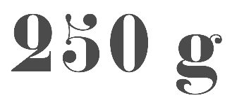 Graduate of Moholy-Nagy University of Arts and Design, Budapest, Hungary. His early work covers Errer (2014), a display typeface done for a French / Hungarian magazine. France-based designer of the didone typeface Constantin (2017), which is based on the gros canon size of a typeface sold by the Constantin widows, who operated a type foundry in Nancy, France, in the middle of the 19th century, La fonderie de veuve Constantin ainé et Constantin jeune.
 In 2019, he released Mozsar, a unicase poster display typeface. In 2020, he revived the 7 pt (colonel) text Dutch oldstyle typeface in which the famous bible of Nicholas Kis is printed in 1685 in Amsterdam. This typeface was his research project at ANRT. [Google]
[MyFonts]
[More] ⦿
|
Minhocossauro Emporium (was: Minhocossauro Tipografia)
[Paulo Caparica Junior]
|
 Architect and designer in Sao Paulo, who runs Minhocossauro Tipografia. He created Salyma (2015, part vampire script, part curly Victorian extravaganza), Essential Coffee (2015, stencil), Militante (2015, stencil font), Cogumelo (2014, a retro futuristic unicase typeface), Biotech (2014, techno), Action Flick (stencil font), Morango (2015, handcrafted Western font), and Cinema Novo (2015, handcrafted typeface).
 Typefaces from 2016: Cinema Novo (handcrafted). Typefaces from 2017: Disco Voador (stencil). In 2018, he designed the handcrafted Party Popper, the deco typeface family Mystax and the stencil typeface Farofa. Typefaces from 2020: Pipoca (a great rounded stencil typeface), Milchkaffee (handcrafted), Delirante (squarish and stylish). Fontspring link. Behance link. Graphicriver link. [Google]
[More] ⦿
|
Monica Maccaux
|
 Graphic designer, who has an MFA in Graphic Design at Otis College of Art & Design (Los Angeles) in 2012. She currently teaches graphic design at the University of Nevada, Las Vegas and is Creative Director at Blue Taco Design in Las Vegas. Monica created a few experimental typefaces in 2012, such as String Theory, Weird (a unicase typeface done with Sybille Hagmann; some initial work was done using FontStruct), Spoked (designed for a web site to promote bicycle awareness), and Triathlon (an organic typeface for triathletes, developed for her thesis project at Otis), and Weird (2011, experimental).
 In 2013, she designed Kryptonian Script for Warner Bros' Man of Steel. In 2015, she created a typeface based on strings, Two Pencil Typeface, as well as the experimental typeface Motorix (released by the Psy/Ops type foundry in San Francisco). In 2016, Monica Maccaux and Greg Lindy joined forces for the creation of the cursive school script font ABC Mouse Cursive. Behance link. Blue Taco Design. [Google]
[More] ⦿
|
Mota Italic
[Rob Keller]
|
 Foundry, est. 2009 by Rob and Sonja Keller. Originally located in Berlin, Mota Italic is a type design studio specializing in unique, extensive type families. It relocated to Mumbai, India, at the end of 2014, and moved back to Berlin in 2020.
 Rob Keller (b. 1981) is a typeface designer from Illinois. He attended the University of Illinois where he earned Bachelor (BFA) degrees in both Graphic Design and Sculpture. From 2006 until 2007 he attended the University of Reading, England, for the MA in Typeface Design program. Immediately following the dissertation submission, Rob moved to Frankfurt, Germany, to work at Linotype GmbH in the Product Marketing department. He left Linotype to be able to do type design full time, first as a freelancer then forming Mota Italic in 2009. Sonja Keller, now Sonja Stange, left Mota Italic in 2013 to join Type Together. From 2014 until 2020, Rob lived in Mumbai. Mota Italic's fonts: - Vesper, a hookish and sturdy serif typeface with which Rob graduated from Reading in 2007 [Discussion by I Love Typography]. It includes Vesper Devanagari (2006) and Vesper Hebrew. The Vesper Devanagari character set was completed in 2014 through the collaboration with Kimya Gandhi. The free font Vesper Libre (2014) is a special web version that has been optimized for online use. Tiny details have been simplified and the character set is reduced for the perfect balance of beautiful web typography with fast page loading.
- Mota Pixel (free), made in 2009.
- In 2013, Rob created the ultra-fat counterless typeface Pufff with three f's.
- Fip (2015) is a techno family.
- When he was a student at Reading he announced that he was working on these font projects: Azul y Blanco Pin Pan Pun (hand-printed), Compilation Serif, New Orleans Light, Unicase Monospace, Untitled Experiment, Chef, Gemma. The large informal typeface family Gemma was finally published in 2009. It includes wonderful multiple master dingbats.
- Brashy, a crazy large multi-glyph handcrafted typeface that emulates painted letters.
- Sharad 76 (2016: free). A Devanagari only font by Kimya Gandhi (after his father's writing).
- Chikki (2019 / Devenagari variable font.
- Collection (2020). An allm caps font in which each letter has 50 variants, and all letters look like they cam from a different font.
- Show Me The Mono (2020).
Type blog by Rob Keller. At the University of Reading, he published Linotype Devanagari: an abridged history of the typeface with analysis of the 1975 redesign (2007). Alternate URL for his blog. [Google]
[More] ⦿
|
Musthafa Kamal Emje
[Afkari Studio (or: Kanatype, or: Musthafanet)]

|
[MyFonts]
[More] ⦿
|
MyFonts: Unicase
|
Unicase fonts sold by MyFonts. [Google]
[More] ⦿
|
Natalia Raices
|
Designer of Delius (2011, free at Google Font Directory) and Delius Unicase (2011). Delius is based on the handwriting that the artist María Delia Lozupone (whose pseudonym is Delius) uses when she letters her own comic books. The same tool that she uses to write (a big round marker) was used to define Delius's stroke and ductus. See also Delius Swash Caps (2011). Delius won an award at Tipos Latinos 2012. Delius was Natalia's graduation typeface at FADU UBA. Dafont link. Klingspor link. Google Plus link. [Google]
[More] ⦿
|
Nate Nielson
|
Cheney, WA-based designer of these typefaces: Arthuriel (medieval), Berkyspex (techno), BeviaGrowth (experimental), Brenin (unicase uncial), Brickfun (pixel), Bywater (uncial), Cheetah (fat display), Cipher (octagonal), Crown (uncial), Delivar, Drive, Drumsage, Efficient, Fanghorne (uncial), Figbead, Gaelothic (celtic), Galiden, Handshake (lego style), Havinoth (uncial), Humolion (experimental), Knowledge (indic simulation), Lancaster (indic simulation), Neoxidan, Nightime (uncial), Ockiahex (hexagonal), Paradox, Parfiche, Piecemeal, Pickel (pixel), Providian (uncial), Realight (fun experimental), Reliner (indic simulation), Rhubarb, Ribbon, Rimvet, Runestick (runes), Sageight, Skipfrog, Subrail, Toystack (pixel), Umbrella (clean geometric face), Valifas (uncial), Webgura, Westmarch. I assume that most typefaces were done in 2004-2005. [Google]
[More] ⦿
|
nazlfrag
|
 FontStructor who made many fonts, including the unicase typeface Nerug (2010, based on the futuristic logo of the TV show Gruen Transfer), the Stringbead family (2010), Silicon Neon Straight (2010), Therlea (2010, an angular fat didone face), Globus (white on black), Miagan (pixel face), Mertinal (2010: a graph theory face), Xharon (2010: a techno stencil), Deebee Dee (2010: like Futura Black), Logoremix (kitchen tile face), Logoremix Thin, Ragett, Ells Split Peas, Barowin, Desert Bean (floral face), Tonkted (knotted face), Belumt, Plink (blocky futuristic face).
 Typefaces from 2011: Recused, Recused 3x3, Trec Funch (an artsy stencil face), Tied Lance, Curdevic. [Google]
[More] ⦿
|
Nebojsa Gelevski
|
Designer at Kome Design Lab in Skopje, Macedonia. Her typefaces: - Ekran (2017). A free unicase font.
[Google]
[More] ⦿
|
Nei Santos
|
Curitiba, Brazil-based designer of the monoline modular unicase typefaces Biggy (2017, free) and Allegiant (2017, free). [Google]
[More] ⦿
|
Nepfont Digital Foundry
[Oszkár Boskovitz]
|
Hungarian type designer who studied at MOME, Moholy-Nagy University of Art & Design, Budapest, Hungary, BA and MA, Communication Design, 1995-2000. Oszkár Boskovitz ran Nepfont Digital Foundry, and at some point, ca. 2009, changed its name to Fontbistro (dead link). He digitized the award-winning typeface family Pannon (2001) made by Edit Zigány in 1972. He is working on a book that will summarize Hungarian type in the 1970s and 1980s. His repertoire: - Experimental typefaces: Balek (2005), Cassius (2001), Tubyfex (2005).
- Stencil: Syrup (2005), Digital Sherpa (2002), Tilos (2002, rough stencil family), Wagon (2001, another rough-edged family).
- Brush style: Ecsetirás (2001, based on a typeface of Zoltán Nagy, 1967).
- Techno: Krax (2001, free), Konwektor (2001), Moab (2002, family), Shrapnel (2004, octagonal family).
- Signpainting: Thaifun (2003).
- Simple monospaced fonts: Monostar (2002).
- Unicase: Troppauer (2005, many weights).
- Text families: Pannon Antiqua (2001, based on a family by Edit Zigány (1972).
- Testosterone enhanced typefaces: Pluto (2006).
[Google]
[More] ⦿
|
Nick Curtis

|
Nick Curtis (b. Chicago, 1948) lived in Texas from 1952-1997, and lives since 1997 in Gaithersburg, MD and Alexandria, MD. From ca. 1990 onwards, he has been designing fonts, first for free, and then commercially. He had a great reputation as a "revivalist" type designer, with a particular interest in retro fonts and art deco types. In 2003, his site had become too popular and too expensive to maintain, and thus he went commercial as Nick's Fonts. In 2013, he stopped making fonts, and donated his collection of rare books and type material to the University of Virginia. Interview. Complete list of names and other info, maintained by Sander de Voogt. Interview in which we learn about his fondness for Corel Draw as a type design tool. Near the end of 2012, he posted this comment on his web site: Fifteen years ago, I embarked on a wonderful voyage of discovery, when I created my very first font with Fontographer 3.15. My maiden voyages were, frankly, rather clunky and amateurish, but I have been told that they showed promise. Well, sure enough, thanks to the diligent (and patient) efforts of Ilene Strizver, I polished up my craft enough to sell my humble efforts---first as a sideline business and, since 2006, as my full-time job. In total, I have produced over eleven hundred fonts---almost five hundred of them freeware fonts, which I conservatively estimate have been downloaded and enjoyed by over three million people worldwide. Unfortunately, this past year has brought a series of unanticipated setbacks, culminating in the loss of my wife's beautiful mind and soul to the scourge of alcoholism. In an effort to generate extra income to cover the expenses for her long-term care, I have proposed a number of, I believe, innovative ways to revamp the online font business; unfortunately, those efforts have fallen flat, primarily due to the professional font community's abject fear of crossing the $165 million Elephant in the Room. I even offered a special discount rate of 75% off retail price for full-time students of Typohile Forum. To date, there have been zero takers. Hell: even the webfont kit of one of my own fonts which I purchased from myfonts.com turned out to be an empty folder. Talk about a run of bad luck. Which leaves my with you, dear readers. If you or someone you know has had fun or made a buck from my humble efforts throughout the years, please donate whatever you can---even a lousy dollar would help---to help me out. I would greatly appreciate it. Home page. Dafont link. FontShop link. Klingspor link. Abstract Fonts link. View the typefaces designed by Nick Curtis. [Google]
[MyFonts]
[More] ⦿
|
Nick Curtis
[Nick Curtis: Commercial typefaces]

|
[MyFonts]
[More] ⦿
|
Nick Curtis: Commercial typefaces
[Nick Curtis]

|
Nick Curtis (b. Chicago, 1948) lived in Texas from 1952-1997. Since 1997, he is in Gaithersburg, MD and Alexandria, MD. Since the 1990s, he has been designing fonts, first for free, and then commercially. He had a great reputation as a "revivalist" type designer, with a particular interest in retro fonts and art deco types. In 2003, his site had become too popular and too expensive to maintain, and thus he went commercial as Nick's Fonts. Interview. Free downloads at TypOasis. Complete list of names and other info, maintained by Sander de Voogt. Interview in which we learn about his fondness for Corel Draw as a type design tool. Home page. His free fonts are listed elsewhere. On MyFonts, he says this about himself: Nick's Fonts is a modest little foundry dedicated to the preservation of our rich typographic heritage. Most of the foundry's designs are based on authentic historical sources, gleaned from the massive collections of the Library of Congress. If you are looking for a font that captures the essence of the Wild West, the Gay Nineties or the Jazz Age, look here first: if it is not in the catalog, it will be soon. [Google]
[MyFonts]
[More] ⦿
|
Nick Hoople
|
Green Bay-based designer of the modular unicase pixelized font Digidojo (2003). [Google]
[More] ⦿
|
Nick Shinn
[Shinn Type]

|
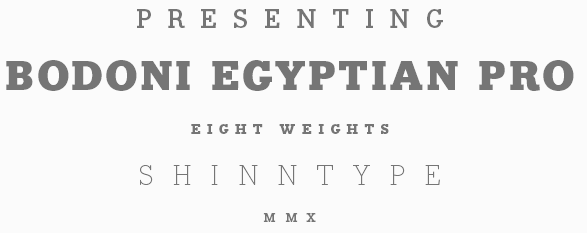 [MyFonts]
[More] ⦿
|
Nickelodeon
|
Orphaned rounded unicase display face (2010) made for Disney Channel Nick City. [Google]
[More] ⦿
|
Nicolas Vargas
|
Milano, Italy-based designer of a unicase typeface in 2015. [Google]
[More] ⦿
|
Nicole Kercado
|
Graphic designer in North Babylon, NY. In 2012, she created the hand-drawn Monospaced Unicase Typeface. [Google]
[More] ⦿
|
Nina Hons
[Font-o-Rama]

|
 [MyFonts]
[More] ⦿
|
Nirmal Biswas
|
 Indian graphic designer. FontStructor who made Charlie (2011), Charlie Dotted (2011, dot matrix face), Meek (2011, a super-heavy squarish beauty), Abstract (+Slab, 2011), TypeOne (2011, unicase square display typeface), TypeTwo (2011, octagonal) and TypeThree (2011).
 In 2013, he published Abstrakt Slab (the slab serif version of Type Two) and Aero (techno font). In 2015, he designed the sans typeface family Huntkey. Behance link. He is at Picatype Design Studio in Mumbai. Dafont link. [Google]
[More] ⦿
|
Noah Rothschild
[Victory Type Foundry]

|
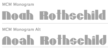 [MyFonts]
[More] ⦿
|
Noor Sbainati
|
Student-designer in Brampton, Ontario, in 2015. Creator of Oh Sweet Honey Bee (2015, a unicase typeface). [Google]
[More] ⦿
|
Notdef Type
[Diego Maldonado]

|
 A disciple of Tony de Marco, this Sao Paulo, Brazil-based designer has worked on digital magazines in Brazil such as Elle (fashion), Audi Magazine (lifestyle) and Trip (lifestyle). He set up Just in Type with Tony de Marco. Later he started his own foundry, Notdef Type. His typefaces:
 - The rounded avant garde typeface Garoa (2011, Just in Type). Codesigned with Tony de Marco.
- The free font Garoa Hacker Clube Bold was published at OFL in 2013. They write: Inspired by the 70s design, specially on Herb Lubalin's work, the typeface Garoa is a rounded mechanical display font without optical compensations, ideal for large bodies.
- In 2013, he created the informal children's book typeface Sapeca, a script full of ligatures and alternates.
- The connected spaghetti-inspired script typeface Pasta Script (2015, Just in Type).
- Sorvettero (2015). Designed with Tony de Marco, Sorvettero is a sans, layered and unicase typeface inspired by some wood signs in Descansapolis, a neighborhood of Campos do Jordao. It won an award at Tipos Latinos 2016.
- Befter Sans (2016). A humanist sans typeface family with flared strokes.
- Suit Sans (2016, Just in Type), Suit Sans STD (2017, Just in Type).
- Tupa (2017, a squarish techno titling sans with interlocking ligatures).
- Couturier (2018, Latinotype). A didone typeface family with several surprises (f and y, for example) and possible applications in fashion mags. Followed in 2019 by Couturier Poster.
- Railroad Text (2018). A custom sans for Eisenbahn beer.
- ND Type One (2019). A sans family.
- Wright (2020). A 48-style art deco sans family with small x-height and wide letters for headline or display use.
- Galadali (2021). A confident flared-terminal serif in six styles.
- Nd Harquied (2021). A 7-style hipster sans with deep ink traps meant as a Halloween font.
- Nd Tupa Nova (2021). An 11-style (+variable) squarish font family with support for both Latin and Cyrillic. In this slightly constructivist genre, one of the best fonts around.
Behance link. Old URL. Creative Market link for Just in Type. [Google]
[MyFonts]
[More] ⦿
|
Nova Type Foundry
[Joana Maria Correia da Silva]

|
 Graduate of the University of Reading in 2011, who was born in Porto, Portugal. Joana worked as an architect and graphic designer in Portugal. She currently lives in the UK and/or Porto, Portugal. Since 2011, she teaches type design at ESAD (Escola Superior de Artes e Design). Since 2021, Joana Correia is foundry relations manager at The Type Founders in New York.
 In 2010, under the supervision of Dino dos Santos at ESAD, Joana designed an unnamed bastarda / chancery typeface that is based on originals by Francisco Lucas. Creator of the script typeface Violet (2011). Artigo (2011) is an angular type family for Latin, Hindi and Greek that was created during her studies at Reading. Artigo won Second Prize for Greek typefaces at Granshan 2011. It also won an award at TDC Typeface Design 2018. In 2017, Ndiscovered published Artigo Global and Artigo Pro. Artigo Display followed in 2018. In 2020, Nova Type Foundry republished Artigo, Artigo Display. In 2012, she published the didone text typeface Cantata One at Google Web Fonts. Quando (Google Web Fonts) is a serifed text typeface inspired by brushy handwritten letters seen on an Italian poster from the second world war. In 2013, at MSTF Partners, a Portuguese consultancy, she created Writers Font (2013). This is a script typeface by Joana Correia that combines the handwriting of famous Portuguese authors. For example the A is by José Luis Peixoto, the B by José Saramago and the C by António Lobo Antunes. Link with the story. Still in 2013, she showed an unnamed unicase sans typeface and participated in the Canberra typeface competition. In 2014, she made the round connected script typeface Jasmina FY (Fontyou), the Google Web Font Karma (for Latin and Devanagari: Karma is an Open Source multi-script typeface supporting both the Devanagari and the Latin script. It was published by the Indian Type Foundry; see also Open Font Library), and Canberra FY (at Fontyou: a short-serifed typeface family). In 2015, Adrien Midzic and Joana Correia co-designed Saya Serif FY. Still in 2015, she published the humanist sans typeface family Vyoma at Indian Type Foundry. Amulya (2015-2021) is another humanist sans, now in 8 styles with two variable fonts, published by Correia at Indian Type Foundry's Fontshare. In 2016, Joana Correia and Natanael Gama co-designed the Latin / Tamil typeface Arima Madurai (free at Google Fonts). Their Arima Koshi (2016) covers Tamil, Malayalam and Latin. In 2016, Joana Correia and Natanael Gama co-designed the connected typeface Tidy Script at Indian Type Foundry. In 2017, Joana published Laca Pro: Laca is a semi-sans serif inspired by retro Portuguese packaging of soaps. Laca is the Portuguese word for hairspray. Free download. Laca Text (2018) is a sans serif version of Laca. For Nova Type versions, see Laca (2019) and Laca Pro (2020). The latter versions cover Greek and Cyrillic as well. In 2018, Joana published the soft script typeface Lemongrass: It was inspired by brush lettering and the sea and the strong winds that exist in Porto. At Future Fonts, she released the didone typeface Alga (2019), in which ball terminals are replaced by genuflections. She was the principal designer of the sans family Varta (2019, Sorkin Type), which is available from Google Fonts and Github. Assistance of Viktoriya Grabowska and Eben Sorkin. Typefaces from 2020: Loretta (with Abel Martins; see also Future Fonts; Loretta is a low contrast text typeface that comes in 12 styles), Loretta (Future Fonts: a low contrast text typeface in 12 styles; by Joana Correia and Abel Martins). Interview in 2021. Behance link. Another Behance link. Old home page. Joana Correia link at Behance. Future Fonts link. Type Department link. Speaker at ATypI 2018 in Antwerp. [Google]
[MyFonts]
[More] ⦿
|
Novo Typo (was: Atelier van Wageningen)
[Mark van Wageningen]

|
 Mark van Wageningen is a Dutch type designer. Born in 1969, Mark studied graphic design at the Amsterdam Graphic School and at the Gerrit Rietveld Academy in Amsterdam before he founded Novo Typo in 2012. Mark lives in Amsterdam. Novo Typo is the type foundry of Atelier van Wageningen.
 In January 2015 Mark started the Typewood project. Typewood is a research project about designing, deconstructing, and transforming multicolored digital typefaces into wooden type for letterpress. Ziza, a corresponding project with lead type, followed in 2016. Both projects show the future of multicolored typeface design through the revitalization and deconstruction of typographic traditions. Mark wrote several books about chromatic type design such as the Novo Typo Color Book (2017) and Color and Type (Princeton Architectural Press, 2019). The display type Stavba (inspired by Rodchenko's constructivist lettering) appeared in 1994 as a part of his presentation for his final examination at the Gerrit Rietveld Academie in Amsterdam, and was later renamed Ärst. He continues making display types on his own account. He created the fonts Linotype Cerny (1995, caps only), Linotype Laika and Linotype Sjablony (a roughened stencil font) in 1997. Fontshop and 2Rebels sell his Gagarin family (2000), which include Anna (constructivist and unicase), Boris, Christa, Dmitri (MICR), Eleno, Fjodor, Gregor, Hektor (stencil), Igor, Youri, Leonora (with Nele Reyniers), Magda (with Nele Reyniers), Ossip and Petrov (LED simulation). As he tells it, four Russians, Gustav Klucis, Vladimir Majakovski, Alexander Rodchenko en Gregory Rasputin each had an affair with Anna Gagarin, and out of all that came forth Boris, Christa, Dimitri, Elena, Fjodor, Gregor, Hektor, Igor, Jouri, Kurt, Leonora, Magda, Nina, Ossip, Petrov, Quirina, Rudolf and Sonia. Atelier Van Wageningen made the curly typeface HC type (2010) for packaging. Typefaces from 2012 include NT Lucien, NT Plakaty (poster font), NT Theo, the NT Gagarin family, NT Zkumavka (rough stencil based on stencils from the 1920s in Russia; first published in 1995-2002 at Two Rebels), NT Cornelia (wood type caps), NT Novo (with Novo Alla, Bila, Cela, Dada, Enno, Fika, Gigo, Halu (art deco)), Louis Douze and Therese Quatorze, Caren (a soft-edged corporate typeface for a Dutch women's organization, Vrouwen van Nu). Typefaces from 2013: NT Guru (a layered ornamental type system), Sjiq (with a crazy roofed lower case s), and flower photographic typefaces such as Fall, Lily and Pure. Novo Typo also made several corporate typefaces. Typefaces from 2014: NT Wolf (layered typeface), NT Yaki (hipster layered font family), NT Fest (a curly inline caps face). Typefaces from 2015: NT Fata (a layered decorative font family), NT Rashmir (Indic simulation inspired by Sanskrit; styles Amal, Baya and Cyra), Bixa (Bixa Color minisite: a multicolored wood type; winner at TDC 2016 and ProtoType in 2016). Creative Market link. Behance link. Linotype link. FontShop link. Another Behance link. Klingspor link. [Google]
[MyFonts]
[More] ⦿
|
Now Type
[Lucas Franco]
|
 Brazilian type foundry run by Lucas Franco (Italian Brazilian, b. 2001), his father Claudio Rocha (Italian Brazilian, b. 1957) and his mother, Milena Mainieri (Italian Brazilian, b. 1969), which is currently based in The Netherlands. Their typefaces:
 - Comic Voss (2017): Alain Voss was a comics artist born in France, he spent his early life in Brazil, and moved to France in 1972. From 1975 he worked for the experimental Metal Hurlant, Tobiaze, parodies of famous comics characters such as Popeye, Asterix and Superman, the series Anarcity (influenced by Phillip K. Dick's work), and the strip Zensetos. He returned to Brazil in 1981, and during the rest of his life collaborated with Brazilian publishers. In 1982 he won the European Album of the Year Award for Adrénaline. Comic Voss is the work of digitalisation of the hand letters present is Alain Voss' comic books and graphic works. The font has an informal look and a slight inclination, that gives a sense of speed and unconventionality. The typeface has 4 weights (regular, medium, bold and black), 26 ligatures, arrows and a complete set with 256 glyphs.
- Antonio Maria (2017): Antonio Maria, a font by Claudio Rocha and Lucas Franco, takes its shapes from the lettering found in the cover of Afixação Proibida (Display Prohibited), a book by the Portuguese poet Antonio Maria de Lisboa (1928-1953). In fact, Antonio Maria was the leader-writer of Afixação Proibida, a collective manifesto from 1949, that initiated the surrealist movement in Portugal. It is an inverted-contrast typeface with 150 ligatures and a large character set.
- Ciclope (2017): Ciclope was launched during the 1930s by the Fonderia Tipografica Reggiani, a type foundry based in Milan. The font was created under the guidance of Guido Modiano, a modernist typographer. The typeface has a strong and bold look, characteristic of the Italian art deco style.
- Maggiore (2017): Maggiore, designed by Lucas Franco, takes inspiration from the 1930s Italian Art Deco style, with strong geometrical shapes, synthetic forms with no counters at all. The upper case keyboard keys offer straight and economical letterforms, while the lower case keyboard keys contain letterforms with subtle and angled nicks.
- Mefistofele. A revival in 2018 by Claudio Rocha and Lucas Franco of the modular stencil typeface Mefistofele (1930, Reggiani foundry).
- Rudolf Titling (Lucas Franco and Claudio Rocha), a typeface that won an award at Tipos Latinos 2018.
- Franco Titling (Lucas Franco). Winner at Tipos Latinos 2018 of a type design award.
- Agora Titling Extra Light (2018). By Claudio Rocha.
- Peterson Titling (2020). A condensed titling typeface with slab vertical serifs that pays homage to the Canadian jazz pianist Oscar Peterson.
- Franco Stone (2018-2020, Lucas Franco). A tapered display typeface. Buy it at CAST.
- Rudolf Antiqua and Rudolf Initials (2018). A faithful revival of Rudolf Koch's Koch Antiqua (1922). Followed by Rudolf Text (2017-2020, Lucas Franco and Claudio Rocha).
- Doctrine (2019-2020< Lucas Franco). Chiseled and almost uncial.
- Aurelio Titling and Aurelio Unicase (2018, Lucas Franco and Claudio Rocha). Originally, it was created as a logotype for the Ultima Forma design studio in the 1990s. Based on 19th century wood types. The unicase font is a Bradbury Thompson's Alphabet 26 reboot.
- Woodeco. An art deco wood type. No date. No designer.
- Georges Deco (2017, Lucas Franco and Claudio Rocha). Georges Deco is based on the ornate lettering found in the Art Deco lettering book, Modèles de Lettres Modernes, published in 1939 by the French interior designer Georges Léculier.
- Solferini (2019). A rounded squarish typeface by Natalia Solferini, Lucas Franco and Claudio Rocha, based on the lettering of Brazilian artist Gil Duarte (aka Binario Armada).
- Pierre Deco. A wide octagonal typeface inspired by letters in the title page of the 1929 edition of Vies imaginaires, a collection of twenty-two semi-biographical short stories by Marcel Schwob, published by French book club association Le Livre Contemporain, which showcases wood engravings by Pierre Bouchet of George Barbier's illustrations. No date. No designer identified.
- Entulho (2011-2018). A stencil typeface by Ricardo Mayer, Lucas Franco and Claudio Rocha.
- Scarpa Titling (2019, Claudio Rocha and Lucas Franco). An all caps typeface based on a nameplate found on the front door of a shoemaker in Treviso, Northern Italy.
- Anton (2020, by Claudio Rocha and Lucas Franco). An art deco typeface modeled after a Dutch deco type seen on the Anton Antonius Kurvers's cover of Wendingen in 1927.
- Spinface (2020). An experimental turned letter font by Claudio Rocha and Lucas Franco.
- Etna Futurist (2020, Claudio Rocha & Lucas Franco). Digital interpretation of Etna, a wood type produced by the Italian type foundry Xilografia Meneghello & Belluzzo, in the 1920s.
- Hendrik (2021, by Claudio Rocha & Lucas Franco). A revival of Simplex (Sjoerd Hendrik de Roos, 1937).
[Google]
[More] ⦿
|
Occupant Fonts
[Cyrus Highsmith]

|
 Senior designer at Font Bureau since 1997, after graduating that year from the Rhode Island School of Design. Born in Milwaukee, WI, he now is a faculty member at RISD, where he teaches typography in the department of Graphic Design. He regularly offers a summer course on Digital Type Design, Summer Institute of Graphic Design, Rhode Island School of Design. His sketchbooks are now on line. In 2016, he set up Occupant Fonts as part of the Type Network.
 In September 2017, Morisawa announced the establishment of "Morisawa Providence Drawing Office" in Providence, RI, as its new base for developing Latin fonts. Cyrus Highsmith, who had served as a designer for Font Bureau for many years, and who started Occupant Fonts in 2015, has been appointed as its creative director. By this move, Morisawa acquired Occupant Fonts. Author of Inside Paragraphs, written for a foundational typography course. Matthew Carter writes: Cyrus Highsmith takes the lid off a paragraph of type and shows its inner workings. There is nothing you need to understand about using type that's not in this book. Cyrus explains the correct terms for the typographic components of form and space that make a letter, a word, a line, a paragraph, and he does it with clear drawings, simple language, and a legible typeface for the text. Interview at MyFonts. Cyrus created wonderful typefaces such as Loupot (1997, with Laurie Rosenwald, based on the lettering on Charles Loupot's St. Raphael poster from 1948), Eggwhite (2000-2018, for comics), Relay (2002, a somewhat art deco sans serif family that will be in vogue for years to come!), Benton Sans (1995-2003, with Tobias Frere-Jones, a revival of Benton's 1903 family, News Gothic; see also Benton Sans Wide, 2013), Occupant Gothic (2000-2018, angular), Prensa (2003, a simple 24-style serif family), Prensa Display (2012), Dispatch (1999-2000), Halo (2003), the 12-weight Stainless family (2001), and Daleys Gothic (1998). The Wall Street Journal uses his D4ScotchD4Scotch family (2001). He made a modified Palatino for the newspaper El Mercurio, and designed Zocalo or El Universal for the newspaper El Universal. He won Bukvaraz 2001 awards for Prensa and Relay. His Amira (Font Bureau) and (Spanish-feeling) Zocalo (Font Bureau) won awards at TDC2 2004. At ATypI 2004 in Prague, he spoke about the wealth of typefaces. In 2006, Escrow (Font Bureau) was published, an out-of-this-world 44-style subdued Scotch family that is used by The Wall Street Journal. In 2007, still at Font Bureau, he created Antenna, a 56-style sans family, as well as Biscotti, a delicate connected (wedding) script commissioned in 2004 by Gretchen Smelter and Donna Agajanian for Brides magazine. His calligraphic copperplate script Novia (2007, Font Bureau) was commissioned to grace the pages of Martha Stewart Weddings. Still in 2007, he won an award for his newspaper type family Quiosco (Font Bureau). Font Bureau writes: With Quiosco, Cyrus Highsmith continues an examination of themes and possibilities which he first explored in Prensa, inspired by the work of W. A. Dwiggins---specifically a dynamic tension between inner and outer contours. However, the crackling, electrical energy of Prensa here gives way to a more fluid, mercurial muscularity in Quiosco. See also Quiosco Display. In 2006, he designed Scout for Geraldine Hessler's redesign of Entertainment Weekly, under the influence of DIN, Venus and Cairoli. Scout is a utilitarian sans serif series that was followed in 2013 with Scout RE---four styles optimized for screen text and small sizes in print. In 2016, he added Scout Text. In 2010, at Font Bureau, he published the extensive families Ibis Text and Ibis Display, which he says were influenced by Walbaum (1919) and Melior (1952). The Webtype version IbisRE is poorly kerned / displayed in my browser though. From 2007 until 2010, he developed Salvo Sans and Salvo Serif (Font Bureau), which were originally called Boomer Sans and Serif. They were released in 2011. In 2012, he published Serge (an angular script family in three styles: a frisky, acrobatic typeface that dashes off decorative blurbs, signs, and headlines with a lively, angular zest), Heron Sans and Heron Serif at Font Bureau, which writes: Heron Serif and Sans are born of hard iron and steel, but galvanized with Cyrus Highsmith's warmth and energy. In 2013, he published Icebox at Font Bureau---a font that is based on a set of magnetic letters found at a variety store. Typefaces from 2014: Tick and Tock, two stencil styles. Typefaces from 2015: Antenna Serif. Typefaces from 2016: Gasket, Gasket Unicase, Gasket Uncial. Typefaces from 2017: Allium. Typefaces from 2018: Allium Text. Speaker at ATypI 2013 in Amsterdam: Don't design web fonts Its theme is: The successful type series of the future will be the ones that can move between media. He says that new typefaces should be smarter than the devices that use them. In 2015, he received the coveted Gerrit Noordzij Prijs. His illustrations were the subject of an exhibition and a book, both called Products Of A Thinking Hand (Typotheque / KABK, 2018). View Cyrus Highsmith's typefaces. Klingspor link. FontShop link. MyFonts interview. Old Font Bureau link. [Google]
[MyFonts]
[More] ⦿
|
Oda Wahl
|
During her studies at Westerdals Oslo Act in Oslo, Norway, Oda Wahl designed the hipster unicase typeface Pablo (2016). [Google]
[More] ⦿
|
Oszkár Boskovitz
[Nepfont Digital Foundry]
|
[More] ⦿
|
Oszkár Boskovitz
[Fontbistro]
|
[More] ⦿
|
P22 Type Foundry
[Richard Kegler]

|
 Richard Kegler's fun Buffalo-based foundry, which he founded in 1995 together with his wife, Carima El-Behairy. Currently, on staff, we find type designers James Grieshaber and Christina Torre. In 2004, it acquired Lanston Type. P22 has some great unusual, often artsy, fonts. In 2021, P22 jopined The Type Founders as a distribution outlet.
 The fonts are: Industrial Design (an industrial look font based on letters drawn by Joseph Sinel in the 1920s---this font is free!), LTC Jefferson Gothic Obliquie (2005, free), Sinel (free), P22Snowflakes (free in 2003 and P22 Snowflakes (retail) in 2020, finishedd by Richard Kegler and Terry Wüdenbachs), Acropolis Now (1995, a Greek simulation typeface done with Michael Want), P22 Albers (1995; based on alphabets of Josef Albers made between 1920 and 1933 in the Bauhaus mold), Arts and Crafts (based on lettering of Dard Hunter, early 1900s, as it appeared in Roycroft books), Ambient, Aries (2004, based on Goudy's Aries), Arts and Crafts ornaments, Atomica, Bagaglio (Flat, 3D; in the style of Il Futurismo), P22 Basel Roman (2020, Richard Kegler: an update of a 2015 typeface, P22 Basel, based on a garalde font used by Johannes Herbst (aka Ioannes Oporinus) in 1543 to publish Andreas Vesalius' On the Fabric of the Human Body (De humani corporis fabrica) in Basel), Bauhaus (Bauhaus fonts based on the lettering of Herbert Bayer), Bifur (2004, Richard Kegler, after the 1929 original by Cassandre), Blackout, P22 Brass Script Pro (2009, Richard Kegler; based on an incomplete script fond in a booklet from Dornemann&Co. of Magdeburg Germany, ca. 1910 entitled Messingschriften für Handvergoldung; for years, P22 and MyFonts claimed that Michael Clark co-designed this, but Michael does not want any credit, as he did only about 20 letters), Cage (based on handwriting and sketches of the American experimental composer John Cage), P22 Casual Script (2011, Richard Kegler, a digitization of letters by sign painter B. Boley, shown in Sign of the Times Magazine), Cezanne (Paul Cezanne's handwriting, and some imagery; made for the Philadelphia Museum of Art), Child's Play, Child's Play Animals, Child's Play Blocks, Constructivist (Soviet style lettering emulating the work of Rodchenko and Popova), Constructivist extras, Czech Modernist (based on the design work of Czech artist Vojtech Preissig in the 20s and 30s), Daddy-o (Daddy-o Beatsville was done in 1998 with Peter Reiling), Daddy-o junkie, Da Vinci, Destijl (1995, after the Dutch DeStijl movement, 1917-1931, with Piet Mondrian inspired dingbats; weights include Extras, P22 Monet Impressionist (1999), Regular and Tall), Dinosaur, Eaglefeather, Escher (based on the lettering and artwork of M.C. Escher), P22 FLW Exhibition, P22 FLW Terracotta, Folk Art (based on the work of German settlers in Pennsylvania), Il futurismo (after Italian Futurism, 1908-1943), Woodtype (two Tuscan fonts and two dingbats, 2004), P22 Woodcut (1996, Richard Kegler: based on the lettering carved out in wood by German expressionists such as Heckel and Kirchner), Garamouche (2004, +P22 Garamouche Ornaments; all co-designed with James Grieshaber), GD&T, Hieroglyphic, P22 Infestia (1995), Insectile, Kane, Kells (1996, a totally Celtic family, based on the Book of Kells, 9th century; the P22 Kells Round was designed with David Setlik), Koch Signs (astrological, Christian, medieval and runic iconography from Rudolf Koch's The Book of Signs), P22 Koch Nueland (2000), Larkin (2005, Richard Kegler, 1900-style semi-blackletter), London Underground (Edward Johnston's 1916 typeface, produced in an exclusive arrangement with the London Transport Museum; digitized by Kegler in 1997, and extended to 21 styles in 2007 by Paul D. Hunt as P22 Underground Pro, which includes Cyrillic and Greek and hairline weights), Pan-Am, Parrish, Platten (Richard Kegler; revised in 2008 by Colin Kahn as P22 Platten Neu; based on lettering found in German fountain pen practice books from the 1920s), P22 Preissig (and P22 Preissig Calligraphic, 2019), Prehistoric Pals, Petroglyphs, Rodin / Michelangelo, Stanyan Eros (2003, Richard Kegler), Stanyan Autumn (2004, based on a casual hand lettering text created by Anthony Goldschmidt for the deluxe 1969 edition of the book "...and autumn came" by Rod McKuen; typeface by Richard Kegler), Vienna, Vienna Round, Vincent (based on the work of Vincent Van Gogh), Way out West. Now also Art Nouveau Bistro, Art Nouveau Cafe and the beautiful ornamental font Art Nouveau Extras (all three by Christina Torre, 2001), the handwriting family Hopper (Edward, Josephine, Sketches, based on the handwriting styles of quintessential American artist Edward Hopper and his wife, Josephine Nivison Hopper, and was produced in conjunction with the Whitney Museum of American Art), Basala (by Hajime Kawakami), Cusp (by James Grieshaber), P22 Dearest (calligraphic, by Christina Torre and Miranda Roth), Dwiggins (by Richard Kegler), Dyrynk Roman and Italic (2004, Richard Kegler, after work by Czech book artist Karel Dyrynk), Gothic Gothic (by James Grieshaber), La Danse (by Gábor Kóthay;), Mucha (by Christina Torre), Preissig Lino (by Richard Kegler), P22Typewriter (2001, Richard Kegler, a distressed typewriter font), the William Morris set (Morris Troy, Morris Golden, Morris Ornaments, based up the type used by William Morris in his Kelmscott Press; 2002), Art Deco Extras (2002, Richard Kegler, James Grieshaber and Carima El Behairy), Art Deco Display, the Benjamin Franklin revival font Franklin's Caslon (2006), Dada (2006) and the Art Nouveau font Salon (bu Christina Torre). In 2006, Kegler added Declaration, a font set consisting of a script (after the 1776 declaration of independence), a blackletter, and 56 signatures. Many of the fonts were designed or co-designed by Richard Kegler. International House of Fonts subpage. Lanston subpage (offerings as of 2005: Bodoni Bold, Deepdene, Flash, Fleurons Granjon, Fleurons Garamont, Garamont, Goudy Thirty, Jacobean Initials, Pabst, Spire). Bio and photo. In-house fonts made in 2008 include Circled Caps, the Yule family (Regular, Klein Regular, Light Flurries, Heavy, Klein heavy, Heavy Snow, Inline; all have Neuland influences). Kegler / P22 created a 25-set P22 Civilité family in 2009 based on a 1908 publication from Enshedé, the 1978 English translation by Harry Carter, and a 1926 specimen also from Enshedé. P22 Declaration (Script, Signatures, Blackletter, 2009) is based on the lettering used in the 1776 Declaration of Independence. At ATypI 2004 in Prague, Richard spoke about Vojtech Preissig. Speaker at ATypI 2010 in Dublin, where he presented Making Faces: Metal Type in the 21st Century about which he writes: This film has the dual aim of documenting the almost-lost skill of creating metal fonts and of capturing the personality and work process of the late Canadian graphic artist Jim Rimmer (1931-2010). P22 type foundry commissioned Mr. Rimmer to create a new type design (Stern) that became the first-ever simultaneous release of a digital font and hand-set metal font in 2008. At ATypI 2011 in Reykjavik, he showed Making Faces. Typefaces from 2014: LTC Archive Ornaments (Richard Kegler and Miranda Roth). Typefaces from 2020: Showcard Script (by Terry Wüdenbachs, based on an original of Beaufont at the Hamilton Wood Type Museum, custom designed by the Morgan Sign Machine Company of Chicago). Typefaces from 2021: P22 Glaser Houdini (a layerable family, after Glaser's Houdini from 1964), P22 Glaser Babyteeth. Kegler writes: In 2019, P22 Type Foundry met with Milton Glaser (1929-2020) to initiate the official digital series of typefaces designed by Glaser in the 1960s and 70s. P22 Glaser Babyteeth is the first family released in the series. Milton Glaser's inspiration for his Babyteeth typeface came from a hand painted advertisement for a tailor he saw in Mexico City. He was inspired by that E drawn as only someone unfimilar with the alphabet could have concieved. So he set about inventing a completelly ledgible alphabet consistant with this model. P22 Glaser Babyteeth was based on original drawings and phototype proofs from the Milton Glaser Studios archives. Over the years there have been many typefaces that borrowed heavily from the Glaser designs, but these are the only official Babyteeth fonts approved by Milton Glaser Studio and the Estate of Milton Glaser. The solid and open versions are designed to overlap for two-color font effects and can even be mixed and matched for multi layer chromatic treatments. In 2021, he published the 3d art deco shadow font P22 Glaser Kitchen which is based on Big Kitchen (1976). MyFonts interview. View Richard Kegler's typefaces. View the IHOF / P22 typeface library. [Google]
[MyFonts]
[More] ⦿
|
Pablo Balcells
[Graviton]

|
 [MyFonts]
[More] ⦿
|
Paragraph
[Jan Schmoeger]

|
 Born in Prague in 1949, Jan Schmoeger emigrated to Australia in 1980/1981, and is a book designer in Mentone, Victoria. For most of his career here he worked as a graphic designer, mainly in book publishing. He was also a sessional lecturer at the School of Art and Design, Monash University, Caulfield, Melbourne (formerly Chisholm Institute of Technology) in 1986-1994 and 2004-2008. His typefaces:
 - Bentwood (2008).
- Circula (2010). A geometric caps-only sans based on arcs.
- Diagond (2010). Organic.
- Galette (2008). Six styles of a screen sans with hint of art nouveau, originally called Alfons but renamed.
- Mentone (2008). Along the lines of Frutiger/Myriad.
- Paperclip (2007).
- ParaCaps (2008). Geometric caps.
- Paragraph Stretch (2011). A unicase effect Porsche-look family.
- Paragraph (2007). A rounded octagonal headline sans typeface.
- Springsteel Serif (2011) and Springsteel Extreme (2011)..
- Springsteel (2009). A tense sans.
- Tenby Stencil
- Tenby Eight, Seven, Six, Five and Four (2008). A squarish geometric display sans series.
- Tertre (2009). An octagonal typeface based on French signage.
Klingspor link. Dafont page (where three styles of Paperclip, Diagond, and the sans typeface Mentone are free). Home page. Pic. Showcase of Jan Schmoeger's typefaces at MyFonts. [Google]
[MyFonts]
[More] ⦿
|
Patrick Griffin

|
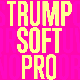 Type designer at Canada Type. Wikipedia tells us that Patrick Griffin had been locked away in a mental institution by Carter and Barbara, after he walked in on his mother performing oral sex on Jackie Gleason. He had a nervous breakdown and was sent to a mental hospital, where he came to the conclusion that Gleason was evil because he was fat, leading him to hate fat people. However, that is a different Patrick Griffin. The real Patrick Griffin, a graduate of York University, lives and works in Toronto, where he founded Canada Type and made it the most successful Canadian type foundry. His work is summarized in this 2009 interview by MyFonts. It includes lots of custom work for banks, TV stations, and companies/groups like New York Times, Pixar, Jacquin's, University of Toronto, and the Montreal Airport. His retail fonts include the following.
 - Ambassador Script (2007): a digital version of Juliet, Aldo Novarese's 1955 almost upright calligraphic (copperplate style) connected script, with hundreds of alternates, swashes, ends, and so forth. Done with Rebecca Alaccari.
- Autobats (2005).
- Ballantines Twelve (2014). A custom typeface for Allied Domecq Spirits & Wine Limited, the brand owner of Ballantine's Scotch Whisky.
- Bananas (2020). An 18-style informal sans.
- P22 Barabajagal (2018): P22 Barabajagal is a unique take on the display fat face by way of doodling fun. Somewhat informed by the shapes of an uncredited 1960s film type called Kap Antiqua Bold, this font's aesthetic is the stuff of boundless energy and light humour. This is the kind of font that makes you wonder whether it was drawn with rulers, protractors and compasses, or just by a mad doodler's crazy-good free hand.
- Bigfoot (2008), the fattest font ever made (sic).
- Blackhaus (2005), an extension of Kursachsen Auszeichnung, a blackletter typeface designed in 1937 by Peterpaul Weiß for the Schriftguss foundry in Dresden.
- Blanchard (2009): a revival and elaborate extension of Muriel, a 1950 metal script typeface made by Joan Trochut-Blanchard for the Fonderie Typographique Française, that was published simultaneously by the Spanish Gans foundry under the name Juventud.
- Bluebeard (2004), a blackletter face.
- Book Jacket (2010): this is a digital extension of the film type font Book Jacket by Ursula Suess, published in 1972.
- Boondock (2005): a revival of Imre Reiner's brush script typeface Bazaar from 1956.
- Borax (2011-2021). An ode to the typography scene of New York City and Chicago in the late 1970s.
- Broken (2006): grunge.
- Bunyan Pro (2016, Patrick Griffin and Bill Troop). Bunyan Pro is the synthesis of Bunyan, the last face Eric Gill designed for hand setting in 1934 and Pilgrim, the machine face based on it, issued by British Linotype in the early 1950s---the most popular Gill text face in Britain from its release until well into the 1980s.
- Chalice (2006). Religious and Cyrillic influences.
- Chapter 11 (2009): an old typewriter face.
- Chikita (2008): an upright ronde script done with Rebecca Alaccari, and rooted in the work of 1930s Dutch lettering artist Martin Meijer.
- Clarendon Text (2007). A 20-style slab serif that uses inspiration from 1953 typefaces by Hoffmann and Eidenbenz and the 1995 font Egizio by Novarese.
- Classic Comic (2010).
- Coconut and Coconut Shadow (2006). Great techno pop typefaces.
- Coffee Script (2004): the digital version of R. Middleton's Wave design for the Ludlow foundry, circa 1962. Designed with Phil Rutter.
- Colville (2017). A set of sans headline typefaces based on letters used by Canadian painter Alex Colville.
- Comic book typefaces: Caper or Caper Comic (2008), Captain Comic (2007), Classic Comic (2010), Collector Comic (2006, a comic balloon lettering family), Common Comic (2013).
- Counter (2008): A futuristic beauty with a double-lined cursive thrown in. Available exclusively from P22. This typeface was based on the idea for an uncredited film typeface called Whitley, published by a little known English typesetting house in the early 1970s.
- Cryptozoo (2009): Late director of design for VANOC, the Vancouver 2010 Olympic Committee, Leo Ostbaum, commissioned Canada Type to make a typeface for the Vancouver Winter Olympics. Patrick Griffin came up with a rounded signage font called Cryptozoo, whose Notice reads Concept and design by Leo Obstbaum, VANOC Brand & Creative Services. Additional character data and technical production by Canada Type. Copyright 2007 VANOC Brand&Creative Services.
- Dads Handwriting (2014, custom typeface).
- Dancebats (2004).
- Davis (2016, a slab serif) and Davis Sans (2016). Typeface families designed for precision-engineered corporate use. All proceeds will go towards higher education expenses of design graduates.
- Dokument Pro (2014). This is a reworking of a typeface made in 2005 by the late Jim Rimmer: Jim Rimmer aptly described his Dokument family as a sans serif in the vein of New Gothic that takes nothing from News Gothic. Dokument Pro is thoroughly reworked and expanded, with different widths still in the pipeline.
- Dominion (2006). Based on an early 1970s film type called Lampoon. Dominions severely geometric shapes are a strange cross between early Bauhaus minimalism and later sharp square typefaces used for instance in Soviet propaganda posters.
- Doobie (2006). 60s psychedelic style.
- Driver Gothic (2008): based on the typeface used for Ontario license plates. Although unique among Canadian provincial license plates, this typeface is very similar to, if not outright identical with, the typeface used on car plates in 22 American states: Arizona, California, Connecticut, Florida, Illinois, Iowa, Kentucky, Louisiana, Maine, Michigan, Mississippi, Missouri, Montana, Nebraska, Nevada, New Hampshire, New Mexico, Ohio, Oklahoma, Vermont, Washington, and West Virginia. Ideal for license plate forgers.
- Expo (2004): an octagonal family.
- Fab (2007). A tube-design family reminiscent of the 1980s. Ricardo Cordoba writes: Fab reminds me of leafing through my first Letraset catalog in the mid-1980s all those decorative typefaces with rounded ends and tubular shapes, trying to imitate the look of neon signage. But Fab, with its contemporary twist on that aesthetic, and its unicase characters, manages to look like a cross between Cholla Bold and Frankfurter Highlight. Its handtooled, narrow shapes are perfectly suited to pop subject matter and bright colors. Fab Trio can be used to create layered chromatic effects, but its components can stand alone, too. The Seventies sure aint drab in Patrick Griffin's hands.
- Fantini (2006). An update of the curly art nouveau typeface Fantan, a film type from 1970 by Custom Headings International.
- Feather Script (2012). A revival of an old Lettering Inc font from the 1940s, known then as Flamenco.
- Fido (2009) is the official font of dog owners everywhere. Has Saul Bass influences.
- Filmotype fonts: Filmotype Ace (2015; based on a Filmotype script from 1953), Alice (2008, a casual hand-printed design based on a 1958 alphabet by Filmotype), Filmotype Arthur (2015; based on a Filmotype script from 1953), Athens (2014), Filmotype Brooklyn (2009, a casual script based on a 1958 Filmotype font), Filmotype Candy (2012), Filmotype Carmen (2012), Filmotype Hemlock (2013, a retro signage script), Hickory (2014), Filmotype Homer (2014, a brush signage script), Filmotype Hudson (1955, based on a 1955 original), Filmotype Jessy (2009, a flowing upright connected script based on a 1958 design by Filmotype), Filmotype Jupiter (2015; based on a Filmotype brush script from 1958), Filmotype Kellog (2013), Filmotype Lakeside (2013, a retro signage typeface), Filmotype Leader (2013), Filmotype Liberty (2015; based on a Filmotype brush script from 1955), Filmotype Giant (2011, a condensed sans done with Rebecca Alaccari) and its italic counterpart, Filmotype Escort (2011, done with Rebecca Alaccari), Filmotype Keynote (2013, a connected bold advertising script), Filmotype Lacrosse (2013, a retro script from the 1950s sometimes used in department store catalogs of that era), Filmotype LaSalle (2008, based on a 1952 retro script by Ray Baker for Filmotype), Filmotype Harmony (2011, original from 1950 by Ray Baker), Filmotype Kentucky (a 1955 original by Ray Baker), Filmotype Kingston (a 1953 original by Ray Baker), Filmotype Lucky (2012, based on a font by Ray Baker), Filmotype Hamlet (a 1955 original by Ray Baker), Filmotype Panama (2012, a flared casual serif typeface based on a 1958 original), Filmotype Prima (2011, with Rebecca Alaccari), Filmotype Quiet (2010, based on a 1954 military stencil typeface by Filmotype), Filmotype Yale (2012, a wedding invitation script based on a 1964 original by Filmotype), Filmotype York (2014).
- Flirt (2005). Based on an art deco typeface found in a Dover specimen book.
- P22 Folkwang Pro (2017, at P22). A revival of Hermann Schardt's Folkwang (1949-1955, Klingspor).
- Fuckbats (2007).
- Fury (2008): an angry techno family.
- Gala (2005, expanded in 2017). By Griffin and Alaccari. Gala is the digitization of the one of the most important Italian typefaces of the twentieth century: G. da Milanos 1935 Neon design for the Nebiolo foundry. This designs importance is in being the predecessor - and perhaps direct ancestor - of Aldo Novareses Microgramma (and later Eurostile), which paved the worlds way to the gentle transitional, futuristic look we now know and see everywhere. It is also one of the very first designs made under the direction of Alessandro Butti, a very important figure in Italian design.
- Gallery (2004): art deco.
- Gamer (2004-2006), by Griffin and Alaccari: modeled after a few 1972 magazine advertisement letters, the origin of which was later identified as a common film type called Checkmate.
- Gaslon (2005): a modification of A. Bihari's Corvina Black from 1973.
- Gator (2007). A digital version of Friedrich Poppl's Poppl Heavy (1972), which in turn was one of the many responses by type designers to Cooper Black.
- Genie (2006): a psychedelic typeface based on a 1970s film type called Jefferson Aeroplane.
- Gibson (2011, with Kevin King and Rod McDonald). This 8-style humanist sans family is a revival of McDonald's own Monotype face, Slate. It was named to honour John Gibson FGDC (1928-2011), Rod's long-time friend and one of the original founders of the Society of Graphic Designers of Canada. All the revenues from its sale will be donated by Canada Type to the GDC, where they will be allocated to a variety of programs aiming to improve the creative arts and elevate design education in Canada.
- Go (2005): a techno face.
- Goudy Two Shoes (2006): a digitization and expansion of a 1970s type called Goudy Fancy, which originated with Lettergraphics as a film type.
- Gumball (2005). A bubblegum font modeled after Richard Weber's 1958 font, Papageno.
- Hamlet (2006): medieval. Based on an old type called Kitterland.
- Happy (2005). Happy is the digital version of one the most whimsical takes on typewriters ever made, an early 1970s Tony Stan film type called Ap-Ap. Some of the original characters were replaced with more fitting ones, but the original ones are still accessible as alternates within the font. We also made italics and bolds to make you Happy-er.
- Heathen (2005). A grunge calligraphic script: The original Heathen was made by redrawing Phil Martin's Polonaise majuscules and superposing them over the majuscules of Scroll, another Canada Type font. The lowercase is a superposition of Scrolls lowercase atop a pre-release version of Sterling Script, yet another Canada Type font.
- Hortensia (2009): a semi-script Victorian typeface modeled after Emil Gursch's Hortensia (1900). Codesigned with Rebecca Alaccari.
- Hunter (2005). A revival of a brush script by Imre Reiner called Mustang (1956).
- Hydrogen (2007, a rounded geometric unicase family.
- Informa (2009): a comprehensive 36-style sans serif text family based on traditional lettering. He says: While some typefaces classified as such exhibit too much calligraphy (like Gill Sans, Syntax and Optima), and others tend to favor geometric principles in rhythm and proportion (like Agenda, Frutiger and Myriad), Informa stays true to the humanist ideology by maintaining the proper equilibrium between the two influences that drive the genre, and keeping the humanist traits where they make better visual sense.
- Jackpot (2005): The idea for Jackpot came from a photo type called Cooper Playbill, which as the name implies was simply a westernized version of Cooper Black. The recipe was simple: Follow Mr. Coopers big fat hippy idea, cowboy it with heavy slabs, give it true italics, then swash away at both for beautiful mixture. And there you have the bridge between groovy and all-American. There you have the country lover shaking hands with the rock and roll enthusiast. There you have your perfect substitute for the very overused Cooper Black.
- Jazz Gothic (2005): an expansion of an early 1970s film type from Franklin Photolettering called Pinto Flare. Image.
- Jezebel (2007).
- The psychedelic typeface Jingo (2014, with Kevin Allan King): This is the digital makeover and major expansion of a one-of-a-kind melting pot experiment done by VGC and released under the name Mardi Gras in the early 1960s. It is an unexpected jambalaya of Art Nouveau, Tuscan, wedge serifs, curlycues, ball endings, wood type spurs and swashes, geometry and ornamental elements that on the surface seem to be completely unrelated.
- Johnny (2006): with Rebecca Alaccari; based on Phil Martin's Harem or Margit fonts from 1969.
- Jupiter (2007): based on Roman lettering.
- P22 Klauss Kursiv (2018). A revival, at P22, of Karl Klauss's crisp fifties script typeface Klauss Kuriv (1956-1958, Genzsch & Heyse).
- Latex (2015). A layered all caps decal typeface.
- Leather (2005): an expansion of Imre Reiner's blackletter typeface Gotika (1933).
- Libertine (2011). Libertine (done with Kevin Allan King) is an angular calligraphic script inspired by the work of Dutchman Martin Meijer (1930s): This is the rebel yell, the adrenaline of scripts.
- Lionheart (2006). A digitization and extension of Friedrich Poppl's neo-gothic typeface Saladin.
- Lipstick (2006): handwriting. Plus Lipstick Extras.
- Louis (2012). A faithful digital rendition and expansion of a design called Fanfare, originally drawn by Louis Oppenheim in 1927, and redrawn in 1993 by Rod McDonald as Stylu.
- Maestro (2009) is a 40 style chancery family, in 2 weights each, with 3350 characters per font, co-designed with calligrapher Philip Bouwsma. This has to be the largest chancery/calligraphy family on earth.
- Magellan (2014). A custom stencil typeface.
- Martie (2006). Done with Rebecca Alaccari. Based on the handwriting of Martie S. Byrd.
- Marvin (2010): a fat cartoon typeface that recalls older Looney Tunes and Merrie Melodies lettering.
- In 2013, Kevin Allan King and Patrick Griffin revived Georg Trump's transitional typeface Mauritius (1967, Weber).
- Memoriam (2009): An extreme-contrast vogue display script which was commissioned by art director Nancy Harris for the cover of the 2008 commemorative issue of the New York Times magazine. He also did the typography and fonts for the 2010 issue. This became an unbelievably successful family, and was extended in 2011 with headline, Outline and Iline variants.
- Merc (2007). Based on an all-cap rough-brush metal typeface called Agitator, designed by Wolfgang Eickhoff and published by Typoart in 1960.
- Messenger (2010), a calligraphic script. Patrick Griffin writes about Messenger (2010, Canada Type): Messenger is a redux of two mid-1970s Markus Low designs: Markus Roman, an upright calligraphic face, and Ingrid, a popular typositor-era script. Through the original film typefaces were a couple of years apart and carried different names, they essentially had the same kind of Roman/Italic relationship two members of the same typeface family would have. The forms of both typefaces were reworked and updated to fit in the Ingrid mold, which is the truer-to-calligraphy one.
- Middleton Brush (2010): a redigitization of R.H. Middleton's connected brush typeface Wave, ca. 1962; see also an early Canada Type face, Coffee Script.
- Miedinger (2007). Created after Max Miedinger's 1964 face, Horizontal. Canada Type writes: The original film typeface was a simple set of bold, panoramically wide caps and figures that give off a first impression of being an ultra wide Gothic incarnation of Microgramma. Upon a second look, they are clearly more than that. This typeface is a quirky, very non-Akzidental take on the vernacular, mostly an exercise in geometric modularity, but also includes some unconventional solutions to typical problems (like thinning the midline strokes across the board to minimize clogging in three-storey forms). This digital version introduces a new lighter weight alongside the bold original..
- Militia (2007). An octagonal and threatening stencil.
- Militia Sans (2007).
- Monte Cristo (2012, with Kevin Allan King) is a grand type family with five styles and 1630 characters with many swashes and ways of connecting the calligraphic glyphs---it is the ultimate wedding font.
- Neil Bold (2010): an extension of the fat typeface Neil Bold (1966, Wayne J. Stettler).
- Nightlife (2005): inspired by a pre-desktop publishing grid design by L. Meuffels.
- Nuke (2005): a fat stencil grunge weith pizzazz.
- In 2011, he and Kevin Allan King published the refined Orpheus Pro family, which was based on the elegant Orpheus by Walter Tiemann (1926-1928, Klingspor), and its Italic which was called Euphorion (Walter Tiemann, 1936). Their enthusiastic description: The Orpheus Pro fonts started out as a straightforward revival of Tiemann's Orpheus and Euphorion. It was as simple as a work brief can be. But did we ever get carried away, and what should have been finished in a few weeks ended up consuming the best part of a year, countless jugs of coffee, and the merciless scrutiny of too many pairs of eyeballs. The great roman caps just screamed for plenty of extensions, alternates, swashes, ligatures, fusions from different times, and of course small caps. The roman lowercase wanted additional alternates and even a few ligatures. The italic needed to get the same treatment for its lowercase that Tiemann envisioned for the uppercase. So the lowercase went overboard plenty alternates and swashes and ligatures. Even the italic uppercase was augmented by maybe too many extra letters. Orpheus Pro has been a real ride. Images of Orpheus: i, ii, iii, iv, v.
- Outcast (2010): a grunge family.
- Oxygen (2006): a great grid-based design.
- Paganini (2011,(with Kevin Allan King) is another jewel in Canada Type's drawers: Designed in 1928 by Alessandro Butti under the direction of Raffaello Bertieri for the Nebiolo foundry, Paganini defies standard categorization. While it definitely is a classic foundry text typeface with obvious roots in the oldstyle of the Italian renaissance, its contrast reveals a clear underlying modern influence.
- The last joint project of King and Griffin in 2012 was Pipa, a pseudo-psychedelic groovy bellydancing font: Originally made for a health food store chain we cannot name, Pipa is the embodiment of organic display typography.
- Player (2007). An 11-style athletic lettering family.
- Plywood (2007): a retro typeface based on Franklin Typefounders's Barker Flare from the early 1970s.
- Press Gothic (2007). A revival of Aldo Novarese's Metropol typeface, released by Nebiolo in 1967 as a competitor to Stephenson Blakes Impact.
- Quanta (2005, stencil). Two weights, East and West.
- In 2011, Kevin Allan King and Patrick Griffin completed work on an exceptionally beautiful revival, Ratio Modern (the original by F.W. Kleukens is from 1923). This is a didone family with a refined humanist trait.
- Rawhide (2006): a bouncy Western saloon font based on cover page lettering of the Belgian comic book series Lucky Luke.
- Recta (2011, with Kevin King). This is eighteen-stye sans family that extends Novarese's Recta.
- Rhino (2005): a revival of the informal typeface Mobil (1960, Helmut Matheis, Ludwig&Mayer).
- Normandia (2021, by Patrick Griffin and Hans van Maanen). A digital revival of the fatface typeface Normandia by Alessandro Butti at Nebiolo (1946-1949).
- Noteworthy (2009). A font commissioned for the Apple iPad. It is based on Griffin's earlier revival typeface Filmotype Brooklyn.
- Ronaldson Regular (2008, with Rebecca Alaccari), a 17-style oldstyle family based on the 1884 classic by Alexander Kay, Ronaldson Old style (MacKellar, Smith&Jordan). Griffin reconstructed this family from the metal typeface and from many scans from rare documents provided by Stephen O. Saxe, Philippe Chaurize and Rebecca Davis.
- Roos (2009): A 10-style revival of Sjoerd Hendrik de Roos's De Roos Romein (1948), created in cooperation with Hans van Maanen.
- Robur (2010): Done with Kevin King, this set of two fonts revives Georges Auriol's Robur Noir from 1909.
- Runway (2004): racetrack lettering.
- Rush (2005): futuristic.
- Sailor (2005): digital rendition of West Futura Casual (late 1970s film type).
- Salden (2019, by Hans van Maanen and Patrick Griffin). A grand effort to collect the lettering of Dutch book and book cover designer Helmut Salden in a series of typefaces.
- Salome (2008). Done with Rebecca Alaccari, this is a revival and expansion of a photolettering era typeface called Cantini (1972, Letter Graphics).
- Santini (2004): Bauhaus-inspired architectural lettering.
- One of Heinz Schumann's unpublished typefaces from the early 1960s was revived in 2017 by Patrick Griffin and Richard Kegler at P22 as P22 Schumann Pro.
- Screener (2006): an extensive octagonal family, including Screener Symbols.
- Sears Social (2014). A custom typeface family that includes Sears Social Monocase.
- Secret Scrypt (2004): four shaky script styles done for a New York restaurant. With Alaccari.
- Semplicita Pro (2011). A grand revival of Alessandro Butti's Futura-like Semplicità, executed between 2009 and 2011 by Patrick Griffin and Bill Troop. Image of the Medium weight.
- Shred (2010): an octagonal heavy metal face.
- Siren Script (2009-2010): Done with Rebecca Alaccari, this six-style script family is based on the metal typeface Stationers Semiscript (BBS, 1899).
- Skullbats (2005).
- Serial Killer (2005): bloody.
- Slang (2004): a blood scratch face.
- Slinger (2010): a flared art nouveau face.
- Social Gothic (2007). After Tom Hollingsworth's Informal Gothic, a squarish unicase grotesk done in 1965. Followed by Social Stencil (2011-2012) and Social Gothic 2 (2014).
- Soft Press (2012). A rounded version of Canada Type's Press Gothic.
- Sol Pro (2010): a 20-style revival and extension of the monoline sans typeface Sol by Marty Goldstein and C.B. Smith (1973, VGC), done with Kevin Allan King. Griffin writes: This is not your grandfather's Eurostile. This is your offspring's global hope, optimism, and total awareness.
- Spade (2012). A super-heavy slab face, done with Kevin King.
- Spadina (2010): a psychedelic / art nouveau revival with Kevin Allan King of Karlo Wagner's Fortunata (1971, Berthold).
- Sterling Script (2005): done with Rebecca Alaccari. Sterling Script was initially meant to a be digitization/reinterpretation of a copperplate script widely used during what effectively became the last decade of metal type: Stephenson Blake's Youthline, from 1952. Many alternates were added, so this is a virtually new type family.
- Sultan: a Celtic-Arabic simulation typeface after "Mosaik" (1954) by Martin Kausche.
- Stretto (2008) is a revival and expansion of the reverse stress font Sintex 1 (Aldo Novarese, Nebiolo and VGC, 1973), a funky nightclub face. It was used as the basis of Cowboy Hippie (2010, CheapProFonts). Similar typefaces include ITC Zipper (1970) and Berthold Beat Star (1972).
- Symposium Pro (2011). This Carolingian family was drawn by Philip Bouwsma. Patrick helped with the production.
- Tabarnak (2012) and its shaded version, Tabarnouche (2012). Lovingly named to attract business from Quebec, this is a packaging or signage pair of fonts.
- Taboo (2009) is a geometric display typeface that was inspired by lettering by Armenian artist Fred Africkian in 1984.
- Testament (2010): a calligraphic uncial family done with Philip Bouwsma.
- Tomato (2005): done with Rebecca Alaccari, this is the digitization and quite elaborate expansion of an early 1970s Franklin Photolettering film type called Viola Flare.
- Treasury (2006): a huge type family based on a calligraphic script by Hermann Ihlenburg from the late 19th century. Canada Type writes: The Treasury script waited over 130 years to be digitized, and the Canada Type crew is very proud to have done the honors. And then some. After seven months of meticulous work on some of the most fascinating letter forms ever made, we can easily say that Treasury is the most ambitious, educational and enjoyable type journey we've embarked upon, and we're certain you will be quite happy with the results. Treasury goes beyond being a mere revival of a typeface. Though the original Treasury script is quite breathtaking in its own right, we decided to bring it into the computer age with much more style and functionality than just another lost script becoming digital. The Treasury System is an intuitive set of fonts that takes advantage of the most commonly used feature of todays design software: Layering.
- Trump Gothic (2005): a revival and expansion of two different takes on Signum (1955, Weber), Georg Trumps popular mid-twentieth-century condensed gothic: Less than one year after Signum, the Czech foundry Grafotechna released Stanislav Marso's Kamene, a reinterpretation of Signum. The differences between the two were quite subtle in most forms, but functionally proved to offer different levels of visual flexibility. Marso changed a few letters, most notably the wonderful a and g he added, and also made a bold weight. Trump Gothic West is a revival of Trump's original Signum, but in three weights and italics for each. Trump Gothic East is a revival of Marso's Kamene, but also in three weights and corresponding italics.. In 2013, Patrick Griffin redrew and optimized these condensed and ultra-economical typefaces in his Trump Gothic Pro and the rounded version, Trump Soft Pro.
- Trump Script (2010) revives the African look script by Georg Trump called Jaguar (1962). An improvement on an earlier Canada type family called Tiger Script.
- Tuba (2010).
- Valet (2006): inspired by an uncredited early 1970s all-cap film type called Expression.
- Veronica Polly (2005).
- Vintage Deco (2017).
- Vox (2007): a 24-style monoline sans family done with Rebecca Alaccari. This was followed in 2013 by a softer version, Vox Round.
- Wagner Grotesk (2010): a sturdy grotesk, after a typeface from the Johannes Wagner foundry. Kevin King is also credited.
- Wagner Script Pro (2011). Done together with Kevin King, this is a revival of Troubadour (1926, Wagner&Schmidt).
- King and Patrick Griffin published Wonder Brush in 2012. This is partly based on a signage brush script called Poppl Stretto (1969) by Friedrich Poppl.
- Opentype programming help for several fonts by Michael Doret, such as Deliscript (2009), Dynascript (2011) and Steinweiss Script (2010). Deliscript (a winner at TDC2 2010) is an upright connected script with accompanying slanted version. Steinweiss Script is a 2200-glyph curly script typeface called Steinweiss Script (2010), which captures a lot of the spirit of Steinweiss's album covers from the late 1930s and 1940s.
- HWT Tangent (2021, at P22). This revives a Morgans & Wilcox wood typeface known as Tangent in the Hamilton Manufacturing collection (after Hamilton took over Morgans & Wilcox).
- Patrick Griffin did the final mastering in 2021 for P22 Underground Pro, which was developed over the years by Richard Kegler (1997), Paul D. Hunt (2007) and finally, Dave Farey (2021) and James Todd (2021). This comes close to being thee ultimate implementation of Johnston's Underground.
- Filmotype Andrew (2021). A bold and wide extension of the retro casual script font Filmotype Athens.
- Ronaldson Pro (2021). A revision and extension of Griffin's 2006 font, Ronaldson Old Style. It now has four weights and two variable fonts.
Klingspor link. [Google]
[MyFonts]
[More] ⦿
|
Paul Baker
|
Paul Baker's type-related book, right here on the web. He created Alphabet26 in 2001, an implementation of a unicase font proposal by Bradbury Thompson. Writings on "Evaluating typography and typesetting". He digitized Andromaque Uncial (1958, Victor Hammer) in 1995. [Google]
[More] ⦿
|
Paul Betowski
|
FontStructor whose fonts include Gridsix (2010, a unicase kitchen tile face), Blockhead (2008, the ultimate fat face), and Quadrants (2008, modular). [Google]
[More] ⦿
|
Paul Donald
|
San Francisco, CA-based designer of these typefaces in 2015: Pierre (a sans typeface for the new magazine Designing 7x7), Foundry Gridnik Unicase (octagonal), and Pachinko Bold Italic. [Google]
[More] ⦿
|
Paul Jones
|
FontStructor who made these techno typefaces in 2010: UniCandiru2, DC2 Ghoti (Shavian alphabet), BloxFont 26 (an emulation of Bradbury Thompson's Alphabet 26 unicase font), BF26 Hollow, Heptadiox, Grdman2, AurabeshX, InterlacX (DC Comics' Interlac Alphabet), Milborough Gothic, Phonotypy2, Canidruita, UnigrafM, UnifonDC2, Alpha26, CandiruExtended, ShavianDC2, SimlishDC (artificial language face), Bloxfontexp, Phonotypy, Bloxfont Normal, Unicandiru (unicase), CompacCandiru, KozmikAycee (a Unicode font with 1724 glyphs!), Kamenwriter, DCTelStar (over 100 glyphs). The Phonotypty family is an interpretation of Issac Pitman's Phonotypy (for phonetic writing). Ancient DC2 (2011) is based on the Ancients alphabet from Stargate SG-1. Aka Dreaded Candiru2. [Google]
[More] ⦿
|
Paula Nazal Selaive

|
 Santiago de Chile-based creator of Selaive (2011, Latinotype), a geometric monoline sans with an extreme hairline weight, a bold, and several curly alternates. She also made the curly swashy script typeface Dulce (2011; Dulce Pro appeared in 2013 at Latinotype). Dulce has slight teardrop terminals.
 In 2012, she and Daniel Hernandez created the Bosque family at Latinotype, which comes with six variants, Normal, Wood, Shadow, Wood Shadow, Dingbats and Shadow One. Julieta is a curly swashy thin monoline typeface family. Romeo (Latinotype) is a swashy curly condensed unicase typeface. In 2013, with Daniel Hernandez, she designed the layered type system Trend, also at Latinotype. See also Trend Rough (2014). In 2014, together with Daniel Hernandez, she created the upright good-spirited coffee shop script Showcase. It is morally supported by a set of Ornaments and a few Sans and Slab styles. Revista (2015, Paula Nazal Selaive, Marcelo Quiroz and Daniel Hernandez, at Latinotype) is a typographic system that brings together all the features to undertake any fashion magazine-oriented project. It has Revista Script (connected style), Revista Stencil, Revista Dingbats, Revista Inline and the didone Revista all caps set of typefaces. Revista won an award at Tipos Latinos 2016. In 2016, she designed the delicate display didone typeface family Camila (Latinotype), for which she was influenced by Coco Chanel. In 2017, Paula Nazal and Daniel Hernandez co-designed Trenda, a geometric sans family based on the uppercase of Trend. The rounded edge version of Trenda is Boston [corrections and review by Alfonso Garcia and Rodrigo Fuenzalida]. In 2018, Paula Nazal and Daniel Hernandez co-designed the monoline connected script font Save The Date. Facundo (2020, Paula Nazal Selaive and Daniel Hernandez, at Latinotype) is a 14-style geometric sans family. [Google]
[MyFonts]
[More] ⦿
|
Paulo Caparica Junior
[Minhocossauro Emporium (was: Minhocossauro Tipografia)]
|
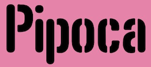 [More] ⦿
|
Peter Fahmi

|
Or Peter Fahrni. Graphic designer from New York, called Peter Fahrni at MyFonts and Peter Fahmi at Klingspor---this is a case of tight typesetting, rn being read as m or vice versa. Creator of the slabbed shadowed outline caps typeface Quadrus (Letraset, 1990). In 2014, he created an untitled squarish unicase typeface family. Klingspor link. Behance link. FontShop link. [Google]
[MyFonts]
[More] ⦿
|
Peter Fritzsche
[Formfound]
|
[More] ⦿
|
Peter von Zezschwitz
[Zetafonts (Tangram Studio)]
|
[More] ⦿
|
Philip Kelly
|
Graphic designer in Auckland, New Zealand. In 2013, he summarizes his career: Early career working in New Zealand for not for profit clients in theatre, music and fine arts. Two years at Saatchi & Saatchi NZ followed by ten years in New York City as a type director, design director and photographer. Recently returned to New Zealand after two years in Shanghai. Typefaces designed by him include Basalt (2011, bilined), Brutalism (2008), Cement (2009, octagonal), Hellvettika (1998, gothic, tattoo font), Esosquare (1998, squarish), Phrank (1997, experimental), and Hanson Unicase (2006). In 2015, the custom octagonal typeface Pure Pakati was developed at Whybin TBWA Auckland for Tourism New Zealand. Its design team comprised Philip Kelly (design director), Karl Wixon (Maori design consultant), Kris Sowersby (type designer) and Rangi Kipa (Maori carver). Pure Pakati blends the traditions of wood type with the traditional indigenous carving style of Aotearoa (New Zealand) in a hand-carved and digital fonts. Behance link. Another Behance link. Old URL. [Google]
[More] ⦿
|
Pixilate Designs
[Kemie Guaida]

|
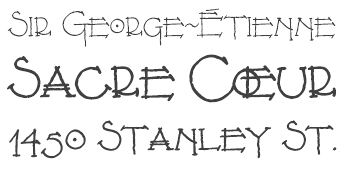 Download the following beautiful handwriting and handprinting fonts made by Mexican designer Kemie Guaida, who lives in Helsingborg, Sweden: Balderas (2002), BlackoutSans (2001), BlackoutSerif (2001), Manita (2001, a simplistic hand, done with Jorge Villalobos), Manita Dingbats (2000), Leonel (based on characters drawn by architect Leonel Terres, 1999-2001), Montreal Architect (1998), Patchanka (2001), Marginal (2001), Soli (1998, with Solange Guaida), OnderBold (2001), Kemie (2001), Rafa (2001), Unicase (2001). Pixel/bitmap typefaces include Antenna8, Antenna10, Antenna11, AntennaSemi, Beachball, Egghead (2002), Gardenias (connected pixel script), Ladybug, Lilabit, Pixilated (2002), Roundabout, Sober, Stoneheart and Unipixel. She was working on the connected script typeface Monolinear (2004). Further typefaces include Lu Px (2004, another architecture's handwriting face), Tokig Px (2012, hand-printed), Rolig Serif Px (2008), Lango Px (2008), Lango Px Thin (2013), Lango Px Fat (2013).
 In 2013, Kemie published an ornamented low-contrast sans typeface called Bellota (based on Gesine Todt's Snippet) and the hand-printed Pocket Px, Pocket Swash, and Pocket Serif Px. Bellota and Bellota Text are now downloadable from Google Fonts and Github. In 2014, Kemie published a warm replacement family for Comic Sans, called Jolly Good Sans. It was expanded in subsequent years and seems especially suited for children's books. Typefaces from 2015: JollyGood Proper, Pocket Swash Px. Typefaces from 2016: Raski, JollyGood Sans Condensed, JollyGood Proper Unicase. Typefaces from 2017: Jolly Good Proper Condensed, Amike (an architectural handwriting font family). Typefaces from 2018: JollyGood Serif. Typefaces from 2019: Bookbag (a rounded sans font family for teaching children to read and write), Skriva (a comic book or blueprint script). Typefaces from 2020: Jolly Good Proper Serif. Alternate URL. Klingspor link. Creative Market link. View Kemie Guaida's typefaces. [Google]
[MyFonts]
[More] ⦿
|
Qréalib
[Julien Protière]
|
Graphic designer in Veauche, Loire, France. Dafont link. Creator of the free typefaces Aqualib (2012), Rastalib (2012), Erolib (2012, white on black), Ginolib (2012), Qréalib (2012, monoline avant-garde unicase sans), Airlib (2012, grunge), Angelib (2012, fat finger face), and Tramlib (2012, grungy). [Google]
[More] ⦿
|
Rafael Jordán/0Oliver

|
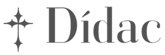 Rafael Jordan Oliver, aka Barry Bianco, is a graphic designer and calligrapher in Valencia, Spain, b. 1983, Alzira. Graduate of EASD in Valencia, class of 2013. His typefaces:
 - A geometric Futura / Bauhaus style typeface family called Geometric Obsession (2012).
- The curly all-caps typeface Nord Type, which is based on the modern letters of Gregorio Muñoz at Valencia's train station L'Estació del Nord. It was his graduation project at EASD.
- The commercial didone typeface Didac (2014). The Italic followed in 2015-2016. Buy it here.
- At Type@Paris in 2015, he designed Carmen Maria (named after his wife), a sharp-serifed fashion mag typeface rooted in Carolingian calligraphy.
- Las Naves Condensed (2017). A grotesque typeface designed under the art direction of Sebastian Alos for "Las Naves" foundation.
- Bantha Sans and Bantha Serif (2017). Sturdy multi-purpose typefaces.
- Bianco Slab (2017, Fontstore).
- Brava Slab (2018). Almost monolinear, with Latin curves in the italics. Followed in 2019 by Brava Sans.
- Ostium (2019). An inline unicase font with proportions close to classical romans.
- Carmensin (2020). A humanist text family characterized by smooth curves, a large x-height and open counters. It includes a Display subfamily and some stencil styles.
- Redoneta (2020). A 12-style geometric sans. Followed in 2022 by Redoneta Rounded (12 styles).
- Tannen (2021). A layerable blackletter family, and an interpretation of Erich Meyer's Tannenberg (1933-1935).
- Tannen (2021). A layerable German expressionist blackletter family, and an interpretation of Erich Meyer's Tannenberg (1933-1935).
[Google]
[MyFonts]
[More] ⦿
|
Ralph du Carrois
[Seite4]
|
[More] ⦿
|
Ramiz Guseynov
[TipografiaRamis]

|
 [MyFonts]
[More] ⦿
|
Rangga Singgih Subekti
[Subectype]

|
[MyFonts]
[More] ⦿
|
Ray Larabie
[Larabie Fonts]

|
 [MyFonts]
[More] ⦿
|
Redcollegiya
[Marina Sozonova]

|
Marina Sozonova is a Russian graphic designer and a vector artist specializing in children's book and fun hand-lettered typefaces. In 2020, she released Fancy Kingdom MS (a curly all caps font for fairies), Ginger Mate MS (hand=crafted, unicase), Third Floor MS and Maybug MS. Typefaces from 2021: Cafeterio MS (a scrapbook font). [Google]
[MyFonts]
[More] ⦿
|
René Knip
[Arktype (was: Atelier René Knip)]

|
[MyFonts]
[More] ⦿
|
René Verkaart
[Characters (or: Character Type)]

|
[MyFonts]
[More] ⦿
|
Richard Diaz Granados
[Stereo Type Haus]

|
[MyFonts]
[More] ⦿
|
Richard Kegler
[P22 Type Foundry]

|
 [MyFonts]
[More] ⦿
|
Riyadh Rahman
[Ergibi Studio]

|
 [MyFonts]
[More] ⦿
|
Rob Barba
[Megami Studios (or: Incstone design by Megami)]

|
[MyFonts]
[More] ⦿
|
Rob Keller
[Mota Italic]
|
 [More] ⦿
|
Roch Modrzejewski
[ROHH]

|
 [MyFonts]
[More] ⦿
|
ROHH
[Roch Modrzejewski]

|
 Roch Modrzejewski (ROHH, Krakow, Poland) established ROHH in 2015. That same year, he published the organic script typeface Rumi, the 22-font sans workhorse typeface Xyngia, the squarish typeface Bietka and the creamy italic titling typeface Aloe, which was inspired by headlines from 1930s newspapers.
 In 2016, he published the 27-style vintage condensed sans typeface family Ganges (sans), the 27-style Ganges Slab, the script typeface Rumi (based on handwriting discovered at Jagiellonian University Library in Krakow), the curvy sans serif family Kasia, Pusia (a rounded organic sans family) and the clean geometrc sans typeface family Tosia. Typefaces from 2017: Akwe Pro (a 164-style grotesk typeface characterized by a tapered italic f, large x-height and stroke endings cut at a 10 degree angle), Paneuropa Nova (a minimalist geometric sans that revives Paneuropa (1931, Idzikowski Foundry), itself a take on Futura), Paneuropa Retro (closer to the original than Nova). Typefaces from 2018: Karibu (a 100-strong sans family), Bozon (a minimalist geometric grotesk), Qualion (a 30-style modern geometric grotesk), and Qualion Text. Qualion Round was added in 2020. Typefaces from 2019: Montreux Grotesk (132 fonts: advertized as a universal sans, it is a slightly more geometric approach to Helvetica and Swiss design in general), Amfibia, Eckhart (a 74-font family of modernized didones in Poster, Text, Display, Headline and Color subfamilies). Typefaces from 2020: Conthey (a unicase sans), Teramo (56 fonts in for optical sizes, and two variable fonts; an angular serif with design proportions of 15th and 16th century masters such as Francesco Griffo or Claude Garamond). Typefaces from 2021: Conthey Inline (42 styles, a layerable retro look; includes three variable fonts), Rothorn (a 20-style geometric sans; includes a variable font), Kefir (an eight-style typeface with the plumpness of Cooper Black and Windsor; +a variable font). Typefaces from 2022: Paneuropa 1931 (an 18-style revival of Paneuropa, a Polish Futura relative made by Idzikowski Foundry in 1931). [Google]
[MyFonts]
[More] ⦿
|
Roman Melikhov

|
Russian designer of the unicase typeface Mixcase (2020), the squarish typeface Maler (2020) and the all caps logo font Conneqt (2020). Typefaces from 2021: Rouben (squarish). [Google]
[MyFonts]
[More] ⦿
|
Ronald Hagenstein
|
Graphic designer in Rotterdam, The Netherlands. The vector format unicase typeface Count Font (2013) is custom designed for the consultancy agency Count & Cooper. Hellofont link. Behance link. [Google]
[More] ⦿
|
Rubén Prol
[Ipanema Gráfica]

|
 [MyFonts]
[More] ⦿
|
Ruben David Marques
|
Portuguese student from Leiria. Creator of this playful unicase face in 2007. Designer at FontStruct in 2008 of leiria, leiria_bad_sans_informal, Leiria Italic Swashy (pixelish scripts). [Google]
[More] ⦿
|
Ryul Davidson
[Brenners Template]

|
 [MyFonts]
[More] ⦿
|
Salih Kizilkaya

|
 Ankara, Turkey-based designer. In 2019, he created these typefaces: the squarish SK Kape, the semi slab serif SK Karl, the sans typeface SK Rotun, the angular typeface SK Pila.
 Typefaces from 2020: SK One Block (a squarish typeface inspired by Arabic Kufic), SK 1980 Unicase (squarish, in seven styles), SK Reykjavik (16 slab and 16 geometric sans styles), SK Aristo (a 10-style monolinear sans with a flagging left wing in the lower case t), SK Falcon (a 24-style geometric semi-serif), SK Akropol, SK Payidar (a 16-style geometric sans for Latin, Cyrillic and Greek), SK Kalender (a monolinear display typeface), SK Bade (a mini-serif), SK Asya (a demi-serif typeface with flared, almost lapidary, terminals). Typefaces from 2021: SK Goldilocks (a 14-style grotesque), SK Merih (a 12-style nearly monolinear simple sans), SK Selanik (a 40-style monolinear almost humanist sans; for Latin, Cyrillic and Greek), SK Clarke (a 20-style display sans), SK Moreau (a 12-style geometric sans), SK Greenland (a 14-style humanist sans that has totally succumbed to hipsterism, especially in its coathanger f), SK Seren (a flared incised typeface family), SK Monaco (a 16-style humanist sans), SK Yok Deve (hand-printed), SK Barbicane (a monolinear organic sans), SK Boncuk (an eight-style industrial sans), SK Ilke Mono (a 22-style monospaced geometric sans, useful as a programming font), SK Zweig (a quirky 52-style serif family inspired by Stefan Zweig's work), SK Anatolia (a display font inspired by Anatolian culture), SK Gothenburg (a 48-style grotesk), SK Curiosity (a 40-style geometric sans). [Google]
[MyFonts]
[More] ⦿
|
Salvador Rodriguez Lagos
[Soda]

|
 [MyFonts]
[More] ⦿
|
S&C Type Paris (was: La Goupil Paris)
[Julien Saurin]

|
 Julien Saurin (b. 1986) and Louis-Emmanuel Blanc (b. 1986) are two experienced graffiti artists who created the foundry "La Goupil Paris" in Paris in 2007. They were joined by Fanny Coulez. In 2017, Fanny Coulez and Julien Saurin set up S&C Type Paris and moved their successful collection of fonts there.
 Graffiti fonts: Ruelles (2009), Vandalism Alternate (2008). The original Vandalism (2007, co-designed by Saurin and Blanc) was free at Dafont. The scratchy Carving (2010) is commercial, however. In 2011, Saurin made the pure geometric art deco face Haussmann. With Angela Bolliger, Julien Saurin published the classic avant-gardist hand-drawn typeface Paris (2012, La Goupil). It comes with art nouveau ornaments called Paris Serif Ornaments. Typefaces from 2012: Paper Cute (a paper cut face), Adrenaline (hand-printed), Montmartre (a soft hand-printed typeface family, now retired from the line-up). Typefaces by Julien Saurin in 2013: The Serif Hand (with Fanny Coulez), The Hand (a hand-printed caps typeface done with Fanny Coulez), Naive (a curly hand-printed serif typeface done with Fanny Coulez), Insolente (a connected script done with Fanny Coulez), Neo Phoenician (a straight-edged rune simulation font done with Fanny Coulez). Typefaces from 2014: Pontiac Inline (by Fanny Coulez and Julien Saurin---a classy almost art deco inline caps font with layering and shadow and other effects). Typefaces from 2015: Pontiac (with Fanny Coulez), Insolente (by Julien Saurin and Fanny Coulez), Carving (scratchy hand). Typefaces from 2016: Naive Deco Sans, Naive Line Sans. A great all caps handcrafted sans serif font designed by Fanny Coulez and Julien Saurin. Typefaces from 2017: Majorelle (signage script). Typefaces from 2018: Papercute Inline (with Fanny Coulez), Colette (an inky script). Typefaces from 2022: The Hand Wide (hand-printed). Creative Market link. Fontspring link. MyFonts link. Klingspor link. Behance link for S&C Type Paris. Creative Market link for S&C Type Paris. [Google]
[MyFonts]
[More] ⦿
|
Seite4
[Ralph du Carrois]
|
Berlin-based design company, est. 2003, run by Ralph du Carrois and Jenny Horn. It ceased to exist, but du Carrois now runs Colaborate (sic): A four-style sans family done in 2001 for StudioMiR (free). The Pixelpath series (2002): PiPaA35, PiPaB35, PiPaC35, PiPaD35. Free. [Google]
[More] ⦿
|
Sergiy Tkachenko
[4th February]

|
 [MyFonts]
[More] ⦿
|
Shinn Type
[Nick Shinn]

|
 Nick Shinn (b. London, 1952) is an art director and type designer. He teaches at York University in Toronto, and is a founding member of the Type Club of Toronto. He writes regularly for Graphic Exchange magazine, and has contributed to Applied Arts, Marketing, Design, and Druk. He founded Shinn Type in 1999, and made fifteen type families. Interview by Jan Middendorp, in which he describes himself as a contrarian. Pic by Isaias Loaiza. Pic by Chris Lozos at Typo SF in San Francisco in 2012. Custom typefaces have been produced for newspapers such as The Birmingham News (Alabama), The Chicago Tribune, The Daily Express (London), The Daily Mail (London), The Globe and Mail (Toronto), The Montreal Gazette, and The St. Petersburg Times (Florida). Custom fonts, with exclusive rights, have been created for corporations such as Thomson Nelson, Enbridge, Rogers Communications Inc., and Martha Stewart Living. Nick organizes type evenings in Toronto all year long.
 Shinn Type fonts at MyFonts. Behance link. He is the designer of Fontesque (a wild family of curly glyphs), the monospaced font Monkey Mono, Artefact (1999), Beaufort (a sharply serifed family done in 1999; in 2008, he published a 10-style extension called Beaufort Pro), Bodoni Egyptian (1999), Alphaville (2000, techno typeface with straight mono-width strokes), Brown, Brown Gothic, Duffy Script (2008, in 4 styles: an interpretation of the lettering of contemporary illustrator Amanda Duffy, aka Losergirl), Handsome (1999, cursive handwriting family, since 2005 available in OpenType), Merlin, Oneleigh (1999, masterful!!), Paradigm (1995, updated in 2008, inspired by 15th century letterforms), Shinn, Walburn (1996) [note: Walburn and Brown were originally commissioned for the 2000 redesign of the Globe and Mail. Walburn is an adaptation of a didone typeface by Erich Walbaum, c.1800], Worldwide (1999). In 2001, he designed the Richler font in honour of the memory of Mordecai Richler. The Richler font was only available to the Giller Prize, Random House and the Richler family until its public release in May 2013 at MyFonts, where Richler (+Cyrillic, +Greek) is advertised as a 21st century antiqua book face. In 2002, he published Goodchild (a Jenson revival; see also Goodchild Pro (2017). Goodchild is a Venetian with clean (not antiqued!) outlines and a larger-than-Jensonian x-height. It comes in 4 styles and is targeted at sophisticated academic typography) and the liquid lettering family Morphica, exclusively at Veer. In 2003, he released the absolutely gorgeous "modern" sans Eunoia (which has a unicase weight), and the quirky sans family Preface (2003; Preface Thin is a hairline weight; Preface Light is free at FontShop). In 2003, he also published the mmonowidth unicase family Panoptica (2003), which includes styles called Regular, Sans, Egyptian, Doesburg and Octagonal, to name a few. In 2004, he released Nicholas, a Jensonian serif family, which is the headline version of Goodchild. Additions in 2006 include Softmachine (VAG Rounded/comic book style family). Sexy type from Toronto is an article by Erin Kobayashi about Shinn's work published in the Toronto Star on April 15, 2007. Nick Shinn designed the type for the redesign of The Globe and Mail in April 2007: Globe and Mail Text [look at the f], Globe and Mail Sans (or GM Sans), Globe and Mail News (or GM News). In 2008, these typefaces went retail. One typeface is called Pratt, named after David Pratt, the design director at The Globe and Mail who commissioned the typeface for his redesign of the paper. The companion typeface will be called Pratt Sans. Additions in 2008: Figgins Sans (4 styles), Scotch Modern (a 5 style didone family that revives the typeface used in New York State Cabinet of Natural History), Scotch Micro. Paul Shaw writes: Scotch Roman, beloved by D.B. Updike and W.A. Dwiggins, was a standard in the typographic repertoire of pre-World War II printers but fell out of favor after the war, supplanted by Bodoni. Nick Shinn of Shinntype has made a bid to resurrect this oft-maligned typeface with Scotch Modern. Scotch Modern is not a revival of the familiar Scotch Roman of Linotype and Monotype, but of a more modern design attributed to George Bruce, the great 19th-century New York punchcutter. Shinn used a sample of the typeface from the New York State Cabinet of Natural History's 23rd Annual Report for the Year 1869 (printed in 1873) as a model. He drew it by eye, aided by a sharp loupe: no photographic enlargements, no scans, no tracing. The ends of the strokes are slightly rounded, to capture the effect of metal type being impressed into soft paper. Shinn contends that the 19th-century Scotch types were "eminently readable" and a factor in the rise of modern literacy. His rendition, an OpenType font, aims for readability in all situations with display, regular, and microtype versions. The display roman includes a unicase font-a nod to Bradbury Thompson's Alphabet 26 experiment-and the italic has elegant swash caps. Scotch Roman has never been a typeface for those seeking eternal beauty or anyone desperate for typographic kicks. Dwiggins gave it a 10 for legibility (where 10 was "reasonable human perfection") but only 4 for grace and 0 for novelty. Shinn's Scotch Modern, with its many OpenType extras, scores well on all three counts. It's a typeface for those who prefer a mature single malt: simple at first, but more complex as it is savored. Photograph. At ATypI 2008 in St. Petersburg, his talk was entitled Scotch Modern. Several catalogs have been published by Shinntype. Particularly noteworthy is The Modern Suite (2008, Nick Shinn, Coach House Press, Toronto), which showcases Figgins Sans and Scotch Modern. Sample of some Scotch Modern dingbats. Production in 2010: Sensibility (a humanist sans superfamily), Sense (a modernist sans superfamily), Bodoni Egyptian Pro (a monoline slab Bodoni experiment---the Pro version of a 1999 family by him). In 2011, he created Checker, an all caps 3d black and white-tiled typeface, and Parity (a roman unicase pair). Naiad (2013) is a didone, or neoclassical, typeface with Victorian curlicues thrown in to create a Victorian look. Pratt Nova (2014) is a 17-style large x-height typeface family that attempts to achieve visual and semantic opulence, equipping the typographer with a comprehensive array of harmonized fonts, all rigorously drawn, superbly fitted iterations of a single, profoundly original design. Neology (2014) is a 15-style sans family subdivieded into Deco, Grotesque and plain sans subfamilies. Brown Pro (2016) is a classic grotesque, distinguished by its semi-condensed proportions and slight flaring of the edges and some ink traps. Figgins Standard (2016) is a take on the low-contrast original sans typefaces designed in the 1830s in industrial London. Gambado (2016). This is a collection of shaken typefaces with bouncing letters. Particular fonts include Gambado Sans and Gambado Scotch. Dair (2017) is a revival of Canada's first home-grown typeface, Cartier, which was completed by Carl Dair in 1967 and named after 16th century explorer Jacques Cartier, who mapped the Gulf of St. Lawrence in the 1530s. Dair 67 and Dair 67 Italic are facsimiles of the original fonts. Dair and Dair Italic are fully-featured 21st century fonts. In 2018, Nick Shinn published Phiz, a diverse suite of 27 decorative fonts based on Figgins Sans Extra Bold. Designer of Boxley (2016), a superelliptical sans typeface family. At the end of 2020, he published the 14-style condensed rounded sans typeface family Aptly. o Typefaces from 2021: Buslingthorpe (a tall-necked typeface in which the x-height is only 29% of the ascender height, beating classic tall fonts such as Rudolf Koch's Koch Antiqua, and Lucian Bernhard's Lucian and Bernhard Modern). Speaker at ATypI 2017 Montreal. MyFonts interview. I Love Typography link. FontShop link. Klingspor link. View Nick Shinn's typeface library. [Google]
[MyFonts]
[More] ⦿
|
Sibylle Hagmann

|
 Swiss designer Sibylle Hagmann (b. 1965) runs Kontour, est. 2000.
 With a BFA in 1989 from the Basel School of Design and an MFA from the California Institute of Arts in Valencia in 1996, she became art director of the USC School of Architecture in Los Angeles, and she is now working as a designer and art director for institutional publications and she teaches at the University of Houston in the graphic communications program (since 2002). Cholla won at Bukvaraz 2001. She also won an award at Granshan 2008. Kontour joined Type Network in 2016. She designed these typefaces: - Twin Cities (2002, Kontour: an octagonal face).
- Cholla (a large rounded sans family, a slab family, a wide family and a unicase subfamily; in 1999 at Emigre). She writes: The Cholla typeface family was designed in 1998-99 and named after a species of cactus indigenous to the Mojave Desert. Cholla was originally developed for Art Center College of Design in Pasadena, California. Denise Gonzales Crisp, then art director of the college's design office, collaborated with Sibylle Hagmann to design a family of typefaces that would include a vast variation of font weights.
- Odile (2005, Kontour, also released at Village). Odile is based on an experimental typeface of W.A. Dwiggins called Charter. Sybille writes: Dwiggins contemplated Charter as the italic companion to Arcadia, Experimental No. 221. The Charter project progressed sporadic stalled during the Second World War and came to a halt in 1955. Charter remained incomplete and was never commercially released. Assessing Charter's whimsical design, its fragments were rethought and developed into a comprehensive text family.
- Elido (2013). She writes: Elido follows Odile's proportions and matches the weight and typographic color of its serif twin. Elido is a sans with classical proportions. A slight geometric hint and open counters convey an airy feel.
- Axia (2013, a sans serif family with several stencil styles). Originally designed for the Rice University School of Architecture in 2011, this contemporary sans found some inspiration in the TwinCities typeface family created by Sibylle Hagmann for the University of Minnesota in 2003.
- Kopius (2016). This great text typeface family is loosely inspired by Herbert Thannhaeuser's Liberta (VEB Typoart). She added Kopius Condensed in 2017.
- In 2020, she realeased Utile (+Display). Utile was influenced by Hermann Zapf's Optima in its flaring and by Roger Excoffon's Antique Olive in its brashness.
CV. Bio at Emigre. FontShop link. Behance link. Interview by MyFonts. Type Network link. [Google]
[MyFonts]
[More] ⦿
|
Simon Friis
|
Graphic designer and illustrator in Haderslev, Denmark. During his studies, he designed the Ransom typeface (2012, unicase). [Google]
[More] ⦿
|
Siquot Design
[Luis Siquot]

|
 Luis Siquot (b. 1945) studied architecture and modern letters in Cordoba, Argentina, and graduated in 1975 from the Department of Visual Communication, Higher School of Arts, University of Hamburg. He currently specializes in typographic design, and lives and works in Córdoba, Argentina. Luis Siquot runs the graphic and logo design company "siquot'design" in Argentina. Talk at t-convoca. Interview in 2003 by Icograda. 2011 wishes. Klingspor link. FontShop link. His fonts:
 - ITC Cali (2002). A fantastic calligraphic script font.
- ITC Arecibo (2002).
- ITC Abaton (1997).
- ITC Florinda (1997). Inspired by Rob Roy Kelly's American Wood Type: 1828-1900.
- ITC Juanita Condensed (1996), ITC Juanita Deco (1996), the very very beautiful ITC Juanita (1996), ITC Juanita Lino (1996), ITC Juanita Xilo Condensed (1996), ITC Juanita Xilo (1996).
- ITC Portago (1997). A great stencil font.
- He is working on the extensive family called Arquetipo Sans and Arquetipo Serif.
- Also in the works is a multiple master and OpenType font, Siquot Antigua.
- His early work includes Doble (1972, a two-line font), Unilinea (1969-1970, a unicase monoline and monospace family), and Cuadrata (1967, all letters of the same square dimensions as for Japanese kanji).
View Luis Siquot's typefaces. [Google]
[MyFonts]
[More] ⦿
|
Soda
[Salvador Rodriguez Lagos]

|
 Mexican type designer who sert up Soda (in London, UK). He created the rounded sans typeface family Gardenia (2015-2016, Without Foundry). The name Gardenia may create confusion as there are at least five other typefaces with the same name.
 In 2016, Salvador Rodriguez and Diego Aravena Silo co-designed the geometric sans typeface family Fuse and Fuse V.2, which are characterized by a large x-height and some humanist elements. Salvador Rodriguez and Julia Martines Diana added Fuse V.2 Printed in 2018. Still in 2016, Salvador Rodriguez published Urbani at Without Foundry. This narrow tightly set sans family was inspired by Frutiger and Renner but mixes in Latin curves. Eren and Eren Condensed (2016) is a 32-style slab serif family with a humanistic touch and rounded corners---it was designed by Salvador Rodriguez and programmed by Diego Aravena. Typefaces from 2017: Sonny Gothic (a geometric sans in 36 styles, W Foundry: an homage to Herb Lubalin; followed in 2018 by Sonny Gothic Vol.2, which was co-designed with Gaspar Muñoz), Nutmeg (geometric sans, W Foundry), Kappa (a modern sans serif with humanistic and geometric features, co-designed by Salvador Rodriguez and Diego Aravena), Kappa Vol 2 (the slab serif version of Kappa), Ulises (with Diego Aravena Silo: an eclectic slab serif with some grotesque features). Typefaces from 2018: In 2018, he designed Helios Antique and Helios Stencil together with Felipe Sanzana at W Foundry. Hermann (2018, Salvador Rodriguez and Diego Aravena) is a wonderful readable garalde book typeface family. Typefaces from 2019: Campora (a revival and extension of K. Sommer's awkwardly serifed Dynamo, 1930, and Avant Garde from the 1980s; +inline). Typefaces from 2020: Supera Gothic (2020: an 18-style geometric sans by Diego Aravena Silo and Salvador Rodriguez; plus variable fonts), Gallos (2020: a 20-style mix of architype (based on Paul Renner's Architype), geometric, gaelic, unicase and uncial, by Diego Aravena Silo and Salvador Rodriguez; containing variable styles as well). Typefaces from 2021: Samy (a warm rounded geometric serif in 36 styles). [Google]
[MyFonts]
[More] ⦿
|
Sol Hess

|
 American typographer and type designer, b. 1886, Philadelphia, d. 1953. He was a man with class and style, who influenced many through his work. He managed the Lanston library from early in the 20th century (he joined Lanston in 1902) until the second World War. He created many of its typefaces himself, and commissioned many from Frederic W. Goudy. His typefaces (LTC stands for Lanston Type Company):
 - Alternate Gothic Modernized.
- LTC Artscript (Lanston Monotype, 1940; digital version in 2005 at P22/Lanston). McGrew: Artscript is a delicate calligraphic letter designed by Sol Hess for Monotype, which calls it "an attempt to convert into rigid metal the graceful penmanship of the ancient scribe. ..based on the writing of Servidori of Madrid (1798)." It was designed in 1939 but not released until 1948, because of wartime restrictions. It is a pleasing design for limited use, but its delicacy requires special care in handling. Compare Heritage, Lydian Cursive, and Thompson Quillscript.
- In 1928, he created the now famous Broadway Engraved. P22 writes: LTC Broadway was originally designed by Morris Benton. Sol Hess added a lower case in 1929 and also drew Broadway Engraved for Lanston Monotype. That font is now available in digital format from LTC/P22. Other digital fonts include OPTI Broadway Engraved from Castcraft, Broadway Inline (Softmaker), B820 Deco (Softmaker), B821 Deco (Softmaker), Deco 901 (Bitstream) and Bravo (Corel).
- Bodoni 26: a unicase interpretation of Bodoni by Hess at Lanston, designed by Giampa; digital version at P22/Lanston in 2005.
- Bodoni No. 175 (remastered in 2006 by Paul Hunt).
- LTC Bodoni Bold.
- Bruce Old Style No. 31: a transitional font at Lanston Monotype in 1909. Now a Bitstream face. Based on Bruce Old Style No. 20 from Bruce Foundry (1869).
- Linotype states that Sol Hess is responsible for a version of Cochin Bold (1921): Georges Peignot designed Cochin based on copper engravings of the 18th century and Charles Malin cut the typeface in 1912 for the Paris foundry Deberny&Peignot. The font is named after the French engraver Charles Nicolas Cochin (1715-1790) although its style had little to do with that of the copper artist's. The font displays a curious mix of style elements and could be placed as a part of the typographical Neorenaissance movement. Cochin is especially large and wide and was very popular at the beginning of the 20th century. Note: Cochin is now sold by Linotype, Adobe, Monotype, URW++ and Bitstream (as Engravers' Oldstyle 205).
- English Caslon no 37.
- Flash.
- Goudy Bible (1948). Mac McGrew: Goudy Bible is a modification of Goudy Newstyle (q.v.), adapted by Bruce Rogers with the assistance of Sol Hess for use in the Lectern Bible Rogers designed for World Publishing Company in 1948.
- Goudy Bold Swash.
- Goudy Heavyface Open (1926) and Condensed (1927). Mac McGrew: Goudy Heavface and Italic were designed by Goudy in 1925 in response to a strong request by Monotype for a distinctive typeface on the order of the very popular foundry Cooper Black. Such typefaces had little appeal for Goudy, and he always felt that Monotype was disappointed in his efforts, but the result is more informal than other similar types, and has had considerable popularity. Note the extra set of figures and the unusual number of tied characters and ornaments in the font. Goudy Heavyface Open is a variation produced by Monotype in 1926, probably designed by Sol Hess, who designed Goudy Heavyface Condensed in 1927. Compare Cooper Black, Ludlow Black, Pabst Extra Bold. See LTC Goudy Heavyface, or Goudy Heavyface (Bitstream).
- Hadriano Stone-Cut.
- Hess, Hess Bold (1910). Mac McGrew: Hess Bold was designed by Sol Hess for Monotype about 1910, as a companion typeface for Goudy Light, drawn earlier by Frederic W. Goudy. Of medium weight, it accurately reflects the characteristics of the lighter face with a high degree of legibility, but neither typeface is distinguished. There is also an italic by Hess.
- Hess Monoblack. A great display poster typeface that looks like a hand-drawn version of Nicolas Cochin. Mac McGrew: Hess Monoblack is a Monotype typeface that no doubt was drawn by Sol Hess, but it has not been found in any accounts of his work nor in the regular specimen books. The showing here is reproduced from Monotype's "specimen on request" sheet; no other information has been found except that there are only two sizes with seventy-seven characters each, a practical minimum for cap-and-lowercase fonts. Compare Greco Bold. See P22/Lanston for a digital version called LTC Hess Monoblack done by Paul Hunt in 2005.
- Hess New Bookbold (1946). Mac McGrew: Hess New Bookbold was designed for Monotype in 1946 by Sol Hess. with italic the following year; both were released in 1948. An adaptation of Garamond Bold, the typeface was reproportioned to fit a new standard arrangement which was intended to make it readily available for use with several standard oldstyle typefaces still in common use at the time, but little use seems to have been made of it. Ascenders and descenders are shorter than in Garamond, anticipating later phototype trends, weight is slightly greater, and letters are more tightly fitted.
- Hess Old Style (1920-1923). Mac McGrew: Hess Old Style was designed about 1920 (one source says 1912) by Sol Hess for Monotype, which says it was modeled after a typeface shown by Nicolas Jenson about 1479. It is neat, but does not have much in common with Centaur, Cloister, and other typefaces based on Jenson's work. However, it is a little heavier than most of them and so works to good advantage on smooth papers. The italic followed in 1922. Revived by Steve Jackaman in 1993 as Hess Old Style RR.
- Hess Neobold (1933-1934). Mac McGrew: Hess Neobold was designed by Sol Hess for Monotype in 1934. It is a narrow, bold, and very squarish gothic with small serifs, designed for attention-getting display in a style of the day, but never made in more than one size. Compare Airport Tourist (Futura Display), Othello.
- Hess Title (+Italic, 1910). Mac McGrew: Hess Title and Italic were the first type designs drawn by Sol Hess. Produced in 1910 as advertising types, they were designed for and first used by a prominent New York department store. Only the roman was made in display sizes.
- Italian Old Style Wide.
- Janson.
- LTC Jefferson Gothic: an adaptation of News Gothic Extra Condensed drawn by Sol Hess in 1916; digital version at P22/Lanston in 2005. Mac McGrew: Jefferson Gothic was originally Monotype's copy of News Gothic J Extra Condensed, using the same foundry name. In 1916 Sol Hess designed several alternate round capitals; matrix fonts include both styles of these letters, but no lowercase. Baltimore Type called it Tourist Extra Condensed. Compare Phenix.
- Kennerley Open Caps.
- Laurentian.
- Martin (+Italic). Mac McGrew: Martin and Italic are listed as a Monotype production of 1945, adapted by Sol Hess from old sources, but no specimen or further information has been found.
- New Bookman.
- Onyx Italic (1939, for Monotype). The italic version of Gerry Powell's 1937 ATF typeface Onyx, a condensed version of Poster Bodoni.
- Pendrawn (1934). Mac McGrew: Pendrawn was designed for Monotype about 1933 by Sol Hess. It retains much of the quality of sixteenth-century hand-lettering, and is generally modem in character without the severity typical of most modem types. Serifs are long and thin, slightly concave, but those at the top of lowercase stems are slanted as in oldstyle types. Stems taper slightly toward the ends, and figures are hanging. Round letters tend toward an egg shape, with the small end down. It has been made only in two sizes: regular 36-point as a complete font and 36H4 as oversize capitals only.
- Postblack Italic.
- Post-Stout Italic.
- Poster or Hess Poster. Mac McGrew: Poster or Hess Poster is a heavy, narrow, very compact gothic designed by Sol Hess for Monotype. Its general appearance suggests a contemporary serifless design but in fact there is a slight hint of serifs. The slightly splayed M and the single-bowl g are suggestive of British grotesques. Ascenders and descenders are short, giving a large x-height, and the typeface is closely fitted.
- Slimline (1939). Mac McGrew: Slimline was designed by Sol Hess in 1939 for Monotype. It is a lightweight, very narrow, monotone typeface with tiny serifs and a number of alternate round characters. It has had some use for stationery. Compare Huxley Vertical.
- Spire (1937): a condensed didone, see the digital LTC Spire in the Lanston collection. Mac McGrew: Spire is a modernization of the old modern roman extra-condensed style. drawn by Sol Hess for Monotype in 1937. There is no lowercase, but there are several alternate round characters. Compare Greenwich, Modern Roman Extra Condensed, also Empire, Slimline. Spire is also the name of a dissimilar BB&S face, cut in 1898 or earlier and shown as late as 1927. Spire has been digitized/revived by Ann Pomeroy under the same name for FontHaus and then Group Type. LTC Obelysk Grotesk was designed by the Lanston Drawing Office in the late 1980s. This typeface is a reconstruction of Spire. The skeleton of Spire Roman stands with the serifs removed. Like Spire, this font has no lower case, but does offer alternate cap styles in some of the lower case positions.
- Squareface (1940). Now available digitally as LTC Squareface from LTC/P22. Mac McGrew: Squareface was designed by Sol Hess in 1940 as a variation of Stymie Extrabold. A number of characters are the same for both typefaces, but normally round letters have been squared considerably, with only slightly rounded corners. It makes a vigorous display face, and harmonizes well with other square-serif designs.
- Stationers Gothic (1942-1948). Mac McGrew: Stationers Gothic Light and Bold were designed by Sol Hess for Monotype in 1942, and Medium in 1944, but wartime and post-war conditions delayed their release until 1948. They are similar to the Bank Gothics. following a style of squared letter popular for copperplate engraved stationery and announcements, and in effect constitute a more contemporary form of the style typified by Copperplate Gothics. Like the others, there are several sizes on each of several different bodies, making various cap-and-small-cap combinations easily practical.
- Style Script (1940). Mac McGrew: Style Script was designed by Sol Hess for Monotype in 1940. It is a popular bold thick-and-thin cursive style, which has had considerable use in advertising. It is somewhat like the earlier Coronet Bold of Ludlow, but heavier and with a greater x-height; some characters seem to make a conscious effort to differ.
- Stymie.
- Tourist Gothic (Lanston, 1909; now available digitally as LTC Tourist Gothic from LTC/P22). Mac McGrew: Tourist Gothic is a Monotype copy of Modern Condensed Gothic with a set of several round alternate caps designed by Sol Hess in 1928. (Sizes under 14-point continued under the Modern Condensed Gothic name, without the alternates.) In 1938 Hess drew a matching Tourist Gothic Italic, which added to the popularity of the face, although it lacks the round characters. The Outline Gothic Medium Condensed (or Franklin Gothic Condensed Outline) from some sources is actually an open version of Tourist Gothic. Tourist Extra Condensed of Baltimore Type is a copy of Phenix (q.v.) in 24- to 48-point sizes, and is Jefferson Gothic (q.v.) in larger sizes.
- Twentieth Century was designed by Hess between 1936 and 1947 as a monoline version of Paul Renner's Futura. Mac McGrew: Twentieth Century is Monotype's copy of Futura (q.v.), and in display sizes is essentially an exact copy, while composition sizes are only slightly modified. Several additional versions were drawn for Monotype by Sol Hess, including Twentieth Century Bold Italic and Extrabold Italic in 1937, Extrabold Condensed Italic in 1938, Ultrabold in 1941, Ultra bold Condensed in 1944, and Medium Condensed Italic and Ultra bold Italic in 1947. Some of these weights have different names than their counterparts in the original Futura series or other copies; see the list under Futura for comparison of these names as well as technical data. The main version is sold by Monotype as Twentieth Century MT. The digital type foundry Lanston, or LTC, sells LTC Twentieth Century. Hess Gothic Round NF (2008, Nick Curtis) is based on Twentieth Century. The design was reinterpreted by Herb Lubalin as Avant Garde in the 1970s. Curtis' version softens the harsh geometry of the original designs with rounded line endings. Revivals and derivations of Twentieth Century Poster include Renard Moderne NF (2010, Nick Curtis).
- Ward (1942). McGrew: ard or Montgomery Ward is an adaptation by Sol Hess in 1942 of Memphis Light, specially redesigned for use in the large catalogs of that mail-order company. Strokes are lightened a bit, and the x-height is increased slightly. It was cut by Monotype for private use. One reference says there were light and medium weights; another says there were roman and italic in normal width and also an extended version. The latter account seems more authentic.
Digital descendants of Sol Hess: LTC Hess Monoblack (Lanston Type Company), Hess Old Style (Red Rooster Collection), Hess Gothic Round NF (Nicks Fonts), Twentieth Century (Monotype), LTC Squareface (Lanston Type Company), Broadway Engraved SH (Scangraphic Digital Type Collection), Bruce Old Style (Bitstream), LTC Jefferson Gothic (Lanston Type Company), LTC Spire (Lanston Type Company), LTC Swing Bold (Lanston Type Company), LTC Artscript (Lanston Type Company), LTC Twentieth Century (Lanston Type Company), LTC Tourist Gothic (Lanston Type Company), Renard Moderne NF (Nicks Fonts), Goudy Heavyface (Bitstream), Broadway (Monotype), LTC Broadway (Lanston Type Company), Broadway (Linotype), LTC Hadriano (Lanston Type Company), Cochin (Linotype), LTC Bodoni 175 (Lanston Type Company), Stymie (Bitstream), Engravers Oldstyle 205 (Bitstream), LTC Bodoni 26 (Lanston Type Company), LTC Obelysk Grotesk (Lanston Type Company), Century Gothic (Monotype), Spire (GroupType), Havel (T4), Alternate Gothic Pro Antique (Elsner+Flake). Klingspor link. FontShop link. Linotype link. [Google]
[MyFonts]
[More] ⦿
|
Sophie Meyer
|
During her studies at Flagler College, Saint Augustine, FL, Sophie Meyer created the unicase typeface Chipchap (2013). [Google]
[More] ⦿
|
Stefan Hattenbach
[Mac Rhino Fonts (MRF)]

|
 [MyFonts]
[More] ⦿
|
Stefano Meroni
|
Graphic and editorial designer in Milan. In 2010 he designed a large type family, Tremila. He writes: Tremila is a typographic system designed for the city of Genoa. It has been conceived to give the Italian seaport a strong and bold identity, in order to improve all tourism-related communication. While the rounded terminations give Tremila a young and playful feel, its large x-height and open forms make the typeface ideal for official documents and signage too. The system consists of two main fonts, Tremila Sans and Tremila Unicase. [Google]
[More] ⦿
|
Stefie Justprince
[Crump Hand]

|
[MyFonts]
[More] ⦿
|
Stephen Bird
[Uusimaa Type Foundry Incorporated]
|
[More] ⦿
|
Stereo Type Haus
[Richard Diaz Granados]

|
 Stereo Type Haus (or STH) is a commercial foundry in Brooklyn, NY, est. 2000, offering fonts by Rick D. Granados ((b. Miami, FL, 1970): Bucks (graffiti font), Bushwick (handwriting), Ballbuster, Bedford (2010, an award-quality dot matrix family inspired by mosaic lettering by Heins&LaFarge, architects of the IRT (Interborough Rapid Transit) in New York City: Bedford hints at the station names on platform walls which date back to 1904 but modernize it through a rigid grid system and rounded corners), Bockhold (2010, a humanist take on DIN), Broadcast (neat stencil face), Konstrukt (stencil), Construkt (2009, a unicase stencil), Falcon, Gran Torino, Roller Girl, Opera (2005, with Ros Knopov), Prisma 2012 (2010, an octagonal multiline face), Radiac (2010, a monoline squarish unicase face), Rukbat, Stylus, Schmearox, Tech Stencil (2000), Noise&Hum, STH Sirena (2006, inspired by hand-painted signage found in "Little Haiti" Miami, Florida), Boris Dworschak (Partisan East, Partisan West, Basic, Gaijin. Other designers include Nikola Djurek (Cornerset (pixel), Aiseman), Luis Valle&R.D. Granados (Lillian, a script face), Arnold Steiner (Statica, Organic Mechanic), Michael Clarke (Paris), Carlos Alfonso (Locut, 2Bit), Denise Wilton (Stereobitz, a stereo dingbat face), Nikola Djurek (Tribeca, Magasine, Soho, Novella) and unnamed author fonts such as Palleta, Rook, STH Kit 1, Stereobytes (audio dingbats), Stereobytes Vintage (hi-fi dings), Nomad (a deconstructivist stencil face).
 At FontStruct in 2009, he made the Victorian family Cartelle (+Inline), the pixel family Microdot, and Chico. Granados spends his time between New York City and Austin, Texas. Klingspor link. View Richard Granados's typefaces. [Google]
[MyFonts]
[More] ⦿
|
Stereotype (was: Zone Erogene, or Dasklem)
[Clément Nicolle]

|
 Stereotype is Clément Nicolle's web outfit. He designed these (free) fonts between 2004-2006: 3grammes5, BagpackDemo (grunge), Base02 and Base05 (grunge; this one dates from 2009 though), FrakturikaDemo, Fleur Aux Dents (happy dingbats, by Damien Raymond), Barrio 30 (degraded stencil face), Heroin07 (2008, grunge), Base 05 (stitching font), Madredeus, MarcelleScript, MarcelleSwashes, MigraineSans, MigraineSerif, Perestroika (Cyrillic font simulation), Petiote, Phonetica, Reclame, Sodium'76. Fleur aux Dents was designed by Damien Raymond. Today (2008) is a connected diner style script. Morgenstern (2008) is a wiry font.
 Dasklem (Zone Erogene) was a French foundry (est. 2002) in Nancy also founded by Clément Nicolle. At Dasklem, he created nice typefaces (with repetitions from the list already mentioned above) such as Frakturika (2004), Phonetica (2003, a semi-phonetic unicase face), C'dans l'air, Irreversible, Migraine Sans (2002), Migraine Serif (2002, unicase), Fleur aux Dents (dingbats by Damien Raymond), 3 Grammes 5 (2002), Arriere Garde (2002), Base 02 (2002), Perestroika (Russian simulation face), Petiote (2003, pixel face), Marcelle (2004, fifties style baseball script), Madredeus, ReclameDingbats, Bagpack (grunge), Barrio 30 (grunge), Morgenstern (electrical circuit font), Today (2008, signage script), Heroin 07 (2008, grunge), Base 05 (2009, grunge). The most recent typefaces: Bugeater (2013, textured typeface), Docktrin (2014, a spurred letterpress-style typeface), Huntress (2015, grungy letterpress style), Wasted (2015, a connected retro script), Bakery (2015, curly script), Bernadette (2016, signage script), Master of Break (2016, free signage script), Magnolia Sky (2016, a wonderfully irregular curly script), Marguerite (2016, signage script), Beyond The Mountains (2016), Mark My Words (2016), Thinking of Betty (2016, retro signage script), Bernadette (2016), Thinking Of Betty (2016, a retro signage script), Bernadette Rough (2017), Work In Progress (2017), Mustardo (2017, signage script), Gloss And Bloom (2017, dry brush), La Guapita (calligraphic), Rose of Baltimore (calligraphic), Broadcast Matter (2017, dry brush script), Mocking Bird (2017, signage script), Hotel de Paris (2017, beveled), Julietta (2017, script based on the lettering of Stéphane Lopes), Meat Buckets (2017, a nervous signage script), Strawberry Blossom (2018: script), Jasmine and Greentea (2018: script), Grand Adventure (2018: script), Silver Charm (2018: script), The Breakdown (2018: script), Rosetta Black (2018: brush style), Rosetta Color (2018: SVG color font), The Perfect Christmas (2018: a starry font), Strawberry Blossom (2019: watercolor brush), Madame (2019: signage script), Mollywood (2019), Badass Moon (2019), Rotten Mangos (2019: made from a fudenosuke brush pen; a renaming of Badass Moon?), Snowballs (2019: Magnolia Sky with snowflakes), Mondaine. Typefaces from 2020: Yellowstone (an inky script), Holly and Berries (a Christmas font), Halloweek (a dripping blood font). Typefaces from 2021: Bergamote (script), Leaves&Ground. Older (dead) URL. Dafont link. The foundry survives as Stereo Type (since about 2005). Another Dafont link. Yet another link. Klingspor link. Abstract Fonts link. Creative Market link. [Google]
[MyFonts]
[More] ⦿
|
Steve Cloutier
|
 Quebec-based designer (b. 1971) in 2010 of the outline face Elégante and of the grunge typefaces Apocalypse Regular, Arbre, Autodestruction, Papineau (hand-printed), de Lorimier, Gardien d'herbe, Elusion (organic), Cataclysme (grunge), Wolfred Nelson (rubber stamp caps), Chénier (grunge), Crack and Bold, Fleur de Lys (dingbats that are useful pour mon pays), Manuscrit, Ancien (grungy inline face), Confusion, Patriote 1837 Regular, Arbre (hand-printed) and Cloutier Script (hand-printed).
 Typefaces created in 2011: Sioux Caps (ornamental caps: a scanbat face), Flower Cap (floriated caps), Damned (a grungy horror movie typeface), Sketch Me (a sketched face). Typefaces from 2012: Dill Francis, I Hate Futur, Fabrics (stitch font), Stucco, Children, Hacking Trashed, Flower (floriated caps), Arbre, Patriotes 1837, Damned Deluxe, Trashed Light (grunge), Leather (ornamental caps), Punk Rock Show, Crack And Bold, Ana Eve (grunge), British Museum 1490 (ornamental caps), Nature Font (grungy caps), Chenier (grunge), Mosaique (a textured typeface), Motor Pieces (commercial), Mixtec Codice (Maya, Aztec or Inca dingbats), Parkinson (grungy outlines), Ludger Duvernay, Monster, Sponge, Napoleon (a nice fat poster face), Negative Film, Nelson Old Newspaper, Fuck Autority (sic), Rene Levesque (hand-printed), First Nation (an Indian scanbat face), Pustule, Emilie (hand-printed caps), Papineau (hand-printed), Sixties, Dali, Midnight (brush face), Fairy Tale (ornamental caps), Tiger Balloon (African-themed), Rafael (fat poster face), Sacred Place (heavy poster family), Pistache Regular (unicase Plakat font), Morning Stress, Hippie Gypsy (ornamental caps), FBI Old Report (old typewriter face), Mitsouskos, Ten O Clock (a multiline hand-printed face), Strawbwrry, Jewels, CF Night of the Damned, CF One Two Trees (tree-themed), Hagadou (bejeweled letters), CF Punk Forever (white on black grunge), CF Anabelle (curly script), CF Samurai Bob, CF Marie-Eve, CF Christmas Shit, CF Pinceau (fat brush face), CF Deco 1492, CF Cracked Stone, CF Metropolis Serif, CF Punky, CF Snowball (snow-capped glyphs), CF Tuques, CF Revolution, CF Fashion, CF Tissus, CF Christmas Letters, CF Diamond (diamond-studded letters), CF Stencil Orama, CF Dallas Stars (stars and stripes face), CF Old Photograph Credit Font, CF Christmas Letters. Typefaces from 2013: CF National Stitches, CF Spaceship, Historia (sans caps), CF WireFrame, CF NaVia, CF Sortilege, CF Spirality, CF Charlie, CF Fredo Style, CF Little Monsters (alphadings), CF Tissus, CF I Love Montreal (fat finger face), CF Jungle, CF Paris (art deco caps), CF Marie Eve Cartoons, CF Circuit Electrique, CF Jack Story, CF Punk Attitude, CF Billabong, CF I Want To Believe Comp (grunge), CF Zombie Party (crayon or lipstick font), CF Life Is Beautiful (paint font), CF Gothika (grungy blackletter), CF Manifesto (painted letters), CF Rise of Nations, CF The Lost Batallion, CF Armageddon, CF Electronic Board, CF Old Typography (letterpress font), CF Modern 165, CF Hockey Players (dingbats published on the day the Montreal Canadians were humiliated, 6-1, by the Ottawa Senators in the Stanley Cup playoffs), CF Nelson Old Caracters (sic), Peru Adventure, CF Montreal High School (athletic lettering), Urban Life (textured font), CF Same Old Story (grunge), CF Plants And Flowers, CF Cant Change The World (clean, hand-printed), CF Jeanne Mance, CF Jeans Collection (textured), CF Alien Abduction, CF Rebelle (brush font), CF Jungle Adventure, CF Never Trust A Hippy, CF Anarchy (ransom note font), CF Life Is A Dream (grunge), CF Farwest, CF Typocraft, CF Politicians Killers (blood drip face), CF Technomania, CF Technorama, CF I Love Ugly Fonts, CF Ribbon, CF Tree Of Life, CF Revenge, CF Back to School, CF Nut And Bolts, CF Final Conflict (brush script), CF Nostalgia (brush face), CF Industrial Fabrics (textured face), CF Font Shading, CF Rock Age, CF Nouvelle France (antiqued alphabet), CF My Bloody Valentine, CF Ceinture Flechee (multilined typeface), CF Disappointed, CF Atlantide, CF Bucherons (texture face), CF Simon Marchessault (hand-printed), CF Haunted House (brush face), Gray Texture, CF Space Cowboy (textured typeface), CF Louis Cyr. Typefaces from 2014: CF Goliath, CF Alone on Earth, Stencil of Rama, Bad News (textured face), CF Xerography, CF Milk, CF Springtime, CF Crayons, CF Dwarf, CF Asshole Politicians, CF Old Milwaukee (spurred typeface), CF Paris Old Style (grungy Peignotian typeface), Creature of Darkness (textured typeface), Quebec Stamp (grungy stencil), Schizophrenia (neurotic typeface), La Belle Helene, CF William Wallace, CF Dots 521, CF LCD 521, CF America, CF Left Behind, CF Jacques Cartier, CF My Best Friend, Flowers of Destiny. Typefaces from 2015: CF Rise of Nation (bold poster typeface), CF Punk (grungy capitals), Baron Rouge, General Tao (oriental simulation font), CF Mother Board (circuit font), CF John Doe (sketched), CF Crayons de Plomb, CF US Army (textured type), CF White Trash (Treefrog style), CF Punk Rock Show, CF Denim Jeans, CF School Handwriting, CF Nuclear War (very grungy caps face), CF Jack Story, CF Civilisation Maya (textured typeface), CF Punk Is Not Dead, CF Calligraphia, CF Life Is A Dream (grungy textured font), CF Blueprint, CF Far West Regular, CF Samuel de Champlain, CF Azteques (Mexican decorative font)., CF Fleurs de Lys (dingbats), CF Chevalier de Lorimier (connected script), CF Bonaparte, CF Expedition, CF Boston Regular (casual script), CF Jacques Parizeau (a grungy font named after a racist and pompous former political figure in Quebec), CF Trash Zone (grungy stencil), CF I Dont Want To Grow Up, CF Metro Parisien (art deco), CF Craig Robinson, CF Paradise City, CF Great Destiny, CF Robert Nelson, CF Grand Nord (a snow-capped design), CF Green Monster (slab serif). Typefaces from 2016: CF Showbizz, CF Halloween (dripping blood font), CF La Sorciere Noire (vampire script), CF Green Corn (white on black), CF Engraved, CF Ghost Stories, CF Legends of the Fall, CF Bad Cops, CF Cherokee (wood block printing emulation), CF School Zone (crayon font), CF Snowboard Project (grunge), CF Oak Island, CF Peterson. Typefaces from 2017: I Robot, Christmas Stitch, Nightmare (dripping blood font), Tangerine (inline typeface), CF Klondike (spurred Western font), CF Letterpress Type, CF Brothers in Arms, CF Etoffe du Pays (a dusty typeface), CF Second Son, CF The Rock (textured), CF Old School, CF Pretty Trees. Typefaces from 2018: CF Le Dernier Empereur (oriental emulation), CF Sacred Planet, CF Glitch City, CF Remington Typewriter, CF Cyborg, CF Punk vs Cyborg, CF The Ocean Song (monoline connected script), CF Wild West (Tuscan), CF Three Dimensions, CF Mexicana. Typefaces from 2019: CF Le Grand Cirque (a circus font), CF Saturn 21, CF World at War (an old typewriter font), CF Night of Terror (a dripping blood font), CF Blackboard (a chlak font), CF Punk Fashion, CF Punk Songwriter. Typefaces from 2020: CF Punk Posters (a ransom note font), CF University of Nowhere (a grungy varsity font), CF Letterpress Type Two, CF Band of Brothers. [Google]
[More] ⦿
|
Stiggy & Sands
[Jim Lyles]

|
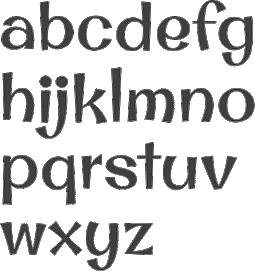 Stiggy & Sands is the Arvada, CO-based type foundry of Brian "Stiggy" Bonislawsky and Jim "Sands" Lyles, est. 2013. Their first commercial typefaces, all jointly designed, are Sante Pro (2013, a tall upright connected script), Rum Raisin (2013, inspired by the lettering from a vintage Kellogg's Raisin Bran cereal box), Maiden Orange (2013), Luckiest Softie Pro (2013, a rounded comic book typeface that was inspired by hand-lettered vintage 1950s advertisement), Smokum Pro (2013, a Western typeface), Carioca Script Pro (2013, inspired by the lettering on the RCA Records Stereo Action Series in the 1960s), Uncial Antiqua Pro (2013), Spicy Rice Pro (2013: psychedelic or disco), Ultra Pro (2013: a Clarendon or wood style slab serif), Quintessential Pro (2013: calligraphic), Bruno Ace Pro (a techno/automoive font, followed in 2018 by Bruno Ace Pro Rounded), Aclonica Pro (2013), Special Elite Pro (grungy typewriter), Audiowide Pro (2013: organic techno face), Peralta Pro (2013: a bouncy cartoon font), Englebert (2013: inspired by the title screen of the 1930s film Der Blaue Engel starring Marlene Dietrich), McLaren Pro (2013: comic book style), Galindo (2013: a comic book typeface with square counters), Margarine Pro (2013), Righteous Pro (2013), Mouse Memoirs Pro (2013, cartoonish), Risque Pro (2013, funky style), Luckiest Guy Pro (a fat comic book font based on vintage 1950s ads), Original Surfer Pro (2013, an an offbeat sans serif font bursting at the seams with lively personality. Inspired by a vintage advertisement for the California Cliffs Caravan Park, this font exudes all of the fun of a summer vacation anytime of the year), and Marcellus Pro (a flared roman inscriptional typeface with both upper and lower case, originally published in 2012 by Astigmatic; CTAN page).
 Typefaces from 2014: Purple Purse Pro (an offbeat didone based on a vintage Ivory Soap ad from the fifties). Typefaces from 2015: Shojumaru (an oriental simulation font inspired by a movie poster for the 1957 film titled Sayonara, starring Marlon Brando), Sacramento (connected script), Bazaruto (a decorative set of typefaces inspired by wrought iron, Letters and Lettering by Carlyle and Oring, and didones), Maiden Orange Inline Pro. Typefaces from 2016: Syncopate Pro (unicase), Kapture (a great romantic script), Stint Pro (slab serif spanning condensed to expanded widths), Grand Hotel Pro (upright connected script), Ribeye Pro, Shojumaru Pro (oriental style), Freckle Face Pro. Typefaces from 2017: Dear Sans (rounded sans family), Glorious Song (a display serif typestyle that was inspired by the poster lettering for the 1948 movie Words and Music), Montez Pro. Typefaces from 2018: Croft (a revival of Lewis Buddy III's ATF classic, Roycroft, 1912), Navarone (a Greek simulation font inspired by the titling sequence of the 1962 movie "The Guns of Navarone"), Distressed Telegraph (based on the typewriter font Large Elite Type No. 44), Gimbel Script (a tall monolinear upright vintage script), Bigelow Rules Pro (a beatnik font), Eagle Lake Pro, Husk (a digitization and extension of a film typeface called Maile by LetterGraphics), Boilermaker (a digitization and extension of a film typeface from LetterGraphics dubbed Flair G100), Eagle Lake (calligraphic), Bruno Ace. Typefaces from 2019: Fascinate Pro (a soft-shelled art deco typeface), Artisinal (an art deco typeface that revives John W. Zimmerman's Cubist Bold from 1928). Modulate (a blocky modular typeface), Lorette (based on the film font Laurel from LetterGraphics), Quandor (based on the Lettergraphics film font Impacta), Magnate (a digitization of the film typeface Wilshire from LetterGraphics), Toastie (based on the film font Flair 312 by Lettergraphics), Latitude Sans (a heavy sans based on Lettergraphics' Free). Typefaces from 2020: Bugleboy (this font family revives and expands the film font Wood Grotesk by LetterGraphics), Berkshire Pro (a plump display typeface), Mervale Script Pro (a brush script originally done in 2012 at astigmatic One Eye). Typefaces from 2021: Huerto (a geometric angular sans), Pennyroyal Pro (an elephant feet font with irregular outlines), Pennyroyal (an elephant foot almost cutout font). Typefaces from 2022: Pardner (a hand-painted spaghetti Western font). MyFonts link. [Google]
[MyFonts]
[More] ⦿
|
Stine Alberry
[Great Dane Designs]

|
[MyFonts]
[More] ⦿
|
Struggletter
|
West Java, Indonesia-based designer (b. 2000) of the monolinear unicase sans typeface Rafflesia (2020). [Google]
[More] ⦿
|
Studio B (or: La Station B)
[Clément Barbé]

|
 Paris-based graduate of ESAG Penninghen (where he took courses from, e.g., Muriel Paris) who made a custom typeface for the Housse de Racket band in 2012. Dinosaur (2012) can be bought at Ten Dollar Fonts. He also designed the thin display family Muerte (2012), the alchemic typeface Pharaon (2012, inspired by the Spielberg movie Indiana Jones : Raiders of the Lost Ark), the display typeface Tennis (2012), the volcano-shape-inspired Volcano (2012), and the wavy Sailor (2012).
 In 2013, he made the alhemic typeface Black. Hellofont link, where his fonts can be bought. In 2019, he set up Studio B and promptly released the icon set Tropical (2019) and the great art deco bold poster and display typeface Coquette (2020). In 2020, he designed the art deco typefaces Yangi, Helite and Richart, and the unicase display typeface Boala. Behance link for Clément Barbé. [Google]
[MyFonts]
[More] ⦿
|
Studio Buchanan
[Jonathan Gibson]

|
 This London-based foundry evolved from Gibson Type Foundry in 2016. It is run by Jonathan Gibson, a digital designer in the UK, who worked at Design London. His typefaces include Swahbuckle (2014, quixotic and piratey; sold by YWFT), and Roehampton (2014, condensed sans, +Avenue, +Boulevard; sold by YWFT).
 In 2016, he designed Beaumont (a tuxedoed art deco sans called postdeco by Gibson), Clutch Sans (for Latin and Cyrillic: rounded and condensed) and Brand Neue (a condensed rounded sans). Typefaces from 2017: Halcyon, Monolisk (a rigid gothic almost brutalist typeface). Typefaces from 2019: Kamber. Typefaces from 2020: Compita (an 8-style slightly condensed workhorse sans), Bloxic (chunky and counterless), Thorben (named after the old Norse legend of Thorben Odinson), Acklebury (a chunky reverse contrast Western slab serif typeface, with a Tuscan sub-style). You Work For Them link. [Google]
[MyFonts]
[More] ⦿
|
Studio Typo
[Mehmet Abaci]
|
 Mehmet Abaci (b. 1978) is based in Istanbul. In 2014, he established Studio Typo, where one can buy his typefaces. Limited forms of the fonts can be downloaded fpr free from the Dafont site.
 Creator of the elegantly plump rounded sans typeface Vinyl Cuts (2013), Samatya (2013, a unicase piano key typeface), Boldie (2013), Laundry Day (2013, alphadings), and the wood log typeface Timbers (2013). Typefaces from 2014: Smush, Slim Fir (athletic lettering), Typonome, Typo Slab, Neons, E-Square (sci-fi typeface), Screamer, Typoline (piano key typeface), Omniblack (flared display face), Papillons (flared caps), Typoster (a great fat geometric slab serif typeface family accompanied by an equally great shaded outline style), Typo Comica (a family drawn to compete with Comic Sans), Tipo Press, Manyeto (calligraphic), Quatroline (prismatic typeface), Wardoom, Cabold Comic, Digiform, Akaju (oily fat typeface with lighting effects), Almira, Bonebastic, Comic White Rabbit, Sinema (a bit of retro movie art deco), Sober, Cali Brush, Tiny Plate, College Player, Smart Kid, Barbed, Wideroy, Angella (+outline: a poster family), Megi Sans. Typefaces from 2015: Bro 4D (outlined 3d capitals), Typo GeoSlab, H&B Sketch (a gorgeous sketched didone), Mixiva (a six-style athletic lettering slab serif family), Typo Sketch (sketched font), Malter Sans, Parole Script, Degaws (a great sketch font), Typo Comics, Gribal, Gribal Shadow, Early Times (a sans family), Quizma (an elegant sans family), Super Seven (shaded), Typo Slab Inline, Type Slab Irregular, Geoma (hairline geometric sans), Double Bubble (bubblegum typeface), Mona Bella, Typo Grotesk, Typo Grotesk Rounded, The Matic, Typografix (avant garde sans), Move X (techno family), Savaro Stencil (in the geometric style that is characteristic of Futura Black), MindBlue (sans), A Space. Typefaces from 2016: Wox Striped (multiline typeface), Wox Modelist (organic sans), Aprikas (sans), Meltix (techno sans family), Widolte (sans family), Mayeka, The Wireframe, Typo College (athletic lettering), Halftone Poster, Chocolate Bar (oily and gleaming), Type Round (circle-based sans typeface family). Typefaces from 2017: Zelta Six (octagnal), Wida Round (round sans), Prestij (geometric sans), Typo Style, Naughty Squirrel (fat poster typeface family that includes hatched and shadow styles), Typo Quik, Ageta (bubblegum style), Rock On (glaz krak typeface), Typo Square, Typo Angular Rounded, Planetium-X (monoline, techno), Big Pixel (octagonal), White Festive, Watchword Hairline. Typefaces from 2018: At the Midday, Typo Hoop (rounded circle-based sans family), Typo Longest (tall condensed sans), Maccos (a multilined font family), Asectica, Magettas (rounded monoline sans), Bluefish, Bluefish Eroded, Bluefish Scratched, Quesat (rounded sans), Quesat Striped. Typefaces from 2019: Manti Slab College, Pesta Stencil, Type Draft (a drafting font), Pages Grotesque (a caps only geometric sans), Typo Cut-Out, Swera, Minalis (futuristic). Typefaces from 2020: Typo Cut-Out Shaky, Typo Oval, Typo Formal (a tall monolinear sans), Typo Ring (circle-based, monolinear), Manti Slab, Manti Sans (+Fixed), Geco Strong (a fat sans), Tually, Slabten (an inline typeface), Minalis Double (an inline typeface). Home page. Fontspace link. [Google]
[More] ⦿
|
Subectype
[Rangga Singgih Subekti]

|
Subectype is the team of Rangga Subekti and Ari Liari. Madiun / Surabaya, Indonesia-based designer (b. 1993) of the handcrafted typefaces Brownie Sundae (2020), Brosia (2020), Jumping Unicorn (2020), Martina (2020), The Crafter (2020), Abu Dhabi (2020), Daisy Girl (2020), Million (2020: a fat finger font), Wishline (2020), Rollanda (2020), My Brother (2020), Kind Heart (2020: a monoline elementary school script), Superion (2020: a dry brush script), Outbreak (2020), Blues Malone (2020), Ardila (2020), Amerio (2020: weathered letters), Smothink (2019: architectural drafting letters), Anantasia (2019: script), Larianti (2019), Awesome Journey (2019: brush), Kalline (2019: formal), Adelina Camarie (2019), School Holic (2019: +Sketch, +3D), Horthen (2019), Darkline (2019: brush script), Be Strong (2019), Marthin (2019: script), Smilen (2019: a layerable font), Herlambang (2019), Golden Class Font Duo (2019: Script, Serif), Sabryne, Romantine (2019: curly Victorian), Bill Smith (2019), Butterland (2018: a free monoline upright script), Good Feeling Script (2018), Realstone (2018), Pageone (2018: dry brush script), Selter (2018), Beegal (2018: a Halloween script), Shortime (2018) and Oureet (2018). Typefaces from 2019: Brush King, Omiwa, Brillion, Madelican, Realistic, Little Miku, Le Gusto, Odesty, Belligan, After Fall, Caramel Macchiato, Really Better, Secret Midnight (a Halloween font), Being Strong, Smilen, Katrine, Funking, Gemmo, Amalina Script, Single Fighter (Asian brush), Yonkie, Bathilda (signature script), Rasionil (beatnik style), Homina, Madeline, Katrine, Aldania, Failing Star, Onarie (upright script), Maulidine (script), Donattio, Rezdone (unicase), Lovantine (a Valentine font), Govani Emire (script), Sensaka (brush script), Hanna Monica, Romi Diorama, Billea Quin, Bad Racer (weathered), Hey Elsie, Hey Elsie Cute, Feeling Lovely, Romantine Dingbat, Nour Manise, Harold Flower, Hello Linnea, Quick Divine, Saturdate (font duo). Typefaces from 2020: Cute Gorilla, Billion Dreams (2020, by Mans Grebäck and Rangga Subekti: a heavy signage script), Rockies, Spring Daily, Highline, Great Feeling Sans, Feeling, Easteria (a fat finger font), Black Bruno (dry brush), Candy Cake, Right Side, Lightside (brush script), Velfo, Hola Zozo, Fontarian (a Valentine's Day font), Nadilla, Adinda Melia, Wonderline. Typefaces from 2021: Mermaid Babies (a scrapbook font), Wonderful Today (a roundish script), Love Craft (a scrapbook script), Shining Monday (a chubby display typeface), Backline (a monolinear fat finger script), With You (script), Holidream (a monoline script), Hello Angel (a scrapbook font), Malira (an upright monoline script), Urban Black (a graffiti font), Gold Night (a brush script), Baby Sakura (script), Magic Holiday (a fat finger font), My Beloved, Jumping Unicorn. Typefaces from 2022: Alyson Signature (a wild calligraphic signature script). [Google]
[MyFonts]
[More] ⦿
|
Sudtipos
[Alejandro Paul]

|
 Alejandro Paul's Argentinian foundry is called Sudtipos. Veer writes about Paul: Alejandro Paul is one of the founders of the Sudtipos project, the first Argentinian type foundry collective. He taught graphic design and typography at the Universidad de Buenos Aires from 1996 until 2004 and has worked as an art director in prestigious Argentina-based studios, handling high-profile corporate brands such as Arcor, Marta Harff, Morph, SC Johnson, Danone and Movicom. He has walked away with awards from several design competitions. In 2003, he began working with artist Angel Koziupa, designing fonts and lettering for several top packaging agencies. In 2006 he was a speaker at TMDG06, the largest Latin American graphic design event - more than 4,000 designers were in attendance. His work has been featured in publications around the globe, including Step and Creative Review. He has walked away with awards from numerous design competitions. He has received two Type Directors Club TDC2 awards, in 2008 for Burgues Script and in 2009 for Adios Script. He teaches a postgraduate typography program at the University of Buenos Aires, where he previously taught graphic design.
 Sudtipos has made a reputation as the place to go to for script and signage type. Faces include Brownstone Sans (2010), Brownstone Slab (2013), Politica (2008, an architectural lettering superfamily, used, e.g., by Discovery Channel), Domingo (by Ariel Garófalo), Plumero (connected handwriting font by Diego Giaccone, which is also in the Umbrella Type collection), Murga (display font by Alejandro Paul based on lettering of Angel Koziupa, 2003), and these typefaces by Alejandro Paul: Tierra, Latinaires (2003-2018), Reflex (unicase), Downtempo, and Stardust. Free fonts: Mosaico (2003, pixel typeface by Alejandro Paul), Mabella (2001, Ramiro Espinoza), Rolinga (Carlos Carpintero). Divina (2004) is a Latinized digitization of Kurrent (designed by Rudolph Koch in 1927 and cut in 1935). Myfonts link. Pictures of their fonts in use. YouWorkForThem link. Blog / Facebook group. Additions in 2010: Business Penmanship (which is based on models of American business education penmanship, ca. 1900). Poem Script is another Spencerian face---it won an award at TDC2 2011 and at Tipos Latinos 2012. Fonts from 2011: Calgary Script (brush signage face), Viento (a lively version of Brisa, 2004, another font done with Angel Koziupa), Semilla (2011, a retro script based on an alphabet drawn by Ernst Bentele in 1953). Fonts from 2012 include the angular pair Bayoneta Pro and Machete Pro, both co-designed by Alejandro Paul and Angel Koziupa. Platinus Script Pro (done with Angel Koziupa) is a wedding font. His Hipster Script won an award in the TDC 2012 competition and at Tipos Latinos 2012. In 2013, he created Seashore Script (described as a feminine script, it has horizontal stress and is backslanted; some may consider it an Arabic simulation typeface). At Tipos Latinos 2014, Alejandro Paul cleaned up, winning awards for Bellissima Script, Seashore Script, Auberge Script (a penmanship font in the style of the French bâtarde and coulée), and Bayoneta. Typefaces from 2014: Jugo Script (a supermarket script, done with Angel Koziupa), Courtesy Script (a connected Zanerian script based on a model from 1876). Typefaces from 2015: Blog Script (an informal handwriting font, with Carolina Marando), Auberge Script (which was started in 2014). Typefaces from 2016: Wink (a connected script font co-designed with Joluvian), Henderson Slab and Henderson Sans (a large slab serif family loosely based on an alphabet drawn in 1906 by Albert Du Bois for the Henderson Sign Painter Book), Prangs (a thinly connected italic didone named after Prussian-American printer and lithographer Louis Prang (1824-1909)). Typefaces from 2017: In 2017, Tropical (with Joluvian: this package contains a bold, wet-looking display script, an inky, textured brush script, and hand-penned capitals with a felt-tip look). Typefaces from 2018: Fixture (a 72-font grotesk family published by Sudtipos). Typefaces from 2019: Replete Sans (a seven-style mainly art deco typeface inspired by early 20th century lettering on metropolitan buildings all over the world), Tafel Sans (a contemporary take on early- to mid-century geometric fonts). Typefaces from 2020: Antica (a wedge serif based on Latin poster and billboard typefaces from the 19th century). Typefaces from 2021: Statement Sans (an 18-style neo-humanist sans with an exquisite Black weight, by the Sudtipos team; it includes a variable font). Klingspor link. View Alejandro Paul's typefaces. Adobe link. [Google]
[MyFonts]
[More] ⦿
|
Suitcase Type Foundry
[Tomás Brousil]

|
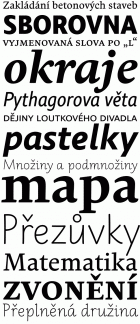 Suitcase Type is a Czech foundry, est. 2003 by Tomas Brousil (b. 1975), who lives in Prague. He graduated from the Prague Academy of Arts, Architecture and Design (Type Design and Typography, MgA. 2009) where his graduation project was the 96-family Tabac typeface system, published in 2010. He teaches in the Type Design and Typography department of the Prague Academy of Arts, Architecture and Design.
 The Tabac family started with Tabac Sans in 2010. It was augmented in 2012 with Tabac Slab and Tabac Mono, which have a full range of weights from Hairline to Black. Tabac Glam, a fashionable Peignotian high contrast sans, was added in 2016, and Tabac Micro in 2018. In 2019, he published Tabac Big Glam, Tabac Big Sans, Tabac Big Slab and Tabac Big. Other typefaces from 2008-2010 include Monopol (a six-weight condensed sans that includes a hairline weight), Idealista (2010, organic, a mix of styles), Nudista (2009, a multistyle take on DIN with a superb fashion mag hairline, Nudista Thin), Kulturista (2009, a part slab part serif extension of Nudista), Comenia Sans (2008, a 12-style complementary family to Storm's Comenia Serif for school textbooks), Metalista (2008, unicase octagonal metallic face). 2007 was a successful year. Brousil created Bistro Script (2007, fifties diner style script), Corpulent (2007), and Gloriola (2007, a sans in 14 styles, including a hairline. The last typeface family won an award at TDC2 2008 and at Typographica's Best of 2007. Stephen Coles likes its position between the cool sterility of de Groot's monolinears and the warmth of Latin designers: With a broad range of weights, a complete Western character set, and a sack of ligatures and alternates, Gloriola has the depth required for complex identity systems and publication design. This shrewd response to the fashions of today is going to be useful for many years to come.). The year 2007 also saw Purista (a 10-style cousin of Eurostile), which includes hairline weights. Ellen Lupton says this about Purista: I've been feeling hungry for a stylish, edgy sans who enjoys evenings out on the town and long mornings of crisp conversation. In other words, I've been craving a font who likes to party but who can also help out with the dishes. Production in 2005-2006: Teimer's Antiqua (2006: a didone family based onn unpublished 1967 design by Pavel Teimer), Rokoko (2006, an octagonal custom typeface for the Rokoko Theatre in Prague), Sandwich (2006, a lively display caps set), Vafle (2006: based on an original concept by Marek Pistora from 1997, with minor adaptations and 11 new weights), Dederon Sans and Serif (2005, the sans version being inspired by TypoArt's Liberta; see also here for a comparison with Underware's Dolly), Dederon Serif. Typefaces from 2004 or earlier include Fishmonger (2004, a sans family), RePublic (a 2004 revival, done with Radek Sidun, of Public by Stanislav Marso, 1955. Note that Public was used to set the text of a Czechoslovak Communist party newspaper, Rudé Právo), Botanika (2005, a sans family including many typewriter styles and several mono weights), Atrament (2003, a narrowed grotesque inspired by the lettering used on the title of the almanac "Devetsil - Revolucni slovnik" (1922) edited by Karel Teige, in 30 styles!), Magion (2004, a simple geometric font), Fishmonger (2004, a broad 50-weight futuristic family), Katarine (2004, a warm sans family with appropriate dingbats added in), and Orgovan (2004-2005, a punk/brush family). Typefaces from 2013 include the roundish sans family Ladislav: The Ladislav font revitalises Sutnar's legacy, while not explicitly copying any of his original fonts. It however keeps true to their technicist character and initial principles of character creation - a simple modular system of combined geometrical segments. This approach affects all round shapes of capital and lowercase letters, as well as the shapes of the majority of numbers. The g consists of two disjoint circles. Typefaces from 2014: Urban Grotesk (a very airy, open grotesque typeface with large x-height and uniform grayness). Typefaces from 2015: Pacifista (stencil). Typefaces from 2016: BC Novatica (by Tomas Brousil and Marek Pistora (Briefcase Type): Novatica was created based on a commission from the Czech commercial television station Nova in 2007. Marek Pistora worked with Tomas Brousil to create an alternative to a readable, simply designed sans. They naturally called the typeface Novatica. In 2014 TV Nova decided to abandon Novatica for good, and in so doing it released the exclusive licence it had been using. Novatica thus became a new typeface offered by Briefcase Type Foundry. Typefaces from 2017: Jaroslav (monolinear sans, named after Jaroslav Benda, followed in 2020 by Benda), Pepi and Rudi (a sans and slab pair based on basic shapes such as circles, rectangles and triangles). Typefaces from 2020: Atyp BL (+variable), Atyp (+variable). A 25-style sans family remotely influenced by Bauhaus. Typefaces from 2021: Crabath (a 72-style transitional typeface family based on the 1761 specimen book of Czech typefounder Vaclav Jan Krabat; this family covers several optical ranges, from Subhead to Display to Text, and features wonderful initial caps). Typefaces from 2022: Atyp Kido (a 6-weight and variable rounded sans family for Latin, Greek and Cyrillic). Brousil made many corporate or identity fonts. Examples include Brzda (a custom font for Czech artist Pavel Brazda), Budovatel (a custom font for the Bohemian National Hall in New York), and Union (custom webfonts for the Czech graphic design union). MyFonts page. Behance link. Klingspor link. MyFonts interview. View Tomas Brousil's typefaces. [Google]
[MyFonts]
[More] ⦿
|
SunFonts
|
Designer of the free unicase typeface Sunfonts Stencil (2021). [Google]
[More] ⦿
|
Suro Studio (or: Surotype)
[Adil Budianto]

|
 Adil Budianto (Suro Studio, or Surotype, Yogyakarta, Indonesia) designed the spurred Victorian signage typefaces Jainem (2014), SurocK (2014), Nihlah (2014) and Rocoustic (2014).
 Typefaces from 2015: Mantan (script), MounTiane, Neaby (script). Typefaces from 2016: Mahmur (signage brush script), Anthem, Suargie (signage brush script), Mentari. Typefaces from 2017: Muara (free demo), Handler (signage script), Crutsen (signage script), Entm, Mettars (a strong signage brush typeface), Mantten, The Brown. Typefaces from 2018: Groches, Brayline (monoline script), Muara No. 23. Typefaces from 2021: Popfun (a condensed layered unicase font), Rockids (a condensed all caps sans), Gangsar (a 6-style condensed sans with high shoulders), Gendis (a condensed vernacular sans), Rosign (an all caps sans), Berose (a stylish condensed sans), Chedros (humanist, all caps), Parten (inspired by 1950s motel signage). Creative Market link. Another Creative Market link. Yet another Creative Market link. Behance link. Behance link for Adil Budianto. [Google]
[MyFonts]
[More] ⦿
|
Tanya Chong
|
Ex-student of Nick Shinn in Toronto who made the unicase graffiti typeface Flow in 2003 at York University. [Google]
[More] ⦿
|
Taylor Benvenutti
|
During her studies at SCAD, Taylor Benvenutti (Boca Raton, FL) created the unicase display typeface Dailey (2013). Behance link. [Google]
[More] ⦿
|
Teeline Fonts
[Craig Eliason]

|
 Teeline Fonts is a digital type foundry launched by Craig Eliason (b. 1969, Houston, TX) in 2010. A professor of modern art and design history in the Department of Art History at the University of St. Thomas in Saint Paul, MN, Craig researches the history of type design, and particularly the history of its classification and vocabulary. He began designing his own fonts in 2008. Craig obtained a Ph.D. from Rutgers in 2002. Read, for example, Face the Nation: National Identity and Modern Type Design 1900-1960.
 His typefaces: - Ambicase Modern (2010), a unicase font, and Ambicase Fatface (2011).
- Flipper (2013), later renamed Backflip. Flipper won an award at the Morisawa Type Design Competition 2014.
- Cuttlefish (2021). A five-headed sans (+variable) superfamily with very different substyles called Neutral, Pragmatic, Optimistic, Luxe and Modern. He writes: Cuttlefish Pragmatic is a friendly sans in the mode of early-20th-century American Gothics. The Optimistic style is inspired by 20th-century ‘serifless romans’ that themselves took inspiration from Renaissance letters. The Modern styles are patterned after 18th-century high-contrast types, but excised of most serifs. Cuttlefish Luxe is a light and sophisticated contrasted sans. The Neutral styles are straightforward grotesques with even stroke weights.
- Plenaire (2021). A pebbled and speckled optical effect font family.
- Feneon (2021). An elegant multiline font family with possible uses as a neon font.
[Google]
[MyFonts]
[More] ⦿
|
The Foundry Types

|
 London-based foundry set up by David Quay and Freda Sack in 1989, and after Freda's death, continued by David Quay and Stuart de Rozario. Their typefaces were first made using the Architype label:
 - Architype Albers (1997).
- Architype Aubette. Based on Theo van Doesburg's 1928 signage lettering for the Café Aubette in Strasbourg.
- Architype Ballmer. A De Stijl typeface inspired by the experimental, universal letterforms drawn by Bauhaus trained Swiss designer Theo Ballmer for a series of 1928 posters, most notably for an exhibition on industrial standards.
- Architype Bayer. Drawn from Bauhaus Archiv sketches for a minimal sans typeface that was created in 1925 by Herbert Bayer.
- Architype Bayer-Type. Based upon Herbert Bayer's 1931 universal, modern serifed alphabet. Although the modern style appears to be a radical departure from his first sans single alphabet of 1925, the structure of this later serifed style is still grid based and geometrically constructed.
- Architype Bill. The Foundry writes: Architype Bill was developed from the few letterforms created by Max Bill for a 1949 exhibition poster. All the forms, with the exception of the letter o, were constructed using only straight lines and triangles on a purely mathematical basis, that showed the continued influence of his earlier Bauhaus training, and the universal alphabet principle.
- Architype Catalogue Outline, Architype Catalogue Solid (2016). Architype Catalogue originates from Wim Crouwel's Stedelijk Museum exhibition catalogue for sculptor Claes Oldenburg, 1970. The cover's soft padded letterforms evoke the artist's work. Oldenburg was so taken with the design, that he asked Wim Crouwel to complete the alphabet.
- Architype Fodor. Based on Wim Crouwel's work, the Fodor letterforms were created for the magazine published by Museum Fodor, Amsterdam. To save cost it was designed to be typeset on their own electric typewriter.
- Architype Ingenieur. Architype Ingenieur was inspired by Wim Crouwel's late 1950s exhibition catalogues and posters, for which he had created a few geometrically constructed, simplified letterforms. In the 1960 Venice Biennale Dutch entry poster, he drew grid-based letters with 45-degree angles for olanda, the style influenced by his boyhood fascination with naval lettering. A subtle variation appeared in the Stedelijk Museum catalogue for painter Jean Brusselmans. Several dot matrix versions followed. The themes and systems in these early letterforms are encapsulated in this new (2016) four-weight family Architype Ingenieur.
- New Alphabet 1 through 3. Based on Crouwel's New Alphabet and developed in consultation with him)---a free version of this is New Alphabet (2008, Matt McInerney).
- Architype Renner. Related to the early experimental versions of Paul Renner's Futura.
- Architype Stedelijk (1997). LED-like, based on Crouwel's ideas. The Foundry writes: Stedelijk first appeared in the seminal Vormgevers poster, commissioned by the Stedelijk Museum, Amsterdam in 1968. Crouwel created a rigid grid system across the poster of 57 vertical by 41 horizontal lines, also forming the basis for the construction of the letterforms. Although all hand drawn, the resulting typeface had a machine-made appearance. This striking black and white poster with its visible grid became one of Crouwel's most iconic designs. Architype Stedelijk now re-creates these letterforms as a single alphabet typeface in a digital font.
- Architype Schwitters. Developed from the phonetic experiments made by Kurt Schwitters with his 1927 universal alphabet.
- Architype Tschichold. A very thin avant-garde sans: Architype Tschichold is a faithful rendering of Jan Tschichold's 1929 experimental alphabet which was influenced by Bayer's single-alphabet. His design was never put into production. This re-creates his original geometrically constructed design, including some phonetic characters.
- Architype Van der Leck (1993-1994). Based on a 1941 De Stijl alphabet designed by Bart van der Leck for the avant-garde magazine Flax.
- Architype Van Doesburg (1996). Based on a 1919 alphabet by Van Doesburg obtained by dividing a square into 25 equal smaller squares.
- Architype Vierkant. This typeface was developed from the few letterforms that Crouwel created for an opening spread in a 1972 Drupa catalogue, on the theme "typo vision international".
Their other fonts have the label Foundry and include Foundry Sans (1990, a humanist sans inspired by Stempel Garamond), Foundry Old Style (1990-1994, inspired by Nicholas Jenson's types), Foundry Wilson (a Baskerville that revives a 1760 font from Scottish type founder Alexander Wilson), Foundry Journal, Foundry Gridnik, Foundry Form Sans, Foundry Form Serif, Foundry Monoline (2000), Foundry Origin, Foundry Sterling (2002, sans serif, in the style of Bliss and Gill Sans), Foundry Context (a sans family), Foundry Dat, Foundry Dit, Foundry Fabriek (an industrial orthogonal almost military stencil developed in consultation with Wim Crouwel), Foundry Flek (a dot matrix font), Foundry Plek, Foundry New Johnston, and Foundry Wilson Expert. Michael Barbosa started work on Metroplis (1995) for Metroplisboa, the Lisbon subway, while he was working at Wolff Olins. That custom font project was finished by David Quay and Freda Sack. [Google]
[MyFonts]
[More] ⦿
|
The PAP Type foundry
[Theod. Paraskevopoulos]
|
Major Greek type foundry, est. 1956, which reached its peak in the mid 1960s. Part of its 1964 type specimen catalog was republished in Hyphen (vol. 4(1)), 2003. They made 176 different Latin alphabets and even more Greek character sets. It was located in Athens and run by Theod. Paraskevopoulos. There are nice selections of Greek stone-cut style typefaces, script typefaces (Kerkyraika, Olympiaka), modern type (Neukro 1960, Perfekt), Egyptian typefaces, sans typefaces (Korinthiaka, Nettas, Iphigeneias), brush typefaces (Arcadia III), text typefaces (Pelasgika, Elzevir), fun display type (Byzantina, Aiolika Stena, Astoria, Orpheus, Greco 1100B), Western type (Epidaurou), caps display type (Nikes, Olumpic Leuka, Ioulias, Rodiaka, Bersaliana Stena), unicase (Athenaika) and typewriter type (Makedonika Leuka). [Google]
[More] ⦿
|
Theod. Paraskevopoulos
[The PAP Type foundry]
|
[More] ⦿
|
Thomas Huot-Marchand
[256tf]

|
[MyFonts]
[More] ⦿
|
Thomas Mettendorf

|
 Aka Thomas Schnäbele (b. Karlsruhe, Germany, 1966). Designer of the GFToaster family and the GF CafeRetro family at Garagefonts in 1998. He also designed Derivat (1998, a rub-down letter font), Tipi (1998: grunge), Dualis, Mobilette (1999), Five Link Chain (1999), Fonicons (dingbats, 2000), Fono (2000, techno family, which includes unicase weights), Modus (2001), Metroflex (2003-2004, Garagefonts: based on geometric principles and conceived as an "experimental vision!" for Fritz Lang's classic film, Metropolis). At Linotype, he designed Linotype Method (1997) and Linotype InkyScript (1997).
 In 2006, at Volcano Type, he designed Copy, a sans family consisting of Copy Regular, Copy Bold, Copy Italic, CopyCut Regular, CopyCut Bold, CopyCut Italic, CopySemiGrotesk Regular, CopySemiGrotesk Bold, CopySemiGrotesk Italic. This family has the look and feel of typewriter types. In 2007, he decided to quit type and graphic design and went into music. FontShop link. Klingspor link. Volcano Type link. Linotype link. FontShop link. [Google]
[MyFonts]
[More] ⦿
|
Tiago Pereira
|
Graphic designer and typographer in Curitiba, Brazil. Creator of the beautiful unicase avant garde typeface Repo Type (2010), the Barnbrookish typeface Vicctoria (2010), and the Peignotian typeface RBSC (2010). Behance link. Another Behance link. He is credited with the free chisel font Nosewritten (2009, a Greekish typeface created without using any hands; see Unique Types). Behance link. [Google]
[More] ⦿
|
TipografiaRamis
[Ramiz Guseynov]

|
 Ramiz Guseynov was born in Russia and educated as an architect and graphic designer. After moving to the USA in 1991, where he worked as a graphic designer, Ramiz Guseynov became a part-time type designer who published his work at T-26. In 2004, he set up his own foundry, TipografiaRamis in Highland Park, IL.
 Klingspor link. Behance link. His typefaces: - Septa (2001).
- Alert (2002). A seven-weight octagonal font at T-26.
- Croog (2009) and Croog Pro (2018). A rounded monoline typeface family.
- Volt (2007). Mechanical, octagonal.
- Egon, a 6-style industrial slab serif family done in 2007-2010, was named after the great German architect, Egon Eiermann. Egon Sans followed in 2011. Egon Sans Condensed followed a few months later in 2011.
- Fermo TRF (2008). Geometric, angular, techno-stylish display typeface. The original Fermo was done in 2002 at T-26.
- Decima (2008). A sans family, followed in 2009 by Decima and Decima Mono, in 2011 by Decima Nova, and in 2014 by Decima Mono X. In 2015, Decima Pro, Decima Mono Round, and Decima Round were published. In 2017, he added Decima Mono Cyr.
- Fox TRF (2008). An upright italic, that was followed in 2008 by Fox Sans TRF and further updated in Fox Sans Pro (2016).
- Octa (2008) is a full 9-style octagonal family that includes two stencil styles.
- Dina (2008) is an impish sans family, accompanied by Dina Stencil (2008).
- Mymra Piano (2009) is a monoline serif Roman face, inspired by Charles Robinson lettering from the art nouveau period. Mymra Forte and Mymra Mono (2009) are related. Mymra (2017) is a rounded slab serif family.
- Neubau (2009) is a condensed geometric display family with sans and slab serif subfamilies, which took inspiration from Joost Schmidt's lowercase letters developed from 1925 until 1928 at Bauhaus Dessau. Neubau Grotesque (2010) is an elementary minimalist sans face. Neubau Serif is a slabby version8. Neubau Pro (2018) is an update.
- The Meez (2009). Experimental, techno.
- Pona (2010). A serifed text family with large x-height.
- Toscana (2010). A decorative floriated display font.
- Umbria (2010). A decorative display family.
- Ultima (2010, a rounded monoline display family). Extended in 2013 to Ultima Pro.
- Arlequin (2010).
- Cargo TRF (2010). A stencil family.
- Compass (2002, T-26). A very innovative 21-st century geometric didone family redone in 2009 as Compass TRF; +Stencil, 2010). This was followed by Compass Next and Compass St (the stencil version) in 2014.
- The simple sans family Bouclé (2010; +Loopy, a version with loops and curls). Followed in 2017 by Boucle2.
- Croog is a rounded geometric monoline typeface, built in three weights with true italics. Inspiration for this typeface was derived from FF Roice (2003, Alex Scholing).
- Silver Twig (2011). A flowing upright semi-connected script.
- Haggard (2011) and Haggard Nova (2017). An angular wedge serif family.
- DeeDee (2011) is a Latin/Cyrillic display family.
- Centima (2011): a geometric sans serif typeface family. Centima Mono (2012, monospaced) is well suited for editorial and information design. Upgraded in 2020 to Centima Pro .
- Fox Grotesque (2012) is a semi-sans family with interesting alternates. Followed in 2014 by Fox Grotesque Pro.
- RAMS (2013) is a retro grotesque.
- Colon and Colon Mono (2013) are slabbed typefaces that emulate typewriter typefaces.
View Ramiz Guseynov's typefaces. [Google]
[MyFonts]
[More] ⦿
|
Tomás Brousil
[Suitcase Type Foundry]

|
 [MyFonts]
[More] ⦿
|
Totem Design
[Lasko Dzurovski]

|
 Based in Skopje, Lasko and Tomi Dzurovski are the designers of Tomidium (T-26, 2001), Isidium (T-26, 2001), and Sanos (2001, a fat elliptical typeface done at T-26).
 They are in Skopje, Macedonia and run Totem Design. One of their fonts is TF Bista (2009). They are working on Revolt (2009). The Macedonian Government has licensed (for free download by the general public) Stobi Sans and Stobi Serif, which were created by Lasko Dzurovski in 2009. In 2011, Lasko designed the TF Debel display family, in Solid, Open, Script and Glow styles. Lasco (2013) is a free comic book / cartoon font. Advertized as better than Comic Sans. Skola Sans (2009) is a free 20-style sans family. Mamut (2015)---not to be confused with Francesco Loschiavo's Mamut from 2012) is a headline and logo unicase typeface. Lara Soft is a free typeface that shows infliences of ITC American Typewriter. During Typeclinic 11th International Type Design Workshop, he created the typeface Elegant Sans (2015). At Rosetta Type in 2015: Clone: The lovechild of cyber-culture and genetic font modification takes inspiration from coding, technology and architecture. Typefaces from 2016: Skorid (a multilingual octagonal typeface started in 2013). Typefaces from 2017: Decoral (art deco). Typefaces from 2018: Kino (a free movie font), Decoral Soft. Klingspor link. Behance link. [Google]
[MyFonts]
[More] ⦿
|
Travis Stearns
|
 Travis Stearns (was: I am Mint Condition) is a graphic and type designer in Minneapolisa, MN. He created the hand-drawn Hugo typeface in 2008 at YouWorkForThem. Other fonts there: Herzog (2008, fat experimental caps, with Taechit Jiropaskosol), Magoo (comic book style), Pineapple (2009, an art deco blackboard bold typeface), YWFT Morricone (2009, a great spaghetti western ultra slab serif with Italian features), Enigmatic Hand, Seaweed, Wellsworth Script (neurotic), Grosskopf (great fat poster font), YWFT Thinaire, Pierre (hand-drawn), YWFT Absent Grotesque (2008), YWFT Basel (2009, a cross of Spartan and Optima), YWFT Isanti (2010, neatly handlettered), YWFT Neighborhood (2008, an eroded vintage text font), Alexios (2010, a modular ornamental experiment), Odon, BLKMTL (runes), Garnier (child's hand), Fridge (hand-drawn outline face), Hannah (2009, three version of different widths; hand-set), Michel (2009), YWFT Motown (2009, a geometric slab serif), Valley (2009, a ball and stick-themed font), Skute (2009, free at You Work For Them, patterned after Cassandre's Bifur).
 Typefaces from 2012: Valley (a ball and stick display face), Basel (Basel is a heavy sans serif font that began as a revival of the metal type Spartan Black, an American copy of Futura developed in 1936, but ultimately took on a character of its own during the process). His blog. Behance link. Klingspor link. [Google]
[More] ⦿
|
Tyler Young
[Mean Tangerine]

|
[MyFonts]
[More] ⦿
|
Type Department
[Jürgen Huber]

|
 The Type Department was founded in 2010 by Jürgen Huber (Berlin, b. 1967) and Malte Herok. In 2011 Martin Wenzel joined as a friend of the Type Department. Much of the work is typographic and centers on logo, retail and custom type design. Jürgen Huber, who studied at Folkwang Academy in Essen and is now a professor of typography at FHTW in Berlin, a city he moved to in 1997, designed FF Plus Sans (2003, a sans family), FF Ginger (2002, includes Ginger-Icons, and FF Ginger Flamboyant, 2014), FF Angst (1997, grunge) and Hothouse (which netted him a Bukvaraz 2001 award). His typeface Scheck (Meta Design, made for Sport Scheck GmbH) won an award at the TDC2 2005 type competition.
 Jürgen Huber originally designed Crocodile Brokenscript (2013, blackletter) for a small brewery in München where it is used alongside with its sanserif counterpart. FontShop link. Most of Huber's typefaces are published vi FontShop / FontFont due to his spell as type director at Meta Design. Typefaces from 2014 by Huber include TD Lemon Sans, TD Lemon Sans Rounded (released in 2015), TD Lemon Serif (a low contrast very readable text typeface; +Unicase; see also here), TD Hothouse---that font was started in 2001 as a corporate typeface for the Glasgow School of Art, and took inspiration in the arts and crafts lettering of Charles R. Mackintosh. Typefaces from 2016: Scarlet, Scarlet Wood, and Scarlet Script. In 2019, he released the free Google web font Blinker. He writes: Blinker is a low contrast sans serif typeface with a squircle as its basic shape, think squarish curves, or Eurostile's flamboyant cousin. It's best used for medium to large text, rather than a long copy. To do its claim justice Blinker also comes with a headline weight with an extra large x-height, tight spacing, and glyphs drawn more narrowly. Github link. [Google]
[MyFonts]
[More] ⦿
|
Type Together
[Veronika Burian]

|
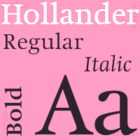 Foundry est. in 2005 by Veronika Burian (Czechia) and José Scaglione (Argentina). TypeTogether's library of retail fonts includes
 - Karmina (Veronika Burian / José Scaglione, a text typeface for newspapers, winner of the ED Awards) and Karmina Sans (12 styles). Award winner at Tipos Latinos 2010. Karmina, Bree and Ronnia were selected as part of the travelling exhibition Tipos Latinos 2008.
- Athelas (José Scaglione / Veronika Burian, 2008, a calm and balanced 4-style book type family, winner of the first prize at the Granshan 2008 competetion).
- Ronnia (Veronika Burian / José Scaglione, a flexible sans serif for editorial use with 28 styles).
- Maiola (an award-winning calligraphic serif family by Burian).
- Crete (Veronika Burian, 2007, inspired by lettering in a chapel in Crete, winner of the Gransham 2008 competition; ideal for posters). Followed by Crete Round (2011).
- Bree (Veronika Burian / José Scaglione, 2008). A 10-style upright italic with a matchting oblique for display usage. In the years that followed, Bree was substantially expanded: Bree is available in Greek (by Irene Vlachou), Cyrillic (by by Veronika Burian, with expert support by Vera Evstafieva), Arabic (by Azza Alameddine) and Thai (by Cadson Demak's Panuwat Usakulwattana). Bree Latin now supports Pinyin and features improved Vietnamese diacritics (with the help of Donny Truong). Bree Devanagari (by Pooja Saxena) is in the works.
- Adelle Sans. A 12-style slab serif family made in 2009. Award winner at Tipos Latinos 2010. Adelle Condensed followed in 2013. With the help of Erin McLaughlin and Vaibhav Singh, Adelle Sans Devanagari was finished in 2017. Adelle Mono was added in 2020.
- Abril (2010) is a didone font family engineered mainly for newspapers and magazines that features friendly and elegant styles for headlines and robust and economic styles for text. It won an award at Tipos Latinos 2012. Abril Fatface is free at Google Font Directory. Abril Titling was published in 2013-2014.
- Jockey One (2011) is a free sans typeface at Google Font Directory.
- Birdy (2011). A free angular inline typeface by Veronika Burian.
- Fonts by third party designers: Cora (by Bart Blubaugh), Alizé (2009, by Tom Grace) and Givry (by Tom Grace: a bastarda typeface), Iskra (2012, by Tom Grace; not to be confused with Iskra by Edgar Reyes, 2009), Gitter (a modular type with letters built up of triangles).
- Tablet Gothic (2012). A joint design of Veronika Burian and José Scaglione, it is a grotesque meant for titling. Tablet Gothic won an award at Tipos Latinos 2014.
- Alverata (2013). A lapidary flared typeface with a huge x-height influenced by roman ("romanesque") lettering from the XIth and XIIth centuries. Alverata consists of three different fonts: Alverata, Alverata Irregular and Alverata Informal. For the development of the Greek letterforms, Unger collaborated with Gerry Leonidas (University of Reading) and Irene Vlachou (Athens). He cooperated with Tom Grace for the Cyrillic letterforms. Alverata was published by Type Together in 2014 and 2015. It appears to have Vesta's skeleton and dimensions. PDF file.
- In 2015, Veronika Burian and José Scaglione finally published the 18-style editorial sans typeface family Ebony, which won an award at Tipos Latinos 2016.
- TypeTogether and Design Sessions Studio collaborated in the development of a logotype and an associated type family for the government-owned TV channel and Radio station of Puerto Rico, WIPR Unicase.
- Protipo (2018) is a 52-font information design sans family designed by Veronika Burian and José Scaglione. This was a major team effort. Irene Vlachou will soon finish the variable font production. The information icons were designed by Luciana Sottini. Kerning by Radek Sidun and engineering by Joancarles Casasin.
- In 2019, Type Together released Catalpa (Veronkia Burian, Jose Scaglione, Azza Alameddine) and wrote: Primed for headlines, Catalpa is designed to give words bulk and width and gravity itself. The Catalpa font family is José Scaglione and Veronika Burian's wood type inspired design for an overwhelming headline presence.
- Postea (2021). A geometric sans with some eccentric details and variable font support. Noemi Stauffer writes: Postea comes with a collection of Bauhaus-inspired geometric patterns and ornaments and a suite of icons that can be called up simply by enclosing their names between a pair of colons, and choosing the correct stylistic set. Now that is typographic magic!
- Type Together made many custom typefaces. These include Abril Almeria(for Spanish newspaper La Voz de Almeria), Athelas Apple Books (for Apple iBooks), Bodoni Stencil (for Levi's---based on ParaType Bodoni), Clarín Titulos(for Argentine newspaper Clarin), Karmina Cyrillic (for Bible Society in Russia), Spore (for Electronic Arts), Twinkl Cursive (for Twinkl educational materials), Twinkl Sans, WIPR (for Puerto Rican broadcaster WIPR), NRK Etica Super and Slab, Bree Peru, Literata Book, Qlikview Sans.
- In 2021, Veronika Burian and José Scaglione designed Belarius, a three-axis variable family that shifts from sans to slab serif, from condensed to expanded widths, and includes every possibility in between. Published by Type Together in 2021, it was developed under the guidance of Veronika Burian and José Scaglione, with type design by Azza Alameddine and Pooja Saxena, and additional kerning and engineering help from Radek Sidun, Joancarles Casasin and Irene Vlachou.
Speaker at ATypI 2017 Montreal. MyFonts link. Klingspor link. Type Together occasionally published educational books as well. In 2022, they released Building Ligatures The Power of Type. MyFonts interview. Catalog of the Type Together typeface library. Adobe link. [Google]
[MyFonts]
[More] ⦿
|
Typeco
[James Grieshaber]

|
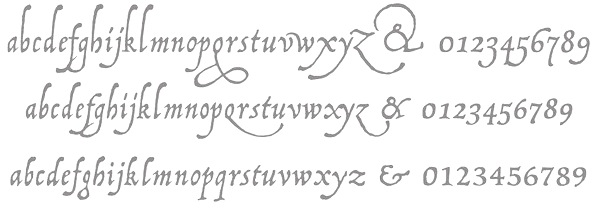 James Grieshaber earned a BFA in Graphic Design from Rochester Institute of Technology. Based first in Rochester, NY, and then in Chicago, IL, and then again in Rochester, Grieshaber ran Typeco, a typographic services and solutions company established in 2002. James Grieshaber (b. Detroit, 1967) most recently was on staff of P22 Type Foundry, where he designed many type families and helped establish International House of Fonts. He has been honoured with an award of Excellence in Type Design from Association Typographique International (ATypI) for his Gothic Gothic (2004, blend of blackletter and English style), and by TypeArt'05 (for Operina Cyrillic). Designer and Co-editor of the Indie Fonts book series, Grieshaber now teaches typography at RIT and runs Typeco. MyFonts sells his fonts now. YouWorkForThem sells the Super Duty family (stencil), Glyphic Neue, the Trapper families, Chunk Feeder, Gothic Gothic and Cusp. Identifont page. FontShop link. Behance link. Details on some of his typefaces:
 - Gothic Gothic (2001), an extended blackletter co-designed with Christina Torre. In 2004, he received an award of Excellence in Type Design from Association Typographique International (ATypI) for his Gothic Gothic type design.
- The Glyphic Neue display family was inspired by the Op Art style of lettering in the United States that ran rampant in many photo type houses in the 1960's and 1970's---I like to call it the "piano key style".
- Chunkfeeder (2002) is a beautiful monospaced octagonal OCR-like family.
- Cypher (2003, an LED/LCD family) has 24 weights. Of these, Cypher7 is free.
- Duty (2002) is a sans typeface co-designed at T26 with Lee Fasciani.
- The stencil family Super Duty (2004) has 8 variations. There are also techno variant called Superduty Condensed, Superduty Regular, Superduty Narrow and Superduty Text.
- Cusp (2001-2005): a techno display family with 18 weights, including an LED style, art deco styles and Cusp De Stijl.
- Trapper (2004) is an 8-weight exaggerated ink trap font family which comes in Trapper Round and Trapper Sharp versions.
- Zaftig (2008, Typeco) is a super-fat face.
- P22 Operina (2003, in Romano, Corsivo and Fiore versions) is based on Vicentino Ludovico degli Arrighi's calligraphy used in his 1522 instructional lettering book La Operina da Imparare di scrivere littera Cancellarescha. This book contains what is considered to be the earliest printed examples of Chancery Cursive. P22 Operina won an award at TypeArt 05. Operina Pro contains over 1200 glyphs. In 2010, Paulo Heitlinger compared P22 Operina favorably to another digital chancery font, Poetica (by Robert Slimbach, Adobe), which, according to him [and I agree], lacks vigor and dynamism.
- P22 Posada (2003, with Richard Kegler): based on lettering of Mexican printmaker José Guadalupe Posada (1851-1913) that was used for some of his posters and broadsides.
- P22 Arts and Crafts Tall (1995, art nouveau), P22 Arts and Crafts Hunter (1995). Both based on alphabets by Dard Hunter, 1908-1910.
- P22 Art Deco Chic (2002), based on the Art Deco hand lettering of Samuel Welo, ca. 1930. P22 Art Deco Display (2002) is a Broadway style face.
- Churchy (2002).
- He offered (offers?) a handwriting font service for 100 USD. Free trial typeface Reenie Beanie (2002). Signature font service for 50 USD. Reenie Beanie (2002) is now offered (as a joke, I assume) as part of the Google open font directory (for free web fonts).
- P22 Garamouche (2004, with Richard Kegler). Comes with Garamouche Ornaments (2004).
- Segoe Print (2006, Monotype Imaging). [Isn't this Googlee's competition?] This is an informally hand-printed typeface co-designed with Brian Allen, Carl Crossgrove, James Grieshaber and Karl Leuthold at Ascender.
- P22 Cezanne Pro (2006). Has over 1,200 glyphs.
- P22 Yule (2005; Heavy, Inline): a stone chisel family with a hint of Neuland.
- P22 Numismatic (2005): originally offered by the Devinne Press, and based on ornaments and letters used by 15th and 16th century engravers of seals and coins; however it looks very much like Otto Hupp's Numismatisch (1900, Genzsch&Heyse).
- Black Ops One (2011) is a military stencil face, available at the Google Font Directory.
- Short Stack (2011) is Grieshaber's free contribution to the Comic Sans genre. It was published by Sorkin Type and can be downloaded from Dafont.
- Atomic Age (2011) is a free font at Google Font Directory. It was inspired by 1950s era connected scripts seen on nameplates of American cars.
- Sarina (2011). A connected script published by Sorkin Type.
- Supermercado One (2011, Google Font Directory) is a low contrast semi geometric typeface inspired by naive industrial letters. More a signage typeface than a web font.
- Typeco Grecian (2012, FontStruct) is loosely based on a Wells & Webb Grecian style woodtype circa 1846.
- Typeco De Stijl (2012, FontStruct) is based on Van Doesburg's De Stijl magazine's name plate in 1923. Typeco Topaz Serif Tall (2012, FontStruct) is a pixel typeface. Typeco New Wave (2012, FontStruct) is an op art party font.
- Metamorphous (2012, Sorkin Type) borrows its arches from Gothic cathedrals---it was inspired by Jonathan Barnbrook and by the free font Morpheus. Google font download.
- HWT Geometric (2013, Hamilton Wood Type Foundry) is a squarish wood type family: Geometric began its life as a metal typeface from the Central Type Foundry, circa 1884. Soon after, this design was officially licensed to Morgans & Wilcox and was shown in their 1890 catalog in Regular, Light and Condensed Light variations. After acquiring Morgans & Wilcox, Hamilton Manufacturing offered Geometric Light Face Condensed as their own No 3020 and the Geometric Light Face as No 3021. HWT Geometric has been expanded digitally to include a Regular Condensed version.
- Trattatello (2014). An Apple system font.
- HWT Archimedes (2017, P22). A revival of the Page No. 122 wood type called Mansard Ornamented, done together with Richard Kegler (P22) and Virgin Wood Type. They write: This new digital version is a simultaneous release with Virgin Wood Type and features a variety of styles including the standard screw head option plus a Phillips head, hex/Allen wrench head, and even the vexing Apple pentalobe tamper resistant star screw. As a bonus, the screwheads themselves are accessible via a glyph palette, so you can put the screws to Comic Sans, or any other font, if you so desire.
Klingspor link. Google Plus link. Behance link. Fontsquirrel link. [Google]
[MyFonts]
[More] ⦿
|
Typekirk
[Kelly Hobkirk]

|
 Kelly Hobkirk (Typekirk, Seattle, WA) is a type and graphic designer. He created the modular typeface Ribbed and the pair of jazz-inspired fonts Coleman and Coleman Duo in 2015. In 2016, he published the contrasted all caps sans poster typeface Whim, and in 2017 Driven Unicase Extended (a 1970s squarish car ad typeface). Creative Market link. [Google]
[MyFonts]
[More] ⦿
|
Typeworx
|
Short-lived Toronto-based commercial foundry (2002-2003). The fonts included: Plumero Script (2002, a sublime connected handwriting font by Diego Giaccone). Reflex (2002, a unicase techno-style font family by Alejandro Paul), Domingo and DomingoAlternates (2002, a funky sans serif pair by Ariel Garofalo) and Frisco (2002, a gorgeous fat didone typeface by Fredrick Nader). Freddy Nader continued for some time his general advertising and graphic design work at Hardcover Communications [dead link]. [Google]
[More] ⦿
|
Typonauten
[Ingo Krepinsky]

|
 Ingo Krepinsky (b. 1976, Eschwege) graduated in 2000 from Fachhochschule Hannover, and in 20903 from Hochschule für Künste Bremen, where he specialized in typography. He is a cofounder and type designer at Typonauten, a Bremen-based commercial font foundry started in 1998 (together with Christoph Hanser and Stefan Krömer). MyFonts sells these fonts: Freakshow (2005, grunge), Nautilo Font System (2002, a futuristic font family), Oklahoma (2003, Wild West, handpainted look; the Pro version from 2012 was done with Gunnar Link), Toon Town (2005, a comic book typeface done with Stefan Kroemer), B-Movie Retro (2007 a brush font series with Florian Schick and Stefan Kroemer), B-Movie Splatter (2007, a grunge version of that family).
 Newsletter (2007) is an extensive no-frills sans family influenced by fonts like OCR-B and DIN. Newsletter Stencil was published at Volcano Type. Creator (with Gunnar Link and Stefan Kroemer) of Royal Oak Decor (Victorian ornaments), Royal Oak Sans (Edwardian headline sans) and Royal Oak Serif (Western headline face). Other commercial fonts: Dimitri (Cyrillic simulation), Flarrow, Grebbelinsky (nice dingbats), Killvetica, Litterae Diaboli, Mosaixxs, Nautilo (pixel font), Navtilo (pixel font), R2D2 (futuristic), Sheffield (sans), Singapur (2002, a gambling dingbat font), Oklahoma (2002, Egyptienne), Transarc, Uxmal (unicase with Mexican ornaments), Weimar (Bauhaus style), Estelec (Cyrillic simulation), Trixel (2002, free pixel font), Sport1, Spacelord (2013, sci fi face). In was waiting for this moment, but in 2015, Typonauten published the free slogan typeface Je Suis Charlie. Other free fonts include the dingbat face BremerSchriftkoffer (2010). View the typefaces made by Typonauten. Klingspor link. Dafont link. View the Die Typonauten typeface library. [Google]
[MyFonts]
[More] ⦿
|
Typophile
|
Typophile discussion regarding Unicase. [Google]
[More] ⦿
|
Typophiles: Unicase
|
A discussion at typophile.com regarding unicase fonts. [Google]
[More] ⦿
|
Unicase fonts
|
Unicase fonts are fonts in which we have only one set of letters that can be used both for uppercase and lowercase. It is believed that Herbert Bayer first proposed unicase type in his Bayer Universal typefaces (around 1929). A partial list of the candidates (links elsewhere on this page): - Bayer Universal (1925-1930) by Herbert Bayer, the original. Revivals at P22: P22 Bayer Fonetik (1997), P22 Bayer Shadow, P22 Bayer Universal. Nick Curtis has Debonair Inline NF (2008).
- Foundry Architype Bayer (1996) at The Foundry, fonted by Freda Sack.
- Marfhaus (1998) by Martin Fredrikson Core at Core.Nu Fonts.
- Alphabet 26: an idea of Bradbury Thompson, digitized by Paul Baker in 2001.
- Tschicholina (1997): by Joan Barjau, Type-o-tones.
- Panoptica (2003), a new monowidth unicase family by Nick Shinn.
- Unicase (2001) by Kemie Guaida at Pixilate Designs.
- Fermo (2002) by Ramiz Guseynov.
- Digidojo (2003): a pixelized unicase font by Nick Hoople.
- Nastepna by Heinrich Lipschka at Typografski Font Boutique.
- Kaiser by Peter von Zezschwitz (Zetafonts).
- Balance Unicase by Noah Rothschild (Victory Type).
[Google]
[More] ⦿
|
Uusimaa Type Foundry Incorporated
[Stephen Bird]
|
 Experimental fonts developed by Steve (Stephen) Bird (aka Stehvelo), a Brit who has lived over 30 years near Helsinki. Direct download. The fonts:
 - Spyroclassic (2007): geometric text font. Its partner is Spyrogeometric (2007, avant-garde style).
- Pixel typefaces: S64.
- Display typefaces: Newsiren (2007), Spike (2007), Sfilth (2007), Santiako (2007, ultra-geometric sans), siren4 (2000), Splekta (2012, grotesk).
- Scanbats: Stampere
- Unicase: Bayer (2002, aka Sbayer), Chic (2002, aka Sheek).
- Paperclip typefaces: Kaapeli (2002), Scable (2008-2017).
- Stencil typefaces: Sblock
- Disturbing the *** fonts: Stratford (2007, an angular typeface designed on the basis the 2012 Olympics logo typeface by Gareth Hague), Snevil (2007, a sans based on Neville Brody's work for FACE: upper case and lower case letters of the same size).
- Nice text typefaces: Snidane (2007).
- Rubber stamp fonts: Stamp
- Experimental: Shardikka (2018), Strzeminski (2007, a decorative futuristic font with two baselines, after a 1932 original by Jan Strzeminski).
- Other: Smerkan (2007-2018), Slimbits (2014), Schalk (2012, chalky), Splekta (2012, grotesk sans), Pyoro (2002, a geometrical sans), Pyoroblur-Bold (2007), SBHandRegular (2007), Shrbitov (2012, based on letters seen on a memorial in Prague).
[Google]
[More] ⦿
|
Valentina Pino

|
 Valentina Pino Faundes (Chile), or just Valentina Faundes, is the co-designer, with Franco Jonas, of the commercial typeface Passiflora (2018) at The Compania Tipografica de Chile. It is a unicase rounded brush font inspired by facade inscriptions.
 Co-designer of fj Trance (2020, a reverse contrast Egyptian by Rodrigo Araya Salas, Franco Jonas, Valentina Faundes and Jorge Morales Salas). [Google]
[MyFonts]
[More] ⦿
|
Valery Zaveryaev
[Gaslight (or: Valery Zaveryaev)]

|
 [MyFonts]
[More] ⦿
|
Vassil Nikolaev Kateliev
[Karandash]

|
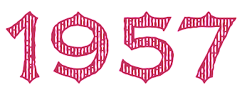 [MyFonts]
[More] ⦿
|
Veronika Burian
[Type Together]

|
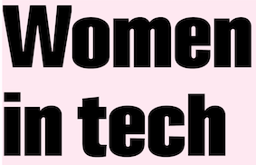 [MyFonts]
[More] ⦿
|
Victory Type Foundry
[Noah Rothschild]

|
 Foundry st. 1998 by Noah Rothschild (b. 1983, Buffalo) from Buffalo, NY, but now located in Chicago, IL. Myfonts link. Dafont link.
 Original designs include the free TrueType fonts Acme, Bark, Boxsoo, Markerz, Psychosis, Seventy, Splurge, Refund and Refund-Bold, Freon, Gaseous, Seriesorbit, Transit, Runamuck, Quarky, Mr Wick, Rat Poison, Muddy, Morkman, Series Orbit, Year2000Boogie, Year2000Replicant, and Arena. Not-so-free original designs such as the weathered font Mauvais, the jerky Junkyard, and many other fonts such as Alfalfa (2001, felttip pen), Quattro (medieval letter simulation), Industrial, Sloshed, Saturn, Badhaus, Basuhand, Lysosome, Friction, Balance (2000, a squarish face; +unicase), BayerSans, Beanstalk, Chlorine Sans/Serif, Dungerees, Embargo, Farmhouse, Grizzly, Jaggers, Lysosome, Mechanikschrift (nice!), Metrogothic, Nolkster, Quattro (grunge font), Sign Gothic. In 2009, she published Bayer Modern, which was modeled after Herbert Bayer's universal alphabet designed in 1925 (she based her letters on P22 Bayer Universal). Fonts from 2010: Surfside (2010) is pure Miami South Beach art deco. MCM Hellenic Wide (2010) is a revival of Hellenic Wide. MCM Monogram (2010) is an art deco / Bauhaus face. Cosmo (2010) is a set of two inline fonts inspired by the CNN logo and Toronto Blue Jays uniforms. Production in 2011: Barnum (a good old slabby Western poster face), Asteroid (the inline space age alphabet on the CNN logo, in the Sega Genesis, and on old Toronto Blue Jays uniforms). Dafont linkVictory Type [Google]
[MyFonts]
[More] ⦿
|
Vladimir Fedotov
[VP Creative Shop]

|
 [MyFonts]
[More] ⦿
|
VP Creative Shop
[Vladimir Fedotov]

|
 Bulgarian designer (b. 1991, Varna) of these typefaces in 2017: Nova (a great logo font), Selfish Script, Delicious Yellow Script, Emanuela (a charming upright calligraphic script), Mikaela Script, Sailor (handcrafted), Parrot, Octopus, Everest Script, Stork, Dork, Boxo, Pino.
 Typefaces from 2018: Cross Road, Desire, Marvin, Contraband (all caps display sans), Christmas (a ball terminal-laden font), Trixie, Musa, Vendée, Just Because, Splendor, Vovchik (art deco), Varna, Summer, Jane Doe, Opinio, Melancholy, MadHouse Sans, Rebel, Irina, Gentleman (art deco), Fancy, Rhino, Rimini, Tamira (high contrast luxury font), Aria (ultra-condensed), Elena, Good Wish, Kavaler (fashion mag typeface), April, Belinda Script, North East (high-contrast family), Golden Bird Serif (a fashion mag typeface), Dark Heart (an eerie typeface), Nova Logo, Maria (blackboard bold), Signature VP, Moderna, Hashtag, Fonatik, Sugar Serif, Spice Serif, Highway (vintage script), Ravenside (a fashion mag typeface family), Georgia (stylish), Pandora Display (piano key typeface), Desislava (a fashion sans with several selections of textures; the outline style is free), Young Rebel (a partially free spurred font duo), Alexandria (piano key style), Blu Purpl (a partly free sci-fi typeface family), Kalpazan (partly free: a tall condensed unicase font), Pinchik (a simple rounded sans), Echo (14-style squarish sans), Elephant (with a free Outline style), Golden Age (curly calligraphic script), Rose Gold (fashion mag serif), Godlike (monoline script). Typefaces from 2019: Propaganda, Mallie, Clementine Script, Phoeniks, Orenda (script), Monument, Rose Gold (a fashion mag typeface), Sunflower (+Script), Gentleman, Minibus, Lelushka (an inky brush script), Mondaze, Kindel (a stylish geometric typeface family), Kalorama (a font duo), Fabulist, Explorers, Errorist, Afterclap, Lotus Eater, Cute Animals, Black Gold (a stylish all caps typeface), Mantrum (brush), Highway (script), Exquisite, Belinda, Tamira, Pathway Script, Sunlight, Serendius, Portraits, Hysteria Script, Bock, Indigo, Bosnia (a monolinear all caps sans), Hippo Sans Serif, Zemarah (calligraphic), Portraits, Mooka Powder (font duo), Momentus, Searchlight, Dream (a fashion mag headline typeface), Melancholy, Knowhere (grunge), Elena (a luxury serif), Hashtag Moderna (a Peignotian sans), Musa Display, Ultimus and Ultimus Serif (fashion mag fonts), Alpha. Typefaces from 2020: Black Gold VP (a high contrast display font; with Plamen Petrov), Kompot (a condensed all caps decorative serif; co-designed with Plamen Petrov), Chalga VP (a decorative serif co-designed with Plamen Petrov), Ablation (a 6-style all caps geometric sans jointly done by Vladimir Fedotov and Plamen Petrov), Midnight Tales (vintage decorative caps jointly done by Vladimir Fedotov and Plamen Petrov), Akros (a fashion mag font by Vladimir Fedotov and Plamen Petrov), Daylight Dreams (a festive all caps typeface by Vladimir Fedotov and Plamen Petrov), Zink VP (a bold all caps sans by Vladimir Fedotov and Plamen Petrov), Billionaire Club (art deco caps; by Vladimir Fedotov and Plamen Petrov), Blackpaper (a negative space font by Vladimir Fedotov and Plamen Petrov), Metria Street (a monolinear condensed interlocking sans by Vladimir Fedotov and Plamen Petrov), Monday Boulevard (an all caps art deco typeface by Vladimir Fedotov and Plamen Petrov), Sombre (a negative space font by Vladimir Fedotov and Plamen Petrov), Bubbble Gum (a 10-style rounded monolinear sans by Vladimir Fedotov and Plamen Petrov), Equinox VP (a futuristic all caps font by Vladimir Fedotov and Plamen Petrov), Inertia (a logo font, with Plamen Petrov), Inure (a ball terminal typeface, with Plamen Petrov), Papillon VP (with Plamen Petrov), Bungalow VP, Fika VP (a rounded and modular typeface by Vladimir Fedotov and Plamen Petrov), Kavo Serif (a 5-style all caps didone by Vladimir Fedotov and Plamen Petrov), Kavo Inline (with Plamen Petrov), Kavo Sans (with Plamen Petrov), Silver Queen (a ball terminal typeface; with Plamen Petrov), Anteric, Agelast (all caps, futuristic sans), Quilin (decorative and swashy; with Plamen Petrov), Akros (an art deco serif typeface), Metria Street (art deco), Blackpaper (a font that experiments with negative space), Mischief (brush), Slang, Daylight Dreams, Kavo (a 17-style family), Midnight Tales, the tall slab serif Carnival VP (with Plamen Petrov), and the weathered Greenth (with Plamen Petrov). Typefaces from 2021, all by Vladimir Fedotov and Plamen Petrov: Aisling (a six-style ultra-compressed sans), Stolen Love (a 16-style fashion mag serif), Cruell (a high contrast ball terminal laden fashion headline typeface), Mother VP (a high-contrast fashion font with plenty of ball terminals), Magoa (a serif typeface with extreme contrast), Sorcha (a ball terminal display font by Vladimir Fedotov and Plamen Petrov), Stolen Love (a fashion mag font), Defect (grunge), Tacenda (grungy caps in SVG and OTF formats), Magoa serif (a ligature typeface), Sonder Serif (decorative, for fashion mags), Oldink (grungy), Arowen (grungy, SVG format), Cruell Serif (with ball terminals), Mother Serif (also a play on ball terminals), Derau (a bitmap SVG watercolor font), Akrasia (an SVG watercolor font), French VP (an all caps glamour font adorned with gigantic ball terminals; with Plamen Petrov), Perfectly Splendid (a ball terminals all caps typeface; with Plamen Petrov), Italian VP (a 21-style tall slab serif in which the bold weight is still thin by international standards), Huova (a decorative all caps serif), Kompot Slab, Kompot Display, Unique VP (a fashion mag titling font with many ligatures and swashes), Bronx (sans and inline), Monday Boulevard (an art deco typeface), Chalga VPoutline (a classy outline font), Mila VP (a disturbing sans & serif hybrid), Kompot Sans (an all caps titling sans), Avoqado (a 6-style all caps sans with features of DIN), Kuchek (a ligature-rich decorative serif). Typefaces from 2022: Forbidden Love (a condensed fashion mag serif), Vintage Mintage (a display serif), Lonely Moon VP (a delicate yet eerie typeface), Malinger VP (an elegnat display serif), Sign That (a wild script), Redmark. Enchanted Love (a 7-style display sans). Creative Market link. Graphicriver link. Personal web site. [Google]
[MyFonts]
[More] ⦿
|
Wannatype (was: Typic)
[Ekke Wolf]

|
 Austrian type designer (b. 1972) who published with URW, but started his own type Vienna-basedfoundry, Ekke Wolf, which became Typic some time later, and most recently, Wannatype.
 Creator of Atlantic Sans and Atlantic Serif, both legible informal families, done in 2003 at URW++. There is also the grunge typeface Atlantic Sea Washed. Ekke designed the informal hand-drawn sans typeface Barack in 2012 at URW, to pay homage to Barack Obama. In 2017, after Trump's election, Ekke's nostalgia for better times and a decent past president shone through in Barack Pro. In 2013, Wolf designed Liebelei Pro Italic, and wrote: The typeface Liebelei has its roots back in 1932, when Vienna-based painter Rudolf Vogl created the poster for a movie called Liebelei after the popular play by Arthur Schnitzler. Only the title letters existed of that typeface. I loved the letters from first sight and proceeded by adventurously interpreting the missing characters. In 2015, he continued his nostalgic tour of Vienna with Calafati Pro (a connected cursive font named after magician Basilio Calafati (1800-1878) who worked in the Wiener Prater), Runde Wien (a rounded sans typeface family, including unicase styles), and Wien Pro (a vintage sans family withy Oblique, Superoblique and Unicase subfamilies). Typefaces from 2017 include Ermis Pro. Typefaces from 2019: Funny Toons (a rounded cartoon family by Ekke Wolf and Alexander Bobrov), ZAP (an all-caps monospaced and (almost) monolined typeface family). Typefaces from 2021: Convey (by Gabriele Lenz). Typefaces from 2022: Franzi (a 20-style neutral sans with large x-height that covers Latin, Greek, Cyrillic and phonetic IPA). Klingspor link. You Work For Them link. [Google]
[MyFonts]
[More] ⦿
|
Weknow
[Wino Sutarmin Kadir]

|
 Weknow is the foundry of Indonesian type designer Wino Sutarmin Kadir (b. 1979), who is based in Bogor, Jakarta. Weknow produced a large collection of free fonts from 2009 until 2012. He started making commercial fonts in 2012.
 Creator of the unicase sans typeface Weknow (2009) and the roundish MisstyPoland (2009). From 2010: Helenfont (2010), Dennis Vallera (2010), Kasumichan, Karitza, Mozzie, Wings, Sharon, Noakatz, dearladysandra, arachnidlove, Alexandra, Monica (2010), Natalie, Wayner 8088, Anime Queen (2010, pixelized), Nano (2010, pixel face), Glover (2010, circular face), Frozen Pandaman (geometric), Joenine (circular), Fun Record (geometric), Gembira (circular), Gabrielle, Solgas (circular), lifeforfun (2010), znowwhite (2010), Snowmask (2010), Nine (2010), Znowwhite (2010), Cecile (2010, experiment with triangles), Coreldraw (2010, geometric, monoline), DennisVallera (2010, inspired by the vector art of Canadian Dennis Vallera), Helenfont (2010). Designs from 2011: Michelle (circle-based), Emmilia (circle-based), Raynaliz, Polysoup, Seba, Selfregion (concentric glyphs), Wings of the dragons (octagonal), Spider, The Training Artist, Chewed Kandi, Sandra, Saintfighteraqua (geometric), Alexey (circle-based), Kristina (circle-based), Graphic Dream, Crystalcore (techno), Dominique (fat rounded), Formalart, Henderson (circle-based), Intanputripratiwi (circle-based), Kioshima (geometric), Gitchgitch (geometric), Justta, Dismecha, Self Region (labyrinthine), Alberto (monoline geometric), Abstrasctik (rounded and experimental), Nicole, Robotoc, Laggastic, Masterpanda, Mohr, Maruciel, Gabrielle, Carlos (a circle-based face), Life For Fun (geometric monoline sans), Lois Cesarano (hexagonal), Heather Thomas (circles and lines), Picaee (modular and leafy), Owaikeo (a circle and arc face), Celeste, The World, Future, Lanitta, Earthearth, Basic, Beautiful, Internationalist (monoline rounded sans caps face), Midnight Show, Plastic, Victory, Perfect, Superpower, Katarzyna, Invasion, Block, Wonderfull, Sweetest, Direction, Funrecord, Eternal Flame, Coreldarw, James Glover (circle-based), Superstar, Inside, Parallel, Million, Ocean, Never Ending Maze, Silverbend, Dragon Fly, Whatever You Want, Swinging Swan, Funatic, Soulmate, Superhero, Zetland, Letting The Cable Sleep, Weknow World, Universalisme, Ocean, Smiley Turtle, Family&Friend, Flower in the window, You&Me&Everyone Else, Astonishing, Grass Hopper, Merpati Putih, Extra Hot, Trees of Happiness, Blowing Bubble, Brain Storm, Good Morning, Flower Lover, Honestly, Jaguar, Modern Aristocrat, Pure and Simple Everytime, Ride the lightning, Proffesional (sic), Flight Stewardess, Antique Retro, Natural Technologies, Ethereal Sky, Conversation, Earth Heart. Free typefaces from 2012: Serta Kayu (multiline script), Emerald, Sweater (texture face), Fish Bone, Delicious Ketchup. The Dark Knight, String and Wire, Little Ant, Xtrapower, Standard International, Nice dream come true, Bavaria, Queen of the modern age, Science Fiction, Greatest View, Queen of the Modern Age, Made in earth, Arabian Knight, Emperor of Japan, Bill Gates Windows, Maximum Kilometer, Mineral Oil Resources, Motorcycle (curly caps), Eskimo and Polar Bear, Gladiator Sport, Aero Dynamic, Optical Fiber, High Logic, Generation (a nice all-caps shadow face), My Heart, Play Ground (multiline face), Cartoon Character, Windows in Japan, Quantum Leap (dymo label face), Computer Love, Electric City, and Copper, Valentine In Love, Weknow Windows, Punk, Graphic Design, Billy Jean Style, LMAO (rounded bold sans face), Take and Give, Indonesia Tanah Air, Swimmer Browser, Diamonds are forever (hexagonal and rounded), Tortoise, My Dear, Get Ready, Export Import, Miracle, Digital Ninja, Funtastic Million Moment, Funny and Cute, Samurai in UK, Bookmark, Once Upon A Time, Bird Feather, Respect, Aruna Aira Jasmine, Extra Cheese, Beauty and the beast, Kung Fu Master (oriental simulation typeface), Game Player (art deco), Modern Building, Trade and Mark, Grovy (sic) Kind of Life, King of Font and Typography, ABC (comic book face), Metro City (extended monoline typeface), The Art, Sprout and the bean, Scooter experiment, Sundown Sunrise (a rounded monoline sans), Art Heart, WindowsObject, Authentic Love, Dolphin Ocean Wave, British Pop Music, Master (sci-fi), Sneak Peeks, Like This, Crumble, Zebra Cross, Star Constellation, Water and Gasoline, Autumn, Aviator, So Cute, Crow Chief (bow and arrow font), Beard Rider, Skateboard, Panel, Swallow Sky Night, Hotel Motel (fat finger face), Techno Various, Zooming Track, Robo Cop, Dance Fever, West Java, Ivory Culture, Push The Button (art deco), Highway Patrol (blocked black typeface), Sausage, Little Atom, Mick Jagged, Life Is Final (copperplate), Total Hammer, Cybertooth, Modern Craft, Riding The World, Boarder (counterless), Essential Arrangement, Sensation, Helmet, Smile, Little Think Big Impact, Airplane, Young and Free, The Futurist, Creative Mind, House Builder, Falling in love, My Font (a rounded monoline oblique sans), Proffesional (sic) Edition, Young Forever, Brown Fox, We Know, Prehistoric, Frankenstein Monster, Great Adventure, You Makes Me Happy, The One and Only Me, Wireframe (3d face), Ceramic (3d face), Winner, The Amazing Me, Cycle, Asia Pacific, Written on the hand, Love is blind, Luxurious Sexy, Robotic, Nano (dot matrix face), King Of The World, Roller Blade, Antelope Run, Elemental, Champion Coffee Cup, Bandit, Arcade, Zetland, The Training Artist, Technique, Neon Glow, Fruit Vegetable, Archieve, Experiment Butterfly, French Fries, Remember Memory, Rocksteady, Electro Static Rain, Science Channel (stencil face), Surfing and Play, Umbrella, The Wizard, Great Leader, Bare Knuckle Fight, The Wizard of One Click, Extra Large, Stabilo Spidol, Onion Rings, Strawberry, Lets Do It Again, Modern Script, Amazing Symphony, Psychedelic, Jump Street, The Earth (modular), Brigade Army, Extraordinary, Cobra on Coconut Tree, Natural Beauty, Anything Mean Everything, Smoke on the water, Write A Letter, Everybody, Together, Planting And Seeding, Savior Light Our Way, All Around The World, Think More For Solution, Yesterday, Techno Tech, Prudent, Metamorphosys, Keep quite and simple (sic), India Hair Style, Catalyst, Bamboo Shoot, Global Capitalism, Water Drop, Thunder Jagger, The Science Archaeologist, The Happy Face Smile, Pyramid Inverted, Jailbreak, Game of Life, Fun Raiser, Athletic, Android Robot (sci-fi), Croissant Sandwich, Ocean Free, Thursday, Crochet Pattern, Firework, Futuristic, Pocket (rounded bold sans), Entertainment, Technology (bubblegum face), So This Is It (inline caps face), Everything (circle-based font), Auto Mobile, Futurism, Rhinoceros Break, Enormous (angulat headline face), The Quick (octagonal), Over The Mountain (wavy face), Frame Work, Interplanetary, Antariksa (rounded sans), Airwaves, Strong in the Heart, Pure And Simple Everytime (rounded organic sans), Gitchgitch (rounded organic sans), Monica, The Lazy Dog (grunge), True Self Reliant, Think Techno, Street, Symbol (constructivist), Post Rock, Moon Light (plump and round), Jumping Running, Green Avocado, Bunga Melati Putih, Bizzare, World Word, Little Rainy Day (dot matrix), Animaline (animal dingbats), Smart Watch, At Most Sphere, Sweet Lollipop (curly), Painting The Light, Flattered, Earth Aircraft Universe, Daydreamer, Earth Aircraft Universe, Flattered, Welcome to Planet Earth, People Quark, Friendly Robot, Biological, Splashing, Freezer, Ragatnia Clara (a nice script), The Happy Face Return. Typefaces from 2013: Cat Eyes, Stay True, Where Wolf, The Sound, Royal Jelly, Grumpy Cat, Aku Cinta Kamu, Yellow, Innovation, Invisible Man, Archieve, Electro Magnet, Bamboo Chopsticks, Valentine's Day, True Love, Club Golf, Your Smile, Guitar On Stage, Karate (oriental simulation), Recognition, Sleeping Beauty (plump lettering), Gelombang Radio, Frozen Ice, Sport Center, Reflection, Enjoy The Time, Fillet O Fish (brushed caps), Artistic, Flower Generation (psychedelia), Heart Shaped, Adore You, Jelang (textured typeface), Stargazer, Army Of Me, Xtreme Bike, Atomic, Fancy Curly, Mastermind, Scientist, Brother, Bahasa Indonesia (sans), Cyber, Photography, Super Creative, Black Stallion (script), Cartoon, Exposure (shadow face), The Ticket, Mercury (retro-futuristic), Agriculture (lava lamp typeface), Electronic, Transformation, The Night (gothic typeface), King Cobra, Bionic Heart, Goddess of Fortune, Guitar Acoustic, Magenta Flower, Java Island (lava lamp typeface), Ready Steady Go, Cute Monster, High Speed, Machine Gun, Random Face 1 (dingbats), Dear Diary, Shinobi Ninja, Stranger (octagonal), Discovery, Translation, Japan (oriental simulation), Digital Gothic, Techno, Butterfly (lava lamp typeface), Candlelight (eax drip face), Maverick, Movie Script Ending, Monochrome, Japan, Chunky Bar, The Greatest High (blackboard bold), Featured, Random Thing 1 (cartoon dingbats), Straw Hat, Where Are You, Plant On Lawn, The Innocent Face, Beat of Drum, ASDFA, Creamy Butter, Monster Rock, Plumbing, Mexicano Chili Sauce, Air Show (bubblegum face), This Is True, Fresh Mint, Laser Gun, My Game, Black Mamba, Drako Heart, Children Stories, Play The Game (with a McDonald's M), Let it be, Everlasting Song, Logotype, Blessing Son, Wino Sutarmin Kadir, Bad Boy, Bold and Blue, Quantum (sci-fi face), Oceanography, Elementary, Sailorman, Heart And Love, High Thin Light, Vintage Postcard (spurred), The Bartender (spurred), Inside The Boxes (rhombic type), Herbalism, Happy Home (lava lamp typeface), Wave Zone, Market Leader, The Monkey, Engine Power, Gamer, Story Telling (lava lamp typeface), High Flagship, Back to Nature, The Quick Motorcross (bilined, caps only, with a McDonalds M), Fisherman (lava lamp typeface), Step Forward, King of Pirate (art nouveau caps), Heritage, High in Love, Thin Decorative (spurred typeface), Little Cowboy, What The Fun, Aha Experience, Glitch (pixel face), Portable. Typefaces from 2014: Enjoy The Show (bubblegum font), Right Power, Xerxes, Selamat Hari Raya, Sincere Heart, Thermometer, My Angle (fat script), Restaurant, Life is font, Material Science, Wave Zone, Everything is a test, The kind of feeling, The President, Blue Ocean, Heavy Metal Gaze, Air-Planet, FOREST-THING (a black poster font), Here-Comes-The-Sun, VICE-VERSA, Wajah-mu-Malaikat, The Miracle, Over The Sky, Eternal Love, Under Stand, Lets Get It On, Salute, Please Forgive Me, Forest Jump. Dayak Shield, Golden Bar (piano key stencil face), Life To Find, Make Peace, Rocket Brothers, Space Truckin, Silver Knight, Zeppelin, Banana Split, Funny Sport, Material Science, Cinta Adalah Perhatian, Love is Attention, Philosophy, Swampthing, Something, Great Job, I Love You, Baby Metal, Millenium 3, White Sock, Liberate, Life Is Font, Chasing Tail, Listening, Sghining Pearl, Hall of Fame, The Good Life, Funky Claw, Pretty Clever, Breath, Continue, Eyes Believer, Samurai Sword, About, God is Watching us, Smile at face, Guitar Rumble, Si Cantik, She is Beautiful, Joker Shoes, Welcome to the jungle (brush face), Maximum High Tension, First Love, Great Heart, Computer Robot, Question of Science, Book Shelves, Billy The Kid (Western font), Times New Romance, Techno Capture, Chemistry, City Shine, Samurai and Blade, Hexagonal. Typefaces from 2015: Brigade of Love, Creative Culture, Axe For Warrior (dingbats), Bogor, Teleport Machine, Construction, Architecture, Underground (octagonal), King will be king, Knight of Light (medieval), Barbarian, Every Day, Thumbs Up, Defragmented (pixel face), Garden of Rose, House Music, Giant Universe, Element (a connect-the-dots typeface), Kingdom of Heart, Smart Talk, Take On Me, Symbolism, The Happiness, Dark Empire, Space of Time, Game Robot, Made in Indonesia, Morning Sunshine (art deco), Gravity Relationships, All About Love, City of Rock, Dear Baby, My Pleasure, Dear Lovely, Drea Reality, Charming Prince, Warehouse Project (geometric solids), Stone Rock, Script Machine, Pray Boy, Copy Paste, Baby Cuttie, Treasure Island, Impulse of Heart (fat rounded stencil), Extraordinary Craft, Brand New Colony (connected script), Digital Handmade, Learning, Aero Glass, Rainbow In Love, Catatan Harian, Sky Liner, A Lot of Love, Take Me Home, Shake It Off, Everything More, Qualified Good, We are the Word, Tshirt, Valuable, Weknow, Metal Kingdom, Phytoplankton, Kissing The Rain, Sunset Beach, Jazz Music, Dear Lovely, Dream Reality, My Pleasure, Boarder, Entertaintment-Show, Guardian, Indonesia, This-is-internet, Picture-of-you. Typefaces from 2016: Big Burger, Blues Melody, Kangaroo Punch, Dark, Amazing Day Everyday, Delicious Choice (lava lamp script), Panda Robot, Wijaya Fresh, Megapolitan Jakarta, Chalk Board, Mother Father, Knowledge Power, Singing Bird, Extra Machine (stencil), Airwave (rounded sans), Human Alter Ego (octagonal), Grand Prix, Serat Kayu, Daniel, Greatest Map, Jazz Sound, Amazing Sound, Algorithm (techno), Brother Army (upright connected script), Cannon Ball, Senorita Spain, Billionaire, Most Famous, The Innocent Army, Guitar Electric, Bracelet, Batman, Phenomenon, Arabian Prince, Taring Serigala, Happy Everydays Day, Coffee Time, Revolver (Western style), Space Object, Black Arrow, Candle-Light, Evergreen, Green Tea (foliate typeface), Harley Queen, Masquerade. Typefaces from 2017: Red Light Special, The Brain, Entrance, Auto Bots, Alive in Science Fiction, Harmonic Vibration, Hydraulics System, Mountain Dew, Flying Bird, Next Century (outlined), Read Book (trilined), Just Do Good, Purpose, Kasih Dan Sayang, Tobacco (scratchy typeface), Baby Superhero, Life in Digital Age, Black Star, Start Revolution, Artistic, Army of Me, Anything Mean Everything, Antariksa, Animaline Dingbats, Android Robot, Amazing Symphony, A Lot of Love, All Around The World, All About Love, The Ugly Font, Switch System, Across The Night, I Am A Robot, Polygon Star, The Creation, Amazing Day Everyday, A Lot of Love, Western Eastern (Far West font), Gangsters, Armored, All Around The World, Great Britain, Chintya Awuy, King and Queen, City of Rain, Sub Urban City, Spicy Paprika, King of Everything, Pondok Ratu Intan, Celestial Love, After Party, Underground 2. Typefaces from 2018: Age of Science and Technology, Autopilot, Age of Awakening. Typefaces from 2019: Primitive Heart. Typefaces from 2020: Thefotosintesis. Alternate URL. Behance link. Dafont link. Fontspace link. Klingspor link. Fontm link. Creative Market link. [Google]
[MyFonts]
[More] ⦿
|
Wim Crouwel

|
 Willem Hendrik Crouwel is a Dutch graphic designer who was born in Groningen in 1928, and died in Amsterdam in 2019. He studied at the Academy Minerva from 1947-1949. In 1952, he founded his design agency, and in 1963, he created the Total Design agency together with four others. In 1967, he created his New Alphabet for cathode ray tubes---it had only vertical and horizontal strokes. It was used in the Dutch pavillon at the World Exhibition in Osaka in 1970. Crouwel became professor of industrial graphic design in 1973 at the Technical University of Delft and was also professor of art at the Erasmus University in Rotterdam. From 1963 until 1984, Crouwel managed all posters and catalogs for Stedelijk Museum Amsterdam. In 1981, he became director of Museum Boijmans-Van Beuningen, and remained director until 1991.
 Besides New Alphabet (1967), he also designed Stedelijk (1968, for his poster for Stedelijk Museum Amsterdam), and the Fodor Alphabet (1969, pixelish). He led Total Design in the 70s. His typeface Gridnik (1974), an octagonal typeface made for a typewriter, was never released as a font. Crouwel's love for grids had earned him the nickname Gridnik or Mr. Gridnik. This name is well-deserved: he once stated, I am a functionalist troubled by aesthetics. Creator of Dutch postage stamps in 1976. In 2009, Crouwel won the Gerrit Noordzij prize. In 2019, he won the TDC Medal. Biography. In 2007, there was a special Crouwel event in Paris. Pictures of Crouwel by Michael Levy: Crouwel with Pierre Bernard, Crouwel and Étienne Robial, Crouwel signing books, portrait. Many have continued along the path shown by Crouwel: - Jay Vidheecharoen made the font Atmosphere based on Wim Crouwel's New Alphabet.
- Architype New Alphabet 1 through 3 by The Foundry are also based on Crouwel's New Alphabet. The Foundry also made Architype Stedelijk and Architype Fodor based on Crouwel's work.
- A free version of New Alphabet was made by Matt McInerney (2008). As mattmc over at FontStruct, he made a number of New Alphabet lookalikes in 2008 such as Neuescreen, Pentagrid Alkphabet, and Pentagrid v2.
- Klean Regular (2011, Gershon Paul) is an octagonal take on New Alphabet.
- Funk King used FontStruct in 2008 to make a series of fonts based on posters by Wim Crouwel: Edgar Fernhout (based on a 1963 poster), Amsterdamse School (1975, art deco lettering), Kalender 1976 Letters (octagonal), Kalender 1976, Brusselmans, Rabobank.
- The pixel typeface Amsterdam (2008, Fizgig at FontStruct) was based on Wim Crouwel's hand lettering for the 1968 Vormgevers poster.
- Jonathan Hill's LineWire (2009) is an octagonal typeface influenced by Crouwel's work.
- Nate Navasca's piano key typeface Shima (2011) is based on Wim Crouwel's Hiroshima poster (1957). So are Oscar Cobo and Wete's UT Morph (2018), Sean Kane's Suzuka (2012), Hello Muller's Nagasaki, and Sasha Iacob's Nagasaki (2012, free font).
- Igor Rossi used FontStruct in 2009 to make Crouwel's Paper Cuts and Crouwel's Stedelijk Alphabet.
- Antonio Morata fontstructed ztedelijk-Crouwel eYe/FS (2011) based on the same Stedelijk Museum poster.
- Michael Hernan's 1996 typeface New Alphabet is also influenced by Crouwel.
- In 2011, Boris de Vries weighed in with two typefaces. Wim Crouwel's Hiroshima poster (2011) served as a model for Boris's unnamed piano key typeface created in 2011. And a 1968 poster for Stedelijk Museum Amsterdam was the model for another typeface created by Boris in 2011.
- Paul Hunt designed New Alpha BBit, New Alpha 1 Line, New Azbuka, and New Alpha Dot using FontStruct.
- Mrman created New Alphabet Substance Style (2008, FontStruct).
- Shawn Grima's squarish typeface Architect (2012) was inspired by Crouwel as well.
- Duncan Robertson developed a 42-cut typeface family called New Alphabet 13, in one of the best researched attempts to date to push Crouwel's ideas even further.
- Fabio Furlanis made the octagonal C-Alphabet (2013, collaboration with Roberto Duse).
- Tom Seddon's typeface The Empty Space (2013) was inspired by Wim Crouwel's New Alphabet.
- th3lonius created Gendai Block and Gendai round in 2013 based on Crouwel's Hiroshima poster.
- Darren O'Driscoll's Newer Alphabet (2013) is based on New Alphabet.
- Foundry Gridnik (2016, by David Quay at The Foundry): Foundry Gridnik was developed from the single weight monospaced typewriter face, originally created by Dutch designer Wim Crouwel in the 1960s.
- For FIFA's World Cup 2014, the Dutch team played in Case Crouwel, a bespoke octgaonal and inline typeface by Wim Crouwel done for Nike.
Flickr group on Wim Crouwel. Wim Crouwel Exhibition at the Stedelijk Museum Amsterdam, 28 September 2019-22 March 2020. [Google]
[MyFonts]
[More] ⦿
|
Wino Sutarmin Kadir
[Weknow]

|
 [MyFonts]
[More] ⦿
|
Without Foundry (or W Foundry; was: Diego Aravena)
[Diego Aravena Silo]

|
 Diego Aravena Silo set up Without Foundry with Felipe Sanzana 2012. In 2016, Diego Aravena joined forces with fellow type designers Patricio Truenos and Bana Arasanz. In 2022, he embarked on studies at the University of Reading. Diego's typefaces:
 - The funky flared typeface family Pirata (2013). Pirata has some interlocking characters.
- D Sari (2014, Latinotype). This typeface won an award at Tipos Latinos 2014. Diego calls this 22-style rounded sans family neohumanist.
- Zennat Pro (2014, Latinotype).
- D Hanna (2014) is a 22-font neohumanist sans typeface family. Followed in 2015 by D Hanna soft. D Hanna is instantly recognizable by its amputated e.
- Huboost (2014): a tall titling face.
- Dsert (2014, Latinotype): a 39-weight display sans family that is inspired by the 1970s politically colored design movement, afichismo. Many glyphs are slightly flared.
- Barranco (2015). Barranco is a 3d layered font family with shadows and inline effect layers.
- Without Sans (2015, by Felipe Sanzana and Diego Aravena). This large sans family is characterized by a large x-height and rhombic dots.
- D Blues (2015). A neo-humanist typeface family in 20 styles.
- Bronto (2015). A rounded sans family with reversed contrast.
- Biblioteca (2015) by Roberto Osses, Cesar Araya, Patricio Gonzalez and Diego Aravena won an award at Tipos Latinos 2016.
- Gardenia (2016): a rounded sans typeface family by Salvador Rodriguez Lagos.
- In 2016, Salvador Rodriguez and Diego Aravena Silo co-designed the geometric sans typeface family Fuse and Fuse V.2, which are characterized by a large x-height and some humanist elements. Salvador Rodriguez and Julia Martines Diana added Fuse V.2 Printed in 2018.
- Eren and Eren Condensed (2016) is a 32-style slab serif family with a humanistic touch and rounded corners---it was designed by Salvador Rodriguez and programmed by Diego Aravena.
- Ulises (2017). Designed with Salvador Rodriguez: an eclectic slab serif with some grotesque features.
- Kappa (2017): A modern sans serif with humanistic and geometric features, co-designed by Salvador Rodriguez and Diego Aravena. Followed in 2017 by the slab version Kappa Vol2 (designed by Salvador Rodriguez).
- Salvatore (2018). A neogrotesque.
- Notorious (2018). A brush script.
- Hermann (2018). By Salvador Rodriguez and Diego Aravena. This wonderful readable garalde will be great for novels.
- Ryman Gothic (2019, by Diego Aravena Silo and Franco Jonas at W Foundry) is inspired by Edwin Allen's wood types and Morris Fuller Benton's gothics.
- Gallos (2020, by Diego Aravena Silo and Salvador Rodriguez). A 20-style mix of architype, geometric, gaelic, unicase and uncial. It contains variable styles as well.
- Supera Gothic (2020). An 18-style geometric sans by Diego Aravena Silo and Salvador Rodriguez. Plus variable fonts.
- Saes Grotesk (2021). An 18-style grotesk sans by Diego Aravena that comes with two variable fonts. It is based on early 19th century gothics.
Creative Market link. Behance link. Another Creative Market link. Old foundry link at MyFonts. Behance link for Without Foundry. Yet another Creative Market link. [Google]
[MyFonts]
[More] ⦿
|
Yohanna-My Nguyen
|
 Born in France in 1985, Yohanna-My Nguyen is a graduate of the Masters program in type design at KABK, 2010. Her final project there was a typeface called Luciaan (2010). Before KABK, she did a DSAA Création Typographie at the École Estienne. She taught typography and typeface design at the Strasbourg School of Design (HEAR) and is now based in Paris.
 Other typefaces by her include Pension (2011, a text family done for a French editor), Tipote (2011, a monolinear unicase typeface), Métropoli (2011), and the angular typeface Eddie (2008). At Production Type, she cooperated on the designs of Tesseract (+Display), Proto (including Slab Condensed and Grotesk), Kessler, Signal, Gemeli Mono and the upright script typeface Enfantine. Typecache link. [Google]
[More] ⦿
|
Yusril Muhtadi
[Halfmoon Type (was: Half Moon Design, or: Gluckiey Type foundry)]

|
[MyFonts]
[More] ⦿
|
Zal Moxe
|
Design student in Toronto, who is working on this unicase font (2005) which combines OCR with Startrek. [Google]
[More] ⦿
|
Zetafonts (Tangram Studio)
[Peter von Zezschwitz]
|
At 40 dollars per font, Peter von Zezschwitz's Durham, Ontario-based company digitized Art Nouveau designs created by M.J. Gradl, Philip Morris and other of their less well-known contemporaries. Mac or Windows. Great-looking typefaces. Not to be confused with the foundry ZETAFonts! Fontnames: Gradler, Greta, Gretchen, Heinisch, Kaiser (minimalist unicase font), Lydia (drop caps), Florentia, Mahlau (has also astrological symbols), Mirror, Odilia, Morelia, Pinks, Ramona, Blautopf (Fraktur), Vintago (caps). Odilia, Vintago and Morelia are beautiful Uncial/Celtic fonts. I say "Bravo!". Write-up at FontNews. Feena Casual and others are free at Eksten. FontShop link. Klingspor link. [Google]
[More] ⦿
|
Zuzana Licko
[Emigre]

|
 [MyFonts]
[More] ⦿
|
Zuzana Licko

|
 Zuzana Licko is the co-founder of Emigre, together with her husband Rudy VanderLans. Licko was born in 1961 in Bratislava, Czechoslovakia, and emigrated to the U.S. in 1968. She graduated with a degree in graphic communications from U.C. Berkeley in 1984. Her typefaces:
 - Base 9 and 12 (1995).
- Base 900 Sans
- Base Monospace (1997).
- Citizen (1986).
- Dogma (1994).
- Elektrix (1989).
- Fairplex (2002).
- Filosofia (1996). This has a unicase version.
- Hypnopaedia
- Journal (1990).
- Lo-Res (1985). Coarse resolution.
- Lunatix (1988).
- Matrix II (2007). A reworking of Matrix (1986).
- Modula Round and Ribbed,
- Modula (1985).
- Mr Eaves Modern, Mr Eaves Sans, Mrs Eaves XL Serif, Mrs Eaves (1996). Mrs Eaves is her best font, a Baskerville. Mrs Eaves XL (2009) is an extension and improvement of Mrs Eaves. Mister Eaves Sans and Mister Eaves Modern (2009, +XL Modern) are explained by them: Mr Eaves was based on the proportions of Mrs Eaves, but Licko took some liberty with its design. One of the main concerns was to avoid creating a typeface that looked like it simply had its serifs cut off. And while it matches Mrs Eaves in weight, color, and armature, Mr Eaves stands as its own typeface with many unique characteristics.
- Narly (1993).
- Oblong (1988). With Rudy VanderLans.
- Program (2013). For programming, with rounded corners.
- Puzzler (2005). A geometric pattern and decoration font.
- Quartet (1992).
- Senator (1988).
- Soda Script (1995). This may have some uses, but I can't think of any.
- Solex Tall Pack (1990).
- Tarzana
- Totally Gothic + Totally Glyphic (1990).
- Triplex (1989).
- Variex (1988). With Rudy VanderLans.
- Whirligig (1994).
Interview by Rhonda Rubinstein. Rudy VanderLans, Zuzana Licko and Mary E. Gray wrote Emigre (The Book): Graphic Design into the Digital Realm (1993, Van Nostrand Reinhold, New York). Her work is discussed by William H. Powes (in More from Eastern Europe: Czechoslovakia. Art Direction, vol. 45, pp. 62-63, 1994), Laurie Haycock Makela (in Three New Faces. Design Quarterly, vol. 158, pp. 22-25, 1993), Mike Jones (in Two Colors, one vision. Design, vol. 500, pp. 64-66, 1999) and Patrick Coyne (in Communication Arts, vol. 34, pp. 64-73, 1992). FontShop link. Klingspor link. View Zuzana Licko's typefaces. [Google]
[MyFonts]
[More] ⦿
|


 10four design group was founded in 2002 by Sue Lepard and Matt Heximer in Vancouver.
  256tm is the foundry of Besançon, France-based designer
 2013:
2013:  [
[ [
[ Born in 1960 in Niigata, Japan. Studied at the Musashino Art University in Tokyo. He also studied calligraphy at the London College of Printing. He became a freelance designer in 1997. Akira Kobayashi, who was based in Tokyo prior to his move to the Franfurt area, is an accomplished type designer who has created numerous typefaces for Sha-Ken, Dainippon Screen (where he made the kanji font Hiragino Mincho), TypeBank (from 1993-1997), ITC and Linotype, where he is Type Director since 2001.
  Aceh, Indonesia-based designer (b. 1986) of the (mostly) script typefaces
  Albatross is Jay Hilgert's foundry in Oklahoma City, OK, est. 2008. Before Albatross, Jay Hilgert ran
  [
[ Designer who lives in Buenos Aires and who teaches graphic design and typography at the Universidad de Buenos Aires. He has worked as an art director in prestigious Argentina-based studios, handling high-profile corporate brands such as Arcor, Marta Harff, Morph, SC Johnson, Danone, and Movicom. He runs
  Graphic designer and illustrator from Barcelona who has an MA from Central Saint Martins, and works in London since 2009. His typefaces:
  [
[ [
[
 Indonesian designer of
  American designer, b. 1967, California. Married to Ken Russell, who runs
  Bogotá-based Colombian graphic design studio and type foundry Andinistas was founded in 1998 by
  [
[ [
[
 Mexican designer of the hand-printed Bolita, the kids typefaces Nino and Bíblica, the unicase Bauhaus, the round typeface Aqua, the grunge typefaces Gap and Heart, the handwriting typefaces
  Julia Martínez Diana (b. 1990) is based in Buenos Aires, Argentina, where she studies graphic design at UBA. In 2004, she set up the type foundry Antipixel.
  Domen Fras completed his masters at London's Central Saint Martin's College of Art & Design in 2000. In 2002 he founded the type & design studio Aparat in Ljubljana, Slovenia. Since 2011 he is a full-time assistant professor at the Faculty of Natural Sciences at the University of Ljubljana. Speaker at
  Dutch type designer located in Bloemendaal. Jan Middendorp wrote about him in
  ARS Type is an Amsterdam-based foundry with some commercial fonts by Angus R. Shamal. Shamal had earlier published fonts with T-26 and Plazm. Fonts can be bought via
  Ahmad Ramzi Fahruddin (aka Ramzehhh and as Ramz Fahruddin, b. 1993) established Arterfak Project in 2015. He is the Palembang, Indonesia-based designer of the display typefaces Aidah (2015, spurred), Temenyut (2015, spurred), Basenglah (2015, a geometric solid typeface), Local Genius (2015), Oropitem (2015, blackletter), Cakmacak (2015), Maeninaja (2015), Yagitudeh (2015, a
  Avondale Type Co is a type foundry established in 2013 and located in the Avondale area of Chicago. It is a type coop that groups several designers. It is a subsidiary of the design studio
  Born in Brooklyn in 1940, he graduated from New York City Community College. Barry worked for Sandgren & Murtha, New York as a graphic designer.
 BNF (or: Brave New Fonts) Type Foundry was established by Dogu Kaya as a collaborative venue for new designers in Istanbul in 2015. Its initial fonts, all free and made by Dogu Kaya, include Five Pixel (2011), Type02 (2015, constructivist), Type03 (2015, constructivist stencil), and Kollektif (2015, a
  Born in Topeka, KS, 1911-1995. Head of Mademoiselle magazine, and a general master of design. He served on the faculty of the Yale School of Art for over thirty years. Typographically, he is best known for his proposal, published in Westvaco Inspirations 180 in 1950, to have a unicase alphabet, tentatively called
  Korean designer of these typefaces:
 [
[ Designs by
  Catharsis is located in Leiden, The Netherlands. Before that, Christian Thalmann's page
 [
[ [
[ [
[ The Compania Tipografica de Chile is a Chilean type foundry based in Santiago de Chile set up by Raul Israel, Franco Jonas, Gaston Uribe and Ale Navarro in 2018. Their typefaces:
  Free fonts by Swedish designer
  [
[ Depok, Jakarta, Indonesia-based designer of the handcrafted typefaces Pangoline (2019), Beasty Morty (2018), Sweet Beaches (2018), Orabelle (2018: connected script), Koeltoerals (2018: monoline signage script), Rushtelle (2018), Sloutthy (2018) and Hingar Bingar (2018: a marker pen font).
  [
[ [
[ [
[ [
[ Type foundry in Sheffield, UK, first called Schizotype, and in 2021 renamed Eclectotype because this is not a foundry that likes to stick to trends or expectations. Its designer,
  [
[ [
[
 [
[ [
[ Basque designer, b. 1985 Vitoria-Gasteiz. He currently studies in San Sebastian. In 2010, he created
  [
[ Foundry, est. 2007 by Jonathan Bennett, who is located in Caerphilly, Wales. Bennett designed these typefaces:
 Established in 1994, dstype used to offer free fonts but has gone commercial now. It is run by
  Novosibirsk, Siberia-based designer. In 2017, he created
  [
[ Designer, with Juan Pablo de Gregorio at the Chilean type foundry Letritas of
  Elizabeth Hernandez (Latinotype) created the ramshackle unicase typeface
  Sacramento, CA-based foundry established in 1984 by Zuzana Licko (b. 1961, Bratislava) and Rudy Vanderlans. They were "in" during the grungy early 1990s, but ran out of steam and
  Valencia-based illustrator and graphic designer, who created the thin monoline unicase typeface
  Watampone, South Sulawesi-based designer (b. 1995) of the script typefaces
  Buenos Aires-based designer of the free abstract display typefaces
  Typographer, type designer (b. 1879, Kassel, d. 1967, Bad König), teacher (at the Frankfurt Vocational School and at the College of Arts and Crafts in Offenbach am Main) and author of typographic books. In 1905, Engel became supervisor of in-house printing at the Klingspor foundry.
  [
[ Las Palmas de Gran Canaria, Ampuero and Laredo, Spain-based designer (b. 1971) who set up deFharo. Creator of the monoline sans typeface
  FontArte (est. 2004; ex: Magdart Fonts) is
  Gábor Kóthay (Fontmunkások) is a Hungarian type designer (b. 1962) who lives in Szeged.
  Düsseldorf-based German foundry of designer
  Peter is a German designer in Berlin, born in 1981. Peter Fritzsche's company is called Formfound. For a cool 900 Euros, he will make you one style of a font.
  [
[ Prolific British type designer (b. Enfield, 1951, née Freda Buckley, d. 2019) who completed her diploma in Graphic Design and Typography at the Maidstone College of Art. She began to work at Letraset International in 1971 and learned the basics of type design under the direction of Bob Newman. At URW in Hamburg she was involved in the development of the first groundbreaking font software application. In 1978, she was appointed Senior Type Designer at Hardy Williams Design in London and moved to Typographic Systems International in 1980. Freda Sack began working as a freelance designer in 1983. Her clients included British Airways, Air UK and Vauxhall.
  During his studies at the Metropolitan Technological University of the State of Chile, Santiago (2013-2017), Chile-based Franco Jonas Hernandez created the lively text typeface
  [
[ [
[ GalloFonts is part of Graphics by Gallo, founded in 1974 by
  British type designer. With David James, [T-26] co-designer of AES, August. At Alias (a company he founded with David James in London), he made
  Gaslight-type-foundry is collaboration between three type designers---Valery Zaveryaev, Maria Luarvik, and Roman Shchyukin---, founded in 2011. Valery Zaveryaev is a
  Genilson Lima Santos is the Salvador, Brazil-based designer (b. 1985, Bahia) of Stilu (2015, sans), Jenelson (2006), the stroked font Styllo (2007), the brushy
  [
[ [
[ This foundry went extinct in 2016 and was renamed
  Gigofonts is a Ljubljana-based foundry run by
  Aka Grzegorz Luk and just Gluk, Grzegorz Luksza is a Polish type designer (b. 1973) who specializes in ultra-decorative and experimental typefaces.
  Graphite is an Indian type foundry, est. 2015 by Deepak Singh Dogra in New Delhi. They offer commercial fonts via MyFonts and free fonts through Dafont. Their typefaces include the handcrafted stone age emulation poster typeface
  Graviton is a small type foundry based in Buenos Aires, Argentina. It was founded by Argentinian type designer Pablo Balcells in 2013.
  [
[ Yusril Muhtadi or Umar Muhtadi (Half Moon Design, or Gluckiey Type foundry, Bali, Indonesia, b. 1997) created the spurred decorative typeface Qallos (2014) and Anchor Slab (2014). In 2015, he added Buron (Victorian signage typeface) and Magnolia. In 2016, he designed the connected script typeface Bringshoot.
  Hanoded is the
  [
[ Harold Lohner was born in upstate New York in 1958. He received an MFA in printmaking from the University at Albany and is Professor of Visual Arts at Sage College of Albany. He began making fonts in 1997 and starting distributing them the next year through Harold's Fonts. He lives in Albany, NY, with his partner, Al Martino. Originally, most of his typefaces were freeware or shareware, but gradually, he started selling most on his site or via
  [
[

 [
[ Also written Igor Mustaev. Born in 1982 in Khabarovsk, Mustayev was first an architect. In 2009, he finished the Type and Typography course at the British Higher School of Art and Design, supervised by Ilya Ruderman.
  Vienna-based type designer who joined
  In-House International is an Austin,TX-based creative studio founded in 2011 by Alexander Wright. Michelle Benaim Steiner became a partner in 2015. In-House designs custom typefaces for branding and editorial projects and specializes in geometric experimental display fonts.
  Insigne Type Design Studio (est. 2006) is run by
  Ruben Prol is based in A Coruña, Spain. He used to run
  Ivan Petrov is based in Saint Petersburg, Russia. Bulgarian codesigner with Julia Zhdanova of the free typeface
  [
[ [
[ Born in Leipzig (1902), died in Locarno, Switzerland (1974). Influential
  [
[ [
[ [
[ [
[ Jeremy Tankard established Jeremy Tankard Typography in 1997, after corporate design work at Addison Design Consultants and Wolff Olins. This Londoner made some extraordinary and daring font families. In many of his typefaces, Jeremy mixes upper and lower case letters for more impact. A list of his typefaces:
  [
[ Born in Barcelona in 1950, Joan Barjau is a graphic and type designer, cartoonist, illustrator, painter, and animator who taught at Eina in Barcelona from 1984-1993. Designer at type-o-tones in Barcelona who made Analfabeta Regular (1999, with Flavio Morais), Analfabeta Pics (1999, with Flavio Morais),
  [
[ [
[ [
[ Type and logotype company in Polanco (and now Mexico City), Mexico, run by
  [
[ [
[ [
[ During her typography studies at Ecole Estienne in Paris, Julie Patat created the unicase font
  [
[ Karandash is a type and graphic foundry in Varna, Bulgaria, established in 2010 by designer
  German scribe, type designer and unbelievable calligrapher, b. 1914 in Schlesisch-Drehnow, d. 2000 in Offenbach. Following schooling in Schlesien and Hamburg, he served a four-year typesetting apprenticeship from 1930-1934 in Hamburg and later at the Kunstgewerbeschule (School of Arts and Crafts) in Offenbach am Main. From 1939 until 1945 he was in active military service and became a prisoner of the Russians. After that ordeal, he became a calligraphy teacher at the Werkkunstschule in Offenbach, and developed a universal pen with novel writing and drawing techniques for the company Brause. It is at that point that Hoefer started designing types as well. From 1970 to 1979, Hoefer was a lecturer and later professor at the HfG (School of Design) in Offenbach. From 1981 to 1988, Hoefer ran summer calligraphy workshops in the USA (Los Angeles, San Francisco, Boston, New York, Washington, and other cities). In 1982, Karlgeorg Hoefer founded a calligraphy workshop in Offenbach for everyone, with evening courses and summer school, and in 1987, the registered association "Calligraphy Workshop Klingspor, Offenbach, Supporters of International Calligraphy." From 1987 to 1995, he was the chairman of the association while teaching continuing courses and summer school classes with leading foreign calligraphers. Hoefer has written two books about calligraphy: "Das alles mit einer Feder" (Brause, 1953) and "Kalligraphie, gestaltete Handschrift" (Econ, 1986). Numerous articles about Hoefer's work have appeared in calligraphy journals in Holland, France, the USA, and Japan. In 1989, the book "Schriftkunst/Letterart Karlgeorg Hoefer" was published as part of Calligraphy-Editions Herbert Maring (Die Kalligraphie Edition, Hardheim, Germany, 1989). For his activities as a calligrapher, Hoefer received the Order of Merit of the Federal Republic of Germany in 1993. His typefaces:
  [
[ [
[ Type designer in Peachtree City, GA. His typefaces from 2012 include a six-style unicase sans family entitled
  Born in Missouri in 1979, Kimberly moved first to Texas and later (in 2007) to China, and most recently, to Orlando, FL. She made some free fonts (often handwriting styles), and also ran a personal handwriting font service [those fonts have names that start with KGD].
  German
  La Laiterie is a foundry started by Paris-based Julien Janiszewski (b. 1973), who received a bachelor's degree in graphic design from Besançon and later graduated from Ecole Estienne in Paris. His creations include:
  The Lanston Type Co was based in PEI, Canada, moved in 2002 to Vancouver, and moved later that year to Espoo, Finland. In 2004,
  Well over 500 original designs by
  [
[ Juan Pablo De Gregorio Concha lived in Santiago, Chile, where he founded Letritas in 2006. He is presently based in Barcelona. Home page of
  Hendry Juanda runs Letterhend Studio in Yogyakarta, Indonesia. He designed the signage script typefaces
  Cluj, Romania-based creator (b. 1973) of
  [
[ [
[ [
[ Graduate from FADU, University of Buenos Aires, who created the typeface
  [
[ [
[
 Frankfurt-based designer (b. 1932, d. 2018) whose creative output is so large that he deserves a
  During his studies at ECV Nord Europe in Lille, France, Marc-Antoine Allard designed Hexhale (2015). In 2014, he designed the script typeface Pangolin. Numero (2016) is a monospaced font inspired by the early ages of computer programming. Magnus (2016) is an angular text typeface.
  Chilean designer of the unicase font
  [
[ Mark Simonson Studio is located in StPaul, MN. Mark founded Mark Simonson Studio around 2000, and describes himself as a freelance graphic designer and type designer. From
  [
[ [
[ Born in Gothenburg, Sweden, in 1970, Martin Lexelius (aka Core, aka
  [
[ [
[
 [
[ MendozaVergara is
  Graduate of Moholy-Nagy University of Arts and Design, Budapest, Hungary. His early work covers Errer (2014), a display typeface done for a French / Hungarian magazine. France-based designer of the didone typeface Constantin (2017), which is based on the gros canon size of a typeface sold by the Constantin widows, who operated a type foundry in Nancy, France, in the middle of the 19th century, La fonderie de veuve Constantin ainé et Constantin jeune.
  Architect and designer in Sao Paulo, who runs Minhocossauro Tipografia. He created Salyma (2015, part vampire script, part curly Victorian extravaganza), Essential Coffee (2015, stencil), Militante (2015, stencil font), Cogumelo (2014, a retro futuristic unicase typeface), Biotech (2014, techno), Action Flick (stencil font), Morango (2015, handcrafted Western font), and Cinema Novo (2015, handcrafted typeface).
  Graphic designer, who has an MFA in Graphic Design at Otis College of Art & Design (Los Angeles) in 2012. She currently teaches graphic design at the University of Nevada, Las Vegas and is Creative Director at Blue Taco Design in Las Vegas. Monica created a few experimental typefaces in 2012, such as
  Foundry, est. 2009 by Rob and Sonja Keller. Originally located in Berlin, Mota Italic is a type design studio specializing in unique, extensive type families. It relocated to Mumbai, India, at the end of 2014, and moved back to Berlin in 2020.
  FontStructor who made many fonts, including the unicase typeface
  [
[ [
[
 [
[ A disciple of Tony de Marco, this Sao Paulo, Brazil-based designer has worked on digital magazines in Brazil such as Elle (fashion), Audi Magazine (lifestyle) and Trip (lifestyle). He set up

 Brazilian type foundry run by Lucas Franco (Italian Brazilian, b. 2001), his father Claudio Rocha (Italian Brazilian, b. 1957) and his mother, Milena Mainieri (Italian Brazilian, b. 1969), which is currently based in The Netherlands. Their typefaces:
  Senior designer at Font Bureau since 1997, after graduating that year from the Rhode Island School of Design. Born in Milwaukee, WI, he now is a faculty member at RISD, where he teaches typography in the department of Graphic Design. He regularly offers a summer course on Digital Type Design, Summer Institute of Graphic Design, Rhode Island School of Design.
 [
[ Born in Prague in 1949, Jan Schmoeger emigrated to Australia in 1980/1981, and is a book designer in Mentone, Victoria. For most of his career here he worked as a graphic designer, mainly in book publishing. He was also a sessional lecturer at the School of Art and Design, Monash University, Caulfield, Melbourne (formerly Chisholm Institute of Technology) in 1986-1994 and 2004-2008. His typefaces:
  Type designer at Canada Type.
  Santiago de Chile-based creator of
  [
[ Download the following beautiful handwriting and handprinting fonts made by Mexican designer Kemie Guaida, who lives in Helsingborg, Sweden: Balderas (2002), BlackoutSans (2001), BlackoutSerif (2001),
  Rafael Jordan Oliver, aka Barry Bianco, is a graphic designer and calligrapher in Valencia, Spain, b. 1983, Alzira. Graduate of EASD in Valencia, class of 2013. His typefaces:
  [
[ [
[ [
[ [
[ [
[ [
[ Roch Modrzejewski (ROHH, Krakow, Poland) established ROHH in 2015. That same year, he published the organic script typeface
  [
[ [
[ Ankara, Turkey-based designer. In 2019, he created these typefaces: the squarish SK Kape, the semi slab serif SK Karl, the sans typeface SK Rotun, the angular typeface SK Pila.
  [
[
 [
[ Nick Shinn (b. London, 1952) is an art director and type designer. He teaches at York University in Toronto, and is a founding member of the Type Club of Toronto. He writes regularly for Graphic Exchange magazine, and has contributed to Applied Arts, Marketing, Design, and Druk. He founded Shinn Type in 1999, and made fifteen type families.
  Swiss designer
 Mexican type designer who sert up
  American typographer and type designer, b. 1886, Philadelphia, d. 1953. He was a man with class and style, who influenced many through his work. He managed the Lanston library from early in the 20th century (he joined Lanston in 1902) until the second World War. He created many of its typefaces himself, and commissioned many from Frederic W. Goudy. His typefaces (LTC stands for Lanston Type Company):
  [
[
 Stereotype is Clément Nicolle's web outfit. He designed these (free) fonts between 2004-2006: 3grammes5, BagpackDemo (grunge), Base02 and
  Quebec-based designer (b. 1971) in 2010 of the
  Stiggy & Sands is the Arvada, CO-based type foundry of Brian "Stiggy" Bonislawsky and Jim "Sands" Lyles, est. 2013. Their first commercial typefaces, all jointly designed, are
  Paris-based graduate of ESAG Penninghen (where he took courses from, e.g., Muriel Paris) who made a custom
  This London-based foundry evolved from Gibson Type Foundry in 2016. It is run by Jonathan Gibson, a digital designer in the UK, who worked at Design London. His typefaces include Swahbuckle (2014, quixotic and piratey; sold by
  Mehmet Abaci (b. 1978) is based in Istanbul. In 2014, he established Studio Typo, where one can buy his typefaces. Limited forms of the fonts can be downloaded fpr free from the Dafont site.
  Suitcase Type is a Czech foundry, est. 2003 by
  Adil Budianto (Suro Studio, or Surotype, Yogyakarta, Indonesia) designed the spurred Victorian signage typefaces Jainem (2014), SurocK (2014), Nihlah (2014) and Rocoustic (2014).
 London-based foundry set up by David Quay and Freda Sack in 1989, and after Freda's death, continued by David Quay and Stuart de Rozario. Their typefaces were first made using the Architype label:
  Aka
Aka  Ramiz Guseynov was born in Russia and educated as an architect and graphic designer. After moving to the USA in 1991, where he worked as a graphic designer, Ramiz Guseynov became a part-time type designer who published his work at
  [
[ Based in Skopje, Lasko and
  Travis Stearns (was:
  The Type Department was founded in 2010 by Jürgen Huber (Berlin, b. 1967) and Malte Herok. In 2011 Martin Wenzel joined as a friend of the Type Department. Much of the work is typographic and centers on logo, retail and custom type design. Jürgen Huber, who studied at Folkwang Academy in Essen and is now a professor of typography at FHTW in Berlin, a city he moved to in 1997, designed
  Foundry est. in 2005 by
 Kelly Hobkirk (Typekirk, Seattle, WA) is a type and graphic designer. He created the modular typeface Ribbed and the pair of jazz-inspired fonts Coleman and Coleman Duo in 2015. In 2016, he published the contrasted all caps sans poster typeface Whim, and in 2017
  Ingo Krepinsky (b. 1976, Eschwege) graduated in 2000 from Fachhochschule Hannover, and in 20903 from Hochschule für Künste Bremen, where he specialized in typography. He is a cofounder and type designer at Typonauten, a Bremen-based commercial font foundry started in 1998 (together with Christoph Hanser and Stefan Krömer).
  Experimental fonts developed by
  [
[ [
[ [
[ Foundry st. 1998 by
  [
[ Bulgarian designer (b. 1991, Varna) of these typefaces in 2017: Nova (a great logo font), Selfish Script, Delicious Yellow Script, Emanuela (a charming upright calligraphic script), Mikaela Script, Sailor (handcrafted), Parrot, Octopus, Everest Script, Stork, Dork, Boxo, Pino.
  Austrian type designer (b. 1972) who published with URW, but started his own type Vienna-basedfoundry, Ekke Wolf, which became Typic some time later, and most recently, Wannatype.
  Weknow is the foundry of Indonesian type designer Wino Sutarmin Kadir (b. 1979), who is based in Bogor, Jakarta. Weknow produced a large collection of free fonts from 2009 until 2012. He started making commercial fonts in 2012.
  Willem Hendrik Crouwel is a
  [
[ Diego Aravena Silo set up
  Born in France in 1985, Yohanna-My Nguyen is a graduate of the
  [
[