| | |
Alter Littera
[José Alberto Mauricio]

|
 Spanish foundry, est. ca. 2009, and on the web since 2012. It is located in Madrid. Alter Littera's fonts and web site are designed and managed by José Alberto Mauricio, who holds a doctorate degree in Economics and Business Administration, and is Associate Professor of Econometrics at the Universidad Complutense de Madrid.
 Alter Littera produces and markets opentype fonts reviving some of the most beautiful bookhands from medieval Western manuscripts, as well as some of the finest European and North-American typefaces from the mid-fifteenth through the early-twentieth centuries. The "Bookhand", "Oldtype" and "Initials" font collections cover gothic and/or blackletter letter forms. The typefaces: - Gutenberg (B42-type) A (Johann Gutenberg, Mainz, ca. 1455). Includes the full set of special characters, alternates and ligatures from The 42-line Bible. Under development.
- Gutenberg (B42-type) B (Johann Gutenberg, Mainz, ca. 1455). Includes the full set of special characters, alternates and ligatures from The 42-line Bible. Published as Gutenberg B in 2012, this is a clean, smooth rendition of the B42-type used by Johann Gutenberg in his famous 42-line Bible. The font includes a comprehensive set of special characters, alternates and ligatures, plus Opentype features, that can be used for typesetting (almost) exactly as in Gutenberg's Bible and later incunabula. He says: The main historical sources used during the font design process were high-resolution scans from several printings of Gutenberg's Bible. Other sources were as follows: Kapr, A. (1996), Johann Gutenberg - The Man and his Invention, Aldershot: Scolar Press (ch. 7); De Hamel, C. (2001), The Book - A History of The Bible, London: Phaidon Press (ch. 8); Füssel, S. (2005), Gutenberg and the impact of printing, Burlington: Ashgate (ch. 1); and Man, J. (2009), The Gutenberg Revolution, London: Bantam (ch. 7).
- Gutenberg (B42-type) C (Johann Gutenberg, Mainz, ca. 1455). Includes the full set of special characters, alternates and ligatures from The 42-line Bible. Published in 2012 as Gutenberg C, this is a slightly roughened version of the Oldtype "Gutenberg B" Font, simulating irregularities and ink spreads associated with old metal types, papers and parchments.
- Psalterium (Psalter-type) (Peter Schoeffer, Mainz, 1457). Includes the full set of special characters, alternates and ligatures from The Mainz Psalter (Psalterium Moguntinum). He writes: A clean, smooth adaptation of the magnificent gothic types used by Johann Fust and Peter Schöffer in their famous Mainz Psalter (Psalterium Moguntinum) of 1457, also used in their Canon of the Mass (Canon Missae) of 1458, and in their Benedictine Psalter (Psalterium Benedictinum) of 1459. [Although these works were published after Gutenberg's break with Fust, it is generally agreed that Gutenberg was working along with Fust and Schöffer on the Mainz Psalter while the 42-line Bible was still being printed.] In addition to the usual standard characters for typesetting modern texts, the font includes a comprehensive set of special characters, uncial initials (adapted from both the Mainz Psalter and early sixteenth-century Dutch types by Henric Pieterszoon), alternates and ligatures, plus Opentype features, that can be used for typesetting (almost) exactly as in the Mainz Psalter and later incunabula.
- Oude Hollandse (Henric Pieterszoon "Lettersnijder", Antwerp, 1492). Under development.
- French Textura (Joos Lambrecht, Ghent, 1541). Under development.
- Flamand A (Hendrik van den Keere, Antwerp, 1571). Under development.
- Flamand B (Hendrik van den Keere, Antwerp, 1571). Under development.
- Nederduits (Johann M. Fleischmann, Haarlem, 1733). Under development.
- Psalter Gotisch (Benjamin Krebs Nachfolger, Frankfurt am Main, 1890). Under development.
- Manuskript Gotisch (Bauersche Giesserei, Frankfurt am Main, 1899). Under development.
- Munthe Schrift (Gerhard Munthe, Offenbach am Main, 1904), Under development.
- Deutsche Schrift (Rudolf Koch, Offenbach am Main, 1910). Includes both normal and large, ornamental capitals (two sets), plus several finial characters and ornaments from Koch's original designs. He writes:A comprehensive and faithful rendition of Rudolf Koch's first release, usually referred to as "Fette Deutsche Schrift" or "Koch-Schrift". In addition to the regular character set, the font includes a large number of alternates and ligatures, plus two sets of ornamental initials (Initialen mit Zierstrichen und Punkten zur Koch-Schrift, and Initialen zur halbfetten deutschen Schrift). The main sources used during the font design process were a sample page from Hendlmeier, W. (1994), Kunstwerke der Schrift, Hannover: Bund für Deutsche Schrift und Sprache (p. 164), and several specimen sheets from the Gebrüder Klingspor Type Foundry for Koch's Deutsche Schrift type family.
- Maximilian (Rudolf Koch, Offenbach am Main, 1914). Includes normal, small (Klein), and roman (Antiqua) capitals, plus ornamental capitals and alternates (Zierbuchstaben). Under development.
- Wilhelm Klingspor Schrift (Rudolf Koch, Offenbach am Main, 1925). Includes both normal (wide) and narrow capitals, plus the full set of alternates, ligatures and finial characters from Koch's original designs.
- Caslon Gotisch (D. Stempel A.G., Frankfurt am Main, 1926). Produced in 2012 as Caslon Gotisch, it is a faithful adaptation of the "Caslon-Gotisch" type acquired (among several other types) by D. Stempel A.G. in 1919 from the Leipzig printer Wilhelm E. Drugulin, and further developed by Stempel in later years. Details: In addition to the usual standard characters for typesetting in modern Western languages, the font includes a comprehensive set of special characters, alternates and ligatures, plus Opentype features, that can be used for typesetting as in antique writings and printings. The main sources used during the font design process were as follows: A sample page from Typographische Mitteilungen - XXIII Jahrgang - Heft 2 (1926), and a sample page from Hendlmeier, W. (1994), Kunstwerke der Schrift, Hannover: Bund für Deutsche Schrift und Sprache (p. 37).
- Gótico Cervantes (Fundición Tipográfica Richard Gans, Madrid, 1928). Under development.
- Wallau (a rotunda by Rudolf Koch, Offenbach am Main, 1930). Includes German, Uncial, and Ornamental capitals. Under development.
- Alter Gothic (Alter Littera, Madrid, 2012), or Alter Gothisch. This is Alter Littera's first original design. They write: Two specific sources must be acknowledeged: (1) the "Black" type from William Caslon's A Specimen of Printing Types (1785), and (2) the "Caslon Gotisch" type by D. Stempel A.G. (1926).
- Gothic A. After late Carolingian and early Gothic manuscripts (12th century). Under development.
- Gothic B. After Erhard Ratdolt's Lombardic Capitals (1491). Under development.
- Gothic C. After Henric Pieterszoon's Uncials (1508). A comprehensive set of initials (usually referred to as Uncials, Lombardic Initials, or Lombards) of the Germanic variety, designed after Henric Pieterszoon's Gothise Monnikke Letteren as appearing in Enschedé, J. (1768), Proef van Letteren, Haarlem (p. 120); also mentioned as Great Primer Uncials and 2-line Brevier Uncials in Vervliet, H.D.L. (1968), Sixteenth-Century Printing Types of the Low Countries, Amsterdam: Hertzberger (pp. 54-55, and 212-213).
- ATF Cincinnati, ATF Caxton, ATF Missal. From American Type Founders Company's American Specimen Book of Type Styles (1912). Under development.
- Initials Bergling (2012, Alter Littera) is a comprehensive set of initials (usually referred to as Uncials, Lombardic Initials, or Lombards) of the French variety, adapted from Bergling's book Art Alphabets and Lettering (Second Edition) (1918, Chicago: Blakely-Oswald Printing Company).
- Bergling B. From J.M. Bergling's Art Alphabets and Lettering (1918). Under development.
- Morris. From William Morris's The Kelmscott Chaucer (1896). Under development.
- Initials ATF Cloister (2012). After F.W. Goudy's Cloister Initials (1917).
- Roman Square Capital. From 1st century B.C. onwards. Under development.
- Roman Rustic. 1st to 6th centuries. Under development.
- Uncial. 3rd to 6th centuries. Under development.
- Artificial Uncial. 6th to 10th centuries. Under development.
- Roman Half-Uncial. 3rd to 9th centuries. Under development.
- Insular Majuscule. 6th to 9th centuries. Under development.
- Insular Minuscule. From 6th century onwards. Under development.
- Luxeuil Minuscule. 7th and 8th centuries. Under development.
- Beneventan Minuscule. 8th to 13th centuries. Under development.
- Carolingian Minuscule. 8th to mid-12th centuries. Under development.
- Early Gothic. 11th and 12th centuries. Under development.
- Gothic Textura Quadrata. 13th to 15th centuries. Under development.
- Gothic Textura Prescisus. 13th to 15th centuries. Under development.
- Gothic Rotunda. 12th to 16th centuries. Under development.
- Gothic Littera Bastarda. From 13th century onwards. Under development.
- Fraktur. From 15th century onwards. Under development.
- Humanistic Book Script. From 15th century onwards. Under development.
- Humanistic Cursive. From 15th century onwards. Under development.
- ATF Missal Caxton (2012): A comprehensive set of initials, frames and borders, adapted from American Type Founders (ATF) Company's American Specimen Book of Type Styles, Jersey City, 1912 (pp. 944-5). The font contains over one hundred glyphs, including clean renditions of both Missal Initials and Caxton Initials, plus adaptations of Department Store Initials and French Cast Squares. Caxton Initials were first designed by F. Goudy in 1905. Missal Initials is originally due to Will Bradley in 1904.
- Alter Headletter (2012). An original from Alter Littera in the style of Century Bold Condensed.
- The Oldtype Gutenberg A Font (2012, free) is a free abridged edition of the full-featured Gutenberg B and Gutenberg C fonts.
[Google]
[MyFonts]
[More] ⦿
|
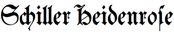
Benjamin Krebs blackletter fonts
|
Andreas Seidel lists the blackletter typefaces published by the Benjamin Krebs foundry (and I added a few): - Normale Fraktur
- Neue Fraktur
- Bismarck Fraktur
- Kräftige Fraktur
- Caxton Type
- Fraktur Buchschrift
- Kaiser Gotisch (date unknown, before 1907). Also sold by Stempel, Kloberg, and Weisert, and as Royal Black by Reed. Seemann (1926) lists the mager (light) as available from Krebs, and the regular weight from AG für Schriftgießerei and Stempel. Digital revivals of the regular weight include Kaiser Gothic (Dan X. Solo, included in the Celtic and Medieval Alphabets book by Dover, 1998) and Kaiser-Gotisch (G. Helzel, 2001, used for sample). KaiserzeitGotisch (D. Steffmann, 2001) is a free version of the Solotype version.
- Künstler Gotisch
- Psalter Gotisch (ca. 1890). Digital revivals include TbC Psalter Gotisch (2014, Chiron), Psalter Gotisch (2012, Alter Littera), and Psalter Gotisch (2009, Paulo W).
- Neue Kanzlei
- Fette Kanzlei
- Enge Altgotisch
- Mammut Gotisch
- Robusta
[Google]
[More] ⦿
|
Biblio@BoyBeaver
|
List of well-known typographers, with biographies of people such as Nicolas Jenson, Aldus Manutius, William Caslon, John Day, Johann Froben, William Caxton, and Christophe Plantin. Plus a list of typography books. [Google]
[More] ⦿
|
Candace Uhlmeyer
[DH Type Visionaries]
|
[More] ⦿
|
Caxton Initials
|
A typeface made in 1905 by Frederic Goudy. D.J.R. Bruckner: The great San Francisco printer John Henry Nash was fond of this set of capitals, but Goudy considered it "a rather clumsy form of Lombardic capitals." American Type Founders issued it for many years. Mac McGrew: Caxton Initials were designed by Frederic W. Goudy in 1905. He says of them, "These are a rather clumsy form of Lombardic capitals. At this time had not given text letters much study and while the forms of these capitals are correct enough, they lack the delicate hairlines which I learned later are an important feature of letters of this kind." The font includes only the 26 letters shown and a small leaf ornament. Compare Lombardic Capitals. Digital versions: 1479 Caxton Initials (GLC), Caxton Initials (2012, Alter Littera). [Google]
[More] ⦿
|
Coen Hofmann
|
 Born in Amsterdam in 1939, Hofmann started out as a typesetter, and then morphed into a calligrapher and an author on calligraphy, and finally into a type designer.
 Designer at URW++/Fontforum of - Admira (2019). A revival of the striped all caps money font Admira (1940, Schriftguss).
- Altrincham (2003).
- Caxtonian Black (2012). A blackletter.
- Globus Cursive (2015, +Cyrillic). This cursive font is a revival of a font by Friedrich Hermann Wobst (1932, D. Stempel AG).
- Gothic Initials (2015). After an original from 1821 by Firmin Didot's foundry.
- Holland Gothic (2012). A blackletter.
- Jason Uncial (2012). A unicase uncial design.
- Perugia Cursive (2003). A gorgeous calligraphic script based on the 19th century "Scrittura Rotonda Francese" and "Scrittura Italiana" developed by Italian calligrapher Cesare Silvestrini.
- Pinel Pro (2014). A revival of a didone from 1899 by Joseph Pinel called French 10pt No. 2. URW++ writes: Coen Hofmann digitized the font from a batch of very incomplete, damaged and musty drawings, which he dug up in Altrincham. He redrew all characters, bringing up the hairstrokes somewhat in the process.
- Ramona (2004). A shaded typeface.
- Revis (2011). A formal script based on Daphne, a typeface that was originally designed by German type designer Georg Salden. For some reason, that typeface was withdrawn from the URW++ library some time later.
- Romeo (2004). A 3d beveled shadow face.
- Sax (2008). A didone typeface family.
- Seizieme Pro (2013). Based on the 1905 font Série 16 by Peignot, which was mainly used for scientific publications.
- Signpainters Script (2013). A connected copperplate script.
- Silvestrini (2003). A gorgeous Gando-style ronde. Based on the 19th century "Scrittura Rotonda Francese" and "Scrittura Italiana" developed by Italian calligrapher Cesare Silvestrini.
- Sirius and Sirius Caps (2003). A garalde family developed together with British type designer Neville Brown.
- Technotype (2011). A revival of Herbert Thannhaeuser's 1952 slab serif family Technotyp.
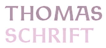
- Thomas Schrift and Thomas Versalien (2015). Based on Friedel Thomas's Thomas Schrift and Thomas Versalien from 1956-1958.
- URW Akropolis (2016, URW++). A revival of the cigar box open typeface Acropolis designed by the Ludwig Wagner foundry in Leipzig in 1940.
- Pergamon (2016, URW++). A wonderful 10-style didone typeface family that revives, extends and modernizes Pergamon Antiqua first designed in 1937 at Ludwig Wagner in Leipzig by Alfons Scheider.
- Marli (2016). A revival of the cursive typeface Korso by F. Schweimanns (1913).
- Moewe (2017). An open typeface in the blackboard bold genre that revives Möwe (1929, Heinz Beck for Genzsch & Heyse).
- Golf (2017). Golf was originally designed by Henry Reinhard Möller in 1935 for Schriftguss KG. Coen Hofmann redrew the capitals and then added lower case letter and Cyrillic alphabets.
Klingspor link. View Coen Hofmann's typefaces. [Google]
[MyFonts]
[More] ⦿
|
Dan X. Solo
[Solotype]
|
 [MyFonts]
[More] ⦿
[MyFonts]
[More] ⦿
|
Danel Aisemberg
|
During his studies in Buenos Aires, Danel Aisemberg designed Elessar (2015), starting from Carolingian letterforms and Caxton. [Google]
[More] ⦿
|
DH Type Visionaries
[Candace Uhlmeyer]
|
Candace Uhlmeyer provided a bit of type history through the work of Johannes Gutenberg (1398-1468), William Caxton (1422-1491), Aldus Manutius (1450-1515), William Caslon (1692-1766), John Baskerville (1706-1775), Giambattista Bodoni (1740-1813), William Morris (1834-1896), Frederic W. Goudy (1865-1947), Eric Gill (1882-1940), and Jan Tschichold (1902-1974). [Google]
[More] ⦿
|
Digital Type Foundry
[James Banner]
|
Digital Type Foundry is James Banner's (extinct) Seattle-based foundry that produced typefaces such as Angelic, Bamberg-Initials, Bamberg, Burton, Caxton-Initials, Daggers, Enochian, FetteFraktur, Fraktur, Futhark-Gothic, Futhark, Hebrew, Hermetica, Titling-Ornaments-1 and Turkish, around 1991-1992. Some fonts can be downloaded for free at Fontspace. He wrote: I started making fonts in 1988 and still produce work, although as it became more difficult to upload my work or share it using the University of Michigan FTP server, I haven't released much. Most recently, I issued the Geoffroy Tory initial letters as a Type 1 font and separately as EPS files as Freeware. I've produced 20-30 fonts since the DTF Volume Three bundle package came out. The foundry disappeared. The licensing today is unclear. Fontspace link. Old URL. Defunct URL. [Google]
[More] ⦿
|
Edward Benguiat
|
 Born in New York in 1927, Ed grew up in Brooklyn. He died in 2020. Ed was once a very prominent jazz percussionist playing in several big bands with Stan Kenton and Woody Herman, among others. He has created a large number of typefaces between 1970 and 1995. About his career, he once said: I'm really a musician, a jazz percussionist. One day I went to the musician's union to pay dues and I saw all these old people who were playing bar mitzvahs and Greek weddings. It occurred to me that one day that's going to be me, so I decided to become an illustrator. He designed more than 400 typefaces for PhotoLettering. He played a critical role in establishing The International Typeface Corporation (or ITC) in the late '60s and early '70s. Founded in 1971 by designers Herb Lubalin, Aaron Burns, and Ed Ronthaler, ITC was formed to market type to the industry. Lubalin and Burns contacted Benguiat, whose first ITC project was working on Souvenir. Ed became a partner with Lubalin in the development of U&lc, ITC's famous magazine, and the creation of new typefaces such as Tiffany, Benguiat, Benguiat Gothic, Korinna, Panache, Modern No. 216, Bookman, Caslon No. 225, Barcelona, Avant Garde Condensed, and many more. With Herb Lubalin, Ed eventually became vice-president of ITC until its sale to Esselte Ltd.
 Ed Benguiat taught at SVA in New York for more than fifty years. Ed is a popular keynote speaker at major type meetings, including, e.g., at TypeCon 2011, where he entertained the crowd with quotes such as I do not think of type as something that should be readable. It should be beautiful. Screw readable. His typefaces---those from PhotoLettering excepted: - ITC Avant Garde Gothic (1971-1977, with Andre Gurtler, Tom Carnase, Christian Mengelt, and Erich Gschwind).
- ITC Modern No. 216 (1982: a didone text family). The Softmaker versions are called M791 Modern and Montpellier. Ed writes: It's a revival of the classic British Modern design. I tried to capture the dignity and grace of the original designs, but not make it look stuffy. Moderns were often numbered to distinguish different versions. 216 East 45th street was where I worked when I drew the ITC Modern No. 216 font.
- Modern No. 20, after the Stephenson Blake original from 1905. [Image by Kristen Cleghorn]
- ITC Barcelona (1981). Ed writes: I was one of the design consultants for the 1992 Olympics in Barcelona, Spain. What could be more appropriate then to design a typeface for the event? The design of the ITC Barcelona font family, with its soft triangular serifs set the mood for the soft-spoken Catalan people.
- ITC Bauhaus (1974-1975). ITC Bauhaus was co-designed with Victor Caruso. The Softmaker versions are called R790 Sans and Dessau. The Infinitype version is Dessau. The Bitstream version is Geometric 752.
- ITC Benguiat (1977) and ITC Benguiat Gothic (1977-1979). This eponymous comic book (or art nouveau style) typeface family appeared in the 1980s on the covers of Stephen King novels and Choose Your Own Adventure books, in the copyright notice at the beginning of all Paramount Pictures' VHS tapes and in title sequences for Quentin Tarantino's films, the Next Generation series of Star Trek films in the mid-to-late '90s, and the recent Netflix series Stranger Things. It was revived as Benjamin and Benjamin Gothic on the SoftMaker MegaFont XXL CD (2002). Softmaker also has fonts called B693 Roman and B691 Sans that are identical. Benguiat Pro ITC was published in 2008.
- Benguiat Roman (1960s).
- PL Bernhardt (Photo-Lettering, 1970), modeled after a 1930-1931 design by Lucian Bernhard.
- ITC Bookman (1975). See B791 Roman on the SoftMaker MegaFont XXL CD (2002).
- Calendar (1960s).
- ITC Caslon 224 (1983). In 1960, he added Benguiat Caslon Swash, and in 1970, Caslon 223 followed. See C790 Roman on the SoftMaker MegaFont XXL CD (2002), and Caslon CP (2012, Claude Pelletier). Christian Schwartz and Bas Smidt at House Industries digitized Benguiat Caslon.
- ITC Century Handtooled (1993).
- ITC Cheltenham Handtooled (1993).
- ITC Edwardian Script (1994).
- ITC Garamond Handtooled.
- ITC Korinna (1974): after a 1904 typeface called Korinna by Berthold. Michael Brady thinks it is very close to the Berthold original.
- Laurent (1960s).
- Lubalin Graph (1974, ITC). By Herb Lubalin, Ed Benguiat, Joe Sundwall, and Tony DiSpigna.
- ITC Panache (1987-1988). Ed writes: I put my heart, soul, sweat and tears into the design of the ITC Panache font family. I was striving to create an easy to read, legible typeface. I know in my heart that I accomplished what I set out to do. Not only is it easy to read, it's also sophisticated.
- Scorpio (1960s).
- ITC Souvenir. Kent Lew: Benguiat revived Benton's Souvenir for ITC in the '70s and that was well-received for a while. On the other hand, look what happened after that. Souvenir in the ATF 1923 catalog looks really nice, IMO. Souvenir in the '70s seems cliché now. Souvenir these days would be downright dorky. Souvenir was done by Benguiat in 1967 at PhotoLettering. Morris Fuller Benton's original model was from 1914. It was described by Simon Loxley as follows: Souvenir is a typeface that is intractably rooted in style to a particular era, although one a half-century after its creation. It is a quintessential late 1960s and 1970s typeface, informal, with full rounded character shapes and rounded serifs, a laid-back Cheltenham. The Bitstream version of ITC Souvenir was called Sovran.
- ITC Tiffany (1974), a fashion mag typeface family. Adobe says that it is a blend of Ronaldson, released in 1884 by the MacKellar Smiths&Jordan foundry, and Caxton, released in 1904 by American Type Founders.
- PL Torino (1960, Photo-Lettering), a blackboard bold didone-inspired typeface.
- In 2004, House Industries released five typefaces based on the lettering of Ed Benguiat: Ed Interlock (1400 ligatures---based on Ed's Interlock, Photolettering, 1960s), Ed Roman (animated bounce), Ed Script, Ed Gothic and Bengbats.
- He did logotypes for many companies, including Esquire, New York Times, Playboy, Reader's Digesn, Sports Illustrated, Look, Estée Lauder, AT&T, A&E, Planet of the Apes, Super Fly.
- Lesser known Photolettering typefaces include Benguiat Bounce, Benguiat Boutique, Benguiat Bravado, Benguiat Brush, Benguiat Buffalo (+Ornaments: a western wood type font), Benguiat Century, Benguiat Cinema, Benguiat Congressional, Benguiat Cooper Black, Benguiat Cracle, Benguiat Crisp, Benguiat Debbie, (Benguiat) Montage (a fat face didone revived in 2018 at House Industries by Jess Collins and Mitja Miklavic), Benguiat Roman. Scorpio, Laurent and Charisma, all done in the 1960s, are psychedelic types. In 2021, Donald Roos digitized Plinc Buffalo for House Industries.
Links: Linotype, CV by Elisa Halperin. Daylight Fonts link (in Japanese). Catalog by Daylight, part I, part II. Pics harvested from the web: Portrait With Ilene Strivzer at ATypI 1999. One more with Strivzer. With Jill Bell at ATypI 1999. In action. At TypeCon 2011 with Matthew Carter and Alejandro Paul. At the same meeting with Carole Wahler and with Roger Black. FontShop link. Klingspor link. View Ed Benguiat's typefaces. Ed Benguiat's fonts. [Google]
[MyFonts]
[More] ⦿
|
Font Mesa
[Michael Hagemann]
|
 Michael Hagemann's creations have a 1850-1920 style or at evoke the Wild West. Font Mesa was located in Naperville, IL, but is now based in Las Vegas, NV.
 Free fonts include Cactus Sandwich (Mexican simulation face), Timepiece (originally called Tax Cut), Timepiece 3D, Magic School One and Two (2004, two Harry Potter typefaces), Wild Ride, Corleone (2001: see also here), Corleone Due (2001), MightyRapids (2001: discontinued) and the Ferrari logo font FerroRosso (2002). Michael Hagemann's commercial fonts by year of production: - 2001: La Mesa (2001), Maverick's Luck (2001), Desperado (2001), Rio Mesa, Maverick's Luck (based on a bank document from 1876), La Macchina (2001, Lamborghini car lettering)
- 2002: Brewmaster Modern (lettering of Budweiser Racing), Saddlery and Saddlery Post (Western-style caps: a revival of Minaret by Ihlenberg in 1868; Solo calls it Trocadero), FerroRosso (lettering as in the Ferrari logo), Stampede (a family based on lettering used in document from the Chicago, Indiana&Eastern Railway Co. in 1902), Main Event (a Tuscan font, based on Tuscan Ornate, or Bracelet, fonts that date from before 1860; originally called Main Strike in 2003), Red Dog Saloon, Rough Riders (great Western-style caps), Draft Beer.
- 2003: OK Corral (revival of Caslon and Catherwood's Italian from 1821), OK Corral Lined (same as OK Corral with layers; called Italianate Barnum by Dan Solo), Gold Standard (a Tuscan font based on a few letters found on an old Gold Certificate from 1882), Rodeo Clown (based on Carnival), Taqueria, Cove.
- 2004: Bronc Stomper, Open Range, Saloon Girl (a spurred version, Tex Mex, appeared in 2021), Gillé Classic an exquisitily detailed family based on work by Joseph Gillé, 1820's, and implemented elsewhere under the names Circus, Roma and Madame; this was originally called Home Style; some say that the original goes back to Silvestre and not to Gillé; because of this, finally renamed Maison Luxe in 2017; the condensed versions, released in 2021, are Mi Casa and Mariachi), Miss Scarlett (Gone with the Wind poster lettering), Open Range, High Noon, Draft Beer Classic (2002-2005, connected 50s script), High Country, American West, West Wind, AmericanPop (Coca-Cola font).
- 2005: Buckhorn (a Tuscan style Western or circus font; renamed Circus Wagon in 2020), Rodeo Roundup (rope font; Solo called it Rope Initials), Algerian Mesa (32 fonts; extended to the gigantic font family Tavern in 2017, with further development in 2020 in Bay Tavern and Bayside Tavern; the original Algerian goes back to Stephenson and Blake), Conestoga (circus font), Rough Riders (a nice Western font based on the logo of the Beach Creek Railroad Company in the 1860s), Rough Riders Redux, Mesa Pointe (pointing hands, from 19th century sources), Black Pearl (an ornamental blackletter typeface based on an original from ca. 1860; it has two beautiful manicules; some say it is based on an 1860 font called Rimmed Black by West, published by Farmer&Little), Saloonkeeper (inspired by the Leinenkugels brewing label), Wanderer (inspired by the title logo of the TV show The Wild West), Lynchburg (inspired by the Jack Daniels Green Label Whiskey logo).
- 2006: Flatrock (a revival of Inverted Shaded by Julius Herriet, done at Conner in 1886; Solo calls it Big Cat; in 2020, Flat Rock was renamed Big Cat by Hagemann), Livery Stable (revival of GlypticShaded by Ihlenburg at MS&J, 1878. See also Glyptic and Glyptic No.2, 1878), Happy Holly Day, Main Street (a Tuscan typeface that revives Soutache by Julius Herriet and Bruce, 1873).
- 2007: Birdcage (2007, after a lettering sample in Rob Roy Kelly's American Wood Type book), Lonestar, Lonestar Western, Railhead (2007: 4 styles, a revival of an 1870s type style that was originally available from both Bruce's New York and James Conner's&Sons type foundries called English Two-Line Ornamented No.4; an earlier version was English, done in 1853 by Caslon, Austin, Woods and Sharwoods; and before that, the typeface was created by a German designer in 1849), Flying Dutchman (2007, a revival of a MacKellar, Smiths&Jordan Co Kanzlei-style font from 1876), and Western Sky (2007, a revival of a late 1800s Italian font known as Italian Slab Fancy or Dodge City: it is Italic Ornate from Smith, 1874, MS&J). Country Western (2007, 11 styles; plus versions called Country Western Script and Country Western Swing) is a revival of the classic William Page font known as Clarendon Ornamented originally designed in 1859 and again in 1877 by Vanderburgh&Wells. Abbiente (2007) is his first foray into the world of Bodoni and Didot. Buffalo Bill (2007) is a beautiful Western style font that revives a classic from James Conner's foundry from 1888 [Solo also calls it Buffalo Bill].
- 2008: Gold Rush and Gold Spur (2008) are further Wild West style families, based on typos from the Bruce Foundry, 1865. Silverland (2008, 8 styles; a revival of Ornamented No. 1490 by Ihlenberg, 1874, Bruce) and Belgian (2008, 5 styles; a revival of Ornamented No. 1515 by Julius Herriet, 1861, Bruce) are further revivals of typefaces from the Bruce Foundry.
- 2009: Spanish Main (revival of an old MacKellar Smiths&Jordan blackletter font named Sloping Black, 1896; others mention Witham and MS&J and give the date 1869), Spanish Rose, Black Rose (spiky blackletter based on BlackOrnamented No. 532, Ihlenberg, 1873, Bruce), Bella Rose (2009, blackletter), Broadgauge Ornate (revival of an 1869 Western poster typeface by Ihlenberg at MacKellar Smiths&Jordan). Apple Pie (2009) is some sort of Bodoni Ornate---it revives and extends a William Hagar Type Foundry face, ca. 1850 [MS&J added a lowercase in 1869]. This was followed immediately by Bodoni Ornamental. Hickory (2009) is an ornamental Western face, a revival of an old unnamed font dating back to 1852 and was sold through a few different type foundries including Bruce, MacKellar Smiths&Jordan and James Conner's Sons.
- 2010: Gunsmoke is a Far West font, a revival of a James Conner's Sons font that has been around the block under different names such as Extended Clarendon Shaded, Original Ornamented and Galena [Solo called it Galena]. Night Train is another Far West font.
- 2011: Gold is a multi-style slab serif font family based on the classic Gold Rush (1865, Bruce), with the shadows removed. Images: Gold Black, Gold Thin.
- Undated: Cowboy Serenade (based on Phidian by Ihlenberg, 1870, MS&J; Solo's names: Eureka, Shaded Phidian), Gold Fever (based on Caxtonian, 1878, MS&J), Old Thunder (based on a Tuscan typeface from the 1800s).
- 2013: Great Western, Cowboy Western, Cowboy Rodeo.
- 2014: Magnum Sans.
- 2015: Grillmaster (a basic sans family consisting of 128 fonts).
- 2016: Pitmaster.
- 2017: Ribfest (a Tuscan circus font), Texicali, Alta Mesa (Wild West wood type).
- 2019: Marlin Geo, a large sans typeface family---a modern geometric take on Helvetica. Michael writes on Creative Market: You may have noticed a new FontMesa font released on June 17th called Geovetica, Monotype has asked me to rename the font because it's too close to their best selling product. Marlin is the new name choice for our new font with the geometric version [Marlin Geo] being released first. Marlin Geo has many opentype features and comes with italics (at a 12 degree angle) and a slanted version (at a 6 degree angle). See also Marlin Soft (2019).
- Fried Chicken (2020). A 32-style slab serif family intended for supermarket or food product advertizing.
- Philadelphian (2020). A Western or billboard font family based on a MacKellar, Smiths & Jordan font from 1867 by the same name.
- Taco (2020). A multistyle Mexican party font.
- Tortilla (2021). A 24-style Tuscan typeface, a flat-sided version of Fontmesa's Saloon Girl and Tex Mex font families.
- Marzano (2021-2022). A 30-style blend of Futura, Helvetica and his own Marlin.
Klingspor link. Fontspace link. Dafont link. Creative Market link. MyFonts page. View Michael Hagemann's typefaces. Abstract Fonts link, [Google]
[MyFonts]
[More] ⦿
|
Fontek (Letraset Fontek)
|
 Collection of typefaces at Letraset. Newest typefaces include Donaldson Hand (Tim Donaldson), La Gioconda (based on letters from Giovanni Francesco Cresci, done by Richard Dawson and Dave Farey), Spidercave (Michael Gills), Locomotiv (Phill Grimshaw), Bobbysox (Alan Dempsey), Bouchon (Roselyne and Michel Besnard), Eplica (Yvonne Diedrich), Uffington (Tim Donaldson). The fonts: Aachen Bold, Aachen Medium, Academy Engraved, Agincourt, Algerian Condensed, Ambrose, Aquinas, Aquitaine Initials, Aristocrat, Arriba, Arriba-Arriba, Artiste, Augustea Open, Avalanche Script, Avenida, Axis Bold, Balmoral, Bang, Banner, Becka Script, Belwe Mono, Belwe Mono Italic, Bendigo, Bergell, Bertie, Bertram, Bible Script, Bickley Script, Bitmax, Blackmoor, Bluntz, Bobbysox, Boink, Bordeaux Display, Bordeaux Family, Bordeaux Italic, Bordeaux Roman, Bordeaux Roman Bold, Bordeaux Script, Bouchon Bold, Bouchon Light, Brighton Bold, Brighton Light, Brighton Medium, Bronx, Burlington, Buzzer 3, Cabaret, Cabarga Cursiva, Campaign, Cancellaresca Script, Carlton, Carumba, Caslon 540 Ital/Swash, Caxton Light Italic, Caxton Roman Bold, Caxton Roman Book, Caxton Roman Light, Chalkline Bold, Challenge Bold, Challenge Extra Bold, Champers, Charlotte Bold, Charlotte Book, Charlotte Book Italic, Charlotte Family, Charlotte Medium, Charlotte Sans Bold, Charlotte Sans Book, Charlotte Sans Book Italic, Charlotte Sans Family, Charlotte Sans Medium, Charlotte Sans Small Caps, Charlotte Small Caps, Chiller, Chipper, Choc, Chromium One, Citation, Claude Sans, Claude Sans Bold Italic, Claude Sans Italic, Collins, Comedy, Commercial Script, Compacta, Compacta Bold, Compacta Italic, Coptek, Corinthian Bold, Corinthian Bold Condensed, Corinthian Light, Corinthian Medium, Crillee Bold Italic, Crillee Extra Bold Italic, Crillee Italic, Crillee Italic Inline Shadow, Cult, Dancin', Data 70, Dave Farey Display Fonts, David Quay Display Fonts, David Quay Scripts, Demian, Demian Bold, Design Font Attitudes, Design Font Calligraphic Ornaments, Design Font Celebrations, Design Font Commercials, Design Font Delectables, Design Font Diversions, Design Font Diversities, Design Font Eclectics, Design Font Energetics, Design Font Expressions, Design Font Incidentals, Design Font Industrials, Design Font Inspirations, Design Font Journeys, Design Font Mo' Funky Fresh Symbols, Design Font Moderns, Design Font Naturals, Design Font Organics, Design Font Organics II, Design Font Primitives, Design Font Radicals, Design Font Urbans, Design Font Well Beings, Design Font Wildlife, Digitek, Dolmen, Donaldson Hand, Doodlebug, Dynamo Shadow, Edwardian Medium, Elysium Bold, Elysium Book, Elysium Book Italic, Elysium Family, Elysium Medium, Elysium Small Caps, Emphasis, Enviro, Eplica Bold, Eplica Bold Italic, Eplica Book, Eplica Book Italic, Eplica Family, Eplica Medium, Eplica Medium Italic, Epokha, Equinox, Etruscan, Faithful Fly, Fashion Compressed No. 3, Fashion Engraved, Figural Bold, Figural Book, Figural Book Italic, Figural Family, Figural Medium, Figural Small Caps, Fine Hand, Flamenco Inline, Flamme, Flight, Fling, Follies, Forest Shaded, Frances Uncial, Frankfurter, Frankfurter Highlight, Frankfurter Inline, Frankfurter Medium, Freestyle Script, Freestyle Script Bold, Gigi, Gilgamesh Bold, Gilgamesh Book, Gilgamesh Book Italic, Gilgamesh Family, Gilgamesh Medium, Gilgamesh Small Caps, Gilgamesh Titling, Gill Display Compressed, Gill Kayo Condensed, Gillies Gothic Extra Bold Shaded, Glastonbury, Globale, Globale Bold, Globale Bold Italic, Globale Family, Globale Italic, Goo Goo Gjoob, Gravura, Green, Greyton Script, Hadfield, Hand Drawn, Harlow, Harlow Solid, Harvey, Hazel, Heliotype, Helvetica Bold Condensed, Helvetica Medium Condensed, Highlight, Hollyweird, Ignatius, Impakt, Indy Italic, Informal Roman, Inscription, Iris, Isis, Jazz, John Handy, Jokerman, Kanban, Katfish, Katytude, Klee, La Bamba, La Gioconda, La Gioconda Bold, Lambada, Laser, Laser Chrome, Latino Elongated, Laura, LCD, Le Griffe, Lexikos, Lightnin', Limehouse Script, Lino Cut, Locarno Italic, Locarno Light, Locomotiv, Magatama, Malibu, Marguerita, Martin Wait Display Fonts, Martin Wait Scripts, Mastercard, Mekanik, Mekanik Italic, Milano, Mistral, Mo' Funky Fresh, Montage, Neo Neo, Oberon, Odessa, Old English, One Stroke Script, One Stroke Script Bold, One Stroke Script Shaded, Orange, Orlando, Pablo, Papyrus, Party, Pendry Script, Phill Grimshaw Display Fonts, Phoenikia, Pink, Plaza, Pleasure Bold Shaded, Pneuma, Potato Cut, Prague, Premier Lightline, Premier Shaded, Princetown, Pristina, Pritchard, Pritchard Line Out, Pump, Pump Demi Bold, Quadrus, Quixley, Rage Italic, Ragtime, Rapier, Refracta, Regatta Condensed, Retail Script, Retro Bold, Retro Bold Condensed, Riva, Robotik, Robotik Italic, Romic Light, Romic Light Italic, Roquette, Ru'ach, Rubber Stamp, Rundfunk, Santa Fe, Savoye, Scratch, Scriba, Scriptease, Scriptek, Scriptek Italic, Scruff, Shaman, Shatter (op-art), Sinaloa, Skid Row, Slipstream, Smack, Smudger, Spidercave Bold, Spidercave Book, Spidercave Book Italic, Spidercave Family, Spidercave Ornamented, Spooky, Spotlight, Squire, Squire Extra Bold, Strobos, Superstar, Synchro, Tag, Tannhauser, Teknik, Telegram, Tiger Rag, Tim Donaldson Display Fonts, Tim Donaldson Scripts, Tiranti Solid, Trackpad, Tropica Script, Twang, Uffington, Ulysses, University Roman, University Roman Bold, University Roman Italic, Van Dijk, Van Dijk Bold, Varga, Vegas, Vermont, Victorian, Victorian Inline Shaded, Vienna Extended, Vivaldi, Wade Sans Light, Wanted, Waterloo Bold, Westwood, Wild Thing, Willow, Xylo, Young Baroque, Zaragoza, Zennor, Zinjaro. [Google]
[More] ⦿
Collection of typefaces at Letraset. Newest typefaces include Donaldson Hand (Tim Donaldson), La Gioconda (based on letters from Giovanni Francesco Cresci, done by Richard Dawson and Dave Farey), Spidercave (Michael Gills), Locomotiv (Phill Grimshaw), Bobbysox (Alan Dempsey), Bouchon (Roselyne and Michel Besnard), Eplica (Yvonne Diedrich), Uffington (Tim Donaldson). The fonts: Aachen Bold, Aachen Medium, Academy Engraved, Agincourt, Algerian Condensed, Ambrose, Aquinas, Aquitaine Initials, Aristocrat, Arriba, Arriba-Arriba, Artiste, Augustea Open, Avalanche Script, Avenida, Axis Bold, Balmoral, Bang, Banner, Becka Script, Belwe Mono, Belwe Mono Italic, Bendigo, Bergell, Bertie, Bertram, Bible Script, Bickley Script, Bitmax, Blackmoor, Bluntz, Bobbysox, Boink, Bordeaux Display, Bordeaux Family, Bordeaux Italic, Bordeaux Roman, Bordeaux Roman Bold, Bordeaux Script, Bouchon Bold, Bouchon Light, Brighton Bold, Brighton Light, Brighton Medium, Bronx, Burlington, Buzzer 3, Cabaret, Cabarga Cursiva, Campaign, Cancellaresca Script, Carlton, Carumba, Caslon 540 Ital/Swash, Caxton Light Italic, Caxton Roman Bold, Caxton Roman Book, Caxton Roman Light, Chalkline Bold, Challenge Bold, Challenge Extra Bold, Champers, Charlotte Bold, Charlotte Book, Charlotte Book Italic, Charlotte Family, Charlotte Medium, Charlotte Sans Bold, Charlotte Sans Book, Charlotte Sans Book Italic, Charlotte Sans Family, Charlotte Sans Medium, Charlotte Sans Small Caps, Charlotte Small Caps, Chiller, Chipper, Choc, Chromium One, Citation, Claude Sans, Claude Sans Bold Italic, Claude Sans Italic, Collins, Comedy, Commercial Script, Compacta, Compacta Bold, Compacta Italic, Coptek, Corinthian Bold, Corinthian Bold Condensed, Corinthian Light, Corinthian Medium, Crillee Bold Italic, Crillee Extra Bold Italic, Crillee Italic, Crillee Italic Inline Shadow, Cult, Dancin', Data 70, Dave Farey Display Fonts, David Quay Display Fonts, David Quay Scripts, Demian, Demian Bold, Design Font Attitudes, Design Font Calligraphic Ornaments, Design Font Celebrations, Design Font Commercials, Design Font Delectables, Design Font Diversions, Design Font Diversities, Design Font Eclectics, Design Font Energetics, Design Font Expressions, Design Font Incidentals, Design Font Industrials, Design Font Inspirations, Design Font Journeys, Design Font Mo' Funky Fresh Symbols, Design Font Moderns, Design Font Naturals, Design Font Organics, Design Font Organics II, Design Font Primitives, Design Font Radicals, Design Font Urbans, Design Font Well Beings, Design Font Wildlife, Digitek, Dolmen, Donaldson Hand, Doodlebug, Dynamo Shadow, Edwardian Medium, Elysium Bold, Elysium Book, Elysium Book Italic, Elysium Family, Elysium Medium, Elysium Small Caps, Emphasis, Enviro, Eplica Bold, Eplica Bold Italic, Eplica Book, Eplica Book Italic, Eplica Family, Eplica Medium, Eplica Medium Italic, Epokha, Equinox, Etruscan, Faithful Fly, Fashion Compressed No. 3, Fashion Engraved, Figural Bold, Figural Book, Figural Book Italic, Figural Family, Figural Medium, Figural Small Caps, Fine Hand, Flamenco Inline, Flamme, Flight, Fling, Follies, Forest Shaded, Frances Uncial, Frankfurter, Frankfurter Highlight, Frankfurter Inline, Frankfurter Medium, Freestyle Script, Freestyle Script Bold, Gigi, Gilgamesh Bold, Gilgamesh Book, Gilgamesh Book Italic, Gilgamesh Family, Gilgamesh Medium, Gilgamesh Small Caps, Gilgamesh Titling, Gill Display Compressed, Gill Kayo Condensed, Gillies Gothic Extra Bold Shaded, Glastonbury, Globale, Globale Bold, Globale Bold Italic, Globale Family, Globale Italic, Goo Goo Gjoob, Gravura, Green, Greyton Script, Hadfield, Hand Drawn, Harlow, Harlow Solid, Harvey, Hazel, Heliotype, Helvetica Bold Condensed, Helvetica Medium Condensed, Highlight, Hollyweird, Ignatius, Impakt, Indy Italic, Informal Roman, Inscription, Iris, Isis, Jazz, John Handy, Jokerman, Kanban, Katfish, Katytude, Klee, La Bamba, La Gioconda, La Gioconda Bold, Lambada, Laser, Laser Chrome, Latino Elongated, Laura, LCD, Le Griffe, Lexikos, Lightnin', Limehouse Script, Lino Cut, Locarno Italic, Locarno Light, Locomotiv, Magatama, Malibu, Marguerita, Martin Wait Display Fonts, Martin Wait Scripts, Mastercard, Mekanik, Mekanik Italic, Milano, Mistral, Mo' Funky Fresh, Montage, Neo Neo, Oberon, Odessa, Old English, One Stroke Script, One Stroke Script Bold, One Stroke Script Shaded, Orange, Orlando, Pablo, Papyrus, Party, Pendry Script, Phill Grimshaw Display Fonts, Phoenikia, Pink, Plaza, Pleasure Bold Shaded, Pneuma, Potato Cut, Prague, Premier Lightline, Premier Shaded, Princetown, Pristina, Pritchard, Pritchard Line Out, Pump, Pump Demi Bold, Quadrus, Quixley, Rage Italic, Ragtime, Rapier, Refracta, Regatta Condensed, Retail Script, Retro Bold, Retro Bold Condensed, Riva, Robotik, Robotik Italic, Romic Light, Romic Light Italic, Roquette, Ru'ach, Rubber Stamp, Rundfunk, Santa Fe, Savoye, Scratch, Scriba, Scriptease, Scriptek, Scriptek Italic, Scruff, Shaman, Shatter (op-art), Sinaloa, Skid Row, Slipstream, Smack, Smudger, Spidercave Bold, Spidercave Book, Spidercave Book Italic, Spidercave Family, Spidercave Ornamented, Spooky, Spotlight, Squire, Squire Extra Bold, Strobos, Superstar, Synchro, Tag, Tannhauser, Teknik, Telegram, Tiger Rag, Tim Donaldson Display Fonts, Tim Donaldson Scripts, Tiranti Solid, Trackpad, Tropica Script, Twang, Uffington, Ulysses, University Roman, University Roman Bold, University Roman Italic, Van Dijk, Van Dijk Bold, Varga, Vegas, Vermont, Victorian, Victorian Inline Shaded, Vienna Extended, Vivaldi, Wade Sans Light, Wanted, Waterloo Bold, Westwood, Wild Thing, Willow, Xylo, Young Baroque, Zaragoza, Zennor, Zinjaro. [Google]
[More] ⦿
|
Frederic Goudy
[GoudyFonts.Com]
|
[More] ⦿
|
Frederic William Goudy
[Goudy's typefaces]
|
[More] ⦿
|
Gerhard Helzel
|
 Diplom Engineer, turned type designer and painter, b. Pößneck, DDR, 1948, d. Hamburg, 2025. In 1991, he started digitizing blackletter fonts and offered them for sale on his website. In his last digital leaflet, dated September 2022, he showcased 531 predominantly blackletter fonts, which would make Helzel the leading provider of blackletter fonts in the world. He was involved in the Bund für Deutsche Schrift und Sprache. Twice annualy, Helzel republished the 1939 suspended newspaper Hamburger Nachrichten in blackletter typesetting featuring modern local news.
 Around 1953, Helzel's parents moved to Ludwigshafen in then West Germany, where Gerhard went to primary and high school. He went on to study electrical engineering in Karlsruhe (Diplomingenieur). After moving to Hamburg, he studied Latin and Greek and became interested in art. He lived from private lessons for grammar school students. Helzel led a modest life as he invested most of his earnings in books, painting materials and technical equipment. He lived alone in a small flat in the north of Hamburg. Helzel was the designer at Delbanco-Frakturschriften of DS-DtWerkschrift (1997), DS-Fruehling (1996), DS-MaximilianGotisch (1994), DS-MaximilianTitel (1994), DS-Post-Fraktur (1997). He hand-digitized over 200 blackletter fonts, including: - BreitkopfInitialen (2000). Breitkopf Fraktur was made in the 18th century.
- ElementSchmalfett (1998). Element is a modern Textura by Max Bittrof (1933, Bauersche Giesserei).
- Fichte Fraktur, after M. Tiemann, 1934.
- GotenburgA and GotenburgB (1998-2000). Gotenburg was originally designed by Friedrich Heinrichsen (1935-37, Stempel AG).
- HamburgerDruckschriftFett (1996). Hamburger Druckschrift is due to Friedrich Bauer (1904, Genzsch&Heyse). According to "Blackletter: Type and National Identity", Hamburger Druckschrift "is an accomplished entry in this category of hybrid typefaces made before the 1st World War. They work within the black-letter tradition while borrowing lighter weight, softer curves and more open proportions from roman. Bauer maintained the structure of broken script, but subdued any flourishes. The width of his letters are generally wider than in traditional frakturs and, as in Jugendstil hybrids, some lowercase letterforms are modernized." It has been used as headliner for "Hamburger Nachrichten" which was stopped by the Nazis in 1939. Today's "Hamburger Abendblatt", the daily Hamburg Times, is still using it as headliner.
- Humboldt Fraktur (2000, gross and klein). Humboldt Fraktur was made originally by Hiero Rhode (1938, Stempel AG).
- KochFrakturSchmaleHalbfette (2000). This font is due to Rudolf Koch (1910-1921, Gebr. Klingspor), and was originally named Deutsche Schrift. Digitized in 1998.
- Mainzer Fraktur. After an original in 1901 by Carl Albert Fahrenwaldt.
- Mars Fraktur (1995, free family).
- RatdoltRotunda (1998). Named after Erhard Ratdolt (1443-1528), typesetter. Designed by Wolfgang Hendlmeier in 1989. Available at Delbanco. Tannenber (after E. Meyer, 1934).
- Weber Fraktur.
- WieynckGotischLicht (2001). A font by by Heinrich Wieynck (1926, Schriftguss Dresden), inspired by William Morris' work.
Helzel also offers a free "Frakturconverter" program for Windows which transforms Antiqua fonts into Fraktur fonts. List of his fonts as of 2009: (Anker-)Schul-Fraktur, Accidenz-Gotisch, Akzidenz-Gotisch, Aldine, Albion-Gotisch, Alt-Fraktur, Alt-Gotisch (Bradley), Alt-Deutsch (after Ferdinand Theinhardt, 1851), Alte Münchner Fraktur (after a 1850 typeface by Gustav Lorenz), Alte deutsche Schreibschrift, Alte Schwabacher, Amts-Fraktur (after Heinrich Wilhelm Hoffmeister), Andreae Fraktur, Andreas-Schrift, Angelsächsisch, Angelsächsisch, Verzierte, Antike Gotisch, Aramäische Quadratschrift, Astra, Bastard, Bernhard-Fraktur, Bismarck-Gotisch, Breite deutsche Anzeigenschrift, Breite Kanzlei, Breitkopf-Fraktur, Britannia (Alt-Gotisch), Büxenstein-Antiqua, Büxenstein-Fraktur (after a house style at D. Stempel, 1912), Canzlei, Caxton, Caxton-Type, Claudius, Courante Gotisch, Danziger Fraktur (after A. W. Kafemann), Derby, Deutsche Reichsschrift (after a 1910 typeface by Wilhelm Woellmer), Deutsche Schrägschrift, Deutsche Schreibschrift (Bismarck-Zeit and Goethe-Zeit: school fonts), Deutsche Schrift, Deutsche Werkschrift, Deutsche Zierschrift, Deutsch-Gotisch, Deutschland, Dresdner Amts-Fraktur, Eckmann-Schrift, Einfache Kanzlei, Elegant, Element, Enge Gotisch (2008, after an 1880 font by Bauersche Giesserei), Enge moderne Kanzlei, Enge König-Type, Enge Kanzlei, Englische Antiqua, Faust-Fraktur, Fette Gotisch, Fette Schwabacher, Fichte-Fraktur, Fractur, Französische Antiqua, Frühling-Fraktur (1997, after Koch's original from 1917), Garamond-Antiqua, Genzsch-Antiqua, Germanen-Fraktur (this is the same as Stempel's Normannia from 1905), Germanisch, Goethe-Fraktur (after Wilheml Woelmmer), Gotenburg, Graeca, Gronau-Gotisch (after Heinrich Ehlert, 1850), Gursch-Fraktur, Gutenberg-Fraktur, Gutenberg-Bibelschrift, Gutenberg-Gotisch, Haenel-Antiqua, Halbfette Aldine, Halbfette Kanzlei, Halbfette Normalfraktur, Halbfette Schwabacher-Flinsch, Halbfette Wallau, Hamburger Druckschrift, Hamburger Fraktur, Hamburger Schwabacher, Hammonia-Gotisch, Hansa-Fraktur, Hansa-Gotisch (after a Genzsch & Heyse original), Hebräisch, Hellenistische Antiqua "Graeca", Hölderlin (after Eugen Weiss, 1937), Holländische Gotisch, Hoyer-Fraktur, Humboldt-Fraktur, Hupp-Fraktur, Ideal-Fraktur, Jean-Paul-Fraktur, Jubiläumsfraktur, Kaiser-Gotisch, Kanzlei, Karl-May-Fehsenfeld-Fraktur, (after a 1870 font used in the Karl-May books) Karl-May-Radebeul (after a 1890 font used in the Karl-May books), Kirchengotisch, Moderne, Kleist-Fraktur, Kleukens-Fraktur, Koch-Antiqua, Koch-Fraktur, König-Fraktur G14, König-Type, Kühne-Gotisch, Kühne-Schrift, Kurante Gotisch, Kurmark, Lichte National, Liebing-Type, Liturgisch (after Otto Hupp, 1906), Logos, Ludlow-Wartburg-Fraktur (after Ludlow, ca. 1920), Magere Wallau, Mainzer Fraktur, Manuskript-Gotisch, Mars-Fraktur, Maximilian-Gotisch, Mediaeval-Gotisch, Leipziger Altfraktur (after a 1912 typeface by Carl Kloberg), Midoline (after Jean Midolle's typeface from 1840 at Julius Klinkhardt), Moderne Kanzlei, Moderne Kirchen-Gotisch (based on an original from ca. 1880), Mönchs-Gotisch, Morris-Gotisch (Uncial-Gotisch, Unzial-Gotisch, after Emil Gursch), Münster-Gotisch, Neu-Gotisch klein, Neudeutsch(-Hupp), Neue (moderne) Fraktur, Neue Schwabacher, Nordisch-Antiqua, Normal-Fraktur (1999, after the font by Gustav Schelter, 1835), Normannia-Fraktur, Nürnberg, Offenbach, Post-Fraktur, Psalter-Gotisch, Ratdolt-Rotunda, Reklame-Fraktur halbfett, Renaissance-Fraktur, Renaissance-Kanzlei, Renata (after a Schwabacher of the Bauersche Giesserei, 1914), Richard-Wagner-Fraktur, Romeo Fraktur (2009, after a Stempel font from 1910), Rundgotisch, Russisch-Römisch, Salzmann-Fraktur, Schmale Accidenz-Gotisch, Schmale Haas-Gotisch, Schmale halbfette Fraktur, Schmale halbfette Gotisch, Schneidler-Schwabacher, Schraffierte Gotisch "Stella", Schreibschrift, Schul-Fraktur, Schwabacher, Schwabacher Mager Gross (after Albert Anklam, 1876), Sonderdruck-Antiqua (2008, after a 1913 typeface by Deberny and Peignot), Stahl (2007, after a 1937 typeface by Hans Kühne), Stahl Kursiv (2009, after Hans Kühne), Stella, Stempel-Fraktur, Straßburg (a blackletter based on fter H type by H. Berthold, 1926), Tannenberg, Thannhaeuser-Fraktur, Tiemann-Fraktur, Tiemann-Gotisch, Tiemann-Mediaeval, Unger-Fraktur, Verzierte Angelsächsisch, Verzierte Musirte Gotisch, Victoria-Gotisch (Viktoria-Gotisch), Wallau, Wartburg-Fraktur, Weber-Fraktur, Weiß-Fraktur, Werkschrift Germanisch, Wieynck-Gotisch, Wilhelm-Klingspor-Gotisch, Wohe-Kursive (after Wolgang Hendlmeier, 1988), Wohe Textura (2009, after Wolfgang Hendlmeier), Zeitungs-Fraktur, Zeitungs-Schwabacher (halbfette Neue Zeitungs-Schwabacher, to be more precise---based on a 1900 typeface by Pustet), Zentenar-Buchschrift. Catalog from 1996. Article in 1995 by him on Normal Fraktur. Another catalog, in pieces: I, II, III, IV, V, VI, VII, VIII. Antiqua catalog. Three free blackletter fonts. I would like to thank Wolfgang Hendlmeier and Harald Süß for providing additional information about the Gerhard Helzel's life. [Google]
[More] ⦿
|
Gilles Le Corre
[GLC --- Gilles Le Corre]
|
 [MyFonts]
[More] ⦿
[MyFonts]
[More] ⦿
|
GLC --- Gilles Le Corre
[Gilles Le Corre]
|
 French painter born in Nantes in 1950, who lives in Talmont St Hilaire. His fonts include 2010 Cancellaresca Recens (inspired by a chancery type of Francisco Lucas from the late 16th century), 2009 Handymade (comic book style), 2009 Lollipop (chancery style), 2009 GLC Plantin, 2009 Primitive (2009, a rough-edged roman script), 2008 Script 2 (2008), GLC Ornaments One (2008) and 2008 Xmas Fantasy (2008: blackletter). In 2008, he started GLC -- Gilles Le Corre and became commercial. Creative Market link. He is best known for his historic revivals:
 - 161 Vergilius (2010)
- 750 Latin Uncial (2010): inspired by the Latin script used in European monasteries from circa 5th to 8th, before the Carolingian style took over. The uppercases were mainly inspired by a 700's manuscript from Fécamp's abbey in France.
- 799 Insular (2010): inspired by the so-called insular style of Latin script that was used in Celtic monasteries from about 600 until 820.
- 825 Karolus (2009), and 825 Lettrines Karolus (2009).
- 1066 Hastings (2009).
- 1350 Primitive Russian (2012) was inspired by a Russian Cyrillic hand of Russkaja Pravda. It has rough-edged Latin charaters and many old Russian glyphs.
- 1420 Gothic Script (2008).
- 1431 Humane Niccoli (2010), after writings of Florence-based calligrapher Niccolo Niccoli (1364-1437).
- 1456 Gutenberg (2008, based on a scan of an old text). Followed by 1456 Gutenberg B42 Pro, which was based on the so called B42 character set used for the two Gutenberg Latin Bibles (42 and 36 lines).
- 1462 Bamberg (2008).
- 1467 Pannartz Latin (2009): inspired by the edition De Civitate Dei (by Sanctus Augustinus) printed in 1467 in Subiaco by Konrad Sweynheym and Arnold Pannartz, who was the punchcutter.
- 1470 Sorbonne (2010) was inspired by the first French cast font, for the Sorbonne University printing shop. The characters were drawn by Jean Heynlin, rector of the university based on examples by Pannartz. It is likely that the cutter was Adolf Rusch.
- 1470 Jenson-SemiBold (2008).
- 1475 BastardeManual (2008, inspired by the type called Bastarde Flamande, a book entitled Histoire Romaine (by Titus Livius), translated in French by Pierre Bersuire ca. 1475, was the main source for drawing the lower case characters).
- 1479 Caxton Initials (2009): inspired by the two blackletter fonts used by the famous William Caxton in Westminster (UK) in the late 1400s.
- 1483 Rotunda Lyon (2010): inspired by a Venetian rotunda found in a 1483 book called Eneide printed in Lyon by Barthélémy Buatier (from Lyon) and Guillaume Le Roy (from Liège, Belgium).
- 1484 Bastarda Loudeac (2008).
- 1470 Jenson Latin (2009), inspired by the pure Jenson set of fonts used in Venice to print De preparatio evangelica in 1470.
- 1491 Cancellarasca Normal and Formata (2009): inspired by the very well known humanist script called Cancellaresca. This variant, Formata, was used by many calligraphers in the late 1400s, especially by Tagliente, whose work was mainly used for this font.
- 1492 Quadrata (2008).
- 1495 Lombardes (2008): a redrawn set of Lombardic types, which were used in Lyon by printers such as Mathias Huss, Martin Havard or Jean Real, from the end of 14OOs to the middle of 1500s.
- 1495 Bastarde Lyon (2008, based on the font used in the "Conte de Griseldis" by Petrarque).
- 1499 Alde Manuce Pro (2010): inspired by the roman font used by Aldus Manutius in Venice (1499) to print Hypnerotomachia Poliphili, the well-known book attributed to Francesco Colonna. Francesco Griffo was the punchcutter. The Italic style, carved by Francesco Colonna, illustrates the so-called Aldine style.
- 1509 Leyden (2008; a Lombardic typeface inspired by the type used in Leyden by Jan Seversz to print Breviores elegantioresque epistolae).
- 1510 Nancy (2008, decorated initial letters was inspired by those used in 1510 in Nancy (France, Lorraine) for printing of Recueil ou croniques des hystoires des royaulmes d'Austrasie ou France orientale[...] by Symphorien Champion; unknown printer).
- 1512 Initials.
- 1514 Paris Verand (based on initial caps that Barthélémy Verand employed for the printing of Triumphus translatez de langage Tuscan en François.
- 1522 Vicentino (2011). Based on Ludovico Vicentino Arrighi's 1522 typeface published in La Operina.
- GLC 1523 Holbein (2010, after Hans Holbein's Alphabet of Death.
- GLC 1525 Durer Initials (2010). Sample R.
- 1529 Champ Fleury Pro and 1529 Champ Fleury Initials (2010): based on Geofroy Tory's original drawings and text face.
- 1532 Bastarde Lyon (2008, based on work by an anonymous printer in Lyon (France) to print the French popular novel Les Grandes et inestimables Chroniques du grand et enorme geant Gargantua).
- 1533 GLC Augereau Pro: inspired by one of Antoine Augereau's three roman typefaces: the Gros Romain size, used in 1533 to print Le miroir de l'&aciorc;me..., a poetic compilation by Marguerite de Navarre, sister of the French king François I.
- 1534 Fraktur (2009; inspired by the early Fraktur style font used circa 1530 by Jacob Otther, printer in Strasbourg (Alsace-France) for German language printed books).
- 1536 Civilité manual (2011). Based on a handwritten copy of Brief story of the second journey in Canada (1535) by French explorer Jacques Cartier.
- 1538 Schwabacher (2008, based on a font used by Georg Rhan in Wittemberg (Germany) to print Des Babsts Hercules [...], a German pamphlet against roman catholicism written by Johannes Kymeus).
- 1540 Mercator Script was inspired by an alphabet of Gerardus Mercator, who is known for his maps as well as his Literarum Latinarum, quas Italicas cursoriasque vocant, scribendarum ratio (1540).
- 1543 Humane Petreius (2012) was inspired by the typeface used in Nuremberg by Johannes Petreius for De Revolutionibus Orbium Coelestium, the well-known mathematical and astronomical essay by Nicolas Copernicus.
- 1543 German Deluxe (2009): a Schwabacher inspired by the sets of fonts used in 1543 by Michael Isengrin, printer in Basel, to print New Kreüterbuch, which is a book with numerous nice pictures, the masterpiece of Leonhart Fuchs, father of the modern botany.
- 1543 HumaneJenson-Bold (2008, after the typeface used in Vesalius' 1543 book De humani corporis fabrica).
- 1543 HumaneJenson-Normal (2008, same source).
- 1545 Faucheur (2011) is a rough garalde typeface that was inspired by the set of fonts used in Paris by Ponce Rosset, aka Faucheur, to print the story of the second travel to Canada by Jacques Cartier, first edition, printed in 1545.
- 1546 Poliphile (2009), inspired by the French edition of Hypnerotomachie de Poliphile ("The Strife of Love in a Dream") attributed to Francesco Colonna, 1467, and printed in 1546 in Paris by Jacques Kerver.
- 1550 Arabesques (2008, caps).
- 1557 Civilité Granjon (2010).
- 1557 Italique (2008, based on Italic type used by Jean de Tournes in Lyon to print La métamorphose d'Ovide figurée).
- 1565 Renaissance (2010), inspired by French renaissance decorated letters.
- 1565 Venetian Normal (2008, initial decorated letters that are entirely original, but were inspired by Italian renaissance engraver Vespasiano Amphiareo's patterns published in Venice ca. 1568).
- 1584 Rinceau (2008, a set of initial letters is an entirely original creation, inspired by French renaissance patterns used by Bordeaux printers circa 1580-1590).
- 1584 Pragmatica Lima (2011). Based on fonts used in 1584 by Antonio Ricardo to produce the first publication ever printed in Southern America.
- 1585 Flowery (2009): inspired by French renaissance decorated letters.
- 1589 Humane Bordeaux (2008, inspired by the Garamond fonts used by S. Millanges (imprimeur ordinaire du Roy) in Bordeaux ca. 1580-1590. The alphabets were used to reprint L'instruction des curés by Jean Gerson).
- 1590 Humane Warszawa is a rough-edged garalde typeface inspired by a font carved circa 1590 for a Polish editor.
- 1592 GLC Garamond (2008, inspired by the pure Garamond set of fonts used by Egenolff and Berner, German printers in Frankfurt, at the end of sixteen century. Considered the best and most complete set at the time. The italic style is Granjon's).
- 1610 Cancellaresca (2008, inspired by the Cancellaresca moderna type of 1610 by Francesco Periccioli who published it in Sienna).
- 1613 Basilius (2012) was based on the hand-drawn types used by Basilius Besler (Germany) for the carved plates of his botanical manual Hortus eystettensis.
- GLC 1619 Expédiée (2015). A grungy Civilté.
- 1621 GLC Pilgrims (2010).
- 1634 René Descartes (2009), based upon his handwriting in a letter to Mersenne.
- 1638 Civilité Manual (2010). Inspired by a French solicitor's document dated 1638.
- GLC 1648 Chancellerie (2011). Inspired by the hand-written 1648 Munster peace treaty signed by roi Louis XIV and Kaiser Ferdinand II.
- 1651 Alchemy (2010): a compilation created from a Garamond set in use in Paris circa 1651.
- GLC 1669 Elzevir (2011) was inspired by the font typefaces used in Amsterdam by Daniel Elzevir to print Tractatus de corde, the study of earth anatomy by Richard Lower, in 1669. The punchcutter was Kristoffel Van Dijk.
- GLC 1672 Isaac Newton (2012) is based on the hand of Isaac Newton.
- GLC Morden Map (2011). Based on an engraved typeface used on a pack of playing cards published by Sir Robert Morden in 1676.
- 1682 Writhed Hand: very irregular handwriting.
- 1689 GLC Garamond Pro (2010): inspired by Garamond fonts used in an edition of Remarques critiques sur les oeuvres d'Horace by DAEP, published in Paris by Deny Thierry and seprately by Claude Barbin.
- 1689 Almanach (2009): inspired by the eroded and tired fonts used by printers from the sixteenth century to the early years of twentieth for cheap or fleeting works, like almanacs, adverts, gazettes or popular novels.
- 1695 Captain Flynt.
- 16th Arabesques (2008, an exquisite ornamental caps scanfont).
- 1715 Jonathan Swift (2011). An example of the hand of Irish poet and novelist Jonathan Swift (1667-1745). It is a typical exemple of the British quill pen handwriting from about 1650-1720.
- GLC 1726 Real Espanola (2012). Based on the set of typefaces used by Francisco Del Hierro to print the first Spanish language Dictionary from the Spanish Royal Academy (Real Academia Española, Dictionario de Autoridades) in 1726. These transitional styles are said to have been the first set of official typefaces in Spain.
- 1741 Financiere (2009): inspired by the Fournier's font Financière. While it appears handwritten, it was in fact carved in 1741 by Pierre Simon Fournier le jeune and published in his Manuel Typographique in Paris (1764-1766).
- 1742 Frenchcivilite (2008).
- 1751 GLC Copperplate (2009), a 6-style family about which Gilles says: This family was inspired by an engraved plate from Diderot&Dalembert's Encyclopedia (1751), illustrating the chapter devoted to letter engraving techniques. The plate bears two engravers names: "Aubin" (may be one of the four St Aubin brothers?) and "Benard" (whose name is present below all plates of the Encyclopedia printed in Geneva). It seems to be a transitional type, but different from Fournier or Grandjean.
- 1756 Dutch (2011).
- 1776 Independence (inspired mainly from the font used by John Dunlap in the night of 1776 July 4th in Philadelphia to print the first 200 sheets of the Congress' Declaration of Independence establishing the United States of America).
- 1781 La Fayette (2010): a formal bâtarde coulée script with caitals inspired by Fournier (1781).
- 1785 GLC Baskerville (2011). Le Corre explains: The Baskerville's full collection was bought by the French editor and author Pierre-Augustin Caron de Beaumarchais who used it to print---in Switzerland---for the first time the complete work of Voltaire (best known as the Kehl edition, by the "Imprimerie de la société littéraire typographique"). We have used this edition, with exemplaries from 1785, to reconstruct this genuine historical two styles.
- 1786 GLC Fournier (2010), based on several books printed in Paris just before the Didot era set in. The Titling characters are based on hymns printed by Nicolas Chapart.
- 1790 Royal Printing (2009): inspired by various variants of Romain du Roy.
- 1791 Constitution (2011).
- 1792 La Marseillaise (2011). Based on the original manuscript of the French revolutionary song La Marseillaise which later became the French national hymn---it was composed in one night (April 25, 1792) by captain Rouget de Lisle.
- 1805 Austerlitz Script Light: a typical French handwriting style from that period, named after one of the few battles that Napoleon actually won.
- 1805 Jaeck Map (2011). Inspired by the engraved characters of a German map, edited in Berlin at the end of 1700s. The engraver was Carl Jaeck or Jaek (1763-1808).
- 1809 Homer (2011), a grungy typeface named after the "homer" message pigeons.
- 1815 Waterloo (2008): a handwriting typeface originating in Napoleon's government. Why do I feel that GLC is nostalgic for the era of Napoleon? Their own present dwarf-version of Napoleon is not exactly a huge success.
- 1820 Modern (2009) was inspired by a didone font used in Rennes by Cousin-Danelle, printers, for a Brittany travel guide.
- 1822 GLC Caslon (2010): inspired by a Caslon set used by an unknown Flemish printer from Bruges, in the beginning of 1800s, a little before the revival of the Caslon style in the 1840s.
- 1845 Mistress (2009): calligraphic script.
- 1848 Barricades Italic, a quill pen italic.
- 1859 Solferino (2009).
- 1863 Gettysburg (2008; inspired by a lot of autographs, notes and drafts, written by President Abraham Lincoln, mainly the Gettysburg address).
- 1864 GLC Monogram Initials (2011) was inspired by a French portfolio containing about two hundred examples of Chiffres---deux lettres, created for engravers and jewelers in Paris in 1864, and drawn by French engraver C. Demengeot.
- 1871 Victor Hugo (2011). Based on manuscripts from the final part of the life of Victor Hugo (1802-1885).
- 1871 Whitman Script (2008) and 1871 Dreamer Script (2008): inspired by manuscripts by American poet Walt Whitman. See also 1871 Dreamer 2 Pro (2012).
- 1880 Kurrentschrift (2010): German handwriting, based on late medieval cursive. It is also known as "Alte Deutsche schrift" ("Old German script"). This was taught in German schools until 1941.
- 1883 Fraktur (2009): inspired by fonts used by J. H. Geiger, printer in Lahr, Germany.
- 1885 Germinal: based on notes and drafts written by Émile Zola (1840-1902).
- GLC 1886 Romantic Initials (2012).
- 1890 Registers Script (2008): inspired by the French "ronde".
- 1890 Notice (2009): a fat didone family.
- 1902 Loïe Fuller (art nouveau face).
- 1906 Fantasio (2010): inspired by the hatched one used for the inner title and many headlines by the popular French satirical magazine Fantasio (1906-1948).
- 1906 French News: a weathered Clarendon-like family based on the fonts used by Le Petit Journal, a French newspaper that ran from 1863 until 1937.
- 1906 Fantasio Auriol (2010), inspired by the set of well known Auriol fonts used by the French popular satirical magazine Fantasio (1906-1948).
- 1906 Titrage (2009): a didone headline typeface from the same newspaper.
- Underwood 1913 (2007, an old typewriter font, whose commercial version is Typewriter 1913), and 1913 Typewriter Carbon (2008).
- 1920 French Script Pro (2010).
- 1920 My Toy Print Set, 1925 My Toy Print Deluxe Pro (2010): inspired by rubbert stamp toy print boxes called Le petoit imprimeur.
- 1968 GLC Graffiti (2009).
- 1917 Stencil (2009; with rough outlines).
- 2010 Dance of Death (2010): based on Hans Holbein's Alphabet of Death.
- 2009 Primitive (2016).
- 2009 GLC Plantin Pro (2016).
- 2010 Pipo Classic: a grungy typewriter slab serif family.
- 2010 Cancellaresca Recens (2016).
- 2011 Slimtype (2011, +Italic) and 2011 Slimtype Sans (2011): an old typewriter typeface.
Creative Market link. Fontspring link. [Google]
[MyFonts]
[More] ⦿
|
GoudyFonts.Com
[Frederic Goudy]
|
 A subpage of Ascender, which is reviving most of Goudy's fonts. They compiled a rather incomplete list of other revivals, conveniently leaving out all free fonts. The main source for commercial Goudy fonts is Lanston, now part of P22. I will provide a better list below.
 1896: Camelot 1897: Unnamed 1897: A “Display Roman” 1898: DeVinne Roman. Revived by Nick Curtis in 2014 as Tedlo Roman NF. 1902: Pabst Roman, Pabst Italic 1903: Powell 1904: Cushing Italic 1904: Boston News Letter 1905: Copperplate Gothics 1905: Caxton Initials 1905: Globe Gothic Bold 1905: Caslon Revised 1908: Monotype No. 38-e, Monotype No. 38-e Italic 1910: Norman Capitals 1911: Kennerley Old Style, Kennerley Open Caps 1911: Forum Title 1912: Sherman (revived in 2017 by Pentagram and Chester Jenkins for Syracuse University). 1912: Goudy Lanston 1914: Goudy Roman 1914: Klaxon 1915: Goudy Old Style 1915: Goudy Catalogue 1915: Goudy Old Style Italic 1916: Goudy Cursive 1916: Booklet Old Style 1916: National Old Style (for a revival, see National Oldstyle NF (2014, Nick Curtis)). 1916: Goudy Type. Revival in 2018 by Steve Matteson as Goudy Type. 1917: Advertiser’s Roman 1917: An Unnamed Design 1918: Kennerley Italic 1918: Cloister Initials 1918: Hadriano Title 1918: Goudy Open 1918: Goudy Modern 1919: Collier Old Style 1919: Goudy Modern Italic 1919: Goudy Open Italic 1919: Goudy Antique 1921: Nabisco 1921: Lining Gothic 1921: Garamont, Garamont Italic 1921: Goudy Newstyle 1924: Goudy Italic 1924: Italian Old Style, Italian Old Style Italic 1924: Kennerley Bold, Kennerley Bold Italic 1925: Goudy Heavy Face 1925: Goudy Heavy Face Italic 1925: Marlborough 1925: Venezia Italic 1926: Aries 1927: Goudy Dutch 1927: Companion Old Style, Companion Old Style Italic 1927: Deepdene 1927: Record Title 1927: Goudy Uncials 1928: Deepdene Italic 1928: Goudy Text 1929: Strathmore Title 1929: Lombardic Capitals 1929: Sans Serif Heavy 1929: Kaatskill 1929: Remington Typewriter 1930: Inscription Greek 1930: Trajan Title 1930: Sans Serif Light 1930: Mediaeval 1930: Hadriano Lowercase 1930: Advertiser’s Modern 1930: Goudy Stout 1930: Truesdell, Truesdell Italic 1931: Deepdene Open Text 1931: Deepdene Text 1931: Ornate Title 1931: Sans Serif Light Italic 1931: Deepdene Medium 1932: Goethe 1932: Franciscan 1932: Deepdene Bold 1932: Mostert 1932: Village No. 2 1932: Quinan Old Style 1932: Goudy Bold Face 1933: Goudy Book 1933: Goudy Hudson 1933: Goethe Italic 1933: Deepdene Bold Italic 1934: Saks Goudy, Saks Goudy Italic, Saks Goudy Bold 1934: Hadriano Stone Cut 1934: Village Italic 1934: Textbook Old Style 1934: Hasbrouck 1935: Tory Text. A blackletter typeface in the spirit of the lettrs batardes found in Geoffroy Tory's Champs Fleury. Revival by Steve Matteson in 2018 simply called Tory. 1935: Atlantis 1935: Millvale 1936: Bertham 1936: Pax 1936: Mercury 1936: Sketches Unnamed 1937: Friar 1938: University of California---FB Californian, University of California Italic---FB Californian Italic 1938: New Village Text 1938: Murchison 1939: Bulmer 1941: Scripps College Old Style 1942: Goudy Thirty 1943: Spencer Old Style, Spencer Old Style Italic 1944: Hebrew 1944: Scripps College Italic 1944: Marlborough Text Goudy Borders Goudy Fleurons Goudy Sorts Park Ridge ITC Berkeley Old Style, ITC Berkeley Old Style Italic [Google]
[More] ⦿
|
Goudy's typefaces
[Frederic William Goudy]
|
 List of Goudy's typefaces, with dates, compiled by Paulo W.
 - 1896 Camelot.
- 1897 Unnamed, A Display Roman.
- 1898 DeVinne Roman.
- 1902 Pabst Roman.
- 1903 Pabst Italic, Powell, Village.
- 1904 Cushing Italic, Boston News Letter, Engravers Roman.
- 1905 Copperplate Gothics, Caxton Initials, Globe Gothic Bold, Caslon Revised.
- 1908 Monotype No. 38-e, Monotype No. 38-e Italic.
- 1910 Norman Capitals.
- 1911 Kennerley Old Style, Kennerley Open Caps, Forum Title.
- 1912 Sherman, Goudy Lanston.
- 1914 Goudy Roman.
- 1915 Klaxon, Goudy Old Style, Goudy Old Style Italic.
- 1916 Goudy Cursive, Booklet Old Style, National Old Style (often used in silent movies), Goudy Type.
- 1917 Advertisers Roman, An Unnamed Design.
- 1918 Kennerly Italic, Cloister Initials, Hadriano Title, Goudy Open, Goudy Modern.
- 1919 Collier Old Style, Goudy Modern Italic, Goudy Open Italic, Goudy Antique.
- 1921 Nabisco, Lining Gothic, Garamont, Garamont Italic, Goudy Newstyle. Mac McGrew: National Oldstyle was designed by Frederic W. Goudy for ATF in 1916. It is based on lettering he had done about fifteen years earlier for National Biscuit Company, hence the name. It was moderately popular for a while for publication and advertising display work, and for titles for silent motion pictures. Compare Nabisco.
- 1924 Goudy Italic, Italian Old Style, Italian Old Style Italic, Kennerly Bold, Kennerley Bold Italic.
- 1925 Goudy Heavy Face, Goudy Heavy Face Italic, Marlborough, Venezia Italic.
- 1926 Aries [image by Nikolas Matses].
- 1927 Goudy Dutch, Companion Old Style, Companion Old Style Italic, Deepdene, Record Title, Goudy Uncials.
- 1928 Deepdene Italic, Goudy Text.
- 1929 Strathmore Title, Lombardic Capitals, Sans Serif Heavy, Kaatskill, Remington Typewritter.
- 1930 Inscription Greek, Trajan Title, Sans Serif Light, Mediaeval, Hadriano Lower-case, Advertisers Modern, Goudy Stout, Truesdell.
- 1931 Truesdell Italic, Deepdene Open Text, Deepdene Text, Ornate Title, Sans Serif Light Italic, Deepdene Medium.
- 1932 Goethe, Franciscan, Deepdene Bold, Mostert, Village No. 2, Quinan Old Style, Goudy Bold Face, Goudy Book.
- 1933 Goudy Hudson, Goethe Italic, Deepdene Bold Italic.
- 1934 Saks Goudy, Saks Goudy Italic, Saks Goudy Bold, Hadriano Stone Cut, Village Italic, Hasbrouck.
- 1935 Tory Text, Atlantis, Millvale.
- 1936 Bertham, Pax, Mercury, Sketches Unnamed, Sketches Unnamed.
- 1937 Friar.
- 1938 University of California O.S., University of California Italic, New Village Text, Murchison.
- 1939 Bulmer.
- 1941 Scripps College Old Style.
- 1942 Goudy Thirty.
- 1943 Spencer Old Style, Spencer Old Style Italic.
- 1944 Hebrew, Scripps College Italic, Marlborough Text.
[Google]
[More] ⦿
|
Henry Taylor Wyse: The early British typefounders
|
Henry Taylor Wyse writes in 1911 in Modern type display and the use of type ornament: GUTENBERG, the inventor of printing, as well as his immediate successors, cut their own punches, made their own matrices, and cast their own type. In the early part of the sixteenth century } however, as the number of printers increased, type-founding as a regular business began to be developed, and periodical markets for the sale of type were held throughout Europe. In England the pioneers of printing, Caxton, Wynkn de Worde, and Pynson, were founders as well as printers, casting type however mostly for their own use. One of the most noted of these founder-printers was John Day, who began business in 1546. He cut founts of Roman, Saxon, and Italic letters, and was the first English founder-printer who cut Roman and Italic letters which would range as one fount. After Day's death, English printers had to depend upon Dutch matrices from which to receive their supplies of type. The year 1585 witnessed a revival of the Oxford University Foundry and Press under Joseph Barnes. During the next century it received two important gifts. Dr John Fell, its Chancellor, in 1677 presented it with a complete foundry, consisting of over seventy sets of punches and matrices for Roman, Italic, Oriental, Saxon, and black letter founts, as well as all the necessary utensils and apparatus requisite for a complete printing office. In the same year Francis Juvinus presented similar gifts to the University. In the middle of the seventeenth century type-founding and printing began to be carried on as separate businesses in England. Joseph Moxon (1659-1683), Robert and Sylvester Andrews (1683-1733), and Thomas and John James (1710-1782) all figure as early English type-founders. Joseph Moxon combined the business of type-founder and printer with that of hydrographer to the King. In 1669 he printed what is supposed to have been the first type-founders' specimen issued in England. Moxon was suc- ceeded by Robert Andrews and his son Sylvester, who had established a type-foundry in Oxford. This was purchased in 1733 and removed to London by Thomas James, who had been an apprentice to Robert Andrews, but had left his service before 1710, being joined by his son John at a later date. It does not appear that they cut any punches for themselves ; they depended upon Holland for their supply of matrices. By 1758 James' Foundry had absorbed no fewer than nine of the old English foundries. Varying fortunes of the Caslon firm form an interesting chapter in the history of type-founding in England. William Caslon I. (1692-1766) may be said to have been the first English type-founder who whole-heartedly devoted himself to the cutting of punches and the casting of type. Originally an engraver of gun barrels, he attracted the attention of Mr Watts, an eminent printer of his day. This printer, struck by the neatness and taste displayed by Caslon in his engraving, and being in need of a new fount of type, enquired whether he thought he could cut letters for him. After one day's consideration, he replied that he thought he could, and straightway began to cut a series of punches for the type which is now known as Caslon Old Face. It is inter- esting to know that Benjamin Franklin, who later became the well-known American printer, ambassador, and statesman, was at this time a journeyman printer in the service of Mr Watts. The efforts of Caslon gave such satis- faction the type he had produced was so much better than that in common use that the Society for the Promotion of Christian Knowledge, being in need of a new Arabic fount, commissioned him to cut it for them. In the same year (1720) he cut a Pica Roman and Italic fount. His next perform- ance was a Pica Coptic fount for Dr Wilkins' edition of the Pentateuch. These successful founts soon made him famous, and by 1730 he had eclipsed most of his competitors, and secured the exclusive custom of the King's printer. About 1733 he cut a black letter fount, and in 1734 issued his first specimen from Chiswell Street, and it contained no fewer than thirty-eight founts, all of which, with the exception of three, were from his own hand. These thirty-five founts represented the untiring industry of fourteen years. The production of this specimen placed Caslon at the head of his profession, and his type was regarded as the standard. It was illustrated in the second edition of Ephraim Chambers's Cyclopaedia in 1738. In 1739 Caslon purchased half of Robert Mitchell's matrices, the other half being bought by John James. In 1742 Caslon assumed his eldest son, Wm. Caslon II., as a partner, and in the specimen of the same year the firm appears as Wm. Caslon & Son. Caslon II. was as expert as his father at punch-cutting, and the following notice appears in " Ames' Typographical Antiquities," published in 1749: "The art seems to be carried to its greatest perfection by William Caslon and his son, who, besides the type of all manner of living languages now by him, has offered to perform the same for the dead, that can be recovered, to the satisfaction of any gentleman desirous of the same." The "Universal Magazine" of June 1750 contains an article on letter-founding, accompanied by a picture of the interior of Caslon's Foundry. The print includes representations of four casters at work, one rubber (Joseph Jackson), and one dresser (Thomas Cottrell). Punch-cutting and justifying was carried on in secret by the Caslons themselves, but Jackson and Cottrell found means to observe them at work, and learned for themselves the manual part of the "art and mystery." In the year 1757 a movement for higher wages was made by the men in Caslon's employment. The increase of wages was granted, but Jackson and Cottrell, the ringleaders, were dismissed. In the specimen of 1764 eighty-two different founts were illustrated, more than twice as many as had been shown in the specimen of 1734. Most of the new founts had been cut by Caslon II. Caslon I. was in many ways a cultured man, being extremely fond of music. He was married three times. His first family consisted of one daughter and two sons William, who succeeded him, and Thomas, who became an eminent bookseller. Caslon I. died at Bethnal Green on January 23, 1766, aged seventy-four. In 1766 Caslon II., who had succeeded to the business on the death of his father, issued a specimen on the title-page of which the original name of Wm. Caslon appears. Caslon II. died in 1778, aged fifty-eight, leaving the business to his son William (Caslon III.). In 1792 Caslon III. disposed of his interest in Chiswell Street to his mother and sister-in-law. Mrs Caslon senior died in 1795, and as her will was the object of some litigation, the estate was thrown into Chancery, and the foundry put up to auction. It was bought by Mrs Henry Caslon for 520, whereas seven years previously one-third share of the concern had been sold for 3000. In buying the foundry, Mrs Henry Caslon determined to revive the business, and for this purpose secured the services of Mr John Isaac Drury, who cut new Canon, Pica, and Double Pica founts. At the same time, Mr Nathaniel Catherwood, a distant relative, was introduced as a partner. By 1808 the foundry had regained its former position. Both Mrs Henry Caslon and Mr Catherwood died in 1809. In 1802 the firm appeared as Caslon & Catherwood, but in 1809 it was styled Wm. Caslon & Son once more. From 1814 to 1821 the partnership included John James Catherwood, brother of a former partner. From 1830 to 1834 it was styled Caslon & Livermore, then in 1839, Caslon Son and Livermore ; in 1846 Caslon & Son ; and in 1850, H. W. Caslon & Co., Ltd. the name by which it is now so widely known. When, in 1757, Wm. Caslon I. summarily dismissed his two workmen, Joseph Jackson and Thomas Cottrell, he little thought that his action would lead to the starting of two new businesses, which would develop into rivals of his own and his successors. Thos. Cottrell started as a type-founder in 1757, and had associated with him for some time, Joseph Jackson, his unfortunate coadjutor. Cottrell's business eventually developed into that of Sir Charles Reed & Sons, while Jackson's foundry, established in 1763, at length became that of Stephenson, Blake & Co., both firms being joined under the same management in 1906. The story of the ups and downs of these firms would be too lengthy for narration in such a work as this, but it may be interesting to relate that the foundries, or at least the punches and matrices of about a dozen concerns were absorbed by Thos. Cottrell's successors. These belonged to Joseph Moxon, 1659-1683 ; R. & S. Andrews, 1683-1733 ; Thomas & John James, 1710-1782 ; Fry and Pine, 1764-1776 ; Joseph Fry & Co., 1776-1782 ; Edmund Fry & Co., 1782-1794 ; Edmund Fry and Isaac Steele, 1794-1799 ; Fry, Steele & Co., 1799-1808 ; and Edmund Fry & Son, 1816-1829, at which date William Thorowgood, who was the then living successor of Thos. Cottrell, took over the business of Edmund Fry & Son, then known as the Polyglot Letter Foundry. In 1838 the style of the firm was Thorowgood & Besley ; in 1849, Besley & Co. ; in 1861, Reed & Fox; and in 1877, Sir Charles Reed & Sons. The foundry started by Joseph Jackson in 1763 was put up to auction after his death in 1792, and was acquired by Caslon III., who had left the Chiswell Street firm. In 1807 it belonged to Wm. Caslon, Junior, son of Caslon III. In 1819, Wm. Caslon, Junior, disposed of the foundry to Blake, Garnett & Co., who had become partners for the purpose of acquiring it, and the entire stock was removed to Sheffield. In 1830 the firm was known as Blake & Stephenson, while in 1841, it went under the style of Stephenson, Blake & Co., the name which, in association with Sir Charles Reed & Son, it now bears. An obituary notice of Thomas Cottrell, written by his friend Nicols, throws a curious light upon the usages of the time, and is as follows : " Mr Cottrell died, I am sorry to add not in affluent circumstances, though to his profession of a letter founder, were superadded that of a doctor for the toothache, which he cured by burning the ear ! " It is interesting to notice that many of the early type-founders forsook other occupations to follow that of punch-cutting. Joseph Moxon was a hydrographer ; Caslon I. was an engraver of gun barrels ; Alex. Wilson of St Andrews, the first Scotch type-founder, and Joseph and Edmund Fry were all doctors, while John Baskerville of Birmingham was successively a footman, a writing master, a printer, and finally a type-founder. Baskerville seems to have been in many ways a remarkable man. He spent six years of effort and over 600 in improving the typography of his own day. He made everything required for his business, punches, matrices, type, ink, and even printing presses. His type was of beautiful and elegant form ; and the issue in 1757 of the first book printed with it (Virgil) was hailed with delight by the entire literary world. This was not sufficient, however, to compensate him for the years of labour he had spent on his founts. The printers of his own day preferred the bold Caslon Old Face, which had taken them by storm. He spared no effort to bring his founts into the market, but without success. His entire stock of type-punches and matrices were eventually purchased by Beaumarchais for the "Societe Litteraire Typographique " for 3,700, and transferred to France. [Google]
[More] ⦿
|
James Banner
[Digital Type Foundry]
|
[More] ⦿
|
John F. Cumming
|
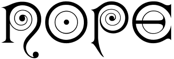 Massachusetts-based punchcutter, b. 1852, Harrisville, PA.
 - Typefaces at the Boston Type Foundry: Albino (1882), Autograph Script (1884), Bank Note Roman and Italic (1870), Banner (< 1883), Binner Gothic (< 1898), Century (1884), Cheque (1882), Clark Script (1884), Copley (1886), Dresden (1882), Duerer (1889), Facade (1892), Kismet (1879, the ultimate Victorian typeface), London (< 1885), Lubeck (1884), Magnolia Script (1884), Morris, Munich (1882), Record (1881), Rubens (1884), Skinner Script (1885), Soudan (1884), Syrian, Weimar (1886).
- Typefaces at the Dickinson Type Foundry (also in Boston): Algonquin and Algonquin Ornamented (1888), Caxton Title, Colonial (1887), Elandkay (1892), Florentine Old Script (1884), French Cursive, Globe. Gothic Script (1891), Gothic Slope, Grady (< 1891), Howland (1892), Jagged Series (1881), Karnac (1884, Victorian), Masonic Text (1890), Mother Hubbard (1885), Outing Series (1888, revived by Nick Curtis as Pique-Nique NF in 2014), Quaint (1888), Renaissant (1880, a Victorian typeface revived in 2014 by Nick Curtis as Renaissant NF), Satanick (1897), Skjald (1890), Stenograf (1890), Vertical Script (1897), Virile (1890), Visible Speech.
- Typefaces at the Hansen Type Foundry: Viking Old Style No. 3 (1899).
Comment by Mac McGrew on Howland: Howland was introduced by Dickinson in 1892 as a "companion series to DeVinne." The same design was called DeVinne Condensed (No.3) by Keystone Type Foundry, but differs from the De Vinne Condensed issued by other sources. Howland Open followed in 1894; it was copied by Linotype as Condensed Outline and suggested through the 1940s as a display typeface for classified advertising pages which banned bold types. Compare DeVinne Condensed, MacFarland Condensed. Some digitizations exist: the nice fat pre-art deco typeface Binner is offered by Linotype, Elsner & Flake (as Binner EF), and Monotype (as Binner Poster MT). Kismet was digitized by Linotype and separately by Richard Beatty as Spiral. Viking Old Style No. 3 was revived in Ingvaeonic-Oldestyle (2007, Nick Curtis)). Howland was revived by Elizabeth Carey Smith as Howland New. Jenson Oldstyle No. 2 (1893) was designed by J.W. Phinney and cut by John F. Cumming. Linotype link. FontShop link. Klingspor link. [Google]
[MyFonts]
[More] ⦿
|
John Gustave Dreyfus
|
Born in London in 1918, died in London in December 2002. Assistant University Printer, Cambridge University Press 1949-56 Cofounder of ATypI with Charles Peignot in 1957. He was the typographic advisor to The Monotype Corporation (now Agfa Monotype) from 1955-1982, having taken over from Stanley Morison. President, Association Typographique Internationale 1968-1973. Sandars Reader in Bibliography, Cambridge University 1979-1980. He was a great writer about typographic matters. Author of Aspects of French Eighteenth Century Typography (The Roxburghe Club, Cambdridge, 1982). Obituary and biography by Nicolas Barker. Winner of the Gutenberg Prize in 1996. Reflections on his life by various typographers. [Google]
[MyFonts]
[More] ⦿
|
José Alberto Mauricio
[Alter Littera]
|
 [MyFonts]
[More] ⦿
[MyFonts]
[More] ⦿
|
Kelly Media
|
Crooked font vendor in Germany who has a few cheap CDs with renamed commercial fonts. Run by Hans Fremuth, who founded Kelly Data GmbH in 1994 (since 1999 Kelly Data AG). Kelly Data AG went bankrupt in 2002. Ulrich Stiehl has evidence that Fremuth is based in München. On the Kelly Media or Kelly Data web sites, one can find cheap font CDs under names such as Profi-Schriften Business Schriften (679 truetype fonts), Firle Fonts, and Profi-TYPO (2000 fonts). Stiehl discovered a connection between Hans Fremuth and Charles Biddle, who set up Bay Animation, an Annapolis, MD, outfit of equal questionable taste. Font names used by both Kelly Data and Bay Animation include Alps (Hevetica), Amaretto (Bitstream Amerigo), Amethyst (Garamond No. 3), Antiqua 101 (Antique Olive), Attila (ITC Avant Garde), Bangla (ITC Benguiat), Bid Roman (Melior), Bliss (Janson), Block (ITC Machine), Centime (Century Old Style), Chelsey (ITC Cheltenham), Chisel (Copperplate Gothic), Clayton (Caxton), Clean (Orator), Congo (Trump Medieval), Cupid (Cooper Black), Schroeder (Schneidler), Tech (Arquitectura), and Vogel (VAG Rounded). Stiehl's PDF file shows without a shadow of a doubt that Biddle copied several fonts, giving examples of Bid Roman (a copy of Zapf Elliptical). Owner info: Hetzner Online AG, Stuttgarter Strasse 1, 91710, Gunzenhausen, DE, +49 9831610061, +49 9831610062, info@hetzner.de. [Google]
[More] ⦿
|
Leslie Usherwood
|
 The most famous Canadian type designer (1932-1983). Usherwood studied at the Beckenham School of Art, and practiced as a lettering artist in the commercial art field for 15 years. Typesettra was created in 1968, and had more than four type designers in the early eighties. In 1977, Typsettra began designing original typefaces for Berthold, Letraset and ITC. Usherwood's typefaces:
 - Melure (first typeface, designed in 1965 for Headliners International, New York).
- Caslon Graphique (1980). Digital versions: Caslon Graphique (URW++), Caslon Graphique (ITC), Caslon Graphique EF (Elsner+Flake), Caslon Graphique SH (Scangraphic Digital Type Collection).
- Caxton Light Italic (Letraset, 1981), Caxton Roman Bold (Letraset, 1981), Caxton Roman Book (Letraset, 1981), and Caxton Roman Light (Letraset, 1981).
- Flange, a family created for a government program in 1972; a Typesettra font since 1980; a Berthold font since 1981; see Fleming on the SoftMaker MegaFont XXL CD, 2002; it is also in the Scangraphic collection as Flower. Aka Frascati.
- ITC Leawood (1982). ITC Leawood was begun by Les Usherwood and finished in 1984 by his staff at Typsettra in Toronto after his untimely death. See also OPTI Lemery Book by Castcraft.
- Lynton (1980-1981, Berthold).
- Marbrook (1983, Berthold).
- ITC Usherwood (1983).
- Several headline typefaces were conceived by Leslie Usherwood for Berthold in the early 1970s, such as Graphis Extra Fett (1971, a very bold headline face), Statesman (1973, a high contrast large x-height serif face) and Oktavia (1973, a large x-height face). They are also Typesettra typefaces.
- Several of his typefaces were published/revived by Red Rooster Type foundry, such as TCAdminister (by Steve Jackaman), Argus (by Paul Hickson), Beckenham (by Paul Hickson, named after the Beckenham School of Art where Usherwood studied), TCCentury (1996, by Steve Jackaman), Chelsea (1993, by Steve Jackaman).
- At Red Rooster: Alexon (1993: the digital version was done by Steve Jackaman in 1999. This typeface is a relative of the flared-extremity typeface Friz Quadrata), Elston, TCKingsley (digital version by Jackaman, 1999: based on Goudy's Kennerley Old Style, 1911-1924), Lesmore (digital version by Paul Hickson), Claremont (digital version by Paul Hickson), TC Administer (digital version by Jackaman), Sycamore (digital version by Jackaman), Maximo (digital version by Jackaman), Kingsrow (digital version by Jackaman), Goudy 38 (digital version by Jackaman), Extension RR (digital version by Jackaman), Chelsea (digital version by Jackaman), Argus (digital version by Paul Hickson), Beckenham (digital version by Jackaman), Equestrienne (digital version by Paul Hickson), Stanhope (digital version by Paul Hickson; Usherwood's based the design on a turn-of-the-century typeface of the same name from the Soldans&Payvers foundry, circa 1904), Century New Style (digital version by Jackaman), Waverly (digital version by Jackaman).
Linotype link. FontShop link. Klingspor link. [Google]
[MyFonts]
[More] ⦿
|
Manfred Klein
[Manfred Klein: Blackletter, Fraktur, Rotunda]
|
 [MyFonts]
[More] ⦿
[MyFonts]
[More] ⦿
|
Manfred Klein: Blackletter, Fraktur, Rotunda
[Manfred Klein]
|
 Manfred's fascination with blackletter and its German roots is apparent from the tens of typefaces he designed that are either revivals of historic typefaces or playful and not so playful extensions. Here we go:
 - ArthritishSpringtime
- BarlosRandom, BarlosRandomRings
- BarlosiusEdged (2007)
- Bastarda-K, BastardaButtonsBeta, BastardaMajuskel1300, BastardusSans
- BauernFraktur (2004, after the 1911 original by Bauersche)
- BayreuthFraktur, Bayreuther-BlaXXL (2005, a variation of Schneidler's Bayreuth)
- BigBroken, BigBrokenTwo
- BigElla
- Brahms-Gotisch (2005, with Petra Heidorn: a revival of Heinz Beck's 1937 typeface at Genzsch&Heyse)
- BrokenAlphabetTradition, BrokenBrainsFrax, BrokenCapsJumperB, BrokenHand-Bold, BrokenHand, BrokenHandLight, BrokenRoman-Bold, BrokenSansCaps, BrokenSansCapsJumper, BrokenWoodtypes, BrokentTraditionRound
- BruchRund
- BruchschriftMK
- Burte-Fraktur
- Burtine (2003: handwritten freestyle version of Burte Fraktur, 1928), Burte-Fraktur, Burtinomatic, Burtinomatic-DemiBold
- Burtinomatic-DemiBold, Burtinomatic
- CancellerescA
- CantaraGotica
- Cantzley Inverse Caps (2007), CantzleyAD1600 (2005)
- CaslonishFraxx
- ClaudiusImperator
- Clausewitz-Fraktur (2005). Designed in memory of Klaus Burkhardt.
- CaslonishFraxx
- ClaudiusImperator
- CowboyCaxton
- Cuxhaven Initials Round (2006), CuxhavenFraktur (2006), CuxhavenInitials (2006), CuxhavenTimes (2002). All named in honor of Petra Heidorn, who is from Cuxhaven.
- DecadentaFrax (2007)
- DirtyThinkwitz (2003). In honor of his good friend Klaus Burkhardt.
- DizzyBrokenWritten
- DolbyFraxCaps (2005)
- DornspitzGrotesk
- DoubleBrokenTextura
- Druckschrift-Initialen
- DrunkenSailor (2006)
- DuerersMinuskeln
- ElectrUnciale (2005)
- ElephantaBlack (2006)
- FatFreeFrax
- FlyingHollander (2005)
- FracturiaSketched, FracturiaSketchedCaps
- FraktKonstruct, FraktSketch, FraktSketchFS, FraktalConPablos, FrakturInRings (2007), FrakturInitials07 (2007), FrakturNitials (2006), FrakturaFonteria, FrakturaFonteriaSlim (2006)
- FrakturCondensedHeadline, FrakturCondensedHeadlineExtra
- FraxBoxes, FraxBricKs, FraxBrix, FraxHandwritten-RoundCaps, FraxHandwritten, FraxHandwrittenXtrem-Medium, FraxInCage, FraxInCageLeftOblique, FraxInCageRightOblique, FraxInitials, FraxMouseSketches, FraxxSketchQuill
- FrungturaFS
- GGothiqueMK
- GermanFatman (2006)
- GingkoFraktur (2006)
- GoldenSwing
- GotenborgFraktur (2007)
- GothicLetters (2007)
- Gotic Caps (2006), GoticaBastard, GotischeMajuskel, GothicMajuscles
- GotikaButtons (2005, after Imre Reiner's Gotika from 1933)
- GutenbergsGhostypes, GutenbergsTraces
- HamletOrNot, HamletTobeornot
- HansFraktur
- HansSachsCaps (2007)
- HansSchoenspergerRandomish
- HappyFrax (2006)
- Haunted-Normal, HauntedBricks
- Heimat
- Holland Gotisch (with Petra Heidorn; a revival of Nederduits by Johann Michael Fleischmann, ca. 1750)
- ImresFraktur, ImresFraxCaps (2007)
- Incunitials
- IronFraktur
- JessicaPlus
- JoeCaxton
- JohannesBricks, JohannesButtons-02, JohannesGDiamonds, JohannesGLastTraces (2007), JohannesTraces
- Jugendstil (2006)
- KaiserRotbartCaps (2007)
- KL1CiviliteEdges
- Kl1RheumaticFraktur
- KleinSchwabach (2005)
- KleinsBrokenGotik (2006)
- KlungerCaps (2006)
- Leibniz-Regular
- LombardPlattfuss, Lombardic
- LookBrokenTypes
- LuFraktorsoBroad
- LudwigHohlwein (2006)
- LufrakturBricks (2006)
- LutherDuemille, LutherMousedrawn-Bold, LutherMousedrawn
- MKBritishWriting
- MK Broken Types (2006)
- MKFraxConstr (2007)
- MKImresTshirtsA
- MKalligFrax, MKalligFrax-MediumItalic
- MKancellerescaCaps (2005)
- MKantzley (2005), MKanzleiCaps-One (2006)
- MKapitalisRusticaMedium
- MKaslonTextura
- MoKsford, MoKsfordBold, MoKsfordDemiBold, MoKsfordExtraLight, MoKsfordLight
- MonAmourCaps (2006), MonAmourFraktur-Broken (2006), MonAmourFrakturRegular
- MonksWriting
- MorbusParcinsonFraxx
- MorscheKnochen
- MountFirtree
- MousefraKtur
- Münchner-Fraktur (2005). A revival of Renaissance Fraktur by Heinz König, 1885, Genzsch&Heyse.
- MyElectronicSchwabach
- NeuGothic-Bold
- Neudoerffer, NeudoerfferScribbleQuality. Both codex style typefaces are from 2003. Manfred writes that Neudoerffer is an unaltered version of the original Neudoerffer Initialen from 1660.
- OKsfordBadFat, OKsfordItalic
- OldTypographicSymphony-Regular, OldTypographicSymphony-Round
- PopFraxFrankfurt (2007), PopFraxFrankfurtCondensed (2007)
- PrinzEugen
- Potsdam (2005, a revival of a 1934 typeface by Robert Golpon)
- Prothesis-Black, Prothesis-Caribiqu, Prothesis-Caripix
- RandomFrax
- ReadableGothic
- RememberReinerFS
- RotundaEspagna
- Schaftstiefel Kaputt (2003)
- SchmaleGotischMK, SchmalfetteGotisch
- SchneidlerSchwabacher, SchneidlerSolitaires, SchneidlerSolitairesRound
- Schwabach, SchwabachDuemille, SchwabachScribbels, SchwabachScribbelsSecond
- ScribbledFrakturX-Heavy (2006)
- SketchedCassiusBroken
- SmallEdgedFrax (2006)
- Snoutlike (2003)
- SpaceWinningFrax (2007)
- TizonaDance
- TshirtsForFrax
- TypoasisBoldGothic (2003)
- VanDoesburgBrokenFS
- VeryBrokenFrax
- WaldarbeiterGotisch
- WeimarInline
- WeissGotischRandom
- Weissgotnitials (2005, based on Weiss's Lichte Initialen, 1935)
- WittewittMajuscles-Flourish, WittewittMajuscles-FlourishBricks
- WrittenFrax (2007)
Download page. Download all these fonts in onze zip file.               
[Google]
[MyFonts]
[More] ⦿
|
Matthew Carter
|
 Matthew Carter (born in London in 1937, and son of Harry Carter) is one of today's most influential type designers. He trained as a punchcutter at Enschedé in 1956. In 1963 he was hired by Crosfield, a firm that pioneered the new technology of photo-typesetting, to lead their typographic program. He worked for Mergenthaler Linotype (1965-1981), and co-founded Bitstream Inc. with Mike Parker in 1981, adapting many fonts to digital technology. In January 1992, he founded Carter&Cone with Cherie Cone, and often collaborated with Font Bureau. In 1995, he won the Gold Prize at the annual Tokyo Type Directors Club competition for Sophia. In 1997, he received the TDC Medal for significant contributions to the life, art, and craft of typography. In 2010, he received a MacArthur grant. He lives in Cambridge, MA.
 John Berry on Carter's art (2002). Apostrophe comments on Berry's article. Interview. His fonts: - The Microsoft screen fonts Verdana (1996), Georgia (1996), Georgia Greek, Georgia Cyrillic, Nina and the humanist sans typeface Tahoma (1994). Georgia (in roman and italic only) is a screen version of Miller, Carter's Scotch design. Nina was designed to address the requirements on smaller screens such as phones, and was used in Windows Mobile smartphones before Microsoft switched to Segoe. The Greek and Cyrillic versions of Nina were developed by François Villebrod. Georgia Pro (2010, Ascender) was developed from Georgia with the help of Steve Matteson. For Verdana Pro (2010, Ascender), Carter was assisted by David Berlow and David Jonathan Ross.
- Apple's Skia (1993), a sans serif designed with David Berlow for Apple's QuickDraw GX technology, now called AAT. [Carter's Skia and Twombly's Lithos are genetically related.]
- Monticello (2003), based on Linotype's Monticello (1950), which in turn goes back to Binny&Ronaldson's Monticello from 1797, a typeface commissioned by Princeton University Press for the Papers of Thomas Jefferson. It is in the Scotch roman style.
- Miller (1997, Font Bureau), an extremely balanced family co-designed by Carter, Tobias Frere-Jones and Cyrus Highsmith. Carter explains: Miller is a Scotch Roman, a style that had its beginnings in the foundries of Alexander Wilson In Glasgow and William Miller in Edinburgh between about 1810 and 1820. It is considered that the punchcutter Richard Austin was responsible for the types of both Scottish foundries. Miller is a revival of the style, but is not based on any historical model. Now, there is also a 16-weight newspaper version, Miller Daily (2002), and an 8-weight Miller Headline (2002). This was followed by News Miller, a typeface designed for the Guardian. Note: Georgia (1996) is a screen version of Miller, and Monticello (2002) is a later modification. A comparison of these typefaces.
- Alisal (1995, +Bold).
- ITC Galliard (1978), a recreation of Robert Granjon's garalde letters. This typeface was originally conceived in 1965. Bringhurst recommends a Carter and Cone version of this font, called Galliard CC: it has old style figures and small caps. Further versions include Aldine 701 (Bitstream), Matthew (Softmaker), ITC Galliard Etext (2013, Carl Crossgrove, Linotype), and Gareth (Softmaker).
- The ITC Charter family (1987 for Bitstream and known as Bitstream Charter; licensed to ITC in 1993; see the Elsner&Flake version of ITC Charter). An upgraded commercial version was released by Bitstream in 2004 under the name Charter BT Pro.
- Vincent (1999), a font commissioned for use in Newsweek. It is named after Vincent Figgins, an English foundry owner and punch cutter who lived in the late 18th century.
- Walker (1994), designed for The Walker Art Center.
- Ionic Number One (1999, Carter&Cone).
- Mantinia (1993, Font Bureau), based on inscriptional forms, both painted and engraved, by the Italian renaissance artist Andrea Mantegna.
- Big Caslon (1994, Font Bureau), a display typeface based on the largest romans from William Caslon's foundry.
- Big Figgins (1992) and Big Figgins Open (1998, based on the decorative didone types shown in the specimens of Vincent Figgins of 1815 and 1817). Big Figgins was called Elephant and Elephant Italic in Microsoft's Truetype Fontpack 2.
- Sammy Roman (1996), loosely based on the 17th century romans of Jean Jannon. A beautiful typeface designed to accompany kanji and kana typefaces produced by Dynalab in Taiwan.
- Sophia (1993, Font Bureau), a mix with Greek, uncial and classical Roman influences.
- Shelley Script (1972), a family of formal scripts, split into Andante, Volante and Allegro. It is based on intricate English scripts of the 18th and 19th centuries attributed to George Shelley.
- Cochin (1977, at Linotype). MyFonts writes: In 1913 Georges Peignot produced a typeface based on Nicolas Cochin's eighteenth century engravings. In 1977, Matthew Carter expanded this historic form into a three part series.
- Bell Centennial (Linotype-Mergenthaler, 1975-1978), a legible heavily ink-trapped family designed by Matthew Carter as a replacement of Bell Gothic at Mergenthaler. There are also digital Linotype and Bitstream versions. AT&T commissioned the font to replace their previous typeface choice Bell Gothic for their 100th Anniversary.
- Cascade Script (1965-1966, Linotype, now also known as Freehand 471 BT in the Bitstream collection). Paratype's extension of Freehand 471 to Cyrillic is by Oleg Karpinsky (2011).
- New Century Schoolbook was designed from 1979-1981 in the New York Lettering office of Merganthaler Linotype based on Morris Fuller Benton's Century Schoolbook from 1915-1923. It was the second face, after New Baskerville, that was digitized and expanded using Ikarus (digital technology). The Bitstream version [Century Schoolbook] is a virtually exact copy, only being moved from a 54 unit to a 2000 or so unit design.
- Auriol (Linotype), an art nouveau family (including Auriol Flowers 1 and 2 and Auriol Vignette Sylvie) based on the lettering of the painter and designer Georges Auriol. MyFonts explains: Auriol and Auriol Flowers were designed by Georges Auriol, born Jean Georges Huyot, in the early 20th century. Auriol was a French graphic artist whose work exemplified the art nouveau style of Paris in the late 19th and early 20th centuries. In 1900, Georges Peignot asked Auriol to design fonts for Peignot&Sons. The resulting Auriol font was the basis for the lettering used by Hector Guimard for the entrance signs to the Paris Metro. It was re-released by Deberny&Peignot in 1979 with a new bold face, designed by Matthew Carter. These decorative fonts with a brush stroke look are well-suited to display settings. The Peignot drawing office insisted on a more normal appearance in the boldface, calling it Robur. Matthew Carter has returned to Auriol's original design for the whole series.
- Helvetica Greek (Linotype).
- Helvetica Compressed (Linotype, 1974, with Hans-Jörg Hunziker).
- Wilson Greek (1995), compatible with Miller Text, and based on a type cut by Alexander Wilson for the Glasgow Homer of 1756. See here.
- Olympian (1970, Linotype), designed for newspaper use. This is Dutch 811 in the Bitstream collection. The custom typeface Milne (Carter&Cone) done for the Philadelphia Inquirer is based on Olympian.
- Gando, a French "ronde" typeface based on the work of Nicholas Gando (mid 1700s), and designed for photo-typesetting at Mergenthaler by Carter and Hans-Jörg Hunziker in 1970. Very similar to Bitstream's Typo Upright.
- Fenway (1998-1999, Carter&Cone), commissioned by Sports Illustrated to replace Times Roman.
- Snell Roundhand (1965-1966): a connected cursive script based on the 18th-century round hand scripts from English writing masters such as Charles Snell. Early in the digital era, Matthew published this in the Bitstream collection as Roundhand BT. A Cyrillic version by Isabella Chaeva and Vladimir Yefimov was released by ParaType in 2013.
- Auriga (1970). (Wallis dates this in 1965 at Linotype.)
- CRT Gothic (1974).
- Video (1977).
- V&A Titling (1981).
- Deface (in the FUSE 18 collection).
- Madrid (2001), done for the Spanish newspaper El País.
- Milne, done for the Philadelphia Inquirer (a revised version of Olympian). Not available.
- Durham, a sans serif family for US News&World Report.
- Airport.
- Century 725 (Bitstream, for the Boston Globe: after a design by Heinrich Hoffmeister).
- For Microsoft: Georgia, Verdana, Tahoma (1994), Nina.
- Freehand 471 (Bitstream). A chunky slightly angular script.
- New Baskerville. [Matthew Carter says that this is wrongly attributed to him. It was directed by John Quaranta.]
- Postoni [or Post-Bodoni], for the Washington Post, which is still using it. See here.
- Le Bé, a Hebrew typeface that was used in the Pennyroyal Caxton Bible.
- Rocky (2008, Font Bureau, with Richard Lipton), for the Herald in Scotland.
- Time Caledonia.
- Wiredbaum, for WIRED.
- Wrigley (for Sports Illustrated). Matthew Carter designed Roster in the 1990s, and it was adopted as a display face for Sports Illustrated under the name Wrigley. Jesse Ragan was instrumental in later expanding the family from its original seven styles to the current 60. In 2015, Carter & Cone and Font Bureau released an expanded 60-style family of this typeface under the new name Roster.
- Benton Bold Condensed (for Time Magazine).
- Foreman Light (for the Philadelphia Inquirer).
- Newsbaum (for the New York Daily News).
- Carter Latin: Matthew was commissioned in 2003 to create a new design to be cut in wood type by the Hamilton Wood Type&Printing Museum in Two Rivers, WI. He came up with an all-caps, chunky, Latin-serif design.
- Times Cheltenham (2003), which replaces in 2003 a series of headline typefaces including Latin Extra Condensed, News Gothic, and Bookman Antique.
- The Yale Typeface (2004), inspired by the late fifteenth-century Venetian typeface that first appeared in Pietro Bembo's De Aetna, published by Aldus Manutius. This extensive family is freely available to members of Yale University.
- DTL Flamande (2004, Dutch Type Library), based on a textura by Hendrik van den Keere. Since 2018, available from URW++. Additions to DTL Flamande by Lukas Schneider.
- Meiryo UI, Meiryo UI Bold, Meiryo UI Bold Italic, Meiryo UI Italic (2004). Meiryo is a modern sans serif Japanese typeface developed by Microsoft to offer an optimal on screen reading experience and exceptional quality in print, as part of the Cleartype project. The Japanese letterforms are generously open and well-proportioned; legible and clear at smaller sizes, and dynamic at larger display sizes. The beauty of Meiryo is that it sets text lines in Japanese with Roman seamlessly and harmoniously. Meiryo was designed by a team including C&G Inc., Eiichi Kono, Matthew Carter and Thomas Rickner. It won a 2007 type design prize from the Tokyo Type Directors.
- Suntory corporate types (2003-2005), developed with the help of Akira Kobayashi and Linotype from Linotype originals: Suntory Syntax, Suntory Sabon, Suntory Gothic, Suntory Mincho.
- Rocky (2008, Font Bureau): A 40-style high contrast roman family that is difficult to classify (and a bit awkward). Developed with Richard Lipton.
- Carter Sans (2010, ITC), based on epigraphic letters used in inscriptions. Created for the identity of the Art Directors Club 2010 class of its Hall of Fame, one the laureates in the 2010 Hall of Fame. Codesigned by Dan Reynolds, this chiseled typeface is loosely based on Albertus.
- In 1997, he designed Postoni for the The Washington Post's headlines, a sturdy Bodoni.
- MS Sitka (2013). A typeface with six optical sizes that are chosen on the fly if an appropriate application is present. Developed at Microsoft with the help of John Hudson (Tiro Typeworks) and Kevin Larson (who carried out extensive legibility tests). German link. Typophile link. Sitka won an award at Modern Cyrillic 2014.
- Van Lanen Wood Type (Hamilton Wood Type, 2002-2013). Carter started work on the wood type in 2002, but technical accuracy issues postponed the implementation. Digital versions were finally done in 2013 by P22's Hamilton Wood Type.
- Big Moore (2014, Font Bureau): A 1766 specimen by Isaac Moore, former manager of Joseph Fry's foundry in Bristol, England, shows many types inspired by John Baskerville. But a century later, standardization had foisted inept lining figures and shortened descenders upon these designs. Matthew Carter remedies the tragedy with Big Moore. Oldstyle figures, full-length descenders, and historic swashes are restored to this regal serif in two styles. Big Moore won an award in the TDC 2015 Type Design competition.
- Role (2019, Sans, Slab, Serif, Soft). A superfamily published at Morisawa and Fontelier. Matthew Carter, Shotaro Nakano, and Kunihiko Okano co-designed Role Serif at Morisawa.
Speaker at ATypI 2013 in Amsterdam. Speaker at ATypI 2019 in Tokyo on the topic of Expressing Vocal Tones through Typography. Linotype link. FontShop link. Favorite quote: Watching me work is like watching a refrigerator make ice. Another quote: A typeface is a beautiful collection of letters, not a collection of beautiful letters. View Matthew Carter's typefaces. Matthew Carter's fonts. The typefaces made by Matthew Carter. See also here. Wikipedia page. Klingspor link. [Google]
[MyFonts]
[More] ⦿
|
Michael Hagemann
[Font Mesa]
|
 [MyFonts]
[More] ⦿
[MyFonts]
[More] ⦿
|
Nikita Vsesvetskii
[Soft Union]
|
[More] ⦿
|
Proportional Lime
[Shane Brandes]
|
 Oberlin, OH-based foundry of Shane Brandes (b. Lakefield, MN, 1974), who made the historic semi-blackletter revival Augsburger2009 (2009), which was inspired by one of Ernhardt Ratdolt's (1442-1528) many beautiful typefaces. Ratdolt was a printer from Augsburg, hence the name. River Liffey (2009) is based on a typeface used by James Williams an Irish printer active in Dublin during the late 18th century. Rising Sun (2009, blackletter) was inspired by Gering and Remboldt's work during the late 1490s in Paris.
 Charlemagne (2010) is an imaginary medieval script. Fleurious (2010) are ornaments. Sweynheym Pannartz (2010) is modeled after an example Conrad Sweynheym and Arnold Pannartz used in their early printing venture in Subiaco, Italy which began around 1465. Ballard (2010) was inspired by a font used by Henrie Ballard, who operated on Fleet Street at the Signe of the Bear in London from ca. 1597-1608. White Now (2010) is a music note font. Enn'agrammaton (2010) is a cryptographic font. Pluton (2010) is a fixed width font with over 1400 glyphs. Old Venexia (2010) simulates an irregular medieval type. Black Tie (2010) is a simple monoline sans family. Azabercna (2010) is based on gothic principles. Alchimistes (2010) is a medieval symbol face, while Florati (2010) provides a set of ornamental caps. Wappenstein (2010) is an angular stone-carved face: The font Wappenstein was inspired by the carving on a memorial stone located in Paderborn, Germany. The stone was a Epitaph of the Brenkener family, and the carver is known as the Meister des Brenkener Familienepitaphs. The carving, dating to 1562, currently is curated by the Erzbischöfliches Diözesanmuseum in the city of Paderborn and was originally in the Brenkener Pfarr Kirche. Boston 1851 (2010) is based on a stereotype used by Wier and White, Printers of Boston, that was created by the New England Stereoype Foundry under the auspices of Hobart and Robbins, also of Boston. Cruxially (2010) is a 500-glyph dingbat font with crosses. Gaspardo (2011) is an art deco display face. Anguillette (2011) is a quaint grungy face. Ernst (2011) is a very simple but large hand-printed face. The blackletter typeface Schoeffer (2011) is based on Typ.7:146/148G also known as Gesellschaft für Typenkunde plate no. 258, by Peter the Younger (son of Peter Schoeffer), cut ca. 1509-1520. Printers in Marks is a printer mark dingbat typeface created in 2011. Cat E Poultry (2011) is a scanbat typeface of cats. Lucas Brandis (2011) is based on section headings used by printer Lucas Brandis, the first printer to operate in the city of Lübeck around 1473. Creations in 2012: Vine Street, Nicolaus Kesler (a blackletter type based on one of the typefaces of Basel-based Nicolaus Kessler, 15th century), Modality Antiqua (straight-edged and mechanical), Martin Crantz (2012: Martin Crantz (or sometimes Krantz) of the three, including Ulrich Gering and Michael Friburger, that set up a press at the Sorbonne in 1470 was likely the fellow who had the technical know how how to cast the type itself, hence the name of this new typeface that is based on his work.). Modality Antiqua and Modality Novus are explorations of the octagonal principle. Zainer is a rough-edges renaissance era typeface named after Augsburg-based printer Günther Zainer who was active from 1468 until 1478. Swine And Roses is based on a Free Mason script. Ammurapi is a Ugaritic script face. Typefaces from 2013: Michael Wenssler (an incunabula / blackletter typeface based on Michael wenssler typeface from 1482), Andreae (a Fraktur based on a 16th century font by Hieronymus Andreae, who first worked as woodblock cutter and then became a publisher in the city of Nuremberg until his death in 1565), Dropsomaniacal (Lombardic), Therhoernen (grungy medieval script after a Cologne-based printer Arnold Therhoernen, active from 1470 until 1483), Rusch (a 1000-glyph revival of a late 15th century antiqua by Adolf Rusch von Ingweiler, who was active in Strasbourg from 1460 until 1489), Gutknecht (a Schwabacher based on a font used by Jobst Gutknecht, a printer in Nuremburg from 1514 until 1542). The rough blackletter typeface Kachelofen and Konrad Kachelofen are named after Konrad Kachelhofen, a printer in Leipzig active from 1482 until 1529. Albrecht Pfister (2013) is a textura typeface based on Biblia Paperum, which was printed by Pfister in Bamberg, ca. 1460. Amerbach 883 (2013) is a rotunda typeface based on a typeface by Basel-based printer and typefounder Johann von Amerbach, who was active from 1477 until 1513. Typefaces from 2014: Willie Caxton (a blackletter used by William Caxton in his 1476 edition of Chaucer's Canterbury Tales), Azabercna, Lion of Antwerp (an incunabula typeface: Gerard Leeu met his untimely end in a work-related altercation in 1492. He was a notable printer in both the cities of Gouda and Antwerp. This font typeface is based on the "Die gesten of gheschienisse van romen" typeface, ca. 1481.), Hildegardis (an alphabetic cipher that was invented in the 12th century by Hildegard von Bingen to obscure a language called Lingua Ignota. The exemplar was found in the Riesencodex), Lady Vittoria (vampire script based on a German cross stitch pattern from the 1870s), Trowel. Typefaces from 2016: Holle There (a re-cut of a typeface that Lienhart Holle used in his epic edition of Ptolemy's Cosmographia that dates to the early 1480's, even predating italics). Typefaces from 2017: Archbishop (based on the legal documents of Archbishop Arnold von Selenhofen, who granted Hildegard von Bingen and her nuns rooms at the Rupertsberg Monastery in the year 1150), Schoensperger Der Altere (after a blackletter font used by the first female printer, Anna Ruuml;gerin, who was Johann Schönsperger der Altere's sister; Johann was a famous printer in Augsburg, Germany, during the last 20 years of the 15th century). Typefaces from 2018: Zell (a rough blackletter based on 15th century German typeface by Ulrich Zell), Captain Cookie (based on the original font used to print a short history of Captain Cook's exploits around the world), Adelheid (a great curly blackletter based on a 16th century Swiss publication), Feodorov (named after Russia's first printer, Ivan Feodorov). Creative Market link. Klingspor link. [Google]
[MyFonts]
[More] ⦿
|
Scangraphic
|
 This company evolved in 1983 from Dr Boeger Photosatz GmbH (est. ca. 1934). The timeline:
 - 1934: Marius Böger founded the first company to manufacture and market photocopying machines and reprographic devices.
- 1950: Dr. Böger Duplomat Apparate GmbH was founded. Its objective is the production of diazo (blue-printing) machines, equipment for diffusion transfer processing and photographic reproduction.
- 1955: One of the company's first innovative products comes onto the market, the first vertical reproduction camera.
- 1958: Intercop, a Dr. Böger subsidiary, started marketing a range of rapid processing machines, vertical repro cameras and processors for proofs and offset plates.
- 1969: Dr. Böger Photosatz was founded.
- 1976-81: Dr. Böger Photosatz develops its Copytronic phototypesetter. This machine worked on the basis of an opto-mechanical principle, and was set out to compete with Berthold's Diatronic. Hundreds of fonts from the headline library were reworked to meet the needs of the new machines. Although a small number of around 10 machines could be built and sold in Germany and Switzerland, many technical problems with the new equipment drained the financial resources. Thus the Copytronic machine is withdrawn from the market. The company survives by producing its succesful reproduction cameras for Agfa Gevaert. After a few difficult years, Dr. Böger Photosatz sets out to develop its digital typesetting system called Scantext. The output device is a CRT-machine with a resolution of 1000 lines per cm. The Copytronic type library is digitized using a video camera with a typical resolution of 512 x 512 pixels to the em quad. Bernd Holthusen proudly describes it as the fastest type digitizing system in the world. From 1971 until the mid 1980s, it designed and manufactured a family of photolettering machines for headline typesetting and offered a library of more that 1000 film fonts for that application. These were popular under the brand name VISUTEK in the UK (In the rest of Europe they were labelled and sold as Copytype, a trademark by Dr. Böger Photosatz GmbH). Additionally they were the creators and makers of a wide range of process cameras and film processing systems marketed worldwide under the Agfa brand
- 1981: The company produces the phototypesetting system Scantext 1000. By the beginning of 1985 around 750 Bodytypes were available for the Scantext system.
- 1983: The company evolves into Scangraphic. More than 2000 fonts were digitised by the Scangraphic company under the personal supervision of Bernd Holthusen, principally by Volker Küster (1984-1989), Jelle Bosma (1988-1991) and Albert-Jan Pool (1987-1991). These fonts were produced originally for the proprietary "Scantext" CRT digital output device and subsequently for the Scangraphic family of laser imagesetters. Quoting Pool: By the time we had completed the Ikarus Database in order to be able to convert our headline fonts to Postscript, URW had finished its Type1 converter. Our first PostScript product was a Macintosh-CD Rom with the complete library of headline fonts (those with Sh in the name) on it. The fonts were released in Type1 format for the Macintosh environment starting in 1991.
- 1984: Scangraphic starts working on its library of headline fonts, using a proprietary high resulution short vector format which enables output sizes up to 90 mm cap height. After developing its own digital outline font format, Scangraphic starts making use of URW's Ikarus technology to produce a library of headline fonts. As from 1989, Ikarus outlines were made to fit the metrics of the Scangraphic library of bodytype fonts in order to replace the proprietary pixel based font format by digital outlines. Thus the basis was laid for converting the complete library of headline and bodytype fonts into the PostScript Type1 format.
- 1989: The owner/partners sold the business to the large German company Mannesmann AG (and the font collection is sometimes referred to as the Mannesmann-Scangraphic collection), becoming Mannesmann Scangraphic GmbH in Wedel near Hamburg.
- 1994: Mannesmann breaks the umbilical chord and the company becomes Scangraphic Prepress Technology GmbH.
- 2004: the company moves from Wedel/Hamburg to Seligenstadt, Germany. The company still operates on the European mainland making and selling high resolution film and plate imaging systems. The font department is no longer in operation.
- End of 2004: Elsner&Flake buy the font collection, and start selling the fonts under the Elsner&Flake umbrella. The 2500-strong font collection has names that either have a suffix SB (for body types) or SH (for headline types, also called supertypes). Among the tens of examples, we find classics such as Jakob Erbar's Koloss SB.
- 2006: Ulrich Stiehl publishes a document in which he discusses the collection of fonts. He reports clear correspondences with known font families, examples including Ad Grotesk (=Akzidenz-Grotesk by Berthold), Artscript No 1 (=Künstlerschreibschrift fett by Stempel/Linotype), Black (=Block by Berthold), Chinchilla (=Concorde by Berthold), Cyklop (=City by Berthold), Esquire (=Excelsior by Linotype), Europa Grotesk (=Helvetica by Linotype), Europa Grotesk No. 2 (=Neue Helvetica by Linotype), Flash (=Okay by Berthold), Freeborn (=Frutiger by Linotype), Gentleman (=Glypha by Linotype), Grotesk S (=Neuzeit Buch by Stempel), Madame (=Madison by Stempel), Matrix (=Melior by Linotype), October (=Optima by Linotype), Parlament (=Palatino by Linotype), Paxim (=Palatino by Linotype), September (=Sabon by Linotype), Synchron (=Syntax by Stempel), Vega (=Volkswagen VAG Rundschrift). There are also originals like Volker Küster's Today Sans Serif and Neue Luthersche Fraktur, Zapf Renaissance by Hermann Zapf, and Forlane by Jelle Bosma. Küster, Pool, Zapf and Bosma have nothing to do with the non-original fonts in the collection. The typophile community shrugs Stiehl's complaints off.
- 2008: The Scangraphic collection can be bought at Elsner&Flake.
Examples of Scangraphic fonts: Pi Travel+Transportation, Pi Greek Maths, Pi Communication, Pi Signs+Symbols, Futura Round SB, Futura Round SH. A technical discussion by Yves Peeters. MyFonts link. Link to Scangraphic PrePress Technology GmbH in Seligenstadt. Elsner&Flake shop. Home page. View the Scangraphic typeface library. Another link to the Scangraphic typeface library. [Google]
[MyFonts]
[More] ⦿
|
Schuyler Shipley
[Skyline Type Foundry]
|
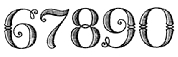 [More] ⦿
|
Shane Brandes
[Proportional Lime]
|
 [MyFonts]
[More] ⦿
[MyFonts]
[More] ⦿
|
Skyline Type Foundry
[Schuyler Shipley]
|
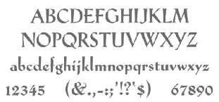 Metal font foundry in Prescott, AZ (was: Kampsville, IL), est. 2004. Run by Schuyler (Sky) Shipley, b. 1954. Shipley collects, restores and operates antique presses. He has been involved with type and letterpress printing since 1962. Check also T.H. Groves's site.
 As of 2010, Skyline's typefaces include Sans Serif Light w. Alts, Egmont Decorative Initials, Park Avenue, McMurtrie Title, Mercury Borders, Bewick Roman, Bradley, Cazxtonian, Cochin, Cooper Ted, Crayonette, Della Robbia, Extended Black, Fournier le Jeune, Glyptic (after Hermann Ihlenburg's Glyptic from 1878), Hadriano Stone-Cut, Ben Franklin Decorative Initials, John Alden Decorative Initials, Massey Two-Color Initials, Iroquois Condensed, Keynote, Lexington, Narciss, Neon, Neuland, Neuland Inline, Othello, Othello Inline, Paramount, Playbill, Sans Serif Light, Sans Serif Light Italic, Schoeffer Old Style, Trocadero, Worrell Uncial. They also have quite a number of ornamental border fonts. [Google]
[More] ⦿
|
Soft Union
[Nikita Vsesvetskii]
|
Cyrillic font makers whose type designer, Nikita Vsesvetskii, produced these fonts between 1993-1995: Arsis [similar to Monotype Onyx (1937, Gerry Powell), first cut by ATF], Cotlin [extension of Leslie Usherwood's Caxton of 1981], Debby, DesignCD, Diamonds (dot matrix), Dots (dot matrix), Dynar [extension of Alan Meeks' Dynamo (Letraset, 1968), which in turn borrows from K. Sommer's Dynamo (Ludwig and Mayer, 1930)], EdgeLine, Evangelie (1994, with A. Shishkin), Half-Ustav (1994), Luga [extension of Lubalin Graph by Herb Lubalin, 1974], LugaShadow, MotterTektura [similar to Othmar Motter's 1975 typeface by the same name], PerfoOval (dot matrix), PopularScript [based on Friedrich Poppl's Poppl-Exquisit, 1970], Psaltyr, Radar [based on Onyx by Gerry Powell, 1937], Ralenta-ExtraBold [based on Carl Dair's Raleigh, 1967], Secession, Secession Wien, Simeiz [based on IC Fenice, Aldo Novarese, 1977-1980], Tavrida, TrooverRoman [an extension of Trooper Roman, VGC]. Alternate URL. FontShop link. [Google]
[More] ⦿
|
Solotype
[Dan X. Solo]
|
 Dover Press sold Oakland's Dan X. Solo's digitizations. Dan Solo (b. 1928, d. 2012) has collected over 13,000 sets of metal fonts, starting when he was 9 years old and growing up in Oakland, CA. Finally, in 2002, he stopped doing that and began converting all of his fonts to computer type. Solotype, his company, was established in Alameda, CA. He printed 30 books on fonts (with Dover), including The Solotype catalog of 4,147 display typefaces, and created hundreds of fonts. In 2007, Dan Solo retired from the font business. He died in 2012.
 Robert Trogman writes: I know Dan X. Solo personally. He ran a typographic studio in Berkeley for over 30 years. He had a large collection of film fonts, including some of my own. He created thousands of fonts and is now retired and is an avocational prestigitator. Copyrights have run out on most of his fonts. He also protected himself by creating pseudonyms on the questionable font names. Stuart Sandler confirms that many of the fonts in Solo's Dover books are in fact from the Filmotype collection, which Stuart is digitizing right now. Gene Gable writes: Dan Solo of Solotype in Berkeley was experimenting with photo type as early as 1945 and started doing optical special effects in the early '60s. And a number of the larger display-type shops developed their own techniques. But in terms of opening up new markets for display type (and giving designers more control over type setting), Visual Graphics and Letraset lead the way. These companies were proud of, and promoted, the fact that that their products could be used by non-typesetters with little training. Bio. He wrote about himself: Dan X. Solo The Solotype Archive was begun in 1942 when I was 14. I was a kid printer for several years before that. At 16, after a quick three months of training, I dropped out of school and went to work full time as a radio actor and announcer in San Francisco. (Easy to get jobs in those days, due to the war-induced manpower shortage.) In 1949 and 1950, I created a magic show which played West Coast theatres with some success. After that, back to broadcasting. By 1962, I was completely burned out on radio, so I decided to see if I could make a living with my collection of antique types, which numbered about a thousand fonts at that time. In 1962, I sent out 4,000 catalogs showing the type to ad agencies all over the U.S. The timing was perfect (no thanks to me) because there was developing at that time a renewed interest in the old types. Business took off immediately. The Solotype collection was one of four commercial collections at the time, but I seemed to have been more aggressive in marketing than the other chaps. (Well, Morgan Press certainly knew how to market.) Two years into the business, I began to collect alphabets on paper for conversion to photo lettering, which was just becoming mainstream in the type business. We closed the shop for a month every year and went on a type hunt, mostly in Europe where there didn't seem to be much competition among collectors. Other typographers couldn't understand how we could do this, but I believe it made people appreciate the resource we offered even more. Over the years, the collection became quite large. When I closed Solotype a couple of years ago, I got rid of about half the archive (because the fonts were dull, or already digitized, or for a variety of other reasons) leaving me with about 6,000 fonts on paper or film. In 1974, I began to supply Dover Publications with mechanicals for books of 100 alphabets on a particular theme. I did 30 of these books over the years, and 30 more of printers' ornaments, borders, and so forth. Sometime in the 1990s, Dover asked me to digitize books of 24 fonts each, to be sold with a disk in the back. I did 12 of these. The Dover relationship came to an end when Hayward Cirker, the owner and my special friend, died and the company was sold to another publisher. Dover felt that they had covered the type field thoroughly. Now in my old age, my wife and I have a mindreading act that is great fun and good for the ego. Even so, when not traveling, I digitize type for relaxation and enjoyment, but have made no effort to sell it. Until now. Solo's wood type/Western/ headline/ Victorian collection includes Acantha, Bindweed, Dime Museum (2004, a French Clarendon revived by ATF in 1933 under the name P.T. Barnum), Egyptian Oldstyle, Excelsis, Extravaganza, Rigney, Assay, Baraboo Banner, Beijing, Brevet (after a Victorian typeface from 1887 by Ernst Lauschke), Brussels, Cathedral, Cleopatra, Cognac, Crossroads, Dainty Lady, Dangerfield, Diablo, Dutch Treat, Grecian, Lord Mayor, Malibu, Minnesota, Moulin Rouge, Penny Arcade (1992, a Victorian face after an 1890 original called Mural by Boston Type Foundry), Trixie, Valerie, Valjean, and Zorro. Alaska is based on an 1890 design of Marder, Luse and co. Arcade imitates an 1888 design of Barnhart Brothers&Spindler. Bamboo (oriental simulation face) is based on a 1889 creation of Barnhart Brothers&Spindler. Behrens Antiqua and Behrens schrift are revival of early 20th century typefaces by Peter Behrens. Eccentric is a digitization of a 1898 arts and crafts typeface by Kingsley/ATF. Hansard is a revival of a display type published in 1887 by MacKellar, Smiths,&Jordan. Pekin is a digitization of a face, first designed by Ernst Lauschke in 1888 and issued by Barnhart Bros.&Spindler foundry in Chicago under the name Dormer, and revived by them in 1923 under the name Pekin. Charles Henry Beeler made a condensed sans serif issued by Mackellar, Smiths&Jordan foundry in 1887: it was digitally revived as Roundhead. Monument is a revival of a 1893 typeface by the Boston Type Foundry, but was also cast at the Central Type Foundry. Vienna Light is a delicate early 1900s type originally created by the German foundry of Schelter&Gieseke. Other designs: Bareback, Campaign (ca. 1970), Cigar Label (1997), Estienne, Farringdon (a western face), Goodfellow (digitization of wood type from 1895 found at Hamilton and probably due to W.H. Page), Harlem Text (blackletter), Houdini (ca. 1992), Memorial, Quadrille 2 (a simplified Tuscan face), Sparticus, Vanities (a Victorian type), Whirligig. In 2005, MyFonts added Seminary (after a Victorian font from 1885 by Bruce Type Foundry), Margie (formal script based on Marggraff Bold Script by the Dresden foundry vormalig Brüder Butter, 1920s), Fancy Dan, Bamberg (2005, after a condensed wood type from ca. 1850), Fat Face No. 20, French Ionic (quite ugly--based on an 1870 Clarendon derivative by the Cincinnati Type Foundry), Hearst Italic (based on a 1904 typeface by Carl Schraubstadter of the Inland Type Foundry), Hearst Roman (based on a typeface from the Inland Type Foundry allegedly stolen from a hand lettering job done by Goudy, acccording to Goudy himself), Tally Text (early photolettering type of the comic book style), Welcome 1 (based on Van Loey-Nouri's art nouveau typeface from 1900). A list of some digitized fonts: - Art Deco: Advertisers Gothic Light, Alex, Beverly Hills, Boul Mich, Capone Light, Chic (after Morris Fuller Benton's Chic, 1927), Clyde, Eagle Bold, Eagle Narrow, Eden Bold, Eden Light, French Flash, Gallia, Graybar Book, Grock, Matra, Modernique (art deco), Parasol, Parisian, Phoenix American, Plaza Suite, Publicity Gothic, Salut, Stymie Obelisk, Zeppelin.
- Victorian: Anglo, Arboret, Campanile, Chorus Girl, Fancy Celtic, Ferdinand, Floral Latin, Glorietta, Grant Antique, Gutenberg, Hogarth, Jagged, Katherine Bold, Lafayette, Meisteringer, Olympian, Phidian, Ringlet (1998, a Victorian typeface after an 1882 original by Hermann Ihlenburg), Romanesque, Rubens, Stereopticon, Templar, Wedlock, Zinco.
- Script/Cursive: Amapola, Artists Script, Carpenters Script, Certificate Script, Commercial Script, Conway (an architectural script), Elegance, Engrossing Script, Figaro, Flare, Gloria Script, Hanover, Helvetica Cursive, Holly, Kunsteler Bold, Liberty, Manuscript, Orion Script, Pantagraph Script (+No2, +No3), Park Avenue, Romany Script, Trafton Script, Typo Upright, University Script, Virginia Antique.
- Art Nouveau: Ambrosia, Argus, Artistik, Auriol, Baldur, Bocklin, Cabaret (2003, as in Murder She Wrote), Carmen, Childs, Edda Black, Excelsior, Francomia, Giraldon, Harrington, Isadora, Metropolitan, Murillo, Oceana, Odessa, Orbit Antique, Palmetto (2005; an art nouveau typeface based on a 1887 typeface called Palm from the A.D. Farmer Foundry), Siegfried, Skjald, Spartana, Titania.
- Gothic/Medieval: Academy Text, American Uncial, Antique Black, Becker Bold, Bradley, Castlemar, Celebration Text Fancy, Church Text, Engravers Old English, Frederick Text, Freehand, Hingham Text, Initials-Bradley and Caxton, Kanzlei Light, Lautenbach, Lautenbach Fancy Caps, Libra, Morris Black, Nicholini Broadpen, Rhapsodie Swash Caps, Scottford Uncial, Solemnis, Washington Text, Wedding Text.
- Celtic: Anglo Text, Camden Text, Chappel Text, Cimbrian, Colchester Black, Durer Gothic, Durwent, Fenwick, Genzsch Initials, Gloucester Initials, Gutenberg Gothic, Hansa Gothic, Harrowgate, Kaiser Gothic, Kings Cross, Konisburg, Malvern, Medici Text, Middlesex, Progressive Text, Tudor Text, Warwick, Westminster Gothic, Yonkers.
- Special-Effects Display Fonts: Azteca Condensed, Buddha (oriental simulation face, after a Schelter&Giesecke type), Burst, Campaign (1970), Chinatown (oriental simulation), Cigar Label (1997-2002), Colonial Dame, Contract Banner (2004, a take on Mezzotint from 1880), Direction, Fillet, Filmstar (1999), Firebug, Headhunter, Hollywood Lights, Igloo Solid, Import, Lariat, Needlepoint, Old Glory, Protest, Rustic, Scimitar (Arabic simulation face), Scoreboard, Skyline, Starburst, Sundown Shadow, Tableau, Tonight, Xerxes.
- Other: Acantha, Assay, Baraboo Banner, Beijing, Bindweed, Brevet (after a Victorian original by Ernst Laushke, 1887), Brussels (positioned inbetween Stephenson Blake's Flemish Expanded and Flemish Condensed), Cathedral, Cleopatra, Cognac, Crossroads, Dainty Lady, Dangerfield, Diablo, Dime Museum, Dutch Treat, Egyptian Oldstyle, Excelsis, Extravaganza, Grecian, Lord Mayor, Malibu, Minnesota, Moulin Rouge, Penny Arcade, Rigney, Trixie, Valerie, Zorro.
Images of selected typefaces: Agency Gothic, Alpha Midnight, Alpha Twilight, Anita Lightface (1977), Art Deco Display Alphabets, Ashley Crawford, Ashley Inline, Astur, Bamberg, Banco, Beans, Blackline, Bobo Bold, Braggadocio, Broadway Engraved, Busorama Bold, Busorama Light, Bust, Charger, Checkmate, Colonel Hoople, Corral, Dudley P Narrow, Dynamo, Earth (a futuristic / prismatic typeface revived by nick Curtis in 2015 as Terranova NF), Eclipse, Empire, Ewie, Fat Cat, Fatso, Festival, Futura Black, Futura Inline, Gillies Gothic Bold, Greeting Monotone, Grooviest Gothic, Hess Neobold, Hotline, Huxley Vertical, Inkwell Black, Joanna Solotype, Joyce Black, Koloss, Lampoon, Mania, Mania Contour A, Mania Contour B, Margit, Mindy Highlight, Modernistic, Monograms Stencil, Mossman, Neon, Neuland (+Inline), Phosphor, Piccadilly, Pickfair, Polly, Prismania P, Quote, Rhythm Bold, Shady Deal, Sheet Steel, Sinaloa. The Solotype Catalog is a file with information on Dan Solo's typefaces, annotated with remarks about name equivalences and digitizations. The original file was due to Thibaudeau, but typophiles on alt.binaries.fonts have added to it in 2010. PDF version. Excel version. Text version. See also here. View Dan Solo's typefaces. Another page on Solotype. Dan Solo's typefaces listed in decreasing order of popularity. View Dan Solo's typefaces. View Dan Solo's typefaces. [Google]
[MyFonts]
[More] ⦿
|
Start a design career
|
 The typophiles were asked in 2003 to list the 20 essential typefaces to start a design career. Here we go, unedited:
 - Sean Glenn: MetaPlus (FontShop), Helvetica Neue (Adobe), Mrs. Eaves (Emigre), Gotham (Hoefler Type Foundry), 20th Century (Monotype), Base (Emigre), Agency (Font Bureau), Simian (House Industries), Agenda (Font Bureau), OCR-B (Adobe), Formata (Adobe), Caxton (Adobe), Scala Sans (FontShop)
- Letter Tiep: Akzidenz Grotesk BQ, Univers, Frutiger Next (or Avenir?), Today Sans (or Syntax / Gill Sans?), The Sans, Trade Gothic (or News Gothic/Vectora?), Futura, Minion, Palatino, Berthold Baskerville (or Storm's John Baskerville / Monotype Bulmer), Filosofia, Lexicon nr2 ($$$), Officina Sans&Serif (or the FF Info series), Adobe Caslon, Bembo (or HTF Requiem), Stempel Garamond, Joanna (or Scala?), Clarendon (or Giza?)
- Jay Wilkinson: Akzidenz Grotesk BQ, Helvetica neue, Avenir (or Futura), Frutiger, Trade Gothic, Franklin Gothic, Optima, Bodoni (or Didot but not filosofia), Adobe Garamond, Adobe Caslon, Minion, Hoefler, Dante, Sabon, Perpetua, Requiem (or Bembo), Centaur, Clarendon, Shelly (or Snell Roundhand), Fette Fraktur (or Goudy Text)
- John Gordon: Blackletter, Centaur, Janson, HTF Requiem, Bembo, Caslon, Garamond, Baskerville, Palantino, HTF Didot, Perpetua, Electra, Clarendon, Akzidenz Grotesque, Helvetica Neue, Futura, Franklin Gothic, Trade Gothic, Poetica, Shelly
- Keith Chi'hnag tam: Minion Pro, Myriad Pro, Sabon Next, Monotype Baskerville (or Berthold), HTF Didot, Perpetua, Monotype Gill Sans, Berthold Akizidentz Grotesk, Thesis Sans, Swift, ITC Charter, FF Meta, PMN Caecilia, Adobe Caslon Pro, FB Miller, Adobe Syntax, ITC Franklin Gothic, Bitstream Futura, Monotype Bembo, Snell Roundhand
- H.D. Schnellnack: Neue Helvetica, FF DIN, Clarendon, Thesis Sans, Garamond Pro OTF or Neue Sabon, Myriad Pro OTF, Mrs Eaves OTF, FF OCR or FF Letter Gothic, Rotis Sans and SemiSans, Futura, Scala, TAZ III OTF, Univers, Bauer Bodoni, Franklin Gothic or Bureau Grotesque, Bell Gothic or Interstate (1993, Tobias Frere-Jones), Jenson Pro OTF or Warnock Pro or Kepler, Thesis Serif or Thesis Mono, Zapfino
[Google]
[More] ⦿
|
Suomi Type Foundry
[Tomi Haaparanta]
|
 Tomi Haaparanta (b. Vaasa, Finland, 1967) is a Finnish type designer and art director. He created many great fonts, and founded Suomi Type Foundry in 2005. Speaker at ATypI 2005 in Helsinki. MyFonts link. FontShop link. Klingspor link. His typefaces, suboptimally grouped:
 - Typefaces from 2016: Suomi Hand Script.
- Typefaces from 2015: Tool (a classic, narrow and clean sans serif family with seven weights), Triangle (wedge serif typeface), Tip (a modulated sans).
- Typefaces from 2013: Abandon (a basic sans family), This (a rounded family), Abiding (slab serif).
- Typefaces from 2012: SciFly (a free rounded sans commissioned by Flyerzone).
- Typefaces from 2011: Tow (a headline font family), Grumpy Black (Black 24 is based on the headline typeface ITC Grouch (1970, Ronne Bonder and Tom Carnase), and the other styles are increasingly of higher contrast).
- Creations in 2010: Tenner (very plump and round, good for signage), Tart Heavy (fat slabs to drool over), That (a display family, +Open, +Irregular, +Bold), Thud (an industrial belt octagonal/mechanical family), Steelworks (a sturdy mechanical sans), Taste This (sans family), Telltale, Titillation (rounded), Tide (connected script emulating ink flow), Taffee (narrow sans), Televisio, Tournedot (a very cute and lively semi-serif headline face), Tempest, Tristan (hand-printed), Cider Script, Toffee Script (after an art nouveau typeface called Regina Cursive, which was published by H. Berthold Messinglinienfabrik und Schriftgiesserei around 1895). Tonsure Script (a high-contrast connected script), Ticketbook (for movie posters), Suomi Sans (a family with special counters).
- Creations in 2009: Tar (rounded sans family), Marimekko (a slab family for a Finnish clothing company, adapted from its 1954 Olivetti typewriter roots), Vektori (monoline octagonal), Kaapeli (Tomi's take on Kabel), Suomi Slab Serif (related to American Typewriter), Marimekko Sans, Tee Franklin (gothic sans family, made for The British Vogue---check out the light weight; done with Brian Kaszonyi), Tobacco (octagonal, based on drawing program emulation), Pannartz (based on a scan of a 1476 text by Sweynheim&Pannartz), Suomi Hand (FontShop), That (4-weight serif family), Talbot (connected script patterned after the Talbot car logo), Taint (modular ink trap face), Tailor (slab serif), Tink, Tale 40, Tale 20, Story 40, Story 20 (all pixel fonts), Tictac (a 3D face), Giro (done on purpose to mimic the ugly Giro d'Italia geometric logo font), Tame (rounded sans), Suomi Script, Explosion (grunge).
- Creations in 2007: Caxton Script (blackletter).
- At ITC: ITC Tetra (2005, squarish face), ITC Tomism (2005, modeled after Church Slavonic), ITC Tyke (2004, a take on Cooper Black).
- At Psy-Ops: Temporal, Torus.
- At T-26: Talmud (1998, faux Hebrew), TyrantRoman (1998, an Exocet-style face, T-26), Tumbler, Torino-Book, Tonic, Terylene, Tension, Teebone, Task-Toobig, Target (2004), Tantalus, Aged (1999), and Taper (2009, slab serif), the experimental sans families Target Recut (2004).
- At FUSE: FutuRoman (FUSE95).
- Tang (2004, an anti-inkbleed sans family done for very small point sizes).
- At Agfa Creative Alliance: Tangerine, Teethreedee, Twinkle.
- With Klaus Haapaniemi and Brian Kaszonyi: the 15-font War family in 1999-2000.
- At Linotype: TeebrushPaint LT Std (2003).
- Game (family).
- Tubby.
Dafont link. View Tomi Haaparanta's typefaces. [Google]
[MyFonts]
[More] ⦿
|
Talbot Baines Reed
|
Talbot Baines Reed (1852-1893) was an English writer of boys' fiction who established a genre of school stories that endured into the second half of the 20th century. Among his best-known work is The Fifth Form at St. Dominic's. He was a regular and prolific contributor to The Boy's Own Paper (B.O.P.), in which most of his fiction first appeared. Through his family's business [his father was Sir Charles Reed], Reed became a prominent typefounder, and wrote the celebrated text A History of the Old English Letter Foundries (Faber and Faber Limited, London, 1887). From Wikipedia: Reed's father, Charles Reed, was a successful London printer who later became a Member of Parliament (MP). Talbot attended the City of London School before leaving at 17 to join the family business at the Fann Street type foundry. His literary career began in 1879, when the B.O.P. was launched. The family were staunchly Christian, pillars of the Congregational Church, and were heavily involved in charitable works. However, Reed did not use his writing as a vehicle for moralising, and was dismissive of those early school story writers, such as Dean Farrar, who did. Reed's affinity with boys, his instinctive understanding of their standpoint in life and his gift for creating believable characters, ensured that his popularity survived through several generations. He was widely imitated by other writers in the school story genre. In 1881, following the death of his father, Reed became head of the Fann Street foundry. By then he had begun his monumental Letter Foundries history which, published in 1887, was hailed as the standard work on the subject. Along with his B.O.P. obligations Reed wrote regular articles and book reviews for his cousin Edward Baines's newspaper, the Leeds Mercury. He was busy elsewhere, as a co-founder and first honorary secretary of the Bibliographical Society, as a deacon in his local church, and as a trustee for his family's charities. All this activity may have undermined his health; after struggling with illness for most of 1893, Reed died in November that year, at the age of 41. Early in his career he met the leading printer and bibliographer of the day, William Blades, from whom he acquired a lasting fascination with the printing and typefounding crafts. While still relatively inexperienced, Reed was asked by Blades to help organise a major exhibition to mark the 400th anniversary of William Caxton's printing of The Game and Playe of the Chesse. This was thought to be the first book printed in England, and the exhibition was originally planned for 1874. However, Blades's research proved that Caxton's first printing in England had in fact been in 1477, of a different book, so the quatercentenary celebrations were rescheduled accordingly. The exhibition was held during the summer of 1877, at South Kensington, and was opened by William Gladstone, the former and future prime minister. It included displays of Caxton's printed works, together with many examples of printing through the intervening years. Reed's main contribution was to the exhibition's catalogue, for which he wrote an essay entitled "The Rise and Progress of Typography and Type-Founding in England". The exhibition was supported by leading London printers, publishers, booksellers, antiquarians and scholars, and attracted wide public interest. Sir Charles Reed, who had been knighted on Gladstone's recommendation in 1874, died in 1881. A few months later, Talbot's elder brother Andrew retired from the business because of ill health. As a result, at the age of 29, Talbot became the sole managing director of the Fann Street business, a position he held until his death. This was, however, by no means Reed's sole activity in connection with the trade. In 1878, in response to a suggestion from Blades, he had begun work on a general history of typefounding in England, a task which occupied him intermittently for ten years. Published by Elliot Stock in 1887 under the title of History of the Old English Letter Foundries, the book became the standard text on the subject. Its 21 chapters are illustrated throughout with examples of typefaces and symbols used for four centuries. The text is presented in modern style, but with the initial letter of each chapter ornately drawn from a 1544 pattern. Also in 1887 Reed produced a revised and enlarged specimen book for the Fann Street foundry, with many new typeface designs and artistic ornamentations. [Google]
[More] ⦿
|
The Typographic Archives
|
Also called Graphion's Online Type Museum, or earlier, Graphion, a site by Michael sanbon that disappeared in 1999. Subsections: [Google]
[More] ⦿
|
Tilde (was: AG Fonts)
|
 Reinis Ludvik's Riga-based Latvian font design and software development company sells high quality fonts (adapted from Bitstream fonts) for Baltic, Cyrillic, Turkish and Eastern European languages. Includes the AG Baltia fonts by Andrejs Grinbergs. Commercial Cyrillic fonts based on Bitstream fonts.
 The Tilde/AG Fonts collection published between 1991-1995 also includes these families designed by Andrejs Grinbergs: AGAalenBold, AGBengaly, AGCenturion, AGCrown, AGFriQUer, AGGalleon, AGGloria, AGLetterica, AGMelanie, AGNewHandbook, AGOpus, AGOpusHR, AGPalatial, AGPresquire, AGReverence, AGZeppelin. The Bitstream-based collection comprised these typefaces in 2015: Aachen, Aldine 401, Aldine 721, Allegro, Alternate Gothic, Am Beauty, Amazone, Amelia, Americana, Amerigo, Aurora, Baker Signet, Balloon, Baltic Ornaments, Bank Gothic, Baskerville, Bell Centennial, Belwe, Bernhard Fashion, Bernhard Modern, Bernhard Tango, Blippo, Bodoni, Bremen, Broadway, Brunch Pro, Brush 445, Brush 738, Brush Script, Calligraph 421, Candida, Carmina, Cataneo, Caxton, Century Old Style, Cheltenham, Clarendon, Classical Garamond, Cloister Black, Cloister, Commercial Script, Constellation Pro, Cooper, Copperplate Gothic, Davida, Della Robbia, Dom, Egyptian 505, Elegant Garamond, Empire, English 111, English 157, Engravers Gothic, Engravers Old English, Exquisite Pro, Flareserif 821, Flemish Script, Folio, Formal 436, Fraktur, Franklin Gothic, Freehand 471, Freehand 521, Freehand 575, Freehand 591, Futura, Futura Black, Geometric 231, Geometric 415, Geometric 706, Geometric 885, Geometric Slabserif 703, Gothic 720, Gothic 725, Gothic 821 Condensed, Goudy Handtooled, Goudy Heavyface, Goudy Old Style, Handel Gothic, Hobo, Humanist 521, Humanist 531, Humanist 777, Huxley Vertical, Impress, Impuls, Incised 901, Informal 011, Kaufmann, Kette Pro, Kuenstler 480, Lapidary 333, Letter Gothic 12, Liberty, Libra, Lucian, Lydian, Lydian Cursive, Matt Antique, Mirarae, Mister Earl, Monterey, Murray Hill, News 702, News 705, News 706, News Gothic, Nuptial, OCR-B-10, Onyx, Oranda, Orator 10, Original Garamond, Parisian, Park Avenue, Piranesi, Poster Bodoni, Prestige 12, Raleigh, Revue, Ribbon 131, Rigaer Tango Pro, Robusta, Romana, Roundhand, Schadow, Scintilla Pro, Seagull, Serifa, Shotgun, Snow Cap, Snowbird, Square 721, Staccato 222, Staccato 555, Starfighter, Stencil, Swiss 721, Tango, Tourandot Pro, Transitional 521, Transitional 551, Umbra, University Roman, VAG Rounded, Waldorf Pro, Wedding Text, Windsor, Zapf Calligraphic 801, Zapf Elliptical 711, Zapf Humanist 601, Zurich. MyFonts link where one finds Starfighter TL (2012, a font family for gamers), Snowbird (2011, informally hand-printed family), Constellation Pro (geometric sans family), Kette Pro and Rigaer Tango Pro (calligraphic script). View Tilde's typefaces. [Google]
[MyFonts]
[More] ⦿
|
Tomi Haaparanta
[Suomi Type Foundry]
|
 [MyFonts]
[More] ⦿
[MyFonts]
[More] ⦿
|
William Caxton
|
William Caxton, the first English printer, was born in the Weald of Kent, in 1420, 1421 or 1422. In 1438, he became apprenticed to Robert Large, a leading textile merchant who became the mayor of London the following year. After Large's death in 1441, Caxton moved to Bruges, and built a successful textile business. By 1463 he became acting governor of the Merchant Adventurers in the Low Countries. Caxton was hired as an advisor to Charles the Bold's new duchess, the former Princess Margaret of York, sister of Edward IV. It was at the request of the duchess Margaret that he resumed his abandoned translation of a popular French romance, The Recuyell of the Historyes of Troye from the French of Raoul le Fèvre. After spending a year in Cologne learning the art of printing, Caxton returned to Bruges and set up a printing press, where he published his translation of The Recuyell, the first printed book in the English language, around 1474. His next publication, The Game and Play of Chess Moralised (1476), was a translation of the first major European work on chess, and was the first printed book in English to make extensive use of woodcuts. In 1476, he returned to England and set up a printing shop at Westminster at the sign of the Red Pale. Here, Caxton published such major works as Troilus and Creseide, Morte d'Arthur, The History of Reynart the Foxe, and The Canterbury Tales. Over the course of 14 years, he printed more than 70 books. The typefaces used by Caxton were all varieties of blackletter or gothic type. His earlier works were set in an early form of French lettre bâtarde. By 1490, he had acquired a more round and open typeface, a textura originally used by the Parisian printer Antoine Verard and later favored by Caxton's successor, Wynkyn de Worde. He died in 1491 in Westminster. Many fonts were named after Caxton, such as the Lombardic-styled Caxton Initials (1905, Frederic Goudy, ATF, revived by Alter Littera in 2012), and the ITC Caxton Roman family. His life's story can be found in Typophiles Chapbook: William Caxton and His Quincentenary (John Dreyfus). See also the Typographic Archives (1999). [Google]
[MyFonts]
[More] ⦿
|
William Caxton: Digital descendants
|
Digital typefaces based on William Caxton's work include Caxton (ITC), Caxton (Tilde), Caxton (Adobe), Caxton (Letraset), 1479 Caxton (GLC), Caxton SH (Scangraphic Digital Type Collection), 1479 Caxton Initials (GLC), Caxton (Suomi), Caxtonian Black (URW++), Holland Gothic (URW++), ITC Tiffany (Adobe), Vine Street (Proportional Lime), Printers in Marks (Proportional Lime). [Google]
[More] ⦿
|
William F. Capitain
|
Punchcutter, b. 1851, Southgate, UK. Picture. In 1865, he went to Flinsch in Frankfurt to study punchcutting with William Kirkwood. Then he left for Chicago, and became American. His later work was done while he lived in Bayonne, New Jersey. His typefaces, often quite ornamental and/or Victorian, were all done at Marder, Luse & Co, except Adtype (+Italic) (1903, ATF), Lithograph Shaded (1914, ATF, with Morris Fuller Benton), an unnamed typeface patented by ATF in 1916, and Alfereta (ca. 1897, Crescent Type Foundry: Alfereta by Dan X. Solo is a digital revival). Google patent link. On Adtype, Mac McGrew writes: Adtype is a square-serif typeface patented in 1903 by W. F. Capitaine and introduced by ATF. An early example of this sort of square-serif letter, it is distinguished by its high-waisted R and unusual g. Compare Adstyle, John Hancock, Bold Antique, Contact Bold Condensed. Figures and some other characters are narrower in the Monotype cutting shown, which was produced about 1912. The italic is inclined an extreme 24 degrees. One of the revivals is Capitaine (2019, Letters from Sweden), which the Swedes descrive as a good-humoured slab serif. The Marder, Luse typefaces by date: - 1877: Parallel Shaded.
- 1881: Ladies Hand Script.
- 1885: Critic, Fancy Grotesque, Octagon, Pencillings.
- 1886: Hiawatha, Parthenian, Roumanian, Spartan.
- 1887: Georgian, Utopian [image].
- 1888: Lithotint, Trinal 1, 2 and 3.
- 1889: Banquet, Caxton Old Style, Caxton Italic.
- 1890: Ebony. This typeface was revived in 2011 by Claude Pelletier as a free font.
- 1891: Diagonal Card Black.
- 1894: Caxton Old Style Bold.
- 1895: Circular Gothic, Circular Italic.
Patents of various typefaces in PDF format: 1885, 1885, 1885, 1886, 1886, 1886, 1887, 1889. [Google]
[MyFonts]
[More] ⦿
|
William H. Bradley
|
 Book designer, poster designer and typographer, born in Boston (1868). He died in 1962. His typefaces include the following:
 - Abbey Text (1895, A.D. Farmer).
- Bradley (ATF, 1895). This blackletter typeface was cut into a wood type by Hamilton in 1900.
- A beautiful unnamed lettering for the Inland Printer (1891-1892).
- He drew the Bradley Series and licensed it to American Type Founders in 1895. That blackletter design was copied and issued by the Inland Type Foundry (as "St. John") and by A.D. Farmer&Son Type Founding Co (as "Abbey Text", still 1895). Also in 1895, Hermann Ihlenburg at ATF made the Germanic-language version of the Bradley Series. Several German foundries had metal versions of his 1895 series under the names Halbfette Altgotisch, Altfettgotisch and Amerikanische Altgotisch, such as Bauersche Giesserei and Schelter & Giesecke (1903). Digital revivals: Fyne Fish NF (Nick Curtis, 2009), Bradley Pro (2005, Ralph Unger at Profonts), Bradley DJR (2018, David Jonathan Ross). Bradley was used by Disney in its Sleeping Beauty Castle.
- Priory Black (ATF, 1897-1898) is said to be due to Bradley. In 1904, ATF introduced a modernized version called Cloister Black (or Cloister Text), designed by Joseph W. Phinney or Morris F. Benton.
- Bradley Roman and Italic saw the light in 1901 when Bradley was writing Peter Poodle, Toymaker to the King, and these typefaces are known as the Peter Poodle types.
- In 1904, he co-designed Antique Bold with J.W. Phinney and Morris Fuller Benton at ATF.
- His Bewick Roman series (1904) has gorgeous ligatures (tt, ct, and so on). Mac McGrew: Bewick Roman was designed by Will Bradley in 1904 and issued by ATF the following year. It is a quaint display type with a number of unusual characteristics. Several capitals have both wide and narrow versions, although generally the typeface is rather narrow; there are also several tied charac$Gters and ornaments in the font, as was common with nineteenth-century designs. Compare Rogers, Vanden Houten.
- Wayside Roman and Italic. Mac McGrew: Wayside Roman and Italic were shown by ATF in 1900, as a handsome interpretation of modern typeface similar to Scotch Roman, but without the heavier capitals of the latter face. Some sources say the designer was Will Bradley, but this is disputed by other authorities, and most likely it is a revival of an older face. It was not in regular production very many years, but special castings have been made at times. Some figures appear to be oversize---6, 7, and 9 in the specimen shown here---but this is a characteristic of the font, although not uniform from one size to another. Also compare Oxford, Bell.
- In 1904, he created the beautiful Chap-Book series (Cuts, Borders, Directors (pointing fingers), Guidons (unbelievable parentheses)), as well as the Mission Toys Ornaments, all at ATF. Thereafter followed Missal Initials, Wayside Borders (1904), Wayside Ornaments (1904), Cloister Borders (1905), Cloister Initials (1905), Indian Borders (before 1908). Some of his ornaments made it to American Pi NF (2006, Nick Curtis) and to the five-font-set Bradley Dingies (by Paulo W, 2009). Mac McGrew: Missal Initials were issued by ATF in 1904; their design has been ascribed to Will Bradley. Derived from fifteenth-century sources, each letter is designed to fill a square area. Compare Caxton Initials, Lombardic Initials. For a digital version of Missal Initials, see Initials ATF Missal Caxton (2012, Alter Littera).
- Bradley Initials (1934). For a degital version, see Glenda de Guzman's Bradley Intials (1994, Font Bureau).
- Vanity (1921-1930) is custom type he made while he was art director.
- His last group of typefaces was Bradley Combination Ornaments, made in 1952 for Steve Watts, type merchandising director of the American Type Founders Company.
- Roman alphabet by Bradley.
Fontshop link. A Booklet of Designs (1915, New York) contains many of his interesting drawings for typefaces. [Google]
[MyFonts]
[More] ⦿
|
Wrongly named typefaces
|
Funny piece by Hoefler and Frere-Jones about wrong names for type. He cites the Series Gutenberg by Nebiolo, which is plain art nouveau, and the Didot Series in 1888 by the Cincinnati Foundry, but which is just plain old Victorian stuff. Some quotes: - This is the Caxtonian typeface, produced by the San Francisco type foundry of Palmer&Rey, and appearing in their 1889 catalog. Its name presumably honors William Caxton (c. 1415-1492), best remembered as England's first printer, though this design suggests a gold rush pioneer, or a Dodge City vaudevillian. (Or perhaps your local watering hole has Caxtonian Stout on tap?)
- [About a page that says "Garamond" in a 1920 Fonderie Typographique Française catalog]: here in the Album d'Alphabets is the proud declaration "GARAMOND," atop a showing of the late ninteenth century American typeface known today as Bookman. I'd love to use this typeface for the cover of an album called "Berlioz," which contains nothing but marches by John Phillips Sousa.
[Google]
[More] ⦿
|
Wynkyn de Worde
|
Born in Alsace, he died in 1535. He was the first printer in England to use italic type in 1524. Originally Jan van Wynkyn, he was a printer and publisher who worked with William Caxton in Westminster. In 1491 following Caxton's death, de Worde took over his printing work. From then until his death he published approximately 750 books. Wiki. [Google]
[MyFonts]
[More] ⦿
|

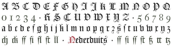
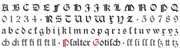
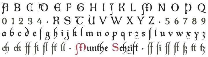
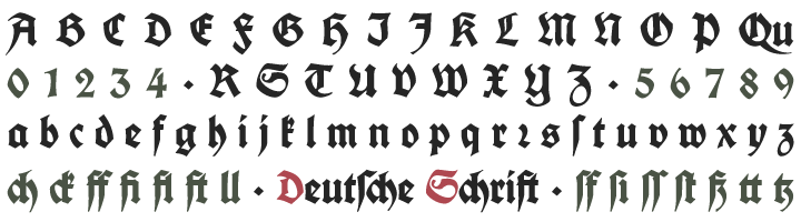
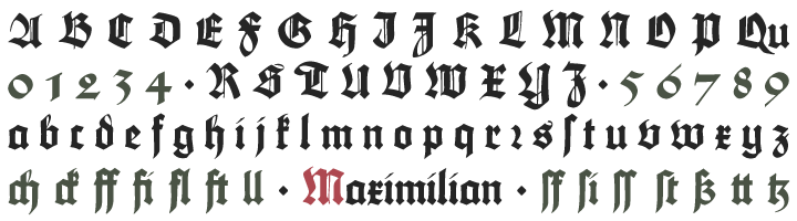
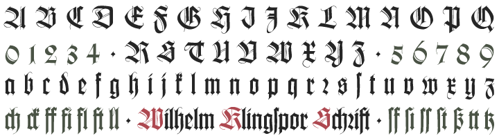
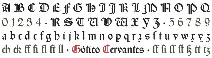
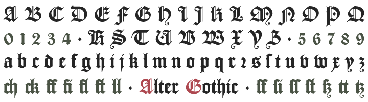
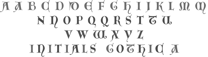
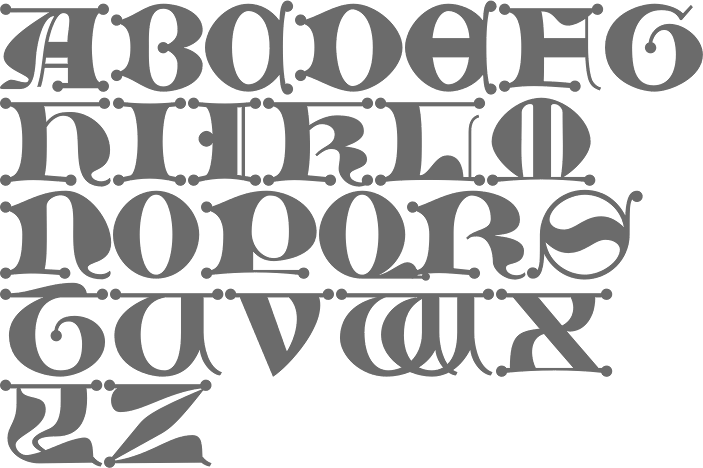
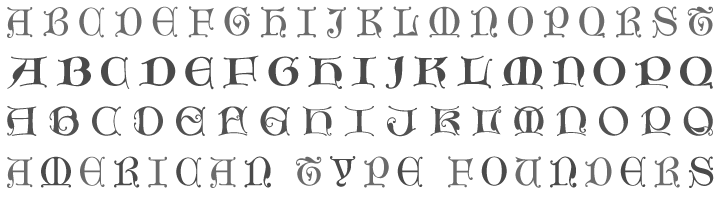
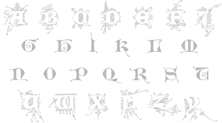
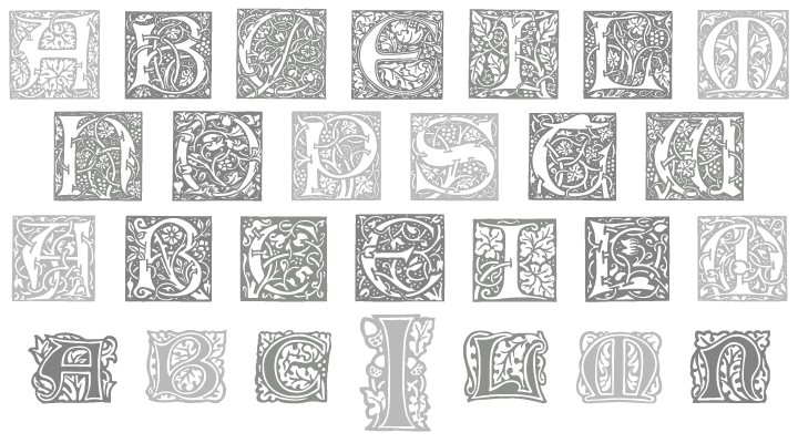
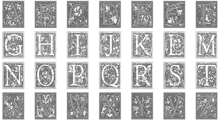
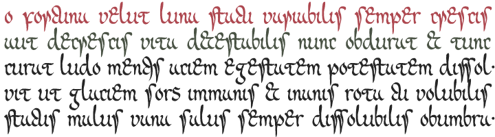
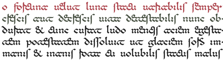
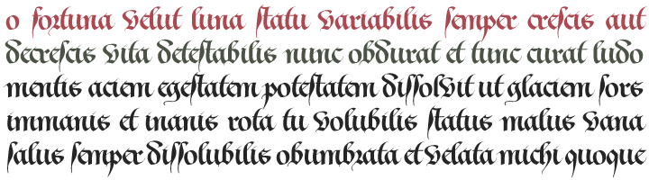
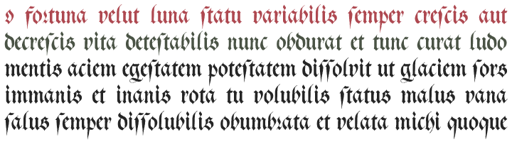
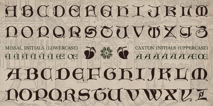
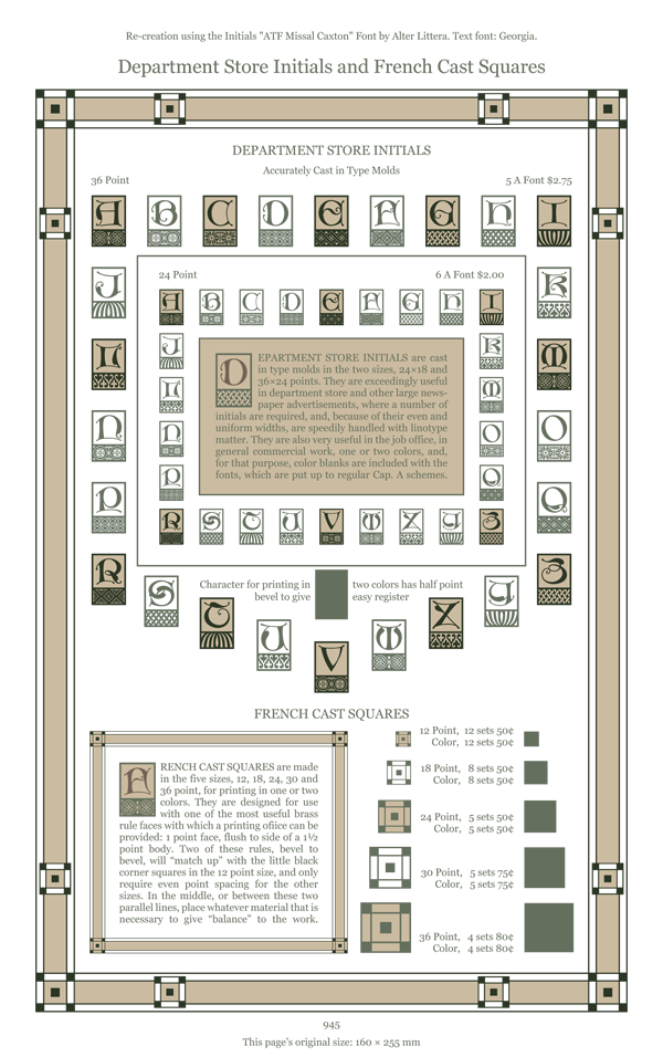
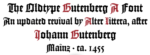
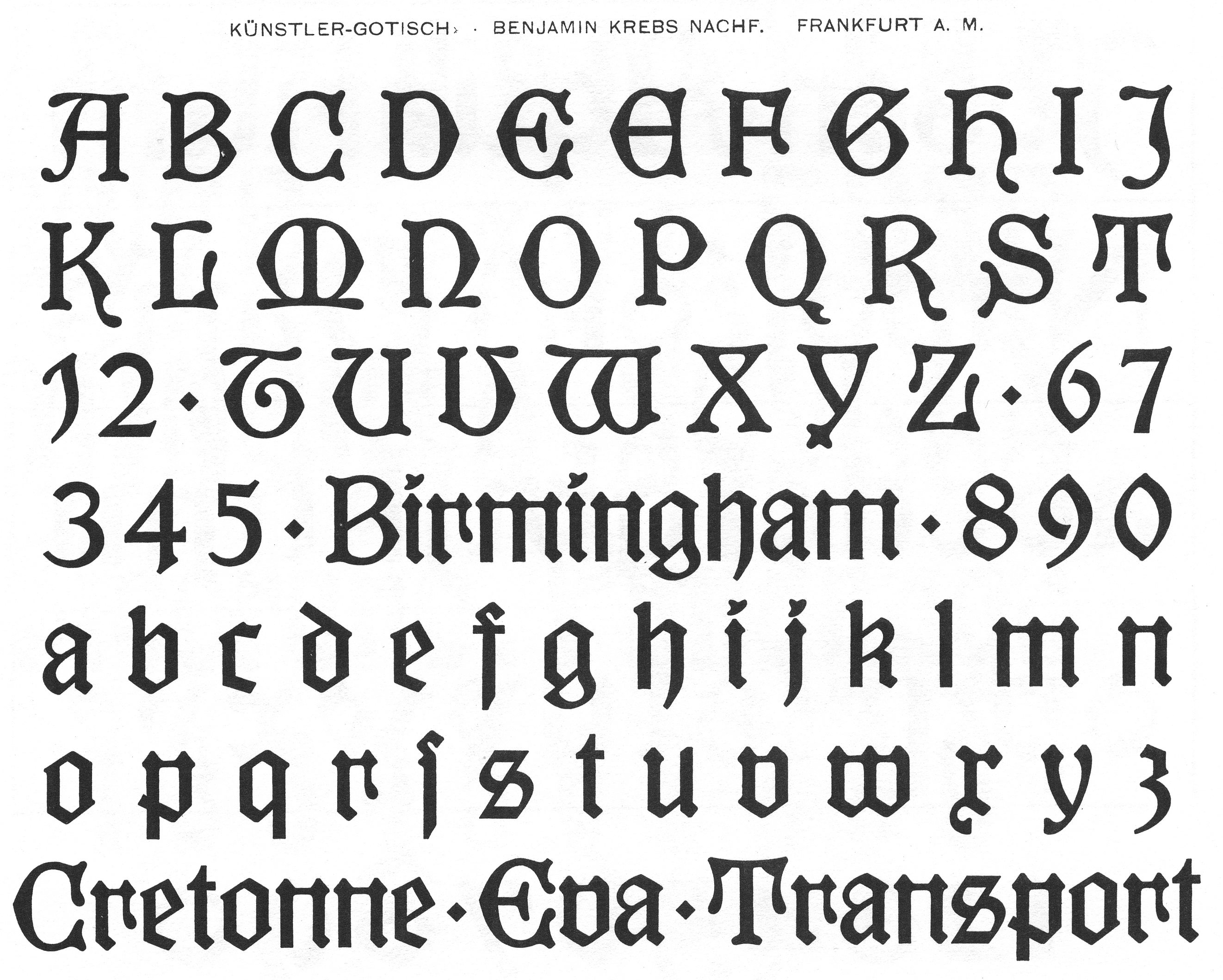
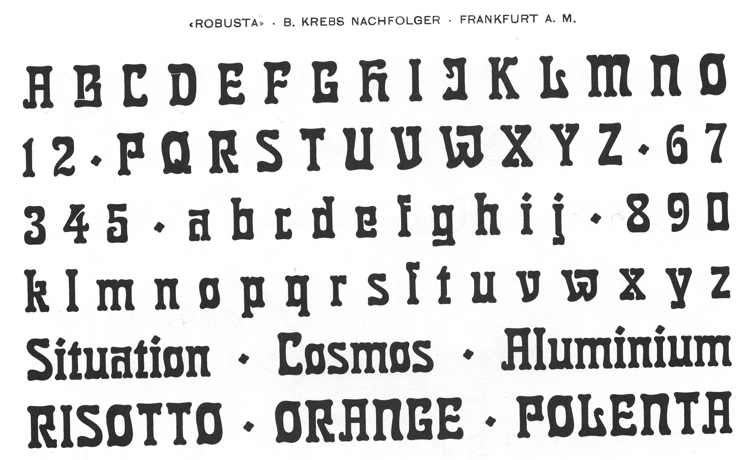
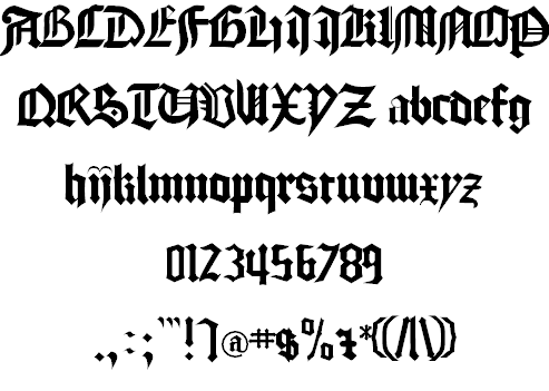
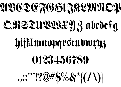
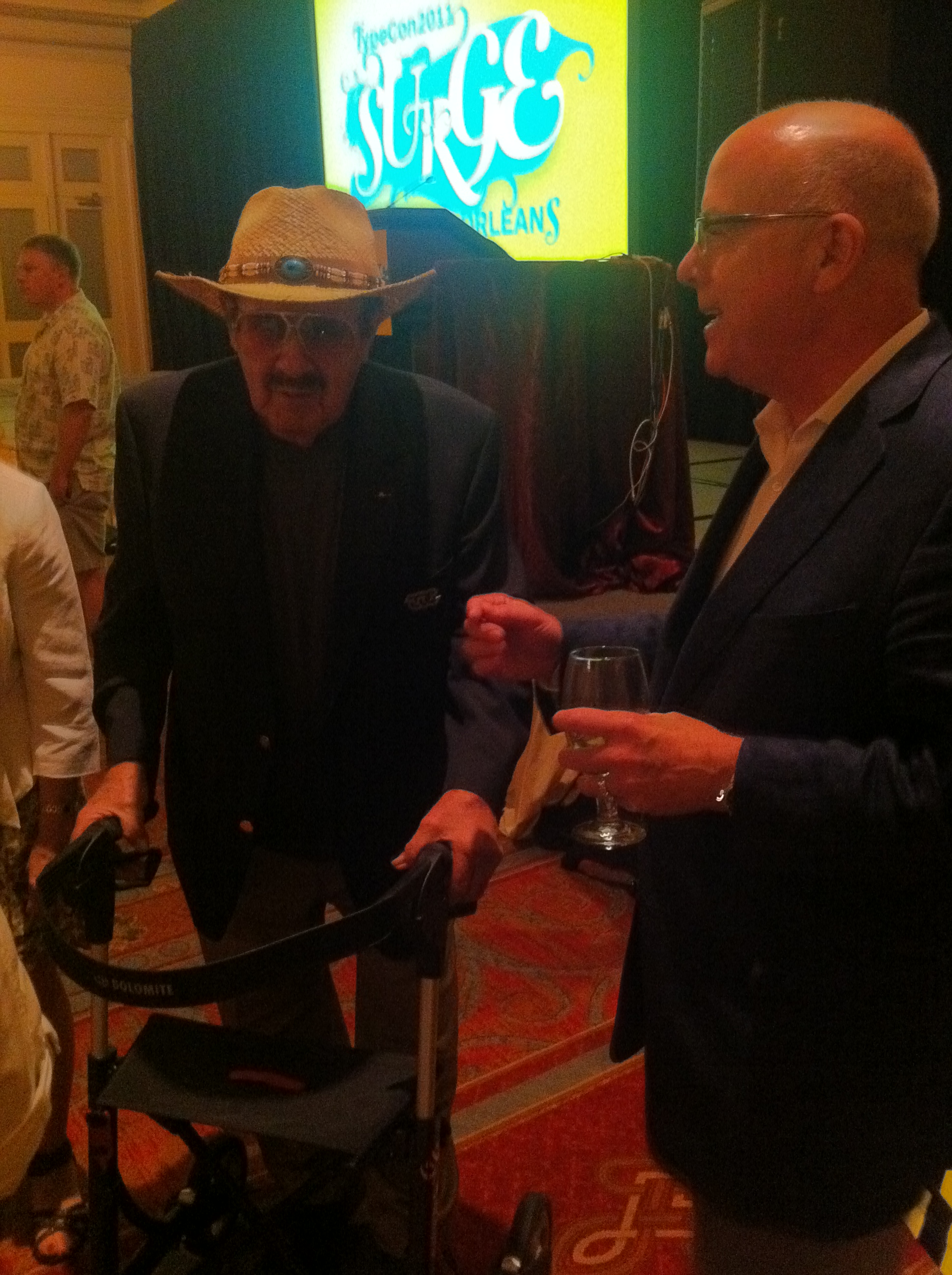
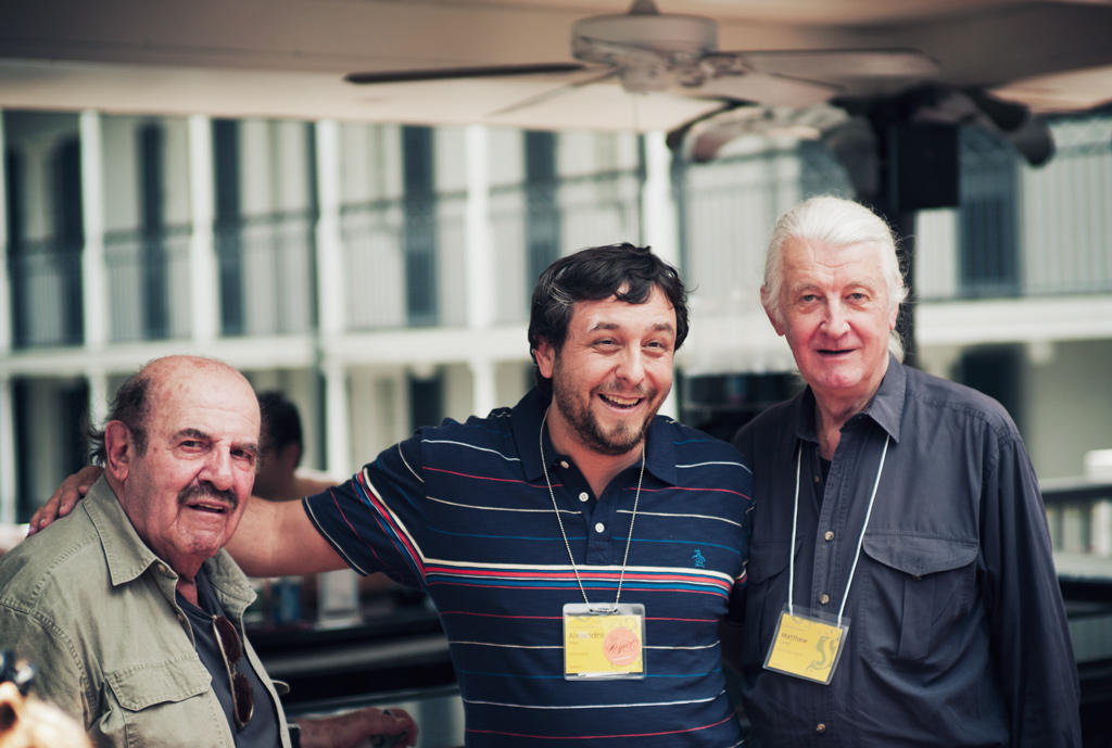
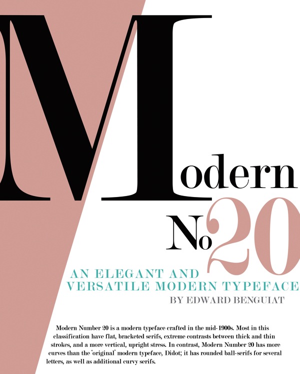
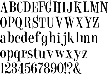
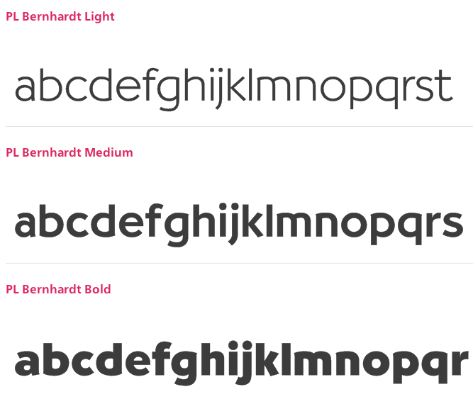
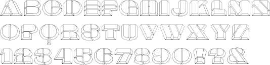
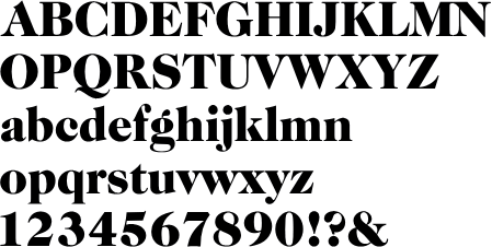
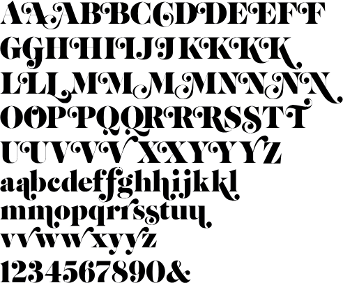
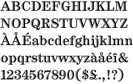
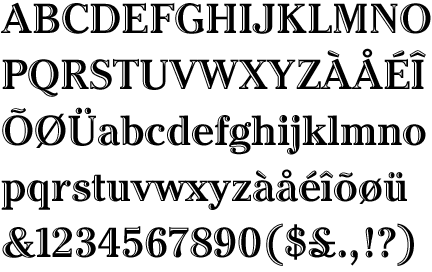
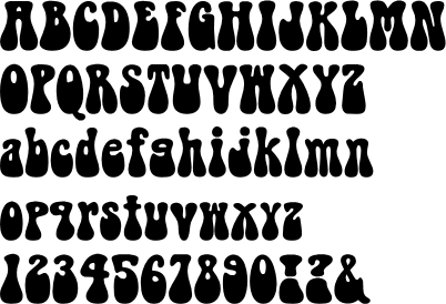
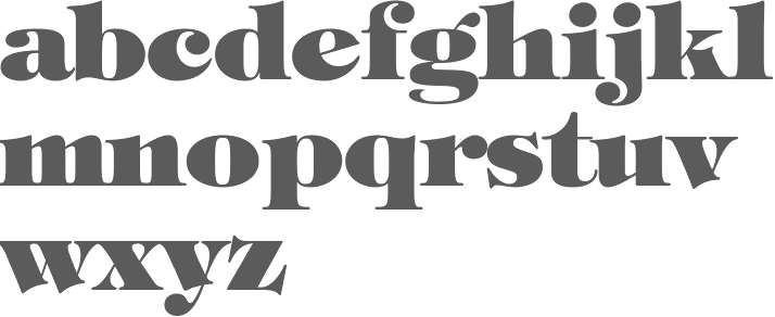
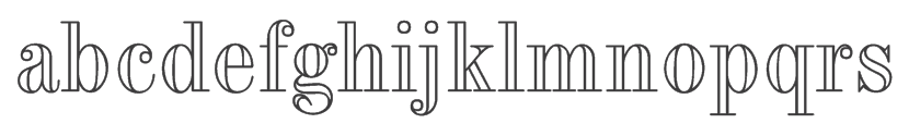
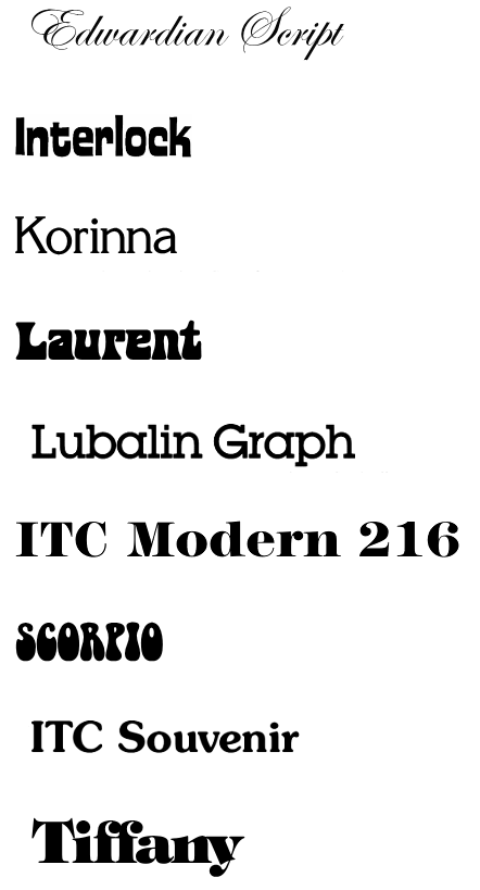
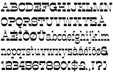
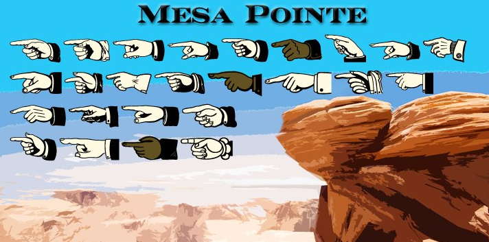
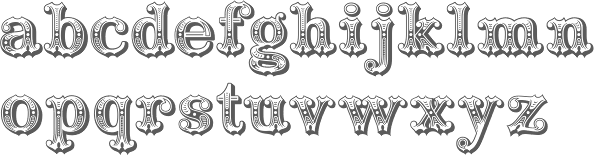
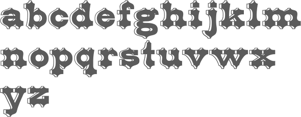
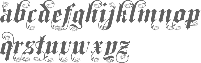
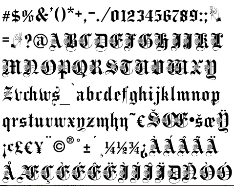
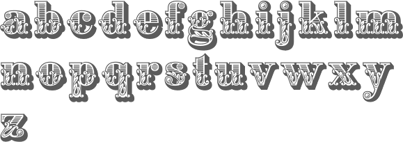
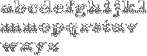
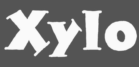
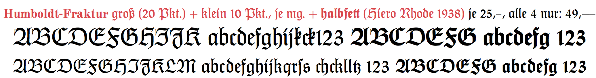
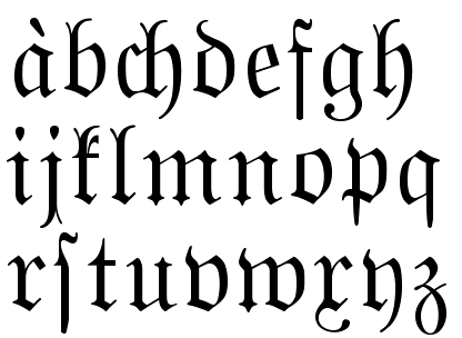
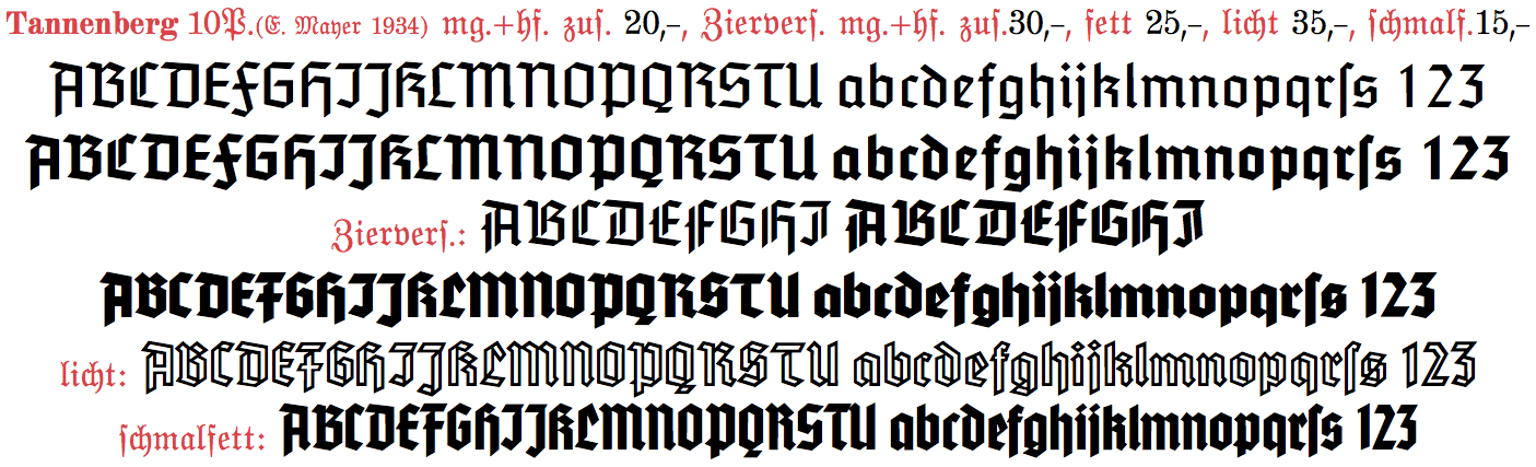
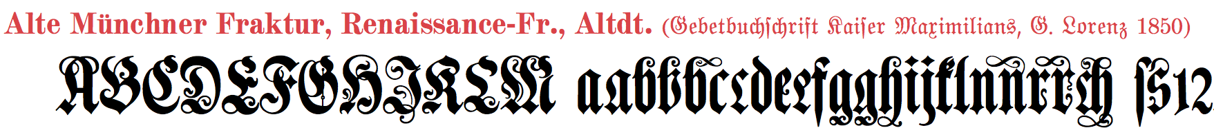
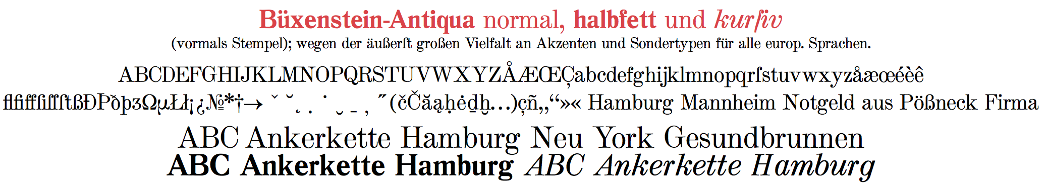
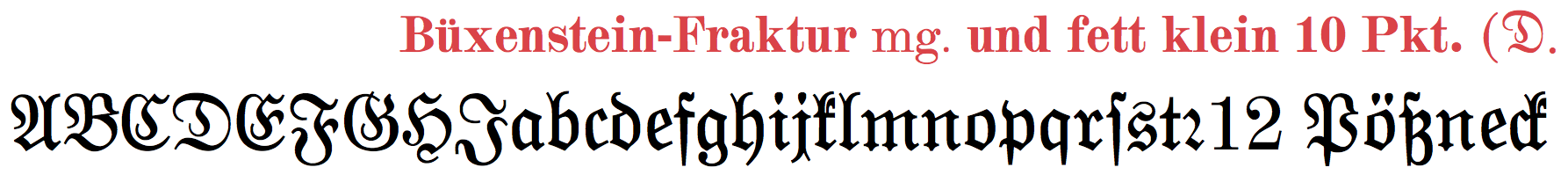
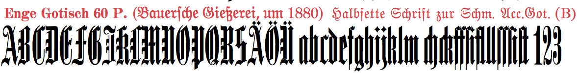
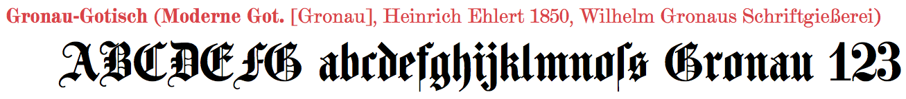
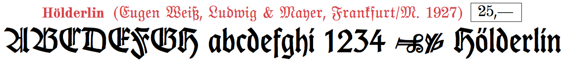
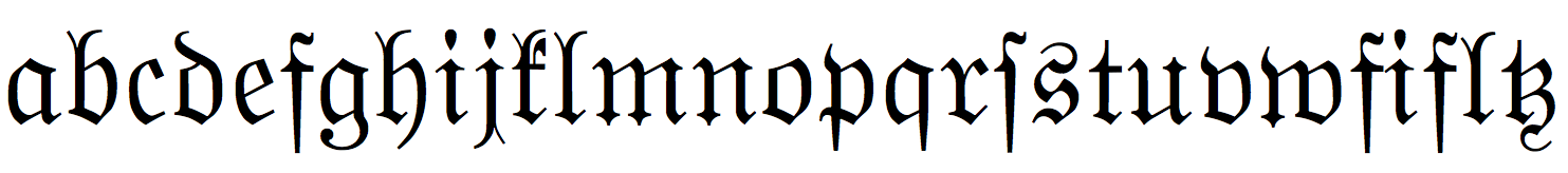
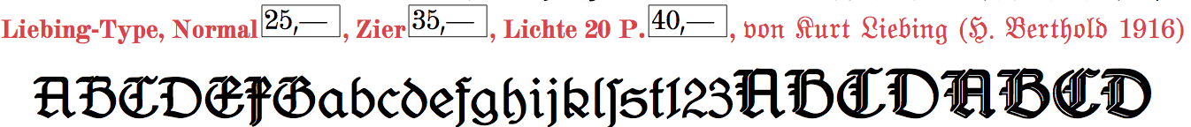
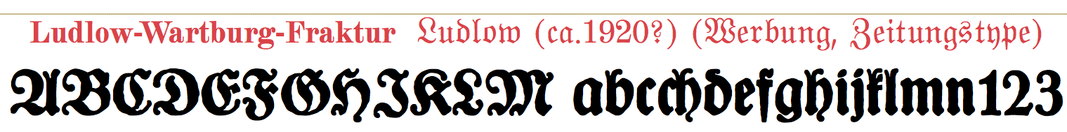
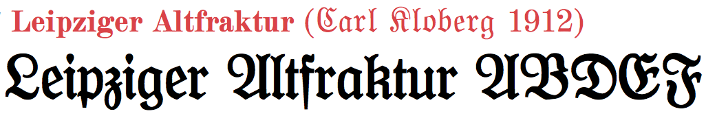
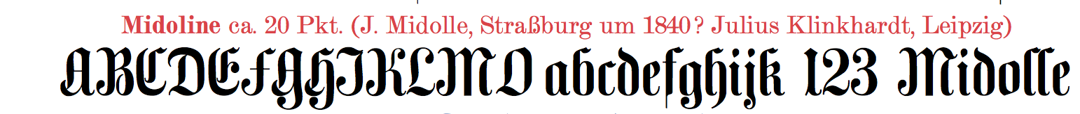
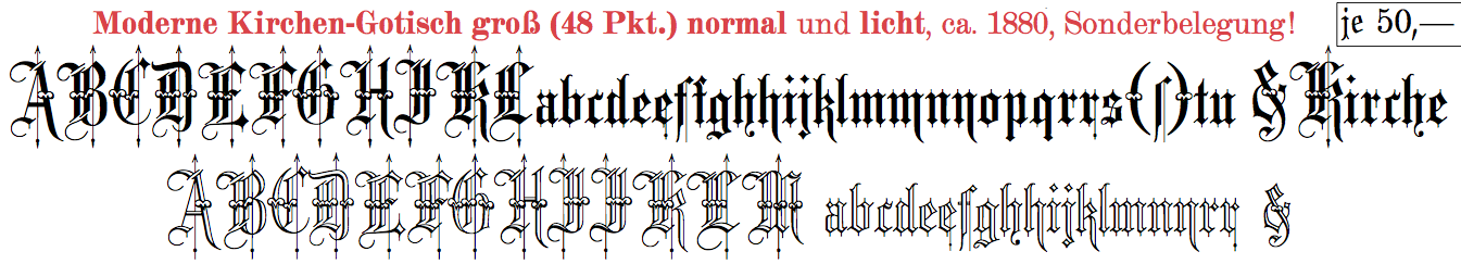
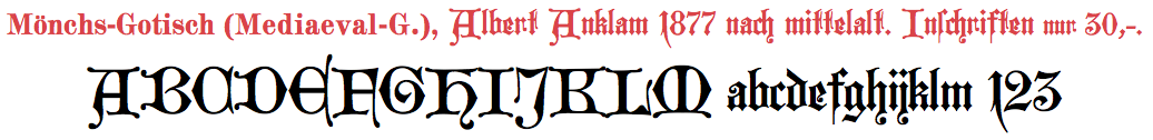
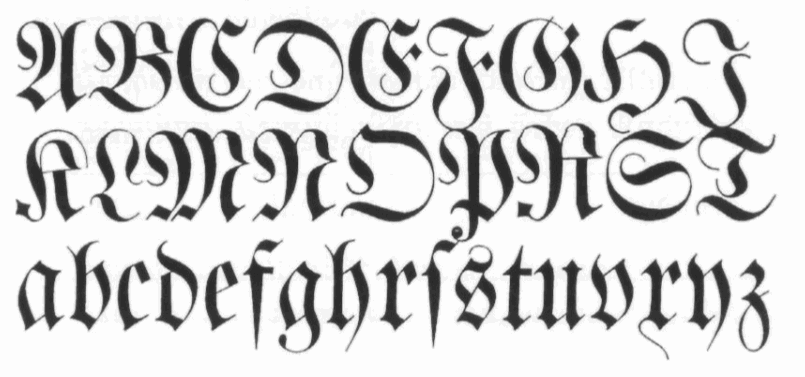
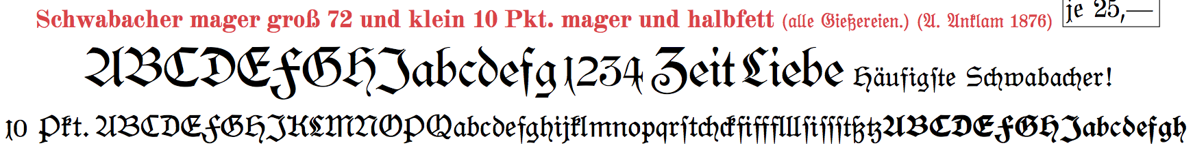
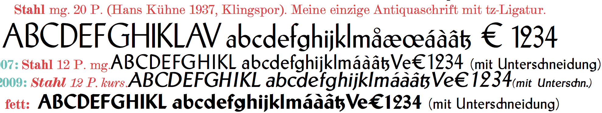
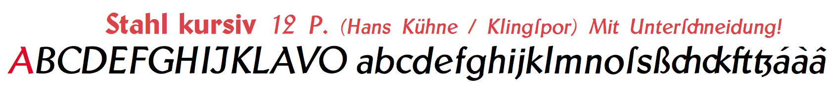
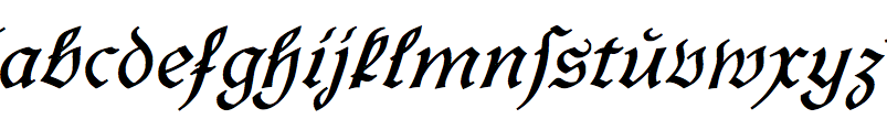
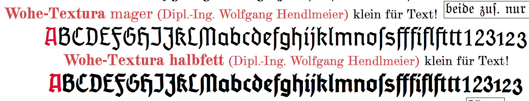
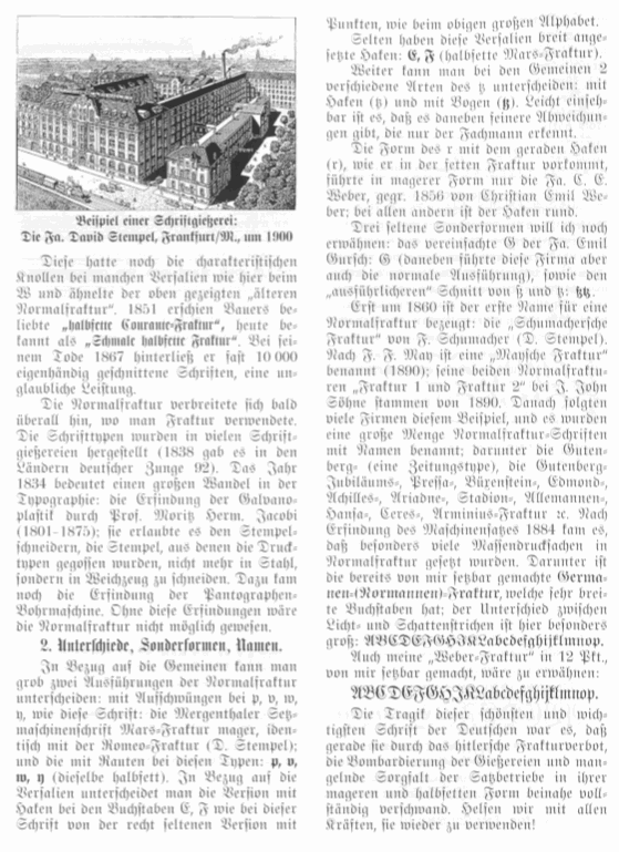
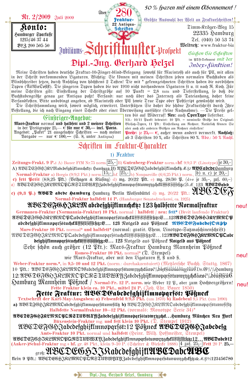
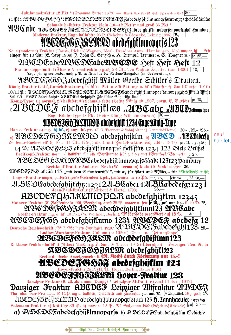
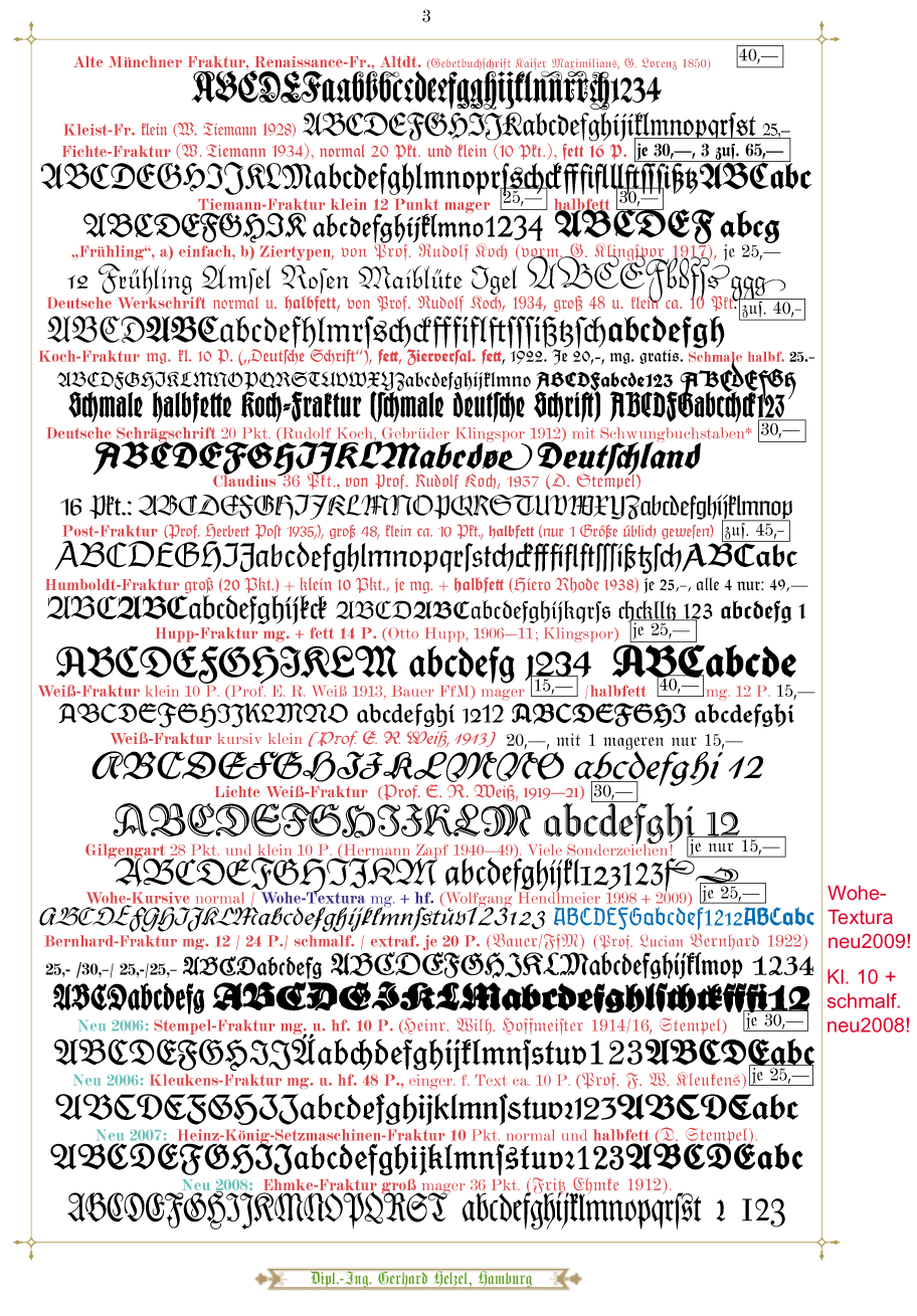
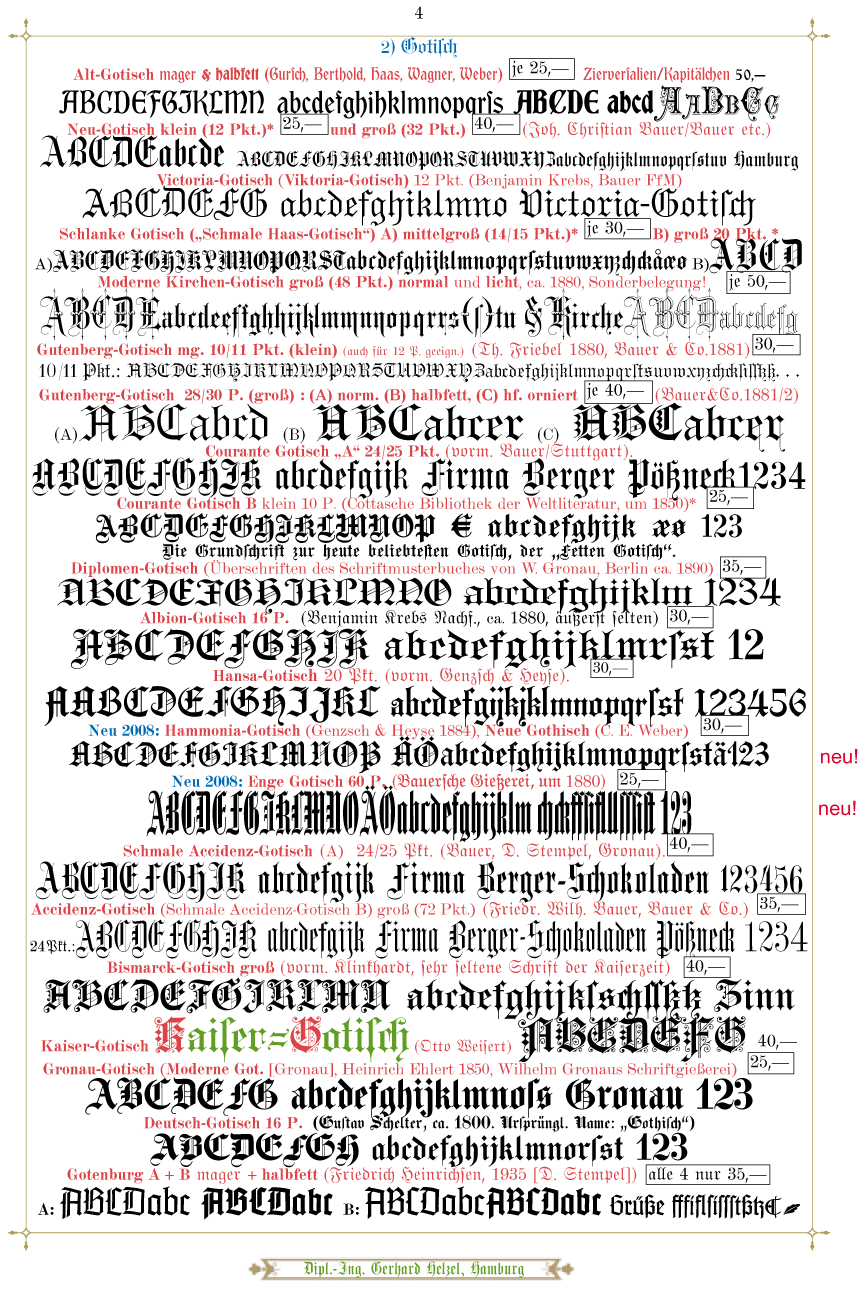
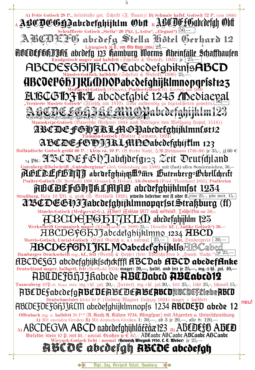
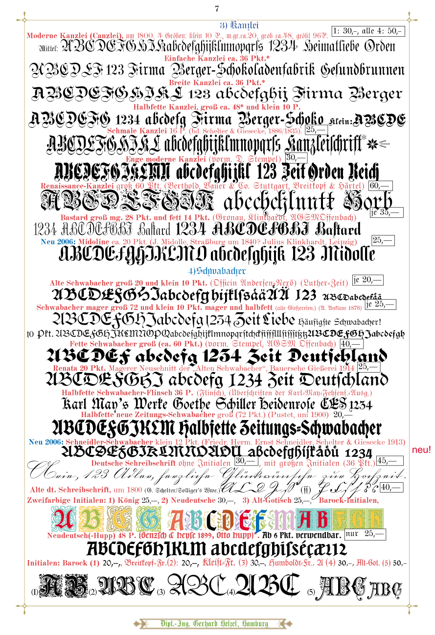
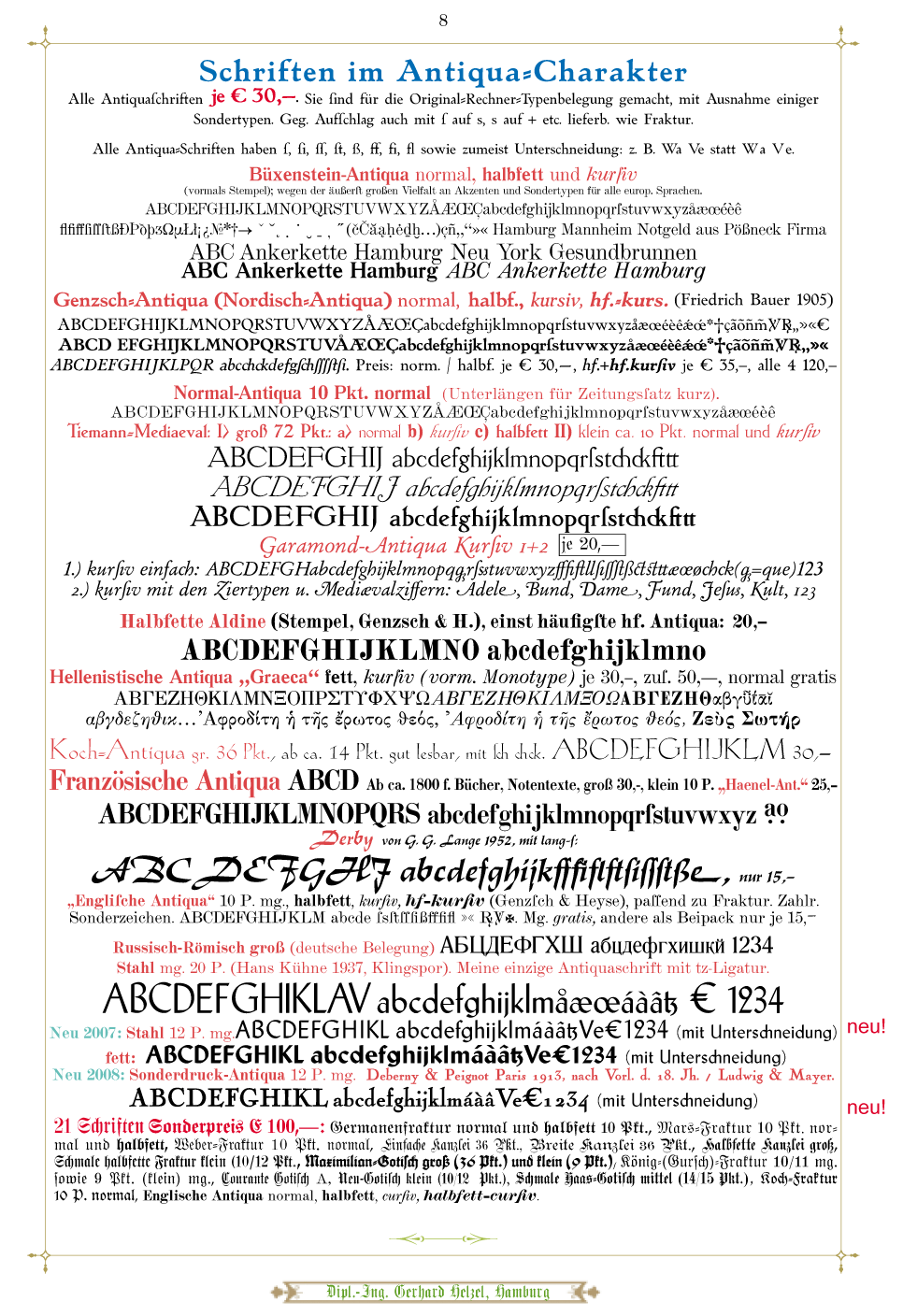
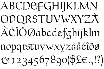
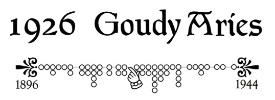
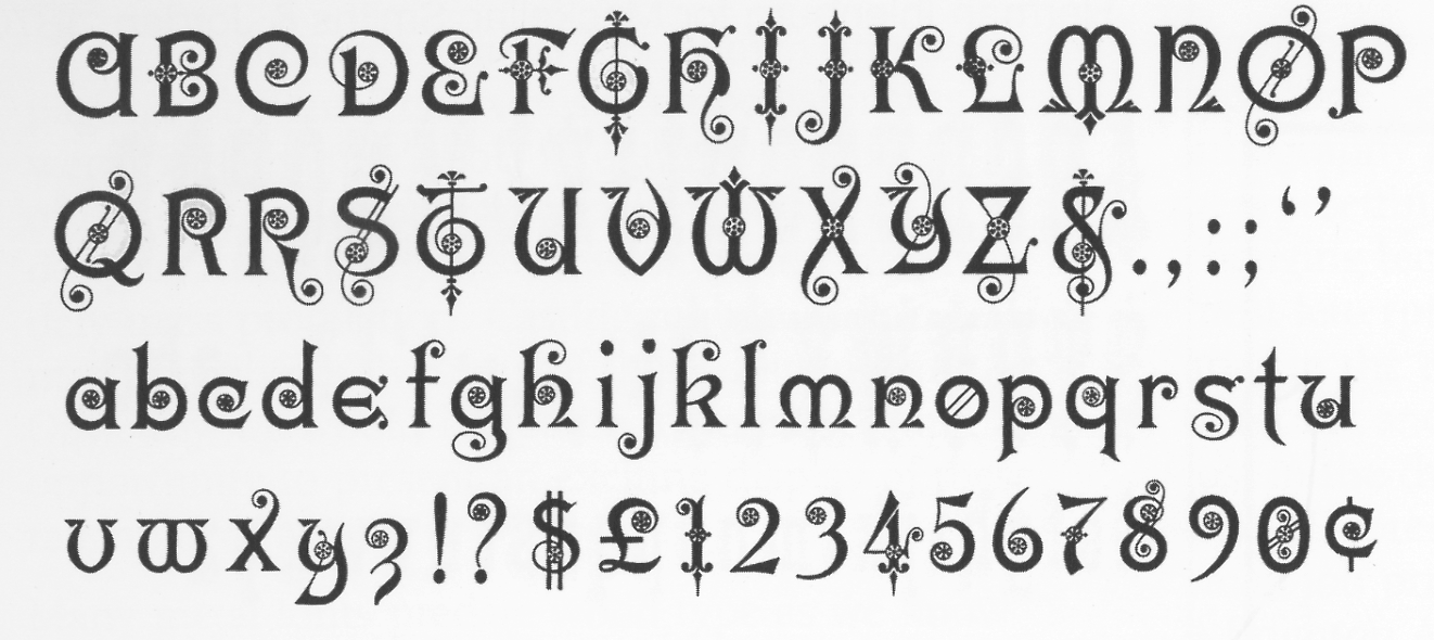
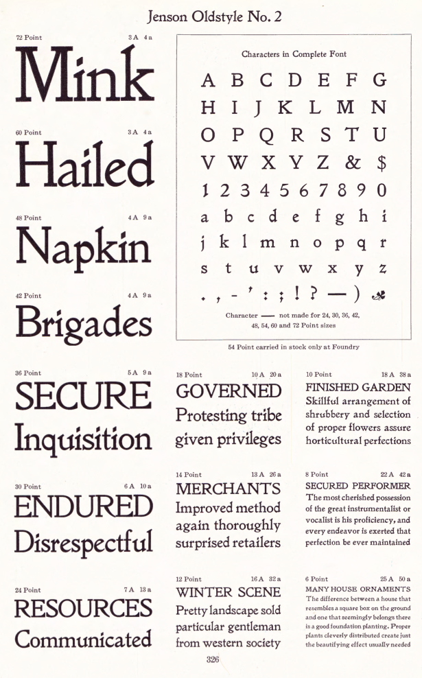
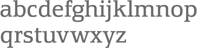
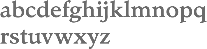
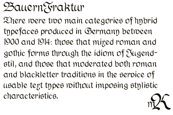
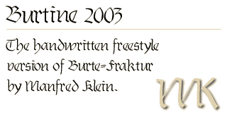
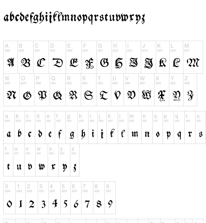
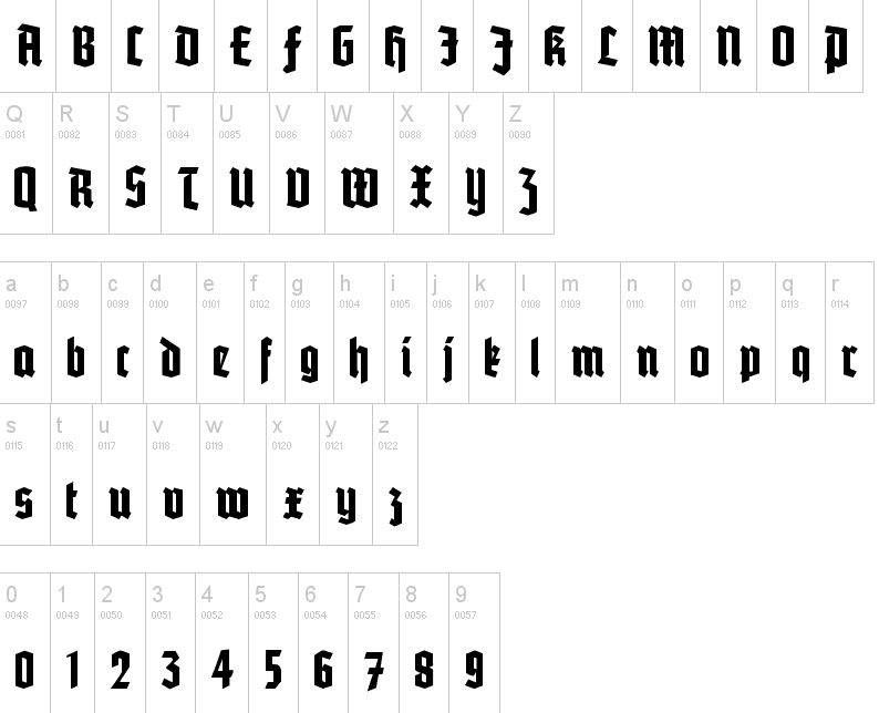
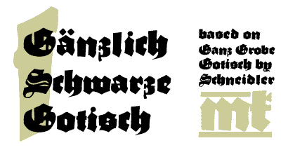
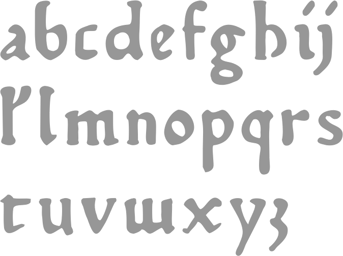
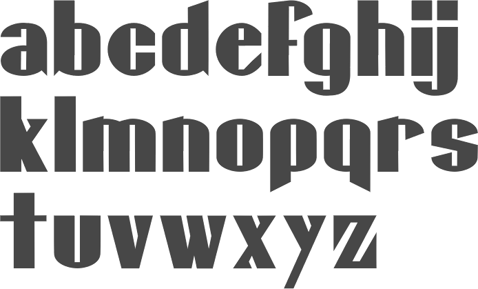
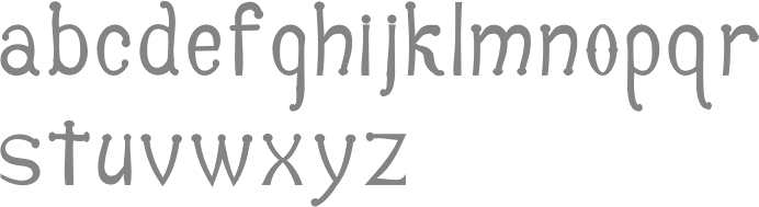
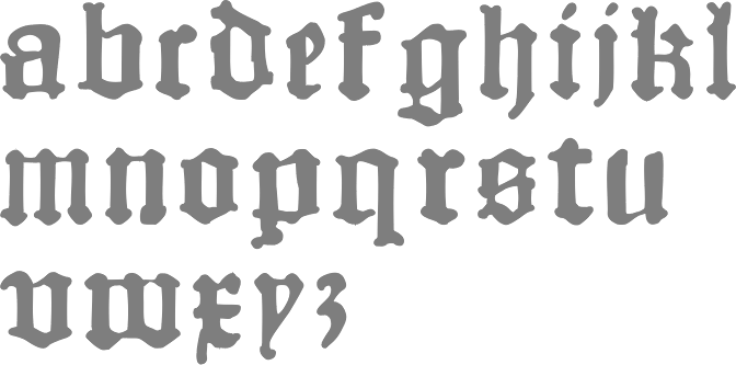
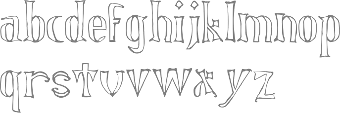
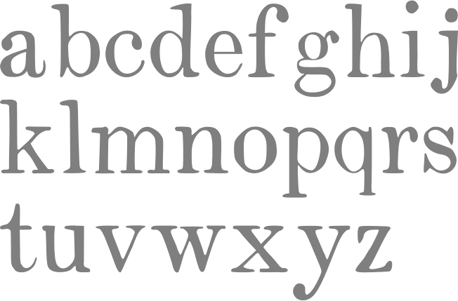
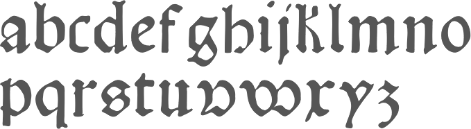
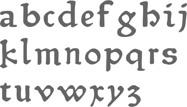
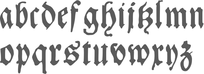
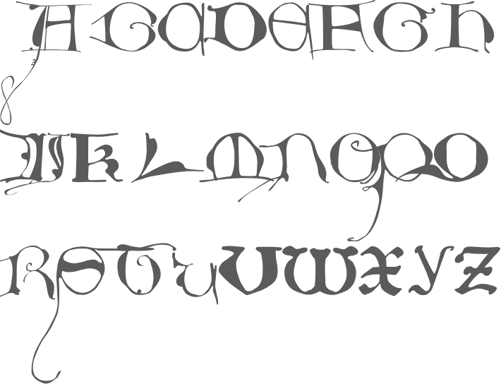
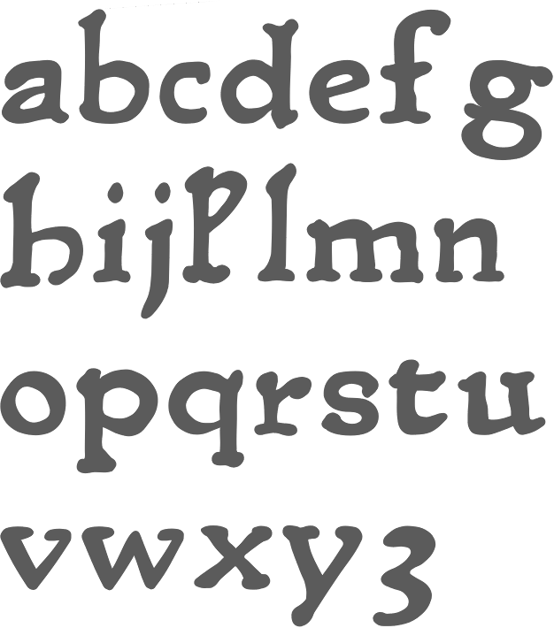
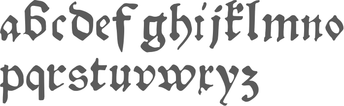
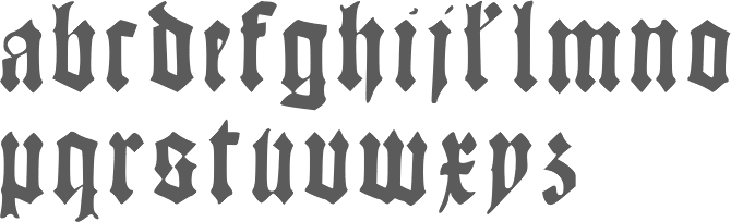
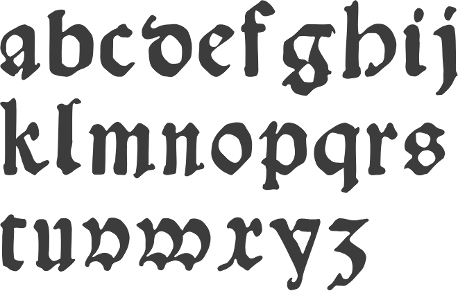
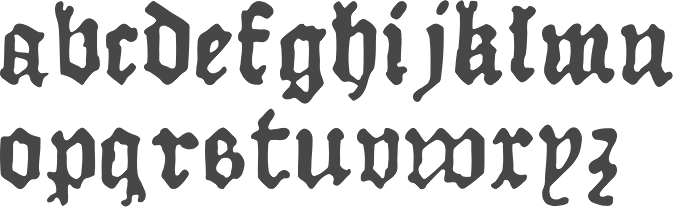
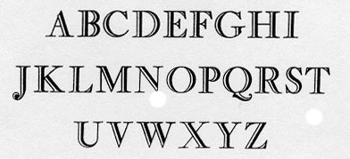
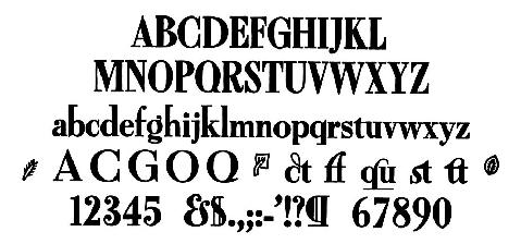
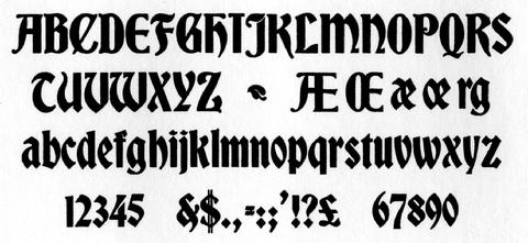
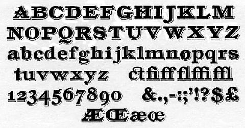
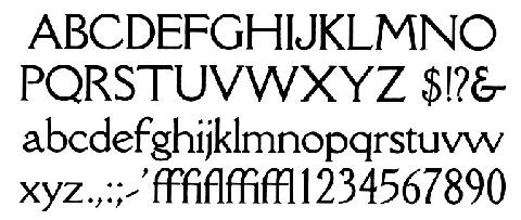
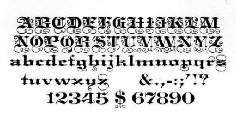
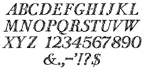
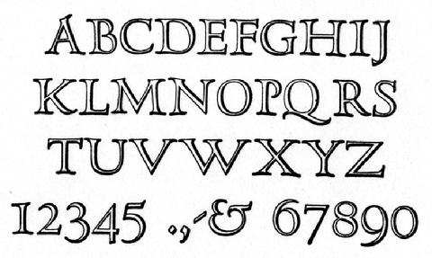
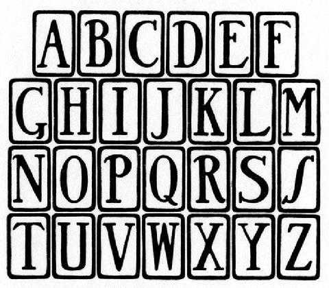
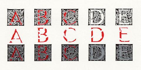
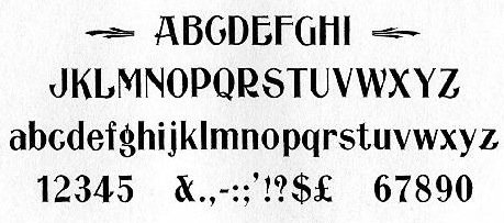
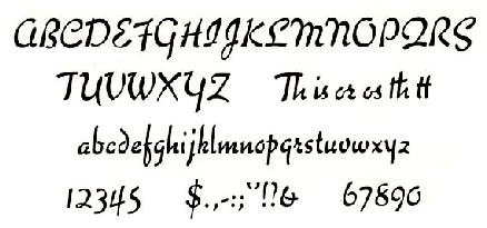
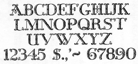
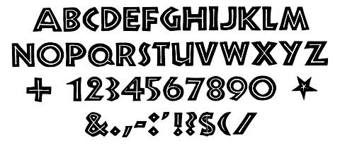
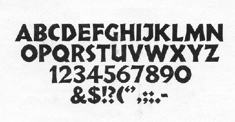
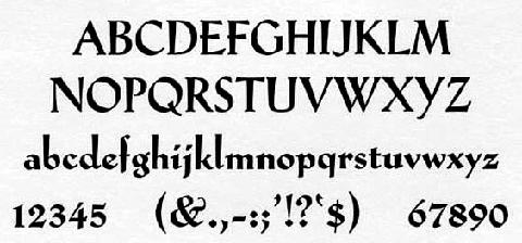
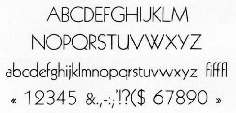
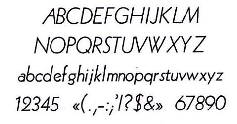
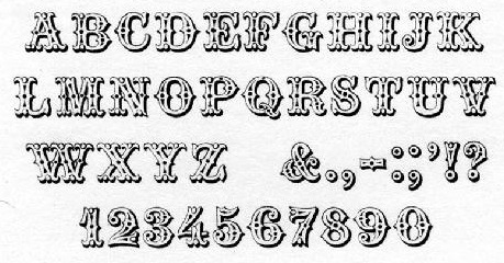
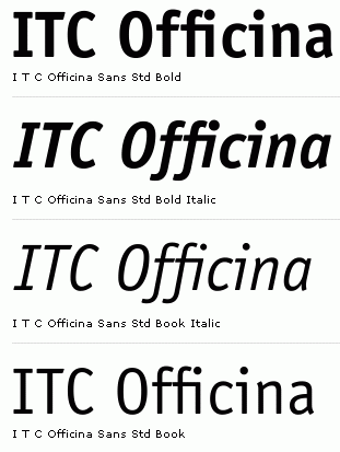
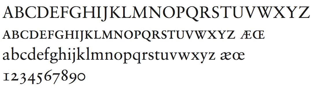
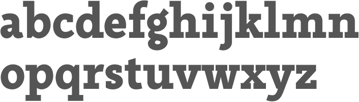
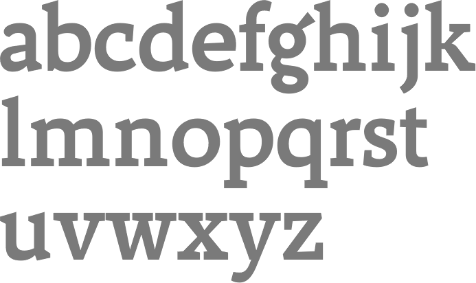
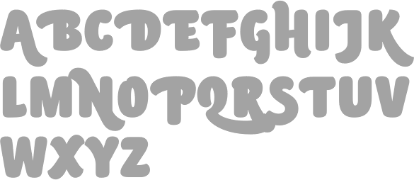
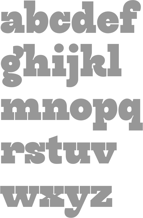
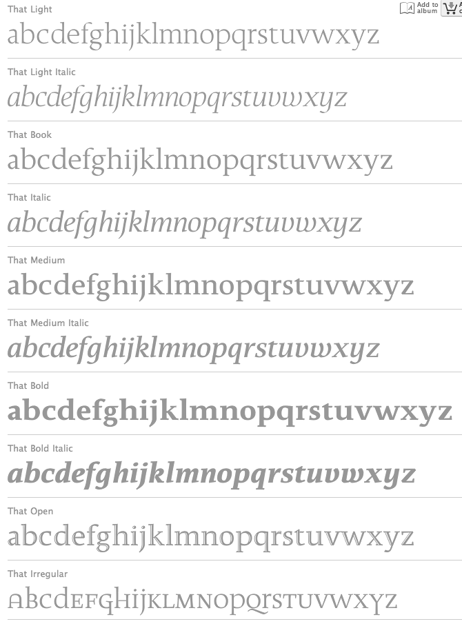
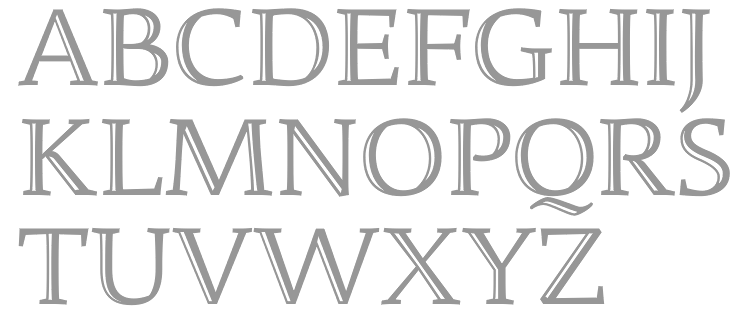
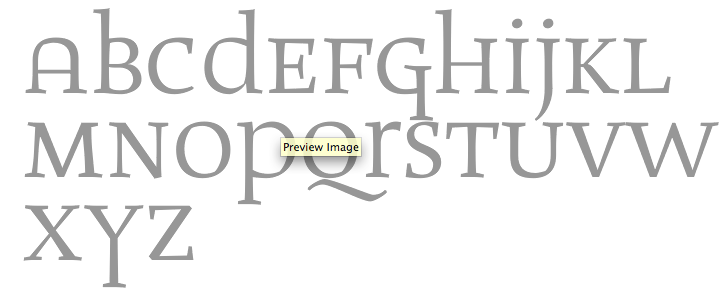
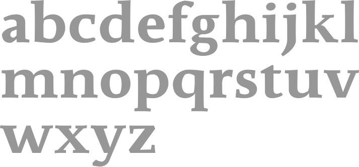
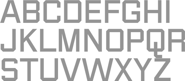
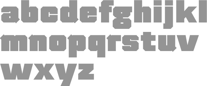
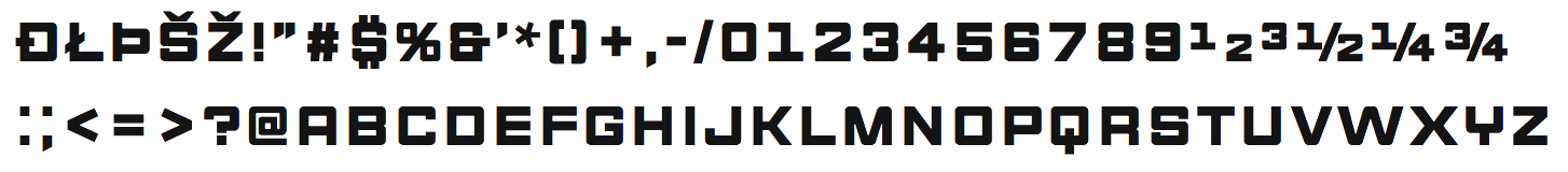
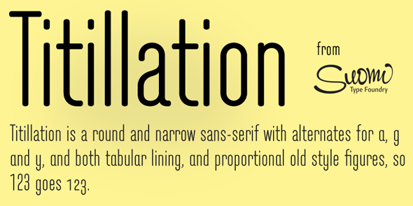
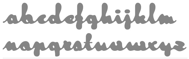
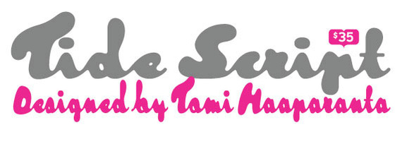
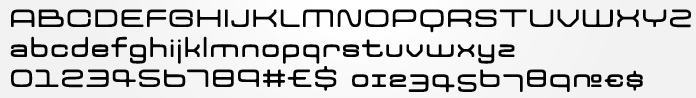
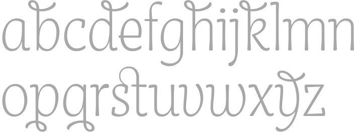
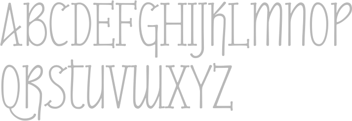
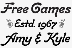
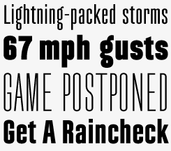
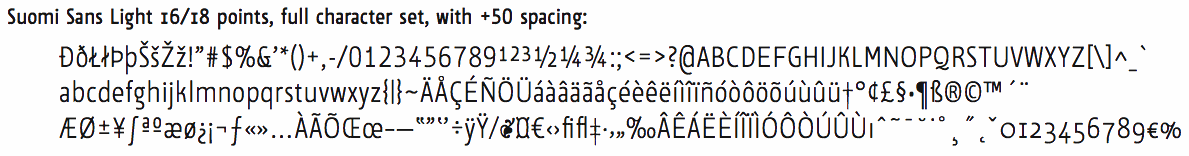
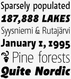
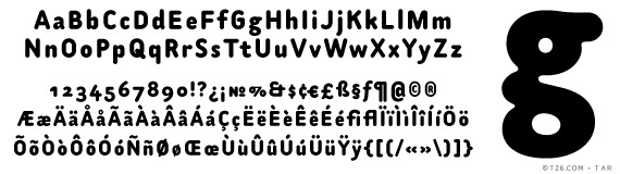
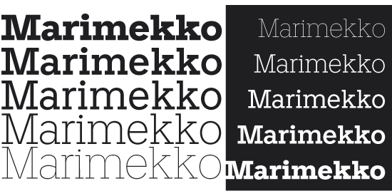
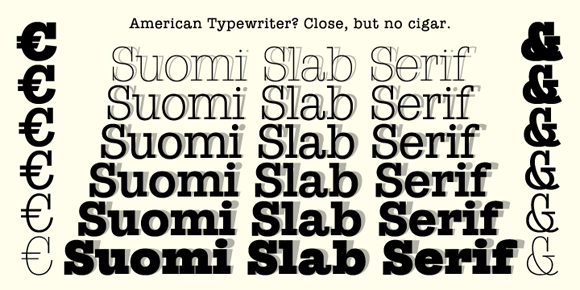
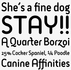
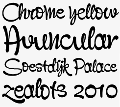
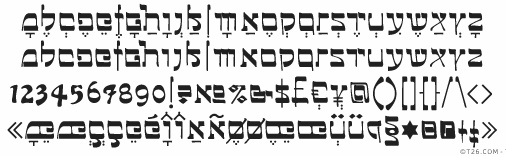
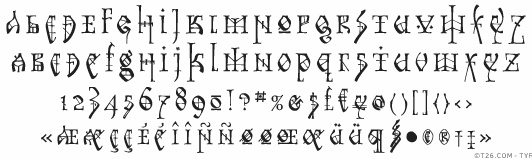
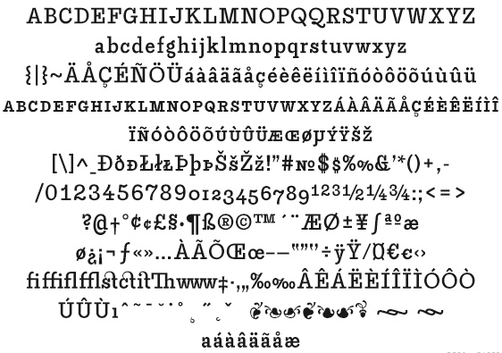
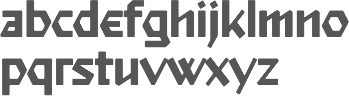
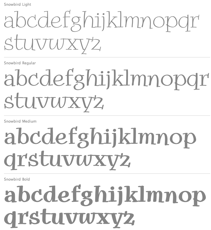
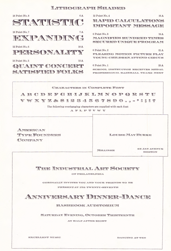
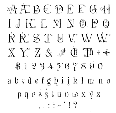
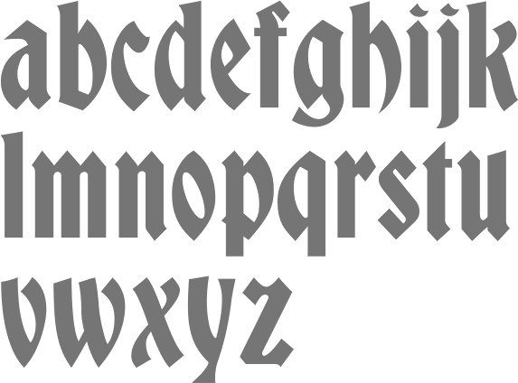
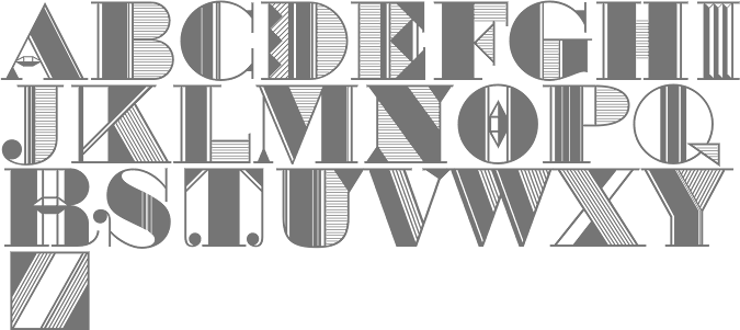
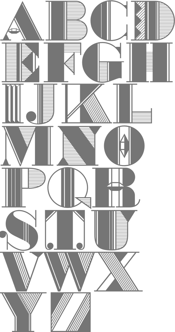
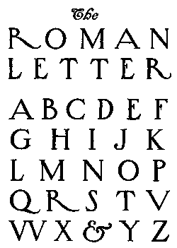