| | |
100types
[Ben Archer]
|
Educational and reference site run by Ben Archer, a designer, educator and type enthusiast located in England (who was in Auckland, New Zealand, before that). Glossary. Timeline. Type categories. Paul Shaw's list of the 100 most significant typefaces of all times were recategorized by Archer: - Religious/Devotional: Gutenbergs B-42 type, Gebetbuch type, Wolfgang Hoppyl's Textura, Breitkopf Fraktur, Ehrhard Ratdolt's Rotunda, Hammer Uncial, Zapf Chancery, Peter Jessenschrift, Cancellaresca Bastarda, Poetica.
- Book Publishing&General Purpose Text Setting: Nicolas Jenson's roman, Francesco Griffo's italic, Claude Garamond's roman, Firmin Didot's roman, Cheltenham family, Aldus Manutius' roman, William Caslon's roman, Pierre-Simon Fournier's italic, Ludovico Arrighi da Vicenza's italic, Johann Michael Fleischmann's roman, ATF Garamond, Giambattista Bodoni's roman, Nicolas Kis' roman, Minion multiple master, Unger Fraktur, John Baskerville's roman, Lucida, Optima, Bauer Bodoni, Adobe Garamond, Scotch Roman, Romanée, ITC Stone family, Trinité, ITC Garamond, Sabon, ITC Novarese, Charter, Joanna, Marconi, PMN Caecilia, Souvenir, Apollo, Melior, ITC Flora, Digi-Grotesk Series S.
- Business/Corporate: Akzidenz Grotesk, Helvetica, Univers, Syntax, Courier, Meta, Rotis, Thesis, Antique Olive.
- Newspaper Publishing: Times Roman, Bell, Clarendon, Century Old Style, Ionic, Imprint.
- Advertising and Display: Futura, Robert Thorne's fat typeface roman, Vincent Figgins' antique roman (Egyptian), Memphis, Fette Fraktur, Avant-Garde Gothic, Deutschschrift, Peignot, Erbar, Stadia/Insignia, Penumbra, Compacta, Bodoni 26, WTC Our Bodoni.
- Prestige and Private Press: Romain du Roi, Golden Type, Johnston's Railway Sans, Doves Type, Walker.
- Signage: William Caslon IV's sans serif, Trajan.
- Historical Script: Snell Roundhand, Robert Granjon's civilité, Excelsior Script.
- Experimental/expressive: Mistral, Beowolf, Dead History, Behrensschrift, Eckmannschrift, Neuland, Element, Remedy, Template Gothic.
- Onscreen/multimedia: Chicago, Oakland, OCR-A, Base Nine and Base Twelve, Evans and Epps Alphabet.
- Telephone Directory publishing: Bell Gothic.
Link to Archer Design Work. [Google]
[More] ⦿
|
1930s American midwestern typography
|
Jonathan recommends these fonts as representatve of 1930s American midwestern typography: "If you're going for museum-piece accuracy, look for typefaces issued by the Ludlow or Barnhart Brothers&Spindler type foundries--- you can probably do some sleuthing at myfonts.com. But to get you started, try Tempo, Cheltenham, Franklin Gothic (not ITC), Cooper Black, Alternate Gothic, Post Roman, Copperplate, Radiant, Agency Gothic, Poster Gothic, Bank Gothic, or the ineluctable Goudy Old Style." [Google]
[More] ⦿
|
Academy
[Lyubov Kuznetsova]
|
Cyrillic font available from Paratype. Academy was designed circa 1910 at the Berthold type foundry (St.-Petersburg). It was based on Sorbonne (H. Berthold, Berlin, 1905), which represented the American Type Founders' reworking of Cheltenham of 1896 (designed in turn by Bertram G. Goodhue and Morris Fuller Benton) and Russian typefaces of the mid-18th century. Paratype: A low-contrast text typeface with historical flavour. The modern digital version was designed at Polygraphmash type design bureau in 1989 by Lyubov Kuznetsova. [Google]
[More] ⦿
|
Alphabet Innovations International -- TypeSpectra (Was: MM2000)
[Phil Martin]

|
 Born in Dallas in 1923, and retired in Florida, Phil Martin had an exciting life, which started as a bombardier in WWII, and went on as a piano bar singer, publisher, cartoonist, comedian and typographer. He died in October 2005.
 Phil established Alphabet Innovations International in 1969 and TypeSpectra in 1974, and designed most of his 400 typefaces (read: film fonts for use in the VGC Photo Typositor) there: Agenda (1976), Americana (1972), Arthur (1970, by Roc Mitchell), Aurora Snug (1969), Avalon (1972), Baskerville (1969), Beacon (1987), Bluejack (1974), Borealis (1970, by Roc Mitchell), Britannic (1973), Bulletin (1971), Celebration (1969, by Roc Mitchell), Century S (1975), Cheltenham (1971), Clearface (1973), Cloister (1975), Corporate (1971, by Roc Mitchell), Corporate Image (1971, by Roc Mitchell), Courier B EF (2004, originally done at Scangraphic), Didoni (1969, a knock-off of Pistilli Roman with swashes added), Dimensia and Dimensia Light (1971, by Roc Mitchell), Dominance (1971), Egyptian (1970), Eightball (1971, some report this incorrectly as a VGC face, which has a different typeface also called Eightball: it was digitized by FontBank as Egbert. Alphabet Innovations' Eightball had other versions called Cueball and Highball, and all three were designed by George Thomas who licensed them to AI), Fat Chance (Rolling Stone) (1971), Fotura Biform (1969), Franklin (1981), Garamond (1975), Globe (1975), Goudy (1969), Harem (1969, aka Margit; digitized and revived in 2006 by Patrick Griffin and Rebecca Alaccari as Johnny), Helserif (1976---I thought this was created by Ed Kelton; anyway, this typeface is just Helvetica with slabs), Helvetica (1969), Introspect (1971, revived in 2012 by SoftMaker as Looking Glass, and by Castcraft as OPTI Looking Glass), Jolly Roger (1970, digitized in 2003 by Steve Jackaman at Red Rooster; Martin says that Jolly Roger and Introspect are his two most original designs), Journal (1987), Kabell (1971), Kabello (1970), King Arthur [+Light, Outline] with Guinevere Alternates (1971, by Roc Mitchell), Legothic (1973), Martinique (1970), Mountie (1970), News (1975), Palateno (1969), Pandora (1969), Pazazzma (1980), Perpetua (1969), Plantin (1973), Polonaise (1977; digital version by Claude Pelletier in 2010, called Chopin Script), Primus Malleable (1972), Quaff (1977), Quixotic (1970), Report (1971), Romana (1972), Scenario (1974), Sledge Hammer (1971), Son of Windsor (1970), Stanza (1971, by Roc Mitchell; this angular typeface was later published by URW), Stark (1970), Supercooper (1970), Swath (1979), Threadgil (1972), Thrust (1971), Timbre (1970), Times (1970), Times Text (1973), Trump (1973), Tuck Roman (1981), Viant (1977), Vixen (1970), Weiss (1973), Wordsworth (1973). In 1974, he set up TypeSpectra, and created these type families: Adroit (1981), Albert (1974), Analog (1976), Bagatelle (1979), Cartel (1975), Caslon (1979), Criterion (1982), DeVille (1974), Embargo (1975), Heldustry (1978, designed for the video news at the fledgling ABC-Westinghouse 24-hour cable news network in 1978; incorrectly attributed by many to Martin's ex-employee Ed Kelton: download here), Innsbruck (1975: revived in 2018 by Olexa Volochay as Tyrol), Limelight (1977), Oliver (1981), Opulent [Light and Bold] (1975, by George Brian, an amployee at Alphabet Innovations), Quint (1984), Sequel (1979), Spectral (1974), Welby (1982). His fonts can be bought at MyFonts.com and at Precisiontype. He warns visitors not to mess with his intellectual property rights, but I wonder how he can have escaped the ire of Linotype by using the name Helvetica. In any case, the fonts were originally made for use on photo display devices and phototypesetters. Some are now available in digital format. Near the end of his life, Phil's web presence was called MM2000 (dead link). Check his comments on his own typefaces. URW sells these typefaces: URW Adroit, URW Agenda, URW Avernus (after Martin's design from 1972), URW Baskerville AI, URW Beacon, URW Bluejack, URW Cartel, URW Cloister, URW Corporate, URW Criterion, URW Didoni, URW Fat Face, URW Globe, URW Goudy AI, URW Heldustry, URW Helserif, URW Introspect, URW Legothic, URW Martin Gothic, URW Martinique, URW Pandora, URW Polonaise, URW Quint, URW Scenario, URW Souvenir Gothic, Souvenir Gothic Antique (the Souvenit Gothic family was designed by George Brian, an employee of Alphabet Innovations at the time: it was AI's first text family), URW Stanza, URW Stark, URW Timbre, URW Viant, URW Wordsworth. Interview. Bye Bye Blackbird performed by Phil Martin in Largo, Florida. The final message on his last web page, posted posthumously read: MARTIN, PHIL, 82, of Largo, died Tuesday (Oct. 4, 2005) at Largo Medical Center. He was born in Dallas and came here after retiring as a writer, singer-songwriter, commercial artist, and comedian. As a high school student, he worked as an assistant artist on the nationally syndicated Ella Cinders, and at 18 wrote and drew Swing Sisson, the Battling Band Leader, for Feature Comics. He was an Army Air Forces veteran of World War II, where he served as a bombardier in Lintz, Austria. On his 28th mission shelling the yards in Lintz, his B-24 was hit and he was listed as missing in action until the war in Europe ended. He was a comedian on The Early Birds Show on WFAA in Dallas. As a commercial artist, he founded two multinational corporations to market typeface designs and is credited for designing 4 percent of all typefaces now used. He also wrote columns and articles for typographic publications. Locally, he sang original lyrics to old pop standards in area piano bars, and in 1999 produced 59 issues of the Web book Millennium Memorandum, changing the title to MM2000 when he issued the first edition of the new Millennium on Jan. 3, 2000. Survivors include his wife, Ann Jones Martin; and a cousin, Lorrie Hankins, Casper, Wyo. National Cremation Society, Largo. Phil Martin's digital typefaces. FontShop link. Klingspor link. [Google]
[MyFonts]
[More] ⦿
|
Ascender: Newspaper font study
|
An in-depth study of font usage in American newspapers, carried out by Bill Davis of Ascender Corporation in 2004. A brief summary of its findings: - The ten most popular typefaces are Poynter, Franklin Gothic, Helvetica, Utopia, Times, Nimrod, Century Old Style, Interstate (1993, Tobias Frere-Jones), Bureau Grotesque and Miller.
- Many newspapers, including the top seven nationally, use custom designed typefaces.
- The most popular foundry for newspaper design, by far, is Font Bureau. It is followed by Adobe, Linotype, ITC, Bitstream, Hoefler&Frere-Jones, Monotype and Carter&Cone.
- The custom fonts are listed in the article. They include, for the top seven newspapers, USA Roman (a modification by Gerard Unger of his Gulliver for USA Today), DJ4Scotch (a modification of Escrow by Font Bureau for The Wall Street Journal), NY Cheltenham (by Carter&Cone for the New York Times), LA Text (by Font Bureau for the LA Times), Post Roman (by Font Bureau for the Washington Post), CustomNewsOneDN (used by Daily News, NY), and Tribune Century and Eclipse (by Font Bureau and Jim Parkinson, respectively, for the Chicago Tribune).
[Google]
[More] ⦿
|
ATF 1923 Catalog: Cheltenham
[Morris Fuller Benton]
|
 Showcasing the best pages from the Cheltenham Series in the ATF 1923 Catalog. Cheltenham was designed by Bertram Grosvenor Goodhue, but the Cheltenham in the ATF catalog is a reworking by Morris Fuller Benton. Mac McGrew explains: The design of Cheltenham Oldstyle and Italic is credited to Bertram Grosvenor Goodhue, an architect who had previously designed Merrymount, a private press type. For Cheltenham he had the assistance of Ingalls Kimball, director of the Cheltenham Press in New York City, who suggested and supervised the face. Original drawings were made about 14 ' inches high, and were subjected to much experimentation and revision. Further modification of the design was done by the manufacturers. Some historians credit this modification or refinement to Morris F. Benton; another source says it was done at the Boston branch of ATF, which suggests that the work may have been done by Joseph W. Phinney. In fact, Steve Watts says the typeface was first known as Boston Oldstyle. Mergenthaler Linotype also claims credit for developing the face, but it was first marketed by ATF. Trial cuttings were made as early as 1899, but it was not completed until about 1902, and patented in 1904 by Kimball. It was one of the first scientifically designed typefaces. The thin lines were strengthened to avoid the emaciated look of many types of the period. It is almost a monotone, but with just enough difference between light and heavy lines to avoid monotony. The small serifs and short, compact lowercase make a high character count. Ascenders are unusually long, while descenders are quite short. This was done as a result of studies that showed the greater importance of the upper half of a line of type in creating readily recognizable word shapes and result ing readability. The typeface has had much adverse criticism, especially because of its short descenders and the unusual design of several characters---notably A with the extension of its thick stroke at the top, G with the curve extended at the bottom, and g with its angular, unclosed tail. The alternate form of r, with its arm raised above x-height, has also been criticized, but this is mostly the result of misuse. It is disturbing within a word, but adds a bit of grace at the end of a word. Oddly, original fonts had only this form, with the more regular r added later; most fonts for handsetting include both forms of r, but those for machine setting include only the normal form or in a few cases only the more exotic form. Morris Benton, ATF's chief designer, produced Cheltenham Bold in 1904 and a score of variations up to 1913, methodically exploring the possibilities of various combinations of weight and width, and making this the first true large type family. Benton's variations include Cheltenham Bold Condensed, 1904; Cheltenham Bold Italic, Cheltenham Bold Condensed Italic, Cheltenham Wide and Cheltenham Bold Outline, 1905; Cheltenham Bold Extra Condensed and Cheltenham Bold Extended, 1906; Cheltenham Inline, Inline Extra Condensed and Inline Extended, 1907; Cheltenham Oldstyle Condensed, (Cheltenham continues) 1909; Cheltenham Medium, 1909; Medium Italic, 1910; Cheltenham Extrabold, 1910; Cheltenham Bold Shaded, Bold Italic Shaded and Extrabold Shaded, 1912; and Cheltenham Medium Condensed and Expanded, 1913. Linotype, Monotype, and Ludlow each have duplicates of a dozen or more Cheltenhams, while Intertype has the same under the name Cheltonian. Nearly all of these are essentially the same, except for the addition of ligatures and diphthongs in some display fonts (as shown for Cheltenham Bold), and the modification of keyboard sizes to fit mechanical requirements, but this is substantial in some cases. A curious exception is C heltenham Bold Outline; in the original foundry version it is cut from the same patterns as Bold so they will register for two-color work, while Monotype display sizes have several characters rather crudely redesigned---note H, P, R, e, h, u shown separately. Some of these other sources have also added versions of their own, notably Cheltenham Cursive, designed by Robert H. Middleton for Ludlow, and Cheltenham Wide Italic on Monotype, probably designed by Sol Hess. The latter carries the modifications required for machine-set sizes into display sizes as well. There are several oddities in the Cheltenham family. Cheltenham Wide is identical with Cheltenham Oldstyle except for the lowercase, in handset fonts. The same figures and punctuation marks from these two typefaces are also shared by Cheltenham Oldstyle Condensed, again in handset fonts. In the specimens shown here, compare Oldstyle and Wide. The former, set in ATF type, has two forms of cap C, which that foundry supplied with both typefaces, while the latter, set in Monotype, has two forms of cap W, which that company made only for that face. The unusual paragraph, prime and double prime marks, as well as parentheses and brackets, were made by ATF in some sizes of all three typefaces, but by Monotype only in Cheltenham Oldstyle. There is no Cheltenham Condensed Italic, but Linotype has a Cheltenham Extra Condensed Italic (so-called), which is actually a little wider than Cheltenham Condensed (roman)---why it is called extra condensed is not known. It suffers from adaptation to straight matrices, with annoying gaps between some letter combinations. But Cheltenham Medium Italic was designed more successfully by Benton to fit straight type bodies without kerns. Figures in the medium, bold, and extrabold weights differ from those of the Oldstyle; also notice how the x-height increases with weight. Ludlow Cheltenham is distinguished by the greater slant of some of its italics, and by the rounder top on the roman lowercase a and the rounder lower spur on capital G, as shown in some of the specimens. Western Type Foundry copied several members of this family as Chesterfield. Hansen had the Craftsman series, differing most noticeably in the few characters shown; and other foundries around the world copied it under a variety of names. Also see Kenilworth, Lowell, Venetian. [Google]
[More] ⦿
Showcasing the best pages from the Cheltenham Series in the ATF 1923 Catalog. Cheltenham was designed by Bertram Grosvenor Goodhue, but the Cheltenham in the ATF catalog is a reworking by Morris Fuller Benton. Mac McGrew explains: The design of Cheltenham Oldstyle and Italic is credited to Bertram Grosvenor Goodhue, an architect who had previously designed Merrymount, a private press type. For Cheltenham he had the assistance of Ingalls Kimball, director of the Cheltenham Press in New York City, who suggested and supervised the face. Original drawings were made about 14 ' inches high, and were subjected to much experimentation and revision. Further modification of the design was done by the manufacturers. Some historians credit this modification or refinement to Morris F. Benton; another source says it was done at the Boston branch of ATF, which suggests that the work may have been done by Joseph W. Phinney. In fact, Steve Watts says the typeface was first known as Boston Oldstyle. Mergenthaler Linotype also claims credit for developing the face, but it was first marketed by ATF. Trial cuttings were made as early as 1899, but it was not completed until about 1902, and patented in 1904 by Kimball. It was one of the first scientifically designed typefaces. The thin lines were strengthened to avoid the emaciated look of many types of the period. It is almost a monotone, but with just enough difference between light and heavy lines to avoid monotony. The small serifs and short, compact lowercase make a high character count. Ascenders are unusually long, while descenders are quite short. This was done as a result of studies that showed the greater importance of the upper half of a line of type in creating readily recognizable word shapes and result ing readability. The typeface has had much adverse criticism, especially because of its short descenders and the unusual design of several characters---notably A with the extension of its thick stroke at the top, G with the curve extended at the bottom, and g with its angular, unclosed tail. The alternate form of r, with its arm raised above x-height, has also been criticized, but this is mostly the result of misuse. It is disturbing within a word, but adds a bit of grace at the end of a word. Oddly, original fonts had only this form, with the more regular r added later; most fonts for handsetting include both forms of r, but those for machine setting include only the normal form or in a few cases only the more exotic form. Morris Benton, ATF's chief designer, produced Cheltenham Bold in 1904 and a score of variations up to 1913, methodically exploring the possibilities of various combinations of weight and width, and making this the first true large type family. Benton's variations include Cheltenham Bold Condensed, 1904; Cheltenham Bold Italic, Cheltenham Bold Condensed Italic, Cheltenham Wide and Cheltenham Bold Outline, 1905; Cheltenham Bold Extra Condensed and Cheltenham Bold Extended, 1906; Cheltenham Inline, Inline Extra Condensed and Inline Extended, 1907; Cheltenham Oldstyle Condensed, (Cheltenham continues) 1909; Cheltenham Medium, 1909; Medium Italic, 1910; Cheltenham Extrabold, 1910; Cheltenham Bold Shaded, Bold Italic Shaded and Extrabold Shaded, 1912; and Cheltenham Medium Condensed and Expanded, 1913. Linotype, Monotype, and Ludlow each have duplicates of a dozen or more Cheltenhams, while Intertype has the same under the name Cheltonian. Nearly all of these are essentially the same, except for the addition of ligatures and diphthongs in some display fonts (as shown for Cheltenham Bold), and the modification of keyboard sizes to fit mechanical requirements, but this is substantial in some cases. A curious exception is C heltenham Bold Outline; in the original foundry version it is cut from the same patterns as Bold so they will register for two-color work, while Monotype display sizes have several characters rather crudely redesigned---note H, P, R, e, h, u shown separately. Some of these other sources have also added versions of their own, notably Cheltenham Cursive, designed by Robert H. Middleton for Ludlow, and Cheltenham Wide Italic on Monotype, probably designed by Sol Hess. The latter carries the modifications required for machine-set sizes into display sizes as well. There are several oddities in the Cheltenham family. Cheltenham Wide is identical with Cheltenham Oldstyle except for the lowercase, in handset fonts. The same figures and punctuation marks from these two typefaces are also shared by Cheltenham Oldstyle Condensed, again in handset fonts. In the specimens shown here, compare Oldstyle and Wide. The former, set in ATF type, has two forms of cap C, which that foundry supplied with both typefaces, while the latter, set in Monotype, has two forms of cap W, which that company made only for that face. The unusual paragraph, prime and double prime marks, as well as parentheses and brackets, were made by ATF in some sizes of all three typefaces, but by Monotype only in Cheltenham Oldstyle. There is no Cheltenham Condensed Italic, but Linotype has a Cheltenham Extra Condensed Italic (so-called), which is actually a little wider than Cheltenham Condensed (roman)---why it is called extra condensed is not known. It suffers from adaptation to straight matrices, with annoying gaps between some letter combinations. But Cheltenham Medium Italic was designed more successfully by Benton to fit straight type bodies without kerns. Figures in the medium, bold, and extrabold weights differ from those of the Oldstyle; also notice how the x-height increases with weight. Ludlow Cheltenham is distinguished by the greater slant of some of its italics, and by the rounder top on the roman lowercase a and the rounder lower spur on capital G, as shown in some of the specimens. Western Type Foundry copied several members of this family as Chesterfield. Hansen had the Craftsman series, differing most noticeably in the few characters shown; and other foundries around the world copied it under a variety of names. Also see Kenilworth, Lowell, Venetian. [Google]
[More] ⦿
|
Barco Type
|
Metal type foundry in Northlake, IL and/or Bensenville, IL, still operational in 2007. Also called F&S Type Founders Inc., it was located at 237 S. Evergreen, Bensenville, IL 60106. Some of its types are listed here, but none appear to be original designs. Barco Type Founders [Specimen Book]. Images of some metal typefaces in the Barco collection: AmericanGaramondNo648, AshleyCrawford.png, Binney No. 21, Bon Aire, BulmerRomanNo462, Cameo, CheltenhamWideNo164, CloisterBlackNo95, Comique, ComstockNo202, EleganteNoS106, FigaroNo536, Glamour Medium, Greco Bold, Hauser Script, Hess Neo Bold No. 363, Homewood, Lydian Roman, Matura Scriptorial Caps, Modernistic No. 297, Orplid, Prisma, Punch, Sans Serif Light No. 329, Samson, Scotch Roman No. 36, Spire No. 377, Stymie Medium No. 290, Tangoe, Thello Inline No. 2481, Thello No. 246, TwentiethCenturyUltraboldExtend, Typewriter Type No. 17L. [Google]
[More] ⦿
|
Ben Archer
[100types]
|
[More] ⦿
|
Bertram Grosvenor Goodhue
|
 New York architect, designer and artist. Born in Pomfret, Connecticut in 1869 and died in New York in 1924. He is most famous for designing Cheltenham (1896) for the Cheltenham Press in New York, a long-ascender classical American typeface created initially for Ingalls Kimball at the Cheltenham Press. He also designed Merrymount (1894-1896, Merrymount Press, a medieval-look humanist typeface cut by Woerner of A.D. Farmer&Son).
 Cheltenham was adapted, extended, and revisited by many, starting with Morris Fuller Benton from 1904-1911, who created a full family of Cheltenhams for ATF---Benton's Cheltenham is the Cheltenham we have today. The (British) Monotype version was Gloucester [it had an italic p with the normal closed bowl]. Stephenson Blake had Winchester [which may be distinguished by the curl of the ear in the g and the serifs of the s]. Intertype had Cheltonian. Berthold originally called their version Sorbonne (1905). In 1975, Tony Stan increased the x-height in his revival for ITC. Digital Cheltenham versions can be found at SoftMaker (Cheltenham Pro, and S790), Elsner&Flake (Cheltenham OldStyle EF), Berthold (as Sorbonne BQ), Adobe (ITC Cheltenham by Tony Stan), URW (Cheltenham Old Style, and the 2001 typeface Cheltenham D Bold Extra Condensed), Castcraft (as OPTI Cheltenham Old Style), Monotype (as Gloucester Old Style, Monotype's version of Cheltenham), Paratype (the 1997 Academy typeface family by Lyubov Kuznetosova and Alexander Tarbeev), Cheltenham Pro (2012, Softmaker), Bitstream (Cheltenham; also under the names Stubserif 705 and Stubserif 205 for the Extra Condensed versions), Font Bureau (FB Cheltenham by Jane Patterson, 1992), ITC (Tony Stan's 1975 version of Cheltenham; and ITC Cheltenham Handtooled, a 1993 openface family by Tony Stan and Ed Benguiat), and Scangrapghic (Chelten or Cheltenham Old Style SB). Mac McGrew on Cheltenham: The design of Cheltenham Oldstyle and Italic is credited to Bertram Grosvenor Goodhue, an architect who had previously designed Merrymount, a private press type. For Cheltenham he had the assistance of Ingalls Kimball, director of the Cheltenham Press in New York City, who suggested and supervised the face. Original drawings were made about 14 ' inches high, and were subjected to much experimentation and revision. Further modification of the design was done by the manufacturers. Some historians credit this modification or refinement to Morris F. Benton; another source says it was done at the Boston branch of ATF, which suggests that the work may have been done by Joseph W. Phinney. In fact, Steve Watts says the typeface was first known as Boston Oldstyle. Mergenthaler Linotype also claims credit for developing the face, but it was first marketed by ATF. Trial cuttings were made as early as 1899, but it was not completed until about 1902, and patented in 1904 by Kimball. It was one of the first scientifically designed typefaces. The thin lines were strengthened to avoid the emaciated look of many types of the period. It is almost a monotone, but with just enough difference between light and heavy lines to avoid monotony. The small serifs and short, compact lowercase make a high character count. Ascenders are unusually long, while descenders are quite short. This was done as a result of studies that showed the greater importance of the upper half of a line of type in creating readily recognizable word shapes and result ing readability. The typeface has had much adverse criticism, especially because of its short descenders and the unusual design of several characters---notably A with the extension of its thick stroke at the top, G with the curve extended at the bottom, and g with its angular, unclosed tail. The alternate form of r, with its arm raised above x-height, has also been criticized, but this is mostly the result of misuse. It is disturbing within a word, but adds a bit of grace at the end of a word. Oddly, original fonts had only this form, with the more regular r added later; most fonts for handsetting include both forms of r, but those for machine setting include only the normal form or in a few cases only the more exotic form. Morris Benton, ATF's chief designer, produced Cheltenham Bold in 1904 and a score of variations up to 1913, methodically exploring the possibilities of various combinations of weight and width, and making this the first true large type family. Benton's variations include Cheltenham Bold Condensed, 1904; Cheltenham Bold Italic, Cheltenham Bold Condensed Italic, Cheltenham Wide and Cheltenham Bold Outline, 1905; Cheltenham Bold Extra Condensed and Cheltenham Bold Extended, 1906; Cheltenham Inline, Inline Extra Condensed and Inline Extended, 1907; Cheltenham Oldstyle Condensed, 1909; Cheltenham Medium, 1909; Medium Italic, 1910; Cheltenham Extrabold, 1910; Cheltenham Bold Shaded, Bold Italic Shaded and Extrabold Shaded, 1912; and Cheltenham Medium Condensed and Expanded, 1913. Linotype, Monotype, and Ludlow each have duplicates of a dozen or more Cheltenhams, while Intertype has the same under the name Cheltonian. Nearly all of these are essentially the same, except for the addition of ligatures and diphthongs in some display fonts (as shown for Cheltenham Bold), and the modification of keyboard sizes to fit mechanical requirements, but this is substantial in some cases. A curious exception is C heltenham Bold Outline; in the original foundry version it is cut from the same patterns as Bold so they will register for two-color work, while Monotype display sizes have several characters rather crudely redesigned---note H, P, R, e, h, u shown separately. Some of these other sources have also added versions of their own, notably Cheltenham Cursive, designed by Robert H. Middleton for Ludlow, and Cheltenham Wide Italic on Monotype, probably designed by Sol Hess. The latter carries the modifications required for machine-set sizes into display sizes as well. There are several oddities in the Cheltenham family. Cheltenham Wide is identical with Cheltenham Oldstyle except for the lowercase, in handset fonts. The same figures and punctuation marks from these two typefaces are also shared by Cheltenham Oldstyle Condensed, again in handset fonts. In the specimens shown here, compare Oldstyle and Wide. The former, set in ATF type, has two forms of cap C, which that foundry supplied with both typefaces, while the latter, set in Monotype, has two forms of cap W, which that company made only for that face. The unusual paragraph, prime and double prime marks, as well as parentheses and brackets, were made by ATF in some sizes of all three typefaces, but by Monotype only in Cheltenham Oldstyle. There is no Cheltenham Condensed Italic, but Linotype has a Cheltenham Extra Condensed Italic (so-called), which is actually a little wider than Cheltenham Condensed (roman)---why it is called extra condensed is not known. It suffers from adaptation to straight matrices, with annoying gaps between some letter combinations. But Cheltenham Medium Italic was designed more successfully by Benton to fit straight type bodies without kerns. Figures in the medium, bold, and extrabold weights differ from those of the Oldstyle; also notice how the x-height increases with weight. Ludlow Cheltenham is distinguished by the greater slant of some of its italics, and by the rounder top on the roman lowercase a and the rounder lower spur on capital G, as shown in some of the specimens. Western Type Foundry copied several members of this family as Chesterfield. Hansen had the Craftsman series, differing most noticeably in the few characters shown; and other foundries around the world copied it under a variety of names. Also see Kenilworth, Lowell, Venetian. Books on Cheltenham include one by Thomas Hailing: Specimens of General Printing . Cheltenham (1882, Oxford Printing Works). Posters created on Cheltenham include one by Anna Brooks (2013). Klingspor link. Linotype link. FontShop link. View various digital versions of Cheltenham. See also here. [Google]
[MyFonts]
[More] ⦿
|
Bitstream font analogue
|
 Bitstream font name equivalences. The original file, dated 2007, was at Fontinfo.net, but dispappeared some time ago. Here is that list in text format:
 Aachen == Charlemagne; Ruhr; Vanadium; Westlake Ad Lib == Alibi Adsans == Ad Gothic; Angro; Humanist 970; News Ad Akzidenz Grotesk == Ad Grotesk; Gothic 725; Grigat; Standard; Wayland Albertus == Adelon; Alburt; Flareserif 821 Aldus == Breklum; Luce; Mannucci Roman Alternate Gothic No.2 == Alpin Gothic; Gothic Amazone == Amazonia; Fredrika Amelia == Computer 651; Orbit; Orea American Text == Blackletter 851; National Text Americana == AM; American Classic; Aston; Colonial; Concord; Flairserif 721; Freedom; Independence Antique No. 3 == Egyptian 710 Antique Olive == Alphavanti; AO; Berry Roman; Gibson Antique; Incised 901; Oliva; Olivanti; Olive; Olive Antique; Oliver; Olivette; Olivette Antique; Olivia; Provence Antique Roman Open == Roman Stylus Antique Roman Shaded == Roman Shaded Arnold Bocklin; Auckland == Bock; Expo; Medusa; Nouveau; Youth; Freeform 715 Asta == Albany; AS; Astro; Aztec; Corolla; Dutch 823 Auriol == Freeform 721; Robur; Skylark Aurora Bold Condensed == Anzeigen Grotesk; Aura; Aurora; Grotesque Condensed Aurora == Empira; News 706; News No.12; News No.2; Polaris; Regal Baker Signet == Keene; Signature; Signatur Vario; Signete Balloon == BL; Freehand 041; Lasso Bank Gothic == Bond Gothic; Commerce Gothic; Deluxe Gothic; Magnum Gothic; Square 021; Stationer's Gothic Baskerville == Baskenland; Baskerline; Basque; Beaumont; BK; Transitional 401 Baskerville No.2 == Euro Baskerville; Transitional 404 Bauer Bodoni == Bodoni B; Euro Bodoni; Headline Bodoni; Modern 405 Bell Centennial == Gothic 762 Bell Gothic == Directory Gothic; Furlong; Gothic 761; Paddock Belwe == Belter; Welby Bembo == Aldine 401; Aldine Roman; Ambo; BE; Bem; Bernstein vario; Bingo; Griffo; Latinesque Berling == Carmichel; Revival 565 Bernhard Modern == Beacon; Bernie; BN; Duchess; Engravers Oldstyle Bernhard Tango == Aigrette; Carmine Tango Bingham Script == Freehand 591 Bison == Bison; Blizzard; Brush 738 Bitstream Alisal == Calligraphic 456 Bitstream Amerigo == Flareserif 831 Bitstream Arrus == Lapidary 721 Bitstream Carmina == Calligraphic 811 Bitstream Charter == Transitional 801 Bitstream Cooper == Freeform 741 Bitstream Fournier == Transitional 601 Bitstream Iowan Old Style == Venetian 801 Bitstream Oz Handicraft == Freehand 701 Bitstream Ventana == Humanist 800 Blippo == Geometric 755 Block == Black; Block; Gothic 821; Hobble Bloc == Geometric 885 Bodoni == BO; Bodoni No. 2; Brunswick; Empiriana; Gorvind; Modern 421 Bodoni Campanile == Modern 735; Palisade Bookman == Bookface; Bookman Antique; Bookprint; Revival 710 Bremen == Exotic 011 Britannic == Gallery; Grenoble Broadway == Big City; BW; Deco; Hudson; Moderne; Modernistic; Ritz; Showtime Brody == Brophy Script Bruce Old Style == Bruce; No. 31; Old Style No.3; Old Style No.7; Revival 704 Brush Script == Bombay; BR; Brush; Brilliant Bold Script; Brush 451; Punch Cable == Geometric 231; Kabel; Kabello; Kobel Caledonia == Calderon; Caledo; California; Cornelia; Edinburgh; Gael; Gemini; Highland; Laurel; Transitional 511 Candida == Candide Cascade == Freehand 471; Kascade Script Caslon 540 == Caslon 74; CL; Caslon 2; Caslon 484; Caslon 485 Caslon Bold == Caslon No. 3; New Caslon; Caslon 74 Bold Caslon Old Face == Caslon Old Style; Caslon; Caslon 128; Caslon 471; Caslon 76 Cataneo == Chancery 731 Centaur == Arrighi; Centaurus; Venetian 301 Century Expanded == Century Light/II; Century X; Cambridge Expanded; CE; Century; Century Bold Century Oldstyle == Cambridge Oldstyle Century Schoolbook == Century Text; Century Textbook; CS; Schoolbook; Cambridge Schoolbook; Century Medium; Century Modern Chapel Script == Mahogany Script; Monterey Cheltenham Old Style == Cheltonian; Chesterfield; Gloucester; Kenilworth; Nordhoff; Sorbonne; Winchester Choc == Staccato 555 City == Square Slabserif 711; Town Clarendon == Clarique; Clarion; Cerebral Cloister Black == Abbey; Cloister Black Codex == Calligraphic 421 Concorde == Dutch 809; Chinchilla; Concert Cooper Black == Bitstream Cooper; Burlesque; Coop; CP; Ludlow Black; Pabst; Plymouth; Rugged Black Copperplate Gothic == Atalante; Copperplate; Formal Gothic; Gothic No.29; Gothic No.30; Gothic No.31; Gothic No.32; Gothic No.33; Lining Plate Gothic; Mimosa; Spartan Corona == Aquarius; Cardinal; CR; Crown; Elmora; Ideal; Koronna; News 705 BT; News No.3; News No.5; News No.6; Nimbus; Quincy; Royal; Scotsman Royal; StarNews; Vela Coronet == Pageant; Ribbon 131 Courier == Messenger Davida == DaVinci De Vinne == Congressional; Industrial 731 Della Robbia == Cantoria; Canterbury; Dahila; Firenze; Westminster Old Style Diotima == Calligraphic 810; Diotima Dom Casual == Ad Bold; Brush 431; Brush Roman; Dom Casual; Polka Eckmann == Freeform 710 Egyptian 505 == Egyptios; Egypt 55 Egyptienne == Humanist Slabserif 712; Egyptien Electra == Avanta; Elante; Illumna; Selectra; Transitional 521 Embassy == Boston Script; Florentine Script; Hellana Script; Script No.1; Script No.2 Englische Schreibschrift == English 157; English Script Engravers' Old English == Old English; Old English Text Engravers' Roman == Lining Litho Engravers Roundhand == Roundhand No. 1; Signet Roundhand; Snell; Snell Roundhand Eurostile == Aldostyle; Astron; ES; Eurogothic; Europa; Gamma; Micro; Microstyle; Square 721; Waltham Excelsior == Angeles; Berlin; Camelot; Commerce No.1; Commerce No.2; Digi-Antique; Esquire; EX; Excel; Excella; League Text; News 702; News No.10; News No.14; Opticon; Paragon; Primus; Victoria Fairefax; Fairfield == Fairmont; Savant; Transitional 551 Financial == Letter Gothic Folio == Haverhill Fraktur == German Gothic Franklin Gothic == Gothic No.16; Pittsburgh Frutiger == CG Frontiera; Concorde; Freeborn; Humanist 777; Provencale; Roissy; Siegfried Fry's Baskerville == Baskerville Display; Baskerville F; Baskerville Old Face; Transitional 409 Futura == Alphatura; Atlantis; FU; Future; Photura; Sirius; Utica Gando == Gando Ronde Garamond == Aldine 511; American Garamond; Canberra; Carrera; Garamond No.2; Garamond No.3; Garamond No.49; Garamont; GD; Grenada Gill Sans == Eric; Gillies; Glib; Graphic Gothic; Hammersmith; Humanist 521; Sans Serif 2 Gothic No.13 == Gothic No.4 Goudy Old Style == Grecian; Number 11; Goudy; Goudy Bold; Goudy Extra Bold Granjon == Elegant Garamond; Garamont Premier; Grandeur Grotesque 126 == Gothic 720 Hanseatic == Swiss 924; Geneva 2 Hanoverian; Helvetica Compressed == Helvetica Pressed; Spectra Compressed; Swiss 911; Claro Compressed; Geneva 2 Compressed; Helios Compressed Helvetica Inserat == Swiss 921; Geneva 2 Sera; Geneva Inserat; Helios Inserat Helvetica Monospaced == Monospace 821 Helvetica == Aristocrat; CG Triumvirate; Claro; Corvus; Europa Grotesk; Geneva/2; Hamilton; HE; Helios/II; Helv; Helvette; Holsatia; Megaron/II; Newton; Spectra; Swiss 721; Vega; Video Spectra Hobo == Hobnob; Tramp Imperial == Bedford; Emperor; Gazette; New Bedford; News No.4; Taurus Imprint == Period Old Style; Dutch 766 Impuls == Impuls; Brush 439 Ionic No. 5 == Ionic-326; Ionic/2; News 701; News Text Medium; Rex; Windsor; Zar; Corinth; Doric; Ionic 342; Dow News; Ideal; Regal Italian Script == Lorraine Script; Lucia ITC American Typewriter == Amertype; AT; Newriter; Typewriter 911 ITC Avant Garde Gothic == AG; Avanti; Cadence; Geometric 711; Suave; Vanguard ITC Bauhaus == BH Geometric 752 ITC Benguiat Gothic == BT; Informal 851 ITC Benguiat == Beget; BG; Revival 832 ITC Berkeley Oldstyle == Venetian 519 ITC Bolt Bold == Square 821 ITC Bookman == Revival 711; Bookman; BM ITC Busorama == Geometric 075; Omnibus; Panorama; ITC Century == Centrum ITC Galliard == Seville ITC Garamond == Garamet ITC Kabel == Kabot ITC Korinna == Kordova ITC New Baskerville == Transitional 402 ITC Serif Gothic == Line Gothic ITC Souvenir == Sovran; SV ITC Tiffany == Jewel ITC Zapf Chancery == Chancelor Janson == Jason; Journal; Kis; Kis-Janson; Nikis; Dayton; Jan/Dutch Jefferson == Freehand 575 Kaufmann == Swing Bold; Tropez Liberty == Bernhard Cursive; Bernhard Schonschrift; Lotus; Viant Libra == Libretto; Libby Uncial Life == Fredonia Linotype Modern == Modern 880; Telegraph Modern London Text == Belvedere; Blackletter 686 Lydian Cursive == Granite Cursive; Lisbon Cursive Lydian == Granite; Lisbon Madison == Century 725 Mandate == Command; Freehand 521 Matt Antique == Garth Graphic Melior == Ballardvale/2; CG Melliza; Hanover/II; Lyra; Mallard; Matrix; ME; Medallion; Metrion; Uranus; Ventura; Vermilion; Zapf Elliptical Memphis == Alexandria; Cairo; Geometric Slabserif 703; Nashville; Pyramid Meridien == Zenith; Equator; Latin 725; Latine; Maximal Metro == Chelsea; Geometric 415; Gothic No.2; Gothic No.3; Megamedium; Meteor Mirarae == Calligraphic 808 Mister Earl == Freehand 651 Mistral == Aeolus; Missive; Staccato 222; Zephyr Script Neuland == Othello; Informal 011 Neuzeit Grotesk == Genneken; Geometric 706; Grotesk S News Gothic == Alpha Gothic; CG Trade; Classified News; Gothic Bold-131; Gothic No.17; Gothic No.18; Gothic No.19; Gothic No.20; Gothic-130; Lightline Gothic; Record Gothic; Toledo; Trade Gothic Nuptial Script == Bridal Script; Floridian Olympian == Olympus; Dutch 811 Ondine == Formal Script 421; Mermaid Onyx == Arsis; Onyx; Poster Bodoni Compressed Optima == Athena; CG Omega; Chelmsford/II; Musica; October; OP; Optimis; Optimist; Oracle/II; Orleans; Roma; Ursa; Zapf Humanist; Zenith Oscar == Formal 436 Palatino == Andover/II; CG Palacio; Compano; Elegante; Malibu/2; Paladium; Palatine; Palermo; Parlament; Patina; Pontiac; Zapf Calligraphic Palette == Brush 445; Palette Park Avenue == Parkway; PA Peignot == Exotic 350; Monterey; Penyoe Perpetua == Felicity; Lapidary 333; Percepta; Perpetual Piranesi Italic == Minuet Plantin == Aldine 721; Atlantic; PL; Planet; Plantin Poster Bodoni == Bodoni Extrabold/No. 2; Modern 721 Prestige == Prestige Elite Primer == Rector; Scholasta; Century 751; Premier; Bancroft Profil == Decorated 035 Raleigh == Cartier Rockwell == Slate; Geometric Slabserif 712; Rockland Romana == Romanisch; De Vinne; De Vinne Ornamental; French Old Style; Lorimer; Romaans Sabon == Berner; Classical Garamond; September; Sybil/2; Symposia Serifa == Seriverse; Sierra; Monty; Seraphim Shelley == Operinia Simoncini Garamond == Garamond Simoncini; Garamondus; Italian Garamond; Spartan == Technica; Techno; Times Gothic; Twentieth Century; Geometric 212; Sans; Sparta Star Trek == Square 051 Stempel Garamond == Euro Garamond; Garamond; Garamond Antiqua; Garamond Royale; Original Garamond Stempel Schneidler == Amalthea; Bauen Schrift; Bauer Text; Brewer Text; Kohinoor; Schneidler; Schneidler Old Style Stuyvesant == Wintergreen Stymie == ST Syntax == Synthesis; Cintal; Humanist 531; Symphony; Synchron Textype == Century 731 Times Roman == TmsRmn; TR; Varitimes; Claritas; Dutch 801; English; English 49; English Times; Euro Times; London Roman; Pegasus; Press Roman; Sonoran Serif; Tempora; Tiempo; Timeless; Times New Roman Torino == Contessa; Galileo; Industrial 736; Loren Trump Mediaeval == Activa; Ascot; Continental; Knight; Kuenstler 480; Mediaeval; Olympus; Renaissance; Saul Typo Upright == French Script; Interscript; Kaylin Script; Linoscript; Parisian Ronde Umbra == Durante; Meandme; Plastica Univers == Alphavers; Aries; Boston; Eterna; Galaxy; Kosmos; Swiss 742; UN; Versatile; Zurich University Roman == Ace; Celtic; Collegette; Forum Flair; Opera; Orna; Stunt Roman Wedding Text == Linotext; Marriage Windsor == Winslow [Google]
[More] ⦿
|
Bo Berndal
[T4 Typography AB]
|
[MyFonts]
[More] ⦿
|
Books on Wood Type
|
Books on Wood Type, as listed by the Design Division of the Department of Art and Art History at The University of Texas at Austin: - 1963 / American Wood Type. Design Quarterly, No 56. Minneapolis: Walker Arts Center.
- 1964 / American Wood Types, 1828-1900, Volume One. Limited edition folio.
- 1965 / Wood Letters in the 20th Century. Matrix 7. Rochester, NY: Office of Educational Research, Rochester Institute of Technology.
- 1969 / American Wood Type, 1828-1900: Notes on the Evolution of Decorated and Large Types and Comments on Related Trades of the Period. 1st ed. New York: Van Nostrand.
- 1977 / American Wood Type, 1828-1900: Notes on the Evolution of Decorated and Large Types and Comments on Related Trades of the Period. 1st Paperback Printing New York: Da Capo Press.
- 1977 / Wood Type Alphabets: 100 Fonts. New York: Dover Publications. Edited by Rob Roy Kelly.
- 1990 / Adobe Wood Type, Vol 1. Moutain View, California: Adobe Systems. Introduction by Rob Roy Kelly.
- 1999 / Specimen Book of Wood Type. Madison: Silver Buckle Press.
A sublist of specimen books held by Columbia University (CU), the Newberry Library in Chicago (NL), the New York Public Library (NYPL) and the Hamilton Wood Type&Printing Museum (HAM) is quite impressive. Here we go: - 1828 / CU Darius Wells: Darius Wells, Letter Cutter.
- 1838 / CU George Nesbitt (Edwin Allen): First Premium Wood Types Cut by Machinery.
- 1838 / NYPL J.M. Debow (William Leavenworth): Leavenworth's Patent Wood Type.
- 1840 / CU Wells&Webb Specimens of Plain and Ornamental Wood Type.
- 1841 / CU George Nesbitt (Edwin Allen): Nesbitt's Fourth Specimen of Machinery Cut Wood Type.
- 1846 / CU L. Johnson (Wells&Webb): Specimens of Wood-Letter.
- 1849 / CU Wells&Webb: Specimens of Wood Type.
- 1853 / CU Bill, Stark&Co.: Specimens of Machinery Cut Wood Type.
- 1854 / CU W.&H. Hagar (Wells&Webb): Specimens of Printing Types.
- 1854 / CU / NL Wells&Webb: Specimens of Wood Type. (NL copy is gift from Hamilton Mfg. Co.)
- 1858 / NL D. Knox&Co.: Specimens of Wood Type.
- 1859 / CU / NL William H. Page&Co.: Specimens of Wood Type.
- 1859 / NL J.G. Cooley&Co.: Specimens of Wood Type. (NL copy also contains parts of two smaller undated specimens: J.G. Cooley&Co. Cooley's Wood Type and Vanderburgh, Wells&Co.)
- 1860 / NL William H. Page&Co.: Supplementary Specimens of Wood Type Rules&Borders, Etc..
- 1865 / CU William H. Page&Co.: Price List for Wood Type, Borders, Reglet, Etc.. (Affixed to 1859 Page specimen)
- 1870 / NYPL William H. Page&Co.: Specimens of Wood Type.
- 1870 / CU William H. Page&Co.: German Specimens of Wood Type.
- 1872 / CU / NL / NYPL William H. Page&Co.: Specimens of Wood Type.
- 1872 / NL Marder, Luce (Page): Specimens of Wood Type.
- 1872 / CU Dauchy&Co. (Page): Specimens of Wood Type.
- 1873 / CU William H. Page&Co.: Specimens of Wood Type.
- 1874 / CU / NL William H. Page&Co. Specimens of Chromatic Wood Type, Borders, Etc.. (CU copy is gift from Rob Roy Kelly)
- 1876 / CU William H. Page Wood Type Co.: Specimens of Wood Type. (CU copy is gift from Rob Roy Kelly)
- 1876 / CU / NL William H. Page Wood Type Co.: Poster Specimens. (NL copy is gift from Hamilton Mfg. Co.)
- 1877 / CU Vanderburgh Wells&Co. Specimens of Wood Type, Borders, Rules, Etc..
- 1878 / CU / NYPL William H. Page Wood Type Co.: Specimens of Wood Type. (CU copy is gift from Rob Roy Kelly, NYPL copy contains one additional page showing Aetna Extra Condensed and Egyptian)
- 1879 / NL Vanderburgh Wells&Co. Specimens of Wood Type, Borders, Rules, Etc..
- 1879 / CU William H. Page Wood Type Co.: Page's Wood Type Album, Vol 1, No 1. (CU copy is gift from Hamilton Mfg. Co.)
- 1879 / CU William H. Page Wood Type Co.: Page's Wood Type Album, Vol 1, No 2. (CU copy is gift from Hamilton Mfg. Co.)
- 1879 / NL William H. Page Wood Type Co.: Page's Wood Type Album, Vol 1, No 3.
- 1880 / NYPL William H. Page Wood Type Co.: Specimens of Wood Type.
- 1881 / CU Hamilton&Katz: Specimens of Holly Wood Type.
- 1881 / CU Morgans&Wilcox Mfg. Co.: Specimens of Wood Type, Printing Materials, Presses, Paper Cutters, Etc..
- 1882 / CU William H. Page Wood Type Co.: Specimens of Wood Type&Borders. (CU copy is gift from Hamilton Mfg. Co.)
- 1883 / NL American Wood Type Co.: Specimens of Wood Type.
- 1883 / CU Shniedewend&Lee: Specimens of Page's Wood Type&Borders. (CU copy is gift from Hamilton Mfg. Co.)
- 1884 / NL [microfilm] Hamilton&Katz: Specimens of Holly Wood Type.
- 1884 / CU / NL Morgans&Wilcox Mfg. Co.: Condensed Specimen Book of Wood Type. (NL copy is gift from Hamilton Mfg. Co.)
- 1886 / NL [microfilm] Hamilton&Baker: Specimens of Holly Wood Type .
- 1887 / NL National Printers' Materials Co.: Specimens of Enameled Wood Type.
- 1887 / NL William H. Page Wood Type Co.: Specimens of Page's Wood Type.
- 1887 / CU Hamilton&Baker: Specimens of Holly Wood Type. (CU copy is gift from Rob Roy Kelly)
- 1888 / CU William H. Page Wood Type Co.: Specimens of Machine Cut Wood Type. (A facsimile was produced by David W. Peat in 2002)
- 1888 / CU Hamilton&Baker: Specimens of Wood Type&Borders. (CU copy is gift from Hamilton Mfg. Co.)
- 1889 / CU The Hamilton Manufacturing Co.: Specimens of Wood Type&Borders. (CU copy is gift from Hamilton Mfg. Co.)
- 1889 / CU The Hamilton Manufacturing Co.: Specimens of Wood Type&Borders. (CU copy is gift from Hamilton Mfg. Co.)
- 1889 / CU The Hamilton Manufacturing Co.: Calendar Sets.
- 1889 / NL Vanderburgh Wells&Co.: Specimens of Wood Type, Borders, Rules, Etc..
- 1890 / CU Morgans&Wilcox Mfg. Co.: Condensed Specimen Book of Wood Type.
- 1890 / CU / NL William H. Page Wood Type Co.: Page's New Process Wood Type. (Reprinted by American Life Foundation in 1983)
- 1890 / CU Vanderburgh Wells&Co.: New Styles Wood Letter. (3-color Broadside)
- 1890 / CU Heber Wells: Specimens of Wood Type.
- 1891 / NL Heber Wells: Specimens of Wood Type.
- 1892 / CU Heber Wells: Specimen Book of Wood Letter.
- 1892 / CU The Hamilton Mfg. Co.: New Process Wood Type Manufactured by Page.
- 1892 / CU / NYPL The Hamilton Mfg. Co.: Wood Type&Borders (Oversized). (Front matter indicates that there was an 1891 catalog)
- 1893 / NL Nelson&Chessman&Co. (Hamilton): New Process Wood Type. (NL copy is gift from Hamilton Mfg. Co.)
- 1893 / CU The Hamilton Mfg. Co.: Specimens of Wood Pointers (Broadside).
- 1894 / CU The Hamilton Mfg. Co.: Perpetual Calendar Sets (Broadside).
- 1895 / CU Heber Wells Specimens of Wood Type. (Front matter indicates there was an 1893 catalog)
- 1895 / CU The Hamilton Mfg. Co.: DeVinne Series Specimens.
- 1899 / CU The Hamilton Mfg. Co.: Specimens of Wood Type (No 14).
- 1900 / CU The Hamilton Mfg. Co. Specimens of Wood Type (No 15).
- 1904 / NL Tubbs&Co.: Tubbs Wood Type.
- 1906 / CU The Hamilton Mfg. Co.: Specimens of Wood Type, With Ornaments, Fewer Issues, Dashes, Silhouettes, Catchwords, Corners, Fractions, Calendars&Borders (No 16).
- 1908 / CU / NL The Hamilton Mfg. Co.: Specimens of Wood Type (No 17).
- 1918 / CU / NL The Hamilton Mfg. Co.: Wood Type&Borders. (Hamilton re-used existing Tubbs Mfg. Co. specimen book)
- 1927 / CU The Hamilton Mfg. Co.: Unit Gothic&Hamilton's Series of Roman Borders (2 Broadsides).
- 1927 / CU The Hamilton Mfg. Co.: Cheltenham Faces.
- 1927 / CU The Hamilton Mfg. Co.: Specimens of Wood Type.
- 1928 / CU The Hamilton Mfg. Co.: New Gothic Faces&Wood Type.
- 1929 / CU The Hamilton Mfg. Co.: Poster Cheltenham.
- 1930 / CU The Hamilton Mfg. Co.: Large Wood Type.
- 1932 / CU The Hamilton Mfg. Co.: Display Gothics.
- 1938 / CU / NL The Hamilton Mfg. Co.: Wood Type Catalog No 38.
- 1957 / NL American Wood Type Mfg. Co.: Interim Catalog 1957.
- 1958 / NL American Wood Type Mfg. Co.: Catalog 1958-1959.
- 1961 / NL American Wood Type Mfg. Co.: Catalog 1961-1962.
[Google]
[More] ⦿
|
Charles William Smith
|
Designer of John Hancock and Lowell. According to McGrew: The John Hancock series was originated by Keystone Type Foundry and, introduced in 1903; however, it was patented in 1907, with the patent assigned to Charles William Smith, probably the designer. It was named for the president of the Continental Congress and first signer of the Declaration of Independence. It is a plain, no-frills, hard-working typeface, modern in character but without the hairlines of Bodoni. Serifs are short and square, but, those on the lighter strokes have diagonal brackets. The lowercase is large, with short ascenders and descenders. Letters are normal roman shapes, except for the open-tailedg, and the e with its slanted crossbar. There are two cap R's in the regular width, and two m's in regular and Extended-the round-top version is unusual. The Monotype copies of 1912 follow the general character of the typefaces, but has a horizontal crossbar, alternate characters are omitted, and proportions are changed somewhat; Condensed has slightly rounded fillets on some serifs. The Outline goes unusually small, but in small sizes the thin strokes are not opened. Compare Bold Antique. Contact Bold Condensed, Hampton, Lowell. About Lowell, McGrew writes: Lowell was introduced by Keystone Type Foundry in 1905. The patent was issued to Charles W. Smith, probably the designer. It is somewhat similar to Cheltenham Oldstyle, but much more mechanical, with small square serifs which are unbracketed except on the arms of EFLTZ. It has many of the characteristics of the same founder's much heavier John Hancock. Compare Kenilworth. The images below are from the ATF catalog from 1923. John Hancock and John Hancock Condensed were digitized as Hancock Pro (1994-2017, Steve Jackaman, Red Rooster). [Google]
[More] ⦿
|
Charlotte Vard
|
Graphic designer in Paris. Creator of the display sans typeface Pompier (2017). In 2020, she designed Eliskir Display and Begonia (a revival of Cheltenham). [Google]
[More] ⦿
|
David Berlow
|
 David Berlow (b. Boston, 1955) entered the type industry in 1978 as a letter designer for the Mergenthaler, Linotype, Stempel, and Haas typefoundries. He joined the newly formed digital type supplier, Bitstream, Inc. in 1982. After Berlow left Bitstream in 1989, he founded The Font Bureau, Inc. with Roger Black. Font Bureau has developed more than 300 new and revised type designs for The Chicago Tribune, The Wall Street Journal, Entertainment Weekly, Newsweek, Esquire, Rolling Stone, Hewlett Packard and others, with OEM work for Apple Computer Inc. and Microsoft Corporation. The Font Bureau Retail Library consists mostly of original designs and now includes over 1,000 typefaces. In a video made for Mike Parker's TDC medal in 2011, Mike Parker says that David Berlow is the most talented type designer he ever met. David lives in Martha's Vineyard.
 At ATypI 2004 in Prague, David spoke about Daily types. At ATypI 2009 in Mexico City, he spoke on The heart of my letter, (and the online version). Since that time he has been very active and vocal on the issue of high quality web fonts. Speaker at ATypI 2011 in Reykjavik and at ATypI 2014 in Barcelona. David Berlow Type Specimens (free pdf). Another type specimen booklet. Interview by A List Apart in 2009. Speaker at ATypI 2010 in Dublin. FontShop link. www.typovideo.de/david-berlow. David Berlow on web fonts. Interview by The Boston Globe. His typefaces: - Agency FB (1995). After Morris Fuller Benton's squarish typeface from 1932-1933 for American Typefounders.
- Amstelvar (2017). A variable (or parametric) font at Font Bureau. Contributors include David Berlow, Santiago Orozco, Alexandre Saumier Demers, and David Jonathan Ross. Open Font Library link, where one can download the font. Github link.
- Apres (2008, a sans with 40 styles). David Berlow and staff drew Apres as part of a series designed originally for the Palm Pre smart phone, for use both on the device and in print marketing. Simple, open letterforms and generous proportions provide a clear, comfortable, and inviting experience for navigation and readability.
- Belizio (1987-1988), a beautiful Clarendon-style slab serif modeled after the 1958 original slab serif by Aldo Novarese called Egizio Corsiva Nero. Claudio Piccinini would have liked Font Bureau to acknowledge Aldo Novarese's Egizio as the source of this family.
- Belucian (1990, by David Berlow and Kelly Ehrgott Milligan. Several weights exist, including Demi and Ultra.
- Berlin Sans (1997).
- Bureau Grotesque (1989). This 27-style family is now called Bureau Grot. Font Bureau's blurb: The current family was first developed by David Berlow in 1989 from original specimens of the grotesques released by Stephenson Blake in Sheffield. These met with immediate success at the Tribune Companies and Newsweek, who had commissioned custom versions at the behest of Roger Black. Further weights were designed by Berlow for the launches of Entertainment Weekly and the Madrid daily El Sol, bringing the total to twelve styles by 1993. Jill Pichotta, Christian Schwartz, and Richard Lipton expanded the styles further, at which point the family name was shortened to Bureau Grot.. Note: there is a custom version called M&C Saatchi Grotesque with truetype data created by dtpTypes in 1998.
- CalifornianFB.
- CheltenhamFB.
- Custer RE (2014), a typeface for small on screen use. The Font Bureau blurb: In 2009, a book from 1897 in the library of the University of Wisconsin caught David Berlow’s attention. It was set in a clear text face---a predecessor of Bookman---cast by the Western Type Foundry who called it Custer. Upon noting how well the typeface worked in point sizes of 6 and 7 points, Berlow developed it into a member of the Reading Edge series specifically designed for small text onscreen. Custer RE is a broad and approachable typeface drawn large on the body with a tall x-height to maximize its apparent size when set very small. The minimal stroke contrast and the hefty serifs let it stay exceptionally clear down to a font-size of 9px. Font Bureau.
- Decovar (2017). A variable font. Github link, where one can freely download the font family. See also Open Font Library.
- Desdemona (1992). An art nouveau face.
- Eagle (1889-1994). This art deco typeface Font Bureau Eagle was started in 1989 for Publish. David Berlow designed a lowercase, finished the character set, and in 1990 added Eagle Book for setting text. In 1994, Jonathan Corum added Eagle Light and Eagle Black to form a full series.
- Eldorado.
- Empire.
- Esperanto (1995).
- ITC Franklin Gothic (1991). In 2008, David Berlow added Condensed, Compressed and Extra Compressed widths to Vic Caruso's 1979 ITC Franklin interpretation (which had Light, Medium, Bold and Black), and Font Bureau sells a complete ITC Franklin now. In 2010, Berlow completed his definitive revision of ITC Franklin, a single new series of six weights in four widths for a total of 48 styles. Typeface review at Typographica.
- Giza (an Egyptian family.
- Hitech (1995).
- Juliana Text (2009), a rebirth of Sem Hartz's Juliana (1958, Linotype), a popular narrow legible paperback text face.
- Kis FB (2007): a revival of old style types by Nicholas Kis from ca. 1700.
- Letras Oldtsyle (1998). Letras Oldstyle was commissioned by Letras Libres, the reigning literary magazine published by Enrique Krauze in Mexico City. This garalde series was inspired by the earliest typefaces cut in the Americas in the early 1600s by printer Henrico Martinez. Proofs survive in the Biblioteca Nacional. Letras Oldstyle stands as the first typeface ever cut in the Americas, the root of American type design.
- Meyer Two (1994). Based on a 1926 type by L.B. Meyer.
- Millenium BT Bold Extended (1989, Bitstream). Also known by insiders as Starfleet Bold Extended, this font was used on federation starship hull markings until episode ten. MyFonts link.
- Moderno FB (1995): an exhibitionist didone in 32 styles, for Esquire Gentleman. In 1996 Berlow cut new styles with Richard Lipton for El Norte. In 1997, Roger Black ordered new weights for Tages Anzeiger. It grew further when the Baltimore Sun, with FB Ionic as text, was redesigned. The whole series was then revised for Louise Vincent, Montreal Gazette, with further styles added in 2005 for La Stampa. [It is my favorite type family at Font Bureau.]
- Momentum (2018). An in house variable font family for use on the Type Network web site.
- Nature (1995).
- Numskill (1990).
- Old Modern.
- Online Gothic (1995).
- Ornaments.
- Phaistos (1990-1991). A flared angular design done with Just van Rossum, and inspired by Rudolf Koch's Locarno.
- Poynter Agate.
- Reforma: Based on Giza.
- Rhode (1997).
- Roboto Flex (2017). A large free variable typeface family by David Berlow on commission for Google; based on Christian Robertson's original Roboto. Google Fonts link. Github link. Google redits Font Bureau, David Berlow, Santiago Orozco, Irene Vlachou, Ilya Ruderman, Yury Ostromentsky and Mikhail Strukov.
- Romeo.
- Scotch Roman (1993).
- Skia (1993, Apple). A Greek simulation sans, in the style of Twombly's Lithos, co-designed with Matthew Carter for Apple's QuickDraw GX project.
- Skyline.
- Titling Gothic FB (2005): Berlow spent 10 years developing FB Titling Gothic in seven weights of seven widths each for use as display and headline romans. It was inspired by the popular ATF Railroad Gothic and grew out of Berlow's own Rhode.
- Throhand: a classic family based on metal type found at the Plantin Moretus Museum in Antwerp.
- Truth FB (1995).
- Village.
- Vonness (2007): a newspaper sans family. Font Bureau: Vonness was designed by David Berlow working closely with Neville Brody on corporate redesign for Jim Von Ehre at Macromedia. Core weights are loosely based on Bauersche Giesserei's Venus, 1907-1910. Berlow expanded the ideas behind the series to 56 fonts.
- Yurnacular (1992, part of FUSE 4).
- Zenobia (1995).
View David Berlow's typefaces. Another catalog of David Berlow's fonts. Speaker at ATypI 2018 in Antwerp. [Google]
[MyFonts]
[More] ⦿
|
David Thometz's top 10 favorite text typefaces
|
- Hightower (Font Bureau: Tobias Frere-Jones, 1994-1996, based on Nicolas Jenson) and Cloister Old Style (Font Company/URW++; Nicolas Jenson; Morris Fuller Benton, 1897): "Nicolas Jenson's model is, in many typophiles' judgement, simply the best roman ever designed. Morris Fuller Benton's Cloister Old Style is by far my favorite of all the attempts to revive Jenson. ITC's Legacy Serif is too sterile, Adobe Jenson Pro lacks the same charm, and Monotype's Centaur is just a bit too spindly. Monotype's Italian Oldstyle and Jim Parkinson's Parkinson are good, but diverged a bit too much from the original form. Cloister Old Style has enough meat on its bones to print well at small sizes, but its forms are intriguing enough to keep it interesting at larger sizes. The Font Company/URW++ cut is the best that I've found, although its outlines are on the klunky side. Tobias Frere-Jones' Hightower is another font based on the same form. I haven't had it long enough to judge it completely fairly, but so far it has satisfied my expectations. It is slightly more sterile than Cloister, but not such that it completely loses its charm, and its outlines are better that any cutting of Cloister that I've yet come across. "
- Cheltenham Old Style (Bitstream; Hannibal Ingalls Kimball, Bertram Grosvenor Goodhue, Morris Fuller Benton, 1896-1911; 1990): "Demand the original design, as Bitstream's version has followed, and burn all copies of ITC's bastardization. Cheltenham Old Style is absolutely not for everyday use. Still, for those occasions when it is appropriate, it's a font you can kick off your shoes by the fire to read."
- Stempel Garamond (Stempel/Linotype AG; Claude Garamond, c.1480-1561; 1924): "This is a truly beautiful text font, and the only "Garamond" in which both the roman and the italic are based on Claude Garamond's work, and not Jean Jannon's."
- Mrs Eaves (Emigre; Zuzana Licko, 1996): Emigre's version of Baskerville isn't particularly true to Baskerville's design, but Zuzana Licko's alterations result in a fresh, new typeface that is well-suited to the realities of today's digital printing demands. The italic is especially beautiful, and the range of ligatures is (with a few exceptions) a bonus.
- FF Scala and FF Scala Sans (FontShop; Martin Majoor, 1990).
- HTF Didot (Hoefler Type Foundry; Firmin Didot, c.1784; Jonathan Hoefler, c.1992?) and Didot LH (Linotype AG; Firmin Didot, c.1784; Adrian Frutiger, 1992): "Didot is currently my favorite of the didone fonts, and both of these versions are good, each having different strengths. Still, Berthold Bodoni Old Face, Berthold Bodoni Antiqua, Bauer Bodoni and Berthold Walbaum slip into my top tier from time to time."
- Perpetua (Linotype AG; Eric Gill, c. 1925-1930; 1959; 1991): Strangely, Perpetua's flowing grace and stately structure is often too beautiful to be used for certain texts, which is why I don't use it even as often as I'd like.
- Serapion (Storm Type Foundry; Frantisek Storm, 2001): Serapion is klunky and untamed, but filled with a beautiful energy. William Berkson says in 2012: Well, I don't think Serapion is a good text face, because it's color is too uneven. You can get variety by doing uneven color, easily. To get variety while also getting even color to me is the challenge. Storm is a good designer, but to me this one is not a success. Large it's ugly as well, if you ask me. To me it's visually incoherent.
- Plantin (Agfa-Monotype; Frank Hinman Pierpont, ?): The original is much better than its descendant, Times New Roman.
- Bookman/Old Style (Ludlow, 1925; Merganthaler-Linotype, 1936; Agfa-Monotype ?): AGFA-Monotype has the best version that I've found; Bitstream's is okay. Avoid ITC's parody.
[Google]
[More] ⦿
|
Design Lab SRL, Milan
[Jane Patterson]
|
 Jane Patterson founded Design Lab SRL in Milan, Italy. She is a partner in Design Lab with Sebastiano Castiglioni. Jane Patterson designed or co-designed
 - FB Californian (1994). Based on Goudy's California Oldstyle from 1938. Lanston issued Californian in 1958. The Font Bureau story: Carol Twombly digitized the roman for California in 1988. David Berlow revised it for Font Bureau with italic and small caps. Jane Patterson designed the bold. In 1999, assisted by Richard Lipton and Jill Pichotta, David Berlow designed the black and the text and display series.
- FB Cheltenham (1992). Ingalls Kimball sketched the basic weight while architect Bertram Grosvenor Goodhue completed drawings in 1901. Morris Fuller Benton finished the ATF version in 1902, beating Mergenthaler by two years. In 1906 he drew Bold Extra Condensed, which David Berlow adapted for the SF Examiner, later a Font Bureau release.
- Eldorado (1993-1994). W. A. Dwiggins's Eldorado was released by Mergenthaler in 1953. He followed an early roman lowercase, cut in the 16th century by Jacques de Sanlecque the elder (Granjon). Berlow, Frere-Jones, and Rickner revived and expanded the series in 1993-1994 for Premiere magazine, with versions not only for text and display, but a Micro for six point and smaller.
- Skyline (1992). Skyline was commissioned from Font Bureau by Condé Nast as headletter for Traveler magazine. This typeface dating from 1929-1934 by Imre Reiner was known in Europe as Corvinus.
- John Downer's Simona.
[Google]
[MyFonts]
[More] ⦿
|
Dick Pape
[Dick Pape: ornamental typefaces]
|
 [More] ⦿
|
Dick Pape: ornamental typefaces
[Dick Pape]
|
 Ornamental typefaces made in 2008-2010 by Dick Pape: 2 Cute 4 U (+Block), Abstract Alphabet (2009), Aged Ornaments (2009), Ancient Mortises (2008), Angel Alpha (2009), Angelica Alpha (2009), Ani-Red Jello Alpha (2009), Antique Alphabet (2009), Arabesque Design (2009), Art Deco Dingbat Images (2010), Art Deco Frames (2010), AlphabetArt, AndrewHolmesArtA, AndrewHolmesArtB, AndrewHolmesArtC, AndrewHolmesArtD, AndrewHolmesArtE, AndrewHolmesArtF, Angel Alpha, Angelica Alpha, Ani Red Jello Alpha (2009), AvonInitials, BritishAirwaysNumbers, CaFaitDur, CelticDesignDark, CelticDesigns-Light, Continnental, EckenFlowerBorders, GermanGothicManuscript, KafkaFlourishes, LaxtonCommonRevival, NiceOldAlphabet, Portent, RomanoAlphabet, Weissranken-Initialen, Babylon Initials (2009), Bird Drawings Alphabet (2008), Black Buttons (2010, +Bold), Bold Cameo (2009), Bubble Gum (2010, +Condensed, +Extended), Bultaco (2010, after the motorcycle brand), Cardio Black and White (2010, ECG-inspired), Charcoal family (2010, crayon typefaces), Checkerboard (2010), Chinese Flowers (2008), Chiswick Press (2007), Chocolate Type (2011), ChrisGreen (2010), Calligraphia Latina (2010), Dough (2011), Electronic Alphabet (2011), Elo (2010), EstupidoEspezial1, EstupidoEspezial2 (2010, based on the Hoefler Swash variant of OCR_A), TokoFont, Clip People (2010), Clothes Pin Font, Compass Rose (2008), Coptic Letters (2010), Cubes, Cups, Cute Lolo Animals, Dark Herald (2011, Celtic caps), Dave's Glyphs, Design Images, Digital Auto Sampler, Drinking Scenes, Drinking Utensils, DunHuang Art, Eating Signs, EcoLeaf, Eduardo Recife, Eggs And Milk, Eroding Alphabet Italic (2010), Extra Initials, Extra Ornaments, Fantasy Butterflies, Fantasy Dragon FX, Fantasy Monster Skulls, Far Away Places Images, Festival Books Borders, Festival Books Initials, Festival Books Ornaments, Fire Letters, Fire Letters Cameo, Fire Letters Monospaced, Fire Letters Monospaced, Floral Initials, Florentine Initials, Florentine Initials Reverse, Flower Panels, Flower Panels Outline, Flower Vines, Fresh Fish, Funky (2010), Funny Numbers, Furore Mexican (2011), Futorisugi Face, Garden Nouveau Initials, Gill Canterbury Capitals (2011), Give me a break, Gothic Metal Initials, Goudy Initials, Graph Glyphs (2010), Halbfette Egyptienne (2008), Hat Dance Alpha, Haunted Initials (2010), Hellenic Sketch (2010), Hollandisch-Gothic (2008), Holly Alpha, Hula Ribbon, Hula Ribbon 2, Hula Ribbon1, Humanistic Alphabet 106 Italic (2011), Humanistic Alphabet 108 (2011, uncial), India Designs, Irina Batkova HRG (2010, based on Giger's paintings), Japanese Design Parts, Japanese Design Templates A, Japanese Design Templates B, Jugendstil A, Jugendstil B, Kelt Ornaments 1, Kelt Ornaments 2, Kleft Bold (2011, dot matrix face), Lichte Jonisch, Madeleine Shaded (2010), Mayan Affixes A, Mayan Affixes B, Mayan Main Signs A, Mayan Main Signs B, Mayan Profiles, Mc Call's Magazine, Metal Branches (2010), Mimbres Pottery, Moderne-Zelda (2010, after a Dan X. Solo alphabet), Moderne-Zelda Black, More Drinkings Scenes, Mostly Fish, Moto Bykes, Mythological&Fantastic I, Mythological&Fantastic II, Mythological&Fantastic III, Mythological&Fantastic IV, Mythological&Fantastic V, Mythological&Fantastic VI, Mythological&Fantastic VII, Native Designs-Mexico&Peru 1, Native Designs-Mexico&Peru 2, Native Designs-Mexico&Peru 3, New Music, Objects of Nature, Old English Images, Ondawall Versal (2011, Celtic), Panels&Frames, Parapam (2010), Pinto Inline (2010, +Speckled), Random Doodles, RangeMurata, Rankin-Initialen, Really Black Alphabet (2010), Robu Bold (2010), Rons Old Patterns, Rons Old Patterns Bare, Rosart Initials, Rustic Alphabet, Sacon Inititals, Saks (2010, bilined), Schmale Jonisch, Sea Shells of Nature, Shuttershock Vector Demo, Simple Alphabet, Simple China Images, Simple Doodles, Snails&Slugs, Softsquare, Some Guitars, Soviet Founders, Soviet Life Posters I, Soviet Life Posters II, Soviet Life Posters III, Soviet Life Posters IV, Soviet Propaganda Posters, Splish-Splash (2009), Strange Black Blobs, Tauba Auerbach, The Goetia, Tribal Dividers, Tribal Flames, ViaFaceDon Black, ViaFaceDon Black Hats, ViaFaceDon Outline, ViaFaceDon Speckled, Victorine (2010, Tuscan typeface), Viking Design A, Viking Design B, White Buttons Bold (2010), Wood Type Cheltenham Bold (2010), ZEart Designs, Zelek, Zelek Black, Zelek Boldline, Zelek Shadline.
 From 2012: French Onion. Download here. [Google]
[More] ⦿
|
Dresser Johnson
[Kevin Dresser]
|
Corporate identity and print design company in New Paltz, NY, est. 2003 in New York City by Kevin Dresser and Kate Johnson. Kevin Dresser (b. 1971, Rochester, NY), its head, was a type designer at Hoefler Type Foundry from 1997 until 2000, when he started Dresser & Sons. His work there included art deco typefaces and iconography for the signage program at Radio City Music Hall, a redesign of the classic Cheltenham typeface for The New York Times Magazine, a custom typeface in Hebrew for the Rodeph Sholom Synagogue, a grunge typeface for Florent Restaurant, custom typefaces for Architectural Design Magazine, iconography for The Museum of Modern Art, lettering for TypeCon 2005, and a few retail typefaces. In 2003, he published the 15-weight sans family General at Thirstype, which is now also available for licensing from Dresser Johnson. Kate Johnson is a graphic designer who graduated from the Rhode Island School of Design. Typefaces from 2012: Terminus (dot matrix face). [Google]
[MyFonts]
[More] ⦿
|
Edward Benguiat
|
 Born in New York in 1927, Ed grew up in Brooklyn. He died in 2020. Ed was once a very prominent jazz percussionist playing in several big bands with Stan Kenton and Woody Herman, among others. He has created a large number of typefaces between 1970 and 1995. About his career, he once said: I'm really a musician, a jazz percussionist. One day I went to the musician's union to pay dues and I saw all these old people who were playing bar mitzvahs and Greek weddings. It occurred to me that one day that's going to be me, so I decided to become an illustrator. He designed more than 400 typefaces for PhotoLettering. He played a critical role in establishing The International Typeface Corporation (or ITC) in the late '60s and early '70s. Founded in 1971 by designers Herb Lubalin, Aaron Burns, and Ed Ronthaler, ITC was formed to market type to the industry. Lubalin and Burns contacted Benguiat, whose first ITC project was working on Souvenir. Ed became a partner with Lubalin in the development of U&lc, ITC's famous magazine, and the creation of new typefaces such as Tiffany, Benguiat, Benguiat Gothic, Korinna, Panache, Modern No. 216, Bookman, Caslon No. 225, Barcelona, Avant Garde Condensed, and many more. With Herb Lubalin, Ed eventually became vice-president of ITC until its sale to Esselte Ltd.
 Ed Benguiat taught at SVA in New York for more than fifty years. Ed is a popular keynote speaker at major type meetings, including, e.g., at TypeCon 2011, where he entertained the crowd with quotes such as I do not think of type as something that should be readable. It should be beautiful. Screw readable. His typefaces---those from PhotoLettering excepted: - ITC Avant Garde Gothic (1971-1977, with Andre Gurtler, Tom Carnase, Christian Mengelt, and Erich Gschwind).
- ITC Modern No. 216 (1982: a didone text family). The Softmaker versions are called M791 Modern and Montpellier. Ed writes: It's a revival of the classic British Modern design. I tried to capture the dignity and grace of the original designs, but not make it look stuffy. Moderns were often numbered to distinguish different versions. 216 East 45th street was where I worked when I drew the ITC Modern No. 216 font.
- Modern No. 20, after the Stephenson Blake original from 1905. [Image by Kristen Cleghorn]
- ITC Barcelona (1981). Ed writes: I was one of the design consultants for the 1992 Olympics in Barcelona, Spain. What could be more appropriate then to design a typeface for the event? The design of the ITC Barcelona font family, with its soft triangular serifs set the mood for the soft-spoken Catalan people.
- ITC Bauhaus (1974-1975). ITC Bauhaus was co-designed with Victor Caruso. The Softmaker versions are called R790 Sans and Dessau. The Infinitype version is Dessau. The Bitstream version is Geometric 752.
- ITC Benguiat (1977) and ITC Benguiat Gothic (1977-1979). This eponymous comic book (or art nouveau style) typeface family appeared in the 1980s on the covers of Stephen King novels and Choose Your Own Adventure books, in the copyright notice at the beginning of all Paramount Pictures' VHS tapes and in title sequences for Quentin Tarantino's films, the Next Generation series of Star Trek films in the mid-to-late '90s, and the recent Netflix series Stranger Things. It was revived as Benjamin and Benjamin Gothic on the SoftMaker MegaFont XXL CD (2002). Softmaker also has fonts called B693 Roman and B691 Sans that are identical. Benguiat Pro ITC was published in 2008.
- Benguiat Roman (1960s).
- PL Bernhardt (Photo-Lettering, 1970), modeled after a 1930-1931 design by Lucian Bernhard.
- ITC Bookman (1975). See B791 Roman on the SoftMaker MegaFont XXL CD (2002).
- Calendar (1960s).
- ITC Caslon 224 (1983). In 1960, he added Benguiat Caslon Swash, and in 1970, Caslon 223 followed. See C790 Roman on the SoftMaker MegaFont XXL CD (2002), and Caslon CP (2012, Claude Pelletier). Christian Schwartz and Bas Smidt at House Industries digitized Benguiat Caslon.
- ITC Century Handtooled (1993).
- ITC Cheltenham Handtooled (1993).
- ITC Edwardian Script (1994).
- ITC Garamond Handtooled.
- ITC Korinna (1974): after a 1904 typeface called Korinna by Berthold. Michael Brady thinks it is very close to the Berthold original.
- Laurent (1960s).
- Lubalin Graph (1974, ITC). By Herb Lubalin, Ed Benguiat, Joe Sundwall, and Tony DiSpigna.
- ITC Panache (1987-1988). Ed writes: I put my heart, soul, sweat and tears into the design of the ITC Panache font family. I was striving to create an easy to read, legible typeface. I know in my heart that I accomplished what I set out to do. Not only is it easy to read, it's also sophisticated.
- Scorpio (1960s).
- ITC Souvenir. Kent Lew: Benguiat revived Benton's Souvenir for ITC in the '70s and that was well-received for a while. On the other hand, look what happened after that. Souvenir in the ATF 1923 catalog looks really nice, IMO. Souvenir in the '70s seems cliché now. Souvenir these days would be downright dorky. Souvenir was done by Benguiat in 1967 at PhotoLettering. Morris Fuller Benton's original model was from 1914. It was described by Simon Loxley as follows: Souvenir is a typeface that is intractably rooted in style to a particular era, although one a half-century after its creation. It is a quintessential late 1960s and 1970s typeface, informal, with full rounded character shapes and rounded serifs, a laid-back Cheltenham. The Bitstream version of ITC Souvenir was called Sovran.
- ITC Tiffany (1974), a fashion mag typeface family. Adobe says that it is a blend of Ronaldson, released in 1884 by the MacKellar Smiths&Jordan foundry, and Caxton, released in 1904 by American Type Founders.
- PL Torino (1960, Photo-Lettering), a blackboard bold didone-inspired typeface.
- In 2004, House Industries released five typefaces based on the lettering of Ed Benguiat: Ed Interlock (1400 ligatures---based on Ed's Interlock, Photolettering, 1960s), Ed Roman (animated bounce), Ed Script, Ed Gothic and Bengbats.
- He did logotypes for many companies, including Esquire, New York Times, Playboy, Reader's Digesn, Sports Illustrated, Look, Estée Lauder, AT&T, A&E, Planet of the Apes, Super Fly.
- Lesser known Photolettering typefaces include Benguiat Bounce, Benguiat Boutique, Benguiat Bravado, Benguiat Brush, Benguiat Buffalo (+Ornaments: a western wood type font), Benguiat Century, Benguiat Cinema, Benguiat Congressional, Benguiat Cooper Black, Benguiat Cracle, Benguiat Crisp, Benguiat Debbie, (Benguiat) Montage (a fat face didone revived in 2018 at House Industries by Jess Collins and Mitja Miklavic), Benguiat Roman. Scorpio, Laurent and Charisma, all done in the 1960s, are psychedelic types. In 2021, Donald Roos digitized Plinc Buffalo for House Industries.
Links: Linotype, CV by Elisa Halperin. Daylight Fonts link (in Japanese). Catalog by Daylight, part I, part II. Pics harvested from the web: Portrait With Ilene Strivzer at ATypI 1999. One more with Strivzer. With Jill Bell at ATypI 1999. In action. At TypeCon 2011 with Matthew Carter and Alejandro Paul. At the same meeting with Carole Wahler and with Roger Black. FontShop link. Klingspor link. View Ed Benguiat's typefaces. Ed Benguiat's fonts. [Google]
[MyFonts]
[More] ⦿
|
François Thibaudeau: La Fonderie Typographique Française Album d'alphabets (1920)
|
Specimen of typefaces from La Fonderie Typographique Française showcased by François Thibaudeau in his 1920 book, Album d'alphabets pour la pratique du croquis-calque, édité spécialement pour le Manuel français de typographie moderne (imp. G. de Malherbe, Paris). The alphabets in this book: - Algériennes
- Ascot
- Canadiennes
- Cheltenham Romain, Cheltenham Romain Large, Cheltenham Italique , Cheltenham Gras Italique, Cheltenham Gras, Cheltenham Gras Etroit, Cheltenham Gras Large
- Chicago, Chicago Large
- Cleveland
- Elzevir Plantin, Elzevir Plantin Italique
- Estienne
- Excelsior
- Garamond
- Gravure Taille-Douce
- Gravure Timbrage
- Latines Françaises
- Latines Modernes
- Lyonnaises
- Marocaines, Marocaines étrroites
- Moscovites
- Pittoresques droites, Pittoresques penchées
- Provençales
- Washington
- Zenith
- Antiques Litho (No. 1 through No. 4)
- Blanches Saint-Germain
- Engravers
- Taille douce azurée droite, Taille douce azurée penchée
[Google]
[More] ⦿
|
Hamilton Holly Wood Type Co. (or: Hamilton Manufacturing Company)
[James Hamilton]
|
 Founded by Edward J. Hamilton as the J. E. Hamilton Hollywood Type Company after the introduction in 1880 of Hollywood type. Located in Two Rivers, Wisconsin, this company was the successor firm to the William H. Page Wood Type Company, Morgans and Wilcox, and Vanderburgh, Wells&Company, and thus possessed most wood type in the USA in 1906. In 1906, they published a specimen book of all the wood-type designs in their possession, and, incredibly, destroyed all the original paper designs and patterns for the individual letters. This brought a heavy blow to the wood type industry. The lithograph dealt it another blow, and wood type became obsolete soon afterwards. Samples of their specimen books are starting to appear on the web. See here and here for samples of pointing hands from the 1901 catalog, and here for fists from their 1900 catalog. About their start: Just after 1880, Max Katz finances the business, and it becomes Hamilton&Katz for a few years. Katz sells out to William Baker, and the name of the firm becomes The Hamilton Co., or Hamilton&Baker. A bit later, Hamilton buys out Baker, to form the Hamilton Manufacturing Company. And then the takeovers start in earnest: in 1891, they buy the William H. Page Wood Type Company, then in 1898 Heber Wells, in 1899 Morgans and Wilcox Mfg Co., and in 1918 Tubbs Mfg Co. Amazingly, the company lasted until 1985, and enjoyed the lion share of the wood type business in the 20th century.
 Hamilton Wood Type Catalog #14 (1899) can now be viewed on-line. Ross Connard's PDF file of that same catalog. Scans from the 1899 catalog: Fist, Page 27, Page 30, Page 35, Page 36, Page 39, Page 65, Page 66, Page 68, DeVinne Condensed, Devinne Double Extra Condensed, Jenson Old Style, Bradley, The Inland, Page 106. Additional typefaces: Ben Franklin (1895, distressed edge font---other fonts in that style include Plymouth, Pabst and Blanchard), Bradley (1900, based on an ATF typeface by Will Bradley), Old Style (1900, after William Caslon IV's Caslon, ca. 1816), Cheltenham (1891, 1900), Cheltenham Black Expanded (1900), Clarendon Condensed (1899, after the original by Bill Stark & Co., 1853), Cooper Black (ca. 1900). DeVinne Condensed (1895), French Clarendon (1890), Antique No7 (1889), Antique Tuscan (1881, after Wells&Webb, 1854), Etruscan No4 (1895). A note on digitizations of the collection. There are two main sources, one commercial, and one free. The commercial revival project of Richard Kegler / P22 is called HWT, or Hamilton Wood Type. The free font project is by Dick Pape, who digitized many of Hamilton's typefaces in his American Wood Type collection. Download page for Dick Pape's fonts. Jeff Levine addded a few revivals of his own. These include Wood Clarendon JNL (2020: after Hamilton Clarendon Condensed, 1899), Wood Sans Narrow JNL (2017), West Fork JNL (2020: after Hamilton's Latin Extended from 1999) and County Clerk JNL (2020: after Gothic Special). References: Wood Type (Hamilton Manufacturing Co., Two Rivers, WI, 1938). [Google]
[More] ⦿
|
Hannibal Ingalls Kimball
|
New York-based proprietor of private presses, first in partnership with Herbert Stuart Stone, then on his own as the Cheltenham Press in New York (1874-1933). At his instigation, Bertram Grosvenor Goodhue drew the Cheltenham design (ATF, around 1896). Available from Bitstream and Font Bureau. [Google]
[MyFonts]
[More] ⦿
|
Harold Lohner
[Harold's Fonts]
|
 [More] ⦿
|
Harold's Fonts
[Harold Lohner]
|
 Harold Lohner was born in upstate New York in 1958. He received an MFA in printmaking from the University at Albany and is Professor of Visual Arts at Sage College of Albany. He began making fonts in 1997 and starting distributing them the next year through Harold's Fonts. He lives in Albany, NY, with his partner, Al Martino. Originally, most of his typefaces were freeware or shareware, but gradually, he started selling most on his site or via FontBros. His typefaces:
 Link at Dafont. . Abstract Fonts link. [Google]
[More] ⦿
|
Henry Caslon
|
 British typefounder from the famous Caslon family. Author of Specimen of Printing types (1841), which showcases the typefaces of Caslon, Son and Livermore. PDF file of that book. Excerpts: Albion No. 1, Double Pica No. 3, Five Line Pica Open, Four Line Pica Shaded, Italian [this is a famous Western face, dating from 1821, and entitled the Italian Monstrosity by James Clough (who considers it not a monstrosity at all---the title refers to bad reputation of Caslon's Italian in the eyes of type critics such as T.C. Hansard and Nicolete Grey)], Nine Line Pica, Ornament No. 113, Ornament No. 159, Seven Line Pica Italian, Sixteen Line Pica Compressed, Ten Line Pica Compressed, Two Line Letters No. 4, Two Line Pica Chessmen.
 Images of some type specimen from Henry Taylor Wyse's book of 1911: AngloSaxon, Antique Old Style, Baskerville, Black No. 4, Cheltenham, Cheltenham Bold Outline, Cheltenham Heavy Italic, Cheltenham Old Style, Cheltenham Old Style, Lining Carlton, Morland, Morland Italic, Old Face, Old Face Heavy, Old Face Italic, Original Black, Ornaments. [Google]
[More] ⦿
|
Henry Taylor Wyse
|
Scottish author of Modern type display and the use of type ornament (1911, Edinburgh), a book which can be found in full on the web. See also here. PDF of that book, and the text file. Most of the specimens discussed in the text are from H.W. Caslon Typefounders, Stephenson Blake, Charles Reed and Miller & Richard. [Google]
[More] ⦿
|
Infinitype
|
 German company that sells 9999 fonts on a CD for 229 USD. In 2017, Infinitype 4 has 7444 fonts for 299 USD. One can download 20 fonts for free, as a teaser. The company is run by Martin Kotulla, owner of Softmaker, who also made the MegaFont CD. Many (most?) fonts are licensed from URW and come with a performance guarantee. Font catalog. Most fonts cover all European languages. Font catalog. Direct download of that catalog. Font name equivalences. The list: Aargau, Abott Old Style, Accent, Accolade, Adelon (lapidary), AdLib, Advertisers Gothic, Aldebaran, Alfredo, Allstar, Alternate Gothic, Alte Schwabacher, American Text, Ancona, Ancona Condensed, Ancona Extended, Ancona Narrow, Antigone, Antigone Compact, Antigone Nord, Antigone Condensed, Antiqua, Artistic, Avignon, Avignon Condensed, Avignon PS, Ballad Script, Ballantines (a broad-nib script), Balloon, Barbedor, Barbedor Osf, Baskerville, Baskerville Nova, Baskerville Old Face, Bay Script, Belfast Serial (a remake of Forsberg's Berling), Belfort, Bellboy, Benjamin [based on ITC Benguiat; identical to Softmaker's B693 Roman], Benjamin Condensed, Benjamin Gothic [free here; this comic book style typeface is based on ITC Benguiat Sans (1979-1980) and is similar to B691 Sans from Softmaker)], Benson, Bergamo, Bergamo Osf, Bernhard Condensed, Bernhard Fashion, Bestseller, Bilbao, Birmingham, Bluff, Boa Script, Bodoni, Bodoni Display, Bodoni No. 2, Bodoni Recut, Bodoni Recut Condensed, Bodoni Standard, Bonita, Book PS, Boston, Boulder, Bravo, Bristol, Broadway, Broadway Engraved, Brush Script, Bryce, Calgary, Calgary Osf, Cambridge, Cambridge Serial, Canossa, Canyon, Carlisle, Casablanca, Casad, Caslon, Caslon Antique, Caslon Osf, Caslon Elegant, Casual, Cathedral Open, Centrum, Century Old Style, Century Expanded, Century PS, Century Schoolbook, Chandler, Chantilly, Chantilly Condensed, Chantilly Extra Condensed, Chantilly Display, Chantilly Serial, Chatelaine, Cheltenham, Cheltenham Condensed, Cheltenham Old Style, Cheltenham Extra Condensed, Cimarron, Clarendon, Clarendon Serial, Clearface, Clearface Serial, Cleargothic, ClearGothic Serial, Colonel, Comix, Commercial Script, Compressed, Computer, Concept, Concept Condensed, Congress, Cooper Black, Copperplate Gothic, Copperplate Condensed, Cornered, Courier PS, Curacao, Curzon, Deco B691, Deco Black, Deco C720, Deco C790, Deco F761, Delano, Delaware, Denver, Derringer, Diamante, Digital, Durango, Disciple, Egyptian Wide, Egyptienne Standard, Elegant Script (revival of the 1972 Berthold formal calligraphic typeface Englische Schreibschrift), Elmore, Ennis, Entebbe, Estelle, Ewok, Expressa, Falcon, Farnham, Fette Engschrift, Fette Mittelschrift, Flagstaff, Flipper, Florence Script, Fraktur, Franklin Gothic, Franklin Gothic Condensed, Franklin Gothic Condensed Osf, Franklin Original, Frascati, Fremont, Front Page, Fuego, Function, Function Condensed, Function Display, Function Script, Gainsborough, Gandalf, SoftMaker Garamond, SoftMaker Garamond Condensed, SoftMaker Garamond No. 7, Garamond Elegant [based on Letraset Garamond], Garamond Nova, Garamond Nova Condensed, Garamond Original, Garamond Standard, German Garamond"> [based on TypoArt Garamond], Giulio, Glasgow Serial [based on Georg Salden's Polo, 1972-1976], Glendale Stencil, Gotisch, Goudita, Goudy Catalogue, Goudy Handtooled, Goudy Old Style, Goudy Heavyface, Granada, Grenoble, Grotesk, Handmade Script, Harlem Nights, Helium, Henderson, Hobo, Hoboken, Hobson, Honeymoon, Horsham, Hudson, Huntington, Iceberg, Illinois, Imperial Standard, Inverserif, Isonorm, Istria, Italian Garamond [based on Simoncini Garamond], Japanette, Jessica, Joseph Brush, Jugendstil, Kaleidoscope, Karin, Kingston, Koblenz, Kremlin Script, Leamington, Letter Gothic, Lingwood, Litera, Livorno, Lyon, Macao, Madeira, Malaga, Marriage, Marseille, Marseille Serial, Maurice, Medoc, Melbourne, Melville, Mercedes, Metaphor, Mexico, Micro, MicroSquare, MicroStencil, Moab, Mobil Graphics, Montreal, Napoli, Neutral Grotesk, Nevada, Newcastle, Nicolas [after Lanstpn's Nicolas Cochin], OCR-A, OCR-B, Oklahoma, Old Blackletter, OnStage, Opus, Organ Grinder, Orkney, Ornitons, Osborne, Otis, Palazzo, Palladio, Palmer, Pamplona, Park Avenue, Pasadena, Pedro, Pelota, Peoria, Persistent, Persistent Condensed, Persistent Osf, Philadelphia, Pizzicato [based on Letraset's Plaza], Plakette, Pollock, Prescott, Prestige, Quadrat, Raleigh, Roman PS, Salmon, Sans, Sans Condensed, Sans Diagonal, Sans Extended, Sans Outline, Sans PS, Sans PS Condensed, Savoy, Savoy Osf, Saxony, Scott, Seagull, Sebastian [based on ITC Serif Gothic], Sigvar [based on ATF's Baker Signet], Soledad, Square Serif, Stafford" [based on Rockwell MT], Stafford Serial, Sterling, Stratford, Stymie, Sunset [a version of ITC Souvenir], Sunset Serial, Sydney Serial, Tabasco, Tampa, Tampico, Tioga Script, Toledo [based on Trooper VGC], Typewriter, Typewriter Osf, Typewriter Condensed, Unic, VAG Rounded, Velo, Veracruz, Verona, Violin Script, Winona, Worcester. [Google]
[More] ⦿
German company that sells 9999 fonts on a CD for 229 USD. In 2017, Infinitype 4 has 7444 fonts for 299 USD. One can download 20 fonts for free, as a teaser. The company is run by Martin Kotulla, owner of Softmaker, who also made the MegaFont CD. Many (most?) fonts are licensed from URW and come with a performance guarantee. Font catalog. Most fonts cover all European languages. Font catalog. Direct download of that catalog. Font name equivalences. The list: Aargau, Abott Old Style, Accent, Accolade, Adelon (lapidary), AdLib, Advertisers Gothic, Aldebaran, Alfredo, Allstar, Alternate Gothic, Alte Schwabacher, American Text, Ancona, Ancona Condensed, Ancona Extended, Ancona Narrow, Antigone, Antigone Compact, Antigone Nord, Antigone Condensed, Antiqua, Artistic, Avignon, Avignon Condensed, Avignon PS, Ballad Script, Ballantines (a broad-nib script), Balloon, Barbedor, Barbedor Osf, Baskerville, Baskerville Nova, Baskerville Old Face, Bay Script, Belfast Serial (a remake of Forsberg's Berling), Belfort, Bellboy, Benjamin [based on ITC Benguiat; identical to Softmaker's B693 Roman], Benjamin Condensed, Benjamin Gothic [free here; this comic book style typeface is based on ITC Benguiat Sans (1979-1980) and is similar to B691 Sans from Softmaker)], Benson, Bergamo, Bergamo Osf, Bernhard Condensed, Bernhard Fashion, Bestseller, Bilbao, Birmingham, Bluff, Boa Script, Bodoni, Bodoni Display, Bodoni No. 2, Bodoni Recut, Bodoni Recut Condensed, Bodoni Standard, Bonita, Book PS, Boston, Boulder, Bravo, Bristol, Broadway, Broadway Engraved, Brush Script, Bryce, Calgary, Calgary Osf, Cambridge, Cambridge Serial, Canossa, Canyon, Carlisle, Casablanca, Casad, Caslon, Caslon Antique, Caslon Osf, Caslon Elegant, Casual, Cathedral Open, Centrum, Century Old Style, Century Expanded, Century PS, Century Schoolbook, Chandler, Chantilly, Chantilly Condensed, Chantilly Extra Condensed, Chantilly Display, Chantilly Serial, Chatelaine, Cheltenham, Cheltenham Condensed, Cheltenham Old Style, Cheltenham Extra Condensed, Cimarron, Clarendon, Clarendon Serial, Clearface, Clearface Serial, Cleargothic, ClearGothic Serial, Colonel, Comix, Commercial Script, Compressed, Computer, Concept, Concept Condensed, Congress, Cooper Black, Copperplate Gothic, Copperplate Condensed, Cornered, Courier PS, Curacao, Curzon, Deco B691, Deco Black, Deco C720, Deco C790, Deco F761, Delano, Delaware, Denver, Derringer, Diamante, Digital, Durango, Disciple, Egyptian Wide, Egyptienne Standard, Elegant Script (revival of the 1972 Berthold formal calligraphic typeface Englische Schreibschrift), Elmore, Ennis, Entebbe, Estelle, Ewok, Expressa, Falcon, Farnham, Fette Engschrift, Fette Mittelschrift, Flagstaff, Flipper, Florence Script, Fraktur, Franklin Gothic, Franklin Gothic Condensed, Franklin Gothic Condensed Osf, Franklin Original, Frascati, Fremont, Front Page, Fuego, Function, Function Condensed, Function Display, Function Script, Gainsborough, Gandalf, SoftMaker Garamond, SoftMaker Garamond Condensed, SoftMaker Garamond No. 7, Garamond Elegant [based on Letraset Garamond], Garamond Nova, Garamond Nova Condensed, Garamond Original, Garamond Standard, German Garamond"> [based on TypoArt Garamond], Giulio, Glasgow Serial [based on Georg Salden's Polo, 1972-1976], Glendale Stencil, Gotisch, Goudita, Goudy Catalogue, Goudy Handtooled, Goudy Old Style, Goudy Heavyface, Granada, Grenoble, Grotesk, Handmade Script, Harlem Nights, Helium, Henderson, Hobo, Hoboken, Hobson, Honeymoon, Horsham, Hudson, Huntington, Iceberg, Illinois, Imperial Standard, Inverserif, Isonorm, Istria, Italian Garamond [based on Simoncini Garamond], Japanette, Jessica, Joseph Brush, Jugendstil, Kaleidoscope, Karin, Kingston, Koblenz, Kremlin Script, Leamington, Letter Gothic, Lingwood, Litera, Livorno, Lyon, Macao, Madeira, Malaga, Marriage, Marseille, Marseille Serial, Maurice, Medoc, Melbourne, Melville, Mercedes, Metaphor, Mexico, Micro, MicroSquare, MicroStencil, Moab, Mobil Graphics, Montreal, Napoli, Neutral Grotesk, Nevada, Newcastle, Nicolas [after Lanstpn's Nicolas Cochin], OCR-A, OCR-B, Oklahoma, Old Blackletter, OnStage, Opus, Organ Grinder, Orkney, Ornitons, Osborne, Otis, Palazzo, Palladio, Palmer, Pamplona, Park Avenue, Pasadena, Pedro, Pelota, Peoria, Persistent, Persistent Condensed, Persistent Osf, Philadelphia, Pizzicato [based on Letraset's Plaza], Plakette, Pollock, Prescott, Prestige, Quadrat, Raleigh, Roman PS, Salmon, Sans, Sans Condensed, Sans Diagonal, Sans Extended, Sans Outline, Sans PS, Sans PS Condensed, Savoy, Savoy Osf, Saxony, Scott, Seagull, Sebastian [based on ITC Serif Gothic], Sigvar [based on ATF's Baker Signet], Soledad, Square Serif, Stafford" [based on Rockwell MT], Stafford Serial, Sterling, Stratford, Stymie, Sunset [a version of ITC Souvenir], Sunset Serial, Sydney Serial, Tabasco, Tampa, Tampico, Tioga Script, Toledo [based on Trooper VGC], Typewriter, Typewriter Osf, Typewriter Condensed, Unic, VAG Rounded, Velo, Veracruz, Verona, Violin Script, Winona, Worcester. [Google]
[More] ⦿
|
J. E. Uttley
|
Punchcutter at Stephenson Blake in Sheffield, UK. He cut Winchester Old Style in 1908 at Stephenson Blake, which is based on Cheltenham, a typeface of the Inland Type Foundry. Together with James de Holdenstone, he designed the art deco typeface Vogue (1929), also at Stephenson Blake. In 1936, he designed Coronation at Stephenson Blake. [Google]
[More] ⦿
|
J. Gyles&Sons
|
 J. Gyles&Sons was a foundry in Clerkenwell, UK, est. 1865. It advertised itself as Ornamental Typefounders. Samples from their catalog: Cheltenham Bold Outline, Dashes, fists, initials, a dingbat set called Convincers, and a dingbat set called Domestics. [Google]
[More] ⦿
J. Gyles&Sons was a foundry in Clerkenwell, UK, est. 1865. It advertised itself as Ornamental Typefounders. Samples from their catalog: Cheltenham Bold Outline, Dashes, fists, initials, a dingbat set called Convincers, and a dingbat set called Domestics. [Google]
[More] ⦿
|
James Hamilton
[Hamilton Holly Wood Type Co. (or: Hamilton Manufacturing Company)]
|
 [More] ⦿
|
Jane Patterson
|
 An American type designer and President of Design Lab SRL (in partnership with Sebastiano Castiglioni), a digital font foundry in Milan, Italy. Jane Patterson holds degrees in fine and computer arts from Colorado College and the School of Visual Arts in New York. After an apprenticeship with Benguiat, she joined Font Bureau in 1991.
 Author of the essay entitled Copyright&Fonts In The Age of Cyber Space. Jane Patterson designed or co-designed - FB Californian (1987-1994, with Carol Twombly and David Berlow). In 1938, Goudy designed California Oldstyle for the University of California Press. In 1958, Lanston issued it as Californian. Carol Twombly digitized the roman in 1988 at Adobe. David Berlow revised it for Font Bureau with italic and small caps. Jane Patterson designed the bold. In 1999, assisted by Richard Lipton and Jill Pichotta, Berlow designed the black and the text and display series.
- FB Cheltenham (1992).
- Eldorado (Font Bureau). W. A. Dwiggins created the gorgeous oldstyle font Eldorado during WWII. It was released by Mergenthaler in 1953. Goudy followed an early roman lowercase, cut in the 16th century by Jacques de Sanlecque the elder, aka Granjon. David Berlow, Tobias Frere-Jones, and Thomas Rickner revived and expanded the series in 1993-1994 for Premiere magazine, with versions not only for text and display, but a Micro for six point and smaller.
- Skyline (1992). Skyline was commissioned from Font Bureau by Condé Nast as headletter for Traveler magazine. Based on Imre Reiner's Corvinus (1929-1934)], and John Downer's Simona.
In 1995, Maurizio Osti reconstructed and redesigned Ben Shahn's Folk Alphabet, which was originally created as lettering in 1940, with the consent and approval of Mrs. Bernarda Shahn, Shahn's second wife, and the Estate of Ben Shahn, under license from VAGA (New York). FF Folk (2003, Marizio Osti and Jane Patterson) is the only authorized and officially endorsed digital version of Shahn's well-known protest poster lettering. FontShop link. View Jane Patterson's typefaces. [Google]
[MyFonts]
[More] ⦿
|
Jane Patterson
[Design Lab SRL, Milan]
|
[MyFonts]
[More] ⦿
|
Jim Wasco
|
 Type designer who worked at Adobe from 1989-2002 and for Monotype from 2003 until today. His typefaces in chronological order:
 - 1974 to 1989: As a freelance, he assisted Jim Parkinson in the Cochin, and Kennerley revivals, an old Perspective metal type design, and Rolling Stone alphabet additional weights Elephant, Italics and Condensed, done in pen and ink. For several ad agencies, he designed the Franzia winery logo, and many other logos for packaging and advertisementsi and was mainly a lettering a logo artist.
- 1985: He produced font designs for DHL Express and SFO International Airport at Primo Angeli Inc.
- 1986 to 1989: He produced various font families like Garamond, Goudy, Eras, American Typewriter, Futura and Stymie at SlideTek using a B-Spline vector graphic system.
- 1989 to 2002: He produced fonts at Adobe Systems in Redwood City, CA. There, he designed Tekton Bold, Mythos (1993: a mythical figure caps face done together with Min Wang), Tekton GX (with David Siegel), Waters Titling word ligatures. He designed and produced the Romaji Latin characters of Heisei Maru Gothic W4 and W8, Adobe Sans and Adobe Serif. He did font production work on ITC Garamond, ITC Cheltenham, Albertus, Castellar. He helped expand Adobe Originals to Pro character sets in Jenson Pro, Minion Pro, Kepler, Sanvito Pro, Cronos, and Calcite Pro. He played an important role in the production of Multiple Master fonts.
- 2003 to present: He produced fonts at Monotype Imaging:
- For Microsoft, he designed the family of five weights of Segoe based on Segoe Regular.
- He directed design production and programmed OpenType features for Segoe Script and Segoe Print.
- He designed Wasco Sans a font for the gaming and flight simulator groups at Microsoft.
- He designed AT&T Sphere Gothic Sans fonts.
- He designed a new slab serif family for Gatorade.
- He directed a new design for General Electric called GE Sans.
- He designed and directed production of various non-Latin scripts for Monotype for Armenian, Ethiopic, Khmer, Thai, Arabic, Hebrew and African language scripts including Tifinagh, N'Ko and Bamum.
- He designed the original geometric sans font family Harmonia Sans (2011), which is a blend of contemporary geometric sans serif lettershapes and classic calligraphic proportions. Jim Wasco was aided by George Ryan in the production of the typeface family. He said: I wanted to create a simple and legible typeface by pulling the best aspects of classic geometric sans designs, such as Futura and ITC Avant Garde Gothic.
- He directed a language expansion project for Edward Johnston's London Transport fonts, adding Cyrillic and Greek.
- He designed a script typeface based on Ed Benguiat's calligraphy for the ITC logo in 1970 called Elegy (2010-2011). Elegy has 1546 glyphs, and was awarded at TDC2 2011.
- He designed nine new weights for the Neue Aachen font family (2012) expanding it to 18 fonts including Italic.
- He designed swash caps and directed Morris Freestyle.
- He designed ITC Avant Garde Pro ligatures for the new OpenType version.
- He designed Baskerville Cyrillic and Greek for E reader fonts (2012).
- Daytona (2015) is a sans family that grew out of a desire to provide improved fonts for use in televised sporting events.
- Elicit Script (2018, by Laura Worthington and Jim Wasco). A hybrid (casual and formal) scrpt typeface based on pointed pen Spencerian Script handwriting.
Linotype link. Linotype interview. FontShop link. Pic. His talk at ATypI 2014 in Barcelona was entitled OpenType features for Script Typefaces. Linotype link. Klingspor link. [Google]
[MyFonts]
[More] ⦿
|
Jordan Davies
[Wooden Type Fonts (was: American Wood Type and, Wooden Type)]
|
 [MyFonts]
[More] ⦿
[MyFonts]
[More] ⦿
|
Joseph Warren Phinney
|
 American type designer, 1848-1934. He worked in Boston, first at the Dickinson foundry, and later at ATF, where he was vice-president. He designed these typefaces:
 - Aesthetic (1882, Dickinson). This Victorian typeface was revived by Aridi as Spring.
- Cloister Black (Kinsley/ATF, 1904, available from Bitstream). According to McGrew, Cloister Black (or Cloister Text) was introduced by ATF in 1904. Its design is generally credited to Joseph W. Phinney, of ATF's Boston foundry, but some authorities give some or all of the credit to Morris Benton. It is an adaptation of Priory Text, an 1870s version of Caslon Text (q.v.), modernizing and eliminating the irregularities of that historic face, and making it one of the most popular versions of Old English. Flemish Black (q.v.), introduced at the same time, has the same lowercase and figures but a different set of capitals. Note the alternate V and W, and tied ct. ATF also makes a double lowercase l, while Monotype makes f-ligatures and diphthongs. Compare Goudy Text, Engravers Old English.
- Italian Old Style (1896, cut the punches; note--this is the Stephenson Blake name, who bought the typeface from ATF; the original name was ATF Jenson, and it in turn was modelled after Morris's Golden Type, according to Eason). Berry, Johnson and Jaspert relate Goudy's Italian Old Style typeface to Phinney's Jenson: [Italian Old Style was] designed originally as Jenson by Jos W. Phinney for American Typefounders. This type resembles Veronese, in colour, in its slab serifs and short ascenders and descenders. But the serifs on the tops of ascenders extend both sides of the main strokes. The italic is the roman inclined, even the a preserving the two-storeyed form, p and q are without foot serifs, the k has an enclosed, angular bowl. The Italian Old Style of F.W. Goudy is another recutting of Jenson, made for the Lanston Monotype. It has an unusual italic with some swash capitals. Tom Wallace explains the origins of his own Phinney Jenson in 2007: In 1890 a leader of the Arts & Crafts movement in England named William Morris founded Kelmscott Press. He was an admirer of Jenson's Roman and drew his own somewhat darker version called Golden, which he used for the hand-printing of limited editions on homemade paper, initiating the revival of fine printing in England. Morris' efforts came to the attention of Joseph Warren Phinney, manager of the Dickinson Type Foundry of Boston. Phinney requested permission to issue a commercial version, but Morris was philosophically opposed and flatly refused. So Phinney designed a commercial variation of Golden type and released it in 1893 as Jenson Oldstyle. Phinney Jenson is our version of Phinney's version of Morris' version of Nicolas Jenson's Roman.
- Abbott Oldstyle (1901). According to McGrew: Abbott Oldstyle is an eccentric novelty typeface designed in 1901 by Joseph W. Phinney for ATF. Upright stems taper inward slightly near the ends, while most other strokes are curved. Like many other typefaces of the day, each font contains several alternate characters, logotypes, and ornaments as shown. Some early specimens call it Abbot Oldstyle, without the doubled t. It bears ATF's serial number 1 because it headed the alphabetical list when the numbering system was introduced about 1930, rather than being their oldest face. Walter Long, who supplied the specimen, writes: All the fonts (sizes) are the same as to content and every item is shown on the specimen proof. So this may be the first complete font proof published, as the typeface was obsolete before founders and printers began showing all characters, and advertising typographers were still far in the future. However, a few characters in the specimen are worn or broken. Compare Bizarre Bold. For a digital version, see Abbott Old Style (2010, by SoftMaker). See also Brendel's Monsignore (1994), Alan Jay Prescott's New Abbott Old Style APT (1995), Opti/Castcraft's Abbess Opti (1990-1993), FontBank/Novel's Abbess (1990), SSI's Mandrita Display (1994), and Nick Curtis's Abbey Road NF.
- Bradley. McGrew's comments: Bradley (or Bradley Text) was designed by Herman Ihlenburg---some sources credit it to Joseph W. Phinney---from lettering by Will H. Bradley for the Christmas cover of an Inland Printer magazine. It was produced by ATF in 1895, with Italic, Extended, and Outline versions appearing about three] years later. It is a very heavy form of black-letter, based on ancient manuscripts, but with novel forms of many letters. Bradley and Bradley Outline, which were cut to register for two-color work, have the peculiarity of lower alignment for the caps than for the lowercase and figures, as may be seen in the specimens; Italic and Extended align normally. The same typeface with the addition of German characters (some of which are shown in the specimen of Bradley Extended) was sold as Ihlenburg, regular and Extended. Similar types, based on the same source and issued about the saUte time, were St. John by Inland Type Foundry, and Abbey Text by A. D. Farmer&Son. They were not as enduring as Bradley, which was resurrected fora while in 1954 by ATF. Also compare Washington Text. For a free digital revival, see Bradley Gratis (2005, Justin Callaghan).
- Camelot (1896). McGrew states: Camelot or Camelot Oldstyle was the first typeface designed by Frederic W. Goudy. He offered it to Dickinson Type Foundry (part of ATF) in Boston, which accepted it and sent him $10, twice what he had modestly asked for it. This was in 1896; it was apparently cut and released the following year as drawn, without lowercase. In February 1900 a design patent was issued in the names of Goudy and Joseph W. Phinney, and assigned to ATF. Phinney was a well-known designer for Dickinson-ATF, and apparently it was he who added the lowercase alphabet. Its success encouraged Goudy to make a distinguished career of type designing, and this typeface was included in ATF specimen books as late as 1941. Compare Canterbury.
- Cheltenham Old Style&Italic. McGrew's historical comments: The design of Cheltenham Oldstyle and Italic is credited to Bertram Grosvenor Goodhue, an architect who had previously designed Merrymount, a private press type. For Cheltenham he had the assistance of Ingalls Kimball, director of the Cheltenham Press in New York City, who suggested and supervised the face. Original drawings were made about 14 ' inches high, and were subjected to much experimentation and revision. Further modification of the design was done by the manufacturers. Some historians credit this modification or refinement to Morris F. Benton; another source says it was done at the Boston branch of ATF, which suggests that the work may have been done by Joseph W. Phinney. In fact, Steve Watts says the typeface was first known as Boston Oldstyle. Mergenthaler Linotype also claims credit for developing the face, but it was first marketed by ATF. Trial cuttings were made as early as 1899, but it was not completed until about 1902, and patented in 1904 by Kimball. It was one of the first scientifically designed typefaces.
- Engravers Old English (McGrew writes: a plain, sturdy rendition of the Blackletter style, commonly known as Old English. It was designed in 1901 by Morris Benton and another person identified by ATF only as Cowan, but has also been ascribed to Joseph W. Phinney.).
- Flemish Black (1902) (McGrew: It has the same lowercase as Cloister Black, which was introduced at the same time, but a distinctly different set of capitals. Cloister Black attained much greater popularity and longer life.).
- Globe Gothic (McGrew: a refinement of Taylor Gothic, designed about 1897 by ATF at the suggestion of Charles H. Taylor of the Boston Globe, and used extensively by that paper).
- Jenson Oldstyle&Italic, about which McGrew expounds: Jenson Oldstyle, though a comparatively crude typeface in itself, did, much to start the late nineteenth-century move toward better types and typography. Designed by J. W. Phinney of the Dickinson Type Foundry (ATF) and cut by John F. Cumming in 1893, it was based on the Golden Type of William Morris for the Kelmscott Press in 1890; that in turn was based on the 1470-76 types of Nicolas Jenson. Morris had established standards for fine printing, in spite of the fact that he did not design really fine types. Serifs in particular are clumsy, but the Jenson types quickly became popular. BB&S introduced Mazarin in 1895-96, as a revival of the Golden type, redesigned by our artist. But it was a poor copy, and was replaced by Morris Jensonian. Inland's Kelmscott, shown in 1897, was acquired by BB&S and renamed Morris Jensonian in 1912; Keystone had Ancient Roman (q. v.); Crescent Type Foundry had Morris Old Style. Hansen had Hansen Old Style (q. v.); and other founders had several other typefaces, all nearly like Jenson. It is hard to realize that Jenson was inspired by the same historic type as the later and more refined Centaur, Cloister, and Eusebius. ATF spelled the name "Jensen" in some early specimens, and added "No. 2" to the series, the latter presumably when it was adapted to standard alignment or when minor changes were made in the design. A 5-style family that includes LTC Jenson Heavyface and LTC Jenson Regular was published in 2006 at P22/Lanston. HiH produced its own typeface in 2007, called Phinney Jenson.
- Jenson Oldstyle Heavyface, introduced at the same time as the roman. McGrew: "ATF advertised Phinney's Jenson Heavyface in 1899 as "new and novel-should have been here long ago." Jenson Condensed and Bold Condensed were introduced in 1901."
- Satanick (McGrew: [..] issued by ATF in 1896, was called "the invention of John F. Cumming of Worcester, Massachusetts." It has also been credited to Joseph W. Phinney of ATF; probably Cumming cut it from Phinney's drawings. However, it was a close copy, though perhaps a little heavier, of the Troy and Chaucer types of William Morris. De Vinne called it "a crude amalgamation of Roman with Blackletter, which is said to have been modeled by Morris upon the style made by Mentel of Strasburg in or near the year 1470." See Morris Romanized Black.).
- Taylor Gothic (McGrew: ATF's Central Type Foundry branch in St. Louis claims to have originated Quentell in 1895 or earlier. The conversion to Taylor Gothic was designed by Joseph W. Phinney, while the redesign as Globe Gothic in about 1900 is credited to Morris Benton).
- Vertical Writing (McGrew: Vertical Script is a simple-almost childish-monotone upright script design, produced by Hansen in 1897. Although letters connect, they are widely spaced. The Boston foundry of ATF introduced a similar Vertical Writing, shown in 1897 and patented in 1898 by Joseph W. Phinney. Both are oversize for the body, with kerned descenders.).
Wiki. FontShop link. Klingspor link. [Google]
[MyFonts]
[More] ⦿
|
Kelly Media
|
Crooked font vendor in Germany who has a few cheap CDs with renamed commercial fonts. Run by Hans Fremuth, who founded Kelly Data GmbH in 1994 (since 1999 Kelly Data AG). Kelly Data AG went bankrupt in 2002. Ulrich Stiehl has evidence that Fremuth is based in München. On the Kelly Media or Kelly Data web sites, one can find cheap font CDs under names such as Profi-Schriften Business Schriften (679 truetype fonts), Firle Fonts, and Profi-TYPO (2000 fonts). Stiehl discovered a connection between Hans Fremuth and Charles Biddle, who set up Bay Animation, an Annapolis, MD, outfit of equal questionable taste. Font names used by both Kelly Data and Bay Animation include Alps (Hevetica), Amaretto (Bitstream Amerigo), Amethyst (Garamond No. 3), Antiqua 101 (Antique Olive), Attila (ITC Avant Garde), Bangla (ITC Benguiat), Bid Roman (Melior), Bliss (Janson), Block (ITC Machine), Centime (Century Old Style), Chelsey (ITC Cheltenham), Chisel (Copperplate Gothic), Clayton (Caxton), Clean (Orator), Congo (Trump Medieval), Cupid (Cooper Black), Schroeder (Schneidler), Tech (Arquitectura), and Vogel (VAG Rounded). Stiehl's PDF file shows without a shadow of a doubt that Biddle copied several fonts, giving examples of Bid Roman (a copy of Zapf Elliptical). Owner info: Hetzner Online AG, Stuttgarter Strasse 1, 91710, Gunzenhausen, DE, +49 9831610061, +49 9831610062, info@hetzner.de. [Google]
[More] ⦿
|
Kevin Dresser
[Dresser Johnson]
|
[MyFonts]
[More] ⦿
|
Ludlow
[Robert Hunter Middleton]
|
 Foundry in Chicago run by Robert Hunter Middleton. Myfonts.com writes that its type library was largely derivative, with some original scripts. After Middleton's death, and Ludlow's demise, most of the typefaces from the Ludlow library were licensed exclusively to International TypeFounders, Inc., (ITF) and are part of the Red Rooster collection. Since 2021, its fonts can be licensed via The Type Founders.
 Typefaces by Middleton at Ludlow include Bodoni Campanile, Bodoni (see Bodoni D Black by URW, and Bodoni Campanile Pro (2017) by Steve Jackaman), Coronet, Mandate, Lafayette (now sold by Font Bureau), Tempo (see Tempo by Monotype), and Umbra (now sold by Bitstream and Monotype). Ludlow house typefaces revived by Steve Jackaman include Caslon RR Extra Condensed, Chamfer Gothic (the original being from ca. 1898), and Gothic Medium Condensed. A renewed Ludlow was established in 2001 and is run from the UK. Current (2002) catalog: Admiral Script (Robert H. Middleton's formal script, 1953: see the digital revival by Ralph Unger in 2005), Adrian VGC (2003), Annonce Grotesque (Wagner&Schmidt, 1914), Delphian Open Title (Robert H. Middleton), Flair (connected writing, 40-50s style), Franklin Gothic ExCnd Title, Founders Garamond (based on the Berner type specimen of 1592), Lotther Text (blackletter based on an alphabet of Melchior Lotther, 1535), Ludlow Ornaments (2001), Ludlow Stygian (art deco, which inspired Nick Curtis' 2009 font Kharon Ultra NF), Maxim (Peter Schneidler, hand-printed font from 1955), Orplid (Hans Bohn), Samson (Robert H. Middleton), Speedball Roman, Ludlow Stencil (1937, Robert H. Middleton; a digital revival includes Jeff Levine's Favorite Stencil JNL (2015)), Tempo MedCond (Robert H. Middleton), Theda Bara (great titling type), Vulcan Shaded (based on the design of the Richard Gans Foundry in Madrid), Karnak Black (Egyptian slab serif originally designed by Robert Hunter Middleton in 1930), Oriana (blackletter font based on a design of the Imprimerie Nationale, Paris), Ludlow Square Gothic (revival/modernization of a 1920s font by Robert Wiebking for Ludlow), The Hardy Arcade (like Umbra), Ogre, Vulcan Bold (a display font inspired by a 1925 design of the Richard Gans Foundry, Madrid), Walbaum. Crestwood (2006, Ascender) is an updated version of an elegant semi-formal script typeface originally released by the Ludlow Type Foundry in 1937. References: Ludlow Typefaces A Supplement, November 1933, Ludlow Typefaces Typefaces Recently Produced, April 1936, Ludlow Typefaces [Edition D] (between 1940 and 1956). View a list of digital typefaces derived from the metal typefaces at Ludlow. Ludlow Foundry: List of some digital fonts. [Google]
[MyFonts]
[More] ⦿
|
Ludlow Typefaces
|
A type specimen book of the Ludlow Typograph Company (2032 Clybourn Avenue, Chicago), published between 1940 and 1958. The list of typefaces shown: Artcraft, Bodoni (Bold, Black), Bodoni Campanile, Bodoni Modern, Bookman, Cameo, Caslon, Caslon Old Face Heavy, Caslon Heavy Italic, Century, Chamfer Gothic, Cheltenham Oldstyle, Cheltenham Cursive, Cheltenham Wide, Commerce Gothic, Condensed Gothic, Coronet, Clearface Bold, Cushing Antique, Delphian Open Title, Eden, Eleven, Engravers Bold, Eusebius, Extra Condensed, Franklin Gothic, Fraktur No. 16, Garamond, Gothic Bold Condensed Title, Gothic Extra Condensed, Greenwich, Hauser Script, Headline Gothic, Hebrew Modern, Karnak, Lafayette Extra Condensed, Laureate, Lining Litho, Lining Plate Gothic, Ludlow Black, Mandate, Mayfair Cursive, Medium Condensed Gothic, Number 11, Old English, Plantin, Powell, Radiant, Record Gothic, Samson, Square Gothic, Stellar, Stencil, Stygian Black, Tempo, True-Cut Caslon, Ultra-Modern, Umbra, Underwood Bold, Victoria Italic. [Google]
[More] ⦿
|
Lyubov Alexeyevna Kuznetsova
|
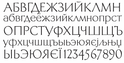 Moscow-based type, graphic and book designer (b. Tula, 1928, d. Moscow, 2008). In 1951, after her graduation from Moscow Printing Institute, she joined the type design team of VNII Polygraphmash, and worked there for forty years as a designer, head of the design department, and chief of the oriental type design unit. From 1992 until her death, she was a staff designer at ParaType, Moscow. Kuznetsova specialized in Arabic type design, but also created many Cyrillic and Latin typefaces. Speaker at ATypI 1998 in Lyon on Arabic type design in Russia. Recipient of many design awards and distinctions such as a citation for design excellence for PT Kufi, at the TDC2 1998. CV at bukvaraz. Russian bio. URW link. Obituary at TDC. Her typefaces:
 - Arabic type, often designed in cooperation with the Persian calligraphers Azarbud and Zarrin Hatt and other calligraphers from Egypt and Lebanon. Her typeface PTMariam (1994) is showcased in Huda Smitshijzen AbiFarès' book "Arabic Typography" (Saqi Books, 2001). Other Arabic typefaces: Cairo (1959-1960), Naskhi Aswani (1960), Naskhi Book (1962), Kuznetsova's Ruqaa (1963), Azarbud Display (1972), Zarrin Hatt (1972), Vostok (1972), Kuznetsova's Abridge (1974), Beyrouth (1977), Grot (1977), PT Mariam (1994), PT Hafiz (1994), PT Naskh Ahmad (1994), PT Basra (1994, based on her own Grot typeface), PT Damascus (1994; based on Beirouth, 1977, of Polygraphmash, also by her), PT Nast'aliq (1995), PT Thuluth (1995), and PT Kufi (1997, ParaType), winner of an award at the Type Directors Club in New York in February 1998.
- Cyrillic typefaces:
- ParaType Academy (1989). Academy was designed near 1910 at the Berthold type foundry (St.-Petersburg) based on the typeface Sorbonna (H. Berthold, Berlin, 1905), which represented the American Typefounders' reworking Cheltenham of 1896 (designers Berthram G. Goodhue, Morris F. Benton) and Russian typefaces of the middle of 18th century. The modern digital version is created in 1989 by Kuznetsova. The decorative style was added in 1997 by A.Tarbeev. Tarbeev link.
- Bannikovskaya (1946-1951) was revived by Kuznetsova as ParaType Bannikova (1999-2001). Designed at Polygraphmash type design bureau in 1946-51 by Galina Bannikova, inspired by Russian Grazhdansky early- and mid-18th century typefaces as well as Roman humanist typefaces of the Renaissance. URW states: With the archaic features of some characters the typeface is well recognized because of unique shapes. It is one of the best original typefaces of the Soviet typography. The typeface is useful in text and display composition, in fiction and art books. The revised, improved and completed digital version was designed at ParaType in 2001 by Lyubov Kuznetsova.
- ParaType Bazhanov (2000). URW writes: "PT Bazhanov TM was designed at Polygraphmash type design bureau in 1961 by Michael Rovensky (1902-1996). Based on the lettering by Moscow book designer Dmitry Bazhanov (1902-1945). Old-fashioned flavor of this design recreates the Soviet hand-lettering style of the 1940s. For use in title and display typography. The digital version was developed for ParaType in 2001 by Lyubov Kuznetsova." Paratype link.
- ParaType Elizabeth (1999). A great modern typeface about which URW writes: "The hand composition typeface was developed at the Ossip Lehmann type foundry (St. Petersburg) in 1904-07 (after designs by Alexander Leo?). It was redeveloped at Polygraphmash in 1960s for slugcasting composition. Named after Russian Empress Elizabeth I (1709-61). Based on typefaces of George Revillon type foundry of the 1840s, though some characters' shapes were redrawn similar to Russian Academy of Sciences typefaces (mid-18th century). Sharp contrast, strong weight Modern Serif with archaic flavor. The typeface is useful in text and display composition, in fiction, historical, and art books, especially connected to the 18th or 19th centuries. It looks great in Russian classical literature such as Pushkin and Gogol works. The revised, improved and completed digital version was designed at ParaType in 2001 by Lyubov Kuznetsova." Paratype link.
- ParaType Kuzanyan (2001). This modern typeface was designed at the Design Studio of Igor Nastenko by Igor Nastenko, and was based on Granit (1966, Pavel Kuzanyan). Digitized at Paratype in 2001.
- ParaType Literaturnaya (1996), after a 1937 original by A. Shchukin and T. Breyev. URW writes about this Elzevir typeface: Designed at NII OGIZ type design bureau circa 1940. Based on Latinskaya (St.-Petersburg, 1901), Cyrillic version of Lateinische. The digital version was developed at ParaType in 1996 by Lyubov Kuznetsova. The favorite text typeface of Soviet typography. Allen Hutt writes in A revolution in Russian typography (Penrose Annual, Volume 61. New York: Hastings House, 1968): The survival of this De Vinne-style type, from the worst design period of old Imperial Germany, in the premier Socialist country in the latter part of the twentieth century, is a typographical phenomenon as unique as it is deplorable.
- ParaType Neva (2002). URW: "Neva Regular with Italic was created by Moscow book and type designer Pavel Kuzanyan (1901-1992) at Polygrafmash in 1970 for slugcasting and display composition. Based on simple strict letterforms of Russian classical typefaces. Neva typeface was rewarded on the Gutenberg international type design contest in 1971 (Leipzig). The typeface is useful in text and display composition, in fiction and art books. The digital version and bold styles were designed for ParaType in 2002 by Lyubov Kuznetsova."
- ParaType New Journal (1997). Antiqua family. URW: "The typeface was designed at the Polygraphmash type design bureau in 1951-53 by Lev Malanov, Elena Tsaregorodtseva et al. Based on Cyrillic version of Excelsior, 1931, of Mergenthaler Linotype, by Chauncey H. Griffith. Excelcior Cyrillic was developed in 1936 in Moscow by Professor Michael Shchelkunov, Nikolay Kudryashev et al. A low-contrast text typeface of the Ionic - "Legibility" group."
- ParaType Quant Antiqua (1989). Antiqua family. URW: The typeface was designed at the Polygraphmash type design bureau in 1989 by Lyubov Kuznetsova. Based on the typeface Literanutnaya (Latinskaya) (Berthold, St.-Petersburg, 1901), a version of Lateinisch typeface (of Berthold in Berlin, 1899. For use in text matter.
- ParaType Svetlana (1996). Antiqua family. URW: "Designed in 1976-81 by Michael Rovensky (1902-1996) as the body text companion of his Bazhanov Display typeface (1961), of Polygraphmash type foundry. Based on the lettering by Moscow book designer Dmitry Bazhanov (1902-1945). With old-fashioned flavor, this design recreates the Soviet hand-lettering style of the 1940s. The digital version was developed at ParaType in 1996 by Lyubov Kuznetsova."
- ParaType Telingater Display (2001). Elegant display family based on Telingater Display, by Solomon Telingater, 1959, Polygraphmash. URW: "The typeface was awarded the Silver Medal at the International Book Art Exhibition (IBA-59) at Leipzig (Germany) in 1959. Light flared sans serif with calligraphic flavor and low contrast between main strokes and hairlines."
- ParaType Xenia (1990). Heavy slab serif. Paratype link.
- ParaType Xenia Western (1992). Condensed version of the Egyptian typeface Xenia.
- She made a Cyrillic version of ITC Bookman (1993).
- Paratype Bachenas (2003), after work by Violdas Bachenas.
FontShop link. Klingspor link. [Google]
[MyFonts]
[More] ⦿
|
Lyubov Kuznetsova
[Academy]
|
[More] ⦿
|
Martin Kotulla
[SoftMaker Software GmBH (or: freefont.de)]
|
 [MyFonts]
[More] ⦿
[MyFonts]
[More] ⦿
|
Matthew Carter
|
 Matthew Carter (born in London in 1937, and son of Harry Carter) is one of today's most influential type designers. He trained as a punchcutter at Enschedé in 1956. In 1963 he was hired by Crosfield, a firm that pioneered the new technology of photo-typesetting, to lead their typographic program. He worked for Mergenthaler Linotype (1965-1981), and co-founded Bitstream Inc. with Mike Parker in 1981, adapting many fonts to digital technology. In January 1992, he founded Carter&Cone with Cherie Cone, and often collaborated with Font Bureau. In 1995, he won the Gold Prize at the annual Tokyo Type Directors Club competition for Sophia. In 1997, he received the TDC Medal for significant contributions to the life, art, and craft of typography. In 2010, he received a MacArthur grant. He lives in Cambridge, MA.
 John Berry on Carter's art (2002). Apostrophe comments on Berry's article. Interview. His fonts: - The Microsoft screen fonts Verdana (1996), Georgia (1996), Georgia Greek, Georgia Cyrillic, Nina and the humanist sans typeface Tahoma (1994). Georgia (in roman and italic only) is a screen version of Miller, Carter's Scotch design. Nina was designed to address the requirements on smaller screens such as phones, and was used in Windows Mobile smartphones before Microsoft switched to Segoe. The Greek and Cyrillic versions of Nina were developed by François Villebrod. Georgia Pro (2010, Ascender) was developed from Georgia with the help of Steve Matteson. For Verdana Pro (2010, Ascender), Carter was assisted by David Berlow and David Jonathan Ross.
- Apple's Skia (1993), a sans serif designed with David Berlow for Apple's QuickDraw GX technology, now called AAT. [Carter's Skia and Twombly's Lithos are genetically related.]
- Monticello (2003), based on Linotype's Monticello (1950), which in turn goes back to Binny&Ronaldson's Monticello from 1797, a typeface commissioned by Princeton University Press for the Papers of Thomas Jefferson. It is in the Scotch roman style.
- Miller (1997, Font Bureau), an extremely balanced family co-designed by Carter, Tobias Frere-Jones and Cyrus Highsmith. Carter explains: Miller is a Scotch Roman, a style that had its beginnings in the foundries of Alexander Wilson In Glasgow and William Miller in Edinburgh between about 1810 and 1820. It is considered that the punchcutter Richard Austin was responsible for the types of both Scottish foundries. Miller is a revival of the style, but is not based on any historical model. Now, there is also a 16-weight newspaper version, Miller Daily (2002), and an 8-weight Miller Headline (2002). This was followed by News Miller, a typeface designed for the Guardian. Note: Georgia (1996) is a screen version of Miller, and Monticello (2002) is a later modification. A comparison of these typefaces.
- Alisal (1995, +Bold).
- ITC Galliard (1978), a recreation of Robert Granjon's garalde letters. This typeface was originally conceived in 1965. Bringhurst recommends a Carter and Cone version of this font, called Galliard CC: it has old style figures and small caps. Further versions include Aldine 701 (Bitstream), Matthew (Softmaker), ITC Galliard Etext (2013, Carl Crossgrove, Linotype), and Gareth (Softmaker).
- The ITC Charter family (1987 for Bitstream and known as Bitstream Charter; licensed to ITC in 1993; see the Elsner&Flake version of ITC Charter). An upgraded commercial version was released by Bitstream in 2004 under the name Charter BT Pro.
- Vincent (1999), a font commissioned for use in Newsweek. It is named after Vincent Figgins, an English foundry owner and punch cutter who lived in the late 18th century.
- Walker (1994), designed for The Walker Art Center.
- Ionic Number One (1999, Carter&Cone).
- Mantinia (1993, Font Bureau), based on inscriptional forms, both painted and engraved, by the Italian renaissance artist Andrea Mantegna.
- Big Caslon (1994, Font Bureau), a display typeface based on the largest romans from William Caslon's foundry.
- Big Figgins (1992) and Big Figgins Open (1998, based on the decorative didone types shown in the specimens of Vincent Figgins of 1815 and 1817). Big Figgins was called Elephant and Elephant Italic in Microsoft's Truetype Fontpack 2.
- Sammy Roman (1996), loosely based on the 17th century romans of Jean Jannon. A beautiful typeface designed to accompany kanji and kana typefaces produced by Dynalab in Taiwan.
- Sophia (1993, Font Bureau), a mix with Greek, uncial and classical Roman influences.
- Shelley Script (1972), a family of formal scripts, split into Andante, Volante and Allegro. It is based on intricate English scripts of the 18th and 19th centuries attributed to George Shelley.
- Cochin (1977, at Linotype). MyFonts writes: In 1913 Georges Peignot produced a typeface based on Nicolas Cochin's eighteenth century engravings. In 1977, Matthew Carter expanded this historic form into a three part series.
- Bell Centennial (Linotype-Mergenthaler, 1975-1978), a legible heavily ink-trapped family designed by Matthew Carter as a replacement of Bell Gothic at Mergenthaler. There are also digital Linotype and Bitstream versions. AT&T commissioned the font to replace their previous typeface choice Bell Gothic for their 100th Anniversary.
- Cascade Script (1965-1966, Linotype, now also known as Freehand 471 BT in the Bitstream collection). Paratype's extension of Freehand 471 to Cyrillic is by Oleg Karpinsky (2011).
- New Century Schoolbook was designed from 1979-1981 in the New York Lettering office of Merganthaler Linotype based on Morris Fuller Benton's Century Schoolbook from 1915-1923. It was the second face, after New Baskerville, that was digitized and expanded using Ikarus (digital technology). The Bitstream version [Century Schoolbook] is a virtually exact copy, only being moved from a 54 unit to a 2000 or so unit design.
- Auriol (Linotype), an art nouveau family (including Auriol Flowers 1 and 2 and Auriol Vignette Sylvie) based on the lettering of the painter and designer Georges Auriol. MyFonts explains: Auriol and Auriol Flowers were designed by Georges Auriol, born Jean Georges Huyot, in the early 20th century. Auriol was a French graphic artist whose work exemplified the art nouveau style of Paris in the late 19th and early 20th centuries. In 1900, Georges Peignot asked Auriol to design fonts for Peignot&Sons. The resulting Auriol font was the basis for the lettering used by Hector Guimard for the entrance signs to the Paris Metro. It was re-released by Deberny&Peignot in 1979 with a new bold face, designed by Matthew Carter. These decorative fonts with a brush stroke look are well-suited to display settings. The Peignot drawing office insisted on a more normal appearance in the boldface, calling it Robur. Matthew Carter has returned to Auriol's original design for the whole series.
- Helvetica Greek (Linotype).
- Helvetica Compressed (Linotype, 1974, with Hans-Jörg Hunziker).
- Wilson Greek (1995), compatible with Miller Text, and based on a type cut by Alexander Wilson for the Glasgow Homer of 1756. See here.
- Olympian (1970, Linotype), designed for newspaper use. This is Dutch 811 in the Bitstream collection. The custom typeface Milne (Carter&Cone) done for the Philadelphia Inquirer is based on Olympian.
- Gando, a French "ronde" typeface based on the work of Nicholas Gando (mid 1700s), and designed for photo-typesetting at Mergenthaler by Carter and Hans-Jörg Hunziker in 1970. Very similar to Bitstream's Typo Upright.
- Fenway (1998-1999, Carter&Cone), commissioned by Sports Illustrated to replace Times Roman.
- Snell Roundhand (1965-1966): a connected cursive script based on the 18th-century round hand scripts from English writing masters such as Charles Snell. Early in the digital era, Matthew published this in the Bitstream collection as Roundhand BT. A Cyrillic version by Isabella Chaeva and Vladimir Yefimov was released by ParaType in 2013.
- Auriga (1970). (Wallis dates this in 1965 at Linotype.)
- CRT Gothic (1974).
- Video (1977).
- V&A Titling (1981).
- Deface (in the FUSE 18 collection).
- Madrid (2001), done for the Spanish newspaper El País.
- Milne, done for the Philadelphia Inquirer (a revised version of Olympian). Not available.
- Durham, a sans serif family for US News&World Report.
- Airport.
- Century 725 (Bitstream, for the Boston Globe: after a design by Heinrich Hoffmeister).
- For Microsoft: Georgia, Verdana, Tahoma (1994), Nina.
- Freehand 471 (Bitstream). A chunky slightly angular script.
- New Baskerville. [Matthew Carter says that this is wrongly attributed to him. It was directed by John Quaranta.]
- Postoni [or Post-Bodoni], for the Washington Post, which is still using it. See here.
- Le Bé, a Hebrew typeface that was used in the Pennyroyal Caxton Bible.
- Rocky (2008, Font Bureau, with Richard Lipton), for the Herald in Scotland.
- Time Caledonia.
- Wiredbaum, for WIRED.
- Wrigley (for Sports Illustrated). Matthew Carter designed Roster in the 1990s, and it was adopted as a display face for Sports Illustrated under the name Wrigley. Jesse Ragan was instrumental in later expanding the family from its original seven styles to the current 60. In 2015, Carter & Cone and Font Bureau released an expanded 60-style family of this typeface under the new name Roster.
- Benton Bold Condensed (for Time Magazine).
- Foreman Light (for the Philadelphia Inquirer).
- Newsbaum (for the New York Daily News).
- Carter Latin: Matthew was commissioned in 2003 to create a new design to be cut in wood type by the Hamilton Wood Type&Printing Museum in Two Rivers, WI. He came up with an all-caps, chunky, Latin-serif design.
- Times Cheltenham (2003), which replaces in 2003 a series of headline typefaces including Latin Extra Condensed, News Gothic, and Bookman Antique.
- The Yale Typeface (2004), inspired by the late fifteenth-century Venetian typeface that first appeared in Pietro Bembo's De Aetna, published by Aldus Manutius. This extensive family is freely available to members of Yale University.
- DTL Flamande (2004, Dutch Type Library), based on a textura by Hendrik van den Keere. Since 2018, available from URW++. Additions to DTL Flamande by Lukas Schneider.
- Meiryo UI, Meiryo UI Bold, Meiryo UI Bold Italic, Meiryo UI Italic (2004). Meiryo is a modern sans serif Japanese typeface developed by Microsoft to offer an optimal on screen reading experience and exceptional quality in print, as part of the Cleartype project. The Japanese letterforms are generously open and well-proportioned; legible and clear at smaller sizes, and dynamic at larger display sizes. The beauty of Meiryo is that it sets text lines in Japanese with Roman seamlessly and harmoniously. Meiryo was designed by a team including C&G Inc., Eiichi Kono, Matthew Carter and Thomas Rickner. It won a 2007 type design prize from the Tokyo Type Directors.
- Suntory corporate types (2003-2005), developed with the help of Akira Kobayashi and Linotype from Linotype originals: Suntory Syntax, Suntory Sabon, Suntory Gothic, Suntory Mincho.
- Rocky (2008, Font Bureau): A 40-style high contrast roman family that is difficult to classify (and a bit awkward). Developed with Richard Lipton.
- Carter Sans (2010, ITC), based on epigraphic letters used in inscriptions. Created for the identity of the Art Directors Club 2010 class of its Hall of Fame, one the laureates in the 2010 Hall of Fame. Codesigned by Dan Reynolds, this chiseled typeface is loosely based on Albertus.
- In 1997, he designed Postoni for the The Washington Post's headlines, a sturdy Bodoni.
- MS Sitka (2013). A typeface with six optical sizes that are chosen on the fly if an appropriate application is present. Developed at Microsoft with the help of John Hudson (Tiro Typeworks) and Kevin Larson (who carried out extensive legibility tests). German link. Typophile link. Sitka won an award at Modern Cyrillic 2014.
- Van Lanen Wood Type (Hamilton Wood Type, 2002-2013). Carter started work on the wood type in 2002, but technical accuracy issues postponed the implementation. Digital versions were finally done in 2013 by P22's Hamilton Wood Type.
- Big Moore (2014, Font Bureau): A 1766 specimen by Isaac Moore, former manager of Joseph Fry's foundry in Bristol, England, shows many types inspired by John Baskerville. But a century later, standardization had foisted inept lining figures and shortened descenders upon these designs. Matthew Carter remedies the tragedy with Big Moore. Oldstyle figures, full-length descenders, and historic swashes are restored to this regal serif in two styles. Big Moore won an award in the TDC 2015 Type Design competition.
- Role (2019, Sans, Slab, Serif, Soft). A superfamily published at Morisawa and Fontelier. Matthew Carter, Shotaro Nakano, and Kunihiko Okano co-designed Role Serif at Morisawa.
Speaker at ATypI 2013 in Amsterdam. Speaker at ATypI 2019 in Tokyo on the topic of Expressing Vocal Tones through Typography. Linotype link. FontShop link. Favorite quote: Watching me work is like watching a refrigerator make ice. Another quote: A typeface is a beautiful collection of letters, not a collection of beautiful letters. View Matthew Carter's typefaces. Matthew Carter's fonts. The typefaces made by Matthew Carter. See also here. Wikipedia page. Klingspor link. [Google]
[MyFonts]
[More] ⦿
|
Mecanorma
|
 French graphics lettering company initially involved in instant lettering (made by Trip Productions), and some original typeface designs. From 1989 until 1994, Mecanorma worked with another Dutch company Visualogik to create digital versions of their typefaces, all having MN in their names. Monotype licensed and digitized some of Mecanorma's typefaces. In 1995, Mecanorma got out of graphics and stepped into home decoration. In 1999, Trip Productions, a Dutch Company located in Lisse, purchased the Mecanorma brand and what was left of the company. In 2004, International TypeFounders from Cedars, PA, licensed the typefaces from Trip Productions and released them as the Mecanorma Collection. Since 2021, there also is a Mecanorma Collection at The Type Founders.
 Their collection includes some great fonts: Access, Artdeco, Artworld, BalloonMN, Brio, BusoramaMN, Campus, CardCamio, Carplate, CaslonAntiqueVL, ChocMN, CircusMN, ComicStripMN, DynamoMN, Galba, Globe-Gothic-Outline, Glowworm, Jackson, LibraMN, MtPlacard, Ortem, Renault, RoslynMN, Sayer, SayerScriptMN, SquashMN, Sully-Jonquieres, Watch-Outline. You can also buy through Atomic Type. Projected new URL, which I am afraid will never be activated because in 1999, the company was bough by the Dutch company Trip Productions. MyFonts sells these typefaces: Access, American Uncial, Anatol, Arnold Bocklin (art nouveau), Artdeco, Artworld (an embossed font), Aster, Balloon (brush font), Blippo Black, Brio, British Inserat, Brush, Bulletin Typewriter, Caligra (blackletter), Campus (athletic lettering), Cardcamio, Carplate, Caslon Antique, Celtic (in the style of University Roman), Chicago (dot matrix / marquee typeface), Chinon, Choc (brush script), Circus (Western font), Classic Script (a copperplate calligraphic script), Comic Strip, Commercial Script, Contest, Cooper Black, Dubbeldik, Dynamo, Egyptienne, Estro (Western font), Eurostile, Forelle, Fumo Dropshadow MN, Galba (Trajan typeface), Globe Gothic, Glowworm (a bubblegum font), Gothique (blackletter), Hansson Stencil, Hillman, Hotel (multilined art deco), Isonorm, Jackson, Jubilee Lines (an engraved money font), Latina, Leopard, Libra (uncial), Michelina (anthroposophic), Milton, Mistral, Normalise Din, Old Style, Olive, Orator, Organda, Ortem, Polka (a brush typeface), Renault, Rondo (retro script), Roslyn, Sayer Interview (old typewriter font), Sayer Script, Sayer Spiritual, Squash, Stencil, Stop (stencil typeface), Studio, Swaak Centennial (pure art nouveau), Tzigane, Viant, Vivaldi, Voel Beat (beveled), Watch Outline (LED font), Windsor, Zambesi (African look font). Designers include Albert Boton, J.H. Crook, Jan van Dijk, J. Dresscher, Roger Excoffon, U. Fenocchio, L. Fumarolo, William Gillies, N. Glason, Lennart Hansson, B. Jaquet, K. Kochnowicz, J. Larcher, C. Mediavilla, José Mendoza y Almeida, L. Meuffels, Aldo Novarese, Georges Renevey, F. Robert, Manfred Sayer, M. Schmidt, J.P. Thaulez, J. Werner and Bogdan Zochowski. The Western slabby font Figaro MT (2004) is ascribed to Mecanorma. A list culled from the web: AccessMN-Bold, AccessMN-Medium, AmericanUncialMN, AnatolMN, ArnoldBocklinMN, ArtdecoMN, ArtworldMN, AsterMN-Demi, AsterMN-Roman, BalloonMN-Bold, BalloonMN-ExtraBold, BlippoBlackMN, BrioMN, BritishInseratMN, BritishInseratMNCondensed, BrushMN, Bulletin-Typewriter, BusoramaMN-Bold, CaligraMN, CampusMN, CardcamioMN, CarplateMN, CaslonAntiqueVL, CelticMN-Bold, CelticMN-Italic, CelticMN, CenturyMNCondensed-BoldItalic, CenturyMNCondensed-Bold, CheltenhamMN-Book, CheltenhamMN-BookItalic, CheltenhamMN-Ultra, ChicagoMN, ChinonMN, ChocMN, CircusMN, ClassicScriptMN, ComicStripMN-Italic, ComicStripMN, CommercialScriptMN, ContestMN, Cooper-Black-Italic, Cooper-Black-Outline, CooperBlackMN, CushingMN-Book, CushingMN-Heavy, CushingMN-HeavyItalic, CushingMN-Medium, DubbeldikMN, DynamoMN-Bold, DynamoMN-Medium, DynamoMN-Shadow, EgyptienneMNCondensed-Bold, ElanMN-Extended, ElanMN-Light, ElanMN-Medium, EnrouteVL, ErasMN-Book, ErasMN-Demibold, ErasMN-Ultra, ErasMN, EstroMN, EurostileMN-Extended, EurostileMN-ExtendedBold, EurostileMN-Medium, FidelioMN, FolioMN-Bold, FolioMN-Extrabold, ForelleMN, FranklinGothicMN-Book, FranklinGothicMN-BookItalic, FranklinGothicMN-Heavy, FrizQuadrataMN-Bold, FrizQuadrataMN, Fumo-DropshadowMN, FuturaBlackMN, GalbaMN, Gillies-Gothic-Bold, Gillies-Gothic-Light, Gillies-Gothic-Ultra-Shadow, Gillies-Gothic-Ultra, GlobeGothicMN-Bold, GlobeGothicMNCondensed-Bold, GlobeGothicMNOutline, GlowwormMN, GlowwormMNCompressed, GorillaVL-Bold, GothiqueMN, HanssonStencilMN-Bold, HanssonStencilMN, HillmanMN, HillmanMNCondensed, HotelMN, IrishUncialVL, IsonormMN, Italia-Bold, Italia-Book, Italia-Medium, JacksonMN, JubileeLinesMN, LatinaMN, LeopardMN, LibraMN, MRunic-Condensed, MSwingBold, MachineMN-Bold, MachineMN, MichelinaMN, MiltonMN-Demibold, MistralVL, MtPlacard-Condensed, NormaliseDinMN, OklahomaState, OliveCompactMN, OliveMNBold, OliveNordMN, OratorMN, OrgandaMN-Bold, OrgandaMN, OrtemMN, PascalMN, PolkaMN-Bold, PolkaMN, PopplExquisitMN, PopplExquisitMN-Alternative, RenaultMN, RenaultMNBold, RondoMN, RoslynMN-Bold, RoslynMN-Bold, RoslynMN-Outline, RoslynMNMedium, SaphireMN, SayerMN-Interview, SayerScriptMN-Black, SayerScriptMN-Bold, SayerScriptMN-Light, SayerSpiritualMN-Italic, SayerSpiritualMN, SloganMN, SquashMN-Outline, SquashMN, StencilAntiqueMN, StencilAntiqueVL, StencilMN, StencilMNOutline, StopMN, StudioMN, SullyJonquieresMN-Bold, SullyJonquieresMN, SwaakCentennialMN, Syntax-Bold, Syntax-Roman, ToucheVL, TziganeMN, ViantMN-Bold, VivaldiMN, VoelBeatMN, WashSymbolVL-Light, WatchMN-Outline, WindsorMN, WindsorMNElongated, ZambesiMN. MyFonts link. View Mecanorma's typefaces. [Google]
[MyFonts]
[More] ⦿
|
Monotype Imaging Inc
|
 In 2004, Monotype Imaging Inc was created when TA Associates bought Agfa-Monotype from Agfa. Its headquarters are in Woburn, MA. Agfa had bought the previous incarnation of Monotype in 1998. Before that, Agfa, a well-known photographic film, chemicals and paper manufacturer and Bayer subsidiary, entered the typography scene in 1982 by acquiring an interest in Compugraphic Corporation, the American phototypesetter company. From the press release: Based in Wilmington, MA, with regional offices in the U.K., Chicago, Redwood City, Calif., Japan and China, Monotype Imaging provides fonts and font technologies to graphic professionals, software developers and manufacturers of printers and display devices. Formerly Agfa Monotype Corp., the company also provides print drivers and color imaging technologies to OEMs (original equipment manufacturers). Monotype Imaging is home to the Monotype typeface library, a collection that includes widely used designs such as the Arial, Times New Roman and Gill Sans typeface families (now in OpenType in 21 weights). Monotype Imaging offers fonts and industry-standard solutions for most of the world's written languages. Information about Monotype Imaging and its products can be found on the company's web sites at www.monotypeimaging.com, www.fonts.com, www.monotypefonts.com, www.customfonts.com, www.fontwise.com, www.itcfonts.com and www.faces.co.uk. [...] Robert M. Givens remains as president and chief executive officer of the company. [...] Senior vice presidents Doug Shaw and John Seguin of Monotype Imaging have been named to its board of directors along with Givens and Johnston. Jonathan Meeks, a principal at TA Associates, has also joined the board. Dave McCarthy remains as vice president and general manager of Printer Imaging, and Al Ristow continues as vice president of engineering. The senior management team of Monotype Imaging also includes Jeff Burk, vice president of finance, Geoff Greve, vice president of type development, John McCallum, managing director of Monotype Imaging Ltd., David DeWitt, general manager of the U.S. consumer division, and Pattie Money, director of human resources.
 In 2006, Monotype Imaging acquires Linotype, one of the last truly dedicated and honest large type companies. In 2007, Doug Shaw succeeds Robert M. Givens as president and chief executive officer. In 2010, Monotype acquires Ascender. In 2011, Monotype buys Berthold Types, Bitstream and MyFonts. Images of their best-selling typefaces in 2011: i, ii, iii. Full catalog of Monotype's typefaces [large web page warning]. View the Monotype typeface library. [Google]
[MyFonts]
[More] ⦿
|
Morris Fuller Benton
[ATF 1923 Catalog: Cheltenham]
|
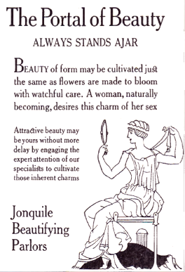 [More] ⦿
|
Otto Weisert
[Schriftgiesserei Otto Weisert]
|
[More] ⦿
|
Paul Shaw
|
Paul Shaw's choice of 100 best typefaces of all times: - 1-10: Gutenberg's B-42 type, Nicolas Jenson's roman, Francesco Griffo's italic, Claude Garamond's roman, Firmin Didot's roman, Akzidenz Grotesk, Gebetbuch type, Cheltenham family, Helvetica, Aldus Manutius' roman.
- 11-20: William Caslon IV's sans serif, William Caslon's roman, Pierre-Simon Fournier's italic, Futura, Times Roman, Chicago, Bell, Ludovico Arrighi da Vicenza's italic, Univers, Romain du Roi.
- 21-30: Johann Michael Fleischmann's roman, Clarendon, ATF Garamond, Giambattista Bodoni's roman, Century Roman, Nicolas Kis' roman, Minion multiple master, Unger Fraktur, John Baskerville's roman, Lucida.
- 31-40: Ionic, Golden Type, Robert Thorne's fat typeface roman, Wolfgang Hopyl's textura, Vincent Figgins' antique roman (Egyptian), Johnston's Railway Sans, Optima, Bauer Bodoni, Adobe Garamond, Breitkopf Fraktur.
- 41-50: Bell Gothic, Courier, Trajan, Mistral, Doves Type, Scotch Roman, Syntax, Snell Roundhand, Memphis, Robert Granjon's civilité.
- 51-60: Fette Fraktur, Ehrhard Ratdolt's rotunda, Romanee, ITC Stone family, Trinité, ITC Garamond, Avant-Garde Gothic, Oakland, Deutschschrift, Hammer Uncial.
- 61-70: Beowolf, Meta, OCR-A, Sabon, ITC Novarese, Zapf Chancery, Rotis, Base Nine and Base Twelve, Peter Jessenschrift, Excelsior Script.
- 71-80: Bitstream Charter, Peignot, Erbar, Cancellaresca Bastarda, Joanna, Dead History, Behrensschrift, Eckmannschrift, Poetica, Marconi.
- 81-90: PMN Caecilia, Stadia, Imprint, Souvenir, Thesis, Apollo, Penumbra, Melior, Neuland, Flora.
- 91-100: Element, Walker, Remedy, Template Gothic, Digi-Grotesk Series S, Compacta, Antique Olive, Bodoni 26, Evans and Epps Alphabet, WTC Our Bodoni.
[Google]
[More] ⦿
|
Phil Martin
[Alphabet Innovations International -- TypeSpectra (Was: MM2000)]
|
 [MyFonts]
[More] ⦿
[MyFonts]
[More] ⦿
|
Robert Hunter Middleton
[Ludlow]
|
 [MyFonts]
[More] ⦿
[MyFonts]
[More] ⦿
|
Schriftgiesserei Otto Weisert
[Otto Weisert]
|
Stuttgart-based foundry run by Otto Weisert. Their publications and specimen books have dates between 1875 and 1922. Faces produced there include Nürnberger Buchschrift (ca. 1900), Kaiser-Gotisch (ca. 1900), Brabanter Gotisch (ca. 1900), Moderne fette Schwabacher (ca. 1900), Moderne Halbfette Schwabacher (ca. 1900, digitized by Petra Heidorn in 2005 as Moderne Schwabacher), Wilhelmina Ornamente (1914), Romanisch (1912), DeVinne Antiqua (1912), Giralda Graphik (1934), Cheltenham (1911). Designers: - Otto Weisert: the Jugendstil-styled Arnold Boecklin (1904), Brabanter Gotisch (1905).
- Ernst Schneidler: Ganz grobe Gotisch (1930).
- Heinrich Wieynck: Wieynck Mediaeval (1928) and Wieynck Mediaeval Kursiv (1929).
[Google]
[More] ⦿
|
Schriftklassifikation nach DIN 16 518
|
 Type classification (in German) according to the DIN 16 518 system invented in 1964. Pages by Bernhard Schnelle. I will use his German nomenclature, and quote his examples of each style.
 - I. Venezianische Renaissance-Antiqua: Amalthea, Ascot, Berkeley Old Style, Centaur, Concorde, Deepdene, Eusebius, Goudy Italian, Guardi, Horley Old Style, Jersey, Lutetia, Menhart-Antiqua, Normandy, Seneca, Schneidler-Mediaeval, Trajanus, Verona, Weidemann, Worcester Round.
- II. Französische Renaissance-Antiqua [garalde types]: Aeterna, Aldus-Buchschrift, Bembo, Berling, Charter, Comenius-Antiqua, Garamond, Granjon, Leipziger Antiqua, Meridien, Michelangelo, Octavian, Palatino, Perpetua, Plantin, Sabon-Antiqua, Trump-Mediaeval, Van Dijck, Vendome, Weiß-Antiqua.
- III. Barock-Antiqua [transitional types]: Baskerville, Bernhard Modern, Bookman, Caledonia, Caslon, Century, Century Schoolbook, Cheltenham, Cochin, Diotima, Ehrhardt, Imprimatur, Janson, Life, Nicolas Cochin, Poppl-Antiqua, Raleigh, Schoolbook, Scotch, Tiffany, Times.
- IV. Klassizistische Antiqua [modern or didone types]: Bauer Bodoni, Bodoni-Antiqua, Linotype Centennial, Corvinus, De Vinne, Linotype Didot, Ellington, Falstaff, Fat Face, Fenice, Madison-Antiqua (Amts-Antiqua), Normande, Tiemann-Antiqua, Torino, Walbaum-Antiqua.
- V. Serifenbetonte Linear-Antiqua [slab serif]: Aachen, Clarendon, Memphis, Old Towne, Pro Arte Schadow-Antiqua, Serifa, Volta.
- VI. Serifenlose Linear-Antiqua [sans]: Akzidenz-Grotesk, Antique Olive, Avant Garde Gothic, Cosmos, Delta, Erbar-Grotesk, Eurostile, Folio, Franklin Gothic, Frutiger, Futura, Gill, Helvetica, Univers.
- VII. Antiqua-Varianten: Abbot Old Style, Amelia, Americana, Arnold Böcklin, Banco, Calypso, Churchward, Cooper Black, Dynamo, Eckmann, Glaser Stencil, Hobo, Lasso, Mexico Olympic, Plastica, Profil, Souvenir, Stop, Superstar, Tintoretto, Traffic, Washington, Windsor, Zipper.
- VIII. Schreibschriften [scripts]: Arkona, Amazone, Bison, Boulevard, Brush Script, Caprice, Charme, Choc, Diskus, Englische Schreibschrift, Künstler-Schreibschrift, Lithographia, Mistral, Reiner Script, Rondo, Signal, Swing, Vivaldi.
- IX. Handschriftliche Antiqua: American Uncial, Antikva Margaret, Arcade, Codex, Delphin Dom Casual, Hadfield, Klang, Koch-Antiqua, Libra, Lydian, Ondine, Poetica, Post-Antiqua, Prima, Ritmo, Solemnis, Studio, Time Script.
- X. Gebrochene [Fraktur, blackletter], subdivided into Xa Gotisch, Xb Rundgotisch, Xc Schwabacher, Xd Fraktur, Xe Fraktur-Varianten.
- XI. Fremde Schriften [foreign types]: all non-Latin typefaces.
[Google]
[More] ⦿
|
SoftMaker Software GmBH (or: freefont.de)
[Martin Kotulla]
|
 SoftMaker, Martin Kotulla's German foundry in Nürnberg, is selling the 10,000-TrueType font Megafont XXL CD (50 USD, www.megafont.de). Every month, a different font or font family (TT and T1) is given away for free. The MegaFont XXL has most standard Monotype/Adobe/Linotype families (up to 1995/1996). They say that most fonts are licensed from URW++ and Brendel Informatik (Cologne). Contents of MegaFont XXL's predecessor, MegaFont Profi CD, here. Since early 2001, you can download one font family from the CD MegaFont XXL here. Martin Kotulla also started infiniType, a collection of 5050 fonts at a good price (Mac and PC). That collection grew to 7444 fonts in InfiniType 4 in 2016. The XXL series has character sets for Western and Central European languages, Turkish, and Celtic, and comes with many expert sets. For historical accuracy: older packages by Softmaker include the 3333-font (TT and T1) MegaFont Profi CD-2.0 (99DM), the 5000-font MegaFont Euro (50 Euro), the Truepack Profi-CD and the 500-font TypeMaker 5.0 Profi-Pack (10DM).
  Their early fonts were renamed and had the attribute Serial in the name. Samples of some of these fonts/families: Adelon Serial (1996, after Albertus MT), Melbourne Serial, Nashville Serial (+Heavy), Nevada Serial, On Stage Serial, Ornitons Serial, Penthouse Serial, Plakette Serial, Priamos Serial, Quadrat Serial, Quebec Serial, Riccione Serial, Rochester Serial, Salzburg Serial, Stafford Serial, Sunset Serial, Sydney Serial, Thames Serial, Toledo Serial, Valencia Serial (Heavy), Valencia Serial (Xlight), Verona Serial, Volkswagen Serial, Wichita Serial. Their early fonts were renamed and had the attribute Serial in the name. Samples of some of these fonts/families: Adelon Serial (1996, after Albertus MT), Melbourne Serial, Nashville Serial (+Heavy), Nevada Serial, On Stage Serial, Ornitons Serial, Penthouse Serial, Plakette Serial, Priamos Serial, Quadrat Serial, Quebec Serial, Riccione Serial, Rochester Serial, Salzburg Serial, Stafford Serial, Sunset Serial, Sydney Serial, Thames Serial, Toledo Serial, Valencia Serial (Heavy), Valencia Serial (Xlight), Verona Serial, Volkswagen Serial, Wichita Serial.
In 2008, SoftMaker started selling fonts on MyFonts: fonts there include the 28-style Suetterlin family (2008), based on the handwriting taught in German schools in the first half of the 20th century, Harald Handwriting (2009), Agilo Handwriting (2009), Wally Handwriting (2009), Vittorio Handwriting (2009), Turandot Handwriting (2009), Tommi Handwriting (2009), Veneto Handwriting (2009), Tolomeo Handwriting (2009), Sarx Handwriting (2009), Salew Handwriting (2009), Roxana Handwriting (2009), Renate Handwriting (2009), PizPaz Handwriting (2009, Mexican style), Schneid Handwriting (2009), Pietro Handwriting, Phil Handwriting, Nadine Handwriting, Kuno Handwriting, Larissa Handwriting, Lizzy Handwriting, Juri Handwriting, Jeff Handwriting (2009), Josh Handwriting (2009), Jelena Handwriting (2009), Jaro Handwriting (2009), Jacques Handwriting (2009), Hilly Handwriting (2009), Harico Handwriting (2009), Hakon Handwriting (2009), Stone Handwriting (2009), Federico Handwriting (2009), Fabio Handwriting (2009), Emmi Handwriting (2009), Davio Handwriting (2009), Alec Handwriting (2009), Brian Handwriting (2009), Armand Handwriting (2009), Claude Handwriting (2010), Cathy Handwriting (2010), Clay Handwriting (2010), Danielle Handwriting (2010), Feliks Handwriting (2010), Foster Handwriting (2010), Giorgio Handwriting (2010), Giovanna Handwriting (2010), Guga Handwriting (2010), Giuliano Hanriting (2010), Carlo Handwriting (2009), Brouet Handwriting (2010), Bjarne Handwriting (2009), Fuego (2015: a retro script, after Letraset's Flamenco), Agnieszka Handwriting (2009) and Thery Handwriting (2009).  Additions in 2010: Tabasco (a geometric based on the phototype font by John Schaedler), Tabasco Twin (a bilined typeface after John Schaedler's Paprika), Advertisers Gothic (a revival of a 1917 typeface by Robert Wiebking), Ad Lib (a revival of a quirky 1961 typeface by Freeman Craw for ATF), Accent (brush face), Flagstaff (oblique techno face), Cornered (with angular pieces), Abilene (Western; caps only), Comix, Cathedral Open (nice open face), Boa Script (2010), Bryce (2010, brush script), Brush Script (2010, after the original ATF font by Robert E. Smith from 1942), Bernhard Fashion (2010), Abbott Old Style (2010, after a 1901 semi-Victorian font by Joseph W. Phinney), Artistic (2010, after Ariston, a 1933 typeface by Martin Wilke), Elegant Script (2010, a revival of Berthold's Englische Schreibschrift), Garamond Serial (2011), the Suetterlin family. Additions in 2010: Tabasco (a geometric based on the phototype font by John Schaedler), Tabasco Twin (a bilined typeface after John Schaedler's Paprika), Advertisers Gothic (a revival of a 1917 typeface by Robert Wiebking), Ad Lib (a revival of a quirky 1961 typeface by Freeman Craw for ATF), Accent (brush face), Flagstaff (oblique techno face), Cornered (with angular pieces), Abilene (Western; caps only), Comix, Cathedral Open (nice open face), Boa Script (2010), Bryce (2010, brush script), Brush Script (2010, after the original ATF font by Robert E. Smith from 1942), Bernhard Fashion (2010), Abbott Old Style (2010, after a 1901 semi-Victorian font by Joseph W. Phinney), Artistic (2010, after Ariston, a 1933 typeface by Martin Wilke), Elegant Script (2010, a revival of Berthold's Englische Schreibschrift), Garamond Serial (2011), the Suetterlin family.
The typefaces remastered in 2012 include Chandler Pro (this is Rofer Excoffon's 1955 brush typeface Choc; see also Staccato 555 by Bitstream and Chalk by Corel), Cheltenham Pro, Cleargothic Pro (after Morris Fuller Benton's flared version of Clearface, Clearface Gothic, 1907), Cooper Black Pro (+Stencil), Bristol Pro, Tioga Script Pro (after Georg Trump's 1956 script by that name, but aka Time Script). Free download: Huntington-Bold [-> Handel Gothic], Huntington-Light, ImperialStd-Bold [-> URW Imperial] ImperialStd-BoldItalic, ImperialStd-Heavy, ImperialStd-HeavyItalic, ImperialStd-Italic, ImperialStd-Medium, ImperialStd-MediumItalic, ImperialStd-Regular, ImperialStd-Xbold, ImperialStd-XboldItalic, KremlinScript-Bold [-> Kuenstler Script], RaleighSerial-Bold, RaleighSerial-Heavy, RaleighSerial-Regular, Scott [-> Stop], TiogaScript-Bold [-> Time Script], TiogaScript-Light, TiogaScript-Medium. Handwriting fonts shown at MyFonts in 2013: Allan Handwriting, Andrew Handwriting, Eleanor Handwriting, Enrico Handwriting, Estelle Handwriting, Jay Handwriting, Jaz Handwriting, Jesco Handwriting, Justine Handwriting, Kris Handwriting, Laszlo Handwriting, Lennart Handwriting, Luitpold Handwriting, Manolo Handwriting, Marbo Handwriting, Marcello Handwriting, Murielle Handwriting, Pablo Handwriting, Paolo Handwriting, Pascal Handwriting, Picto Handwriting, Rainer Handwriting, Reyno Handwriting, Ronaldo Handwriting, Teje Handwriting, Theo Handwriting, Valerian Handwriting, Vincent Handwriting, Vogel Handwriting, Volker Handwriting, Wilma Handwriting. The blackletter collection published in 2016 by SoftMaker includes these typefaces: Albrecht Duerer Fraktur Pro, Barock 1720, Breitkopf Fraktur Pro, Coburg No1, Coburg No2, Coelnische Current Pro, Diamant Gotisch Pro, Fleischmann Gotisch Pro, Fraktur No2 Pro, Fraktur No3 Pro. Later in 2016, SoftMaker published its revival collection, which includes Alternate Gothic Pro, Amsterdamer Garamont Pro, Antiqua Pro, Balloon Pro (brush), Caslon Antique Pro, Century Old Style Pro, Elmore Pro (architectural hand), Falcon Pro (retro brush), Cheltenham ExtraCondensed Pro Bold, Casual Pro (a copy of Thomas Nevison's Casual Pro from 1935), Garamond Nova Pro, Giulio Pro (a copy of Gillies Gothic), Josephs Brush Pro (a copy of Joseph Churchward's Churchward Brush), Malaga Pro (a copy of Roger Excoffon's Mistral), Melville Pro (after Murray Hill), Pedro Pro (a revival of the brush script Dom Casual by Peter Dombrezian, 1950-1953, at ATF), Salmon Pro (a revival of François Boltana's Stilla from 1973), Soledad Pro (based on Helmut Matheis's Slogan (1959, Ludwig & Mayer)), Somerset Pro (a revival of the Letraset font Shamrock designed in 1978 by Alan Withers), Sterling Pro (based on Stentor, designed in 1964 by Heinz Schumann at Typoart), Violin Script Pro (based on Vladimir Script by Vladimir Andrich, 1978). Typefaces from 2019: American Text (after an original condensed textura by Morris Fuller Benton), Angelo (after a Victorian typeface called Anglo by Barnhart Brothers ans Spindler, ca. 1895), Balloon No2 (just like SoftMaker's Balloon, based on Max Kaufmann's Balloon from 1939 at ATF), Balzac (after Johannes Boehland's Balzac from 1951), Amber (after Amelia by Stanley Davis, 1964), Karin Pro (a revival of OttoWeisert's art nouveau script Kalligraphia), Beale Charming (2019, after an art deco typeface by Collis Clements, ca. 1974), Bernhard Condensed No2, Bluff No2 (2012-2019, after Julius Kirn's brush script Bison, 1938), Boss (2012, after the sci-fi typeface ITC Bolt (1970, Tom Carnase and Ronne Bonder)), Broadway No2 (2012), Cavalier (2012), Century Schoolbook Pro (2019: after Morris Fuller Benton's typeface from 1919), Century PS Pro (2019: after New Century Schoolbook), Commercial Script No2 (2012, after Morris Fuller Benton's Spencerian script), Cristoforo (2012: after Columbus, a Victorian typeface by Hermann Ihlenburg), Dillon No2 (2012, after Jan Van Dijk's Demian), Disco (2012), Dom (2012; after Peter Dombrezian's Dom, 1952), Durango No2 (2012; after K. Sommer's Dynamo, 1930), Egyptian Wide (2012, after walter H. McKay's Egyptienne from 1952), Eller Initials (2012), Entebbe (2012: after F. Scott Garland's Enviro, 1982), Estelle (2012, based on Vince Whitlock's Equinox from 1988), Florentine (2012, after Ludvig S. Ipsen's ATF Florentine Old Style (1896)), Fraktur No2 (2012, after Johann Christian Bauer's Fette Fraktur, 1850), Frenzy (2012), Giulio No2 (2012, after William S. Gillies's Gillies Gothic, 1935), Greyhound (2012), Harlekin (2012, after Colin Brignall's retro script Harlow Solid (1977)), Hobo No2 (2012, after Morris Fuller Benton's Hobo, 1910), Hubert (2012, after Jan van Dijk's Van Dijk from 1982), Hudson (2012, a brush script), Ingrid (2012), Inverserif (2012), Japanette (2012, an oriental simulation face modeled after Barnhart Brothers and Spindler's 1893 font, Wedge Gothic ML, aka Japanet), Kalligraphia (2012, after Otto Weisert's art nouveau script, Kalligraphia, from 1902), Legend Script (2012, after F.H. Ernst Schneidler's faux Arabic simulation font Legende from 1937), Looking Glass (2012, after Phil Martin's Introspect, 1971), Messing (2012, after W. Schwerdtner's Metropolis from 1928), Metallic Sky (2012, after Mekanik, a Letraset typeface from 1988 by David Quay), Mister Big (2012, after Juergen Riebling's Mr. Big from 1972), Openface No2 (2012, after Augustea Open done in 1951 by Alessandro Butti and Aldo Novarese), Organ Grinder (2019, based on Franz Heigemeir's Organda from 1972), Paladin (2012, a blackletter, also called P650 Blackletter and Excalibur), Pergamon (2012, a deco hairline sans modeled after Premier Lightline (1969, Colin Brignall for Letraset)), Pinocchio (2012, based on a psychedelic typeface by Gustav Jaeger from 1973; earlier called P732 Deco by SoftMaker), Pretoria (2012, earlier called P820 deco by SoftMaker; a revival of the Edwardian typeface Pretorian by P.M. Shanks and Sons, ca. 1880s), Publicity Gothic (2012, based on Sidney Gaun's 1916 typeface for BBS), Quartz (2012, after Alan Birch's LCD from 1981), Reflex (2012, based on Refracta, made in 1988 by Martin Wait), Regency Script (2012: was R690 Script), Rosa (2019, after Herb Lubalin's ITC Ronda, 1970), Rough Script (2012, based on Imre Reiner's Reiner Black, 1955), Rovinj (2012, after a font by Phil Martin), Shotgun (2019, based on a film font from 972 by J. Looney for VGC), Siegfried (2012, art nouveau style), Slager (2012, based on Flash by Edwin Shaar, 1937), Sprint (2012, after Aldo Novarese's Sprint from 1974), Station Script (2012, after a 1946 typeface pair, Studio and Flambard, by Adolf Overbeek), Status (2012, after Michael Neugebauer's Squire from 1980-1987), Tico (2019), Unziale (2012), Yorkshire (2019, formal calligraphy), Zanzibar (2019, after a 1950s Filmotype font), Zephyr (2019; after Rofger Excoffon's Mistral, 1953). View the Softmaker library of typefaces. See also here. [Google]
[MyFonts]
[More] ⦿
|
T4 Typography AB
[Bo Berndal]
|
Swedish commercial foundry in Stockholm. Bo Berndal and Torbjörn Olsson are two of T4's main type designers. The sister company A4 designs newspapers. Typefaces at Myfonts include: - T4-Batory (2006). A futuristic elliptical monoline geometric family by Berndal.
- T4-Batoswash (2006).
- T4-Botobe.
- T4-CaballeroScript.
- T4-Cartesius (2006). A roman typeface by Berndal.
- T4-Eknaton.
- T4-Geometra.
- T4-Gertrud.
- T4-Hagalind.
- T4-Havel.
- T4-InterruptDisplayPro (2007, Olsson). A sturdy monoline packaging and/or gaspipe typeface.
- T4-Kantor.
- T4-Mixtra (2006: Roman, Sansserif, Slabserif). A masculine family by Berndal.
- T4-MotorMouth.
- T4-Museum (Borders, Fournier, Ornaments, Tertia Cursive).
- T4-OneNightStand.
- T4-Pelegotic.
- T4-Picadyll (2006). An art deco typeface by Berndal.
- T4-Sergel (2007). A multiline chiseled sculptural typeface.
- T4-TYMAGaramont (2007). Its designer, Bo Berndal, writes: The TYMA Garamont Roman was inspired by the Berner-Egenolff type sample from the 1560s. The Italic was inspired by a sample from Robert Granjon, also from the 1560s. The name TYMA is short for AB Typmatriser, a Swedish company founded 1948, because the Second World War stopped all import of matrices for Linotype and Intertype typesetting machines. It took until 1951-52 before the import was up to speed again. Until then, Sweden had to fend for itself. TYMA produced all technical equipment needed for type production, including the pantograph to cut the matrices, a complete set for each size and version. The templates for Garamont Roman were initiated by Henry Alm 1948. Bo Berndal was hired the following year, and continued the work by drawing and cutting templates for the rest of Garamont Roman, as well as for the remaining Garamont family. Bo Berndal stayed at TYMA until it went bankrupt in 1952. At that time Bo Berndal had already kick-started his career as type designer by drawing the typeface Reporter for one of the big daily newspapers, Aftonbladet, a version of Cheltenham for another daily, Dagens Nyheter, and copied several old typefaces for other customers. Librarian Sten G. Lindberg at The Royal Library of Stockholm, Kungliga Biblioteket, procured copies of original type samples. Henry Alm started the work in 1948, and Bo Berndal completed it - finally in this OpenType version.
Catalog at MyFonts. View Bo Berndal's typefaces. FontShop link. Klingspor link. [Google]
[MyFonts]
[More] ⦿
|
T4 Typography AB (was: Sinnebild, Olsson's Fonts, Torbjörns Typer, T-Type)
[Torbjörn Olsson]
|
 T4 Typography after Sinnebild (which still exists). Its sister company, A4, designs newspapers. Libretto, a text font with old style figures, is absolutely gorgeous! Ludovico is also brilliant as a text face, while Ornaments Ink and Pen is an elegantly original dingbats font with ink spots. Other fonts include Interrupt Display (a Morris Fuller Benton revival, done in 2001), Fin Tertia Kursiv (2001, a great modern font, digitized from matrices found in the Norstedt collection, dating back to about 1750), More, Lights (dot fonts), GenderFeminine (1997), GenderMasculine (1997), Fournier Initialer, KumlienMM (1993), Kumlien-Initialer (1994), Mecanic (1992), MixtureMM (1994), RendezvousMM (1993), Ornaments, Ornaments Ink and Pen, Rössjor. Olsson is one of today's grand masters. And now, multiple master fonts Vadau and DejaVue! Lights One, Two, Three, Sarajevo, Cirkelnummer. And a splendid revival of Doves Type created in 1900 by Emery Walker and used by Thomas J. Cobden-Sanderson at their Doves Press (1900-1916). It is called DovesType (1996, OpenType versions now also available). The PDF file on that site has Troycer (1996), also by Olsson. By clicking on "Info", you get free Borders and Ornaments fonts.
 MyFonts sells the T4 fonts Motor Mouth (2006, by Martin Fredrikson), Batory (techno) and Batoswash (both monoline sans designs by Bo Berndal, 2006), Mixtra Roma (forced serif), Havel (super-condensed constipated slab serif), Mixtra Sansserif, and Mixtra Slabserif. Mixtra is a versatile and complete type family designed by Bo Berndal in 2006. Olsson's Havel (2006) is an updated interpretation of a Czech type design from the 1930s, different from condensed types of the same era, such as Spire (Sol Hess, 1937), Onyx (Gerry Powell for ATF, 1937) or Quirinus Bold (Alessandro Butti, 1939). In 2007, Olsson added these fonts: One Night Stand (experimental), Interrupt Display Pro (2007, in the style of Impact), Eknaton (a powerful Egyptian family), Museum Tertia Cursive (2007, inspired by a beautiful set of 126 matrices in the Swedish Norstedts type collection. These types were probably manufactured in Germany before 1750. The matrices are part of a set imported to Sweden by J.P. Lindh from Breitkopf and Härtel 1818), Museum Ornaments (2007), Museum Borders, and Museum Fournier (2007, inspired by a set of Rococo capitals designed by Pierre Simon Fournier le Jeune ca. 1760. The matrices are part of a set imported to Sweden by J.P. Lindh in 1818 from Breitkopf&Härtel in Leipzig, Germany. They are now in the Nordiska Museum in Stockholm). Tyma Garamont (2007, five wonderful styles) was inspired by the Berner-Egenolff type sample from the 1560s. The Italic was inspired by a sample from Robert Granjon, also from the 1560s. The name TYMA is short for AB Typmatriser, a Swedish company founded in 1948, because the Second World War stopped all import of matrices for Linotype and Intertype typesetting machines. The templates for Garamont Roman were initiated by Henry Alm 1948. Bo Berndal was hired the following year, and continued the work by drawing and cutting templates for the rest of Garamont Roman, as well as for the remaining Garamont family. Bo Berndal stayed at TYMA until it went bankrupt in 1952. At that time Bo Berndal had already kick-started his career as type designer by drawing the typeface Reporter for one of the big daily newspapers, Aftonbladet, a version of Cheltenham for another daily, Dagens Nyheter, and copied several old typefaces for other customers. Librarian Sten G. Lindberg at The Royal Library of Stockholm, Kungliga Biblioteket, procured copies of original type samples. Bo Berndal completed TYMA Garamont in 2007. Klingspor link. Alternate URL. View the typefaces designed by T4. View the T4 library. View Torbjörn Olsson's typefaces. [Google]
[MyFonts]
[More] ⦿
|
Tagir Safayev
|
 Tagir Safayev is a Russian type and graphic designer. He created more than one hundred fonts, among which ITC Stenberg (1997, Cyrillic simulation face), which was originally called Rodchenko (a stencil font). Tagir Safayev is also active in book design and advertising. From 1991 until 2003 he worked as a type developer for ParaType. In 1995 he received the Rodchenko Award of the Society of Designers of Russia for Rodchenko typeface [look for Rodchenko here (italic version) and here, or for the ParaType family (1996-2002)]. He is a member of the Moscow Artists Union and of the Association Typographique Internationale (ATypI), and a co-founder of the Type Designers Association, Moscow. He won an award at Bukvaraz 2001 for Serp'n'Molot (2001, meaning hammer and sickle; forms inspired by lettering of Sergey Chekhonin (1878-1936)). Professor of the National Design Institute of the Designers Union of Russia. Teacher at the Higher Academic School of Graphic Design in Moscow. Currently staff designer at ParaType in Moscow. Faces: Bloc (designed at ParaType in 1997 by Tagir Safayev for advertising and display typography; based on Block of H. Berthold, 1908 by Heinz Hoffmann), Black Grotesk (1997, based on Gasetny Chorny ("Newspaper Black"), of the O.I. Lehmann foundry, St.Petersburg, 1874, and Kompakte Grotesk (Haas)), PT Courier (1990, ParaGraph), PT Courier Monotonic Greek (1990), PT Courier Polytonic Greek (1990), PT DIN Condensed (1997), Birch (1995, handwriting, ParaGraph), PT FreeSet (1991-2000, based on the Frutiger typeface family), LEF Grotesque (1999), PT Epsilon (1995, handprinting), Etienne (Kremlin Pro (2010, Paratype), PT Hermes (1993; Based on Placard MT Condensed typeface (Hermes Grotesk by Wilhelm Woellmer, 1911) of the Lange type foundry (St.-Petersburg), an adaptation of Hermes Grotesk, of the Woellmer type foundry (Berlin, 1911). This sans serif with its old-fashion stability looks well in advertising and display typography), Bitstream Humanist Cyrillic 521 (1999), PT Plain Script (1995, comic book lettering), PT Irina (1995, caps-only comic book face), ITC Kabel Cyrillic (1993, after the Original Kabel, 1976, Vic Caruso), Frutiger (1992, after the 1976 original), Meta+ Cyrillic (2000), Mirra (1999), ITC New Baskerville Cyrillic (1993, ParaGraph), ITC Banco (2000: the Cyrillic version of the font by Phill Grimshaw, 1997, which in turn was based on Roger Excoffon's Banco at Fonderie Olive in 1952), Bank Gothic (1997: a Cyrillic version of the 1930-1933 original by Morris Fuller Benton at ATF), ITC Officina Sans Cyrillic (1995), PT Proun (1993, a Cyrillic version of Choose One/Ten), PT Rodchenko (1996), ITC Stenberg (1997), ITC Stenberg Inline (1997), Swift Cyrillic (2002), PT Yanus (1999, originally created as a corporate identity for Aeroflot), PT Unovis (2001, inspired by the Russian avant garde of the 1920s), this unfinished Cyrillic version of Trajan (1994-1996), and Serp n'Molot (2001). At ATypI 2008 in St. Petersburg, he spoke about the various Cyrillic adaptations of Cheltenham done in the last century, prior to his own Cyrillic extension for NYTimes Cheltenham, done in 2008.
 View Tagir Safayev's typefaces. [Google]
[MyFonts]
[More] ⦿
|
Tony Stan
|
 New York-based type designer at ITC, 1917-1988. Tony Stan did a version of Jean Jannon's Garamond (ITC Garamond, 1977). Other typefaces: ITC American Typewriter (1974, with Joel Kaden), ITC Garamond (1977), ITC Cheltenham (1975-1978), ITC Cheltenham Handtooled (with Ed Benguiat), ITC Century (1975-1979; see Modern Century by SoftMaker), ITC Berkeley Old Style (1983, a Venetian typeface; after Frederic Goudy), Pasquale, Ap-Ap.
 About ITC Garamond, Andreas Seidel writes: That one is a modern recreation that in my view breathes much of the 1970s feel and is generally considered the least historical "Garamond". The high x-height does not improve readability, as you will have to adjust the line-spacing accordingly. The Garamond wiki is equally negative about ITC Garamond. Happy (2005, Canada Type, Patrick Griffin) is the digital version of one the most whimsical takes on typewriters ever made, an early 1970s Tony Stan film type called Ap-Ap. Some of the original characters were replaced with more fitting ones, but the original ones are still accessible as alternates within the font. We also made italics and bolds to make you Happy-er (quote by Canada Type). The 1975 revival of Cheltenham by Goodhue (1896) and later by Morris Fuller Benton, resulted in a Cheltenham with increased x-height. Not everyone was pleased with that. Digital versions of ITC Berkeley Oldstyle besides that of ITC include University Oldstyle (SoftMaker), Californian (Font Bureau), B695 Roman (SoftMaker) and Venetian 519 (Bitstream). Linotype link. FontShop link. Klingspor link. View Tony Stan's typefaces. [Google]
[MyFonts]
[More] ⦿
|
Torbjörn Olsson
[T4 Typography AB (was: Sinnebild, Olsson's Fonts, Torbjörns Typer, T-Type)]
|
[MyFonts]
[More] ⦿
|
Wilhelm Woellmer
|
 Wilhelm Woellmer is a German type designer who ran a foundry which published typefaces such as Deutsche Reichsschrift (1910, a Fraktur digitally revived by Gerhard Helzel). The earliest publication is from 1886, and the latest one from 1933. The Wilhelm Woellmers Schriftgießerei in Berlin ceased operations in 1938. Most matrices are now in the possession of Typoart, formerly Schriftguss KG. Designers who published at Woellmer's foundry, which was located in Berlin, include:
 - Wilhelm Woellmer: the Fraktur typeface Berliner Gotisch (1910) and the script typefaces Barberina (1925, advertised as Kartenschrift Barberina), Berolina (1930), Drescher Eilschrift (1934) and Attraktion (1925; Jaspert says 1930).
- Heinrich Wieynck: Mercedes Antiqua, Kursiv and Antiqua Halbfett in 1904, 1905 and 1906 respectively, as well as Woellmer Antiqua (1907), Woellmer Kursiv (1907) and Woellmer Antiqua Halbfett (1908).
- Lucian Zabel: the Fraktur typeface Zabel Roman (1928-1930), Fette Zabel Antiqua.
- Erich Meyer: Woellmer-Fraktur (1937).
- Konrad Jochheim: the Fraktur typeface Jochheim Deutsch (1933-1935).
- Martin Wilke: Ambassador.
- Arthur Pestner: Deutsche Reichs-Schrift (1915).
Other typefaces: Kartenschrift Feodora (1925, Wilhelm Woellmer's Schriftgiesserei: a slender sans for use on maps and drawings; designer unknown), Deutsche Reichsfraktur (before 1925), Schattierte Grotesk, Senats Antiqua (1914), Kartenschrift Gerda (1915), Breite Magere Medieval mit Zierschrift Initialen (1894), Breite magere Kolonial (1911), Empire Messing (1910s), Berliner Gotisch (1909, blackletter), Lessing Antiqua (1908), Dekor (1907), Consul Kursiv (1906), Avista Ornamente (1906), Goethe Fraktur (1905; some say 1910; digitally revived by Ralph Unger (2022) and Gerhard Helzel), Mercedes Ornamente Series 1-6 (1905), Kolonial (1904), Reiher Grotesk (1904), Mercedes Antiqua and Kursiv (1904), Halbfette Transita (1904), Consul (1903), Fette Freihand Ornamente (1903), Freihand-Ornamente (1901), Freihand-Linien (1901), Römische Initialen, Runde Buchgotisch (ca. 1900), Favorit (ca. 1900, blackletter; a reader reports having seen it in a 1889 specimaen book), Fette Globus (1898, blackletter), Reuß-Schrift, Uncial-Gotisch (ca. 1900). Berry, Johnson and Jaspert write about Kolonial: A heavy display roman, rather like CHELTENHAM. It is somewhat condensed and has short ascenders and descenders. Serifs are thick, blunt and horizontal (except on the d). The K has a very high waist, the middle strokes of the M descend only half-way, the R has a tapering tail. The ear of the g points north-east. The arches of the h, m and n are splayed. The italic has the serifs of the roman and some swash capitals. There are also a Shaded and an Extended face. Before World War II the type was also sold as Columbia by the Amsterdam Typefoundry, and is the Buffalo of the H.C. Hansen Foundry of Boston. It belongs with Morland (Blanchard of the Inland Type Foundry) to the group of heavy display types of which many American foundries had their own version. Its similarity with Cheltenham applies particularly to the original Cheltenham drawings. Notes on revivals of selected typefaces: - The art nouveau typeface Siegfried (ca. 1900) is also attributed to Woellmer. It was revived by Dieter Steffmann as Siegfried (2001) and by Ralph M. Unger as Siegfried Pro (2017).
- Schmale Fette Renaissance (1895) was revived in 2016 as Edna by Reymund Schroeder.
- Consul was revived by Stephan Müller and Reymund Schroeder.
- In 2004, Dan Solo published Marshall Normal, an art nouveau typeface that he attributes to Woellmer, ca. 1900.
The main specimen book of the foundry is Muster-Sammlung von Wilhelm Woellmer's Schriftgiesserei und Messinglinienfabrik (Berlin, 1896 or 1898). [Google]
[More] ⦿
|
William Addison Dwiggins
|
 Martinsville, Ohio-born illustrator, calligrapher, typographer, book designer, author, type designer and puppeteer, 1880-1956 (Hingham, MA). Pic (1955). All his typefaces were designed for the Mergenthaler Linotype Company, where he worked for 27 years. He also was Acting Director of the Harvard University Press, 1917-1918. In 1919, he founded the Society of Calligraphers, Boston, and was in fact an accomplished calligrapher, who drew many ornaments and designed many jackets. Dwiggins studied lettering under Goudy in Chicago while a student at Frank Holme's School of Illustration. When Goudy moved to Hingham, Dwiggins followed and was to work there for the rest of his life. As a puppeteer, he often used the pseudonym Dr. Hermann Puterschein. His papers:
 - Some why's and wherefore's of the shapes of roman letters (1919), a short essay full of quotes, some good, but mostly derogatory, regarding the main text types in vogue at the time, such as Century, Caslon, Cheltenham, Pabst, Cadmus and Scotch.
- WAD to RR, a letter about type design, Department of Printing and Graphic Arts, Harvard College Library, Cambridge, MA, 1940. In this letter to a friend, RR, entirely written in a beautiful hand, he explains how to make type.
His typefaces: - Arcadia (1943-1947). Mac McGrew: Arcadia was an experimental typeface designed by William A. Dwiggins for Mergenthaler in 1943-47, used in Some Random Recollections, by Alfred A. Knopf for the Typophiles as Chapbook XXII in 1949.
- Caledonia (1938-1939). Known as Transitional 511 at Bitstream, New Caledonia at Adobe, and New Caledonia at Linotype. See C651 Roman on the SoftMaker MegaFont XXL CD, 2002. Nicola Caleffi complains that New Caledonia and BT 511 are too weak and miss old style figures.
Mac McGrew: Caledonia and Caledonia Italic were designed by William A. Dwiggins for Linotype in 1938, with Caledonia Bold and Bold Italic added two years later. A Bold Condensed version was produced by Lino for newspaper head- line use. Caledonia has been described as a modernization of Scotch Roman (and Caledonia is the ancient name for Scotland), but it is more than that. It also shows the influence of the Bulmer typeface, with a large portion of Dwiggins' individuality. He describes the typeface as having a "liveliness of action. [...] quality is in the curves---the way they get away from the straight stems with a calligraphic flick, and in the nervous angle on the under side of the arches as they descend to the right." Being designed specifically for the Linotype and its mechanical limitations, rather than being adapted from a foundry face, Caledonia Italic is particularly successful, and the whole family has become very popular. In text sizes, short descenders may be cast on nominal body sizes, while the more handsome long descenders (not made for italics) require one point larger body size. Compare Baskerville, Bulmer, Scotch. - Caravan Borders (1938). Four fonts available at Linotype (1976).
- Charter (1946). Mac McGrew: Charter was an experimental, special-purpose typeface designed by William A. Dwiggins for Mergenthaler between 1937 and 1942. An upright script, only the lowercase and the few other characters shown were completed. For tests, these were combined with Electra caps. It was used in a limited edition book, The Song Story of Aucassin and Nicolete, designed and printed in 1946 by S. A. Jacobs at the Golden Eagle Press, Mt. Vernon, New York, with Electra small caps in place of regular caps. Between 2010 and 2018, Cristobal Henestrosa developed the titling typeface Royal Charter, a digital revival of Charter. With the help of Oscar Yanez, this became a retail typeface at Sudtipos called Mon Nicolette.
- Eldorado (1953). Berry, Johnson and Jaspert give an earlier date, 1951. Created after a 16th century early roman lowercase by Jacques de Sanlecque the elder. Revived in 1993 at Font Bureau as Eldorado by David Berlow, Jane Patterson, Tobias Frere-Jones, and Tom Rickner. Mac McGrew: Eldorado is a contemporary roman designed by W. A. Dwiggins for Linotype about 1950, based on early Spanish models. The lowercase is compact, with a small x-height and long ascenders. Several italic letters have cursive or decorative forms; also notice the cap Y, with curved, serifless arms.
- Electra (1934-1935), a text typeface with a distinctive Q but otherwise unobtrusive glyph shapes. Known as Transitional 521 at Bitstream. Mac McGrew: Electra is a contemporary modern typeface designed by W. A. Dwiggins for Linotype. The light weight was drawn in 1935, the bold a few years later. Aside from its readability and distinctive character, Electra is distinguished by a choice of italic forms. Electra Italic is really a sloped roman, while Electra Cursive, released in 1944, is more nearly a conventional italic form; only the lowercase is different. Like a number of the better Linotype typefaces, Electra also has a choice of short descenders, which will cast on the nominal body, or long descenders, which must be cast one point larger. Compare Fairfield. A digital revival was done by Jim Parkinson in 2010: Parkinson Electra. Parkinson did another revival in 2017, Aluminia, exclusively for use in Bruce Kennett's 2017 book on W.A. Dwiggins. In 2018, Laura Garcia attempted a revival while studying at Type West.
- Experimental 267D.
- Falcon (published in 1961) is an experimental font at Mergenthaler Linotype. Mac McGrew: Falcon was designed during World War II for Linotype by William A. Dwiggins and released in 1961. It seemed to him, he said, "to hit the middle ground between mechanical exactitude and the flow and variety of a written hand-suggesting some of that flow and variety but controlling it, so the letter can be repeated."
- Hingham (1937-1943). Mac McGrew: Hingham was an experimental newspaper face, originally called Newsface, designed between 1937 and 1943 by William A. Dwiggins, for improved readability. Only the 7-point size was cut by Mergenthaler, and it was used only for tests.
- Metro (1929-30). This famous sans serif family was published by Linotype in 1936-1937. It is also called Metroblack, and sometimes dated 1928. In digital format, it is known as Geometric 415 at Bitstream, and Metro Office, Metro #2, Metrolite, Metromedium and Metroblack at Linotype. It is DH Sans at FontHaus. It was revived as Examiner NF by Nick Curtis (2009). It lives another life as Grosse Pointe Metro at Group Type. Mac McGrew: Metrolite and Metroblack were designed by William A. Dwiggins and introduced by Linotype in January 1930, as the first American typefaces to join the trend to sans serif started by Futura and Kabel. These typefaces are less mechanical than the European imports, and were promoted as being less monotonous and illegible. The first two weights were soon followed by Metrothin and Metromedium. In 1932 several characters were redesigned; thereafter the series was promoted as Metrothin No.2, Metrolite No.2, Metromedium No.2, and Metroblack No.2, including the redesigned characters, but the original characters were available as extras. Metrolite No.2 Italic was shown in 1935, along with Lining Metrothin and Lining Metromedium, which are like the small caps of the regular typefaces. Italics for Metromedium No.2 and Metroblack No.2 were shown in 1937. Metrolite No.4 Italic and Metrothin No.4 Italic are essentially the same design but narrower, for mechanical purposes. Unique Capitals are made for some sizes of Metrothin and Metromedium. Alternative figures are made as follows: Gothic No. 39, for Metrothin No.2, similar to Spartan Light. Gothic No. 40, for Metrolite No.2, similar to Spartan Medium. Gothic No. 41, for Metroblack No.2, similar to Spartan Black. Gothic No. 42, for M etrothin No.2, similar to Kabel Light. Gothic No. 43, for Metrolite No.2, similar to Kabel Medium. Gothic No. 44, for Metromedium No.2, similar to Kabel Bold. Gothic No. 45, for Metroblack No.2, similar to Sans Serif Extra Bold.
- Stuyvesant (1942-1947). Mac McGrew: Stuyvesant and Stuyvesant Italic were designed in 1942-47 by William A. Dwiggins, inspired by a quaint Dutch type cut by J. F. Rosart about 1750, and used in 1949 in The Shelby Letters, from the California Mines, 1851-1852, published by Alfred Knopf. An entirely different Stuyvesant, a novelty design, was made by Keystone before 1906, perhaps before 1900.
- Tippecanoe (1944-1946). McGrew writes: Tippecanoe was an experimental typeface designed in 1944-46 by William A. Dwiggins for Mergenthaler, on the Bodoni-Didot theme. It was used in a book by Elizabeth Coatsworth, a friend of Dwiggins, The Creaking Stair, published in 1949 by Coward-McCann. Compare Louvaine Bold [by Morris Fuller Benton]..
- Winchester (1944). Revived as ITC New Winchester by Jim Spiece. Mac McGrew: Winchester Roman and Winchester Uncial with their italics were completed in 1944 by William A. Dwiggins, the Uncial being an experiment aimed at making the English language easier to read by eliminating some of the ascenders and descenders typically used in this language. Italic caps and other characters were drawn in 1948 but not cut. Although made on Linotype matrices by Mergenthaler, fonts of hand type were cast and used only by Dwiggins and Dorothy Abbe beginning in 1950 at the Puterschein-Hingham Press, where they were partners until his death in 1956. In the specimen shown here, the uncial f appears in both italic alphabets. A regular italic f was cut but apparently not cast.
- He worked with multiple typewriter manufactures including Underwood, Remington Rand, and IBM, but none of them were finished. He left a number of intriguing drawings which are now kept at the Boston Public Library. In his Dossier, Toshi Omagari combined these materials to make a cohesive monospaced typeface family: the upright was taken from a drawing of monospaced lowercase for an unknown client, and the italic was from the work he did for Underwood which he called Aldine.
Matt Desmond created Dwiggins Deco in 2009 and writes: This typeface was originally designed in 1930 by W.A. Dwiggins as the cover for the book "American Alphabets" by Paul Hollister. Only the 26 letters of the alphabet were included on the cover, so the rest of the numbers, punctuation, symbols, and accented characters have been crafted in a matching [art deco] style. A free version called Dwiggins Initials KK was designed in 2012 by John Wollring. Noteworthy also is Stefan Hattenbach's Dwiggins Script (2018), developed together with Glenn Sjökvist. Books about Dwiggins include Bruce Kennett's W.A. Dwiggins A Life in Design (2017, Letterform Archive). Linotype link. FontShop link. Klingspor link. MyFonts link. Bio by Nicholas Fabian. Flickr picture group for Dwiggins. View digital typefaces based on the work of Dwiggins. View W.A. Dwiggins's typefaces. [Google]
[MyFonts]
[More] ⦿
|
Wooden Type Fonts (was: American Wood Type and, Wooden Type)
[Jordan Davies]
|
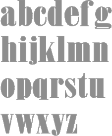 Wooden Type Fonts (was: American Wood Type) is founded and run by Jordan Davies from South Hero, VT: Historically accurate reproductions of wood type produced in the 19th century in a variety of styles. This is a work of passion and dedication by Jordan Davies. Jordan's other passion is painting. His (digital) wood typefaces include these original designs: Bevan Condensed, Bevan Medium (based on Melior), Inline Regular, London Light, London Heavy, Neo Geo Block, Quirk, Slab Four Rounded (+Ext), Slab Four Rounded Italic, Slab Four Rounded Revised, Slab Four Rounded Super. MyFonts link. Digital revivals:
 - 20th Century ExtraBold Extended (2017). A very wide version of Futura.
- Aetna Bold.
- Alpine Mtn (2021). a display sans with some stencil glyphs.
- Antique 6 (based on Stevens, Shanks), Antique Condensed Bold, Antique Light, AntiqueRegular (saloon font), Antique Five, Antique Sans, Antique Shadow, Antique Six, Antique Three, Antique Tuscan 1, Antique 7 (2011), Antique Tuscan 8 (2008), Antique Tuscan Condensed, Antique Tuscan Heavy, Antique Wells Medium (2005), Antique Wells Expanded (2011, based on Wells&Webb), Antique Two (2008), Antique XX (2008).
- Bernhard Gothic Medium (2017, after Lucian Bernhard).
- Blobbing (2013, a fat finger typeface), Bodoni Ultra (2015, based on a Bauer Types original).
- Cassjor (2011): an angular face.
- Cheltenham (2019), (2019).
- Churchward Ultra Bold (2018).
- Clarendon Condensed, Clarendon Condensed Bold (2007, based on a 1859 design by William Hamilton Page), Clarendon Extended (2005, after W.H. Page), Clarendon Heavy, Clarendon Extra Condensed (2007), Clarendon 618 (2010), Clarendon 617 (2010), Clarendon Semi (2011), Clarendon Jordan (2015).
- Columbian (2015) and Columbian Slab (2015). Heavy classical Egyptians.
- Concave Tuscan X Condensed.
- Craw Clarendon (2013), Craw Clarendon Extended (2015), and Craw Clarendon Bold (2014).
- Davies Serif (2014): a great wide wood-inspired wedge-serifed display didone.
- Devendra (2021). A counterless stencil typeface.
- DeVinne Wood, DeVinne Wood Italic.
- Doric Condensed, Doric Expanded.
- Egyptian Bold, Egyptian Ornamented (+Bold), Egyptian Regular, Egyptian Slab (2007), Egyptian Two, Egyptian Wide (2006, based on a Miller&Richard original, ca. 1850), Egyptian Bold Expanded (2011), Egyptian Extra Bold Condensed (2011), Egyptienne75 Black (2020).
- French Antique Condensed.
- French Calrendon (2015) and French Clarendon Expanded (2015).
- Gallatin Light (2021), Gallatin Bold (2019) and Gallatin Medium (2020). A slab serif.
- Girder Heavy (2008, based on a design of W.H. Page, ca. 1900), Girder Super (2014, a slab serif based on William Hamilton Page).
- Gothic Bold, Gothic Bold Extended, Gothic Extra Extended, Gothic Extended (2009), Gothic Medium, Gothic Nesbitt (2011), Gothic Leavenworth (2015), Gothic Number Sixteen (2019), Gothic Special Condensed Bold (2005), Gothic Special Condensed Medium (+Italic, 2013), Gothic Special Normal (+Italic, 2013), Gothic Special Thin, Gothic Tuscan, Gothic Tuscan 9 (+Narrow), Gothic Tuscan 8 (+Pointed), Gothic Tuscan Condensed, Gothic Tuscan Round, Gothic Tuscan Concave, Gothic Tuscan Pointed Narrow, Gothic Unique (2007).
- Grecian Bold Condensed, Grecian XX Condensed, Grecian Bold Expanded (2014).
- Grotesque (2010), Grotesque Bold Italic (2013).
- Jensen Old Style.
- Jordan Calligraphy (2015).
- Kurilian (2015). After a 1879 spurred wod type design by Heber Wells.
- Lettres Angulaires (2010): based on Textura.
- London Heavy and London Medium (2017). A revival of Johnson Underground.
- Mansard. This revives a wood type from 1878 by Heber Wells.
- Martin Bold (2018), Martin Medium Regular (2018).
- Masterman (2017). After a typeface by Boston's Hansen foundry.
- Mementor Bold (2018) and Mementor Medium Regular (2018).
- News Gothic Bold (2017) and News Gothic Light (2017). After Morris Fuller Benton's original at ATF.
- Number5 Reg (2010). A variation of the William Page 500 font.
- Number 154 (2006, based on a 1887 design by William Hamilton Page), Number 515 Black, Number 514 (2011).
- Octagon.
- Peerless (2008). Peerless 131 Bold (2012) is a wedge serif design based on William Hamilton Page.
- Penny (2007, a gorgeous didone headline font based on a 1838 wood type font by George Nesbitt).
- Roman X Condensed (a great didone font), Roman X Expanded, Roman Wells Bold.
- Rubens Regular (2005) and Rubens Expanded Regular (2018).
- Sainted Medium, Sainted Extra Bold (2018). Two slab serif typefaces.
- Skeleton Antique (2005-2012). Based on a William Page original from 1865.
- Slab Four Rounded (2010, +Bold, +Super).
- Stymie Extra Bold (2018).
- Teniers Regular.
- Teutonic.
- Thorowgood (2010): a relatively low-contrast Clarendon based on a wood specimen sheet. Thorowgood Wide was done in 2013.
- Times Gothic (2009).
- Trenton, Trenton Condensed (2005, based on an 1889 typeface by James Edward Hamilton), Trenton Ornamented.
- Trooper Roman Black (2020).
- Tuscan Egyptian, Tuscan Italian.
- Video Black (2020).
- Venusian Bold Extended (2018). The name refers perhaps to the classic Bauersche sans typeface Venus.
- William Page 500, William Page 506.
- Wood Regular (2005).
Showcase of his most popular fonts at MyFonts. Klingspor link. [Google]
[MyFonts]
[More] ⦿
|

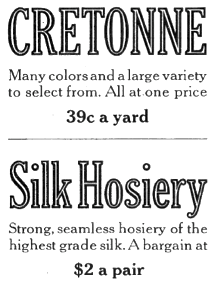
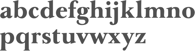
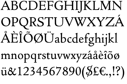
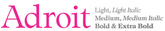
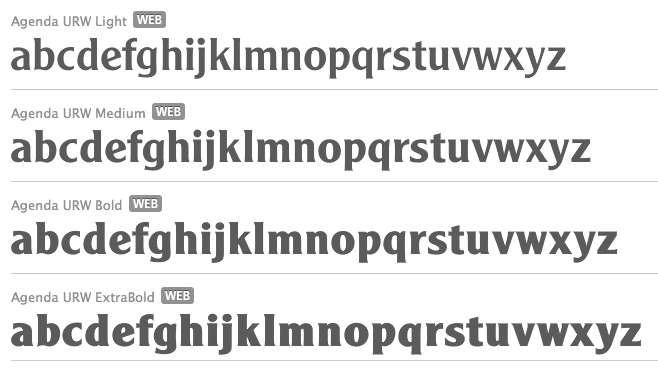
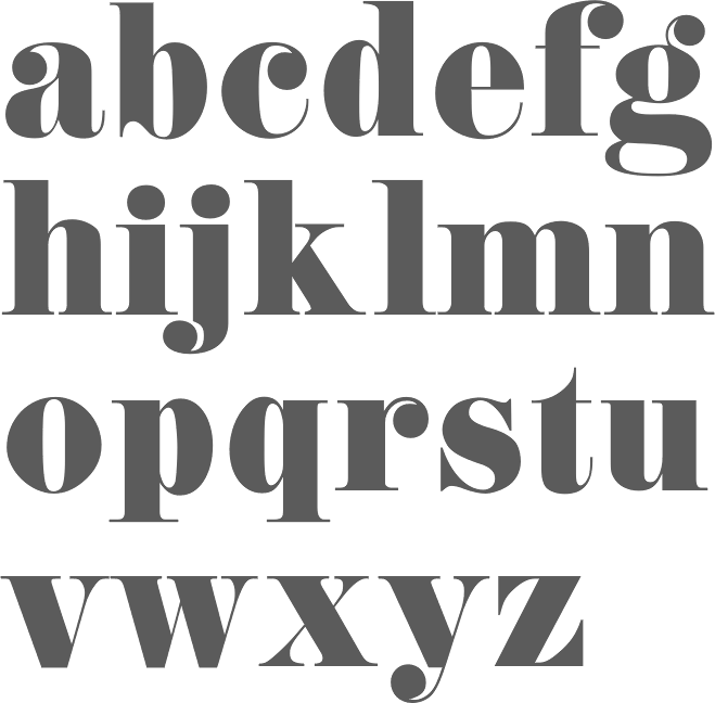
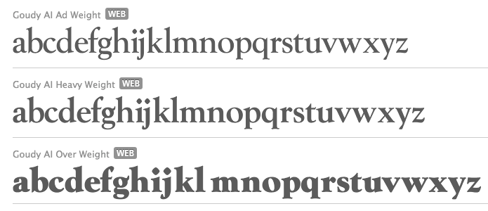
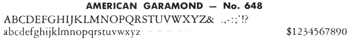
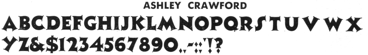
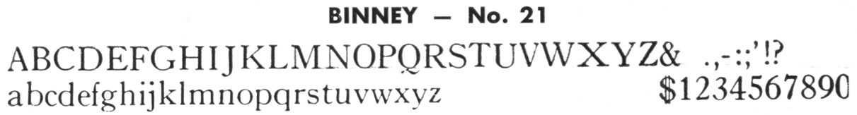
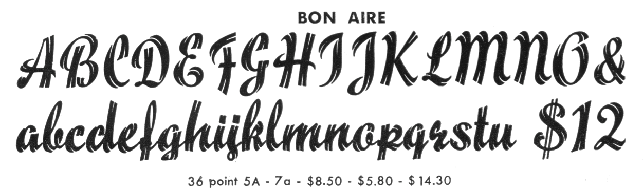
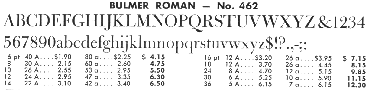
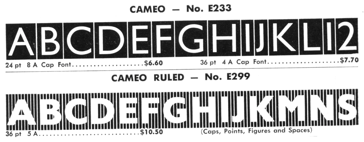
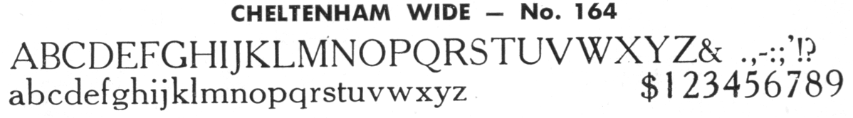
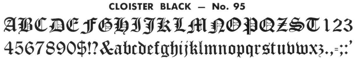
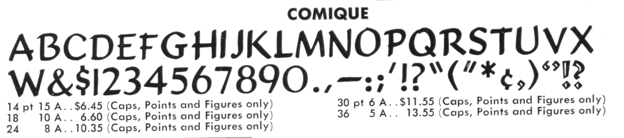
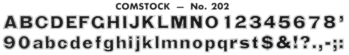
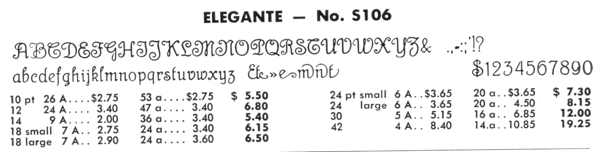
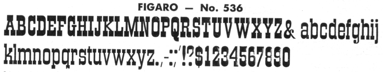
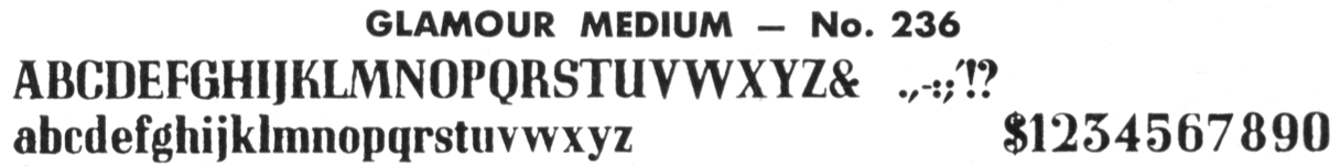
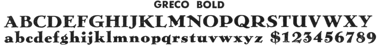
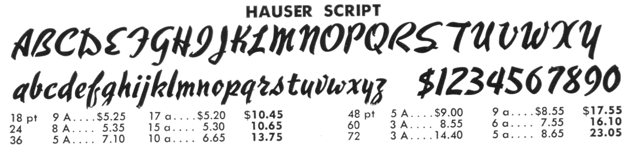
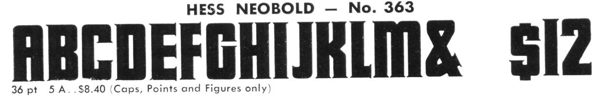
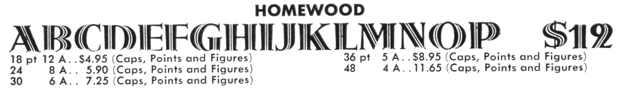
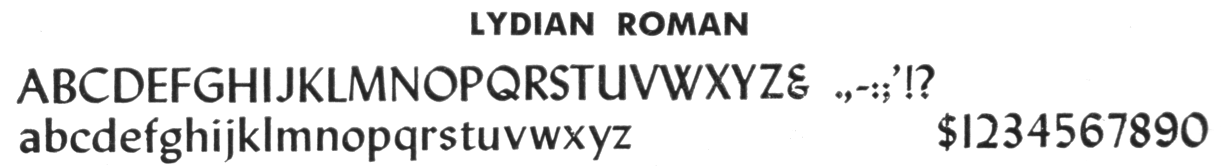
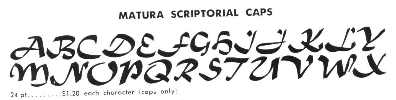
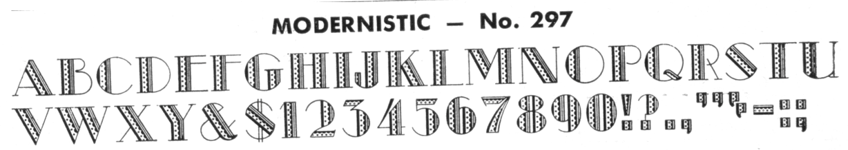
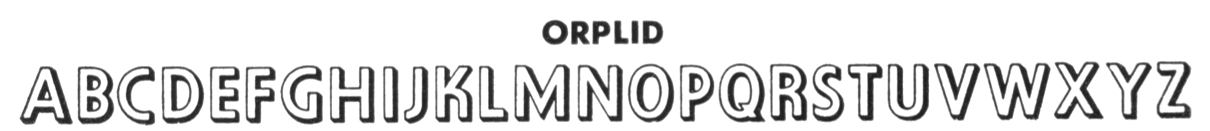
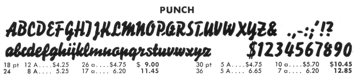
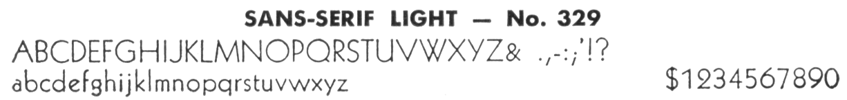
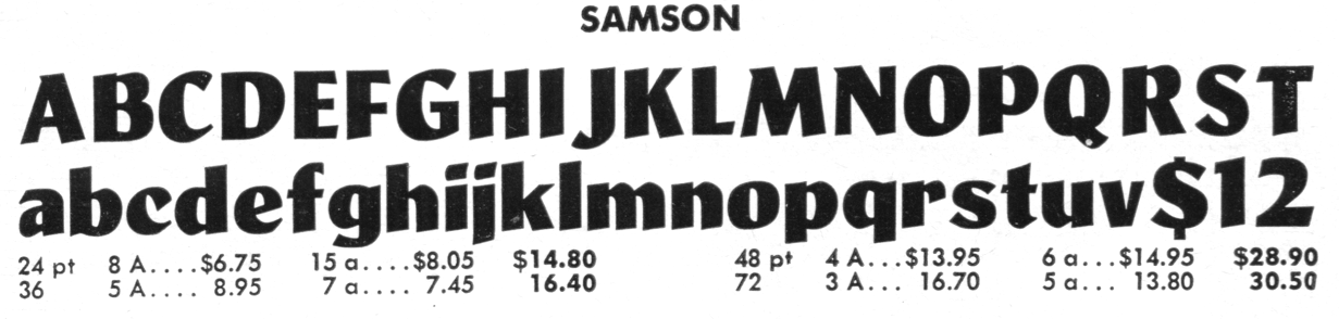
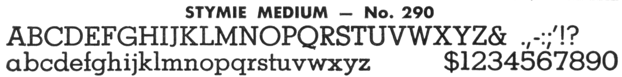
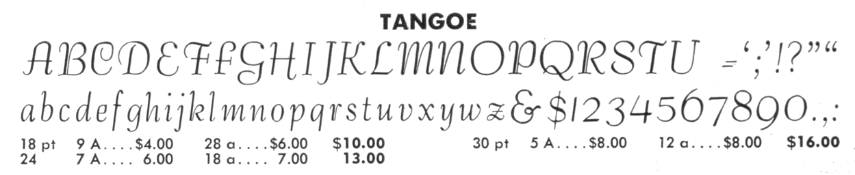
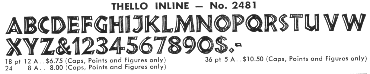
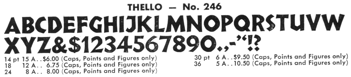
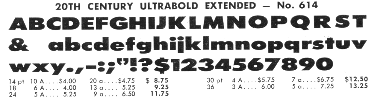
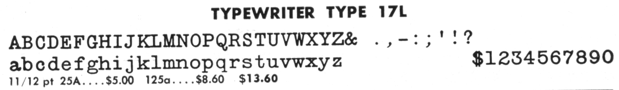
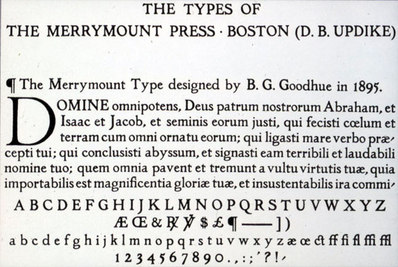
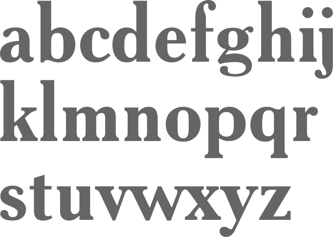
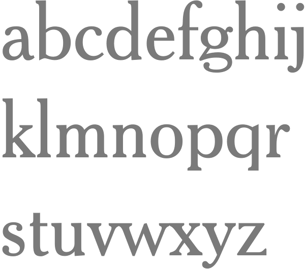
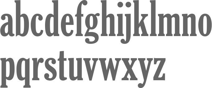
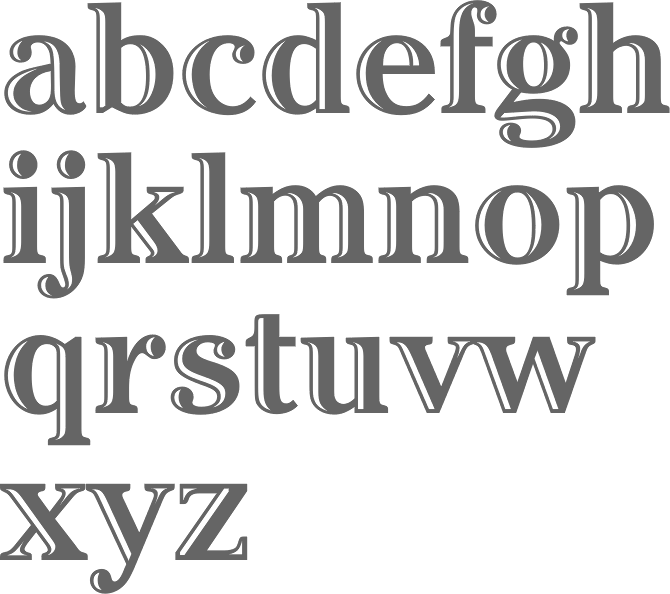
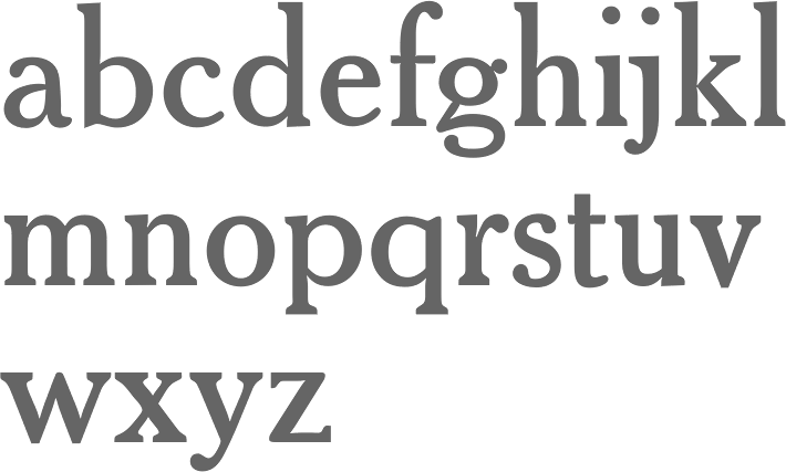
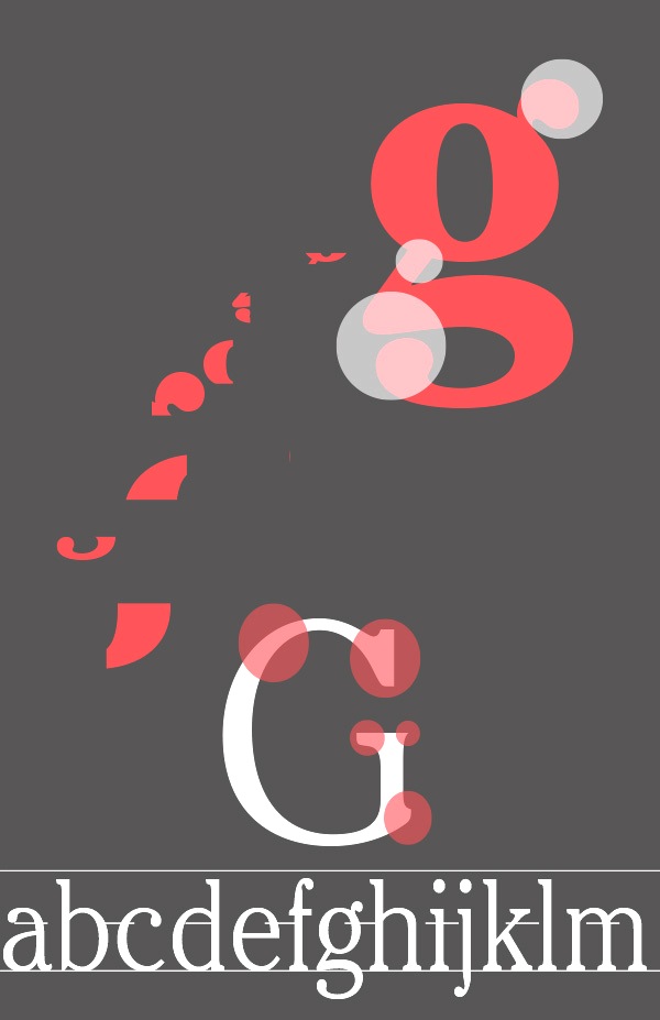
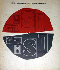
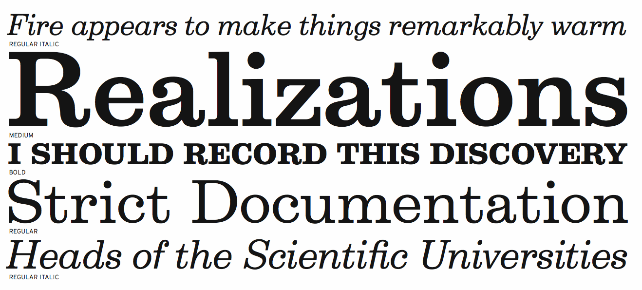
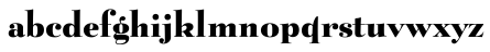
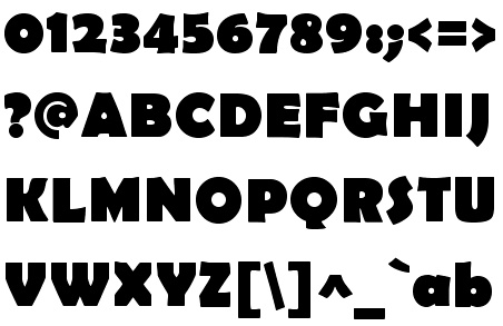
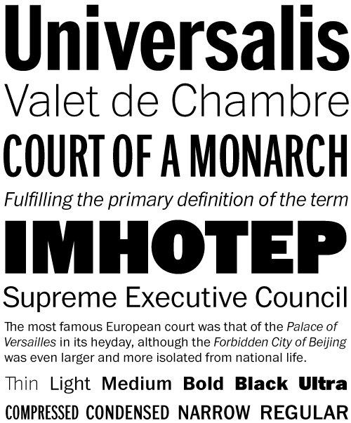
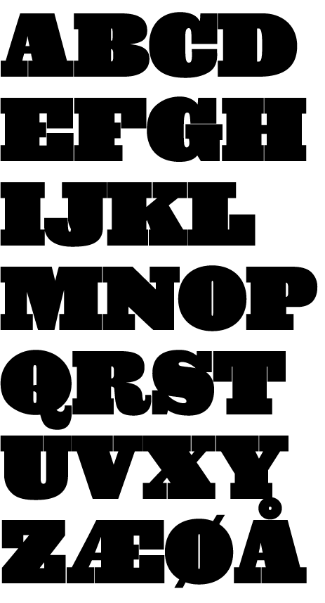
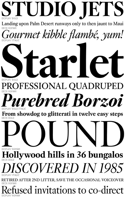
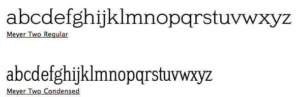
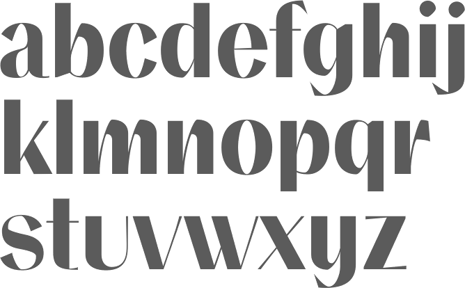
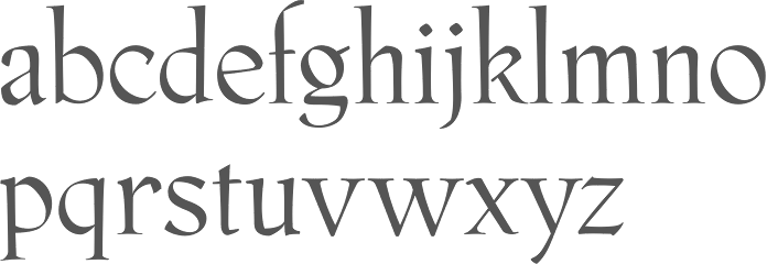
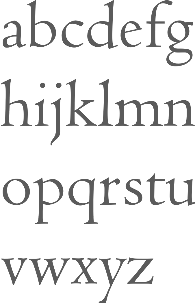
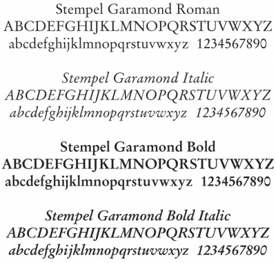
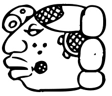
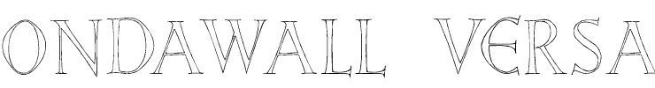
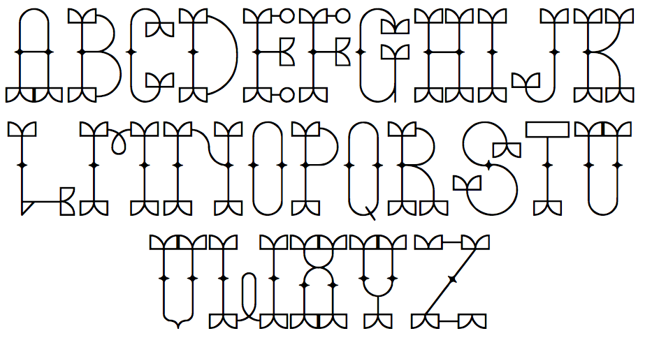
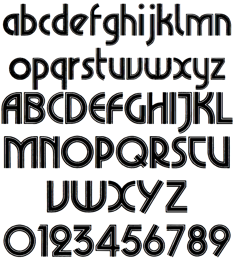
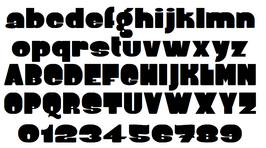
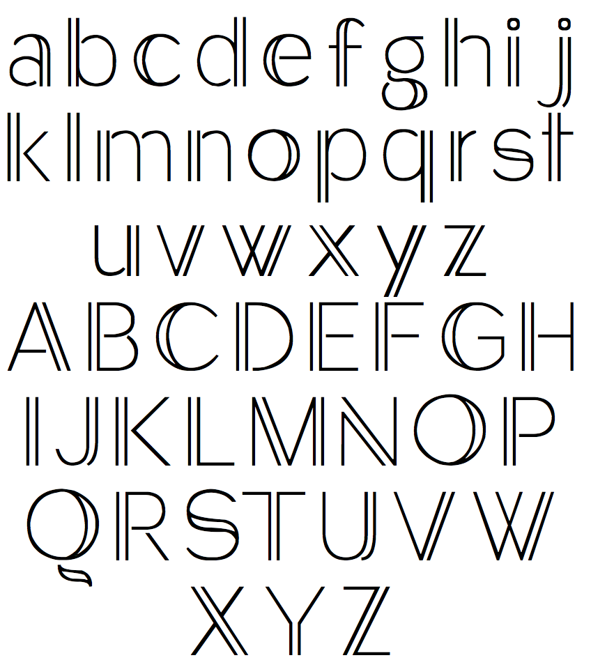
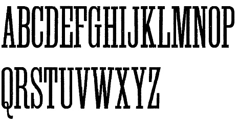
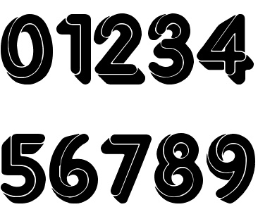
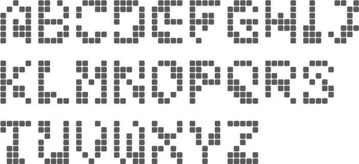
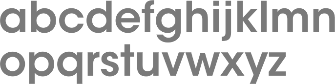
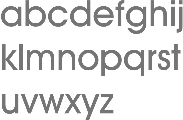
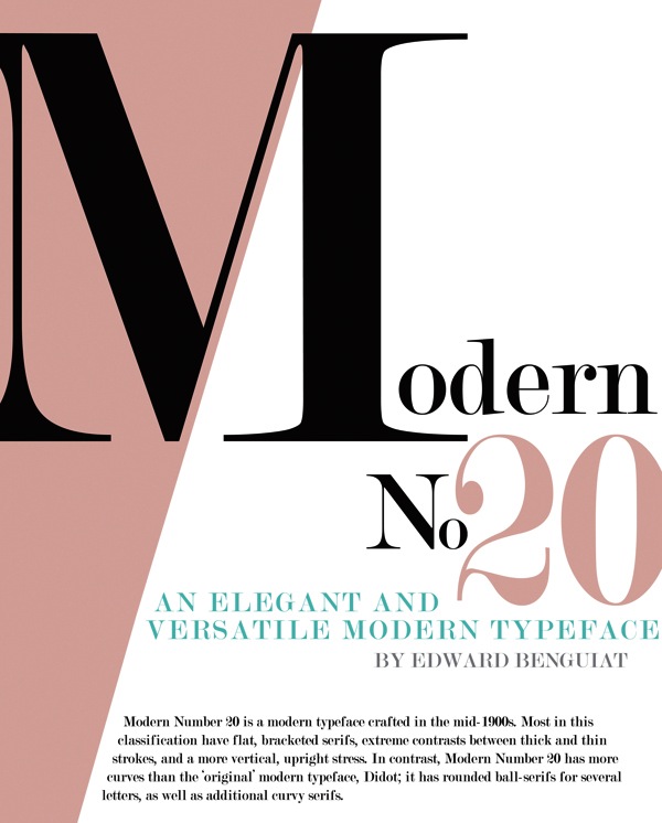
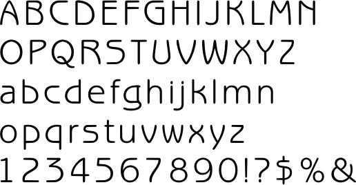
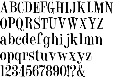
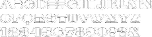
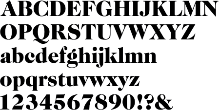
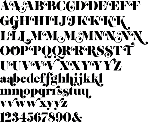
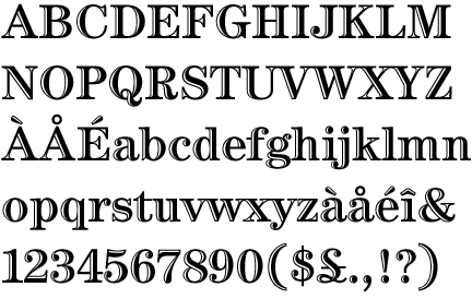
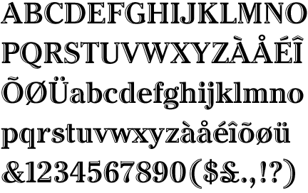
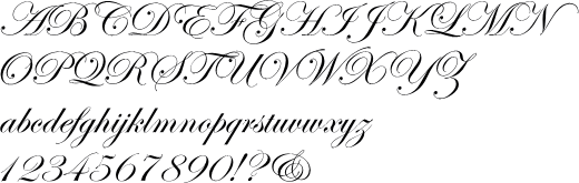
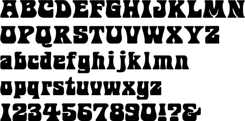
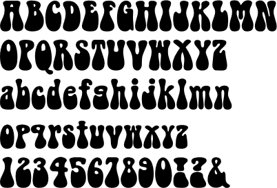
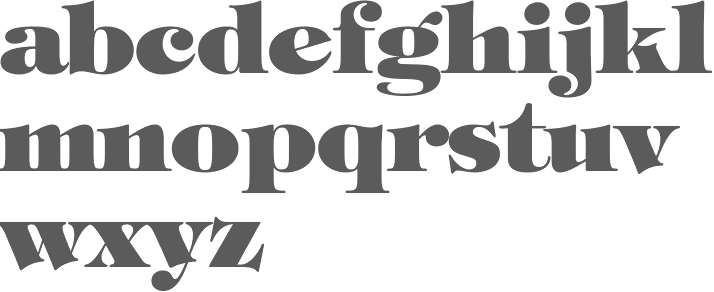
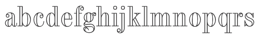
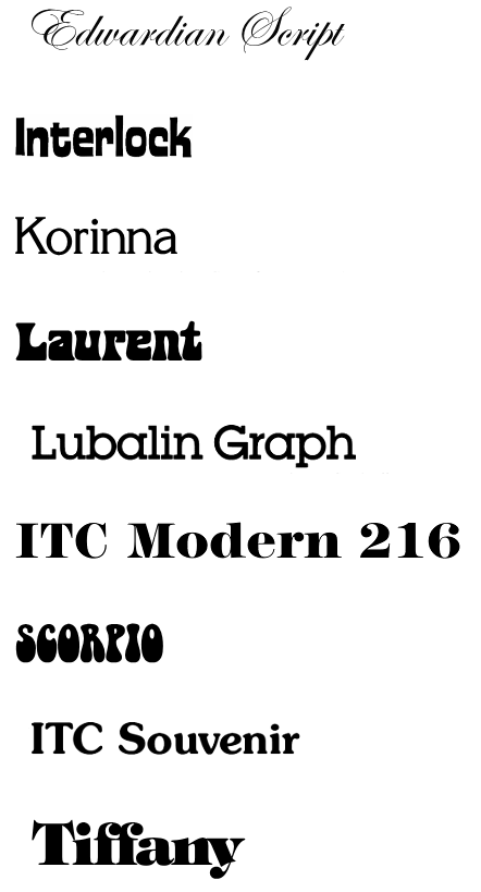
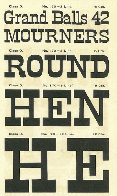
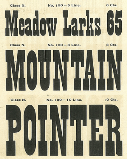
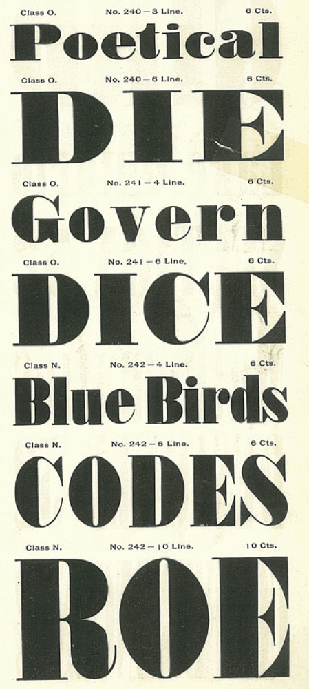
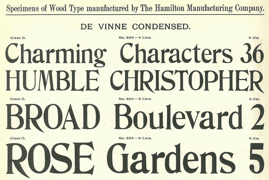
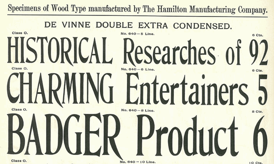
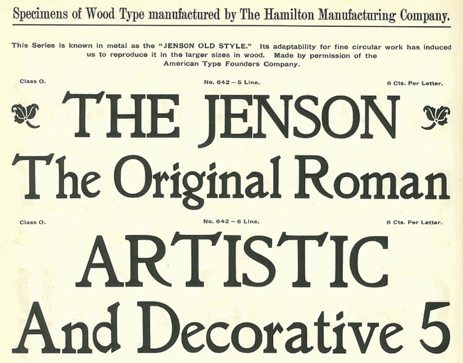
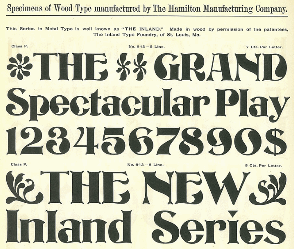
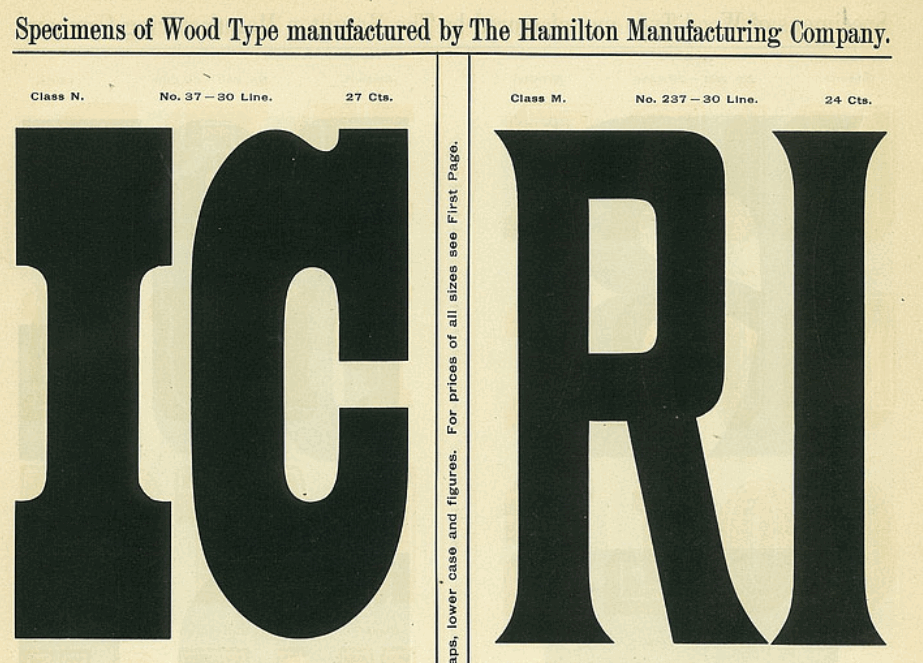
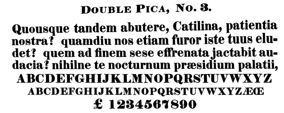
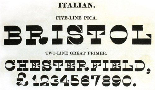
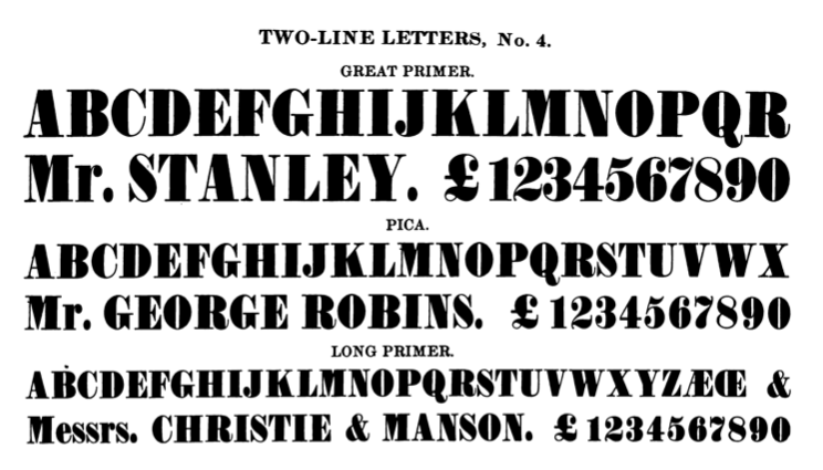
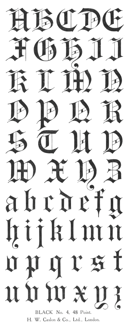
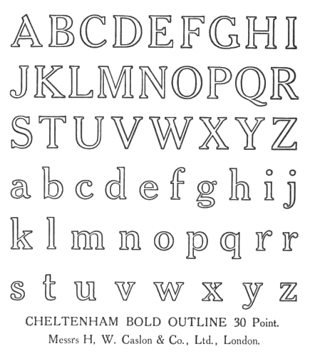
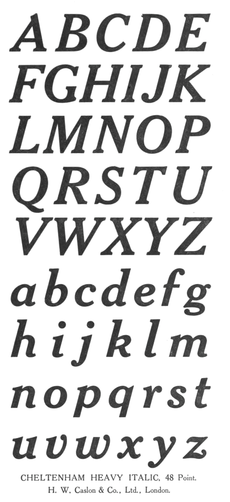
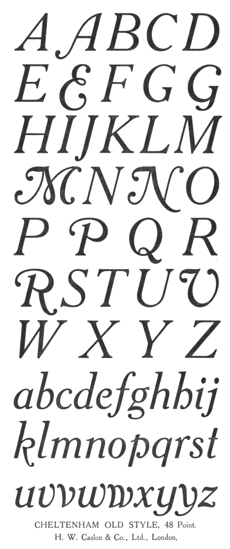
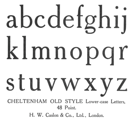
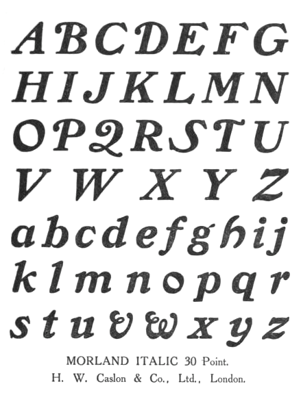
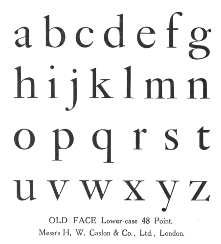
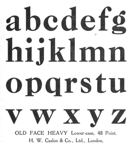
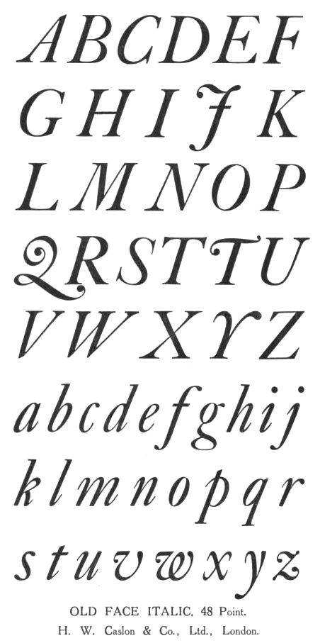
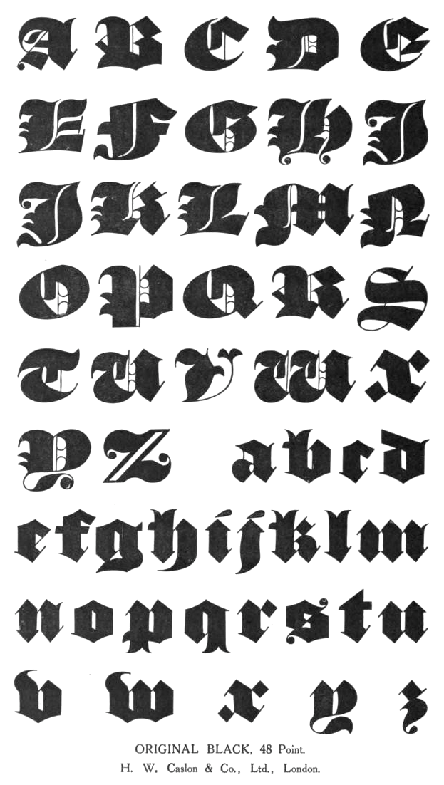
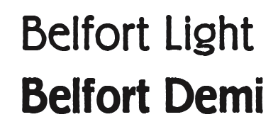
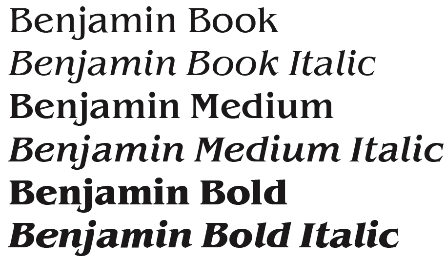
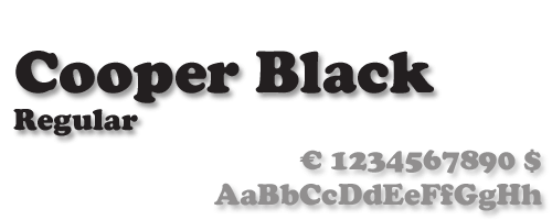
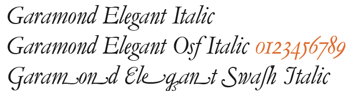
![German Garamond"> [based on TypoArt Garamond], Giulio,](Infinitype--GermanGaramond--basedonTypoartGaramond.png)
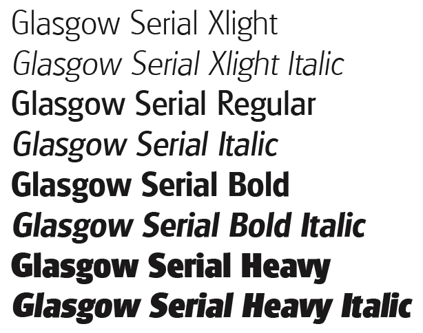
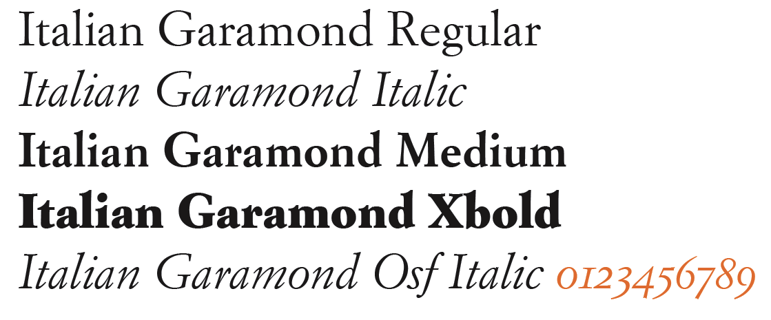
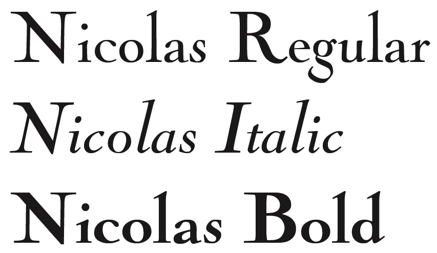
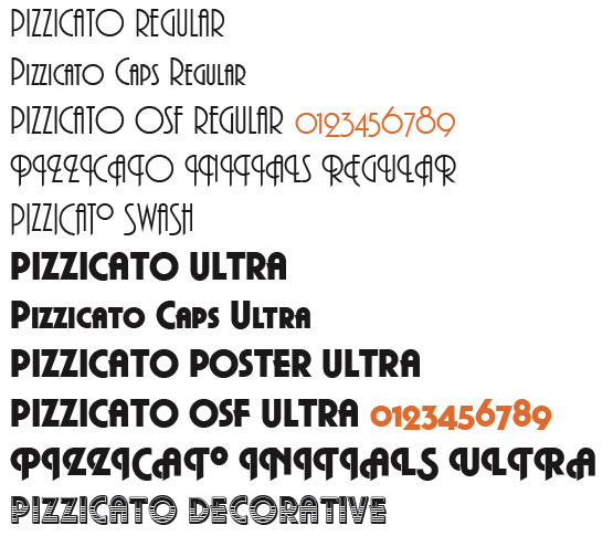
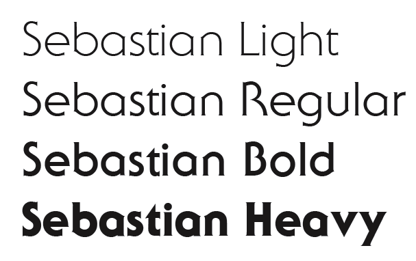
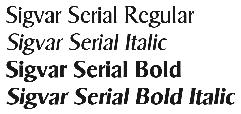
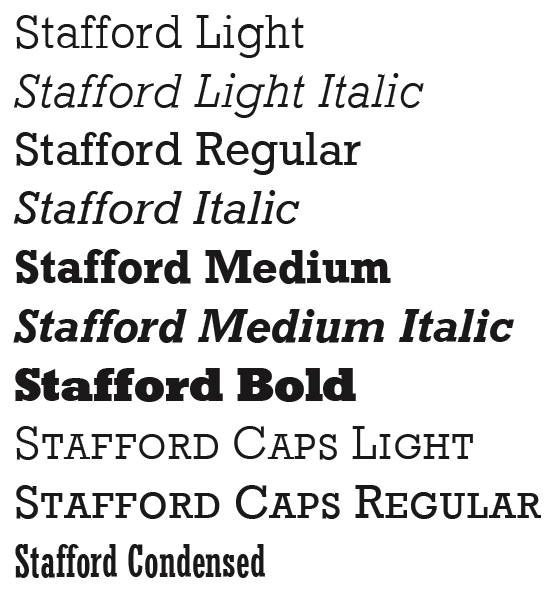
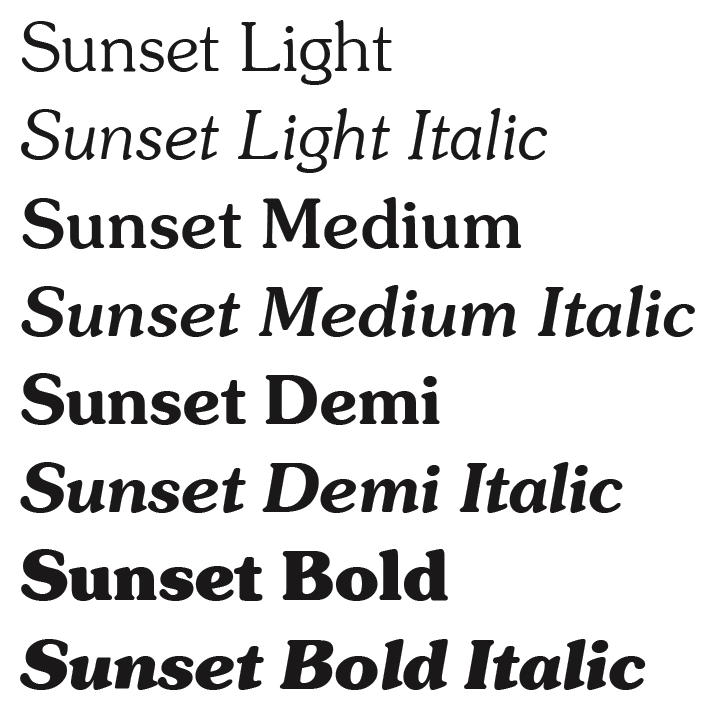
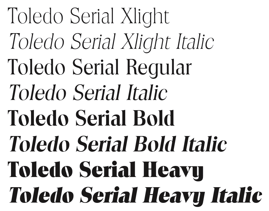
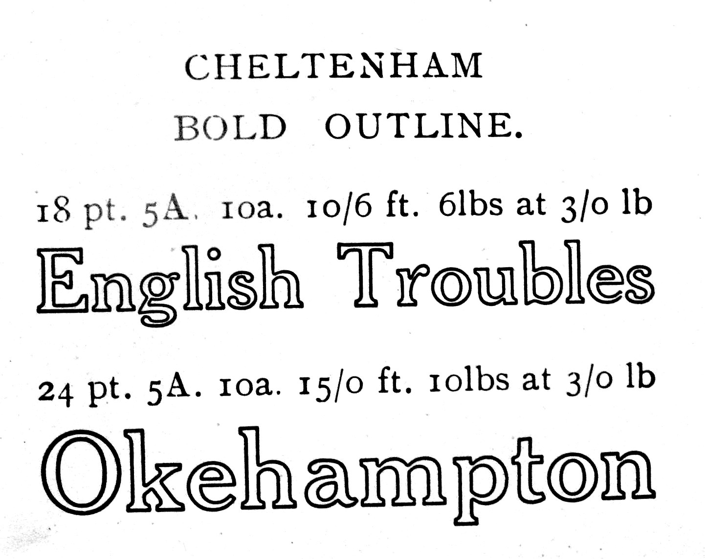
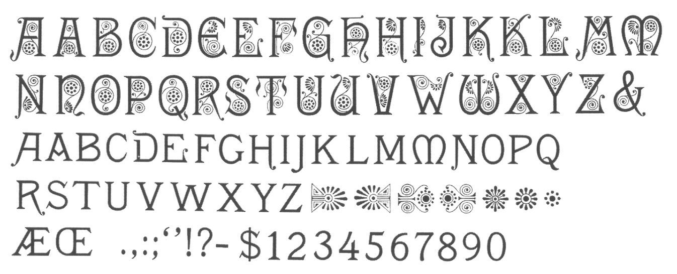
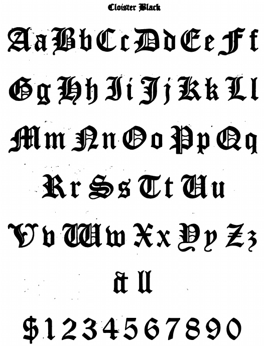
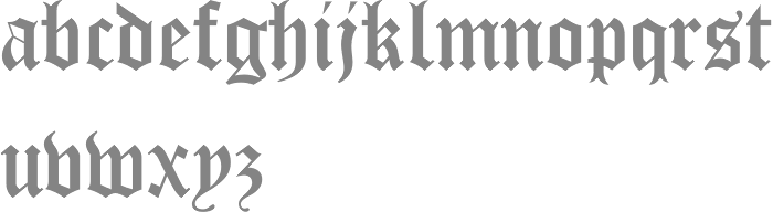
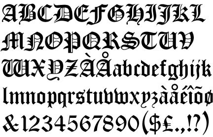
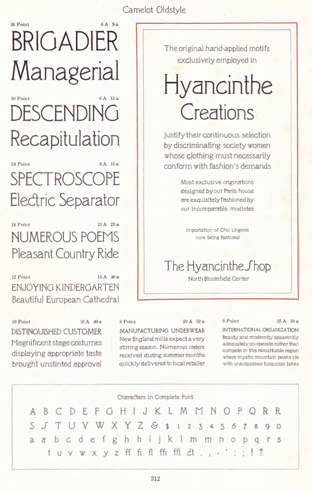
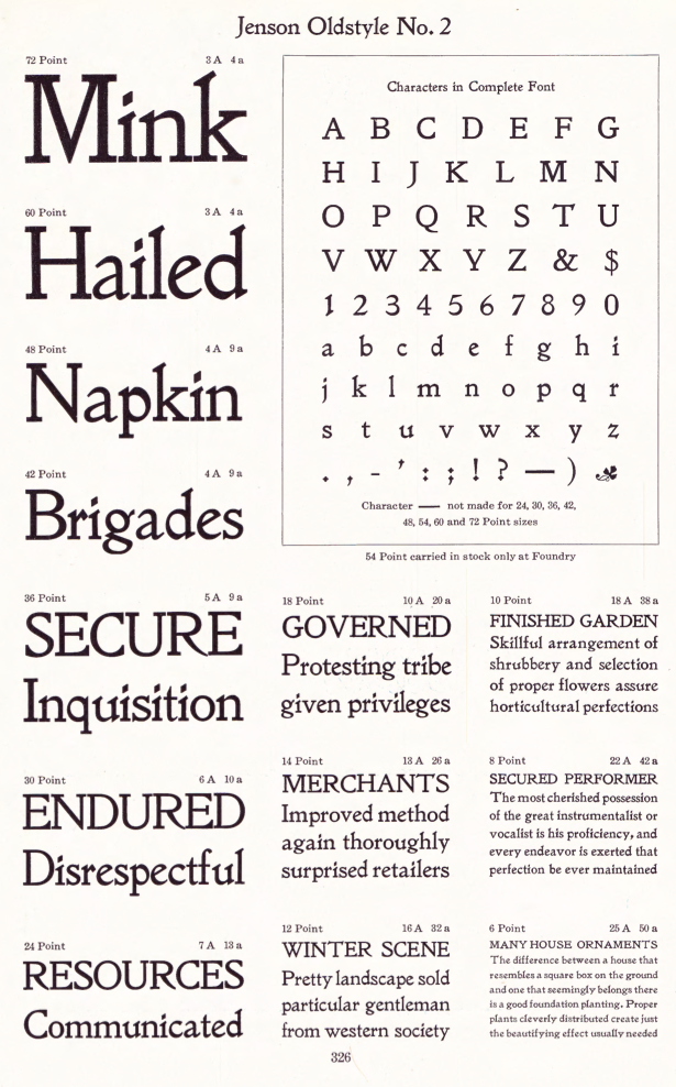
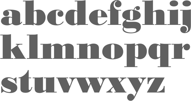
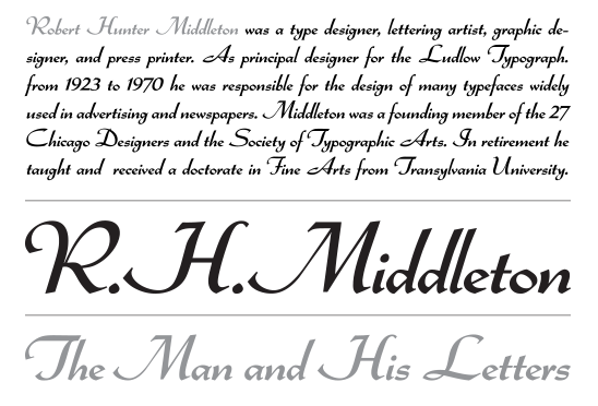
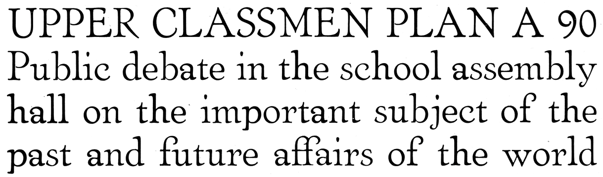
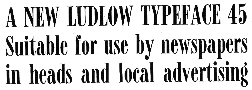
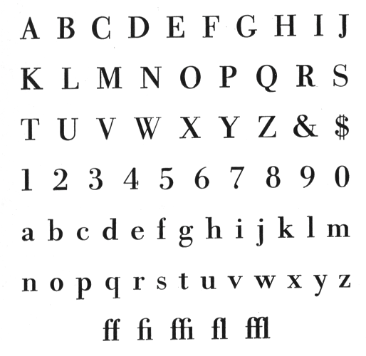
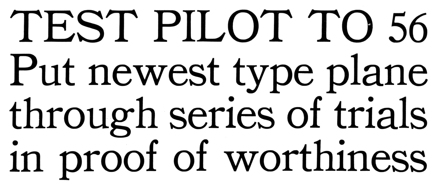
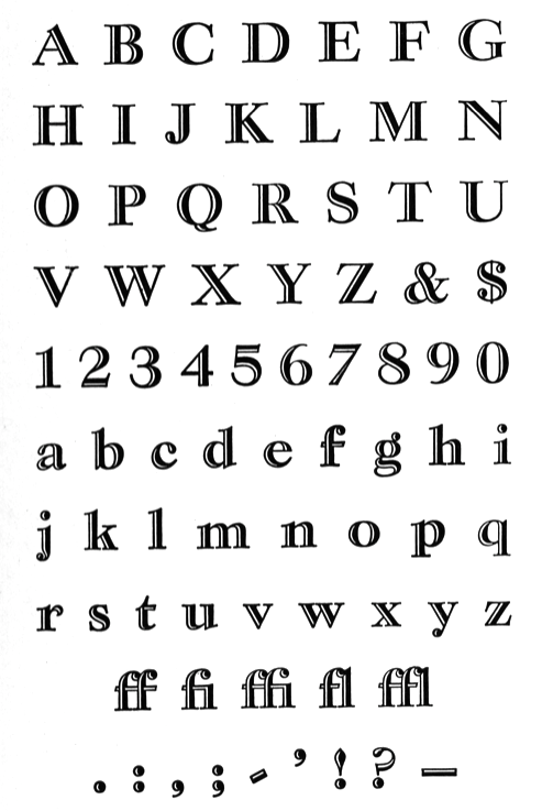
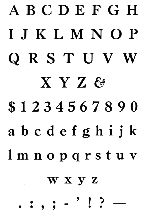
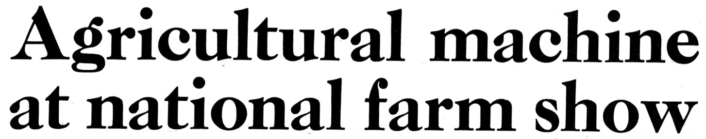
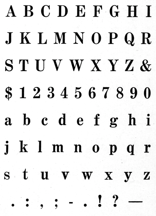
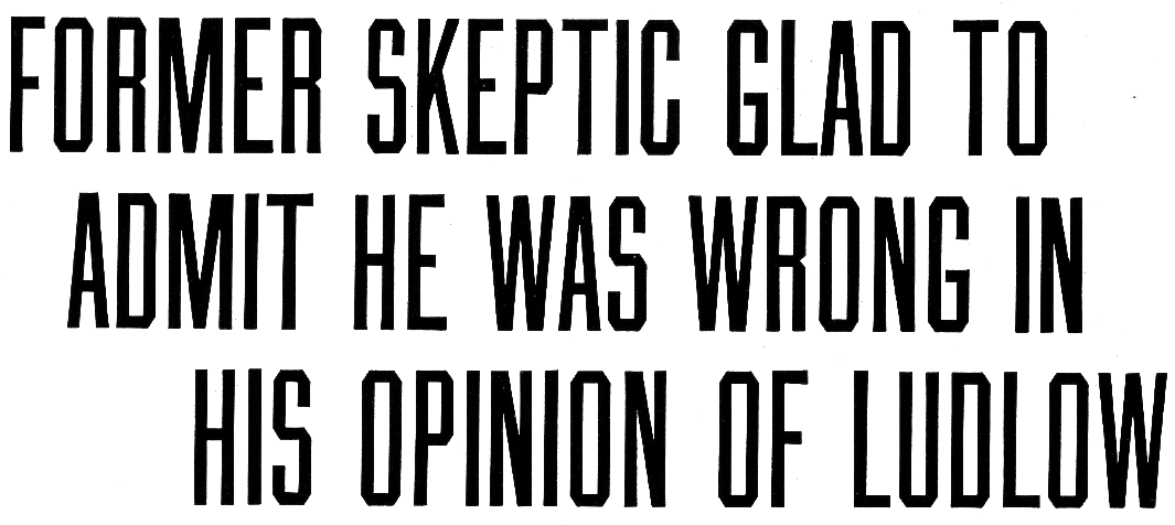
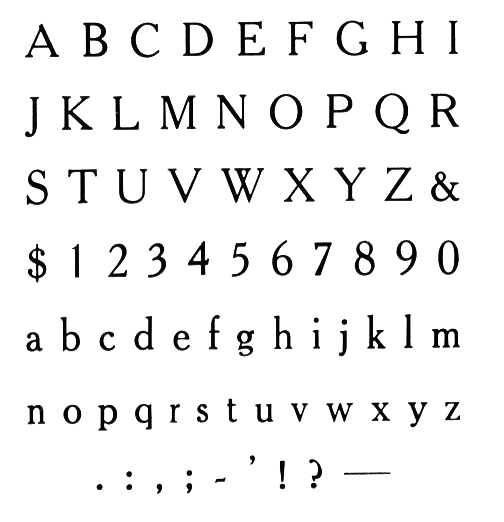
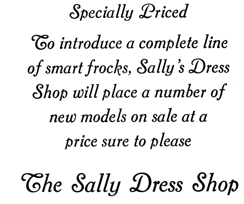
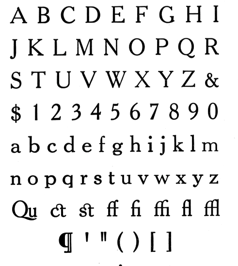
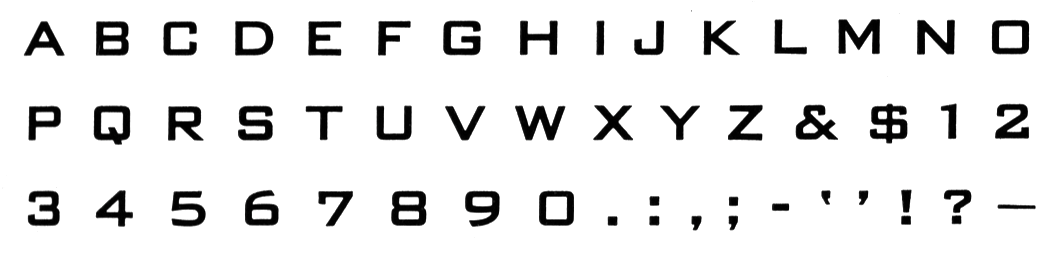
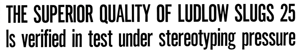
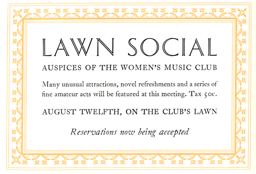
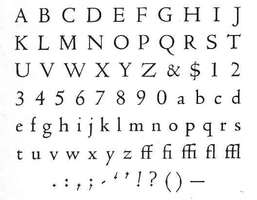
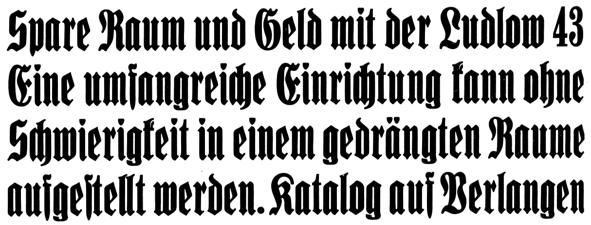
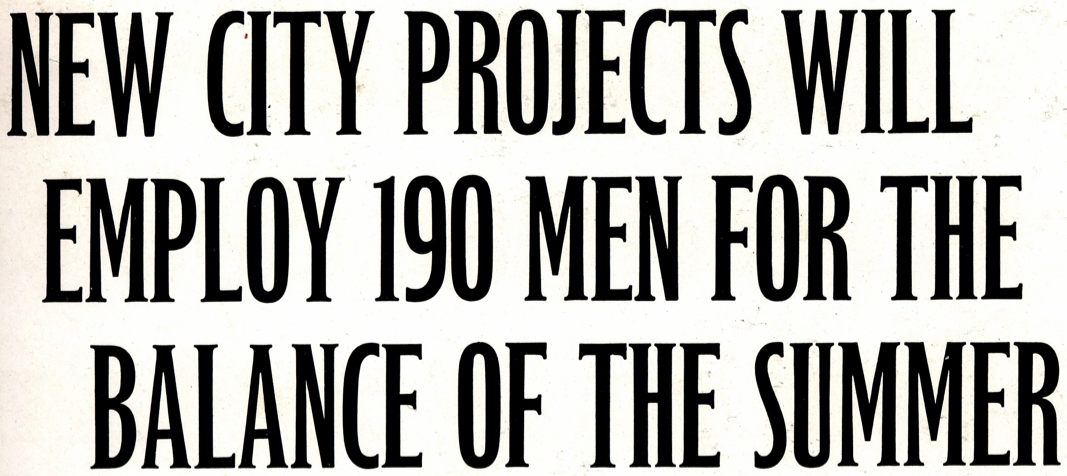
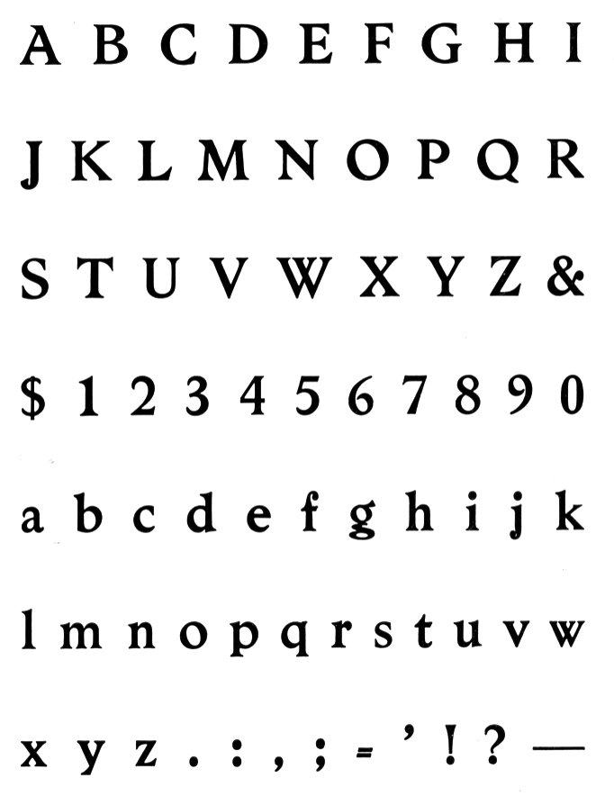
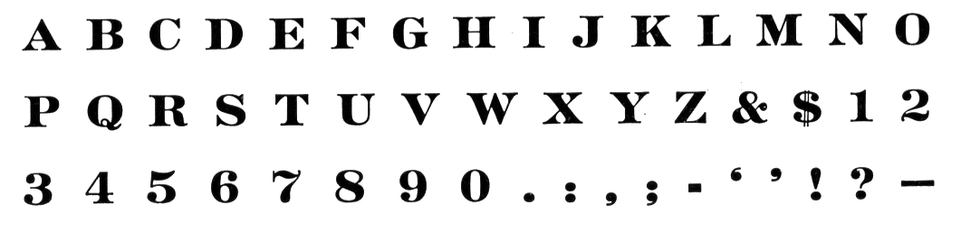
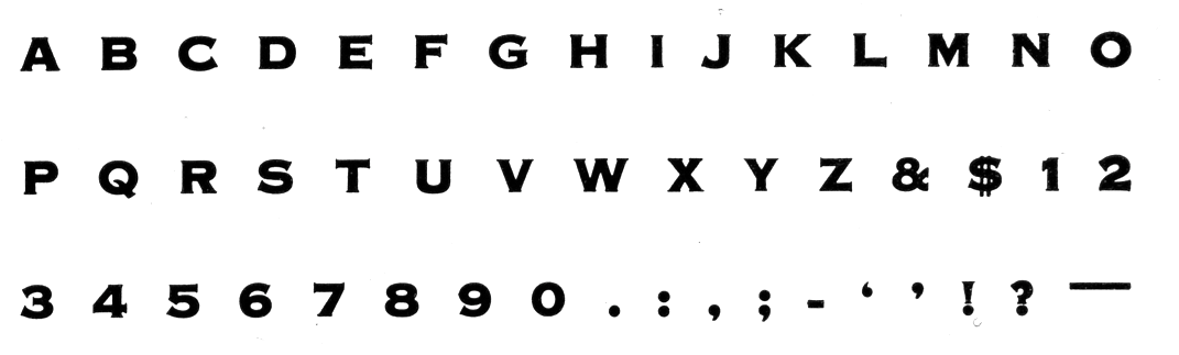
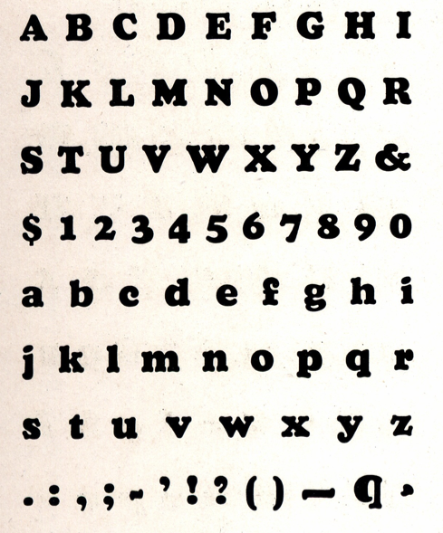
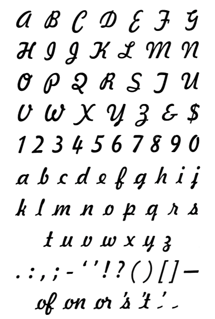
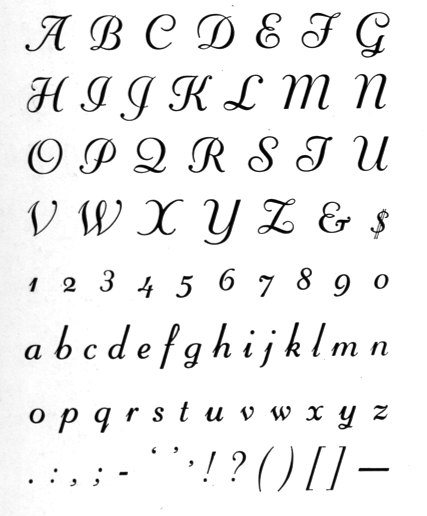
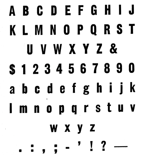
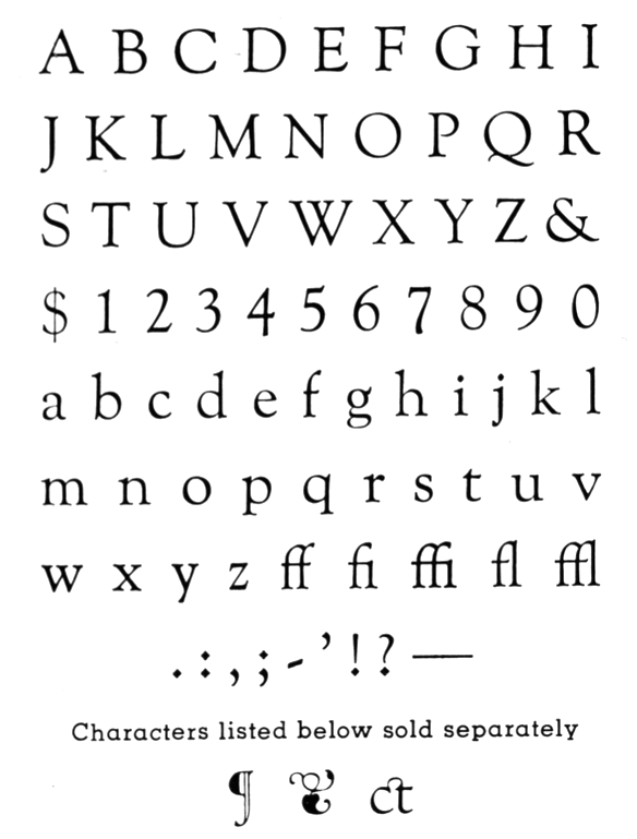
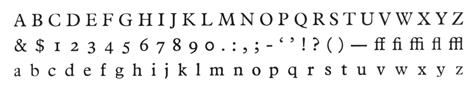
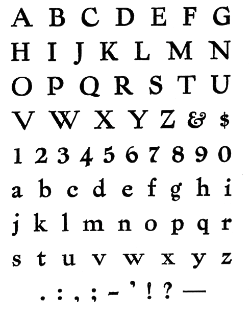
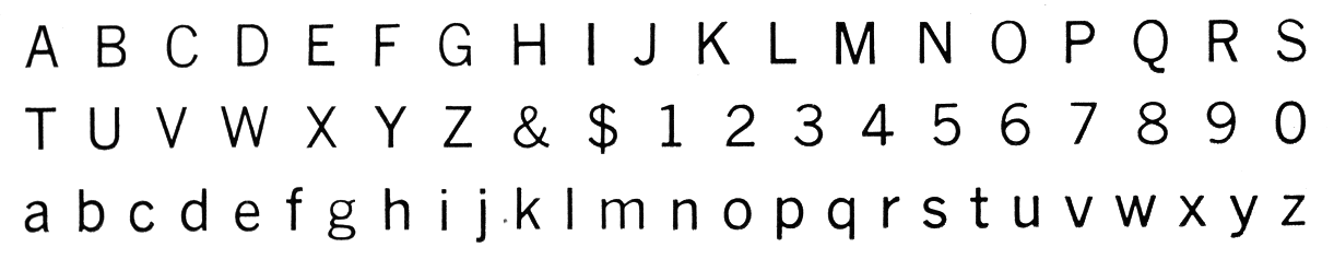
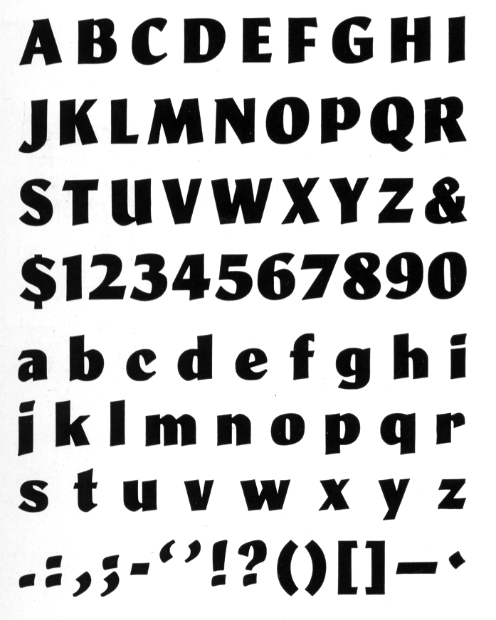
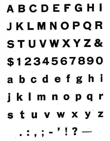
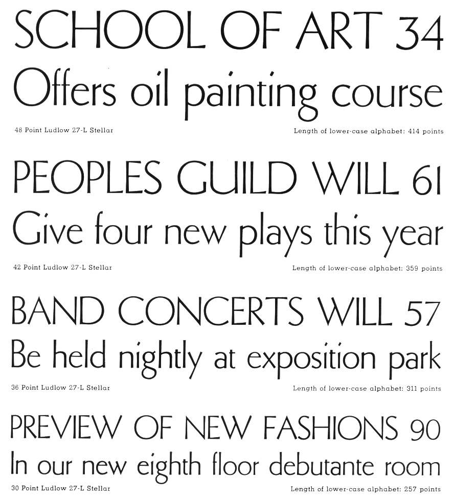
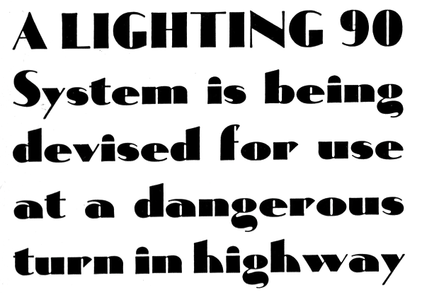
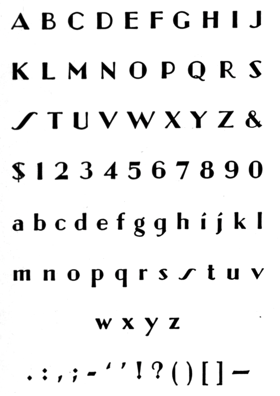
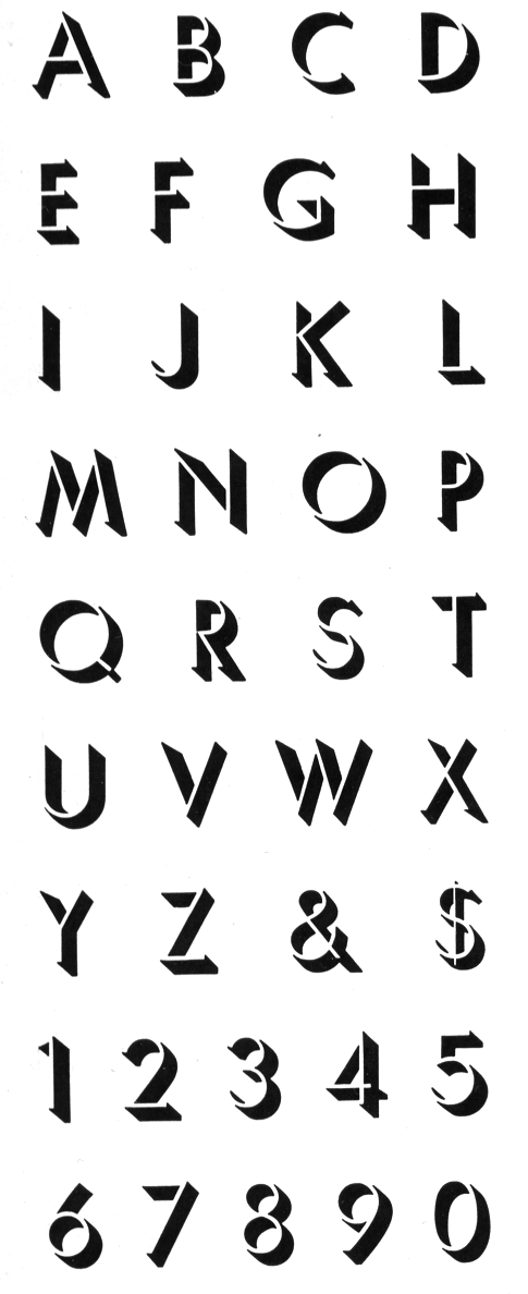
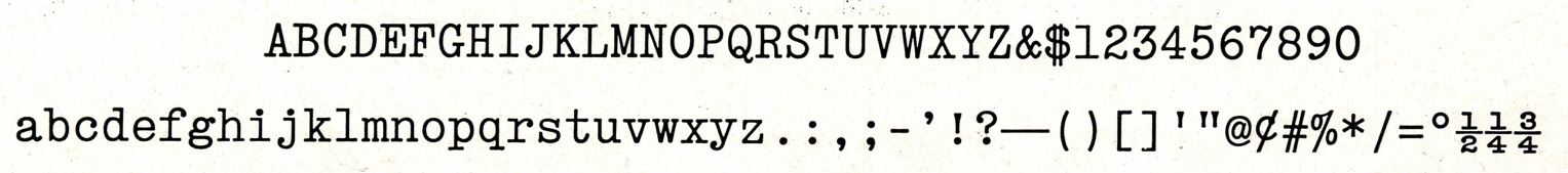
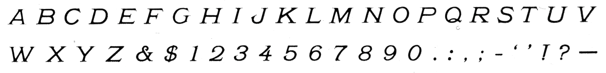
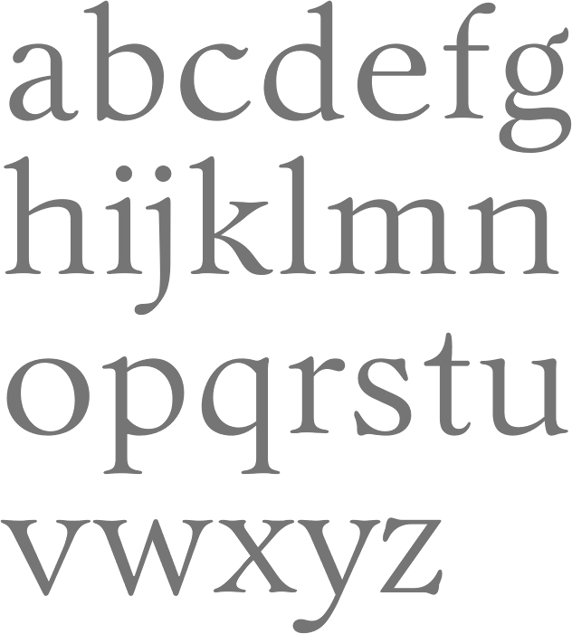
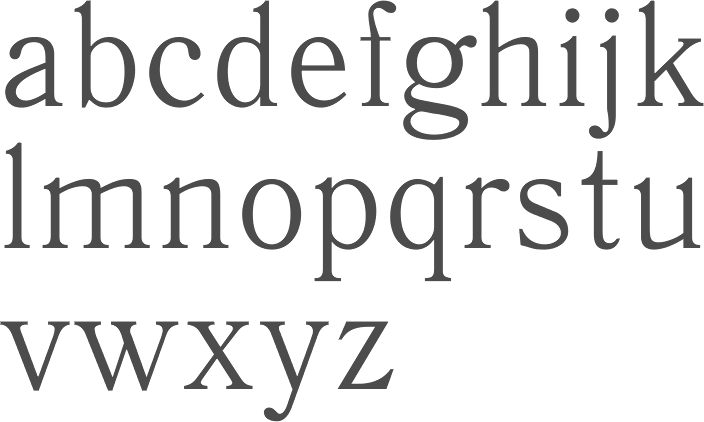
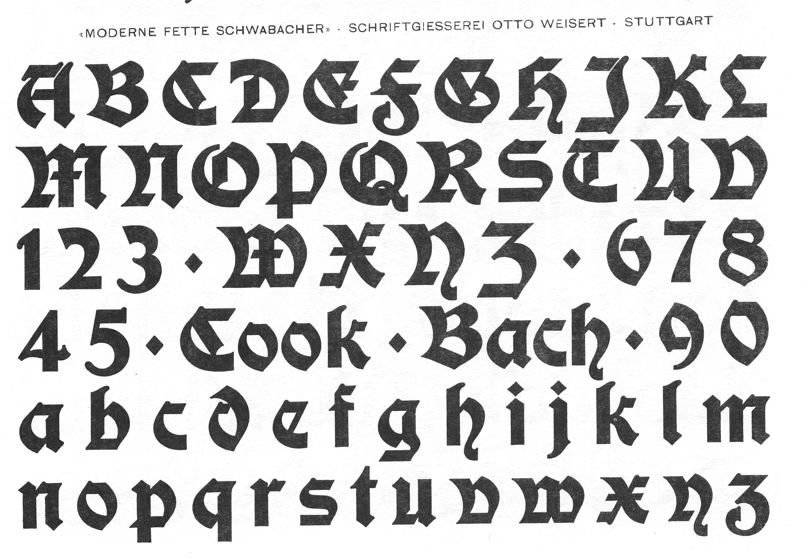
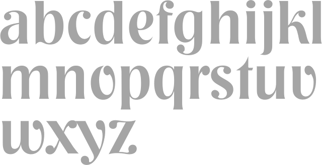
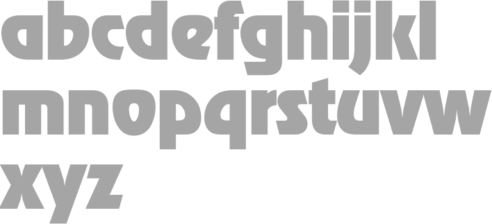
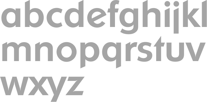
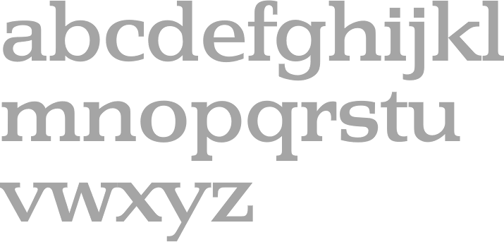
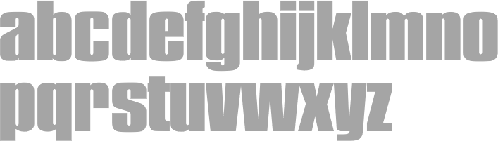
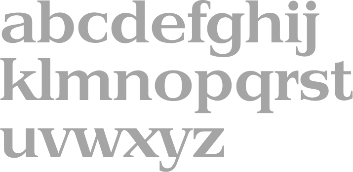
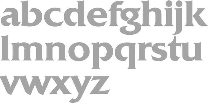
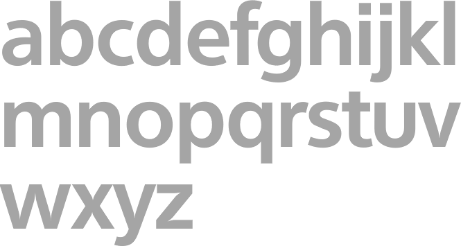
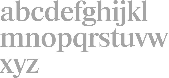
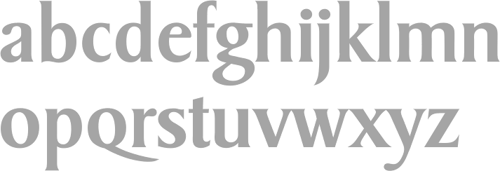
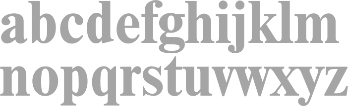
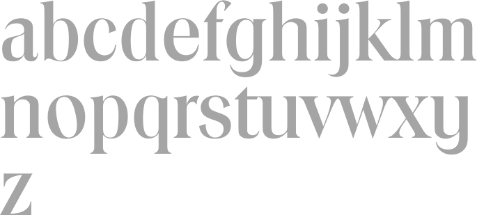
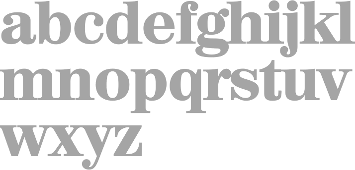
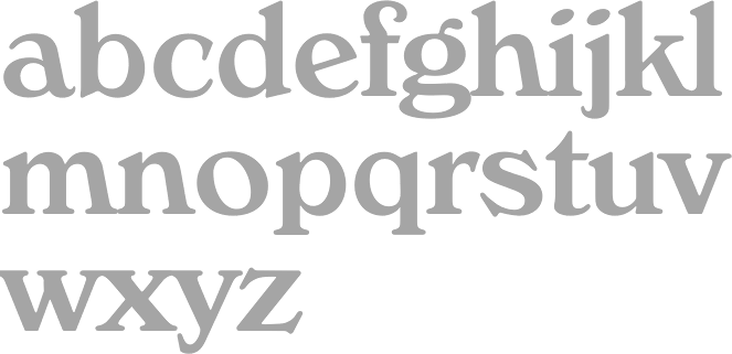
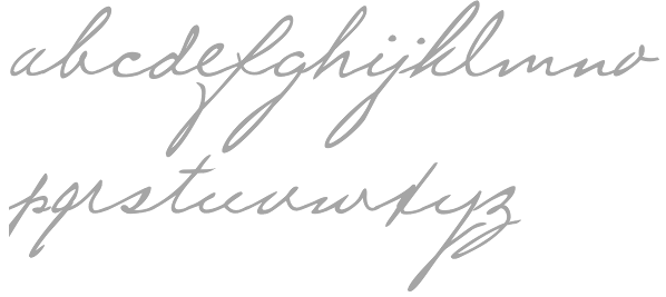
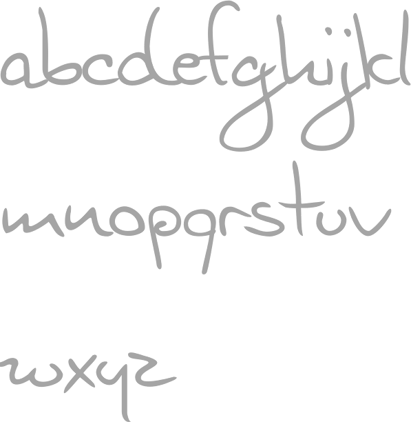
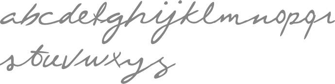
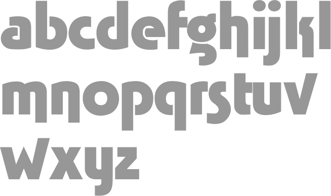
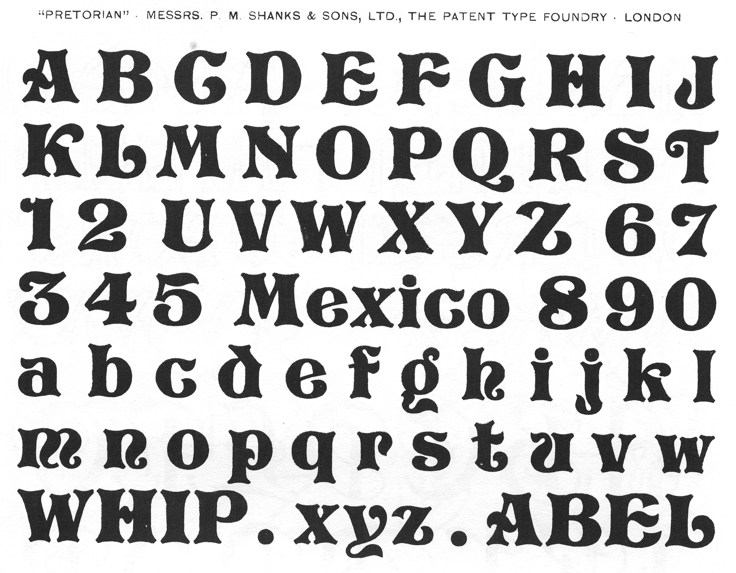
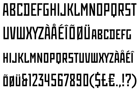
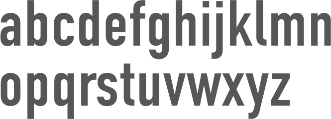
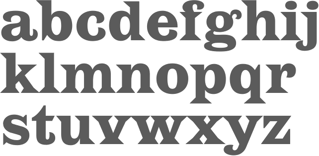
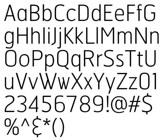
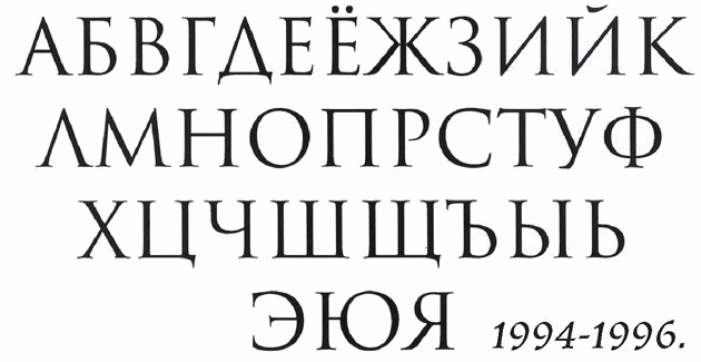
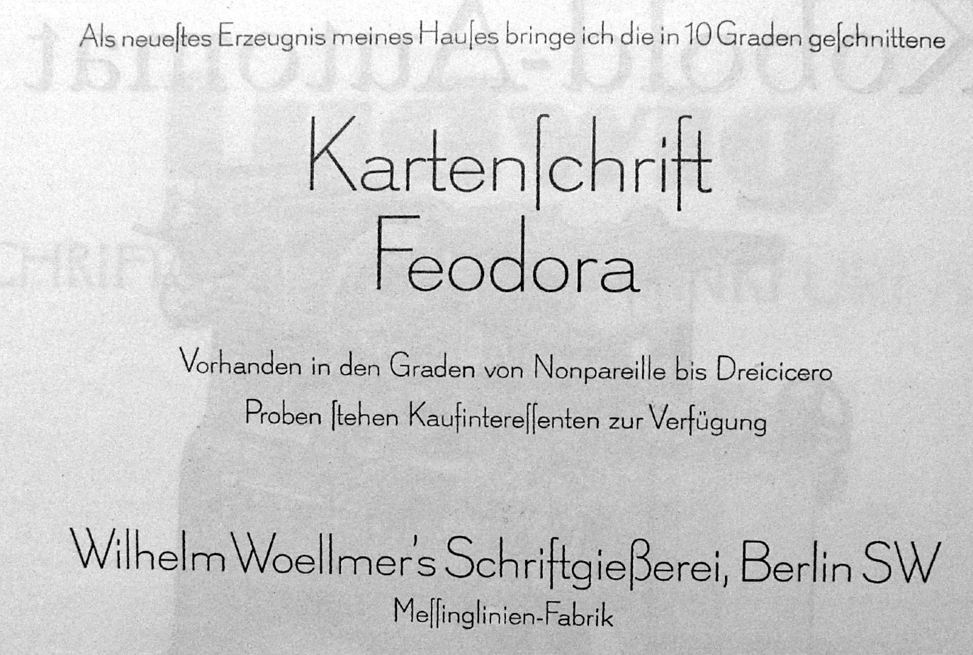
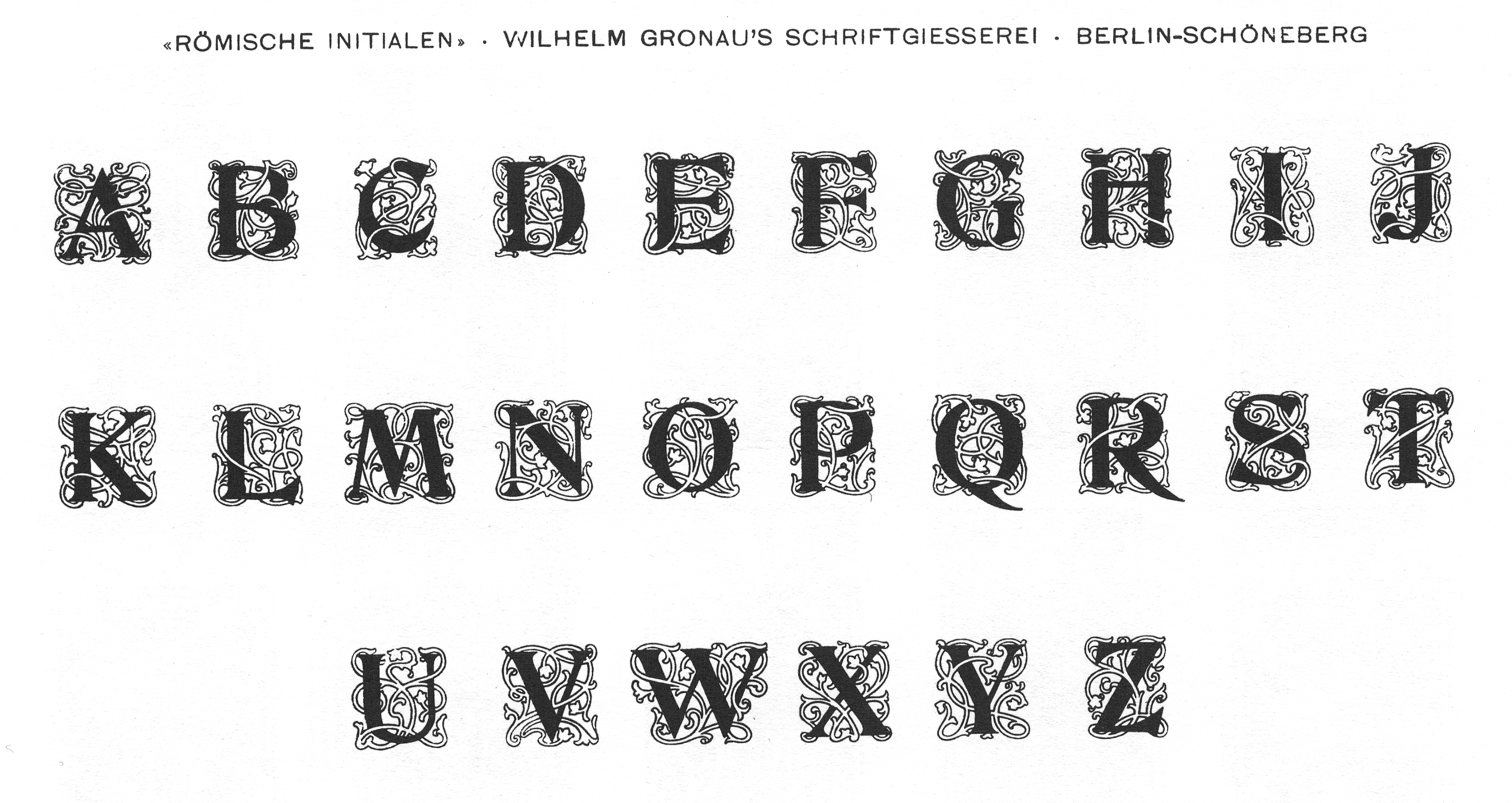
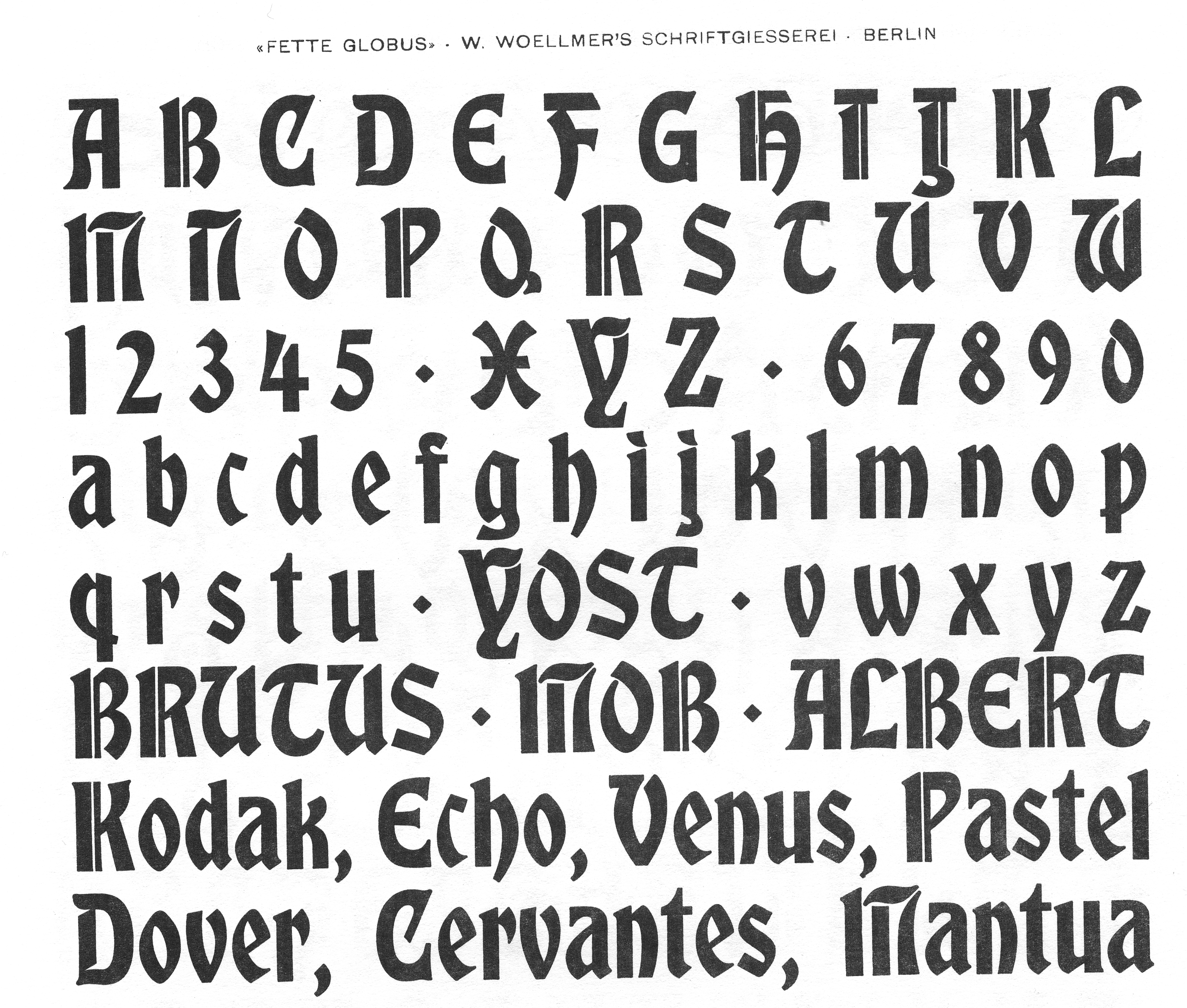
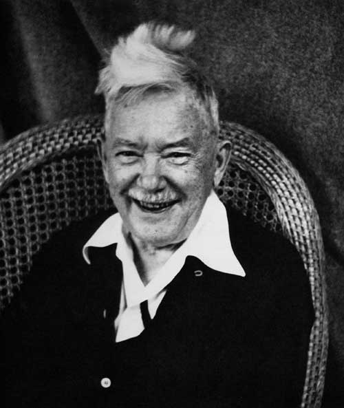
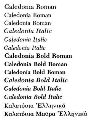
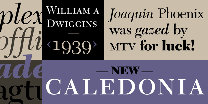
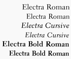
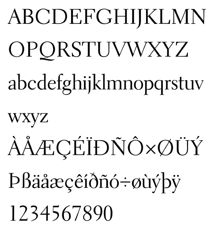
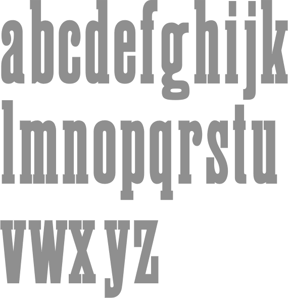
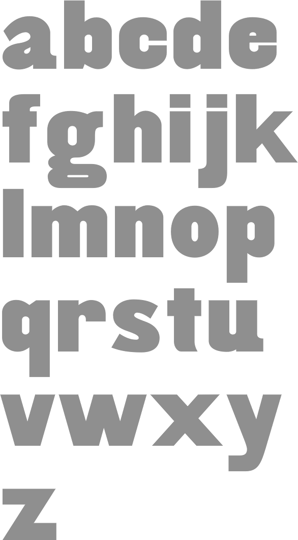
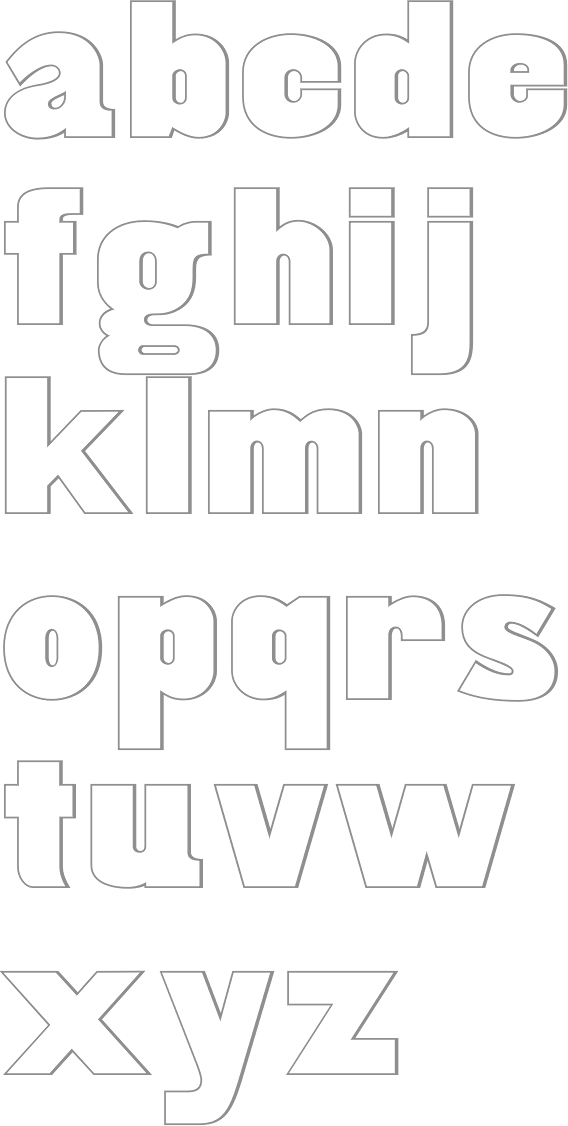
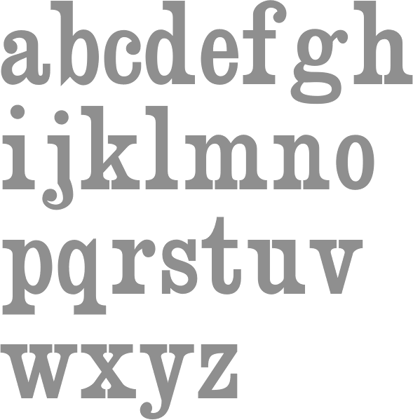
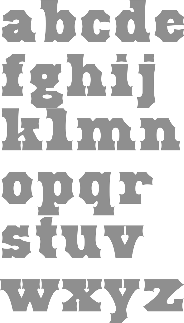
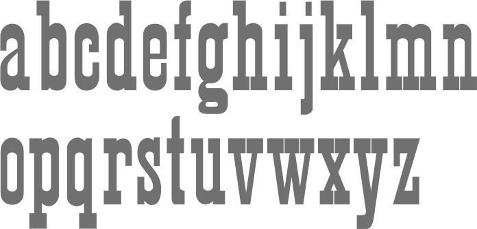
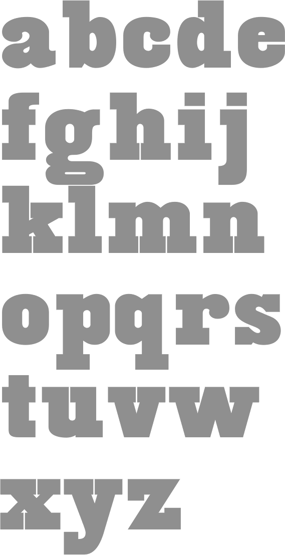
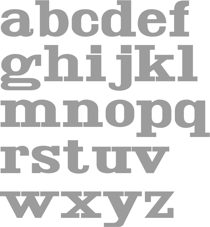
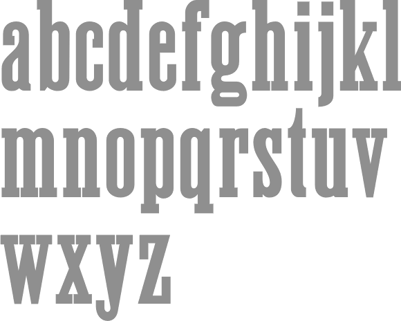
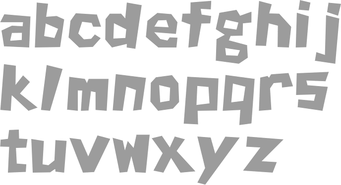
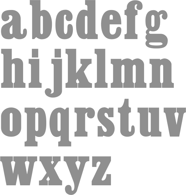
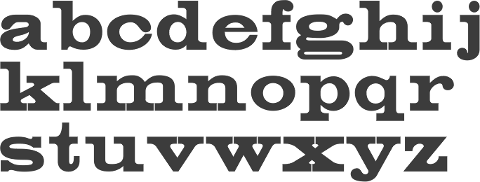
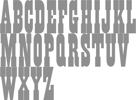
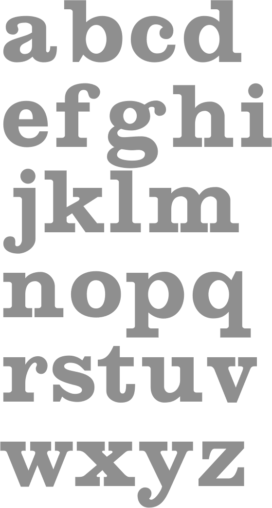
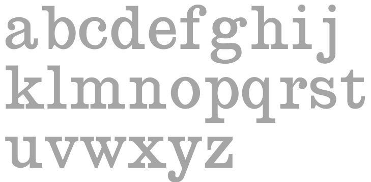
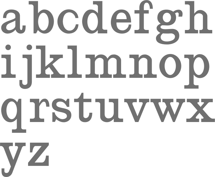
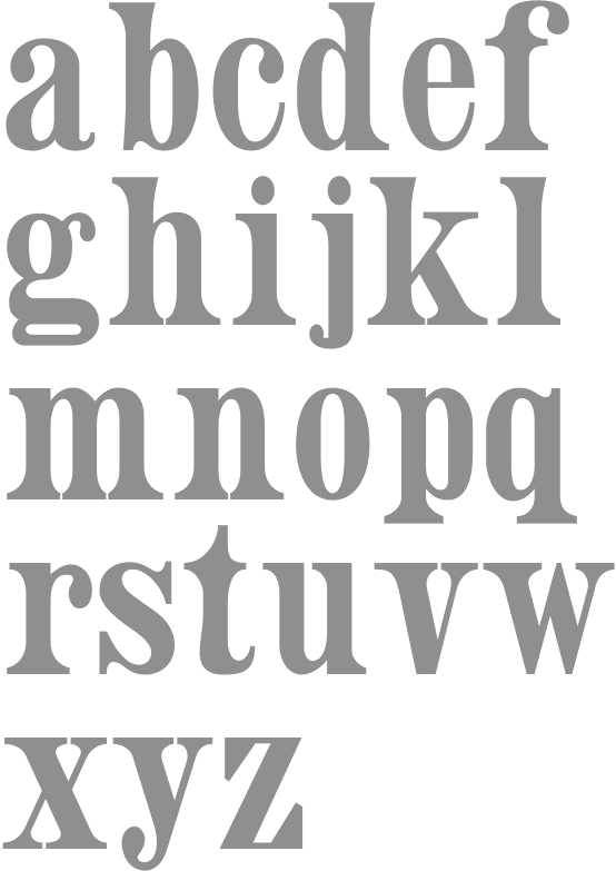
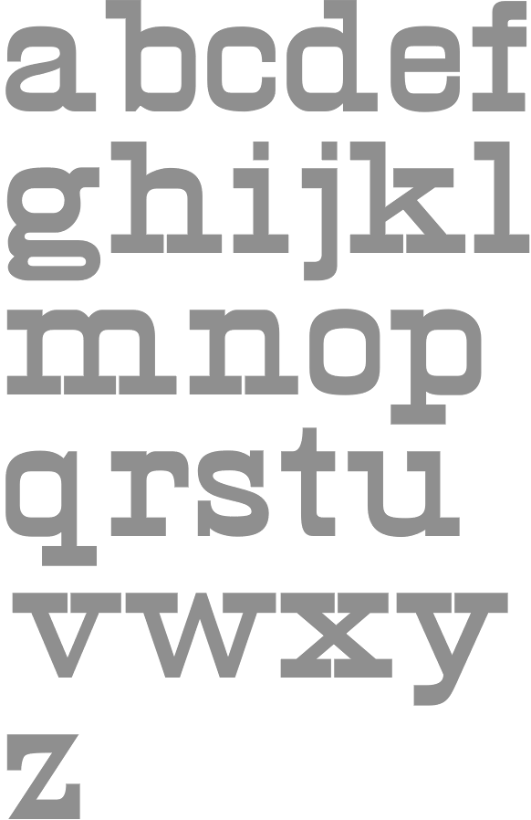
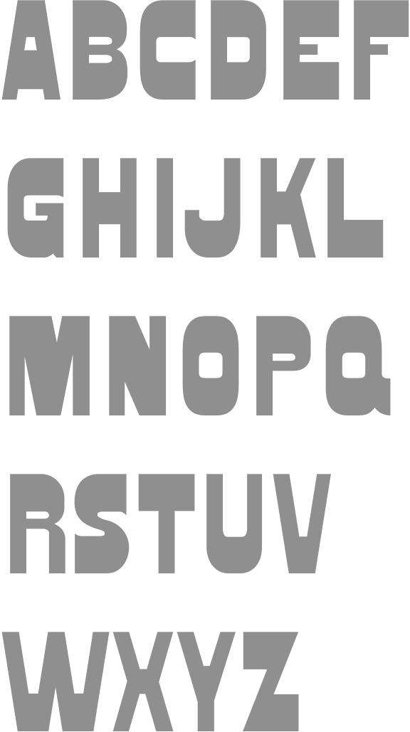
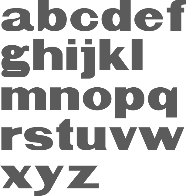
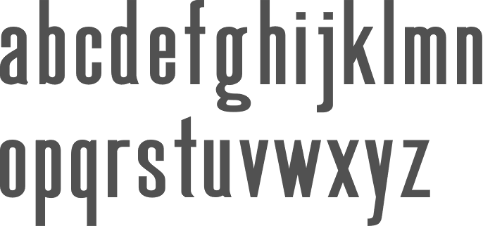
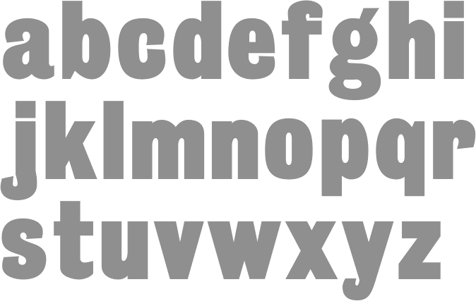
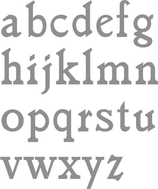
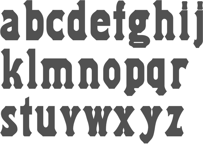
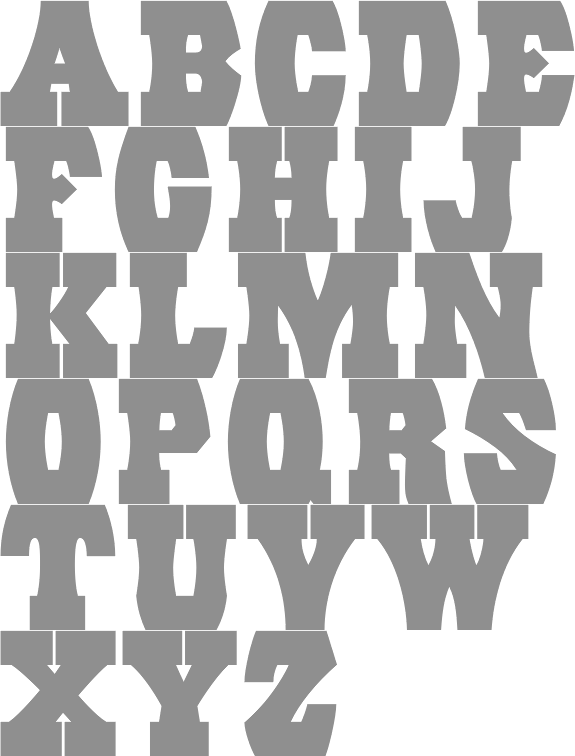
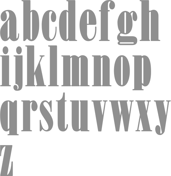
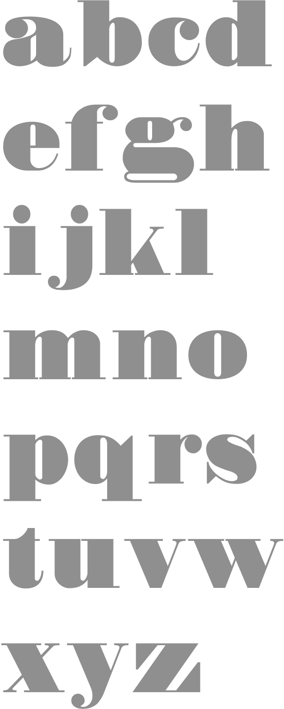
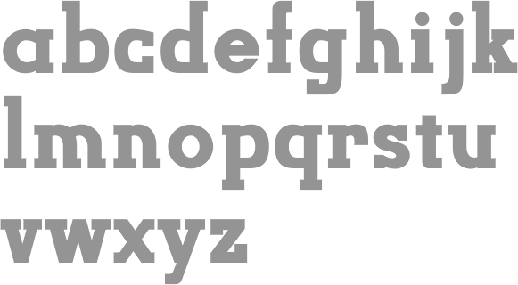
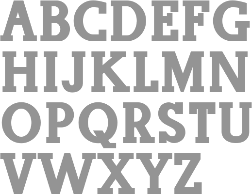
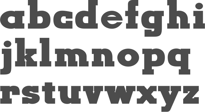
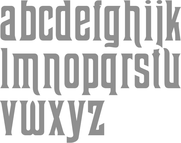
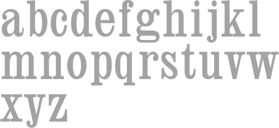
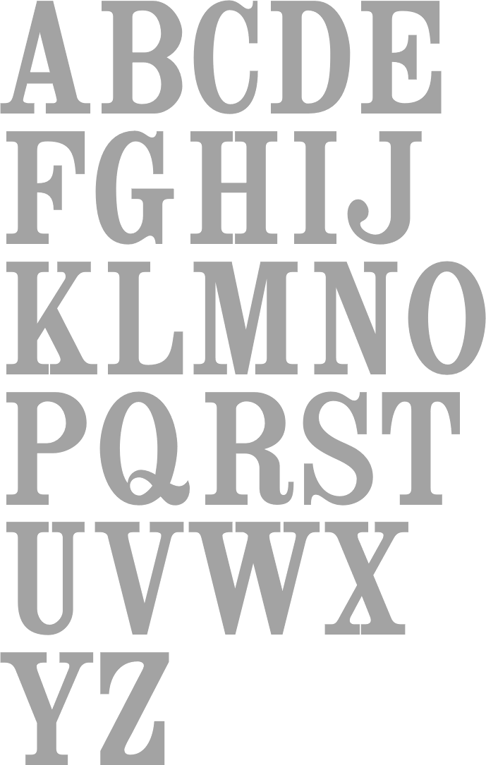
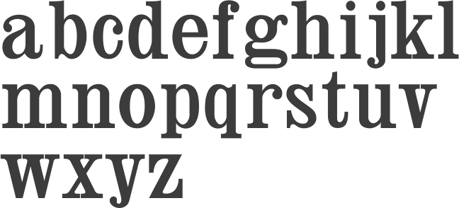
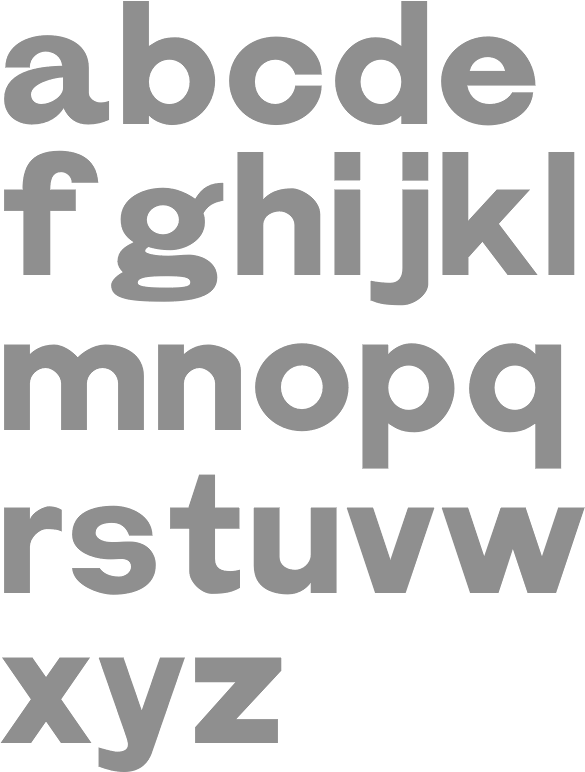
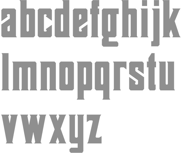