TYPE DESIGN INFORMATION PAGE last updated on Mon Jul 20 20:45:03 EDT 2026
FONT RECOGNITION VIA FONT MOOSE

|
|
|
|
|
The Chilean type scene | ||
|
|
|
|

SWITCH TO INDEX FILE
Chilean designer who created the fat rounded typeface Rumbo (2009, Tipos de Cartagua) while studying type design at the University of Chile. [Google] [More] ⦿ | |
Los Angeles, Chile-based designer of Ego Font (2015). Behance link. [Google] [More] ⦿ | |
Designer of the connected monoline Lovely Script (2013) which was developed during a course given by Daniel Hernandez and Paula Nazal in Santiago, Chile. [Google] [More] ⦿ | |
Graphic designer in Concepcion, Chile, who created, together with Valentina Aufiero, Leo Colalillo, Francesca Sperti, and Natale Ventre at Politecnico di Milano, the hybrid typeface Gill Trump (2012). Behance link. [Google] [More] ⦿ | |
| |
Chilean designer of the angular script typeface Balzac (2015, Rodrigo Typo) and its degraded verson Balzac Dirt (2017, with Rodrigo Araya). [Google] [MyFonts] [More] ⦿ | |
Chilean codesigner with Javier Quintana of dfd Nueva Estadio (2009, Andez). Graduate of UTEM in Santiago, 2009. [Google] [More] ⦿ | |
Graphic designer in Santiago, Chile, who created the textura typeface Espinosa (2013). [Google] [More] ⦿ | |
Santiago, Chile-based designer of Hollywood Hills (2018). [Google] [More] ⦿ | |
| |
Alexis Navarro Miranda
| |
Graphic designer in Granada, Spain, who created the slab serif typeface Limon in 2015. [Google] [More] ⦿ | |
| |
Chilean type foundry, est. 2019 by Pedro Gonzalez and Isabel Gatuslao. Their typefaces include Qualta (2019). [Google] [MyFonts] [More] ⦿ | |
Valparaíso, Chie-based designer of the angular sans typeface family Rinhatype (2019). [Google] [More] ⦿ | |
During her studies at Universidad del Desarrollo in santiago, Chile, Amaya Haddad designed a squarish modular typeface (2017). [Google] [More] ⦿ | |
Digital designer in Santiago, Chile, who created the bilined display typeface Ms. Sheen (2016) and the squarish modular typeface Block (2016). [Google] [More] ⦿ | |
Andez
|
|
Chilean designer (b. 1990) of the destructionist typeface Vibrate Letters (2006). Home page. Another URL. [Google] [More] ⦿ | |
Chilean designer who created the comic book style typeface Roux (2009, Tipos de Cartagua) while studying type design at the University of Chile. [Google] [More] ⦿ | |
Andrea graduated from Universidad Tecnológica Metropolitana de Santiago de Chile in 2007. For the type design course there, Andrea created the kitschy typeface Kitscha. [Google] [More] ⦿ | |
Graphic designer in Santiago, Chile. In 2015, she created the handcrafted typeface Roux. Behance link. [Google] [More] ⦿ | |
Andreas Lindholm
| |
Santiago, Chile-based designer of the heavy all-caps marker typeface Tinta (2014). Behance link. [Google] [More] ⦿ | |
In 2014, Andres Reyes was studying in Santiago (Chile). He created Condorcan Qui (2014), a free experimental font that is inspired by the Andina art and culture from Peru and Bolivia. [Google] [More] ⦿ | |
Puerto Montt, Chile-based designer (b. 1987, Puerto Montt) of the modular squarish typeface Proteina (2011, Mendooza Vergara). [Google] [MyFonts] [More] ⦿ | |
During his studies at UDD, Andres Tagle Ruiz-Tagle (Santiago, Chile) designed the modular monoline sans typeface Tagle (2016). [Google] [More] ⦿ | |
Chilean type designer. In 2017, he published the brush script typeface family Notorious at W Foundry. It comse with a bunch of great extras. [Google] [MyFonts] [More] ⦿ | |
Angélica (b. 1982) graduated from Universidad Tecnológica Metropolitana de Santiago de Chile in 2007. For the type design course there, she created the ornamental caps typeface Tirana. The name comes from the fiesta de la Tirana. Dafont link. [Google] [More] ⦿ | |
Designer (b. 1989, Chile), who created the beautiful angular comic book typeface Buffonta, (Tipos de Cartagua, ca. 2009) while studying type design at the University of Chile. [Google] [More] ⦿ | |
| |
Graphic designer in Arica, Chile, who created the signage typeface Peru Chicha (2017). [Google] [More] ⦿ | |
Chilean designer who created the rounded signage typeface Panadería in 2009 at Tipos de Cartagua while studying at the University of Chile. [Google] [More] ⦿ | |
Chilean type designer who graduated from Universidad Tecnológica Metropolitana de Santiago de Chile. At Esos tipos de la UTEM, one can download dfdDefensa (2009), a gothic angular face. [Google] [More] ⦿ | |
Valparaiso, Chile-based creator of the modular sci-fi font Arsistyle (2013). [Google] [More] ⦿ | |
Chilean typography professor at Universidad Diego Portales, Chile. [Google] [More] ⦿ | |
BeJota
|
In 2016, Bruno Jara Ahumada, Alfonso Garcia, Luciano Vergara, Daniel Hernandez and the Latinotype Team designed the roman square capital headline typeface family Assemblage. With Luciano Vergara, he designed the angular Jurassic park style typeface Los Lana Niu (2016). In 2018, inspired by Herb Lubalin's ITC Serif Gothic, Jorge Cisterna and Bruno Jara co-designed the layerable font family Lumiere at Latinotype. Typefaces from 2019: Galeria (Latinotype: a monoline slab serif typeface inspired by modern art gallery buildings, museums and cultural centers where organic forms and straight lines predominate). In 2019, Jorge Cisterna and Bruno Jara developed the vintage layerable typeface Blackberry (Los Andes). Blackberry is inspired by vintage packaging and old fashion ads. It has woodtype characteristics such as angular serifs, and light and diagonal curves. Typefaces from 2020: Diablito One (a two-font and four dingbat-font package by Rodrigo Araya Salas and Bruno Jara Ahumada), Galpon Pro (a great vernacular signage and/or comic book typeface for Latin, Greek and Cyrillic; with Rodrigo Araya Salas), Skippie (a comic book family by Andrey Kudryavtsev, Rodrigo Araya Salas, Bruno Jara Ahumada and Franco Jonas, and four sets of dingbats including Skippie Monster Lucha Libre and Skippie Monster Halloween). Typefaces from 2021: Rhein (an 18-strong rounded monoline sans family with a gorgeous inline style), Loyola Next (a 14-style sans by Rodrigo Araya Salas and Bruno Jara Ahumada), Showcase Sans (as part of a custom job for Vino Licensioso; this project includes sexy icons), Konstanz (an 8-style Bauhaus-inspired sans family), Picaflor (a titling or children's book typeface by Rodrigo Araya Salas and Bruno Jara Ahumada), Picaflor Soft (a fine national park or children's book family of organic sans fonts by Rodrigo Araya Salas and Bruno Jara Ahumada). Typefaces from 2022: Garvo and Garvo Poster (6 styles each; based on old Hollywood movie posters, vintage film credit designs; Garvo pays homage to Herb Lubalin's Serif Gothic font and is named after Greta Garbo). Linkedin link. [Google] [MyFonts] [More] ⦿ |
Chilean codesigner (with Dominique Tetzner) of the icon typeface Pictos Latinos, which won an award at Tipos Latinos 2014. In 2015, she published the serif typeface Manola from her new home in New York City, as well as the text typeface Ramiro and the angular italic typeface Violeta, which were created during her studies at Type@Cooper. Behance link. [Google] [More] ⦿ | |
Santiago, Chile-based designer (b. 1986) of Plumon (2007). Dafont link. [Google] [More] ⦿ | |
Benjamin Müller (b. 1997, Chile) created the following free typefaces in 2013: Müller (hand-printed), Hernan Heise (straight-edged and with contrast). [Google] [More] ⦿ | |
Benjamin Rivera (b. 1987, Santiago, Chile) created the alchemic typeface Paihuen Mapuche (2013), which was inspired by native symbologies. Dafont link. [Google] [More] ⦿ | |
Beraka Fonts
| Chilean designer (b. 1985) who lives in Tamuco. His typefaces:
About Me page. Devian tart link. Gumroad link. [Google] [More] ⦿ |
| |
A group of South American type designers. Their first typeface family is Bowie (2016), which was developed by Leonidas Loyola, Valentina Vega, Rodrigo Fuenzalida, Cesar Araya and Bruno Jara, under the supervision of Dany Berczeller, Daniel Hernandez and Luciano Vergara. This polygonalized type grew out of a cooperation between Bercz Team and Latinotype (Chile). [Google] [MyFonts] [More] ⦿ | |
Chilean designer of an animal alphabet in 2016. [Google] [More] ⦿ | |
Brainreactor--GyoDea
| Techno and futuristic fonts by Andreas Lindholm (from Bromma, Sweden; now in Stockholm and Santiago, Chile) such as Aerospace, BumbleBee, Calculator, Crystopia, Decoder, Dominator (2000), Elastica, Futuremark, Infaith, Intergalactic, Neodream, Neutronica, Octane, Pornomania, Prenoptica, Prologik, Reactivator, Ultimate Survivor, Viagra, Virus, Survival, Propaganda, Booster. Mac and PC. Fonts sold by Mindcandy. Alternate URL. His future typefaces are shown here. Dafont link. [Google] [MyFonts] [More] ⦿ |
| |
Bruno Jara Ahumada
| |
Multimedia designer in Santiago, Chile. Creator of the Mapuche [native people in Chile] display typeface Kewen (2013). [Google] [More] ⦿ | |
Chilean designer of Frititas (2008, a fat comic book and/or signage face; Tipos de Cartagua) who studied type design at the University of Chile. [Google] [More] ⦿ | |
Graphic designer in Santiago, Chile, who created the handcrafted typeface Amanita (2016). Behance link. [Google] [More] ⦿ | |
Camila Labatut is a graphic designer from the Diego Portales University (2008), in Chile. She interned in Madrid, Spain, at OMB DESIGN. She worked at the Gonzalez design study, headed by Chilean graphic designer Cristián González, while teaching classes on branding at the Diego Portales University, and the Mayor University in Santiago, Chile. In 2011, she created her own graphic design and illustration study: Elias & Labatut, together with the Chilean designer Barbara Elias were they worked for one year. In 2012, she was based in New York, USA where she finished the type design program at The Cooper Union. At he Type @ Cooper program in 2012, Camila Labatut designed Menu. [Google] [More] ⦿ | |
Santiago, Chile-based designer of the angular typeface Desertica (2018). [Google] [More] ⦿ | |
At Universidad Tecnologica Metropolitana in Santiago, Chile, Camila Torres designed Calada Display (2019) with Josefa Almarcegui, Vicente del Pedregal, Andres Aburto, Eduardo Tobar, Juan Pablo Hernandez, Bana Aeasanz, and Deivid Suid y Truenos. [Google] [More] ⦿ | |
In 2019, Santiago, Chile-based Samuel Flores and Camilo Castillo co-designed the grungy typeface Splash (2019). [Google] [More] ⦿ | |
Santiago, Chile-based designer of the Peignotian typeface Starling Light (2014), which was a school project. Flickr page. [Google] [More] ⦿ | |
Designer at tipografia.cl in Santiago de Chile, who designed TCatomica. [Google] [More] ⦿ | |
Carolina graduated from Universidad Tecnológica Metropolitana de Santiago de Chile in 2007. For the type design course there, she created the slightly grungy outline typeface Bicifont. [Google] [More] ⦿ | |
Santiago, Chile-based creator of the curly Victorian pre-art nouveau typeface Valencia (2013). [Google] [More] ⦿ | |
Designer in Santiago, Chile, of the cursive typeface Begonia (2014). [Google] [More] ⦿ | |
At Rodrigo Typo, Carolina Santana (Chile) designed the display typeface Fedora (2015). [Google] [MyFonts] [More] ⦿ | |
Santiago, Chile-based creator of a partial ornamental caps alphabet (2013). [Google] [More] ⦿ | |
Casiopea (PUCV)
|
One sub-project is the Hospital signage project started in 2011 by Sofia Savoy and Gley Riquelme in Santiago. This led to a free sans typeface Hospital, and an accompanying Hospital Icons font. Both are graphic design graduates from Pontificia Universidad Católica de Valparaíso, or PUCV. |
Santiago, Chile-based designer of the modular pixelish typeface Abc (2015). [Google] [More] ⦿ | |
Santiago, Chile-based designer of Alicia (2016), a typeface that is based on Carroll Lewis's Alice in Wonderland tale. [Google] [More] ⦿ | |
Graphic designer in Santiago, Chile. Creator of the straight-edged fuinky poster typeface Groso (2015). [Google] [More] ⦿ | |
César graduated from Universidad Tecnológica Metropolitana de Santiago de Chile in 2007. For the type design course there, he created Tarucafont based on ancestral culture found in the Andes region. [Google] [More] ⦿ | |
Check out Biblioteca (2015) by Roberto Osses, Cesar Araya, Patricio Gonzalez and Diego Aravena: this typeface won an award at Tipos Latinos 2016. In 2017, Sergio Ramirez, Cesar Araya and the Latinotype Team developed the information design super-large typeface family Informative (+pictograms as a tribute to Gerd Arntz: Informative Alimentation, Informative City, Informative Energy, Informative People, Informative Politics, Informative Sports, Informative Work). In 2016, Cesar Araya and Daniel Hernandez co-designed the very Latin / curvy / warm slab serif typeface family Hernandez Niu. In addition, Bercz Design Studio, Latinotype Team, Rodrigo Fuenzalida, and Cesar Araya co-designed the expressive typeface family Snatch, which comes with Snatch Dingbats. In 2019, Cesara Araya and Fadhl Waliy Haqq published the didone variant Bunta. Together with Alfonso Garcia, Cesar Araya designed the spurless sans family Branding SF (2019, Latinotype). Typefaces from 2020: Organetto (at Latinotype: a 50-style all caps headline or poster typeface based on early 20th century examples), Spock (2020: a 48-style demi-sans demi-slab family by Luciano Vergara, Cesar Araya and Rodrigo Fuenzalida), Corporative Slab (developed together with the Latinotype team, it is characterized by asymmetric roof slabs on the lower case x and y). [Google] [MyFonts] [More] ⦿ | |
Chago Toro
| |
| |
Chilean designer of the Chilean sign language font Alfabeto LSCH (2020). [Google] [More] ⦿ | |
Graphic designer and illustrator in Santiago, Chile, who created the sturdy sans typeface Porota in 2017. [Google] [More] ⦿ | |
Studio in Santiago, Chile. Designer of the text typeface Blanes (2014). Behance link. [Google] [More] ⦿ | |
Clean and Modern
|
In 2013, he designed Lindot by combining lines and dots. Behance link. [Google] [More] ⦿ |
Chilean design blog with occasional type news. [Google] [More] ⦿ | |
| |
Graphic designer in Santiago, Chile, who graduated from Universidade de Chile. She created the free Google Web Font Inika (2012) about which she writes: Inspired by Easter Island and its Rapa Nui language and culture, this typeface captures the essence of an island located in Chile, full of mystery, sacred places and stories of the past. Inika means ink in the Rapa Nui language, and it represents the tradition of the rongo-rongo writing, used by people on the island thousands of years ago. Klingspor link. Google Plus link. [Google] [More] ⦿ | |
Constanza graduated from Universidad Tecnológica Metropolitana de Santiago de Chile in 2007. For the type design course there, she created the organic typeface Pomaire, which was named after a picturesque and rustic village. [Google] [More] ⦿ | |
During her studies in Chile, Constanza Cadiz designed Rockabilly (2019) by adding spurs to Rockwell. [Google] [More] ⦿ | |
Chilean graphic design student. She created the calligraphic typeface Estival (2009, Tipos de Cartagua) while studying type design at the University of Chile. [Google] [More] ⦿ | |
| |
| |
Contrafonts (or: Frutitype; was: Sindicato de la Imagen, or: Cooperativa de Fundicion Tipografica)
|
Contreras won awards at Tipos Latinos 2008 for Romances (an exquisite calligraphic family) and Epístola. Other typefaces: LTT Jara, LTT Ferretería. He wrote a thesis at the Faculty of Architecture of the University in Chile in 2007 entitled Diseño de fuentes tipográficas, basadas en los libros integramente caligrafiados por Mauricio Amster en Chile. In 2011, he cofounded Los Andes Type, and published the octagonal typeface Fierro (2011) there. Typefaces not mentioned above include TCL Suma (2011), La Chimba (2010) and Nomono (2011, after an alphabet designed by Chilean illustrator Cristobal Schmal). He founded Contrafonts. Promptly, the medieval / uncial wedge serif all caps typeface CF Santiago won an award at Tipos Latinos 2018. In 2020, Joaquin Contreras and Miguel Hernandez Montoya set up Archetypo.xyz from their new base in Germany. They co-designed AA Actual Mono (2020: monospaced, in 10 styles). In 2021, Contreras set up Frutitype in Germany. At Frutitype, he released Cobre (a sans) in 2021. |
Chilean designers of the sans typeface Zap. [Google] [More] ⦿ | |
Santiago, Chili-based designer (b. Santiago, 1977) of the display typefaces Tosca (2005, Egyptian), RotulaCG and of Paquidermo (2003). He created Origen (2002-2003), about which he writes: "Origen is a sexy soft typeface that not only cares about legibility in small sizes but also the particularity each character has at 24pts. or more. It was created from a logo designed for a potter whose work is based on simple and friendly forms developed from the origin." Origen can be bought at Union Fonts. He has been working on El Chino (2004, a stencil type). He studied Graphic Design at the Finis Terrae University, graduating in 2001. In 2002 he continued his studies at the Typography Diploma in Pontificia Universidad Catolica de Chile, where he started Origen. He now works as an art director in Ce Diseña, one of the most important firms of global branding in Chile, and as an independent designer for several artistic projects. [Google] [More] ⦿ | |
Cristián graduated from Universidad Tecnológica Metropolitana de Santiago de Chile in 2007. For the type design course there, he created the ultra condensed fat display typeface Mafiosa, which was based on the logotype of the film El Padrino (The Godfather). [Google] [More] ⦿ | |
As a student at the Universidade de Chile in Santiago, Cristian Maureira created the techno typeface Nexus (2014). [Google] [More] ⦿ | |
Talca, Chile-based designer of the super-extended typeface Crwon (2015). [Google] [More] ⦿ | |
Art director in Santiago, Chile, who created the hand-printed typeface FeaFont (2014). [Google] [More] ⦿ | |
Cristóbal graduated from Universidad Tecnológica Metropolitana de Santiago de Chile in 2007. For the type design course there, he created the white-on-black experimental typeface Ona (inspired by the people of Tierra del Fuego). [Google] [More] ⦿ | |
| |
Buin, Chile-based graphic designer, who made the stencil typeface Winuk in 2019. [Google] [More] ⦿ | |
Chilean designer of Bahia Chica (2009, Tipos de Cartagua), a free rounded hand-printed face. [Google] [More] ⦿ | |
| |
Chilean codesigner (with Leonidas Loyola) of the display typefaces LD Info and LD Picto, which won an award at Tipos Latinos 2014. [Google] [More] ⦿ | |
Daniel Hernandez
| |
Daniel Peralta Casanova
| |
Santiago, Chile-based designer of Cyberpunky (2016). [Google] [More] ⦿ | |
Editorial designer in Santiago, Chile, who created the typeface Mangai (2014). The Mangai typeface incorporates design elements of Rapa Nui (Easter Island). It has inverted contrast and a lot of Latin oomph, and is used in a Rapa Nui newspaper. [Google] [More] ⦿ | |
Chilean designer of the text typeface Mangai Regular, which won an award at Tipos Latinos 2014. [Google] [More] ⦿ | |
Chilean type designer who graduated from Universidad Tecnológica Metropolitana de Santiago de Chile. At Esos tipos de la UTEM, one can download her curly ornamental typeface dfdLastarria (2007), named after Barrio Lastarria. [Google] [More] ⦿ | |
Daniela graduated from Universidad Tecnológica Metropolitana de Santiago de Chile in 2007. For the type design course there, she created the cute curly thin-lined hand-printed face Fantasia. [Google] [More] ⦿ | |
Student designer of the headline typeface Preludium (2012). Daril is based in Concon, Chile. [Google] [More] ⦿ | |
FontStructor from Santiago de Chile, aka El Buga, who made Super Local (oblique techno face) and Pixo Pixel Type (pixelized pixacao typeface) in 2013. FontStruct link. [Google] [More] ⦿ | |
Santiago, Chile-based designer (b. 1982) of the plumbing dingbat typeface GasfiterbarreraNormal (2004). Home page. [Google] [More] ⦿ | |
Designer in Santiago, Chile, who created the handcrafted pen brush typeface HandLetter (2015) and the handcrafted Flaka (2015). Download links: i, ii. Behance link. [Google] [More] ⦿ | |
Valparaiso, Chile-based designer (b. 1992) of the dadaist, or paper cut, typeface Valparaletra (2014) and of Blocking (2014, FontStruct). Home page. [Google] [More] ⦿ | |
In 2018, he designed Armin Grotesk (W Foundry: it pays homage to Armin Hoffmann, one of the prominent designers in the Swiss genre). In 2019, he released Friends at W Foundry, a 14-style modern sans characterized by a gaspipe lower case f. Typefaces from 2020: Moncler (+Variable; a 22-style all caps modernist font family), Armin Soft. Typefaces from 2021: Cassius (a 10 style garalde family with two additional variable fonts; it is characterized by the lower case a and s which appear to be vomiting). Typefaces from 2022: | |
Student at Escuela de Diseño, UTEM (Universidad Tecnológica Metropolitana) in Santiago, Chile. Her final project for professors Roberto Osses, Javier Quintana and Rodrigo Valenzuela involved the development of the structured typeface Ornatica (2011). [Google] [More] ⦿ | |
| |
Located at the Pontificia Universidad Catolica de Chile, this school offers a Diploma en tipografía. Its professors include type designers and typographers such as Rodrigo Ramírez, Luis Antonio Rojas, Francisco Gálvez, and José Soto. Other link. [Google] [More] ⦿ | |
Designers in Santiago de Chile of a family of typefaces, TS Mapa (2004), for the transit system in Santiago, transantiago: TSInfoOblicua, TSInfoRegular, TSMapaGruesa, TSMapaLigera, TSMapaOblicua, TSMapaParche, TSMapaRegular, TSTroncal, TSZonas. [Google] [More] ⦿ | |
Diego Aravena Silo
| |
Santiago, Chile-based designer of the slab serif typeface Quad (2016). [Google] [More] ⦿ | |
Santiago, Chile-based art director. In 2015, he designed the free vector format brush typeface Cabron. In 2016, he added the free handcrafted typeface Sueltaa (2016). [Google] [More] ⦿ | |
Santiago, Chile-based designer of the hipster typeface Fonica (2017) during his studies at the University of Chile. [Google] [More] ⦿ | |
| |
Chilean designer of the lively typeface José (2011). [Google] [More] ⦿ | |
Chilean codesigner (with Belén La Rivera) of the display typeface Pictos Latinos, which won an award at Tipos Latinos 2014. [Google] [More] ⦿ | |
Duo Type
|
|
Eduardo Araya (Arica, Chile) created the free squarish sans typeface Manteka (2012). [Google] [More] ⦿ | |
Graphic designer in Valparaiso, Chile, who created the vintage typeface Hostil (2014). [Google] [More] ⦿ | |
Chilean designer (b. 1994), aka adderou, who created the hand-printed typeface Dudu Calligraphy (2013). Dafont link. [Google] [More] ⦿ | |
| |
Santiago, Chile-based designer of the blocky native pattern-themed typeface Renacer (2016). [Google] [More] ⦿ | |
In 2017, Juan Pablo de Gregorio and Eleonora Lana added Isabel Condensed and Isabel SemiCondensed. In 2019, the Letritas team and Eleonora Lana co-designed the rounded sans typeface Delfino. Still in 2019, she designed the chubby round sans typeface Duddy. [Google] [MyFonts] [More] ⦿ | |
In 2014, she created the script typeface family Consuelo, which includes a set of ornaments, and added Grota Sans (jointly with Daniel Hernandez) to the Grota typeface system. Grota Sans won an award at Tipos Latinos 2016. Grota Sans Rounded followed in 2015. In 2016, Latinotype published the 32-style Corporative Sans Round Condensed, which was developed by Elizabeth Hernandez and Rodrigo Fuenzalida, under the supervision of Luciano Vergara and Daniel Hernandez. Typefaces from 2017: Catrina (expressive typeface family, with a Handmade subfamily). Typefaces from 2019: Jazmin (a classy mini-serifed typeface in 16 styles), Magdalena (inspired by Globe Gothic, a renaming of the earlier Magnolia). Typefaces from 2020: Juana (Latinotype: this decorative sharp-edged serif family evolved from Jazmin). Typefaces from 2021: Hernandez Bros (by siblings Daniel and Eli Hernandez: a 7-style sharp-edged serif family loosely based on Bulfinch by William Martin Johnson (1903, ATF)). [Google] [MyFonts] [More] ⦿ | |
In 2014, he created the slightly flared slab serif family Clasica (Latinotype), which was inspired by Zapf's Optima. Triump (2014, Latinotype) is a relatively simple rounded sans that comes witha nice inline for titling. Typefaces from 2015: Triump Rough (a full range of 26 textured weathered typefaces), Clasica Sans (contrasted sans with oh so slightly flared stems). Typefaces from 2016: Isidora (a warm Latin sans, extended in 2019 to Isidora Soft). Typefaces from 2017: Isidora Sans (a 28-style reworking of Isidora), Javiera (a geometric sans with humanist elements thrown in). Typefaces from 2018: Emy Slab (an Egyptian with soft terminals). Typefaces from 2019: Goldplay (based on Isidora Sans), Monckeberg (a fashion mag sharp-edged serif family). Typefasces from 2020: Grobek (32 styles; a soft serif with negative diagonal stress and inward curling terminals), Winden (a 28-style classical slab serif, partially based on Isidora). [Google] [MyFonts] [More] ⦿ | |
Designer in Santiago, Chile. In 2005, he made a dingbat face consisting of logos and icons often seen in Chile, called Boliche. [Google] [More] ⦿ | |
Esos tipos de la UTEM
|
|
Valdivia, Chile-based designer (b. 1996) of the hand-printed typeface Yasna's Hand (2016). [Google] [More] ⦿ | |
| |
Santiago, Chile-based designer of the angular display or poster typeface Albo (2018). [Google] [More] ⦿ | |
Graduate in graphic design from Universidad Tecnológica Metropolitana de Santiago de Chile. At Esos tipos de la UTEM, he created the free font Miliciana (2008), a (unicase) militant poster face. He co-manages Esos tipos de la UTEM. DFD Miliciana was used in the bulletin El Patriota, órgano oficial de las milicias rodriguistas, which circulated during the military regime in Chile by the Frente Patriótico Manuel Rodríguez (FPMR). Dafont link. Aka alpuerto. [Google] [More] ⦿ | |
| |
Aka Felipe Felipe. Graphic designer from Santiago, Chile, who made the origami typeface MyTypo (2012). [Google] [More] ⦿ | |
Felipe Cáceres
| |
In 2007, Moisés Arancibia and Pablo González set up SMOG (or: Santiago Motion Graphics). There, Moisés Arancibia designed about 12 free display typefaces. For many of these, Felipe Cáceres helped out with the final production. These typefaces include Alpaca (a slab face), Mafia (an experimental face), Mokeka (a display face), Matas (a display face), Central (a display face), Chacon (a black rounded face), and Bikini (a squarish face). [Google] [More] ⦿ | |
| |
Chilean creator of the inky hand-printed Pipe Font 2 (2013) and of the garffiti font Metalero80 (2015). Dafont link. [Google] [More] ⦿ | |
Santiago, Chile-based designer of the geometric solid typeface Reticular (2015). [Google] [More] ⦿ | |
Felipe (b. 1984) graduated from Universidad Tecnológica Metropolitana de Santiago de Chile in 2007. For the type design course there, he created Tabon. Tabon is a squarish and almost labyrinthine typeface that was inspired by the textile patterns in the Mapuche culture. Home page. [Google] [More] ⦿ | |
Santiago, Chile-based designer of the hipster font Tamburini (2013). [Google] [More] ⦿ | |
Felipe graduated from Universidad Tecnológica Metropolitana de Santiago de Chile in 2007. For the type design course there, he created an informal display typeface for the sea-sick, Cueca. [Google] [More] ⦿ | |
Felipe Navarro
| |
Felipe Pimentel
| |
Felipe Sanzana
| |
Chilean designer of Calefont (comic book style, ca. 2009, Tipos de Cartagua) who studied type design at the University of Chile. [Google] [More] ⦿ | |
Aka Felipe Millón. Chilean type designer (b. 1984) who graduated from Universidad Tecnológica Metropolitana de Santiago de Chile. At Esos tipos de la UTEM, one can download his graffiti brush typeface Chasquilla (2007). For the type design course there, he created the funky display party typeface Qué Fontita (free at Dafont). Dafont link. Fontsy link. [Google] [More] ⦿ | |
Designer in Antofagasta, Chile, who created an alchemic typeface in 2012. Cargo collective link. [Google] [More] ⦿ | |
Santiago, Chile-based designer of the elegant display typeface Dartipo (2013), which was created during his studies. [Google] [More] ⦿ | |
Chilean designer of La Choly, a signage typeface that won an award at Tipos Latinos 2008 in the non-text typeface category. Her Rakatan Negra (2011) is a comic book typeface that can be had for free at Andez. At Tipos Latinos 2012, Flora Argemí won an award in the display type category for Perejil. [Google] [More] ⦿ | |
Arica, Chile-based student-designer of the experimental Morrofont (2017). [Google] [More] ⦿ | |
Fragtype
|
Klingspor link. Abstract Fonts link. Behance link. Kernest link. YWFT link. Creative Market link. MyFonts link. Dafont link. Another Behance link. Google Fonts link. [Google] [MyFonts] [More] ⦿ |
Fragtype
|
Typefaces from 2022: Budare (a geometric display sans in 16 styles that marries Bauhaus with hipsterism; Albornoz: its design is based on the shape of the wrought iron plate used in Venezuela and other countries to make arepas and other food). [Google] [MyFonts] [More] ⦿ |
Talcahuano, Chile-based designer of the native symbolism font Mapuche (2013). [Google] [More] ⦿ | |
Francisca Garrido is from Santiago, Chile. She studied type design and typography at FADU UBA (University of Buenos Aires), where her graduation work consisted of the connected signage script typeface Victoria (2012). [Google] [More] ⦿ | |
Francisca Reyes
| |
Santiago, Chile-based designer of the decorative Victorian typeface Vintage Barber (2019). [Google] [More] ⦿ | |
Chilean designer of the hybrid typeface Hibrida (2017), which was a school project at Universidad de Valparaiso. [Google] [More] ⦿ | |
| |
Santiago, Chile-based designer of the pixacao-inspired Alquitran Stencil and Alquitran Rust (2018, at Rodrigo Typo; with Rodrigo Araya Salas and Andrey Kudryavtsev). See also Alquitran Family (2019). [Google] [MyFonts] [More] ⦿ | |
In 2018, Santiago, Chile-based Francisco Niño, Beluu Saavedra and Daniel Rivera co-designed the free monoline script typeface Alzada Street. [Google] [More] ⦿ | |
Chilean digital artist. Creator of the blocky ultra fat typeface Fat Ass (2010) at Fontstruct. Behance link. [Google] [More] ⦿ | |
Franco Jonas
| |
| |
Frncojonastype
|
In 2017, he and Rodrigo Araya Salas (Rodrigo Typo) co-designed the meaty sans display typeface Loyola Pro and the comic book typeface Pintanina. At W Foundry, he published Platz Grotesk (2017). Typefaces from 2018: Squick (a comic book / children's font family by Franco Jonas, Andrey Kudryavtsev and Rodrigo Araya), Glatt, Tobi Pro (with Rodrigo Araya Salas and Andrey Kudryavtsev at Rodrigo Typo), Loyola Round Pro (by Rodrigo Araya Salas and Franco Jonas), Nuby (with Rodrigo Araya Salas and Andrey Kudryavtsev at Rodrigo Typo). His text typeface Ticerz won an award at Tipos Latinos 2018. In 2018, together with Ale Navaro and Raul Israel, he set up The Compania Tipografica de Chile, where he promptly published Passiflora (2018), a unicase rounded brush font inspired by facade inscriptions co-developed with Valentina Pino. Ding (2018) is a great fattish cartoon font that was co-designed by Rodrigo Araya Salas, Andrey Kudryavtsev and Franco Jonas. See also its extension, Ding Extra (2019). Typefaces from 2019: Fonty (a creamy script), Clarence Alt (a an almost bubblegum children's book sans by Franco Jonas, Rodrigo Araya Salas and Andrey Kudryavtsev), Nacho (a Mexican party font by Rodrigo Araya and Franco Jonas), Ryman Gothic (2019, by Diego Aravena Silo and Franco Jonas at W Foundry: inspired by Edwin Allen's wood types and Morris Fuller Benton's gothics). Typefaces from 2020: Clarence Inline (a plump informal typeface family by Rodrigo Araya Salas and Franco Jonas Hernandez), Ancoa Slanted (an angular display family in 15 styles; by Andrey Kudryavtsev, Rodrigo Araya Salas and Franco Jonas Hernandez), Skippie (a comic book family by Andrey Kudryavtsev, Rodrigo Araya Salas, Bruno Jara Ahumada and Franco Jonas, and four sets of dingbats including Skippie Monster Lucha Libre and Skippie Monster Halloween), Ancoa (an angular 19-style layerable typeface by Andrey Kudryavtsev, Rodrigo Araya Salas and Franco Jonas Hernandez). Typefaces published at Frncojonastype:
|
| |
Chilean designer who created the comic book style typeface Ovoido in 2009 at Tipos de Cartagua while studying at the University of Chile. [Google] [More] ⦿ | |
Santiago, Chile-based designer of the modular typeface Haro (2017). [Google] [More] ⦿ | |
Based in Rennes, France, Gael Le Guirinec created the display typeface Neo Bright in 2013 in a workshop with Yohanna My Nguyen. [Google] [More] ⦿ | |
| |
Chilean designer of the free cigar box font Fabula (2015). [Google] [More] ⦿ | |
Santiago, Chile-based designer of an outlined hexagonal typeface in 2015. [Google] [More] ⦿ | |
Born in Santiago, Chile, Giannina Magnani now lives in London, UK. During her studies at University of Hertfordshire, she designed the blood crip font Bloody Nightmare (2017). [Google] [More] ⦿ | |
Creator from Santiago, Chile, of typographic underwear in 2011. [Google] [More] ⦿ | |
Gley Riquelme
| |
Valparaiso, Chile-based designer of the signage typeface A Golpe De Pincel (2013). Behance link. [Google] [More] ⦿ | |
Art director in Santiago, Chile. Designer of these free mural or graffiti fonts in 2021: Vivaracho, Cambucho, Flacucho, Sucucho. [Google] [More] ⦿ | |
Creator of the paper cut typeface Vulka (2011), which can be downloaded here. Home page. Gonzalo is a designer in Santiago, Chile. [Google] [More] ⦿ | |
Temuco, Chile-based designer of the angular typeface Toothpick (2017). [Google] [More] ⦿ | |
Santiago, Chile-based designer of the Latin / Cyrillic display typeface Velove (2017), which takes inspiration from the 1970s. In 2011, Gonzalo Murillo and Sebastian Hanson co-designed the psychedelic typeface Copihue for a school project. [Google] [More] ⦿ | |
Chilean designer of Ronea Regular (2008), a winner in the Tipos Latinos 2008 competition for best text family. [Google] [More] ⦿ | |
Grey Albornoz
| |
During his graphic design studies in Santiago, Chile, Guillermo created some pixel typefaces (2013). [Google] [More] ⦿ | |
Abel (2012, Latinotype) is a dingbat typeface that reinterprets the artistic expression of the Mapuche people in Chile, rescuing the handmade stroke they embodied to textiles and pottery, this time in a fresh way to use contemporary patterns. It has contemporary "mapuche" patterns. Ride My Bike (2012, Latinotype) is a hand-printed headline typeface family that comes with a fun Dingbat style. The font was designed by her in bed while she was recovering from a bicycle accident. The hand-printed Bon Appetit family (2012, +Dingbats) would be perfect to illustrate a breakfast with Agatha Christie in a remote British village. Other typefaces from 2012 include the dingbat fonts Dans Le Jardin and Dans Le Noël. Typefaces from 2013: In a Jar (hand-lettering, Latinotype), Four Seasons (handwritten, with Luciano Vergara), Dans Le Toilette (sic), Love Story (with Luciano Vergara, Latinotype: a hairline upright Valentine's Day script), Love Story Dingbats. Typefaces from 2014: Macarons, DIY Time (hand-printed, with Luciano Vergara at Latinotype), Ride My Bike Serif. In 2015, she made the 26-font typeface family Boho (Latinotype; in Script, Sans, Serif and Dingbats styles) and Go Gipsy (Latinotype: a wild calligraphic script). Typefaces from 2016: Touch Me (by Coto Mendoza and Luciano Vergara: in Script and Sans versions; the script is based on Coto's unique experimental calligraphy; she calls this one "tribal chic"), Bikini Season (Script and Sans, by Coto Mendoza and Luciano Vergara), Indigena (Latinotype: indigenous Chilean "mapuche" style dingbats). In 2017, Latinotype published her swashy Namaste Script and accompanying all caps typeface Namaste Sans. Its motivation: Namaste is the perfect choice for wellness, healing and therapy oriented products. Its smooth shape and soft curves allow the user to create beautiful designs for essential oils, bath salts, quartz crystals, mindfoodness, candles, incense and aromatherapy products packaging. Typefaces from 2018: Coiffeur (a fashion script by Guisela Mendoza and Luciano Vergara at Los Andes). [Google] [MyFonts] [More] ⦿ | |
During his studies in Santiago, Chile, Gustavo Castillo designed the barbed wire typeface Quipu (2015). [Google] [More] ⦿ | |
| |
Hernández Type (was: Estudio de diseño Calderón)
|
|
Graphic designer in Santiago, Chile. For a school project at UC, he created the modular techno typeface Modem Unicase (2016). [Google] [More] ⦿ | |
Chilean type designer. Award winner at Tipos Latinos 2010 for his text typeface Fedora. Chilca (2015) won an award at Tipos Latinos 2016. MuMono (2015), a text typeface co-designed by Sergio Leiva Whittle, Horacio Mella and Magaly Salvo Solari, won an award at Tipos Latinos 2016. [Google] [More] ⦿ | |
HowJoyful Studio
| Crestine, CA-based Joy Kelley (b. Chile) designed these script typefaces in 2017: Joyful Letters, Darling Letters, Bold Lady, Amapola, Stand & Roam. Creative Market link. [Google] [More] ⦿ |
Santiago, Chile-based creator of the sans typeface Fetiche (2013). [Google] [More] ⦿ | |
Graphic design professor at UBB (Chile). He conceived a modular type called Makana (2008). [Google] [More] ⦿ | |
Talcahuano, Chile-based designer of the tattoo / gothic typeface Codice Gothic Unicase (2011). [Google] [More] ⦿ | |
Santiago, Chile-based designer of the handcrafted pop art typeface Andy Warhol (2015). [Google] [More] ⦿ | |
Santiago, Chile-based designer of Nacha Clarendon (2014), a pixelized Clarendon. [Google] [More] ⦿ | |
Ignacio Meza
| |
Santiago, Chile-based graphic designer, b. 1989. Home page. He created the free typeface Puntua Display (2009). [Google] [More] ⦿ | |
Chilean designer of the vertically-striped typeface Katrün 30 (2013). [Google] [More] ⦿ | |
Santiago, Chile-based designer of the poster typeface Bovino (2017). [Google] [More] ⦿ | |
Irina Mir
| Aka Sudowoodo. This designer shares the same name as a famous Russian movie actress, Irina Petrovna Miroshnichenko. MyFonts locates her in Chile, while Megapixl (a clipart site) places her in Valdivia, Russia, which makes no sense at all as Valdivia is a city in Chile. In 2020, she released the ustav-inspired Latin / Cyrillic typeface Kirillik. [Google] [MyFonts] [More] ⦿ |
Irina Miroshnichenko
| |
Isabel de Gregorio
| |
| |
At Without Foundry in Chile, Isabel La Rivera designed the connected slightly irregular script typeface Paprika (2017). Fontown link. [Google] [MyFonts] [More] ⦿ | |
| |
Copiapo, Chile-based designer of the sans typeface No Bad Days (2016), which was inspired by Gotham and Montserrat. Behance link. [Google] [More] ⦿ | |
Chilean creator in Santiago of Melipilla (2013). Behance link. [Google] [More] ⦿ | |
Chilean designer of Asdafdasg (2014, hand-printed typeface). [Google] [More] ⦿ | |
| |
Graphic designer in Concepcion, Chile, who created the curvy vernacular typeface family Betta in 2016. [Google] [More] ⦿ | |
Graphic designer in Santiago, Chile, who created a Halloween font called Calabazo (2012). Behance link. [Google] [More] ⦿ | |
Javier Quintana Godoy
| |
Santiago, Chile-based designer of a typographic elephant poster called Maltrato (2015). [Google] [More] ⦿ | |
Javiera Baeza (Santiago, Chile) designed the eroded serif typeface Rouillé in 2013. [Google] [More] ⦿ | |
Chilean designer of the pixel typefaces Doll Pixeellowzz (2016) and Flower Pixellowzz (2016). Dafont link. [Google] [More] ⦿ | |
As a student in Universidad Mayor de Chile, Bogota, Colombia-based Jefferson Baquero created the Victorian typeface Colonial (2016). [Google] [More] ⦿ | |
During her studies, San Bernardo, Chile-based Jessica Faundez designed the über-curly Peluches Script (2017). [Google] [More] ⦿ | |
Chili-based designer of the artificial language font Daxanese (2021). [Google] [More] ⦿ | |
JNP Studio
|
In 2017, he designed the dynamic hand-printed Boluda. Behance link. Behance link for JNP Design. Creative Market link for JNP Studio. [Google] [More] ⦿ |
Joaquín (jko) Contreras
| |
During her design studies in Santiago, Chile, Johana Vergara created the all caps display typeface Quijote (2013). [Google] [More] ⦿ | |
Chilean graphic designer, b. 1986. Creator of the delicate display font Fragile Beta 02 (2007). Student in Santiago at Universidad Tecnológica Metropolitana. Blog. [Google] [More] ⦿ | |
Chilean type designer (b. 1984) who graduated from Universidad Tecnológica Metropolitana de Santiago de Chile. At Esos tipos de la UTEM, one can download The Go Font (2008), an ultra fat credit card typeface with hints of art deco. He also made Bleeding Heart (2009, handpainted). Abstract Fonts link. [Google] [More] ⦿ | |
| |
In 2011, he cofounded Los Andes Type, and published the mural and/or poster font Muralista there. In 2012, he published the beautiful bold round typeface Altiplanica. In 2015, Jorge Cisterna published the humanist sans typeface Brocha (32 styles, Latinotype), the low contrast slab serif typeface Decour, Decour Soft, and the humanist sans typeface Blanc at Latinotype. Typefaces from 2016: Taberna (a vintage copperplate style family based on design trends in bar signage, liquor packaging and street wear; with Rodrigo Fuenzalida), Queulat (Latinotype: a slab serif), Queulat Condensed, Cover Sans (Latinotype), Queulat Soft. A humanist geometric typeface family in which every stroke ending is horizontal or vertical. Typefaces from 2017: Fibra (Los Andes: a beautiful geometric sans designed for display; advertized as avant-garde, although in my view there are slightly too many curves for that label to apply), Weekly (a semi slab serif), Atlan (at Latinotype; with Daniel Hernandez). A geometric sans typeface family. In 2018, inspired by Herb Lubalin's serif Gothic, Jorge Cisterna and Bruno Jara co-designed the layerable font family Lumiere at Latinotype. Other typefaces from 2018: Cagliari (Latinotype; a display didone with high contrast, based on his earlier typeface Queulat), Recoleta (Latinotype), Fibra One (Los Andes: a display sans). In 2019, Jorge Cisterna and Bruno Jara developed the vintage layerable typeface Blackberry (Los Andes). Blackberry is inspired by vintage packaging and old fashion ads. It has woodtype characteristics such as angular serifs, and light and diagonal curves. Typefaces from 2020: Kenac (a serifed text typeface with a negative optical axis). Typefaces from 2021: Brutalista (a 14-style sans inspired by the architectural brutalist style). Behance link. Link to his studio, Edwards Asociados. [Google] [MyFonts] [More] ⦿ | |
Chilean designer, who created the comic book style typeface Ofertón in 2009 while studying at the University of Chile. [Google] [More] ⦿ | |
Santiago, Chile-based designer of the starred typeface Domino (2014). [Google] [More] ⦿ | |
Chilean co-designer of fj Trance (2020, a reverse contrast Egyptian by Rodrigo Araya Salas, Franco Jonas, Valentina Faundes and Jorge Morales Salas). [Google] [MyFonts] [More] ⦿ | |
In 2013, he designed the tall narrow typeface Metropolis. [Google] [More] ⦿ | |
Santiago, Chile-based designer (b. 1991) of the handwriting fonts Jose Fernandez (2008) and Tomas Massu (2008). [Google] [More] ⦿ | |
Art director in Santiago, Chile. At Universidad Diego Portales, he designed the squarish typeface NIN Pro Font (2016), where NIN stands for Nine Inch Nails. [Google] [More] ⦿ | |
José Alberto Big Beraka Lobos
| |
At Tipos Latinos 2012, Mexican type designer José Manuel López Rocha won an award for his text typeface Xallitic. He worked at Fontstage and studied at CE Gestalt, and lives in Xalapa, Mexico. His test typeface Gorgias won an award at Tipos Latinos 2014. His text typeface Phonos won an award at Tipos Latinos 2018. He is a member of Fontstage and a contributing designer at PampaType foundry. For better typography for American native languages, he has worked on a typeface for the Mixe language, in a project for developing typographic solutions for Woun-Meu in Colombia and is currently working in a type family for Mexican languages, for the National Institute of Indigenous Languages. Speaker at ATypI 2017 Montreal. [Google] [More] ⦿ | |
Graduate of Diego Portales University who hails from Santiago, Chile. He develops fonts at Dalton Maag in London since 2013. [Google] [More] ⦿ | |
Chilean graphic designer. He has designed a number of typefaces in 2010: Alfa Slab (based on Thorowgood's 1821 typeface Six Lines Pica Egyptian) and Ahoy (a vintage font). As Capitan Leniz on FontStruct, he made a number of pixel typefaces, such as Titulo, Jolo12 and Jolo16. In 2011, he made a number of free typefaces at Google Web Fonts:
Fontsquirrel link. [Google] [More] ⦿ | |
José graduated from Universidad Tecnológica Metropolitana de Santiago de Chile in 2007. For the type design course there, he created the inline typeface Trobadores. [Google] [More] ⦿ | |
Designer at and cofounder of tipografia.cl in Santiago de Chile, who designed TCLantillanca, TCLexpendio, TCLhueaitas (dingbats and borders by Kote Soto and Tono Rojas), TCLpapas, TCLmapocho. Also called Kote Soto. Art director of Teknoland Chile. [Google] [More] ⦿ | |
José graduated from Universidad Tecnológica Metropolitana de Santiago de Chile in 2007. For the type design course there, he created the display typeface Chichen Type. [Google] [More] ⦿ | |
Joy Kelley
| |
In 2016, Google Fonts published the free Latin / Bengali signage font Galada (2015). It is based on Pablo Impallari's Lobster (for Latin). The Bengali was developed as a studio collaboration by Jeremie Hornus, Yoann Minet, and Juan Bruce at Black Foundry in France. Github link. [Google] [MyFonts] [More] ⦿ | |
Juan Pablo Bello
| |
Juan Pablo de Gregorio
| |
Juan Pablo De Gregorio Concha
| |
Graphic designer in Santiago, Chile. He created the experimental typeface Selknam (2009). His inspiration was the Selk'nam or Onas, an indigenous people from Tierra del Fuego (now extinct) and their initiatory rites for adolescents. The typeface was designed using FontStruct. Selknam Unicase followed in 2013. Home page. Dafont link. Behance link. [Google] [More] ⦿ | |
Santiago, Chile-based designer of the skateboarding font family Movskate (2016, with Rodrigo Araya and Patricio Gonzalez). [Google] [More] ⦿ | |
In 2012, he made Stickerman Bad Times, Rock X Start TFB, Aespiro TFB, Perspectivo TFB (3d face), Desgarvuda (textured face), Estancofida TFB (textured face), LEDisplay TFB, Restroom Signs TFB, Chinese Cally TFB, Discontinuo, Suast Ornad TFB (a textured face), Scoolar TFB (3d face), Katakana TFB, Hiragana TFB, Dragons TFB, Arrows TFB, Old Retro Keys TFB, Pycuaf, Pycuafodi, Dragon Ball TFB, Escaned (texture face), Chess TFB, Seagram TFB, Army Weapons TFB, Stamp Seal TFB, Logos TFB, Scripto TFB, Another Ornaments TFB, Vintage Auto Cars TFB, Simple (a monoline sans), Travesia TFB (information design dings), Music TFB (dingbats), Xmas Cartoon, Wings of Wind TFB, Mickey M TFB, Pincel Handwrite, Jigsaw Pieces TFB, Valentines Day TFB (heart dingbats), Proportional TFB (squarish sans), Stars TFB, Working Signs TFB, Signs Language TFB, Ornaments Labels and Frames, Snowflakes TFB, Christmas Nativity TFB, Chinese Zodiac TFB, Zodiac TFB, Only Skulls, Calendar Note TFB, Sports TFB (sports silhouettes), Old Retro Labels TFB, 11 Vator TFB, Xmas TFB (Christmas dings), Trees TFB, Clothing Logos TFB, Dirty Sweb, Can Dog TFB, Ornaments, Finger Print, Kitty Kats TFB, Batman Logo Evolution TFB, Light TFB (avant garde sans), Digital Display TFB (LED face), Skullx (dingbats), Tribal Tattoo (dingbats), Klingon, The Meme Font (dingbats), Rongorongo (a system of glyphs discovered in the 19th century on Easter Island), Strangferfixcs, Hotel Transilvania and Frankenwine. Typefaces made in 2013: Pudahuel Sans, Variada TFB (simple circle-and-arc-based sans), Estorea TFB, New LED Board TFB, Rayada TFB (textured face), New Barcode Font TFB, Estrellas TFB (stars), Estrellass (sic) TFB, Spirits Dots Drinks, Mero Ornad TFB (fishnet textured), Toolz TFB, New Stencil TFB, Logocarsbats TFB, Caritons TFB (smilies), Illustrations TFB (scanbats), Edgebat TFB (knives), Crossbats TFB (crosses), Abstrec TFB (organic sans), Frames TFB, BitxMap Font TFB, Austera Simple TFB, Traffic Signs TFB, Extranger Sol TFB, Rifle Bats TFB, New X Digital TFB (LED typeface family), Dasgastada TFB, El Alambre TFB, Punk Not Dead TFB, Triangled TFB, Noxtrey Auf TFB, Cross LED TFB (+Bold), Cursi Extra TFB, Hearts Shapes TFB, Ornamentsss TFB, Eggfaces TFB, Orniste TFB, Shadded TFB (sic) (shadow face), Spoghetti Western (sic) (Italian Far West face), Groovy Font (shaded), Fireguns TFB (dingbats), Only Revolver TFB (dingbats), Aeg Flyon Now (condensed sans), Espinuda TFB, T1 Logoso TFB, Social Logos TFB, Hearts and Flowers for valentines, Astrology Astrological TFB, Ornametss TFB, Astrology TFB, Old Ornaments, Old Foundry Prints TFB, Old seals TFB, English Two Line TFB (pearly alphabet from 1796), Amame TFB (dot matrix face), Fontesda TFB (sketched face), Flowers Dots Bats TFB, Queen Destroy TFB, Bicycle TFB (dingbats), Stone Army, Ancient Weapons TFB, Numismatic Bats TFB, Elizabethan Initials TFB, Anome Ibul, Big Daddy LED, Mavole Sinpo TFB (spurred), Dowted Remix TFB (dot matrix face), QR Font TFB, Another Barcode, Display Free TFB (LED face), Cadabra Debilex, Initials TFB, Music Logos TFB, Toxic Waste TFB, Ornad Dentro TFB, Logos and Logos TFB, Amore Mio, Hearts Shapes TFB, Another X Display TFB (dot matrix), Pro Display TFB (dot matrix), Juino Net, Quiwo Luse TFB, Aliencons Two, Cargante TFB, News Board TFB, Aliencons TFB, Barcode TFB, Birthday Balon TFB, Birds TFB (silhouettes), Le Fish (fish silhouettes), Motos TFB, Love You Too TFB (Valentine's day font), LED LCD 123, Noteame (fat sans), Badopus TFB (monoline script), Estrellado TFB, Love You TFB (Valentine's Day font), Cubs LED TFB (LED / dot matrix typeface), Text Inside TFB (textured face), Kuwa Ronmcie Q (circle-based face), Zebra TFB, Distrogrunge TFB, Carillas TFB (smilies). Another URL. [Google] [More] ⦿ | |
| |
Katya graduated from Universidad Tecnológica Metropolitana de Santiago de Chile in 2007. For the type design course there, she created the display typeface Rapa Nui which tries to revive the spirit of a mythical figure, Hombre Pájaro. [Google] [More] ⦿ | |
Art director in Santiago, Chile. Designer of the video game typeface Eating Pacman (2015). [Google] [More] ⦿ | |
Santiago, Chile-based designer of the free font Coliqueio (2016) that is steeped in mapuche culture. Behance link. [Google] [More] ⦿ | |
| |
KoNuS
| Chilean Felipe Navarro (KoNuS) is the designer of Harry Potter (2002), the rune font Tolkien (2001), graffiti style fonts Yahoo (2002) and MatrixCode (2003) and of the old typewriter font Counter-Strike (2003). [Google] [More] ⦿ |
Typefaces by him, made ca. 2005 include TCL Chanchocero, TCL Grafito (a school font done with Felipe Caceres), TCL Lila (with Tono Rojas) and TCL Mapocho. [Google] [More] ⦿ | |
La Unión de los Tipógrafos
|
|
View the Latinotype typeface library. View Miguel Hernandez's typefaces. Fontsquirrel link. [Google] [MyFonts] [More] ⦿ | |
Chilean type designer. In 2011, he cofounded Los Andes Type, and published the grungy script typeface Pantano there. [Google] [MyFonts] [More] ⦿ | |
Lemur
|
In 2019, she released The Thief Bird (a sans, perhaps for children's books). [Google] [MyFonts] [More] ⦿ |
Chilean type designer. Winner at Tipos Latinos 2018 of a type design award for Picarona. [Google] [More] ⦿ | |
| |
Santiago, Chile-based designer of the display typeface Tropezon (2014). [Google] [More] ⦿ | |
Chilean codesigner (with Daniel Berczeller) of the display typefaces LD Info and LD Picto, which won an award at Tipos Latinos 2014. Award winner at Tipos Latinos 2010 for his script typeface Elolinea. [Google] [More] ⦿ | |
Letritas
|
Letritas home page. Creative Market link. Dafont link. Klingspor link. Kernest link. Behance link. [Google] [MyFonts] [More] ⦿ |
Letritas
|
|
Illustrator and product designer in Santiago, Chile. Creator of the display typeface Sival (2011), for which she was inspired by the Silla Valdes chairs of architect Cristian Valdes. [Google] [More] ⦿ | |
In 2012, they published the monoline sans typeface Antartida. Antartida Rounded Essential (2013) is a rounded sans by Luciano Vergara for Los Andes Type. Behance link. [Google] [MyFonts] [More] ⦿ | |
| |
Luciano Vergara
| |
During his graphic design studies at ESAD Matosinhos, Porto-based Luis Abaladas created the soccer jersey typeface Chile (2013). [Google] [More] ⦿ | |
Luis Alberto Vargas Zuñiga
| |
Luis Rojas Herrera
| Tono Luis Rojas Herrera, or simply Tono Rojas, is a designer at and cofounder of tipografia.cl and Estudio Negro in Santiago de Chile. He designed TCLcachito, TCLemiliana, TCLestacion, TCLhueaitas (dingbats and borders by Kote Soto and Tono Rojas), TCLmechada, TCLripio, TCLsolobuses, TCL Lila (with Kote Soto). Also called Tono Rojas. [Google] [More] ⦿ |
Luzi Gantenbein
| |
Luzi Type
|
Luzi made the sans typeface Cadiz in 2013. Cadiz Italic was finished in 2014. Livorno (2013) is a sturdy round-serifed text typeface. In 2014, she created the masculine wedge serif typeface Beirut. In 2015 she finished the titling sans typeface Faro which has two sub-versions, Lucky and Sad. She also published Faro (a typeface that by virtue of stroke curvature emulates sadness or hapiness), Messina Modern, Messina Sans (+Mono), and Messina Serif. Typefaces from 2016: Assembly (a symbol archive for the globalized world), Lynstone (sans), Nantes (transitional text typeface), Koper (a rough woodcut typeface with polygonal outlines that were inspired by Vojtech Preissig). Typefaces from 2018: Recife (an editorial typeface inspired by Times and Plantin). Typefaces from 2019: Spezia (sans). Typefaces from 2021: Portonovo (a Garamond / Caslon style font based on the typeface used in the Martyrologium Romanum; a book printed by the Plantin Press in 1690), Termoli (a Scotch roman inspired by Linn Boyd Benton's Century Roman). Klingspor link. Behance link. Home page. Behance link for Luzi Type. Fontdeck link. Volcano Type link. [Google] [MyFonts] [More] ⦿ |
Chilean type designer who graduated from Universidad Tecnológica Metropolitana de Santiago de Chile. Award winner at Tipos Latinos 2010 for his script typeface Juanita la envidiosa. At Esos tipos de la UTEM, one can download her typeface Selfish Jean (2008), a condensed headline sans with some contrast. [Google] [More] ⦿ | |
Chilean designer of a modular typeface in 2017. [Google] [More] ⦿ | |
Santiago, Chile-based designer of Marla Display (2015). [Google] [More] ⦿ | |
Valparaiso, Chile-based designer of Quilpueina Sans (2018) for the city of Quilpue. [Google] [More] ⦿ | |
Macarena graduated from Universidad Tecnológica Metropolitana de Santiago de Chile in 2007. For the type design course there, she created Delata, an all caps face based on antique toys. [Google] [More] ⦿ | |
Santiago, Chile-based designer of the free alchemic typeface Moctezuma (2012). [Google] [More] ⦿ | |
Chilean type designer who graduated from Universidad Tecnológica Metropolitana de Santiago de Chile. At Esos tipos de la UTEM, one can download Revolucionaria (2009), a strong slab serif face, now available from Andez, where it was produced by Javier Quintana. [Google] [More] ⦿ | |
Chilean graphic and type designer who graduated from Pontifica Universidad Catolica de Chile in 2007. MuMono (2015), a text typeface co-designed by Sergio Leiva Whittle, Horacio Mella and Magaly Salvo Solari, won an award at Tipos Latinos 2016. [Google] [More] ⦿ | |
In 2016, she designed Becky for W Foundry: this friendly display family has subtly bent strokes and lightly inflated, pumped up counters. Her motivation: geared towards the world of advertising and retail [...] well-suited for large headlines, branding, logos, publishing and short texts. In 2017, she designed the 40-style all caps Americana typeface family Cenzo Flare at W Foundry. Tumblr link. [Google] [MyFonts] [More] ⦿ | |
Chilean designer (b. 1989) who created the beautiful Avant-Garde style geometric sans typeface Caprichosa WIP (2007) as well as Magdalena_Handwritting (2006). [Google] [More] ⦿ | |
Type blog by women for women, in Spanish. Run in Santiago de Chile by Bárbara Urrutia, María Paz Alvarado, Denise Gray, Camila Aravena and Paula Fuenzalida. [Google] [More] ⦿ | |
Metropolische (2012) is a font inspired by the French poster for Fritz Lang's Metropolis. Zentropa (2012) is based on the typography of Lars von Trier's film Europa. Mondo Cane (2012) is a sans typeface inspired by Mondo Cane (A Dog's World, 1962), a documentary written and directed by Italian filmmakers Paolo Cavara, Franco Prosperi and Gualtiero Jacopetti. Big Brother (2013, letterpress style) is inspired by the Big Brother poster typography from Michael Anderson's adaptation of George Orwell's "1984". Born in 1991, Marc Janet lives in Santiago, Chile. [Google] [More] ⦿ | |
Marcela Aguilera is a Chilean type designer and calligrapher. She graduated from the Santo Tomas professional institute in 2013, and has a post-graduate degree in Type Design from Universidad de Chile (2015) and a Masters in Advanced Type Design (2017) from EINA in Barcelona. She develops typefaces for Type-o-Tones with Laura Meseguer and Josema Uros, and for PeGGO Fonts with Pedro Gonzalez. In 2018, Pedro Gonzalez and Marcela Aguilera co-designed Orqquidea and Orqquidea Garden (dingbats). [Google] [MyFonts] [More] ⦿ | |
Chilean designer who created the display typeface Paila Marina (2009, Tipos de Cartagua) while studying type design at the University of Chile. [Google] [More] ⦿ | |
Marcela graduated from Universidad Tecnológica Metropolitana de Santiago de Chile in 2007. For the type design course there, she created the Indic atmosphere typeface Siddhartha, named after Siddhartha Gautama. [Google] [More] ⦿ | |
Chilean designer of the modular typeface Vitacura (2019, released by Rodrigo Typo). However, MyFonts claims that this font was designed by Rodrigo Araya Salas. [Google] [More] ⦿ | |
Santiago, Chile-based designer of Chaplin Actpr (2017). [Google] [More] ⦿ | |
| |
In 2017, he designed Diplome Script (a copperplate calligraphic script published by Latinotype). In 2020, he released the 18-style semi-calligraphic semi-Trajan typeface family Emperator at Latinotype. [Google] [MyFonts] [More] ⦿ | |
Behance link. [Google] [More] ⦿ | |
Marco graduated from Universidad Tecnológica Metropolitana de Santiago de Chile in 2007. For the type design course there, he created Sitar, an Indic simulation face. [Google] [More] ⦿ | |
Marcos Morales Cruz is the Curico, Chile-based designer of the hand-drawn titling font Box Project (2011). For the Chilean national soccer team, he proposed Cehachei in 2016. In 2017, he designed th informal monoline typeface Tipa Regular. Behance link. Newest Behance link. [Google] [More] ⦿ | |
Graduate of Universidad Pacifico in 2014. Santiago, Chile-based designer of the warm cursive font Afrodita (2014). [Google] [More] ⦿ | |
During her studies at Universidad del Desarrollo in Santiago, Chile, Maria Ignacia Pichara Galvez designed an octagonal modular typeface (2017) and the fun vernacular signage typeface Chicha Peruana (2017). [Google] [More] ⦿ | |
Designer in Santiago, Chile. She made Roho (2011, curly script) and Horror Type (2011, pixelish). [Google] [More] ⦿ | |
Designer in Santiago, Chile, who created the display typeface Anüm (2013). [Google] [More] ⦿ | |
Chilean designer who created the display typeface Playa Chica (2009, Tipos de Cartagua) while studying type design at the University of Chile. [Google] [More] ⦿ | |
| |
María graduated from Universidad Tecnológica Metropolitana de Santiago de Chile in 2007. For the type design course there, she created the handwriting-inspired italic typeface Libélula. [Google] [More] ⦿ | |
María graduated from Universidad Tecnológica Metropolitana de Santiago de Chile in 2007. For the type design course there, she created the "acrobatic" display typeface Pirueta. [Google] [More] ⦿ | |
Chilean type designer who graduated from Universidad Tecnológica Metropolitana de Santiago de Chile. At Esos tipos de la UTEM, one can download her typeface dfdAnimita (2007, organic, hand-printed). [Google] [More] ⦿ | |
Chilean photo manipulator. She designed Breakdown (2009, a Kafkaesque grunge face). [Google] [More] ⦿ | |
Chilean designer of Menú (2009, hand-printed; Tipos de Cartagua). [Google] [More] ⦿ | |
Santiago, Chile-based designer of the free art nouveau typeface Mandala (2013). In 2018, he published the De Stijl typeface Cuadrata. Graphicriver link. [Google] [More] ⦿ | |
Art director at Fluor Films in Santiago, Chile. FontStructor who made Russian (2010, constructivist) and Gordita type (2010, ultra fat). [Google] [More] ⦿ | |
| |
Graphic designer in Santiago, Chile, who created the handcrafted outline typeface Yael (2016). [Google] [More] ⦿ | |
Santiago, Chile-based designer of the thin avant-garde caps typeface Malice (2014). [Google] [More] ⦿ | |
Santiago, Chile-based designer of the display typeface Malice (2016). [Google] [More] ⦿ | |
Providencia, Chile-based designer of the thin marker font Metamorphosis (2016). [Google] [More] ⦿ | |
| |
Chilean type designer who graduated from Universidad Tecnológica Metropolitana de Santiago de Chile. At Esos tipos de la UTEM, one can download dfdCanibalisma (2007), which is described as a font for zombies. [Google] [More] ⦿ | |
Photo. Joaquin Contreras wrote a thesis at the Faculty of Architecture of the University in Chile in 2007 entitled Diseño de fuentes tipográficas, basadas en los libros integramente caligrafiados por Mauricio Amster en Chile. I quote from a talk given by Contreras in 2021: Mauricio Amster Cats is a leading Polish editorial designer who worked for 40 years in Chile as a publisher, potter, lettering artist and teacher. He published two books on graphic standards to support his classes at the school of journalism and design hundreds of books. Son of Jewish parents persecuted by the Nazi regime, as a young man he studied graphic arts in Germany. Together with his friend Mariano Rawicz he travelled to Spain to take part in the civil war. In Madrid he designed newspapers, pamphlets, posters and books, the best known being the Cartilla Escolar Antifascista, a study book for militiamen. As a refugee he travelled to Chile on the Winnipeg, a ship prepared by Pablo Neruda (Chilean poet, diplomat, winner of the Nobel Prize) where he arrived with his wife Adina, a Spanish bookbinder with whom he shared his life. In Chile he started out as an anarchist, but as time went by he became part of Chilean culture until he became probably the most important designer of the last century. [Google] [More] ⦿ | |
In 2020, Mauro Andres published Universo (+Stencil) at Peggo Fonts. This display font family includes a nice hairline weight. Universo was initially made for Caos Sagrados and was inspired by Aldo Novarese's style (Microgramma, Eurostile) and other retro-futuristic fonts and poster designs of the 1950s. The work was started in 2018. Typefaces from 2022: Hardbop (in eight ultra-condensed styles: Hardbop is a typographic system inspired by hardbop jazz. It is also inspired by the prolific graphic work of Reid Miles for the covers of Blue Notes Records in the '50s, Japanese jazz album covers of the '70s and condensed and grotesque hand painted signs). [Google] [MyFonts] [More] ⦿ | |
Santiago, Chile-based designer of the decorative typeface Perronegro (214). [Google] [More] ⦿ | |
Mauricio Vico
| |
Mavet Vergara (Valencia, Spain) co-designed Jach'a (2015), a textured typeface inspired by native Chilean patterns, together with Katherine S&aauml;nchez and Carla Vazquez during their studies at the University of Chile. Jach'a means tall and strog in Quechua. [Google] [More] ⦿ | |
Mendoza&Vergara
|
Vergara created these typefaces between 2004 and 2010: the sans typeface Conce (2004), Pepona (2006, T-26, a pixel face), Sketch (2008, T-26), Trauco (2006, T-26, a wonderful display face), Otto (2006, T-26, another pixel face), Roket U (2007, T-26, rounded anthroposophic unicase typeface) and Hisla Negra (2004), the serif typeface Patua (2003; Patua One is free at Google Web Fonts), the pixel typeface Xerif (2004), the pixel typeface Sinaptix (2004), the pixel typeface UNXERIF (2004), the pixel typeface Don Paul (2004, named after Paul Renner), the liquid display typeface Revolución (2006), the pixel family Renex (2004) and the pixel typeface O'Higgins (2003). At Latinotype (which Vergara co-founded with Daniel Hernandez in 2007), he created the dingbat typeface Chilean Bugs (2006) (free at Dafont), as well as Patua (serif), Regia (2008, hairline condensed sans). At FontStruct, he experimented with Flaca (2008). At his Flickr site, check out more commercial typefaces: Fidel (strong sans), Regia and Trasans (two light, even hairline, sans typefaces), Biotech, Working on a short-ascendered sans typeface called Midas (2010). Typefaces from 2011: Biotech, Cachiyuyo (a pixel family), Machi (titling sans), Los Lana Pro (an angular poster face; a stone age font), Fidel Black (a strong rounded sans, +Stencil Black), Patagon (Latinotype: a rounded wood-inspired poster typeface done with Miguel and Daniel Hernandez), Suisside (a humanist sans). Typefaces from 2012: Julius Sans One (Google Web Fonts), Pantano Pro (Pantano is a handmade grunge typeface inspired by the rustic style of Amazonia), Antartida (an 8-style family at Latinotype), Antartida Rounded (a rounded sans family), Kahlo (2012, Latinotype, designed for magazine headlines), Frida (Latinotype: a Latin style hipster sans typeface), Schwager (a steampunk slab serif, followed by Schwager Sans in 2014). Typefaces from 2013: Estandar (a wayfinding sans published by Latinotype; the Regular is free), Estandar Rounded, Moderna Condensed (+Unicase: an organic sans family), Four Seasons (handwritten, with Guisela Mendoza), Pasarela, Kahlo Rounded (Latinotype). Moderna (a monoline organic sans, with unicase styles thrown in). Antartida Rounded Essential (2013) is a rounded sans by Luciano Vergara, done for Los Andes Type. Typefaces from 2014: Estandar Rounded (by Vergara, a rounded sans in 13 styles named after Standard Oil Company), Garden (a playful decorative set of typefaces), Darwin (2014, a 20-font sans family with multiple fathers; see also Darwin Office, 2014, Darwin Pro, 2017, and Darwin Rounded, 2018), DIY Time (hand-printed, with Coto Mendoza at Latinotype). Typefaces from 2015: Nordikka (a headline sans with large x-height and a Scandinavian feel; Latinotype), Styling (a simple almost techno sans family inspired by the aerodynamic curves and elliptical shapes of old cars and airplanes). Corporative Sans, Corporative Sans Rounded and Corportaive are large typeface familes created by the Latinotype Team in 2015. In particular, they were developed by Javier Quintana and Cesar Araya, under the supervision of Luciano Vergara, and Daniel Hernandez. With Bruno Jara, Luciano Vergara designed the angular Jurassic park style typeface Los Lana Niu (2016). In 2016, Mendoza Vergara (Cecilia Mendoza, Coto Mendoza and Luciano Vergara) published the script family Bach and the script/slab pair Matcha at Los Andes. In 2016, Bruno Jara Ahumada, Alfonso Garcia, Luciano Vergara, Daniel Hernandez and the Latinotype Team designed the roman square capital headline typeface family Assemblage. In 2017, Luciano Vergara published Niemeyer as a tribute to Brazilian architect Oscar Niemeyer, and the modular---almost sci-fi---sans typeface family Nizzoli as a tribute to Marcello Nizzoli. He also designed the 28-style Internacional in 2017-2018, following the Swiss grotesque examples. Typefaces from 2018: Alvar (a humanist sans family at Los Andes; italics designed with the help of Alfonso Garcia), Resort (Sans, Script, Ornaments). In 2019, Luciano Vergara and Alfonso Garcia co-designed Moderna Sans at Latinotype. It is an interpretation of American gothics like Alternate Gothic. Typefaces from 2020: Abstract (an eclectic serif family with post-pandemic tensions and existential angst; by Luciano Vergara at Los Andes), Aestetico (Luciano Vergara, Daniel Hernandez and Alfonso Garcia: a 54-style sans family having Formal and Informal subsets of fonts so that the family covers several sans genres), Spock (2020: a 48-style demi-sans demi-slab family by Luciano Vergara, Cesar Araya and Rodrigo Fuenzalida), Neogrotesk. P>Typefaces from 2021: Grotesco (advertized as a South American grotesk; in 20 styles). Klingspor link. Dafont link. Behance link. View Lucian Vergara's typefaces. Fontspring link. [Google] [MyFonts] [More] ⦿ |
Michael graduated from Universidad Tecnológica Metropolitana de Santiago de Chile in 2007. For the type design course there, he created the severe squarish typeface Neque. [Google] [More] ⦿ | |
Before Latinotype, Miguel Hernandez created many pixel typefaces. The typefaces made in that period before 2007 include:
| |
| |
Santiago, Chile-based designer of the free typeface Aventine (2018). [Google] [More] ⦿ | |
Moisés Arancibia
| |
Mum Type
|
In 2014, he cofounded Without Foundry with Diego Aravena, and co-designed Without Sans (2015, by Felipe Sanzana and Diego Aravena). This large sans family is characterized by a large x-height and rhombic dots. In 2016, he published the large functional semi-humanist sans typeface family Sana Sans at Latinotype. Sana won an award at Tipos Latinos 2016. In 2018, he designed Helios Antique and Helios Stencil together with Salvador Rodriguez at W Foundry. Winner at Tipos Latinos 2018 of a type design award for Scratch TTM. Typefaces from 2021: Arp (a 10-style display sans with quirky ink traps and some contrast) and Arp Display. [Google] [MyFonts] [More] ⦿ |
The top typefaces at MyFonts from Latinotype, a foundry in Concepcion, Chile. [Google] [More] ⦿ | |
Nas Art
| Santiago, Chile (was: Maracay, Venezuela)-based designer of the grungy slimy typeface Flavor (2017). In 2020, he released the free dry brush pen typeface Eighty Seven. [Google] [More] ⦿ |
Nasser Araujo
| |
Chilean designer, b. 1989, Santiago de Chile, who is studying at the University of Chile. Creator of Michagua (2009, hand-printed; Tipos de Cartagua). Another URL. [Google] [More] ⦿ | |
Natalia completed two years of graphic design at the Universidad del Pacífico in Santiago, Chile. Currently, she studies graphic design at the Minneapolis College of Art&Design. FontStructor who made Gradation Dots (2010) and JustDots (2010). [Google] [More] ⦿ | |
Graphic designer in Santiago, Chile. She created the italic didone typeface Pituca (2012). [Google] [More] ⦿ | |
Santiago, Chile-based designer of the girly magazine font Lolla (2015). [Google] [More] ⦿ | |
Art director in Santiago, Chile. Designer of the free display typeface Cookie Monster (2017) and the spooky typeface Stranger Things (2017). [Google] [More] ⦿ | |
Nicolás graduated from Universidad Tecnológica Metropolitana de Santiago de Chile in 2007. For the type design course there, he created the techno typeface Satriani. He says that he took inspiration from the American guitar player Joe Satriani. [Google] [More] ⦿ | |
Chilean type designer. Winner at Tipos Latinos 2018 of a type design award for Shekyna. [Google] [More] ⦿ | |
Designer from Santiago, Chile, b. 1989. Dafont link. Creator of the floriated caps typeface Magic Fleurons (2012). [Google] [More] ⦿ | |
In a course of Ariel Di Lisio, Nicole Soto-Aguilar Cornejo (Valparaiso, Chile) designed the octagonal typeface Daft (2012). [Google] [More] ⦿ | |
Chilean designer from Valdivia (b. 1992) who created the grungy blackletter typeface Rasmus (2009). [Google] [More] ⦿ | |
Ocha Puyaber
| Chilean type designer who creates and studies type designs that are rooted in Chilean culture. His fonts cover many local languages including Aymara, Mapuche and Rapa Nui. His work is done using free software such as Inkscape and Fontforge. In 2021, he released Good Love Song (an upright monoline heart-themed script), Good Song, Persik Flor Linde and Persik Flor Simple, which are monolinear cursive fonts that are based on Chilean school scripts. The heart-themed version of this font is Persik Flor Amor (2021). [Google] [MyFonts] [More] ⦿ |
Chilean-born designer at the Australian foundry Prototype Font Design of Destroy, CommBats, and "Plains, Trains and Autos". Prototype Font Design went out of business some time before 2004. [Google] [More] ⦿ | |
Concepcion, Chile-based designer of Circle (2013), a monoline sans based on arcs of perfect circles. [Google] [More] ⦿ | |
Chilean designer (b. 1984) of the hand-printed Fontbardeo (2009). Fontsy link. [Google] [More] ⦿ | |
At the Chilean Antarctic Institute (Profesor Julio Escudero Base, Antarctica), Fernando Alvarado and Pablo Ruiz co-designed the free Futura Antarctica Display (2017). [Google] [More] ⦿ | |
Santiago, Chile-based designer of the free hand-drawn typeface Antifont (2014), which is based on the handwriting of Chilean poet Nicanor Parra. [Google] [More] ⦿ | |
Chilean designer at Latinotype of Lettre (2014), a nostalgic hand-traced geometric serif typeface. [Google] [MyFonts] [More] ⦿ | |
Pablo Torres Fonfaj
| |
Chilean designer, b. 1985. She made palnk3 (2009, Fontcapture). [Google] [More] ⦿ | |
Designer and illustrator in Santiago, Chile, who created the scratchy typeface Warria (2017). [Google] [More] ⦿ | |
Creator of Pascu 1 (2008). Born in 1992, she is from Santiago, Chile. [Google] [More] ⦿ | |
Patricia graduated from Universidad Tecnológica Metropolitana de Santiago de Chile in 2007. For the type design course there, she created the curly vine-inspired typeface Primavera. [Google] [More] ⦿ | |
Chilean designer of the text typeface Canilari, which won an award at Tipos Latinos 2014. Biblioteca (2015) by Roberto Osses, Cesar Araya, Patricio Gonzalez and Diego Aravena won an award at Tipos Latinos 2016. [Google] [More] ⦿ | |
Art director at Espirales Group in Santiago, Chile. Creator of the hand-printed typeface Silencio Mierda (2014). [Google] [More] ⦿ | |
Typefaces from 2017: Juno (a creamy script), Akira (a German expressionist typeface done with Rodrigo Araya Salas at W Foundry). Typefaces from 2018: Cannon (a neo-grotesque sans, W Foundry). [Google] [MyFonts] [More] ⦿ | |
Designer (b. 1981, Chile) of Dreadlock (2011), 25000 (2011, hand-printed), Donanfer (2010, hand-printed) and Etiketafont (2011). [Google] [More] ⦿ | |
Paty Bean lives on a south Chilean farm. She drew a children's alphabet, Handy Cut (2013), that was published by Los Andes. She also made Handy Cut Dingbats (2013). [Google] [MyFonts] [More] ⦿ | |
Chilean designer of Señorita Book (2008), a winner in the Tipos Latinos 2008 competition for best text family. [Google] [More] ⦿ | |
| |
Graphic designer in Santiago, Chile. During her studies at Eina in Barcelona in 2008, she designed the calligraphic typeface Republica. [Google] [More] ⦿ | |
Valparaíso, Chil-based designer of the angular typeface Bagual (2016). [Google] [More] ⦿ | |
Telly graduated from Universidad Tecnológica Metropolitana de Santiago de Chile in 2007. For the type design course there, Telly created the gothic caps typeface Abominable. Telly writes: Abominable es una mierda de fuente. [Google] [More] ⦿ | |
Pedro González Jorquera
| |
| |
Santiago, Chile-based creator of the grid-based typeface Zirtam (2013). This typeface was created during his graphic design studies. [Google] [More] ⦿ | |
Graphic designer (b. 1984) in Osorno, Chile, who made the cubic family Sacana (2010), KS Brush (2011), KS Texture (2011, scratched metal texture), and Kshandwrt (2010, graffiti face). Dafont link. Company link. [Google] [More] ⦿ | |
PeGGO
|
Calligraphic works include L'Ecole d'Fine Arts (2009), Latinisiert Fraktur Neue (2014), Paradise Duck, Eclesiastes (based on "La Rueda" of Sheila Waters, 1981). Creative Market link. Behance link. MyFonts foundry link. Klingspor link. [Google] [MyFonts] [More] ⦿ |
Persik Flor
| |
As a student in Santiago, Chile, Pia Alvarez Brancoli designed a modular typeface (2016). [Google] [More] ⦿ | |
Pimentel
| |
Proyecto Demo is a collaboration between type designers in Chile and Argentina. The first font released by the project is Clara (2011, Google Font Directory). Clara was designed by Alejandro Paul, Alejandro Lo Celso, Eduardo Manso, Eduardo Tunni, José Scaglione, Pablo Cosgaya, Francisco Galvez, Rodrigo Ramirez, Tono Rojas, Kote Soto, Luciano Vergara and Felipe Caceres, and was coordinated by Cristian Gonzalez Saiz, Daniel Berczeller and Andreu Balius. Clara is a vintage typeface that mixes a bit of script with a bit of signage. [Google] [More] ⦿ | |
Quintana Font
|
Designer of the display typeface Botota (2006). His Violeta won an award at Tipos Latinos 2008 and again at Tipos Latinos 2018. Other typefaces: Berenjena (2007), dfd Nueva Estadio (2009, Andez), dfd Revolucionaria (2009, Andez, with Macarenna Rocco), Mazúrquica (2010, named after a song by Violeta Parra). He co-managed Esos tipos de la UTEM. Berenjena and Mazurquica won awards at Tipos Latinos 2012. In 2014, he published Modernica (Latinotype; but in 2017 transferred to Quintana Font), Modernica Office and Modernica Standar at Latinotype and Berenjena (a stylish antique with weights called Blanca, Fina, Gris and Negra) at Pampa Type. Modernica is an extension of Mazurquica, a condensed headline type. Corporative Sans, Corporative Sans Rounded and Corporative are large typeface familes created by the Latinotype Team in 2015. In particular, they were developed by Javier Quintana and Cesar Araya, under the supervision of Luciano Vergara, and Daniel Hernandez. Klingspor link. [Google] [MyFonts] [More] ⦿ |
Graphic designer in Santiago, Chile, who designed the all caps image-format typeface Lorax in 2017. Behance link. [Google] [More] ⦿ | |
| |
In 2017, he published the monolinear rounded condensed display typeface Forjada at Latinotype, which was inspired by wrought iron window and door grills on facades of historic buildings. In 2018, he designed the neo-humanist typeface Costanera at W Foundry. Typefaces from 2019: LC Gianluca (a flared or glyphic typeface; at Compañia Tipogáfica de Chile), Centenario (free: a sans typeface based on the street signs of Chiloe, in southern Chile). Typefaces from 2020: LC Marichiweu (a German expressionist typefaces inspired by Rudolf Koch's calligraphy). Typefaces from 2021: LC Timaukel (a serif family in the Dutch tradition). [Google] [MyFonts] [More] ⦿ | |
Santiago, Chile-based designer of the handcrafted bubblegum font Belgum (2015). [Google] [More] ⦿ | |
Santiago, Chile-based designer of the Viking rune-inspired display typeface Ansuz (2018). [Google] [More] ⦿ | |
Chilean designer of the signage script typeface Samsara (2018, W Foundry). [Google] [MyFonts] [More] ⦿ | |
Santiago, Chile-based designer of the fun heavy display typeface Joyos Black (2015). [Google] [More] ⦿ | |
Chilean designer of Chacarera (2009, Tipos de Cartagua). He studied type design at the University of Chile. [Google] [More] ⦿ | |
Santiago, Chile-based creator of the sharp-edged typeface Famevil (2013). [Google] [More] ⦿ | |
Roberto Osses
| |
Roberto Osses
| |
Santiago, Chile-based designer of the modular rounded Tuscan typeface Colosal (2018). [Google] [More] ⦿ | |
Valparaiso, Chile-based illustrator (b. 1991) who made the free hand-drawn hipster typeface Eleven (2014). [Google] [More] ⦿ | |
Rodrigo Araya Salas
| |
Rodrigo Fuenzalida
| |
Rodrigo Gonzalez
| |
He won an award in the display type category at Tipos Latinos 2012 for Needham Black, and at Tipos Latinos 2010 for his text typeface Amaranta. In 2016, he published the humanist sans typeface family Aromo at Underground and the likable slab serif Rogliano at TipoType. Rogliano Pro followed in 2019 at Untype: Rogliano Pro is a 70-font humanist slab serif super family (7 weights on 5 styles each plus matching italics) that while maintaining a strong and direct backbone, sustains a warm undertone that nods to the lettering and lithographic posters of the Victorian era. It contains William Morris-influenced borders. Co-designer, with Sergio Leiva Whittle, of the 18-style wedge serif typeface family Nikola (2017), which won an award at Tipos Latinos 2018. In 2018, they published the humanist sans typeface family Axios. In 2018, Lopez Fuentes published the major workhorse sans typeface Wozniak, which is named after Steve Wozniak as a tribute to the pioneers of the digital revolution, and has all the bells and whistles of a modern typeface. Typefaces from 2020: Madero Slab (monolinear, in 42 styles; with Sergio Leiva Whittle), Mondo (a great display typeface characterized by incised terminals and a humanist ductus), Mondo News (20 styles), Tectonica (a decorative didone by Rodrigo López Fuentes, in Poster, Engraved and Swash styles: it appears to be almost identical to his 2019 font family Tectonic). Typefaces from 2021: Suave Pro (an 18-style humanist sans with rounded terminals). [Google] [MyFonts] [More] ⦿ | |
Art director in Santiago, Chile. Creator of the ultra-condensed squarish typeface Lubfont (2013). Behance link. [Google] [More] ⦿ | |
Santiago, Chile-based art director who created an art deco typeface in 2017. Behance link. [Google] [More] ⦿ | |
Rodrigo graduated from Universidad Tecnológica Metropolitana de Santiago de Chile in 2007. For the type design course there, he created the titling typeface Ginga, which he says captures the careful movement of martial arts. [Google] [More] ⦿ | |
Designer at tipografia.cl in Santiago de Chile, who designed Carmen (serif family, see also here), TCLescuelerascript (1997, semi-calligraphic), TCLIndoSansItalic, TCLIndoSansLight, TCLtetra (2000). Was professor of Design and Typography at DUOC de Viña del Mar, Chile. Currently lecturer in the School of Design at the Pontifica Universidad Católica de Chile in Santiago. Other typefaces he created include CuzCuz (2004, an experimental Pre-Colombian face), Gemini, Obra (2002), Digna Sans (2002, see also here), New Maru (10px font, 2002; see also here) and TCL NumaX (1998). At Union Fonts, he designed the Digna family (2003) in Thin, Regular, Heavy and Bold weights. [Google] [More] ⦿ | |
Rodrigo graduated from Universidad Tecnológica Metropolitana de Santiago de Chile in 2007. For the type design course there, he created a powerful typeface intended to capture the spirit of the poor roving painter, Bombardeo. [Google] [More] ⦿ | |
Rodrigo Typo (was: RAS Design)
|
Rodrigo Typo link. RAS Design link. Dafont link. Dafont linkNewer Dafont link. Behance link. Fontspace link. Fontsy link. Abstract Fonts link. Old URL. Creator of many hand-drawn free fonts. His typefaces from 2008 and 2009: Super (2009, for signage), Snow (2009), Mari (2009), El Cubano (2009, dingbats of typefaces), Mental Freak (2009, outline), Freak Animals (2009), Brigada Ramona Parra (2009, dingbats), Happie (2009, dingbats), Santiago Icono (2009), Icono Skate Dingbat (2009), 78 Skate (2009), The Sorden (2009), Estilo Urbano (2009, stencil), Tetris (2009), Techno (2009), Kona (2009, childish hand), Parody Logoskate (2009, dingbats), Fat Love (2009), La Rata Bizarra (2008), Tabla (2008), A Mano Alza (2009), Maribel (2009, handwriting), Stencil (2009), Rayando (2008, chalky writing), Klam, Loco TV, Monos Frekis (2008, funny dingbats), Tabla (2008), Happie (2009, more funny dingbats), Funny Icons (2009), Kiltro (2008, dog dingbats), Pokemona (dingbats), Maniatico (scratchy outlined hand), Bizarro 1 (outline hand), Chile (dingbats), Freaky (2008, dingbats), Esquiso (outlined handwriting), Crazy Ras (outlined and hand-printed), Skatelove (2008, dingbats), Los de Abajo (2008, dingbats), Logoskate (2008), David (2008, flowing ultra fat face), Destruccion (2008, grungy), Skateboarding (2008, ransom note face), Mike Valley (2008, skateboard dingbats), Rodney Mullen King (2009, skateboard dingbats), El Chavo del 8 (2008, scanbats), Grande Maradona (2008, scanbats), Saintfont (2009, hand-printed), New Tetris (2009), September 11 Icon (2009, a powerful set of dingbats), Icono BMX (2009, bike dingbats). Typefaces from 2010: Commando X (2010, a pixel dingbat typeface for computer games), Raya Irregular, Mari+David, Depressive Icon, Esquiso, Ego (2010), El Cubano (dingbats with typefaces), Barras Bravas (almost graffiti face), Globe Face (award winner at Tipos Latinos 2010). Fonts done in 2011: Logo Font, Buen Dia (ransom note face), Drugstore (blackletter), Condorita (dingbats), KingKöng (a nice fat letter comic book face), Rolo (fat letter face), Logo, Comando X (a pixelized dingbat typeface based on video games), Catbox (2011, fat and rounded), Joia (a thin octagonal face), Plop (a "hip hop font"). Typefaces from 2012: Designio (rounded sans family), Nollie, Rocka (triangulated), Mosku (paint or blood drip face), Gigio Italia Bizarre (dingbats), Conny Rocket, Retro Hand Type (stitched), Wood (wood type simulation), Tritona, Nollie, Zdravo Maria (children's hand), Bordados (stitched typeface). Typefaces from 2013: Mexe, Polly, Pintanina (+Pro) (comic book caps face; the Pro version appeared in 2015), Giger Free (inspired by the paintings of H.R. Giger), Rango (fat hand-printed face), Smile (fat signage face), Pequena (a fat finger typeface for children's books; in Latin, Greek and Cyrillic), Children One, Lollapalooza, BRP (dingbats), Koni Black, Cusco, Rorschach, Children One (poster font), Varial Hellflip, Marty (hand-drawn poster font for Latin and Cyrillic), Barricada [not to be confused with the Barricada font by Sudtipos]. Typefaces from 2014: Marty Spring, Munky Negra (a creamy signage typeface by Rodrigo Araya Salas and Raphael Rodriguez), Tobogan (ultra-black poster face), Lilirun, Peral, Zurita (brush face), Ruba, Street Animals (dingbats), NegritaPro (funky), Ruda (brush face), Muro (thick brush type), Cucho (signage typeface), BRC (hand-printed), Konga (a chocolaty creamy signage script originally from 2012), Pony, Guakala, Alboroto, Loyola (a cartoon script started in 2013, which won an award at Tipos Latinos 2018), Froh (an informal fat stencil), Paihuen Pro (Mapuche-inspired letters), Helenita (perhaps useful for children's books; see also Helenita Dos in 2017), Macabro (a great hand-lettered and weathered typeface family), Box10, Ria, Bototo. Typefaces from 2015: Mari+David, Good Friend (a primitive script), Galpon (a great vernacular signage and/or comic book typeface for Latin, Greek and Cyrillic; extended in 2020, with Bruno Jara Ahumada, to Galpon Pro), Smile Pro (a fat multi-style handcrafted poster family of exceptional beauty; together with Andrey Kudryavtsev), Ardilla Small (a rounded organic sans by Rodrigo Araya and Andrey Kudryavtsev), Konga Pro (based on his own creamy script, Konga, from 2012), Mari & David (poster typeface), Forest Puyehue, Skatista (handcrafted script and skateboard dingbats), Ruba Style, Janmeid, Forma (experimental, robotic), Australia Skate (vernacular type), Tobi Black (for comic books and children's books, +Greek, +Cyrillic), Tobi Dirt, Basural (experimental). Typefaces from 2016: Bowl, Aliengo (a fun Martian font family done with Andrey Kudryavtsev), Marty Two (a lovely handcrafted typeface, ideal for children's books), Minnie Play (a children's book typeface by Rodrigo Araya and Andrey Kudryavtsev), Camo (a layered typeface family by Rodrigo Araya and Andrey Kudryavtsev), Camo Dirt, Clarence World (with Andrey Kudryavtsev: a rounded cartoon font inspired by the logo of the Cartoon Network series Clarence; followed in 2017 by Clarence Two), Pequena Pro (+Cyrillic) (with Andrey Kudryavtsev), La Mona Kids, Konga Rock, Movskate (a skateboarding culture font by Rodrigo Araya, Juan Sepulveda and Patricio Gonzalez), La Mona Pro (72 styles: A feast of textures!). Typefaces from 2017: Hatter Display (a Halloween font), Hatter Display Pro (+extensive dingbats), Hatter Cyrillic Display, Macabro Danger (wall paint style), Checkin Script (with four sets of travel dingbats), Caleuche (a bold weathered typeface, with Andrey Kudryavtsev; but that coauthorship was altered in 2021 to Franco Jonas Hernandez), Pequena Neo, Bike Park, Bike Park Two, Kawaii RT, Clarence Two, Portena, Mi Cocina (restaurant icons and dingbats), Big Foot Forest, Clarence Cyrillic (by Rodrigo Araya and Andrey Kudryavtsev), Galpon Spring, Spike Bot (by Rodrigo Araya and Andrey Kudryavtsev), Forest Two. In 2018, Rodrigo Typo published these typefaces: Ding (a great fattish cartoon font, co-designed with Andrey Kudryavtsev and Franco Jonas; see also its extensions, Ding Pro (2019) and Ding Extra (2019)), Squick (a comic book / children's font family by Franco Jonas, Andrey Kudryavtsev and Rodrigo Araya), La Pica Pro (by Rodrigo Araya and Andrey Kudryavtsev), Catshape (dingbats by Rodrigo Araya), Tobi Pro (by Franco Jonas, Rodrigo Araya Salas, and Andrey Kudryavtsev), Spiro (a retro almost psychedelic lettering font based on the series The Boatniks; by Rodrigo Araya Salas and Andrey Kudryavtsev), La KonyBlack (by Rodrigo Araya and Andrey Kudryavtsev), Ruda Two, Nuby (Franco Jonas, Rodrigo Araya Salas and Andrey Kudryavtsev), Garita, Alquitran (based on pixacao), Alquitran Stencil and Alquitran Rust (by Francisco Paez, Rodrigo Araya Salas and Andrey Kudryavtsev), Rague Pro (a stone-cut font by Rodrigo Araya Salas and Andrey Kudryavtsev, which won an award at Tipos Latinos 2018). Typefaces from 2019: Hatter Halloween, Clarence Alt (a an almost bubblegum children's book sans by Franco Jonas, Rodrigo Araya Salas and Andrey Kudryavtsev), Nacho Rough, Naguel, Lolapeluza Two, Nacho (a Mexican party font by Rodrigo Araya and Franco Jonas). Typefaces from 2020: Minado Rough, Toretto, Diablito One (a two-font and four dingbat-font package by Rodrigo Araya Salas and Bruno Jara Ahumada), Clarence Inline (a plump informal typeface family by Rodrigo Araya Salas and Franco Jonas Hernandez), La Pica Bonus (a vernacular or supermarket style font and dingbat family by Andrey Kudryavtsev and Rodrigo Araya Salas), Ancoa Slanted (an angular display family in 15 styles; by Andrey Kudryavtsev, Rodrigo Araya Salas and Franco Jonas Hernandez), Ruina One (rough, distressed), fj Trance (a reverse contrast Egyptian by Rodrigo Araya Salas, Franco Jonas, Valentina Faundes and Jorge Morales Salas), Tunning (an all caps speed font), Skippie (a comic book family by Andrey Kudryavtsev, Rodrigo Araya Salas, Bruno Jara Ahumada and Franco Jonas, and four sets of dingbats including Skippie Monster Lucha Libre and Skippie Monster Halloween), Ancoa (an angular 19-style layerable typeface by Andrey Kudryavtsev, Rodrigo Araya Salas and Franco Jonas Hernandez). Typefaces from 2021: Rinno (a rounded geometric display family by Rodrigo Araya Salas and Franco Jonas Hernandez), Ripster, Elah (a children's book or supermarket font; with Andrey Kudryavtsev), Loyola Next (a 14-style sans by Rodrigo Araya Salas and Bruno Jara Ahumada), Clarence Pro (a vernacular supermarket font by Rodrigo Araya Salas and Franco Jonas Hernandez), Meche Pro (a 12-style ligature-rich poster typeface), Rambi, Willner (a 5-style display sans by Rodrigo Araya and Franco Jonas), Picaflor (a titling or children's book typeface by Rodrigo Araya Salas and Bruno Jara Ahumada), Picaflor Hand (by Rodrigo Araya), Picaflor Soft (a fine national park or children's book family of organic sans fonts by Rodrigo Araya Salas and Bruno Jara Ahumada). Vectorlove won an award at Tipos Latinos 2012. Mona won an award at Tipos Latinos 2014. View Rodrigo Typo's typefaces. [Google] [MyFonts] [More] ⦿ |
| |
Chilean designer who created the script typeface Tagua in 2009 at Tipos de Cartagua while studying at the University of Chile. [Google] [More] ⦿ | |
Santiago, Chile-based designer of a modular display typeface in 2016, during her studies at Universidad del Desarrollo. [Google] [More] ⦿ | |
Santiago, Chile-based designer of the techno typeface Finestra (2014). [Google] [More] ⦿ | |
Chilean designer (b. 2006) of the primitive handcrafted typefaces Dangoweek (2017) and Sami Bubblegum (2017). [Google] [More] ⦿ | |
In 2019, Santiago, Chile-based Samuel Flores and Camilo Castillo co-designed the grungy typeface Splash (2019). [Google] [More] ⦿ | |
| |
| |
Graphic design graduate (2014) from Universidad de Chile and graffiti writer based in Santiago de Chile. Creator of the bubblegum graffiti font Soychango (2013). In 2014, he published a bubble letter style layered 1062-glyph graffiti font family at Latinotype, Infamy, which won an award at Tipos Latinos 2016. Dafont link. [Google] [MyFonts] [More] ⦿ | |
Santiago Toro
|
In 2018, he added the Ben Shahn-inspired typeface Quila. [Google] [More] ⦿ |
Sebastián graduated from Universidad Tecnológica Metropolitana de Santiago de Chile in 2007. For the type design course there, he created Eva Luna. This curly display typeface is decicated to five imaginary heroins created by Isabel Allende, Irene, Alba, Elisa, Aurora and Eva Luna. [Google] [More] ⦿ | |
Graphic designer and illustrator in Santiago, Chile. Creator of Ossea (2013, straight-edged display face). [Google] [More] ⦿ | |
Sebastián graduated from Universidad Tecnológica Metropolitana de Santiago de Chile in 2007. For the type design course there, he created the oblique techno typeface Rápida. [Google] [More] ⦿ | |
Sebastian Aguila
| |
In 2011, Gonzalo Murillo (Santiago, Chile) and Sebastian Hanson (Santiago, Chile) co-designed the psychedelic typeface Copihue for a school project. [Google] [More] ⦿ | |
Santiago, Chile-based designer of the handcrafted poster typeface Home Type (2014). [Google] [More] ⦿ | |
Santiago, Chile-based designer (b. 1980) of the vernacular brush typeface Zenen (2020). [Google] [More] ⦿ | |
Graduate in graphic design from Universidad Tecnológica Metropolitana de Santiago de Chile, b. 1987, Valparaiso, Chile. At Esos tipos de la UTEM, he created the free grunge font dfdBasural (2008). He co-manages Esos tipos de la UTEM. [Google] [More] ⦿ | |
Santiago, Chile-based designer, b. 1983. He created the face-inspired decorative family Callejera (2009). [Google] [More] ⦿ | |
| |
MuMono (2015), a text typeface co-designed by Sergio Leiva Whittle, Horacio Mella and Magaly Salvo Solari, won an award at Tipos Latinos 2016. In 2017, Sergio set up Untype in Santiago together with Rodrigo Lopez Fuentes. At Untype, Sergio Leiva Whittle and Rodrigo Lopez Fuentes co-designed the wedge serif typeface family Nikola (2017), which won an award at Tipos Latinos 2018. In 2018, they published the humanist sans typeface family Axios. Typefaces from 2019: Radiata (a rational text typeface family). Typefaces from 2020: Madero Slab (monolinear, in 42 styles; with Rodrigo Lopez Fuentes). Typefaces from 2021: Nova Grotesk (a cozy grotesk in 42 styles). Typefaces from 2022: Frigga Pro (a text family in 20 styles). [Google] [MyFonts] [More] ⦿ | |
In 2017, Sergio Ramirez, Cesar Araya and the Latinotype Team developed the information design super-large typeface family Informative (+pictograms as a tribute to Gerd Arntz: Informative Alimentation, Informative City, Informative Energy, Informative People, Informative Politics, Informative Sports, Informative Work). [Google] [MyFonts] [More] ⦿ | |
SMOG (or: Santiago Motion Graphics)
|
Felipe Cáceres helped out with the final production of these typefaces designed by Moisés Arancibia: Alpaca (a slab face), Mafia (an experimental face), Mokeka (a display face), Matas (a display face), Central (a display face), Chacon (a black rounded face), and Bikini (a squarish face). In addition, Moisés Arancibia created Menu (not at SMOG) and Hola Mundo (alien dingbats, some of which were designed by Sebastian Platz and Sebastian Pagueguy). |
| |
In 2013, she created Café Brasil, a plump typeface inspired by the shape of coffee beans. Café Brasil won an award at Tipos Latinos 2014. Nido / Nido Dingbats (2014, Sofia Mohr, Latinotype) is a fun typeface family for use in children's books. Sabores Script (2015, also at Latinotype) is a beautiful calligraphic coffee shop script family, complete with dingbats. In 2016, Sofia published the upright unconnected script family Culinary at Latinotype. Culinary Script is the connected version, and Culinary Borders is a delightful addition. Furniture design inspired Sofia to design Hogar (2016, Latinotype), which comes in Sans, Script and Dingbat subfamilies. See also Hogar Slab (2016). Typefaces from 2017: Aromatica (retro connected monoline script and accompanying sans, Latinotype), Estampa Script (a high contrast formal connected script typeface that inherits elements from copperplate and didone; at Latinotype). Typefaces from 2018: Mohr Rounded ( a rounded humanist sans published by Latinotype), Blauth (a rounded small x-height sans family), Amazonia Script (MyFonts link for Amazonia), Mohr (a large sans family published by Latinotype). Typefaces from 2019: Moranga (a warm heavy sans; she writes that its design is a mixture between Café Brasil's flowing, organic shapes and elements from popular fonts from the seventies such as Cooper and Souvenir), Cookery (a useful brush pen script, released at Los Andes). Typefaces from 2020: Anguita Sans (a 16-style condensed sans), Aguila (a sharp-edged Peignotian family of 9 fonts), Mangueira (a geometric sans with wide welcoming counters). Typefaces from 2021: Singolare (a five-style geometric sans supplemented with a gaggle of stencil fonts and some layerable styles), Amarela Stencil. [Google] [MyFonts] [More] ⦿ | |
Aka Sanaky. Chilean designer of Antagona (2017), an experimental typeface that mixes Baskerville and Gotham. [Google] [More] ⦿ | |
During her graphic design studies in Santiago, Chile, Sophie Traeger created a modular kitchen tile typeface (2015). [Google] [More] ⦿ | |
Chilean designer of Mandala (2017), a curvy typeface inspired by Indian mantras. [Google] [More] ⦿ | |
Southype
| Chilean designer of the Easter dingbat fonts Easter Eggs ST (2014) and UnTaRot ST (2014). Other free typefaces from 2014 include Shapes St, Stupenda ST, Grafeno (connect-the-dots), Puente Estrecho (hairline), Tipo Capital, Cuadrada (dot matrix style), Apurado Royitto (arched typeface), Brillante, Novation Box, Rudasteria, Presidiario (horizontally striped typeface), Puente Nuevo, Rockmia ST (a glaz krak face), Boceto ST (outlined typeface), Puente Bueno ST, Open 24 Display ST (LED font), Iniciales ST, Floreada ST, Concadenado ST, Phantom ST, Santiago Sans ST, Es La Dura WN ST, Ledsitex ST, Imnova ST, Cinema ST, Cathedral ST, And Run ST (textured caps typeface), Older ST (textured face), Asrelurio ST, Hearts ST, Other Display ST (LED font), Salpicado ST, Adornada ST, Extragna Rara ST, Fichas ST, LED Simple ST (dot matrix font), Dominos ST, News Papers, Our Display ST (LED emulation), Lineal Simples ST, Cuadradex Simple ST (hexagonal face), Edournida ST (a textured typeface), Tripleled ST (dot matrix), Bicolors ST, Absolutamente Rou ST, Flowers ST, Leders (dot matrix), Old Computer ST, Rounded Display ST, Lediz (dot matrix face), Alien Faces ST, Westranga (textured), Rostros y Emociones (smilies), Filligrees and Ornaments ST, Demionatibu and Cube Face ST. Typefaces from 2015: Shapes ST (kaleidoscopic ornaments), Questra Extra ST. Typefaces from 2016: Viexa Barbuda, Justo St, Mala Vida St, Hypnossia St (textured), Boulding Work St (textured), Hand Faces St, Astronomic Signs St, Alien Bats St, Snowflakes St, The Misty South, Discotheque St (trilined), Qualentaro Wallmapu St (textured), New Russia 2108 St (Cyrillic emulation typeface), Comics of South, Puntiyisca (textured), Calendulia (textured), The LED Display dot matrix style), My Older Life St, Xmasbats St, Merry Xmas St (alphadings), The Guns Smoke St, Cubox 3D St, Mr Techly St, Coming Soon St (movie font), Old Burlesque St, The Neckbreaker St, Big Daddy St, Chinese Wok Food St (oriental simulation type), Extra Gro St (3d, outlined), Halloween Scare St, Humongous of Eternity St, La Que Cuelga St, Litle Simple St, Metalo Of South St, Mostera St, My Valentine Now St, Panda Power St, Pumpkin Halloween St (pumpkin alphadings), Shadded of South, Sheriff of South St, The Flaggy St, Big Daddy St, Digital Play Hollow St, Digital Play Italic St (LED font), Digital Play St (LED font), Happy Balloon St (alphadings), Humongous of Eternity St, Notarized Openly Script Oblique, Notarized Openly Script St (comic book style), Panda Power St, Sheriff of South St, Antique Quest St, Blockys St (3d blocks), Comely St, Data Cards St, Don Moise St, Jackdaws Love St, Maxter Board St (dot matrix), Moderna Disco St, Pointed Laid St (dot matrix), Recoleta Sans St, SS Barracuda St (a great grungy style), Score Board St (dot matrix), Second Flowers St, The Drunked Man St, The Flowers St, The Inbox St, The Outbox St, Thempo New St, And Love st, Another Faces St, DhonJako St, DoubLe CoLor St, EasterFont St, Granite Rock St, Monster oF South Hollow St, Monster oF South St Italic, Monster oF South St, Satanyc Demoniac St, Tenebrous St, The South Flag St, UltraLED St, Halloween Party St, The Display St (LED font), Good Idea St (alphadings), Mi Nuevo Display St (dot matric), Otra Mas Stf, Fantasmytas St (alphadings), Urban Tribal STF, Foontastica St, Del Recuerdo St, Cuadritos St, I Love St (Valentine's Day alphadings), Eskimporce VSF (textured). Typefaces from 2017: The Quick Frog St, Shadded South St (shadow font), Consequad St, Warmerous St, The Bad Times St, The Jack Brown St (multilined), Alphin Merytous St, News Board St, Eat at Joe's St (marquee font), Any Meritous St, The Quick South St, Kasquiwane St, Jux Kadabra St, Flowered, It's Scary Now, Cooler South, Icons South, Glass & Bottles (dingbats), Squarex (octagonal). Typefaces from 2018: Scarythin St, New Led Display St, My Display St (LED font), Petroleum St (grunge), Blade Gunner 2049 St. |
Sudaca Type Design Studio
|
|
Her typefaces:
Cargocollective link. [Google] [MyFonts] [More] ⦿ | |
Teresa graduated from Universidad Tecnológica Metropolitana de Santiago de Chile in 2007. For the type design course there, she created Glam Font, inspired by the leopards and panthers that prowl the bars at night. [Google] [More] ⦿ | |
Foundry based in Santiago de Chile, and headed by Tono Rojas and Kote Soto. Typographers include also Rodrigo Ramírez, Carolina Akel and Francisco Gálvez. Blog. [Google] [More] ⦿ | |
Tipos de Cartagua
| Free font cooperative in Chile related to the 2009 type design class of Mauricio Vico at the University of Chile in Santiago. Another URL. We find these fonts, classified per designer:
|
Tipos Latinos Chile, as of 2010: Daniel Berczeller, Felipe Cáceres, Joaquín Contreras, Manuel Figueroa, Daniel Hernández, Conrado Muñoz, Francisca Muñoz, Cristian Pasciani, Felipe Pimentel, Javier Quintana, Kote Soto. [Google] [More] ⦿ | |
Tiposureño
| Tiposureño was founded by Pablo Torres Fonfaj in 2021 in Santiago, Chile. Torres studied type design in 2015 at the Universidad Católica de Chile. In 2021, he released Dava (a 6-style informal sans). [Google] [MyFonts] [More] ⦿ |
Graphic designer in Brooklyn, NY, and student at SVA MFAD in New York City, who created a scanbat typeface called Porn Type (2013) and a set of sexula position icons called Typo Kamasutra (2013). Previously, he was a designer in Santiago, Chile. [Google] [More] ⦿ | |
Santiago, Chile-based designer of the anthroposophic typeface Malva Vali (2017). [Google] [More] ⦿ | |
Tono Rojas
| |
Trama Studio
| Santiago, Chile-based design group. One of them, Sebastian Aguila, co-designed Amazonia Life (2018), a typeface that depicts 104 endangered animals, with Sofia Mohr. MyFonts link for Amazonia. [Google] [More] ⦿ |
Graphic designer in Santiago, Chile, who is working on an unnamed typeface in 2013. [Google] [More] ⦿ | |
Typies
| Chilean type blog (in English) run by Juan Pablo de Gregorio and Francisca Reyes in Santiago. Not updated since 2008. [Google] [More] ⦿ |
Typefaces from 2020: Mondo (a great display typeface characterized by incised terminals and a humanist ductus), Mondo News (20- styles), Tectonica (a decorative didone by Rodrigo López Fuentes, in Poster, Engraved and Swash styles). Facebook link. [Google] [MyFonts] [More] ⦿ | |
One can study type design at the Escuela de Diseño de la Universidad Tecnológica Metropolitana de Santiago de Chile. One of the teachers there is Roberto Osses. Some of the typefaces designed since 2007 in this program can be viewed at the site of Esos tipos de la UTEM. [Google] [More] ⦿ | |
Co-designer of fj Trance (2020, a reverse contrast Egyptian by Rodrigo Araya Salas, Franco Jonas, Valentina Faundes and Jorge Morales Salas). [Google] [MyFonts] [More] ⦿ | |
Santiago, Chile-based designer of the poster typeface Bambu (2014). [Google] [More] ⦿ | |
Peruvian typefounder from the 19th century, b. Lima, 1799. He established Sociedad Tipográfica de Santiago in Santiago, Chile, in 1853. [Google] [More] ⦿ | |
Without Foundry (or W Foundry; was: Diego Aravena)
|
Creative Market link. Behance link. Another Creative Market link. Old foundry link at MyFonts. Behance link for Without Foundry. Yet another Creative Market link. [Google] [MyFonts] [More] ⦿ |
Ximena Paiva (Santiago, Chile) created a handcrafted typeface called El Caleuche (2012). [Google] [More] ⦿ | |
Santiago, Chile-based designer of the handcrafted multiline tribal pattern typeface Triscal (2017). [Google] [More] ⦿ | |
Valparaiso, Chile-based designer of the display typeface Yokai Chilote (2015). [Google] [More] ⦿ | |
Zootype Foundry
| Chilean type foundry offering both free and commercial fonts. It was founded by Rodrigo Araya Salas and Luis Alberto Vargas Zuñiga (Stigma Studio) in Santiago, Chile, in 2013. Rodrigo Araya Salas is also known in the type community as Rodrigo German, the founder of RAS Design. The name Zootype should not to be confused with the trademarked name of Victor Garcia's award-winning font Linotype Zootype (1997). In fact, it is quite surprising that the Linotype lawyers have not caught up on this. Read up on the history of Victor Garcia's typeface.
Dafont link. Behance link. Another Behance link. [Google] [More] ⦿ |
 Chilean illustrator and designer from the art nouveau era, 1865-1912. Check
 Paris-based Chilean student-designer of the art deco typeface Palais de Tokyo (2018). [
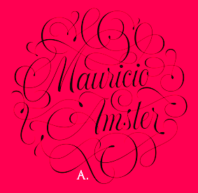 [
[ Foundry, est. 2015 by Miguel Hernandez and Tania Chacana. Their typefaces include
  Chilean foundry with both free and commercial typefaces. The free typefaces gre mostly out of
  During her studies in Santiago, Chile, Angelica Tapia created the mechanical typeface Tachaman (2014). [
 Santiago, Chile-born type designer who graduated from Universidad de Santiago de Chile in 2015 and 2016. After work at the Museo de Arte Contemporaneo and Museo Nacional de Bellas Artes, he joined the Latinotype foundry in Santiago. He moved to Konstanz, Germany and set up his own type foundry, BeJota in 2021.
  Design studio in Santiago de Chile. In 2016, the Bercz team cooperated with Latinotype (Valentina Vega, Rodrigo Fuenzalida, Cesar Araya, Daniel Hernandez, Luciano Vergara) in the development of
  [
[ Casiopea is a design cooperative in the style of a Spanish language wiki, and is associated with EAD rquitectura y Diseño PUCV in Chile.
  Chilean type designer in the Latinotype team.
  [
[ Chilean designers of the Mexican or desert-themed typeface
  Ignacio Meza (Clean and Modern, and before that,
  The Compania Tipografica de Chile is a Chilean type foundry based in Santiago de Chile set up by Raul Israel, Franco Jonas, Gaston Uribe and Ale Navarro in 2018. Their typefaces:
  Chilean designer of the psychedelic typeface
  Graphic designer and illustrator in Santiago, Chile. She created the upright connected script typeface Enfant in 2010. [
 Or Joaquin Contreras Soto. Santiago, Chili-based type cooperative where some free fonts have been produced:
  Santiago, Chili-based designer of the octagonal typeface Jon.01 (2017) and the squarish typeface Mathilda (2017). [
 Llo Lleo, Chile-based designer of the dada typeface Guagua Sans (2015). This typeface was inspired by Patrick Griffin's Fido. [
 [
[ [
[ Type designer from Santiago, Chile, who created the neo-humanist sans typeface family
  Santiago, Chile-based designer of the great curly tuxedoed typeface La Cuica (2015), which was inspired by vintage Chilean magazines. [
 [
[
 Santiago, Chile-based designer of the weathered anarchist display typeface Ferri Corti (2017). [
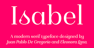 Designer, with Juan Pablo de Gregorio at the Chilean type foundry Letritas of
  Elizabeth Hernandez (Latinotype) created the ramshackle unicase typeface
  Chilean type designer based in Santiago. Father of Latinotype's Daniel Hernandez. Designer of the 4-style didone typeface
  Santiago, Chile-based studio consisting of Tono Luis Rojas Herrera, Pato Patricio Arellano Lufi, Kote José Soto Buzzetti, and Paulina Reyes Naranjo. Kote Soto is the designer of the upright pencil script (school font) typeface TCL Grafito (2016, with Felipe Cceres, ca. 2005) following instructions of the Chilean Minister of Education. They made a corporate typeface called BCH for use by Banco de Chile (2016).
  Chilean designer of the great splashy scratchy paint-simulation typeface
  Graphic designer in Copiapo, Chile, who created the tweetware ultra-fat poster typeface Ruina (2014).
  [
[ Graphic and type designer from Caracas, Venezuela, b. 1981, who moved first to Buenos Aires and then to Santiago in Chile. While mainly a type designer, he also practices
  Chilean artist and type designer. In 2021, she released
  Graphic designer from IPEVE, Universidad Diego Portales, Chile. He teaches typography at Universidad Católica de Chile and Diego Portales University. He was a design consultant for Santiago de Chile public transport's information system (2003-2006) and author of the book Educación tipográfica, una introducción a la tipografía (published in Chile in 2004 and Argentina in 2005). He made his mark in the type design world in 2002 when his lively modern typeface
  [
[ Digital type studio in Santiago de Chile run by by Francisco Galvez Pizarro and Rodrigo Ramirez. Their typefaces:
  During his studies at the Metropolitan Technological University of the State of Chile, Santiago (2013-2017), Chile-based Franco Jonas Hernandez created the lively text typeface
  Gabriel graduated from Universidad Tecnológica Metropolitana de Santiago de Chile in 2007. For the type design course there, he created
  Chilean type designer, also named Gasper Muñoz. His typefaces include:
  Chilean type designer, aka Coto Mendoza, located in Concepcion, Chile. She created the cooking dingbat typeface
  Santiago, Chile-based designer at Rodrigo Typo of the fifties funk typeface
 Chilean type designer who released
  Designer in Sao Paulo, Brazil. Creator of the interesting nuts and bolts typeface
  During his studies in Santiago, Chile, Javier Araneda designed
  Art director in Santiago, Chile. Designer of the dry brush fonts Zeyk Brush (2016) and Bruship (2015), the avant-garde font Decad (2016), and the signage typeface Great Man (2016).
  [
[ Santiago, Chile-based designer of the ultra-condensed display typeface
  Chilean type designer in Santiago who created the heavy slab serif / signage typeface
  Graphic designer in Santiago, Chile, who designed the all caps titling typeface family Integrada (2017), which consists of Entremada (textured), Fraccionada and Regular. The outlines are based on Hoefler's Gothic Narrow.
 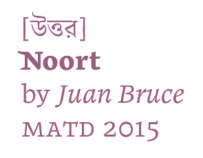 During his
  [
[ Kaiser Zhar Khan (b. 1980, Chile), aka Zanatilja, used to run a new defunct archive called True Type Fonts. He also designed many typefaces himself. The most famous among these is his free African-themed typeface South Afirkas 2100 (2009), which is downloadable from
  Santiago, Chile-based designer of the signage display typeface Guachaca (2015). [
 Santiago, Chile-based designer of the art deco (school project) typeface Cabaret (2016). [
 I suspect that illustrator Isabel de Gregorio (Santiago, Chile) is
  Chilean designer of the
  Juan Pablo De Gregorio Concha lived in Santiago, Chile, where he founded Letritas in 2006. He is presently based in Barcelona. Home page of
  Juan Pablo De Gregorio Concha is the Chilean designer (b. 1978) of the hip Bodoni typeface
  Chilean foundry, est. 2011 by Jorge Cisterna, Jko Contreras, Miguel Hernández and "LCF". The first typefaces include
  Los Mini is a design duo in Santiago, Chile, also known as Santiago Caribe Audiovideo, and as Imprenta Pirata. Using FontStruct, they made the condensed squarish typeface
  [
[ [
[ Luzi Gantenbein (Luzi Type, Bern, Switzerland) is a type designer, b. 1988, Fläsch, Switzerland. He created the vernacular all caps wall paint typeface Valparíso (2010, Volcano). At the Hochschule der Künste Bern, he designed the angular family
  Or Bana Arasanz, b. 1987. Santiago, Chile-based illustrator type designer who writes that she is inspired by pop-culture, randomness, folk art, colour, geometry, movement, music, gossip and typography. In 2015, she designed Carreton, a display typeface that won an award at
  Marc Janet's (mostly free) fonts include a number of pixel typefaces in FON format, and a grungy typeface called
  Chilean designer of the unicase font
  Chilean type designer, who contributes to Latinotype.
 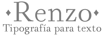 Marchelo graduated from Universidad Tecnológica Metropolitana de Santiago de Chile in 2007. For the type design course there, he created the ornamental all caps typeface
 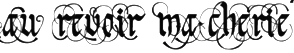 María graduated from Universidad Tecnológica Metropolitana de Santiago de Chile in 2007. For the type design course there, she created the swashy blackletter typeface
 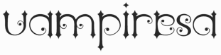 Marta graduated from Universidad Tecnológica Metropolitana de Santiago de Chile in 2007. For the type design course there, she created the ideal vampire face,
 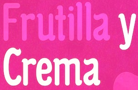 Graphic designer in Santiago, Chile, who designed the curvy typeface Palita in 2014 and the super-techno typeface Terminateur Benelux in 2015. [
 Or Mauro Andres. Concepcion, Chile-based designer at Latinotype of the upright copperplate script and accompanying lapidary sans typeface family
  MendozaVergara is
  Miguel Hernandez is a graphic designer, type designer, illustrator and teacher in Santiago de Chile. Born in 1977 in Concepcion Chile, he studied Graphic Design at Universidad del BioBio State University in Chillan, Chile. He currently teaches Typography at Universidad Diego Portalesand and Universidad de las Americas in Santiago de Chile. Miguel contributed greatly to the early success of the Chilean type foundry
  Illustrator in Santiago, Chile. In 2015, he created the thick round sans typeface Dino Black (2015) and the
  Designer in Santiago, Chile, who created Tempo (2012, sans headline face). In 2015, he designed the sans typeface family BCH (BCH stands for Banco de Chile).
  [
[ Chilean type designer. In 2016,
  For a course at the Universidad de Chile, Melipilla, Chile-based Paula Valenzuela designed the rounded handcrafted vernacular typeface Sanguchera (2017). [
 [
[ Type designer graphic designer, calligrapher and illustrator from Chile, who graduated in graphic design in 2005 from the Universidad del Bío-Bío., b. 1977, Santiago de Chile. Aka PeGGO, a
  Editorial and type designer born in Punta Arenas, Chile. Graduate in graphic design from Universidad Tecnológica Metropolitana de Santiago de Chile, and in typography from Universidad Católica de Chile. He founded design studio Toro. In 2016, he set up
  Chilean codesigner with Rodrigo Araya Salas of
  Architect who studied at Universidad Austral de Chile (Valdivia, Chile), who co-founded
  [
[ [
[ Chilean type designer who studied at Universidad de Chile and teaches at Pontificia Universidad Catolica de Chile. Santiago, Chile-based co-founder, with Sergio Leiva Whittle, of Untype in 2017.
 Chilean type designer who graduated from Universidad Tecnológica Metropolitana de Santiago de Chile. Award winner at Tipos Latinos 2010 for his experimental typeface
  Chilean designer of the connected girlish and gestural calligraphic font
  During his graphic design studies at FADU / UBA (Buenos Aires), Santiago Joaquin Lonigro created the great high-contrast typeface
  Sergio graduated from Universidad Tecnológica Metropolitana de Santiago de Chile in 2007. For the type design course there, he created
  So as not to be confused with the Colombian type designer Sergio Ramirez (Llamas), this Chilean Sergio Ramirez uses his full name, Sergio Ramirez Flores. At Latinotype, a foundry in Santiago, he published the 369-strong infographics icon font
  SMOG (Santiago Motion Graphics) is a design studio in Santiago (Chile) founded in 2007 by Moisés Arancibia and Pablo González. Typefaces by the studio include the display typefaces Alpaca, Hola Mundo, Mokeka, Mafia, Matas, Central, Chacon and Bikini.
  Santiago, Chile-based designer of the wonderful fifties script typeface Dalilah (2015). [
 Sofia Mohr (b. 1978, São Leopoldo, Rio Grande do Sul, Brazil) studied architecture at UFRGS, Brazil, and type design at Universidad Católica de Chile. She works as graphic, web and type designer in her own studio (called Sofia Mohr) in Santiago, Chile.
  Designer and letter artist in Puente Alto and Santiago, Chile. Some of his typefaces are published by Compania Tipografica de Chile, which he co-founded in 2018 together with Raul Israel and Franco Jonas.
  Or Tania Maria, or Tania Bekke. Santiago, Chile-based, graphic and type designer, who graduated from Universidad Diego Portales (Santiago, Chile) in 2009 and studied type design at
  Diego Aravena Silo set up
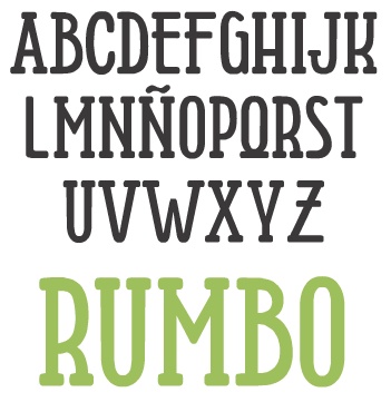
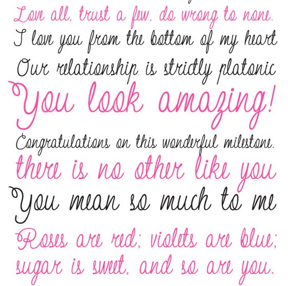
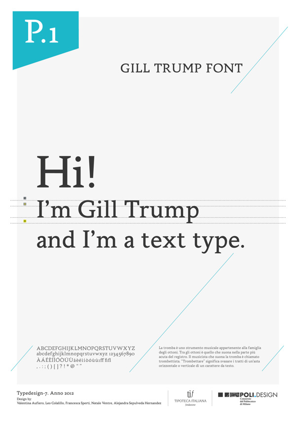
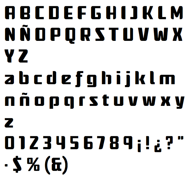
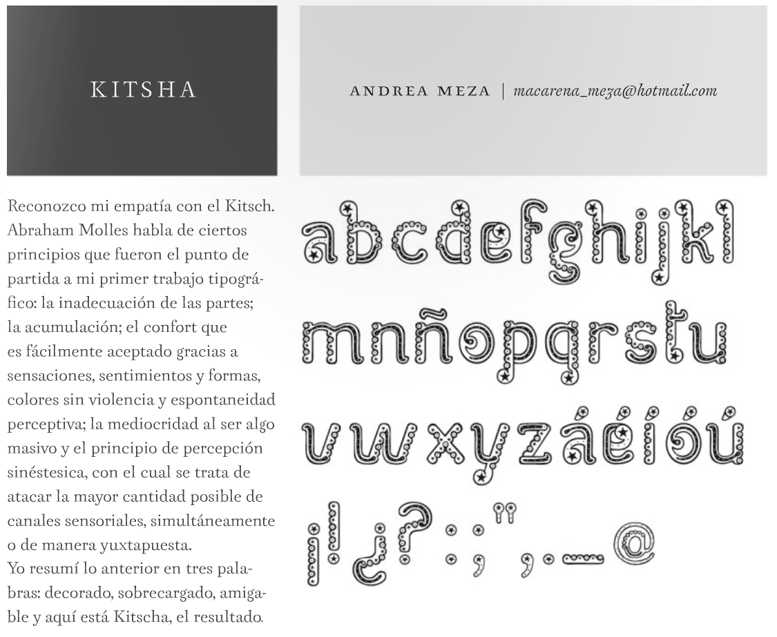
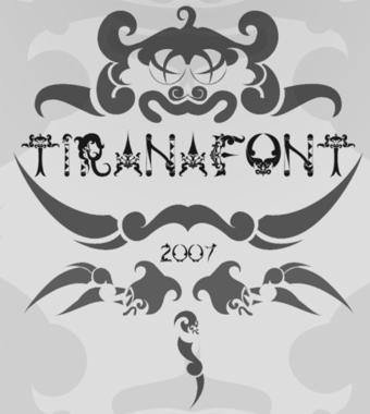
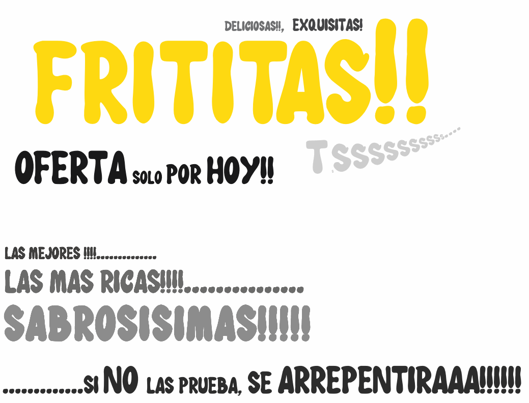
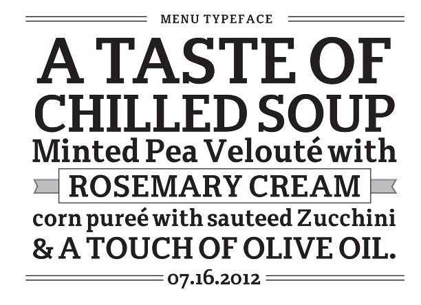
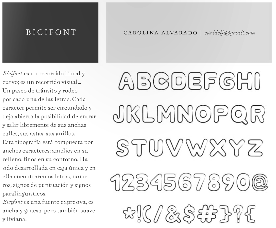
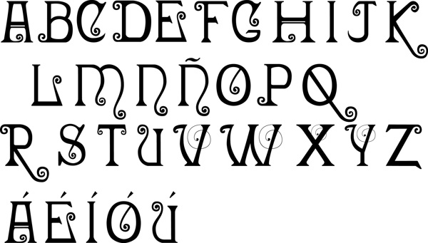
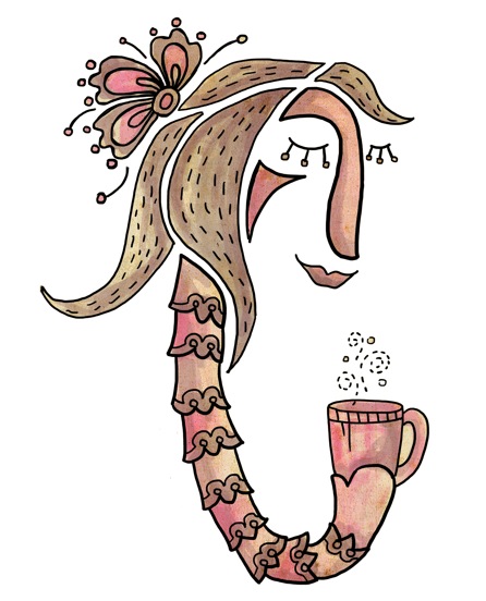
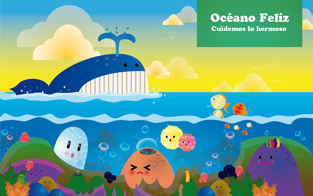
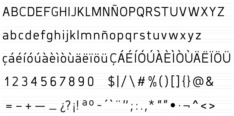
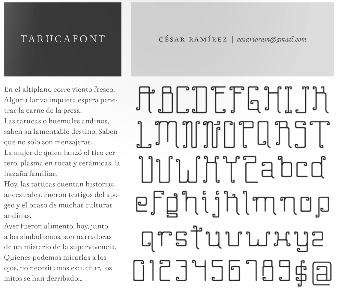
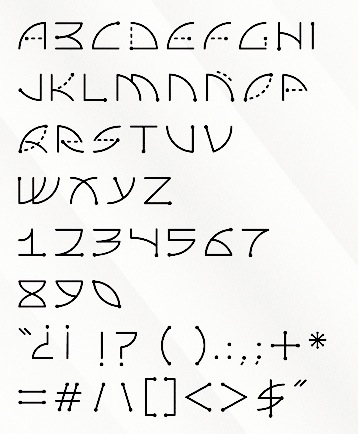
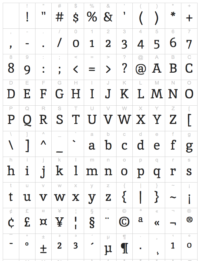
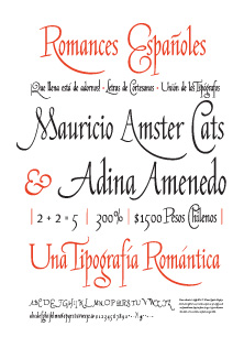
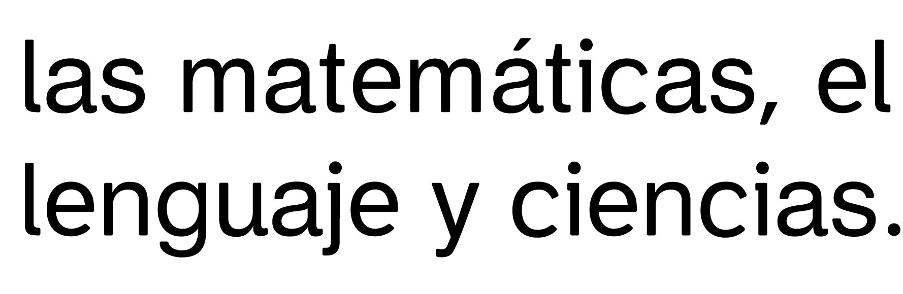
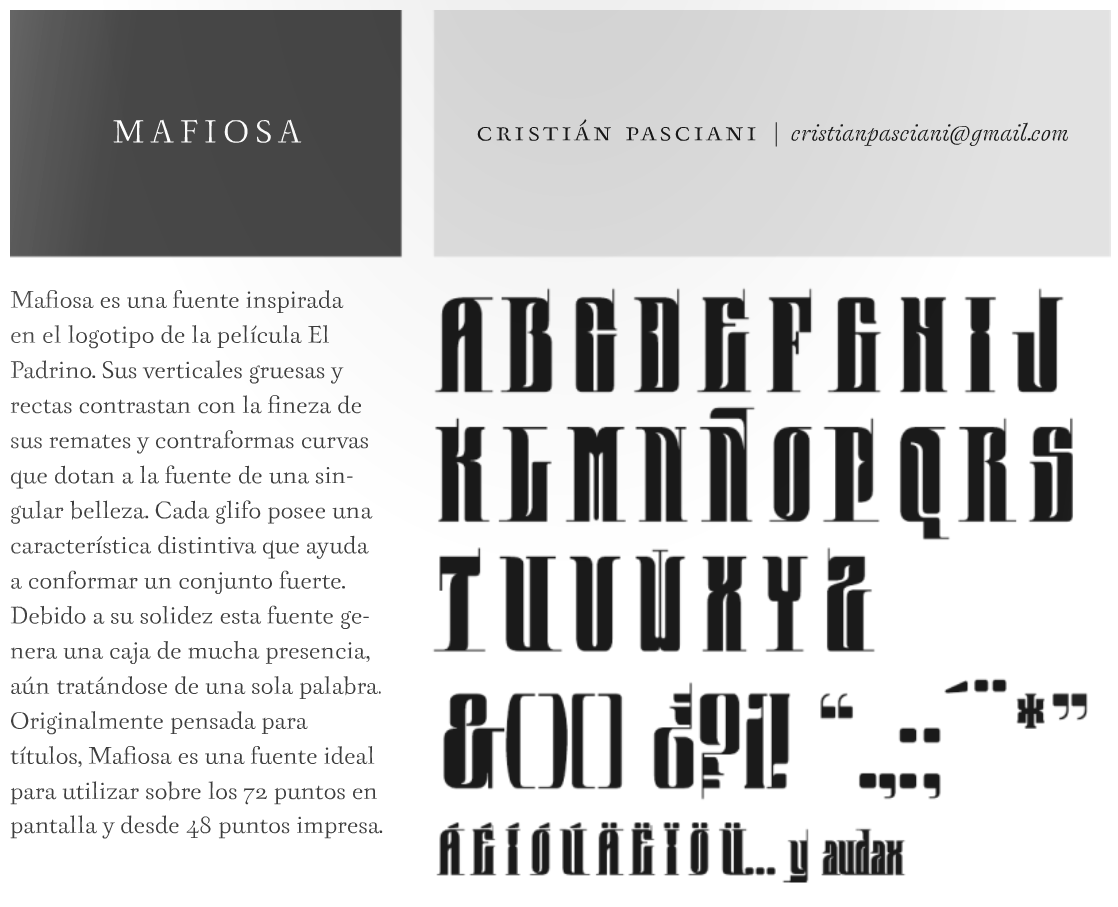
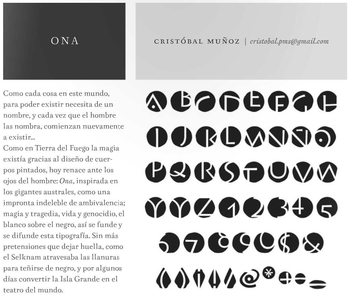
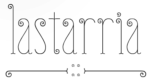
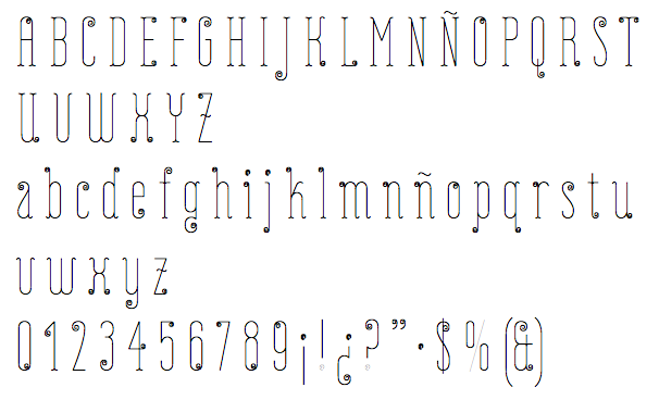
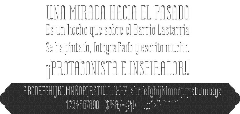
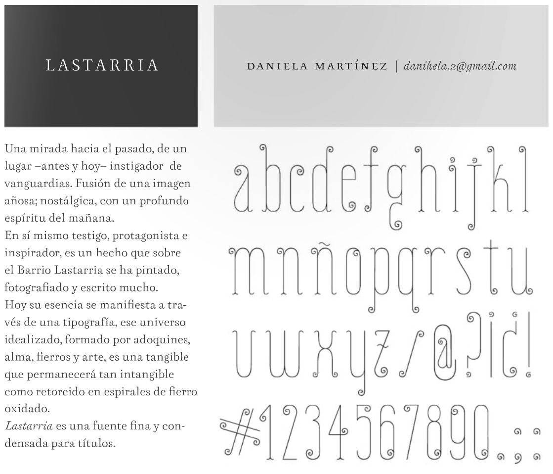
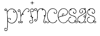
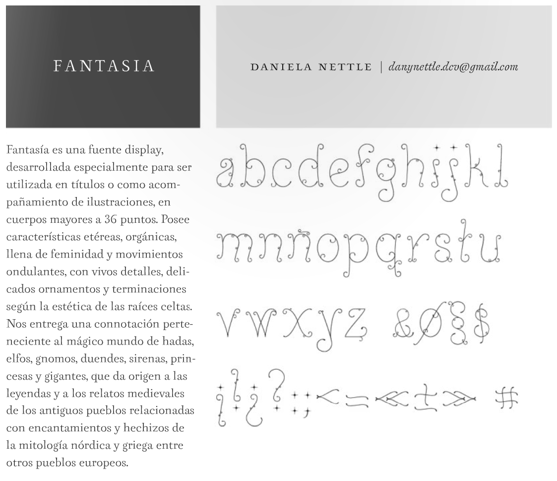
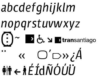
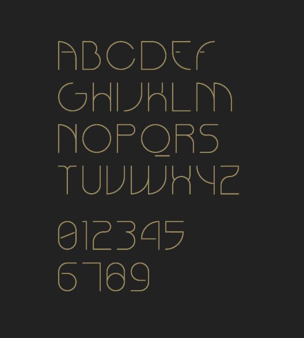
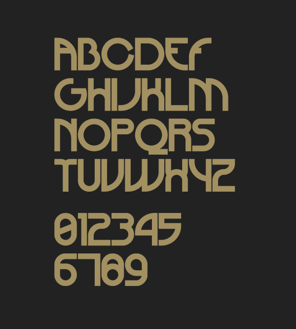
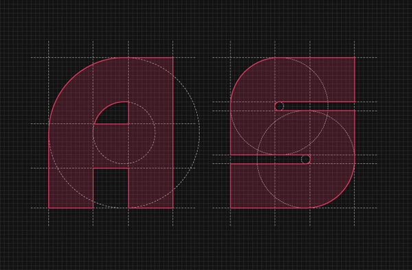
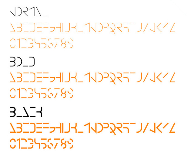
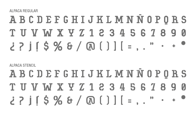
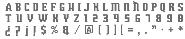
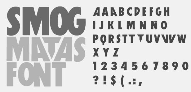
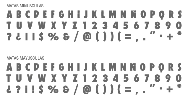
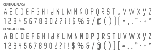
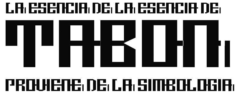
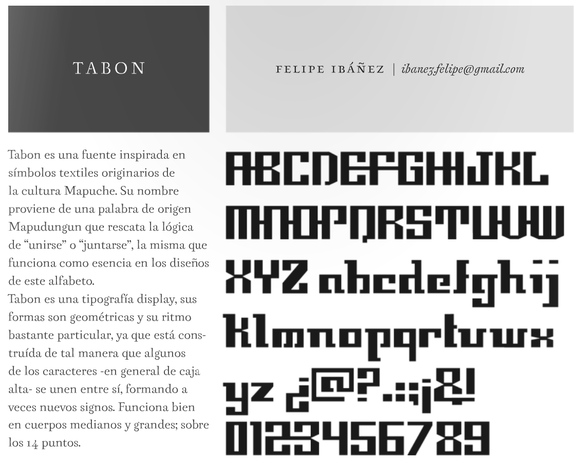
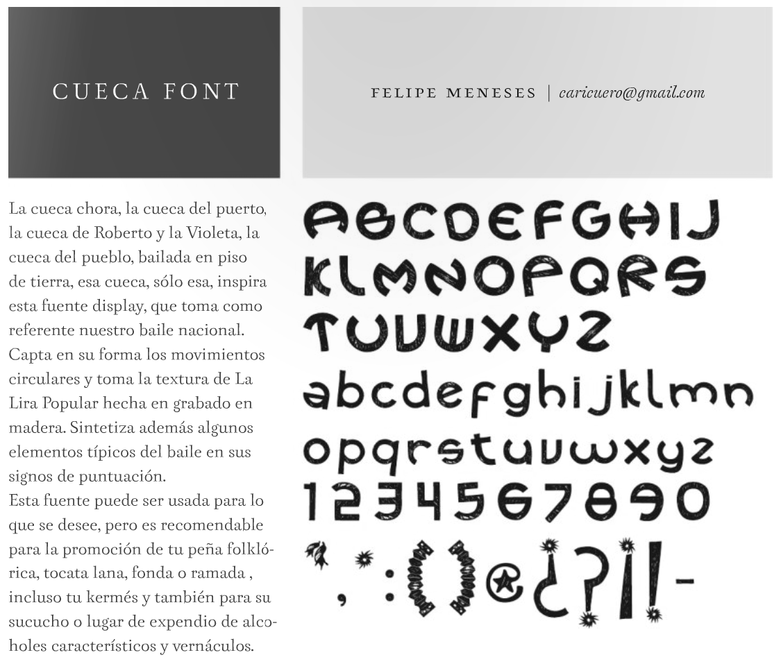
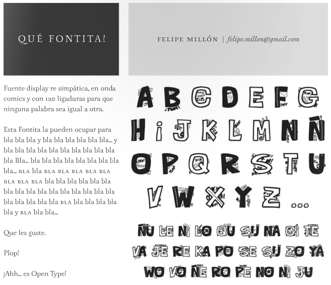
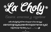
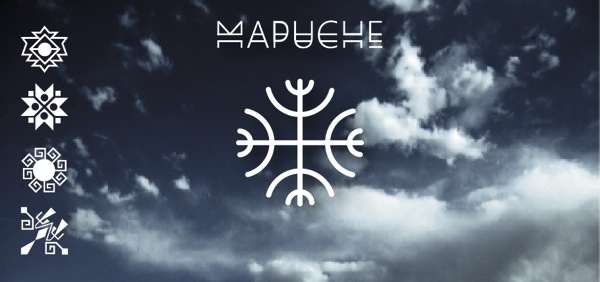
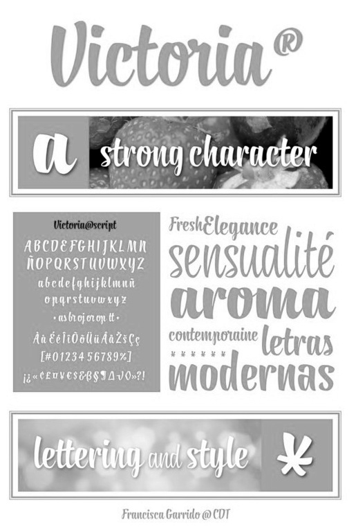
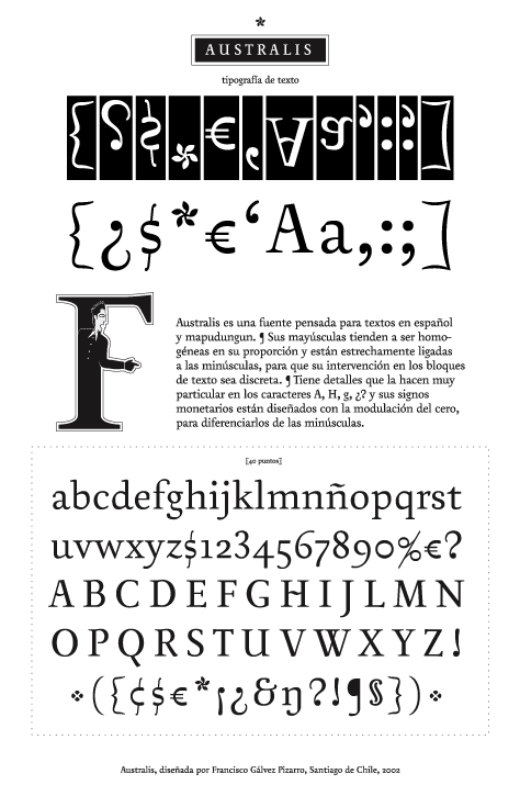
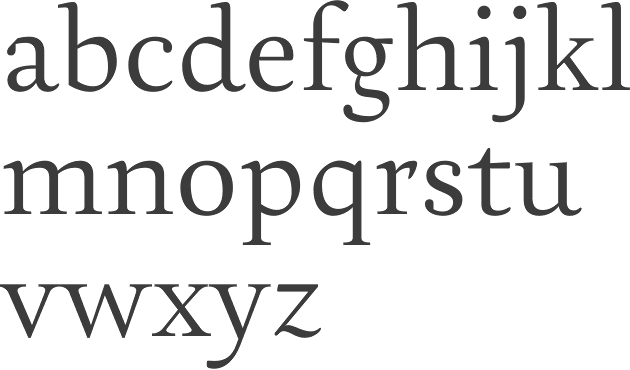
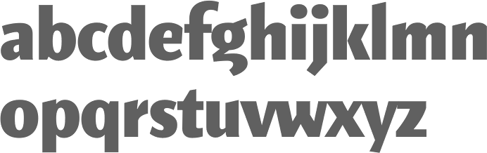
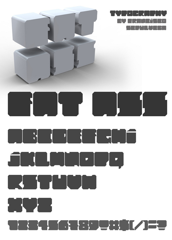
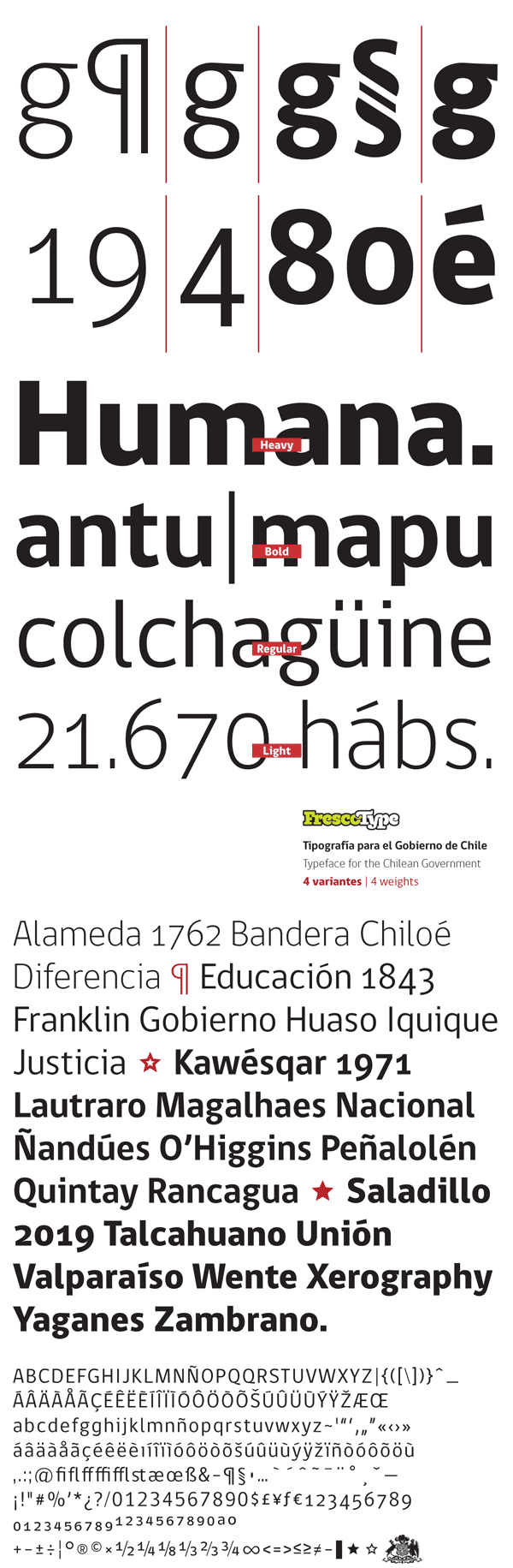
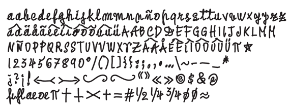
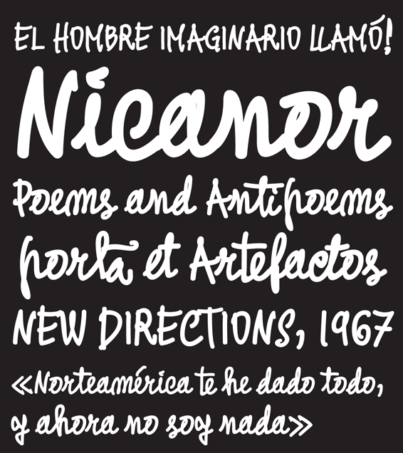
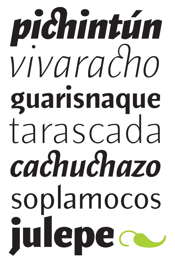
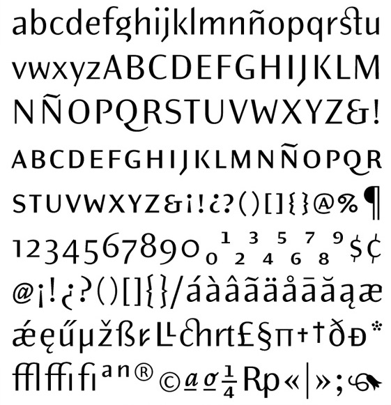
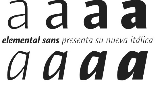
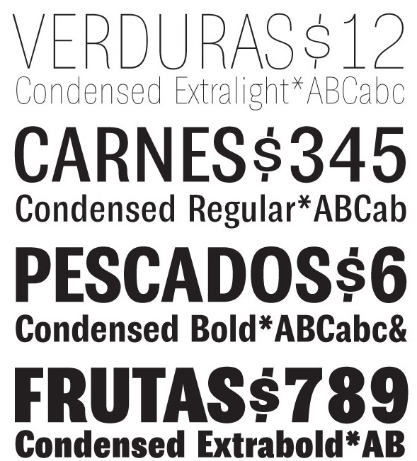
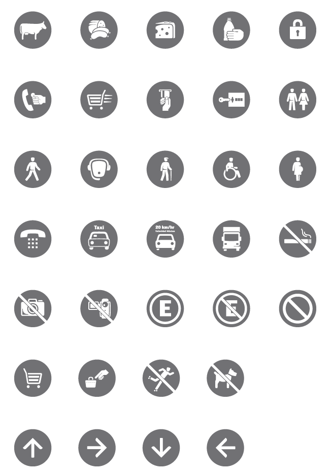
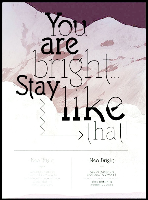
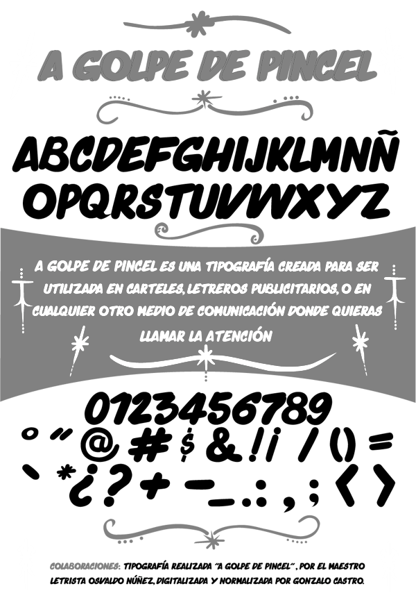
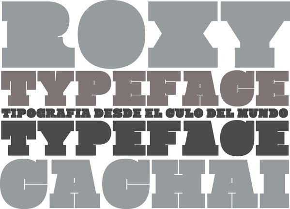
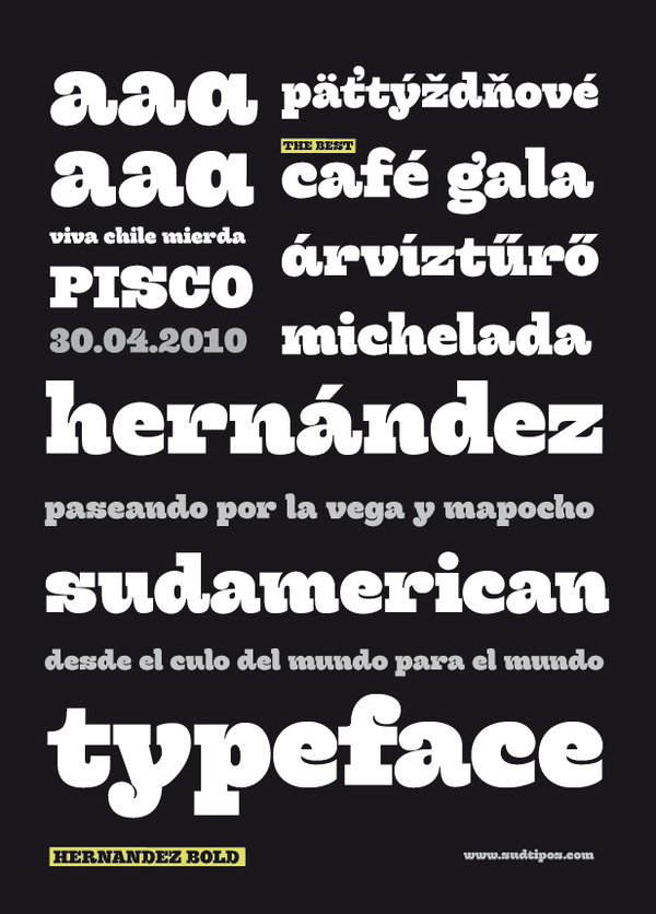
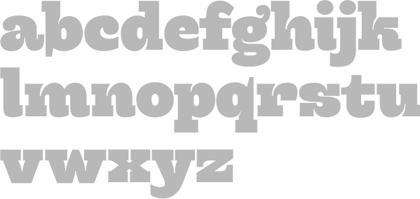
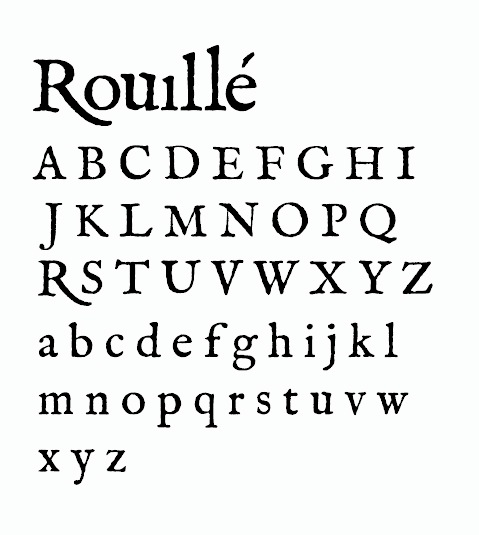
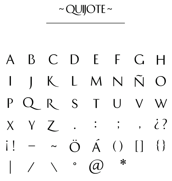
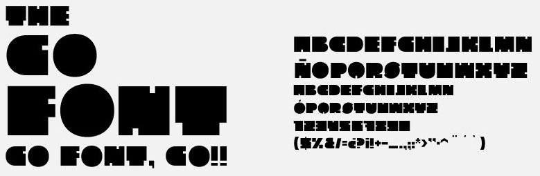
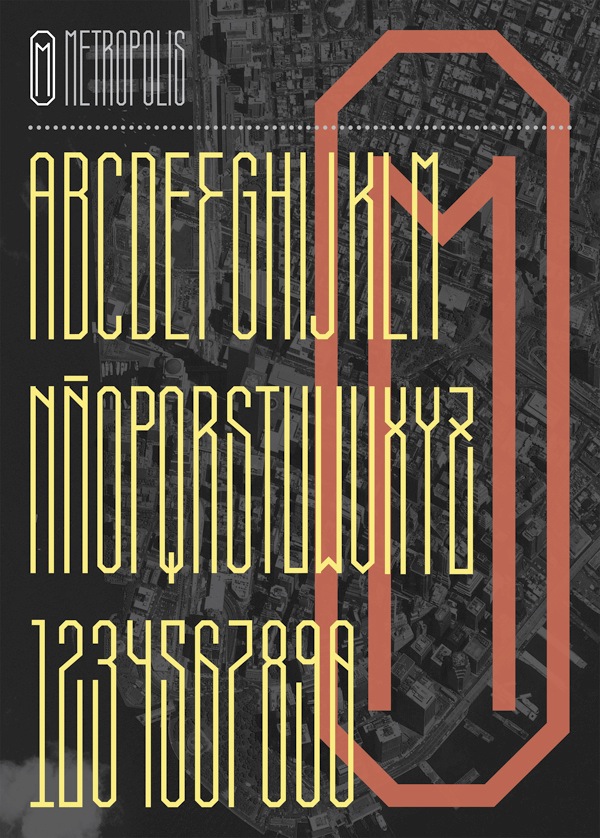
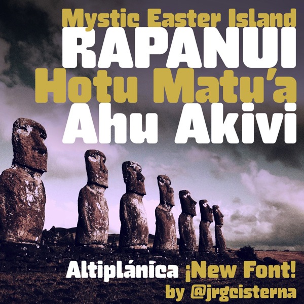
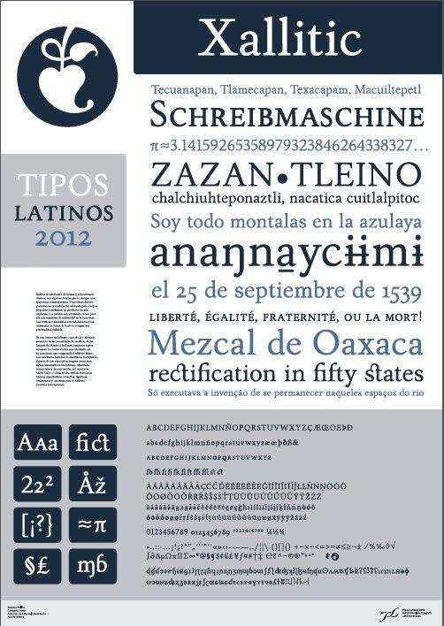
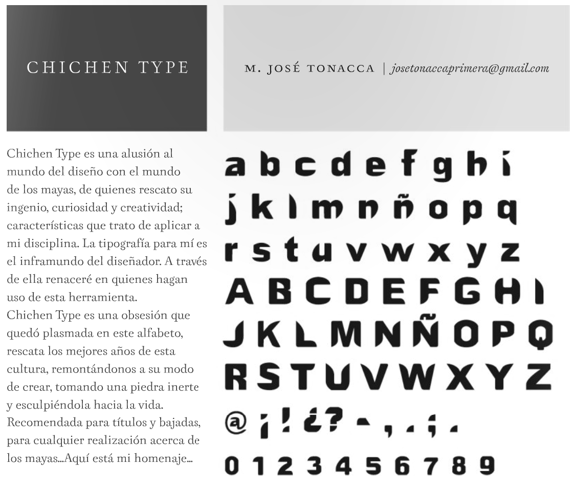
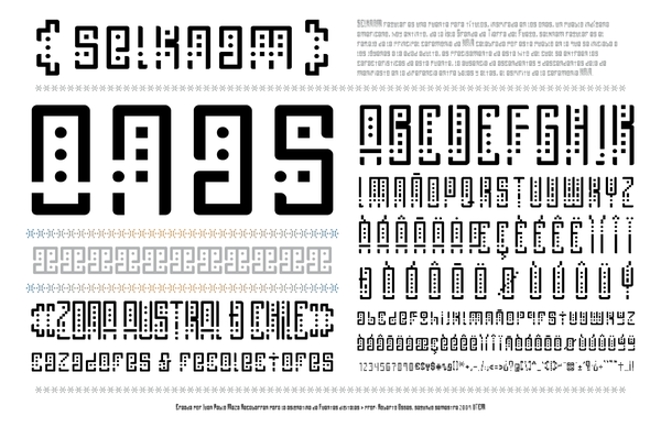
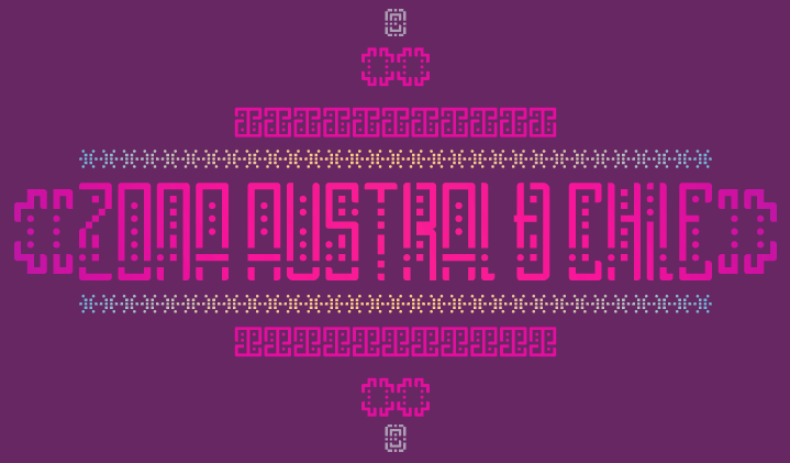
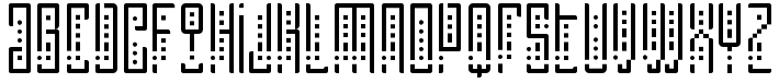
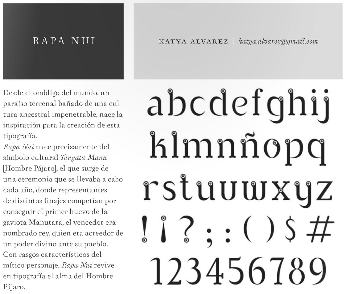
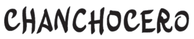
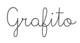
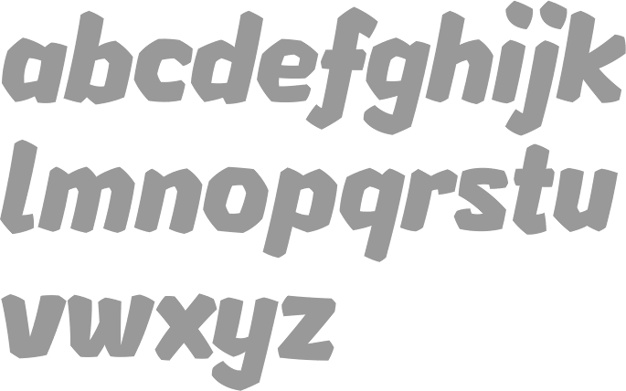
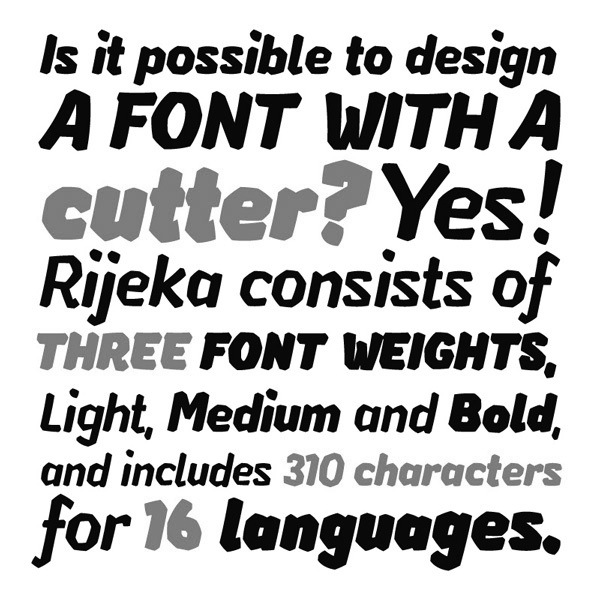
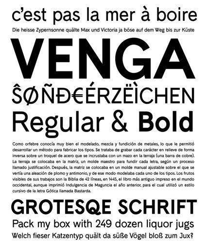
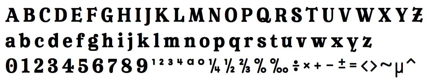
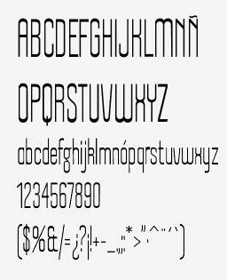
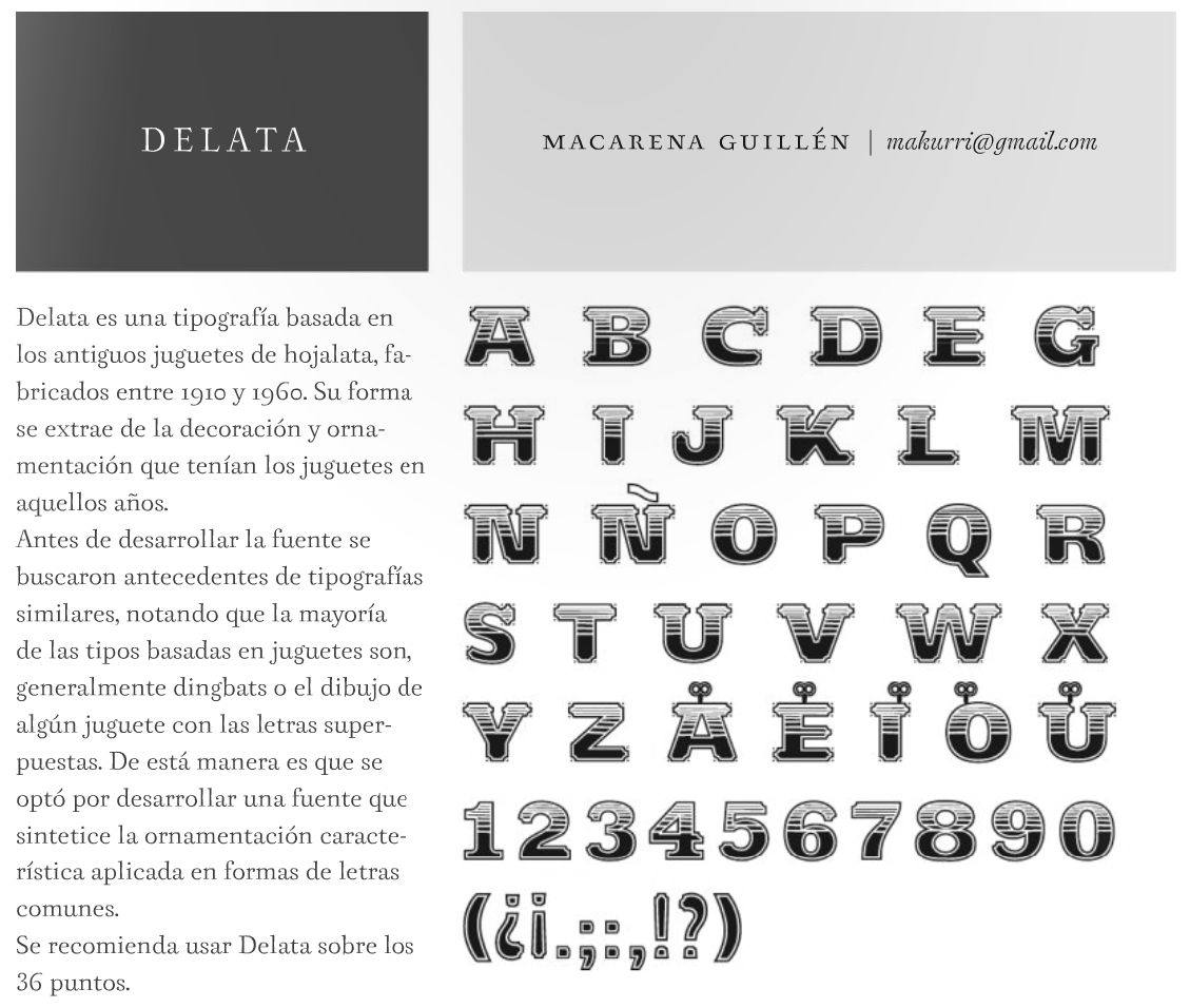
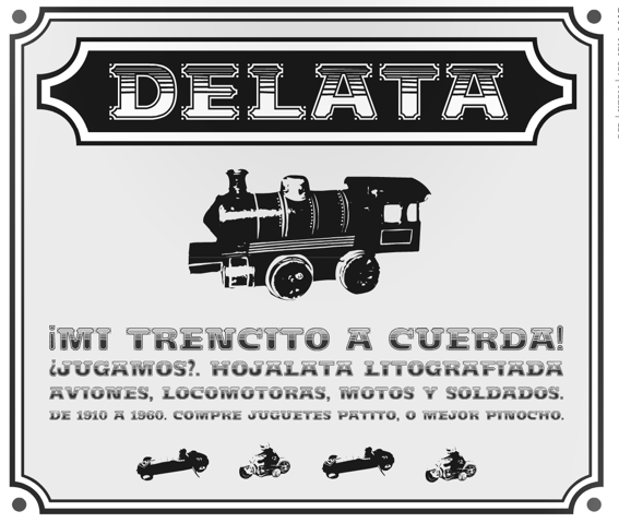
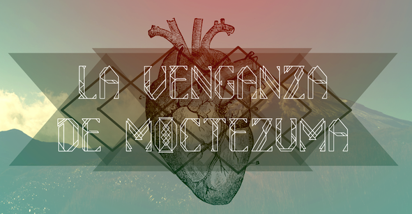
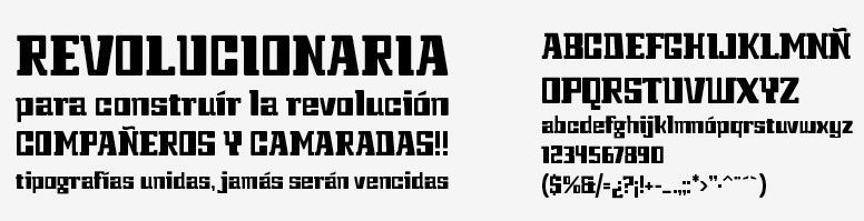
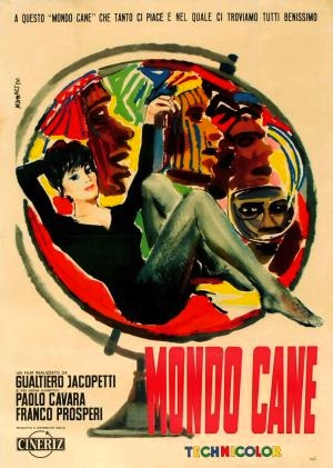
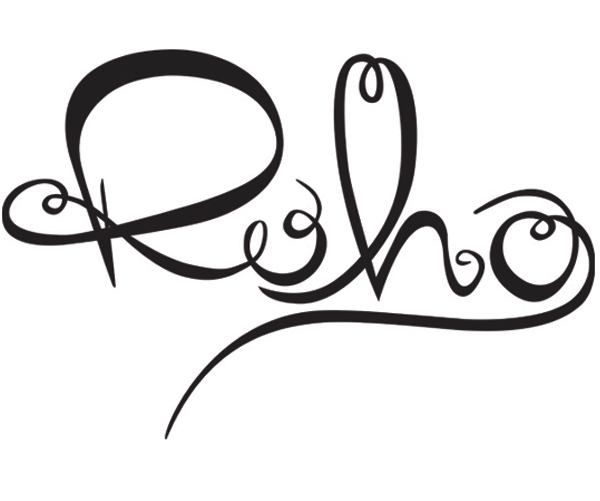
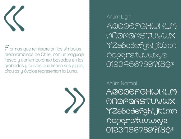
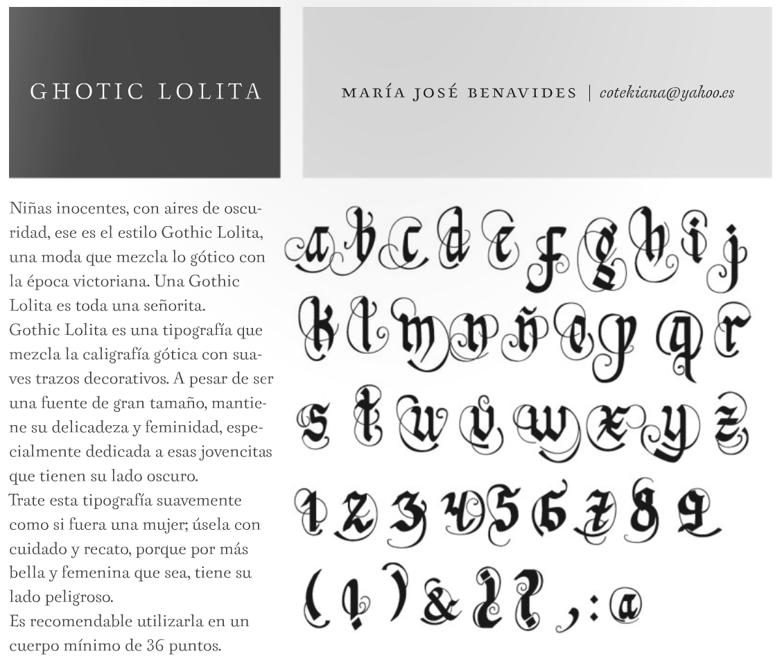
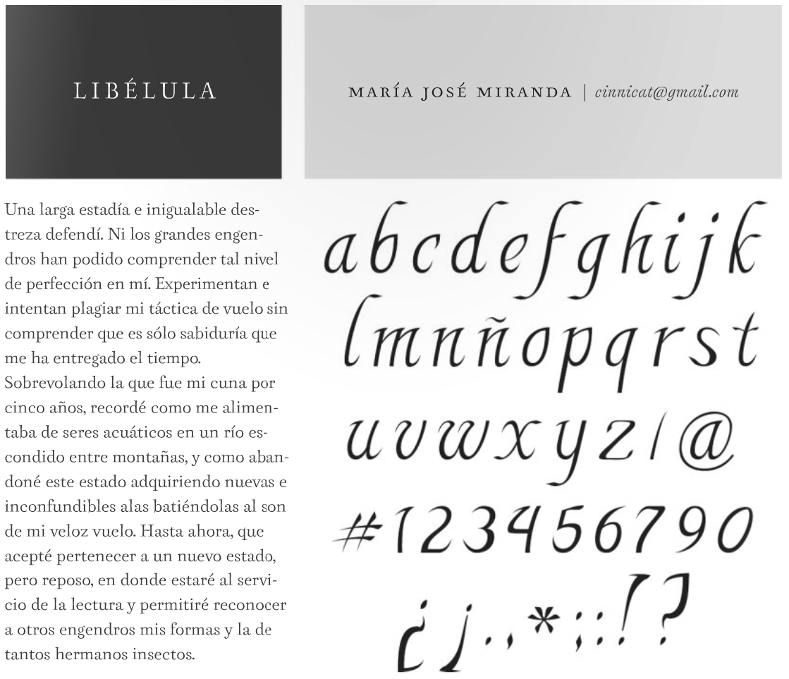
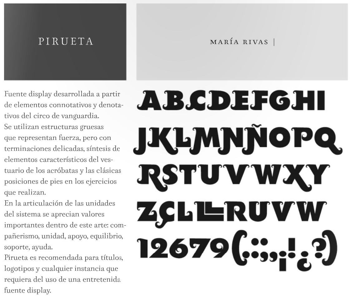
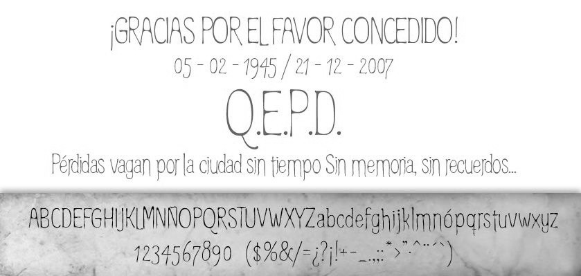
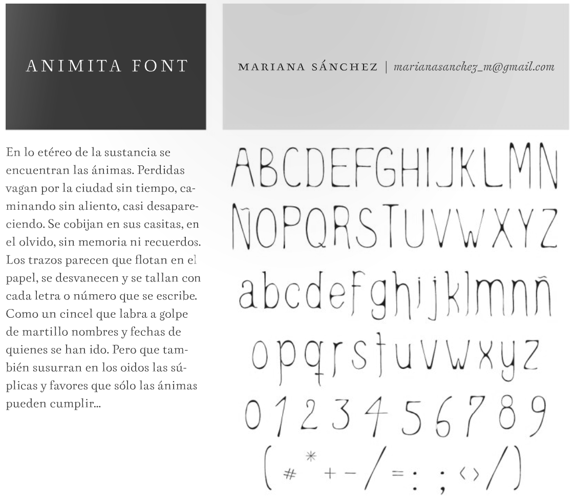
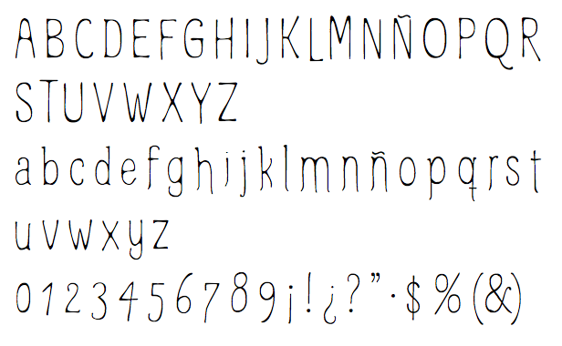
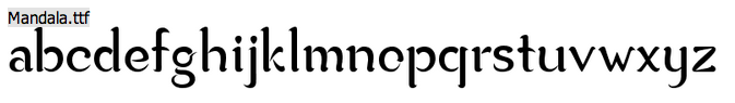
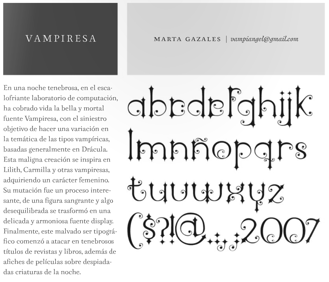
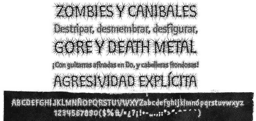
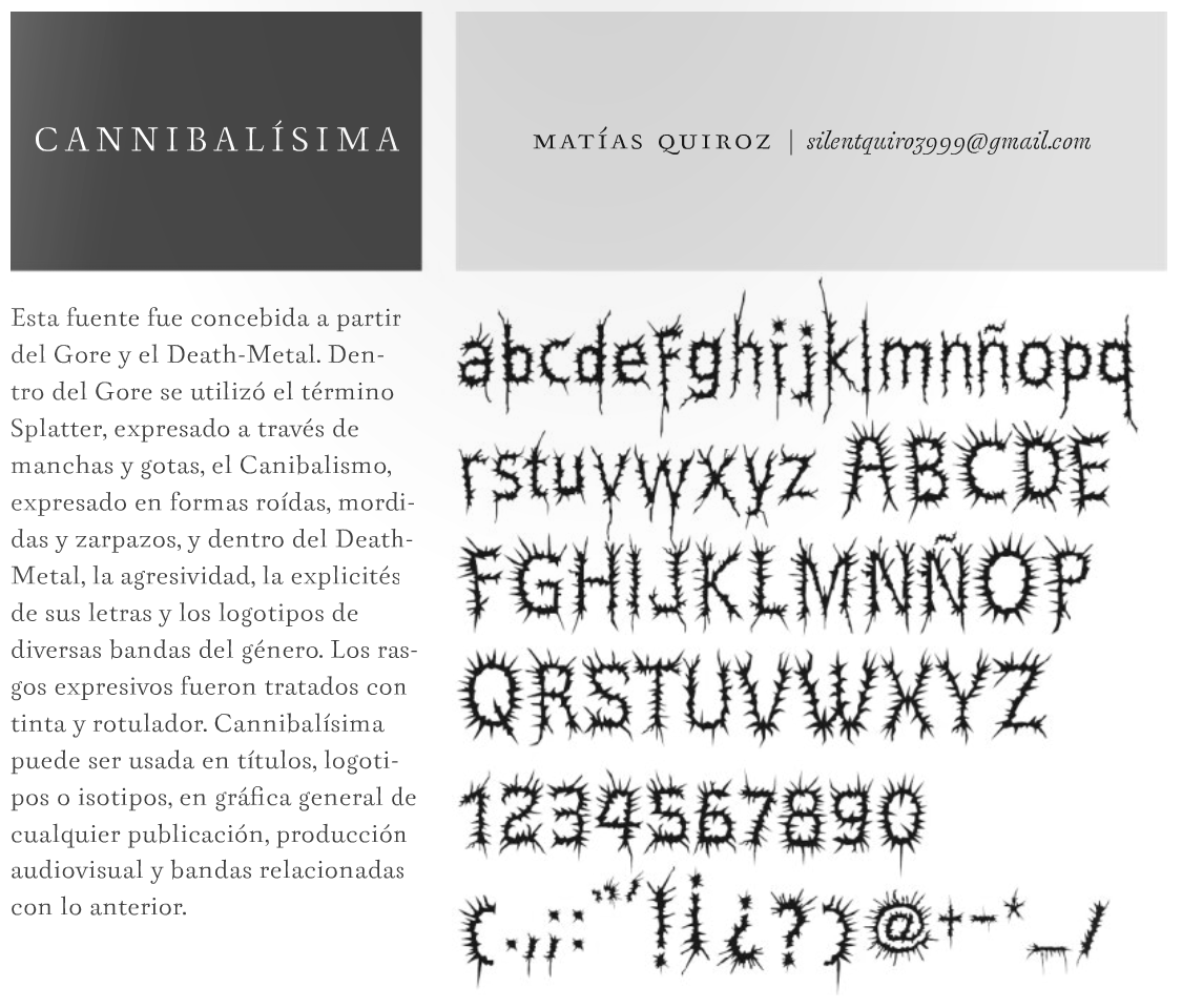
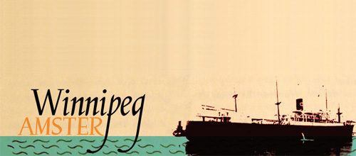
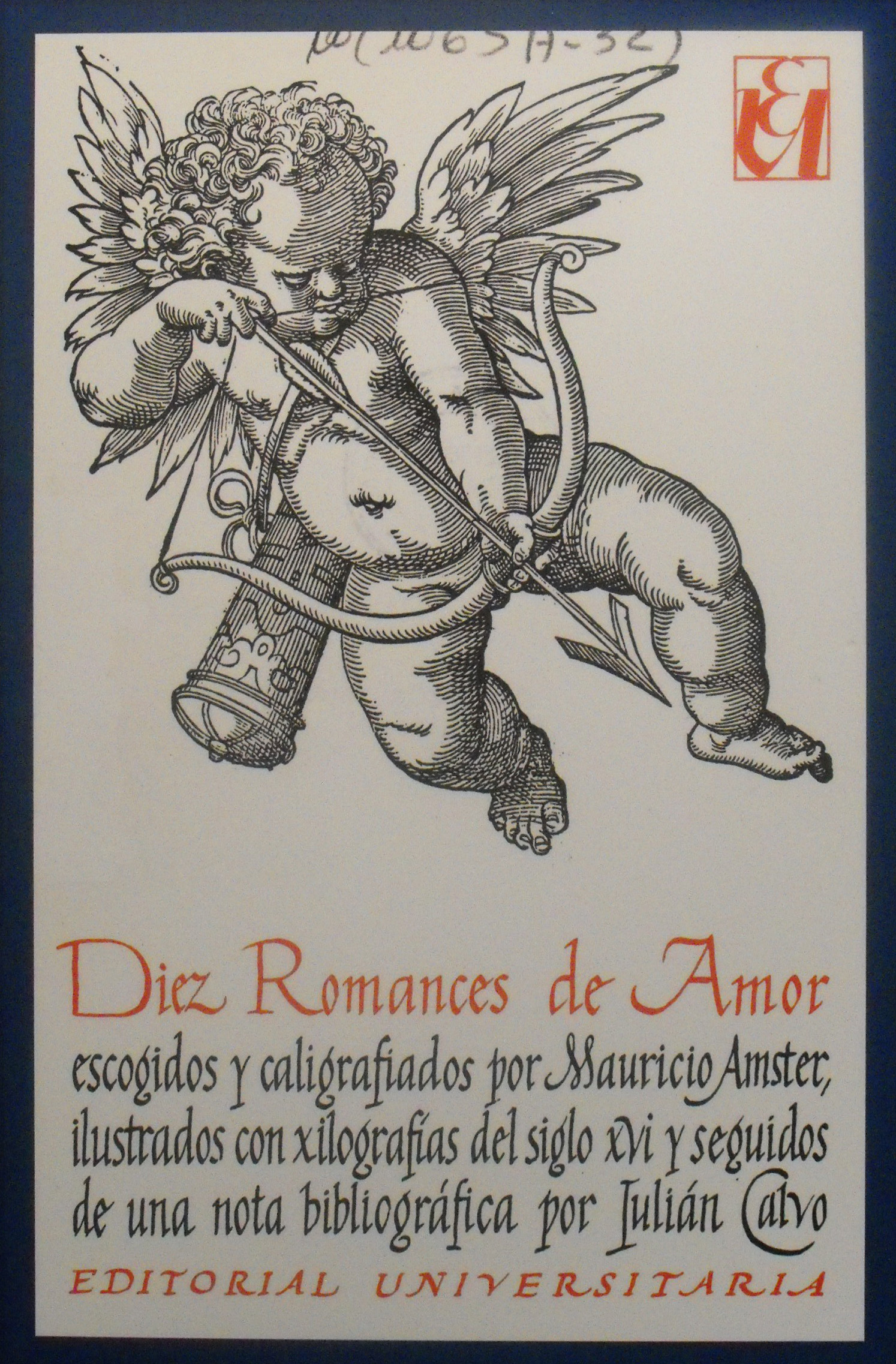
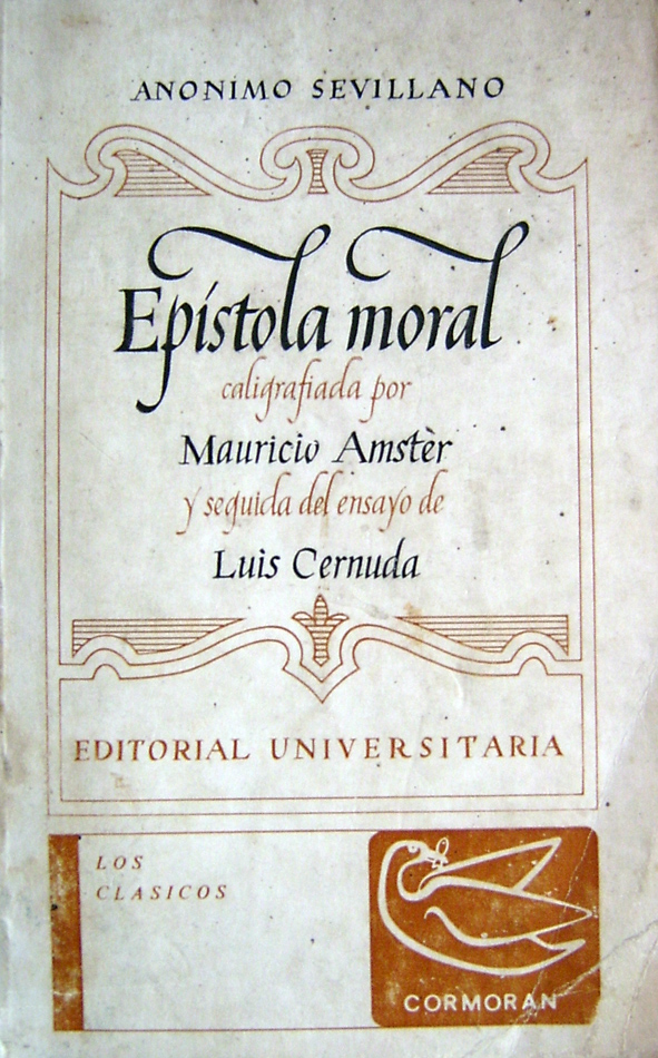
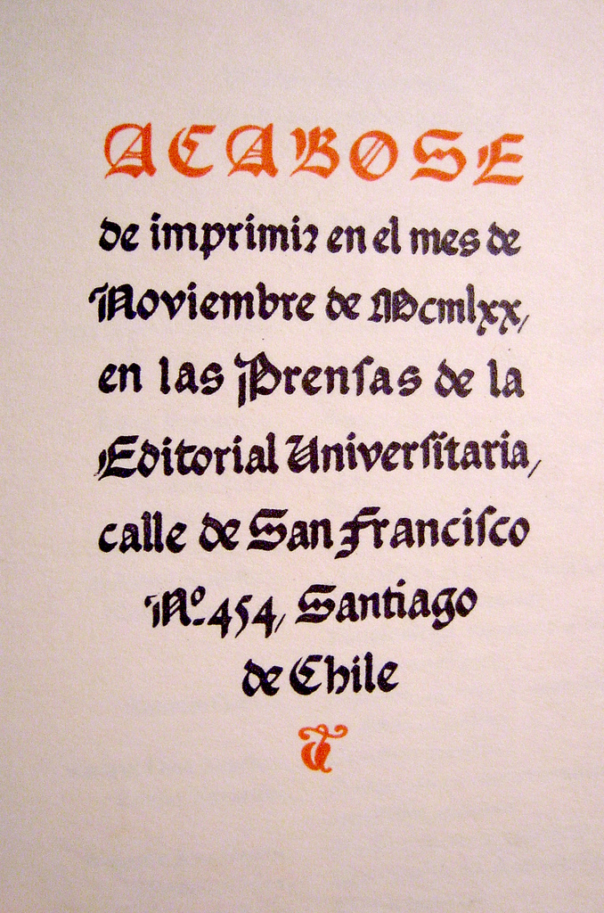
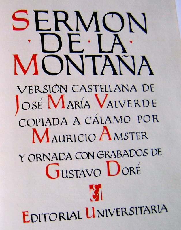
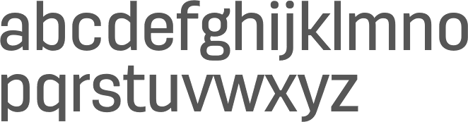
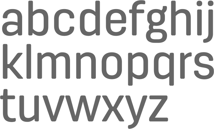
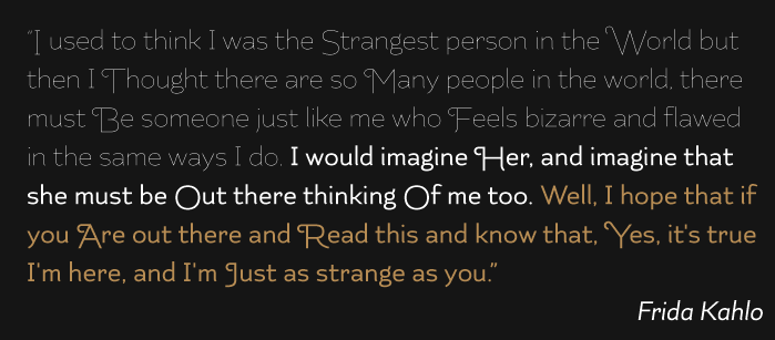
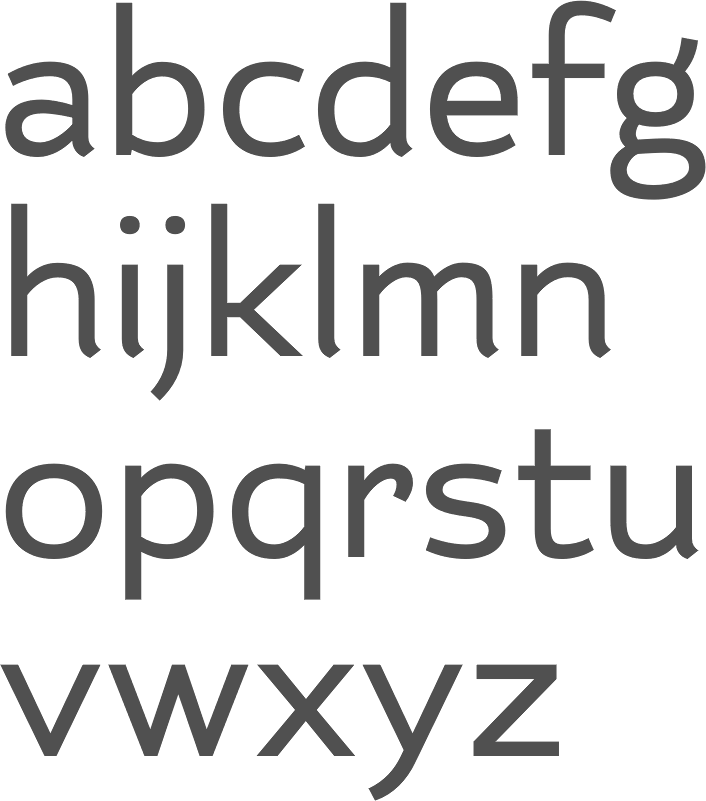
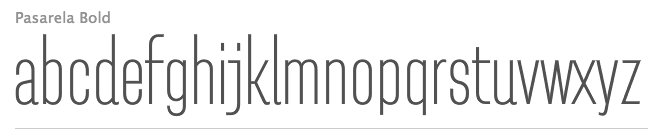
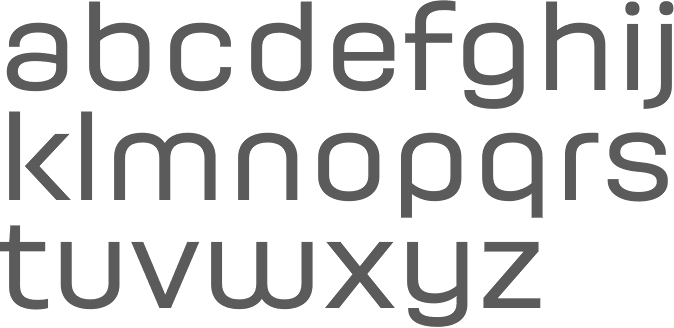
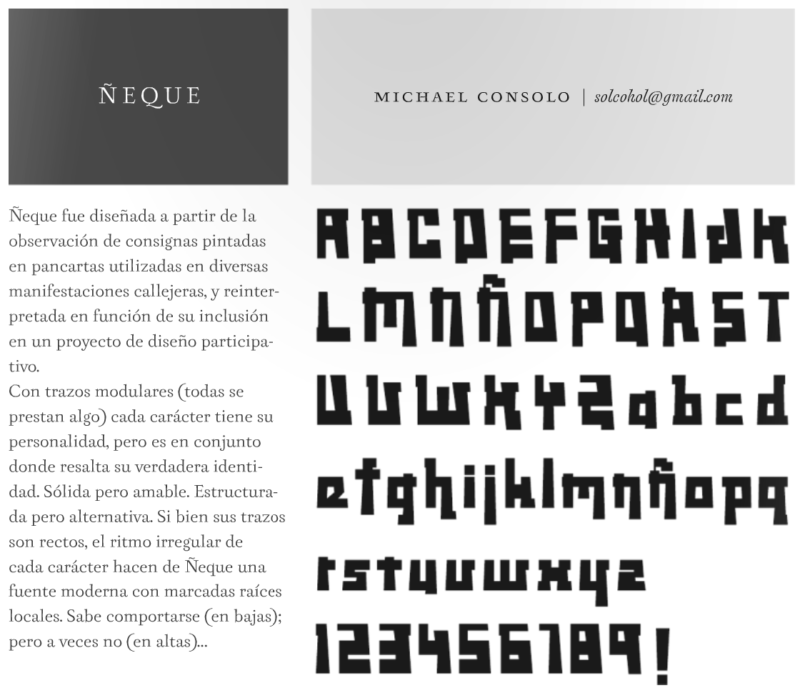
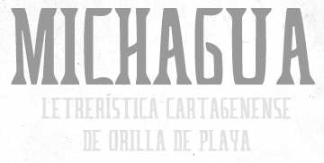
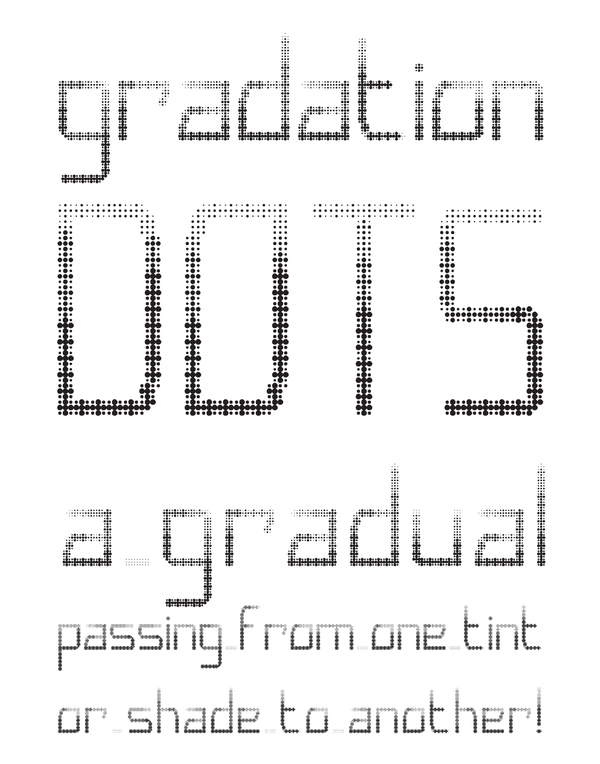
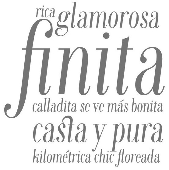
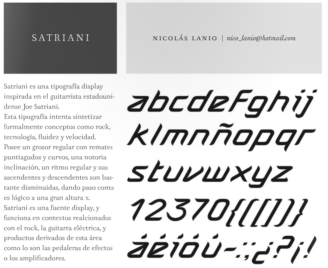
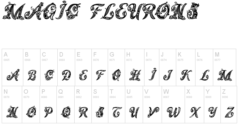
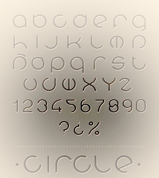
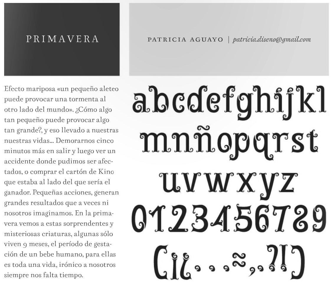
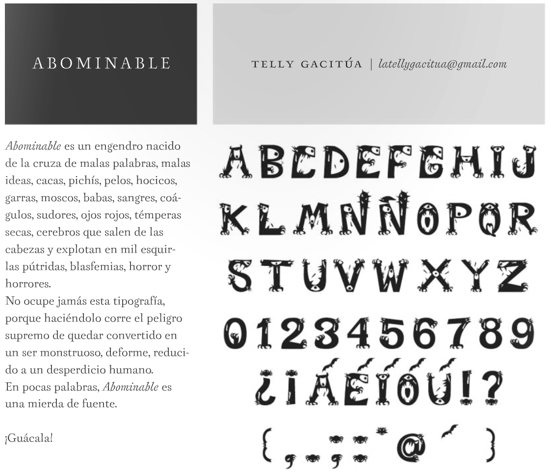
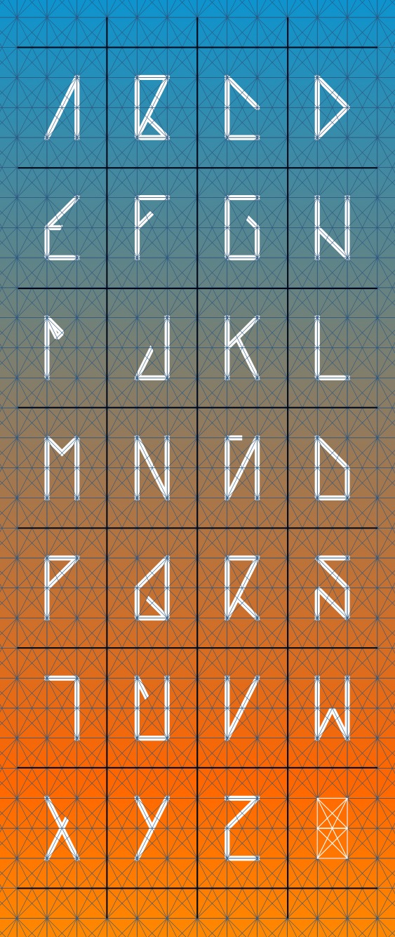
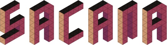
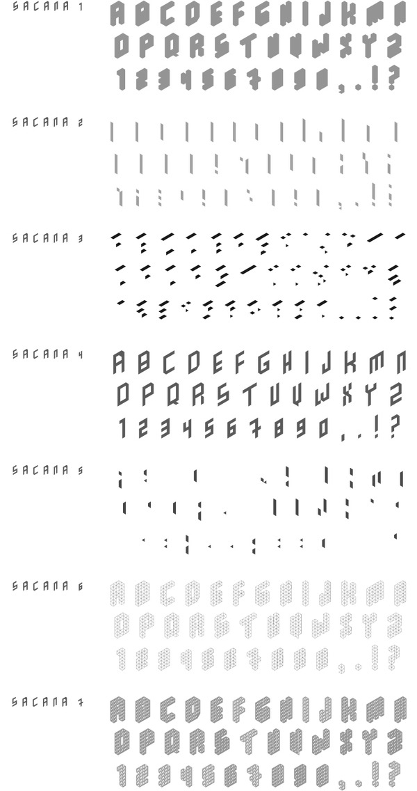
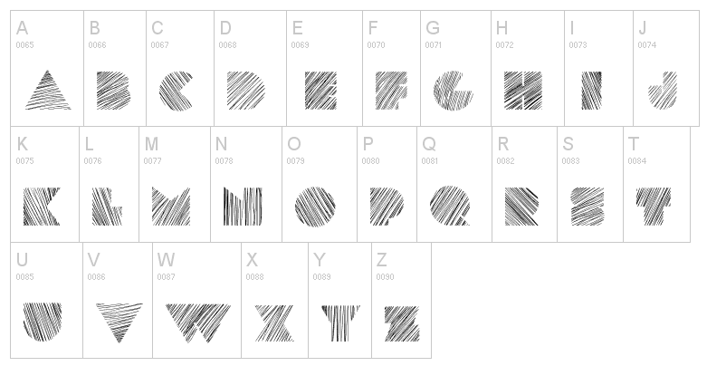
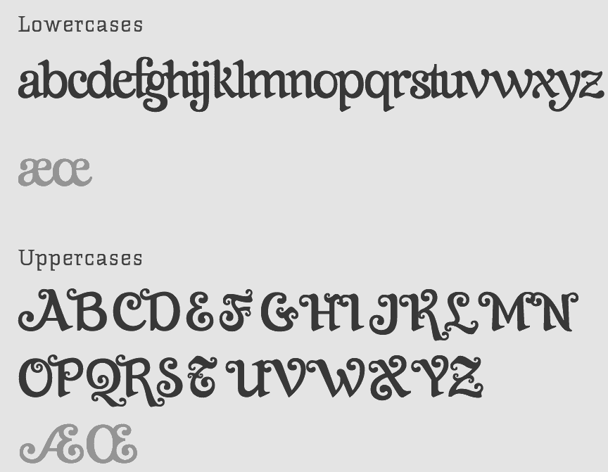
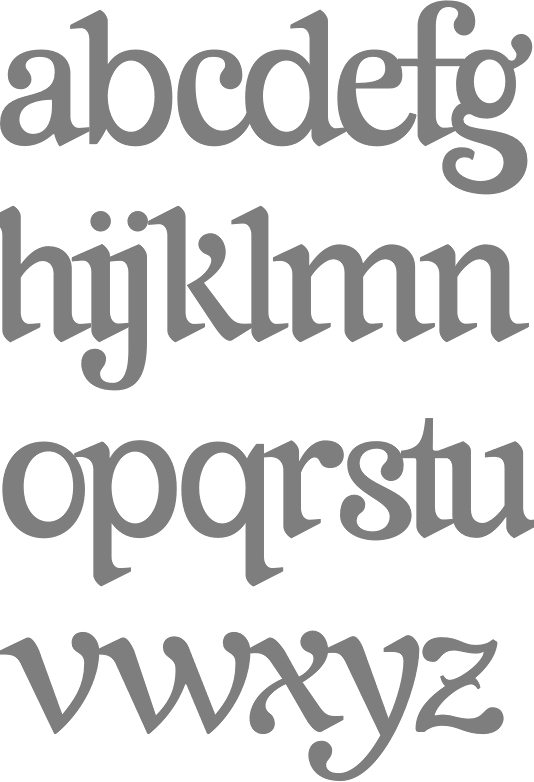
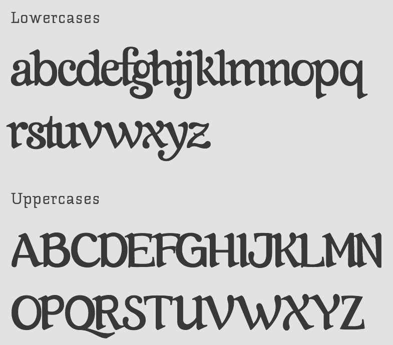
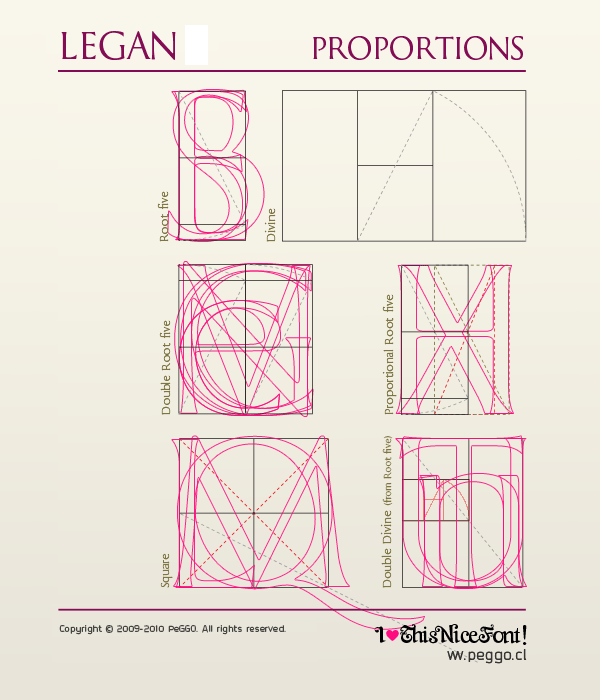
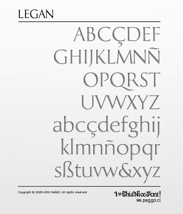
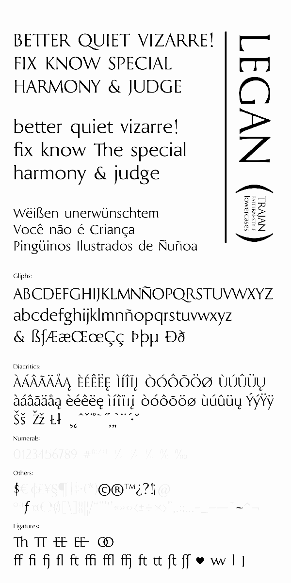
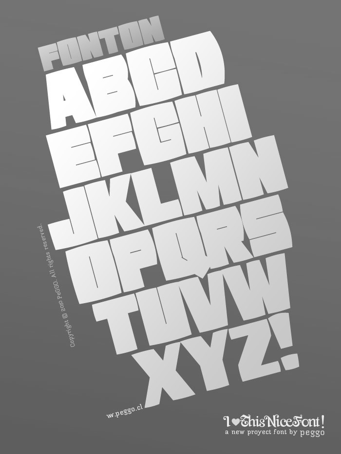
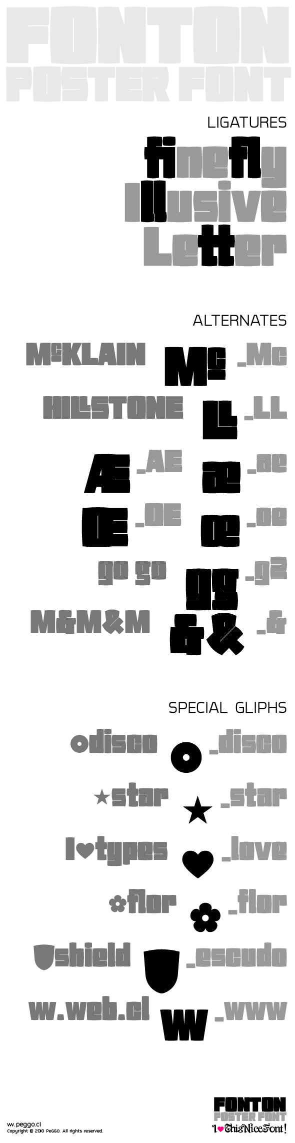
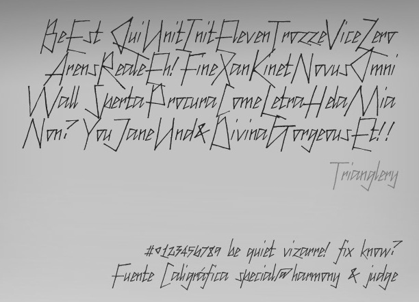
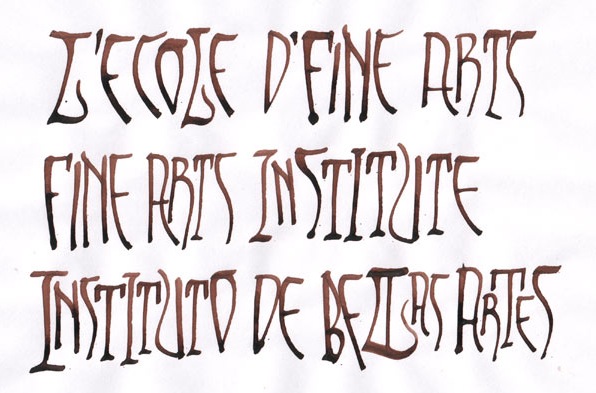
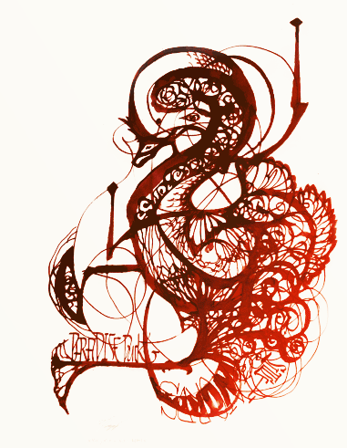
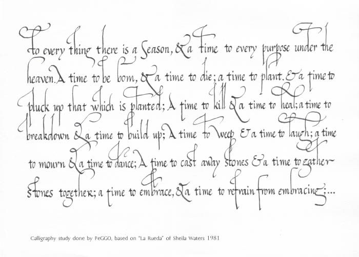
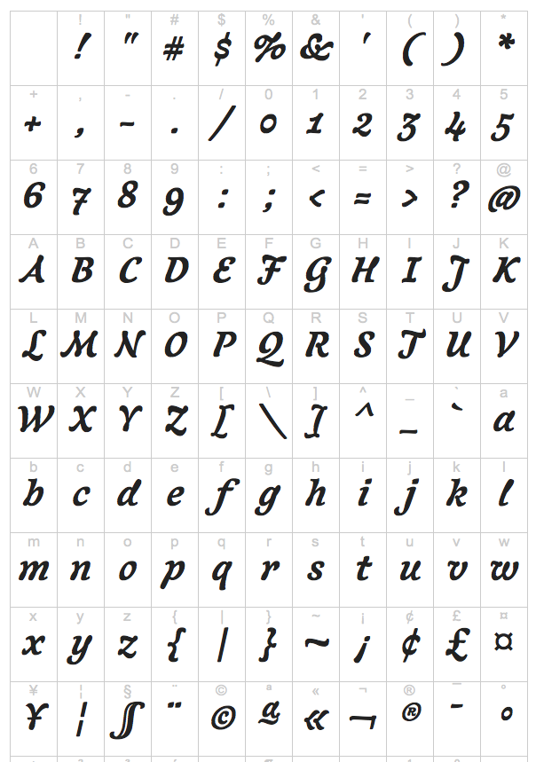
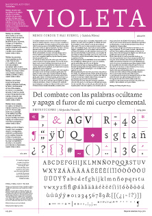
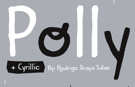
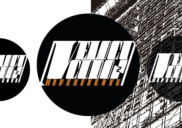
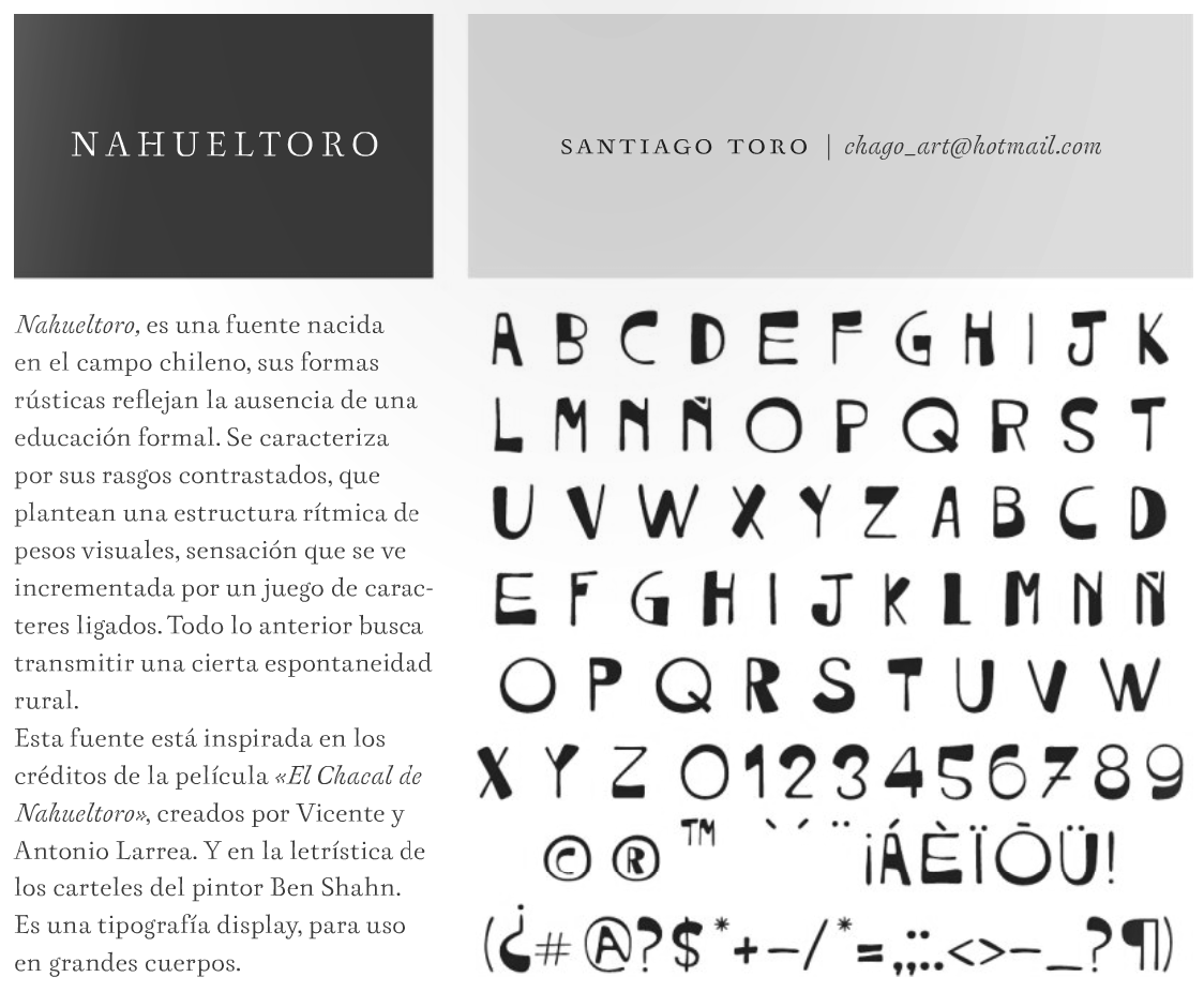
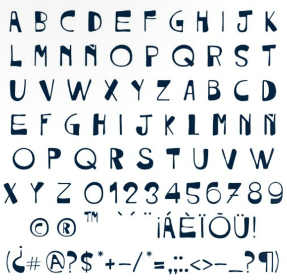
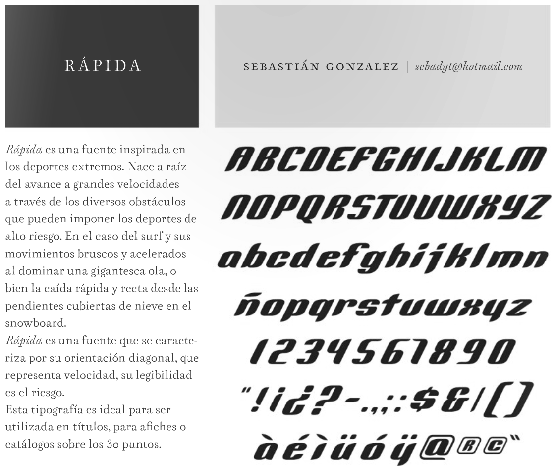
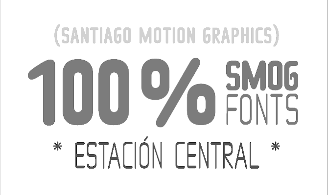
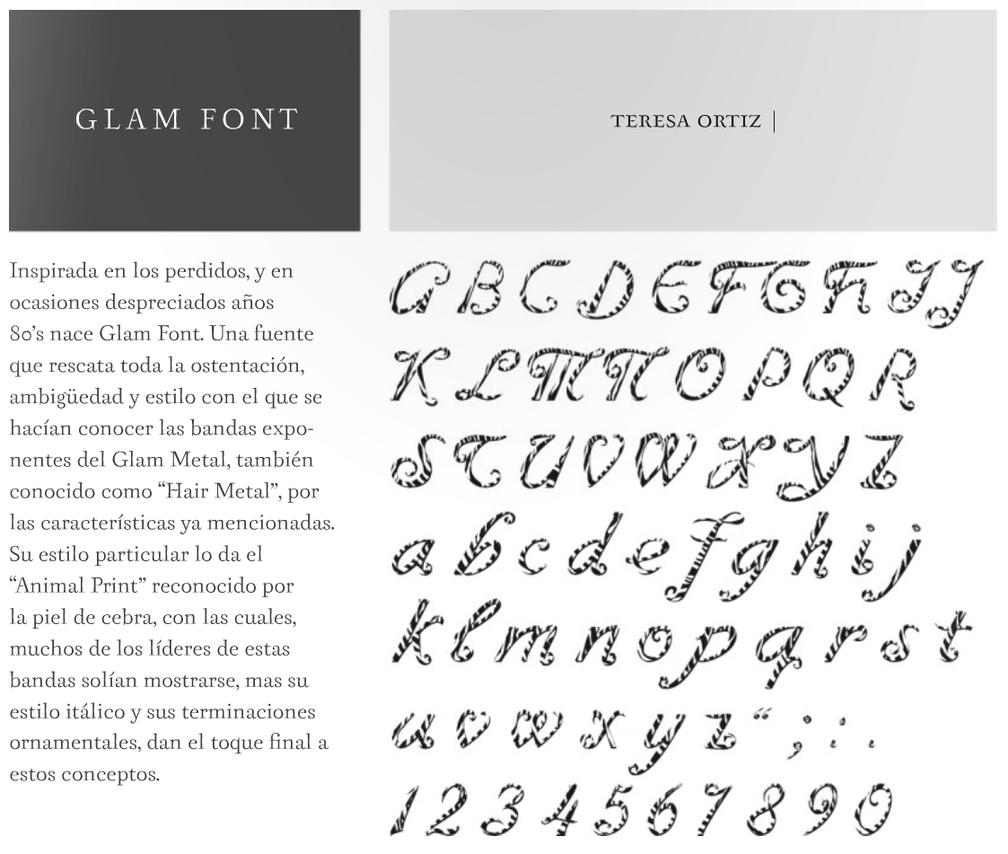
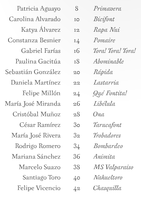
|
|
|
|