TYPE DESIGN INFORMATION PAGE last updated on Mon Jul 13 21:06:29 EDT 2026
FONT RECOGNITION VIA FONT MOOSE

|
|
|
|
|
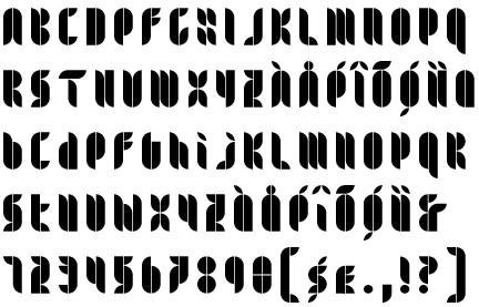
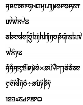
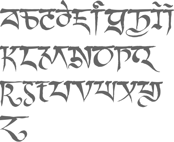
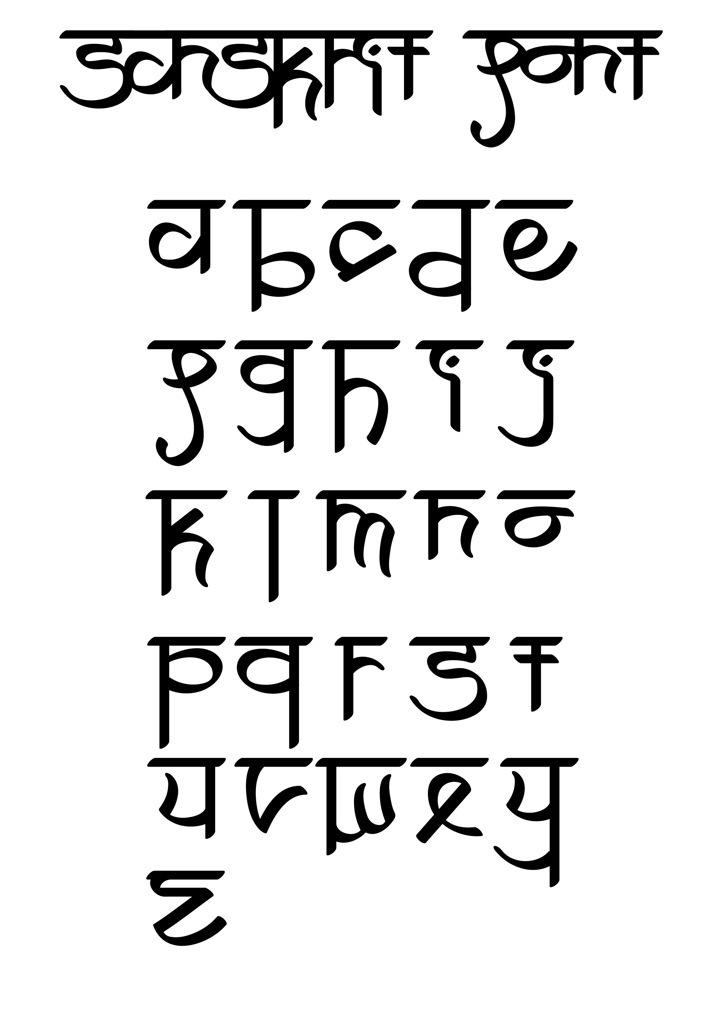
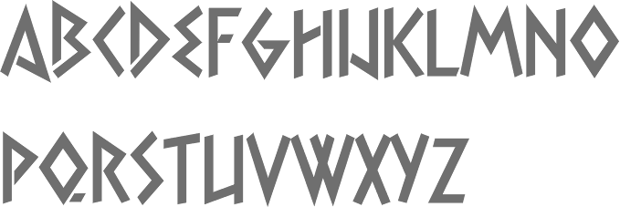
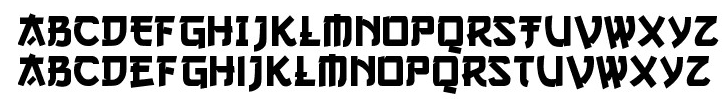
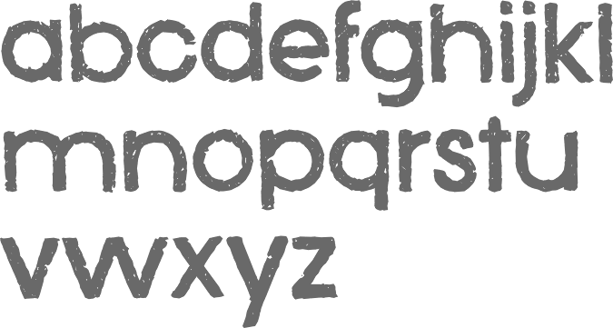
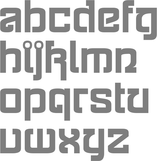
Indic simulation fonts | ||
|
|
|
|
SWITCH TO INDEX FILE
4th February
|
Abstract Fonts link. Dafont link. Creative Market link. Behance link. Hellofont link. Open Font Library link. |
Located in Bandung, Indonesia, ABM Studio created the spurred Victorian typeface Huntington (2014), the sans titling typeface Grandia (2014), and the curly Indic simulation face Sailendra (2014). In 2015, they made the signage font Roodies. Creative Market link. [Google] [More] ⦿ | |
Communication design student in Mumbai, who created the Indic simulation typeface Perfection of Wisdom (2012). [Google] [More] ⦿ | |
Alessandro Fulciniti (Axel or Alex Fulton) is the designer at FontStruct in 2008 of Digg (based on the Digg.Com logo), SmartShop, Triple-X, Last Brick (3d brick face), Last Brick Neon, Bubble Gum, Maxxell, Pico (pixel face), Omino (dingbats of men), jelly_fish_1, pixel_runner, red_light_district (dot matrix face), three_am. Son of Statement and Statement are heavy block fonts. Other typefaces: Acchooga (condensed), Dottic (2008, pixel face), Headshop (2008), Three AM (2008), Red Light District (2008, dot matrix face) and Fat Bit Lova (2008, pixel face), Brooklin Bros (2008, octagonal), Absurd, Dottic (pixel face), Hybrid Boost, Five AM, Futuristica (Bank Gothic-inspired), HeadShop, Americana (American flag-themed glyphs), Elevator (lightbulb signage font), Bombay (Indic simulation), Regent (octagonal, between two horizontal lines), Spaceman (pixel meets kitchen tile), Faster Baby, Fontharrt, Subpixel, Promises, Best-before-end (horizontal stripes), Weekend (fat headline face), Predator's Alphabet, Futures, Magnus (constructivist), Zeppa (great---Far West meets LED), Wide Horizon, Pixelity, Wide Horizon Rounded, Snipers' Font, Gunny (heavy metal stencil), Pinball Special 5, Gallop, Horizon Condensed, Western Zappa (Far West font), Wide Horizon Rounded, Nano Spaceman (nice fat kitchen tile style), Black Sheep, Best-before-end, Black-Sheep, Bubble-Gum, Crazy-Pixel, Faster,-baby!, Gallop, Horizon-Condensed, Last-Brick, Little-Spaceman, Magnus, Pinball-Special-5, Promises, Teenage-Mutant-Ninja-Font, Weekend, Zeppa, maxxell, pic. Born in 1975 in Northern Italy, he is a columnist for the Italian web design portal html.it since 2003, who has written extensively on CSS, javascript and web design. Web site. [Google] [More] ⦿ | |
Alexander Bobrov
| |
Dubai, UAE-based designer of the Indic simulation font Delhi (2018). [Google] [More] ⦿ | |
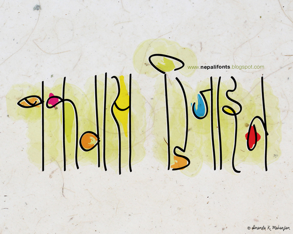
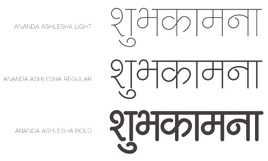
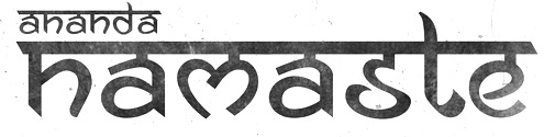
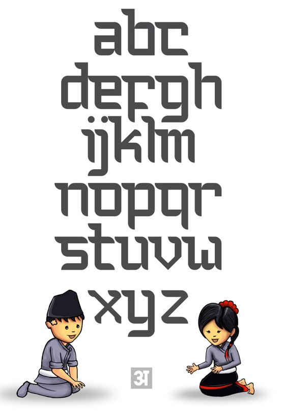
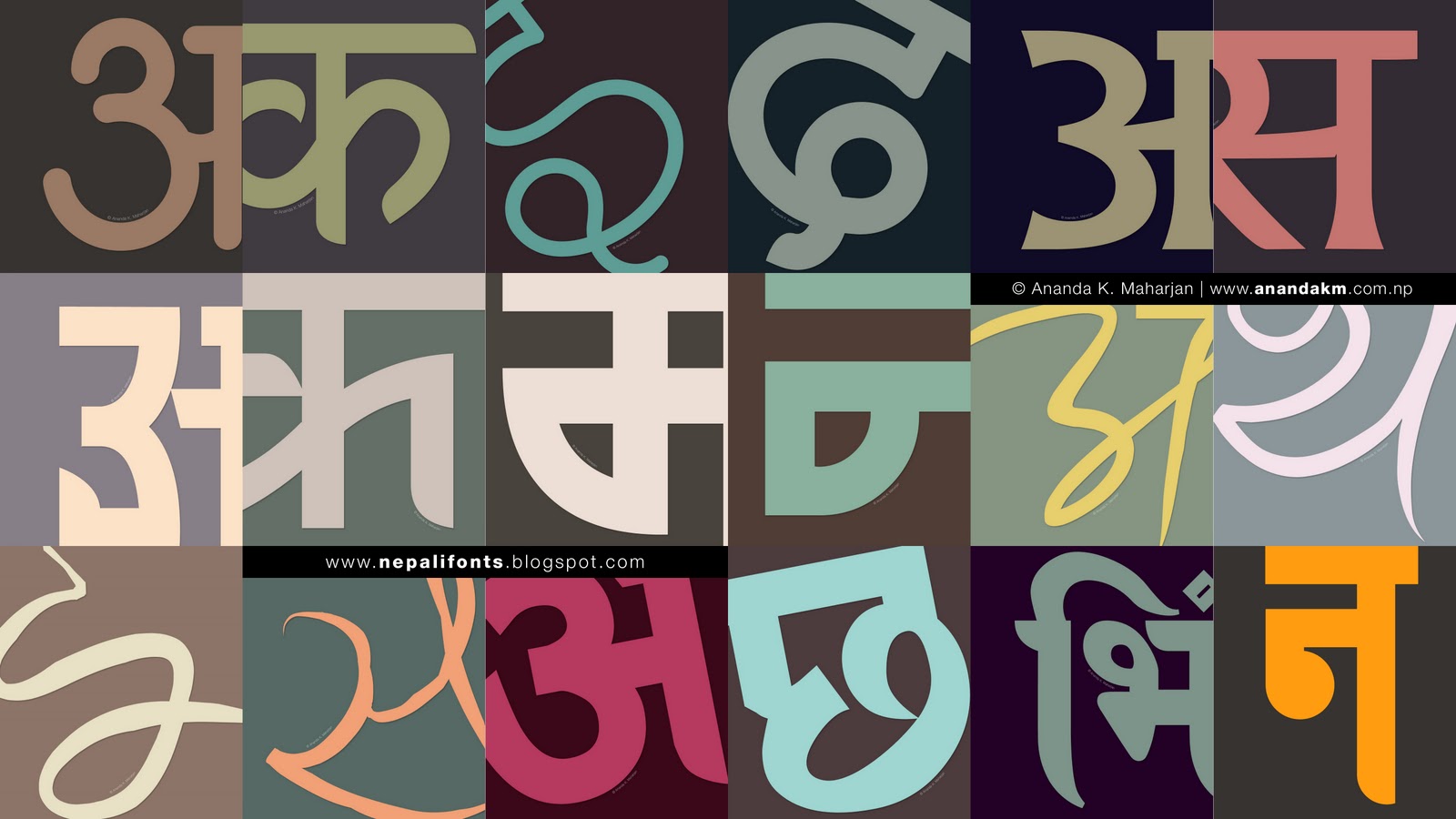
In 2013, he made the free modular Latin typeface Bauchaomaicha (FontStruct) and the Indic simulation typeface Pasarocks. In 2014, at FontStruct, he created the Devanagari typefaces Ananda Thopla (dot matrix) and Ananada Devanagari Round. In 2015, he published the free monoline Devanagari font Ananda Ukaliorali, the Sanskrit-inspired Latin typeface Ananda Neptouch Caps and the Devanagari font Ananda Chautari. Typefaces from 2016: Ananda Devanagari (free), Ananda Fanko (a free brush Devanagari typeface specially made for the Nepali movie Fanko). Typefaces from 2017: Nepal Lipi. Typefaces from 2019: Ananda Hastakchyar (script). Behance link. Klingspor link. Hellofont link. Blogspot link. Devian tart link. Catalog. Another Hellofont link. Creative Market link. Behance link. Blogspot link. Speaker at ATypI 2019 in Tokyo. [Google] [More] ⦿ | |
Mumbai-based designer of Bangalore Bold (2015) and a Kannada-inspired Latin typeface (2015). [Google] [More] ⦿ | |
Visual designer, artist and educator from India. During Type Paris 19, Anmol Shrivastava designed Raxis, a reverse axis typeface. Anmol tried to introduce some devanagari components into the Latin glyphs. [Google] [More] ⦿ | |
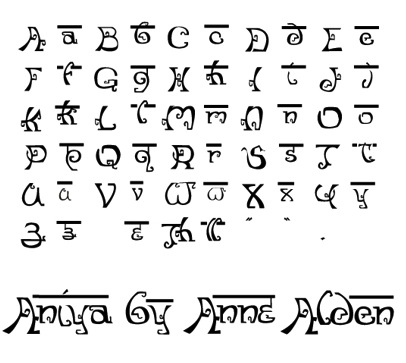
Bremerton, WA-based designer of the Indic simulation typeface Aniya (2013). [Google] [More] ⦿ | |
| |
Mumbai, India-based designer of the hyper-ornamental Indic emulation typeface Ganesh (2015). [Google] [More] ⦿ | |
Indian freelance graphic designer, who lives in Mumbai. She created the Indic simulation font Modakshar BT (2003). See also here. [Google] [MyFonts] [More] ⦿ | |
While at the National Institute of Fashion Technology, Bangalore-based graphic designer Aswin Menon created the free ball terminal-laden Latin display typeface Mysore (2015). In 2018, he published the Latin / Sanskrit fusion font Yuga, and the squarish futuristic and dystopian cyberpunk typeface Neototem. [Google] [More] ⦿ | |
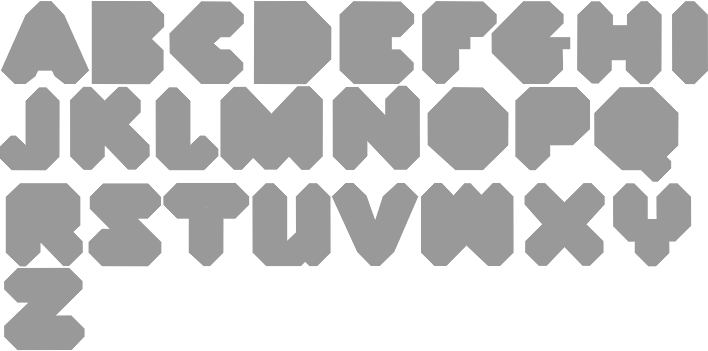
Designer in 2008 at FontStruct of NuGothicA (blackletter), BauForm, DINAMO (mechanical), Magnum (great industrial strength slab serif headline face), Cocoa (rounded and ultra fat), EUROstruct (thin and architectural), Kaotic (graffiti), Weimar (pixel face), Rondo, Rondo Tail, Fabrica (octagonal), Fabrica Rotula (stencil, octagonal), Quadrat, Electrica, Electrica Dots, Fabrica Screen (horizontally striped octagonal face), Block Black, Bloop, Blackwolf, Guru Blackletter (Indic simulation face), Inslab (slab serif), Inslab II, Minima (stencil), Boxer (ultrafat, octagonal), Bloko (nice ultra-fat face), Steel (macho slab serif), Nextar (pixelish but elegant), Simplex, Ulises 7 (+Serif) (pixel typefaces), Digita (kitchen tile) and Block (ultra fat), June Cleaver. See America (2008, octagonal) is an octagonal lettering font that was inspired by a travel poster (WPA, 1936) designed by Jerome Roth. Faces made in 2009: Morgana (a beautiful fat piano key face), Manitoba, Machina (+Slab), Old Monk (uncial), NughoticA Brush, LUBA 8 Lowercase (after Lubalin), Nugothic A (blackletter), Dinamo, Ross (strong mechanical face). Faces made in 2010: Sketch Pix and Sketch Pix 2. [Google] [More] ⦿ | |
Designer at FontStruct in 2008 of the Indic simulation typeface Bendi, cloned from Casey Castille's Aravinda Incense. [Google] [More] ⦿ | |
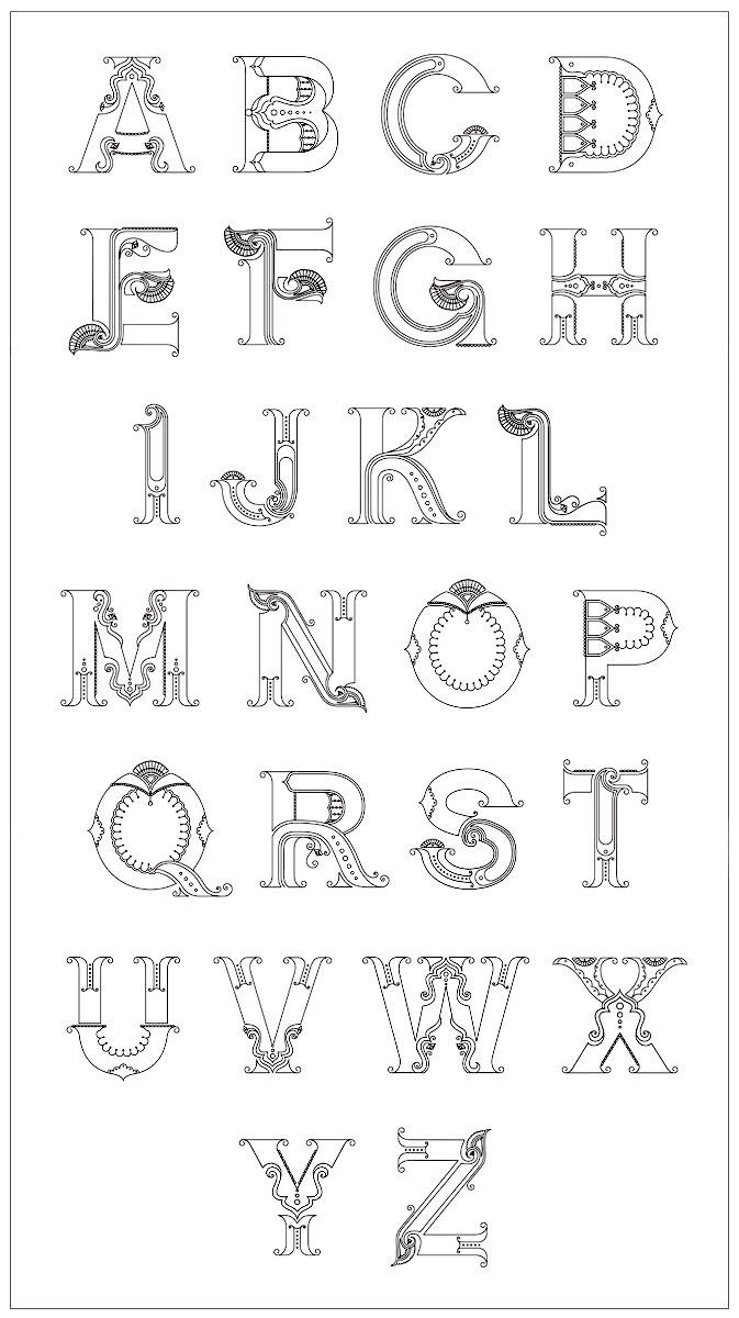
Designer and illustrator. A graduate of Tyler School of Art's MFA graphic and interactive design program, she spent her formative years in Louisville, Kentucky. Currently she teaches at Philadelphia University and moonlights as a freelance designer and illustrator. Her Kalakari alphabet (ornamental caps with an Indian look) is simply stunning. It received the first place award in the 2009 AIGA Center for Cross-Cultural Design Competition. [Google] [More] ⦿ | |
Betterfear.us (or: XXII Fonts, Or Doubletwo Studios)
|
Typefaces: XXII Sinoz DSP (2010-2011, elliptical face), XXII Gory Bastard (2011), XXII BLACKMETAL WARRIOR (2010), XXII Menga (2010, a technical sans family), XXIIARMY (2007, stencil), XXIIDECONSTRUCTION-DESTRUCTION-AREA (2007, grunge), XXIIDONT-MESS-WITH-VIKINGS-HARDCORE (2007, octagonal), XXIISTRAIGHT-ARMY, Army Dirty (grunge stencil), XXIIUltimate-Black-Metal (2007, cracked metal look), XXII Scratch (2007, scratchy face), XXII DEVILS-RIGHT-HAND (hand-printed), XXII BLACK-BLOCK (grunge), XXII MISANTHROPIA (2008, a rigid geometric sans family), XXII Arabian Onenightstand (2008: Arabic or Indic simulation face), XXII Urban Cutouts (2009, grunge), and XXII Static (2007, futuristic). His web site has a threatening nazi sort of look, but the fonts are (were) free. Betterfear.us claims to be located in St. Pauli, Hamburg, and is also known on MyFonts, where some of its fonts can be bought, as Doubletwo Studios. These include XXII Yonia (rounded script family loaded with opentype features), XXII Goregrinder, XXII Grober Bleistift (2013, marker font), XXII Centar (a sans family with a free regular style), XXII Totenkult (2012), XXII Blackened Wood (2013), XXII Candylove (heavy signage or packaging script), XXII Centars Sans (2012), XXII Daemon Runes (2012), XXII Total Death (2012), XXII HandTypewriter (2012), XXII Daemon (2012), XXII Marker (2011), XXII BLACK BLOCK SERIFA (2008), XXII Mescaline (2009 Western style), XXII Misanthropia (2010, geometric sans), XXII Marker (2011), XXII Blasphema (2011) and XXII STREITKRAFT (2008, a stencil family with grungy versions added). Older list of fonts: Devils Right Hand (blackboard script), Black Block (grunge), Static (techno), Ultimate Blackmetal, Scratch, Don't Mess With Vikings, Army Dirty (grunge stencil), Army Straight, Black Block Eroded. Typefaces from 2014: XXII YeahScript (signage script). Typefaces from 2015: XXII Geom (a geometric sans typeface family), XXII Awesome Script (for signage). Typefaces from 2016: XXII Neue Norm (techno sans), XXII Cool Script, XXII Geom (a geometric sans typeface family), XXII Grober Pinsel (brush typeface). Typefaces from 2017: XXII Neue Norm Rounded, XXII InAshes (grungy blackletter). Typefaces from 2018: XXII Geom Slab. Klingspor link. Alternate URL. Behance link. Dafont link. Another Behance link. Old URL. Another Dafont link Yet another Behance link. And a final Behance link. [Google] [MyFonts] [More] ⦿ |
Bharatic
| Free original fonts by Tamon Yahagi: Bharatic (Latin, all formats), Devanagarish (Indic simulation), Ananda (handwriting), Ame, Apparappa-House (2003, handwriting), Hiran-Kanan (kana). Dafont link. [Google] [More] ⦿ |
Graduate of the Hochschule für Angewandte Wissenschaften in hamburg. Designer at Designer Shock in Berlin of the fonts DSYogasaanAdvanced, DSYogasaanBeginners (both Indic simulation fonts, now commercial fonts at Die Gestalten) and DSMrGreenies (dingbats), all made in 2001. Klingspor link. [Google] [More] ⦿ | |
Oakland, CA-based designer (b. 1975) at FontStruct in 2008 of the smudged typefaces Smudge New Roman and Chinese Chairs, as well as the experimental typefaces Navajo Blankets, Progesterone, Guru Blackletter (Indic font simulation), June Cleaver (dot matrix), Sugandha Shringar (Indic font simulation), Aravinda Incense Sticks (more Indic font simulation) and Guru Saksha (still more Indic simulation). Wayang Kulit (2008, caps only) was inspired by Javanese shadow puppets. Dafont link. Graffiti fonts made by him in 2008: Professional Muse, Gladiator Cruel. On the side he runs a business selling pin-up calendars. Fontsy link. Home page. Full name Casey Castille Nassberg (nee Shelton). [Google] [More] ⦿ | |
Designer in Bangalore City, India. Designer of the Indic simulation typeface TypoC (2013). [Google] [More] ⦿ | |
Dead link. Stephan Baitz's informative page about Ancient Scripts and Fonts, including fantasy fonts, alien and sci-fi fonts, Blackletter fonts, uncials, runes, symbolic fonts, Indic simulation fonts, Arabic simulation fonts (such as Caliph) and exotic fonts. Lots of links are provided as well. Fonts are displayed an can be downloaded from an archive. His page looks great too. [Google] [More] ⦿ | |
FontStructor who made Morse Code (2011) and the Devanagari-simulation typeface Hinglish (2011). [Google] [More] ⦿ | |
Oriental, Arab and Indic simulation font archive. [Google] [More] ⦿ | |
Parisian designer (b. 1981) of PixArrows (2010, pixelized arrows), BeijingWigoWhat (2005, Indic simulation face), Coin Locker Datura (2005), Fucked Plate (2005, grunge typeface entirely based on old license plates), Destroyed License Plate (2005), BonesBummer (2005, scratchy handwriting), VerArmy (2005, stencil), Knife Fight (2005), Veru Serif (2005), Belgian Army (2005, no longer offered), Bnko (2005, no longer offered), Abuse (2005, handwriting) and Sweeep (2005, typewriter simulation), PoscaMadThrasherz (2009, graffiti), Rififi Serif (2010, pixel face), Sorcery 6128 (video game font) and Satan 1981 (2018). Typefaces from 2020: Boulder Dash 6128 (a pixel font), 8Bit Arcade (a video game font), Popincourt 1981 (a condensed squarish sans), Blackletter 97, Turfu 97, Peng Chau Nights (squarish), Eighty Nine 75020, Discomobile 1972 (Western), Lavomatic 2000. Alternate URL. [Google] [More] ⦿ | |
Designer of the Saffron family of fonts. ColdWar is free. Regular and Bloke are not. Also designed Gardenparty, Prakrta (Indic simulation, 1997) and Sveningson. Dafont link. [Google] [More] ⦿ | |
Didi Syarif
| |
Dirk Uhlenbrock
| |
ECHT
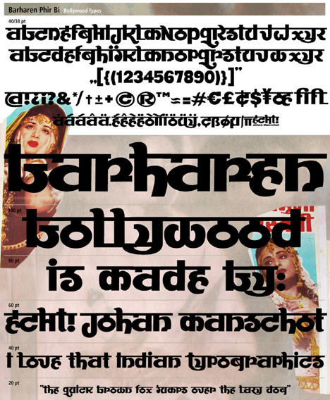
| ECHT is the foundry of Johan Manschot (b. 1974, Utrecht), a Dutch graphic designer who lives in Utrecht. His typefaces includes the counterless octagonal Pavement (2010) and the Indic simulation typeface Barharen Phir Bi (2010). The latter typeface is based on the Hindi text found on Guru Dutt's Baharen Phir Bi Aayengi -film poster (1966). [Google] [MyFonts] [More] ⦿ |
Turkish designer of an Indic simulation typeface in 2016. [Google] [More] ⦿ | |
Essqué Productions
| Stephen Knouse (Essqué Productions) is the Alaskan designer in Wasilla (b. 1976) of several free fonts. These include the display typeface Petal Glyph (2007), Avante Go (2008, avant-garde) and Avante Return (2008, avant-garde). He also created the free comic book fonts Happy Sans (2009, beatnik style) and Happy Serif (2008), Diagano (2012, monoline avant-garde sans), the trekkie typeface Dark Future (2011), and Neon 80s (2010, a rounded sans in the style of VAG Round but more so a faux neon font). Spyced (2012) evokes Arabian nights, lava lamps, and Indian mystery. In 2014, Stephen designed Geo Grid 9 (a kitchen tile font) and Tall & Lean. In 2016, he added the octagonal trekkie font Commander Edge. Typefaces from 2021: Power Talks (a bold tuxedoed art deco sans for Latin, Hebrew, Greek and Cyrillic). Dafont link. Fontspace link. Devian tart link. Creative Market link. Behance link. [Google] [MyFonts] [More] ⦿ |
Sao Paulo, Brazil-based designer of the tweetware circle-based typeface Neuza (2016) and the free Indic simulation typeface Ladjane (2018). [Google] [More] ⦿ | |
Eyesaw (was: Fontomas.com, or Signalgrau)
| Dirk Uhlenbrock's (b. Essen, 1964) studied communication design at BUGH Wuppertal. His typographic contributions were presented under various labels such as Signalgrau, Fontomas.com, Eyesaw, or TypeType. His fonts: Buddies (funny dingbat font), Scrabble (1999), Pizzo (pixel font, 2000), Accient (2000), EURASIAOblique, Freak (1998), SpaceAge, Fivejive (2000), Missu (2001), T-Series (a family by Stephen Payne (UK, 2000) for Territory), XXX (1998, sexy silhouettes), Y2k (2000), Basm (family by Miguel Basm Visser, 2000), Corner-bi and Corner-mono (both by Ole Fischer for Fischer Jr Design), Persona, Creatures (dingbats by Dirk Uhlenbrock, 1998), Thaipe, Thaiga, (squaregrid (Jay Marley, 2001), Bath (Heiko Hoos, 2001), Honey (Dirk Uhlenbrock, 2001), Pinx (Dirk Uhlenbrock, 2001), Tuna Salad (Dirk Uhlenbrock, 2001), Evo (2002), EvoThin (2002), Gen3000 (2002), Gen3000Thin (2002), HanneloreOutline (2001), Hannelore (2001), MassBlack (2002), MassOutline (2002), Mass (2002), MassStriped (2002), MassThin (2002), Microbe (2002), PellegriniItalic (2002), Pellegrini (2002), PileOutline (2002), Pile (2002), Rickshaw (2002, Indic letter simulation), Swisz (2002), SwiszThin (2002), TurbonItalic (2002), Turbon (2002), Apollo9, Apollo9Italic, Bite, Blob, BlobThin, Bubble, BubbleWild, Crack, Creatures, Dennis, Dioptrin, Dna, Electrance, Frakt, Launchpad, ORAV, Paul5, Paul6, PlakatOne, PlakatTwo, Push, Rubbermaid, RubbermaidSingle, Ticker, Tubeone, Tubetwo, Tvdinner, TvdinnerFull, Ufo, UfoItalic, Yodle. At Fountain, he designed Robotron and Super and Girl (2003, a Bauhaus experiment). Kombi was created in 2003. The Fontomas CD published in 2005 (40 dollars for 75 fonts) is reviewed by Yves Peters. On it, we find older fonts as well as newer ones by Dirk himself: Ove, Gen1000 (DNA style), Hannelore, Mass, Micro B, Pellegrini (script), Pile, Swisz, Turbon, Rickshow (Indic simulation). At 14. tage der typographie in 2013, he spoke on Grafik gegen Rechts. Dafont link. Old URL. Another old URL. Alternate URL. FontShop link. Klingspor link. Fontspace link. Fountain Type link. [Google] [MyFonts] [More] ⦿ |
German foundry, part of Gestalten Designstudio and Die Gestalten Verlag (dgv) in Berlin, a company self-described as follows In 1990, industrial design students Markus Hollmann-Loges, Andreas Peyerl and Robert Klanten began to curate and organise prototype design shows commissioned by the worlds biggest consumer fair in Frankfurt in between attending their lectures and writing their dissertations. Very much aware of the limitations of their field of study, they soon moved to Berlin, where they quickly met key people involved in the local Techno and cultural scenes. With the advent of desktop publishing, they formed a loosely organized graphic design agency called Die Gestalten and started designing flyers and posters for clients such as the groundbreaking club Tresor and the annual Loveparade. Its typefaces, by designer:
Free fonts include Regular Cargo Bold by Nik Thoenen, RussianBread, DrEye and Doener Kebap Strong by Lund Sundson, as well as HardCase-Striped by Dimitri Lavrow. New releases. [Google] [More] ⦿ | |
Graham David Blakelock
| |
Designer of Linotype Sansara (1999), an Indic simulation font. Klingspor link. Linotype link. [Google] [MyFonts] [More] ⦿ | |
Grummedia
| Ilkley, UK-based foundry of Graham David Blakelock (b. 1947, York, England). MyFonts sells his fonts. These include typefaces used in role playing games, often with a medieval look, all published in 2005: Fifteen36 (Venetian with rough edges), Fourteen64 (Venetian with rough edges), High German (blackletter), ItalicHand (inspired by 11th or 12th century Carolingian hand-drawn cursive), Old Russian (fake Cyrillic), Ye-As-Ta (rotated brush style caps), Good Taste (2006), Hieroglyph Informal (2006), Kanjur (2006, Indic simulation face), Mayan (2006, dingbats and Mayan-looking letters), Pepper (2006), Salt (2006). View Graham David Blakelock's typefaces. [Google] [MyFonts] [More] ⦿ |
Chinese designer of Sanskrit (2010, Indic simulation face) and Lightning Track (2010, angular). [Google] [More] ⦿ | |
In 2015, he created the uncial typeface Scylla and the display sans Ban (named after Japanese architect Shigeru Ban, Ban was his graduation typeface). From 2015 until 2019, he is doing a Masters at Ecole Nationale Supérieure des Arts Décoratifs de Paris. In 2016, he designed the bitmap-inspired hipster typeface Building (2016). In 2020, he released the humanist sans family Synonym at Fontstore / Fontshare. [Google] [More] ⦿ | |
Bagnolet, France-based student-designer of Birman (2017), a typeface that emulates Burmese in Latin. [Google] [More] ⦿ | |
Indian Summer Studio
|
Typefaces from 2016: Historical Stencil Font USSR 1980 (2016), Geometric Sans Serif, Tanuki, Curly Cyrillic Sans, Historical Geometrical Art Nouveau Study, Indian Stylized Cyrillic, Historical USSR (constructivist), IBM Selectric Typewriter, 1966 Olympia SF DeLuxe Cursive (typewriter font), Moscow Metro, Cynzel (cyrillization). Typefaces from 2019: Funny Toons (a rounded cartoon family by Ekke Wolf and Alexander Bobrov), Selectric Century (a Scotch Modern / Schoolbook typeface modeled after the famous IBM Selectric golfball font), Aldo New Roman (a modern version of the typeface cut by Francesco Griffo for Venetian printer Aldus Manutius around 1490AD). Typefaces from 2020: Air Force 30 Stencil (the official US military fonts/lettering used in U.S. Air Force, U.S. Army, U.S. Navy, U.S. Marine Corps, based on their technical specifications), Oriental Kaishu (all caps, oriental simulation), Selectric Melt, Air Force (the official US military fonts/lettering used by US Air Force, US Army, US Navy and US Marine Corps, designed based on the Military Standards and Technical Manual; covers Latin, Cyrillic and Greek), Stone Age (a neolithic font), Selectric Pyramid (a typefwriter font based on Rudolf Wolf's Memphis from 1929), Selectric (a 1315-glyph (!) revival of IBM's famous golfball typeface, Selectric), Dymond (a dymo label font). Typefaces from 2021: Science Fiction (rounded, squarish), USSR (a squarish Russian cold war propaganda font; Latin and Cyrillic), Age (squarish and rounded; for Latin and Cyrillic). [Google] [MyFonts] [More] ⦿ |
In 2016, she published the fun Egyptian typeface family Napo (Zetafonts) which is partly free. Leon is the accompanying sans family. Both are named after Napoleon Bonaparte. | |
Jo de Baerdemaeker
| |
Johan Manschot
| |
Belgrade-based designer of an Indic simulation typeface in 2012. [Google] [More] ⦿ | |
Authors of ABZ: More Alphabets and Other Signs (Chronicle Books), a 221-page book full of strange alphabets. Scan of a Tamilianized Latin alphabet. [Google] [More] ⦿ | |
Julien Janiszewski
| |
Based in Brooklyn, NY, Kathrin designed the synthetic Hindi typeface Sprue (2003). [Google] [More] ⦿ | |
During her studies at Skolen for Visuel Kommunikation in Haderslev, Denmark, Kira Linneberg designed a devanagari emulation typeface (2018). [Google] [More] ⦿ | |
Kisman Studio (was: Holland Fonts)
|
His early typefaces: ExtendedMaxMixOne (1991), Rosetta, Jacque (1991, FontFont), Fudoni (1991), the experimental font Linear Konstruct (FUSE 2). He wrote a coffeetable book on typography in the streets of Paris, but no book store in Paris seems to have it, and I have looked! He is editor of Tribe. In 2002, he started Holland Fonts. His fonts there: Bebedot Blonde (2002), Bebedot Black, Bfrika (2002, an interesting African lettering font), Cattlebrand (2002), Chip 96 (2002), Chip 02 (2002), Circuit Closed (2002), Circuit Open, Interlace Single (2002), Interlace Double, Mundenge Rock (2002), Nevermind (2003, a cut-out style reminiscent of Saul Bass's movie titling types), Pacific Sans (2003), Pacific Serif (2003), Pacific Standard L, Pacific Standard B, Pacific Classic L (2002, artsy, stylish), Pacific Classic B, Quickstep Regular (2002, an angular font), Quickstep Bold, Quickstep Sans R, Quickstep Sans B, Submarine (2003, an octagonal font family), Traveller Regular (2002), Traveller Bold, Tribe Mono (2003, a tech font), Zwartvet (2002, a Van Doesburg/ De Stijl type font). Four free ransom note fonts made in 2003: Dutch Doubles, Frisco Remix, We Love Your Font, MaxMix One. At Union Fonts, he (re-)published Bebedot, BFRIKA, Cattlebrand, Chip01, Chip02, Pacific, Quickstep, Submarine and Traveller in 2003, and Mata Hari (Indic simulation typeface in weights called Exotique, Hollandaise and Parisienne) and Xbats (2004, Christmas dingbats) in 2004. In 2017, Max Kisman was asked to design a naked font for the Dutch printing association, Drukwerk in de marge. It is called Genitaal XXX. Speaker at ATypI 2004 in Prague. FontShop link. Klingspor link. Illustration Daily link. His bestselling fonts at MyFonts. Pic. [Google] [MyFonts] [More] ⦿ |
La Laiterie
|
FontShop link. Klingspor link. View Julien Janiszewski's typefaces. [Google] [MyFonts] [More] ⦿ |
Lecter Johnson
| |
At Union Fonts, he published Chube, Dispose, Engage, Headroom (an octagonal almost mechanical font), Quarantine, System02 and Vlad in 2003. At The Type Trust, we find Novacane (futuristic), System02, Dispose and NeoGothic. You Work For Them link. Klingspor link. [Google] [MyFonts] [More] ⦿ | |
Marcela graduated from Universidad Tecnológica Metropolitana de Santiago de Chile in 2007. For the type design course there, she created the Indic atmosphere typeface Siddhartha, named after Siddhartha Gautama. [Google] [More] ⦿ | |
Marco graduated from Universidad Tecnológica Metropolitana de Santiago de Chile in 2007. For the type design course there, he created Sitar, an Indic simulation face. [Google] [More] ⦿ | |
During her studies in Coimbra, Portugal, Maria Ines Peixoto created the Indic simulation font Bengala (2013). [Google] [More] ⦿ | |
Bowen Island, BC-based very talented graphic artist, who specializes in custom type and ornaments. Her typographic work:
She teaches typography through Emily Carr Institute in Vancouver, BC. Speaker at ATypI 2010 in Dublin. Klingspor link. [Google] [More] ⦿ | |
At Minnesota State University Moorhead, Minneapolis, MN-based Marissa Iversrud designed the Indo-Islamic and Hindu-style typeface Alai (2017). [Google] [More] ⦿ | |
Mark van Wageningen
| |
Max Kisman
| |
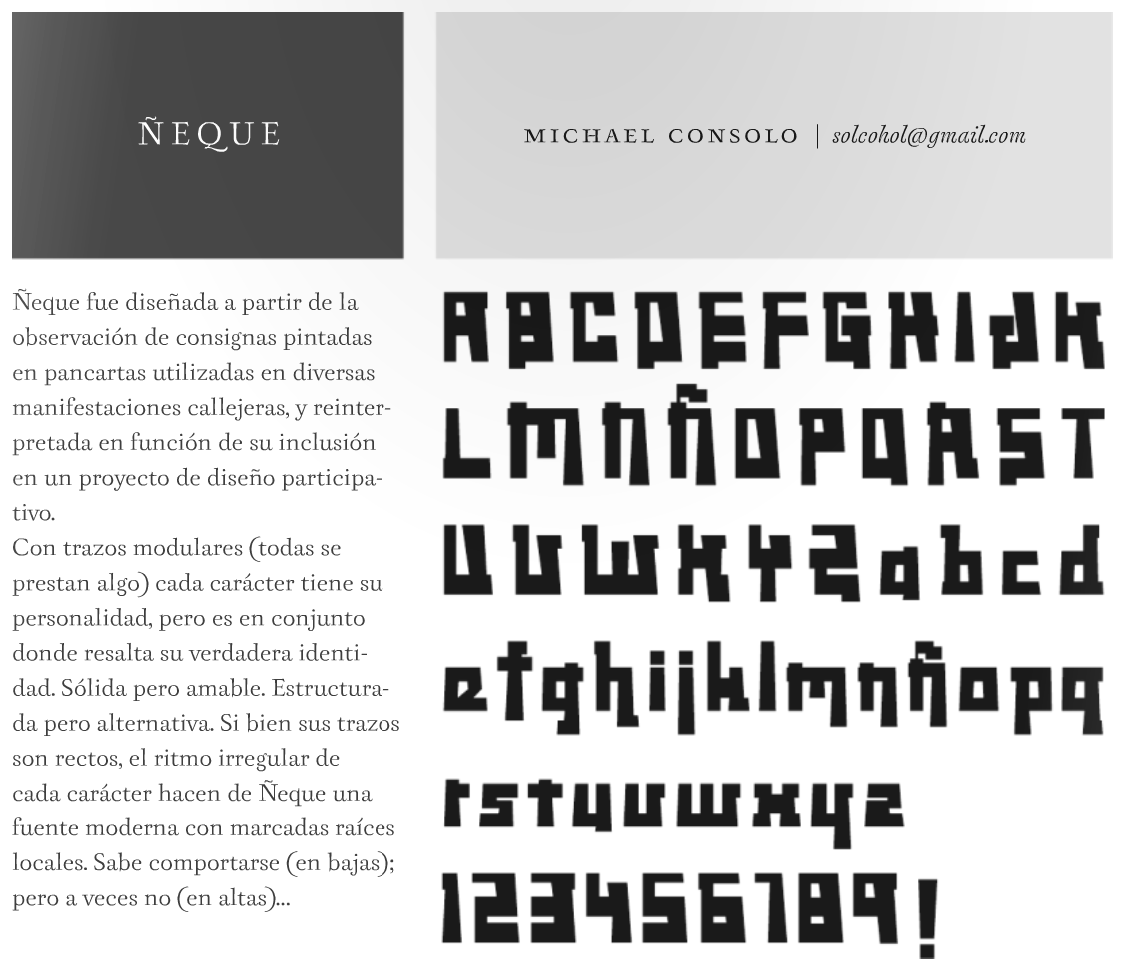
Michael graduated from Universidad Tecnológica Metropolitana de Santiago de Chile in 2007. For the type design course there, he created the severe squarish typeface Neque. [Google] [More] ⦿ | |
Michael Parson
| |
Designer of the Indic simulation typeface My Misha (2011, FontStruct). Aka Luna Puer. [Google] [More] ⦿ | |
Nabina Ghosh
| |
Nabina Ghosh Indian Font Downloads [was: Font Fridays]
| Nabina Ghosh's blog in which he displays his fonts. These include Traffic Police (2008, a stencil typeface based on signage outside a Kolkata police station), BharatLotus (2008, ornamental), English (2008, Indic simulation), Travels (2008), Service (2008), BeanBags (2008, handwriting), Thane (2008, based on taxi stickers in Navi Mumbai), HornPlease2 (2008, signage font), Don'tTouch (2008, hand-printed), Stop Signal (2008, display), Horn OK (2008) and CargoLab (2008, stencil). All fonts are on Indian themes. Free downloads after registration. The full list: Bharat Lotus, English, Service, Beanbags, Thane, HornPlease, HornPlease2, DontTouch, Travels, Notice, StopSignal, CargoLab, PCO, OBricks, RedReverse, TrafficPolice, SoundHorn, STD-ISD, ThinkTwice, Parthas, Sonajit, Dosa, NoShoes. [Google] [More] ⦿ |
Cheney, WA-based designer of these typefaces: Arthuriel (medieval), Berkyspex (techno), BeviaGrowth (experimental), Brenin (unicase uncial), Brickfun (pixel), Bywater (uncial), Cheetah (fat display), Cipher (octagonal), Crown (uncial), Delivar, Drive, Drumsage, Efficient, Fanghorne (uncial), Figbead, Gaelothic (celtic), Galiden, Handshake (lego style), Havinoth (uncial), Humolion (experimental), Knowledge (indic simulation), Lancaster (indic simulation), Neoxidan, Nightime (uncial), Ockiahex (hexagonal), Paradox, Parfiche, Piecemeal, Pickel (pixel), Providian (uncial), Realight (fun experimental), Reliner (indic simulation), Rhubarb, Ribbon, Rimvet, Runestick (runes), Sageight, Skipfrog, Subrail, Toystack (pixel), Umbrella (clean geometric face), Valifas (uncial), Webgura, Westmarch. I assume that most typefaces were done in 2004-2005. [Google] [More] ⦿ | |
| |
During her studies at the School of Visual Arts in New York, Nishna Shah designed the script typeface Rush (2019) and the Indic style Latin typeface Mumbai (2019). [Google] [More] ⦿ | |
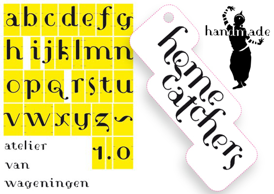
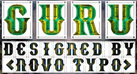
Novo Typo (was: Atelier van Wageningen)
|
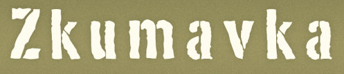
In January 2015 Mark started the Typewood project. Typewood is a research project about designing, deconstructing, and transforming multicolored digital typefaces into wooden type for letterpress. Ziza, a corresponding project with lead type, followed in 2016. Both projects show the future of multicolored typeface design through the revitalization and deconstruction of typographic traditions. Mark wrote several books about chromatic type design such as the Novo Typo Color Book (2017) and Color and Type (Princeton Architectural Press, 2019). The display type Stavba (inspired by Rodchenko's constructivist lettering) appeared in 1994 as a part of his presentation for his final examination at the Gerrit Rietveld Academie in Amsterdam, and was later renamed Ärst. He continues making display types on his own account. He created the fonts Linotype Cerny (1995, caps only), Linotype Laika and Linotype Sjablony (a roughened stencil font) in 1997. Fontshop and 2Rebels sell his Gagarin family (2000), which include Anna (constructivist and unicase), Boris, Christa, Dmitri (MICR), Eleno, Fjodor, Gregor, Hektor (stencil), Igor, Youri, Leonora (with Nele Reyniers), Magda (with Nele Reyniers), Ossip and Petrov (LED simulation). As he tells it, four Russians, Gustav Klucis, Vladimir Majakovski, Alexander Rodchenko en Gregory Rasputin each had an affair with Anna Gagarin, and out of all that came forth Boris, Christa, Dimitri, Elena, Fjodor, Gregor, Hektor, Igor, Jouri, Kurt, Leonora, Magda, Nina, Ossip, Petrov, Quirina, Rudolf and Sonia. Atelier Van Wageningen made the curly typeface HC type (2010) for packaging. Typefaces from 2012 include NT Lucien, NT Plakaty (poster font), NT Theo, the NT Gagarin family, NT Zkumavka (rough stencil based on stencils from the 1920s in Russia; first published in 1995-2002 at Two Rebels), NT Cornelia (wood type caps), NT Novo (with Novo Alla, Bila, Cela, Dada, Enno, Fika, Gigo, Halu (art deco)), Louis Douze and Therese Quatorze, Caren (a soft-edged corporate typeface for a Dutch women's organization, Vrouwen van Nu). Typefaces from 2013: NT Guru (a layered ornamental type system), Sjiq (with a crazy roofed lower case s), and flower photographic typefaces such as Fall, Lily and Pure. Novo Typo also made several corporate typefaces. Typefaces from 2014: NT Wolf (layered typeface), NT Yaki (hipster layered font family), NT Fest (a curly inline caps face). Typefaces from 2015: NT Fata (a layered decorative font family), NT Rashmir (Indic simulation inspired by Sanskrit; styles Amal, Baya and Cyra), Bixa (Bixa Color minisite: a multicolored wood type; winner at TDC 2016 and ProtoType in 2016). Creative Market link. Behance link. Linotype link. FontShop link. Another Behance link. Klingspor link. [Google] [MyFonts] [More] ⦿ |
Page Studio Graphics (or: Pixymbols)
|
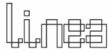
The fonts (grouped under the name PIXymbols) include ADA symbols v.2.0, Africa, Alphabox, Alphacircle, Ameslan (ASL), Antorff (blackletter), Antorff Fractions, Apothecary, Arrows, Astrology, Backstitch, Boxkey, BoxNLines, Braille grade 2, Casual, Chalk Casual, PIXymbols Chess, Command Key, Courex (typewriter family), Crossword, PIXymbols Deco Glass (2001), Digit&Clocks (+LED symbols), Dingbats&Online, DOSScreen, Fabric Care, FARmarks (Federal Aviation Regulations lettering), Flagman (semaphore), Fractions, Gridmaker, Highway Gothic (U.S. Department of Transportation's Standard Alphabets for Highway Signs), PIXymbols Highway Gothic 2002, Highway Signs (U.S. Department of Transportation), Hospital&Safety, LCD, Linea (2002, prismatic), Luna, Malkoff (calligraphic font), Marina, Meeting, Mejicana (2001, a Mexican party font), Menufonts, Morse, Musica (instruments), Newsdots, Orchestra, Passkey, Patchwork, PCx, Phone, PIXymbolsMusica, Prescott (2001, Western), Penman (2001, connected script), PrimerD (letters with lines), Recycle, Roadsigns, Shadowkey, Signet (family), Signet Shadow, Squared, Strings, Stylekey, Tolerances&Datum, Travel&Hotel, TV List, Unikey, US Map, Vershen (2001), Xcharting, Xstitch. They also sell EPS files of all Arms of Swiss cantons, and many nice initial caps. Look also for Faux Hebrew (simulated Hebrew), as part of the Faux package that also includes Faux Sanskrit, Faux Runic, Faux Hebrew, Faux Japanese, Faux Arabic, Faux Chinese and Faux Chinese Sans. Alternate URL. Previews at MyFonts. Klingspor link. View the Page Studio Graphics typeface library. [Google] [MyFonts] [More] ⦿ |
Valley Stream, NY-based designer of the Indic simulation typeface Indic (2018). [Google] [More] ⦿ | |
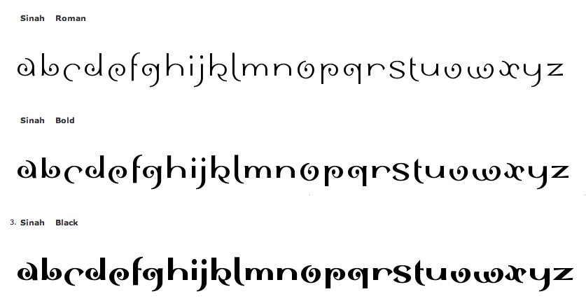
German artist. Designer at Linotype of the experimental 3-weight family Sinah Sans LT (1994, an Indic simulation font) and the oriental simulation font family Linotype Chineze (2002, part of TakeType 4). In 2003, he created Picture Yourself with Karin Huschka, also at Linotype and reaped an award for it at the Linotype International Type Design Contest 2003. The illustrations in Picture Yourself were based on ideas of the architect Oscar Niemeier. Sync (2018) is a 26-style layered font system for chromatic typesetting. The first sketches were inspired by some hand-painted characters on a weathered beach sign at the French Côte d'Argent. Linotype link. FontShop link. [Google] [MyFonts] [More] ⦿ | |
Mumbai, India-based designer of the curly Batik pattern-inspired Latin / Devanagari display typeface Mrigasya (2018). [Google] [More] ⦿ | |
As a student at University Of Gloucestershire, Cheltenham, United Kingdom-based Presley Fernandes designed a typeface that imitates Hindi (devanagari) writing (2017). [Google] [More] ⦿ | |
Ahmedabad, India-based designer of an Indic simulation typeface and the hairline grotesk typeface Ovihcra in 2018. [Google] [More] ⦿ | |
Leiria, Portugal-based designer of the devanagari emulation typeface AlphaDev (2018). [Google] [More] ⦿ | |
Mumbai, India-based calligrapher, b. 1968. Designer of many Indic simulation typefaces in 2016: Bitling-lipika-Bold-Italic, Bitling-lipika-Bold, Bitling-lipika-Italic, Bitling-lipika-Regular, Bitling-moksh-Italic, Bitling-niks-musical-Bold-Italic, Bitling-niks-musical-Bold, Bitling-niks-musical-Italic, Bitling-niks-musical-Normal, Bitling-shivom-Italic, Bitling-shivom-Regular, Bitling-sujatra-Bold-Italic, Bitling-sujatra-Bold, Bitling-sujatra-Italic, Bitling-sujatra-Regular, Bitling-sulochi-calligra-Italic, Bitling-sulochi-calligra-Regular, Bitling-vedas-Bold-Italic, Bitling-vedas-Bold, Bitling-vedas-Italic, Bitling-vedas-Regular, Bitlingmoksh-Regular. Dafont link. [Google] [More] ⦿ | |
Robert Ethel
| |
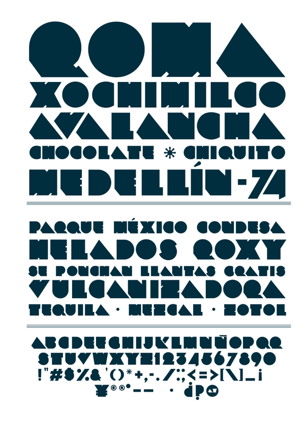
Tlalpa, Mexico-based art director. Creator of Collette (2007), an exaggerated curly face, almost good enough as an Indic simulation font. In 2010, he made the fat counterless typeface ROMA. He works at ROM, a design and identity studio in Mexico City. Behance link. [Google] [More] ⦿ | |
Roger Vershen
| |
FontStructor who made several pixel or pixelish typefaces from 2010 until 2012, such as Cho Bit, Simple03, Num S01, Plas01, Plas02, Plas03 (Indic simulation or plastic model typefaces), Cubi01 (cubic face), Beta01, and Angular (mechanical octagonal). [Google] [More] ⦿ | |
Daman, India-based designer of the Latin display typeface Ol Chiropus (2017), with shapes based on the Santali script Ol Chiki that was invented in the 1920s by Pandit Raghunath Murmu. [Google] [More] ⦿ | |
Kenyan-born England-based calligrapher and designer of these typefaces:
The author of Calligraphy--The Rhythm of Writing, he often lectures on on-screen calligraphy, and calligraphy in general. FontShop link. [Google] [MyFonts] [More] ⦿ | |
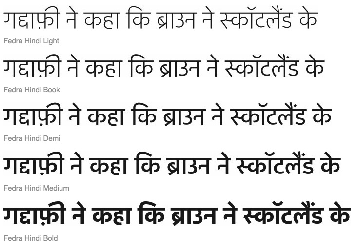
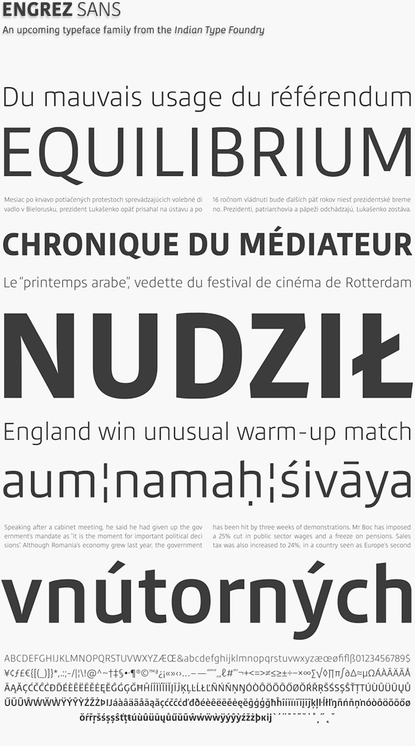
His type work includes ITF Devanagari (2001), this experimental display face (2006), this minimalist face (2007), this experimental sans (2007), Rail India (2007, an Indic simulation face) and this Devanagari (Hindi) typeface (2007). With Peter Bilak, he created Fedra Hindi (2010, ITF). In 2010, he received the SOTA Catalyst Award and published the Kohinoor family for Latin, Devanagari and Tamil. In 2012, he designed the type family Engrez Sans. With Jyotish Sonowal, he designed the beautiful semi-calligraphic Tulika Bengali. It includes support for the Assamese, Bengali, Bishnupriya Manipuri, Garo, Kokborok, Meitei, and Mundari languages. Kohinoor Latin (2012) is a low-contrast humanist sans-serif suitable for both body and the display text. The Indian Type Foundry published several typefaces at Google Web Fonts in 2014: Hind, Kalam, Karma, Teko and Rajdhani. Rajdhani is an Open Source typeface supporting both the Devanagari and the Latin scripts. The font family was developed for use in headlines and other display-sized text on screen. Its initial release includes five fonts. Satya Rajpurohit and Jyotish Sonowal developed the Devanagari component in the Rajdhani fonts together, while the Latin was designed by Shiva Nallaperumal. In 2014, Sanchit Sawaria and Jyotish Sonowal finished the free Google Web Font Khand, an 8-style family of compact mono-linear fonts with very open counter forms. Developed for display typography, the family is primarily intended for headline usage. Its Latin is from Satya Rajpurohit, and Khnad carries the Indian Type Foundry label. In 2015, Akhand (a condensed almost monoline sans that covers many Indic languages) appeared at MyFonts, where we learn that Satya Rajpurohit is the designer, but it is unclear who did what. That typeface was followed in 2016 by Akhand Soft. Jyotish Sonowal extended Hind to the free 10-style Calcutta in 2015. Satya Rajpurohit designed the sans typeface family Author (2017). . Behance link. Klingspor link. [Google] [MyFonts] [More] ⦿ | |
Sergiy Tkachenko
| |
During his studies in Ahmedabad, India, Shuvam Jaiswal designed the Benagli emulation typeface Bongish (2017). [Google] [More] ⦿ | |
Chilean designer of Mandala (2017), a curvy typeface inspired by Indian mantras. [Google] [More] ⦿ | |
Designer of the Indic emulation font Ektomorf (2021). [Google] [More] ⦿ | |
| |
Stephen M. Knouse
| |
| |
Studio Type (or: Typojo)
|
For his M.A. in Reading in 2004, he designed Lungta (2004). At ATypI 2006 in Lisbon, he spoke about Tibetan letterforms. In 2009, he obtained his doctoral degree from Reading on a topic entitled Tibetan Typeforms: from their inception in 1738 up to the present day. Jo taught at the Department of Typography & Graphic Communication (University of Reading). He presently teaches at the Plantin Institute of Typography (Antwerp), at the European Lettering Institute (Bruges) and at LUCA (campus Sint-Lucas Gent). Earlier he taught at LUCA (campus Sint-Lukas Brussels), and at KASK School of Arts (HO Gent). In 2012, Jo De Baerdemaeker founded Studio Type in Antwerp (Belgium), and collaborates with international design studios and type foundries. He received the title Nieuwe Vlaamse Meester in de Kunst in 2017 from the Flemish Government. Author of Tibetan Typeforms (De Buitenkant). His typefaces:
At ATypI 2006 in Lisbon, he spoke about Tibetan letterforms. Speaker at ATypI 2010 in Dublin: The Javanese typefaces of Johannes Enschedé en Zonen and Lettergieterij Amsterdam voorheen N. Tetterode. Speaker at ATypI 2011 in Reykjavik on The Mongolian script. Speaker at ATypI 2013 in Amsterdam. Speaker at ATypI 2016 in Warsaw (on reverse italics). Speaker at ATypI 2019 in Tokyo on the topic of Ferdinand Theinhardt's Legacy in Tibetan Typography. [Google] [More] ⦿ |
| |
| |
Tamon Yahagi
| |
Graphic designer in Paris who created the Indic simulation font Indian Fever (2017), the pixacao fonts Brazurban and Brazurban Soft (2017) and the blackboard bold typeface Bang (2017). [Google] [More] ⦿ | |
Tim Ryan
| |
Titivillus Foundry
|
|
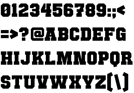
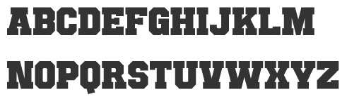
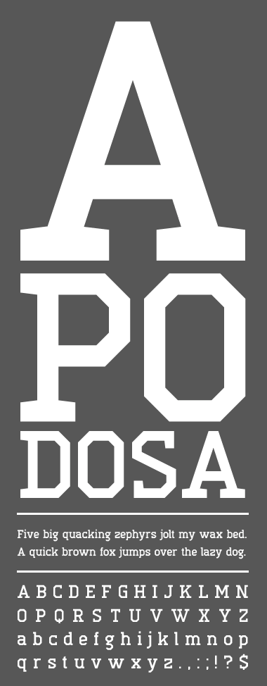
Additions in 2010: Punchline Filled (athletic lettering), High Voltage, Punchline (ultra heavy octagonal slab; +Filled), Nicotiana (slab serif), Exempla Slab Medium, Punched Out, Exempla Sans Medium (fat octagonal), Pixel Pandemonium, Tradita, Frostletter (blackletter), Scrambled Script (blackletter), Circle Cult (circle-themed sans). Typefaces made in 2012: Apodosa (octagonal). Dafont link. Fontspace link. Blogspot link. Klingspor link. Abstract Fonts link. [Google] [More] ⦿ | |
During his studies at Flagler College in Saint Augustine, FL, Todd Julino designed the free Indic simulation font Zip Script (2015). [Google] [More] ⦿ | |
Type Revivals (or: SourceNet)
|
His fonts are distributed by ITF and Monotype and Precision Type. Font list: AES, AcmeTR, AdmiralTR, AlpineWhiteTR, AncientTextTR, AssayTR, August family, AutomationTR, BinnerGothicTR, BinnerTR, BlackboardLinedTR, BlackboardTR, BoboCapsTR, BonGuia, Bondage-Oblique, Bondage-Regular, BoomerangTR (1995, a typical art nouveau face), CameraStencilTR, CartoonPartyCapsTR, ChopinTR, CiviliteTR, ClaudiusTR, CollegeCapsTR, CoreDumpTR, DirectionTR, EclipseCapsTR, EngravedTR, ExpressTR, FlairTR, FrenchCapsTR, GabrielleTR, GaelicCapsTR, GoudyMediaevalTR, HelvinBlackTR, HelvinTR, HostessTR, KhayyamTR (Arabic simulation face), KiddoKapsTR, KleukensTR, LadyDawnTR, MaximeTR, ModTR, PencilCapsTR, PlayBlocksTR, SaltinoTR, SansPlateCapsTR, SchoolScript-Bold, SchoolScript (1994), SchoolScriptDashed, SchoolScriptLined-Bold, SchoolScriptLined, ShalimarTR (Indic simulation), ShalomTR (Hebrew simulation), SimplexTR, SpringtimeTR, SukiakiTR (Japanese simulation), SusieQTR, VarianteInitialsTR, WashingtonTextTR, XerxesTR (Greek simulation face, now at Monotype), SchoolOblique. Santa Barbara, CA-based SourceNet used to market school fonts, ca. 1992-1994, such as those listed above: SchoolScript-Bold, SchoolScript (1994), SchoolScriptDashed, SchoolScriptLined-Bold, SchoolScriptLined, but also DnealianCursive, DnealianCursiveLined, DnealianManuscript, DnealianManuscriptLined. [Google] [MyFonts] [More] ⦿ |
Typogama
|
Most of Parson's fonts cover both Latin and Cyrillic. In 2004, he made Clans (T-26, blackletter) and Boulas (T-26). In 2006, he released these at T-26: Boutan (Indic simulation face), Heraldry (dingbats), Palm Icons (dingbats for golf), Wingbat (aircraft dingbats). In 2007, still at T-26: Heraldry, Thunderbolt 73 through 76 (from techno stencil to techno sans). In 2008, at T26: Ealing (geometric sans family, with a hairline), Bauhau (6 weights), Jane (a rounded sans in 12 weights), Quean, Halja (a modular sharp-edged blackletter with illuminated capitals), Faddish (a high-contrast vogue family), Big Boy (11 styles, a slab family from grunge to regular, accompanied by BigSigns, a hand sign font). Fonts from 2010: Tinsel (condensed), Rusty (Latin / Cyrillic constructivist typeface inspired by snowboarding), Vindaloo (+Outline, T26), Kimbo (octagonal slabby family), Cyrus (for Latin, Greek and Cyrillic), Calvin (a monoline sans family, +Hairline), Checkpoint (rounded display sans that won an award at Modern Cyrillic 2014), Fuera (2011: a bilined typeface, T26). In 2013, he published Selecta (an organic rounded sans, T26), Thunderbolt (an octagonal army style typeface family with a military stencil, T-26), Xcetera (2011), Ignorance (an American 19th century style penmanship font), Psalta (an octagonal blackletter typeface), Nadsat (a geometric display sans with some interlocking letters), Cobono (organic sans), Prox (sans face), Zurika (a wonderful crazy script face), Faddish (T26: a fashion mag typeface), Heraldry (T26), Cedi (YWFT: a hand-printed typeface family with huge multi-character ligature set to simulate real handwriting), Tcho (T26: a soft rounded sans family that covers Latin, Thai, Arabic, Greek and other scripts), Dejecta (a striking scratched titling face, T26), Nedo (2011, a bold prismatic display typeface inspired by the work of Nedo Mion Ferrario in Venezuela), Quam (2012, an elliptical sans family), Pictypo (2012, a useful icon typeface). In 2014, he updated the interlocking poster display typeface Tinsel (T26---original from 2010) and published the fantastic cartoon / comic book typeface family Bangbang. Siggy (2014) is a funky typeface. Lale (2014), which won an award in the TDC 2015 Type Design competition, uses the opentype features to set up a font system for flowers. Jane (2014) is a rounded sans typeface family. Vulgat (2014) is a vibrant display typeface based on uncial letterforms. Elsuave is a free rounded piano key typeface. Typefaces from 2015: Chickenz, Framez, Jackazz, Raubam (free), Martinaz (signage script). Typefaces from 2016: Auro (rounded sans), Dejecta (rough and ragged), Apollonius (a swashy didone), Rosengarten (vintage type influenced by Lucian Barnhard), Deleplace (influenced by didones), Furius (Tuscan style). Typefaces from 2017: Kurstiva (an informal sans family), Banja (a plump signage script), Bignoy (Wild West, modernized), Kimbo (octagonal), Mensrea (organic sans with beveled, inline, and various layered and graffiti styles), Nibbles (a food truck-inspired dingbat typeface), Huggy (an art nouveau typeface influenced by the work of Heinrich Heinz). Typefaces from 2018: Brinnan (a wide sans), Zoltana (a floriated, abll terminal-laden fancy titling typeface), Genesa, Kufin (a free Kufic emulation typeface), Madden (an angry dry brush poster typeface). Typefaces from 2019: Ahsing (oriental look font), Convexion (a creamy display typeface), Vidocq (based on 19th century woodcut styles). Typefaces from 2020: Fiducia (inspired by the first Swiss banknotes), Gorgonzo (a creamy bold typeface designed for attention grabbing headlines), Thrifty (a clean minimalist sans family). Typefaces from 2021: Oildale (an oily and creamy display typeface), Conica (a fine extra bold condensed poster typeface). Typefaces from 2022: Xotor (a double-inline or prismatic font with octagonal outlines). Behance link. Klingspor link. Hellofont link. MyFonts link. View Michael Parson's typefaces. [Google] [MyFonts] [More] ⦿ |
Vic Fieger
| |
Graphic designer in Bel Air, Mauritius. In 2014, he created the hipster typeface family Silent Lips and the free sans typeface Universe, and its free stencil version, Multiverse. He also created the free Devanagari simulation typeface Padmashri (2014). Fontm link. [Google] [More] ⦿ | |
Designer of the Indic simulation typeface Marshosbn (2005). [Google] [More] ⦿ | |
Walkeren
| Creative director in Makassar, Indonesia. In 2017, he designed the marker pen script typeface Fontierra, and the Hindi simulation typeface Mawumeree. In 2018, he designed the great signage script typeface Alamark and Midellion. Typefaces from 2019: Elista (a handwriting or signature script). [Google] [More] ⦿ |
Xaviera Comics
|
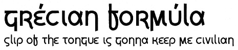
In 2004, he created Airstrip Four, AlphaEcho, Boston Traffic (a freestencil typeface), Breakaway, CarbonType (old typewriter), Corporate HQ, DataControl (nice octagonal face), DataControlUnifon, Delta Echo, Eurocentric, FormerAirline, GangofThree (oriental simulation), Helsinki (comic book font), IonicCharge (LCD simulation), JamPact, KarmaticArcade, KnowYourProduct (stencil), LandSpeedRecord, MajorSnafu (stencil; Major Snafu Pro (2012) is a cooperation with Cheap Pro Fonts), NervousRex, Osaka-SansSerif (techno), PillboxOpaque (dripping blood face), QuickEndJerk, Refrigeration, SiameseKatsong, Tetroserbogia, Umbrage, Virgo01, Whitehall1212, Xenophone (+Pro version in 2011), Yukarimobile, ZonaArmada. In 2005, he designed FrauleinUnifon, Fraulein, Fraulain II, Fraulein Hex, NukuNuku (oriental simulation face), OffshoreBankingBusiness, PlannedObsolescence, TerryScript, Wunderbar, YachtingType, Zero&Zero-Is, Xerography, FrauleinHex, ICBMSS20, ICBMSS25 (stencil typefaces), Hydrogen Type, Gumbercules, Kremlin (Cyrillic letter simulation; followed in 2010 and 2014 by Kremlin Pro and Kremlin II Pro at CheapProFonts), Johnny Homicide, Lilac Malaria, Motorway, Offshore Banking Business, Planned Obsolescence, Nuku Nuku Paradiso (Asian simulation), Quadrophonic, Ruth Script, Shoplifter (ransom note font), Under Influence (scratchy face), Viva Allende, KarmaticRevolution (with Mike "Karma" Alkire), RanmorianStd-B (artificial language script) and Ex (kana). His 2006 additions, still free: Big in America, Maxine Script, Gisele Script, Siamese Katsong (oriental simulation), Pokopen, Grecian Formula (Greek simulation), Edo (brush; this became Edo Pro in 2010), Armalite Rifle (grunge stencil; a Pro version followed in 2010), Ruth Script, Terry Script, Oil Age Heiroglyphs (grunge), Nyamomobile (gorgeous futuristic stencil face), Q-Bert's Funeral, Xtreme Chrome, Fawn Script, Ukiah Caps (a hip all caps face), Banzai (fake Japanese), 106 Beats That, Azudings1, Fawn Script, Freelance Kamchatka, and Daisy Script. Commercial fonts: Sixpak (2008, pixel face), Jaipur (2007, Indic script simulation), Santa Mensch (2006, brush face), Celonius Mark XIX (2006 geometric design), Argon Type (2006, futuristic), India Echo (2007, futuristic), How to Consume Oxygen (2007, grunge), Statue Of Liberty's Underwear (2007, Russian constructivist style), Moon Corps (2007, katakana), Underwood Champion (2008, free distressed typewriter), Heavy Data (2008, a computer simulation face). Perlmutter (2008) is a Hebrew and Yiddish font designed for the purpose of legibility at great distance (included are niqqud, letters with dagesh, punctuation, sheqel sign, and aleph-lamed ligature). In 2009, he created Edifice Wrecks (graffiti), Damon Script (comic book face) and Maritime Flags and Curses (dingbat face). Fonts made in 2010: Single Sleeve. In 2015, he created Extended Play. Fonts at FontStruct in 2009: Newhome (LED simulation). Free fonts made in 2011: Death to Smudgey (grunge), Lino Chisel (2011). Fontsy link. Font Squirrel link. Fontspace link. Kernest link . Devian Tart link. FontM link. Dafont link. Aka Xaviera Comics. [Google] [MyFonts] [More] ⦿ |


 2013:
2013:  [
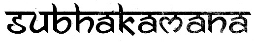
[ Kathmandu-based designer (b. 1983) of a Nepali Devanagari font families called
  Graphic designer in Mumbai, India, who created the Indic simulation typeface Paisley (2014) and the Tibetan simulation typeface Mantra (2014). [
 During his graphic and type design studies at Ecole Estienne in Paris (2013-2015), Hugo Dumont created the Arabic and/or Indic simulation typeface Humanist (2014). Still in 2014, Julien Priez, Hugo Dumont, Jérémie Hornus and Alisa Nowak co-designed
  Alexander Bobrov (Indian Summer Studio, or simply Indians, Moscow) designed the vintage didone typeface family
  During her visual communication studies at IED Firenze, Livorno (and/or irenze-)-based Isabella Ahmadzadeh created the Indic simulation typeface
 La Laiterie is a foundry started by Paris-based Julien Janiszewski (b. 1973), who received a bachelor's degree in graphic design from Besançon and later graduated from Ecole Estienne in Paris. His creations include:
  [
[ Co-founder and Creative Director of Brand and Digital at Territory. London-based
  [
[ [
[ [
[ Baltimore, MD-based designer of Munshi Devanagari (2014), which was conceived during his diploma project at Indian Type Foundry a typeface for immersive reading. In 2016, Ninad was pursuing an MFA at the Maryland Institute College of Art (MICA). In that same year, he designed the high-contrast Koyla Devanagari typeface, and the Devanagari-inspired Latin typeface Chaplin. [
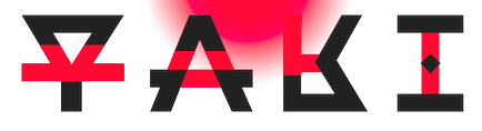
 Page Studio Graphics is Roger Vershen's Oro Valley, AZ-based company specializing in symbols and symbol fonts, founded by him in 1986. Roger Vershen died in Tucson, AZ, in 2003.
  [
[ Satya is co-founder of the
  [
[ Designer who used FontStruct to make Bouldo (2010, dotted face), TNR Bold (2009), Balltype (2009), Octastruct (2009), Weejie (2009), Times Neue Roman (2009, called the illegitimate child of Times New Roman and Helvetica Neue (Condensed)), Elion (2009, dor matrix pixel script), Tweed (2009, squarish), Akia (2009, experimental slab serif), Tesla (2009, dotted font based on Superpois), Pressure (2009, severe octagonal family; +Compressed, +Extended), Simplest (2009), Agora, Agora3D and Agora Dots (2009), Simplest (2009), Billboard (2009), Avant (2009), Imprinted (2009, dotted lines), Pivot Fill (2009), Pivot (2009), Handgloves Neue (2009), Paperclipped (2009), Handgloves (2009), Heart (2009), Foldstruct Pix (2009), Foldstruct (2009), Lino (2009), Linea (2009), Eurotype (2009), Stack (2009), Bloc Stripe (2009), Bloc (2009), Stencileaf (2009), Paul Was Here (2009), Sweetness (2009), Squidlike (2009), Rokice (2009), Current (2008), Theory (2008), Apatype (2008), Dot Script (2008), Dotize (2008), Poiis (2008), Poiis Wide (2008), Wired (2008, white on black), Bloct (2008, pixel shadow font), Construct (2008, like Bloct with a crane effect), Mazal (a great rectangular white on black idea), Keyal (Indic simulation with multilines), Squarial (pixelish), Classico, Unireal, Yoko (simple stencil), Splice (squarish condensed), Goodmorning Tokyo (labyrinth-like glyphs), Poii (pixel face), Gogic, Giant, Wikial (diner script simulation), Futoni (squarish letters). [
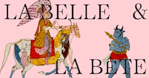 Design agency in Paris. Designers of Belbet (2015), a display typeface that is based on Islamic and Indian frames, tiles and buildings. They used the font in an art catalogue, La Belle et la Bête, for the Islamic and Indian art gallery Alexis Renard. [
 Belgian type designer (b. Brussels, 1974) who lived in Kessel-Lo, and is now based in Antwerp.
  During her communication design studies in Pune, India, Swapna Patwardhan created the Indic (Devanagari) simulation typeface Vilayati (2015). [
 For a project at New Design University, Salzburg, Austria-based Tabea Hornegger created the Indic simulation font Indira (2015, Light and Class styles).
  Tobias Sommer ("Shasta") is the Geneva, Switzerland-based designer (b. 1986) at FontStruct in 2008 of Great Depression (influenced by headline fonts from 1929), Brutto (headline slab serif), Lame Dude (dripping paint), Toytype (an interesting Indic simulation typeface based on an earlier block font by him called Block On),
  Tim Ryan is a Thousand Oaks, CA-based type designer and font enthusiast, who has helped me out generously with font links in the 1990s.
  Typogama is the personal foundry of Swiss designer
  [
[ American graphic designer (b. 1982) located in Medway, MA, who has created many free fonts, and some low cost commercial fonts. He is also known for his web comic, Dubmarine. Until 2006, all his fonts were free, but starting in 2006, he started selling them via
|
|
|
|