| | |
AArrgghh! Typefaces
[Jonathan Smith]
|
AArrgghh! Typefaces used to offer shareware fonts by Jonathan Smith (Cleveland, OH) of Rhode Island Soft Systems: New Land Contour, All-Hearts, Bunny-Lips, Confetti, El-RioLobo (1993, Mexican simulation face), Elbjorg-Script, Essential-Times, Firey, Glifik, Gyptienne (hieroglyphics), Hero-Outline, Hirosh (oriental simulation face; an exact copy of Sukiyaki, made in 1968 by Gene Eidy for Lettergraphics International), Ice-CreamSandwich, Ice-Snow, Made-InTheUSA, New-LandContour, New-LandInline, New-LandOutline, New-LandSport, Ol'54, Planetz, Porter-Lil'Kaps (gorgeous late night show display font), Religious, RockArt, Spider-WebBlock, The-Score, Wet-Paint. Fontspace link. [Google]
[More] ⦿
|
Abo Daniel Studio (or: Abodnyl Studio)
[Panggah Laksono]

|
 Cilacap, Indonesia-based designer, b. 1992. In 2018, he published the crayon font Crayone, the script fonts Shafeer, Shafeer Descript and Zhafire, the display typeface Alienatore, and the signature font Sundiary Script.
 In 2019, he released Cuties Magenta, Marlita, Lemons Bright, La Storia (a monoline script), Fruitz (a cartoon font and accompanying doodles), Little Clusters (a layered marker pen font for comic books or children's texts), Brushlie (a dry brush font), Fathir Script, Mrs. Santhi, Kashima Brush (a great oriental brush typeface), Blackcode, Onelove and the wonderful calligraphic script Romantically. Typefaces from 2020: Sketchy in Snow, Sweet doughnut, Winter Pen (a signature script), Curious Monkey (a quirky inline font), Humble Boys, Lovely Purple, Under Summer (a wild script), Cuteness Persimmon, Adventuros (an all caps dry brush font), Greatest Holiday (a crayon font), Sadio (an extended signature script), Chester Network (a cartoon font), Joyce Kitchen, Milky Rainbow (a fat finger font), Doodlez Forever, Bravo Charlie, Joyce Kitchen, Krusty Craft, Cupcake Pastry, Dienilla, Sweet Garlic (a heavy monoline script), Muthiara (script), Sibertha (script), Modern Leave (a beatnik font), Pictagram, My Status, Sibertha Serif, Chelistine Script (dry brush), Vintages Matches, Caristha, Romantic Stories, Antariksa (a wild script), Shintaku, Letterink, Hey Milenia (brush script). Typefaces from 2021: Snowember (a starry Christmas script), Lemonade Fabrica (script), Portsmooth (a monoline script), Krusty Craft (a scrapbook font), Crafty Beach (a scrapbook font), Maestic B, Mango Juicy, Gesya Crafty, Dancing Moon Slab, Dancing Moon Script, Jelly July Shiny (a bubblegum font), Cheerful Girl, Soredona, Adinda Sayang, Rhosela, Gesya Monogram, Dienilla (a signature script), Bravo Charlie Script, Muthiara, Hotel Lorint, Fostella. [Google]
[MyFonts]
[More] ⦿
|
Aenigma
[Brian Kent]
|
 Aenigma is the free font foundry of New York-based Brian Kent. The fonts often carry the string BRK in the name. Yet another site. Fontspace link. Dafont link. Typosasis backup. Backup at Fontfreak. Backup at 1001 fonts. Backup at Fortunecity.
 The free fonts: Arthritis BRK (2013), Alpha Beta BRK (2013), Amalgamate BRK (2013), Revert (2006), Gyneric (2006), Key Ridge (2006), 18 Holes (2006: Encircled letters and monograms), Double Bogey (2005), Hairball (2005), Whatever (2005), Dyphusion (2005), Blackonimaut (2005, blackletter), Snailets (2005), Vigilance (2005), Wager (2005), Janken (2005), Dented (2005), Syracuse (2005), Symmetry (2005), Nucleus (2005), Underscore (2004), Gesture (2004), Rough Day (2004), Sarcastic (2004), Galapogos (2004), Reason (2004), Slender (2004), Gather (2004), Quadratic (2004), Saunder (2004), NostalgiaBRK (2004), Kinkaid (2004), Jeopardize (2004), Pincers (2004), Fascii (2004), Grapple (2004), WaywardBRK, WaywardShadowBRK (2004), Obstacle (2004), False Positive (2004), Goosebumps (2003), Jargon (2003), Bewilder (2003), 90Stars (2003, snowflake font), Chumbly (2003), Synthetic (2003), Jawbreaker (2003), Mobilize (2003), GreatHeightsBRK (2003), Graveyard (2003), Bend 2 Squares (2003), Redundant (2003), Homespun (2003), Galvanize (2003), Dastardly (2003), Vantage (2003), Quarantine (2003), Knot Maker (2003, with a program for weaving Celtic knots), Combustion (2003), Knot (2003), Enthuse (2003), Weaver (2003), Foreshadow (2003), Rambling (2003), Mincer (2003), Intersect (2003), Technique (2003), Nominal (2003), Unlearned (2003), Brass Knuckle (2003), Quarterly (2003), Zirconia (2003), Zephyrean (2003), Whippersnapper (2003), Ryuker (2003), Discordance (2003), Graze (2003), Gravitate (2003), Edit Undo (2003), Persuasion (2003), Encapsulate (2003), Nymonak (2003), 36DaysAgo (2003), Vertigo (2003), Lights Out (2003), Sequence (2003), Rehearsal (2003), Yearend (2002), SupraGeniusCurvesBRK (2002), SupraGeniusLinesBRK (2002), Faux Snow (2002, snowflakes), Mishmash (2002), Brigadoom (2002), Gyrose (2002), Dystorque (2002), Upraise (2002), QuacksalverBRK (2002), Ravenous Caterpillar (2002), Bumped (2002), Tonik (2002), Jupiter Crash (2002), Mysterons (2002), Sideways (2002), Scalelines (2002), Pneumatics (2002), Granular (2002), Volatile (2002), Aspartame (2002), Bleak Segments (stencil font), Genotype, United, Lynx (2002), Lyneous (2002), Alpha Beta (2002, pixel font), Licorice Strings (2002), Syndrome (2002, futuristic font), Your Complex (2002), Nanosecond (2002), Binary (2002), Dynamic (2002, techno), Qbicle (2002), Flipside (2002), Amplitude (2002), Pindown (2002), Kurvature (2002), Euphoric (2002), Bobcaygeon (2002), Zoetrope (2002), Overhead (2002), Zelda DX (2002, pixel), Telephasic (2002), Hearts (2002), Lamebrain (2002), Compliant Confuse (2002), Line Ding (2002), AE Systematic, Acknowledge, Mini Kaliber, Upheaval (2002), The Code of Life font (2001), Amalgamate (2002), Bandwidth (2001), ClassicTrash (2001), XmasLights (2001, alphadings), Setback (2001), Qlumpy (2001), Regenerate (2001), Konector (2001), registry (2001), Stagnation (2001), Elsewhere (2001), Claw (2001), Cleaved, 8-bitLimit (4 weights), 10.15SaturdayNight-BRK-, Automatica-BRK (2001), Bendable-BRK (2001), BitBlocksTTF-BRK-, Kickflip-BRK-, Withstand-BRK-, Hyde-BRK-, Ecliptic (2000, a bold rounded monoline techno sans), Jekyll-BRK-, Larkspur-BRK-, NotQuiteRight-BRK-, Quandary-BRK- (an LCD font), Thwart-BRK-, Weathered-BRK-, AEnigmaScrawl, Aftermath, Blox (1999, 3d), CandyStripe (1999), Circulate, Collective (1999), Conduit, Corpulent Caps (2001), DarkSide, DashDot (1999), Dephunked (1999: halftone texture emulation), EmbossingTape (3 fonts), Exaggerate, Frizzed, FullyCompletely, Grudge, Hassle, Hillock, Impossibilium, Inertia, InkTank, Lethargic, MoronicMisfire, Numskull, Opiated, Phorfeit, PixelKrud, Powderworks, Pseudo, QuantumFlat, QuantumFlatHollow, QuantumRound, QuantumRoundHollow, QuantumTaper, Ravaged-By-Years-, Raydiate, Relapse, Sorawin-Plain, Spastic-, Splatz-, Stranded-, Swirled-, TRAGIC-, VacantCapz, Wobbly, XeroxMalfunction(BRK), Zenith, ZeroVelocity, Zoidal, simplton, Waver, SaffronColdWars, 3DLET, Bri's-Scrawl, TRAGIC-, AcidReflux, Arthritis, Ataxia (1999), AtaxiaOutline, BlockTilt, ChintzyCPU, ChintzyCPUShadow, Decrepit BRK (1999), Detonate, Draggle (2000), Draggle[overkerned], FatboySlimBLTC, Gasping, Hack&Slash, HeavyBevel, Jagged, Jasper, JasperSolid, Katalyst[active], Katalyst[inactive], LucidTypeA, LucidTypeB, LucidTypeBOutline, LucidTypeAOutline, Neural, NeuralOutline, ObloquyOutline, ObloquySolid, PlasmaDrip, PlasmaDrip[Empty], Queasy, QueasyOutline, Rotund, RotundOutline, SkullCapz (dingbats), Tearful, Tetricide, Turmoil, Ubiquity, Underwhelmed, UnderwhelmedOutline, Vanished, Xhume, Yonder, Yoshi'sStory, ZurklezOutline, ZurklezSolid, Gaposis, Naughts, Ink Swipes, Irritate, Perfect Dark, Forcible, Loopy, GaposisOutline(BRK), GaposisSolid(BRK), Head-DingMaker(BRK), JoltOfCaffeine(BRK), KirbyNoKiraKizzu(BRK), Orbicular(BRK), Xtrusion(BRK). Commercial fonts at CheapProFonts: Lamebrain BRK Pro, Dynamic BRK Pro, Phorfeit Bundle, Phorfeit Slanted BRK Pro, Genotype Bundle, Genotype S BRK Pro, Genotype H BRK Pro, Classic Trash BRK Pro, Vigilance BRK Pro, Technique Bundle, Technique BRK Pro, Technique Outline BRK Pro, Galapogos BRK Pro, Visitor BRK Pro (pixelish). [Google]
[More] ⦿
|
Aga Silva
|
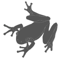 Aga Silva (aka Mme. Ping) is an ex-architect/urban designer, who now lives in Krakow, Poland. Creator of the Glitter family (kaleidoscopic, star-shaped, and possibly of use as snow fonts), Stars Promo (2012), Ivy Tiles (2012), Lillius (2012, floral and froggy dingbats), Maya Tiles (2012), Ballpen (2012, hand-printed), Mickey Script (2012), and Nillie's Love Letters (2012).
 In 2011, she designed Grand Duchess (script face), Rosette110621 (kaleidoscopic dingbats), Brasserie (connected script), Marker Script, Skarpa LT (an avant-garde hairline face), Skarpa Regular, Skarpa Bold, Auld Magick (blackletter), Two Am, and Fantasy Dingbats. Typefaces from 2013: Monmica (an upright copperplate script), Skarpa 2.0, Trufla (English round hand, copperplate script), Trufla Words (calligraphic), Calissa (copperplate script), Calissa Words. Typefaces from 2014: Mavblis, Lavenda (a connected copperplate script), Roicamonta (connected script). Typefaces from 2015: Skarpa Round, Nistiver (calligraphic script), Lavenda (calligraphic script). Typefaces from 2016: Lidaxid (connected script), Hinzatis (calligraphic script), Roicamonta Basic (an upright connected calligraphic script), Monmica Fancy, Bisalir (heavy script), Piambis (thick signage script), Piambis Round, Piambis Sharp. Typefaces from 2020: Skarpa (a revised version of her 2011 typeface), Skarpa Condensed. Typefaces from 2021: Timernis (a 9-style humanist sans based on 1940 stone engraving commemorative plaque). [Google]
[MyFonts]
[More] ⦿
|
Agustian Eko Saputro
|
Designer of the snowy roof font Estave (2018), the handcrafted typefaces Mangan Ngombe (2019), Kemplu (2019), Gosrokan (2019), Doctor Vista (2018), Melon Hunter (2018), Swiming Frog (sic) (2018) and Cekerayam (2018), and the monoline script typeface Soulitude (2018). Typefaces from 2019: Melon Hunter 2, Lord of the King (a signature script), Nothing For You, My Hardboard Cut, Mbak Mbik, Retrofield, Burukuduk, Super Melon Hunter, Dinomik (a marker pen font). [Google]
[More] ⦿
|
AJPT
[Alan Jay Prescott]
|
 Pottstown (Philadelphia)-based designer and PostScript font hacker who ran Prescott Design and now Alan Jay Prescott Typography, but was also involved in other ventures such as the Black Walnut Winery. Originally from Greenfield, MA, he graduated from Saddleback College, and worked for some time as a typesetter in New York. He advertizes himself as a leader in PostScript Open Type Font development specializing in the revival of print-only letterforms into digital typographic materials. He operates as APT and more recently as AJPT. In 2019, he announced that he would stop making typefaces altogether. His work can be partitioned into time periods. For this reason, Prescott's oeuvre is split over several pages:
 - His late period (2017-2019). In these three years, he showcased his work on Facebook, and was mainly involved in reving 19th century typefaces, about half of which were from the Victorian era. The annotations in the list below are quoted from Prescott's pages.
- Absolution Cursive (2017). When I was a typesetter in New York City, I had one of the largest collections of typefaces from CompuGraphic's library available for setting. One of the faces I never used in two decades of work was a rather ungainly decorative font called Abel Cursive. Apparently it was designed by Bernie Abel (perhaps one of CompuGraphic's employees) and I'm not sure it got much use, since I don't recall seeing it anywhere except my type catalog. Before I sold my equipment and closed my business for good, I made a scan of every typeface at 72-point size that I owned for future development, if there ever came a time to work on something crazy like that. Most of those 2,000 scans were lost when I changed computers a long time ago, but Abel Cursive survived and I made a down-and-dirty mow-and-blow font back then. I have recently worked on it extensively to make it usable as a multilingual slightly redesigned font in OTF format. I would classify it is as neo-Victorian medium-contrast decorative italic. It is definitely an oddball and may never see use.
- Algol (2017). Based on a scan from Dan X. Solo, Algol is a vastly expanded character set for Algernon, a typeface that clearly presages Machine and other "octics." I don't have any source material for the original design, but it may have been a Dan Solo original.
- Aloysius and Aloysius Ornamented (2017). This is a digital revival of the original Algonquin, cut by J.F. Cumming in the late 1880s for the Dickinson Type Foundry in Boston. While this was not my most challenging project, it was a doozy.
- Alpenhorn Roman (2017). Another oddball typeface is revived here, renamed from the design called Alpine by Henry Schuenemann for the Cleveland Type Foundry in the 1880s. Buried in the "gingerbread" of this weird face is technically a Latin serif, but otherwise it is an entirely unique letterform for which I had a heart soft enough to revive here in digital form.
- Androgen Roman (2017). I know next to nothing about this ultra-geometric blackletter called Anderson that I found displayed in a Dan X. Solo catalog, but it is another oddball that is attractive and very simple to revive in digital format. It is one of those projects I would recommend to a beginning revivalist who wanted to cut his or her teeth on a moderate challenge after mastering some basic tools in font development software.
- Angolan Text (2017). I found Angular Text in a Solo catalog and revived it as a digital font with diacritics and other characters for expanded typesetting possibilities. It was designed by Herman Ihlenburg in 1884 for MacKellar, Smiths & Jordan, which information I found in a link from Tom Cruz for a fellow named Toto who revived the font as well; he has several glyphs I do not have and I like his showing better. Interesting to see what others have done with the exact same typeface and scan and some research for tantalizing missing glyphs...kudos.
- Antiochia Series (2017). This collection of typefaces represents a revival of several bold slab-serif wood types with the name Antique that are related. Their individual histories will follow at another time, but note that several here are useful derivatives that add to the variety of this letterform's impact.
- Azurine Roman (2017). Azurine is a digital revival of a typeface known as Aztec, drawn by an unknown designer for the Union Type Foundry before 1889.
- Beltane Roman (2017). The very complicated story behind the work on this revival is too long for this space (and perhaps too boring to most), but suffice it to say that this letterform started out in 1886 as drawn by the great Herman Ihlenburg as Artistic and assigned to MacKellar Smiths & Jordan. Dan Solo called this face Belmont but only showed caps and was suspect anyway. I was able to find specimens elsewhere and a motherlode of other interesting things in the Inland Printer. I developed my first full-featured OTF using this typeface and designed Greek and Cyrillic glyphs as well. I also fitted it out with a set of small caps to make a font that now has 4,000 glyphs for nearly every non-Asian language. To top it off, Robert Donona revived the decorative caps for this typeface, an excruciating task that I once considered for myself but was lucky enough to have this other crazy person take up. The number of hours dedicated between Robert and myself in reviving this complete series digitally is probably unprecedented.
- Bernhard Swirl (2019). This is a digital revival of the letterform of the same name. It is equipped only with the upper case, an ampersand, a spacer dingbat and the numerals. The numerals are quirky, not only in design, but the fact that they seem to have been intended as old-style figures with the exception for the 4 and 7. Lucian Bernhard is either the designer of this limited-use typeface or inspired a reworking of his "wobbly" poster typefaces for which he is known as an innovator. I have reworked the scanned samples I had used as templates and drew them with a little more consistency than the originals to improve color on the page.
- Bireme Roman (2017). Below is a digital revival of a typeface called Bijou. As I have come to understand, several people have revived this face already. It is similar to Flirt in many respects. I will update information as I come across it, but I wanted to post my version here for your appreciation.
- Blackguard (2018). This is a digital revival of a typeface known as Black Cap. William E. Loy writes that Black Cap was designed and cut by Charles H. Beeler Jr. for MacKellar, Smiths & Jordan. The earliest-known commercial specimen was advertised in the January 1891 edition of The Inland Printer, so he probably created it in 1890.
- Blackminster (2017). One of the more interesting treatments of blackletter forms in the 19th century is this beauty called Black No. 544 designed by Henry Brehmer in 1889, who assigned the rights to Bruce Type Foundry. Originally I was unable to locate certain key glyphs in this font, but they were graciously supplied by others in our crazy network of type geeks. More information on the people behind these projects will follow in other articles.
- Bleak (2017). Bleak is a series based closely on a typeface called Stark. As with nearly all typeface names, there are several unrelated fonts developed in recent years that bear no resemblance to this gorgeous sans serif.
- Brotherly Roman (2017). Among many "antiqued" letterforms developed in the late 19th century, Ben Franklin was offered by Keystone Type Foundry in Philadelphia. Several glyphs were missing from my best showing of the font, but I was luckily able to find them, as well as logotypes, two ornaments, several alternate characters and some punctuation. There had already been a digital revival of this typeface kicking around as shareware in the 1990s, but it was very poorly drawn and incomplete. I believe it has been rendered nicely and consistently here for posterity.
- Busker Contour (2017). Burlesque was the name given by Solo to a typeface originating through Caslon or Figgins around 1843 and shown in German specimens a couple of years later.
- Cane Gothic (2018). Cane Gothic was designed and cut by Edwin C. Ruthven c.1886; he patented it in March–April 1886 and assigned the rights to David Wolfe Bruce (son of George Bruce, holder of the first design patent in US history). The Bruce catalog number is unknown. The tradename Cane Gothic, an apt description of the caning patterned background, may have been assigned by Dan X. Solo, who had revived the face for his photo-lettering service, but it has previously been considered impossible for digitizing. Although the average character in this font contains something like 3,000 Bézier control points, it turned out to be doable once I figured out the original mathematics that Ruthven must have used to guide his design objectively. It is digitized for posterity and I thank Anna Allen once again for the patent specimen (No. 16,643) indicating, if extremely faintly, five missing glyphs from my otherwise excellent scan. Thus I've generated the border glyphs and a pound Sterling symbol to augment this letterform. As far as I can determine, this character set is complete, and I have generated three fonts in order to accommodate chromatic typesetting with very little effort.
- Cantini Casual (2019). This is a digital revival of the typeface of the same name (or at least that is the name Solo gave it in the type specimen book from which it was scanned). It is a great example of the exuberant fancy characters that came to ascendance during the 1960s and 1970s. It is a medium-weight Latin italic with unusual decorative details in addition to crazy swash choices. I do not have any information on the history of this trippy face, but it is likely it was revived at some time in the recent past. It includes a large number of alternate glyphs as well.
- Capulet (2017). This is a revival of a typeface called Caprice that was patented in 1888 by Arthur M. Barnhart and assigned to Barnhart Bros. & Spindler of Chicago. This letterform is a prime example of the explosion in design ideas occurring before the turn of the century, hundreds of which remain to be translated into digital format.
- Carmenite Roman (2017). This beautiful digital revival covers a letterform drawn by the Bauer Type Foundry of Stuttgart, Germany sometime before 1896. It was originally called Carmen and has been referred to as Carmencita in the Solo books.
- Centrum Text (2017). This is my digital revival of one of the more complex decorated blackletters, among my favorite and most difficult projects to work on and just finished today. It is identified as Celebration Text on p. 18 of Solo's "Gothic and Old English Alphabets." The lowercase for this letterform is also presented for two other typefaces, Testimonial Text and Innsbruck in his larger catalog, presenting some confusion. But I believe all three were drawn by the same designer, although I have no idea how old they are. The lowercase may simply have been used for all three decorated capitals, since they are a very good match. Intentional, who knows? It is a real beauty and I'm going to perhaps revive the other two in this triplet of great examples of decorated capitals.
- Chapterhouse Roman (2017). This is an interesting typeface known as Ecclesiastic from Caslon around 1870. It was also known as Albion and Chapel Text No. 30. Most of those names were applied to completely unrelated designs, adding to the confusion that permeates typographic development and history to this day (and only gets worse over time). There are probably more alternate characters out there, but this is the best showing I could make with the resources I have and it is now available from me as a digital font.
- Chapterhouse Roman (2017). This is an interesting typeface known as Ecclesiastic from Caslon around 1870. It was also known as Albion and Chapel Text No. 30. Most of those names were applied to completely unrelated designs, adding to the confusion that permeates typographic development and history to this day (and only gets worse over time). There are probably more alternate characters out there, but this is the best showing I could make with the resources I have and it is now available from me as a digital font.
- Clarence Roman and Dotted (2017). Clarence Roman is a revival of Clown Alley and Clarence Dotted that of Cooktent (also called No. 515). Wood typeface Cooktent comes from W.H. Page before 1890 and the other looks to be a back-formation from it.
- Commissioner Script (2017). The typeface known as Commercial Script was designed by Morris Fuller Benton in the early twentieth century and enjoyed widespread use for decades. There have been many variations from other foundries, varying mostly in contrast; but as far as I know there was ever only one rather bold weight produced. I have redesigned the letterforms for consistency on the way to producing the ten weights shown here. It is interesting to see the font in lighter weights that accentuate the beauty lurking in this standard, and the heavier weights to see that the design still holds up under even heavier lifting.
- Courtesan Roman (2017). Among the dozens of wood types I have revived digitally is Courier, here called Courtesan. Many of these letterforms have been revived by others, all slightly different in their interpretations. More information on wood types will follow in articles I plan to write in the future on various areas of interest in the field of revival in particular and typography in general.
- Cranston Ornamented (2017). This is one of the most difficult digital revivals I have worked on. It started as Crayon, another masterful design from the prolific Ihlenburg, available at MSJ in 1885. There are sister fonts in an Open and a Solid that differ slightly in design and will be available from me at some point in the future.
- Creekside Playful and Calligrapic (2018). These are two digital casual scripts of my own creation based loosely on hand-drawn types from the 1950's. One is a calligraphic interpretation and the other is a more mono weight design that is a bit more slanted, both available for multi-language setting.
- Criticism (2017). This is a digital revival of Critic, a typeface designed by William F. Capitain in the mid-1880s with rights assigned to Marder, Luse & Co. Several logotypes had been designed for this letterform and many alternate glyphs. I added a few of my own, as well as diacritic marks, for balance to this surprisingly modern face that can be rendered multilingually as well.
- Crosby Roman (2017). This is a digital revival of the typeface known as University Text, designed in 1862 and shown by MacKellar, Smiths & Jordan in 1869 as Crosier. It was also known much later as Morningside. It is a stylized Latin with great charm.
- Crossan Roman (2017). This is digital multilingual OTF revival of a typeface called Cross Gothic, another one of those unique, nearly unusable letterforms I adore. I got a million of 'em.
- Cullane Roman (2017). Cullane is a digital revival of Herman Ihlenburg's Culdee, patented in 1885 and offered through MSJ. Others helped me scour the literature for missing glyphs and no one is sure we've got them all, but this is a wonderful showing of what we think is available until something randomly shows up in the future.
- Currier (2018). J.B. Lieberman, Ph.D. identifies it as Deberny & Peignot Lettres Ombrés Ornés (ornamented shaded letters) and adds that it was originally cut by Gillé in 1820, thus making it one of the oldest typefaces I have revived digitally. It is an exuberantly decorated engraved shadowed heavy-weight Egyptian.
- Danuvius (2017). Danube is the original name for this letterform, again found in a Solo catalog, and its links with medieval letterforms is obvious despite the trends toward modernization at the time it was first produced. I otherwise have no information on this face.
- Devonian Roman (2017). This is a digital revival of a wood typeface known as DeVinne. More information updated later.
- Dorothy Series (2017). The original Doric Chromatic was designed as a wood typeface and made its appearance in the United States in the 1850s, though it probably got its start in France in the 1840s according to Rob Roy Kelly.
- Doughboy Roman (2017). This series of decorative caps is shown as Dodge City in Solo. I am not sure it is very old; it may very well have been a photographically slanted version of an older wood typeface in the Thunderbird category with flourishes added on at the same time. This has been revived before because of its simplicity, but I made my own version a little more consistent and they make attractive drop caps.
- Enclave Roman and Expanded (2017). These two related digital revivals represent Enchorial in two versions. The roman came out of the Caslon Type Foundry in 1884 and was extremely popular (sometimes known as London). Petzendorfer showed the expanded Enchorial around 1903.
- Esteban (2017). Esteban is an original design I developed around 2010, named after the recently deceased Esteban Arriaga, a leading seascape painter in the area of Málaga in Spain. It is a medium-contrast sans serif produced in nine weights plus italics. Currently it is available only for the Macintosh OS, but an OTF cross-platform font is anticipated.
- Euclid, Euclid Initials,Euclastic, Elberon, Astral, and Auroral (2018). Elberon existed by November 1886 from Cleveland Type Foundry in The Inland Printer. Euclid (a lighter version of Elberon with a few different glyphs) is an obvious derivative from Illinois Type Founding Co. in Chicago in August 1890. Euclid appears with several Euclid Initials, a full sample of which appears as "Grant Iniitials" from Minnesota Typographic Co. Auroral (basically a shaded form of Elberon) appears in January 1887 from Central type foundry. Astral, also from Central type foundry, (the almost exact shading concept) whose base form is a condensed, heavier form than Euclid) appears in December 1886. Euclastic is my name for a complete set of weights, from a Hairline at the extreme end of lightness, through Black at the other extreme, using redesigned examples of Euclid and Elberon.
- Farmerboy and Farmergirl (2017). Although these two typefaces have both been called Fargo in the past, they are distinctly not the same letterform despite sharing some characteristics. They are both probably late 1850s, early 1860s and some sources say they are German. In any case, two interesting oddballs with no usage in the last century-and-a-half are revived digitally by AJPT.
- Fastidious Series (2017). The typeface known as Fashion started out in 1876 and was patented by Andrew Little for A.D. Farmer & Son. There are a total of five related typefaces in the same design: the prototype, condensed, ornamented, antique and extra-condensed. It turned out that the samples I had available when I originally revived these two were rather suspect and I have to consider going back to these and try to figure out what the "real" glyphs are. I believe that the Solo ornamental showing was rather a hatchet job on the base font, so I consider these two on hold pending further research, but they are interesting to view how they are so far.
- Flare Serif Striped (2018). This is a digital revival of a face called Ornamented 1,079. This over-the-top candy-cane-with-curls design was created by Henry Brehmer, who patented it in December 1884–January 1885. The application was submitted and approved on the same days as Ornamented No. 1,077 (Hermann Ihlenburg), and the rights to both were assigned to David W. Bruce of the Bruce TF (New York) [USPTO D15748]. It was advertised in The Inland Printer of October 1885. Thanks again to Anna Allen Conroy for the background on Ornamented 1,079 and for the patent samples giving a good idea of the design of glyphs missing from the catalogs. I have produced AE and OE ligatures as well as a decent set of diacritical marks for setting in a few important languages, but it is not at OTF font at the moment and exists only as PostScript for Mac only.
- Flippant Roman (2017). This fun font is a revival of a typeface known as Flirt. Although it has that 1960s feel, like many fonts popular then, I believe it has a much older pedigree. I will supply more information as I come across it. (There is currently an unrelated script font called Flirt on the market now, designed in 2009.)
- Fusion (2017). i developed three weights (including small caps) for the popular typeface Futura, all of them lighter than the Futura Light that is widely available. You can never be too thin.
- Gallantry Roman (2017). The earliest known specimen of the original Gazelle is found in the 1893 catalog of ATF in Cleveland and designed by Henry Schuenemann. This digital revival has multilingual capabilities and is quite unusual, demonstrating again the almost limitless possibilities of type design over the centuries.
- Gamut (2017). The Gamut series of very condensed sans serifs is based on a wide range of typefaces that all began with the letter "G": Galaxy, Gable, Garfield, Giant, Gamma, etc. (Their italics began with the letter "E", perhaps to come at a later time). I produced these typefaces under the same name to keep them all in one place, all ten weights that are floating around somewhere undigitized until now. They are currently available from me as Mac-only fonts, but OTF may be developed over time. They are members of the large "family" of typefaces whose members can be difficult to separate, such as the Helveticas, Trade Gothics, Standard Gothics, etc. I believe this was a well-designed condensed face that has nice nuances.
- Gironde and Gironde Extended (2017). Giraffe is the original name for this digital revival. It has been difficult to find a complete character set for this typeface, as I'm sure whatever existed in the roman also existed for the extended version. I revived what I could find, but it is a rather simple design and other characters can be imagined that are congruent with what is seen here. I'm not sure how much use these two oddball typefaces got in their time, but they were designed by Charles Beeler, Jr. in 1891for MacKellar , Smiths & Jordan.
- Gothic Decorated (2018). This is my temporary name for the digital revival of a typeface once called Ornamented 1,078. In the past couple of weeks, I have revived the "ornamenteds" on either side of this number. I have no information on this other than that it appears in the Inland Printer of October 1885 from George Bruce's Son & Co. TF in New York City.
- Goudy Flare Extra Bold (2019). This is a digital revival of another typeface in the Goudy superfamily, titled originally as simply Goudy Flare. I don't know the provenance of this particular letterform, but it was found in a Solo publication and could very well be one of his own creations, since I have never seen it used in print. It turns out that this is a modification of Goudy Old Style Extra Bold, and so I was able to find a suitable digitized version that matched the base forms very closely and modified the existing characters to accommodate these rather simple swashes. A reader added: "Goudy Flair was created by Mr. Phil Martin of Alphabet Innovations, that is he took Goudy Extra Bold and added swashes to this."
- Goudy Long Fancy (2019). This is a digital revival of the typeface of the same name, again another addition to the large Goudy family. There is a tremendous selection of swashes and alternate characters in this font, especially the upper case. It is an extra bold italic Goudy whose slant is less steep than normal for this family. There are no figures or punctuation provided for this letterform; those provided in the scan from which I worked were incorrect, and possibly back-formations from a different Goudy, so they were not produced for this version.
- Goudy Swash Heavy Italic (2019). This is a digital revival of the typeface of the same name. There are literally hundreds of revivals of letterforms in the Goudy "family" of typefaces. Nearly every foundry has produced its own version of this popular form, with many nuances between them. There are many weights, italics, various alternate characters and swashes galore, but I haven't seen a revival of this particular set of gorgeous swashes and alternates. Thus, I worked on very good printed samples, perhaps from a photolettering catalog half a century ago.
- Goudytype Antique (2019). This is digital revival of a typeface designated as Goudytype in a Solo catalog, with a slight twist. There is no punctuation for this font, but several nice swash alternates, a dollar sign and an ampersand. I decided to draw this as an "antique," because the ink spread in the original lent itself to this sort of treatment. Although a bit tedious, it can be used in the same way as other faces, such as Packard, Benjamin Franklin, Caslon Antique, Papyrus (heaven forbid) and others. Although one would assume this is in the Goudy superfamily, there are some characteristics that set it apart. The stresses and some other features are rather reminiscent of Palatino. And the slant is so slight as to make it unlike both typefaces' italics.
- Gracile (2019). Gracile is based closely on Greyhound Script, but has been expanded and standardized to include weights on either side of the two available in Solo. It is a semi script, since not all characters can be joined, and thus has a more casual feel. It is a strictly monoweight letterform in all six stroke thicknesses, with several alternate glyphs. There are digital versions in two medium strokes available from others, but those I was able to locate are rather poorly realized despite having diacritical marks for foreign languages. They can readily be designed and added to my interpretations, but I have chosen to do this later if anyone requires them.
- Griego Wood Series (2017). Several typefaces classified as Grecian were produced in wood for large sizes. Here I show Full Faced (William Page, 1859); Condensed and X Condensed (Wells & Webb/L. Johnson, 1846); X Condensed Bold (probably handmade, Nebraska, before 1885), and XX Condensed (John Cooley, 1859). I had revived some of these digitally years ago, but I revisited them recently and gave them a real facelift. They have undoubtedly been revived before because of their relative simplicity.
- Grosgrain (2017). This is a revival of a typeface called Grotesque No. 120. The lineage of the most famous typeface in the world, Helvetica (and, sort of, Arial) is evident in the early "grotesques." Although there are distinct differences in many of the characters of this very light typeface designed for mostly display use with alternate flourished glyphs, its resemblance to the later sans serifs of the twentieth century is striking. Marder, Luse & Co. of Chicago shows this face in 1885. Another similar typeface from around the same time called Circular Gothic is even closer to the Helveticas and derivatives of today. The alternate characters are revived from the sister font called Grotesque Fancy.
- Grounded Series (2017). I have revived Abramesque again, this time in congruence with the series from which it originated, thus it is called Grounded Ornamented. The original types started with Gothic Rounded. There was a Roman, an Outline, an Open and an Ornamented. The story behind these beauties is (as usual) too long, but briefly, information from Anna Allen: Old Bowery and Abramesque were originally called Rounded Open and Rounded Ornamented and have led interesting lives. Nicolette Gray identifies them with Caslon c1844. As a teenager, Rounded Open visited the Bruce TF (c1854), where she was called Ornamented No. 1007. After a suspected Bruce facelift as Gothic Round Shaded (≤1869), she was reintroduced by ATF as Old Bowery in 1933. McGrew writes, “Old Bowery is an ATF revival, in 1933 and again in 1949, of Round Shade No. 2, originated by Bruce , one of its predecessor companies, about 1854, as Ornamented No. 1007.“ Only an ornamented version, different from Abramesque and not illustrated by Gray, is shown in Bruce 1856. At a recent Oak Knoll event, Nick Sherman shot a photo of the page in Caslon's 1844 catalog showing Rounded, the solid prototype of these faces (not documented by Gray) and shared it at flickr.com. Albert-Jan Pool (designer of DIN and keen historian of sans-serif faces) observed that the footer is dated “September 1836,” so it was reprinted (probably as a stereotyped page) from an earlier Caslon publication. Until then, the earliest specimen examined by THP is shown in Caslon 1841. All agree that, so far, it is the earliest-known rounded sans-serif face in history—and this pleasingly plump family of three is as appealing today as ever! Of a very similar wood-type face tradenamed Gothic Round, Kelly reports: “First shown by George Nesbitt in his 1838 specimens. … The Nesbitt design was an Outlined or Rimmed Gothic Round. The Caslon Foundry issued several Gothic Round designs, of which an ornamented one (Abramesque), in particular, came into general usage in America around mid-century.” George Nesbittt, a New York printer, distributed wood types produced by Edwin Allen (Windham, CT ). Sherman adds that “Miguel Sousa at Adobe is in the process of making a digital revival of this face (Gothic Round|Old Bowery) for the Hamilton Wood Type Foundry.”
- Heraldry Roman (2017). This is a digital revival of a typeface called Heraldic, patented by John K. Rogers in 1880, an agent of the Boston Type Foundry.
- Hinterland (2017). Attached is a revival of an exuberant, heavy sans serif called Hibernian in Solo's catalogs. I've included alternate glyphs that I know of, but there may be some floating out there somewhere. The origin of this typeface is obscure, but there is some evidence it may have been from Genzsch & Heyse around 1893 according to one knowledgeable source.
- Hopscotch Roman (2017). Hopscotch is a revival of a wood typeface known as Hopkins.
- Jackdaw (+Open) (2017). This is a revival of a wood typeface known as Jackpot in Solo's catalogs, but was originally named Tuscan Shade No. 1. I have also produced a derivative called Jackdaw Open. Otherwise, I have little information on this bizarre beauty.
- Jeffers Contour (2017). Another decorative cap discovered as Jeffrey in a Solo catalog has been digitally revived here.
- Jeremiad (2018). A digital revival of Jenson Old Style, a typeface cut by Hamilton with the permission of American Type Founders in 1906. It has undoubtedly been revived before, as many wood types already have, but this is my interpretation and has been given a measure of consistency without losing its charm. I post this now, but it was produced a couple of years ago and I overlooked posting
- Joshua Contour (2017). I found a rather odd display typeface called Joseph in a Solo catalog, and it seems not to have a history longer than that, so who knows?
- Juvenilia Roman (2018). Juvenilia is a revival of a semiserif medium-weight typeface called Jumbo. Anna Allen's description follows: This slick stylized sans serif was designed and patented by Ernst Lauschke in 1887; he assigned the rights to Arthur M. and Alson E.Barnhart. This letterform is very unusual in having the tops of the characters generally devoid of the expected serif. Overall the design has medium contrast, which would be expected of a serif face. Several characters reflect missal-style influences (e.g. T, M), which was common for the time, but they are sprinkled in with standard types. The ampersand is influenced by wood types of the era. It is a distinctly odd species, another Lauschke innovation and unique.
- Katy Beth (2017). I discovered in the Inland Printer typefaces called Katherine and Elizabeth that were identical to each other and I was able to piece together a complete set of glyphs between the two to make a full digital revival.
- Kodiak (2017). Kodiak is a revival of Komet, an exuberant calligraphic sans serif produced by Roos & Junge Type Foundry around 1902
- Latchkey Roman (2018). This is a digital revival of Lattice, a face designed by Carl/Charles E.Heyer (1841 Berlin–1897 Chicago). He patented it in October–December 1883 and assigned the rights to Arthur M. and Alson E. Barnhart by name (the firm was not yet incorporated). Among other things, his unique hooked C was probably inspired by the hint of a hook in Copley (a sign-painter face dated before or in 1877 and cut by J.F. Cumming in 1881-1884). As Heyer's talent flourished at BBS (Chicago, 1868–1929), he led his new employer from one loathed by traditional TFs for bartering stolen designs for newspaper advertising space to one at the forefront of truly innovative display types. In the history of this TF historically regarded as great, he conceived at least 50% of their designs. Thanks to Anna Allen for the background on Lattice. Thanks to Dan X. Solo for the complete specimen, which although inconsistent and ink-heavy for some characters, was complete as far as I know. I have substantially reworked this typeface to bring a consistency for modern-day typesetting, but it is entirely faithful to the original cutting. Several of the characters are adventurous for their time (the C and ampersand, for example).
- Latin Fancy (2018). The Latin Fancy Engraved Shade version of these three fonts (the two others are derivatives) started life as Ornamented No. 1,077. Thanks again to Anna for the research that follows and for a patent specimen that gave a very rough idea of glyphs that did not appear in the catalog showings. It has ben digitally revived for posterity and is available for now as Mac-only. It appeared in October 1885 in the Inland Printer. Herman Ihlenburg, usually associated with MacKellar, Smiths & Jordan (Philadelphia), designed and cut this sizzling all-caps Latin face for the Bruce TF (New York). The patent application, submitted and approved on the same days as the one for Ornamented No. 1,079 (Brehmer), was likewise assigned to David W. Bruce (New York) [USPTO D15752]. A caveat for purists out there: The "A" has been drawn to compensate for a cutting or design error that appears in all examined versions of the typeface. No alternate has been provided for the misdrawn A.
- Lipo Caps Series (2017). Lipo Caps is a typeface series whose members are related in the sense that they have never existed as digital fonts (as far as I know), they are hand-lettered (probably by the same person), they were unlikely ever to have been developed as typefaces at the time they were drawn, and they were found in the same publication of bizarre letterforms. I have given them consistency without sacrificing the hand-drawn qualities and produced two versions of each one that I found, five fonts altogether (with "undecorated" versions as the lower-case keystrokes in each case). It is interesting to see great drawing technique that nevertheless never resulted into typography until now.
- Livornese Roman (2018). This is a digital revival of Livonia, an art nouveau-inspired typeface for which I have no information. There is a full set of alphanumerics, but no punctuation. It is a monoweight bold condensed sans serif with minimal descenders and an x-height that is at the maximum allowed visual percentage of cap height. This is another example of a face I revived in the 1990s but has been tightened up considerably for consistency and professional typesetting.
- Lubricious (2018). This strictly monoweight rounded sans serif typeface was referred to as Lute Medium in a Dan X. Solo publication, but I otherwise have no information on this letterform. It is influenced by the Art Nouveau movement and I have drawn a plausible Light and Bold as well; it seems that either one or both must have existed if it was referred to as a medium and I have made a rough guess as to the stroke weight. I think this face is quite pretty and has several innovations that are not over the top.
- Luring Series (2017). Luring is a faithful rendition of MacKellar , Smiths & Jordan's Luray and patented by Charles H. Beeler around the mid-1880s. Because the lining work in each was different depending on the point size of the metal type used (in order to achieve the same visual "grayness" when printed), I have developed each of these in such a way that when the same size is selected for each font, the optimal relative size is actually produced. The same technique was used for the equally challenging typeface called Tinted.
- Luscious (2017). This is a revival of a typeface called Lulubelle found in Solo's catalogs. It has been rendered in 7 weights, several of which correspond to known weights of this interesting sans serif condensed Art Deco-influenced letterform.
- Maggie Tried (2018). This is my digital revival (there have been others) of a typeface called Margit. According to sources I believe to be reliable, it was designed in 1969 by Phil Martin. An inquiry from a follower of this page generated a look back at a face I had once revived in the 1990s, but it was not as well-rendered as it could have been. I started from scratch and brought it back to life in a way more congruent with my current skills. It is a lovely example of letterforms developed in the late 1960s and early 1970s.
- Maltic (2018). In the six original sizes advertised and an additional three sizes to fill the gaps: This is a revival of the typeface by the same name, since it may not have been patented or trademarked by anyone until further notice. This typeface may never have been used and certainly is rather odd, but it can be seen that it must be one of the oldest forerunners of typefaces that were built from discrete "pieces" into a dot pattern, presaging the use of pixelation on monitors a hundred years later, as well as many other examples of typefaces built from pixels, dots, rectangles, stars and numerous other doodads and dingbats. In this case, the strict grid is violated for diagonals and many other interesting work-arounds; there are actually three different shapes used to build this geometric sans serif letterform. Information by Anna Allen: "Maltic is an interesting sans-serif face built from geometric motifs, was shown by the Illinois Type Foundry in The Inland Printer edition of December 1886. The specimen is marked patented, but extensive THP research finds no verification of this claim. This typeface is a complete mystery to me, as is the Illinois TF [Chicago, 1872–1892]… Annenberg (who bewails the lack of history details) reports that it was originally a distributor for the BruceTF (New York) and no record exists of any types that were originated by the Illinois Type Foundry. A showing of ornamental borders in the August 1890 edition of The Inland Printer advertises that they were Western Agents for Conner (New York) types as well."
- Margarethe (2017). It is hard to believe, but the original typeface was shown by Eduard Haenel (Berlin) in 1847 and was later adopted by American type houses. Eventually it was called Marble Heart, but most samples show only the upper case. Eventually I was ably to put together a large character set for multilingual setting after a rare, complete lower case specimen was discovered. This digital revival also covers typefaces variously known as Ornamented No. 11, 13 and 33. It is an early forerunner of faces known as grotesques (sans serifs that resemble Helvetica, Standard Gothic, etc.) This is another very difficult drawing exercise, but made all the more enjoyable after valuable sleuthing for missing glyphs by Anna at Type Heritage Project.
- Minster (2018). Minster was yet another style ground-breaker by Herman Ihlenburg, who patented the design in May–June, 1878 with assignment to MacKellar, Smiths & Jordan. This rimmed dual-case ornamented Latin beauty was consistently shown by MSJ and by ATF as late as 1897. It was also distributed by the Franklin TF (Cincinnati) [aka Allison & Smith]. Charles H. Smith, foreman, was the son of Lawrence Johnson's former partner (Johnson & Smith, 1833–1843). It has been digitally revived for posterity and took about two weeks to produce the full set of glyphs. Thanks to J. Choi and Anna Allen for very good specimens of printed materials.
- Molto (Fiorito, Ombreggiato and Nero) (2018). Molto Fiorito is a digital revival of MoléFoliate, whose history below has been researched by Anna Allen. Ombreggiato is a derivative with just the shadow, and Nero is the central characters adapted for separate setting, Bodoni or Didone letterform with high contrast and thin slab serifs. It has been produced in multiple sub-fonts for a wide variety of pin-register multicolor setting. Researching the topic on Fonderie Générale (Paris, 1834–1912) raised some perplexing questions about the history of this famous ornamented Didone. Twentieth-century historians attribute the design to Joseph Moléin c1819. Indeed, the conservative styling is compatible with fonts intended for title pages of scholarly and literary books, mainstay of the publishing industry during this period. The 1835 catalog issued by Tarbé (Molés successor) states that text, titling and display faces are offered therein. Even so, none resembling MoléFoliate is shown by any Molésuccessor in five digital specimen books dated 1835–1896. On the contrary, surface ornamentation is limited almost exclusively to Tuscans and Egyptians. Jaspert et al. (2001) note the then-current letterpress font source as Stephenson Blake & Co. Ltd. (Sheffield). Millington explains that the face was "redrawn by S.L. Hartz from a design by the Parisian typefounder Molé". Sem L. Hartz was associated with the Enschedé TF (Haarlem). SB introduced it in 1958 as "An Exotic Display Type". Did Molétransfer rights to this design before Tarbé's acquisition in 1835? If so: to SB? Enschedé? Another TF in existence at the time? Did Moléhimself design the leafy ornamentation attributed to him today? Or… Did Hartz superimpose his own concept on the surface of a MoléDidone roman? An anonymous developer digitized free revivals of this font and a matching plain one in 1997. They are difficult to find now [and are poorly executed].
- Montrose Roman (2017). Montrose is a display typeface with many interesting features, an example of numerous "banner style" letterforms produced at the time, such as Stephen Ornate and Arboret. It was called Motto (a design claimed by John P. Rogers for the Boston Type Foundry in 1879) and I understand there is still a typesetter who has the original metal matrices. Mine was produced from rather poor scans, so some interpretation was necessary. It came out quite nicely, but not quite exacting enough for some standards. It is definitely of historical interest.
- Moocher Roman and Moocher Open (2018). These digital revivals are based on Moorish and Moorish Open as described below: Moorish was designed, cut and patented by German immigrants Julius Schmohl and Ernst Lauschke, who assigned the rights to Barnhart Brothers & Spindler in April–May 1891. Commercial specimens consistently showed Moorish Open on the same page or in a spread. As advertised, this handsome stylized Latin was meant for multi-color effects.
- Morton Roman (2017). It is plausible for reasons too long to explain here that Ludwig S. Ipsen of Boston designed the typeface known as Mother Hubbard sometime before 1886 when it was offered by Dickinson Type Foundry. There were numerous swashes and alternate characters for this typeface, and I'm certain some will never be discovered. (The unadorned caps of this font bear a close resemblance to Monopol from Petzendorfer in 1903 and I have heard a rumor that a lower case alphabet was designed in modern times. As with many typefaces, the stories behind the letters are sometimes fascinating to those who are interested to know more.)
- Muralla Text (2017). This is a digital revival of Music Hall text. I have no information about it except that it appears in one of Dan X. Solo's publications, but it is quite pretty. Robert Donona added: "This was called Teuton Text, shown in MacKellar, Smiths & Jordan type specimen books, it is also shown in the 1898 book entitled Shriftatlas by Ludwig Pfetzendorfer of German and also shown in some German Printing periodicals entitled Archiv für Buchdruckerkunst by Alexander Waldow, this publication ran from 1864 to the early 20th century."
- Mystica (2019). Mystica was found in a Dan Solo publication on swash alphabets. It consists of the upper and lower case only, but is a very pretty example of a slightly quirky calligraphic letterform that appears to have been hand-drawn. There are several features that I retained when digitizing, and there are others I standardized without sacrificing the overall feel. I'm not sure whether this was ever really a typeface; until now it probably would have been classified as ephemera.
- National Pride (2018). This is a digital revival of a typeface known as National or National Gothic that is surprisingly old, and more surprisingly, not digitized until now despite being a rather obvious project. It was completed a few weeks ago, but it required a little massaging to get a few parameters more in line with afterthoughts I had. Thanks to Anna again for research and some good specimens to go with mine. In his correspondence with William E. Lo , German immigrant Julius Herriet Sr. (then in his 80s, with a life-long career in type design/cutting) recalled producing this face during the few years he worked in Philadelphia. As was customary at the time, his boss, the "hyper-active" Lawrence Johnson, patented it in 1856 [USPTO D760]. Johnson's patent affidavit explains that the design was geared to chromatic separations for printing with blue and red inks with white paper as the third color. What a great idea 150+ years later! Incidentally… It is said that Mr. Johnson [1801-1860] "worked himself to death." In the process, he promoted three of his employees to partners and groomed them to succeed him: Thomas MacKellar, John F. Smith and Richard Smith (sons of his first partner, Johnson & Smith). Together with Peter A. Jordan (the CFO of his time), these men built on Johnson's foundation to become the "largest and most celebrated type foundry in the world."
- New Orange (2017). New Orange is a revival of a typeface called New Orleans but originally called Romantiques No. 3 in catalogs from the 19th century. The Decorated is the original design and the roman is one I created for special interest. Like many of these decorative typefaces from the 19th century, they can be produced as dual fonts for chromatic separations on special request.
- Nile (2017). Nile is an original work based loosely on typefaces called Egyptians, particularly that of VGC. I've greatly expanded the possibilities of this letterform by generating 8 weights with accompanying italics and small caps, suitable for a wide range of languages as well as English, both text and display.
- Nova Sandra Script (2017). Novelty Script has been revived as Nova Sandra. I've produced the typeface as an Extra Light, Light, Roman, Medium, Bold, Extra Bold and Black. (The Bold is a revival of the Novelty Script available from specimens.) The six other weights were added as an extra-special challenge. It is a beautiful connected script that has many unusual quirks unique to this design. There are several alternate characters and I have supplied a full set of “beginning forms” as well. I have also created a reasonable set of punctuation that did not exist in the original. It is a connected script, and therefore, one of the most difficult projects to undertake.
- Octic Latin Drop Shade (2018). This is my digital revival of a typeface that started out life around 1884 at Illinois Type-Founding as Octagon Shaded. Several typefaces over the years have had "Octagon" somewhere in their name, but this is really an octic Latin with distinctive features such as a certain curviness where one would expect linearity, so not a true octagon type, and it in any case has a Latin serif, which was itself applied differently in later Latin designs. It has a wonderful drop shade that gives it great depth. There is no known lowercase for this font and the showing in Inland Printer was nearly complete.
- Octuple (2017). This is a digital revival of a very old wood typeface called Octagon, which seems to have been first shown by George Nesbitt in specimens from 1838, believed to have its origins in France.
- Partisan Ornamented (2017). One of the most challenging projects I've undertaken in the digital preservation of antique letterforms is this remarkable typeface that started off as a reference to "French 1838" and what Figgins showed as Parisian in 1843. Johnson & Smith showed it as Ornamented in 1841, but it was also known elsewhere as Dandy and Ornate No. 6. The principal trouble (beyond the sheer work involved in reviving this monster) lies in assembling anything like a complete character set. Showings in catalogs for nearly all typefaces have been several letters and perhaps a figure or two, but it is often impossible to get enough glyphs from even a dozen showings; Q, X, Z, J are commonly not shown. I revived the letter N to see whether it was even feasible to start the project and estimated it would take two months to complete, even if the missing letters could be found. Beyond my wildest dreams, several people were able to track down every missing letter and even the numerals and the AE and OE ligatures, in varying degrees of resolution from ancient catalogs. I was able to generate this type over many enjoyable, hellish hours.
- Pattycake Condensed (2017). Attached is a digital revival of a lovely monoweight casual serif font called Pastel Condensed. I have seen revivals of this typeface, but I believe mine is a more complete and consistent version, and includes diacritical characters for setting in a wide variety of languages.
- Paymaster Roman (2017). This wood typeface was called Painter's Roman and cut by both Page and Wells, being made available in the 1870s. It was revived a while ago by a major font developer with many glyphs added, but my cut retains some of the quirkiness of the sample I had available from Rob Roy Kelly's masterpiece, American Wood Type 1828–1900. Its numerous specimens are the source of many of my wood type digitizations.
- Pencilings (2018). Pencilings has been digitally revived in three versions known to exist. Pencilings One was originally shown as Paragon Pencilings. Pencilings Two was originally shown as Paragon Pencilings No. 2 and uses the same caps as Pencilings with the lower case characters at 75% the size of No. 1 and with different cuts; both showings have several ligatures and alternates. Pencilings Three is a rendition of Solo's version, which was much heavier and was shown in "Grunge Alphabets" on page 65. The alphabet I scanned for One and Two is shown by Marder, Luse & Co., January 1885 in The Inland Printer. This is a lovely if somewhat inconsistent example of early explorations of typefaces that mimicked handwriting, particularly printing as opposed to calligraphy or penmanship. As such, these irregular examples are sometimes called casuals, a large group that includes brushes and bounces.
- Pisa Semiscript (2017). A seldom-used font available from Bitstream, Piranesi Italic is nevertheless a lovely letterform whose designer I do not know. I have discovered that there was also a bolder version at some time in the past, but have never seen it except in type catalogs existing before digital typography, so quite rare. Despite its being called an italic, there never was a "Piranesi Roman." I have produced nine weights, both lighter and heavier than the original, completely redrawn for consistency and available in OpenType PostScript multilingual cross-platform fonts.
- Precocious (2017). Preciosa was the original name for this little gem and it dates from around 1898 from Bauer & Co. in Stuttgart. It has been fonted before as freeware from Klaus Johansen of Svendborg, Denmark, but did not include lowercase. I'm not quite sure the lowercase I came across is the one designed for that face, as it comes from a Solo catalog, and occasionally he used lowercase alphabets from other faces to accompany his perhaps all-caps blackletter fonts, so who knows? More on that subject later as I revive a couple other drop-cap Gothic beauties whose lowercase characters are the same.
- Protagonist (2018). This series is a digital revival of a face known as Program. Thanks to Anna Allen for the following research as well as a few critical scans from materials I didn't have in my possession: According to William E. Loy, this typewriter-like Egyptian was designed and cut by William F. Capitain [1851–1915]. Carl Müler, an executive of Marder, Luse & Co. (Capitain's employer since November 1874), patented the design in November 1881–April 1882 and assigned the rights to [USPTO D13862]. Contrary to USPTO regulations effective in 1874, he got away with identifying the intended commercial tradename. It was advertised in The Inland Printer of April 1885. In February–May 1885, Capitain himself patented Inclined Program, a dual-case back-slant derivative [USPTO D161054]. Like Program, it was shown in the Marder, Luse catalogs issued in 1889 and 1890. Unlike Müler, he retained the rights.
- Rochelle (2017). This series is intended as an extension of Herb Lubalin's 1970 creation, Ronda. It has always been available in several weights, but I extended the utility of this face to some lighter forms as well as the inclusion of small caps (except in the bold).
- Rose Madder (2017). This is another example of reviving a letterform that may never have been a typeface. It was found unnamed in Carol Belanger Grafton's "Bizarre & Ornamental Alphabets" on pp. 96–97.
- Rosemary Series (2017). Rosemary is a revival of various Roman woods found in "100 Wood Type Alphabets," by Rob Roy Kelly. Ornamented (p. 230) first shown by George F. Nesbitt in 1838 specimens (Shadow and Expanded are derivatives); X Condensed (p. 234) same Nesbitt; Condensed (p. 233) same; Extended (p. 231) same; Roman (p. 232) first shown by Darius Wells 1828.
- Ruinous Titling (2018). This is a digital revival of a face called Parable that appears in one of Dan X. Solo's publications. It would be strange if no one has revived this face, and I do so solely as a demonstration of how it is that people get into doing the sort of work I do, even as an occasional hobby and nothing more. With the right software and a little determination to learn something new, the average person can produce a typeface in a few hours, albeit one this simple and lacking anything more than the capital letters. It whets a lot of folks' appetites for something more challenging, but rarely ending up where I am at a level of astonishing self-inflicted pain! The typeface was less than two hours from turning on the scanner, through drawing and spacing to a usable font.
- Rye Roman (2017). This is a digital revival of a typeface identified as Ryan Jackson on p. 85 of Solo's "Victorian Display Alphabets," but I have found no other reference so far as to its origins before that publication. Technically, it is a moderately decorated low-contrast Latin.
- Saluzzo font (2017)> Giambattista Bodoni, one of the first rockstars of typography and printing, flourished in the latter half of the eighteenth century in Parma, Italy. His fans included Benjamin Franklin, Napoleon and Pope Pius VII. The typeface we know as Bodoni has been developed by numerous foundries, particularly in the late twentieth century, no two of which are identical. It has generally been drawn as a high-contrast serif and was itself based on some of the transitional forms originating in Baskerville's studios at the time Bodoni ran his printing business. I have developed a unique Bodoni myself, slightly lower in contrast to render it more readable at smaller sizes. I have produced the letterform in Open Type PostScript format for cross-platform use in eleven different weights, italics and small caps (in the roman only), for a total of 33 multilingual fonts. Saluzzo is named for Bodoni's birthplace in Italy.
- Santa Claus (2018). This is a self-named digital revival of Santa Claus and Santa Claus Initials, both No. 1 and No. 2. This irresistible pair of fun faces was introduced by Central TF in the December 1885 edition of The Inland Printer. A patent pending notice was displayed in at least one commercial specimen; no such patent exists and none was claimed in the post-ATF catalog issued by the Central /Boston TFs in 1892. According to policies of the US Patent and Trademark Office in effect at the time, Santa Claus was positively new, novel and non-obvious and absolutely worthy of a design patent. No approved applications for design patents were filed by Central executives nor assigned by others after 1886. Apparently this notice was of the "beware of the (non-existent) dog" variety. The designer is unknown. William E. Loy does not account for Santa Claus in his biographies of Gustave F. Schroeder or Nicholas J. Werner, Central's staff type designers/punch-cutters until 1889, when they partnered an independent business. In 1891, Schroeder moved to California; he and Werner continued to contract design commissions from Central and other clients.
- Saprophyte Roman (2018). Saprophyte is a digital revival of a typeface that started out as Ornamented No. 1060. Thanks to Anna Allen for the commentary on its provenance. This Latin gingerbread face was designed and patented by Julius Herriet, Sr. in 1878–1879. He assigned the rights to David Wolfe Bruce , the last family member involved with the Bruce TF. After the USPTO established the trademark division in 1870–1874, the Bruce TF switched from naming its new faces to numbering them. Presumably, this expedient circumvented payment of additional attorney and registration fees. The name Safari may have been dubbed by Dan X. Solo. Those comparing my version with Solo's and the patent specimen will find there to be discrepancies with Solo. The patent specimen was poor but indicated significant changes that occurred by the time Solo had samples. I went as best I could by indications from the patent application of 1878 in regards to overall form and design and had to rely on Solo for only several details. It is my creation based on the information I have available and is nevertheless stunning and unique.
- Shifty Wide (2017). Shifty is a revival of a typeface identified as Shimmer Wide in Solo's "Victorian Display Alphabets," p. 88. I don't otherwise know the origin of this letterform, but because of its regularity I don't believe this was a wood type, or at least the version I'm seeing comes from a metal face that may have been based on a wood design. There is a resemblance to Antique Tuscan No. 1, a wood face from the 1850s.
- Snitch Script (2017). Based squarely on one of the most familiar scripts, Snell Roundhand, my version has several major design changes. Charles Snell developed this letterform many decades ago and it was translated by Matthew Carter into phototype in the mid-1960s with a total of three weights made available. I have developed a total of 12 weights of this very difficult connected script, all the way from a Hairline to an Extra Black, beyond the ranges previously available—keeping in mind that this form has some very different glyphs in place of the originals, and quite a bit of standardizing in ways the original designer would perhaps find offensive. But I love it, so there.
- Solomonic, Cliffhanger and Deerfield (2017). I revived Solar, Climax and Dearborn Initials consecutively, since they had been shown in many catalogs adjacent to one another and were offered by Barnhart Brothers & Spindler in the late 1880s. They are decidedly modern-looking display faces, and as I always say, all of our best ideas were stolen by designers of the past!
- Spiral Swash (2019). This is a digital revival of the typeface of the same name, found in one of Solo's publications. Technically it is a higher-contrast extra-bold, wide, extreme flare-serif with ball swashes. It is reminiscent of the Euclids I revived last year and would work well as drop caps with the entire range of undecorated forms from that revival. It is equipped with a very nice range of alternate characters, but there is no punctuation supplied. I don't know the designer of this face or the time period, but it looks to be something that would have appeared in a photolettering catalog in the late 1960s and early 1970s.
- Springfield Roman (2017). This is a revival of a previously undigitized typeface called Spangle in some catalogs but has been also named Uncle Sam, Carnet de Bal, Ornate No. 3, Ornamented No. 851 and Romantiques No. 1; which demonstrates with one font the tremendous problem in type identification. In any case, it's hard to believe this was designed in the 1830s by Laurent & de Berny of Paris, calling it Ornamented No. 1071.
- Sprinkle Roman (2017). Based on the original typeface called Spring, this is a display letterform that I digitized a few years ago from one of Dan X. Solo's catalogs. It is notable for containing a huge number of alternate characters that make it a lot of fun to work with for a distinctly retro feel. Also called Bonaparte by Photo-Lettering, and Radiant Flair by OptiFont.
- Stakeholder Roman (2017). This wood typeface was called Staccato by Solo, but was originally released as Tuscan Extended by W.H. Page before 1872. I suspect this is another letterform that has been revived by others.
- Stengel Roman (2018). This is a digital revival of Sterling. There have been other unrelated typefaces with the same name, but the history of Sterling follows. Again, thanks to Anna Allen for the sleuthing: A far cry from ATF Sterling (Morris F. Benton, 1917), this suave stylized Latin has just the right slinky curves! The designer, Charles E. Heyer, reprises his trend-setting hooked C and extends the style to the G with a new interpretation for this stunning all-caps alphabet [with two alternates, an E and an L]. His patent application was promptly approved in September–October 1890; rights were assigned to Barnhart Brothers & Spindler, his employer since 1878. It was shown by BBS until at least 1909. A few of my own comments on this letterform follow. For its time, it is certainly a departure from standard interpretations of alphabets. To begin with, we are finding terminals in some of the characters that are unexpected, swashes where we would expect traditional terminals. The A is square with a swash crossbar, echoed in the H, and the H itself is like the M and H in being bandy-legged. The W is practically an inverted M. The J and the U are very wide. All characters are quite a bit wider than usual, in line with Clipper, which it resembles in some respects; but the question mark is super-condensed. The A, B, E, F, H, P and R have compressed upper stories, giving the face a top-heavy look, which became very popular in the Art Nouveau craze. The curves are much thicker than expected, perhaps a bit outside acceptable for good color, so a high contrast in places where you would not expect. The serif is minimal and difficult to discern in my specimens, so I interpolated somewhat. Its modern sort-of-equivalent look is like Newtext, Americana or the modern Copperplates. I worked mostly from the patent specimen, because it was quite different from all the printed materials I examined.
- Stigmata (2018). Only rock-solid project management, determination and a tolerance for tedium will get a typographic revivalist though the gantlet in bringing back to life one of the most complex typefaces ever designed, Stipple. The history of this unique letterform is provided by Anna Allen as follows: The brilliant Herman Ihlenburg completed design of this masterpiece in 1889; in January–February 1890, he patented it and assigned the rights to MacKellar, Smiths & Jordan [USPTO D19660]. Concurrently, he patented a set of related ornaments for line finials and a semi-rectangular frame [USPTO D19659]. The earliest commercial specimen examined was shown in the June 1890 edition of The Inland Printer by Shniedewend & Lee Co., then MSJ's Chicago agent. Widely considered unvectorizable, it was thus a challenge I undertook because the number of good specimens was high enough to consider the challenge. The rest of the story of this revival is too long and technical to relate, so I will describe this is as a maximally decorated modified bold Latin banner typeface. Just one of these characters contains around 2,000 data points, close to the maximum possible to create a font that will not crash. Thanks to all and sundry for a few rare specimens and particularly the US Patent Office for its poor but complete specimen of the 48-point characters; and several others for the serendipitous discovery of a couple important 36-point characters. The bang, question, period, comma and colon were designed by me to make the font more usable. Stipple is now available for the first time in 130 years.
- Sundog (2019). This 9-weight series is a revival of a typeface shown as Sunningdale (in three weights from Dan X. Solo). It is a slab face Egyptian italic with very nice swashes, but there is no punctuation for this letterform. It contains a large range of alternate characters. Although I don't know the origin of this typeface, it is almost certainly the same designer as Whitley Sans, revived most recently by me. The lighter weights in this series are almost strictly monoweight, but there is an increase in contrast from Light through Heavy, as in the original forms.
- Sunnybrook Script (2019). This is a very light monoweight upright semiscript of my own design with a lot of features found in traditional scripts of 150 years ago. The exuberant swash capitals are very loosely based on Flemish Script but have been modified a great deal and standardized across several glyphs. It can be set in a wide variety of languages.
- Superior (2018). This is a digital revival of Superior, whose first showing I have as April 1886 from Great Western Type Foundry in Chicago. It is a slightly decorated extra-light condensed Latin existing only in caps as far as I can tell. There is a full set of numerals and minor punctuation. Superior is a rather simple revival in relative terms and requires only a few hours because of that simplicity and paucity of other glyphs. It has perhaps been revived by other developers, but I am not sure.
- Tanglewood (2017). This revival ranks in the top five of the most difficult projects I've undertaken, not only because of the sheer amount of work involved in drawing the characters but in addition because of the number of glyphs that happened to be available. The name of this face was originally offered as Conner Ornamented No. 43, patented by James M. Conner in 1881. My undying thanks must go to Robert Donona, who supplied an incredibly good specimen from Graphic Compositions, Inc.'s phototype specimen book wherein the typeface is called Tangier. Diacritical marks, superior and inferior characters and basically enough glyphs to complete a large OTF file were evident in the specimen. Specimens of such completeness are rare in the world of typography, but having them available for viewing makes the revival process a time-consuming, if satisfying, venture. It required an absolutely stupid amount of time to finish. Several people have said this is my magnum opus...so far at least!
- Tasty Gothic (2018). This is a digital revival of typefaces variously known as Tasso, Gotham and No. 205). 1890 (Tasso, Gotham), Barnhart Bros. & Spindler; 1895 (No. 205) George Bruce's Son. Some hunting around was necessary to find missing glyphs, but my version appears to contain everything that was originally designed for this very pleasant monoweight gothic.
- Tender Regard (2018). This is a digital revival of a graceful letterform originally known as Tendril. The design for Tendril was patented by Herman Ihlenburg [1843–1905] in 1878. Along with Camelot (Goudy-Phinney/ATF Boston 1900), his application was one of the fastest-approved in 19th-century history. Rights were awarded in less than three weeks during November and assigned to MacKellar, Smiths & Jordan [MSJ ] of Philadelphia.
- Thursday Roman (2017). Attached is my digital revival of Thurston, a letterform appearing in one of Dan Solo's numerous type specimen books. I don't have any information on the source of this form, but like other postings here, this will be updated at some point in the future for the curious. This face is strongly reminiscent of the Peignot types, sans serifs with relatively strong contrast, but in this case with quirky ornamentation.
- Tiberius (2017). Tiberius is a revival of a typeface called Tirolean. This is another strange letterform that has distinct Art Nouveau influences, but I'm not at all sure of the history of this face except that it was found in a Solo catalog.
- Tinting Series (2017). Tinting is a faithful rendition of MacKellar, Smiths & Jordan's Tinted and patented by Charles H. Beeler around 1885. Because the lining work in each was different depending on the point size of the metal type used (in order to achieve the same visual "grayness" when printed), I have developed each of these in such a way that when the same size is selected for each font, the optimal relative size is actually produced. The same technique was used for the equally challenging typeface called Luray.
- Trinitro (2018). This super-sophisticated stylized Latin (known originally as Trinal) was patented by British immigrant William F. Capitain [b1850] of Chicago in September–October 1888. The Marder Luse Type Foundry (a.k.a. Chicago Type Foundry ), his employer since 1874, advertised it in The Inland Printer edition of November 1888. It was shown by ATF until c1900. Trinal has been digitized, containing many of the variously decorated characters that make up a large font. I am not at all sure I found everything, and it took the sleuthing of several other fanatics to find anything like a final set of everything that may have been produced.
- Tunbridge Shadow Ornamented (2017). This is a revival of Tungsten, another oddball ornamented style probably originating in the late 19th century.
- Unitary Roman (2017). Unitary is a revival of a wood type published as Unique. I have no other information as to the provenance of this typeface except that it was taken from a Dan X. Solo publication.
- Valor Shade and Rimmed Shade (2017). These digital revivals started out in 1847 at V & J Figgins and there were several other variants in wood type at the time. Van Horn, Zebra and Tuscan Condensed Shade were other names used over the years, but the latter best describes the letterform. This is a moderately challenging revival that can be made available for chromatic separations, as many of these complicated characters were intended originally.
- Venetian Tulip Wood (2018). The story of this revival is unfolding, but to make it short, this was digitized from a very large point-size specimen of what purports to be wood type from Kelly's collection. But upon further investigation, it is unclear whether this sample was a drawing made from an impression (or printed specimens) or whether it is an actual impression of wood type itself. I suspect the former, but it is indeed a legitimate typeface (and an important early 19th-century face) that existed in several different decorated forms. It is unclear which came first, the metal or the wood letterform. Technically this is an exuberantly decorated drop-shadow concave Tuscan.
- Vicarage Initials (2017). This challenging revival took many hours to complete for digital font use, but well worth it. Vatican Initials was found in a Solo publication and much has been done here to achieve consistency of color and design without sacrificing the nuances of this rare beauty.
- Warpath (2017). Warpath is a revival of a wood typeface called Wampum in Dan Solo's publication; otherwise, I don't know the provenance of this letterform.
- Whitestone Sans (2019). This is a digital revival of a very unusual face called Whitely Sans, found in a Solo publication. It is a medium-weight sans serif italic with very nice swashes and an interesting treatment of shading. There is a wide variety of alternate glyphs, including rare "ending forms," several of which I produced on my own to make it a little more consistent with typefaces supplied with ending forms.
- Wood Types Numbers 154, 500, 506, 508 & 510 (2017). These are five unrelated wood types that were occasionally used in foundries setting metal type because of their availability in large sizes. No. 154 is a modified Tuscan; Nos. 508 and 510 are flared sans serifs; and Nos. 500 and 506 are Latins. Like most wood types, the character availability was usually quite limited.
- The free sans typeface families done in 2003: Clemente, Ultima, Passion Sans (a Peignotian family).
- His 19th century series, all made in 1995 or 1996: APT New Abramesque, APT New Alferata (psychedelic), APT New Armenian, APT New Belmont (Victorian), APT New Brenda, APT New Cabinet, APT New Caprice, APT New Dawson, APT New Euclid, APT New Linden, APT New Madison, APT New Moorish, APT New Mystic, APT New Rollo (Victorian), APT New Slapstick (wooden plank font), APT New Spiral, APT New Stephen Ornate, APT New Teahouse, APT New Viola, APT Novelty Script.
- The wood type collection of Alan Jay Prescott.
- APT Antique Wood Double Outline Shaded 1995, APT Antique Wood Extended 1996
- APT Caslon Wood w: Alts 1996
- APT Clarendon Wood Extended 1996
- APT Columbian Wood w: Alts 1996
- APT Courier Wood 1997
- APT Doric Wood 1995
- APT Gothic Wood (+Alts) 1997
- APT Grecian FullFaced Wood 1996
- APT Jenson Old Style Wood 1996
- APT Kurilian Wood w: Decorated Alts 1997
- APT Modified Gothic Wood Cond 1997
- APT New Venetian Wood 1996
- APT New Woodcut Shaded Initials 1995 (Houtsneeletter)
- APT Roman Wood 1994-1995
- APT Tuscan Antique Wood (+Alts) 1995-1996
- APT Tuscan Concave Wood 1996-1997
- APT Tuscan Contour Wood 1996
- APT Tuscan Gothic 1 Wood 1996, APT Tuscan Gothic 2 Wood Cond w: Alts 1996, APT Tuscan Gothic 3 Wood Cond w: Alts 1997, APT Tuscan Gothic Pointed Wood w: Alts 1997 (Ironwood)
- APT Tuscan Italian Wood 1997
- APT Unique Wood 1995
- APT Wood 1995-1997
- APT Wood No. 501 1996 (orig Wm.H. Page 1887), APT Wood No. 508 1997, APT Wood No. 51 1997, APT Wood No. 510 1997, APT Wood No. 515 1996
- Stencil typefaces designed in 1995 and 1996: APT Crystal Ship (1995), APT New Acapulco Light (1995; after the phototype Acapulco Light VGC), APT New Alpha Midnight (1996; after a typeface from 1969 sold by John Schaedler), APT New Beans w/ Alts (1996, after Beans by Dieter Zembsch, 1973), APT New Checkmate (1995---not a stencil type, really, but rather a modular typeface; after the film type Checkmate), APT New Zephyr (1996).
- Computer fonts designed in 1995 and 1996: APT Bugsy (1995), APT New Quote (1996: bilined).
- Art nouveau typefaces designed in 1995 and 1996: APT New Abbott (1995; after Joseph W. Phinneys' abbott Old Style, 1901), APT New Ambrosia (1995, after Peter Schnorr's 1898 Jugendstil typeface), APT New Baldur (1996; after Baldur by Schelter (1895) and Julius Klinkhardt (1903)), APT New Jagged w/ Alts (1996), APT New Jason (1996), APT New Livonia (1996), APT New Margit w/ Alts (1996), APT New Nightclub (1995), APT New Quaint (1995), APT New Quaint Open (1995).
- Decorative typefaces designed between 1995 and 1997: The Bizarre series (decorative caps), Advertisers Gothic PD (2010: a large family based on Robert Wiebking's ugly original from 1917), APT Antique, Crayon PDS (2013, a decorative Victorian family), APT Caslon 76 (1997, based on a Compugraphics original), APT Feinen Inline (1997, after Henry Mikiewicz, 1983), APT Millais (1995, unknown origin), APT New Abel Cursive (1996, a revival of Bernie Abel's Abel Cursive (Compugraphic, 1974)), APT New Artcraft (1996), APT New LSC Book (1996, after a 1970 original by Lubalin Smith Carnese), APT New Classic Rubber Stamp (1996: based on DeVinne by G.F. Schroeder, 1890; F.W. Goudy 1898), APT New Hearst (1995, based on an original from Inland Type Foundry, 1901, which was famously ripped off from Goudy; the Italic was by Carl Schraubstadter, 1904), APT New Ticonderoga (1995-1996), APT New Woolly West (1995), APT Horizon Initials (1995), APT New Gill Floriated (1995), Old Gothic Initials Plain (1995: Lombardic caps), Pfister Bible Gothic APT Cameo (1997, blackletter caps), APT Saint Nick (1995: snow-themed caps), APT Black Dog (1995), APT Blacksmith Heavy (1995), APT New Airedale (1995, after an original tattoo / poster from the 1930s), APT New Blade Display w/ Alts (1996), APT New Cugat (1995; a wedge serif letterpress emulation typeface), APT New Fieldstone (1995), APT New Static (1995), APT New Trump Gravur (1995; after Georg Trump, 1954), APT New Yagi Bold (1996), APT New Courtier Italic (1996, Vanity Fair), APT New Harlequin (1996), APT New June (1996, after Fournier le Jeune).
- Avant Garde typefaces: APT Avant Garde Alts and Display (1997), APT Lubalin Graph Alts (1997; to be used with BT Lubalin Graph, Ed Benguiat, 1974).
Local download of some of his fonts. [Google]
[More] ⦿
|
AKOFAType
[Kwesi A. Amuti]
|
Located in Powder Springs, GA, AKOFAType has published the following dingbats with symbology from Ghana: Adinkra Calabash, Adinkra FineFine, Adinkra WantaWanta (2007). The designer is Kwesi A. Amuti (b. East Lansing, MI, 1974). He is working on Steady Rockin (a display face) and Fat Head. In 2013, he published Ehmbeecee, a typeface with frames. In 2014, he made the elliptical sans typeface Cabeza Grossa and the snowflake typeface Flurry. Creative Market link. Typedia link. Klingspor link. [Google]
[MyFonts]
[More] ⦿
|
Alan Jay Prescott
[AJPT]
|
 [More] ⦿
|
Alex Artline
|
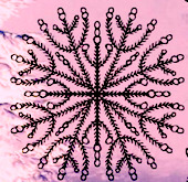 Designer of the art deco typeface Roundabout (2016). He also made several gorgeous sets of icons including splendid Snowflakes (2016). [Google]
[More] ⦿
Designer of the art deco typeface Roundabout (2016). He also made several gorgeous sets of icons including splendid Snowflakes (2016). [Google]
[More] ⦿
|
Altemus Creative
[Robert Altemus]
|
Altemus Creative Services sells dingbat fonts by Robert Altemus from New York, NY: Your premiere source for digital decorative fonts. Their commercial dingbats are sold by MyFonts. Partial list: AltemusBirds, AltemusBorders 1 through 4 (1992; Borders 4 containss pointing hands and flourishes), AltemusBursts 1 through 4, Altemus Bursts 1 through 4 (2002, contains snowflakes), AltemusChecks, AltemusChecksTwo, AltemusCorners, AltemusCrosses, AltemusCuts, AltemusCutsThree, AltemusCutsTwo, AltemusFlowers, AltemusHands, AltemusHolidaysOne, AltemusKitchen, AltemusPinwheels (1996), AltemusPointers, AltemusRays, AltemusRaysBold, AltemusRoughcuts, AltemusRounds, AltemusRules, AltemusSecurity, AltemusShields, AltemusSpirals, AltemusSpiralsBold, AltemusSpiralsBoldItalic, AltemusSpiralsItalic, AltemusSquares, AltemusStars 1 through 3, AltemusSuns, AltemusSunsBold, AltemusToolKit (2 fonts), Altemus Web Icons, EuropaArabesque, Games (cards, domino), Games 2 (mahjong, chess), Sports (balls), Sports 2, Leaves 1 and 2. Catalog, part I, part II. [Google]
[MyFonts]
[More] ⦿
|
Anastasiia Macaluso
|
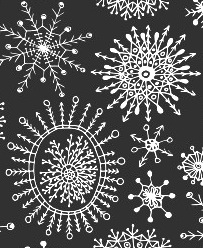 A freelance artist and illustrator based in Palermo, Italy, and born in Russia, Anastasiia Macaluso created various handcrafted typefaces in 2015, including a mummy-themed font, a bloody font, a bubblegum font, a couple of crayon typefaces and watercolor and dry brush types. In 2015, she started selling her work, such as the vampire script font Rodion, the crayon typeface Carbon Script, and a drop-dead gorgeous set of vector format snowflakes.
 Typefaces from 2016: Prosto (a handcrafted Latin / Cyrillic typeface), Sofia (thick brush. free), Astrid (hipster style), Giglio (paperclip style). Typefaces from 2017: Palma Nana (script). Typefaces from 2019: Module (a monoline display typeface), Unmoor (an outlined and color rope font). Typefaces from 2020: Katrin Sketch, Be My Candy.nastasiiaMacaluso-Module-2019 [Google]
[More] ⦿
|
Andrew Buckle
|
Maidstone, United Kingdom-based programmer. Designer of the experimental typefaces Circula Track (2016) and GX Stretched Lines (2016), and the free grungy handcrafted typeface GX Ruff Stuff (2016). Behance link. [Google]
[More] ⦿
|
Andrew Hart
|
 Andrew Hart is a Corona-based American digital photographer (b. 1988), who runs a small free font archive. Another archive of his. Dafont link. Another URL. Yet another URL. And still another one. And another one. And one more. His later fonts refer to SickCapital.Com.
 His own fonts include Gothickella (2017, blackletter), Sailorette Tattoo (2015), Elkwood (2014, sans), Snowinter (2014, sans), Rebel Pixy (2014, tattoo script), Pride of the Young (2014, hipster style), Scribblet (2014), Tall & Slim (2014, a great tall-legged poster typeface), Tribal Threat (2014), Boldenstein (2014), Fireflies (2014), Rio Frescata (2014, curly), Alpaca Scarlett (2014), Alpaca Solidify (2014), Vanity Script (2014: a vampire script), SC Gretchin and Timmy (2013), Fun In The Jungle (2013), Pixelic War (2013), A Glitch In Time (2013), Giraffe And Co (2013, an African-themed typeface), Chameleon Dreams (2013: a fantastic wacky party typeface), Angelic Serif (2012), Angelic Peace (2012), Pyrite Script (2012), Pyrite Crypt (2012), Body Piercing And Chains (2012), Love til Killed (2012), Hollywood Capital (2012), Donaldo Regrecka (2012), Deadly Black Chain (2012), Dirt2 Copperbolt (2012, grungy copperplate), Truskey (2011, grunge), Sick Capital Kingston (2011), Full Moon On (2011), Grafitik Riot (2011, graffiti face), Electric Panda (2011), Last Draft (2011, grunge typewriter), CaliforniabyDirt2 (2010), JusticebyDirt2 (2010), SC Gum Kids (2010), SC Tinas Baby Shower (2010), Little Ryan (2010, handwriting), Sick Capital Vice (2010), Star Avenue (2009), Cute Tattoo (2009), DuerTWO (2009), Dirt2Stickler (2009), Ithornët (2009, grungy blackletter), NoXWay (2009, graffiti grunge), Skulls and Splatters (2009), Hacjiuza (2009, hand-drawn blackletter; +Dirty), Popstar Autograph (2009, comic book style script), The Quickest Shift (2009, curly script), DuerTwoo (2009, bloody horror font), Malgecito (2009, grunge), Ithornët (2009, grungy medieval pirate font), Little Bliss (2009), Loyal Fame (2009, curly script), Angelic War (2009, grunge), Soulstalker (2009, grungy blackletter), Kings of Pacifica (2009, ransom note font), GanixApec (2009), GoodPeace (2009), KatyBerry (2009), OffTheDrugs (2009), ThinFranq (2009), WILDAFRICA (2009, African-theme multiline face), St. Andrew (2009, a spray type font), Hawaii Lover (2009, grunge calligraphic script), Aristotle Punk (2009, grunge), Juicy Hunt (2009, grunge), Dead Hardy (2009, Victorian), Kate Perry (2009, fifties script), Kate Berry (2009, fifties script), Vloderstone (2009, hairline slab serif), Good Peace, Off The Drugs, Thin Franq (2009, hairline), Ganix Apec (2009, sans), Jailbox1 (2009, grunge), Blast Beat (2008), Ghosttown-BC (2008, Western style), Dead Secretary (2008, grunge), DIRT2-DEATH (2008, grunge), Robot Head (2008), Alpaca 54 (2007, grunge), Hawaii Killer (2007, Coca Cola grunge), Splinter2 (2007, grunge based on Franklin Gothic), Everyday Ghost (2007, grunge), Plague Death (2006, grunge), SEXtalk69 (2007), Screamz1 (2007). [Google]
[More] ⦿
|
Angela Lane
[Fonts by WindWalker64]
|
[More] ⦿
|
Ania Archer
[Sunshine Inspired Designs]
|
[More] ⦿
|
Anke Arnold
[Anke Art]
|
 [More] ⦿
|
Anke Art
[Anke Arnold]
|
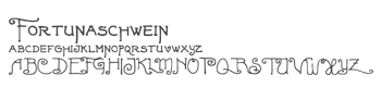 Wernau (was: Wendlingen), Germany-based Anke Arnold's free fonts: aa QWERTZ-Tasten (2012: German keyboard font), aa Halftone (2012: texture face), aa Tafelschrift (2012, school font), Car Go Frame (2011), Car-Go Plain (2011, modeled after German license plate lettering), Typo Garden (2010, alphadings), 80er Teenie Demo (2009), Acki Preschool (2009), Just Another Stamp (2009), Firlefanz (2009, curly letters), Pixelstitch (2006), AnkeHand (2003), Hole-Hearted (2003, Gill Sans with hearts), KRITZEL (scratchy pen), MilkyWay, FrightNight, Eminenz (2002), Scribble, Skribus, Why, TooLazyToPractice, XXX, CheapInkkilledmyPrinter, Storch (alphadings), Alexandras-Stempelkasten, Anatevka-Caps, BulletMix, Catwalk, Duke, Dukeplus (2000, blackletter), Riddleprint, Anke-Print, AnkeCalligraph, Titanic, Wasser, butterbrotpapier, distracted-musician, dyslexic, manko, quixotic, verrutscht, zladdi, barcoded, BulletMix2, CAR-GO-2, Fortunaschwein (nice curly script; no punctuation or numbers), Round, BigBrothers&Sisters, BoringLesson, CrimesceneAfterimage, Incognitype (old typewriter), Jenna'sPopsicles, Japanese Brush (1996), Knuffig (2000), MonkyBusiness, Olympia2000, Samba, Dandelion, Kritzel (2003, scratchy hand), Krystal (2000, snow simulation typeface based on Gill Sans), Nervous, ParryHotter (2001, a Harry Potter blackletter face), Pffft, Tschiroki, Heart2Heart (heart alphadings), Anke Sans.
 English page. For 10DM (5 USD), Anke will make your handwriting into a font! Alternate URL. Dafont link. Another link. Open Font Library link. [Google]
[More] ⦿
|
Anke Schweiger
|
Designer of Snowbats (2001). [Google]
[More] ⦿
|
Annette Ward
[PC Crafters (was: Provo Craft)]
|
[More] ⦿
|
Ari Rafaeli
[ARTypes]
|
 [MyFonts]
[More] ⦿
[MyFonts]
[More] ⦿
|
Aring Typeface
[Måns Grebäck]
|
 Måns Grebäck (Aring Typeface, Örebro, Sweden) is a prolific Swedish designer (b. Lindesberg, Sweden, 1990), who lives in Borlänge, Sweden. Måns Grebäck has a bachelor's degree in graphic design from the University of Dalarna (2012). In 2010, he went commercial, and started selling fonts through MyFonts. In 2011 he started Mawns Design. In 2013, that was renamed to Aring Typeface. In 2011 he already had over seven million downloads of his fonts, which were featured at websites such as Dafont and Myfonts. He also does custom type work. His typefaces, both free and commercial:
 - Acryle Script (2014).
- Actonia (2016). A monoline script.
- Adielle (2018).
- Aerofoil (2017). A vintage bottom-heavy script.
- Airways (2016). A signage script.
- Akayla Script (2018). Calligraphic.
- Aliey (2021). A 4-style Victorian copperplate serif.
- Aliment (2018). A sharp geometric sans.
- Amertha (2020). a fat finger font.
- Amplify (2013). A signage script.
- Angars Runes (2019: medieval, with gothic cathedral curves).
- Angilla Tattoo (2013). A connected spurred tattoo typeface. Followed by Angilla Script (2020).
- Antlers (2012). A calligraphic script.
- Aquate Script (2019).
- Arachnids (2011, graffiti face)
- Artely Inks (2016).
- Artisual Deco (2021). Pure art deco.
- Artographie (2020). An all caps art deco typeface family.
- Atelas (2015). Signage type, baseball script.
- Atures (2018). Futuristic and monoline.
- Autograf (2015) and Autografia (2021). Signature typefaces.
- Ave (2016) in styles called Ave Utan, Ave Betwan and Ave Fedan. A family of baseball scripts.
- Avelana. A connected script.
- Backpack (2014). A thick signage script typeface.
- Backyard (2016). A blackletter typeface.
- Barkants (2011, elegantly hand-printed family).
- Barley Script (2017). A signage script.
- Baystar Script (2021).
- Beautiful Trouble (2012). A rabbit-eared upright connected script.
- Beaked Tyrant (2014). A copperplate calligraphic script.
- Beckasin (2011, signage face)
- Before The Rain (2011, calligraphic) Before The Rain Arabic (2016).
- Belladio (2021). An urban script.
- Bellino (2018).
- Bezar (2020). A script.
- Billion Dreams (2020, by Mans Grebäck and Rangga Subekti). A heavy signage script.
- Billion Stars (2013). A tattoo script font.
- Bira (2012). A retro connected brush / signage script.
- Blaak (2019).
- Black Fox (2014). A sirupy brush face.
- Black Signature (2021). A bold signature font.
- Black Larch (2016) and Dark Larch (2016).
- Bloc Boy (2016). Like handwriting.
- Blockography (2011). A sketched typeface.)
- Block Talk (2011, with Zaydek Michels-Gualtieri)
- Blods (2011, a great blotty brush face)
- Blueberry Script (2017; with Noah Kinard).
- Botanink (2011)
- Bouncy (a cartoon font).
- Bourdos2022). A script typeface.
- Brannboll (2011, baseball signage face), Brannboll NY (2013), Brannboll Connect (2020), Brannboll Stencil (a baseball script) (2020).
- Bready (2011). A retro signage script with art nouveau aroma.
- Brev Script (2014). A connected secretary hand from the 19th century.
- Bronze Script (2014).
- Brother Tattoo (2012).
- Bumblebees (2012). A plump curvy script.
- Bunya (2016). A geometric slightly deco sans typeface family.
- Calendary Hands (2012).
- Caligraf (2020).
- Canela Bark (2015, co-designed with Luis Miguel).
- Caneletter Sans and Script (2013). Upright unconnected and connected scripts.
- Cantona Script (2019).
- Canyon (2021). A wide elliptical sans in 18 styles, featuring a coathanger lower case f.
- Capoon (2018). A ten-style sans family.
- Caprica Sans (2014) and Caprica Script. A plump script.
- Caravela (2020). A pirate map script.
- Casat Cap (2017). An all caps brush typeface family.
- Caster (2019). A heavy poster script.
- Castro Script (2012).
- Catchland (2021). A retro baseball script.
- Celebrater (sic) (2012). An oily font.
- Cellos Script (2013).
- Centeria Script (2012).
- Channel (2011, connected upright script)
- Chapel Script (216). For signage.
- Characteristic (2011).
- Chavenir (2011).
- Chinal (2018).
- Choko (2011, released in 2016). Chocolate and cream-themed decorative typeface.
- Christmas Miracle (2018), Christmas Reign (Tuscan, all caps) (2020), and Christmas Sparkle (2018).
- Chrysante (2020). A monoline flowing pen script.
- Clear Line (2012). A fat finger / signage typeface.
- Clipper Script (2011).
- Clothe (2017).
- Coneria Script (2012). A connected script.
- Conture Script (2018). Elegant, classical, and with exaggerated capitals.
- Crackin (2011).
- Crunchy (2016). An upright connected script.
- Cruz Quaste (2020). A handcrafted blackletter typeface.
- Cubest (2021). A squarish monospaced techno family.
- CutScript (2011, connected script).
- Danbury (2022). A speed-emulating sans.
- Dark Crow (2020). a dry brush script.
- Dollie Script (2013).
- Ebbing (2018).
- Echinos Park Script (2012).
- Ederson (2018). A vintage signage script.
- Ekologie Hand (2012).
- Ekorre 2021). Aa vintage decorative serif.
- Elaya Script (2019). A creamy signage script.
- Electronics (2017). A retro signage script.
- Elevate (2016).
- Emiral Script (2017). A baseball script.
- Encina Script (2016). A thin calligraphic typeface.
- Enlighten (2011)
- Delinquente (2012).
- Denigan (2011, hairline)
- Equal Sans (2012).
- Espesor Olas (2011, fine hand-printed calligraphic family)
- Esplanade Script (2015, by Mario Arturo).
- Ethernal (2017). A connected script.
- Europe Underground (2010, geometric sans with a hairline weight).
- Fabulous (2017) and Fabulous Gold (2017). Signage script.
- Falkin Sans (2016), Falkin Script (2016), Falkin Serif (2016).
- Faltura (2011, constructivist), Faltura Alien (grunge), Faltura Guerra (grunge)
- Faltura Animals (2011)
- Feathergraphy Decoration (2011, calligraphic).
- Duera (2016). A variable width sans typeface family.
- Fargo (2021). A cursive script.
- Fat Wandals (2018). A graffiti font.
- Feathergraphy Clean (2011).
- Fibography (2013). A caps typeface composed of fibers.
- Filbert Brush (2012), Filbert Color (2013, a soft brush font).
- Finition (2017). A connected brush script.
- Fireplace (2020). A connected script.
- Firstly (2020). A flowing calligraphic signature script.
- First Lyrics (2011).
- First Reign (2022). A medieval typeface. Second Reign (2022), Third Reign (2022) and Fourth Reign (2022) are further medieval typefaces.
- Flighter (2018). A retro airplane font.
- Fondy Script (2018).
- Frankentype (2013). An all-caps brush typeface for signage.
- From Skyler (2016).
- Funkygraphy (2011, fat and counterless).
- Gecko (2015, a fine creamy signage script).
- Geza Script (2017). A great angular almost Arabic-looking script.
- Ghang (2011, graffiti family).
- Gingo (2020). A script.
- Goatskin Brush (2015). A great brush typeface.
- Golden Hopes (2021). A signature script.
- Gonzi (an 31-style sans). Published in 2021.
- Graced Script (2016). A wide calligraphic connected brush script.
- Grandi (2016). A ten-style display sans.
- Gready (2021). A fat signage script.
- Greback Grotesque (2012). The Thin is very very thin.
- Gretoon (2011, cartoon family)
- Griphite (2018). A rough brush typeface.
- Guld Script (2015).
- Habanero (2016). A fat signage typeface.
- Handtalk (2010, silhouettes)
- Harbell (2013).
- Hard Block (2011, Western slab face).
- Hastafi (2022). An 8-style sharp-edged display serif.
- Haydon Brush (2016).
- Heavy Rain (2021). Decorative initials, and an all caps wedge serif.
- Hemicube (a wide squarish all caps sans) (2020).
- Hemmet (2013). A signage script.
- Hierograf (2016). A layered textured handcrafted poster typeface family.
- Hitalica (2011).
- Honeymoon (2017). A connected script.
- Housegrind (2013, connected script).
- House of the Dragon (blackletter). Published in 2021.
- Hoyle (2020). A slab serif.
- Hundred Miracles (a signage script). Published in 2021.
- Impregnable (2013). A connected script.
- Indiana Script (2017). A baseball script.
- Inked Bones (2019). a hand-painted blackletter font.
- Intrique Script (2013). A baseball script.
- Isle Body (2019), Isle Headline (2019).
- Jacked Eleven (2011), Jacked Eleven Highlight (2011), Jack Pirate (2020: a tattoo blackletter typeface), January Script (2013).
- Jaymont (2018). A sharp-edged wedge serif typeface family.
- Jengotan (2021). A dry brush script.
- Jumper (2021). A 13-style sans. Free download for personal use only.
- Kandira (2018). A sleek sans family.
- Kanvas (2020). A script typeface.
- Kerater (2011, sans)
- Lace 2.0 (2012). A thin connected script co-designed with Matteo Milazzo.
- Lacosta (2020). A signage script.
- Kompar (2018).
- Krinkes (2015, baseball script). A connected swashy signage script.
- Kurri Island (2020).
- Lakesight (2014). A connected script.
- Larch (2016). A crisp script typeface.
- Largelake (2021). A signage script.
- Las Enter (2013). A neon light script.
- Leaders (2020). A blackletter font.
- Ledare (2021). A 14-style bold and expressive sans.
- Letric (2021).
- Let Me Ride (2011)
- Levitee (2011, a lively connected script).
- Lighthouse (2013). A bold high-contrast script face.
- Lina Script (2012). A tattoo script done with Vicky Mardian.
- Lourino (2018).
- Low Casat (2017) and Low Casat Fat (2017).
- Lyrics Movement (2011, tall-ascendered hand).
- Lyster (2020).
- Mandoul Script (2021) and Mandoul Black (2021: a brush script).
- Mainland (2018). A sans family.
- Mainstream (2017). Graffiti style.
- Manofik (a 4-style warm retro serif with a coathanger lower case f; for Latin, Cyrillic and Arabic). Published in 2021.
- Martyric (2014, brush script),
- Masteries (2013). A connected formal script.
- Mastoc (2014).
- Mauritz Caps (brushed) and Mauritz (a great wild script family), both published in 2021. Followed by Mauritz Sans (a brush script with a strong personality and a cartoon vibe) in 2022.
- Mean Casat (2018).
- Medish Script (2018). A great calligraphic handwriting typeface.
- Together with Noah Kinard, he designed the calligraphic typeface Melay Script (2016).
- Middle Ages (2019). A Lomardic blackletter in Regular and Deco styles.
- Milasian Circa (2015) and Milasian. A connected script.
- Merry Christmas (2015). A retro script in Flake and Star styles. Followed in 2017 by the color script font Merry Christmas Color.
- Milkyway Hotel (art deco sans).
- Miraikato Hand (2022) and Miraikato Script (a rustic script) (2022).
- Mistuki (2015). An oriental brush simulation font.
- Mochary (2016). A signage or tattoo script.
- Molly Sans (2019). Caps only.
- Monsta Tag (2013): a graffiti font.
- Motion Picture (2013). A heavy connected retro script.
- Mount (2012).
- MAWNS Graffiti (2010) and MAWNS Serif (2010)
- MAWNS Handwriting (2010).
- Made With B (2011, sketched face).
- Mardian (2012). A calligraphic tattoo script done with Vicky Mardian.
- Markera (2011, marker pen family)
- Many Weatz (2011)
- Mawns Rock (2011)
- Monoment (2011). A fat upright connected script.
- Moneymachine (2022).
- Monosphere (2012-2016). A futuristic monospaced typeface.
- Murality (2022). A readable graffiti or mural typeface.
- Myteri Tattoo (2021) and Myteri Script (2021: a calligraphic script).
- Nacinth (2020). A script.
- Nino Script (2018). A tattoo font.
- Nobella (2021). A retro baseball script.
- Normale (2014). A set of distressed typewriter fonts.
- Notera (2014). A connected handwriting font. Followed by Notera 2 in 2018.
- Odenburgh (2020). A medieval calligraphic typeface.
- Optien (2011, techno face)
- Ordinatum (2011, a severe sans).
- Original Black (2021). A fat blackletter typeface.
- Ornamental Versals (2011, ornamental caps)
- Painter (2016). A sign painting script.
- Patched (2021).
- Pennybridge 1563 (2010, blackletter)
- Pharmount (2014). A calligraphic connected script.
- Phraell (2013). A great italic formal calligraphic script with optional swashes.
- Pigeon (2016).
- Pineapple (2012).
- Plates Napery (2015).
- Plicata (2016).
- Pligo (2016). A balloon or cartoon font.
- Preside (2017).
- Prime Script (2012).
- Prognostic (2011)
- Qaskin (2015). A semi-formal connected script typeface with Black and White (outlined) styles.
- Qhuman (2021). A 6-style Victorian serif.
- Qraxy (2016). Quache Variable (2020) and Quache (2020). A 28-style flexible sans family.
- Quanton (2022). An 8-style angular serif.
- Querino Sans (2019). A very bold sans. Followed by Querino Script (2019).
- Quickier Pro (2012). A swashy calligraphic script face.
- Quincho Script (2016).
- Quintal Script (2021). A retro signage font.
- R-2014 (2011, LED face).
- Rabento (2021). A 6-style condensed display slab serif.
- Race Fever Pro (2015, in Brush and Pen versions) and Race Fever Brush (2015).
- Radio 187.5 (2010, techno family)
- Rakoon (2014). A creamy ultra-fat upright script. Followed by Rough Rakoon in 2016.
- Rangly (2017-2018). A paint roll font.
- Raspberry Script (2017).
- Recorda Script (2013). A formal calligraphic script.
- Reditum (2014). A decorative script.
- Reeler (2014, with Noah Kinard).
- Remachine Script (2013). Retro signage script. In 2020, Mans added Remachine Script Arabic.
- Respective (2011, calligraphic script, +Swashes).
- Respondent (2021). A script.
- Rider (2011, a 30-style "versal" sans family)
- Ringer (circle and arc-based sans)
- Ristella (2017). A baseball script.
- Rivera 2022). A narrow sans in 10 styles.
- Rodrigues (2021). A script typeface.
- Roona Sans (2018: modernist and organic curves).
- Ropest (2018). A rope font.
- Roskrift (2011, calligraphic; + Roskrift Clean).
- Rougant (2021). An organic display font.
- Roughen (2020).
- Rurable (2015).
- Ruthless Wreckin (graffiti typefaces), Ruthless Drippin' (dripping paint family)
- Safir Script (2016). A fat baseball script.
- Saker Sans (2017).
- San Andre (2021) and San Andreas (2021), the free version. A baseball script.
- Santa Claus (2019). A blackletter typeface, accompanied by Santa Claus Deco, a snow crystal font.
- Scantype (2016).
- Sculptor's Hand (2011, connected chancery hand).
- Second Lesson (2022). A wide script.
- Second Lyrics (2011, Treefrog-style handwriting)
- Sequal (2020). Graffiti style.
- Sicret (2020) and Sicret Mono (2020). An all caps family.
- Servin' for Salute (2011)
- Shaded Larch (2016).
- Sharpe (2019). A sharp-edged high-contrast serif typeface family. See also Sharpe Variable (2020).
- Shenandoah (flowing signage script).
- Shimes (2015).
- Shipped Goods (2011). A copperplate calligraphic script.
- Shortbrush (2011)
- Signerica (2011, connected flowing hand)
- Sketchica (2011, sketchy face)
- Skyzhi (2016). An advertising headline typeface.
- Society Editor (2013, connected script).
- Snacker Comic (2013).
- Snowstreet (2013, an octagonal typeface) and Snowy (2013).
- Some Weatz (2011, calligraphic, copperplate; +Swashes)
- Sonika (2018).
- South African (2014). A movie poster brush typeface.
- Southern Aire (2013, connected script face).
- Specify (2016). A 40-style sans family. Download, free for personal use.
- Spoken (2019). A graffiti font.
- Sponger (2021). In the VAG Round genre.
- Square Worm (2011)
- Stackyard (2015). A script.
- Stainy (2013). A signage script.
- Starella Script (2019) and Starella Tattoo (2019).
- Starge (2019).
- Starkey (2020).
- Stormland (2021). A wide monoplinear sans.
- Stormline (2021). All caps, wide and outlined.
- Strawberry Script (2017).
- String Lines (2018).
- Stroke Dimension (2011). A 3d typeface.
- Struck Base (2021). A baseball script.
- Suecos Locos (2011---yummy!).
- Sultan Cafe (2014). An interlocking poster typeface.
- Sunny Sam (2020). A script typeface.
- Sverige Script (2012). Calligraphic wedding font.
- Tall Casat (2018).
- Tamoro Script (2014).
- Taylor Hand (2020). A signature script.
- Tevegraphy (2011, elliptical)
- The Hills (2017).
- The World is Yours (2011, quaint)
- Throwupz (2011)
- Toley Hand (2019).
- Tipbrush Script (2011).
- Tomino (2016).
- Top Comic (2013). A very fat cartoon bubble face.
- Treehouse (2011, upright connected script; +Snowhouse for a snow-covered version)
- Tusch Touch 1 (2011)
- Two and Three (2011: a tattoo parlor blackletter family)
- Typographic Onedalism (2011, graffiti simulation face).
- Undergone (2014). Decorative and calligraphic.
- Unthrift (2015). A pen script.
- Vacer Sans and Vacer Serif (2016). The latter is a slab serif.
- Validity Script (2020, with Misti Hammers).
- Ventography (2013). A bold signage script.
- Vinho De Amora (2021). A vintage all caps wedge serif and a stencil version.
- Waiter (2017).
- Walk Da Walk One
- Wandals (2018). A graffiti font.
- Wankstaberg Battles (2010, a tall fat script)
- White Dream (2021). A retro script.
- White Larch (2016). A connected script typeface.
- Wholecar (2021). An unerground train graffiti typeface family.
- Wild Growth (2011).
- Wildline (2021).
- Winfield Script (2019).
- World Series (2021). A baseball script.
- Xtreem (2012) and Xtreem2 (2014).
- Yanty, Yanty Big, Yanty Script, and Yanty Script Big (2012).
- Yaquote Script (2014).
- Yaty (2019).
- Yoghurt (2011).
- Zoney (2021).
View Mans Grebäck's typefaces. Abstract Fonts link. Fontspace link. MyFonts link. Another URL. Dafont link. Klingspor link. Buy fonts directly from Måns Grebäck. Old URL. [Google]
[MyFonts]
[More] ⦿
|
ARTypes
[Ari Rafaeli]
|
 ARTypes is based in Chicago, and is run by Ari Rafaeli, earlier possibly known as Richard Everds. List of their typefaces categorized by revival type:
 - Hermann Eidenbenz: Graphique (1946) now called Graphique AR, a shadow face.
- Jan van Krimpen (Enschedé) revivals: Romulus Kapitalen (1931), Romulus Open (1936), Curwen Initials (Van Krimpen did these in 1925 for The Curwen Press at Plaistow, London), and Open Kapitalen (1928).
- Jacques-François Rosart: Rosart811, a decorative initial typeface that is a digital version of the 2-line great primer letters cut by J. F. Rosart for Izaak&Johannes Enschedé in 1759 (Enschedé no. 811).
- Stephenson Blake revivals: Borders, Parisian Ronde.
- Rudolf Koch (Klingspor) revivals: Holla, Koch-Antiqua-Kursiv Zierbuchstaben, Maximilian-Antiqua, Neuland 24pt.
- Bernard Naudin (Deberny&Peignot) revival: Le Champlevé.
- W. F. Kemper (Ludwig&Mayer) revival: Colonia. P.H. Raedisch: Lutetia Open (2007) is based on the 48-pt Lutetia capitals engraved by P. H. Raedisch under the direction of Jan van Krimpen for Enschedé in 1928.
- Richard Austin: Fry's Ornamented (2007) is a revival of Ornamented No. 2 which was cut by Richard Austin for Dr. Edmund Fry in 1796. Stephenson, Blake&Co. acquired the type in 1905, and in 1948 they issued fonts in 30-pt (the size of the original design), 36-, 48- and 60-pt.
- Max Caflisch (Bauer) revival: Columna.
- Elisabeth Friedlaender (Bauer) revivals: Elisabeth-Antiqua, Elisabeth-Kursiv (and swash letters). Linotype Friedlaender borders.
- Herbert Thannhaeuser (Typoart) revival: Erler-Versalien.
- O. Menhart (Grafotechna) revivals: Manuscript Grazhdanka (cyrillic), Figural, Figural Italic (and swash letters). Also, Grafotechna ornaments (maybe not by Menhart).
- Hiero Rhode (Johannes Wagner) revival: Hiero-Rhode-Antiqua (2007).
- F. H. E. Schneidler (Bauer) revival: Legende.
- Herbert Post revival: Post-Antiqua swash letters.
- Georg Trump (Weber) revivals: Trump swash letters, Trump-Gravur (called Gravur AR now). The outline caps typeface Forum I-AR is derived from the Forum I type designed by Georg Trump (1948, C. E. Weber). Signum AR-A and Signum AR-B (2011) are based on Trump's Signum (1955, C.E. Weber). Palomba AR (2011) is based on Trump's angular calligraphic typeface Palomba (1954-1955, C.E. Weber). Amati AR (2011) is based on a Georg Trump design from 1953.
- Hermann Zapf revival: Stempel astrological signs.
- F.H. Ernst Schneidler: Zentenar Initialen is based on the initials designed by Prof. F. H. E. Schneidler, ca. 1937, for his Zentenar-Fraktur types.
- Isaac Moore: Old Face Open (Fry's Shaded) is a decorative Baskerville which was probably cut by Isaac Moore for Fry ca. 1788. A revival was issued in eight sizes by Stephenson Blake in 1928.
- Border units and ornaments: Amsterdam Apollo borders, Gracia dashes, Primula ornaments, Bauer Bernhard Curves, Weiß-Schmuck, Curwen Press Flowers, Klingspor Cocktail-Schmuck, Nebiolo fregi di contorno, Attika borders, English (swelled) rules, Künstler-Linien, an-Schmuck, Primavera-Schmuck.
- Freie Initialen are derived from initials made for the Stempel Garamond series. The type was issued in 1928 in three sizes (36, 48, and 60 pt); the AR version follows the 60-pt design.
- Initiales Grecques, based on Firmin Didot's design, ca. 1800.
- Emil A. Neukomm revivals: Bravo AR (2007; originally 1945).
- Ernst Bentele revivals: Bentele-Unziale (2007).
- Joseph Gillé: Initiales ombrées (2007) is based on Gillé's original all caps typeface from 1828.
- Maria-Ballé-Initials (2007), after an original font from Bauersche Giesserei.
- Raffia Initials (1952, Henk Krijger): revived by ARTypes in 2008 as Raffia.
- Ornaments 1 AR (2010): from designs from 18th and 19th century typefounders that were ancestors of the Stephenson Blake foundry.
- Ornaments 2 AR (2010): Ornaments 2 contains designs for the Fanfare Press by Berthold Wolpe (1939) and for the Kynoch Press by Tirzah Garwood (ca. 1927).
- Ornaments 3 AR (2010): based on designs by Bernard Naudin for Deberny et Peignot, c. 1924; and ornaments based on designs by Oldrich Menhart, Karel Svolinsky and Jaroslav Slab for the state printing office of Czechoslovakia and Grafotechna.
- Ornaments 4 AR (2010): based on the Amsterdam Apollo and Gracia ornaments and the Amsterdam Crous-Vidal dashes (designed by Crous-Vidal).
- Ornaments 5 AR (2010): based on the Amsterdam Primula ornaments designed by Imre Reiner, 1949.
- Ornaments 6 AR (2010): based on designs for the Curwen Press by Edward Bawden and Percy Smith.
- Yü Bing-nan revival: Freundschafts-Antiqua AR (2010). Freundschafts-Antiqua (which was also called Chinesische Antiqua) was designed in 1962 by the Chinese calligrapher Yü Bing-nan when he was a student at the Hochschule für Grafik und Buchkunst at Leipzig in 1960.
- Sans Serif Inline (2011). Based on the 36-point design of the Amsterdam Nobel Inline capitals (1931).
- Hildegard Korger revivals: Typoskript AR (2010) is based on a metal type which was produced in 1968 by VEB Typoart, Dresden, from a design of the German calligrapher and lettering artist Hildegard Korger.
- Hans Kühne revival: Kuehne-Antiqua AR (2010) revives a Basque typeface by Hans Kühne.
- The Troyer AR ornaments (2010) are based on the first series of ornaments designed for American Type Founders by Johannes Troyer in 1953.
- The Happy Christmas font (2011) is a snowflake font that is based on designs by Amsterdam and Haas, c. 1950. December Ornaments (2011) contains the 36 Amsterdam designs which were originally issued in 24 and 36 point.
- Walter Diethelm: Diethelm AR (2011) revives Walter Diethelm's Diethelm Antiqua (1948-1951, Haas).
- Walter Brudi revivals: Pan AR (2010, based on a 1957 font by Brudi).
- Hermecito (2013) is a 46-style type system based on an angular serif. It covers Cyrillic, Latin, Greek and several other scripts. Besides being eminently readable, it also has extensive coverage of mathematical and phonetic symbols. Renzo (2013) is along the same lines but with sharpened serifs.
- Spiral (2014) is a revival of a typeface called Spiral designed by Joseph Blumenthal and cut bu Louis Hoell in 1930. In 1936, Monotype reissued that type as Emerson 320.
- Custom typefaces include Fabrizio (2016), a classical serif typeface family for Hebrew, Latin, Cyrillic and Greek, with hints of Garamond and Caslon. Ari writes that Fabrizio made its first appearance in Saggi di Letteratura Italiana: Da Dante per Pirandello a Orazio Costa, by Lucilla Bonavita, printed at Pisa in March 2016 by Fabrizio Serra Editore for whom the type was specially designed.
MyFonts link. View the typefaces made by Ari Rafaeli / ARTypes. [Google]
[MyFonts]
[More] ⦿
|
Barske.com
[Helge Barske]
|
German foundry that had some free offerings by Berlin-based graphic designer, typographer and illustrator, Helge Barske. In 2001, he made Dirty Bitch, Kombuese, Badfag, Gogogogo, Kloezzler, Klozzbats, Krossklozz, Mahoney, Pixelplastique, Plastiquekingdom, Sinner (constructivist), Snowbats, Stanzefett, Suplex. Several dot matrix and pixel fonts. The fonts typically had no punctuation though. At some point, the free font pages disappeared. KingConvex (2009, hairline) was shown at Behance. Schneusel Sans (2010) is a soft octagonal face. Klingspor link. Fontspace link. Dafont link. [Google]
[More] ⦿
|
Baseline Fonts
[Nathan Williams]
|
 Foundry in Wichita, KS, founded in 1999 by Nathan Williams (b. Concordia, KS, 1973), formerly from the University of Kansas Art Museum Library. Its motto: The goal of the foundry is to provide uninterpreted revivals of type samples generated through disappearing printing methods, and create new fonts for dissemination in the type community. Order through MyFonts.Com or Union Fonts or Creative Market. FontShop link. Klingspor link.
 Fonts: - The Rodeo family of wood type fonts: 66 Rodeo, 57 Rodeo, 58 Rodeo (2003), Rodeo Rope, Rodeo Rope Superchunk.
- The Tuscan family: Tuscan (2003, a wild west face). To this group we can add the Tuscan typeface Circus KS (2006).
- Egyptians: Grit Gothic (2013), Grit Sans (2013), Heirloom Artcraft (2013), Worn Gothic (2013), Stately GG (2013), Grit Egyptienne (2005, grunge Egyptian family), Rough Egyptienne (2005).
- Grunge typefaces: Antimony (2005, grunge), Dryden (distressed handwritten face).
- Old typewriter fonts: Slab American Regular (old typewriter), Slab American Titling, Slab American Titling Heavy (2002). Slab American has 55 styles.
- Art nouveau typefaces: Old Paris Nouveau (2003).
- Pixelish typefaces: Base PXL7, 80s PXL Bold.
- Display Sans: Maxime (2004, having support for most European languages; Maxime Shadow is available at FontShop), Woodgrit Thin (based on 19th century American letterpress fonts), Woodgrit Medium, Woodgrit Heavy, Pippen (squarish).
- Calligraphic: Roundhand Regular.
- Victorian: Boback.
- The Grit family: Grit History (2003-2004), Grit Primer (2003), Grit Egyptienne, Grit Typesorts (2006, free).
- The Old Times American family (+Italic, +Titling).
- Pia Regular.
- Kandt: the handwriting of legendary designer and art director James Kandt; 4 styles.
- Chitchy.
- AVI Sans.
- Country Fang (2003, with Brian Miller).
- Craft Roman
- Licious Script.
- Luxe (2003, casual).
- Momentum (2002).
- George Gibson (handwriting from mid 1800s).
- Dingbats: Megaflakes 2010 (2010) and Megaflakes 2011 (2011).
- Sketchwriter (2011).
- Dusty Circus (2011) is a five-layer stacking display face designed to be infinitely morphed. It is a prototypical member of that old western circus font genre.
- Bobbi Bee (2013). A connected script.
[Google]
[MyFonts]
[More] ⦿
|
Brian Kent
[Aenigma]
|
[More] ⦿
|
Buildingletters
|
In a 2003 project organized by Jim Richardson of Union Fonts and Max Kisman of Holland Fonts, several typographers are creating and selling their work on a CD for a charitable organization that helps AIDS orphans in Africa. The designers: Jason Arber, Jorge Alderete, Neville Brody (Peace+Love), Lotta Bruhn, Buro Destruct (BDBillDing and BDBillDingLong), David Carson, Cuban Council, Joshua Davis, Fontomas/Dirk Uhlenbrock (Digitalis, DigitalisBold, Kombi, KombiItalic, Oggi), Stephen Kane, Richard Kegler, Max Kisman (the Bfribat and Bfrika families, MundengeRock), Jim Richardson, David Luscombe (Mutenagen), Underware.nl, YouWorkForThem (RiblahBold, RiblahLight, RiblahRegular), John Hersey (helped with the Christmas dingbat font), Erik Spiekermann (helped with the Christmas dingbat face), Sacred Nipple (Brode Vosloo designed Afrodisiac, IAlfabhethi, IZulu, IZuluOutline, MrCVJoint, PleineStr, Rural (a stencil face), the ShoeRepairs family, StarSalon), Thirstype, Claudio Piccinini, Providence Type (Jack Armstrong), Stefan Gandl/Neubau Berlin (NBBlock, NBFett), Marcus McCallion/UNDT (ProfitofDoomLozenge, ProfitofDoomPills. ProfitofDoomSuppository), Pierre Di Sciullo (Aligourane in these weights: Contour, Noir, Orner, Leger and Etroit; Amanar in these weights: Condense, Decor, Demigras, Noir), Neil Summerour (TrussLight, TrussLightOblique, Identikal (B4Plain), P22 (P22 Snowflakes). Many helped providing dings for the Chrimbobat Xmas dingbat font. In 2005, they are publishing a special Tsunami edition of their magazine. [Google]
[More] ⦿
|
Burghal Design
[Kate Peters]
|
 Burghal Design (Tujunga, CA) offers commercial "fonts for the complacent middle class" by Kate Peters (b. California, 1964). She describes herself as a former punk rock photographer, model, photo assistant and Jesus of the Week, who began designing fonts in 1998 as an alternative, drug-free therapy for obsessive compulsive disorder.
 A partial list of her fonts: Vamp Trilogy, PsychoVamp, Monkeywrench, Vamp (great!), Stemplate, Prick, BabyDoll (curly letters), Fauntleroy (2007, based on BabyDoll), Crania (2003, the ultimate skulls dingbat font), Graffiti Alphabet Letters (with Leslie Cabarga, based on letters found on New York City's walls), Peace (2003, peace symbol embedded in the letters; an anti-Iraq war tribute; see also here), SissyBoy (curly letters), Neutrinos, Hemingway's Shotgun (1999, hand-printed), Huevo Loco (neat!), Crosshair (1999, phenomenal idea), Burgbats, Burghal Babies, SissyBoy (2001, Bitstream), Stemplate (2001, Burghal, a stencil font), Smarty Pants (+ Bold, Super Bold, Doodles, Snowflakes, made in 2004). FontShop link. Klingspor link. [Google]
[MyFonts]
[More] ⦿
|
Celebrity Fontz
[Jose Jimenez]
|
 Specializing in celebrity signature fonts, this Arcadia, CA-based foundry (est. 2008) is run by Jose Jimenez (b. Costa Mesa, CA, 1963). MyFonts link. It sells the following typefaces: Nursery Rhyme Initials (2004), Hire Me (2009), American Presidents (2008: a collection of all 44 U.S. Presidential signatures including Barack Obama), Signers of the Declaration of Independence (2008: a collection of all 56 signers of America's Declaration of Indepdendence).
 In 2009, they added Tough Dude (childish handwriting), Western Americana (famous signatures), and Coulant Classique (calligraphic). In 2010, he created a mix of calligraphy and brush in Classic Cool, as well as an ordinary hand-printed Wet Pussycat, and the all caps typefaces Snowflake Drop Caps, Crumpled Parchment (grunge), Mauro Poggi Ornamental Caps, and Flowery Drop Caps. Lil'Punk (2010) is a grungy hand-printed face. 20th Century German (2010), Maurice Dufrene Initials (2010, art nouveau) and Sassa Mixed (2010, inspired by Swiss art from 1939) are ornamental caps typefaces. First Ladies (2011) consists of signatures of first ladies. Parisian Ornamentals (2011) is an ornamental shadow caps typeface modeled after an alleged 1810 design by J. Gillé [ahem, Gillé died in 1789...]. Other 2011 designs: Landscape Alphabet, Hollywood Stars (signatures), American Revolution (signatures), American Authors. In 2012, he published Cartoon Characters Vol. 1, Medieval Times (illuminated caps), Pretzel Dough, Cats (alphadings), Bellflower (Victorian caps), Florid Renaissance (floriated caps), Victorian Ornamentals, Griffith Initials, Mother's Hand, Art Deco Flowery Initials (which are Victorian or art nouveau, and not really art deco in my view), Santerini Initials (inspired by Italian hand-etched designs dating back to 1839), 19th Century American Initials (art nouveau ornamental caps), Godfrey Sykes Initials (inspired by the decorations of Godfrey Sykes, whose work was greatly influenced by that of Raphael and Michelangelo), Alphabet of Death (a series of Northern-Renaissance-style woodcut letters based on the work of Hans Holbein the Younger), Lombardia Illuminata (Lombardic ornamental capitals), Straight Angles, Body Art (silhouettes), Italian Gothic (a full set of decorative initials inspired by 16th-century Italian calligrapher Giovanni Battista Palatino), Letters And Lace (ornamental caps), 26 Flowers (floriated drop caps), Brushwork (oriental brush face), Sfondo Fiorito (flourished caps). Typefaces from 2013: English Monarchs (signatures of British monarchs), Kitchen Utensils (ornamental caps), Devilish, Papillon Woodcuts (a digital revival of an ornate alphabet by French engraver Jean-Michel Papillon dating back to 1760). Typefaces from 2015: Kids at Play (ornamental caps). Klingspor link. [Google]
[MyFonts]
[More] ⦿
|
Chank Fonts (or: Chank Store, or: Chank Diesel))
[Charles R. Anderson]
|
 Born in Edmonton in 1969, Chank works out of the north-east corner of Minneapolis. Chank Diesel is a famous and prolific designer, type designer, busy-body and mentor. His Chank Foundry in Minnesota was started in 1992. Free fonts sub-page. Chank Diesel is Charles Andermack in the NY Times and Charles R. Anderson, b. Edmonton, 1970, elsewhere. Chank Fonts was run with Heidi Olmack ("El Mack de los Toros"). Earlier notices in his typefaces refer to CAKE Publications (2401 University Ave. NE, Mpls, MN 55418), Chank Foo, Schmopyright, and Exploding (PO Box 90100, San Diego, CA 92169). Bio by Susan Froyd. See also here or here or here or here. Handwriting font service for 95USD. 95 USD Go font Yourself font service based on filling out a form. Piece on Chank in the MinnPost.
 Chank became a popular and colorful figure who said this about himself: I like to drink a lot, and would like to think I'm known for it. Several of my fonts were inspired by booze, and I like to encourage other people to drink more, too. My best font is called Liquorstore. A partial list of his typefaces: - 200proofmoonshineremix.
- A: Adrianna (2004, a sans family), Anger-Prerelease, Asswipe, AsswipeDeluxxe, AztecPezRegular, Adrianna Extended (2005), Aguas Frescas, Ammonia.
- B: BabOonjaZzbaSsoOn, Ballers Delight (2007, free), Bell Martellus (2006, a Carolongian script family designed with Bill Moran of Blinc Publishing for the James Ford Bell Library at the University of Minnesota: Bell Martellus was derived from a book published in 1475 by Henricus Martellus entitled Liber Insularum), Bastard, Bawdy (T-26), Birthday Girl, Blinkers, Bonehead, Brainhead, Bric-A-Brac BV (2002), Bridie, Brieincarnation, ButtplugTaft, B Complex, Badoni, Boochie&Snoochie (T-26, by by Khai Pham&Chank Diesel), Billsville, Blazedale, BlincType Letterpress Fontpak (2004, commercial: Gideon, Golgotha, Gomorrah, Goshen, Hamilton Offset, Player Piano, Prospect Modern and Sodom), Braingelt (gothic), Brimley, Brubecks Cube (2004), Buckethead.
- C: Carima (2002), Cheesewiddler, Chicken, ChickenBonus, Chrysler Electric (2007, fifties style connected script), Chumley (2002, first grade handwriting), Cleptomania, CrotchlessTeddyRoosevelt, CurbDog (by Matthew Desmond), Cookie Dough (2002), Chaloops (2005, comic book face), Chankbats (2001, +Objects, +Critters, +Flowers, +Flakes), Chauncy (ChauncyDecaf, ChauncyFatty, ChauncyPerkins, ChauncySnowman; this popular series from 1996-1998 is the first font family Chank ever made based on his own handwriting), Chauncy Pro, Chippewa Falls (2005), Chub, Chunder (1996, T-26), Cocaine, Coffeedance, Collateral Damage, Corndog, Coronette (2006, slab serif), Cosmic (1996), Couchlover, Cowboy Rhumbahut (2000, Matt Frost), Crusti, Crusti Wac.
- D: DickwhippedLincoln, DongCasual, Duesenberg (T-26, by Jamie Nazaroff), Dutch-Oven, Dutch-Treat, Darling Nikki, Dekapot (2007), Destructive Decisions (2013, a foggy font), Drunk Cowboy, Dry Cowboy (2006, Tuscan).
- E: Easterbuns (2008, Ascender Corp: a signage face), EatpooChubby, EatpooSkinny, EatpooTall [note: the latter three fonts were renamed Eatwell], Evergreen, Eatwell, El Hombre, Evolve (2015: video game font co-designed with Turtle Rock Studios).
- F: Fatthinfog, Flutterby (2006, free), Fornicator, Fucker, Fastlab (by David Cushman), Fosho (2014), Fridayluck, FriskyFlakes (2004).
- G: The Gemini Type Fontpack (2015: GT-Adrianna DemiBold GT-Adrianna Bold, GT-Adrianna ExtraBold, GT-Fairbanks, GT-Forward Thinking, GT-Hydropower ExtraCondensed, GT-Kegger, GT-Shopaganda, GT-Shopaganda Condensed, GT-Timeless Geometric. These fonts aaare optimized for use as exterior cast-metal signage in bronze or aluminum in collaboration with Gemini, a family-owned industry leader in the wholesale manufacture of dimensional letters, logo and plaques based in Cannon Falls, MN), Girl77, Glovebox, Goshen, Groovies-Normal, GFY Handwriting Fontpak, GFY Handwriting Fontpak 2, Gobbler. The GFY Handwriting Fontpak (2002-2005) is a collection of 21 fresh handwriting fonts in OpenType format for Macintosh or Windows. Contains the following fonts: GFY AuntSusan, GFY Brutus, GFY HeySteve, GFY JacksBluePrint, GFY Jeanna, GFY Josie, GFY Kersti, GFY Kimberly, GFY Loopy, GFY Marcie, GFY Mancini, GFY Michael, GFY Palmer, GFY Peggy, GFY Pollak, GFY Shue, GFY Ralston, GFY Sidney, GFY Sonya, GFY Thornesmith, and GFY Woodward. His DFY Handwriting Fontpak 2 (2008) contains GFY Artie, GFY Bobby, GFY Bobbys Kid, GFY Bracco, GFY Butcher, GFY Carmela, GFY Christopha, GFY Clarice, GFY Erin B, GFY Father Mike, GFY Finn, GFY Furio, GFY Georgio, GFY Janice, GFY Junior, GFY Madre, GFY Meadow, GFY Paulie, GFY Syl, GFY Tina, GFY Tony, GFY Uncle Junior, GFY Vito.
- H: Halebopp, Harvester 3D (2008), HelveticaInaHamper, Hermenaut, HieronymousBoschian, HipstersDelight, HooskerDont, HooskerDoo, Hoover, Hystrix, HystrixHystrax, HystrixHystraxBordex, HystrixHystraxSleestax, HUGS (2005, comic book style), Hilde Sharp.
- I: Imastar, IndustrialSchizophrenic, Isotope, Instructor.
- J: Javatronic (retro), JawboxChanky, Jawbreaker, Jeffersonofabitch, Johnson, Jingles (with Mike Cina), Jawbox.
- K: Kat Walk (geometric sans), Keester Black (2002), Kaiser, KlippyDingbats, Kraftwerk, KraftwerkNarrow, Kroozr, Kwikfont, Kegger (2007, a collegiate lettering face), Kazootie, King George (2003, ransom note font).
- L: Lambretta, Lambrettista, Laundrette, LemonadeSpeedster (retro), Limonata (2016, a display family, co-designed with Nicollazzi Xiong), Liquor 3D, Liquorstore Bold and Bolder (2017: stackable, layerable), Luncheonette, Laundry, Lavaman, Liquorstore (1997, a squarish face; since 2005 also in OT as Liquorstore 3D).
- M: Mars (2007), Marcusia, Metolurgy2typeindexcom, Mikrokoszmo, MisterFrisky, MisterLincoln, Mister Twiggy (woodsy design), Monko-Blocky, MC Auto (2002), McKraken, Mantisboy, Mars (2007, a custom family for Mars Inc), Millesime, Mingler (MinglerNipsy, MinglerRitzy, MinglerTipsy), Miss AmyLynn (2008, based upon the handwriting of the former Miss Kentucky, Amy Lynn Brown), Mister Hand, Moonshine (Moonshine Murky).
- N: NailedToTheCross, NapkinTheModern, Nomadic Egyptian (2005), Nomadic Sketchbook (2005, like Nomadic Egyptian, based on drawings by Kent Aldrich of the Nomadic Press), Newcastle (2005, blackletter typeface designed with Kevin Hayes), Nube, Naughties, Newercastle, Nicotine (+Jazz).
- O: Omnivore, Oooopsie (this 1997 font is just Helvetica with some circles dropped on top of it. The Helvetica trademark and Adobe copyright notices are still in the font!), OooopsieReverse, Ooopsie, Ollivette (2008, old typewriter), Ollivette Elite (2008), Orbital, Orbus (OrbusBjorkus, OrbusMultiserif).
- P: Panefresco (2011, 16 styles---a free sans family), PHreAkKruSty, Panzer, Paregos, PhysicsAlpha, PhysicsBeta, PlasticLasso, Player Piano (old stencil), Poker Party (2003), Polaroid22, Portastat, Prickly, ProletarianBeta, Prospect-Modern, Puckfont, Parkway, Patching Compound, Porkshop (1997, based on immigrant Manhattan signage; +PorkshopGoodluck), Professor Minty (2006-2010: spindly and gothic).
- Q: Quimby Gubernatorial (2007), Quimby Mayoral (2002).
- R: Redherring, RhumbaHut, Ribjoint, Rubble, Ribjoint, Rosemary (2000-2001, T-26, a sign painters font).
- S: Spooooky (2011, a custom typeface design for the 2011 Target Halloween campaign), Saltwater, Schwinger (2003, script face), Schwing Shift (2003), Shadowboxer, Shakopee, SharpieStylie, SaucyMillionaire, SooperCosmic, SpaceKrafty, Spacesuit, StarryFHope, Sundayluck, Swister (2004), GFY Santa Script (2004), Skylab, Shatner, Sunshine (2000-2001, T-26, grunge), SandraOh, Shrub (2007, grunge), Sister Frisky, Skippy Sharp, Snipple, Soccerboy (2012, a hand-drawn multiline typeface), Space Toaster, Spunkflakes (2002), Sunflower (2006, distressed typewriter), Sunshine, Swingdancer (2002, a custom connected script font first made for P. Puff Company).
- T: Tabitha, Tacklebox, TackleboxFive, Transam, Transam03 (2003, commercial version), Thymesans, Trucker (2005), Turman Grotesk.
- U: Ultramagnetic (by Mike Cina), UncleStinky, Urban Circus.
- V: VenerealDisease, Venis Small Caps (2004, T-26), Venis (2000: big text family, T-26: reviewed by Hrant Papazian).
- W: Westsac (2003), Whorn, Wichita, Woodrow, Wordy Diva (1995, based on the handwriting of Lisa Bralts).
- W: Wolves Gothic (2020), Woodrow, Wordy Diva.
- Y: Yearling (2000), Yellabelly.
- Z: ZsaZsa Galore.
At Ascender: the mostly hand-printed typefaces Birthday Girl, Bleacher, Bobby Zee, Chauncy Decaf, Churros, Collateral Damage, Couchlover, Easterbuns, Loopy Fiesta, Mister Marker, Mister Twiggy, Prickly, Snowballs, Space Toaster, Tipsy, Twigdancer, Younger Than Me (2009, grunge). Chank also has a bunch of free fonts such as Yellabelly (handwriting), Fridley, Airboy, SundayLuck, Shadowboxer, Portastat, Fridayluck, Twenty Six Snake Rumba, and Blinkers. Interview by MyFonts in 2011. Dafont link. I Love Typography link. Behance link. Klingspor link. View Chank Diesel's typefaces. [Google]
[MyFonts]
[More] ⦿
|
Charles R. Anderson
[Chank Fonts (or: Chank Store, or: Chank Diesel))]
|
[MyFonts]
[More] ⦿
|
Chris Webster
|
Kansas City, MO-based architect and photographer, who created a 3D typeface in 2011. In 2012, he made Digital Snow (simulating snow with pixels), What The What (experimental 3d face), Wicker and Lateral Lines. [Google]
[More] ⦿
|
Crafty Little Nodes
[Justina Tracy]
|
Aka Crafty Little Noodles. American designer Justina Tracy (Vincennes, b. 1990) designed these scrapbook and crafter fonts in 2017: Overcoat, Oodles (dingbats), Nurse Stethoscope Alphabet, Super Hero, Arrows, Christmas Time, Holly Jolly (Christmas dingbats), Humorism (handcrafted), Flower Kit (dingbats). Typefaces from 2018: Carrot Cake, Monogram Handlettered Caps, Rain On, Gallon Sour, Lovable & Ornaments, Explore, Hungry Monkey, Rounds, Teacher Monogram, Baseball Monogram, Oink Owl. She also designed the handcrafted typefaces Bamf, Arrows, Baseball Monogram, Carrot Cake, Flower Kit, Lovable, Mardugo, Mint Cakes, Monkey Boy, Monogram, Naktu, Oodles, Overcoat, Seeing Double, SuperHero, Ariana Leanne, Binge Watch, Cranberry Pinecone, Gallon Sour, Oink Owl, Pearl, Plantelope, Rain On, Sideshow, Holiday Colors, CLN Yellow Tea, CLN Matcha Tea, CLN Honey Bush, CLN Chamomile, CLN Box Dingbat, Foamy Dessert Print (2019) and Foamy Dessert (2019). Typefaces from 2020: Another, Aries, Before Forever, Christmas, Christmas Dudes, Chunky Sweater, Ellen & James, Fall Font Bundle, Flourish Bits, Fontastic Bundle, Graders, Hello Homelands, Honorary, Leathery, Light Twist, Master Plan, Melon Farmer, Monday Thoughts, Mounds of Donuts, Outlined, Shelter, Split Fancy Monogram Trio, Spooky Dudes, Ten Really Fun Cut Friendly Fonts, Unicorns, Whatchathink, Willow Hill. Typefaces from 2021 include Sunday Monday, Christian Markus, Aries (a constellation font), Michaela, Willow Hill (inline), Hello Classy (a scrapbook font), Kitchen, and Nursing. All images removed by request. [Google]
[More] ⦿
|
Cruzine
[Peter Olexa]
|
 Peter Olexa (Bratislava, Slovakia, b. 1978) created the (typically retro / vintage) mostly commercial typefaces Slow SVG (2020: a brush font), Hurley (2020), Royal (2020: vintage caps), Wagoon (2020), Snow (2020: a 3d color SVG font), Venomous (2020: spurred, grungy), Behofeel (2020), Chasmophile (2020: formal calligraphy), Angelic (2019: dry brush), Boutique Paris (2019), Umbrella (2019), Cellica Bold (2019), Abigaile (2019), Ragtime (2019: a brush font), Ragtime Marker (2019), Futu (2018), Kiko (2018), Pineapple (2018), Urban (2018: inline), Plasma (2018), Evolve (2018: inline), Hallowen (sic; 2018), Phantom (2018), Palam (2018), Alter (2018), Chrome (2018), Rhino (2018), Giant (2018), Valeria (2018), Ruas (2018), Strife (2018), Giant (2018), Atari (2018), Octopus (2018), Green Light (2018), Atlantis (2018), Maroon (2018), Secure 3D (2018), Cube (2018), Billionaire (2018: art deco), Savana (2018: bejeweled), Castile (2018), Starla (2018), Brodo (2018), Nomos (2018), Brisk (2018, art deco), Tron (2018), Jewel (2018), Forest (2018), Noxa (2018), Ama Deust Inline (2018), Goliath Inline Grunge (2017), Arbatosh (2017: Victorian), Momoco (2017), Heyro Fun (2017), Calliope Fun (2017), Steampunk Gears (2017), Ponds (2017: Victorian), Zahra (2017: inline grunge), Green Light (2017: inline grunge), Jordan Bold Grunge (2017: inline), Metalic 3D (2017), Mecha Grunge (2017), Buffalo (2017), Queen (2017), Lacoste Inline (2017), Ollie (2017, sans family), Nomos (2017), Blue North (2017: spurred), Murray (2017), Atlantis (2017), Montana (2017, outlined), Speedhunter Line (2017), Star Black Inline (2017), Gatsby Inline (2017: art deco), Jibril (2016: spurred), Hallowen (sic) (2016), Kiko (2016), Sailor (2016, tattoo font), Annabel (2016), Zalora (2016), Geno (2016), Marin (2016), Starship (2016), Mozza Shadow (2016), Meravin (2016), Venomous (2016), Amora Inline Grunge (2016), Rocket Shadow (2016), Hydrant (2016), Boston Inline Grunge (2016), Skywalker (2016, art deco), Ocela (2016), Columbus (2016), Raven (2016), Nomura Grunge (2016), Stella (2016), Salada (2016), Vultron (2016), Majestic (2016), Napoleon (2016), Temu (2016), Rodeo (2016, Western style family), Brooklyn (2016), Thunder (2016, Victorian label typeface family), Murray Inline Grunge (2016), Opera (2016, Victoriana), Flamingo Shadow (2016), Blue North Inline Grunge (2016), Montana Bold Outline (2016), Monophone Fancy (2016, retro style), Marin Victorian (2016), Westwood (16-style Western font family), Mozza (2016, +Inline, +Shadow, +Grunge), Speed Hunter (2016), Metro Grunge (2016), Annabel (2016, Victorian), La Forest (2016, blackletter), Star (2016, decorative caps, with outlined and inline versions), Phoenix (2016, a spurred typeface), Gatsby (2016), Bureno (2016, a Victorian display typeface), New York (2016, letterpress emulation), Capella (2016), Almanac Italic Grunge (2015), Anabel (2016, roman caps), Regolith (2015), Chocoleta (2015, hand-printed), Sailor (2015), Turmeric (2015), Ultimatum (2015), Heyro (2015, a rough brush font), Calliope (2015, a rough brush), Glass Beads (2015), Red Paprika (2015), Greenkitchen (2015), Artistico (2015, grungy), Brush Shop (2015), Graceful (2015, irregular script), Brush Wall (2015), Nickainley (2015, connected script), Harloft (2015, a warm brush script), Detective Typewriter (2015), Not Perfect (2015), Good Vibes (2015), Cool Story (2014), Get Coffee (2014), Think Happy (2014), Say Less (2014), Let's Do This (2014), Just Be Cool (2014), Brooklyn Coffee (2014, a spurred poster typeface), Bronx Shoes (2014), Nevermind (2014), RockNRoll (2014), Bluegrass (2014), Memento (2014, spurred Victorian face), Melody (2014) and Grazioso (2014). He runs Dealjumbo.
 Creative Market link. Behance link. Dafont link. [Google]
[More] ⦿
|
Dale Sattler
[No Ponies]
|
[More] ⦿
|
Dani Foster Herring
|
 From Hanna, WY, the designer of the free fonts Snowy Caps, the bird nest dingbat font ForTheBirds, VictorianAngels (elaborate caps), Sleigh Ride (1999), WeGiveThanks (Thanksgiving bats), Fisher's Women, Pika Pika, Winter Wonderland, Harbour Lights, Christmas Cheer (1999), Evergreen (1999, various Xmas trees), TeaTime (1999), DeannasIvyCaps (1999), and PikaPika (1999).
 Dafont link. Another Dafont link. Obsolete link to Dabi's Delusions. Fontspace link. [Google]
[More] ⦿
|
Daniel Brainer
|
Fortaleza, Brazil-based designer of Moscou (2014), a display typeface that is inspired by the city (and by snow flakes). [Google]
[More] ⦿
|
Darrian Lynx
|
Designer of wonderful teasing fonts: Alpha Silouettes (three versions), Cherished Teddies. And now, the most exquisite of all erotic fonts, VintageErotique (by Darrian and Itieu), LilGent, DelightfulLilDragons, DarriansSexySilouettes, SexySilouetteStencils, Butterflies by Darrian (dingbat), Hearts by Darrian (dingbat), Equestrian by Darrian (dingbat), EasterGirl, Butterfly Letters, Catstuff (by Glenda Moore and Darrian), Critters by Darrian (dingbat), Lots of Frames (dingbat), DarriansFrames, Buds and Blossoms (dingbat), Dollybat (adult), ElvgrenPin-ups (adult), FloralGarnish, SnowflakeLetters, BatmanandCompany, BeautiesbyBillWard, ButterfliesbyDarrian, ComixCuties, CrittersbyDarrian, CutiesbyCarlos, DarriansFramesTwo, DarriansSexySilhouettes (4 files), Egyptian, FloralGarnish, LatticeLetter, Portrait, Smurf. Since May 2003, the new erotic dingbat fonts (such as Femlin) are no longer free. Dafont link. Fontspace link. [Google]
[More] ⦿
|
David Holm
|
American creator of DH Snowflakes (2013). Dafont link. [Google]
[More] ⦿
|
Denise Koehler
|
 Partner of Jan Koehler in Deniart Systems, which operated from 1993-2009 in Toronto, and then in Litomerice (Czech Republic). Her typefaces include: Skeleton Alphabet, Sanskrit Writing, White Magick Symbols, Theban Alphabet, Tolkien Tengwanda Namarie, Tolkien Tengwanda Gothic, Sublimina, Semaphore, RongoRongo (a system of glyphs discovered in the 19th century on Easter Island), Powers Of Marduk, Phaistos Disk Glyphs, Passing The River, Old Persian Cuneiform (1995), Morse Code, Meso Deko, Maya Month Glyphs, Maya Day Names, Masonic Writing, Malachim Writing, Magi Writing, Hypnotica, Egyptian Hieroglyphics Basic, Egyptian Hieroglyphics - The Egyptologist, Hebrew Basic, Greco (Greek face), Futhark, Enochian Writing, Egyptian Hieroglyphics - Deities, Medieval Dragons, Dinosauria, Egyptian Hieroglyphics - Dendera, Daggers Alphabet, Coptic Alphabet, Chinese Zodiac Symbols, Tolkien Certar, Celtic Astrologer Symbols, Celestial Writing, Castles&Shields, Braille Alpha, Black Magick, Aztec Day Signs, Astrologer Symbols, Angelica, American Sign Alphabet, Alchemy Symbols, Tolkien Aglab, Fontazia AquaFlorium (2010, fish tank dingbats), Snow Crystals (2010, followed by Snow Crystals 2 in 2012), Star Crystals (2010, more snow-like structures but having 8 instead of 6 axes of symmetry), Karika Swirls (2010), Karika Hearts (2010), Karika Encore (2011), Fontazia Chateaux (2011), Fontazia Chateaux Deux (2011), Fontazia Insomnia (2011), 21 Emmerson (2011), 4 Point Greek Fret (2011: labyrinthine), 4 Point Florals (2011), 4 Point Deco (2011), Mykonos (2011, labyrinthine), Harmonics (2011, a zig-zag face), Fontazia Motyl (2011, butterfly dings), Holiday Penguins NF (2011, Christmas dingbats), Fontazia Christmas Tree (2011), Eggs Galoe (2012, Easter egg font), Border Glyphs (2012, hieroglyphic), Fontazia Christmas Baubes (2012), Fontazia Christmas Tree 2 (2013), Karika Hypnotica (2014, hypnotic or kaleidoscopic glyphs), Symcaps Vario X1, Symcaps Vario X2, Symcaps Vario X3 (2016, op-art design). Klingspor link. [Google]
[MyFonts]
[More] ⦿
Partner of Jan Koehler in Deniart Systems, which operated from 1993-2009 in Toronto, and then in Litomerice (Czech Republic). Her typefaces include: Skeleton Alphabet, Sanskrit Writing, White Magick Symbols, Theban Alphabet, Tolkien Tengwanda Namarie, Tolkien Tengwanda Gothic, Sublimina, Semaphore, RongoRongo (a system of glyphs discovered in the 19th century on Easter Island), Powers Of Marduk, Phaistos Disk Glyphs, Passing The River, Old Persian Cuneiform (1995), Morse Code, Meso Deko, Maya Month Glyphs, Maya Day Names, Masonic Writing, Malachim Writing, Magi Writing, Hypnotica, Egyptian Hieroglyphics Basic, Egyptian Hieroglyphics - The Egyptologist, Hebrew Basic, Greco (Greek face), Futhark, Enochian Writing, Egyptian Hieroglyphics - Deities, Medieval Dragons, Dinosauria, Egyptian Hieroglyphics - Dendera, Daggers Alphabet, Coptic Alphabet, Chinese Zodiac Symbols, Tolkien Certar, Celtic Astrologer Symbols, Celestial Writing, Castles&Shields, Braille Alpha, Black Magick, Aztec Day Signs, Astrologer Symbols, Angelica, American Sign Alphabet, Alchemy Symbols, Tolkien Aglab, Fontazia AquaFlorium (2010, fish tank dingbats), Snow Crystals (2010, followed by Snow Crystals 2 in 2012), Star Crystals (2010, more snow-like structures but having 8 instead of 6 axes of symmetry), Karika Swirls (2010), Karika Hearts (2010), Karika Encore (2011), Fontazia Chateaux (2011), Fontazia Chateaux Deux (2011), Fontazia Insomnia (2011), 21 Emmerson (2011), 4 Point Greek Fret (2011: labyrinthine), 4 Point Florals (2011), 4 Point Deco (2011), Mykonos (2011, labyrinthine), Harmonics (2011, a zig-zag face), Fontazia Motyl (2011, butterfly dings), Holiday Penguins NF (2011, Christmas dingbats), Fontazia Christmas Tree (2011), Eggs Galoe (2012, Easter egg font), Border Glyphs (2012, hieroglyphic), Fontazia Christmas Baubes (2012), Fontazia Christmas Tree 2 (2013), Karika Hypnotica (2014, hypnotic or kaleidoscopic glyphs), Symcaps Vario X1, Symcaps Vario X2, Symcaps Vario X3 (2016, op-art design). Klingspor link. [Google]
[MyFonts]
[More] ⦿
|
Dick Pape
[Dick Pape: Clipart DeSign Ultimate Ornaments Mega Pack]
|
 [More] ⦿
|
Dick Pape
[Dick Pape: Design Elements]
|
 [More] ⦿
|
Dick Pape: Clipart DeSign Ultimate Ornaments Mega Pack
[Dick Pape]
|
 In 2013, Dick Pape digitized the ornaments in the Clipart DeSign Ultimate Ornaments Mega Pack. The typefaces: CMP AdvancedScrollDesigns1, CMP AdvancedScrollDesigns2, CMP AdvancedScrollDesigns3, CMP AdvancedScrollDesigns4, CMP AdvancedScrollDesigns5, CMP AdvancedScrollDesigns6, CMP CelticDesigns, CMP ChineseFlorals1, CMP ChineseFlorals2, CMP CircleDings, CMP CircleFloralFrames, CMP ClassicFriezeDesigns, CMP ClassicScrolls1, CMP ClassicScrolls2, CMP ClipartDecoWomen, CMP CornerDesigns1, CMP CornerDesigns2, CMP DesignBorders1, CMP DesignBorders2, CMP DesignBorders3, CMP DesignBorders4, CMP EnhancedScrollDesigns, CMP ExquisiteAnimals, CMP ExquisiteBirds, CMP ExquisiteLadies, CMP FancyPanels1, CMP FancyPanels2, CMP FloralDesigns1, CMP FloralDesigns2, CMP FloralDesigns3, CMP FloralDesigns4, CMP FloralDings, CMP FloralFrieze1, CMP FloralFrieze2, CMP FloralPanels1, CMP FloralPanels2, CMP FlowerBaskets, CMP FlowerOrnaments1, CMP FlowerOrnaments2, CMP FlowerOrnaments3, CMP FlowerOrnaments4, CMP FlowerOrnaments5, CMP FlowerOrnaments6, CMP HandDrawnRibbons1, CMP HandDrawnRibbons2, CMP HangingSigns, CMP IndiaDesigns, CMP JapaneseFloralDesigns, CMP Medallions1, CMP Medallions2, CMP MexicanDesigns, CMP ModernDesignElements, CMP ModernScroll1, CMP ModernScroll2, CMP ModernScroll3, CMP OrnamentalBullets1, CMP OrnamentalBullets2, CMP OrnamentalBullets3, CMP OrnamentalBullets4, CMP OrnamentalDings, CMP OrnamentalPanels1, CMP OrnamentalPanels2, CMP OrnamentalPanels3, CMP OrnamentalPanels4, CMP OrnamentalPanels5, CMP OrnamentalPanels6, CMP OrnamentalPanels7, CMP OrnamentalPanels8, CMP RectangleFlorals1, CMP RectangleFlorals2, CMP RenaissanceScrolls, CMP RibbonsWithFlorals, CMP RuleLineDesigns1, CMP RuleLineDesigns2, CMP RuleLineDesigns3, CMP RuleLineDesigns4, CMP RuleLineDesigns5, CMP ScrollDesigns1, CMP ScrollDesigns2, CMP Shields, CMP SignPanels1, CMP SignPanels2, CMP SignShapes, CMP SimpleFloralOrnaments1, CMP SimpleFloralOrnaments2, CMP SimpleFloralOrnaments3, CMP SimpleFloralOrnaments4, CMP SimpleFloralOrnaments5, CMP SimpleFloralOrnaments7, CMP SimpleFloralOrnaments8, CMP SimpleFloralOrnaments9, CMP SimpleRibbons, CMP SnowFlakes, CMP TinyDesignElements1, CMP TinyDesignElements2, CMP TinyDesignElements3, CMP TinyDesignElements4, CMP TinyDesignElements5, CMP TinyDesignElements6, CMP TornParchments, CMP TornParchmentsFloral, CMP UltimateOrnaments6, CMP UrbanDesignElements, CMP WroughtIronDesigns1, CMP WroughtIronDesigns11, CMP WroughtIronDesigns2, CMP WroughtIronDesigns3, CMP WroughtIronDesigns4, CMP WroughtIronDesigns5, CMP WroughtIronDesigns6, CMP WroughtIronDesigns7, CMP WroughtIronDesigns8, CMP WroughtIronDesigns9, CMP WroughtIronDesignsJ.
 Download here. [Google]
[More] ⦿
|
Dick Pape: Design Elements
[Dick Pape]
|
 Dick Pape's digitization of design elements, in 43 truetype fonts called Design Elements. Created in 2010, this is a gold mine of useful dingbats. Typeface design Elements 4g contains chess pieces. My preferred typeface is 6e, which has tens of fists. Font 7a has snow crystals. Number 6a consists of arrows.
 Download here. [Google]
[More] ⦿
|
Doug Larson
[Illustration Ink (was: Lettering Delights)]
|
 [MyFonts]
[More] ⦿
[MyFonts]
[More] ⦿
|
DP Fonts
[Jennifer DeAngelis]
|
DP Fonts (est. 2010) sells fonts created by two New York college friends, Jennifer DeAngelis and Amanda Pastenkos. Jennifer (b. 1985) lives in New Jersey, and runs the graphic and web design company Jennifer DeAngelis Design (est. 2008), which is also listed on MyFonts. The first DP Fonts font on MyFonts is the dingbat typeface Wintery Mix (2010). In 2011, Jennifer published the hand-printed 3d outline typeface Marquee and Mermaid NY (2011, dingbats). [Google]
[MyFonts]
[More] ⦿
|
Eduarda Penha
|
Coimbra and Lisbon, Portugal-based designer of the thin wrought iron-inspired typeface A Balada (2014) and of Snow Font (2016). [Google]
[More] ⦿
|
Eike Dingler
[Mauve Type]
|
[MyFonts]
[More] ⦿
|
Fonts by WindWalker64
[Angela Lane]
|
 Angela Lane from Dallas, Iowa, sells some of her own creations at about 5USD a font at her outfit, Windwalker64. Other fonts are freeware or shareware, but all fonts are nice! Dingbats include WWNativeDream, WWNativeSpirit, WWFeathers, WWAnimalPrints, WWBearySpecial, WWFurryFriends, WWKuteKats, WWSafari, WWDesigns, WWFloralCorner, WWFloralGreetings, WWFreebie, WWBorderBat, WWBullets, WWDaffyDelight, WWBeauty, WWFloralTime, WWFancyHats, WWDelightful, WWGingerbread, WWButtonTime, WWFairyFantasy, WWFlakes, WWAweNuts, WWYoureOut, WWYoureOutToo, WWShields, WWShieldsA, WWElegance, WWFantasy, WWHeavenSent, WWMustang, WWRosebud, WWRoseyDreams, WWSafari, WWVampireDingbats, WWWolfSpirit, WWSpringTime.
 Dafont link. Fontspace link. [Google]
[More] ⦿
|
Fontscape: snowflakes
|
Snowflake dingbat page at Fontscape: Altemus Bursts Two, Chankflakes, Mini Pics Snowflakes, Snowflake Assortment, Xschnee Flaken, Xschnee Flaken Two. [Google]
[More] ⦿
|
Galdino Otten
|
 Cartoonist from Recife, Brazil, b. 1966, whose sense of humor and artsistic prowess shine in his dingbat fonts. Dafont link. Fontsy link.
 Creator of the experimental Almost Sanskrit (2009), Zodiac Nice (2009, astrological symbols), Xilo in Zodiac (2009), Xilo-Cordel-Literature (2009, dingbats), Cordel Circo Mambembe (2010), Inside Issue (2009), Stretched Signature Flex (2009), Action of the time (2009, grunge), the dingbat typeface Ugly Cars (2010), the grunge typeface Capitão Galdino (2008), the grunge typeface Saltpeter-N-Fungus (2010), Texture Road (2010, more grunge), BSB DF 50 (2010, grunge), Fine Serif (2009), and the nice dingbat typeface Ochent Silibrina (2009). Fonts made in 2010: Sport 4 Ever (dingbats for Olympic Games), 60sPop (multiline face), DotSpot (dot matrix), IRON H METAL (tattoo, gothic), IngaStoneSigns (stone age glyphs), Ode2PasteUp (hand-printed), WideSquare (pixelish), ActionoftheTimeNewUL, BSBDF50, Haus-Sweet-Haus, INSIGHT-ISSUE-NEW, Movie Filmstrip, SquareChalk, Action Of The Time New (grunge), CordelValentine (dingbats), IngaStoneSigns (petroglyphs), SustainableAmazon, VeryDamaged (grunge), ParkTechCG (letters as in wired circuits), kidSWritten, Iron H MetallLight, LaceNice (knitted look), Ode2PasteUp, TextureRoad (grunge). Fonts from 2011: Booklet Cordel (sketched), Cordel Encarnado, Nuclear Accident (texture face), Noncircular (techno), Old Press (grunge), Old Typography (grunge). Fonts made in 2012: New Press (condensed sans family, +Eroded), Sketch Wall, Comic Gibi, Own Written, Comica BD (comic book shadow font), Cartoon Relief (a 3d cartoon typeface), Riscada Doodle (scratchy hand), Sketch Nice, Needlework Good (a stitching font), Biscuit Made, Just Skinny, Crazy Style, After Cheret (hand-drawn 3d shaded outline face), Spots in the mirror, TNT Xplosion, Escrita Toska (curly script), Cordel Movies (moviemaking dingbats), Fine N Tall, Cordel Groteska, From Street Art (free graffiti font), Sketch College (sketched athletic shirt font), Thin Press (grungy vernacular type), Sketch Serif, Relief BD, Maxxi Serif (very heavily slabbed serif face), Semi Cursive Gut, Sketch Coursive (sketch face), Salt Pet Non Eroded, Advanced Architecture, Very Fine Serif (a monoline Egyptian), Sketch Nothing, Freehand Nothing, Shark Attack (curly), Do Doodle, Maybe Pollock (dust texture face), Xilo Prosa (grunge), Thin Design, Amazon Palafita (hand-drawn 3d outline face), Snow Times, Snow Traces, USSR Army (rough army stencil with a Russian feel), Needlework US (stitch font), Old Scribe (Greek lapidary face), Nickel Bumpy, Soviet Style (stencil face), Top Modern (heavy slab serif), Lettering Set New, Carton East, Not Tuned TV (sketch font), Scar Bleed (scary font), Maxxi Dots (texture face, +Shadows), Dots Land Gotika (grungy blackletter), Stefanie Dots (textured letters), Karamuruh (textured caps), Broken Type (grunge: a glaz krak font), Touppeka (a Kafkaesque, tribal or painter's font), Old Dreams (grungy), Bad King (sketched typeface), False 3D (hand-printed 3d outline typeface), True2D, I Wrote All, Resistance Until The End. Typefaces from 2013: Serifa Comica (comic book slab), Press Style Serif (letterpress style), Press Style Large, Triatlhon In (sic: a Greek simulation face), Go 2 Old Western (grungy wood type), Old Serif Gut, Press Style (letterpress style typeface), Dust Serif, Thing Press, Thin Grotesk Serif, Before Collapse (glaz krak face), Stencil Style New (a military stencil), Damaged Serif, Press Serif Cool, Press Feeling, Sketch Toska, Link Parties, Almost Cartoon, Cartoon Toy, Toy Toy Toon, Fine Style (didone caps), Fine Sans (Peignotian), Beyond Blackboard, Forgotten Junk (grunge). Typefaces from 2014: Simply Rounded, Cartoon 2 Packages, Pain N Bleed, Yummy Lollipop, Hippie Movement, Rotunda Geo, Old Figaro Cursive, Cute Cartoon, Sketch Gothic School (sketched blackletter), Fine College (hatched athletic lettering face), Press Felling Eroded (letterpress emulation), School Book New (sketched), Stencil Cargo Army (military stencil), Fine Eroded, Grunge Poster, Education Is A Way, Cartoon Blocks, Cartoon Bones, Cursive Option, Odd Press (letterpress emulation), Cartoon Tunes, From Cartoon Blocks (3d), Hippie Movement, Yummy Lollipop, Needlework Perfect, Press Gutenberg (blackletter), Unic Calligraphy, Roundfed Eroded, Children's Book (outlined), Neon 2 News, Good Choice (shaded letterpress emulation), Cartoon 2 Us, O 10 Type, Dust West (grungy Western style), Comic Balloon, Caligraf 1435 (pirate era script), No Name Sans, Top Secret Stamp (grungy stencil), Fine Blackboard (blackboard bold, inline), Press Style Extra L (letterpress), Sounds Good (geometric sans), Sounds Eroded (shaded letterpress font), Cartoon Blocks Christmas, Street 2 Art (graffiti font). Typefaces from 2015: Snaps Taste (a grocery store or comic book font), Snaps Taste Christmas, Calligraphy Hand Made, Silly Aliens (dingbats), Sketch Match (3d, sketched), Cartoon 4 Sports (dingbats), Kids Book, Almost Japanese (oriental simulation font, +Comic, +Cartoon), Inga Stone Redesigned, Money Money Plus (engraved money font emulation), Thin Cool, Old N New Media (dingbats), Thinkers World (scanbats of famous intellectuals), Magical Cord, Quick Writing, Eroded 2 Much, Stencil Army WW I (military stencil), Stencil WW II (military stencil), D-Day Stencil (military stencil), Western Bang Bang (weathered Western font), Modern Serif, Modern Serif Eroded, Money Money (handcrafted engraved currency font), Almost Japanese Smooth (oriental simulation typeface), Write Righ, Ease Christmas (dingbats), Sketch Script Cool, Ficticcia College. Typefaces from 2016: Doodle Cafe Scents (dingbats), Christmas Cookies, Coffee Written, Soft Marshmallow, Niagra Faults, Sketch Toronto, Sketch Fine Serif, Sketch Handwriting, Typewriter Press, Typewriter Style, Sketch 3D, Maple 3 Cartoon (snow-covered letters). Typefaces from 2017: Crazy Krabs, Old Barbwire, Gregory Packaging, Ghost Army Stencil, Old Wise Sketch (sketched blackletter), Packaging Funny, Blackboard Restaurant, Kavernosa (bony typeface), Little Kid. Typefaces from 2018: 1927 Epoque, Cartoon Toy Turbo, Old Wise Lord (blackletter), Handmade Memories, Silly Cartoon, Old Press Original, Pet Shop, Cute Script, Dust West College (hatched), New Comic BD. Typefaces from 2019: Eco Bamboo (Cartoon, Fun), Karamuruh Turbo (all caps with a quilted texture), Cordel Junina, Cordel de Mangai (240 dingbats), Cordel Rustika. Typefaces from 2020: Beach Party Cartoon. [Google]
[More] ⦿
|
GalloFonts (was: Graphics by Gallo)
[Gerald Gallo]
|
 GalloFonts is part of Graphics by Gallo, founded in 1974 by Gerald Gallo (b. Lucernemines, PA, 1941), and based in Bethesda, MD. The fonts: Bullish (squarish), Display Brutal Rough (2015), Display Black Serif Rough (2015), Pristine Light (2014: caps only squarish sans family), Display Pump (2014), Display University (2005, athletic lettering), Angulatte Light, Angulatte Medium, Angulatte Bold, Anniversary Seals (2003), Basic Bullets, Blooming Ornaments (2008), Brashee Regular, Brashee Bold, Calendar Font One, Calendar Font Two, Calendar Font Three, Carved Initials, Chiseled Initials, Cleancut, Dexterous (2010, art nouveau), Diamond Monogram - 2 Characters, Diamond Monogram - 3 Characters, Display Black Serif (2010, angular), Display Dots Five (2010), Display Dots Six (2010), Display Grungy (2010), Display Robust (2010), Dooddle, Embossed Shallow, Embossed Medium, Embossed Deep, GG Casual Light (2002, was Gallo Casula: hand printing family), GG Casual Medium, GG Casual Bold, GG Dingbats (was Gallo Dingbats, like Zapf Dingbats), GG Serif (1993, was Gallo Serif), Geometric Arrows, Geometric Ornaments, Gnarlee, Greetings, Home Sweet Home, Isometric Initial Caps - Bird's Eye View (1994), Isometric Initial Caps - Worm's Eye View, Isometric Ornaments, Jackolantern Assortment (2002) Just Bugs, Kruede Light, Kruede Regular (handwriting), Kruede Bold, Leaf Assortment (1994), Leaves Falling, Logotype, Magnificent Ornaments (2006, Victorian era decorations), Make Tracks (2002, animal footprints), Number Ornaments, Numbers 0-99 Style One - Circle Negative, Numbers 0-99 Style One - Circle Positive, Numbers 0-99 Style One - Diamond Negative, Numbers 0-99 Style One - Diamond Positive, Numbers 0-99 Style One - Square Negative, Numbers 0-99 Style One - Square Positive, Numbers 0-99 Style Two - Circle Negative, Numbers 0-99 Style Two - Circle Positive, Numbers 0-99 Style Two - Diamond Negative, Numbers 0-99 Style Two - Diamond Positive, Numbers 0-99 Style Two - Square Negative, Numbers 0-99 Style Two - Square Positive, Numbers 0-99 Style Three - Circle Negative, Numbers 0-99 Style Three - Circle Positive, Numbers 0-99 Style Three - Diamond Negative, Numbers 0-99 Style Three - Diamond Positive, Numbers 0-99 Style Three - Square Negative, Numbers 0-99 Style Three - Square Positive, Ornate Initials - Style One (2002), Ornate Initials - Style Two, Ornate Initials - Style Three, Pleasant Hand Light (2002) Pleasant Hand Medium, Pleasant Hand Bold, Precision, Rolling Ball Cursive, Serene (1993), Slender, Smiling Faces, Snowflake Assortment (1994), Snowflakes Falling (2001), Sport Numbers, Star Assortment (2002), Stature (2010, compressed sans), Swiss Folk Ornaments - Critters&Things, Swiss Folk Ornaments - Floral, Swiss Folk Ornaments - Geometric, Time Clocks, Woozee, Display Prominent (2005), Ultimate Ornaments (2005), Cross Ornaments (2005), Heraldic Creatures (2006), Victorian Leaf Ornaments (2006: great!), Quilt Patterns One (2007), Holy Ornaments (2007), Oriental Ornaments (2007), Gothic Initials One through Six (2007-2008), Interlaced Ornaments (2007), Modest Ornaments (2008), Art Nouveau Flowers (2008), Art Nouveau Ornaments (2008), Quilt Patterns Two (2008), Display Gothic (2008, blackletter), Plant Assortment (2008), Birds Flying (2009), Happy Go Lucky (2009, Victorian), Fish Fresh (2009), Display Dots One (2009, dot matrix face), Display Art Two and Three (2009, art nouveau alphabets), Display Dots Two Serif and Sans (2009, dot matrix typefaces), Display Dots Three Serif and Sans (2009), Display Dots Four Serif and Sans (2009), Display Robust (2010), Quilt Patterns Three and Four (both 2009), Gothic Initials (Seven, Eight, Nine: 2009), Carefreed (2009, a Halloween script?), Glorita (2009, casual condensed sans), Fancy Flowers (2010), Rectilinear Ornaments (2010), Display Brutal (2010, grunge), Cross Stitch Graceful (2010), Cross Stitch Regal (2011), Cross Stitch Formal (2010), Cross Stitch Discreet (2010), Cross Stitch Classic (2010), Display Dots Seven (2011), Cross Stitch Majestic (2011), Cross Stitch Elaborate (2011), Cross Stitch Medieval (2011), Cross Stitch Ornaments (2013), Display Squares One and Two (2011, gridded or dot matrix typefaces), Display Digits One through Seven (2011), Display Crisp (2012, octagonal), Blue on Blue (2012, shadow face), Green on Green (2012, 3d shadow face), White on White (2012), Orange on Orange (2012, a 3d shadow face), Victorian Ornaments (2012), Printers Plant Ornaments (2012, a floral typeface), Simple Ornaments, Numbers Style Three Diamond Positiv Regular (2012), Charisma (2013, inspired by the hand lettering used by draftsmen and architects), Display Explicit (2013), Display Uncanny (2013, unicase), Display Carlos (2013, a piano key typeface), Mighty Oaks (2013, stylized oak leaves), Sweet Hand (2014), Fast Hand (2014), Medallion Ornaments (2016), Vigorous (2016, octagonal), Heavy Duty (2016, a bold condensed sans), Tight Hand (2016), Hasty Hand (2016), Neat Hand (2016), Bullish (2017), Impossible Ornaments (2018: based on Escher's ideas), Flair Hand (2018), Severe (2018: squarish).
 Typefaces from 2022: Flashie (technio caps), Illustrious (chamfered caps), Sturdie (condensed, squarish), Jubilant (squarish), Noteworthy, Sensuous (art deco), Loftie (chamfered caps), Pudgie, Brilliante (squarish), Fervent (an all caps condensed slab serif), Bevelle (a beveled chamfered slab serif), Lankie (a gas pipe font), Rotunde (a blocky sans), Rigide (a 6-style squarish sans). View Gerald Gallo's typefaces. [Google]
[MyFonts]
[More] ⦿
|
Gene Buban
|
 Gene Buban (aka geneus1) is the creative and prolific designer at FontStruct in 2008-2009 of these typefaces:
 - Aerologica (2009): 3-d headline face.
- Alphadings: DeTracks.
- Altitudinus (2010).
- Amplifica (+Carved, 2010).
- Arkham Bloodletters (2008).
- bay6
- Bauhaus style: Slink (2009) is a tribute to Josef Albers---one could also call it a piano key font. Codename Bauhaus (2010).
- Arc Brick 1:1 and 2:2 (2010).
- Bevelicious (2009): 3d shadow face.
- Bezziaiare (2010): an imitation of Futura.
- Brikd is a fantastic headline face.
- Bubble Lab EF (2008) and Bubble Lab Bang (2008): dingbat fonts.
- Calligraphique (2010).
- Candella (2013).
- ChequereBoard (2008): a 3d face.
- Christmas fonts: Kallosia Decorative (2009, blackletter), Snowflakes (2009).
- Clone War (2008).
- code2
- Codename Bauhaus (2010).
- Country Fried (Western style)
- Crossfyre (2010).
- Crystles (2014). He writes: In 1983, Atari released the Crystal Castles video game. You play Bentley Bear walking around castles and collecting gems. Trimetric instead of isometric. Interestingly enough, the initials of the highest scorer in the leaderboard is used to build the first castle. This font version is created using the same thin plated tiles that the player traverses through the castles.
- Decorata (stylized art deco)
- Didone fonts: Legality (2009, sharply serifed), Petrissage (2009).
- Digibubble (2014: pixelish face).
- Dingbats: DeTrayne (graffiti-clad trains), Happy Halloween (2009).
- Egalite (2010): a blackletter face.
- Direktype (2014: striped).
- Elektronika (2009) and Circularities (2015). Pixelish.
- ElSeeDee (2008, white on a black grid, inspired by the baggage claim LED scrolling message system at the Oakland Airport)
- Effleurage (2009).
- Eurostijl (2008)
- Exersia, Excursia
- Ferno (hell?)
- Filmstryp (2008)
- Flameon (2008) is a vertically striped athletic lettering font.
- Fluoralei (2008) and Fluoralyte (2008) are all caps floral-themed typefaces.
- Futuro (2008) and Futuro Extra Bold (2008).
- Futurity Watch (2009).
- Fragg (2014: a rounded stencil face).
- Framestore (2008).
- G1 Construx (2012). An arched textured typeface for "under construction" signage.
- G1 Stenzilla (2012). A piano key stencil face. G1 Twyne (2014: Celtic knots), G12 Brayed (2014: Celtic knots), G1 Explo (2014), G1 Fasttrax (2013).
- Gappy and Gappy LC (2010).
- Geolateral
- Glossierre (2009).
- Graffikki (2010): graffiti face.
- Hammerslab (2008) is a very thick heavy slab serif face.
- Happy Halloween (2008): Halloween dingbats.
- HellStruct (2008): flamed letters.
- hollo, holloback, holloblack
- HulkSmash has the look of cracked concrete blocks---has to be seen to be believed!
- HyperLynk (2010).
- Indiglo (2010).
- Interblok Cylindrome (2011) and Interblok Stroke (2009): labyrinthine / Celtic knot / texture typefaces.
- IronManic (2008, letters resemble armor steel plates with bolts)
- IsoMatrix 3D (2009, an Escher deception in 3D), Bevelluzian (2010, 3d beveled checkerboard illusion).
- Jaggs (2010): angular.
- Karuso 68 (2009).
- Leefer is a kitchen tile font.
- Legere (2010, a roman face).
- LegoManiax (2008).
- G1 Lovelines (2016). A multiline typeface with embedded hearts that won an award in the 2016 FontStruct competition on the theme of love.
- Lucid (2009).
- Lush Alienne Caps (2014).
- Microboto (2014).
- Modulus and Modulus Black, ultra fat fonts.
- Motternal (2011), a version of Othmar Motter's Motter Tektura.
- Mucro Bold, a heavy metal band font
- Multiverse Diagonality (2009).
- Nontroppo (2010).
- Outlier (2010).
- Paradoxx (2011). Peignotian.
- Periculum (2010): monoline sans.
- pixsle
- Pixsle (2010).
- Predatoric ad Predatoric2 (2010).
- Prikkle (2010): angular.
- Ray Type Alpha (2014). A game font based on Konami's 1981 game Scramble.
- Renovare S1 (2010) and Renovare S2 (2015). a slab serif.
- Requiemme Decorum (Sept. 14th, 2009): blackletter. He writes: Exactly one year ago two of my cousins, Chris and Cleofe, got into a dealer-loaned Lexus for a trip after their main car was being repaired. Cleofe's husband, a CHP officer, was driving and their teen daughter was along for the ride. While on the freeway, the accelerator became stuck and they lost control of the car. As the runaway vehicle sped up to over 100 mph, all four passengers were killed in a fiery crash in the San Diego River. The loss was unquantifiably devastating. This immensely tragic event led my aunt to testify before congress with damning evidence that would initiate the recall of millions of Toyota vehicles. Requiemme Decorum was created on the way down to southern California for the funeral services. For Chris, Cleofe, Mark, and Mahala, may you all rest in peace and love.
- Renovare (2010, +Renovare S1, S2): a slab serif.
- Roboscript (2008): an upright connected school script.
- Rubrix (2008): a Rubik cube dingbat font.
- Sanserity (2013).
- Scipio (2010).
- Scribble Not (2010) is a texture face.
- Sequencia (2010).
- sedagive
- Seriface and Seriface 2.0 (2010, a roman all-caps set).
- Sharp-serifed almost modern typefaces: Legality, Petrissage, Effleurage, Karuso68.
- Sinaloco (2014: in the style of Sinaloa).
- Sirkles (2015). a dot-matrix typeface.
- Sonorous (2010). Broadway-style art deco typeface.
- Spartan Tech (2010): inspired by the multiplayer game Halo3.
- Stanley Twobrick (pointy minimalist face)
- Startrek typefaces: Transformicon (2009).
- Stencilline (2014).
- Streamlyne (2010, squarish, outlined).
- Structurocca and Structurozza (2009): Horizontally stencilled black typefaces.
- Swizelle (2015). A lava lamp typeface.
- Tangience and Tangience Solid (2008) are fonts in which the glyphs are built up from circles glued together.
- Tetrisyde
- The Pax Man (2009): metallic whatever.
- Trelief and Trelief Rounded (2010): multilined 3d beveled typefaces.
- Tubric (2010): counterless.
- Upriteous and Upriteous Black, condensed protestant fonts.
- Victoriana (Victorian caps)
- Vindicta Dualine (2011: Blackboard bold).
- Wall-F: white squarish letters in black circles
- Waverly, with scary pointed barbs like on German WWI helmets.
- Weaver (Celtic knot-themed letters)
- Xerro (2010): like Helvetica.
- Yeomamuh, a fat look face.
- Wypeout (2010)
- Zorea (2014, inline font).
[Google]
[More] ⦿
|
Gerald Gallo
[GalloFonts (was: Graphics by Gallo)]
|
 [MyFonts]
[More] ⦿
[MyFonts]
[More] ⦿
|
GG Design
|
 Maryland-based graphic and type design company. Their typeface catalog in 2021 showed these fonts, most of which are ornaments or initial caps: Americana Ornaments, Angulatte, Art Nouveau Flowers, Art Nouveau Ornaments, Art Nouveau Ornaments, Birds Flying, Blooming Ornaments, Blue On Blue, Brashee, Bullish, Carefreed, Carved Initials, Charisma, Chiseled Initials, Cleancut, Cross Ornaments, Cross Stitch Basic, Cross Stitch Brazen, Cross Stitch Carefree, Cross Stitch Classic, Cross Stitch Coarse, Cross Stitch Cursive, Cross Stitch Delicate, Cross Stitch Diamond Monogram, Cross Stitch Discreet, Cross Stitch Display, Cross Stitch Elaborate, Cross Stitch Formal, Cross Stitch Gothic, Cross Stitch Graceful, Cross Stitch Majestic, Cross Stitch Medieval, Cross Stitch Monogram, Cross Stitch Noble, Cross Stitch Ornaments, Cross Stitch Regal, Cross Stitch Simple, Cross Stitch Solid, Cross Stitch Splendid, Dexterous, Diamond Monogram, Display Ardent, Display Art, Display Art One, Display Art Two, Display Black Serif, Display Brutal, Display Carlos, Display Chamfer, Display Crisp, Display Digits Eight, Display Digits Five, Display Digits Four, Display Digits Nine, Display Digits One, Display Digits Seven, Display Digits Six, Display Digits Ten, Display Digits Three, Display Digits Two, Display Dots & Squares, Display Dots Five, Display Dots Four Sans, Display Dots Four Serif, Display Dots One, Display Dots Seven, Display Dots Six, Display Dots Three Sans, Display Dots Three Serif, Display Dots Two Sans, Display Dots Two Serif, Display Explicit, Display Exquisite, Display, Display Gothic, Display Grungy, Display Haphazard, Display Intense, Display Plump, Display Prominent, Display Robust, Display Squares Two, Display Uncanny, Display University, Dooddle, Elegant Ornaments, Embossed Deep, Embossed Medium, Embossed Shallow, Fancy Flowers, Fast Hand, Fish Fresh, Flair Hand, Fleuron Ornaments, Floral Ornaments, Foliage Ornaments, Folk Art Flowers, GG Casual, GG Serif, Glorita, Gnarlee, Gothic Initials Eight, Gothic Initials Five, Gothic Initials, Gothic Initials Four, Gothic Initials Nine, Gothic Initials One, Gothic Initials Seven, Gothic Initials Six, Gothic Initials Three, Gothic Initials Two, Green On Green, Hand Lettered, HappyFont Hasty Hand, Heavy Duty, Heraldic Creatures, Holy Ornaments, Impossible Ornaments, Interlaced Ornaments, Isometric Initial Caps Bird's Eye, Isometric Initial Caps Worm's Eye, Isometric Ornaments, Just Bugs, Kruede, Leaf Assortment, Logotype, Magnificent Ornaments, Make Tracks, Mighty Oaks, Modest Ornaments, Neat Hand, Numbers Style One, Numbers Style Three, Numbers Style Two, Orange On Orange, Oriental Ornaments, Ornate Initials, Plant Assortment, Pleasant Hand, Precision, Printers Plant Ornaments, Pristine Light, Quilt Patterns Four, Quilt Patterns One, Quilt Patterns Three, Quilt Patterns Two, Rectilinear Ornaments, Rolling Ball Cursive, Rosette Ornaments, Serene, Shield Ornaments, Simple Serif, Slender, Smiling Faces, Snowflake Assortment, Spiral Ornaments, Sport Numbers, Star Assortment, Stature, Sweet Hand, Swiss Folk Ornaments Critters, Swiss Folk Ornaments Floral, Swiss Folk Ornaments -Geometric, Tight Hand, Time Clocks, Tree Assortment, Ultimate Ornaments, Veggie Fruit, Victorian Leaf Ornaments, Victorian Ornaments, Vigorous, White On White, Woozee. [Google]
[More] ⦿
Maryland-based graphic and type design company. Their typeface catalog in 2021 showed these fonts, most of which are ornaments or initial caps: Americana Ornaments, Angulatte, Art Nouveau Flowers, Art Nouveau Ornaments, Art Nouveau Ornaments, Birds Flying, Blooming Ornaments, Blue On Blue, Brashee, Bullish, Carefreed, Carved Initials, Charisma, Chiseled Initials, Cleancut, Cross Ornaments, Cross Stitch Basic, Cross Stitch Brazen, Cross Stitch Carefree, Cross Stitch Classic, Cross Stitch Coarse, Cross Stitch Cursive, Cross Stitch Delicate, Cross Stitch Diamond Monogram, Cross Stitch Discreet, Cross Stitch Display, Cross Stitch Elaborate, Cross Stitch Formal, Cross Stitch Gothic, Cross Stitch Graceful, Cross Stitch Majestic, Cross Stitch Medieval, Cross Stitch Monogram, Cross Stitch Noble, Cross Stitch Ornaments, Cross Stitch Regal, Cross Stitch Simple, Cross Stitch Solid, Cross Stitch Splendid, Dexterous, Diamond Monogram, Display Ardent, Display Art, Display Art One, Display Art Two, Display Black Serif, Display Brutal, Display Carlos, Display Chamfer, Display Crisp, Display Digits Eight, Display Digits Five, Display Digits Four, Display Digits Nine, Display Digits One, Display Digits Seven, Display Digits Six, Display Digits Ten, Display Digits Three, Display Digits Two, Display Dots & Squares, Display Dots Five, Display Dots Four Sans, Display Dots Four Serif, Display Dots One, Display Dots Seven, Display Dots Six, Display Dots Three Sans, Display Dots Three Serif, Display Dots Two Sans, Display Dots Two Serif, Display Explicit, Display Exquisite, Display, Display Gothic, Display Grungy, Display Haphazard, Display Intense, Display Plump, Display Prominent, Display Robust, Display Squares Two, Display Uncanny, Display University, Dooddle, Elegant Ornaments, Embossed Deep, Embossed Medium, Embossed Shallow, Fancy Flowers, Fast Hand, Fish Fresh, Flair Hand, Fleuron Ornaments, Floral Ornaments, Foliage Ornaments, Folk Art Flowers, GG Casual, GG Serif, Glorita, Gnarlee, Gothic Initials Eight, Gothic Initials Five, Gothic Initials, Gothic Initials Four, Gothic Initials Nine, Gothic Initials One, Gothic Initials Seven, Gothic Initials Six, Gothic Initials Three, Gothic Initials Two, Green On Green, Hand Lettered, HappyFont Hasty Hand, Heavy Duty, Heraldic Creatures, Holy Ornaments, Impossible Ornaments, Interlaced Ornaments, Isometric Initial Caps Bird's Eye, Isometric Initial Caps Worm's Eye, Isometric Ornaments, Just Bugs, Kruede, Leaf Assortment, Logotype, Magnificent Ornaments, Make Tracks, Mighty Oaks, Modest Ornaments, Neat Hand, Numbers Style One, Numbers Style Three, Numbers Style Two, Orange On Orange, Oriental Ornaments, Ornate Initials, Plant Assortment, Pleasant Hand, Precision, Printers Plant Ornaments, Pristine Light, Quilt Patterns Four, Quilt Patterns One, Quilt Patterns Three, Quilt Patterns Two, Rectilinear Ornaments, Rolling Ball Cursive, Rosette Ornaments, Serene, Shield Ornaments, Simple Serif, Slender, Smiling Faces, Snowflake Assortment, Spiral Ornaments, Sport Numbers, Star Assortment, Stature, Sweet Hand, Swiss Folk Ornaments Critters, Swiss Folk Ornaments Floral, Swiss Folk Ornaments -Geometric, Tight Hand, Time Clocks, Tree Assortment, Ultimate Ornaments, Veggie Fruit, Victorian Leaf Ornaments, Victorian Ornaments, Vigorous, White On White, Woozee. [Google]
[More] ⦿
|
Grant Hutchinson
|
Calgary-based designer (aka splorp) who created typefaces at Image Club Graphics, Adobe Studios, EyeWire, and Getty Images, while maintaining the storefronts of some of these places. He designed East Bloc Open (a Cyrillic simulation font), Mini Pics Classic (Image Club), Mini Pics Snowflakes (1997, ICG), Narrowband Prime, Schmutz Cleaned (ICG, 1996), Badloc (plus Bevel, Compression), Boca Raton (and Solid), Carver, Broadband, East Bloc Closed, Mini Pics ASL Alphabet, Mini Pics International, New Geneva Nine (and Nine Point), Schmutz Clogged, Schmutz Corroded, and Mini Pics Directional (AA, DA, RA, RT, SA, ST). He was also a type marketer at ICG, Adobe Studios, EyeWire, Getty Images, and most recently, Veer. He is a founding member of Veer. Alternate URL. Splorp.com is his blog. He describes hiw own life path as follows: - [1989] Every weekday afternoon, I would check out of my day job as a high school instructional assistant and head off to work a 4:00 pm to midnight shift, digitizing typefaces for a young, snappy company called Image Club Graphics. Image Club was founded the year the Macintosh was released and grew up alongside the "desktop publishing revolution" thing. Now I was building type into the night in a room full of brand new Mac II boxes.
- [2002] A group of friends and I started talking about a project we'd like to tackle. It was code named "Groundhog", with an obvious nod to the Bill Murray flick. Our idea was to focus on the gap that formed in the creative industry after Getty Images finally shuttered operations of EyeWire here in Calgary, and then left the carcass out to dry and shrivel for months on end. Groundhog became Veer.
- [2009] This Friday will be my last day at Veer. He left Veer, and seems to head off into retirement, but that will be hard to believe.
- And I was right: In 2009, he set up Typostrophe. He also is a contributing editor at Typedia.
Klingspor link. [Google]
[MyFonts]
[More] ⦿
|
Gutenberg Labo
|
 Japanese font foundry committed to making open license fonts based on old prints. It is run by Judicare and Eunice. Fontspace link. The fonts:
 - GL SnowBentley (2018). Snow crystals after photographs by Wilson A. Bentley.
- GL Morris (2017-2018). After William Morris's blackletter typeface Troy Type (1891-1892).
- GL-MahjongTile (2009). In 2018, they added a color SVG style web font called GL-MahjongTile-Clr.
- GL-Grimoire-MajKey and GL-Grimoire-MinKey (2007-2009). The former is from the medieval grimoire "The Greater Key of Solomon" (font for the Sacred Pentacles). The latter is from the medieval grimoire "GOETIA The Lesser Key of Solomon" (font for the medieval grimoire "GOETIA The Lesser Key of Solomon").
- GL-Runen (2007-2009): Elder Futhark runes.
- GL-Nummernschild-Mtl and GL-Nummernschild-Eng (2009): German license plates typeface (FE-Mittelschrift, FE-Engschrift). The original goes back to Karlgeorg Hoefer.
- GL-DancingMen (2007-2009): Cipher from "The Adventure of the Dancing Men", The Return of Sherlock Holmes by Arthur Conan Doyle. See also GL Dancing Men Org (2017-2018).
- GL-Suetterlin (2008): German formal blackletter-inspired handwriting taught in schools for some time. Renamed GL German Cursive in 2018.
- GL-Antique (+GL-AntiquePlus) (2002-2017): Japanese antique style font containing kanji, hiragana and katakana. These fonts are quite complete and contain hundreds of dingbats, arrows, and symbols.
- The GL-Tsukiji family (2008-2009): hiragana and katakana fonts from the Meiji era type foundry Tokyo Tsukiji Kappan. Open Font Library link.
- GL Otomanopee (2006-2007 and 2017-2018). Hiragana and katakana.
Sourceforge link. [Google]
[More] ⦿
|
Heikki Morgan Hämäläinen
[Morganismi]
|
 [MyFonts]
[More] ⦿
[MyFonts]
[More] ⦿
|
Helge Barske
[Barske.com]
|
[More] ⦿
|
HypoTypo
|
HypoTypo (real name: Walter J. P.) is the designer in 2002-2004 of several ornamental fonts, which he showcased via alt.binaries.fonts. His typefaces: Amber'Shadowed', AnnabelleJF'LessItalic', AntiqueThings-01, AridiRenaissanceCaps, Asphalt'Wicker', Bauhaus'StainedGlass'-Heavy, BigRigs, Centurnalus'Deluxe', ChurchText'Replicant', ChurchText'Shaded' (blackletter), Coventree'Deluxe', CupieDoll, CupieDoll Buckshot (2004), Dantium'Tracing', FearFactor'3D', FearFactor'SmallCaps', FearFactor, FearFactorBlack, FearFactorText, Florence'Striped', Florence'Stripped', FuturexRoughlySliced, GillSans'MonkeyBars'-UltraBold, Gramius Blizzard (snow-cover alphabet), Gramius'ChromeDeco', Gramius'StainedGlass', GreatPrimerUncials'SnowBound', Guppulla'RoughlySliced', HopScotch'Denim', HopScotch'ElectricEddie', Kreepshow'Frigid', Lancastershire (2004), Licinia'Aged' (2003: weathered), Licktenstein'Chromed', Malaki'Continuum', Malaki'Deluxe', Metilius'BongoWood', Metilius'LeadedGlass', Metilius'PopCulture', Modius'Frigid', NewYorkTimes, Oleander'RoyalTablets', Oleander'StainedGlass', Ornam-oodles-01, PhoenixScriptUpr'Shadowed', PhoenixScriptUpright, Plautius'Branded', Plautius'LeadedGlass', Plautius'Rugged', Point-Dexter, Puffy'SandStone', Quintus'StainedCameo', QuintusLeadedGlass, Rocillius'QuickSilver', RocilliusBlack'Arson', Sintex'3D'UltraBlack, SkuareNot'BongoWood', Snoilies-01, Snoilies-02, Tekton'WhiteOnBlack', Timrombo'Erroded-DoubleVision'-Tall, VehicleDecals'Flames&Art', WoodsWorld'Deluxe', WoodsWorld'LeadedGlass', WoodsWorld'Melting', WoodsWorld'Quilted', WoodsWorld'StainedGlass', Auriol 'Shaded' Black (posted 09-02-2002), Bauhaus 'Shaded' Heavy (posted 09-19-2002), Bauhaus 'StainedGlass' Heavy (posted 10-23-2002), Bauhaus 'Textile' Heavy (posted 09-14-2002), Broadway 'Corroded' (posted 09-19-2002), Cooper 'Chromed' Heavy (posted 10-22-2002), Kid Type 'Flintstones' (posted 10-17-2002), Zapf 'SnowBound' Heavy (posted 10-19-2002), Zapf Int'l 'BubbleWrap' Heavy (posted 10-06-2002), LocusDelecti'Sibylline', SkuareNot'PlankYou', SkuareNot'Waveform', TexasWilly'Tracing', Half SunBurst-w4-01 (2003), Half SunBurst-w4-02 (2003), Half SunBurst-w4-03 (2003), NurfStar 'Shaded' (2003), StarBurst-w4-01 (2003), HavingWrit, IceCrystals-01'Continuum', IceCrystals-01'Impressions', IceCrystals-01 (snowflakes), PictoGlyphs, PlymouthRock'SnowDusted', Santa'sSleighFull-Bold, Santa'sSleighFull (a silent movie / art nouveau font), Zoophel (2003), Monika'Engraved'-Italic, Monika'Upright', Monika-Italic (2003), DotsType (Regular and 'OnFilm'), Hearts-O-Plenty, PinWheel, SchoolsOut, ButterCream'Tracing' (2004), Bartholomeow, ChitownScript (Regular, Bold, Light, Italic, Bold Italic and Light Italic), Guppula 'Ripples', Gramius Blizzard (2004), Letter People Things, Point-Dexter, TownSquare ('Grate' and 'Lattice'), StarryType. [Google]
[More] ⦿
|
Illustration Ink (was: Lettering Delights)
[Doug Larson]
|
 Lettering Delights (later renamed Illustration Ink) is a company founded by Doug Larson in 1994, and located in Pleasant Grove, UT. Before that, Doug was at WordPerfect Corporation. Lettering Delights specializes in scrapbook, handwriting, doodle and alphading fonts. MyFonts link. MyFonts sells the following fonts, made in 2007-2008: LD Chaver (faux Hebrew), LD Cottage (blackletter), LD Daffy, LD Castle (Lombardic), LD Christmas Ale (uncial), LD Appliquée, LD Count Fontula (a grungy blackletter), LD Absurd, LD Bohemian Filigree, and many more. The "LDJ" series is made by Jillustration. A more complete list, as of March 2009: DB Dainty Swirl, LD Bohemian Filigree, LD Honeydukes, LDJ Christmas Troll, DB Trees, DB Floridity, DB Frilly Frames, DB Animal Occasion, DB Roman Philosophy, LD Garbo, DB Flornaments, DB Post Master, LD Daffy, LDJ Flirt, DB Flower Power, LD Absurd, DB Fancy Flourishes, LDJ Exhibit, LDJ Crafty (2007), LD Lamestain, DB Borders Birthday, DB Journal Doodles, LD Dirty Drusillus, LD Unconventional, DB Circles-Frilly, DB Foliage, LD Kung Pow, LDJ Jill Bird, DB Spring Fling, LD Goober, DB Artsy, DB Girly Flowers, DB Girly Girl, DB Journaling Boxes, DB Falalalala Doodle, LD Rock Hero, LDJ Yuletide, LD Count Fontula, LD Hang Ten, LD Horror Movie, DB Bridal Doodles, DB Floragraphy, LDJ Silly Sister, LDJ Jillk And Cookies, DB Birthday Cheer, LDI Fancy Folk, LD Imagine That, TXT Bethlehem, LD Distorted Drusillus, LD Romeo, LD Ugly Duckling, DB Beach Doodles, DB Easter Bunny, DB Smartypants, LD Christmas Ale, LD Shmutz, LDJ Eccentric, LD Cottage, LD Roman Sketch, LD Flutter, LD Generation X, LDJ Whimsey, LDJ Bash, LDJ Hen Hand, LD Roman Engraving, LDJ Scribble Scriptish, DB Fleuries, DB Pit Stop, DB Post Stamp, LDJ Distressed Yuletide, LDJ Jillegible, LDJ Cool Play, LD Demure, LDJ Caper, LD Poco, LD Softy, LD This Way, DB Easter Fun Doodles, DB Family Tree, DB Fright Night, DB Frilly Paisley, DB Just For U, DB Wedding Book, LD Scary, LD Appliqué, LDJ Forever Friends, LD Castle, LDJ Jill Scratch, LD Puck, LD Chaver, DB Bugs, DB Doodledeedoo, DB Frilly Words, DB Girly Soccer, DB Once Upon A Time, DB Spooky Doodles, DB Vintage Halloween, DB 'Tis The Season Modern, DB 'Tis The Season Words, DB Buggy Christmas, DB Christmas Doodles, DB Christmas Fun Doodles, DB Circles -, DB Circles - Christmas, DB Snowflakes, LD Hoot. Additions in 2009: TXT Fat Hatch, TXT Santa Font, LD Deck The Halls, LD Heather, LD Astoria, LDJ Doodaddles, TXT Brush Script, LD Elementary, LDJ Jingleberry, LDJ Knick Knack, LDJ Sneezes, LDJ Snow Doodles, TXT Annesia, TXT Groovy Smooth, TXT Hoopla, LD Let It Snow, LDJ Ho Ho Snow, TXT Altius, TXT HunkaSpunk, TXT Jubulation, TXT Monkeyshine, TXT Long Hand, LD Painters Hand, TXT Soda Shoppe, TXT Stonewashed, TXT Antique Italic, LD Wait, LD Soccer Mom, LDJ Sweet Potatoes, Scrap Caps, TXT Romanesque, Scrap casual, TXT Scribbletti, TXT Sloppy Script, LDJ Billy Bob, LDJ Cool Cat, LD Wedding, TXT Menu Item, LD Red Hatters Hand, Scrap Twiggy, LD Lanky, TXT Modern Mom, TXT Nuptials, TXT Delicate Script, LDJ Fadoodle, LD Kiss The Cook, LD Kooky, LD Old Country, LD Remington Portable, LD Underwood 5 (old typewriter), TXT Personality, TXT Jersey, LD Wanted (Far West), LDJ Dear Santa, TXT Monique, TXT Old English (blackletter), LD Christmas Carol (blackletter), LDJ Cooligraphy, LDJ Elf writing, LDJ Friend Font, LD Harry, Scrap Brother, LDJ Squirrel Tracks, TXT Tough Love, TXT Small World, TXT Stitched, LDJ Elf Note, LD Engraved, Scrap Sloppy, LD Sidewalk Chalk, LDJ Story Stamp, LDJ Tickled Tourist, LD Little Buggy (2008), LD Platform Soul (2011), PN Finnegan Fine (2017), LD Laundry Night (2018).
 Images of some fonts made in 2010: LD Chaplin, LD Confucius, LD Cursive, LD Cursive Flourish, LD Eleanor Ray, LD Elegance, LD Gettysburg, LD Newborn Vampire, LD Twilight, LD Werewolf. The list of typefaces at Creative Fabrica at the end of 2018: Abomination, Americana Preserves, Aphrodisiac, Apple Crisp, Arachno Horror, Bane Existence, Batabulous, Beddie Bye, Belly Laughs, Bigshot Jitter, Blackbird Pie, Bomb Diggity, Boogieman, Bough Breaks, Bounce Print, Brainpop, Bread and Sugar, Build Me Up, Bunny Hop, Buttermilk, Canoodling, Carbohydrate, Catawampus, Chocolate Candies, Cilantro Leaf, Clacker Jax, Cookie King, Cranky, Cupcake Face, Destination Wedding, Deutschland, Doohickey, Dream Catcher, Earthlings Obey, Eat Your Vegetables, Enthusiasm Serif, Evil Olivia, Farmhouse, Fidgety, Finnegan, Finnegan Fine, Firefly, Frankenfont, Frapple, Gelato, Ghostwriter, Gingerbread Cake, Gladstick Thick, Gooey Gumdrops, Gooey Gumdrops Gorey, Gooey Gumdrops Script, Goose Pimples, Graham Cracking, Grumble, Half Baked, Halloween Bean, Halloween Elegance, Happy Haunted Holidays, Hatch It Inline, Hatch-it-all, Housewife, Hummingbird, Hustle Time, Imaginary Cherry Juice, Incandescent Bulb, Invitation Only, Jack Sprat, Jelly Doughnut, Just Hatched, Kick the Can Serif, Kicks and Giggles, LD Lost and Found, Ladyfinger, Laundry Night, Long Island, Long Island Independence, Lucky Star, Mabel Rose, Macaroni Salad, Magenta, Magnolia, Maunaloa, Megabite, Megajoule, Migelson, Millionaire Bachelor, Millionaire Bleeds, Mingle, Monkey Potluck, Moshing, Mother May I, Mousetrap, Mr. Brown Goes To Town, Necrophobia, Nether Lights, Newfangled, Night Fox, Nightliter, Oh My Gourd, Oogety Hand, PN Alphabet Soup, PN Banana Split, PN Banana Split Script, PN Breakfast Burrito, PN Juneberry, PN Neighborhood, PN Octopus Socks, PN Phat Script Sheen Duo, PN Shenanigan, PN Ski-Doozy and Ski-Dazy Font Duo, PN South Carolina, PN Epoisses de Bourgogne, Peach Mango, Peach Preserves, Peanut Butter and Honey, Peppermint, Playmate, Popsicle Dream, Positively, Pumpkin Patch, Pumpkin Pie, Radioactive, Radioactive Decay, Ragamuffin, Razzle Berry, Rejuvenation, Saddlesore, Said No One, Sand and Sea Drool, Saturday Duo, Say What, Scamper, Seagully, Sharky Pants, Sharkypants Pow, Shoofly, Shugarpie Honeybunch, Singleton, Smarty Pants, Spicy Margarita, Spiegel, Spine Chilling, Spooksville, Spotlight, Stars & Swirls Monogram Banner, Stinkbug, Storybrooke, Storybrooke Script, Sugar Britches, Sugar Cookie, Sugar Rush, Sugarcane, Sundance, Supercilious, Superlunacy, Sweater Weather Serif, Sweeter Dreams, Sweetie Face, The Dead Walk, Threadcount, Thurday's Child, Toastie, Tomatoes, Tombstone, Triassic Dinosaurs, Type Right, Unfortunate News Ooze, Unicorn Script Jitter, Whisk It, Yahoolagism, Yoga Master, ZP Beastly Gorgioso, ZP Bookaholic, ZP Frozen Lemonade, ZP Glue Stick, ZP Jack and Diane, ZP Jack and the Beanstalk, ZP Prehistoric Age, ZP Raisin Cookie, ZP Schnugguns, ZP Seaside, Zucchini Bread, Zweetie Curliecue. Typefaces from 2019: DB Lucky Sunshine. Typefaces from 2020: PN Sharkypants. Creative Fabrica link. View Doug Larson's typefaces. [Google]
[MyFonts]
[More] ⦿
|
Ilona Repkina
|
Kyiv, Ukraine-based designer of Go Green (2017) and Snow (2017), and the Batik India Color Font (2017). In 2018, she designed the decorative leaf (color) font Onferia, the Valentine's Day font Hots, and the handcrafted typeface Doodling. [Google]
[More] ⦿
|
imagex
|
 Frenchman (b. 1957) who started making fonts in 2010, after a career in illustration, comics, and video games. In 2010, he created the free fonts BabyJo (pixel face), Bayday, Chrom (beveled face), LaPresse (grunge), Muffaroo, Poppy, Poppydot, Spacecard, Strokewith, Strokeless, ToonLand (comic book lettering), ToonLandBlack, ToonLandShad, TrashToys (grunge), WorldColors (3d face).
 In 2011, he published Francobelge (comic book face), Freepress (grunge), Gamix (Western titling face), Inmyroom (dingbats), Majestrick (calligraphic), Onomatopaf (comic book dings), Outerzone, OuterzoneB, Starz (dingbats), Stenstreet (grunge), Tram, Tramix (texture face), TrashToys02, War-Lettersn, Mixagex, Massive Dynamite (grunge), Not Well (grunge), Actu, Blck, Gling (texture face), HeRioz (silhouettes), Brightoon (cartoonish brush face), Muzo (ink spill face), Sharpy, Space Shop (dingbats), Pulp Dance (hand-printed), Essef (art deco), Retro Sign (grunge), Labo (grunge), Exhausted, Komikoz, Puzzled, Toonimals (dings), Penstriped (sketch face), Cashier (grungy), Dan Hand, Hardwell (grungy caps), Colleged (athletic lettering), Goodjean (jeans texture face), Seaside Things (dingbats), Real Tek (techno), Zou (3d hand-printed caps), Painter, Border Line (grunge), Handout (grunge), Tract (grunge), Pulpatone (grunge), Logos I Love, Pal Antic (chancery hand), Twent (fat rounded display face), DoodFlow (dingbats), Afro Add (texture face), Crump (grunge), Big White, Dark Room (grunge), Manifesto (grunge), Tacketil (a FontStruct font), Otto Land (sketch face), Over (outline face), Under (brush dings), Baskertown (grunge), Nursery Tale, Panic (texture face), BlackNDot (ink spill face), Beyond (striped display face), Advert, Car Crash (grunge), Heartz, Starsteel, Smart Faces, Blackflag (a brushed blackletter), Dock 51 (grungy stencil), Lead (3d face). In November 2011, he created a number of texture typefaces: Hotöcop, Pal Mod, Speedy (sketch face), Thirties Gold, Sunset GP. Further 2011 typefaces: Poptivi, Shadow Mole, Super Modern Black. Faces from 2012: Remanence, Winter Days (dingbats), Nowharehouse (grunge), Snuff (grunge), Cup of Tea (3d shadow face), Talk of the wall. Typefaces from 2012: Egirlz (dingbats), Art Post (white on black poster lettering), Volutes (copperplate calligraphic script), From me 2 you (curly script), PS I Love You, Kolossal (caps only), Kraash, Alexandre (3d engraved headline face), Monstres de poche (dingbats), Alternate (grunge), Warning, Dreams (brush face), Headline Crack, Bump Pad (textured typeface), Carton (grungy white-on-black stencil face), Maybe maybe Not, Frames n Riboons (sic), Blackboard (sketched face), Logotronik (a 3d techno face), Big Bad Dogs (dingbats), Libre Expression (engraved copperplate typeface), Mecagothix (textured blackletter face), Destroy, Destroy Helpers, Buy More, Things we said (curly face), Lost Saloon (Tuscan), Salon de Coiffure (beveled), Brighton Pier (grunge), Motel Vacancy (grunge), Bates Shower (dripping blood typeface), Venus Furs (texture typeface), Showmen, True Men Tattoos (dingbats), Quicker (sketch font), Romanum Est (grungy Trajan face), Also (scratchy letters), Lazy Day (3d font), Pusher, Hard Dumb, The Idiot, Overflowing (grunge), Fast Foont (sketched), Melange (grunge), Jumbo Parade (circus font), Happy Monsters, Zozox (experimental), Magic Sound (packaging typeface), Arena Mascaras (dingbats), Top View (3d face), Flagadoum, Last King Quest, Rhythm n Blacks (textured face), Troll Sketched, Superpoz (a 3d painted typeface of exceptional beauty), HalloCuties (Halloween font), Gothik Steel (circus font), Silvestre Relief (3d titling face), Just Like That (comic book face), Numero 10 (athletic lettering), Tet de Mor (skulls), Facelook, Xmas Dad, Instant Marker, Ragtimer, Punk Dots (textured face), Onomato Vlam (comic book balloons), 8th Cargo (textured mechanical octagonal face), Zu Kabarett (creepy curly German expressionist face), Unusual Day One, Happy New One (party font), Xmas Doods, Xmas Doods 2, Higher, Usual Day One, Team 401 (athletic lettering), Doonga (comic strip letters), Killer's Move. Typefaces from 2013: Them (fat brush), Ghost Code, Tiny Heroes (figurines), Over There (sci-fi), Higher than High, Abandon (sketched face), Broken Hearts, True Stories, A wolf at the door (wood style poster face), Elo Hand, Bots n Droids (dingbats), Toonimals 2 (dingbats), Halftoned Backup (textured face), Novlang (textured poster face), Come With Us, Ptits Pirates (pirate figurines), Board Dudes (skateboard dingbats), Big Bro's Watch (grungy), Doonga Slash (comic book face), Round About, Signz, Lethal League (grungy athletic lettering), Dark Times, Dandy Hat Trick, tardots (textured typeface), Dinoz (dinosaur dingbats), Big Surprise (fat script), Comix Loud, Arlequin, Fanzine Title, Scotch Taped, Phoenix (dingbats), Rock's Death (grunge), Tuamotu (textured), Trees Friends (dingbats), King Arthur Legend (blackletter), Fairy Strange, Flame On, Mystery, Money Go Round (ransom note font), Seven of One, Captain's Talk, Peaches en Regalia (sketch font), Wrong Board (textured or crayon typeface), Subito (comic book face), Extra Sales (signage face), Gimme Danger (grunge stencil), Alphabet City (graffiti font), Raleigh Rock, Rysky Lines, Splash, Good Vibers (comic book figurines), Tequilla Sunrise (3d shadow face), Graphers Blog, Star Waves, Splash, Action Comics, Wild Trails (wood plank typeface), Tiki Club (dingbats), Bad Striped (sketched face), Come With Me (paint drip face), Famous Oldies (textured face), Girly Toons (dingbats), Eshop Advert, Full Pack 2025, Dickson's Tale (a great grungy caps face), Hand Typewriter, Campus Relief (athletic lettering), ZalienZ (dingbats), Manga Style (oriental brush), Journal du Soir (letterpress emulation), Royal Delight (3d sketched face), Gothix Fate, Lettrisme (a letterpress ransom note font), NYC Zone 123 (graffiti face), Tedz (teddy bear dingbats), Merry Xmas, Last Day On Earth (textured typeface). Typefaces from 2014: Dite Alla Giovine (flared cursive script), Heavy Gothik (textured blackletter), Comix Bubbles, King of Scotland (textured), Lazy Sketch, Arabica Export (coffee bag texture), Scream Again, Season of the Witch, Soul Festival, Back Ride 342, Cheap-Potatoes, Nine-Feet-Under (grunge), Remingtoned-Type, Search'n-Destroy, Starz-2, Vanished, On The Roof (or: On The Tops), Mad Groove Blast, Another Brick (textured face), Destination Future, Perversionist, Dex's Jobs (Treefrog-style typeface), Ptit Coeur d'Amour, Mickey's School (athletic lettering), One Way or Another (a hand-drawn poster typeface), Californian Cars (license plates), Building State Empire, Back on Lime (shadow face), Next Ups (graffiti face), PatchFun (textured face), Railway to Hells, Shut'em Down, Misunderstanding, Another Brick (textureface), Perversionist (grunge), Destination Future, Linographer, Polish Posterisation, For Girls Only, Half Price 4 You (sketched typeface), Secret Agency (bad ink grunge), Player One (a grungy baseball Script), Raw Notice, Home Mad Popsters, No Silly Walk There, Bad Coma (lovely grunge), Dark Net Warrior (grunge), Cowboy Movie (Western font), Palm Beach (textured typeface), Search n Destroy (textured), Carnaval de mai, Variations (textured), Black Jeans (weathered font), City of Light, Santa's Air Mail (snow-capped letters), Cheap-Potatoes, Nine-Feet-Under, Remingtoned-Type, Search'n-Destroy, Starz-2, Vanished. Typefaces from 2015: Snake Jacket, Big Campus (athletic lettering), Penball Wizard, When The Eagles Dare, Urban Brush Zone (graffiti font), Wild West Pixel, World Black Shadow, Next Custom, Irresponsible Direction (grunge), Doodle Gum (textured), Posthuman (textured), Red Zone (glaz krak face), Smasher 312 (graffiti font), Columbine (dripping blood font), Tarentula's Web, Just Like This (retro funk), Eastern Brush (oriental brush typeface), Pulp Headlines (grungy typeface), War is Over (letterpress emulation), Thirties Relief, Flowers Power (sic) (floral caps), Direct du Gauche (inky brush), Jackpot (3d, sketched), Numero 10 Clean (athletic lettering), Lace Dreams (textured), Right Chalk (chalky crayon font), Lazy Sketch Black, Golden Age (shaded pixel font), Swamp Death (textured), Astounding News, Heavy Metal Rocking, Fifties Movies, Grunge Strokes 01, Cosmik Orchestra, Paysley Sports (sandy athletic lettering), No Safety Zone (grungy stencil), Quicksands (textured), Break It Down (glaz krak font), Naughty Cartoons, Mad Groove Clean (athletic lettering), Outlaw Stars (grungy Western face), Space Comics, Dirty Bowl 86 (athletic lettering), Cheap Potatoes Black (imitating pototo printing?), ExtraBlur (textured), Backside Air, Megalopolis, Curse of the Zombie, After the Goldrush, Avantgardiste 1934, Easy Fashion (textured), Free Thinking's Murder (textured), Phantom Zone (zombie texture), Snake In The Boot, Checkpoint Charlie (grungy stencil), For Girls Only Bold, Playing In The Mood (piano key face), Intergalactik Airlines, Les Mystères de Paris, Season of the Witch Black (blackletter), Resistance Is Futile (a great textured mechanical typeface), On The Tops Lights (matinee signage), Strawberry Fields, Serif of Nottingham, OnomatoBom (cartoon smaks). Typefaces from 2016: Dynamix (a shaded comic book typeface), Black Santa (snowy letters), Astral Delight, Mr. Headlines (titling sans), Sister Spray, Shaka Pow (cartoon font), Jack in the Box, Glitter Campus (athletic lettering), Ghost Crazy (heavy brush), Prezident, Flowers Kingdom (psychedelic), Galaxy Corps (octagonal stencil), Stitchn School, Brown Shoes, Armagedon (dry brush), Smasher 312 (graffiti style), Bad Stories, Master Droid, Heavy Metal Box (grungy letterpress), Outerspace Shoping (sic), Extros Backstage (squarish), Jelly Crazies (jellybean font), Black and White Banners, Ballad of Dwight Frye (grungy), Crazy Sixties, SciFi Movies, Maximum Strength (athletic lettering), Evanescente (sketched typeface), Urban Ghost, Vif Argent (watercolor brush script), Demolition Crack (textured), How to Disappear, Public Market, Pyjama Party, Magician Rings (modular sans), Pale Blue Eyes (brush script), All The Mad men (sketched), Dixociative (white-on-black), White Flame (octagonal typeface), Asian Delight (oriental brush emulation), Candy Shop, Barb Wire Club, Super Weird, My Socks Line. Typefaces from 2017: Scoubidou Rap, Good Morning (cartoon font), Graphik Arts (textured), Danger Zone Warning, Love The One You're With, Are You Hung Up (textured), Keys of Paradise, Mr Headlines Fancy, Game of Brush, Powerful, Ghost Shadow, Quick Menu Boards, Urban Fresh Air, Cheer Lace Leader (textured), Cracked Code (grunge), Very Simple Chalk, Fluo Gums, Very Popular, Personal Service, Blind Signature (crayon font), Blood n Guts, Quarterback Fight (octagonal athletic lettering), Supersonic Rocketship, Reboot Crush, Strange Path (dry brush font), Heroes Legend, Cache-Tampon, Championship (a great horizontally striped typeface), Silver Age Queens, Strange Tales. Typefaces from 2018: Play With Fire, Scrunched, Megalomaniac Headliners, Craps of Paper (white on black), All Things Must Pass (textured), Presque Normal, Interfearence, Pop of the Tops, Universal Knowledge, Digital College, Cold Turkey (a handcrafted horror font), Strange Magic, Grandissimo, Best Prices (sketched), Magician's Daughter, Children's Theater (textured), Magnifico, Lethal Slime, Pop of the Pops, Slow Death, Folk Festival, Strange Marvel, Strong Impact (octagonal), Heavy Metal Blight, Mango Slice, Are You Jimmy Carl Black, Strange Clowns, Mechanical Animals, Fast Forward, Spanish Castles, Vintage Warehouse, Swamp Black, Pixelmania, Enigma key, Vlump (wooden plank font), Guns n Flash Comix, Black Streamer, East Border (military stencil), Bot Craftshop, Super Quick, Don't You Know?, Return of the Flash, Only The Strong (weathered athletics font), Hands Up, Strange Shadow, White on Black, Ed Wood Movies. Typefaces from 2019: Inner Mounting Flame, Playtimes, Game Commands (white on black), Magic Spots (with a spotted texture), Vanishing (with a halftone effect), State Secret (squarish), All My Stitches (a hospital font), Lightyear Design, Ancient Ad, African Style (textured with African patterns), Secret Planet (sci-fi), Universal Ignorance, Give Peace a Chance, Hard Punk Gothic, Vraoum (speed emulation font), Galaxy Travels, Megapoliscape, Red Signal, Perfect Mystery (dry brush), Many Years Ago (mechanical, octagonal), Vintage Display (textured caps), Space Sport (textured, octagonal), Dancing Days, Steam Punk, Splatch (comic book font), Rear Defender (octagonal, stencil), Ghost Factory, Kids Magazine. Typefaces from 2020: Bright Star (sci-fi), Fiesta Rumba (a matinee font), Sergeant Rock (a stencil typeface), Tricky Hearts (a vampire font), Organic Brand, Campus Riot (grungy), Crazy Love Song, Shiny Signature, Evil Highway, Slightly Eroded, Lightyear Shadow, City Player (graffiti), Night of the Deads (a horror font), Ka Blam (an all caps cartoon font), Unforgettable, Corrupted File (grungy, pixelish), Urban Heroes (a dripping paint font), Victorian Art Magic Remains, Kid Games, Restricted Area (a dripping paint stencil), Dark Poestry, Platinum Sign, Tacos de Tijuana (a Mexican party font), Retro Shine, Lower East Side (a graffiti font), Holidays Homework (a chalk font), Deep Shadow, Finger Printed, Crushed (a glaz krak typeface), Bing Bam Boum, Stars Fighters (a Star Trek font). Typefaces from 2021: Baby Party, Shadow Of The Deads, Big Bad Bugs, Boldfinger (bold caps), Paperback Writer (sketched), Comics Tricks, Charming Sixties, Squarely, Mad King Games, Back to School (a varsity font), Youtube Star (an oily typeface), Silver Medal (beveled), Cosmic Blaster. [Google]
[More] ⦿
|
Ingrimayne Type (was: The Bovine Rebellion)
[Robert Schenk]
|
 Ingrimayne Type was established in 1988 by Robert Schenk to sell his fonts via the web and via CDs such as the No-Hype Type CD (2500 typefaces in trueType and PostScript, with mostly original typefaces). Robert Schenk (b. 1946, Minnesota) lives in Rensselaer, IN. Before Ingrimayne, Schenk's type was distributed by Wayzata Technology. Free fonts at his site included Red Letter, Zirkle, Sallonext, Zarrow, Serpent.
 Specimen book. Alternate URL. Dingbat fonts: XPhyngern (1990, pointing fingers), XPointedDesert and XSimpleHands (1994, more fists), Schneeflaken (two snow fonts, now available as XSchneeFlaken), ComputerBugz (nice butterflies, now available as XCompuTerBuggz), Galaxies (around the theme of the sun and stars), GlitzyFlash (1990), Grandecort (1994), LeakOrLeach (1995), Baumfuss (1990), LeafMeAlone (leaves), StarsAndStripes, StarPieces, Fingers, SimpleHands, PointedDesert, IngyDing (1996, 3 dingbat fonts in the style of Zapf Dingbats; in 2010 overhauled into one 1400-ornament monster face, Ingy Ding MCD, containing smilies, arrows, Zapfian ornaments, dice, chess pieces, fists, weather dingbats, and so forth), IngyDingLeftovers. A list of fonts: - A: Aabced-Bold-Italic, Aabced-Bold, Aabced-Italic, Aabced-Regular, Aabced, AabcedBold, AabcedBoldItalic, AabcedExtraBold, AabcedItalic, AabcedRoman, AabcedXBold-Bold, AabcedXBold, Abagail-Regular, AbagailJackson, AccruedInterest, AcornSwash-Regular, AcornSwash, AcornSwashAltern-Regular, AcornSwashAltern, AcornSwashRoman, Accrued Interest, Albert Betenbuch (blackletter), AlbertBetenbuchExtrude, AllSmiles, AmericanMorseCodeIT, AnarckWarp, Anarckhie, AnarckhieBold, AnarckhieBoldItalic, AnarckhieDecayed, AnarckhieItalic, AnarckhieJiggled, AnarckhieRagged, AnarckhieShadow, AndrewAndreasBold, AndrewAndreasPlain, AndrewAndreasXBold, Andrew Andy College (athletic lettering), AndrewAndyStencil, AndrewAndyStencilBold, AndyEight, AntsyPantsy, ArgentBobSquish, Argenta, ArgentaBobbWig, ArgentaBobbed, ArgentaBold, ArgentabObbed, Asterx-Regular, Asterx, Auldroon-Regular, Auldroon (blackletter), AndrewAndyKactus, AntsyPantsy.
- B: Baker Half (2004, an experimental hexagonally designed family), Balboat-Regular, BalboatBold, BalboatPlain, Bannetters (2021: letters for tilted banners), Barefoot, BaumSquiggle, Baumfuss-Regular, Baumfuss, BaumfussTwo-Regular, BaumfussTwo, Bear Anark (2021: a 10-style slab serif), BearButteTBold, BearButteTBoldItalic, BearButteTItalic, BearButteTPlain, BearButteTSpecial, BeastlyFont, Bene, BeneCryptExtrude, BeneCryptine-Regular, BeneCryptine (blackletter), BeneCryptineDistorted, BeneScriptine-Regular, BeneScriptine (blackletter), BetterEuroika, BetterEuroikaBold, BetterEuroikaBoldItalic, BetterEuroikaHybrid, BetterEuroikaHybridBold, BetterEuroikaItalic, BetterIngriana, BetterIngrianaBold, BetterIngrianaBoldItalic, BetterIngrianaHybrid, BetterIngrianaHybridBold, BetterIngrianaItalic, BetterKamp, BetterKampBold, BetterKampBoldItalic, BetterKampItalic, BetterTypeRightBold, BetterTypeRightBoldItalic, BetterTypeRightItalic, BetterTypeRightMedium, BetterTypeRightPlain, BetterTypeRightThin, BetterTypeRightThinItalic, BetterTypeRiteSpec, BetterTypeRiteSpecBold, Big-Regular, BigBottom, Big Stripes Mono (2021), Bigtop-Regular, Bigtop, Bilevel, Billowed (2022), BiteOfApple, Bizaro, BizaroRES, Blockboys, Bluster Left, BobsExtraPictures, BobsStandardChess, Bouncer (2019), Bowling, Bright Ideas (2020: lightbulb alphadings), BringInTheFrowns, Brrrrr-Regular, Brrrrr, BuggyFont, BumberShoot.
- C: Caltic (2020), CemeteryWalk (2018), Cennerik-Bold, Cennerik-Regular, Cennerik, CennerikBold, CennerikEBold, CennerikExtraBold, CennerikPlain, CennerikSpiked, CennerikXBold-Bold, ChainLetterOne, ChainLetterTwo, CheckMateRES, ChessNut, ChessNutTwo, Chessterton, ChesstertonTwo, Circlet, Ckornoments (2020), Close Together (2020), CoffeeMug, Coffinated (2020: letters boxed into coffins), CompassOne, CompuTerBuggz, ConcavWarp, ConcavexCaps, ConcavexCapsWave, ConcavexStepper, CoughingNails, Court-Regular, CourtGesture, CourtJesterFrizzy, CrippledFont, CuthbMangle, CuthbeNick, Cuthbert.
- D: DavidBurry, DavidFarewell, DavidFarewellBold, David Farewell Stencil, Dear John, Demotte-Bold, Demotte-Regular, Demotte, DemotteBold, DemotteWarp, Dinner-Regular, Dinner, DinoTracks (2021), Dottie, DrivEddie, Dschoyphul.
- E: EdsDream, EdwardEdwinBold, EdwardEdwinPlain (1994, copperplate script), Eggad (2020), Eldroon, Erkball, ErkballBold, Euroika-Bold-Italic, Euroika-Bold, Euroika-Italic, Euroika-Regular, EuroikaBold, EuroikaBoldItalic, EuroikaItalic, EuroikaKamp, EuroikaKampBold, EuroikaKampBoldItalic, EuroikaKampItalic, EuroikaRoman, Euroika, Eyebel, EyebelBold, EyebelRuff.
- F: FabFours (2015, patterned typeface), Fangs ALot (2022), FansiPensle (1990, connected signage script), FansiPensleBold, FansiPenslePlain, FansiPensleTwo, FansiPensleTwoBold (1990), FansiPensleTwoPlain, Febdrei, FebdreiBold, Federhozen-Bold-Italic, Federhozen-Italic, Federhozen-Regular, Federhozen, FederhozenBold, FederhozenBoldItalic, FederhozenItalic, FederhozenPlain, FeggoliteDancing, FeggoliteDancingItalic, FeggoliteHatched, FeggoliteKeyed, FeggoliteMonoBold, FeggoliteMonoPlain, FeggoliteRuffled, Fezdaz, Fishhook, FiveOhOne, FiveOhTwo, FlagDayFour, FlagDayOne, FlagDayThree, FlagDayTwo, Fly High, FlyHighBold, FlyHighBoldItalic, FlyHighItalic, ForTheBirds, FourJuly, FourJulyG, FourJulyH, Framo-Regular.
- G: GLitzy, GLitzyBarbed, GLitzyPlain-Regular, GLitzyStripe, GLitzyVStriped, Galexica-Bold-Italic, Galexica-Bold, Galexica-Italic, Galexica-Regular, Galexica, GalexicaBold, GalexicaBoldItalic, GalexicaExtraBold, GalexicaItalic, GalexicaMono-Bold, GalexicaMono-Regular, GalexicaMono, GalexicaMonoBold, GalexicaMonoPlain, GalexicaPlain, GalexicaXBold-Bold, GlitzyCurl-Regular, GlitzyCurl, GlitzyFlash-Regular, GlitzyFlash, GlitzyJewel-Regular, GlitzyJewel, Gothamburg (blackletter), GothamburgBold, GothamburgShadowed, GothicHorror, GothicRock, GranCanaries, GrancMitSripes, GrandecortBold, GrandecortHoly, GrandecortMedium, GrandecortShadow, GretchenHelloBold, GretchenHelloPlain, Grundee.
- H: Hammered, HandanaBold, HandanaPlain, HandmadeFont, HeartMatrixed, Hermainita, HermainitaBold, HermainitaPlain, Hexonu (2020: hexagonal), HeyPumkin, HippityDippityBold, HippityDippityInline, HippityDippityPlain.
- I: IanSegoe, IggoliteMono, IngBurried, IngDingLeftover, Ingone, IngoneSaw, IngoneShadow, IngrianEuroikHybrid, IngrianEuroikHybridBold, IngrianEuroikaH, IngrianEuroikaHBold, IngrianEuroikaHBoldItalic, IngrianEuroikaHItalic, Ingriana, IngrianaBold, IngrianaBoldItalic, IngrianaCasual, IngrianaCasualBold, IngrianaCasualBoldItalic, IngrianaCasualItalic, IngrianaCasualPlain, IngrianaExtraBold, IngrianaItalic, IngrianaPlain, IngyArrows, IngyArrowsTwo, IngyDingThree, IngyDings, Ingy Star Tilings (2019), InsideLetters, InternationalMorseCodeIT, IrritationOne, IrritationTwo.
- J: JabcedHy, JabcedHyBold, JabcedHyBoldItalic, JabcedHyItalic, JasperSqueeze, JasperSqueezeBold, JasperSqueezeBoldItalic, JasperSqueezeEB, JasperSqueezeEBItalic, JasperSqueezeItalic, JenneriCurved, Jennerik, JennerikBold, JennerikExtraBold, JennerikInfml-Bold, JennerikInfml, JennerikInfmlBold, JennerikInfmlExtraBold, JennerikInfmlPlain, JennerikInfmlXBold, JennerikRoman, Jester, JesterRES (Tuscan), JesterTwo (Tuscan), Jestres, JetJanBoldItalicGray, the Jet Jane family [JetJaneButton, JetJaneMonoBold, JetJaneMonoBoldItalic, JetJaneMonoCapsBold, JetJaneMonoCapsPlain, JetJaneMonoCapsThin, JetJaneMonoItalic, JetJaneMonoPlain, JetJaneMonoThinBook, JetJaneMonoThinItalic].
- K: KampFriendshipBold, KampFriendshipBoldItalic, KampFriendshipItalic, KampFriendshipPlain, KampIngrianaH, KampIngrianaHBold, KampIngrianaHBoldItalic, KampIngrianaHItalic, KampIngrianaHybrid, KampIngrianaHybridBold, KampRipple, Karlisbad, KiddyChessFont, KlipJoint, Knaudens-Regular, Knaudens, Kneebls, KneeblsBold, KneeblsExtruded, KneeblsPlain, KneeblsRuffled, KneeblsThin, KnewFont, KnewFontBold, KnewFontJagged, KnewFontPlain, KnewFontWaisted, KnewFontWaistedBold, KnightMares, KolSpotted, KolStriped, KolkFizzy, Kolkman-Bold, KolkmanDimly, KolkmanGray, KolkmanShatter, KolkmanStriped, Kwalett (2020), Kwersity, KwersityBold, KwersityWider, KwersityWiderBold, Kwodsity, KyhotaBarbed, KyhotaOne, KyhotaTwo.
- L: LaserTrain, LaserTrainBold, LastBigFling, LastBigFlingBold, LastMinuteChess, Laudens, LeakorLeach, LeakorLeachLeft, LeefMeAlone, LeefMeAloneHoles, LeekorLeech, Lentzers (2020), Letrinth, LetterTrain-Regular, LetterTrain, LetterTrainBold, LetterTrainBoldItalic, LetterTrainItalic, LetterTrainPlain, Lettergical (1994, blackletter with Lombardic capitals), LettergicalWave, LetunicalBold, LetunicalInline, LetunicalNormal, LetunicalShadow, LetunicalWarp, Library-Italic, Library-Regular, Life After College (2008, athletic lettering family), LineDrive, LineDriveBold, LineDriveOutlined, LineDrivePlain, LineDriveShadow, Lopsickles (a Hobo-style top-heavy font) (2021).
- M: MITuscan, MMCheckered, MMDrawings, MMPattern, Mangaled, Masheen (1990, octagonal font), MasheenBold, MasheenConvicted, MasheenFlag, MasheenIIID, MasheenOutlined, MatthewTwo, MattsFastFont, MedicineShelf, MedievalGunslinger, MedievalGunslingerShadow, Metavoria (2021: playful), Minimalist-Regular, Minimalist, Minniesoda, MinniesodaBold, Modsten-Bold, Modsten-Regular, Modsten (stencil, 1990), ModstenBold, ModstenRoman, MoreTexture, MousyFont, MushmellowBold, MushmellowCactus, MushmellowOutline, MushmellowPlain, MuskitosCaps, MuskitosCapsShadDown, Myhota, MyhotaBarbed, MyhotaBold, MyhotaHatched, MyhotaHatchedBold, MyhotaPlain, MyhotaWithSpikes.
- N: NailsNStaples, NairobiNormal, NeedALilly, NerdishHex, NerdishHexBold, Neu Altisch (blackletter), NeuAltischBold, NeuAltischGray, NeuAltischPlain, NeuAltischShadLeft, NeuAltischShadow, NeuAltischWormEaten, NeuropolMedium, NewLaudens, NewLibrary, NewLibraryItalic, NewNerdShadowed, NewNerdishBold, NewNerdishPlain, NewNerdishThin, NoPainRight, NoPainRightBold, NopainLeft, NopainLeftBold.
- O: OakParkAve, OakParkAvePlain, OakParkBlvdPlain, OakParkExtruded, OakParkSpeckled, OakParkSquaRe, OakParkZiggy, OakParksTripped, Old Harold Ree (1992, a modification of PhederFract, which was a calligraphic fraktur typeface also by Schenk), OldHaroldReeBold, OldHaroldReePlain, Onyon (1997).
- P: PastedWarp, PattyDay, PawnShop, Pedestrian, PencilFat, PencilIn, PencilOut, PensleCaligraf-Bold, PensleCaligraf-Regular, PensleCaligraf, PensleCaligrafBold, PensleCaligrafPlain, PeterPierreBold, PeterPierreCondensed, PeterPierrePlain, PeterPierreXBold, Pheder Frack (blackletter), PhederFrackBold, PhederFrackDtsh, PhederFrackDtshBold, PhederFrackDtshThin, PhederFrackPlain, PhederFrackShadowed, PhederFrackThin, PhrackCack, PhrackSle, PhrackSleBold, PhrackSlePlain, Phraxtured (blackletter), PhraxturedDeutsch, PhraxturedPlain, PhraxturedShadowed, Phyngern, Pigknot, PigknotBold, PlainPensle, PlainPensleBold, PlainPensleBoldItalic, PlainPensleItalic, PlainPenslePlain, PlainPensleXBold, PlainPensleXBoldItalic, Porker, PorkerGrey, Poultry Sign (2020), PutMyFootDown, Pzytupid.
- Q: Qualettee, QualetteeBold, QualetteeMedium, Quatsity (2020), Quidic, QuidicHatched, QuidicHoley, QuidicItalic, QuidicRoman, QuidicShotUp, Quirtly, Qwatick (1992), QwatickBold, QwatickPlacard.
- R: Ranger (1996, octagonal), RangerWider, Rankensteen, Rataczak-Regular, RataczakBold, RataczakBoldItalic, RataczakCandied, RataczakCondItalic, RataczakCondPlain, RataczakExtraBold, RataczakItalic, RataczakRoman, RataczakSwash, Rauchens, Razephu, Red-Regular, RedLetter, Renslaer, RoomingHouse, Rosary, RosaryBold, RoundUp, RoundUpBold, RoundUpShadow, RoundWhy (2019: Western), RoundWhyBold, RummageSaleOne, Rumpled, RundigPencilBold, RundigPencilMedium, RundigPencilNormal, Rundigsburg (1994), RundigsburgBold, RundigsburgMedium, RundigsburgPlain, RundigsburgShadowLeft, RundigsburgShadowRight.
- S: SafetyPinned, Salloon, SalloonAStripe, SalloonCracked, SalloonHStripe, SalloonStripeBottom, SalloonStripeEnds, SalloonStripeMiddle, SalloonStriped, Saloon-Regular, SaloonExt, SaloonFrilled, Samsheriff (2020), Sansduski Mono (2022), Sansduski (squarish) (2022), Sansville, SansvilleBold, SarahfSlob, SarahfSlobItalic, SchneeFlaken, SchneeFlakenTwo, Screwged, Sdrawkcab-Regular, Sdrawkcab, Seasick, SeasickBold, SeasickMirror, SeasickMirrorBold, SeasonsGreetings, SeederChess, SeederChessSmall, Sergury, Serpent-Regular, ShadyCharacters, Sihmittree (2019), ShirlyUJest, SimpleChessFont, Sirpent, SJURecord (2019: blackletter), Skagwae, SkagwaeMono, Skigway, SkwareDots, SlimpiSquares, Slippery Fishes (2022), SmokeHausShadow, SmokeHaus (1998), SmokeHouseRough, SmokeHouseShatter, SmokeHouseWave, Snuggels (2020; hexagonal), Spicandspan, SquiggleRES, SquiggleRESBold, Stamper, Substance, SusiScript, SusiScriptBold, SusiScriptPlain, Swanville-Regular, Swanville, Swirlity, SwirlityBold, SwirlityScript, SwirlityText.
- T: Tape Up (2022: a tape font), Tescellations (2012), Tessie Letters (2019), Tessie Some More (2020), Tessie Dingies (2012), TOCinRings, TRGrunge, Tacky (2005), Talloween, TapedUp, Teapot (1999), Teethee, TessieSpinners, TessieMiscellaneous (2018), TessieMoreStuff (2018), TessieXtraBirds (2018), TessieMoreBirds, TessieAnimals, TessieBugs (2019), TessieOddsNends (2019), TessieStandingBirds (2018), TessieFlyingBirds (2018), TessiePuzzlePieces (2018), TexturesOne, TiedUp, Tieroh, TierohBold, TierohSans, TierohSansBold, Tinkerer, TiredOfCourier (1992, + Bold, +BoldItalic, +Italic, +Plain, +Thin, +ThinItalic), ToothBrush, TootsieBold, TuskcandyBold, TuskcandyInline, TuskcandyPlain, Twigglee-Regular, Twigglee (1990, inspired by the hand lettering on the plates in a 19th century book on ornaments by Owen Jones), TwiggleeBold, TwiggleePlain, TwiggleeWarped, TwoTonedStoned.
- U: UUeirdieBold, UUeirdieRoman, UUeirdieWarp, Undulate (a wavy typeface) (2021), Undulated (2021), Unikled, UnikledBold, UnikledPlain, UnikledSpotted, UnivoxAtomLight, UpsideDown, UrbanScrawl.
- V: ValManGal, Valenteena, ValenteenaBroken, ValentinaContour, Valentine-Regular, Valgal, ValgalBold, Vglee, Vinetters (2020), VunderScriptBold, VunderScriptPlain.
- W: WalcomeOne, WalcomeOneBold, Watchmaker, WatchmakerBold, WaterCloset, WaterWorksCaps (1992), WaterWorksCaps-Bold, WaterWorksCaps-Regular, WaterWorksCapsBold, WaterWorksCapsPlain, Weaving (2022), WeirdChessFont, Wetetque (1991, an all caps multiline family), WetetqueBold, WetetquePlain (1991), Whichit, WhichitBold, WhichitTwo, WhichitTwoBold, Woven (2022), WrenchedLetters, WurstCactus, WurstHassen, WurstchenDotted, WurstchenOutlined, WurstchenSplatted, WyomingMacroni, WyomingMacroniPegged, WyomingMacroniShadRight, WyomingMacroniShadowed, Wyoming Pastad (1994, Western slab face), WyomingPastadShadLeft, WyomingPastadShadowed, WyomingSpaghettiBold, WyomingSpaghettiPlain, Wyoming Strudel (Far West type).
- X: XBobsExtraPictures, XBobsStandardChess, XChessNut, XChessNutTwo, XChesstertonTwo, XCompuTerBuggz, XGalaxies, XGalaxyOne, XIngDingLeftover, XIngyArrows, XIngyArrowsBetween, XIngyArrowsTwo, XIngyDingIII, XIngyDingTwo, XIngyDings, XInterntnlMorseCodeIT, XKiddyChessFont, XKnightMares, XLaserTrainBold, XLaserTrainPlain, XLastMinuteChess, XLeef Me Alone (leaf dingbats), XMMCheckered, XMMDrawings, XMMPattern, XMattsAnimalsOne, XMoreTexture, XPatColumRow, XPatCzeckerz, XPawnShop, XPhyngern (fists), XPointedDesert, XRoomingHouse, XSchneeFlaken (1995), XSchneeFlaken, XSchneeFlakenTwo, XSeederChess, XSeederChessSmall, XSimpleHands, XStarPieces, XStarsAndStripesOne, XStarsAndStripesTwo, XStellaStern, XStellaSternBright, XSternStellaNight, XTexturesOne, Xahosch, Xaltid, XaltidBold, XaltidPlain. The X fonts are predominantly dingbats.
- Y: YahoschBold, YahoschMedium, YahoschPlain, YahoschWormy, Yassitf (2019: a sans), YngreEBStripe, Yngreena, YngreenaBold, YngreenaBoldItalic, YngreenaExtraBold, YngreenaItalic, YngreenaPlain, Youbee, YoubeeBold, YoubeeBoldItalic, YoubeeItalic, YoubeeShadow.
- Z: Zarrow-Regular, Zarrow, ZcriptBold, ZcriptPlain, Zebraw, ZebrawOS, Zigzaggy (2021), ZimpleBlack, Zimric (2020), ZirkStressed, ZirkleOne-Bold, ZirkleOne-Regular, ZirkleOne, ZirkleOneBold, ZirkleOneRoman, ZumbelsburgBold, Zumbelsburg (blackletter, 1996).
Klingspor link. Dafont link. Abstract Fonts link. View Robert Schenk's typefaces. View Ingrimayne's typeface library. [Google]
[MyFonts]
[More] ⦿
|
Ioan Decean
[Pixaroma]
|
 [More] ⦿
|
Jeff Levine
[Jeff Levine: Dingbats and Alphadings]
|
 [MyFonts]
[More] ⦿
[MyFonts]
[More] ⦿
|
Jeff Levine: Dingbats and Alphadings
[Jeff Levine]
|
 Before 2006, Jeff Levine was mostly known for his free dingbats, having made over one hundred of them. He keeps making them, but now commercially, and less frequently. The list is long though:
  Dingbats: 50s Yesterdings, Action is the Sequel, ActionIsJL, Alpha Test, Another Dingbat Font JL, Antique Decorations JNL (2012), Antique Embellishments JNL (2009, nice 1800 style dings, including a great fist), Antique Ornaments JNL (2009), Antique Stencils JNL (2013), Apartment-Life-JL, Arrow Callouts JNL (2021: an arrow-themed alphading font), Artsy Parts JL, Attention Getters JNL (2009), Auto-Store-JL, Bachelor Pad, Bank-Visit-JL, Bijou, Boat Decals JNL (2008, squarish), BookshelfTitlesJL, BottomsUp!JL, Buttons-and-Switches-JL, Carnival Days, Cartoon Cavalcade (2014), City-Signs-JL, Classic Clips JNL (2015), Clown Alley JNL (2009, clown typefaces), Cobb-Shinn-Stock-Cuts (7 fonts), Collected-Dings-JL, Columbia Shuttle Memorial Font (2003), CroakersJL, DecoPics, Decorative Arrows JNL (2011), Decorative Elements JL, Dekka Dense, Desk Draswer JNL (2010), Ding Dong Dingbats, Dingdangits JNL, Dingfont100JL, Dingits JNL (2009, flags), DiskettesJL, Doctor's-Dings-JL, Dont Bug Me JNL (2009), Double Nines JNL (2011, a domino tile font), Drug-Store-Items-JL, ElectricalItemsJL, Embossing Seals JNL (2014), Error-MessagesJL, Even More Dings JL, FloorTilePatternsJL, FontCollectingJL (2003), Frantic, FunInTheSunJL, Funny-Faces-JL, Fun Signs JNL (2013: comprises twenty-six humorous signs from a 1930s-era sales list of products manufactured by the Koehler Sign Company of St. Louis, Missouri), Geometric Patterns JNL (2013), GoingPostalJL, Got A Ding For You JL, Graphic Arts JL, Grocery-Items-JL, Handbill JNL, Handy Dandies JNL (2014: fists), Hurricane-Preparations-JL, Ink Spots JNL (2013), It's Your Ding JL, JeffreyPrintJL (8 fonts), JewishCultureJL, Kilroy Was Here JL (very funny), Law-and-Order-JL, Leathercrafter JNL, Letter Delivery JNL (2014), Letterpress Assistants JNL (2015), Letterpress Assortment JNL (2016), Letterpress Cuts JNL (2015), Letterpress Embellishments JNL (2014), Letterpress Illustrations JNL (2015), Letterpressers JNL (2015), Letterpress Extras JNL (2014), Letterpress Helpers (2014), Letterpress Nostalgics JNL (2015), Letterpress Ornamentals JNL (2014), Letterpress Pieces JNL (2015), Letterpress Retro JNL (2015), Letterpress Sorts JNL (2016), Letterpress Stock Cuts JNL (2015), Lifeline, LittleBalerina, Loung-Lizards-Lite-JL, Message Helpers JNL (2014), Messages&Memos JL, Militaria JNL (2014), Miscellany JNL (2012), Mixed Bag O' Dings JL, Monthly Calendar JNL, Mordings JNL (2010: this includes weather dings, snow dingbats, and a beautiful quill), More Antique Stencils JNL (2013), More Printing Helpers JNL (2010, has some fists), Mr.MuellerJL, Old Favorites JNL (2009, fists), Old Labels JNL (2019), One Ding After Another JL, Opz Popz JNL (2019: 52 geometric dingbats), Outer Space JL, OuterSpace, Picnics-&-Parties-JL, Pictora JNL (2009, dings), Point Made JNL (2011, fists and arrows), Point of Sale JNL (2013), Point Taken JNL (2009, fists), Price Tag JNL (2011), Print Art JNL (2013: contains nice fists), Print Assistants JNL (2013), Print Damosel (2013), Print Embellishments JNL (2013), Print Enhancers JNL (2013), Printers Assistants JNL (2015), Printers Decorations JNL (2015), Printers Choice (2014), Printers Dingbats JNL (2015), Printers Drawer JNL (2015), Printers Helpers JNL (2015), Printers Helpmates JNL (2014, with many fists), Printers Impressions (2014), Print Helpers JNL (2013), Printers Leftovers JNL (2013), Printers Lot JNL (2014), Printers Parts JNL (2013), Printers Pictures JNL (2014), Printers Playthings JNL (2014), Printers Playtoys JNL (2014), Print Promoters JNL (2015), Print Sellers JNL (2015), Printers Stock Cuts JNL (2015), Printers Stuff JNL, Print Illustrations JNL (2013), Printing Extras JNL (2009), Printing Press Cuts JNL (2013), Printing Press Designs JLN (2013), Printing Press Elements JNL (2013), Print Marks JNL (2013), Print Oddities JNL (2014), Print Partners JNL (2014), Print Shop Classics JNL (2013), Print Shop Cuts JNL (2015), Print Shop Delights JNL (2015), Print Shop Parts JNL (2012), Print Shop Relics JNL (2014), Print Shop Sorts JNL (2015), Print Shop Treasures JNL (2015), Print Spots (2013), Printy Things JNL (2013), Prismatiq JNL, Rail Line JNL (2014), Ranger Ray's Rocketeers JL, Remnants-JL, Remnant Sorts JNL (2011: contains many nice fists and plumes), Screen Scrawls JL, Sendit Safely JNL (2010), Service Men JNL (2015), Shinn Kickers (2014: after Cobb Shinn's cartoon characters), Shopping Center JL, Sign Helpers JNL (2009, a collection of silhouette images carefully redrawn from two distinct sources, the Webway sogn kits of the Holes-Webway Company of St. Cloud, MN, and the cling vinyl sign kits made in the 1950s and 1960s by the Joseph Struhl Company (now known as Magic Master Industries)), Silhouettes&StuffJL, Silly-Symbology-II, Silly-Symbology-JL, SimplerTimesJL, Sixties Pin Buttons JNL (2018), Sixties Symbols JNL (2009), SmallTalkJL, Son of the Bride of Foo JL, Star Time, Star Time 3 and 4, Star Time Too, Storm-Track-JL, Sunbursts JNL (2013), SunDings, Sundings2JL, SymbologicaJL (2003, has smilies), TaxingMomentsJL, TeeVeeSet, Thataway JNL (2020: arrows), These Foolish Dings JL, Things-Collected-JL, TimePiecesJL, Toddler JNL, Top 40 JL, Trinkets JL, Tune Up JNL (2015: a musical symbol font), Typesetter Helpers JNL (2014), Typesetter Trinkets JNL (2014), Typesetter Treasures JNL (2014), Typesetter Ornaments JNL (2012), Type Toys JNL (2015), Type Warmers JNL (2015), Vintage Stencil Borders JNL (2016), Vintage Stencil Motifs (2014), VitaminShopJL, Voter JNL (2020), Whatzis JNL (2009, question marks), Winner-Take-All-JL. Dingbats: 50s Yesterdings, Action is the Sequel, ActionIsJL, Alpha Test, Another Dingbat Font JL, Antique Decorations JNL (2012), Antique Embellishments JNL (2009, nice 1800 style dings, including a great fist), Antique Ornaments JNL (2009), Antique Stencils JNL (2013), Apartment-Life-JL, Arrow Callouts JNL (2021: an arrow-themed alphading font), Artsy Parts JL, Attention Getters JNL (2009), Auto-Store-JL, Bachelor Pad, Bank-Visit-JL, Bijou, Boat Decals JNL (2008, squarish), BookshelfTitlesJL, BottomsUp!JL, Buttons-and-Switches-JL, Carnival Days, Cartoon Cavalcade (2014), City-Signs-JL, Classic Clips JNL (2015), Clown Alley JNL (2009, clown typefaces), Cobb-Shinn-Stock-Cuts (7 fonts), Collected-Dings-JL, Columbia Shuttle Memorial Font (2003), CroakersJL, DecoPics, Decorative Arrows JNL (2011), Decorative Elements JL, Dekka Dense, Desk Draswer JNL (2010), Ding Dong Dingbats, Dingdangits JNL, Dingfont100JL, Dingits JNL (2009, flags), DiskettesJL, Doctor's-Dings-JL, Dont Bug Me JNL (2009), Double Nines JNL (2011, a domino tile font), Drug-Store-Items-JL, ElectricalItemsJL, Embossing Seals JNL (2014), Error-MessagesJL, Even More Dings JL, FloorTilePatternsJL, FontCollectingJL (2003), Frantic, FunInTheSunJL, Funny-Faces-JL, Fun Signs JNL (2013: comprises twenty-six humorous signs from a 1930s-era sales list of products manufactured by the Koehler Sign Company of St. Louis, Missouri), Geometric Patterns JNL (2013), GoingPostalJL, Got A Ding For You JL, Graphic Arts JL, Grocery-Items-JL, Handbill JNL, Handy Dandies JNL (2014: fists), Hurricane-Preparations-JL, Ink Spots JNL (2013), It's Your Ding JL, JeffreyPrintJL (8 fonts), JewishCultureJL, Kilroy Was Here JL (very funny), Law-and-Order-JL, Leathercrafter JNL, Letter Delivery JNL (2014), Letterpress Assistants JNL (2015), Letterpress Assortment JNL (2016), Letterpress Cuts JNL (2015), Letterpress Embellishments JNL (2014), Letterpress Illustrations JNL (2015), Letterpressers JNL (2015), Letterpress Extras JNL (2014), Letterpress Helpers (2014), Letterpress Nostalgics JNL (2015), Letterpress Ornamentals JNL (2014), Letterpress Pieces JNL (2015), Letterpress Retro JNL (2015), Letterpress Sorts JNL (2016), Letterpress Stock Cuts JNL (2015), Lifeline, LittleBalerina, Loung-Lizards-Lite-JL, Message Helpers JNL (2014), Messages&Memos JL, Militaria JNL (2014), Miscellany JNL (2012), Mixed Bag O' Dings JL, Monthly Calendar JNL, Mordings JNL (2010: this includes weather dings, snow dingbats, and a beautiful quill), More Antique Stencils JNL (2013), More Printing Helpers JNL (2010, has some fists), Mr.MuellerJL, Old Favorites JNL (2009, fists), Old Labels JNL (2019), One Ding After Another JL, Opz Popz JNL (2019: 52 geometric dingbats), Outer Space JL, OuterSpace, Picnics-&-Parties-JL, Pictora JNL (2009, dings), Point Made JNL (2011, fists and arrows), Point of Sale JNL (2013), Point Taken JNL (2009, fists), Price Tag JNL (2011), Print Art JNL (2013: contains nice fists), Print Assistants JNL (2013), Print Damosel (2013), Print Embellishments JNL (2013), Print Enhancers JNL (2013), Printers Assistants JNL (2015), Printers Decorations JNL (2015), Printers Choice (2014), Printers Dingbats JNL (2015), Printers Drawer JNL (2015), Printers Helpers JNL (2015), Printers Helpmates JNL (2014, with many fists), Printers Impressions (2014), Print Helpers JNL (2013), Printers Leftovers JNL (2013), Printers Lot JNL (2014), Printers Parts JNL (2013), Printers Pictures JNL (2014), Printers Playthings JNL (2014), Printers Playtoys JNL (2014), Print Promoters JNL (2015), Print Sellers JNL (2015), Printers Stock Cuts JNL (2015), Printers Stuff JNL, Print Illustrations JNL (2013), Printing Extras JNL (2009), Printing Press Cuts JNL (2013), Printing Press Designs JLN (2013), Printing Press Elements JNL (2013), Print Marks JNL (2013), Print Oddities JNL (2014), Print Partners JNL (2014), Print Shop Classics JNL (2013), Print Shop Cuts JNL (2015), Print Shop Delights JNL (2015), Print Shop Parts JNL (2012), Print Shop Relics JNL (2014), Print Shop Sorts JNL (2015), Print Shop Treasures JNL (2015), Print Spots (2013), Printy Things JNL (2013), Prismatiq JNL, Rail Line JNL (2014), Ranger Ray's Rocketeers JL, Remnants-JL, Remnant Sorts JNL (2011: contains many nice fists and plumes), Screen Scrawls JL, Sendit Safely JNL (2010), Service Men JNL (2015), Shinn Kickers (2014: after Cobb Shinn's cartoon characters), Shopping Center JL, Sign Helpers JNL (2009, a collection of silhouette images carefully redrawn from two distinct sources, the Webway sogn kits of the Holes-Webway Company of St. Cloud, MN, and the cling vinyl sign kits made in the 1950s and 1960s by the Joseph Struhl Company (now known as Magic Master Industries)), Silhouettes&StuffJL, Silly-Symbology-II, Silly-Symbology-JL, SimplerTimesJL, Sixties Pin Buttons JNL (2018), Sixties Symbols JNL (2009), SmallTalkJL, Son of the Bride of Foo JL, Star Time, Star Time 3 and 4, Star Time Too, Storm-Track-JL, Sunbursts JNL (2013), SunDings, Sundings2JL, SymbologicaJL (2003, has smilies), TaxingMomentsJL, TeeVeeSet, Thataway JNL (2020: arrows), These Foolish Dings JL, Things-Collected-JL, TimePiecesJL, Toddler JNL, Top 40 JL, Trinkets JL, Tune Up JNL (2015: a musical symbol font), Typesetter Helpers JNL (2014), Typesetter Trinkets JNL (2014), Typesetter Treasures JNL (2014), Typesetter Ornaments JNL (2012), Type Toys JNL (2015), Type Warmers JNL (2015), Vintage Stencil Borders JNL (2016), Vintage Stencil Motifs (2014), VitaminShopJL, Voter JNL (2020), Whatzis JNL (2009, question marks), Winner-Take-All-JL. - Alphadings: Dentist (2020), Looky Here JNL (2009, alphadings), Love Notes JNL (2011), Sensual Initials JNL (2009, alphadings after his own French Art Initials JNL), Suninitials JNL (2008: alphadings), Eurasian Stenciinitials JNL (2010).
[Google]
[MyFonts]
[More] ⦿
|
Jennifer DeAngelis
[DP Fonts]
|
[MyFonts]
[More] ⦿
|
Jenny Thackham
|
Creator of the snow-capped typeface Emoo (2013). [Google]
[More] ⦿
|
Jessica Hische
|
 Jessica Hische was born in Charleston, SC, in 1984. She is a Brooklyn-based hand-letterer and illustrator, who has worked for clients such as Tiffany&Co., Victoria's Secret, American Express, Target, The New York Times, The Boston Globe, Chronicle Books, Random House, and Penguin Books. Blog. She created various calligraphic and hand-lettered scripts such as Valentine Script (2009), Buttermilk (2009, a calligraphic connected script) and New York Times Buzzwords (2009). Creations in 2010: Snowflake, Snowflake ornaments. Typefaces from 2011: Bryan Who (quaint, antique). Fonts made in 2011: Brioche (a dessert menu script face).
 She also has a site called Daily Drop Cap Cap, in which she adds a free drop cap every day (but this lasted four days only). Her drop caps typeface family Minot (2013) and her initals Penguin Drop Caps (2013: a series of twenty-six collectible hardcover editions of fine works of literature, each featuring on its cover a specially commissioned illustrated letter of the alphabet by Jessica in collaboration with Penguin Art Director Paul Buckley) won awards in 2014 at the Communication Arts 4th Typography Competition: 2014. In 2014, Jessica Hische created the script typeface Tilda at Font Bureau for Moonrise Kingdom. Klingspor link. MyFonts link. Behance link. [Google]
[MyFonts]
[More] ⦿
|
Jonathan Smith
[Rhode Island Soft Systems]
|
[More] ⦿
|
Jonathan Smith
[AArrgghh! Typefaces]
|
[More] ⦿
|
Jose Jimenez
[Celebrity Fontz]
|
 [MyFonts]
[More] ⦿
[MyFonts]
[More] ⦿
|
Justina Tracy
[Crafty Little Nodes]
|
[More] ⦿
|
Kaiser Zhar Khan
|
 Kaiser Zhar Khan (b. 1980, Chile), aka Zanatilja, used to run a new defunct archive called True Type Fonts. He also designed many typefaces himself. The most famous among these is his free African-themed typeface South Afirkas 2100 (2009), which is downloadable from Dafont.
 In 2012, he made Stickerman Bad Times, Rock X Start TFB, Aespiro TFB, Perspectivo TFB (3d face), Desgarvuda (textured face), Estancofida TFB (textured face), LEDisplay TFB, Restroom Signs TFB, Chinese Cally TFB, Discontinuo, Suast Ornad TFB (a textured face), Scoolar TFB (3d face), Katakana TFB, Hiragana TFB, Dragons TFB, Arrows TFB, Old Retro Keys TFB, Pycuaf, Pycuafodi, Dragon Ball TFB, Escaned (texture face), Chess TFB, Seagram TFB, Army Weapons TFB, Stamp Seal TFB, Logos TFB, Scripto TFB, Another Ornaments TFB, Vintage Auto Cars TFB, Simple (a monoline sans), Travesia TFB (information design dings), Music TFB (dingbats), Xmas Cartoon, Wings of Wind TFB, Mickey M TFB, Pincel Handwrite, Jigsaw Pieces TFB, Valentines Day TFB (heart dingbats), Proportional TFB (squarish sans), Stars TFB, Working Signs TFB, Signs Language TFB, Ornaments Labels and Frames, Snowflakes TFB, Christmas Nativity TFB, Chinese Zodiac TFB, Zodiac TFB, Only Skulls, Calendar Note TFB, Sports TFB (sports silhouettes), Old Retro Labels TFB, 11 Vator TFB, Xmas TFB (Christmas dings), Trees TFB, Clothing Logos TFB, Dirty Sweb, Can Dog TFB, Ornaments, Finger Print, Kitty Kats TFB, Batman Logo Evolution TFB, Light TFB (avant garde sans), Digital Display TFB (LED face), Skullx (dingbats), Tribal Tattoo (dingbats), Klingon, The Meme Font (dingbats), Rongorongo (a system of glyphs discovered in the 19th century on Easter Island), Strangferfixcs, Hotel Transilvania and Frankenwine. Typefaces made in 2013: Pudahuel Sans, Variada TFB (simple circle-and-arc-based sans), Estorea TFB, New LED Board TFB, Rayada TFB (textured face), New Barcode Font TFB, Estrellas TFB (stars), Estrellass (sic) TFB, Spirits Dots Drinks, Mero Ornad TFB (fishnet textured), Toolz TFB, New Stencil TFB, Logocarsbats TFB, Caritons TFB (smilies), Illustrations TFB (scanbats), Edgebat TFB (knives), Crossbats TFB (crosses), Abstrec TFB (organic sans), Frames TFB, BitxMap Font TFB, Austera Simple TFB, Traffic Signs TFB, Extranger Sol TFB, Rifle Bats TFB, New X Digital TFB (LED typeface family), Dasgastada TFB, El Alambre TFB, Punk Not Dead TFB, Triangled TFB, Noxtrey Auf TFB, Cross LED TFB (+Bold), Cursi Extra TFB, Hearts Shapes TFB, Ornamentsss TFB, Eggfaces TFB, Orniste TFB, Shadded TFB (sic) (shadow face), Spoghetti Western (sic) (Italian Far West face), Groovy Font (shaded), Fireguns TFB (dingbats), Only Revolver TFB (dingbats), Aeg Flyon Now (condensed sans), Espinuda TFB, T1 Logoso TFB, Social Logos TFB, Hearts and Flowers for valentines, Astrology Astrological TFB, Ornametss TFB, Astrology TFB, Old Ornaments, Old Foundry Prints TFB, Old seals TFB, English Two Line TFB (pearly alphabet from 1796), Amame TFB (dot matrix face), Fontesda TFB (sketched face), Flowers Dots Bats TFB, Queen Destroy TFB, Bicycle TFB (dingbats), Stone Army, Ancient Weapons TFB, Numismatic Bats TFB, Elizabethan Initials TFB, Anome Ibul, Big Daddy LED, Mavole Sinpo TFB (spurred), Dowted Remix TFB (dot matrix face), QR Font TFB, Another Barcode, Display Free TFB (LED face), Cadabra Debilex, Initials TFB, Music Logos TFB, Toxic Waste TFB, Ornad Dentro TFB, Logos and Logos TFB, Amore Mio, Hearts Shapes TFB, Another X Display TFB (dot matrix), Pro Display TFB (dot matrix), Juino Net, Quiwo Luse TFB, Aliencons Two, Cargante TFB, News Board TFB, Aliencons TFB, Barcode TFB, Birthday Balon TFB, Birds TFB (silhouettes), Le Fish (fish silhouettes), Motos TFB, Love You Too TFB (Valentine's day font), LED LCD 123, Noteame (fat sans), Badopus TFB (monoline script), Estrellado TFB, Love You TFB (Valentine's Day font), Cubs LED TFB (LED / dot matrix typeface), Text Inside TFB (textured face), Kuwa Ronmcie Q (circle-based face), Zebra TFB, Distrogrunge TFB, Carillas TFB (smilies). Another URL. [Google]
[More] ⦿
|
Kaligra.co (was: Newflix, Icarus Bro, and Artlantis)
[Kurt Harahap]
|
 Aka Icarus Bro and as Newflix, est. 2017. Medan, Indonesia-based designer of the geometric sans typefaces Gerald (2017), Gerald Round (2017), Amora Sans (2017), Gaston (2017) and Louisa (2017), and the decorative floriated caps typeface Winter Color (2017).
 Typefaces from 2018: Floresto (an interlocking sans), The Florest (another vintage interlockig sans), Western Lake, Uicon (icon sets), Farmer, Snowy, The Northwest, George, George Round, Enriq (a fashion mag sans, +Round), Victoria (sans), The Nomads, Brewski (vintage type), Oregon Vintage, Lighthouse (Sailor Rounded), The Sailor, Jenny, Maxim Sans. Typefaces from 2019: Marisa, Wanderlust, The Riverfall, Karin, Larosa Sans, Carose (sans), Las Valles, Carino (sans). Typefaces from 2020: Mikela (decorative serif), Lamore, Rosie Sans, Kelly (decorative serif), Hipster Script, Taylor, Snowy Floral (a color font). Harahap also made many icon sets, such as Gamers, Galaxy, Fruits, E-Commerce, Christmas, Agriculture, Adventure. Typefaces from 2021: Valky Wolgen (a decorative serif) or simply Valky. Typefaces from 2022: Kelly (a display typeface with large rhombic tittles), Larosa (a stylish all caps sans). [Google]
[MyFonts]
[More] ⦿
|
Kapitza
[Nicole Kapitza]
|
Kapitza is run by the Oberndorf, Germany-born Kapitza sisters, Nicole and Petra. They relocated to London to study graphic design at Camberwell College of the Arts. They established Kapitza in 2003 in London, where they create imaginative dingbat fonts. Their typefaces: Loop (2012, interlocking circles), Wave (2012), Dash (2012), Pod (2012), Tape (2012), Orbit (2011, circular scribbles), Dainty (2011), We Love Mature Autumn Leaves (2011), We Love Nature Blooms (2010, +Outline), Furry (2010, silhouettes of cats and dogs), We Love Nature Leaves (2010), We Love Nature Bouquet Flowers (2011), We Love Nature Summer Flowers (2011), Roto (2011, kaleidoscopic ornaments), Paris (2010, Paris-themed dingbats T-26), New York (2010, T-26), Dalston (2010: a silhouette font), FF Elementary (1995), Moonscape (1995, T-26, grunge font), East End (2005, silhouette fonts consisting of Brick Lane, Liverpool Street and Victoria Park), Blossomy (2005, T-26, flower dingbats), Posy (2009, a flower font inspired by the plant Sison Amomum or Stone Parsley), and LunarOrbiter (1998, T-26, text font), the animal dingbat fonts Furry (2006) and Feathery (2006), Hearts (2007), Pop (2007), Pop Flowers (2007), Architekt (2007), Brick Lane (2005), Victoria Park (2005), Liverpool Street (2005), Painter (2007, a brush face), We Love Nature (2009, flowers), We Love Nature Stems (2010, +Two), We Love Nature Forest (2010), Snow (2009, snow crystals), Manhattan (2009, silhouettes), Cyberkids, Cybergirls and Cyberboys (2007, silhouette typefaces), Ice Flowers (2009), Geometric (2008, 101 fonts with patterns). Nicole also makes high quality vector graphics such as this beautiful set of snow crystals. Other vector illustrations include leaves, flowers, a herbarium, blooms, stems, heads of people and pop flowers. Myfonts link. FontShop link. Interview by MyFonts in 2010. Klingspor link. Interview in 2010. [Google]
[MyFonts]
[More] ⦿
|
Kat Rakos
[Kat's Fun Fonts]
|
[More] ⦿
|
Kate Peters
[Burghal Design]
|
 [MyFonts]
[More] ⦿
[MyFonts]
[More] ⦿
|
Kat's Fun Fonts
[Kat Rakos]
|
Katsfunfonts had free alphadings and dingbats by "Kat Rakos". It was rumoured to go commercial, after initially having been a free font foundry from ca. 2000-2006. Dafont link. Since 2008, I have not been able to relocate the foundry. Direct access. List of fonts: Home Is Where The Heart Is, Mirror Mirror, Crayons, Wedding Bells, On The Go, Hip Star, Santa's Bag, Julie's Turtle Rescue, Holly, Eight Santas, Five Bunnies, Balloon, KRAFerretforAngel, KRAmishHeart, KRAngler, KRAnniversaryDinner, KRApple, KRArrowHeart, KRBabyBsFirstDayOut, KRBirdy, KRBirthdayCake, KRBirthdayCakeDings, KRBiteYourLip, KRBlackbird, KRBlazingSun, KRBullseye, KRBurningLove, KRButterfly, KRButterflyTwo, KRCaliforniaSun, KRCallMe, KRCameraFun, KRCandyKiss, KRCaramelApple, KRClover, KRCoffeeDings, KRCoffeeLove, KRConstruction, KRCowJuice, KRCrow, KRCupcake, KRDeclaration, KRDunkers, KREasterDings, KREasterRabbit, KREightBall, KRFathersDayDings, KRFirstBloom, KRFirstYearsDings, KRFlowerFrame, KRFooball, KRFootballFun, KRGardenforSue, KRGravestone, KRHalloweenKitten, KRHeartBalloons, KRHockeyFun, KRHoleInOne, KRHunnybee, KRIDo, KRInTheSpotlight, KR Irish Kat (2002, five fonts), KRIrishSpudman, KRKrazyKat, KRLilAngel, KRLilMikesRobot, KRLilNote, KRLincoln, KRLotsaTimeDings, KRMagicRabbit, KRMagicTea, KRMaverick, KRMoodRing, KRMorningMust, KRMothersDayDings, KRMovieTime, KRMovingDay, KRMrBunny, KRNghtsBrew, KRNicksLilRacer, KRNicksPuppy1, KRNutsy, KROffToWork, KROhMan, KROrangeBlossom, KRPRincEsS, KRPianoMan, KRPopcornTime, KRPotOGold, KRRachelsChalkboard, KRRamarasTwink, KRRibbonFrame, KRRingOShams, KRRonnysRose, KRSamisMark, KR Santas Bag, KR Saras New Kitten, KRSchoolDays, KR Scrappin Babies, KRScribbleHeart, KR Seeds, KRSeahorse, KR Shake, KRShootingStarLeft, KR Shroom (2001, psychedelic), KRSilverSpoons, KRSkooter, KR Sleep Over (2001), KRSnowboarder, KR St Patricks Day Dings (2001), KR St Patricks Frames (2002), KRStPattysHat, KRStevesSolo, KRStrawberry, KRSunnyDays, KRSwirl, KRSwordInTheStone, KRTeaTime, KRThoughts, KRThreeFlowers, KRTriton, KRTwinkTwo, KRValentineDings, KRValentineHeart, KRVotive, KRWashington, KRWeatherDings, KRWingsofLove, KRWintryMix, KRWomanOh, KRYoYo, KRZodiacDings, KRBalloon, KRCrayons, KREightSantas, KRFiveBunnies, KRHipStar, KRHolly, KRHomeIsWhereTheHeartIs, KRJuliesTurtleRescue, KRLittleLeague, KRMirrorMirror, KROnTheGo, KRSantasBag, KRSummerCandy, KRWeddingBells, KRBabiezTwo, KRBabiez, KRBackToSchool, KRBadBoyz, KRBadGirlz, KRDriverz, KRGardenz, KRGunz, KRHaHa, KRMadTeaParty, KRPeoplez, KRScrappinBabies, Batty, Birthday Letters, Cane Letters, Drak, Jigsaw Joey, Kaboomerang, Corners 2, Crescent Moons, Fruitsy, Halloween Signs 2, Happy Fruit, KR A Day At The Zoo, KR Black Kat, KR Love Letters, KR Filled With Flowers, KR That Silly Hunnybee!, KR Sara's New Kitten, KR Trilobe, KR Squished Mosquito, All Cracked Up, Love Lies Bleeding, OokieBookie, KRAllSmiles, KRChristmas2002Dings1, KRChristmas2002Dings2, KRNative, KRSillyArtPeople, KRAHuntingTheyWent2005, KRAllAboutTheHeart, KRAllAmericanAlpha, KRAllSmiles, KRAllSport, KRAnchorsAway, KRAnimalLines, KRAnimalOutlines, KRAnotherTwelve, KRArborDays, KRAstro1, KRAstro2, KRAstro2005, KRAstro3, KRAutumn2004, KRBackyardScraps, KRBalloonBunch, KRBamboo, KRBarnyardScraps, KRBigBang, KRBigCity, KRBloomBonanza, KRBooCity, KRBooLane, KRBootown, KRBooville, KRBunnyDings, KRChineseZodiacSymbols, KRChristmas2002Dings1, KRChristmas2002Dings2, KRChristmas2002Dings3, KRChristmas2002Dings4, KRChristmas2002Dings5, KRChristmasDings2004, KRChristmasDings2004Five, KRChristmasDings2004Four, KRChristmasDings2004Six, KRChristmasDings2004Three, KRChristmasDings2004Two, KRChristmasJewels20053, KRChristmasJewels20054, KRCircleScraps, KRCircularFlair, KRCivilWar, KRClassicFleur, KRClassicFleur2, KRClassicFleur3, KRClassicFleur4, KRColorMeChristmas2002, KRColorMeWindowScenes, KRCourtship, KRCrazyCrow, KRCupids2003, KRCuteAsABug, KRDecoFleurCorners, KRDreamcatcher, KREaster2003, KREasterSquares, KRFastFood, KRFireInTheSky, KRFishies, KRFlairFrenzy, KRFleurFlair1, KRFleurFlair10, KRFleurFlair11, KRFleurFlair12, KRFleurFlair13, KRFleurFlair2, KRFleurFlair3, KRFleurFlair4, KRFleurFlair5, KRFleurFlair6, KRFleurFlair7, KRFleurFlair8, KRFleurFlair9, KRFleurFlairCorners, KRFleurFlairLines, KRFleurFlairLines2, KRFleurFlairLines3, KRFloweryFleur, KRFloweryFleur2, KRFloweryFleur3, KRForYou, KRFourLittlePixies, KRFrames, KRFreeFallin, KRFromTheDeskOf, KRFromTheDeskOf2, KRFrostedCake, KRFunFrames2005, KRGetWellDings, KRGraphed, KRHarvestBounty, KRHeartalicious, KRHeartfelt, KRHeartily, KRHeartiness, KRHeartsAlong, KRHeartsGalore, KRHeartsUp, KRHomeOnTheRange, KRHousehold, KRJenTheQueenOVino, KRJointed, KRJungleScraps, KRJustDucky, KRJustTheFlowers, KRKatPeople, KRKatPeople2, KRKatWear, KRKatlingsEight, KRKatlingsEleven, KRKatlingsFifteen, KRKatlingsFive, KRKatlingsFourteen, KRKatlingsNine, KRKatlingsSeven, KRKatlingsSix, KRKatlingsSixteen, KRKatlingsTen, KRKatlingsThirteen, KRKatlingsTwelve, KRKatsCats, KRKatsGotANewValentine, KRKitchen, KRLeafyAlpha, KRLibations, KRLilBuddies, KRLilMites, KRLippy, KRLoveAngels, KRLoveStruck, KRMarkerThin, KRMedalOfHonor, KRModerna, KRMusicAngels, KRMusicalMuse, KRNADings, KRNative, KRNickysDinos, KRNickysEaster, KROffice, KROfficeParty, KROnlineLove, KROverlyCloverly, KRPartyLife, KRPenned, KRPyramid, KRRNBookplates, KRRPG, KRRachelLovesThe4th, KRRinglets, KRScrapTeddies, KRScrapTeddiesTwo, KRScrappinAnimals, KRScrappinBears, KRScrappinBunnies, KRScrappinSquares, KRScraps, KRSeemsFishyToMe, KRSignage, KRSillyArtDings, KRSillyArtHoliday, KRSillyArtPeople, KRSimpleFleur, KRSimpleFleur2, KRSimpleFleur3, KRSimpleFleur4, KRSimpleFleur5, KRSimpleFleur6, KRSketched, KRSomeFunBars, KRSpringBounty, KRSpringMe, KRSpringMeToo, KRStPats2003, KRStarryEyed, KRStarryNight, KRStarsSwirls, KRSummerGarden, KRSwashBuckler, KRTakeTheMysteryTrain, KRThanksgiving2002, KRTheEX1, KRThroughTheirEyes, KRTwinkle, KRValentine2003, KRVased, KRVeggieFrames, KRVerticalFlair, KRWelcome2003, KRWithHeart, KRWoodcutFleurs, KRYummy, KRBitsOShea, KRFloralScript, KRHeartfilled, KRKelticFive, KRKelticFour, KRKelticSix, KRKelticThree, KRKelticTwo, KRKindaFlakey, KRLittleBuzz, KRLyndasLady, KRShams, KRTigrrr, KRValentineKids2006, KRWeeFolk, KR Scrappin Animals, KRBarbed, KRCuoriDivertenti1, KRCuoriDivertenti2, KRCuoriDivertenti3, KRCuoriDivertenti4, KRCuoriDivertenti5, KRCuoriDivertenti6, KRCuoriDivertenti7, KRCuoriDivertenti8, KREastertime1, KREastertime2, KREastertime3, KREastertime4, KRLilShams1, KRLilShams2, KRLilShams3, KRLilShams4, KRLilShams5, KRLilShams6, KRLilShams7, KRLilShams8, KRLilShams9, KRSnowflakeButtons1, KRSnowflakeButtons2, KRSoftStencil, KRSpringbet07, KRBeautifulFlowers. Dafont link. Fontspace link. [Google]
[More] ⦿
|
Kelly Purkey
[Scrapsupply]
|
[More] ⦿
|
KobeType.com
|
Kobe-based foundry offering 33 typefaces. Great web page. The fonts: Kobe Edge, Kobe Screen, Kobe Panda, Kobe Air, Kobe Jazz, Kobe Chiffon, Kobe Rain, Kobe Shell, Kobe Modern, Kobe WebSign, Kobe Wind, Kobe Leaf, Kobe Snow, Kobe Girl, Kobe Soul, Kobe Queen, Kobe Summer, Kobe Hex, Kobe Funk, Kobe Muffin. Alternate URL. [Google]
[More] ⦿
|
K's Bookshelf
[Yoshio Kobayashi]
|
Yoshio Kobayashi is a Japanese font maker. Free fonts by him include Elements Kanji, K's-BarCodeFont-Code39, K's-Floral-Dings, K's-Numeral-Arabic-1, K's-Numeral-Arabic-GC, K's-Numeral-Arabic-GCN, K's-Numeral-Arabic-RC, K's-Numeral-Arabic-RCN, K's-Numeral-Roman-1, K's-Road-Sign-Symbols-J (2001), K's-Japanese-Shogi-Pieces (2001), K's-Snow-Crystals, WeatherJ (2001). Old URL. [Google]
[More] ⦿
|
Kurt Harahap
[Kaligra.co (was: Newflix, Icarus Bro, and Artlantis)]
|
 [MyFonts]
[More] ⦿
[MyFonts]
[More] ⦿
|
Kwesi A. Amuti
[AKOFAType]
|
[MyFonts]
[More] ⦿
|
Layritten
|
Ukrainian designer of Babylon (2017), Garland (2015). Christmas Doodles (2015) and Snowflakes (2015). [Google]
[More] ⦿
|
Linda Caroll
[Wild Hare Studio]
|
[More] ⦿
|
Lisa Owens
|
Lisa Owens designed these dingbats: Animalassorted, Birdsbutterflies, Flowersplants, Leavestrees, Snowflakes, Snowflakes2, Designs, Designs2, Designs3. She used to have a site called Lasting Memories. [Google]
[More] ⦿
|
List of snowflake fonts
|
Snowflake fonts include - Mini Pics Snowflakes (Grant Hutchinson, 1997, for Image Club Graphics).
- Snowflakes (Ultimate Symbol Fonts).
- Snowbats (Helge Barske).
- PC Snowflake (PCCrafter.com).
- Falling Snowflakes (2001) and Snowflake Assortment (1994), both by GalloFonts.
- Snowflakes and Snowflakes2 (Lisa Owens).
- Snowflake 1-8 (Robyn Phillips, Skeldale House Treasures).
- Faux Snow (2002, Brian Kent, Aenigma).
- Altemus Bursts Two (Robert Altemus).
- P22Snowflakes (2003, Richard Kegler, P22).
- XSchneeFlaken (Robert Schenk, Ingrimayne Type).
[Google]
[More] ⦿
|
Marin Santic
|
 Ljubljana, Slovenia-based designer who set up his own Marin Santic type foundry and later started publishing his fonts at Type Fleet.
 Designer of the tweetware font Prince Pro typeface (2013), which according to Marin was influened by Meta, Profile and Benton Sans. Prince Pro has a very large x-height. In 2014, Marin designed Snow Math (free snowman font co-designed with Tanja Semion), and Rusulica Script. Later in 2014, he set up the commercial type foundry Marin Santic. In 2015, he published Rusulica Script Antique and Submariner (wayfinding sans family). In 2016, he added Rail (a slab serif designed to provide great comfort and reduce any possible friction for your eyes) and Submariner R24. In 2017, he designed the uncial typeface Diocletian. Typefaces from 2019: Bovid (a great primitive curvy sans with lumberjack charm). Typefaces from 2020: Verge (an 18-style slab serif with a techno vibe). Behance link. You Work For Them link. [Google]
[MyFonts]
[More] ⦿
|
Marina Maged
|
 At the German University in Cairo, Egypt, Marina Maged designer a few snowflakes, the Latin typeface Cypher (2017), and the experimental Arabic typeface Eswed (2017). [Google]
[More] ⦿
At the German University in Cairo, Egypt, Marina Maged designer a few snowflakes, the Latin typeface Cypher (2017), and the experimental Arabic typeface Eswed (2017). [Google]
[More] ⦿
|
Måns Grebäck
[Aring Typeface]
|
 [MyFonts]
[More] ⦿
[MyFonts]
[More] ⦿
|
Markus Ossenbrunner
|
German type designer who created EF Nikoscript (2004) and EF Typoschnee (2003), a snowflake font. [Google]
[MyFonts]
[More] ⦿
|
Mauve Type
[Eike Dingler]
|
 Mauve Type (est. 2015) is based in Berlin and run by Eike Dingler. He studied type design in The Hague, as well as graphic design in Düsseldorf and Arnhem and has worked for Typotheque type foundry in The Netherlands.
 In 2008, Peter Bilak, Eike Dingler, Ondrej Jób, and Ashfaq Niazi created the 21-style family History at Typotheque: Based on a skeleton of Roman inscriptional capitals, History includes 21 layers inspired by the evolution of typography. These 21 independent typefaces share widths and other metric information so that they can be recombined. Thus History has the potential to generate thousands of different unique styles. History 1, e.g., is a hairline sans; History 2 is Peignotian; History 14 is a multiline face; History 15 is a stapler face, and so forth. In 2015, Eike designed the textured and patterned typeface family Pattern and the snow crustal-themed font Christmas Pattern. Typedia link. [Google]
[MyFonts]
[More] ⦿
|
Max Infeld
[Xerographer Fonts]
|
 [More] ⦿
|
Melinda Boyle
[Pictifont]
|
[MyFonts]
[More] ⦿
|
Melissa Washburn
|
Indian designer of the children's script Liyfont (2016) and a set of vector format sowflakes. Creative Market link. [Google]
[More] ⦿
|
Merabi Getsadze
[Merabi Studio (or: Design Factor)]
|
[More] ⦿
|
Merabi Studio (or: Design Factor)
[Merabi Getsadze]
|
 Merabi Getsadze (Merabi Studio) is the Georgian designer of GF Aisi Nuts (2014, for Georgian) and MG Canyon D1 (2014, a Latin display typeface family with snow effect). See also here. [Google]
[More] ⦿
Merabi Getsadze (Merabi Studio) is the Georgian designer of GF Aisi Nuts (2014, for Georgian) and MG Canyon D1 (2014, a Latin display typeface family with snow effect). See also here. [Google]
[More] ⦿
|
Mies Hora
[Ultimate Symbol Fonts]
|
 [More] ⦿
|
Miller Designworks' Font Flake
|
A very nice interactive program by Philadelphia's Miller Designworks that makes a snowflake out of someone's initials printed in a given font. [Google]
[More] ⦿
|
Mirka Chrastinova
|
 Slovak designer, at the Juraj Chrastina foundry, of the connected monoline script typeface Sungarden (2017). She writes: Sungarden is a bouquet of about 400 handmade pics and floral ornaments, created to get along well with my collection of 12 playful sans serifs and a cute script. Sungarden Script is packed with ligatures and automatic initial and terminal forms accessed through contextual altrenates. Sungarden includes line illustrations of flowers, leaves, birds, hearts, arrows, snowflakes and various ornaments.
 IN 2018, she designed the children's book typeface Galiba. [Google]
[MyFonts]
[More] ⦿
|
Missy Meyer
|
Phoenix, AZ-based illustrator, type designer and cat lady, aka Geek Missy. Typefaces from 2021: Sleepy Bear (a scrapbook font). Typefaces from 2020: Witch Hazel, Pickled Limes, Spring Herbs. Typefaces from 2019: Frogurt, Boisterous Fun (a fat finger font), Tropical Punch, Muggsy Sketch, Dear Agatha (a monoline hairline script), Alimentary, Delbert Sketch (free), Piggy Bank, Orchid Key (spurred), Argyle Socks (influenced by Saul Bass's movie posters). Typefaces from 2018: Raisin Rage, Berryfield, Muggsy, Juicy Gossip, Barn Party, Tippy Tappy Type (typewriter font), Breaking Bread, Breakfast Pastry, Allegory (curly script), Boisterous, Loquat (brush script in SVG style), Cheesy Grits, Puckery Tart, Blorp (comic book style). Typefaces made in 2017: Mystical Woods, Uncle Grump, Bloomdings, Kookyheads, Barn Dance, Mr. Stretch, Mr. Stout, Terrapin, Saboteur, Garrulous, Sportsball, Scott Slaughter (a free horror script font), Ankle Biter, Buddy Mac, Taxpayer (hand-printed), Chaotic Neutral, Trillian, Garlic Butter, Benji (monospaced rounded sans), Pickle Biscuit (children's script), United Scripts (all names of states), Succulent, MacGuffin (children's book or comic book typeface family), Limetta (brush script), Gray Skies, Scamper, Lallsey, Meddling Kids, Crispin (marker font), Fatty Cakes, Mossy Rock, Jumbuck, Candlepin (rounded and monospaced), Intruding Cat, Allspice, Skrawk Serif (a free sketched font), Starch Raw (a free sans typeface). Typefaces made in 2016: Starch, Showpony Sans (free), Pinsetter, Quintsy (+Sans, +Deco, +Casual, +SansRounded, +Slab), Virga Script (a wide connected script), Virga Sans, Virga Casual, Undulant (curly marker script), Tallsy, Breezy Beach, Kidlit, Missyhand, Cherry Cordial (brush script), Big Sweetie (a textured handcrafted heart-filled typeface), Big Freeze (snow-filled letters), Big Frost, Morning Sunset (smooth brush script), Rough Puff (fat brush style), Race Coarse (dry brush), Zooky Squash (curly script), Bobbles (a curvy monoline script), Skellyman (a free marker pen Halloween font for Latin and Cyrillic), Tingler, the free brush script typeface King Basil, the free font Gumption, the free hand-drawn Twenty Minutes, the brush script typeface Spiffy McGee, the free beatnik typeface Gallimaufry, free brush script typeface Sprightly Two, the free sketched typeface Skrawk Serif, the free watercolor brush font Brizzush, free brush font Ludicrous, the free marker pen font family HoliDoodles, the free handcrafted Tragic Marker, free brush script font Sprightly, and the free hand-printed typefaces Cavorting, Boldly Missy (comic book style) and Trawll. [Google]
[MyFonts]
[More] ⦿
|
Morganismi
[Heikki Morgan Hämäläinen]
|
 Morgan (whose real name is Heikki Juhani Hämäläinen) is an artist and gardener in Finland who was born in 1963 in Pälkäne.
 In 2010, he founded Morganismi (in Finland's Sysmä), and created the children's hand Morganshand, the petroglyph font Rock Painting, the retro futuristic typeface 2010 Outta Space (2010), and the insult-inspired dingbat typeface 1HarshLanguage. Morganismi (2010) is a primitive human alphabet. Kauhaatos (2010) is a scary gothic face. Fraught (+Icons, which includes some fists) (2010) is a rough hand-printed stencil face. Curser (2010) is an old typewriter face. Morgothick (2011) is described as follows: Morgothick is an ugly not-so-decorative blackletter font, hand-drawn like straight from the dark Middle Ages of drunk monks and dim chambers. Riipale (2012) is a font family with two sets of hand-drawn characters. Typefaces from 2013: However (ransom note font), Alph Deco (art deco outline font), Seriffi Morgan (an antiqued roman typeface). Typefaces from 2014: Snow Now. In 2015, Morganismi published the handcrafted typeface Nippon. Typefaces from 2016: Circus Minimus Pulex (+Icons). Typefaces from 2017: Sulawesi (an adventurous font imitating old map styles), Sulawesi Kuwa (dingbats). Typefaces from 2018: Ruutu (a funny faces font). Typefaces from 2021: Pandemizing (a COVID-themed alphabet). Typefaces from 2022: Alternasci (emulating medieval manuscript text, +Alchemia, +Magia, +Picturae dingbats; the upper case of Magia is the so-called Theban or Witch's Alphabet). View the typefaces made by Morganismi. [Google]
[MyFonts]
[More] ⦿
|
MyFonts: Snow crystal typefaces
|
View a small collection of snow crystal typefaces in the MyFonts collection. [Google]
[More] ⦿
|
MyFonts: Snowflake fonts
|
View a collection of snowflake typefaces in the MyFonts collection. [Google]
[More] ⦿
|
MyFonts: Wintery typefaces
|
MyFonts selection of typefaces for the tag winter. These include Chriustmas and snowflake fonts. [Google]
[More] ⦿
|
Nathan Williams
[Baseline Fonts]
|
 [MyFonts]
[More] ⦿
[MyFonts]
[More] ⦿
|
Nicki Throndsen
[Throndsen]
|
[MyFonts]
[More] ⦿
|
Nicole Kapitza
[Kapitza]
|
[MyFonts]
[More] ⦿
|
No Ponies
[Dale Sattler]
|
Graphic and type designer from Hamilton, New Zealand, whose company there was called Eolian. Now based in Tauranga, New Zealand, he was offering some free fonts on his site such as Snow-Bit (2004: a pixel font) and Handdrawn (2004: a handwritten block type). Creator of the rigid display typeface Levin (2006) (see also here). Designer of the free modular typeface Matamata (2017), the free rounded handcrafted typeface Daycare (2017) and the free paper cut-out dada typeface Cut It Out (2017). In 2018, he designed the free sans serif Kulim Park (see Google Fonts), the blocky Four By Four, the monoline geometric sans typeface Sulphur Point (at Google Fonts) and the free octagonal typeface Turret, which was released in 2019 at Google Fonts. . Github link. [Google]
[More] ⦿
|
Oksana Shaptala
|
Designer of Merry Christmas (2015), a font with snow and snowflakes. [Google]
[More] ⦿
|
Otto Maurer
[Otto Maurer (was: Tattoofont)]
|
 [MyFonts]
[More] ⦿
[MyFonts]
[More] ⦿
|
Otto Maurer (was: Tattoofont)
[Otto Maurer]
|
 Tattoo artist and graphic designer from Dinslaken (Duisburg), Germany, b. 1968, Duisburg. Klingspor link.
 Otto Maurer (Tattoofont) created Ipoint (2008, a 15-style fun-filled Bauhaus-inspired family), Black and Beauty (2007, blackletter family), Big Rain (2007), Blood (2007, dripping blood type), Preussen (2007, a 4-style blackletter family), Otto Bismarck Italic (2007), an italic blackletter face, and its parent, Otto Bismarck (2007). Designer of the free curly font Corps Script (2006) and Corps Script Shadow (2006). Creator with Sabrina of the free handwriting fonts Sabsis Handwriting Version 3 (2007) and Sabsis Handwriting (2007). Home page. Dafont link. Yet another URL. In 2007, he went partially commercial and set up shop at MyFonts. His fonts there include the artsy Sailors Tattoo (2006), SailorsTattoo-waves (2007), Sailors Tattoo Pro Xmas (2007), Sick Skull (2007, scary), Tribal Maori (2007), MauBo Flatline (2007, experimental), Tribal Dingbats (2007), Tribaltypo (2007: quite interesting), MauBo (2007, mechanical look), Hotrod (2007), Blood (2007, scary), MauBo Flatline (2007, white on black) and Corpse Fairy (2007), Mrs. Sabo (2007, calligraphic and grunge hand), Tribal King (2007), Pierced (2007), Big Rain (2007), Detective Maurice (2007, a typeface with fingerprints on the alphabet), Cutdown Maurice (2007), Digital Maurice (2007), Good Old Fifties (2007, 11 styles), Tribal Dingbats II (2008, a tattoo font), Tribal tattoos III (2010), Hot Flames (2008), Drago (2008, a blackletter and alphading family), Party Night (2009), Tattoo Girl (2008). Typefaces from 2009: Yuma (2009, Western saloon font), Freiheit (2009, blackletter), Lycaner (2009, blackletter), Sud France (2009, script), Psychbilly (2009, fat brush), Love Mom (2009), Vampire (2009), Animal Zoo (2009), Turtle (2009), Grunge (2009, cracked marble family), Crate (2009). Typefaces from 2010: Big Mom (2010, a family that includes a blackboard bold style), Haike (2010). Typefaces from 2011: Tinka Babe (2011, a gangster or tattoo script), Poisoni Pro (2011, tall art nouveau style brush face, with Shadow and College sub-styles), Lanzelott (2011, a very elegant retro display family, followed in 2017 by New Lanzelott), Stencilla (2011, a heavy stencil face), Guilin (2007, brushy), Darkwood (2011), Rock n Roll Typo (2011), Loreen (2011: an elegant display family that includes a hairline and a shadow style). In 2012, he made the pointy Psychomonster typeface. In 2013, Otto Maurer published the gangster tattoo font Bibiana as a companion for Tinka Babe. Typefaces from 2014: Cupcakes Winterwonder (snowy font), Soul Winterwonder, Loreen Hollywood (art deco), Soul Material Design Dingbatz, Soul Love (Valentine's Day font), AZ Cupcakes, Soul (a sans family with some flaring), Christe Wagner (a great set of curly Victorian music sheet-inspired typefaces), Spider Type, Marie Lyn, Mariedean (a Victorian titling set, including decorative caps), Peachy (+ Shadow: a slab serif). Typefaces from 2015: Maori New Zeeland, Chika Tattoo (12-style tattoo script), Chino Tattoo, Big Yukon (Wild West font), Bonecracker, Freibeuter NR (Western Tuscan family), Sailor Marie (tattoo font family), Baby Lyns ABC (children's book alphabet). Typefaces from 2017: Anchorage (a sailor's tattoo font), Friedrichsfeld (blackletter). Typefaces from 2018: Lettre Damour (handwriting font), Cryptolucre (started in 2014, Cryptolucre is a font specifically for all crypto currencies like Bitcoins, Litecoins, Ethereum, Ark, Siacoin and Golem--the icon version includes some existing currency logos and newly invented currency logos), Haike, Soul Leo (textured), Soul Skull, Tattooflash Fingers, Tattooflash Marie. Typefaces from 2019: Stencilla. Showcase of Otto Maurer's fonts. View the typefaces made by Otto Maurer. [Google]
[MyFonts]
[More] ⦿
|
P22 Type Foundry
[Richard Kegler]
|
 Richard Kegler's fun Buffalo-based foundry, which he founded in 1995 together with his wife, Carima El-Behairy. Currently, on staff, we find type designers James Grieshaber and Christina Torre. In 2004, it acquired Lanston Type. P22 has some great unusual, often artsy, fonts. In 2021, P22 jopined The Type Founders as a distribution outlet.
 The fonts are: Industrial Design (an industrial look font based on letters drawn by Joseph Sinel in the 1920s---this font is free!), LTC Jefferson Gothic Obliquie (2005, free), Sinel (free), P22Snowflakes (free in 2003 and P22 Snowflakes (retail) in 2020, finishedd by Richard Kegler and Terry Wüdenbachs), Acropolis Now (1995, a Greek simulation typeface done with Michael Want), P22 Albers (1995; based on alphabets of Josef Albers made between 1920 and 1933 in the Bauhaus mold), Arts and Crafts (based on lettering of Dard Hunter, early 1900s, as it appeared in Roycroft books), Ambient, Aries (2004, based on Goudy's Aries), Arts and Crafts ornaments, Atomica, Bagaglio (Flat, 3D; in the style of Il Futurismo), P22 Basel Roman (2020, Richard Kegler: an update of a 2015 typeface, P22 Basel, based on a garalde font used by Johannes Herbst (aka Ioannes Oporinus) in 1543 to publish Andreas Vesalius' On the Fabric of the Human Body (De humani corporis fabrica) in Basel), Bauhaus (Bauhaus fonts based on the lettering of Herbert Bayer), Bifur (2004, Richard Kegler, after the 1929 original by Cassandre), Blackout, P22 Brass Script Pro (2009, Richard Kegler; based on an incomplete script fond in a booklet from Dornemann&Co. of Magdeburg Germany, ca. 1910 entitled Messingschriften für Handvergoldung; for years, P22 and MyFonts claimed that Michael Clark co-designed this, but Michael does not want any credit, as he did only about 20 letters), Cage (based on handwriting and sketches of the American experimental composer John Cage), P22 Casual Script (2011, Richard Kegler, a digitization of letters by sign painter B. Boley, shown in Sign of the Times Magazine), Cezanne (Paul Cezanne's handwriting, and some imagery; made for the Philadelphia Museum of Art), Child's Play, Child's Play Animals, Child's Play Blocks, Constructivist (Soviet style lettering emulating the work of Rodchenko and Popova), Constructivist extras, Czech Modernist (based on the design work of Czech artist Vojtech Preissig in the 20s and 30s), Daddy-o (Daddy-o Beatsville was done in 1998 with Peter Reiling), Daddy-o junkie, Da Vinci, Destijl (1995, after the Dutch DeStijl movement, 1917-1931, with Piet Mondrian inspired dingbats; weights include Extras, P22 Monet Impressionist (1999), Regular and Tall), Dinosaur, Eaglefeather, Escher (based on the lettering and artwork of M.C. Escher), P22 FLW Exhibition, P22 FLW Terracotta, Folk Art (based on the work of German settlers in Pennsylvania), Il futurismo (after Italian Futurism, 1908-1943), Woodtype (two Tuscan fonts and two dingbats, 2004), P22 Woodcut (1996, Richard Kegler: based on the lettering carved out in wood by German expressionists such as Heckel and Kirchner), Garamouche (2004, +P22 Garamouche Ornaments; all co-designed with James Grieshaber), GD&T, Hieroglyphic, P22 Infestia (1995), Insectile, Kane, Kells (1996, a totally Celtic family, based on the Book of Kells, 9th century; the P22 Kells Round was designed with David Setlik), Koch Signs (astrological, Christian, medieval and runic iconography from Rudolf Koch's The Book of Signs), P22 Koch Nueland (2000), Larkin (2005, Richard Kegler, 1900-style semi-blackletter), London Underground (Edward Johnston's 1916 typeface, produced in an exclusive arrangement with the London Transport Museum; digitized by Kegler in 1997, and extended to 21 styles in 2007 by Paul D. Hunt as P22 Underground Pro, which includes Cyrillic and Greek and hairline weights), Pan-Am, Parrish, Platten (Richard Kegler; revised in 2008 by Colin Kahn as P22 Platten Neu; based on lettering found in German fountain pen practice books from the 1920s), P22 Preissig (and P22 Preissig Calligraphic, 2019), Prehistoric Pals, Petroglyphs, Rodin / Michelangelo, Stanyan Eros (2003, Richard Kegler), Stanyan Autumn (2004, based on a casual hand lettering text created by Anthony Goldschmidt for the deluxe 1969 edition of the book "...and autumn came" by Rod McKuen; typeface by Richard Kegler), Vienna, Vienna Round, Vincent (based on the work of Vincent Van Gogh), Way out West. Now also Art Nouveau Bistro, Art Nouveau Cafe and the beautiful ornamental font Art Nouveau Extras (all three by Christina Torre, 2001), the handwriting family Hopper (Edward, Josephine, Sketches, based on the handwriting styles of quintessential American artist Edward Hopper and his wife, Josephine Nivison Hopper, and was produced in conjunction with the Whitney Museum of American Art), Basala (by Hajime Kawakami), Cusp (by James Grieshaber), P22 Dearest (calligraphic, by Christina Torre and Miranda Roth), Dwiggins (by Richard Kegler), Dyrynk Roman and Italic (2004, Richard Kegler, after work by Czech book artist Karel Dyrynk), Gothic Gothic (by James Grieshaber), La Danse (by Gábor Kóthay;), Mucha (by Christina Torre), Preissig Lino (by Richard Kegler), P22Typewriter (2001, Richard Kegler, a distressed typewriter font), the William Morris set (Morris Troy, Morris Golden, Morris Ornaments, based up the type used by William Morris in his Kelmscott Press; 2002), Art Deco Extras (2002, Richard Kegler, James Grieshaber and Carima El Behairy), Art Deco Display, the Benjamin Franklin revival font Franklin's Caslon (2006), Dada (2006) and the Art Nouveau font Salon (bu Christina Torre). In 2006, Kegler added Declaration, a font set consisting of a script (after the 1776 declaration of independence), a blackletter, and 56 signatures. Many of the fonts were designed or co-designed by Richard Kegler. International House of Fonts subpage. Lanston subpage (offerings as of 2005: Bodoni Bold, Deepdene, Flash, Fleurons Granjon, Fleurons Garamont, Garamont, Goudy Thirty, Jacobean Initials, Pabst, Spire). Bio and photo. In-house fonts made in 2008 include Circled Caps, the Yule family (Regular, Klein Regular, Light Flurries, Heavy, Klein heavy, Heavy Snow, Inline; all have Neuland influences). Kegler / P22 created a 25-set P22 Civilité family in 2009 based on a 1908 publication from Enshedé, the 1978 English translation by Harry Carter, and a 1926 specimen also from Enshedé. P22 Declaration (Script, Signatures, Blackletter, 2009) is based on the lettering used in the 1776 Declaration of Independence. At ATypI 2004 in Prague, Richard spoke about Vojtech Preissig. Speaker at ATypI 2010 in Dublin, where he presented Making Faces: Metal Type in the 21st Century about which he writes: This film has the dual aim of documenting the almost-lost skill of creating metal fonts and of capturing the personality and work process of the late Canadian graphic artist Jim Rimmer (1931-2010). P22 type foundry commissioned Mr. Rimmer to create a new type design (Stern) that became the first-ever simultaneous release of a digital font and hand-set metal font in 2008. At ATypI 2011 in Reykjavik, he showed Making Faces. Typefaces from 2014: LTC Archive Ornaments (Richard Kegler and Miranda Roth). Typefaces from 2020: Showcard Script (by Terry Wüdenbachs, based on an original of Beaufont at the Hamilton Wood Type Museum, custom designed by the Morgan Sign Machine Company of Chicago). Typefaces from 2021: P22 Glaser Houdini (a layerable family, after Glaser's Houdini from 1964), P22 Glaser Babyteeth. Kegler writes: In 2019, P22 Type Foundry met with Milton Glaser (1929-2020) to initiate the official digital series of typefaces designed by Glaser in the 1960s and 70s. P22 Glaser Babyteeth is the first family released in the series. Milton Glaser's inspiration for his Babyteeth typeface came from a hand painted advertisement for a tailor he saw in Mexico City. He was inspired by that E drawn as only someone unfimilar with the alphabet could have concieved. So he set about inventing a completelly ledgible alphabet consistant with this model. P22 Glaser Babyteeth was based on original drawings and phototype proofs from the Milton Glaser Studios archives. Over the years there have been many typefaces that borrowed heavily from the Glaser designs, but these are the only official Babyteeth fonts approved by Milton Glaser Studio and the Estate of Milton Glaser. The solid and open versions are designed to overlap for two-color font effects and can even be mixed and matched for multi layer chromatic treatments. In 2021, he published the 3d art deco shadow font P22 Glaser Kitchen which is based on Big Kitchen (1976). MyFonts interview. View Richard Kegler's typefaces. View the IHOF / P22 typeface library. [Google]
[MyFonts]
[More] ⦿
|
Panggah Laksono
[Abo Daniel Studio (or: Abodnyl Studio)]
|
 [MyFonts]
[More] ⦿
[MyFonts]
[More] ⦿
|
PC Crafters (was: Provo Craft)
[Annette Ward]
|
 Publisher of scrapbook fonts, made roughly between 2000 and 2008, including fonts by Jill Webster, Amy Dott, Annette Ward, Deena Rutter, Kathy Griffiths, Debbie Lewis, Lorie Lakey, Rebecca Carter, Pat Olson, Rebecca Hogue, Anne Fetzer, Leere Aldrich, Fayette Terlow, Kristen Cook, Cara Bradshaw and Julie Young.
 The fonts: AllOccasionsNormal, CountrysideNormal, FourSeasonsNormal, GardenPartyNormal, HolidaysNormal, PC1776, PC50sSpin, PCAloha, PCAlphabetSoup, PCAmericana, PCAnderson, PCAngelHandwriting, PCAntique, PCApril, PCArrows, PCArtNouveau, PCAugust, PCBabyCurls, PCBaby, PCBackwards, PCBakesale, PCBalloon, PCBalloons, PCBandages, PCBang, PCBarney, PCBauble, PCBeachBum, PCBeachFront, PCBeachParty, PCBeached, PCBeads, PCBeccaBrush, PCBedrock, PCBerrySprig, PCBestFriends, PCBigStickOutline, PCBigStick, PCBingoDots, PCBirdhouse, pcBirthdayCard, PCBlackJackOutline, PCBlackJack, PCBlack, PCBlanketStitch, PCBlimp, PCBlockItalic, PCBloom, PCBoldOutline, PCBold, PCBorders, PCBotanicalStraight, PCBoxy, PCBoysToyz, PCBright, PCBrita, PCBubbleBath, PCBubbleDot, PCBubbleHearts, PCBubble, PCBugTracks, PCBugs, PCBunnyDash, PCBurlap, PCButterflight, PCButtons, PCBuzzyBee, PCCJ, PCCalendar, PCCalico, PCCallihan, PCCampus, PCCandlewick, PCCandyCane, PCCandyStripes, PCCandyman, PCCarolee, PCCartoon, PCCasual, PCCatScratch, PCCelebrate, PCCelebrations, PCCelestial, PCCereal, PCChalk, PCCheck, PCCheer, PCChessieDash, PCChessie, PCChicksFont, PCChildish, PCChopsticks, PCChowmein, PCChristmasVillage, PCChubby, PCChunkyDash, PCChunkyJumbled, PCChunky, PCChuva, PCClassicEnglish, PCClouds, PCClubhouse, PCCocoa, PCComicStripBlack, PCComicStrip, PCConfetti, PCConnected, PCCookieCrumbs, PCCookieDough, PCCookieFilling, PCCookieTime, PCCool, PCCountry, PCCountryside, PCCozy, PCCrackled, PCCrazed, PCCrazySerif, PCCream, PCCremeBrulee, PCCrossStitch, PCCupid, PCCurl, PCCurls, PCCurlyQue, PCCurlz, PCCursive, PCCurved, PCCutiePie, PCDaddyLongLegs, PCDancer, PCDangleStar, PCDashed, PCDashes, PCDashingDiva, PCDazzleOutline, PCDazzleTremor, PCDazzle, PCDecember, PCDented, PCDinosaur, PCDiva, PCDivertido, PCDoodle, PCDotWriter, PCDot, PCDotsandBows, PCDots, PCDoubleLine, PCDoubleTick, PCDoubleVisionMonogram1, PCDrop, PCDucky, PCEarthquakeOutline, PCEarthquake, PCEasterEgg, PCEggy, PCEightBall, PCElegantDots, PCEli, PCFabric, PCFall, PCFallingStars, PCFancy, PCFebruary, PCFernLeaf, PCFiesta, PCFillItIn, PCFlipFlop, PCFlourish, PCFlowerBed, PCFlowerGarden, PCFlowerGirl, PCFlower, PCFlowery, PCFolk, PCFootballWhite, PCForgetMeNot, PCFoundationHand, PCFreshEggs, PCFriendlyDots, PCFriends, PCFriendship, PCFunkyBits, PCFunkyBlack, PCFunkyFlowers, PCFunky, PCGarden1, PCGarden2, PCGardenFlower, PCGardenPacket, PCGardenSeedGiftPacket, PCGarden, PCGardenia, PCGeoAngles, PCGermanText, PCGhostly, PCGirly, PCGoo, PCGoofy, PCGraffitiOutline, PCGrandmasGarden, PCGrass, PCGreetings, PCGroovyOutline, PCGroovy, PCGrowingVines, PCGuenevere, PCGypsy, PCHalloween, PCHannahsHand, PCHappyTalk, PCHardball, PCHarvestGrain, PCHarvestMoon, PCHarvest, PCHawaiianHut, PCHeartDrops, PCHeartStrings, PCHeartBeat, PCHearts, PCHeavenSent, PCHeavyTrim, PCHolidayGlow, PCHoliday, PCHollyberries, PCHoneyvilleFill, PCHoneyville, PCHookLine, PCHotdog, PCHug, PCInaHeartBeat, PCInthePines, PCInformalFormal, PCItalicLines, PCItalic, PCJackOLantern, PCJam, PCJanuary, PCJennPen, PCJuly, PCJumpRope, PCJune, PCJustRosie, PCKaesKasual, PCKennedy, PCKeyhole, PCKickPlate, PCKid, PCKidsWingDing, PCKidz, PCKimmi, PCKindHeart, PCKnobbish, PCKoolSkool, PCLADoodles, PCLadyBugDots, PCLadyBug, PCLadyBugTracks, PCLadybugGarden, PCLadybugz, PCLaughter, PCLaundry, PCLeaves, PCLeere, PCLet'sLeave, PCLewisDot, PCLewis, PCLicorice, PCLights, PCLights, PCLilac, PCLine, PCLinedPlaid, PCLinesandLoops, PCLis, PCLittleBear, PCLittleGrace, PCLittlePrincess, PCLittleSquiggles, PCLog, PCLombardicLimbo, PCLoopDeLou, PCLooped, PCLoopie, PCLoring, PCLorisans, PCMadison, PCMallow, PCMarch, PCMarkerSwirl, PCMarshmallow, PCMay, PCMeadow, PCMelon, PCMeringue, PCMichelle, PCMismatch, PCMissThom, PCMonster, PCMotherDear, PCMotion, PCMouse, PCMummBasicNormal, PCMummNeoClassic, PCMunchkin, PCNatalie, PCNature, PCNeedles, PCNoodleBaby, PCNovember, PCOctober, PCOldEnglish, PCOldWorldScript, PCOutline, PCOvertheMoon, PCOveralls, PCPaintbrush, PCPaisleyGarden, PCPaperChop, PCPaperClip, PCPaperClips, PCPartyFun, PCPartyTime, PCParty, PCPatchScraps, PCPawPrint, PCPencil, PCPenmanship, PCPeppermint, PCPetiteDot, PCPicketFence, PCPigPen, PCPigtail, PCPilgrims, PCPinWheel, PCPizazzOutline, PCPizazz, PCPlainJane, PCPlayful, PCPlaytime, PCPoint, PCPolkadot, PCPoodleDoodle, PCPopstick, PCPosiePoints, PCPosie, PCPretty, PCPrimitiveStitch, PCPuff, PCPuffy, PCPumpkinpatch, PCPuppy, PCQTOutline, PCQT, PCQTip, PCQuack, PCQuiltBlocks, PCQuilting, PCRagdoll, PCRagtime, PCRandsomNote, PCRatatat, PCRazzle, PCRebeccaUncial, PCRebecca, PCRebsWrit, PCRectangle, PCRecycle, PCRideEmCowboy, PCRings, PCRockBlock, PCRockingShip, PCRodIron, PCRoman, PCRope, PCRosebush, PCRosemary, PCRoundAbout, PCRoundup, PCRuler, PCSaltboxHill, PCSantaSuit, PCSaucy, PCScarecrow, PCScarecrows, PCSchoolDays, PCScrapWood, PCScratchPad, PCScratch, PCScrawledDelight, PCScript, PCSeaBreeze, PCSeaside, PCSeasons, PCSeedling, PCSeeds, PCSellersSwirls, PCSeptember, PCSewingScraps, PCShadowHut, PCShamrockDark, PCShamrockLight, PCShamrock, PCSheSellsShells, PCShells, PCShimmyDot, PCSimple, PCSimplicitee, PCSketchbook, PCSketched, PCSkool, PCSmoochie, PCSnapdragon, PCSnowCaps, PCSnowDay, PCSnowFlake, PCSnowballs, PCSnowfall, PCSnowflake, PCSnowflakes, PCSnowmen, PCSommerset, PCSpaghetti, PCSpangled, PCSpecialDay, PCSpeckle, PCSpiceRack, PCSpice, PCSplinters, PCSpookIt, PCSpooky, PCSports, PCSpotted, PCSpringBliss, PCSpring, PCSpringish, PCSquareLoop, PCSquiggle, PCSquirrelly, PCStamps, PCStarOrnament, PCStar, PCStarsNStripes, PCStarsandStripes, PCStars, PCStencil, PCStitch, PCStitches, PCStitching, PCStockings, PCStoneScript, PCStraight, PCStrawberries, PCStretch, PCStringy, PCStripedRibbon, PCStroke, PCSuitcase, PCSunnyDay, PCSunnyFlowers, PCSuperHappyFunFun, PCSurfboard, PCSwayin, PCSweet, PCSweetie, PCSwirlyQ, PCSwish, PCSwissCheese, PCTallSwirl, PCTape, PCTaylor, PCTeaCupParty, PCTeeTime, PCThanksElegance, PCTheme, PCThickDots, PCThickSwirls, PCThickandThin, PCThick, PCThicky, PCThread, PCThumbtack, PCTidings, PCToolman, PCToothpaste, PCToothpics, PCTrainChain, PCTree, PCTrueLove, PCTwiggi, PCTwinkleStar, PCTwistedRibbon, PCType, PCTypewriter, PCUSA, PCUnevenCrazy, PCUnevenOutlines, PCUneven, PCVavoom, PCVegetableGarden, PCVine, PCViola, PCVogue, PCWacky, PCWatermelon, PCWave, PCWeb, PCWedgie, PCWetNoodle, PCWhimseyHolly, PCWhimsey, PCWideAngle, PCWiggle, PCWild, PCWilla, PCWillabella, PCWindswept, PCWinterWeather, PCWinter, PCWired, PCWish, PCWishes, PCWitchesToe, PCWitches, PCWoodenLetters, PCWooden, PCWoodland, PCYearbook, PCYellowSands, PCYoungstuff, PCZebra, PCZesty, PCZigZag, PCZiggyZag, pcApples&Pears, pcAutumn, pcBabyStar, pcBearFairies, pcBeautifulApril, pcBlackMarker, pcBlockParty, pcBlownOver, pcCandyCorn, pcCandyCorn, pcCatchAStar, pcFallDeco, pcFishingTrip, pcFlowerPot, pcFlowerPower, pcGirlFriends, pcGiveThanks, pcHolidayLights, pcHomeGrown, pcJust4Girls, pcKeyPad, pcLoveLetter, pcMothersDay, pcMothersLove, pcMyValentine, pcNewBeginnings, pcNoel, pcPamperMe, pcPartyFlower, pcPeppermintCandy, pcPilgrimHats, pcPilgrimScript, pcRibbon, pcRooster, pcRoosters, pcSnowmanScript, pcSpringTime, pcSunflower, pcTeddyBear, pcVictorianHome, pcVictorianScript, pcWinter'sGarden, pcWinterNewYears, pcWoodSticks, pcYouGoGirl. Old link to the shareware fonts. [Google]
[More] ⦿
|
Peter Olexa
[Cruzine]
|
 [More] ⦿
|
Peter Rempel
[PR Fonts]
|
[MyFonts]
[More] ⦿
|
Pictifont
[Melinda Boyle]
|
Pictifont is the foundry (est. 2011) of Seattle, WA-based type designer Melinda Boyle, who grew up in Colorado. She created PictiFont (2011, + On The Beach), a 16-glyph set of symbols to personalize one's calendar containing a star, a snowflake, an apple, and so forth. This dingbat typeface accompanies a set of four monolined sans titling typefaces called PictiFont Thin (2011). Klingspor link. [Google]
[MyFonts]
[More] ⦿
|
Pixaroma
[Ioan Decean]
|
 Romanian designer of the angular typeface Rojenstone (2016), which is not unlike the scribal manuscript styles of the 15th century. He made these dingbat fonts in 2016: Halloweenbols, Flowerdinki, Heartsymo, Snowfliki, Holidaiki.
 Typefaces from 2017: Gabrielle Bloodkador (Halloween font), Wrathobia (eerie typeface), Symbols Font, Creative Market link. [Google]
[More] ⦿
|
Pokelele
|
Free dingbats at this Japanese site include Hibiscus and Hawaiian Quilt 1 through 3, with symbols that could be used for snow crystals as well. In addition, we have the guitar dings font Ukelele (2005). [Google]
[More] ⦿
|
PR Fonts
[Peter Rempel]
|
 Peter Rempel (b. 1958) is a Winnipeg-based calligrapher. Nice graphic about classical roman types. He designed some exquisite shareware fonts: PR Uncial Creepy (2010), PR Agamemnon Bold (2008), PR-Uncial (2003), PR-UncialAltCapsExtended, PR-UncialAlternateCapitals (1998), Demo-ofGabrielCondensed, Demo-ofGabrielRegular, Demo-version:Gabrielextended, PR-CelticNarrow (1998), Magickal Signs, PR Runes (2000), PR Rune Stones (2000), Pi Rho Runestones (1998), PR Astrological (1998), PR Compass Rose (2007), PR Viking (2007; +Alternates) and Pirho Herakles (1998, an Etruscan-style or Greek simulation font). In preparation: PR Alchemyst, PR Snaggly, PR Monk's Holiday.
 He writes about himself: educated in music composition and visual design. In his family home, there were many wall plaques with German Bible verses, rendered in a variety of gothic and fraktur lettering styles. In the 1980s he discovered the art of calligraphy, first through the speedball lettering textbook, and later by joining the calligraphers Guild of Manitoba. He has studied a variety of lettering styles, but his strongest interest is in the letter styles of the Middle Ages, starting with the German Fraktur styles he knew from childhood, and extending back, into uncials, runic shapes, and the Classical Roman Letter. The Chancery cursive, or Italic hand, which to many people is synonymous with calligraphy, never held much interest for him. He released his first shareware fonts in 1996. In 2010, he went partially commercial. His first pay font is PR Pointers (2010, an arrows font). In 2011, he designed the commercial typefaces PR Mapping and PR Stars. In 2012, he published PR Arco (arcs for framing curved lines of text, in a style common on Victorian posters and almanac covers) and PR Hydra (a Greek simulation font). Typefaces from 2013 include PR Snowflakes 01, PR Bramble Wood 1 and 2, PR Valendoodle 01 (Valentine's Day ornaments), PR Swirlies (in series numbered 01 through 13), PR Swirlies Frames, PR HallowDoodles (Halloween dingbats), PR Nouveau Ornaments (art nouveau), PR Viking (a rune simulation face), PR Foxtail 01, PR Foxtail 02, PR Scrolls 03, 04 and 05 (2014), PR Sprucewood (2014), PR Swells One (2014), PR Xmas Doodles (2014), PR Hearts Take Wing 01, PR Mysticon 01 (star dingbats), PR Pointers 01 (arrows), PR Valknut (Norse god symbolism), PR Scrolls, PR Uncial (1998), PR Dim Sum (brush face), PR Columban (a Celtic uncial, named after Irish monk Columbanus), PR Columbian. Typefaces from 2014: PR Cauldron (a scary Celtic style font), Vanaheim (a flared display typeface influenced by Nordic runes). Typefaces from 2015: PR Hallow Doodles 03, PR Ex Cathedra (Trajan capitals). MyFonts link. MyFonts foundry link. Klingspor link. Fontsy link. Dafont link. Castles&Crypts link. [Google]
[MyFonts]
[More] ⦿
|
Rhode Island Soft Systems
[Jonathan Smith]
|
Your TrueType signature font for 70USD. Forms are on the web. Plus three 10-font packs at 20USD a pack. These font packs have limited character set shareware versions as well. Fonts on them include MagChar, TreeCarving, Handprinting, DingDong-Signso'theTimes, Chell-Crome, and a number of fonts by Jonathan Smith made in 1993: All-Hearts, Bunny-Lips, Confetti, El-RioLobo, Elbjorg-Script, Essential-Times, Firey, Glifik, Hero-Outline, Hirosh (an exact copy of the phototype font Sukiyaki by Gene Eidy, 1968), Ice-CreamSandwich, Ice-Snow, Made-InTheUSA, New-LandContour, New-LandInline, New-LandOutline, New-LandSport, Ol'54, Planetz, Porter-Lil'Kaps, Religious, RockArt, Spider-WebBlock, The-Score, Wet-Paint. [Google]
[More] ⦿
|
Richard Kegler
[P22 Type Foundry]
|
 [MyFonts]
[More] ⦿
[MyFonts]
[More] ⦿
|
Richard Stetler
|
American designer of SnowCap (Bitstream, 1995). [Google]
[MyFonts]
[More] ⦿
|
Richard Stickel
[Typoflocke]
|
[More] ⦿
|
Robert Altemus
[Altemus Creative]
|
[MyFonts]
[More] ⦿
|
Robert Schenk
[Ingrimayne Type (was: The Bovine Rebellion)]
|
 [MyFonts]
[More] ⦿
[MyFonts]
[More] ⦿
|
Robyn Phillips
[Skeldale House Treasures]
|
[More] ⦿
|
Scrapsupply
[Kelly Purkey]
|
Kelly Purkey (Scrapsupply) sold some of her scrapbook script fonts made ca. 2005-2006: SP Big Apple, SP Black Friday, SP Cake Batter, SP Celebrate, SP Cheese Steak, SP Chi-Town, SP Chicken Noodle Soup, SP Coffee Break, SP Cranky Pants, SP Dinner and a Movie, SP DISCO BALL, SP Doctor Purkey, SP Eighty Sixed, SP Emily Faith, SP For You, SP Gluestickgirl, SP Holy Guacamole, SP I'm With the Band, SP Inspired, SP Kimaro, SP Little Miss Happy, SP Lobster Bisque, SP LOVE LIFE, SP Luv Ya Like a Sis, SP Maxxy Tails, SP Miso, SP Miss Patty's, SP Miss Purkey, SP My First Kiss, SP Neena-O, SP Olive Juice, SP Petal Pushers, SP Pillow Talk, SP Poco, SP Pretty Purkey, SP Purkage, SP Purkalator, SP Religion, SP Risky Business, SP Sara Jean, SP Say Anything, SP Scoopage, SP Serendipity, SP Seriously, SP Shop-a-holic, SP Shortcakescraps, SP Snow Day, SP Snowball Fight, SP Spence, SP Springtime, SP Starlight, SP Strut, SP Sunday Morning, SP Superstar, SP Sweetie Pie, SP The Alphas, SP Three Ring Circus, SP Tiere1, SP Times Square, SP Timothy Joe, SP Toby Unleashed, SP TobyType, SP Toggle, SP Upper West Side, SP Wake Up San Fransisco, SP Way Cute!, SP Wilson, SP Wonderful Wendy, SP Wrightwood, SP You've Got Mail, SP Zuppa Toscana. [Google]
[More] ⦿
|
Shara Weber
|
American creator of these free typefaces: ArizonaTumbleweed, ArizonaTumbleweedBold, Bendy Straw, CameronSans, CameronSansBold, CameronSansLight, CatCafe, DelicateSans, DelicateSansBold, GelDotica (connect-the-dots typeface), GelDoticaHeavy, GelDoticaLight, GelDoticaThick, GelPenSerif, GelPenSerifHeavy, GelPenSerifLight, GelPenUpright, GelPenUprightHeavy, GelPenUprightLight, KaoriGel, KaoriGelBold, Lemon Cookie (+Sans, +Bold), Midnight Constellations, Olives, Olives Sans Pimiento, Paper Snowflakes, Psilly, Quaky, QuakyLight, QuickStaffMeeting, ReallyQuickStaffMeeting, Smudge Stick, SpiroFace (ornaments), Spork, StaffMeeting. Typefaces from 2017: Prinsesstårta. Fontspace link. Dafont link. [Google]
[More] ⦿
|
Skeldale House Treasures
[Robyn Phillips]
|
This site used to have shareware dingbats by Missi (Robyn Phillips from Cascade, Montana). For a short while, it was a commercial site featuring 246 fonts on one CD for 49USD. And some time after that, it shut down altogether. However, the fonts will forever be floating around in cyberspace. Fontspace link. The font names start with Ryp or ryp, and with that prefix omitted, we have: Abctrain, Animal, Aquatic, Bars 1, Birds 1, Buildings, Butterfly 1+2, Button 1-4, Caps Fonts (60 typefaces !), Cartoon Bugs, Cats 1 + 2, Children 1-3, China Art (11 typefaces), Christmas 1-4, Christmas Bells, Christmas Caps, Deco 1-20, Element 1+2, Evil 1, Facets 1, Fat 1, Fiesta 1+2, Floral 1-11, Frames 1+2, Geometrics, Greek Vases 1+2, Halloween 1, Hats 1+2, Hearts 1, Jewels 1-4, Keys 1+2, Kokopelli Flute, Ladies Hats 1+2, Leaves 1, Lighthouse 1, Nature 1, Nymphic, Old Wood Cuts 1-6, 10-14, Old World Art 1-4, Ornate 1-7, Pipes 1+2, Quilt 1-10, Real Bugs, Ropes 1+2, Santa 1+2, Scarey, Snowflake 1-8 (image of Snowflake 1 and of Snowflake 3), Silhouette 1-20, Thanksgiving, Transportation 1-3, Trees, Victorian 1-3. Dafont link. [Google]
[More] ⦿
|
Sophie Purewal
|
Crawley, United Kingdom-based designer of Snowflake Type (2017). [Google]
[More] ⦿
|
SpoonArt
|
 Parisian who designed Skate or Die (grungy capitals and skateboard scanbats), and Winter Flakes (2010, one of the greatest snowflake and Christmas season fonts of all time). In 2020, he released the decorative caps typeface Bones and Chimeras, and striped Arial font, Zebrarial.
 MySpace link. [Google]
[More] ⦿
|
Steve Ferrera
|
Designer of Tango (2010), King Luau (2007, oriental brush face), Sunshine State (2011), Reno Casino (2010), Christmas Mouse (2009, dingbats that include snow crystals), Buka Bird (2009, inspired by the characters seen on "Lilo&Stitch" movie and "Stitch's Great Escape" attraction at Walt Disney World), Mouse Tags (2009: inspired by icons seen at Disneyland and Walt Disney World), Haunted Mouse (2009, Halloween font), Space Encounter (2008, inspired by the font seen at WDW Stitch's Great Escape), Space Encounter (2008, inspired by the font seen at WDW Stitch's Great Escape), Spaceship Bullet (2008, inspired by the font seen at WDW Stitch's Great Escape), Kringle Castle (2007), Kringle Castle Night (2007), Empire State Deco (2006), Pieces of Eight (2006, a degraded pirate era font, inspired by the characters on the attraction poster "Pirates of the Caribbean"), Frosty's Winterland (2006), TS Curly (2006), Dharma Initiative Logos (2006), TS Block (2006), Market Deco (2006, sans in the style of Neutraface), Star Trek Annual Magazine (2006), Aero Font One (2006, psychedelic), Mouse Deco (2006, geometric sans), Island of Misfit Toys (2006), Airline Logos Past (2006), Wrestling Logos (2006), AndersonTheMysterons (2006), AndersonTheSecretService (2006), Anderson-Four-Feather-Falls (2006), AndersonSpace1999Dings (2006), AndersonUFO (2006), FederationStarfleetHull23rd (2006), AndersonStingray (2006), AndersonThunderbirdsAreGO! (2006: Western), AndersonTorchyTheBatteryBoy (2006), Anderson Fireball XL5 (2006, brush face), Anderson Supercar (2006, display sans), Anderson Captain Scarlet (2005), Jonny Quest Classic (2005, connected 50s script seen in the Hanna-Barbera cartoons from 1964) and Anderson Dings 1, 2 and 3 (2005-2006). Anderson refers to Gerry Anderson's Supermarionation. The full list of fonts: Aero Font One Swash, Aero Font One, Airline Logos, Anderson Dings 1, Anderson Dings 2 v2, Anderson Dings 3 (v2), Anderson Fireball XL5, Anderson Four Feather Falls, Anderson Space1999 Dings, Anderson Stingray, Anderson Supercar (v3.1), Anderson The Mysterons, Anderson The Secret Service, Anderson Thunderbirds Are GO!, Anderson Torchy The Battery Boy, Anderson UFO Ding, Anderson_Captain_Scarlet, Anderson_Fireball_XL5_Shadow, Buka Bird, Christmas Mouse, Dharma Initiative Logos, Empire State Deco, Federation_Starfleet_Hull_23rd, Haunted Mouse Alt, Haunted Mouse Shadow Alt, Haunted Mouse Shadow, Haunted Mouse, Island of Misfit Toys Alt, Island of Misfit Toys, Jonny_Quest_Classic, King Luau, Kringle Castle Night, Kringle Castle, Market_Deco, Mouse Tags, Mouse_Deco, Pieces of Eight Alt, Pieces of Eight, Pro_Wrestling_Logos, Reno Casino, Space Encounter , Spaceship Bullet, Sunshine State, TS Block Bold, TS Curly, Tango Chips, Tango Regular, Trek Disruptor Blast. Aka Supercarguy. Fontsy link. [Google]
[More] ⦿
|
Sunshine Inspired Designs
[Ania Archer]
|
Ania Archer (Sunshine Inspired Designs, USA) created a number of hand-drawn fonts in 2015, simple numbered #1 and up. She also made snowflakes and decorative elements. [Google]
[More] ⦿
|
Tatiana Cociorva
|
Bucharest, Romania-based designer of many sets of vintage frames, ornaments, flowers and borders, as well as snowflakes (2016). Her typefaces include Leafy Tales (2016: floral caps) and Cute Blunder (2017, handcrafted). Creative Market link. [Google]
[More] ⦿
|
Tatiana Kostysheva
|
 Tatiana Kostysheva (Tatiana Kost Design, Russia) designed a hand-sketched ampersand set and a collection of snowflakes in 2015. She also designed the watercolor splash font simply called Ink (2015). [Google]
[More] ⦿
Tatiana Kostysheva (Tatiana Kost Design, Russia) designed a hand-sketched ampersand set and a collection of snowflakes in 2015. She also designed the watercolor splash font simply called Ink (2015). [Google]
[More] ⦿
|
Terry Wei Kiat
|
Kuala Lumpur, Malaysia-based designer of the connect-the-dots typeface Stardust (2017). [Google]
[More] ⦿
|
Terry Wüdenbachs
|
 Snowboarder from Liechtenstein, who designs typefaces at P22 and its descendant foundries such as HWT. The list:
 - His first font was the whacky P22 Catalan (2003), which was inspired by Antonio Gaudi, Joán Miro and Salvador Dali.
- In 2004, he created BlancoNeg, Mexican Relics (100 dingbats from pre-Columbian Mexico), Sniplash (a 60s cartoon face) and Durer Caps (after Dü'rer's 1525 original).
- In 2005, he added P22 Mystic (art nouveau).
- The curly P22 Festiva and P22 Huffer Pro (comic book face) followed in 2009.
- In 2010, he designed two revivals of Nebiolo work, P22 Nebiornaments, and P22 Slogan (after the 1957 brush font by the same name by Aldo Novarese).
- In 2012, he created P22 CoDependent, a set of two art deco typefaces that revive of the Independant typeface from 1930 created by Dutch designer Johannes Nicolaas Coenraad Collette along with Jos Dufour from Belgium.
- In 2012, Terry joined forces with Richard Kegler and published the multilayered Western circus font HWT American Chromatic at Hamilton Wood Type. American Chromatic was originally created by Wm. H. Page & Co. circa 1857-59.
- In 2013, he designed HWT Arabesque for Hamilton Wood Type. This art nouveau / psychedelic typeface was originally produced by the Morgans & Wilcox Co. and the Wm. Page Co. as almost identical designs. Both manufacturers were acquired by Hamilton and offered briefly by Hamilton as design #618. William Page Arabesque was first shown in 1872 and after the Page purchase by Hamilton in 1891, it was renamed to No. 618. Similarly, the Morgans & Wilcox Arabesque was first shown in 1884, but after Morgan's purchase by Hamilton, it was renamed to No. 3189.
- HWT Showcard Script (2020). Described as an extended script type that lends itself well to fine fashion, ready-to-wear and all quality merchandise in a marketing blurb that pitched Beaufont by the Morgan Sign Machine Company of Chicago for their Line-O-Scribe sign printing system. This advertising script font was originally manufactured exclusively for Morgan Sign under license by the Hamilton Wood Type Manufacturing Company.
- In 2020, the Bixlers and P22 jointly published the ornamental typeface LTC Bixler Ornaments. The digital version is due to Terry Wudenbachs.
- P22 Snowflakes (2020). By Richard Kegler and Terry Wüdenbachs.
Klingspor link. View Terry Wüdenbachs's typefaces. [Google]
[MyFonts]
[More] ⦿
|
Throndsen
[Nicki Throndsen]
|
Throndsen is the commercial foundry of Nicki (or Nichole) Throndsen in Lakeland, MN. Designer of And Then (2012), Phat Brush (2012), Top Banana (2012), Kandy Kane (2012), Katyfaith (2012, curly letters), Thrond Sans (2012), Sam Pro (2012), Jaded Rock Stars (2012, faded dymo label font), Dandy Candy (2012), Anglier (2012, brush), Nicki (2012, inky hand), Sketchy Biz (2012, sketch font), Mock Chalk (2012), Modern Slim (2012), Bloomies (2012, flower dingbats), and Mod Blaq (2012, a rounded caps typeface). Earlier, Throndsen created free fonts such as Baxter Dash (2012), Victorias Sister (2012), Jaded (2012, dymo label font), Circus Circus (2012), Victoria (2012), Stitch It (2012) and Britty Rock (2012, ornamental caps). Typefaces from 2013: Crazy Christmas Trees, Vintage Vixen (a snowflake font), Polka Dotti, Wild Child, Flakes of Crystalline (snowflakes), Christmas Charm (2013, dingbats), Flakes & Trees (for Christmas), Best Cellar (a great roundish sans), Amino 33 (2014, a sci-fi font). Typefaces from 2018: Christmas Flakes, Throndsen, Nichole Jean, Penlovely, Deco Pro, Sloppy Joes, Stengel (sans). Typefaces from 2019: Brown Cow, Moscovium (a sci-fi typeface), Chicken Butt, Cow Pie, College Grad (athletic lettering slab serif), Hello Sunday (a rounded sans), Consilio (an elegant flattened wide squarish typeface). Defunct Dafont link. [Google]
[MyFonts]
[More] ⦿
|
Tiyasha Ghattak
|
 At School of Visual Arts in New York City, Tiyasha Ghattak designed the splendid modular display typeface Lambu (2018) and an icon set called Snowflakes (2018). [Google]
[More] ⦿
At School of Visual Arts in New York City, Tiyasha Ghattak designed the splendid modular display typeface Lambu (2018) and an icon set called Snowflakes (2018). [Google]
[More] ⦿
|
Typoflocke
[Richard Stickel]
|
On-line generator of snowflakes based on letters. By Richard Stickel. [Google]
[More] ⦿
|
Ultimate Symbol Fonts
[Mies Hora]
|
 Dingbat font foundry, whose designer(s) include Mies Hora. This useful collection of fonts was made before 2004, and finalized before 2006: USF Arrows-One, USF Arrows-Two, USF Arrows-Three, USF Arrows-Four, USF Auto National ID Plates, USF Arrows Pointers, USF Astronomy, USF Banners, USF Bells Bows, USF Birds-One, USF Birds-Two, USF Banners Bells Bows, USF Birds, USF Circular Designs, USF Circular, USF Dingbats-One, USF Dingbats-Two, USF Dingbats-Three, USF Dingbats-Four, USF Dingbats-Five, USF Dingbats-Six, USF Dingbats, USF Fish, USF Flourishes Accents-One, USF Flourishes Accents-Two, USF Flourishes Accents-Three, USF Flourishes Accents, USF Highway International-One, USF Highway International-Two, USF Highway USA-One, USF Highway USA-Two, USF Highway USA-Three, USF Highway USA-Four, USF Highway International, USF Highway USA, USF Insects, USF Leaves, USF Moons, USF Nature, USF Pointers-One, USF Plantlife, USF Pinwheels, USF Plantlife, USF Radials, USF Recreational SEGD-One, USF Recreational SEGD-Two, USF Recreational SEGD, USF Sealife, USF Spiral Rotors, USF Shapes-One, USF Shapes-Two, USF Shapes-Three, USF Shapes-Four, USF Shapes-Five, USF Snowflakes, USF Stars-One, USF Stars-Two, USF Suns-One, USF Suns-Two, USF Symbol Signs DOT-One, USF Symbol Signs DOT-Two, USF Symbol Signs DOT-Three, USF Sealife, USF Shapes, USF Stars, USF Suns, USF Suns Moons, USF Symbol Signs DOT, USF Typographic Devices-One, USF Typographic Devices-Two, USF Typographic Devices-Three, USF Typographic Devices, USF Zodiac. Monotype link. [Google]
[More] ⦿
Dingbat font foundry, whose designer(s) include Mies Hora. This useful collection of fonts was made before 2004, and finalized before 2006: USF Arrows-One, USF Arrows-Two, USF Arrows-Three, USF Arrows-Four, USF Auto National ID Plates, USF Arrows Pointers, USF Astronomy, USF Banners, USF Bells Bows, USF Birds-One, USF Birds-Two, USF Banners Bells Bows, USF Birds, USF Circular Designs, USF Circular, USF Dingbats-One, USF Dingbats-Two, USF Dingbats-Three, USF Dingbats-Four, USF Dingbats-Five, USF Dingbats-Six, USF Dingbats, USF Fish, USF Flourishes Accents-One, USF Flourishes Accents-Two, USF Flourishes Accents-Three, USF Flourishes Accents, USF Highway International-One, USF Highway International-Two, USF Highway USA-One, USF Highway USA-Two, USF Highway USA-Three, USF Highway USA-Four, USF Highway International, USF Highway USA, USF Insects, USF Leaves, USF Moons, USF Nature, USF Pointers-One, USF Plantlife, USF Pinwheels, USF Plantlife, USF Radials, USF Recreational SEGD-One, USF Recreational SEGD-Two, USF Recreational SEGD, USF Sealife, USF Spiral Rotors, USF Shapes-One, USF Shapes-Two, USF Shapes-Three, USF Shapes-Four, USF Shapes-Five, USF Snowflakes, USF Stars-One, USF Stars-Two, USF Suns-One, USF Suns-Two, USF Symbol Signs DOT-One, USF Symbol Signs DOT-Two, USF Symbol Signs DOT-Three, USF Sealife, USF Shapes, USF Stars, USF Suns, USF Suns Moons, USF Symbol Signs DOT, USF Typographic Devices-One, USF Typographic Devices-Two, USF Typographic Devices-Three, USF Typographic Devices, USF Zodiac. Monotype link. [Google]
[More] ⦿
|
Vladimir Nikolic
|
 Belgrade, Serbia-based designer (b. 1981) of these typefaces:
 - The dingbat fonts Canavarlar (2020: funny men), Haircut (2020: women's hairdos), Ornament Borders (2020), Gourdy (2020: birds), Lizards (2020), Mantra (2020), All Star (2020), Speel (2020), Soavely (horses) (2020), Forma (2020), Hell Beasts (2020), Mistresses (2020), Paraiso (2020), Crow (2020), Traverser (2020: crosses), Cats (2020), Dogs (2020), Negative-Heads (2020), Otu (2020), Wakazi (2020), Risk (2020), Wurm (2020), Beard Man (2020), Hoder (2020), Damen (2018), Damen 2 (2020), Foliga (2020), Solo Drinker (2020), Congress (2020), Farmacy (2020), Elections (2020), Emergency (2020), VN Arrows (2020), Hexagonos (2020), Automobiles (2020), Cars (2020), Emoji Boom (2020), Bestia (2020), Aliens (2020), Insect (2020), Bytost (2020), Monstero (2020), Aveto (2020), Dancing Cat (2020), Atradimas (2020), Womanhood (2020), Figur (2020: an alien insect font), Halfwits (2020), Silly Donkey (2020), Crazy Monkey (2020), Round Masks (2020), The Quick Dog (2020), Flying Birds (2020), Maskid (2020), Monstra (2020), Bull Skulls (2020), War Items (2020), Public Transport (2020), Loomad (2020), Mokhabiso (2020: African patterns), Record (2020), Mulher (2020), Heroez (2020), Bulls (2020), Madarak (2020: birds), Bold People (2020), Munari (2019: a collection of drawings based on Bruno Munari's book "Artista e designer" from 1966), Screws (2019), White Mouse (2019), Schepselen (2019), Glatze (2019), Crosses (2019), Chefs (2019), Diamond Blocks (2019), Hexagons (2019), Maumbo (2019), Circles (2019), Enfeite (2019), Pigs (2019), Mythos (2019), Kreaturen (2019), Baby Alien (2019), Body Moving (2019), Various Boys (2019), Lines and Objects (2019), Mouvman (2019), Watch (2019), Credit Card (2019), Cycles (2019), Devil Emoji (2019), Fare (2019), Mund (2019), Labbra (2019), Circular Ornaments (2019), Cranium (2019), Ugok (2019), Ansigter (2019), Tsim (2019), Schmetterlinge (2019), Jungfrau Maria (2019: religious icons), Knights Helmets (2019), Kinderskizzen (2019), Wolves (2019), Various Cats (2019), Owls (2019), Spiral Object 3D (2019), Zodiac Signs (2019), Cyborg (2019), Duck (2019), Cat 3D (2019), Object 3D (2019), Circle and Line (2019), Various Girls (2019), Dulcet (2019), Erotic Symbols (2019), Frauen (2019), Pierre the Vampire (2019), Robotter (2019), Middle Finger (2019), Claudio The Cat (2019), Medusa (2019), Veggie (2019), Pablo (2019), Fishes (2019), Dream of Picasso (2019), Stam (2019), Animality (2019), Ink Drops (2019), Faces (2019), Bayan (2019), Froggy (2019), Senhoras (2019), Diamondo (2019), Skallen (2019: skulls), Swimmers (2019), Churches (2019), Easter Icons (2019), Lippen (2019), Gullar (2019), Bankwesen (2019), Creatures with Horns (2019), Vehicles (2019), Various Hands (2019), 3D Animals (2019), Abantu (2019), Herr (2019), Menge (2019), Funny Aliens (2019), Mustachos (2019), Kids Drawings (2019), Tierfarm (2019), Troep (2018), Women Heads (2018), Cats and Dogs (2018), Wanita (2018), Eyez (2018), Animales (2018), Peoples (2018), Mobile Icons (2018), Controllers (2018), Womano (2018), Lost in Space (2018), Blumen (2018: flowers), Tetriso (2018), Snowflake (2018), Meine (2018: masks), Horoscopicus (2018), Esoterica (2018), Astrologicus (2018, astrolical symbols), Abbild (2018: African masks), Being (2018: monsters), Gebell (2018), Headed (2018), Falter (2018), Filling (2018), Anichka (2018), Cyclopia (2018), Buggus (2018), Opa (2018), Messe (2017), Head of Idol (2018), Diavolo Nero (2017: funny silhouettes).
- The boxed or encircled alphabets Audience Capitals (2020), Galileo (2020), Compare (2020), Compare-Light (2020), Hexagonas (2020), Select (2020), Before (2020), Before-Dark (2020), Boxes (2020), Boxes-Extravagant (2020), Boxes-Fancy (2020), Calf-Negative (2020), Capital-Relationship (2020), Pyxidas (2020), Capitalica (2020), Tundra (2020), Ordinary Capitals (2020), Broadway Capitals (2020), Browser Capitals (2020), Capitalismo (2019), Schwarzenberg Capitals (2019), Retrospective Capitals (2019), Official Capitals (2020), Impression (2020), Oriental (2020), and Letters in Circles (2018).
- Shadowed caps: Cleopatra (2021), Farmers Market (2021), Erkekler (2021), Assignation (2021), Greek Tragedy (2021), Distorted (2021), Lightshow (2021), Credenza (2021), Ragusa (2021), Comunismo (2021), Scordia (2021), Gazelle (2021), Organ (2021), Strizhi (2021), Umoya (2021), Ninja Justice (2021), Unlimited (2021), Unicorns (2021), Labyrinth (2021), True Artisans (2021), Poker (2021), Donald (2021), Ferrari (2021), Booster (2021), Madness (2021), Favorita (2021), Vitamin (2021), Robot (2021), Robust (2021), Engine (2021), Whether (2021), Nucleus (2021), Trunk (2021), Ombre (2021), Viscosus (2021), Jewelry (2021), Verge (2021), Pursue (2021), Keener (2021), Visor (2021), Korvo (2021), Squash (2021), Scum (2021), Darker (2021), Education (2021), Cimice (2021), Tomb (2021), Bambola (2021), Calla (2021), Rump (2021), Complex (2021), Razor (2021), Driveller (2021), Karambol (2021), Princino (2021), Berger (2021), Adopted (2021), Bugbear (2021), Samara (2021), Talisman (2021), Waterway (2021), Megabus (2021: a marquee font), Roller (2021), Numerica (2020), Bond (2020), Gloom (2020: a marquee font), Chalkboard (2020: sketched), Unboxing (2020: techno), Antennas (2020), Secca (2020), Umfo (2020), Sabbia (2020), Squirrel (2020), Byzan (2020), Debtor (2020), Bridge (2020), Familie (2020), Lake (2020), Roma (2020), Tissue (2020), Bombay (2020), Osteology (2020), Restroom (2020), Speaker (2020), Bebika (2020), Center (2020), Gismo (2020), Fierce (2020), Gambler (2020), Afterparty (2020), Birdbrain (2020), Boner (2020), Divine (2020), Gelatin (2020), Lost (2020), Marshland (2020), Quadri (2020), Shadow (2020), Stairs (2020), Superba (2020), Techno (2020), Underman Book (2020), Wired Capitals (2020), Fineliner (2020), Fictive Kinship (2020), Exotica (2020), Ural (2020), Devianza (2020), Kultur (2020), Unmute (2020), Antiqua (2020), Chains (2020), Scheme (2020), Stumble (2020), Aroma (2020), Beans 2 (2020), Cover (2020), Cronica (2020), Fundament (2020), Horna (2020), Loce (2020), Mademoiselle (2020: art nouveau), Melodia (2020), Penny (2020), Taikun (2020), Assault (2020), Athletica (2020), Baraka (2020), Brassica (2020), Builder (2020), Chancellery (2020), Gwara (2020), Pliez (2020), Recinzione (2020), Right (2020), Rimes (2020), Seal (2020), Service (2020), Scorpions (2020), Terraces (2020: American flag font), Wedding Cabbage (2020), Wild Girl (2020), Tragedy (2020), Indos (2020), Starfish (2020), Vintage (2020), Adriatica (2020), Funeral (with American flag texture) (2020), Voleur (2020), Calzino (2020), Peshkop (2020), Metzger (2020), Asshole (2020), Puppet (2020), Broeksel (2020), Hals (2020), Escort (2020), Vortex (2020), Dades (2020), Boild Hedgehog (2020), Mermer (2020), Grower (2020), Rainbow (sketched) (2020), Baise (2020), Necklace (2020), Angels (2020), Smuggler (2020), Dommage (grungy) (2020), Squalor (2020), Fusto (2020), Course (2020), Fisheye (2020), Baiser (2020), Banda (2020), Cantaloupe (2020), Canto (2020), Begriff (2020), Trapeze (2020), Arabeska (2020), Silver (2020), Wasco (2020), Kosaken (2020), Triangle (2020), Banquet (2020), Demode Capitals (2020), Cultus Capitals (2020), Idiot Capitals (2020), Granary Capitals (2020), Liberta (2020), Montblanc (2020), Granary (2020), Blanket (2020), Tuyaux (2020), Wolf (2020), Comeback (2020), Oliba (2020), Idiot (2020), Trailer (2020), Bricks (2020), Toys (2020), Luxury (2020), Hertz (2020), Signal (2020), Serenada (2020), Kurven (2020), Schnecke (2020), Mona (2020), Sierra (2020), Search (2020), Tranchante (2020), Eccentric (2020), Fast (2020), Mosquito (2020), Speed-of-Light (2020), Thanks (2020), Album (2020), Boyhood (2020), Ending (2020), Trend (2020), Universal-Serial-Bus (2020), Fixed (2020), Kings (2020), Holiday (2020), Range (2020), Numbers (2020), Shipman (2020), Officer (2020), Video (2020), Order (2020), Route (2020), Cosa-Nostra (2020), Clowns (2020), Unique (2020), Voyeur (2020), Shape (2020), Brigadier (2020), Allora (2020), Spartacus (2020), Advisor (2020), Ambis (2020), Cables (2020), Genesa (2020), Horse (2020), Laptop (2020), Pork (2020), Mafioza (2020), Mucho (2020), Athens (2020), Audience (2020), Rotor (2020), Mundo (2020), Olympus (2020), Border (2020), Scale (2020), Survival (2020), Trouble (2020), Turnabout (2020), Catharsis (2020), Parade (2020), Discoteque (2020), Rude (2020), Fame (2020), Safran (2020), Ausweis (2020), Mechanica (2020), Moscowian-Party (2020), Beers (2020), Strengthen (2020), Tempo (2020), Unreal (2020), Poetico (2020), Bach (2020), Bach-Fat (2020), Energy (2020), Alexandra (2020), Basket (2020), Cushion (2020), Model (2020), Organiser (2020), White (2020), Anabela (2020), Cannibal (2020), Casablanca (2020), Castle (2020), Control (2020), Crazy (2020), Crazy-Gradient (2020), Emotion (2020), Honey-Bunny (2020), Knockout (2020), Linearo (2020), Murmure (2020), Polished (2020), Reon (2020), Sparrow (2020), Storms (2020), Street-Stars (2020), Franchise (2020), Pencil (2020), Ruanda (2020), Pepito (2020), Megalomania (2020), Rouleaux (2020), Frozen (2020), Together (2020), Saldo (2020), Museum (2020), Network (2020), Hunk (2020), Cultus (2020), Creator (2020), Flow (2020), Blocchi (2020), Possession (2020), Bad Germans (2020), Discounted (2020), Traversal (2020), Mangalica (2020), Murmansk (2019), Summer Candy (2019), Question (2019), Second Channel (2019), 3D Models (2019), Memory (2019), Computer (2019), Diversity (2019), Elastic Letters (2019), Businessman (2019), Kuchen (2019), Demode (2019), Objective (2019), Medication (2019), Nonsense (2019), Plagiat (2019), Toledo (2019), Tricks (2019), Common (2019: a trompe-l'oeil font), Mafia (2019), Releases (2019), Extradition (2019), Shoot To Kill (2019), Groowing (2019), Enough (2019), President (2019), Silence (2019), Dressed (2019), Already (2019), Hocus Pocus (2019), Password (2019), Ready (2018) and Messages (2017).
- The ornamental caps typefaces Mahal (2021), Stamp (2021), Hell Door (2021), Tangram (2021), Custom (2021), Remake (2021), Studio (2021), Adagio (2021), Oxidizer (2021), Mondial (2021), Paraglide (2021), Tattoo (2021), Developer (2021), Dama (2021), Lobby (2021), Gabaritos (2021), Sence (2021), Ombre (2021), Cresa (2021), Anniversary (2021), Wire (2021), Triton (2021), Lamina 92021), Hangup (2021), Years (2020), Dowry (2020), Sephora (2020), Jewels (2020), Straightforward (2020), Dance (2020), Necklace (2020), Maria (2020), Taxi2 (2020), Outlaw (2020), Combat (2020), Chewed (2020), Fantasy (2020), Observation (2020), Cure (2020), Pioneer (2020), Near (2020), Kleid (2020), Unitas (2020), Tomato (2020), Blader (2020), Canal (2020), Baked Snails (2019), Alcoholic (2019), Bonjour (2019), Zylinder (2019), Phenomenal (2019), Surfaces (2019), Success (2019: as in De Stijl), Retailer (2019: multilined), Havana (2019: multilined), Mechanismo (2019) and Pencil Letters (2019).
- The display typefaces Trader (2020), Oysters (2020), Furious Ride (2020), Portfolio (2019), Pontos (2019), Swordsman (2019), Regular (2019), Andrey (2019), Retrive (2019), Connected (2019), Locator (2018), Tracking (2018), Iceberg (2018: snow-capped letters), New Amsterdam (2018), Ana (2018), Enemy (2018), New Yorkers (2018), Happy Day at School (2018), Focused (2018), Modish (2018), Beholder (2018) and Principality (2017).
- The alphadings Birthdays and Parties (2021), Bahanalia (2020), Icecreams (2020), Brailler (2020), Night Dreams (2020), Flower Capitals (2020), Jingle Bells (2020), Neuron Capitals (2020), Easter Time (2020), Hearts and Arrows (2018), Penguins (2018), Kitties (2018), Doggy (2018), Teddy Bears (2018), International Capitals (2018), Aafia Capitals (2018), Answer Capitals (2018), Beholder Capitals (2018).
- The circuit font Simple Repairs (2021).
- The 3d typefaces Sharp (2021), Edited (2021), Three Dimensions (2020), Rental (2020), Shiny Blocks (2020), Turbulence (2020), Labor (2020), Worship (2020), Fantasy-3D (2020), Zucker (2020: stacked blocks) Perfetto (2020), Rude-3D (2020), Lover (2020), Kasten (2020), 3D Models (2019), Tricks (2019) and Metallic (2019).
- The multiline typefaces Yiphi (2021), Porker (2020), Formula (2020), Laguna (2020), Hypochondria (2020), Majestic (2020), Vibes (2020), Tubes (2020), Yogurt (2020), Turkish (2020), Question (2019), Pancake (2019), Remained (2017), Liquidrom (2018), Second Channel (2019), 3D Models (2019), However (2019), Confarreatio (2018) and Fudged (2018).
- The textured typefaces Incompetent (2021), Autumn (2021), Sangria (2021), Studio (2021), Kino (2021), Elixir (2021), Espace (2020), Mistress (2020), Heritage (2020), Silicone (2020), Hornettio (2018), Ignorant (2018), Americans (2020: the American flag embedded into the glyphs), Pollution (2020), Jakob (2019), Diversity (2019), Townscape (2019), Patriotic (2019: American flag theme), Meshes (2018), Complained (2019), Duration (2018) and its solid counterpart, Duration Book (2018).
- The Slavonic emulation typeface Russian Land (2017) and the Cyrillic emulation typefaces Monarch (2021), Cold War (2021), Beograd (2020), Ukrainian Princess (2019), Territory (2019), Kalinka (2019), Rubles (2018), Maniac (2018), Jurij (2018), Kachusha (2018), Soviet Program (2018), Armenia (2017), Fontograd (2018) and Russian Spring (2017).
- The constructivist typefaces Tokarev (2017), Russiano (2018), Suggested (2018), Hungaria (2018) and Schwachsinn (2018).
- Art deco typefaces: Cavalier (2021), Performer (2021), Angelica (2019), Protocol (2019), Retrospective (2019), Leculier (2018, after an alphabet in Georges Leculier's art deco lettering book from ca. 1930), Better (2018), Critical (2017).
- Art deco caps: Reverse (2020), Bathroom (2019), Idiotism (2019).
- The chess fonts Schach (2020) and Wisdom Chess (2020).
- The weather icon font Weather Symbols (2020).
- The decorative sans typefaces Shock (2021), Energia (2021), Pitviper (2021), Nemesis (2021), Addiction (2021), Nehad (2021), Chewer (2021), Nightfall (2021), Gourmet (2021), Flipside (2021), Layered Letters (2019), Imbecile (2019), Answer (2018), Hours (2018), Abandoned (2018), Sea Gardens (2017), Forvertz (2018), Yeysk (2018) and Closeness (2018).
- Sans: Wollicht (2021), Ministro (2021), Lonely (2021), Noix (2021), Messina (2021), Samara (2021), Rickrack (2021), Broadcaster (2021), Catamaran (2021), Official (2019).
- Comic book fonts: Reset (2021).
- Artsy fonts: Hornstick (2021), Kikundi (2021), Shanghai (2021), Skewed (2021), Company (2021), China (2020).
- The headline sans typefaces Finance (2020), Marija (2020), Fashion (2020), Magazine (2020), Policemen (2020), Impressum (2019), Educated Deers (2019), Hindenburg (2019) and Fixation (2018).
- The rounded organic sans typefaces Hofmann (2020), Adelino (2020), Available (2018) and Biysk (2018).
- The handcrafted typefaces Diana (2020), Flood In London (2019), Milord (2018), Sex and Breakfast (2018), Sweet Handwrite (2018), Industrial Revolution (2018), Oh Maria (2017), Sofija (2017) and Travelling (2017).
- The bubblegum typefaces Roller (2020), Jellies (2020), Designero (2019), Bubblicious (2019) and Icecreamer (2017), and its oily companions Gummy (2018) and Liquid (2018).
- The heavy deco typefaces Guest (2019), Bigger (2018), Hours (2018), Intransitive (2018: Dutch deco), Theatrical (2017) and Consequences (2017).
- The beveled fonts Iron (2020), Rising (2020), Novgorod (2020), Troy (2020), Fake Hope (2019), Diamond Ring (2019), Playback (2018) and Member (2018).
- The starred caps typefaces Farmers Market (2021), Donald (2021), Citizen (2021), Wizard (2021), Adrenaline (2021), Diabolo (2021).
- The stencil fonts Browser (2019), Serbia (2019), Belgrado (2019), Further (2019), Generals (2018), Mayor (2018) and Olga (2018).
- The semi-stencil all caps typefaces Restaurant Menu (2019), Queen Dea (2019), Latest (2019) and Large (2019).
- The fat rounded sans typefaces Guest (2019) and Subscribe (2019).
- The Western fonts Newlywed (2020) , Tombola (2019), Permission (2019), Alexander (2019), Retrosonic (2019), Kasplysk (2019).
- The experimental typeface Typo Layer (2019).
- The German expressionist outline typeface Robert (2018).
- Current Moment (2019): a digitized "Zuccini" plate by Frits Jonker.
- The LED fonts Remaster (2021), Ringing (2022), Gigabytes (2020), Error (2020) and Technology (2018).
- The octagonal athletic lettering fonts Academy (2021), Junk (2020), Barbara (2019), Soccer (2020), and Soccer League (2018) and the outlined athletic font Onderneming (2018).
- Leculier (2018). After an alphabet in Georges Leculier's art deco lettering book from ca. 1930.
- The speed fonts Live News (2020) and Speed Racing (2019).
- Essere (2018).
- The squarish typefaces Archipelago (2021), Haine (2020), Augsburg (2020), Legionary (2020), Cyber Princess (2019), Professor (2019), Layers (2018) and Cataclysmo (2017).
- Driving Around (2018).
- The decorative floral caps typefaces Floral Capitals (2018) and Narcissus (2018).
- Gradientico (2018). A textured didone.
- The Greek simulation font Meteora (2018).
- Griddy Blocks (2018) and Blocky Letters (2018).
- Decorattio (2018).
- Ordinary (2018) and Mina is Gone (2018).
- The trilined typeface Trio (2017).
- The connected handwriting typeface Eric's (2016).
- The military typefaces Login (2018), Commanders (2017) and Hunt (2017, after an alphabet by the Hunt Brothers in their 1930s book Lettering of Today).
- The neon typeface Bubble 3D (2017), and the neon and shadow font family Magia (2019).
- Schaeffer (2017). A revival of the famous multiline typeface Fatima (1933, Karl Hermann Schaefer).
- The grungy typefaces Horizont (2020), Cosmas (2020), Drunk Millionaire (2019), Leave No Fingerprints (2018), Haziness (2017) and Victorious (2017).
- The molecular typeface Neuron (2019).
- The inline caps typefaces Panther (2021), Africa (2021), Look (2019) and Speed (2019).
- The inline typefaces Green (2020), Bernard (2020), and Games (2017).
- The display serif typefaces Kandinsky (2021), Funia (2021), Army Guys (2021), Hoodie (2019).
- The marquee typefaces Squad (2021), Grotto (2021), Megabus (2021), Plagiat (2019), Dropped (2019), Casino (2018) and Chicago (2018).
- The layerable marquee font Rockefeller (2018).
- Movie fonts: Film Letters (2018).
- The outlined typeface Important (2018).
- The white-on-black typeface Circusant (2019).
- The didone typeface Vogue (2018).
- The geometric solid typeface family Ivan (2019).
- The geometric sans typeface Occupied (2017).
- Rise of Kingdom (2017).
- Cartoonish (2017).
- Hesitation (2017). A rounded handcrafted poster font.
- Leben and Leben Shadow (2018).
- Braillenum (2018).
- The condensed grotesks Around (2020), Heinrich (2019) and Schwarzenberg (2019).
- Schreibmaschine (2017). A dusty old typewriter font.
- The vintage initial caps typefaces Nautiica 3d (2018), Fantasy Capitals (2018) and Herne Capitals (2018).
- The Arabic emulation typefaces Bayram (2020) and Sinbad (2018).
- Herne (2018).
- Passage (2018).
- Knotty (2018).
- The Mexican style font Mexicanera (2018), Dilemma (2018: Mexican Calavera skulls), and Mexican Tequila (2018).
- The techno typefaces Flight 21 (2019), Cyber Princess (2019), Passionate Relationship (2019), Neighbor (2018), Bombardment (2018) and Leprosy (2018).
- The avant-garde typeface Typolino (2018).
- Regensburg (2018).
- The ultra-fat typefaces Crime (2020), Owners (2018) and Housebreak (2019).
- The prismatic typefaces Jumble (2020), Boogie Woogie (2019), Running (2019), Bigger Italic (2018; based on Bigger Book), Linerine (2018) and Cosmology (2018).
- Failed (2018).
- The codex typefaces Grille (2020), Compass (2020) and Measurements (2018).
- Damages (2018).
- The circle-themed fonts Sparks (2020) and Condition (2018).
- The textured typefaces Mitesser (2020), Object (a meshed font) (2020), Noisy Walk (2020), Brightness (2020), Mistress (2020), Heritage (2020), Silicone (2020), Hornettio (2018) and Ignorant (2018).
- The oriental simulation fonts Dasvidaniya Book (2020), Pearl Harbor (2020), Chinese Dragon (2019), Sudoku (2019), Hiroshima (2019) and Kamikaze (2018).
- Monograms: Quintete (2020), Formogram (2020), Diamond Monogram (2020), Ribbon-Monogram (2020), Bulged Monogram (2020), Monogramus (2019), Blocky Monogram (2018) and Monograma (2018).
- Blackletter: Bramble Princess (2021), Drunks (2021), Cosmopolite (2020).
- Fists: The-Point (2020).
- Scanbats: Retro-People (2020), Vladimir (2019: Putin scanbats), Portraits de Femmes (2019: scanbats), Notre Dame and Notre Dame de Paris (2019: scanbats), Hollywood Actors (2019: scanbats), European Leaders (2018: scanbats), Trumpolina (2018: Trump scanbats).
- Word fonts: Black-Lives-Matter (2020).
- Plank fonts: Wooden Planks (2020).
- The outlined typefaces Carwash (2020), Hypno (2020), George (2020), 3D Letters (2018), Milk & Chocolate (2018: trilined), Czar (2018), Classica (2018) and Created (2018).
- The glitch fonts Elderberry (2021), Sparkle (2021), Eclairages (2021), Nectar (2021), Check Your Connection (2020), Horizons (2020) and Searching For Signal (2019).
- The glaz krak font Smashed (2018).
- The circus font Amigo (2020).
- The kitchen tile font New Message (2020).
- The 3d dingbats typefaces Basic Objects (2020: geometric shapes) and Jigsaw Puzzles 3D (2018).
- The modular typefaces Orenburg (2018), Broadway (2018) and Assyrian (2018).
- Escher style: Illusion (2019), Vologda (2019).
- Slinky typefaces: Rings (2020), Zylinder (2019), Pipes (2019).
- Lombardic caps: Moher (2020), Dublin (2020), Moderno (2020).
- Ransom note caps: Today (2020).
- Artistic font: Meute (2020).
- Halftone fonts: Tourner (2020), Cinquecento (2020), Devotion (2020), Gulliver (2020), Bamboo (2020).
- Ornaments: Adornos (2020).
- Antique caps: Grandes (2020), Reveler (2020: from Draughtsman's Alphabets (1877) by Hermann Esser)).
- Funny faces: Isitolo (2020).
- Angular caps: Milk (2020), Strike (2020), Worldwide (2020).
- Tall sans caps: Bungler (2020), Shakeout (2020).
- Mecano typefaces: Shakers (2020).
- Titling sans: Steinberg (2020).
- Titling serif: Love (2020).
- Break (2020).
- China (2020).
Creative Fabrica link. [Google]
[More] ⦿
|
Wild Hare Studio
[Linda Caroll]
|
Canadian designer of Snowflake Icons (2017), Christmas Icons (2017), Christmas Trees (2017), Quoth (2017, textured typeface), Thyme (2017), Whitewood (2017, a rustic brush), Willow (2017: same as Whitewood), Nature Rules (2017), and Hello Deer (2017). [Google]
[More] ⦿
|
Wilson A. Bentley
|
Author of Snowflakes in Photographs (Dover, NY) and Snow Crystals (Dover, NY, 1962; with W.J. Humphreys). Bentley's photographs inspired the snowflake font GL SnowBentley (2018, Gutenberg Labo). [Google]
[More] ⦿
|
Xerographer Fonts
[Max Infeld]
|
 Max Infeld (b. 1981, aka Xerographer Fonts) from Chico, CA, makes free fonts and offers a free font-making service. He surged onto the font scene in 2012, and is currently located in Ojai, CA.
 Creations in 2012: Perspect (3d face), Nuevo Stencil, Dingus, Dirty Serif, Skinny Serif, Batt Marber, Hollavetica (2012, grunge), Stick Tickle, Carve Your Table (2012), Stripe Fest (2012, 3d, hand-printed), Craycray For You, Feed The Bears, Yummy Nubs, Yum Nub Extended, Sleeping in Lecture (2012, informal 3d face), Zombie Checklist (2012, hand-printed), Lisas First Class (2012, hand-printed), Stick Four, Two Stick, Spacetime, Drunk Tattoo, Bantum Caps (2012, hand-printed stencil face), Funny Zebra, Sick Future (2012, grungy), Fuzzy Handcuffs, Black Spiral, Happy Caps, Come Party, Hellawood, Chronic Gothic, Ice Cream Party, Grassevent (2012, texture face), Electrical (2012, letters cracked by lightning), Rockster, Strungout, Bubbletea (2012, bubblegum font), Yumernub, Nighthour, Pointy, Simplehand, Linerstencil, Stickchop, Tapetype, Rolling Deep (2012, based on arcs of circles), Pony Rides, Bambu, Stolen Script, Secret Sauce, Eighties, Negative, Turds, Identify (2012, a fingerprint font), Another Party, Mighty Roping, Copy Stand, Cloudstorm, Teardrops, Friends Forever, Delicious Applepie (texture face), Crackvetica, Stormtime (grungified face), Therp (2012: 3d face), Spookies, Freeline (3d engraved face), Super Serious, Robot Shadow (2012: 3d face), Great Arrows, Great Shadow (2012: textured face), Alien Fur, Graffical, Bent Out, Splatish, Seamonster, Thirds Hand (2012: 3d outline face), Particle Physics, Poster Script (2012: rough script), Badazzle (2012, texture face), Serifvetica, Make Impact (2012, a 3d headline typeface), Stenciltration, Naughty Pipe, Qrurl, FunHaus, Flame Time, Steller Script, Summer Festival (2012, grungy caps), Major Earthquake (2012, grungy outline text face), Hot Sweat (2012, texture face), Metal Crime (2012, a cracked marble typeface), Summer Blacktop, Great Farmer, an angular typeface, Lucky Scratcher, Future Moon (textured face), Shatter Web (2012, a glaz krak face), Power Play (2012, another glaz krak face), Magic Crystal (2012, yet another glaz krak typeface), Rough Cut, Rock Harder (2012, texture face), Shred Hard, Clock Work, Major Veins, Paint Scratch, Break Away, Quick Comic, Summer Scriptastic, Absolute Money, Brush Sand, Playhouse, Pleasure Wash, Meat Market (dripping blood font), Paper Folder, Scratchingly, Fresh Sticks, FunTrucks, Quick Rodeo, Poster Bold, Open Bars (horizontal stripes), Outline Twelve, Spot Event (grungy outline face), Final Slash (textured typeface), Munchies, Meltasstic, Some Bubbles, French Sugar (very curly script), Cream Cone, Zap Deal, Crack Snacks, High Method, Crack Bars, Wall Fresh, Star Wonder, CurlyQue, Summer Script, Happy Lines, Just Marker, Solid Marker, Straight Hand, Wurm Fun, Rave Time (sketched face), Graff Caps, Erect Angle (outlined and hand-printed), Circle Caps, Story Time, Upper Side, Lower Side, Tech Haus (sketched), Boneyard, Status Update, Eigth Grade (sic), Table Shank, Serial Lover, Freaky Night (blood drip font), Future Girlfriend, Summer Scare, Faster Stronger, Smoking Cracks (texture face), After School, Cutting Edge, Animal Cracker, Sticky Mad, Comic Chub, Right Way, RockLess, CleanFade, Exploded Capital, Size Matters, EightBite, Extra Dimension, Cap Scratched, FanCom, Optic Nerd, Spooky Stencil, Five Dozen, Great Mix, LowCase, Swirl Insertion, Lube Splash, Organic Vines, Fall Greetings, Plant Type, Fast Brush, Hair Bows, Limo Caps, Bold Shake, Path Check, PopCap, Angle Stroke, Scratch Point, China Town (oriental simulation), Gunky Ick, Super Fade (textured), Practical Script, Delicious Outline, Fourth Dimension, College Scribble (sketch font), Dirty Western, Freeky Typewriter, Creature Builder, Bang Time (a rough brush), Fall Harvest (sketch face), EuroParty, Fire Proof, Eye Scare, Empire Caps, Pleasure Castle (a great barbed face), Scribble Time (sketched font), Star Rising (poster font), Dottline, Euro Horror, Metal Show (metal band font), Fantastic Sunset, Toxic Waste, Alien Waffle (textured face), Rewind Forward, Stitchy Times, Snug Bum, Star Fishy, Ghost Clouds, Epic Slash, Childs Persprective, Thin Fine, Metal Event (chiseled face), Tight Box, Saber Husk, Major Scare, Terminal Event, Pirates Bay, Wicked Cockney, Great Splunk, Diamond Cut, Treehause Horror, Indie hand, Sweet Revenge, Chronical Script, Peaceful Violence, Basic Header, Hand Work, Ninja Turtle, AquaColor, Furry Sack, Mad Style, Alien Dot, Dirty Feature, Wine Basement (connected script), Pen War (scratchy script), Angelina, Skate Around, Wide Thin (brush face), Frisky Vampire, SuperBling, Chronic Harvest, Fur Handcuffs, Darth Fader (textured face), House Rave, Snow Frosting, Post News, Straight Baller (white on black poster face), Heavy Weight, Angry Nerds (brush face), Future Style (hand-printed 3d face), Liner34, Tweak Diner, Frosty Holiday, Zap Control, Kids Outline, Shock Treatment, Flesh Digster, Shredding Harder (grungy scratchy typeface), Metal Chakra (barbed wire face), Childs Funtime, Super Cut, Holy Scriptacular, Tangent Print, Chung Flew, Lucky Money, Oven Bread, Soda crack, Quick Dirty, Victory Cut, College Dropout (athletic lettering), Comic Shadow, Mystery Forest (sketched), Code Danger, Slash King, Phat Rave (sketched), Tiger Tails, Major Rules, Cloud Home, Flower Header (floriated caps), Tiny Friends, Tasty Sundae, Leaking Type, Saturday Evening, Agenda Clash, Tripple Dots, Plain Handline, Cutefold, Gift Exchange, Reaganald Script, Broadway Event (marquee face), Gotfaded (textured face), Disco Rush, Some Lines, Inside Flower, Scratch This, Alien Sweater (stitch font), Fantom Bantum, Stripe Fun, Thrift Store, Legit Outline, Country Gold, Chrome Fancy, Barnyard Massacre (Treefrog style), Holiday Event, Art Times, Flesh Shop, Heart Baller, Free Kittenz, CreamPuff, Outline Around, Quivering Noodle, Rocking Lines, Tugboat, Comic Bubble, Hand Shadow, Sans College, Winter Ice, Cutout Poster, Woodblock Cutter, Handy Stencil, Dirty Cursive. The following typefaces were designed by Matt Barber: Gateway Drug (2013), Crankdeal (2012, a hand-printed poster face), Mad Caps, Third Leg (multiline typeface), Late Nights, Sewn Tight (2012, stitch font), Black Widow (2012). The following typefaces were co-designed with Dylan Tellesen in 2012: Dingleberry (+Solid), Threed, Brushingtons, Excellent Stencil, Handrelief, Partyline, Basic Chrome, Spot Lights, Big Spit, Code Bars, Color Blind, Skullvetica, Diamond Plate, Blambu, Hounds, Knity (texture face), Eightballer, Another Line (a basic straight-edged monoline sans), Rocking Poster, Robotic Revolution, Organic Nature, Underground Event, Surf Shack, Greater Shadow, Razor Slice, Big Print (textured face), Scripty Caps. Typefaces made in 2013: Fresh Maker, Lucky Dogs, Quickly Write, Gourmet King (glaz krak font), Austin Lights, Pony Maker, Crystal House (grunge), Secret Event (textured face), Indian Tiger, Great Camp, Cowboy Would, Western Racing, Stripe Attack (textured font), Art Bang (grunge), Quick Scratch, Cold Brew, Fresh Twist, Nine Eight, Going Fast, Mega Riches, Taste Bomb (textured face), Brighten Days, Supergraf (a brushy graffiti face), Last Hand, Spring Ninja (brush face), Circuit City, Global Village, Yard Gnome, Lite Hand, Metal Block (Zero, Two, Three: scanbats), Indie Rock, Ancient Story, Super Drag, Slight Rocking, Over Scribble, Quickly Caps, Crack Deco, Victory Time (faded formal script), Futuristic Outline, Another Student, More Party, Brush Grunge, Zipper Fries, Diamond Lux, Splatter Funtime, Durh Shapes, Frosty Winter, Whole Space, BlockWood, Soda Water, Magic Scribble, Seaming Stitchy, Thrash Party, Line Fever, Great Bush, Right Price, Tight Carve, American Freedom, Jimbos Print, Quick Cut (faded face), Super Cracks (glaz krak face), More Party, Half Faded (textured face), Charcoal Script, Future Lines, Dot Outline, Half Tones, Shady Walk, Quick Slash, School Notes (sketched face), Block Party, Wonderful Party, Heart Stripe, Heart Beat, Heart Hole, Paint Balls, Golden Lights, Spring Party (texture face), Shockvetica (glaz krak face), Safe Paper, Sword Fighting, Camo Wear (textured face), Disco Night (art deco), Reverse Frick, Scratchy Fun (sketched), Fun Origami, Special Exit, Kid Print, an old typewriter collection (Dirty Olympia, Sterling Keys, SuperKeys, Quiet Type, Hermes Rocket, Double Studio, Light Fingers), Designer Pixels, Beauty Salon (Treefrog script), Headshot, Mega Bone, Fantastic Habits, Fridge Letters (textured), Kids Blocks (scanbats), Theater Event (grunge), Circle Pixels, Taste Bomb, Kite High, Run Away (3d) Dirty Coal (brushy), Dot Sticks, Twerk Fifty, Dance Lights (textured), Steam Rose (textured), Donkey Punch, Fold Line (origami), Tiger Nuts (textured), Fun Bear, Standard Header (letterpress, 3d), Marble Wasteland, Bender Lines, Magical Springtime, Open Hatch (hand-printed), Retro Tastic, Space Zombie (hand-printed), Mad Triangle (textured typeface), Sweaty Party (a fun sketched typeface), Freaky Manor (gothic typeface), Special Brand (texture face), Western Clown, Company Problem, Derp Icons, Pixel Hour (textured face), Basic Scratch, Indie Sellout, Next Level (textured face), Third Rail (grunge), Real Trap (athletic lettering), Bang Party, Title Solution (textured face), Special Third (textured face), Deal Maker (textured typeface), Liquor Bank (3d), Electrical Neue, Eighties Locker (grunge), Visual magnets (textured typeface), Final Relief (textured), Comic Tans, Bright Headline (hand-printed), Tiger Bawl, Cut Away (cutout letters), Kings Castle (textured face), Southern Riots (grunge), Slick Wave (textured face), Smash Break (texture face), Thin Simple, Super Rocket, Kids Game, Eighties Shades, Melt Factory, Pirate Zombie (grunge), Doktor Scratch, Mix Tape (textured face), City Tags, Gotcha (3d face), Wild Scratch (textured), Inter Fade (textured), Urban Labels (textured), Hot Tropics, Quantum Pixel (grungy), Minus Plus, Lower Scratch, Flying High, Broken Mustangs (script), Byte Shades (textured), Bolt Light (textured), Just Quick, Hotrocks, Total Event, Racing Flow, Energy Drink (textured), Inside Box (a wonderful metal-look textured typeface), Heat Wave (a wide poster face), Great Miami (arched typeface), Disco Midnight, Clean Scratch, Vegas Nights (textured and smudgy), Pirate Disco, Swift Chops, Zero Hype, Dot Tricks (grungy), Shaken (glaz krak font), Great Points (textured), High Level (textured), Break Time (textured), Circus Party, Crash Site (glaz krak face), Lower Resolution, Fifty Hours (script), For Sale (script), Broken Fixed (script), Hieroglyph Licks, Think Plan, Fancy Shadow, Forwards Backwards, High Sales, Slash Thirty (blood drip face), Universal Freaky, Event Shark, Bone King, Sharking, Magnetic, Paper Shreads, Summer Watermelon, Bubble Yums, Crazy Eyes, Danger Waffles (textured face), Early Scare, Farm Barns, Freckle Jackson, Greater Sales, Indian Summer, Mixed Thirty, Positive Warp, Reasonable Speculation, School Party, Scratching Matters, Lemonade Summer, High Style (textured face), Biology, Aweseome Style, Box Lines, Cloud Ahead, Going Around, Hot Flash, Major Stripe (sketched face), Pixel Draw, Summer Fire, SuperTack, Sure Real (Treefrog style), Totally Straight, Mega Gothic, Basic Hand, Chief Scare, Plain Slice, Sail Away, Gone Away, Chubby Muffin, Crack King, Dirty Jobs, Paris Label, Phone Home, Kids Party, Zombie Stitch, Moden Post, Rock Bait (Treefrog style script), Tent Sale (brush face), Event Maker, Quantum Ants, Cheap Horror, Extra String, Scratch Times, Snorkel Whisp, Dirty Looks, Bould, Window Crash (glaz krak face), California Harvest, Twerking Nasty, College Movie, Easy Horror, Brush Some, Autumn Two, Season Fourteen, Always Never, Fresh Bone, Scare Camp, Twinkle Fingers, Dirty Bandit, Metal Clash, Simple Folks, Sunrise Disco, Danger Zone, Swift Break, Dusty Salmon (textured face), Urban Poster, Tasty Drips (dripping paint font), HardLine (3d font), Technophilia, Zombie State, Come Inside, Popular Invite, Tough Horror, Wonderful Phonograph, Zombie Scratch, Thunder Crack, Fresh Riot, Metal Atlas, Grunge Shack, Gif Wrap, Punk Inside, Disco Break, Quantum Future, Major Black (textured), Stone Bird, Fantastic Party, Quick Money, Fast Time, Hecka Grunge, Electric Night, Tasty Swirl, Helping Stranger, Radical Llamas, Real Gold, Double Shadow, Space Cats, Space Fight, Furious Racing (textured typeface), Snow Flakes, Solid Event, First Place, Total Shock, Hairy Fun, Cats String, Dragons Breath, Stripe Disco, College Bytes, Late Club, Road Skin (textured), City Heights (textured), Easy Bricks, Insert Fun, Grunge Kids (textured), Solid Brand, Winter Decor (snow crystal font), Doctor Meow, Real Fast, Major Sketchy, Easy Romance, Globtastic, Noses, Strike King, Salty Would, First Contact, Extra Zero, Space Bang, First Avenue, Dirty Shocker, Delicious Candy, Drop Inside. Typefaces from 2014: Divide Conquer, Mad Pic Nic (textured), American Lights (dry brush), Chromest, Absolute Invite, Fancy Sauce (simulates an oriental typeface), Fair House, Gansta Walk (graffiti typeface), Spring Away (script), Heavy Load (fat brush), Amazing Sunshine, Club House, Magic Status, Big Party, Ocean Twelve, Lost Type, Spring Harder (textured), Escape Great, Fine Things, Cut Five, House Boat (textured), Splat Matrix, We Spring (gunge), Great Band (textured), Sky Limit, Four Six, Quick Sales (textured), Vegas Neon, Xero Typique, Ink Special, Bad Luck (glaz krak face), Handing Over, Megaphilia, Late Drank, Atlas Grunge, Right Track (textured), Square Deal, Great Party, Next Wave, Doges Walk, Dirty Locals, Boulder Scare, Clean Easy, Come Around, Fresh Holiday, Half Light (a condensed brush face), Light Curls, Lower Case, Magic Beauty, Much Funky, Plain Lines, Ten Fresh, Simply Fresh, Windy Metro, Play Along, East City (textured), Bernal Heights (grunge), Metalblock Delta (textured), French Disco (textured), City Magic (textured), Thunder Head, Lucky Diamonds, Great Storm, Neon Taste (textured), Night Hawk, Trap Music (a sketched typeface), Close Race, Major Label, Fresh Track (an all-caps brush typeface), Jack Trades, Cut Blox, Metal Block Theta (textured), Fired Bread, Angry Beavers (script face), Get Real, Lost Ray, Slot Machine, Animal Planet, Very Rich, Hawt Would, Above Ground, Grave Pain, Heaven Gate, Countrry Diamonds, Master Strike, Great Ending, Dreaming Pandas, Olden Times, String Tyme, Wrecking Ball, Great Nineties (sketch face), Lightning Blaze, Club Night, Certain Times, Clean Bubbles, Disco Party, Stoned Heights (glaz krak font), Can Opener, Metal Block Tango, Disco Fresca, Static Heights, Chronic Deal, Fire Block, Capital State, Burger Hut, Chicken Waffles, Bro Hugs, Indie Hype, Smoking Pistols, Mega Play, Light Break, Fadevetica, Metal Block Serif, Dream Stencil, String Piano (grunge), Binaty Waters (textured), Soth West, Magic Pens (fat finger font), Mega Bits (dot matrix), Zebra Disco, Luxury Import, Rapid Sloths (Treefrog-style handwriting), Spring Rage, Delicious Mocha (textured), Tropic Disco, Sprung Breakers, Urban Trails, Many Times (textured), Spring Headliner (textured), Party Lights (rounded stencil), Slick Ride (grungy), Burn Side (textured), City Stencil (grungy), Love Joy (textured), Neon Disco, Witches Brew (halftone texture), North Beach (textured), Metal Black Naked, Metal Block Ultra, Wet Razors, Cat Meow (sketchy face), Dance Away, Salty Beach (textured typeface), Great Horizons, American Western, Start Menu (halftone texture typeface), Zip Down, World Peace, Super Round, Spring Fruit, Open Lounge, Magic Kids, Fresh Candy, Four Stars, Gold Ring, Fun Time, Dark Box, Major Clue, Alert Notice, Love Riot, High Boat, Real Hard, Canada Mist (textured), Flavor Maker (textured), Spring Daisy, Great Springtime, Danish Crack (glaz krak), High Rating, Awesome Play, Flash Dance, Super Awesome, Paint Night, Pixel Drip, Ready Start, High Flight, House Music, Alternative Nineties, Technologic, Beaver Scratches, Spring Bump, Fancy Animal, Graph Master, Many Lines, Quality Control, Hot Discovery, Disco Trap, Ripe Dusk, Spring Dance, Electrical Storm, Electro House, North Cowboy, BiteTyme, BubLight, ChronicSales, ColdSpring, DeliciousFrosting, FloweringBuds, FrenchDance (white on black), Frequency, GetAround, GiftCards, LargeCrayon, MadSkilz, MetalShred, PeaceFight, ProximaFour, RightPlace, RockingTimes, ShwedyBawls, ThinkLight, WildThang, Make Out (crayon font), Clean Dirty (another crayon font), Digital River, Jaged Edge (sic), Loathing Fear (a great Treefrog style typeface), Metal Spectacular, Quit Work (crayon font), Special Delivery, Big Crump, High Fence (glaz krak face), Delicious would, Neon Tech, Right Brew, After Work, Pit Stop (textured), Strong Void, Love Scratch, Maiden Voyage, News Worthy, Mint Coin, Hipster Bike, Ready Made, Ten Dimensional, New Highs, Banlieue Disco (textured face), Punk Event, Soup Kitchen, Such Money, The Pulse, Thirdly (3d face), Train Station (a great ultra-fat rounded sans), Goldfinger (script), Neurotick, Hawt Comix, Talking Louder, Mind Storm, Astral Projections, AncientSprawl, BeautifulThangs, BoulderRough, ChronicMethodMB, CleanSimpleDT, DropKickMB, EasyDoughDT, FairBanks, FaultLineDT, FiftyShadowsDT, FrenchPirates, FuelControl, FunMeatsDT, GrandCircleDT, GreatFriendsDT, GreatSails, HawtFriend, JuicyCultureDT, JustWriteDT, LearningMachine, LearningMachineItalic, Marijuana, MegaLife, RedPanda, SecretTickleMB, SlickRoadsDT, SmokingParadise, StarDancing, StringTheory, StrongEventDT, ThinkingAcademicDT, ThugLoveDT, California Delights (connected script), Super Freak (textured), Extra Highs, Slime Bawls, Metal Witch, Grape Soda, Little Spooky, Such Frosting, Monster Slash, Burn Time (textured), Quick Fade (textured), Urban Animal, Prison Escape, Super Fear (dripping blood font), Final Days, Racing Numbers, Pirate Spider, Walking Dead, Hatch (textured), Strawberry Longcake (curly), Mad Zombies, More Dimension (3d), Popular Culture, Princess Cake, Wine Tasting (vampire script), Toxic Powers, Zombie Treats (rough brush), Total Eclipse (brush), Whisky Lickers, Brain Washers, CityVetica, Turn Up, Basic Sharpie, Electronic Voyage, Swingers, Heavy Loading, Solid Waste (textured typeface), Swingers, HighLines (sketched typeface), IceCold (textured), ManyGifts, OpenStore, PlaidEvent (textured), RustyNail, SickDream, WantedPirates, BreakingNews, FantasticSeasons, FantasyMachine, FluShots (rough brush), GreatWinter, HeavenlyWings (sketched), KentuckyBourbon, LoveBombs (rough brush), MicroBrew, Slashtacular, XmasLite, Golden Dabs (grunge), Urban Paints, Making Ideas, Just Brains. Typefaces from 2015: Extra Reaper (horror font), DigitalStream, EightyOne (sketched), GrandStencil, GrandZeroes, LightFuze, LiquidMagic, MetalReason, MiamiShades (shadow font), TakenBlack, TakenBlackItalic, TeaParty, WinterCrops, WonderInk (tattoo font), YoungRanger (connected script), Late Noise, Dark Papers (textured), College Thrash (sic), CrispyBones, DrawingMachine, JusticeWanted, KrampsHandso, PolarBears, SolutionFive, Shock Colours, Washer (textured), Dynamatics (textured font), Flowery Death, Pushing Sticks (dry brush font), Righty Marks (marker pen font), Baked Trains (graffiti font), Chronic Delivery (signage script), Intaglio Plains, Modern Reality (dry brush script), Nuevo Trenta, Rastaerize, World Shocker, Grape Blaster, Slate, Stencil Disco, Technocracy, Yarden Tawns, Flaunts (textured), Ringlead (textured), Freshly Thinking (script font), Plutonium (textured), Space (textured), Boulevard, Nuevo Disco, Stamp Ink, Educated, Krusty Signs, Quagent, Dusty Hotels, Cracked (glaz krak face), Amplitudes (techno sans), Frozen Rita, Beast Mode Suite (an avant garde family; +Disco), Epicenter (athletic lettering), Kitchen Cowboy (modular and spurred), Forest Lakes, Northern Montgomery, Biometric (techno family), Modernism, Higher Pixels, Grandious Vengeance (scratchy script), Second Avenue, Just Perforate, Grave Danger, California Designs, Natural Products, Boxing Chocolates, Beyond Space (textured), Asterisk, Katchy Markers (rough dry brush), Black Ties (sketched), Twenty Singles, Great Shake, Monster Energy (textured), Precious Moments (vampire script), Nuevo York (a vampire script), Faux Antique (another vampire script), Zero College, Fun Sized (drop shadow face), Blueberry Waffle, Stale Marker, 12 ounces, Raw Diet, Megadeal, Blklite (textured), Prison Break, More Candy, Fuel Tanks, Hot Bone, Break Point, Fresh Waters, Lower Haight, Carnal Devices, Juicy Boxes (sketched font), Special Case, Urban Life (dingbats), World Beings (dingbats), Twenty Something (textured), Many Fun, Expensive Solutions (brush), Dopeframes, Fun Lines, This Way (handcrafted arrows), Rinse Wash, Trap House (crayon font), Love Marks (dingbats), Viral Fun (scanbats), Grape Dragon (brush script), Juicy Rags, Pleasure Riot. Typefaces from 2016: Reinebow (a color SVG font), DecoRated (art deco), Recreational (3d, outlined), Tiny Shack (3d, outlined), Sugar Cakes, Regime Change, Treasure Hunt, Taco Fiesta (Mexican simulation font), Crystal Breath, Purple Drank, Denominator, Perceptual (art deco), Realismo (futuristic), Banquetier (a monoline deco typeface), Continents, Asperian, Fonderian, DeadTasty, Distinguished, DraftHouse, FreakyTwenties (white on black poster typeface), LuckyTricks, (outlined) MajorChronic, (outlined) Moulden (outlined), OldeBarnsby, (outlined) Marquez (crayon script), Hand Typist, Fauquier, Blockchain (3d style), Zombie Story, Private Fort, Spiral, Spherism, Swaingarm Yori, Solarium (outlined techno typeface), Tracksion, Hail Stormz (grunge), Paper Scraps, BombingStencil (textured), ExtraSprinkles (textured), MagneticFriends, PerfectChisle, PrizedStudy (sketched), RealPrizesItalic (tattoo script), RealPrizesVeryItalic, SketchyBuilder, Tragic Prequel, Twisty Pixel, Movie Nite, Gaslighter, BeautyScript, BlackSmith, Education (grungy athletic lettering), Kickstop (white on black), LemonadeHustler, PrinceCharming, SurfPoint, Wickers, BigTangle (triangulated), FlavoredCrayons, FreshCandies, RedlightDistrict, SingleOrigin, SnakeBite, SpringRaces (children's script), Valencia (dry brush script), BoldDrink (textured), BrandStruck (sketched), CarteBlanche, DarkStars (sketched), FreightCarts, HipsterFactory (sketched), HugeCrunch (textured), LateVaping, Masquerade, Neturality (white on black), Playgrounds, Prescriptivism, RockSolid, SewModern, SimpleLucky, TotalFreak, Transylvania, WasteFactory, WickedSeventies, WindowMarkers, Boards (sketched), BigSmoke, BrightSigns, ClubSport, DatBox (3d, white-on-black), EasyPeople (signage script), GouldenTreatise, Invertage (white-on-black), SpaceTransit, Above Stars, Band Stand, Market Crash (glaz krak typeface), Opiated Values, Stamped Envelopes, Higher Bounties, Gothic Friends (blackletter tattoo font). Typefaces from 2017: Abraxeous, Schwifty (outlined shadow font), Freaks (scary font), Musky Dawn, Tigerian (tiger-striped letters), Banqued (sketched), Basket of Candy, Bouquet (handcrafted blackboard bold), Percolation, Scrapbuckets, Guangzhou (oriental simulation), Budtender (outlined), Cryptographic, Moleculan (connect-the-dots style), Robustly Brewing, Wonder Age, Graphemic, Simulacre (bilined), Squanch (squarish), Wysterium (a hatched display typeface), Value Stamp, Discover Earth, Dreaming Castle, Metal Shard, Warm Showers, Ripe Apricots, Plenty of Metal, Spackler (dry brush), Falconers, Ephemerian, Brackish Pond, Lemon Shower, Delinquence, Couper Blaque, Pelanquier, Karpow, Graphisme, Martienso, Bacon Request, Corpsey, Cloudier (cloud-themed font), Draft Quick (draftsman font), Forgivable Sin, Manufactured Consent, Comedy Show (shaded), AvailableReservation, CandyDelish, ForgeMelt (textured), FreshSteaks, FunSpace (textured), Gouldage, StuckBrayers, Substrate, SunsetBreak (textured). Typefaces from 2018: Infinity Lights, Prescribe, Huge Party, Fun Play (a 3d shadow font), Clown Shoes, Astronmica (hipster style), Bronium, Mastum, Brisquet (bilined), Mega Dose, Space Melons, Retaillistic (stencil), Algorithma (bilined), Basket Fries (crayon font), Elusive, Splasher, Midcentury, Miswak, Parabolic, Xelita. Typefaces from 2019: Brewski, Trash Fort, Rough Path, Uncertainty, Scrizbels, Psychographia, Caustic, Zipties, Light Roast, Liquor Market, Boublies, Monolithic, Brick Roads, Blokqued, Chonkies, Brushings, Fugly Stick, Fresh Bagel, Scratchers, Fentanyl, Crypto Prices, Chonky, Mucho Fiesta, Leather Jackets (grungy), Peroxide (shattered letters), Postructure (sketched), Lubricants (brushed), Train Yard, Shipment (rough stencil), Action (halftone font), Bathing in Acid. Aka Xerographer. Dafont link. Github link. [Google]
[More] ⦿
|
Yoshio Kobayashi
[K's Bookshelf]
|
[More] ⦿
|
Yuelan Liu
|
 Brussels-based designer of the Snowflake Font (2014). She also made a set of icons called Crustacées décapodes (2014). [Google]
[More] ⦿
Brussels-based designer of the Snowflake Font (2014). She also made a set of icons called Crustacées décapodes (2014). [Google]
[More] ⦿
|


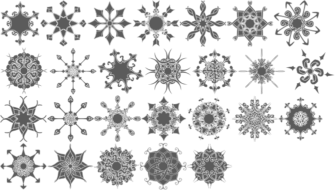
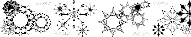
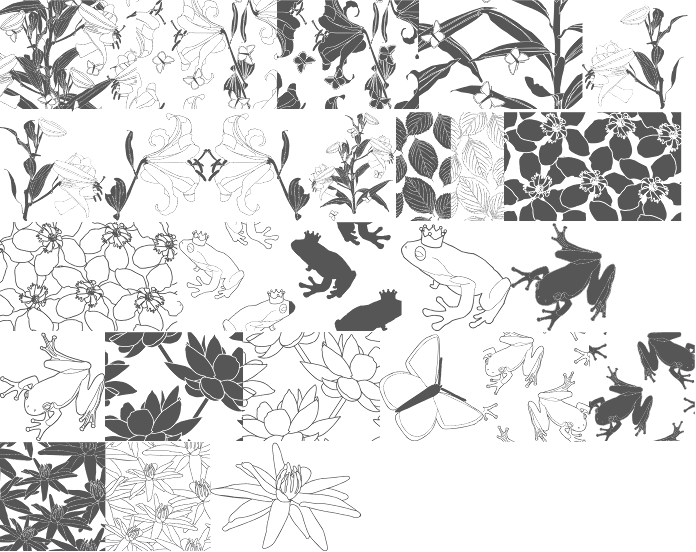
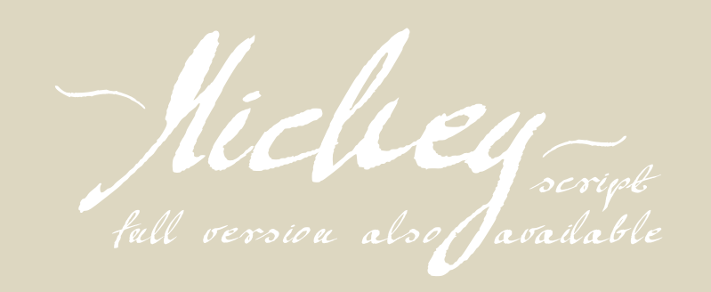
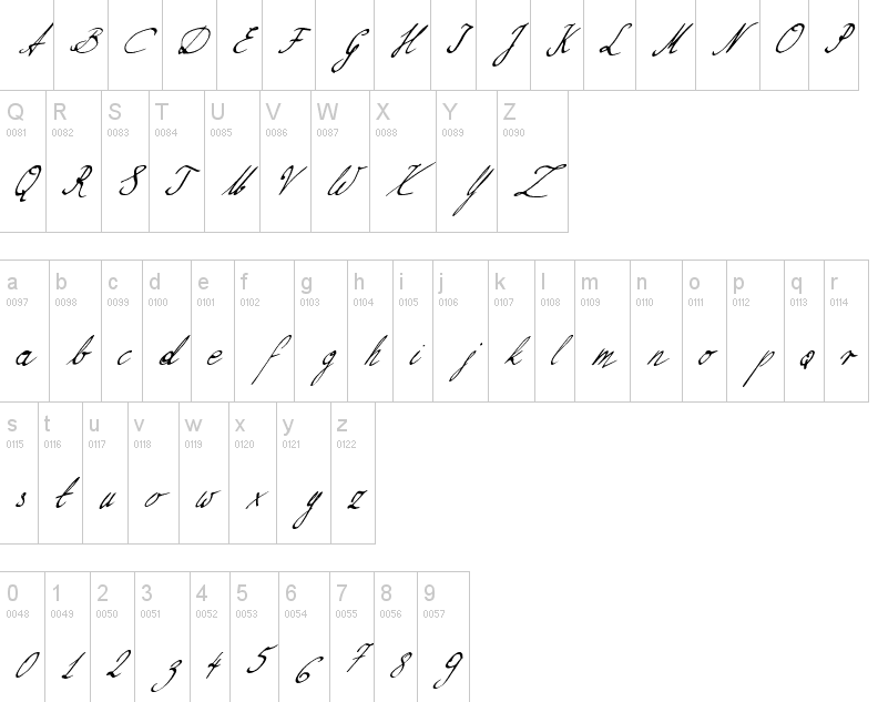
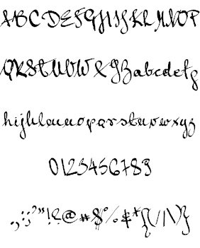
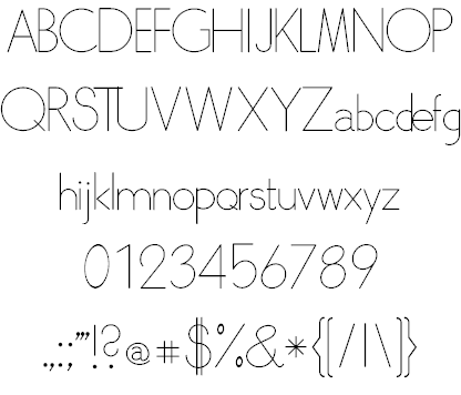
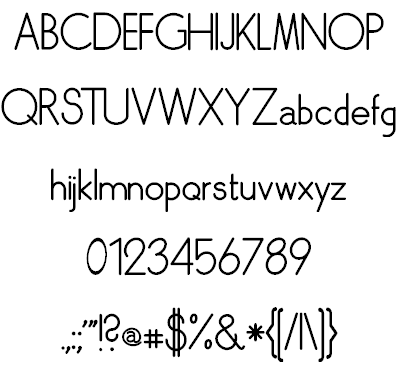
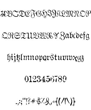
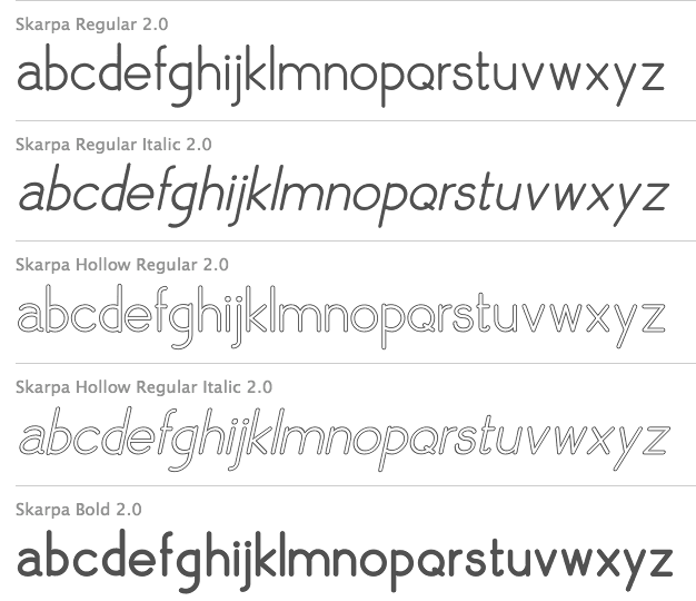
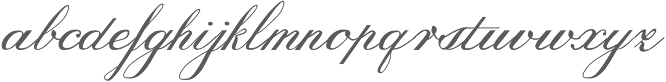
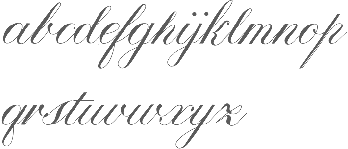
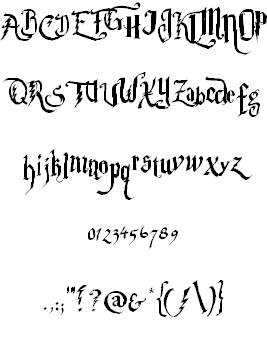
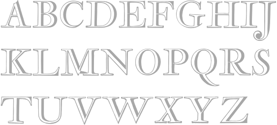
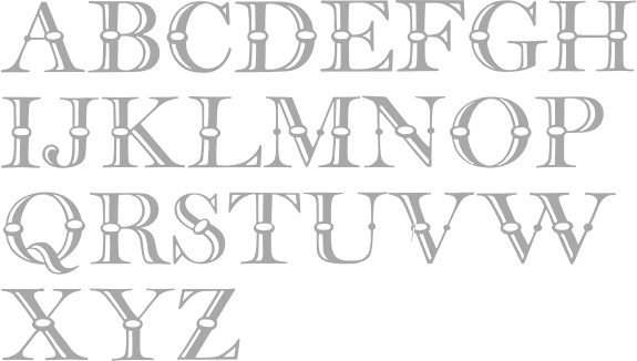
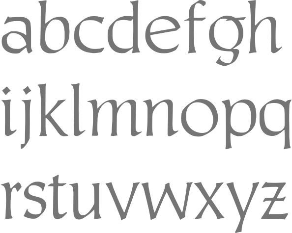
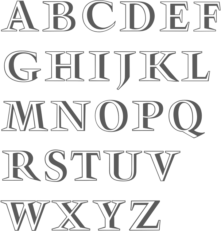
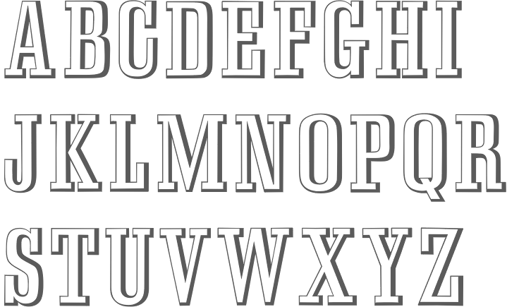
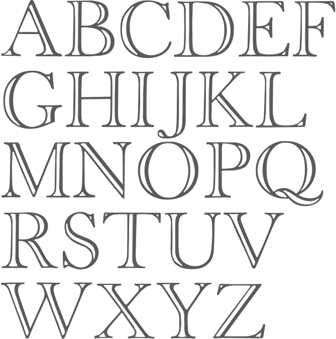
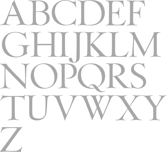
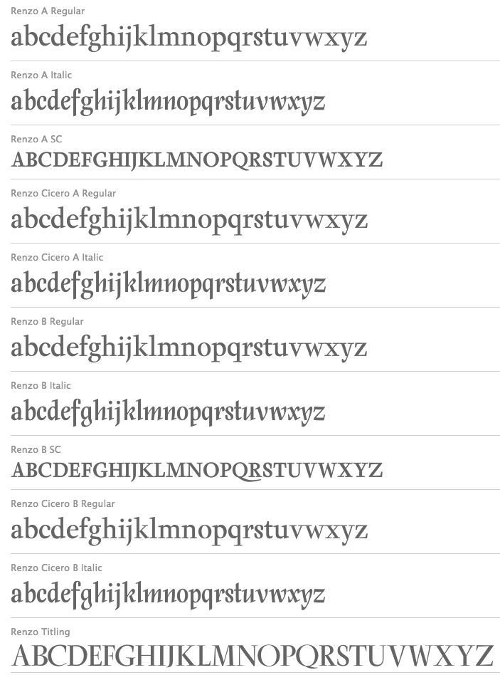
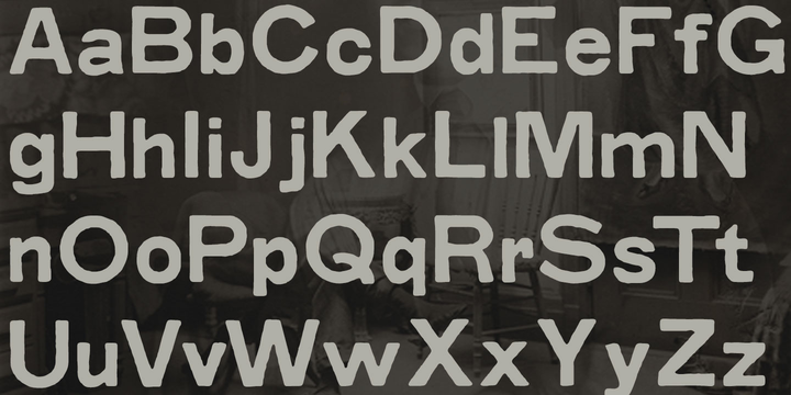
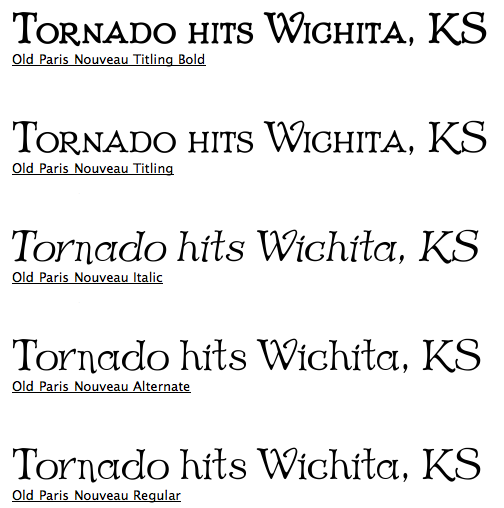
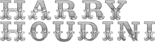
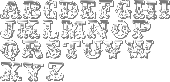
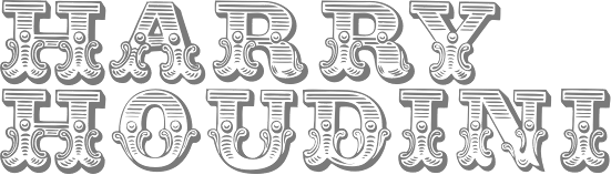
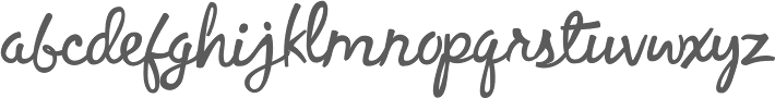
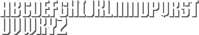
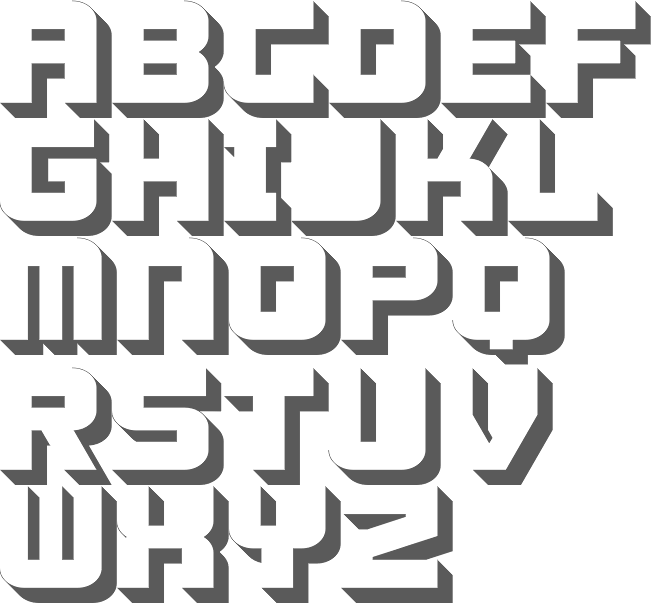
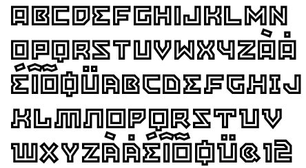
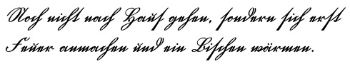
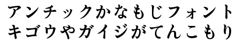
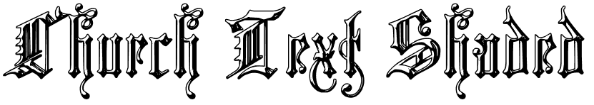
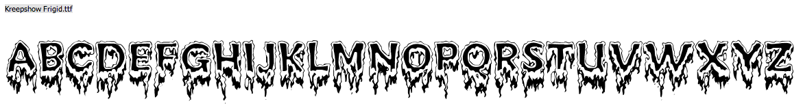
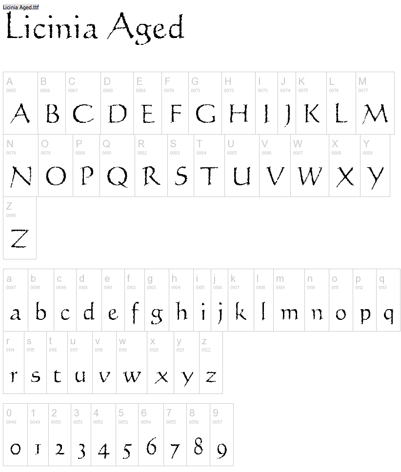
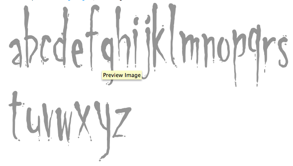
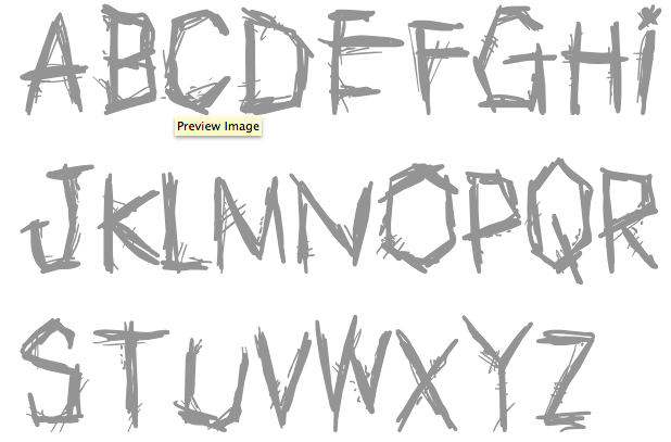
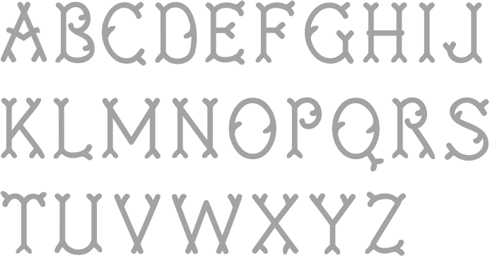
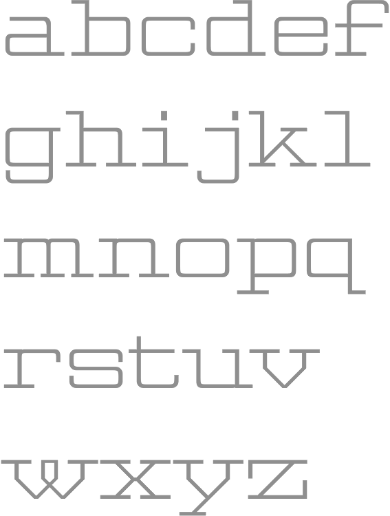
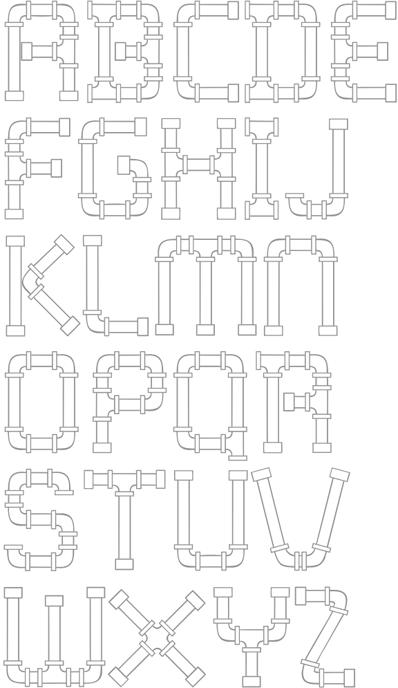
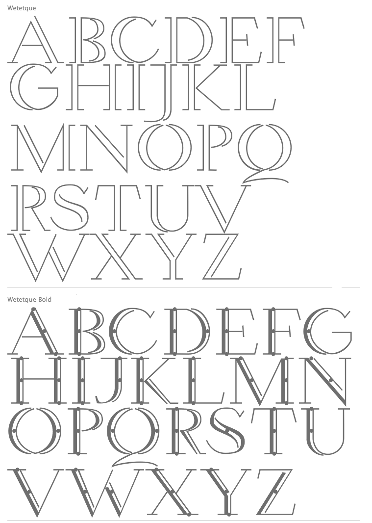
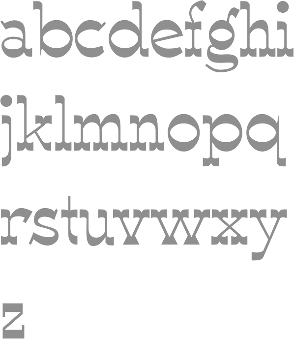
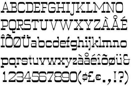
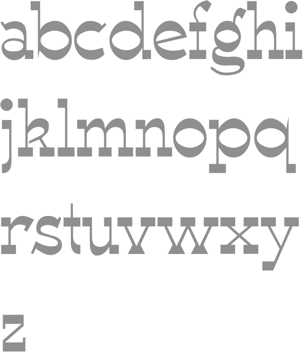
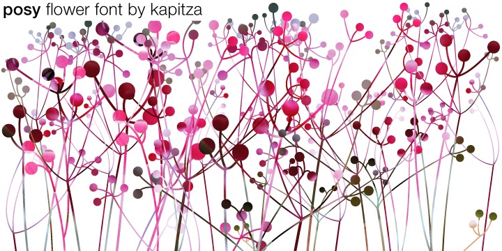
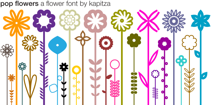
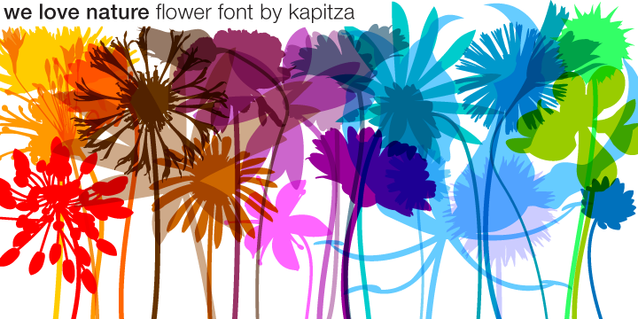
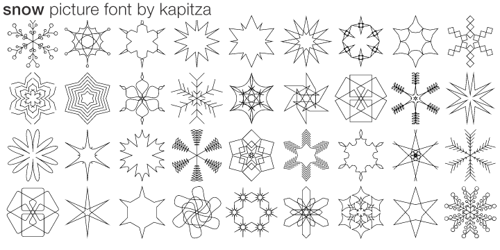
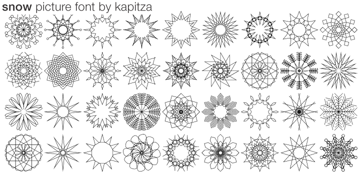
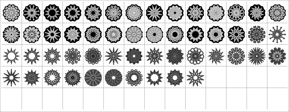
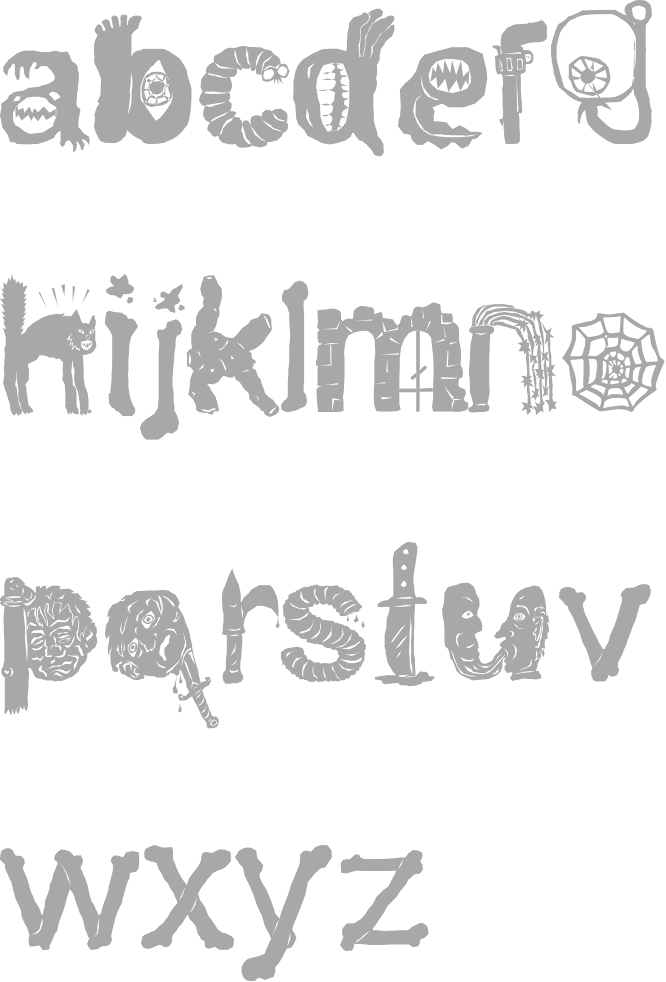
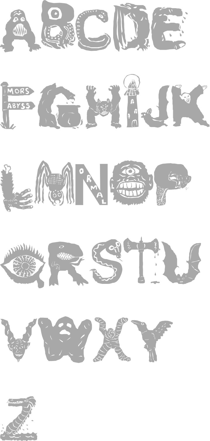
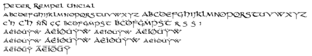
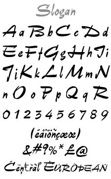