TYPE DESIGN INFORMATION PAGE last updated on Mon Jul 20 20:29:25 EDT 2026
FONT RECOGNITION VIA FONT MOOSE

|
|
|
|
|
Tear drop terminals | ||
|
|
|
|

SWITCH TO INDEX FILE
4th February
|
Abstract Fonts link. Dafont link. Creative Market link. Behance link. Hellofont link. Open Font Library link. |
Acute Studio
|
Creator of the hairline face Opium (2010) characterized by teardrop terminals. Creator of Paige (2011), developed at the tipoRenesansa 3rd international type design workshop in Ljubljana, Slovenia. This is an attractive and bouncy papercut display face. Marge (2011) is edgy and highly legible even at very small sizes---it was developed at the tipoRenesansa 2nd international type design workshop. Paige Italic (2012) was done at tipoRenesansa 4 and TypeClinic 5 (2012). Her KABK graduation typeface was Editura (2013), a a type family for serious publications, magazines, as well as non-fiction books. At The 8th International Typeclinic in 2014, she continued work on an untitled text typeface. At Die Gestalten, she published Paiper, an extraordinarily balanced and readable 6-style text family with angular flared glyphs that are genetically related to folded paper strips. In 2014, Diana collaborated on the design of HF Stencil with Bold Monday and Studio Thonik. Made for Holland Festival, HF Stencil is based on Glaser Stencil. In 2016, Diana published Equitan Sans and Equitan Slab at Indian Type Foundry, marrying industrial era rustiness with modern functionality. In 2017, she designed Tiny Sans and Albert Samuels Clock Type. Codesigner in 2017 with Samo Acko and Sabina Chipara of the typefaces Passenger Display (2017) and Passenger Serif (released in 2019: a Clarendon). Passenger Display is a high-contrast didone-style font family. It is intended for use in headlines, signs, or posters. Passenger Display is a high-contrast didone-style font family. It is intended for use in headlines, signs, or posters. In 2019, Diana Ovezea and Samo Acko added Passenger Sans, which is characterized by horizontal and vertical terminal strokes and small apertures, and delivers a relaxing read in long texts. With Sabina Chipara, she co-designed the 8-weight simplified sans family Bega at Indian Type Foundry. Diana Ovezea also published the sharp-edged 14-style Matteo in 2017. At Future Fonts, she published Bizzarrini (together with Sabina Chipara) and Silverspoon, ca. 2018. She writes about the wonderful Bizzarrini: Though the idea originates from a Stefan Schlesinger ad sketch for a Paris couture house, we straightened up this typeface and made it seem engineered and sharp. It gets its name from the Bizzarrini Manta, a wedge-shaped concept car designed in 1968 by Giorgetto Giugiaro. Bizzarrini has extremely long wedge serifs. Following Schlesinger's sketch, it features very tall capitals with an out-of proportion middle-line (very big heads on S, B and R). Silverspoon is a contemporary take on Copperplate Gothic. In 2019, she released the connected monoline sans script Akin (done with Sabina Chipara) and the geometric sans family Matteo at Indian Type Foundry. Typefaces from 2020: Silverknife (a tall and skinny version of Silverspoon), Capra (a headline typeface with a bouncy baseline. This project started as a one-day challenge to recreate a piece of lettering on the Glass Menagerie poster designed by David Klein in 1958). At Fontshare, Diana Ovezea and Sabina Chipara released the free calligraphic script Britney. In 2021, Barbara Bigosinska, Rafa Buchner and Diana Ovezea set up Blast Foundry. At Blast Foundry, she published Granblue, a great experimental typeface family for boxing titles. Typefaces from 2022: Duplet (a 14-style geometric sans with a techno vibe; by Diana Ovezea and Rafal Buchner at Indian type Foundry), Duplet Rounded (also 14 styles), Duplet Open (the 14-style companion of Duplet). Home page. Behance link. Future Fonts link. [Google] [MyFonts] [More] ⦿ |
Photographer in Buenos Aires who designed the teardrop typeface Drop in 2016 during his studies at UBA. Behance link. [Google] [More] ⦿ | |
Graduate of the University of Irun, Spain. Auckland, New Zealand-based designer of the custom teardrop typeface Curia Tecnoparque (2017). Behance link. [Google] [More] ⦿ | |
In 2016, at SWPS University in Wroclaw, Poland, Aleksandra Mrozek designed the umbrella and raindrop-themed typeface Lluvia. [Google] [More] ⦿ | |
Romanian designer of an unnamed lachrymal typeface in 2013. [Google] [More] ⦿ | |
As a student at Elisava in Barcelona, Ambar Amill Bosco designed a lachrymal all caps typeface (2015). [Google] [More] ⦿ | |
| |
Graphic designer in Toronto, who created the teardrop terminal typeface Circle Sans (2013). Behance link. [Google] [More] ⦿ | |
Originally from Lawrence, KS, Andrew designed an unnamed lachrymal typeface in 2012 with Paul Gonzalez during his studies at Ringling College of Art and Design in Sarasota, FL. [Google] [More] ⦿ | |
Anupap Jaichumnan
| |
Atypical
| George Triantafyllakos was born in Thessaloniki, Greece, in 1980. In 2004, he was a PhD student, Department of Informatics, Aristotle University of Thessaloniki. Founder, with Manolis Pratsinakis, of Backpacker. He set up the independent foundry Atypical. His typefaces at Atypical: Atypical (2014), Burger (2014), Cornelius (2014, art deco), Direct (2014, sans), Donmeh (2016), Friday (2014), JoyD (2015, flared and lapidary), Marx in France (2014), Marx in USA (2014, condensed fashion mag style with teardrops), Monotonous (2014, monoline and monospaced), PhD (2014, squarish), Slab (2014), Vs (2017), Walter (2014, art deco, with Hollow and Stencil styles, and a possibility of layering with patterns). At the open source type foundry Velvetyne, he added the Greek chracters to Lucas Le Bihan's Sporting Grotesque (2016). Dafont link. Fontsquirrel link. Klingspor link. Kernest link. iFontMaker link. Cannibal Fonts link. Velvetyne Type Foundry link. [Google] [More] ⦿ |
Stephen Coles and Joshua Lurie-Terrell publish their list of the 23 best fonts of 2006. These are the Oscars of type design. A summary:
| |
Blastto
| Spanish graphic design group Blastto (Madrid) is actually Carlos Llorente, b. Guadalajara, Spain, currently based in London. He created a nice art deco type booklet in 2010, covering Broadway (1929), Bifur (1919), Parisian (1928) and others. Designer of the free experimental typeface Teardrop (2010) and the gridded typeface Try Type (2011). In 2012, he made Pigopago (a free double stroke font). The tweetware experimental typeface Del Gherp Al Tipo followed in 2013 after a TypoMad workshop in Madrid. Behance link. Dafont link. [Google] [More] ⦿ |
Graduate of the Beijing Industry University, class of 2006. Beijing-based creator of a teardrop stencil typeface in 2013. Behance link. [Google] [More] ⦿ | |
During her studies, Chambéry, Camille Pelard designed the teardrop typeface Janedoe (2017). [Google] [More] ⦿ | |
At St. John's University in New York City, Carla Marques created the Victorian typeface Slender (2015), which is sprinkled with small teardrops. [Google] [More] ⦿ | |
Carlos Llorente
| |
During her studies at Berghs School of Communication in Stockholm, Sweden, Caroline Hotti designed the elegant teardrop-themed display typeface Diskreta (2017) and the sharp-edged sans poster typeface Quartz (2017). [Google] [More] ⦿ | |
UK-based creator of the teardrop display typeface Organic Type (2012). [Google] [More] ⦿ | |
Parisian art director who created the lachrymal typeface Gouttype in 2014. Behance link. [Google] [More] ⦿ | |
During her studies in Haderslev, Denmark, Charløtte Strom Nielsen created the lachrymal typeface Bobblebe (2015). [Google] [More] ⦿ | |
During her studies, Fullerton, CA-based Cherrie Wang designed the teardrop typeface Drop (2016). [Google] [More] ⦿ | |
Kuala Lumpur, Malaysia-based art director who made the music note-inspired typeface Musiqa (2013). [Google] [More] ⦿ | |
Oslo-based designer of the thin lachrymal sans typeface Velouet (2014). [Google] [More] ⦿ | |
Brisbane, Australia-based designer of the lachrymal liquid typeface Invisible Life (2016). [Google] [More] ⦿ | |
Dafont link. Yet another URL. Abfonts carries many of his fonts. Fontspace link. His typefaces:
| |
Polish designer based in Szczecin. At Typeclinic 12th International Type Design Workshop, he created Toucan (2016), a text typeface characterized by teardrop terminals, large x-height and bracketed round serifs. [Google] [More] ⦿ | |
During his studies in Santa Ana, El Salvador, Daniel Pineda created the teardrop terminal typeface Biolyn (2013). [Google] [More] ⦿ | |
| |
As a student at FADU / UBA, Buenos Aires-based Daniela Goitia created the art nouveau and teardrop style typeface Carnaval in 2012. [Google] [More] ⦿ | |
American designer of the waterdrop-themed typeface Drops (2017). [Google] [More] ⦿ | |
Diana Ovezea
| |
Madrid-based designer of the lachrymal typeface Prototype 024 (2019). [Google] [More] ⦿ | |
Elena Genova
| |
Freelancer in Basel, Switzerland, who, during her studies at FHNW in Basel created a teardrop-laden sans typeface (2014). Behance link. [Google] [More] ⦿ | |
During her studies in Lyon, France, Eleonor Pellerin created Fantaisie (2015), a teardrop-themed typeface family. [Google] [More] ⦿ | |
Behance link. [Google] [More] ⦿ | |
| |
Emil Karl Bertell
| |
During her studies in Montreal, Emilie Lavigne created the lachrymal typeface Flores (2013). [Google] [More] ⦿ | |
Espen Aaeng
| |
During her studies at Sabanci University, Istanbul, Turkey-based Eylül Gümüsöz designed the teardrop typeface Elvis (2017). [Google] [More] ⦿ | |
Fenotype
|
Typefaces made in 2002: Disco (prismatic), Lakmus, Valimo, FUTU, Test1, Foton Torpedo, Cheaptype, Personal Computer, Copycut, Unicode 0024, HKI Metro, HKI NightLife, Digital Kauno, Fenotravels (dingbats), Tivoli, Kosmonaut, 10124, JouluFonttiFenotype, Testi, 1laitos, 1120, 0629 (2002, a kitchen tile font), 0927, 0210, FTdingsprevi, Fenotypedings#lego3, Genotype, NeoPangaia, NeoPangaia 2, Nipponblocks, Pectopah, Personalcomputer, Pouttu, Samarin (2002, athletic lettering), Unicode0024, URALphat, URALthin, URAL, URAL3d (all Latin/Cyrillic fonts with incomplete punctuation though), Automania (multiline), Copycut, Halo, 222_2003, Tantor, Letters, Rikos, Lastu, ThreeTheHardWay, Bukkake, Halo. Emil's brother Erik designed Neon (paperclip face), Mama and Mama Round (paperclip typefaces). In private email, he calls himself Carl. The foundry evolved from 2theleft. Fonts made in 2003: Military Dingbats, 08 02 03 Fenotype, Projectsfenotype, Rock-it. Fonts made in 2004: Scandinavian Titan white, Scandinavian Titan, Acid Test 2, Acid Test (texture typefaces), 080203, Letters11, Linja, Projects, Rock it, Simpletype. Commercial typefaces: Sapluuna, Shortcut, Transeuro-Express, Omega-Uros, Fenotype Dings, Military Dingbats, Nippon Noodle. Typefaces made in 2004: Kolari, Kolari Light, FTfaces, Twisted Ontogenesis. Alternate URL. In 2005: RoundAbout, Nihilist Philosophy, Boogie Monster, Chunky Hunk (Western), Diy Typeface (kitchen tile style), Futuretro (stencil-like), 3TheHardWayOverrun, Pedant Dilettante, FT Rosecube, FT Blockbuster, 3TheHardWayRMX, Adios Gringo (Western face), Helsingfurt (3d oil glow face), Cream Soda (liquid), Thashed Paper Bag, Big Medium. In 2006: Rock It Deluxe (grunge), Cassette (dingbats), Kings Garden (Japanese trees as dingbats). MyFonts link, opened in 2009, where one can buy 080203, 3 The Hard Way Overrun, 3 The Hard Way RMX, Adios Gringo, Depth Charge, FT Helsingfurt, FT Roundabout, FT Scandinavian Titan, FT Twisted Ontogenesis, Ice Cream Soda, Kings Garden, Kolari, Nihilist Philosophy, Old Note, Rock It, November Script, and Majestic Mishmash (ransom note caps), Digital Kauno (2002, upright script), 10.12, EB Vintage Future, Fenotype Dingbats, FT Forest, FT Funghis, FT Military Dingbats, FT Weapon of Choice, Motel Xenia, URAL, Valima. Additions in 2010: Linguine (connected script), FT Telegraph (slab serif), FT Brush, FT Industry Machine, FT Giorgio, Killer Elephant (signage), FT Supervisor (ultra-condensed), FT Dead Mans Diary (scribbly), FT Grandpa Script (grunge calligraphy), FT Stamper (angular lettering), FT Tantor (fat, rounded), FT Bronson (fat display typeface with mustache dings thrown in), FT Master of Poster (bi-level display typeface with many ligatures and interlocking letters), FT Hidden Forest (tree dingbats), FT Mammoth (grotesque headline face), Rikos (futuristic), Squarendon Extra Bold (2010, a Clarendon), FT Moonshine Script (a Treefrog style face), Billboard (a hand-printed rounded caps family), EB Bellissimo Display (rounded monoline sans), Malamondo (an all caps display typeface with a large number of interlocking ligatures), Linja (2002 and 2010, a rounded ultra condensed family), Punavuori (2002 and 2010: a monoline sans family), Signor (2010, a rounded all caps family), Mrs. Lolita (connected script), Funghi Mania (mushroom dingbats), Funghi Mania Script, Darlington (very open upright connected script family), Archipelago (+Caps: an upright connected script), Tower (pieces that enable one to modularly construct towers when stacked; created as a school assignment at the University of Industrial Art&Design Helsinki in 2006), Monster (just as Tower but for monsters), Verna (informal face with ball terminals), Verner (2010, a connected script version of Verna), Verner (2010, a connected script version of Verna). Typefaces from 2011: Pepita Script (an upright connected script with small lachrymal terminals), Pepito (its nonconnected version), Barber (upright script family), Banzai Bros (a fat caps-only signage face), Mishka (an upright connected script with tear drop terminals). In 2012, he created Salamander Script, Taiga (connected upright script), Mercury Script (a set of upright connected script typefaces), Slim Tony (a bubblegum retro signage face) and Mercury Ornaments. Typefaces from 2013: No. Seven (a successful brushy signage or baseball script), Alek and Alek Ornaments (an upright signage script), Voyage (a vintage script), Barracuda Script (brushy signage face), Bonbon (signage script), Bonbon Ornaments, Scaramouche (a playful connected script). Typefaces from 2014: Larry (sturdy connected script), Silver (upright connected script), Powder Script, Peaches And Cream (creamy signage or baseball script), In and Out (a connected retro signage script), The Carpenter (a script family in the style of Mercury Script). Typefaces from 2015: HMS Gilbert (a collection of 14 hand-crfated vintage types), Lager (a signage script family with adaptable swashes and other opentype goodies), Vanilla Shot, Journey (a smooth and elegant vintage script family of four weights and a matching ornament set, packed with alternate characters, and, in Bertell's style, perfect connections between glyphs), Tea Biscuit (signage script), Skipper, Skipper (connected script), Frost (a signage typeface that is just right, a sure award winner), Monday (sign apinting typeface). Typefaces from 2016: Jazz Script, Fragola (sign painting font), Syrup (sign painting font), Cosmopolitan (monoline connected script), Bluebell (copperplate calligraphic script), Inkston (vernacular brush script together with the standard handcrafted sans and text styles), Beaujolais (brush script), Black Script (a heavy signage script), Beaujolais (an organic brush script), Cold Brew (signage script), Inkheart (tattoo style). Typefaces from 2017: Camper (monoline script, accompanied by Camper Print), Aether Rain (thin script), Thang, Big Fish, Bolton (Bolton Script and Bolton Script, and the degraded Bolton Print pack), Vodka (Slab, Sans, Pen and Brush), Poster Brush, Fresh Press (signage style), Praktika (grotesk), Praktika Rounded, Blossoms, Kitchen (sign painting brush), Letterpress Studio, Takeaway, Aether Rain, Pitcher (baseball script), Karu (a workhorse sans), Bluebell (calligraphic), Roster (signage script), Dog Days, Catsy, Alfons (in Script, Display, Sans, Serif, Tiki, Extras and Ornaments subfamilies), Cosmopolitan (monoline script and sans pair), Snooker (retro signage script), Salty (a creamy brushed signage typeface). Typefaces from 2018: Aster Script, Audrey (a monoline script and sans duo), Galatea (a 48-style sans family by Erik and Emil Bertell), Double Porter (an 18-style font collection with scripts, sans, and grunge faces thrown in the mix), Matchstick, Fruitos, Corner Deli (a layerable set of fonts in script and sans styles), Bayamo (a brush script done for Monotype), Sidecar (a connected monoline neon sign script, and a matching sans), Ginger John, Brush Marker, Shirataki (monoline soft pen script), Ash (a crayon font), Breakfast Script, Dallas Print Shop (a display family by Teo Tuominen and Emil Karl Bertell), Capital (a sans and serif family by Teo Tuominen, Erik Jarl Bertell and Emil Karl Bertell). Elixir, Maestri (a classical connected scrupt by Teo Tuominen and Emil Karl Bertell), Popcorn (brush script), Cherry (signage script), Goodwater, Signature Script, Kingfisher (a beer botle signage script), Sonder (brush script). Typefaces from 2019: Taurus (an all caps logotype family by Emil Bertell, Erik Bertell and Teo Tuominen), Ex Libris (a high contrast flared serif titling font), Riley (a retro sign painting script), Allison Script, Milky (a sign-painting brush script), Portland (a reverse contrast typeface by Emil Bertell, Erik Bertell and Teo Tuominen), Zeit (a transitional text typeface by Emil Bertell, Erik Bertell and Teo Tuominen), Boardwalk Avenue Rough (a monoline script and a weathered all caps sans), Avion (a sans family by Emil Bertell, Erik Bertell and Teo Tuominen), Yes Script, Gainsborough (script), Florian (a roman typeface with crisp edges and some contrast), Vogue Sans (a haute couture all caps contrast sans), Fabrica (a decorative frilly didone by Emil Bertell, Erik Bertell and Teo Tuominen), Chai (an expressive sans / serif hybrid), Rainmaker Script (monoline), Aequitas (a stylish sharp-edged roman typeface family), Tapas (by Emil Bertell, Erik Bertell and Teo Tuominen: a Serif, Sans, Deco and Script collection), Lawrence (a stylish roman typeface), Kallio Brush (a signage brush script), Morison (a great 32-style wedge serif typeface by Erik and Emil Bertell and Teo Tuominen), Felicity Serif (a juicy bold high-contrast serif), Las Palmas (Brush, Pen, Slab, Condensed), Honey Drops, Explorer, Boardwalk Avenue (a sans/script font duo), Skye (a heavy decorative didone), Leftfield (a retro baseball script), Steak And Cheese, Agile Sans (a humanist sans by Emil Karl Bertell, Erik Jarl Bertell, and Teo Tuominen), Punk Rocker, Silverline, Perfume (Pen, Brush and Sans), Hops And Barley, Allison. Typefaces from 2020: Laurel (by Teo Tuominen, Emil Bertell and Erik Bertell: a 4 style sans with amnay wedge elements), Omnipop (Sans, Brush, Script), Paper Tiger (a Victorian Script accompanied by a condensed flared serif in two weights and a chunky sans serif), Resolve Sans (by Teo Tuominen, Emil Bertell and Erik Bertell: an extensive grotesk super family of 124 fonts: from compressed to extended, thin to black), Gambler (a 14-style display type collection), Rockford Sans (2020: an 8-style geometric sans with large x-height and slightly rounded corners; Emil Bertell, Erik Bertell and Teo Tuominen), Slacker (a brush script), Grand Atlantic (a vintage display package), Magnolia (Brush, Serif), Walden (a heavy rustic serif typeface by Emil Bertell, Erik Bertell and Teo Tuominen), Klik (a geometric sans family with Bauhaus influences, by the dynamic trio of Emil Bertell, Erik Bertell and Teo Tuominen), Rose Garden Deluxe (a font duo), Felicity (a heavyweight display sans). Typefaces from 2021: Alonzo (a 24-style Peignotian sans by Emil Bertell, Erik Bertell and Teo Tuominen), Imagist (a 12-style sharp-edged serif by Emil Bertell, Erik Bertell and Teo Tuominen), Maine (a 12-style modernized book antiqua by Emil Bertell, Erik Bertell and Teo Tuominen), Briston (a bold creamy serif in the Windsor genre), Lagom (a 16-style slab serif with some Clarendon charm; by Emil Bertell, Erik Bertell and Teo Tuominen), Skillet (a chubby Cooper Black-genre typeface full of hedonism and joie de vivre), Kings Valley (a decorative serif), Shaker Script (monolinear), Wonder (a 12-style rounded serif in the style of Windsor; by Emil Bertell, Erik Bertell and Teo Tuominen), Ellie Script (a signature script), Dirty Sundae (a casual font), Grand Cru (a refined serif family with 36 styles; by Emil Bertell, Erik Bertell and Teo Tuominen), Kiosk (a 4-style vintage headline typeface family in Script and Sans versions). Typefaces from 2022: Blood Orange (in the Cooper Black / Windsor / Souvenir genre), Tomato Ketchup (supermarket kitsch in the fat rounded Windsor genre). Dafont link. Behance link. Creative Market link. MyFonts interview. |
During her studies at FADU (University of Buenos Aires), Florencia Marino designed the teardrop-laden typeface Galant (2015). [Google] [More] ⦿ | |
Fontfabric
|
View Fontfabric's typefaces. In 2015, Ani Petrova, Svetoslav Simov and Radomir Tinkov co-designed the 214-style mammoth font system Intro Rust, a rough version of Fontfabric's Intro. The fonts are partitioned over Intro Rust, Intro Script, Intro Head and Intro Goodies. Still in 2015, we find Nexa Script. In 2017, Plamen Motev and Svetoslav Simov co-designed Uni Neue, a total remake of Fontfabric's earler typeface Uni Sans (2009). Svetoslav Simov, Plamen Motev and the Fontfabric team (Vladislav Jordanov, Stan Partalev, Mirela Belova, Jacklina Jekova, Nikolay Petroussenko) produced Zing Rust, Zing Sans Rust and Zing Script Rust in the same year: it consists of 521 handmade typefaces. In 2018, Mirela Belova and Svetoslav Simov co-designed the 20-style geometric sans typeface family Mont. Svet Simov and Svetlin Balezdrov co-designed the humanist sans family Squad, and Simov published the free all caps flared terminal font Colus in 2018. Gilam was designed in 2018 by Ivan Petrov, Plamen Motev and Svetoslav Simov---it is based on DIN, but is more geometric and has obliquely cut terminals. In 2019, Svet Simov, Radomir Tinkov and Stan Partalev designed the 72-strong Noah family of geometric sans typefaces, which is partitioned into four groups by x-height from small (Noah Grotesque) to medium (Noah and Noah Text) to large (Noah Head). Codesigner of Mozer (2019, by Svetoslav Simov, Ani Petrova, Mirela Belova and Nikolay Petrousenko: a condensed headline sans family that covers Latin, Greek and Cyrillic; Mozer SemiBold is free). In 2021, Svetoslav Simov and Vika Usmanova dusted off the 18-style update of Mont called Mont Blanc. It has very short descenders and medium-sized ascenders, two variable styles, and some redesigned glyphs. Its biggest problem will be the name---surely, the famous Swiss pen maker Mont Blanc will complain sooner or later about its trademark. I am puzzled about MyFonts, which did not catch this problem when they announced the typeface. In 2021, Simov also co-designed Code Next (a 20-style geometric sans by Svetoslav Simov, Mirela Belova and Stan Partalev; it includes two variable fonts). Fontsquirrel link. [Google] [MyFonts] [More] ⦿ |
Fontroll
| Zurich, Switzerland-based self-taught type, book and magazine designer. In 2021, he released Klothilde (a teardrop script). [Google] [MyFonts] [More] ⦿ |
Foundr-E
|
Another URL. Hellofont link. [Google] [More] ⦿ |
Fype Co
|
Typefaces from 2020: King and Queen (a 23-style lachrymal serif family), Saodah, Rei Biensa, Lemenso, Hiluan Sea, Beard Canye, Pier Georad (a supermarket signage script), London Bridge (a wide geometric sans with a short-armed lowercase r and a spectacular ri ligature), Glover, Prestigious (a fashion mag typeface), Dioxide (an all caps wedge serif titling typeface), Relaunch, Bollent (fashionable, all caps), Cargiona (a stylish plumpish sans), Moilgo (a curvy display typeface), Kickers (a rounded vintage display serif family). Typefaces from 2021: Mister Frogs (a funky font with a cartoon feel), Bloena, Boedimant (a weathered stencil typeface), Dogiesland (scrapbook font), Gostend, Kamaboko (a delightfully loony children's book font). Creative Fabrica link. [Google] [MyFonts] [More] ⦿ |
Guatire, Venezuela-based designer of the artsy Swag Sans typeface (2016) and Coquito (2017, teardrop-themed). [Google] [More] ⦿ | |
Versailles, France-based designer of the lachrymal typeface Gamatiar (2017). [Google] [More] ⦿ | |
In 2009, he designed 2012 Headline for the London Olympics---typophiles are generally disappointed with this daring design in the general angular category, and refer to better representatives of this genre such as Cyrus Highsmith's Occupant Gothic, Emigre's Elektrix, Hubert Jocham's Keks, and Chris Lozos's Dez Sans Script. With David James, he designed Noah Text (2013). In 2018, he designed Quair: Quair mixes typographic and graphic reference points, most notably from market-stall trader lettering and from Thorowgood and Scotch nineteenth-century typefaces. He also published the stencil typeface High in 2018. Typefaces from 2019: Schism One, Schism Two, Schism Three [these are serifless versions of Alias Didot with various amounts of contrast. They are more modulated and twistier than Peignot], Vertical (a humanist sans with vertical terminals: a squarish, high-shouldered shape, suggesting Roger Excoffon's Antique Olive). Fontworks interview. Catalog of Gareth Hague's typefaces. FontShop link. Klingspor link. MyFonts interview. [Google] [MyFonts] [More] ⦿ | |
George Triantafyllakos
| |
Gluk Fonts
|
Creator of the free artsy font Wanta (2008), of Resagnicto (2010), of Rawengulk (2010), of Rawengulk Sans (2011), of Reswysokr (2011), of the bold slab serif typeface Zantroke (2011), and of the free calligraphic typefaces Odstemplik (2009), promocyja (2008) and Konstytucyja (2008). He published the elegant serif family Foglihten (2010), which includes the inline typefaces Foglihten No. 1 (2011), Foglihten Fr02 (2011), Foglihten No. 3 (2011) and Foglihten No. 4 (2012). The latter is inspired by the Polish Constitution of May 3, 1791. Foglihten Petite Caps Black (2012) and Foglihten Black PCS (2012) are high-contrast fat didone typefaces, minus the ball terminals. The series continues with Foglihten No. 6 (2012) and Foglihten No. 7 (2013). Qumpellka No 12 (2011) is a flowing italic. Opattfram01 (2011) is a dingbat typeface with onamental patterns. The Okolaks family (2008) has a bit of an art deco feel. It covers East-European languages as well as Cyrillic. Sportrop (2008) is a neat multiline face. Gputeks (2008) is a delicate decorative face. Szlichta07 (2008) on the other hand is an experimental typeface based on tilting the horizontal edges about ten degrees up. Kawoszeh (2008) is a curly Victorian pre-art nouveau face. Spinwerad (2009) and Itsadzoke S01 (2010) and Itsadzoke S02 are display didones. Znikomit (2011) is an impressive lachrymal hairline slab face. See also Znikomit No. 25 (2012) and Znikomit No. 24 (2012; image by Benjamin Frazzetto). Creations from 2012: Charakterny, Garineldo, Mikodacs (an Impact-like black display sans), Yokawerad (a didone headline face), Resagokr, Nikodecs, Garineldo SC. Typefaces from 2013: Etharnig, Namskin, Namskout (a layered heavy display face), Prida 65 (spurred antique face), Ketosag, Prida 61, Gatometrix, Glametrix, Gallberik. Typefaces from 2014: VECfont FogV4, EtharnigV (a bi-colored font), Risaltyp, Wabroye, Kleymissky, Sortefax (an outline font with engraved versions as on dollar bills), Dragerotypos (blackboard bold), Resamitz. Typefaces from 2015: Prida 36, Sudegnak No. 3 (script), Vecfont Sudegnak (cartoonish), PridaEn (a vector font for color), Prida S4, Prida01, Prida02 Calt. Typefaces from 2016: BroshN, Tofimpelik (+Candy), Prosh3, Digitalt, Agreloy (a lovely curly Victorian typeface), Gluk Mixer (ransom note font), Fogtwo No 5. Typefaces from 2017: Prosh 4B (a variable color font), BroshK2 (an origami style color font, in OpenType SVG format), Fuetargio (a multiline bejeweled typeface). Typefaces from 2018: BroshK, Rostef (all caps titling typeface), Fogthree. Typefaces from 2019: ResotE, ResotE-Pastels (a color font), ResotYc (a decorative unicase font), Resot Yg, Liserif (a kinetic SVG font). Typefaces from 2020: Digico M (a color font), Resotho (a wide all caps geometric sans). Dafont link. Digart link. Fontspace link. Dafont link. Open Font Library link. Scribus Stuff link. Fontspace link. Kernest link. Abstract Fonts link. Behance link. Font Squirrel link. Klingspor link. Creative Market link. [Google] [MyFonts] [More] ⦿ |
Graham Meade
| |
In 2013, he created the lachrymal typeface Pluvia (2013). In 2016, he designed the fat brush typeface Brom. His fonts are sold via HypeForType. Behance link. Dafont link. [Google] [More] ⦿ | |
Grzegorz Luksza
| |
Graphic designer in Auckland, New Zealand, who created the high-contrast lachrymal terminal typeface Olbdio (2012). [Google] [More] ⦿ | |
Toronto, Ontario-based designer of the lachrymal and perhaps sligtly art nouveau-ish typeface Wanderlust (2017). Behance link. [Google] [More] ⦿ | |
As a student in Reykjavik, Iceland, Hrefna Lind created the lachrymal typeface Whale (2014). Behance link. [Google] [More] ⦿ | |
Insigne Type Design Studio (was: Dooley Type)
|
Catalog of their typefaces. View Jeremy Dooley's font library. View Jeremy Dooley's typefaces. Adobe link. [Google] [MyFonts] [More] ⦿ |
Currently located in Paris, he set up his own commercial foundry in 2013. He also started publishing some of his typefaces at the French type coop Fontyou in 2013. His typefaces:
Klingspor link. Old URL. Behance link. [Google] [MyFonts] [More] ⦿ | |
Jeremy Dooley
| |
During his studies at the Willem De Kooning Academy in Rotterdam, Jim Jansen designed the lachrymal display typeface Crescendo (2013). [Google] [More] ⦿ | |
Jipatype
|
Typefacesfrom 2020: Asangha (90 styles), Luktao (rounded and elliptical, for Latin and Thai). Uturna Round, Banburi (a creamy display typeface), Namasakarn (a soft serif), Monradok (a rounded sans for Latin and Thai), Dumondi (a rounded casual sans), Prachason (a Latin/Thai sans family), Prachamati. Typefaces from 2021: Dimsum (oriental emulation), Prachason Neue, Athachantr (a Latin/Thai didone family), Kitchakan (a condensed sans), Mommi (a soft bold sans), Yodnam (a teardrop-themed font), Cakerolli, Jella (a supermarket font), Biski (a rounded supermarket sans). Typefaces from 2022: Anachak (an 18-style squarish sans), Santiphap (a slab serif), Jaturat (octagonal), Pcast (an 18-style squarish sans), Opkrop (an 18-style packaging sans), Phongphrai. [Google] [MyFonts] [More] ⦿ |
Brazilian creator of the serifed typeface family Edith Book (2012). It is possible that this is the same Joao Costa who co-designed the thin lachrymal typeface Zitrone FY in 2014 at FontYou with Jérémie Hornus and Alisa Nowak. [Google] [MyFonts] [More] ⦿ | |
Mortadella (2012) is a hand-drawn burly-looking sans. Mol (2012) is a mini-serifed didone display face. MyFonts link. Behance link. Cargo Collective page. Klingspor link. YWFT link. [Google] [MyFonts] [More] ⦿ | |
In 2014, he published the free ultra-condensed typeface HR Giger Type, named after artist H.R. Giger. The typeface itself was started in 2007. In 2014, he co-designed Garnata Display with Nano Torres and Rafa Galeano at Garnatatype, a project about the urban vernacular type in the city of Granada. Hellofont link. Behance link. [Google] [More] ⦿ | |
In 2015, during his studies in Paris, Jules created the teardrop-themed typeface Polka Drop. [Google] [More] ⦿ | |
During her graphic design studies at the University of Buenos Aires, Julieta Scorda designed an experimental lachrymal typeface. [Google] [More] ⦿ | |
As a student in Cardiff, Wales, Justine Thorner designed the stunning teardrop-laden swashy calligraphic typeface Voracious Vanity (2013), which evokes the style of modern fashion magazines. [Google] [More] ⦿ | |
| |
Link to Pluck Design. [Google] [More] ⦿ | |
Lewis Francis, a graphic designer in Hull (UK), created Typeface for Lisa Hardwick (2012), a lachrymal version of Helvetica. Behance link. [Google] [More] ⦿ | |
| |
Based in Curitiba, Brazil, Luiz Lazaro Camoes created the squarish display typeface Pictocracia (2013), the circle arc typeface Vegetal (2013), and the lachrymal titling typeface Larga (2013). He studied at the University of Salvador. Behance link. [Google] [More] ⦿ | |
Brisbane, Australia-based designer of the teardrop-themed typeface quiddity (2017). [Google] [More] ⦿ | |
During her art studies in Jakarta, Maggie Tunggono created the teardrop didone typeface Viot (2014). [Google] [More] ⦿ | |
| |
Sarasota, FL-based designer who created the teardrop script typeface Unicorn Penmanship in 2012 for a typography course. [Google] [More] ⦿ | |
Typefaces from 2013: Transient, Evaow, Stella, Oval, Koda, Amaral (a technical pencil font), Astralasia. Typefaces from 2014: Radiance (avant garde), Valerie, Akasic, Destiny, Ensure (a casual sans), Exacta, Oldskool. Typefaces from 2015: Arsone (graffiti style), Manuscripta (script), Valerie (high contrast cursive typeface), Bertica, Exacta, Manuscripta, Spirituality, Bertica, Pleiadian, Positive Thinking, Lovelica, Dawn (sketched), Picasa (sketched painter's font), Abstracta, Future, Akasic. Typefaces from 2016: Artesana, Graff, Astralia, Idilica (avant garde), Yass, Sharik. Typefaces from 2017: Magnetic, Soma (an elegant tall display font), Solar (avant garde), Reason (a geometric hairline sans). Typefaces from 2019: Zen Garden (oriental simulation), Sistematica, Inedita, Galaxy, Existence (art deco), Amaral (architectural lettering), Kasparosky, Destiny (graffiti letters), Yes (a hairline art deco sans). Dafont link. Fontspace link. Behance link. Old URL. View Manuel Ramos's commercial typefaces. Newer Behance link. [Google] [MyFonts] [More] ⦿ | |
| |
| |
| |
| |
Copenhagen, Denmark-based student-designer of the circle and teardrop-themed display typeface Circle (2017). [Google] [More] ⦿ | |
| |
Graphic designer at the Sofia University Press "St. Kliment Ohridski" in Sofia, Bulgaria. Creator of the Cyrillic teardrop typeface Chai (Tea) in 2013. [Google] [More] ⦿ | |
Marx Ause
| |
Creator of the lachrymal Retiree display typeface (2012). He also made Slippery People Typeface (2012, a thin headline sans). [Google] [More] ⦿ | |
Max Infeld
| |
Dublin-based designer of the lachrymal typeface Akron (2014). [Google] [More] ⦿ | |
| |
Muhammad Hasan
| |
My Creative Land (was: Mosquito Place)
|
She designed these commercial typefaces in 2014: Ariadne (connected curly script), Veryberry (curly script, + Cyrillic), Handy Sans Condensed (+Distressed; for Latin and Cyrillic), Handy Casual Condensed. In 2015, she designed the brush typefaces Celestial, Dessert Menu (Sans and Script), Botanica (Sans, Script, Ornaments) and Evenfal and the script typefaces Storyteller (a great connected script in Script and Casual sub-styles ideally suited for children's books), Allegretto Script (calligraphic), Catfish (monoline and connected), Rosalinda Script, Aristelle Script (+Aristelle Sans: identical to Ariadne) and La Veronique. Typefaces from 2016: Sunshine Daisies (handwritten type system), Nefelibata (in Brush and Sans versions), La Parisienne, La Veronique Two, New Storyteller. Typefaces from 2017: Above the Sky, Lovingly Friends (a collection of sixteen handcrafted typefaces), Scandiebox, Brushability, Rockeby (32 fonts, which she describes as slightly more geometric than Block Berthold but much softer than the industrial Din Next; see also Rockeby SemiSerif and Rockeby Brush). Typefaces from 2018: Adventures Unlimited (a connected monoline script and a super-condensed sans companion), Brushberry (dry brush script), Absolute Beauty (a monoline signature script and accompanying thin serif), Combinado (Sans, (a didone) Serif, Text, Script), Brooklyn Heritage (Sans and Script), Palomino (a crayon script), Beautiful Minds (a fashion mag typeface family; +Stencil). Typefaces from 2019: Contempora Script and Contempora Sans Condensed, Freethinker, Hello Bloomie (a watercolor SVG font), Above the Beyond, Lumios Marker (a marker pen font), Lumios Typewriter (old typewriter), Beautifully Delicious (Sans+Script duo). Typefaces from 2020: Dreaming Outloud (a fat finger font), Roca (a plump serif influenced by Windsor and Cooper Black), The Youngest, Praline MCL (a chocolate store Serif and sans pair), Balerno Serif (a lachrymal didione). Typefaces from 2021: Parlare (a flowing script), Lumios Brush (a bold brush script), Boss Jock JNL (an informal font based on the title and credits from the 1965 film Strange Bedfellows), Peachi (a 6-style soft serif typeface with rounded terminals), Carelia (a didone display typeface for Latin and Cyrillic). Creative Market link. Behance link. [Google] [MyFonts] [More] ⦿ |
Typefaces with lachrymal (tear drop) terminals, as culled from the MyFonts type library. [Google] [More] ⦿ | |
During her studies at Eracom in 2014, Nadine Pilet (Switzerland) created an untitled Peignotian sans typeface with a few teardrops strategically added to some lower case letters. [Google] [More] ⦿ | |
During her studies at the University of Technology, Sydney, Natalie Shue created the teardrop-laden display typeface Black Fox (2013). Behance link. [Google] [More] ⦿ | |
New Delhi-based designer of the lachrymal piano key typeface Clavier (2018), which was developed during his studies at Pearl Academy. [Google] [More] ⦿ | |
Montreal-based designer of the teardrop school project typeface Grappe (2014). [Google] [More] ⦿ | |
| |
Paskadom (or: Cut Ayasofia)
| Aka Marx Ause. Seunebok Aceh, Indonesia-based designer of the children's script fonts Rudox (2016), Collonio (2016), Childish (2016) and Camelia&Amalia (2016), the curly typefaces Bookoolah (2016) and Micaloox (2016, curly), the water drop emulation typeface Melto (2016), the curly Latihan (2016), the tribal font Folka (2016), and the watercolor brush font Kuwekie or Quekie (2016). Typefaces from 2017: Mareena Brush, Kartina Script, Artevak, Red Monday, Halimoon. Cut Ayasofia is represented by the Palepupils Agency. Behance link. Newest Behance link. [Google] [More] ⦿ |
With Andrew Schoneweis, Paul Gonzalez co-designed an unnamed lachrymal typeface in 2012. [Google] [More] ⦿ | |
In 2012, she and Daniel Hernandez created the Bosque family at Latinotype, which comes with six variants, Normal, Wood, Shadow, Wood Shadow, Dingbats and Shadow One. Julieta is a curly swashy thin monoline typeface family. Romeo (Latinotype) is a swashy curly condensed unicase typeface. In 2013, with Daniel Hernandez, she designed the layered type system Trend, also at Latinotype. See also Trend Rough (2014). In 2014, together with Daniel Hernandez, she created the upright good-spirited coffee shop script Showcase. It is morally supported by a set of Ornaments and a few Sans and Slab styles. Revista (2015, Paula Nazal Selaive, Marcelo Quiroz and Daniel Hernandez, at Latinotype) is a typographic system that brings together all the features to undertake any fashion magazine-oriented project. It has Revista Script (connected style), Revista Stencil, Revista Dingbats, Revista Inline and the didone Revista all caps set of typefaces. Revista won an award at Tipos Latinos 2016. In 2016, she designed the delicate display didone typeface family Camila (Latinotype), for which she was influenced by Coco Chanel. In 2017, Paula Nazal and Daniel Hernandez co-designed Trenda, a geometric sans family based on the uppercase of Trend. The rounded edge version of Trenda is Boston [corrections and review by Alfonso Garcia and Rodrigo Fuenzalida]. In 2018, Paula Nazal and Daniel Hernandez co-designed the monoline connected script font Save The Date. Facundo (2020, Paula Nazal Selaive and Daniel Hernandez, at Latinotype) is a 14-style geometric sans family. [Google] [MyFonts] [More] ⦿ | |
Designer, illustrator and photographer in Rio de Janeiro. Creator of the toilet paper-inspired collage typeface Reolo (2012, done for a project at IFPE) and of the curvy lachrymal typeface Petal (2012). Her typefaces are free. Fontspace link. Cargocollective link. Dafont link. Behance link. [Google] [More] ⦿ | |
Trofa, Portugal-based designer of the teardrop serif typeface Baer (2015). [Google] [More] ⦿ | |
| |
A snapshot of their production, as of mid 2012, in alphabetical order:
| |
British creator of Folio (2012, a high-contrast teardrop typeface). [Google] [More] ⦿ | |
During her studies, Rachel Suflita (Schenectady, NY) created the lachrymal typeface Rosebud (2014). [Google] [More] ⦿ | |
Student in Anderson, SC, who created the teardrop text family Gatsby (2012). [Google] [More] ⦿ | |
During her studies in Lisbon, raqueel Ferreira and MarianaFacada designed the lachrymal typeface Lagrimas (2013). In 2016, she designed the calligraphic typeface Lilium Script. [Google] [More] ⦿ | |
Caldas da Reinha, Portugal-based designer of the slab serif teardrop-themed typeface Drp (2016), which was created during her studies at ESAD. [Google] [More] ⦿ | |
During her studies at FADU / UBA in Buenos Aires, Raquel Willson designed the delicate lachrymal high-contrast typeface Drop Script (2013). [Google] [More] ⦿ | |
Art director in Cachoeiro de Itapemirim and Vila Velha and Sao Paulo, Brazil. He designed the techno typefaces Kropp (2011) and Vosky (2011), and the weathered typeface Wrot (2011). In 2014, he designed the vernacular hand-drawn typeface Sabrazila and the curly typeface Vila. In 2015, he created the blocky futuristic typeface Apolo. In 2016, he designed the cursive typeface Married, and the teardrop-themed Amadeus. | |
Behance link. [Google] [More] ⦿ | |
FontStructor from Limerick, Ireland. His fonts include Teardrop (2011) Sabrefont (2011) and Electric Rain (2011). [Google] [More] ⦿ | |
During her studies at Flagler College, Saint Augustine, FL, Samantha Marino designed the high-contrast lachrymal typeface Marguerite (2014). Behance link. [Google] [More] ⦿ | |
Other typefaces from 2017 include Bitter Rose (free), Suddenly (signature script), Historia Sky and Billenia. Typefaces from 2018: Roseville Script (calligraphic: by Hendry Juanda and Sarid Ezra), Daytonia, Carrol Wild, Royalite, Historia Sky, Headley (monoline font duo), Scarlette Script, Bellatrone (script), Edinburgh (SVG brush font), Carrol Standard (sans), Richardson Script (a signature font), Audacity (font duo), Daviton (SVG brush by Sarid Ezra), Rossie Kelly (SVG brush), Sirens, Magdaline, Stephen Gillion (an inky script), Allison Style (font duo), Black Mountage (dry brush font), Merova (serif), Rotrude Sans (in 16 styles), Aurelie Smith (a signature script, and ornaments), Soredime (a great rabbit ear signature font), Hughson (a monoline script), Morriles (SVG brush), Strong Heart (font duo), Auckland Script (signage font), Camilla (signature font), Big Reputation (font duo), Briberra (a brush script) (free version), Carrol Sans, Kaylar, Brighter, Hipsterious (signage font: by Hendry Juanda). Typefaces from 2019: Fokers (Victorian), Bargitta (an SVG brush script font by Hendry Juanda and Sarid Ezra), Gorgone (a one-style didone by Henry Juanda and Sarid Ezra), Sharon Baker (by Hendry Juanda and Sarid Ezra), Daniella Evans (a display serif by Hendry Juanda and Sarid Ezra), Lotustail (by Henry Juanda and Sarid Ezra), Palmbell (a signature font by Hendry Juanda and Sarid Ezra), Bittergrace Script (by Hendry Juanda and Sarid Ezra), Bordemile (a copperplate calligraphic script by Henry Juanda and Sarid Ezra), Loverica (a tall elegant titling typeface), Wonderstory (a dry brush script), Point Panther (all caps, display), Dua Rosé, Black Mountage (brush script), Quirkily, Callistera Script, Fort Collins (font duo, by Sarid Ezra at Letterhend), Seriously (at Letterhend), Callistera Script (a signature script), Troyline, Marquis, Elaine Hanks (script and dingbats), Katherine. Typefaces from 2020: Briberra (a brush script), Bitter Rose (a brush font), Swifted (a stylish sans), Pearlone (a stylish stencil), Cloudster (an all caps titling sans), Carrol (a 16-style unkerned all caps sans), Carentro, Lindsay Brown, Karelle (decorative serif), Beautifull Weakness (a wild inky script), Augillion (a bold decorative serif), Bread Crumbs, Troyline (a retro script), South Louisville (a painter's script), Shutter Stone, Sirens (a bold headline sans), Shutter Stone, Crooked Hooks (a brush font), Headley (a monoline script), Mister London (a monoline script and sans duo), Roller Cores (a roller paint typeface), Scary Things (all caps, wedge serif), Quinstar, Lequire (a logotype), Routhers (a creamy signage script), Chequers, Lindsay Brown, Audrey Mirages (a decorative serif), Mandalika (a display serif), Branders, The Postgates (a calligraphic script), Louise Walker (Serif, Script), Fragilly, Bombalurina (a script), Goldbrick (wild calligraphy), Dropgray (a stylish sans), Mandalika. Typefaces from 2021: Billy Magie (a smooth stencil typeface), Broken Drive (grunge), Future History, Krafika (a modern display typeface), Vierra Moon (a fat finger script), Lighters (a minimalist sans), Duarose (a vintage all caps font), Klopers (a display typeface), Planet Gamers, Freaky Story (a horror font with pointy dagger terminals), Freaky Story (a horror font with pointy dagger terminals), Consent (a playful display font derived from didone caps), Desira (a decorative art gallery serif), Proxemic (a bold sans intended for use in logos), Fireside (a techno logo font), Psyche Lover (psychedelic), Baligo (a fat finger font), Retrips (a bold rounded display serif), Blink Twice (a wavy font), Holybuck (a signature script), Diamond Bridge (a stylish display serif), Adoria (a sci-fi logo font), Folklore Story (script), Strong Girls (an all caps display serif), Space Boards (a sci-fi font), Hisquins (a diamond-themed all caps typeface), Herkings (an all caps display typeface), Collingar (a lachrymal serif), Claire Murphy (a stylish italic serif), Daviton (an SVG brush font), Cherions (a rough brush font), Sertona (a bold display typeface), Daisy Lovers, Louise Walker (a meaty display serif), Carrol Wild (a vintage all caps sans), Edinburgh (a dry brush font), Redrains (a decorative serif), Designors (hand-printed, all caps), Hello Friday Vector (a grungy handcrafted typeface), Angel Charms, Blackpast (a notched all caps sans), Hillray (a stylish bold sans), Love Board (an all caps typeface with some ink run), Cloudy Aurora (font duo), Duarose Serif, Reminder Notes, Explore Wonders (a watercolor font), Shaping Heart (a decorative typeface with hairline serifs), Cronera (handcrafted), August Stories (a display serif), Brolink (tech, sci-fi), Laginchy (a quirky decorative serif), Argue (a decorative serif adoned with hipsterish lower case f and t), New Orleans (an inky script), Glendale (a variable width all caps sans), Ezra (italic), Coachella (a soft serif), Burgundy (a sans with ball terminals and swashes), Cherish Today (a cutout font), Blank Moment, Saphira (a smooth display typeface), Slightly Marker (a brushed marker pen font). Typefaces from 2022: Crazy Party (hand-crafted reverse stress caps), Philosophy (a feminine display typeface), Maglite (a lachrymal display serif), <,a href="https://www.myfonts.com/fonts/sarid-ezra/winder/">Winder (a pure display font), Black Point (a stencil / script font duo), Daily Spark (a font duo), Maginors (starry, all caps), Nefilt (a wavy display serif), Stay Tuned (a crayon font), Bodwars (techno logo). Behance link. Dafont link. Creative Market link for Letterhend. Creative Market link for Sarid Ezra. Graphicriver link. [Google] [MyFonts] [More] ⦿ | |
Scrowleyfonts
|
|
New York City-based graphic designer who made (I think) the teardrop typeface The American Dream (2013). [Google] [More] ⦿ | |
Sergiy Tkachenko
| |
During her studies in Detroit, MI, Sharon Kritzer designed the teardrop-themed display typeface Buds (2017). [Google] [More] ⦿ | |
Signature Type Foundry
|
|
| |
Speyer, Germany-based designer of Tearz (2015), a dingbat font with tear-shaped smilies. Dafont link. Behance link. [Google] [More] ⦿ | |
Svetoslav Simov
| |
Typefaces from 2021: Liebe (art nouveau / intestinal), Aesop (a reverse stress art nouveau-style display typeface), Daisy (a groovy typeface with deep soft cuts), Gardenia (a hipster style display serif), Egret (a condensed display serif), Headline, Twinkle (a fashion mag typeface), New York (a plump blackletter-inspired display typeface), Meringue (like a font for impressionist painters), Nimbus (psychedelic), Summers (an informal sans), Belgravia (a display serif), Clementine (a decorative teardrop https://github.com/MonicaRizzolli/Tomorrowserif), Winston (flared), Magnolia, Moon Light (art nouveau, psychedelic), Spring (wavy), Rosebud (an intestinal typeface with a daring name), Mignon (a stylish display serif), Buster (art nouveau-inspired capitals), Parfait, Grandeur (Belle epoqyue style), Songbird (a soft serif), Cinema Paradiso (a great art nouveau initials typeface). Typefaces from 2022: Waverly Display, Alder (wavy), Algiers (a display typeface). [Google] [More] ⦿ | |
Tanya Davis
| |
Brazilian/Swiss design student and freelancer in Barcelona. In 2014, during his studies, Tino created the free modular typeface family Paragon (or Paragon Cleaners). In 2017, he designed Massa (a lachrymal typeface) and Grand Finale (a modular sans). Behance link. Home page. Dafont link. [Google] [More] ⦿ | |
Parisian designer of the lachrymal typeface Dropdead (2012). [Google] [More] ⦿ | |
Tomas Nedoma
| |
Typotheticals (was: F.O.N.Type)
|
For completeness, Graham Meade's fonts at MyFonts: Alum, Aunchanted Elite, Blound, Caluminy, Capitalus Diabolus (2014, a beveled neon-look typeface based on Lucifer No. 10), Carnova, Cordin, Cyne (2004), Czaristane, Dbased Material, Elspeth GM, Etched Fractals, Etho (2013, +Etho Wide), Eutheric, Flute, Frangle (2013, octagonal), Freekenfont, Frogster, FrownTown, Gurnee, Gyant, Houral Etched, Hulbert, Humper, (2005), Ilbit, Italican Oblique, Italican Script (2004), Jains, Jointed (2008), Koster, Kylemott, Laural Hardy (2011, piano key family), Marjoram (2008), Meichic, Modcon, Nacissism (sic) (2013), Neu Phollick Alpha, Nok (2006, with Daniel Athburton), Norlik, Phollick, Physe (an organic display sans in 16 styles) (2020), Quiffed, Quoral (2003), Ramadesh, Reluxed, Rhomus Omnilots (geometric dingbats), Simiate, Stripwriter, Sweetmix, Thyne (2020: a lachrymal serif in 14 styles), Typothetical 1, Tzaristane (2005), V-Hand (2005), Wastrel (2004), Whinter, Whyst (2020: squarish and monolinear in 28 styles---almost a gas pipe font), Wiki, Worstveld Hand, Worstveld Sling (2005, with ), Worstveld Sting. Klingspor link. Fontspace link. Dafont link. View Graham Meade's typefaces.) [Google]
[MyFonts]
[More] ⦿
|
| |
Ljubljana, Slovenia-based designer of the teardrop terminal typeface Grenouille JBV (2018). [Google] [More] ⦿ | |
Graphic designer in Crestview, FL, who graduated from the University of North West Florida. In 2013, she created the floriated and teardropped typeface Dreia Elegante. [Google] [More] ⦿ | |
Buenos Aires-based student-designer of the lachrymal display typeface Verona (2014). [Google] [More] ⦿ | |
| |
Werner Eschmann
| |
Xerographer Fonts
|
Creations in 2012: Perspect (3d face), Nuevo Stencil, Dingus, Dirty Serif, Skinny Serif, Batt Marber, Hollavetica (2012, grunge), Stick Tickle, Carve Your Table (2012), Stripe Fest (2012, 3d, hand-printed), Craycray For You, Feed The Bears, Yummy Nubs, Yum Nub Extended, Sleeping in Lecture (2012, informal 3d face), Zombie Checklist (2012, hand-printed), Lisas First Class (2012, hand-printed), Stick Four, Two Stick, Spacetime, Drunk Tattoo, Bantum Caps (2012, hand-printed stencil face), Funny Zebra, Sick Future (2012, grungy), Fuzzy Handcuffs, Black Spiral, Happy Caps, Come Party, Hellawood, Chronic Gothic, Ice Cream Party, Grassevent (2012, texture face), Electrical (2012, letters cracked by lightning), Rockster, Strungout, Bubbletea (2012, bubblegum font), Yumernub, Nighthour, Pointy, Simplehand, Linerstencil, Stickchop, Tapetype, Rolling Deep (2012, based on arcs of circles), Pony Rides, Bambu, Stolen Script, Secret Sauce, Eighties, Negative, Turds, Identify (2012, a fingerprint font), Another Party, Mighty Roping, Copy Stand, Cloudstorm, Teardrops, Friends Forever, Delicious Applepie (texture face), Crackvetica, Stormtime (grungified face), Therp (2012: 3d face), Spookies, Freeline (3d engraved face), Super Serious, Robot Shadow (2012: 3d face), Great Arrows, Great Shadow (2012: textured face), Alien Fur, Graffical, Bent Out, Splatish, Seamonster, Thirds Hand (2012: 3d outline face), Particle Physics, Poster Script (2012: rough script), Badazzle (2012, texture face), Serifvetica, Make Impact (2012, a 3d headline typeface), Stenciltration, Naughty Pipe, Qrurl, FunHaus, Flame Time, Steller Script, Summer Festival (2012, grungy caps), Major Earthquake (2012, grungy outline text face), Hot Sweat (2012, texture face), Metal Crime (2012, a cracked marble typeface), Summer Blacktop, Great Farmer, an angular typeface, Lucky Scratcher, Future Moon (textured face), Shatter Web (2012, a glaz krak face), Power Play (2012, another glaz krak face), Magic Crystal (2012, yet another glaz krak typeface), Rough Cut, Rock Harder (2012, texture face), Shred Hard, Clock Work, Major Veins, Paint Scratch, Break Away, Quick Comic, Summer Scriptastic, Absolute Money, Brush Sand, Playhouse, Pleasure Wash, Meat Market (dripping blood font), Paper Folder, Scratchingly, Fresh Sticks, FunTrucks, Quick Rodeo, Poster Bold, Open Bars (horizontal stripes), Outline Twelve, Spot Event (grungy outline face), Final Slash (textured typeface), Munchies, Meltasstic, Some Bubbles, French Sugar (very curly script), Cream Cone, Zap Deal, Crack Snacks, High Method, Crack Bars, Wall Fresh, Star Wonder, CurlyQue, Summer Script, Happy Lines, Just Marker, Solid Marker, Straight Hand, Wurm Fun, Rave Time (sketched face), Graff Caps, Erect Angle (outlined and hand-printed), Circle Caps, Story Time, Upper Side, Lower Side, Tech Haus (sketched), Boneyard, Status Update, Eigth Grade (sic), Table Shank, Serial Lover, Freaky Night (blood drip font), Future Girlfriend, Summer Scare, Faster Stronger, Smoking Cracks (texture face), After School, Cutting Edge, Animal Cracker, Sticky Mad, Comic Chub, Right Way, RockLess, CleanFade, Exploded Capital, Size Matters, EightBite, Extra Dimension, Cap Scratched, FanCom, Optic Nerd, Spooky Stencil, Five Dozen, Great Mix, LowCase, Swirl Insertion, Lube Splash, Organic Vines, Fall Greetings, Plant Type, Fast Brush, Hair Bows, Limo Caps, Bold Shake, Path Check, PopCap, Angle Stroke, Scratch Point, China Town (oriental simulation), Gunky Ick, Super Fade (textured), Practical Script, Delicious Outline, Fourth Dimension, College Scribble (sketch font), Dirty Western, Freeky Typewriter, Creature Builder, Bang Time (a rough brush), Fall Harvest (sketch face), EuroParty, Fire Proof, Eye Scare, Empire Caps, Pleasure Castle (a great barbed face), Scribble Time (sketched font), Star Rising (poster font), Dottline, Euro Horror, Metal Show (metal band font), Fantastic Sunset, Toxic Waste, Alien Waffle (textured face), Rewind Forward, Stitchy Times, Snug Bum, Star Fishy, Ghost Clouds, Epic Slash, Childs Persprective, Thin Fine, Metal Event (chiseled face), Tight Box, Saber Husk, Major Scare, Terminal Event, Pirates Bay, Wicked Cockney, Great Splunk, Diamond Cut, Treehause Horror, Indie hand, Sweet Revenge, Chronical Script, Peaceful Violence, Basic Header, Hand Work, Ninja Turtle, AquaColor, Furry Sack, Mad Style, Alien Dot, Dirty Feature, Wine Basement (connected script), Pen War (scratchy script), Angelina, Skate Around, Wide Thin (brush face), Frisky Vampire, SuperBling, Chronic Harvest, Fur Handcuffs, Darth Fader (textured face), House Rave, Snow Frosting, Post News, Straight Baller (white on black poster face), Heavy Weight, Angry Nerds (brush face), Future Style (hand-printed 3d face), Liner34, Tweak Diner, Frosty Holiday, Zap Control, Kids Outline, Shock Treatment, Flesh Digster, Shredding Harder (grungy scratchy typeface), Metal Chakra (barbed wire face), Childs Funtime, Super Cut, Holy Scriptacular, Tangent Print, Chung Flew, Lucky Money, Oven Bread, Soda crack, Quick Dirty, Victory Cut, College Dropout (athletic lettering), Comic Shadow, Mystery Forest (sketched), Code Danger, Slash King, Phat Rave (sketched), Tiger Tails, Major Rules, Cloud Home, Flower Header (floriated caps), Tiny Friends, Tasty Sundae, Leaking Type, Saturday Evening, Agenda Clash, Tripple Dots, Plain Handline, Cutefold, Gift Exchange, Reaganald Script, Broadway Event (marquee face), Gotfaded (textured face), Disco Rush, Some Lines, Inside Flower, Scratch This, Alien Sweater (stitch font), Fantom Bantum, Stripe Fun, Thrift Store, Legit Outline, Country Gold, Chrome Fancy, Barnyard Massacre (Treefrog style), Holiday Event, Art Times, Flesh Shop, Heart Baller, Free Kittenz, CreamPuff, Outline Around, Quivering Noodle, Rocking Lines, Tugboat, Comic Bubble, Hand Shadow, Sans College, Winter Ice, Cutout Poster, Woodblock Cutter, Handy Stencil, Dirty Cursive. The following typefaces were designed by Matt Barber: Gateway Drug (2013), Crankdeal (2012, a hand-printed poster face), Mad Caps, Third Leg (multiline typeface), Late Nights, Sewn Tight (2012, stitch font), Black Widow (2012). The following typefaces were co-designed with Dylan Tellesen in 2012: Dingleberry (+Solid), Threed, Brushingtons, Excellent Stencil, Handrelief, Partyline, Basic Chrome, Spot Lights, Big Spit, Code Bars, Color Blind, Skullvetica, Diamond Plate, Blambu, Hounds, Knity (texture face), Eightballer, Another Line (a basic straight-edged monoline sans), Rocking Poster, Robotic Revolution, Organic Nature, Underground Event, Surf Shack, Greater Shadow, Razor Slice, Big Print (textured face), Scripty Caps. Typefaces made in 2013: Fresh Maker, Lucky Dogs, Quickly Write, Gourmet King (glaz krak font), Austin Lights, Pony Maker, Crystal House (grunge), Secret Event (textured face), Indian Tiger, Great Camp, Cowboy Would, Western Racing, Stripe Attack (textured font), Art Bang (grunge), Quick Scratch, Cold Brew, Fresh Twist, Nine Eight, Going Fast, Mega Riches, Taste Bomb (textured face), Brighten Days, Supergraf (a brushy graffiti face), Last Hand, Spring Ninja (brush face), Circuit City, Global Village, Yard Gnome, Lite Hand, Metal Block (Zero, Two, Three: scanbats), Indie Rock, Ancient Story, Super Drag, Slight Rocking, Over Scribble, Quickly Caps, Crack Deco, Victory Time (faded formal script), Futuristic Outline, Another Student, More Party, Brush Grunge, Zipper Fries, Diamond Lux, Splatter Funtime, Durh Shapes, Frosty Winter, Whole Space, BlockWood, Soda Water, Magic Scribble, Seaming Stitchy, Thrash Party, Line Fever, Great Bush, Right Price, Tight Carve, American Freedom, Jimbos Print, Quick Cut (faded face), Super Cracks (glaz krak face), More Party, Half Faded (textured face), Charcoal Script, Future Lines, Dot Outline, Half Tones, Shady Walk, Quick Slash, School Notes (sketched face), Block Party, Wonderful Party, Heart Stripe, Heart Beat, Heart Hole, Paint Balls, Golden Lights, Spring Party (texture face), Shockvetica (glaz krak face), Safe Paper, Sword Fighting, Camo Wear (textured face), Disco Night (art deco), Reverse Frick, Scratchy Fun (sketched), Fun Origami, Special Exit, Kid Print, an old typewriter collection (Dirty Olympia, Sterling Keys, SuperKeys, Quiet Type, Hermes Rocket, Double Studio, Light Fingers), Designer Pixels, Beauty Salon (Treefrog script), Headshot, Mega Bone, Fantastic Habits, Fridge Letters (textured), Kids Blocks (scanbats), Theater Event (grunge), Circle Pixels, Taste Bomb, Kite High, Run Away (3d) Dirty Coal (brushy), Dot Sticks, Twerk Fifty, Dance Lights (textured), Steam Rose (textured), Donkey Punch, Fold Line (origami), Tiger Nuts (textured), Fun Bear, Standard Header (letterpress, 3d), Marble Wasteland, Bender Lines, Magical Springtime, Open Hatch (hand-printed), Retro Tastic, Space Zombie (hand-printed), Mad Triangle (textured typeface), Sweaty Party (a fun sketched typeface), Freaky Manor (gothic typeface), Special Brand (texture face), Western Clown, Company Problem, Derp Icons, Pixel Hour (textured face), Basic Scratch, Indie Sellout, Next Level (textured face), Third Rail (grunge), Real Trap (athletic lettering), Bang Party, Title Solution (textured face), Special Third (textured face), Deal Maker (textured typeface), Liquor Bank (3d), Electrical Neue, Eighties Locker (grunge), Visual magnets (textured typeface), Final Relief (textured), Comic Tans, Bright Headline (hand-printed), Tiger Bawl, Cut Away (cutout letters), Kings Castle (textured face), Southern Riots (grunge), Slick Wave (textured face), Smash Break (texture face), Thin Simple, Super Rocket, Kids Game, Eighties Shades, Melt Factory, Pirate Zombie (grunge), Doktor Scratch, Mix Tape (textured face), City Tags, Gotcha (3d face), Wild Scratch (textured), Inter Fade (textured), Urban Labels (textured), Hot Tropics, Quantum Pixel (grungy), Minus Plus, Lower Scratch, Flying High, Broken Mustangs (script), Byte Shades (textured), Bolt Light (textured), Just Quick, Hotrocks, Total Event, Racing Flow, Energy Drink (textured), Inside Box (a wonderful metal-look textured typeface), Heat Wave (a wide poster face), Great Miami (arched typeface), Disco Midnight, Clean Scratch, Vegas Nights (textured and smudgy), Pirate Disco, Swift Chops, Zero Hype, Dot Tricks (grungy), Shaken (glaz krak font), Great Points (textured), High Level (textured), Break Time (textured), Circus Party, Crash Site (glaz krak face), Lower Resolution, Fifty Hours (script), For Sale (script), Broken Fixed (script), Hieroglyph Licks, Think Plan, Fancy Shadow, Forwards Backwards, High Sales, Slash Thirty (blood drip face), Universal Freaky, Event Shark, Bone King, Sharking, Magnetic, Paper Shreads, Summer Watermelon, Bubble Yums, Crazy Eyes, Danger Waffles (textured face), Early Scare, Farm Barns, Freckle Jackson, Greater Sales, Indian Summer, Mixed Thirty, Positive Warp, Reasonable Speculation, School Party, Scratching Matters, Lemonade Summer, High Style (textured face), Biology, Aweseome Style, Box Lines, Cloud Ahead, Going Around, Hot Flash, Major Stripe (sketched face), Pixel Draw, Summer Fire, SuperTack, Sure Real (Treefrog style), Totally Straight, Mega Gothic, Basic Hand, Chief Scare, Plain Slice, Sail Away, Gone Away, Chubby Muffin, Crack King, Dirty Jobs, Paris Label, Phone Home, Kids Party, Zombie Stitch, Moden Post, Rock Bait (Treefrog style script), Tent Sale (brush face), Event Maker, Quantum Ants, Cheap Horror, Extra String, Scratch Times, Snorkel Whisp, Dirty Looks, Bould, Window Crash (glaz krak face), California Harvest, Twerking Nasty, College Movie, Easy Horror, Brush Some, Autumn Two, Season Fourteen, Always Never, Fresh Bone, Scare Camp, Twinkle Fingers, Dirty Bandit, Metal Clash, Simple Folks, Sunrise Disco, Danger Zone, Swift Break, Dusty Salmon (textured face), Urban Poster, Tasty Drips (dripping paint font), HardLine (3d font), Technophilia, Zombie State, Come Inside, Popular Invite, Tough Horror, Wonderful Phonograph, Zombie Scratch, Thunder Crack, Fresh Riot, Metal Atlas, Grunge Shack, Gif Wrap, Punk Inside, Disco Break, Quantum Future, Major Black (textured), Stone Bird, Fantastic Party, Quick Money, Fast Time, Hecka Grunge, Electric Night, Tasty Swirl, Helping Stranger, Radical Llamas, Real Gold, Double Shadow, Space Cats, Space Fight, Furious Racing (textured typeface), Snow Flakes, Solid Event, First Place, Total Shock, Hairy Fun, Cats String, Dragons Breath, Stripe Disco, College Bytes, Late Club, Road Skin (textured), City Heights (textured), Easy Bricks, Insert Fun, Grunge Kids (textured), Solid Brand, Winter Decor (snow crystal font), Doctor Meow, Real Fast, Major Sketchy, Easy Romance, Globtastic, Noses, Strike King, Salty Would, First Contact, Extra Zero, Space Bang, First Avenue, Dirty Shocker, Delicious Candy, Drop Inside. Typefaces from 2014: Divide Conquer, Mad Pic Nic (textured), American Lights (dry brush), Chromest, Absolute Invite, Fancy Sauce (simulates an oriental typeface), Fair House, Gansta Walk (graffiti typeface), Spring Away (script), Heavy Load (fat brush), Amazing Sunshine, Club House, Magic Status, Big Party, Ocean Twelve, Lost Type, Spring Harder (textured), Escape Great, Fine Things, Cut Five, House Boat (textured), Splat Matrix, We Spring (gunge), Great Band (textured), Sky Limit, Four Six, Quick Sales (textured), Vegas Neon, Xero Typique, Ink Special, Bad Luck (glaz krak face), Handing Over, Megaphilia, Late Drank, Atlas Grunge, Right Track (textured), Square Deal, Great Party, Next Wave, Doges Walk, Dirty Locals, Boulder Scare, Clean Easy, Come Around, Fresh Holiday, Half Light (a condensed brush face), Light Curls, Lower Case, Magic Beauty, Much Funky, Plain Lines, Ten Fresh, Simply Fresh, Windy Metro, Play Along, East City (textured), Bernal Heights (grunge), Metalblock Delta (textured), French Disco (textured), City Magic (textured), Thunder Head, Lucky Diamonds, Great Storm, Neon Taste (textured), Night Hawk, Trap Music (a sketched typeface), Close Race, Major Label, Fresh Track (an all-caps brush typeface), Jack Trades, Cut Blox, Metal Block Theta (textured), Fired Bread, Angry Beavers (script face), Get Real, Lost Ray, Slot Machine, Animal Planet, Very Rich, Hawt Would, Above Ground, Grave Pain, Heaven Gate, Countrry Diamonds, Master Strike, Great Ending, Dreaming Pandas, Olden Times, String Tyme, Wrecking Ball, Great Nineties (sketch face), Lightning Blaze, Club Night, Certain Times, Clean Bubbles, Disco Party, Stoned Heights (glaz krak font), Can Opener, Metal Block Tango, Disco Fresca, Static Heights, Chronic Deal, Fire Block, Capital State, Burger Hut, Chicken Waffles, Bro Hugs, Indie Hype, Smoking Pistols, Mega Play, Light Break, Fadevetica, Metal Block Serif, Dream Stencil, String Piano (grunge), Binaty Waters (textured), Soth West, Magic Pens (fat finger font), Mega Bits (dot matrix), Zebra Disco, Luxury Import, Rapid Sloths (Treefrog-style handwriting), Spring Rage, Delicious Mocha (textured), Tropic Disco, Sprung Breakers, Urban Trails, Many Times (textured), Spring Headliner (textured), Party Lights (rounded stencil), Slick Ride (grungy), Burn Side (textured), City Stencil (grungy), Love Joy (textured), Neon Disco, Witches Brew (halftone texture), North Beach (textured), Metal Black Naked, Metal Block Ultra, Wet Razors, Cat Meow (sketchy face), Dance Away, Salty Beach (textured typeface), Great Horizons, American Western, Start Menu (halftone texture typeface), Zip Down, World Peace, Super Round, Spring Fruit, Open Lounge, Magic Kids, Fresh Candy, Four Stars, Gold Ring, Fun Time, Dark Box, Major Clue, Alert Notice, Love Riot, High Boat, Real Hard, Canada Mist (textured), Flavor Maker (textured), Spring Daisy, Great Springtime, Danish Crack (glaz krak), High Rating, Awesome Play, Flash Dance, Super Awesome, Paint Night, Pixel Drip, Ready Start, High Flight, House Music, Alternative Nineties, Technologic, Beaver Scratches, Spring Bump, Fancy Animal, Graph Master, Many Lines, Quality Control, Hot Discovery, Disco Trap, Ripe Dusk, Spring Dance, Electrical Storm, Electro House, North Cowboy, BiteTyme, BubLight, ChronicSales, ColdSpring, DeliciousFrosting, FloweringBuds, FrenchDance (white on black), Frequency, GetAround, GiftCards, LargeCrayon, MadSkilz, MetalShred, PeaceFight, ProximaFour, RightPlace, RockingTimes, ShwedyBawls, ThinkLight, WildThang, Make Out (crayon font), Clean Dirty (another crayon font), Digital River, Jaged Edge (sic), Loathing Fear (a great Treefrog style typeface), Metal Spectacular, Quit Work (crayon font), Special Delivery, Big Crump, High Fence (glaz krak face), Delicious would, Neon Tech, Right Brew, After Work, Pit Stop (textured), Strong Void, Love Scratch, Maiden Voyage, News Worthy, Mint Coin, Hipster Bike, Ready Made, Ten Dimensional, New Highs, Banlieue Disco (textured face), Punk Event, Soup Kitchen, Such Money, The Pulse, Thirdly (3d face), Train Station (a great ultra-fat rounded sans), Goldfinger (script), Neurotick, Hawt Comix, Talking Louder, Mind Storm, Astral Projections, AncientSprawl, BeautifulThangs, BoulderRough, ChronicMethodMB, CleanSimpleDT, DropKickMB, EasyDoughDT, FairBanks, FaultLineDT, FiftyShadowsDT, FrenchPirates, FuelControl, FunMeatsDT, GrandCircleDT, GreatFriendsDT, GreatSails, HawtFriend, JuicyCultureDT, JustWriteDT, LearningMachine, LearningMachineItalic, Marijuana, MegaLife, RedPanda, SecretTickleMB, SlickRoadsDT, SmokingParadise, StarDancing, StringTheory, StrongEventDT, ThinkingAcademicDT, ThugLoveDT, California Delights (connected script), Super Freak (textured), Extra Highs, Slime Bawls, Metal Witch, Grape Soda, Little Spooky, Such Frosting, Monster Slash, Burn Time (textured), Quick Fade (textured), Urban Animal, Prison Escape, Super Fear (dripping blood font), Final Days, Racing Numbers, Pirate Spider, Walking Dead, Hatch (textured), Strawberry Longcake (curly), Mad Zombies, More Dimension (3d), Popular Culture, Princess Cake, Wine Tasting (vampire script), Toxic Powers, Zombie Treats (rough brush), Total Eclipse (brush), Whisky Lickers, Brain Washers, CityVetica, Turn Up, Basic Sharpie, Electronic Voyage, Swingers, Heavy Loading, Solid Waste (textured typeface), Swingers, HighLines (sketched typeface), IceCold (textured), ManyGifts, OpenStore, PlaidEvent (textured), RustyNail, SickDream, WantedPirates, BreakingNews, FantasticSeasons, FantasyMachine, FluShots (rough brush), GreatWinter, HeavenlyWings (sketched), KentuckyBourbon, LoveBombs (rough brush), MicroBrew, Slashtacular, XmasLite, Golden Dabs (grunge), Urban Paints, Making Ideas, Just Brains. Typefaces from 2015: Extra Reaper (horror font), DigitalStream, EightyOne (sketched), GrandStencil, GrandZeroes, LightFuze, LiquidMagic, MetalReason, MiamiShades (shadow font), TakenBlack, TakenBlackItalic, TeaParty, WinterCrops, WonderInk (tattoo font), YoungRanger (connected script), Late Noise, Dark Papers (textured), College Thrash (sic), CrispyBones, DrawingMachine, JusticeWanted, KrampsHandso, PolarBears, SolutionFive, Shock Colours, Washer (textured), Dynamatics (textured font), Flowery Death, Pushing Sticks (dry brush font), Righty Marks (marker pen font), Baked Trains (graffiti font), Chronic Delivery (signage script), Intaglio Plains, Modern Reality (dry brush script), Nuevo Trenta, Rastaerize, World Shocker, Grape Blaster, Slate, Stencil Disco, Technocracy, Yarden Tawns, Flaunts (textured), Ringlead (textured), Freshly Thinking (script font), Plutonium (textured), Space (textured), Boulevard, Nuevo Disco, Stamp Ink, Educated, Krusty Signs, Quagent, Dusty Hotels, Cracked (glaz krak face), Amplitudes (techno sans), Frozen Rita, Beast Mode Suite (an avant garde family; +Disco), Epicenter (athletic lettering), Kitchen Cowboy (modular and spurred), Forest Lakes, Northern Montgomery, Biometric (techno family), Modernism, Higher Pixels, Grandious Vengeance (scratchy script), Second Avenue, Just Perforate, Grave Danger, California Designs, Natural Products, Boxing Chocolates, Beyond Space (textured), Asterisk, Katchy Markers (rough dry brush), Black Ties (sketched), Twenty Singles, Great Shake, Monster Energy (textured), Precious Moments (vampire script), Nuevo York (a vampire script), Faux Antique (another vampire script), Zero College, Fun Sized (drop shadow face), Blueberry Waffle, Stale Marker, 12 ounces, Raw Diet, Megadeal, Blklite (textured), Prison Break, More Candy, Fuel Tanks, Hot Bone, Break Point, Fresh Waters, Lower Haight, Carnal Devices, Juicy Boxes (sketched font), Special Case, Urban Life (dingbats), World Beings (dingbats), Twenty Something (textured), Many Fun, Expensive Solutions (brush), Dopeframes, Fun Lines, This Way (handcrafted arrows), Rinse Wash, Trap House (crayon font), Love Marks (dingbats), Viral Fun (scanbats), Grape Dragon (brush script), Juicy Rags, Pleasure Riot. Typefaces from 2016: Reinebow (a color SVG font), DecoRated (art deco), Recreational (3d, outlined), Tiny Shack (3d, outlined), Sugar Cakes, Regime Change, Treasure Hunt, Taco Fiesta (Mexican simulation font), Crystal Breath, Purple Drank, Denominator, Perceptual (art deco), Realismo (futuristic), Banquetier (a monoline deco typeface), Continents, Asperian, Fonderian, DeadTasty, Distinguished, DraftHouse, FreakyTwenties (white on black poster typeface), LuckyTricks, (outlined) MajorChronic, (outlined) Moulden (outlined), OldeBarnsby, (outlined) Marquez (crayon script), Hand Typist, Fauquier, Blockchain (3d style), Zombie Story, Private Fort, Spiral, Spherism, Swaingarm Yori, Solarium (outlined techno typeface), Tracksion, Hail Stormz (grunge), Paper Scraps, BombingStencil (textured), ExtraSprinkles (textured), MagneticFriends, PerfectChisle, PrizedStudy (sketched), RealPrizesItalic (tattoo script), RealPrizesVeryItalic, SketchyBuilder, Tragic Prequel, Twisty Pixel, Movie Nite, Gaslighter, BeautyScript, BlackSmith, Education (grungy athletic lettering), Kickstop (white on black), LemonadeHustler, PrinceCharming, SurfPoint, Wickers, BigTangle (triangulated), FlavoredCrayons, FreshCandies, RedlightDistrict, SingleOrigin, SnakeBite, SpringRaces (children's script), Valencia (dry brush script), BoldDrink (textured), BrandStruck (sketched), CarteBlanche, DarkStars (sketched), FreightCarts, HipsterFactory (sketched), HugeCrunch (textured), LateVaping, Masquerade, Neturality (white on black), Playgrounds, Prescriptivism, RockSolid, SewModern, SimpleLucky, TotalFreak, Transylvania, WasteFactory, WickedSeventies, WindowMarkers, Boards (sketched), BigSmoke, BrightSigns, ClubSport, DatBox (3d, white-on-black), EasyPeople (signage script), GouldenTreatise, Invertage (white-on-black), SpaceTransit, Above Stars, Band Stand, Market Crash (glaz krak typeface), Opiated Values, Stamped Envelopes, Higher Bounties, Gothic Friends (blackletter tattoo font). Typefaces from 2017: Abraxeous, Schwifty (outlined shadow font), Freaks (scary font), Musky Dawn, Tigerian (tiger-striped letters), Banqued (sketched), Basket of Candy, Bouquet (handcrafted blackboard bold), Percolation, Scrapbuckets, Guangzhou (oriental simulation), Budtender (outlined), Cryptographic, Moleculan (connect-the-dots style), Robustly Brewing, Wonder Age, Graphemic, Simulacre (bilined), Squanch (squarish), Wysterium (a hatched display typeface), Value Stamp, Discover Earth, Dreaming Castle, Metal Shard, Warm Showers, Ripe Apricots, Plenty of Metal, Spackler (dry brush), Falconers, Ephemerian, Brackish Pond, Lemon Shower, Delinquence, Couper Blaque, Pelanquier, Karpow, Graphisme, Martienso, Bacon Request, Corpsey, Cloudier (cloud-themed font), Draft Quick (draftsman font), Forgivable Sin, Manufactured Consent, Comedy Show (shaded), AvailableReservation, CandyDelish, ForgeMelt (textured), FreshSteaks, FunSpace (textured), Gouldage, StuckBrayers, Substrate, SunsetBreak (textured). Typefaces from 2018: Infinity Lights, Prescribe, Huge Party, Fun Play (a 3d shadow font), Clown Shoes, Astronmica (hipster style), Bronium, Mastum, Brisquet (bilined), Mega Dose, Space Melons, Retaillistic (stencil), Algorithma (bilined), Basket Fries (crayon font), Elusive, Splasher, Midcentury, Miswak, Parabolic, Xelita. Typefaces from 2019: Brewski, Trash Fort, Rough Path, Uncertainty, Scrizbels, Psychographia, Caustic, Zipties, Light Roast, Liquor Market, Boublies, Monolithic, Brick Roads, Blokqued, Chonkies, Brushings, Fugly Stick, Fresh Bagel, Scratchers, Fentanyl, Crypto Prices, Chonky, Mucho Fiesta, Leather Jackets (grungy), Peroxide (shattered letters), Postructure (sketched), Lubricants (brushed), Train Yard, Shipment (rough stencil), Action (halftone font), Bathing in Acid. Dafont link. Github link. [Google] [More] ⦿ |
Jakarta, Indonesia-based designer of the teardrop-themed typeface Talise (2018). [Google] [More] ⦿ |


 2013:
2013:  Born close to the Black Sea coast in Romania, Diana moved to Austria as a child, where she attended the American International School. After graduating from the New Design University in St. Pölten, she worked as a graphic designer, mainly on book and corporate design projects. In 2013, she graduated from the
 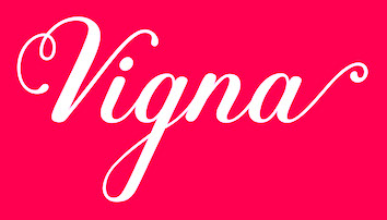 Graphic designer in Innsbruck, Austria, who created the warm calligraphic teardrop-themed script typeface Vigna in 2018. [
 Quebec-based typographer and type designer (aka Diogene) who specializes mainly in revivals of obscure or old typefaces.
  Graphic designer in Buenos Aires, where she studied at FADU, UBA. In 2011, she created a
  [
[ [
[ Elif Karabulut (Eskisehir, Turkey) created a teardrop and ball terminal-laden set of didone caps and called it
  Graphic designer in Buenos Aires who created the neon light typeface Casanova, the gothic typeface Lady Monster (2014), and the vintage teardrop typeface Parisien (sic) Hooker in 2014. [
 [
[

 Espen Aaeng has been a designer and art director in Oslo since 1973. At
  Aka Fitiyawan, who seems to have many other identities as well. As "Fype Co" (est. 2019), based in Magelang, Indonesia, he/she designed these script typefaces in 2019: Justoma,
  British type designer. With David James, [T-26] co-designer of AES, August. At Alias (a company he founded with David James in London), he made
  Aka Grzegorz Luk and just Gluk, Grzegorz Luksza is a Polish type designer (b. 1973) who specializes in ultra-decorative and experimental typefaces.
  [
[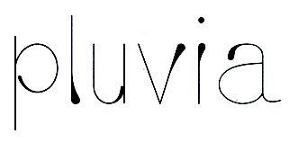 Graduate of De Montfort University Leicester. Leicester, UK-based designer of the
  [
[ Insigne Type Design Studio (est. 2006) is run by
  Frenchman Jérémie Hornus studied typography at Le Scriptorium de Toulouse, France and the University of Reading, where he graduated in 2006. He worked at Dalton Maag, where he designed
  [
[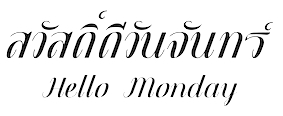 Bangkok, Thailand-based designer (b. 1996) of the
  Type designer from Minneapolis, Minnesota, b. 1974. He created the monoline
 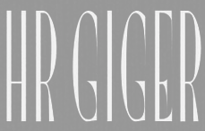 JuanJo Rivas del Rio (Malaga, Spain, b. 1983, San Pedro de Alcantara) created the teardrop-themed typeface
  During her studies at York University in Toronto, Kadi Koroma created
 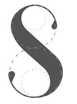 During her Master of Fine Arts studies at Savannah College of Art and Design (SCAD) in Savannah, GA, Kelly Farmer created the decorative display typeface
  Senior designer in Ho Chi Minh City, Vietnam. Creator of two teardrop-themed all-caps vector format typefaces in 2013,
  Dhaka, Bangladesh-based designer of the outlined typeface Olga (2016), the teardrop-themed fashion mag typeface Asmani (2016), the semi-stencil typeface Mussolina (2016) and the
  Based in Valencia, Spain, and born in Madrid in 1969, Manuel Ramos is the creator of these free and commercial typefaces in 2012: Astralia (oblique monoline sans),
 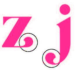 During her studies in Barcelona, Mar de la Llave created the bold lachrymal typeface Gazelle (2014). [
 Canadian designer of the teardrop typeface Brotara (2015). [
 During her studies at FADU / UBA, Maria Balbarrey created the display typeface Ramona (2014) and the teardrop typeface Fresh Ness (2014). [
 During her design studies in Porto alegre, Brazil, marini cavalheiro created the lachrymal typeface Boft & Co (2015).
  During his studies in Copenhagen, Marius Krone created a fun Miro-esque lachrymal typeface (2014). [
 [
[ Rangoon-based designer of
  Elena Genova (My Creative Land, Edinburgh, Scotland) specializes in digitized handwriting fonts. In 2021, My Creative Land joined
  Zaporizhzhia, Ukraine-based creator of these typefaces:
  Santiago de Chile-based creator of
 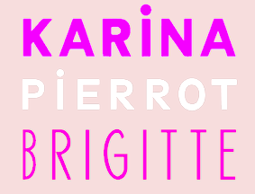 During her studies at ESAG Penninghen, Paris, Perrine Winkler created the typefaces Cat Power (lachrymal style) and
  A subsidiary/part of House Industries in Yorklyn, DE. I quote: Photo-Lettering was a mainstay of the advertising and design industry in New York City from 1936 to 1997. PLINC, as it was affectionately known to art directors, was one of the earliest and most successful type houses to utilize photo technology in the production of commercial typography and lettering. It employed such design luminaries as Ed Benguiat and sold type drawn by the likes of Herb Lubalin, Milton Glaser and Seymour Chwast as well as countless other unsung lettering greats. The company is best known by most of today's graphic designers for its ubiquitous type catalogs. Physically, the collection takes up about 1500 cubic ft (42 cubic meters) of space and consists of film negatives and positives of most of the 6500 fonts produced in the company's 55 years. There are also countless patterns, cartouches, borders and dingbats, all of which have been preserved in film negative form. Each negative is approximately 28 in (71 cm) by 5 in (13 cm) high. House Industries, a Yorklyn, Delaware-based independent type foundry, purchased the entire physical assets of Photo-Lettering in April of 2003. Through a partnership with Ken Barber, Christian Schwartz and Erik van Blokland, House Industries is carefully digitizing select alphabets from the collection and plans to offer them through a modern web-based interface. The Photo-Lettering interface has allowed us to reach beyond the rigid confines of typography to offer extended features such as layering, color control and multiple master interpolation over six axes. With some of the most talented minds in display typography behind this new display lettering system, users of the system will enjoy the same refined typography as the original Photo-Lettering customers.
  Randers, Denmark-based graphic designer who made an unnamed lachrymal typeface in 2013.
 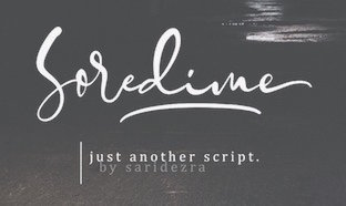 Yogyakarta, Indonesia-based designer of the handcrafted typefaces
  Tanya Davis (Scrowleyfonts) is a type designer in Shrewsbury, UK (b. 1966). Her typefaces:
  [
[ Tomas Nedoma established Signature Type Foundry in Prague in 2014. Most of their work is influenced by and rooted in the work of Professor Rotislav Vanek of the Studio of Graphic Design and Visual Communication at the Academy of Arts, Architecture and Design in Prague. In many cases, Vanek's sketches were digitized by participating type designers. Except where explicitly mentioned below, all typefaces were made by Tomas Nedoma. The typefaces:
  Graphic designer in Mexico City, who created the teardrop-themed typeface Conline (2016). [
 [
[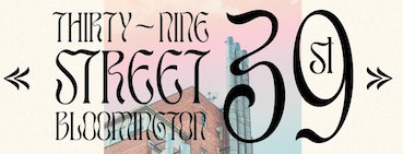 Designer specializing in exquisite decorative display typefaces. Typefaces from 2020 include Garland, Aegean, Mon Cheri, Luna Negra, Kindred, Pearl, Vivre Libre, Astoria (wavy, intestinal), Nightingale, Ashford, Angleton, St. Canard, Giok, Variety, The Whistling, Jambore and the rounded decorative serif display typefaces Tangkiwood and Harmoni.
  [
[ [
[
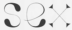 Porto Alegre, Brazil-based designer of the teardrop-themed fashion mag or display typeface V (2016). [
 Graphic designer in Burgos, Spain. Creator of the industrial sans typeface Industria (2014), which is a wide geometric grotesk with an extra-large x-height.
  Max Infeld (b. 1981, aka Xerographer Fonts) from Chico, CA, makes free fonts and offers a free font-making service. He surged onto the font scene in 2012, and is currently located in Ojai, CA.
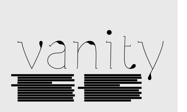
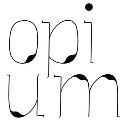
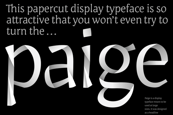
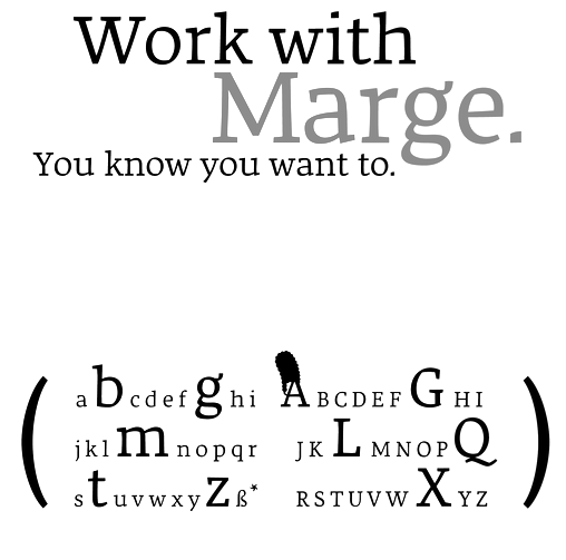
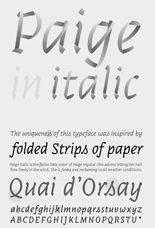
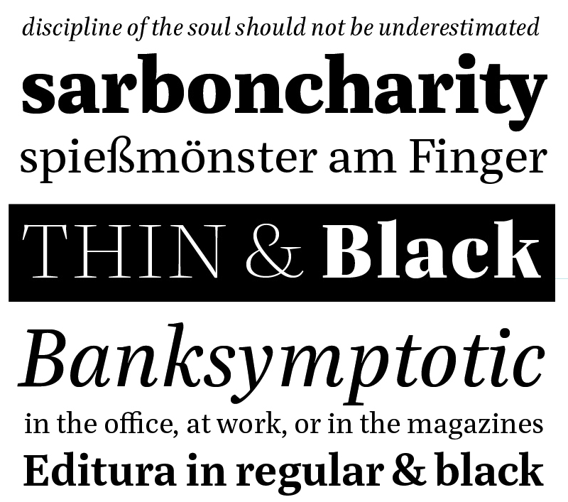
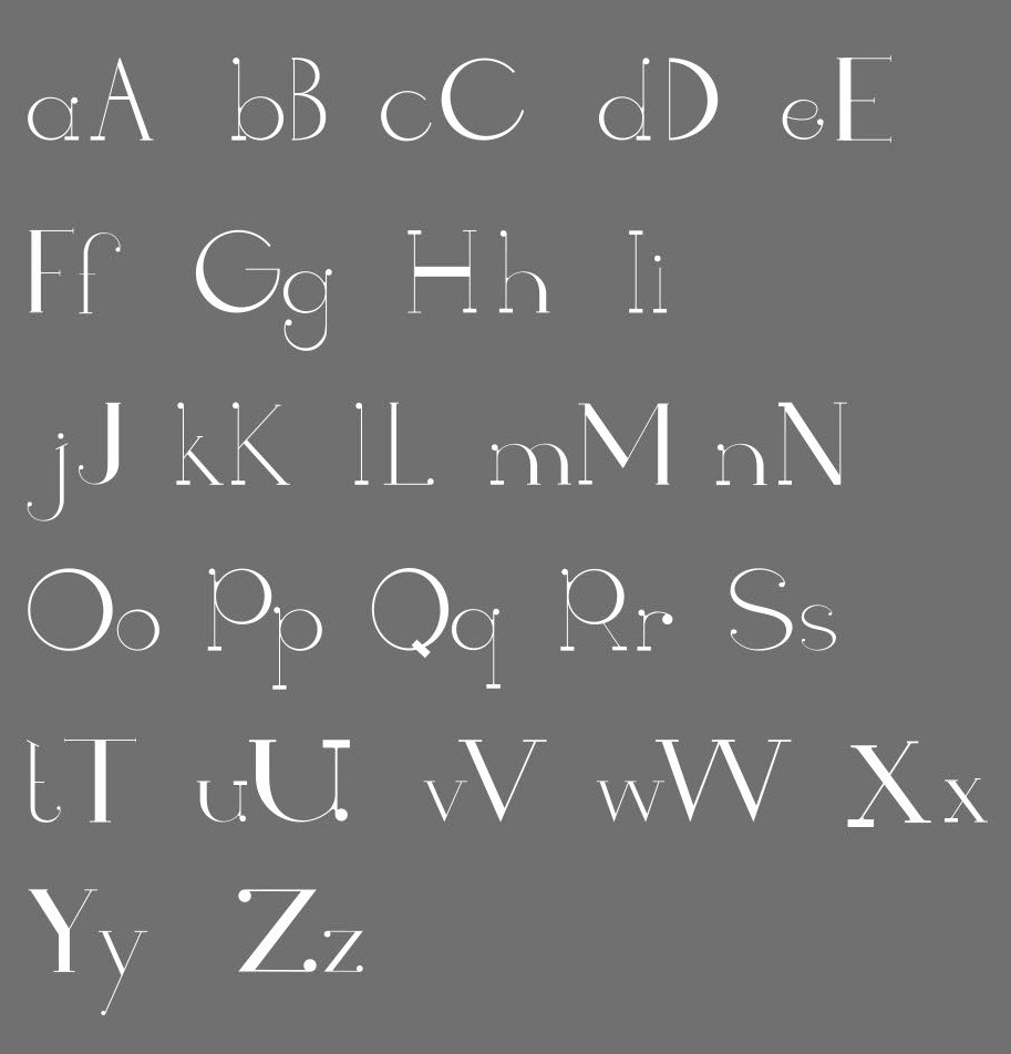
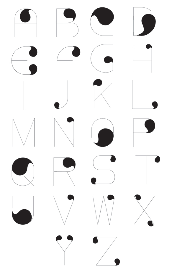
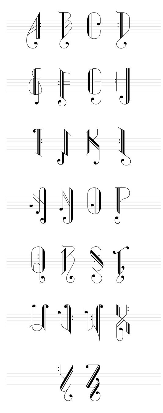
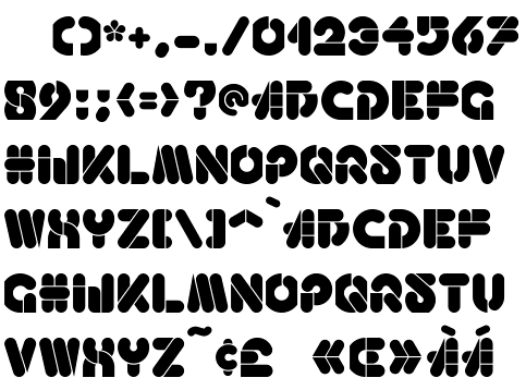
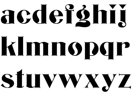
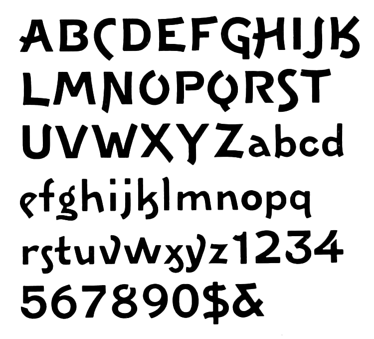
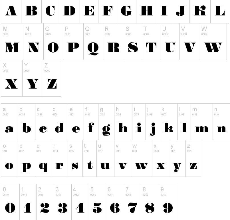
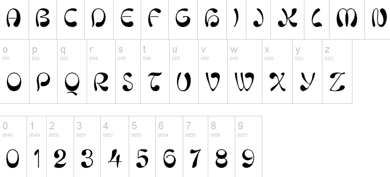
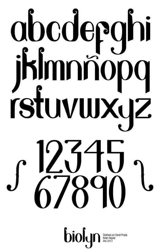
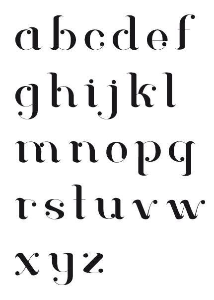
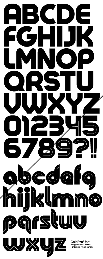
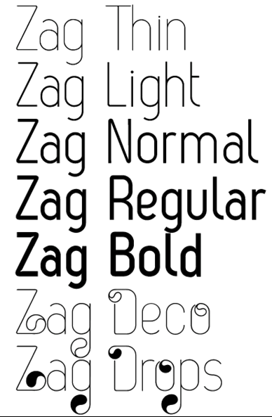
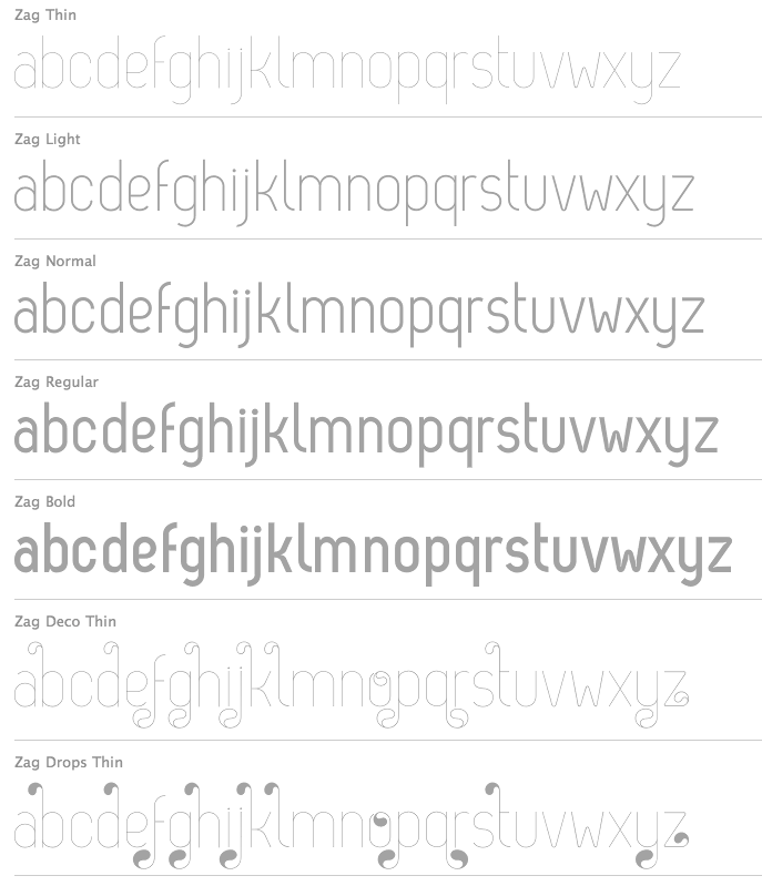
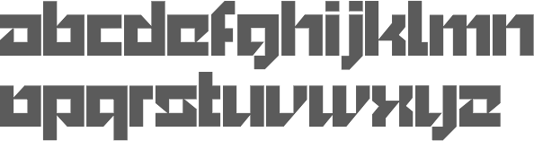
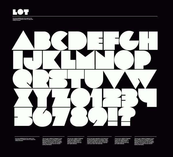
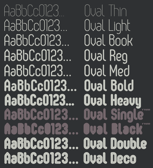
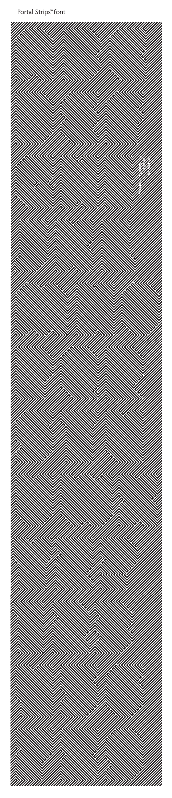
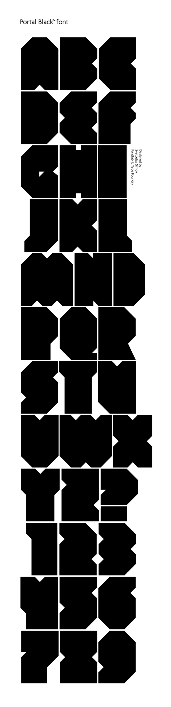
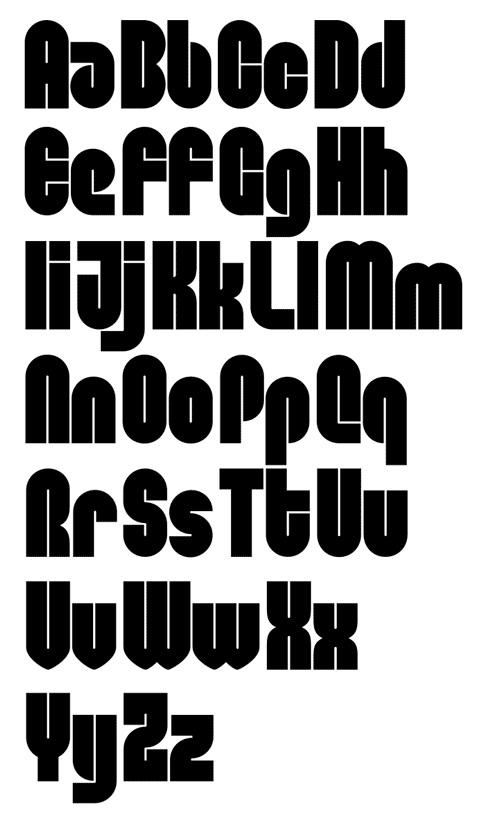
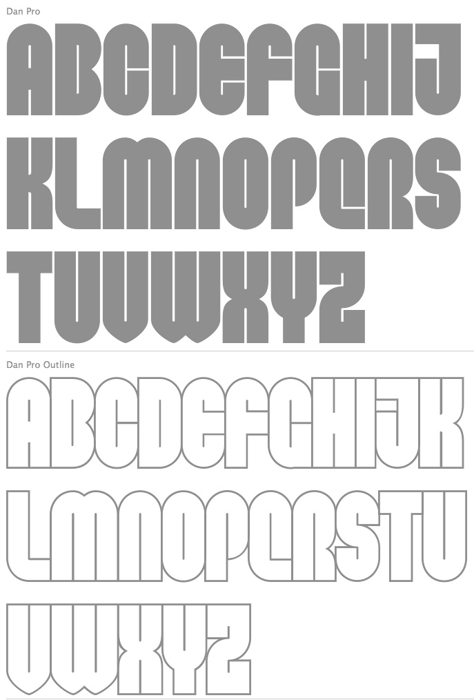
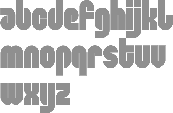
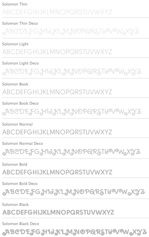
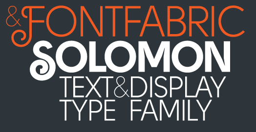
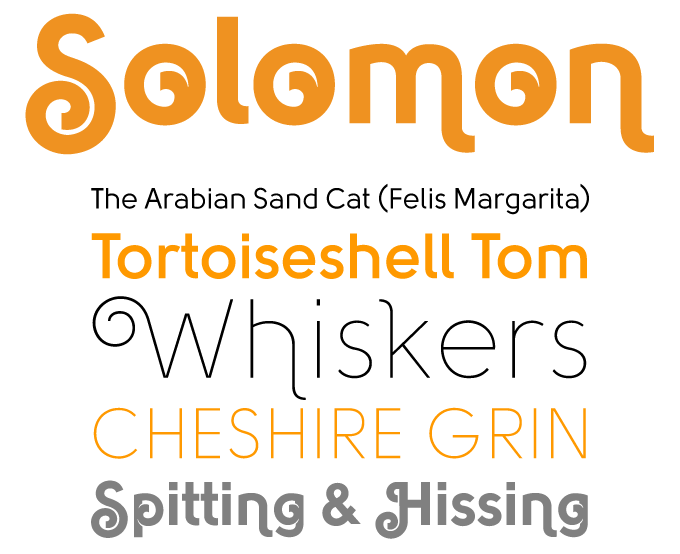
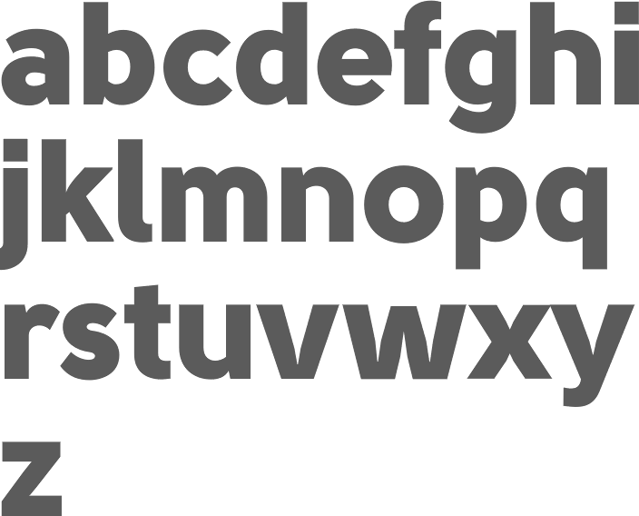
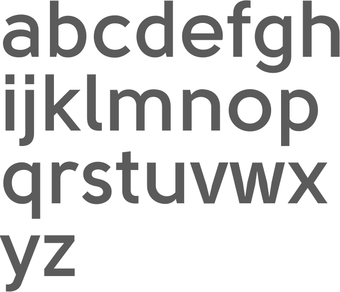
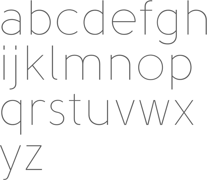
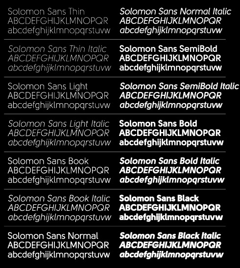
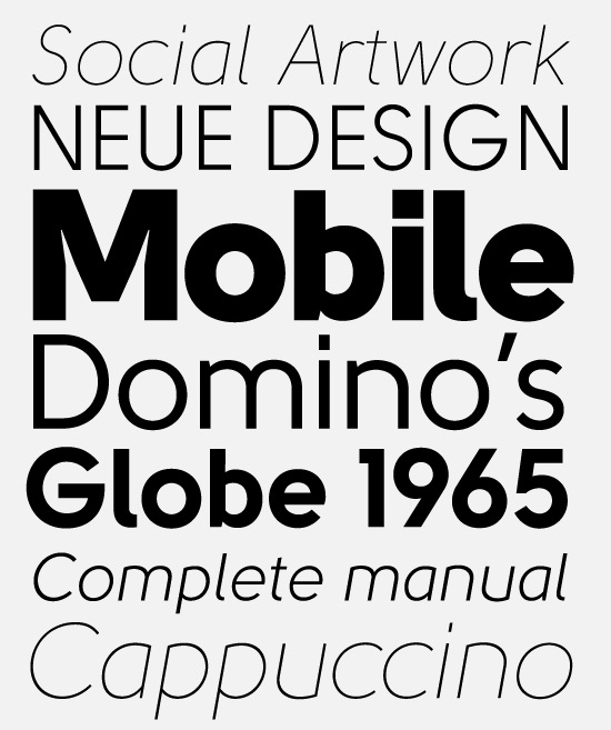
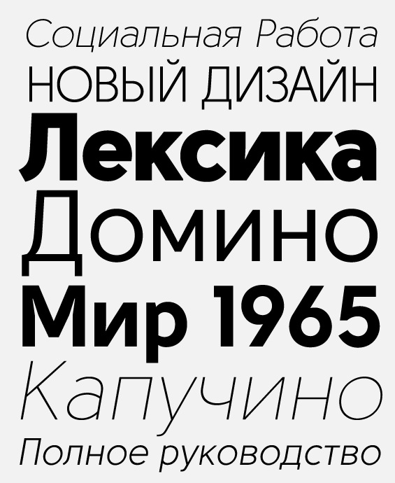
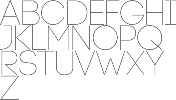
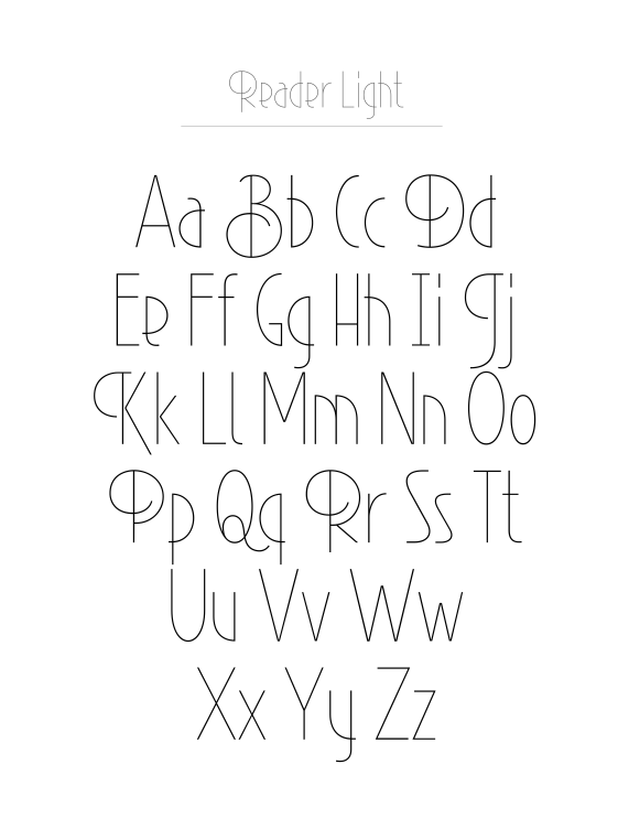
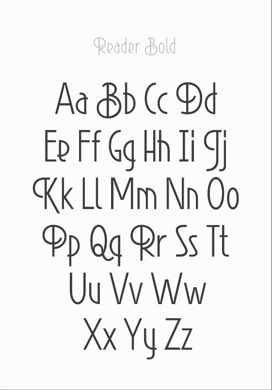
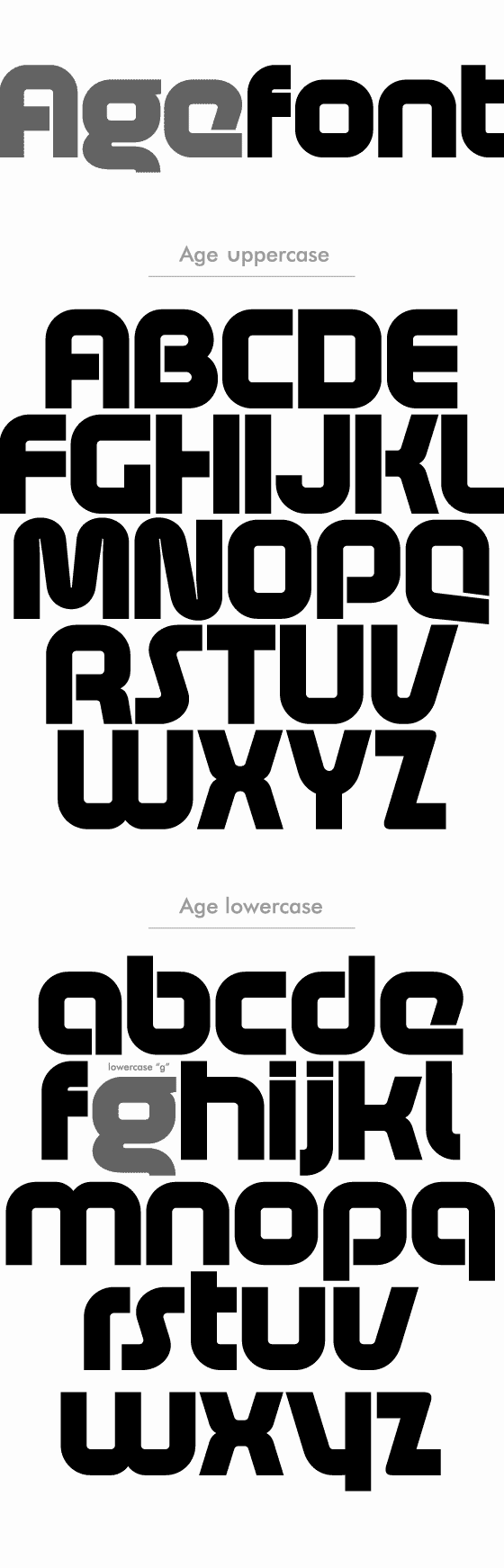
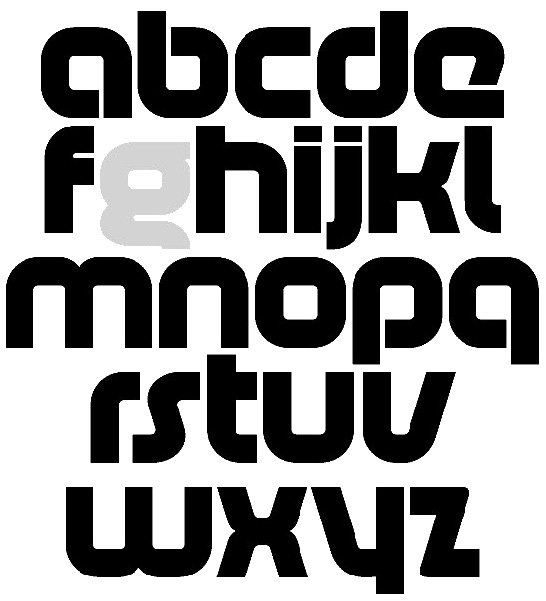
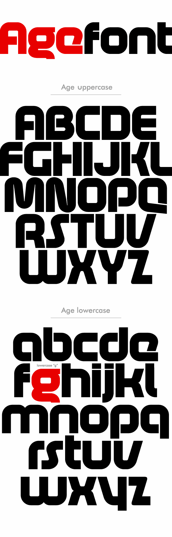
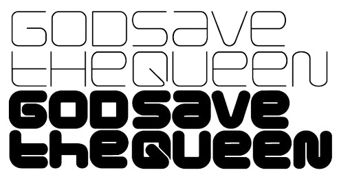
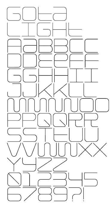
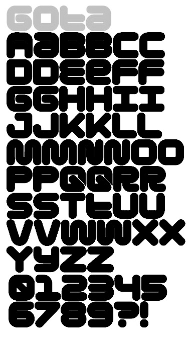
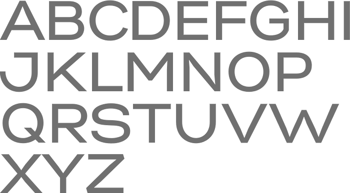
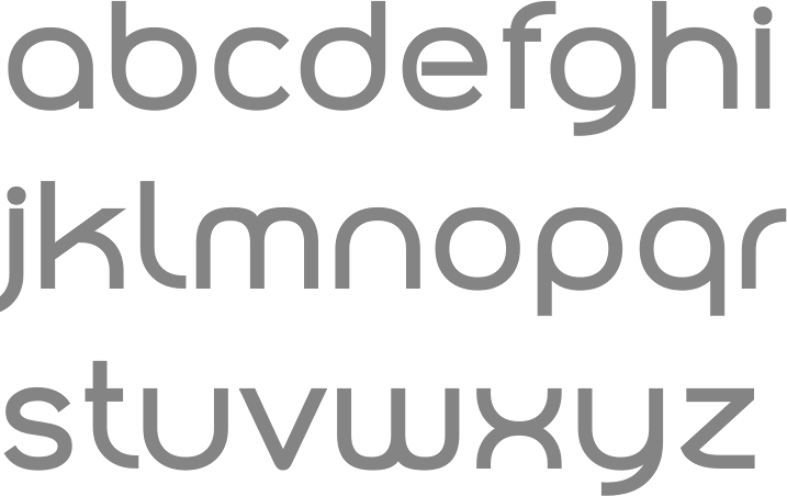
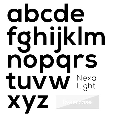
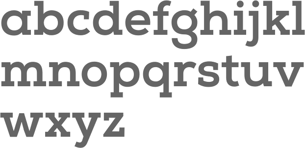
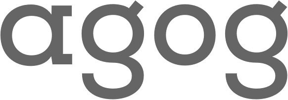
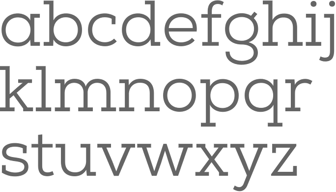
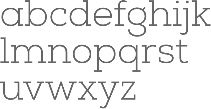
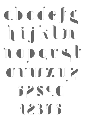
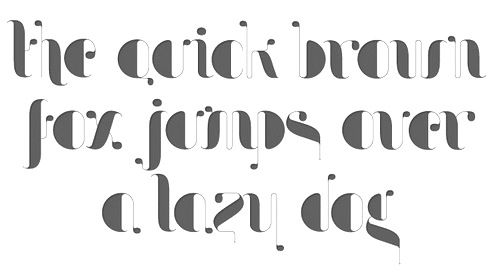
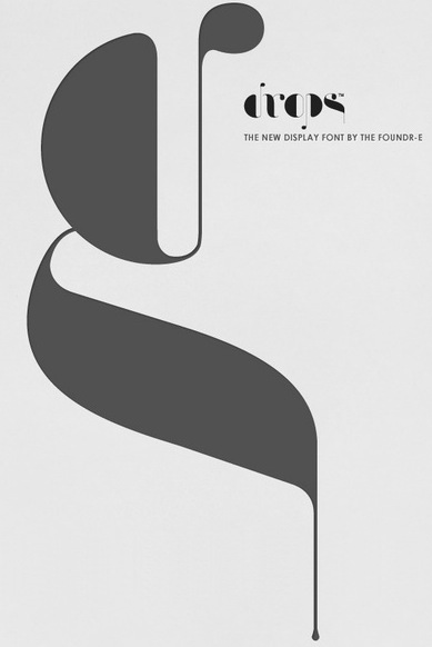
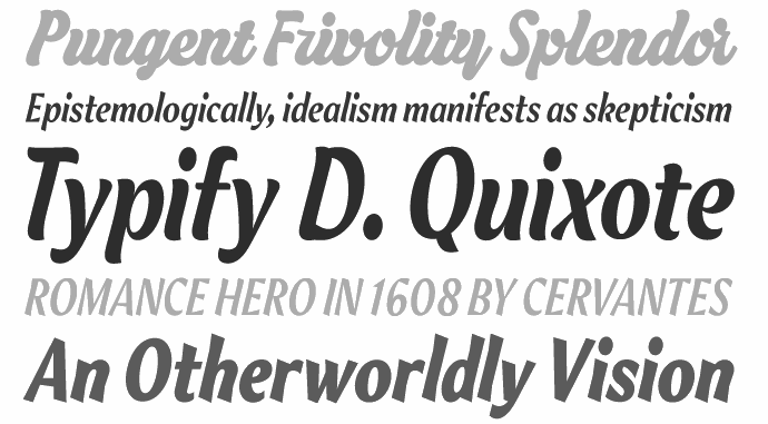
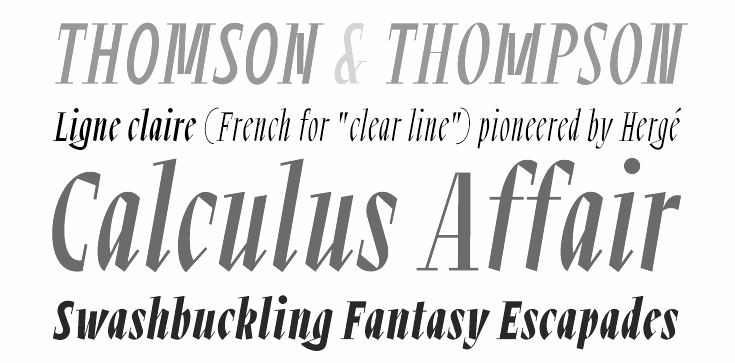
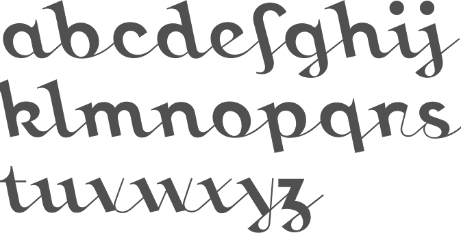
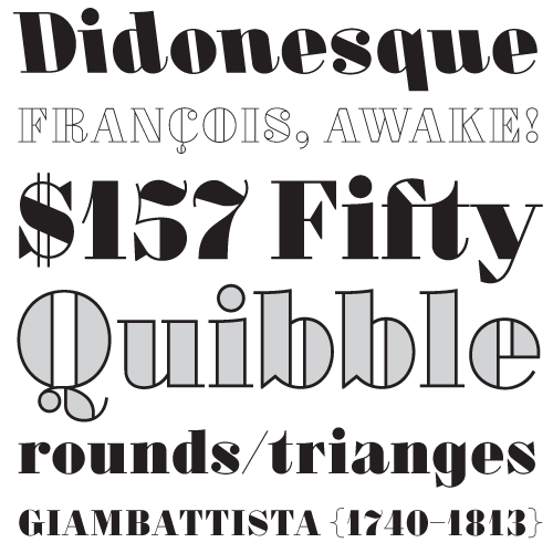
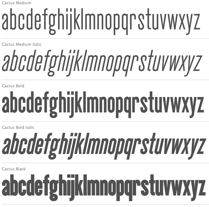
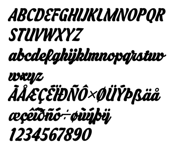
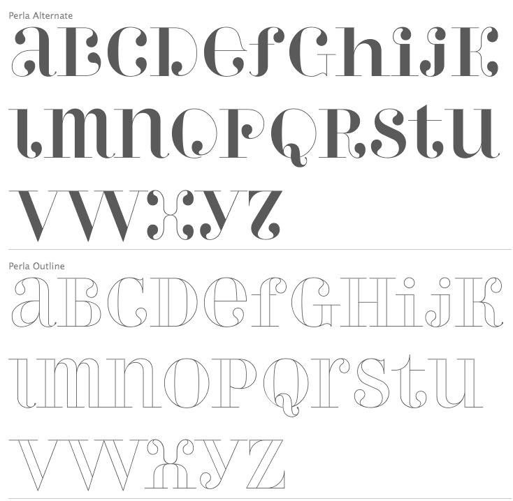
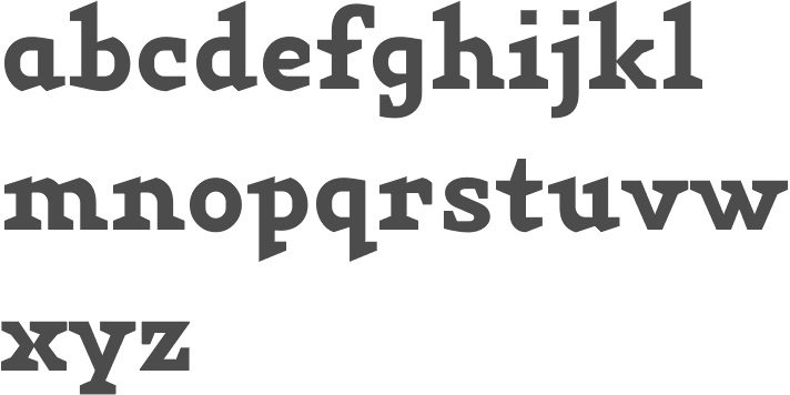
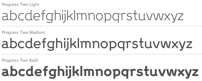
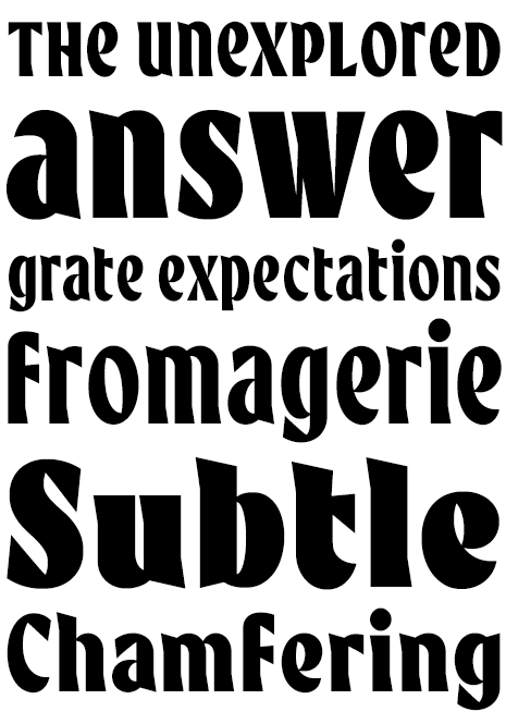
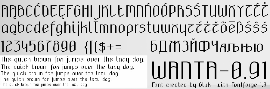
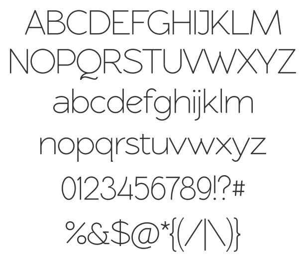
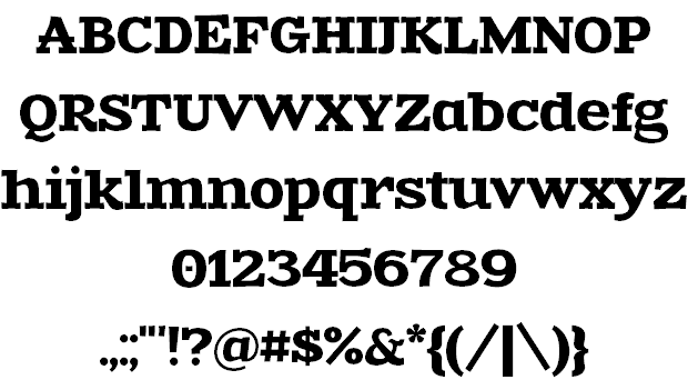
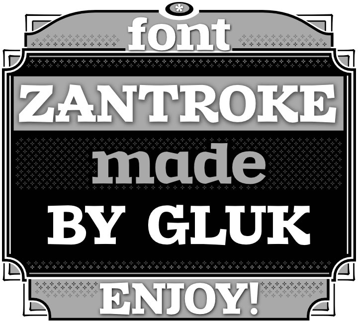
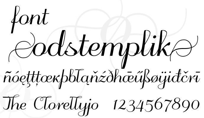
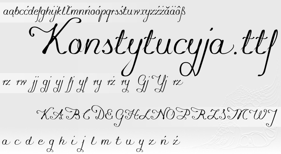
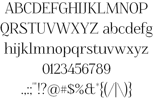
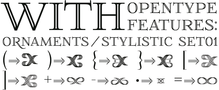
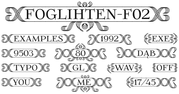
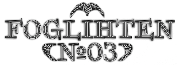
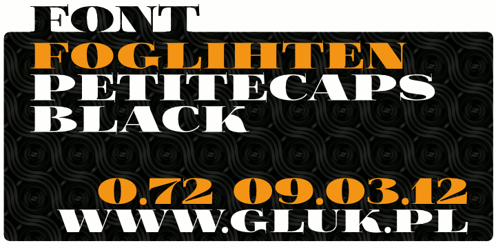
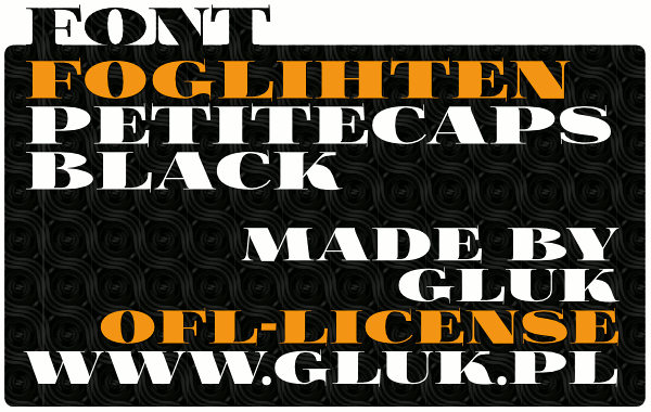
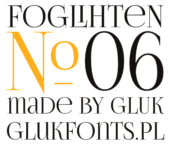
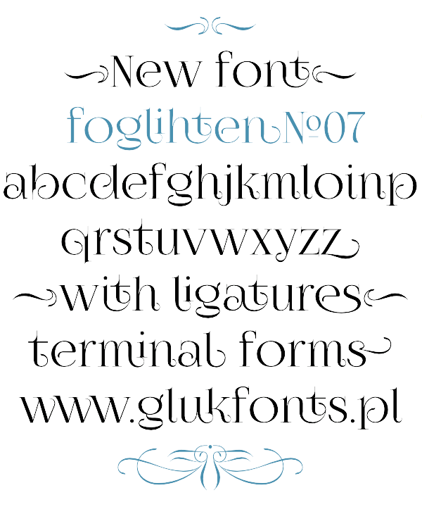
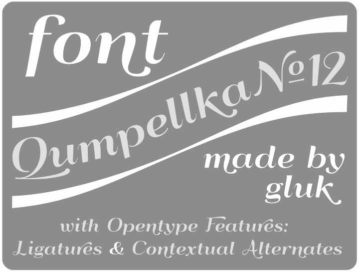
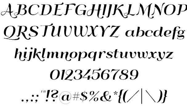
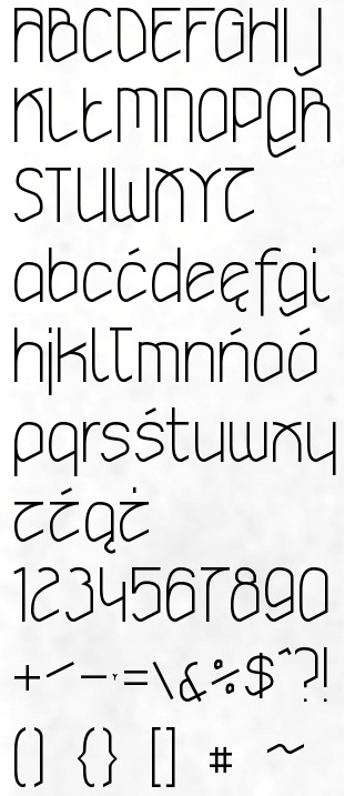
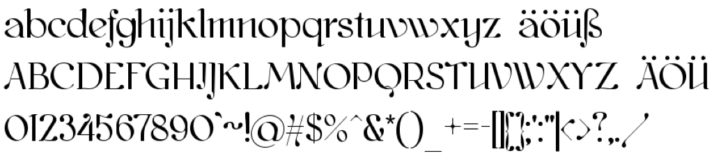
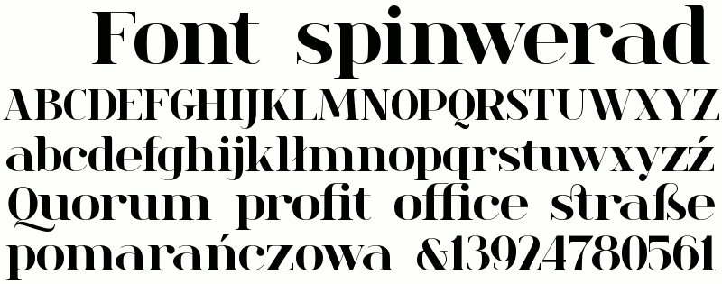
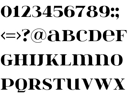
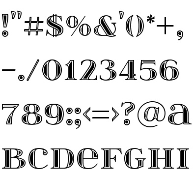
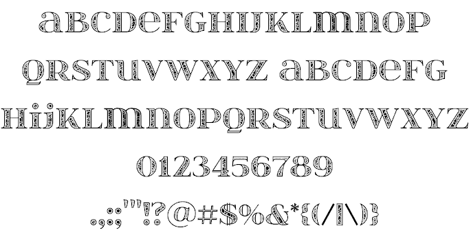
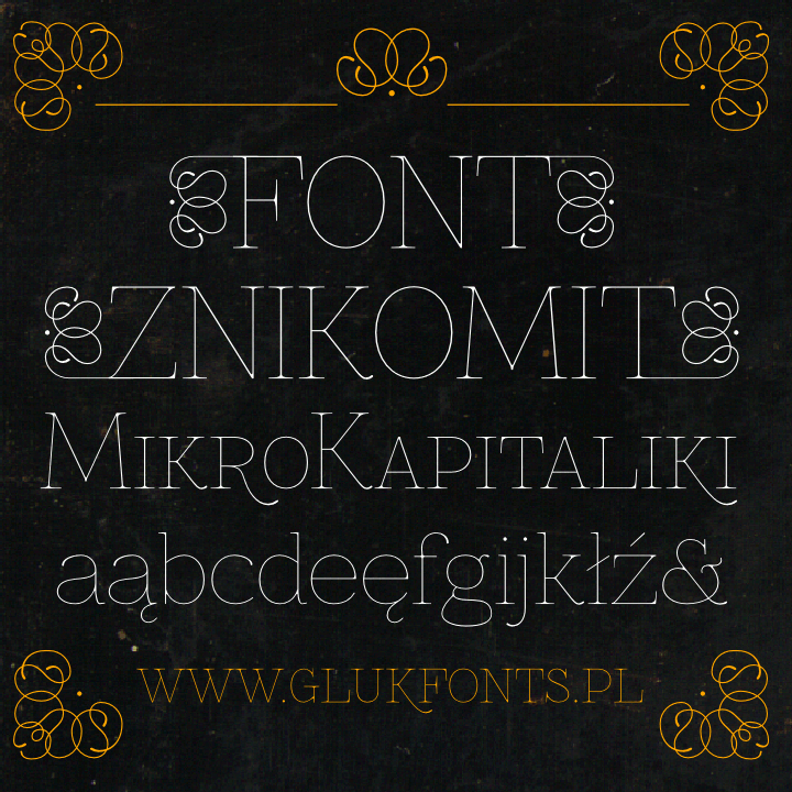
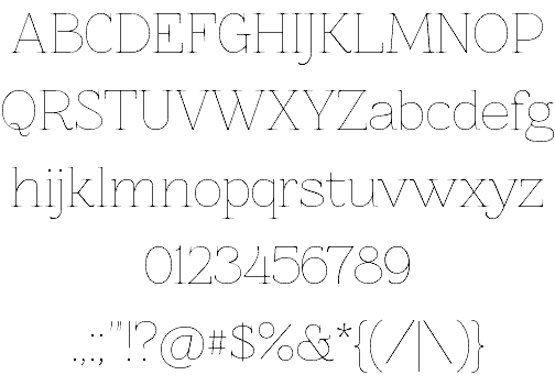
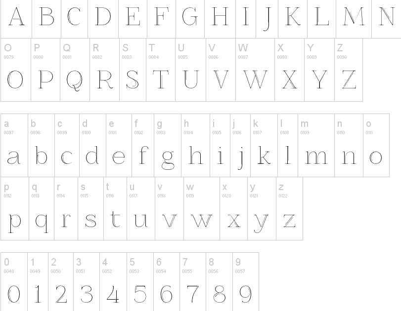
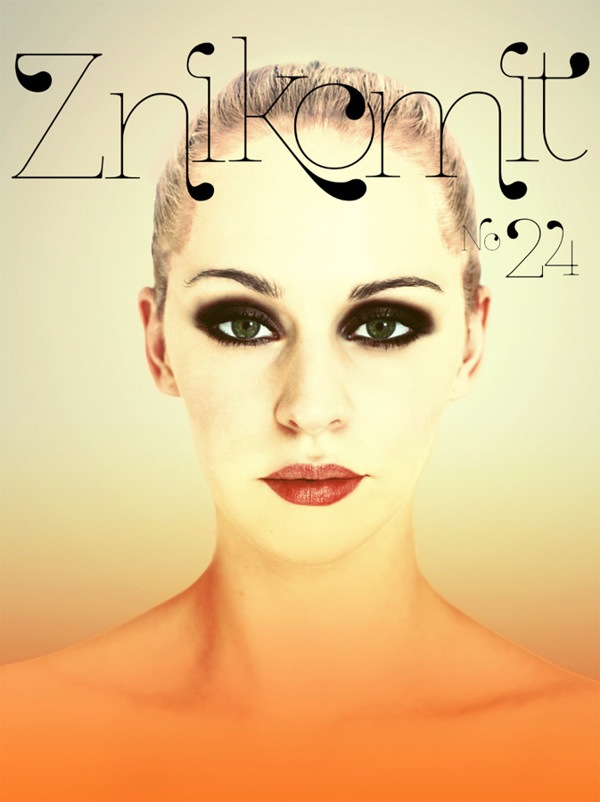
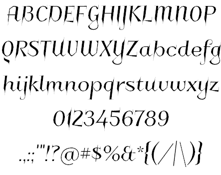
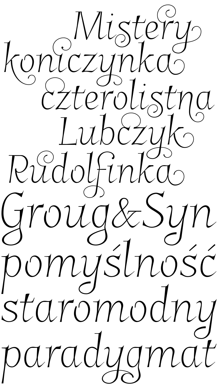
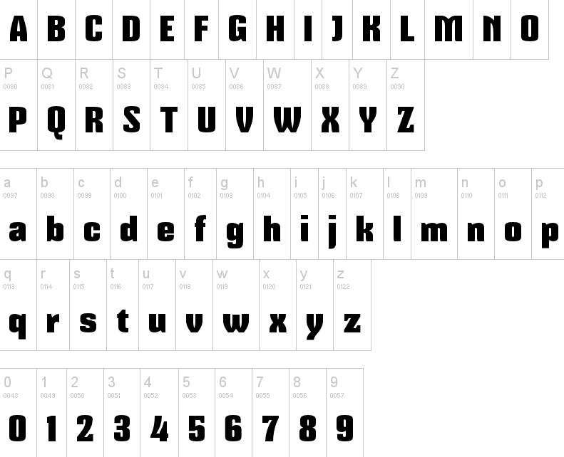
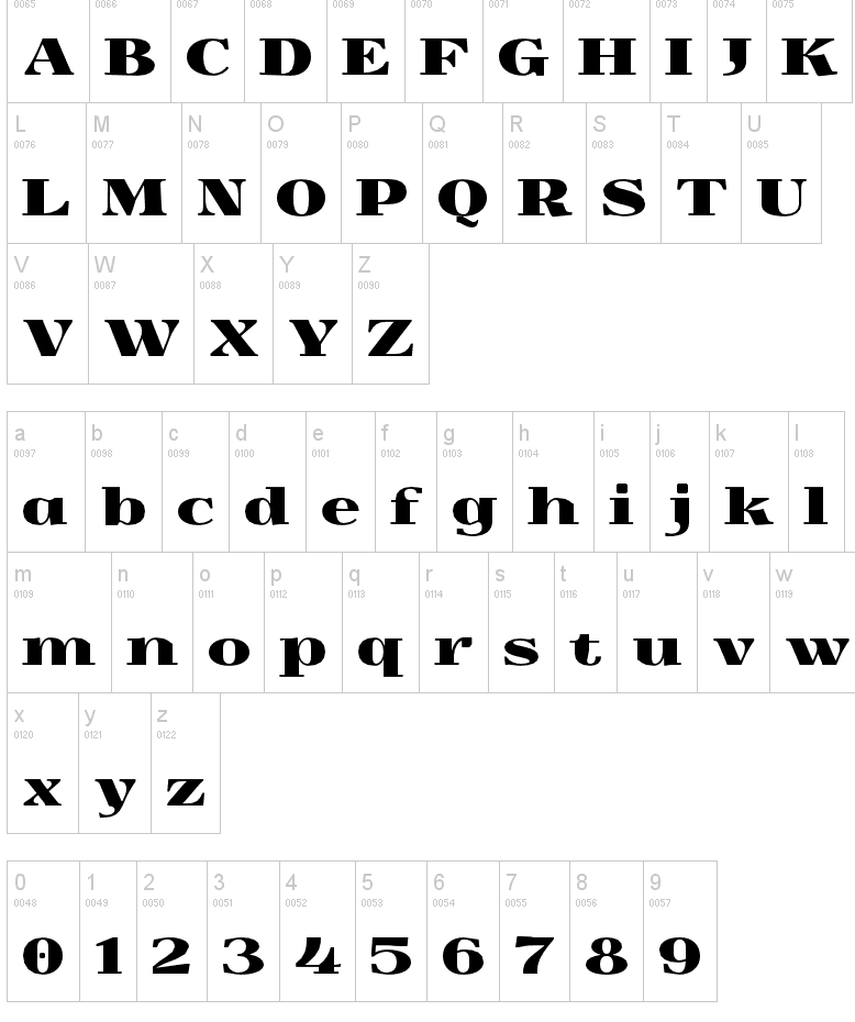
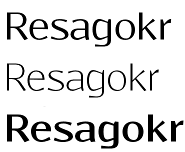
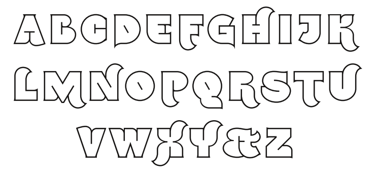
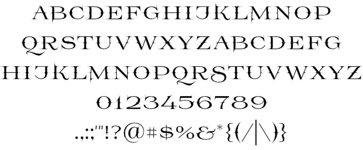
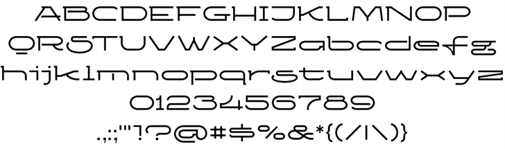
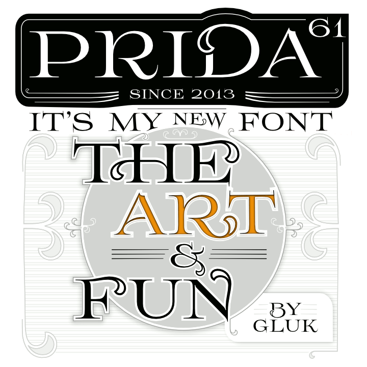
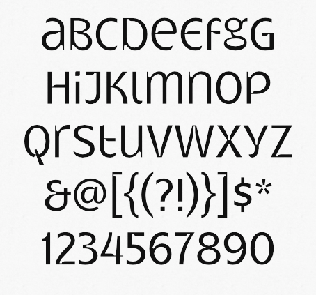
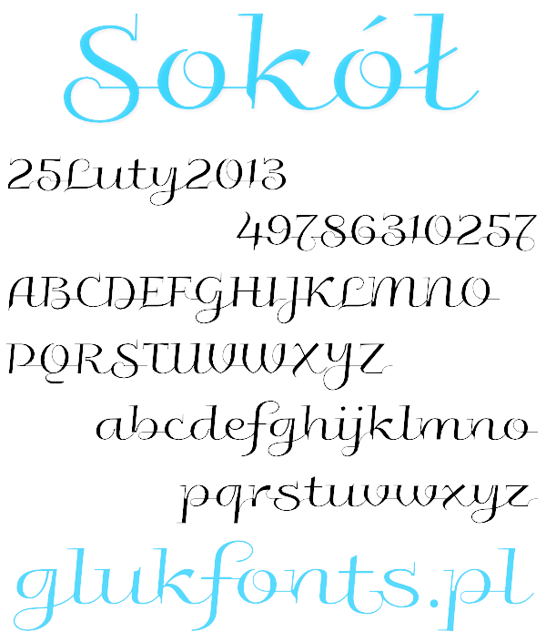
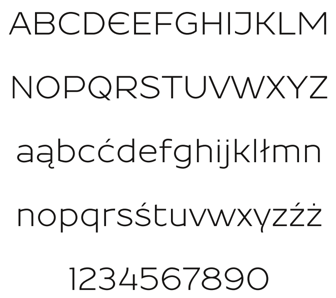
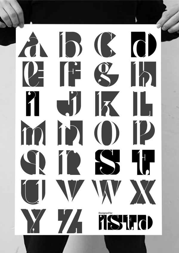
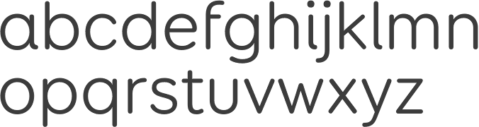
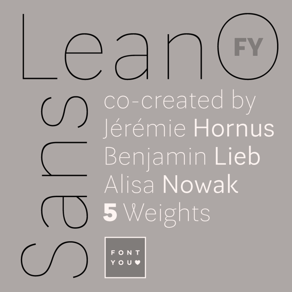
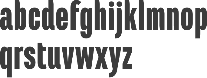
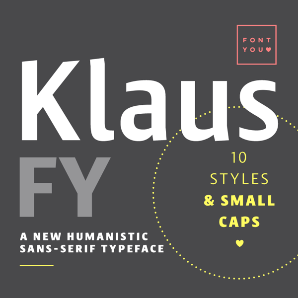
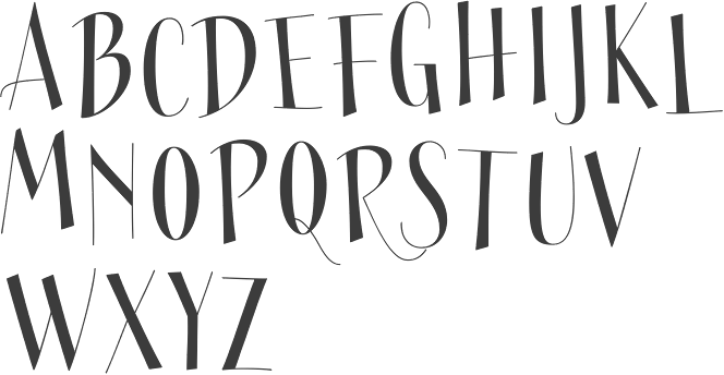
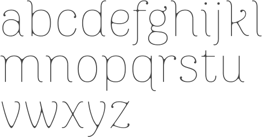
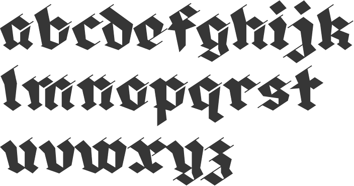
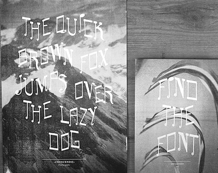
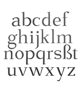
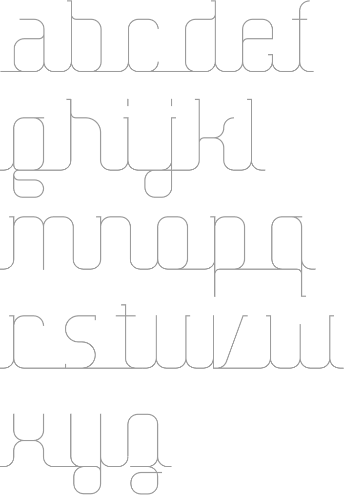
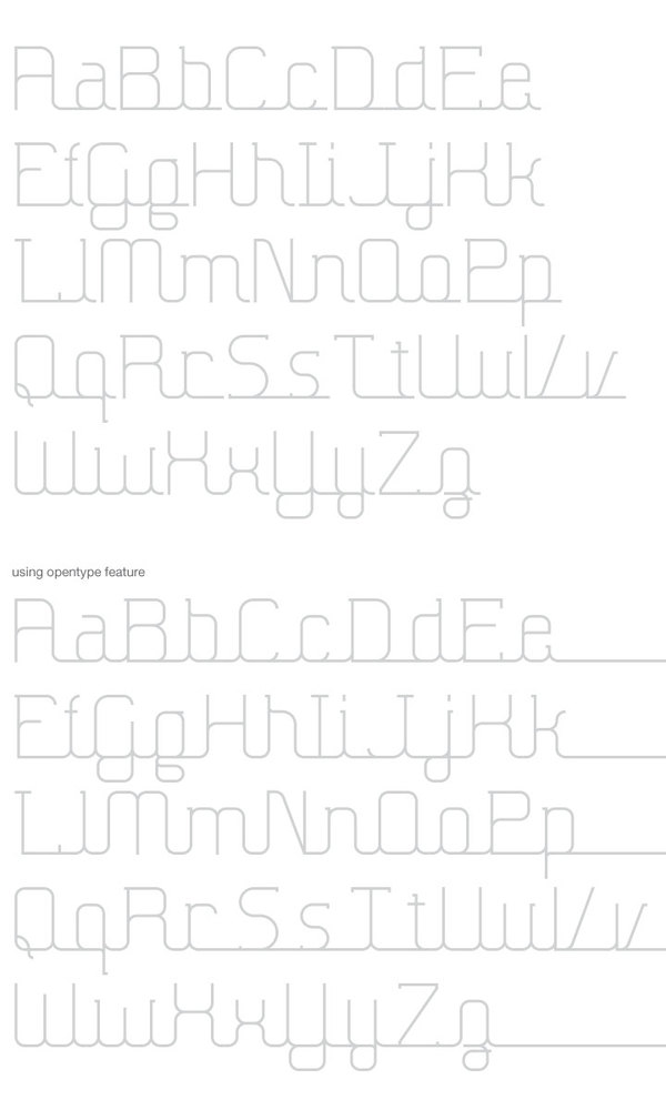
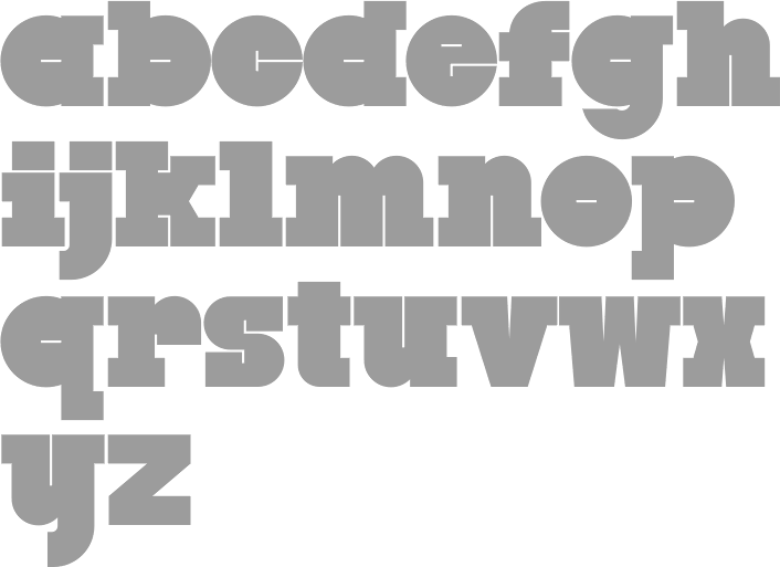
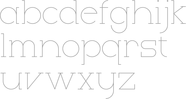
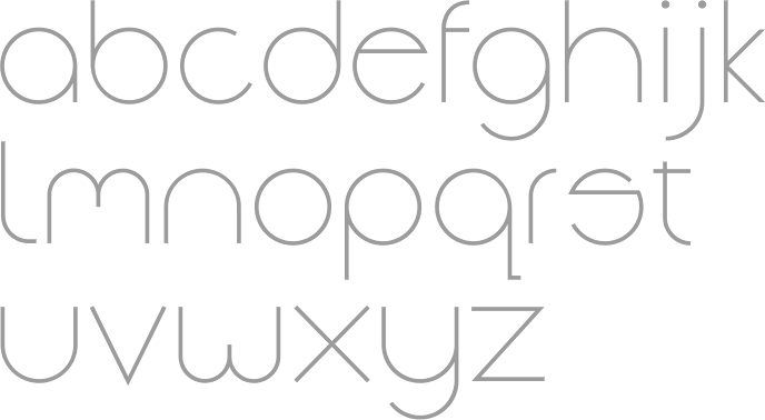
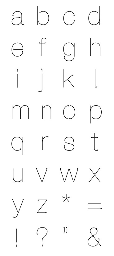
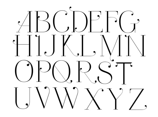
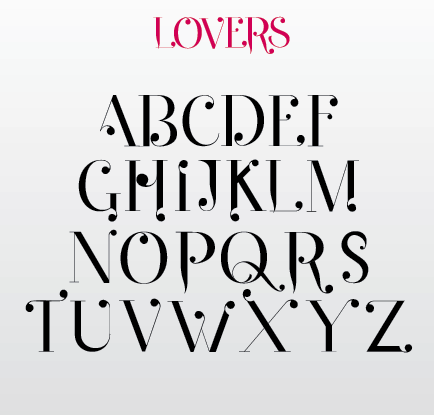
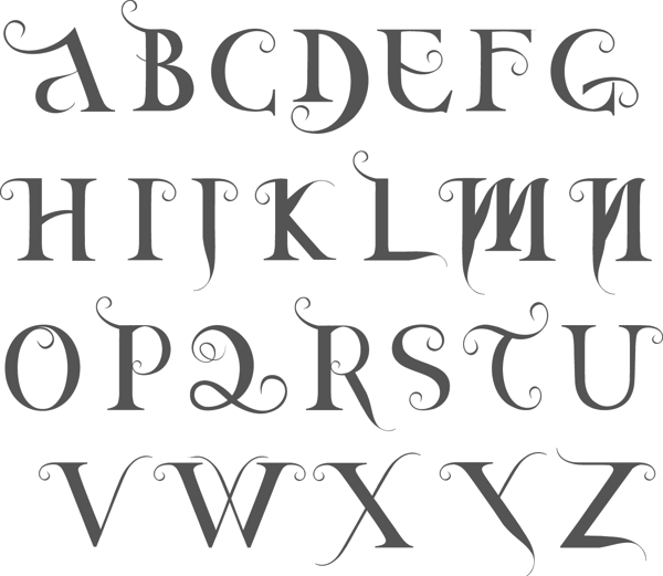
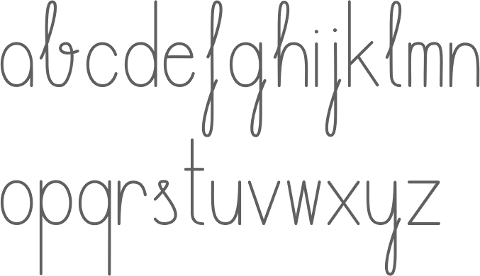
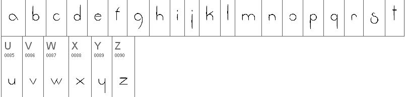
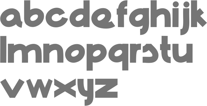
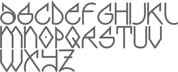
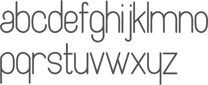
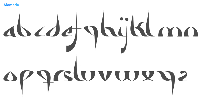
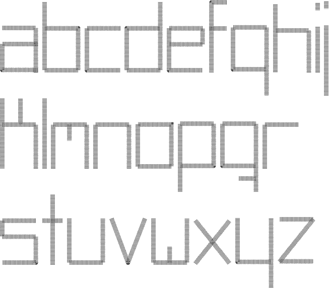
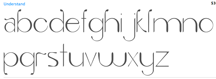
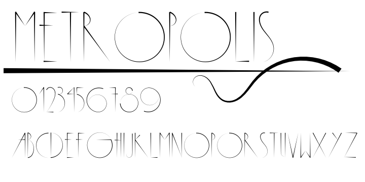
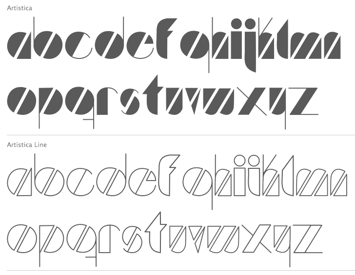
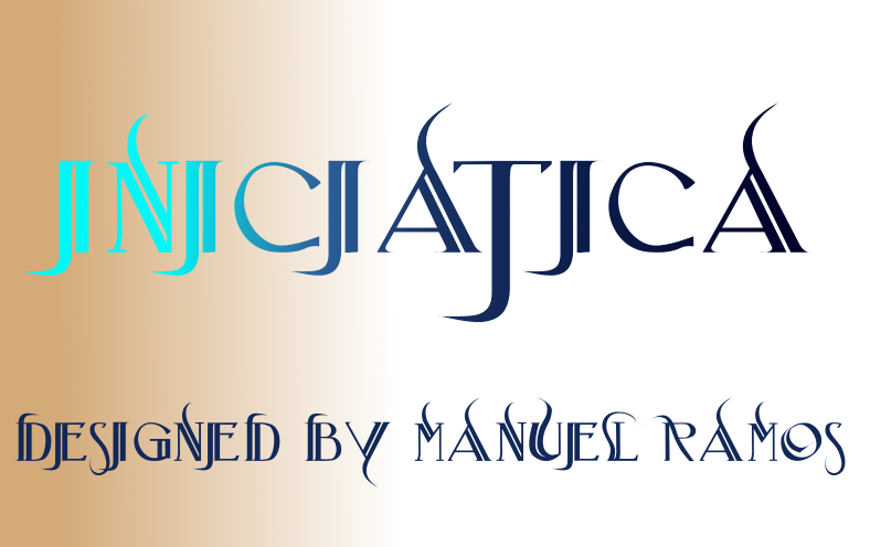
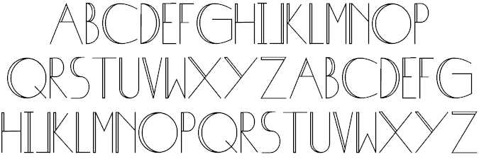
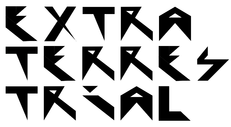
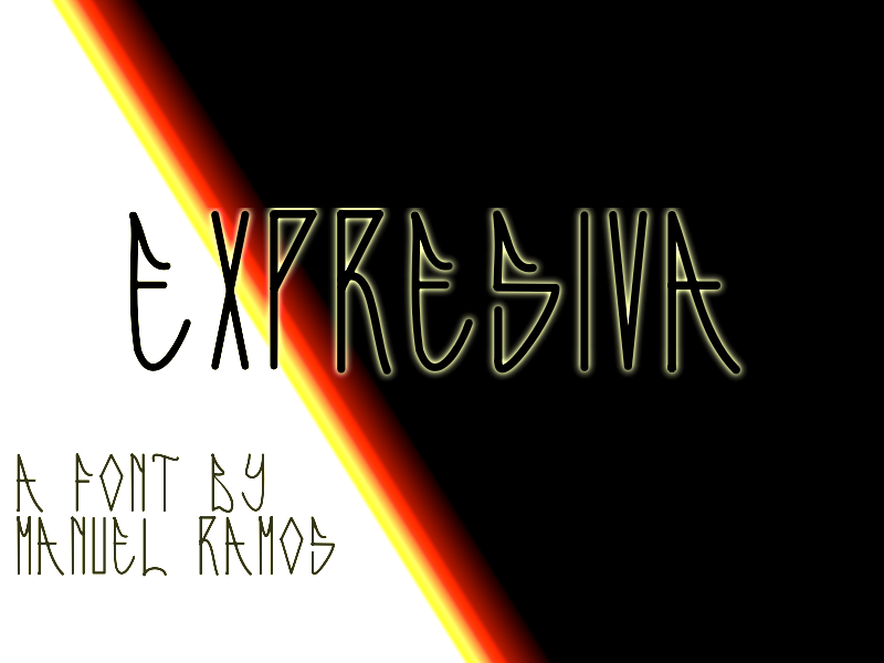
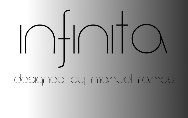
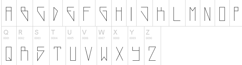
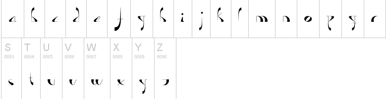
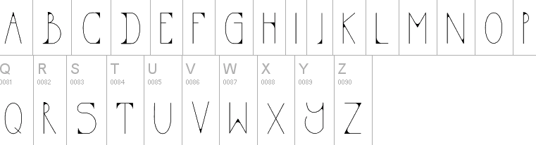
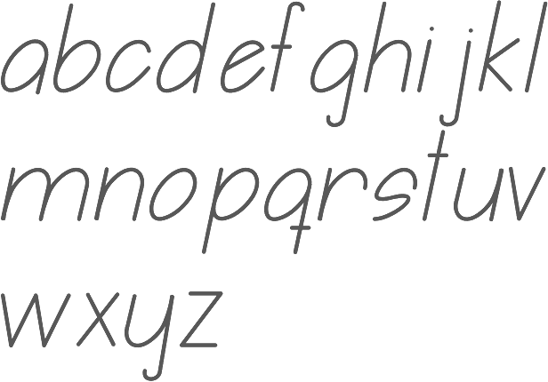
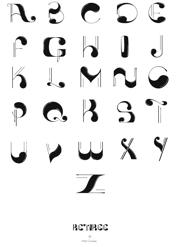
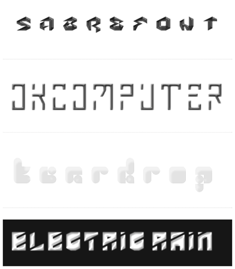
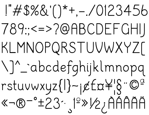
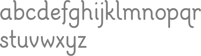
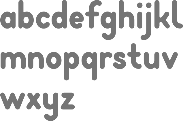
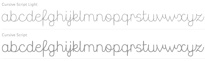
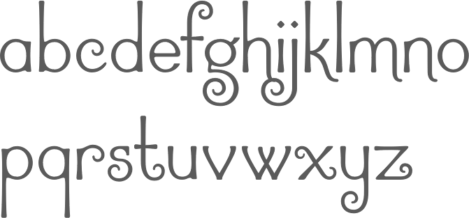
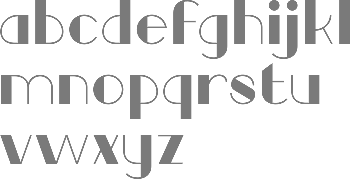
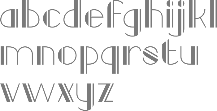
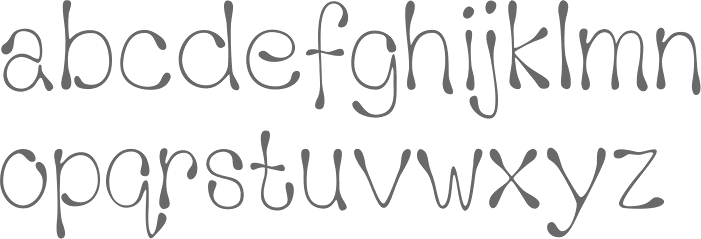
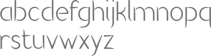
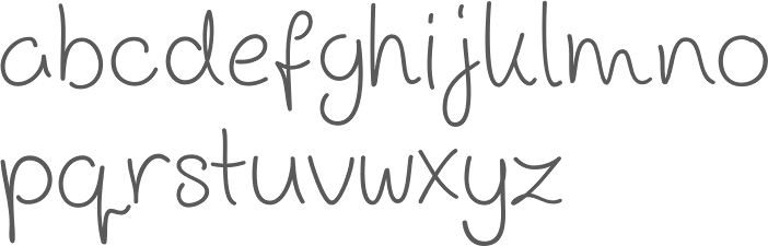
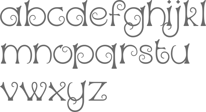
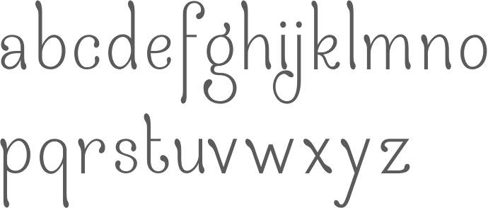
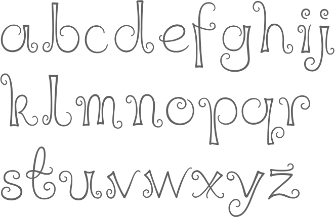
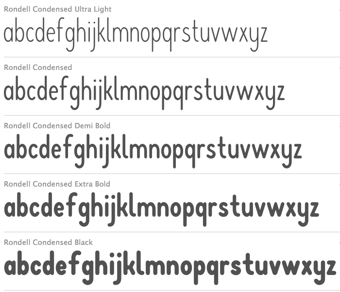
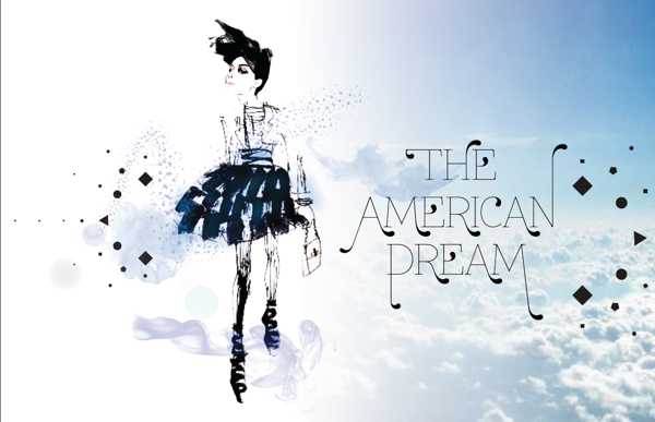
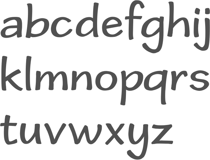
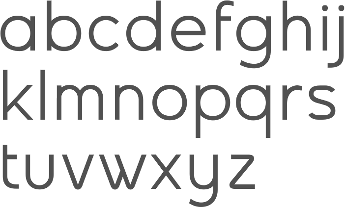
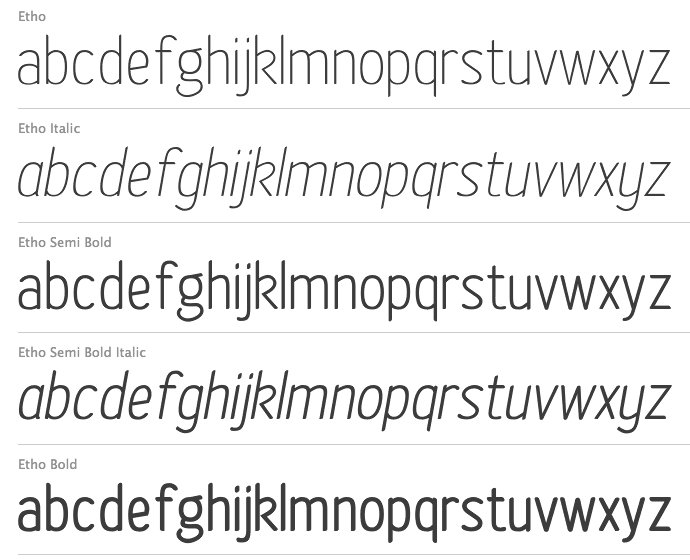
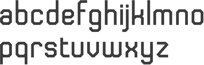
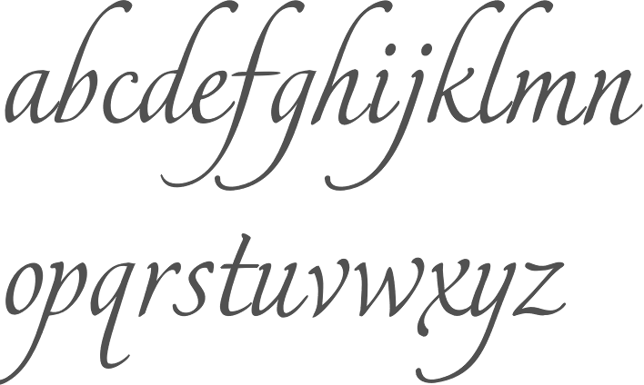
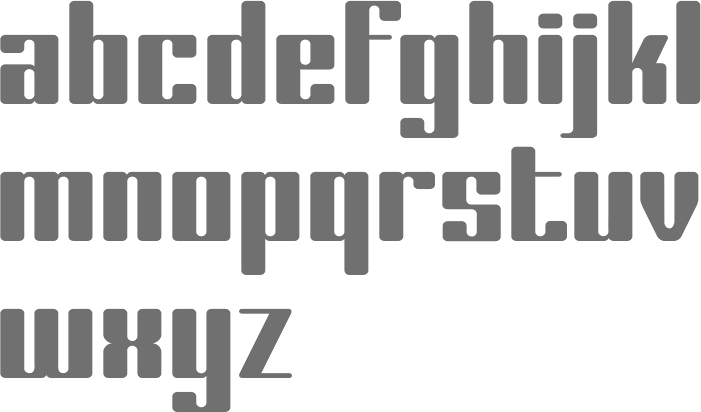
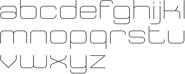
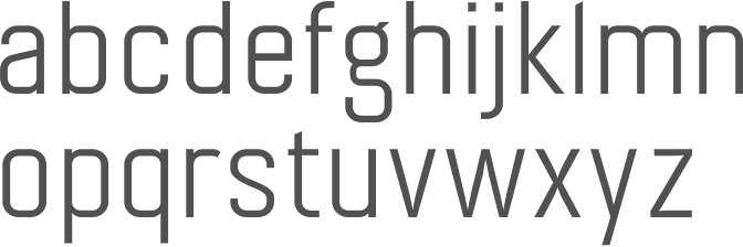
|
|
|
|