TYPE DESIGN INFORMATION PAGE last updated on Mon Jun 8 17:25:40 EDT 2026
FONT RECOGNITION VIA FONT MOOSE

|
|
|
|
|
Triangulated typefaces | ||
|
|
|
|
SWITCH TO INDEX FILE
Abecé Festival Tipografico
| This festival or happening in 2011 in El Salvador led to 66 freely downloadable experimental typefaces. A list:
As a fine representaive in this list, Vladimir Ramos from San Salvador designed Soplodetinta, an ink splatter typeface. [Google] [More] ⦿ |
During his studies at LPU Cavite, A.D. Veras (Naic, Philippines) designed the triangulated futuristic typeface Space Rover (2018). [Google] [More] ⦿ | |
Marbella, Spain-based design student. During his studies at Marbella Design Academy in 2012, he created the triangular-shaped high-contrast font Drisign. [Google] [More] ⦿ | |
In 2015, he created the commercial sans display typeface Panama. Behance link. Another Behance link. Creative Market link. [Google] [More] ⦿ | |
Istanbul-based cdesigner of the triangulated typeface Gently (2018). [Google] [More] ⦿ | |
Alex Camacho Studio
|
Cargo collecive link. Linotype link. [Google] [MyFonts] [More] ⦿ |
Alex Camacho Pizarro
| |
Caterham, UK-based designer. Creator of the experimental circle-based typeface Circle One (2012). During his studies at University of the Creative Arts Farnham in the UK, Alex Davies designed the experimental typeface Triangle One (2013) and the hipster deco typeface New Type (2018). [Google] [More] ⦿ | |
During his graphic design studies at UCA Farnham, Alex Hunt (London) created an unnamed modular typeface (2013), which only uses rectangles, circles and triangles. [Google] [More] ⦿ | |
During his print design studies in Brussels, Alexandre Défossé created the triangulated typefaces Zeo (2013) and Pico (2013). [Google] [More] ⦿ | |
During his studies, Alexis Romo Najera (Chihuahua, Mexico) created the triangulated connect-the-dots typeface Atrapasueños (2013). [Google] [More] ⦿ | |
Turkish type designer who specializes in experimental fonts. In 2021, he released Goygoy (a condensed organic sans), Fragment (an angular typeface seemingly made by superimposing triangles), Amorphic and Bebek. [Google] [MyFonts] [More] ⦿ | |
During her studies, Loos, France-based Alice Deparis designed the triangulated typeface Graphic (2015). [Google] [More] ⦿ | |
Alireza Amiri
| |
During her graphic design studies at UCA Farnham, Amber Maxwell (London) created the modular typeface Angle Right (2013), which only uses rectangles, circles and triangles. [Google] [More] ⦿ | |
During her graphic design studies at the American University of Kuwait, Amoona Saohin designed the triangle-themed geometric typeface Triagulum (2013). [Google] [More] ⦿ | |
Graduate of Clarke University, class of 2014. Roselle, IL-based designer who created the triangulated typeface Shattered (2016). Behance link. [Google] [More] ⦿ | |
Andrew Pixel (was: Timm Design)
|
Envato link. [Google] [More] ⦿ |
Andrew Timothy
| |
Spanish graphic designer who made Suipacha (2011), a gridded texture typeface modularly constructed from triangles. It comes with beautiful logotype work for the Suipacha Gallery in Buenos Aires. [Google] [More] ⦿ | |
Ann Stretton
| |
Odense, Denmark-based creator of the free ai format font Paper (2013), which consists entirely of superimposed triangles. [Google] [More] ⦿ | |
Budapest, Hungary-based designer of the triangulated typeface Chaos (2016), a playful stencil font (2019), the glitch font Say Hello (2019), and the textured New Ways (2019). [Google] [More] ⦿ | |
During her studies in Sydney, Australia, Annabel Caley designed the triangulated typeface Pylons (2016). [Google] [More] ⦿ | |
Graduate of the University of Derby, UK. Now based in Leicester, Annastasia Chaplin created a triangle-based display typeface and the informal typeface The Cafe in 2016. Behance link. [Google] [More] ⦿ | |
Yerevan, Armenia-based designer of a tringular alphabet (2017). [Google] [More] ⦿ | |
Manchester, UK-based designer. Behance link. Creator of the triangle-themed typeface Kosmos (2011). [Google] [More] ⦿ | |
Yerevan, Armenia-based designer who created a triangulated Armenian alphabet in 2014. [Google] [More] ⦿ | |
Operating as Peninsula Studioz. Behance link. Graphicriver link. [Google] [More] ⦿ | |
| |
Amsterdam-based designer of Cubic Typeface (2012) and a triangular / hexagonal typeface in 2013. His company is About Design. Behance link. [Google] [More] ⦿ | |
During his type and graphic design studies, Batke Bendegüz (Kamut, Hungary) created the inline triangulated and octagonal typeface family Erida (2013-2014). [Google] [More] ⦿ | |
For a school project at ESAD.CR in Caldas da Rainha, Portugal, Beatriz Santos designed the triangle-based sci-fi typeface Satellite (2017). [Google] [More] ⦿ | |
BenBenWorld (or: BB Bureau)
|
Designer of the pixel fonts Logotix (2004), Latham and 5x7 Negatie Moyenne. In 2010, he made the paperclip typeface Pipo (first published in 2011 by Die Gestalten, and in 2017 by bb-bureau). He created the commercial angular sans typeface S-L (2006) which was originally made for the University of Arts Saint-Luc in Tournai. It was published by Volcano. Commercial typefaces include S-L Bold (2012, a hexagonal typeface based on his design at St. Luc in 2006), Zigzag (2012, Volcano Type; a font originally made for the Vivat theater), and Marianne (2012, BenBenWorld: an inline and modular typeface family). In 2013, he published the stencil / fractured typeface Mineral. In 2014, he designed the experimental triangle-based Bauhaus-inspired Side A typeface. In 2016, Bodhuin designed the expressive Italian typeface family BB Book A and bb-book Contrasted. He added the wedge serif BB Book B, BB Book Mono and BB Book Text to that series in 2018. Typefaces from 2017: Brutal, Elastik. Typefaces from 2019: Grotesk Remix (extended to Grotesk Remix Monospace and Grotesk Remix Variable in 2020), Tme (experimental: an update of Sl drawn in 2006 for the University of Arts Saint-Luc de Tournai), Standard-bb, Pickle Standard (extravagant and thought-provoking). Typefaces from 2020: Gikit (in Text and Title version, for a perfect gridnik feel), Ballpill (designed for printing at very small sizes). Typefaces from 2021: Bilibot (an experiment with overlapping strokes), Pimpit (rounded, condensed and with reverse stress), Volcano Type link. View Bodhuin's commercial typefaces. [Google] [MyFonts] [More] ⦿ |
CS Liana (2013) is a mixture of art nouveau and Tuscan. In 2014 he created Oldben. Like his other typefaces, these are all vector format typefaces. Fontspace link. YWFT link. Behance link. Alternate URL. Hellofont link. Dafont link. [Google] [More] ⦿ | |
Benjamin Bauermeister
| |
During his studies in Leeds, Benjamin Robinson created the circular and triangular pair of typefaces Cirque du Angle (sic) (2015). [Google] [More] ⦿ | |
Benoît Bodhuin
| |
Black Fox Foundry
|
Creator of Egypt 22 (2011, a free heavy slab serif, which includes smilies), Lloyd Serif (2010), a refined piano key typeface. It covers Latin, Ukrainian and Russian, and was inspired by Bill Loyd and by the Ogaki typeface. In 2010, he set up his own foundry. At it, he published the soft monoline sans typeface Soft2911 (2011). In 2012, he created a geometric sans based on Futura for Chun+Ivan Design, called Anchor2. Pontus is a free geometric sans typeface available from Practice Foundry. In 2014, he published the oriental simulation typeface Takoshi (Ten Dollar Fonts: Takoshi is a finely crafted modern interpretation of 15-17th century Cyrillic writings. Takoshi also features influence from Japanese/Chinese calligraphic writing. Takoshi has a balanced contrast of thick and thin and sharp triangular shapes). Chun+Ivan Design is located in Toronto and is run by Chun Hu, Ivan Kostynyk and Philip Wu. Klingspor link. Another Behance link. [Google] [MyFonts] [More] ⦿ |
BOODAS.DE
| Sankt Augustin, Germany-based creator (b. 1981) of the pixel typeface BOODASDREIECKE (2007): all the pixels are in fact small triangles. He also designed BOODAS.DE|Subtract (2007, negative octagonal), My (2007), Boodas.de|My|Regular (2007, octagonal, free), Redhead (2007, geometric, experimental), Bourier (2007, like Courier with bowls filled in and frills added), Slimbo (2008, hairline geometric). All his fonts are free. [Google] [More] ⦿ |
Boris Schandert
| |
Sea Girt, NJ-based designer of a triangulated caps typeface at Georgian Court University. [Google] [More] ⦿ | |
During his studies at Drake University in Des Moines, IA, Bryan Nance designed a 3d cubic typeface (2016) and a triangulated typeface (2016). [Google] [More] ⦿ | |
Designer of the triangulated and quadrangulated typeface TwentySeven (2019) and the modular sans typeface Lux Montag (2019). [Google] [More] ⦿ | |
Petersfield, UK-based designer of the triangulated typeface Pryzm (2018) and the circle-and-squre typeface Valiant (2018). [Google] [More] ⦿ | |
IADT graduate who works in Brooklyn, NY. Behance link. She created the caps typeface Triangles (2012). [Google] [More] ⦿ | |
Worksop, UK-based designer of the pixelish typefaces Pliskin (2015) and Kenney (2015), the origami typeface Mathilda (2015), the caveman font Leonard (2015), the triangulated typeface Shelby (2014) and the grungy typeface Decking (2011). [Google] [More] ⦿ | |
Design student in London. Designer of the experimental typeface Triangle (2012). [Google] [More] ⦿ | |
During his studies at Danmarks Medie- og Journalisthøjskole, Copenhagen-based Casper Rasmussen created the triangulated and diagonalized graph theoretic typeface Octagon (2015). [Google] [More] ⦿ | |
Catalina Mos
| |
| |
During her studies at Edouard Branly Lyceum in Amiens, France, Celia de Leiris (Paris, France) created a triangulated typeface family (2015) that was inspired by precious stones. Behance link. [Google] [More] ⦿ | |
Albufeira, Portugal-based designer of the triangulated typeface Lusa (2014). [Google] [More] ⦿ | |
During her studies in Bordeaux, France, in 2015, Chloe D'eimar de Jabrun designed Alphabet Cyrillique (a textured Cyrillic alphabet), Circuit Electrique (a circuit font), and Alwa (a font that only uses triangles). [Google] [More] ⦿ | |
New York City-based graphic designer (b. New Jersey), art director and illustrator who studied at The Rhode Island School of Design. Creator of the rounded hexagonal typeface Extinction in 2015. Behance link. [Google] [More] ⦿ | |
As a student at Central Saint Martins in London, Christina Osipova designed the triangle-themed typeface Troika (2016). [Google] [More] ⦿ | |
Dafont link. Yet another URL. Abfonts carries many of his fonts. Fontspace link. His typefaces:
| |
Aka Adamas Regular. Coco Anouk designed the free fonts Paranoid (2012, experimental triangular typeface) and Pasion (2012, balloonish typeface). [Google] [More] ⦿ | |
Colorblind
| Octavan Belintan (Colorblind Studio, Arad, Romania) created the free triangulated caps typeface Adamas (2012). Free download. Behance link. Fontspace link. [Google] [More] ⦿ |
Corradine Fonts
|
Fonts from 2007: Kidwriting (a family which includes Kidwriting Dingbats 1 and 2), Garabata (a fantastic handwriting face), Garabata Dingbats, Hexagona Digital, Quadrat (grunge), Quadrat Old (grunge), Quadrat Dirty (grunge), Quadrat Broken, Quadrat Ugly, Neogot (experimental, 8 styles). Fonts from 2008: Mucura (handwriting), Prissa (handwriting), Salpicon (a script), Cuento Serif (a bouncy hand-printed family), Memoria (brush script), Charco, Happy Day (comic book family with Happy Day Dingbats), Espectro (a swinging script with swashes and a Dingbats style), Furia (handwriting), Candelaria (based on house signs in the La Candelaria neighborhood of Bogotá), Old Village (1600's style), Old Village Ornaments, Rapidda (a successful simulation of quick handwriting), Hueca (an outline children's script), Antigua (an old swashbuckler family), Colegial (a great-looking hand script), Pincel (a fantastic paint brush family with accompanying splatter dingbats), Trazo (Corradine's handwriting), Arcos (a techno family), Caveman (a primitive stone-look type family), Rumba (two styles; an elegant flowing brush script), Parche (graffiti family), Elegance Monoline (a greeting card script typeface that won an award at Tipos Latinos 2008), Abuelito (script). Fonts from 2009: Helga (flowing script), Mussica (+Swash, +Antiqued: a delicate Victorian typeface; followed in 2017 by Mussica Italic), Guarapo (hand-printed), Toxic (futuristic stencil), Emotion (comic book face), Bloque 3D, Rock and Cola, Betco's Hand, Telefante (comic book family), Nancy's Hand (more comic book hand-printing), Alambre (multiline/paperclip), Sensual (calligraphic hand), Zape (in the style of Tekton), Antrax Tech (grunge), Masato (handwriting), Hu Kou (oriental simulation). Fonts fgrom 2010: Miel (a curly script), Oferta (a signage script), Corradine Handwriting (and Corradine Handwriting Italic, 2015), Alberto (connected hand), Changua (hand-printed). Fonts from 2011: Plebeya (2011, connected hand), Mimi's Hand Connected, Legendaria (an extensive connected calligraphic family). Fonts from 2012: Tecna (a techno family co-designed with Sergio Ramirez), Neuron (a fantastic 16-style rounded elliptical sans family created together with Sergio Ramirez), Bucanera Soft (blackletter), Bucanera Antiqued (grungy blackletter), Official (a simple monoline sans family), Almibar (a connected calligraphic Spencerian script), Eterea (a roman all-caps family), Eterea LC (the lower case set), Canciller (an italic roman, done with Sergio Ramirez), Quarzo (2012, a formal copperplate script done with Sergio Ramirez). Typefaces from 2013: Neuron Angled (still with Sergio Ramirez), Alianza Slab (a great-looking slab family), Alianza Italic and Alianza Script (a packaging font), all made jointly by Manuel Eduardo Corradine and Sergio Ramirez. Typefaces from 2014: Whisky (a large blackletter family with inlines and fills for layering co-designed with Sergio Ramirez; related to German expressionism, it won an award at Tipos Latinos 2016), Whisky Italics, Beauty Script (with Juan Sebastian Rincon), Emblema and Emblema Headline (tall-legged art deco sans family by Duvan Cardenas), Wild Pen (a 1200-glyph set of typefaces that can be used to simulate handwriting thanks to smart replacements in Opentype), Sinffonia (a thin informal typeface with oodles of choices for swashes). Typefaces from 2015: Be Creative (a vintage display typeface), Typnic (a varied handcrafted layered and script typeface family; rhymes with picnic), Typnic Headline Slab. Typefaces from 2016: Naugles (thick display face based on the Naugles logo), Scrans (a modern signage script), Bloque (heavy slab family), Bloque Italic. Typefaces from 2017: Cristal (layered, triangulated and beveled font family, including exquisite Cristal Dingbats and Cristal Frames), Almibar Pro (connected calligraphic script). Typefaces from 2018: Tierra Script, Pueblito (rustic style). Typefaces from 2019: Austera Text (a comfortable workhorse serif). Typefaces from 2020: Kidwriting Pro. Klingspor link. Behance link. Creative Market link. MyFonts link. Fontspring link. Font Squirrel link. View Corradine's typefaces. [Google] [MyFonts] [More] ⦿ |
Graphic designer in Melbourne, Australia. In 2016, he designed the triangulated typeface Cockfosters, a monospaced typeface that extrapolates the illuminated signage font seen at the front of 1973 Piccadilly Line Underground trains. [Google] [More] ⦿ | |
Creation Freefont (or: C-font; was Creation Design Font)
| From Iwata City, Japan, Masato Shimojima's fonts at C-font/Creation Freefont include about 90 free fonts (Mac PS, PC truetype): Cabin (2011, beveled face), The JapaneseBaseball dingbat font (2006), Check (2007), Chair07 (2007), Corner (2007, octagonal), Chape2AL (2005), Chape-001 (2005), Century Solid (2004), Cream Bold (2004), Cream Regular (2003), Caldia (2003), Hope Regular (2003, typewriter type), Speed Solid (2003), Speed (2002), CeresTriangle (2002), PC Button (2003), Cask4Bitmap (2002), CoolBitmap9 (2002), Cheese (bitmap), Crash, Crash Bold, Camel Open, Crash-12Bit, C-Numf, CamelBold, CamelliaExtraBold, CamelOpen, Camellia, CandyBold, CelboBold, CelboExtraBold, Celbo, CelonBold, ChaingothicBold, ChaingothicExtraBold, ChaingothicLight, Chaingothic, ChapeOpen, CharacterBold, CharacterOpen, CharacterShadow, Circle20, CityBold, CityExtraBold, City, ClearBold, ClearKana, ClearLigh, Clear, CliperBold, CliperLKana, CliperOKana, CliperOpen, CliperSKana, CliperShadow, ComdoBold, ComdoShadow, ComonsBold, ComonsExtraBold, ComonsLight, Comons, Consolekana, ContactBold, ContactExtraBold, ContactLight, Contact, Coronaslyz, Cosmos, CootBitmap, CubeBitmap, CreamLight, Cube2000, Cube2000Open, CupolaBold, CupolaOpen, Cupola, CupolaRoman, Cute (oriental simulation font), Cool, CoronaBold, Crossbar, Coot2000, Coot2002, Comdot series. Font Pavilion sells Chape, Connect and Console. Go here for Chain, Chair, Chariot and Condle. Direct access. Newest fonts. The shareware fonts are called C-NUM followed by two digits. Some fonts have katakana versions. Dafont link. [Google] [More] ⦿ |
Fontstructor who made Squares and Triangles (2010, kitchen tile face). [Google] [More] ⦿ | |
During her studies at UFPel in Pelotas, Brazil, Daiele Rosa designed the triangulated space era typeface Estellar (2015). [Google] [More] ⦿ | |
During her studies, Woking, UK-based Daisy Boothman created the modular triangulated typeface Triad (2015) and priced it at 790 pounds. [Google] [More] ⦿ | |
German graphic designer who has his own studio. He created the (free) experimental font family Drebiek (2008) around the theme of the triangle, the morbidly obese Diet-Fat (2008), Cartoons Abstract (2009), the monoline Cinga (2009), the experimental Boss M (2009), the art deco stencil typeface Trage Keinen Namen (2008) and the simple handwriting typeface Berger&Berger Caps (2009). One can also download a font tool called Typometer. At Dafont, he calls himself Dundeee. Klingspor link. Dafont link. Abstract Fonts link. [Google] [More] ⦿ | |
Pelavin was Chairman of the Type Directors Club, 2002-2003. In 2009, he designed the 1940s art deco face Bokar. In 2010, he created Marquue Faceted and Marquee Solid (which can be layered to make a 3d effect), China Market (oriental simulation), Setsuko, an oriental simulation face, Rilke (an adaptation of the lettering used by Gustav Klimt on his poster for the 1st Vienna Secession exhibition in 1898 and is named for Klimt's contemporary the poet Rainer Maria Rilke: caps only), Tribeca Script, Monograph (as if written with a Speedball B pen), Book Country (crude octagonal folksy face), Bing (art nouveau), HiFi (retro script), Twentieth Century (an art deco headline sans), and Safety (1930s style). In 2011, he added Tiki (a pair of Hawaiian typefaces), Salty Dog. In 2012, he created the monoline uprigt connected script typeface Mimosa, which was inspired by the packaging for Moulinard Jeune, a line of French toiletries from the 1920s. Typefaces from 2013: Forgia (Pelavin writes: Forgia is a result of my fascination with the beauty I find in utilitarian industrial objects like the riveted stanchions in New York subway stations, decorative ironwork in Grand Central terminal and the eloquent construction details of the urban infrastructure of the 19th and early 20th century.) Perhaps the steampunk typeface Rivets (2016) is an outgrowth of Forgia. Typefaces from 2016: Oscar (tri-lined art deco typeface that pays trbute to the Acadmy Awards), Plot (brushed or lined wood style), Camp (a wooden log typeface), Rosa (art deco). Typefaces from 2017: Neroli (2017, formal art deco), Taos (2017, a cactus font). Typefaces from 2018: Trilight (trilined typeface). Typefaces from 2019: Noir et Blanc (a deco poster typeface). Typefaces from 2020: Molly Louie (a patterned decorative caps typeface). Typefaces from 2021: Bedazzle (a movie marquee font), Bankster (a spurred bank note or financial document font with various hatched and shadow styles). Typefaces from 2022: Mr Porter (a robust monolinear rounded slab serif rooted in 17th century England: rich and full-flavored with notes of coffee, licorice and molasses). [Google] [MyFonts] [More] ⦿ | |
During her graphic design studies in Basingstoke, UK, Daniela do Prado Fre created Modular Typeface (2013), an experimental typeface that consists entirely of circles, triangles and squares. [Google] [More] ⦿ | |
Mine Hill, NJ-based designer of the triangulated typeface Paper Planes (2015). [Google] [More] ⦿ | |
Behance link. [Google] [More] ⦿ | |
Dieter Schumacher
| |
Designer in Volos, Greece. He made the interesting multiline geometric typeface Sob (2011), which is built with triangles. Osi (2011) is a rounded geometric sans typeface for Latin and Greek. Chaplain (2011) is a display typeface with a religious look. Unida (2012) is a high-contrast fashion mag face. [Google] [More] ⦿ | |
Typefaces from 2012 include Barceloneta (an alchemic typeface at Ten Dollar Fonts) and Magna (a gorgeous fat didone typeface). Cargocollective link. Klingspor link. [Google] [MyFonts] [More] ⦿ | |
During his studies in Lisbon, Portugal, Diogo Tomas designed the experimental phonetic alphabet Less (2017). His geometric solid typeface Aedifico (2017) only uses rectangles and triangles. [Google] [More] ⦿ | |
| |
Surat, India-based designer of a triangle-themed typeface in 2016. [Google] [More] ⦿ | |
Izmir, Turkey-based graphic designer who created the triangular wedge typeface Balerian in 2019. [Google] [More] ⦿ | |
Emma Cameron (Ensign Design, New Zealand) modified a didone typeface by adding triangles to stems in her experimental typeface Pleiade (2012). [Google] [More] ⦿ | |
Brussels-based designer who studied at the University of Minnesota in 2008. Home page. Creator of Three Sided Square (2008), a caps font based on a triangulation of the outlines of letters. [Google] [More] ⦿ | |
Eric Ellis
| |
Eric Kindel
| |
Orange, CA-based designer of the triangulated typeface Spacewink (2017). [Google] [More] ⦿ | |
Falling Angel Studio
| Falling Angel Studio in Partile, Gothenburg, Sweden, was established in 2009 by Alireza Amiri (b. 1986, Teheran). Their first fonts include Circ (pixelish), Ki Moa Triangle Park (2011, with Mohsen Khaki), Sandikza (scribbly hand), Smart (rounded hand-printed face), Smart Maximus, Entoferno, Kakeroon (2010), Scatterbrain, XMadness (dot matrix face), Smart Wix (2010), Mazigh (2010, hand-printed), Jebrill (2010), Khoft (2010, grungy stencil), Kanta Cube (2010, block letters), Smart Maximus (2010), and Smart Toxonic. The following alphading pages were published in 2012: Ghab Star David, Ghab Star Clipart, Ghab Star Bahai, Ghab Star, Ghab Leaf Plane, Ghab Leaf Lucky, Ghab Leaf, Ghab Heart Triple, Ghab Heart, Ghab Gravestone, Ghab Cloud, Ghab Bubble Speech Black, Ghab Bubble Speech 2, Ghab Bubble Speech, Ghab Bottle, Ghab Atom. They were created jointly by Alireza Amiri and Sevin Shiva. Kokab (2012, with Sevin Shiva) and Azad (2012, with Sevin Shiva) are elegant black extended display typefaces. Bisheh (2012, with Sevin Shiva) is a condensed sans display family. Vierw Alireza Amiri's typefaces. [Google] [MyFonts] [More] ⦿ |
Singapore-based designer of the triangle-based typeface Prismatry (2013). [Google] [More] ⦿ | |
For his Bachelors thesis at HEAD in Geneva, he created the typeface Genève (2014): In developing Genève I was inspired by the typeface used by French printer/editor/publisher Henri II Estienne in his famous book Thesaurus Linguae Graecae, published in Geneva in 1572. This typeface was brought to Geneva by Henri's father, Robert Estienne, who, before settling in Geneva and working as Calvin's printer, was the printer of France's King, François I. This typeface highly influenced the typographers and printers in Geneva at that time. Henri and Robert Estienne's work in Geneva helped it to become one of the most important cities in Europe for print and typography in the sixteenth century. Genève consists of four styles: Classique (humanist serif), Austère (geometric serif), Spontanée (humanist sans-serif) and Alternative (stencil, display version). Graduate of the MATD program at the University of Reading, class of 2015. His graduation typeface was Exentra which was was conceived for publications promoting forward-thinking through a contemporary and experimental vision of modern culture and trends. It supports Latin, Gurmukhi and Greek. In addition, Fermin added the fat face didone / gothic mixture mixture font Black Display for applications in fashion, and the super-angular and scary Franky as sub-styles of Exentra. In 2017, he published Thesaurus, the renaming and outgrowth of Genève, at Typotheque. Thesaurus Display Italic followed in 2018. Well-deserved winner at Tipos Latinos 2018 of a grand prize. In 2019, he designed Brick Pro (Display, Text) for Colophon, which explains: Brick's foundations lie in the signage of three prominent pubs in London's East End, The Jolly Butchers (Brick Lane---now closed), The Royal Oak (Columbia Road), and The Prince Albert (Acton Street). Referencing their Art Deco traits, with a trace of Art Nouveau heritage, Brick is Fermín Guerrero’s re-interpretation and continuation of the vernaculars elegant gestures, brought into the 21st century. [Google] [MyFonts] [More] ⦿ | |
Graduate of IED Barcelona. Queretaro, Mexico-based designer of the free striped op-art typeface NaNo (2014, FontStruct) and the hyper-experimental Triangle (2014). Behance link. [Google] [More] ⦿ | |
Figen Cicek (Ankara, Turkey) created the triangulated typeface Cube Font (2013). [Google] [More] ⦿ | |
Graphic designer in Paris, France. Creator of the typefaces Ponctype (2016), Dreieck (2015: a triangulated style) and Crumple (2015: a crumpled Helevetica). Behance link. [Google] [More] ⦿ | |
FM: FontMaker
| "Free fonts for free people" by Dieter Schumacher. Interesting designs: Darkskin (textured letters), Movieboard, Zacken (in sacks), Storm, Stripesstars, and Triangle. All fonts are in TrueType and PostScript formats for Windows. List of 84 fonts thus far: 309Italic, 309, AnasthesiaItalic, Anasthesia, AtoZ, BALLbold, Baumarkt, BaumarktBoldItalic, BaumarktBold, BaumarktItalic, BIGARIALUltraBold, BIGARIALLEFT, BizarreBlack, Bizarre, Brialpointed, Bulgari, Certified, CertifiedItalic, CIRCLINEcrazyjumpedBold, CIRCLINEHeavy, CIRCLINEItalic, CIRCLINE2Light, CIRCLINE, Coffeebeans, Competent, Danceclub, DarSkin, Datacut, DatacutItalic, DomoAregatoItalic (oriental simulation), DomoAregatoNormal, Energy Dimension (3d face), Eniltuo, FatmarkerItalic, Fatmarker, FontmakersChoiceItalic, FontmakersChoiceThinItalic, FontmakersChoice (octagonal), FontmakerSlash, Fracksausen, Gawain, HOLE, HOLE2cursive, HOLE3cursiveoutline, HOUSEPIPESItalic, HOUSEPIPESNormal, KingArthurSpecialNormal, LateNite, LoveParade, LoveParadeoutlineBold, LoveParadeitalian, LoveParadewidebold, Mage1999 (pixel), Magehunter, Mage, Mayday, MaydayItalic, MovieTimes, Movieboard, OneworldonefutureExtraBold, OneworldonefutureLight, OpenMindItalic, OpenMind, Palms, Parts, Perlenkette, Rave, Serifonwide, SerifonwideItalic, SerifonNormal, Shreddedforyou, SquareUniqueExtraBold, SquareUniqueNormal, SquareUniqueThin, Starbats, StormExtraBold, STRIPESSTARSNormal, TriangleNormal, University (athletic lettering), Whereistherest, WhereistherestItalic, WoodCut, WoodCutItalic, ZackenNormal, ZoltanKiss, Dornen, FM College (athletic lettering), Beach House Stars, Fontovision, 37 Kilobyte, Grave Digger, Nails and remake Of Fabulous, Milkdrops, Platsch (comic book) and Slimania. This site disappeared and was revived by CybaPee at Moorstation. Links: Jami, FontNThings, Fontspace. Dafont link. Abstract Fonts link. |
The names of the fonts in the EuroFont collection by Fonty PL (Grzegorz Klimczewski): EFNAbigail, EFNAbsolut-Bold, EFNAbsolut, EFNAdalbert, EFNAdalbertBold, EFNAdalbertCnt, EFNAdamas, EFNAdamasBold, EFNAgabus-Italic, EFNAgabus, EFNAgabusBlack, EFNAgabusBlackCnd, EFNAgabusBold, EFNAgabusBoldItalic, EFNAgabusEngraved, EFNAgapes, EFNAlegoria, EFNAntyk, EFNArletta, EFNArlettaCzarna, EFNArlettaJasna, EFNArras, EFNArystone, EFNBarka, EFNBass, EFNBeate, EFNBelki, EFNBelkiII, EFNBenita, EFNBinokle, EFNBlackout, EFNBlacky, EFNBookOut, EFNBrawo, EFNBukoff, EFNBulgars, EFNButik, EFNCeline, EFNCeltyk, EFNChapter, EFNChicagoCube, EFNCienki, EFNCyrkiel, EFNCzarnyDiament, EFNDamian, EFNDance, EFNDaniel, EFNDebraCzarna, EFNDebraJasna, EFNDekorator, EFNDelfin, EFNDelfinBold, EFNDeseczki, EFNDetlef, EFNDingsy, EFNDokument, EFNDolores, EFNDustin, EFNDustinBold, EFNDustinBoldItalic, EFNDustinItalic, EFNDziurki, EFNEfekt, EFNElisheva, EFNEliza, EFNEnergia, EFNErazmus, EFNEtiopia, EFNEtiopiaCnt, EFNEukalipte, EFNFarba, EFNFarmer, EFNFelix, EFNFelixOpen, EFNFerrus, EFNFlorian, EFNGaled, EFNGaramo-BoldItalic, EFNGaramo, EFNGaramoBold, EFNGaramoCnd-Bold, EFNGaramoCnd-Italic, EFNGaramoCnd, EFNGaramoCndBoldItalic, EFNGaramoItalic, EFNGaucho, EFNGedeon, EFNGeorgia, EFNGermanik, EFNGilead, EFNGileadBlack, EFNGileadBlackCnd, EFNGileadBold, EFNGileadCnd, EFNGileadCndBold, EFNGileadHvSh, EFNGileadHvy, EFNGileadHvyCnd, EFNGoldenBlack, EFNGoldyOlds-Bold, EFNGoldyOlds-BoldItalic, EFNGoldyOlds-Italic, EFNGoldyOlds, EFNGoldyOpen, EFNGondola, EFNGothic, EFNGradientLogo, EFNGramatyk, EFNGramatykBold, EFNGraphos, EFNGrasses, EFNGrawer, EFNGregorio, EFNGustowny, EFNGutenberg, EFNHandy, EFNHandyBold, EFNHannait, EFNHarfa, EFNHarlem, EFNHasspis, EFNHebanus, EFNHebanusJasny, EFNHebel, EFNHebron, EFNHundred, EFNIberia, EFNImpresja, EFNIndiana, EFNJasmin, EFNJessica, EFNJoannes, EFNJonatan, EFNJonatanII, EFNKameleon, EFNKangoo, EFNKangooShinny, EFNKaret, EFNKarolus, EFNKastlers, EFNKetling, EFNKlasyk, EFNKlasykBold, EFNKlasykItalic, EFNKlawiatura, EFNKoenig, EFNKogelMogel, EFNKokos, EFNKorzenie, EFNKredki, EFNKreska, EFNKropelki, EFNKropleWody, EFNKunszt, EFNKursywa, EFNKuteLiterki, EFNKwiatki, EFNLaciaty, EFNLaten, EFNLatenCShad, EFNLatenCnd, EFNLatenLtSh, EFNLegenda, EFNLemon, EFNLeonis, EFNLiberus, EFNLinneus, EFNLiterki, EFNLiterkiEmi, EFNLitografia, EFNLitografiaBold, EFNLitografiaCnd, EFNLitografiaCndBold, EFNLubellus, EFNMalarz, EFNMalowany, EFNManuel, EFNMaretta, EFNMaszyna, EFNMcGregor, EFNMechanik, EFNMeduse, EFNMeduseWhite, EFNMeksyk, EFNMellotron, EFNMemphisSans, EFNMessage, EFNMetaloweLiterki, EFNMetropolia, EFNMiddayLights, EFNMiddayOutl, EFNMobil, EFNModernista, EFNMokreLiterki, EFNMonitor, EFNMost, EFNMotek, EFNMotyl, EFNNissan, EFNNissanBold, EFNNissanBoldItalic, EFNNissanHeavy, EFNNissanItalic, EFNNocneNiebo, EFNNocny, EFNNoemi, EFNNunete, EFNOdAnonima, EFNOknoFont, EFNOliwier, EFNOliwier3D, EFNOliwka, EFNOrient, EFNPalace, EFNPalaceBold, EFNPalaceBoldItalic, EFNPalaceItalic, EFNPalce, EFNPapirus, EFNPapirusCnd, EFNPastele, EFNPisak, EFNPisakBold, EFNPisakCienki, EFNPodartaKartka, EFNPoster, EFNPosterGradient, EFNPosterShadow, EFNPoszarpaneLiterki, EFNPrague, EFNPragueBold, EFNQuadrus, EFNRachel, EFNReDigit, EFNRebook, EFNRexFont, EFNRexFontKonturowany, EFNRobin, EFNRobinBold, EFNRobinHeavy, EFNRondo, EFNRut, EFNRytm, EFNRytmII, EFNSafari, EFNSalem, EFNSamuels, EFNSecess, EFNSerenade, EFNSerenadeWhite, EFNSerpentine, EFNSerpentineBold, EFNShadows, EFNShanghai, EFNSkrypt, EFNSpokojny, EFNStars, EFNStart, EFNStraightNew, EFNStraightNewBold, EFNStudio, EFNStudioBold, EFNStudioItalic, EFNSymeon, EFNSymeonBold, EFNSymeonCnd, EFNSymeonCndBold, EFNSzafir, EFNSzarfa, EFNSzeroki, EFNSzerokiFun, EFNSzklany, EFNSzkolnyZeszyt, EFNTablica, EFNTamiza, EFNTamizaBold, EFNTapes, EFNTatra, EFNTeheran, EFNTess, EFNTextury, EFNThailand, EFNTower, EFNTriangle, EFNTusz, EFNUncjalis, EFNWaranus, EFNWatch, EFNWatchBold, EFNWeiss, EFNWeissBold, EFNWeissBoldItalic, EFNWeissItalic, EFNWenecja, EFNWenezuel, EFNWerset, EFNWestEast, EFNWidok, EFNZawijany, EFNZecer, EFNZefir-Bold, EFNZefir, EFNZepsutaMaszyna, EFNZnak. [Google] [More] ⦿ | |
Formation Type Foundry
| Ian Clewett (Leicester, UK) founded Formation Type Foundry in 2012. His first typeface, Pebl (2013) is based on forms found in nature. In 2015, he created the triangulated typeface family Mineraline. Behance link. [Google] [MyFonts] [More] ⦿ |
Futura Black circa 1860
| This provocative title is used by type historian Eric Kindel for his presentation at ATypI 2013 in Amsterdam. His research is captured in the abstract, which is reproduced verbatim below. Futura Black, Braggadocio, Transito, Schablone. These typefaces, variously constructed of squares, triangles and circle segments, are blunt and counterpunctual. They are a consolidation of letters (and numbers) that emerged in the work of early European modernists, among them De Souza Cardoso, Léger, Hoerle, Arntz, Berlewi, Lissitsky, Schmidt, Albers and Moholy-Nagy. The Dutch, too, found such letters to their liking: Van der Leck at first, then Sandberg, Elffers, Schrofer, Bons and many others. The letters are emblematic of the first machine age and it impulse to build from or reduce to simple geometric elements. They seem mechanistic but are not obviously made by any specific tool or machine. This presentation will trace this most modernist of letters to its mechanical origins. The trail will lead to the northeastern United States where, in the middle decades of the 19th century, a group of inventor-makers devised letters of this kind for very practical reasons. Their aim was quick and easy stencil cutting. To achieve this, stencil letter punches seemed like a good idea---and so they invented them. When it came to their manufacture, the punches acquired striking features: forms stripped of all vulnerable detail, cut with grinding wheels, hack saws and files, built to withstand relentless hammer blows, driving them through brass into hard wood. Letterform conventions were followed but only so far as manufacture and use would allow. The results were odd, perhaps ugly, but certainly purposeful. In addition to reviewing the idiosyncratic form and manufacture of these letters, the presentation will offer brief profiles of their almost unknown inventor-makers. A range of artefacts associated with stencil letter punches will be illustrated, including stencil-making outfits advertised and sold in the US after 1860, which were bought by enterprising individuals in search of a trade. Requiring only a modest outlay, some initiative and perhaps a decent pair of boots, many purchasers became canvassing stencil cutters, armed with a license, an account book and a small catalogue of designs to tempt the public. The presentation will follow the evolution of stencil letter punches through the later 19th century and into the 20th, when their letters were reborn into a bright modernist world. [Google] [More] ⦿ |
Futura is a geometric sans serif typeface designed in 1927 by Paul Renner. Although Renner was not associated with the Bauhaus, he shared many of its idioms and believed that a modern typeface should express modern models, rather than be a revival of a previous design. Renner's initial design included several geometrically constructed alternative characters and ranging (old style) figures which can be found in the typeface Architype Renner. Futura was commissioned by the Bauer type foundry. The success of Futura coincided with the creation of many competing geometric sans serif typefaces including Kabel, Metro, Vogue, Erbar and Spartan, Twentieth Century, and Century Gothic among others. Futura has an appearance of efficiency and forwardness. The typeface is derived from simple geometric forms (near-perfect circles, triangles and squares) and is based on strokes of near-even weight, which are low in contrast. (This is most visible in the almost perfectly round stroke of the o, but the shape is actually slightly ovoid.) In designing Futura, Renner avoided the decorative, eliminating non-essential elements. The lowercase has tall ascenders, which rise above the cap line. The uppercase characters present proportions similar to those of classical roman capitals. Uses of Futura by businesses: Graphic identity of Volkswagen and Union Pacific, Swissair (1950s to the 1990s), Boeing's flightdeck labeling, films by Wes Anderson and Stanley Kubrick, the commemorative plaque left on Earth's moon by Apollo 11 astronauts in July 1969, Ikea Sans and Opel Sans (Futura-based house fonts designed by Robin Nicholas), Doctor Who (BBC series), RAI Radiotelevisione Italiana, and Ferrovie dello Stato. [Google] [More] ⦿ | |
Birzebbugia, Malta-based designer of the modular triangulated typeface Bleeding Edge (2014). [Google] [More] ⦿ | |
Designer of Elements (2017), a decorative typeface that consists of juxtaposed triangles and geometric solids. This typeface was published during her studies at Sophia Polytechnic, Art & Design, Mumbai. [Google] [More] ⦿ | |
Garrick Van Buren
| |
Designer from Pennsylvania, b. 1985. Dafont link. Creator of the modular geometric typeface Hemisphere GRF (2012), the squarish typeface Gavetica (2012), and the triangularly patterned typeface Trinista GRF (2012). [Google] [More] ⦿ | |
Munich-based designer of Sindbad, a dingbat font of ornaments found in Oman. He also designed the dingbat font Linotype Circles (2002), Linotype Squares (2002), Linotype Triangles (2002), and Linotype American Indian (2002). FontShop link. Klingspor link. [Google] [MyFonts] [More] ⦿ | |
New Cairo, Egypt-based designer of the triangular typeface Map My Art (2017). Behance link. [Google] [More] ⦿ | |
During her studies at Pontifical Catholic University (PUC) in Rio de Janeiro, Giovana malka created the display typeface Traingl (2016). [Google] [More] ⦿ | |
Ankara, Turkey-based designer of the triangular typeface Trey (2017). [Google] [More] ⦿ | |
As a student, Leeds, UK-based Hannah Johns designed the triangulated typeface Standing Proud (2016) and the trapezoidal typeface DNA (2015). Behance link. [Google] [More] ⦿ | |
Polish designer of the script typeface Nopra (2013), the fat marker typeface Kmurka (2013), the dot matrix font Lilas (2013), Lalek (2013), the rope font Robalek (2013), the composed typeface Pikia (2013), Bianca (2013, hand-drawn) and Domik (2013, domino tiles). Ditica (2013) is another domino tile font. Typefaces from 2014: Lift Me Up, Skygge, Lalex Hex (textured and hexagonal), Bistort, Szionka (pixelish), Karora (textured triangulated all caps typeface), 4K&A, Unek, Afterglow, Linka (textured), With The Waves. Typeface from 2015: Skontt. Typefaces from 2018: Plegusq, Qlka (textured), Cuksa (textured), Lalek Hex Q (textured). Dafont link. [Google] [More] ⦿ | |
Ian Clewett
| |
Ian Party
| |
Studio in Campos dos Goitacazes, Brazil, who created Xilotipo (2013). The actual designers of this vernacular typeface are Cleyton Nunes and Bianca Honóri. Clayton created the triangular typeface Esquadros in 2013. [Google] [More] ⦿ | |
An orphaned triangulated typeface done by a student at Kansas City Art Institute in 2015. [Google] [More] ⦿ | |
Graphic designer in Dubai. In 2017, she created an outline typeface called Triangle. [Google] [More] ⦿ | |
Istanbul-based designer of the triangulated typeface Less Is More (2016) and Grids (2016). [Google] [More] ⦿ | |
| |
Parisian creator of the triangular display typeface Florence And The Machine (2014). [Google] [More] ⦿ | |
Tokyo, Japan-based designer of the compass and ruler font Ginza (2019) and Triangle Font (2018). [Google] [More] ⦿ | |
Ivan Kostynyk
| |
Student at Han Kyong National University in 2014. Suwon, Korea-based designer of the triangulated typeface Beer Rock (2014). Behance link. [Google] [More] ⦿ | |
James Montalbano
| |
Ljubljana, Slovenia-based designer of the experimental typeface Triangular (2017). [Google] [More] ⦿ | |
During her studies in Farnham, UK, Jimena Ruiz de Chavez created the textured triangular typeface Modoular (2014). [Google] [More] ⦿ | |
Wichita, KS-based designer of display typefaces such as Constructura (2013, triangulated glyphs), and Egg Man (2013, an ovate typeface). [Google] [More] ⦿ | |
During his studies in Birmingham, UK, Jordan Hannon designed the triangulated typeface Posted (2016). Behance link. [Google] [More] ⦿ | |
Photographer and designer in Krasnodar, Russia, who created the typefaces Olympic80 (2012, prismatic: on the theme of the Olympic circles), Texhnolyze (2012), Masonic (2012, created based on triangles only) and DROP (2012). In 2013, she created the pixel typeface Com City for a computer store in Krasnodar. [Google] [More] ⦿ | |
During his studies in Melbourne, Australia, Julian Wilkins designed the triangulated typeface Serrate (2015). [Google] [More] ⦿ | |
Graphic designer in Sofia, Bulgaria. Creator of the experimental triangular typeface 3Angle (2013). She also created a set of icons for an app called Xpensy that keeps track of household expenses. [Google] [More] ⦿ | |
In 2012, he made Stickerman Bad Times, Rock X Start TFB, Aespiro TFB, Perspectivo TFB (3d face), Desgarvuda (textured face), Estancofida TFB (textured face), LEDisplay TFB, Restroom Signs TFB, Chinese Cally TFB, Discontinuo, Suast Ornad TFB (a textured face), Scoolar TFB (3d face), Katakana TFB, Hiragana TFB, Dragons TFB, Arrows TFB, Old Retro Keys TFB, Pycuaf, Pycuafodi, Dragon Ball TFB, Escaned (texture face), Chess TFB, Seagram TFB, Army Weapons TFB, Stamp Seal TFB, Logos TFB, Scripto TFB, Another Ornaments TFB, Vintage Auto Cars TFB, Simple (a monoline sans), Travesia TFB (information design dings), Music TFB (dingbats), Xmas Cartoon, Wings of Wind TFB, Mickey M TFB, Pincel Handwrite, Jigsaw Pieces TFB, Valentines Day TFB (heart dingbats), Proportional TFB (squarish sans), Stars TFB, Working Signs TFB, Signs Language TFB, Ornaments Labels and Frames, Snowflakes TFB, Christmas Nativity TFB, Chinese Zodiac TFB, Zodiac TFB, Only Skulls, Calendar Note TFB, Sports TFB (sports silhouettes), Old Retro Labels TFB, 11 Vator TFB, Xmas TFB (Christmas dings), Trees TFB, Clothing Logos TFB, Dirty Sweb, Can Dog TFB, Ornaments, Finger Print, Kitty Kats TFB, Batman Logo Evolution TFB, Light TFB (avant garde sans), Digital Display TFB (LED face), Skullx (dingbats), Tribal Tattoo (dingbats), Klingon, The Meme Font (dingbats), Rongorongo (a system of glyphs discovered in the 19th century on Easter Island), Strangferfixcs, Hotel Transilvania and Frankenwine. Typefaces made in 2013: Pudahuel Sans, Variada TFB (simple circle-and-arc-based sans), Estorea TFB, New LED Board TFB, Rayada TFB (textured face), New Barcode Font TFB, Estrellas TFB (stars), Estrellass (sic) TFB, Spirits Dots Drinks, Mero Ornad TFB (fishnet textured), Toolz TFB, New Stencil TFB, Logocarsbats TFB, Caritons TFB (smilies), Illustrations TFB (scanbats), Edgebat TFB (knives), Crossbats TFB (crosses), Abstrec TFB (organic sans), Frames TFB, BitxMap Font TFB, Austera Simple TFB, Traffic Signs TFB, Extranger Sol TFB, Rifle Bats TFB, New X Digital TFB (LED typeface family), Dasgastada TFB, El Alambre TFB, Punk Not Dead TFB, Triangled TFB, Noxtrey Auf TFB, Cross LED TFB (+Bold), Cursi Extra TFB, Hearts Shapes TFB, Ornamentsss TFB, Eggfaces TFB, Orniste TFB, Shadded TFB (sic) (shadow face), Spoghetti Western (sic) (Italian Far West face), Groovy Font (shaded), Fireguns TFB (dingbats), Only Revolver TFB (dingbats), Aeg Flyon Now (condensed sans), Espinuda TFB, T1 Logoso TFB, Social Logos TFB, Hearts and Flowers for valentines, Astrology Astrological TFB, Ornametss TFB, Astrology TFB, Old Ornaments, Old Foundry Prints TFB, Old seals TFB, English Two Line TFB (pearly alphabet from 1796), Amame TFB (dot matrix face), Fontesda TFB (sketched face), Flowers Dots Bats TFB, Queen Destroy TFB, Bicycle TFB (dingbats), Stone Army, Ancient Weapons TFB, Numismatic Bats TFB, Elizabethan Initials TFB, Anome Ibul, Big Daddy LED, Mavole Sinpo TFB (spurred), Dowted Remix TFB (dot matrix face), QR Font TFB, Another Barcode, Display Free TFB (LED face), Cadabra Debilex, Initials TFB, Music Logos TFB, Toxic Waste TFB, Ornad Dentro TFB, Logos and Logos TFB, Amore Mio, Hearts Shapes TFB, Another X Display TFB (dot matrix), Pro Display TFB (dot matrix), Juino Net, Quiwo Luse TFB, Aliencons Two, Cargante TFB, News Board TFB, Aliencons TFB, Barcode TFB, Birthday Balon TFB, Birds TFB (silhouettes), Le Fish (fish silhouettes), Motos TFB, Love You Too TFB (Valentine's day font), LED LCD 123, Noteame (fat sans), Badopus TFB (monoline script), Estrellado TFB, Love You TFB (Valentine's Day font), Cubs LED TFB (LED / dot matrix typeface), Text Inside TFB (textured face), Kuwa Ronmcie Q (circle-based face), Zebra TFB, Distrogrunge TFB, Carillas TFB (smilies). Another URL. [Google] [More] ⦿ | |
London-based designer of the geometric solid and triangle-based typeface Leytonstone (2018) that takes inspiration from Hitchcock movies. [Google] [More] ⦿ | |
Designer in Surabaya, Indonesia, who made Triangle (2012), a thin purely geometric typeface, and Javanese Font (2012, a typeface inspired by a traditional Javanese font called Aksara Jawa or Hanacaraka). Behance link. [Google] [More] ⦿ | |
Typographer and (hilarious) illustrator in Riemst, Belgium. She made Triangle Font (2011), Gradient Font (2011) and Circle Font (2011). Later in 2011, she made an untitled multiline display face. Typefaces from 2012: Hurumufu (paperclip face). In 2013, she made the monoline rounded geometric typeface Ziuxoa. Home page. Behance link. Hellofont link. [Google] [More] ⦿ | |
Graphic designer in Singapore. Creator of Honk (2012), an ornamental caps typeface on the theme of musical instruments. She also designed the triangulated colored typeface Rainbow Puke (2012) and the geometric solid typeface Playful Type (2014). [Google] [More] ⦿ | |
During her Graphic Design studies at Central Saint Martins in London, American / Austrian Kat Gilbert created a modular stencil typeface (2013) and a triangular experimental typeface called Sparkle Tune or Sparkling Tunes (2013), which was custom-made for a music band. She also made a stencil typeface in Phil Baines's course in 2013. In 2018, she designed the triangulated typeface Gridlocked. [Google] [More] ⦿ | |
Athens, Greece-based interior architect and graphic designer who created the geometric typefaces Linea (2016) and Kapa (2016, based on triangles), and conceived the Kandinsky Calendar (2016). [Google] [More] ⦿ | |
| |
Dublin, Ireland-based designer of Typonometry Caps (2015). [Google] [More] ⦿ | |
Hungarian designer of the triangle-based experimental typeface Trigonom (2012). [Google] [More] ⦿ | |
New York City-based designer of a typeface constructed based on squares, triangles and circles called Trinagle Circle square (2014). [Google] [More] ⦿ | |
Kernest
| A site that offers to host fonts for use in @fontface tags on web pages. I do not quite understand the pricing---somewhere it says, for example, that Abia Wide by Tkachenko will cost 15 dollars per year and per web site. It is unclear who pays who in the triangle "web site (html page) maker", "font designer", "Kernest". I believe that some are free. Fontue is a free open-source, web font server built for Kernest.com. The list of designers participating in this effort is impressive. The list of designers as of March 2010: A. Korolkova | Aj Paglia | Alec Julien | Alexander Fell | Alexander Kalachev | Alexey Kryukov | Alexey Maslov | Andrew Paglinawan | Andrey V. Panov | Andy Chung | Annie Olsen | Apostolos Syropoulos | Apostrophic Labs | Ascender Corporation | B. Jackowski | Barry Schwartz | Ben Weiner | Bernd Montag | Bitstream | Bo Linnemann | Brandon Schoech | Caius Chance | Cal Henderson | Caroline Hadilaksono | Chank Diesel | Charles Bigelow | Choz Cunningham | Chris Miller | Christian Ghirardi | Christophe Féray | Coji Morishita | Colin Willems | Daniel Johnson | Daniel Midgley | Darren Rigby | Dave Crossland | Derek Weathersbee | Diego Quintana | Dieter Steffmann | Dimitri Castrique | Dot Colon | Dustin Norlander | Eat Street Fontmaking Workshop | Ed Merritt | Edgar Tadeo | Eric Schiller | Fontsite | Fredrick Nader | Friedrich Althausen | Garrett Le Sage | Georg Seifert | George Triantafyllakos | Giovanniello | Graham Meade | Greyscale | Gurkan Sengun | Haley Fiege | Han The Thanh | Harold Lohner | Hiran Venugopalan | Hirwen Harendal | J.M. Nowacki | James Puckett | Jan Gerner | Jan Sonntag | Janusz M. Nowacki | Jason Kottke | Jeffrey Visser | Jeroen Klaver | Jess Latham | Johan Aakerlund | Johan Mattsson | John Stracke | Jon Hicks | Jovanny Lemonad | Juan Pablo De Gregorio | Justus Erich Walbaum | Kris Holmes | La Tipomatika | Libertine Open Fonts Project | Lithu K Kumar | Ludivine Loiseau | M+ Fonts | Manfred Klein | Marcelo Magalhaes | Mark Simonson | Marko Jovanovac | Markus Waeger | Matt Mc Inerney | Matthew Welch | Meredith Mandel | Michael Tension | Mårten Nettelbladt | Nadia Knechtle | Nick Curtis | O. Umpeleva | Orgdot Consortium | Oscar Marchal | Patrick Broderick | Paul Lloyd | Paulo Silva | Peter Hoffman | Peter Wiegel | Philipp H. Poll | Philippe Cochy | Ralph Oliver Du Carrois | Raph Levien | Richard A. Ware | Robby Woodard | Robert Norton | Rodrigo Fuenzalida | Rogier Van Dalen | Roman Yershov | Ryoichi Tsunekawa | Ryoichi Tsunekawa Bagel | Sil Nrsi Team | Sebastian Mechelk | Sergiy Tkachenko | Sparanoid | Steeve Gruson | Stephen C. Gilardi | Stephen G. Hartke | Steve Jordi | Steve Matteson | Thatcher Ulrich | Thomas Schraitle | Tino Meinert | Tom Murphy 7 | Tom Tor | Tup Wanders | Tyler Finck | V. Yefimov | Valek Filippov | Vic Fieger | Victor Gaultney | Wolf Bain X | Yann Le Coroller | Yeah Noah | Yusuke Kamiyamane | Zygfryd Gardzielewski | Afrojet | Catrina | Craig Kroeger | Ficod | Gluk | Inkboy | Laura Kristen. [Google] [More] ⦿ |
Kerstin Loop (Newcastle, Australia) created the triangle-serifed typeface Checkmate (2014). Behance link. [Google] [More] ⦿ | |
| |
Kevin Yuen Kit Lo
| |
KurzProject in Type Design
|
Non-downloadable fonts from 2013: Kong (Gustavo Neiva and Christian Sandig), Nougat (Julia Heilck, Marcel Weimann and Sandra Salm), Sparrow (by Linda Kuehne), Nanu (Margarethe Quaas and Michelle Günther), Heartbreaker (by Anne Rösch and Katharina Zschiesche), Wasted (by Jakob Wolf), Open (by Anja Hiebsch and Markus Angelmahr), Madame (by Laura Spang and Sophie Hawaleschka), Pingo (an origami typeface by Nina Rüb and Franziska Timm). [Google] [More] ⦿ |
| |
Girona, Catalunya-based designer of the triangulated typeface Threetype (2016). She also made Citric Type (2016). [Google] [More] ⦿ | |
Laïc
|
|
Manchester and/or Preston, UK-based designer of Pyratrons (2011), an experimental typeface constructed on the basis of triangles. Leanne studied at the University of Central Lancashire. Another Behance link. [Google] [More] ⦿ | |
During his studies, Bradford, UK-based Leo Patterson created the triangulated typeface Anni Albers (2014). [Google] [More] ⦿ | |
Wakefield, UK-based creator of a triangle-based alphabet in 2013. [Google] [More] ⦿ | |
Danish creator (b. 1987) of the experimental font Soft Triangles (2009). [Google] [More] ⦿ | |
Geneva, Swtzerland-based designer of Gotham Gotham (2016), a gothic typeface based on a triangular grid. Behance link. [Google] [More] ⦿ | |
During her studies at the University of Kansas in Lawrence, KS, Liz Knochelmann (b. Kentucky) created the triangle-based typeface Anti Ethereal (2014). [Google] [More] ⦿ | |
Loki Design (or: Creative Commons)
|
|
Lucie Will (Edinburgh, Scotland) created the typeface Three Shapes (2013) using just three geometric shapes, a triangle, a rectangle, and a circle. The result is remarkably classy, and shows, once again that imposing design limitations ahead of a task often leads to pleasing results. [Google] [More] ⦿ | |
Bern, Switzerland-based designer of the triangular typeface Diagonal (2014). Behance link. [Google] [More] ⦿ | |
Langley, BC-based designer of Geometric Typeface (2016). [Google] [More] ⦿ | |
Maciej Polczynski
| |
Hong Kong-based designer of the experimental geometric typeface Triangle (2014), which takes inspiration from Braggadocio. [Google] [More] ⦿ | |
Bauru, Brazil-based designer of the triangulated experimental typeface family Swamp (2017). [Google] [More] ⦿ | |
Malwin Béla Hürkey
| |
Manuel Eduardo Corradine
| |
München-based designer of the triangular grid-based typeface Triangle (2012), of Lofty Alphabet (2012) and of the modular typeface Alego (2012). In 2013, Manuel created Future 8. Behance link. [Google] [More] ⦿ | |
Creator of PT Margarit Armenian and Asmik (1997, Armenian, based on PT Petersburg, 1992, by Vladimir Yefimov), available from ParaType, where he is an active type designer. These fonts won awards from the Type Directors Club in 1999. At ParaType, he also published Propisi Cyrillic + western (1997, a school script family), PT Henman Pictograms (2001, based on Armenian ornaments revived by Henrik Mnatsakanyan), Cooper BT (2000, a Cyrillic version of the Bistream family by the same name), Henman Western, Karolla Western (2002, art nouveau face, based on an alphabet of Lucian Bernhard, 1912), Zagolovochnaya Western (2002, based on a Caslon model from 1725), Haverj Western (2004, flared mini-serifed typeface with an f and a j ready for the paralympics), PT Margarit (1997, based on PT Bodoni by A. Tarbeev), Bardi (2004, Paratype, an extra compressed decorative stenciled typeface based on the lettering created in 1970s by the Armenian type designer Henrik Mnatsakanyan (1923-2001)), Haverj (2004, Paratype, also based on Mnatsakanyan's work), and PT Noah (1997, to accompany Tagir Safayev's PT FreeSet, 1992). Asmik, and Humanist 531 Cyrillic (the latter co-designed with Isay Slutsker) won awards at Bukvaraz 2001. In 2007, he designed the text and display family Susan (Paratype; award winner at Paratype K2009), which was named after his wife. Award winner at Granshan 2008. In 2010, he designed the Ripe Apricot humanist sans family (ParaType). Narevik (2011, Paratype) is a dynamic low contrast design with slightly rounded triangle serifs. In 2011, he created the free Google Web Font Marmelad, meant for headlines. Jacques Francois and Jacques Francois Shadow (2012, Cyreal) were co-designed with Alexei Vanyashin. They are revivals of the Enschedé no. 811 type specimen (ca. 1760) by Jacques François Rosart (1714-1774), made for Enschedé Printing House. Free at Google Web Fonts. Typefaces from 2013: Vaccine (a slab serif family, ParaType). This was followed in 2014 by the humanist Vaccine Sans (2014, with the help of Alexandra Korolkova and Gayaneh Bagdasaryan). In 2015, he made Levnam (ParaType), a sans with wide proportions for small text. In 2016, Alexander Lubovenko and Manvel Shmavonyan co-designed the 30-style Latin / Cyrillic workhorse sans typeface family Mediator, which was followed in 2017 by Mediator Serif. In 2018, Alexandra Korolkova and Manvel Shmavonyan designed Fact at Paratype. Fact is based on Frutiger. The fact type system contains 48 upright styles with variations in width and weight and eight italics of normal width. Vast (2021, Paratype) is a 56-style sans family, with three variable fonts, by Manvel Shmavonyan and Alexander Lubovenko. Choices are from thin to black and regular to extra wide. FontShop link. Catalog. MyFonts link. Klingspor link. [Google] [MyFonts] [More] ⦿ | |
During her studies in San Salvador, María José Manzano created the great triangulated typeface Geometric (2015). She also created an experimental alphabet. [Google] [More] ⦿ | |
German graphic design student in Konstanz. Just using triangles, he made the experimental typeface Dreieckstypo (2010, also called Peking Type over at Behance). [Google] [More] ⦿ | |
Martina Flor
| |
Martzi Hegedüs
| |
Moscow-based foundry which designed the folded paper typeface Tranglego (2009), a modular triangle-based font made in Tagir Safayev's workshop at the Higher Academic School of Graphic Design, Moscow. Behance link. [Google] [MyFonts] [More] ⦿ | |
Maryia Hilep is a designer and photographer, based in Vilnius, Lithuania. She grew up in Homel, Belarus, and moved to Vilnius in 2013 to study Visual design and Media at European Humanities University. In 2015, she designed the rough military stencil typeface Trafaret for Latin and Cyrillic. In 2016, she published the free triangle-themed font Delta. [Google] [More] ⦿ | |
Masato Shimojima
| |
Max Infeld
| |
Sao Paulo-based designer of the triangulated typeface Triangle (2015). [Google] [More] ⦿ | |
Med Ness
| |
Bordeaux, France-based designer of these typefaces: Circuit Electrique (2016), Alwa (2015, an experimental triangular typeface), and of the textured Alphabet Cyrillique (2015). [Google] [More] ⦿ | |
Graphic designer in the UK, who created a triangular modular typeface in 2011. [Google] [More] ⦿ | |
Art director in Bucharest, Romania. Creator of Industrial Font (2013, ornamental caps) and Poli (2013, a triangulated techno font). [Google] [More] ⦿ | |
Mika Yokota (Los Angeles, CA) designed several unnamed geometric (triangular, hexagonal, circular) typefaces in 2013. [Google] [More] ⦿ | |
Heilbronn, Germany-based designer of the tringular typeface Bad Wimpfen (2017). [Google] [More] ⦿ | |
Madrid-based designer of the straight-edged experimental typeface Angle (2013), which only uses directions determined by an isosceles triangle. [Google] [More] ⦿ | |
Cairo-based designer of the octagonal Latin typeface Modular (2012) and of the triangle-themed stick font Extremity (2013). [Google] [More] ⦿ | |
Graphic designer and illustrator in London. She created an experimental modular triangular typeface in 2009. Behance link. [Google] [More] ⦿ | |
Birmingham, UK-based designer of the experimental typeface AZ Triangles (2015). This project was completed during his studies at UWTSD in Wales. [Google] [More] ⦿ | |
Raanana, Israel-based designer of the wonderful 3d triangulated Hebrew font Polygon (2017). For the mathematically inclined, this is a beauty. In 2017, she added the 3d Hebrew typeface City and in 2019 the color Hebrew font Kashit. In 2019, he designed the colored Hebrew children's font Illustrated Animals. [Google] [More] ⦿ | |
Neue Deutsche (was: Der Graph)
|
|
At Central Bedfordshire College, London-based Nicholas Chong designed the FontStruct typeface Woon (2016), and the display typefaces Origami (2017), Triangle (2017), Nicholas (2017), Cherry (2017), and Kathrina (2017). [Google] [More] ⦿ | |
| |
During her studies at Farnham university, Fleet, UK-based Nicole Allman designed the triangulated crystallized typeface Divide (2017). [Google] [More] ⦿ | |
Nikki Rodriguez Lima (Tegucigalpa, Honduras) is the creator of the hand-printed typefaces Fickle (2013), Nova (2013, an alchemic typeface), Arccos (2013: triangular typeface), Asswipe (2013), Tickle Shits (2012) and Shithead (2012). Fontspace link. Behance link. FontM link. [Google] [More] ⦿ | |
Communication design student in New York, NY. She created Tritype (2011), a triangle-themed typeface remotely inspired by graffiti. [Google] [More] ⦿ | |
Octavian Belintan
| |
Hersham, United Kingdom-based student-designer of the triangulated typeface Abstract (2017). [Google] [More] ⦿ | |
ONO Creates
|
In 2012, he published the free font Hyped (geometric and experimental). In 2013, he created the free font Plethora 1984 (a fancy loopy rope font). In 2015, they published the tentacled typeface Grafter. Home page. Behance link. [Google] [More] ⦿ |
As a student at ECV Nord Europe in Lille, France, Oscar Declerck designed a triangulated connect-the-dots poster typeface (2016). Behance link. [Google] [More] ⦿ | |
Oscar Vázquez (Monterrey, Mexico) created the straight-edged typeface Triangle (2013). [Google] [More] ⦿ | |
Hungarian designers of this triangulated free font: Out AEG LCD. Dafont link. [Google] [More] ⦿ | |
Panose
| Panose is a ten-digit number where each digit is hexadecimal (between 0 and 15) that attempts to classify a font. If applicable and computed, it may be inserted into the OS/2 Table of the Rich Font Description (RFD) incorporated into each True Type font. It was invented to speed up printers by minimizing the number of fonts required in the printer memory. For eample, Times New Roman is 2263545234, but Wingdings is 5000000000. Panose numbers are useful for detecting similar styles of fonts in collections. There is software (like High Logic's Main type that permits one to view fonts in collections by Panose number. The digits take care of these properties: (1) kind (2) class (3) weight (4) aspect (5) contrast (6) serif variant (7) treatment (8) lining (9) topology (10) range of characters. Panose was developed by Benjamin Bauermeister (b. 1960, St. Louis, MO). In 1990 he cofounded ElseWare with Clyde McQueen in Seattle, where he first revealed his PANOSE1 Typeface Matching System which began as a 7 digit number. Each succeeding digit breaks the font collection down into ever smaller groups. Hewlett-Packard Co. purchased Elseware Co. and expanded PANOSE to ten digits. HP created a PANOSE engine that compressed font information into 2kb packets and incorporated the Panose numbers into their Agfa Monotype typefaces to identify which packet should be used with which font. Then they designed their printers so that instead of using an entire font, they just sent the number. The printer memory did the math and reproduced a simulation of the font. In other words, the PANOSE numbers told the printers how to draw the typeface. Some improvements were made and Panose1 became Panose2. Bauermeister wrote A Manual of Comparative Typography: The Panose System (Paperback) (1987, Van Nostrand Reinhold). Other links on Panose: Bauermeister, Panose 1, Panose 2, Panose 3, Panose 4, Panose 5, Panose 6, W3C, More W3C, Microsoft Panose page, W3C page. The details of the digits:
|
Graphic designer and photographer (b. 1978) in Lisbon. Behance link Patricia used circles, triangles and squares only in the construction of My Geometric Font (2012). [Google] [More] ⦿ | |
Madrid, Spain-based designer of the hipster typeface Triangle (2016) and the free sans family Luam (2018). [Google] [More] ⦿ | |
Patricia studied at Escuela de Arte de Granada. Behance link. [Google] [More] ⦿ | |
Designer at FontStruct in 2008 of triangle. [Google] [More] ⦿ | |
Graduate of Escuela Superior Politénica de Chimborazo de la ciudad de Riobamba, Ecuador. Now an art director in Riobamba, she created the triangle-inspired Suky typeface in 2015 [Google] [More] ⦿ | |
Pedro González Jorquera
| |
PeGGO
|
Calligraphic works include L'Ecole d'Fine Arts (2009), Latinisiert Fraktur Neue (2014), Paradise Duck, Eclesiastes (based on "La Rueda" of Sheila Waters, 1981). Creative Market link. Behance link. MyFonts foundry link. Klingspor link. [Google] [MyFonts] [More] ⦿ |
Greek designer of the free open source triangulated typeface Kirchner (2020). It is named after the German painter and printmaker Ernst Ludwig Kirchner (1880-1938), who was one of the founders of the artistic collective Die Brücke, which revived woodcuts prints as an effort to link the past with the future. [Google] [More] ⦿ | |
Piro Concept
| Tesanj, Bosnia and Herzegovina-based designer of Polytech (2019: triangulated). [Google] [More] ⦿ |
Présence Typo
| Friendly French Agfa Creative Alliance designer (b. 1961) who lives in Baratier. He was an ex-student of José Mendoza at the Imprimerie Nationale à Paris. He started Présence Typo in 2000. He published numerous typefaces in various places:
Klingspor link. FontShop link. Linotype link. View the typefaces designed by Thierry Puyfoulhoux. [Google] [MyFonts] [More] ⦿ |
Fonts made in 1999 at Print Dogs, for which I could not find a web site: LindsayBeehive, LindsayBlackDress, LindsayBroadway, LindsayBroadwayFilled, LindsayCalligraphy, LindsayChecks, LindsayCreepy, LindsayCutup, LindsayDisco, LindsayHiTech, LindsayHunkyChunkyFunk, LindsayNoisemaker, LindsayParrothead, LindsayPartyGras, LindsayPrettyPosies, LindsaySchwoops, LindsayScrapramento, LindsayShadow, LindsaySnickerDoodle, LindsaySplash, LindsaySupercalliqraphix, LindsaySwirls, LindsayTinkertoy, LindsayToDieFor, LindsayTriangles, LindsayUnicial. [Google] [More] ⦿ | |
Quba Type (was: Graphic Studio 33)
| Russian designer of Rubas (2020: octagonal, with eleven inline variants), Triagonal (2020: triangular, ocragonal), Tamitsa (2020: a squarish techno typeface), Falcon Sport (2020, +a squarish stencil), Kianda Pro (2020) and Kianda (2020: a squarish typeface). Typefaces from 2021: Eaglesport (an octagonal sports shirt font family). [Google] [MyFonts] [More] ⦿ |
Graphic designer in Beirut, Lebanon, who created the triangulated display typeface Krista (2015). [Google] [More] ⦿ | |
Hong Kong-based designer of the triangle-based typeface TriFont (2016). Behance link. [Google] [More] ⦿ | |
FontStructor who made Sharp (2011, a bilined straight-edged face), Sharp2 (2011, a paperclip face), and Sharp Plus Dash (2011, architectural lettering). Other fonts by him include Triangle, Remi, Thin and Bendy. [Google] [More] ⦿ | |
During his studies in Caldas da Reinha, Portugal, Ricardo Ribeiro designed the triangulated bike-inspired typeface Bicla (2014). Behance link. [Google] [More] ⦿ | |
Honduras-born graphic designer and illustrator who is based in Miami. He created DMesh (2012), an octagonal or paper-fold typeface, about which he writes: In 2011 I came across a beautiful app called DMesh. The program itself used Delaunay triangles along with a complicated algorithm to turn any image into a beautifully stylish work of art. I got in touch with the creator of the app, Dofl Yun, and told him that I was interested in fleshing out a typeface inspired by D in the DMesh logo. He was excited about the prospect of there being a proper typeface related to his app. Dofl gave me his blessing and the result was the project you see here. In 2013, he published Sans Comedy (or Sans Comic), in which he gave Comic Sans the hipster treatment. Behance link. [Google] [More] ⦿ | |
Creator of At Night (2013, OFL), a font made up of rectangles and triangles. [Google] [More] ⦿ | |
Rodrigo Araya Salas
| |
Rodrigo Typo (was: RAS Design)
|
Rodrigo Typo link. RAS Design link. Dafont link. Dafont linkNewer Dafont link. Behance link. Fontspace link. Fontsy link. Abstract Fonts link. Old URL. Creator of many hand-drawn free fonts. His typefaces from 2008 and 2009: Super (2009, for signage), Snow (2009), Mari (2009), El Cubano (2009, dingbats of typefaces), Mental Freak (2009, outline), Freak Animals (2009), Brigada Ramona Parra (2009, dingbats), Happie (2009, dingbats), Santiago Icono (2009), Icono Skate Dingbat (2009), 78 Skate (2009), The Sorden (2009), Estilo Urbano (2009, stencil), Tetris (2009), Techno (2009), Kona (2009, childish hand), Parody Logoskate (2009, dingbats), Fat Love (2009), La Rata Bizarra (2008), Tabla (2008), A Mano Alza (2009), Maribel (2009, handwriting), Stencil (2009), Rayando (2008, chalky writing), Klam, Loco TV, Monos Frekis (2008, funny dingbats), Tabla (2008), Happie (2009, more funny dingbats), Funny Icons (2009), Kiltro (2008, dog dingbats), Pokemona (dingbats), Maniatico (scratchy outlined hand), Bizarro 1 (outline hand), Chile (dingbats), Freaky (2008, dingbats), Esquiso (outlined handwriting), Crazy Ras (outlined and hand-printed), Skatelove (2008, dingbats), Los de Abajo (2008, dingbats), Logoskate (2008), David (2008, flowing ultra fat face), Destruccion (2008, grungy), Skateboarding (2008, ransom note face), Mike Valley (2008, skateboard dingbats), Rodney Mullen King (2009, skateboard dingbats), El Chavo del 8 (2008, scanbats), Grande Maradona (2008, scanbats), Saintfont (2009, hand-printed), New Tetris (2009), September 11 Icon (2009, a powerful set of dingbats), Icono BMX (2009, bike dingbats). Typefaces from 2010: Commando X (2010, a pixel dingbat typeface for computer games), Raya Irregular, Mari+David, Depressive Icon, Esquiso, Ego (2010), El Cubano (dingbats with typefaces), Barras Bravas (almost graffiti face), Globe Face (award winner at Tipos Latinos 2010). Fonts done in 2011: Logo Font, Buen Dia (ransom note face), Drugstore (blackletter), Condorita (dingbats), KingKöng (a nice fat letter comic book face), Rolo (fat letter face), Logo, Comando X (a pixelized dingbat typeface based on video games), Catbox (2011, fat and rounded), Joia (a thin octagonal face), Plop (a "hip hop font"). Typefaces from 2012: Designio (rounded sans family), Nollie, Rocka (triangulated), Mosku (paint or blood drip face), Gigio Italia Bizarre (dingbats), Conny Rocket, Retro Hand Type (stitched), Wood (wood type simulation), Tritona, Nollie, Zdravo Maria (children's hand), Bordados (stitched typeface). Typefaces from 2013: Mexe, Polly, Pintanina (+Pro) (comic book caps face; the Pro version appeared in 2015), Giger Free (inspired by the paintings of H.R. Giger), Rango (fat hand-printed face), Smile (fat signage face), Pequena (a fat finger typeface for children's books; in Latin, Greek and Cyrillic), Children One, Lollapalooza, BRP (dingbats), Koni Black, Cusco, Rorschach, Children One (poster font), Varial Hellflip, Marty (hand-drawn poster font for Latin and Cyrillic), Barricada [not to be confused with the Barricada font by Sudtipos]. Typefaces from 2014: Marty Spring, Munky Negra (a creamy signage typeface by Rodrigo Araya Salas and Raphael Rodriguez), Tobogan (ultra-black poster face), Lilirun, Peral, Zurita (brush face), Ruba, Street Animals (dingbats), NegritaPro (funky), Ruda (brush face), Muro (thick brush type), Cucho (signage typeface), BRC (hand-printed), Konga (a chocolaty creamy signage script originally from 2012), Pony, Guakala, Alboroto, Loyola (a cartoon script started in 2013, which won an award at Tipos Latinos 2018), Froh (an informal fat stencil), Paihuen Pro (Mapuche-inspired letters), Helenita (perhaps useful for children's books; see also Helenita Dos in 2017), Macabro (a great hand-lettered and weathered typeface family), Box10, Ria, Bototo. Typefaces from 2015: Mari+David, Good Friend (a primitive script), Galpon (a great vernacular signage and/or comic book typeface for Latin, Greek and Cyrillic; extended in 2020, with Bruno Jara Ahumada, to Galpon Pro), Smile Pro (a fat multi-style handcrafted poster family of exceptional beauty; together with Andrey Kudryavtsev), Ardilla Small (a rounded organic sans by Rodrigo Araya and Andrey Kudryavtsev), Konga Pro (based on his own creamy script, Konga, from 2012), Mari & David (poster typeface), Forest Puyehue, Skatista (handcrafted script and skateboard dingbats), Ruba Style, Janmeid, Forma (experimental, robotic), Australia Skate (vernacular type), Tobi Black (for comic books and children's books, +Greek, +Cyrillic), Tobi Dirt, Basural (experimental). Typefaces from 2016: Bowl, Aliengo (a fun Martian font family done with Andrey Kudryavtsev), Marty Two (a lovely handcrafted typeface, ideal for children's books), Minnie Play (a children's book typeface by Rodrigo Araya and Andrey Kudryavtsev), Camo (a layered typeface family by Rodrigo Araya and Andrey Kudryavtsev), Camo Dirt, Clarence World (with Andrey Kudryavtsev: a rounded cartoon font inspired by the logo of the Cartoon Network series Clarence; followed in 2017 by Clarence Two), Pequena Pro (+Cyrillic) (with Andrey Kudryavtsev), La Mona Kids, Konga Rock, Movskate (a skateboarding culture font by Rodrigo Araya, Juan Sepulveda and Patricio Gonzalez), La Mona Pro (72 styles: A feast of textures!). Typefaces from 2017: Hatter Display (a Halloween font), Hatter Display Pro (+extensive dingbats), Hatter Cyrillic Display, Macabro Danger (wall paint style), Checkin Script (with four sets of travel dingbats), Caleuche (a bold weathered typeface, with Andrey Kudryavtsev; but that coauthorship was altered in 2021 to Franco Jonas Hernandez), Pequena Neo, Bike Park, Bike Park Two, Kawaii RT, Clarence Two, Portena, Mi Cocina (restaurant icons and dingbats), Big Foot Forest, Clarence Cyrillic (by Rodrigo Araya and Andrey Kudryavtsev), Galpon Spring, Spike Bot (by Rodrigo Araya and Andrey Kudryavtsev), Forest Two. In 2018, Rodrigo Typo published these typefaces: Ding (a great fattish cartoon font, co-designed with Andrey Kudryavtsev and Franco Jonas; see also its extensions, Ding Pro (2019) and Ding Extra (2019)), Squick (a comic book / children's font family by Franco Jonas, Andrey Kudryavtsev and Rodrigo Araya), La Pica Pro (by Rodrigo Araya and Andrey Kudryavtsev), Catshape (dingbats by Rodrigo Araya), Tobi Pro (by Franco Jonas, Rodrigo Araya Salas, and Andrey Kudryavtsev), Spiro (a retro almost psychedelic lettering font based on the series The Boatniks; by Rodrigo Araya Salas and Andrey Kudryavtsev), La KonyBlack (by Rodrigo Araya and Andrey Kudryavtsev), Ruda Two, Nuby (Franco Jonas, Rodrigo Araya Salas and Andrey Kudryavtsev), Garita, Alquitran (based on pixacao), Alquitran Stencil and Alquitran Rust (by Francisco Paez, Rodrigo Araya Salas and Andrey Kudryavtsev), Rague Pro (a stone-cut font by Rodrigo Araya Salas and Andrey Kudryavtsev, which won an award at Tipos Latinos 2018). Typefaces from 2019: Hatter Halloween, Clarence Alt (a an almost bubblegum children's book sans by Franco Jonas, Rodrigo Araya Salas and Andrey Kudryavtsev), Nacho Rough, Naguel, Lolapeluza Two, Nacho (a Mexican party font by Rodrigo Araya and Franco Jonas). Typefaces from 2020: Minado Rough, Toretto, Diablito One (a two-font and four dingbat-font package by Rodrigo Araya Salas and Bruno Jara Ahumada), Clarence Inline (a plump informal typeface family by Rodrigo Araya Salas and Franco Jonas Hernandez), La Pica Bonus (a vernacular or supermarket style font and dingbat family by Andrey Kudryavtsev and Rodrigo Araya Salas), Ancoa Slanted (an angular display family in 15 styles; by Andrey Kudryavtsev, Rodrigo Araya Salas and Franco Jonas Hernandez), Ruina One (rough, distressed), fj Trance (a reverse contrast Egyptian by Rodrigo Araya Salas, Franco Jonas, Valentina Faundes and Jorge Morales Salas), Tunning (an all caps speed font), Skippie (a comic book family by Andrey Kudryavtsev, Rodrigo Araya Salas, Bruno Jara Ahumada and Franco Jonas, and four sets of dingbats including Skippie Monster Lucha Libre and Skippie Monster Halloween), Ancoa (an angular 19-style layerable typeface by Andrey Kudryavtsev, Rodrigo Araya Salas and Franco Jonas Hernandez). Typefaces from 2021: Rinno (a rounded geometric display family by Rodrigo Araya Salas and Franco Jonas Hernandez), Ripster, Elah (a children's book or supermarket font; with Andrey Kudryavtsev), Loyola Next (a 14-style sans by Rodrigo Araya Salas and Bruno Jara Ahumada), Clarence Pro (a vernacular supermarket font by Rodrigo Araya Salas and Franco Jonas Hernandez), Meche Pro (a 12-style ligature-rich poster typeface), Rambi, Willner (a 5-style display sans by Rodrigo Araya and Franco Jonas), Picaflor (a titling or children's book typeface by Rodrigo Araya Salas and Bruno Jara Ahumada), Picaflor Hand (by Rodrigo Araya), Picaflor Soft (a fine national park or children's book family of organic sans fonts by Rodrigo Araya Salas and Bruno Jara Ahumada). Vectorlove won an award at Tipos Latinos 2012. Mona won an award at Tipos Latinos 2014. View Rodrigo Typo's typefaces. [Google] [MyFonts] [More] ⦿ |
Wirral, UK-based designer of the triangulated typeface Polygon (2017). Creative Market link. [Google] [More] ⦿ | |
During her studies in Colombo, Sri Lanka, Ruqaiyah Jafferjee just used triangles to create an experimental Latin typeface (2015). Behance link. [Google] [More] ⦿ | |
Cork, Ireland-based designer of the triangulated logotype font Vexila (2017) and the plumpish typeface Bulbous (2017). [Google] [More] ⦿ | |
Hvidovre, Denmark-based designer of the free display typeface Triangle (2016) and an all caps color font in 2018. [Google] [More] ⦿ | |
In 2013, he used thin triangles to create the all caps typeface My Shapes My Type. [Google] [More] ⦿ | |
Graphic design student in Toulouse, France, in 2016, who created a modular triabgle-based typeface called Pythagora (2016). [Google] [More] ⦿ | |
At Ger-Yor University, Safa Zmaili (Stuttgart, Germany) designed Triangle Grid (2018). [Google] [More] ⦿ | |
Said Piro
| |
Salford Type Foundry
|
|
Farnham, UK-based designer of the triangular modular typeface Nineninenine (2010). [Google] [More] ⦿ | |
Sansless Xyz
|
Typefaces from 2018: Bardi Sans (a custom type family for administrative purposes commissioned by leading Hungarian auto parts dealer Bardi), Kozma (based on the hand letterings of early 20th century Hungarian architect and graphic artist Lajos Kozma, with new fat didone style lowwer case characters). [Google] [More] ⦿ |
During his studies at Instituto Visión Tecnológica de Santa Rosa in La Pampa Argentina, Santiago Lucas created the triangle-based experimental typeface Trial (2013). Behance link. [Google] [More] ⦿ | |
Web and graphic designer in Venice, Italy, who created the display typeface Triangle (2013). [Google] [More] ⦿ | |
Corpus Christi, TX-based designer of the custom hexagonal triangulated typeface Holoprism (2015). [Google] [More] ⦿ | |
Parisian designer of the experimental typeface Triangle (2015). Behance link. [Google] [More] ⦿ | |
Typefaces from 2012: fs Off The Chain, fs Halo, fs Liberty, Sukai Tsuri (tall condensed face), fs Lesen (perfectly square white on black typeface), fs Washington One, fs Schultasche, fs Savant garde (pixel face), fs Mechanuscript (Trajan caps; +Celtic), fs Gaux (+Ambigram, +9px: pixel typefaces), fs Hard Times (high contrast didone face), Avica, fs Torvalds, fs Titanium, fs Neuron, fs Inception, fs OffTheChain. Typefaces from 2013: Dragon Slayer FS. Typefaces from 2014: Turnin Two, Down with Jezebel FS, FET Title 2014, fs Messenger, Klein Bottle, Amohat New, ECDb. One of my favorites in this collection is fs Hällvetyka 2011), a tall display typeface for posters and murals. [Google] [More] ⦿ | |
Graphic designer in Savannah, GA, where he is studying at SCAD. In 2011, he created a modular typeface that is entirely based upon triangles, Tri Face. Home page. [Google] [More] ⦿ | |
Student at the Art Institute of Phoenix in 2017. His type designs include PB Stencil (2017: a military stencil), and Salty Sand Sans (2017: triangle-themed). [Google] [More] ⦿ | |
Vienna, Austria-based designer of the free typeface Triangula Display (2016) and the free squarish typeface Raum (2016). In 2017, he published the techno typeface Plastik. Behance link. [Google] [More] ⦿ | |
Art director in Colombo, Sri Lanka, who created the triangulated typeface Kaleidoscope (2015). [Google] [More] ⦿ | |
Belfast, UK-based designer of a triangle-themed typeface in 2015. [Google] [More] ⦿ | |
Born in Normandy, France, in 1979, Simon Carrasco graduated from LISAA (Superior Institute of Applied Arts) in Rennes in 2001. In 2008, he moved to Buenos Aires where he worked for Negro. In 2007, he moved to Montreal where he was artistic director at Cassette. Finally, in 2009, he returned to France to become artistic director for Vanksen Group in Paris. With Kevin Lo and John Stuart, he designed the triangular font Paranoid. His web site is called Grafik War. Behance link. [Google] [More] ⦿ | |
Graphic designer Singh P (PDesign) is based in Newport, Wales. He has created the geometric Triangle Font (2009) and a series of techno fonts in 2010 called E1. [Google] [More] ⦿ | |
Graphic design student at the Winchester School of Art in 2012. Siqi created a display typeface in 2012 that is based on rounded triangles. [Google] [More] ⦿ | |
Cairo, Egypt-based designer of a triangular Arabic typeface (2014). [Google] [More] ⦿ | |
Sri Zulian Japar
| |
Stefanie Bendfeldt (Bootie, Berlin, Germany) created the beveled and triangulated typeface Onska (2015), the vector format 3d ribbon font Knut (2015), and the art deco typeface Doblin (2016). Creative Market link. [Google] [More] ⦿ | |
Creative designer in Bristol, UK, who published Triangle Futura (2017) and Space Moon (2017) during a course at Central Saint Martins in London. Behance link. Dafont link. [Google] [More] ⦿ | |
His fonts can be obtained at Lineto and FontFont. These include: Aveugle (Braille font, 1995), Berlin-Schnefeld and Berlin-TegelSmallSizes (1995), Parking, FF Gateway (1997 a triangulated font family done with Cornel Windlin), and Grid (1996), FF Chernobyl (1998, from stenciled letters on the Chernobyl plant), Paragon, Batarde Coulee, Shuttle, FE Mittelschrift and FE Engschrift (1997, modeled after the impossible-to-counterfeit German license plate font), 104 (nice geometric font), FF Container, Bitmap-Condensed and Bitmap-Regular (1998), Regular (2004, Lineto, a typewriter family), SMonoHand (2009, a handwritten monospaced Latin font with support for German). FF Screen Matrix (1995) was done with Cornel Windlin. In 2003, he released the LL Numberplate series at Lineto, which covers Austria, Belgium, Finland, France, Germany, Italy, Luxemburg, and Switzerland. Other Lineto fonts include LL Office (1999: an Eurostile-like monospaced font), LL Excellent (2004), LL Freundschaft (2001: a dystiopian / constructivist typeface) and LL Valentine (2002: a typewriter typeface based on the Olivetti Valentine machine from 1969 designed by Ettore Sottsass and Perry A. King). Open Font Library link. View Stephan Mueller's typefaces. [Google] [MyFonts] [More] ⦿ | |
| |
Designer who experiments with type design. He used the triangular grid to make Polyface (2009). He also made the modular typeface Untitled (2008). He is currently pursuing a degree in New Media Design at the National Institute of Design in India. [Google] [More] ⦿ | |
Creator of Point à Point (2012, a connect-the-dots typeface) and Police Triangulaire (2012, a caps typeface made up of a collection of non-overlapping triangles). Police Bulle (2012) has circle-based glyphs. [Google] [More] ⦿ | |
Swiss Typefaces
|
Klingspor link. [Google] [More] ⦿ |
Terminal Design
|
Montalbano designed custom corporate fonts for Condé Nast Publications, Warner Music, The American Medical Association, the U.S. National Park Service, Vanity Fair, Brides, Gourmet, Mademoiselle, Sassy, Details, Glamour, Jane, Self and Book. The list of font names, with links: Klingspor link. FontShop link. Linotype link. Behance link. View James Montalbano's typefaces done at ITC. [Google] [MyFonts] [More] ⦿ |
The Dingbatcave (was: Ann-S-Thesia)
|
At the now defunct OmegaFrog site she published some fonts that may have disappeared or improved, so I will list them for the historical record only: Annaments, Basketweave, Borders, DecoFrieze, DecoGlyphs, DingBatik, Florascopes, Frieze, GothicFrieze, HexaGlyphs, Kaleidoblocks, Ringbats, Roundabouts, Scrolls, Speyerals (one of the greatest spiral fonts on earth!), Spinwheels, Spirals, Woodblocks. A quote from that site: Her art is abstract, geometric, embellished, decadent and fun. She's the webmistress behind The S.S.Studio, also known as Ann-S-Thesia's Gallery of Digital Delights. At Garagefonts, check Baroquoco (borders). Finally, several fonts can be bought at MyFonts, such as the great gender symbol and astrological font family Ann's Astro. One also finds Speyerals, Dividers, EyeEye Mate (eyes), Decorative Bands, GothBlocks, WreckTile, Deco Glyphs, Spirals, Ann's Valentines, Satellite, Victorian Franmes, Shaded Spheres, Butterfly Scrolls, Guest Stars (scanbats), Bijous, Quadtiles, Stellars, Florascopes, FriezeFrame, Scrolls, Savvy Navvy, Characters, Modules, Annaments, Gingerbread Borders, Victorian triplets, Borders, OctOs, Cross Scrolls, Crop Circuits, Scrollbars, Web Bats, Framemaker, WreckTangle, TimePieces, NatureSwirls, Primotifs, Breakfast at TifAnnie's, Annuals, Bride of WebBats, Whirligigs, Basketweave, Dingbatik, Wingnuts, Frets, Ornaborder. Gone are Anns Butterfly, Breakfast Muffins, Stan Bugs, and Wingnut5. Dafont link. FontShop link. Klingspor link. [Google] [MyFonts] [More] ⦿ |
Joinville, Brazil-based designer (b. 1989) of the triangle-themed typeface Azo (2019). [Google] [More] ⦿ | |
Laval, France-based designer of the grid and compass-based typeface Ox (2014) and the modular typeface Triominos (2014) that uses only triangles as building blocks. [Google] [More] ⦿ | |
| |
Thierry Puyfoulhoux
| |
Creations in 2010: Hasta Siempre (military stencil), Hasta Siempre Supplement (Fontstruct rendering of the iconic photograph of Che Guevara by Alberto Korda), Belfalas, Fractal Font, Sierpinski White, Sierpinski Black, Sierpinski Dalmatian, Remolino Stencil, Boikot Stencil, Legolas Pixel, Brego, Vortices (dings), Gamling, Coccinella Two (+B), Cyrillic 02, Waves, Hommage à Escher v2 extLat. Creations in 2011: Midori Dot (2011, a dotted kana face), Sierpinski Black Initials (a stunning decorative caps typeface based on Sierpinski triangles), Fontstructivism (constructivist Latin/Cyrillic face), Sierpinski White Initials, Vasarely Squares (experimental---letters based on Victor Vasarely's work), Hurin (counterless, created after Nagasaki by Tom Muller), Strider (an optical illusion 3d multilined face), Dot Dot White (texture face), Dot Dot Black (texture face), Garamond Italic SP (a pixelized version of Garamond Italic), Rohan (+NE01, +NE03: a textured lined 3d logotype family, +NE04, +NE10), Gray Scale (a very interesting texture experiment in which gray scales are "simulated" by simple font mechanisms). Fonts made in 2012: Font Neuf, Khazad (stencil font), Oktogon Stencil, Oktogon Outline, Thorin Stencil (army stencil), Deagol Stencil. Typefaces from 2013: the Voxelstorm family (3d, Escher-style), Elendil (3d face), Denethor Sans (strong mechanical sans), Mirkwood Nano (pixel face), Waves (op art). Typefaces from 2014: Wrath of Mordor (video game font), Gray Scale, Luthien Pixel (blackletter pixel), Gimli (Bevel Black, Inline Shadow, Inline, Bevel Shadow, Shadow), Zebroid, Hunor, Denethor Sans v2, Vasarely Squares (op-art), Waves (op-art), Ecthelion, Hast Siempre (octagonal stencil). FontStruct link. [Google] [More] ⦿ | |
During her studies at Griffith University, Gold Coast, Australia-based Tiffany Kuiper designed the triangle-inspired typeface Triphabet (2018). [Google] [More] ⦿ | |
Timothy Gao
| |
Timothy Isherwood
| |
Graphic designer who runs several blogs, including an interesting one on typography. Designer of Water Your Garden (2008), Ratt Attack (pure octagonalism), Tylor (2008, a triangular typeface). He also has a list of preferred geometric fonts:
| |
Type Together
|
Speaker at ATypI 2017 Montreal. Type Together occasionally published educational books as well. In 2022, they released Building Ligatures The Power of Type. Catalog of the Type Together typeface library. Adobe link. [Google] [MyFonts] [More] ⦿ |
Type design workshop held in Trenta, Slovenia, from August 19-26, 2012, which used to be called Tipo Renesansa in previous versions. The following typefaces were fully or partially developed at the workshop under the mentorship of Tomato Kosir:
| |
Talented illustrator in Istanbul. Creator of the sans typeface X Height Medium (2013) and of the experimental triangular typeface Pyramid (2013). Behance link. [Google] [More] ⦿ | |
Bogota, Colombia-based designer of Triangle Type (2018). [Google] [More] ⦿ | |
Vectorielle
| Designer of Art Deco Impossible Font (2017), Geometric Line Font (2017), Honey Comb (2017), Rounded Corner Triangles Font (2017), Brushed Paint Font (2017) and Impossible Font (2017: Escher style). Behance link. [Google] [More] ⦿ |
Veronika Burian
| |
| |
Vincent Nespoulous (b. 1980) created the display typeface Beetlejuice (2013) during his studies in Chambéry, France. It was inspired by the Beetlejuice movie. In 2017, located in Aix-les-Bains, France, he designed the geometric solid typeface Alfred Geo. [Google] [More] ⦿ | |
Berlin-based designer of the triangulated typeface Topix (2015). [Google] [More] ⦿ | |
Vladimir Platonov
| |
Vladimir Ramos
| |
During his studies in Minsk, Belarus, Vladislav Krukovsky designed the triangulated hyper-experimental Cyrillic typeface Constructivism (2016). Behance link. [Google] [More] ⦿ | |
Weishan Gao
|
About me link. Klingspor link. Abstract Fonts link. Another Klingspor link. Dafont link. Behance link. [Google] [MyFonts] [More] ⦿ |
Weknow
|
Creator of the unicase sans typeface Weknow (2009) and the roundish MisstyPoland (2009). From 2010: Helenfont (2010), Dennis Vallera (2010), Kasumichan, Karitza, Mozzie, Wings, Sharon, Noakatz, dearladysandra, arachnidlove, Alexandra, Monica (2010), Natalie, Wayner 8088, Anime Queen (2010, pixelized), Nano (2010, pixel face), Glover (2010, circular face), Frozen Pandaman (geometric), Joenine (circular), Fun Record (geometric), Gembira (circular), Gabrielle, Solgas (circular), lifeforfun (2010), znowwhite (2010), Snowmask (2010), Nine (2010), Znowwhite (2010), Cecile (2010, experiment with triangles), Coreldraw (2010, geometric, monoline), DennisVallera (2010, inspired by the vector art of Canadian Dennis Vallera), Helenfont (2010). Designs from 2011: Michelle (circle-based), Emmilia (circle-based), Raynaliz, Polysoup, Seba, Selfregion (concentric glyphs), Wings of the dragons (octagonal), Spider, The Training Artist, Chewed Kandi, Sandra, Saintfighteraqua (geometric), Alexey (circle-based), Kristina (circle-based), Graphic Dream, Crystalcore (techno), Dominique (fat rounded), Formalart, Henderson (circle-based), Intanputripratiwi (circle-based), Kioshima (geometric), Gitchgitch (geometric), Justta, Dismecha, Self Region (labyrinthine), Alberto (monoline geometric), Abstrasctik (rounded and experimental), Nicole, Robotoc, Laggastic, Masterpanda, Mohr, Maruciel, Gabrielle, Carlos (a circle-based face), Life For Fun (geometric monoline sans), Lois Cesarano (hexagonal), Heather Thomas (circles and lines), Picaee (modular and leafy), Owaikeo (a circle and arc face), Celeste, The World, Future, Lanitta, Earthearth, Basic, Beautiful, Internationalist (monoline rounded sans caps face), Midnight Show, Plastic, Victory, Perfect, Superpower, Katarzyna, Invasion, Block, Wonderfull, Sweetest, Direction, Funrecord, Eternal Flame, Coreldarw, James Glover (circle-based), Superstar, Inside, Parallel, Million, Ocean, Never Ending Maze, Silverbend, Dragon Fly, Whatever You Want, Swinging Swan, Funatic, Soulmate, Superhero, Zetland, Letting The Cable Sleep, Weknow World, Universalisme, Ocean, Smiley Turtle, Family&Friend, Flower in the window, You&Me&Everyone Else, Astonishing, Grass Hopper, Merpati Putih, Extra Hot, Trees of Happiness, Blowing Bubble, Brain Storm, Good Morning, Flower Lover, Honestly, Jaguar, Modern Aristocrat, Pure and Simple Everytime, Ride the lightning, Proffesional (sic), Flight Stewardess, Antique Retro, Natural Technologies, Ethereal Sky, Conversation, Earth Heart. Free typefaces from 2012: Serta Kayu (multiline script), Emerald, Sweater (texture face), Fish Bone, Delicious Ketchup. The Dark Knight, String and Wire, Little Ant, Xtrapower, Standard International, Nice dream come true, Bavaria, Queen of the modern age, Science Fiction, Greatest View, Queen of the Modern Age, Made in earth, Arabian Knight, Emperor of Japan, Bill Gates Windows, Maximum Kilometer, Mineral Oil Resources, Motorcycle (curly caps), Eskimo and Polar Bear, Gladiator Sport, Aero Dynamic, Optical Fiber, High Logic, Generation (a nice all-caps shadow face), My Heart, Play Ground (multiline face), Cartoon Character, Windows in Japan, Quantum Leap (dymo label face), Computer Love, Electric City, and Copper, Valentine In Love, Weknow Windows, Punk, Graphic Design, Billy Jean Style, LMAO (rounded bold sans face), Take and Give, Indonesia Tanah Air, Swimmer Browser, Diamonds are forever (hexagonal and rounded), Tortoise, My Dear, Get Ready, Export Import, Miracle, Digital Ninja, Funtastic Million Moment, Funny and Cute, Samurai in UK, Bookmark, Once Upon A Time, Bird Feather, Respect, Aruna Aira Jasmine, Extra Cheese, Beauty and the beast, Kung Fu Master (oriental simulation typeface), Game Player (art deco), Modern Building, Trade and Mark, Grovy (sic) Kind of Life, King of Font and Typography, ABC (comic book face), Metro City (extended monoline typeface), The Art, Sprout and the bean, Scooter experiment, Sundown Sunrise (a rounded monoline sans), Art Heart, WindowsObject, Authentic Love, Dolphin Ocean Wave, British Pop Music, Master (sci-fi), Sneak Peeks, Like This, Crumble, Zebra Cross, Star Constellation, Water and Gasoline, Autumn, Aviator, So Cute, Crow Chief (bow and arrow font), Beard Rider, Skateboard, Panel, Swallow Sky Night, Hotel Motel (fat finger face), Techno Various, Zooming Track, Robo Cop, Dance Fever, West Java, Ivory Culture, Push The Button (art deco), Highway Patrol (blocked black typeface), Sausage, Little Atom, Mick Jagged, Life Is Final (copperplate), Total Hammer, Cybertooth, Modern Craft, Riding The World, Boarder (counterless), Essential Arrangement, Sensation, Helmet, Smile, Little Think Big Impact, Airplane, Young and Free, The Futurist, Creative Mind, House Builder, Falling in love, My Font (a rounded monoline oblique sans), Proffesional (sic) Edition, Young Forever, Brown Fox, We Know, Prehistoric, Frankenstein Monster, Great Adventure, You Makes Me Happy, The One and Only Me, Wireframe (3d face), Ceramic (3d face), Winner, The Amazing Me, Cycle, Asia Pacific, Written on the hand, Love is blind, Luxurious Sexy, Robotic, Nano (dot matrix face), King Of The World, Roller Blade, Antelope Run, Elemental, Champion Coffee Cup, Bandit, Arcade, Zetland, The Training Artist, Technique, Neon Glow, Fruit Vegetable, Archieve, Experiment Butterfly, French Fries, Remember Memory, Rocksteady, Electro Static Rain, Science Channel (stencil face), Surfing and Play, Umbrella, The Wizard, Great Leader, Bare Knuckle Fight, The Wizard of One Click, Extra Large, Stabilo Spidol, Onion Rings, Strawberry, Lets Do It Again, Modern Script, Amazing Symphony, Psychedelic, Jump Street, The Earth (modular), Brigade Army, Extraordinary, Cobra on Coconut Tree, Natural Beauty, Anything Mean Everything, Smoke on the water, Write A Letter, Everybody, Together, Planting And Seeding, Savior Light Our Way, All Around The World, Think More For Solution, Yesterday, Techno Tech, Prudent, Metamorphosys, Keep quite and simple (sic), India Hair Style, Catalyst, Bamboo Shoot, Global Capitalism, Water Drop, Thunder Jagger, The Science Archaeologist, The Happy Face Smile, Pyramid Inverted, Jailbreak, Game of Life, Fun Raiser, Athletic, Android Robot (sci-fi), Croissant Sandwich, Ocean Free, Thursday, Crochet Pattern, Firework, Futuristic, Pocket (rounded bold sans), Entertainment, Technology (bubblegum face), So This Is It (inline caps face), Everything (circle-based font), Auto Mobile, Futurism, Rhinoceros Break, Enormous (angulat headline face), The Quick (octagonal), Over The Mountain (wavy face), Frame Work, Interplanetary, Antariksa (rounded sans), Airwaves, Strong in the Heart, Pure And Simple Everytime (rounded organic sans), Gitchgitch (rounded organic sans), Monica, The Lazy Dog (grunge), True Self Reliant, Think Techno, Street, Symbol (constructivist), Post Rock, Moon Light (plump and round), Jumping Running, Green Avocado, Bunga Melati Putih, Bizzare, World Word, Little Rainy Day (dot matrix), Animaline (animal dingbats), Smart Watch, At Most Sphere, Sweet Lollipop (curly), Painting The Light, Flattered, Earth Aircraft Universe, Daydreamer, Earth Aircraft Universe, Flattered, Welcome to Planet Earth, People Quark, Friendly Robot, Biological, Splashing, Freezer, Ragatnia Clara (a nice script), The Happy Face Return. Typefaces from 2013: Cat Eyes, Stay True, Where Wolf, The Sound, Royal Jelly, Grumpy Cat, Aku Cinta Kamu, Yellow, Innovation, Invisible Man, Archieve, Electro Magnet, Bamboo Chopsticks, Valentine's Day, True Love, Club Golf, Your Smile, Guitar On Stage, Karate (oriental simulation), Recognition, Sleeping Beauty (plump lettering), Gelombang Radio, Frozen Ice, Sport Center, Reflection, Enjoy The Time, Fillet O Fish (brushed caps), Artistic, Flower Generation (psychedelia), Heart Shaped, Adore You, Jelang (textured typeface), Stargazer, Army Of Me, Xtreme Bike, Atomic, Fancy Curly, Mastermind, Scientist, Brother, Bahasa Indonesia (sans), Cyber, Photography, Super Creative, Black Stallion (script), Cartoon, Exposure (shadow face), The Ticket, Mercury (retro-futuristic), Agriculture (lava lamp typeface), Electronic, Transformation, The Night (gothic typeface), King Cobra, Bionic Heart, Goddess of Fortune, Guitar Acoustic, Magenta Flower, Java Island (lava lamp typeface), Ready Steady Go, Cute Monster, High Speed, Machine Gun, Random Face 1 (dingbats), Dear Diary, Shinobi Ninja, Stranger (octagonal), Discovery, Translation, Japan (oriental simulation), Digital Gothic, Techno, Butterfly (lava lamp typeface), Candlelight (eax drip face), Maverick, Movie Script Ending, Monochrome, Japan, Chunky Bar, The Greatest High (blackboard bold), Featured, Random Thing 1 (cartoon dingbats), Straw Hat, Where Are You, Plant On Lawn, The Innocent Face, Beat of Drum, ASDFA, Creamy Butter, Monster Rock, Plumbing, Mexicano Chili Sauce, Air Show (bubblegum face), This Is True, Fresh Mint, Laser Gun, My Game, Black Mamba, Drako Heart, Children Stories, Play The Game (with a McDonald's M), Let it be, Everlasting Song, Logotype, Blessing Son, Wino Sutarmin Kadir, Bad Boy, Bold and Blue, Quantum (sci-fi face), Oceanography, Elementary, Sailorman, Heart And Love, High Thin Light, Vintage Postcard (spurred), The Bartender (spurred), Inside The Boxes (rhombic type), Herbalism, Happy Home (lava lamp typeface), Wave Zone, Market Leader, The Monkey, Engine Power, Gamer, Story Telling (lava lamp typeface), High Flagship, Back to Nature, The Quick Motorcross (bilined, caps only, with a McDonalds M), Fisherman (lava lamp typeface), Step Forward, King of Pirate (art nouveau caps), Heritage, High in Love, Thin Decorative (spurred typeface), Little Cowboy, What The Fun, Aha Experience, Glitch (pixel face), Portable. Typefaces from 2014: Enjoy The Show (bubblegum font), Right Power, Xerxes, Selamat Hari Raya, Sincere Heart, Thermometer, My Angle (fat script), Restaurant, Life is font, Material Science, Wave Zone, Everything is a test, The kind of feeling, The President, Blue Ocean, Heavy Metal Gaze, Air-Planet, FOREST-THING (a black poster font), Here-Comes-The-Sun, VICE-VERSA, Wajah-mu-Malaikat, The Miracle, Over The Sky, Eternal Love, Under Stand, Lets Get It On, Salute, Please Forgive Me, Forest Jump. Dayak Shield, Golden Bar (piano key stencil face), Life To Find, Make Peace, Rocket Brothers, Space Truckin, Silver Knight, Zeppelin, Banana Split, Funny Sport, Material Science, Cinta Adalah Perhatian, Love is Attention, Philosophy, Swampthing, Something, Great Job, I Love You, Baby Metal, Millenium 3, White Sock, Liberate, Life Is Font, Chasing Tail, Listening, Sghining Pearl, Hall of Fame, The Good Life, Funky Claw, Pretty Clever, Breath, Continue, Eyes Believer, Samurai Sword, About, God is Watching us, Smile at face, Guitar Rumble, Si Cantik, She is Beautiful, Joker Shoes, Welcome to the jungle (brush face), Maximum High Tension, First Love, Great Heart, Computer Robot, Question of Science, Book Shelves, Billy The Kid (Western font), Times New Romance, Techno Capture, Chemistry, City Shine, Samurai and Blade, Hexagonal. Typefaces from 2015: Brigade of Love, Creative Culture, Axe For Warrior (dingbats), Bogor, Teleport Machine, Construction, Architecture, Underground (octagonal), King will be king, Knight of Light (medieval), Barbarian, Every Day, Thumbs Up, Defragmented (pixel face), Garden of Rose, House Music, Giant Universe, Element (a connect-the-dots typeface), Kingdom of Heart, Smart Talk, Take On Me, Symbolism, The Happiness, Dark Empire, Space of Time, Game Robot, Made in Indonesia, Morning Sunshine (art deco), Gravity Relationships, All About Love, City of Rock, Dear Baby, My Pleasure, Dear Lovely, Drea Reality, Charming Prince, Warehouse Project (geometric solids), Stone Rock, Script Machine, Pray Boy, Copy Paste, Baby Cuttie, Treasure Island, Impulse of Heart (fat rounded stencil), Extraordinary Craft, Brand New Colony (connected script), Digital Handmade, Learning, Aero Glass, Rainbow In Love, Catatan Harian, Sky Liner, A Lot of Love, Take Me Home, Shake It Off, Everything More, Qualified Good, We are the Word, Tshirt, Valuable, Weknow, Metal Kingdom, Phytoplankton, Kissing The Rain, Sunset Beach, Jazz Music, Dear Lovely, Dream Reality, My Pleasure, Boarder, Entertaintment-Show, Guardian, Indonesia, This-is-internet, Picture-of-you. Typefaces from 2016: Big Burger, Blues Melody, Kangaroo Punch, Dark, Amazing Day Everyday, Delicious Choice (lava lamp script), Panda Robot, Wijaya Fresh, Megapolitan Jakarta, Chalk Board, Mother Father, Knowledge Power, Singing Bird, Extra Machine (stencil), Airwave (rounded sans), Human Alter Ego (octagonal), Grand Prix, Serat Kayu, Daniel, Greatest Map, Jazz Sound, Amazing Sound, Algorithm (techno), Brother Army (upright connected script), Cannon Ball, Senorita Spain, Billionaire, Most Famous, The Innocent Army, Guitar Electric, Bracelet, Batman, Phenomenon, Arabian Prince, Taring Serigala, Happy Everydays Day, Coffee Time, Revolver (Western style), Space Object, Black Arrow, Candle-Light, Evergreen, Green Tea (foliate typeface), Harley Queen, Masquerade. Typefaces from 2017: Red Light Special, The Brain, Entrance, Auto Bots, Alive in Science Fiction, Harmonic Vibration, Hydraulics System, Mountain Dew, Flying Bird, Next Century (outlined), Read Book (trilined), Just Do Good, Purpose, Kasih Dan Sayang, Tobacco (scratchy typeface), Baby Superhero, Life in Digital Age, Black Star, Start Revolution, Artistic, Army of Me, Anything Mean Everything, Antariksa, Animaline Dingbats, Android Robot, Amazing Symphony, A Lot of Love, All Around The World, All About Love, The Ugly Font, Switch System, Across The Night, I Am A Robot, Polygon Star, The Creation, Amazing Day Everyday, A Lot of Love, Western Eastern (Far West font), Gangsters, Armored, All Around The World, Great Britain, Chintya Awuy, King and Queen, City of Rain, Sub Urban City, Spicy Paprika, King of Everything, Pondok Ratu Intan, Celestial Love, After Party, Underground 2. Typefaces from 2018: Age of Science and Technology, Autopilot, Age of Awakening. Typefaces from 2019: Primitive Heart. Typefaces from 2020: Thefotosintesis. Alternate URL. Behance link. Dafont link. Fontspace link. Klingspor link. Fontm link. Creative Market link. [Google] [MyFonts] [More] ⦿ |
Weltfremd
|
Malwin created Mars (2011, an ultra-fat octagonal face) and Merkur (2011, a triangulated face). Initially, the fonts were free, but in 2011, they became commercial. In 2014, while studying at HfG Offenbach, Malwin designed the Japanese Inkan seal-themed typeface Nihon. This vertical order typeface has over 30,000 ligatures to make the characters fully interlocking. Inspired by the pioneering prefab architecture of Ernst May in Siedlung Römerstadt, Germany, Malwin created the anthroposophic typeface Bautype in 2015. Bautype is a geometric sans-serife with a humanist touch, suitable headlines and simple text. Dafont link. MyFonts link. Behance link. Home page. Fontspace link. Klingspor link. [Google] [MyFonts] [More] ⦿ |
During her studies at the Academy of Fine Arts in Cracow, Poland, Weronika Cyganik designed the experimental typeface Triangle (2017). [Google] [More] ⦿ | |
widmest.org
| Eric Ellis (widmest.org) is a graphic designer. He has some nice type posters (especially one called Reinvent The Alphabet that shows an experimental alphabet made up of arcs, rectangles and triangles), as well as a few fonts, including Arms (the endings of the strokes are hands). [Google] [More] ⦿ |
Wino Sutarmin Kadir
| |
Wolf Böse
| |
Xerographer Fonts
|
Creations in 2012: Perspect (3d face), Nuevo Stencil, Dingus, Dirty Serif, Skinny Serif, Batt Marber, Hollavetica (2012, grunge), Stick Tickle, Carve Your Table (2012), Stripe Fest (2012, 3d, hand-printed), Craycray For You, Feed The Bears, Yummy Nubs, Yum Nub Extended, Sleeping in Lecture (2012, informal 3d face), Zombie Checklist (2012, hand-printed), Lisas First Class (2012, hand-printed), Stick Four, Two Stick, Spacetime, Drunk Tattoo, Bantum Caps (2012, hand-printed stencil face), Funny Zebra, Sick Future (2012, grungy), Fuzzy Handcuffs, Black Spiral, Happy Caps, Come Party, Hellawood, Chronic Gothic, Ice Cream Party, Grassevent (2012, texture face), Electrical (2012, letters cracked by lightning), Rockster, Strungout, Bubbletea (2012, bubblegum font), Yumernub, Nighthour, Pointy, Simplehand, Linerstencil, Stickchop, Tapetype, Rolling Deep (2012, based on arcs of circles), Pony Rides, Bambu, Stolen Script, Secret Sauce, Eighties, Negative, Turds, Identify (2012, a fingerprint font), Another Party, Mighty Roping, Copy Stand, Cloudstorm, Teardrops, Friends Forever, Delicious Applepie (texture face), Crackvetica, Stormtime (grungified face), Therp (2012: 3d face), Spookies, Freeline (3d engraved face), Super Serious, Robot Shadow (2012: 3d face), Great Arrows, Great Shadow (2012: textured face), Alien Fur, Graffical, Bent Out, Splatish, Seamonster, Thirds Hand (2012: 3d outline face), Particle Physics, Poster Script (2012: rough script), Badazzle (2012, texture face), Serifvetica, Make Impact (2012, a 3d headline typeface), Stenciltration, Naughty Pipe, Qrurl, FunHaus, Flame Time, Steller Script, Summer Festival (2012, grungy caps), Major Earthquake (2012, grungy outline text face), Hot Sweat (2012, texture face), Metal Crime (2012, a cracked marble typeface), Summer Blacktop, Great Farmer, an angular typeface, Lucky Scratcher, Future Moon (textured face), Shatter Web (2012, a glaz krak face), Power Play (2012, another glaz krak face), Magic Crystal (2012, yet another glaz krak typeface), Rough Cut, Rock Harder (2012, texture face), Shred Hard, Clock Work, Major Veins, Paint Scratch, Break Away, Quick Comic, Summer Scriptastic, Absolute Money, Brush Sand, Playhouse, Pleasure Wash, Meat Market (dripping blood font), Paper Folder, Scratchingly, Fresh Sticks, FunTrucks, Quick Rodeo, Poster Bold, Open Bars (horizontal stripes), Outline Twelve, Spot Event (grungy outline face), Final Slash (textured typeface), Munchies, Meltasstic, Some Bubbles, French Sugar (very curly script), Cream Cone, Zap Deal, Crack Snacks, High Method, Crack Bars, Wall Fresh, Star Wonder, CurlyQue, Summer Script, Happy Lines, Just Marker, Solid Marker, Straight Hand, Wurm Fun, Rave Time (sketched face), Graff Caps, Erect Angle (outlined and hand-printed), Circle Caps, Story Time, Upper Side, Lower Side, Tech Haus (sketched), Boneyard, Status Update, Eigth Grade (sic), Table Shank, Serial Lover, Freaky Night (blood drip font), Future Girlfriend, Summer Scare, Faster Stronger, Smoking Cracks (texture face), After School, Cutting Edge, Animal Cracker, Sticky Mad, Comic Chub, Right Way, RockLess, CleanFade, Exploded Capital, Size Matters, EightBite, Extra Dimension, Cap Scratched, FanCom, Optic Nerd, Spooky Stencil, Five Dozen, Great Mix, LowCase, Swirl Insertion, Lube Splash, Organic Vines, Fall Greetings, Plant Type, Fast Brush, Hair Bows, Limo Caps, Bold Shake, Path Check, PopCap, Angle Stroke, Scratch Point, China Town (oriental simulation), Gunky Ick, Super Fade (textured), Practical Script, Delicious Outline, Fourth Dimension, College Scribble (sketch font), Dirty Western, Freeky Typewriter, Creature Builder, Bang Time (a rough brush), Fall Harvest (sketch face), EuroParty, Fire Proof, Eye Scare, Empire Caps, Pleasure Castle (a great barbed face), Scribble Time (sketched font), Star Rising (poster font), Dottline, Euro Horror, Metal Show (metal band font), Fantastic Sunset, Toxic Waste, Alien Waffle (textured face), Rewind Forward, Stitchy Times, Snug Bum, Star Fishy, Ghost Clouds, Epic Slash, Childs Persprective, Thin Fine, Metal Event (chiseled face), Tight Box, Saber Husk, Major Scare, Terminal Event, Pirates Bay, Wicked Cockney, Great Splunk, Diamond Cut, Treehause Horror, Indie hand, Sweet Revenge, Chronical Script, Peaceful Violence, Basic Header, Hand Work, Ninja Turtle, AquaColor, Furry Sack, Mad Style, Alien Dot, Dirty Feature, Wine Basement (connected script), Pen War (scratchy script), Angelina, Skate Around, Wide Thin (brush face), Frisky Vampire, SuperBling, Chronic Harvest, Fur Handcuffs, Darth Fader (textured face), House Rave, Snow Frosting, Post News, Straight Baller (white on black poster face), Heavy Weight, Angry Nerds (brush face), Future Style (hand-printed 3d face), Liner34, Tweak Diner, Frosty Holiday, Zap Control, Kids Outline, Shock Treatment, Flesh Digster, Shredding Harder (grungy scratchy typeface), Metal Chakra (barbed wire face), Childs Funtime, Super Cut, Holy Scriptacular, Tangent Print, Chung Flew, Lucky Money, Oven Bread, Soda crack, Quick Dirty, Victory Cut, College Dropout (athletic lettering), Comic Shadow, Mystery Forest (sketched), Code Danger, Slash King, Phat Rave (sketched), Tiger Tails, Major Rules, Cloud Home, Flower Header (floriated caps), Tiny Friends, Tasty Sundae, Leaking Type, Saturday Evening, Agenda Clash, Tripple Dots, Plain Handline, Cutefold, Gift Exchange, Reaganald Script, Broadway Event (marquee face), Gotfaded (textured face), Disco Rush, Some Lines, Inside Flower, Scratch This, Alien Sweater (stitch font), Fantom Bantum, Stripe Fun, Thrift Store, Legit Outline, Country Gold, Chrome Fancy, Barnyard Massacre (Treefrog style), Holiday Event, Art Times, Flesh Shop, Heart Baller, Free Kittenz, CreamPuff, Outline Around, Quivering Noodle, Rocking Lines, Tugboat, Comic Bubble, Hand Shadow, Sans College, Winter Ice, Cutout Poster, Woodblock Cutter, Handy Stencil, Dirty Cursive. The following typefaces were designed by Matt Barber: Gateway Drug (2013), Crankdeal (2012, a hand-printed poster face), Mad Caps, Third Leg (multiline typeface), Late Nights, Sewn Tight (2012, stitch font), Black Widow (2012). The following typefaces were co-designed with Dylan Tellesen in 2012: Dingleberry (+Solid), Threed, Brushingtons, Excellent Stencil, Handrelief, Partyline, Basic Chrome, Spot Lights, Big Spit, Code Bars, Color Blind, Skullvetica, Diamond Plate, Blambu, Hounds, Knity (texture face), Eightballer, Another Line (a basic straight-edged monoline sans), Rocking Poster, Robotic Revolution, Organic Nature, Underground Event, Surf Shack, Greater Shadow, Razor Slice, Big Print (textured face), Scripty Caps. Typefaces made in 2013: Fresh Maker, Lucky Dogs, Quickly Write, Gourmet King (glaz krak font), Austin Lights, Pony Maker, Crystal House (grunge), Secret Event (textured face), Indian Tiger, Great Camp, Cowboy Would, Western Racing, Stripe Attack (textured font), Art Bang (grunge), Quick Scratch, Cold Brew, Fresh Twist, Nine Eight, Going Fast, Mega Riches, Taste Bomb (textured face), Brighten Days, Supergraf (a brushy graffiti face), Last Hand, Spring Ninja (brush face), Circuit City, Global Village, Yard Gnome, Lite Hand, Metal Block (Zero, Two, Three: scanbats), Indie Rock, Ancient Story, Super Drag, Slight Rocking, Over Scribble, Quickly Caps, Crack Deco, Victory Time (faded formal script), Futuristic Outline, Another Student, More Party, Brush Grunge, Zipper Fries, Diamond Lux, Splatter Funtime, Durh Shapes, Frosty Winter, Whole Space, BlockWood, Soda Water, Magic Scribble, Seaming Stitchy, Thrash Party, Line Fever, Great Bush, Right Price, Tight Carve, American Freedom, Jimbos Print, Quick Cut (faded face), Super Cracks (glaz krak face), More Party, Half Faded (textured face), Charcoal Script, Future Lines, Dot Outline, Half Tones, Shady Walk, Quick Slash, School Notes (sketched face), Block Party, Wonderful Party, Heart Stripe, Heart Beat, Heart Hole, Paint Balls, Golden Lights, Spring Party (texture face), Shockvetica (glaz krak face), Safe Paper, Sword Fighting, Camo Wear (textured face), Disco Night (art deco), Reverse Frick, Scratchy Fun (sketched), Fun Origami, Special Exit, Kid Print, an old typewriter collection (Dirty Olympia, Sterling Keys, SuperKeys, Quiet Type, Hermes Rocket, Double Studio, Light Fingers), Designer Pixels, Beauty Salon (Treefrog script), Headshot, Mega Bone, Fantastic Habits, Fridge Letters (textured), Kids Blocks (scanbats), Theater Event (grunge), Circle Pixels, Taste Bomb, Kite High, Run Away (3d) Dirty Coal (brushy), Dot Sticks, Twerk Fifty, Dance Lights (textured), Steam Rose (textured), Donkey Punch, Fold Line (origami), Tiger Nuts (textured), Fun Bear, Standard Header (letterpress, 3d), Marble Wasteland, Bender Lines, Magical Springtime, Open Hatch (hand-printed), Retro Tastic, Space Zombie (hand-printed), Mad Triangle (textured typeface), Sweaty Party (a fun sketched typeface), Freaky Manor (gothic typeface), Special Brand (texture face), Western Clown, Company Problem, Derp Icons, Pixel Hour (textured face), Basic Scratch, Indie Sellout, Next Level (textured face), Third Rail (grunge), Real Trap (athletic lettering), Bang Party, Title Solution (textured face), Special Third (textured face), Deal Maker (textured typeface), Liquor Bank (3d), Electrical Neue, Eighties Locker (grunge), Visual magnets (textured typeface), Final Relief (textured), Comic Tans, Bright Headline (hand-printed), Tiger Bawl, Cut Away (cutout letters), Kings Castle (textured face), Southern Riots (grunge), Slick Wave (textured face), Smash Break (texture face), Thin Simple, Super Rocket, Kids Game, Eighties Shades, Melt Factory, Pirate Zombie (grunge), Doktor Scratch, Mix Tape (textured face), City Tags, Gotcha (3d face), Wild Scratch (textured), Inter Fade (textured), Urban Labels (textured), Hot Tropics, Quantum Pixel (grungy), Minus Plus, Lower Scratch, Flying High, Broken Mustangs (script), Byte Shades (textured), Bolt Light (textured), Just Quick, Hotrocks, Total Event, Racing Flow, Energy Drink (textured), Inside Box (a wonderful metal-look textured typeface), Heat Wave (a wide poster face), Great Miami (arched typeface), Disco Midnight, Clean Scratch, Vegas Nights (textured and smudgy), Pirate Disco, Swift Chops, Zero Hype, Dot Tricks (grungy), Shaken (glaz krak font), Great Points (textured), High Level (textured), Break Time (textured), Circus Party, Crash Site (glaz krak face), Lower Resolution, Fifty Hours (script), For Sale (script), Broken Fixed (script), Hieroglyph Licks, Think Plan, Fancy Shadow, Forwards Backwards, High Sales, Slash Thirty (blood drip face), Universal Freaky, Event Shark, Bone King, Sharking, Magnetic, Paper Shreads, Summer Watermelon, Bubble Yums, Crazy Eyes, Danger Waffles (textured face), Early Scare, Farm Barns, Freckle Jackson, Greater Sales, Indian Summer, Mixed Thirty, Positive Warp, Reasonable Speculation, School Party, Scratching Matters, Lemonade Summer, High Style (textured face), Biology, Aweseome Style, Box Lines, Cloud Ahead, Going Around, Hot Flash, Major Stripe (sketched face), Pixel Draw, Summer Fire, SuperTack, Sure Real (Treefrog style), Totally Straight, Mega Gothic, Basic Hand, Chief Scare, Plain Slice, Sail Away, Gone Away, Chubby Muffin, Crack King, Dirty Jobs, Paris Label, Phone Home, Kids Party, Zombie Stitch, Moden Post, Rock Bait (Treefrog style script), Tent Sale (brush face), Event Maker, Quantum Ants, Cheap Horror, Extra String, Scratch Times, Snorkel Whisp, Dirty Looks, Bould, Window Crash (glaz krak face), California Harvest, Twerking Nasty, College Movie, Easy Horror, Brush Some, Autumn Two, Season Fourteen, Always Never, Fresh Bone, Scare Camp, Twinkle Fingers, Dirty Bandit, Metal Clash, Simple Folks, Sunrise Disco, Danger Zone, Swift Break, Dusty Salmon (textured face), Urban Poster, Tasty Drips (dripping paint font), HardLine (3d font), Technophilia, Zombie State, Come Inside, Popular Invite, Tough Horror, Wonderful Phonograph, Zombie Scratch, Thunder Crack, Fresh Riot, Metal Atlas, Grunge Shack, Gif Wrap, Punk Inside, Disco Break, Quantum Future, Major Black (textured), Stone Bird, Fantastic Party, Quick Money, Fast Time, Hecka Grunge, Electric Night, Tasty Swirl, Helping Stranger, Radical Llamas, Real Gold, Double Shadow, Space Cats, Space Fight, Furious Racing (textured typeface), Snow Flakes, Solid Event, First Place, Total Shock, Hairy Fun, Cats String, Dragons Breath, Stripe Disco, College Bytes, Late Club, Road Skin (textured), City Heights (textured), Easy Bricks, Insert Fun, Grunge Kids (textured), Solid Brand, Winter Decor (snow crystal font), Doctor Meow, Real Fast, Major Sketchy, Easy Romance, Globtastic, Noses, Strike King, Salty Would, First Contact, Extra Zero, Space Bang, First Avenue, Dirty Shocker, Delicious Candy, Drop Inside. Typefaces from 2014: Divide Conquer, Mad Pic Nic (textured), American Lights (dry brush), Chromest, Absolute Invite, Fancy Sauce (simulates an oriental typeface), Fair House, Gansta Walk (graffiti typeface), Spring Away (script), Heavy Load (fat brush), Amazing Sunshine, Club House, Magic Status, Big Party, Ocean Twelve, Lost Type, Spring Harder (textured), Escape Great, Fine Things, Cut Five, House Boat (textured), Splat Matrix, We Spring (gunge), Great Band (textured), Sky Limit, Four Six, Quick Sales (textured), Vegas Neon, Xero Typique, Ink Special, Bad Luck (glaz krak face), Handing Over, Megaphilia, Late Drank, Atlas Grunge, Right Track (textured), Square Deal, Great Party, Next Wave, Doges Walk, Dirty Locals, Boulder Scare, Clean Easy, Come Around, Fresh Holiday, Half Light (a condensed brush face), Light Curls, Lower Case, Magic Beauty, Much Funky, Plain Lines, Ten Fresh, Simply Fresh, Windy Metro, Play Along, East City (textured), Bernal Heights (grunge), Metalblock Delta (textured), French Disco (textured), City Magic (textured), Thunder Head, Lucky Diamonds, Great Storm, Neon Taste (textured), Night Hawk, Trap Music (a sketched typeface), Close Race, Major Label, Fresh Track (an all-caps brush typeface), Jack Trades, Cut Blox, Metal Block Theta (textured), Fired Bread, Angry Beavers (script face), Get Real, Lost Ray, Slot Machine, Animal Planet, Very Rich, Hawt Would, Above Ground, Grave Pain, Heaven Gate, Countrry Diamonds, Master Strike, Great Ending, Dreaming Pandas, Olden Times, String Tyme, Wrecking Ball, Great Nineties (sketch face), Lightning Blaze, Club Night, Certain Times, Clean Bubbles, Disco Party, Stoned Heights (glaz krak font), Can Opener, Metal Block Tango, Disco Fresca, Static Heights, Chronic Deal, Fire Block, Capital State, Burger Hut, Chicken Waffles, Bro Hugs, Indie Hype, Smoking Pistols, Mega Play, Light Break, Fadevetica, Metal Block Serif, Dream Stencil, String Piano (grunge), Binaty Waters (textured), Soth West, Magic Pens (fat finger font), Mega Bits (dot matrix), Zebra Disco, Luxury Import, Rapid Sloths (Treefrog-style handwriting), Spring Rage, Delicious Mocha (textured), Tropic Disco, Sprung Breakers, Urban Trails, Many Times (textured), Spring Headliner (textured), Party Lights (rounded stencil), Slick Ride (grungy), Burn Side (textured), City Stencil (grungy), Love Joy (textured), Neon Disco, Witches Brew (halftone texture), North Beach (textured), Metal Black Naked, Metal Block Ultra, Wet Razors, Cat Meow (sketchy face), Dance Away, Salty Beach (textured typeface), Great Horizons, American Western, Start Menu (halftone texture typeface), Zip Down, World Peace, Super Round, Spring Fruit, Open Lounge, Magic Kids, Fresh Candy, Four Stars, Gold Ring, Fun Time, Dark Box, Major Clue, Alert Notice, Love Riot, High Boat, Real Hard, Canada Mist (textured), Flavor Maker (textured), Spring Daisy, Great Springtime, Danish Crack (glaz krak), High Rating, Awesome Play, Flash Dance, Super Awesome, Paint Night, Pixel Drip, Ready Start, High Flight, House Music, Alternative Nineties, Technologic, Beaver Scratches, Spring Bump, Fancy Animal, Graph Master, Many Lines, Quality Control, Hot Discovery, Disco Trap, Ripe Dusk, Spring Dance, Electrical Storm, Electro House, North Cowboy, BiteTyme, BubLight, ChronicSales, ColdSpring, DeliciousFrosting, FloweringBuds, FrenchDance (white on black), Frequency, GetAround, GiftCards, LargeCrayon, MadSkilz, MetalShred, PeaceFight, ProximaFour, RightPlace, RockingTimes, ShwedyBawls, ThinkLight, WildThang, Make Out (crayon font), Clean Dirty (another crayon font), Digital River, Jaged Edge (sic), Loathing Fear (a great Treefrog style typeface), Metal Spectacular, Quit Work (crayon font), Special Delivery, Big Crump, High Fence (glaz krak face), Delicious would, Neon Tech, Right Brew, After Work, Pit Stop (textured), Strong Void, Love Scratch, Maiden Voyage, News Worthy, Mint Coin, Hipster Bike, Ready Made, Ten Dimensional, New Highs, Banlieue Disco (textured face), Punk Event, Soup Kitchen, Such Money, The Pulse, Thirdly (3d face), Train Station (a great ultra-fat rounded sans), Goldfinger (script), Neurotick, Hawt Comix, Talking Louder, Mind Storm, Astral Projections, AncientSprawl, BeautifulThangs, BoulderRough, ChronicMethodMB, CleanSimpleDT, DropKickMB, EasyDoughDT, FairBanks, FaultLineDT, FiftyShadowsDT, FrenchPirates, FuelControl, FunMeatsDT, GrandCircleDT, GreatFriendsDT, GreatSails, HawtFriend, JuicyCultureDT, JustWriteDT, LearningMachine, LearningMachineItalic, Marijuana, MegaLife, RedPanda, SecretTickleMB, SlickRoadsDT, SmokingParadise, StarDancing, StringTheory, StrongEventDT, ThinkingAcademicDT, ThugLoveDT, California Delights (connected script), Super Freak (textured), Extra Highs, Slime Bawls, Metal Witch, Grape Soda, Little Spooky, Such Frosting, Monster Slash, Burn Time (textured), Quick Fade (textured), Urban Animal, Prison Escape, Super Fear (dripping blood font), Final Days, Racing Numbers, Pirate Spider, Walking Dead, Hatch (textured), Strawberry Longcake (curly), Mad Zombies, More Dimension (3d), Popular Culture, Princess Cake, Wine Tasting (vampire script), Toxic Powers, Zombie Treats (rough brush), Total Eclipse (brush), Whisky Lickers, Brain Washers, CityVetica, Turn Up, Basic Sharpie, Electronic Voyage, Swingers, Heavy Loading, Solid Waste (textured typeface), Swingers, HighLines (sketched typeface), IceCold (textured), ManyGifts, OpenStore, PlaidEvent (textured), RustyNail, SickDream, WantedPirates, BreakingNews, FantasticSeasons, FantasyMachine, FluShots (rough brush), GreatWinter, HeavenlyWings (sketched), KentuckyBourbon, LoveBombs (rough brush), MicroBrew, Slashtacular, XmasLite, Golden Dabs (grunge), Urban Paints, Making Ideas, Just Brains. Typefaces from 2015: Extra Reaper (horror font), DigitalStream, EightyOne (sketched), GrandStencil, GrandZeroes, LightFuze, LiquidMagic, MetalReason, MiamiShades (shadow font), TakenBlack, TakenBlackItalic, TeaParty, WinterCrops, WonderInk (tattoo font), YoungRanger (connected script), Late Noise, Dark Papers (textured), College Thrash (sic), CrispyBones, DrawingMachine, JusticeWanted, KrampsHandso, PolarBears, SolutionFive, Shock Colours, Washer (textured), Dynamatics (textured font), Flowery Death, Pushing Sticks (dry brush font), Righty Marks (marker pen font), Baked Trains (graffiti font), Chronic Delivery (signage script), Intaglio Plains, Modern Reality (dry brush script), Nuevo Trenta, Rastaerize, World Shocker, Grape Blaster, Slate, Stencil Disco, Technocracy, Yarden Tawns, Flaunts (textured), Ringlead (textured), Freshly Thinking (script font), Plutonium (textured), Space (textured), Boulevard, Nuevo Disco, Stamp Ink, Educated, Krusty Signs, Quagent, Dusty Hotels, Cracked (glaz krak face), Amplitudes (techno sans), Frozen Rita, Beast Mode Suite (an avant garde family; +Disco), Epicenter (athletic lettering), Kitchen Cowboy (modular and spurred), Forest Lakes, Northern Montgomery, Biometric (techno family), Modernism, Higher Pixels, Grandious Vengeance (scratchy script), Second Avenue, Just Perforate, Grave Danger, California Designs, Natural Products, Boxing Chocolates, Beyond Space (textured), Asterisk, Katchy Markers (rough dry brush), Black Ties (sketched), Twenty Singles, Great Shake, Monster Energy (textured), Precious Moments (vampire script), Nuevo York (a vampire script), Faux Antique (another vampire script), Zero College, Fun Sized (drop shadow face), Blueberry Waffle, Stale Marker, 12 ounces, Raw Diet, Megadeal, Blklite (textured), Prison Break, More Candy, Fuel Tanks, Hot Bone, Break Point, Fresh Waters, Lower Haight, Carnal Devices, Juicy Boxes (sketched font), Special Case, Urban Life (dingbats), World Beings (dingbats), Twenty Something (textured), Many Fun, Expensive Solutions (brush), Dopeframes, Fun Lines, This Way (handcrafted arrows), Rinse Wash, Trap House (crayon font), Love Marks (dingbats), Viral Fun (scanbats), Grape Dragon (brush script), Juicy Rags, Pleasure Riot. Typefaces from 2016: Reinebow (a color SVG font), DecoRated (art deco), Recreational (3d, outlined), Tiny Shack (3d, outlined), Sugar Cakes, Regime Change, Treasure Hunt, Taco Fiesta (Mexican simulation font), Crystal Breath, Purple Drank, Denominator, Perceptual (art deco), Realismo (futuristic), Banquetier (a monoline deco typeface), Continents, Asperian, Fonderian, DeadTasty, Distinguished, DraftHouse, FreakyTwenties (white on black poster typeface), LuckyTricks, (outlined) MajorChronic, (outlined) Moulden (outlined), OldeBarnsby, (outlined) Marquez (crayon script), Hand Typist, Fauquier, Blockchain (3d style), Zombie Story, Private Fort, Spiral, Spherism, Swaingarm Yori, Solarium (outlined techno typeface), Tracksion, Hail Stormz (grunge), Paper Scraps, BombingStencil (textured), ExtraSprinkles (textured), MagneticFriends, PerfectChisle, PrizedStudy (sketched), RealPrizesItalic (tattoo script), RealPrizesVeryItalic, SketchyBuilder, Tragic Prequel, Twisty Pixel, Movie Nite, Gaslighter, BeautyScript, BlackSmith, Education (grungy athletic lettering), Kickstop (white on black), LemonadeHustler, PrinceCharming, SurfPoint, Wickers, BigTangle (triangulated), FlavoredCrayons, FreshCandies, RedlightDistrict, SingleOrigin, SnakeBite, SpringRaces (children's script), Valencia (dry brush script), BoldDrink (textured), BrandStruck (sketched), CarteBlanche, DarkStars (sketched), FreightCarts, HipsterFactory (sketched), HugeCrunch (textured), LateVaping, Masquerade, Neturality (white on black), Playgrounds, Prescriptivism, RockSolid, SewModern, SimpleLucky, TotalFreak, Transylvania, WasteFactory, WickedSeventies, WindowMarkers, Boards (sketched), BigSmoke, BrightSigns, ClubSport, DatBox (3d, white-on-black), EasyPeople (signage script), GouldenTreatise, Invertage (white-on-black), SpaceTransit, Above Stars, Band Stand, Market Crash (glaz krak typeface), Opiated Values, Stamped Envelopes, Higher Bounties, Gothic Friends (blackletter tattoo font). Typefaces from 2017: Abraxeous, Schwifty (outlined shadow font), Freaks (scary font), Musky Dawn, Tigerian (tiger-striped letters), Banqued (sketched), Basket of Candy, Bouquet (handcrafted blackboard bold), Percolation, Scrapbuckets, Guangzhou (oriental simulation), Budtender (outlined), Cryptographic, Moleculan (connect-the-dots style), Robustly Brewing, Wonder Age, Graphemic, Simulacre (bilined), Squanch (squarish), Wysterium (a hatched display typeface), Value Stamp, Discover Earth, Dreaming Castle, Metal Shard, Warm Showers, Ripe Apricots, Plenty of Metal, Spackler (dry brush), Falconers, Ephemerian, Brackish Pond, Lemon Shower, Delinquence, Couper Blaque, Pelanquier, Karpow, Graphisme, Martienso, Bacon Request, Corpsey, Cloudier (cloud-themed font), Draft Quick (draftsman font), Forgivable Sin, Manufactured Consent, Comedy Show (shaded), AvailableReservation, CandyDelish, ForgeMelt (textured), FreshSteaks, FunSpace (textured), Gouldage, StuckBrayers, Substrate, SunsetBreak (textured). Typefaces from 2018: Infinity Lights, Prescribe, Huge Party, Fun Play (a 3d shadow font), Clown Shoes, Astronmica (hipster style), Bronium, Mastum, Brisquet (bilined), Mega Dose, Space Melons, Retaillistic (stencil), Algorithma (bilined), Basket Fries (crayon font), Elusive, Splasher, Midcentury, Miswak, Parabolic, Xelita. Typefaces from 2019: Brewski, Trash Fort, Rough Path, Uncertainty, Scrizbels, Psychographia, Caustic, Zipties, Light Roast, Liquor Market, Boublies, Monolithic, Brick Roads, Blokqued, Chonkies, Brushings, Fugly Stick, Fresh Bagel, Scratchers, Fentanyl, Crypto Prices, Chonky, Mucho Fiesta, Leather Jackets (grungy), Peroxide (shattered letters), Postructure (sketched), Lubricants (brushed), Train Yard, Shipment (rough stencil), Action (halftone font), Bathing in Acid. Dafont link. Github link. [Google] [More] ⦿ |
Kuala Lumpur, Malaysia-based designer of a triangulated typeface in 2015. [Google] [More] ⦿ | |
Dubai, UAE-based designer of the triangulated typeface Abstract (2015) for Latin and Arabic. [Google] [More] ⦿ | |
Designer of the futuristic minimalist typefaces Raz (2016) and Kenn (2016), the experimental triangle-based typeface Meer (2016), the deconstructed typeface Vant (2016) and Geometric Animals (2016, triangulated silhouettes). [Google] [More] ⦿ | |
Designer, illustrator and art director in Rio de Janeiro who created the display typefaces Paper Clips (2015) and Lowpoly (2015, a triangulated font). [Google] [More] ⦿ | |
Krasnodar, Russia-based designer. Behance link. He created a modular triangular alphabet in 2010. [Google] [More] ⦿ | |
| |
Zul Ean
| Designer of the trinagulated typeface The Polygonal ZulEan (2020). [Google] [More] ⦿ |
 Web designer in Lille, France, who, despite the nearness of Belgium, managed to design a beautiful display sans typeface, Farray (2014), and the great
 Graphic designer and illustrator from Barcelona who has an MA from Central Saint Martins, and works in London since 2009. His typefaces:
  [
[ Estonian graphic designer who created these (mostly display sans or decorative serif style) typefaces:
  Visual designer in Chennai, India, who aspires to create India's leading design company. Creator of the great
  Multidisciplinary designer in Auckland, New Zealand who is a partner at the Rote studio. Creator of an unnamed triangulated all caps typeface in 2013. [
 Bangkok-based designer (b. 1989) of the modular triangular typeface
  [
[ Ivan Kostynyk (Black Fox Foundry) is a graphic designer, aka Ivan K or Ivan Kay, who lives in Toronto, and studied graphic design at Ontario College of Art and Design, or OCAD. His type designs are both free and icommercial, can be found at
  In 2011, Cecilia Eleno (Buenos Aires, Argentina) created the triangularly cut typeface Tipografia Abstracta. [
 Quebec-based typographer and type designer (aka Diogene) who specializes mainly in revivals of obscure or old typefaces.
  Manuel Eduardo Corradine Mora was born in Bogotá in 1973. He graduated from the School of Graphic Design of the National University of Colombia in 1996, and became a graphic designer. He started by custom-designing fonts and by making typefaces for his own company, Casa Papelera El Cedro (The Cedar Papermaking House), for printing invitation cards. With other designers like Carlos Fabián Camargo, John Vargas and César Puertas he formed Tipográfico in 2007 to strengthen the type discipline in Colombia.
  American type designer, born in Detroit, who lives in New York City. His early typefaces include
  Quezon City, The Philippines-based designer of the display typeface
  Tomar, Portugal-based designer of the angular typeface
  Los Angeles and Albuquerque, New Mexico-based designer of the octagonal typeface
  Born in Carmelo, Colonia, Uruguay in 1983, then based in Geneva, Switzerland, where he studied Visual Communication at the Haute Ecole d'Art et de Design, and now back in Montevideo, Uruguay, this graphic designer created the counterless geometric typeface
 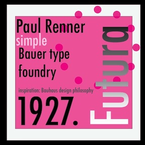 From the Wikipedia entry:
  [
[ Belarussian designer of these vector format fonts in 2017: Constellation (triangulated caps), Flower Embroidery, Chalk, Iridescent, Biscuit, Space (3d mesh font), Embroidery. [
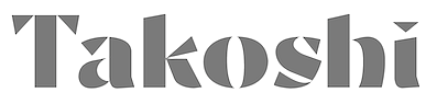 [
[ [
[ Kaiser Zhar Khan (b. 1980, Chile), aka Zanatilja, used to run a new defunct archive called True Type Fonts. He also designed many typefaces himself. The most famous among these is his free African-themed typeface South Afirkas 2100 (2009), which is downloadable from
  Kowloon, Hong Kong-based designer of the innovative triangle-based caps typeface Septa (2014). [
 South African and British type designer. During
 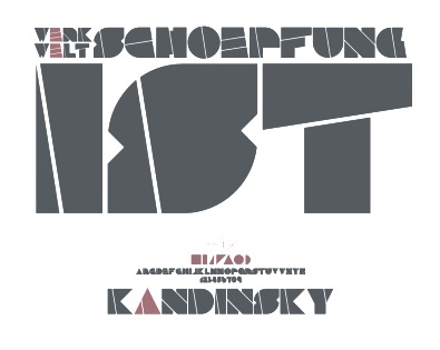 The type designs in Martina Flor's class at
  Singapore-based designer of the beautiful triangulated typeface On The Edge (2015). [
 Laic is the type foundry founded in 2018 by Warsaw, Poland-based type designer Maciej Polczynski. His typefaces:
  Designer of Paranoid (2009; Paranoid Cyrillic was made by Sergiy Tkachenko) and Hel Grotesk Gothiq (2006).
  [
[ [
[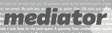 Moscow-based Armenian type designer (b. 1960, Artashat, Armenia) and graphic artist. In 1984 graduated from the Moscow Poligraphic Institute, department of Polygraphic Product Design. He worked for the Type Department of Committee of Print in Yerevan, and for the publishing houses Ayastan, Luys and Sovetakan Grokh. At Microsoft's request, in 1999, he was consulted for the Armenian section of the Sylfaen project.
  [
[ [
[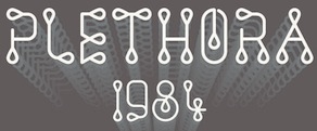 [
[ Wolf Böse (Der Graph, NeueDeutsche, est. 2010, Berlin) is the alias of prolific German experimental font designer Thomas Helbig. His typefaces date from ca. 2009. In 2021, he opened a shop on MyFonts as NeueDeutsche. His typefaces there, published in 2021, include
  During his design studies at QUT in Brisbane, Australia, Nick Hedges designed the triangle-themed Sonder Font (2017). [
 Singapore-based creator of the
  Patricia Rueda Saez (Granada, Spain) designed the art nouveau typeface Nerea (2014) which imports Victorian frilliness and didone ball terminals. In 2015, she created the triangulated typeface Triangle.
  [
[ Type designer graphic designer, calligrapher and illustrator from Chile, who graduated in graphic design in 2005 from the Universidad del Bío-Bío., b. 1977, Santiago de Chile. Aka PeGGO, a
  [
[
 Graphic designer in New Delhi, who started the India Font Project, which is concerned with vernacular type in India. He created an
  Martzi (or Marton) Hegedüs (Budapest) created the gridded trompe l'oeil typeface
  FontStructor, aka truth14ful, who made these pixelish typefaces in 2010: Ball Point, Symbol Sans, Balance sans, Tetris, Math, Marquee, Spacewave, Math,
  Swiss graduate (b. 1965) of Luzern School of Art and Design, who settled in Berlin in 1997. Co-founder with Cornel Windlin in 1993 of Lineto, with Cornel Windlin and Andreas Eigendorf in 2014 of
 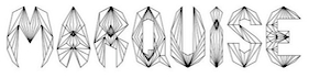 Bristol, UK-based creator of a number of modular experimental typefaces in 2012. These include
  Swiss Typefaces is a foundry run by Ian Party (Territet, Switzerland, b. 19777, Lausanne) and Emmanuel Rey. It evolved from B+P Swiss Typefaces and BP Type Foundry, where BP stands for Buechi et Party. Maxime Buechi is still loosely affiliated with Swiss Typefaces but is now spending more time in London. Ian Party studied first at ECAL in Lausanne and then at the KABK in The Hague. In 2004, he cofounded
  Terminal Design is the company of
  The Dingbatcave offers many dingbat fonts by Ann Stretton from Racine, WI. Ann Crawlers (crawlers!) is free. Borders, spiders, ringbats, ornaments, annaments. The spirals (5 fonts) are absolutely wonderful! Fonts include EyeEyeMate, Characters, Wreck Tangles, WebBats, BrideofWebbats, Victorian Frames, VictorianTriplets, Scrollbars, Decobands, GuestStars, Shaped Spheres,
  Based in Rennes, France, Thibaut Abou Mrad created the logotype typeface Dantek (2014) for Zit Dantes, a web service company. His layered rounded stencil typeface family Normograph (2014) is created for wayfinding applications. Trix (2014) is a triangulated typeface. Miron (2014), designed for the Miron Rivoli gallery, is a hybrid of Filosophia Grand and Gravur Condensed.
  Budapest-based creator (aka Frodo 7) in 2009 at FontStruct of FontMoot 01 (pixel face), Brego,
  Foundry est. in 2005 by
  [
[ During her graphic design studies in Vilnius, Lithuania, Vika Sema created a triangulated hexagonal typeface (2014). [
 Tim Ko, or Timothy Ko,
  Weknow is the foundry of Indonesian type designer Wino Sutarmin Kadir (b. 1979), who is based in Bogor, Jakarta. Weknow produced a large collection of free fonts from 2009 until 2012. He started making commercial fonts in 2012.
 [
[ [
[ Max Infeld (b. 1981, aka Xerographer Fonts) from Chico, CA, makes free fonts and offers a free font-making service. He surged onto the font scene in 2012, and is currently located in Ojai, CA.
  Deerlijk, Belgium-based designer of the triangulated sci-fi typeface Random DM (2016, FontStruct), the modular Random Mass (2020), the octagonal typeface Random Abe (2020), and Random Nods (2020: a tape font based on the work of wim Crouwel).
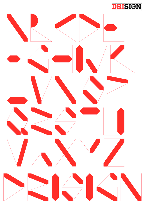
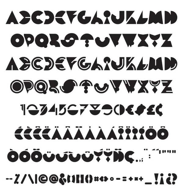
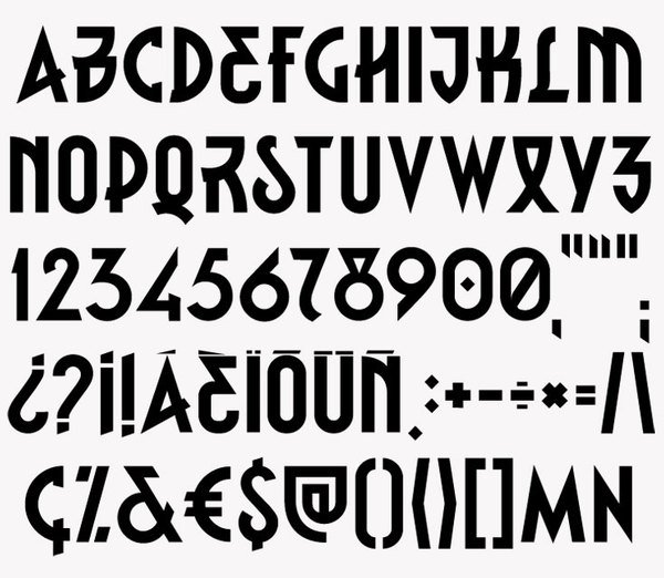
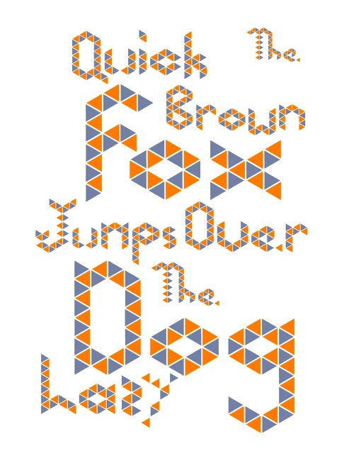
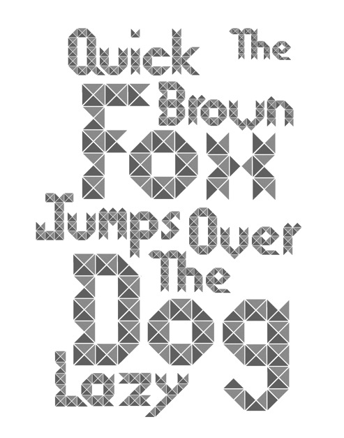
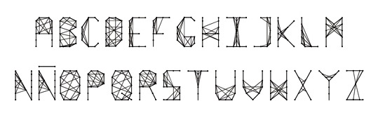
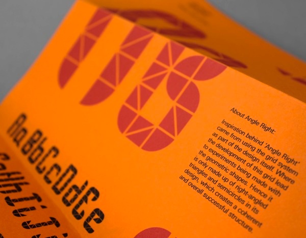
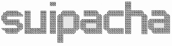
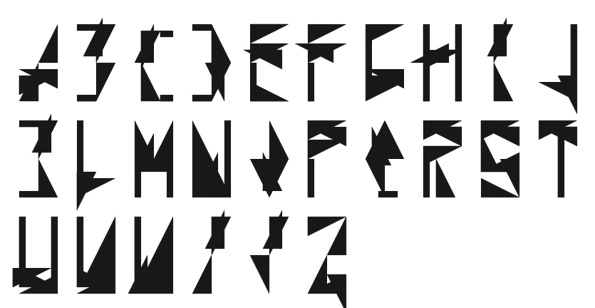
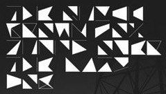
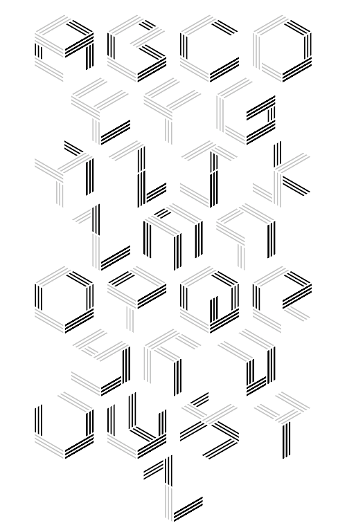
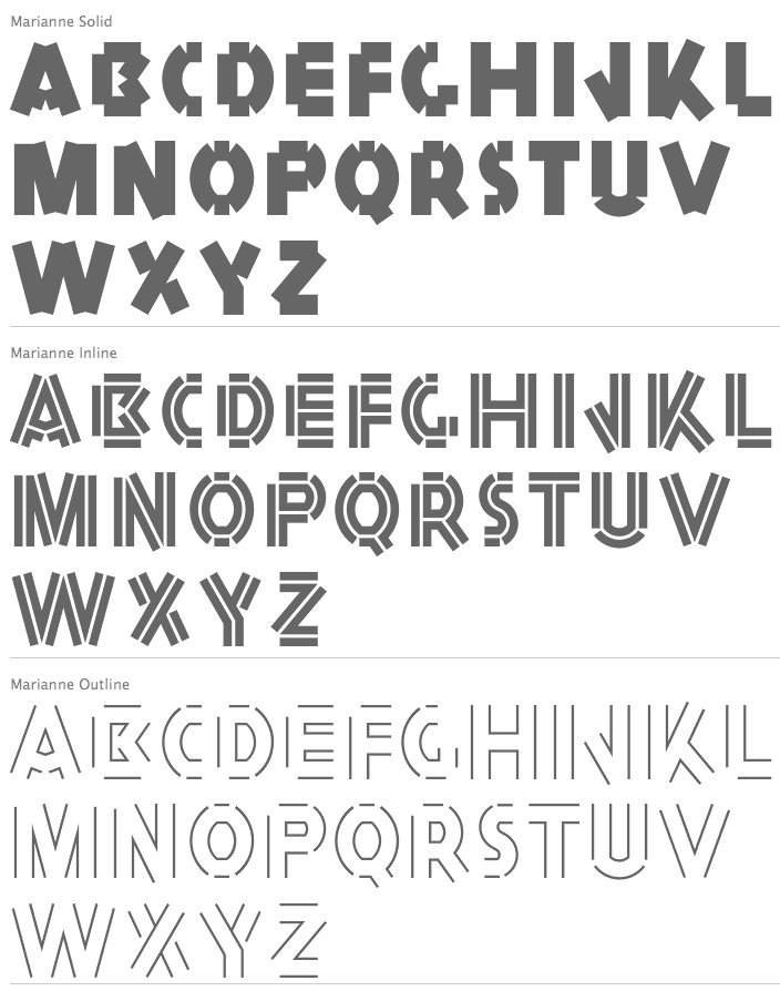
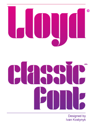
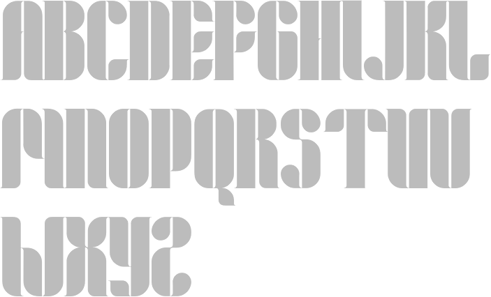
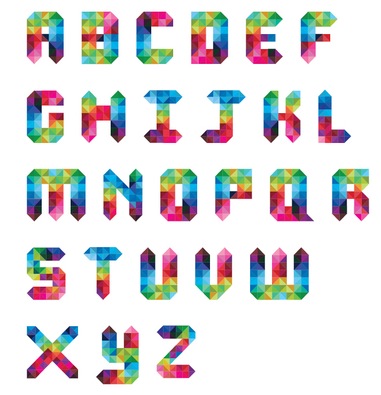
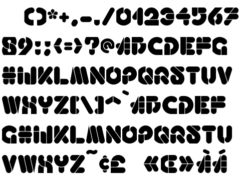
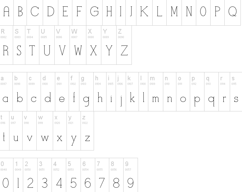
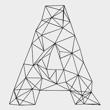
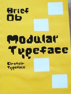
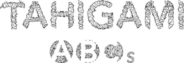
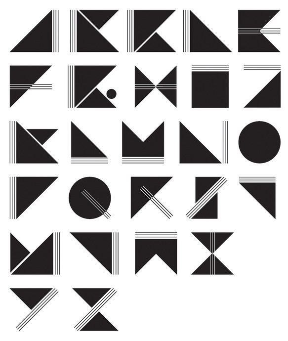
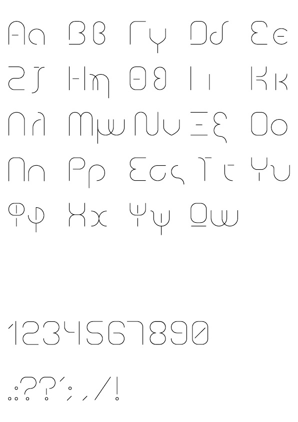
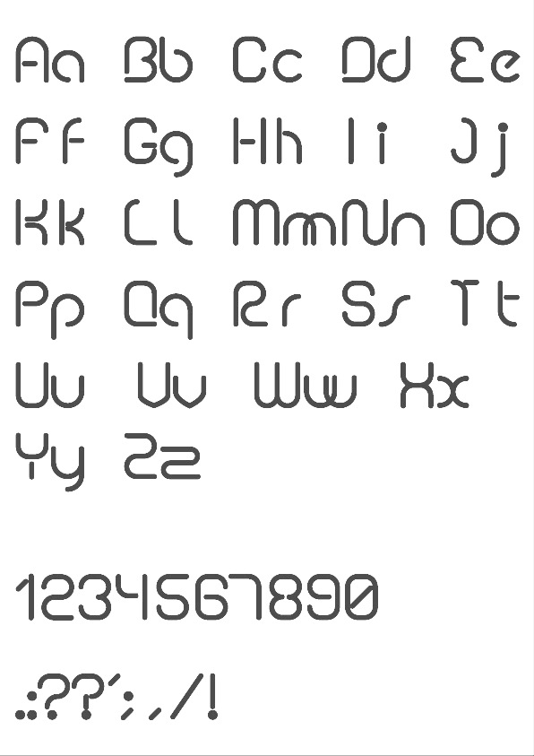
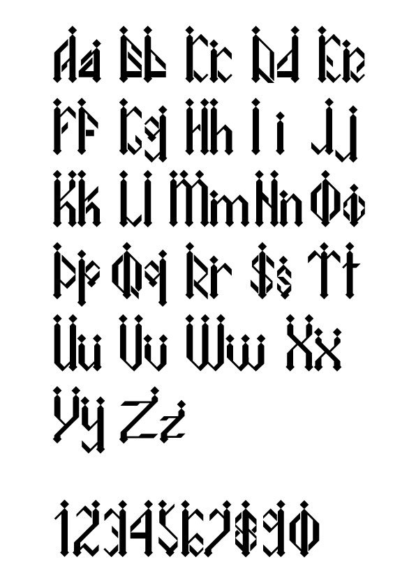
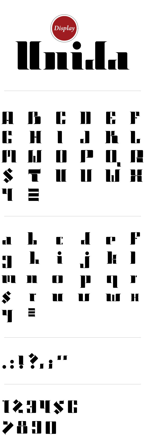
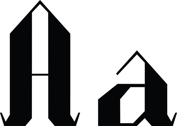
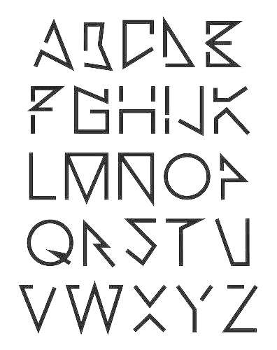
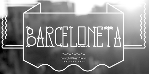
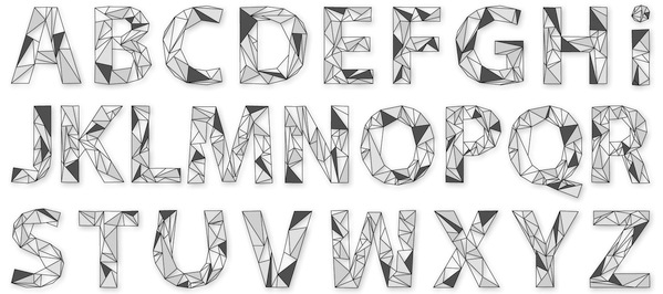
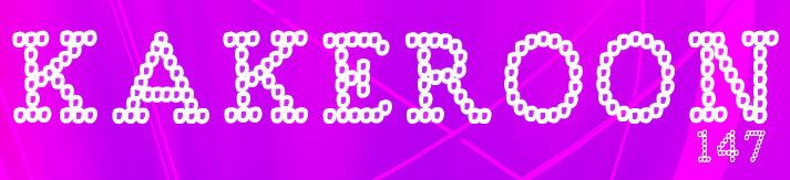
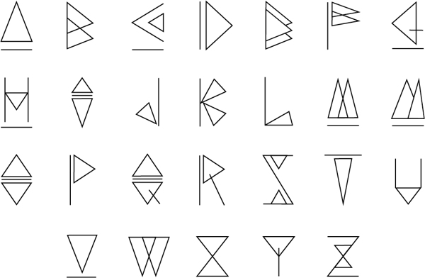
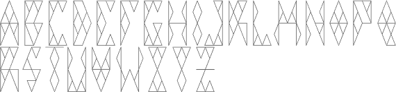
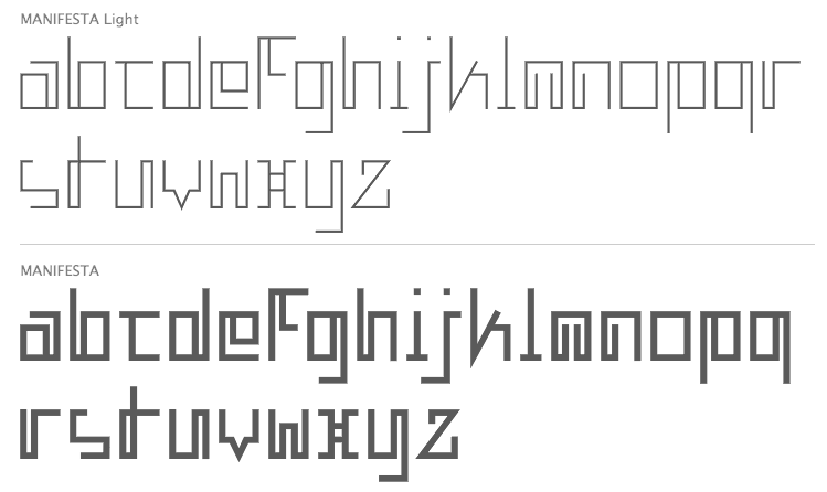
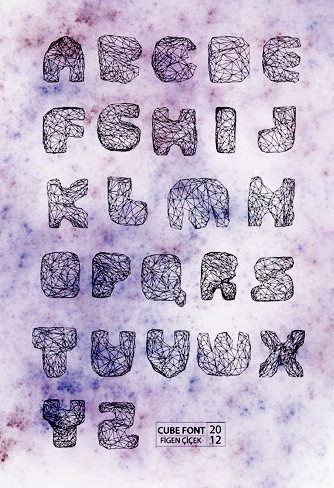
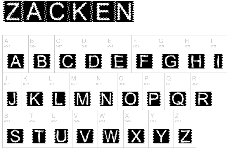
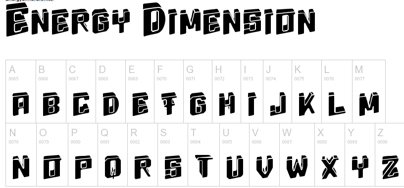
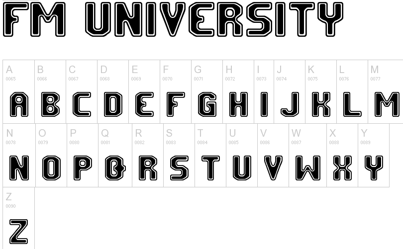
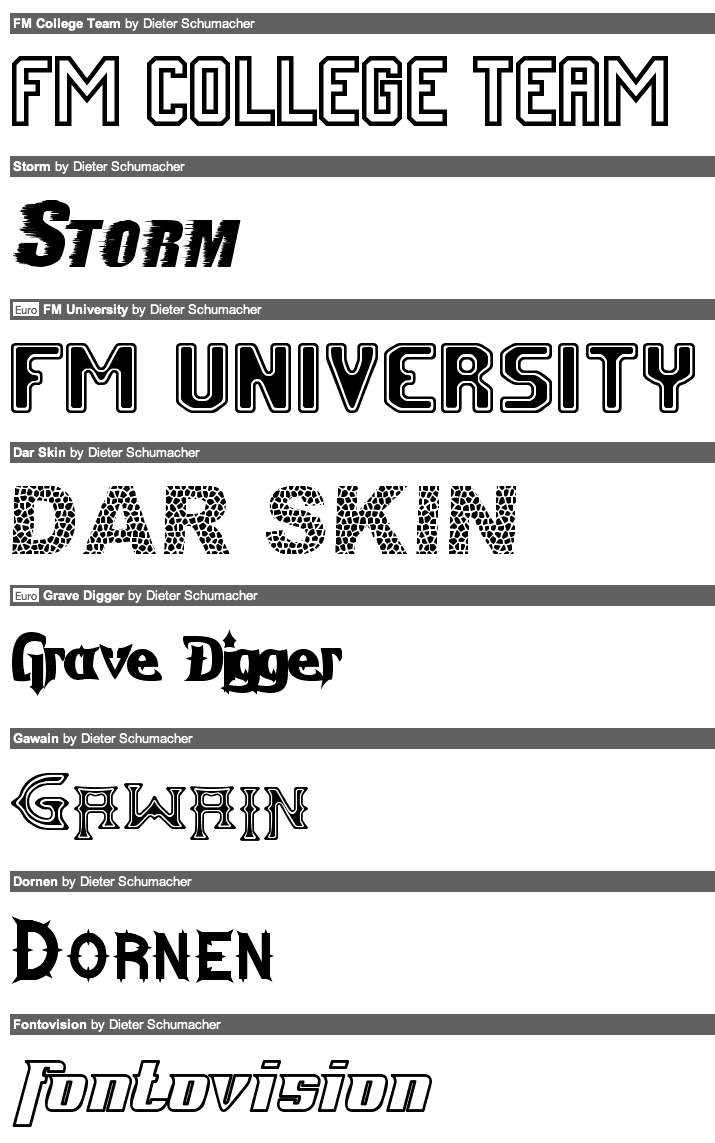
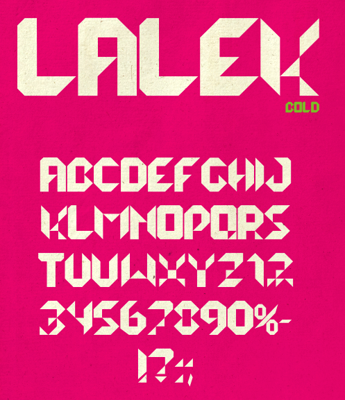
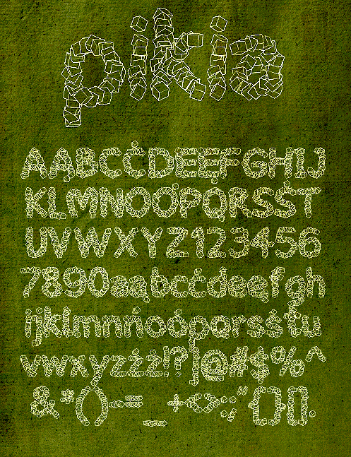
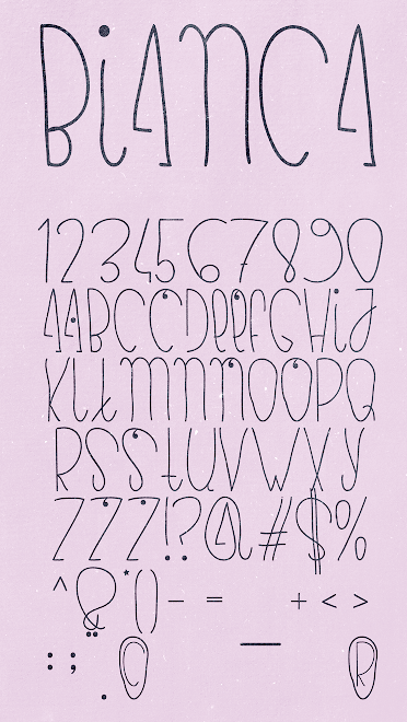
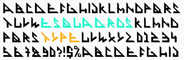
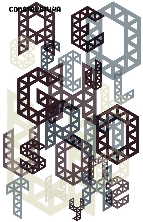
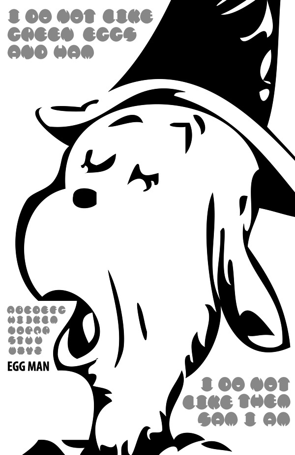
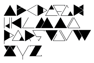
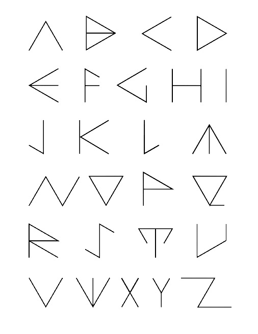
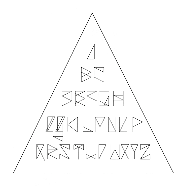
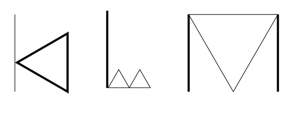
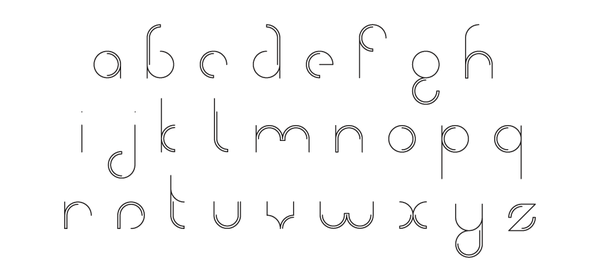
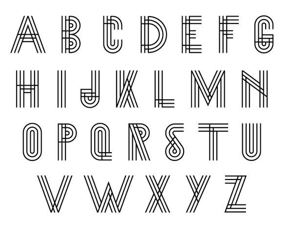
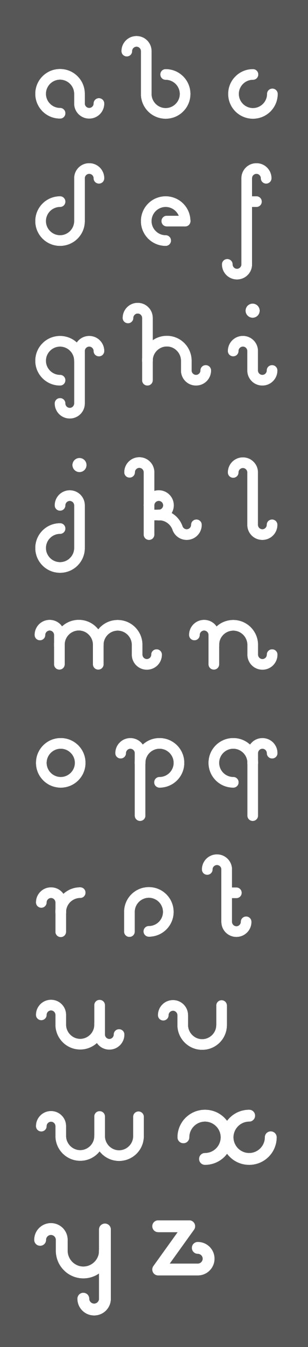
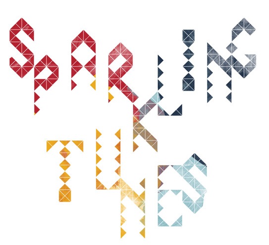
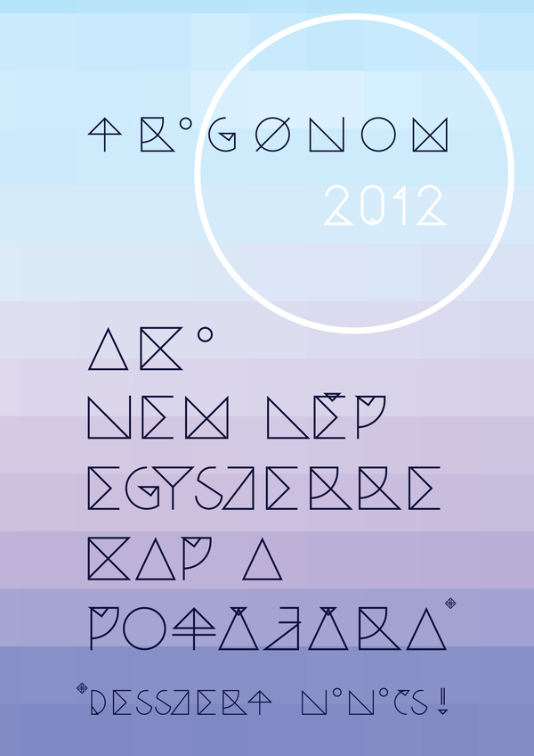
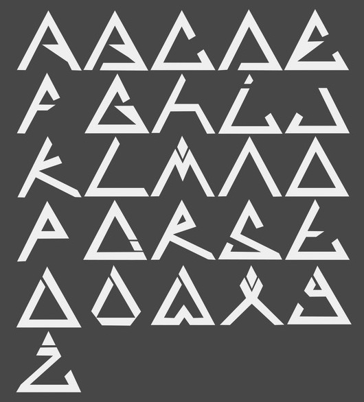
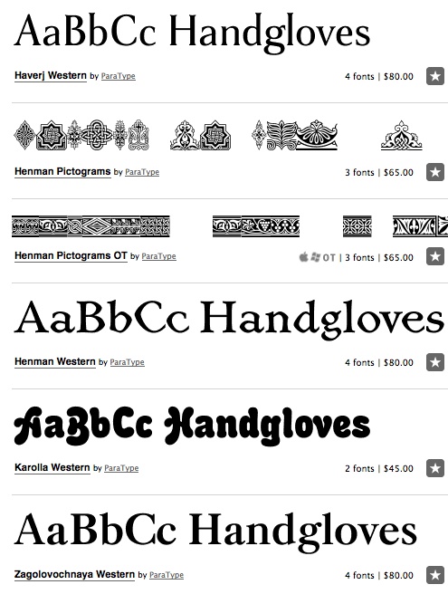
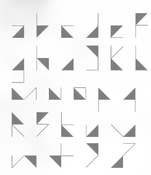
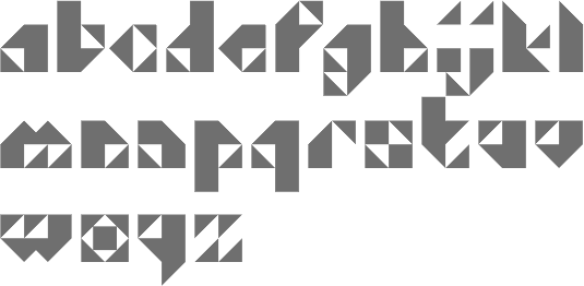
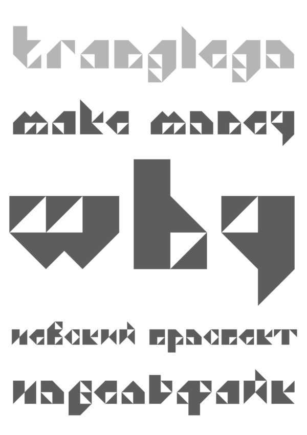
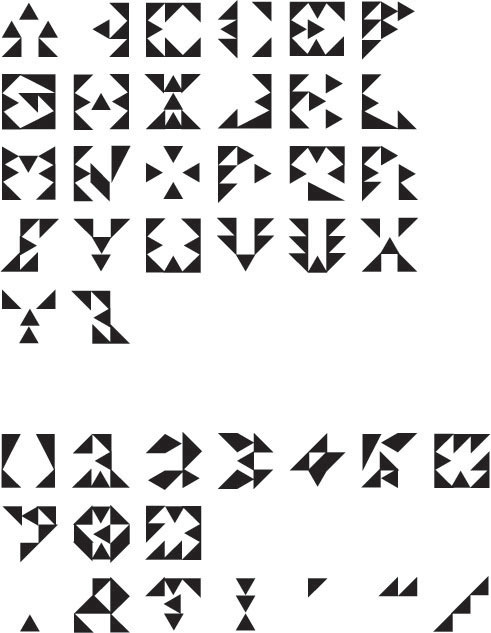
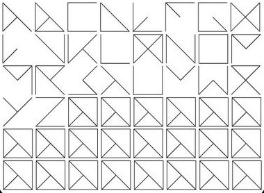
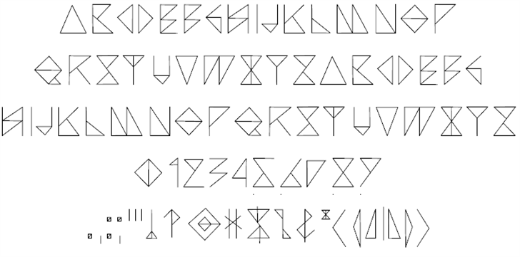
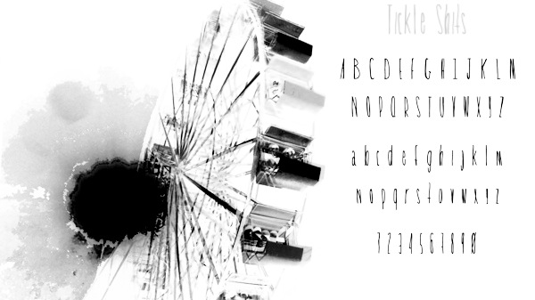
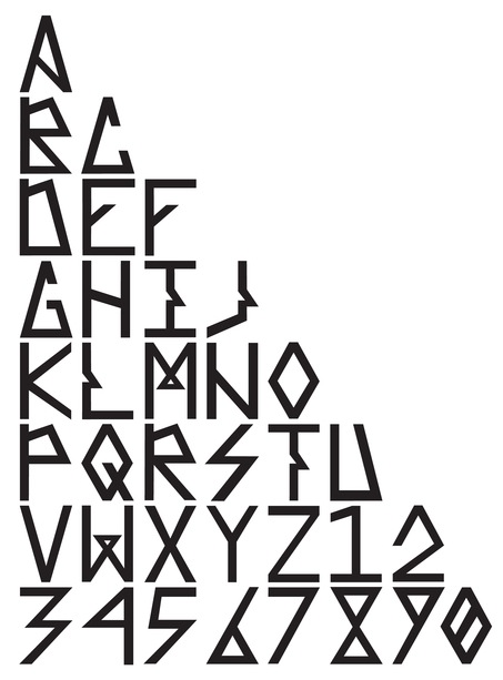
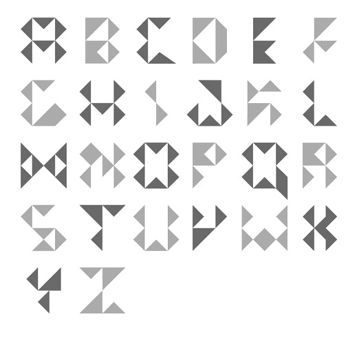
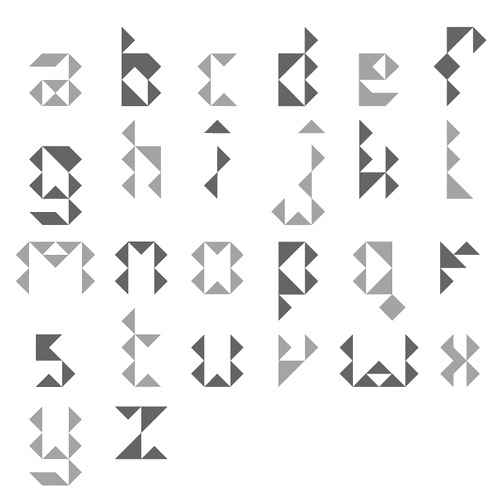
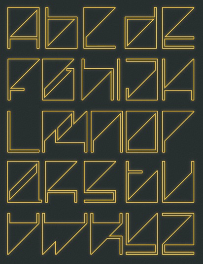
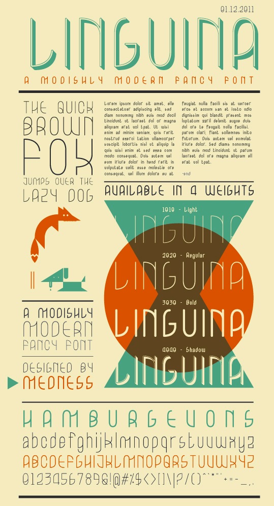
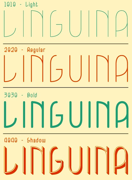
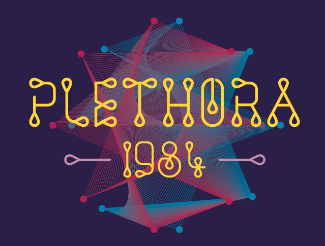
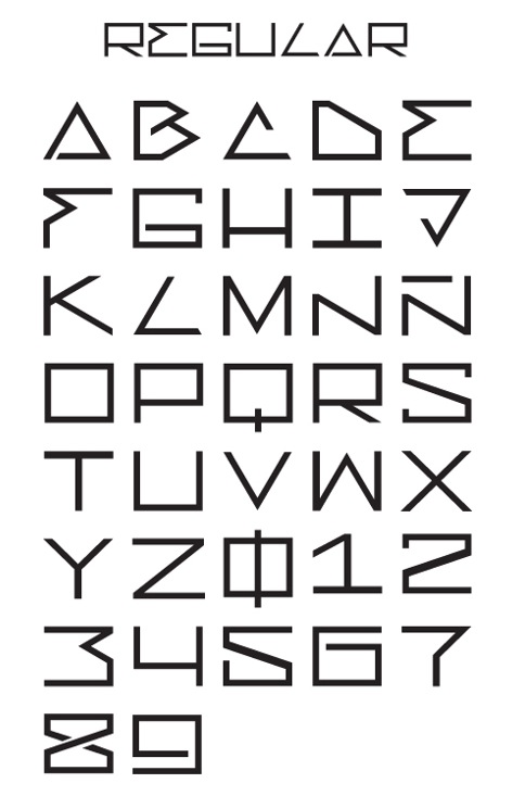
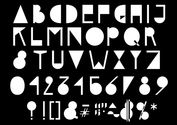
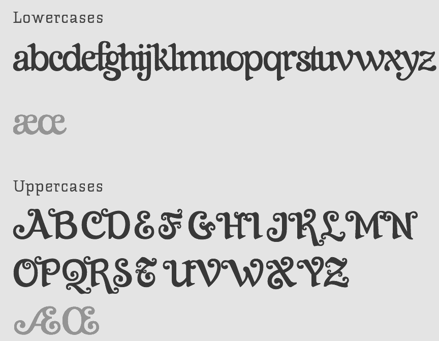
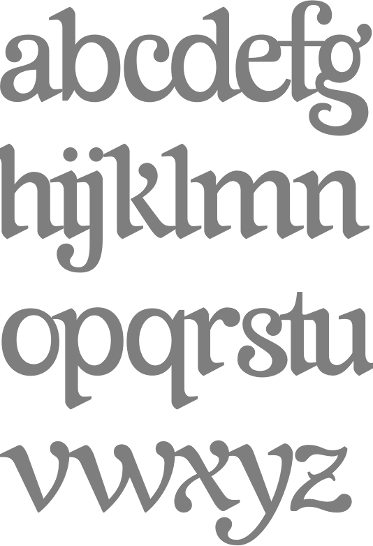
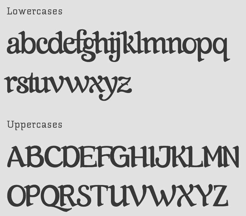
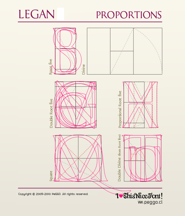
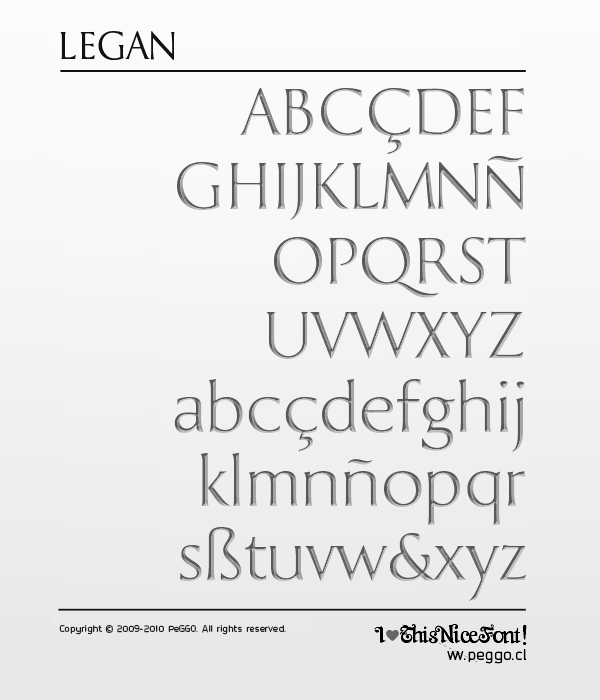
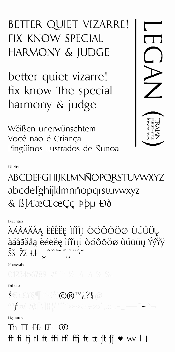
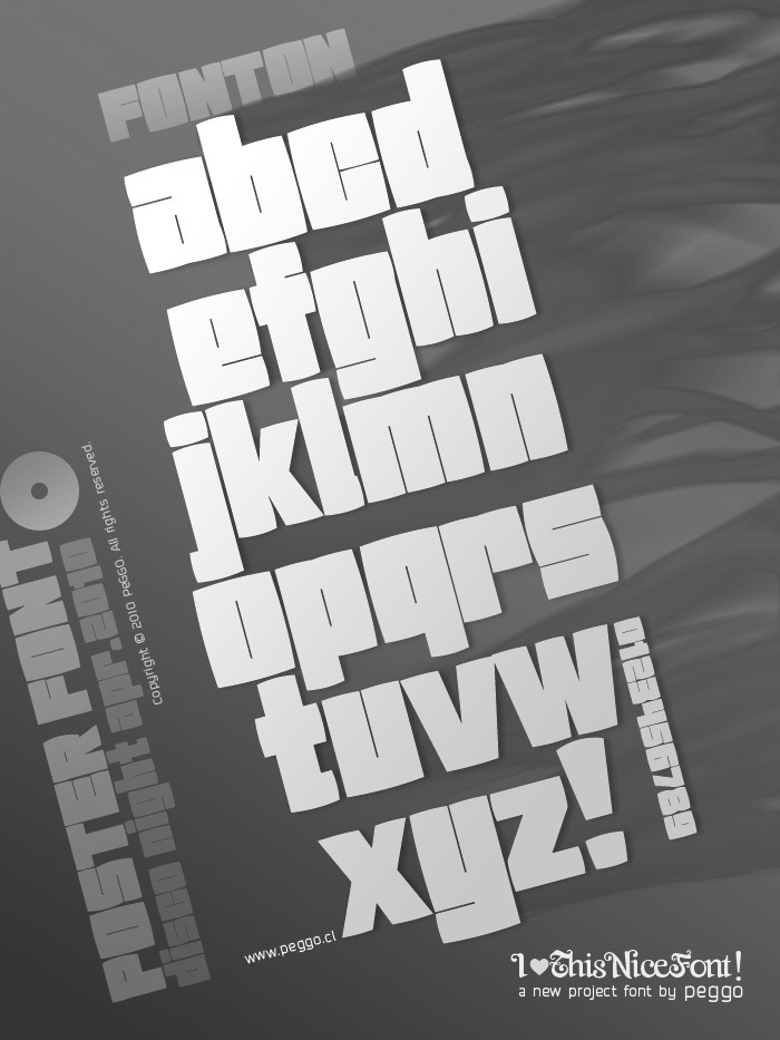
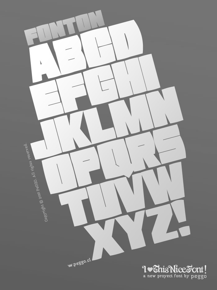
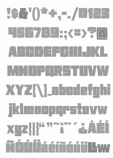
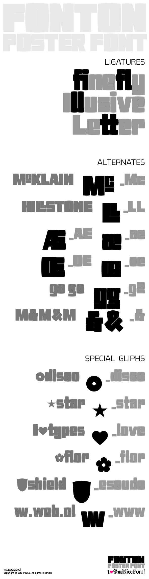
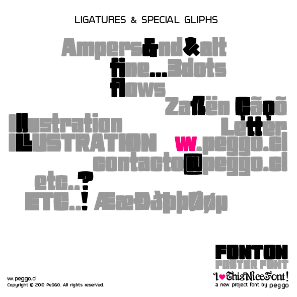
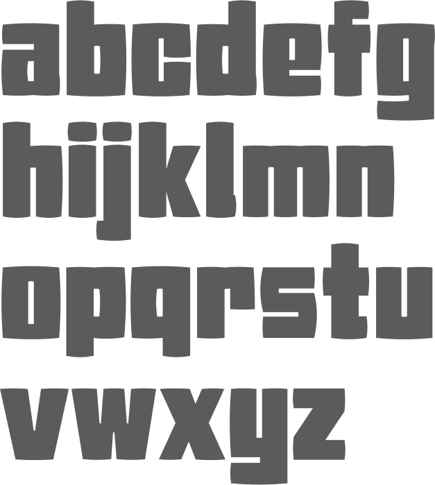
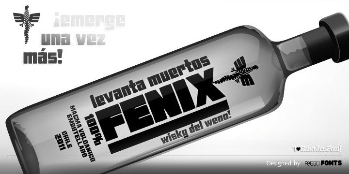
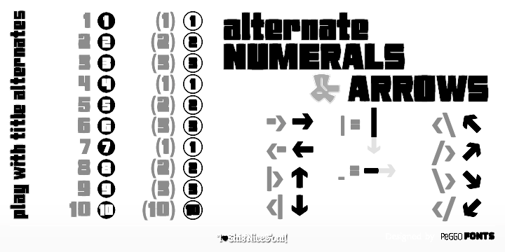
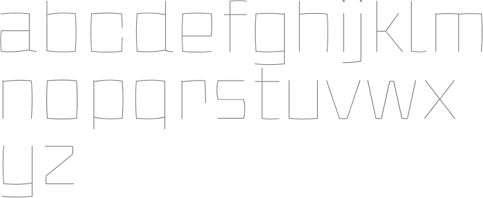
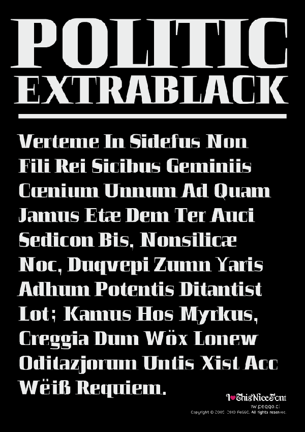
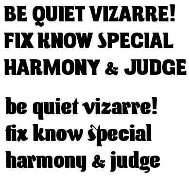
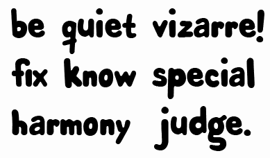
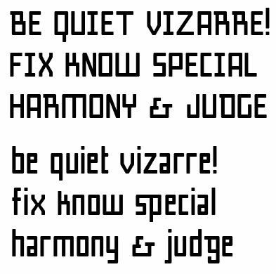
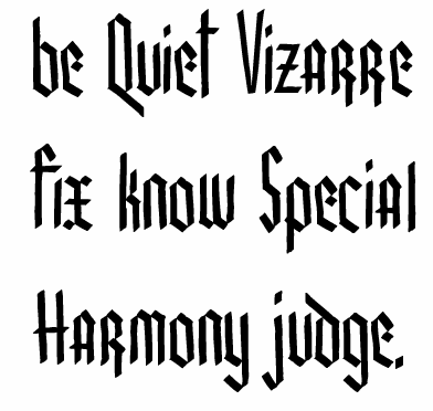
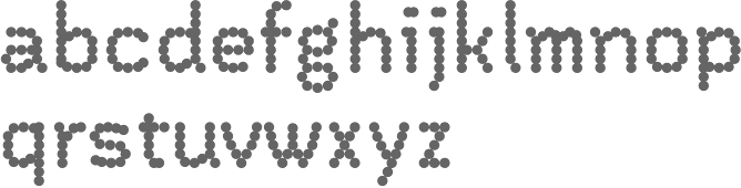
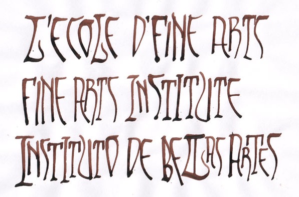
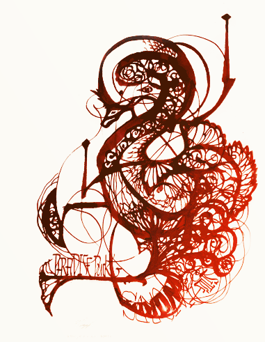
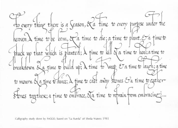
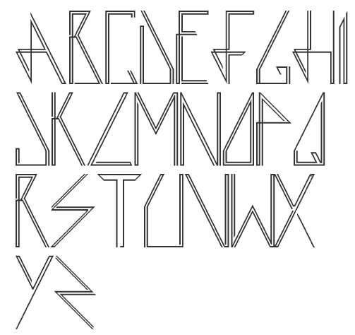
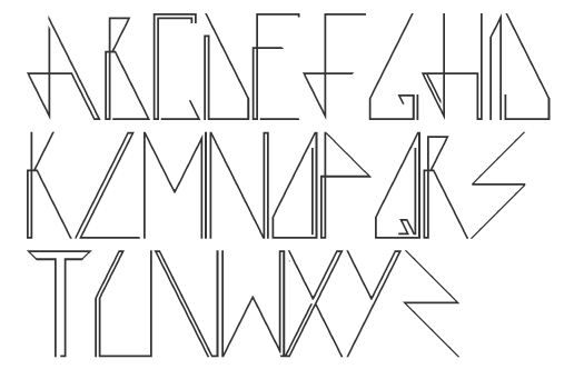
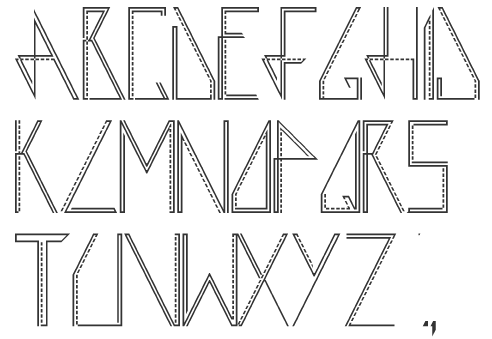
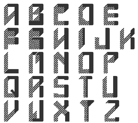
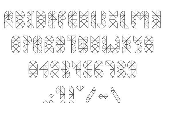
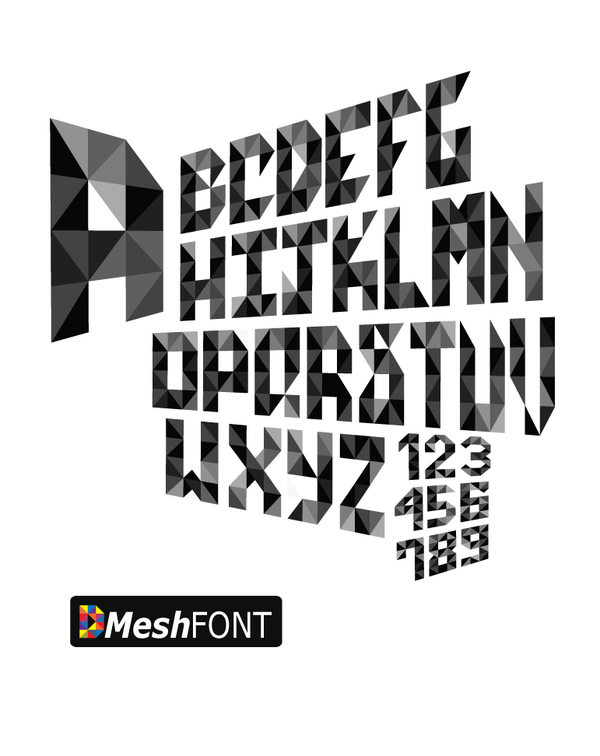
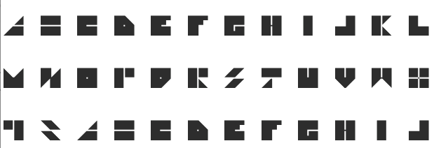
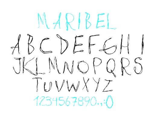
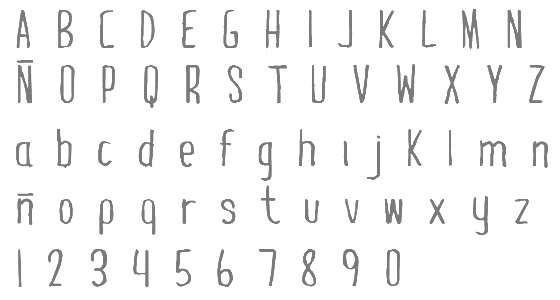
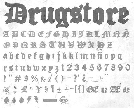
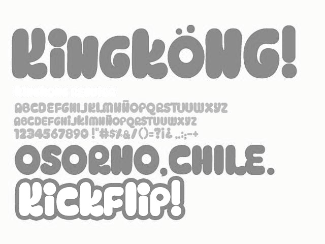
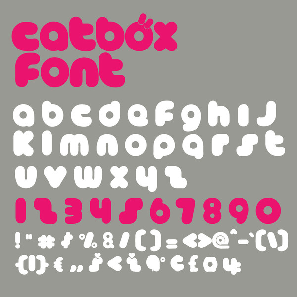
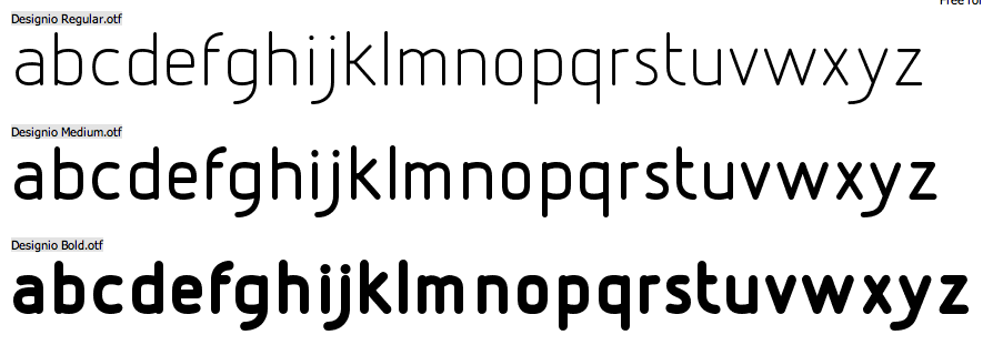
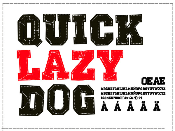
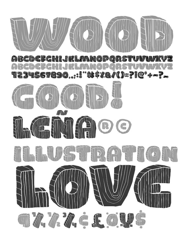
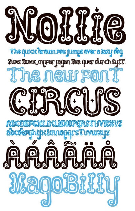
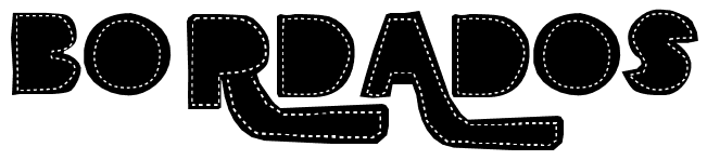
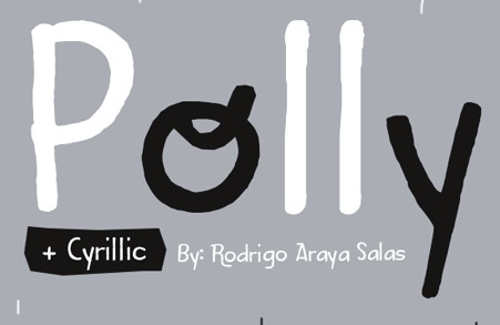
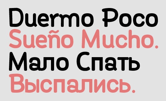
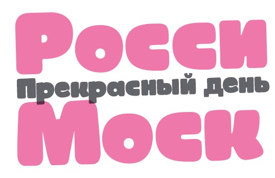
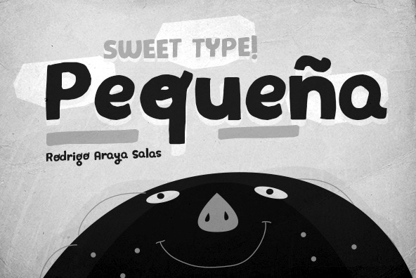
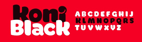
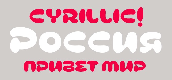
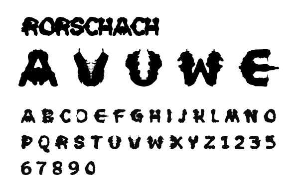
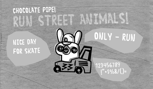
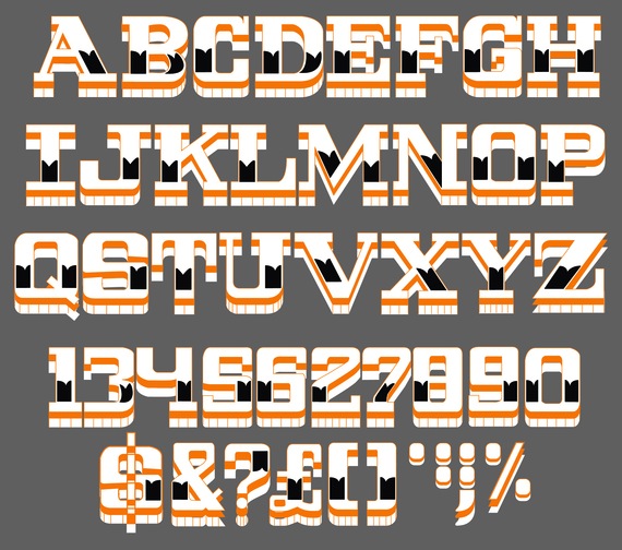
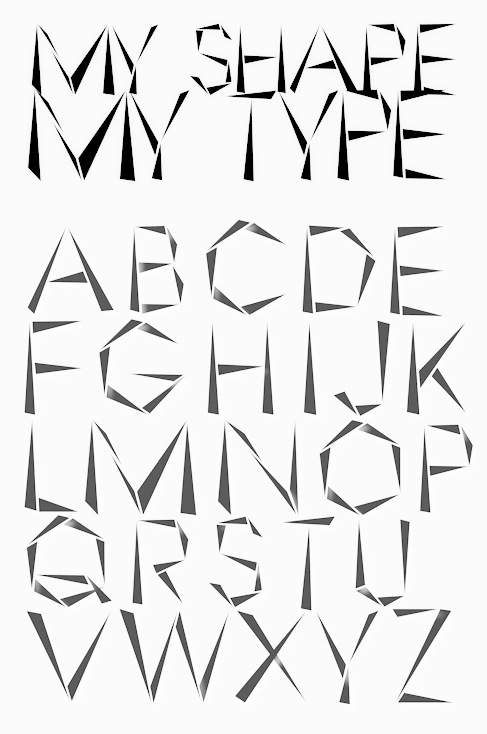
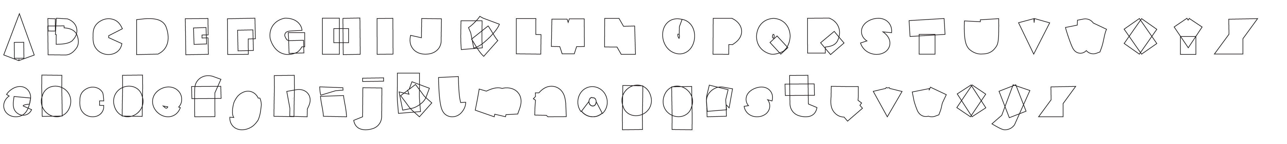
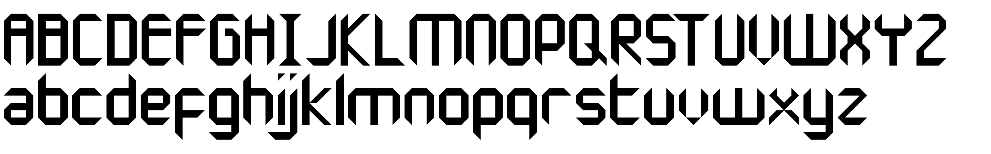
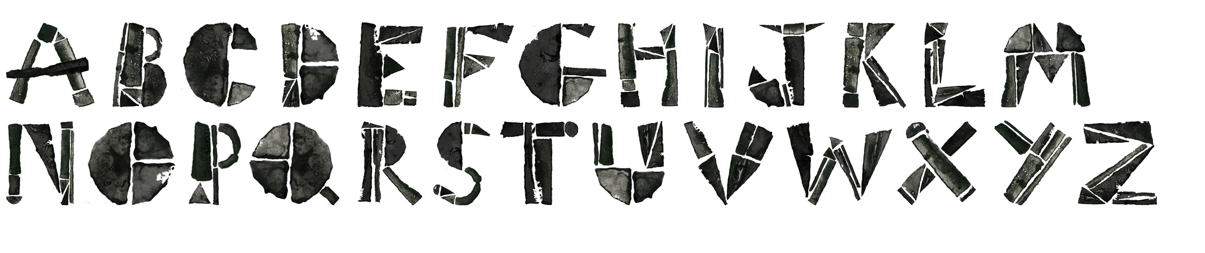
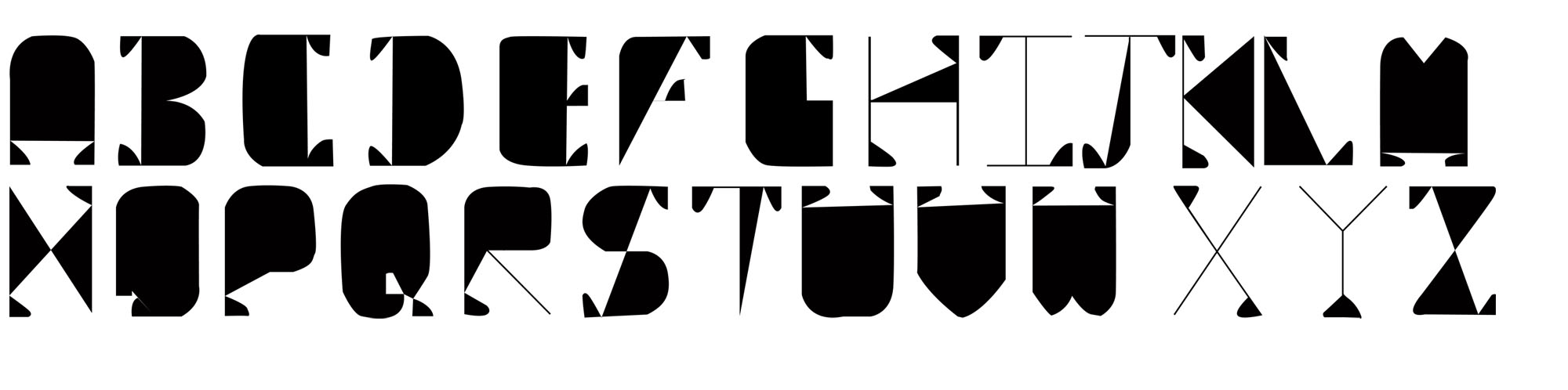
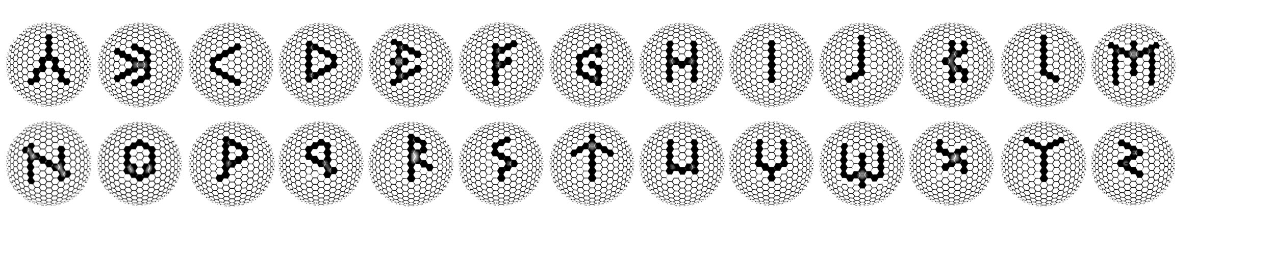
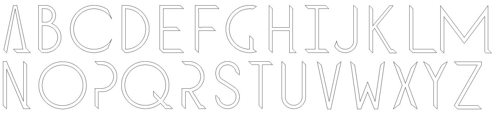
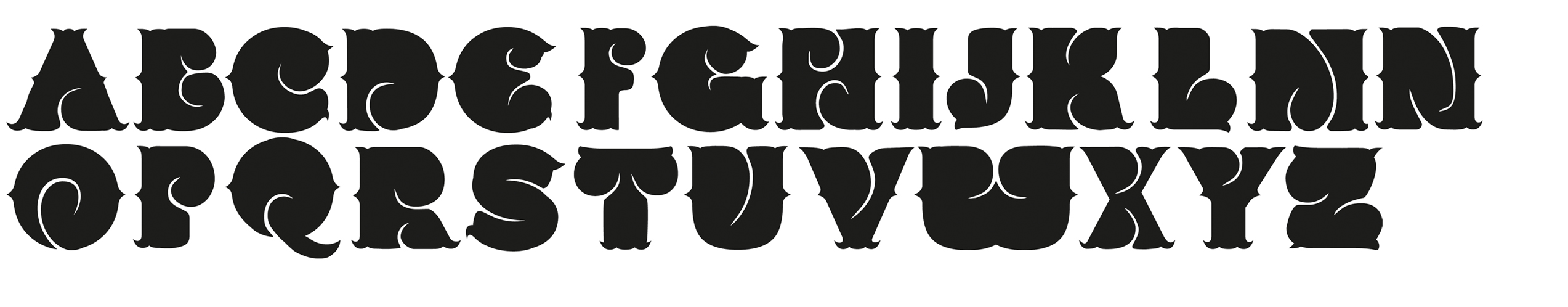
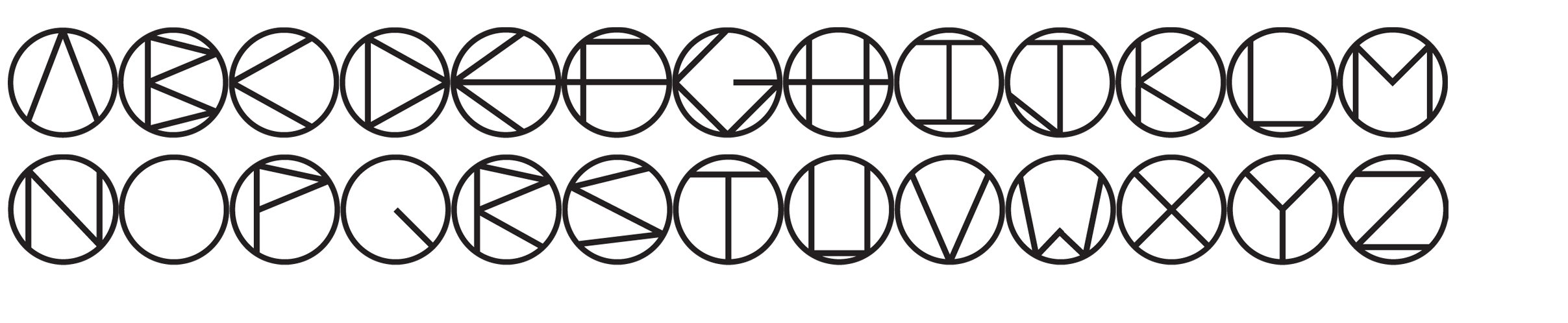
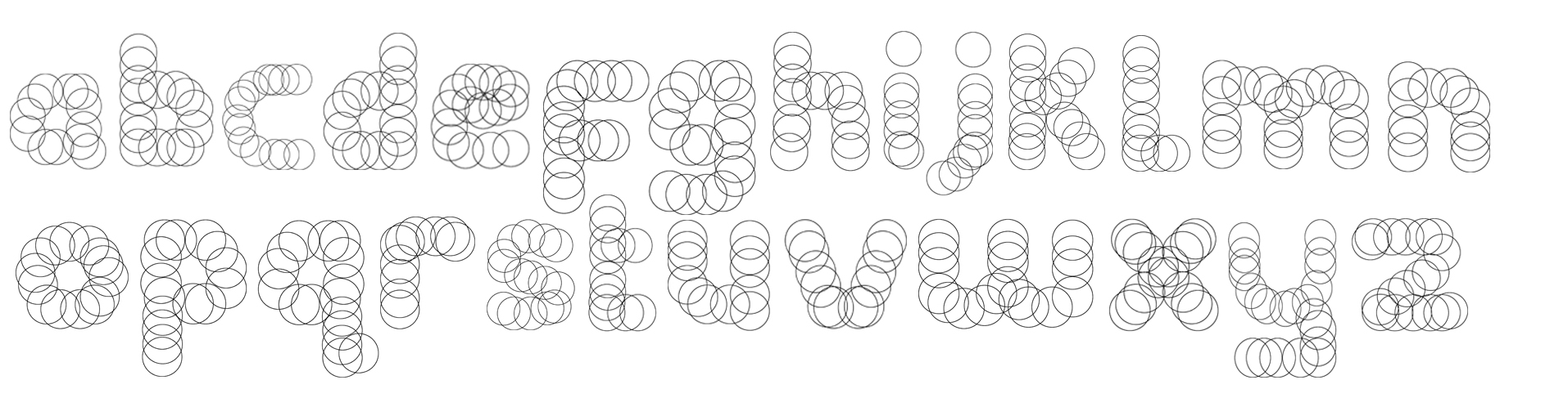
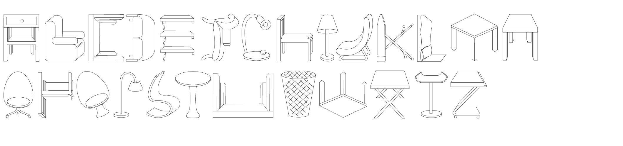
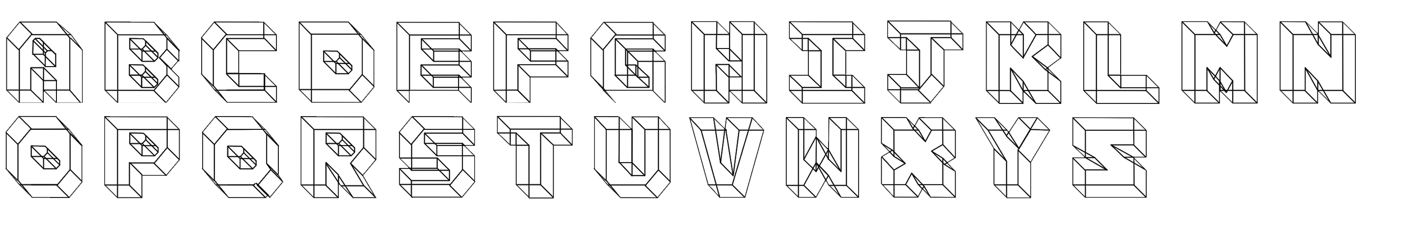
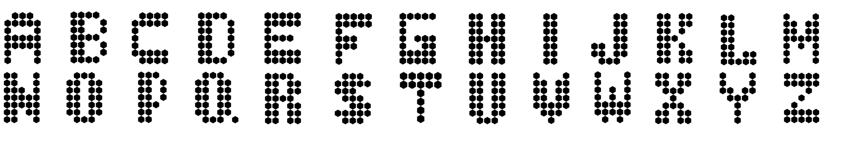
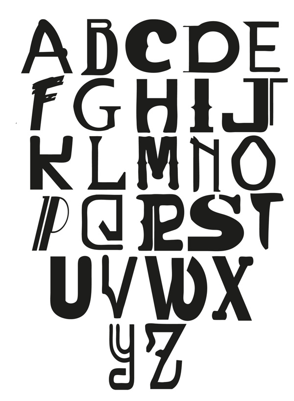
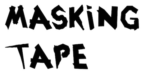
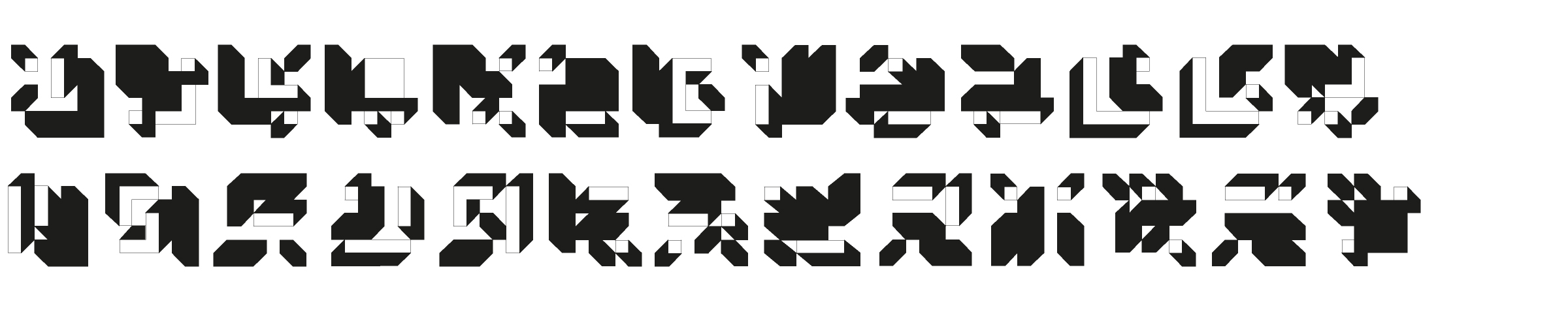
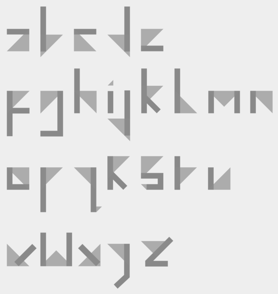
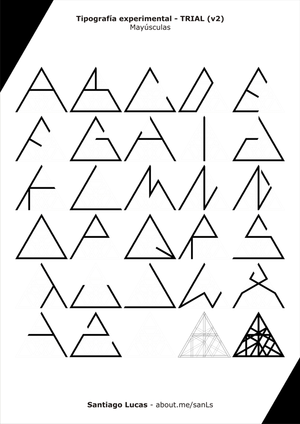
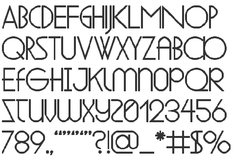
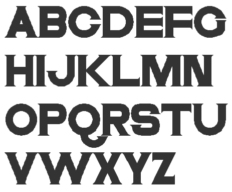
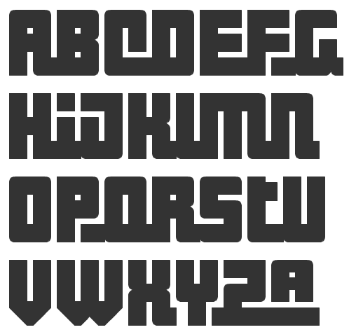
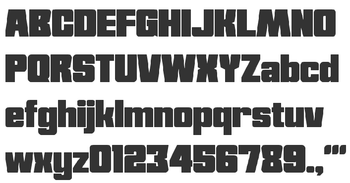
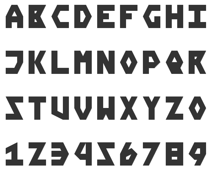
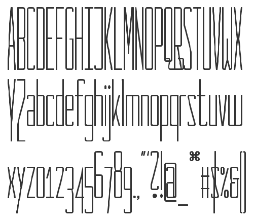
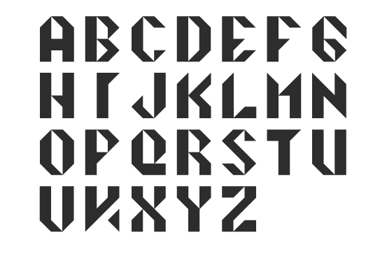
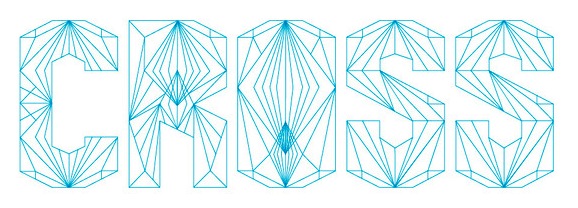
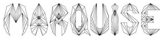
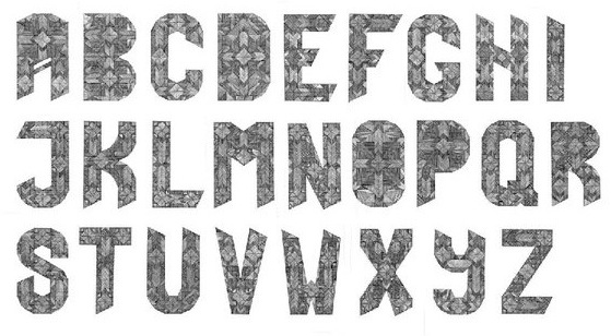
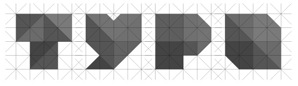
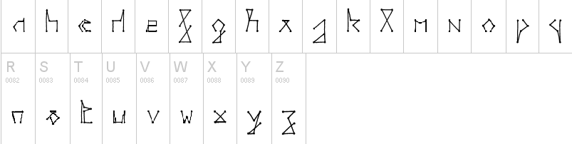
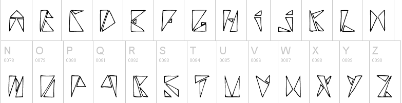
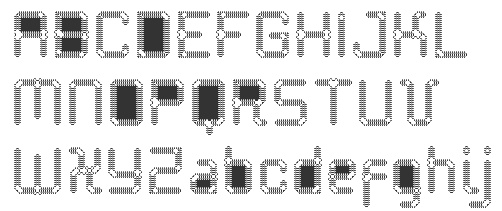
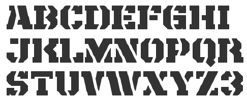
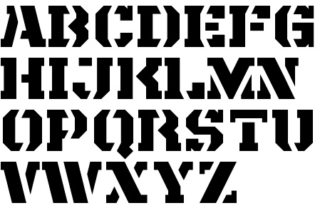
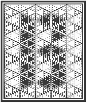
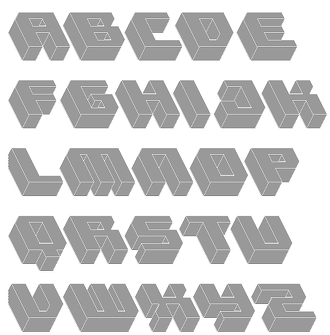
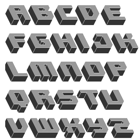
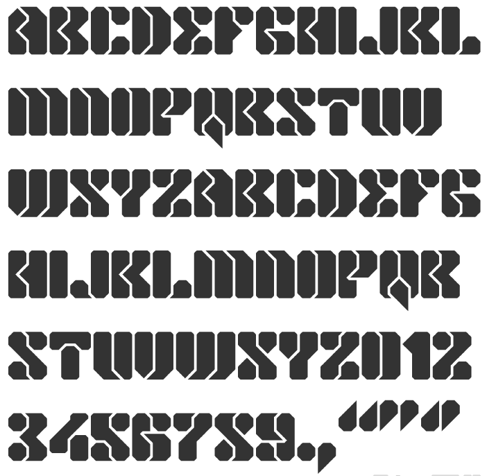
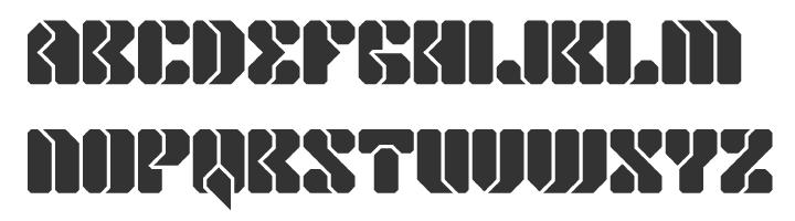
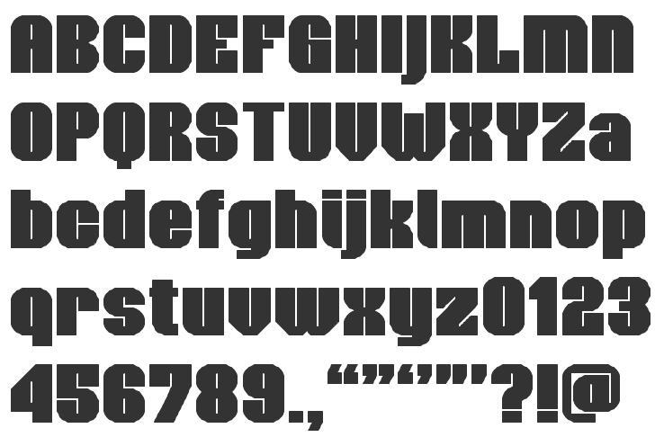
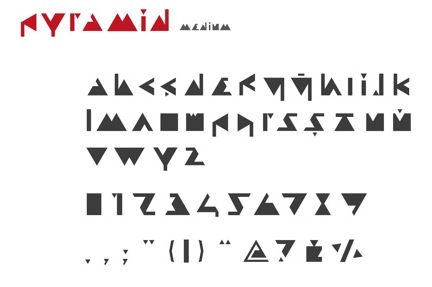
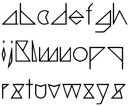
|
|
|
|