TYPE DESIGN INFORMATION PAGE last updated on Mon Mar 9 16:08:03 EDT 2026
FONT RECOGNITION VIA FONT MOOSE

|
|
|
|
|
Type scene in Maryland | ||
|
|
|
|

SWITCH TO INDEX FILE
Graphic designer in Salisbury, MD, who created a blackboard bold typeface in 2016. [Google] [More] ⦿ | |
A.J. Williamson, graphic designer in Greenbelt, MD, created the sans typeface family Mear in 2013. [Google] [More] ⦿ | |
Originally from the DC / Maryland / Virginia area, Akwele Vassall designed the squarish Western typeface Blackwood in 2016 during his studies at the School of Visual Arts in New York. [Google] [More] ⦿ | |
Creator of Coop Blackletter (2016, a soft blackletter version of Cooper Black), Dequindre (2015, based on the capitals of Fette Buhe Fraktur by Walter Buhe, 1914-1915), Teip (2014, a multiline layerable all caps typeface), Pila (2014, techno stencil), Handu (2012, hand-drawn sans-serif inspired by the hand-painted type and signage on the streets of Kolkata, India), Atrium (2012, a squarish sans family based on the pen art of W.E. Dennis), Saugatuck (2011, grunge) and Sello (2011, a unicase hand-drawn, geometric sans-serif with a touch of retro). Behance link. Klingspor link. MyFonts foundry link. Home page. [Google] [MyFonts] [More] ⦿ | |
Graphic designer in Baltimore, MD, who created the display typeface Dagger (2012). [Google] [More] ⦿ | |
Baltimore, MD-based designer of the bare and thin sans display typeface Lucina (2014). [Google] [More] ⦿ | |
Artist in Baltimore, MD, who created Vilnius (2014, bilined), Kobenhaven (2014, stitching font) and Trakai (2014, circle-based font). [Google] [More] ⦿ | |
Baltimore, MD-based designer of the free handcrafted typeface Day Drunk (2016). Behance link. [Google] [More] ⦿ | |
American type, web, and brand designer in Baltimore, MD. She combined Adobe Caslon and Gill Sans to make a blended experimental typeface in 2010. View her typographic study of Gill Sans. [Google] [More] ⦿ | |
Amanda Baldwin (Mount Airy, MD, b. 1994) created the thin vintage typeface Peasant (2015). In 2015, she was a student at Liberty University in Lynchburg, VA. [Google] [More] ⦿ | |
Graphic artist in Silver Spring, MD, who designed the handcrafted typeface Treasure (2019). [Google] [More] ⦿ | |
During his architecture studies at Washington University in St. Louis, MO, Potomac, MD-based Andy Lee designed the display typeface Rhino (2013). Behance link. [Google] [More] ⦿ | |
In 2010, he created the gorgeous ultra-fat didone watch number set called Pompadour (free). It has already been used tens of times, including in this poster by Jay Schaul (2011). Pompadour can be downloaded/bought at Lost Type Coop. Fontspace link. [Google] [More] ⦿ | |
Linthicum, MD-based designer of several typefaces in 2017, including an art deco all caps typeface. [Google] [More] ⦿ | |
Graphic designer in Baltimore. In 2010, he made Deconstruct, a Bauhaus style font family. Behance link. Logo. [Google] [More] ⦿ | |
During her studies at SCAD, Anna Genova (Chevy Chase, MD) created the vintage text typeface Eleonora (2014). [Google] [More] ⦿ | |
Baltimore, MD-based designer of the textured oriental simulation typeface Osaka (2015). [Google] [More] ⦿ | |
During her studies, Annapolis, MD-based Ashton Poole designed several typefaces (2017). [Google] [More] ⦿ | |
Auras Design
| Silver Spring, MD-based makers of the billboard typeface Au Dorsey (1990) and of Au Bauer Text Initials (1990, a Trajan typeface after F.H.E. Schneidler's Schneidler Initialen, Bauersche Giesserei, 1937). The company's blurb: Robert Sugar is the president and creative director of Auras Design. A graduate of American University, he taught publication design there for nine years. Early positions working with printers and typesetters gave him an expanded perspective on the designer's role in producing print publications. Typography and prepress skills helped Auras become a pioneer in electronic design and prepress. He committed the studio completely to digital design by 1992, and has constantly expanded the technology, skills and capabilities of the studio. [Google] [More] ⦿ |
Graphic designer who grep up in sewell, NJ, and graduated in 2007 from the Maryland Institute College of Art (MICA), Baltimore, MD. He lives in Brooklyn, NY. He created the modular typeface Knucklepuck (2009). Noupe link where one can download an EPS version of this font. Behance link. [Google] [More] ⦿ | |
Graduate of MICA. Baltimore, MD-based designer of the polygonal typeface Arcas (2015-2016) and of the free all caps display sans serif font Bore (2021) which was inspired by some unusual mid-20th-century fabricated signage above the entrances to the Baltimore Harbor Tunnel. [Google] [MyFonts] [More] ⦿ | |
Baltimore Type Foundry (or: Baltotype)
| Also known as Fielding Lucas, Jr., Lucas Bros., H.L. Pelouze&Son, and Chas. J. Cary&Co. Specimen may be found in Convenient Specimen Book of Type, Rules, Borders, and Electrotype Cuts from the Baltimore Type Foundry (Baltimore: Chas. J. Cary&Co., 1888. Banta Book of Types&Typographical Tips. Menasha: George Banta, 1961). The company existed until well into the 20th century, and published a catalog as late as 1957 called Type and Rule Catalogue 13, Baltotype. A selected list of typefaces:
Rich Hopkins, a printing historian, acquired Baltotype ca. 1993. Based on drawings from the 1950s in the Baltotype material, Miranda Roth at P22 designed LTC Athena, a narrow art deco typeface, in 2013. [Google] [More] ⦿ |
Baltimore&Ohio Railroad Historical Society
| Jack Aaron Rodriguez made a font called Baltimore&Ohio R.R. Co. Loco.&Pass. Equipt. Cars Lettering (2004) for the Baltimore&Ohio Railroad Historical Society. Jack lives in Riverdale, MD. Kenneth Van Mechelen made B&OStation (2005), B&OLoco (2005), EMD (2006), and B&OX (2005). [Google] [More] ⦿ |
Bay Fonts (or: Bay Soft, or: Bay Animation, Inc.)
| BaySoft or BayFonts (was: Bay Animation Inc) is a font vendor from Annapolis, MD. Charles Biddle established Bay Animation Inc there in 1994. They claim to have 8000 fonts, but clearly, these are mostly renamed fonts. I can not believe that they till operate. Interestingly, according to Ulrich Stiehl, Charles Biddle built up his collection with the help of Hans Fremuth, who had a similar collection marketed in Germany, called Profi-Schriften Business (Kelly Media). Still according to Stiehl, the majority of the Bay Animation fonts are doctored copies of Bitstream fonts (which in turn were knock-offs of Linotype fonts). The italics are merely awful computer-generated slants of romans, and thus, the collection is sub-par. Examples of equivalences include Joss Normal (a copy of Freehand 575 (Bitstream)) and Fusi Normal (a copy of Futura Std Medium). [Google] [More] ⦿ |
Owings Mills, MD-based designer of the modular typeface Badmen (2018). [Google] [More] ⦿ | |
American painter (b. 1983) based in Beltsville, MD. Designer of Mage Scribble (2006, handwriting). [Google] [More] ⦿ | |
Arbutus, MD-based graphic designer who created these fonts in 2011: Almost Dead (squarish), Am I Purdy?, The Biscuit Man, Scabble Babble (hand-printed), and Bubbly Boop. [Google] [More] ⦿ | |
Brigit Gilbert (Bethesda, MD) created the elegant display typeface Gumshoe (2012), which has very long ascenders. [Google] [More] ⦿ | |
During her studies, Hanover, MD-based Brittany Smith designed the art deco typeface Untitled (2016). [Google] [More] ⦿ | |
2002 graduate from the Maryland Institute College of Art, Baltimore. Rumored to be working on a typeface called Composite. Author of Lettering&Type: Creating Letters and Designing Typefaces (2009, with Nolen Strals). See also here. [Google] [More] ⦿ | |
Graphic designer in Annapolis, MD, who created a Peignotian art deco sans typeface in 2014. Behance link. [Google] [More] ⦿ | |
Capsule: Typeface Design
| Matthew Chiavelli was born in Maryland in 1973. He is a web designer but has occasionally created typefaces, such as Gerrit, Ultura (1996, based on Herbert Bayer's Universal) and Can-d (1996). Lunokhod is to come soon. Fonts sold through Fountain. [Google] [MyFonts] [More] ⦿ |
During her studies in Baltimore, MD, Cara Clinton designed the typeface Finding 57 (2013). [Google] [More] ⦿ | |
Baltimore-based designer of Rubix (2008), a font based on Rubik's cube. No downloads. [Google] [More] ⦿ | |
From the Unitarian Universalist Church of Silver Spring, MD, a wonderful religious symbol truetype font: Chalices---1. [Google] [More] ⦿ | |
Charles Biddle
| |
Baltimore-based designer of the futuristic sans typeface Cognac (2003). [Google] [More] ⦿ | |
Chris Simpkins
| |
Behance link. [Google] [More] ⦿ | |
Graphic designer in Baltimore, who created a multicolored geometric experimental alphabet in 2013 called CMY Alphabet. [Google] [More] ⦿ | |
As a principal of Sourve Foundry in Baltimore, MD, he designed the free (open source) monospaced typeface Hack (2015) specifically for writing source code. Dafont link. Open Font Library link. Behance link. Sourcefoundry link. Official obituary. [Google] [More] ⦿ | |
Clark T. Riley (Baltimore, MD) used to run Clark Riley Custom Font Design in the 1990s. His designs included Cairo (a famous free dingbat font), Orchids (a flower dingbat font), PhonBaskewrtown (a phonetic font), and the Recycle dingbats. At that time, his web site was located at the Johns Hopkins Medical Institute in Baltimore, MD. Clark Riley has been growing orchids since 1957 and is a popular speaker on orchids. After a PhD in chemistry from the University of Chicago, he became a Senior Field Engineer for Chesapeake Systems in Baltimore. He gives the timeline for Cairo: In 1984 the Macintosh was introduced, which included a bitmap dingbat font by Susan Kare called Cairo. In 1992, Clark Riley created an outline (Type 1 Postscript) font based on it. In 1994, this was converted to TrueType technology, with Riley's approval. Cairo Unicode is the same design, updated to use Unicode technology. Download Cairo Unicode (2014) at Open Font Library. [Google] [More] ⦿ | |
Graphic and web designer who graduated from the Maryland Institute College of Art. He is a 2011 graduate of the Type and Media masters program at the Royal Academy of Art (KABK) in The Hague, Netherlands, where he designed a web-native font name Civilian which was designed for use on blogs: The design takes into account the pixel grid of the screen while incorporating soft, personable curves to underline the significance of the person behind the website. Based in New York City, where he worked for Hoefler & Co (until its demise in 2021, when Hoefler & Co was sold to Monotype). He regularly taught type design workshops at the Maryland Institute College of Art in Baltimore, MD. His typefaces include Baltimore Block Lettering (2010) is a blocky stencil alphabet inspired by the roughness of Baltimore City, with Cyrillic counterparts, created for a class taught by Ken Barber&Ben Kiel of House Industries. He has also created Emford Sans and Globe Gothic, and intends to go commercial with his typefaces. [Google] [More] ⦿ | |
He has worked with prestigious agencies such as Pentagram and Milk Studios before joining Sharp Type in 2017 as a type designer and the foundry's technical director. Lucas Sharp and Connor Davenport finished the Dutch oldstyle typeface Eros Text in 2017. Eros Text was influenced by Jan van Krimpen's Sheldon and Bram de Does's Lexicon. Eros Text B has longer ascenders than Eros Text A. Designer of Greenstone. | |
In 2014, he created the commercial signage typeface Globe Script, which was renamed Eubie Script (dedicated page). Eubie Script draws from the many lettering styles of Harry Knorr, an artist at Globe Poster for over 50 years. In 2016, Dai Foldes and Laura Worthington designed the connected script typeface family Adorn Garland Smooth. Fairwater (2016), co-designed by Laura Worthington and Dai Foldes, has Script, Sans, and Serif subfamilies, as well as several sets of Ornaments. The Serif subfamily conjures up tattoo lettering, but also mathematical blackboard bold style and art deco. And still with Laura Worthington, Dai designed Renata (2016), a connected calligraphic script. He started the Spencerian calligraphic typeface Kadabra, which was finished and released by his partner, Victoria Rushton, at Future Fonts in 2021, a few months after Dai's passing. [Google] [MyFonts] [More] ⦿ | |
Dan Mitro
| |
Dan Mitro's Free Fonts
| As a student at Goucher College near Baltimore, Dan Mitro made two free handwriting fonts, Nreh (1998) and Iglook (1998). Dan now works as a digital imaging specialist at an internet marketing firm in Cleveland. [Google] [More] ⦿ |
Hagerstown, MD-based designer of Enough Script (2016). Behance link. [Google] [More] ⦿ | |
Artist in Bethesda, MD, who designed the decorative alphabet Chains (2015). [Google] [More] ⦿ | |
Graphic designer in Germantown, MD. Her typeface Baer (2013) was influenced by Bauhaus and Neutraface. [Google] [More] ⦿ | |
During her studies, Elkton, MD-based Danielle Toledo designed the multiline typeface Spectre (2017). [Google] [More] ⦿ | |
California, MD-based designer of the display typeface Victory (2016). [Google] [More] ⦿ | |
While studying at the University of Maryland in Baltimore, Glen Burnie, MD-based David Brinsfield created the display family Brinsphere (2011). [Google] [More] ⦿ | |
Joppa, MD-based digital imaging specialist, who created the experimental typeface Stenco (2012). [Google] [More] ⦿ | |
David Dale (Baltimore, MD) created the experimental minimalist typeface Disorient in 2014. [Google] [More] ⦿ | |
David Lam (Baltimore, MD) created the dot matrix typeface Dynobit Round in 2014 under the guidance of Tal Leming at Maryland Institute College of Art. Behance link. [Google] [More] ⦿ | |
Rockland, MD-based designer of Scratch Garamond (2007, grunge). [Google] [More] ⦿ | |
Baltimore, MD-based senior creative director at High5design. He drew some illustrated caps alphabets in 2012 such as Crazy World Alphabet, and Gothic Inspired Type (more a painting than a set of letters). In 2018, he published the hairline sans typeface Zobel Thin. [Google] [More] ⦿ | |
During her studies at Savannah College of Art and Design, Dawn Sutton (b. Damascus, MD) created the plumpish typeface Blobfish (2014). [Google] [More] ⦿ | |
Baltimore, MD-based designer of the heavy brush typeface Cairn (2017). Creative Market link. [Google] [More] ⦿ | |
Dead Language Design
| Baltimore, MD-based designer of the thick brush typeface Cairn (2018). [Google] [More] ⦿ |
Design Culture (was: Cubanica Fonts)
| Pablo A. Medina designs all fonts at Cubanica Fonts in New York. He is a Communication Design professor at Parsons the New School for Design and lives in the East Village of New York City. He has also taught at Maryland Institute College of Art. MyFonts page. Cubanica became Design Culture in 2016.
View Cubanica's library of typefaces. View Pablo Medina's typefaces. [Google] [MyFonts] [More] ⦿ |
Designer of fonts at Garagefonts such as Kienan and District (with Kienan Smith). The Smiths are from Maryland. Myfonts link. Klingspor link. FontShop link. [Google] [MyFonts] [More] ⦿ | |
Edward A. Leach
| |
Typefounder, son of Henry Lafayette Pelouze, Edward Dalton worked at the Henry L. Pelouze&Son Foundry in Baltimore as a junior partner with his father. That foundry was sold to ATF in 1901, but Edward Craige contrinued to work in the business as a manager until 1927. [Google] [More] ⦿ | |
Catonsville, MD-based designer of a typeface that is inspired by the crescent moon (2016), and of Modular Numbers (2016). Behance link. [Google] [More] ⦿ | |
Aka Nichole Andrew. Harmony, MD-based designer of the monoline children's book fonts Fish Face (2019), Cow Pies (2019), Sleep Sloth (2019), Penguin Poop (2019), and Lollipop Stomp (2019). [Google] [More] ⦿ | |
Ellen Lupton is a writer, curator, and graphic designer. She is director of the MFA program in graphic design at Maryland Institute College of Art (MICA) in Baltimore. She also is curator of contemporary design at Cooper-Hewitt National Design Museum in New York City. Author of Thinking with Type (Princeton Architectural Press, 2004). Visit also the interesting Thinking with type web page, which features a fun section on "crimes against typography", notes on type classification, a course outline, and tons of other educational material. See also here and here. Author of Laws of the Letter (with J. Abbott Miller). Ellen Lupton was the keynote speaker at AypI2006 in Lisbon. In that talk, summarized here, Ellen Lupton discusses the benefits of truly free fonts (Perhaps the free font movement will continue to grow slowly, along the lines in which it is already taking shape: in the service of creating typefaces that sustain and encourage both the diversity and connectedness of humankind.) and provides key examples: Gaultney's Gentium, Poll's Linux Libertine, Peterlin's Freefont, Bitstream's Titus Cyberbit, and Jim Lyles' Vera family. She is the editor of D.I.Y.: Design It Yourself (2006). In 2007, she received the AIGA Gold Medal. Her introduction to the major typefaces. Speaker at ATypI 2010 in Dublin. [Google] [More] ⦿ | |
Éloïse Parrack was born in 1977 in Bethesda, MD, Parrack graduated with an MA in 2006 from the University of Brighton, UK. Eloise undertakes commisions of book, editorial, identity and typeface design for print and web. She teaches graphic design at Winchester School of Art in Southampton, UK. She still lives in the UK. Since 2007, she co-managed Defalign with David Millhouse. In 2018, she enrolled in the Expert class Type Design at the Plantin Institute for Typography in Antwerp, Belgium. Her typefaces include Raeling (2010, Volcano Type: a curvy light inline face). Speaker at ATypI 2018 in Antwerp (with Eli Castellanos). The topic of that talk is a revival project of Hendrik van den Keere's Small Pica Roman (1578) at the Museum Plantin-Moretus in Antwerp. Speaker at ATypI 2018 in Antwerp (together with Eli Castellanos) on a revival project summarized as follows: In November 2017 an international cohort on the Expert Class in Type Design, based in the UNESCO world heritage site of the Museum Plantin-Moretus, embarked upon a collaborative project to research and revive a Renaissance-era typeface of the Flemish punchcutter Hendrik van den Keere from the collection of Christophe Plantin. Comparing Van den Keere's well-known Real Romain (1575) and Ascendonica Romain (1577) with his Small Pica Roman (1578), and investigating the patterning, proportions, and details, our research led to the design of a revival using Small Pica Roman at 9-point Didot size as a departure. Evaluations of the approaches of working in metal and standardization in type design at different optical sizes were considered, and were contrasted to methods and tools of digital typeface design today. The unique and rich historic archive of punches, matrices, and printed materials provided an exciting basis for our research, leading to some surprising discoveries counter to our expectations and to accepted theories found in many typography and type design texts. This project provoked a wide range of interpretations, approaches, and opinions about how to create a contemporary usable digital typeface, whilst honouring and imagining the intentions of Van den Keere five centuries past. Volcano Type link. [Google] [MyFonts] [More] ⦿ | |
Graphic design student at UMBC. Annapolis, MD-based graphic designer, who created Bitsy (2012) by marrying Georgia with American Typewriter. [Google] [More] ⦿ | |
Wheaton, MD-based designer of a dot matrix typeface (2015) that was influenced by bottle caps. [Google] [More] ⦿ | |
Student at York College in Pennsylvania, class of 2013. At FontStruct, Emily karsh (Baltimore, MD) created the modular display typefaces Quip (2013) and Quob (2013). [Google] [More] ⦿ | |
During her studies in Silver Spring, MD, Emily Lopez created the informal sans typeface Keen Thin (2014). [Google] [More] ⦿ | |
Two graphic design brothers in Baltimore, MD, b. 1983. Creators of the free alphading typeface Whiskey Bottle (2012), the graffiti typeface Freight Train Gangsta (2012), Upon The Overgrowth (2012), Last Years Youth (2012, grunge), So Long My Dear (2012), Venue on the beach (2012, grungy), Slumlord Eviction (2012, grungy) and Advent Psychosis (2012). Production in 2013: Slightly Intoxicated, Think Me Wicked, Say Divine, Riot Glass, Broken Soul, I Love Disaster, Insolent Bastards (grunge). Dafont link. [Google] [More] ⦿ | |
Eric R. Mortensen is a graphic designer who is currently an MFA candidate at Maryland Institute College of Art in Baltimore, and a design intern at NASA, Goddard Space Flight Center, in Greenbelt, MD. Saturn V (2011, Lost Type) is a lower-case, space-aged slab-serif typeface conceived during a workshop with Tal Lemming of TypeSupply.com. [Google] [More] ⦿ | |
Dunkirk, MD-based designer of the pixelish FontStruct font Pamela Sue (2012-2015). [Google] [More] ⦿ | |
Designer of the parametric typeface Hemlock (2017) in which stroke weight, x-heights, and dots can all be manipulated by the user. This typeface was finished during her studies at Maryland Institute College of Art. Behance link. [Google] [More] ⦿ | |
Catonsville, MD-based designer of the display typeface Valor (2014). [Google] [More] ⦿ | |
| |
South Korean who grew up in Houston, TX, and studied at MICA (the Maryland Institute College of Art in Baltimore, MD), class of 2016. Designer of the octagonal typeface Crunch (2015) and the modular typeface Coco (2016, FontStruct). [Google] [More] ⦿ | |
At the University of Maryland, Professor Robert Fradkin's page on the origins of the alphabet. Great applets. [Google] [More] ⦿ | |
Baltimore-based designer of the typeface Nonsense (2012). [Google] [More] ⦿ | |
Finale Jazz font
| Nice fonts such as Jazz, JazzText, JazzCord and JazzPerc, designed by Richard Sigler from Bowie, MD. "JazzFont is a collection of fonts for use with computer notation software, such as Finale, and is designed to look like hand-written manuscript. It's a great alternative to music fonts that look too computerized." Here you can find JazzCord-Regular, Jazz-Regular, JazzText-Regular (free). [Google] [More] ⦿ |
Creative director in Baltimore, MD, who published a decorative caps typeface in 2014. [Google] [More] ⦿ | |
Graphic designer in Los Angeles and/or Baltimore (where Fumi is studying at the Maryland Institute College of Art (MICA) in 2014) who made a typographic goldfish poster for TDC59 in 2013. Behance link. [Google] [More] ⦿ | |
Silver Spring, MD-based creator of 8 Bit Font (2014), Blackguard (2014) and Spellcast (2010). [Google] [More] ⦿ | |
GalloFonts (was: Graphics by Gallo)
|
Typefaces from 2022: Flashie (technio caps), Illustrious (chamfered caps), Sturdie (condensed, squarish), Jubilant (squarish), Noteworthy, Sensuous (art deco), Loftie (chamfered caps), Pudgie, Brilliante (squarish), Fervent (an all caps condensed slab serif), Bevelle (a beveled chamfered slab serif), Lankie (a gas pipe font), Rotunde (a blocky sans), Rigide (a 6-style squarish sans). |
Garage Fonts
| Garagefonts (was Del Mar, CA, and is now in Sandy Spring, MD) was created in 1993 as a means to distribute the experimental fonts used in Ray Gun magazine (David Carson). The founders were Betsy Kopshina (Del Mar, CA) and Norbert Schulz. Review by Chris Macgregor. Garage Fonts was recently bought by Ralph Smith (PhilsFonts), who is located in Maryland (hence the move). Their main type family today is Freight by Joshua Darden. In 2017, GarageFonts joined The Type Network. MyFonts catalog. Catalog of GarageFonts' best selling typefaces. [Google] [MyFonts] [More] ⦿ |
Mac McGrew: Athena is a very narrow, light roman typeface with unusually tapered vertical strokes, designed and cut by George Battee of Baltimore Type about 1955. It is a distinctive novelty, useful for a limited amount of delicate display. Athena was digitally revived and expanded by Miranda Roth as LTC Athena (2013, P22/Lanston). [Google] [More] ⦿ | |
Gerald Gallo
| |
| |
Codesigner with Lucas Sharp of the bubblegum and bubble bath typeface Doughboy Pro (2013, published by Pagan & Sharp). In 2016, he published Robinson at Commercial Type, which writes: Inspired by calligraphic sans serifs like Warren Chappell's Lydian and R. Hunter Middleton's Samson, Greg Gazdowicz aimed to make a contemporary sans that used the hallmarks of calligraphic construction to add visual interest without being explicitly calligraphic. The result is a crisp, refreshing sans with a kinetic personality. Robinson is evocative of American book cover lettering from the middle of the 20th century while feeling cleanly contemporary. He drew the italics of Publico Text Mono (Christian Schwartz and Paul Barnes) in 2014. Le Jeune (2016, Greg Gazdowicz, Christian Schwartz and Paul Barnes) is a crisp high-contrast fashion mag didone typeface family in Poster, Deck, Text and Hairline sub-styles, with stencils drawn by Gazdowicz. This large typeface family comes in four optical sizes, and was originally developed for Chris Dixon's refresh of Vanity Fair. In 2019, Commercial Type released Caslon Ionic by Paul Barnes and Greg Gazdowicz. They write: Bolder and more robust than the modern, yet lighter and more refined than the Egyptian, the Ionic with its bracketed serif was another innovation of the nineteenth century. Lesser known than Thorowgood's Clarendon, Caslon's Ionic No. 2 is a superb example of the form and greatly influenced the newspaper fonts of the next century. With additional weights and a matching Egyptian companion, Antique No. 6, it is a masterpiece of type designed to be robust and legible. Antique No. 6 was designed by Paul Barnes in 2019. In 2019, Commercial Type released the Thorowgood Grotesque collection by Paul Barnes and Greg Gazdowicz. It is accompanied by the subfamilies Thorowgood Grotesque Dimensional (beveled) and Thorowgood Grotesue Open, and the related Thorowgood Egyptian. In 2022, Commercial Type and Greg Gazdowicz released Roboto Serif at Google Fonts and wrote: Roboto Serif is a variable typeface family designed to create a comfortable and frictionless reading experience. Minimal and highly functional, it is useful anywhere (even for app interfaces) due to the extensive set of weights and widths across a broad range of optical sizes. [Google] [MyFonts] [More] ⦿ | |
During her graphic design studies at the Maryland Institute College of Art in Baltimore, Hanna Jakobs created the De Stijl typeface Blockie (2012). [Google] [More] ⦿ | |
Baltimore, MD-based designer in 1905 of a decorative outlined typeface. [Google] [More] ⦿ | |
As a student at MICA, Baltimore, MD-based Henry Becker designed the moiré-pattern typeface Chromogenic in 2015. Behance link. [Google] [More] ⦿ | |
Henry L. Pelouze Foundry (or: Richmond Type Foundry)
| Richmond-based foundry, also called Henry L. Pelouze. It was established in 1859 by Henry Lafayette Pelouze (b. 1831). Later it was renamed the Henry L. Pelouze&Son Foundry in Baltimore when his son Edward Craige Pelouze joined as a junior partner. The latter foundry was sold to ATF in 1901. Henry Lafayette Pelouze (b. 1831) started out in New York City at Walker&Pelouze (1855). That company was sold to Walker&tuthill, which then became Walker&Bresnan, and then P.H. Bresnan Type Foundry. He bought the Lucas Foundry in 1880. [Google] [More] ⦿ |
Henry Lafayette Pelouze
| |
Herbert F. Czarnowsky
| |
Type cutter who was active at Baltimore Type. Mac McGrew writes about Mademoiselle: Mademoiselle was designed by Tommy Thompson in 1953 as a display typeface for Mademoiselle magazine. It was cut by Herman Schnoor at Baltimore Type, which also offered fonts for general sale. It is a delicate, narrow modern roman, with long ascenders and short descenders, rather loosely fitted, and works well for display with transitional text typefaces such as Bulmer and Scotch Roman. [Google] [More] ⦿ | |
Baltimore, MD-based creator of Annown (2014), an alchemic sans typeface inspired by Jeffrey Dochery's Electric Wire Hustle poster. This typeface was developed while she was studying at the Maryland Institute College of Art. Behance link. [Google] [More] ⦿ | |
Jack Aaron Rodriguez
| |
Baltimore, MD-based designer of the circle-inspired typeface Curveum (2014), which was created during his studies at Stevenson University. [Google] [More] ⦿ | |
Baltimore, MD-based designer of the free snow-covered typeface Aertic (sic) Tundra (2016). Behance link. [Google] [More] ⦿ | |
Digital artist in Linthicum, MD, and Providence, RI, who created the sci-fi typeface Cosmos (2013). In Robert Lipton's type design class in 2017, g=he developed the angular and tension-laden typeface Cilia, which was inspired by Brazilian novelist Clarice Lispector's The Passion According to G.H. [Google] [More] ⦿ | |
Jamie Lear
| |
During his studies at Maryland Institute College of Art, Baltimore-based Jamie Skeele designed the thin display typeface Talky (2017). Behance link. [Google] [More] ⦿ | |
Jeff Levine
| |
Silver Spring, MD-based designer of Tetto (2013), a custom typeface created for a landscaping company. [Google] [More] ⦿ | |
Graphic designer in Gambrills, MD, who created the stencil font Celabracion (2013). [Google] [More] ⦿ | |
Taiwan-born and Baltimore, MD-based creator of Eggtart (2013), a lively script typeface family, which was designed during her studies at the Maryland Institute College of Art (MICA). Behance family. [Google] [More] ⦿ | |
Publisher of A Specimen Book of Type Styles (Baltimore, MD). [Google] [More] ⦿ | |
Baltimore-based foundry, also called Monumental Type Foundry. [Google] [More] ⦿ | |
Baltimore, MD-based designer of a Victorian typeface in 1885. [Google] [More] ⦿ | |
Typefounder located in Baltimore, MD, which was active in the latter part of the 19th century. [Google] [More] ⦿ | |
Art director from Silver Spring, MD, who created the futuristic typeface Epistrophy (2006). [Google] [More] ⦿ | |
Columbia, MD-based designer. During his studies at UMBC, Jontahan created a fat counterless modular typeface called Black Leaf (2013). [Google] [More] ⦿ | |
A student in Salisbury, MD, Josh Aspril created the tennis-themed Racquetype (2012). [Google] [More] ⦿ | |
York, PA-based designer of Blokus (2014, FontStruct) and Blackmar (2014, stencil typeface, FontStruct). This typeface was finished during his studies at York College of Pennsylvania. Joshua is originally from Manchester, MD. FontStruct link. [Google] [More] ⦿ | |
Son of the famous calligrapher Shelley Waters who lives in Gaithersburg, MD. He taught at the Rochester Institute of Technology and the Corcoran School of Art. Adobe wrote: In 1997, renowned lettering artist Julian Waters embodied his classical calligraphic roman capitals in a breathtakingly graceful 2-axis multiple master typeface, aptly named Waters Titling, which was modeled after Roman monumental inscription forms. Images: Waters Titling, Waters Titling Pro Lt. Author of Hermann Zapf: A Life in Letters (2016). Chapters include: First Steps in Calligraphy, The Wartime Sketchbooks, Pen and Graver, Das Blumen ABC, Early Calligraphic Typefaces, Palatino, Optima, Gudrun Zapf von Hesse, Manual Typographicum (1955 & 1968).Typographic Variations, Book Design, Graphic and Calligraphic Art, Hallmark Film: The Art of Hermann Zapf, Hallmark Lettering Manual, Rotring Calligraphy Manual, Hallmark Typefaces, Hunt Roman, Zapf Civilité, Non-Latin Scripts, Orbis Typographicus, Designs for ITC, Early Digital Types, Zapf Renaissance, Zapfino, Scraffitto. Bio. Alternate URL. Klingspor link. [Google] [MyFonts] [More] ⦿ | |
Kadeem Kirton (Baltimore, MD) designed the LED photo font LED in 2013. [Google] [More] ⦿ | |
During her studies in Baltimore, MD, Kat Aviles designed a decorative caps typeface called Quote (2013). In 2015, she added Solid, Contour, Disconnect and Quad. [Google] [More] ⦿ | |
Crofton, MD-based designer of the outline typeface FontFace (2017). [Google] [More] ⦿ | |
During her studies at Maryland Institute College of Art, Katie Mancher (Baltimore, MD) designed the warm text typeface Walden (2019). Inspired by Henry David Thoreau's book Walden, this typeface was designed for screen reading in order to inject an organic quality. In 2017 she designed the experimental typeface Another World on Earth. [Google] [More] ⦿ | |
Letterer and type director at House Industries. He also teaches experimental typography at the Maryland Institute's College of Art. His interests include the inter-disciplinary relationship between hand-lettering and type design. His typefaces include Maddhouse (1994), Chalet (1996), Heads of the Household, Fink Bold (1996), Fink Brush (1996), Fink Casual (1996), Fink Condensed (1996), Fink Gothic (1996), Fink Heavy (1996), Fink Roman (1996), Fink Sans (1996). The Rat Fink series was made with Ed Roth. Part of the proceeds from each sale go to the estate of Ed "Big Daddy" Roth. At ATypI 2004 in Prague, he spoke about "Imre Reiner: the alphabet as art". Ken Barber and Tal Leming combined forces in 2008 on the signage script family Studio Lettering Swing (House). He digitized Ed Gothic and Ed Script, both originally designed by Ed Benguiat. These fonts won awards at the TDC2 2005 type competition. Smidgen (2011: winner of an award at TDC 2012). Studio Lettering Slant (2008) and Blaktur (2007) won awards at Letter2 in 2011. For many years, he digitized and designed fonts for House Industries. These include Sign Painter (a 9-style family), Plinc Italiano (2015: a digital revival by Steve Ross and Ken Barber at House Industries of Dave West's 1960s Photo Lettering Inc Bodoni-style italic called Italiano). He spoke at ATypI 2005 in Helsinki on Lettering, typography or somewhere in between. At ATypI 2008 in St. Petersburg, his talk (shared with Tal Leming) was entitled Pac-Man fever, quantum mechanics and the design of digital type. Ken Barber interview by T. Wilkins. [Google] [MyFonts] [More] ⦿ | |
For a school project, Kevin Guyer (Baltimore, MD) designed the sans typeface Fed Hill (2016). Behance link. [Google] [More] ⦿ | |
Designer of fonts at Garagefonts such as Kienan and District (2002, with Dylan Smith). The Smiths are from Maryland. District Thin is free. In 2013, District Pro was published. Myfonts link. Klingspor link. FontShop link. [Google] [MyFonts] [More] ⦿ | |
During her graphic design studies in Baltimore, MD, Kimberly Meistrell designed the experimental typeface Intuition (2013). [Google] [More] ⦿ | |
Davidsonville, MD-based designer of Chocolate Script (2006). [Google] [More] ⦿ | |
Graduate of The Art Institute of Washington with a BFA in Graphic Design. She created the curly typeface Ruth (2010). Kristie lives in Brentwood, MD. [Google] [More] ⦿ | |
A democrat from Baltimore, MD, Kurt Tesnau created the tattoo typeface Baltimore Goth (2011) and the hand-printed typeface Baltimore Comic (2012). Twitter link. [Google] [More] ⦿ | |
Baltimore, MD-based creator of the cut-out typeface Modularity (2014). [Google] [More] ⦿ | |
Laura Condouris
| |
| |
Baltimore, MD-based designer of the handcrafted poster alphabet Space (2015). Behance link. [Google] [More] ⦿ | |
| |
Graphic design student at Salisbury University in Salisbury, MD. Designer of the teardrop script typeface Greek Yogurt (2012). [Google] [More] ⦿ | |
During her studies, Linh Hue Huynh (Abingdon, MD) designed the display typeface Elegance (2016). [Google] [More] ⦿ | |
During her studies in Baltimore, MD, in 2013, Luisa Empis created the alchemic typeface Slowsand (2013). [Google] [More] ⦿ | |
Mad Irishman
|
The fonts were originally available from Agfa/Monotype. [Google] [MyFonts] [More] ⦿ |
Baltimore, MD-based student-designer of the experimental lettering piece I Taste A Liquor Never Brewed (2016) and the thin typeface Strata (2016). Behance link. [Google] [More] ⦿ | |
During her studies in Gaithersburg, MD, Maria Aguila designed Chain Mail (2013), a photographic alphabet. [Google] [More] ⦿ | |
Digital photographer and graphic designer in baltimore, MD. During her studies, she designed the typeface Arab Theron (2013). [Google] [More] ⦿ | |
Located in Eldersburg, MD, Mark A. Wilson designed PasswordMT (1998), a font entirely composed of asterisks. Can you believe that "Password" is a trademark of Computer Programming Unlimited, Eldersburg, MD? [Google] [More] ⦿ | |
Matthew Antonio Chiavelli
| |
John Berry on Carter's art (2002). Apostrophe comments on Berry's article. Interview. His fonts:
Speaker at ATypI 2013 in Amsterdam. Speaker at ATypI 2019 in Tokyo on the topic of Expressing Vocal Tones through Typography. Linotype link. FontShop link. Favorite quote: Watching me work is like watching a refrigerator make ice. Another quote: A typeface is a beautiful collection of letters, not a collection of beautiful letters. View Matthew Carter's typefaces. Matthew Carter's fonts. The typefaces made by Matthew Carter. See also here. Wikipedia page. Klingspor link. [Google] [MyFonts] [More] ⦿ | |
Graphic designer in Baltimore, MD, who designed the dotted line typeface Linea (2016, FontStruct). FontStruct link. [Google] [More] ⦿ | |
Noted Baltimore printer and type historian. Author (1907-1979) of Type Foundries of America and their Catalogs (1955; see also New Castle, 1994), with historical accounts of each foundry. Later editions have an introduction by Stephen O. Saxe and an index by Elizabeth K. Lieberman. Other books: Advertising, 3000 B.C.-1900 A.D. (1969), A Typographic Journey Through the Inland Printer, 1883-1900 (1977). His extensive type collection is now at the University of Maryland. [Google] [More] ⦿ | |
During her studies in Baltimore, MD, Megan Lee Whitacre created an untitled modular alphabet (2014). [Google] [More] ⦿ | |
Masters student at Corcoran College of Art and Design, who lives in Rockville, MD. In her typography class in 2010, she created a typeface that utilized elements from Helvetica and Big Caslon, called Quagswag. The result is Peignotian sans. [Google] [More] ⦿ | |
Michael Cina
| |
Michael Jarboe
| |
Born and raised in Tennessee, Michael Paul Young currently calls Bangkok, Thailand home. He founded, managed and directs daily the online design shop YouWorkForThem, which is located in Baltimore, MD. Home page. Creator of "Apply", a free texture tool that allows you to customize any font you wish with an array of inky splatters and sprays. In 2000-2001, he made the pixelish YWFT DesignGraphik family. With Teerayut Puchpen, he designed the ultra-fat counterless typeface Pudge (2010). In 2011, he created YWFT Motown Expanded and YWFT Motown Condensed, which were based on YWFT Motown (2009, Travis Stearns). With Michael Cina and Taechit Jiropaskosol, he designed YWFT Agostina Alternate (2011). Klingspor link. MyFonts link. Personal home page. [Google] [MyFonts] [More] ⦿ | |
During his studies at Bowie State University, Landover, MD-based Mitchell Dupre Jr designed the geometric pattern typeface Thee Supre (2015). It is based on Russian suprematist art. [Google] [More] ⦿ | |
Germantown, MD-based designer of Shadow Box MB (2017). [Google] [More] ⦿ | |
Nan Jay Barchowsky
| |
Student in Baltimore, MD, who created a medium-contrast sans typeface in 2012 during her studies at the University of Maryland Baltimore County. [Google] [More] ⦿ | |
Neda Juraydini is an artist with a BFA from Maryland Institute College of Art in Visual Communications/Graphic Design. In 2001, she created the dingbat typeface Chalice. The chalice is a symbol for Unitarian Universalists and the chalices in this typeface were collected from various churches in this denomination. This [expired] site explained the origin of this symbol. To preserve the font, Neda gave me permission to store it at my site so that it can be distributed world-wide. Chalice.zip contains the original TrueType file by Neda Juraydini, together with her original readme file. In addition, it contains an Opentype version and a PostScript type 1 version generated by Luc Devroye in March 2009. No guarantees! [Google] [More] ⦿ | |
Graphic design and art direction studio. They created the custom art deco typeface Olimpyc (2007). It is a cooperative run from Baltimore and San Francisco by Liam Devowski, Benjamin Domanico, Joyce Kim, and Samuel Ortiz-Payero. [Google] [More] ⦿ | |
Gaithersburg, MD-based designer of a variation of Futura in 2016. Behance link. [Google] [More] ⦿ | |
Nick Curtis (b. Chicago, 1948) lived in Texas from 1952-1997, and lives since 1997 in Gaithersburg, MD and Alexandria, MD. From ca. 1990 onwards, he has been designing fonts, first for free, and then commercially. He had a great reputation as a "revivalist" type designer, with a particular interest in retro fonts and art deco types. In 2003, his site had become too popular and too expensive to maintain, and thus he went commercial as Nick's Fonts. In 2013, he stopped making fonts, and donated his collection of rare books and type material to the University of Virginia. Interview. Complete list of names and other info, maintained by Sander de Voogt. Interview in which we learn about his fondness for Corel Draw as a type design tool. Near the end of 2012, he posted this comment on his web site: Fifteen years ago, I embarked on a wonderful voyage of discovery, when I created my very first font with Fontographer 3.15. My maiden voyages were, frankly, rather clunky and amateurish, but I have been told that they showed promise. Well, sure enough, thanks to the diligent (and patient) efforts of Ilene Strizver, I polished up my craft enough to sell my humble efforts---first as a sideline business and, since 2006, as my full-time job. In total, I have produced over eleven hundred fonts---almost five hundred of them freeware fonts, which I conservatively estimate have been downloaded and enjoyed by over three million people worldwide. Unfortunately, this past year has brought a series of unanticipated setbacks, culminating in the loss of my wife's beautiful mind and soul to the scourge of alcoholism. In an effort to generate extra income to cover the expenses for her long-term care, I have proposed a number of, I believe, innovative ways to revamp the online font business; unfortunately, those efforts have fallen flat, primarily due to the professional font community's abject fear of crossing the $165 million Elephant in the Room. I even offered a special discount rate of 75% off retail price for full-time students of Typohile Forum. To date, there have been zero takers. Hell: even the webfont kit of one of my own fonts which I purchased from myfonts.com turned out to be an empty folder. Talk about a run of bad luck. Which leaves my with you, dear readers. If you or someone you know has had fun or made a buck from my humble efforts throughout the years, please donate whatever you can---even a lousy dollar would help---to help me out. I would greatly appreciate it. Home page. Dafont link. FontShop link. Klingspor link. Abstract Fonts link. View the typefaces designed by Nick Curtis. [Google] [MyFonts] [More] ⦿ | |
Nick Curtis
| |
Nick Curtis: Commercial typefaces
| Nick Curtis (b. Chicago, 1948) lived in Texas from 1952-1997. Since 1997, he is in Gaithersburg, MD and Alexandria, MD. Since the 1990s, he has been designing fonts, first for free, and then commercially. He had a great reputation as a "revivalist" type designer, with a particular interest in retro fonts and art deco types. In 2003, his site had become too popular and too expensive to maintain, and thus he went commercial as Nick's Fonts. Interview. Free downloads at TypOasis. Complete list of names and other info, maintained by Sander de Voogt. Interview in which we learn about his fondness for Corel Draw as a type design tool. Home page. His free fonts are listed elsewhere. On MyFonts, he says this about himself: Nick's Fonts is a modest little foundry dedicated to the preservation of our rich typographic heritage. Most of the foundry's designs are based on authentic historical sources, gleaned from the massive collections of the Library of Congress. If you are looking for a font that captures the essence of the Wild West, the Gay Nineties or the Jazz Age, look here first: if it is not in the catalog, it will be soon. [Google] [MyFonts] [More] ⦿ |
During her studies at the Maryland Institute College of Art (MICA), Nicole Cochary (Providence, RI) designed the slabby Western typeface Eastwood (2014) and Heavy Reggie (2018). [Google] [More] ⦿ | |
Baltimore, MD-based creator of Sectinel (2013), a dissected version of Sentinel Book. [Google] [More] ⦿ | |
| |
Baltimore, Maryland-based designer of Frimbo (2004) and Frimbo Serif (2004). He also made the wonderful Preissig-Antikva influenced NsfBook, the sans typeface Nisamuel Sans (2005), KisbefeSans (2005), FineGold (2005), Kisbefe2 (2005) and the handwriting typeface ASLetters (2005). [Google] [More] ⦿ | |
Pablo A. Medina
| |
At Towson University (Towson, MD), Paige Orland designed the decorative caps typeface Balloon (2015). [Google] [More] ⦿ | |
Patrick Michael Murphy
| |
During his studies, Olney, MD-based Patrick O'Donnell designed the poster typeface Wildly Tame (2016). [Google] [More] ⦿ | |
Peggy Re is an Associate Professor in the Visual Arts Department at UMBC (Maryland) where she teaches graphic design and typography. She curated Typographically Speaking: The Art of Matthew Carter, and edited a publication with the same title. At ATypI 2005 in Helsinki, she spoke on Matthew Carter's typefaces. [Google] [More] ⦿ | |
Phil's Fonts
|
Phil's Fonts also makes its own fonts. These include Freight Big Compressed Pro (2019, a sturdy rational newspaper masthead and book cover typeface by Robby Woodard and Phil's Fonts; at GarageFonts), Freight Display Compressed Pro (2019), Freight Text Compressed Pro (2019), and a number of other extreme weights in the popular Freight font family at GarageFonts. [Google] [MyFonts] [More] ⦿ |
Baltimore, MD-based designer of Waco (2014). Behance link. [Google] [More] ⦿ | |
Ralph Smith
| |
Ralph Smith
| |
Baltimore, MD-based designer of Stiletto Heel Sans (2015). Behance link. [Google] [More] ⦿ | |
Maryland-based typefounder, punchcutter and historian at the Smithsonian's National Museum of American History, b. 1948, who made the 24-point Robin typeface. Mac McGrew: Robin was designed and privately cast by R. Stanley Nelson, private press operator in Maryland. The designer says, "Like blackletter fonts this is really a minuscule with a set of uppercase forms attached. I plan to cut Lombardic caps as well, and other lowercase letters in the future. ...The rustic caps are not complete but there are a lot of problems with them. ...The typeface is experimental and not in its final form." [Google] [MyFonts] [More] ⦿ | |
Graphic designer in Ellicott City, MD, who graduated from Monmouth University. Caligari (2011) is an angular typeface that was inspired by the 1920 silent German film, The Cabinet of Dr. Caligari (Das Cabinet des Dr. Caligari). [Google] [More] ⦿ | |
Reserves (or: AE Type)
|
The earliest typefaces: Base (stencil), Evac (octagonal), Claes (a heavy blacked out display typeface named after Swedish sculptor Claes Oldenburg), Raider, Error (LED simulation face), Reserves03 (2009), Output II (2009), Scape (octagonal stencil), Void, Vacant (2009, monoline stencil), Debacle (2009), Scam (2009; a fun geometric experiment), Immortality, Asecs, Analog SE, Scheme (pixel face). Typefaces made in 2010: Idiom (2010, a piano key family inspired by P22 Albers), Vector RG (2010, an octagonal typeface inspired by the 1979 Atari Asteroids video game UI screen font), Sevigne (2010, monoline geometric avant-garde sans that looks a bit like a stencil), Velvet (2010, a heavy rounded block retro typeface inspired by the typeset album covers of the protopunk rock band The Velvet Underground), Monocle (2010, monospaced and monoline geometric sans). Typefaces made in 2011: Scape (2011, rounded monoline stencil family), Velvet (2011), Defense (2011, octagonal slabbed stencil), Offense (2011, strong octagonal mechanical family), Vanitas Bold (2011, Peignotian fashion mag typeface rooted in didones). In 2012, Mike published Enamel (a condensed sans family---the inline version of Sorren), Sorren (a condensed sans influenced by neo-grotesque designs, and dada in style), Sorren Ex, Vanitas Stencil and Memoire (a charming fashion mag monoline hairline stencil). Typefaces from 2013: A large Neue Haas Grotesk / Helvetica-style sans family called Acronym, from Hairline to Extra Black and Outline. Typefaces from 2014: Reload (octagonal), Reload Stencil (military stencil). Reload Alt and Reload Alt Stencil were added in 2015. Typefaces from 2015: Averes Title (a sharp geometric sans titling typeface), Averes Title Roman (fashion mag styles). Klingspor link. Behance link. Flickr site. Behance link. MyFonts link. |
Richard Sigler
| |
Westminster, MD-based student-designer of the pixel typeface Shirt Tag (2016), which is free at FontStruct. [Google] [More] ⦿ | |
As a graduate student in Baltimore, MD, Rob McConnell designed the modular typeface Brick (2014). In 2020, he set up RMType and published the condensed display typeface Kaweah, which was inspired by the text in the museum collection of Kings Canyon National Park. [Google] [MyFonts] [More] ⦿ | |
Rob Sugar
| |
Ronnie Boy
| Ronnie Boy is a type foundry in Chicago set up by Ross Shapland (b. 1984, Bethesda, MD). Ross designed the stealth airplane techno font Flyover in 2012. [Google] [MyFonts] [More] ⦿ |
Ross Shapland
| |
During his studies, Laurel, MD-based Rudys Romero designed the display typeface FKA (2016). [Google] [More] ⦿ | |
During his studies, Severna Park, MD-based Sam Cush created the octagonal typeface Bebop 2006 (2015). [Google] [More] ⦿ | |
Graphic designer in Baltimore, MD, who has a BFA in Graphic Design from The Maryland Institute College of Art. Behance link. Creator of a custom typeface called Balmer Display (2012, + Balmer Needlepoint Display). [Google] [More] ⦿ | |
Silver Spring, MD-based designer of Palm Line (2016). [Google] [More] ⦿ | |
Owing Mills, MD-based freelance graphic designer who created the geometric solid typeface Pizazz (2015) during her studies at SCAD (Savannah College of Art and Design). [Google] [More] ⦿ | |
Founder and creative director of iKhan Design in Silver Spring, MD. Behance link. She created the experimental typeface Bobby Pinned (2011). [Google] [More] ⦿ | |
Designer of Javenir (2009) at University of Maryland, Baltimore County. Javenir mixes Avenir and Adobe Jenson. Home page. [Google] [More] ⦿ | |
Graphic designer in Ijamsville, MD. He created Hanging Helmond (2010). [Google] [More] ⦿ | |
His Neacademia (2009, +Kursiv) won an award at Paratype K2009. It was published in 2011 at Rosetta Type: Neacademia is a Latin and Cyrillic type family inspired by the types cut by 15th century Italian punch-cutter Francesco Griffo da Bologna for the famous Venetian printer and publisher Aldus Pius Manutius. The family is designed for lengthy texts. Neacademia Subhead (Rosetta) followed in 2015. This typeface family has all the renaissance character and typographic finesse that was promised---it is absolutely stunning. In 2016, he added Neacademia Small text. Klingspor link. MyFonts link to his own foundry. [Google] [MyFonts] [More] ⦿ | |
Baltimore, MD-based designer of the decorative typeface Kaleidoscope (2016). [Google] [More] ⦿ | |
Art student from Odenton, MD, b. 1988. Designer of Digital Class (2009, FontStruct). She runs Crouch Design and has a web site at Devian tart. [Google] [More] ⦿ | |
After graduating from DJ Academy of Design in Coimbatore, India, he started studying graphic design (MFA) at the Maryland Institute College of Art (MICA). One of his school projects there was the angular fat stencil typeface Enemy (2014, available at Lost Type). Shiva has worked as an intern with J. Abbott Miller's team at Pentagram and Grandmother Design in Mumbai, India. At the Indian Type Foundry, Shiva helped with Rozha One (2014, free Google web font). This is a heavy didone typeface with large x-height, high contrast, and a harmonious balance between its Devanagari (designed by Tim Donaldson and Jyotish Sonowal) and Latin (designed by Shiva Nallaperumal). Github link. The Indian Type Foundry published several typefaces at Google Web Fonts in 2014, including Rajdhani. Rajdhani is an Open Source typeface supporting both the Devanagari and the Latin scripts. The font family was developed for use in headlines and other display-sized text on screen. Its initial release includes five fonts. Satya Rajpurohit and Jyotish Sonowal developed the Devanagari component in the Rajdhani fonts together, while the Latin was designed by Shiva Nallaperumal. Orwellian (2014) is a reversed-stress typeface designed for display use. It was inspired by the concepts explored by George Orwell in his monumental work Nineteen Eighty Four and follows Henry Caslon's Italian model. Buy it at Lost Type. Orwellian was hand hinted by Tom Grace of Virgo Type and mastered by Psy Ops in San Fransisco. In 2015, Shiva published the informal comic book typeface Pancho (Indian Type Foundry) and the six-weight modulated sans family Khang (Indian Type Foundry). In 2015, Namrata Goyal designed the Gurmukhi part of the free geometric sans font Roundo at Indian Type Foundry. Shiva Nallaperumal designed its Latin. In 2016, Shiva designed the Trench superfamily, which consists of the heavily ink-trapped typeface families Trench Sans, Trench Rounded, and Trench Slab. Trench Rounded was inspired by Wim Crouwel's exhibition poster for the sculptor Claes Oldenburg. Trench Slab also appears at Fontshare. Also in 2016, Ramakrishna Saiteja and Shiva Nallaperumal published the free Kannada / Latin typeface family Kolar. Each font's character set includes 925 glyphs. This massive range supports hundreds of unique Kannada-script conjuncts. Kolar's Latin script characters are all modified from Pablo Impallari's Libre Baskerville series. Github link. Calcula is a display typeface that uses smart OpenType features to explore the space between lettering and typeface design, creating maze-like spaces between letters. Inspired by the geometric Kufic style of traditional Arabic calligraphy, Calcula is a functional OpenType typeface, with design principles that are rooted in lettering, in that each letter reacts to neighbouring letters, adapting to its context. Calcula (2017, Typotheque) was designed by Shiva Nallaperumal, with the help of Tal Leming, who programmed the GSUB features and wrote scripts that generate the ligatures, and Frederik Berlaen who created the custom scripts that made the new decorative styles possible. Designer of Cabinet Grotesk (2017-2021) in eight styles, with two variable fonts. Originally called Cabinet Grotesque. Faction (2018). A very black typeface in which white space loses against black space. Oli Grotesk (2019, Typotheque). Shiva Nallaperumal plans to support all the writing scripts of India (Devanagari, Bangla, Gujarati, Gurmukhi, Urdu, Oriya, Tamil, Malayalam, Telugu and Kannada) in the same wide range of weights as its Latin fonts. The Indic versions of Oli are designed by Arya Purohit. In 2019, Bild Monday released his heavy stencil typeface family Ma href="https://www.boldmonday.com/typefaces/rekall/">Rekall. In 2015, Shiva won the SOTA Catalyst Award. Home page. Behance link. Note: MyFonts writes the designer's name with an e instead of an a: Shiva Nalleperumal. [Google] [MyFonts] [More] ⦿ | |
In 2015, he designed the free squarish spurred hipster typeface Quirko. In 2016, during his studies at MICA (Maryland Institute College of Art) in Baltimore, he designed the free font Minaxi Hairline Text (monoline sans). Additionally, his collaborative typeface design project titled Bird Grotesk, created with Ninad Kale and Potch Auacherdkul, another MICA MFA Graphic Design student, has secured a Gold Award in the Typeface Design category of Graphis. Still at MICA, he designed the cricket shirt typeface family The Wall in 2016 under the supervision of Tal Leming. In 2017, upon graduation from MICA, he published the free custom sans typeface family SG Alternative, which was designed to support his alternative rock band project Mountains and You. [Google] [More] ⦿ | |
Source Foundry
|
As the principal of Source Foundry in Baltimore, MD, he wrote these free font tools:
In addition, Chris designed the free programming font Hack (2018). Github link. Use Modify link. Official obituary. [Google] [More] ⦿ |
Stenso Lettering Company
| Jeff Levine recalls the history of the Stenso Lettering Company, started in 1940 by Ruth Hormats and her brother, Robert Libauer. The quote below is from his text. Somewhere back around 1940, a young school teacher in Baltimore, Maryland made an observation The brass stencils she gave to her students to use in creative projects were giving them problems. Their crayons and colored pencils were not fitting into the narrow serifs (the small cross strokes) of the letters. Ruth Libauer Hormats had an idea. What if there were some stencils made of cardboard? What if the letters and numbers were slightly fatter especially in the serifs to allow for easy coloring? What if there were small holes slightly above and between each letter, number or punctuation mark to allow for precise spacing? After formulating her concept of such a stencil, Mrs. Hormats had two prototypes made up at a cost of ten dollars each a significant sum of money for the time. Soliciting many of the major stores and store chains around the country, she eventually received a reply from the F.W. Woolworth Company. The five-and-ten cent store giant was interested in her product, but needed to see one firsthand. As she shipped one of the two prototypes off to New York, all she could envision was ten dollars going away. Ruth did not put much stock in the chance of receiving an initial order, but she had presumed wrong. The Woolworth order had been the linchpin for launching the Stenso Lettering Company in the basement of her parents home at 2510 Elsinor Avenue in Baltimore. A small office was set up, and girls were hired to help stuff the stencils into their envelopes. Ruth Hormats once recalled to me during a telephone conversation that the whole family had even sat around the dinner table inserting the freshly die-cut stencils into their envelopes and packing them for resale. Robert Libauer remembered an anecdote from those early years: He was called inside from an afternoon of softball and other sports activities by his father and taken into the cellar of their home to package the stencils into individual envelopes to get them ready for shipment. Robert mumbled under his breath "son of a bitch" and resented being distracted from his play in order to do such menial work. His father was at the other end of the cellar and quietly responded to Roberts expletive with "My mother is not a bitch". Robert was horrified that his father had overheard him and answered, "Gee, Dad... I wasn't talking to you", wherein his father calmly replied, "Theres only two of us here". The Eugene B. Baehr Company was a major super-wholesaler [who also sold to other wholesalers] and became the first distributor of Stensos products. Morris Libauer had accompanied Ruth to New York in order to present a hand-made sample of her stencil to Eugene B. Baehr for his review and consideration. Baehr ordered 50 cartons of the stencils - packed one gross to the case. This order, along with the one from F.W. Woolworth is what got the company up and running. The Stenso Lettering Guide was so unique with its spacing holes (called indicators by Hormats) that she submitted her patent design in 1940 and was awarded a patent for her invention in 1942. In an unparalleled event, the prestigious Macys Department Store in Manhattan held a demonstration of this versatile new product. Manufacturing the stencils was not always a perfect task. The first die provided by Accurate Steel Rule Die (of New York) was too much for an ordinary press to handle and the press broke. To overcome this problem, the die was cut in half, and the stencils were die-cut in two parts to produce the final result. Morris Libauer (Ruth and Bobs father) was the unsung hero of the operation. While Ruth taught school and Robert solicited sales, the elder Libauer worked with the die makers and the printers in order to get their inventory produced. Morris Libauer was a retired furniture retailer and upholsterer whose business once took up a full city block in Baltimore. After selling the furniture business and living on a lifetime annuity, Morris Libauer wanted to venture into other projects. He initially manufactured and sold a line of furniture polish called Colonial, but became enamored with his daughters stencil invention. In 1946, Robert Libauer traveled the country promoting the line. A year later, in 1947, Morris Libauer passed away. It was then when Robert took full charge of the growing young company. His mother had been quite unhappy with the endless trucks pulling up to their modest home to pick up merchandise to be shipped, so eventually Robert Libauer moved Stenso into an abandoned grocery store, and after that to Baltimore's Industrial Building, where he purchased presses and hired a die-cutter. As sales grew, so did the diversity of the product line. The initial products included lettering guides in 1/2 inch, 3/4 inch, 1 inch and 1-1/2 inch Roman (serif) capital letters and numbers, a 1/2 inch Gothic (sans serif) card with capitals, lower case and numbers and a map of the United States. The 1/2 inch Gothic was discontinued and was replaced with a 3/4 inch offering, as there were problems at the time in having steel rule dies bent so precisely into small letter shapes. The stencils were offered individually or as small and large assortments known as combination sets. The average size of these stencil cards were approximately 8 inches by 10-1/2 inches. (Later products with letters larger than 3 inches were on stencil board stock of appropriately different sizes.) For a while, a stencil toy (Product #401) called Stenso Circus Animals was produced as well as other educational stencils during the 1940s. A special-run product in the early 1950s offered the Hebrew alphabet (Product #H-54). A unique stencil design was issued toward the end of the 1940s which allowed users to create letters in three different styles. Called 2 inch Solid Gothic, the letters and numbers were atypical of most stencil letters which had breaks within the letter forms. These letters were complete at least on their vertical sides and they were cut out as if resting on rails. The user would trace the sides of the letters, then use a straight edge to close off the tops and bottoms. The user was then encouraged to either leave the letters in outline form, fill them in, or color in the background hence the three-way application. The companys growth prompted Bob to purchase his own building at 1101 East 25th Street and install two Miehle presses and facilities to make cardboard boxes for his company as well as other clients. Previously, the various components were subcontracted and simply assembled at one location. The 1950s saw a large expansion of the product line to include different Roman and Gothic combination sets (with new sizes added) and Gothic sets ranging from 3 inches to 12 inches, as well as the addition of new lettering styles. Old English, Frontier (Western) and Modern Script (similar to the digital typeface Croissant) bolstered the range of lettering available to the consumer. A decorative stencil line was introduced in the mid-1950s for home crafters. As Alaska and Hawaii became states, an additional card was included with the Stenso Map of the United States (Product #50). In the 1950s, Libauer took a unique approach to marketing Stenso products... Using a Dun and Bradstreet directory, and seeking out retailers (such as 5 and 10 cent stores) with good credit ratings, he sent them a package containing an assortment of stencils worth $25.00 in wholesale value, a cover letter and a dollar bill pinned to the letter. The letter contained text somewhat similar to the following: Dear ___________, I cannot afford to have a salesman call on you personally. If you put these items on your counter, your customers will buy them. Should you accept this merchandise, your payment of $25.00 is due in return. In the event you do not accept this merchandise, the enclosed dollar bill will more than adequately cover the cost of returning them. Incredibly, over 40% of the unsolicited mailings were accepted, and Bob had one more marketing trick up his sleeve for those who hadn't either paid for or returned the unsolicited stencils. There was a series of twelve monthly letters sent to these retailers as reminders. The twelfth one would be addressed to the merchant, and the page left blank until you reached near the bottom of the page. One line was typed: I have said all I can say in the previous eleven letters. Over the years, stencil board was bought from any available source, and on one occasion Libauer had come across a warehouse full of the product, so he purchased it. This gave him enough raw material to supply the companys needs for a few years. By the early 1960s a Modern Gothic stencil was introduced with three alphabets all in Art Deco style available on one stencil card. This unique stencil [despite earlier problems with small steel rule dies] offered alphabets and numbers in 1/4 inch, 3/8 inch and 1/2 inch sizes. The 1/2 inch and 3/4 inch Roman stencils were re-tooled to provide both solid and stencil versions of the letters. Many intermediate sizes, previously available only in combination sets of their respective type style were now being sold as individual units. Around 1962, Robert Libauer merged his company with Ottenheimer Publishers of Owings Mills, Maryland; famous for their Vest Pocket Dictionaries. Although manufacturing was still done at the plant on East 25th Street for a time, by 1964 the operation of Stenso was moved into the Ottenheimer facilities and new packaging was then designed and introduced. Libauers original plan was to merge the two companies and then sell them to a larger company, and publisher McGraw-Hill showed an interest in such an acquisition. However, some third-generation members of the Ottenheimer family didn't want this sale to go through. Ottenheimer Publishers ran into some financial problems, and subsequently sold Stenso to the Dennison Manufacturing Company of Framingham, Massachusetts. Dennison took over Stenso in 1965. A 20 prefix was added to all product numbers to fit into Dennisons product identification system. From 1965 until the early 1980s, the Stenso line was nothing more than an addendum to Dennisons vast product line. Stencil board was replaced with file folder stock, and the dies which needed re-knifing periodically in order to maintain cutting quality were often left in disrepair. Finally, during the beginning years of the 1980s, the line was thoroughly overhauled. All of the old dies were scrapped, and new ones were manufactured. The largest size in the line was a 3 stencil, and the Gothic stencil was actually a version of Helvetica. The Roman products were actually fashioned after a stencil font designed originally in metal type, and later as a digital font. Stencil cards were now approximately 3-1/2 inches high by 8-1/2 inches wide, and were die cut and folded into plastic-wrapped packaging so that they were better suited to pegboard sales in small spaces. As the fortunes of Dennison faltered in the 1990s (no doubt due to over-expansion and fiscal irresponsibility), the onetime largest supplier of office products globally was forced to merge with the Avery Corporation (the originators of self-adhesive labels) in order to survive. The Stenso name was later dropped for the Avery name, and eventually discontinued. Part of the demise of the line can be attributed to the era of dry transfer lettering, and the digital revolution brought on by affordable home computers (where thousands of type typefaces are available). Ironically, the crafting and scrap booking craze has been steadily growing around the country, and various types of stencils have enjoyed steady sales due to a resurgence of interest and popularity in this type of medium, but it comes too late for a line which [for over sixty years] helped millions of school children, business owners, home hobbyists and just about anyone who needed legible lettering (but lacked the talent) letter like a pro. SOME AFTERTHOUGHTS: Christmas stencils were produced in the late 1950s, and sold fairly well seasonally, but Mr. Libauer recalled that if he had produced enough stock prior to the "holiday buying season" of around March and April, he could have increased sales greatly by soliciting them at trade shows for toy merchants. One idea Robert Libauer never got around to marketing was a puzzle toy similar to a jigsaw puzzle, but utilizing a pressure-sensitive material so the parts could be repositioned. Libauers one regret was not moving into the line of pressure-sensitive (stick-on) lettering, which eventually became a large retail market. Although he said he made a decent living from the stencil company, Bob felt he had lost money with the merger of the line to Ottenheimer Publishers, but he had more than made up for this by going to New York, joining a Park Avenue brokerage firm and getting into investment banking and other interests. At 86 [of this writing], Libauer is still working and not looking back to the past. Ruth Libauer Hormats passed away in 2004 at the age of 93. She had been living with her daughter in Ft. Lauderdale, FL and had been in poor health for some time. [Google] [More] ⦿ |
Owings, MD-based designer of the slimy typeface Slobber (2015). [Google] [More] ⦿ | |
During her studies, Sunira Rajbhandari (Baltimore, MD) created Twig Dots (2015). [Google] [More] ⦿ | |
Susan Lee (Bethesda, MD) is a graphic designer. In 2010, she created the avant garde typeface Modania. [Google] [More] ⦿ | |
Swansbury
| Educator Nan Jay Barchowsky from Aberdeen, MD, designed many fine handwriting fonts. She wrote BFH, a Manual for Fluent Handwriting (Aberdeen, MD, 1997) and runs Swansbury Inc. Her connected and didactical fonts are part of a commercial package, BFH. In 2002, John Butler made a connected OpenType version of Barchowsky Fluent Hand. MyFonts sells Barchowsky Dot and Barchowsky Fluent Hand. [Google] [MyFonts] [More] ⦿ |
Tal Leming
| |
Originally from Washington, DC, Taylor is a graphic designer and illustrator. Durinh his studies at Maryland Institute College of Art in Baltimore, MD, in 2013, he designed Penrose, an Escher-like optical illusion typeface. Folio is a display typeface from 2012. [Google] [More] ⦿ | |
While studying graphic design in Baltimore, MD, Taylor Yoder designed an impossible 3d alphabet called Penrose (2013). [Google] [More] ⦿ | |
Creator of the curvy display typeface DIN Grotesk Fermata (2013), which is not a DIN at all, but Ted Suwalsky (Baltimore, MD) has a reason for calling it like that. [Google] [More] ⦿ | |
Maryland-based designer of several sets of handcrafted fonts for children. [Google] [More] ⦿ | |
Rockville, MD-based designer of the Gladius typeface (2013). [Google] [More] ⦿ | |
Laurel, MD-based designer of the school project font Gyptian (2016). [Google] [More] ⦿ | |
Baltimore, MD-based designer of the condensed typeface Space (2016). [Google] [More] ⦿ | |
Tim Browning (Baltimore, MD) was inspired by Rockwell and Futura when he designed the hybrid half-slab serif typeface Rocura in 2013. [Google] [More] ⦿ | |
Aberdeen, MD-based frander and graphic designer. He created the in (or blood) splat typeface Cereal Killer (2009). [Google] [More] ⦿ | |
Tré Seals
| |
Trial by Cupcakes
|
In 2017, she designed Quickbrush (dry brush style). |
Type Supply
|
In 2005, he left House and started his own company eventually called Type Supply. Type Supply designs typefaces for corporations and publications. Their typefaces:
At ATypI 2008 in St. Petersburg, his talk (shared with Ken Barber) was entitled Pac-Man fever, quantum mechanics and the design of digital type. Tal Leming's personal web site. Village link. Author of Letters. [Google] [MyFonts] [More] ⦿ |
Uppercase Type
| Baltimore, MD-based foundry of Zach Risso (b. 1988), an American novelist who is attended Maryland Institute College of Art for a BFA in graphic design. Risso designed the dot matrix typeface Found Receipt (2008), Schriftbild Grotesk (2008), and the rune typeface Elder Futhark (2008). Alternate URL. Home page. Dafont link. [Google] [MyFonts] [More] ⦿ |
Bethesda, MD-based designer of these modular typefaces in 2019: Dotted, Blocks 93d), Binary, Childhood (circle-based). [Google] [More] ⦿ | |
Baltimore, MD-based student-designer of Futura Glass (2017). [Google] [More] ⦿ | |
Vocal Type Co (or: Studio Seals)
|
In 2015, he created a lower case stencil font for Wink. In 2016, he published a few socially responsible typefaces and set up the activist type foundry Vocal Type Co. Early activist typefaces by Tré Seals include Draft (based on a banner carried by a group of students marching against conscription (1972)), Mom's Stencil (inspired by the image of the Civil Rights Movement of the 1960s, in which a child carries a sign at Jefferson Bank and Trust Co. in a demonstration against alleged discrimination in hiring practices at the bank in St. Louis on Aug. 31, 1963), and Martin (a unique sans serif typeface based on the placards carried by followers of Dr. Martin Luther King Jr. during the Memphis Sanitation Strike of 1968). Washington (2016) and Bayard (2018) are civil rights era sans-serif fonts, inspired by the-hand painted advertisements created for the momentous March on Washington in 1963. Typefaces from 2017: S Thing (a display family based on various condensed S's), VTC James (a stencil font family inspired by signs carried during one of the demonstrations that led to Title VII of the Civil Rights Act). Typefaces from 2018: VTC Eva (Duarte, Peron, Maria) (inspired by banners carried during a 1957 women's demonstration in Buenos Aires in front of the National Congress By Law For Universal Suffrage), VTC Du Bois (based on infographics by William Edward Burghardt Du Bois, an American sociologist, historian, civil rights activist, Pan-Africanist, author, writer, and editor. After completing graduate work at the University of Berlin and Harvard, where he was the first African American to earn a doctorate, he became a professor of history, sociology, and economics at Atlanta University). Typefaces from 2019: VTC Ruben (inspired by journalist Ruben Salazar and remnants of the 1970 National Chicano Moratorium), VTC Ruby, VTC Marsha Bold (inspired by the vertical sign that once hung outside of Stonewall, and named after Marsha P. Johnson, an African-American transgender woman from New Jersey, whose activism in the 1960's and 70's made her one of the most prominent figures in the Stonewall uprising of 1969). Typefaces from 2020: Carrie (inspired by the October 23, 1915, march by 25,000 women up Fifth Avenue in New York City to advocate for women's suffrage), Broome (a bespoke typeface for Umber Magazine), The Neue Black (a free gaspipe font based on the signage of Martin Luther King Jr's and the Southern Christian Leadership Conference (SCLC) Chicago Freedom Movement). Typefaces from 2021: VTC Spike (a custom typeface for Spike Lee's book, Spike). Behance link. Older Behance link. Creative Market link. Seals Studio. Youtube video by Naresh Ramchandani on Tré Seals (2021). [Google] [More] ⦿ |
Graphic designer in Baltimore. During her studies in 2012, she made the informal sans typeface CàPhê (Coffee). [Google] [More] ⦿ | |
During his studies in Baltimore, MD, W. Moultrie Tisdale designed the typeface Victoria (2015). [Google] [More] ⦿ | |
| |
William S. Peterson is a University of Maryland professor, who had some nice pages on modern fine printing, with interesting contributions on George Allen, William Morris, Charles Ricketts, Henry Stevens, Daniel Berkeley Updike, and Emery Walker. Reservocation publishes an interview regarding his book The Well-Made Book (2003, a collection of Daniel Berkeley Updike Essays). I quote a passage: In the first half of the twentieth century, the best typefaces were almost always produced by Monotype, but that firm unfortunately fumbled the ball when the era of hot metal came to an end. Monotype's digital versions (and, slightly earlier, the versions for phototypesetting) of its own library of typefaces were often embarrassingly bad: Perpetua, Bembo, Bell, and Centaur, for example - all great Monotype triumphs in the days of letterpress printing - seem to me, now essentially unusable in their present forms. The Monotype typefaces that still look good in the twenty-first century are mainly ones that were a bit heavy to begin with, such as Poliphilus, Bulmer and Ehrhardt. [...] Of the typefaces designed since the digital revolution, my favorites for bookwork are Adobe Caslon, Founder's Caslon, Minion, Galliard, and Miller. [Google] [More] ⦿ | |
Baltimore, MD-based designer of the experimental typeface Futunie (2018). [Google] [More] ⦿ | |
Baltimore, MD-based designer of the experimental typeface Dicut (2018), which is derived by deconstructing Didot. [Google] [More] ⦿ | |
Baltimore, MD-based design of the sans typeface XD (2018). [Google] [More] ⦿ | |
Montgomery Village, MD-based student-designer of the typeface Violinist (2015: based on MT Corsiva). [Google] [More] ⦿ | |
As a student in Baltimore, MD, Yael Goldstein designed the diamond-studded decorative didone typeface Gambit in 2016, which is advertized as a playing card font. [Google] [More] ⦿ | |
You Work For Them (or YWFT; formerly Cinahaus or TrueIsTrue)
|
Cina's fonts include the pixel fonts YWFT Caliper (1998), YWFT Bit (1998), 6x7oct (1998) and BlackGold; the handwriting font Cinahand; Blessed (1999, techno), YWFT Cam (1998, a slab serif based on industrial lettering), CommunityService, Crossover (1998, dot matrix with stars instead of dots), Composite (1998, octagonal), Formation (1999, a big octagonal family), Jute (2004, a masculine, military, sans-serif), YWFT Maetl (1999, octagonal, angular family), YWFT Moteur (a technical, retro, machine-like design; it briefly went under the name Alloy---in the early 2000s it was heavily used in the video gaming magazine Playstation), YWFT Novum (2002: a heavy block font that draws inspiration from a typeface originally used by the Swiss graphic designer Siegfried Odermatt), Pakt, Reversion (1997, squarish), Selector, Selek (1998, pixelish), YWFT Blackgold (2000, pixelish), Service (2001-2002, an octagonal family), YWFT Signature (1998), Trisect (1999, three-lined family), Unisect (1999, organic monoline sans), YWFT Ultramagnetic (1996, a popular rounded gothic typeface family), Ultramagnetic2 (1999), YWFT Ultramagnetic Expanded (2011), YWFT Ultramagnetic Rough (1996-2017), Unfinished. Bastard (1998), Kcap6 (with Matt Desmond), Cheese (1998), Novum (2002), Overcross (2002, unfocused letters), Stem (1998), Testacon (with Kral and Desmond, 1999), Praun (2002, pixel typefaces), OneCross (2002, pixelish stitching family), Estenceler (2004, a great stencil family a bit related to Milton Glaser's Glaser Stencil), Graphium (2004, octagonal Western style family), Expos (2004, graffiti or poster face), YWFT Pixacao (2007, after the Brazilian graffiti style), Vox (2007, monoline sans), Militia Sans (2007, like a Russian constructivist stencil), Jupiter (roman), Militia (2007, heavier stencil), Merc (2007, grunge), Guild (2007), Clarendon Text (2007, a complete revival), Jezebel (2007, script), Ambassador Script (2007, a digital revival of Novarese's typeface by that name), Enam (2002, influenced by Crouwel), Enigmatic Hand (2007), Dusty (2007, a Tuscan-eared Western font), YWFT Poplock (2007, experimental), YWFT Pakt (2004, geometric sans), Sudsy (2007), Black Sabbath (2008, ultra black slab serif, by Stefan Kjartansson), YWFT Belle (2008), YWFT Agostina (2008), YWFT Bitwood (2007-2017, pixelish Western typeface), YWFT Mullino (2009, letterpress emulation), Trithart (2008, grunge by Emma Trithart), YWFT Tapscott (2008-2017, informal and nostalgic all caps family, in the style of Rennie Mackintosh), Habano (2008, script), Amorinda (signage script), Retron (2008, connected script), MD01 (medical-themed dingbats), Adelaide (script), Centennial Script (calligraphic), Alexia (calligraphic), Ultramagnetic (experimental), Nash (1997, grunge), Amber (kitchen tile), Fab (3d), 6x7 Oct (1998, pixels and dots), Wool (2009, stencil), YWFT Matter (2009, a wide bold grotesque), YWFT Merriam (2009, a Clarendon-styled slab serif), Agostina Alternate (2011, with Michael Paul Young and Taechit Jiropaskosol), Ramsey (2012), YWFT Dessau (2013, schizograms and capitals like Bauhaus on drugs), YWFT League (2014, inspired by college football jerseys), YWFT Yoke (poster typeface done with Pintassilgo), YWFT Illuminati (2015, abstract capitals). Blog. His lovely g poster (2010). House fonts at YWFT by unknown designers: YWFT Knit (2010: knitting patterns), YWFT Motif (2015), Ramsey Condensed (2015), YWFT Roamer (2016), YWFT Whisky (alchemic), YWFT Psychosis, YWFT Processing (2001-2010: YWFT Processing was developed in 2001 for Casey Reas, the co-creator of the Processing programming language. We created this display face to be sharp, tall, unique and interesting...much like Mr. Reas himself. The font was derived from an original logo that already existed, and we continued the idea into a fully working six-weight font family. YWFT Processing was converted to Opentype format in 2010), YWFT Filbert (2012), YWFT Nim (2012, combining the hipster style with overlays for bevel and shadow effects), Dogma (2012, alchemic), Attic (spooky poster face, in EPS format), YWFT Yoke (textured all-caps), Riblah (2003, dot matrix), YWFT Fraktur (tattoo face), YWFT Burls (2013, fat poster typeface), YWFT Coltrane (2011, handdrawn poster typeface), YWFT Symplify (2013: haute couture snowflakes), YWFT Smoothie, YWFT Chance (2016), YWFT Skipper (2016), YWFT Wheatgrass (2016), YWFT Estee (2002-2017), YWFT Watermelon (2017), YWFT Ink (2017, originally designed in 2008), YWFT QUE, YWFT Burtonian (2017, named after Tim Burton), YWFT Crew (handcrafted), YWFT Maudlin (2017), YWFT Liana (2017; perhaps plumbing dingbats, who knows?), YWFT Victoria (2010: a bonbonnerie type), YWFT Valley (2017: a Memphis movement type), YWFT Wellsworth (2017), YWFT Harmony (2008-2017, a curly calligraphic script), YWFT Edger (2017), YWFT Chateau, YWFT Gummy (2002-2018), YWFT Blender (2018), YWFT Fluctuant (2018: a variable font), YWFT Gavin (a ransom note font) (2021), Ramsey (2021: a 54-style rounded squarish typeface), YWFT Hugo (2021: a child's hand). View Michael Cina's typefaces. Alternate URL. Behance link. Interview. [Google] [MyFonts] [More] ⦿ |
Graphic designer in Baltimore, MD. Creator of the display typeface Fey (2014). [Google] [More] ⦿ | |
Zach Risso
| |
Zachary Font Page
|
|
Graphic designer from Burlington, Vermont, who, during his studies at the Maryland Institute College of Art in Baltimore, created Espresso Alphabet (2014). Behance link. [Google] [More] ⦿ | |
Zehra Batool Sikandar is a recent graduate from The Art Institute of Washington where sheobtained a Bachelors of Fine Arts in Graphic Design. She specializes in illustration, brand identity, typography, layout, package design and print, and lives in Lanham, MD. Behance link. She created the poster typeface Zesana (2010). [Google] [More] ⦿ |

 Alex Jacque (b. 1986, Virginia) is a designer and developer based in Oakland, CA (was: Baltimore, MD). He studied at the University of Michigan School of Art&Design and was located at that time in Ann Arbour, MI. He obtained an MFA from the Maryland Institute College of Art.
  Born and raised in West Chester, PA, near Philadelphia, he is a student at the Maryland Institute College of Art. Aka Cocoi Anouk.
 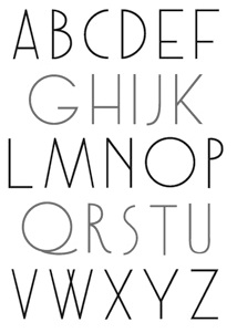 American graphic designer from Baltimore, MD, who studied in SVA;'s Masters program in Rome in 2012. Roman signage inspired her in the creation of four alphabets in 2012:
  Christopher Eric Simpkins (1974-2025), of Hanover, NH, grew up in Gainesville, Florida, and attended the University of Florida. He earned his medical degree from the Johns Hopkins University School of Medicine. Quoting from his
  During his studies at Maryland Institute College of Art in Baltimore, MD, Connor Davenport created the free monoline organic sans typeface Glas (2015), Caecus Grotesk, Hadrian (2016), a few experimental revivals, and a few custom typefaces such as Sunqueen (for Isabel Gladd, 2017). For his thesis work, mainly in 2017, he designed the extensive typeface family Garnett that comprises Antique, Modern, Typewriter, Slab, Grotesk and Ornamented sub-styles. Garnet became a
  Painter turned type designer in Baltimore, d. 2021. Creator of
 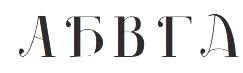 As a student at Maryland Institute College of Art, Baltimore, MD-based Erin Meekhof designed the didone Cyrillic typeface Shamshyna (2016).
  GalloFonts is part of Graphics by Gallo, founded in 1974 by
  Engraving department head at Baltimore Type, who designed Athena and Trylon Shaded.
  [
[ Maryland-based graphic and type design company. Their typeface catalog in 2021 showed these fonts, most of which are ornaments or initial caps: Americana Ornaments, Angulatte, Art Nouveau Flowers, Art Nouveau Ornaments, Art Nouveau Ornaments, Birds Flying, Blooming Ornaments, Blue On Blue, Brashee, Bullish, Carefreed, Carved Initials, Charisma, Chiseled Initials, Cleancut, Cross Ornaments, Cross Stitch Basic, Cross Stitch Brazen, Cross Stitch Carefree, Cross Stitch Classic, Cross Stitch Coarse, Cross Stitch Cursive, Cross Stitch Delicate, Cross Stitch Diamond Monogram, Cross Stitch Discreet, Cross Stitch Display, Cross Stitch Elaborate, Cross Stitch Formal, Cross Stitch Gothic, Cross Stitch Graceful, Cross Stitch Majestic, Cross Stitch Medieval, Cross Stitch Monogram, Cross Stitch Noble, Cross Stitch Ornaments, Cross Stitch Regal, Cross Stitch Simple, Cross Stitch Solid, Cross Stitch Splendid, Dexterous, Diamond Monogram, Display Ardent, Display Art, Display Art One, Display Art Two, Display Black Serif, Display Brutal, Display Carlos, Display Chamfer, Display Crisp, Display Digits Eight, Display Digits Five, Display Digits Four, Display Digits Nine, Display Digits One, Display Digits Seven, Display Digits Six, Display Digits Ten, Display Digits Three, Display Digits Two, Display Dots & Squares, Display Dots Five, Display Dots Four Sans, Display Dots Four Serif, Display Dots One, Display Dots Seven, Display Dots Six, Display Dots Three Sans, Display Dots Three Serif, Display Dots Two Sans, Display Dots Two Serif, Display Explicit, Display Exquisite, Display, Display Gothic, Display Grungy, Display Haphazard, Display Intense, Display Plump, Display Prominent, Display Robust, Display Squares Two, Display Uncanny, Display University, Dooddle, Elegant Ornaments, Embossed Deep, Embossed Medium, Embossed Shallow, Fancy Flowers, Fast Hand, Fish Fresh, Flair Hand, Fleuron Ornaments, Floral Ornaments, Foliage Ornaments, Folk Art Flowers, GG Casual, GG Serif, Glorita, Gnarlee, Gothic Initials Eight, Gothic Initials Five, Gothic Initials, Gothic Initials Four, Gothic Initials Nine, Gothic Initials One, Gothic Initials Seven, Gothic Initials Six, Gothic Initials Three, Gothic Initials Two, Green On Green, Hand Lettered, HappyFont Hasty Hand, Heavy Duty, Heraldic Creatures, Holy Ornaments, Impossible Ornaments, Interlaced Ornaments, Isometric Initial Caps Bird's Eye, Isometric Initial Caps Worm's Eye, Isometric Ornaments, Just Bugs, Kruede, Leaf Assortment, Logotype, Magnificent Ornaments, Make Tracks, Mighty Oaks, Modest Ornaments, Neat Hand, Numbers Style One, Numbers Style Three, Numbers Style Two, Orange On Orange, Oriental Ornaments, Ornate Initials, Plant Assortment, Pleasant Hand, Precision, Printers Plant Ornaments, Pristine Light, Quilt Patterns Four, Quilt Patterns One, Quilt Patterns Three, Quilt Patterns Two, Rectilinear Ornaments, Rolling Ball Cursive, Rosette Ornaments, Serene, Shield Ornaments, Simple Serif, Slender, Smiling Faces, Snowflake Assortment, Spiral Ornaments, Sport Numbers, Star Assortment, Stature, Sweet Hand, Swiss Folk Ornaments Critters, Swiss Folk Ornaments Floral, Swiss Folk Ornaments -Geometric, Tight Hand, Time Clocks, Tree Assortment, Ultimate Ornaments, Veggie Fruit, Victorian Leaf Ornaments, Victorian Ornaments, Vigorous, White On White, Woozee. [
 Born in 1988 in Gaithersburg, MD, Greg Gazdowicz studied at the Maryland Institute College of Art. He completed the Type@Cooper Extended program in 2014. After graduation, he joined Commercial Type.
  Olney, MD-based designer of the experimental typeface Titanium (2014). [
 Graduate of York College in York, PA, who lives in Cockeysville, MD. Creator of
  Mad Irishman has original fonts by
 [
[ [
[ Baltimore, MD-based designer of Munshi Devanagari (2014), which was conceived during his diploma project at Indian Type Foundry a typeface for immersive reading. In 2016, Ninad was pursuing an MFA at the Maryland Institute College of Art (MICA). In that same year, he designed the high-contrast Koyla Devanagari typeface, and the Devanagari-inspired Latin typeface Chaplin. [
 Original designs, and a great general site on typography. Sells over 65,000 fonts from over 55 foundries. Font families (typically 4 typefaces) in the 100USD to 300USD range. Makes custom fonts as well. Run by Ralph Smith.
  Reserves (and, since 2012,
  Born in Moscow in 1963. A graduate of Moscow Institute of Physics and Technology in 1985, he became a TeX specialist. Since 2003, he creates his own typefaces. Gaithersburg, MD-based designer of a
  Graphic designer from Chennai, who created the octagonal typeface
 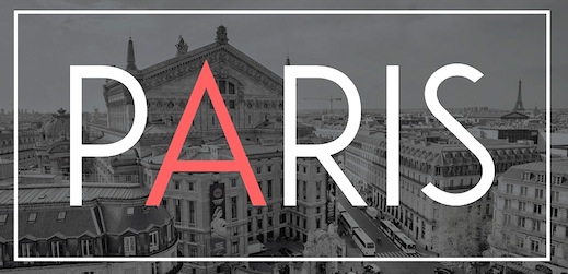 New York City (and before that, Mumbai, India)-based designer of the
  [
[ [
[ Laura Condouris is a calligrapher, illustrator, and occasional comedienne from Baltimore, Maryland. She offers commercial fonts via Trial By Cupcakes. The first font is the calligraphic
  Tal Leming is a graphic designer, type designer and letterer who lived in Wilmington, DE, but moved his stakes to Baltimore, MD. He graduated from Louisiana State University in 1997. As a Python scripting guru, he worked with Letterror and House Industries on projects using FontLab and Robofab. An avid RoboFog scripter, he joined Erik van Blokland and Just van Rossum to initiate the
  During his studies at Stevenson University in Washington, DC, Tré Seals (Baltimore, MD) created the
  Commercial typefaces at this site: 6x7OCT (I think, it's hard to read: anyway, it's a dot matrix font made in 1997), Blackgold (2000, pixel), Blessed (2001, pixel), Formation (1999, octagonal font), Macil (1999, octagonal), Pakt (1999), Reversion (1999, pixel), Trisect (1998, tri-line font), Ultramagnetic2 (1996), Unfinished (2001, pixel), Unisect (1998). One of the subdivisions is YouWorkForThem. Offices in Baltimore, MD, and Minneapolis, MN. The fonts are all (I think) by Mike Cina. [
 Michael Cina (Minneapolis) is the cofounder of WeWorkForThem and
  Kid's writing fonts designed by Edward Leach from Greensboro, MD. These include
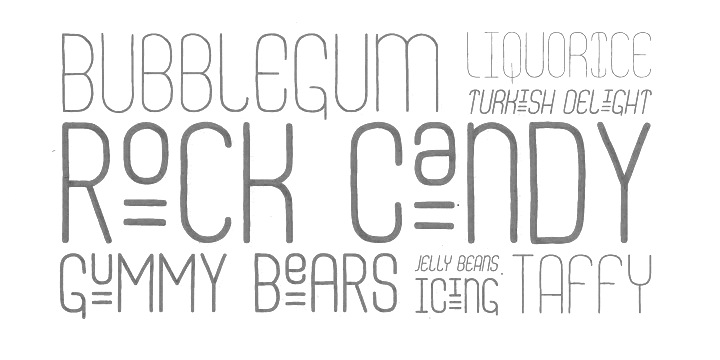
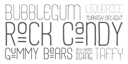
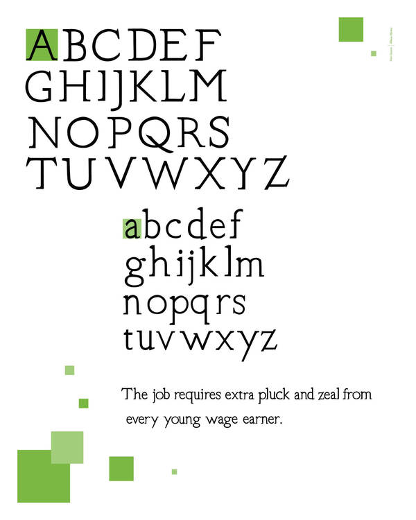
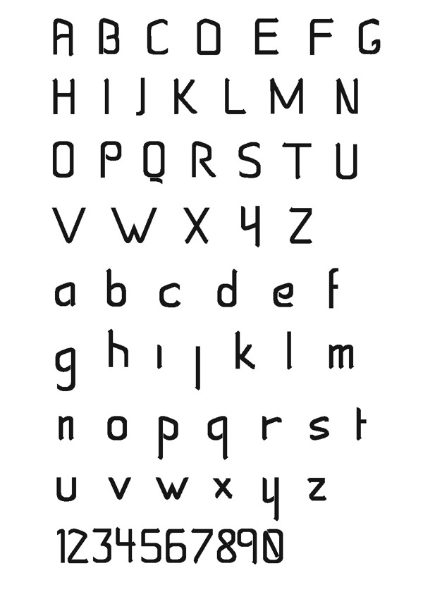
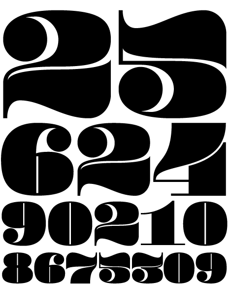
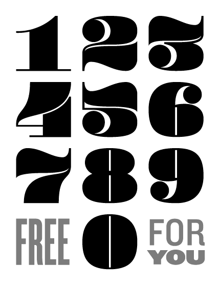
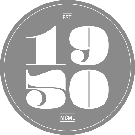
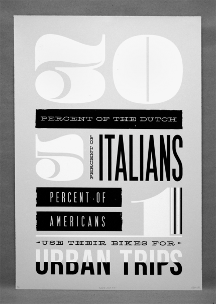
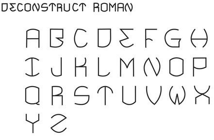
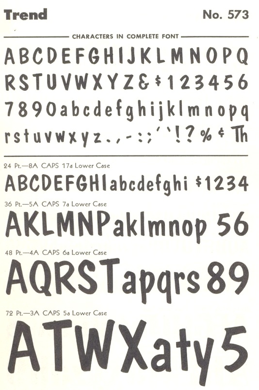
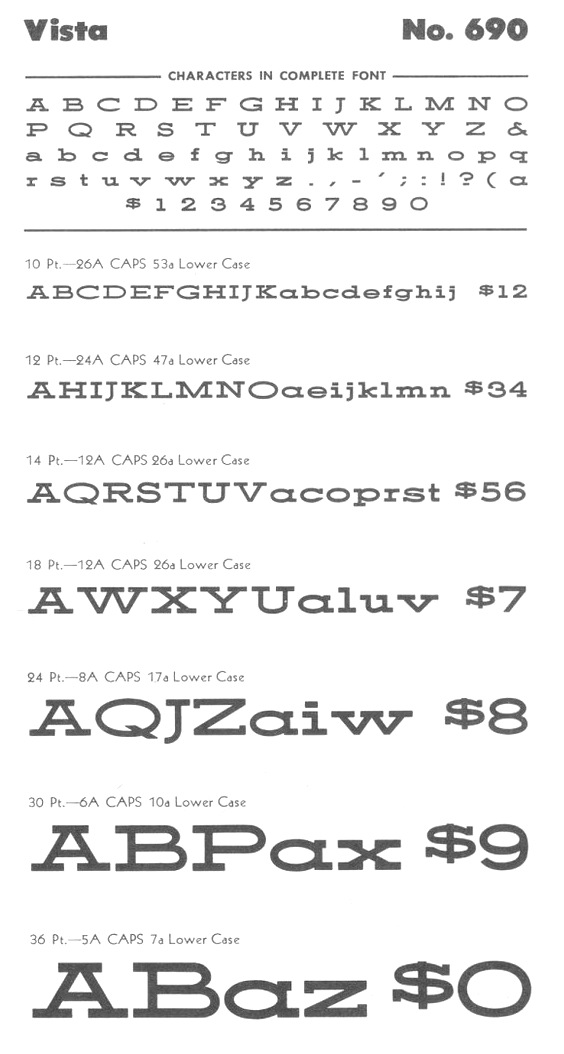
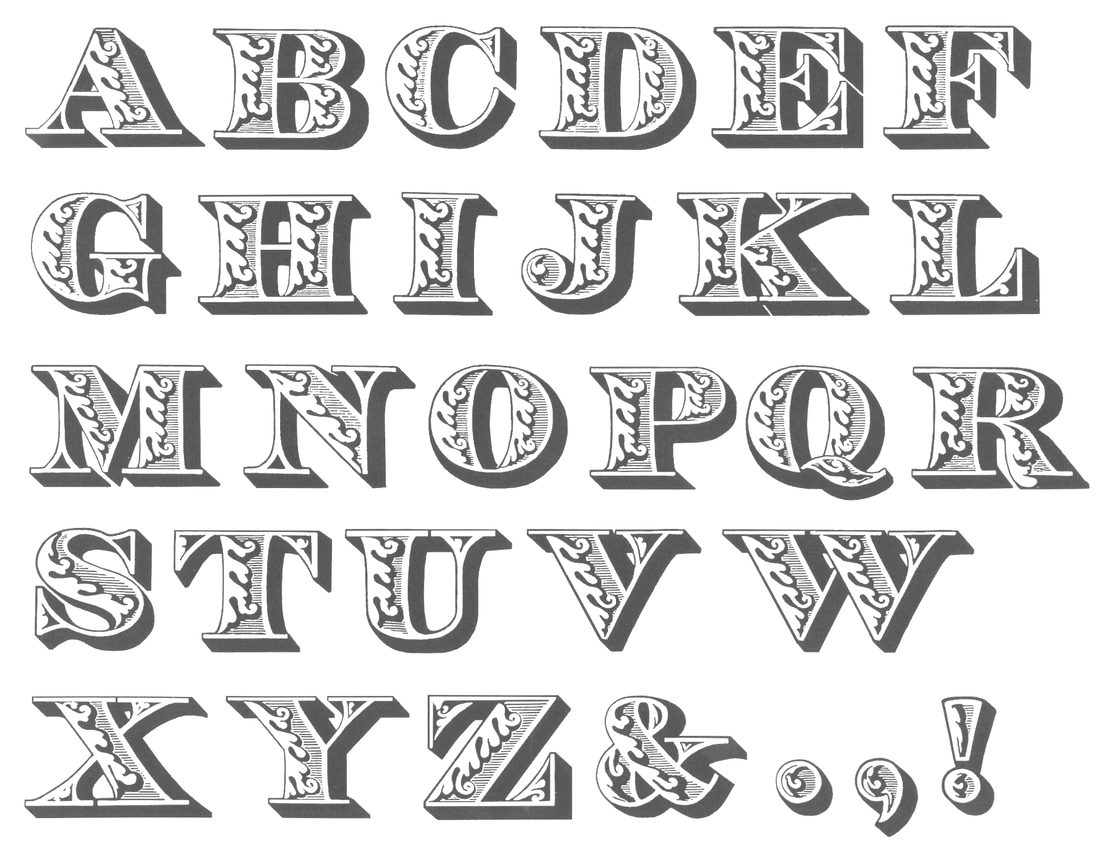
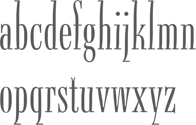
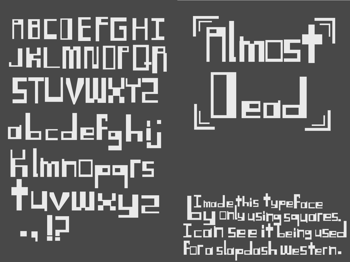
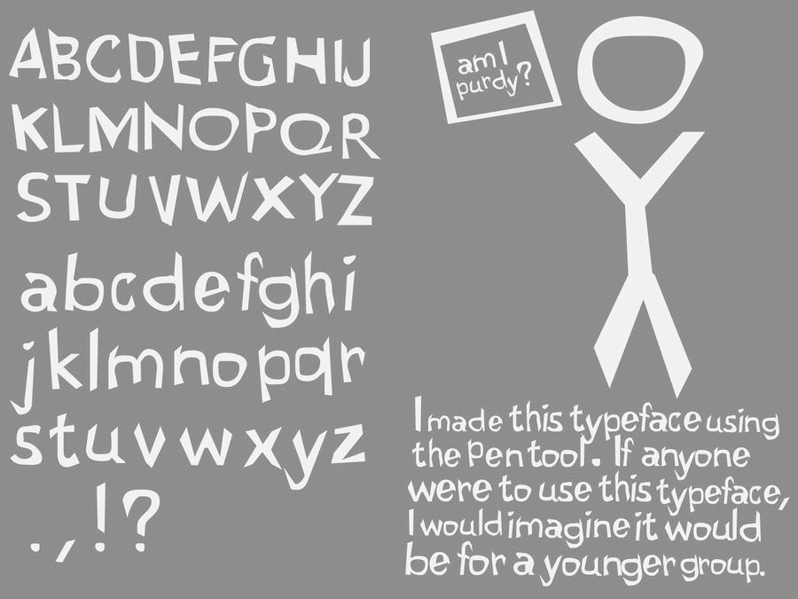
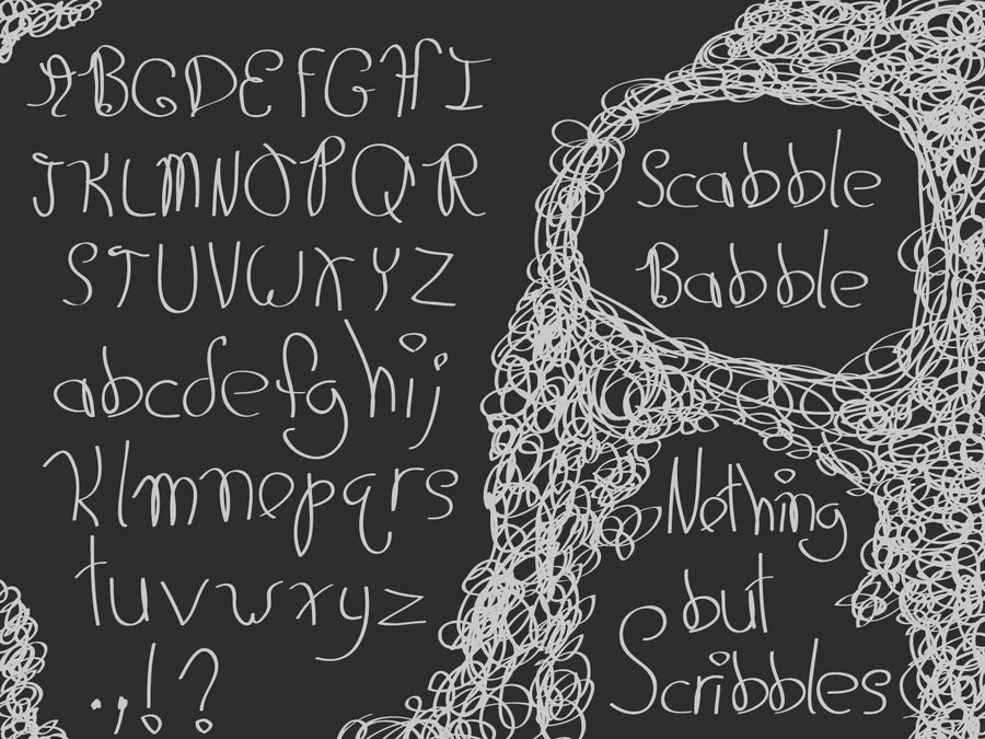
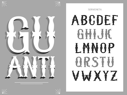
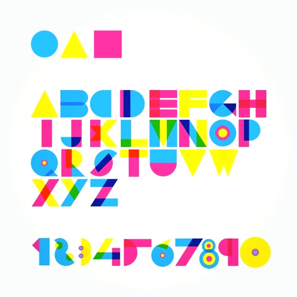
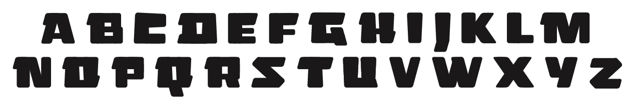
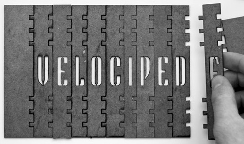
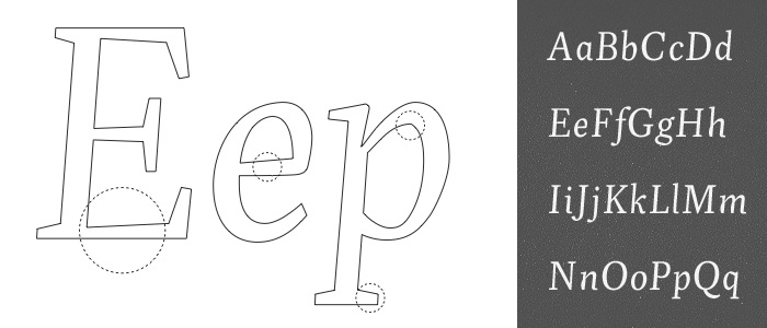
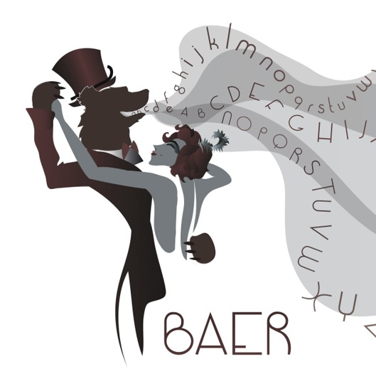
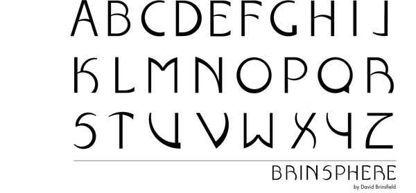
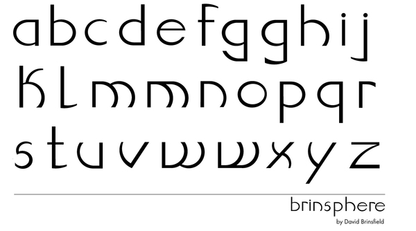
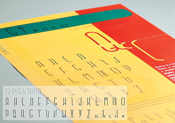
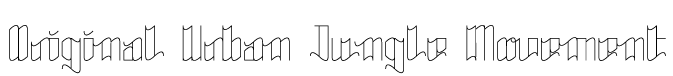
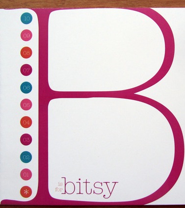
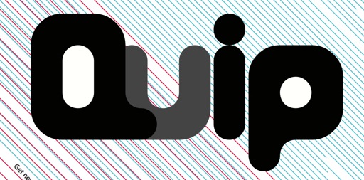
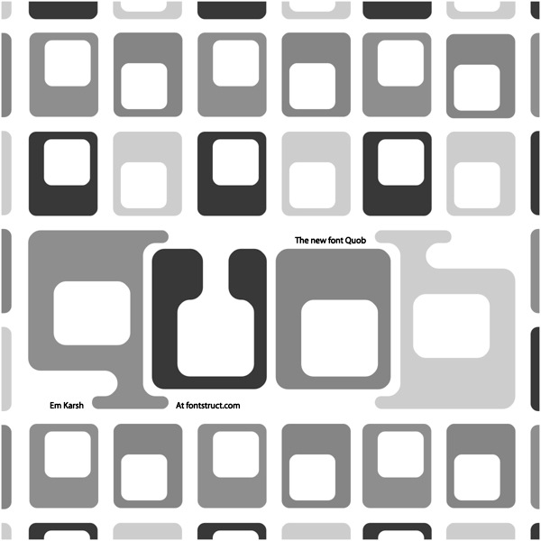
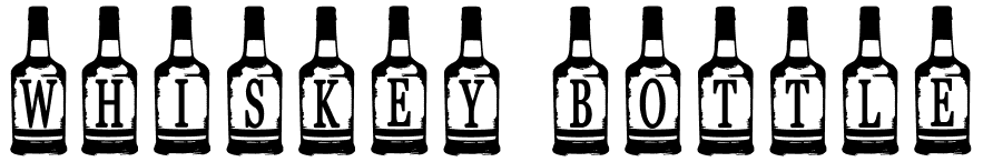
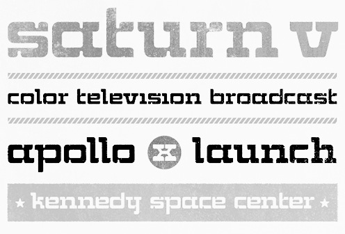
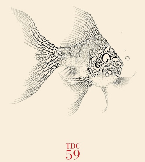
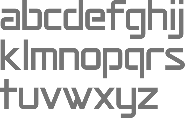
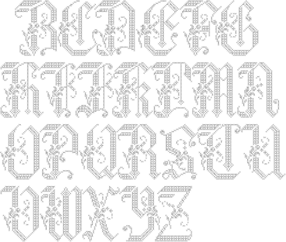
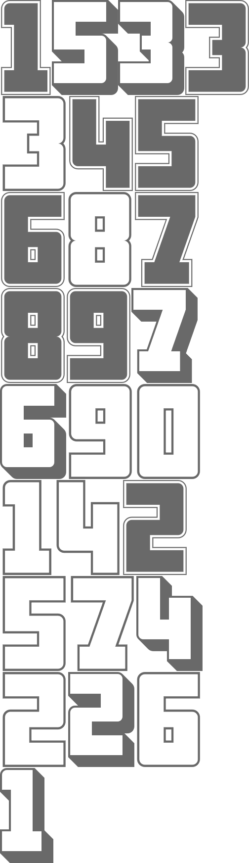
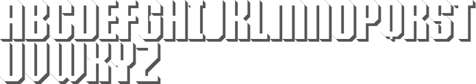
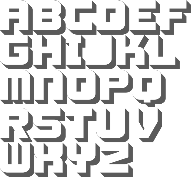
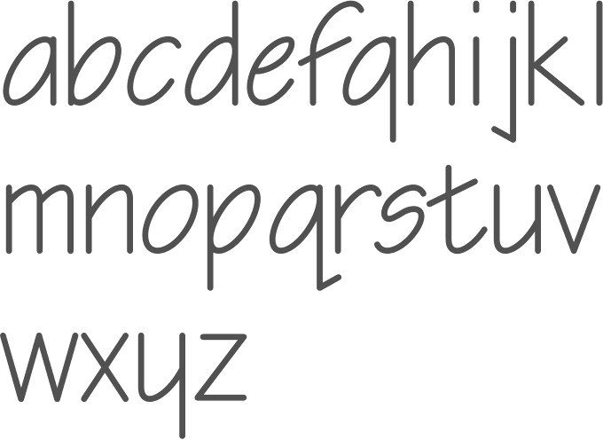
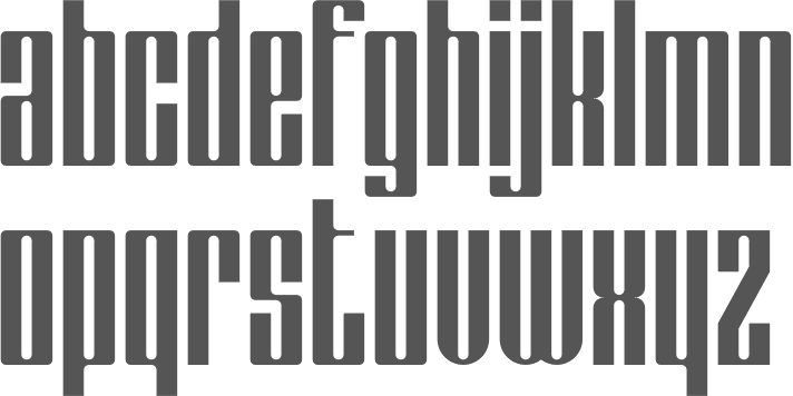
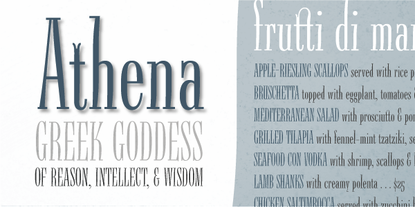
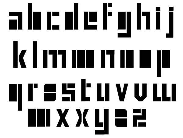
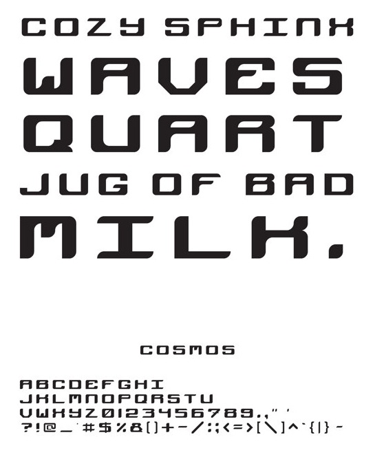
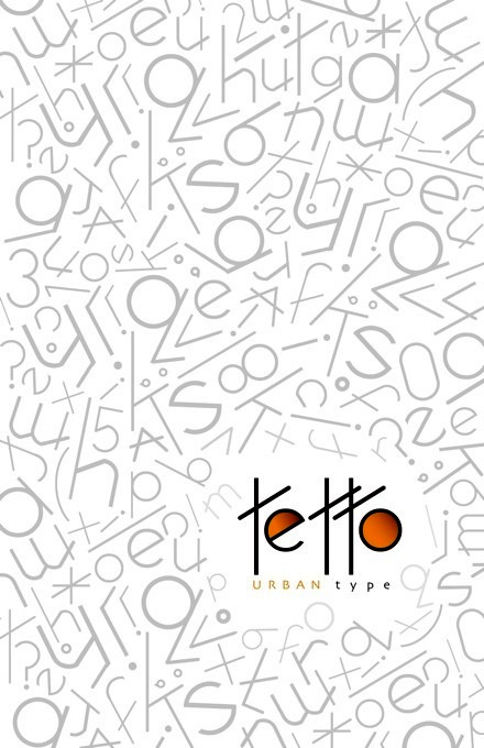
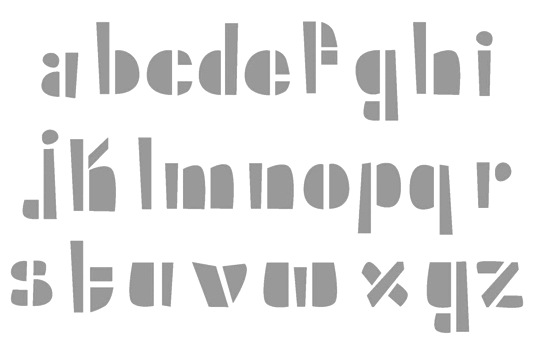
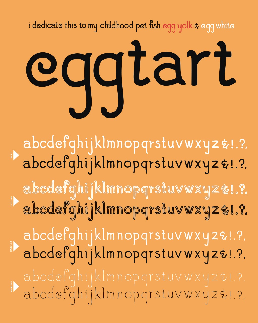
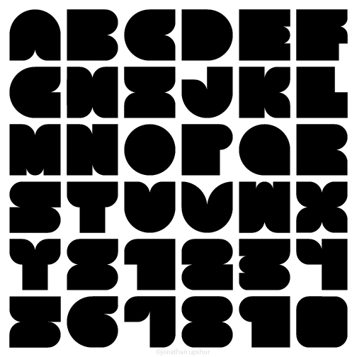
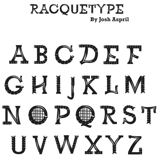
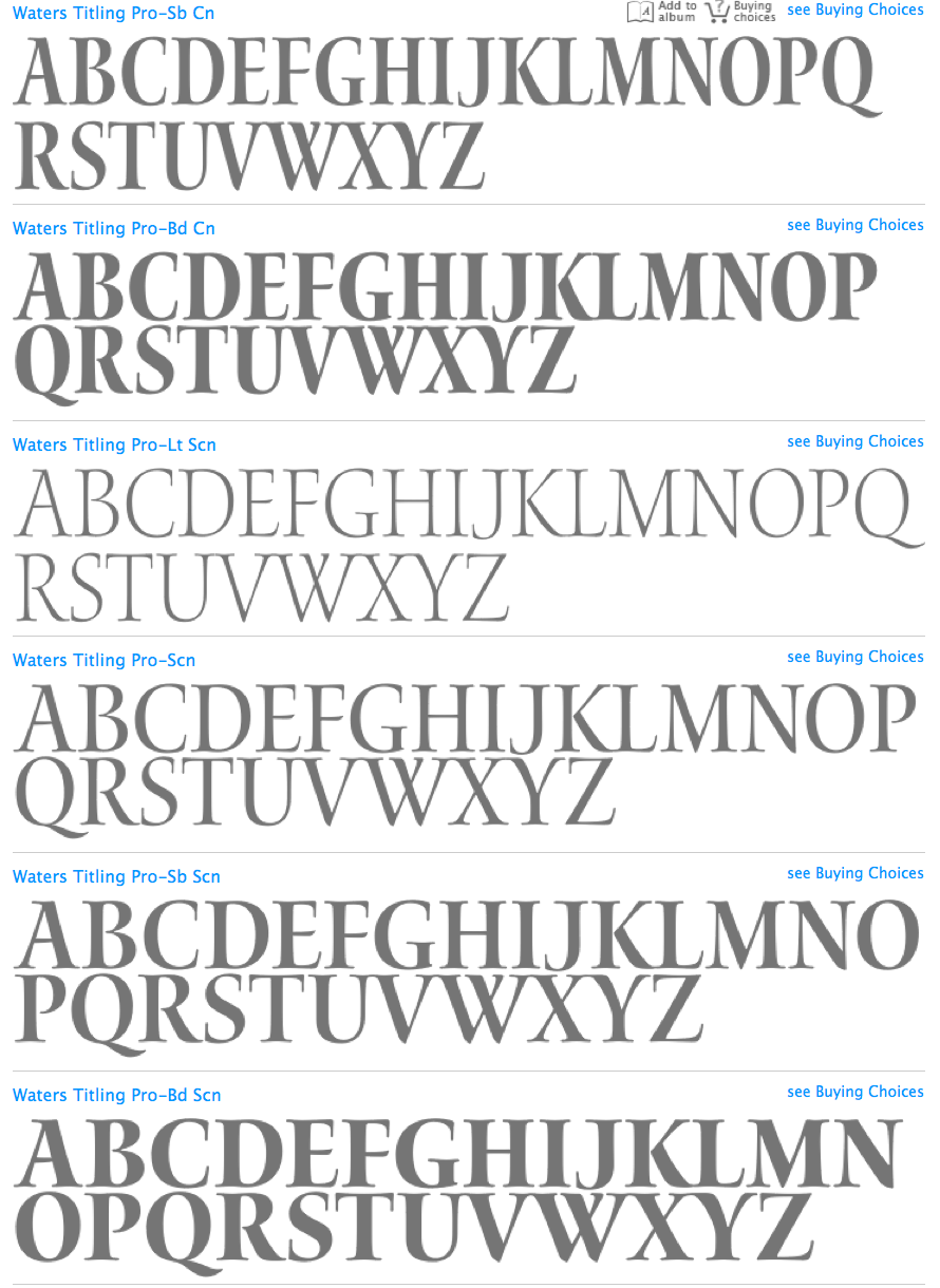
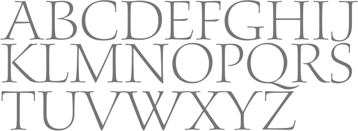
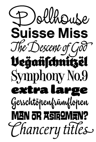
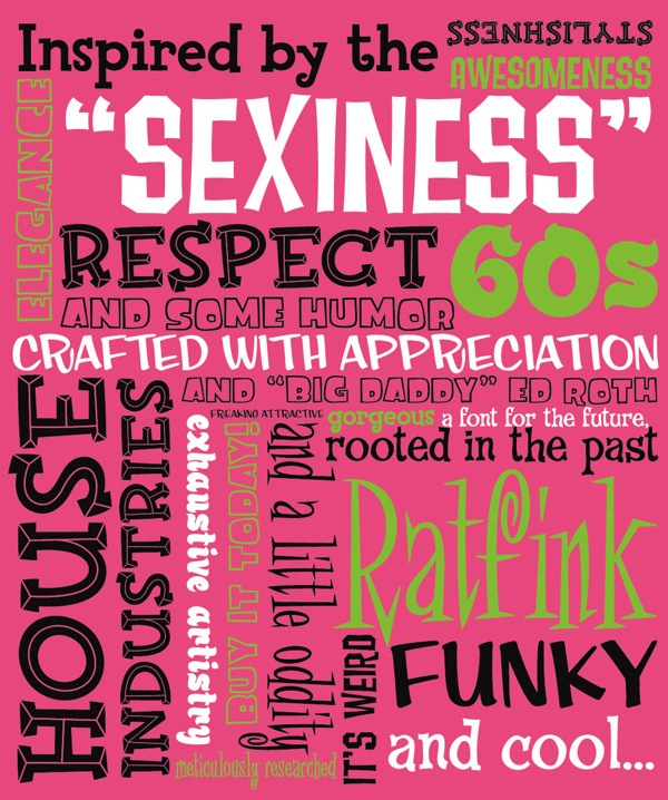
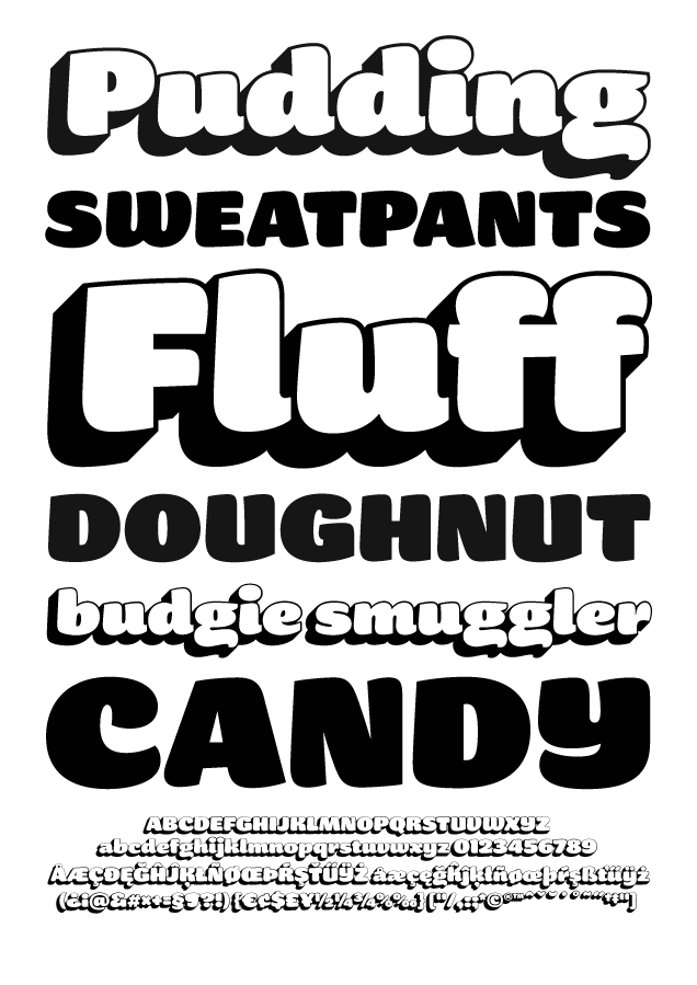
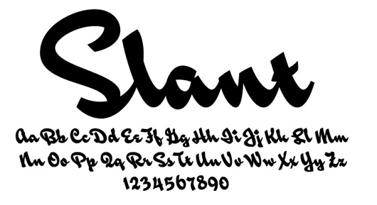
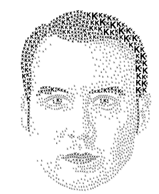
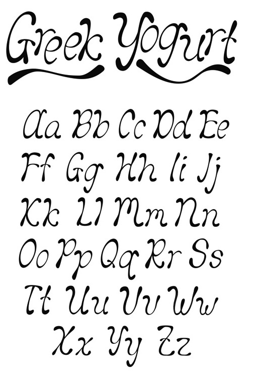
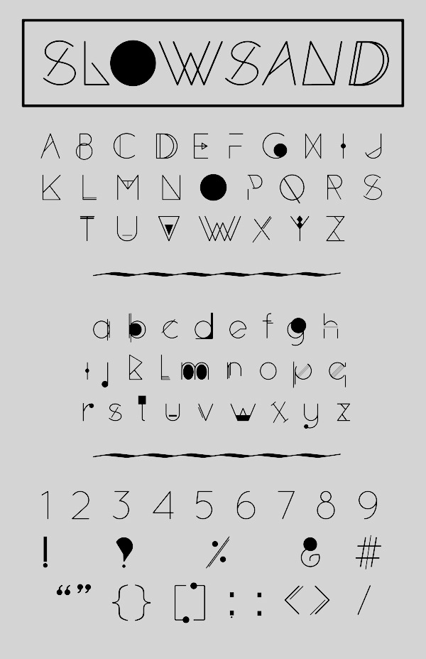
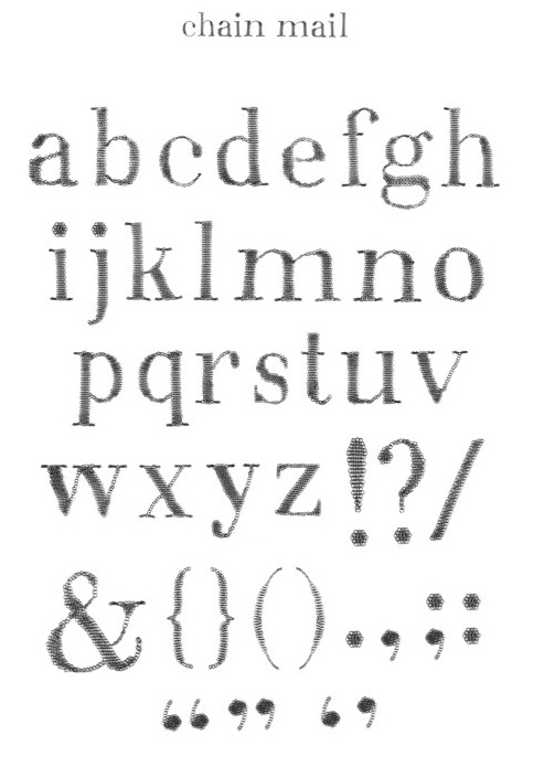
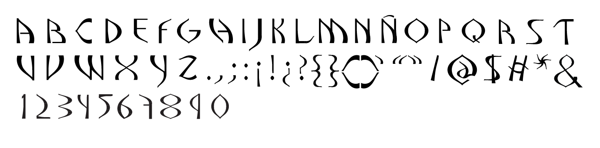
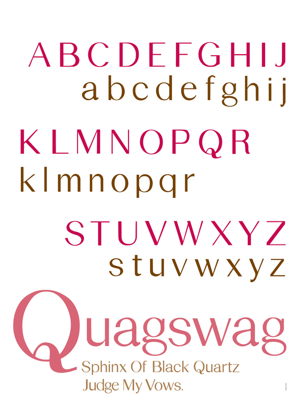
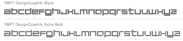
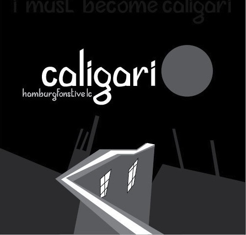
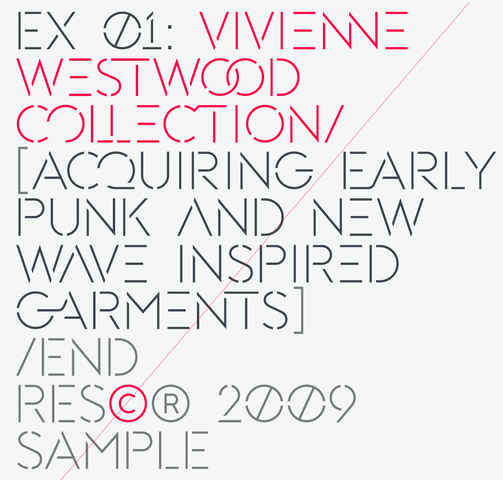
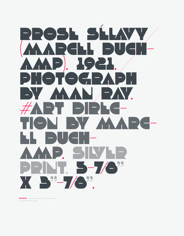
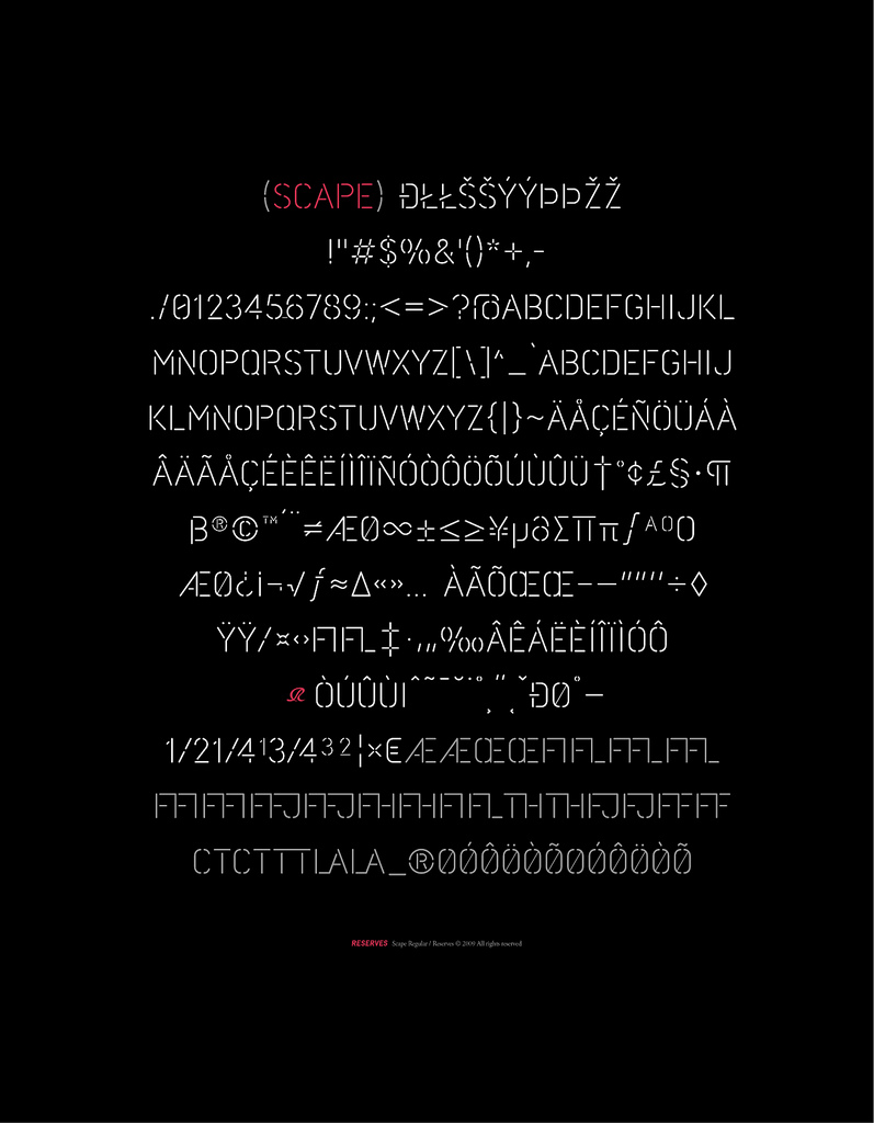
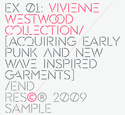
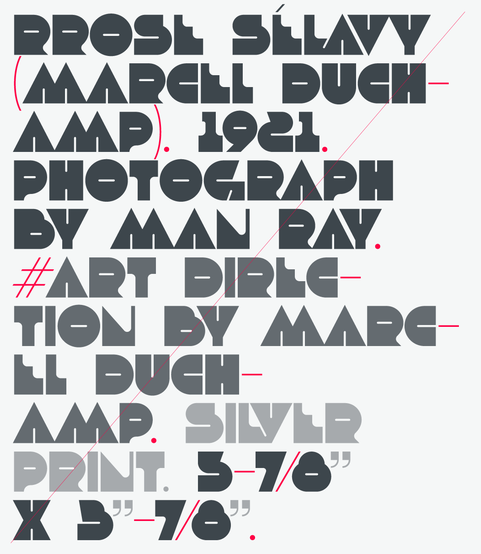
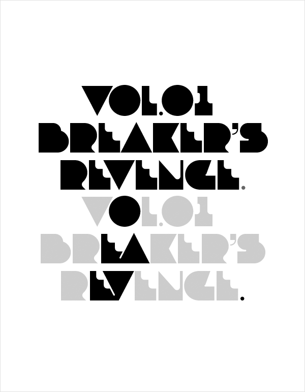
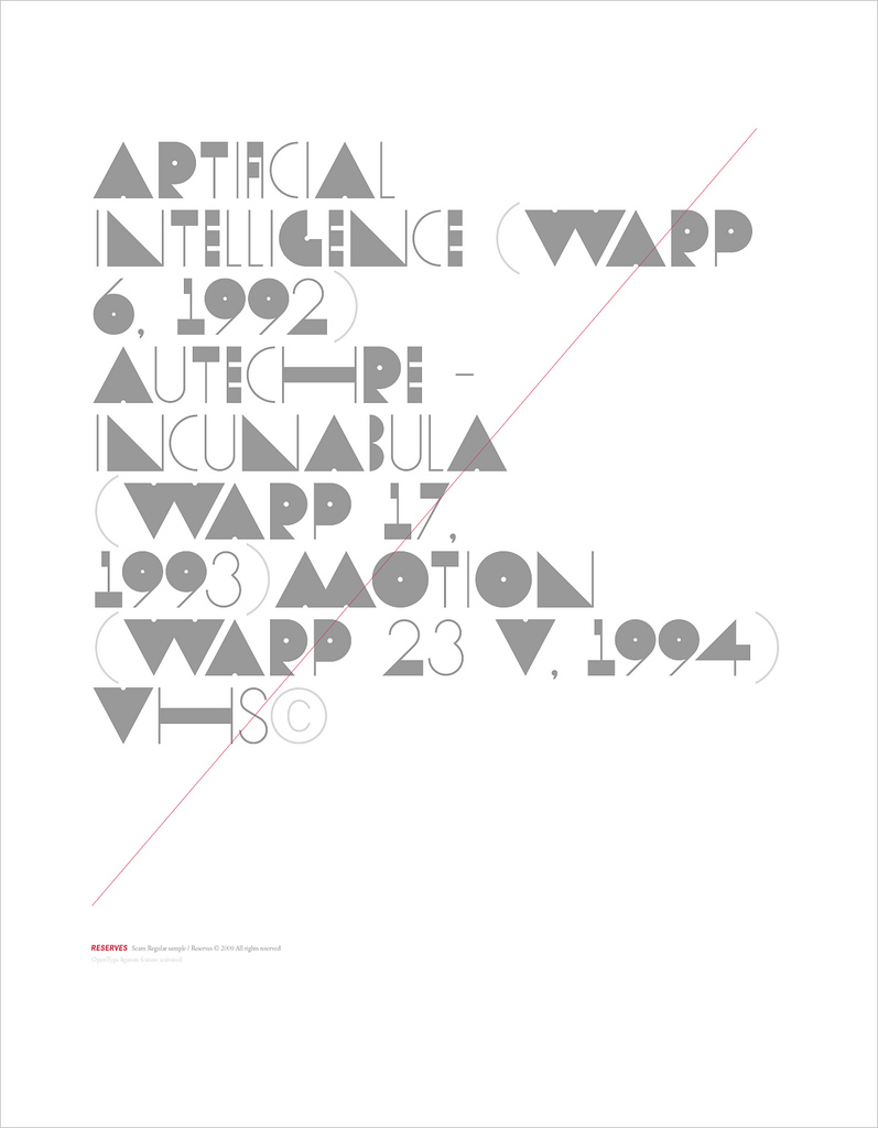
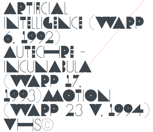
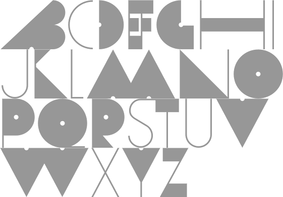
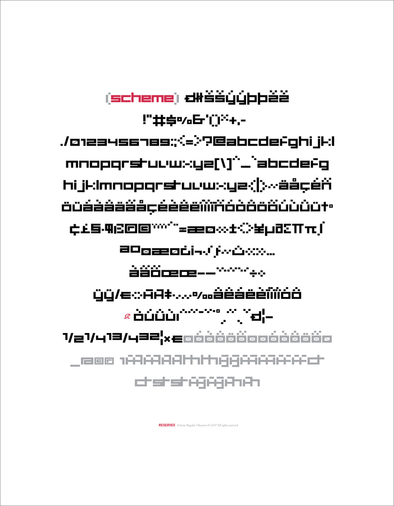
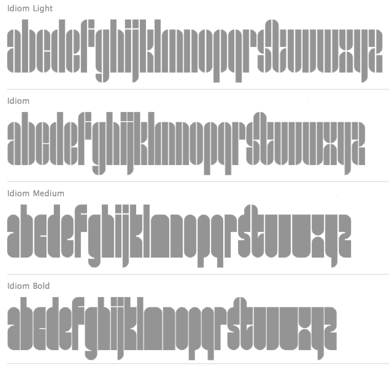
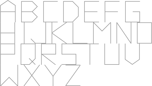
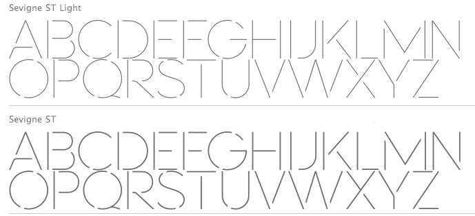
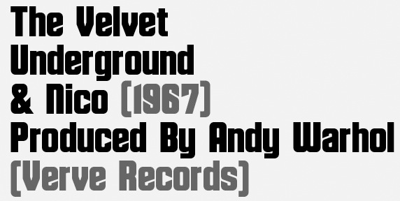
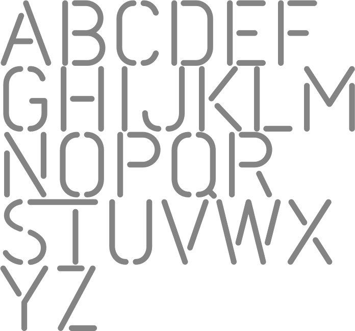
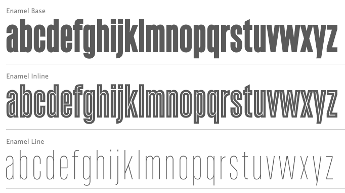
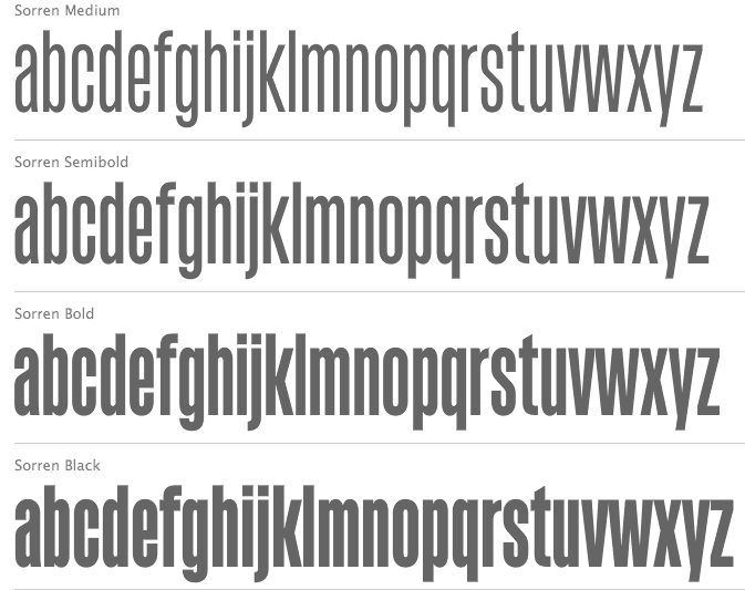
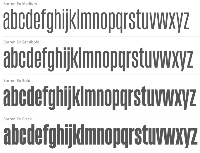
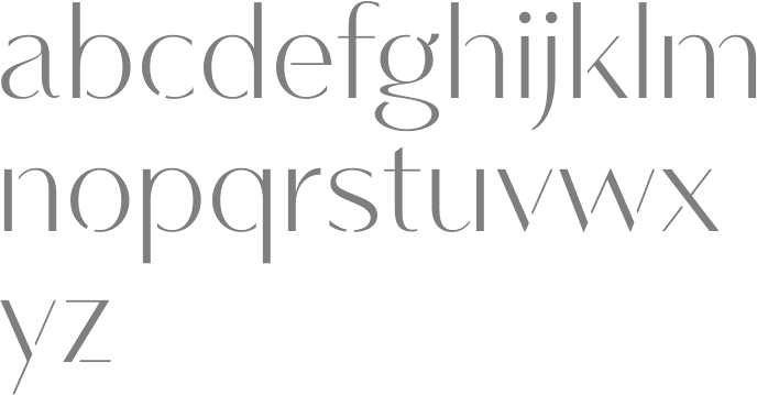
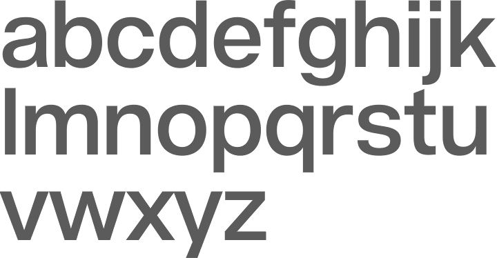
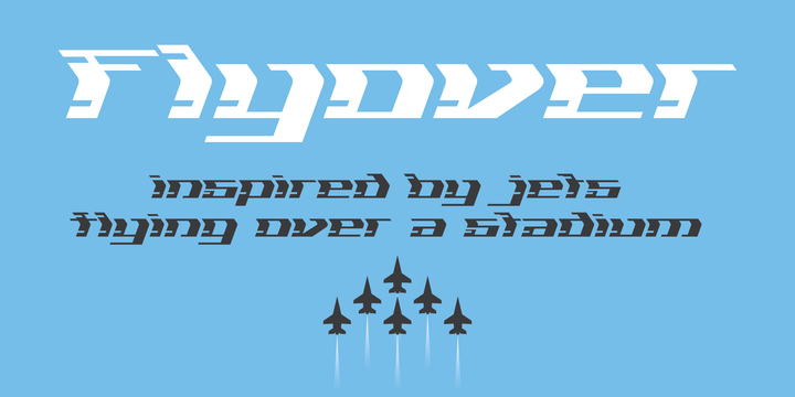
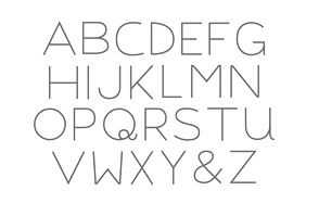
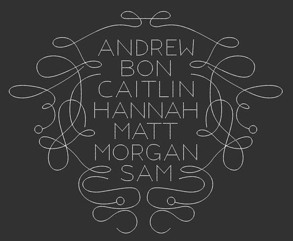
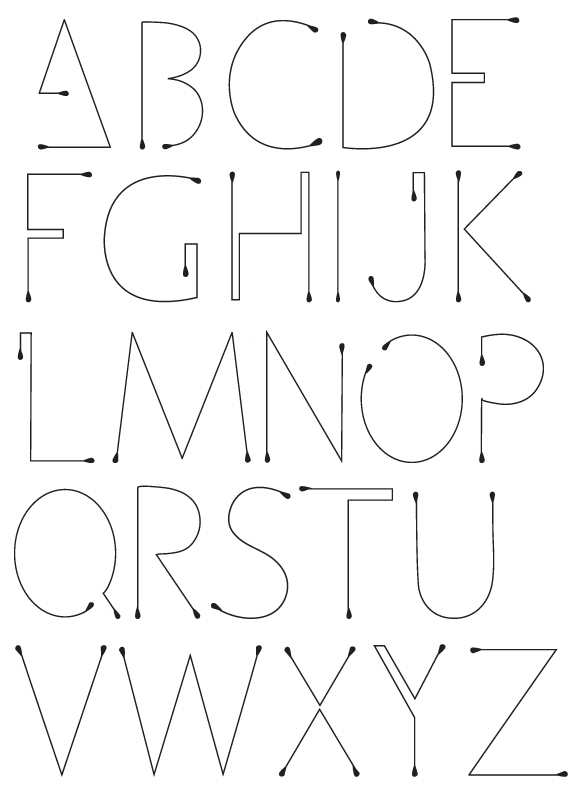
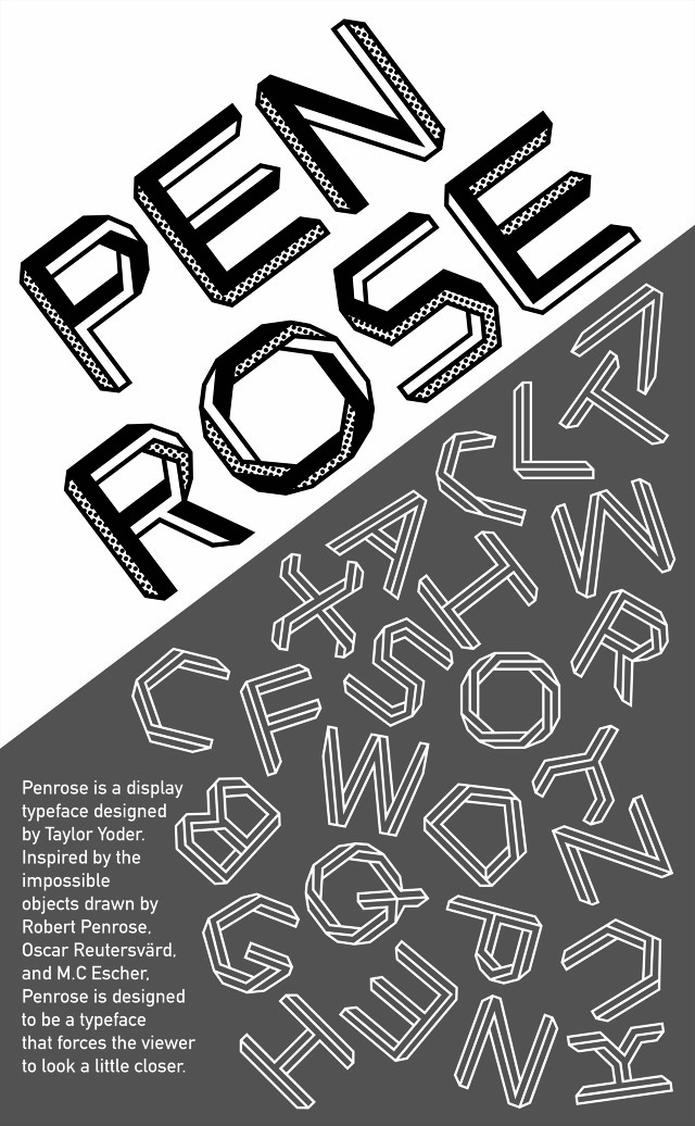
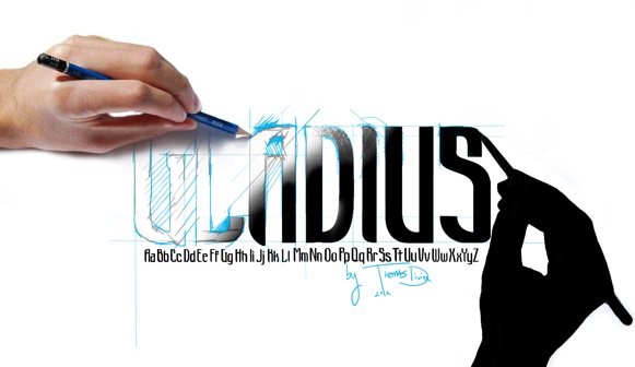
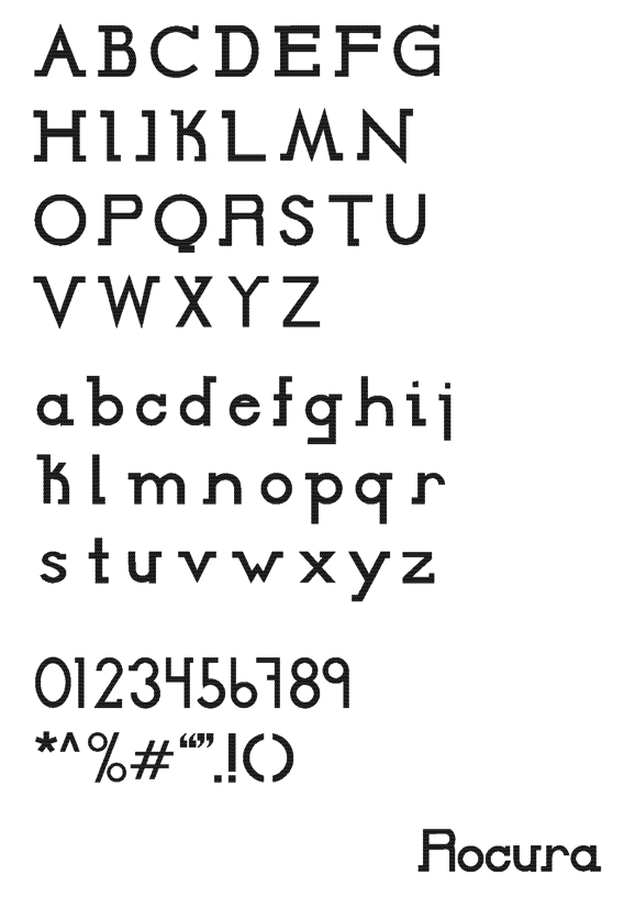
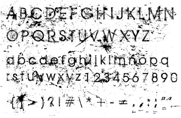
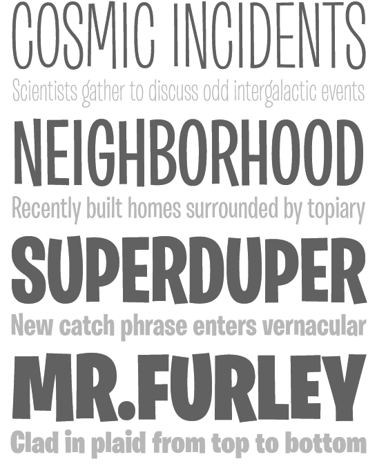
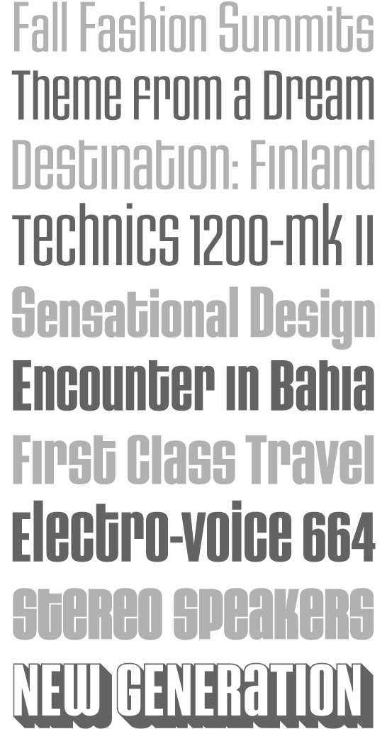
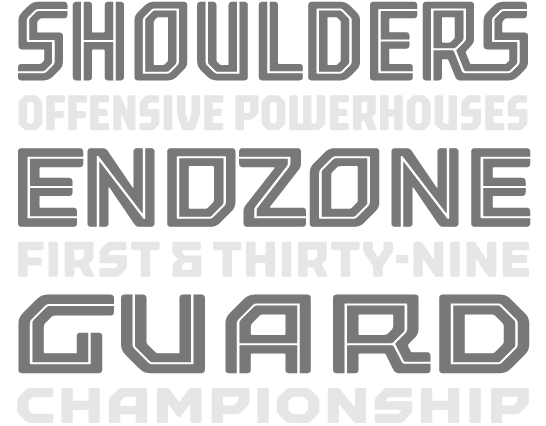
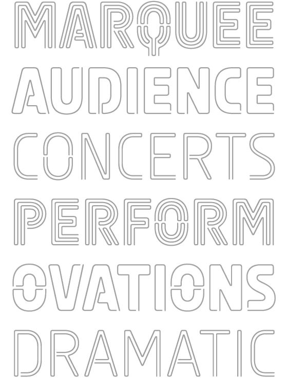
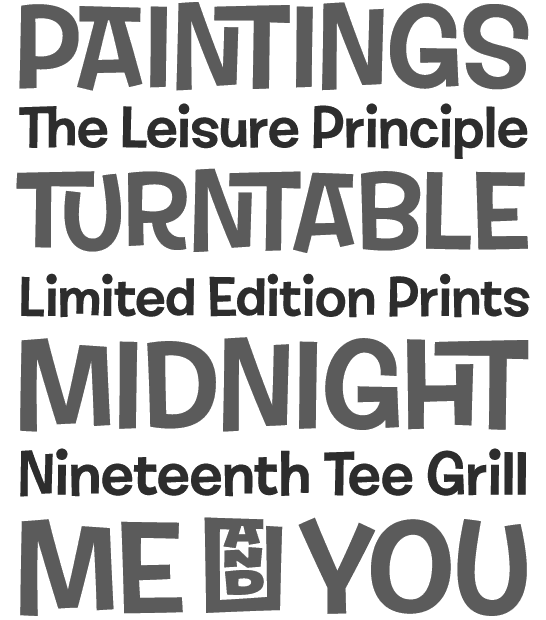
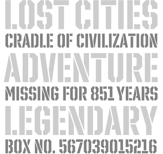
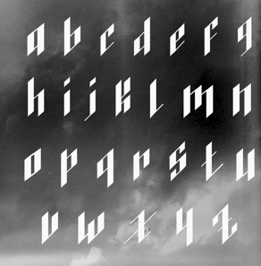
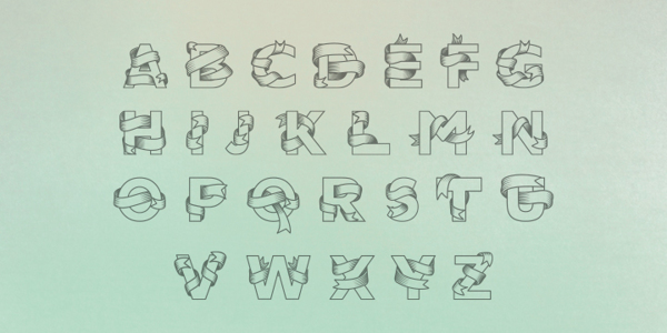
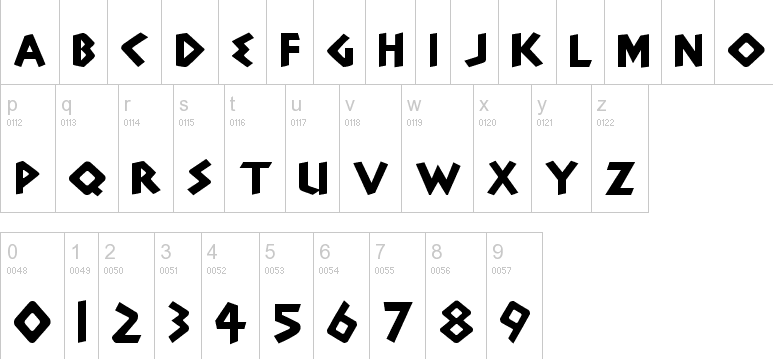
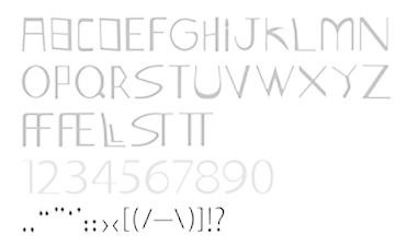
|
|
|
|