TYPE DESIGN INFORMATION PAGE last updated on Fri Feb 27 17:50:02 EST 2026
FONT RECOGNITION VIA FONT MOOSE

|
|
|
|
|
Type scene in Virginia | ||
|
|
|
|
SWITCH TO INDEX FILE
Student in Alexandria, VA, who designed the experimental handwriting typeface Natures in 2016. [Google] [More] ⦿ | |
Originally from the DC / Maryland / Virginia area, Akwele Vassall designed the squarish Western typeface Blackwood in 2016 during his studies at the School of Visual Arts in New York. [Google] [More] ⦿ | |
Alex Cottles
| |
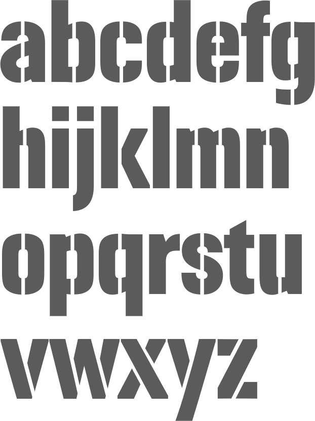
Creator of Coop Blackletter (2016, a soft blackletter version of Cooper Black), Dequindre (2015, based on the capitals of Fette Buhe Fraktur by Walter Buhe, 1914-1915), Teip (2014, a multiline layerable all caps typeface), Pila (2014, techno stencil), Handu (2012, hand-drawn sans-serif inspired by the hand-painted type and signage on the streets of Kolkata, India), Atrium (2012, a squarish sans family based on the pen art of W.E. Dennis), Saugatuck (2011, grunge) and Sello (2011, a unicase hand-drawn, geometric sans-serif with a touch of retro). Behance link. Klingspor link. MyFonts foundry link. Home page. [Google] [MyFonts] [More] ⦿ | |
Leesburg, VA-based designer of the colorful stencil typeface Cut Font (2017). [Google] [More] ⦿ | |
Blacksburg, VA-based designer of the experimental geometric font Make Art Not War (2015). Behance link. [Google] [More] ⦿ | |
Alice Pettey
| |
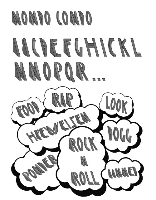
Alexandria, VA-based creator of the 3d typeface Mondo Condo (2010). [Google] [More] ⦿ | |
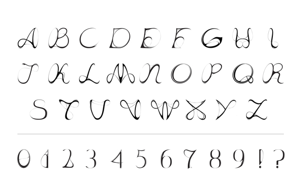
Alua designed the curly typeface Verdure (2013) while studying in Fairfax, VA. [Google] [More] ⦿ | |
Freelance designer in Lexington, VA, who created a display typeface in 2017. [Google] [More] ⦿ | |
Lynchburg, VA-based designer of the handcrafted typeface Ambersans (2016). This typeface was made during her studies at Liberty University. [Google] [More] ⦿ | |
Ana Rodriguez (Woodbridge, VA) designed the typeface Celia (2016) during her studies. Celia is inspired by Celia Cruz's attitude and wardrobe. Behance link. [Google] [More] ⦿ | |
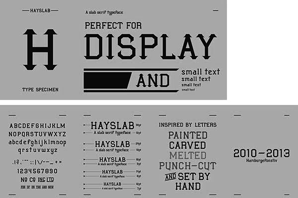
During his studies in Leesburg, VA, Andrew Haynes designed a typeface called Hayslab No. 97S (2013). Behance link. [Google] [More] ⦿ | |
Another Limited Rebellion
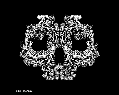
| Richmond, VA-based graphic design studio, founded by Noah Scalin, a graduate of the NYU Tisch School of The Arts and a lifelong activist. One of its designer is Kristin Murray. Blog. Free fonts based on skulls: Skullphabet1 (2007), Skullphabet2 (2008). Dafont link. Home page. Fontspace link. [Google] [More] ⦿ |
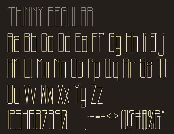
Lynchburg, VA-based designer of Thinny (2012). [Google] [More] ⦿ | |
Armageddon
| Michael Jones (aka Armageddon) is an American designer (b. 1971) who lives in Alexandria, VA. Home page. Creator of the free fonts AD Blackmini 10 (2005) and AD Emjay Lowercase (SanSerif 10, Serif 10 and Black 10) (2005), four pixel fonts all made with Bitfontmaker. [Google] [More] ⦿ |
Letterer and Intertype director of typography from Richmond, VA. Credited with the typeface Dietz Text, which is also attributed in places to Oswald Cooper. August Dietz patented a blackletter with two incised white lines for Barnhart Brothers&Spindler as Design 79792 on November 5, 1929. [Google] [More] ⦿ | |
Lynchburg, VA-based designer of the handcrafted Axunivers (2018). [Google] [More] ⦿ | |
Beta Field
|
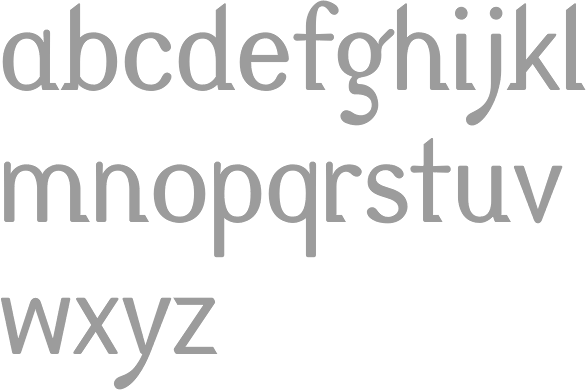
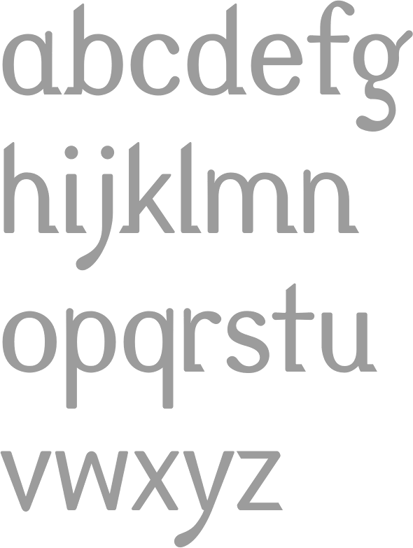
The principals are Michael Leighton Beaman and Zaneta Hong. Michael holds a Bachelor's degree in Architecture from North Carolina State University and a Master's degree in Architecture from the Harvard University. He teaches at the University of Virginia and is associated with the Rhode Island School of Design. His research covers speculative future of technology in architecture. Zaneta is a professor in landscape archirecture at the University of Virginia, where she teaches courses in information-based digital practices and materials systems and technology. One of Beta Field's projects is the decorative didone typeface Pistilli Mutatio (2017). It is a parametric digitization of John Pistilli's 1964 phototype typeface Pistilli Roman. [Google] [More] ⦿ |
Print and web designer in Lynchburg, VA (b. 1986) of Obelisque (2009, handwriting font). Dafont link. [Google] [More] ⦿ | |
| |
Breauhare Fonts
|
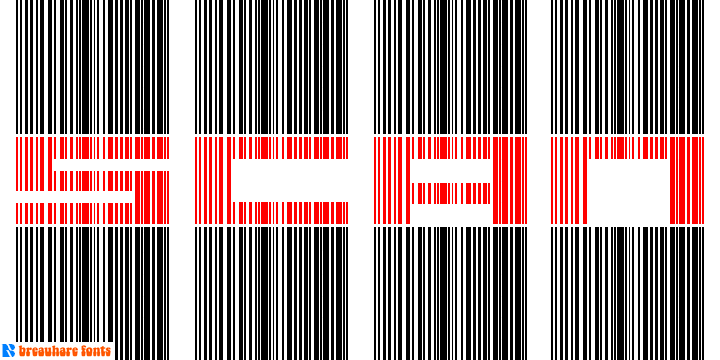
MyFonts sells Cooper Goodtime (2007, inspired by the lettering used on the CBS-TV variety series The Glen Campbell Goodtime Hour (1969-1972)), Happy Trails (2007, based on the lettering (all upper case) that was used on most Trailways buses from 1936 through the very early 1960s), Jesus Saves (2008), Jesus Heals (2010), Neon Bugler (2008, a neon-light or paperclip font; digital help by John Bomparte; +Neon Bugler Squared), Future Bugler (2008), Future Bugler Upright (2010), Future Bugler Soft (2015, digitized by John Bomparte), Handmade Bugler (2009, digitized by John Bomparte), Southern Nights (2009, disconnected script), Scan (2010, a barcode-themed font), My Left Hand (2011), Minnesota Plaid (2011, a gaspipe family digitized by John Bomparte), Bauhaus Bugler (2013, digitized by John Bomparte: monoline Bauhaus style sans; compare with Qero Nite), Bauhaus Bugler Soft (2015), Fast Food (2014), Daddys Hand (based on Harry Warren's father's hand; digitized by John Bomparte), Chili Beans (2021: a Bauhaus-inspired wide grotesque with oval shoulders), and Dime Store (2007). Showcase of Harry Warren's typefaces at MyFonts. [Google] [MyFonts] [More] ⦿ |
Richmond, VA-based designer of Databent Type (2013), an experimental set of typefaces that makes your eyes hurt. [Google] [More] ⦿ | |
Graphic designer in Arlington, VA, who has a Bachelor of Fine Arts from George Mason University. Creator of the tall school project typeface Longboard (2013). Behance link. [Google] [More] ⦿ | |
Graphic designer Brian Bjorkman (Richmond, VA) created Conectatype (2010), a connected typeface that was influenced by pixels, mazes, Islamic calligraphy and cuneiform. Behance link. [Google] [More] ⦿ | |
Brian Brubaker
| |
Graphic designer in Woodbridge, VA. Her typeface Alice (2013) is inspired by Alice in Wonderland. [Google] [More] ⦿ | |
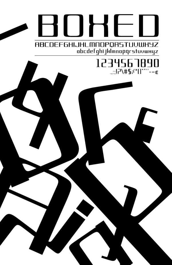
Brooke Jarman (Lynchburg, VA) created the modular typeface Boxed (2013). [Google] [More] ⦿ | |
Based in Ashburn, VA, Camille Hontiveros designed the lettering for a Moombahton Madness poster in 2013. [Google] [More] ⦿ | |
| |
| |
During her graphic design studies in Lynchburg, VA, Cassie Vitale designed Hi Rise (2013, display sans). [Google] [More] ⦿ | |
Richmond, VA-based designer of the handcrafted typefaces Rosey Posey (2017), Audacious Grace (2017), Architecture Uprising (2017) and Farmhouse Dreams (2017). Her company is called Grace Kindly. Creative Market link. [Google] [More] ⦿ | |
Senior at VCUArts working towards a B.F.A. in Graphic Design. Richmond, VA-based creator of the casual hand-printed typeface Murakami (2012). [Google] [More] ⦿ | |
Chemical symbols font for PCs by J. Eric Slone (Alexandria, VA). Freeware only from Bio-Rad/Sadtler. "Chemfont is a Windows font package that simplifies the entry of chemical equations. The font includes all upper and lower case Greek characters, superscripts, subscripts, many chemistry-specific symbols like reaction arrows; and of course, the Roman typeface for normal typing. Chemfont comes in two styles: serif, which is like Times New Roman, and sans-serif, which is like Arial." [Google] [More] ⦿ | |
Chris E. Lozos
| |
Christopher Rogers is a multidisciplinary designer in New York. After working for three years as a sign maker in Virginia, Chris moved to New York, attending SVA for Graphic Design, studying in the area of graphic identity, information design, illustration, packaging, and book design. Chris Rogers made the sans typeface Indicator in 2010 for Best Made. [Google] [More] ⦿ | |
Christian Max Hancock
| |
| |
Graphic designer in McLean, VA. Creator of Blade (2013), a proprietary hexagonal typeface designed for AFTA shaving products. [Google] [More] ⦿ | |
Chuck Green
| |
Chuck Green
| |
Cindy Thomason
| |
Cottage Graphics
| David Rood is the Harrisonburg, VA-based designer of BluePrint in 1992, a Tekton lookalike, and Rood Caps. Alternate URL. [Google] [More] ⦿ |
Norfolk, VA-based designer of New Curls (2016), a typeface inspired by Steve Matteson's MT Curlz (1995). Behance link. [Google] [More] ⦿ | |
| |
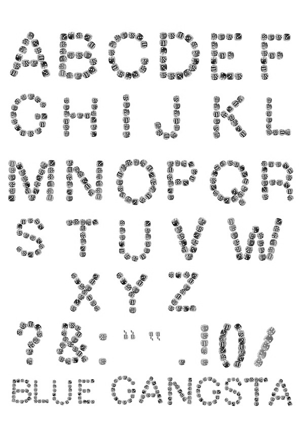
Blue G or Blue Gangsta is an all-caps typeface created by Daniel Redfern (Virginia) in 2012. It consists of dice assembled in the shape of letters. Behance link. [Google] [More] ⦿ | |
During her studies at George Mason University in Fairfax, VA, Danielle Coates designed Modular (2017). [Google] [More] ⦿ | |
David Rood
| |
During her studies at Lynchburg University, Deana Hodge created a grungy caps typeface called Salvage (2013), which was based on an exhibition in Copenhagen called Skrald (Trash). [Google] [More] ⦿ | |
During his studies, Denzel Asiedu (Haymarket, VA) designed the poster typeface Samurai (2016). [Google] [More] ⦿ | |
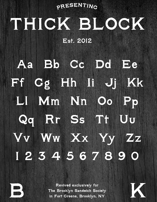
He made the copperplate-look typeface Thick Block (2012) for the upstart Brooklyn restaurant The Brooklyn Sandwich Society. Still in 2012, he combined the copperplate and Western signage styles in his Applewine typeface. In 2013, he created the Venetian typeface Stonewall Roman. He will extend this elegant and promising typeface to a full-fledged family in 2014. Ragehaus is the web presence of Derek and his wife Kim. Behance link. [Google] [More] ⦿ | |
The official publication of The Design&Publishing Center. Subscription required. Showker Graphic Arts, 15 SouthGate, Harrisonburg, VA 22801, USA. [Google] [More] ⦿ | |
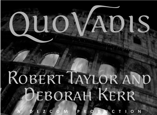
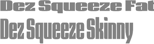
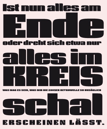
Dezcom Typefaces
|
His typefaces:
|
Born in Richmond, VA, in 1976. Cocreator of TX Signal Simplifier (2002, Typebox), a hilarious information design dingbat face. MyFonts writes: Eight designers present a set of icons that indicate the fun and fantastic world of signage. Each collaborator's solution represents a completely different interpretations on signage vernacular. The designers are Erik Adigard, Cynthia Jacquette, Akira Kobayashi, Michael Kohnke, Patricia McShane, Joachim Müller-Lancé, Jean-Benoît Lévy, Kevin Roberson, Diana Alisandra Stoen. Codesigner of H-AND-S (2006, AND) with Jean-Benoît Lévy, Sylvestre Lucia, Mike Kohnke and Joachim Müller-Lancé. [Google] [MyFonts] [More] ⦿ | |
Baha Yaaqob or Taoufiq: 7631 Leesburg Pike, Suite B, Falls Church, VA 22043-2520, USA. [Google] [More] ⦿ | |
Diphthong Type Foundry
| Max Hancock lives in the Washington D.C. area. He is the designer (b. 1972) of the lovely organic font Diphthong (2002). He worked at Diphthong in Singapore. After Diphthong was designed, he was hired to design custom, branded font designs for the companies Dome Capital and Top News. In 2011, Max founded the Diphthong Type Foundry in Fairfax Station, VA, where he currently works on a variety of type projects. Klingspor link. [Google] [MyFonts] [More] ⦿ |
Donald P. Goodman III is a practicing attorney in the Commonwealth of Virginia, a graduate of the William and Mary School of Law and of Christendom College with a degree in history and a minor in classical languages. He has contributed several TeX packages for setting religious texts such as catechis (for catechisms) and liturg (for Catholic liturgical texts). In that context, he has designed the DRM font package in 2014. The DRM (Don's Revised Modern) family of fonts are in Metafont format (for use with TeX). It has many optical sizes and comes in roman, italic and small caps styles. In addition, it has many ornaments, and symbols. Although written in Metafont, the author also provides a set of 103 (!!!) Opentype fonts. The opticals include 5pt (pearl), 7pt (minion), 8pt (brevier), 9pt (bourgeois), 10pt (long primer), 12pt (pica), 14pt (english), 16pt (great primer), 20pt (paragon) and 24pt (double pica). The table below gives a fuller optical size naming picture and its relationship with traditional American and British ways of listing type sizes. There are also Greek fonts. At the publication date, September 2014, the author was still working on the kerning---expect an improved package soon. The DRM fonts are wedge-serifed, and incorporate an odd mix of style elements---some terminals are didone, but other elements are more transitional or Caslonesque. Free download of the 6MB package. Designer of Dozenal (2008), a metafont package for typesetting documents in base twelve. It includes a macro by David Kastrup for converting positive whole numbers to dozenal from decimal (base ten). It also includes a few other macros, redefines all the standard counters to produce dozenal output, and provides Metafont characters, in Roman, italic, slanted, and boldface versions of each, for ten and eleven (the Pitman characters preferred by the Dozenal Society of Great Britain). These characters were designed to blend well with the Computer Modern fonts. [Google] [More] ⦿ | |
Donny Truong
| |
DT&G Typography
| Type News site run by Freddy Showker. The Design&Publishing Center is owned by Showker Graphic Arts&Design, Harrisonburg, VA. [Google] [More] ⦿ |
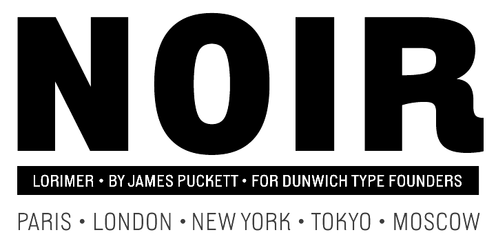
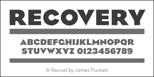
Dunwich Type Founders
|
Creative Market link. https://fonts.ilovetypography.com/fonts/dunwich-type-founders">I Love Typography link. Github link. Fontsquirrel link. [Google] [MyFonts] [More] ⦿ |
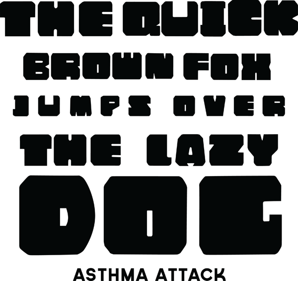
Richmond, VA-based designer of the fat octagonal typeface Asthma Attack (2013). This typeface was developed during her studies at VCU in Richmond. Behance link. [Google] [More] ⦿ | |
Elwood Madison
| |
Art director living in Williamsburg, VA, who studied at the Pratt Institute and the School of Visual Arts in New York. Creator of the experimental typeface Incognita (2012). [Google] [More] ⦿ | |
Graduate of James Madison University in Harrisonburg, VA. Designer of the decorative caps typeface Never Amore (2020). [Google] [More] ⦿ | |
Art director in Richmond, VA, who created the fashion mag typeface Giorgioro (2013). Behance link. [Google] [More] ⦿ | |
Eva Kamieniak Cassetta is a graphic and web designer who studied at Virginia Commonwealth University in Richmond, VA. She now lives in New York City (was: Pearl River, NY). Her typefaces include
| |
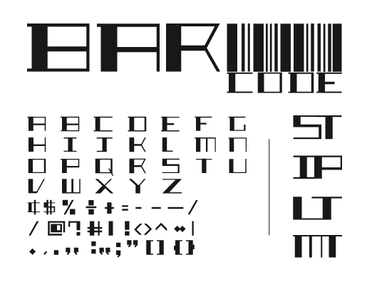
Graphic designer in Virginia who runs Fevera Graphics. Creator of the techno barcode-simulation typeface Barcode (2012). [Google] [More] ⦿ | |
FontFreak
| Big archive (over 3000 fonts, and at least 300 dingbats and over 1200 Mac fonts), with special dingbat category. List contains great-looking fonts. An exemplary page, with the designers clearly identified (with links), and easy fast downloads. Dingbat archive. Worth a very strong bookmark. The designer and boss is Richmond, VA-based Ole Larsen. Some original dingbat fonts as well, such as BatBats, BorderCorners, BorderCorners2, BugBats, Eagles, Florals1, Florals2, FlowerOrnaments, Hole In One, PensnPencils, Pirates1, Pirates2, Rothenburg-Decorative-Normal, SeasonsGreetings, WedDing, YeeHaw. The FontFreak links are also highly recommended. New fonts. Type designers. Dafont. [Google] [More] ⦿ |
Alexandria, VA-based designer of Resilience (2015). Behance link. [Google] [More] ⦿ | |
Freddy Showker
| |
Freehand Profit is a Los Angeles based artist who earned his name as a graffiti artist in DC and Northern Virginia. In 2005 he graduated Corcoran College of Art&Design with a BA in Fine Arts. Creator of the squarish typeface Westrider 2057 (2011), which was inspired by classic West Coast graffiti letter styles. Dafont link. [Google] [More] ⦿ | |
Gabrielle Gaither
| |
Gab's Graphics
| Gabrielle Gaither designs mainly dingbat fonts. She ran Gab's Graphics, then JustKissMe.com, and finally turned her shareware collection into a commercial collection at RAH Creative. She lives in Springfield, VA. Some of her fonts: BasicButton, BasicStars, Keagan (1998, handwriting), Renaissance Scrools. Shareware: Butterflips, Flakey, Kitchen Tile, Luv n kisses, Quilter's delight, Running in Circles (1998), Seperates, Sun n moon (1998), Whirlygigs, Scrollworks, To and from, Boxed in, Basicbutton, CompuPhont, Hooters, Jewelerskit1, SoenSquares, YouThere. Commercial fonts: Geared Up, Interfacer (demo font here), Capsulated, Paisley, Bauble (I through IV), Jewelers Kit 1 through 4 (1999), Petey Rone, eShopper, Swish, To and From, Interfacer, Web Kit Dividers, Web Kit Buttons, Web Kit Menus, Web Kit Borders, Web Kit Backgrounds, Web Kit Bundle, Be My Guest (1998-1999), Spirograph. Her web page. Dafont link. Klingspor link. Dafont link. [Google] [MyFonts] [More] ⦿ |
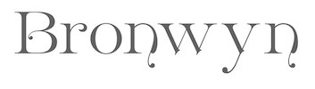
At SignDNA, he published the script typeface Monika. At Carmel Type Co in 2015, he published the decorative Victorian typefaces Calliope [not to be confused with the 2005 font MVB Calliope], Bronwyn, and Vintage Design Elements in 2015. Letterhead had this bio: Gary Godby's career as a sign artist has spanned nearly 28 years. He has worked in commercial sign shops in Virginia and Florida. While in Florida he spent thirteen years at Disney's in-house sign shop. In 1995 he returned to his native Virginia to work for Graphic Services, Inc., a large commercial shop in Manassas. Graphic Services is a full service sign and display company that primarily works for builders and developers. The shop employs 42 people with Gary's primary role as designer. "When you're designing," Gary says, "you see a project go from concept to reality, and I get alot of gratification out of that." Klingspor link. Behance link. [Google] [More] ⦿ | |
Graduate of Virginia Commonwealth University in Richmond, VA. He created a modular gridded grungy typeface called Trifecta (2010). [Google] [More] ⦿ | |
Born in 1983 in Arlington, VA, Giselle is a first year student of music composition at LSU in Baton Rouge, LA. She designed the Boston bull terrier dingbat font Boston Love (2006). Yet another home page. [Google] [More] ⦿ | |
Goddess Expressions
| Goddess Expressions is the type foundry of Jennifer L. Myers in Rocky Mount, VA. She specializes in handwriting fonts: Brigantia (2012), Diana (2012), Persephone (2012). [Google] [MyFonts] [More] ⦿ |
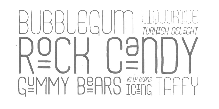
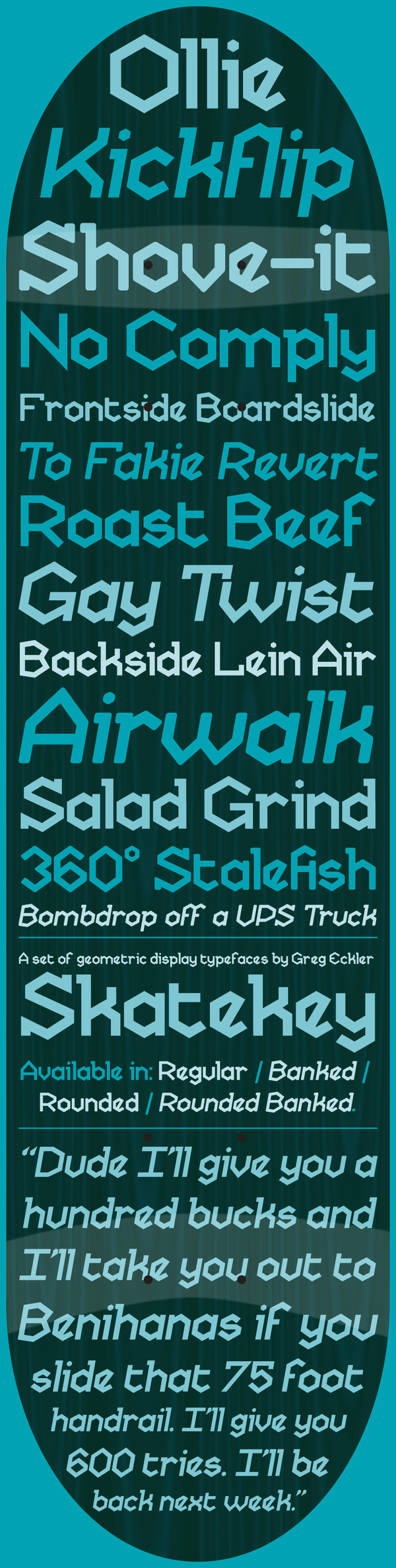
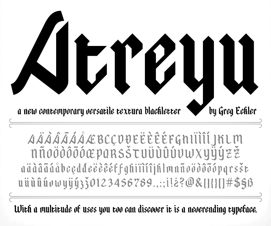
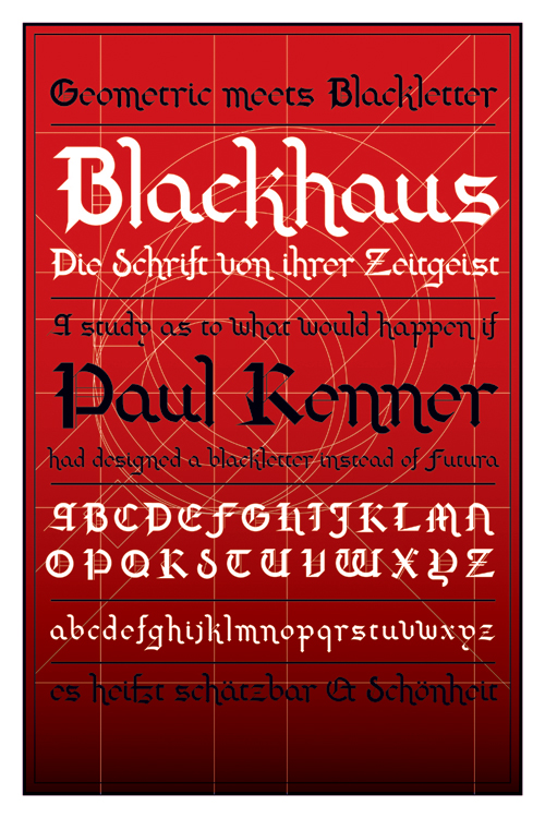
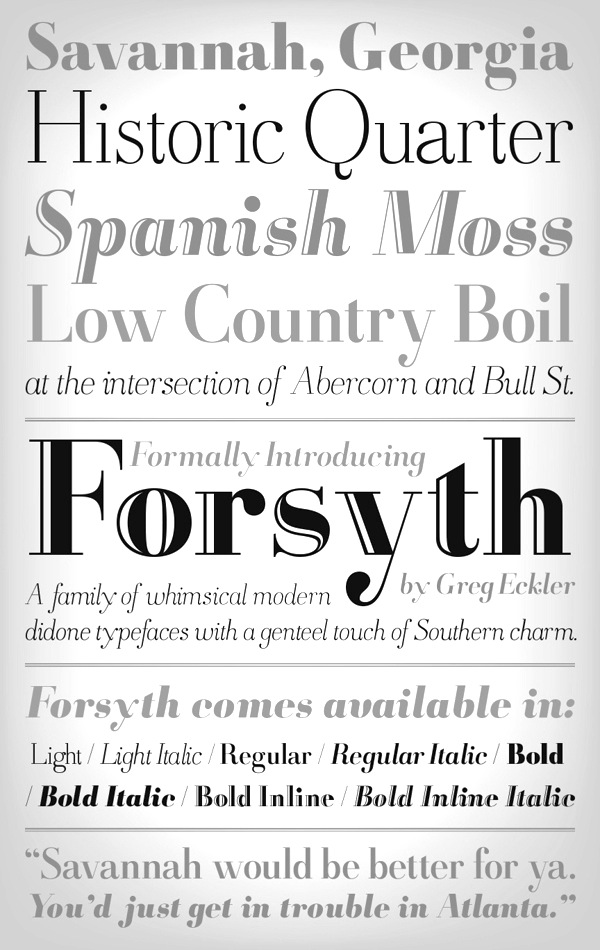
Creator of Skatekey (2012, hexagonal: free), Atreyu (2011, a blackletter typeface that is free at Lost Type), Swarm (2010, hexagonal modular face), Blackhaus (2009), a mix between Futura and Cloister Black (Morris Fuller Benton, 1904). He also made the pixelish typeface SWARM (2009), Tercio (2010, a pastiche slab-serif of wood&metal tendencies in his own words---fresh and different), and Camisado (2010, free humanist sans). In 2013, he published the didone typeface family Forsyth. Typefaces from 204: Barrelroom (art deco), Demolin (wedge serif), Heretique (bold bracketed serif), Xyst (modular condensed slab serif), Highpoint (extra-condensed sans), Pergola (rounded modular modern sans-serif), Unholy (spiked semi-serif inspired by metal music), Zero (geometric sans), Quartzous (video game pixel face), Aztlan (Aztec-look typeface), Ordo (condensed sans), Barbed, Covalent (dot matrix), Eschelon, Furious (chamfered), Sagebrush (Western), Vias (circuit font), Chambray (condensed sans), Grout, Manifold, Razor&Blade. Behance link. Klingspor link. [Google] [More] ⦿ | |
Hadeer Omar has a BFA in Graphic Design from Virginia Commonwealth University. Behance link. She created the squarish Arabic typeface Lefeen (2010). It is unclear if this is the same as the design agency Elfekra in Alexandria, Egypt---they also show a squarish typeface called Lefeen. [Google] [More] ⦿ | |
At Liberty University, Hannah Underhill (Lynchburg, VA) designed the handcrafted blackboard bold typeface Provencal Mod (2017). [Google] [More] ⦿ | |
Harry Warren
| |
During her studies in Lynchburg, VA, Heidi Darling created the hand-drawn typeface Darling (2014). [Google] [More] ⦿ | |
Herrington Design
| Graduate of Kansas City Art Institute, class of 2004. Designer of King Street (2017), and Fairfax Solid Fishtail (2017) and Fairfax Open Fishtail (2017), named after Fairfax, VA. Aka mkraft94. Creative Market link. [Google] [More] ⦿ |
Igor Ovsyannykov
| |
Inspiration Feed
|
In 2016, he designed Architect. Creative Market link. Behance link. [Google] [More] ⦿ |
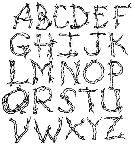
Irene Carballo (Carballo Design, Fairfax, VA) created the ornamental caps typeface icTwigs (2013). [Google] [More] ⦿ | |
Graphic designer in Alexandria, VA, who created the techno typeface X-Draft in 2014. [Google] [More] ⦿ | |
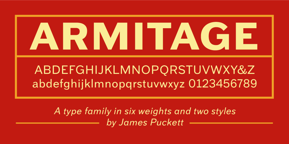
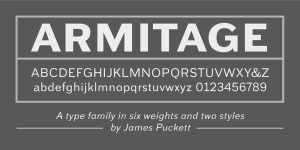
James Walker Puckett
| |
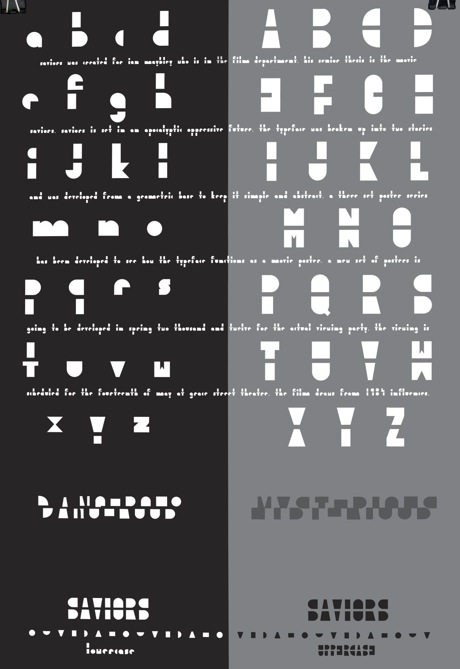
Jamie Bourne (Richmond, VA) created the tiled film font Saviors (2013). [Google] [More] ⦿ | |
Jasbir Singh (Maboli Systems, Inc., P.O. Box 3629, Wise, VA 24293) made the Punjabi truetype typefaces AnandpurSahib Lippi and Jhelum Lippi. [Google] [More] ⦿ | |
Jason Kochis
| |
Jason Levesque (b. 1975) from Chesapeake, VA, created two free fonts: stuntcut (grunge), stuntgoth (blackletter outline). [Google] [More] ⦿ | |
Jason Mannix
| |
During her studies at Savannah College of Art and Design, Jen Grottle (Fairfax, VA) created the delicate serif typeface Astrid (2014). [Google] [More] ⦿ | |
Jennifer L. Myers
| |
Virginia-based designer of the cblackletter typeface Germana 1875 (2016). [Google] [More] ⦿ | |
| |
Warrenton, VA-based designer of the decorative typeface Mission (2016). [Google] [More] ⦿ | |
John (Johnny) Kunda, a photographer and graphic designer in Lynchburg, VA, created the sans typeface Nevada in 2013 and the free hipster typeface Tentmaker in 2014. Behance link. [Google] [More] ⦿ | |
John Mitchell Design is located in Richmond, VA and Alexandria, VA. Creator of the stencil typeface Cut-Out (2011) and of Elephant (2012), a typeface inspired by Rudyard Kipling. Behance link. Another Behance link. John Mitchell design link. [Google] [More] ⦿ | |
Midlothian, VA-based designer of the custom typeface Zephyr (2014). Behance link. [Google] [More] ⦿ | |
| |
Journey's End
| Based in Glen Allen, VA, Journey's End produced Grandhappy (2009, simple connected script), Leaf Filled and Leaf (2005, Cindy Thomason), an elegant hand-printed look face. Linden (2006) is a quaint countryside inn sign font. [Google] [MyFonts] [More] ⦿ |
Graphic designer in Lynchburg, VA, who published the pixelish typeface Modular Sans in 2021. [Google] [More] ⦿ | |
Richmond, VA-based designer of the octagonal typeface Geodesick (2013). [Google] [More] ⦿ | |
Kathryne Cashwell (Blacksburg, VA) holds a B.A. in Communication and a B.F.A in Graphic Design from Virginia Tech, class of 2017. In 2017, she created a modular FontStruct-like typeface. [Google] [More] ⦿ | |
Illustrator and art director in Arlington, VA, who hails from upstate New York and studied in Glasgow, Scotland. Creator of three-style art deco family Baby Cakes (2012, TenDollar Fonts). Behance link. HypeForType link. [Google] [More] ⦿ | |
Designer at Liberty University in central Virginia of the hand-printed Rare Blair (2012). [Google] [More] ⦿ | |
Arlington, VA-based designer of the handcrafted typefaces Thin Mint (2016, super-tall) and Wanderlust (2016). [Google] [More] ⦿ | |
Blacksburg, VA-based designer of a modular outlined typeface in 2018. [Google] [More] ⦿ | |
During her graphic design studies, Kristen Patuto (Roanoke, VA) created an untitled art deco typeface (2014). Behance link. [Google] [More] ⦿ | |
Chesapeake, VA-based creator of Just Fun (2013). [Google] [More] ⦿ | |
| |
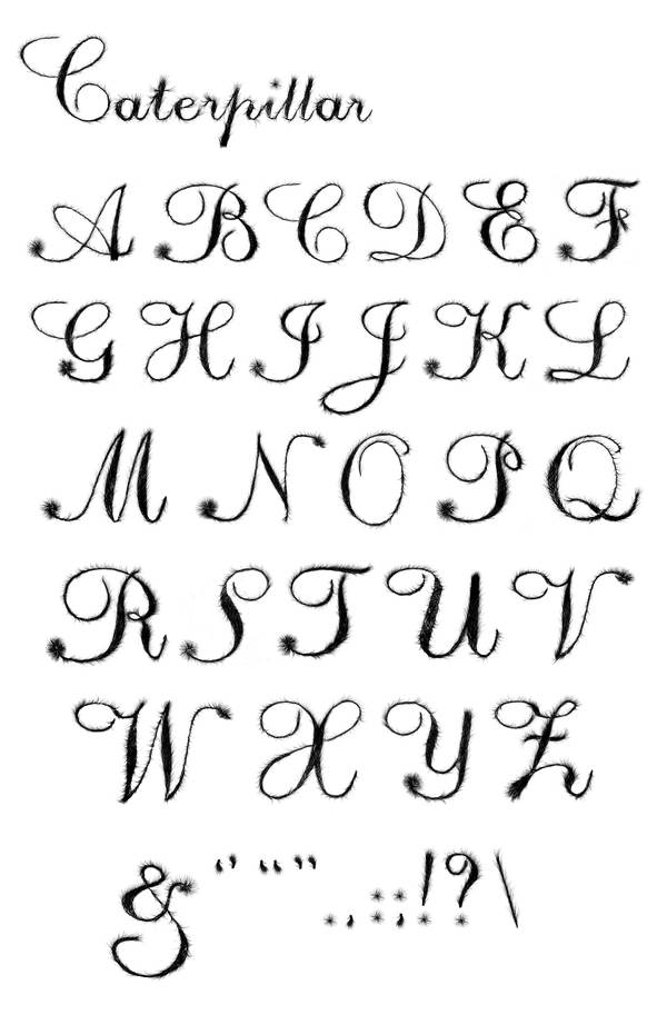
Graduate of Corcoran College of Art&Design, who lived in Arlington, VA. During her studies, she created the typeface Caterpillar (2011). [Google] [More] ⦿ | |
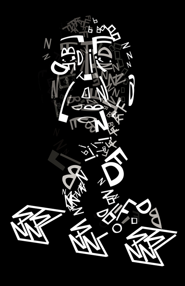
Richmond, VA-based designer of the typographic portrait of Hitchcock (2012), which only used letters from his film posters. [Google] [More] ⦿ | |
Lily Chee was born and raised in Puerto Plata, Dominican Republic. Centreville, VA-based designer of the dot matrix typeface Alphanatomy (2016). Behance link. [Google] [More] ⦿ | |
During her studies, Lindsey Breeden (Fredericksburg, VA) designed the thin sans typeface Decor (2015). [Google] [More] ⦿ | |
During her studies in Fredericksburg, VA, Liz Withers created an ultra bold modular display typeface called Picnic (2013), the stylish tall-and-thin sans typeface Arizona (2013), the monoline sans typeface Sun (2013), and the blackboard bold typeface Manhattan (2013). In 2014, she created tthe free bilined typeface Moka and the free display typeface Chat Noir. In 2015, she designed the free display sans Brooklyn. [Google] [More] ⦿ | |
Lucas Czarnecki is a designer, educator, and marketer with a passion for type. He taught the first-ever course on Typography and Graphic Design at the University of Virginia, and works as an apprentice at the Virginia Art of the Book Center, home to the largest collection of moveable type in the state. He designed some typefaces. [Google] [More] ⦿ | |
Lynchburg, VA-based creator of the sci-fi typeface Android (2013). [Google] [More] ⦿ | |
| |
Virginia-based designer of the nice grunge typefaces SucubusAuto and SucubusEvil (1997, both with Amanda Lewis) at GarageFonts. Klingspor link. [Google] [More] ⦿ | |
Chantilly, VA-based designer of the vernacular (lemonade stand) typeface Lemon (2018). [Google] [More] ⦿ | |
Masie Chong (Herndon, VA) drew some alphabets---undigitized as far as I can tell---in 2013: QR (pixelish) and Symbolic Alphabet. [Google] [More] ⦿ | |
Matt Spire (b. 1984) is the Washington, DC or Leesburg, VA-based designer of the grunge fonts Ethopool, Hekran, arachnid, optimistic, shihel, Shifteds (2002). Aother URL. [Google] [More] ⦿ | |
Chester, VA-based illustrator, aka Karbacca, b. 1985. He created the handwriting typeface Rusty's Handwriting (2009). Bartlett Photography and Design. [Google] [More] ⦿ | |
Matthew Langley
| |
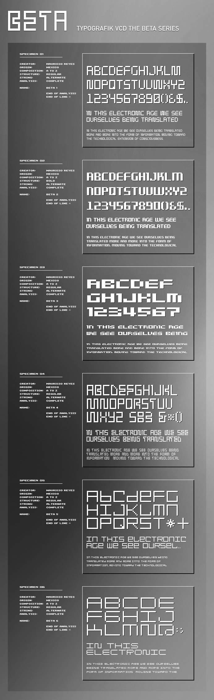
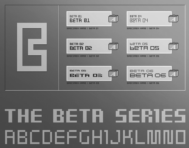
Mauricio Reyes
| |
Megami Studios (or: Incstone design by Megami)
|
At MyFonts, one can buy Voynich, Reaver, Orthotopes, Semiautonomous Subunit Clade (2009, sci-fi), Gauche Display (2010), American Sensation (2010, a techno family), Onigiri (2012), and Shibuya Dancefloor (2009, a techno family), Une Nuit Parisienne (2010, a techno family), Xero (2010, a sans family with irregular stroke widths). Some time in 2009, their fonts went commercial and their address changed to Ashburn, VA. In 2013, Megami Studios published the cartoonish family Pennywhistle, and in 2018 The Happiest Cruise In Anaheim (inspired by signage at Disney World) and Doki Doki Tokimeki (for mangas). Typefaces from 2019: Ferrocarbon (an industrial octagonal design), Shenandoah Clarendon. |
Megan Bottomly
| |
Gainesville, VA-based creator of the typeface Nadir (2015), a modular typeface designed for DMC (Diverse Masonry Contractors). Behance link. [Google] [More] ⦿ | |
MetalHead
|
|
Michael Clark
| |
Michael Jones
| |
Michael Leighton Beaman
| |
Michael Noyes is a freelance calligrapher/custom type designer in Annandale, VA. [Google] [More] ⦿ | |
Graphic artist in Fairfax, VA, who created the script typeface Hirschfeld (2014). Another Behance link. [Google] [More] ⦿ | |
Mickey Rossi
| |
Alexandria, VA-based designer of the display typeface Pebble In The Sky (2016, FontStruct) and 3S Steel Ribbon (2016). These seem to be identical. [Google] [More] ⦿ | |
| |
Miller Type Foundry
|
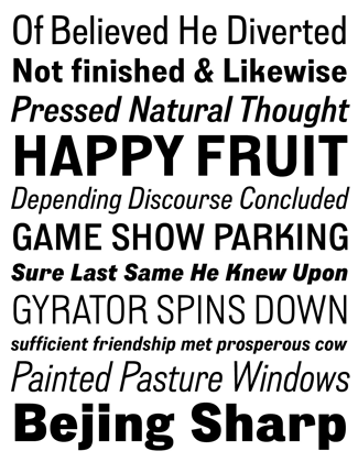
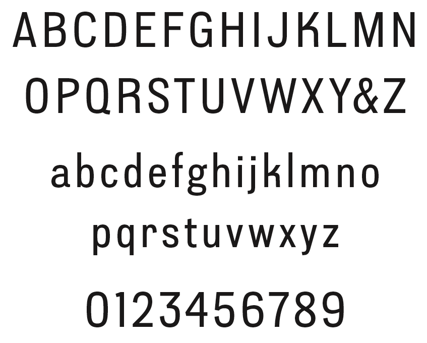
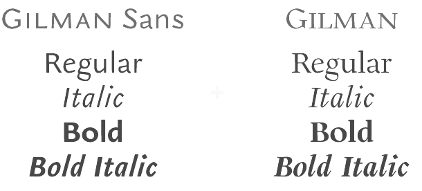
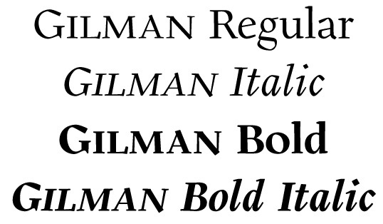
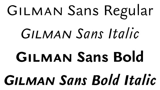
Creator in 2009 of the sans and headline sans family Mr. Jones. The Richard Miller all caps sans family (2009) is testosterone-powered. It was followed by the softer Richard Miller Rounded (2009), the rounded signage typeface Kalico (2010), Manwriting (2010), Nikaia (2010, a contemporary sans family), Nikaia Script (2010), Swagg (2011, humanist sans family with one slab serif "r" thrown in to make a statement), Westin Black (2011, a take on Cooper Black), Gilman (2011, a text family), Gilman Sans (2011, to accompany Gilman Serif for large bodies of text), and Project Fairfax (2009, stencil). In 2014, Miller published the multi-width geometric typeface Uniform. That was followed in 2015 by Uniform Rounded and Uniform Italic. In 2016, he published the large techno typeface family Tactic Sans: Tactic Sans was created to be as versatile as a special forces operator. Tactic Round is its rounded cousin. Towards the end of 2016, he finished the geometric sans typeface family Mercenary. Typefaces from 2017: Veronica Script and Caps, Blunt. Typefaces from 2018: Intervogue (a revival of Vogue (1929, Stephenson Blake) and Intertype Vogue, competitors of Kabel and Futura in the 1930s), Intervogue Soft. Typefaces from 2019: American Auto (a retro monoline script family). Typefaces from 2020: Uniform Pro (a 42-style geometric sans). Fontsquirrel link. Behance link. Another Behance link. [Google] [MyFonts] [More] ⦿ |
Alexandria, VA-based designer of the clean sans typeface Extraclear (2013) for a final project in a lettering and typography class taught by Bruce Willen and Nolen Strals at MICA. In 2016, she designed the free sans typeface Minee Sans. Behance link. Old Behance link. [Google] [More] ⦿ | |
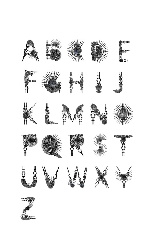
Student at the Corcoran College of Art and Design in Fairfax, VA. She created the elaborate all caps typeface Clock (2010). [Google] [More] ⦿ | |
Creator of the hand-printed typeface Lula (2011). [Google] [MyFonts] [More] ⦿ | |
Graphic artist in Alexandria, VA, who created the typeface square Bubble in 2014. Behance link. [Google] [More] ⦿ | |
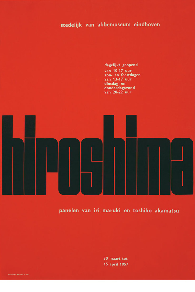
Student at Virginia Tech. Creator in Blacksburg, VA, of Paperclip (2011) and the piano key typeface Shima based on the Hiroshima poster (1957) by Wim Crouwel. Behance link. Creattica link. [Google] [More] ⦿ | |
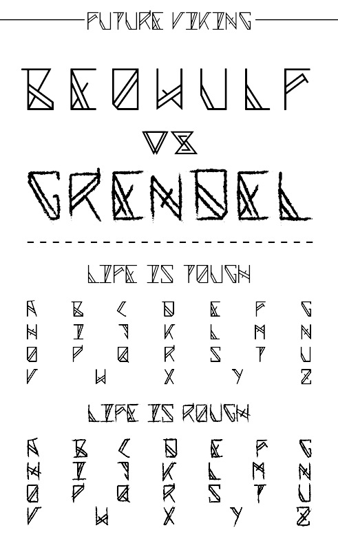
Illustrator and designer in Lynchburg, VA, who created the alchemic Future Viking font in 2013 while studying at Liberty University. [Google] [More] ⦿ | |
During her studies, Arlington, VA-based Nayasia Thomas designed the curly typeface Queen Bey (2016). [Google] [More] ⦿ | |
NDS Fonts (or: Neurotic Dog Studios)
| Neurotic Dog Studios is a full-service design firm based outside of Richmond, Virginia, specializing in branding and identity creation. Founded in 2014 by Alice Pettey, she started retailing fonts in 2021. In 2020, she released the squarish typeface Rounded Block Display. [Google] [MyFonts] [More] ⦿ |
Arlington, VA-based designer of the futuristic modular typeface From The District (2014), which is inspired by the movie District 9. [Google] [More] ⦿ | |
Nick Schweich, Graphic Designer and Production Manager at the Northern Virginia Technology Council (Herndon, VA) created the custom typeface Mebrane (2012). Images can be seen here. Behance link. [Google] [More] ⦿ | |
Great Falls, VA-based designer of a decorative caps typeface in 2017. Behance link. [Google] [More] ⦿ | |
Centreville, VA-based designer of Rocket Science Display Font (2016). [Google] [More] ⦿ | |
Noah Scalin
| |
During her studies, Lynchburg, VA-based Noelia Alvarado designed the art deco typeface Charleston (2016). [Google] [More] ⦿ | |
Ole Larsen
| |
Oliver Conte
| |
Oliver Conte Design
| Custom creations by Oliver Conte at Oliver Conte Design (Fairfax, VA) in PostScript and TrueType. Free fonts: Grootesk (1997), Grunge (1997), Logoonripple (1997), Maya Symbol, Munstermash (1997), Perspection (1997), Presshure, SansChiseled (1997), Skechie (1997), Twylite Zone (1997). Commercial fonts: Shards, Gainly, Gainlier, Scathed, Unscathed, TwyliteZone-Book (1997). I can't find the commercial fonts any more. Fontspace link. [Google] [More] ⦿ |
Twentieth century book designer and calligrapher, b. Richmond, 1909, d. 1971. Ogg was an architecture graduate of the University of Illinois in 1931. The New York Times writes: He won recognition as one of the outstanding graphic artists of his time. His first book, Alphabet Source Book, published in 1940 by Harper, was a copy book of lettering styles. The 26 Letters, published by Crowell in 1948, a history of the alphabet from cave drawings to contemporary type fonts, was illustrated by 275 of his drawings. For Photolettering in New York, he designed these typefaces: Ogg Folio, Ogg Irish Uncial, Ogg Roman 3 and 4, Ogg Italic 3 and 4, and Ogg Semi Uncial. Digital revivals include Ogg (2013) by Lucas Sharp. Sharp's Ogg is a fashion mag typeface loosely inspired by the hand lettering of Oscar Ogg. Lucas Sharp's Salter Roman (2021) is based on two designs penned by Oscar Ogg in 1942. The first is his title page design for Design & Paper No.11 (Marquardt & Company, New York); the second is his design for Gates of Aulis (Gladys Schmitt, The Dial Press, New York) that same year. The former became the basis for the lowercase, while the latter informed the uppercase. [Google] [More] ⦿ | |
Page Plane
| Typography blog by Chuck Green from Glen Allen, VA. [Google] [More] ⦿ |
Industrial designer in Arlington, VA, who created some typefaces in 2014. [Google] [More] ⦿ | |
Designer based in Richmond, VA. Creator of three hairline/monoline Gill-inspired sans typefaces, Gill One, Gill two and Gill Three (2007). See here. [Google] [More] ⦿ | |
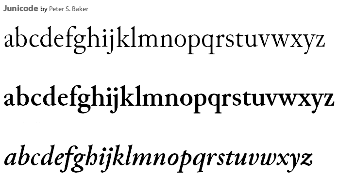
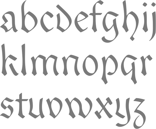
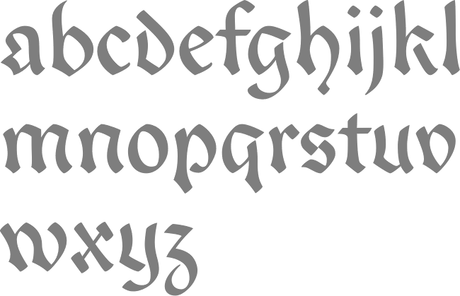
Peter Baker's old English page at the University of Virginia
|
Alternate URL. Dafont link. Open Font Library link, where he is known as psb6m. Fontspace link. Link to his foundry, Thornbec Staefwyrhtan. Github link. [Google] [More] ⦿ |
Peter S. Baker
| |
Plastic Typefaces (or: Mediastudio)
| Matthew Langley's fonts: Argent, Atmosphere, the Black family (Black Distorted is free), ChromoDomes (52 bald headed dingbats), MediaMod, Miles Modern Display, the Open family, Pacifica (fantastic face!), the Phaseshifter family, Toner, under (1997), Giant Robots, Plasticbats, SE1. Diodes, Black and under are free. Link disappeared. Langley has lived in Falls Church, VA, and Arlington, VA. [Google] [More] ⦿ |
Polygraph
|
|
As a student at Liberty University in Lynchburg, VA, Rachel Dugan designed the blackletter-inspired typeface Cathedral Gothic Text (2016). [Google] [More] ⦿ | |
Virginia Beach, VA-based designer (b. 1995) of the ultra-experimental Secret Booze Font (2015). This font was finished during her studies at Flagler College in St. Augustine, Florida. Dafont link. [Google] [More] ⦿ | |
While studying at James Madison University, Raechel Hurd (Harrisonburg, VA) drew some nice fists in her Macrock poster in 2012. [Google] [More] ⦿ | |
RAH Creative used to be ROBYNA.COM, and before that, Robyn's Fonts. The owner is Robyn Harton (b. 1964, North Carolina). She has a Bachelor of Fine Arts from Virginia Commonwealth University. Based in Richmond, VA, Robyn Harton's commercial dingbat creations and borders include RA Lotus (for Mandalas), RA Holiday (Xmas font), RA Lotus2, RA Seichim Hand, RA Seichim Regular, RA Protection, RA Mandalas, RA Eye Frames (free sampler font), RA Hand, RA Crystals, RA Ganesh, RA Egypt Web Sites, RA Eye Menus, RA Geo Borders, RA Geo Menus, RA Geo Buttons, RA Sea Life, RA Reiki-Seichim Plus Hand, Butterflips (great butterflies!!), Capsulated, EShopper, LuvNKisses, Paisley, Quilter's Delight, RunningNcircles, Seperates, SunNMoon, ToAndFrom, Bauble (I through IV), Interfacer, Kitchen Tile, Scrollworks, Whirlygigs, RA AllSmiles, RA Aten, RA Cats, RA Happy Things, RA Unknown Symbols, RA WebFrExtras, RA Fatima, RA India Borders, RA Masks, Flakey, Geared Up, Petey Rone, RA Web Frames, Amenti RA (2001). The fonts can also be purchased at MyFonts.com. Catalog of some typefaces. [Google] [MyFonts] [More] ⦿ | |
Located at the University of Virginia in Charlottesville, VA, the Rare Book School offers some type courses. For example, in July 2002, James Mosley (retired librarian of the St Bride Printing Library in London, and founding editor of the Journal of the Printing Historical Society) taught a course on "Type, lettering, and calligraphy, 1450-1830". He will repeat this in 2003. In June 2002, Archie Provan (Professor of Typography at the RIT School of Printing Management and Sciences, and co-author of A Primer of Typeface Identification (1976) and 100 Type Histories (1983)) taught a course entitled "Introduction to the history of typography". In 2003, Stanley Nelson taught about the history of typography from 1450 until the present. [Google] [More] ⦿ | |
Lynchburg, VA-based designer of Ria's Secret (2017). [Google] [More] ⦿ | |
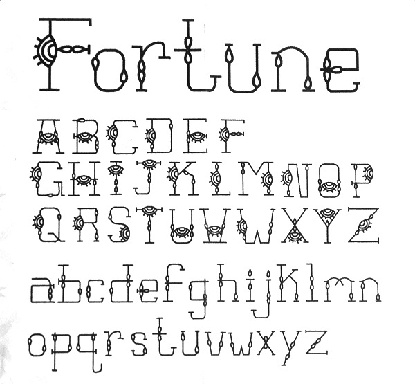
Portsmouth, VA-based creator of the ornamental typeface Fortune (2012). [Google] [More] ⦿ | |
Red Rocket Signs
|
|
Richard Miller
| |
Founder of Glyph Co in Brooklyn, NY, and Arlington, VA. Designer of the free slightly flared text typeface family Petrona (2019), which has a variable style. Google Fonts link for Petrona. [Google] [More] ⦿ | |
Rob Barba
| |
Rodney Vicik
| |
Roger Hartley
| |
Virginia-based artist who made JayOctober (2011, a condensed display face). [Google] [More] ⦿ | |
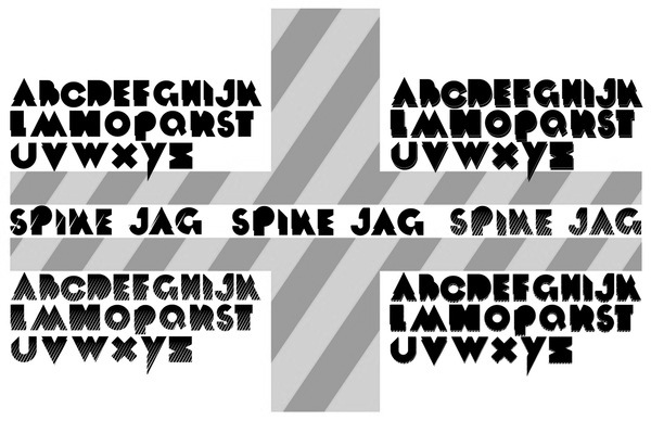
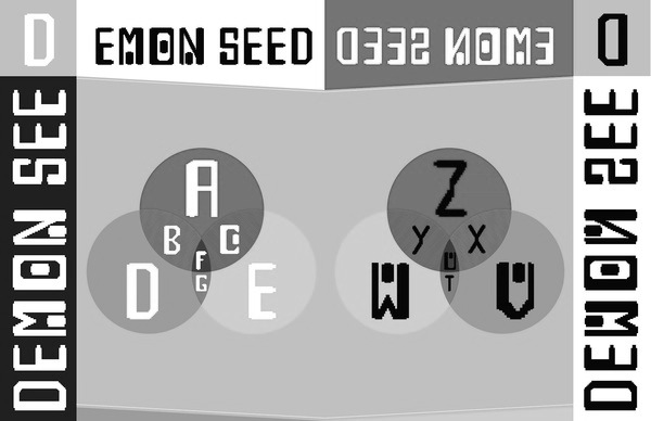
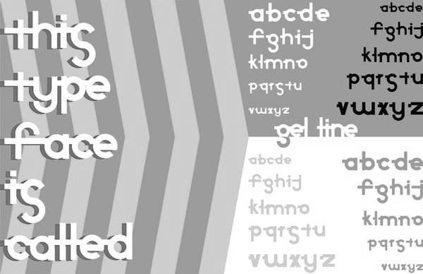
Graphic designer in Stafford, VA, who made Ajar (a tall condensed typeface), Spike Jag (a jagged typeface), Demon Seed (grunge) and Gel Line in 2012. Behance link. [Google] [More] ⦿ | |
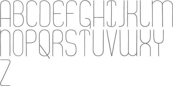
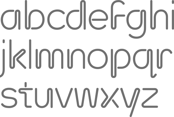
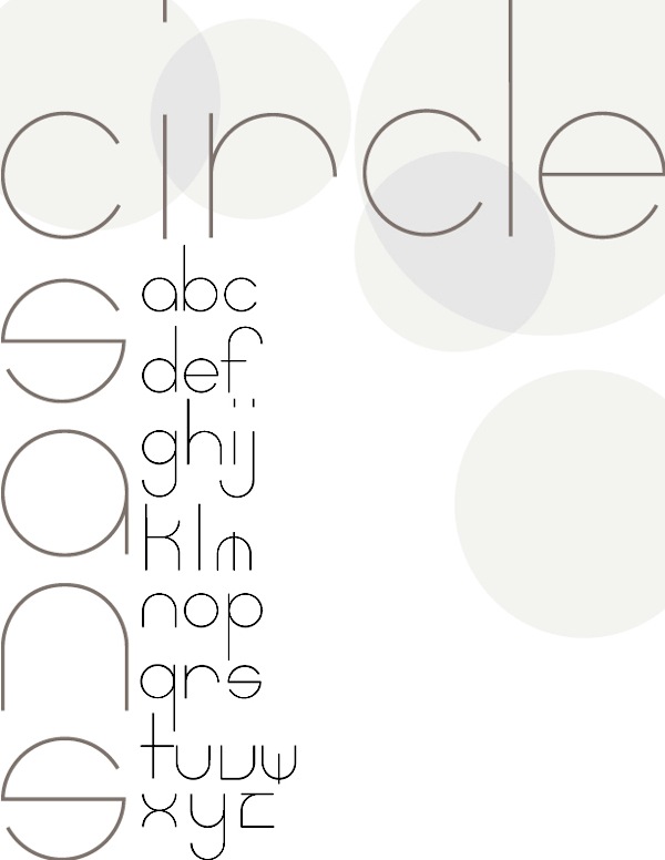
Lynchburg, VA-based designer of Circle Sans (2012), a thin typeface based on arcs of circles. [Google] [More] ⦿ | |
Graphic designer from Leesburg, VA, who is scheduled to graduate in 2011 from George Mason University. She created an ornamental alphabet in 2011. [Google] [More] ⦿ | |
During his studies at Ringling College of Art and Design, Samuel R. Walton (Hamilton, VA) designed the sharp-edged typeface Liquid Swords (2017). Behance link. [Google] [More] ⦿ | |
Graphic designer in Leesburg, VA, who created the creamy didone typeface Omelette du (sic) Fromage (2014). Behance link. [Google] [More] ⦿ | |
During her studies at Virginia Commonwealth University (Richmond, VA), Shari Davis created the free hand-printed typeface Short (2013) and the alphading typeface Time to Party (2013). [Google] [More] ⦿ | |
Creator at Liberty University (in central Virginia) of Quik marker (2010). [Google] [More] ⦿ | |
Graphic designer in Richmond, VA, who created the sharp-edged display typeface Malaki in 2015, and the sans typeface Aramco Letternmark Pro in 2018. [Google] [More] ⦿ | |
| |
Silver Graphics
| Company run by Roger Hartley, Pennington Gap, VA. The link went dead--its parent is The Design Center / DT&G. Some of the fonts are shown here: the Western fonts Hoedown and Laredo, the blackletter fonts Showcard, Water Lily, the caps font Penelope, the medieval script font Hemingway, the athletic lettering font Yorktown, and display typefaces Wellington (round hand calligraphy), Rumrunner, Rathskeller, Norseman, Almanac, Apothecary, Applegate, Archer, Archer Shadow, Carrie Lane, Dutch Master, Emporia, Flavius, Gigabyte and Hapsburg. All these are on their 60 USD CD called "The Great American Font Works", which has (had!) 132 nice decorative display fonts in all. In the old days, the font Jaclyn could be downloaded for free. The list of fonts, all made in the period 1992-1995: AceReporter-Bold, AceReporter-BoldItalic, AceReporter-Italic, AceReporter-Normal, Alchemy-Black, Alchemy-Bold, Alchemy-Light, Alchemy-Normal, Almanac, Antigone, Apothecary, Applegate, Archer, ArcherShadow, Aztek, Bandit, BaroniPoster, Bastion-Bold, Bastion-BoldItalic, Bastion-Italic, Bastion-Normal, Bebop, BerniesJukeJoint, BrightSky, CarrieLane, Chiaroscuro, Compute, Delphi, Derby, Duffy, DuffyInline, Durham, DutchMaster, Emporia, Entendre, Enterprise, EuroBold, Fairlane, Fatso, Figment, Flavius-Wide, Flynn, FlynnHollow, FriarTuck, Galaxy, Gigabyte, Gorky, GravureText, GuildSans-Bold, GuildSans-BoldItalic, GuildSans-Italic, GuildSans-Normal, Hapsburg, Hemingway, Hoedown, IBeam-Extruded, Inagodda, Ivanna-Mediaeval-Bold, Ivanna-Mediaeval-BoldItalic, Ivanna-Mediaeval-Italic, Ivanna-Mediaeval, Jaclyn, Jalopy, Jamaica, Jitterbug-Bold, Jitterbug-BoldItalic, Jitterbug-Italic, Jitterbug-Normal, Jitterbug, JitterbugB, JitterbugBO, JitterbugO, Kapanti, Kashmir, Kasparov, KeyWest, Keyclick, Krypton3, LED, Laredo, Layla, MardiGras, Marilyn, Matinee (their name for Busorama), Metro, Monica, NewWorldText, Norseman, Obsidian, Parade, Peacenik, Penelope, Phoebe, Pompeii, PompeiiB, PompeiiBold, Projectile, Publisher, Quasar, Radical, Rathskellar, Rathskeller, Recycler, RibaldEncounter-Bold, RibaldEncounter-Normal, Roundup, Rumrunner, Sailing-Freehand, Sanford, Satchmo, Scratch, Secret, Serenade, ShowBiz, Showcard, Sigmond, SilverDollar, SkinnyDip, Sophocles (Greekish stone-cut writing), Sport, StCroix, Sunshine-Bold, Sunshine, SunshineB, Superbowl, Taiwan, ThisEndUp, Toons, Tophat, TophatEngraved, TraciJo, TwinTubes, Twizzler, VanRose, WaterLily, Wellington, Westchester, Westside, Yorktown. [Google] [More] ⦿ |
In 2019, he released the Viennese Secession typeface Mendelson, and wrote: Mendelson is an art nouveau-inspired typeface which is based on a design by Paul Lang (1877-1937). Originally the typeface was named Langschrift (meaning long type) and was released by the Flinsch foundry in Frankfurt am Main in 1905. With its rigorous verticals and squarish shapes Mendelson works best as a display typeface. Low contrasts and balanced proportions make this typeface both bold and elegant. It is best used when centered in symmetrical settings. | |
| |
Graphic designer in Norfolk, VA, who created a couple of custom typefaces in 2016. [Google] [More] ⦿ | |
Alexandria, VA-based designer of the ornamental caps typefaces Uncle Paul (2015) and Tripel Six (2015), and the typeface Turnstyle (2015). Steve is associated with Yellow Wine Labs. Behance link. [Google] [More] ⦿ | |
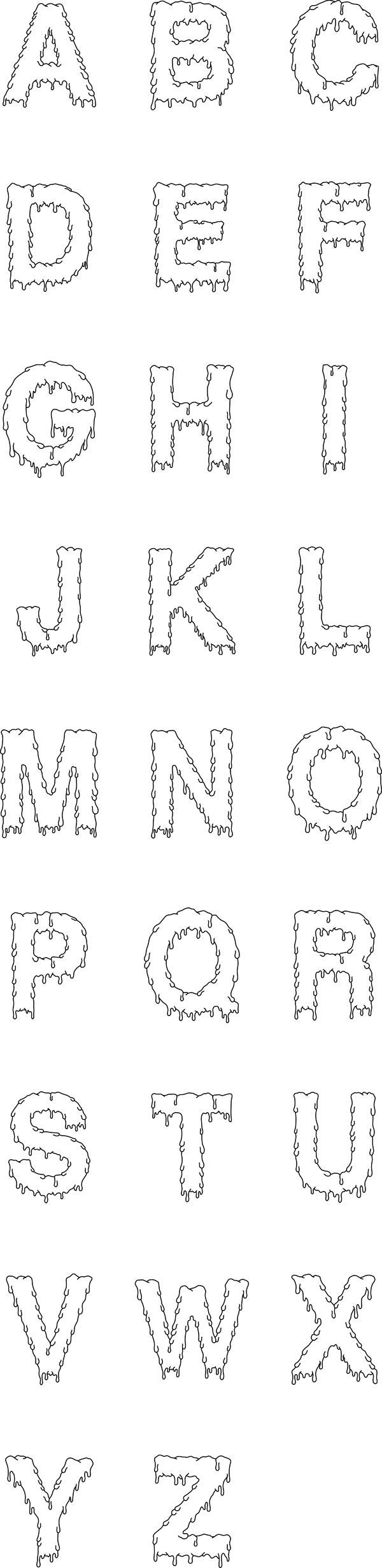
During his studies in Virginia Beach, VA, Steven Schmucker designed Soft Letter Font (2013), an outlined dripping blood affair. [Google] [More] ⦿ | |
SUBFLUX experiment
|
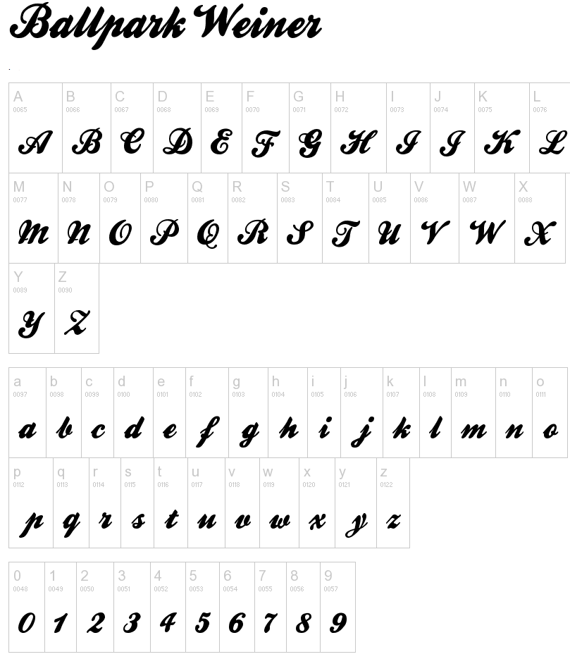
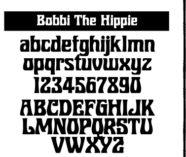
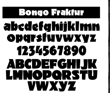
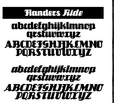
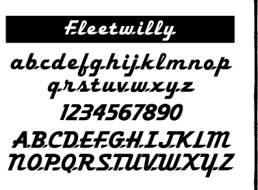
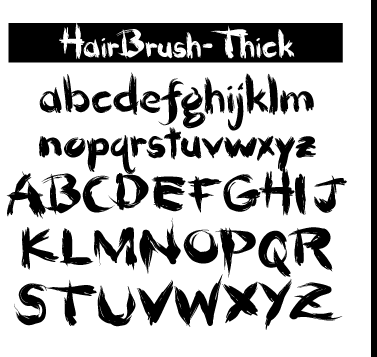
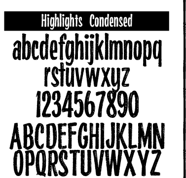
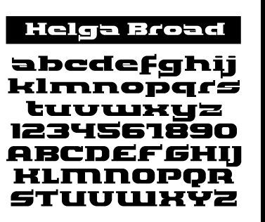
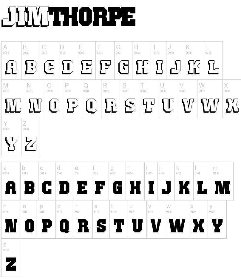
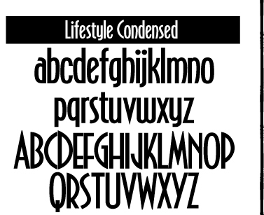
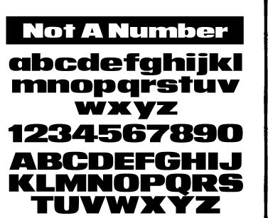
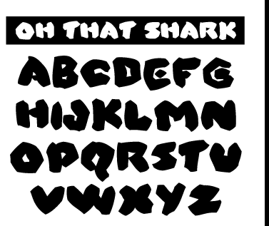
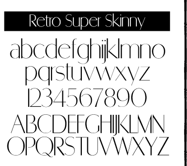
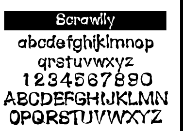
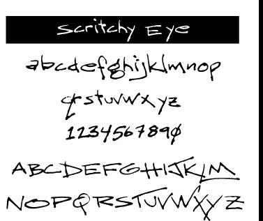
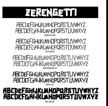
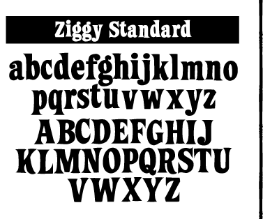
He offers these free typefaces under the Subflux label: Alpha Male Modern (1997), AthleticSupporter, BallparkWeiner (connected fifties script), BarBenderBold, BobbiTheHippie, BongoFraktur (in Koch's Neuland style), CargoCrate (stencil), CollegeBoy (athletic lettering), FlandersRideItalic, FlandersRide, Fleetwilly, FlyTrapExtended, Hair Brush, HighlightsCondensed, Helga Broad, Hilda Broad, JimThorpeHigh (octagonal / mechanical), LevelFourteenDruid (medieval), LifestyleCondensed (avant garde), NotANumber, On That Shark (angular), RetroSuperSkinny (Peignotian), SatansMinions, Scrawlly, Scritchy Eye, Zerengetti (African look), ZiggyStandard. Rossi calls himself also "Loveless". Dafont link. Klingspor link. Abstract Fonts link. [Google] [More] ⦿ |
The Routine Creative
|
Typefaces from 2017: Color Block (a color font), Trailer (monoline connected script), Quirk (partially stackable sans), Big (brush font), Fighter, Pineapple Pen, Banana, Augustine, Eleven (sans), Partay, Coachella, Mentalist (hairline sans), Rice (slab serif), Honey Oak, Powhatan (inspired by native American Indian themes such as arrows). Typefaces from 2018: Espresso (sans), Atlantic (brush), Salmon (modern all caps sans), Wild Child (handcrafted), Kangaroo, Traveler (monoline script), Valentina (a basic sans), Brother. Typefaces from 2019: Whiskey Ranger, American Mortar (a masculine vintage display font), Original Gangster, Hula Hoop. [Google] [More] ⦿ |
Alexandria, VA-based designer of Thomas Condensed Ultra Light (2018). [Google] [More] ⦿ | |
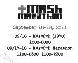
Centreville, VA-based graduate of Edinboro University, who was inspired by MASH when he designed the constructivist or minimalist typeface MASH Marathon (2011). [Google] [More] ⦿ | |
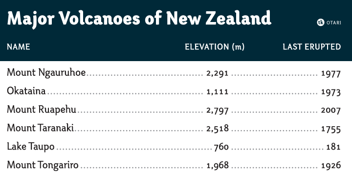
In 2010, Travis published the contemporary curvy sans family Otari. Chartwell (2011) exploits OpenType features to make fonts that create pie charts, bar charts and histograms. It was published commercially by FontShop in 2012 as FF Chartwell. He explains the tricks. Typophile discussion. Download link. FF Chartwell won an award at TDC 2013. At Vectro Type he released these typefaces:
Interview in 2016 by David Sudweeks. [Google] [MyFonts] [More] ⦿ | |
Ashburn, VA-based designer of the blackboard bold typeface Goliath (2014). Behance link. [Google] [More] ⦿ | |
| |
Tried & True Supply Co.
|
At Fort Foundry, Brian Brubaker designed these typefaces:
|
Type Palettes
| Interesting examples of headlines and bodies of text. Great examples on the choice of type and the spacing of characters. By Logic Arts Corporation's Chuck Green in Glen Allen, VA. [Google] [More] ⦿ |
Typerror
|
Gofundme page in 2021 to help Michael with his medical bill to treat his Parkinson's disease. More examples of his work. MyFonts page. An old URL. Klingspor link. FontShop link. [Google] [MyFonts] [More] ⦿ |
Typografik
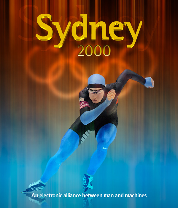
| Mauricio Reyes is the designer of the ITC Binary family (1997), a semi-serif family that blends elements of Helvetica and Times. The type designer was born in Mexico City, trained in London, and now lives in Falls Church, VA, in the Washington, D.C., area where he operates his studio Typografik. ITC Binary was chosen as the official font for the 2000 Olympic games in Sydney Australia and was used by Nike, Swatch, IBM, NBC and Coca-Cola. He also made the Beta pixel family. Behance link. FontShop link. Klingspor link. [Google] [MyFonts] [More] ⦿ |
A hand-picked free font list by Hampton, VA-based Unblast. The list includes orphaned typefaces such as Velocity (2019), Grey (2018: a minimalist techno font), Inverse (2018: multiline), Roadster (2018: multilined), Dunna Sans (2018), and Alaska (2018). From 2019: the orphaned fonts Dreams (sci-fi), Fritch (chamfered), Boston, Cobaissi, Dovetail (stencil), Bilthers, Frizon (a space exploration font). [Google] [More] ⦿ | |
Vietnamese Typography
| Donny Truong is a designer with a passion for typography and the web. He received his MA in Graphic Design from the George Mason University School of Art (in Fairfax, VA), where he taught advanced web design and usability. Currently, he is director of design and web services at George Mason University's Antonin Scalia Law School. He wrote the on-line text Vietnamese Typography (2016; second edition here, dated 2018) and Professional Web Typography. [Google] [More] ⦿ |
"Visual Telemetry is a collaborative partnership between Gab Gaither and Robyn A. Harton". Based in Richmond, VA. They specialize in high-quality graphics based in part on Gabrielle's fonts. [Google] [More] ⦿ | |
| |
Author of Fields of Force (Routledge), Learning from Error (Open Court) and the Becoming a Mentsh workshops (Mentsh.com) and the forthcoming Avot: Ancient Wisdom for Modern Life. Berkson led a panel at Typecon '05 (NYC) on subway type, and gave a talk about his work reviving Caslon at Typecon '06 (Boston). He was also a speaker at TypeCon 2009 in Atlanta. Home page. [Google] [MyFonts] [More] ⦿ | |
Woolly Pixels
| Harrisonburg, VA-based designer of the dada typeface Oberplank (2017). Creative Market link. [Google] [More] ⦿ |
Alexandria, VA-based designer of the pixel font Lefty (2016), which is influenced by the old video game FamiCon. [Google] [More] ⦿ |
 [
[
 Alex Jacque (b. 1986, Virginia) is a designer and developer based in Oakland, CA (was: Baltimore, MD). He studied at the University of Michigan School of Art&Design and was located at that time in Ann Arbour, MI. He obtained an MFA from the Maryland Institute College of Art.
  Here is what Beta Field is, in their own words: Beta-field is an interdisciplinary design/research office with a multimodal approach to practice. Our work includes buildings, landscapes, environments, installations, exhibitions, texts, design workshops and research projects. With backgrounds in architecture, industrial design, landscape architecture, and exhibition design, along with experience working as researchers, designers, and educators, we developed a view of design practice that operates through various modes of inquiry, development, and production. We focus not only on the built environment, but also on the effects of design on knowledge, technology and culture.
  Lynchburg, VA-based designer of Edman Geometric (2015). [
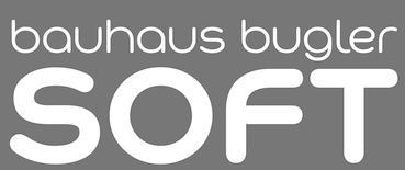 Foundry created in 2006 by Virginia Beach, VA-based
  Blacksburg, VA-based designer of an inky typeface inspired by Abott Miller's Drip series (2014). This typeface was finished during her studies at Virginia Tech.
  During his studies, Carson Ford (Lynchburg, VA) created the bilined deco typeface Silhouette (2015) and the blackboard bold typeface Hindsight (2015).
  [
[ During his studies in Lynchburg, VA, Christian Short created the
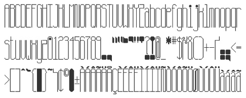
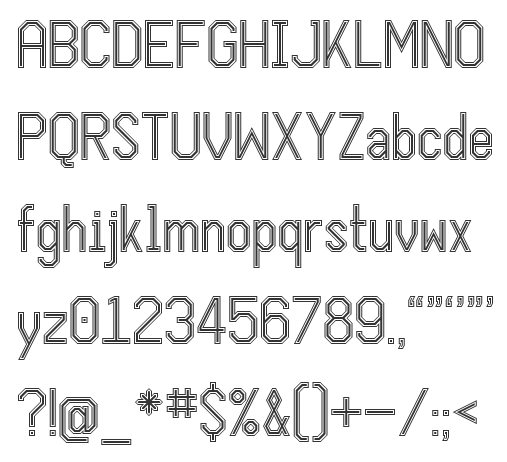
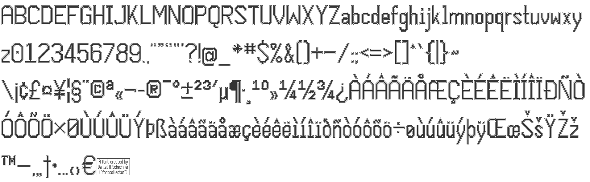
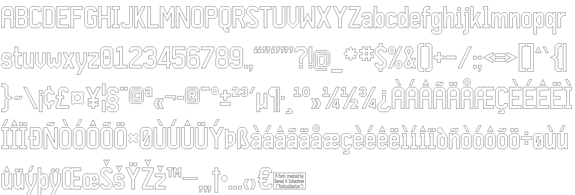
  Designer from Richmond, VA (aka fontcollector) on whom I bestowed the title King of octagonal typefaces. Daniel Herbert Schechner was born in 1946 in Norfolk, VA, and died in 2016 in Richmond, VA.
  Brooklyn, NY-based graphic designer, who also claims Norfolk, VA, as his home. He deconstructed a hairdryer---its pieces made up the glyphs of
  Chris Lozos (aka Dezcom and
 Sign painter and gilder now located in Blue Ridge, GA. He made the Victorian signage font families Tyler (2003, inspired by a typeface by E.L. Brown from the late 1800's),
  Graphic and type designer and art director in Washington, DC, and Woodbridge, VA. He is a professor of communication design at Northern Virginia Community College (NOVA). Before that, he taught graphic design at George Mason University and at The Art Institute of Washington.
 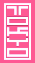 Warrenton, VA and Washington, DC-based designer in 2015 of Bitcraft, Tokyo Typeface (inspired by inkan seals), Pixel Patterns, Flight (dot matrix typeface), Hand Drawn Arrows, Hype (techno), Galaxy (techno/futuristic), Fluffy, Detective (typewriter font), Funky (hand-drawn font), Hacker (a cyber typeface), Yeti (handcrafted) and Game Over (video game font).
  [
[ Freelance designer in Culpeper, VA. Author of Just Your Type (2014, Jackson Publishing, Syracuse, NY). [
 Fairfax, VA-based creator (b. 1990) of the informally hand-printed font Rushil (2008).
  Arlington, VA-based designer of the fat display typeface Fat Panda (2015). [
 Born in Columbus, OH, in 1970.

 [
[ Virginia Beach-based designer of the fat bullet hole font
 Peter S. Baker, an English professor at the University of Virginia, offers free TrueType and PostScript fonts. these include:
  [
[ Jason Mannix is a graphic designer from New York, who lives in Washington, DC. He is a German Chancellor Fellow, currently working on a new typeface at the Typographische Gesellschaft München e. V. (Munich Typographic Society).
  Rodney Vicik began his career as a sign painter in 1980. He ran Beach Signs in Hampton, VA. In 2020, he set up the type foundry and lettering shop Red Rocket Signs, which specializes in Americana and nostalgia. His typefaces:
 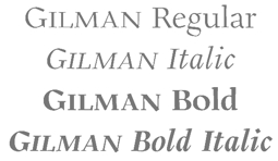 [
[ While studying in Lynchburg, VA, Sierra Clonch designed an attractive art deco typeface family called Carraway (2015). [
 Canadian designer from Kitchener (b. 1984) now located in Washington, DC, and before that, in Reston, VA. He created the irregular handwriting font
  Stephen French (Crosscut Media Productions) is based in Richmond, VA. He studied at VCUarts (class of 2021). Designer of these typefaces:
 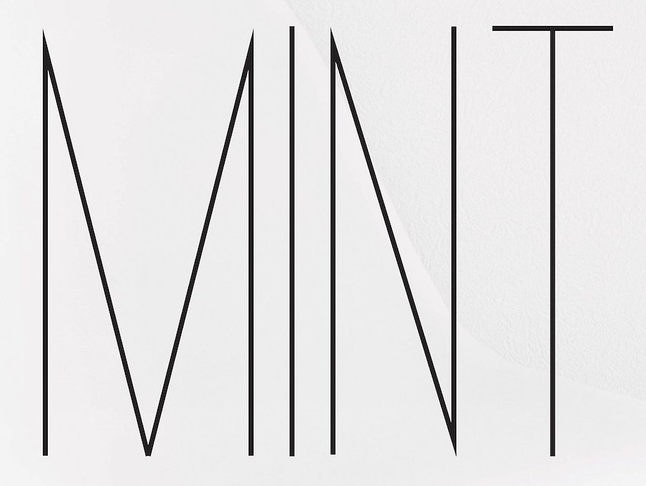 Dallas, TX (was: Richmond, VA)-based designer of the sans typefaces Mint (2016), Amber (2016), Foodie (2016) and Daughter (2016), the rounded sans typeface Fox & Bower (2016), the minimalist sans typeface Avenue (2016), the handcrafted typefaces Yesterday (2016), Creative Queen (2016) and Love Note (2016), the art deco typeface Retro Deco (2016), the retro connected Avocado Script (2016), and the beveled typeface Suburbia (2016).
 Woodbridge, VA-based designer of the decorative caps typeface Element (2015).
  Tried & True Supply Co. is the husband and wife creative team of Brian and Marcy Brubaker. Together, they run their design and screen printing studio out of their home in Charlottesville, Virginia. In 2016, they designed
 Born in Richmond, VA, 1904, d. Charlottesville, VA, 1991. Typographer, illustrator, letterer, and type designer. He made two type families:
  Philosopher, typophile and type designer, who obtained a PhD in the history and philosophy of science from the London School of Economics in 1970. He lives in Reston, VA. Berkson
|
|
|
|