TYPE DESIGN INFORMATION PAGE last updated on Wed May 6 15:56:42 EDT 2026
FONT RECOGNITION VIA FONT MOOSE
|
|
|
|
|
Type design in Argentina | ||
|
|
|
|
SWITCH TO INDEX FILE
Rosario, Argentina-based designer of the 3d trompe-l-oeuil font Modern 3d (2015). Behance link. [Google] [More] ⦿ | |
Buenos Aires-based art director who designed Varo (2015, a handcrafted typeface) and Goce (2015). Behance link. [Google] [More] ⦿ | |
Graduate from FADU, University of Buenos Aires, who created the typeface Xixo Xixo (2008). [Google] [More] ⦿ | |
Adorae Types
| Argentinian designer of Artifex Regina (2022: a tall hand-crafted font family with sketched textures), Neon Summer (2021: a condensed handcrafted monolinear font family), Cookie Time (2021: script), Arkhania (2020: a vampire script for Halloween), Aeonian (2020: a 12-style retro futuristic sans), Nature Boy (2018, a display type that is almost art nouveau). [Google] [MyFonts] [More] ⦿ |
Graduate from FADU, University of Buenos Aires, who created the typeface Tormes (2010), an upright connected script of fashion mag quality. [Google] [More] ⦿ | |
Rosario, Argentina-based designer (b. 1992) of the vertically striped techno font System (2009) and of Scratch Basic (2009), Smoothtasticness (2011, fat counterless), Acid cain (2011, grungy), and Crime Scene (2011, grunge suggesting blood splatter). [Google] [More] ⦿ | |
Graphic designer in Buenos Aires who created the script typeface Perro Boogie in 2013. [Google] [More] ⦿ | |
Aerosyn-Lex Mestrovic
| |
Creator of the school project typefaces BOOoomer (2012, sci-fi style) and Swinger (2012, piano key style), which were created during her studies at the University of Buenos Aires, Argentina. [Google] [More] ⦿ | |
| |
During her studies in Buenos Aires, Agostina Iacaruso designed the aeronautical typeface Jeppesen (2016). [Google] [More] ⦿ | |
Buenos Aires-based designer of the spiky heavy metal font Zaeth (2014), which appears to be a school project at UADE. [Google] [More] ⦿ | |
Argentinian youngster, b. 1989, who made the handwriting font AguzBadHandwriting (2009). [Google] [More] ⦿ | |
Agustín Luis Bou
| |
Graduate from FADU, University of Buenos Aires, who created the tall condensed italic modern typeface Ceñida (2009). [Google] [More] ⦿ | |
Photographer in Buenos Aires who designed the teardrop typeface Drop in 2016 during his studies at UBA. Behance link. [Google] [More] ⦿ | |
During his studies at FADU, UBA in Buenos Aires, Agustin Kurincic designed the geometric solid typeface Geo (2019). [Google] [More] ⦿ | |
Santiago del Estero, Argentina-based designer (b. 1976) of the stylish typeface Bruto (2015). [Google] [More] ⦿ | |
| |
Argentinian designer (b. 1989) of the free blackletter typeface Modern Goth (2018) and the heavy text typeface Meridies Antiqua (2018). Creative Fabrica link. [Google] [More] ⦿ | |
Graduate from FADU, University of Buenos Aires, who created the typeface Onirik (2010), a unicase typeface made on the basis of Dante MT. [Google] [More] ⦿ | |
Buenos Aires-based designer of a calligraphic alphabet (2014). [Google] [More] ⦿ | |
Agustina Lonetti
| |
For her type project at FADU UBA in Buenos Aires, Agustina Menna created Typorama New Neville (2015), a poster typeface that was inspired by buildings. [Google] [More] ⦿ | |
| |
Graduate from FADU, University of Buenos Aires, who created the flowing italic typeface Bakery (2009). [Google] [More] ⦿ | |
| |
| |
Buenos Aires-based designer of the geometric silhouette typeface Lector (2015). [Google] [More] ⦿ | |
| |
Graphic designer in Buenos Aires, Argentina. In 2016, she designed the urban graffiti font Urban Hallyu. Behance link. [Google] [More] ⦿ | |
During her studies at FADU / UBA in Buenos Aires, Agustina Vidal designed the vintage typeface Bongiovi (2013). [Google] [More] ⦿ | |
Buenos Aires, Argentina-based designer of the cutout typeface Alfabeto (2017, with Yamila Leibson). Behance link. [Google] [More] ⦿ | |
During her studies at FADU / UBA in Buenos Aires, Ailen Carcaba created the italic stylish poster typeface Honduras 122 (2015), the origami typeface paper Type (2014). Her poster for Brian De Palma's film Phantom of the Paradise (2014) is also noteworthy. [Google] [More] ⦿ | |
| |
AL
| Buenos Aires-based designer (b. 1984) of the outlined 3d lettering font Aguzlo (2006) and the handcrafted Felixsalotto (2012). [Google] [More] ⦿ |
Graduate from FADU, University of Buenos Aires, who created the typeface Drop Serif (2008). [Google] [More] ⦿ | |
| |
Aldo de Losa
| |
Buenos Aires-based creator of an artistic semi-psychedelic typeface in 2011 as part of course work at FADU UBA. [Google] [More] ⦿ | |
Alejandra Carbone
| |
Graduate from FADU, University of Buenos Aires, who created the typeface Vesper (2010). [Google] [More] ⦿ | |
Designer in Caballito, Argentina, who created a condensed display typeface in 2013. [Google] [More] ⦿ | |
Graduate from FADU, University of Buenos Aires, who created the serif typeface Clonum (2008). [Google] [More] ⦿ | |
Palermo, Buenos Aires-based designer, b. 1983. Creator of the hand-printed font LiniersType v1.1 (2006). [Google] [More] ⦿ | |
Graphic designer from Argentina, currently studying at Universidad de Buenos Aires (UBA - FADU). He created the counterless geometric typeface GeoTypo in 2012 while at UBA. [Google] [More] ⦿ | |
| |
Buenos Aires-based illustrator and designer. He created a nice sketchy poster called Hecho en Latino America (2011). [Google] [More] ⦿ | |
During Cosgaya's class at FADU / UBA (Buenos Aires), Alejandro Herrera created an experimental geometric typeface. [Google] [More] ⦿ | |
Behance link. Google Plus link. [Google] [More] ⦿ | |
Buenos Aires-born designer who studied at the University of Buenos Aires and founded inTacto, a design studio. Creator of the text typeface Prima Sans (2006; with Ariel Katena). This typeface was published at Tipo and/or Tipitos Argentinos. See also here. Behance link. [Google] [More] ⦿ | |
Alejandro Lo Celso
| |
Graduate from FADU, University of Buenos Aires, who created the ultra-condensed didone typeface Taipu (2010). [Google] [More] ⦿ | |
Graduate of Universidad Nacional de Cuyo. Mendoza, Argentina-based designer of the circle and grid-based typeface AM (2015). [Google] [More] ⦿ | |
Alejandro Paul
| |
Cofounder of Sudtipos (2003), where he does custom work and creates new typefaces. His work there includes Tierra (a titling face), Latinaires (2003-2018: originally called Latina Sans), Reflex, Downtempo (2003), Stardust and Mosaico (1999, pixel face). Still at Sudtipos, he digitized the beautiful handwriting/calligraphic typefaces by Angel Koziupa called Alma (2005), Murga, Habano and Tiza, which together with his script typeface Argenta (2004), Oxida (2005), the medieval script typeface Mama Script (2004, designed with Alfredo Graziani), Divina (2004, with Alfredo Graziani), and the sans family Kautiva (2004) can be bought via Umbrella Type. For children's orthography, he developed Estrada Hand, on commission for Editorial Estrada. He was working on the serif family Libertina (2004). Herencia (2004, a handwriting typeface done with Diego Giaccone), Grover (2004, slab serif), Milk Script (2004, with Alfredo Graziani), Mama Script (2004, with Alfredo Graziani), Politica (2004, a techno typeface with a very thin Thin weight) are at Sudtipos. The Bluemlein Scripts (2004-2005, Umbrella and Veer) are based on the calligraphic renderings of Charles Bluemlein, shown in a 1943 ink catalog: Miss Le Gatees, Mr Rafkin, Mr Keningbeck, Mr Lackboughs, Lady Dawn, Mrs Von Eckley, Mr Sheppards, Mr Dafoe, Mr Canfields, Mr Stalwart, Mr Sandsfort, Mr Leopolde, Mr DeHaviland, Mr Blaketon, Miss Stanfort, Miss Packgope, Miss Fajardose, Mrs Saint-Delafield, Mrs Blackfort, Mr Sopkin, Mr Sheffield, Miss Lankfort, Herr Von Muellerhoff, Dr Sugiyama, Dr Carbfred. (Note: Soft Horizon's Lainie Day (1993) is an earlier free font in the style of Lady Dawn and Mr Lackboughs). In 2011, that series was made available at Google Web Fonts. Sudestada (2005, Sudtipos) is a handwriting script developed with Diego Giaccone. Cuisine (2005, Umbrella Type) is an informal bold script. Mousse Script (2005, Sudtipos) is based on Glenmoy, a 1932 Stephenson Blake typeface. Suave Script (2005) is a 4am jazz bar script. Ministry (2005) is related in style but less funky, Chocolate (2005) is for sales ads, and Cenizas (2005, with Angel Koziupa) is straight from an old manuscript. Whomp (2006, Umbrella) was based on a partial sign-painting font by Alf Becker (1930s), and so was Buffet Script (2006, Sudtipos). Affair (2006, Umbrella) is swashy and calligraphic, while Candy Script (2007) and its italic version Sugar Pie (2011) are based on Argentina's market lettering. Galgo Script (2007) is a brush calligraphic font based on a design of Angel Koziupa. Burgues Script (2007) is an ornate calligraphic script based on the lettering of calligraphy teacher Louis Madarasz (1859-1910) (award at TDC2 2008). Burgues Script, Adios Script (2008: it won an award at TDC2 2009), Feel Script and Sugar Pie all won awards at Tipos Latinos 2008. Sinfonieta (2006) and Buffet Script are fifties style connected scripts. Feel Script (2007) is based on lettering that calligrapher and logo designer Rand Holub created in 1950 and that was subsequently captured in Intertype's typeface Monterey (1958). Some letterforms were redrawn from vintage American magazine ads (some by Holub himself), Cuisine (2008, food advertising script), Pronto (2008, comic book style, by Alejandro Paul and Angel Koziupa), Grover (2004, rounded sans family), Grover Slab (2004). Burgues Script, Adios Script, Feel Script and Sugar Pie all won awards at Tipos Latinos 2008. Calgary Script (2008, Umbrella) is a pure signpainting job. Accolades from all typophiles for his calligraphic wunderkind, Compendium (2008). The 2009 haul: Sugar Pie (signage font), Bravissima Script, Theorem (upright semi-script). Speaker at ATypI 2009 in Mexico City. The year 2010 starts off with a bang, five awards at Tipos Latinos 2010: a grand prize for Brownstone Sans, and four standard awards, for Semilla, Kewl Script (for food packaging and store windows), Calgary Script, and for Business Penmanship. Typefaces from 2010 include the baseball lettering typeface Fan Script and the tattoo script face Piel Script (piel=skin), which was influenced by Burgues Script and more remotely by showcard lettering by B. Boley (1930s, Sign of the Times Magazine). Piel Script won an award at Tipos Latinos 2012. In 2011, he and Koziupa made the fat signage typeface Aventura and Viento (a grunge version of their earlier 2004 face, Brisa). He added one retro connected signage font to the Filmotype collection in 2012, called Filmotype Kitten (original from 1955). Filmotype Zephyr (2012) is an italic roman formal script. Filmotype Yukon (2012) is inspired by the classic Palmer style of penmanship. Storefront (2012) is a swashy signage typeface based on an incomplete alphabet by Alf Becker. His signage script typeface Hipster Script won an award in the TDC 2012 competition and at Tipos Latinos 2012. Typefaces from 2013: Rolling Pen (a connected script that recalls the business penmanship genre), Bellissima Script (based on a copperplate calligraphic alphabet from Bellezas de la Caligrafía by Ramón Stirling, 1844). In 2014, he helped Panco Sassano, a lettering artist and illustrator from Mar del Plata, who designed the wide connected semi-calligraphic handwriting typeface Horizontes Script (Horizontes subsequently won an award at Tipos Latinos 2016). Still in 2014, he published the fat packaging or signage script Bowling Script, which is based on Freely Drawn Italic, a non-font alphabet by Ernst Bentele (1953). In 2015, Alejandro Paul, Yani Arabena and Guille Vizzari combined forces in the signage script typeface Quotes (Script+Caps) (2015, Sudtipos). Merengue Script (2015, with Panco Sassone) is a fun creamy script, ideal for pastry shops, tea rooms or supermarkets. Steak (2016) is a connected vintage signage script based on an Alf Becker design. Envelove (2017) is a script typeface family consisting of Script, Icons, and Caps, designed at Sudtipos by Yani Arabena, Guille Vizzari, and Alejandro Paul. Winner at Tipos Latinos 2018 of a type design award for Envelove. Still in 2017, Guille Vizzari and Alejandro Paul co-designed the great Moleskine notebook-inspired typeface family Proprietor. Proprietor comes in Script, Icon, Deco, Wide, Open and Roman styles. It won an award at Tipos Latinos 2018. Rigatoni (2017): A skyline didone based on mid-20th century example by Eugen Nerdinger. Bibliophile Script (2017). A pair of copperplate calligraphic typefaces. Fixture (2018: a 72-font grotesk family published by Sudtipos). Newbery Sans Pro (2018). A simple workhorse sans typeface family that is inspired by German industrial design and the lettering of Eugen Nerdinger. Winner at Tipos Latinos 2018 of a type design award for Tennis Set, Bibliophile Script, French Bulldog, Envelove, La Taqueria, and Speakeasy Set (a collection of (copperplate) script, sans, modern, flare and gothic substyles). From 2019: Hot Salsa (a retro brush script; with Ximena Jimenez), Old Letterhand, Clockmaker (arts and crafts style), Steak Script (inspired by an old alphabet by Alf Becker), Address Sans Pro (a sans family inspired by Butti and Novarese). In 2019, Alejandro Freitez and Claire Menager, under the art directoship of Alejandro Paul, designed the multistyle wood type look / Western / Victorian / reverse stress / hyper-decorative Presley Slab. Typefaces from 2020: Apothicaire (a wonderful quaint serif family in the frivolous didone genre; three variable fonts, 16 styles in all), Inglesa (a penmanship script), Dilemma, Dilemma Serif (Dilemma is a sans/serif type system with 42 styles; it is inspired by the anonymous Polyphème, Cyclopéen and Extra Condensé designs from the early 1900s at the Peignot Fonderie; two variable fonts are included), Sporty Pro (a large sports / athletics font family). Typefaces from 2021: Plethora (an 18-style family and two variable fonts that build on Julius Herriet's Old Style Ornamented for Bruce Type Foundry; Alejandro added various frills, ligatures, weights, exaggerating in true Victorian spirit), Magari (a fat face or Normande; Alejandro likens it to Italian classics of the 19th century though), Regional (27 styles, plus variable styles). Typefaces from 2022: Wienerin (a revival and expansion of Olympia (1929) by Carl Otto Czeschka, one of the members of The Wiener Werkstätte). [Google] [MyFonts] [More] ⦿ | |
Graduate from FADU, University of Buenos Aires, who created the curly typeface Filoseidología Ponzettiana (2008). [Google] [More] ⦿ | |
| |
Argentinian type designer based in Pilar. He created the rounded sans typeface family Uyuni (2012). [Google] [MyFonts] [More] ⦿ | |
In 2014, he created the fantastic black brush poster font AD Bulky Note, the angular poster typeface AD Polaquita, Roberto Underground, Pasquin, and the fun (free) poster typeface AD Sura (a tribute to Czech graphic artist Jaroslav Sura). Blogspot link. Dafont link. Behance link. [Google] [More] ⦿ | |
Bahia Blanca, Argentina-based designer of the school project display typeface A Punto (2015). Behance link. [Google] [More] ⦿ | |
Graphic design student Alexander Mann (b. 1990, Argentina) offers free fonts at Dafont. He created the flared typeface Mischievous (2011). [Google] [More] ⦿ | |
Alexey Popov
| |
Alfonso García
| |
Born in Buenos Aires, and a resident designer in Barcelona, Alfredo Graziani is the codesigner with Alejandro Paul at Umbrella Type of the medieval script Mama Script (2004). At Sudtipos, he created the script typeface Milk Script (2004, with Alejandro Paul: based on lettering seen in a 1923 Speedball manual), as well as Divina. Typedia link. Klingspor link. [Google] [MyFonts] [More] ⦿ | |
| |
| |
Graduate from FADU, University of Buenos Aires, who created the squarish text typeface Gloomy (2008). At Behance, we learn that she is from Singapore (if it is the same Alicia Lee). There she published Shysosa (fat counterless face), Sensosa (gridded face) and Resosa (counterless display face) in 2011. [Google] [More] ⦿ | |
Argentinian designer of the informal script typeface Dalie. [Google] [More] ⦿ | |
During her studies at UBA in Buenos Aires, Alina Lacoste created an untitled experimental typeface (2014). [Google] [More] ⦿ | |
Designer from General Roca, Río Negro, Argentina, b. 1985. She created the free fonts Rounded Future (2009) and Headsmall (2009, pixelish). All were made with FontStruct under the name Alina Durantex. [Google] [More] ⦿ | |
Aline de Carvalho, who lives in Sao Paulo, has studied in many cities, including at ESDI Escola Superior de Desenho Industrial (2006), ESAD École Supérieure D'arts Décoratifs de Strasbourg (2008) and FADU UBA (University of Buenos Aires, 2012). Her graduation work in 2012 at FADU-UBA consisted of the sans typeface Figo. Behance link. [Google] [More] ⦿ | |
Graduate from FADU, University of Buenos Aires, who created the typeface 72 Degrees (2009). [Google] [More] ⦿ | |
Graphic designer in Buenos Aires who created an art deco typeface at FADU / UBA. [Google] [More] ⦿ | |
| |
| |
Panamanian designer who lives in Argentina, b. 1985. Creator of the artsy display typeface 4564 (2007). [Google] [More] ⦿ | |
| |
Graduate from FADU, University of Buenos Aires, who created the typeface O Merinda (2008). [Google] [More] ⦿ | |
Ana Dorado
| |
Buenos Aires-based designer of the school project display font Sleepy Hollow (2014). [Google] [More] ⦿ | |
In 2019, Henrique Beier and Ana Leydner, assisted by Luisa Leitenperger, co-designed Kiperman at Harbor Type. This sturdy 4-style text typeface family pays homage to Brazil's publishing icon Henrique Leao Kiperman (d. 2017). Also in 2019, Ana Laydner and Estudio Passeio co-designed Nektar Dingbats. In 2021, she assisted with the design of Salva (Fabio Haag Type), a versatile workhorse sans family: Eduilson Coan was the lead designer. He was supported by the Fabio Haag Type team of Henrique Beier, Ana Laydner and Fabio Haag himself. [Google] [MyFonts] [More] ⦿ | |
Argentinian (Brazilian?) editorial designer. In 2012, she made an exceptionally graceful free Google Web Font text typeface that should withstand small sizes. Called Lusitana, the two-weight family was inspired by the type found in the 1572 first edition of "The Lusiads", a Portuguese epic poem by Luís Vaz de Camões. Award winner at Tipos Latinos 2010 for her text and IPA typeface Voces (done with Pablo Ugerman). The latter typeface appeared in 2012 at Google Web Fonts. [Google] [More] ⦿ | |
Graduate from FADU, University of Buenos Aires, who created the text typeface Iota (2008), with an x-height, and a p and a q that are in the stratosphere. More work needed. [Google] [More] ⦿ | |
Designer in Rosario, Argentina. Creator of the experimental typeface Cowo (2013). [Google] [More] ⦿ | |
Ruluko (2012, Google Web Fonts) is a free typeface created by Ana Sanfelippo, A. Díaz and M. Hernández. Google: Ruluko is a typeface designed to aid those learning to read. The shapes you see are related to the handwriting typically used at schools in Argentina. The concept is that those who have learned to read this handwriting style may recognise this type style more easily than other typefaces often used in this context. But as a warm and stylish sans serif text type, you may use Ruluko for any purpose. Ruluko won an award in the text category at Tipos Latinos 2012. In 2012, Ana Sanfelippo and Alejandro Inler published the fashion mag didone typeface Elsie at Google Web Fonts. It was accompanied by Elsie Swash Caps. Yoshimi Regular won an award at Tipos Latinos 2014. Fontsquirrel link. Behance link. [Google] [More] ⦿ | |
Graduate from FADU, University of Buenos Aires, who created the very fat oblique typeface Eightys's font (2010). [Google] [More] ⦿ | |
Graduate from FADU, University of Buenos Aires, who created the didone typeface Caspianfont (2008). [Google] [More] ⦿ | |
Graduate from FADU, University of Buenos Aires, who created the typeface Last NK. [Google] [More] ⦿ | |
San Carlos de Bariloche, Argentina-based designer of the school project font Baccie (2016, at FADU/UBA). [Google] [More] ⦿ | |
Graduate from FADU, University of Buenos Aires, who created the typeface Patova (2010), a fat headline typeface based on Caslon. [Google] [More] ⦿ | |
| |
Buenos Aires, Argentina-based creator (aka Anita Wainer) of the following free fonts, hosted at my site: Perfect Match (2009, glyphs made from matches), John Lennon (2006, John Lennon's handwriting and drawings), AHDN (2005, based on the album A Hard Day's Night), and JAMONdelMAR (2006, dingbats for fans of the Beatles). Typophile. Analia plays in the band Jamon del Mar. Alternate URL of Jamon del Mar. Dafont link. Fontspace link. [Google] [More] ⦿ | |
Graduate from FADU, University of Buenos Aires, who created the typeface Antigona (2010). [Google] [More] ⦿ | |
Graduate from FADU, University of Buenos Aires, who created the typeface Brott (2008). [Google] [More] ⦿ | |
Andrea Delgado (Buenos Aires, Argentina) was influenced by the San Basilio Cathedral in Moscow for the design of the Sache typeface in 2014. [Google] [More] ⦿ | |
Graphic designer in Buenos Aires, who created the handcrafted 3d typeface Klotz (2016). [Google] [More] ⦿ | |
For her project at FADU / UBA in Buenos Aires, Andrea Gallardo designed a tall display typeface (2019). [Google] [More] ⦿ | |
Graduate from FADU, University of Buenos Aires, who created the typeface Cupcake (2010), a fat poster face. [Google] [More] ⦿ | |
Graduate from FADU, University of Buenos Aires, who created the beautiful didone display headline typeface Marea (2009). [Google] [More] ⦿ | |
Graduate from FADU, University of Buenos Aires, who created the typeface Verjilius Augusteus (2008), a display typeface that is in search of an identity. [Google] [More] ⦿ | |
Designer and illustrator in Buenos Aires. Creator of the futuristic serifed caps typeface Futuroni Serif (2011). Behance link. [Google] [More] ⦿ | |
Andrés Kievsky
| |
Brodat (2013) is an 8-bit style blackletter typeface inspired by cross stitch patterns. See also the updated Brodat Nou (2018). Vera (2013) is an upright fat didone with extreme contrast. In 2021, he released the display sans typeface AB Ticena. Behance link. Cargocollective link. [Google] [MyFonts] [More] ⦿ | |
Graduate from FADU, University of Buenos Aires, who created the modern typeface Fiji (2008). [Google] [More] ⦿ | |
With Carolina Giovagnoli, he developed Cambo (2011, Huerta Tipográfica), a family for Latin and Khmer [a free weight at Fontsquirrel and at Google Fonts]. Katachi Media collaborated with Andrés Torresi to create a typeface superfamily - targeted mainly for the iPad, but also for web and print. An intense project between Andrés in Argentina, and Katachi in Norway, took place over 14 months. The result so far is a serif and sans-serif, two of in total seven weights of the Katachi typeface. In the coming months we'll be adjusting these two, as well as add the last five weights. In 2012, Andrés Torresi published Telex at Google Web Fonts: Telex is a humanist sans serif conceived to be a web font with nice legibility at normal text sizes. Asap (2012) is a free rounded sans family designed by Pablo Cosgaya for Omnibus Type. Asap is based on Ancha (designed by Pablo Cosgaya and Hector Gatti), and has been developed with the collaboration of Andrés Torres. In 2014, Huerta Tipografica published the free text typeface family Caladea which was designed by Carolina Giovagnoli and Andrés Torresi. Caladea is based on Lato and is metric-compatible with Microsoft's Cambria. In 2015, Andrés Torresi and Carolina Giovagnoli developed the Devanagari typeface family Sarali at Huerta Tipografica (free at Google Web Fonts). The Latin part is based on Torresi's Telex (2012). Telder HT Pro (2015) is a commercial humanist sans serif family with ten weights, conceived for web use. Telder won an award at Tipos Latinos 2018. Together with Pablo Impallari, he designed the free workhorse sans typeface family Encode Sans (2012) and Plata Sans (2019). Github link. In 2016, he designed Cira Sans and Cira Serif. The original concept was created for Katachi Media as a corporate font for text and experimentation in an iPad magazine. [Google] [MyFonts] [More] ⦿ | |
Graphic designer in Buenos Aires, who created Cuadrangle (2012), a fat poster display face. [Google] [More] ⦿ | |
During his graphic design studies at FADU UBA in Buenos Aires, Andres Silva Bello created the art deco typeface Love Trucha (2013). [Google] [More] ⦿ | |
Argentinian designer and illustrator, who has made many logos, and created the organic sans typeface Misantropia (2008, free download). [Google] [More] ⦿ | |
Koziupa designed a number of alphabets in cooperation with Alejandro Paul of Sudtipos, who created digital typefaces out of them. His typefaces include Jugo Script (2014), Avellana Pro (2012), Bayoneta Pro (2012, an angular typeface), Machete Pro (2012, related to Bayoneta Pro), Aventura (2011), Coche (2011, a signage face), Aguafina Script (2009, free at Google Web Fonts and at OFL), Primavera (2008, a signage face), Angelus (2008), Felipe (2009), Amarinda (2004, Sudtipos), Argenta (2004), Biographer (2009, an upright almost connected script), Bravissima Script (2009), Bubblegum Sans Pro (2011), Cenizas (2008), Chocolate (2008, a market sign family in weights called Amargo, Caliente and Dulce), Condiment (free at Google Web Fonts), Cupcake (2010, a food signage face), Murga (2003), Tiza (2003), Galgo Script (2007, rough-edged calligraphic script), Kilo (2010, signage face), Koziupack (2008), Kozmetica Script (2011, a delicate wedding script or make-up brand script), HabanoST (2003), Argenta (2003), Malbeck (2003), Alma (2005), MobleySans (2003), Malambo, Oxida (2005), Inoxida (2009), Piedra (2010, grunge; free at Google Web Fonts), Pinguino (2005, condensed brush face), Platinus Script Pro (2012, a wedding font), Ricotta Script (2011, a true signage face), Romy (2007, graffiti script), Voyeur (2011), Almond Script (2007), Candombe (2007, a brushy script with an African theme---the Pro version is from 2013), Amorinda (2007), Cafelatte (2006, signage face), Matogrosso Script (2009), Uplink (2009, upright connected script), Aladin (2009, an art nouveau-meets-Arabic face; free at Google Web Fonts and at OFL), Delight Script (2011: a 1950s signage face, which won an award at Tipos Latinos 2012), Diplomatic (2009) and MobleySerif (2003) were created by Alejandro Paul based on his letters. They can be purchased at Umbrella Type. Also at Umbrella, Paul and Koziupa made the casual script typeface Brisa (2004; its grungified version is Viento, 2011), and the script typefaces Chocolate Caliente, Amargo and Dulce (2005), Felipe (2005), Cooked (2006, rough-edged), Chicle ST (2007, bubble gum wrapper type, free at Google Web Fonts), Lombriz (2005), Bakery Script (2006, for signs in stores), and the frizzy Cenizas (2005). Bilined deco scripts such as Festival Script Pro (2013: a winner at Tipos Latinos 2014), Tanguera (2007), Aranjuez (2012), Bellas Artes (2007, doubly-lined script), Heraldica Script (2013), and Evergreen (2014, a leafy script). Klingspor link. [Google] [MyFonts] [More] ⦿ | |
Spanish graphic designer who made Suipacha (2011), a gridded texture typeface modularly constructed from triangles. It comes with beautiful logotype work for the Suipacha Gallery in Buenos Aires. [Google] [More] ⦿ | |
Designer in Quilmes, Argentina, who crossed Gill Sans and Rockwell to create Roxy Hummer in 2012. [Google] [More] ⦿ | |
Angela Rangel
| |
Graduate from FADU, University of Buenos Aires, who created the typeface Mecánica (2010). [Google] [More] ⦿ | |
| |
She won an award at Tipos Latinos 2012 for Mestiza (2011; Regular and Itálica). Mestiza was her graduation typeface at FADU-UBA. Bibliothek (2014) won an award at Tipos Latinos 2016. [Google] [More] ⦿ | |
Argentinian graphic designer, b. 1984. Dafont link. She used Baskerville Bold to derive a condensed and ancient-looking typeface Sir William (2009). [Google] [More] ⦿ | |
Rosario, Argentina-based designer of the display typeface Faina (2016) during her studies at Instituto Superior de Comunicacion Visual (ISCV) in Rosario. [Google] [More] ⦿ | |
At UBA, Buenos Aires-based Anita Autorino designed the display typeface Deco (2019). [Google] [More] ⦿ | |
Graphic designer in Darmstadt, Germany, who created the display typeface Kleiner Font (2014). [Google] [More] ⦿ | |
Buenos Aires-based graphic designer, b. 1994. She created the pixel typeface Uhlala (2010). [Google] [More] ⦿ | |
Antenah Studio
|
He designed the free minimalist all caps monoline sans typeface Rosarina and the free hipster typeface Spacer in 2016. Typefaces from 2017: Mold (a geometric vector font), Bulky (blocky). In 2018, he published the free art deco typeface Rousseau Deco, the free pixel font Game Over (made with FontStruct), the outline color font Mold, the free font MD Tall 2. Typefaces from 2019: Disket Mono, NY Bricks (free: blackboard bold style). Typefaces from 2020: Lkdown (a free all caps COVID 19-inspired typeface published by Rostype; Cyrillic characters by Denis Ignatov), Catallina (a free all caps art deco sans typeface published by Rostype; Cyrillic characters by Denis Ignatov). Typefaces from 2021: Adversal (a futuristic (all caps) display font inspired by the work of Wim Crouwel and the experimentation with grids). Behance link for Mariano Diez. Behance link for Antenah Studio. [Google] [More] ⦿ |
Argentinian creator of the free hand-printed typeface Antipirina Handscript (2014). [Google] [More] ⦿ | |
Antipixel
|
Julia created Circoex (2008) and the hand-printed Culia (2008). Additions in 2011: Culita (hand-printed), Presa (techno, +UltraLight), the Savia family (hand-drawn typefaces, including a 3d Shadow style), PGY. Creations from 2012: Aracne, Iso (hexagonal), Belta (hand-printed), Nue (monoline display sans). Typefaces from 2013: Eneas Expanded (wide poster lettering), Aracne Condensed, Aracne Ultra Condensed (hand-printed caps face, +Light). Typefaces from 2014: Enyo (hand-drawn poster font), Enyo Serif (2014), Italo (hand-drawn), Lamia (hand-printed, renamed Lamiar after a week). Typefaces from 2015: LeOsler. Typefaces from 2016: Austral Slab (layered textured typeface family), Austral Sans (free for personal use), Austral Sans Stamp. Typefaces from 2017: Escalope (a handcrafted layered font, +icons). Typefaces from 2018: Fuse V.2 Printed (with Salvador Rodriguez at W Foundry). Typefaces from 2019: Pasto (an experimental unicase). Typefaces from 2020: Dingos (a joyful extra bold handcrafted display typeface). Typefaces from 2021: Equinox. Abstract Fonts link. [Google] [MyFonts] [More] ⦿ |
Graphic designer in Buenos Aires, who has produced some nice typpgraphic pieces, such as a beautiful poster series entitled Congreso de Psicoanalisis (2014). [Google] [More] ⦿ | |
| |
As a student at UADE in Buenos Aires, Antonella Di Luca designed the blackboard bold typeface Plain Vid (2016). Behance link. [Google] [More] ⦿ | |
Sabrina Novaro (Buenos Aires) and Antonella Morelli (Buenos Aires) co-designed the hand-drawn poster typeface Lunga in 2014. [Google] [More] ⦿ | |
| |
During her studies at UADE, Buenos Aires-based Antonella Rodriguez created Milec (2011), a titling typeface that is a cross of American Typewriter and Baskerville. [Google] [More] ⦿ | |
Buenos Aires-based designer of the poster typeface Aldila (2015) and the school project typeface Jumab (2015). [Google] [More] ⦿ | |
Argentinian compositor (b. 1971, Buenos Aires), who created a free music font called Woodwinds (for writing woodwind fingerings as in trills, multiphonics, bisbigliando, and so forth). [Google] [More] ⦿ | |
| |
Ariana Seufer (Buenos Aires) blended Berlin Sans FB and Elephant to get La Rechoncha (2013). [Google] [More] ⦿ | |
Ariel di Lisio
| |
Ariel Di Lisio
| |
Garófalo created the commercial typefaces Domingo (2002) and Domingo Alternates (2002). Other typefaces: Azteca (2018, Aztec symbols), Ragusa (display type, identical to his earlier Domingo typeface). Personal home page. [Google] [MyFonts] [More] ⦿ | |
Designer in Cordoba, Argentina, b. 1984, who drew the free fonts Dropping Tears Sans (2012), Black Mary (2012) and Caligrafica Arito (2012). Dafont link. [Google] [More] ⦿ | |
Designer of the text typeface Prima Sans (2006; with Alejandro Lazos). This typeface was published at Tipo. See also here. [Google] [More] ⦿ | |
Designer in Buenos Aires who created a typeface in 2012 that was based on iron work seen on old portals. [Google] [More] ⦿ | |
Buenos Aires-based designer of the geometric display typeface Estilo (2016). [Google] [More] ⦿ | |
During her studies in Buenos Aires, art director Ash Garcia created the thin display typeface Folk (2013). [Google] [More] ⦿ | |
Graduate from FADU, University of Buenos Aires, who created the text typeface Jokimo (2008). [Google] [More] ⦿ | |
Argentinian illustrator. Designer at Sinergia Lab of SLBorges (2003), a dingbat typeface available from Sudtipos. SL Borges pays homage to Jorge Luis Borges (1899-1986), a well-known Argentinian writer. [Google] [More] ⦿ | |
Graduate from FADU, University of Buenos Aires, who created the modern cursive typeface Foster (2009). [Google] [More] ⦿ | |
Mataderos, Argentina-based designer of the grid-based sci-fi typeface Space Block (2019). [Google] [More] ⦿ | |
For her project at FADU / UBA in Buenos Aires, Aye Maiocchi designed Constructivism (2019). [Google] [More] ⦿ | |
Behance link. [Google] [More] ⦿ | |
Ayelen (b. 1989) lives in Buenos Aires. She created Bauserif (2009), a serifed version of ITC Bauhaus Medium, Geometric 752. [Google] [More] ⦿ | |
Graduate from FADU, University of Buenos Aires, who created the typeface May Gothic (2008). [Google] [More] ⦿ | |
Buenos Aires-based designer of the school project typeface Typorama (2014, FAD/UBA). [Google] [More] ⦿ | |
| |
Designer of the display typeface Indiga (2016) for a project at FADU UBA in Buenos Aires. [Google] [More] ⦿ | |
Graphic designer and illustrator in Buenos Aires who created Astro Zombies (2013). Behance link. [Google] [More] ⦿ | |
| |
Graduate from FADU, University of Buenos Aires, who created the condensed modern typeface Schynus Regular (2008). [Google] [More] ⦿ | |
Graphic designer in Pilar, Argentina, who created the quaint typeface Courbe in 2013. [Google] [More] ⦿ | |
Graphic design student at UBA who created a few typefaces such as the experimental typeface Frecasjon (2012) and who designed a few beautiful retro posters, also in 2012. [Google] [More] ⦿ | |
| |
During her studies at the University of Buenos Aires, Belen Cornejo Amat designed an untitled modular Peignotian typeface (2018). [Google] [More] ⦿ | |
Art director in Paternal, Argentina, who created the dripping paint font Moche (2015). [Google] [More] ⦿ | |
Mar Del Plata, Argentina-based designer of Lawnmower (2016). [Google] [More] ⦿ | |
Belen Ruibal designed the display typeface Rosemary Gothic during her studies at FADU / UBA in 2012. [Google] [More] ⦿ | |
Buenos Aires-based graphic designer who created the octagonal video game font Robotika (2012) while studying at FADU / UBA. [Google] [More] ⦿ | |
Buenos Aires-based graphic designer who created the squarish typeface Bock (2012). [Google] [More] ⦿ | |
Creator of a typeface that is meant to be read vertically, Cultura Antigua (2013). Benjamin is based in Santa Fe, Argentina. Behance link. [Google] [More] ⦿ | |
Graphic designer in Buenos Aires who designed the typeface Dada in 2017. [Google] [More] ⦿ | |
At UNLP, La Plata, Argentina-based Bianca Gigli designed the handcrafted typeface Bubblegum (2017). [Google] [More] ⦿ | |
Graduate from FADU, University of Buenos Aires, who created the didone typeface Mifont (2008). [Google] [More] ⦿ | |
Type activity web pages in Buenos Aires, geared towards Spanish-speaking typographers and designers. Created in 1996 by Tomás García Ferrari and Carolina Short. There is also a mail group to which you can subscribe here. [Google] [More] ⦿ | |
A type activity web site of all Spanish-speaking typographers. Not updated since 2001. Located in Buenos Aires. [Google] [More] ⦿ | |
Located in Cordoba, Argentina, Billy Petrone created the rough hand-printed typeface Marques from 18th century documents found in Cordoba. [Google] [More] ⦿ | |
Bling Studio
|
|
Argentinian type blog at UBA, the University of Buenos Aires. [Google] [More] ⦿ | |
Report of a seminar by Patricio Larrambebere and Daniel Roldán on the typography on train tickets in Argentina. [Google] [More] ⦿ | |
Graphic designer in Buenos Aires. In 2012, he made the experimental typeface Absurda, which in spirit, and to some extent in form, conjures up images of dadaism. [Google] [More] ⦿ | |
| |
Bou Fonts
| Hailing from Rosario, Argentina, this designer (b. 1992) created the free athletic lettering typefaces Bou Collegiate (2008) and Bou College (2008), the hand-printed Bou Handwriting (2009) and Handform (2009), the dot matrix typeface Score Board (2009), Squarefont (2011), Movie Letters (2011), and BOU Western (2011). [Google] [More] ⦿ |
Graduate from FADU, University of Buenos Aires, who created the art deco typeface Balu (2009), which reminds me of Transito. [Google] [More] ⦿ | |
Graduate from FADU, University of Buenos Aires, who created the swashy display typeface Humekoy (2008). [Google] [More] ⦿ | |
Buenos Aires-based designer of Doux (2019). [Google] [More] ⦿ | |
| |
Buenos Aires, Argentina-based designer of the neurotic font Demente Regular (2018) and the handcrafted tiki font Hawaiian Tiki Surf (2018). [Google] [More] ⦿ | |
Buenos Aires-based designer of the ornamental lettering for Comida Peruana (2012). [Google] [More] ⦿ | |
Graduate from FADU, University of Buenos Aires, who created the Fraktur typeface Irontail Gothic (2009). [Google] [More] ⦿ | |
Buenos Aires, Argentina-based designer of the display typeface Animor (2014). [Google] [More] ⦿ | |
Argentinian creator of Social Icon (2013, free at Dafont). [Google] [More] ⦿ | |
Based in Caballito, Argentina, Bruno Battistel created the Haiga Serif typeface and the calligraphic Ministry Script in 2014. Behance link. [Google] [More] ⦿ | |
Buenos Aires-based designer of the geometric hybrid typeface Fusion (2015), which interpolates between two weights of Futura. [Google] [More] ⦿ | |
| |
Argentinian type news and blog site. Run by Irene Fernandez until it closed in January 2007. [Google] [More] ⦿ | |
Butan
| Designer who studied type design at the University of Buenos Aires in Argentina, and started Butan in 2017. Mailen's work at UBA in 2014 was enhanced and led to the wayfinding sans typeface family Butan (2017). [Google] [MyFonts] [More] ⦿ |
During her type design class with Cosgaya (UBA, Buenos Aires), Giuliana Gilio created the pixel typefaces Vinyl and Crystal Castles (2013). [Google] [More] ⦿ | |
During her graphic design studies, probably at FADU/ UBA in Buenos Aires, Camila Alfonso created a typeface, possibly called Uncomic (2013). I may be totally off, but that is all the information I have. [Google] [More] ⦿ | |
| |
Buenos Aires-based designer of a calligraphic typeface (2015) and of the art deco font 461 Fabil (2015), which is a hybrid of Helvetica and Code Light. [Google] [More] ⦿ | |
During her studied at the University of Buenos Aires, Camila Escobar (Lomas de Zamora, Argentina) designed a striped money font (2018). [Google] [More] ⦿ | |
| |
Graphic design student in Buenos Aires who created the condensed display typeface Capri in 2012 in Longinotti's class at FADU / UBA. [Google] [More] ⦿ | |
Buenos Aires-based designer of the modern display typeface Catrina (2015). [Google] [More] ⦿ | |
During her studies at FADU / UBA in Buenos Aires, Argentina, Camila Pérez Caamaño designed the angry angular metal band typeface Rock (2017). [Google] [More] ⦿ | |
During her studies at FADU / UBA in Buenos Aires in 2015, Camila Polinelli designed the hybrid typeface Verda Grin (2015). [Google] [More] ⦿ | |
During her studies at FADU UBA in Buenos Aires, Camila Villanueva designed the decorative typeface Feeby (2015). [Google] [More] ⦿ | |
Camilo Alzate is from Medellin, Colombia. In 2012, he graduated from the type design program at FADU UBA (University of Buenos Aires), where his graduation work consisted of the informal typeface Sabrosa (2012). In 2013, he created the warm text typeface Colemica. | |
Graduate from FADU, University of Buenos Aires, who created the fat didone italic typeface Milk Shake (2009). [Google] [More] ⦿ | |
Argentinian designer of the minimalist sans typeface Intervenida (2018), which is based on Michael Muranaka's Dolce Vita Light (2013). [Google] [More] ⦿ | |
Buenos Aires-based designer of Tolkien (2013), a calligraphic typeface. [Google] [More] ⦿ | |
Graduated of UBA. Buenos Aires-based designer of the swashy script typeface Svelta (2012) and the display typeface Hilda (2013). [Google] [More] ⦿ | |
Carbone Tipografía
| Alejandra Carbone (Carbone Tipografía) is an Argentinian professor of typography at FADU / UBA in Buenos Aires. [Google] [More] ⦿ |
Kycka (2011) is a hand-printed slab serif family designed for children's books. Karty (2011, Eurotypo) is a blackboard bold pair of typefaces inspired by Baskerville. Marilyn (2011, Eurotypo) is an informal bouncy heavy sans face. Natalie (2011) is a condensed slab serif face. In 2012, she published the connected script family Gilda, the informal cursive typefaces Zanya, Miss Seshat (Eurotypo) and Belha, the script typeface Lirio (Eurotypo), the hand-printed Pimpin, and the fat finger family Souffle. Typefaces from 2013: Aleka (a vampire script in the style of Bombshell Pro), Mots (a light feminine script), Vernaccia, Eydis (connected script), Bonna (a successful calligraphic family), Rocha (funky cartoon style), Mussa (a curly children's book font), Onna (multiline script), Blondy (curly signage script), Gemma (connected script), Gemmadonati (another connected script), Lavinia (signage script), Ameglia (seductive upright flourished vernacular script). Typefaces from 2014: Juliette, Urbis (curly script), Tansy (a charming connected script), Flamenca (connected script), Mde Sade (flowing wedding script), Nubila, Gardeny (script), Eroli (connected calligraphic script), Andria (script), Kumma (script), Tout, Tout Web Icons, Tout Restaurant Icons. Typefaces from 2015: Parisi (calligraphic script), Scintillae Script, Santa Rita (signage script), Kira (brushy font), Amorino, Aprilis (signage script), Redbird (brush script), Muscari (connected script), Ambar (connected script with a roman caps set called Ambar Serif). Typefaces from 2016: Lyllo, Redmoon Basic, Sond (brush script), Nuit (an informal typeface based on hand-printing), Wildly (brush type), Bloem (Script and Sans), Brun (brush typeface), Joias, Scriptum (brush script). Typefaces from 2017: Halley, Brighten (brush script), Decize (an ornamental didone), Tapa (a sharp-serifed text family), Serenus, Pasteque, Galia, Mikha, Mikha Sans, Junius. Typefaces from 2018: Anemos (a powerful retro signage script), Bernyck (retro script), Mathylda Script (a calligraphic signature font), Cinefile, Stanffords (a brush script paired with Stanffords Sans), Clauques Script and Sans (a signature script), Jacine (Sans+Script), Pial, Mont Rose (based on examples published in Script Lettering (1957, M. Meijer)), Barcares, MyBella (a casual calligraphic script), Skyr Pro (handcrafted), Gageac (a decorative didone), Atmosfera (a glamour sans based on didone contrast), Waylom (script). Typefaces from 2019: Novata, Violant (a medieval script), Manises (inspired by a text written on a 16th century tile), Mostaza (a signage script), Trauville (calligraphic), Magie, Magie Slim, Beauville Script (a retro script), Bovary (a calligraphic script). Typefaces from 2020: Turer (all caps, in the Tekton or Koch Antiqua genre), Indalo (a casual script), Rhodes (a calligraphic typeface), Calinda, Aulas (a decorative serif), Raspail (copperplate calligraphy), Calagio (a casual script), Clichy (a casual sans), Colomby (copperplate round English handwriting), Rembord (an inclined script), Montigny (emulating an 18th century roundhand script). Typefaces from 2021: Verbum (a casual bold script), Grao (a casual script), Tarnese (a calligraphic script), Real Blues (script), Brabon (a heavy signage script), Escaut (a wide inky script). Typefaces from 2022: Cockcrow (a connected sans), Castagna (a calligraphic script). [Google] [MyFonts] [More] ⦿ | |
During her studies at UADE in Buenos Aires, Carla Gomez designed Milk Shake (2013) by mixing Helvetica and Souvenir. [Google] [More] ⦿ | |
Graduate from FADU, University of Buenos Aires, who created the curlified Latinized serif typeface Serenity (2009), which features an Andean x-height. [Google] [More] ⦿ | |
Buenos Aires-based designer of an identity and an icon set for Republica de los Niños (2012). In 2013, she started working on Kaiser Type. Behance link. [Google] [More] ⦿ | |
Designer in Buenos Aires, who created the script typeface family Pen's Dance (2014) during her studies at Universidad de Palermo. [Google] [More] ⦿ | |
Graduate from FADU, University of Buenos Aires, who created the modern typeface Aliro (2008). [Google] [More] ⦿ | |
Buenos Aires-based designer of the vampire script font Lejen (2014). [Google] [More] ⦿ | |
Venezuelan art director and copywriter currently living in Buenos Aires, Argentina. In 2014, he created an experimental ornamental caps typeface called Geometrile. [Google] [More] ⦿ | |
| |
Carlos Carpintero
| |
Located in Buenos Aires, Carlos Garcia created the über-curly typeface Swirly Nouveau in 2014. [Google] [More] ⦿ | |
Buenos Aires-based designer of some unnamed calligraphic alphabets in 2013. Behance link. [Google] [More] ⦿ | |
Carlos Matteoli
| |
Carlos Venancio
| |
Graphic designer in Buenos Aires who created a delightful unnamed grungy typeface in 2013. Still in 2013, she designed the display typeface Gede Tropic. [Google] [More] ⦿ | |
Graphic designer in Argentina. Home page. He made a nice typographic poster of the Olympics in 2010. [Google] [More] ⦿ | |
| |
Buenos Aires-based designer of NüDeko (2015). [Google] [More] ⦿ | |
During her studies at FADU / UBA, Buenos Aires-based Carolina Altmann designed Ruffina Serif (2015). [Google] [More] ⦿ | |
Cordoba, Argentina-based designer of Steampunk (2016). [Google] [More] ⦿ | |
Graduate from FADU, University of Buenos Aires, who created the typeface Vicario (2008). [Google] [More] ⦿ | |
Her graduation typeface at FADU-UBA, Andada, was awarded at the Second Bienal Iberoamericana of Design (BID 10) and at Tipos Latinos 2012. Andada is a warm text typeface designed specially for Argentinian and Paraguayan (Guarani) text. Andada is free at Google Fonts and Open Font Library. It was commercially released at Huerta Tipografica in 2020 as Andada ht Pro. In 2021, Google Fonts published Andada Pro. With Andrés Torresi, she developed Cambo (2011, Huerta Tipográfica), a family for Latin and Khmer [a free weight at Fontsquirrel]. Robots ht, which uses layering to construct robots, won an award at Tipos Latinos 2014. There is a useful accompanying font called Robots HT Arrows. Winner at Tipos Latinos 2018 of a type design award for Robots HT. In 2014, Huerta Tipografica published the free text typeface family Caladea which was designed by Carolina Giovagnoli and Andrés Torresi. Caladea is based on Lato and is metric-compatible with Microsoft's Cambria. In 2015, Andrés Torresi and Carolina Giovagnoli developed the Devanagari typeface family Sarali at Huerta Tipografica (free at Google Web Fonts). The Latin part is based on Torresi's Telex (2012). Sura (2015, Google Web Fonts) is a Devanagari typeface family designed by Carolina Giovagnoli. It is based on the original Latin typeface Andada, a serif typeface for text. Winner at Tipos Latinos 2018 of a type design award for Laura HT. In 2020, she designed the stone cut typeface Das ABC der Scheren. In 2021, she released Weg, an experimental font based on interweaved lines. [Google] [MyFonts] [More] ⦿ | |
Graduate from FADU, University of Buenos Aires, who created the typeface Tangerine (2008). [Google] [More] ⦿ | |
At FADU / UBA in Buenos Aires in 2015, Carolina Hernando created the decorative mushroom-themed typeface Fungiar (2015). [Google] [More] ⦿ | |
During her studies at FADU / UBA in Buenos Aires, Carolina Licciardi designed a hybrid display typeface (2014). [Google] [More] ⦿ | |
In 2015, Carolina Marando and Alejandro Paul co-designed the informal handwriting font Blog Script. In 2016, they co-designed Scrapbooker (Sudtipos) and La Taqueria. In 2017, they co-published French Bulldog (brush script). In 2020, they released the Geminian typeface family. Winner at Tipos Latinos 2018 of a type design award for French Bulldog and La Taqueria. Behance link. Fontshop link. [Google] [MyFonts] [More] ⦿ | |
Graduate from FADU, University of Buenos Aires, who created the blackletter typeface Schrag Pech (2009). [Google] [More] ⦿ | |
Graduate from FADU, University of Buenos Aires, who created the typeface Carta (2010). [Google] [More] ⦿ | |
Graduate from FADU, University of Buenos Aires, who created the typeface Kyss (2008). [Google] [More] ⦿ | |
Graduate from FADU, University of Buenos Aires, who created the spindly Victorian typeface Furh Modern (2009). [Google] [More] ⦿ | |
Hurlingham, Argentina-based designer of the handcrafted typeface Mysterious Night (2010), which was created during her studies at FADU / UBA in Buenos Aires. [Google] [More] ⦿ | |
During her studies at FADU / UBA, Buenos-Aires-based Carolina Santillan designed the signage typeface Chicha (2017). [Google] [More] ⦿ | |
Argentinian designer at Google Fonts of Mansalva (2019), a handcrafted typeface. [Google] [More] ⦿ | |
During her studies at FADU / UBA, Buenos Aires-based Carolina Solari created Silverfont (2014). Behance link. [Google] [More] ⦿ | |
Graduate from FADU, University of Buenos Aires, who created the large counter modern typeface Figaro (2009). [Google] [More] ⦿ | |
Carollina Totaro (Buenos Aires) mixed Adorable and Offenbach Chancery (David Nalle) to create the hybreid typeface Flow (2013). [Google] [More] ⦿ | |
| |
During her studies at UADE in Buenos Aires in 2012, Catalina Della Valle (Palermo, Argentina) designed the angular serif typeface Antonia. [Google] [More] ⦿ | |
During her studies at FADU / UBA (Buenos Aires), Catalina Juarros created the interlocking wide arts-and-crafts typeface Glasgow (2014). [Google] [More] ⦿ | |
Argentian graphic design student at the University of Buenos Aires (UBA). In 2008, during a course with Prof. Longinotti, she designed the display typeface Dipia Condensed. [Google] [More] ⦿ | |
Catalina Raitzin (Buenos Aires) designed a few unnamed display typefaces in 2012. [Google] [More] ⦿ | |
Buenos Aires-based designer of the Walt Disney movie-inspired typeface Babidi Bu (2017), during her studies at Universidad de Palermo. [Google] [More] ⦿ | |
Catopodis
| Miguel Catopodis (b. 1967, Buenos Aires, Argentina) is based in Buenos Aires, where he works as a graphic and type designer. He is art director at Accion Magazine and professor of Typography at UCES University and in the UBA Type Design postgraduate program. Creator of the humanist sans family Centuria (2004-2008) which is a sans version of Morris Fuller Benton's Century. [Google] [MyFonts] [More] ⦿ |
| |
Graduate from FADU, University of Buenos Aires, who created the curly script typeface Filografía (2009), in the style of the Sudtipos scripts by Koziupa and Paul. [Google] [More] ⦿ | |
Designer in Santa Fe, Argentina, who created a modified version of Barcenova (2013), based on an original art deco typeface by Andreu Balius in 2008, also called Barcenova. In 2011, Cecilia Brarda and Leticio Gallego co-designed the display typeface Lapidesca at the Facultad de Bellas Artes de la Universidad de Barcelona. Behance link. [Google] [More] ⦿ | |
Graphic designer in Flores, Argentina, who designed the modular grid-based typeface Basement (2013). [Google] [More] ⦿ | |
| |
Graduate from FADU, University of Buenos Aires, who created the didone typeface Sabayon (2008). [Google] [More] ⦿ | |
| |
Rosario, Argentina-based creator of a typeface for the El Informativo magazine, called Trebolense (2013). [Google] [More] ⦿ | |
During her studies in 2012 at Industria Art Direction School in Buenos Aires, Cecilia Vecchiet created the modular typeface Freidenreich. [Google] [More] ⦿ | |
Cecilia Vizan
| |
Graduate from FADU, University of Buenos Aires, who created the didone typeface Fegs (2008). [Google] [More] ⦿ | |
In 2012, during her studies at FADU / UBA in Buenos Aires, Celeste Pereira created the high-contrast display typeface Anete. [Google] [More] ⦿ | |
| |
Argentinian type designer. Winner at Tipos Latinos 2018 of a type design award for Lagar, a typeface that grew out of her project at FADU UBA. [Google] [More] ⦿ | |
Argentinian designer in Buenos Aires of an experimental poster typeface (2012). [Google] [More] ⦿ | |
Argentinian designer. He created a fun type match poster in 2012. [Google] [More] ⦿ | |
Chaman Estudio
| Leandro Fernandez (Chaman Estudio, Buenos Aires) designed the modular monoline sans typeface Chaman (2013). |
Charlie writes: Latinité is a text typeface inspired by an French artistic movement called La Graphie Latine. The design of this typeface is based on the calligraphic gesture. The typeface proportions and low contrast make it suitable for small text sizes. The design was influenced by ITC Mendoza, all of Crous-Vidal's work, and even Bram de Does's Lexicon. For The Dot, inspiration came from the original fonts in Vogue and Harper's Bazaar, Herb Lubalin's take on contrasted typefaces, and François Boltana's Stilla. He writes: When I was in the final stages of the creative process I started to relate The Dot with the image of a soprano singer. Usually they are beautiful, neat and full bodied women. They have a sort of elegance which is transmitted by their voice and completed by their image, and I wanted something like that for The Dot. The Fat version was finished and it was impossible not to imagine how it might look if it become Extra Thin. So, if The Dot Fat was a Soprano The Dot Extra Light would be the Contralto. For the eight weights of The Dot, Ricardo Santos helped out. The Dot was part of an exhibition called Efervescente produced by CCEBA in Rosario, Argentina. Personal web site. MyFonts link. Old URL to Estudiomínimo. [Google] [MyFonts] [More] ⦿ | |
During his studies at FADU / UBA in 2014, Buenos Aires-based Charly d'Havé designed the part art deco part techno typeface family Typorama. [Google] [More] ⦿ | |
Art director in Buenos Aires who created a curvy display typeface called Flock (2013). [Google] [More] ⦿ | |
Chris Cappelle (Chesapeake, VA) designed Feeling Blocky (2012). [Google] [More] ⦿ | |
Arequipa, Peru-based designer of the display typeface Fabric (2015). [Google] [More] ⦿ | |
Graphic designer in Buenos Aires who heads the design department for fashion brand Martina di Trento. In 2012, he created the Tuscan display ace Filete Porteño. [Google] [More] ⦿ | |
At FADU / UBA, Christian Franchino (Buenos Aires) created the typeface Evil Freedom, or Evil Fettdoni, in 2014. [Google] [More] ⦿ | |
Graduate from FADU, University of Buenos Aires, who created the Fraktur typeface Blackwidow (2009). [Google] [More] ⦿ | |
Design student in Buenos Aires, class of 2013. Designer of a geometric experimental typeface called Times (2013) and of the hybrid serif typeface Nivo (2013). [Google] [More] ⦿ | |
Graphic designer in Buenos Aires who created the display typeface Keira in 2016. [Google] [More] ⦿ | |
Clara Saubidet (Buenos Aires, Argentina) mixed Futura Md BT and The King And Queen Font during her studies at FADU/UBA to create a hybrid script font in 2014. [Google] [More] ⦿ | |
Graduate from FADU, University of Buenos Aires, who created the typeface Look Font (2010). [Google] [More] ⦿ | |
Clara Siffredi (Buenos Aires) designed an unnamed flared typeface in 2012. [Google] [More] ⦿ | |
Buenos Aires-based designer of the colorful textured typeface Amazulojo (2015). [Google] [More] ⦿ | |
Argentinian designer of Petrologos. [Google] [More] ⦿ | |
Graduate from FADU, University of Buenos Aires, who created the typeface Queen (2010), a hairline fashion mag face. [Google] [More] ⦿ | |
During his studies at FADU / UBA, Claudio Mazzella created the semi-experimental typeface Bebop (2015). [Google] [More] ⦿ | |
Claudio Pousada
| |
Argentinian designer now living in Madrid, whose designs can apparently be bought at Nakedface (but none are shown there). At PsyOps, he published Franzen. Klingspor link. FontShop link. [Google] [More] ⦿ | |
Codigo
| Codigo is a design company in Junin, Argentina, run by Matias Castro and Sebastian Asegurado. Matias Castro (b. 1982) created the free dingbat font Beluz in 2012. In 2014, Matias Castro and Sebastian Asegurado co-designed the round condensed typeface Abastina, which was inspired by the architecture of the Mercado del Abasto in Buenos Aires. Dafont link. [Google] [More] ⦿ |
Rosario, Argentina-based designer of the techno speed font A4 Speed (2021). [Google] [More] ⦿ | |
Buenos Aires-based creator of an iron work typeface in 2014 as a school project at FADU / UBA. [Google] [More] ⦿ | |
Calligrapher and illustrator in Buenos Aires, who drew several calligraphic alphabets in 2012. [Google] [More] ⦿ | |
Buenos Aires, Argentina-based designer of the fat finger font Stop Yelling (2018). [Google] [More] ⦿ | |
At Open Font Library in 2017, Cristhian Gomez (Cordoba, Argentina) published the free 4-style architectural and engineering sans typeface Tecnico, which follows the IRAM 4503 norms. Fontsquirrel link. Behance link. [Google] [More] ⦿ | |
During his studies, Cristian Gonzalez (San Miguel, Argentina) designed a Darksiders III emulation typeface (2017). [Google] [More] ⦿ | |
Cristian Tournier
| |
Graduate from FADU, University of Buenos Aires, who created the typeface Peperina (2008). [Google] [More] ⦿ | |
Argentinian designer, b. 2000, of the barbed wire font Bardos (2019). [Google] [More] ⦿ | |
Student in Buenos Aires who made the text typeface Libra Serif (2011) in Pablo Cosgaya's type design class. [Google] [More] ⦿ | |
Graphic designer in Milan, Italy (was: Cordoba, Argentina), who created the ink-trapped sans typeface Gris in 2017, and the stylish thin typeface mantra in 2019. Behance link. [Google] [More] ⦿ | |
Young Argentinian, b. 1995, whose first font is the hand-printed "You're not a graphic designer" (2009). Creator of the children's handwriting typeface hiyou! (2010). [Google] [More] ⦿ | |
Student at FADU UBA in Argentina, where she created the multiline font Ribbons (2009). [Google] [More] ⦿ | |
| |
| |
Argentinian designer of the experimental typeface Vertical Control (1999). [Google] [More] ⦿ | |
During his studies in Buenos Aires, Danel Aisemberg designed Elessar (2015), starting from Carolingian letterforms and Caxton. [Google] [More] ⦿ | |
For her school project at FADU UBA in Buenos Aires, Dani Potente created a funky retro typeface called Experimentype (2015). [Google] [More] ⦿ | |
Mendoza, Argentina-based designer of Aguanosa (2015). [Google] [More] ⦿ | |
Argentian designer, b. 1986. Creato the experimental slab typeface Improvisation (2008). Alternate URL. [Google] [More] ⦿ | |
Graduate from FADU, University of Buenos Aires, who created the organic typeface Requiem (2008). [Google] [More] ⦿ | |
| |
During her studies at FADU / UBA in 2012, Buenos Aires-based Danila De Vita created an experimental typeface based on Futura. [Google] [More] ⦿ | |
Typographer in Buenos Aires. Flickr page. She created the deco display typeface Yimmy (2010). [Google] [More] ⦿ | |
Graphic designer in Caballito, Argentina, who created a typeface in the Typorama project at FADU / UBA while studying there. [Google] [More] ⦿ | |
| |
As a student at FADU / UBA, Buenos Aires-based Daniela Goitia created the art nouveau and teardrop style typeface Carnaval in 2012. [Google] [More] ⦿ | |
Buenos Aires, Argentina-based designer of the display typeface Robotica (2017). [Google] [More] ⦿ | |
Graphic design student in Buenos Aires, who created the swashy calligraphic Special Script in 2012. [Google] [More] ⦿ | |
Graphic designer in Buenos Aires who created the heavy octagonal typeface Tropical Bee (2015). [Google] [More] ⦿ | |
Graphic designer in Buenos Aires. Creator of the constructivist typeface simply called Russian Font (2015). [Google] [More] ⦿ | |
In 2013, Pablo Cosgaya and Dani Raskovsky co-designed a wood carving typeface called Bahiana---perfect for lettering on a Caribbean rum shack. Bahiana was published by Omnibus Type. Poster by Alex Dukal. Bahiana won an award at Tipos Latinos 2014. In 2019, Daniela Raskovsky and Pablo Cosgaya released Bahianita. Github link. Googe Fonts link. They write: Bahianita has rustic, fresh and casual look, as if carved in wood. Its structure is ideal for composing condensed titles and short texts. OpenType offers alternative glyphs and programming to avoid repeating equal uppercase or equal numbers. Bahianita offers 647 characters (1234 glyphs) and diacritics with support for over 219 Latin languages (including Guarani). Fontown link. [Google] [More] ⦿ | |
Graduate from FADU, University of Buenos Aires, who created the condensed italic typeface Melba (2008). [Google] [More] ⦿ | |
Graduate from FADU, University of Buenos Aires, who created the party-line didone typeface Pochoclo (2008). [Google] [More] ⦿ | |
Graduate from FADU, University of Buenos Aires, who created the playful typeface Nemesya (2008). Behance link. [Google] [More] ⦿ | |
Argentinian designer (b. 1988) of Bleach Font (2005). Fontspace link. [Google] [More] ⦿ | |
| |
| |
Darío Manuel Muhafara
| |
Born in Buenos Aires in 1973. He has studied design and typography in Ort, Argentina and at the Parsons School and School of Visual Arts in New York. In 1998 he began to actively take part in the field of typography while teaching of typography (as the Catédra Goldfarb) at the University of Buenos Aires (2002-2003). Buenos Aires-based designer at T26 of Ultranova (1999) and Overlock (2006, a liquid display face). Linotype designer of the simple-shaped Cineplex family (2002), and FontFont designer of FF Jackie (2003), a fifties-style connected script typeface (see also here) and Duet Sans (whose weights are called Liviana, Liviana cursiva, Redonda, Cursiva, Negrita, Negrita cursiva, Extra negra, Extra negra cursiva, Monocaja). Creator of Balthazar (2011). With Félix Lentino, he created the elegant text typeface Malena (2003). Malena, Overlock (2006, a rounded sans) and Basile (2013, a chancery script) appeared at Tipo. Creator at Google Web Fonts of Galdeano (2011, a flared sans face). MyFonts link. MyFonts interview. Speaker at ATypI 2009 in Mexico City. [Google] [MyFonts] [More] ⦿ | |
Design studio in Buenos Aires. The team consists of teachers at the University of Buenos Aires. Alejandro Paul has been teaching there since 1996, and has been involved in type design and corporate branding. His typefaces have appeared at T26 and with Apostrophic Laboratories. The other principal is Sergio Langelotti. [Google] [More] ⦿ | |
Graduate from FADU, University of Buenos Aires, who created the typeface Bendland (2010)---how far can one tilt an italic and still make it useful? [Google] [More] ⦿ | |
Brazilian graphic designer who studied type design in Buenos Aires. At Tipos Latinos 2012, Alfonso García and Deiverson Ribeiro won an award for their text typeface Bueh Medium, a large x-height typeface designed for newspaper web sites and long texts. His graduation typeface in 2012 at FADU UBA (University of Buenos Aires) is the lively text typeface Bolsillo. Deiverson lives in Sao Paulo. Before his degree at UBA in 2012, he studied at the Federal University of Pernambuco in 2007. He grew up in Recife. Behance link. [Google] [More] ⦿ | |
Del Alma
|
In 2018, she provided the sketches for Sproviero's Girasol script typeface family. [Google] [MyFonts] [More] ⦿ |
Web design company in Argentina. Designers of the comic book / scary typeface Zombified (2014). [Google] [More] ⦿ | |
Graduate from FADU, University of Buenos Aires, who created the typeface Aracno (2010). [Google] [More] ⦿ | |
During her studies at FADU / UBA, Denise LKerch (Buenos Aires, Argentina) created a display typeface (2012). [Google] [More] ⦿ | |
Buenos Aires-based designer who studied at FADU / UBA and whose typefaces include Idea (2015) and Shepherd (2015). [Google] [More] ⦿ | |
This Argentinian design studio has an impossible web page. It's easier to check them out at Behance. They made a counterless fat display sans in 2009. [Google] [More] ⦿ | |
Graduate from FADU, University of Buenos Aires, who created the typeface Olivia (2010), an elegant thin condensed face. [Google] [More] ⦿ | |
Graduate from FADU, University of Buenos Aires, who created the blackletter typeface Dighot (2010). [Google] [More] ⦿ | |
Diego Berakha is a Buenos Aires-based graphic designer. Born in Zaragoza, Spain, he lives in Buenos Aires since 1966 and works on editorial pieces, movie posters, type design and illustration. He also works as an advertising film director and is co-founder and designer of the art & culture magazine Labor. His Diego Berakha Studio in Buenos Aires. His lettering style is flashy and colorful and nicely interwoven with the graphic elements. In 2016, he designed the monoline connected script typeface Melodi. [Google] [MyFonts] [More] ⦿ | |
Diego Coccoz (El Palomar, Argentina) created Quimia (2014) in 2014 by merging ITC Galliard and Clairvaux LT. [Google] [More] ⦿ | |
View Diego Giaccone's retail typefaces. [Google] [MyFonts] [More] ⦿ | |
Graphic designer in Buenos Aires who created the organic typeface Limonada (2016). [Google] [More] ⦿ | |
Graduate from FADU, University of Buenos Aires, who created the sturdy bold text typeface Benicius (2008). [Google] [More] ⦿ | |
Buenos Aires-based designer of the free font Porteno (1999), which unfortunately has no numerals. Home page. [Google] [More] ⦿ | |
| |
| |
Buenos Aires-based designer (b. 1988) who made Magnificent (2009), a Roman typeface with exaggerated thin serifs plastered on. Another URL. Another link. [Google] [More] ⦿ | |
Diego Zoffoli
| |
Diogo Ramoreira
| |
Diogo Ramos Moreira
|
|
Designer in Buenos Aires who created the art nouveau typeface Cliché's (2013). [Google] [More] ⦿ | |
Buenos Aires-based creator of the geometric monoline sans display typeface OMBU (2013). Behance link. [Google] [More] ⦿ | |
Graphic designer and illustrator in Buenos Aires. Graduate from FADU, University of Buenos Aires. She created a forceful oblique face in 2011. Earlier, she created the angular cocaine typeface Robertha (2009). [Google] [More] ⦿ | |
Buenos Aires-based designer of the school project typeface Teclado (2009: art deco). [Google] [More] ⦿ | |
| |
Student-designer at FADU, UBA (Buenos Aires, Argentina) of great psychedelic and mood-altering lettering pieces in 2019. [Google] [More] ⦿ | |
Kansas City, MO-based creator of the sans typeface Mimo (2012), which was her graduating project at FADU / UBA in Buenos Aires. It was inspired by books for 8 to 13-year old children. Allegro (2011) is a display typeface based on didones---it was developed during her studies in Buenos Aires. Behance link. Blogspot link. [Google] [More] ⦿ | |
| |
Eduardo Manso
| |
| |
Buenos Aires-based graphic designer and prolific type designer who runs Graphic Design Firm. Since 2005, he has been teaching typography together with Marcela Romero and Pablo Cosgaya at the Centro Cultural Ricardo Rojas. Behance link. Klingspor link. Fontspace link. Google Plus link. Interview by MyFonts. His typefaces, haphazardly organized:
| |
Edy Type
|
His typefaces include Carlomagno (1997-2000) and Uncial Romana (1996), released by Neufville. He sells his fonts nowadays through his foundry, Edy Type. For example, in 2010, Edy Type launched the lively connected handwriting font Despeinada, which, Ricardo says, tries to find the middle between Mistral and Zapfino. Chevronne (2010, not my favorite) is based on mediaeval / gothic forms but tries to be contemporary. Drumbeat (2011) is a calligraphic script face, and Bambola (2011) is a curly signage script. Klingspor link Behance link. MyFonts link. [Google] [MyFonts] [More] ⦿ |
Designer at the Argentinian outfit SantoTipo of América and HebraCaps. [Google] [More] ⦿ | |
El Universo Sael
|
|
| |
Temperley, Argentina-based designer of the Halloween typeface Bewitching Style (2012). She studied at the University of Buenos Aires. [Google] [More] ⦿ | |
Argentinian designer of the speed and car mechanics font Super Chevy (2018) and the art deco poster typeface Chalke (2018). [Google] [More] ⦿ | |
Argentinian designer of the liquid crystal typeface Unica (2008, done with FontStruct). Born in 1984, he lives in San Juan. Old homepage. [Google] [More] ⦿ | |
During his studies at the University of Buenos Aires, Elias geraldo created a Futura Stencil-style typeface (2013). [Google] [More] ⦿ | |
Graduate from FADU, University of Buenos Aires, who created the typeface Vittandaj (2008) and drew Argentine Icons (2013). Old FADU / UBA link. [Google] [More] ⦿ | |
| |
Eloy Orueta (b. 1987, La Plata, Argentina) created the free vector font Sanmurai Ninja in 2015. Behance link. [Google] [More] ⦿ | |
Buenos Aires-based designer of the computer age display typeface Replicante (2017). [Google] [More] ⦿ | |
| |
| |
Designer and digital artist in Buenos Aires, Argentina. His type designs include Lady Monster (2012: spiny, gothic), Parisien Hooker (2011, art nouveau face), and Schematic (2011, slab serif). [Google] [More] ⦿ | |
Emilia Adorno
| |
Graduate from FADU, University of Buenos Aires, who created the typeface Read Praz Std (2010), a typeface that evolved from Adobe Caslon Pro. [Google] [More] ⦿ | |
Graduate from FADU, University of Buenos Aires, who created the logotype Bogus (2009). [Google] [More] ⦿ | |
Emtype
|
Argot was renamed Bohemia (published in 2004 with Linotype), and won an award at the Linotype International Type Design Contest 2003. EMT Lorena won an award at TDC2 2007. He custom designed Sunday Times Modern (2008) for the Sunday Times. Still in 2008, he published Geogrotesque, a semimodular geometric display typeface in 7 styles. Geogrotesque won an award at Tipos Latinos 2010. This was followed in 2009 by Geogrotesque Stencil and in 2015 by Geogrotesque Stencil Italic, Geogrotesque Compressed, Geogrotesque Condensed, and Geogrotesque Extra Compressed. In 2016, he added Geogrotesque Slab, in 2018 Geogrotesque Cyrillic, in 2019 Geogrotesque Expanded and in 2020 Geogrotesque Sharp (98 styles, and a variable font). He created the custom typeface La Grilla. Periodico (Text, Display) was originally commissioned by the Spanish daily newspaper 'ABC', and was published as a 30-font family with lots of old Spanish ingredients in 2011. In 2012 the London agency GBH commissioned Emtype to develop a custom typeface for the Puma football teams for use in the Brazil World Cup 2014 as well as in the national competitions. Ciutadella (2012) was originally commissioned by Mario Eskenazi's studio. It is a versatile geometric sans serif, a simple, clean and direct family. In 2015, Emtype published Ciutadella Rounded and in 2016 Ciutadella Slab and Ciutadella Display. Typefaces from 2014: Shentox. This squarish nearly monoline typeface family started out from British license plates. Camber (2015) is a workhorse sans typeface, slightly squarish and on a geometric base. Eduardo's keen eye strikes again in the variable width grotesque typeface family Akkordeon (2017), whose black weight will give Impact serious competition. Akkordeon Slab< (2017) is equally impressive. Other typefaces from 2017: Isotonic (a rounded almost monoline sans typeface based on Ciutadella). Corporate typefaces: Sunday Times, Lorena Serif (newspaper type; certificate of excellence in TDC2 2007). Typefaces from 2018: Steradian (a geometric sans), Aribau Grotesk (a low contrast geometric sans). Typefaces from 2019: Approach (a low contrast sans in the style of the earliest grotesques, with slightly angled terminals and plenty of elbow pipes, and a characteristic snub nose "1"). Typefaces from 2020: Approach Mono (a typewriter or programming font family derived from Approach), Majorant (a stocky monoline avant-garde geometric sans). Typefaces from 2021: Classike (a 13-style high contrast squarish display typeface inspired by art deco), Chiaroscura (Eduardo writes: inspired by an art technique, Chiaroscura is a display typeface that conveys elegance and finesse; it has high contrast, sharp terminals and compact vertical proportions that makes it ideal for headlines), Inklination (a low x-height neo-grotesque with five romans, ten italics, five monospaced versions and 50 fun fists and icons). Interview in 2013. Myfonts page. Linotype page. Behance link. FontShop link. Klingspor link. Catalog of Eduardo Manso's typefaces. View Eduardo Manso's typefaces. View even more of Eduardo Manso's typefaces. [Google] [MyFonts] [More] ⦿ |
Enrique Longinotti
| |
Enrique Mombello
| |
Aka Quique Ollervides Uribe. After studying graphic design at the Universidad Intercontinental in Mexico City, Quique joined forces with Cha! and founded Hula+Hula, a design studio strongly influenced by uninhibited use of color, humor, odd typography and lots of hand-drawn elements. They have worked for MTV Latin America, Cartoon Network, KidRobot, Nike, Frito-Lay, L'Oreal, Televisa and various major record labels. His work has been shown and published in galleries and books from Mexico to Japan, and some of his fonts F76F73 are distributed by T26. In 2006 he co-founded KONG, Mexico's first low-brow art and design store and gallery. He taught typography at the Universidad Intercontinental during the years 1997-2006 and at CENTRO in 2006. Designer at T-26 of Polvora (2007, T-26, a cross between old typewriter, Western, and Spanish inquisition), LED Gothic (2003, T-26) [see also here]. Designer at the Argentinian outfit SantoTipo of Los fierros and Luchita Payol (2000-2009; +LaRuda, + Tecnica). Picture. He runs the Hula Hula foundry, where he published Khaki (a clean sans face). He also made the fluid Fabio, Gú, the handwritten Ingenua, the hand dingbat typeface Mutis, Polilla, Suave, Tabique, Taka San, Urbe, the experimental typeface HH Pólvora (2006), the hookish Acerina and the blocky Bloke, shown at Tiypo. Enrique spoke at ATypI 2009 in Mexico City. T-26 link. MyFonts link. Dafont link. [Google] [MyFonts] [More] ⦿ | |
Equinoxio Diseño
| Argentinian designer of the experimental barely readable space age font Alien Interfase (2021). [Google] [MyFonts] [More] ⦿ |
Ergo Hiki (or: Ergo Fonts)
|
In 2015, he made Chiba (thick handcrafted vernacular signage font), Ganguro (a free piano key typeface), Mizore (a free pixel font), Touka (sans), Kohta, Asuna, Ayanami (free), Usumi (a brushy script), Sumire (fat finger font), Nagato (Peignotian caps), Eiga (a free octagonal typeface), Shiro (octagonal piano key typeface), Bishoujo (brush script), Misato (brush script), Mikuru (brush script), Sensei (free brush script), Chizuru (watercolor brush script), Yamcha (free handcrafted typeface), Gasai (a grungy textured typeface), Hokage, Kaneda (free), Kagome (free), Metagross and Kagura (a severe but free modular type inspired by religious repression in the middle ages). His fonts are made with FontStruct. Typefaces from 2016: Gessekai, Amaterasu (textured all caps typeface), Boketto (free unicase), Obake. Typefaces from 2017: Bimyou (brush style), Kintsukuroi (handcrafted), Natsu (brushed font). Typefaces from 2019: Sensei, Ganbaru. Old Behance link. Dafont link. Fontspace link. [Google] [More] ⦿ |
At FADU / UBA in Buenos Aires, Eric Goldenberg designed the ultra-condensed typeface Grayson (2017). [Google] [More] ⦿ | |
Dead link. Type and calligraphy news site and blog located in Mendoza, Argentina. In Spanish. [Google] [More] ⦿ | |
Argentinian designer of the billboard font Noria (2008). [Google] [More] ⦿ | |
Argentinian web designer who made the free bitmap font Kovensky. [Google] [More] ⦿ | |
Graduate from FADU, University of Buenos Aires, who created the didone typeface Heavyink (2008). [Google] [More] ⦿ | |
Branding specialist in Buenos Aires who graduated from FADU. I think, but am not 100% certain, hat Esteban made the Escher-inspired typeface Imposible (sic) (2013). Creator of the typeface Sofia (2010). Behance link. Fadu UBA link. [Google] [More] ⦿ | |
Buenos Aires-based designer of some poster typefaces in 2013. [Google] [More] ⦿ | |
| |
Estudio Ambos
| Design studio in Banfield, Argentina. Creators of the crayon typeface Mosca (2012). [Google] [More] ⦿ |
Estudio Lambda
| Nicolas Muiño (b. 1989) of Estudio Lambda in Buenos Aires, Argentina, designed the free angular condensed New Gothic Style typeface in 2008. Dafont link. [Google] [More] ⦿ |
Design studio in Buenos Aires. Creators of the brush script Aquarius (2015). Behance link. [Google] [More] ⦿ | |
Fashion designer in buenos Airies who created the modular typeface Fugaz in 2016. [Google] [More] ⦿ | |
Graduate from FADU, University of Buenos Aires, who created the typeface Dixie Light (2010). [Google] [More] ⦿ | |
Castelar, Argentina-based designer of the beatnik / retro cartoon font Moonlight (2020). [Google] [More] ⦿ | |
During her studies at FADU / UBA in Buenos Aires, Eugenia San Martin designed the condensed display typeface Zizu (2012). [Google] [More] ⦿ | |
Eurotypo
|
Eurotypo is also the foundry of Olcar Alcaide. Catalog of Olcar Alcaide's typefaces. In 2010, he published the text family Antium and the warm signage typefaces Mijas Ultra and Lila Pro Heavy. Typefaces from 2011 include Lila pro, Atenea (a humanist sans family), Agerola Script (a fat flowing signage face), Teja (signage face), Zalea (yet another signage face), and Nabu Pro (a connected signage script). Equalis (2011M, with Juan Lavalle) is a monoline slab typeface with a huge x-height and wide open counters. It was followed by Equalis Stencil (2011). Ravel (2011) is a fat signage script face. Atenea Egyptian (2011) is a solid slab serif family. Berta (2011) is a signage brush typeface with connected and unconnected versions. Optic Art (2011) is an ornamental typeface with building blocks that can be used for overlays. Creator of Eurotypo Bodoni Bold (2011). Typefaces from 2012: Cubus (dingbats), Saxo Deco (art deco), Moliere (2012, an elegant didone family with outspoken ball terminals), Melon Script (a fat curvy signage script family), Riky (comic book family), Chipa (a signage and package design script), Heket (an expressive curly script), Lenga (a slab serif typeface family), Mikal (brush script). Duktus is a 1940s style script in the style of Donatello (1935, Wagner & Schmidt), Troubadour (1927, Wagner & Schmidt), Liberty Script (1927, Willard T. Sniffin), Trafton Script (1933, Howard Allen Trafton), and Coronet (1937, R.H. Middleton). Typefaces from 2013: Dignus (influenced by Bank Gothic and Eurostile), Bague (old Dutch style with little contrast, in the style of Jan Van Krimpen), Lugo (a heavy signage or advertising script), Brittes (copperplate script), Talis (contrast-rich sans family), Fiesole (display family with an awkward back-curled lower case d), C Duflos (after a bâtarde coulée by Claude Duflos, a French engraver who was acitve around 1690). Typefaces from 2014: Talks (creamy signage script), Fiume (calligraphic script), Predy, Daevon (copperplate script), Beily (letterpress style), Ritts (a heavy script-like display family), Ritts Cursive (in the style of the brush signage scripts descending from Robert E. Smith's Brush Script for ATF in 1942). Typefaces from 2015: Valentia (a semi-copperplate calligraphic script followed by Valentia Condensed in 2016), Stabia, Digatte Quill (connected script), Digatte (connected monoline cursive script). Typefaces from 2016: Duero (signage script), Turia (calligraphic script), RRollie (a lapidary typeface based on the roman inscriptions), Valentia Nit (a copperplate typeface enriched with swashes and extensions). Typefaces from 2017: Citix (a great calligraphic / penmanship script), Citix Two Condensed, Alfabetica (humanist sans), Merick. Typefaces from 2018: Fortezza (a stiifened didone), Portoluce, Hotdogger (a cursive brush font family), Hotdogger Extras (dingbats), Favarotta, Vikive (a grotesque family), Aretino (a renaissance text typeface), Mirabella, Lectio. Typefaces from 2019: Palio (a condensed tall didone), Fractus (blackletter), Blackduck (blackletter), Sgraffio (copperplate script). Typefaces from 2020: Eolia A (a 12-style low contrast grotesque typeface), Breda (a 12-style geometric sans), Breda Two (six additional condensed styles), Marcus Traianus (in the Trajan style, with lowercase included as well), Eurotypo Sans, Eurotypo SII, Eurotypo BKL (a Baskerville-inspired family), Cannoli (a retro brush lettered signage script). Typefaces from 2021: Zornale (a 7-style text family inpsired by the Zornale, an original manuscript that contains a daily record of the books acquired by the Venetian bookseller Francesco de Madiis, between 1481 and 1488), Alacant (a 14-style slab serif with elliptical shoulders), Tre Giorni (a carefully designed script in solid and outline styles), Due Giorni (a rhythmic calligraphic script), Sagasti (a text typeface with straight serifs), Calcis (a 10-style sans), Rufolo (an 8-style lapidary typeface influenced by Robert Hunter Middleton's Stellar (1929), William A. Dwiggins' Albertus (1932) and Hermann Zapf's Optima (1952)). Typefaces from 2022: Zornale Title. Creative Market link. Klingspor link. [Google] [MyFonts] [More] ⦿ |
| |
AT FADU / UBA, Evelyn Miniussi (Aldo Bonzi, Buenos Aires, Argentina) created a handcrafted poster typeface (2015). [Google] [More] ⦿ | |
Graduate from FADU, University of Buenos Aires, who created the transitional typeface Vade Retro (2008). [Google] [More] ⦿ | |
Buenos Aires-based designer of Helvelin (2014), a blend of Helvetica and Lubalin Book. [Google] [More] ⦿ | |
Ezeqviel Ergo
| |
During her studies in Buenos Aires, F&aaucute;tima Susperregui created the display typeface Curved Diamond (2014). [Google] [More] ⦿ | |
Graduate from FADU, University of Buenos Aires, who created the typeface Recrearte Italic (2009) to help treat morphine addiction (2010). [Google] [More] ⦿ | |
Graduate from FADU, University of Buenos Aires, who created the formal connected script typeface Jocelyn (2009). [Google] [More] ⦿ | |
Buenos Aires-based designer, b. 1971, Buenos Aires. Graduate of the Universidad Nacional de La Plata, class of 1993. Since 1993, he teaches at that same university. Author of Libro Expósitos. La tipografía en Buenos Aires 1780-1824. In 2013, he received the FADU Prize for his work Expósitos. Revalorización patrimonial tipográfica del Buenos Aires virreinal (1780-1810). In 2013, Fabio Ares and Octavio Osores created the vernacular railroad signage typefaces FC Sud, FC Norte, and FC Monte Chingolo, which is based on iron signage found in train stations in Argentina. In 2010, he designed the colonial typeface family Expositos (in redondo, cursiva and vinñetas styles). There is also a book called Expositos La tipografia en Buenos Aires 1780-1824. Further railroad typefaces include FC Nordeste (2013), FC Provincial (2013), FC Gambier (2013) and FC Quinquenal (2013). In 2014, he designed Garrigos Ornamental (a set of ornaments based on the period between 1780 and 1824 in Buenos Aires). The Ferrocarril series continues with FC Nefa (+Stencil). In 2016, he published Garrigos at TipoType and later at Underground. Garrigos is a set of ornaments based on the decorative motifs used by the first typographic workshop in Buenos Aires, Imprenta de Niños Expósitos, between 1780 and 1824. Behance link. Other link. [Google] [MyFonts] [More] ⦿ | |
Fabricio Metallo
| |
| |
Creator of the grunge font used by the rock band Los Piojos, called Los Piojos (2008). [Google] [More] ⦿ | |
During his studies in Buenos Aires, Facundo Beccaglia created two typefaces---an unnamed experimental blackletter typeface (2013), and Filo 74, an uncial-style display typeface (2013). [Google] [More] ⦿ | |
Designer of CFR Sans (2012), which was created during Pablo Cosgaya's course at the University of Buenos Aires. Behance link. [Google] [More] ⦿ | |
During her studies, Berazategui, Argentina-based Facundo Julian Miranda designed the handcrafted typeface HerCoffee (2017). [Google] [More] ⦿ | |
Buenos Aires-based designer of the geometrically tiled typeface Puntos Suspensivos (2013) and several experimental geometric display typefaces in 2016, such as Typo 002, Ego, Font 3, and Plural. | |
Argentinian illustrator from La Plata, Buenos Aires. Designer at Sinergia Lab of SLCortazar (2003), a dingbat typeface celebrating the life of writer Julio Cortázar (1914-1984) available from Sudtipos. [Google] [More] ⦿ | |
Graduate from FADU, University of Buenos Aires, who created the slab serif typeface Angélica (2009). [Google] [More] ⦿ | |
Graduate from FADU, University of Buenos Aires, who created the spiky condensed typeface Marinera (2009). [Google] [More] ⦿ | |
Félix Lentino
| |
Argentinian designer in Buenos Aires of the pixel typeface Andina (2012). Home page [Google] [More] ⦿ | |
Buenos Aires, Argentina-based designer of the display typeface Voyage (2013). [Google] [More] ⦿ | |
Member of the Sic Typus Creatus Est team (Dafne Martinez, Jorge George, Leonardo Delgado, Iordan Evair and Federico Biagioli) that designed Calmadita in 2020 for the Torneo tipografico competition. Calmadita is an angular slab serif meant for Ipads and Kindles. [Google] [More] ⦿ | |
During his studies in Buenos Aires, Federico Leonel Puigdemasa designed the display sans typeface Newsvetica (2017). [Google] [More] ⦿ | |
Buenos Aires-based creator of Cutterfont (2011). [Google] [More] ⦿ | |
During his studies in Buenos Aires, Federico Panzeri created Joan Miro Font (2015). [Google] [More] ⦿ | |
Castelar, Argentina-based graphic designer who created some pictograms and the experimental typeface Mai (2012). [Google] [More] ⦿ | |
Graduate from FADU, University of Buenos Aires, who created the angular typeface Fractus (2010). [Google] [More] ⦿ | |
During his studies in Buenos Aires, Felipe Gonzalez created the fun children's book typeface California Kids (2014). [Google] [More] ⦿ | |
Buenos Aires-based designer of the curvy typeface Glid Bach (2016) for a school project at UBA. [Google] [More] ⦿ | |
Graduate from FADU, University of Buenos Aires, who created the text typeface Lang Font (2009). [Google] [More] ⦿ | |
Sincopa (2014) is an angular typeface family that has four sub-styles, Sarah, Nina, Billie and Ella, named after jazz queens. Nina Regular won an award at Tipos Latinos 2016. In 2018, the latter three styles were published by Sudtipos. In 2018, Fer Cozzi released Barbara (a flared serif typeface designed with the colombian outfit Bastarda Type). In 2019, she published the display typefaces Rosalind (a modular typeface based on H. F. Henderson's book "Understanding Molecular Typography" and the work of other type designers on the systematization of the shapes in an alphabet), Gabriella (a wide display typeface) and the hip-hop-inspired Tomasa (at Typeverything, at Type Tomorrow, and at her own foundry, Fer Cozzi; the name is a tribute to the Chilean singer Tomasa del Real and the neoperreo dance movement). Between 2018 and 2020, she designed the angular, almost sculpted, typeface Aimé. In 2021, Fer Cozzi and Oscar Guerrero collaborated on the variable font family June (at Sumotype). Type Tomorrow link. [Google] [MyFonts] [More] ⦿ | |
Graduate from FADU, University of Buenos Aires, who created the connected script typeface Salmuera (2010). [Google] [More] ⦿ | |
| |
Argentinian designer of the nice blockish typeface Matryshka. [Google] [More] ⦿ | |
| |
Graduate from FADU, University of Buenos Aires, who created the typeface Donatello (2010). [Google] [More] ⦿ | |
Designer from Buenos Aires, who created the 3d typeface Hexagon (2010) using strict mathematical principles. [Google] [More] ⦿ | |
Buenos Aires-based designer of the Polynesian style display typeface Rapa Nui (2015). [Google] [More] ⦿ | |
| |
Flavia Maidana (Buenos Aires, Argentina) designed Old Art Font (a Victorian display face) for Vino Galan Tango in 2013. [Google] [More] ⦿ | |
Born in Buenos Aires, Floh Pitot grew up in Paris. For a student project, she designed the geometric poster typeface Vault (2017). Behance link. [Google] [More] ⦿ | |
Buenos Aires-based creator of an untitled art deco typeface in 2012. [Google] [More] ⦿ | |
Buenos Aires-based designer of the great unconnected art nouveau handwriting typeface Postina (2015). [Google] [More] ⦿ | |
Buenos Aires-based designer of a school project typeface in 2015. [Google] [More] ⦿ | |
During her studies, Ramos Meji, Argentina-based Flor Dacal created a hybrid typeface with an art deco look, Ekeko (2013). It was created by blending Kabel and Industria. [Google] [More] ⦿ | |
| |
| |
Graphic designer in Buenos Aires, Argentina, who created the fat experimental typeface Elemental in 2015. [Google] [More] ⦿ | |
During her studies at FADU / UBA in Buenos Aires, Flora Quiroga created the slab serif typeface Hendrix (2015), which is based in part on Clarendon. [Google] [More] ⦿ | |
Graphic designer in Buenos Aires who created the informal typeface Pinecone (2014). [Google] [More] ⦿ | |
Florencia Alvarez
| |
Graduate from FADU, University of Buenos Aires, who created the italic script typeface Saint Firulet (2009). [Google] [More] ⦿ | |
Graduate from FADU, University of Buenos Aires, who created the connected script typeface Zephora (2009). [Google] [More] ⦿ | |
Graduate from FADU, University of Buenos Aires, who created the typeface Urbano (2008), a strong serifed ttling face. [Google] [More] ⦿ | |
| |
For a university project in 2015, Florencia Diaz (Buenos Aires, Argentina) created the modular lava lamp typeface Pikax. [Google] [More] ⦿ | |
Graduate from FADU, University of Buenos Aires, who created the high-ascendered script typeface Famkul Italic (2009). [Google] [More] ⦿ | |
Buenos Aires-based graphic designer who created Night Fury (2013). [Google] [More] ⦿ | |
During her studies in Buenos Aires, Florencia Fabregat designed Nordica (2015), a hybrid typefaces based on Bernhard Modern and Matrix Book. [Google] [More] ⦿ | |
During her studies, Rosario, Argentina-based Florencia Ferreccio designed the simple rounded sans typeface Patenta (2015). [Google] [More] ⦿ | |
As a student in UADE, Buenos Aires, Florencia Fochesatto created the ball-heavy didone typeface Clarice (2013). [Google] [More] ⦿ | |
Illustrator and graphic designer in Lanus, Argentina. She created the art deco typeface Gustavo (2012). Behance link. [Google] [More] ⦿ | |
During her studies at UADE, Florencia Iglesias (Buenos Aires) created the angular display typeface English Breakfast (2014). [Google] [More] ⦿ | |
In 2012, Florencia Korell (Buenos Aires, Argentina) created the display typeface Feria Style. [Google] [More] ⦿ | |
Graduate from FADU, University of Buenos Aires, who created the blackletter typeface SirFont (2009). [Google] [More] ⦿ | |
During her studies at FADU / UBA in Buenos Aires, Florencia Marinaro created the typeface Tarabinta (2015). [Google] [More] ⦿ | |
During her studies at FADU (University of Buenos Aires), Florencia Marino designed the teardrop-laden typeface Galant (2015). [Google] [More] ⦿ | |
| |
Graduate from FADU, University of Buenos Aires, who created the typeface Guilvant Font (2009). [Google] [More] ⦿ | |
Buenos Aires-based designer of the ornamental initial caps typeface Hindue Blues (2014). Her graduation typeface at FADU / UBA in 2013 was the ultra-condensed typeface Piudel. [Google] [More] ⦿ | |
During her studies at FADU UBA (Buenos Aires), Florencia Nasi created Superfont (2012). [Google] [More] ⦿ | |
Graduate from FADU, University of Buenos Aires, who created the typeface Babel (2010). [Google] [More] ⦿ | |
Argentinian designer (b. 1980) of the sketched font Horrible (2020) and the dotted typeface Dedos (2020). [Google] [More] ⦿ | |
Freelance designer in Buenos Aires, who created the wavy Victorian typeface Alfabeto Ela in 2015. [Google] [More] ⦿ | |
Graduate of the University of Buenos Aires. Argentinian graphic and type designer who created Sistype (2015), a text typeface that won an award at Tipos Latinos 2016. Link to er studio, Fontana & Sisti. [Google] [More] ⦿ | |
Buenos Aires-based designer of a decorative Ampersand (2016). She also made a calligraphic poster, las estrellas de Pablo (Neruda). Behance link. [Google] [More] ⦿ | |
During her studies in Buenos Aires, Florencia Torres Corbalán created the condensed oblique typeface Soma (2014). [Google] [More] ⦿ | |
Argentinian creator of the multiline art deco typeface Gofraxi (2012). [Google] [More] ⦿ | |
Buenos Aires-based designer of the display typeface Finland (2018). [Google] [More] ⦿ | |
FM Fonts
| FM Fonts is the Buenos Aires-based foundry of Fabricio Metallo. Metallo designed Music Warrior (2011, free font) and Hell's Letters (2012, tattoo font). Home page. Fontspace link. Dafont link. [Google] [MyFonts] [More] ⦿ |
Fontana Diseño
| Argentinian foundry headed by Ruben Fontana. Their typefaces include Fontana (2001, a multi-purpose sans family), Andralis (2004, Ruben Fontana), Chaco (2008, Ruben Fontana), and Palestina (2010, Ruben Fontana). [Google] [More] ⦿ |
FontFuror
|
Some of her fonts appear as free Google Web fonts: Magra (+CTAN link), Enriqueta. Fontsquirrel link. 1001 Fonts link. Github link. [Google] [More] ⦿ |
Fontmovie
|
Blogspot link. Fontspace link. Behance link. Old URL. [Google] [More] ⦿ |
Fragtype
|
Klingspor link. Abstract Fonts link. Behance link. Kernest link. YWFT link. Creative Market link. MyFonts link. Dafont link. Another Behance link. Google Fonts link. [Google] [MyFonts] [More] ⦿ |
Graduate from FADU, University of Buenos Aires, who created the display typeface Delhi (2009). [Google] [More] ⦿ | |
Argentinian graphic designer who made the connected advertising script font Dulcita (2006). [Google] [More] ⦿ | |
Francisca Garrido is from Santiago, Chile. She studied type design and typography at FADU UBA (University of Buenos Aires), where her graduation work consisted of the connected signage script typeface Victoria (2012). [Google] [More] ⦿ | |
Buenos Aires-based graphic designer who has some interesting typographic examples while at FADU, UBA. [Google] [More] ⦿ | |
Aka Coco. During his studies at FADU at the University of Buenos Aires, Francisco Capuzzi created the quanit draftsman typeface Ludllow (2012). [Google] [More] ⦿ | |
Rosario, Argentina-based creator of a grotesk caps typeface called Noize (2013). Behance link. [Google] [More] ⦿ | |
Graphic designer in Buenos Aires who created a very condensed display typeface in 2016. [Google] [More] ⦿ | |
Buenos Aires-based graphic designer who dipped his toes in some modular experimental type projects in 2010. [Google] [More] ⦿ | |
Graduate of the Universidad de Belgrano, Argentina. He combined design elements of Gill Sans and Didot when he created the headline / fashion mag typeface Bangguar (2012). [Google] [More] ⦿ | |
Graphic designer in Buenos Aires, who created the octagonal typeface Angle 137 (2012). [Google] [More] ⦿ | |
Graduate from FADU, University of Buenos Aires, who created the typeface Desencadenada (2008), characterized by large inviting counters. [Google] [More] ⦿ | |
Franco Alejo Fernández
| |
Bahia Blanca, Argentina-based designer of the free all caps sans typefaces Versalita (2018) and Versalita Serif (2018: a slab serif) which feature interlocking ligatures. In 2018, he also designed the textured all caps typeface Franfu. | |
Argentinian designer of the experimental typeface Quadra. [Google] [More] ⦿ | |
Franco Viglino (Buenos Aires) created the hand-printed poster font Funtasy Type in 2012. [Google] [More] ⦿ | |
Graphic designer in Buenos Aires who created the squarish typeface Cuadratica (2013). [Google] [More] ⦿ | |
| |
FX Type (or: Felix Lentino)
| Felix Lentino (FX Type) was an Argentinian type and graphic designer (b. Buenos Aires, 1958, d. 2015) who taught type design at Universidad de Buenos Aires. Lentino created Alexandra (2002, the only font family at FX Type), Belen (T-26, 2001, after W.A. Dwiggins's Electra, 1935), Priscilla (2000, Tipo), and UnePipe (2006). With Darío Muhafara, he created the elegant text typeface Malena (2003, Tipo). Catalog. Klingspor link. Linotype link. [Google] [MyFonts] [More] ⦿ |
| |
Gabriel Oviedo
| |
Graduate from FADU, University of Buenos Aires, who created the typeface Minoris (2010). [Google] [More] ⦿ | |
Graduate from FADU, University of Buenos Aires, who created the ornamental typeface Oblong (2010). Behance link. [Google] [More] ⦿ | |
During her studies at FADU / UBA in Buenos Aires, Gabriela Vaquero designed the Peignotian sans typeface Mundo Mercado (2013). [Google] [More] ⦿ | |
Argentinian designer (b. 1997( of the children's script font The Do (2018). [Google] [More] ⦿ | |
Argentinian designer, b. 1997, of A Hand Made Font (2015). [Google] [More] ⦿ | |
During his studies, Gasaton Estevez (Mendoza, Argentina) designed the strong display typeface Tonga (2019). [Google] [More] ⦿ | |
| |
Gaston Yagmourian (b. Argentina) is an independent design director as well as an MFA instructor at the Academy of Art University in San Francisco, CA. Wonderful artsy fonts designed by Yagmourian include Daliesque, KikinCaps, KikinLow, Notgarmon, Surreal, U27fog, U26fog, and Slantalic. Some used to be shareware, some payware. In any case, Gaston has withdrawn from the font business, and that's it. Sad for such a talented person! Ooops---he came back via Behance in 2011, and showed us the custom typeface San Diego Zoo (2011), which was done with Chiharu Tanaka. In 2012, he published Rantifusa Bold (wood type style). Link to Etsy shop. [Google] [More] ⦿ | |
Graduate from FADU, University of Buenos Aires, who created the ball terminal display typeface Homesick (2008). [Google] [More] ⦿ | |
| |
Graduate from FADU, University of Buenos Aires, who created the typeface Old Glyph (2008). [Google] [More] ⦿ | |
Dafont link. Devian tart link. Ventriglia used to use the name Graveman Foundry. [Google] [More] ⦿ | |
During his studies in Buenos Aires, German Casarino created a display typeface (2014). [Google] [More] ⦿ | |
| |
Rosario, Argentina-based designer of the experimental typeface Black Hat (2017). [Google] [More] ⦿ | |
Buenos Aires-based designer of the free modular typeface Argon (2018). [Google] [More] ⦿ | |
Gianluca Fallone
| |
Buenos Aires-based textile designer who created an ultra-fat counterless typeface in 2015. [Google] [More] ⦿ | |
Graphic designer in Buenos Aires, who created several hand-drawn typefaces in 2013: Prim, ContPrim, Red, ContRed. Behance link. [Google] [More] ⦿ | |
Argentinian designer, b. 1986, of Special type (2010). She lives in Buenos Aires. Home page. [Google] [More] ⦿ | |
During her graphic design studies at UBA in Buenos Aires, Gisela Guastella created the modular rhombic typeface Romboid (2013). [Google] [More] ⦿ | |
At FADU / UBA in Buenos Aires, Gisela Wittemoller reted the origami typeface Tangram (2015). [Google] [More] ⦿ | |
For a school project at FADU / UBA in Buenos Aires, Giuliana Vicente designed Wanderlust (2016), which is loosely based on Bodoni Poster Italic. [Google] [More] ⦿ | |
Graduate of FADU, UBA (Buenos Aires), who created the hand-printed elliptical typeface Olam Hadash (2011), which could---I guess---be considered as a Hebrew simulation font. [Google] [More] ⦿ | |
Argentinian designer of the squarish font Theo Van Doesburg V4.0, based on his lettering dating from 1917 (note: Van Doesburg founded De Stijl magazine, and thus started the De Stijl movement). For some reason, the web site also mentions the name Gonza Ramone, so I am not sure what the designer's real name is. [Google] [More] ⦿ | |
Buenos Aires-based designer of the pearled display typeface Cuboline (2014). [Google] [More] ⦿ | |
Graviton
|
Balcells created these typefaces in 2012, most of which cover both Latin and Cyrillic: Engranajes (bike gears), Eslava Inline, Eslava Double Line, Eslava Stencil, Eslava Solid, Eslava Outline, Solida (10-style sci-fi blocky sci-fi typeface), Pixelar, Armadura (a monoline octagonal typeface with a stencil style), Oboe (an ultra-fat blocky typeface), Cuantica (sci-fi) and Led. In 2013, he published Gubia (a condensed elliptical techno sans), Mensura (a gaspipe sans), Mensura Slab, Mensura Titling (all caps titling typeface family that includes outlined and stencil styles), Mensura Slab Titling, Herradura (an 8-style wide wood type slab serif), and LED. Typefaces from 2014: Necia (modular), Necia Stencil, Tecnica Stencil, Tecnica Slab Stencil, Aguda (modular geometric sans), Aguda Stencil, Cintra (gaspipe sans, +Stencil, +Inline, +Outline), Cintra Slab, Tecnica, Tecnica Slab. Typefaces from 2015: Violenta Slab (+Stencil, +Unicase, +Inline), Violenta (+Inline, +Unicase, +Stencil). Typefaces from 2016: Citadina (techno sans family). Still in 2016, Jeroen Krielaars and Pablo Balcells co-designed the animated pixel typeface Pixelar. Typefaces from 2017: Estricta (a slightly elliptical techno typeface), Ruda (+Ruda Unicase, +Ruda Stencil), Ruda Slab. Typefaces from 2018: Binaria (an octagonal family), Ordax (an industrial sans typeface by Pablo Balcells, Mariya Vasiljevna Pigoulevskaya and Donna Wearmouth). Typefaces from 2019: Electronica, Intensa, Masiva (a geometric sans). Typefaces from 2020: Holgada, Densa (an 8-style condensed sans), Nebulosa (a sci-fi typeface), Naftera (a squarish typeface). Typefaces from 2021: Tuerca (an 8-style octagonal typeface), Oxima (an 8-style technical sans). Fontsquirrel link. [Google] [MyFonts] [More] ⦿ |
During her graphic design studies at the University of Buenos Aires, Gretel Jazmin Kaufmann created the display typeface Viga (2013). [Google] [More] ⦿ | |
Buenos Aires-based student-designer of the vintage inline typeface Iturrat (2018). [Google] [More] ⦿ | |
Argentinian designer of the experimental typeface Outset. [Google] [More] ⦿ | |
Guadalupe Tonti (Buenos Aires) created the rounded squarish poster typeface Urbana during her studies in 2012. [Google] [More] ⦿ | |
Graphic designer and developer born in Cordoba, Argentina. His work focuses on the intersection between type design and technology and he specializes in the font production and creating Python tools for font editing applications and encoded graphics. He collaborates with other designers and type foundries in solving problems and increasing productivity by developing tools to improve workflows. [Google] [More] ⦿ | |
Junin, Argentina-based creator of the fragile serif typeface Delica (2014). [Google] [More] ⦿ | |
Graduate from FADU, University of Buenos Aires, who created the blackletter typeface Templetype (2009). [Google] [More] ⦿ | |
Designer in Buenos Aires who created the heavy rounded sans typeface Allonge (2012) for a school project at FADU / UBA. [Google] [More] ⦿ | |
This Argentinian designer from Córdoba designed the experimental sans typeface Elva Sans (2003), as well as the pixel typeface Cosquin.web (2003-2004) and the techno typeface Chocolate Display (2005). [Google] [More] ⦿ | |
Graphic designer in Buenos Aires who created a 3d typeface called Peacemaker (2016). [Google] [More] ⦿ | |
Designer at the Argentinian typefoundry Omnibus Type of the 36-style German expressionist typeface family Texturina (2020), which is free at Google Fonts. Google Fonts link. [Google] [More] ⦿ | |
Guillermo Vizzari
| |
Buenos Aires-based designer of the free EPS-format fat outline typeface Eternamatic (2006). [Google] [More] ⦿ | |
Art director and designer in Buenos Aires. He created the hand-drawn all caps typeface Weird Week (2010). [Google] [More] ⦿ | |
Argentinian creator of the scary font Bats and Dragons (2007), and the handwriting typefaces The Left-Handed Regular (2011), The Left-Handed Cursiva (2011) and Pappo's Blues Band (2008). [Google] [More] ⦿ | |
| |
Graduate from FADU, University of Buenos Aires, who created the typeface Boldalic (2010). [Google] [More] ⦿ | |
Buenos Aires-based designer of these display typefaces in 2016: Carbura (tattoo style), Pura Vida (blackletter calligraphy), Pesca (graffiti). He also drew a number of alphabets such as Bistro and Rata in 2016. [Google] [More] ⦿ | |
Héctor Gatti
| |
Graphic designer in Buenos Aires. During his studies at UADE in 2012, he combined Didit and Brandon Grotesque when he designed a school project typeface. [Google] [More] ⦿ | |
Graduate from FADU, University of Buenos Aires, who created the typeface Unyque (2008). Behance link. [Google] [More] ⦿ | |
Graduate from FADU, University of Buenos Aires, who created the text typeface Bolticad (2008). [Google] [More] ⦿ | |
Graduate from FADU, University of Buenos Aires, who created the typeface Denan (2010). [Google] [More] ⦿ | |
Cordoba, Argentina-based designer of the gridded typeface Cubik (2017). Behance link. [Google] [More] ⦿ | |
| |
Graduate from FADU, University of Buenos Aires, who created the high-contrast cursive typeface Wynox (2009). [Google] [More] ⦿ | |
Designer and illustrator in Buenos Aires who created a powerful calligraphic brush alphabet in 2015. [Google] [More] ⦿ | |
An orphaned face that is free at Google Web Fonts since January 2012. Its designers are probably Argentinian, as they write: Homenaje is inspired by the bronze cemetery art found in the Recoleta and Chacaritas districts of Buenos Aires, Argentina. A grotesque and narrow type, it provides economy in text setting without losing its strong, straight and steady features. [Google] [More] ⦿ | |
Graphic designer who graduated from Universidad Champagnat. He founded Kaleida Digital Branding, and lives in Argentina. He designed Siglo X, a beautiful uncial typeface that was started in 2002. [Google] [More] ⦿ | |
Argentinian typography expert. In 2020, he co-authored Legibilidad y tipografia: la composicion de los textos (Campgrafic, Spain) with José Scaglione. [Google] [More] ⦿ | |
| |
Huerta Tipográfica
|
In 2014, they published the free text typeface family Caladea which was designed by Carolina Giovagnoli and Andrés Torresi. Caladea is based on Lato and Cambo, and is metric-compatible with Microsoft's Cambria. In 2020, Julieta Ulanovsky ans Sol Matas co-designed the monoline signage typeface Confiteria, which was influenced by the lettering in the Saint Moritz tea shop in Buenos Aires. It was published by Sudtipos. Fontsquirrel link. Fontspace link. Behance link. Adobe link. [Google] [More] ⦿ |
Hueso
|
|
Hugo Perez
| |
Hyperfuente
| Argentinian site managed by Longinotti's group at FADU, University of Buenos Aires, est. 2009. This project is dedicated to extreme fonts---many creations are truly spectacular. It is thus a huge source of font ideas. The list below has the names and creators of the 208 fonts made by FADU-UBA graduates between 2008 and 2010, in three consecutive classes, with direct links to their university pages, where one can find images. Because of the overload, I will only comment on a few of the typefaces elsewhere on my Argentinian page. In alphabetical order of typeface name: ⦿ 1810 Golpista: by Lucas Morsellino ⦿ 72 Degrees: by Alvaro Vaquero ⦿ Alfonsina: by Rocio Cueto ⦿ Aliro: by Carla S. Bozzola ⦿ Anette's Font: by Paula Bustos ⦿ Angélica: by Facundo Quiroga ⦿ Antigona: by Analía Aspauzo Baez ⦿ Aracno: by Denise Furman ⦿ Arnol: by Verónica Bertazzo ⦿ Babel: by Florencia Pereira Da Luz ⦿ Backigham Palace: by Luciana Paiva ⦿ Bakery: by Agustina Re ⦿ Balawi: by Ma. José Galanda ⦿ Balu: by Bratin Esteban ⦿ Bariloche: by Yanina Walter ⦿ Bella Donna: by Ma. Laura Verazzi ⦿ Belta: by Aixa Aztarbe ⦿ Bemola: by Ma. Angeles Scarimbolo ⦿ Bendland: by Debora Palti ⦿ Benicius: by Diego Martinez Bela ⦿ Bernini Gian: by Martín Dalesandro ⦿ Bikini: by Marcela Casabona ⦿ Black Queen: by Matías J. Fernández G. ⦿ Blackheart Inertia: by Sebastián Barraud ⦿ Blackwidow: by Cinthia Alonso ⦿ Blindado: by Ma. Cecilia Montaño ⦿ Blue Velvet: by Jésica Sanson ⦿ Bogus: by Emiliano Suárez ⦿ Boldalic: by Gutierrez ⦿ Bolticad: by Hernán Rodríguez ⦿ Botero: by Sebastián Garbrecht ⦿ Brott: by Andrea Broitman ⦿ Buffóntica: by Lucía Ladreche ⦿ Calvina: by Laura Dattoli ⦿ Caroline Type: by Luciana Manazzoni ⦿ Carta: by Carolina Monacci ⦿ Caspianfont: by Ana Zimmermann ⦿ Celeni: by Lucía Ramallo Sarlo ⦿ Cenefa: by Natalia Vetta ⦿ Ceñida: by Agustín Morano ⦿ Clonum: by Alejandra Arregger ⦿ Cloverflieds: by Mariana Mac Loughlin ⦿ Colofón: by Maximiliano Sproviero ⦿ Column Roman: by Ayelén Starzak ⦿ Cupcake: by Andrea Landoni ⦿ Dam: by Luz Aicardi ⦿ Damajuana: by Rocio Ruiz ⦿ Dammar: by Yony Fernando Huaman ⦿ Decorte: by Juan Manuel Riva ⦿ Dei Verbum: by María Teresa Beccar ⦿ Delhi: by Francine De Tullio ⦿ Denan: by Hernán Silles Roth ⦿ Dergollum: by Carol Pinto ⦿ Desencadenada: by Francisco Valdez ⦿ DHNN Wilson: by Lucas Davison ⦿ Dighot: by Diana Sanchez ⦿ Dilatatie: by María Brex ⦿ Diplodocus: by Martiniano Garcia Cornejo ⦿ Dixie Light: by Eugenia Mello ⦿ Don Felix: by Natalie Galindo ⦿ Donatello: by Fernando García Laucona ⦿ Drop Seriff: by Alberto Federico ⦿ Efilona: by Leonardo Píccolo ⦿ Eightys's font: by Ana Valeria Canelo ⦿ Ema Zunz: by Lucía Szych ⦿ Epistemologia: by Jacques Franz Toriglia ⦿ Erahood: by Pamela Aurora ⦿ Etile: by Santiago Adur ⦿ Expressive: by Julieta Valiente ⦿ Faegon: by Pablo Menéndez ⦿ Famkul Italic: by Florencia Diaz ⦿ Fatty: by Justina Leston ⦿ FedDartype: by Sebastián Fucks ⦿ Fegs: by Celeste Peney ⦿ Figaro: by Carolina Wasiljew ⦿ Fiji: by Andrés Rosenberg ⦿ Filografía: by Cecilia Billoch ⦿ Filoseidología Ponzettiana: by Alejandro San Pedro ⦿ Finola: by Ivana Pazos Boullón ⦿ Fits Neo Gotik: by Ludmila Lara ⦿ Foster: by Augusto Menestrina ⦿ Fractus: by Federico Zrycki ⦿ Frakfurt: by Emanuel Gerber ⦿ Fran: by Iris Santana ⦿ Frappé: by Magdalena Sifredi ⦿ Furh Modern: by Carolina Pernet ⦿ Giambattista Illuminame: by Verónica Grandjean ⦿ Girak: by Sebastian Sanchez ⦿ Gloomy: by Alicia Lee ⦿ Gluttony: by Jimena Zazas ⦿ Good Folks: by Ruth Miller ⦿ Goodfortune: by Giuliana Grippo ⦿ Guilvant Font: by Florencia Mendez ⦿ Gurkaf: by Wozniak ⦿ Haarp: by Micaela Diaz ⦿ Headache Gothic: by Daniela Rascovsky ⦿ Heavyink: by Esteban Estomba ⦿ Holga: by Paola Mathieu ⦿ Homesick: by Georgina Di Francesco ⦿ Humekoy: by Brenda Diaz ⦿ Ignea: by Ma. Lucia Tissino ⦿ Incriptus: by Joaquín Lavori ⦿ Iota Font: by Ana Paula Santander ⦿ Irontail Gothic: by Brian Aldave ⦿ Isolda: by Stefania Orsini ⦿ Italgraph: by Johanna Sosa ⦿ Jocelyn: by Fabián Mariño ⦿ Jockimo: by Astrid Bauckhage ⦿ Joker: by Sofía Arhancet ⦿ Juana: by María Juana Sibolich ⦿ Junior: by Milagros Barros Tomé ⦿ Kilo: by Leandro Di Pascuale ⦿ Kilogramica: by Ma. Soledad Garcia Rodriguez ⦿ Kimborni: by Mauricio Dias ⦿ Kowgui: by Laura Di Candia ⦿ Kramer: by Mercedes Moltedo ⦿ Kraut: by Marcelo Granero ⦿ Kyss: by Carolina Norzagaray ⦿ Lady Elizabeth Grant: by Sabrina Lopez ⦿ Lang Font: by Fernanda Cinzano ⦿ Lashing Candy: by Sabrina De Mestre ⦿ Last Nk: by Anabela Willie ⦿ Latter Serif: by Marcia Garibaldi ⦿ Leguin: by Marcela Fernandez ⦿ Look Font: by Clara Severo ⦿ Lucha Unicase: by Lucia Guisado ⦿ Lucky Type: by Paula V. Hernandez ⦿ Madox: by Nadia De la Cruz ⦿ Manuale: by Juan Eduardo Nápoli ⦿ Marea: by Andrea López ⦿ Marinera: by Facundo Rodríguez ⦿ Marteaux: by Martín Canal ⦿ Mavera: by Fernando Escobares ⦿ May Gothic: by Aylen Marzo ⦿ Mecánica: by Ángeles Gonzalez ⦿ Melba: by Daniela Scarone ⦿ Mifont: by Bianca Trezza ⦿ Milk Shake: by Camilo González Lowy ⦿ Minoris: by Gabriela Calvo ⦿ Monia: by Lucas Di Prisco ⦿ Nai: by Ignacio Sottano ⦿ Nemesya: by Danila Gallardo ⦿ Neo Scriptum: by Renata Caballin ⦿ Newpress: by Julieta Pisani ⦿ Norton Gothic: by Juan Rodríguez Cuberes ⦿ Noville: by Cecilia Álvaro ⦿ Nü� Font: by Nadia Menotti ⦿ O Merinda: by Ana Cordani ⦿ Oblong: by Gabriela Palmieri ⦿ Odysea: by Lisandro Mansilla ⦿ Old Glyph: by Gerardo Sanchez ⦿ Old Magazine: by Ulises Faggiani ⦿ Olden Zebra: by Noelia Romero Mendoza ⦿ Olivia: by Diana Mora ⦿ Onirik: by Agustina Borsani ⦿ Oriental Condensed: by Leonardo Barilari ⦿ Orondas: by María Carolina Espinosa ⦿ Patova: by Anabella Mazzuca ⦿ Peperina: by Cristina Alvarez ⦿ Picolina: by Lucia López ⦿ Pochoclo: by Daniela Shinzato ⦿ Poster Bondi: by Juan LLorens ⦿ Qhanqa: by Juan Martinez ⦿ Queen: by Claudio Guzmán ⦿ Read Praz Std: by Emiliano Agnetti ⦿ Recrearte Italic: by Fabbro ⦿ Requiem: by Daniel Fernandez ⦿ Robertha: by Dominique Raed ⦿ Rypher: by Flavio Martínez ⦿ Sabayon: by Cecilia Kimsa ⦿ Saint Firulet: by Florencia Baldini ⦿ Salmuera: by Fernanda Moench ⦿ Schrag Pech: by Carolina Melul ⦿ Schynus Regular: by Ma. Belén Toledo ⦿ Serenity: by Carla Llinas ⦿ Sergo: by Ma. Florencia Garcia ⦿ Siesta: by Luciana Sanchez Guerrero ⦿ SirFont: by Florencia Marascio ⦿ Sixfingers: by Matias Seisdedos ⦿ Sleepy: by Marcelo Di Carlo ⦿ Slender: by Silvana Lopéz Devito ⦿ Sofia: by Esteban Simone ⦿ Staralfur: by Natalia Lee ⦿ Tagua: by Lucía Estévez ⦿ Taipu: by Alejandro Alarcón ⦿ Tangerine: by Carolina Grosso ⦿ Techi: by Ricardo Kim ⦿ Templetype: by Guillermina Astorga ⦿ Tomato Soup: by Ma. Florencia Iglesias ⦿ Tomp Regular: by Tomas Rafael Palazzo ⦿ Tormes: by Adrián Cattalini ⦿ Trovattore: by Paula Do Souto ⦿ Unique: by Hernán Fraga ⦿ Urbano: by Florencia Cambera ⦿ Vade Retro: by Evelyn Von Eckenbrecher ⦿ Vennezia: by Karina Haasz ⦿ Verjilius Augusteus: by Andrés Apud ⦿ Vesper: by Alejandra Montalbetti ⦿ Vicario: by Carolina Carballo ⦿ Vikinga: by Martín Kazaniets ⦿ Vittandaj: by Elizabet Correa ⦿ Wayne Bruce: by Juan Francisco Adriani ⦿ Wedding: by Marisol Lucero ⦿ Wide Drops: by Laura Espeso ⦿ Wynox: by Herrera Broner Lucila ⦿ Xixo Xixo: by Adolfo Gregorio Acosta ⦿ Zephora: by Florencia Basile ⦿ Zerdai: by Rodrigo Oturakdjian. [Google] [More] ⦿ |
| |
Quilmes, Argentina-based designer of the constructivist typeface Vodka (2015). [Google] [More] ⦿ | |
Buenos Aires-based designer of the Tuscan typeface Jolie (2012) and the display typerace Tiny Glow (2015), which were finished during her studies at FADU / UBA. [Google] [More] ⦿ | |
During his studies at FADU / UBA in Buenos Aires in 2012, Ignacio Belderrain created the dingbat typeface Super Stewies, which was inspired by Stewart Griffin, known as Stewie Griffin of The Family Guy. [Google] [More] ⦿ | |
Designer in Buenos Aires of the graffiti font Freak (2013). [Google] [More] ⦿ | |
| |
Graduate from FADU, University of Buenos Aires, who created the typeface Nai (2010). [Google] [More] ⦿ | |
Graphic designer in Buenos Aires. I am not sure if the painted script Handy (2010) is actually a font, as claimed at Behance. [Google] [More] ⦿ | |
Ili Keitall (Buchardo, Argentina) created the techno font Technozis Script (2013), the sans display typefaces Grappact (2013), and Condens Hard (2013). [Google] [More] ⦿ | |
| |
Buenos Aires-based creator of Carnaval (2013), a decorative festive hand-printed typeface. [Google] [More] ⦿ | |
Graphic designer in Buenos Aires who created a fun typographic poster called El Arenque Ahumado (2012). Behance link. [Google] [More] ⦿ | |
Graphic designer and photographer in Buenos Aires who designed the modular squarish monoline typeface family Lungo in 2013 as a school project. [Google] [More] ⦿ | |
Inkspot Studios
| Dead link. Olszevicki Pan is the Argentinian designer of the gothic font Raghiopf (2004). No downloads. Alternate URL. [Google] [More] ⦿ |
Graduate from FADU, University of Buenos Aires, who created the typeface tall text typeface Fran (2008). [Google] [More] ⦿ | |
For her typography class in Buenos Aires, Isabella Guareschi designed Bellair (2013). [Google] [More] ⦿ | |
Data base of Latin American designers and their fonts, maintained by people at FADU at the University of Buenos Airies (UBA). [Google] [More] ⦿ | |
Creator of Mandioca (2012), a signage script, submitted at FADU UBA (University of Buenos Aires) for his graduation work. Iván Iraola is originally from Cutral-có in Western Argentina. [Google] [More] ⦿ | |
In 2019, Ivan Castro and the Omnibus team designed the interlocking vernacular sans typeface family Truculenta. Truculenta Dirty comes with 40 original pictograms drawn by Eva Sanz. Github link. In 2021, Truculenta was added to Google Fonts as a variable font with optical size, weight and width axes. [Google] [More] ⦿ | |
Argentinian designer of the gothic typeface Gottik (2004). No downloads. [Google] [More] ⦿ | |
Rosario, Argentina-based designer of Arenatox (2012, texture face), Pawluk Zibra (2012, striped) and Coral Oxid (2012, grunge). Fontspace link. Dafont link. Home page. Behance link. Devian tart link. [Google] [More] ⦿ | |
Graduate from FADU, University of Buenos Aires, and graphic designer and illustrator in Buenos Aires. She created the hairline Bastarda typeface Finola (2009). [Google] [More] ⦿ | |
Buenos Aires-based designer of the display typeface Barintim (2015). [Google] [More] ⦿ | |
For her type project at FADU UBA in Buenos Aires, Ivanna Locmanidis designed the ultra-condensed thin typeface Rhythm / Ritmo (2015). [Google] [More] ⦿ | |
Graduate from FADU, University of Buenos Aires, who created the typeface Epistemologia (2008), an organic serif with some ball terminals [Google] [More] ⦿ | |
Argentinian designer of the handcrafted typeface Parana (2016). [Google] [More] ⦿ | |
Designer from Bell Ville, Argentina, b. 1974. He created the ultra-fat and darkened slab serif typeface Improlija (2009). [Google] [More] ⦿ | |
Argentinian graphic designer, aka El Cerezo. In 2004, he moved to Mexico, where he is a member of Circulo de Tipógrafos and participates in Fontstage, and art director in Mexico City. He teaches at CE Gestalt in Veracruz since 2011. He created Felipa (2011, a free cursive text typeface that can be downloaded from Fontstage) and Vulgata (2013), an angular text typeface influenced by Dwiggins and Menhart. [Google] [More] ⦿ | |
Buenos Aires, Argentina-based designer of Biggie (2016). [Google] [More] ⦿ | |
Buenos Aires-based designer of a nice typographic poster entitled Naranja (2012). [Google] [More] ⦿ | |
Belgrano, Argentina-based creator of the great hairline display typeface Jafego (2014). Issuu link. [Google] [More] ⦿ | |
Argentinian graphic designer (b. 1982) who resides in Rosario. He created Elvish JIE (2005, nice script) and Fastbreak JIE (2005, sans). No downloads. [Google] [More] ⦿ | |
Argentinian designer of the free Halloween font Spider (2013). [Google] [More] ⦿ | |
Aka Jimena Vidal. In Longinotti's course at FADU UBA, Javier Vidal designed the Tuscan typeface Caminito (Caminito Adios) (2011). [Google] [More] ⦿ | |
Born in 1992 in Argentina, Jazmin Alejandra created the free hand-printed typeface Jale (2013). [Google] [More] ⦿ | |
Graduate from FADU, University of Buenos Aires, who created the fashionably slender typeface Blue Velvet (2008). [Google] [More] ⦿ | |
Born in Argentina in 1991, Jean Catalano designed Kakawate (2011) and the slightly flared (but imperfect) sans typeface Aquarion (2011). Dafont says that Jean Catalano is in fact María Agustina García Nouzeret. [Google] [More] ⦿ | |
Freelance designer in Buenos Aires, Argentina, who created the blackboard bold typeface Cinemanette in 2016. [Google] [More] ⦿ | |
Buenos Aires-based designer of the sans typeface Fhusen (2013). [Google] [More] ⦿ | |
Buenos Aires-based designer of the squarish slab serif typeface Estructura (2012-2014). [Google] [More] ⦿ | |
During her studies at UBA in Buenos Aires, Jessica Rabotnicoff designed the squarish piano key typeface Grill One (2013). [Google] [More] ⦿ | |
Rafael Calzada, Argentina-based designer of the decorative caps typeface Charleston (2019). [Google] [More] ⦿ | |
| |
Designer in Buenos Aires who created a geometric hairline sans typeface called Oceanica (2012). Behance link. [Google] [More] ⦿ | |
Graduate from FADU, University of Buenos Aires, who created the scriptish typeface Gluttony (2010), which was derived from Adobe Caslon. [Google] [More] ⦿ | |
Graphic designer in Buenos Aires who graduated from UBA. Bob Dylan and Bodoni inspired her to create the curiously-serifed typeface Dylan (2010). Behance link. [Google] [More] ⦿ | |
Buenos Aires-based designer (b. 1988) of the wavy typeface JIT (2013). [Google] [More] ⦿ | |
Graduate from FADU, University of Buenos Aires, who created the ornamental Fraktur typeface Incriptus (2009). Hyperfuente link. Behance link. [Google] [More] ⦿ | |
Art director in Buenos Aires who made the thin slanted Ciro Font (2011). [Google] [More] ⦿ | |
| |
Graduate from FADU, University of Buenos Aires, who created the italic typeface Italgraph (2009). [Google] [More] ⦿ | |
Designer of the minimalist rounded display typeface Conectiva (1998), the informal signage script Salsa (2011, inspired by the old LP album covers from the 1970s), the retro comic book typeface Boogaloo (2010, free at Google Web Fonts), and the early 20th century-look face Cambalache (2008-2011). Creator with Nicolás Silva Schwarzenberg of the free upright italic sans typeface Convergence (2011, Google Web Fonts). In 2012, Macondo---which was started in 1997---was published at Google Web Fonts, together with Macondo Swash Caps. John writes about this art nouveau pair: The forms are inspired by some illustrations created for a tarot card game, itself inspired by the work of Colombian literature Nobel prize winning author, Gabriel García Márquez, Cien Años de Soledad. Macondo won an award in the display type category at Tipos Latinos 2012. Still in 2012, he published Germania One at Google Web Fonts---an angular typeface that is a hybrid between blackletter and sans serif, and looks like the signage on many German pubs. Cygnus (2012) is a futuristic typeface. Dulcinea Serif (2012) is an uncial typeface. Cabriolet (2012) is the standard Detroit car emblem type used on cars in the 1950s and 1960s. In 2013, John Vargas Beltran created the fifties automobile or diner script Cabriolet V8. In 2014, he returned to African themes, perhaps jarred by the death of Nelson Mandela. His first typeface of the year is Kalimba (named after an African percussion instrument), which comes in several textured styles called Masai, Kingombo and Nenyanga. Guadalupana (2014) is based on bronze ecclesiastical letters found in the Virgin Guadalupe basilica in Mexico, designed in 1976 by Pedro Ramirez Vazquez. Tequendama is a squarish inline typeface that is rooted in pre-Columbian pre-hispanic Muisca tribal art. Typefaces from 2015: Muisca (a typeface family influenced by pre-Columbian pre-hispanic Muisca tribal art), Caminito (a layered steamboat family of typefaces based on the Fileteado Porteño art style in Argentina, as practiced today, e.g., by Alfredo Genovese). Typefaces from 2016: Lucky Lady (retro signage script going back to the WWII era), Cumbanchera (based on retro cover art on Latin albums), Biscayne (a Miami art deco typeface family), Lucky Lady Script (a signage script family inspired by the old, classic art and craft of brush script lettering usually applied in ads of the WWII era and 1940s), Expreso (a layered typeface family based on squarish retro urban lettering). Typefaces from 2017: Clair de Lune (script, for the exclusive use of Clara Dahler Design). Typfaces from 2018: Amaretto. Typefaces from 2020: Baggy (Cooper Black-inspired; he writes that if your uncle's moustache from 1974 was a font, this would be it). MyFonts link. MyFonts foundry link. Behance link. Klingspor link. Creative Market link. Google Plus link. [Google] [MyFonts] [More] ⦿ | |
Graphic designer in Buenos Aires. During his studies at FADU / UBA, he created the didone typeface Goliath (2011). [Google] [More] ⦿ | |
Teodelina, Argentina-based designer of the display sans typeface Jaime (2015) while studying at ISCV Rosario. [Google] [More] ⦿ | |
CV. Jorge is an illustrator, who was born in Argentina in 1971. He studied at the National University at La Plata, Buenos Aires majoring in graphic design and visual communication. He now lives in Mexico City and works as an illustrator for numerous Mexican and Spanish magazines. Home page. At Union Fonts, he published Rubias Morenas Pelirojas (a dingbat font) and Unplugged in 2003 and Saratoga (a fifties face; see also at T-26) in 2004. At SinergiaLab in Argentina, he created the dingbat typeface SLChe, which was subsequently published at Sudtipos. At Tiypo, we find Che (a guerilla dingbat face), Platillo (condensed squarish), RMP (dings of female heads), Saratoga and Unplugged. [Google] [MyFonts] [More] ⦿ | |
Graphic designer in Buenos Aires who created Preterita (2013). Behance link. [Google] [More] ⦿ | |
Jose Alfonso
| |
Josefina Delaney created the mechanical typeface family Nut during her studies in Buenos Aires in 2014. [Google] [More] ⦿ | |
Mar del Plata, Argentina-based designer of Life Guard Font (2014). Behance link. [Google] [More] ⦿ | |
Graduate from FADU, University of Buenos Aires, who created the typeface Balawi (2010). [Google] [More] ⦿ | |
Nicolás Silva was born in Mérida, a city in the Andes Mountains of Venezuela, where he studied graphic design at the University of the Andes. After completing his studies, he moved to Caracas to work in an advertising agency (JWT) as an art director. He later moved to Buenos Aires, where he completed a post-graduate certificate in Typeface Design at the University of Buenos Aires. He has been working in that city since 2009, first in a graphic production studio (Pool cp) and then in an animation studio (Gizmo). He is currently working at the design studio Fontana Diseño. Behance link. His typefaces:
Font Squirrel link. Behance link. Google Plus link. [Google] [More] ⦿ | |
His books include Cómo crear tipografías. Del boceto a la pantalla, and Introducción al estudio de la tipografía (in collaboration with Jorge de Buen Unna). His fonts:
Karmina, Bree and Ronnia, all co-designed with Veronika Burian, won awards for extensive text families at Tipos Latinos 2008. Karmina won an ED Award in 2007 and Athelas won a first prize in the Gransham competition 2008. Bree won a bronze award in the 2009 edition of the ED Awards competition. Bree Serif (2009) won an award at Tipos Latinos 2014. Abril wan gold at the ED Awards. Coauthor of these books:
Speaker at ATypi 2006 in Lisbon, the Third International Conference on Typography and Graphic Communication in Thessaloniki 2007, 3CIT in Valencia, and ATypI 2008 in St. Petersburg, where his talk was entitled From laser printer to offset press. Speaker at ATypI 2009 in Mexico City, where his talk (with Andreu Balius) is entitled A sign to convey sound. Speaker at ATypI 2017 Montreal. Klingspor link. [Google] [MyFonts] [More] ⦿ | |
Art director in Buenos Aires, Argentian, who designed a squarish all caps typeface called Thesame (2017). [Google] [More] ⦿ | |
During her studies at FADU / UBA in Buenos Aires, Argentina, Josefina Bonavia created the display typeface Clax (2016). [Google] [More] ⦿ | |
Buenos Aires-based designer of Mondtype (2014), an experimental typeface named after abstract artist Piet Mondrian. [Google] [More] ⦿ | |
| |
Graphic designer in Buenos Aires. Her school project at FADU UBA in 2013 consisted of the development of Nueva Futura (2013), a hybrid of Futura Light and Futura Heavy. [Google] [More] ⦿ | |
Argentinian designer in 2007 of the comic book / cartoon typefaces Pokemon Solid and Pokemon Hollow. [Google] [More] ⦿ | |
Juan Antonio Lavalle (b. 1959, Buenos Aires) studied Architecture at the University of Buenos Aires. Later, he moved to Madrid were he worked on large design projects. He resides in Madrid, Spain and offers his fonts through the Eurotypo foundry. Ethnicity (2011) is inspired and based on many indigenous South American geometric shapes such as Mapuche and Diaguitas. Equalis (2011, with Olcar Alcaide) is a monoline slab typeface with a huge x-height and wide open counters. Quadratique (2011) and Trigonus (2011) are typefaces for making patterns. In 2012, he made the Skinwall and Centers dingbats typefaces, and the art deco typeface Saxo. [Google] [MyFonts] [More] ⦿ | |
Juan Cieri (Buenos Aires, Argentina) created the curly typeface Acrotauro (2012). Behance link. [Google] [More] ⦿ | |
Graduate from FADU, University of Buenos Aires, who created the typeface Manuale (2008). [Google] [More] ⦿ | |
Web designer in Rosario, Argentina. Creator of the technical vector-format headline typeface Tecnika (2012). [Google] [More] ⦿ | |
Graduate from FADU, University of Buenos Aires, who created the condensed blackletter typeface Wayne Bruce (2009). [Google] [More] ⦿ | |
Buenos Aires-based designer of the free font Briasco Rustic (2012) and of the lava lamp font Medusa (2014). Behance link. [Google] [More] ⦿ | |
Buenos Aires-based creator (b. 1989) of the monoline rounded sans typeface Chivilcoyana (2012). Home page. [Google] [More] ⦿ | |
During his graphic design studies, Juan Ignacio Rios (Rosario, Argentina) designed the sans typeface Basilea (2013) [not to be confused with Markus Low's famous phototype era typeface Basilea, 1965]. [Google] [More] ⦿ | |
In 2020, he designed the pre-colombian dingbat typeface Precolombina (based on ceramic pottery, clothing, and petroglyphs from the southern cone of South America) and Postman. [Google] [MyFonts] [More] ⦿ | |
Juan José Marnetti (Argentina) is a graphic design student at the National University of Cuyo. He created the purely geometric experimental typeface called La Redó (2011). Jai (2011) is a gridded face. [Google] [More] ⦿ | |
Graduate from FADU, University of Buenos Aires, who created the typeface Poster Bondi (2010), a fat poster type that evokes old wood type. [Google] [More] ⦿ | |
Graphic designer in Buenos Aires who created a cathedral-inspired typeface during his studies at FADU / UBA in 2013. [Google] [More] ⦿ | |
| |
Graduate from FADU, University of Buenos Aires, who created the angular cursive typeface Decorte (2009). [Google] [More] ⦿ | |
| |
Graphic designer in Buenos Aires who made Cruda (2013), a very condensed tall typeface. [Google] [More] ⦿ | |
Graphic designer and illustrator in Buenos Aires, Argentina. In 2019, he designed the art gallery typeface Banana. [Google] [More] ⦿ | |
Buenos Aires, Argentina-based designer. Winner at Tipos Latinos 2018 of a type design award for Ceibo, a text typeface that grew out of his project at FADU UBA. Instagram link. [Google] [More] ⦿ | |
Graduate from FADU, University of Buenos Aires, who created the typeface Qhanqa (2010), a didone headline or poster face. [Google] [More] ⦿ | |
Argentinian photographer, student of graphic design and teacher of Typography at Buenos Aires University. Designer of the text typefaces Botija Sans and Ema (2006). Botija was published in 2006 at Tipo. Active in Studio Remolacha. FADU-UBA link. Award winner at Bienal Letras Latinas 2006 with Botija and Ema and at Tipos Latinos 2010 for his text typeface Kalu. Google Plus link. [Google] [MyFonts] [More] ⦿ | |
Juan Pablo del Peral
| |
| |
During his studies at FADU / UBA in Buenos Aires in 2014, Juan Randle created the ultra-condensed display typeface Nomad (2014). [Google] [More] ⦿ | |
Graduate from FADU, University of Buenos Aires, who created the Bastarda typeface Norton Gothic (2009). [Google] [More] ⦿ | |
Argentinian creator of the free ink splat font Agresive (sic) (2013). [Google] [More] ⦿ | |
Buenos Aires-based designer of a curly typeface possibly called Jesus in 2013 while studying at FADU / UBA. [Google] [More] ⦿ | |
Juan S. Baraglia
| |
Buenos Aires-based designer of the display typeface Gothic Soul (2014). [Google] [More] ⦿ | |
During her studies at FADU/UBA in Buenos Aires, Juana Martignone designed the architecturally-inspired typeface Highway (2019). [Google] [More] ⦿ | |
| |
Designer of the school project font Epa sans at FADU / UBA (Buenos Aires) in 2013. [Google] [More] ⦿ | |
During her design studies in Buenos Aires, Julia Jara designed an unnamed brush typeface (2013). [Google] [More] ⦿ | |
Julia Martínez Diana
| |
During his graphic design studies in Buenos Aires, Julian Mana created a deco stencil typeface (2015). [Google] [More] ⦿ | |
Argentinain designer, b. 1984. He made the exquisite connected calligraphic script typeface Ibleum (2007). [Google] [More] ⦿ | |
Argentinian creator of the flared script facer Julee Regular (2011). Google Directory link for Julee. [Google] [More] ⦿ | |
Argentinian designer of Wave (2018) and Madeleine (2018: an arts and crafts font). [Google] [More] ⦿ | |
During her type design studies at the Universidad de Buenos Aires, Juliana Moore created the sans typeface Muzza Sans (2014, with Andrea Kulpas). She also creates calligraphic pieces. Behance link. [Google] [More] ⦿ | |
| |
Aka Puchu. Buenos Aires-based designer of the friendly rounded sans typeface Coqueta (2015), which is based on Franklin Gothic. Behance link. Dafont link. [Google] [More] ⦿ | |
Juliet Caf
| For a school project in Buenos Aires, Julieta Caffaro (or Juliet Caf) combined Zapfino and Goudy Old Style into a new typeface, Brioche (2013). [Google] [More] ⦿ |
Creator of the ornamental display typeface Moliere (2011) while she was studying at FADU UBA in Buenos Aires. [Google] [More] ⦿ | |
| |
Julieta Caffaro
| |
Buenos Aires-based designer of Render Font (2014, a 3d architectural typeface). [Google] [More] ⦿ | |
Buenos Aires-based designer of Garufa (2012), a wood style poster typeface. [Google] [More] ⦿ | |
During her graphic design studies in Buenos Aires, Julieta Fama created Bowling (2014). [Google] [More] ⦿ | |
Buenos Aires-based designer of the display typeface Gia (2018). [Google] [More] ⦿ | |
| |
Senior designer in Buenos Aires, who created the display typeface Ashair (2014). [Google] [More] ⦿ | |
Graphic designer in Buenos Airies who created the display typeface Variete (2014). [Google] [More] ⦿ | |
| |
Graduate from FADU, University of Buenos Aires, who created the condensed black didone typeface Newpress (2009). [Google] [More] ⦿ | |
During her graphic design studies at the University of Buenos Aires, Julieta Scorda designed an experimental lachrymal typeface. [Google] [More] ⦿ | |
During her studies at FADU / UBA in Buenos Aires, Julieta Sorgen designed the ultra-condensed display typeface Beqa (2017). [Google] [More] ⦿ | |
Graphic designer in Buenos Aires who created the typeface Austen (2012). [Google] [More] ⦿ | |
Julieta Ulanovsky
| |
Graduate of the type design program at UBA in Benos Aires. She created a retro display sans typeface called Montserrat. [Google] [More] ⦿ | |
Graduate from FADU, University of Buenos Aires, who created the typeface Expressive (2010). [Google] [More] ⦿ | |
Argentinian designer of the typeface Lucila Informal (2002). Associated with Future Brand. [Google] [More] ⦿ | |
Justina Delgado
| |
| |
Justina Lettering
| San Salvador de Jujuy, Argentina-based designer of the lettered outline typeface Justina Lettering (2020). [Google] [More] ⦿ |
Kalidoscopio
|
Creator of the novel sans family Kalidoscopio (2006). Award winner at Tipos Latinos 2010 for Parque Chas (done with Sol Matas) and for Kalidoscopio. See also here and here. He joined Huerta Tipográfica, where he published Kalidoscopio HT, Alegreya HT (serif family), and Parque Chas HT. Alegreya is free and available, with TeX support, at CTAN. At Google Font Directory, he published the free fat finger typeface Gochi Hand (2011) and Alegreya Sans (2013) and Alegreya Sans SC (2013), both humanist sans versions of Alegreya. The open source version of Alegreya is Akiza Sans (2015, Huerta Tipografics). At Tipos Latinos 2012, he won the grand prize for Alegreya ht Pro. Alegraya also won an award at Tipos Latinos 2014. Juan Pablo also won awards for the flared typeface Acme (display type category). Acme is free at OFL and Huerta Tipografica. Further typefaces from 2014 include Rozel Cut Cut, a free OFL stencil version of Alegreya created by Johan Morgane, published by Huerta Tipografica. Sahitya (2015, Google Web Fonts) is a Devanagari typeface family based on the Latin Alegreya fonts. Juan Pablo del Peral designed the Latin, and led the design of the Devanagari with Sol Matas. His free text typeface family Piazzolla won an award at Tipos Latinos 2018. Google Fonts link. Github link. Fontsquirrel link. Google Plus link. [Google] [MyFonts] [More] ⦿ |
Graduate from FADU, University of Buenos Aires, who created the Victorian typeface Vennezia (2008). [Google] [More] ⦿ | |
Argentinian designer of the hand-printed typeface Kevin (2009). [Google] [More] ⦿ | |
| |
Communication designer in La Plata, Argentina, who created the sans typeface Prika (2014). [Google] [More] ⦿ | |
Buenos Aires-based designer of some experimental typefaces in 2013. Behance link. [Google] [More] ⦿ | |
Krill Studio
| Design studio in Buenos Aires, Argentina, managed by Diego Zoffoli. In 2014, Diego created the oddly serifed free typeface Madariaga. Behance link. [Google] [More] ⦿ |
Kyiv Type Foundry
|
Founder of Kyiv Type Foundry, which aims to offer new perspectives on Cyrillic type design. His typefaces:
Lineto link. [Google] [More] ⦿ |
Leandra Fernandez (Rosario, Argentina) based her typeface Doctor Font (2013) on the handwriting of a medical doctor. [Google] [More] ⦿ | |
| |
Argentinian designer of the beatnik typeface Carybet (2019). [Google] [More] ⦿ | |
During her studies at FAU / UBA, Laura Agostino created an untitled boudoir typeface (2013). [Google] [More] ⦿ | |
Laura Challiol (Cordoba, Argentina) designed the origami typeface Rebecca (2014). [Google] [More] ⦿ | |
Graduate from FADU, University of Buenos Aires, who created the typeface Calvina (2010). [Google] [More] ⦿ | |
Graduate from FADU, University of Buenos Aires, who created the upright connected script typeface Kowgui (2009). [Google] [More] ⦿ | |
During her studies in Buenos Aires, Laura Duarte designed a modular display typeface (2015). [Google] [More] ⦿ | |
Graduate from FADU, University of Buenos Aires, who created the typeface Wide Drops (2010), a gorgeous ornamental fat didone. [Google] [More] ⦿ | |
Multimedia designer in Buenos Aires who created the typeface Lautrec (2014), which was designed as a blend of Peignot and Kabel. [Google] [More] ⦿ | |
Alternate URL. Behance link. Older Behance link. [Google] [More] ⦿ | |
Dafont link. [Google] [More] ⦿ | |
Buenos Aires-based designer of the display typeface Latapa (2015) and of a set wayfinding icons simply called Señalética (2015). [Google] [More] ⦿ | |
While studying at FADU/UBA in Buenos Aires in 2010, Laura Panic designed a hyper-condensed typeface. [Google] [More] ⦿ | |
Buenos Aires-based designer of the school project font Seasick (2017). [Google] [More] ⦿ | |
In 2010 she and Alejandro Paul created the exquisite curly script typeface Lady René at Sudtipos. In 2015, Laura and Alejandro cooperated again in the curly tattoo font Lady Dodo. Klingspor link. [Google] [MyFonts] [More] ⦿ | |
Graduate from FADU, University of Buenos Aires, who created the didone typeface Bella Donna (2008). [Google] [More] ⦿ | |
Argentinian designer, b. 1991. Creator of the free typefaces Circlefont (2011, geometric) and Lauti (2009, hand-printed). Dafont link. [Google] [More] ⦿ | |
Graphic designer in Buenos Aires, who designed the dada or Die Brücke style font Ramonita in 2017. Earlier, in 2014, she designed the experimental interlocking typeface Werplonix. [Google] [More] ⦿ | |
Lean Araujo (Buens Aires, Argentina) created an untitled monoline typeface in 2013. [Google] [More] ⦿ | |
Leandro Boudouve (Buenos Aires) designed the art deco typeface Ego in 2014 during his studies at FADU / UBA. [Google] [More] ⦿ | |
| |
| |
Graduate from FADU, University of Buenos Aires, who created the fat script typeface Kilo (2009). [Google] [More] ⦿ | |
Designer in Buenos Aires of the partially obscured typeface Montana (2017). [Google] [More] ⦿ | |
Leandro Fernandez
| |
Buenos Aires-based designer of the swashy roman typeface Nosferatu (2015). [Google] [More] ⦿ | |
Bahia Blanca, Argentina-based designer of a sans typeface in 2017. [Google] [More] ⦿ | |
Leandro Pardini (Argentina) updated Darrell Johnson's Futurama family: Futurama-Bold-Font (1999, extended by Leandro Pardini, 2002), Futurama-Alien-Alphabet-One (1999, numbers by Leandro Pardini, 2002), Futurama-Alien-Alphabet-Two (Leandro Pardini, 2002), Futurama-Title-Font (1999, rebuilt by Leandro Pardini, 2002). Dafont link. The Dafont page says that Leandro Pardini is Ruby D from Perth, Australia, and that he is a she, and was born in 1997. Help! [Google] [More] ⦿ | |
Argentinian tutorial on cascading style sheets, web typography, the main families of web fonts (included in the main operating systems), and legibility. [Google] [More] ⦿ | |
Graphic designer and photographer in Buenos Aires, who created the avant garde typeface PeiPaKoa in 2014. [Google] [More] ⦿ | |
For a school project at FADU / UBA in Buenos Airers, Leila Tjor designed the deco stencil typeface Jodry (2018). [Google] [More] ⦿ | |
Argentinian artist (b. 1920) who uses letters in very sexy ways such as on mannequins. [Google] [More] ⦿ | |
Graduate from FADU, University of Buenos Aires, who created the high-contrast typeface Oriental Condensed (2010). [Google] [More] ⦿ | |
Leonardo Falaschini
| |
Graduate from FADU, University of Buenos Aires, who created the thin display typeface Efilona (2009). [Google] [More] ⦿ | |
Defunct magnificent Argentinian type site under the direction of Rubén Fontana, Natalia Fernández and Pavlo Fontana that showcased most of the Latin type designers and their work. Fonts shown include Dalie, Downtempo, Jackie, Luchita Payol, Maest, Titulata, Lira Bitmap, Prompt, Baldosa, Khaki, LED Gothic, Outset, Quadra, and Tangomaniacs. The URL was hijacked by some Texan beauty salon. [Google] [More] ⦿ | |
The Letter.2 Conference was held on October 4, 2011 in Buenos Aires, in conjunction with the Letter.2 type competition. Speakers included Akira Kobayashi, Alejandro LoCelso, John Hudson, Diego Giaccone, Ernesto Rinaldi, Fiona Ross, Gerry Leonidas, Guilermo Altube, Lucie Lacava, Pablo Cosgaya, Peter Bilak, and Rubén Fontana. [Google] [More] ⦿ | |
Linux--UNIX console fonts for Windows
| A number of free FON fonts for screens, made by Andrés Kievsky. [Google] [More] ⦿ |
Liondart
| Liondart is the Argentinian web site of illustrator Leonardo Falaschini (b. 1980), who lives in Buenos Aires. Together with his father Mario Falaschini, he made the display typeface Martina Primera (2011) and the bullet hole font Martina (2011). Devian Tart link. Dafont link. Klingspor link. [Google] [More] ⦿ |
Graduate from FADU, University of Buenos Aires, who created the typeface Odysea (2008), an experiment with ball terminals. [Google] [More] ⦿ | |
Argentinian illstrator and graphic designer. Dafont link. Creator of the handwriting script Cuqueta (2010). [Google] [More] ⦿ | |
Buenos Aires-based designer of the serif typeface Etincelle (2013). [Google] [More] ⦿ | |
During her studies in Buenos Aires, Lorena Ortiz created the angular calligraphic script typeface Scaligraphy (2014). [Google] [More] ⦿ | |
Los Caballos
| Los Caballos is a Design Studio based in Buenos Aires, founded in 2012 by Nicolas Di Filippo and Sebastian Fuks. They contributed the free font Buenos Aires in 2014 to Citype. Other typefaces by them include Baires (2014). Behance link. [Google] [More] ⦿ |
Louis Blanc
|
|
Graphic designer in Buenos Aires, who made a nice DIN poster (2010) and is working on a script face (2010). [Google] [More] ⦿ | |
Buenos Aires-based graphic designer. Creator of Oliveria Light Extended (2013), which was a school project at FADU UBA. [Google] [More] ⦿ | |
Buenos Aires-based creator of the graffiti-inspired typeface Maribel (2014). [Google] [More] ⦿ | |
Argentinian designer (b. 1989) of the hybrid display typeface Yedra Purpurea (2014). Dafont link. [Google] [More] ⦿ | |
Graduate from FADU, University of Buenos Aires, who created the typeface DHNN Wilson (2008). [Google] [More] ⦿ | |
Graduate from FADU, University of Buenos Aires, who created the swashy serif typeface Monia (2008). [Google] [More] ⦿ | |
During his studies in Buenos Aires, Argentina, Lucas Fornies designed the brush-stroked typeface Wizards (2016). [Google] [More] ⦿ | |
Graphic designer in Rosario, Argentina, who made the experimental all-caps typeface The X-Ray Font (2012). [Google] [More] ⦿ | |
Argentinian designer of the fifties diner script font Fretine (2006). [Google] [More] ⦿ | |
| |
Graduate from FADU, University of Buenos Aires, who created the ultra-condensed typeface 1810 Golpista (2010). [Google] [More] ⦿ | |
Buenos Aires-based designer of the great mechanical futuristic face Stoner Beat (2011). [Google] [More] ⦿ | |
| |
During his studies at FADU, University of Buenos Aires, Lucas Vega designed the futuristic typeface Ginger (2020). [Google] [More] ⦿ | |
Graphic designer in Monterrey, Mexico, who designed Electrobot (2013) together with Sofia Salazar (Buenos Aires, Argentina) and Susana Irula (Tegucigalpa, Honduras). [Google] [More] ⦿ | |
Buenos Aires-based designer of the rough-edged typeface Margo (2018). [Google] [More] ⦿ | |
Art director in Buenos Aires, Argentina. During her studies in Buenos Aires, Lucia Fuentes created the pure art deco typeface Hyperbola (2011). [Google] [More] ⦿ | |
| |
| |
During her studies at FADU / UBA in Buenos Aires in 2014, Lucia Hutak designed Breakcircle, a typeface that takes inspiration from arcs of circles and graffiti. [Google] [More] ⦿ | |
During her studies in Buenos Aires, Lucia Izco created the cursive typeface Verona Beach (2014). [Google] [More] ⦿ | |
Graduate from FADU, University of Buenos Aires, who created the typeface Picolina (2010). [Google] [More] ⦿ | |
Buenos Aires-based designer of the regular and starred typeface pair Honoka (2017). [Google] [More] ⦿ | |
In 2018, she published Elisetta at Sudtipos. This type family of 6 fonts was specially crafted to write, edit and compose music sheets, lyrics, texts and notes. Winner at Tipos Latinos 2018 of a type design award for Elisetta. In 2019, she published Frambuesa at Sudtipos. [Google] [MyFonts] [More] ⦿ | |
Graduate from FADU, University of Buenos Aires, who created the typeface Ignea (2010). [Google] [More] ⦿ | |
Cordoba, Argentina-based designer of the free hippie font Kind of Magic (2020). [Google] [More] ⦿ | |
Graduate from FADU, University of Buenos Aires, who created the strange didone typeface Tagua (2008), with its dog-eared g. [Google] [More] ⦿ | |
Graduate from FADU, University of Buenos Aires, who created the condensed and spiky Fraktur typeface Buffóntica (2009), named in honor of Berlusconi. [Google] [More] ⦿ | |
Graduate from FADU, University of Buenos Aires, who created the blackletter typeface Celeni (2009). [Google] [More] ⦿ | |
Graduate from FADU, University of Buenos Aires, who created the Fraktur typeface Ema Zunz (2009). [Google] [More] ⦿ | |
Graphic designer in Mendoza, Argentina, who created the stylish logotype Blacbird Cafe in 2017. [Google] [More] ⦿ | |
During her studies, Guaymallen, Argentina-based Luciana Gil Pedraza designed a dry brush typeface (2018). [Google] [More] ⦿ | |
Buenos Aires-based creator of the counterless black typeface Sistema Tipografico (2014). [Google] [More] ⦿ | |
Graduate from FADU, University of Buenos Aires, who created the experimental old style typeface Caroline Type (2009). [Google] [More] ⦿ | |
Graduate from FADU, University of Buenos Aires, who created the swashy penman's script typeface Backigham Palace (2009). [Google] [More] ⦿ | |
| |
During her studies at FADU / UBA, Luciana Sapuppo (Buenos Aires) created the experimental typeface Shargo (2014). [Google] [More] ⦿ | |
| |
| |
| |
Creator in Buenos Aires of No Future Font (2012, grungy and gloomy). [Google] [More] ⦿ | |
At FADU / UBA in 2012, Luciano Diaz (Buenos Aires) created the hexagonal typeface Winkel60. [Google] [More] ⦿ | |
Graphic designer in Resistencia, Argentina, who made the display typefaces Algebra (2013) and Gutierrez (2012). Wanka (2013) was designed during his studies at FADU UBA. [Google] [More] ⦿ | |
Graduate from FADU, University of Buenos Aires, who created the blackletter typeface Fits Neo Gotik (2008). [Google] [More] ⦿ | |
Luis Blanco Choncén
| |
Tucumán, Argentina-based creator of the following (free) barcode fonts: PF_CODE_128, PF_CODE_39, PF_EAN_P36, PF_EAN_P72, PF_I2OF5, PF_I2OF5_W. These are all part of the PortalFox software made in 2002. [Google] [More] ⦿ | |
Artist, graphic and web designer from Argentina (b. 1983) who lives in Rosario. Creator at Dafont of the outline titling font Cordon TV (2008), named after his own TV show, and of Lourod (2008). [Google] [More] ⦿ | |
Luis Siquot
| |
Luis Siquot
| |
Buenos Aires-based creator of some unnamed hand-drawn typefaces in 2013. [Google] [More] ⦿ | |
During her graphic design studies in Buenos Aires, Lulu Maranzana created the über-fat Western typeface Butch (2014). [Google] [More] ⦿ | |
| |
Graduate from FADU, University of Buenos Aires, who created the typeface Dam (2010). [Google] [More] ⦿ | |
Luz Collioud
| |
Luz Tapia's typeface We are all mad, her final school project at FADU UBA in Buenos Aires, was inspired by the game Alice Madness Returns. Behance link. [Google] [More] ⦿ | |
Argentinian designer of the colonial lettering typeface Inca Guaman Poma (2004). [Google] [More] ⦿ | |
Designer in Buenos Aires. He created the text family Rhodia Serif in 2009. Behance link. [Google] [More] ⦿ | |
Freelance graphic designer in Buenos Aires, who mixed Didot and Metro in the sans typeface Blackbird (2012). [Google] [More] ⦿ | |
| |
During her studies at FADU/UBA (Buenos Aires), Macarena Mosquera created the condensed multiline typeface Galen (2014). [Google] [More] ⦿ | |
During her studies at UADE in Buenos Aires, Macarena Perez created the typeface Melange (2014) by blending Georgia and Garton. Page disappeared. [Google] [More] ⦿ | |
During her studies at FADU / UBA in Buenos Aires, Macarena Rocio Perez created the high contrast poster typeface Nouvelle (2015). [Google] [More] ⦿ | |
| |
Buenos Aires-based designer of the brush script typeface Oneway (2016). [Google] [More] ⦿ | |
Argentinian designer of macarroni (2005, handwriting). [Google] [More] ⦿ | |
Graphic artist in Mar del Plata, Argentina. In 2015, he created the pixel font La Chacana. [Google] [More] ⦿ | |
| |
Graduate from FADU, University of Buenos Aires, who created the signage typeface Frappé (2009). [Google] [More] ⦿ | |
MaGo Fonts
|
In 2016, we find her in San Rafael, Argentina. That year, she designed Bernal Sans and the romantic serif typeface Gorni. Typefaces from 2017: Bernal Drop Caps (a color font), New Ayres. Typefaces from 2018: Bolonqui (brushed). Typefaces from 2019: Niceto (a layerable humanist sans for logos). Dafont link. Behance link. Hellofont link. Wordpress link. Creative Market link. Tumblr link. [Google] [MyFonts] [More] ⦿ |
Villa Crespo, Argentina-based designer of the curvy display typeface Dulce Embrejo (2017). [Google] [More] ⦿ | |
Mailen Lanouguere
| |
Buenos Aires, Argentina-based designer of the display typeface Aleph in 2016 at FADU / UBA. [Google] [More] ⦿ | |
Buenos Aires-based designer of Oblongo (2013). [Google] [More] ⦿ | |
| |
Buenos Aires, Argentina-based designer of the condensed spurred typeface Dark Stone (2016) which was inspired by rock groups from the 1970s. [Google] [More] ⦿ | |
During her studies at UBA (Buenos Aires), Malena Soto Perez created Tangram Experimental (2015). [Google] [More] ⦿ | |
Buenos Aires, Argentina-based motion and graphic designer. Creator of Bromato (2018). [Google] [More] ⦿ | |
Buenos Aires-based designer of the stencil typeface Rodest (2015). [Google] [More] ⦿ | |
La Plata, Argentina-based designer of the sign language font 002 (2016). [Google] [More] ⦿ | |
During her studies in Buenos Aires, Marbet created the speed simulation typeface Motorama (2013). [Google] [More] ⦿ | |
| |
Graduate from FADU, University of Buenos Aires, who created the serif typeface Bikini (2008). [Google] [More] ⦿ | |
Graduate from FADU, University of Buenos Aires, who created the Victorian typeface Leguin (2008). [Google] [More] ⦿ | |
Buenos Aires-based designer who studied at FADU--UBA with Cosgaya, and made some experimental typefaces. [Google] [More] ⦿ | |
She is a founder and partner of Estudio Cosgaya, a studio specialized in editorial design, corporate image and communication. In 2003, she designed CD Icons (published by Pixiefonts) with Pablo Cosgaya, with whom she cooperates on numerous projects. She plays an active role in the Latin American type design community. Editor of OERT (Open Educational resources for Typography). Pragati Narrow (2015, Omnibus Type and Open Font Library), derived from Chivo, is a free Google web font family that covers both Latin (in the 19th century American grotesque style with vertically or horizontally cut terminals) and Devanagari. The Devanagari was developed by Marcela Romero, Pablo Cosgaya and Nicolás Silva. The free Asap Symbol font (2015, Omnibus Type) was designed by Tania Quindos, Marcela Romero, Elena Gonzalez Miranda and Pablo Cosgaya, to accompany the rounded sans family Asap. Typefaces from 2019: Museo Moderno (by Pablo Cosgaya, Hector Gatti and Marcela Romero at Omnibus Type: an avant garde geometric sans specially created for the new identity of the Buenos Aires Museum of Modern Art). Github link. Google Font link. [Google] [More] ⦿ | |
Graduate from FADU, University of Buenos Aires, who created the italic didone typeface Sleepy (2009). [Google] [More] ⦿ | |
Graduate from FADU, University of Buenos Aires, who created the Schwabacher (Bastarda) typeface unfortunately named Kraut (2009). [Google] [More] ⦿ | |
Cordoba, Argentina-based designer (b. 1984) of the (free, caps only) plump typeface Pomporri (2015). Behance link. [Google] [More] ⦿ | |
Graduate from FADU, University of Buenos Aires, who created the typeface Latter Serif (2010). [Google] [More] ⦿ | |
Graphic Design and Architecture student at the University of Buenos Aires, b. 1990. Designer of the grunge typeface Broken Press (2011). [Google] [More] ⦿ | |
Buenos Aires-based mussic professor who offers free music fonts such as FarHat (2005, free). Dafont link. [Google] [More] ⦿ | |
| |
During his design studies, Marcos Eula (Mendoza, Argentina) created the sans typeface family Flexica (2015). [Google] [More] ⦿ | |
Art director in Buenos Aires. Behance link. Creator of the hairline minimalist typeface Minitipo Serif (2011). [Google] [More] ⦿ | |
During his studies at UBA in Buenos Aires, Marcos designed the playful hand-printed typeface Tiki (2013). [Google] [More] ⦿ | |
During her studies at FADU / UBA, Margarita Cubino (Buenos Aires, Argentina) created the beautiful fat display typeface Heavy (2012). [Google] [More] ⦿ | |
Buenos Aires-based illustrator who uses refreshing creative lettering in some of her work. [Google] [More] ⦿ | |
Graphic designer from Colombia with a postgraduate specialization in type design from FADU-UBA (Buenos Aires), who is based in Medellin, Colombia. [Google] [More] ⦿ | |
During her studies in Buenos Aires, Maria Antonella Cavallaro (b. 1991) created the thin slightly curly typeface Fatima (2014). Behance link. [Google] [More] ⦿ | |
| |
| |
Santa Fe, Argentina-based designer, b. 1978. Winner at Tipos Latinos 2018 of a type design award for Chucky, a typeface that grew out of her project at FADU UBA. [Google] [More] ⦿ | |
Winner at Tipos Latinos 2018 of a type design award for Decoupe, a typeface that grew out of her project at FADU UBA (class of 2017). This angular Dr. Caligari movie-style German expressionist typeface was published in 2018 at Ale Paul's type foundry, Sudtipos. [Google] [More] ⦿ | |
During her studies in Buenos Aires, Maria Constanza Martinez designed an angular display typeface in 2016. [Google] [More] ⦿ | |
| |
Buenos Aires-based designer of Aurora (2012), a school project in Longinotti's class at FADU / UBA. [Google] [More] ⦿ | |
| |
Graphic design student at the University of Buenos Aires (b. 1990), who created the grungy typeface Imperfetta (2012). Dafont link. [Google] [More] ⦿ | |
During her studies at FADU (University of Buenos Aires), Maria Eugenia Toto designed the counterless typeface Alfabeto Abstracto (2018). [Google] [More] ⦿ | |
Graduate from FADU, University of Buenos Aires, who created the elegant and fashionable condensed typeface Sergo (2010). Behance link. [Google] [More] ⦿ | |
Buenos Aires-based graphic designer. In 2013, she drew an uncial and an italic alphabet, and showed a couple of hand-drawn typefaces. [Google] [More] ⦿ | |
During her studies at FADU / UBA in Buenos Aires, Maria Laura Arakaki designed a curvy typeface (2017). [Google] [More] ⦿ | |
Buenos Aires-based designer of the plumpish babyish typeface Infantil (2014). [Google] [More] ⦿ | |
Santa Fe, Argentina-based designer of the display typeface Mad Men (2017). [Google] [More] ⦿ | |
Buenos Aires-based creator in 2010 of a nice neon light style poster announcing Roadshow MTV 2010 in Mexico City. She graduated from the University of Buenos Aires. Behance link. [Google] [More] ⦿ | |
Maria Martinez (b. Venezuela) lives in Buenos Aires, where she works and practices flamenco. In 2017, she designed experimental typefaces such as Ginger Man and Marti (a connect-the-dots font). [Google] [More] ⦿ | |
During her graphic design studies in Buenos Aires, Maria Mercedes Roccatagliata created the curvy text typeface Cromnia (2012). [Google] [More] ⦿ | |
During her studies, Cordoba, Argentina-based Maria Pilar Roldan designed a display typeface with small triangular serifs (2018). [Google] [More] ⦿ | |
Graphic designer in Buenos Aires, who created the display typeface Chini (2017). [Google] [More] ⦿ | |
Graphic designer in Buenos Aires who created Interveau (2016, curly typeface). [Google] [More] ⦿ | |
Buenos Aires-based designer of the handcrafted typeface Marine (2015: a school project at FADU / UBA). [Google] [More] ⦿ | |
Palermo, Argentina-based designer of the ball terminal-laden typeface Galaxy (2009) at FADU / UBA. [Google] [More] ⦿ | |
Graduate from FADU, University of Buenos Aires, who created the wide typeface Dilatatie (2008). [Google] [More] ⦿ | |
Graduate from FADU, University of Buenos Aires, who created the fat modern poster typeface Orondas (2009). [Google] [More] ⦿ | |
Graduate from FADU, University of Buenos Aires, who created the condensed blackletter typeface Juana (2009). [Google] [More] ⦿ | |
Graphic designer in Buenos Aires, who created a playful display face in 2011. She is a student at FADU UBA. [Google] [More] ⦿ | |
Graphic designer in Buenos Aires who created the bilined typeface Walking on Grays (2014). [Google] [More] ⦿ | |
Buenos Aires-based designer of the gorgeous experimental typeface Minotax. [Google] [More] ⦿ | |
Graduate from FADU, University of Buenos Aires, who created the curvaceous Fraktur typeface Dei Verbum (2009). [Google] [More] ⦿ | |
| |
| |
Graduate from FADU, University of Buenos Aires, who created the black didone typeface Cloverflieds (2008). [Google] [More] ⦿ | |
| |
Marianela Grande
| |
Creator of Santo (2012), a sans typeface that was submitted at FADU UBA (University of Buenos Aires) for her graduation work. [Google] [More] ⦿ | |
Argentinian designer of Faustina (2012, a thin poster face), Little Principessa (2012, hand-printed condensed poster typeface), Wrong Perspective (2012, 3d), Just For Today (2012, an angular typeface) and Friday (2012, hand-printed). [Google] [More] ⦿ | |
Graduate from FADU, University of Buenos Aires, who created the italic typeface Bemola (2008). Behance link. [Google] [More] ⦿ | |
Mariano Diez
| |
Graphic designer in Buenos Aires who designed the vectror format poster typeface Russia World Cup 2018 (2014). Free download. [Google] [More] ⦿ | |
Argentinian designer of Mariana Slabserif (2009, a free Open Font Library font based on Egyptian 505 BT). [Google] [More] ⦿ | |
Mariano Weinzettel (SEEYA Designs, Buenos Aires, Argentina) created the in-house corporate font Avant Quick (2011), which is based on Avant Garde. Behance link. [Google] [More] ⦿ | |
Buenos Aires-based designer of Milfa (2014). [Google] [More] ⦿ | |
Argentinian designer of the text typeface Karleston (2012) which was inspired by Miller Text Bold and ITC Galliard. [Google] [More] ⦿ | |
Mariel Gornati
| |
Mariela Monsalve
| |
Graphic designer in Buenos Aires, Argentina, who created the fat poster typeface Bungo (or Bitacora) in 2016 during her studies at FADU/UBA. Behance link. [Google] [More] ⦿ | |
Buenos Aires-based designer of an organic sans typeface in 2013. [Google] [More] ⦿ | |
During her studies at the University of Buenos Aires, Marina Basile designed the video game font Gamer (2015). [Google] [More] ⦿ | |
Marina Carminal
| |
Or Maru Duran. Buenos Aires, Argentina-based designer of the spurred display typeface Bragaw (2017). [Google] [More] ⦿ | |
Graphic designer, type researcher and typographer (b. 1971, Argentina), who teaches at different Mexican universities. She majored in Graphic Communication Design at Universidad Autónoma Metropolitana, campus Xochimilco, at Mexico City (1991-1994). She followed the Master Degree Program in Industrial Design at Univerisdad Nacional Autónoma de México (1996-1998), specializing in design history and theory. She studied type design at Schule für Gestaltung, Basel, Switzerland (2000). She published articles about design criticism, history of typography and gender at Dediseño, DX, Hoja por Hoja and Libros de México in Mexico, Tipográfica (Argentina), and Design Issues. She is partner of Editorial Designio, a Mexican press, and associated editor of Tiypo, the first Mexican magazine of typography. Currently, she works on a history of Mexican Graphic Design and researches type design for indigenous Latin-American languages. She spoke at and helped organize ATypI 2009 in Mexico City. At ATypI 2009 in Mexico City, she spoke on Colonial Typography for Native Languages of Latin America (XVI-XIX Century). [Google] [More] ⦿ | |
| |
During her studies at UADE in Buenos Aires, Marina Morilla (b. 1993) created the vintage typeface London Spirit (2015). [Google] [More] ⦿ | |
Argentinian designer of the pure art deco typeface Mr Cellophane (2019). [Google] [More] ⦿ | |
Marion
| Marianela Grande (aka Marion) is a graphic designer in Rosario, Argentina, and Valencia, Spain. She created the frail display typeface Farewell (2013) and the hipster typeface Neurona (2014) and Aqua (2014). She also published Flamingo (2014, tweetware) and La Maga (2014). In 2015, she published the free space travel font Farewell Pro, and the free decorative typeface Valencia (based on the architecture of the city). Her fonts can be bought at Creative Market. Behance link. [Google] [More] ⦿ |
Graduate from FADU, University of Buenos Aires, who created the connected formal script typeface Wedding (2008). [Google] [More] ⦿ | |
| |
Graduate from FADU, University of Buenos Aires, who created the Fraktur typeface Marteaux (2009). [Google] [More] ⦿ | |
Graduate from FADU, University of Buenos Aires, who created the ball terminal typeface Bernini Gian (2008). [Google] [More] ⦿ | |
Graduate from FADU, University of Buenos Aires, who created the typeface Vikinga (2008), a lank Swedish guy who likes to wear Victorian dresses. [Google] [More] ⦿ | |
Graphic design student in Cordoba, Argentina. Creator of the free paperclip typeface Clip (2012). Dafont link. [Google] [More] ⦿ | |
Buenos Aires-based designer of the techno display typeface Candela (2014) during his strudies at FADU/UBA. [Google] [More] ⦿ | |
During his graphic design studies in Buenos Aires, Martin Garchtrom designed an unnamed display typeface (2013). [Google] [More] ⦿ | |
In 2009, Nick Curtis designed Bravado NF based on Bravour. In 2013, Sebastain Cabaj designed Olech based on Bravour. Finally, in 2018, we find yet another revival, Bravour Meio Prata, by Douglas Reis. [Google] [MyFonts] [More] ⦿ | |
| |
Designer in Buenos Aires. In 2018, he combined Moolborany and Lucida Calligraphy Italic to make Simon Coffee. [Google] [More] ⦿ | |
Graphic and interactive designer in Argentina. Behance link. Creator of the sans typeface Croix (2011). [Google] [More] ⦿ | |
Buenos Aires-based designer of the single-dingbat typeface Edubot (2015). Free download at Open Font Library. [Google] [More] ⦿ | |
Martin Mugnolo (b. 1973) is a general artist and photographer who lives in Cordoba, Argentina. He created a refreshing mechanical titling typeface called Tincho Mugnolo. Dafont link. [Google] [More] ⦿ | |
Tortuguitas, Argentina-based designer of the counterless paper cutout typeface Distinto (2017). [Google] [More] ⦿ | |
During his studies in Buenos Aires, Martin Pazos created the modular typeface Slightly (2012). [Google] [More] ⦿ | |
| |
In 2019, Yorlmar Campos and Martin Sesto released RNS Atlante at RNS Fonts. This text family in one weight is based on 16th and 17th century cartography. In 2020, Yorlmar Campos and Martin Sesto co-designed the Swiss style neo-grotesk typeface family RNS Physis. [Google] [MyFonts] [More] ⦿ | |
During her studies in Buenos Aires, Argentina, Martina D'Agostino designed the spurred typeface Janel's (2017). [Google] [More] ⦿ | |
During her studies at FADU / UBA in Buenos Aires, Martina de Trincheria created the sheared squarish typeface Gothic Metal (2012). [Google] [More] ⦿ | |
Argentinian designer of the art nouveau typeface Mala Cara (2019). [Google] [More] ⦿ | |
Author of The Golden Secrets of Lettering (Princeton Architectural Press and Thames & Hudson, 2017). Cofounder of the online competition Lettering versus calligraphy. At KABK, she created the script family Supernova (2010) for packaging and signage. Supernova can be bought at Typotheque. Read about it here. Her other lettering work is special too---I particularly appreciate her wedding cards for Mariana and Nacho. She did a revival of Berthold's Augustea in 2009, while still at KABK. At her own foundry, in 2014, she published the connected handwriting font family Wonderhand (2014)---it has three axes of parameters, thickness, width and slope (0, 20 or 40 degrees). In 2018, Martina Flor and Neil Summerour (Positype) published the layerable Tuscan typeface family Decorata. In 2019, the same duo released Ribbons at Positype. Typecache link. Behance link. Home page. Speaker at ATypI 2014 in Barcelona. Speaker at ATypI 2016 in Warsaw on Telling good from bad Lettering. Keynote speaker at TypeCon 2017 in Boston. [Google] [MyFonts] [More] ⦿ | |
Buenos Aires-based designer who created a display typeface during her studies at UBA in 2012. [Google] [More] ⦿ | |
Buenos Aires, Argentina-based designer of Eloquence (2014), a typeface that was inspired by Juan Miro's paintings. [Google] [More] ⦿ | |
| |
During her graphic design studies at FADU / UBA in Buenos Aires, Martina Quirici designed the multiline display typeface Anne's Font (2015) and the futuristic typeface Uranus (2016). [Google] [More] ⦿ | |
| |
Buenos Aires-based creator of the fascinating pulsating multiline typeface Neon Deco (2014), which was developed in Longinotti's class at FADU / UBA. [Google] [More] ⦿ | |
Graphic designer in Buenos Aires who created the textured typeface Rocky (2017). Behance link. [Google] [More] ⦿ | |
During his studies at FADU / UBA in Buenos Aires, Mathias Sassone designed a wood cut typeface (2016). [Google] [More] ⦿ | |
Buenos Aires-based designer of the geometric Celtic font Makabre (2015). [Google] [More] ⦿ | |
| |
Matias Castro
| |
Graphic designer in Buenos Aires, who created the bilined typeface Noop (2013). [Google] [More] ⦿ | |
In Longinotti's course at Universidad de Buenos Aires, Matias Curti created the squarish condensed typeface Typorama (2014). [Google] [More] ⦿ | |
Matias D'Alessandro
| |
Santa Fe, Argentina-based designer (b. 1989) of the handcrafted typefaces Finita (2014) and Carbonica (2014), and the grungy typeface La Segunda (2014). Fontspace link. Behance link. Dafont link. Creative Market link. [Google] [More] ⦿ | |
During his studies in Cordoba, Argentina, Matias Emanuel created the hyper-fat three-layered typeface Kol (2015). [Google] [More] ⦿ | |
Son of Alejandro Paul of Sudtipos fame, b. 1996. He drew the characters of Mati (2007), which his proud father made into a real life font. [Google] [MyFonts] [More] ⦿ | |
During his studies at FADU / UBA (Buenos Aires), Matias Scappatccio designed the condensed display typeface Ninpo (2103). [Google] [More] ⦿ | |
| |
For Cosgaya's class at UBA (Ituzaingo, Buenos Aires), Matias Solis (Ituzaingo, Argentina) created the angular text typeface Arsat (2014). [Google] [More] ⦿ | |
Lanus, Argentina-based designer of Gayacos Primaria Bastarda (2002), Tapi (2006, monoline octagonal), Negada (2006, handwriting), Cementeria (2006), Chingolo Pro (2006), Letrograda (2006, bad typewriter), Bloqueada (2006), Alsina (2006), Reienhardt (2006, scratchy handwriting), Cholo Sperry Rand R20 (2006, old typewriter), Daft (2006, handwriting), Kill All Fonts (2006, experimental stencil), Venerada (2002, shadow face), Thapkie MG (2002, pixel face). [Google] [More] ⦿ | |
Graduate from FADU, University of Buenos Aires, who created the typeface Kimborni (2008), which is an experiment with crippled serifs. [Google] [More] ⦿ | |
Argentinian creator of the handprinted typeface Mauro Grossi (2011). [Google] [More] ⦿ | |
During his graphic design studies in Buenos Aires, Mauro Lucchetti (Banfield, Argentina) created the grungy typeface Indie (2014). [Google] [More] ⦿ | |
Argentinian designer (b. 1984) of Butteler (2007, 19h-century look). Alternate URL. [Google] [More] ⦿ | |
Argentinian typographer (b. 1978) who co-founded Santotipo in Buenos Aires. He has left Santotipo. [Google] [More] ⦿ | |
Buenos Aires-based designer of Terni Type (2013). [Google] [More] ⦿ | |
During his studies at FADU / UBA (Buenos Aires), Mauro salerno created the ultra-condensed display typeface Che (2012). [Google] [More] ⦿ | |
Buenos Aires-based creator of Archdeco (2012, art deco typeface). [Google] [More] ⦿ | |
As a student in Buenos Aires, Argentina, Maxi Vargas designed the art deco headline typeface Frikam (2014). [Google] [More] ⦿ | |
Graphic designer in Buenos Aires (b. 1987) who studied at the University of Buenos Aires. He created the high-contrast fashion mag typeface Zephyro (2012). In 2013, he created the simple monoline sans typeface Good Deeds and the mini-slabbed typeface Nouvella. | |
Designer in Buenos Aires who created the angular geometric typeface Biombo in 2015 for a course at FADU / UBA. [Google] [More] ⦿ | |
Graphic and type designer, b. 1972, Bahia Blanca, Argentina. He graduated with a certificate of illustration and graphic design from Escuela Superior de Arts Visuales Martin A. Malharro, in Mar del Plata, where he resides and works today. Designer of the sans family AntagometricaBT (2006). Klingspor link. [Google] [MyFonts] [More] ⦿ | |
During his studies in Buenos Aires, Maximiliano Palomeque designed the squarish typeface architect (2015). Behance link. [Google] [More] ⦿ | |
Maximiliano Sproviero
| |
During her studies at UBA (Buenos Aires, Argentina), Mayra torres designed the curly typeface Bio Veget (2016). [Google] [More] ⦿ | |
MB Design (Buenos Aires, Argentina) created the vintage text typefade Bafrep (2015). [Google] [More] ⦿ | |
Buenos Aires-based student-designer who created the signage typeface Hotter Type (2015). [Google] [More] ⦿ | |
Buenos Aires-based designer of Fearfully (2014), a script typeface done for his course at FADU / UBA. Another Behance link. [Google] [More] ⦿ | |
During his studies at the University of Palermo in Buenos Aires, Mel Valentini designed the tropical leaf-inspired typeface Carical (2017). [Google] [More] ⦿ | |
| |
During her studies at UADE in Buenos Aires, Melanie Seranusoglu created Young Deco (2014). [Google] [More] ⦿ | |
Graphic designer in Buenos Aires, who created the signage typeface Wife (2015), which is inspired by type styles popular in women's magazines in the fifties. [Google] [More] ⦿ | |
| |
During her studies at FADU / UBA in Buenos Aires, Melina Rodofile created a modular typeface (2015). [Google] [More] ⦿ | |
| |
Graphic designer in Buenos Aires who created the free constructivist typeface Vodka in 2014. Issuu link. Dafont link. [Google] [More] ⦿ | |
| |
| |
Designer in Buenos Aires who created the display typeface Golfa in 2015. [Google] [More] ⦿ | |
Graduate from FADU, University of Buenos Aires, who created the mollified fat didone cursive typeface Kramer (2009). Behance link. [Google] [More] ⦿ | |
Buenos Aires-based graphic designer. Creator of the free display typeface Nee (2013), which is based on Guarani culture and symbology. Dafont link. [Google] [More] ⦿ | |
Grpahic designer in Buenos Aires who created Organicfont (2013, a script face). [Google] [More] ⦿ | |
During her graphic design studies at FADU / UBA, Buenos Aires-based Micaela Castellaro created the retro typeface Mods (2014) and a condensed type called Typorama (2014). [Google] [More] ⦿ | |
Graduate from FADU, University of Buenos Aires, who created the spiky angular cloak-and-dagger typeface Haarp (2009). [Google] [More] ⦿ | |
During her studies in Buenos Aires, Micaela Gabot designed the oriental brush emulation typeface Kanji (2016). [Google] [More] ⦿ | |
At FADU / UBA in 2014, Micaela Gushiken (Buenos Aires) designed an angular counterless typeface. [Google] [More] ⦿ | |
During her studies at FADU / UBA, Micaela Jauma (Buenos Aires) designed a blocky experimental typeface (2017). [Google] [More] ⦿ | |
During her studies in Buenos Aires, Micaela Molina designed the display typeface Meriwa (2018). [Google] [More] ⦿ | |
During her studies at FADU / UBA in Buenos Aires, Micaela Nanni designed the modular typeface Wazay (2017). [Google] [More] ⦿ | |
Buenos Aires-based designer of the titling poster typeface Brida (2013). [Google] [More] ⦿ | |
Argentinian designer of the Batman-inspired Bat Font (2019). [Google] [More] ⦿ | |
Illustrator and graphic designer in Buenos Aires. Designer of a straight-edged futuristic typeface (2016). [Google] [More] ⦿ | |
Graphic designer in Buenos Aires. During his studies at FADU / UBA, he created the decorative condensed typeface Makos Display (2014). [Google] [More] ⦿ | |
Freelance graphic and fashion designer in Buenos Aires, who made the circuit board font Archetype in 2002. Behance link. [Google] [More] ⦿ | |
Argentinian designer. She created Pashiz's Font (2010, handwriting; Fontcapture). [Google] [More] ⦿ | |
Argentinian/Spanish type designer who lives in Zaragoza. [Google] [More] ⦿ | |
Buenos Aires-based creator of the inline blackboard bold typeface Dotwins (2011). [Google] [More] ⦿ | |
Miguel Catopodis
| |
Based in Buenos Aires, Argentina, Miguel Nieva designed Fadher Sans (2004). [Google] [More] ⦿ | |
| |
Graduate of FADU UBA in Buenos Aires. He created a typographic posrer called Cubismo (2012). [Google] [More] ⦿ | |
Buenos Aires, Argentina-based designer of the hand-drawn inline typeface Circus Font (2014). [Google] [More] ⦿ | |
Buenos Aires, Argentina-based designer of the ink splash brush font Urbana (2019). [Google] [More] ⦿ | |
During her studies at FADU, UBA, Buenos Aires, Mile Cavalieri designed a great typographic / cartographic map (2019). [Google] [More] ⦿ | |
At FADU UBA, Milena Rossi (Buenos Aires) designed a squarish typeface (2014). [Google] [More] ⦿ | |
| |
Alice (2011) is an upright almost formal script. Funtasy (2012) is an informal font family for children's books or fairytales. Typefaces from 2016: Neverland (a casual signage script). [Google] [MyFonts] [More] ⦿ | |
Buenos Aires-based studio that designed a floriated all-caps typeface in 2015. [Google] [More] ⦿ | |
Monolito
| Monolito (Juan S. Baraglia) is a mobile design studio from Buenos Aires, Argentina. They created the logotype typeface Holanda (2012). Behance link. [Google] [More] ⦿ |
During her studies at FADU / UBA in Buenos Aires, Mora Dreszman designed the geometric solid typeface Estilo (2016). [Google] [More] ⦿ | |
Buenos Aires-based designer of the decorative caps typeface Vision (2018), which is based on architectural plans. It was developed at FADU / UBA. [Google] [More] ⦿ | |
| |
MyFonts lists the top selling fonts of the Sudtipos type foundry run by Alejnadro Paul. [Google] [More] ⦿ | |
MyFonts lists the top selling fonts of the Type Together foundry run by José Scaglione and Vik Burian. [Google] [More] ⦿ | |
Creator in Buenos Aires of the warm italic typeface Berna (2012). [Google] [More] ⦿ | |
Graduate from FADU, University of Buenos Aires, who created the typeface Madox (2010), a 21st century hybrid version of blackletter. [Google] [More] ⦿ | |
Graduate from FADU, University of Buenos Aires, who created the condensed typeface Nü Font (2009). [Google] [More] ⦿ | |
During her studies in Buenos Aires, Nadia Yañez created the free hipster typeface Laika (2014). [Google] [More] ⦿ | |
Cordoba, Argentina-based designer of the monoline organic sans typeface Boo (2013). [Google] [More] ⦿ | |
During her studies in Buenos Aires, Natalia Aguerre created a fat poster typeface (2014). [Google] [More] ⦿ | |
During her studies at FADU / UBA in Buenos Aires in 2015, Natalia Cicutin showcased a condensed display typeface called Typorama. Since Typorama seems to be used by several students at FADU, it could just be the title of a school project or assignment. [Google] [More] ⦿ | |
| |
| |
Buenos Aires-based designer of the display typeface Dommo (2013). [Google] [More] ⦿ | |
Designer of the custom typeface La Seño (1998-2001) for an editorial company. This typeface extends Memima and can be used to teach connected handwriting to school children. Typography professor since 1996 at the University of Buenos Aires. [Google] [More] ⦿ | |
Buenos Aires-based designer of art deco titling typeface Goldbold at FADU / UBA in 2013. [Google] [More] ⦿ | |
At Fadu / UBA in Buenos Aires in 2012, Natalia Gori created a display typeface. [Google] [More] ⦿ | |
Buenos Aires, Argentina-based designer of the curly typeface Seahorse (2016). Behance link. [Google] [More] ⦿ | |
Graduate from FADU, University of Buenos Aires, who created the calligraphic script typeface Staralfur Italic (2009). [Google] [More] ⦿ | |
| |
During her studies at FADU / UBA in Buenos Aires, Natalia Moin Fanner designed the hybrid blackletter typeface Kograf (2016). [Google] [More] ⦿ | |
Natalia is a graphic designer in Buenos Aires. Natalia graduated from the School of Architecture, Design and Urban Planning (FADU), University of Buenos Aires (UBA). Since 1998, she has been a teacher at FADU / UBA. Presently, she is Assistant Professor in Typography 2, Cosgaya Chair (Bachelor Degree, FADU/UBA) and is in charge of the project Design for non-profit at FADU/UBA. She founded Ezena / Argumentos Visuales, a studio specialized in editorial design and web development. She is coeditor of OERT (Open Educational resources for Typography). [Google] [More] ⦿ | |
During her studies in Buenos Aires, Natalia saavedra created the modular typeface Sharps (2014). Behance link. [Google] [More] ⦿ | |
Designer in Buenos Aires. Creator of the commissioned ornamental caps typeface Espacio Vergel (2012). [Google] [More] ⦿ | |
Graduate from FADU, University of Buenos Aires, who created the modern typeface Cenefa (2008). [Google] [More] ⦿ | |
Graduate from FADU, University of Buenos Aires, who created the modern typeface Don Felix (2008). Behance link, where we learn that she has turned up in Bogota, Colombia. [Google] [More] ⦿ | |
Buenos Aires, Argentina-based designer of the spurred Western biker babe typeface Hard Soul (2017). Behance link. [Google] [More] ⦿ | |
Buenos Aires-based designer of the decorative didone typeface Ma Rimbon (2017). [Google] [More] ⦿ | |
Argentinian designer (b. 1985) of the elegant and slightly spooky experimental typeface Dilana Experimentype (2008). Fontsy link. [Google] [More] ⦿ | |
Negro
|
His typefaces from before 2010: Marzo (2008: a hairline vogue typeface commissioned by the Argentinian mag Atypica), Donuts (2008: a layer of round upon a layer of round), Paz (2008: a stylish night club or fashion magazine family---stunning), Lynda (2008: an octagonal/mechanical face), Lunes (2007: art deco), Day (2007: art deco), Friday (2007: art deco), Nigga (2007: an ultra-fat art deco typeface with an experimental edge), Love (2007: a mini-serifed geometric beauty), Santino (2008: trying to bring waves into a simple sans face), Normal (2008: gorgeous, geometric and galant), Mate (2008: a geometric all caps typeface for magazine headlines), Caracas (2008), Soko (2009), Stola (2008), Pink (2008: experimental), Cascabel (2009: a kitchen tile typeface digitized by Alejandro Paul at Sudtipos), James (2009: a bullet hole-themed face), Inlove (2009, Sudtipos: a Lubalin-style poster face designed by Di Lisio and digitized by Alejandro Paul). Typefaces shown in 2010, mostly experimental / geometric / art deco: Destiny, Drimpy, Hongki, Mobile, Moonglow, Normal, Vincent. In 2011, Ariel published the futurismo face Saturna at Sudtipos [and I do not understand HypeForType's claim that it is an exclusve HypeForType font]. Their offices are in Buenos Aires and Caracas. Typefaces from 2012 include Uma (with Alejandro Paul at Sudtipos: a gorgeous two-weight monoline sans family). In 2013, he created the stencil typeface Anima for a housing project in Punta Chica, San Fernando, Argentina. In 2015, he designed the cold sans typeface family Stockholm Type, and the display typeface Roska. In 2015, he set up Nodo Type Foundry in Buenos Aires together with Mexican designer Aldo Arillo. Negro Nouveau link. [Google] [MyFonts] [More] ⦿ |
Creator of blackletter typeface Neughotica (2015) and the supermodular experimental typeface Croto (2019). [Google] [More] ⦿ | |
Nico Köckritz (Buenos Aires) created the informal sans typeface Ventilator in 2012. [Google] [More] ⦿ | |
During his industrial engineering studies in Argentina, Nico Rodriguez designed the free hairline sans typeface Niqueo (2019). [Google] [More] ⦿ | |
Argentinian designer of the text typeface Romance (2006). Juliet won an award at Tipos Latinos 2008. [Google] [More] ⦿ | |
In 2015, Pablo Cosgaya and Nicolás Silva co-designed the rounded sans Latin / Devanagari typeface Jaldi (free at Google Web Fonts and Open Font Library) which is based on Asap and Ancha developed earlier by Pablo Cosgaya and Hector Gatti in collaboration with Andres Torresi. [Google] [More] ⦿ | |
Cordoba, Argentina-based designer of the free pixelish video game typeface family Kid A (2017). [Google] [More] ⦿ | |
During his studies at FADU UBA (Buenos Aires), Nicolas Conduri created the typeface Simple Sans (2014). [Google] [More] ⦿ | |
Nicolas Di Filippo
| |
Buenos Aires-based designer of Gennaro (2016), a set of hipster numerals. [Google] [More] ⦿ | |
Buenos Aires, Argentina-based designer Nicolas Korenchuk created Origami (2010) and the jersey font Karin (2018). [Google] [More] ⦿ | |
Nicolas Massi
| |
Graphic designer in Buenos Aires who is also involved in Tomo Fonts. His typefaces, dated 2009, include Tesca (a condensed-modern grotesque typeface. Three styles: Flaca, Normal&Gorda), and Arco (a fat face with some geometrical tweaks grabbing fresh and ideal for fashion editorial headlines). With Rodrigo Fuenzalida, he created the textura typeface Pirata+One (2012, Google Web Fonts). He is working on Tesca Specimen, San Francisco, Quick Pick (brush), Mick's, Jumper, Alask (brush), Royal Twins, Clas (brush script). In 2018, Nicolas Massi and Leonard Posavec co-designed Storehouse, a vintage all caps copperplate family with small wedge serifs. It includes a stencil style, San Francisco, Quick Pick (brush), Mick's, Jumper, Alask (brush), Royal Twins, Clas (brush script). Free typefaces by Massi include Braulio (2020; based on Futura Maxi Demi and a post by Braulio Amado), and Sato Sans (2020). MyFonts link. Behance link. Typedia link. Github link for Nicolas Massi. Nico Works link. [Google] [MyFonts] [More] ⦿ | |
Nicolas Muiño
| |
Argentinian digital artist who made AfterLife (2012), a slightly modified Baskerville, for a project. [Google] [More] ⦿ | |
Graphic designer in Santa Fe, Argentina, who created the hand-printed typeface Reba (2014). [Google] [More] ⦿ | |
Buenos Aires-based creator of a display poster typeface in 2013. [Google] [More] ⦿ | |
Cordoba, Argentina-based designer of the handcrafted vernacular typeface Heaven (2016). [Google] [More] ⦿ | |
| |
Buenos Aires-based designer of the tall thin typeface family Dunn (2016) as a project at Universidad de Palermo. [Google] [More] ⦿ | |
Argentinian creator of Bairestijl (2011, a De Stijl stencil face) and Opus Pix (2011, an artsy pixel face). [Google] [More] ⦿ | |
Nodho Estudio de Diseno
| Buenos Aires, Argentina-based designer of Block Factory (2019). [Google] [More] ⦿ |
Nodo Type Foundry
|
|
Illustrator and designer in Willa Ortuzar, Argentina. In 2016, Noe created the origami typeface Grulla. Behance link. [Google] [More] ⦿ | |
| |
| |
Nontype
| Extraordinary (defunct) cutting edge graphic design company. Their type work, such as the conic Equipoise, is outstanding. Aerosyn-Lex Mestrovic, the designer, is part-time typographer with work experience in his native Buenos Aires and in New York and Tokyo. He is the creative director of both The KDU and The Royal Magazine. [Google] [More] ⦿ |
Norberto Baruch
| |
Buenos Aires-based designer of the alchemic typeface Don't Bite (2012). [Google] [More] ⦿ | |
Buenos Aires, Argentina-based designer of the hybrid typeface Balliald (2017). [Google] [More] ⦿ | |
Open Educational Resources for Typography (OERT) is an open educational project available to everyone who wishes to broaden their knowledge of typography, including students, teachers, and individuals interested in the subject. The project is built upon the course material prepared by Pablo Cosgaya (FADU / UBA, Buenos Aires), a set of booklets that was initiated in 1994 and which is currently organized into three sections: theoretical, historical, and practical. The project aims at expanding, updating, and editing the current material in Spanish, to translate it into English, and to publish it online under a Creative Commons Attribution Share Alike license. The editorial team consists of Pablo Cosgaya, David Crossland, Natalia Pano and Marcela Romero. The OERT Team consists of FADU / UBA professors Pablo Cosgaya, Magdalena Fumagalli, Verónica García, Alvaro Ghisolfo, Malena Menéndez, Natalia Pano, Inés Pupareli, Marcela Romero and Julián Villagra. [Google] [More] ⦿ | |
Olcar Alcaide
| |
Olszevicki Pan
| |
Omnibus Type
|
Another URL. Google Plus link. Fontspace link. Fontsquirrel link. Behance link. Klingspor link. Open Font Library link. Catalog of typefaces. [Google] [More] ⦿ |
Opus Nigrum
|
Typefaces from 2017: Strangerland (Victorian). Typefaces from 2018: Hand-Crafted (vintage all caps), Bohemian Alchemist (vintage). Typefaces from 2019: Stranger (a vintage font collection). Typefaces from 2020: El Camino (a 22-strong artisanal national park font family inspired by the old west, the desolate places, the desert of California and Mexico, and perhaps also drug and sex-fueled sects and their bagwans). [Google] [More] ⦿ |
During her graphic design studies in Buenos Aires, Argentina, Orne Macuglia created the chancery typeface Romess (2015). [Google] [More] ⦿ | |
Designer in Buenos Aires, Argentina. Creator of the experimental geometric typeface Kokoro (2012) and some hand-drawn alphabets (2011). [Google] [More] ⦿ | |
Óscar Borrego is the Mexican designer of the high contrast sans typeface Almatica (2004). Designer at the Argentinian outfit SantoTipo of Tequila Heights Sobria&Borracha (2001). At Tiypo, we find Frankenhauss and the futuristic Freon 22. [Google] [More] ⦿ | |
Oscar Fernando Guerrero Cañizares
| |
Designer at the Argentinian outfit SantoTipo of Zamora Exquisita. [Google] [More] ⦿ | |
After some work experience in Buenos Aires, he returned to Spain. Nowadays Pablo is living in Madrid, works as Creative Director at Picnic and teaches editorial design at the Istituto Europeo di Design. [Google] [MyFonts] [More] ⦿ | |
Buenos Aires-based graphic designer and typographer, aka Alfieri. Flickr link. Behance link. He designed Playful (2010), a geometric font that was inspired by 3d toys for children. Odyssea 652 (2010) and Odyssea 632 (2011-2012, Thinkdust) are also geometric in nature. This poster showcases his lettering. With Mariano Farias, he formed Plenty. At HypeForType, Plenty published the arts and crafts typeface Odyssea (2011). [Google] [More] ⦿ | |
Pablo Balcells
| |
Graphic designer and illustrator, b. Buenos Aires, who lived in Venezuela and Panama, In 2015, he designed the Roots Radical typeface. [Google] [More] ⦿ | |
In 2013, Pablo Cosgaya and Dani Raskovsky co-designed a wood carving typeface called Bahiana---perfect for lettering on a Caribbean rum shack. Bahiana was published by Omnibus Type. Download from Open Font Library. Bahiana won an award at Tipos Latinos 2014. Together with Sergio Jimenez in 2013, Pablo designed the free vernacular poster typeface Barrio (see also Open Font Library). Barrio was extended in 2019 by Sergio Jimenez and Pablo Cosgaya to Barriecito. Github link. Google Fonts link. Pragati Narrow (2015, Omnibus Type and Open Font Library), derived from Chivo, is a free Google web font family that covers both Latin (in the 19th century American grotesque style with vertically or horizontally cut terminals) and Devanagari. the Devanagari was developed by Marcela Romero, Pablo Cosgaya and Nicolás Silva. In 2015, Pablo Cosgaya and Nicolás Silva co-designed the rounded sans Latin / Devanagari typeface Jaldi (free at Google Web Fonts and Open Font Library) which is based on Asap and Ancha developed earlier by Pablo Cosgaya and Hector Gatti in collaboration with Andres Torresi. Cosgaya and the Omnibus Type team co-designed the free rounded sans family Asap from 2011-2015. The main feature of Asap is that across different styles, characters maintain their widths. Asap (2012, Google Web Fonts) is based on Ancha (designed by Pablo Cosgaya and Hector Gatti), and has been developed with the collaboration of Andrés Torresi: it is a contemporary sans with rounded corners. Asap is accompanied by the free Asap Symbol font (2015), designed by Tania Quindos, Marcela Romero, Elena Gonzalez Miranda and Pablo Cosgaya. Pablo Cosgaya's Asap Condensed followed later in 2015. Asap Condensed won an award at Tipos Latinos 2016. Google Fonts link for Asap Condensed. In 2015, Pablo Cosgaya, Eduardo Tunni and the crew of Omnibus Type published the text typeface Manuale. Google Fonts link. In 2019, Daniela Raskovsky and Pablo Cosgaya released Bahianita. Github link. Googe Fonts link. They write: Bahianita has rustic, fresh and casual look, as if carved in wood. Its structure is ideal for composing condensed titles and short texts. OpenType offers alternative glyphs and programming to avoid repeating equal uppercase or equal numbers. Bahianita offers 647 characters (1234 glyphs) and diacritics with support for over 219 Latin languages (including Guarani). Museo Moderno (2019) is an avant garde geometric sans by Pablo Cosgaya, Hector Gatti and Marcela Romero at Omnibus Type specially created for the new identity of the Buenos Aires Museum of Modern Art (Museo Moderno, AR). Github link. Google Font link. Speaker at ATypI 2009 in Mexico City. Brief CV. MyFonts link. Pic. Klingspor link. [Google] [MyFonts] [More] ⦿ | |
Argentinian designer of the blocky black Kawell Blog Font (2009). [Google] [More] ⦿ | |
Student at FADU UBA (Buenos Aires). For Cosgaya's course, he designed a nice poster on Bell Gothic (2010). He also made a gothic look typeface called Revenge (2010). [Google] [More] ⦿ | |
Dafont link. Fontspace link. Google font directory link. Klingspor link. Abstract Fonts link. Fontsquirrel link. Google Plus link. On Snot and Fonts link. Another Google Plus link. Creative Market link Behance link. Blog. Home page. [Google] [More] ⦿ | |
3d Artist, b. 1983, Rio Grande, Argentina. Pablo Lizardo Lives in Buenos Aires and works on animated films and other commercial projects. Kirifont (2013) by Pablo Lizardo is a typeface designed for the brand and design elements of the Kiribati Movie. This all caps cartoon typeface was created with Inkscape and Font Forge, it was released by OFL in 2013. [Google] [More] ⦿ | |
FADU UBA link. [Google] [More] ⦿ | |
Cemento (2015) is a minimalist, modern and monoline typeface. In 2016, he designed the free typeface Cordoba (Citype). In 2016, he published the stencil-based Oceanshore at Los Andes. Typefaces from 2018: Sonda (pixel), Moduleto (a grid-based typeface, done with Don Toledo). Behance link. Devian tart link. [Google] [MyFonts] [More] ⦿ | |
Typographer and graphic designer in Buenos Aires. [Google] [More] ⦿ | |
Cordoba, Argentina-based creator of a geometric art deco typographic logo for the band The Ovnis in 2013. [Google] [More] ⦿ | |
Graphic designer in Buenos Aires, who created Architect Font in 2012. [Google] [More] ⦿ | |
Graduate of and teacher at Facultad de Bellas Artes, Universidad Nacional de La Plata, Argentina. Designer of the free two-weight geometric sans typeface PT01 (2019). [Google] [More] ⦿ | |
At Tipos Latinos 2012, he won awards for Sopi (an ornament and border typeface published by Tipo in 2014) and Rosarivo (2011, Google Web Fonts: a typeface designed at FADU-UBA for use in letterpress printing). Google Plus link. [Google] [MyFonts] [More] ⦿ | |
Paco (Francisco) Aguayo
| |
Graduate from FADU, University of Buenos Aires, who created the tall condensed typeface Erahood (2008). [Google] [More] ⦿ | |
| |
Pampa Type
|
|
Behance link. [Google] [MyFonts] [More] ⦿ | |
Designer of Dom (2010) at Tipos del Oeste, a foundry in San Juan de la Frontera, Argentina, run by Alfonso Garcia. Dom has gothic cathedral themes and curves. [Google] [More] ⦿ | |
Pangramas
|
|
Designer at the Argentinian outfit SantoTipo of Pollochorizo. [Google] [More] ⦿ | |
Buenos Aires-based designer of the serifed typeface Cantimplora (2013). [Google] [More] ⦿ | |
Graduate from FADU, University of Buenos Aires, who created the neckless, extreme x-height, guillotined typeface Holga (2008). [Google] [More] ⦿ | |
Buenos Aires-based designer of the spindly eerie vampire script typeface Obituary (2018). [Google] [More] ⦿ | |
Buenos Aires-based designer (b. 1983) of the happy market font Verduleira (2012). Aka Okeyduck. Dafont link. [Google] [More] ⦿ | |
Argentinian designer of a modular Supertipo Veloz style typeface in 2012. [Google] [More] ⦿ | |
During her studies at FADU / UBA, Pau Wegman created the art deco typeface Gorostiaga (2013). [Google] [More] ⦿ | |
Graduate from FADU, University of Buenos Aires, who created the didone display typeface Anette's Font (2009). [Google] [More] ⦿ | |
| |
Buenos Aires, Argentina-based designer of the display typeface Hiper (2016). Done at FADU, Hiper is influenced by vernacular type seen at supermarkets. [Google] [More] ⦿ | |
Graduate from FADU, University of Buenos Aires, who created the light Venetian typeface Trovattore (2008). [Google] [More] ⦿ | |
Buenos Aires-based designer of the curvy tea lover's display typeface Infusion Italic (2017). Behance link. [Google] [More] ⦿ | |
| |
During her studies at FADU / UBA in Buenos Aires, Paula Fuentes designed a modular typeface (2018). [Google] [More] ⦿ | |
During her studies in Buenos Aires, Paula garcia created the display typeface Delilain (2014). [Google] [More] ⦿ | |
Buenos Aires-based designer of Signos (2017). [Google] [More] ⦿ | |
Buenos Aires-based designer. She created the Calendas typeface (slightly Zapfian / calligraphic) in 2012 at Atipo. Calendas Plus was released in 2019. [Google] [More] ⦿ | |
Buenos Aires-based designer. She created some beautiful typography-based posters such as one for Audi, and two for Nike (2012). [Google] [More] ⦿ | |
During her studies in Buenos Aires, Paula Kina created the paper cutout typeface Estilo in 2015 at FADU / UBA. [Google] [More] ⦿ | |
Buenos Aires-based designer of the display typeface Luxury (2017). [Google] [More] ⦿ | |
Posadas, Argentina-based designer of Ecolalias (2018). [Google] [More] ⦿ | |
Graduate from FADU, University of Buenos Aires, who created the square-serifed typeface Lucky Type (2008). [Google] [More] ⦿ | |
Paulo Gomez
| |
Posadas, Argentina-based graphic and web designer, b. 1977. Creator of the free pixelish typefaces ixsDrastica (2015, octagonal) and Detalpalo (2015) and of Threelambda (2015). Dafont link. [Google] [More] ⦿ | |
Pedro Loredo
| |
Pedro Sanoja
| |
During her graphic design studies at FADU / UBA in Buenos Aires, Pia Montes de Oca created the thin display typeface Pocafont (2013). [Google] [More] ⦿ | |
PIBA
| Creative design studio in Buenos Aires founded in 2011 by Marina Carminal. Creators of the decorative caps typeface PIBA (2013). Behance link. [Google] [More] ⦿ |
Pieruccioni
| |
| |
Pio Pio
|
|
| |
Pixietype
| Pixietype are pixel font makers. Their creations are both commercial (Bossa, Waterland, Cabernet, Diapos, Ellus, Factus, Forum, Forum Twist (dings), Lounge, Lucy, Masteri, Mathis, Neuquen, Trippy, Unicraze) and free (Birdy, Birdy no2, Quadrit). The fonts mentioned above were made in 2003 by Hugo Perez. Miguel Hernandez's views on Pixietype and the superpixel font methodology which originated with TiD (Truth in Design) and FFF (fontsforflash). Hugo is a graphic designer in Buenos Aires, who earlier created the great bitmap typeface Floripa (2003). In 2004, he joined Ultra Pixel Fonts where he published the great pixel typefaces Atlantis, Bellefield, Bossa, Ellus. Factus, Forum, Lucy, Neuquen small Caps, Unicraze. Myfonts page. Brian Taylor made Dodge and Dodge Text in 2003 at Pixietype. Klingspor link. [Google] [MyFonts] [More] ⦿ |
| |
Popskraft Lab
|
In 2018, he designed the spurless sans Alterhard and the plump script font AlPuzato. In 2019, he published the wide display sans typeface AlterGlam and Beebzz Rounded. Typefaces from 2020: Cattyfox, Alterglam (a wide and fashionbable geometric sans family, started in 2019), Neonlife (a multiline neon font). Typefaes from 2021: Arbus (a 9-style informal supermarket sans), Revolancer (letters turned ninety degrees; followed in 2022 by the 9-style display sans Revolancer ProBeaverist (a 9-style monolinear vernacular marker pen font), Exelancer (a 10-style futuristic typeface), Alterhard (a 9-style gaspipe sans) (a 9-style condensed spurless sans with large x-height, started in 2018). [Google] [MyFonts] [More] ⦿ |
Pos2009Grados
| Luis Siquot will teach digital font design in five lectures between 19 and 28 November 2009 at the Universidad Nacional del Litoral in Santa Fe, Argentina. [Google] [More] ⦿ |
During his studies at FADU / UBA in Buenos Aires, PPV created the decorative typeface Balanta (2014). [Google] [More] ⦿ | |
Prestige Artsy Studio
| Mendoza, Argentina-based designer of Sweet Vanity (a display serif) (2022), Sweet Vanity (a display serif) (2022) and Clarisone (a Peignotian fashion mag serif) (2022). [Google] [MyFonts] [More] ⦿ |
Buenos Aires, Argentina-based designer of the techno display typeface Photo Type (2015). [Google] [More] ⦿ | |
Proyecto Demo is a collaboration between type designers in Chile and Argentina. The first font released by the project is Clara (2011, Google Font Directory). Clara was designed by Alejandro Paul, Alejandro Lo Celso, Eduardo Manso, Eduardo Tunni, José Scaglione, Pablo Cosgaya, Francisco Galvez, Rodrigo Ramirez, Tono Rojas, Kote Soto, Luciano Vergara and Felipe Caceres, and was coordinated by Cristian Gonzalez Saiz, Daniel Berczeller and Andreu Balius. Clara is a vintage typeface that mixes a bit of script with a bit of signage. [Google] [More] ⦿ | |
Studio in Buenos Aires, Argentina. In 2019, they published the soft vernacular typeface Santa Teresita. Possible designers include Emi Marzi and Iziar Ordoqui. [Google] [More] ⦿ | |
Pulpa Roja
| Carlos Carpintero (Pulpa Roja) is the Buenos Aires-based designer (b. Buenos Aires, 1974) who created Desprecio (2005, dingbats), Death in Bangalore (2003, a dingbat font to appear at Sudtipos), Rolinga Renner Extravaganza (2003, an octagonal display face, free at Sudtipos), Desprecio (2006), the ornmamental typeface AR Bangalore Vive (2006), El Aparecido (dingbat typeface at Union Fonts), and Welcome Home Caps (2003, free at Buenos Aires de Diseño). In Buenos Aires, he cooperates with Daniela Boquete Aguiar at RemaDG and teaches design and communication at the University of Buenos Aires. FADU-UBA link. [Google] [More] ⦿ |
Q-BO
|
Old URL. His typefaces, both free and commercial, often have a sci-fi or industrial component:
|
Carmen de Areco, Argentina-based designer of the extensive tattoo font Skull Hand (2015). [Google] [More] ⦿ | |
Buenos Aires, Argentina-based designer (b. 1997) of the hand-printed typeface Rab (2017). [Google] [More] ⦿ | |
General Pacheco, Argentina-based designer of the blackletter typeface Ramirus (2016), which was done for a project at FADU / UBA. He also designed Benighted (2018). [Google] [More] ⦿ | |
Ramiro Espinoza
| |
Designer in Villa Allende, Argentina. Creator of the 3d trompe-l'oeuil typeface Möbius (2010). Behance link. [Google] [More] ⦿ | |
Designer at the Argentinian outfit SantoTipo of the hand-printed typeface Rogamos. [Google] [More] ⦿ | |
Argentinian designer of the sans typeface Rampe (2019). [Google] [More] ⦿ | |
During her studies at FADU / UBA in Buenos Aires, Raquel Willson designed the delicate lachrymal high-contrast typeface Drop Script (2013). [Google] [More] ⦿ | |
Buenos Aires, Argentina-based designer of the angular typeface Bond Street (2015). [Google] [More] ⦿ | |
Graduate from FADU, University of Buenos Aires, who created the Fraktur typeface Neo Scriptum (2009). [Google] [More] ⦿ | |
Re-Type
|
MyFonts interview in 2012. Speaker at ATypI 2018 in Antwerp. Fontspace link. Dafont link. Behance link. Type Network link. [Google] [MyFonts] [More] ⦿ |
Buenos Aires-based designer of an untitled ultra-condensed typeface in 2014. [Google] [More] ⦿ | |
Argentinian designer with Roberto Fernandez of Predec, Chill Out, Ano 84 (1993), Acustic Font (1995), Air Bag (1995), Baldosa, Bad Taste (1992), Casla Font (1995), Bitmapon Font (1994), Egolatra (1993), Gen Font (1994), Indy Car Font (1993), Galactic Groove Font (1995, for Startrek style work), Klee Font (1992), Metropolis (1996), Literal Font (1999), Overexpose Font (1994), People Font (1993), Pencil Font (1992), Raver (1998), Que Te Pasa (1993), and Tecno Funk Font (1993). [Google] [More] ⦿ | |
Graduate from FADU, University of Buenos Aires, who created the typeface Techi (2010). Behance link. [Google] [More] ⦿ | |
Ricardo Victor Rousselot Schmitt
| |
Argentinian designer (b. 1994) of Churli Cute (2010). Devian Tart link. Dafont link. [Google] [More] ⦿ | |
Ringo Romei (Romei Seeber) is a Buenos Aires-based designer who graduated from UBA. Creator of the free web font Petrona (2011, Google Font Directory). At Tipos Latinos 2012, Petrona won an award in the text category. Google Plus link. [Google] [More] ⦿ | |
Buenos Aires-based designer of Elclip (2013), a basic monoline sans family. [Google] [More] ⦿ | |
Argentinian designer with Ricardo Crespo of Predec, Chill Out, Air Bag (1995), Ano 84 (1993), Bad Taste (1992), Acustic Font (1995), Baldosa, Bitmapon Font (1994), Casla Font (1995), Egolatra (1993), Gen Font (1994), Galactic Groove Font (1995, for Startrek style work), Indy Car Font (1993), Klee Font (1992), Literal Font (1999), Metropolis (1996), Pencil Font (1992), Overexpose Font (1994), People Font (1993), Raver (1998), Que Te Pasa (1993), and Tecno Funk Font (1993). [Google] [More] ⦿ | |
Río Negro, Argentina-based designer of the sans serif titling typeface Sur. [Google] [More] ⦿ | |
Designer in Buenos Aires (b. 1997) of Rocchy's Handwriting. [Google] [More] ⦿ | |
| |
At FADU / UBA in Buenos Aires, Rocio Aballay Vidal designed the brush typeface Skyline (2017) and drew an uncial alphabet (2017). [Google] [More] ⦿ | |
During her studies in Buenos Aires, Rocio Alvarez Bel designed a deco typeface (2017). [Google] [More] ⦿ | |
| |
| |
Graduate from FADU, University of Buenos Aires, who created the typeface Alfonsina (2010). [Google] [More] ⦿ | |
Rosario, Argentina-based designer of the splended colorful all caps typeface JEM (2016) and the equally colorful Colour Type (2016). [Google] [More] ⦿ | |
Graduate from FADU, University of Buenos Aires, who created the text typeface Damajuana (2008). [Google] [More] ⦿ | |
Argentinian graphic designer (b. 1985) who hails from Cordoba. He made the art deco family Urban Two (2006). Alternate URL. No downloads. [Google] [More] ⦿ | |
Rodrigo Fuenzalida
| |
Buenos Aires-based designer. In 2015, he made the Aztec-inspired Xibalbé typeface. This is an ornamental typeface designed for the Ministry of Culture of Mexico to be used in billboards, panflets, official communications and cultural magazines. Behance link. [Google] [More] ⦿ | |
Buenos Aires-based designer of Wevo (an interpolation between Clarity Serif Heavy and VAG Rounded). [Google] [More] ⦿ | |
Buenos Aires-based designer of the trumpet-themed display typeface Trumpet Note (2013). [Google] [MyFonts] [More] ⦿ | |
Graduate from FADU, University of Buenos Aires, who created the pleasingly plump poster typeface Zerdai (2009). [Google] [More] ⦿ | |
Graphic designer in Buenos Aires, who created Mostra (as a student at FADU / UBA in 2013) and the very fat display typeface Botterista (2017). [Google] [More] ⦿ | |
Graphic designer in Buenos Aires, who created an experimental counterless typeface in 2016. [Google] [More] ⦿ | |
Argentinian graphic designer, b. 1981, located in Buenos Aires. Creator of the hand-printed typefaces Escuela (2008) and Capsies (2008). Dafont link. [Google] [More] ⦿ | |
| |
Graphic designer in Buenos Aires who created the stylish typeface Abecedario (2014). Behance link. [Google] [More] ⦿ | |
During her studies at Universidad Argentina de la Empresa (UADE), Rosario Gonzalez (Buenos Aires, Argentina) created Tron (2013), a techno typeface inspired by electronic music. [Google] [More] ⦿ | |
Rostype
|
|
Buenos Aires-based designer of the modular typeface Nutfont (2016). [Google] [More] ⦿ | |
He runs Fontana Diseño in Buenos Aires, and is the author of Pensamiento Tipográfico (2003). Biography. In 2007, he published the organic sans family Chaco Señal, which won an award at Tipos Latinos 2008 in the extensive text family category. In 2010, he created the multi-style news headline family Palestina. Palestina was published by Tipo. In 2012, Fontana created the humanist sans family Distefano Sans and the accompanying Distefano Slab. It was named after one of Argentina's most notable graphic designers. In 2020, Ruben Fontana received the TDC Medal for a lifetime of outstanding contributions to the field of typography. [Google] [More] ⦿ | |
Ruben Fontana
| |
| |
Buenos Aires, Argentina-based designer (b. 1997) of a delightful painted alphabet in 2017. [Google] [More] ⦿ | |
Designer in Buenos Aires. In Pablo Cosgaya's course at UBA, she created the high-contrast dodone-inspired fashion mag typeface Viphnori (2012). [Google] [More] ⦿ | |
Graduate from FADU, University of Buenos Aires, who created the semi-calligraphic typeface Lashing Candy (2009). [Google] [More] ⦿ | |
Aka Sab Jan. Art director in Buenos Aires who created the experimental typeface Street Shit in 2015 using design elements seen in the decorations of the Palermo Soho neighborhood. [Google] [More] ⦿ | |
Sabrina Mariela Lopez
| |
During her studies at FADU / UBA, Sabrina Montaño designed an all caps sans titling typeface (2013). [Google] [More] ⦿ | |
Sabrina Novaro (Buenos Aires) and Antonella morelli (Buenos Aires) co-designed the hand-drawn poster typeface Lunga in 2014. Behance link. [Google] [More] ⦿ | |
During her studies in Buenos Aires, Sabrina Vono created the grungy typeface Fuck Logic (2012). [Google] [More] ⦿ | |
Designer in Buenos Aires who created an unnamed hand-drawn typeface in 2013. [Google] [More] ⦿ | |
Graduate from FADU, University of Buenos Aires, who created the typeface Etile (2010). [Google] [More] ⦿ | |
Buenos Aires-based graphic designer who created the octagonal typeface Kafie (2013). [Google] [More] ⦿ | |
Buenos Aires-based designer of an untitled blackletter typeface in 2014. [Google] [More] ⦿ | |
Cordoba, Argentina-based graphic designer who created the free stencil typeface Stuff (2020). [Google] [More] ⦿ | |
Buenos Aires-based designer of an untitled counterless experimental typeface in 2014. [Google] [More] ⦿ | |
Design student at the University of Buenos Aires, who created Magela (2003) and the sans font Grillo (2003). He also made the sans typeface Revista (2004). [Google] [More] ⦿ | |
During his studies at Instituto Visión Tecnológica de Santa Rosa in La Pampa Argentina, Santiago Lucas created the triangle-based experimental typeface Trial (2013). Behance link. [Google] [More] ⦿ | |
Buenos Aires, Argentina-based designer of the circuit typeface Electronica (2017). [Google] [More] ⦿ | |
Santiago Rimoldi (Cordoba, Argentina) created the organic typeface Freppy in 2013 during his graphic design studies. [Google] [More] ⦿ | |
Graphic design student at UBA in Buenos Aires in 2013. His typeface Blueprint (2013) has its roots in drafting and architectural design. [Google] [More] ⦿ | |
Santiago Romano (Buenos Aires) created a script typeface called Le Petit Prince in 2011. [Google] [More] ⦿ | |
Buenos Aires, Argentina-based designer of the display typeface Ziza (2019), which was a project at the University of Buenos Aires. [Google] [More] ⦿ | |
SantoTipo
| Argentinian outfit originally headed by Claudio Pousada and Mauro Oliver [who has since left]. Fonts include Pollochorizo (Paola Ciotti), Los fierros (Quique Ollervides Uribe), Luchita Payol (Quique Ollervides Uribe), América (El Sebra), Sapucai Picada (Paco Aguayo), Zamora Exquisita (Oscar Reyes), Rogamos (Ramiro Ozer Ami), HebraCaps (El Sebra), Mofles (Paco Aguayo), Tequila Heights (Oscar Borrego). English version. Dafont link. SantoTipo's experiment is open to anyone and runs in two phases: the first one requires a surveyor/photographer who discovers a design; the second involves the creation of a typeface or typographic object from the discovery. If you want ideas for fonts, just look at these pictures! CV at Sudtipos, where he is one of about five designers. His first creations there include Titanes (comic book face) and the Icons-of-Icons dingbat series (SL Cortazar, SL Borges, SL Evita, SL Fangio, SL Gardel), which were done at SinergiaLab, which Claudio founded earlier (note that the artists seem to be different though, and he merely assumed, I think, the artistic direction). Other typefaces include SL Che and SL Prolix. He has worked mainly in design for television, and was Director de Arte at "Multimedios América" in Buenos Aires for about ten years. Klingspor link. [Google] [More] ⦿ |
During her studies at FADU UBA (Buenos Aires) in 2016, Sara Saucedo designed the creamy typeface Figaro. [Google] [More] ⦿ | |
Poster designer in Mar del Plata, Argentina. His work includes these posters from 2016: Fernet Branca, Fosil Sardina. [Google] [More] ⦿ | |
Sebastiá Motta's graduation typeface in 2012 at FADU UBA (University of Buenos Aires) is called Aula---a scriptish sans. [Google] [More] ⦿ | |
Graduate from FADU, University of Buenos Aires, who created the semi-blackletter typeface Blackheart Inertia (2009). Dafont link. [Google] [More] ⦿ | |
Graduate from FADU, University of Buenos Aires, who created the blackletter typeface FedDartype (2009). Yes, that is his real name. [Google] [More] ⦿ | |
In 2011, he made the nearly-blackletter typeface Güten Tag (which was started in 2006), and the rounded sans typeface Seattle. At Tipos Latinos 2012, Sebastián Gagin won an award in the display type category for Kiwi Extendida, which was inspired by the blackboard signs found in grocery stores around Buenos Aires. In 2012, he created the connected upright Lara Script, and the beautiful monoline rounded sans typeface Seattle (which was inspired by Bauhaus). He created a number of vernacular typefaces for the Masticar food fair in Buenos Aires in 2012. In 2017, he designed the stencil typeface Faena Art for the Faena Art foundation, which has chapters in Buenos Aires and Miami Beach. | |
| |
Designer of Mate Amargo (2010) at Tipos del Oeste, a foundry in San Juan de la Frontera, Argentina, run by Alfonso Garcia. [Google] [More] ⦿ | |
Web and graphic designer in Buenos Aires who created the experimental typeface Organica in 2014. [Google] [More] ⦿ | |
Flores, Argentina-based designer of some untitled hand-drawn typefaces in 2014. [Google] [More] ⦿ | |
| |
Designer in Buenos Aires who created Averinis (2013). [Google] [More] ⦿ | |
Argentinian designer of the urban graffiti typeface Sudaca. [Google] [More] ⦿ | |
Designer in Buenos Aires, who hails from Trelew, Chubut, Patagonia. In 2017, he designed the poster typeface Sureste. Behance link. [Google] [More] ⦿ | |
Designer in Buenos Aires. During his studies, he created Zirletter, an ornamental Victorian typeface (2012). [Google] [More] ⦿ | |
Buenos Aires-based designer of the art deco typeface Raquel Lea (2012), which was inspired by the art deco work of Francisco Salamone. Behance link. [Google] [More] ⦿ | |
Graduate from FADU, University of Buenos Aires, who created the typeface Girak (2010). Behance link. [Google] [More] ⦿ | |
Graphic designer in Buenos Aires, who created an experimental geometric typeface in 2014. [Google] [More] ⦿ | |
Sebastian is the Buenos Aires (and before that, Quilmes), Argentina-based designer of OpusPix (2007, letters with hairline swashes), the sci-fi typeface Playmoon (2017), and Baire Stijl (2017: a De Stijl stencil font). Dafont link. Type blog. Abstract Fonts link. Behance link [Google] [More] ⦿ | |
Buenos Aires-based designer of the stylish curly headline typeface Modocha (2013). Behance link. [Google] [More] ⦿ | |
Argentinian type designer. His text typeface Journalist (2015) won an award at Tipos Latinos 2016. [Google] [More] ⦿ | |
Sil Sgromo (Quilmes, Argentina) created the wedge serif typeface Rufiana in 2011. [Google] [More] ⦿ | |
Graduate from FADU, University of Buenos Aires, who created the typeface Slender (2010). [Google] [More] ⦿ | |
| |
Argentinian professor of typography at Universidad de Buenos Aires (FADU/UBA) and at Universidad Nacional del Litoral (FADU/UNL). [Google] [More] ⦿ | |
| |
Siquot Design
|
|
San Andres de Giles (Buenos Aires)-based designer (b. 1988) of Avril Lavigne (2006), a grunge stencil face. [Google] [More] ⦿ | |
Buenos Aires, Argentina-based designer of a decorative typeface in 2017. [Google] [More] ⦿ | |
Buenos Aires, Argentina-based graphic designer who created the experimental bicolored retro typeface Cuca (2015). This was a course project for Tano Veron at Universidad de Palermo. [Google] [More] ⦿ | |
Athens, Greece-based designer of the display typeface Solar System (2013) and the curly typeface Slide (2013). [Google] [More] ⦿ | |
During her studies at FADU / UBA in Buenos Aires, Sofia Menegolla created the fat poster typeface Furio (2015). [Google] [More] ⦿ | |
| |
As a student at FADU / UBA, Buenos Airss-based Sofia Nesis designed the display typeface Diagofont (2017). [Google] [More] ⦿ | |
| |
During her graphic design studies in Buenos Aires, Sofia Pontiggia created the art deco typeface Picadilly Circus Deco (2016) and the handyman tool typeface Siluetas Abecedario (2016). [Google] [More] ⦿ | |
During her studies in Buenos Aires, Sofia Ricciari created the typeface St. Amen (2014), which was inspired by gothic cathedrals. [Google] [More] ⦿ | |
| |
During her studies at FADU UBA in Buenos Aires, Sofia Stead created an unnamed multiline typeface (2013). [Google] [More] ⦿ | |
Graduate from FADU, University of Buenos Aires, who created the ultra-condensed didone typeface Joker (2010). FADU UBA link. [Google] [More] ⦿ | |
Argentinian designer of Ginebra Bolds (2007), an exaggerated didone display face. [Google] [More] ⦿ | |
During his studies in Buenos Aires, Sol Bernhardt designed a display typeface (2015). [Google] [More] ⦿ | |
The art of Claudio Baldrich inspired Sol Kaufer, during her studies at Universidad De Palermo in Buenos Aires, to design the colorful figurine typeface Abecedario Claudio Baldrich (2019). [Google] [More] ⦿ | |
Sol Matas
| |
Award winner at Tipos Latinos 2010 for her caps only text typeface Parque Chas (done with Juan Pablo del Peral), created for maps and information design. At Huerta Tipográfica [an Argentinian type foundry and coop that unites Juan Pablo Del Peral, Carolina Giovagnoli, Sol Matas and Andrés Torresi], she published Bitter HT (2011, a contemporary slab serif) and Parque Chas HT. Bitter is free at Google Web Fonts. Specially designed for on screen use, it won an award at Tipos Latinos 2012. Bitter HT was Sol's graduation typeface at FADU-UBA and covers Latin and Cyrillic. Bitter was extended to the Devanagari typeface Kadwa in 2015, which can be obtained for free at Google Web Fonts. In 2016, Abhaya Libre was published by Google Fonts, which writes: Abhaya Libre is the Unicode compliant and complete libre version of Pushpananda Ekanayakes's FM Abhaya font, the most popular Sinhala typeface on Earth, with a new and original Latin [didone style] designed by Sol Matas. [Google] [More] ⦿ | |
| |
| |
Buenos Aires, Argentina-based designer of the display typeface Anchored (2015), which was completed during her studies at UADE. [Google] [More] ⦿ | |
| |
Argentinian type designer. Winner at Tipos Latinos 2018 of a type design award for Font Anita, a typeface that grew out of her project at FADU UBA. [Google] [More] ⦿ | |
| |
Graphic designer in Buenos Aires who created the poter typeface Candonga in 2014. [Google] [More] ⦿ | |
Soytutype
|
In 2013, Soytutype created Asul (2011: a flared sans) and Ruda (2012, Google Web Fonts; a sans typeface done with Angelina Sanchez). Her graduation typeface at KABK in 2017 was Elmira: A family of ongoing 13 styles, inspired by the process that type go through when being woven in industrial power looms. Focusing on textile labels, it is a 100% sans serif family, that features a grotesque for small typesetting, and eight quirky display companions, that can be paired, juxtaposed or layered giving a lot of choices to the end user. The main styles, Elmira Grotesque Light, Regular and Bold feature each a Textile symbols set. Google Plus link. Fontspace link. Another Google Plus link. Home page. Future Fonts link. [Google] [More] ⦿ |
Sproviero Type (was: Lián Types)
|
Sproviero graduated from FADU, University of Buenos Aires in 2008 with a script thesis typeface called Colofon. His fonts from 2008 include Devil Kalligraphy, Pumba (great futuristic rounded look), Tobogan (retro), Kiwi Sans Serif, School Rainbow, Suave Calligraphy, Tonika (handwriting), Goddess (handwriting), Cursivessca (calligraphic; 4 styles), Friendship (6 styles), Chechelo Lawyer (modern italic condensed), Quijote Italic (calligraphic with tall ascenders and descenders), Miscelanea (arabesques), Lunga (a condensed hairline family consisting of Real Ligada, Exacta, Versalita and Extras), Mabela (a rounded fat display font), Red Wagon (ultra-condensed), Valeria Script (swashy), Kalligrand (2008, a tall calligraphic face), Intima Script One, Two and Three (described by him as a sensual calligraphic script family), and Paradise Script (96 styles, all calligraphic). Creations from 2009: Kaligrafia, Galana, Mon Amour Script (hyper-calligraphic), Oh Lara (also hyper-calligraphic), and Quijot sauvage (a 7-style calligraphic feat). In 2010 he made these typefaces: Parfait Script (a high-contrast calligraphic script), Kanikama, Breathe Pro (calligraphic with didone serifs), Boston Script. Creations from 2011: Reina (a curvaceous didone family, +Engraved). He updated this in 2021 to the 45-style Reina Neue. At Tipos Latinos 2012, Maximiliano Sproviero won awards in the display type category for Aire (2012, a thin curly didone family), Breathe Pro, and Reina. At TDC 2013, he won an award for the copperplate script Erotica. Erotica also won an award at Tipos Latinos 2014. Typefaces from 2013: String (a hairline Spencerian script), Brand (a signage script family), Agile Pro (a hairline swashy calligraphic family), Bird Script (which an award at Tipos Latinos 2014), Live Pro. Typefaces from 2014: Selfie (connected monoline signage script), Heroe (a script that takes Lubalin and Caslon to the extreme), Dream Script (a chancery script that won an award at Tipos Latinos 2016), Dream Caps (Trajan capitals), Beatle (a Spencerian script with psychedelic touches). Typefaces from 2015: Seventies (a funkadelic typeface), Indie (a signage script family that won an award at Tipos Latinos 2016), Model (a hairline fashion mag calligraphic script family). Typefaces from 2016: Lubaline (decorative caps inspired by Herb Lubalin), Skill (signage type: winner at Tipos Latinos 2018 of a type design award). Typefaces from 2017: Posh (a fat didone), Fluire and Fluire Caps (a greeting card font pair), Preta (almost psychedelic script), Vinyle (a remarkable monoline decal script). Winner at Tipos Latinos 2018 of a type design award for Lubaline, Posh and Preta. Typefaces from 2018: Burger (a fast food slab serif bonanza), Fleur (inspired by some lettering in Palais Garnier in Paris---Sproviero calls this the Napoleonic style), Pantera (a lively pointed brush calligraphic typeface family), Girasol (based on sketches by Susana Maurette), Rafaella (all caps---described by Sproviero as coquette). Typefaces from 2019: Hot Script (monoline), Elipses (a Peignotian sans family in 7 styles), Fabulous Script, Breathe Neue. Typefaces from 2021: Selfie Neue Rounded (40 styles), Selfie Neue Sharp (39 styles), Ballet VF (Maximiliano Sproviero: a variable Spencerian penmanship font with optical sizing from 16pt to 72pt---a technical feat accomplished with the help of Eduardo Tunni and the Omnibus team; free at Google fonts; Github link), Klingspor link. Behance link. Interview by MyFonts in 2014. [Google] [MyFonts] [More] ⦿ |
Fefa Orsini graduated from FADU, University of Buenos Aires. She created the typeface Isolda (2010). [Google] [More] ⦿ | |
Graphic designer / illustrator in Cordoba, Argentina, who created the wavy typeface Curve (2014) and the decorative circuit and circus-inspired caps typeface Circus (2014). [Google] [More] ⦿ | |
Buenos Aires-based designer of the experimental typeface Robber (2014), which interpolates between Bodoni and Futura. [Google] [More] ⦿ | |
During her graphic design studies in Buenos Aires, Argentina, Stephanie Goetz created the experimental display typeface An (2016). [Google] [More] ⦿ | |
Sudtipos
|
Sudtipos has made a reputation as the place to go to for script and signage type. Faces include Brownstone Sans (2010), Brownstone Slab (2013), Politica (2008, an architectural lettering superfamily, used, e.g., by Discovery Channel), Domingo (by Ariel Garófalo), Plumero (connected handwriting font by Diego Giaccone, which is also in the Umbrella Type collection), Murga (display font by Alejandro Paul based on lettering of Angel Koziupa, 2003), and these typefaces by Alejandro Paul: Tierra, Latinaires (2003-2018), Reflex (unicase), Downtempo, and Stardust. Free fonts: Mosaico (2003, pixel typeface by Alejandro Paul), Mabella (2001, Ramiro Espinoza), Rolinga (Carlos Carpintero). Divina (2004) is a Latinized digitization of Kurrent (designed by Rudolph Koch in 1927 and cut in 1935). Myfonts link. Pictures of their fonts in use. YouWorkForThem link. Blog / Facebook group. Additions in 2010: Business Penmanship (which is based on models of American business education penmanship, ca. 1900). Poem Script is another Spencerian face---it won an award at TDC2 2011 and at Tipos Latinos 2012. Fonts from 2011: Calgary Script (brush signage face), Viento (a lively version of Brisa, 2004, another font done with Angel Koziupa), Semilla (2011, a retro script based on an alphabet drawn by Ernst Bentele in 1953). Fonts from 2012 include the angular pair Bayoneta Pro and Machete Pro, both co-designed by Alejandro Paul and Angel Koziupa. Platinus Script Pro (done with Angel Koziupa) is a wedding font. His Hipster Script won an award in the TDC 2012 competition and at Tipos Latinos 2012. In 2013, he created Seashore Script (described as a feminine script, it has horizontal stress and is backslanted; some may consider it an Arabic simulation typeface). At Tipos Latinos 2014, Alejandro Paul cleaned up, winning awards for Bellissima Script, Seashore Script, Auberge Script (a penmanship font in the style of the French bâtarde and coulée), and Bayoneta. Typefaces from 2014: Jugo Script (a supermarket script, done with Angel Koziupa), Courtesy Script (a connected Zanerian script based on a model from 1876). Typefaces from 2015: Blog Script (an informal handwriting font, with Carolina Marando), Auberge Script (which was started in 2014). Typefaces from 2016: Wink (a connected script font co-designed with Joluvian), Henderson Slab and Henderson Sans (a large slab serif family loosely based on an alphabet drawn in 1906 by Albert Du Bois for the Henderson Sign Painter Book), Prangs (a thinly connected italic didone named after Prussian-American printer and lithographer Louis Prang (1824-1909)). Typefaces from 2017: In 2017, Tropical (with Joluvian: this package contains a bold, wet-looking display script, an inky, textured brush script, and hand-penned capitals with a felt-tip look). Typefaces from 2018: Fixture (a 72-font grotesk family published by Sudtipos). Typefaces from 2019: Replete Sans (a seven-style mainly art deco typeface inspired by early 20th century lettering on metropolitan buildings all over the world), Tafel Sans (a contemporary take on early- to mid-century geometric fonts). Typefaces from 2020: Antica (a wedge serif based on Latin poster and billboard typefaces from the 19th century). Typefaces from 2021: Statement Sans (an 18-style neo-humanist sans with an exquisite Black weight, by the Sudtipos team; it includes a variable font). View Alejandro Paul's typefaces. Adobe link. [Google] [MyFonts] [More] ⦿ |
Sumotype Foundry
|
In 2014, he set up Sumotype Foundry in Bogota, Colombia. The Sumotype fonts include Proyecta (2014: a great wedge-serifed ultra-fat stencil typeface), Septima (2014, sans family for urban signage), Epica (2014 release: this typeface won an award at Tipos Latinos 2014), Farma (2014, a roundish headline sans), Republica del Diseño (2014, stencil), Moira (2014). Typefaces from 2015: Babar (an inspiring heavy poster typeface also headed for stardom). Typefaces from 2016: Pacha (free square-shaped tribal typeface with plenty of ligatures). In 2018, he published the creamy fashion mag italic headline font Vala (Monotype). In 2019, he added the retro script typeface Playland (Monotype). Typefaces from 2021: June (a variable font by Fer Cozzi and Oscar Guerrero), Fuga (an experimental hybrid sans). Typefaces from 2022: Gregor (a hybrid sans serif typeface family with two variants, Upright and Slanted; the design is inspired by some advertising graphic designs used in the United States during the 60's and 70's; published at Bastardatype), The Irish Pub (identity and custom typeface in a Celtic / beer bottle / German expressionist style). Typeface developer at Omnibus Type. Future Fonts link. [Google] [MyFonts] [More] ⦿ |
Susana Mabel Cecilia Maurette
| |
During her studies at UADE in 2014, this Buenos Aires-based designer created the feminine display typeface Yasmine. Behance link. [Google] [More] ⦿ | |
| |
Her typefaces:
Cargocollective link. [Google] [MyFonts] [More] ⦿ | |
Zephyr (2013) is a striped ornamental caps typeface. In the ornamental caps style, Tano also made Las Mejores Cosas De La Vida No Son Cosas (2013). Boxing (2013) is a condensed sans headline face. In 2014, he made the free multicolored vector format typeface Mondrian, which is named after De Stijl artist Piet Mondrian. In the same vane, he made the decorative caps typeface Kandinsky (2014). Keplerian (2014) is an alchemic typeface. In 2014, Tano Veron and Yai Salinas co-designed the free vector format colored display typeface Carioca. In 2015, he published Natureza (alchemic / hipsterish), Theremin (great variable-width san; free download), Mapuche (a free native symbol font), Pettoruti Type (a colorful cubsy typeface influenced by the cubist Argentinian painter Emilio Pettoruti (1892-1971), Sandre (based on Cassandre's Bifur), Dionisia (a great free art deco poster typeface), Jekyll & Hyde (a free EPS format vintage display pair of typefaces), Binary Font (free), the free sci-fi typeface Houston, the free hipster typeface Belladona, the tweetware constructivist font Moscu, the decorative caps typeface Guernica (named after Picasso's famous civil war painting from 1937), the free vector format typeface Miro and the tweetware colored circus font Circo. Typefaces from 2017: Hot Rod (free art deco style), Hangar (rounded sans), Belladona Stencil, Bardo (an all caps typeface described as classic, transgressive and badass as Shakespeare, it has a bit of the art deco charm of the The New Yorker typeface). Behance link. Dafont link. [Google] [More] ⦿ | |
Rosario, Argentina-based designer of the handcrafted typeface Coquerlli (2017). [Google] [More] ⦿ | |
During her studies at FADU / UBA in Buenos Aires, Tatiana L designed a condensed didone display typeface called Montag (2013). Behance link. [Google] [More] ⦿ | |
Argentinian designer (b. 1985) of the free fat finger font Coqerli (2017) and Ruin of Fabulerie (2018). [Google] [More] ⦿ | |
Active type group in Argentina. Type calendar. [Google] [More] ⦿ | |
The Tengwar of Fëanor
| Enrique Mombello is the Argentinian designer of the Tengwar Elfica fonts (2003). [Google] [More] ⦿ |
Copenhagen, Denmark-based designer of a hairline avant garde typeface in 2014. [Google] [More] ⦿ | |
During her studies in Buenos Aires in 2016, Tina Tsn designed several alphabets drawn witha cola pen and other pens and brushes. [Google] [More] ⦿ | |
Buenos Aires, Argentina-based designer of The Big Font (2017). [Google] [More] ⦿ | |
Tipitos Argentinos
|
He designed Goudald Serif (1996-1999) based on Goudy's work. It was published in 2006 at Tipo. He also designed Matutina Serif (2005). At Tipos Latinos 2012, Aldo de Losa won an award in the display type category for Papusa Ultra. Pituca Rounded won an award at Tipos Latinos 2014. He drew the striong all caps sans typeface Malba for the Museo de Arte Latinoamericano de Buenos Aires (MALBA). This was extended and modified in 2017 by Yevgeniy Anfalov and called Malba Sans. In 2018, he published the creamy inktrapped Nougat Script at Sudtipos. Codesigner with Pablo Cosgaya of Sansita Swashed (2018). Github link. Google Fonts link. |
Tipo
|
Klingspor link. Linotype link. FontShop link. MyFonts link. Behance link. Text types: Botija (Juan Montoreano, 2006: a 7-style sans family), Goudald (Aldus de Losa, 2006), Lineare Serif (9 styles serif typeface by Eduardo Tunni, 2006), Malena (a slab serif family by Felix Lentino and Darío M. Muhafara, 2006), Prima Sans (a sans typeface by Ariel Katena and Alejandro Lazos, 2006), Priscilla (Felix Lentino, 2000: a serif family), Overlock (2008, a rounded sans by Muhafara), Rosario (2000: a clean sans family by Pocho Gatti), Loreto (2009, by Eduardo Tunni and Pablo Cosgaya). Display/headline type: Overlock (Darío M. Muhafara, 2006, a sans family), Titulata (a fat typeface by Eduardo Tunni, 2006), Chaco (Ruben Fontana, 2008). Basile (a great chancery family, extended to a full OTF family with Swash and XSwash, and beginning and end glyphs in 2011), Average, Chaco and Think won awards at Tipos Latinos 2008. FF Jackie (2003-2009) is a connected upright signage script. Lassi Display (done with Eduardo Tunni) won an award at Tipos Latinos 2010. Balthazar (2011, Google Web Fonts) is a contemporary Copperplate Gothic serif typeface inspired by the kind of typefaces used by many bistros and cafes in New York City and Paris. Creations in 2012: Port Lligat Slab (2012, Google Web Fonts), Port Lligat Sans (2012, Google Web Fonts: a flared microserifed display sans). In 2013, they designed a custom font for the Faena Art Center in Buenos Aires. His typeface Argentina won an award at TDC 2014 and at Tipos Latinos 2014. View Dario Muhafara's typefaces. [Google] [MyFonts] [More] ⦿ |
Argentinian magazine on type and graphic design edited by Rubén Fontana. [Google] [More] ⦿ | |
Meeting in Buenos Aires in 2001 to celebrate the 15th anniversary of the magazine tipoGráfica. An extraordinary delegate report by Rubén Fontana was published at ATypI. I cite things I will be quoting for the rest of: In Latin America, we propose to socialise this vast, historic fund of knowledge, by means of an approach to variations of what we know and by learning through the discovery of that which we do not know. Like air, like water, the knowledge itself, like ideas, typography is a social asset that provides people with equal opportunities. A veritable universal heritage. [...] Seven hundred people attended the three-day sessions of tipoGráfica buenosAires, typography for real life. Many travelled from the interior of Argentina, while others arrived from Chile, Colombia, Cuba, Honduras, Mexico, Paraguay, Uruguay and other Latin American countries. [...] Typography must perforce be available to everyone since it is an ingredient inherent to communication. [Google] [More] ⦿ | |
Tipografía Venancio
| Carlos Venancio (Tipografía Venancio) is an Argentinian professor of the use of typography in design. [Google] [More] ⦿ |
Tipografías!Del.Valle
| Tipografías!Del.Valle are the designers of the interesting font Sans Piru 2000 (2000). The font creator is possibly Pieruccioni from Argentina. [Google] [More] ⦿ |
Tipograficos
| Tipograficos is the Argentinian site of a group of friend that graduated from UNLP. One of the participants is Matias d'Alessandro, who designed the free handwriting font MT Matto Script (2005). [Google] [More] ⦿ |
Ricardo Santos and Luis Alonso co-designed designed the techno sans families Lab Slab Pro (2011) and Lab Sans Pro (2011). In 2012, Ricardo Santos published the great and large garalde family Tramuntana Pro (which has optical corrections), accompanied by Tramuntana Dingbats (a set of beautiful arrows). Behance link. [Google] [MyFonts] [More] ⦿ | |
Tipos del Oeste
|
At Tipos Latinos 2012, Alfonso García and Deiverson Ribeiro won an award for their text typeface Bueh Medium. In 2013, he published his book typeface Faustino, which is based on his graduation project. In 2015, Alfonso García created the text typeface family Faustina (Omnibus Type), which won an award at Tipos Latinos 2016. Google Fonts link for Faustina. In 2016, Alfonso García and Latinotype published the rounded 14-style typeface Branding. In 2016, Bruno Jara Ahumada, Alfonso Garcia, Luciano Vergara, Daniel Hernandez and the Latinotype Team designed the roman square capital headline typeface family Assemblage. In 2017, Alfonso Garcia and the Latinotype team designed Rawson (a bit of Johnston, a bit of Gill and a lot of Latinotype). In 2018, he published Multiple at Latinotype. Partly geometric and partly humanist, it has Sans and Slab subfamilies. In 2019, Alfonso Garcia and Rodrigo Fuenzalida released Utily Sans at Latinotype. Utily Sans is a slightly humanist take on Futura. In 2019, Luciano Vergara and Alfonso Garcia co-designed Moderna Sans at Latinotype. It is an interpretation of American gothics like Alternate Gothic. Together with Cesar Araya, Alfonso Garcia designed the spurless sans family Branding SF (2019, Latinotype). Near the end of 2019, Latinotype released Alfonso's Olivetta, which is named after but not entirely modeled by Antique Olive. Typefaces from 2020: Apparel (a 20-font display serif family inspired by the MacFarland series in the 1912 ATF catalog, which in turn was based on Heinz Koenig's Roemische Antiqua (1888, Genzsch&Heyse); by Daniel Hernandez and Alfonso Garcia), Aestetico (Luciano Vergara, Daniel Hernandez and Alfonso Garcia: a 54-style sans family having Formal and Informal subsets of fonts so that the family covers several sans genres), Spirits (based on Hermann Ihlenburg's Schoeffer Old Style from 1897). Typefaces from 2021: Inter (an 18-style sans family obtained by removing the slabs from Rockwell). Behance link. Another Behance link. [Google] [MyFonts] [More] ⦿ |
Tipos en red
|
Behance link. [Google] [More] ⦿ |
Tipos Latinos Argentina, as of 2010: Carlos Carpintero, Miguel Catopodis, Pablo Cosgaya, Fernanda Cozzi, Sebastián Della Giustina, Lorena Ensinas, Natalia Fernández, Fernando Fraenza, Fortunato Galizzi, Héctor Gatti, Patricio Gatti, Horacio Gorodischer, Guillermo Hennekens, Regina Kuchen, Alejandro Lo Celso, Eduardo Manso, Romina Massari, Nicolás Massi, Eliana Mercuri, César Mordacci, Darío Muhafara, Betina Naab, Mariana Pariani, Alejandro Paul, Alejandra Perié, Virginia Pujol, María Eugenia Roballos, Sergio Rodríguez, Vanina Rodríguez, Marcela Romero, José Scaglione, Eduardo Tunni, Maximiliano Vittor. [Google] [More] ⦿ | |
Tomás García Ferrari
| |
Tomás García Ferrari's FUSELAB Font Dr.Mr.
| Experimental font (absolutely fantastic in my view) by Buenos Aires-based Ferrari. Made for FUSE95. Another great Broadway-style font is Gordita. In ExVetica, he played around with Helvetica-Bold and transformed it. He teaches type design at FADU, University of Buenos Aires (UBA). [Google] [More] ⦿ |
Tomas Castiglioni
| |
Graduate from FADU, University of Buenos Aires, who created the typeface Tomp Regular (2010). [Google] [More] ⦿ | |
During his studies at FADU, UBA (Buenos Aires, Argentina), in 2021, Tomas Reyes designed these typefaces: Physical (a free pixelish font), Calathea (sci-fi style). [Google] [More] ⦿ | |
During his studies at UBA in Buenos Aires, Tomas Venturelli designed the psychedelic typeface LSD (2017). [Google] [More] ⦿ | |
Tomo Fonts (was: We Are Tomo)
|
Typefaces from 2018: Tomo Acuario. Typefaces from 2019: Tomo Bossa (a cartoon font for Latin and Cyrillic), Tomo Haraka, Tomo Fango (a comic book font). Typefaces from 2020: TOMO Ziguret (a fat finger font), TOMO Sponge, Tomo Pillo (an expressive blocky typeface), Tomo Trompa Pro (a retro poster font), Tomo Catcher (tall, handcrafted), Tomo Tosca (a stone age font), Tomo Dora Sans (tall, handcrafted), Maryhoid (a casual all caps sans), Mindwalk (a casual hand-printed font), Unione (a geometric sans in 24 styles), Unione GX (a variable font version of Unione). Typefaces from 2021: Tomo Nara (a cartoon font). |
Tomtype
| Buenos Aires-based designer (b. 2000) of Conde Sans (2020), Baluarte (2020: a bblocky octagonal typeface) and Eirene Sans (2020). Eirene Sans is a ten-style grotesk family characterized by hairline junctions / inktraps. [Google] [MyFonts] [More] ⦿ |
From November 14-16, 2001, in Buenos Aires, a type meeting featuring Erik Spiekermann, Rubén Fontana, André Gürtler, Diego Giacone, Alejandro Lo Celso, Matthew Carter, Guillermo Stein, Jorge Frascara, Luc(as) de Groot, Rosemary Sassoon, Ernesto Rinaldi, Mesa Redonda, Zalma Jalluf and Pablo Cosgaya. [Google] [More] ⦿ | |
Graphic designer in Cordoba, Argentina, who designed Lerda in 2017. [Google] [More] ⦿ | |
Type Together
|
Speaker at ATypI 2017 Montreal. Type Together occasionally published educational books as well. In 2022, they released Building Ligatures The Power of Type. Catalog of the Type Together typeface library. Adobe link. [Google] [MyFonts] [More] ⦿ |
Typesenses
|
|
Typoidea
| Typoidea is an outfit in Guadalajara, Mexico, run by Paco Aguayo, the Jalisco-based designer at the Argentinian outfit SantoTipo of Sapucai Picada and Mofles. Aguayo also designed the bitmap font family SacrilegaPX (2001) and the pixel font family Escritura PX. At Tiypo, you can also find Artimania, Hija de Perra, and La Neta (simulating paint). [Google] [More] ⦿ |
Uki Espona (Buenos Aires) created the gothic-shaped Morta a Rapallo typeface in 2012. [Google] [More] ⦿ | |
| |
Designer of the pin-up typeface Argentinas (2005). [Google] [More] ⦿ | |
Universidad de Buenos Aires, Fac. de Arq. Diseño y Urbanismo (or: FADU-UBA) | The main type design school in Argentina, and possibly in all of Latin America, is at the University of Buenos Aires. Also known as FADU-UBA, it has produced all major Argentinian type designers. Classes are taught by a dream team that includes Carlos Carpintero, Miguel Catopodis, Pablo Cosgaya, Aldo de Losa, Ruben Fontana, Alejandro Lo Celso, Dario Muhafara, Alejandro paul, José Scaglione and Eduardo Tunni. Facebook page. [Google] [More] ⦿ |
Starting in 2009, one can study type design (CDT: Diseño de Tipografía) at the University of Buenos Aires. Limited places for this three-trimester program with 416 hours of courses. The staff comprises Carlos Carpintero, Miguel Catopodis, Pablo Cosgaya, Aldo De Losa, Griselda Flesler, Rubén Fontana, Víctor García, Tomás García Ferrari, Patricio Gatti, Darío Muhafara, Betina Naab, Alejandro Paul, Mariana Podetti, María Eugenia Roballos, Eduardo Rodríguez Tunni, Marcela Romero, and José Scaglione. [Google] [More] ⦿ | |
Untitled Motion
| Luz Collioud (or Luz Maria) set up Untitled Motion in Buenos Aires. Luz designed these typefaces in 2012: Untitled in Motion (wavy), Rochester Twee, Rochester Thee, Haelvsen, Dottie W. Mac Spotter, Dottie B. Mac Spotter (a Dalmatian face). Free fonts include Made of Stars (2012), Puncher (2012). Typefaces from 2013: Travine (liquid scary lettering). Typefaces from 2016: Bonbots, Isogul, ODYWSS, Sparkplucked. Typefaces from 2019: Frankchild, Hatteries, Untimately. [Google] [MyFonts] [More] ⦿ |
Buenos Aires-based creator of the Peignotian typeface family Flamenco (2013). [Google] [More] ⦿ | |
His type designs include:
For other work, see a design done in 2001 for the Japan Design Foundation. | |
Fray Luis Beltran, Argentina-based designer of the display typeface Linear Group (2019). [Google] [More] ⦿ | |
Berlin, Germany-based designer of the squarish modular 3d typeface Dimensions (2018). [Google] [More] ⦿ | |
Argentinian graphic design student at the Instituto Superior de Diseño Aguas de la Canada, in Córdoba, Argentina. Her first typeface is the flowing script Milonguita (2006, Sudtipos). She specializes in handwriting type, and studies the relationship between emotions and shape. [Google] [MyFonts] [More] ⦿ | |
Argentinian designer of the experimental typeface Yannon (2000). [Google] [More] ⦿ | |
| |
Illustrator from Quilmes, Argentina. She made a typographic cover for a book on food design in 2011. [Google] [More] ⦿ | |
Buenos Aires-based designer of Biral (2019). [Google] [More] ⦿ | |
Graduate from FADU, University of Buenos Aires, who created the Victorian era typeface Arnol (2009). [Google] [More] ⦿ | |
Graduate from FADU, University of Buenos Aires, who created the fat didone typeface Giambattista Illuminame (2009). Could she be related to the real Grandjean? [Google] [More] ⦿ | |
At FADU / UBA in Buenos Aires, Veronica Garcia designed an inspirational set of caps called Maquina (2016). [Google] [More] ⦿ | |
Buenos Aires-based student-designer of the lachrymal display typeface Verona (2014). [Google] [More] ⦿ | |
Veronika Burian
| |
| |
Multimedia artist in in Buenos Aires, b. 1983. Designer of the hand-printed typefaces Vastorga Letter (2013) and Vastorga Bold Letter (2013). Dafont link. [Google] [More] ⦿ | |
Graphic designer, regional manager for a digital marketing agency, illustrator, and founder of a not-for-profit clothing brand to help stray dogs in the city of Cordoba (Argentina). Creator of Geo (2012). [Google] [More] ⦿ | |
During her studies in Buenos Aires, Victoria Beade created the sci-fi typeface Typorama (2014). [Google] [More] ⦿ | |
During her studies in Buenos Aires, Victoria Castro designed the uncial emulation typeface Sindarin (2017). [Google] [More] ⦿ | |
| |
During her studies at FADU UBA (Buenos Aires), Victoria Guasch created the display typeface ZH in 2012-2013. Now a graphic designer in Buenos Aires, she created the 3d typeface Hola in 2016. [Google] [More] ⦿ | |
During her graphic design studies in Buenos Aires, Victoria Lopez created the Humanoide typeface (2014). [Google] [More] ⦿ | |
Campana, Argentina-based designer of the oriental simulation typeface Xiexie (2017). [Google] [More] ⦿ | |
Argentinian designer of the organic typeface Blue (2011). Behance link. [Google] [More] ⦿ | |
Buenos Aires, Argentina-based designer of the shadow display typeface Alma (2018). [Google] [More] ⦿ | |
VisualMente
| Type blog and information design blog run by Norberto Baruch, an Argentinian news designer and art director. In Spanish. [Google] [More] ⦿ |
Viviana Monsalve
| |
Argentinian design firm with nice typographical examples. [Google] [More] ⦿ | |
Argentinian studio located in Buenos Aires. Behance link. One of their branding projects, called Craneo, led to a nice typographic development of an Italian logotype. [Google] [More] ⦿ | |
Pogo is a Buenos Aires-based design and art boutique established in 2008 by Ardi and Pampa. Creators of Know Type (2009, experimental), Zombienation (2009, graffiti), Primavera (2009, geometric experiment), Know Type (2010, geometric), Bufallo Type (2010), and Departure Type (2009, runic), Moonwalker (2010). Soko is an independent online magazine entirely designed and illustrated by POGO. Scumbag (2011) is a Victorian wedge serif face. Typefaces from the latter part of 2011 and the first half of 2012: Unicenter, Sailor, Rudy, Powa, Mery (Trajan caps), Lotus Flower, Liberty, Aquarius Bold (Trajan caps). [Google] [More] ⦿ | |
Buenos Aires-based designer of GF Wet (1997-1998) at Garagefonts. [Google] [More] ⦿ | |
Graphic and type designer in Haedo, Argentina, who created the sans typeface Alondra (2016). Behance link. [Google] [More] ⦿ | |
| |
Graduate from FADU, University of Buenos Aires, who created the typeface Gurkaf (2010). [Google] [More] ⦿ | |
Based in Bogota, Ximena Jiménez is a Colombian lettering artist and designer specialized in murals, branding and apparel design. She was born and raised in Cali, Colombia where she studied graphic design at the University of Fine Arts. From 2014 until 2019, she lived in Buenos Aires to study different styles of calligraphy, lettering and typography. Co-designer, with Alejandro Paul at Sudtipos, of the heavy retro brush script typeface Hot Salsa (2019). [Google] [MyFonts] [More] ⦿ | |
Buenos Aires-based designer of the dada typeface Experimentype (2015) and the script typeface Fiona (2015), as school projects at FADU / UBA. [Google] [More] ⦿ | |
In 2014, Yai made the free decorative caps typeface Craft (for craftsmen), the Greek-inspired caps typeface Hera and Destroy (2014: futuristic ornamental initials. Free download). In 2014, Tano Veron and Yai Salinas co-designed the free vector format colored display typeface Carioca. In 2015, Yai Salinas created the hipster typeface Hera, the free blueprint font Craft Font, free vector font Helana (color, all caps) and the free decorative caps typeface Sea. Typefaces from 2016: The free experimental draftsman typeface Lieben, the free textured ink-saving Arial GTI and Times GTI, the high contrast didone-inspired free fashion mag typeface Ginebra (revitalized in 2022 as GinZwei), the free decorative blackletter typeface Ethelvina, and the free thin connect-the-dots typeface Fina (which was designed for Design Hooks). Typefaces from 2017: Gaia (floral caps), Aires (a free color font at Fontself), the free textured color typeface Electra, the free colorful all caps Ariel Black typeface. Typefaces from 2018: Mercurio SVG (+color), Iris SVG, Russia 2018 (color fonts), Portugal, Sppain, Germany, England, France, Argentina, Flux (a nicely textured all caps color slab serif), Agatha (a free tall condensed slab serif). Typefaces from 2019: Margo (floral initial caps), Renata (a text family), Flora (textured caps), Easter (textured caps), Antiça, Crack (decorative caps), Christmas, Itze (a colorful textured all caps typeface), Demeter, Regia (floriated caps), Venus (free). Typefaces from 2020: Kaliope (a delicate and daring fashion mag display typeface), Acelga (a warm text typeface), Mora, Cut & Paste (a ransom note font), Nagy (Memphis-style exuberant capital letters), Block (3d), Konga (a wonderful color font). Typefaces from 2021: Mood Font (colourful and festive), Cleo (decorative caps). Flickr page, where she goes under the name Dopamina. Behance link. Dafont link. Creative Market link. [Google] [More] ⦿ | |
Buenos Aires, Argentina-based designer of the cutout typeface Alfabeto (2017, with AgustinaViola). Behance link. [Google] [More] ⦿ | |
Yaniguille
|
In 2013, he published the lapidary flared serif typeface Esmeralda Pro at Sudtipos. Esmeralda Pro won an award at Tipos Latinos 2014. In 2014, Yani Arabena and Guille Vizzari published Abelina Pro at Sudtipos. It is based on Yanina's thesis project in 2011-2012 at FADU/UBA simply called Abelina, which was mentored by Ale Paul and Ana Sanfelippo. Abelina won an award at Tipos Latinos 2016. For the 3rd edition of Masticar (2014), an Argentine Gourmet fair, an exclusive hand-drawn poster typeface was developed by Yani Arabena and Guille Vizzari for use in the identity of the fair. In 2015, Alejandro Paul, Yani Arabena and Guille Vizzari combined forces in the signage script typeface Quotes (Script+Caps) (2015, Sudtipos). Envelove (2017) is a script typeface family consisting of Script, Icons, and Caps, designed at Sudtipos by Yani Arabena, Guille Vizzari, and Alejandro Paul. Winner at Tipos Latinos 2018 of a type design award for Envelove. Still in 2017, Guille Vizzari designed the great Moleskine notebook-inspired typeface family Proprietor at Sudtipos. Proprietor comes in Script, Icon, Deco, Wide, Open and Roman styles. Co-designed with Alejandro Paul, it won an award at Tipos Latinos 2018. In 2018, Yani Arabena and Guille Vizzari published the lively vernacular signage typeface family No Molestar, which won an award at the Type Directors Club's Type Design Competition 2019. Typefaces from 2019 include Buddies, a retro brush lettering font released by Sudtipos. Designer of the vintage handcrafted typeface Espiritu (2021, Sudtipos), together with Agus Pizarro Maire. Typefaces from 2022 by Yaniguille: Maison Maioli Text (a custom typeface for a floral boutique in London). Old URL. Facebook page. Behance link (joint page with Yani Arabena). Joint web page with Yani Arabena. [Google] [MyFonts] [More] ⦿ |
In 2014, Yani Arabena and Guille Vizzari published Abelina Pro at Sudtipos. It is based on Yanina's thesis project in 2011-2012 at FADU/UBA simply called Abelina, which was mentored by Ale Paul and Ana Sanfelippo. Abelina won an award at Tipos Latinos 2016. For the 3rd edition of Masticar (2014), an Argentine Gourmet fair, an exclusive hand-drawn poster typeface was developed by Yani Arabena and Guille Vizzari for use in the identity of the fair. For the 2015 edition of the fair, Masticar Bold was added. In 2015, Alejandro Paul, Yani Arabena and Guille Vizzari combined forces in the signage script typeface Quotes (Script+Caps) (2015, Sudtipos). Envelove (2017) is a script typeface family consisting of Script, Icons, and Caps, designed at Sudtipos by Yani Arabena, Guille Vizzari, and Alejandro Paul. Winner at Tipos Latinos 2018 of a type design award for Envelove. In 2018, Yani Arabena and Guille Vizzari published the lively vernacular signage typeface family No Molestar, which won an award at the Type Directors Club's Type Design Competition 2019. Behance link, jointly with Guille Vizzari. Another Behance link. Facebook link. Joint web page with Guillermo Vizzari. [Google] [MyFonts] [More] ⦿ | |
| |
Yevgeniy Anfalov
| |
| |
Zak M
| |
Argentinian typography and graphic design professor who teaches at the University of Buenos Aires. Works at Fontanadiseno, and has participated in identity design for companies. [Google] [More] ⦿ | |
Buenos Aires-based illustrator and graphic designer. He designed some remarkable logos in 2011. [Google] [More] ⦿ | |
Zkysky
|
Designer of the free Google Web Font Montserrat (2011) about which she writes: The old posters and signs in the traditional neighborhood of Buenos Aires called Montserrat inspired me to design a typeface that rescues the beauty of urban typography from the first half of the twentieth century. It is close in spirit to Gotham and Proxima Nova, but is more informal and more idiosyncratic. Free at Google Web Fonts (2012) in Regular, Subrayada (underlined) and Alternates styles. Ulanovsky recommends Montserrat as a free alternative for the successful commercial package Proxima Nova by Mark Simonson. In 2019, Terry Nichols released Montserrat Ace, a slight modification. In 2015, her typeface Monserrat was slightly modified by Jasper at Robert Jablonski's foundry / Open Font Library. In 2017, Michael Sharpe placed Montserrat on CTAN and added appropriate TeX support. Argentum Sans (2018) is a free geometric sans forked from Montserrat version 5, courtesy of Cristiano Sobral. In 2018, we find another fork, Sibirtsev Monserrat, on the OFL site. We believe that Alexey Sibirtsev addded Cyrillic support. For a derived font, see Argentum Novus (2020). And for yet another descendant, check Gontserrat (2020, Ospiro Enterprises), which replaces the capital G with one that has a horizontal crossbar. Electric Cable is a display typeface codesigned by Harald Geisler and Julieta Ulanovsky in 2017. In 2020, Julieta Ulanovsky ans Sol Matas co-designed the monoline signage typeface Confiteria, which was influenced by the lettering in the Saint Moritz tea shop in Buenos Aires. It was published by Sudtipos. Earlier in 2020, she created the all caps Tuscan typeface Abasto for a record by Ramon Ayala, and the typeface matrices for the event Matrices, mujeres del diseño. Capitulo I: Origen y Activismo. Google Plus link. Fontspace link. Open Font Library link. Another Open Font Library link. Adobe link. [Google] [MyFonts] [More] ⦿ |
Buenos Aires, Argentina-based designer of the quaint Creme Brulee font (2017). [Google] [More] ⦿ | |
|
|
|
|
|


 For a school project at FADU / UBA (Buenos Aires), Agostina Amelotti (Lujan, Argentina) mixed Kabel and Dorchester when she created the elegant curly hybrid typeface Lemon Champ (2014). Also worthwhile is her cocktail lounge series of sample applications. [
 Graphic Designer, lettering artist, illustrator and musician in Buenos Aires. Designer of the vintage handcrafted typeface
  During her graphic design studies in Buenos Aires, Agustina Pilar created the poster typeface GP (2014), which comines techjno with roundness and is featured in a motorbike grand prix context. [
 For a school project at FADU / UBA, Agustina Ronchi (Buenos Aires, Argentina) designed the decorative Peignotian typeface Peaceful Font (2017). [
 Buenos Aires-based creator of an elegant ornamental Arabic simulation typeface called
  During her studies in Buenos Aires, Agustina Vazquez Durand designed an artistic poster display typeface called
  Graduate from FADU, University of Buenos Aires, who created the condensed didone typeface
 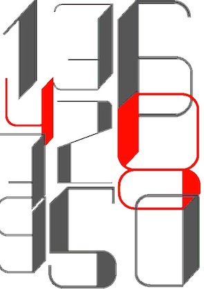 During her studies at FADU / UBA in Buenos Aires, Aldana Martinez designed a great techno display typeface (2014). [
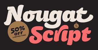 [
[ Originally from Maracay, Venezuela, Alejandro Freitez is now based in Buenos Aires, Argentina, where he releases his fonts mostly through Sudtipos. His typefaces:
  Graphic designer who studied at FADU, University of Buenos Aires, from 1997 until 2005. Creator of these typefaces:
  [
[ [
[ Designer who lives in Buenos Aires and who teaches graphic design and typography at the Universidad de Buenos Aires. He has worked as an art director in prestigious Argentina-based studios, handling high-profile corporate brands such as Arcor, Marta Harff, Morph, SC Johnson, Danone, and Movicom. He runs
 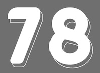 Graduate of Universidad Nacional de Rosario, and co-founder of
  Patagonian illustrator (mostly for children) and designer in Puerto Madryn, Argentina. Creator of the free cinematic font
 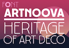 [
[ [
[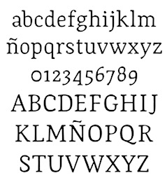 Designer (b. 1976, San Juan, Argentina) who created the text typeface
 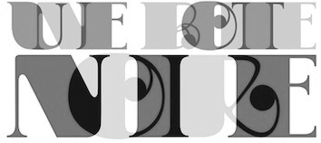 During her studies in Buenos Aires at FADU UBA, Ali Ogilvie made the gorgeous plump display typeface
 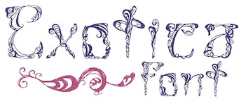 Villa Devoto, Argentina-based designer of the exquisite decorative typeface Exotica (2015). [
 During her studies in Buenos Aires, Amparo Guindon designed the sketched / engraved didone-inspired typeface Giambattista Unshackled (2016). [
 Graphic designer in Buenos Aires who created a wonderful typographic poster called Kraftwerk (2015). [
 Graphic designer in Porto Alegre, Brazil, who currently works as type designer at
  Argentinian illustrator, calligrapher and graphic designer based in Buenos Aires. Creator of the
  During her studies at FADU UBA (Buenos Aires), Anabella Ventrici created the fun plump poster typeface
  Buenos Aires-based illustrator and designer, whose studio is called Bureau AMB. HeHe created the hand-printed typeface
  Argentinian graphic designer who graduated from Universidad Nacional de Cuyo, Mendoza, Argentina and obtained a Specialist in Typeface Design degree from the Universidad de Buenos Aires. He works in his own graphic design studio. He is a participant in the Argentinian type coop
  Argentinian lettering artist who worked for 35 years for McCann Erikson and has produced freelance works for other major agencies like Interbrand, Futurebrand, and others. Veer wrote: The talented Angel Koziupa has been lettering, creating type and designing logos for the past 40 years. His handiwork is behind nearly every important packaging logotype in Argentina. He worked 35 years for McCann Erikson and has produced freelance works for other major agencies like Interbrand, Futurebrand, and others.
  During her studies at FADU / UBA in Buenos Aires, Angeles Moreno Vivot created the display typeface Broadway (2015) and the curly typeface Ansh (2014). [
 Argentinian designer of
 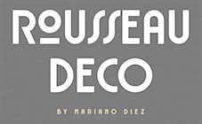 Mariano Diez ran Antenah Studio in Rosario, Argentina, and is now associated with the free font foundry
  Julia Martínez Diana (b. 1990) is based in Buenos Aires, Argentina, where she studies graphic design at UBA. In 2004, she set up the type foundry Antipixel.
  During her studies at FADU UBA in Buenos Aires, Antonella Cortes designed the condensed display didone typeface Ay Caramba (2016). [
 Freelance designer in Mendoza, Argentina. In 2015, inspired by Pedro Almodovar's movies, she made the paper-cut or dada typeface Almodovar. [
 During her studies, Ara Scavarda (FADU / UBA, Buenos Aires) designed an artsy poster typeface that evokes the fifties and sixties. [
 [
[ [
[ Graduate of ITBA (Instituto Tecnologico de Buenos Aires). Professor of typography and editorial design at the University of Buenos Aires. Ariel Garófalo's Buenos Aires-based type and graphic design studio is simple called
  Graduate from FADU, University of Buenos Aires, who created the fashion display typeface
  Argentinian designer (b. 1991) of the delectable horror movie script typeface
  During her studies in Buenos Aires, Bel Ardila created the Western typeface
 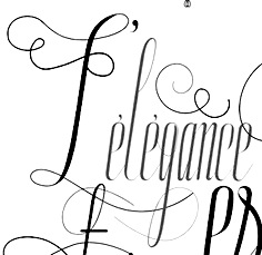 During her studies at FADU UBA (Buenos Aires), Belen Cierra created the swashy calligraphic typeface
 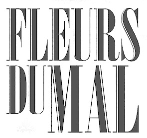 Florencia Alvarez (Bling Studio, Buenos Aires, Argentina) is a graphic designer and illustrator. She created the powerful classical condensed didone-based headline typeface Fleurs du Mal in 2014. A free download is promised soon. [
 Design studio in Buenos Aires.
 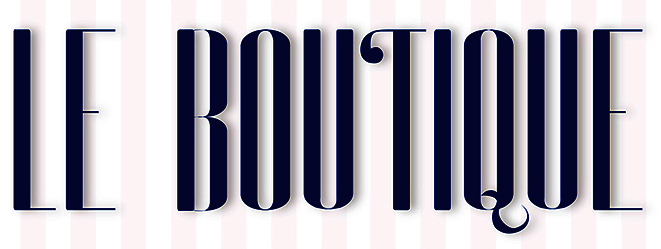 During her graphic design studies in Buenos Aires, Brenda Opoka created the narrow display typeface Le (sic) Boutique (2014). [
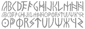 Argentinian designer, b. 1984, and graphic design student at FADU in Buenos Aires. Creator of the award-quality simulated runic typeface
  Argentinian designer of the pure art deco typeface Royal (2020). [
 During her studies at FADU / UBA in Buenos Aires, Camila Francisco Mera created the creamy script typeface Mackenzie (2014). [
 Carine de Wandeleer was born in Argentina to a French-Belgian immigrant family. She studied fine arts and graphic design at University of Buenos Aires, but lives and works in Spain.
 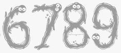 Graphic design student from El Salvador currently living in Buenos Aires, Argentina. He created the children's book alphabet
  [
[ Graduate from FADU, University of Buenos Aires, who created the angular almost-blackletter extra-condensed typeface
  Born in Rosario, Argentina, in 1976, she studied type design at UBA in Buenos Aires from 2009 until 2010, and co-founded the type coop
  Carolina (or Caro) Marando is a graphic designer from Caballito / Buenos Aires, Argentina. She graduated from the Gutenberg Foundation in 2012. Together with Alejandro Paul of Sudtipos, she designed
  At FADU / UBA in Buenos Aires, Casiel Checoni created the fear-inspiring display typeface Ryleh (2015). [
 Graduate from FADU, University of Buenos Aires, who created the typeface
  In 2011, Cecilia Eleno (Buenos Aires, Argentina) created the triangularly cut typeface Tipografia Abstracta. [
 Graduate from FADU, University of Buenos Aires, who created the slab serif
  While studying at FADU / UBA in Buenos Aires, Celeste Roldan designed the artsy condensed typeface
  Argentinian graphic and type designer, b. 1984. Director of
  [
[ Buenos Aires, Argentina-based designer of the art nouveau style typeface Encanto (2017). She writes that it was inspired by vintage fantasy books, romanticism and surrealism. [
 During her studies at UBA in Buenos Aires, Damaris Carina Sanabria designed the bubblegum typeface Scones (2017). [
 Bella Vista, Argentina-based designer of the oriental simulation font Katana (2016). [
 Graphic designer in Buenos Aires, where she studied at FADU, UBA. In 2011, she created a
  Buenos Aires-based designer of
  Artist and designer in Villa Allende, Argentina, who created a great typographic poster called Vendetta in 2015. [
 As a student at FADU / UBA in Buenos Aires, Danisa Gutierrez designed the vintage display typeface Vendimia (2016). [
 [
[ Del Alma is the (virtual) foundry of designer
  Argentinian graphic designer and recent docent in graphic design at the University of Buenos Aires. He graduated in 1991 from the University of Buenos Aires with a degree in graphic design. He worked at Arcor, and after a brief sabbatical in London at Interbrand Newell and Sorrell during 1999, he returned to Argentina, where from 2000 on, he is the Director of Design at Interbrand Avalos&Bourse. His fonts:
  Graphic designer and art director at As If Magazine, Buenos Aires. For As If he created the prismatic op-art typeface Optic Alphabet (2015). He also designed a prismatic fantasy alphabet called Strings (2015) and the axonometric alphabet Axo (2016).
  During his studies at FADU / UBA in Buenos Aires, Diego Urquiza designed a great typographic movie poster entitled A Trip Tp The Moon (2013). [
 Buenos Aires-based designer of the floral caps typeface Amazonia (2015). [
 Graphic designer in Buenos Aires who created the art deco caps typeface
  Eduardo Dulin is a graphic and type designer from Mar del Plata, Argentina. In 2021, he designed the single weight condensed didone typeface
  [
[ Buenos Aires-based Venezuelan designer of the
  Ricardo Victor Rousselot is a calligrapher and type designer born in Argentina in 1936. He was trained in the sixties in Chicago in the studio Ficho&Corley Inc., which was led by a disciple of Frederic Goudy and Oswald Cooper, Carl Corley. After that, he returned to Buenos Aires, and in 1975, he settled permanently in Barcelona, where he teaches at the University of Barcelona.
  Buenos Aires, Argentina-based designer of the color font Enterline (2018, with Alejandro Paul at Sudtipos). [
 Buenos Aires-based type designer associated with Omnibus Type. In 2015, the
  Graphic designer and illustrator in Santa Fe, Argentina, who created a poster alphabet in 2013 called
  Graduate from FADU, University of Buenos Aires, who created the typeface
  Graphic designer in Buenos Aires who created the neon light typeface Casanova, the gothic typeface Lady Monster (2014), and the vintage teardrop typeface Parisien (sic) Hooker in 2014. [
 Emtype is the foundry in Barcelona that was founded in 1997 (in Buenos Aires) by Eduardo Manso. Eduardo was born in Buenos Aires in 1972 and studied graphic design at the Escuela de Artes Visuales Martín A. Malharro and at the Universidad Nacional de Mar del Plata, both in Mar del Plata. Art director of the Argentinian graphic design mag "el Huevo". He currently lives in Barcelona. His typefaces include the pixel font family
  Buenos Aires-based designer of the free abstract display typefaces
  Buenos Aires, Argentina-based designer of Gomita (2014), an ultra-fat oily bubblegum font.
  Institute in Benalmadena, Spain (was: Santa Severa), where one can take 4-week courses at 1450 Euros a shot on the Etruscan alphabet, Trajan, Cuadrata and Rustic Roman Capital letters, and related subjects. They also organize lettering tours in Italy and guided tours in various musea. The teachers are Alberto Di Santo (Professor of the visual communication, Tor Vergata University, Rome; Professor of Graphic Design, Istituto Europeo di design, Rome; Professor of editorial design, La Sapienza University, Rome; Professor of Typography, C.F.P. Sinalunga, Siena) and
  Designer of 40 pictograms in the typeface Truculenta Dirty, which is part of
  [
[ During his studies in Buenos Aires, Fabricio Orellano created the painter's typeface Jona Miro (2014). [
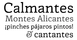 Rosario, Argentina-based graphic and type designer, lettering artist and photographer. Creator of Beauty Script (2017).
 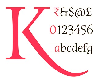 Or Fer Cozzi. Graduate of the University of Buenos Aires, who now teaches in the Master in Typeface Design program at that university. Based in Buenos Aires, she created the calligraphically-inspired typeface Kamchatka together with Cecilia Leone two days after Obama reopened diplomatic relations with Cuba in 2014.
  Argentinian artist / painter / illustrator, b. 1966. Creator of the experimental typefaces Borges (2005),
 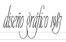 Graduate from FADU, University of Buenos Aires, who created the typeface
  Buenos Aires, Argentina-based creator of the spurred Victorian typeface Nautical Type (2015).
  During her studies at FADU in Buenos Aires, Flor Jochimsen combined Helvetica Bold and Light into an experimental hybrid typeface (2015). She also created a fantastic set of pop art posters in 2015. [
 Buenos Aires-based designer of the display typeface Dumba (2013, a school project font at UADE that is based on a combination of Bauhaus and Licko's Filosofia). [
 During her studies at UADE in Buenos Aiores, Florencia D'Amico (Tigre, Argentina) created a 50s diner font, Retro Series (2014), by combining Vernon Adams's Francois One with Didot. [
 Graduate from FADU, University of Buenos Aires, who created the typeface
  Viviana Monsalve (FontFuror) is a Colombian type designer located in Bogota. Award winner at Tipos Latinos 2010 for her text typeface Enriqueta Book (with Gustavo J. Ibarra: a serif typeface designed to meet the technical demands of silkscreen printing). At
  This Cordoba, Argentina-based cinephile is interested in movie posters. Known as FZ over at
  Graphic and type designer from Caracas, Venezuela, b. 1981, who moved first to Buenos Aires and then to Santiago in Chile. While mainly a type designer, he also practices
  [
[ Frederick Pousadela (Buenos Aires) designed the studded marquee font
  Graphic designer in Buenos Aires. The art of Fernando Llort inspired him to design the
  Gastón Fuoco is a graphic and web designer born in Buenos Aires, Argentina. He holds a degree in graphic design from the University of Buenos Aires and later attended the Master's program in typeface design at the same University, class of 2018-2019. Designer at Sudtipos of the wedge serif display family
  Argentinian graphic designer who made great use of typefaces in her graphic design work. [
 Argentinian graphic designer (b. 1982). He created
  During his graphic design studies in Buenos Aires, German Di Ciccio created the
  Graviton is a small type foundry based in Buenos Aires, Argentina. It was founded by Argentinian type designer Pablo Balcells in 2013.
  [
[ Argentinian graphic designer in Buenos Aires. Award winner at Tipos Latinos 2010 for his text typeface Enriqueta Book (with Viviana Monsalve at FontFuror). At
  [
[ Graphic and interface designer from Buenos Aires. His
  Graphic designer from Córdoba, Argentina. Currently working as a freelance designer, involved in print design and art direction. Designer of the trendy sans display typeface
  Buenos Aires-based illustrator and art director. In 2015, he created the striking modern deco typeface Obelisk. In 2017, he designed the 1950s car emblem font
  During her studies at FADU / UBA in Buenos Aires, Iara Grinspun designed the futuristic typeface Astro (2015). [
 Ignacio Fretes is a graphic designer based in Buenos Aires, who worked in different studios and agencies specializing in digital design, advertising design, branding and motion graphics. He graduated from Graphic Design career at the University of Buenos Aires. Creator of the thin display typeface
 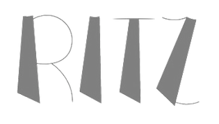 Buenos Aires-based creator of the glitzy art deco typeface
 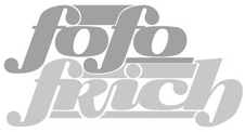 Ha, an upbeat designer from Buenos Aires who made a flowing display face,
  Buenos Aires-based designer of a great hand-drawn typographic poster series in 2014, called Fama y Eucalipte. [
 Colombian type and graphic designer (b. 1974, Bogota), who graduated from Universidad Nacional de Colombia (1997). Co-founder of ADG Colombia (Colombian Association of Graphic Designers). He was studying for a Postgraduate degree in Type Design at UBA (Universidad de Buenos Aries) in Argentina. He currently lives in BuenosAires.

 Buenos Aires, Argentina-based designer of the crayon / lipstick font KussFont (2014). This font was developed for a school project at Univerity of Buenos Aires. [
 Buenos Aires-based designer of the great totalitarian typeface
  The marriage of Adobe Jenson and Westminster Gothic led Juan Manuel Gallego (Buenos Aires) to develop a spooky gothic angular typeface,
 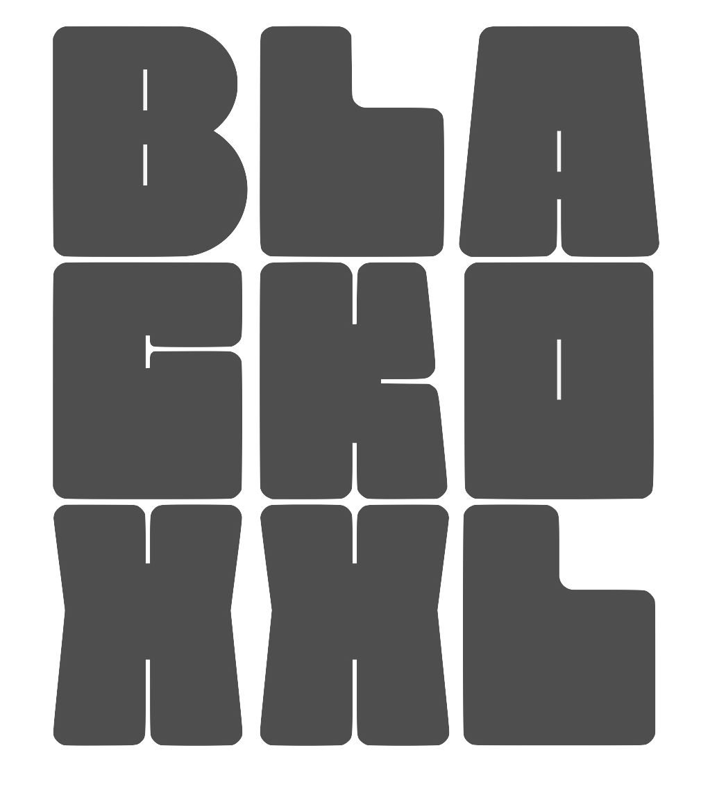 Juan M. Valdes is the Argentinian designer of the great square-shaped ultra-fat font Blacko (2019), Riptide (2019), the crayon font Joaco (2019), the hipster typeface Nkechi (2019), Odyssey (2019: squarish), Dracula (2019), the graffiti font Dripz (2019), and the graffiti-inspired Cranio (2019). [
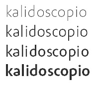 [
[ For his courses at FADU / UBA in Buenos Aires, Juan Pablo Parisi created an art deco typeface in 2013. [
 Buenos Aires, Argentina-based designer of Geo Deco (2017) for a school project at FADU / UBA. [
 [
[ Colorblok founder Juliana Pedemonte's illustration and motion graphic work first appeared on VH1, MTV and Nickelodeon Latin America in 2003. Born in Bahia Blanca, Argentina, she studied at the University of Buenos Aires. In 2018, with Alejandro Paul at
  During her studies in Buenos Aires, Julieta Arena Di Giulio created the beautiful black display typeface Nautica (2014). [
 Graduate of FADU / UBA in Buenos Aires, Argentina. Her work often has revolutionary themes. She made the grungy typeface Rota Gueveriana in 2016 to honor the memory of Che Guevara. In 2019, she published the wayfinding sans typeface Bondi, still at FADU / UBA. Bondi was co-designed with Jose Maria Acosta and Sofia Porley. [
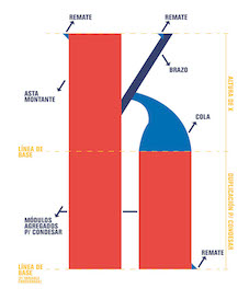 Sometimes less is more. If designers are restricted in some way, beautiful things can be created as if the artists are forced to dig deeper and thus be more creative. Crous-Vidal's Superveloz from the 1950s is a first example in that direction. For a project at FADU / UBA in Buenos Aires, Julieta Pelloni developed a strictly modular typeface, Vantea (2018), that can only be characterized as a total success. [
 [
[ Graduate from FADU, University of Buenos Aires, who created the rotunda (?) typeface
  Juan Pablo del Peral (b. 1984), aka Cocosaurio, is an Argentinian graphic designer who lives in Mendoza. He graduated from the Universidad Nacional de Cuyo, and from
  During his multimedia design studies at UADE in Buenos Aires, Kevin Arleo created the sharp-edged typeface Ragmul (2014) and the Peignotian display typeface Ritzways (2015). [
 Born in Kyiv, Ukraine, in 1986, Yevgeniy Anfalov moved to Germany in 2003. He studied Visual Communication at Hannover University of Applied Sciences and Arts, and he launched his own design practice in 2010, two years before graduation. From 2015 to 2017, he completed the MA Art Direction at ECAL/University of Art and Design Lausanne, with a major in Type Design. He obtained an award of excellence for his graduation book project on the history of electronic music, ROTARY. Geschichte des Studios für elektronische Musik WDR Köln 1951-1981. Yevgeniy is working primarily in the fields of editorial design, visual identities, bespoke typefaces and online projects.
  Lara Sofia and Susana Maurette made the
  Laura Keung (b. 1989) is [in her own words] a half Bolivian-half Chinese hybrid, born in Buenos Aires, Argentina, raised in Santa Cruz, Bolivia and currently [2014] living in Toronto, attending OCAD (Ontario College of Art and Design). Creator of the closed counter geometric typeface
  Freelance graphic designer in Buenos Aires who graduated from UADE (Universidad Argentina de la Empresa) with a degree in Graphic Design. In 2010, she created a
  Laura Varsky is a graphic designer and illustrator from Buenos Aires, Argentina. Her first forays into the design world came through her involvement with the local independent rock scene. She gradually asserted herself as a designer, specializing in the design of books and CD sleeves. In 2006 she received a Latin Grammy as Art Director for best record packaging. Four years after her graduation as a designer, she rediscovered the world of illustration working for editorial projects, several labels and artistic projects. She taught typography for ten years at the School of Design of the University of Buenos Aires. Her lettering and illustrations are well-known in Latin America.
  Illustrator in Buenos Aires who heads
  Buenos Aires, Argentina-based creator of the back-sloped squarish typeface Qubica (2014). [
 Luis Blanco Choncén (b. 1987) is an art director in Buenos Aires. He graduated from the University of Buenos Aires. His type designs include the
 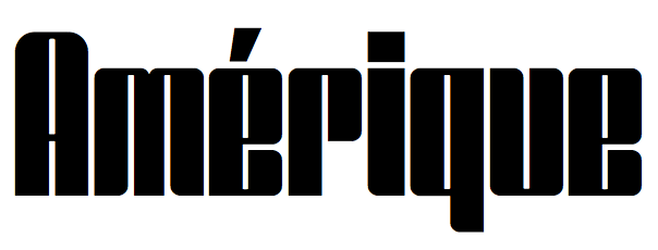 Cordoba, Argentina-based designer of the
  Aka Lucas Rod. During his studies at FADU, University of Buenos Aires, Lucas Rodriguez designed the display typeface
  Buenos Aites-based designer of the warm brush script typeface family Camille (2017). [
 Graduate from FADU, University of Buenos Aires, who created the typeface
  Aka Lu Ronderos. Lucia is a visual communication designer who studied at the National University of La Plata. During 2015-2017, she was part of the first Masters in Typography cohort at the University of Buenos Aires. In 2016, Micaela Novarini and Lucia Ronderos designed the Nordic style display typeface family
  Graduate from FADU, University of Buenos Aires, who created the typeface
 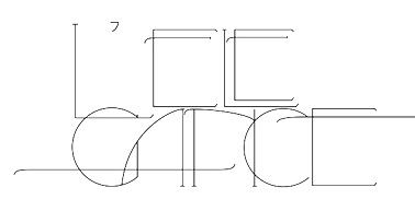 During her studies at FADU / UBA, Luciana Seljak created the excellent arts and crafts hairline typeface
  Luciana Sottini is an argentinian graphic who studied at Instituto Superior de Comunicacion Visual and National University of Rosario, where she was José Scaglione's student. She designed the weather icons in TypeTogether's WIPR project, and joined the TypeTogether team in 2018. Designer of the icons in
  For a school project in Buenos Aires, Luciana Zazzali created the hybrid techno typeface AK Numb for Latin and Cyrillic in 2012. It is based on a combination of Rockwell and a pixel font.
  [
[ Buenos Aires, Argentina-based designer of the curly typeface curl (2017). [
 Buenos Aires, Argentina-based designer of Bubble Gum (2016), which was done for a project at FADU, Universidad de Buenos Aires. [
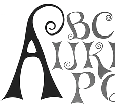 Graphic designer in Buenos Aires. During her studies at FADU / UBA in 2012, she designed the curly Victorian typeface Mushroom. [
 Graphic designer and illustrator from Buenos Aires.
  Mariel Gornati (Mago Fonts, Bernal and/or San Rafael, Argentina) is the creator (b. 1988) of the connected script typeface
  Graphic designer in Buenos Aires, who created a thin high-contrast fashion typeface called
  Aka El Grifo. Marcela's graduation work in 2012 at
 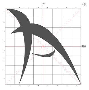 During his studies in Cordoba, Argentina, Marcos Bialet designed the display typeface Spiderblack (2014). [
 During her studies at FADU / UBA, Maria Balbarrey created the display typeface Ramona (2014) and the teardrop typeface Fresh Ness (2014). [
 During her graphic design studies in Buenos Aires, Maria Beatriz Troconis created the brush pen script typeface family Mabea (2015). [
 Argentinian type designer María CarlaMazzitelli was born in Buenos Aires, Argentina. She got a degree in Graphic Design at FADU-UBA and, in 2017 she finished her Masters in Typography at the same University. Since 2005, María Carla works side by side with Professor Carlos Venancio and Professor Darío Contreras at FADU-UBA, assisting them in their Typography courses.
  During her studies at FADU / UBA in Buenos Aires, Maria Diaz Rosaenz created a vintage poster typeface called Twinning (2012). [
 During her studies, Maria Eugenia Paradelo (Cordoba, Argentina) created the artsy display typeface Grumi (2015). [
 Art director and lettering artist in Buenos Aires, Argentina. She graduated from University of Buenos Aires, where she also completed the postgraduate Career in Type Design and is currently completing a Master'�s Degree in Typography Designer of the didone display typeface
  Designer in Porto Alegre, Brazil, who created a
  Argentinian type designer in Buenos Aires. Her major interest are typography, identity programs and book design. Award winner at Tipos Latinos 2010 for her avant garde typeface
  [
[ [
[ During her graphic design studies, Buenos Aires-based Marina Gonzalez Meyer created the didone typeface Baran (2014) and the hand-drawn typeface Beirut (2012, inspired by Alex Trochut's and Luke Lucas's work). [
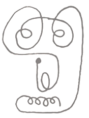 During her studies in Buenos Aires, Marisol Rekofsky created a surrealistic set of caricature dingbats called Calder (2014), inspired by and named after Alexander Calder. [
 Born in Berlin in 1883, died in Buenos Aires in 1963. He was a painter, commercial artist, advertising artist, writer and costume designer. After training to become a skilled woodworker, Jacoby-Boy studied at the Académie des Beaux-Arts in Paris. From 1912 to 1926, he designed Bravour (1912, D. Stempel AG), Verzierte Bravour (1913, D. Stempel AG) and Jacobea (1928, Berthold). Beginning in 1919, he spent a decade working as a Production Designer for several German film companies, including May Films and Fritz Lang's UfA. In 1933, he emigrated to the Netherlands and then to the USA, and finally to Argentina, where he died in 1963.
  Argentinian illustrator who is based in Buenos Aires. He studied at University of Buenos Aires. In 2018, together with Alejandro Paul at
 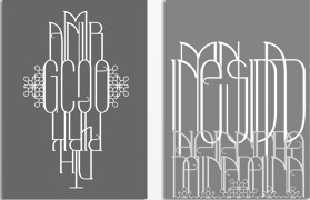 During his studies at FADU / UBA, Martin Pignataro (Buenos Aires, Argentina) created an experimental typeface. [
 Graphic designer from Venezuela who is based in Floresta, Argentina. He studied at UBA in Buenos Aires. Martin's typefaces include Pictogramas Deportes Acuaticos (2014), Whiscacho (display typeface) and Angus (2014, modular typeface). Winner at
  Independent Argentinian designer (b. 1982) who was an assistant in the graphic design program at the University of Buenos Aires from 2003 until 2009. Graduate of the Masters program in type design at
  During her studies in Buenos Aires at FADU / UBA, Martina Llambi designed the display typeface Ganea (2015). [
 Graduate from FADU, University of Buenos Aires, who created the high-contrast italic headline typeface
  Graduate from FADU, University of Buenos Aires, who created the fashion typeface
  Graduate from FADU, University of Buenos Aires, who created the display typeface
  [
[ During her studies at FADU / UBA (Buenos Aires), Melania Lozano created a multilined typeface (2014). [
 During her studies in Buenos Aires, Melina Olguin created
  During her studies in Buenos Aires, Melon Ianotti created the spurred typeface Primer Alfabeto (2014). [
 Graphic design student in Buenos Aires who made the blended experimental typeface
  Mercedes Jáuregui's graduation typeface in 2012 at
  Graduate from FADU, University of Buenos Aires, who created the typeface
  During her studies in Buenos Aires, Mili Canzani created the great brush typeface Samhain (2013). [
 Mirror Types is an Argentinian foundry. Creator of BlackStripe (2011, a typeface inspired by bricks) and
  Type foundry in Mendoza, Argentina, est. 2011. It published the black elliptical poster typeface
  Born in Buenos Aires, Natalia Elichirigoity graduated from FADU-UBA in the same city, started her own studio, and worked as art director. In 2018 she designed
  Argentinian designer at Sinergia Lab of
  Buenos Aires-based Natalia Mercol is a talented illustrator and print designer who is into colors. In 2010, she created a hairline typeface that was derived from Bauer Bodoni, called
  Negro is a design site where some commercial fonts can be found, all designed by
  Art director at Borgonovo Publicidad in Rosario, Argentia. With Omnibus Type he created the 4-style typeface family
  [
[ Argentinian designer of the Dutch deco typeface Glaze Artois (2018) for a school project at FADU / UBA. [
 Nodo Type Foundry was set up in 2015 in Buenos Aires by Monterrey, Mexico-based designer Aldo Arillo and Buenos Aires-based Ariel di Lisio. Nodo's motto: Typography transcends time. The future is grotesk. Nodo's typefaces:
  Illustrator and graphic designer in Buenos Aires who created the tall display typeface Lapochka in 2017. [
 Graduate from FADU, University of Buenos Aires, who created the Bastarda typeface
  [
[ Senior designer in Buenos Aires who created the hand-drawn poster typeface Americano (2014) and the baseball script typeface American Forkball (2015). In 2016, he designed the rounded poster typeface Forest Camp.
  [
[ Type designer in Madrid, Spain, b. Barcelona, 1982. In 2006, he moved to Buenos Aires. Pablo Alaejos's graduation typeface in 2012 at
  [
[ Professor of Typography at FADU, the University of Buenos Aires, from 1994 onwards. Founder of
  Very prolific Argentinian type designer (b. 1976) located in Rosario. His extensive repertoire:
 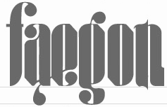 Graduate from FADU, University of Buenos Aires, who created the typeface
  Designer and type designer in Cordoba, Argentina. His typefaces include Need (2011),
 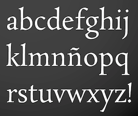 Argentinian type designer who lives in Buenos Aires where he runs UGR Design. Award winner at Tipos Latinos 2010 for his text and IPA typeface
  During her studies at Universidad Argentina de la Empresa (UADE) in Buenos Aires, Argentina, Pamela Castro created the fashion mag typeface Vanity (2014). [
 Alejandro Lo Celso, a graphic and type designer born in 1970 in Córdoba, Argentina, was art director at several publishing media in Buenos Aires. He has written several articles for typo magazines, and taught typography at the University of Buenos Aires. In 2000 he completed his MA in Typeface Design at the University of Reading (UK). In 2001, he obtained a post-diploma at the Atelier National de Recherche Typographique, Nancy (France). He teaches typography at the Universidad de las Americas in Puebla, Mexico, and at Centro Gestalt in Veracruz, and is Principal of Pampa Type in Mexico City. As Pampa Type grew, it brought several excellent type designers on board, such as Jorge Iván Moreno Majul and type designers Francisco Gálvez Pizarro, Francis Ramel, and Oscar Yáñez. In 2021, pampa type joined
  Illustrator from Mar del Plata, Argentina, who is now based in Buenos Aires. He designed these typefaces:
  Pangramas is Pedro Sanoja in Barcelona and Buenos Aires. His typefaces include
  In 2017, during her studies at FADU / UBA in Buenos Aires, Paula Comesaña designed the Western circus font Le Cirque. [
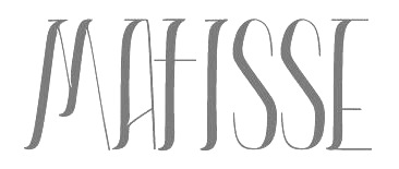 During her graphic design studies in Buenos Aires, Paula Fraysse created the high-contrast fashion mag typeface Living Thoughts (2014). [
 Buenos Aires-based designer of Panda (2015), an octagonal typeface family with great inline styles. She also made the display typeface Puch (2015).
  Cecilia Vizan (Buenos Aires, Argentina) set up her own type foundry, Pio Pio, in 2013. She created the curly script typeface family
  Fontstructor in Argentina who made the hospital typeface
  Design studio in Buenos Aires. Their typefaces include the macho semi-stencil
  Alexey Popov, or Alex Pop for short (Popskraft Lab, Buchardo, Argentina, and now New York City) designed the children's book / cartoon font family
  Q-BO is the foundry of
  [
[
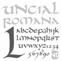 [
[ Graphic designer in Buenos Aires who created the open typeface typeface Just Married (2014), which is based on Bodoni MT. [
 In Diego Pérez Lozano's class at the Universidad de Palermo in Buenos Aires, Rocio Amura designed the lively curly calligraphic script typeface
  During her studies at the University of Buenos Aires, Rocio Ayala created the grungy typeface Broken Down (2014) and the learned logotype
  [
[ Student at FADU UBA (Buenos Aires). She created a hyper-ornamented Western style caps typeface in 2012 called
  Type foundry and type cooperative in Rosario, Argentina, providing well-designed free fonts. The type director is
  Argentinian type designer (b. 1942, Buenos Aires). He began his career in the Department of Graphic Design at the Instituto Di Tella, directed by Juan Carlos Distefano. Ruben Fontana introduced typography in the graphic design program at the University of Buenos Aires, where he taught until 1997. Editor of the magazine tipoGráfica, for which he designed the font
  Graduate from FADU, University of Buenos Aires, who created the quaint condensed typeface
  [
[ Graphic designer and illustrator in Buenos Aires (b. 1985, Buenos Aires). In 2009, he experimented with mechanical letters in
  Graduate from FADU, University of Buenos Aires, who created the fat didone typeface
  Based in Buenos Aires, Sebastian Diana created the thin display typeface Blue Rider (2013) during his studies at FADU / UBA. [
 Extraordinarily talented Argentinian calligrapher, b. Buenos Aires. She graduated from the Facultad de Arquitectura, Diseño y Urbanismo de la Universidad de Buenos Aires in 1988. She teaches and gives talks about calligraphy.
 Buenos aires-based designer of the art deco typeface Estilo Audrey (2019). [
 Graphic designer and illustrator in Buenos Aires. Creator of a decorative alphabet for Piba Co (2014).
  During her studies at Universidad de Palermo, this Argentinian designer created the Memphis-style typeface Neon 80 (2019). [
 Argentinian type designer born in Buenos Aires who graduated from Universidad de Buenos Aires, and worked initially at Saatchi & Saatchi agency in Buenos Aires. Since 2001 she runs her own studio Sonnenshine specializing in branding and custom type design, working for companies from Latin America, Europe and the United States. She co-founded the type foundry Huerta Tipografica with fellow Argentinian designers in 2009. iIn 2013, she moved to Berlin, where she focused on developing fonts for Latin, Cyrillic, Greek, Oriya and Devanagari. Since 2019 she runs Hungry Type Society.
  Graphic designer in Buenos Aires, Argentina. At FADU / UBA in Buenos Aires, Sol Valladares, Agustina Arado and Laura Ardito joined forces to design the vintage text typeface Bulevar (2015).
  During her studies at FADU / UBA in 2013, Solana Nader (Buenos Aires) designed the decorative ultra-fat piano key typeface Abd2. [
 Graphic designer in Buenos Aires who created the lovely
  Graduate from FADU, University of Buenos Aires, who created the typeface
 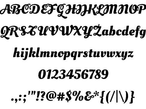 Or Muk Monsalve. Maria (or Mariela) Monsalve (Soytutype) lives in Buenos Aires, and studied at FADU / UBA there. She graduated from
  Argentinian foundry located in Buenos Aires, est. in 2008 by
  Born in 1981 in Colombia, Oscar Guerrero lives in Pasto, Narino, in the southwest of Colombia. His graduation work in 2012 at
 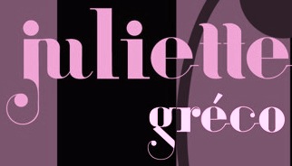 Buenos Aires-based designer of the decorative didone typeface
  Or Tania Maria, or Tania Bekke. Santiago, Chile-based, graphic and type designer, who graduated from Universidad Diego Portales (Santiago, Chile) in 2009 and studied type design at
 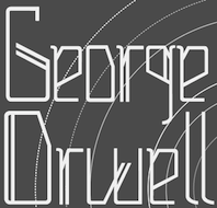 Buenos Aires-based creator of the children's hand font
  Tipitos Argentinos is Aldo de Losa's foundry in Argentinaa, and Estudio Digit is his graphic design studio. His undergraduate studies were carried out at the University of Buenos Aires, Argentina. Since 1996 he is professor of typography at University of Buenos Aires.
  Argentinian foundry, est. 2006 by Darío Manuel Muhafara and Eduardo Rodriguez Tunni, located in Buenos Aires. Muhafara gave two presentations at ATypI 2009 in Mexico City. Back in Buenos Aires, he runs two restaurants, and one wonders how he has the time for anything.
  Type design collective founded in 2011 by Luis Alonso (Barcelona), Ricardo Santos (Lisbon) and Charlie Zinno (Buenos Aires).
  Tipos del Oeste is a foundry in San Juan de la Frontera, Argentina, run by Alfonso García. Their initial fonts:
 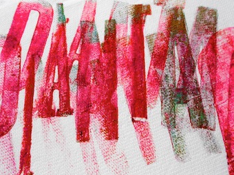 Catalan/Spanish typography and type design blog and information site. At Behance, Ana is listed under Buenos Aires, Argentina. The motor behind Tipos en Red is
  Argentinian digital type cooperative foundry run by Nicolas Massi. The fonts published by Tomo Fonts were made by a variety of people. Tomo Fonts created the handcrafted poster typefaces
  Foundry est. in 2005 by
  Typesenses was founded in 2009 by Sabrina Lopez in Ramos Mejìa, near Buenos Aires. Since 2021, its fonts can be licensed via
  Graduate from FADU, University of Buenos Aires, who created the typeface
  Argentinian graphic and type designer (b. 1948) based in Buenos Aires. He was creative director, art director and graphic designer at several advertising agencies in Buenos Aires, which led to various exhibits such as at the Biennale of Brno and the Japan Design Foundation in Osaka. His
  For a school project at ISCV Rosario in Argentina, Valeria Grela designed the text typeface Vox (2016) especially for use on music sheets. [
 Graphic designer in Burgos, Spain. Creator of the industrial sans typeface Industria (2014), which is a wide geometric grotesk with an extra-large x-height.
  Graphic designer in Buenos Aires, who created the display typeface Cachengue (2015).
  Graphic designer from Buenos Aires, Argentina, at some point located in Madrid, Spain, who made the
 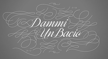 Guille Vizzari is the Argentinian designer of the gorgeous experimental pixel-script typeface Beautiful Pixel (2006). He also created the equally gorgeous connected copperplate script typeface
 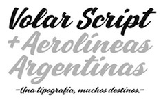 Yani Arabena (b. 1985, Buenos Aires) graduated from the University of Palermo in 2007 and then from FADU-UBA in Buenos Aires in 2012. Her graduation typeface in 2012 at
 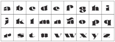 Graduate from FADU, University of Buenos Aires, who created the typeface
 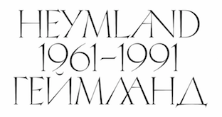 [
[ Graduate from
  Julieta Ulanovsky graduated from Universidad de Buenos Aires, and presently is a graphic designer based in Montserrat, Buenos Aires. She is owner of ZkySky, a design studio which she co-founded in 1989 with Valeria Dulitzky. She studied Design in UBA (universidad de Buenos Aires) and makes books and fonts with urban thematics.
  Typographer and digital artist in San Juan, Argentina. Creator of the artistic geometric typeface