TYPE DESIGN INFORMATION PAGE last updated on Wed May 6 15:56:48 EDT 2026
FONT RECOGNITION VIA FONT MOOSE
|
|
|
|
|
Type design in Mexico | ||
|
|
|
|
SWITCH TO INDEX FILE
21 Lab
|
It offers Nieu Font (2012, organic), Free Font 21 (2010, a free paperclip face) and the counterless gometric alphabet Navia (2012). Clasia (2013) is an interesting experimental sans typeface. It looks geometric, but has original stroke cuts meant for legibility. In its presentation, the designer works with subtly shaded parts where strokes join---I guess that is also for enhanced legibility. Fontspace link. Behance link. [Google] [More] ⦿ |
323 Productions
|
Old web site. Dafont link. Fontspace link. [Google] [More] ⦿ |
Monterrey-based creator of the wavy typeface Puntua (2012). [Google] [More] ⦿ | |
Graphic designer in Puebla, Mexico, who created a display typeface in 2013. [Google] [More] ⦿ | |
Abel Marquez
| |
During her studies in Tijuana, Mexico, Abigail Peña created the display typeface Solstice (2013). [Google] [More] ⦿ | |
Abraham Beltran
| |
Tampico, Mexico-based designer of the modular sci-fi typeface Acidz (2015). [Google] [More] ⦿ | |
Graphic designer in Mexico City who created the leafy environmental cause typeface AK Nature in 2014. [Google] [More] ⦿ | |
Mexican designer (b. 1989) who created Guardians Unite in 2010. His home page is called Pixel grid. [Google] [More] ⦿ | |
Design studio in Mexico City. Creators of the experimental typefaces Suger (2014), Basic Type (2014), Ejekalt Type (2014) and Otoño (2014). [Google] [More] ⦿ | |
Small rune font archive. Has, for example, from Ecological Linguistics, their Maya glyph fonts DaysBF, DaysCodBold, DaysCodBoldItalic, DaysCodItalic, DaysCod, all made in 1994. From the American Philological Association, Jeffrey Rusten's Greek font Athenian (1991). Also, the Maya glyph fonts Abaj, AbajBold, TunBold, Tun, Wuuj, WuujBold, WuujBoldItalic, WuujItalic. [Google] [More] ⦿ | |
Aguascalientes, Mexico-based designer of the decorative caps typeface Muximbal (2016), a typeface based on Mayan patterns developed during his studies at Universidad Autonoma de Aguascalientes. [Google] [More] ⦿ | |
Classical musician, b. 1974, who lives in San Juan del Rio in Mexico. Adolfo created Adolphus (2008, a Peignotian typeface), Adolphus Serif (2014) and Alanus (2014, a condensed rounded sans first called Alanya). In 2015, he made Kosova. Fontspace link. Home page. Klingspor link. Dafont link. [Google] [More] ⦿ | |
Mexican designer of the handwriting font ABC Melo (2007). [Google] [More] ⦿ | |
Design student in Monterrey, Mexico, who created Reverend Type (2012). [Google] [More] ⦿ | |
Monterrey, Mexico-based designer (b. Merida) of Creepy Roman (2013) during his studies at UANL. [Google] [More] ⦿ | |
During his studies in Tijuana, Mexico, Adrian Orozco created the sans typeface Clin (2013). [Google] [More] ⦿ | |
| |
| |
Mexico City-based designer of the decorative textured typeface Supalover (2018). At Type Cooper 2021, she developed the condensed sharp-edged typeface Iris, which was inspired by and named after fashion designer Iris Van Herpen. [Google] [More] ⦿ | |
Tijuana, Mexico-based designer of a display typeface in 2015. [Google] [More] ⦿ | |
Aisiv
|
|
| |
Mexico City-based illustrator and graphic designer. He made the angular, electric techno typeface TipoZero (2009). [Google] [More] ⦿ | |
Albatross (or: Font Deals)
|
Typefaces from 2008 include the informal outline typeface Tire Shop, the informal 3d shadow typeface Blox (2008), the 3-d wood typeface Baja California, the stunning four-style family called BB Petie Boy (which includes an ornamental caps style, a grunge style, a blackboard style and a sketch style), Fusty Saddle, 23rd Street (a graffiti font) and Whiteboard Modern. In 2009, he followed up with Oil Change (3d, hand-drawn). In 2011, he created the futuristic family Naughty Astronaut (+Cowboy), the Western typeface ABTS Gunsmoke, the connected retro script typeface ABTS Milk, ABTS Feather Pen, ABTS Oklahoma (retro deco), ABTS Aviator (2011, art deco caps face), and ABTS Day of the Dead (ornamental skulls, Mexican style), ABTS Crestwing (an inline caps face), Helios Pro. Typefaces from 2013 include Boom (a comic book typeface family, with hand-drawn Boom Symbols). Typefaces from 2014: Signyard (a retro overlay font family that evokes motel signage), Microbrew (letterpress emulation in many increasingly grungy styles, accompanied by Ornaments and Banners), Sparhawk (a 3d layered display font), Castor One (wood and letterpress style), Altus (a hand-drawn elliptical sans, +Altus Extras: ornaments). Typefaces from 2015: Corinth Ornaments, Auburn (brush script), Microbrew Unicase, Corinth (hand-drawn geometric sans with letterpress influences). Typefaces from 2016: Moraine (a weathered letterpress emulation typeface family), Microbrew Soft. Typefaces from 2019: Blakstone (a letterpress emulation family), Hanscum (vintage, handcrafted and letterpress-inspired). Creative Market link. Dafont link. Creative Market link. In 2011, he started Font Deals. [Google] [MyFonts] [More] ⦿ |
Alberto Arellano (Memela Studio, Guadalajara, Mexico) designed Cali (2010) and Marga (2010, a polygonal geometric display sans done with Peter Lorenz). [Google] [More] ⦿ | |
Graphic designer in Tijuana, Mexico, who created a beautiful engineering style El Grill logo in 2015. [Google] [More] ⦿ | |
Graphic designer in Tijuana, Mexico, who created the Cyrillic simulation typeface Woods (2013). [Google] [More] ⦿ | |
Graphic designer in Mexico City who created the modular typeface happening (2015). [Google] [More] ⦿ | |
Calligraphy and typography teacher in Veracruz, Mexico. Creator of Carabali, Mercedes (sans), the top or bottom half-only alphabet font Mocha (2004), Cartel Extendida and Border, mentioned here. [Google] [More] ⦿ | |
Born in northern Mexico, Aldo Arillo has a Bachelors from CEDIM in Monterrey, Mexico, and a Masters in typography from FADU, UBA in Buenos Aires, Argentina. In 2015, Aldo Arillo and Ariel di Lisio set up Nodo Type Foundry in Buenos Aires. Nodo's motto: Typography transcends time. The future is grotesk. [Google] [More] ⦿ | |
Puebla, Mexico-based designer of the free (vector format) paperclip font Clip (2018). [Google] [More] ⦿ | |
| |
Mexican designer of Sinapsis (2007), a futuristic Bank Gothic style font, Galactic Troopers (2010, futuristic), and Madame Butterfly (2009, rounded sans). Klingspor link. [Google] [More] ⦿ | |
Monterrey-based creator of the poster typeface Leafs (2012). [Google] [More] ⦿ | |
For a student project, Aleida Gaytan (Monterrey, Mexico) combined Marle and Futura into the hybrid typeface Extravaganza (2015). [Google] [More] ⦿ | |
Based in Mexico City, Alejandra Acosta Chavez created Gormley Bold (2013), which is a squiggly typeface created from Helvetica in the style of the English painter Anthony Gormley. [Google] [More] ⦿ | |
Morelia, Mexico-based designer and illustrator. Creator of Nouveautype (2015). [Google] [More] ⦿ | |
Mexican graphic designer and illustrator who is based in Philadelphia, PA. In 2017, she created the sans serif typeface Funny Tell. Creative Market link. [Google] [More] ⦿ | |
| |
Graphic design student in Monterrey, Mexico. In 2012, she created the quirky stencil typeface Kayab. [Google] [More] ⦿ | |
Designer in Monterrey, Mexico. She blended Kievit and Mimix to make Kievix (2012). [Google] [More] ⦿ | |
Monterrey, Mexico-based designer of a fun rounded poster typeface in 2016. [Google] [More] ⦿ | |
Mexican designer of the free children's book typeface Orikids (2018). [Google] [More] ⦿ | |
Mexico City-based designer of the high-contrast display typeface Camont (2016). [Google] [More] ⦿ | |
Mexican designer of the bewitched typeface Pandora (2017). [Google] [More] ⦿ | |
Mexican designer of the deco typeface Progessist (2017), the symbolic typeface Maya (2017), the frilly typeface Talaverains (2017) and the experimental Max Font (2017) and Another Rectangular Font (2017). [Google] [More] ⦿ | |
In 2016, Mexico City-based Alejandra Samadi Gutierrez Garza designed the connect-the-dots typeface Terebellum. [Google] [More] ⦿ | |
Tijuana, Mexico-based designer of the high contrast typeface Pleiades (2015). [Google] [More] ⦿ | |
Alejandro Cabrera Avila
| |
Illustrator from Mexico City. He created a number of typefaces in 2010: i, ii, iii. He settled in Nieuwegein Zuid in The Netherlands. In 2013, he created Berlinier, a monoline sans with gothic arches dedicated to the fall of the Berlin Wall. Herreria is a display type with small Tuscan ends, and Punched Card is a heavy display face. Behance link. [Google] [More] ⦿ | |
Monterrey, Mexico-based designer of the straight-edged Costume font (2012), and of the modular typeface Duo (2012), which can be used as a bicolored font. [Google] [More] ⦿ | |
| |
Graphic designer in Monterrey, Mexico, who created the irregular typeface Makob Sans in 2015. [Google] [More] ⦿ | |
Alejandro Lo Celso
| |
| |
Monterrey, Mexico-based creator of Fame (2012). [Google] [More] ⦿ | |
Tijuana, Mexico-based designer of the hexagonal typeface Glyphs (2015). [Google] [More] ⦿ | |
Art director in Guadalajara, Mexico, who created the spurred typeface San Andres (2013) for a Mexican brewery. [Google] [More] ⦿ | |
Tecate, Mexico-based designer of the tall-legged vintage typeface Eleganto (2015). [Google] [More] ⦿ | |
Metra (2012) is a gorgeous techno display face. Behance link. [Google] [More] ⦿ | |
Alex Lugo (Ciudad Obregon, Mexico) designed the free monoline sans typeface Minimance (2018). [Google] [More] ⦿ | |
During her graphic design studies in Monterrey, Mexico, Alexa Irungaray created an AI format typeface (2012). [Google] [More] ⦿ | |
Mexico City-based designer of the script typeface Altago (2018). [Google] [More] ⦿ | |
Mexican creator of Maming (2012, spindly), the pixelish typeface Mattta Ahari (2011), Coluca Modern Side (2011, an octagonal semi-stencil face), the sturdy poster typeface La Camerino (2011), the grungy Indieo (2010), the condensed typefaces Tipulada (2011) and Condenzel (2011), the experimental typeface Autobahn (2011), the squarish NRCO (2011) and the experimental Vai Gone (2011). Behance link. [Google] [More] ⦿ | |
Alexis Carrillo
| |
During his studies, Alexis Romo Najera (Chihuahua, Mexico) created the triangulated connect-the-dots typeface Atrapasueños (2013). [Google] [More] ⦿ | |
Medical imaging researcher and specialist at Universidad Autonoma de San Luis Potosi, Mexico. He hooked up with Mexican type designer Manolo Guerrero and together, they co-designed the experimental typeface Sonotipo (2015) that emulates a cardiogram or other medical electronic signal. Sonotipo won an award at Tipos Latinos 2016. Home page. [Google] [More] ⦿ | |
Monterrey, Mexico-based designer of Tipografica (2014), a typeface based on simple geometric solids. Behance link. [Google] [More] ⦿ | |
Mexico City-based designer of the heavy brush typeface Kivac (2016). [Google] [More] ⦿ | |
Mexican designer (b. 1990) of the hand-printed typeface Killer Instinct (2012). [Google] [More] ⦿ | |
Ciudad Obregon, Mexico-based designer of the Western typeface Rodeo (2018). [Google] [More] ⦿ | |
During her studies in Tijuana, Mexico, Alicia Diaz created the outlined typeface Le Gorde (2014). [Google] [More] ⦿ | |
Monterrey, Mexico-based designer of the rough brush typeface Dark (2019). [Google] [More] ⦿ | |
During his studies in Ciudad Obregon, Mexico, Alizair Alvarez designed the left-leaning typeface Aliena (2017). [Google] [More] ⦿ | |
Ciudad Juarez, Mexico-based designer of the anatomy-inspired typeface Pitted (2016). [Google] [More] ⦿ | |
Alphabytes
|
In 2003, he found an outlet for his work through P22 and published P22Corinthia, P22ImperialScript, P22OhLey [simulating Mexican writing], P22Petemoss and P22Ruthie. He also made RUSerius (2007, curly handwriting), Alex Brush (2003), Cherish Font (2003), ChildrenPlay ROB (2003), Ephesis (1988), Inspiration (2003), JackieO (2003), Licorice (2003), OoohBabyROB (2004), TheNautiGal (2006), Gideon (2009, roman), Corinthia (2009, calligraphic), Puppies Play (2009), Monte Carlo (2011). Rob Leuschke's bio. Klingspor PDF. MyFonts interview. [Google] [MyFonts] [More] ⦿ |
| |
Alviso Bill's Tijuana Font Factory
| Robert R. Carroll is the designer of all the (non-downloadable) fonts at Alviso Bill's Tijuana Font Factory. He also designed a character in the September 11 charity font done for FontAid II. [Google] [More] ⦿ |
Amed Avila (Jalisco, Mexico) created jaeger Bold (2014, a bold design on a hexagonal skeleton), Bng Light (2014, an organic circle-based sans typeface) and Drago Serif (2014). Behance link. [Google] [More] ⦿ | |
Amuki Studio
|
In 2012, she designed the modular color font INTI, and the cultural pattern typeface family Sara. In 2014, she designed the modular typeface Oraculo and the bribeware display typeface Lineas Y Puntos. Amaru Creador won an award at Tipos Latinos 2014. In 2015, she created the free display typeface Abyaster, and the multiline Bolivian pattern typeface Khurus. Her typefaces Modular 46 and Tiwanacu (decorative Nazca-themed caps) won awards at Tipos Latinos 2016. Typefaces from 2016: Criolla (an ornamental circus font, extended to Criollabat in 2019). In 2017, she designed an extraordinary multiline ancient Mexican culture-themed decorative typeface, Coatl Serpiente, and published the Arhuaca op-art patterns. Typefaces from 2017: Tinkuy Patterns (a free op-art pattern font related to native Andean cultures; in 2021, published by Sudtipos with gdigitization by Alejandro Paul), M46C (experimental, and modular), Entorno (a modular prismatic typeface), Arhuaca (a precolombian pattern font). Typefaces from 2020: Nunka Anent Dingbat, Sébastien (a set of color typefaces inspired by Truchet's tilings). [Google] [More] ⦿ |
Monterrey, Mexico-based creator of the curly sea snail-inspired AI-format typeface Mood Board (2012). [Google] [More] ⦿ | |
Monterrey, Mexico-based designer of the copperplate typeface Heredem (2014). [Google] [More] ⦿ | |
During her studies in Tijuana, Mexico, Ana Cruz Hernandez created the stencil typeface Mamu (2013). [Google] [More] ⦿ | |
In 2012, she designed the curly typeface Glyphy. [Google] [More] ⦿ | |
Tijuana, Mexico-based designer of the display typeface Ingenue (2015). [Google] [More] ⦿ | |
During her studies at UABC Valle de las Palmas, Tecate, Mexico-based Ana Nuñez designed the display typeface Tosca (2015). [Google] [More] ⦿ | |
Graphic designer based in Mexico City. In 2016, she created the display typeface Heze. In 2017, inspired by Wes Anderson, she published the script typeface Aquatic. [Google] [More] ⦿ | |
| |
Mexico City-based designer of Moka (2015), a sans typeface influenced by Futura and Quicksand (2009, Andrew Paglinawan). [Google] [More] ⦿ | |
Anagrama are a brand and design agency based in Mexico. They developed a sans typeface for Sofia in 2012 [Sofia is a building designed by architect Cesar Pelli for One Development Group l ocated in San Pedro, Mexico]. [Google] [More] ⦿ | |
Queretaro, Mexico-based designer of the experimental typeface Los Andes (2017). [Google] [More] ⦿ | |
Mexico City-based designer of the bubblegum font Chiklosa (2013). [Google] [More] ⦿ | |
Photographer and designer in Mexico Coty, who drew Alfabeto Monstruoso in 2018. [Google] [More] ⦿ | |
Ciudad Victoria, Mexico-based designer of the medieval weapon typeface Skyrim (2018). [Google] [More] ⦿ | |
Creator in Monterrey, Mexico, of Solid Gothic (2012). [Google] [More] ⦿ | |
Tampico, Mexico-based designer of the blackletter typeface Oh Victoria (2012) which was created during a course taken from Francisco Calles. Cargocollective link. [Google] [More] ⦿ | |
During her studies at Universidad Regiomontana in Monterrey, Mexico, Andrea Gomez created Andreas Handwriting (2015). [Google] [More] ⦿ | |
| |
Aka Andrea Rmz. Graphic designer in Monterrey, Mexico, who created a hand-printed typeface (2011). In 2012, she designed Mostacho (a tall hand-printed face). [Google] [More] ⦿ | |
Graphic design student from Nuevo Leon, Mexico. She created the dingbat typeface Huevos Duros (2011). Devian tart link. [Google] [More] ⦿ | |
| |
Mexican creator of the pixel typeface Abo Mando (2012). Behance link. [Google] [More] ⦿ | |
Andres Eduardo Medrano Monteon is a lettering artist and graphic designer in Guadalajara, Mexico. In 2021, he designed the free display serif typeface Quimera. [Google] [More] ⦿ | |
Graphic designer in Hermosillo, Mexico. In 2019, he published the negatively spurred but machismo typeface Kitt Display. [Google] [More] ⦿ | |
Mexican designer of the Mexican-style typeface Mexanel (2019). [Google] [More] ⦿ | |
During his studies at the Escuela Nacional de Artes Plástica de la UNAM (Mexico City), Angel Apolinar designed the Tekia text typeface (2013). [Google] [More] ⦿ | |
Web and graphic designer in Monterrey, Mexico. Behance link. Creator of the grunge typeface Anhell RDZ (2011). [Google] [More] ⦿ | |
Graduate of the Univsity of Guadalajara, mexico. Now based in Mexico City, he created a beautiful typographic poster called Sexo in 2015. Behance link. [Google] [More] ⦿ | |
Design student in Monterrey, Mexico, who created the stitch font Zig Zag (2012). [Google] [More] ⦿ | |
During her studies in Tijuana, Mexico, Angela Aida Romero Villegas created the fat poster typeface Berrys (2013). [Google] [More] ⦿ | |
| |
Mexican digital artist. Fontspace link. Creator of Free Sans (2011) and Bambu (2012). [Google] [More] ⦿ | |
Anna Villarreal (Monterrey, Mexico) created Sofia (2013), which a hybrid typeface that interpolates between Arial Light and Filosofia. [Google] [More] ⦿ | |
Mexico City-based designer of the circle-based typeface family Geesa (2015). [Google] [More] ⦿ | |
Spanish typefounder based in Sevilla, who emigrated to Mexico and is thought to be the first Spanish typographer in North America. He created a large number of Gothic, roman and cursive typefaces. He printed mainly religious oeuvres, from about 1560 until about 1571. Cristóbal Henestrosa, who wrote Espinosa. Rescate de una tipografía novohispana (México, Designio, 2005), writes: He worked with Juan Pablos (first printer on the American continent) since 1551 and he began his independent job in 1559, with Maturino Gilberti's Grammatica Maturini and finalized with the second edition of Graduale Dominicale in 1576, the year he died. It is not completely clear that he cut [types], although there is a contract (1550) in which he promises to cut type for Juan Pablos, but he is the second printer in all of America and the first one who preferred roman and cursive type over the gothic. [Google] [More] ⦿ | |
Although not quite a full alphabet, the ornamental caps shown in Caleidoscopio (2013) by Antonio Hernandez Valdes (Leon, Mexico) are worthy of mention. [Google] [More] ⦿ | |
Antonio Lechuga
|
With the Latinotype team, he designed the high-contrast fashion mag headline typeface family Gabriela Stencil (2016), which was inspired by 19th century didones. Gabriela Stencil won an award at Tipos Latinos 2018. In 2018, Antonio Mejia Lechuja designed the handwriting typeface Handasa (programming by Ivan Moreno, Veracruz, Mexico). Handasa imitates the handwriting of architect Pedro Pablo Velasco Ochoa in his thesis Handasa: La epica en la arquitectura. In 2019, he added Gabriela (Latinotype) and Trust Sans (Latinotype Mexico: for corporate branding). Typefaces from 2021: Planetazul (a corporate font for Planeta Azul), Bruna (a 16-style sans family named after Dutch children's book illustrator Dick Bruna (1927-2017)). In 2021, he designed Gatopardo Display for the Mexican magazine Gatopardo, as well as Mestiza (a 12-style serif with sharp terminals). Typefaces from 2022: Mestiza Sans (a 12-style flared lapidary sans). [Google] [MyFonts] [More] ⦿ |
Antonio Mejia Lechuga
| |
Oaxaca, Mexico-based creator (b. 1985) of Artesania Display (2015). Behance link. [Google] [More] ⦿ | |
Mexican designer of the free rounded monoline organic sans typeface Curvine (2018). [Google] [More] ⦿ | |
In 2016, Pablo Garcia Risueño, Apostolos Syropoulos and Natalia Verges launched the free package SVR Symbols. The glyphs of this font are ideograms that have been designed for use in Physics texts. Some symbols are standard and some are entirely new. Still in 2016, he designed the calligraphic Greek font Frederika2016 as an attempt to digitize Hermann Zapf's Frederika font. The font is the Greek companion of Virtuosa by the same designer. Kernest link. [Google] [More] ⦿ | |
During his studies in Monterrey, Mexico, Arantxa Rivera created Manic (2013) by combining two existing typefaces. [Google] [More] ⦿ | |
During her studies in Mexico City, Aranxza Lopez Alvizo created the squarish sans display typeface Lixo (2014). [Google] [More] ⦿ | |
During her studies in Mexico City, Ariadna Galaz designed the symbolic typeface ABCDario (2015). [Google] [More] ⦿ | |
Ariel di Lisio
| |
Mexican designer of the heavy squarish typeface Trompus (2015). [Google] [More] ⦿ | |
Chihuahua, Mexico-based creator (b. 1984) of the dingbat typeface 360 (2008) and the handwriting typeface My Mom's Font (2010). I have no idea what these glyphs represent. [Google] [More] ⦿ | |
Mexican designer of the TrueType fonts Chess Alfonso-X, Chess Chess Harlequin, Condal, Chess Leipzig, Chess Kingdom, Chess Magnetic, Chess Mark, Chess Marroquin, Chess Maya, Chess Mediaeval, Chess Merida, Chess Millennia, Chess Miscel, Chess Motif, Chess Usual. All freeware. Also made the free PostScript font set FigurineSymbol (6 typefaces) for use in text. Armando lives in San Cristobal de Las Casas, Chiapas. [Google] [More] ⦿ | |
During his studies at Universidad Autónoma de Baja California, Armando MV (Tijuana, Mexico) created the display typeface Duatica (2014). [Google] [More] ⦿ | |
Mexico City-based designer of the Capricho (2014), a high-contrast didone with an additional stencil style. In 2016, he designed the blackletter typeface Toska One and Lapin Brush. Creative Market link. A newer Creative Market link. [Google] [More] ⦿ | |
During his studies, Armando Rayos (Cajeme, Mexico) designed the free frilly vintage display typeface Thund (2017). [Google] [More] ⦿ | |
Born and raised in Mexico City, Armin Vit is a graphic designer and writer now living in Austin, Texas. He is co-founder of UnderConsideration and its myriad sites. His last employment position was at Pentagram. He now runs UnderConsideration's Department of Design. With his partner, Bryony, he has co-authored the books Women of Design and Graphic Design Referenced. Designer of the futuristic fonts Modular (2001) and Tirkovet, and of Stress (letters obtained without lifting the pen). He attended the School of Graphic Design at Anahuac University in Mexico City and taught typeface design at the Portfolio Center, marchFIRST, Atlanta, GA. Home page. After Atlanta, he moved on to Chicago, and later to Austin. At TypeCon 2003, he told this dream about Hrant Papazian, I quote: I dreamt that Hrant came to my house, the weird thing is that it was his typophile picture only (since that is as far as I know what Hrant looks like). So he came in, and went "Number Two" in my bathroom without flushing, after that, he headed out to the kitchen to hang out and stuff. So I go into my bathroom and see these unflushed turds in my toilet. I go up to Hrant and say "Excuse me, Hrant, you left your turds in my toilet." His response involved handing me a plunger and adding "This should fix it." And that was it. [Google] [More] ⦿ | |
Arnie Gabriel Gonzales
| |
| |
Art Serrano
| Cecelia "Cecy" Rodriguez ("Art Serrano", Tampico, Mexico) designed the techno typeface Electric Feel (2010), Chilly (2009, hand-printed, hairline) and Crazy Diamond (2009, black typeface with small holes). Fontsy link Behance link. Dafont link. [Google] [More] ⦿ |
Mexican designer (b. 1967) of the Caty typeface (2012). [Google] [More] ⦿ | |
Xalapa, Mexico-based designer of the pre-hispanic typeface Maxcallpuli (2015). [Google] [More] ⦿ | |
Student at the Universidad Gestalt de Diseño, in Xalapa, Mexico. He created a fun typographic illustration called Nación Futura (2012). Behance link. [Google] [More] ⦿ | |
Mexican designer of Smooth, mentioned here. [Google] [More] ⦿ | |
Mexican designer of the handwriting typeface Molde, mentioned here. [Google] [More] ⦿ | |
Arturo Treviño, a design student in Monterrey, Mexico, created the hand-drawn typeface Compass (2012). [Google] [More] ⦿ | |
Mexican designer of Puebla 79 (2010). In Nueva Espana (2010), Kamiya scan-fonted a typeface used in the printing of Nueva Espana in the XVIth century. Download it here. Concilium II (2010) is a geometric, almost symbolic, headline sans face. All the fonts have religious roots. [Google] [More] ⦿ | |
Aspek (or: Black Kraken)
|
In 2018, David designed the blackletter tattoo font Black Magic, Bill x AspekHndz, and Simple Life. Typefaces from 2019: Kidc, Skiny (sic) Smile. Dafont link. Behance link for Black Kraken. Behance link for Aspek. Home page. [Google] [More] ⦿ |
| |
| |
Atypic Co (was: Argo Typo)
|
Behance link. [Google] [More] ⦿ |
Mexican designer (b. 1989) of the curly font Letras Locas (2009), the informal One Leash (2009), the outline typeface White Squared (2009) and the hand-printed MyWord (2009). [Google] [More] ⦿ | |
| |
Aviv Studio
|
|
Typefaces from 2017: Pixa Circle, Pixa Square (pixel typeface family), Ayi Dingbats. Behance link. Home page. [Google] [MyFonts] [More] ⦿ | |
Mexican designer of the rectangular display typeface Leche Entera (2004, with Felipe de J. Coca), mentioned here. [Google] [More] ⦿ | |
Mexican designer of Godiniana (with K. Godines and P. Marroqui), mentioned here. [Google] [More] ⦿ | |
During her studies in Monterrey, Mexico, Barbara Junco created Machina (2015, a 3d ribbon font) and Headline Neue (2015). [Google] [More] ⦿ | |
Mexico City-based designer of Garfio (2014, sans) and Avioncito de Papel (2014, paper airplane emulation). Behance link. [Google] [More] ⦿ | |
During her studies at Universidad Iberoamericana in Mexico City, Belen Breton designed the free tall vintage typeface Anaesthetise (2016). [Google] [More] ⦿ | |
During her studies in Tijuana, Mexico, Belki Miguel created the octagonal blackboard bold typeface Purpura (2013). [Google] [More] ⦿ | |
Zacatecas-based creator of Técnica Uno Sans (2010, grotesk). This typeface was created for the identity of the Escuela Secundaria Técnica Uno de Zacatecas, México. Home page. [Google] [More] ⦿ | |
Bennudiseño
| Diana Pazo (Guadalajara and/or Guanajuato, Mexico) is a graphic design freelancer. She created the free futuristic display typeface Bennudiseno (2010) and the free mini-serifed display typeface Diva Mexicana (2014). Old URL. [Google] [More] ⦿ |
Bernardo Ramonfaur
| |
Berserker Studio
| Berserker Studio is Christopher Mooij's graphic design studio in Monterrey, Mexico. He created La Revolucion and Green in 2009. He designed the hairline geometric typefaces This is her type (2010) and BRSRKR (2010), and the experimental geometric typefaces Bibo (2010), Nova (2010) and Balla (2010). At the end of 2010, he started work on a big avant garde sans family called República Sans. Raw (2011) is a modular experimental face. Behance link. Cargo Collective link. Another Behance link. [Google] [More] ⦿ |
Mexican designer of the hand0-crafter marker pen font Compositon (2017). [Google] [More] ⦿ | |
Mexico City-based designer of Astrolabo (2014). [Google] [More] ⦿ | |
During her studies, Tampico, Mexico-based Betty Garcia Cuevas designed the display typeface Macaro (2017). [Google] [More] ⦿ | |
Monterrey-based designer of an unnamed display typeface in 2013 that is a hybrid of Governor and Flood. This was done as a school project. [Google] [More] ⦿ | |
Graphic designer in Monterrey, Mexico. She created a couple of typefaces in 2012, including Bimore (avant-garde). [Google] [More] ⦿ | |
Bicho Design Studio
| Mexican designer of the hand-printed typeface Maca (2020). [Google] [MyFonts] [More] ⦿ |
San Luis Potosi, Mexico-based designer of the Victorian decorative circus font Macanuda (2015). [Google] [More] ⦿ | |
Blue Typo
| Blue Typo is owned and run by Erendida Mancilla and Manolo Guerrero since 2000. Manolo Guerrero (San Luis Potosi, Mexico) is the Mexican creator of Deconstructa (2005, grunge), Hybrid Screen (2005), and Optica (2008, an opart or optical illusion texture face). Optica won an award at TDC2 2009 and a grand prize at Tipos Latinos 2010 (in the experimental type category) and can be bought at MyFonts under the Cocijotype label. Optica is a tribute to Colombian artist Omar Rayo's optical art. FontStructions by him in 2009 include Block 02 (stencil). In 2009, he also made the experimental face MiniBlock (Cocijotype). In 2010, Sticky was published---it is an experimental brick face. Sonotipo (2016) is an experimental typeface co-designed with Alfonso Alba. It won an award at Tipos Latinos 2016. https://www.behance.net/bluetypo">Behance link. Another Behance link. [Google] [MyFonts] [More] ⦿ |
Thev award-winning font family by Circulo de Tipógrafos is called Balduina, and was published in 2010. Boudewijn Ietswaart passed away on December 23, 2010. Klingspor link. [Google] [More] ⦿ | |
Brada
| Branding design studio in Queretaro, Mexico, and also co-located in Canada. His typefaces include De Valencia (2018), Fabat (2018), Xochi (2018: a pixel typeface) and Riviera (2018). Typefaces from 2019 include the futuristic Silba. [Google] [More] ⦿ |
Bran (or: Fractal Eye)
|
The list of fonts, all made between 2006 and 2008: Tulip, Fragments of Eter (2007, upright connected paperclip script), Next Level (display sans), Ironbeauty, Esquizofrenia (grunge), Nü, Yellow Move (a great art deco sans), The King and Queen (2007, grunge medieval calligraphy), Foelia (dot matrix), Ank (2007, grungy sketch face), Nü Creactivo 2008 (spurred Western face), Further, One and Four, Quiñók (2007, experimental), Defekto (2007, gothic), Mondula (more calligraphic grunge). Alternate URL. [Google] [More] ⦿ |
Art direction studio in Monterrey, Mexico. Their typefaces include Salad Boy (2015, polygonal) and Square Minimal (2015, pixel font). Behance link. [Google] [More] ⦿ | |
Mexicali, Mexico-based designer of Cutter (2018). [Google] [More] ⦿ | |
Illustrator and graphic designer in Tijuana, Mexico, who created the deco typeface Concherto in 2015. [Google] [More] ⦿ | |
Cinco de Mayo, Mexico-based designer of the bubblicious typeface Yomi (2017) and the decorative hipster typeface Goneri (2017). [Google] [More] ⦿ | |
| |
Brenda Muñoz Muro Amarillo is a Nexican graphic designer. In 2017, she published the free avant-garde monoline sans typeface Lilith. Behance link. [Google] [More] ⦿ | |
Cancun, Mexico-based designer of the semi-paperclip font Paralight (2018). [Google] [More] ⦿ | |
Mexico City-based designer of the curly vampire font Lirixa (2018). [Google] [More] ⦿ | |
In 2018, Brian LaRossa and Erica Carras co-designed the Bauhaus typeface Staatliches. The alphabet revives and extends Herbert Bayer's title lettering on the cover of the first Bauhaus exhibition catalogue from 1923. It features full sets of capitals, numbers, punctuation, and symbols, in addition to alternate widths, discretionary ligatures, and common Latin accents. Staatliches is free at Google Fonts. [Google] [More] ⦿ | |
Mexico City-based designer (b. 1994) of loresrosx (2021), a font handmade with rose petals. [Google] [More] ⦿ | |
| |
Cabrera Typo
|
Klingspor link. Dafont link. Abstract Fonts link. [Google] [More] ⦿ |
Saltillo, Mexico-based designer of the vintage decorative typeface Mexicano (2016). [Google] [More] ⦿ | |
Cuernavaca, Mexico-based designer of the stencil typeface Industrial (2019). [Google] [More] ⦿ | |
Danish designer from Copenhagen, b. 1975. He studied graphic arts at the San Carlos Academy of Fine Arts in 1997-1998 and at the Jan Matejko Academy of Fine Arts in Krakow, Poland, in 1999. Creator the free grunge typewriter family Traveling Typewriter (2006), the free experimental typeface Finger Type (2015), the triangulated Polygon (2015), and the squared LCD pixel typeface ChessType (2008). Dafont link. Yet another URL. Yet another URL. Newer Dafont link. [Google] [More] ⦿ | |
| |
Mexican creator (b. 1983) of Cockhand (2007, handwriting) and Gallinero (2008, brush face). [Google] [More] ⦿ | |
Art director and graphic designer in San Luis Potosi, Mexico. Creator of the bold display typeface Pildora Pro (2014). [Google] [More] ⦿ | |
Mexican photographer and graphic designer who lives in Monterrey. He created the tall display sans Zicatela (2011) and the squarish bold display typeface Hellen (2011). Don Diablo (2011) is an oblique techno face. [Google] [More] ⦿ | |
Tijuana, Mexico-based designer of the modular typeface No Corners (2014). Dafont link. [Google] [More] ⦿ | |
Cancun, Mexico-based designer of the decorative caps typeface Brush Nature (2017). Behance link. [Google] [More] ⦿ | |
Art director in Santa Fe, Mexico, who designed the knotted rope-themed dingbat font Nudista in 2016. [Google] [More] ⦿ | |
Cancun, Mexico-based creator of the monoline stencil typeface Discordia Grotesque (2012). Behance link. [Google] [More] ⦿ | |
Designer, b. 1989, Mexico. He created the blackletter / gothic / tattoo font Mirage Gothic in 2012. Dafont link. [Google] [More] ⦿ | |
Graphic designer in Monterrey, Mexico, b. 1994, who created BoldyHead (2013), a free typeface. Dafont link. [Google] [More] ⦿ | |
Monterrey-based creator of the modular typeface HZ (2013). [Google] [More] ⦿ | |
Carlos Zubia (aka Perro Bravo, b. 1983) is a designer in Chihuahua, Mexico. He created the octagonal typefaces Galaxy (2012), Gama (2012) and Ara (2010). Santa Rosalia (2012) is a squarish modular typeface. In 2013, he designed the brush typeface Guerrilla Font. | |
| |
During her studies in Tijuana, Mexico, Carolina Gayosso designed the semi-stencil typeface Carolla (2016). [Google] [More] ⦿ | |
During her studies in Tijuana, Mexico, Carolina Izabal designed the art deco typeface Carolina IZB (2014). [Google] [More] ⦿ | |
Designer in Aveiro, Portugal, b. 1992. Creator of the modular typeface Shape (2015, FontStruct). [Google] [More] ⦿ | |
During her studies, Carolina Perez (Ciudad Obregon, Mexico) designed the handcrafted display typeface Ladies (2017). [Google] [More] ⦿ | |
Mexican designer of Hendrix (psychedelic) and Iyul (an Arabic simulation face), mentioned here. [Google] [More] ⦿ | |
Tombstone lettering inspired Carolina Vargas's typeface Perpetuidad (2014). Carolina is a graphic designer in Mexico City. Behance link. [Google] [More] ⦿ | |
Carolina Vargas studied at IED Barcelona and IDEP Barcelona, and hold an MA in Graphic Design from the London College of Communication. She created Perpetuidad (2016), which is based on the traditional wrought iron crosses found in the General Pantheon cemetery in Oaxaca, Mexico. [Google] [More] ⦿ | |
Graphic designer from Portugal, who has an M.A. in communication design from Central Saint Martins, London. She currently works in Mexico City. Creator of the lively typeface Fino (2009). [Google] [More] ⦿ | |
Mexican designer of the poster typeface Tin-Tán, mentioned here. [Google] [More] ⦿ | |
Behance link. [Google] [More] ⦿ | |
| |
During a workshop at Type Paris 2018, she designed Noria for the graphic identity for el Lago Xochimilco in Mexico City. Noria was inspired by carved and hancrafted letters and traditional Mexican signpainting. [Google] [More] ⦿ | |
Cecilia Rodríguez
| |
Monterrey, Mexico-based designer of an untitled hairline sans typeface in 2013. [Google] [More] ⦿ | |
Located in Veracruz, Mexico, this design school offers a typographic program at the Masters level. Teachers include Francisco Calles, Gabriel Martínez Meave, Diego Mier and Alejandro LoCelso. People say that this is now the place to be in Mexico for type design studies. Contacts for those interested: Carmina Crespo Hernández and Francisco Calles Trejo. Old URL. [Google] [More] ⦿ | |
During her studies in Monterrey, Mexico, in 2016, Ceshia Rodriguez (b. Monterrey) designed several display typefaces. [Google] [More] ⦿ | |
Mexican designer of the comic book typeface Chismógrafo, the kafkesque Primero Be, and the hairy Puas, mentioned here. [Google] [More] ⦿ | |
Guanajuato, Mexico-based designer of the squarish display typeface Mexhi (2019). [Google] [More] ⦿ | |
Graphic designer from Guadalajara, Mexico, who made a Dia de Muertos font in 2010, as well as Kushtie Script (2010). [Google] [More] ⦿ | |
Designer in Monterrey, Mexico, who created Spyramid (2012: a geometric typeface). [Google] [More] ⦿ | |
Graphic design student in Monterrey, Mexico. In 2012, he created a bilined art deco typeface called Rockefella. [Google] [More] ⦿ | |
At UAM Azcapotzalco in Mexico City, Christian Giselle Sanchez Fuentes designed the curvy display typeface Luna (2016). [Google] [More] ⦿ | |
Christopher Mooij
| |
Mexican creator of Bikinny (2012, a display typeface). Dafont link. [Google] [More] ⦿ | |
Behance link. [Google] [MyFonts] [More] ⦿ | |
| |
Mexican creator of the Asperger-standard display typeface My Seven T's (2012). [Google] [More] ⦿ | |
San Luis Potosi, Mexico-based designer of the display typefaces Light Cube (2015) and Coco (2015). [Google] [More] ⦿ | |
Creative director in Monterrey, Mexico, who created the sans typeface Verita (tweetware) in 2013 and the newspaper font Norten in 2015. Behance link. [Google] [More] ⦿ | |
Tijuana, Mexico-based designer of the sans display typeface Jolyne (2015). [Google] [More] ⦿ | |
Cocijotype
|
Their typefaces:
Klingspor link. [Google] [MyFonts] [More] ⦿ |
Colmena Studio
|
|
During her studies in Tijuana, Mexico, Corina Olivo created the display typeface Giraffe (2013). Dafont link. [Google] [More] ⦿ | |
Mexico City-based designer. Creator of Abraxha (2011), a monoline avant garde display face. [Google] [More] ⦿ | |
Huixquilucan de Degollado, Mexico-based designer of Silvestris (2018). [Google] [More] ⦿ | |
During her studies at UDEM in Monterrey, Mexico, Cristina Cantu comnbined Luthier and Constantia to design Silhouette (2014). [Google] [More] ⦿ | |
Mexico City-based designer (b. 1990) of the free font Munch Munch (2012). [Google] [More] ⦿ | |
During her studies at Universidad Autónoma de Ciudad Juárez, Mexico, Cristina Hipólito designed the decorative Victorian typeface Strange (2015). [Google] [More] ⦿ | |
Mexican designer (b. 1995) of the techno typeface Fly (2015). [Google] [More] ⦿ | |
Graduate from the MA Typo/Graphic program at the LCC in London. Her thesis was on the use of blackletters in Mexico. [Google] [More] ⦿ | |
Cristóbal Henestrosa
| |
Cristobal Henestrosa
| |
Cristofer Jonatan Martínez Torres
| |
Design student in Monterrey, Mexico, who created Galleta (2012), a black typeface inspired by the human bite. [Google] [More] ⦿ | |
Conference held from 28-30 April 2010 in Veracruz, Mexico, at the Centro de Estudios Gestalt. Speakers included Juan Manuel Arboleyda, Francisco Calles, Marina Garone, Manuel Guerrero Salinas, Cristóbal Henestrosa, Gabriel Martínez Meave, Jorge Medrano, Héctor Montes de Oca G., John Moore, José M. Morelos, Quique Ollervides, Fernando Rodríguez, Luis Romero "Watchavato", Raul Plancarte and Oscar Yáñez. The workshops:
| |
Mexican designer (b. 1983) of the graffiti typeface SR Cuen Font (2016). [Google] [More] ⦿ | |
Cyanotype
| Damian Guerrero Cortes is the Mexico City-based designer of the 48-style multi-texture layerable pixel-based font families Dance Floor (2019) and 2nd Dance Floor (2020). Damian's take on Bookman is Bookseller Bk (2020): it has straightened serifs on the ascenders and features some ball terminals to distinguish it from the original Bookman. Damian's italic is totally different though. Damian says that Bookseller is based on a typeface found in a French book published between 1882 and 1893 and cites Didot, Scotch Roman and Clarendon as distant references. Bookseller covers Greek and Cyrillic and shows sturdiness for small print. See also Bookseller Cp (2020: a 12-style Scotch family). Typefaces from 2021: Sweetener (a sugary script), MultiType Brick, MultiType Rows (34 fonts with horizontal stripes as in retro video games), MultiType Brick (brick-textured), MultiType Glitch, MultiType Gamer (a 24-style retro gaming font family), MultiType Pixel. [Google] [MyFonts] [More] ⦿ |
Cyber Estudio
| Type studio in Santa Catarina, Nuevo León, Mexico. It is run by graphic designer Eduardo González (b. 1957, Monterrey, Mexico), a graduate of the Universidad de Monterrey. He has worked in newspapers as an editorial and advertising designer for El Norte of Monterrey, Vanguardia of Saltillo, Coahuila and El Diario de Ciudad Victoria. He has redisigned the Vanguardia in 1995 and El Diario de Ciudad Victoria in 1998 and 2010. In 2011, he designed the dingbat face MexiGrecas, which was inspired by the fretworks of some Mexican pre-colombian temples such as Uxmal, El Tajín and Mitla [these designs are also preserved in Mexican clothing from the pre-Columbian era until today]. Reunion (2013) is a sans family with slightly curved endings. [Google] [MyFonts] [More] ⦿ |
Tuxpam de Rodriguez Cano, Mexico-based designer of the handcrafted typeface I Do Brush (2017). [Google] [More] ⦿ | |
Member of the Sic Typus Creatus Est team (Dafne Martinez, Jorge George, Leonardo Delgado, Iordan Evair and Federico Biagioli) that designed Calmadita in 2020 for the Torneo tipografico competition. Calmadita is an angular slab serif meant for Ipads and Kindles. In 2021, Dafne Martinez and Sandra Garcia published Achtli (Book, Didactic), a rounded sans typeface for early readers. [Google] [More] ⦿ | |
Damian Guerrero
| |
Designer in Mexico City who has worked as a graphic designer at Condé Nast in Mexico City. She designed the clean Peignotian all caps sans typeface temporarily called Confidential Project (2012). She also created the high-contrast display typeface Paleta (2011), which comes with a pile of ligatures. [Google] [More] ⦿ | |
Graphic designer in Pachuca de Soto, Mexico, who designed the Mexican style display typeface Viva Tequila in 2018. [Google] [More] ⦿ | |
Mexican designer (b. 1987) who created the at deco typeface Pongo (2011). Dafont link. [Google] [More] ⦿ | |
Designer and illustrator in Mexico City. Creator of the fashion mag display typeface Isadora (2013) and the high-contrast display typeface Jericho (2013). [Google] [More] ⦿ | |
Daniel DeMilan
| |
Monterrey, Mexico-based creator of the sci-fi typeface Space Type (2012). [Google] [More] ⦿ | |
Web and graphic designer and lettering artist in Mexico City, who created Future Block (2009, a fat futuristic octagonal face). He used Fontself in 2019 to created the color font Candyfont. [Google] [More] ⦿ | |
Designer in Mexico City. In a workshop led by Frantisek Storm in 2015, he created an alchemic typeface. [Google] [More] ⦿ | |
Daniel Olán (Nueva Leon, Mexico) designed the hairline display typeface Prólogo (2011; images: i, ii). Creator of the rounded squarish typeface Act #1 (2011). He is also a gifted photographer. [Google] [More] ⦿ | |
In 2016, he designed the blackboard bold typeface Abyss. [Google] [More] ⦿ | |
Ciudad Obregon, Mexico-based designer of Saulo (2018). [Google] [More] ⦿ | |
Mexican designer of the slightly rebellious sans typeface Freire (2006), done as a student project at CEAD. [Google] [More] ⦿ | |
Tijuana, Mexico-based designer of the circle-based sans typeface Curvie (2015). [Google] [More] ⦿ | |
Daniela Arriaga
| |
During her studies in Ciudad Obregon, Mexico, Daniela Bojorquez designed the display typeface Mebdo (2017). [Google] [More] ⦿ | |
During her studies in Tijuana, Mexico, Daniela Gaytan designed the grid-based typeface Engorgio Serif (2014). [Google] [More] ⦿ | |
During her studies in Mexico, Daniela Islas designed the headline typeface Islas (2017). [Google] [More] ⦿ | |
Illustrator in Mexico City who created the text typeface Roble (2012). [Google] [More] ⦿ | |
Tijuana, Mexico-based creator of a great architectural / technical expperimental typeface in 2014. [Google] [More] ⦿ | |
Mexico City-based designer of the hipster window-inspired typeface Caracteres Bela (2017). [Google] [More] ⦿ | |
Monterrey, Mexico-based designer of the display typeface Boho (2016). [Google] [More] ⦿ | |
Mexican creator of the angular typeface AliciaWonderland (2010). [Google] [More] ⦿ | |
At Universidad EPCA, Leon, Mexico-based Dany Fons designed the deco typeface Host (2017). [Google] [More] ⦿ | |
At Universidad EPCA, Leon, Mexico-based Dany Fons designed the deco typeface Host (2016). [Google] [More] ⦿ | |
Mexican designer of the fun display typeface Danis (2017). [Google] [More] ⦿ | |
Serbian designer who made the hand-drawn Latin and Cyrillic typeface family Mexico (2012). [Google] [More] ⦿ | |
| |
Mexican designer (b. 1980) of the children's handwriting font Swivels1 (2009). [Google] [More] ⦿ | |
This page aims to carry out an exhaustive and systematic mapping of typographic production in Mexico. Its purpose is to identify and analyze the trends, styles, influences and main exponents of Mexican typography during the period between 1990 and 2025, through the generation of networks and predictive models. It is brought to you by the Universidad Autónoma de San Luis Potosí (notably Manuel Guerrero Salinas, Eredida Cristina Mancilla Gonzalez, Irma Carrillo Chavez and Alfonso Alba Cadena) and the Asociación Mexicana de Tipografía (through Isaías Loaiza, Leonardo Vázquez Conde, and Oscar Yañez). [Google] [More] ⦿ | |
Graphic designer in Mexico City who designed the decorative typeface Crystalised in 2016. Behance link. [Google] [More] ⦿ | |
David Briones (Monterrey, Mexico) created an untitled modular techno typeface in 2014. [Google] [More] ⦿ | |
Graduate of CE Gestalt in Veracruz, Mexico, who has published some nice lettering pieces on Facebook. [Google] [More] ⦿ | |
David Hernandez
| |
Mexican designer of Polifónica (octagonal), mentioned here. [Google] [More] ⦿ | |
| |
| |
Monterrey, Mexico-based designer of the free fonts Tarro (2019) and Luchador (2019). [Google] [More] ⦿ | |
Puebla, Mexico-based designer of Super Cool (2015). [Google] [More] ⦿ | |
DeMilan Studios
| In 2011, Daniel DeMilán founded DeMilán Studio (Guadalajara, Mexico). In 2014, he designed the display titling typeface Bufon. [Google] [MyFonts] [More] ⦿ |
| |
Design District
|
In 2020, she realeased the rounded all caps sans typeface Progreso. Newer Creative Market link. [Google] [More] ⦿ |
Graphic designer in Queretaro, Mexico, who created the handcrafted art nouveau style typeface Book (2015). [Google] [More] ⦿ | |
Mexico City-based designer of the geometric sans typeface Ditta (2013). [Google] [More] ⦿ | |
Mexico City-based creator of Deco Mon Type (2012) and Black Carrot (2013, a fat poster typeface). | |
Guadalajara, Mexico-based designer of a set of decorative caps simple called El Abece (2016). [Google] [More] ⦿ | |
Mexican type designer. Award winner at Tipos Latinos 2010 for her text typeface Kafka Regular. [Google] [More] ⦿ | |
During her graphic design studies, Diana Leon (Baja California, Mexico) created the deco typeface Herdian (2014). [Google] [More] ⦿ | |
Diana Orozco
| |
Diana Pazo
| |
Mexican designer of the techno sans typeface Techroid (2017). [Google] [More] ⦿ | |
Dick Pape
| |
Download here. [Google] [More] ⦿ | |
Dick Pape: ornamental typefaces
|
Download here. [Google] [More] ⦿ |
Graphic designer in Mexico City who created the geometric display typeface Type Line (2012) and the experimental typeface Type B (2012). [Google] [More] ⦿ | |
| |
Monterrey, Mexico-based graphic designer who made the squarish typeface EPA (2010). [Google] [More] ⦿ | |
As a student in Monterrey, Mexico, Diego Gracida designed the Japanese emulation typeface The Boy (2016). [Google] [More] ⦿ | |
During his graphic design studies in Mexico City, Diego Lopez created the brush typeface Free Type (2014). [Google] [More] ⦿ | |
Diego holds a Masters from the KABK in Den Haag, 2004. His thesis project was entitled Tuhun. A typographic exploration of the Mixtec language. He made the stencil typeface Nairobi Quality, the text typeface Tuhun (2006), the text typeface Viko (2004), and a font for the Mixtec language of Oaxaca, Mexico. Currently living in Mexico and working with his wife, Kythzia Barrera, in their studio called Frutas y Verduras. He teaches at the Universidad Iberoamericana, in Mexico City. Mainly interested in typography, graphic design and organic agriculture. Speaker at ATypI 2009 in Mexico City, where he explained the challenges posed by native languages in Mexico. [Google] [More] ⦿ | |
Diego Negrete Olmedo
| |
Art director Diego Olan (Villa Hermosa, Mexico) created an untitled straight-edged typeface in 2013. [Google] [More] ⦿ | |
Amarilis (2011) is an ornamental caps face, which can be bought here. Chicha (2012) is a bouncy curvy layered set of typefaces published by Cocijotype. It is based upon Peruvian market signs. Typefaces from 2018: Papaia (plumpish and curvy, with many dingbats). Winner at Tipos Latinos 2018 of a type design award for Papaia. MyFonts link. Logo. Interview in March 2010. Behance link. Klingspor link. [Google] [MyFonts] [More] ⦿ | |
Illustrator and graphic designer in Morelia, Mexico, who created the wonderful Flat 3D typeface in 2012, which adds texture effects to a paper fold design. Behance link. [Google] [More] ⦿ | |
Dixie's Delights
|
Dafont link. Alternate URL. [Google] [More] ⦿ |
Guadalajara, Mexico-based designer of Barrio Viejo (2017). [Google] [More] ⦿ | |
Doodle Faust
|
|
Designer (b. 1982) in Puebla, Mexico, of Los Snorks (2010, hand-printed). [Google] [More] ⦿ | |
During her studies in Leon, Mexico, Dulce Aguilar created Mctypo (2016), Craft Sticks (2014, a hand-drawn typeface), and Creatures (2014, hand-drawn monster dingbats). [Google] [More] ⦿ | |
| |
Dynamite Printworks
| Mal de Ojo (2008) is a dingbat/sans font scanned from letterpressed Mexican religious pamphlets by Tim Gibbon. Home page. Alternate URL. [Google] [More] ⦿ |
eat
|
As a member of the Sans Nom team (Eduardo Aire Torres, Gabriel "Pulpo" Rivero Cruz, Isaias Loaiza Ramirez, Jorge Campos Sanchez and Mario Balcazar) that participated in the Torneo Tipograifico in 2020, he co-designed the display family SN Abbatia. His graduation typeface at Type@Cooper was a slab serif, Paton (2020). Still in 2020, he designed the prismatic typeface Astripe Variable, inspired by Wyman's branding for the Mexico68 Olympic Games. [Google] [More] ⦿ |
Ecological Linguistics
| Located at P.O. Box 15156, Washington, D.C., 20003, this outfit published Arab language fonts, as well as fonts for Sinhalese, Tamil, Bengali, Gujarati, Hindi, Kannada, Malayalam, Punjabi, Telugu, and Tibetan. In addition, it had Kharoshti, Brahmi and Harappan symbols, and sold typefaces for many "complex alphabets". Free truetype fonts with plenty of Maya icons, made in 1997 by "Ecological Linguistics": Abaj, AbajBold, DaysBF, DaysCodBold, DaysCodBoldItalic, DaysCodItalic, DaysCod, TunBold, Tun, Wuuj, WuujBold, WuujBoldItalic, WuujItalic. See also here. The Times-Roman-like font AlaBas (1998) is also due to Ecological Linguistics. [Google] [More] ⦿ |
Ciudad Madero, Mexico-based graphic designer who created the free modular typeface Verdear Rounded (2015). [Google] [More] ⦿ | |
| |
Originally from Mexico City (b. 1983), Edgar seems to be based in Dubai now. He designed the futuristic typeface Neutronium (2009). He created the experimental typefaces Kooler o Normal (2009), Naujoks Love (2009) and Edgarpiramide (2009) and the comic book typeface Jeronimo Cartoon (2009). Abstractfonts link. Additional link. [Google] [More] ⦿ | |
Creator of a beautiful Day of the Dead postcard series in 2009. He says: The Tzompantli, or wall of skulls was another element taken from the Aztec culture. These racks were built to display the sacrificial victims or those deceased at wars. The grin. In all these characters the grin is related to Mictlantecuhtli’s mocking smile. Some anthropologist say that this enigmatic gesture, depicted in one sculpture, seems to smile or mock ironically of those who typeface or will typeface him one day. Three posters were created as well, for silkscreen painting. The skulls in the postcards were designed using an ornamental and illustration style called DIDOQUE, which emulates the baroque ornamentation and is constructed on whole letters and pieces, signs, glyphs of the DIDOT typography. Didoque, is a portmanteau word and concept result of the words Didot and Baroque. The Didoque illustrations he Published in 2014 were based on HTF Didot. IN 2014, Olivaswas based in Milan. Home page. Behance link. [Google] [More] ⦿ | |
| |
Mexican designer of Ambigua, mentioned here. During Type Paris 2018, Edgar Zaga designed the book typeface Aire, which was based on scans from the book Les Quinze Joyes de Marriage, Second Edition (Chez P. Jannet, Libraries, 1857). [Google] [More] ⦿ | |
Behance link. [Google] [More] ⦿ | |
Mexican designer of the handcrafted sans typeface LieselE (2017). [Google] [More] ⦿ | |
Eduardo Aire Torres
| |
Guadalajara, Mexico-based designer of the cursive script typeface Serpentina (2015). [Google] [More] ⦿ | |
Eduardo Escobar Beckwith
| |
Monterrey, Mexico-based type and graphic designer. Creator of Prepa Liceo (2009), a display sans based on a combination of Helvetica, Avant Garde and Avenir. [Google] [More] ⦿ | |
Eduardo González
| |
Tampico, Mexico-based designer of the playful dancing letter typeface Chingona (2017). [Google] [More] ⦿ | |
Eduardo Higareda
| |
During his studies, Mexico-based Eduardo Macias designed ChunkFace (2019). [Google] [More] ⦿ | |
The techno typeface Zealand was designed in 2013 by Eduardo Marin, a graphic designer in Mexico City. Behance link. [Google] [More] ⦿ | |
Los Mochis, Mexico-based designer of the octagonal stencil typeface Unlimited (2013) and of QR Type (2014). [Google] [More] ⦿ | |
Mexico City-based designer (b. 1980) of the funky typeface Intensa Fuente (2015), which is based on the movie Intensa mente. [Google] [More] ⦿ | |
Born in 1982 in Los Ramones, Mexico, this illustrator made a groovy free typeface, called Sombrero. Free download via Behance. [Google] [More] ⦿ | |
Eldelentes
| During his graphic design studies in Monterrey, Mexico, Eduardo Higareda (Eldelentes) created the alchemic typefaces Multiphorm (2013) and Jacinto (2013), the experimental typeface Gariola (2013), and the geometric sans Isabel (2013). In 2015, he made the handcrafted all caps poster typeface Huge, the free squarish sans typeface family Ranger, and Carmesi Script. |
Tijuana, Mexico-based graphic designer who created the modular typeface Face It SOS in 2015. [Google] [More] ⦿ | |
Tijuana, Mexico-based youngster (b. 1984) who uses the alias Sex Magnet. Creator of the splashy hand-printed font Angeleobardo (2008). [Google] [More] ⦿ | |
Elí Castellanos Chávez
| |
In 2017, she designed the Slavonic emulation typeface Haute Land (which was inspired by a logo created by visual artist Kukula in his presentation of the year 2015 Haute Debutante), and Blogger Sans Icons. [Google] [More] ⦿ | |
Free fonts at this Guatemalan site include Ab'ajA (1995, Mayan dingbats), TunA (1995, same as previous one), WuujA (1995, more Mayan dingbats), Maya (1994, Mayan numerals), OKMAFonetica (1996, phonetic font). See also here. [Google] [More] ⦿ | |
Monterrey, Mexico-based designer of the calligraphic Abecedario (2016). Behance link. [Google] [More] ⦿ | |
Ciudad Juarez, Mexico-based designer of a sharp-edged display typeface in 2017. [Google] [More] ⦿ | |
Queretaro, Mexico-based designer of Cutline, mentioned here. He also made a heavy display slab serif and an artsy squarish face in 2010. No downloads. [Google] [More] ⦿ | |
Visual designer who is studying at FH Vorarlberg in Dornbirn, Austria. Behance link. He created the informal hand-printed typeface Curva (2011---a competitor for Comic sans?) while visiting the University of Monterrey, Mexico. Jochum does not speak Polish. [Google] [More] ⦿ | |
During her studies at FADU / UBA in Buenos Aires, Emilia Ferraresso created Guki (2012), a condensed display typeface. [Google] [More] ⦿ | |
| |
| |
Studio in Mexicali, Mexico. My eye was drawn to their work because of the excellent typographic logo done in 2014 for Dra Anetta Ortega, a pediatric doctor. [Google] [More] ⦿ | |
ENCI Fonts
| Victor Salceda founded ENCI Fonts in Mexico in 2020. In 2020, he promptly released the display typeface Ovenci on the theme of ovals. [Google] [MyFonts] [More] ⦿ |
Listing of Mexican institutions in the design field, but not necessarily offering type design or typography courses. [Google] [More] ⦿ | |
Design consortium in Puebla, Mexico. Behance link. They created some logotypes and typefaces for branding, such as a type family, UDLAP, for the Universidad de las Americas Puebla. Croqueta (2012) is an informal sans typeface. Tentempié (2012) is custom designed for a Spanish restaurant by that name. [Google] [More] ⦿ | |
Outfit in Puebla, Mexico, which produced the informal sans typeface Croqueta (2012). [Google] [More] ⦿ | |
Rosarito, Mexico-based designer of the experimental stencil typeface Grafika Sans (2015). [Google] [More] ⦿ | |
Enrique Arellano
| |
Graphic designer in Guadalajara, Mexico, who created Handphabet (2014). [Google] [More] ⦿ | |
Monterrey, Mexico-based designer of the hand-printed typeface family Dr. Marz (2019). [Google] [More] ⦿ | |
Aka Quique Ollervides Uribe. After studying graphic design at the Universidad Intercontinental in Mexico City, Quique joined forces with Cha! and founded Hula+Hula, a design studio strongly influenced by uninhibited use of color, humor, odd typography and lots of hand-drawn elements. They have worked for MTV Latin America, Cartoon Network, KidRobot, Nike, Frito-Lay, L'Oreal, Televisa and various major record labels. His work has been shown and published in galleries and books from Mexico to Japan, and some of his fonts F76F73 are distributed by T26. In 2006 he co-founded KONG, Mexico's first low-brow art and design store and gallery. He taught typography at the Universidad Intercontinental during the years 1997-2006 and at CENTRO in 2006. Designer at T-26 of Polvora (2007, T-26, a cross between old typewriter, Western, and Spanish inquisition), LED Gothic (2003, T-26) [see also here]. Designer at the Argentinian outfit SantoTipo of Los fierros and Luchita Payol (2000-2009; +LaRuda, + Tecnica). Picture. He runs the Hula Hula foundry, where he published Khaki (a clean sans face). He also made the fluid Fabio, Gú, the handwritten Ingenua, the hand dingbat typeface Mutis, Polilla, Suave, Tabique, Taka San, Urbe, the experimental typeface HH Pólvora (2006), the hookish Acerina and the blocky Bloke, shown at Tiypo. Enrique spoke at ATypI 2009 in Mexico City. T-26 link. MyFonts link. Dafont link. [Google] [MyFonts] [More] ⦿ | |
Enrique Ollervides Uribe
| |
Designer in Mexico City who created the condensed decorative typeface Reactor in 2014. Behance link. [Google] [More] ⦿ | |
During her studies in Tijuana, Mexico, Erandi Equihua created the display typeface Royal (2013). [Google] [More] ⦿ | |
Mexican designer of the display typeface Cyre Type, mentioned here. [Google] [More] ⦿ | |
Mexico City-based calligrapher whose work includes body calligraphy (2013). [Google] [More] ⦿ | |
Graphic designer in Tijuana, Mexico, who created the architecural script typeface Good Night (2016) and the free signature script typeface George Harrison (2016). It is advertized as free, but the links do not work. Dafont link. [Google] [More] ⦿ | |
Graphic designer in Ixtapaluca, Mexico, who created the decorative 3d typeface Portillo (2014). [Google] [More] ⦿ | |
Behance link. Old URL. Old Behance link. [Google] [More] ⦿ | |
Guanajuato, Mexico-based designer of the formidable and colorful decorative caps alphabet called Snapchat Geofilters Brazil (2017). [Google] [More] ⦿ | |
| |
Erik Villarreal (Monterrey, Mexico) designed the logotype for the city of Salamanca in 2011. [Google] [More] ⦿ | |
During her studies in Monterrey, Mexico, Erika Mendez Liceaga created the didone typeface Blonde (2016). [Google] [More] ⦿ | |
Mexican creator of the hand-drawn typeface Reading Point (2014). [Google] [More] ⦿ | |
Behance link. [Google] [More] ⦿ | |
Ernesto Peña (Tampico, Mexico) created the pixel typeface Bitman Regular (2011). Gargantua (2011, a massive counterless face) was designed for the commemorative T-shirt for Tampico Cultural Radio. Behance link. [Google] [More] ⦿ | |
Mexican designer. Dafont link. Creator of the pencil font Coraje Leve (2012). [Google] [More] ⦿ | |
Mexican creator of the condensed angular typeface Prototype (2011), the custom ultra-fat display typeface Enco (2012), the custom typeface Insurreccion (2012, a goth stencil), the octagonal typeface Autoctono (2012), and the modular typeface SEYB (2012). [Google] [More] ⦿ | |
Escobas
|
The fonts are also marketed via Volcano Type at MyFonts. Volcano Type link. Klingspor link. [Google] [MyFonts] [More] ⦿ |
Smeralda Soto (b. 1988) lives in Baja, Mexico. Alternate URL. Creator of the chalky blackboard typeface Ermanita (2008). Fontsy link. [Google] [More] ⦿ | |
Cancun, Mexico-based designer (at Universidad La Salle Cancun) of the simple sans typeface Ana (2018). [Google] [More] ⦿ | |
Illustrator and designer in Mexico City. She created the modernized serif typeface Iturralde (2009). [Google] [More] ⦿ | |
Mexico City-based designer of the revival typeface Bembo Latin (2019). [Google] [More] ⦿ | |
Estudio Arellano Type Foundry
| Enrique Arellano (b. Colombia) runs Estudio Arellano Type Foundry in Mexico City. Behance link. Creator of Barata Display (2012, a free signage typeface). In 2013, Arellano went commercial. [Google] [MyFonts] [More] ⦿ |
Estudio Cenzontle
| Mexican designer of Tipos de Cuidado (2018), which was inspired by the 1953 movie Dos Tipos de Cuidado starring Jorge Negrete and Pedro Infante. It has some features of Lucian Bernhard's Bernhard Antiqua Fett. [Google] [More] ⦿ |
Estudio CH
|
Designer of Espinosa, mentioned here. Author of Espinosa. Rescate de una tipografía novohispana (México, Designio, 2005), a book about Antonio de Espinosa, a 16th century Mexican typographer, who in all likelihood cut the Espinosa type. The commissioned text family Fondo (2007) won an award in the TDC2 2008 competition and at Tipos Latinos 2008 (for extensive type family). Creator of the angry hand-printed typeface Prejidenjia (2008, with Luis Novoa). Speaker at ATypI 2009 in Mexico City, where he introduced the work of 16th century printer Antonio de Espinosa to the world. Espinosa Nova (2009) won an award at TDC2 2010 and a grand prize at Tipos Latinos 2010. Guaca Rock (2009) is a stone chisel typeface based on the logotype of the rock band Botellita de Jerez. Gandhi (jointly designed with Raul Plancarte) won an award at Tipos Latinos 2012. Soberana Sans (Raúl Plancarte and Cristóbal Henestrosa), made for the Mexican Government in 2012-2013, won an award at Tipos Latinos 2014. Ayotzinapa (2015, by Raul Plancarte and Cristobal Henestrosa) won an award at Tipos Latinos 2016. His titling typeface Royal Charter won an award at Tipos Latinos 2018. This is a digital revival by Cristobal Henestrosa based on an experimental typeface named Charter, designed yet never fully finished by William Addison Dwiggins. It is an upright italic, unconnected script typeface, whose main features are a pronounced contrast, condensed forms and exaggerated ascenders. While Dwiggins worked on this project from 1937 to 1955, he only completed the lowercase and a few other characters. However, it was used to set a specimen in 1942 and a short novel in 1946. The sources that Cristobal used for Royal Charter (and later, Mon Nicolette) were the original sketches by WAD as well as printing trails kept at the Boston Public Library, and a copy of the 1946 edition of The Song-Story of Aucassin and Nicolette. This gorgeous typeface can be used successfully in headlines, subheads and short passages of text from 12 points onwards. It was published in 2020 as Mon Nicolette at Sudtipos, where the help of Oscar Yanez was acknowledged. Fontsy link. Mon Nicolette also comes in a variable format with weight and optical size axes. Dafont link. Klingspor link. [Google] [MyFonts] [More] ⦿ |
Mexican design studio in Monterrey. In 2010, they created an experimental futuristic typeface called Polar. Behance link. [Google] [More] ⦿ | |
Monterrey, Mexico-based designer of the modular typeface Pinwheel (2017). [Google] [More] ⦿ | |
At UABC in Tijuana, Mexico, Eva Leyva desiged the display typeface Trash One (2016). [Google] [More] ⦿ | |
Design student in Monterrey, Mexico, who created the display typeface Coachella (2012). [Google] [More] ⦿ | |
Mexican designer of Cinta Adhesiva (2011, with Ian Lynam at Wordshape). [Google] [MyFonts] [More] ⦿ | |
Mexican creator of the cubist typeface Ezpa (2012). [Google] [More] ⦿ | |
Mexican designer (b. 1992) of the wavy typeface Necrophylac (2013). [Google] [More] ⦿ | |
Mexico City-based designer (at Universidad Iberoamericana) of the Tuscan Western typeface El Circo (2019). [Google] [More] ⦿ | |
Graphic designer in Mexico. Creator of the bubblegum typeface Manis (2012). Dafont link. [Google] [More] ⦿ | |
Mexican type designer (b. 1986) who graduated from Universidad Autonoma Metropolitana in Mexico City and ESAD in Amiens (2016-2018), France and now works in both paris and Mexico City. Winner at Tipos Latinos 2018 of a type design award for Cardone (2016-2018), her graduation typeface at ESAD. She wrote about Cardone Serif: Cardone is a contemporary typeface that has its roots in the early modern model of Scottish faces, a model that would be later called Scotch Roman. It explores the right balance between elegance and a studier feel through the combination of pronounced curves, abrupt lines and vertical stress. Later, she added Cardone Grotesk Regular and Black. In 2021, Cardone was published by 205TF. Presently, she collaborates with Bureau 205 and 205TF. [Google] [More] ⦿ | |
Fausto Fimbres
| |
Mexican illustrator who is working on a font to match the lettering on a poster for Priester matches drawn by Lucian Bernhard at the age of 18. He also made interesting icons (2003). [Google] [More] ⦿ | |
Guadalajara, Mexico-based designer of Enjoy Type (2013). [Google] [More] ⦿ | |
Federico Perez Villoro is a Mexican artist and designer based in Brooklyn, NY. Interested in the sociopolitical implications of communication technologies, his work focuses on the relationship between language and identity. Federico holds an MFA from Rhode Island School of Design (RISD). In 2016 he was an artist in residence at California College of the Arts (CCA), where he taught in the MFA Design program. He is a critic at RISD, where he started teaching in spring 2017. As a student at Rhode Island School of Design, class of 2013, he created the display typeface Eme. [Google] [More] ⦿ | |
Mexican co-designer (with B. Valerio) of the rectangular display typeface Leche entera (2004). [Google] [More] ⦿ | |
Tijuana, Mexico-based designer of the vintage typeface Delicatus (2014). [Google] [More] ⦿ | |
Monterrey, Mexico-based designer of an unnamed display typeface in 2013. [Google] [More] ⦿ | |
Ferdie Balderas
| |
Based in Tamaulipas, Mexico, Fermin Cardenas is the designer at FontStruct in 2008 of basic_5x7, basic_5x7_v2, rawiswar2, sq2_10x10_3. [Google] [More] ⦿ | |
Mexican painter, 1901-1935. Revueltas participated in several artist groups, amongst others he joined the Stridentism movement. He became director of the "José María Velasco" school in Guadalupe, a part of Mexico City, and in 1923 he painted murals at the Escuela Nacional Preparatoria. Carla Zurian wrote Fermin Revueltas: Constructor de espacios (Bellas Artes) (Spanish Edition) (2002). [Google] [More] ⦿ | |
Mexican graphic designer and illustrator. Creator of the playful typeface Acido (2012). [Google] [More] ⦿ | |
Mexico City-based graphic designer. She created an artistic typeface called Charleston (2012). [Google] [More] ⦿ | |
During her studies, Fernanda Corona (Guadalajara, Mexico) designed Abecedario 3D (2017). [Google] [More] ⦿ | |
Graphic designer in Mexico City, who created the display typeface Picaresca in 2015. [Google] [More] ⦿ | |
Fernanda Lazo
| |
Saltillo, Mexico-based designer of Bubbles Font (2016). [Google] [More] ⦿ | |
During his graphic design studies at CRGS, Universidad de Monterrey, in Monterrey, Mexico, Fernando Loza created the beautiful hairline geometric avant-garde sans typeface Gum (2013). Karaiza (2013) is a hybrid font based on Bodoni and Courier New. In 2014, he created the outlined uppercase Road Alphabet. In 2016, he designed the newspaper typeface Nomarili. [Google] [More] ⦿ | |
Orizaba, Mexico-based designer of the sans typeface Gro (2014). [Google] [More] ⦿ | |
In 2022, he released Rosales at Latinotype Mexico. The 16-style Rosales integrates humanist shapes with geometry. [Google] [MyFonts] [More] ⦿ | |
Graduate of IED Barcelona. Queretaro, Mexico-based designer of the free striped op-art typeface NaNo (2014, FontStruct) and the hyper-experimental Triangle (2014). Behance link. [Google] [More] ⦿ | |
During his studies in Mexico City, Fernando Toral eas influenced by Matthew Carter's Georgia when he created Talavera (2015). Other inspiration came from the Talavera poblana, a famous type of pottery from Puebla, Mexico. [Google] [More] ⦿ | |
Fernando Villarreal (Monterrey, Mexico) designed the condensed techno typeface Webminster (2011). [Google] [More] ⦿ | |
Art director in Mexico City, who created a modular typeface in 2013. [Google] [More] ⦿ | |
FJGarciaType
| Puebla, Mexico-based designer of the informal monoline typeface Colcia (2018) and Modular Spica Sans (2018). [Google] [More] ⦿ |
Tijuana, Mexico-based designer of the thin display typeface Athisuuwhite (2014). [Google] [More] ⦿ | |
Font Monkey
| Font Monkey (P.D. Magnus) offers these free fonts: 4fun_lib (LED font), 4fun_str, Fearth, Gomo (oriental look), HSRunesAlethic, HSRunesSimple, Ambages (Mayan look lettering), DecoCard, Memo2Self (handwriting). Alternate URL. [Google] [More] ⦿ |
Fontaste
|
His graduation project consisted of two display typefaces, Naila (a wedge serif) and Rocco (a fattish round sans face). Typefaces at Fontaste, ca. 2013: Plastilina (+Display, +Deco: signpainter family), Sancho, Candela (signpainter script). He joined Commercial Type in New York City in 2013. Miguel's grandest achievement to date is Duplicate (2013, Commercial Type: with Christian Schwartz), a typeface family that comes in three substyles, Slab, Sans and Ionic. Commercial Type writes: Christian Schwartz wanted to see what the result would be if he tried to draw Antique Olive from memory. He was curious whether this could be a route to something that felt contemporary and original, or if the result would be a pale imitation of the original. Most of all, he wanted to see what he would remember correctly and what he would get wrong, and what relationship this would create between the inspiration and the result. Though it shares some structural similarities with Antique Olive and a handful of details, like the shape of the lowercase a, Duplicate Sans is not a revival, but rather a thoroughly contemporary homage to Excoffon. Duplicate Sans was finally finished at the request of Florian Bachleda for his 2011 redesign of Fast Company. Bachleda wanted a slab companion for the sans, so Schwartz decided to take the most direct route: he simply added slabs to the sans in a straightforward manner, doing as little as he could to alter the proportions, contrast, and stylistic details in the process. The bracketed serifs and ball terminals that define the Clarendon genre (also known as Ionic) first emerged in Britain in the middle of the 19th century. While combining these structures with a contemporary interpretation of a mid-20th century French sans serif seems counterintutive, the final result feels suprisingly natural. The romans are a collaboration between Christian Schwartz and Miguel Reyes, but the italic is fully Reyes's creation, departing from the sloped romans seen in Duplicate Sans and Slab with a true cursive. Mark Porter and Simon Esterson were the first to use the family, in their 2013 redesign of the Neue Züricher Zeitung am Sonntag. Because the Ionic genre has long been a common choice for text in newspapers, Duplicate Ionic is a natural choice for long texts. Duplicate Ionic won an award at TDC 2014. Early in 2014, Christian Schwartz, Paul Barnes and Miguel Reyes joined forces to create the manly didone typeface family Caponi, which is based on the early work of Bodoni, who was at that time greatly influenced by the roccoco style of Pierre Simon Fournier. It is named after Amid Capeci, who commissioned it in 2010 for his twentieth anniversary revamp of Entertainment Weekly. Caponi comes in Display, Slab and Text subfamilies. Gabriello (2015) is a soccer shirt font designed by Paul Barnes and Miguel Reyes: Inspired by brush lettering, Gabriello was commissioned by Puma. First used by their sponsored teams at the 2010 Africa Cup of Nations, it was later used at that year's World Cup, held in South Africa. It was used on the kits worn by Algeria, Cameroon, Cote d'Ivoire, and Ghana. Marian Text (2014-2016) is a grand collection of ultra thin typefaces designed at Commercial Type by Miguel Reyes, Sandra Carrera, and Paul Barnes. Marian Text 1554 depicts the old style of Garamond & Granjon; John Baskerville's transitional form becomes Marian Text 1757; the modern of Bodoni, with swash capitals and all, becomes Marian Text 1800, and the early Moderns of the Scottish foundries of Alexander Wilson & Son of Glasgow, and William Miller of Edinburgh, become Marian Text 1812. And like the original, a black letter: Marian Text Black, referencing the forms of Hendrik van den Keere. In 2015, Miguel Reyes designed the high-contrast sharp-edged yet curvy typeface family Canela at Commercial Type. It was followed in 2018 by Canela Condensed and Canela Text. Ayer is an elegant condensed display typeface designed by Miguel Reyes between 2016 and 2019 for the fashion magazine W. Ayer (Commercial Type) was designed to be malleable and to assert a strong personality at a variety of scales. Commercial Type writes: Ayer Poster has the extremely high contrast that is typical of a fashion typeface and features four different italic styles: the workmanlike italic featured in all optical sizes, a chaotically beautiful Cursive with a full complement of swash capitals, a sharply stylish Angular, and Miguel's decidedly non-traditional interpretation of the staid Blackletter genre. In comparison, Ayer also has high contrast, though less so than the Poster. Finally, Ayer Deck is a low-contrast sans serif with gentle flaring. Co-designer in 2019 with Paul Barnes of the fat face Isambard: The boldest moderns were given the name fat face and they pushed the serif letterform to its extremes. With exaggerated features of high contrast and inflated ball terminals, the fat face was the most radical example of putting as much ink on a page to make the greatest impact at the time. These over-the-top forms make the style not only emphatic, but also joyful with bulbous swash capitals and a wonderfully characterful italic. In 2021, he designed the inky script typeface Candy Darling (with Christian Schwartz; commissioned by Richard Turley for Interview magazine) and Canela Blackletter (inspired by the long tradition of blacketter in Mexico) at Commercial Type. In 2022, he designed the italic script typeface Eugenia at Commercial Type. Its four distinct fonts were derived from the 18th century work of Giambattista Bodoni. Eugenia was drawn to accompany Eugenio Serif, the design created for La Repubblica's weekly women's magazine D. [Google] [More] ⦿ |
Publisher of several free fonts at Google Web Fonts:
Old URL. Fontsquirrel link. Google Plus link. [Google] [More] ⦿ | |
Mexico City-based designer of the text typeface Arre (2017) during a lettering workshop at FAD UNAM led by Cristobal Henestrosa. [Google] [More] ⦿ | |
Francisco Arellano
| |
Digital artist in Baja California, who created the pixel typefaces Squarebit, 1980, Newsgeek, Toy, VGA Typewriter, That Boy, and Heartbit in 2016. In 2017, he designed the pixel font Awkward. Creative Market link. [Google] [More] ⦿ | |
Francisco Calles studied graphic design at the UNAM, Mexico, and obtained a Master's Degrees in Visual Arts, Design Management and Design Processes. A frequent speaker at and organizer of type conferences, he publishes Tiypo magazine, and is the director of the National Typography Conference in Mexico and coordinator of the Mexico chapter of the Latin American Typography Biennial. He is a professor at several universities in Mexico, president of the Mexican Association of Graphic Design Schools, Encuadre, and coordinator of the Masters in Typesetter Design of the Centro de Estudios Gestalt (CEG) in Veracruz [Maestro en Diseño Tipográfico del Centro del Estudios Gestalt del puerto de Veracruz]. Speaker at ATypI 2009 in Mexico City. He lives in Veracruz. [Google] [More] ⦿ | |
Mexican designer (b. 1985) of the blackletter typeface Gotic Ween (2016). [Google] [More] ⦿ | |
Mexican designer of the stripping pole-themed typeface Table Dance (2017). [Google] [More] ⦿ | |
Alvaro Obregon, Mexico-based designer of the semi-blackletter typeface Bohena (2017). [Google] [More] ⦿ | |
Gerardo Francisco Kloss Fernández del Castillo is a Mexican academic specializing in typography. As director of the graphic design career at UAM Xochimilco, he is developing an integral model to evaluate legibility. [Google] [More] ⦿ | |
I am a bit confused, as most of these typefaces also show up in the portfolio of Pancho Lopez, also of Guadalajara. And to top it off, the Behance link now mentions that the designer is Frank Gutierrez from Monterrey. [Google] [More] ⦿ | |
In 2020, he published the powerful ink-trapped poster display typeface Robusta Sans Condensed, the art deco typeface Poiret Sans, and Modesta Sans. In 2021, he released the wide sans extravaganza Tacos Display. In 2021, he released the modular color font Leisure Display. [Google] [More] ⦿ | |
Mexico City-based designer of the monoline sans typeface Arquitectura (2013). [Google] [More] ⦿ | |
Mexican designer of MimoFont Regular, a typeface that won an award at Tipos Latinos 2008 in the non-text typeface category. [Google] [More] ⦿ | |
Mexico City-based designer of the handcrafted angular and nervous typeface Fractura (2015). [Google] [More] ⦿ | |
Mexico City-based designer of the straight-edged psychologically troubled typeface Fractura (2017), described by its creator as nervous and expressive. [Google] [More] ⦿ | |
Franco Jonas
| |
Graphic designer in San Diego and Tijuana, who created the block typefaces Powinaky, Liber and SqL in 2010. Baika (2010) is a thin avant-garde face. On Behance though, he mentions Barcelona as his home base. Finalist in the 17th Annual San Diego Latino Film Festival's Poster Competition. Besides some custom typefaces, he also designed experimental typefaces such as Liber13 (high-contrast squarish poster face) and Lisa The Lush. [Google] [More] ⦿ | |
Mexico City-based and Mexico City-born designer of the display typefaces Corrosiva (2013) and Subversiva (2013). Behance link. [Google] [More] ⦿ | |
Frau im Mond
|
|
Tijuana, Mexico-based designer of the circuit typeface Metadata (2016). [Google] [More] ⦿ | |
| |
Recipient of The Society of Typographic Aficionados Catalyst Award in 2018. She now cooperates in type design projects at TypeMade. [Google] [More] ⦿ | |
During her graphic design studies in Monterrey, Mexico, Frida Miranda designed the poster typeface Dwear (2012). [Google] [More] ⦿ | |
Mexican designer (b. 1998) of the blackletter typeface Letter Cream (2020). [Google] [More] ⦿ | |
Frncojonastype
|
In 2017, he and Rodrigo Araya Salas (Rodrigo Typo) co-designed the meaty sans display typeface Loyola Pro and the comic book typeface Pintanina. At W Foundry, he published Platz Grotesk (2017). Typefaces from 2018: Squick (a comic book / children's font family by Franco Jonas, Andrey Kudryavtsev and Rodrigo Araya), Glatt, Tobi Pro (with Rodrigo Araya Salas and Andrey Kudryavtsev at Rodrigo Typo), Loyola Round Pro (by Rodrigo Araya Salas and Franco Jonas), Nuby (with Rodrigo Araya Salas and Andrey Kudryavtsev at Rodrigo Typo). His text typeface Ticerz won an award at Tipos Latinos 2018. In 2018, together with Ale Navaro and Raul Israel, he set up The Compania Tipografica de Chile, where he promptly published Passiflora (2018), a unicase rounded brush font inspired by facade inscriptions co-developed with Valentina Pino. Ding (2018) is a great fattish cartoon font that was co-designed by Rodrigo Araya Salas, Andrey Kudryavtsev and Franco Jonas. See also its extension, Ding Extra (2019). Typefaces from 2019: Fonty (a creamy script), Clarence Alt (a an almost bubblegum children's book sans by Franco Jonas, Rodrigo Araya Salas and Andrey Kudryavtsev), Nacho (a Mexican party font by Rodrigo Araya and Franco Jonas), Ryman Gothic (2019, by Diego Aravena Silo and Franco Jonas at W Foundry: inspired by Edwin Allen's wood types and Morris Fuller Benton's gothics). Typefaces from 2020: Clarence Inline (a plump informal typeface family by Rodrigo Araya Salas and Franco Jonas Hernandez), Ancoa Slanted (an angular display family in 15 styles; by Andrey Kudryavtsev, Rodrigo Araya Salas and Franco Jonas Hernandez), Skippie (a comic book family by Andrey Kudryavtsev, Rodrigo Araya Salas, Bruno Jara Ahumada and Franco Jonas, and four sets of dingbats including Skippie Monster Lucha Libre and Skippie Monster Halloween), Ancoa (an angular 19-style layerable typeface by Andrey Kudryavtsev, Rodrigo Araya Salas and Franco Jonas Hernandez). Typefaces published at Frncojonastype:
|
| |
Gabriel Martinez Meave
| |
During her studies in Tijuana, Mexico, Gabriela Adame created the geometric display typeface Geogar (2013). [Google] [More] ⦿ | |
Designer in Monterrey, Mexico, who created Boulder (2013, a geometric sans with an alchemic alternate version), Healthy Icon Set (2013), Eterna (2011) and Stellar (2011, art deco). [Google] [More] ⦿ | |
Mexico City-based designer of the blackboard bold typeface Zeile (2017). [Google] [More] ⦿ | |
| |
Gabriela Rodriguez
| |
Designer in Queretaro, Mexico, who created the monoline organic arc-based typeface Gabriela (2014). [Google] [More] ⦿ | |
Type design graduate from the University of Reading who created Tlayuda (2004), which was developed under the supervision of Gerard Unger and Gerry Leonidas. It has a roman, a sans and an italic. She lives in Mexico City, and is a partner of David Kimura in Varela+Kimura. [Google] [More] ⦿ | |
Mexico-based designer (b. 2000) of Kuromi Dongbats (2021). [Google] [More] ⦿ | |
Gandhi
|
The blurb: Gandhi, the biggest bookstore chain in Mexico is giving away a full type family named Gandhi. The web page states that the typeface will ease Mexicans' reading by: having big body size, being light and thus achieving ideal weight when printed under less than ideal conditions by ink spread (the page cites inkjet printing), unadorned and undistracting, designed for body copy but friendly when used big. CTAN package maintained by Bob Tennent. [Google] [More] ⦿ |
Gen Ramirez
| |
Mexico City-based designer of the high-contrast typeface Viceroy (2016). Dafont link. Behance link. [Google] [More] ⦿ | |
Mexican designer of Genesis Handwriting (2017) and the Genesis (2020). [Google] [More] ⦿ | |
Mexican designer of the hand-printed typeface Genrus Hand (2011, iFontMaker). [Google] [More] ⦿ | |
| |
Tijuana, Mexico-based creator of Gnomo (2014, an outline font), which was created for Gnomo Galeria in Tijuana. [Google] [More] ⦿ | |
Gerardo Pinzon
| |
Chalco, Mexico-based designer of the handcrafted poster typeface Angustia (2014). [Google] [More] ⦿ | |
Gilberto De la Rosa (Tijuana, Mexico) designed Fast Forward Font (2013, a typeface with arrows on the glyphs) during his graphic design studies. [Google] [More] ⦿ | |
Ginny Caballero is a graphic designer in Mexico City who created President Typo in 2014 for a school project at Miami Ad School. [Google] [More] ⦿ | |
Graphic designer in Tampico, Mexico. Behance link. Creator of Ginny Brush (2012, hand-printed). [Google] [More] ⦿ | |
Puebla, Mexico-based designer of the angular semi-blackletter typeface Reaper (2014). [Google] [More] ⦿ | |
Mexican designer of the dingbat typeface Grisasea, mentioned here. [Google] [More] ⦿ | |
Mexican designer of Ellis Roman (2008), a winner in the Tipos Latinos 2008 competition for best text family. Earlier, as a student at CEAD, she created Minina (2006). [Google] [More] ⦿ | |
Mexican designer of the serif typeface Enrico, mentioned here. [Google] [More] ⦿ | |
A graduate in graphic design from the University of Guadalajara who runs Estudio 21 03. In 2012, he created the bilined Zipolite display typeface. [Google] [More] ⦿ | |
Grafemas
| Abel Marquez (aka Abeloko) runs Grafemas, where he posts his typefaces, most of which are hand-printed. He is a professor at Universidad de Montemorelos, Mexico. He describes himself: Visual artist and designer, university professor, prosumer, mountain biker and minister. Associate Communication Director, Seventh-Day Adventist Church, Inter-American Division. Creator of the outlined hand-printed typeface Cuadratica (2011, iFontMaker). Caracoleado (2011, iFontMaker) is a neat outlined hand-printed face. Other downloadable fonts at Grafemas, all made in 2011: Hilo, HiloBold, Lomo, Moles1, Espalda, Estufa, and condedo (2010, hand-printed). iFontMaker link. [Google] [More] ⦿ |
Grafikarto
| Lee Iley (Grafikarto) is the New York City and/or Mexico City-based designer of Bolonat (2014). His commercial foundry and design studio is called Grafikarto. In 2018, he published Cobalt 27, a monoline typeface that is influenced by early constructivist posters, and Bolonat Hand and Bolonat Wash, two OpenType SVG fonts drawn and originally used for Bar Bolonat restaurant in NYC after vernacular cafe signage in Jaffa, Israel. Also from 2018 is the vernacular Mexicamn diner font family Comida. [Google] [MyFonts] [More] ⦿ |
Grafito Design
|
He created the Mexican-look poster font Talacha (2007), Square Kids (2011, white on black), Chamaco (2011, facial dingbats), Buen Chico (2011, funny dingbats), Chango Marango (2011, curly), Fayuca (comic book face), Andrea Karime (2010, a bouncy comic book style face), Appo Paint (2009), Dibujosenlinea (2007, dingbats), Aracnoide (2009, scary handwriting), Maropawi Club (2002, groovy), LCD, LCD Phone (2006, dot matrix), Overload (2011, poster font), Spider Gotic (2004), Fenix Header (2002), Corporea (2005). Typefaces from 2012 include Efitype Reversed, Biosolid, Bioliquid and Aria Solid and Bioliquid. In 2013, he created Papel Picado (textured typeface), Felt Pen. In 2018, he published the squarish typeface Galaxia. Fontspace link. [Google] [More] ⦿ |
Graham David Blakelock
| |
Mexican designer of the handcrafted typefaces Drawn Faces On My Letters (2015) and Fxk Me Harder (2015). [Google] [More] ⦿ | |
Grummedia
| Ilkley, UK-based foundry of Graham David Blakelock (b. 1947, York, England). MyFonts sells his fonts. These include typefaces used in role playing games, often with a medieval look, all published in 2005: Fifteen36 (Venetian with rough edges), Fourteen64 (Venetian with rough edges), High German (blackletter), ItalicHand (inspired by 11th or 12th century Carolingian hand-drawn cursive), Old Russian (fake Cyrillic), Ye-As-Ta (rotated brush style caps), Good Taste (2006), Hieroglyph Informal (2006), Kanjur (2006, Indic simulation face), Mayan (2006, dingbats and Mayan-looking letters), Pepper (2006), Salt (2006). View Graham David Blakelock's typefaces. [Google] [MyFonts] [More] ⦿ |
During her studies at UNAM in Mexico City, Guadalupe Molina designed the text typeface Cumbre (2018) and the rounded sans typeface Vasconcelos (2018). [Google] [More] ⦿ | |
Mexican illustrator who made Ah Carbon (2011, grunge face). Dafont link. [Google] [More] ⦿ | |
Designer in 2008 at Pambo in Tijuana, Mexico, of the upright fat script Unidad. [Google] [More] ⦿ | |
Mexican designer at the Mexican foundry of Eduardo Escobar, called Escobas. He created the soccer dingbat typeface Futboles (2006) and the grunge typefaces LepperGothic (2006) and Monaca (2006). [Google] [More] ⦿ | |
Illustrator in Tabasco, Mexico, who created the decorative caps set called Alphabet Monster Unicorn (2017). [Google] [More] ⦿ | |
Monterrey, Mexico-based creator (b. 1994) of the free curly hand-printed typefaces HSF Cuarto Menguante (2013) and HSF Honey Wind (2013). HSF Skinny Towers (2013) is an upright hand-printed typeface. HSF Lazy Strokes (2013) is hairlined. Behance link. [Google] [More] ⦿ | |
Have Fun Fonts (was: Sobredosis)
| Have Fun Fonts (was: Sobredosis) is the free font foundry of Pablo Mateu (Mexico). Pablo created HFF Young Wanna (2012, a Western pair of typefaces based on Juanita from page 35 of The Solotype Catalog of 4,147 Display Typefaces), HFF Air Apparent (2012), Recto (2012, a hand-printed poster typeface), HFF Hunts Deco (2012, based on an alphabet designed by the Hunt Brothers in "Lettering of Today" published in 1935 and revised in 1941), Mala (2012, a Halloween font), A Mano Boldensada (2012, hand-printed), Masking Type (2012) and Test Font HF (2012). In 2013, he designed the hand-drawn typefaces HFF Low Sun, A Mano Blaxtendida (fat finger style) and A Mano Regulold, and the art deco typeface HFF Zeldom Zen. Fontspace link. Dafont link. Another Fontspace link. [Google] [More] ⦿ |
Héctor Gatti
| |
Mexican designer of the bouncy display typeface Bunker and the squarish Montesquieu (2006), mentioned here. Director of Tiypo Magazine in Mexico City. [Google] [More] ⦿ | |
Mexico City-based designer of the calligraphic typeface Tipo (2013). [Google] [More] ⦿ | |
Designer from Juarez, Mexico, who resides mostly in Mexico City. He published fonts at Garagefonts, including Menino (2000, a techno face) and Plastilina (1999). At Tiypo, he shows Sado. FontShop link. . [Google] [More] ⦿ | |
Hector Mora (Nueva Leon, Mexico), aka Mike LeRoi, created a couple of typefaces in 2012, including one called AZ. Behance link. [Google] [More] ⦿ | |
Hector Ramirez
| |
Visual artist in Naucalpan de Juarez, Mexico, who created the minimalist typeface Evolution (2013) and the display typeface Tiliflaca (2015). Behance link. [Google] [More] ⦿ | |
Mexican designer of Julia (2008), a winner in the Tipos Latinos 2008 competition for best text family. [Google] [More] ⦿ | |
A straight-edged display typeface designed by a young Mexican designer who wishes to remain anonymous. [Google] [More] ⦿ | |
Ad agency in Hermosillo, Mexico. Creators of the creamy script signage typeface Hello Type (2014). It is based on Hello Black's logo. Behance link. [Google] [More] ⦿ | |
Mexican-American artist, based in Los Angeles. He began his career illustrating books around 1910. Later achieved fame as a poster designer, creating the Chief and other posters for the Santa Fe Railroad in the 1930s. His lettering on a 1923 ad for Piera Nova was the inspiration for Raconteur NF (2008, Nick Curtis). It is an über-stylish art deco typeface ideally suited for the lounge of Elliot Spitzer's Emperor's Club. [Google] [MyFonts] [More] ⦿ | |
Mexico City-based designer, who created the blocky typeface Maniak Bold in 2017, and AM Lover in 2018. [Google] [More] ⦿ | |
Mexican designer who created the ultra-fat typeface Maniak Bold (2012). [Google] [More] ⦿ | |
Mexico City-based designer of the modular typeface Talavera (2014). [Google] [More] ⦿ | |
Tepic, Nayarit, Mexico-based designer (b. 1966) of the condensed rounded monoline sans typeface Longfont (2019). Typefaces from 2020: Santo (a titling sans), Bipolar (a stencil font). [Google] [More] ⦿ | |
Hugo Ivan (Siempre leales cm Motorcycle club) created the Tuscan typeface Rebel Bones (2015). [Google] [More] ⦿ | |
Hula Hula
|
|
Guadalajara, Mexico-based member of the Bedepecus team (Laura Barron Rivera, Pedro Elias Sosa Montoya, Ulises Ricardo Ortiz Cisneros, Miguel Angel Contreras Cruz, and Jorge Ivan Moreno Majul) that took part in Torneo tipografico in 2020 with the text typeface Animal designed for screen. [Google] [More] ⦿ | |
Humberto Mondaca Gillan
| |
| |
Mexican designer (b. 2001) of the dripping blood font BPSHC (2017). [Google] [More] ⦿ | |
Iknu
|
|
During her studies, Iliana Alejandra Urdiales Vega (Ciudad Obregon, Mexico) designed the handcrafted art nouveau emulation typeface Nouveau Script (2017). [Google] [More] ⦿ | |
Tijuana, Mexico-based student-designer of the stencil typeface Fractal Type in 2015. [Google] [More] ⦿ | |
Mexican designer (b. 1992) of Identica (2014). [Google] [More] ⦿ | |
Imprimatvr
| Foundry in Queretaro, Mexico, run by its founder, Jorge de Buen. It published the medium-to-high contrast sans typeface family Caliente (2012). [Google] [MyFonts] [More] ⦿ |
Indieferdie
| Mexico City-based designer of the multilingual Le Hand hand-printed typeface, the sans display typeface Axima (2013, tweetware), the hand-printed typeface Engine, the hand-printed tweetware font L'Engineer, and the cartoonish futuristic font Neo Genesis in 2013. Typefaces from 2014: Silici (a tweetware marker pen font for Latn, Greek and Cyrillic). Behance link. Fontspring link. Devian Tart link. [Google] [More] ⦿ |
Ingo Krepinsky
| |
Guadalajara, Mexico-based designer of the octagonal typeface Stylo (2016). [Google] [More] ⦿ | |
| |
Veracruz, Mexico-based designer of the rope font Nudista (2014). [Google] [More] ⦿ | |
| |
During her studies in Ciudad Obregon, Mexico, Irina Alejandra Salazar designed the condensed hexagonal typeface Sabritas (2017). [Google] [More] ⦿ | |
Based in Guadalajara, Mexico, Irvyn Roho designed the hand-printed vernacular typeface A People Font (2014). [Google] [More] ⦿ | |
Mexican designer of the fat blocky typeface Pool Party (2010). Dafont link. [Google] [More] ⦿ | |
| |
Mexican designer of Britney Femme Fatale (2011, avant garde). [Google] [More] ⦿ | |
In 2013, he created the ball terminal ornamental typeface Mexique. He drew inspiration from Porfirio Diaz and Mexico in the 1880s. His typefaces can be bought via HypeForType. [Google] [More] ⦿ | |
Monterrey, Mexico-based designer of Isofont (2016, cubic, 3d), Square Font (2016) and Untitled Font (2016). [Google] [More] ⦿ | |
Mexico City-based graphic designer who made the angular display typeface RGB in 2009. [Google] [More] ⦿ | |
| |
During her studies in Queretaro, Mexico, Itzel C created the hand-printed typeface Gala (2013). [Google] [More] ⦿ | |
Mexican designer of Ene O, 7even, the poster typeface Socia, mentioned here. [Google] [More] ⦿ | |
Ivan Jimenez (Leon, Mexico) is also called DaMuff. Creator of the ornamental Victorian caps typeface Papel Picado (2012). Fontspace link. [Google] [More] ⦿ | |
Ivan Moreno
|
Typefaces from2016: Teris, Palitroche Sans and Serif. Typefaces from 2018: Saudade, Octothorpe (prismatic and op-art, based on Tony Wenman's font Stripes released by Letraset in 1972; released at Pampa Type in 2020), Automata, Presta (after Lucian Bernhard's 1908 Priester poster). Winner at Tipos Latinos 2018 of a type design award for Octothorpe. Typefaces from 2019: Pone (striped: a revival of ATF's modular typeface system, Alpha-Blox, 1944). Typefaces from 2020: Animal (a free 5-person effort for a South American screen text typeface competition, by the Bedepecus team that consists of Laura Barron Rivera, Pedro Elias Sosa Montoya, Ulises Ricardo Ortiz Cisneros, Miguel Angel Contreras Cruz, and Jorge Ivan Moreno Majul). [Google] [More] ⦿ |
During his studies in Tijuana, Mexico, Ivan Mutillo designed the modular sci-fi typeface Turquoise Round (2016). [Google] [More] ⦿ | |
During his studies in Tijuana, Mexico, Ivan Rodriguez created the dagger-themed typeface Jane Font (2014). [Google] [More] ⦿ | |
Ivan Villagomez Ramos (a student of Graphic Design at the UVM Querétaro, Mexico) and Led Factory (also in Querétaro) co-designed the rhombic typeface Lorentz (2012). [Google] [More] ⦿ | |
Monterrey, Mexico-based designer of the wedge serif typeface Glacier (2020). [Google] [More] ⦿ | |
Baja California, Mexico-based designer of New Nouveau (2018). [Google] [More] ⦿ | |
Celaya, Mexico-based designer of the curly typeface Milan (2016). [Google] [More] ⦿ | |
During her studies in Tijuana, Mexico, Ivonne Lozano designed the multiline display typeface Xantha (2016). [Google] [More] ⦿ | |
During her studies in San Luis Potosi, Mexico, Ixchel Perez created the modular typeface Meret (2014). [Google] [More] ⦿ | |
Ixipcalli
|
In 2012, they published the commercial typefaces Bolta (monoline organic sans), Caronta (a monoline humanist sans with a large x-height), Tecpana, Naolica (a monoline, elliptical sans family), Auloe (a rounded contrast-laden sans family), Olpan (monoline sans family), Kaodai (monoline sans), Ocelca (a tribal organic type family), Qatana (a Peignotian sans family), Metrica (an organic elliptical sans family in 12 styles), Minimalista (monoline sans family with a hairline weight), and the elegant wide sans family Ekon. Typefaces from 2013: Ancora (high-contrast fashionable titling face), Binaria. Typefaces from 2014: Ipnea (a logotype sans), Gillca. Typefaces made in 2015: Minum Sans. Typefaces from 2020: Cairus (a futurist circle-themed font). Typefaces from 2021: Nahualli (a script inspired by the Mexican codex called Codice Mendoza / Mendocino). Dafont link. Aka Jef Triforce. Fontspring link. FontVila link. [Google] [MyFonts] [More] ⦿ |
Baja de California, Mexico-based creator of the circle-based typeface Everdeen 78 (2013). [Google] [More] ⦿ | |
Ricardo Paredes (Erre Design, Monterrey, Mexico) designed the experimental geometric all-caps typeface Move Type in 2013. [Google] [More] ⦿ | |
Music Producer&Graphic Designer from Guadalajara Mexico, who has a band called Somnus Corporation. Creator at FontStruct of the kitchen tile typeface Electrica Grid. [Google] [More] ⦿ | |
Mexican designer at Universidad De La Salle Bajio of the zombie font Boanerges (2018). [Google] [More] ⦿ | |
Graphic designer in Mexico City, who created the free sports typeface Mixe Ayuuk (2016) for the basketball team Mixes de Totontepec (Oaxaca, Mexico). [Google] [More] ⦿ | |
Mexico City-based designer (b. 1989) of Ultra Style 1312 (2016, techno typeface). [Google] [More] ⦿ | |
Typefaces from 2018: Hello Patty, Luna Luna (script), Hot Coffee, Sweet Coffee, Betterfly, Two Peaks (spurred), Alaska Coffee, Patty LaBelle, Patty Sans, Star Strella (script). Typefaces from 2021: The Last Kingdom, Aleidita's Heart, Jimmy Real, Nails & Hammer, Betterfly Christmas, The Quiet Nite, Uings, Happy Iness. [Google] [More] ⦿ | |
Mexican designer of the hand-printed script typeface Curve (2012). [Google] [More] ⦿ | |
Jake Jarkor
| San Nicolas de los Garza and/or Nueva Leon, Mexico-based creator of the heavy modular typefaces Jakejarkor Locura (2013, street art-inspired) and Conflictivo (2013), and the graffiti typeface Felona (2013, chicano tattoo and graffiti style). In 2014, he made Craneo and Ingobernable (a spurred typeface). In 2016, he designed the fiery tattoo or metal rock typefaces Perros and La Aurora, the devil-themed Demonio, the spurred Victorian typefaces Tequilero, Arsenico, Los Jefes, Demente, Carbones, Bandidos, Madriza, Abatido, Malosa, Huracan and Mercenario, Radical (street art-inspired), Hermandad, Malandra (ghoulish font), and Infame (a modular typeface influenced by street art). Typefaces from 2017: Brutal (inspired by tattoo lettering, chicano culture and street art), Furia (a blackletter inspired by tattoo letters, chicano culture, graffiti and street art), Rabia, Aliento, Demolicion (spurred), Pecados (spurred style). Typefaces from 2018: Crudo, Atraco (graffiti-inspired typeface), Criminal (tattoo font), Dogma (spurred), Asfalto. Typefaces from 2019: Guerra, Animal, Vicio, Omerta, Bastarda, amenaza, Insano, Supremo, Macabro, Insano (spurred), Bestia spurred), Ataque (spurred), Agresivo (spurred), Artero (spurred), Colapso, Sabotaje. [Google] [More] ⦿ |
Juan Carlos Gonzalez is an illustrator and graphic designer in Mexico. Creator of the hand-printed typefaces Chin Chan (2011, iFontMaker and Graff (2011, a graffiti face). Fontspace link. [Google] [More] ⦿ | |
James Grieshaber
| |
Warsaw-based creator of the high-contrast bespoke typeface Edit2010 (2010). At Three Dots Type, he designed Sudety (2018). In 2019, he published Telecom, a fiercefully avant garde experimental space age typeface. At The Designers Foundry, he published the text typeface family Wulkan Display (2019). Halisa (2021, The Designers Foundry) is a 60-style collection of semi-constructed grotesque typefaces with an industrial origin and mechanical character. Featuring super-elliptical curves, its designer is not identified on the web site. Halisa also features some variable format typefaces. [Google] [MyFonts] [More] ⦿ | |
Janet Chavez Escobar (Tijuana, Mexico) created the school project typeface Natur (2015), an inline sans done at UABC. [Google] [More] ⦿ | |
| |
Argentinian graphic designer, aka El Cerezo. In 2004, he moved to Mexico, where he is a member of Circulo de Tipógrafos and participates in Fontstage, and art director in Mexico City. He teaches at CE Gestalt in Veracruz since 2011. He created Felipa (2011, a free cursive text typeface that can be downloaded from Fontstage) and Vulgata (2013), an angular text typeface influenced by Dwiggins and Menhart. [Google] [More] ⦿ | |
San Luis Potosi, Mexico-based creator of the soft art nouveau typeface Crixus (2014). [Google] [More] ⦿ | |
Graphic designer in Monterrey, Mexico. Creator of a great Postcard From Brasil in 2013. [Google] [More] ⦿ | |
Javier Garcia
| |
Monterrey, Mexico-based creator of Amaneze (a free grotesk headline typeface in .ai format), and Digit All (2012, a free circuit board-inspired typeface). His web presence is called Xplaye. Javier Mateos created TRON Legacy (2011) after the final credits of the successful 2010 movie. Free EPS format download. | |
Illustrator in Mexico City. He created the illustrative figure caps typeface Smoking Hot Alphabet in 2012. Behance link. [Google] [More] ⦿ | |
Guadalajara, Mexico-based creator (b. 1990) of the free tattoo / blackboard bold script typeface Kari (2013) and of the tweetware typeface Signale (2014). Behance link. Dafont link. [Google] [More] ⦿ | |
Marketing director in Mexico City who created a decorative circle-based typeface in 2015. [Google] [More] ⦿ | |
Designer in Mexico City who created an untitled circle-based typeface in 2014. [Google] [More] ⦿ | |
Mexican designer of the free architectural slab serif typeface Brixar (2017). [Google] [More] ⦿ | |
Javier Viramontes (Brooklyn, NY) was born and raised in El Paso, Texas. He holds a B.F.A. in Design from the University of Texas at Austin. He has worked for various multi-cultural advertising agencies including LatinWorks (Austin, TX), XL Alliance, and BBDO Contrapunto in Madrid. He also studied at The Cooper Union for the Advancement of Science and Art, and is presently Lecturer at the University of New Haven. His typefaces include Aldine (2011, Lost Type), a wood-look headline typeface based on original proofs of a 19th Century American Wood Type alphabet, Aldine Expanded, and embellished by Javier Viramontes at the University of Texas, Austin. In 2016, he published the display sans typeface Kawak that is characterized by an asymmetric mouth of its C, at Latinotype, which wrote: Kawak is a sans inspired by Mayan glyphs from the Tzolk'in ritual cycle. Kawak marries modernist typographic tradition with Pre-Hispanic formalism, creating a perfect blend between cleanliness, readability, objectivity, and the Mayan super-ellipse. Kawak was designed by Javier Viramontes during the Type@Cooper, Extended Program under the careful guidance of Jesse Reagan and an amazing repertoire of visiting critics. The project was finalized by Alfonso Garcia and the Latinotype team. [Google] [MyFonts] [More] ⦿ | |
Mexican graphic designer (b. 1988), who created the graffiti fonts Blazter Tagg (2006) and Javier's Style (2006). [Google] [More] ⦿ | |
Mexican designer of the free comic book typeface Laffayette Comic Pro (2006). There is something fishy about this font, as reported by Antonio G. de Santiago: Laffayette Comic Pro is Antonio G. de Santiago's Comic Pro, edited, name changed, slightly manipulated and pirated by a hacker from Mexico. Dead Dafont link. Font Squirrel link. Abstract Fonts link. [Google] [More] ⦿ | |
Monterrey, Mexico-based designer (b. 1989) of the arts and crafts style display typeface Metropolis (2012). Cargo Collective link. [Google] [More] ⦿ | |
Jay Hilgert
| |
Saltillo, Mexico-based designer of a shaded lettered piece called Karmina (2014). It is unclear if this is a digital typeface. [Google] [More] ⦿ | |
Mexican designer of the modular display typeface Golden Dreams (2019). [Google] [More] ⦿ | |
Mexico City-based designer. In 2019, she published the sans typeface Moi. [Google] [More] ⦿ | |
During her studies in Monterrey, Mexico, Jessica Mena designed Chalet (2016) and Modrock (2016). [Google] [More] ⦿ | |
Mexican designer with Andrea Torres of the Mexican party font Mariachi (2012). [Google] [More] ⦿ | |
Jesús Eladio Barrientos Mora
| |
Miguel Hidalgo, Mexico-based designer of the hybrid typeface Obelisco (2015). [Google] [More] ⦿ | |
Mexican designer (b. 1985) of Datura (2008), a free text family with an incunabulic feel and many glyphs, and Renaissans book (2009, a sans). Alternate URL. [Google] [More] ⦿ | |
Guanajuato, Mexico-based designer of the blackboard bold typeface Bucle (2018). [Google] [More] ⦿ | |
Guanajuato, Mexico-based designer of the free handcrafted typeface Mafaquer (2018). [Google] [More] ⦿ | |
| |
Designer in Mexico City, who created the counterless moon-themed typeface Elegant Moon (2016), the counterless Brick (2016), and the modular display typeface New Classic (2016). [Google] [More] ⦿ | |
J.M. Cova
| |
Joana Flores
| |
| |
Illustrator and graphic designer in Tijuana, Mexico, who designed the display typeface Samuel in 2016. Behance link. [Google] [More] ⦿ | |
Graphic designer and student at CEDIM in Monterrey, Mexico. She created the Acerotype typeface family in 2012, which was intended for the signage in a public park in Monterrey. It is accompanied by numerous information design dingbats. [Google] [More] ⦿ | |
Mexico City-based designer of Heimer Sans (2016). [Google] [More] ⦿ | |
His typefaces Gordis (a fattish comic book family) and Tepuy won awards at Tipos Latinos 2008 in the non-text and experimental typeface categories, respectively. At Tipos Latinos 2010, he won twice in the display category, for Victorina and Radio Time. His typefaces: (New) Maracay (2013, a large layered Victorian signage family), Fine Art OT (2013, brushy typeface), Roadline Italic (2013, a retro script), JMTF Robin (2013, a layered post-modernist display family), Virgin Script (2013), Radio Time (2013, fat retro signage script), Radio Time Icons (2013), Palaima (2013, an aboriginal style face), Factor (2012, a layered geometric font), Onda (2012, a wavy psychedelic face), Blockee (2012), Aliykit Open (2012, a multiline typeface), VE Inconexa (2006, outline architectural face), VE Makiritare (2006, a double labyrinthine script that is based on symbolisms used by the Makiritare or Yecuana, river people who live in the village of Santa Maria de Erebato in the Venezuelan jungle on the border with Brazil), VE Moho (2006; or simply Moho in 2014), VE Palaima (2006, futuristic, Amazonian), Radio Time (fifties style script, with Alejandro Paul at Sudtipos), Fruta (stencil, influenced by Glaser?), Glaser Stencil Round, Gothike (sharp-edges), Aqua (ultra round), Club, Caracas (sans; +Caracas Pro, 2015; see also Caracas Stencil Pro, 2015), Factor (hookish), Space Lab (futuristic family), Robin (headline), Victorina (multiline Victorian poster typeface which won an award at Tipos Latinos 2010), Victorina Black Shadow (2011), Waterman (2010, a flowing undulating script family), Spacelab (2010, futuristic) and RobinBienalII (2005). Sudtipos sells these fonts of his via MyFonts: Makiritare (bilined, based on woven baskets), Palaima (experimental, runic), Precolombino (petroglyphs), Tepuy (rounded version of Makiritare), Roadline (2009, fifties diner font), Sacred Geo (2011, a geometric dingbat font that won an award at Tipos Latinos 2012), DeCoro (2011, art deco family), Sacred Geo Tiling (2011), Primate (2012, an African look typeface family), Morenita (2012, a connected fifties or school script), Takox (2012), Petroglifos (2012), Xtencil (2012, a rounded stencil influenced by Milton Glaser; followed by Xtencil LC and UC in 2013 and Xtencil Pro in 2015). Typefaces from 2014: Moho Sport Pro (layered athletic lettering typeface family), Scripta Pro and Gothic (40s-style lettering typeface inspired by the style of L.H. Copeland), InkArt Labels, Moho (named after Laszlo Moholy-Nagy), MohoBis Pro (a multilined version of Moho), Moho Condensed, Moho Script, Duvall (named after Edward J. Duvall, who published Modern Sign Painting in the late 1940s; Duvall won an award at Tipos Latinos 2014). In 2015, the Moho series continued with Moho Style. He also made Arthaus (2015, a fantastic Bauhaus font family inspired by Herbert Bayer's universal alphabet), MyCard (a techno type), NeoScript Pro and Hierra (after a font by Dan Solo) in 2015. In 2016, he designed Artime (a sci-fi font), Virtual. Typefaces from 2017: FunFont (cartoon style). | |
John Nahmias
| |
Jona Saucedo
| |
Jonah Fonts
|
|
Behance link. [Google] [More] ⦿ | |
Jonathan Cuervo Cisneros
| |
Mexico City-based creator (b. 1966) of the free grunge typeface Troll (2013, +Kabba). Dafont link. [Google] [More] ⦿ | |
Graphic designer in Leon, Mexico, wo created the handcrafted typeface Nichole (2015). [Google] [More] ⦿ | |
Jorge Aguilar (Reaktor Lab, Guadalajara, Mexico) is mainly into graphic design and illustration. His Solera family of typefaces (2011: Solera 2D, Solera 3D and Solera Canto) is designed for chrome jobs---smooth and flashy. Behance link. [Google] [More] ⦿ | |
Jorge Alberto Martinez
| |
Benito Juarez, Mexico-based graphic designer. He created Bataclan Heavy (2015), a display typeface that won an award at Tipos Latinos 2016. Jorge teaches at Instituto de Estudios Superiores de Tamaulipas-Red de Universidades Anahuac. [Google] [More] ⦿ | |
CV. Jorge is an illustrator, who was born in Argentina in 1971. He studied at the National University at La Plata, Buenos Aires majoring in graphic design and visual communication. He now lives in Mexico City and works as an illustrator for numerous Mexican and Spanish magazines. Home page. At Union Fonts, he published Rubias Morenas Pelirojas (a dingbat font) and Unplugged in 2003 and Saratoga (a fifties face; see also at T-26) in 2004. At SinergiaLab in Argentina, he created the dingbat typeface SLChe, which was subsequently published at Sudtipos. At Tiypo, we find Che (a guerilla dingbat face), Platillo (condensed squarish), RMP (dings of female heads), Saratoga and Unplugged. [Google] [MyFonts] [More] ⦿ | |
Chihuahua-based Mexican designer (b. 1984) of Yodeb (2011) and Bedoy (2013). [Google] [More] ⦿ | |
Jorge de Buen
| |
Jorge de Buen (b. 1956, Mexico City) studied Graphic Design in Mexico City. In 1994 he moved to Tijuana to work in marketing and communication projects for the Agua Caliente race and sports books. He has conducted several workshops and conferences at many important Latin American institutions. The second edition of his book Manual de diseno editorial (Santillana, 2000) is published in 2003, and the third edition in 2009. He spoke at ATypI 2003 in Vancouver on a new approach to typometry, and at ATypI 2009 in Mexico City on quotation marks (las comillas), where he pointed out that the <<...>> used in Spanish were just a natural evolution of the standard quotation marks (66...99). He designed Unna Romana (2003), Unna (2004, serif family, done at Imprimatur) and Bardahlkia (1994). He often shows up in LA for type activities. He moved to Querétaro in 2009 and is graphic designer there---his studio is called Imprimatvr. The first typeface published at Imprimatvr is Caliente (2012). In 2011, he placed Unna up for free download at the Google Font Directory, and started cooperating with Hector Gatti and Pablo Cosgaya at Omnibus Type. At Tipos Latinos 2012, Jorge won an award in the text category for Unna regular. Klingspor link. [Google] [MyFonts] [More] ⦿ | |
Monterrey, Mexico-based designer of the free stencil font TNA (2017), the free techno typeface Morena (2016) and the free Double Font (2017). Behance link. [Google] [More] ⦿ | |
Mexican designer of the children's hand font Kinder (2019). [Google] [More] ⦿ | |
Jorge José George Guerrero is a creative director in Mexico City. Designer of Brixie, a serifed typeface with calligraphic roots, which was developed in 2012 while Jorge was studying type design at The Cooper Union under Hannes Famira. [Google] [More] ⦿ | |
| |
Jorge Iván Moreno Majul
| |
Jorge Mercado
| |
Quintana Roo, Mexico-based designer (b. 1995) of Powerpuff Girls Z (2014) and Ancient (2015, a blackletter typeface). [Google] [More] ⦿ | |
Mexico City-based co-designer, with Hector Hernandez, of Darkade (2018), a pixel typeface commissioned by the band Emulators [Google] [More] ⦿ | |
Mexican creator of Colcol (2009) and Isalbar (2009), both made with FontStruct. [Google] [More] ⦿ | |
Jose Gonzalez
| |
Jose Juarez (Mexico City) created the display typeface Ilustragrama in 2013. [Google] [More] ⦿ | |
| |
Art director and partner at BLANC, who was born in Ensenada, Baja California, and studied at Centro de Estudios Gestalt in Veracruz, the Universidad de Monterrey and Cetys Universidad Campus Ensenada. In 2013, he designed the Tuscan typeface Locura, which was inspired by the poster lettering of Josep Renau. Behance link. [Google] [More] ⦿ | |
Designer from Monterrey, Mexico. He created the squarish condensed typefaces Nipan (2011), Galatea (2011), the circle-based typeface Vicios (2011), and Extensible (2011). In 2012, he made Monterrey. [Google] [More] ⦿ | |
Author of Documentos para la historia de la primitiva tipografia mexicana, La Andalucía Moderna, 1908. [Google] [More] ⦿ | |
Mexican lithographer and engraver, b. Aguascalientes, 1852, d. Mexico City, 1913. P22 Posada (2003, P22, James Grieshaber, Richard Kegler) is based on his lettering. The latter family contains some of Posada's favorite dingbats such as skulls. Site about Posada. Alphabet made with skeletons. [Google] [MyFonts] [More] ⦿ | |
At Tiypo, we find his futuristic typeface Cachirul, the futuristic Rayos Gama, Forever, Frizz (2004, Display, Quadra: octagonal and squarish), the starry typeface Galaxia, Gen (2004), Gum Sans, Gum Organica, the squarish Ix Sans, the organic Latex, Mimetic, Monique, the techno typeface Neutron, Pancracia, Pixetl, the Broadway typeface Pocket, Super (grunge), the script typeface Santanera, and the octagonal Vulcana. In 2012, he designed the warm serif family Maria, the angular typeface Anahuak. For the magazine Padres & Hijos, he created a custom ronde typeface in 2012. He lives in Tlaxcalancingo, Puebla. His company is called The Coyote Lab of Design. At Tipos Latinos 2010, he won awards for Zoomanic and for Cubomatics Icons. In 2014, he created the custom typefaces Lyons Script (anmed after Rob Lyons) and Reposè Script. Typefaces from 2016: the handcrafted CyMx Breath, the arts-and-crafts movie credit font American Horror Story, Klingspor link. T-26 link. Behance link. [Google] [MyFonts] [More] ⦿ | |
At Tipos Latinos 2012, Mexican type designer José Manuel López Rocha won an award for his text typeface Xallitic. He worked at Fontstage and studied at CE Gestalt, and lives in Xalapa, Mexico. His test typeface Gorgias won an award at Tipos Latinos 2014. His text typeface Phonos won an award at Tipos Latinos 2018. He is a member of Fontstage and a contributing designer at PampaType foundry. For better typography for American native languages, he has worked on a typeface for the Mixe language, in a project for developing typographic solutions for Woun-Meu in Colombia and is currently working in a type family for Mexican languages, for the National Institute of Indigenous Languages. Speaker at ATypI 2017 Montreal. [Google] [More] ⦿ | |
Monterrey, Mexico-based designer of Antler (2011, a piano key typeface), Fontera (2011) and VUJ (2012, octagonal). Creator of the neon typeface Rech Neon PseudoScript (2012) done for Brazilian film maker Rafael Rech. Behance link. Home page. [Google] [More] ⦿ | |
Tijuana, Mexico-based designer of a 3d neon-style script font in 2018. [Google] [More] ⦿ | |
| |
Tijuana, Mexico-based designer of Bubbles (2018). [Google] [More] ⦿ | |
Graphic designer in Monterrey, Mexico, who created a straight-edges square typeface called Ranfla (2012), which was named after the lowrider cars. Eastlos (2012) was inspired by the Taj Mahal, snakes, mild tribal ornaments. The name comes from comments that indicate a resemblance to fonts used by the Mexican community in Los Angeles, which usually dominate the east side. [Google] [More] ⦿ | |
Jota Jota
|
|
Tijuana, Mexico-based designer of the display typeface Epyctype (2015). [Google] [More] ⦿ | |
Chihuahua, Mexico-based designer of a display typeface called Arlequin Stellar Bold (2013). [Google] [More] ⦿ | |
Graphic design student at UANL in Monterrey, Mexico. In 2012, he created Angd. Behance link. [Google] [More] ⦿ | |
Graphic designer operating in Mexico City. Creator of Babel (2015), which won an award at ProtoType in 2016. [Google] [More] ⦿ | |
Mexican designer of Ollin (2008), a winner in the Tipos Latinos 2008 competition for best text family. [Google] [More] ⦿ | |
Designer of the chiseled look typefaces Novus Scriptum (2001) and Bucky (2004). He lives in San Pedro Garza García in the state of Nueva Leon in Mexico. [Google] [More] ⦿ | |
During his studies in Ciudad Obregon, Mexico, Juan Gomez designed the soft sans typeface Kyra (2017). Behance link. [Google] [More] ⦿ | |
Visual artist in Mexico City who created a thin all caps titling typeface in 2013. [Google] [More] ⦿ | |
Graphic and type designer, b. Tapachula Chis, Mexico, 1978. He obtained a Masters in type design in 2006 at the C. E. Gestalt in Veracruz. He is currently consultant on typography and design in the Veracruz area. Creator of Bique (with Pedro Santoyo), mentioned here. As a student at Gestalt, Juan Manuel Arboleyda designed the serif typeface Sonera in 2006. Since 2012, he is creative director at Arboretum Studium in Veracruz. [Google] [More] ⦿ | |
Mexican designer of Neon Lights (2013), En Mi Cuadra Nada Cuadra (2013), Mundonick (2010, unicase), Partofme (2012), Moonstone (2011), Princess And The Frog (2011), When the goes sun scene (2011, avant garde), Jessie Normal (2011, grunge face), Grachi (2011, bouncy spiky face, modeled on Fontdiner.com), Anahi (2011, art nouveau), Grachi 2 (2011), Tangled (2011, tattoo face), Femme 2 (2011), and Carly (2011). [Google] [More] ⦿ | |
Juan Marcos Lopez (Mexico City) designed the warm text typeface Lena and the squarish typeface Quiz in 2013 during his studies. [Google] [More] ⦿ | |
| |
Juana Izaguirre
| Mexican designer of the handcrafted poster font Belf (2020). [Google] [More] ⦿ |
Yucatan, Mexico-based designer (b. 2003) of the fat finger font Judymilky (2021). [Google] [More] ⦿ | |
Graphic designer in Cuajimalpa de Morelos, Mexico, who created the decorative typeface Tango (2015). [Google] [More] ⦿ | |
Mexican designer of the handcrafted typeface Julios (2020). [Google] [More] ⦿ | |
Mexican designer of the free avant-garde typeface Cosmoluna (2018). [Google] [More] ⦿ | |
Located in Oaxaca de Juarez, Mexico, Justin Allen (b. California) used FontStruct to create the tall skinny font Delgado (2013), which was inspired by public lettering in Oaxaca. Behance link. [Google] [More] ⦿ | |
Behance link. Another URL. Another Behance link. [Google] [More] ⦿ | |
Mexican designer of Godiniana (with B. Vázquez and P. Marroqui), mentioned here. [Google] [More] ⦿ | |
Leon, Mexico-based designer and lettering artist. Creator of a set of display typefaces in 2017. Behance link. [Google] [More] ⦿ | |
Guasave, Mexoco-based designer of the fashion mag typeface Karely (2017). [Google] [More] ⦿ | |
At UNAM in Mexico City, Karen Cartas designed the slightly tilted text typeface Tehuana (2018). [Google] [More] ⦿ | |
At Type Cooper 2021, she developed Rosenda, a display typeface inspired by the movie posters made during the Golden Age of Mexican cinema (1936-1956). [Google] [More] ⦿ | |
Graphic designer in Mexico City. Creator of Takumi Sans (2015), a typeface designed for Western manga publishers. [Google] [More] ⦿ | |
For a school project in Tijuana, Mexico, Karen Otero designed a simple sans typeface in 2016. [Google] [More] ⦿ | |
| |
Mexican creator (b. 1992) of Witka (2012), a condensed large x-height serif typeface. [Google] [More] ⦿ | |
Ciudad Juarez, Mexico-based designer of the vampire script typeface Alice (2015), which is named after Alice in Wonderland. [Google] [More] ⦿ | |
Designer from Queretaro, Mexico, b. 1984. Alternate URL. She created the ornamental typeface Fondi KPZ (2009). [Google] [More] ⦿ | |
Tijuana, Mexico-based designer of the display typeface Baram (2015). [Google] [More] ⦿ | |
Graphic design student in Monterrey, Mexico. In 2012, she created a thin avant-garde caps typeface called Sendak. [Google] [More] ⦿ | |
During her studies in Tijuana, Mexico, Karla Calderon designed the typeface Cuarto Menguante (2014). [Google] [More] ⦿ | |
Tecate, Mexico-based designer of Clean Type (2015), an art deco typeface created during her studies at UABC. [Google] [More] ⦿ | |
Creator in Guanajuato, Mexico, of Isamantica (2012, a display typeface with bicephalic terminals). [Google] [More] ⦿ | |
Monterrey, Mexico-based creator of a floriated caps typeface in 2012. [Google] [More] ⦿ | |
Graphic designer in Monterrey, Mexico, who designed the all-caps poster typeface Rainy April (2013). [Google] [More] ⦿ | |
Karla Pasten
| |
In a typography class she took in 2007, Karlis Gama (Morelia, Mexico) drew a decorative bird alphabet in honor of illustrator Carlos Palleiro. Behance link. [Google] [More] ⦿ | |
Graphic designer in Singapore. Creator of Honk (2012), an ornamental caps typeface on the theme of musical instruments. She also designed the triangulated colored typeface Rainbow Puke (2012) and the geometric solid typeface Playful Type (2014). [Google] [More] ⦿ | |
Kassandra Danae (Danart Design, Tijuana, Mexico) designed the free Switch Font (2015). Behance link. Dafont link. [Google] [More] ⦿ | |
Design student in Nueva Leon, Mexico, who created Mostaché (2012). [Google] [More] ⦿ | |
Guadalajara, Mexico-based Katty Naranjo designed the outlined display typeface Zhutika in 2016. [Google] [More] ⦿ | |
Kemie Guaida
| |
Kev Kabr (Guadalajar, Mexico) designed the techno font Kevstellar (2013). [Google] [More] ⦿ | |
Kevin William Rodriguez, a graphic design student in Monterrey, Mexico, designed Bengala Delta (2012), a monoline display typeface (2012). [Google] [More] ⦿ | |
Kimera Type (was: Diseño Kimera)
|
Meave.org deals with illustrations and other occult arts. Behance link. Speaker at ATypI 2009 in Mexico City. Interview. Some of his early typefaces were published at Tiypo. Diseño Kimera has made numerous custom fonts for Mexican clients. His typefaces:
Klingspor link. Behance link. Old Kimera type link. [Google] [MyFonts] [More] ⦿ |
Mexican digital artist and typographer. He created the octagonal ultra-black typeface Qbo (2009). [Google] [More] ⦿ | |
Illustrator and street artist in Mexico City. [Google] [More] ⦿ | |
Mexico City-based designer of the children's font Mis Amigos (2016), the angular vernacular typeface Chilanga Banda (2016) and the blackletter typeface Axolotl (2016) [Google] [More] ⦿ | |
Kristians Sics
| |
Graphic design student in Monterrey, Mexico. | |
During his graphic design studies, Lalo Rivera (Tepozotlan, Mexico) created a decorative alphabet called Senalizacion (2014). [Google] [More] ⦿ | |
Lamatas un Slazdi
|
Klingspor link. [Google] [MyFonts] [More] ⦿ |
Creator of the identity, logos, fonts, and design elements for the Mexico 1968 Olympics in the op-art or prismatic style. The multilined font, called Mexico Olympic, is due to Photoscript Ltd (I think). A digital font inspired by it is Olio Inline (2012, Max Little). For a free version, see Steve Harrison's Sixty Eight and Sixty Eight Plus (2021). Wyman, who is a branding specialist based in New York City, is known for his many excellent icons and logos for companies and events. Born in Newark, NJ, he is a graduate of Pratt in Brooklyn with a degree in Industrial Design. He made the Tipo Metro font in 1969 for Mexico City's subway, an adaptation of Eurostile. That font was revived later as Metro DF by Harold Lohner. A pixel version of this (by Kemie, is called Balderas). Lance Wyman worked with Rick Banks at F37 Foundry on the design of F37 Wyman (2021), which showcases his famous lettering style that goes back to the 1968 Olympics. | |
Ciudad Juarez, Mexico-based designer of the curly typeface Tongue (2016). [Google] [More] ⦿ | |
Mexican designer of the handcrafted Not My Handwriting (2015). [Google] [More] ⦿ | |
Mexico-based member of the Bedepecus team (Laura Barron Rivera, Pedro Elias Sosa Montoya, Ulises Ricardo Ortiz Cisneros, Miguel Angel Contreras Cruz, and Jorge Ivan Moreno Majul) that took part in Torneo tipografico in 2020 with the text typeface Animal designed for screen. [Google] [More] ⦿ | |
Obtained a Ph.D. degree in 2001 on the topic of Mayan culture. She spoke at ATypI 2009 in Mexico City on the Mayan codices and script, which initially was not known to be phonetic. [Google] [More] ⦿ | |
A cooperative (est. 2011) of four designers in Queretaro, Mexico. Behance link. Creators of the display typeface Vandatt (2012). Ivan Villagomez Ramos (a student of Graphic Design at the UVM Querétaro, Mexico) and Led Factory co-designed the rhombic typeface Lorentz (2012). [Google] [More] ⦿ | |
Lee Iley
| |
Graphic designer and illustrator in Guadalajara, Mexico, who created the poster typeface Lemonike in 2014. [Google] [More] ⦿ | |
Guanajuato, Mexico-based designer of the inventive sans typeface Ecleptic (2015). [Google] [More] ⦿ | |
Member of the Sic Typus Creatus Est team (Dafne Martinez, Jorge George, Leonardo Delgado, Iordan Evair and Federico Biagioli) that designed Calmadita in 2020 for the Torneo tipografico competition. Calmadita is an angular slab serif meant for Ipads and Kindles. [Google] [More] ⦿ | |
| |
Mexico City-based designer of the psychedelic display typeface Axida Groove (2016). [Google] [More] ⦿ | |
Leonardo Vázquez Conde
| |
Tijuana, Mexico-based designer of the sharp-edged sans typeface Sofrix (2016). [Google] [More] ⦿ | |
During her studies at UABC in 2014, Tjupil-Mexico-based Lesly Barraza created a display typeface. [Google] [More] ⦿ | |
Design student in Monterrey, Mexico, who created the pixel typeface Type man (2012), which was inspired by Pac Man. [Google] [More] ⦿ | |
Mexican designer (b. Mazatlan) who created the free fat finger font Rebel Heart (2015). Fointreactor link. [Google] [More] ⦿ | |
Letra Case
|
Designer of these typefaces:
|
Letrastica The Type Festival was held from 24 until 26 October 2019 in Guadalajara, Mexico. Speakers include Julien Priez, James Edmondson, Zrinka Buljubasic, Manuel Lopez, Romina Hernandez, Frida Medrano, Guido Ferreyra, Sandra Garcia, and Juan Villanueva. [Google] [More] ⦿ | |
Letrizmo (was: Karakta Fonts)
| Commercial foundry with sometimes a free font, all by Victor Yb Delgado (b. 1967, Mexico City), located in Mexico City. In its life as Karakta, we found Nimale Bats (animal dingbats), Tariacuri, ExboyKF (futuristic), Zarza (marker tip), Kofika (casual handwriting), Moneyca, Xirivella KF (handwriting), Negroni (2003, handwriting), Boetticher (Western font), Incalli, Globose (futuristic). Before Karakta, Delgado founded and ran Roxy Fonts (defunct) where he was involved in calligraphy, corporate type, logos, personal types, and type in general. There was also talk there of a font called Polara, and a free font, Weirdiac. See also here. At Letrizmo, starting in 2007, we find Negroni, Nimali (animal shapes) and Toisy (a gorgeous art deco face). Klingspor link. [Google] [MyFonts] [More] ⦿ |
Letter Inc
|
In 2017, street signs inspired him to design the blackletter typeface November Fall. He also created the Tuscan Wild West font famaily Sarastrada (2017) and Mascleta (2021: a blackletter). Member of the Bedepecus team (Laura Barron Rivera, Pedro Elias Sosa Montoya, Ulises Ricardo Ortiz Cisneros, Miguel Angel Contreras Cruz, and Jorge Ivan Moreno Majul) that took part in Torneo tipografico in 2020 with the text typeface Animal designed for screen. At Type@Cooper in 2021, supervised by Juan Villanueva, he designed Cemita, a type family that is inspired by traditional food from Puebla---cemita poblana. Letter Inc also publishes typefaces by other designers, such as the pixelish Kader (by Jesus Barrientos). [Google] [MyFonts] [More] ⦿ |
LFCF (was: El Serif de Chocolate)
|
Creator of Spatha Serif (2010), Spatha Sans, Musa Ornata (2008, fat round signage face), Knema (2010), Musa (2009), Bascula (2009, athletic lettering and Egyptian typeface; +College), Toeris (2009, a western heavy slab serif face), Golondrina (2010, in Africana and Europea styles, all blackletter), and Memela Fraktur (2009, blackletter). In 2010, he turned commercial and set up LFCF. In 2011, he published the free blackletter typeface Carmilia and the tropical typeface Babalu. In 2012, he added the (free) thin ornamental typeface Ferrica Light and the bouncy Tuscan typeface Festiva (free). Typefaces from 2013: Paky (a brush typeface for a packaging project with Mario Tapia), Vinilo Ultra (curvy stencil, tweetware). Typerfaces from 2018: Agustina. Home page with a typography blog and a calligraphy blog in Spanish. . Home page. Blog. [Google] [MyFonts] [More] ⦿ |
Tijuana, Mexico-based designer of the display typeface Anli Cube (2015). [Google] [More] ⦿ | |
Monterrey, Mexico-based illustrator who created the watercolor brush typeface Arcadia (2015), the handcrafted Revolt (2016), the brush typeface Carmelita (2016), the watercolor brush typefaces Moonlight (2016) and Montauk (2016), and the ink brush typeface Tallulah (2015). Creative Market link. [Google] [More] ⦿ | |
During her graphic design studies in Monterrey, Mexico, Liliana Diaz designed the typeface Pugh (2013), a mixture of Gotham Bold and Leitura. She also created the informal sans typeface Veintiuno (2013). In 2015, she created the free font Xisfani, which is based on the Otomi culture in Mexico. Dafont link. [Google] [More] ⦿ | |
Tijuana, Mexico-based designer of PalSans (2016). [Google] [More] ⦿ | |
During her studies at Universidad Iberoamericana, Lily Bather (Dallas, TX) created the didone display italic typeface Florence Italic (2013). Behance link. [Google] [More] ⦿ | |
During her studies in Tijuana, Mexico, Lily Bueno created the arts and crafts typeface Lirobu (2013). [Google] [More] ⦿ | |
During her studies in Tijuana, Mexico, Lily Tee designed the grid-based modular squarish typeface Teelys (2014). [Google] [More] ⦿ | |
Illustrator in Monterrey, Mexico, who designed the handcrafted typefaces We Noh na, OMG Se Feliz Hoy and Mess in 2016. In 2017, she created a custom Mexican-themed alphabet for Merakee. [Google] [More] ⦿ | |
Graphic designer in Queretaro, Mexico, who created the curly hand-printed typeface Ribbs (2012). [Google] [More] ⦿ | |
Lloyd Anderson
| |
Mexican designer of the free children's book typeface Playfont (2018). [Google] [More] ⦿ | |
Lore Sanchez (Mexico City) designed a kitchen tile typeface in 2014. [Google] [More] ⦿ | |
Mexican designer from Jalisco, who created Twilight (2009, organic). [Google] [More] ⦿ | |
Tijuana, Mexico-based designer of the display sans typeface Pride (2016). [Google] [More] ⦿ | |
Graphic designer in Monterrey, Mexico, who designed Electrobot (2013) together with Sofia Salazar (Buenos Aires, Argentina) and Susana Irula (Tegucigalpa, Honduras). [Google] [More] ⦿ | |
Monterrey, Mexico-based designer of the pixel typeface Ultramar (2017). [Google] [More] ⦿ | |
Mexico City-based designer of the octagonal typeface Prisma (2016). [Google] [More] ⦿ | |
Graphic design student, born in Monterrey, Mexico, and living in Dallas, TX. She created a techno typeface called ModernPop (2010). Home page. [Google] [More] ⦿ | |
At UABC Valle de las Palmas, Tijuana, Mexico-based Lucy Miguel designed the liquidy typeface Aquosa (2018). [Google] [More] ⦿ | |
Oaxaca, Mexico-based designer of the Tuscan typeface Lugalu (2016) and Lasilla (2016, free). [Google] [More] ⦿ | |
Mexican creator (b. 1988) of the scratchy hand-printed typeface Bichochos (2009), the 3d mechanical typeface Pandimencional (2010), the blackletter grunge BichOGothic (2009), Bicho (2009), (((o))) brushhhh (2009), (((o))) O Basic (2009, hairline geometric sans), and Bicho Plumon (2009). Blog. Behance link. Dafont link. [Google] [More] ⦿ | |
Mexican designer of Brassia, mentioned here. [Google] [More] ⦿ | |
Mexican designer (b. 1979, Tonala) of the hand-printed typeface Luis Augusto Durango (2014). [Google] [More] ⦿ | |
Designer in Monterrey, Mexico, who created the caps typeface Fantasma (2012) and a dot matrix typeface (2012). [Google] [More] ⦿ | |
Luis Fernando Carvente Flores
| |
| |
Monterrey, Mexico-based designer of the paperclip font Light Santori (2018). [Google] [More] ⦿ | |
Puebla, Mexico-based designer, aka GüichoGokú. For a school project in 2017, he designed Uriarte, a typeface that is based on a talavera (tiling) plaque from 1814 seen in Puebla and signed by I. Uriarte. He also experimented with circles in a compass-and-ruler typeface. Behance link. [Google] [More] ⦿ | |
Mexican designer of Curzab (2012, hand-printed), Zalight (2012), Groov G (2012), Fonuzzle (2012), Zabdilus (2012), Bagally (2012, fat finger face), Memos Hand (2012) and Luis Candara (2012, calligraphic). Aka Pixeluigi. Luis was born in 1992 in Tampico. [Google] [More] ⦿ | |
Leon, Mexico-based student-designer of Handmade Font (2015). [Google] [More] ⦿ | |
Mexican designer of Afterfaber, mentioned here. [Google] [More] ⦿ | |
During his design studies in Monterrey, Mexico, Luis landa created a horizontally-striped typeface (2016). [Google] [More] ⦿ | |
Luis Miguel Torres
| |
Queretaro, Mexico-based designer of the geometric sans Rounded (2012). [Google] [More] ⦿ | |
Mexican co-designer with Cristóbal Henestrosa of the angry hand-printed typeface Prejidenjia. [Google] [More] ⦿ | |
Mexican designer of the spurred typeface Speed Thrash (2012), which I dedicate to all speed trap junkies in funny cowboy hats, especially the mentally challenged robotic specimens who caught me in California, Utah, Nebraska, New York and Maryland over the past few years. [Sorry Luis for taking your space to wash my dirty linen.] [Google] [More] ⦿ | |
Graphic designer in Monterrey, Mexico, who created the lachrymal fashion mag typeface La Perla (2012). Behance link. [Google] [More] ⦿ | |
| |
Mexican designer in Köln, Germany, who created the tall straight-edged typeface Alberto Hoffmano (2015). Behance link. [Google] [More] ⦿ | |
During his studies in Mexico, Luis Valdez designed the stencil typeface Elekbill (2017). [Google] [More] ⦿ | |
Author of the article The novohispanic books as bearers of medieval and renaissance elements (MM1 Annual, volume 3, Mexico City, 2001). It explains the history of Mexican typography. [Google] [More] ⦿ | |
At UNAM in Mexico City, Luisa Ponce designed the blackletter typeface Petite Rotunda (2019) and the text typeface Mastretta (2019). [Google] [More] ⦿ | |
Mexican designer who created Algarabia Seccion in 2020 together with Leonardo Vázquez. [Google] [MyFonts] [More] ⦿ | |
Creator of the modular typeface JHOBO (2010). LuRo lives in Puebla, Mexico. [Google] [More] ⦿ | |
Guadalajara, Mexico-based designer of the connect-the-dots typeface Flabelo (2014). [Google] [More] ⦿ | |
Mexico City-based designer of the all caps display typeface Fati (2018). [Google] [More] ⦿ | |
Mexico City-based designer of the ball terminal-laden didone typeface Quidea (2014). [Google] [More] ⦿ | |
Macarena Ocejo
| |
Macizo.com (or: Macizotype)
| Leonardo Vázquez is a graphic and type designer in Mexico City. After finishing his studies in Mexico City, Leonardo worked in several design studios and advertising agencies. In 1998 he settled in France where he studied at Atelier National en Recherche Tipographique in Nancy. Leonardo returned to Mexico in 2001, where he works in his own studio, Macizotype. His typefaces include:
Speaker at TypeCon 2007 and at ATypI 2009 in Mexico City and at ATypI 2013 in Amsterdam, where he introduces his Mayan transcription font Mayathan, and talks about the importance of designing typefaces for oral languages as a way of spreading their culture. [Google] [MyFonts] [More] ⦿ |
Graphic designer in Mexico, b. 1991. She created the pixel typefaces eme (2010) and oneovertwo (2010) and the hand-printed Larala (2010). Aka Maddiesh. In 2010, she created these pixel fonts: bitxie, nanana, tridixie. She also made Julio's-Handwriting (2010). [Google] [More] ⦿ | |
Mexican designer, b. 1980. She designed the free hand-printed typeface Memento Mori (2012). [Google] [More] ⦿ | |
During studies at UABC, ECITEC, Valle de las Palmas, Tijuana, Mexico, Maife Cardenas designed the lively comic book typeface Comic Roman (2015). [Google] [More] ⦿ | |
Malacara (Chiapas, Mexico) is a designer and illustrator. Creator of the display all-caps typeface Masque in 2012. Behance link. [Google] [More] ⦿ | |
Studio in Mexico City, who created the avant garde typeface Lilith in 2016. Behance link. [Google] [More] ⦿ | |
During her studies in Monterrey, Mexico, Malu Quintanilla designed the slab serif typeface Modern R (2016). [Google] [More] ⦿ | |
Manfred Klein
| |
Manfred Klein
| |
This zip file contains all his fonts. For those interested in particular styles, please visit this web page for downloads of individual fonts, or fonts grouped by these themes: 3d, Africa, aliens, animals, architecture, arrows, astrology, birds, calligraphy, cave style, codex, Christmas, dada, decorative caps, didone style, dingbats, display style, Egypt, eyes, fists, Fraktur, handcrafted typefaces, Karla, kids, Laurens, masks, medieval styles, Mexico, monsters, native themes, ornaments, painters, peace, people, pixel fonts, runes, Sans, serif, slab, stencil, stone age, typewriter, uncial, wood and woodcuts. [Google] [More] ⦿ | |
Manfred Klein: Mexico
|
Download page. Download all these fonts in onze zip file. [Google] [MyFonts] [More] ⦿ |
Manfred Klein's Fonteria
|
|
| |
Manolo Type
| Manuel Flores (Mexico) established Manolo Type in 2015. He designed the modular typeface Mecanic (2015). [Google] [MyFonts] [More] ⦿ |
Mexico City-based designer of Funky Letters (2018), a colorful geometric set of capitlas. [Google] [More] ⦿ | |
| |
| |
Graphic designer in Ensenada, Mexico, who designed the art deco typeface Antique in 2016. [Google] [More] ⦿ | |
Queretaro, Mexico-based designer of the free condensed headline typeface De Valencia (2016). This monospaced minimalist typeface was designed for the Mexican short film "A solas" produced by Justo Matias Valencia. Behance link. [Google] [More] ⦿ | |
Manuel Flores
| |
Manuel Guerrero
| |
Mexican type designer who is based in Xalapa. Astro Regular or Astro MX, (2015) by Gen Ramirez and Manuel Lopez (with assistance of Rodrigo Heredia and Rodrigo Nuñez) won an award at Tipos Latinos 2016. [Google] [More] ⦿ | |
Manuel Palafox
| |
During her studies in Mexico, Manuel Solorzano designed the display typeface Adore (2017). [Google] [More] ⦿ | |
UNAM graduate in Mexico City who created the angular display typeface Taller (2013). [Google] [More] ⦿ | |
Mexican designer (b. 1980) of the fancy party typeface Corral (2021). [Google] [More] ⦿ | |
Mara is a typographer and designer in Mexico City. She made some promising typefaces: Keranium (2009) is a fine display face, used, with success, on the cover of the Mexican mag Orgásmica (2009). Nectar (2010) is very much in the same style. She also made some type anatomy posters in 2010. [Google] [More] ⦿ | |
Marce Solis (Monterrey, Mexico) created the hand-drawn headline typeface Sigh (2012), which has design elements borrowed from Myriad and Calibri. [Google] [More] ⦿ | |
Monterrey, Mexico-based designer of the pop art typeface Pop It Drop It (2016). [Google] [More] ⦿ | |
During her graphic design studies at the University of Monterrey, Marcela Garza Garza (Nuevo Leon, Mexico) created the experimental multiline typeface Cromwell Road (2013) and Spinto (2013). Spinto is inspired by Italian advertisements from 1890 until 1920, and has didone and Baskerville roots. In 2014, she designed the book typeface Econ. [Google] [More] ⦿ | |
Mexico City-based designer of the angular straight-edged typeface Halbgot (2014). Behance link. [Google] [More] ⦿ | |
Mexican creator of the free squarish typeface Liebe Ist Für Alle Da (2010), after the album titling font by German band Rammstein. [Google] [More] ⦿ | |
Creator in Colima, Mexico, of Aprim (2011, hand-printed) and Secondo (2012, fat finger face). [Google] [More] ⦿ | |
Mexico City-based designer of the pointillist dot matrix font Puntilica (2014) and the blocky font Chalupa Gordibuena (2014). Behance link. [Google] [More] ⦿ | |
During his studies at the UABC Valle de las Palmas in Tijuana, Mexico, Marco Estrada created the display typeface Aztec Warrior (2013). [Google] [More] ⦿ | |
Tijuana, Mexico-based designer of the sci-fi typeface Typeline (2013). [Google] [More] ⦿ | |
Mexican designer (b. 1992) of Alice in Wonderland (2010), a typeface with a slightly Halloweenish look. Devian Tart link. Dafont link. [Google] [More] ⦿ | |
During her studies, Yucatan, Mexico-based Margarita Villanueva designed the rounded monoline sans typeface Ocean (2016). [Google] [More] ⦿ | |
Monterrey, Mexico-based designer of Story Telling Font (2016). [Google] [More] ⦿ | |
At Universidad de Monterrey, Maria Eugenia Cazares designed the modular display typeface I Was Created To Create (2017), Knot (2017), Clea (2017), Look At Me I Am crazy (2017), New Hand (2017: calligraphic script), Boicot (2017: stencil), Get Set (2017: stencil). [Google] [More] ⦿ | |
Mexican designer of the script font Wonderful Moment (2021). [Google] [More] ⦿ | |
Tijuana, Mexico-based designer of Alien (2016). [Google] [More] ⦿ | |
Type designer from Monterrey and/or Hermosillo, Mexico. Comedian and illustrator. With Jeroen Krielaars, she created the modular experimental family Binary 2.0 (2011, Calango). Her second typeface is the sqaurish bilined Fuck (2012). Behance link. Klingspor link. [Google] [MyFonts] [More] ⦿ | |
During her studies in Tijuana, Mexico, Maria José Zepeda designed the thin sans typeface Bicornia Light (2016). Behance link. [Google] [More] ⦿ | |
Mexican designer (b. 1989) of Se Cortó (2011, experimental display face), El rastro del pintalabios (2011, handorinted) and Cuadro Cuadro Cuadro (2011, texture face). Behance link. [Google] [More] ⦿ | |
Graphic designer in Xalapa, Mexico, who created the monoline sans logotype Diseño G for a magazine in 2016. [Google] [More] ⦿ | |
Author of "La primera tipografía mexicana" (2003, Editorial Designio) and "El establecimiento tipográfico de ignacio cumplido: 1832 - 1896" (2003, Editorial Designio). [Google] [More] ⦿ | |
Mexico City-based designer of the hairline hand-printed typeface Flow Prou (2010). Elsewhere, she calls this font Miletra. Behance link. [Google] [More] ⦿ | |
During her studies, Tampico, Mexico-based Mariajose Esteve designed the display typeface Gina (2017). [Google] [More] ⦿ | |
Hermosillo, Mexico-based designer of a display typeface in 2016. [Google] [More] ⦿ | |
Chilean creator in 2010 of the hand-printed SweetFont_KeepOnRockiing (2010). [Google] [More] ⦿ | |
A Mexican graphic designer based in Barcelona. Creator of Milkee (2013). [Google] [More] ⦿ | |
Monterrey, Mexico-based designer of the didone typeface Classic Dizedo (2015), which was created during her studies at the University of Monterrey. [Google] [More] ⦿ | |
Illustrator in Pachuca, Mexico, who created the Tuscan typeface Marin in 2013. [Google] [More] ⦿ | |
Originally from Mexico, Mariana now studies media arts in Vancouver. She created a typeface in 2012. [Google] [More] ⦿ | |
During her studies in Monterrey, Mexico, Mariana Ortiz designed the blackletter typeface Hello (2017). [Google] [More] ⦿ | |
Mexico City-based designer of Woodknot (2017). [Google] [More] ⦿ | |
During her studies, Maricarmen Quintero (Benito Juarez, Mexico) designed the hip typeface Modern Times (2016). [Google] [More] ⦿ | |
Mexican designer of the outlined display typeface Popotitos (2017). [Google] [More] ⦿ | |
Graphic designer, type researcher and typographer (b. 1971, Argentina), who teaches at different Mexican universities. She majored in Graphic Communication Design at Universidad Autónoma Metropolitana, campus Xochimilco, at Mexico City (1991-1994). She followed the Master Degree Program in Industrial Design at Univerisdad Nacional Autónoma de México (1996-1998), specializing in design history and theory. She studied type design at Schule für Gestaltung, Basel, Switzerland (2000). She published articles about design criticism, history of typography and gender at Dediseño, DX, Hoja por Hoja and Libros de México in Mexico, Tipográfica (Argentina), and Design Issues. She is partner of Editorial Designio, a Mexican press, and associated editor of Tiypo, the first Mexican magazine of typography. Currently, she works on a history of Mexican Graphic Design and researches type design for indigenous Latin-American languages. She spoke at and helped organize ATypI 2009 in Mexico City. At ATypI 2009 in Mexico City, she spoke on Colonial Typography for Native Languages of Latin America (XVI-XIX Century). [Google] [More] ⦿ | |
During her studies in Monterrey, Mexico, Marina Zertuche created the piano key stencil typeface Montagu (2013). [Google] [More] ⦿ | |
Born in Monterrey, Mexico, in 1989, Mario Almaraz designed the prismatic art deco poster typeface New York in 2012. Behance link. [Google] [More] ⦿ | |
At UNAM in Mexico City, Mariola del Pino designed the rounded sans typeface Genion (2017). [Google] [More] ⦿ | |
During her studies in Monterrey, Mexico, Marisol Dela Rosa designed the op-art typeface Bump Up (2016). [Google] [More] ⦿ | |
| |
Baja California, Mexico-based designer of the display typeface Pigo (2013). [Google] [More] ⦿ | |
At UABC in Tijuana, Mexico, Marla Mendoza designed the art deco typeface Kalag (2015). [Google] [More] ⦿ | |
Maromaz
| Zapopan, Mexico-based designer of Psyco Lover (2011), Hello Kinky Hello Foxy (2011, bubblegum font), Agony Lord (2012, an artsy condensed typeface) and Little Bird (2012, a playful bubble gum typeface). For GPHC Maromaz, he created the Itzel Flow Font (2013). Trantor (2013) is a bilined typeface. Vale (2014) is a brush typeface. Typefaces from 2017: Marian, Cuerda. Behance link. [Google] [More] ⦿ |
Design student in Monterrey, Mexico, who created the display typeface Tocut Courbe (2012). [Google] [More] ⦿ | |
Tijuana, Mexico-based designer of the blackboard bold typeface Mar (2013). [Google] [More] ⦿ | |
Montemorelos, Mexico-based designer of the multiline retro stencil-style typeface Mich (2019. [Google] [More] ⦿ | |
Matt Rosales is based in San Luis Potosi, Mexico. In 2016, she designed the squarish typeface Tecno. [Google] [More] ⦿ | |
Mexican creator of Chentenario (2011, ornamental caps). [Google] [More] ⦿ | |
Designer of the artsy display typeface Nopo (2012). He is based in Nueva Leon, Mexico. [Google] [More] ⦿ | |
Mexican designer of the circle-inspired typeface Alien Lines (2008), and the angry Street Voice (2009). [Google] [More] ⦿ | |
Mauricio Reyes
| |
Mauricio studied in the Masters program in type design at Centro de Estudios Gestalt, Veracruz, Mexico, and is a member of Círculo de Tipógrafos in Mexico. Before that, he obtained a degree in visual communication from Escuela Nacional de Artes Plásticas at UNAM, and was professor of typography and the history of the book. [Google] [More] ⦿ | |
Mexican designer of the sans typeface Altiva (2006), done as a student project at Gestalt. [Google] [More] ⦿ | |
Mexican type designer, who is junior VP at Cacahuate Garapiñado Type, Mexico. Award winner at Tipos Latinos 2010 for his screen script typeface Coqueta. [Google] [More] ⦿ | |
Designers of the Mexican dingbat font Mapuche (2002). [Google] [More] ⦿ | |
FontShop link. Klingspor link. [Google] [MyFonts] [More] ⦿ | |
Mexico City-based designer and illustrator who created Thundercats in 2018. [Google] [More] ⦿ | |
Mexican designer of the mini-serifed typeface Gama (2018). [Google] [More] ⦿ | |
Mayra Cavazos (Monterrey, Mexico) created Cram Font (2012, fat finger typeface). [Google] [More] ⦿ | |
Melany Tenorio
| |
Meli
| Mexico-based designer (b. 2000) of the fat finger font Byastrales (2021). [Google] [More] ⦿ |
Tijuana, Mexico-based designer of the tuxedoed typeface Macarons (2014). [Google] [More] ⦿ | |
During her industrial design studies in Monterrey, Mexico, Melina Ontiveros created the lively handcrafted typeface Kismet (2015). [Google] [More] ⦿ | |
Mexican designer of the script typeface Olivia (2017). [Google] [More] ⦿ | |
During her studies in Tijuana, Mexico, Melissa Estrada created the high-contrast sans typeface Lineal Germ (2014). [Google] [More] ⦿ | |
Memela Studio
| Peter Lorenz (Memela Studio, Guadalajara, Mexico) designed Cali Ms (2010, with Alberto Arellano), Fina (2011, a tall hairline all-caps face), Marga (2012, a polygonal typeface done with Alberto Arellano), Marcatextos (2012, a stencil family), and Quetzal (2012, decorative). In 2013, Memela designed the art deco marquee typeface Albahaca. Behance link. Another Behance link. Behance link for Peter Lorenz. [Google] [More] ⦿ |
Tijuana, Mexico-based designer of the pointy display typeface September Black (2016). [Google] [More] ⦿ | |
| |
Mercedes Vilchis is the Mexican designer of Isjaki (2017) at Universidad Iberoamericana in Mexico City. This font is Celtic and has an uncial lowercase. [Google] [More] ⦿ | |
Graphic designer in Durango City, Mexico, who created a display typeface in 2012. [Google] [More] ⦿ | |
Illustrator in Toluca de Lerdo, Mexico. Creator of the origami typeface Rayando (2013). [Google] [More] ⦿ | |
For type design studies in Mexico, the main place is Centro de Estudios Gestalt para el Diseño in Veracruz [see elsewhere on this page]. Other programs that offer occasional courses and/or touch upon type design or typography, include Escuela Nacional de Artes Plásticas, UNAM, Maestría en Diseño de la Información, Anahuac University (Mexico City, private and expensive), Maestría en diseño y producción editorial, Universidad Autónoma Metropolitana, Xochimilco Campus, and outside Mexico City, Diplomado en Tipografía y Diseño Editorial, University of Guadalajara, and Universidad Autónoma de San Luis Potosí. [Google] [More] ⦿ | |
A Mexican dingbat font made in 2006 by various Mexican designers associated wit Tiypo. [Google] [More] ⦿ | |
Graphic designer in Medford, NY. He created the soccer shirt number typeface Tuzografia for the Mexican soccer team Club Pacheco (2015-2018). [Google] [More] ⦿ | |
| |
During her studies, Naucalpan de Juarez, Mexico-based Michelle Castillo Rodriguez designed Grill (2017). [Google] [More] ⦿ | |
Michelle Dixon
| |
| |
Mexico City-based designer of Tourist (2012, an inline typeface), Holy Type (2012, experimental typeface), Lemon (2012, display typeface) and Profane (2012, alchemic typeface). [Google] [More] ⦿ | |
Mexico City-based creator of the high-contrast sans typeface Brand Book (2013). [Google] [More] ⦿ | |
Miguel Angel Contreras Cruz
| |
Guadalajra, Mexico-based designer of La Divina (2013). [Google] [More] ⦿ | |
Miguel Angel Padriñán Alba
| |
Miguel Rios, for short. Mexican graphic designer, b. 1988, who lives in Monterrey. Web site. He created the handwriting typefaces GoBoom (2008, hand-printed) and Brook 23 (2009, hand-printed). He also made Full Circle (2010, counterless). Devian Tart link. Fontspace link. Dafont link. [Google] [More] ⦿ | |
Miguel Angel Rojas Meraz
| |
Guadalajara, Mexico-based designer who created the bilined typefaces B Side of Courier (2012) and Ossom (2012). [Google] [More] ⦿ | |
Now based in Mexico City, he published the experimental Favela in 2015. Old URL. [Google] [More] ⦿ | |
Mexican designer of Song Khan, Doppia and Cajón, mentioned here. [Google] [More] ⦿ | |
Mexican designer of the liquid typeface Spinner, mentioned here. [Google] [More] ⦿ | |
Culiacan, Mexico-based designer of the geometric solid typeface Vector (2019). [Google] [More] ⦿ | |
Tijuana, Mexico-based designer of the display typeface Nomada (2015). [Google] [More] ⦿ | |
Graphic designer and illustrator in Cuernavaca, Mexico. He made some dingbats in 2009. [Google] [More] ⦿ | |
Miguel Reyes
| |
Mexican type designer. Award winner at Tipos Latinos 2010 for his text typeface Sancho and for his script typeface Plastilina [not to be confused with Hector Herrera's typeface from 1999 at Garage Fonts under the same name]. [Google] [More] ⦿ | |
Graphic designer in Guanajuato, Mexico, who created a constructivist typeface and a few other modular typefaces in 2015. [Google] [More] ⦿ | |
Mexico City-based designer of typefaces influenced by Salvador Dali (2018) and Joan Miro (2018). [Google] [More] ⦿ | |
Creator of Mexico 86 (2011), a bilined headline typeface that was modeled after the Mexico 1986 World Cup logo font, which in turn was based on Avant Garde Extra Light. Free download at abfonts. Creator of Twin Mo 1 (2012, bilined). In 2013, he/she created Hadley Numerals (based on the numbers originally generated by Gunter Gerhard Lange for his Derby typeface), and Hadley Stencil (based on the letters originally generated by Gret Mengelt-Mergenthaler and Walter Ballmer for their Swiss typeface TEXPO). Free download. North Dallas Forty (2012, free) is based on the custom letters in the original 1979 movie posters and marketing materials for the film North Dallas Forty. In 2011-2012, Dick Pape created a number of free fonts based on designs pointed out to him by Mindofone, and he calls them his Mindofone collection, 86 files strong. They include French Alphabets (FA) and French Advertising Alphabets (FAA). The French Advertising Alphabets were designed by M. Moullet in Brussels in 1946. The FAA series: FAA3DLettresEnRelief, FAAAllongees, FAAAllongeesBold, FAAAntiqueAllongee, FAAAntiqueGrasse, FAAAntiques, FAAAntiquesGrasses, FAABaroque3DInitiales, FAABlockLettresEnRelief, FAACameoHollow, FAACaracteresdeFantaisie, FAAChevauchantes, FAACubiques, FAAEcossaises, FAAEcritureGrasseEmoussee, FAAEgyptienneGrasse, FAAEgyptiennesEmoussees, FAAFantaisie, FAAFantaisieBlaireau, FAAFantaisieHardi, FAAFantaisieHaut, FAAFantasio, FAAFloralGothiqueInitiales, FAAFrenchMecane, FAAItalianHeavySlab, FAALettresAuCrayonItalic, FAALiberty, FAANormandes, FAANormandesAllongees, FAAOmbreeEnRelief, FAAOnciale, FAAOrientales, FAAPochoir, FAARomainClassique, FAARomainTypographique, FAScenesPaysannes, FAASerifEgyptienne, FAAVetteFantasieAntieke. The FA series consists first of all of digitizations that are from a booklet by signpainter Roumond entitled 32 Alphabets Modernes, published in Paris by A. Charayron and Léon Duran, some time in the 1930s. Pape's 32 fonts are FAModerne0369, FAModerne0562a, FAModerne0562b, FAModerne0946aBold, FAModerne0946bBold, FAModerne1367a, FAModerne1367b, FAModerne2021a, FAModerne2021b, FAModerne2491a, FAModerne2491b, FAModerne2491c, FAModerne2491d, FAModerne4441, FAModerne5204, FAModerne5204a, FAModerne5204b, FAModerne5204c, FAModerne6183a, FAModerne6183b, FAModerne6518a, FAModerne6518b, FAModerne6518c, FAModerne6518d, FAModerne7287a, FAModerne7287b, FAModerne7666, FAModerne7798, FAModerne9002a, FAModerne9002b, FAModerne9321a, FAModerne9321b. The other fonts in the FA series are FAAntique2748, FAAntiqueShaded, FACondensedGothic, FACondensedReversedGothic, FAGillSignWritersGuide, FAGothicInitials, FAHerrickSignWriters, FAJeuSubstantoBold, FAPutti, FARoundSans4901, FAThin3394, FATransportReversed4858, FAUltraLight, FAVineInitials, FAWildFlowers. Further typefaces by Dick Pape: Cathedral (2011, a sketched expressionist face, based on Martin Wait), ColorLinesFont (2010, based on work by Anton Gridz), ColorOutLinesFont, FuroreMexicoCameo, FuroreMexicoNormal, FuroreMexicoPlain, FuroreMexicoWide. The Furore series was made in 2011 based on Furore No. 11 The Mexico Issue (Piet Schreuders, Amsterdam, 1978). | |
Puebla, Mexico-based designer of the squarish typeface Square (2015). [Google] [More] ⦿ | |
Puebla, Mexico-based designer of Square (2015). Behance link. [Google] [More] ⦿ | |
Design student in Monterrey, Mexico, who created the squarish typeface Estructura (2012). [Google] [More] ⦿ | |
Morelia, Mexico-based designer of the kitchen tile font Ibiza (2015). [Google] [More] ⦿ | |
Mixtli
| Karla Pasten is a graphic designer from Hidalgo, Mexico. She focuses on branding, lettering and illustration. As part of the Plebes Type Club (Jazziel Rivera, Karla Pasten, Monica Munguia, Nitzchia Dias and Rebeca Anaya) in 2020, she co-designed Asadera Sans. At Type Cooper 2020, she developed Pulque, a Mexican display typeface inspired by the pulquerias titles in late XIX and XX centuries in Mexico City. Graduate of TypeWest, class of 2021. Her graduation typeface there was Madrecuixe, a Mexican typeface inspired by the endemic wild agaves used to elaborate mezcal in Mexico. [Google] [More] ⦿ |
Mexican designer of the flowy typeface Marel, mentioned here. [Google] [More] ⦿ | |
| |
Mexican designer and illustrator. Behance link. Creator of Toast n Tea (2012), a geometric typefaces co-designed with Eugenia Lopez and Paulina Ibarra. [Google] [More] ⦿ | |
During his studies in Tijuana, Mexico, Monica Lopez designed Aether (2015). [Google] [More] ⦿ | |
| |
In 2016, Monica Munguia and Jorge Martinez co-designed the elliptical display typeface Maciza. In 2017, she co-founded Tipas Type together with Dafne Martinez and Sandra Garcia, but left Tipas Type by 2020. In 2018, she designed the plump brush pen font Bunny and the neutral sans typeface Porcelanite. In 2019, Dafne Martinez, Monica Munguia, and Sandra Garcia finally released the roundish informal children's book typeface Xantolo and the wood type / slab serif typeface Xihtli. [Google] [MyFonts] [More] ⦿ | |
Monobrauw is a type foundry est. in 2010 by Jorge Páez, a student of graphic design at CEDIM in Monterrey, Mexico. Behance link. He made a typographic phot reportage of Bruges in 2010. [Google] [More] ⦿ | |
During her studies in Tijuana, Mexico, Monserrat Lopez designed the thin octagonal typeface Anli Cube (2013). [Google] [More] ⦿ | |
| |
Mexican graphic designer who lives in München, aka Mosh el Cabrón. He created Rincón de Pacífico (2008). [Google] [More] ⦿ | |
Mexican designer of the fat hand-printed typefaces Littera (2013) and Porcupine (2009). She also made the hand-printed 3d typeface Wuwu Perspectiva (2012). Dafont link. [Google] [More] ⦿ | |
Mr. Black Fonts
|
In 2016, Ayi Studio (Mexico City) published the constructivist typeface family Alek Rodchenko, which was jointly designed by Miguel Angel Padrinan Alba and Victor Manuel Flores Lopez. One must assume that they run Ayi Studio. Behance link. Newer Behance link. Old Wordpress link. Newest MyFonts link. [Google] [MyFonts] [More] ⦿ |
Creative studio in Pachuca de Soto, Mexico. Creator(s) of the experimental geometric solid typeface Kuns (2013). [Google] [More] ⦿ | |
| |
Typefaces that celebrate Dia de los muertos: ABTS Day Of The Dead (Albatross), Los Muertos (Just My Type), Dia de los Muertos (Intellecta). [Google] [More] ⦿ | |
MyFonts selection of Mexican typefaces, i.e., typefaces that look Mexican or have a Mexican symbolism. [Google] [More] ⦿ | |
Mexican student-designer of the free monolinear rounded sans font Cactron (2020). [Google] [More] ⦿ | |
Mexican designer of the hookish Coatl, Dolorosa, Incompleta, the gothic typeface Mexican Gothic, Semisans, Tacubaya, Telerisa (a free sans face), the futuristic Zaz, the angry poster typeface Bolivar and the hookish typefaces Bump and Antibump, mentioned here. [Google] [More] ⦿ | |
Tijuana, Mexico-based creator of the modular typeface castelan Bold (2014). [Google] [More] ⦿ | |
Co-founding member of Círculo de Tipógrafos in Mexico. She participated in the Circulo de Tipografos project that led to the Balduina typeface in 2010, which was inspired by the book covers and typography of the wandering Dutchman Boudewijn Ietswaart. Nadia is presently based in Dubai, UAE. Behance link. [Google] [More] ⦿ | |
During her studies in Mexico, Nahomy Moreno designed the display typeface Moreno (2017). [Google] [More] ⦿ | |
For a school project in Kolkata, India, Naina das designed the Latin display typeface Tarzan (2016). [Google] [More] ⦿ | |
Graphic designer in Puebla, Mexico, who created the lively hand-printed typeface Texia (2013). [Google] [More] ⦿ | |
During her graphic design studies in Monterrey, Mexico, Nancy Ortiz designed a pencil and eraser all caps typeface (2012). [Google] [More] ⦿ | |
Mexico City-based designer of the alphading typeface Elefabecedario (2016). [Google] [More] ⦿ | |
Saltillo, Mexico-based creator of the warm deco typeface Caracola (2013). [Google] [More] ⦿ | |
Open Font Library contributor who designed the con-lang font Thimfora (2014) for a language called Vayrshemon. Dafont link. Devian tart link. [Google] [More] ⦿ | |
Based in Mexico City, Natalia bourges designed the modular typeface Contra Condensed (2013), which is based on Hoefler's Knockout. [Google] [More] ⦿ | |
Natalia Lopez Chaux (b. 1991) created Mayan Square (2015), which is based on Mayan themes. [Google] [More] ⦿ | |
During his studies in Mexico City, Natan Mendez designed the spurred condensed typeface Natmen (2019). [Google] [More] ⦿ | |
During her graphic design studies in Monterrey, Mexico, Natasha Ochshorn designed an all caps poster typeface called Funky (2012). [Google] [More] ⦿ | |
Navairas
| Ciudad Madero, Mexico-based designer of Metal Slug Latino (2021), an industrial back alley slab serif. [Google] [More] ⦿ |
Mexican designer of Falcony Font Romana (2008), a winner in the Tipos Latinos 2008 competition for best text family. [Google] [More] ⦿ | |
Morelia, Mexico-based designer of the mysterious hipsterish typeface Egipto (2016). [Google] [More] ⦿ | |
León, Mexico-based designer (b. 1986) of the dripping blood typeface Necropsy (2007) and the grunge typefaces Serial Killer (2007) and Paint it Black (2007). Home page. [Google] [More] ⦿ | |
Aka Neo. Graphic designer in Azcapotzalco, Mexico, who designed the 3d typeface Your Selfont (2015). [Google] [More] ⦿ | |
Nestor Rocha
| |
Graphic designer in Puebla, Mexico, who created a Mexican-themed display typeface in 2014. [Google] [More] ⦿ | |
Mexican designer (b. 1989) of the hand-printed typefaces Paperland (2016, a paper cutout typeface), Unicorn Flakes (2016), Sweet Bubble (2016) and Skinny Cookies (2016). [Google] [More] ⦿ | |
Queretaro, Mexico-based designer of the hexagonal typeface Honey Box (2016). [Google] [More] ⦿ | |
Nodo Type Foundry
|
|
Creator of the free thin chisel font New Theory (2012), of the stick font SixSixSix (2013), and of the hand-drawn Dollar Lemonade (2013, yours for two dollars), Anke Sans (2014: a free geometric sans), Beeeer (2014, tweetware poster font), Giant (2014), California (2014), My Hand (2014), Raw Font (2014), and Composition (2014). In 2015, he made the watercolor brush script typefaces Arrows, Hawaii, Cafune Script, Karla Script, Michelle (free), Love Letter, Matilda, Natalie, Palapa, Heather and Wendy. Other typefaces from 2015 include Beeeer (poster type), Compass, Rustic (consisting of Things, Paper, Margot, Monsters, and Welcome Home), Akuma (heavy brush), Composition (hand-printed), Saints (a stick, or rune emulation font), Lorem Serif, Helena (watercolor brush script), Dakota (script), Convoy (handcrafted), Tomahawk (hand-drawn), Holga Script, and Emily (hand-drawn). Typefaces from 2016: Rapture (rough brush), Mono (futuristic), Big Sur (thin sans), Piedra & Stone, Tigers, Tiburon, Colorado, Super Normal, Brown Fox Script, Reading This, Frank, Nudos (script), Penny Handmade, Lula (brush style), Jamaica Script (brush font). Typefaces from 2017: Wild (dadaist), OK Regular, Ugo. Typefaces from 2018: Weekend, Destroyer (brush). Creative Market link. Behance link. Dafont link. Open Font Library link. [Google] [More] ⦿ | |
Member of Círculo de Tipógrafos in Mexico. She graduated from the visual communication program at ENAP/UNAM. She lives in Tlahuac, Mexico, and helped design some characters in the Balduino family (2009), which was based on the lettering of Boudewijn Ietswaart. She works at the Centro Universitario de Estudios Cinematográficos. [Google] [More] ⦿ | |
Non Foundry
| Designer in Monterrey (and before that, Torreon), Mexico, who created the grid-based compass-and-ruler typeface Monoriel (2013), and the sans typefaces Odd (2018) and Non Sans. From 2017-2019, Jona Saucedo developed the fashion mag typeface Non Monaco. In 2019, he released Non Ophelie Display and in 2020 Non Natural Grotesk. Behance link for Jona Saucedo. Typefaces from 2021: Non Boek Display (a modernized high-contrast didone). Type Department link. [Google] [More] ⦿ |
Graphic designer in Nueva Leon, Mexico, who created Beo Hake (2013), Hate (2013, a brush face), Nudo (2013, tweetware origami typeface with ink traps), Dislocado (2013, an octagonal typeface) and Bot-8 (2013). [Google] [More] ⦿ | |
Mexican designer in Guadalupe, b. 1984. He created the dadaist typeface Nudo Dislocado (2012). [Google] [More] ⦿ | |
Graphic designer in San Luis Potosi, Mexico. Creator of the display typeface Revolver (2014). [Google] [More] ⦿ | |
Odd Studio (La Ciudad, Mexico) designed the eroded multiline font Odd in 2017. Behance link. [Google] [More] ⦿ | |
Saltillo, Mexico-based designer (b. 1988) of Pistyl (2011) and Rokyodil (2011). In 2014, she designed the prismatic multiline typeface Untrazuko. [Google] [More] ⦿ | |
Mexico City-based designer of the typeface Wicked Twist (2015). For a school project he created a zoo signage icon font in 2015. [Google] [More] ⦿ | |
Graphic designer in Queretaro, Mexico, who created the stencil typeface Warnol (2015). [Google] [More] ⦿ | |
Mexican designer (b. 1988) of the free pixel typefaces HaxrCorp S8 and S12 (2010). Disfunctional web site. [Google] [More] ⦿ | |
| |
Morelia, Mexico-based designer of a children's animal alphabet in 2016, called Spanish Alphabet. [Google] [More] ⦿ | |
Mexican designer of the signage typeface El Santo (2007). [Google] [More] ⦿ | |
| |
Designer in Nueva Leon, Mexico. In 2012, he created Pixus (a graffiti typeface) as well as an experimental typeface. Behance link. [Google] [More] ⦿ | |
Omnibus Type
|
Another URL. Google Plus link. Fontspace link. Fontsquirrel link. Behance link. Klingspor link. Open Font Library link. Catalog of typefaces. [Google] [More] ⦿ |
Mexican type designer. His first typeface is Cinta Adhesiva (2011, Wordshape), a font co-designed with Ian Lynam. Cinta Adhesiva (2011) began as a typeface designed for the masthead of a graffiti fanzine called Free Copy---the monumental letters painted by L.A.-based graffiti writers Crae and Hael greatly influenced the feel of the typeface. [Google] [MyFonts] [More] ⦿ | |
Illustrator in Queretaro, Mexico, who created the tattoo font Bearlphabet (2013). [Google] [More] ⦿ | |
Behance link. [Google] [More] ⦿ | |
During his studies, Orlando Franco (Puebla, Mexico) created the squarish techno typeface Techno Soul (2015). [Google] [More] ⦿ | |
Photographer, designer, illustrator and typographer in Mexicali, Mexico.Oscar created the plump signage typeface Benveliu in 2013. Behance link. [Google] [More] ⦿ | |
Óscar Borrego is the Mexican designer of the high contrast sans typeface Almatica (2004). Designer at the Argentinian outfit SantoTipo of Tequila Heights Sobria&Borracha (2001). At Tiypo, we find Frankenhauss and the futuristic Freon 22. [Google] [More] ⦿ | |
Tijuana, Mexico-based designer of the display typeface Fatty Boldy (2015). [Google] [More] ⦿ | |
Oscar Dee
| Oscar Dee, or Oscar Rubio, was born in Mexico in 1988. He created the bilined curly blackboard bold typeface Sail Away (2012). Dafont link. [Google] [More] ⦿ |
Monterrey, Mexico-based designer of the fashion mag hairline sans face Thin Frank (2011) and of the pixel dingbat typeface Simbolos Positivos (2011). Behance link. [Google] [More] ⦿ | |
Mexican type designer who lives in Munich, b. 1971. Flickr page. He created the experimental modern typeface Rincón del Pacífico. [Google] [More] ⦿ | |
Oscar Reyes (Chihuahua, Mexico) designed the 3d display typeface Frontera (2013). [Google] [More] ⦿ | |
Oscar Rubio
| |
Óscar Salinas is the Mexican designer of Gruexa (2004, a typeface with Basque influences) and Mitla, mentioned here. [Google] [More] ⦿ | |
| |
Oscar Vázquez (Monterrey, Mexico) created the straight-edged typeface Triangle (2013). [Google] [More] ⦿ | |
Designer of Fabrica Texto (Italica, Versalita, Bold, 2008) and Lucrecia Texto (Itálica, Versalita, Bold), both winners in the Tipos Latinos 2008 competition for best text family. Grand prize winner at Tipos Latinos 2010 for his titling type family Carlota. Other typefaces by him include Aion, Moneda, and Condesa. Viga (2011, free at Google Web Fonts) is a heavy angry macho sans. In 2012, he created Amate, a type that was designed for a newspaper in Cuernavaca. Calavera (2012, Cocijotype) is an ornamental display typeface that is based on the Mexican Tuscan letter style and on the work by Mexican engraver Manuel Manilla. It won an award at Tipos Latinos 2014. Dorotea (2012) is a Latin / Greek / Cyrillic typeface family created for text in books and periodicals. The name is in honor to Dorothy Abbe, typographer, puppeter and close friend of William Addison Dwiggins. At ATypI 2009 in Mexico City, he spoke eloquently about Boudewijn Ietswaart and the development of the Balduino typeface (by the Círculo de Tipógrafos). In 2014, he created the curly ronde script typeface Bistro for Gastronomie Magazine. He lives in Mexico City and is Design Editor at GEE. Founding member of Círculo de Tipógrafos in Mexico. In 2010, Cristobal Henestrosa strated work on Charter, which is based on an experimental typeface named Charter, designed yet never fully finished by William Addison Dwiggins. It is an upright italic, unconnected script typeface, whose main features are a pronounced contrast, condensed forms and exaggerated ascenders. While Dwiggins worked on this project from 1937 to 1955, he only completed the lowercase and a few other characters. However, it was used to set a specimen in 1942 and a short novel in 1946. The sources that Cristobal used for Royal Charter (and later, Mon Nicolette) were the original sketches by WAD as well as printing trails kept at the Boston Public Library, and a copy of the 1946 edition of The Song-Story of Aucassin and Nicolette. This gorgeous typeface can be used successfully in headlines, subheads and short passages of text from 12 points onwards. It was published in 2020 as Mon Nicolette at Sudtipos, where the help of Oscar Yanez was acknowledged. Mon Nicolette also comes in a variable format with weight and optical size axes. [Google] [More] ⦿ | |
Graphic design student in Monterrey, Mexico. | |
In 2015, surrealist illustrator Otto Lerma (Machaca Corp, Monterrey, Mexico) designed the modular circle-based typeface Mex76, which pays tribute to the Olympic Games of 1976. He also created the free communist propaganda font Propaganda Black (2014, Latin and Cyrillic). Other typefaces include Lithium (2016, a neon font), Puro Chile (2015, spurred), Cucha (2015), Clove (2015, Asian style emulation), Bitter (2015), the free font Guapinsky (2015), the free handcrafted typeface Kiddo Soup (2015), La Dominguera (2015, upright rounded script), and Ombligo (2015, rounded decorative sans). Dafont link. Behance link. [Google] [More] ⦿ | |
OutsideInside Fonts (was: Psychedelic Type)
| Humberto Mondaca Gillan started the free font foundry Psychedelic Type in Mexico City. He designed the psychedelic fonts Psychedelia HM, 1960s Hippie and 1960s Symbols in 2009. In 2010, he created the bellbottom typeface Iron Butterfly HM, as well as Butterly Bleu HM. Some time later, he set up OutsideInside Fonts. His typefaces there include Flames (2017: a revival of Mecanorma's Dreamline of 1969), Village (2017), and Dogsmoke (2019; a revival of Seymour Chwast's Artone (1964) that is partly based on Nick Curtis's Loose Caboose NF; it looks identical to Iron Butterfly HM (2010)). Dafont link. Alternate URL. Home page. Another URL. Open Font Library link. [Google] [More] ⦿ |
Puebla de Los Angeles, Mexico-based designer of the bike gang tattoo typeface Boa (2014). [Google] [More] ⦿ | |
Ozonostudio
| Uriel Albarran Oropeza (Ozonostudio, Guanajuato, Mexico) created Aranza Serif (2015, a handcrafted typeface) and Mirele Condensed. [Google] [More] ⦿ |
Mexican designer of Godiniana (with B. Vázquez and K. Godines), mentioned here. [Google] [More] ⦿ | |
During his studies in Mexico, Pablo Antonio Henriquez Luz Dominguez designed the paperclip-inspired typeface Plyps (2017). [Google] [More] ⦿ | |
Pablo Mateu
| |
Mexican designer of the 3-d poster typeface Santo Domingo (1993, FUSE), mentioned here. [Google] [More] ⦿ | |
Paco (Francisco) Aguayo
| |
Palafotz
| Manuel Palafox (aka Palafotz, and Palafonts) is the Mexican creator (b. 1992) of the hand-printed typefaces Carpe Diem (2012), Marker Palafotz (2012) and Palafotz (2011). He is studying architecture. Dafont link. [Google] [More] ⦿ |
Pambo
| Pambo is a Mexican design collective in Tijuana to which Diego Negrete belongs. He has designed some fonts such as Pasele (2008), a fat bubblegum typeface that won an award at Tipos Latinos 2008 in the experimental type category. It is sold by T26. His script typeface Picacho won an award at Tipos Latinos 2010. Guillermo Sariñana created Unidad (upright heavy script). The typeface 604 (experimental, art deco) (free download) rounds out the offering. MyFonts link. Klingspor link. FADU-UBA link. [Google] [MyFonts] [More] ⦿ |
Pampa Type
|
|
| |
Mexican designer of the cactus-inspired typeface Sactus (2020). [Google] [More] ⦿ | |
| |
Mexican designer of Pols (2017), a set of architecturally-inspired typefaces of varying stem widths. [Google] [More] ⦿ | |
During her studies in Tijuana, Mexico, Paola Sanchez Magdaleno created an outlined paperclip-like typeface (2014). [Google] [More] ⦿ | |
Mexico City-based designer of the thin script typeface One Type (2016). [Google] [More] ⦿ | |
During her studies in Tijuana, Mexico, Patricia Machado designed a Japanese brush-inspired typeface (2016). [Google] [More] ⦿ | |
Creator of the display typeface Akbaal (2015), which is named after the Mayan seal Akbal. [Google] [More] ⦿ | |
Monterrey, Mexico-based designer of Pilot Display (2014). [Google] [More] ⦿ | |
Tlalpan, Mexico-based designer of a decorative typeface in 2016. [Google] [More] ⦿ | |
Art director in Mexico City. She created the psychedelic / pop art typeface Bubble Pop (2012). [Google] [More] ⦿ | |
Freelance designer in Mexico City, who created Menu Tipografico (2014), an ornamental caps alphabet, during her studies in the Facultad de Arte y Diseñ at UNAM. [Google] [More] ⦿ | |
P.D. Magnus
| |
Mexican designer of Bique (with M. Arboleyda) and Newular, mentioned here. [Google] [More] ⦿ | |
Pepe Gil is a graphic designer and illustrator in Morelia, Mexico. He created the display typeface Vinilo in 2013. Behance link. [Google] [More] ⦿ | |
Designer in Guadalajara, Mexico. In 2001, he created Destrux (a pixel face), and the geometric squarish typefaces Protex, Roma and Cartel. [Google] [More] ⦿ | |
Monterrey, Mexico-based designer of the music sheet inspired Fret Font (2015). [Google] [More] ⦿ | |
In 2019, Pepe released the gorgeous brush script font Mateo Caramelo. Pepe allowed me to host his font Line. Download Line. [Google] [More] ⦿ | |
Perla Janeth from Mexico (b. 1993) created the hand-printed typeface CoffeeSweet16 (2010). [Google] [More] ⦿ | |
Peter Lorenz
| |
View Philip Bouwsma's typefaces. [Google] [MyFonts] [More] ⦿ | |
Pipirisnais is a studio run by two Mexican designers. Dafont link. Creators of the hand-printed shadow outline typeface La Boldyta (2011). Zopenco (2011) is a commercial hand-printed poster face. Graphicriver link. [Google] [More] ⦿ | |
Pixilate Designs
|
In 2013, Kemie published an ornamented low-contrast sans typeface called Bellota (based on Gesine Todt's Snippet) and the hand-printed Pocket Px, Pocket Swash, and Pocket Serif Px. Bellota and Bellota Text are now downloadable from Google Fonts and Github. In 2014, Kemie published a warm replacement family for Comic Sans, called Jolly Good Sans. It was expanded in subsequent years and seems especially suited for children's books. Typefaces from 2015: JollyGood Proper, Pocket Swash Px. Typefaces from 2016: Raski, JollyGood Sans Condensed, JollyGood Proper Unicase. Typefaces from 2017: Jolly Good Proper Condensed, Amike (an architectural handwriting font family). Typefaces from 2018: JollyGood Serif. Typefaces from 2019: Bookbag (a rounded sans font family for teaching children to read and write), Skriva (a comic book or blueprint script). Typefaces from 2020: Jolly Good Proper Serif. |
Mexican creator of the iFontMaker font Callijoules (2010, hand-printed). [Google] [More] ⦿ | |
Baja California, Mexico-based designer (b. 2001) of the dingbat font Pochoclos (2020). [Google] [More] ⦿ | |
Pollo Graphic Design
| Graphic design student from Queretaro, Mexico, who operates as Pollo Graphic Design. His typeface Portatil (2010) is a monoline geometric minimalist sans with a few curls on selected letters. Creator of the excellent experimental display typefaces Summer (2011) and Liquit (2010). |
Graphic designer in Ecatepec, Mexico, who made PoskePixel (2011). [Google] [More] ⦿ | |
Psy--Ops Type Foundry
| Psy/Ops is Rodrigo Cavazos's foundry which initially consisted of artists and designers from the San Francisco Bay Area mainly interested in experimental type, type on the fringe.
View Rodrigo Cavazos's typefaces. Klingspor link. FontShop link. View the Psy-Ops typeface library. Dafont link. [Google] [MyFonts] [More] ⦿ |
Mexican designer of the mini-serifed typeface Sarif (2018). [Google] [More] ⦿ | |
Radarlab (Guadalajara, Mexico) created the fat round display typeface Detallazo Sans in 2013 and the slab serif typeface Maphia Serif in 2014. Behance link. [Google] [More] ⦿ | |
Other fonts by him from 2012 include Geoda (a geometrically designed font), Modula Mono (a monospaced bold organic caps set, available from Ten Dollar Fonts), Mana (alchemic), and Marina (this three-style text family is his final project for the Masters in Advanced Typography at EINA). In 2013, he designed the 900-glyph geometric display sans typeface Sifonn Pro (Ultra Types), which is loaded with interlocking pairs. There is a basic tweetware version. In 2015, he published Yorokobu Isometric for the Yorokobu cover---it is a 3d Escher-style typographic piece. In that year, he also made a set of travel / wayfinding icons called Trippeo, the circle-based Rotula Display. Typefaces from 2016: 36Dot (colorful 3d caps set), Bosanova (prismatic titling typeface). Behance link. Home page. Utratypes link. [Google] [More] ⦿ | |
| |
The dingbat font Mayan Glyphs (2012) is based upon Mayan glyphs from the Catalog of Maya Hieroglyphs (1962, J. Eric S. Thompson, University of Oklahoma Press), pages 719 to 781. Dotgrid (2012) is a textured and pixelized typeface. Circles and Sticks (2012) uses only arcs and straight line segments. In 2014, he created Ribbons. Devian Tart link. [Google] [More] ⦿ | |
Dafont link. Autoportrait. Calls himself Pepe Legba. [Google] [More] ⦿ | |
Raúl García Plancarte
| |
Raul Andres Perez Canseco
| |
Design student in Monterrey, Mexico, who created a floriated caps typeface in 2012. [Google] [More] ⦿ | |
During his studies in Morelia, Mexico, Raymundo Rodriguez Herrera designed the display sans typeface Montebello (2017). [Google] [More] ⦿ | |
Ray Medamiedo (Puebla de los Angeles, Mexico) is an illustrator who created a grungy hand-drawn version of Baskerville called Baskervalley (2013). This seems to have been renamed Baketvalley Old Face. Behance link. Dafont link. Fontspace link. [Google] [More] ⦿ | |
Graphic designer in Monterrey, Mexico, who designed the display typeface Bodini (2016) as a hybrid of Bodoni StD Roman and Din Next LT Pro. Behance link. [Google] [More] ⦿ | |
Rebeca Sarahí Durán Hernández (b. 1986, Mexico) holds a degree in visual communication from the Escuela Nacional de Artes Plásticas of the Universidad Nacional Autónoma de M�xico (known as UNAM). Currently she works as graphic design editor for the magazine twist. Member of Círculo de Tipógrafos in Mexico. [Google] [More] ⦿ | |
During her graphic design studies in Chihuahua, Mexico, Rebeca Hinojos designed an unnamed typeface family that was inspired by native American symbolism (2013). [Google] [More] ⦿ | |
Monterrey, Mexico-based designer of the shadow pixel typeface Aint Shady Baby (2016) and the monoline sans typeface Orion (2017). In 2018, she designed the scientific magazine typeface Scientia. Home page. [Google] [More] ⦿ | |
Mexican designer of the octagonal typeface Den (2015). Dafont link. [Google] [More] ⦿ | |
Graphic designer in Mexicali, Mexico, who created the hair-themed typeface Barbera (2016). [Google] [More] ⦿ | |
Mexican type magazine started in 2003. It also showcases typefaces by most Mexican typec designers. Director: Héctor Montes de Oca. Editor: Francisco Calles. Coeditor: Nacho Peón. Design: Héctor Montes de Oca and Nacho Peón. Editorial Board: Luis Almeida, Francisco Calles, Eduardo Danilo, Gonzalo García, Uziel Karp, David Kimura, Domingo Martínez, Gabriel Martínez, Héctor Montes de Oca, Ángeles Moreno, Eric Olivares, Enrique Ollervides, Ignacio Peón. Alternate URL. [Google] [More] ⦿ | |
Freelance designer in Puebla, Mexico. Creator of Nina Sans (2014) and Puro Cuento (2014, a simple monoline font for children's books). [Google] [More] ⦿ | |
Mexican designer in Monterrey who blended Kingthings Calligraphica 2 and Deftone Stylus in the construction of Richmond Type (2012). [Google] [More] ⦿ | |
Ricardo Diaz Angulo
| |
Tijuana, Mexico-based designer of Cabaci (2015, a rounded monoline sans). [Google] [More] ⦿ | |
Mexico City-based designer of the script typeface Couret (2016). [Google] [More] ⦿ | |
Ricardo Lagunas (Escalera, Mexico) created a straight-edged display typeface called Ari (2013). [Google] [More] ⦿ | |
Ricardo Nunez
| |
Celaya, Mexico-based designer of QType (2015, experimental). Behance link. [Google] [More] ⦿ | |
| |
Ricardo Saul Castellanos Pabello
| |
During his graphic design studies in Monterrey, Mexico, Ricardo Valadez designed a high-contrast hand-printed all caps typeface (2012). [Google] [More] ⦿ | |
Aka the "Undergrond Grammarian". Designer of Amazigh-GraphicLight (a Berber font), ThebGL (Greekish runes, 1994), Morelife, Landliebe (2001, a connected roughly outlined script), Scarlett (2007, a gorgeous Mexican party theme font), Graphic Light, and Light Painter (1994). Font Squirrel link. Dafont link. [Google] [More] ⦿ | |
Ridian Type
| In 2017, this Mexico City-based graphic designer created a number of individual glyph type posters. His typefaces, ca. 2017-2018 include Revolutia (a didone), Anima Serif (a Venetian), Anima Sans (a humanist sans). Home page. [Google] [More] ⦿ |
RnLetters
| Ciudad Obregon, Mexico-based designer of the curly display typeface Winos (2017). [Google] [More] ⦿ |
Rob Leuschke
| |
Ensenada, Mexico-based designer, while studying at Cetys University, of the African tribal typeface The Lion King (2018). [Google] [More] ⦿ | |
Robert R. Carroll
| |
Mexico city-based designer. Creator of the serif typeface Escrebida Open Sans (2007). [Google] [More] ⦿ | |
Mexican type designer. Award winner at Tipos Latinos 2010 for his screen typeface Verpix. [Google] [More] ⦿ | |
Guadalajara, Mexico-based illustrator and designer who created the free vector format brutalist typeface Bruto (2015). Behance link. [Google] [More] ⦿ | |
Rocio Borrayo Arteaga
| |
Mexican designer who created Plume (2012). [Google] [More] ⦿ | |
Rocio Paradox
|
|
Mexico City-based designer of the grungy typeface Hedraz (2016). [Google] [More] ⦿ | |
Rodrigo Alberto Cavazos Rodriguez
| |
Leon, Mexico-based designer of the handcrafted typeface Baam (2015). [Google] [More] ⦿ | |
Multidisciplinary design professional born and raised in Mexico. Bern, Switzerland-based designer of Bicircular (2013), a circle-based font for numerals. Behance link. [Google] [More] ⦿ | |
Buenos Aires-based designer. In 2015, he made the Aztec-inspired Xibalbé typeface. This is an ornamental typeface designed for the Ministry of Culture of Mexico to be used in billboards, panflets, official communications and cultural magazines. Behance link. [Google] [More] ⦿ | |
Tlalpa, Mexico-based art director. Creator of Collette (2007), an exaggerated curly face, almost good enough as an Indic simulation font. In 2010, he made the fat counterless typeface ROMA. He works at ROM, a design and identity studio in Mexico City. Behance link. [Google] [More] ⦿ | |
Designer in Tampico, Mexico, b. 1986, who created the tattoo font Garbancera (2011), the clawed overlay font family Nahual or Nahual Claw (2011), the informal sans typeface Carnala (2010), and the blackletter typeface Vestigia (2011). Kimiko Demi Bold (2011) is an elegant fat poster face. Guadalupe FF (2011) is a display sans. In 2020, he released the labyrinthine typeface Laberintia. [Google] [MyFonts] [More] ⦿ | |
Designer in Mexico City, associated with Corbel Studios. In 2011, he created Anre Sans. Behance link. [Google] [More] ⦿ | |
Rodrigo Xavier Cavazos
| |
| |
Mexican artist who designed the grunge typeface Waw (2006). [Google] [More] ⦿ | |
Guadalajara, Mexico-based designer of the handcrafted typeface Ruby (2015). [Google] [More] ⦿ | |
Graduate of UNAM who is based in Mexico City. In 2018, she designed the curly Victorian typeface in a class taught by Cristobal Henestrosa. [Google] [More] ⦿ | |
Mexico City-based co-designer, with Ernesto Cerna, of Metro Sans (2018). [Google] [More] ⦿ | |
Sabino Gainza's graduation typeface was Domino (2014). It was digitized by Miguel Angel Padrinan Alba (Mexico City). [Google] [More] ⦿ | |
Acapulco de Juarez, Mexico-based designer of the experimental display typeface SDLS Gothic (2014). Behance link. [Google] [More] ⦿ | |
Illustrator in Tijuana, Mexico, who created Gordina (2014), a fat hand-drawn typeface, and My Double Line Font (2014, a bilined typeface). [Google] [More] ⦿ | |
Tampico, Mexico-based creator (b. 1990) of the pixel typeface Pixel Verde (2011). [Google] [More] ⦿ | |
Salvador Rodriguez Lagos
| |
Tijuana, Mexico-based student-designer of the stencil typeface Phoenix Rising (2014). [Google] [More] ⦿ | |
Graphic designer in Celaya, Mexico, who created an unnmaed display typeface in 2013. [Google] [More] ⦿ | |
Graphic designer in Monterrey, Mexico, who created the high contrast typeface Tomboy in 2016. [Google] [More] ⦿ | |
Born in Mexico City in 1984, Samuel Lara Hernandez currently lives in Monterrey where he is creative director at La Habichuela Magica. He is a graduate of Instituto Tecnologico de Estudios Superiores de Monterrey. In 2015 he designed the free typeface Chipotle, the display typeface La Mejico, and the hipster typefaces Awesombrosa and Awesombrosa Rounded. Typefaces from 2016: Newlion (modular and industrial). Dafont link. Behance link. [Google] [More] ⦿ | |
During her studies in San Luis Potosi, Mexico, Sandra Diaz created the De Stijl-genre typeface Mondrian (2016). [Google] [More] ⦿ | |
Sandra created the wayfinding sans typeface Colectiva in 2017 together with Tipas Type, a type foundry she co-founded. Colectiva was originally designed for Mexico City's subway system. In 2019, she published Emperatriz at Latinotype. She collaborated on the design of the typographic family Woun Iek for the native Wounaan Colombian language. In 2017, she received the Clap international award for the project Xantolo, a font for children's publications. Xantolo was part of Tipas Type, a space created by women to promote female work in the typographic field. For a Mexican beer brand, Sandra Garcia and Tipas Type designed the splendid blackletter typeface Corona (2018) and the copperplate calligraphic typeface Especial (2019). In 2019, Dafne Martinez, Monica Munguia, and Sandra Garcia finally released the roundish informal children's book typeface Xantolo and the wood type / slab serif typeface Xihtli. In 2019, Dafne Martinez and Sandra Garcia designed the copperplate calligraphic typeface Especial for a common Mexican beer brand In 2021, Dafne Martinez and Sandra Garcia published Achtli (Book, Didactic), a rounded sans typeface for early readers. In 2022, Sandra Garcia released the ultra-condensed reverse stress Western typefaces Extra C and Extra C Variable at Tipastype. Speaker at ATypI 2019 in Tokyo. Co-author of the book Elementype, a practical guide to typographic use. [Google] [MyFonts] [More] ⦿ | |
Santiago Orozco
| |
Santa Caterina, Mexico-based designer of the molecular typeface Oblivion Plasma (2017). [Google] [More] ⦿ | |
| |
Creator of the vertically-striped caps typeface Segurl (2012). [Google] [More] ⦿ | |
Design student in Monterrey, Mexico, who created Dani's Type (2012). [Google] [More] ⦿ | |
Mexico City-based web and graphic designer, b. 1987, who is studying graphic design at the Universidad del Valle de Mexico. His typographic work includes the futuristic Thunderbop (2007), done as part of a school project. Alternate URL. Download site. [Google] [More] ⦿ | |
In 2016, Tijuana, Mexico-based Sergio Maldonado and Ana Garza Conde designed the display typeface Baws (2016) while studying at CETYS Universidad. [Google] [More] ⦿ | |
Monterrey, Mexico-based designer of Bunch Sans (2017). Behance link. [Google] [More] ⦿ | |
| |
| |
| |
Editorial designer in Mexico City, who designed the display typeface Sheila Chavé in 2015. Behance link. [Google] [More] ⦿ | |
Sid Yorke
| |
Mexico City-based designer of the display typeface Orange (2017). [Google] [More] ⦿ | |
Mexican design studio in Monterrey. Behance link. Creator of Libertina (2012, experimental typeface), Hubbletype (2012, a sci-fi family), and Singularity (2012, a hyper-condensed thin typeface). [Google] [More] ⦿ | |
Socker One
|
In 2015, they published Materiam Bold (a geometric industrial all caps sans), Fuencarral (a sans typeface family) and the tweetware font Librofest Stencil. [Google] [More] ⦿ |
Soda
|
In 2016, Salvador Rodriguez and Diego Aravena Silo co-designed the geometric sans typeface family Fuse and Fuse V.2, which are characterized by a large x-height and some humanist elements. Salvador Rodriguez and Julia Martines Diana added Fuse V.2 Printed in 2018. Still in 2016, Salvador Rodriguez published Urbani at Without Foundry. This narrow tightly set sans family was inspired by Frutiger and Renner but mixes in Latin curves. Eren and Eren Condensed (2016) is a 32-style slab serif family with a humanistic touch and rounded corners---it was designed by Salvador Rodriguez and programmed by Diego Aravena. Typefaces from 2017: Sonny Gothic (a geometric sans in 36 styles, W Foundry: an homage to Herb Lubalin; followed in 2018 by Sonny Gothic Vol.2, which was co-designed with Gaspar Muñoz), Nutmeg (geometric sans, W Foundry), Kappa (a modern sans serif with humanistic and geometric features, co-designed by Salvador Rodriguez and Diego Aravena), Kappa Vol 2 (the slab serif version of Kappa), Ulises (with Diego Aravena Silo: an eclectic slab serif with some grotesque features). Typefaces from 2018: In 2018, he designed Helios Antique and Helios Stencil together with Felipe Sanzana at W Foundry. Hermann (2018, Salvador Rodriguez and Diego Aravena) is a wonderful readable garalde book typeface family. Typefaces from 2019: Campora (a revival and extension of K. Sommer's awkwardly serifed Dynamo, 1930, and Avant Garde from the 1980s; +inline). Typefaces from 2020: Supera Gothic (2020: an 18-style geometric sans by Diego Aravena Silo and Salvador Rodriguez; plus variable fonts), Gallos (2020: a 20-style mix of architype (based on Paul Renner's Architype), geometric, gaelic, unicase and uncial, by Diego Aravena Silo and Salvador Rodriguez; containing variable styles as well). Typefaces from 2021: Samy (a warm rounded geometric serif in 36 styles). [Google] [MyFonts] [More] ⦿ |
Mexican designer of the Greek emulation typeface Leppardy (2017). [Google] [More] ⦿ | |
Mexico City-based designer of the didone typeface Dehaas (2015). [Google] [More] ⦿ | |
Santiago de Queretaro, Mexico-based designer of the all caps typeface Bruce (2016). [Google] [More] ⦿ | |
| |
Ensenada, Mexico-based designer of the typeface Picasso (2019). [Google] [More] ⦿ | |
Mexico City-based designer of the slab serif typeface Kion (2019). [Google] [More] ⦿ | |
| |
Sofía Rivas (Veracruz, Mexico) created the bouncy logotype Banana Ska (2012). [Google] [More] ⦿ | |
Mexican designer (b. 1987) of the fat finger font Check Check One Two (2021). [Google] [More] ⦿ | |
Mexican creator of the squarish techno typeface Cuadro (2012). [Google] [More] ⦿ | |
Mexican designer of Spiderman (1997), made after the 1979 movie by that name. He also designed the futuristic CloneWars (2003). He uses the nickname Hmeneses, and copyrights his fonts to "SpaceStation". Another font is Underworld, based on the movie Underworld Evolution (2006), as an alternative to Jim Marcus's commercial typeface T26 Eremaeus. [Google] [More] ⦿ | |
In 2010, he created Squeaky, Texico (a gorgeous Tex-Mex party headline face), Dutts Sans, Dutts Serif (dotted typefaces), Concrete Block (octagonal). Squareplane (+Sharp) and Tacky (a coffee bean font), Cancerous (pixl), Squrave (pixelish), Variable (pixel face), Impossible (pixel), Super (dotted), S-Video Real, Odds and Ends, Edward, Reversey, Rocky, Tacky (dotted), It Pops (athletic lettering), Bulge, Brick Block (3d face), Whoops, Gradient, Uniform Heavy, Uniform 2, Here Is Your Receipt, Filmstrip, 4444, Offf, Leave It To The Mind, Wayvee, Illusiyellow, Thunky, Jot It Down, QweABC, Bleach, 5x7 Practicali, Fancy 5x7 (pixel), Crispy, NoNoNo, S-Video, Blockish. Creations from 2012: Hardclips (military stencil). | |
Based in Cuernavaca, Mexico, Stain Ink Graphics created the free vector format calligraphic graffiti-inspired titling font Blackmark (2014). They also made the poster typeface Evil Font (2014). [Google] [More] ⦿ | |
Graphic designer in Naucalpan de Juarez, Mexico, who studied at UNAM. In 2017, he designed Flower Alphabet. [Google] [More] ⦿ | |
During her studies in Tijuana, Mexico, Stefani Pamela designed the squarish typeface Observatorio (2015). [Google] [More] ⦿ | |
Or Maya Arredondo. Graphic design student in Monterrey, Mexico. In 2012, she created the hairline avant-garde typeface Sencilla Light while studying at UANL. | |
Stephanie Zubia (Juarez, Mexico) designed the high-contrast experimental typeface Louvre in 2013. [Google] [More] ⦿ | |
Typefaces created in 2011: Sioux Caps (ornamental caps: a scanbat face), Flower Cap (floriated caps), Damned (a grungy horror movie typeface), Sketch Me (a sketched face). Typefaces from 2012: Dill Francis, I Hate Futur, Fabrics (stitch font), Stucco, Children, Hacking Trashed, Flower (floriated caps), Arbre, Patriotes 1837, Damned Deluxe, Trashed Light (grunge), Leather (ornamental caps), Punk Rock Show, Crack And Bold, Ana Eve (grunge), British Museum 1490 (ornamental caps), Nature Font (grungy caps), Chenier (grunge), Mosaique (a textured typeface), Motor Pieces (commercial), Mixtec Codice (Maya, Aztec or Inca dingbats), Parkinson (grungy outlines), Ludger Duvernay, Monster, Sponge, Napoleon (a nice fat poster face), Negative Film, Nelson Old Newspaper, Fuck Autority (sic), Rene Levesque (hand-printed), First Nation (an Indian scanbat face), Pustule, Emilie (hand-printed caps), Papineau (hand-printed), Sixties, Dali, Midnight (brush face), Fairy Tale (ornamental caps), Tiger Balloon (African-themed), Rafael (fat poster face), Sacred Place (heavy poster family), Pistache Regular (unicase Plakat font), Morning Stress, Hippie Gypsy (ornamental caps), FBI Old Report (old typewriter face), Mitsouskos, Ten O Clock (a multiline hand-printed face), Strawbwrry, Jewels, CF Night of the Damned, CF One Two Trees (tree-themed), Hagadou (bejeweled letters), CF Punk Forever (white on black grunge), CF Anabelle (curly script), CF Samurai Bob, CF Marie-Eve, CF Christmas Shit, CF Pinceau (fat brush face), CF Deco 1492, CF Cracked Stone, CF Metropolis Serif, CF Punky, CF Snowball (snow-capped glyphs), CF Tuques, CF Revolution, CF Fashion, CF Tissus, CF Christmas Letters, CF Diamond (diamond-studded letters), CF Stencil Orama, CF Dallas Stars (stars and stripes face), CF Old Photograph Credit Font, CF Christmas Letters. Typefaces from 2013: CF National Stitches, CF Spaceship, Historia (sans caps), CF WireFrame, CF NaVia, CF Sortilege, CF Spirality, CF Charlie, CF Fredo Style, CF Little Monsters (alphadings), CF Tissus, CF I Love Montreal (fat finger face), CF Jungle, CF Paris (art deco caps), CF Marie Eve Cartoons, CF Circuit Electrique, CF Jack Story, CF Punk Attitude, CF Billabong, CF I Want To Believe Comp (grunge), CF Zombie Party (crayon or lipstick font), CF Life Is Beautiful (paint font), CF Gothika (grungy blackletter), CF Manifesto (painted letters), CF Rise of Nations, CF The Lost Batallion, CF Armageddon, CF Electronic Board, CF Old Typography (letterpress font), CF Modern 165, CF Hockey Players (dingbats published on the day the Montreal Canadians were humiliated, 6-1, by the Ottawa Senators in the Stanley Cup playoffs), CF Nelson Old Caracters (sic), Peru Adventure, CF Montreal High School (athletic lettering), Urban Life (textured font), CF Same Old Story (grunge), CF Plants And Flowers, CF Cant Change The World (clean, hand-printed), CF Jeanne Mance, CF Jeans Collection (textured), CF Alien Abduction, CF Rebelle (brush font), CF Jungle Adventure, CF Never Trust A Hippy, CF Anarchy (ransom note font), CF Life Is A Dream (grunge), CF Farwest, CF Typocraft, CF Politicians Killers (blood drip face), CF Technomania, CF Technorama, CF I Love Ugly Fonts, CF Ribbon, CF Tree Of Life, CF Revenge, CF Back to School, CF Nut And Bolts, CF Final Conflict (brush script), CF Nostalgia (brush face), CF Industrial Fabrics (textured face), CF Font Shading, CF Rock Age, CF Nouvelle France (antiqued alphabet), CF My Bloody Valentine, CF Ceinture Flechee (multilined typeface), CF Disappointed, CF Atlantide, CF Bucherons (texture face), CF Simon Marchessault (hand-printed), CF Haunted House (brush face), Gray Texture, CF Space Cowboy (textured typeface), CF Louis Cyr. Typefaces from 2014: CF Goliath, CF Alone on Earth, Stencil of Rama, Bad News (textured face), CF Xerography, CF Milk, CF Springtime, CF Crayons, CF Dwarf, CF Asshole Politicians, CF Old Milwaukee (spurred typeface), CF Paris Old Style (grungy Peignotian typeface), Creature of Darkness (textured typeface), Quebec Stamp (grungy stencil), Schizophrenia (neurotic typeface), La Belle Helene, CF William Wallace, CF Dots 521, CF LCD 521, CF America, CF Left Behind, CF Jacques Cartier, CF My Best Friend, Flowers of Destiny. Typefaces from 2015: CF Rise of Nation (bold poster typeface), CF Punk (grungy capitals), Baron Rouge, General Tao (oriental simulation font), CF Mother Board (circuit font), CF John Doe (sketched), CF Crayons de Plomb, CF US Army (textured type), CF White Trash (Treefrog style), CF Punk Rock Show, CF Denim Jeans, CF School Handwriting, CF Nuclear War (very grungy caps face), CF Jack Story, CF Civilisation Maya (textured typeface), CF Punk Is Not Dead, CF Calligraphia, CF Life Is A Dream (grungy textured font), CF Blueprint, CF Far West Regular, CF Samuel de Champlain, CF Azteques (Mexican decorative font)., CF Fleurs de Lys (dingbats), CF Chevalier de Lorimier (connected script), CF Bonaparte, CF Expedition, CF Boston Regular (casual script), CF Jacques Parizeau (a grungy font named after a racist and pompous former political figure in Quebec), CF Trash Zone (grungy stencil), CF I Dont Want To Grow Up, CF Metro Parisien (art deco), CF Craig Robinson, CF Paradise City, CF Great Destiny, CF Robert Nelson, CF Grand Nord (a snow-capped design), CF Green Monster (slab serif). Typefaces from 2016: CF Showbizz, CF Halloween (dripping blood font), CF La Sorciere Noire (vampire script), CF Green Corn (white on black), CF Engraved, CF Ghost Stories, CF Legends of the Fall, CF Bad Cops, CF Cherokee (wood block printing emulation), CF School Zone (crayon font), CF Snowboard Project (grunge), CF Oak Island, CF Peterson. Typefaces from 2017: I Robot, Christmas Stitch, Nightmare (dripping blood font), Tangerine (inline typeface), CF Klondike (spurred Western font), CF Letterpress Type, CF Brothers in Arms, CF Etoffe du Pays (a dusty typeface), CF Second Son, CF The Rock (textured), CF Old School, CF Pretty Trees. Typefaces from 2018: CF Le Dernier Empereur (oriental emulation), CF Sacred Planet, CF Glitch City, CF Remington Typewriter, CF Cyborg, CF Punk vs Cyborg, CF The Ocean Song (monoline connected script), CF Wild West (Tuscan), CF Three Dimensions, CF Mexicana. Typefaces from 2019: CF Le Grand Cirque (a circus font), CF Saturn 21, CF World at War (an old typewriter font), CF Night of Terror (a dripping blood font), CF Blackboard (a chlak font), CF Punk Fashion, CF Punk Songwriter. Typefaces from 2020: CF Punk Posters (a ransom note font), CF University of Nowhere (a grungy varsity font), CF Letterpress Type Two, CF Band of Brothers. [Google] [More] ⦿ | |
Storm Design (or: Richie Mx)
|
In 2018, he designed the graffiti fonts Califas and Cholo Letters, the squarish typeface Hustlaz, the tattoo and cholo gang lettering font Mexside, and the tattoo script font Memento Mori. Typefaces from 2019: Hand of Doom (blackletter), Punisher (a tattoo or gang font), Con Safos, Love Letters (a script font), Street Life (graffiti). Typefaces from 2020: Gangsta, Deadline, Malandro (a graffiti font). [Google] [More] ⦿ |
Stridentism (Spanish: Estridentismo) was an artistic and multidisciplinary avant-garde movement, founded in Mexico City by Manuel Maples Arce (1898-1981) at the end of 1921 but formally developed in Xalapa where all the founders moved after the University of Veracruz granted its support for the movement. Stridentism shares some characteristics with Cubism, Dadaism, Futurism and Ultraism, but it developed a specific social dimension, taken from Mexican Revolution, and a concern for action and its own present. The movement was active from 1921 until 1927. It included the visual artists Ramón Alva de la Canal, Leopoldo Méndez, Fermín Revueltas and Lola Cueto. [Google] [More] ⦿ | |
Based in Mexico City, Studio Profundo created the counterless typeface Circa in 2014. Behance link. [Google] [More] ⦿ | |
Branding studio in Mexico City that developed the squarish typeface Mr. Glaubitz (2016). Stundra writes: We work alongside illustrator Charles Glaubitz, who asked us to develop two typefaces intended to be used in his comics, graphic novels and designs. The challenge was to recreate the letters forms with volume that he draws in his artwork. That's why we developed a layered font that can be used in any word processor and Illustrator, where the user can pick the font layers and assign color to each one easily. Behance link. [Google] [More] ⦿ | |
Tijuana, Mexico-based designer of the display typeface Strof (2015). [Google] [More] ⦿ | |
| |
Mexican designer of the basic sans typeface Isadora (2018). [Google] [More] ⦿ | |
Talavera Type Workshop
|
Barrientos designed Vecchia Romana (2008), a winner in the Tipos Latinos 2008 competition for best text family. At Tipos Latinos 2012, he won awards in the display type category for Agony, and Ecstasy. Speaker at ATypI 2014 in Barcelona. Speaker at ATypI 2016 in Warsaw. Graduate of the TDi program in 2018 at the University of Reading. In 2012, these commercial fonts were offered via MyFonts: Vecchia (Venetian), Ochenteros (counterless geometric face), Escuadra (squarish), Signorina, Ecstasy (blackletter), Agony (a script). Kyrenia TTW (2014) is a calligraphic script family. In 2014, after heaving studied Elzevir in depth, Jesus published his Leidener typeface family. The actual letters were developed from those found in Constantini Imperiatoris (1611) and Exercitationum Mathematicarum (1657), which were printed by Louis and John Elzevir in their workshop in Leiden. In 2017, he published the pixelish typeface Kader at Letter Inc. In 2018, he designed Malaguenya and the grungy Rapenburg. Typefaces from 2020: Nimbo TTW (kaleidoscopic mandalas). Typefaces from 2021: Keizer (a superb 5-style display serif with Titling, Inline, Openface, Initials and Outline options; Keizer has its roots in early XXth century cartography), Blacken (a blackletter inspired by the gothic-cholo style, Mexican sign painting and some delicious Belgian beer). |
| |
Monterrey, Mexico-based designer of the hybrid display typeface Twinkle Twinkle Little Star (2014), which is based on a blend of Bureau Grotesque and Adamas Regular. [Google] [More] ⦿ | |
Her early typefaces: 1 | 2 | 3 | 4 | 4 | 5 | 6 | 7 | 8 | 9 | 10 | Sukkhos (Mr. Softie) | Overseas Type (2010, done at Concordia University in Montreal) | Moda Barcelona (2011). In 2010, she designed the map face Cartola, which grew out of a project at EINA in Barcelona and is based on Mrs Eaves. Mar 34 (2011) designed exclusively for the identity of Estruch, a restaurant located at the Plaza of the Cathedral in downtown Barcelona. The project was made in collaboration with Raquel Quevedo, who used the typeface for designing a graphic system for the identity. Both the face&the graphic design are based on postal service paraphernalia. Momo (2011) is a typeface that is developed based on the concepts of dada by El Lissitsky&Kurt Schwitters. In 2013, she graduated from the Type & Media program at KABK in Den Haag with a text typeface called Botanica that is geared towards scientific publications. In 2018, she published Tara at Indian Type Foundry. Designed for immersive reading, it has considerable contrast and wedge serifs. | |
During her studies at UABC, Tania Jazmin (Tijuana, Mexico) created an untitled bilined art deco typeface in 2014. [Google] [More] ⦿ | |
Tapatipo
|
Rabar Ultra Black (2015) also won an award at Tipos Latinos 2016. Winner at Tipos Latinos 2018 of a type design award for Victus (2016), which is a Venetian typeface with all the warmth and calligraphic DNA from the renaissance era. In 2018, he graduated from the TypeMedia program at KABK in Den Haag with a sans typeface called Entorno Sans. It includes a variable font intended for signage systems in urban and virtual spaces, and comes with a stencil style and many wayfinding icons. That same year, he published Elba. Gen runs the type and graphic design studio Dual Type with Zrinka Buljubasic. [Google] [More] ⦿ |
| |
During her studies in Dallas, TX, Taylor Dawson designed the handcrafted all caps typeface Dawson (2017). [Google] [More] ⦿ | |
From SWFTE, the Quetzalcoatl family (1993). [Google] [More] ⦿ | |
Designer in Guadalajara, Mexico, who created the pen emulation typeface Mono (2016) and the modular typeface Alis (2015). [Google] [More] ⦿ | |
Graphic designer in Monterrey, Mexico. Creator of the elegant avant-garde sans typeface Sundance (2013, with Gabriela Pineda). This was a school project at the Universidad de Monterrey. [Google] [More] ⦿ | |
Terror Sanchez (San Machete Studio, Guadalajara, Mexico) created Bastard (2013, an octagonal typeface). [Google] [More] ⦿ | |
Klingspor link. View Terry Wüdenbachs's typefaces. [Google] [MyFonts] [More] ⦿ | |
Branding studio in San Luis Potosi, Mexico. Designers of the Victorian typeface Mr. Porfirio (2020). [Google] [More] ⦿ | |
The Nest Branding
|
|
As an arts student in Monterrey, Mexico, Thelma Barrera designed the grungy typeface Mawa Fo (2016), which is based on Adobe Garamond. [Google] [More] ⦿ | |
Tim Gibbon
| |
In 2019, the three founders finally released the roundish informal children's book typeface Xantolo and the wood type / slab serif typeface Xihtli. [Google] [More] ⦿ | |
| |
Two Mexican type meetings held in Puebla, organized by Paco Calles. One, held at the Universidad Intercontinental, is described here: speakers included Luisa Martínez Leal, Nacho Peón, Francisco Calles, Gerardo Kloss, Eduardo Danilo, Alejandro Tapia, Gabriel Martínez Meave, tipográficas Antonio Rivera, María Esther Pérez Salas, Abelardo Rodríguez, Tullia Bassani, Leonel Sagahón, Mónica Puigferrat, Jorge de Buen, and Quique Ollervides. The second one, held in May 2003 at the same place, Tipografilia02, included as speakers Gonzalez Garcia Barcha, Carlota Blanco, Alejandro Lo Celso, Maria Teresa Peralta, Jose Luis Acosta, Luis Almeida, Mauricio Lopez, Victor Sandoval, Juan Carlos Fernandez, Susana Casaron, Hector Montes de Oca, Roman Esqueda, Zalma Jalluf, Clara Azcue and Ruben Fontana. [Google] [More] ⦿ | |
On 14-15 April 2005, Paco Calles (Francisco Calles Trejo) organized the third Tipografilia meeting at Universidad Intercontinental in Mexico City. Speakers included Carmen Castaneda, Diego Mier y Terán, Mauricio Rivera, Cristóbal Henestrosa, Ernesto Guteérrez Cortes, Jorge Medrano, Veronica Juarez, Yolanda Garibay, and Domingo Martinez. [Google] [More] ⦿ | |
National Mexican typography conference, held from 15-16 March 2007 at the School of Graphic Design of the Universidad Intercontinental in Mexico City. [Google] [More] ⦿ | |
National Mexican typography conference, held from 3-4 March 2011 at the Facultad del Hábitat, UASLP, San Luis Potosi, Mexico. The speakers: Rubén Pineda, Alejandro Cabrera, Manuel Guerrero. Jesús Barrientos, Gabriel Martínez Meave, Elí Castellanos, Iván Moreno, Isaías Loaiza, Javier Echavarrí, Héctor Montes de Oca. [Google] [More] ⦿ | |
| |
Type conference from 30 August to 1 September 2012 in Orizaba, Veracruz, Mexico. The invited presentations were by Mario Aburto, Javier Alcaraz, Jesus Barrientos, Cristobal Henestrosa, David Kimura, Hector Montes de Oca, Miguel Reyes, and John Vargas. [Google] [More] ⦿ | |
Annual type tech conference in Monterrey, Mexico. The 20920 COVID edition will take place on-line from 2-6 November. Registration is free. Keynote speakers in 2020: Ben Kiel, Irene Vlachou, Underware, Noe Blanco, Petr van Blokland. [Google] [More] ⦿ | |
Located in Chihuahua, Mexico, Tomás Macias Monarrez designed the art deco typeface Nouvelle Deco in 2013. [Google] [More] ⦿ | |
Mexico City-based designer of the free script typeface Abydos (2016). [Google] [More] ⦿ | |
| |
| |
Mexico City-based creator of the free ornamental typeface Letras de Agujetas (2014). [Google] [More] ⦿ | |
Mexico Coty-based designer of the free fonts Bowties (2013) and Cursilitas (2013). Behance link. [Google] [More] ⦿ | |
Typeco
|
Klingspor link. Google Plus link. Behance link. Fontsquirrel link. [Google] [MyFonts] [More] ⦿ |
Typemade
|
He created the free geometric typeface Josefin Sans (2010) using a small x-height---people have suggested it as a free alternative for Neutraface. Josefin Sans was followed by Josefin Slab [see this poster by Cauex Pascoa], and both were extended to many weights. Free downloads from the Google Font Directory. In 2011, he published Dorsa (a modern interpretation of the ultra-condensed skyline typeface Empire (1937, Morris Fuller Benton, ATF) with some personal details thrown in), Antic, and Clark Hairline, a sans serif with a calligraphic touch. He explains: The idea to create this typeface was to make it geometric, elegant and kind of vintage, special for titling. It is based on 1927 Rudolf Koch's Kabel, 1930 Rudolf Wolf's Memphis, 1927 Paul Renner's Futura. Typefaces from 2012: Antic Slab (Google Web Fonts: designed for use in the headlines of newspapers and magazines), Antic Didone (Google Web Fonts). Italiana (Google Fonts) was designed for use in the headlines of newspapers and magazines. It is inspired by the calligraphy of the Italian masters. In 2015, Khaled Hosny and Santiago Orozco cooperated on the Latin / Arabic typeface Reem Kufi. Github link. Khaled, who designed the Arabic part, explains: Reem Kufi is a Fatimid-style decorative Kufic typeface, as seen in the historical mosques of Cairo. It is largely based on the Kufic designs of the late master of Arabic calligraphy, Mohammed Abdul Qadir, who revived this art in the 20th century and formalized its rules. Speaker at ATypI 2017 Montreal, where his motto was Kill the pointer, kill the mouse, referring to user interfaces for font selection and variable fonts. Google Plus link. Klingspor link. Behance link. Google Font Directory link. [Google] [MyFonts] [More] ⦿ |
Typo Sash
| Cristofer Jonatan Martínez Torres is Typo Sash, the Queretaro, Mexico-based designer of Type Neitor (2014, a bilined caps typeface) and Expegab (2014, a free all-caps typeface). These typefaces were designed during his studies at Universidad Autónoma de Querétaro. [Google] [More] ⦿ |
Typografik
| Mauricio Reyes is the designer of the ITC Binary family (1997), a semi-serif family that blends elements of Helvetica and Times. The type designer was born in Mexico City, trained in London, and now lives in Falls Church, VA, in the Washington, D.C., area where he operates his studio Typografik. ITC Binary was chosen as the official font for the 2000 Olympic games in Sydney Australia and was used by Nike, Swatch, IBM, NBC and Coca-Cola. He also made the Beta pixel family. Behance link. FontShop link. Klingspor link. [Google] [MyFonts] [More] ⦿ |
Typoidea
| Typoidea is an outfit in Guadalajara, Mexico, run by Paco Aguayo, the Jalisco-based designer at the Argentinian outfit SantoTipo of Sapucai Picada and Mofles. Aguayo also designed the bitmap font family SacrilegaPX (2001) and the pixel font family Escritura PX. At Tiypo, you can also find Artimania, Hija de Perra, and La Neta (simulating paint). [Google] [More] ⦿ |
Typonauten
|
Newsletter (2007) is an extensive no-frills sans family influenced by fonts like OCR-B and DIN. Newsletter Stencil was published at Volcano Type. Creator (with Gunnar Link and Stefan Kroemer) of Royal Oak Decor (Victorian ornaments), Royal Oak Sans (Edwardian headline sans) and Royal Oak Serif (Western headline face). Other commercial fonts: Dimitri (Cyrillic simulation), Flarrow, Grebbelinsky (nice dingbats), Killvetica, Litterae Diaboli, Mosaixxs, Nautilo (pixel font), Navtilo (pixel font), R2D2 (futuristic), Sheffield (sans), Singapur (2002, a gambling dingbat font), Oklahoma (2002, Egyptienne), Transarc, Uxmal (unicase with Mexican ornaments), Weimar (Bauhaus style), Estelec (Cyrillic simulation), Trixel (2002, free pixel font), Sport1, Spacelord (2013, sci fi face). In was waiting for this moment, but in 2015, Typonauten published the free slogan typeface Je Suis Charlie. Other free fonts include the dingbat face BremerSchriftkoffer (2010). View the typefaces made by Typonauten. Klingspor link. Dafont link. View the Die Typonauten typeface library. [Google] [MyFonts] [More] ⦿ |
During his studies in Tijuana, Mexico, Ulises Rios designed the poster typeface Urich (2016). [Google] [More] ⦿ | |
Ulises Santiago Ponce
| |
One of only two places in Mexico where one can study typography. The other one is the Centro de Estudios Gestalt, located in Veracruz. Until 1999-2000, the Universidad Intercontinental also offered type design. [Google] [More] ⦿ | |
Uriel Albarran Oropeza
| |
Illustrator and graphic designer in Monterrey, Mexico, who created the sans display typeface Wawa in 2016. Behance link. [Google] [More] ⦿ | |
During her studies in Leon, Mexico, Valeria Aceves designed the free handcrafted typeface Vale Line (2018) and a set of wayfinding icons. [Google] [More] ⦿ | |
During her studies in Tijuana, Mexico, Valeria Galaz created the monoline sans typeface Lexar (2013). [Google] [More] ⦿ | |
Graphic designer in Mexico City who created the sans typeface Cartelera in 2016. She also designed the wedge serif wood style typeface Hateful Type (2016), whch was inspired by Quentin Tarantino's The Hateful Eight movie. [Google] [More] ⦿ | |
During her studies in Tampico, Mexico, Valeria Betancourt (b. 1992) created Vale Hand (2012) and Rounded Vale (2015). Dafont link. [Google] [More] ⦿ | |
During her studies, Valeria Vazquez (Ciudad Obregon, Mexico) designed the video game-inspired stencil typeface Fire Bird (2017). [Google] [More] ⦿ | |
Graphic designer in Nueva Leon, Mexico. Creator of Vohe Type (2012). [Google] [More] ⦿ | |
Graphic designer in Santiago de Queretaro, Mexico, who created the curly high-contrast display typeface Sutil in 2015. Behance link. [Google] [More] ⦿ | |
During her studies at UABC, Tijuana, Mexico-based Vanessa Ferreyra created the hand-printed typeface Autumn (2014). [Google] [More] ⦿ | |
Vanessa Zuñiga
| |
Tijuana, Mexico-based designer of the grungy typeface Haggard (2018). [Google] [More] ⦿ | |
Ciudad Obregon, Mexico-based designer of the vector format poster typeface Winos (2016). [Google] [More] ⦿ | |
Branding studio in Mexico City. In 2019, they created the rounded sans typeface Dogdrop. [Google] [More] ⦿ | |
Tijuana, Mexico-based designer of Doble Line (2018). [Google] [More] ⦿ | |
Mexican designer of La Mancha Caps&Small Caps, a typeface that won an award at Tipos Latinos 2008 in the non-text typeface category. Other typefaces by him include Confundida, Demasiado Corazón (dingbats), Hellvética (non caps), and Tzompantli (2003, a great splashy hand), which were mentioned here. [Google] [More] ⦿ | |
Merida, Mexico-based designer of these display typefaces in 2020: Schaedelherz, D2 Traitors (a retro diner script), Celsius 456 Sans, Galford. [Google] [More] ⦿ | |
Lamonaca created the experimental typefaces Quetzal and Equis Normal. He also made Chau Trouville (2010, a slab serif), Chau Philomène (2010, Google Web Fonts), Chau La Madeleine (2010, slightly elliptical), and Chau Marbella. Other typefaces: Muzarela (2011), Económica Sans Serif (2007, see also MyFonts or Google Web Fonts), Economica Cyrillic Pro (2016, with Sergiy Tkachenko), Economica Next (2017, with José Perdomo), Wurz and Wurz Display (2013), St Patrick (2013, TipoType---the oblique version of San Benito), Korn (2013, grunge), Arya (2013, a solid, bilined or trilined all caps sans family, Tipotype; extended in 2017 to Arya Rounded), Prevya (2013, inspired by the metalwork of the early twentieth century), Yapa (2013, a display titling typeface followed by Yapa Rough in 2014), and San Benito (2012, bold blackletter style). Editor of Tipografía Latnoamericana (2013, Wolkowicz Publishers), a book with contributions by Zalma Jalluf, Ewan Clayton, Julio Ferro, Eduardo Rodríguez Tunni, Fernando Díaz, Lautaro Hourcade, Viviana Monsalve, Patricia Benítez, Fabio Ares, María Laura Fernández, Miguel Catopodis, Alejandro Valdez, Juan Heilborn, César Puertas, Ignacio Martínez-Villalba, Felipe Cáceres, Francisco Calles, Crist&ocute;bal Henestrosa, María Teresa Bruno, Juan Pablo del Peral, Fábio Lopez, Fábio Haag, Tony de Marco, Francisco Gálvez, Marcela Romero, Aldo de Losa, Henrique Nardi, Gustavo Wojciechowski, Marina Chaccur, Juan Carlos Darias, Víctor García, Marina Garone Gravier, Juan Pablo de Gregorio, Cláudio Rocha, Cecilia Consolo, Pablo Cosgaya, Alejandro Paul, Rubén Fontana, Diego Vainesman, Oscar Yáñez, Dave Crossland. In 2017, Tipotype published Vicente Lamoncaca's 48-font family Arazati which was inspired by Edward Johnston's (humanistic sans) typefaces, although its design is not based on a literal reconstruction. Two monospaced variants called Arazati Codex are free. Arazati is the name of the place in Uruguay where Johnston was born in 1872. Arazati moved over to Underground in 2019. In 2018, he published the exclusive angular text typeface Alacena---only 220 licenses will be sold. Bio. Google Plus link. Klingspor link. View Vicente Lamonaca's typefaces. [Google] [MyFonts] [More] ⦿ | |
Catalan artist, b. 1932, Barcelona, who works in Mexico. He studied drawing and sculpting. During the Franco persecution, Vicente and his father fled to Mexico City, and fell in love with the city and the country. Exiled Spanish graphic designer Miguel Prieto employed him---together, Vicente and Miguel would go on to have successful careers. In 1953, he became a director at the Instituto Nacional de Bellas Artes. After some socio-political art exhibitions, he became interested in geometric artforms. For the magazine Plural, Vicente designed a multiline op-art typeface in 1971. A very geometrical bespoke typeface was created in 1971 as well for the Fondo de Cultura Económica. Revivals of his typefaces include K22 Plural (2013, Toto). [Google] [More] ⦿ | |
Mexican creator of VMF Oh ForMe (2015), VMF Style (2015), Oh Hello Candy (2012, hand-printed) Oh Hello Vickie, and Oh Hello Dya (2012, hand-printed). She runs Osa Honey designs. Dafont link. [Google] [More] ⦿ | |
Mexican designer of the shadow typeface Taco Boom Type 1990 (2017). [Google] [More] ⦿ | |
Des Moines, IA-based artist. Alternate URL. Creator of the Mayan symbology fonts MaianNeptune (2007), MaianQuiet (2007), MaianTempest (2007). [Google] [More] ⦿ | |
In 2016, Ayi Studio (Mexico City) published the constructivist typeface family Alek Rodchenko, which was jointly designed by Miguel Angel Padrinan Alba and Victor Manuel Flores Lopez. One must assume that they run Ayi Studio. Behance link. [Google] [MyFonts] [More] ⦿ | |
| |
Victor Salceda
| |
During his studies in Tijuana, Mexico, Victor Ulises designed the techno typeface Bundy (2014). [Google] [More] ⦿ | |
Victor Yb Delgado Revueltas
| |
Mexico City-based designer of a Schwabacher typeface in 2016. [Google] [More] ⦿ | |
| |
Los Angeles-based outfit with many Mexican influences. Alternate page. In 2010, they designed a number of gothic (blackletter or horror) fonts, including Fontorror, Pakalian, Posada Diablo, Llorona, Nican Mopohua Regular (grungy), Kansas Rainbow (based on the lettering in the 1939 Wizard of Oz movie), Otto Regular (in Saul Bass's movie style), and Federico Fellini Amarcord (art deco--after the movie). Infante, Pendleton Demibold, Volturi, Barathion, Schindler Active (inspired by the style of Austrian and later American architect Rudolph Schindler (1887-1953)), and Captiva were created in 2011, Nutcracker Script was designed in 2012, and Boxeo, John Carpenter Halloween Movie Font, Mimiloco (influenced by the Mexican and Korean cultures dominating the Los Angeles scene) and Cinderella Slipper Font in 2013. Personal web page. [Google] [More] ⦿ | |
Vulpyne
| Mexico-based designer (b. 1997) of the fat finger font Vulpines (2021). [Google] [More] ⦿ |
| |
Tijuana, Mexico-based designer of the avant-garde typeface Weniis (2014). [Google] [More] ⦿ | |
During her studies in Mexico City, Ximena Hinojosa designed the tall-necked sans typeface Mina (2015). [Google] [More] ⦿ | |
During her studies in Ciudad Obregon, Mexico, Yada Lopez designed the thin avant garde sans typeface nahilly (2017). [Google] [More] ⦿ | |
Tijuana, Mexico-based student-designer of the display typeface Monster (2015). [Google] [More] ⦿ | |
Graphic design student in Nueva Leon, Mexico, who created the bone-themed typeface Bones (2012). [Google] [More] ⦿ | |
Yock Mercado
|
Typefaces from 2020: Reyes (a vintage mini-serif), Eliptik (a 6-style monolinear sans with alpha-shaped counters). Typefaces from 2021: Tabique (a polygonal typeface). [Google] [MyFonts] [More] ⦿ |
Yorch Visual
|
In 2020, he released the tall 48-style sans typeface Galeana at Latinotype. [Google] [MyFonts] [More] ⦿ |
Morelia, Mexico-based designer (b. 1993) of the elephant-themed display typeface Olifant (2016). [Google] [More] ⦿ | |
Ciudad Obregon, Mexico-based designer of the notched sans typeface MS (2018). [Google] [More] ⦿ | |
During her studies in Tijuana, Mexico, Zayra Magali Lopez Gutierrez designed the thin slab serif typeface La Yaya (2016). [Google] [More] ⦿ |
|
|
|
|


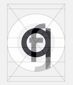 Design studio in Monterrey, Mexico, run by Rodrigo Alberto Cavazos Rodríguez.
  Original anarchist fonts by 323 Productions (Arnie G. Gonzales, Los Angeles, CA): the formidable dingbat font Anarquia v1.0 beta, with revolutionary glyphs, and drawings of the world's great anarchists. And
  [
[ During her studies in Tijuana, Mexico, Adriana Arias created a display typeface (2014) with calligraphic roots. [
 Mexican designer of the
 Mexican designer of the antiqued and perhaps watercolor script typeface
  Alan Luna (Monterrey, Mexico) created the high-contrast fashion mag art deco typeface
  Albatross is Jay Hilgert's foundry in Oklahoma City, OK, est. 2008. Before Albatross, Jay Hilgert ran
  Puebla de los Angeles, Mexico-based designer of Tolstoika (2012), a gorgeous (and
  During her studies in Monterrey, Mexico, Alejandra Garza designed a great typographic poster entitled Rafael Coronel Retrofutura (2014). Alejandra mixed Fette Unz Fraktur, IFC Los Banditos, and DIN Next LT Pro to obtain the hybrid typeface Oldtime Circus (2014). To celebrate Andy Warhol, she designed Pop Art Type in 2014. [
 [
[ During his graphic design studies in Monterrey, Mexico, Alejandro Cruz created the wonderful stencil typeface family Gaona (2014). [
 [
[ Mexican designer of Cinematográfica, mentioned
  Graphic designer in Chihuahua, Mexico. He created the experimental typefaces
  St. Louis lettering artist Robert Leuschke (who grew up and lives in St. Charles, MO) has made some 250 calligraphic fonts for greeting cards, including many for Hallmark Cards, of which about 80 are commercially available:
  Mexican designer of the fashion didone typeface Bizzarra (2016), which follows the fat face style, and covers both Latin and Greek.
 Mexican designer who used iFontmaker in 2011 to create
  Nueva Leon, Mexico-based creator of the bold Times roman style typeface Bronco (2016) and the custom signage script Kingdom (2016). [
 Monterrey, Mexico-based designer of the striped deco logo typeface Byr (2017). [
 Graphic and type designer in Monterrey, Mexico. In 2012, he created the rounded monoline sans typeface
  Mexican designer of the hand-printed Bolita, the kids typefaces Nino and Bíblica, the unicase Bauhaus, the round typeface Aqua, the grunge typefaces Gap and Heart, the handwriting typefaces
  Mexico City-based designer, b. Huauchinango. He studied graphic design at Universidad del Valle de Mexico in Queretaro City, and received a diploma in corporate identity from LISAVA in Barcelona in 2005. He opened his own graphic design studio in Mexico City in 2016.
  [
[ Xanthi, Greece-based designer of the Greek type1 font family
  [
[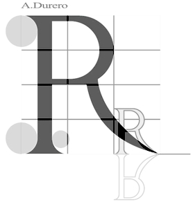 Art and type experiments at Universita Autonoma de Mexico, which sets out to prove that the real world is coming to an end and visual reality is taking over. Check out
  David Hernandez (Aspek) was born in 1987 and lives in Cabo San Lucas, Baja California Sur, Mexico. In 2016, he designed the
  A brief report (with pictures) of the
  ATypI 2009 was organized by Ricardo Salas and Roger Black in Mexico City, 26-30 October 2009, and had as theme The Heart of the letter. This week-long event consisted of two days of workshops and small events held at Anáhuac University's hilltop campus, and three days at MIDE in the Centro Histórico, the historic center of the city.
  Jonathan Cuervo (Atypic Co, Mexico City, and before that, Argo Typo) designed these typefaces:
  Avel Barraza (Tijuana, Mexico) designed the Tuscan typeface
  Aviv Studio in Monterrey and Mexico City consists of
  Ayi Studio (Mexico City) published the constructivist typeface family
 Mexican graphic designer, b. 1986, who lives in Hermosillo. He created a number of typefaces, some of which are free. Also known as Fractal Eye.
  Designer (b. 1980) in Sonora, Mexico, who is involved in The Cowboy Fashion Journal. He created
 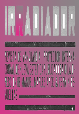 Raised in Atlanta, Brian earned his Bachelor's and Master's degrees from MICA in Baltimore, MD. He currently lives in Brooklyn, NY. He is an alumnus of Milton Glaser's Summer Program and a founding member of The Children's Publishing Design Forum. A designer, artist and illustrator recognized by many awards, Brian designed these art-historical typefaces in 2014:
  Art director in Nw York City, who was in Saltillo, Mexico, before that. His neo-grotesque typeface
  Cabrera Typo in Ciudad Valles, Mexico, is the experimental free font outfit of graphic designer Alejandro Cabrera Avila, b. 1970. Creator of
  Carla is a graphic designer originally from Costa Rica. She attended the Universidad Iberoamericana in Mexico City, and graduated from the Minneapolis College of Art + Design (2007). She lives in Minneapolis, MN. With Chank Diesel, she is working on a curly bilined script typeface called
  Based in Monterrey, Mexico, Carloz Aleman designed an experimental typeface based on X-ray experiments. The result is a
  Mexican type designer in Queretaro. Award winner at Tipos Latinos 2010 for his experimental typeface
 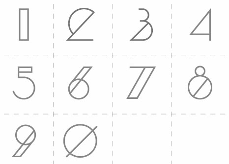 Graphic designer in Monterrey, Mexico, who created a strong blackboard bold style face,
  Aka Chyrllene K. Daughter of Iza W, who designed many typefaces at Intellecta Design starting in 2010. She studied applied mathematics and graphic design, and works as COO of Intellecta Design. In 2013, she wrote a
  A select dynamic group of type design specialists in Mexico, est. 2007. Their goals are to educate, research and publish. For example, in 2009, they published Jan van Krimpen Modernidad y Tradición, with text provided by Jan Middendorp. Their grandest project to date is the research on book cover designer Boudewijn Ietswaart, which led them to develop the
  A 2004 graduate of Universidad Autonoma de San Luis Potosi. As a student at CEAD in Mexico,
  Graphic designer in Monterrey, Mexico, who operated as Gabriela Roh. Designer of the (originally
  [
[ [
[ Letterer and designer in Mexico City. In 2017, she designed the text typeface Tessitura especially for small print sizes. Co-founder of the
  During his studies in Tijuana, Mexico, Daniel Pérez Rodríguez created the rounded octagonal monoline techno font
  Designer in Guadalajara, Mexico, whose studio is called
  David studied Graphic Design at the Universidad Iberoamericana in Mexico City and Visual Communication at the Basel School of Design. He was a founding partner of the studios Kimera and Bésame Mucho. Since 2005 he works with Gabriela Varela as Varela+Kimurain editorial design. Their work has been published and exhibited in Mexico, Germany, Argentina, the United States and Japan. He received the TDC's Certificate of Typographic Excellence in 2009 and the Quorum prize in 2007 and 2008. He has taught in undergraduate and master's degree programs at the Universidad Iberoamericana and the Centro de Estudios Gestalt, both in Mexico City. He is a member of the Círculo de Tipógrafos. Designer of
  David holds a Masters degree in type design from the Centro de Estudios Gestalt, and a Masters degree in editorial design from Universidad Anáhuac del Norte. Mexican designer of
  Partner of Jan Koehler in
  Mexican designer of the sans titling typeface Sovereign (2015), the textured poster typeface Saturday (2015), and the bold slab serif typeface Luxe (2015).
  [
[ [
[ Dick Pape (Dallas, TX) is digitizing the Dan Solo books one by one, and has digitized many other sources of alphabets and images. He started making fonts ca. 2007. In 2009, he was doing Solo's art deco tome. He is on several font-making forums such as
  Ornamental typefaces made in 2008-2010 by
  La Piedad, Mexico-based photographer, b. 1986. Designer of the art deco typeface La Piedrita (2014).
  Peruvian creator (b. 1984, Arequipa, Peru) at
  This used to be a wonderful page, but Michelle Dixon seems to have retired from the font making business. There used to be five shareware dingbats fonts: African Ornaments One, Cave Painting Dingbats One, Mayan Dingbats, Pre-Columbian Ornaments One, and Printers' Ornaments One (Mac PS), plus about 45 other original fonts (not shareware). In her wonderful collection, the following of Michelle Dixon's creations stand out: Arrighi Copybook, ItalianMosaicOrnaments, Beautiful, LondonHouse, Love Letter Typewriter, Gaudy Medium, Rusty Nail-Medium (the last four are all old typewriter fonts), and the display fonts Isla Bella (art nouveau), La Negrita, Arty Nouveau, Victorian, Art Nouveau Fonts, Bad Dog-Black, Berlin, Caslon Frenzy, Dixon's Vixens Caps, AntiqueMonoTW, DangerousTypoWriter, Elegant Nouveau Initial Caps, Fruitbasket, Matador, Manhattan, Modern Scribe, Ovid, Spillage, Tacos, Tolstoy, Typewriter, Love Letter, Basketcase, ChiliPepperDingbats, Postage Stamps, Garish Monde,
  Art director in Monterrey, Mexico. In 2017, he designed a fun display typeface. [
 During her studies in Mexico City, Dulce Salazar designed the
  Born in Mexico in 1992, Eduardo Aire Torres graduated from Universidad Anahuac Mexico Norte in 2014 and followed the condensed type design program at the Cooper Unon in New York City in 2019, after have been formed in lettering and calligraphy by masters such as Gabriel Martínez Meave, John Downer and Brody Neuenschwander.Based in Mexico City, hHis typefaces include Musans Deco (2014), Malos Dingbats (2014) and the great Kanzlei-style ornamental blackletter typeface Blackletter Revolver (2014).
  Puebla-based Mexican designer of the liquid typeface Cell Zero, El Chalán, Morphosys, the experimental typeface Euphoria and the system font typeface A6, mentioned
  Mexican graphic designer who graduated from SAE Institute Mexico and who is based in Ecatepec. His posters and covers can be found
  Edgardo Lopez (Universidad de Guadalajara, Mexico) created the typefaces
  [
[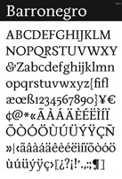 [
[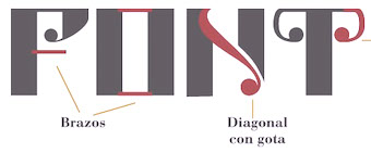 During her studies at the University of Monterrey in Mexico, Elideth Paola Gutierrez created Gotric (2014) by blending Chronicle Display Bold (Hoefler & Co) and Lucida Blackletter (Charles Bigelow & Kris Holmes).
  I had a good laugh when I saw Emiliano's
  Emilio Correa (
 [
[ Erick Torres (Mexico City) is the founder of the studio Hunter & Butcher. Creator of the geometric poster typeface
  Designer in Leon, Mexico, who made the classical roman typeface
  Mexican graphic designer who created the condensed monoline sans family
  Mexican foundry of Eduardo Escobar, which sells its fonts through MyFonts. Creations include the wrestling dingbats typeface
 During his studies at Gestalt Studies Center in Mexico, Fernando Perez designed
  Miguel Reyes (b. 1984) is a graphic and type designer from Puebla, Mexico, who studied at Benemérita Universidad Autónoma de Puebla. He obtained a Masters in Type Design from Centro de Estudios Gestalt Veracruz. Since 2010, he cooperates with Typerepublic in Barcelona. Founder of Fontaste. Graduate of the
  FontStage is a group of independent Latin American type designers who create original fonts for the web and print industry. It includes Manuel Lopez.
  [
[ Graphic designer in Guadalajara, Mexico, who works at
  Guadalajara (was: Tlaquepaque), Mexico-based designer of Rupestre Display (2019), the
  [
[ Graphic designer in Mexico City who published the geometric solid alphabet simply called Wedge (2021). [
 Mexico City-based designer of the rounded sans typeface Hocking (2018) and the chiseled typeface Madre e Hija (2018). She also designed a set of stick figure emoticons called Bastonio (2018). [
 During her studies in Monterrey, Mexico, Nueva Leon-based Frida Medrano created the creamy didone display typeface Kalnia (2014). In 2017, she designed the
 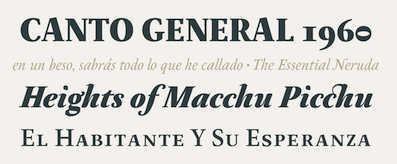 During his studies at the Metropolitan Technological University of the State of Chile, Santiago (2013-2017), Chile-based Franco Jonas Hernandez created the lively text typeface
  Mexican type foundry of the 19th century. [
 Under the supervision of Cristobal Henestrosa in Mexico City, Gabriel Espinosa (b. 1995, Mexico City) designed the blackletter typeface Egocentrica (2016) and the
  [
[ Graphic designer in Monterrey, Mexico. Creator of the elegant avant-garde sans typeface
 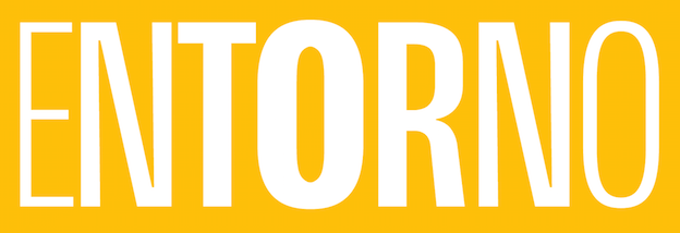 [
[ Graphic designer in Chihuahua, Mexico, who designed a multilined deco typeface called
  Designers of some free fonts.
  [
[ [
[ Mexican foundry run by Enrique "Quique" Ollervides from Mexico City. Faces include
  Graphic designer in Tecate, Baja California, Mexico, who created the monoline cursive typeface Mandy (2014).
  Mexican designer of the architectural Tekton-style lettering font
  Iñigo López Vázquez is a graphic designer from Puebla, Mexico. As part of his final project at the Rhode Island School of Design, he created Ivrea (2015), which is simultaneously a typeface and a dedicated text editor. It was inspired by Olivetti typewriters---Ivrea is named after the town where Olivetti typewriters were made. During a summer course called
  Guadalajara, Mexico-based member of the Sic Typus Creatus Est team (Dafne Martinez, Jorge George, Leonardo Delgado, Iordan Evair and Federico Biagioli) that designed Calmadita in 2020 for the
  Mexican designer of
  Graphic designer in Guadalajara, Mexico. Textures inspired him to create the geometric textured typeface
  Graphic designer in Mexico City. She created the
  Jorge Ivan Moreno Majul is a graduate of Centro de Estudios Gestalt. At some point, he joined
  Foundry in Ixipcalli, Mexico, run by Mexico City-based Francisco Arellano (b. 1981). Creator of the free monoline sans typefaces
  Monterrey, Mexico-based designer (b. 1959) of the free typefaces Crystal Heart (2017: script), Patty (2017), Aleidita (2017: script), Tigres UANL (2017: athletic lettering), Descuadrado (2017) and Kodyz (2017).
 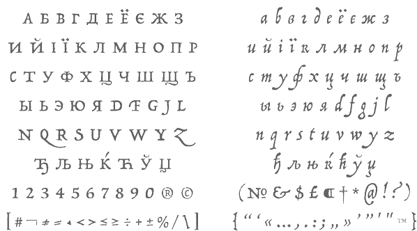 [
[ Jan Estrada-Osmycki is a Polish-Mexican designer, visual artist and musician, and member of the Zbiorowy art group. He composes and produces music under the Bass Jan Other moniker.
  Mexican graphic designer in Aguascalientes. His typefaces include the multilined art deco custom typeface
  [
[ Mexico City-based designer of the display typeface Raya (2017). Aka Fefox. [
 Portuguese creator of the octagonal typeface 7ABL3 (2010) and the white-on-black ransom note typeface crew Hassan (2010).
  Born in 1951,
  [
[ Type and logotype company in Polanco (and now Mexico City), Mexico, run by
  Mexico City-based designer of these typefaces in 2014: Sudero, Curiosidad.
  [
[ [
[
 Mexican designer of the delicate text typeface
  Mexican designer in Puebla who studied at the Benemerita Universidad Autonoma de Puebla (BUAP). Designer of the 4-weight semi-blackletter display family
  Computer engineer and professor at the Instituto Tecnologico de Oaxaca, Mexico. In 2019, he published the free monospaced programming fonts Neomatrix Code and
  Mexican designer located in Osnabrück, Germany. In 2021, he designed the
  As a student at Universidad Anahuac in Mexico City, Romo designed the calligraphic serif typeface
  Design studio in Hermosillo, Sonora, Mexico, run by Rubén Figueroa and Luis Llamas since 2012. Creators of the thin monoline caps typeface
  Mexico City-based type and magazine designer who studied at UNAM. In 2018, under the supervision of Cristobal Henestrosa, designed the text typeface Tehuana. Co-designer of
  Graphic designer and photographer in Coatzacoalcos and/or Mexico City, Mexico. She created the art deco
  [
[
 [
[ Design studio, est. 1999 in Riga, Latvia. They are doing some
  Designer who became famous because of his work on wayfinding and branding projects, and his designs for massive urban systems, airports, zoos, and museums. Over the course of his career he has created systems for the Mexico 1968 Olympics, Mexico City Metro, National Zoo, American Museum of Natural History, New York Penn Station, National Mall, Minnesota Zoo and Jeddah International Airport. Wyman taught corporate and wayfinding design at Parsons the New School for Design in New York for forty years, from 1973 until 2013. He lectures internationally and is still designing. The first compendium of his work, Lance Wyman: The Monograph, was published by Unit Editions.
  Saint Petersburg, Russia-based graphic designer and illustrator. Creator of
  Letter Inc is a Mexican design collective. One of its members, Miguel Angel Contreras Cruz, is a graduate of the Benemerita Universidad Auónoma de Puebla. Based in Puebla, he designed the bird-themed display typeface
  Luis Fernando Carvente Flores is a type designer and illustrator in Pueblo de Zaragoza, Mexico. Initially, he made
  [
[ Freelance graphic designer in Querétaro, Mexico, who created Boks Sans (2015, a hi-tech typeface) and Qubica (2015, a wonderful slab serif) during his studies at the Universidad Autónoma de Querétaro. [
 [
[ Graphic designer in Mexico City who teaches at Universidad Iberoamericana Mexico City, Universidad Anáhuac del Norte and Centro de Diseño, Cine y Televisión. In 2014, he created the
  In July 2017, Typoasis / Moorstation shut down. Run by Petra Heidorn out of Hamburg, Germany, it hosted her own fonts, as well as those of the popular and talented type designer and artist
  On the subject of Mexico, the Mayas and the Aztecs,
  Frankfurt-based designer (b. 1932, d. 2018) whose creative output is so large that he deserves a
  Manolo Frausto (Mexicali, Mexico) created an untitled 3d typeface for numerals in 2014 using the iPad application Isometric. He designed a few other untitled typefaces as well. [
 Mexico City-based designer of the squarish typeface Pamplina (2014). [
 Yucatan and later Guadalajara, Mexico-based illustrator. Designer of the weathered tattoo typeface Brujeria (2014) and the spurred typeface Cabezas de Gallo (2016). It was inspired by the Brujeria band. [
 Mexico City-based graphic designer. Creator of the free bilined display typeface Havana Harbor 1989 (2015).
  German type designer. His typefaces include
  In 2016, Memo Vigil (Saltillo, Mexico) designed a great handcrafted 3d decorative caps alphabet. Earlier, in 2015, he proposed type design for the eight blood groups, A, B, AB, and O, both positive and negative. [
 Mexico City-based creator of the great typographic poster Cuadro de Bebe (2015). [
 Graduate of ENAP-UNAM in Mexico City. Creator of these typefaces:
  [
[ [
[ Migual Cabrera (b. 1982, Costa Rica) studied Fine Arts and became an editorial illustrator in San Jose, Costa Rica. Known as
  [
[ Dallas, TX-based creator of the
  Tijuana, Mexico-based student-designer of the compass-and-ruler font Double Circle (2014). [
 Tijuana, Mexico-based designer of the fat sans display typeface Mossa (2016). [
 Monica Munguia (Mexico City) studied graphic design at Universidad del Pedregal and has a Masters in typeography from Centro de Estudios Gestalt in Veracruz, Mexico. She was associated with
  Graphic designer in Aguascalientes, Mexico. Creator of
  Iztapalapa, Mexico City-based graphic designer. Creator of Pixa Square (2014: a dot matrix typeface family that includes some arcade game dingbats as well), Domino (2014: digitization of a typeface by Sabino Gainza), Norma Script (2014, avant-garde sans), Norma Cursiva (2014), Macmillan (2014, sans), El Corondel (2014, signage script), Taller (2014, done with Manuel Flores), Mr. Pascal (2014: LED or kitchen style typeface for numbers on watches), Britannia Capital (2014: a calligraphic copperplate typeface), Alfaomega (2014, avant-garde sans), Alfaomega Cursiva (2014, school script font), Espiral (2013, a Victorian school project font at Escuela Nacional de Artes Plásticas UNA).
  Art director in Mexico City, who created a tall art deco typeface simply called Estrangula (2014), which was inspired by Bela Lugoai movies. [
 Born in Mexico City and a graduate of Universidad Autónoma Metropolitana in Xochimilco, Mexican designer Nadia Méndez created
  Nodo Type Foundry was set up in 2015 in Buenos Aires by Monterrey, Mexico-based designer Aldo Arillo and Buenos Aires-based Ariel di Lisio. Nodo's motto: Typography transcends time. The future is grotesk. Nodo's typefaces:
  Graphic designer in Monterrey, Mexico, b. 1990, whose company is called Handcrafted Types.
  Based in Queretaro, Mexcico, Omar De Luna created Republica MX (2014), a spurred typeface that was inspired by typepress in Mexican documents from the early 1900s.
  Design student in Monterrey, Mexico, who created the avant-garde monoline typefaces
  Hector Gatti, aka Pocho Gatt, is an Argentinian who runs Gatti Studio and Omnibus Type, and who co-designed the sans typeface
  Mexican creator of the crosshair typeface
  Toluca de Lerda, Mexico-based designer of the rounded wayfinding typeface Central (2015), which was created for the signage of the Central de Abasto de Toluca. [
 Oscar Yáñez (b. Mexico City) has a Bachelor's degree in Graphic Communication Design from the Universidad Autónoma Metropolitana (UAM) and a Master's degree in Typographic Design from the Centro de Estudios Gestalt. He studied Project Management in the Instituto Tecnológico Autónomo de México and a Masters degree in Type Design at Centro de Estudios Gestalt. He was involved and leading designs and redesigns in more than fifty magazines, newspapers and websites like Time Inc Expansion, Editorial Televisa, Reforma, El Universal and Khaleej Times newspapers. Nowadays he is Group Design Director for Harper's Bazaar Arabia and is based in Dubai.
  Alejandro Lo Celso, a graphic and type designer born in 1970 in Córdoba, Argentina, was art director at several publishing media in Buenos Aires. He has written several articles for typo magazines, and taught typography at the University of Buenos Aires. In 2000 he completed his MA in Typeface Design at the University of Reading (UK). In 2001, he obtained a post-diploma at the Atelier National de Recherche Typographique, Nancy (France). He teaches typography at the Universidad de las Americas in Puebla, Mexico, and at Centro Gestalt in Veracruz, and is Principal of Pampa Type in Mexico City. As Pampa Type grew, it brought several excellent type designers on board, such as Jorge Iván Moreno Majul and type designers Francisco Gálvez Pizarro, Francis Ramel, and Oscar Yáñez. In 2021, pampa type joined
  Graphic designer in Guadalajara, Mexico, who made
  Designer in Mexico City, who created the University Roman-style display typeface Recovery (2015). [
 Mexico City-based designer of the typeface family
  Type designer born in Boston in 1948 who created many exquisite designs such as
  Download the following beautiful handwriting and handprinting fonts made by Mexican designer Kemie Guaida, who lives in Helsingborg, Sweden: Balderas (2002), BlackoutSans (2001), BlackoutSerif (2001),
  Barcelona-based designer of the alchemic typeface
  During his studies, Coahulla, Mexico-based Rafael Ruvalcaba designed the decorative caps typeface Memphis (2017). [
 Mexican creator of the teddy bear alphading family
  Designer (b. 1991) of
  [
[ [
[ Morelia, Mexico-based designer.
  Mexico City-based designer of the Arabic emulation typeface Roshana (2016). [
 Or just Ro Hernandez. Mexico City-based designer who studied industrial design and then type design at Centro University. Graduate of the
  [
[ Sandra Garcia (b. Bogota, Colombia) first studied at the Universidad del Area Andina, Bogota and then obtained a Masters in typography from Centro de Estudios Gestalt in Veracruz, Mexico. Freelance designer and teacher at Universidad de la Comunicacion, in Mexico City.
  [
[ Mexico City-based designer of the display didone typeface Textsy (2016). [
 Professor at he University of Monterrey (UDEM) in Mexico. Sergio has a bachelor's degree in Information Design from the Universidad de las Americas Puebla, a Masters degree in Graphic Branding and Identity from the London College of Communication, and a Masters degree in Typeface Design from the University of Reading (
 Mexican designer of these technical or techno typefaces in 2020: Srg BlockShot (stencil), 23F (an LED font), Srg Linear (a monolinear circular sans). [
 Design studio in Mexico City. In 2007, they designed the psychedelic typeface
  Located in Ciudad de Mexico, Hector Ramirez (Socker One) created
  Mexican type designer who sert up
  Monterrey, Mexico-based designer of Dusty (2019: a Tuscan reverse stress Western typeface) and the glitch typeface Jiggy (2018). [
 Graphic designer in Mexico City, who created the teardrop-themed typeface Conline (2016). [
 Quebec-based designer (b. 1971) in 2010 of the
  Aka RS Design, Richie Mx, and Riders of the Storm Design. Mexican graphic designer, b. 1995, based in Los Cabos, Baja California Sur. Creator of
  Graduate of Universidad La Salle. Mexico City-based designer of Posh Book (2018) and Bodona (2018), a slabby interpretation of Bodoni. [
 Talavera Type Workshop is Jesus Barrientos's type foundry in Puebla, Mexico. He has a Masters in Type Design from Estudio Gestalt in Veracruz, class of 2013. Presently he is a professor at Benemerita Universidad Autonoma de Puebla, Mexico.
  Tamara Segura is a type, letterer and graphic designer, currently based in Mexico City.
  Talented Mexican graphic designer and digital artist (b. 1985) who was based in Montreal but is now back in Mexico City. She pushed the boundaries of experimental typography with creations like Fabric Type (2009), which was developed at Concordia University in Montreal, where she obtained a BFA in design in 2009. She continued her studies at EINA in Barcelona, graduating in 2010.
  Designer and lettering artist in Guadalajara, Mexico (and/or Split, Croatia?), who created the Mexican diner signage script typeface Tejuino (2015) and the informal sans typefaces Taqueta, Rabar and Festa, all made in 2015. Astro Regular (or Astro MX) (2015) by Gen Ramirez, Manuel Lopez (with assistance of Rodrigo Heredia and Rodrigo Nuñez) won an award at
  Illustrator and graphic designer in Aguas Calientes, Mexico. He drew a great
  Snowboarder from Liechtenstein, who designs typefaces at P22 and its descendant foundries such as HWT. The list:
  San Luis Potosi, Mexico-based designer of Cantera (2016, deco style), Mictlan (2016), which is based on Mexican kitsch lettering, and influenced by the work of Quique Ollervides. He also designed the informal Flexa (2016).
  A web page in Mexico dedicated to workshops and conferences on typography and type design, both at the local (Mexican) and international levels. Their first meeting, on December 4 and 5, 2015 included these speakers: David Berlow, Santiago Orozco, Gustavo Belman, Cristobal Henestrosa, Eduardo Danilo, Armando Pineda, Jonathan Cuervo, Jorge George, Monica Munguia, Gen Ramirez and Leonardo Vazquez. [
 Tipografilia07, the Congreso Nacional de Tipografía en México, was held in Mexico City from 4-5 October 2013. Under the theme Nueva+Mente, the main speakers were Victoria Garcia Jolly, Alexandro Medrano, Quique Ollervides, Jorge de Buen, Crisobal Henestrosa, Gerardo Kloss, Paco Calles, Gabriel Martinez Meave, Bred Lago, Santiago Orozco, Jose Luis Coyotl, Alejandro Magallanes, and Eric Olivares. [
 Mexican cartoonist, animator and writer (b. 1973) from Guadalajara. Designer of the free fonts KI Comic (2000, comic book face) and the elegant informal

 Ingo Krepinsky (b. 1976, Eschwege) graduated in 2000 from Fachhochschule Hannover, and in 20903 from Hochschule für Künste Bremen, where he specialized in typography. He is a cofounder and type designer at Typonauten, a Bremen-based commercial font foundry started in 1998 (together with Christoph Hanser and Stefan Krömer).
  [
[ This Montevideo-based designer (b. 1967, Mexico City) has a degree in Graphic Design from the University ORT Uruguay. He lives in Montevideo since 1985. Since 2000, he teaches in the area of publishing in the Faculty of Communication and Design at University ORT in Montevideo, in the Faculty of Communication and Design. Since 2005 he is also teaching Typography II. He is a partner of the design studio Taller de Comunicación.
  Or simply Manuel Flores. Typographer and type designer in Mexico City. Graduate of the Facultad de Artes y Diseño de la Universidad Nacional Autónoma de México. His typefaces include Taller (2014), an angular typeface co-designed with
  Mexico City-based Victor "Vams" Mejia created the
  Graphic designer in Mexico City. She created the high-contrast hairline typeface Didian in 2015. [
 Mexico City-based designer of the
  Monterrey (was: Saltillo and/or Mexico City)-based designer of the spiky spurred almost Western typeface family
  Designer in Mexico City. Creator of these typefaces in 2014: Cuatacho (a tweetware signage / cartoon font), Libreto (a warm readable rounded Latin text typeface). He co-designed the elliptical display typeface Maciza in 2016 together with Monica Munguia. For Rara magazine, he created the Greek emulation typeface Rara (2016). Libreto (2014). At Latinotype, he published the cursive typeface family