| | |
ADA Sign Store
|
This company sells the California Braille font. [Google]
[More] ⦿
|
Alessandro Pivetta
[Alessandro Pivetta Type]

|
[MyFonts]
[More] ⦿
|
Alessandro Pivetta Type
[Alessandro Pivetta]
|
Italian designer of Brillo (2019), a latinized grotesque. [Google]
[MyFonts]
[More] ⦿
|
Alexander Lange
|
 Karlsruhe-based software developer. Creator of the large (and free) Unicode font Quivira (2005). It covers mathematics, chess, astrological symbols, arrows, fists, Latin, Greek, Cyrillic, Hebrew, Armenian, Georgian, Tifinagh, Coptic, emoticons, Vai, and Braille, to name just a few ranges. Alexander graduated in computer science at the Hochschule Mannheim University of Applied Sciences (degree: Diplom-Informatiker (UAS)). [Google]
[More] ⦿
Karlsruhe-based software developer. Creator of the large (and free) Unicode font Quivira (2005). It covers mathematics, chess, astrological symbols, arrows, fists, Latin, Greek, Cyrillic, Hebrew, Armenian, Georgian, Tifinagh, Coptic, emoticons, Vai, and Braille, to name just a few ranges. Alexander graduated in computer science at the Hochschule Mannheim University of Applied Sciences (degree: Diplom-Informatiker (UAS)). [Google]
[More] ⦿
|
American Printing House for the Blind
|
Louisville, KY-based producers of free fonts for visually impaired such as APHont (2003, four sans serif styles). [Google]
[More] ⦿
|
André Laventure
|
Designer of these scouting fonts: Morse (1999), Braille (1999), Samourai (1999). They can be downloaded here. [Google]
[More] ⦿
|
Andrej von Walter
|
Cape Town, South Africa-based graphic designer who was also born in Cape Town and grew up in Namibia, Creator of the multiline typeface Reading Together (2014), which pays attention to blind people. Behance link. [Google]
[More] ⦿
|
Andressa De Conto
|
 Designer in Porto Alegre, Brazil, who created the hairline avant garde typeface Simetrika in 2012. [Google]
[More] ⦿
Designer in Porto Alegre, Brazil, who created the hairline avant garde typeface Simetrika in 2012. [Google]
[More] ⦿
|
Andrew Tighe
|
FontStructor who made Lost Symbol (2009), 1 Shift (2009, oriental simulation face), Braille (2009), and Morse Code (2009). [Google]
[More] ⦿
|
Andrew West
[BabelStone]
|
[More] ⦿
|
Andy Benedek
[Font Factory]
|
[MyFonts]
[More] ⦿
|
Anthony Bowe
[Geronimo Fonts (or: Paradox Fontworks, or: Typewire Studios)]
|
 [More] ⦿
|
Apostrophic Laboratory
[Fredrick M. Nader]
|
 One of the most dynamic foundries from 2000 until 2003. The "Lab" was run by Apostrophe (Fredrick Nader) and was based in Toronto. The name Apostrophe comes from a Frank Zappa song. It has produced well over 1000 original free fonts, in all formats (type 1, truetype, and opentype, PC and Mac), and nearly all fonts have full character sets. Many have character sets for extended European languages and Cyrillic as well. It was for a few years the only active producer of multiple master fonts. Download site at Typoasis. Original URL, now being reworked. Highlights:
 - Miltown (from the Matrix movie).
- Fluoxetine (old typewriter).
- Desyrel (handwriting, Dana Rice).
- PicaHole-1890Morse font.
- Ritalin has almost 500 glyphs, and is a family designed for Latin, Greek, Turkish, eastern European, Cyrillic and Baltic.
- The 3-axis multiple master ImpossibleMM (of Mission Impossible fame).
- Carbolith Trips (letters from cuneiforms).
- Diehl Deco (revival of 1940 lettering by Wooster Bard Field; with Marley Diehl).
- Textan (with Rich Parks or Richard D. Parker; inspired by the Chinese Tangram).
- Poultrygeist (horror comic font).
- Hard Talk (an R-rated font by Slovenian Marjan Bozic).
- Independant (with Phynette; a faithful revival of a 1930s font by Collette and Dufour for Maison Plantin in Belgium---a fantastic Art Deco font family).
- Metrolox ("Enemy of the State" font, with Karen Clemens; a Unicode font with 567 glyphs for over 20 Latin-based languages and some math symbols).
- Komikaze, Komikazba, Komikahuna and Komikazoom (comic book fonts: 1280 glyphs for Latin, Greek, Cyrillic, Baltic, Turkish, East-European, with dingbats and Braille).
- Republika (a 300-font techno family; read about it here).
- ChizzlerMM (3-axis multiple master, a reworked version of Graham Meade's Chizzler).
- Street (a 87-font family by Graham Meade).
- Amerika (fantastic Armenian-look font series, with support for Greek, Cyrillic/Russian, Baltic, Turkish and Central European).
- The dingbats Eyecicles and Texticles, both with Graham Meade.
- Insula (2001, a Celtic/uncial font with Cybapee).
- Komika (2001, 50 comic book fonts designed with Vigilante). A spoof on Comic Sans, this family includes Komika Hand and Komika Text.
- Labrit (a great Fraktur font, with Graham Meade).
- Frigate (a Roman-kana font by Melinda Windsor).
- Scriptina (an unbelievable calligraphic font by Apostrophe, 2000-2001). In 2010, CheapProFonts published an extension, Scriptina Pro.
- Freebooter Script (an equally unbelievable calligraphic font by Graham Meade, 2001).
- Choda (a display font like none you have seen before; Apostrophe and Meade, 2001).
- Endor (with Meade, a Gothic font; 2001).
The list of designers and their fonts: - Apostrophe [dead link]: Day Roman (2002, the first digitization of Fr. Guyot's "Two Line Double Pica Roman", designed in the early 1600s), Bombardier (2002), Propaganda (2002), PropagandaCyrillic (2002), PropagandaGreek (2002), Contra (2003), Ergonome (2002), Ergonomix (2002, techno dingbats), Alfabetix (2002), SoMM (2002, a multiple master font), Templo (2001, a pixelish font), Zoloft, Miltown, Witches Brew, Celexa, Labrat, Effexor, Fluoxetine, Tralfamadore, Halcion, RxMM, Paxil, Valium, Fight This, Ritalin, Xanax, Maskalin, PicaHole, ImposMM, MiltownII, Carbolith, Komikaze, Komikazoom, Komikahuna, Diogenes, Komikazba, MistressScript, Sledge, Mary Jane, Republika, StarBat, Merkin, Erectlorite, Halter, Estrogen, Steinem (based on Dalton Maag's British Steel typeface), Lab Mix, Mary Jane II, Amerika, Masque, Konfuciuz, Mastodon, Broad, Amerika Sans, Scriptina, Karnivore, Cholo, Sedillo and Reprobate (all three based on Mike Sedillo's handwriting, 2001), Templo (screen font family, 2001).
- Marjan Bozic and Apostrophe: Hard Talk.
- Karen Clemens and Apostrophe [dead link]: Wellbutrin, Metrolox, Jagz.
- CybaPee and Apostrophe [dead link]: Cyclin, Lady Ice, Insula.
- CybaPee [dead link], Graham Meade and Apostrophe: Yellowswamp, Lady Ice revisited.
- Steve Deffeyes: Loopy.
- Marley Diehl and Apostrophe: Diehl Deco.
- Fleisch and Apostrophe: Colwell, Hadley.
- Steve Graham: Hypnosis.
- Frank Guillemette and Apostrophe: Ankora.
- Jeri Ingalls and Apostrophe: Paxil.
- Neumat Ick and Apostrophe: Icklips, Powderfinger.
- Keya Kirkpatrick: Extasy
- Keya Kirkpatrick and Apostrophe: Kimono.
- Jeff Lan: Healthy Alternative, Haven Code.
- Su Lucas and Apostrophe: Barbarello.
- Brigido Maderal and Apostrophe: Lab Bats.
- Graham Meade: Quastic Kaps (8-weight family, 2003), Quixotte (2002), Mechanihan (2002), Kameleon (2002), Lady Ice Extra (2002), Gizmo (2002), Zillah Modern (2002), Wazoo (2002), JamesEightEleven (2002), Equine (2001), Street Corner (2001), Freebooter Script, Street (31 font sans and slab serif), Bipolar Control, Lane, Street, Street Slab, 2nd Street, Kronika, Thong, Whackadoo Upper, Charrington, Lady Copra, Zebra, Extra Meade Pack, Control Freak, Dekon, Asenine, Heidorn Hill (a Fraktur font), Castorgate, Troglodyte.
- Graham Meade and Apostrophe: Moondog (2001), Choda, Futurex, Duralith, Epyval, BooterMM, Pamelor, Sabril, Erinal, Karisma, Whackadoo, Bicicles, Drummon, Primary Elector, Youthanasia, Grunja, Prussian Brew, ChizMM, Luciferus, Labtop, Gilgongo, Labrit, Kandide, Brassiere (which became the commercial typeface Ipscus in 2009), Eskargot, Endor, Labag.
- Graham Meade and Rich Parks: Luteous, Luteous II.
- Link Olsson and Apostrophe: Librium, Severina, Poultrygeist, Extrano, Komikandy.
- Rich Parks and Apostrophe: Textan, Glaukous, Textan Round, TexSquareMM, TexRoundMM.
- Alejandro Paul and Apostrophe: Fontcop, Usenet, Cayetano, Elektora.
- Evelyne Pichler: Sindrome.
- Evelyne Pichler and Apostrophe: 1910 Vienna.
- Phynette and Apostrophe: Independant.
- Peter Ramsey and Apostrophe: Distro, Futurex Distro (2001).
- Dana Rice and Apostrophe: Desyrel, Lilly.
- Wayne Sharpe: Ovulution I and II.
- Jessica Slater: Wiggles.
- Jessica Slater and Apostrophe: McKloud.
- Derek Vogelpohl: Phosphorus, Florence sans, Plasmatica, Covington, Avondale, Phosphorus II.
- Melinda Windsor: Plastic, Frigate.
- Robby Woodard: Ashby (2001).
- WolfBainX and Apostrophe: Tribal, Komika.
- Yol: Traceroute.
Font Squirrel link. Dafont link. Abstract Fonts link. [Google]
[MyFonts]
[More] ⦿
|
Applied Design Works
|
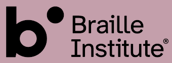 Applied Design Works was founded in 2015, with offices in New York and Los Angeles. In their own words, Applied specializes in design, planning, strategy, and implementation for a broad range of mission-driven organizations. Their team includes Craig Dobie, Founding Creative Director, Brad Scott, Founding Managing Director, and Elliott Scott, Creative Director.
 Atkinson Hyperlegible (2019-2020) is a free neo-grotesque typeface created by Applied Design Works for Braille Institute of America, Inc, which is based in Los Angeles. Named after Braille Institute founder, J. Robert Atkinson, it has been developed specifically to increase legibility for readers with low vision, and to improve character recognition. The project was the winner of the Graphic Design category in Fast Company's 2019 Innovation by Design Awards. In this video, Craig Dobie, Brad Scott, and Elliott Scott provide a behind-the-scenes look at the development of Atkinson Hyperlegible. Google Fonts link. The physical 4-style font family was designed by Elliott Scott, Megan Eiswerth, Linus Boman and Theodore Petrosky. Atkinson Hyperlegible differentiates common misinterpreted letters and numbers using various design techniques: - Recognizable Footprints: Character boundaries clearly defined, ensuring understanding across the visual-ability spectrum.
- Differentiated letterforms: similar letter pairs are differentiated from each other to dramatically increase legibility.
- Unambiguous Characters: designed to increase legibility and distinction.
- Exaggerated forms: shaping of letters is exaggerated to provide better clarity.
- Opened Counterspace: open areas of certain letters are expanded to provide greater distinction.
- Angled spurs and differentiated tails: they increase recognition and define distinctive style.
CTAN link. [Google]
[More] ⦿
|
Arne Meyer
|
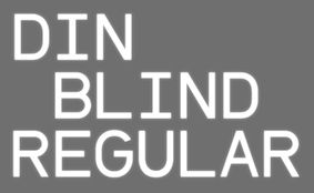 Berlin-based designer who studied at Hochschule Hannover. In 2016, he created DIN Blind (2016) which is a monospaced DIN adapted to Braille. It follows the E-DIN 32976 norm for tactile writing. [Google]
[More] ⦿
Berlin-based designer who studied at Hochschule Hannover. In 2016, he created DIN Blind (2016) which is a monospaced DIN adapted to Braille. It follows the E-DIN 32976 norm for tactile writing. [Google]
[More] ⦿
|
Art & Progress
[Christian Dominick]
|
Christian Dominick (Art & Progress) (b. 1990, Kansas City) created the free typeface Braille (2012). Dafont link. [Google]
[More] ⦿
|
Arthur Druziani
|
FontStructor known as Joey Higashi who made these fonts: 5x6-Wrapped-Dots, Brailletters, Chained-Letters, Dozen-Dotted-Letters, ElePhont-RounDots, Fonte, Infinite-Boxes. [Google]
[More] ⦿
|
Association for the Blind of Western Australia
|
History of Braille. Free Braille font (1996) by Duxbury Systems. [Google]
[More] ⦿
|
Astigmatic One Eye
[Brian J. Bonislawsky]
|
 Astigmatic One Eye (AOE) has lots of nice original fonts by Brian J. Bonislawsky (b. 1973, Pittsburgh, PA). Many are free, others are not. AOE joined Font Brothers Inc in 2006. Brian Bonislawsky currently lives in Las Vegas, NV.
 Fontsquirrel link. Dafont link. Fontspace link. A partial list of the AOE fonts made in 2011: Engagement (2011, a free brush script at Google Web Fonts), Fascinate (2011, an art deco typeface at Google Web Fonts; +Inline), Original Surfer (2011, a free Google Web Font inspired by a vintage advertisement for the "California Cliffs Caravan Park"), Smokum (2011, a Western / Italian face), Yellowtail (2011, signage face), Redressed (2011), Special Elite (2010, a free old typewriter face), Aclonica (2011). Typefaces from 2008 or before: Horseplay AOE (2008, Western style), Cake and Sodomy AOE (2008), Good Eatin AOE (2008), Paradiso AOE (2008, inspired by logotype of the Paris Resort and Casino in Las Vegas), Montelago AOE (2007, a script inspired by the logotype of the Mirage Resort and Casino in Las Vegas), Jack Chain AOE (2007), Henhouse (2007), Schnitzle (2007), Luxurian AOE (2007, inspired by the logo of the Luxor Hotel&Casino in Las Vegas), Digital Disco AOE (2007), Mighty Tuxedo AOE (2007), Makeshift AOE (2007), Clarity AOE (2007, slab serif headline; + grungy version), Red Pigtails AOE (2007), Run Tron 1983 (2002), Eyeliner AOE (2006, Tekton-like), Mother Hen (2007), Gloversville (2007, comic book style), Mighty Tuxedo AOE (2007, condensed sans), Quick Handle AOE (2007), Surfing Bird (2007), Hydrogen (2004), Hardliner (2004, fifties diner style), Big Ruckus (2004), SS Antique No. 5 (2004), Europa Twin (2003), EuroMachina (2003, techno), Lord Rat (2003: papercut sans), Love Anxiety (2003), BuzzSaw (2003), Skullbearer (2003, skull dingbats), Beatnick Blue (2002), Geisha Boy (2002), Mardi Party (2002), Midcrime (2002), Ocovilla (2002), Ruthless (2002), Saltie Doggie (2002), Whiskers (2002), Royal Gothic, Family, Eggit, Jericho, Wild Monkeys (2002), 5FingeredGothSW, AlienArgonautAOE, AlphaMackAOE, AmphibiPrint, AngiomaAOE, AntiChristSuperstar, AntiChristSuperstarSW, AstigmaSolid, BigLimboAOE, BigLimbodOutAOE, BoneRollAOE, BoneRollAOEBold, BoundAOE, BrailleAOE, BulletBallsAOE, ButterflyChromosome, ButterflyChromosomeAOE, ButtonButton, ButtonButtonAOE, CType, CTypeAOE, CelticLionAOE-Bold, CelticLionAOE-BoldItalic, CelticLionAOE-Italic, CelticLionAOE, CharailleAOE, ChickenScratch, ChickenScratchAOE, ClunkerAOE, ClunkerAOE-Bold, CropBats, CropBatsAOE, CropBatsIIAOE, DarkNightAOE, DeadGrit, DeliveryMatrixAOE, DetourAOE, DigitalDiscoAOE, DigitalDiscoAOEOblique, DingleBerries, DoggyPrintAOE, DraxLumaAOE, DungeonKeeperII, DungeonKeeperIIBold, DungeonKeeperIIItalic, EggItAOE, EggitAOE-Italic, EggitOutlineAOE, ElectricHermes, ElectricHermesAOE, ElectricHermesAOECharge, FearAOE, FilthAOE, FishyPrintAOEOne, FishyPrintOneAOE, FishyPrintTwoAOE, FutharkAOE, FutharkAOEInline, FutharkAOEInline, GateKeeperAOE, Ghoulish Fright AOE (2006), GlagoliticAOE (1999, grungy glagolitic), GorgonCocoonAOE, Gotik, GreyAlienSW, HAL9000AOE, HAL9000AOEBold, HAL9000AOEBoldItalic, HAL9000AOEItalic, HandageAOE, HandageAOEBold, HauntAOE, HybridLCDAOE, IDSupernovaSW, IslanderAOE, JokerWildAOE, KillMeCraig, KillMeCraigAOE, Kinderfeld, KittyPrint, KittyPrintAOE, Kornucopia, KornucopiaAOE, LinusFace, LinusFaceAOE, LinusPlayAOE, LinusPlaySW, Lochen, LovesickAOE, Manson, MasterPlan, Mervale Script Pro (2012: a brushy script based on the 1940's Fawcett Publications Mary Marvel comic), Microbe, MooCowSW, MotherlodeLoadedAOE-Italic, MotherlodeLoadedAOE, MotherlodeStrippedAOE-Italic, MotherlodeStrippedAOE, MysterioSWTrial, NightmareAOE, OrnaMental, Pantera, PapaManoAOE, PenicillinAOE (described as a bacterial stencil typeface), PixelGantryAOE, PixelGantryAOEBold, PixelGantryAOEBoldItalic, PixelGantryAOEHeavy, PixelGantryAOEHeavyItalic, PixelGantryAOEItalic, PixelGantryHiliteAOE, PixelGantryHiliteAOEItalic, PoppyAOE, PoseidonAOE, Prick, QuiltedAOE, QuiltedAOEBlack, QuiltedTrial, RippleCrumb, RippleCrumbUltraCon, ROCKY, ROCKYAOE, RustedMachineSW, SSExpAntiqueAOE, Schizm, Schrill, SchrillAOE, SchrillAOEOblique, Scrawn, ScrawnAOE, ScrawnCyrAOE, ScrawnKOI8AOE, ScrewedAOE, ScrewedAOEOblique, ScrewedSW, SeaweedFireAOE, SenthAOE, ShampooSW, ShottyTransferTrial, SkinnerAOE, SlurCrumb, SpatCrumb, SpikeCrumbGeiger, SpikeCrumbSwizzle, SpikeCrumbSwollen, SteelcapRubbingTrial, StruckSW, StrutterAOE, SunspotsAOE, SurferComicTrial, TRANSHUMANALPHABET10, TRANSHUMANKATAKANA20, TannarinAOE, TannarinAOEOblique, TibetanBeefgardenAOE, TibetanBeefgardenAOE, TouristTrapAOE, TransponderAOE, TransponderGridAOE, UglyStickAOE, VanguardIIIAOE-Bold, VanguardIIIAOE-BoldOblique, VanguardIIIAOE-Oblique, VanguardIIIAOE, Ventilate, VentilateAOE, Y2KPopMuzikAOE, Y2KPopMuzikOutlineAOE, YoungItchAOE, ZeichensSW, ZenoPotionAOE, Zombie, BeatnikBlueAOE, BeatnikBlueFillAOE, GeishaBoyAOE, MardiPartyAOE, MindCrimeAOE, OcovillaAOE, PolynesianTouristAOE, RuthlessAOE, SaltyDoggieAOE, SpruceAOE, WhiskersAOE-Oblique, WhiskersAOE, WhiskersAltCapsAOE-Oblique, WhiskersAltCapsAOE (2002), Habitual, Automatic (techno), Bitrux, Filth (an eerie brush script), Cake&Sodomy, Gulag, Bad Comp, Detour, Alien Argonaut, Dark Night, GateKeeper (Halloween font), Gargamel Smurf, Invocation, Neuntotter, Geisha Boy, Saratoga Slim, Gobe, Stingwire, Lavatype, Tapehead, Islander, Clunker, Digelectric, Gargamel, Krulo-Tag, Krelesanta, SurferComic, Bound, Culture Vulture, Intruder, Cavalier, Anoxia, Synchrounous (IBM logo style lettering), Luna, Data Error, Lunokhod, Jericho. There are many techno and gothic fonts. Kill Me Craig is the first 26 death scene dingbat font (scenes by Craig Dowsett). KittyPrint takes the LinusFace font concept to more realistic cat head dingbats. Krelesanta (not free) is a funky font inspired by the band Kreamy Electric Santa. The free ButtonButton is useful for making buttons. Lovesick AOE is a scrawly, lovelorn typeface, i's dotted with hearts. Strutter AOE is based on the KISS logo. Senth AOR is a runic font. Charaille is one of the many dot matrix fonts. Cavalero is inspired by the logotype of the Chevy Cavalier. At Bitstream in 2001, AOE published Cavalero, Stingwire and Tannarin. And in 2002, he published the comic book font Big Limbo, Euro Machina BT and Islander there. Bio at Bitstream. In 2005, Bonislawsky and Sandler realeased 500 fonts, via Bitstream and MyFonts, under the label Breaking The Norm. In 2006, Astigmatic published their typewriter collection, which includes Military Document, Bank Statement, State Evidence Small Caps, State Evidence, Urgent telegram, Library Report, Overdrawn Account, Customs Paperwork, Incoming Fax and Office Memorandum. From the bio and various pieces of information, one is led to believe that Brian was born in Poland, and now lives in Miami, but that may be wrong. In 2010, he placed a free font at the Google Directory, Syncopate. Along the same lines, we find the derived square serif typeface Stint Ultra Condensed (2011, Google Web Fonts) and Stint Ultra Expanded (2012). In 2011, several other typefaces followed there, like Ultra (fat didone), Maiden Orange, Special Elite (2010, a free old typewriter face), Just Another Hand, Crushed, Luckiest Guy (comic book face), Aclonica, Redressed, Montezuma (a curly connected upright script), Devonshire (brush script), Fondamento (calligraphic lettering), Yellowatil (connected retro script), Righteous (free at Google Web Fonts: inspired by the all capitals letterforms from the deco posters of Hungarian artist Robert Berény for Modiano), Ribeye and Ribeye Marrow> (cartoon and/or tattoo style lettering---free at Google Web Fonts), Spicy Rice (2011, free festive display typeface at Google Web Fonts). Contributions in 2012: Marcellus (2012, Trajan, flared roman, at Google Fonts and CTAN), Eagle Lake (a free calligraphic font at Google Web Fonts), Uncial Antiqua, Jim Nightshade (2012, free at Google web fonts), Dynalight (2012, a retro script inspired by a vintage luggage tag for the Southern Pacific 4449 Daylight steam locomotive), Yesteryear (a retro script loosely based on the title screen from the 1942 film The Palm Beach Story), Parisienne (Google Web Fonts: casual connected script based on a 1960s ad for bras), Shojumaru (Google Web Fonts: an oriental simulation typeface inspired by a poster for the Marlon Brando movie Sayonara), Berkshire Swash (Google Web Fonts), Audiowide (Google Web Fonts), Romanesco (Google Web Fonts: a narrow calligraphic style), Galindo (Google Web Fonts), Oregano (Google Web Fonts: based on cartoon style lettering of calligrapher and logo designer Rand Holub. This style of hand lettering adorned many retro brochures and advertisements of the late 40's through the 1960's), Peralta (Google Web Fonts: an Egyptian comic book face), Eagle Lake (Google Web Fonts: calligraphic), McLaren (Google Web Fonts: comic book style alphabet), Freckle Face, Hanalei Fill, Hanalei [Polynesian bamboo or tiki lettering], Purple Purse, Margarine, Risque, Clicker Script [image], Stalemate [a gracious script, by Jim Lyles for AOE], Mouse Memoirs, Quintessential [Google Web Fonts: chancery hand], Bigelow Rules, Englebert [Google Web Fonts: from the title screen of the 1930's film titled Der blue Engel, starring Marlene Dietrich], Sacramento [Google Web Fonts: connected script]. Typefaces from 2013: Freckle Face (grunge), Grand Hotel, Purple Purse (Purple Purse draws its inspiration from a vintage Ivory Soap ad from the 1950's. Somewhat of a cross between Bodoni and Pixie, this font finds that it never truly takes itself seriously). Stiggy & Sands is the American type foundry of Brian Bonislawsky and Jim Lyles, est. 2013. Their first commercial typefaces, all jointly designed, are Luckiest Guy Pro (a fat comic book font based on vintage 1950s ads) and Marcellus Pro (a flared roman inscriptional typeface with both upper and lower case, originally published in 2012 by Astigmatic). Typefaces from 2014: Franken Jr AOE Pro (inspired by the title screen from the 1966 Hanna Barbera cartoon Frankenstein Jr), Good Eatin Pro AOE (inspired by the title screen from the 1942 Warner Bros. cartoon Dog Tired), Ghostkid AOE Pro (comic letter style). Typefaces from 2015: Shanks Antique 5 AOE (after the newspaper typeface Memorial (1865, Stevens, Shanks & Sons)), Reliquaire AOE (a somber blackletter typeface inspired by Memorial (1881, Boston Type Foundry)). Typefaces from 2016: Mailuna Pro AOE (a gothic sans), Kentish AOE Pro (art deco). Reardon AOE (a digitization of a film typeface called Joyce Black by LetterGraphics), Berkmire AOE (1970s style robot-inspired techno font), Blackheath Pro AOE (this typeface started as a digitization of a film typeface called Roberts Square by LetterGraphics), Delaware Pro AOE (art deco), Rutland AOE (a futuristic font that is a digitization of a film typeface called Maccaro by LetterGraphics). In 2016, Brian J. Bonislawasky and Jim Lyles published the rugged octagonal mega typeface family Tradesman at Grype. In 2017, they added the art deco typeface Cowling Sans AOE (which is based on alphabet from "Lettering for Commercial Purposes" by Wm. Hugh Gordon). In 2018, they published the letterpress emulation typeface Prison Pro, Pink Sangria (50s style movie font), Manic Tambourine, Motenacity (a Martian cartoon font), the old typewriter font Office Memorandum Pro, and the Flintstone font Strongman. Typefaces from 2021: Klutz AOE Pro (a condensed all caps beatnik font), Data Error AOE Pro (based on early dot matrix printers), Customs Paperwork AOE Pro (based on the NuMode Type No. 61 vintage typewriter), Rinzler AOE Pro (a great stencil font that revives LetterGraphics' Caren), Restraining Order AOE Pro (an old typewriter font), Brazarri AOE Pro (an Aztec emulation font based on MacKeller, Smiths and Jordan's Bizarre from 1884). View Astigmatic's typeface library. View the typefaces made by Brian Bonislawsky. Fontsquirrel link. Dafont link. Fontspace link. Creative Market link. [Google]
[MyFonts]
[More] ⦿
|
Atelier im Dachgeschoss
[Klaus Czytko]
|
At Jakob Software, Jürgen Jakob offers these free fonts on behalf of its designer (I guess), Klaus Czytko from Atelier im Dachgeschoss in Göttingen, Germany: InternBlindenschriftBraille, InternBuchstabieralphabet, InternFlaggenalphabet (flags), InternMorsealphabet (morse), InternWinkeralphabet, InternZeichensprache (sign language). These are all made in 2001 and have copyright to Atelier im Dachgeschoss/Czytko in Göttingen, Germany. [Google]
[More] ⦿
|
BabelStone
[Andrew West]
|
 UK-based Andrew West's great intro page to the 'Phags-pa script, a Brahmic script based on Tibetan that was used for writing Mongolian, Chinese and other languages during the Mongolian Yuan dynasty (1271-1368). Although it is no longer used for Mongolian and Chinese, it is still used to a limited extent as a decorative script for writing Tibetan. Unlike other Brahmic scripts, 'Phags-pa was written vertically from left to right after the manner of the Uighur-derived Mongolian script. The script is named after its creator, the Tibetan lama known by the title 'Phags-pa Lama "Reverend Lama" (1239-1280). Font subpage with samples of BabelStone Phags-pa Book, BabelStone Phags-pa Tibetan A, BabelStone Phags-pa Tibetan B, BabelStone Phags-pa Seal. These fonts were made in 2006 by Andrew West. In 2007, he added the free Zhang Zhung Opentype fonts for Zhang Zhung scripts: sPungs-chen, sPung-chung and Bru-sha, sMar-chen and sMar-chung. The Zhang Zhung culture was an ancient culture that flourished in the western and northern parts of Tibet before the introduction of Buddhism into the country during the 7th century. The extinct Zhang Zhung language is a distinct language related to but separate from Old Tibetan.
 Andrew West's free font BabelStone Modern was designed between 2008 and 2013. This font has almost 2000 glyphs and covers, e.g., Latin, Cyrillic, Ogham, and Braille, and has hundreds of symbols, including a large set of arrows, mathematical symbls, domino tiles, and dingbats. BabelStone Han (2017) is a Unicode Han font in Song/Ming style with G-source glyphs used in Mainland China. The font is derived from Arphic's AR PL Mingti2L Big5 and AR PL SungtiL GB fonts, converted to Unicode mappings, and expanded to cover a wide range of traditional and simplified characters in the CJK, CJK-A, CJK-B, CJK-C, CJK-D, CJK-E, and CJK-F blocks, as well as a large number of currently unencoded characters in the Private Use Area. A few glyphs for non-CJK symbol characters are derived from images uploaded to Wikimedia Commons by Christopher J. Fynn. The number of glyphs is closeto 40,000. [Google]
[More] ⦿
|
bbman1999
|
FontStructor who made a Braille font in 2011. [Google]
[More] ⦿
|
BenoFont
|
Designer in 2009 at FontStruct of The Blind Alphabet (a braille font that highlights the odular design in truetype, becuse not a single dot is round), Zkuare, Blockus (+Reverse), Jumbo, and Fade Away. [Google]
[More] ⦿
|
Bildung Hessen
[Brigitte Betz]
|
At Ulrich Kalina's site of Bilding Hessen, a few free Braille fonts: 8ptBraille0, 8ptBraille78, 8ptBraille8, 8ptbraille7, blistabraille, blistabraille6+. The 8pt series was designed and created by Kalina's colleague, Brigitte Betz, at the Deutsche Blindenstudienanstalt Marburg. [Google]
[More] ⦿
|
Birmingham Braille Course
|
Free Braille truetype font, Index Braille Font (1999). See also here. [Google]
[More] ⦿
|
Blista Braille
|
Two free Braille truetype fonts, Blista Braille and Blista Braille Plus. [Google]
[More] ⦿
|
Bonez Designz
[Fiona Clarke]
|
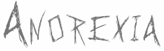 Fiona Clarke (aka Dead Duckling, Fie Clarke, and Bonez Designz) lives in Birmingham, UK, where she studied at Birmingham City University. She created the angular typeface Do You Like My Font Andy (2011), Cubee (2011, very fat and cubic), Boutique (2011, grunge), Anorexia (2011, a shrieky scribbled face), Time to Scribble (2011, sketched face).
 In 2012, Fiona added Bonez, A Gothique Time (grungy blackletter). Typefaces from 2013: Bernadette, Inky (heavy brush), Nebula, Harsh Hand. Typefaces from 2014: Mary (art deco), Bernadette. In 2015, she made Gothic Scribble (inky script), Sun & Rain, Apotheque, Bernadette Display, Bitter Sweet (a blackletter tattoo font) and Mary Outline. Typefaces from 2016: Sun + Rain, Anti, Anti Display. Typefaces from 2017: Farbe (dry brush script), Nineteen43 (a decorative didone pushed to extreme contrast), Maeve (art deco influenced by the didone style). Typefaces from 2018: Night Braille. Typefaces from 2020: Nineteen43 (a decorastive didone pushed to extreme contrast), Dias de Follaje (a floral sans). Dafont link. Devian Tart link. Behance link. Another Behance link. Dafont link [Google]
[MyFonts]
[More] ⦿
|
Braille
|
History of Braille, and links. [Google]
[More] ⦿
|
Braille 8
[Calle Sjöström]
|
The Braille 8 truetype font was designed by Calle Sjöström. [Google]
[More] ⦿
|
Braille and ASL Speciality Fonts
|
Jim Allan's resource (archive) of Braille and ASL (American sign language) fonts. Mac and PC, TrueType and PostScript. Includes BrailleKiama and RNIB_Braille (TrueType), BrailleNormal, Braille3D and LangageDesSignes truetype fonts by Philippe Blondel, a truetype font called HandSign by Sam Wang, Braille AOE, and Henry Churchyard's Braille Type 1 Postscript Fonts (Freeware). Also, a number of free Braille and ASL fonts for the Mac, including the Duxbury Braille fonts. [Google]
[More] ⦿
|
Braille DIN
[Jochen Evertz]
|
Braille DIN (2005, Fontshop) is due to Jochen Evertz. It follows the DIN specs 32980 and the packing standards of the German pharmaceutical industry. The price (159 Euros) is outrageous for a bunch of dots. [Google]
[More] ⦿
|
Braille font
|
Braille font for the Mac. [Google]
[More] ⦿
|
Braille Font True Type
|
A free Braille demo font, XB99 and a full commercial version, Braill99. or XBraille_E_JALLY, by Eric Jally. The latter font is freely available here. The full font costs 180FF (36 USD). [Google]
[More] ⦿
|
Braille: History, Use, Current Research
|
Braille links. [Google]
[More] ⦿
|
Braille Institute of America
|
The Braille Institute of America is located in Los Angeles, CA. In 2019, Elliott Scott, Megan Eiswerth, Linus Boman and Theodore Petrosky co-designed the totally free sans typeface family Atkinson Hyperlegible. Named after Braille Institute founder, Robert J. Atkinson, this font is characterized by differentiated letterforms, angled terminals, and a genuflexed lower case q. Fontsquirrel link. [Google]
[More] ⦿
|
Braille metafont
|
Braille metafont. [Google]
[More] ⦿
|
Braille through Remote Learning
|
SimBraille by Duxbury Systems (1996), truetype. [Google]
[More] ⦿
|
Brian J. Bonislawsky
[Astigmatic One Eye]
|
 [MyFonts]
[More] ⦿
[MyFonts]
[More] ⦿
|
Brigitte Betz
[Bildung Hessen]
|
[More] ⦿
|
Cal Henderson
|
Pixel font designer: BrailleOutReg (2003), BrailleReg (2003), CubicFive01, CubicFive11, CubicFive12, CubicFive18 (1999), Handy00, HelloveticaReg, PixelSix00, PixelSix01, PixelSix02, PixelSix10, PixelSix14, SmallHollows, SquareDance00, SquareDance00, SquareDance03, SquareDance10. Besides these free fonts, there are also unfinished fonts: Square Dance Bold, Indent, Pixelsix Italic, Edgy, Accent, Pixel Portal, Mini Hollows, Big Hollows, Topped. Working on this. Fontspace link. Dafont link. Klingspor link. [Google]
[More] ⦿
|
Calle Sjöström
[Braille 8]
|
[More] ⦿
|
Carles Closa
|
Barcelona-based graphic designer. Creator of the Baille simulation typeface called Braille (1999, Garcia Fonts), the child's handwriting typeface Loreakop (1995, Garcia Fonts) and the funky display typeface Calypso (1997). Uses the artistic alias Txarly Brown. He also made the Kafkaesque caps typeface Vertigo (1996, Garcia Fonts), the stunning stencil typeface Floridax (1997) and the oriental simulation font NinjaType (1995, Garcia Fonts). [Google]
[More] ⦿
|
Chiara Zanotti
|
Venezuelan creator of a free Braille font in 2012. [Google]
[More] ⦿
|
Christian Dominick
[Art & Progress]
|
[More] ⦿
|
Claudio Reston
[Tipopotamo Fontes]
|
[More] ⦿
|
Clotilde Olyff
|
Belgian designer (b. 1962) who lives in Brussels where she taught (teaches?) at the École supérieure des arts visuels de La Cambre and at the École supérieure de l'image. Her fonts were published by 2Rebels in Montreal, and by FontHaus in the USA. Her fonts are experimental and geometric in nature. Some creations: Billes (1995), Boulbar (1995), Boules (1996), BubbleBath (1996), Craaac (1996) Caaarc (1996), Design, Douff, Graphic, Handex (1995; an alphading based on fists), Inbetween (1996), Lines (1994), Lolo (1992, funny figurines), Minimex (1996), Modern (1996), Perles (1995), StencilFull (1997), StencilFullBraille (1997). She is most famous for her avant-garde geometric fonts Alpha Bloc (1994) and Alpha Geometrique (1994) published by Font Bureau. Alpha Geometrique Compact, for example, is a Bauhaus style stencil face. FontShop link. Klingspor link. View Clotilde Olyff's typefaces. [Google]
[MyFonts]
[More] ⦿
|
Communicist
|
Designer who used FontStruct in 2009 to make Braille, TypeIcon (dingbats) and Cosmic Trash. [Google]
[More] ⦿
|
Cornel Windlin
[Lineto]
|
[MyFonts]
[More] ⦿
|
Corso Braille
|
A free Braille font called BrailleIta (1995). [Google]
[More] ⦿
|
Crissov
|
Designer who used FontStruct in 2009 to make Raphigraphy, a dot matrix font based on a proposal by Louis Braille from 1839. Other creations: Just1s (concept font), Just1s Times 4, Moon 3x3 Square (Latin alphabet for partially sighted people after William Moon (1818-1894)), Moon 4x4 Thin, Geascript (squarish), QWERTY, Daumen, Daumen 9, 7seg (LCD font), 5x7int (pixel face). His Albers is a remake of Schablonenschrift by Albers (1920s). [Google]
[More] ⦿
|
David Charles Randolph Rakowski
|
 Type designer and composer, born in St. Albans, VT, in 1958. He was one of the early free/shareware type designers, well-known for creating revivals of 19th century typefaces. He was the Walter W. Naumburg Professor of Composition at Brandeis University, and has previously taught at Harvard University, Columbia University, and Stanford University.
 List of Rakowski's fonts: 3-DWedgie, Aarcover, AdineKirnberg-Script, Ann-Stone, Beachman, Beffle (1991, after Fry's Ornamented No. 2 from Stephenson Blake), Bizarro, BrailleFont, BunnyEars, ChristensenCaps, Crackling, DaBigKeyCaps, DavysCrappyWriting, DavysDingbats, DavysKeyCaps, DavysNewOther, DavysOtherDingbats, DavysRibbons, DeBalme Initials, DieterCaps, Diner-Fatt, Diner-Obese, Diner-Regular, Diner-Skinny, Dobkin-Script, Dragonwick, Dubiel (1991), Dupuy-Light, DupuyBALloon, Eileen, EileenCaps, EileensMediumZodiac, Elizabeth-Ann, Elzevier, EraserDust, Firecat, Gallaudet (a sign language font), Garton (1993), Gessele-Script, GriffinOne, Harting (an old typewriter font), Headhunter, Holtzschue, Horst, Ian-Bent, Jeff-Nichols, Jumble, Kinigstein, Konanur, KoshgarianLight, Kramer, Lassus (1993), LeeCaps, Lemiesz (a free version of Publicity Gothic, 1916), Lilith-Heavy, Lilith-Initals, Lilith-Light, Lintsec, Logger, LowerEastSide, McGarey-Fractured, Multiform, Nauert, NixonInChina (oriental simulation), ParisMetro, Pixie, Pointage, Polo, Rechtman-Script, ReliefDeco, ReliefInReverse, Reynolds, Rockmaker, Rothman [note: poster by Lauren Buroker], Rounded, Rudelsberg (a Munch Jugendstil style font), Salter, Shotling, Showboat, Shrapnel, Starburst, TejaratchiCaps, TenderleafCaps, ToneAndDebs, Tribeca, Uechi, UpperEastSide (1990), UpperWestSide (lettering from the New Yorker magazine), VarahCaps, Wedgie, Wharmby, WhatA-Relief, Will-Harris, Zaleski, and Zallman-Caps. Some downloads: Uechi, Rothman, Tejaratchi, Eileen Caps and Elzevier Caps, Paris Metro, Davy's Dingbats (see also here). With Klaus Herrmann, of Intecsas in Düsseldorf, he started updating his fonts from 1992-1999. Those fonts can be bought at Will-Harris. Here is an interview with David. Download 120 of his fonts here. And finally, a text file with the names of most of his fonts. Mark Johansson explains the history of Rakowski's fonts. Dafont link. MyFonts page. Abstract Fonts link. Font Squirrel link. Fontspace link. Klingspor link. [Google]
[MyFonts]
[More] ⦿
|
Deniart Systems
[Jan Koehler]
|
 Great fonts for astrology, hieroglyphics, alchemy and the occult, by Toronto's Jan and Denise Koehler, mostly designed between 1993 and 1995. They moved to Litomerice and then Teplice, the Czech Republic, recently. MyFonts sells the fantastic Meso Americano dingbats, Hypnotica, AlchemySymbols (two fonts), BlackMagick, Border Twins (2010), CastlesShields, Curly Jane (2010), Cubista Geometrica (2010: op art), DaggersAlphabet, Dendera (ancient Egyptian Zodiac symbols), Dragons, Eggnog (2010), Fontazia Floradot (2012), Fontazia Papilio (2009), Fontazia Pop62 (2011, dingbats of flowers), Fontazia AquaFlorium (2010, fishtank dingbats), Fontazia Mazzo (2010, vases), Fontazia Stiletto (2011), Fontazia Y3K (2009, aliens), the Hieroglyph family (dingbats, really), Jolly Jester (2010, curly hand), MagiWriting, Meandros (2010, a paperclip design inspired by the Greek Key, or Fret, motif), Phaistos, Pocket Wrench (2010, octagonal), Polka Dot Wrench (2010), PowersofMarduk, Praha Deco (2010, inspired by the Prague art deco movement), the RongoRongo family (Easter Island script), SkeletonAlphabet, Sublimina, Superchunk, WhiteMagick, Yenda (2010, bold and angular).
 List of font packages: Aglab, Alchemy Symbols, American Sign Alphabet, Ancient Writings Vol. 1, Ancient Writings Vol. 2, Angelica, The Astrologer Bundle, Astrologer, Aztec Day Signs, Black Magick, Braille Alphabet, Castles&Shields, Celestial Writing, Celtic Astrologer, Certar, Chinese Zodiac, Coptic Alphabet, Daggers Alphabet, Dendera, Dinosauria, Dragons, Egyptian Deities, Enochian Writing, Egypt. Hieroglyphics Vol 1, Egypt. Hieroglyphics Vol 2, Egypt. Hieroglyphics Vol 3, Egypt. Hieroglyphics Vol 4, Futhark, Greco, Hebrew Basic, Hypnotica, Magi Writing, Magick&Mystic, Malachim Writing, Masonic Writing, Maya Day Names, Maya Month Glyphs, Meso Americano, Meso Deko, Morse Code, Old Persian Cuneiform, Passing the River, Phaistos, Pike's Alphabets, Powers of Marduk, Sanskrit Writing, Semaphore Code, Signals&Signs, Skeleton Alphabet, Sublimina, Tengwanda Gothic, Tengwanda Namarie, Theban Alphabet, The Egyptologist, Tolkien Scripts, WhiteMagick, Skeleton Alphabet, Hebrew Basic, Sanskrit Writing. Note: I cannot find an entry for Jan Koehler at MyFonts, where all Deniart fonts are said to have been made by Denise Koehler. [Google]
[MyFonts]
[More] ⦿
|
Denise Koehler
|
 Partner of Jan Koehler in Deniart Systems, which operated from 1993-2009 in Toronto, and then in Litomerice (Czech Republic). Her typefaces include: Skeleton Alphabet, Sanskrit Writing, White Magick Symbols, Theban Alphabet, Tolkien Tengwanda Namarie, Tolkien Tengwanda Gothic, Sublimina, Semaphore, RongoRongo (a system of glyphs discovered in the 19th century on Easter Island), Powers Of Marduk, Phaistos Disk Glyphs, Passing The River, Old Persian Cuneiform (1995), Morse Code, Meso Deko, Maya Month Glyphs, Maya Day Names, Masonic Writing, Malachim Writing, Magi Writing, Hypnotica, Egyptian Hieroglyphics Basic, Egyptian Hieroglyphics - The Egyptologist, Hebrew Basic, Greco (Greek face), Futhark, Enochian Writing, Egyptian Hieroglyphics - Deities, Medieval Dragons, Dinosauria, Egyptian Hieroglyphics - Dendera, Daggers Alphabet, Coptic Alphabet, Chinese Zodiac Symbols, Tolkien Certar, Celtic Astrologer Symbols, Celestial Writing, Castles&Shields, Braille Alpha, Black Magick, Aztec Day Signs, Astrologer Symbols, Angelica, American Sign Alphabet, Alchemy Symbols, Tolkien Aglab, Fontazia AquaFlorium (2010, fish tank dingbats), Snow Crystals (2010, followed by Snow Crystals 2 in 2012), Star Crystals (2010, more snow-like structures but having 8 instead of 6 axes of symmetry), Karika Swirls (2010), Karika Hearts (2010), Karika Encore (2011), Fontazia Chateaux (2011), Fontazia Chateaux Deux (2011), Fontazia Insomnia (2011), 21 Emmerson (2011), 4 Point Greek Fret (2011: labyrinthine), 4 Point Florals (2011), 4 Point Deco (2011), Mykonos (2011, labyrinthine), Harmonics (2011, a zig-zag face), Fontazia Motyl (2011, butterfly dings), Holiday Penguins NF (2011, Christmas dingbats), Fontazia Christmas Tree (2011), Eggs Galoe (2012, Easter egg font), Border Glyphs (2012, hieroglyphic), Fontazia Christmas Baubes (2012), Fontazia Christmas Tree 2 (2013), Karika Hypnotica (2014, hypnotic or kaleidoscopic glyphs), Symcaps Vario X1, Symcaps Vario X2, Symcaps Vario X3 (2016, op-art design). Klingspor link. [Google]
[MyFonts]
[More] ⦿
Partner of Jan Koehler in Deniart Systems, which operated from 1993-2009 in Toronto, and then in Litomerice (Czech Republic). Her typefaces include: Skeleton Alphabet, Sanskrit Writing, White Magick Symbols, Theban Alphabet, Tolkien Tengwanda Namarie, Tolkien Tengwanda Gothic, Sublimina, Semaphore, RongoRongo (a system of glyphs discovered in the 19th century on Easter Island), Powers Of Marduk, Phaistos Disk Glyphs, Passing The River, Old Persian Cuneiform (1995), Morse Code, Meso Deko, Maya Month Glyphs, Maya Day Names, Masonic Writing, Malachim Writing, Magi Writing, Hypnotica, Egyptian Hieroglyphics Basic, Egyptian Hieroglyphics - The Egyptologist, Hebrew Basic, Greco (Greek face), Futhark, Enochian Writing, Egyptian Hieroglyphics - Deities, Medieval Dragons, Dinosauria, Egyptian Hieroglyphics - Dendera, Daggers Alphabet, Coptic Alphabet, Chinese Zodiac Symbols, Tolkien Certar, Celtic Astrologer Symbols, Celestial Writing, Castles&Shields, Braille Alpha, Black Magick, Aztec Day Signs, Astrologer Symbols, Angelica, American Sign Alphabet, Alchemy Symbols, Tolkien Aglab, Fontazia AquaFlorium (2010, fish tank dingbats), Snow Crystals (2010, followed by Snow Crystals 2 in 2012), Star Crystals (2010, more snow-like structures but having 8 instead of 6 axes of symmetry), Karika Swirls (2010), Karika Hearts (2010), Karika Encore (2011), Fontazia Chateaux (2011), Fontazia Chateaux Deux (2011), Fontazia Insomnia (2011), 21 Emmerson (2011), 4 Point Greek Fret (2011: labyrinthine), 4 Point Florals (2011), 4 Point Deco (2011), Mykonos (2011, labyrinthine), Harmonics (2011, a zig-zag face), Fontazia Motyl (2011, butterfly dings), Holiday Penguins NF (2011, Christmas dingbats), Fontazia Christmas Tree (2011), Eggs Galoe (2012, Easter egg font), Border Glyphs (2012, hieroglyphic), Fontazia Christmas Baubes (2012), Fontazia Christmas Tree 2 (2013), Karika Hypnotica (2014, hypnotic or kaleidoscopic glyphs), Symcaps Vario X1, Symcaps Vario X2, Symcaps Vario X3 (2016, op-art design). Klingspor link. [Google]
[MyFonts]
[More] ⦿
|
DOS Low Vision Shareware
|
Braille and large letter shareware. Includes Braille software. [Google]
[More] ⦿
|
Doug Sheets
|
Doug Sheets (b. 1989) lives in Seattle, WA. He created these typefaces in 2010: the Auctoritas family, Sheets Braille, Humberg, RADARbyDougSheets, Construct (counterless, mechanical), Standard Nib Handwritten (the only free font), Old Letterpress Type, Evie's Hand, and Radius. In 2012, he created Coffee Shop. Dafont link. [Google]
[More] ⦿
|
Drowse
|
FontStructor who made Braille (2012). [Google]
[More] ⦿
|
Duxbury Systems Inc
[Matt Sulivan]
|
Matt Sullivan's outfit in Littleton, MA that made some Braille fonts, including "Duxbury". See here for a free Braille font by them (1996). See also here. SimBraille (1996) and Braille (1996) are here. They also made Swell Braille (2007). See also here. [Google]
[More] ⦿
|
Echopraxium
[Michel Kern]
|
Belgian designer (b. 1962) of Go Braille (2019), a Braille font designed with the look of the Go Game. Lowercase glyphs use black stones while uppercase use white stones. In 2020, he published Ma Braille, Stack Braille, Hex Braille and Kernig Braille. These fonts can be used to make great hexagonal and rectangular patterns. In 2021, he published Lorraine Braille and the alphading typeface Atom Braille. [Google]
[MyFonts]
[More] ⦿
|
Eelee Design
[Lee Mullen]
|
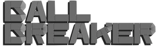 Designer in Newcastle, UK. Creator of the beautiful mechanical / octagonal typeface Ball Breaker (2012) and of the free experimental typeface Brailler (2012).
 Behance link. Fontspace link. Old URL. [Google]
[More] ⦿
|
EFI: Educational Font Software
|
EFI sells a 12-font bundle containing Ball-and-Stick, Dashes, Braille 24, Braille 24 Hollow, Clocks, Emo-faces, Fingerletters (American Sign Language), Morse code, Lettersound Pictures, POSTNET-16. [Google]
[More] ⦿
|
EFI Fonts
|
EFI makes and sells D'Nealian-style, Zaner-Bloser-style, Harcourt Brace-style, Peterson Directed Handwriting-style, McDougal, Littell-style, Getty-Dubay Italic (handwriting method developed by Barbara M. Getty and Inga S. Dubay), and Palmer style handwriting fonts. The Harcourt and Brace HB Cursive and HB Manuscript font families are useful for connect-the-dots and orthographic exercises. 250USD for the HB family for one school. They mention that their fonts are in over 8600 schools. At 4 styles per school, that looks like a 8.6 million dollar affair... Also, two Braille fonts at 10 USD a shot. [Google]
[More] ⦿
|
EFI Home Page (Educational Fontware)
|
Sells handwriting-fonts designed to exactly replicate many educational handwriting styles. In particular, they have these: - D'Nealian: DN Cursive and DN Manuscript.
- Zaner-Bloser: ZB Manuscript, ZB Cursive, OZ Manuscript, OZ Cursive.
- A Beka: AB Cursive and AB Manuscript, based on the style shown in workbooks developed by A Beka Book, Inc.
- Bob Jones University: CCU Cursive and CCU Manuscript, ugly fonts based on materials copyrighted by Bob Jones University.
- DKL Cursive and DKR Cursive, patterned after the handwriting methods in the workbooks Cursive Writing Skills (Educators Publishing Service, Inc, 31 Smith Place, Cambridge, MA), by Diana Hanbury King.
- Frank Schaffer: FS Classic, FS Contemporary, and FS Manuscript, developed using materials copyrighted by Frank Schaffer Publishing.
- Getty-Dubay Italic: GDI Basic, GDI Combined, and GDI Cursive, a handwriting method developed by Barbara M. Getty and Inga S. Dubay at Portland State University, Continuing Education Press. EFI worked with Getty and Dubay to develop its GDI fonts.
- Handwriting Without Tears: HWT Cursive and HWT Manuscript, pretty upright cursives and a hairline geometric sans. Handwriting Without Tears is a registered trademarked of Jan Z. Olsen.
- Harcourt Brace: HB Cursive and HB Manuscript.
- Loops and Groups: LG Cursive, based on the handwriting samples in the copyrighted Instructor's Manual Loops and Other Groups---A Kinesthetic Writing System by Mary Benbow.
- McDougal, Littell: McD Cursive and McD Manuscript, based on materials copyrighted by McDougal, Littell&Company.
- Palmer: Palmer Manuscript (simple hairline sans), Vintage Palmer and New Palmer, which include several variations of the cursive handwriting style that constitute the Palmer Method. Vintage Palmer is based on a 1923 workbook, and New Palmer on a 1987 workbook.
- Pentime: PT Cursive and PT Manuscript, developed for use by the Amish communities, through workbooks rather than directly with computers. The fonts were created for JKL Services, who use the fonts to produce handwriting materials for the Amish community.
- Peterson Directed Handwriting: PM Cursive, PM Block, and PM Slant.
- Queensland: QM Cursive and QBA Manuscript, based on samples from workbooks by Horowitz Martin Education.
- Russian: RU Cursive and Manuscript families (9 fonts) for Cyrillic.
- Seattle School District: SSD Cursive and SSD Printscript, based on handwriting samples and methods developed by Patricia Heller and Elaine M. Aoki for the Seattle Public Schools. samples were found in a 1993 K-5 handwriting manual called Write It Right (Seattle Public Schools).
- Steck Vaughn: SV Cursive and SV Manuscript, developed using materials copyrighted by Steck Vaughn Company.
- Specialty Fonts: four Ball-and-stick and Dashes fonts, Braille 24 and Braille 24 Hollow, Clocks, EFI Count Dots on Numbers, EFI Direct Instruction, EFI Music Symbols, Emo-faces, Fingerletters (for American Sign Language), Lettersound Pictures, Morse Code, Phonetics Phont, POSTNET-16.
[Google]
[More] ⦿
|
Emilie Combes
|
Toulouse, France-based designer of the Braille/Latin combination font Monster (2018). [Google]
[More] ⦿
|
Eric Wannin
[Quartet Systems]
|
[More] ⦿
|
Evgeniy Bobrov
|
 Designer of HandDrawn Cute Funky (2016), Glitch (2016), Glossy Golden Metal (2016), Black Newspaper Letters (2016), Colorful Newspaper Letters (2016, ransom note font), Isometry (2016), Hand-Drawn Dirty Ink Font (2015), Lighting Bulb Pixel (2015) and Retro Type Grunge Font (2015). In 2016, he published Bright Red Neon Letters, Bright Realistic Neon Letters (vector format), Decorative Red Font (EPS format) and Transparent Letters With Long Shadow (vector format).
 Typefaces from 2017: Medieval Inventor Sketches, Braille, Vintage Hippie Alphabet, Sign Language Interpreter Font, Blueprint Style. [Google]
[More] ⦿
|
Fernando Lins
|
Sao Paulo-based designer at FontStruct in 2008 of miller. [Google]
[More] ⦿
|
Fiona Clarke
[Bonez Designz]
|
 [MyFonts]
[More] ⦿
[MyFonts]
[More] ⦿
|
Font Environment
[Samuel Marcius]
|
 Samuel Marcius (b. 1970, from Boeblingen, Germany) has a web page for his own creations (fonts and dingbats). My own logo---the moose on all my web pages---is from Marcius' WinPets 1---I liked the sense of humour that shines through the drawing, and the spirit of Don't take life too seriously. Direct access.
 The fonts: 10LilGhosts, 20Facesttf, BalkanPeninsulaBraille, Banner, BlackBox, BoxFont, BoxFontNegative, BoxinaBox, Caterpillar, CheVivaBanana, Circleblackwhite, Confetti, CrayonKids1, CrayonKids2, Dominoes, Fantastique Cars (2001), Fingerprints Inside (2011), Grungees 23, Headlong, HomagetoWillEisner, Leonardos Mirrorwriting, Leonardos MirrorwritingBold, LittleBigMan, Maja's Flowers (2001), MissEllen, MoMoney, NaturalSigns, Noah's Ark (2001), NoFear, Planks, PuzzlePieces, PuzzlePiecesOutlined, SamsDingbatsNo1, SamsDingbatsNo2, SamsHandwriting, SisterR, Song ABC (2012), TPFClaudia, TPFClaudiaBold, TPFClaudiaOutlined, TPFGaiety, TPFGaietyOutlined, TPFKrikkelKrakkel, TPFPolkaYourEyesOut, TPFSenselessStrokes, TPFUbiquitous, TPFVacuous, TPFVacuousNegative, TPFYolk, TPFYolkBold, TPFYolkCondensed, TPFYolkCondensedBold, TPFYolkLight, TattooNo1, TattooNo2, Tribal (2011), WinBugs, WinPets1, WinPets2. [Google]
[More] ⦿
|
Font Factory
[Andy Benedek]
|
 Andy Benedek's (b. Manchester, UK, 1945) Cotswolds-based outfit for "custom fonts and lettering of distinction", founded by him in 1988. Andy (András) made corporate typefaces for Umbro, QZERO, Bowater, Lloyds Bank, Royal Free Hospital, Liptons teas, Gordons gin, Marlboro cigarettes, as well as typefaces for magazines (Royal Academy of Arts, Elle, Blueprint) and for newspapers (The Scotsman). All this was done under the label of The Font Factory. With Michael Johnson and Mike Pratley, he created a font for BT Cellnet. A braille typeface has been developed to aid the production of signage for the blind. In 2001, he co-founded Fine Fonts with Michael Harvey. CV. Typefaces:
 - Aesop (2000, with Michael Harvey): developed from book jacket lettering drawn by Michael Harvey for an edition of Aesops Fables.
- Balthasar (2002, with Michael Harvey): a serifed stencil font.
- Braff (2002, with Michael Harvey, for Monotype Imaging): an outline face.
- Fine Gothic (2002, a blackletter typeface co-designed with Michael Harvey): a blackletter family with a Basque A.
- Friezea (Andy Benedek and Michael Harvey, Fine Fonts). The original font dates from ca. 1990. They explain: The origin of this font was a frieze in the RAF Chapel in Westminster Abbey which Michael Harvey was commissioned to design and create. It was comprised of the names of the top brass in Bomber Command, namely Dowding, Harris, Newall, Tedder, Portal and Douglas. The Brief was to cut the letters in bronze and guild them. Instead, they were cut in perspex and guilded. Some twenty years later, the missing upper-case letters were drawn together with the lower-case letters and Frieze, the font, was born.
- Marceta (2003, with Michael Harvey): an eighth-century uncial.
- Mentor (2004, with Michael Harvey, for Monotype Imaging): a Times-Roman style family.
- Mentor Sans (2004, with Michael Harvey, for Monotype Imaging): a sans family.
- Quirky (2010).
- Ruskin (2008, Andy Benedek and Michael Harvey, Fine Fonts). This display serif typeface was originally created as a commission for Michael Harvey to design a signage font for the Dean Gallery in Edinburgh.
- Scorpio (2015). Based on he condensed lettering Michael Harvey drew for the card The Sign of The Nudge which was designed in collaboration with poet Ian Hamilton Finlay. It was digitized after Harvey's death by Benedek.
- Songlines (2001, with Michael Harvey): based upon a pen-drawn script drawn by Michael Harvey to illustrate a poem by Johannes Thurman.
- Tisdall Script (2002, with Michael Harvey): based upon the brush-drawn script lettering of Hans Tisdall, who was the designer of many distinctive lettered book jackets for Jonathan Cape in the 1950s.
- Victoriana (2002, a Victorian font by Andy Benedek and Michael Harvey, Fine Fonts). Named after cyclist Victoria Pendleton.
FontShop link. View Andy Benedek's typefaces. [Google]
[MyFonts]
[More] ⦿
|
FontBlast
[Jamie Place]
|
 Jamie Place (aka FontBlast, b. 2002) is a UK-based FontStructor, allegedly born in 2002 (?), who made these typefaces in 2012: Microstruct (gridded, kitchen tile face), FontStrukt Soft, FontSrukt Clean Soft, Kombinationsschrift, Gridder (a kitchen tile family: +Soft, +Box, +Bold), Skyber, Diabolo (piano key stencil genre), fb Catbop, Hangar Shot, Hangar (army stencil), FontStrukt (+Soft), Braille Full, fb Symbols, Imagine More FB, fb Atarian, Imagine FB, Barkode, Fontstruction No1 (+Extended), Tetraminos, Structurosa Fill, fb Karakter, Minimal Export, Barkode, fb Scoreboard (dot matrix typeface for Latin and Cyrillic), Wenlock, Small Fonts, Fat Largo, Largo, Kerr, Kerr Bold, fb Mixture Unstable, Freehand, Structurosa Refined, fb Switch, fb Mixture, Vado, NES Forever, Retrotype Dot Matrix, Avant Pixel, fb Tall, Fast Money Clean, Retrotype, Retrotype Too (pixelish), Retrotype Sliced, Braille Caps, Tiger Sans (horizontally striped), Pixelface (smilie face), Karmink (star dingbats), Cofmugg (+Gap: piano key typefaces).
 Typefaces from 2013: Slink, Tuning Fork, Dicey (dice font), Septober, Pico Pop (kitchen tile), Plano (kitchen tile), Dolphin Sans (hairline), New English (stencil), Gadget, Curvaceous Script, Avant Pixel, Barkode, Brailled, Haus (counterless), Zapadni, Curvaceous Script, Metric (a piano key Futura-like stencil face), Mocha, Mocha Book, dm FB Solidis, Tapedeck, Gridder Bold (kitchen tile face), Modulator, Turning Fork, Zapadni (Western), FontStrukt2, Metric (piano key face), Monaco (pixel face), Blackfoot (Pac-Man style), FB Catbop, Peach Condensed, Noodle, Peach Squared, Vaquero, Haus, fb Academy Sans, Peach, Rider. Dafont link. [Google]
[More] ⦿
|
Forgotten Scripts by Dino Manzella
|
Dino Manzella's draft on a book entitled Forgotten Scripts: a Book of Runes. Fantastic pages in all respects! Many fonts can be downloaded. Includes Academiury-ITV (Georgian, by Alexander&Temuri Imnaishvili), Rashi, Alex and ChayaBold (by Aaron Schmiedel), Angelic and Enochian (by Digital Type Foundry), several rune fonts by Dan Smith, Beth-Luis-Fearn and Beth-Luis-Nion (by Curtis Clark), Cherokee (by Joseph LoCicero), Moonrune (Morton Bek, 1995), Eshmoon (by Salim G. Khalaf, Family Health International), Glagoljica UGL and Glagoljica OBL (old Croatian; by Zox), RK Meroitic, RK Sanskrit, RK Ugaritic, Mendel Siddur, Nug-Soth (by Daniel U. Thibault), Tzipporah and RuthFancy (by AFS Ltd), and RNIB Braille. [Google]
[More] ⦿
|
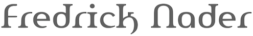
Fredrick M. Nader
[Apostrophic Laboratory]
|
[MyFonts]
[More] ⦿
|
FREELANG Fuentes
|
Spanish language site for various non-Latin language fonts. A sampling: Afus Deg Wfus 2 (for Berber), AlKatib1 (2001, an Arabic typeface by Naseem Amjad), Albanian, Alice_0 (Lao typeface by by Ngakham Southichack), LAOMAY_5 CHAREUNSILP (Lao typeface by by Soupasith Bouahom), Arial AMU (1999, Armenian typeface by Ruben Tarumian), BaltFrutigerLight, BaltHelveticaMedium, BaltNewCenturySchoolbookMedium, BaltOptimaMedium, BaltTiffanyMedium, BaltUniversityMedium, CarloAtor (1997, Arabic family by Timm Erickson, Summer Institute of Linguistics), Caligraf-W, Ciula (1996, a Romanian typeface by Paul Hodor), Cursiv (Romanian), AnlongvillKhek, GabrialAtor (another Arab family by Timm Erickson), Gin, Greek (1993, by Peter J. Gentry&Andrew M. Fountain), HandSign (1993, Sam Wang), HFMassisShantNUnicode (1990-1994, an Armenian unicode typeface by BYTEC Computers and Massis Graphics), HONGKAD (1994, a family by Dr. Hongkad Souvannavong), IsmarBold, IsmarLight, Lakshmi, X000000A (1994, a lao typeface by Sith Bouahom), LAOMAY_2-CHAREUNSILP, Alice3Medium, Alice0Medium, Langagedessignes (1998, by Philippe and François Blondel), NorKirk (1997, a great Armenian typeface by Ruben Tarumian), NovaTempo (for Esperanto), Pazmaveb (for Armenian), ILPRumanianB100 (1996, by Charles J. Coker), Saysettha-Lao, Saysettha-LaoBold, SenzorgaAnhok, Timok, Tribuno, Turn-W, TimesUnicode, ArialAMU, PoliceTypeAPI (for Armenian), Cieszyn-Regular, PoojaNormal, Shibolet (1995, Hebrew), Shree-Ass-0552 (2000, by Modular InfoTech), Tudor-Semi-Lite, Webdunia, TimesNRCzech, TNRLiboriusVII (2001, a fully accented Times typeface by Libor Sztemon), GreatMoravia (2001 Libor Sztemon, Czechia), Johaansi-ye-Peyravi (2001, a full accent blackletter typeface by Libor Sztemon, Czechia), TimesNREuskaraEuransiEsperanto (2001, Libor Sztemon). [Google]
[More] ⦿
|
Gall Allston Lucas and Moon Reading Codes for the Blind
|
A bit of history on reading codes for the blind, including the Allston, Lucas, Moon and Gall reading codes. Link to a Moon truetype font. [Google]
[More] ⦿
|
Ganlo R. Ithsm
[Xenophilius]
|
[More] ⦿
|
George Douros
[Unicode Fonts for Ancient Scripts]
|
 [More] ⦿
|
Geronimo Fonts (or: Paradox Fontworks, or: Typewire Studios)
[Anthony Bowe]
|
 First called Geronimo Fonts, then Paradox Fontworks, and then Typewire Studios, this American studio created these free fonts in 2015: For Sara, Funkytown, Necktie (blackboard bold), Northpoint (strong octagonal varsity font), Kevin Eleven (handcrafted 3d font), Back to School (handcrafted), Musicnet (dot matrix font), Anxiety, Starship One, Astronaut City (comic book style), Internet Friends, Solitude (rounded sans), Kinetic Extreme (+Solid), Crank, Disco Flow, Psychedelic, Lemons, Bokai, Royalty Code, Operation (military octagonal stencil face), Northwest (squarish), Hijack, Establishment, Jamstone, Skinz, The Antenna, Distortion, Los Mesitos, Rock Salmon, Hand Stencil, Crossroads, Upton Funk, Zero Theory, The Million Mile Man (3d outline font), Blueberry Pie, Boraodway Musical, Block Cartoon, Cinematic Language, Kayak, Aerospace, Russian (constructivist), Lines (white on black), Ohio Collegiate, Alkaline.
 In 2014, Anthony designed these typefaces: The Ambrosia Society, The American (stencil), Clockwork (rounded and octagonal), Basico 1983, Crash Test, Christmas Sweater (textured, knitted), Dysfunctinal, Winter Sans, Tazorblade, Origami, Kingsbury, Mike, Secret Stencil, Braillefont, Encrypted, Spacecraft, Retro Serif, Something Blue, Lakeside, Amelia Pond, Kindergarten, Superpowers, Homeboys, Dispensations, Neutron (sans), Chrome, Mandarin, Battlecry (stencil), Spacebar, Starlight, Square Deal, Timeline, Simpetico, Guardians (octagonal), Pixel Rocks, Snakeway, The Spaceman, Paint Brush, Series Slab, Simple Life, Warehouse, Flappy Birdy, Brushmark, Hammers and Strings, I Do Not Trust You, My Dad Drives Me Crazy, Scriptfont, Widehand, Bastille, Destruction, Remember, Handlebars, Marksman, Animated, Chubby Gothic, Highlight, Lighthead, Random Type, Readable, Archibald, Stenciles, Andersans, Gondola (monoline geometric sans), Sundance Neue, Jangotype, Limousine, Crayon Kids, Packing Tape, Cartoon Adventures, Telescope, Little Shrimp, Destiny (FontStruct), Al Dente, Copper Four (piano key font), Digit LCD, Dimension (horizontally striped), Highway Block Sans, Integration, Overload (LED font), Scoreboard LED, The Distance LCD, Ace Gaffigan, Grean, The Distance (FontStruct), Reason to Believe, Quincy Egbert, Oklahoma, Anonymous, Amaretto, Espionage (horizontally striped), Waffleboy, Angular, Equalizer, Spangled, Freewind, Ancient Grease, Black Pine Trees, Etra Preview, Fun Fragment, Multilingual hand, Red Velvet, The Fragile Wind, Lightweight Serif, Instant Access, Black Pixel, Rapid Mental Thursday, Blue Chucks, Hand Power, Royalty Waffles, Anger Management, Pocket, Effective, Florida, Pencil Sharp, Silence Will Fall (a prison say counter font), Chuck, Caged, Diamond, Uncle Salsa, Zebru, Sun, Stafona, Questions, Fancy, Sunwave, Doodle Digit, Einstein Grand, Lollipop, Lemon Rose, Gentleman, Jukebox, Fuzzy, Monster Taxi, Popsicle, Ripleys, Fragment, Crashy, Ravioli, Little Picnic, Strobelight, Cool, Cheddar (hand-printed) and Comic Fade (a dot matrix font done at FontStruct), Schnoodle, Ice Cubed (pixel face), GF Albert, Garfield, Black Friday, National Industry, Warlox, Moneto, Troublemaers, Sundrop, Magnitude, Break The Chain, Black Fire, Ralph, Hexoto, Flubber, Crazy Smile, Angel, Cheapskate, Flatboard, Stitcher, Black Shadow (20143, a dripping blood font), Probably Yes, True Love, Charlie, George, Alpine Script, Aztec Kingdom, Megafont, LCD Expanded, Generation, Arcadia, Cosmo, Jokerface, Deco Future (a blackboard bold typeface, +Inline). Many of the typefaces were made with FontStruct. Typefaces from 2016: Inklings (textured), Scorpion (squarish), Vincentio (text typeface), University (varsity font), Gameplay, Barbershop (squarish blackboard bold style), Elevation (sans), Revolution Script, New Chinese (oriental simulation), Underground, The Neverlanders. Typefaces from 2017: Snowball, War of 1930, Superguns, High School, Destructive (octagonal stencil font), American Grunge, French Fries (shaded). Typefaces from 2018: Oldies Cartoon, Showtunes, Topline (squarish sans), Grunge Band, The Friendly Indians. Typefaces from 2019: Land+Mine (spurred), Jersey Slim. Typefaces from 2020: Meatloaf (pixelish), Space Galaxy, Ouitfield Pro (heavy sans caps), Alkine (circled letters), Flower Girl (alphadings), Lightzone (a dot matrix font), Gameplay 1987 (a pixel font). [Google]
[More] ⦿
|
Giulia Borsi
|
Florence, Italy-based designer of Universo (2015), a connect-the-dots typeface inspired by the Braille grid. [Google]
[More] ⦿
|
GNU Freefont (or: Free UCS Outline Fonts)
[Steve White]
|
 The GNU Freefont is continuously being updated to become a large useful Unicode monster. GNU FreeFont is a free family of scalable outline fonts, suitable for general use on computers and for desktop publishing. It is Unicode-encoded for compatability with all modern operating systems. There are serif, Sans and Mono subfamilies. Also called the "Free UCS Outline Fonts", this project is part of the larger Free Software Foundation. The original head honcho was Primoz Peterlin, the coordinator at the Institute of Biophysics of the University of Ljubljana, Slovenia. In 2008, Steve White (aka Stevan White) took over. URW++ Design&Development GmbH. URW++ donated a set of 35 core PostScript Type 1 fonts to the Ghostscript project.
 - Basic Latin (U+0041-U+007A)
- Latin-1 Supplement (U+00C0-U+00FF)
- Latin Extended-A (U+0100-U+017F)
- Spacing Modifier Letters (U+02B0-U+02FF)
- Mathematical Operators (U+2200-U+22FF)
- Block Elements (U+2580-U+259F)
- Dingbats (U+2700-U+27BF)
Yannis Haralambous and John Plaice. Yannis Haralambous and John Plaice are the authors of Omega typesetting system, which is an extension of TeX. Its first release, aims primarily at improving TeX's multilingual abilities. In Omega all characters and pointers into data-structures are 16-bit wide, instead of 8-bit, thereby eliminating many of the trivial limitations of TeX. Omega also allows multiple input and output character sets, and uses programmable filters to translate from one encoding to another, to perform contextual analysis, etc. Internally, Omega uses the universal 16-bit Unicode standard character set, based on ISO-10646. These improvements not only make it a lot easier for TeX users to cope with multiple or complex languages, like Arabic, Indic, Khmer, Chinese, Japanese or Korean, in one document, but will also form the basis for future developments in other areas, such as native color support and hypertext features. ... Fonts for UT1 (omlgc family) and UT2 (omah family) are under development: these fonts are in PostScript format and visually close to Times and Helvetica font families. - Latin Extended-B (U+0180-U+024F)
- IPA Extensions (U+0250-U+02AF)
- Greek (U+0370-U+03FF)
- Armenian (U+0530-U+058F)
- Hebrew (U+0590-U+05FF)
- Arabic (U+0600-U+06FF)
- Currency Symbols (U+20A0-U+20CF)
- Arabic Presentation Forms-A (U+FB50-U+FDFF)
- Arabic Presentation Forms-B (U+FE70-U+FEFF)
Yannis Haralambous and Wellcome Institute. In 1994, The Wellcome Library The Wellcome Institute for the History of Medicine 183 Euston Road, London NW1 2BE, England, commissioned Mr. Haralambous to produce a Sinhalese font for them. We have received 03/09 official notice from Robert Kiley, Head of e-Strategy for the Wellcome Library, that Yannis' font could be included in GNU FreeFont under its GNU license: Sinhala (U+0D80-U+0DFF). Young U. Ryu at the University of Texas at Dallas is the author of Txfonts, a set of mathematical symbols designed to accompany text typeset in Times or its variants. In the documentation, Young adresses the design of mathematical symbols: "The Adobe Times fonts are thicker than the CM fonts. Designing math fonts for Times based on the rule thickness of Times =,, +, /, <, etc. would result in too thick math symbols, in my opinion. In the TX fonts, these glyphs are thinner than those of original Times fonts. That is, the rule thickness of these glyphs is around 85% of that of the Times fonts, but still thicker than that of the CM fonts." Ranges: Arrows (U+2190-U+21FF), Mathematical Symbols (U+2200-U+22FF). Valek Filippov added Cyrillic glyphs and composite Latin Extended A to the whole set of the abovementioned URW set of 35 PostScript core fonts, Ranges: Latin Extended-A (U+0100-U+017F), Cyrillic (U+0400-U+04FF). Wadalab Kanji Comittee. Between April 1990 and March 1992, Wadalab Kanji Comittee put together a series of scalable font files with Japanese scripts, in four forms: Sai Micho, Chu Mincho, Cho Kaku and Saimaru. The font files were written in custom file format, while tools for conversion into Metafont and PostScript Type 1 were also supplied. The Wadalab Kanji Comittee has later been dismissed, and the resulting files can be now found on the FTP server of the Depertment of Mathematical Engineering and Information Physics, Faculty of Engineering, University of Tokyo: Hiragana (U+3040-U+309F), Katakana (U+30A0-U+30FF). Note that some time around 2009, the hiragana and katakana ranges were deleted. Angelo Haritsis has compiled a set of Greek type 1 fonts. The glyphs from this source has been used to compose Greek glyphs in FreeSans and FreeMono. Greek (U+0370-U+03FF). Yannis Haralambous and Virach Sornlertlamvanich. In 1999, Yannis Haralambous and Virach Sornlertlamvanich made a set of glyphs covering the Thai national standard Nf3, in both upright and slanted shape. Range: Thai (U+0E00-U+0E7F). Shaheed Haque has developed a basic set of basic Bengali glyphs (without ligatures), using ISO10646 encoding. Range: Bengali (U+0980-U+09FF). Sam Stepanyan created a set of Armenian sans serif glyphs visually compatible with Helvetica or Arial. Range: Armenian (U+0530-U+058F). Mohamed Ishan has started a Thaana Unicode Project. Range: Thaana (U+0780-U+07BF). Sushant Kumar Dash has created a font in his mother tongue, Oriya: Oriya (U+0B00-U+0B7F). But Freefont has dropped Oriya because of the absence of font features neccessary for display of text in Oriya. Harsh Kumar has started BharatBhasha for these ranges: - Devanagari (U+0900-U+097F)
- Bengali (U+0980-U+09FF)
- Gurmukhi (U+0A00-U+0A7F)
- Gujarati (U+0A80-U+0AFF)
Prasad A. Chodavarapu created Tikkana, a Telugu font family: Telugu (U+0C00-U+0C7F). It was originally included in GNU Freefont, but supoort for Telugu was later dropped altogether from the GNU Freefont project. Frans Velthuis and Anshuman Pandey. In 1991, Frans Velthuis from the Groningen University, The Netherlands, released a Devanagari font as Metafont source, available under the terms of GNU GPL. Later, Anshuman Pandey from Washington University in Seattle, took over the maintenance of font. Fonts can be found on CTAN. This font was converted the font to Type 1 format using Peter Szabo's TeXtrace and removed some redundant control points with PfaEdit. Range: Devanagari (U+0900-U+097F). Hardip Singh Pannu. In 1991, Hardip Singh Pannu has created a free Gurmukhi TrueType font, available as regular, bold, oblique and bold oblique form. Range: Gurmukhi (U+0A00-U+0A7F). Jeroen Hellingman (The Netherlands) created a set of Malayalam metafonts in 1994, and a set of Oriya metafonts in 1996. Malayalam fonts were created as uniform stroke only, while Oriya metafonts exist in both uniform and modulated stroke. From private communication: "It is my intention to release the fonts under GPL, but not all copies around have this notice on them." Metafonts can be found here and here. Ranges: Oriya (U+0B00-U+0B7F), Malayalam (U+0D00-U+0D7F). Oriya was subsequently dropped from the Freefont project. Thomas Ridgeway, then at the Humanities And Arts Computing Center, Washington University, Seattle, USA, (now defunct), created a Tamil metafont in 1990. Anshuman Pandey from the same university took over the maintenance of font. Fonts can be found at CTAN and cover Tamil (U+0B80-U+0BFF). Berhanu Beyene, Prof. Dr. Manfred Kudlek, Olaf Kummer, and Jochen Metzinger from the Theoretical Foundations of Computer Science, University of Hamburg, prepared a set of Ethiopic metafonts. They also maintain the home page on the Ethiopic font project. Someone converted the fonts to Type 1 format using TeXtrace, and removed some redundant control points with PfaEdit. Range: Ethiopic (U+1200-U+137F). Maxim Iorsh. In 2002, Maxim Iorsh started the Culmus project, aiming at providing Hebrew-speaking Linux and Unix community with a basic collection of Hebrew fonts for X Windows. The fonts are visually compatible with URW++ Century Schoolbook L, URW++ Nimbus Sans L and URW++ Nimbus Mono L families, respectively. Range: Hebrew (U+0590-U+05FF). Vyacheslav Dikonov made a Braille unicode font that could be merged with the UCS fonts to fill the 2800-28FF range completely (uniform scaling is possible to adapt it to any cell size). He also contributed a free Syriac font, whose glyphs (about half of them) are borrowed from the free Carlo Ator font. Vyacheslav also filled in a few missing spots in the U+2000-U+27FF area, e.g., the box drawing section, sets of subscript and superscript digits and capital Roman numbers. Ranges: Syriac (U+0700-U+074A), Box Drawing (U+2500-U+257F), Braille (U+2800-U+28FF). Panayotis Katsaloulis helped fixing Greek accents in the Greek Extended area: (U+1F00-U+1FFF). M.S. Sridhar. M/S Cyberscape Multimedia Limited, Mumbai, developers of Akruti Software for Indian Languages (http://www.akruti.com/), have released a set of TTF fonts for nine Indian scripts (Devanagari, Gujarati, Telugu, Tamil, Malayalam, Kannada, Bengali, Oriya, and Gurumukhi) under the GNU General Public License (GPL). You can download the fonts from the Free Software Foundation of India WWW site. Their original contributions to Freefont were - Devanagari (U+0900-U+097F)
- Bengali (U+0980-U+09FF)
- Gurmukhi (U+0A00-U+0A7F)
- Gujarati (U+0A80-U+0AFF)
- Oriya (U+0B00-U+0B7F)
- Tamil (U+0B80-U+0BFF)
- Telugu (U+0C00-U+0C7F)
- Kannada (U+0C80-U+0CFF)
- Malayalam (U+0D00-U+0D7F)
Oriya, Kannada and Telugu were dropped from the GNU Freefont project. DMS Electronics, The Sri Lanka Tipitaka Project, and Noah Levitt. Noah Levitt found out that the Sinhalese fonts available on the site metta.lk are released under GNU GPL. These glyphs were later replaced by those from the LKLUG font. Finally the range was completely replaced by glyphs from the sinh TeX font, with much help and advice from Harshula Jayasuriya. Range: Sinhala (U+0D80-U+0DFF). Daniel Shurovich Chirkov. Dan Chirkov updated the FreeSerif font with the missing Cyrillic glyphs needed for conformance to Unicode 3.2. The effort is part of the Slavjanskij package for Mac OS X. range: Cyrillic (U+0400-U+04FF). Abbas Izad. Responsible for Arabic (U+0600-U+06FF), Arabic Presentation Forms-A, (U+FB50-U+FDFF), Arabic Presentation Forms-B (U+FE70-U+FEFF). Denis Jacquerye added new glyphs and corrected existing ones in the Latin Extended-B (U+0180-U+024F) and IPA Extensions (U+0250-U+02AF) ranges. K.H. Hussain and R. Chitrajan. Rachana in Malayalam means to write, to create. Rachana Akshara Vedi, a team of socially committed information technology professionals and philologists, has applied developments in computer technology and desktop publishing to resurrect the Malayalam language from the disorder, fragmentation and degeneration it had suffered since the attempt to adapt the Malayalam script for using with a regular mechanical typewriter, which took place in 1967-69. K.H. Hussein at the Kerala Forest Research Institute has released "Rachana Normal" fonts with approximately 900 glyphs required to typeset traditional Malayalam. R. Chitrajan apparently encoded the glyphs in the OpenType table. In 2008, the Malayalam ranges in FreeSerif were updated under the advise and supervision of Hiran Venugopalan of Swathanthra Malayalam Computing, to reflect the revised edition Rachana_04. Range: Malayalam (U+0D00-U+0D7F). Solaiman Karim filled in Bengali (U+0980-U+09FF). Solaiman Karim has developed several OpenType Bangla fonts and released them under GNU GPL. Sonali Sonania and Monika Shah covered Devanagari (U+0900-U+097F) and Gujarati (U+0A80-U+0AFF). Glyphs were drawn by Cyberscape Multimedia Ltd., #101, Mahalakshmi Mansion 21st Main 22nd "A" Cross Banashankari 2nd stage Banglore 560070, India. Converted to OTF by IndicTrans Team, Powai, Mumbai, lead by Prof. Jitendra Shah. Maintained by Monika Shah and Sonali Sonania of janabhaaratii Team, C-DAC, Mumbai. This font is released under GPL by Dr. Alka Irani and Prof Jitendra Shah, janabhaaratii Team, C-DAC, Mumabi. janabhaaratii is localisation project at C-DAC Mumbai (formerly National Centre for Software Technology); funded by TDIL, Govt. of India. Pravin Satpute, Bageshri Salvi, Rahul Bhalerao and Sandeep Shedmake added these Indic language cranges: - Devanagari (U+0900-U+097F)
- Gujarati (U+0A80-U+0AFF)
- Oriya (U+0B00-U+0B7F)
- Malayalam (U+0D00-U+0D7F)
- Tamil (U+0B80-U+0BFF)
In December 2005 the team at www.gnowledge.org released a set of two Unicode pan-Indic fonts: "Samyak" and "Samyak Sans". "Samyak" font belongs to serif style and is an original work of the team; "Samyak Sans" font belongs to sans serif style and is actually a compilation of already released Indic fonts (Gargi, Padma, Mukti, Utkal, Akruti and ThendralUni). Both fonts are based on Unicode standard. You can download the font files separately. Note that Oriya was dropped from the Freefont project. Kulbir Singh Thind added Gurmukhi (U+0A00-U+0A7F). Dr. Kulbir Singh Thind designed a set of Gurmukhi Unicode fonts, AnmolUni and AnmolUni-Bold, which are available under the terms of GNU license from the Punjabu Computing Resource Center. Gia Shervashidze added Georgian (U+10A0-U+10FF). Starting in mid-1990s, Gia Shervashidze designed many Unicode-compliant Georgian fonts: Times New Roman Georgian, Arial Georgian, Courier New Georgian. Daniel Johnson. Created by hand a Cherokee range specially for FreeFont to be "in line with the classic Cherokee typefaces used in 19th century printing", but also to fit well with ranges previously in FreeFont. Then he made Unified Canadian Syllabics in Sans, and a Cherokee and Kayah Li in Mono! And never to be outdone by himself, then did UCAS Extended and Osmanya.... What next? - Armenian (serif) (U+0530-U+058F)
- Cherokee (U+13A0-U+13FF)
- Unified Canadian Aboriginal Syllabics (U+1400-U+167F)
- UCAS Extended (U+18B0-U+18F5)
- Kayah Li (U+A900-U+A92F)
- Tifinagh (U+2D30-U+2D7F)
- Vai (U+A500-U+A62B)
- Latin Extended-D (Mayanist letters) (U+A720-U+A7FF)
- Osmanya (U+10480-U+104a7)
George Douros, the creator of several fonts focusing on ancient scripts and symbols. Many of the glyphs are created by making outlines from scanned images of ancient sources. - Aegean: Phoenecian (U+10900-U+1091F).
- Analecta: Gothic (U+10330-U+1034F)
- Musical: Byzantine (U+1D000-U+1D0FF)&Western (U+1D100-U+1D1DF)
- Unicode: many miscellaneous symbols, miscellaneous technical, supplemental symbols, and mathematical alphanumeric symbols (U+1D400-U+1D7FF), Mah Jong (U+1F000-U+1F02B), and the outline of the domino (U+1F030-U+1F093).
Steve White filled in a lot of missing characters, got some font features working, left fingerprints almost everywhere, and is responsible for these blocks: Glagolitic (U+2C00-U+2C5F), Coptic (U+2C80-U+2CFF). Pavel Skrylev is responsible for Cyrillic Extended-A (U+2DEO-U+2DFF) as well as many of the additions to Cyrillic Extended-B (U+A640-U+A65F). Mark Williamson made the MPH 2 Damase font, from which these ranges were taken: - Hanunóo (U+1720-U+173F)
- Buginese (U+1A00-U+1A1F)
- Tai Le (U+1950-U+197F)
- Ugaritic (U+10380-U+1039F)
- Old Persian (U+103A0-U+103DF)
Primoz Peterlin filled in missing glyphs here and there (e.g., Latin Extended-B and IPA Extensions ranges in the FreeMono family), and created the following UCS blocks: - Latin Extended-B (U+0180-U+024F)
- IPA Extensions (U+0250-U+02AF)
- Arrows (U+2190-U+21FF)
- Box Drawing (U+2500-U+257F)
- Block Elements (U+2580-U+259F)
- Geometrical Shapes (U+25A0-U+25FF)
Jacob Poon submitted a very thorough survey of glyph problems and other suggestions. Alexey Kryukov made the TemporaLCGUni fonts, based on the URW++ fonts, from which at one point FreeSerif Cyrillic, and some of the Greek, was drawn. He also provided valuable direction about Cyrillic and Greek typesetting. The Sinhala font project has taken the glyphs from Yannis Haralambous' Sinhala font, to produce a Unicode TrueType font, LKLUG. These glyphs were for a while included in FreeFont: Sinhala (U+0D80-U+0DFF). Fontspace link. Crosswire link for Free Monospaced, Free Serif and Free Sans. Download link. [Google]
[More] ⦿
|
Greg Bland
|
Horsham and Cambridge, UK-based designer who proposed the Kobi Serif typeface in 2014: I found the idea of Kobigraphs whilst researching methods of communication for the blind. The website dotlessbraille.org was the sole proprietor of the Kobigraph idea and it was virtually unknown outside of that website. Researching the website further I became curious about the idea of this typographic bridge between embossed braille for the blind and visual letterforms for sighted persons to read braille more easily. Braille is becoming something of a dying form even though it is extremely important for blind people to know some form of written communication. Fewer than 1% of the two million visually impaired people in the UK are users of Braille. Yet 66% of blind or partially sighted people of working age are unemployed as a result of a lack of some form of literacy. It seemed to me that helping to make braille as accessible as possible to everyone through using the Kobigraph would help raise awareness of the issues of blind literacy and encourage everyone to try learning braille. The Kobigraphs visual form can be read by sighted persons at a glance as opposed to braille - which is usually colourless dots printed on a page. And as the Kobigraph uses the same cell structure as braille, the dots could be raised to allow blind users to read too. The links between cell dots could also be raised to help users further guide their way around a letterform more easily if they have not built up the necessary tactile abilities needed to sense individual dots. In 2014, he made a multilingual display typeface for Latin, Devanagari and Hiragana called InterSans. Behance link. [Google]
[More] ⦿
|
Hamburg's School for the Blind
|
Free Braille truetype fonts copyright König: Braille 6 Kurz, Braille 6 Voll. And RNIB Braille. [Google]
[More] ⦿
|
Hannah Green
|
During her masters studies in Bristol, UK, Hannah Green combined Braille and Latin glyphs in her Braille Type (2018). [Google]
[More] ⦿
|
Hans Rauch
|
Hans Rauch's page at the Hesisches Landesinstitut für Pädagogik offers free Braille truetype fonts. Brigitte Betz (Deutsche Blindenstudienanstalt Marburg) made 8ptBraille0, 8ptbraille7, 8ptBraille78 and 8ptBraille8. The fonts blistabraille, blistabraille6+ were made by Medienzentrum der Carl-Strehl-Schule, Deutsche Blindenstudienanstalt Marburg. [Google]
[More] ⦿
|
Harold Lohner
[Harold's Fonts]
|
 [More] ⦿
|
Harold's Fonts
[Harold Lohner]
|
 Harold Lohner was born in upstate New York in 1958. He received an MFA in printmaking from the University at Albany and is Professor of Visual Arts at Sage College of Albany. He began making fonts in 1997 and starting distributing them the next year through Harold's Fonts. He lives in Albany, NY, with his partner, Al Martino. Originally, most of his typefaces were freeware or shareware, but gradually, he started selling most on his site or via FontBros. His typefaces:
 Link at Dafont. . Abstract Fonts link. [Google]
[More] ⦿
|
Herman Miller
|
Herman Miller made several typefaces for Kolagian languages (runes): Kisuna, MizarianUni, OlaeUni, ZireenUni, CispaNormal, OlaetyanNormal, Thryomanes, Zirinka (font used for Zireen languages including Zírí:nká and Zharranh), Lhoerr (font used for Jarrda and Jaghri), Pintek (Braille-type font), Velika, Minza, Lindiga, Teamouse VS, Tirelat (2001), Ludireo, Tilya, Czirehlat. TIPANormal, ThrIPANormal and ThrSAMPANormal are fonts designed for phonetics. Livagian (2003) has a reasonable character set. TeamouseLX, TeamouseVS, TeamouseVS (all 2001) are Miller's versions of Times Roman. He also made the unicode font Thryomanes (fully accented Times, with Greek, Latin, Celtic/uncial and Cyrillic). FTP source. Direct link. Older alternate URL. Fontspace link. Dafont link. [Google]
[More] ⦿
|
Hugo Chargois
|
French designer of Gohufont (2010): Gohufont is a monospace bitmap font well suited for programming and terminal use. It is intended to be very legible and offers very discernable glyphs for all characters, including signs and symbols. Free, in BDF and PCF formats. Github link by Guilherme Maeda, who created truetype versions of Chargois's fonts in 2015. The pixel fonts cover Latin, Greek, Hebrew, Cyrillic, Braille and mathematical symbols. [Google]
[More] ⦿
|
INCI
|
INCI designed the Braille typeface SerBraille (1996). See also here. [Google]
[More] ⦿
|
Iris Luckhaus
|
Based in Wuppertal, Germany, Iris Luckhaus created several alphabets (perhaps not fonts) in 2014: Fingeralphabet, Flaggenalphabet, MorseCode and Braille. Behance link. [Google]
[More] ⦿
|
Jamie Place
[FontBlast]
|
[More] ⦿
|
Jan Koehler
[Deniart Systems]
|
 [MyFonts]
[More] ⦿
[MyFonts]
[More] ⦿
|
Jasper Habicht
|
 Between 2005 and 2012, Jasper Habicht (Accipiter Media, Germany) created the free typefaces Roaat Regular (for Khmer), Al Saqr (for Arabic), Maya Modern, Pixelfont, Ukussa (for Sinhala), Kayah Li (for Karen), Deutsche Kurrent (deutsche Schreibschrift), Blissymbolics, PixelFraktur, Vexillogic Symbols, Braille, Airport (a segmented font), and Karakorum (for Mongolian) in 2012.
 Behance link. Jasper was born in 1986 in Duisburg, Germany, and is affiliated with the University of Köln, where he specializes in Modern Chinese Studies. [Google]
[More] ⦿
|
Jochen Evertz
[Braille DIN]
|
[More] ⦿
|
Joey Kapi
|
FontStructor who made a Braille font in 2011. [Google]
[More] ⦿
|
Joseph Kral
[Kral Typefaces]
|
[MyFonts]
[More] ⦿
|
Josh Hejka
|
 Michigan-based FontStructor who created these typefaces in 2009: Haus der Kunst (dot matrix), Epic Cubed, Dominoes, DigiClock Solid, Identity, Braille, Morse Code, House MD, Stedelijk (pixel face), Mojo (+Raised, + Inlay: piano key typefaces), Epic Sphered, the military stencil look family Goshawk, Razz, Razzle Dazzle, Tic Tax (pixel), Invasion. He made these fonts in 2010: Goshawk-Military-Inverse (stencil face), Goshawk-Military (stencil face), Ring Around, Ethereal, Oracle (pixel face), Diva.
 In 2011, he made or updated Fairytale, Goshawk (athletic lettering), Groovy, Goshawk Military Stencil, Goshawk Inverse, Dirty Deeds (blackletter based on the AC/DC logo), Razz, Razzle Dazzle, Orbis (circle and arc face). [Google]
[More] ⦿
|
Julia Masalska
|
San Francisco, CA-based designer of Braillephabet (2018), a connect-the-dots Braille emulation typeface. [Google]
[More] ⦿
|
Just in Type (was: Tipomovel)
[Tony de Marco]
|
 Just in Type (ex-Tipomovel) is a Brazilian foundry run by Tony de Marco (b. 1963) and his brother Caio de Marco in Sao Paulo since 2005. They were joined later by Diego Maldonado. Tony de Marco was an illustrator for Folha de S. Paulo, 1987-1994. He co-edits Tupigrafia with Claudio Rocha Franco.
 As a type designer, he created over 50 typefaces for the newspaper Noticias Populares, for America Online, and the magazines Moderna, Saraiva, FTD and Atica. Free fonts at the Tipomovel site included Ariana, Beabá, Bloco, CyberComix, Cyber Rounded, Cyber-Zinha, Digital Typewriter, Egly (my favorite--a Bodoni with curly serifs), Futura Vítima, Futura Vítima Bold, Futura Vítima Extra Bold, Games, Genoveva, Helvetica Backlight, Illinoise, Macmania Bold, Neurastenic, Notícias Populares, Oficina Bold, Pin ups, Pixel, Pravda, Sequestro, Simbolo, Splash, Stalin, Sumô, Super Braille (created for the Dorina Nowill Foundation), Times Change, Tipografia, Toxic Bodoni, Web Power, Zine. Samba LT (2003, Linotype, designed with Carlo de Marco; this art deco typeface was inspired by the lettering art of J. Carlos, a Brazilian illustrator during the early 20th century) won an award at the Linotype International Type Design Contest 2003. Just in Type typefaces include HallowHell Dingbats (2006, Halloween dingbats), Drop It (2005, dot matrix), Illinoise (2005, techno-grunge, by Tony and Caio de Marco), Kindergarten (a school font), Pixel Zoo (2008, dingbats), Inferno Dingbats (2008), Brazil Pixo Retro (2007, rune simulation), Fractal (2010), Concreta (2011, a stencil typeface in the style of Josef Albers, done with Niko Fernandez). In 2012, Tony de Marco and Diego Maldonado co-designed Garoa (a black rounded sans). Influenced by Herb Lubalin, it was derived from the free font Garoa Hacker Clube (done with Diego Maldonado). In 2014, Bernardo Faria and Tony de Marco created the masculine typeface family Terrorista, and wrote this blurb: Terrorista is a homage to everyone who fought against the Millitary Regime in Brazil from 1964 to 1985. The Terrorista Marighella features generous inktraps, fits perfect for small sizes. Terrorista Dilma has the same design as the Marighella, but without inktraps, made for display. The last typeface from the package is Terrorista Lamarca, stencil version. This is the font for the political propaganda machine. Completely in line with Tony's exuberant and delightfully mischievous views, he published Represent (2017), a typeface with sexual orientation symbols that can be compared with Luc Devroye's own Sekushii font from 2002. In 2019, Tony de Marco and Monica Rizzolli released the free octagonal typeface family Tomorrow at Just in Type. Github link. Open Font Library link. Typefaces from 2020: Letrix1 (a programmed experimental variable font). Typefaces from 2021: Just Pixo (a seven-weight pixacao font by Tony de Marco and Monica Rizzolli designed for monumental type sizes and vertical alignments, and released by Latinotype; +a variable font). Fontspace link. MyFonts link. Dafont link. Klingspor link. [Google]
[MyFonts]
[More] ⦿
|
Kasai Hakuh
|
Kasai Hakuh's site called The longing fonts has a few free fonts grouped under the heading TenjiFont. They appear to be fonts for Braille. [Google]
[More] ⦿
|
Kasai Hakuh
|
Designer of the Tenji font series, which is a set of fonts for Braille that use various dings for dots. [Google]
[More] ⦿
|
Klaus Czytko
[Atelier im Dachgeschoss]
|
[More] ⦿
|
Kosuke Takahashi
|
 Japanese designer (b. 1993, Tokyo) who studied at Keio University, Fujisawa, Japan, where he obtained a Bachelor of Art in Environmental Information. Creator of Braille Neue (2017), a typeface that combines Braille and Latin. According to Takahashi, Braille Neue is a universal typeface that combines braille with existing characters. This typeface communicates to both the sighted and blind people in the same space. Braille Neue consists of two typesets - Braille Neue Standard which is for English alphabet and Braille Neue Outline which is for Japanese and English. Our aim is to use this universal typeset for Tokyo Olympics and Paralympics 2020 to create a truly universal space where anyone can access information.
 In 2013, he designed the free sans typeface Ootori. [Google]
[More] ⦿
|
Kral Typefaces
[Joseph Kral]
|
Born in Faribault, MN in 1974, Joseph Kral designs and sells his own typefaces. He lives in Pittsburgh. He founded Kral Typefaces (now defunct), and co-founded the Test Pilot Collective. His typefaces: AtariBaby (1998), Braille (1999), OCRJ (1998), OCRK (1998, monospaced family), Twin Sites, Xerxes (1998), Lakestreet (1998), JoesFoot (1998), Mechanical (1999), Kaliberuckus (2002, dot matrix), Pyrotechnics (1998), Saarikari (1998, rounded sans), Quayzaar (2002, a squarish font), Tricon (2002, unfocused pixel font), Shaolinstyle (1998), Stick26 (1998), Tryptomene (1998). At GarageFonts around 1996, he made HannahBad, Kindee, Kral, Pooty. Behance link. Home page. Klingspor link. View Joe Kral's typefaces. [Google]
[MyFonts]
[More] ⦿
|
Kris Alans
|
Designer of the remarkable free display typeface Alanesiana (2017)C: Alanesiana is a font created in accordance with the idea to read the text in a slightly insecure form, and supports exactly 5650 characters. Each character has its own character, looks different from the rest, but all are made in a similar style and have a similar thickness, so the text still looks consistent, making it perfect for longer texts as opposed to many other decorative fonts that tire the reader. What is important Alanesiana supports not only Latin alphabet but also Cyrillic, Greek, Hebrew, Armenian, Georgian and phonetic and mathematical symbols as well as some emoticons and other symbols, alphabets such as Coptic. [Google]
[More] ⦿
|
L'écriture Braille
|
The Braille character list, and some rules. [Google]
[More] ⦿
|
Lee Mullen
[Eelee Design]
|
[More] ⦿
|
Lineto
[Cornel Windlin]
|
 Since 1993, Swiss type designer Cornel Windlin (b. 1964, Küssnacht am Rigi) heads "lineto" in Zürich, with Stephan "Pronto" Mueller. Lineto is based in Zürich, Switzerland. The foundry has grown in size and influence and includes work by many type designers. Windlin himself made these typefaces:
 - The old typewriter family FF Magda (1995) and its smooth versions, FF Magda Clean (1995) and FF Magda Clean Mono (1995). Noteworthy is the white-on-black FF Magda Cameo. See also Mono (2003, Lineto).
- Airport (FontFont).
- Dot Matrix (FontFont).
- Experimental typefaces: In FUSE 10, Windlin designed the symbol font Robotnik, and at FUSE 7, he made Mogadishu. He alsi created FUSE Classic 1.
- FF Watertower (1998-1999, stencil font).
- Screen Matrix (1995, with Stephan Mueller, FontFont).
- ThermoNuclear (1999).
- Mono-book (1998).
- Autoscape-Regular (1998).
- LL Alpha Headline (1997, based on the British license plates). This initial caps-only headline font in a Bold cut was redrawn and extended to a full character set in 2002, also adding an italic style, and additional Regular and Italic weights. The resulting fonts as exclusively licensed as corporate typeface for Mitsubishi Motors across Europe between 2002 and 2012. Since then, Alpha Headline was extended to Cyrillic, and two Stencil cuts were introduced. A new, revised and entirely redrawn version of Alpha Headline will be published by Lineto in 2019.
- LL Lutz Headline (1997, derived from the lettering on British license plates).
- Luggage Tag.
- LL Gravur Condensed (1999, with Gilles Gavillet). This initial version of LL Gravur Condensed has been replaced by an entirely redrawn version, with additional Italic cuts (2010–2012, in collaboration with Radek Sidun).
- Cobra: a phenomenal geometric font combining ideas of kitchen tile and stencil fonts, made in 1996.
- FF Moonbase Alpha (1991, part of FUSE 3).
- With Gilles Gavillet, dated 1999: Pixel Crude, Pixel World, Vectrex (1999), Vectrex World (skyline dingbats), Liquid Crystal (1999), Supermax (1999). Pixel World and Vectrex World are free.
- VFutura (2004). Used as a corporate typeface by, e.g., Vitra Internatonal AG.
FontFont write-up. Fonts by designers. The Lineto collection has many beautiful trend-setting digital-look typewriter typefaces. From other designers: - Stephan Mueller: Regular (typewriter family), Valentine (typewriter family), Aveugle (Braille font, 1995), Parking, FF Gateway (1997), Grid (1996), Paragon, Batarde Coulee, Shuttle, FE Mittelschrift and FE Engschrift (1997), 104 (nice geometric font), FF Chernobyl (1998, from stenciled letters on the Chernobyl plant), FF Container, Bitmap-Condensed and Bitmap-Regular (1998), Office (Eurostile-like monospace, 1999).
- Norm: Normetica (1999, now retired), Prima (1999, now retired), LL Simple (1999-2000), LL Replica and LL Replica Mono (2008), LL Riforma (2012-2017).
- James Goggin, Rafael Koch, Mauro Paolozzi, Alex Rich and Arve Båtevik: LL Prismaset (2003-2014).
- Elektrosmog/Pierre Miedinger: LL Storno (1999, an interpretation of the numerals of an old Sharp cash register; by Marco Walser & Valentin Hindermann), LL Brauer. Brauer was Marco Walser's digital revival of Pierre Miedinger's original design for a mid-1970s corporate typeface for the Zurich-based Hürlimann brewery. This was later developed into the six weights of LL Brauer Neue (1999-2006) by Marco Walser and Philippe Desarzens, and has since been extended further (publication pending, scheduled for early 2019). The copyright for LL Brauer Neue is held by Lineto, the author's rights are held by Marco Walser/Elektrosmog.
- Marco Walser and Philippe Desarzens: Le Corbusier Oldface (2004).
- Nico Schweizer: Albroni (1992), Hoboken-High (1998, a US sports jersey font), LeCorbusier (great stencil font, 1999), Le Corbusier Condensed (1999), Typ1451 (1999, sans family), Gigaflop (1999), Ultrateens (1999).
- Martha Stutteregger: Number Two (1996), Lord (1996).
- Jonas Williamsson: Biff (1999).
- Urs and Juerg Lehni and Rafael Koch: Lego (1999).
- Laurent Benner: Pez (1999), renamed Tablettenschrift.
- Hansjakob Fehr: Deadtype (dingbats consisting of metal parts of a typewriter, 1999).
- Masahiko Nakamura: Terminal One (1999).
- James Goggin: Courier Sans (2001).
- Laurenz Brunner: LL Akkurat and LL Akkurat Mono (2004), LL Circular (2011), LL Bradford and LL Bradford Mono (2018).
- Aurèle Sack: LL Purple (2006, together with NORM), LL Brown (2011), LL Grey (2004-2016).
- Christian Mengelt/Team77: LL Unica77 (2012-2014).
- Kobi Benezri: LL Lettera (2008), LL Lettera Text (2012).
- Robert Huber: LL Moderne (2017).
- Nazareno Crea: LL Gulliver (2008-2018), renamed LL Catalogue in 2019.
[Google]
[MyFonts]
[More] ⦿
|
Liz Gray
|
Liz Gray, a Braille transcriber, gives a great intro to various Braille codes. [Google]
[More] ⦿
|
L'Orsa Minore
|
Site with software for the handicapped, maintained by Massimo Cardaci. Includes the standard freeware Braille fonts. All computer formats. [Google]
[More] ⦿
|
Louis Braille
|
Louis Braille (b. Coupvray, France, 1809, d. Paris, 1852) is the inventor of the six dot raised Braille reading system for the blind first proposed in his book Method of Writing Words, Music and Plain Songs by Means of Dots for Use by the Blind and Arranged for Them (1829). In fact, the Braille system was based on a method of communication originally developed by Charles Barbier in response to Napoleon's demand for a code that soldiers could use to communicate silently and without light at night, called night writing. Links: Hammill Institute on Disabilities, wikipedia. [Google]
[MyFonts]
[More] ⦿
|
Luan Oliveira
|
Luan Gonçalves de Oliveira created the blackletter typeface Text in Gothic (2012) during his studies at Unoesc Xanxere in the south of Brazil. [Google]
[More] ⦿
|
Luka Rados
|
During his studies in Vienna, Luka Rados designed the Braille-themed rounded sans typeface Braillon (2019). [Google]
[More] ⦿
|
MaGr
|
Designer of the Braille font Braille (2008, FontStruct). [Google]
[More] ⦿
|
Manfred Klein
[Manfred Klein's Fonteria]
|
[MyFonts]
[More] ⦿
|
Manfred Klein's Fonteria
[Manfred Klein]
|
 Frankfurt-based designer (b. 1932, d. 2018) whose creative output is so large that he deserves a separate web page. His URL at Moorstation from 2000-2007. New page on him by Florian Rochler. Font squirrel link. Dafont link. [Google]
[MyFonts]
[More] ⦿
Frankfurt-based designer (b. 1932, d. 2018) whose creative output is so large that he deserves a separate web page. His URL at Moorstation from 2000-2007. New page on him by Florian Rochler. Font squirrel link. Dafont link. [Google]
[MyFonts]
[More] ⦿
|
Mangashino
|
Designer who used FontStruct in 2009 to make Braille (a Braille pixel face). [Google]
[More] ⦿
|
Marek Byra
|
Graphic designer in Vilassar de Mar, Spain. In 2014, he created the expermental tactile typeface Touch Type. [Google]
[More] ⦿
|
Mark Hall
|
Typographer and designer in Norwich, UK. Creator of the Braille Sans family (2010). [Google]
[More] ⦿
|
Matt Sulivan
[Duxbury Systems Inc]
|
[More] ⦿
|
Mauricio Cano
|
Creator of the free Braille font Braile (sic: 2008). [Google]
[More] ⦿
|
Maxime Roulleaux
|
Parisian designer of the rounded sans typeface Louro (2018), the experimental New Braille (2018), and Electronic Pictograms (2018). [Google]
[More] ⦿
|
McFood
|
FontStructor who created these typefaces in 2012: Tetris (the Gameboy Tetris font), Maze Sanz (labyrinthine), Boxes, Morse Code, Calculator (LED typeface based on the TI-30XIIS calculator), Windows Command Prompt, Bloxxy, Braille, and Binary. Dafont link. [Google]
[More] ⦿
|
MCType Typography and Bar Code
|
Marek Cerajewski's Windsor, Ontario-based outfit selling barcode fonts and solutions. Also a calligraphy/signature service. This was Cerajewski Computer Consulting, where prices started at 40 dollars per font. Freebies include eight Morse code fonts, and one Braille font (MC Braille). PC, TT and type 1. High quality Morse code fonts: International Morse Codes MC morse_International_1890, MC morse_Baudot_5_Unit, MC morse_VanDuuren_7_Unit; MC morse_US_Navy_Bugle_1920; American or Railway Morse Code font MC morse_Am_or_Railway_1844, Vail morse code font MC morse_Vail_Code_1837; Double Translation Morse Code font MC morse_Double_Trans_1835; Rock Telegraph of the US Vietnam POW's font MC morse_Vietnam_POWs_1965. Barcode packages (not free): Code 11, Code 128, Code 2 of 5 industrial, Code 2 of 5 interleaved, Code 2 of 5 standard, Code 3 of 9, Code 93, Code Codabar, Code EAN, Code MSI, Code Plessey, Code Postnet and FIM Marks, Code 4 State. [Google]
[More] ⦿
|
Michel Kern
[Echopraxium]
|
[MyFonts]
[More] ⦿
|
Mike Kelly
|
Designer at FontStruct in 2009 of Dominoes, MoonGlow and Chainlink Visible Braille. [Google]
[More] ⦿
|
Moon Literacy
|
Free fonts made in 1998 for the blind: RNIB Moon, Wibble. They write: Moon allows people who are blind or partially sighted to read by touch. It is a code of raised shapes and takes its name from its blind English inventor, Dr William Moon. As the characters are fairly large and over half the letters bear a strong resemblance to the print equivalent, Moon has been found particularly suitable for those who lose their sight later in life, or for people who may have a less keen sense of touch. Fontspace link. [Google]
[More] ⦿
|
More Braille links
|
Braille links. [Google]
[More] ⦿
|
Mzikayise Sithole
|
Born in Soweto, this designer now works in Johannesburg. Diamonds inspired him to create Taemane (2012). Taemane is Diamond in Sesotho. In 2011, he made M Font, in which all letters are somehow derived from "m". In 2012, he created the Learn Braille Font. Old Behance link. [Google]
[More] ⦿
|
Nakedface
|
Extinct digital type foundry that had commercial fonts by Todd Masui, Stefan Hattenbach, Claudio Rodil, Brian Einarsen and Matthew Bardram. Their blurb: "Nakedface is a co-operative type alliance made up of creative young designers from all over the world. We offer truly unique and expressive typefaces that are handcrafted with precision and oftentimes love. Our fonts contain full character sets, including foreign accents for that discerning European. Each font is available in both Macintosh and PC format." Free font: Teknikohl. Commercial fonts: from Matthew Collins, Octoplzogg; from Brian Einarsen, Myopic; from Claudio Rodil, Franzen; from Matthew Bardram, Dhex Serif, Arachnid, Atomic, Bitpak, Bromide, Bilinear, Centrifuge, Genetica, Economy Large, Badfish Plain (katakana), Centrifuge Katakana, Empiric; from Stefan Hattenbach, Global; from Fontwhore, KlaxonHeavy; from Todd Masui, Quiver, Steadfast, Vestige, Alloy. Pixel fonts in the lists above: Genetica, Quanta, Cellular, Remote, Arachnid, Megalon, Wired, Bylinear, Methodic, Microscopic, Atomic, Genetrix, Noir Braille, Scriptometer, Monocule. [Google]
[More] ⦿
|
nm_boys merz_akademie
|
Creator of Visual Braille (2009). Home page. [Google]
[More] ⦿
|
Nuria Lopez
|
Nurai Lopez (b. 1992) studied at Art School of Jerez (2016). Today, she is a member of the ADG-FAD at Barcelona and the Collegi Oficial de Disseny Gafic de Catalunya. Designer of Blind Type (2016), a typeface that combines Braille and Latin. [Google]
[More] ⦿
|
Opus Braille Font Pack
|
100USD Bralle font pack for Windows, by San Diego's Opus Technologies. [Google]
[More] ⦿
|
Page Studio Graphics (or: Pixymbols)
[Roger Vershen]
|
 Page Studio Graphics is Roger Vershen's Oro Valley, AZ-based company specializing in symbols and symbol fonts, founded by him in 1986. Roger Vershen died in Tucson, AZ, in 2003.
 The fonts (grouped under the name PIXymbols) include ADA symbols v.2.0, Africa, Alphabox, Alphacircle, Ameslan (ASL), Antorff (blackletter), Antorff Fractions, Apothecary, Arrows, Astrology, Backstitch, Boxkey, BoxNLines, Braille grade 2, Casual, Chalk Casual, PIXymbols Chess, Command Key, Courex (typewriter family), Crossword, PIXymbols Deco Glass (2001), Digit&Clocks (+LED symbols), Dingbats&Online, DOSScreen, Fabric Care, FARmarks (Federal Aviation Regulations lettering), Flagman (semaphore), Fractions, Gridmaker, Highway Gothic (U.S. Department of Transportation's Standard Alphabets for Highway Signs), PIXymbols Highway Gothic 2002, Highway Signs (U.S. Department of Transportation), Hospital&Safety, LCD, Linea (2002, prismatic), Luna, Malkoff (calligraphic font), Marina, Meeting, Mejicana (2001, a Mexican party font), Menufonts, Morse, Musica (instruments), Newsdots, Orchestra, Passkey, Patchwork, PCx, Phone, PIXymbolsMusica, Prescott (2001, Western), Penman (2001, connected script), PrimerD (letters with lines), Recycle, Roadsigns, Shadowkey, Signet (family), Signet Shadow, Squared, Strings, Stylekey, Tolerances&Datum, Travel&Hotel, TV List, Unikey, US Map, Vershen (2001), Xcharting, Xstitch. They also sell EPS files of all Arms of Swiss cantons, and many nice initial caps. Look also for Faux Hebrew (simulated Hebrew), as part of the Faux package that also includes Faux Sanskrit, Faux Runic, Faux Hebrew, Faux Japanese, Faux Arabic, Faux Chinese and Faux Chinese Sans. Alternate URL. Previews at MyFonts. Klingspor link. View the Page Studio Graphics typeface library. [Google]
[MyFonts]
[More] ⦿
|
Pedro Afonso
|
Brazilian creator of Braille Printing (2016). [Google]
[More] ⦿
|
Peter Glahn
|
Illustrator and designer in Stuart, FL. He drew a stylized Braille alphabet (2011). [Google]
[More] ⦿
|
Philippe et François Blondel
[Polices True-Type Manuscrites]
|
[More] ⦿
|
Pink Camellia
|
Hungarian designer who used Pentacom to make the pixel typefaces THM (2010), Braille (2009), HungarianRovas (2009), Bitter (2009) and Littlefaces (2009). [Google]
[More] ⦿
|
Polices True-Type Manuscrites
[Philippe et François Blondel]
|
Original truetype fonts by Philippe and François Blondel 9France): New Bernard (2013), CNC Vector (2012, hairline sans), Braille 1998, Braille 1998 3d version, Braille (2012), Accords (for guitar), Langage des signes (ASL), Signes, Phonetique. He also designed many handwriting fonts: Michelle, Ginette, Sophie, Amandine, Virginie, MissClaude, LalexBigBadaboum, Karine. All these fonts are free. For font services: 40 USD for a handwriting font, 70 for a connected handwriting font, 10 USD for a logo font, 8USD to add the Euro symbol to any font, 50 USD for any on-demand truetype font based on your drawings. Handwriting type designer Philippe Blondel offers some of his handwriting fonts (such as BrandysHand, PatriciasHand, JaninesHand, LisasHand, LaurensHand, FarrahsHand, CarolinesHand, RandysHand, BrooksHand, Philing (1998-2009), Jean-Claude'sHand and Jimmy-Hand) regularly for free. Send in your handwriting on the form he provides: each week, he'll make one of the samples into a TrueType font (for free). Additional fonts include 7LED (2010, LED face), Philippe, Bernard, Adelyne, Georges, Brigitte, Barguzin, Breeze, Fog, Lightning, Monsoon, Stream, Valerie, Jami, and Zephyr. Typefaces from 2014: Shade of Adelyne. Fontspace link. Dafont link. Abstract Fonts link. Alternate URL. Yet another URL. Another Fontspace link. [Google]
[More] ⦿
|
Polona Jencic
|
Creator of a couple of free Braille typefaces in 2012: BrailleSlo 6Dot, BrailleSlo 8Dot. [Google]
[More] ⦿
|
Quartet Systems
[Eric Wannin]
|
Eric Wannin's French commercial foundry with PC and Mac fonts for all European languages, most Indic languages, Cyrillic, Vietnamese, Amharic, Inuit, Slavonic, Greek, Tibetan, Thai, Lao, Khmer, Burmese, Cri. Hieroglyphic fonts too. Free font family: EuroQuartet. These fonts have one glyph only, the Euro symbol. It has some bar code fonts too. Multilingual fonts. They cover Braille, East European languages, Turkish, Baltic, Cyrillic, Icelandic and Greek. According to the Google]
[More] ⦿
|
Radoslaw Gabrys
|
As a student in Wroclaw, Poland, Radoslaw Gabrys designed Brailetica (2017). [Google]
[More] ⦿
|
Reading Codes for the Blind
|
Information on reading alphabets for the blind: Gall (1831, an angular roman type as in runes introduced by James Gall in Scotland), Alston (roman type by the treasurer of the Endinburgh Asylum), Lucas (1838, a sort of stenographic shorthand), Moon (1845, introduced by Dr. William Moon). [Google]
[More] ⦿
|
Ricardo Cordoba
|
Designer in New York. Creator of a beautiful squarish poster font called Barrio (2006). As SquarePeg at FontStruct, he made the Braille font family Braille Basic (2008), as well as blob, Ligne Claire (2009, tri-line font), Bonset (based loosely on a 1919 alphabet by Theo van Doesburg, whose pseudonym for Dada poetry was I.K. Bonset), ribbon_inline, Ribbon (octagonal stencil), Tape Writer (shadow font based on the Dymo label writers), InstaFrieze, International Morse Code Stacked, Prometheus, Prometheus Light and Prometheus Shadow (2008, all inspired by a Fonderie Peignot typeface simply called No. 1229, dated 1896, and on condensed Grecian typefaces by Darius Wells and William Hamilton Page), Brite Lite (white on black billboard light font), strata_blocks, strata_dots, strata_dots_inverted, Chocobot Solid (Dark, Milk, White; cloned from the Chocobot series by Lex Kominek), Strata Blocks Caps (2009), Strata Dots Caps (2009), and Strat Blocks 2.0 (fountain effect dot matrix font). Abstract Fonts link. Behance link. FontStruct link. [Google]
[More] ⦿
|
RNIB
|
RNIB stands for the Royal National Institute for the Blind. They offered free fonts for the blind such as RNIB and Moon. They also produced the commercial font family Tiresias (2000, by Dr. John Gill): TiresiasInfofont, TiresiasInfofontZ, TiresiasPCfont, TiresiasPCfontZ, TiresiasSignfont, TiresiasSignfontZ. Please do not ask them for these fonts, because they do not want to support fonts any longer. Alternate URL. [Google]
[More] ⦿
|
Robert Bucan
|
German designer of the multi-layered font Linotype Not Painted (1997). Own web site. He also created Braille Blindenschrift, Braille Extended Grid, Braille Extended Square (Elsner&Flake), and a set of arrow fonts called Creative Arrows. [Google]
[MyFonts]
[More] ⦿
|
Roberto Mocci
|
Italian designer of the free pixel font Dogica (2020) and the Braille emulation font family Braille HC (2020). Open Font Library link. Home page. [Google]
[More] ⦿
|
Robin van der Vliet
|
Dutch FontStructor who made Blocky (2012, white on black), Braille (2012), Minecraft (2012, after the game), and Minecraft Standard Galactic Alphabet (2012). [Google]
[More] ⦿
|
Rocket & Wink
|
Hamburg, Germany-based outfit which made LEGO Braille Font (2012). Behance link. [Google]
[More] ⦿
|
Roger Vershen
[Page Studio Graphics (or: Pixymbols)]
|
 [MyFonts]
[More] ⦿
[MyFonts]
[More] ⦿
|
Ronaldo da Cruz
|
 Calligrapher and graphic designer in Madrid and Barcelona, who was born in Sao Paulo. Creator of the organic sans typeface Kim Typografic (2011) and the multilined typeface Atletica Display (2013). Behance link. [Google]
[More] ⦿
Calligrapher and graphic designer in Madrid and Barcelona, who was born in Sao Paulo. Creator of the organic sans typeface Kim Typografic (2011) and the multilined typeface Atletica Display (2013). Behance link. [Google]
[More] ⦿
|
Rui Barbosa
|
FontStructor who made In Tacto (2010), an art deco-ish typeface which has Braille supermposed on the letters. [Google]
[More] ⦿
|
Safak Ozen
|
Istanbul, Turkey-based designer of the free typeface Braille Turkce (2019). [Google]
[More] ⦿
|
Samuel Marcius
[Font Environment]
|
 [More] ⦿
|
Scientific Graphs for the Blind
|
Download the BrailleKiama font (truetype). Site by Jim Holler. [Google]
[More] ⦿
|
Shahab Siavash
[Si47ash Fonts]
|
[MyFonts]
[More] ⦿
|
Shuji Kikuchi
[Sugargliderz]
|
 [MyFonts]
[More] ⦿
[MyFonts]
[More] ⦿
|
Si47ash Fonts
[Shahab Siavash]
|
 Graphic designer who was based in Rasht, Iran, who dabbles in experimental Persian type design. Reportedly, he is based in Canada in 2020. He has made over 30 fonts, including ReZar, Nassim Distorted, Si47 Ash Dirty (a grungy Farsi font), Si47 Ash Dirty Neat, Si47 Ash Sole (2016, for Farsi). In 2016, he designed the Latin / Farsi font Kay Khosrow (12 squarish styles; for Latin, Arabic and Farsi), which comes with a coloured version. KayKhosrow and Sole are the first ever non-cursive Persian fonts, according to Siavash. Kay Khosrow Chromatic is the first Persian color font.
 In 2017, he designed SepidKhan (Persian Braille), Si47ash Dali, Si47ash NaPeyda, Si47ash Kaboos, Si467ash Garmalad, Si47ash Sangestan, Si47ash Dibacheh, Si47Ash Mash Nazanin, Si47ash Bulb (grungy Arabic typeface) and Si47ash Ruby. Typefaces from 2018: Si47ash Fontball (a Persian and Arabic color font), Si47ash Sorkhabi, Si47ash Mana, Si47ash Mashgh, Rainbow Dream Font (a Persian color font in the style of Gilbert), Si47ash Dirin, Si47ash Barbad, Si47ash Apadana, Si47ash Eima (modular, stencil), Dream Fonts (color fonts for Latin and Persian), Shabdiz. In 2020, he released Hezareh. Typefaces from 2021: Chelleh (a chubby font for Latin, Persian and Arabic), Astaneh (a Persian / Arabic typeface). Open Font Library link. Dribble link. Alternate URL. Yet another link. [Google]
[MyFonts]
[More] ⦿
|
Steve White
[GNU Freefont (or: Free UCS Outline Fonts)]
|
[More] ⦿
|
Steven Borthick
|
American designer of Binary Code Font (2005, letters are in binary), Borthick's Braille Font (2006), Braille 2 (2006), Hiragana Bold (2005), Steve's Handwriting (2006). URL for his fonts. Alternate URL. Yet another URL. And another one. [Google]
[More] ⦿
|
Sugargliderz
[Shuji Kikuchi]
|
 Shuji Kikuchi from Hadano, Kanagawa, Japan, was born in 1972 in Osaka. His foundry, est. 2006, is called Sugargliderz.
 Free fonts: Frail (2011, a 6-style grungified didone family), Cuneiform (2006-2008, this is a cuneiform simulation font), Fragment Core, Proto Uncertain (handwriting), Shears, Unnamed. Commercial fonts: Puchiflit (2020: a typewriter slab serif that according to Kikuchi is a felt tip pen font), Pinch Remix (2020: hand-printed), Oddlini (2019: a 360-style basic grotesk family that covers all widths; it has obliques instead of italics), Oddlini 2 (2019), Knock Type (2017, a kana-Latin-Braille transcription font), Du (2016, a hand-printed font), Magendfret (2016, a warm typewriter family), Artlessness (2015), Bush (2014), Nora Pen (2014, a didone influenced by Walbaum), Uncertain Felttip (2008), the Palindrome family (2006, experimental), Pinch (2007, hand-printed), ScratchWithTheCoin (2007, grunge), Bagworm (2007, four styles, influenced by Tekton), Decay (2008, grunge), Beg Before (2008, grunge), Beg After (2008, grunge), Phoebus Palast (2008), Kropotkin (2008, 24 styles of a sturdy early 20th century grotesk), Rebuild-Square (2009, totally square family), Ponytail (2009, rounded), Violadabraccio (2009, serif), Lettera, Bush, Long Haul Trucker (2009, alphading/logo font), Michel (2009, didone). Klingspor link. Dafont link. View Shuji Kikuchi's typefaces. [Google]
[MyFonts]
[More] ⦿
|
Suraya Denissen
|
Belgian designer of the Braille-inspired connect-the-dots typeface Vio (2015). [Google]
[More] ⦿
|
Swell Braille
|
A free Braille font made in 2007. [Google]
[More] ⦿
|
Test Pilot Collective
|
Test Pilot Collective (est. 1998) is a type foundry located in San Francisco, CA, USA. Typeface designs by Joseph Kral, Matt Desmond, and Michael Cina. The fonts were available via Makambo: 6X7OCT (Michael Cina), AMBER (Matt Desmond), AMERICANGOTHIC (Matt Desmond), AOLSUCKS (Joseph Kral), ATARIBABY (Joseph Kral), Auresh (StarTrek font, Matthew Desmond, 1998), BASIS (Matt Desmond), Bastard (Michael Cina, 1998), BEAT (Matt Desmond), Braille (Joseph Kral, 1999), CALIPER (Michael Cina), CAM (Michael Cina), Cheese (Michael Cina, 1998), CINAHAND (Michael Cina), Civicstylecom (1999, Matt Desmond), COMPOSITE (Michael Cina), CROSSOVER (Michael Cina), CURBDOG (Matt Desmond), DATDATA (Joseph Kral), DESMONDTEXT (Matt Desmond), DOUBLEOSEVEN (Joseph Kral), ER9 (Matt Desmond), Europa (Matthew Desmond, 1998), FIREFLYLOVE (Joseph Kral), FORMATION (Michael Cina), FOURFORTY (Joseph Kral), GOTHICOANTIQUA (Matt Desmond), HALFWIT (Joseph Kral), INVOICE (Matt Desmond), JOESFOOT (Joseph Kral), Kcap6 (dingbats by Michael Cina and Matthew Desmond, 1998), KRALHND (Joseph Kral), Lakestreet (grunge font by Joseph Kral, 1998), LUNARMOD (Matt Desmond), Lutix (StarTrek font, Matthew Desmond, 1998), MAETL (Michael Cina), MECHANICAL (Joseph Kral), NANOCODE (Joseph Kral), NASH (Michael Cina), OCRJ (Joseph Kral), OCRK (Joseph Kral), OCTOBRE (Joseph Kral), OPENLUNCH (Joseph Kral), PLATFORMS (Joseph Kral), PYROTECHNICS (Joseph Kral&Michael Cina, 1998), RAZORSUITE (Joseph Kral), REFLECTOR (Joseph Kral), RETRON (Matt Desmond), SAARIKARI (Joseph Kral), SCREWMOPHEAD (Joseph Kral), SELECTOR (Michael Cina), SHAOLINSTYLE (Joseph Kral), SHIFTY (Matt Desmond, 1998, also [T26]), Stem (Michael Cina, 1998), STICK26 (Joseph Kral), Stomper (Matthew Desmond, 1999), SUBITO (Joseph Kral), Testacon (by Cina, Desmond and Kral, 1999), TRISECT (Michael Cina), TRYPTOMENE (Joseph Kral), TWINSITES (Joseph Kral), ULTRAMAGNETIC2 (Michael Cina), UNISECT (Michael Cina), WOODDALE (Matt Desmond), WRONGWAY (Joseph Kral), Xerian (Matthew Desmond, 1997), XERXES (Joseph Kral, 1998), ZEBRAFLESH (Joseph Kral). They made a custom font for Citibank, a modification of Joe Kral's OCRK (1998). MyFonts site. Dafont link. MyFonts link. [Google]
[MyFonts]
[More] ⦿
|
Theo Seemann
[Visual Braille]
|
[More] ⦿
|
Thibault Dietlin
[Thibault Dietlin]
|
Alien Foundery used to be called Bsillkrieg. Thibault Dietlin (b. 1987, Besançon) who runs it is located in Annecy (before that, in Besançon). He makes these fonts freely available via Dafont in 2008: Zfonts (grunge), Pee On Face (grunge), Hardcore Pen (graffiti), La Fraktouille (sketched blackletter face), Crustype crust (grunge), Crust Clean (grunge), My Goth Is Better, city burn night after night and we spraypaint the walls 1.0. Additions in 2009: Black Spoon (minimalist sans with exaggerated x-height), Hurray (clean sans), Tes (sans), Urbana (grungy stencil), Boa, The City Burn(grunge), Riot AF (a crayon stencil font), Blind (Braille font). [Google]
[MyFonts]
[More] ⦿
|
Thibault Dietlin
[Thibault Dietlin]
|
[MyFonts]
[More] ⦿
|
Thomas Kaeding
|
 Thomas Kaeding started his own foundry in Ann Arbor, MI, in 2011. Typefaces made in 2012 include Ollie Wollie (a true geometric monoline family), Sarcasticity (stencil), Undergrad (athletic lettering; +Exscribed), Moon Type (Moon Type is modelled after Dr. Moon's original poster. He developed this embossed writing system to help those who have lost their sight later in life, and so are familiar with the shapes of English letters. Moon writing is still used, and you can find books written with it), Lycian Monolith, Kaeding Braille, New York Point (Braille face), Masonic Code, Felt-Tip Futhark, the avant-garde monoline geometric family Yesterday, and the Broadway-style all caps art deco family Roaring 20s. Angl (2012) is a thorough exploration of the possibilities of hexagonal type design. Squiddles (2012) is a fun display face. Personal Manifesto (2012) is a holographic typeface for giving your anonymous letters to the government that personal touch that shows you care.
 Typefaces from 2014: Beauty Salon (rounded monoline art deco face: This font will not make you more attractive to the opposite sex, Thomas warns), Wire Type Mono (old typewriter typeface). [Google]
[MyFonts]
[More] ⦿
|
Tipopotamo Fontes
[Claudio Reston]
|
Tipopotamo Fontes is a Brazilian foundry in Rio de Janeiro (also called Elesbao e Haroldinho) offering 27 free fonts. Designers: Claudio Reston, José Bessa, Fabio Eis. Their fonts: AlmanaqueItalic, AlmanaqueNormal, AlmanaqueOutlineItalic, AlmanaqueOutline, AMassaFalida1, AMassaFalida2, AngularMedium, BacanaMesmoMedium, BacanaMedium, BlendadaNormal, BrailleSerif, BrasilisBold, Buchada (handwriting), Cadela (handwriting), CassulaDingbats (little men), CassulaTypeface (handwriting), Cistema (pixel font), EmboliaLunar (curly letters), LatrinaBlack, MobralMedium, NervosaNormal (handwriting), OdaraSemiBold (geometric experimental), SambambersBold, Supersonica, Surraundi (squarish letters), TechnocrataItalic, TechnocrataNormal. All fonts made in 1999-2001. Behance link. [Google]
[More] ⦿
|
Tony de Marco
[Just in Type (was: Tipomovel)]
|
 [MyFonts]
[More] ⦿
[MyFonts]
[More] ⦿
|
Unicode Fonts for Ancient Scripts
[George Douros]
|
 This is a fantastic source of free high-quality fonts for scripts of the greater Aegean vicinity, Egyptian Hieroglyphs, Meroitic, Sumero-Akkadian Cuneiform, Musical Symbols and all Symbol Blocks in the Unicode Standard. George Douros is their Greek font designer. His free fonts come with this exemplary footnote: In lieu of a licence: Fonts in this site are offered free for any use; they may be opened, edited, modified, regenerated, posted, packaged and redistributed. Many of his fonts contributed to important section in the GNU Freefont project. Here is the list:
 - Abidos (2018). An attempt to catalogue about 8000 Egyptian hieroglyps. His Nilus font (2018) catalogues the Gardiner hieroglyphs.
- Aegean (2007-2012). Covers Basic Latin, Greek and Coptic, Greek Extended, some Punctuation and other Symbols, Linear B Syllabary, Linear B Ideograms, Aegean Numbers, Ancient Greek Numbers, Ancient Symbols, Phaistos Disc, Lycian, Carian, Old Italic, Ugaritic, Old Persian, Cypriot Syllabary, Phoenician, Lydian, Archaic Greek Musical Notation. Other things in it: Linear A, Cretan Hieroglyphs, Cypro-Minoan, Ancient Greek Alphabets, Phrygian, Old Italic Alphabets (Cumaean, Archaic Etruscan, Neo Etruscan, Ancient Latin, Lugano, Faliscan, Marsiliana, Messapic, Middle Adriatic South Picene, North Picene, Oscan, Umbrian), the Arkalochori Axe and Anatolian Hieroglyphs.
- Aegyptus (2007-2020) and Gardiner. Over 7000 hieroglyphs. In addition, we have Basic Latin, Greek and Coptic, Egyptian Transliteration characters, some punctuation and other symbols.
- Akkadian (2007). Basic Latin, Greek and Coptic, some Punctuation and other Symbols, Ugaritic, Cuneiform, Cuneiform Numbers and Punctuation.
- Alexander (2007, text typeface built around the Greek letters originally designed by Alexander Wilson in 1744; compare with Wilson Greek (1996, Matthew Carter) and Junicode (2006, Peter S. Baker)). The Latin and Cyrillic parts are based on Garamond.
- Alfios. Lowercase upright Greek were designed in 1805 by Firmin Didot (1764-1836) and cut by Walfard and Vibert. The typeface, together with a complete printing house, was donated in 1821 to the new Greek state by Didot's son, Ambroise Firmin Didot (1790-1876). Lowercase italic Greek were designed in 1802 by Richard Porson (1757-1808) and cut by Richard Austin. They were first used by Cambridge University Press in 1810. Capitals, Latin and Cyrillic, as well as the complete bold weights, have been designed in an attempt to create a well-balanced font. The font covers the Windows Glyph List, Greek Extended, various typographic extras and some Open Type features (Numerators, Denominators, Fractions, Old Style Figures, Historical Forms, Stylistic Alternates, Ligatures); it is available in regular, italic, bold and bold italic.
- Anaktoria. Douros: Grecs du roi was designed by Claude Garamond (1480-1561) between 1541 and 1544, commissioned by king Francis I of France, for the exclusive use by the Imprimerie Nationale in Paris. Greek in Akaktoria is based on a modern version of Grecs du roi prepared by Mindaugas Strockis in 2001. Lowercase Latin stems from the titles in the 1623 First Folio Edition of Shakespeare. Scott Mann & Peter Guither prepared a modern version for The Illinois Shakespeare Festival in 1995. Cyrillic has been designed to match the above Greek and Latin.
- Analecta (2007, Byzantine style). An ecclesiastic scripts font, in Byzantine uncial style, covering Basic Latin, Greek and Coptic, some Punctuation and other Symbols, Coptic, typographica varia, Specials, Gothic and Deseret.
- Anatolian
- Aroania: In 1927, Victor Julius Scholderer (1880-1971), on behalf of the Society for the Promotion of Greek Studies, got involved in choosing and consulting the design and production of a Greek type called New Hellenic cut by the Lanston Monotype Corporation. He chose the revival of a round, and almost monoline type which had first appeared in 1492 in the edition of Macrobius, ascribable to the printing shop of Giovanni Rosso (Joannes Rubeus) in Venice. Aroania is a modern recast of Victor Scholderer's New Hellenic font, on the basis of Verdana.
- Asea (2020, Latin-Greek-Cyrillic). A modern font based on Firmin Didot's Greek type.
- Assyrian.
- Atavyros. Douros writes: Robert Granjon (1513-1589) produced his Parangonne Greque typeface (garmond size) at the instigation of Christophe Plantin as a counterpart to Garamond's Grec du roi, in Antwerp Holland, between 1560--1565. It was used in Plantin's multilingual Bible of 1572. Versions of Granjon's type were used for the 1692 edition of Diogenes Laertius and for the Greek-Dutch edition of the New Testament in 1698, both published by Henric Wetstenium in Amsterdam. A digital revival was prepared by Ralph P. Hancock for his Vusillus font in 1999. Latin and Cyrillic are based on a Goudy typeface.
- Avdira. Douros: Upright is based on the lowercase Greek letters in the typeface used by Demetrios Damilas for the edition of Isocrates, published in Milan in 1493. A digital revival was prepared by Ralph P. Hancock for his Milan (Mediolanum) font in 2000. Italic Greek were designed in 1802 by Richard Porson (1757-1808) and cut by Richard Austin. They were first used by Cambridge University Press in 1810.
- Maya. Maya covers the glyphs in J. Eric S. Thompson's A Catalog of Maya Hieroglyphs (1962, University of Oklahoma Press).
- MusicalSymbols (2007) or Musica (2013). Basic Latin, Greek and Coptic, some Punctuation and other Symbols, Byzantine Musical Symbols, (Western) Musical Symbols, Archaic Greek Musical Notation. There is also the Greek musical notation font EE Music (2018) for Hellenic ecclesiastic music.
- UnicodeSymbols (2007, in the Computer Modern style) and UniDings (2013). It has every imaginable symbol: Basic Latin, Latin-1 Supplement, Latin Extended-A, IPA Extensions, Greek, Cyrillic, Cyrillic Supplementary, General Punctuation, Superscripts and Subscripts, Combining Diacritical Marks for Symbols, Letterlike Symbols, Number Forms, Arrows, Mathematical Operators, Miscellaneous Technical, Control Pictures, Optical Character Recognition, Box Drawing, Block Elements, Geometric Shapes, Miscellaneous Symbols, Dingbats, Miscellaneous Mathematical Symbols-A, Supplemental Arrows-A, Supplemental Arrows-B, Miscellaneous Mathematical Symbols-B, Supplemental Mathematical Operators, Miscellaneous Symbols and Arrows, CJK Symbols and Punctuation, Yijing Hexagram Symbols, Vertical Forms, Combining Half Marks, CJK Compatibility Forms, Specials, Tai Xuan Jing Symbols, Counting Rod Numerals, Mathematical Alphanumeric Symbols, Mahjong Tile Symbols, Domino Tile Symbols.
- Symbola (2013) is an unbelievably rich font. It contains Basic Latin, IPA Extensions, Spacing Modifier Letters, Combining Diacritical Marks, Greek and Coptic, Cyrillic, Cyrillic Supplement, General Punctuation, Superscripts and Subscripts, Currency Symbols, Combining Diacritical Marks for Symbols, Letterlike Symbols, Number Forms, Arrows, Mathematical Operators, Miscellaneous Technical, Control Pictures, Optical Character Recognition, Box Drawing, Block Elements, Geometric Shapes, Miscellaneous Symbols, Dingbats, Miscellaneous Mathematical Symbols-A, Supplemental Arrows-A, Braille Patterns, Supplemental Arrows-B, Miscellaneous Mathematical Symbols-B, Supplemental Mathematical Operators, Miscellaneous Symbols and Arrows, Supplemental Punctuation, Yijing Hexagram Symbols, Combining Half Marks, Specials, Byzantine Musical Symbols, Musical Symbols, Ancient Greek Musical Notation, Tai Xuan Jing Symbols, Counting Rod Numerals, Mathematical Alphanumeric Symbols, Mahjong Tiles, Domino Tiles, Playing Cards, Miscellaneous Symbols And Pictographs, Emoticons, Ornamental Dingbats, Transport And Map Symbols, Alchemical Symbols, Geometric Shapes Extended, Supplemental Arrows, and Symbols of occasional mathematical interest. It is one of a hanful fonts that dares to have a glyph that shows the middle finger. Github link for free download. see also Symbola Goomoji (2013).
- Unidings. Various glyphs and icons.
Since George permits redistribution, I am offering his work for download here. [Google]
[More] ⦿
|
University of Muenster
|
This archive has some fonts (such as the fonts from Rubicon, and a host of Morse and Braille fonts), a handwriting font set from Elfring (ElfringEliteLight, Flushing, Grandam, Hotpress, Jessica, MechBold, OldEnglish, Patrician, Saffron, ZenStCharles) and many font utilities (TipoMaker v2.0, Selector v1.0, FontChart, FontSorter, Pfont, and so on). [Google]
[More] ⦿
|
URW Braille
|
 This item is worth reporting. URW++, one of the workhorses of the German type industry, is asking 950 Euros for URW Braille, an in-house font made in 2013. It covers Braille for European languages, including Greek and Cyrillic. I think that I see a business opportunity here. [Google]
[More] ⦿
This item is worth reporting. URW++, one of the workhorses of the German type industry, is asking 950 Euros for URW Braille, an in-house font made in 2013. It covers Braille for European languages, including Greek and Cyrillic. I think that I see a business opportunity here. [Google]
[More] ⦿
|
Valentin Haüy
|
Frenchman who made an alphabet of raised letters for the blind, explained in his 1786 book, l'Essai sur l'éducation des aveugles. Harold Lohner's Valentin script font (2005) is based on this. [Google]
[More] ⦿
|
ViewPlus Technologies
|
Corvallis, OR-based publisher of the free fonts Braille29Tgr, BrailleTgrUS, MTExtraTiger, SymbolTigerExpert, SymbolTiger, TigerExpert, Tiger, Tiger29. The Braille29Tgr.ttf font prints on Tiger as 6-dot US computer braille. The BrailleTgr_US.ttf font prints as US 8-dot computer braille on Tiger. Both fonts are made by ViewPlus Technologies in 2000. Note: they look like ordinary Courier to me, not Braille fonts at all! [Google]
[More] ⦿
|
Vinicius Bonifacio
|
In 2014, Vinicius Bonifacio (Santa Barbara d'Oeste, Brazil) proposed a typeface, Sens, for use by the blind. [Google]
[More] ⦿
|
Viraj Deo
|
Viraj Deo, a graduate of the London College of Communication, started the Braille Devanagari project in 2011. [Google]
[More] ⦿
|
Visual Braille
[Theo Seemann]
|
VisualBraille (2009) is a free font that combines standard Braille and Latin. It was developed in 2009 at Merz Akademie Stuttgart by co-students Christopher Heller, Michael Ruß and Theo Seemann. [Google]
[More] ⦿
|
Visual Braille fonts
|
Several attempts have been made to overlay or combine Latin letters with Braille to make visual Braille fonts. These include: [Google]
[More] ⦿
|
Vladimir Nikolic
|
 Belgrade, Serbia-based designer (b. 1981) of these typefaces:
 - The dingbat fonts Canavarlar (2020: funny men), Haircut (2020: women's hairdos), Ornament Borders (2020), Gourdy (2020: birds), Lizards (2020), Mantra (2020), All Star (2020), Speel (2020), Soavely (horses) (2020), Forma (2020), Hell Beasts (2020), Mistresses (2020), Paraiso (2020), Crow (2020), Traverser (2020: crosses), Cats (2020), Dogs (2020), Negative-Heads (2020), Otu (2020), Wakazi (2020), Risk (2020), Wurm (2020), Beard Man (2020), Hoder (2020), Damen (2018), Damen 2 (2020), Foliga (2020), Solo Drinker (2020), Congress (2020), Farmacy (2020), Elections (2020), Emergency (2020), VN Arrows (2020), Hexagonos (2020), Automobiles (2020), Cars (2020), Emoji Boom (2020), Bestia (2020), Aliens (2020), Insect (2020), Bytost (2020), Monstero (2020), Aveto (2020), Dancing Cat (2020), Atradimas (2020), Womanhood (2020), Figur (2020: an alien insect font), Halfwits (2020), Silly Donkey (2020), Crazy Monkey (2020), Round Masks (2020), The Quick Dog (2020), Flying Birds (2020), Maskid (2020), Monstra (2020), Bull Skulls (2020), War Items (2020), Public Transport (2020), Loomad (2020), Mokhabiso (2020: African patterns), Record (2020), Mulher (2020), Heroez (2020), Bulls (2020), Madarak (2020: birds), Bold People (2020), Munari (2019: a collection of drawings based on Bruno Munari's book "Artista e designer" from 1966), Screws (2019), White Mouse (2019), Schepselen (2019), Glatze (2019), Crosses (2019), Chefs (2019), Diamond Blocks (2019), Hexagons (2019), Maumbo (2019), Circles (2019), Enfeite (2019), Pigs (2019), Mythos (2019), Kreaturen (2019), Baby Alien (2019), Body Moving (2019), Various Boys (2019), Lines and Objects (2019), Mouvman (2019), Watch (2019), Credit Card (2019), Cycles (2019), Devil Emoji (2019), Fare (2019), Mund (2019), Labbra (2019), Circular Ornaments (2019), Cranium (2019), Ugok (2019), Ansigter (2019), Tsim (2019), Schmetterlinge (2019), Jungfrau Maria (2019: religious icons), Knights Helmets (2019), Kinderskizzen (2019), Wolves (2019), Various Cats (2019), Owls (2019), Spiral Object 3D (2019), Zodiac Signs (2019), Cyborg (2019), Duck (2019), Cat 3D (2019), Object 3D (2019), Circle and Line (2019), Various Girls (2019), Dulcet (2019), Erotic Symbols (2019), Frauen (2019), Pierre the Vampire (2019), Robotter (2019), Middle Finger (2019), Claudio The Cat (2019), Medusa (2019), Veggie (2019), Pablo (2019), Fishes (2019), Dream of Picasso (2019), Stam (2019), Animality (2019), Ink Drops (2019), Faces (2019), Bayan (2019), Froggy (2019), Senhoras (2019), Diamondo (2019), Skallen (2019: skulls), Swimmers (2019), Churches (2019), Easter Icons (2019), Lippen (2019), Gullar (2019), Bankwesen (2019), Creatures with Horns (2019), Vehicles (2019), Various Hands (2019), 3D Animals (2019), Abantu (2019), Herr (2019), Menge (2019), Funny Aliens (2019), Mustachos (2019), Kids Drawings (2019), Tierfarm (2019), Troep (2018), Women Heads (2018), Cats and Dogs (2018), Wanita (2018), Eyez (2018), Animales (2018), Peoples (2018), Mobile Icons (2018), Controllers (2018), Womano (2018), Lost in Space (2018), Blumen (2018: flowers), Tetriso (2018), Snowflake (2018), Meine (2018: masks), Horoscopicus (2018), Esoterica (2018), Astrologicus (2018, astrolical symbols), Abbild (2018: African masks), Being (2018: monsters), Gebell (2018), Headed (2018), Falter (2018), Filling (2018), Anichka (2018), Cyclopia (2018), Buggus (2018), Opa (2018), Messe (2017), Head of Idol (2018), Diavolo Nero (2017: funny silhouettes).
- The boxed or encircled alphabets Audience Capitals (2020), Galileo (2020), Compare (2020), Compare-Light (2020), Hexagonas (2020), Select (2020), Before (2020), Before-Dark (2020), Boxes (2020), Boxes-Extravagant (2020), Boxes-Fancy (2020), Calf-Negative (2020), Capital-Relationship (2020), Pyxidas (2020), Capitalica (2020), Tundra (2020), Ordinary Capitals (2020), Broadway Capitals (2020), Browser Capitals (2020), Capitalismo (2019), Schwarzenberg Capitals (2019), Retrospective Capitals (2019), Official Capitals (2020), Impression (2020), Oriental (2020), and Letters in Circles (2018).
- Shadowed caps: Cleopatra (2021), Farmers Market (2021), Erkekler (2021), Assignation (2021), Greek Tragedy (2021), Distorted (2021), Lightshow (2021), Credenza (2021), Ragusa (2021), Comunismo (2021), Scordia (2021), Gazelle (2021), Organ (2021), Strizhi (2021), Umoya (2021), Ninja Justice (2021), Unlimited (2021), Unicorns (2021), Labyrinth (2021), True Artisans (2021), Poker (2021), Donald (2021), Ferrari (2021), Booster (2021), Madness (2021), Favorita (2021), Vitamin (2021), Robot (2021), Robust (2021), Engine (2021), Whether (2021), Nucleus (2021), Trunk (2021), Ombre (2021), Viscosus (2021), Jewelry (2021), Verge (2021), Pursue (2021), Keener (2021), Visor (2021), Korvo (2021), Squash (2021), Scum (2021), Darker (2021), Education (2021), Cimice (2021), Tomb (2021), Bambola (2021), Calla (2021), Rump (2021), Complex (2021), Razor (2021), Driveller (2021), Karambol (2021), Princino (2021), Berger (2021), Adopted (2021), Bugbear (2021), Samara (2021), Talisman (2021), Waterway (2021), Megabus (2021: a marquee font), Roller (2021), Numerica (2020), Bond (2020), Gloom (2020: a marquee font), Chalkboard (2020: sketched), Unboxing (2020: techno), Antennas (2020), Secca (2020), Umfo (2020), Sabbia (2020), Squirrel (2020), Byzan (2020), Debtor (2020), Bridge (2020), Familie (2020), Lake (2020), Roma (2020), Tissue (2020), Bombay (2020), Osteology (2020), Restroom (2020), Speaker (2020), Bebika (2020), Center (2020), Gismo (2020), Fierce (2020), Gambler (2020), Afterparty (2020), Birdbrain (2020), Boner (2020), Divine (2020), Gelatin (2020), Lost (2020), Marshland (2020), Quadri (2020), Shadow (2020), Stairs (2020), Superba (2020), Techno (2020), Underman Book (2020), Wired Capitals (2020), Fineliner (2020), Fictive Kinship (2020), Exotica (2020), Ural (2020), Devianza (2020), Kultur (2020), Unmute (2020), Antiqua (2020), Chains (2020), Scheme (2020), Stumble (2020), Aroma (2020), Beans 2 (2020), Cover (2020), Cronica (2020), Fundament (2020), Horna (2020), Loce (2020), Mademoiselle (2020: art nouveau), Melodia (2020), Penny (2020), Taikun (2020), Assault (2020), Athletica (2020), Baraka (2020), Brassica (2020), Builder (2020), Chancellery (2020), Gwara (2020), Pliez (2020), Recinzione (2020), Right (2020), Rimes (2020), Seal (2020), Service (2020), Scorpions (2020), Terraces (2020: American flag font), Wedding Cabbage (2020), Wild Girl (2020), Tragedy (2020), Indos (2020), Starfish (2020), Vintage (2020), Adriatica (2020), Funeral (with American flag texture) (2020), Voleur (2020), Calzino (2020), Peshkop (2020), Metzger (2020), Asshole (2020), Puppet (2020), Broeksel (2020), Hals (2020), Escort (2020), Vortex (2020), Dades (2020), Boild Hedgehog (2020), Mermer (2020), Grower (2020), Rainbow (sketched) (2020), Baise (2020), Necklace (2020), Angels (2020), Smuggler (2020), Dommage (grungy) (2020), Squalor (2020), Fusto (2020), Course (2020), Fisheye (2020), Baiser (2020), Banda (2020), Cantaloupe (2020), Canto (2020), Begriff (2020), Trapeze (2020), Arabeska (2020), Silver (2020), Wasco (2020), Kosaken (2020), Triangle (2020), Banquet (2020), Demode Capitals (2020), Cultus Capitals (2020), Idiot Capitals (2020), Granary Capitals (2020), Liberta (2020), Montblanc (2020), Granary (2020), Blanket (2020), Tuyaux (2020), Wolf (2020), Comeback (2020), Oliba (2020), Idiot (2020), Trailer (2020), Bricks (2020), Toys (2020), Luxury (2020), Hertz (2020), Signal (2020), Serenada (2020), Kurven (2020), Schnecke (2020), Mona (2020), Sierra (2020), Search (2020), Tranchante (2020), Eccentric (2020), Fast (2020), Mosquito (2020), Speed-of-Light (2020), Thanks (2020), Album (2020), Boyhood (2020), Ending (2020), Trend (2020), Universal-Serial-Bus (2020), Fixed (2020), Kings (2020), Holiday (2020), Range (2020), Numbers (2020), Shipman (2020), Officer (2020), Video (2020), Order (2020), Route (2020), Cosa-Nostra (2020), Clowns (2020), Unique (2020), Voyeur (2020), Shape (2020), Brigadier (2020), Allora (2020), Spartacus (2020), Advisor (2020), Ambis (2020), Cables (2020), Genesa (2020), Horse (2020), Laptop (2020), Pork (2020), Mafioza (2020), Mucho (2020), Athens (2020), Audience (2020), Rotor (2020), Mundo (2020), Olympus (2020), Border (2020), Scale (2020), Survival (2020), Trouble (2020), Turnabout (2020), Catharsis (2020), Parade (2020), Discoteque (2020), Rude (2020), Fame (2020), Safran (2020), Ausweis (2020), Mechanica (2020), Moscowian-Party (2020), Beers (2020), Strengthen (2020), Tempo (2020), Unreal (2020), Poetico (2020), Bach (2020), Bach-Fat (2020), Energy (2020), Alexandra (2020), Basket (2020), Cushion (2020), Model (2020), Organiser (2020), White (2020), Anabela (2020), Cannibal (2020), Casablanca (2020), Castle (2020), Control (2020), Crazy (2020), Crazy-Gradient (2020), Emotion (2020), Honey-Bunny (2020), Knockout (2020), Linearo (2020), Murmure (2020), Polished (2020), Reon (2020), Sparrow (2020), Storms (2020), Street-Stars (2020), Franchise (2020), Pencil (2020), Ruanda (2020), Pepito (2020), Megalomania (2020), Rouleaux (2020), Frozen (2020), Together (2020), Saldo (2020), Museum (2020), Network (2020), Hunk (2020), Cultus (2020), Creator (2020), Flow (2020), Blocchi (2020), Possession (2020), Bad Germans (2020), Discounted (2020), Traversal (2020), Mangalica (2020), Murmansk (2019), Summer Candy (2019), Question (2019), Second Channel (2019), 3D Models (2019), Memory (2019), Computer (2019), Diversity (2019), Elastic Letters (2019), Businessman (2019), Kuchen (2019), Demode (2019), Objective (2019), Medication (2019), Nonsense (2019), Plagiat (2019), Toledo (2019), Tricks (2019), Common (2019: a trompe-l'oeil font), Mafia (2019), Releases (2019), Extradition (2019), Shoot To Kill (2019), Groowing (2019), Enough (2019), President (2019), Silence (2019), Dressed (2019), Already (2019), Hocus Pocus (2019), Password (2019), Ready (2018) and Messages (2017).
- The ornamental caps typefaces Mahal (2021), Stamp (2021), Hell Door (2021), Tangram (2021), Custom (2021), Remake (2021), Studio (2021), Adagio (2021), Oxidizer (2021), Mondial (2021), Paraglide (2021), Tattoo (2021), Developer (2021), Dama (2021), Lobby (2021), Gabaritos (2021), Sence (2021), Ombre (2021), Cresa (2021), Anniversary (2021), Wire (2021), Triton (2021), Lamina 92021), Hangup (2021), Years (2020), Dowry (2020), Sephora (2020), Jewels (2020), Straightforward (2020), Dance (2020), Necklace (2020), Maria (2020), Taxi2 (2020), Outlaw (2020), Combat (2020), Chewed (2020), Fantasy (2020), Observation (2020), Cure (2020), Pioneer (2020), Near (2020), Kleid (2020), Unitas (2020), Tomato (2020), Blader (2020), Canal (2020), Baked Snails (2019), Alcoholic (2019), Bonjour (2019), Zylinder (2019), Phenomenal (2019), Surfaces (2019), Success (2019: as in De Stijl), Retailer (2019: multilined), Havana (2019: multilined), Mechanismo (2019) and Pencil Letters (2019).
- The display typefaces Trader (2020), Oysters (2020), Furious Ride (2020), Portfolio (2019), Pontos (2019), Swordsman (2019), Regular (2019), Andrey (2019), Retrive (2019), Connected (2019), Locator (2018), Tracking (2018), Iceberg (2018: snow-capped letters), New Amsterdam (2018), Ana (2018), Enemy (2018), New Yorkers (2018), Happy Day at School (2018), Focused (2018), Modish (2018), Beholder (2018) and Principality (2017).
- The alphadings Birthdays and Parties (2021), Bahanalia (2020), Icecreams (2020), Brailler (2020), Night Dreams (2020), Flower Capitals (2020), Jingle Bells (2020), Neuron Capitals (2020), Easter Time (2020), Hearts and Arrows (2018), Penguins (2018), Kitties (2018), Doggy (2018), Teddy Bears (2018), International Capitals (2018), Aafia Capitals (2018), Answer Capitals (2018), Beholder Capitals (2018).
- The circuit font Simple Repairs (2021).
- The 3d typefaces Sharp (2021), Edited (2021), Three Dimensions (2020), Rental (2020), Shiny Blocks (2020), Turbulence (2020), Labor (2020), Worship (2020), Fantasy-3D (2020), Zucker (2020: stacked blocks) Perfetto (2020), Rude-3D (2020), Lover (2020), Kasten (2020), 3D Models (2019), Tricks (2019) and Metallic (2019).
- The multiline typefaces Yiphi (2021), Porker (2020), Formula (2020), Laguna (2020), Hypochondria (2020), Majestic (2020), Vibes (2020), Tubes (2020), Yogurt (2020), Turkish (2020), Question (2019), Pancake (2019), Remained (2017), Liquidrom (2018), Second Channel (2019), 3D Models (2019), However (2019), Confarreatio (2018) and Fudged (2018).
- The textured typefaces Incompetent (2021), Autumn (2021), Sangria (2021), Studio (2021), Kino (2021), Elixir (2021), Espace (2020), Mistress (2020), Heritage (2020), Silicone (2020), Hornettio (2018), Ignorant (2018), Americans (2020: the American flag embedded into the glyphs), Pollution (2020), Jakob (2019), Diversity (2019), Townscape (2019), Patriotic (2019: American flag theme), Meshes (2018), Complained (2019), Duration (2018) and its solid counterpart, Duration Book (2018).
- The Slavonic emulation typeface Russian Land (2017) and the Cyrillic emulation typefaces Monarch (2021), Cold War (2021), Beograd (2020), Ukrainian Princess (2019), Territory (2019), Kalinka (2019), Rubles (2018), Maniac (2018), Jurij (2018), Kachusha (2018), Soviet Program (2018), Armenia (2017), Fontograd (2018) and Russian Spring (2017).
- The constructivist typefaces Tokarev (2017), Russiano (2018), Suggested (2018), Hungaria (2018) and Schwachsinn (2018).
- Art deco typefaces: Cavalier (2021), Performer (2021), Angelica (2019), Protocol (2019), Retrospective (2019), Leculier (2018, after an alphabet in Georges Leculier's art deco lettering book from ca. 1930), Better (2018), Critical (2017).
- Art deco caps: Reverse (2020), Bathroom (2019), Idiotism (2019).
- The chess fonts Schach (2020) and Wisdom Chess (2020).
- The weather icon font Weather Symbols (2020).
- The decorative sans typefaces Shock (2021), Energia (2021), Pitviper (2021), Nemesis (2021), Addiction (2021), Nehad (2021), Chewer (2021), Nightfall (2021), Gourmet (2021), Flipside (2021), Layered Letters (2019), Imbecile (2019), Answer (2018), Hours (2018), Abandoned (2018), Sea Gardens (2017), Forvertz (2018), Yeysk (2018) and Closeness (2018).
- Sans: Wollicht (2021), Ministro (2021), Lonely (2021), Noix (2021), Messina (2021), Samara (2021), Rickrack (2021), Broadcaster (2021), Catamaran (2021), Official (2019).
- Comic book fonts: Reset (2021).
- Artsy fonts: Hornstick (2021), Kikundi (2021), Shanghai (2021), Skewed (2021), Company (2021), China (2020).
- The headline sans typefaces Finance (2020), Marija (2020), Fashion (2020), Magazine (2020), Policemen (2020), Impressum (2019), Educated Deers (2019), Hindenburg (2019) and Fixation (2018).
- The rounded organic sans typefaces Hofmann (2020), Adelino (2020), Available (2018) and Biysk (2018).
- The handcrafted typefaces Diana (2020), Flood In London (2019), Milord (2018), Sex and Breakfast (2018), Sweet Handwrite (2018), Industrial Revolution (2018), Oh Maria (2017), Sofija (2017) and Travelling (2017).
- The bubblegum typefaces Roller (2020), Jellies (2020), Designero (2019), Bubblicious (2019) and Icecreamer (2017), and its oily companions Gummy (2018) and Liquid (2018).
- The heavy deco typefaces Guest (2019), Bigger (2018), Hours (2018), Intransitive (2018: Dutch deco), Theatrical (2017) and Consequences (2017).
- The beveled fonts Iron (2020), Rising (2020), Novgorod (2020), Troy (2020), Fake Hope (2019), Diamond Ring (2019), Playback (2018) and Member (2018).
- The starred caps typefaces Farmers Market (2021), Donald (2021), Citizen (2021), Wizard (2021), Adrenaline (2021), Diabolo (2021).
- The stencil fonts Browser (2019), Serbia (2019), Belgrado (2019), Further (2019), Generals (2018), Mayor (2018) and Olga (2018).
- The semi-stencil all caps typefaces Restaurant Menu (2019), Queen Dea (2019), Latest (2019) and Large (2019).
- The fat rounded sans typefaces Guest (2019) and Subscribe (2019).
- The Western fonts Newlywed (2020) , Tombola (2019), Permission (2019), Alexander (2019), Retrosonic (2019), Kasplysk (2019).
- The experimental typeface Typo Layer (2019).
- The German expressionist outline typeface Robert (2018).
- Current Moment (2019): a digitized "Zuccini" plate by Frits Jonker.
- The LED fonts Remaster (2021), Ringing (2022), Gigabytes (2020), Error (2020) and Technology (2018).
- The octagonal athletic lettering fonts Academy (2021), Junk (2020), Barbara (2019), Soccer (2020), and Soccer League (2018) and the outlined athletic font Onderneming (2018).
- Leculier (2018). After an alphabet in Georges Leculier's art deco lettering book from ca. 1930.
- The speed fonts Live News (2020) and Speed Racing (2019).
- Essere (2018).
- The squarish typefaces Archipelago (2021), Haine (2020), Augsburg (2020), Legionary (2020), Cyber Princess (2019), Professor (2019), Layers (2018) and Cataclysmo (2017).
- Driving Around (2018).
- The decorative floral caps typefaces Floral Capitals (2018) and Narcissus (2018).
- Gradientico (2018). A textured didone.
- The Greek simulation font Meteora (2018).
- Griddy Blocks (2018) and Blocky Letters (2018).
- Decorattio (2018).
- Ordinary (2018) and Mina is Gone (2018).
- The trilined typeface Trio (2017).
- The connected handwriting typeface Eric's (2016).
- The military typefaces Login (2018), Commanders (2017) and Hunt (2017, after an alphabet by the Hunt Brothers in their 1930s book Lettering of Today).
- The neon typeface Bubble 3D (2017), and the neon and shadow font family Magia (2019).
- Schaeffer (2017). A revival of the famous multiline typeface Fatima (1933, Karl Hermann Schaefer).
- The grungy typefaces Horizont (2020), Cosmas (2020), Drunk Millionaire (2019), Leave No Fingerprints (2018), Haziness (2017) and Victorious (2017).
- The molecular typeface Neuron (2019).
- The inline caps typefaces Panther (2021), Africa (2021), Look (2019) and Speed (2019).
- The inline typefaces Green (2020), Bernard (2020), and Games (2017).
- The display serif typefaces Kandinsky (2021), Funia (2021), Army Guys (2021), Hoodie (2019).
- The marquee typefaces Squad (2021), Grotto (2021), Megabus (2021), Plagiat (2019), Dropped (2019), Casino (2018) and Chicago (2018).
- The layerable marquee font Rockefeller (2018).
- Movie fonts: Film Letters (2018).
- The outlined typeface Important (2018).
- The white-on-black typeface Circusant (2019).
- The didone typeface Vogue (2018).
- The geometric solid typeface family Ivan (2019).
- The geometric sans typeface Occupied (2017).
- Rise of Kingdom (2017).
- Cartoonish (2017).
- Hesitation (2017). A rounded handcrafted poster font.
- Leben and Leben Shadow (2018).
- Braillenum (2018).
- The condensed grotesks Around (2020), Heinrich (2019) and Schwarzenberg (2019).
- Schreibmaschine (2017). A dusty old typewriter font.
- The vintage initial caps typefaces Nautiica 3d (2018), Fantasy Capitals (2018) and Herne Capitals (2018).
- The Arabic emulation typefaces Bayram (2020) and Sinbad (2018).
- Herne (2018).
- Passage (2018).
- Knotty (2018).
- The Mexican style font Mexicanera (2018), Dilemma (2018: Mexican Calavera skulls), and Mexican Tequila (2018).
- The techno typefaces Flight 21 (2019), Cyber Princess (2019), Passionate Relationship (2019), Neighbor (2018), Bombardment (2018) and Leprosy (2018).
- The avant-garde typeface Typolino (2018).
- Regensburg (2018).
- The ultra-fat typefaces Crime (2020), Owners (2018) and Housebreak (2019).
- The prismatic typefaces Jumble (2020), Boogie Woogie (2019), Running (2019), Bigger Italic (2018; based on Bigger Book), Linerine (2018) and Cosmology (2018).
- Failed (2018).
- The codex typefaces Grille (2020), Compass (2020) and Measurements (2018).
- Damages (2018).
- The circle-themed fonts Sparks (2020) and Condition (2018).
- The textured typefaces Mitesser (2020), Object (a meshed font) (2020), Noisy Walk (2020), Brightness (2020), Mistress (2020), Heritage (2020), Silicone (2020), Hornettio (2018) and Ignorant (2018).
- The oriental simulation fonts Dasvidaniya Book (2020), Pearl Harbor (2020), Chinese Dragon (2019), Sudoku (2019), Hiroshima (2019) and Kamikaze (2018).
- Monograms: Quintete (2020), Formogram (2020), Diamond Monogram (2020), Ribbon-Monogram (2020), Bulged Monogram (2020), Monogramus (2019), Blocky Monogram (2018) and Monograma (2018).
- Blackletter: Bramble Princess (2021), Drunks (2021), Cosmopolite (2020).
- Fists: The-Point (2020).
- Scanbats: Retro-People (2020), Vladimir (2019: Putin scanbats), Portraits de Femmes (2019: scanbats), Notre Dame and Notre Dame de Paris (2019: scanbats), Hollywood Actors (2019: scanbats), European Leaders (2018: scanbats), Trumpolina (2018: Trump scanbats).
- Word fonts: Black-Lives-Matter (2020).
- Plank fonts: Wooden Planks (2020).
- The outlined typefaces Carwash (2020), Hypno (2020), George (2020), 3D Letters (2018), Milk & Chocolate (2018: trilined), Czar (2018), Classica (2018) and Created (2018).
- The glitch fonts Elderberry (2021), Sparkle (2021), Eclairages (2021), Nectar (2021), Check Your Connection (2020), Horizons (2020) and Searching For Signal (2019).
- The glaz krak font Smashed (2018).
- The circus font Amigo (2020).
- The kitchen tile font New Message (2020).
- The 3d dingbats typefaces Basic Objects (2020: geometric shapes) and Jigsaw Puzzles 3D (2018).
- The modular typefaces Orenburg (2018), Broadway (2018) and Assyrian (2018).
- Escher style: Illusion (2019), Vologda (2019).
- Slinky typefaces: Rings (2020), Zylinder (2019), Pipes (2019).
- Lombardic caps: Moher (2020), Dublin (2020), Moderno (2020).
- Ransom note caps: Today (2020).
- Artistic font: Meute (2020).
- Halftone fonts: Tourner (2020), Cinquecento (2020), Devotion (2020), Gulliver (2020), Bamboo (2020).
- Ornaments: Adornos (2020).
- Antique caps: Grandes (2020), Reveler (2020: from Draughtsman's Alphabets (1877) by Hermann Esser)).
- Funny faces: Isitolo (2020).
- Angular caps: Milk (2020), Strike (2020), Worldwide (2020).
- Tall sans caps: Bungler (2020), Shakeout (2020).
- Mecano typefaces: Shakers (2020).
- Titling sans: Steinberg (2020).
- Titling serif: Love (2020).
- Break (2020).
- China (2020).
Creative Fabrica link. [Google]
[More] ⦿
|
Vyacheslav Dikonov
|
Contributor to the GNU Freefont project. He made a Braille unicode font that could be merged with the UCS fonts to fill the 2800-28FF range completely. (uniform scaling is possible to adapt it to any cell size). He also contributed a free Syriac font, whose glyphs (about half of them) are borrowed from the free Carlo Ator font. Vyacheslav also filled in a few missing spots in the U+2000-U+27FF area, e.g., the box drawing section, sets of subscript and superscript digits and capital Roman numbers. The ranges: Syriac (U+0700-U+074A), Box Drawing (U+2500-U+257F), Braille (U+2800-U+28FF). [Google]
[More] ⦿
|
William Moon
|
Biography of Dr. William Moon (d. 1894), who invented the Moon system of embossed reading for the blind. The Moon alphabet is made up of 14 characters used at various angles, each with a clear bold outline. [Google]
[More] ⦿
|
William Sharkey
|
FontStructor who made Braille Level One (2010). [Google]
[More] ⦿
|
WLM Fonts
[Wolf Lambert]
|
 Wolf Lambert (WLM Fonts) is the designer in Tielt, Belgium, of these free fonts in 2012: Jason's Bowling, Number 19000, Begin From A, Banana, Exodus Gothic, Fixton Gothic, WLM Boring Old Teletext, WLM Connecto, WLM Poster Type, WLM Sketch Cool, WLM Small Caps, WLM Robbe Sans (octagonal), WLM Future Round, WLM Hello Sans, Display Gothic (a large textured or neon sign family), Fondel, WLM Road Sans, Hook Gothic, Festival (marquee typeface family), Headline Gothic (octagonal), Fontstruct Gothic, WLM 1F (octagonal), King Sans (+Stencil: mechanical), WLM Slab Serif, Wood Block One, 4th Street Sans, Ice Sans, WLM Nova Sans (pixelized), WLM Grid Font, WLM The Quick Brown Fox (a chiseled face), WLM Pixel Party (a set of 22 pixel fonts), WLM The Font Troll, Yent Notes, Kilimanjaro One, WLM Happy Icons, Number 18000, Soft Micro (techno font), Let's Go Digital (an LED typeface), Autocars & Rolling Bikes (sans), Cool Book Sans, Midas Script, WLM Smileyface, Silent Film Frame, WLM Black, WLM Idea, Thomas Sans, and Wolf Sans (rounded sans family), Dolores Cortez (brush font), WLM Exvwreff, WLM Web Iconized.
 Some of his fonts are made with FontStruct. Typefaces made in 2013: Perfect Pixel, Script Test, WLM Groovy, WLM Modern Sans, Simonschrift (fat finger typeface), Moonphase (pixel face), WLM Braille, WLM Stencils, Alien Alphabet, Hyperdigital (octagonal family), Wagon Sans (912 styles), WLM Print Failed, Hyperdigital (heavy octagonal face), WLM Poster Rounded, WLM Building, WLM Carton (mechanical/octagonal), WLM Cloudly (pixel face). Fontspace link. Another Fontspace link. Old URL. FontStruct link. [Google]
[More] ⦿
|
Wolf Lambert
[WLM Fonts]
|
[More] ⦿
|
Wolfgang Leister
|
Dr. Wolfgang Leister, formerly from the Institut für Betriebs und Dialogsysteme at the Universität Kärlsruhe in Germany, and now a Senior Research Scientist, Norwegian Computing Center, made a Braille metafont. [Google]
[More] ⦿
|
WowIMakeFont
|
Designer of the free street signage font Streetside (2020) and Braille Grid (2020). [Google]
[More] ⦿
|
Xenophilius
[Ganlo R. Ithsm]
|
 American Fontstructor who also uses Fontspace to display his work. He uses the alias Ganlo R. Ithsm, which is probably a permutation of Logan R. Smith.
 Typefaces from 2010: Aztec, Barely, Braille, Digital Watch, Game Serif (+Outline), Serifial, Future Sans Tall, Future Watch Monospaced (LED face), Minimalist Everything, LegiPixel, Outlinecial, Teencial, Technically Pixels, Digital Watch, Minimal, Interest, and a few other pixelish typefaces. Typefaces from 2011: LusumTypus (octagonal, mechanical), Italic Dotts, Stretchy (stretched pixel face), Modernistical, Pactim, Elite (constructivist), Shiny Dotts, Game Serif Italic, Garamond Pixelle, Performa (pixel face), Simpole Mono (pixel face), Slaant (angular face), Konsul Mono (pixel typeface based on Monaco), Thinnest Slats, Thin Slats, Lateral Slats, Kanureed Thys (pixel face), X Marks The Font, Habimo, A Stroke of Geneus (blackletter), Kurcive, Quasoid (kitchen tile, piano key face), Target Aims The Font (dotted), Uncialogo (kitchen tile face), xe Callig Better (blackletter), xe Dotcial (dot matrix typeface based on American Uncial), xe Dogma, xe Inktrap, xe Inktrap Bold, Koch Black (a remake of one of Koch's blackletter typefaces), xe Bard (blackletter), xe Micropolis (city dingbats). Typefaces from 2013: XE Timey. [Google]
[More] ⦿
|
Yudit
|
This site has the following truetype fonts: Braille (by Vyacheslav Dikonov), MalOtf (Malayalam font by Shaji N Vyapron, based on fonts by Jeroen Hellingman), Raghindi (National Centre for Software Technology. This font was developed by Prof. R.K. Joshi with assistance from Mr. Vinay Sayanekar), TibetanUnicode (2002, Gregory Mokhin), UrduNastaliqUnicode (2002, Shehzad Ali&Tabish), ani (2002, a Bengali font by Dr. Anirban Mitra). [Google]
[More] ⦿
|
Yusa
|
Designer of the Braille font Eudc. [Google]
[More] ⦿
|

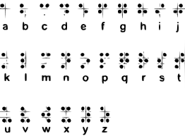
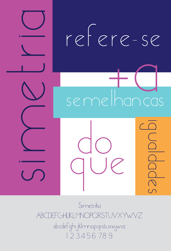
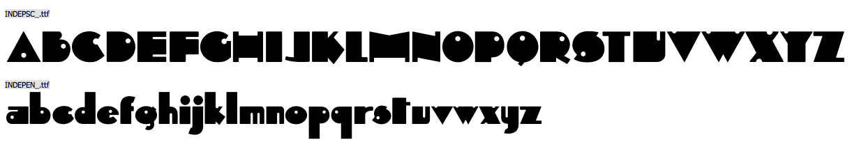
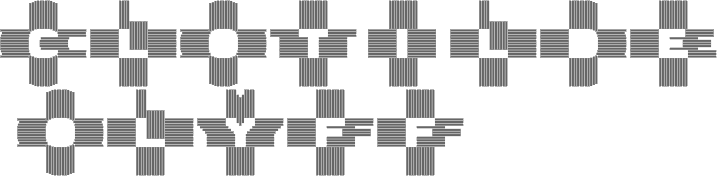
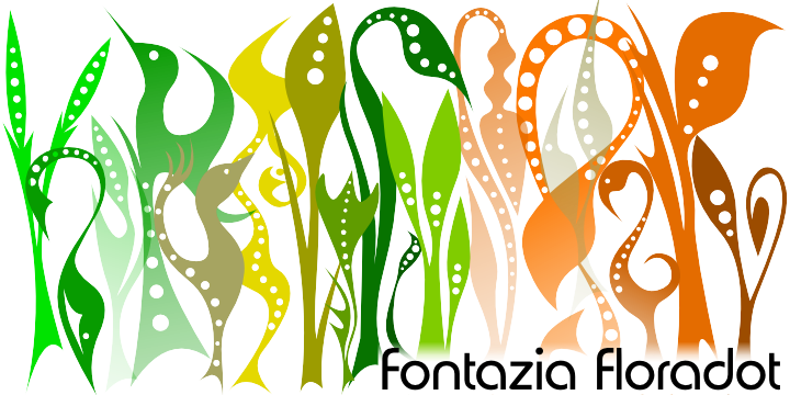
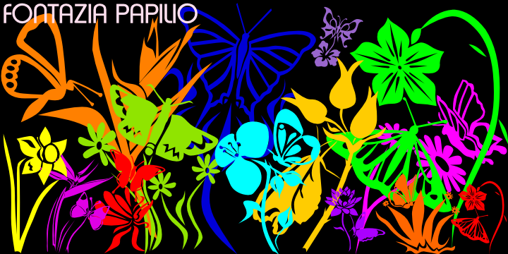
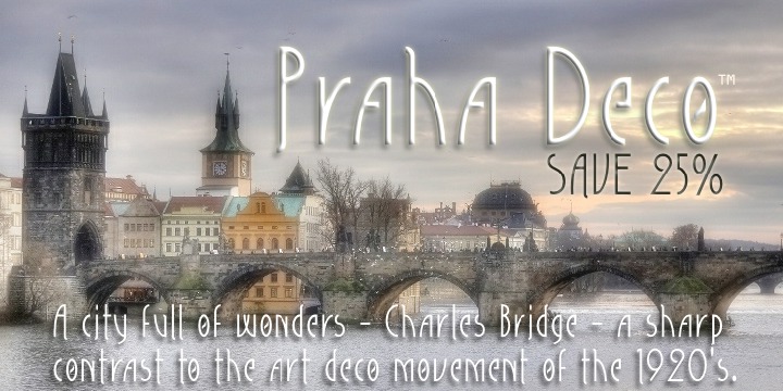
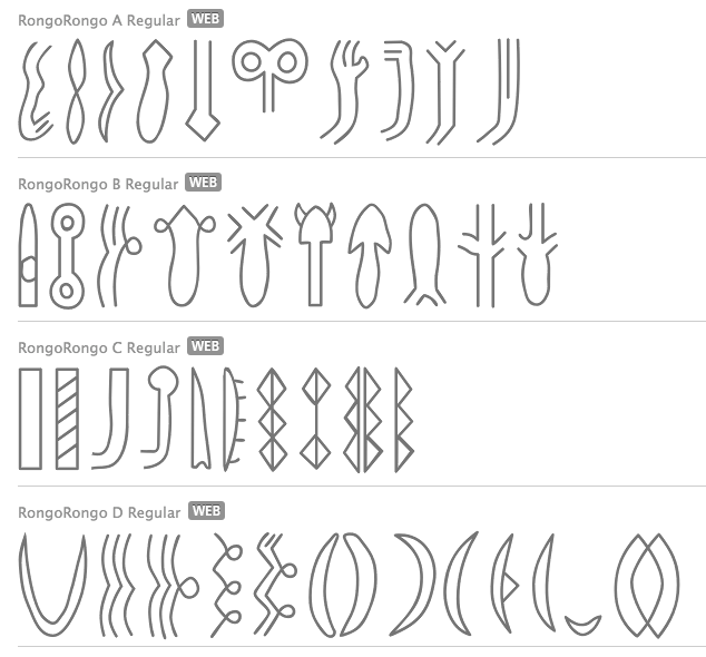
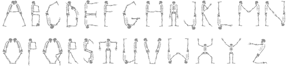
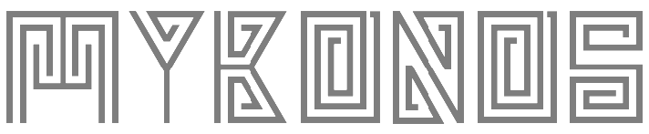
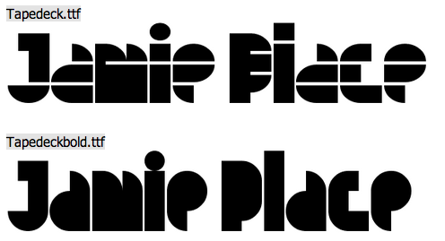
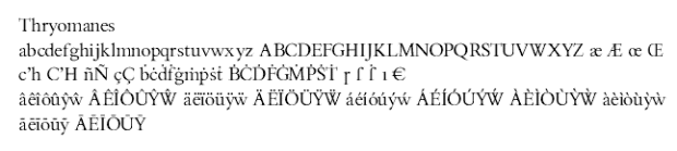
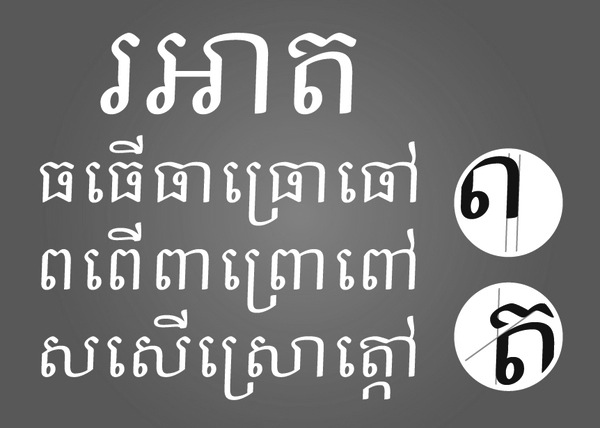
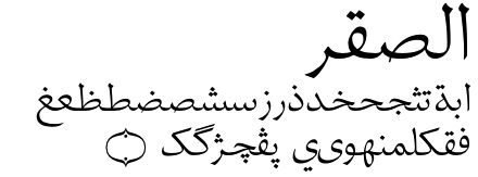
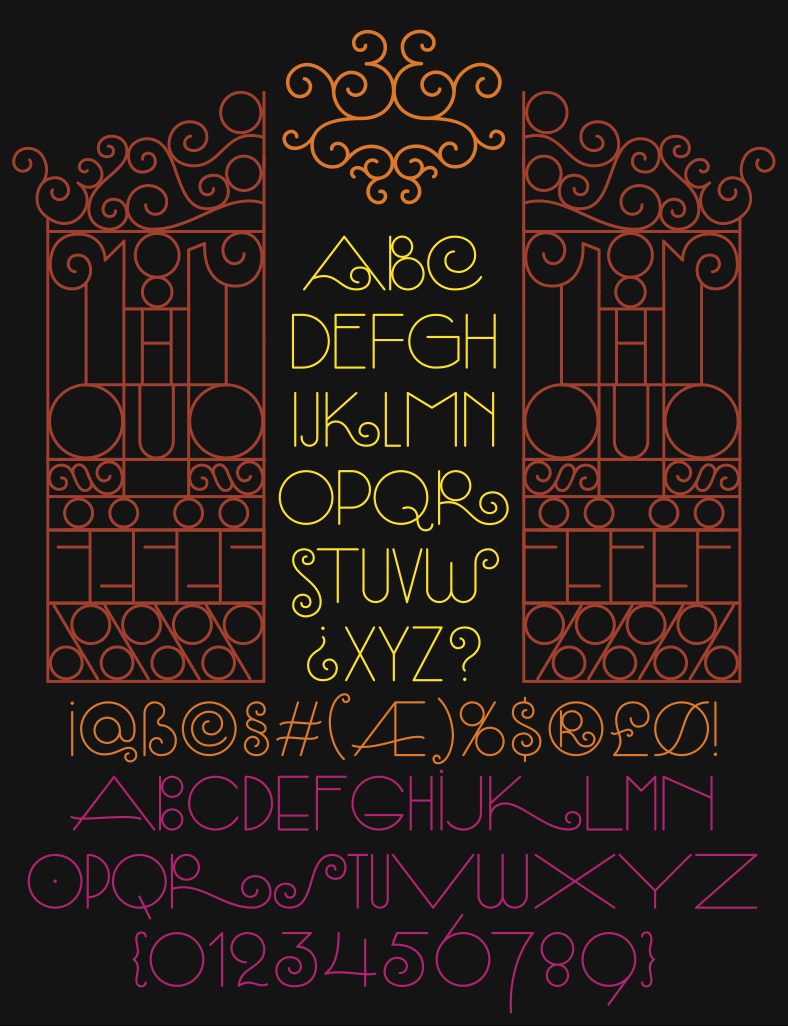
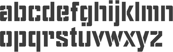
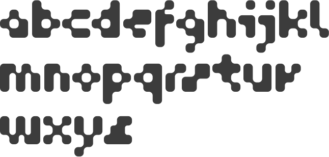
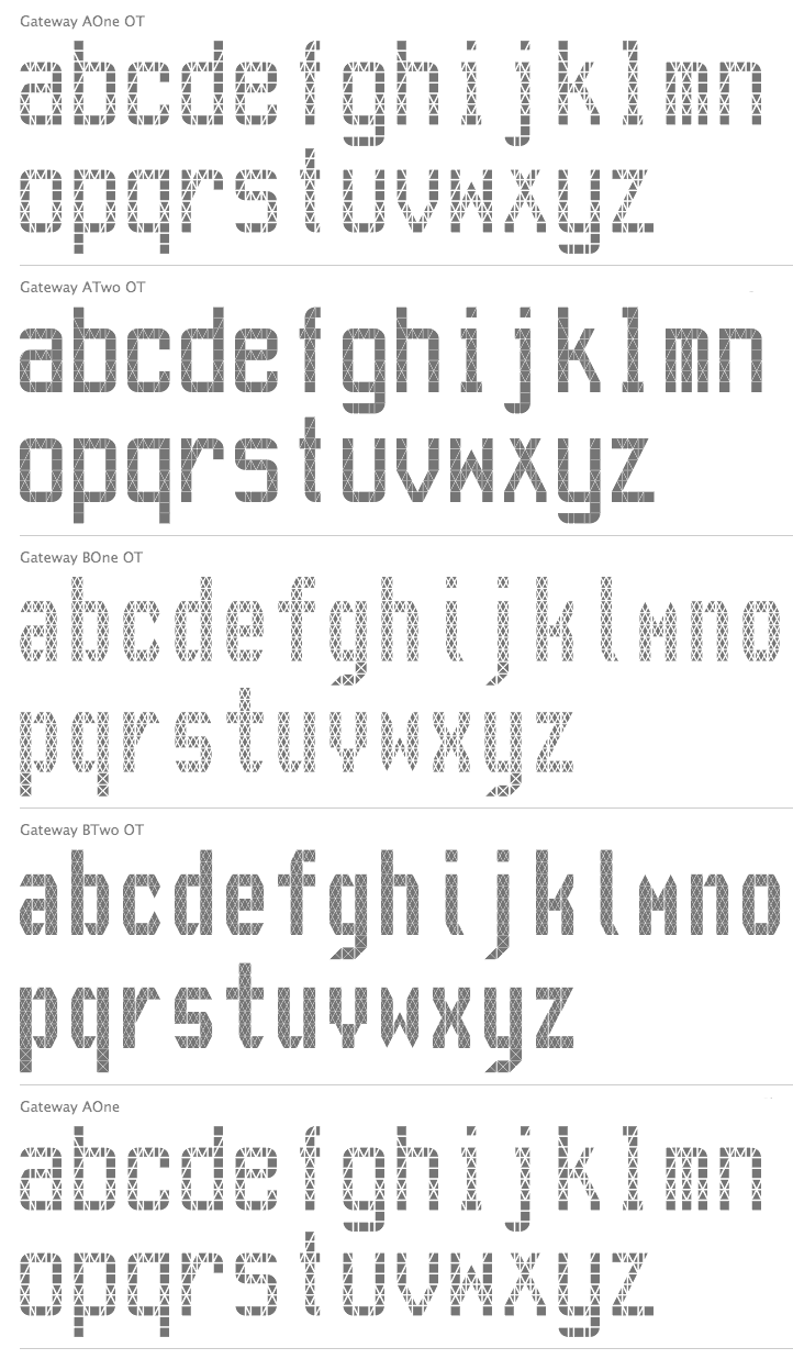
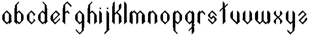
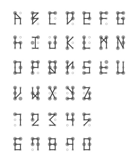
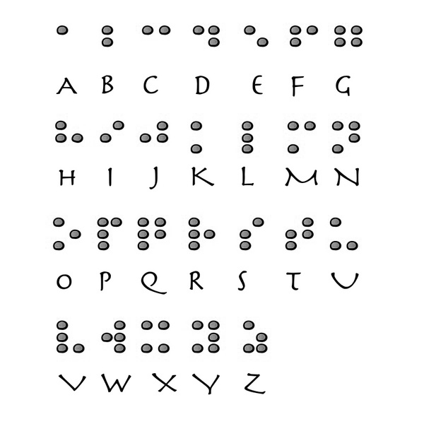
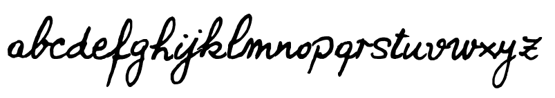
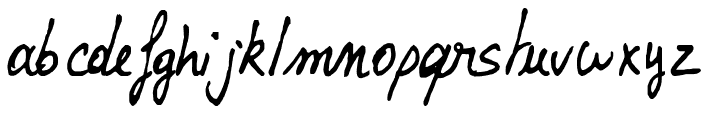
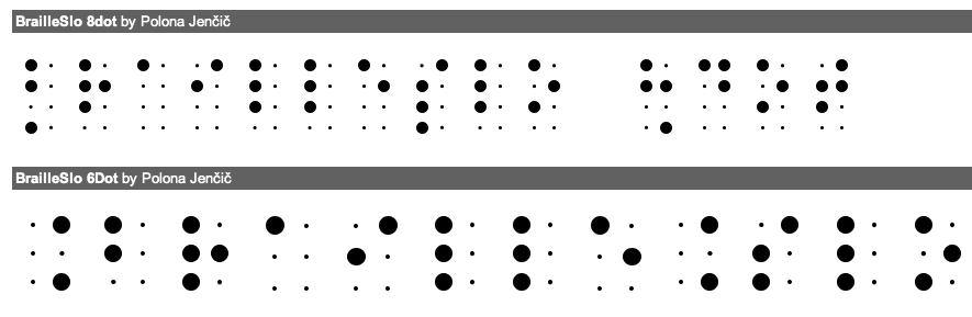
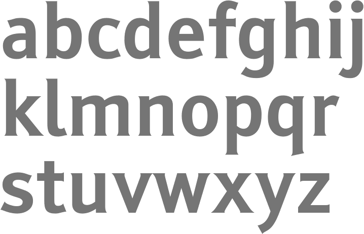
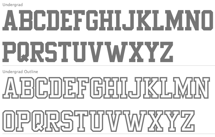
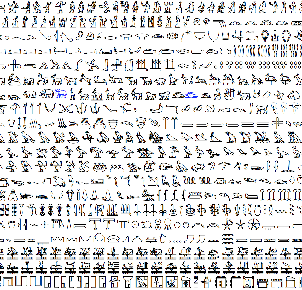
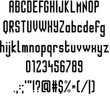