TYPE DESIGN INFORMATION PAGE last updated on Sat May 16 08:19:00 EDT 2026
FONT RECOGNITION VIA FONT MOOSE

|
|
|
|
|
Type design in Israel | ||
|
|
|
|
SWITCH TO INDEX FILE
Israeli graphic designer who specilaizes in book design and book covers. Art Director at Modan Publishing House, and Senior lecturer at Wizo Academic Institute in Haifa. Speaker at ATypI 2016 in Warsaw on From forgotten boxes to Three Pioneers of Hebrew Typography, Moshe Spitzer, Franciscka Baruch and Henri Friedlander, who trained and worked in Germany during the 20s, and since the late 30s took major part in the developing Hebrew culture in Israel, each seeking in his or her special way a "new Hebrew type". Ada Wardi edited The Graphic Design of Moshe Spitzer, Franzisca Baruch, and Henri Friedlaender: New Types Three Pioneers of Hebrew Graphic Design (2015, The Israel Museum, Jerusalem). [Google] [More] ⦿ | |
Ada Yardeny (or Yardeni) received her Ph.D. in ancient Semitic languages, paleography and epigraphy from the Hebrew University of Jerusalem. She wrote The Book of Hebrew Script: History, Palaeography, Script Styles, Calligraphy and Design, 1997. 364pp. The second printing in 2002 was done by Oak Knoll Press. At Masterfont, she published the Hebrew typefaces Academia MF, Ada MF, Daphna MF, Hagit MF (2020) and Rephael MF. Letter Arts link. [Google] [MyFonts] [More] ⦿ | |
Israeli type designer at MasterFonts. He created the Hebrew typefaces Vardi MF (2005), and Kikar Dizengof MF (+Square). [Google] [MyFonts] [More] ⦿ | |
Haifa, Israel-based codesigner, with Moshe Sabach, of the experimental geometric Hebrew typeface Shpitz (2013). [Google] [More] ⦿ | |
| |
His Latin/Hebrew typeface Noam (2003) won an award at TDC2 2004. It was eventually published by TypeTogether in 2013, with assistance of Liron Lavi Turkenich. It showed up at as Noam Text at MyFonts in 2020. At ATypI 2005 in Helsinki, he spoke on Hebrew type. Speaker at ATypI 2013 in Amsterdam. Local archive of his 2004 talk at stBride. [Google] [MyFonts] [More] ⦿ | |
Hebrew font foundry located in Israel, and founded by Avraham Cornfeld. Their fonts: Noyland (a rounded geometric typeface by Noy Man), Sticks Stones (army gear dingbats; by Nadav Barkan), Omes (monoline, straight-edges, +Stencil; by Liya Ophir), Parasha (calligraphic; by Shani Barber), Spectrum, Atlas, Museum, Rivka Bau, Mixtape, Caravan, Barlev, Stanga FrankRuehl, Paamon, Poeti, Mugrabi, Taamula (a propaganda font), Asimon, and these typefaces by Avraham Cornfeld: Synopsis, Almoni Tzar, Mekomi, Ambivalenti. [Google] [More] ⦿ | |
AlefAlefAlef (or: Fontimonim)
|
|
Tel Aviv-based designer of the ornamental caps typeface Totem (2013). [Google] [More] ⦿ | |
Israeli type designer who created several Hebrew typefaces at MasterFont: Adama MF, Agita MF, Hoogo MF, Jonni MF, Junior MF, Lasso MF, Yaldey Haprachim MF. [Google] [MyFonts] [More] ⦿ | |
Israeli type designer. Klingspor link. [Google] [MyFonts] [More] ⦿ | |
After getting a degree in printing arts from Moscow State University, Alyona worked in Moscow as a designer and then art director in the publishing house Avanta+ specialized in encyclopedias, gift editions and books for children. Currently, she is a freelance illustrator and book designer in Ramat gan, Israel. Creator of the decorative caps typeface ABC Fairy Tales (2014). Behance link. [Google] [More] ⦿ | |
During his studies in Tel Aviv, Israel, Amir Gelbard designed the Hebrew display typeface Etztrubaal (or Pinecone) in 2017. [Google] [More] ⦿ | |
Tel Aviv, Israel-based student at Shenkar College of Engineering and Design. Creator of the free Hebrew blackletter typeface Akusta (2017). [Google] [More] ⦿ | |
Israeli type designer. At Masterfont, he designed the Hebrew fonts Prat Parpar MF (2001), Partom MF, Portugal MF, Prat MF (for sign-making), Prat Pinochio MF, Prat Pluto MF (2008), Prat Prachim MF, Prat Proza MF. [Google] [MyFonts] [More] ⦿ | |
Tel Aviv, Israel-based designer of the Hebrew display typeface Fontikai (2016). [Google] [More] ⦿ | |
Art director, photographer and illustrator in Tel Aviv-Yafo, Israel. Creator of the Hebrew typeface Zelda (2015). [Google] [More] ⦿ | |
Typefaces from 2016: Winter Tales (brush script family), Spring, Tel Aviv, HandsUp, Caramel, Ladybug, Carousel, Rainy Daisy, Quick Walk, White Rabbit, Caterpillar, Eucalyptus Tree, Black Moon, Zenith (blackbiard bold style), Nameless (grainy brush). Creative Market link. Graphicriver link. [Google] [More] ⦿ | |
Tel Aviv-based graphic designer, b. 1987. Creator of Halal (2009). Behance link. [Google] [More] ⦿ | |
Haifa, Israel-based designer of the Latin display typeface Arlekin002 (2012). Anton was born in Alma-Ata, Kazakhstan in 1982. He graduated from Academy of Design Wizo Haifa. [Google] [More] ⦿ | |
Israeli type designer at MasterFonts. Klingspor link. [Google] [MyFonts] [More] ⦿ | |
Arta Ltd
|
|
Arta Osherov
| |
Israeli type designer at Masterfont. Creations include Alonim MF, Axioma MF, Azili MF, Bauhaus MF, Bazelet MF, Bdeal MF, Cabanos, Casda MF, Cobra MF, Frick MF, Gali MF, Gesharim MF, Hadran MF, Ivritica MF, Kashtit MF, Kayak MF, Klilit, Kneset MF, Koloseum MF, Koryntos, Lakritz MF, Leeron MF, Mag MF, Magal MF, Mesila MF, Naheer MF, Neer MF, Nesharim MF, Netafim MF, Radial MF, Redis Square MF, Shaava MF, Shablul MF, Shanhai MF, Shira MF, Shofarot MF, Simple MF, Strip MF, Strip Saduk MF, Sufle MF, Taar MF, Tapuah MF, Tzach MF, Tzazit MF, Viola MF, Yali MF, Yeelim MF, Yeelot MF, Yuval MF. Klingspor link. [Google] [MyFonts] [More] ⦿ | |
Israeli type designer. His Hebrew typeface family Oron (1966) is available from Masterfont as Oron MF, Oron Tavnit MF, Oron Keshet MF, Oron New, and Oron Koteret MF (2021). Adi Stern explains: In 1966, a new era began. Published that year, the Oron typeface was the first Hebrew typeface deliberately designed as a counterpart, or derivative, of an existing Latin typeface (in this case Adrian Frutiger's Univers). Asher Oron, the designer, declared he wished to reshape the monotone and boring Hebrew x-height zone, and make it somewhat closer to the Latin curved and varied one. Moreover, he spoke decisively in favour of adding circular parts to the Hebrew letter. He believed this could contribute to letter differentiation as well as make the letterforms softer and more pleasing. In describing the design process of the type, Oron said that at a certain stage he found his letterforms too similar to the Latin ones. He ascribed this to his disregard for the Hebrew writing direction as well as to the design of symmetrical high frequency letters. Therefore, later on in the process he did two things: one was to make all symmetrical letters asymmetrical again, and the other was to redesign most of the vertical strokes' upper terminals. Oron believed that in changing the terminals from pure vertical line-ends (i.e. symmetrical and static) to slightly leftward-leaning terminals, he enhanced the reading flow. Klingspor link. [Google] [MyFonts] [More] ⦿ | |
AvanType
|
His Hebrew designs: Casablanca, Derby, Falafil, Girnata, Rituals, Talona. His Latin fonts include Adorey, Alluremda, Granada, Merkory and Stocky. He won an award at Bukvaraz 2001 for Maqsaf. At TDC2 2003, he won a Certificate of Excellence in Type Design for Falafil. His Arabic typefaces include Chiaka, Ghirnata (1996), Sinan (1992), Alwadi (1996), Onwan (1998), Shallal Ultra Light (1995), Saljook (1997), Barhoom (1995), Alkhoury (1997), Sayaf, Maqsaf and Qasab (1998). He won an award at TDC2 2006 for Hogariet (2005, a Hebrew face) and at TDC2 2008 for Al Rajhi (an Arabic text family). [Google] [More] ⦿ |
Freelance graphic designer living and working in Tel-Aviv and Berlin. In 2010 he graduated from Bezalel Academy of Art and Design in Jerusalem. He opened his own studio in 2011. [Google] [More] ⦿ | |
Avi Haltovsky from Givat Shmuel, Israel, designed Papercut, a 3-d on-line font cut from paper, which yields all 26 letters just by turning the paper in the proper manner. [Google] [More] ⦿ | |
Israeli type designer at MasterFonts. Klingspor link. [Google] [MyFonts] [More] ⦿ | |
Israeli type designer at MasterFonts. [Google] [MyFonts] [More] ⦿ | |
During his studies in Haifa, Israel, Aviram Ben Shushan created Lady Gaga Font (2014). [Google] [More] ⦿ | |
Israeli type designer. Designer of Haratza MF (2009, Masterfont; with Tal Aviv). Klingspor link. [Google] [MyFonts] [More] ⦿ | |
Israeli type designer who created Kabuk MF (a Hebrew font at Masterfont). [Google] [MyFonts] [More] ⦿ | |
Avraham Cornfeld
| |
Israeli designer of the Hebrew script typeface Avshalom MF (2010). [Google] [MyFonts] [More] ⦿ | |
Barak Kind
| |
Israeli type designer. At Masterfont, he designed Bary MF, Club MF, Ifat MF, Kallipso MF, Noya Supreme MF (2003), Popolo MF, Propaganda MF, Starsky MF. Klingspor link. [Google] [MyFonts] [More] ⦿ | |
Ben Nathan
| |
Blue Verve
| Design studio in Tel Aviv, Israel. Creator of a beautiful (yet, unnamed) rounded sans typeface in 2013. Behance link. [Google] [More] ⦿ |
Tel Aviv-based creator of the Hebrew typeface family Rogalach (2015), which was a project in a typeface design class at the visual communication department of Bezalel Academy, Jerusalem. Rogalach is a popular Israeli pastry. [Google] [More] ⦿ | |
Buenos Aires, Argentina-based designer of the wedge serif typeface Lilium (2015). [Google] [More] ⦿ | |
Netanya, Israel-based designer of a Hebrew typeface (2014). [Google] [More] ⦿ | |
Under the guidance of Lucas de Groot at FH Potsdam in 2014, Chen Winner (Tel Aviv, Israel) designed the connected retro script font Flamingo. Behance link. [Google] [More] ⦿ | |
Israeli type designer who made the Hebrew font Dash MF at Masterfont. [Google] [MyFonts] [More] ⦿ | |
| |
Graphic designer who graduated from Bezalel Academy of Arts and Design, class of 2012, who is now based in Netanya, Israel. Haplakat (2012) is a modern Hebrew typeface designed by him. Behance link. [Google] [More] ⦿ | |
Israeli type designer who created these Hebrew typefaces at Masterfont: Gal MF (2002), Tamar MF. [Google] [MyFonts] [More] ⦿ | |
Designer in Haifa, Israel, who created an experimental font based on mouth movemens in 2013, called Phonetica. Behance link. [Google] [More] ⦿ | |
Israeli codesigner with Peter Bilak of Greta Sans Hebrew (2015), which won an award at TDC 2016. His Hebrew typeface Susim won an award at Granshan 2016. [Google] [More] ⦿ | |
At Haaretz, we read: As can be seen in the road signs for Arab communities, to mention just one example, in Israel the Arabic language has been marginalized at the expense of Hebrew. This is further emphasized by the contrast between the square and aggressive Hebrew typefaces of official Israel and the softer and more rounded letters of typical Arabic typefaces, a difference that in fact reflects the balance of powers between the country's Jewish and Arab communities. To achieve visual coordination, equal visibility and presence and peaceful coexistence between these two languages that share a same space while taking a small step for peace, Grumer created Avraham-Ibrahim as his final project as a visual communications major at Jerusalem's Bezalel Academy of Arts and Design in 2014. Grumer, who learned Arabic in the army, got help (over the Internet) from a Jordanian calligraphy designer of Syrian descent. He found another source of inspiration for his typeface in the Hebrew signs written by Arab merchants that "simply make the Hebrew language dance and liberate it from the geometric pressure," he says. His graduation typeface at KABK in 2016 is the perfectly balanced tri-lingual (Latin / Arabic / Hebrew) typeface Abraham. In 2016, he fine-tuned Peter Bilak's November Hebrew: November is a rational, utilitarian typeface inspired by street signage. Unlike most signage types it also handles long texts with ease. It covers Hebrew script, but also Arabic, Cyrillic, Greek and Latin, and is accompanied by a set of wayfinding symbols. Daniel designed the Condensed and Compressed styles. [Google] [More] ⦿ | |
Graphic designer in Tel Aviv, who created the Hebrew typeface Paam in 2016. Behance link. [Google] [More] ⦿ | |
Tel Aviv-based designer of the Hebrew paleontological typeface Buga Buga (2016) and the experimental Molecular Font (2016). [Google] [More] ⦿ | |
Israeli type designer at MasterFonts. [Google] [MyFonts] [More] ⦿ | |
Israeli type designer. He created Mishmish MF and Shorashim MF, both published by Masterfont. Klingspor link. [Google] [MyFonts] [More] ⦿ | |
Israeli type designer at MasterFonts, where he published Disel MF (2005), a Hebrew typeface. Klingspor link. [Google] [MyFonts] [More] ⦿ | |
Israeli type designer at MasterFonts. In 2004, he created the hand-printed typeface Dudek MF. [Google] [MyFonts] [More] ⦿ | |
Israeli type designer, b. 1946. At Masterfont, he created the Hebrew typefaces Asaf Berg MF (1994), Asher Outline MF (2013), Emily MF (2010), Gentlementch MF (2014), Haimon13 MF (2013), Hametz MF (2012), Herzel MF (1994), Herzel Open MF (2013), Gugi MF (1994), Han MF (1994), Kofer MF (2012), Lihi MF (2013), Michael 3D MF (2013), Motsaey Shabbat MF (2013), Shahaf MF (2013), Shesh Shesh MF (2013), Yetedot MF (2013), Yetty MF (2014), Margol MF (1994), Michael MF (1994), Segal MF (1994), Ofri MF (2002), Mike MF (2000), Tali MF (2000), Yulla MF (2008). Klingspor link. [Google] [MyFonts] [More] ⦿ | |
Tel Aviv-based designer of the minimalist experimental Latin typeface Specific (2015) and the Hebrew font Half (2013). Home Page. [Google] [More] ⦿ | |
Graduate of the Wizo design Academy. Hertsliyah, Israel-based designer of Kita (2013), a Latin serifed typeface developed during Typeclinic 6 in 2013. Its serifs are based on those found in Typical Hebrew typefaces, such as David Itamar's David. That same David also influenced his slab serif typeface Ollophid, which was developed during Typeclinic 7 in 2013. In 2014, he designed Bray as a Latin companion for Hebrew texts. [Google] [More] ⦿ | |
Delicious Type
|
Creator of the text typeface Nobilis (2012) at The Cooper Union. Ron's first commercial typeface is Zosimo (2014), a neo-grotesque typeface family. See also Zosimo Pro (2015) and Zosimo Cyrillic (2015). Zosimo Zosimo was created in cooperation with Oded Ezer based on Ezer's Alchemist typeface. [Google] [MyFonts] [More] ⦿ |
Jerusalem, Israel-based designer (b. 1986) of the free Hebrew / Latin / Cyrillic pixel typeface Chava (2016) and Frank Ruhl Condensed Alef Revival (2017). Dafont link. [Google] [More] ⦿ | |
Israeli type designer at MasterFonts. Klingspor link. [Google] [MyFonts] [More] ⦿ | |
Originally from Jerusalem and based in New Jersey. During her studies in New York City, Diana Marianovsky designed the experimental Mondriaan-inspired typeface Chiaroscuro (2016). Behance link. [Google] [More] ⦿ | |
Israeli type designer who created these Hebrew typefaces at Masterfont ca. 2002: Floyd MF, Metzada MF, Neo MF, Todaa MF, Tovana MF, Turbina MF. Klingspor link. [Google] [MyFonts] [More] ⦿ | |
Israeli type designer at MasterFont. He designed the Hebrew typeface Karnaf in 2008. [Google] [MyFonts] [More] ⦿ | |
Tel Aviv-based designer of the sans serif Hebrew typeface Telescope (2014). [Google] [More] ⦿ | |
Israeli type designer. At Masterfont, he designed the Hebrew typefaces Abirut MF, Amper MF, BARBOOR MF, Bombay MF, Bursa MF, Chaplin MF (2003), Coconut MF, Context MF, Daniella Small MF, Daniellas MF, Deep Space MF, Dunya MF, Efroni MF, Elvis MF, Gadush MF, Georgia MF, Hamburger MF, Henri MF, Henrietta MF, Ibis MF, Madagaskar MF, Mega Babe MF (handwritten), Missy MF, Morpheus MF, Octane MF, Pitball MF, Sophia MF, Super Block MF, Super Narrow MF, Super Wide MF, Suzana MF (nice scribbly handwriting), Theodore MF, Toleranti MF. [Google] [MyFonts] [More] ⦿ | |
Israeli type designer who created these typefaces at Masterfont: Eizik MF (2003, handwritten Hebrew), Paz MF, Eizik MF. Klingspor link. [Google] [MyFonts] [More] ⦿ | |
Israeli type designer who created the Hebrew typeface Dror MF (Masterfont). [Google] [MyFonts] [More] ⦿ | |
Israeli type designer at MasterFonts. He designed the Hebrew typefaces Hazilim MF (20094, hand-printed) and Roni89 MF. Klingspor link. [Google] [MyFonts] [More] ⦿ | |
Israeli type designer, d. 1993 (or 1998). He created the Hebrew typefaces Mooli Tal MF (1966), and Edgar Tal (1963). These typefaces are available from Masterfont. [Google] [MyFonts] [More] ⦿ | |
Israeli type designer at MasterFonts. He made Glukoz MF (2005). [Google] [MyFonts] [More] ⦿ | |
Israeli type designer who created these Hebrew typefaces at Masterfont: Symphony MF (2002, handwriting). [Google] [MyFonts] [More] ⦿ | |
Israeli type designer at MasterFonts. He is credited with the Hebrew typefaces Atid MF, BarTal MF, Beebee MF, Belet MF, Corona MF, Dinamo MF, Eser MF, Exodus MF, Humanist MF, Korinty MF, Or MF, Telad MF. [Google] [MyFonts] [More] ⦿ | |
Tel Aviv-based designer of the Hebrew display typeface Seafolox (2014). [Google] [More] ⦿ | |
Designer of the free runic Hebrew typeface Miri (2010) and the constructivist Hebrew typeface Migdal Haemeq (2010). [Google] [More] ⦿ | |
Israeli type designer who created Elamar MF (1995, Hebrew handwriting face, Masterfont). Klingspor link. [Google] [MyFonts] [More] ⦿ | |
Also written Ilan Ronen. He is an Israeli type designer. His typefaces:
Klingspor link. Another MyFonts link. [Google] [MyFonts] [More] ⦿ | |
| |
Eliyahu Fried
| |
| |
Israel-based designer of the decorative typeface Lennon (2018). [Google] [More] ⦿ | |
During her studies at Wizo Design Academy in Haifa, Israel, Enav Sharon co-designed the Hebrew typeface David Jerusalem (2017) with Gal Shneor and Yoav Ofer. [Google] [More] ⦿ | |
Israeli type designer who created these typefaces at Masterfont: Blender MF (2003, with Ido Zemach), Amit MF, May One MF (2004, with Ido Zemach), Caveret MF (2003, octagonal Hebrew face, with Ido Zemach). [Google] [MyFonts] [More] ⦿ | |
Israeli type designer who made the Hebrew typeface Eran MF (2011). [Google] [MyFonts] [More] ⦿ | |
Israeli type designer. His Hebrew typefaces at Masterfont include Shevat MF, Tamuz MF, Tamir, Eldar MF (for sports events), Beresheet Soft MF, Beresheet Hard MF. [Google] [MyFonts] [More] ⦿ | |
Jerusalem-based designer of the Hebrew typeface Ahsmbah for Studio Sachaf (2015) in Jerusalem. [Google] [More] ⦿ | |
Illustrator and designer in Tel Aviv, Israel. Behance link. He created the experimental Hebrew typefaces Otfa (2010) and Otset (2010). [Google] [More] ⦿ | |
Eyal & Myrthe
|
Eyal Holtzman has designed many corporate and some retail typefaces. typefaces for clients such as The Enschedé Font Foundry and Nationale Nederlanden. His work has been exhibited in many places, including in Museum of the Book---Meermanno in Den Haag. MyFonts writes: In the book Ha, daar gaat er een van mij! (Hey, there goes one of mine!, a chronicle of graphic design in The Hague from 1945 to 2000, 010 Publishers, Rotterdam 2002) he is called "one of the most idiosyncratic letter talents from The Hague" and in Dutch Type (010 Publishers, Rotterdam 2004) expert Jan Middendorp describes his letters as being "among the most original alphabets produced in the Netherlands", (...) "tapping into an idiom that no other type designer working in the Netherlands has ever used". His typefaces:
|
Eyal Holtzman
| |
Israeli type designer who created these Hebrew typefaces at Masterfont: Avishag MF, Ezer MF (2002), Hila Dror MF, Maayan MF, Ron Dror MF, Ron Round MF, Shuli Curly MF. Klingspor link. [Google] [MyFonts] [More] ⦿ | |
Fon Type
| Fon Type is the foundry of Israeli type designer Eliyahu Fried. Before Fon Type, he designed Hebrew typefaces that were published by MasterFonts: Aklimat MF, AleKoteret MF, Baby Shelly MF, Bar Yochay MF, Behetem Lachok MF, Bracha MF, Emuna MF, Frenkel MF, Fried Coteret MF, Gatkes MF, HaverYaldut MF, Kabala MF, Kaffe Shachor MF, Kartisiot MF, Keitana MF, Kluger MF, Kodesh MF, Koresh MF, Ktuviot MF, Maarav Parua MF, Mana Hama MF, Matmon MF, Mechaot Poster MF, Meriza MF, Meruba New MF, Migdnia MF, Mikraot MF, Mimi MF, Minshar MF, Mishkenot MF, Mishpacha MF, Monday MF, Mugdar MF, Neshef MF, Netanya MF, Parshanut MF, Plugim MF, Poligraph MF, Politica MF, Sefel Mashke MF, Sfina MF, Shalgonim MF, Sharkan MF, Shemesh MF, Shfutim MF, Shmuot MF, Sidkit MF, Tashlim MF, Tzoba MF, Yeadim MF, Zchok MF. [Google] [MyFonts] [More] ⦿ |
Fonet
| Barak Kind (Fonet) is the Israeli creator of some free fonts for Hebrew in 2003: BKafifon, BKarik2, BKchina, BKcomics, BKcomicshalol, BKgraphity1, BKhanuka, BKhayehudim, BKtom. The info in the fonts says that they belong to Glyph systems and were made in 1995. Some of his fonts were published by Masterfont. [Google] [MyFonts] [More] ⦿ |
Fontark
|
The driving force behind Fontark is Ofir Shavit (Israel), an artist, designer, scientist, philosopher, gamer, and creator. He studied industrial design at Bezalel Academy. On September 1, I tried it out and could not get further than the cumbersome registration page. Be prepared to enter your data multiple times and then be told that you must first be approved, if you manage to decipher the difficult captchas... Behance link. [Google] [More] ⦿ |
Fontef
| Yanek Iontef is a typeface designer and typographer. Born in the USSR in 1963, he emigrated to Israel at the age of 16 and studied graphic design at Bezalel Academy of Arts and Design, graduating there in 1989. He has worked in London and Tel Aviv (for MetaMark International design studio), and taught typography and type design at the Bezalel Academy and at Shenkar College of Engineering and Design. An award-winning type designer, Yanek runs Fontef, his own foundry specializing in Hebrew type design. His commercial fonts include FF Cartonnage (2003, a sans family with dingbats thrown in for cardboard boxes), New Cast, CaseSeraSera, Erica Sans, Hadasah Friedlaender, Mandatory. Atzmaut (Independence), and Next Exit, are two of his typefaces that won awards at Bukvaraz 2001. In 2016, he designed the free Google Font Frank Ruhl Libre for Latin in Hebrew. The original Frank Rühl was designed in 1908 by Rafael Frank in collaboration with Auto Rühl of the C. F. Rühl foundry of Leipzig. A final version was released in 1910. Many Israeli books, newspapers and magazines use Frank Rühl as their main body text typeface. Iontef's extension and modernization has five styles. Neue Frutiger Hebrew (2018), created by Yanek Iontev and a team of designers and font engineers from the Monotype Studio, under the direction of Monotype type director Akira Kobayashi. Yanek Iontef collaborated with Akira Kobayashi and Monotype Studio on Avenir Next Hebrew (2021). IBM Plex Sans Hebrew (2019, by Mike Abbink, Paul van der Laan, Pieter van Rosmalen and Yanek Iontef) is a free typeface family at Google Fonts. FontShop link. Klingspor link. [Google] [MyFonts] [More] ⦿ |
Fontoura
| Israel-based designer of the ten-style Latin typeface family Skapa (2021). Skapa has open counters that are gasping for breath. [Google] [MyFonts] [More] ⦿ |
Fontsoon
| Israel-based designer of the Hebrew emulation typeface Shmulkas (2020). [Google] [MyFonts] [More] ⦿ |
Graphic designer, b. 1901, Hamburg, d. 1989, Jerusalem. She graduated from Staatlichen Kunstgewerbeschule Berlin and emigrated to Palestine in 1933. Designer of the Hebrew typefaces Rambam, Rahel, Staam Hasofer (1936, now at Masterfont), Schocken Baruch (a custom font), and Stam and Stam Mager (1930, H. Berthold AG). See Stam MF and Staam Hasofer MF at Masterfont. With Leo Ary Mayer, she designed Mayer Baruch (published by J.h. Enschedé). At MyFonts, her name is spelled Franceska Baruch. Reference: Specimen of Stam, Magere Stam, Rambam and Rahel (Berthold AG). Local download. [Google] [MyFonts] [More] ⦿ | |
FreeFonts4All
|
In 2015, he made the 12-style didone family Goral, which has a Peignotian sans set, FF4A Goral, and a serif set, FF4A Goral Serif. In 2016, he designed the sans typeface family Aran. Typefaces from 2017: Adiva (a stunning eccentric typeface with one free weight). In 2018, he designed the Hebrew typefaces OS Villi Stens, OS Gibor, OS Egul and OS Zusha, and a wonderful Latin cursive typeface. Behance link. Free font link. [Google] [More] ⦿ |
Reporting on a lawsuit brought by Hannah Tal, daughter of Henri Friedlaender who designed the famous Hebrew typeface Hadassah in 1958, in 2009 against the Israeli type foundry Masterfont. The quotes below, in italics, are from a 2011 article in Haaretz written by Yuval Saar. Exclusive rights to the Hadassah Hebrew typeface belong to the daughter of the man who designed it about 70 years ago, a Jerusalem court ruled this week. In 2009, Hannah Tal filed a NIS 4.5 million copyright infringement suit against the Israeli company Masterfont for selling the popular typeface created by her father, Henri Friedlaender, for many years without her consent. Ayala Tal, Hannah Tal's daughter and Friedlaender's granddaughter, works at Haaretz as a graphic artist. On Monday, Jerusalem District Court Judge Refael Yacobi announced that Tal owned the digital as well as the print rights to Hadassah, having inherited them from her father at his death. The court now must determine whether Tal suffered financial damage as a result of Masterfont's copyright infringement. If so, the court will set the amount of compensation the company owes her. "After around five years of legal battles and many more years in which Hadassah was sold in a piratical and unethical manner, I'm happy for the opportunity to ensure the future of the typeface in the manner that it and its creator deserve," Tal said. Together with Koren, Narkisim, Aharoni and Frank-Ruehl (the typeface used by the Hebrew Haaretz), Hadassah is one of the most important Hebrew typefaces. The German-born Friedlaender began developing it in the Netherlands after fleeing there to escape Nazi anti-Semitism, and continued to work on it during World War II, which he spent hidden in an attic by his wife. After immigrating to Israel, he continued to study, teach and work in typography, and in 1971 he was awarded the Guttenberg Prize. "Hadassah is a unique and original work of art that experts have described as groundbreaking stylistically," Tal said. According to Tal's attorney, Narda Ben-Zvi, Masterfont owners Piki and Zvika Rosenberg do not deny using and selling Hadassah. "Zvika Rosenberg even admitted in court that such actions constituted an infringement of the copyright owner's rights," Ben-Zvi said. "What's left now is to determine the appropriate payment for damages, taking into consideration the use made of the typeface and the copyright infringement." Attorney Jacob Calderon, whose firm represented Masterfont, slammed the verdict and the judge. "The judge didn't read what he should have read and didn't understand what he did read," Calderon said. "Anyone reading the court transcripts can see that in 1950, Friedlaender renounced all his rights to the typeface. Now a judge comes and issues a ruling on God knows what grounds. I wouldn't say he was afraid, but in the oddest way he didn't consider the evidence and conducted every session in a unilateral manner. There's a serious problem with the judge's integrity and his comprehension. Apparently he was somewhere else, presiding over a different case with different evidence." Calderon added that Masterfont intends to appeal the verdict. [Google] [More] ⦿ | |
Reporting on a 1.5 million USD lawsuit brought by Hannah Tal, daughter of Henri Friedlaender who designed the famous Hebrew typeface Hadassah in 1958, against Microsoft. The quotes below, in italics, are from a 2013 article in Winbeta. Microsoft is apparently facing a lawsuit for using two particular Hebrew type fonts in its Office productivity suite without permission. The fonts in question are Guttman Hodes and Monotype Hadassah. Henry Friedlander was hiding from the Nazis around 70 years ago were he designed and perfected the Hebrew type font called "Hadassah". His daughter, Hannah, claims that Microsoft is using and advertising the font to millions of users without her permission. Microsoft responded to her claims stating that her father transferred his rights to the font over to a foundry in the Netherlands in 1950. That foundry then provided licenses to other parties to use the font and eventually transferred the rights to the font to Microsoft. Microsoft denies that Hannah owns any rights to the original font. Microsoft states, "Friedlander never made any claims during his life about the widespread use of the Hadassah font. On the contrary, he expressed satisfaction that the font was so widely spread by the Dutch printing house." Microsoft also adds that the company began uses the font in digital versions back in 1993 in a version called Guttman Hodes. Microsoft also states that the statute of limitations applies to the lawsuit and that filing the lawsuit now is flagrant and in bad faith. "Hadassah is a special, precious, and festive font, an original work of art, praised by experts as groundbreaking in terms of design and style. The Hadassah font is based on extensive historical research into the shapes and development of Hebrew letters," Hannah claimed in her lawsuit. Hannah states that Microsoft never received permission to use the font, nor were they allowed to adopt it into two different fonts called Guttman Hodes, and Monotype Hadassah. She adds that these two fonts are a falsification of the original font and distort her fathers work. Haaertz writes in 2013: The copyrights over the Hebrew type fonts known to Office users as Guttman Hodes and Monotype Hadassah are the focus of a lawsuit recently filed against Microsoft at a Lod District Court. About 70 years ago, as he was hiding from the Nazi horrors in an attic in the Netherlands, the artist Henry Friedlander began designing a Hebrew print font. Friedlander, of German descent, escaped to the Netherlands, and there, in that attic, he continued to design and perfect a Hebrew type font. In 1958, to commemorate the tenth anniversary of Israel's independence, he completed his design, and called the font Hadassah. Hannah Tal, Friedlander's sole heir, claims that by using and advertising the font to millions of users without her permission, Microsoft is committing copyrights violations. In response, Microsoft has claimed that Tal is hiding from the courts the fact that her father transferred his rights to the font to a foundry in the Netherlands in 1950. That foundry then provided licenses to other parties to use the font, which in turn transferred the rights to the font over to Microsoft. The company also says that Tal does not own exclusive rights to the original font. Friedlander, winner of the Johann Gutenberg prize in 1970, and an honorary professor at the Leipzig Academy of Visual Arts, died in 1996, aged 92. He left all of his property, including copyrights in his name, to his only daughter. "Hadassah is a special, precious, and festive font, an original work of art, praised by experts as groundbreaking in terms of design and style," Tal said a recent lawsuit. "The Hadassah font is based on extensive historical research into the shapes and development of Hebrew letters." The designer's daughter adds that her father created the font over a period of some 30 years, and that each and every letter was meticulously designed, preserving the uniqueness of each letter, while at the same time adapting the same style to all of the letters. Tal claims that even though Microsoft never received permission to use the font, it has done so by adapting it for two groups of fonts, including Guttman Hodes, and Monotype Hadassah. The names as well, claim Tal, mistakenly claim that they are connected to the original Hadassah font. These fonts, Tal says, are a falsification of the original, and distort Friedlander's original work. According to Tal, "saying that Friedlander would turn over in his grave if he knew what was done to his work is not an exaggeration at all." In its defense Microsoft has said, "the late Friedlander never made any claims during his life about the widespread use of the Hadassah font. On the contrary, he expressed satisfaction that the font was so widely spread by the Dutch printing house." Microsoft also said it began using the font in digital versions in 1993, in a version called Guttman Hodes, which was created by the late Samuel Guttman, after it received permission to do so. Finally, Microsoft says the statute of limitations applies to the lawsuit, and filing it now is flagrant, and in bad faith. Several other articles exist on the matter, including an article by Publish (in Dutch, dated 2013) that explains that Lettergieterij Tetterode is the Dutch company that had signed the first contract with Friedlaender. It sublicensed the fonts to Intertype, IBM, AM, Bitstream, and in 2000 to Linotype. The latter deal was brokered in part by Henk Gianotten. Gianotten claims that Tal has no chance of winning. A more legalese article was written by Itzhak Dannon for Jewish Business News. [Google] [More] ⦿ | |
Israeli type designer who created these Hebrew typefaces at Masterfont: Hagedi MF (2002). [Google] [MyFonts] [More] ⦿ | |
Israeli type designer at MasterFonts, who created the Hebrew typeface Gad Agada in 2007. Klingspor link. [Google] [MyFonts] [More] ⦿ | |
Israeli type designer. At Masterfont, he published Avnei Gad Hakuk MF, Avney Gad MF (2002), Gad MF, Gad Tech MF, Hagada Mesugnan MF. [Google] [MyFonts] [More] ⦿ | |
Tel Aviv, Israel-based designer of a Latin deco typeface in 2017. [Google] [More] ⦿ | |
During his studies at Wizo Design Academy in Haifa, Israel, Gal Shneor co-designed the Hebrew typeface David Jerusalem (2017) with Enav Sharon and Yoav Ofer. [Google] [More] ⦿ | |
Gala Studio
|
Typefaces from 2017: GS Candy Melt (by Galina Bleikh and Lilia Chak), GS Slim One (by Galina Bleikh and Lilia Chak: a great font for in-store advertizing), GS Slim One Bestiary (by Galina Bleikh and Lilia Chak), Escapism, Candy Melt (a colourful candy store / bubblegum / children's book font). Creative Market link. [Google] [MyFonts] [More] ⦿ |
Galiad Computers
| The late Shmuel Guttman at Galiad Computers in Jerusalem made fonts such as ElroNet Monospace (1994, Latin characters). Some of his fonts are distributed by ITF, and were marketed as the Guttman Collection. He made these Hebrew fonts in 1991-1993: TopType-Hatzvi-Normal, TopType-Jerushalmi. His ElroNet Monospace (1994) and ElroNet Proportional (1994) were here. He also made these fonts from 1992 until 2000: GuttmanAharoni, GuttmanAram-Normal, GuttmanCalligraphic, GuttmanCourMirNormal, GuttmanDavid-Bold, GuttmanDavid-Light, GuttmanDavid, GuttmanDrogolin-Bold, GuttmanDrogolin-Normal, GuttmanFrank-Bold, GuttmanFrank, GuttmanFrnew-Normal, GuttmanHaim-Condensed, GuttmanHaim, GuttmanHatzvi-Bold, GuttmanHatzvi, GuttmanHodes-Bold, GuttmanHodes-Light, GuttmanHodes-Normal, GuttmanKav-Bold, GuttmanKav-Light, GuttmanKav, GuttmanKeren-Bold, GuttmanKeren-Normal, GuttmanLogo1, GuttmanMantova, GuttmanMantovaBold, GuttmanMantovaDecor, GuttmanMiryam-Bold, GuttmanMiryamLight, GuttmanMyamfix, GuttmanRashi-Bold, GuttmanRashiNormal, GuttmanRashiXBold, GuttmanSoncino-Bold, GuttmanSoncino-Light, GuttmanSoncinoNormal, GuttmanStam1Normal, GuttmanStamNormal, GuttmanToledo-Bold, GuttmanToledo, GuttmanVilna-Bold, GuttmanVilna, GuttmanYad-Brush, GuttmanYad, GuttmanYadLight. Klingspor link. Dafont link. [Google] [More] ⦿ |
| |
Israeli type designer at MasterFont, where he published the Hebrew typeface Gat MF. . [Google] [MyFonts] [More] ⦿ | |
Israeli type designer. At MasterFonts, he created the seemingly identical didone typefaces Shalom MF (2008) and Genuzot MF (2008). Their Hebrew subsets are different however. [Google] [MyFonts] [More] ⦿ | |
Jerusulam-based graphic designer. Klean Regular (2011, octagonal) is a typeface based on Wim Crouwel's New Alphabet. [Google] [More] ⦿ | |
Israeli type designer who made Riksha MF (2010). [Google] [MyFonts] [More] ⦿ | |
Gil Hoban
| Gil Hoban (Gil Hovan) is an Israel-based type designer. At Masterfont, he published Bomba MF (2003), the geometric Hebrew font Gil MF, Hardal MF (a fat rounded sans) and Kishuf. [Google] [MyFonts] [More] ⦿ |
Gil Hovan
| |
Affula, Israel-based designer of the Hebrew typeface Afula (2016). [Google] [More] ⦿ | |
Israeli type designer. Creator of the Hebrew typefaces Martir MF (2010), Ninth Century MF (2010), Teiman MF (2010, Masterfont) and Sheva Brachot MF (2012, Masterfont). [Google] [MyFonts] [More] ⦿ | |
Habib Khoury
| |
Hacollective
| Israel-based designer of the Hebrew typeface Tzur (2020). [Google] [MyFonts] [More] ⦿ |
Ha-Fontia Shel Ben (was: Bensfonts.com)
|
Hebrew truetype fonts. Direct access to the fonts. Originally, there were many Latin fonts as well, but they are now mostly at TypOasis. His Hebrew fonts: BN88Fingers, BNAmnesia, BNAnnaBold, BNAnna, BNBarvaz, BNBilbo, BNBoxiBold, BNBoxi, BNBulletItalic, BNBulletTall, BNBullet, BNButtercupX, BNButtercup, BNCalculator, BNCapuccino, BNChandeliers, BNCloud, BNDamagia, BNDog, BNElhananBold, BNElhanan, BNElkana3D, BNElkana, BNFlorida, BNGlida, BNGolani, BNGrafity, BNGremlinsBlack, BNGremlins, BNKaramelBold, BNKaramel, BNKolavim, BNLithium, BNMadregotBold, BNMadregotThin, BNMadregot, BNMazlega, BNMichal, BNMiriBlack, BNMiriBold, BNMiri, BNMusic, BNNautilus, BNNextGenartion, BNOldTimes, BNOriaBold, BNOriaThin, BNOria, BNPakistan, BNPinkyBold, BNPinky, BNPixeliom, BNQuadrat, BNRobocop, BNShirly, BNSlayer, BNSleepwalker, BNTorrensBold, BNTorrensThin, BNTorrens, BNTraktor, BNVardaBold, BNVarda, BNZarbobim, BNZikaron. A partial list of his earlier Hebrew/Latin work: BN-ArNoN, BN-BlurryDay, BN-Buzz!, BN-C(Baby), BN-DBenWitchPro, BN-Dragon (techno face), BN-FishEye, BN-Gangsters, BN-Gillian, BN-Hackers, BN-HebrewMonster, BN-JanSpot, BN-Maxi, BN-NoFear, BN-OldFashion, BN-OuterLine, BN-Rock, BN-Smash, BN-Snake, BN-Thenzer, BN-ThugLuv, BN-Willson, BN-Yair, BN-Yiftach, BN-YiftachRough, BN-ZigZag, BN-Zooner, BN3thPlace, BNAmit, BNAmitBlack, BNAohadim, BNBenWitchProject (grungy), BNBlade, BNBoyfriEnd (2000), BNButterfly, BNCalculator, BNConcept, BNCosmicGirl (1999, techno), BNDefect, BNDigitalBomb, BNDog, BNDrank, BNEgyptFixed, BNElements, BNEmulator, BNExpoo, BNEyalZilberberg, BNFontBoy, BNFontBoy3D, BNGolani, BNGrafity, BNHalomotBehakizith, BNHandwrite, BNHanuka, BNInformation, BNIntaglios, BNInternet, BNJNCO, BNKuktus, BNMTAN, BNMachine (octagonal/mechanical), BNMansonNights, BNMansonNightsHebrew, BNMillennium, BNMoogBoy.ttf BNMouse, BNMurman, BNNextGenartion, BNNiv5000, BNOldTimes, BNPassover, BNPay, BNPolice, BNPopBoys, BNSameach, BNShadow, BNShirly, BNSpaceChick, BNStileProject, BNSuckMyBalls, BNSundayKid, BNSvita, BNTamuz, BNWar, BNYear2000, BNZevel, BNZevelBold, BNZrikaRough. At Masterfont, he published BNHazerot MF. In 2006, these fonts were still free: BNElhananBold, BNElhanan, BNChandeliers, BN88Fingers, BNAmnesia, BNAnnaBold, BNAnna, BNBarvaz, BNBegilophim, BNBilbo, BNBoxiBold, BNBoxi, BNBulletItalic, BNBulletTall, BNBullet, BNButtercupX, BNButtercup, BNCalculator, BNCapuccino, BNCloud, BNDamagia, BNDog, BNElkana3D, BNElkana, BNFlorida, BNGlida, BNGolani, BNGrafity, BNGremlinsBlack, BNGremlins, BNKaramelBold, BNKaramel, BNKolavimBold, BNKolavim, BNLithium, BNMadregotBold, BNMadregotThin, BNMadregot, BNMazlega, BNMichal, BNMiriBlack, BNMiriBold, BNMiri, BNMusic, BNNautilus, BNNextGenartion, BNOldTimes, BNOriaBold, BNOriaThin, BNOria, BNPakistan, BNPinkyBold, BNPinky, BNPixeliom, BNQuadrat, BNRobocop, BNShalechet, BNShirly, BNSlayer, BNSleepwalker, BNTorrensBold, BNTorrensThin, BNTorrens, BNTraktor, BNVardaBold, BNVarda, BNZarbobim, BNZika, BNZikaron. At Google Fonts, he extended Vernon Adams's Amatic SC to the Hebrew Amatica SC (2016). Github link. Another Google font is Assistant (2015), a sans for Hebrew to complement Paul Hunt's Latin Source Sans Pro. Github link. In 2021, he released the Latin / Hebrew typefaces Cooperative (a straight up typeface based on a printed example of a vintage handmade wood type from the 1950s) and Leon. At TDC 2013, he won an award for Days and Nights, a custom design for the Bezalel Academy of Art and Design, Jerusalem. Dafont link. Abstract Fonts link. Klingspor link. Fontspace link. Fontsquirrel link. [Google] [MyFonts] [More] ⦿ |
Israeli studio. Designers of the free hand-printed typeface Kurzets Type (2010). [Google] [More] ⦿ | |
Israeli type designer who made Frank Ruhl (1936). This typeface was digitized and published by Masterfont. [Google] [MyFonts] [More] ⦿ | |
William C. Fontaine writes in the Dartmouth College Library: In 1931 Henri Friedlaender was the foreman of the typesetting division of the Offizin Haag-Drugulin, an eminent Leipzig publisher that specialized in the printing of books in semitic languages. That year the Schocken Publishing Company placed a request for a twentieth-century, modern Hebrew typeface; it was a query that would captivate Friedlaender for the rest of his life. At the time, he was still a young man of twenty-seven, but another twenty-seven years would pass before his work would come to fruition with the creation of the Hebrew Hadassah typeface. The lack of a modern Hebrew type was acutely felt by the publishing industry in the early twentieth century. All of the existing typefaces were fatally flawed and barely legible. In addition, they had a medieval appearance that was wholly inappropriate for most printing jobs. In order to appreciate the magnitude of this problem, imagine having to read the New York Times in a gothic font because no other typefaces were available. Henri Friedlaender was the first to admit he was ill-prepared for this formidable challenge, but his knowledge of calligraphy and printing, as well as his aesthetic vision, gave him the tools to succeed where others had failed. As with any pioneering effort, the landscape was characterized by the complete absence of any guideposts. He had no idea what the final design would look like; indeed, he did not even know whether or not it would have serifs. His only guides would be his own aesthetic sensibilities and philosophy of typography. He knew the type would have to be simple, modern, and elegant, yet transparent to the reader. Without the quality of transparency, any type design would fail, no matter how good it might be otherwise. In the end, the type would attract too much attention to itself and defeat its efforts to communicate the author's text to the reader. To begin his work, Friedlaender made a survey of the existing Hebrew fonts. While everyone knew the existing Hebrew types were unsatisfactory, no one had made a thorough study to find out what made them so. The main problem, according to Friedlaender's research, was that the Hebrew alphabet never made an adequate transition from manuscript letter to typeface as had Roman letters. The Hebrew typefaces were more or less copies of the manuscript letters, incorporating all of their deficiencies and exhibiting few of their virtues. Some designers tried to apply the principles of Roman typography to Hebrew in an effort to avoid the extensive work that would be required to make this transition. These attempts failed miserably. The principles of Roman typography, known as Didot-Bodoni, emphasized horizontal lines with bold, dark, strokes and minimized vertical lines with hairline strokes. When this technique was used to produce Hebrew type, the result was barely tolerable. Obviously, Friedlaender's new design could not emerge from improving on any of the existing fonts. He would have to design a new typeface from scratch, from the fundamental basic forms of the Hebrew alphabet. Only then would he be able to create a type that would be a true typeface, and not merely a copy of the written letter. It was clear that he would have to conduct a thorough study of Hebrew writing in an attempt to discover its basic, fundamental forms; but a historical catalog of Hebrew letters did not exist, so Friedlaender began the daunting task of compiling his own. He photographed examples of different styles wherever he could find them: from tombstones, manuscripts, books, and anything that contained Hebrew letters from different periods and in different styles. It was here that his training in calligraphy in Leipzig during the 1920s came to the fore. Hermann Delitzsch, one of Friedlaender's teachers, was an expert in the scribal methods of copying old manuscripts. He had taught Friedlaender how to dissect a manuscript letter and determine what kind of writing implement was used as well as the angle needed to produce the various components of each letter. Friedlaender used these techniques to analyze the letters and isolate their most fundamental basic forms. From his study he saw the emergence of two major styles of Hebrew lettering: the Ashkenazi, which is the heritage of the Jews of Europe, and the Sephardi, which is of the Orient and Mediterranean. Written with a wide-nibbed reed, the Sephardi letters had strong horizontal and vertical lines that minimized the contrast among the lines in each letter. However, as the Sephardi style developed, a thinner reed was used to introduce more contrast within the letters. Ironically, the script became less legible. A number of letters could be easily confused. In addition, Friedlaender felt that some of the letters were too dark, especially the aleph. It was this late Sephardi script after which most early typefaces were modeled, and the defects of this script were subsequently inherited by these typefaces. The Ashkenazi style, however, employed a quill instead of a reed, which permitted much more contrast because of its ability to make heavy lines as well as very thin lines. This enabled the scribes to introduce new basic forms that helped distinguish some letters from others. However, this style was very ornate and was by its very nature gothic in appearance. Friedlaender began to see the direction his new type would take when he examined his scroll of Esther, which was copied by a scribe in the late eighteenth century. He could recognize the strengths of the Ashkenazi form as well as the improvements that the scribe made to minimize its weaknesses. In addition, the scribe did not slavishly follow the ornate tendencies of the Ashkenazi style. The result was a script that capitalized on the basic forms in both the Sephardic and Ashkenazic styles and lacked the usual gothic appearance. While Delitzsch's technique for analyzing letters was invaluable, it was his training under Rudolf Koch that he drew upon for designing the new typeface. Friedlaender's first full-time job was in the late 1920s as a typesetter in Ofenbach at the Klingspor workshop, and it was there that he came in to contact with Koch. In the evenings he attended Koch's calligraphy workshop. Although Koch was a gifted artist, Friedlaender noted that what was most important was his contact with the man. For here was an artist whose life embodied the spirituality and beauty that were evident in his work. It was a quality that many remarked on, and it struck a sympathetic chord with Henri Friedlaender, a student of Jewish mysticism and the wisdom of the East. Another source that would influence Friedlaender's project was Hugh J. Schonfield's The New Hebrew Typography, which was sent to him by the typographer Stanley Morison. After reading this book Friedlaender realized that he had to expand his goal from creating a single Hebrew typeface to a family of type: normal, bold, and cursive styles as well as punctuation and numerals. He also faced the question of designing the type for typesetting machines, which would require that each letter be the same width whether it was in normal, bold, or cursive form. As the situation in Germany worsened, it became clear to Friedlaender that he would have to leave. By 1932 the Nazi party had become the largest one in the Reichstag and was growing in power. So, in that year, he left the country where he had spent twenty-two of his twenty-eight years and went to the Netherlands to work as the art director at the Mouton publishing house in The Hague. There he became involved in designing book jackets and doing freelance work for other publishers. In 1936 he began his career as an educator, teaching typography and lettering in Amsterdam. All the while he continued his work on his Hebrew typeface, trying to capture the basic forms in his drawings. By 1941 he completed the first draft. In May of that same year, the Netherlands was invaded by Germany, and Friedlaender knew he would soon have to go underground. In the beginning of 1942, he packed up his drawings and photographs and buried them in his back yard in the hope that both he and his work would survive the war. While he was in hiding, he kept his professional and spiritual life alive through his calligraphy, producing excerpts from Biblical texts as well as wisdom from Hassidic and Eastern sages. The Netherlands was liberated in 1945 and although much of his work was destroyed, the drawings and photographs of his letters survived. Once again, he was able to support himself by doing freelance book-design work. He now began the task of looking for a type foundry that would work with him on casting the type. A number of obstacles stood in the way, the least of which was that the foundries already had more work than they could handle. In addition, no one at the foundries was in a position to evaluate the quality of Friedlaender's design. For all they knew, it would be a complete failure. But with the intercession of G.W. Ovink, a noted Dutch typographer, Friedlaender was able to convince the Lettergieterij Amsterdam to take a chance on his Hebrew type in 1949. A year later, Friedlaender took up the role of teacher by moving to Israel to become the head of the Hadassah Apprentice School of Printing in Jerusalem. There he began training the new generation of Israeli printers and graphic artists. Meanwhile, he continued his work with the Lettergieterij Amsterdam on the new typeface. When the first trial casting was made in 1950, it revealed a number of defects in the type. The normal and bold typefaces were entirely too dark. In addition, they were too stiff and rigid. Here Friedlaender's extensive study of Hebrew characters paid off again. He realized that Hebrew letters, unlike Roman letters, do not consist of any completely straight lines. The only solution was to redraw all the letters using a ruler and a french curve, a time-consuming and arduous process. The problems with the cursive typeface were so extensive that it had to be completely redesigned, and as a result, it was shelved. When the photographic copies of the new drawings came back in 12- and 24-point size, it was clear that more changes needed to be made. The type had a constricted feeling, and it was only after he cut apart the letters into separate pieces that he saw the solution to the problem. A number of letters appeared narrower than they actually were, and by shifting parts of some of the letters (the he, het, and taw), he changed the cramped feeling the type had on the page. Friedlaender described it as a striking confirmation of one of the fundamentals of the 'secret doctrine' of writing -- and mutatis mutandis of all art and all life: the non-written forms, the remaining white space, both between the letters and inside of them, is more significant than the written forms themselves. (Lao-Tze's eleventh Saying already deals with this.) After this breakthrough, a number of other minor corrections were made, and in 1958, the work on the text and boldface type was completed. Named after the Hadassah Apprentice School of Printing, the typeface became very popular both inside Israel and out. Perhaps the reason for this is Henri Friedlaender's guiding principle for type design. The typographer, if he is successful, will remain anonymous to the reader. The type should be pleasant and be a means of artistic expression, but only on a subliminal level; the typographer should remain in the background, focusing the reader's attention on the text. Friedlander's success at following this principle is evident from the many contemporary Hebrew texts using his type. He did, however, receive recognition for his contribution to typography and book design, when in 1971 he was presented the Gutenberg Prize, the highest honor for typographers. The Hadassah Hebrew type came to Dartmouth in an indirect way, a journey which began, in a sense, even before Henri Friedlaender undertook its creation. In 1926 Joseph Blumenthal established the Spiral Press in New York City. His aim was to enjoy himself in the pursuit of his livelihood, which meant producing fine books to the highest typographic standards. He made several trips to Europe, including one in 1928 that took him to Rudolf Koch's workshop in Offenbach. When he met this master printer and typographer, he expected to be granted only a short interview. But instead he was given an extensive tour of the workshop and spent a better part of the day with Koch, discussing graphic arts. His connections to the European world of printing benefited him throughout his professional life. And they paid off handsomely when, in the late 1950s, he was asked by the Limited Editions Club to produce a fine bilingual edition of the section of the Talmud known as Pirke Avot, or 'The Wisdom of the Fathers.' Dissatisfied with the available Hebrew fonts, which he thought 'looked like Kosher delicatessen signs,' he searched for a suitable type. Through his contacts he was able to discover Friedlaender's Hadassah design and obtain an advance casting from Amsterdam. The Spiral Press, which for forty-five years had lived up to its purpose, was closed in 1971 by Joseph Blumenthal. A few years later, Mr. Lathem purchased the remaining printing equipment, including this Hadassah Hebrew type, from Mr. Blumenthal. He presented this equipment to the College when, together with Mr. Lansburgh and Mr. Stinehour, he helped bring about the re-establishment of the Graphic Arts Workshop. Author of Toward a modern Hebrew, Printing & Graphic Arts 7:43-56, 1959, of Modern Hebrew lettering, Ariel: A Quarterly Review of the Arts and Sciences in Israel, 4:6-15, 1962, of Modern Hebrew type typefaces, Typographica, 16:4-9, 1967, and of The making of Hadassah Hebrew, pp. 67-84, in: The development of the square letter by Moshe Spitzer. In his writings, Friedlaender severely criticizes the Hebrew typefaces Chayim and Aharoni. Hadassah, he writes, was influenced by three typefaces from H. Berthold AG (Meruba, Frank Ruehl, Stam), a typeface designed by Marcus Behmer commissioned by the Soncino Gesellschaft der Freunde des Juedischen Buches society, which used it to print the Pentateuch in the Officina Serpentis printing press in Berlin in the 1930s, and letters drawn by Berthold Wolpe. [Google] [MyFonts] [More] ⦿ | |
Hillel Glueck
| |
Graphic design graduate of Shenkar College of Engineering and Design, Israel. He has some logotypes. [Google] [More] ⦿ | |
Visual designer in Tel Aviv, Israel, who created a vintage Hebrew typeface in 2017. [Google] [More] ⦿ | |
Haifa, Israel-based designer of the experimental Hebrew typeface Blowup (2014, with Efri Katz). [Google] [More] ⦿ | |
Israeli type designer at MasterFonts. He created the Hebrew typefaces Cavert MF (2003), May One MF (2004) and Blender MF (2003), all with Eran Bachrach. [Google] [MyFonts] [More] ⦿ | |
Igor Armiach
| |
Israeli type designer, aka Inbal Fybish. Designer of the Hebrew typeface Inbal (Masterfont). Klingspor link. [Google] [MyFonts] [More] ⦿ | |
Tel Aviv-based creator of the Hebrew font Marduk (2014), which was inspired by cuneiform writing used on the dead sea scrolls. [Google] [More] ⦿ | |
Inesa Muchnik (Haifa, Israel) designed a grungy Hebrew typeface in 2013. [Google] [More] ⦿ | |
For a school project, Irena Ilyaev (Haifa, Israel) designed the Hebrew typeface family Asimon (2016). [Google] [More] ⦿ | |
Web and app designer in Hertsliyah, Israel, who created the delicately stenciled Latin typeface Apocalypto (2012). [Google] [More] ⦿ | |
Israeli type designer. At Masterfont, he designed Itai MF, Soul MF (2001), Tiktak MF. [Google] [MyFonts] [More] ⦿ | |
American type designer who made the Hebrew typeface David MF at Masterfont. Klingspor link. [Google] [MyFonts] [More] ⦿ | |
Itamar Lerner is an Israeli-born graphic designer. He first started working as a designer at 2002. During the next three years he was emplyed in several design studios around Tel Aviv. He has been living in Berlin and Hamburg after that. Currently he studies Visual Communication at the Academy of Fine Arts (Hochschule für bildende Künste) in Hamburg, and works in his spare time as a freelance designer. His typefaces include Spuistraat, Ostkreuz, Avidanium (Hebrew), and Hebrew Wax. [Google] [More] ⦿ | |
Israeli type designer at MasterFonts, where he published the Hebrew typeface Clipsim MF (2008). Klingspor link. [Google] [MyFonts] [More] ⦿ | |
Israeli type designer who created Frau Doctor MF (MasterFont). [Google] [MyFonts] [More] ⦿ | |
This foundry was founded by Moshe Spitzer and Heinz van Cleef in 1954---it was the first type foundry in Israel. Together with his partners, Moshe Spitzer (1900-1982) developed the Hebrew typefaces Hatzi Light, Romema and David. Other typefaces produced by Jerusalem Type Foundry include Peretz (1959). [Google] [More] ⦿ | |
Israeli type designer at MasterFonts who created the handwriting Hebrew font Oron Yad MF (2007). [Google] [MyFonts] [More] ⦿ | |
Kobi Benezri was born in Jerusalem, Israel, in 1976. He studied graphic design at the Bezalel Academy of Arts and Design in Jerusalem and completed his studies at the Cooper Union School of Art in New York. In 2003 he started working at I.D., the International Design Magazine in New York, and in 2004 he became the Art Director of the magazine. During his work at I.D. he has redesigned the magazine together with Nico Schweizer. In 2008 he opened his own studio, focusing on books, editorial, type, identities, and web design. LL Lettera (2008, Lineto) and Lettera Text (2012, Lineto) are sans serif typefaces designed by Kobi Benezri. They are based on Candia, a typewriter type created in the 1950s for Olivetti typewriters by Josef-Müller Brockmann and cover many languages. He added LL Lettera Mono (2019) and a new version of LL Lettera (2019). Typecache link. Lineto link. [Google] [More] ⦿ | |
Koren Publishers
| Foundry in Israel that continues the work of Eliyahu Koren (1907-2001). They developed two of his font families, Koren Siddur and Koren Tanakh, Raphael Freeman (Jerusalem) was involved in the font production. He wrote in 2010: Koren Siddur and Koren Tanakh were not available digitally until very recently. My first project at Koren was to oversee the digitisation of the Koren Tanakh font (we saw that people were prefering Windows and MacOS over lead for some odd reason :-) ) and now the entire original families are available in OpenType format from Masterfont (who has exclusivity our fonts). There are some very cool features in the font, particularly in the Tanakh Bold. [Google] [More] ⦿ |
Israeli type designer who created these Hebrew typefaces at Masterfont: Hal MF, Moebius MF. [Google] [MyFonts] [More] ⦿ | |
In 2022, Matthew Grouss, Ksenia Churilova and Pavel Nevsky released the 16-weight constructivist typeface Nowar, a variable typeface that features Latin, Cyrillic and Hebrew scripts. [Google] [MyFonts] [More] ⦿ | |
Israeli graphic designer. At Masterfont, ca. 2002, Ksenia designed Agartal MF, Ariadna MF, Art Nouveaux MF, Buki MF (pen graffiti or children's hand), Classi MF, Esthetic MF, Extra MF, Fifty Five MF, Flamingo MF, Gan Eden MF, Hatuh MF, Iris MF, Ksenia Classi MF, Ksenia MF, Mandolina MF, Musical MF, Napoli MF, Oceanus MF, Ofna MF, Opera MF, Osher MF, Peer MF, Pikanti MF, Plastelina MF, Renessans MF (2004), Roman MF, Roosha MF, Sean MF, Sheli MF, Shoni MF, Start Up MF, Stav MF, Stone MF, Style MF, Tabasco MF, Tango MF, Tuki MF. [Google] [MyFonts] [More] ⦿ | |
Israeli type designer at MasterFonts. [Google] [MyFonts] [More] ⦿ | |
Israeli type designer, b. 1977. He created the Hebrew typeface Leeor MF (Masterfont). Klingspor link. [Google] [MyFonts] [More] ⦿ | |
Israeli type designer at MasterFonts. Klingspor link. [Google] [MyFonts] [More] ⦿ | |
Lex Nau (Tel Aviv) created the rounded sans display typeface Lex Nau (2013) and the decorative caps typeface Totem (2014). [Google] [More] ⦿ | |
Graphic designer based in Israel, who graduated from the Department of Visual Communications, Minshar for Art, in 2012. Creator of the Hebrew typeface Klinika (2012). Lihi also designed a font for use on a cover of a Hebrew book on Kurt Schwitters. [Google] [More] ⦿ | |
Lilia Chak
| |
Jersulaem, Israel-based designer of the Hebrew typeface Renée Sans (2015) and of the Hebrew marker font Kumzitz (2014). [Google] [More] ⦿ | |
Haaretz writes this about Aravrit: Lavi Turkenich does not speak Arabic, but she says she made substantial use of the comments she solicited from Arab passengers she approached at random during her daily train commute from her home in Haifa to her studies in Ramat Gan. Lavi Turkenich's Aravrit is somewhat less legible for speakers of both languages than each of the original typefaces from which it was crafted, and the Arabic letters are isolated rather than attached as they are usually written. Lefty (2014) is a Hebrew calligraphic typeface. In 2015, Nick Shinn and Liron Lavi Turkenic co-designed the Google Font Bellefair. Bellefair started life as a Latin typeface designed by Nick Shinn. Then a Hebrew typeface was designed as part of the project by Liron Lavi Turkenich, to be a good match in terms of style, weight and overall color. Github link. Speaker at ATypI 2014 in Barcelona, and essential pillar in the organization of ATypI 2017 in Montreal. [Google] [More] ⦿ | |
Tel Aviv-based designer of a Hebrew typeface (2013) that was inspired by art nouveau furniture. [Google] [More] ⦿ | |
Tel Aviv-based designer of the dingbat alphabet Miriam (2016). [Google] [More] ⦿ | |
Tel Aviv-based graphic designer who made the ultra-experimental typeface TypoGaga (2013). [Google] [More] ⦿ | |
Haifa, Israel-based designer of a decorative caps typeface (2015) that celebrates the hippie days from the 1960s. [Google] [More] ⦿ | |
Umm el Fahm, Israel-based designer of an Arabic typeface (2018). [Google] [More] ⦿ | |
In 2022, Matthew Grouss, Ksenia Churilova and Pavel Nevsky released the 16-weight constructivist typeface Nowar, a variable typeface that features Latin, Cyrillic and Hebrew scripts. [Google] [MyFonts] [More] ⦿ | |
Israeli creator of MDs Crappy Handwriting and Spikey, both made in 2009. Fontspace link. [Google] [More] ⦿ | |
Jerusalem-based designer of a squarish display typeface in 2014, during her studies at Shenkar, College of Engineering and Design. Behance link. [Google] [More] ⦿ | |
Meir Sadan
| |
Israel-based designer of several Latin and Hebrew display typefaces in 2016, including a Latin typeface called Mosher. [Google] [More] ⦿ | |
Michael Eric
| |
Haifa, Israel-based designer of the Hebrew stick figure font Slip Away (2019). [Google] [More] ⦿ | |
Michael Mervinetsky
| |
Israeli type designer who created these Hebrew typefaces at Masterfont: Michal MF (2002, handwriting). [Google] [MyFonts] [More] ⦿ | |
Israeli type designer at MasterFonts. He created the hand-printed Hebrew typefaces Pheonicy MF and Morell MF (2008). [Google] [MyFonts] [More] ⦿ | |
Hebrew font designer (b. 1970) who launched Hagilda in 2002 with Danny Meirav (aka Hatayas). Both graduated from Bezalel Academy of Art&Design, Jerusalem, in 1996 and 1998, respectively, and both run separate graphic design studios in Tel Aviv. Their fonts: Lemon Araq, Maccabi Block, Maccabi, A Glass of Milk Dfus, Speedman, Plastic, A Glass of Milk, Blender (+Condensed), The Smoker Sans and Serif, South, Southwest, Raanan, Exclam, Alenbi Sans and Serif, Mann, SemiComeback, Palestina, Cristyle, New Font, New Hebrew Type, Simple, TLV, Uzi Slanted, Dote, HatzviG, AharoniG, FrankG, MiriamG, HaimG, HaimG Soft. Most types cover Hebrew and Latin. Sahar designed the Hebrew typefaces Darom, Blender, Palestina (with Oded Ezer) and Alenbi. Award winner at Granshan 2017 and at TDC Typeface Design 2018 for Greta Text Hebrew (the Latin was by Peter Bilak). Scans and posters: Dana Peretz did a poster for Alenbi Serif. Maayan Schorr did one for Palestina. Michal Sahar published several Hebrew typefaces via Google Fonts:
Google Plus link. [Google] [More] ⦿ | |
During her studies in Boston in 2018, Molly Magnell designed the modular Tuscan typeface Amaryllis. Behance link. [Google] [More] ⦿ | |
Ra'anana, Israel-based graphic motion and print designer. Creator of the Hebrew font Zulta (2013), named after the Israeli rock star Eli Zulta. Behance link. [Google] [More] ⦿ | |
Israeli type designer. Creator of the paint drip Hebrew typeface Tipot (2010, Masterfont), Plateau MF (2010, Hebrew signage face), Amar MF (1986, Masterfont). Klingspor link. [Google] [MyFonts] [More] ⦿ | |
Born in 1900 in Boskowitz (Czechia), Moshe Spitzer studied Indology in Kiel, and worked in Berlin before emigrating to Palestine (now Israel) in 1939. In Israel, he set up the Tarshish printing house, and founded his own type foundry in 1942. To improve the quality of Hebrew type, he set up the Jerusalem Type Foundry with Heinz van Cleef in 1954, the first type foundry in Israel. Together with his partners he developed the Hebrew typefaces Hatzi Light, Romema and David. He died in 1982. Ada Wardi edited The Graphic Design of Moshe Spitzer, Franzisca Baruch, and Henri Friedlaender: New Types Three Pioneers of Hebrew Graphic Design (2015, The Israel Museum, Jerusalem), which explains Spitzer's career path. [Google] [More] ⦿ | |
| |
View some typefaces that contain the Star of David as a glyph. [Google] [More] ⦿ | |
Israeli type designer. Creator of the Hebrew typeface Secely MF (Masterfont). [Google] [More] ⦿ | |
Graphic designer in Tel Aviv, Israel, who designed a Hebrew display typeface in 2016. [Google] [More] ⦿ | |
Israeli type designer who made these Hebrew typefaces at Masterfont: Olimpus MF, Rozmarin MF, Klulot MF, Iguana MF, Hangover MF, Bangy, Sharon MF, Kesher MF, Inbar MF, Harakiri MF, Golshim MF, Firma MF, Cola MF. Klingspor link. [Google] [MyFonts] [More] ⦿ | |
Tel Aviv-based creator of a Hebrew font in 2014. [Google] [More] ⦿ | |
Israeli type designer at MasterFonts. Klingspor link. [Google] [MyFonts] [More] ⦿ | |
Israeli type designer who created a number of Hebrew typefaces at MasterFont, ca. 1998: Calligraphy MF, Niflaot MF, Not Symetric MF, Ornafont MF, Scripty MF, Shocolade MF, SoomSoom MF. Klingspor link. [Google] [MyFonts] [More] ⦿ | |
Raanana, Israel-based designer of the wonderful 3d triangulated Hebrew font Polygon (2017). For the mathematically inclined, this is a beauty. In 2017, she added the 3d Hebrew typeface City and in 2019 the color Hebrew font Kashit. In 2019, he designed the colored Hebrew children's font Illustrated Animals. [Google] [More] ⦿ | |
During her communication design studies in Manchester, Nicola Greenhalgh created an untitled straight-edged tape-themed typeface (2014). [Google] [More] ⦿ | |
Together, Nitzan Gelbard and Nimrod Dado designed Iyyov (2013), a Hebrew blackletter typeface, as part of a school project at the Wizo Academy of Design in Haifa, Israel. [Google] [More] ⦿ | |
During his studies at Shenkar College, Tel Aviv, Israel-based Nir halali designed the Hebrew typeface Mekomi (2019). [Google] [More] ⦿ | |
In 2016, he designed the striking octagonal striped typeface Tri, the experimental typeface Portal, and the geometric typeface Eret. Behance link. [Google] [More] ⦿ | |
Designer in Jerusalem, Israel, who created a revival of an ancient Hebrew Script in 2016, Cryptic Hebrew Font. [Google] [More] ⦿ | |
Together, Nitzan Gelbard and Nimrod Dado designed Iyyov (2013), a Hebrew blackletter typeface, as part of a school project at the Wizo Academy of Design in Haifa, Israel. [Google] [More] ⦿ | |
Designer of the Hebrew font Otostrada MF (2020, Masterfont). [Google] [MyFonts] [More] ⦿ | |
Israeli type designer who created the Hebrew fonts Afarkeset MF (2013, Masterfont: a monoline style), Afarsemon MF (2013), Alfachores MF (2013), Avril MF (2013), Glam Rock MF (2012), Itstaba MF (2013), Izmargad MF (2013) and Ktiva Tama Square MF (2013), Levontin MF (2012), Marshmelo MF (2012), Mascarpone MF (2013), Paamonit MF (2013). [Google] [MyFonts] [More] ⦿ | |
Israeli type designer of the Hebrew typeface Napolitana at MasterFont. [Google] [MyFonts] [More] ⦿ | |
Israeli type designer at MasterFonts. [Google] [MyFonts] [More] ⦿ | |
Israeli type designer. Designer of Noam MF, Kashiach MF and Noamkashiach MF, all published by Masterfont. Klingspor link. [Google] [MyFonts] [More] ⦿ | |
Tel Aviv-based creator of an unnamed Hebrew typeface in 2013. [Google] [More] ⦿ | |
Noy Naiman
| |
Oded Ezer
| |
Oded Ezer Design Studio
|
Another designer at the studio is Michel Sahar. Ezer graduated from Bezalel Academy of Art&Design, Jerusalem, with a Bachelor degree in Visual Communication Design (1998). He teaches typography and graphic design in several academies in Israel and other countries, among them the Bezalel Academy for Art&Design, Jerusalem, the Shenkar College of Engineering near Tel Aviv, the Wizo College of Design, Haifa, and the Mimar Sinan University, Faculty of Fine Arts Graphic Design Department, in Istanbul, Turkey. Heebo (2015, Google Fonts link) is a Hebrew and Latin typeface family, which extends Christian Robertson's Roboto Latin to Hebrew. The Hebrew was drawn by Oded Ezer and the font files were mastered by Meir Sadan. Since the Hebrew design of this family is primary, the vertical metrics are different to the original Roboto family. This family is auto-hinted, whereas Roboto is hand-hinted, so the rendering quality of Roboto may be better on older Windows machines. The Heebo project is led by Meir Sadan, a type designer based in Tel Aviv. Github link. Open Font Library link. At ATypI 2005 in Helsinki, he spoke on Contemporary hebrew typography as an expression of a new identity. He spoke at ATypI 2005 in Helsinki on Contemporary hebrew typography as an expression of a new identity. About his award-winning posters. The Oded Ezer Typosperma Project. Ezer's Flickr page. His experimental Hebrew typography is discussed by Uleshka in Ping Mag. It deals with a 3-d lettering experiment called Plastica, and describes many other ingenious projects. Speaker at ATypI 2010 in Dublin. Winner at D&AD 2011 with his typeface Rutz (2011, aka Vesper Hebrew). Klingspor link. [Google] [MyFonts] [More] ⦿ |
Israeli type designer who created these Hebrew typefaces at Masterfont: Gogo MF (2002). Klingspor link. [Google] [MyFonts] [More] ⦿ | |
He writes about his Ziona typeface (2012): Ziona is a new Hebrew serif typeface, inspired by calligraphic manuscripts written by Iberian Jews (Jews who lived in the Iberian Peninsula) during the Middle Ages. The typeface has a modern look, but preserves the unique attributes of the Hebrew calligraphy - specifically those that originated from the "Formal Style" of hand writings. The Formal Style of hand writing was used for 2000 years to write Bibles and other sacred Jewish books. The Ziona typeface is my graduation piece at Shenkar College of Enineering and Design. [Google] [More] ⦿ | |
Ofir Shavit
| |
Ofir Shavit
| |
Ofir Shavit
| |
Israeli type designer at MasterFonts who made the handwriting typeface Tehelet MF (2008). Klingspor link. [Google] [MyFonts] [More] ⦿ | |
Oketz Fonts
| Hebrew font site run by Tel Aviv-based Meir Sadan. It has (had) these Hebrew fonts: Akitza, AkitzaHeavy, Alima, Anarchy, AnarchyBold, Antiochus, AntiochusBold, Ashem, Betzefer, Boker, Busta, Cafe, Camping, CampingBold, Choco, ChocoBlack, Dlila, DlilaBold, DlilaBoldOblique, DlilaHollow, DlilaHollowOblique, DlilaLight, DlilaLightOblique, DlilaOblique, Dybbuk, Eldad, EldadBold, Fixier, FixierDot1, FixierDot1Oblique, FixierDot2, FixierDot2Oblique, FixierLight, FixierLightOblique, FixierOblique, Gagua, GaguaBold, GaguaLight, Helem, Hofesh, Ilana, Kammer, KammerDiet, Keshet, KeshetBlack, KeshetRomanized, Kurkevan, Motek, MotekDiet, PingPong, PingPongOutline, Plishtim, Putch, Ron, RonBlack, Salami, SalamiBold, Shimshon, ShimshonBold, ShimshonBoldOblique, ShimshonLight, ShimshonLightOblique, ShimshonOblique, ShimshonRound, ShimshonRoundBold, ShimshonRoundBoldOblique, ShimshonRoundLight, ShimshonRoundLightOblique, ShimshonRoundOblique, Shlili, Sinaa, Touring, TouringBold, Yoav, YoavBlack, YoavBold, YoavKtav, YoavKtavBlack, YoavKtavBold, Zaam. Sadan also offers a very readable introduction to Hebrew type. Alternate URL. Another download site had Alima, Alima-Bold, Anarchy, Anarchy-Bold, Antiochus, Antiochus-Bold, Ariana, Ashem-Regular, Betzefer, Busta, Cafe, Dunkleberg, Dybbuk, Dybbuk-Bold, Eldad, Eldad-Bold, Gagua, Gagua-Bold, Gagua-Thin, Haim-Reloaded, Haim-Revolutions, Hatachana-Habaa, Hatachana-Habaa-Full, Ilana-Regular, Kermit.One, Kermit.One-Bold, Kunstlicheberg, Kurkevan, Lakahat, Lakahat-Bold, Latet, Latet-Bold, Motek, Motek-Bold, Petel, Petel-Bold, Petel-Ding, Shaliah-Sans, Shaliah-Sans-Black-Regular, Shaliah-Sans-Bold, Shimshon-Agol, Shimshon-Agol-Bold, Shimshon-Agol-BoldItalic, Shimshon-Agol-Italic, Shimshon-Agol-Thin, Shimshon-Agol-Thin-Italic, Stanger, Stanger-Bold, Stanger-Cursive, Stanger-Cursive-Bold, X_Alima, X_Alima-Bold, X_Anarchy, X_Anarchy-Bold, X_Antiochus, X_Antiochus-Bold, X_Ariana, X_Betzefer, X_Busta, X_Cafe, X_Dunkleberg, X_Dybbuk, X_Dybbuk-Bold, X_Eldad, X_Eldad-Bold, X_Gagua, X_Gagua-Bold, X_Gagua-Thin, X_Haim-Reloaded, X_Haim-Revolutions, X_Hatachana-Habaa, X_Hatachana-Habaa-Full, X_Kermit.One, X_Kermit.One-Bold, X_Kunstlicheberg, X_Kurkevan, X_Lakahat, X_Lakahat-Bold, X_Latet, X_Latet-Bold, X_Motek, X_Motek-Bold, X_Petel, X_Petel-Bold, X_Shaliah-Sans, X_Shaliah-Sans-Black-Regular, X_Shaliah-Sans-Bold, X_Shimshon-Agol, X_Shimshon-Agol-Bold, X_Shimshon-Agol-BoldItalic, X_Shimshon-Agol-Italic, X_Shimshon-Agol-Thin, X_Shimshon-Agol-Thin-Italic, X_Stanger, X_Stanger-Bold, X_Stanger-Cursive, X_Stanger-Cursive-Bold, X_Yoav, X_Yoav-Bold, X_Yoav-Cursive, X_Yoav-Cursive-Bold, Yoav, Yoav-Bold, Yoav-Cursive, Yoav-Cursive-Bold, Zaam-Regular. Meir Sadan is the lead designer in the David Libre project. David Libre, published in 2016 by Google Fonts, is a Libre David Hebrew, based on David Hadash Formal, released by Monotype Corporation in 2012. David Hadash Formal in turn is a modern digitization made from original large scale technical drawings for the typeface drawn by Ismar David. Google has worked with Monotype to release the 3 book weights (Regular, Medium and Bold) under the SIL Open Font License and create a new version for use by the public. Some glyphs were updated, such as the Sheqel symbol---it was redesigned to be recognizable by contemporary Hebrew readers, since the original Sheqel symbol is too far from today's standard. Heebo (2015, Google Fonts link) is a Hebrew and Latin typeface family, which extends Christian Roberton's Roboto Latin to Hebrew. The Hebrew was drawn by Oded Ezer and the font files were mastered by Meir Sadan. Since the Hebrew design of this family is primary, the vertical metrics are different to the original Roboto family. This family is auto-hinted, whereas Roboto is hand-hinted, so the rendering quality of Roboto may be better on older Windows machines. Github link. |
Israeli type designer. At Masterfont, he published Adva Patuah MF, Adva Sagur MF, Andrelamusia MF, Bacchus MF, Bank MF, Eshed MF, Extaza MF (handwriting), Gal-galim MF, Hofesh MF, Lehavot MF, Maslul MF, Masoua MF, Nachshol MF, Or Halevana MF, Orient MF, Sixtees MF, Spirala MF, Sticks MF, Tiftuf MF. [Google] [MyFonts] [More] ⦿ | |
Tel Aviv, Israel-based designer of the free modular display typeface Windbreaker (2019). [Google] [More] ⦿ | |
Ramat Gan, Israel-based designer of the revival Hebrew typeface Halfon (2015). [Google] [More] ⦿ | |
Israel-based designer at HAV Hamburg of David Latin (2020), a Latin counterpart of the famous Hebrew typeface David. [Google] [More] ⦿ | |
Israeli type designer (b. 1980) who lives in Tel-Aviv. His old typefaces include Eccentric (1997). At Masterfont, he designed 1984 MF, Afifonim MF, Avtala MF, Capriza MF, Cinamon MF, Cubist One MF, Cubist Two MF, Flyntstones MF, Goolish MF, Inflazia MF, Milizia MF, Monumental One, Monumental Two, Musa Decor MF, Populist MF, Technocratia MF and Temperament MF. These typefaces were later withdrawn from the Masterfont collection. In 2005, he made Hagalil, which is discussed here. He also created this unnamed pixel typeface (2005). Graduate of the postgraduate type design program at ESAD Amiens, France, class of 2021. His graduation typeface there was the legible slab serif text typeface Ginegar (2021), which is named after a kibbutz. There are also three styles for use at larger sizes: display, head and subhead. These have novel triangular serifs and terminals. [Google] [MyFonts] [More] ⦿ | |
Israeli type designer who created these Hebrew typefaces at Masterfont: Crippy MF (2002, blood dripping face), Glass MF, Guns MF, Lehem MF, Mediterano MF. [Google] [MyFonts] [More] ⦿ | |
OS Type
|
In 2018, he designed the Hebrew typefaces OS Villi Stens, OS Gibor, OS Egul and OS Zusha, and a wonderful Latin cursive typeface. [Google] [More] ⦿ |
Palikseniya Aliakseyenka studied architecture at Building College Belorussia in Mogilev in 2011 and design at European Humanitarian University Lithuania in Vilnius in 2015. Now in Ashalim, Israel, she created various Latin display typefaces, including Poliksenya (2012). [Google] [More] ⦿ | |
In 2022, Matthew Grouss, Ksenia Churilova and Pavel Nevsky released the 16-weight constructivist typeface Nowar, a variable typeface that features Latin, Cyrillic and Hebrew scripts. [Google] [MyFonts] [More] ⦿ | |
| |
Israeli type designer at MasterFonts who created the hand-printed Hebrew typeface Piki MF (2008). As the spouse of MasterFont's Zvika Rosenberg, she deals with the business/legal side of things. [Google] [MyFonts] [More] ⦿ | |
Pini Hemo (or Hamou) is an Israeli type designer at Masterfont. Creations, ca. 1997-2002, include Autonomy MF, Autopia MF, Hadasa Blur MF, Yahav MF, Aadir MF, Algom, April MF, Arela, Bitel MF, Computer, Congres MF, Dahlia MF, Democratia MF, Domino, Evitar, Galileo MF, Goni MF, Ido MF, Ielai MF, Kahos, Keren, Koral, Liri, Migzert Bold, Miriam MF, Misgarot, Naama, Namog, Nastasia MF, Nekudot, Noa Extented MF, Noaa, Omeer MF, Ooptimis MF, Opoos MF, Optimi MF, Orsula MF, Oxford MF, Petra, Petros MF, Pini, Pini Agol, Pixel, Radius MF, Semalim, Shalem MF, Sticker MF, Sticker Gas MF, Tushtush Bold, Yalon, Yarden. Additional URL at MyFonts, where one can buy these Hebrew fonts: Aadir MF, April MF, Arrows MF, Bitel MF, Congres MF, Dahlia MF, Democratia MF, Edipus MF, Evitar MF, Galileo MF, Goni MF, Haim MF (1997-1998, Masterfont, designed by Eventov Elizov, Zvika Rosenberg and Pini Hemo), Ido MF, Ielai MF, Kahos MF, Keren MF, Liri MF, Maya MF, Misgarot MF, Naama MF, Namog MF, Nastasia MF, Nekudot MF, Noa Wide MF, Noaa Square MF, Omeer MF, Optimi MF, Opus MF, Orsula MF, Oxford MF, Petra MF, Petros MF, Pini Agol MF, Pini MF, Pixel MF, Radius MF, Semalim MF, Shalem MF, Sticker Gas MF, Sticker MF, Tepeer MF, Tushtush MF, Yalon MF, Yarden MF, Zorba MF. [Google] [MyFonts] [More] ⦿ | |
Designer in Tel Aviv, Israel, who created the Latin blood-lettered font Beautifully Mundane in 2014. [Google] [More] ⦿ | |
Israeli type designer at MasterFont. He created these Hebrew typefaces ca. 2004: Kilo Meter MF (experimental), Etgar MF (3d outline face), Bool MF (LED face), Ashoor MF, Tiko MF, Vetta Tlat MF, Vetto Round Tlat MF (more 3d typefaces), Kotz MF (experimental), Kottza MF, Still MF. Klingspor link. [Google] [MyFonts] [More] ⦿ | |
Israeli type designer at MasterFonts who made the hand-printed Hebrew typeface Racheli MF (2009). [Google] [MyFonts] [More] ⦿ | |
Rehovot, Israel-based designer of the Hebrew poster typeface Kartiv (2017). [Google] [More] ⦿ | |
Israeli type designer at MasterFonts. Klingspor link. [Google] [MyFonts] [More] ⦿ | |
Israeli type designer. At Masterfont, he published Tziporen MF, Laguna MF, Harmonya MF, Dolfine MF, Concord MF, and Caspit MF. [Google] [MyFonts] [More] ⦿ | |
Rami James
| |
Tel Aviv, Israel-based designer of the Hebrew typeface Methusaleh (2016). Behance link. [Google] [More] ⦿ | |
Raphael Freeman
| |
Tel Aviv-based designer of an unnamed Hebrew typeface in 2013. [Google] [More] ⦿ | |
Israeli type designer who created the Hebrew typeface Adler MF (2002) and Helena Gothy MF (2016) at Masterfont. [Google] [MyFonts] [More] ⦿ | |
Israeli type designer at MasterFonts. He created the Hebrew typefaces Drushim MF and Znam Meshoar MF (2008). [Google] [MyFonts] [More] ⦿ | |
Graphic designer in Tel Aviv. In 2019, he created the Latin stone cut typeface Epilepsy, and the Hebrew ransom note font Kolboinic. [Google] [More] ⦿ | |
Israeli type designer at MasterFonts. Klingspor link. [Google] [MyFonts] [More] ⦿ | |
Jerusalem-based typographer and graphic designer who created the experimental minimal FontTape (2010). [Google] [More] ⦿ | |
Ron Gilad
| |
Israeli font designer who made the Hebrew typefaces Afifon MF (hand-printed), Krashim MF (2006). [Google] [MyFonts] [More] ⦿ | |
Roni Shemer
| |
Israeli type designer at MasterFont. [Google] [MyFonts] [More] ⦿ | |
Rony Koch is a graphic designer based in Tel-Aviv. Her main work includes branding, logo design, print design, UX and UI. Her typefaces include Obege (2021), the Jimbo J branding typeface (2021) and the free Latin / Hebrew Google font Karantina (2021). Github link for Karantina. [Google] [More] ⦿ | |
Based in Tel Aviv, Rotem Shamli designed the curvy Hebew display typefacee IratKavod (2013). [Google] [More] ⦿ | |
Israeli type designer. He made Kedma MF (MasterFont). [Google] [MyFonts] [More] ⦿ | |
Creator of the Japanese sword-inspired Hebrew typeface Katana (2013). Ruttie lives in Tel Aviv. [Google] [More] ⦿ | |
During his graphic design studies at the HIT college in Israel, Tel Aviv-based Shachar Erlich created New Hebrew Type (2015). [Google] [More] ⦿ | |
Shahar Ben Sidi
| |
Tel Aviv, Israel-based designer of the medium weight Rennersans (2016), a geometric typeface heavily influenced by Futura. [Google] [More] ⦿ | |
Israeli researcher, typographer and graphic designer who works in Tel Aviv, who graduated from Shenkar College of Engineering and Design, Ramat Gan, in 2006. At the University of Reading (UK) in 2016, she wrote a Masters thesis on Ismar David and his famous Hebrew typeface, David (1954). In it, she presents David's design process and ground-breaking results, and tells the story of this lost design and offers reasons for its disappearance. Speaker at ATypI 2017 Montreal and at ATypI 2018 in Antwerp. [Google] [More] ⦿ | |
Tel Aviv, Israel-based designer of the Hebrew simulation typeface Galilee (2015), which was created during a student exchange visit at the Faculdade de Belas-Artes da Universidade de Lisboa. [Google] [More] ⦿ | |
Tiberias, Israel-based creator of several heavy Hebrew display typefaces in 2014. [Google] [More] ⦿ | |
Tel Aviv-based designer of the decorative caps typeface Font Princess (2014) for Hebrew. [Google] [More] ⦿ | |
Israeli type designer at MasterFont. [Google] [MyFonts] [More] ⦿ | |
Tel Aviv-based designer of the monoline sans typeface Shalosh (2014) for Hebrew. Behance link. [Google] [More] ⦿ | |
| |
Israeli designer who runs Salvador Brand, a specialist in developing lifestyle brands through licensing of properties, associated with the Spanish artist, Salvador Dali. Creator of the hand-printed typeface VS1 (2012). [Google] [More] ⦿ | |
Shmuel Guttman
| |
Israeli type designer who made the Hebrew typeface Graffiti MF (Masterfont). [Google] [MyFonts] [More] ⦿ | |
Israeli type designer at MasterFonts. [Google] [MyFonts] [More] ⦿ | |
Snoosmumrik (was: Demosthenes' Voice)
| Las Cruces, NM and Israel-based designer (b. 1991) of Elite, a grunge version based on Adobe's Trajan. Creator of the Hebrew fonts Groovy Cursive (2014) and Shakked Pirate (2014). [Google] [More] ⦿ |
In 2022, Matthew Grouss, Ksenia Churilova and Pavel Nevsky released the 16-weight constructivist typeface Nowar, a variable typeface that features Latin, Cyrillic and Hebrew scripts. [Google] [MyFonts] [More] ⦿ | |
Studio & Story (was: Pina Colada)
| Michael Mervinetsky (or Studio & Story, and before that, Pina Colada) was born in 1998 and is based in Rishon LeZion and/or Tel Aviv, Israel. He designed the tall handcrafted poster typeface Far (2016) and the handcrafted majuscule typeface Wild Better (2015) and the brush typeface Powerful (2016). Typefaces from 2017 include the handcrafted sans typefaces Refresh, refresh Bonus (dingbats) and Exceptional (handcrafted). In 2018, he published the brush font Addictive. Typefaces from 2019: Drama (a dry brush script). Typefaces from 2020: Bally, Superfast (a monoline script). [Google] [MyFonts] [More] ⦿ |
Studio Noyman
| Israel-based graphic design studio of Noy Naiman. At AlefAlefAlef, he published Noyland (2011), a rounded geometric Hebrew typeface. [Google] [More] ⦿ |
In 2013, she drew many decorative drop caps. [Google] [More] ⦿ | |
Israeli type designer. Creator of Haratza MF (2009, Masterfont; with Avital Fuks). Klingspor link. [Google] [MyFonts] [More] ⦿ | |
Israeli designer of the Hebrew tape font Akum (2019). [Google] [More] ⦿ | |
Haifa, Israel-based designer of the Hebrew typeface Halacha (2015). [Google] [More] ⦿ | |
During her studies at WIZO Haifa Academy of Design and Education, haifa-based Tali Megidish designed the rounded monoline Hebrew typeface Noyland (2016). [Google] [More] ⦿ | |
Israeli type designer at MasterFont. [Google] [MyFonts] [More] ⦿ | |
Tamar Fonts
| Type designer from Israel. In 2021, he created Phone Pro and Phone Pro Hebrew and wrote: Designed with the intention of harmonizing between four scripts---Latin, Cyrillic, Greek and Hebrew. The Phone typeface is in a way evoking the feeling of some Gaelic font and of the [Egyptian] Papyrus font (by Chris Costello, though, not being based on neither of those), having an exotic and an exquisite look, under the category of Soft Fonts and Friendly Faces. [Google] [MyFonts] [More] ⦿ |
Israeli designer of the Hebrew typeface Windy (2010). [Google] [More] ⦿ | |
Located in Israel, this studio created the outline caps typeface Alef (2011, FontStruct). [Google] [More] ⦿ | |
Israeli type designer, b. Radomska, Poland, 1909, d. 1981. In 2020, Masterfont released an expanded version of Aharoni's famous typeface as Aharoni MF as well as Aharoni Polished MF (by Zvika Rosenberg). [Google] [MyFonts] [More] ⦿ | |
Israeli font designer. He created the Hebrew typefaces Hermon MF and Eilat MF. [Google] [MyFonts] [More] ⦿ | |
Israeli type designer who created these Hebrew typefaces at Masterfont: Elef Layla MF (brushstroke), Gilo MF (brushstroke), Pirkey Avot MF. [Google] [MyFonts] [More] ⦿ | |
Israeli type designer at MasterFonts who created these Hebrew fonts: Batish MF, Blind Date MF, Degol MF, Kayzi MF (2012), Liti MF, Mabsut MF, Pashkevil MF, Shishki MF. [Google] [MyFonts] [More] ⦿ | |
Design studio in Berlin and London run by Ani Weinbaum and Nina Stahl. Their typefaces include these:
| |
| |
Israeli type designer at Masterfont, where he published Agam MF. [Google] [MyFonts] [More] ⦿ | |
Israeli type designer at MasterFonts who created the Hebrew typefaces Zim Noam MF (2004) and Zim Hagada MF (2004). Klingspor link. [Google] [MyFonts] [More] ⦿ | |
For a typography class at the Wizo Haifa School of Design and Education in Israel, Yakir Naftali created the Hebrew typefaces Modular Drogolin (2014), Bodhi (2014: ornamental) and Moksha (2014: ornamental). It seems that all typefaces were co-designed by Reut Holdengreber pines. [Google] [More] ⦿ | |
Yanek Iontef
| |
A comprehensive Hebrew typography blog and Hebrew type design and typography jump site with the latest news. Israel-based Yaronumus is the author of From Le Be to Days and Nights, which is based on his seminar work [in Hebrew]. [Google] [More] ⦿ | |
Tel Aviv, Israel-based designer of the Hebrew font Pekterovski (2015). [Google] [More] ⦿ | |
Israeli type designer at Masterfont. He created these Hebrew typefaces: Hut MF, Enigma MF, Bandan Twent Five, Zabar MF, Tornado MF, Templet MF, Keshet MF, Hefkerut MF, Gofrit MF, Ego MF, Bossa Nova, Bandana Twenty Three, Bandana Twenty Six, Bandana Twenty One, Bandana Twenty Four, Aristo. [Google] [MyFonts] [More] ⦿ | |
Israeli type designer who created Zorea MF (Masterfont: a Hebrew face). Klingspor link. [Google] [MyFonts] [More] ⦿ | |
Typefaces from 2020: Ekaliptus (an informal condensed backslanted typeface family), Eklekt (a monolinear sans family with comic book DNA), Tel Aviv (a 9-style hipster sans family). Typefaces from 2021: Dizengof (a squarish yet rounded industrial block font). YWFT link. [Google] [MyFonts] [More] ⦿ | |
Israeli type designer. His Hebrew fonts, all done at Masterfont, include Machbesh MF, Plaasma MF and Yoyo MF. [Google] [MyFonts] [More] ⦿ | |
During his studies at Wizo Design Academy in Haifa, Israel, Yoav Ofer co-designed the Hebrew typeface David Jerusalem (2017) with Gal Shneor and Enav Sharon. [Google] [More] ⦿ | |
Graphic design student at Shenkar Collage in Israel, who says he is from Italy on his Behance site. Flickr page. Creator of the Hebrew typeface Urbanica (2010). [Google] [More] ⦿ | |
Tel Aviv-based designer who created the Hebrew typeface Nuba (2013) for local African events. [Google] [More] ⦿ | |
Israeli type designer (d. 2016) who in the context of the Culmus Project (free Hebrew fonts) made these free Hebrew typefaces:
| |
Israeli type designer who created the Hebrew typeface Font Com MF. [Google] [MyFonts] [More] ⦿ | |
Israeli type designer. At Masterfont, he published the Hebrew typefaces Beeran MF, Beeranit MF, Birana MF, Birana plus MF (2010), Biran Ktav MF (2012), Efrat MF (1999), Kookies MF, Noale MF, Noalle Dak MF (2010), Nookik MF (2000), Talmon MF (2013, Masterfont), MF Talmon (2020, Masterfont: an update), Yotamy MF (2014, Masterfont), MF Yotamy (2020: an update). [Google] [MyFonts] [More] ⦿ | |
Haifa, Israel-based illustrator and graphic designer who created the Hebrew typeface Octava in 2016. [Google] [More] ⦿ | |
Israeli type designer at MasterFonts. Klingspor link. [Google] [MyFonts] [More] ⦿ | |
Israeli type designer who published some typefaces at MasterFont, including Rosh Gadol MF, Gabriela MF, Korsiva MF, Maxim MF, Rahat MF, and Rolit MF. [Google] [MyFonts] [More] ⦿ | |
During her graphic design studies in Haifa, Israel, Zina Yeremenko created the Hebrew typeface Iris (2014). [Google] [More] ⦿ | |
Hebrew wood type manufacturer in Palestine. In 1938, he published the Hebrew text Wood Type (Haddapas, Tel Aviv). [Google] [More] ⦿ | |
Obituary from which I quote: Narkis was born in Romania in 1921. In 1944 he immigrated to Jerusalem, where he studied painting with Jacob Steinhardt and Mordechai Ardon and then graphics at Bezalel. From 1950 to 1955 he was the chief designer of instructional materials in the Israel Defense Forces and headed the textbook design unit in the air force. In 1955 he opened a graphic design and typography studio, where he worked for more than 50 years designing books, exhibitions, stamps, paper currency, coins, posters and symbols. Among other things he designed two Bibles, for which he created unique typefaces - the Horev Bible and the Hebrew University - Keter Jerusalem Bible. He designed the state of Israel's first tourism poster, the IDF pavilion at the Decade Exhibition (1958), the Victory Medal (1967), the Peace Medal (1977) and several of the Bank of Israel's currency bills. Designer David Tartakover, an Israel Prize laureate for design, says he met Narkis for the first time after completing his studies and was working on the establishment of Israel Television. Narkis was working on creating Israel Television's first symbol. "He was a very special person in his conduct - serious, modest and noble. The modesty was the thing that most stood out with his. He was a man of small gestures," Tartakover said. In 1985 prof. Shimon (Jogol) Sandhaus began working as the designer at the mass-circulation daily newspaper Ma'ariv. Two years later the newspaper came out in a new design, which included a change in the paper's font from FrankRuehl to Narkis. "[He was] the last remnant of the last generation of typeface designers who learned their letters by writing in pen," Sandhaus said. "In contrast to the designers of today, what is interesting in his case is that he very quickly concentrated on designing letters. Designing a font has to take several years, not a month and not one year. I don't know any designer today who concentrates for three years on designing a font." In an interview published in Haaretz (in Hebrew) in 2006 on the occasion of his winning the Emet Prize, Narkis too expressed his regret at the decline of the art of calligraphy and the damage caused to the world of fonts. "For a large number of years now they haven't been teaching calligraphy at Bezalel at all, whereas when I was studying the number of hours of calligraphy was the same as for graphics. I know explicitly that in classes on letter design it has happened that students were told, 'You can take an existing font and change it in your direction.' In this way they only distort other shapes. There has to be prior baggage, because in order to design a worthy letter you have to begin at the beginning." Designer, typographer and typography scholar Yehuda Hofshi, who has been researching and documenting the works of Zvi Narkis, intends to publish a book about his work next year. In a 1985 interview with Simon Prais, he found Latin more interesting than Hebrew and argued that Hebrew latters shopuld be matched in height with Latin ones, but be slightly heavier, and that in nay case one should never try to imitate Latin typography in Hebrew characters. Klingspor link. [Google] [MyFonts] [More] ⦿ |

 Israeli type designer Adi Ron (b. Japan) lives in Rishon Le-Zion. In 2012, he created the fresh Latin geometric monoline slab typeface
  Graduate of the
  Avraham Cornfeld is a Tel Aviv, Israel-based type and graphic designer, lecturer and founder of the AlefAlefAlef Type Foundry and
  Arta Osherov (Arta Ltd) is an Israeli type designer. He created
  Israeli designer Habib Khoury (born in Fassouta, Upper Galilee, 1967) is presently Executive Creative Director of Avant Design Communications, which specializes in trilingual typography and communications. The type division, AvanType, offers commercial Latin, Arabic and Hebrew typefaces. He holds a Masters degree from Central Saint Martins College in London. Habib spent several years in Haifa, London, and New York, and is now based in Cathedral City, CA.
  [
[ Chi No (Tel Aviv, Israel) and
  Born in 1985, Daniel Grumer studied at the Bezalel Academy of Arts and Design in Jerusalem. In 2015-2016, he studied type designat in the
 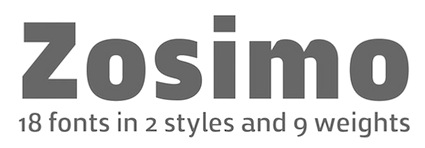 Delicious Type is an American type foundry, est. 2014 by Ron Gilad. Ron Gilad attended an Israeli technical college, began his career as a programmer, and has been doing commercial design work in his hometown of Haifa.
  Tel Aviv, Israel-based designer at HAV Hamburg of the display sans typeface Smug (2021), which features gently modulated strokes. [
 Influential Israeli graphic and type designer, 1907-2001.
  Eyal Holtzman (Den Haag, The Netherlands) is a graphic and type designer who was born in Haifa, Israel in 1969. He studied at the Royal Academy of Art in The Hague, and teaches typography and graphical arts in various places. He set up Studio Eyal and Myrthe together with Myrthe Stel.
  The Tel Aviv, Israel-based author of the font editor
  Gala Studio (Israel) was founded by Galina Bleikh and Lilia Chak. Lilia Chak is an artist and designer, b. Saint Petersburg, Russia. She graduated from the Stieglitz St. Petersburg State Academy of Art and Industry. Since 1990, she lives in Jerusalem. In 2015, Lilia created the acrylic brush typeface Pink, 3D Ink, the crayon fonts Orange Oil Pastel and Red (based on watercolors), the sketched typeface ABC Handwritten, the watercolor brush typefaces Red Handdwritten, Black Handwritten, Blue Handwritten and Green Handwritten, Bold, the brush typeface Ink, and the sketch font Chalk Expressive.
  Partner with Lilia Chak of Gala Studio (Israel). In 2017, Galina Bleikh and Lilia Chak co-designed
  Born in Fulnek, Sudetenland, in 1904, he died in Jerusalem in 1996, after having spent most of his life as head of the Hadassah College in Jerusalem. He designed Hadassah Hebräisch (1958). Winner of the
  Illustrator, graphic and type designer, b. 1997 in Moscow. She graduated from MGHPA (Faculty of Graphic Design of the Stroganov Academy) in 2018.
  [
[ Lavi Turkenich graduated at Ramat Gan's Shenkar College of Engineering and Design, Bezalel Academy of Arts and Design, Jerusalem, in 2012. She created Aravrit (Arabic-Hebrew) as her final project. She graduated from the
  Extraordinarily talented type and graphic designer in New York City, who is the uncontested fashion magazine type designer. Before New York, he was in Jerusalem, where he studied at Bezalel Academy of Art and Design. He also did one exchange student term at OCAD in Toronto. His work is geared toward the fashion industry and fashion publications in general.
  Graphic designer in Petah Tikva, Israel. In 2014, he and Chi No co-designed the Latin / Arabic typographic poster Made in Jaffa. In 2015, he created a decorative all caps Hebrew typeface simply called Alefbet.
  Givatayim, Israel-based Hebrew type design studio in London established in 2000 by one of the main Hebrew type designers of today, Oded Ezer (b. Tel Aviv, 1972). Ezer designed the award-winning font Mayai (Hebrew script: awards at
  Graphic designer/typographer based in Tel-Aviv, Israel, who graduated from the Visual Communication Department (B.Des) at Shenkar College of Engineering and Design, in which he specialized in print, identity, logo, type and book design.
  [
[ OS Type is the commercial branch of Israeli type designer Ofir Shavit. Designer in 2016 of OS Aran: Aran typeface is an 8 weights sans-serif font family (No Italics). It is a Latin expansion of the successful Aran Hebrew typeface created a year earlier by Ofir Shavit from OS-Type. Supports eastern Latin languages and Hebrew. Low contrast, a bit condensed, suitable for text and display. Very clean and non dominant appearance.
 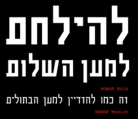 Illustrator, graphic and type designer, and 3d modeler, b. 2001 in Moscow. He graduated from MGHPA (Faculty of Graphic Design of the Stroganov Academy) in 2018.
  Illustrator in Tel Aviv, Israel. In 2018, he created the decorative all caps typeface Great Again, which highlights all that is wrong in Trump's empire.
  Calligrapher and illustrator in Rehovot, Israel. She made some
  Tel Aviv, Isarel-based illustrator and designer. Creator of the Hebrew typefaces Shokolad (2019) and Agvania (2019). [
 Israel-based type designer. His typefaces in 2018 include
  Sometimes spelled Zvi Narkis. Well-known Hebrew type designer, b. 1921, d. 2010. He was academic consultant for the graphic design course of the Technion, Israel's Institute of Technology, and lectured on Graphic Design and Typography. Freelance designer since 1950 of books, posters, stamps and bank notes. The
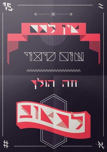
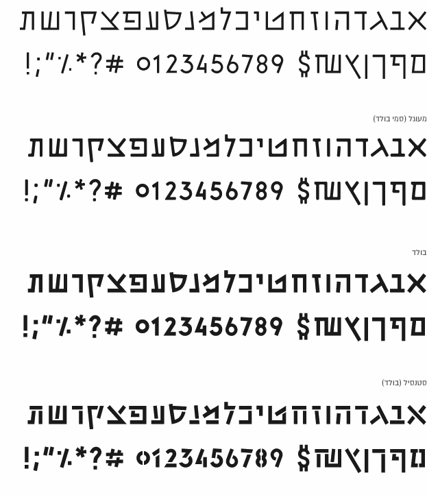
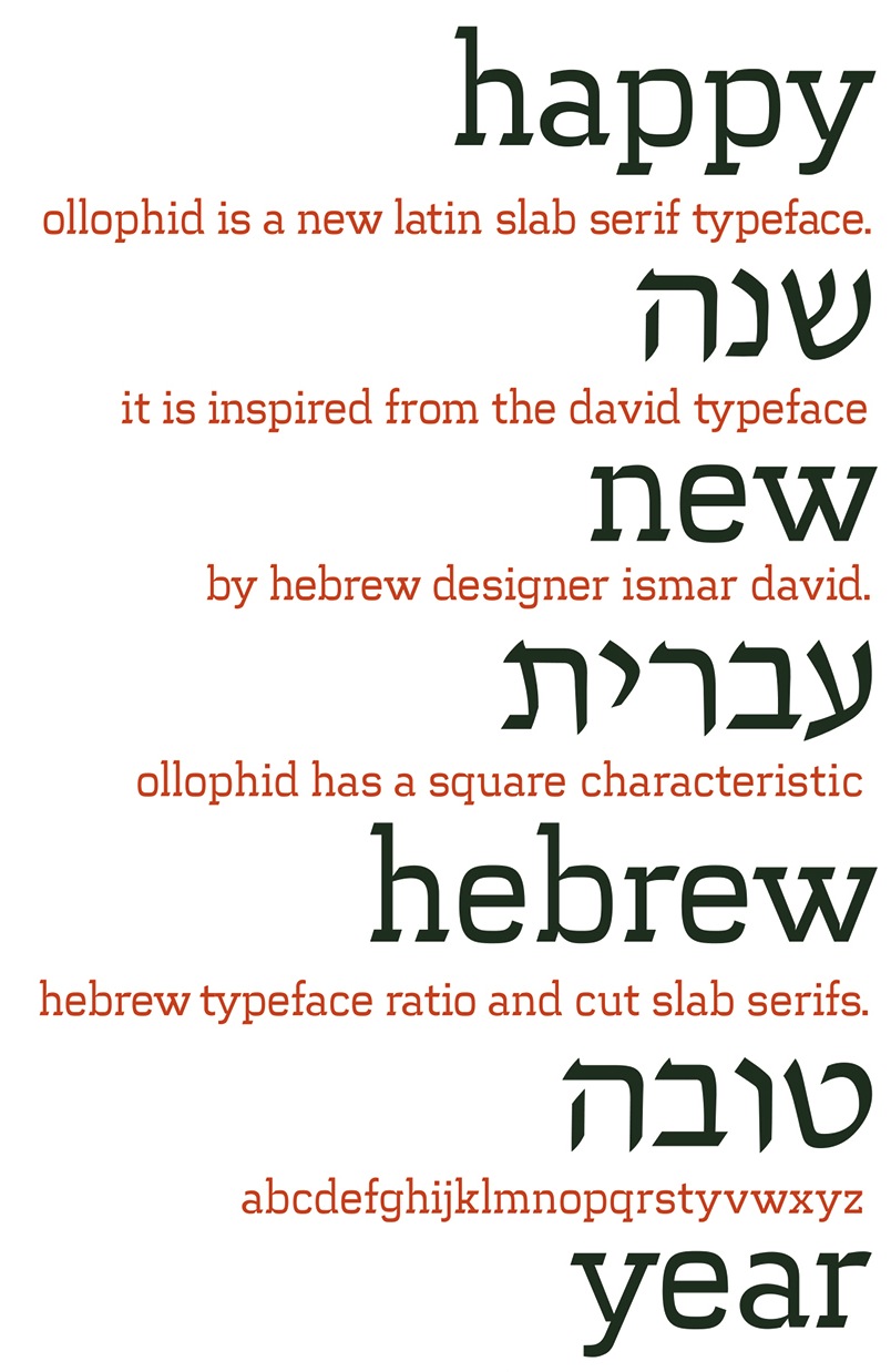
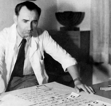
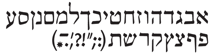
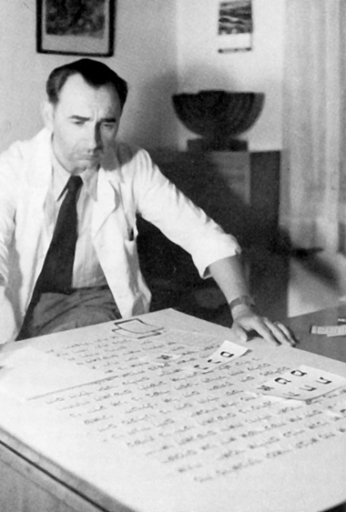
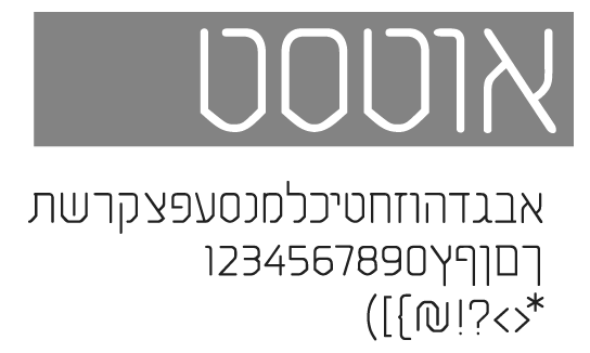
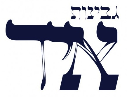
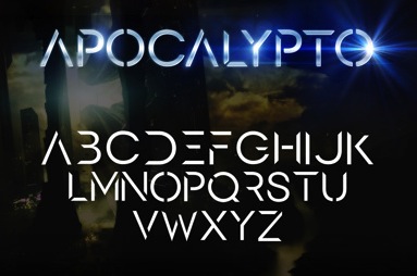
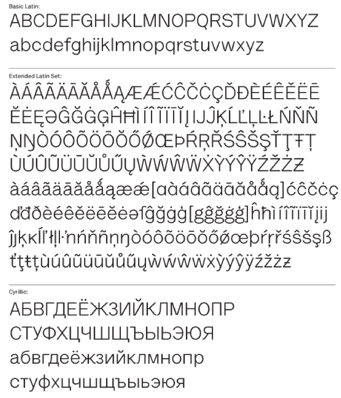
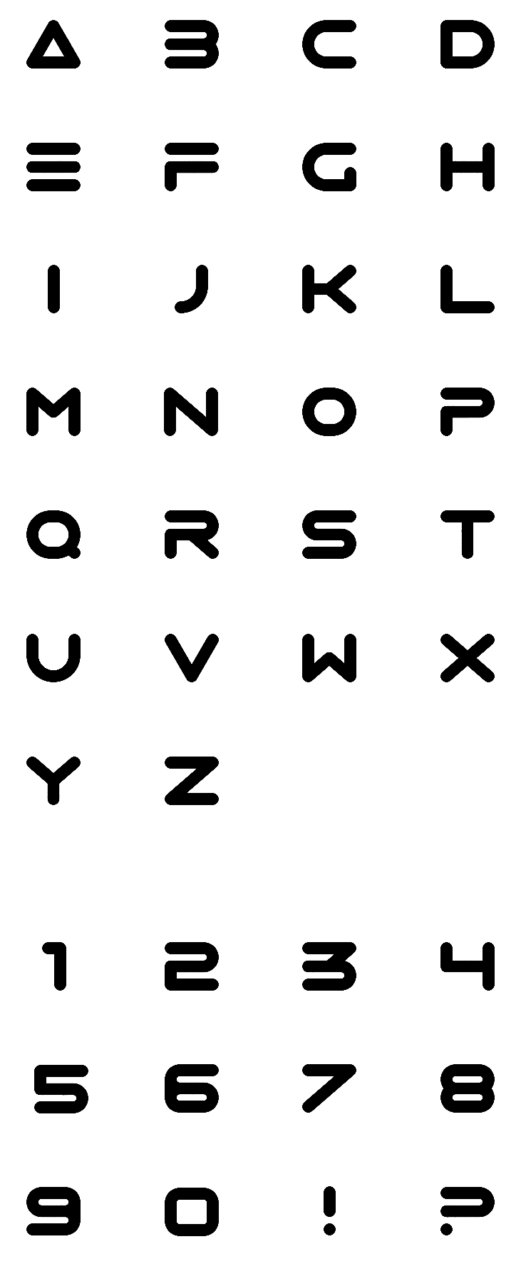
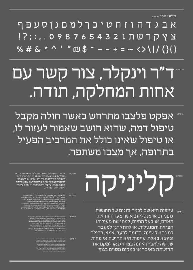
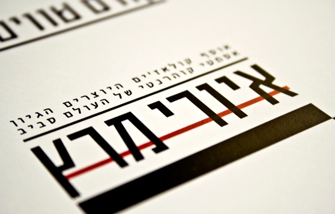
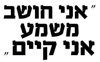
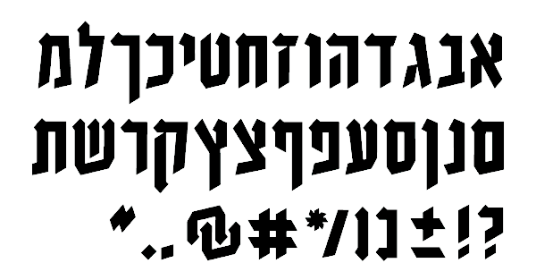
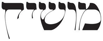
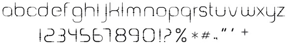
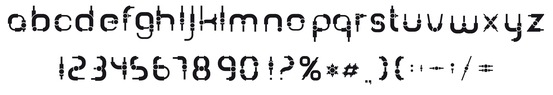
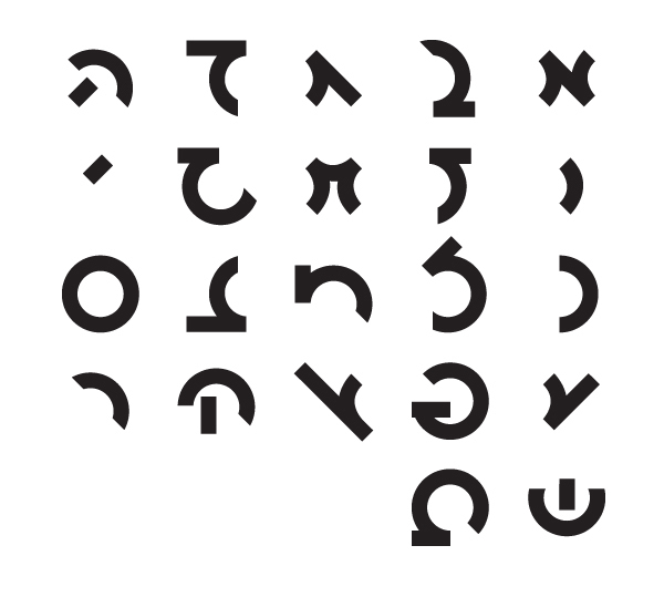
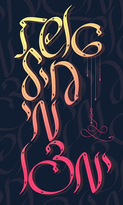
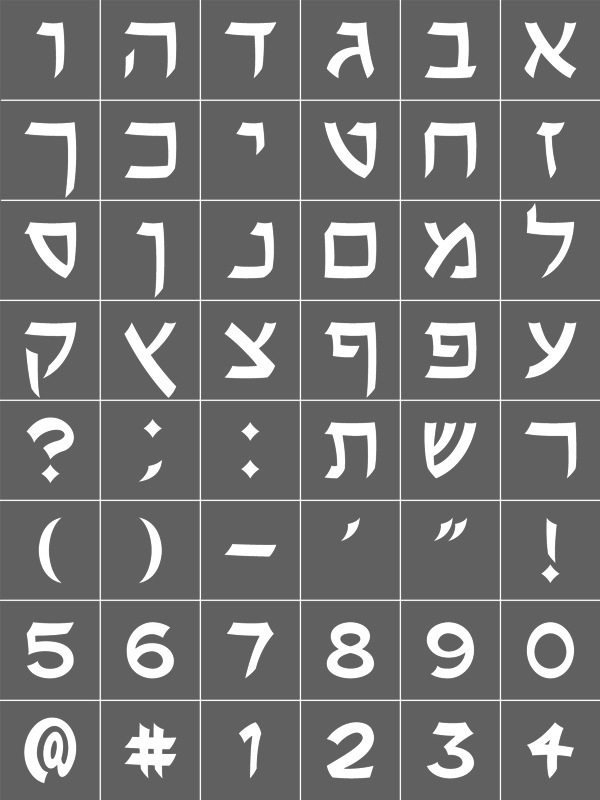
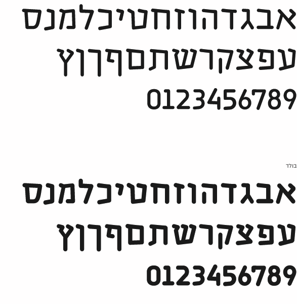
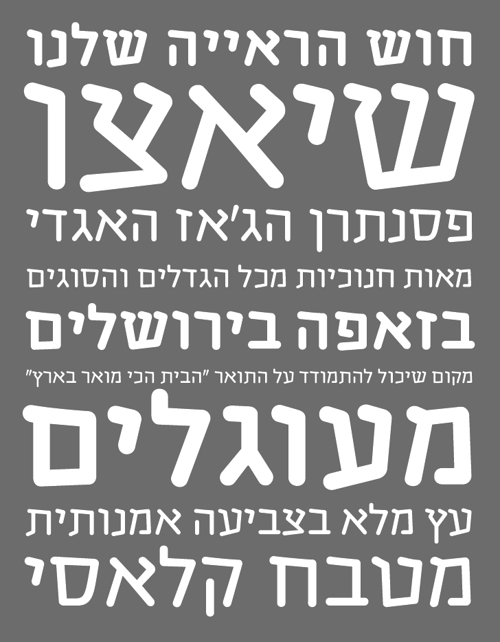
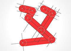
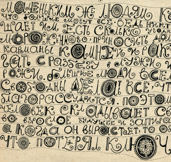
|
|
|
|