| | |
A. Bardi
|
 Type designer who created various alphabets and showed them in Publicité Vignettes Lettres Chiffres Monogrammes et Rehauts Modernes (Les Editions Guérinet, Paris, 1931) [reprinted in 1986 by Dover (NY) as Authentic Art Deco Alphabets]. Examples include
 [Google]
[More] ⦿
|
Adadglgwut
|
 Creator of Circuit Mage (2012). [Google]
[More] ⦿
Creator of Circuit Mage (2012). [Google]
[More] ⦿
|
Aeolien
[J. Fürst Gardiner]
|
 Creator at FontStruct of Aeolien (2011, alphadings), Gazebo Line Aeo (2012), Chateau d'Air (2013, castles), Like Fabergé (2013, oval), Fold Line (2013, a sewing font), Toothache (2013), Linoleum (2013), Sandor Basic Stripes (2013), Compass Norden (2013, a dot matrix font), Sambuccus (2013), Abneuroniques (2013, neurotic typeface), Zebra (2013, horizontally striped), Amazed (2013, maze font), Card Reading (2013), 3paths (2013), Raidho (2013), Floraeolien (2013, flower dings), the Art of Square series (2013), and Ostara Egg Box (2013, ornamental caps for Easter).
 Typefaces from 2014: Ceques (op-art), Indentional, The Tunnels of Tralyoxx, ClickPop Beads, Blue Moon, Nurdal's Walk (LED font), Dumultix (techno, in De Stijl fashion, based on Mondrian), Wever Ding, My Unintended, Haltero, Linuta, Murexa, Abfahrt, Arrivee Mercredi, Mabon (vintage slab serif, art nouveau), Treat or Trick, Aerix Stencil Serify, Noba M, Plaque Emaille (white-on-black), Gleiteri, Strega nona, Kubetus (artsy), Kubetuffo, Pixiel, Werner, Free Masonry, Airy Brickwork, Aerix Stencil Sans, Sim Card, Kerbe, Fool's Beans, Gift Tag (alphadings), Tag Letters, Varsity Outline UC. Typefaces from 2015: 3Fino, S-chablo Sans (stencil), August, Shifted (op-art), Arroed, Apprentice Quill, Spitze, Melusine. Aka Jutta Gi. FontStruct link. [Google]
[More] ⦿
|
Aiden Catbagan
[Edomoji Type]

|
[MyFonts]
[More] ⦿
|
Alexandre Venancio
[Oporto Design]
|
[MyFonts]
[More] ⦿
|
Alexey Zhurov
|
 Industrial designer in Moscow. He created some funny and original stick figure dingbats called Lettrism (2009). Bones (2011) is a Cyrillic display face. Pseudo LCD (2011) is a hexagonal LCD face. Serpenta Serif (2011) is labyrinthine. In 2018, he designed Romanesque Display (3d, outlined, for Latin and Cyrillic). [Google]
[More] ⦿
Industrial designer in Moscow. He created some funny and original stick figure dingbats called Lettrism (2009). Bones (2011) is a Cyrillic display face. Pseudo LCD (2011) is a hexagonal LCD face. Serpenta Serif (2011) is labyrinthine. In 2018, he designed Romanesque Display (3d, outlined, for Latin and Cyrillic). [Google]
[More] ⦿
|
Amarpreet Singh
[Runikh Art]
|
[More] ⦿
|
André Themoteo Alves Correa
[MMC typengine (was: MMC Typodrome)]
|
[MyFonts]
[More] ⦿
|
Antonio Cerri
[CRR TNN]
|
[MyFonts]
[More] ⦿
|
Antonio J. Morata
|
 Antonio J. Morata (Almeria, Spain, b. 1968) is a FontStructor (aka elmoyenique) who used FontStruct to make several modular typefaces starting in 2010. The typeface names start with z. We list them alphabetically:
 - Je suiz Charlie (2015).
- zabadoo eYe FS (2013, bilined), zadartopia eYeFS (2014), zadora-q-eYeFS (pixelized), Zaffron EyeFS (2013), zaftig eYe FS (2013), zage eYe FS (2013), zagreb-eYeFS (2009), zagzig eYe FS (2012), zagzig Linear eYe FS (2013), zahoree eYeFS (2012, dot matrix), Zakapunt eYeFS (2010), Zapatiesta EyeFS (2013, a cut paper font), Zakyra eYe-FS (2010, a western font modeled after Kyra 1 my Michel Troy), zalamera eYeFS (2011), zalooneYeFS (Western face), zamantha eYeFS (2012), zame-eYeFS, Zamzibar eYeFS (2012, octagonal), zandal eYe FS (2013, +2b), zandalo eYe FS (2014), zanexos eYe FS (2015, kitchen tile face), zanzibar-eYeFS, zancle-eYeFS, zancle-rev-eYeFS, zanadalo eYe FS (2014, Tuscan), Zangona eYe FS (2013), zanity eYe FS (2012), zanta eYe FS (2013), zapphire eYeFS (2012, kitchen tile face), zapristi-eYeFS (outlined and oblique), zarcs-eYeFS, zarina-eYeFS (2011, blackletter), zaturdaynote eYe FS (2014: dot matrix font), zaved eYeFS (2012), zaxet eYeFS (2014, Western), zayre-eYeFS, zaza eYeFS (2011).
- zblackmagic-eYeFS (2011, Based on the Tomeri Nu-No font by Nuria González and Noël Nanton), zbrickfont eYeFS.
- Zcare Myself EyeFS (2013), zcell-eYeFS (2010, fat counterless, and outlined), zcell rnd eYeFS (2012), zchwarze eYe FS (2014), zchwarze deco eYeFS (2014), zcloudy eYeFS (2012), zcout eYeFS (2010, a mini-stencilled art deco face), zcrackers eYe/FS (fa, counterless and starred), zcratched eYe FS (2014).
- zdurer (blackletter).
- zeagull eYe FS (2014), zebralbox eYeFS (2013), zebralkey EyeFS (2013), zeelandia-eYeFS (horizontally striped), zeenvoudige eYeFS (2011), zefaleas eYeFS (2013), zegovia eYeFS (2012), zelada eYeFS (2011), Zelectra eYeFS (2013), zelemin eYe FS (2013), zelfvolution eYeFS (stencil), zenda-eYeFS, zeneka eYe FS (2013), zenequalia eYe FS (2014), zenix-eYeFS (2011), zenoid eYe FS (2012), zenon eYeFS (2011, horizontal stripes), zenovia-eYeFS (2011), zentenial eYeFS (2015), Zenzilla EyeFS> (2013), zeres eYeFS (2011), zerone eYeFS (2011, a modular piano key face), Zertera eYeFS (2015, textured), zetentas-eYeFS (disco light face; +Light), zeventy-eYeFS (2011), zextile-eYeFS.
- zfraktur eYe FS (2011, blackletter).
- Zhadowlite eYeFS (2014), zhadows eYe/FS (shadow face), zhalloween eYe/FS (pixel face), zhapp3y-eYeFS (alphading), zhappy eYeFS (2011, fat art deco), zhappy5th eYeFS (2013), Zharkonada eYeFS (2014), zharona-eYeFS (2010).
- ziabelle-eYeFS (shadow face), ziberia eYeFS (2011: extended to a full-fledged commercial typeface, KD Ziberia, by Zhalgas Kassymkulov, in 2021), zibernia blk eYe/FS (2011), zibernia blk x thal eYe/FS (2011), zicrets eYeFS (2013), Zilken eYe FS (2013), zilverstone eYeFS (2011, blackletter), zimbawee-eYeFS, zimbelino eYeFS (2013), zimonart eYe FS (2014), zinabrium eYeFS (2013), zincline eYeFS (2014), zinders eYeFS (2012), zinergy-eYeFS (3d face), zinergy blk eYe/FS, zinfont eYeFS, zinnamon eYeFS (2011), zinus eYeFS (2013), zirconite eYeFS (2011, slab face), zircus eYeFS (2010), zirius eYeFS (2011).
- Zkalpel eYe FS, Zkalpelbar eYe FS (2014, blackletter), zkandia-eYeFS (stencil), zkinlight eYeFS (2013).
- zlabyrinths eYeFS (2011, improved by fanstruct1 in zlabyrinths eYeFS v2, 2012), zlash eYe FS (2011, a keyhole face), zloty eYeFS (2011, art deco face).
- zmorse xDad eYe FS (2011, a texture / African typeface based on morse code).
- znederland eYe FS (2012), znipped eYe FS (2012, heavy angular face).
- zpanish caravan eYe/FS (2011, a bullet hole face), zpeedo eYe FS (2013, race car font), zpido eYeFS (2012), zpixel eYeFS (2011), zporty eYeFS (2012, textured face).
- zquadrata eYeFS (2010), zquared-eYeFS.
- Zocratic EyeFS (2013, kitchen tile face), Zocraticrux eYeFS (2014), Zoftly 70 EyeFS (2013, LED font), Zombra eYeFS (2013, influenced by Orthmar Motter's Motter Ombra, 1973), zometimes eYeFS (2014), zonatta eYeFS (2013), zonora eYeFS (2011, a Far West face), zooctogonal eYeFS (2013), zoolphabet eYeFS (2010, animal dingbats), zorongo eYeFS (2014: inspired by the MuirMcneil poster lettering for Braun systems), Zoulsister Plus eYe FS (2016), zoutheast eYe FS (2012, Western), zouthwest eYe FS (2012, Western), zoutland eYeFS (2011, octagonal), zouvenir 2U eYeFS (2013), zovietztyle eYeFS (2013, constructivist), zozial-eYeFS, zozial-sqrd-eYeFS.
- Realta2 (2013), zreeways eYe FS (2014: multilined face), zround eYeFS (2010).
- Ztardust eYe FS (2014),
 ztarsky-eYeFS (+Round: art deco ultra black), ztainless eYe FS (2014), ztamina eYe FS (2014: shaded), ztator eYeFS (2012), ztay eYeFS (a condensed almost art nouveau face), Zteamboat EyeFS (2013), ztedelijk-Crouwel eYe/FS (2011, based on Wim Crouwel's stedelijk Museum poster), zteefunny eYe FS (2011, ultra fat keyhole face; + zteefunny dm eYeFS), ztencils eYeFS (2011, army stencil face), ztires-eYeFS (2011, texture face), ztoasts eYeFS (2013), ztonewall eYeFS (2013), ztorm eYeFS (2013, blackletter), ztrands eYeFS (2011), ztrange eYeFS (2010), ztrange blk eYeFS (2011), Ztrangelovedoc (2016), Ztratos eYe FS (2014), ztream eYeFS (2011), ztrong eYeFS (2013, sci-fi), ztrontiumdog eYe FS (2013, fat stencil), ztructures eYe FS (2012, crosshaired), zturdy-eYeFS (ultra-fat), ztylo eYeFS (2011, art deco). ztarsky-eYeFS (+Round: art deco ultra black), ztainless eYe FS (2014), ztamina eYe FS (2014: shaded), ztator eYeFS (2012), ztay eYeFS (a condensed almost art nouveau face), Zteamboat EyeFS (2013), ztedelijk-Crouwel eYe/FS (2011, based on Wim Crouwel's stedelijk Museum poster), zteefunny eYe FS (2011, ultra fat keyhole face; + zteefunny dm eYeFS), ztencils eYeFS (2011, army stencil face), ztires-eYeFS (2011, texture face), ztoasts eYeFS (2013), ztonewall eYeFS (2013), ztorm eYeFS (2013, blackletter), ztrands eYeFS (2011), ztrange eYeFS (2010), ztrange blk eYeFS (2011), Ztrangelovedoc (2016), Ztratos eYe FS (2014), ztream eYeFS (2011), ztrong eYeFS (2013, sci-fi), ztrontiumdog eYe FS (2013, fat stencil), ztructures eYe FS (2012, crosshaired), zturdy-eYeFS (ultra-fat), ztylo eYeFS (2011, art deco). - zumbaya eYeFS (2014), zummertime eYe FS (2012), zunivetica eYe FS (2013), zunset eYeFS (2012), Zuspiria eYe FS (2015), zuzanna eYeFS (2013, Western, Italian).
- zweater eYeFS (2011, knitted look), zweet eYeFS (2013), zwimming eYeFS (2011), zwire blk eYeFS (an LED face), zwiss-eYeFS.
- zybaris eYeFS (2012), zybona-eYeFS (athletic lettering), zychotropic eYeFS (2013, an Italian Western face), zydonia eYeFS (2012), zykedelia-eYeFS (2012), zylone-eYeFS (2011), zylvania eYeFS (2013, retro automotive script), zynopsis eYe FS (2013), zyrano eYeFS (2013), zyrens eYeFS (2013), Zyrup Eye FS (2013).
Dafont link. [Google]
[MyFonts]
[More] ⦿
|
Ardi Parwito
[Green Adventure Studio]
|
[More] ⦿
|
Ari Juanda
[Line Creative (or: Line Studio)]
|
[MyFonts]
[More] ⦿
|
Art deco typefaces by Nick Curtis: I
[Nick Curtis]
|
 Free art deco typefaces by Nick Curtis, made between 1997 and 2003. Nick Curtis also made commercial art deco typefaces, but these will be listed elsewhere.
 - AmstelHeavyNF (2002): based on this poster from 1926 by C. De Haas.
- AmsterdamTangram (2002): based on this poster by Joost Swarte from 1987 entitled "De wereldtentoonstelling van Joost Swarte".
- AnchorSteamNF (2002): based on a poster from 1923 by Wilhelm Poetter.
- Rainbow Bass (1982, Saul Bass) a vertically striped disco style design, was remade by Nick Curtis as Backstage Pass (1999, 2008).
- BeckerBlackNF (2002, 2007): Based on Alf R. Becker's lettering.
- BigAppleNF (2000, 2007).
- BoogieNightsNF, BoogieNightsShadowNF (2002, 2007): based on this poster from 1916 by Paul Hosch and Hans Melching. In 2009, CheapProFonts made a "pro" version.
- BoomerIngueNF (2002, 2007).
- Bric-aBraqueNF (1999, 2007). Bric-a-Braque was based on Cubist Bold (John W. Zimmerman, 1929).
- ChainsawGeometric (1999). Based on this alphabet by Draim (1928).
- ChippewaFallsNF (2002, 2007). Originally called Hiawatha. See this roadside photograph that inspired Nick.
- Coaster Poster (1999).
- DayPosterBlackNF, DayPosterShadowNF (2002, 2007).
- DebonairInlineNF (2000, 2007). The commercial Debonair Inline (2008) is an extension (uppercase, etc.) of Herbert Bayer's 1931 monocase typeface Architype Bayer, also known as the universal moderrn face.
- DecoBordersNF (1999) and DecoDingbatsNF (2000).
- Drumag Studio NF (2003, 2007).
- DustyRoseNF (2000), DustyRoseRevised (2007): Dusty Rose is an art deco typeface based on the logotype for the Dutch magazine Geillustreerd Schildersblad in 1940, by Anton Kurvers. The commercial Dusty Rose NF was published in 2008.
- EastMarket (1999), EastMarketTwoNF (2007).
- GradoGradooNF (2002, 2007): a Bauhaus-style font, based on this 1932 poster by Urbano Corva.
- Great Lakes (2003, 2007), GreatLakesShadowNF (2007): based on this poster by Peter Ewart (1935).
- Heavy Tripp NF, Heavy Tripp Ultra Bold (2001, 2007). Both Day Tripper NF and Heavy Tripp are based on Dignity Roman, a typeface from 1929 by art deco alphabet designer Alphonso E. Tripp.
- HeraldSquareNF, HeraldSquareTwoNF (2002, 2007): a font family based on a design by Welo shown in Studio Handbook for Artists and Advertisers (1927).
- High Five Jive NF, High Five NF (2001, 2007).
- Indochine NF (2003, 2007). Based on this poster by Joseph-Henri Ponchin (1931).
- Ironick-Normal (1999, 2007): an exaggerated Bernhard Modern.
- KerfuffleNF (2000, 2007). Based on this poster by Chris Van Der Hoef (1920).
- KismetNF. A free font. Based on this lettering.
- LabyrinthCapital, Labyrinth (1999, 2007). Based on this poster.
- MetroRetroNF (1999, 2007). MetroRetroRedux (2001, 2010) is a commercial version of that.
- Milton Burlesque NF (2000, 2007).
- Monkey Fingers NF (1999, 2007). Based on an alphabet by Otto Heim published in Farbige Alphabete (1925).
- MunchausenNF (2003, 2007). Based on a poster for an exhibition by Ludwig Heinrich Jungnickel (1911). This is inbetween art deco and art nouveau.
- NickerbockerNF (1999, 2007).
- NightcapCapital, Nightcap NF (1999, 2007). Based on Disque (A. Bardi, 1931).
- OdalisqueNF, OdalisqueRevised (2000, 2007). The commercial versions are Odalisque NF (2008) and Odalisque Stencil (2010). These art deco typefaces are based on Morris Fuller Benton's Chic (1927).
- ParkLaneNF, ParkLaneRevised (2000, 2007).
- PhattPhreddyNF (2001, 2007).
- PinballWhizNF (2002, 2007). Based on this logotype by Joost Swarte for the comic-strip series "Katoen + Pinbal" (1975).
- PlatonickNF (1999, 2007).
- PlugNickelNF (+Black) (1999, 2007): a reworking of Bremen Black, with small caps and a rather skeptical uppercase R added.
- RadioRanchNF (1999, 2007). Adolf Behrmann designed the classical display typeface Rundfunk at Berthold in 1928. This typeface was digitized by Nick Curtis as Radio Ranch NF.
- RaskalnikovNF (2003, 2007). A Cyrillic simulation typeface based on this poster.
- RialtoEngraved, Rialto NF (2000, 2007): a Broadway style art deco face.
- RiotSquadNF (2000, 2007). after a design by Otto Heim from Heim's 1925 book, Farbige Alphabete.
- RitzyRemixNF (2000, 2007). RitzyNormal is based on Tom Carnase's Busorama.
- Seaside Resort NF (2003, 2007). A bilined titling typeface based on a 1933 poster by Italy's Bertarelli Studios.
- SelznickNormal, SelznickRemixNF (1999, 2007). An art deco typeface inspired by movie theaters of the 1930s. Based on ITC Anna (1991, Daniel Pelavin).
- Sesquipedalian, SesquipedalianAlternates (2000, 2007). Inspired by a handlettered logo for Torre's Buckdruckerei in Vienna, circa 1919.
- Sid The Kid NF (1999, 2007).
- Skittles N Beer NF (2007) is based on handlettering on a 1929 brochure for the P&O British-India Steamship Line.
- Standing Room Only NF (1999, 2007). Modeled after Broadway, designed by Morris Fuller Benton for ATF in 1928, originally named Broadway Poster.
- Stony Island NF (2002, 2007). An adaptation of an art deco font called Chicago Modern, designed by lettering artist Alf Becker, whose designs graced the pages of Signs of the Times magazine from the late 30s into the 50s.
- StudebakerNF-Bold, Studebaker (1999, 2007). Based on the lettering on a package for True-Mark Brand Typewriter Ribbons, circa 1938, designer unknown.
- TaraBulbousCapital, TaraBulbousNF (1999, 2007). TaraBulbous NF (the commercial version is from 2008) is a fat-lettered font based on Carlyle-Oring lettering. See also here.
- TitanickDisplayNF (1999, 2007): a remake of the bold pin-striped trilined Dextor by L. Meuffels.
[Google]
[MyFonts]
[More] ⦿
|
Arthur Maria
|
Designer in 2008 at FontStruct of the experimental typefaces Gearbox, Gotha (octagonal), Nippon Garden, Labyrinth, Nano (pixel), Machine Script, Plank stencil, Ballistix, San Andreas (recreation of the Grand Theft Auto font), Machina (a macho octagonal heavy face), Electro, Hiro (oriental look), Japanica (oriental look, based on Hiroshi), Mage, Silkscreen Alt (pixel, a modification of Jason Kottke's Silkscreen). [Google]
[More] ⦿
|
Artyway
[Yehor Lisnyi]
|
Ukrainian designer in 2020 of the squarish typeface Researcher (a futuristic or sci-fi typeface) and Delivery. In 2021, he released Contourism (a minimalist futuristic font in regular and color versions), Geommaze (a labyrynthine font), Angled (a sports shirt font), Steel Race (a techno typeface), Alro (a simple monoplinear Bauhaus-inspired sans typeface), the futuristic typefaces Futurism and Xspace, and the speed or sports fonts Designer and Speed. Catalog in 2022: Alro Headline, Argo Bauhaus, Audio Logo, Bamboo Headline, Bestseller, Bold Geometric, Car, Childish Kids, Childrens Headline, Contour Architecture, Cropped Logo, Cyrillic Modern Sport, Digitally Headline, Futurism Headline, Futuristic Mars, GYM, Geometric Cut Angles, Geometric High, Geometric Maze, Headline Blade, Headline Design, Headline Speed, Headline Steel, Kids, Kids Headline, Lorean, Negative Space, Researcher, Robot Love, Rocket Movement, Rounded Modern, Scandia Headline, Simple Maze, Space, Sphinx (techno, stencil), Sport, Sport Style, Stencil Headline, Terminator Headline, Turbo Sport, X-Space. [Google]
[MyFonts]
[More] ⦿
|
Ata Syed
|
 Ata Syed (Karachi, Pakistan) has a dual identity at FontStruct, where he is one of the most prolific contributors. He is known there as thalamic and as minimum. Behance link.
 Typefaces made in in 2008 as thalamic: Hello (connected upright script), Epilogie (blocks), WimSoft (+U/C), Chunk Chip, Konstruct (Russian constructivism face), Sensei Says, FS Tributary, Twotype Font, Urge (fat octagonal), Subliminal, FS United One, The Game of Type, Anaximander Zooom!, Corrupt and Corrupt Ed (piano key stencil fonts), Blueprint, Monomum, Synergy, Insert Coin Italic, Write I Careful, Write I Casual, Write I Dump, Loop UC, Loop LC, Emergic, Prick!, Insert Coins Pixels, Retro Electro, Bubble Lab IJ, Bubble Lab Bang, A Needle Pulling Thread, Send, Scan (IBM logo look), Intermittent and Intermittent Sans (stencil typefaces), Melt x DR and Melt x tDR (dot matrix), Oval x DR and Oval x tDR (original design by theDesignersRepublic for Issey Miyake), On Grid, Indigo (almost blackletter), orange_2 (dot matrix), Scan (horizontal stripes), Bass, Grape (simple pixel face), Nachahmung and Nachahmung Block (fat and extra condensed, Wim Crouwel simulation typefaces), Nachahmung Block Serif, Conjunction, Interjection, Is It, Sangular (nice experiment), Anonon (nails in square letters), Purple and Purple Very (slab serif headline typefaces, pixelized), Arc Echo (biline and strutted), The Question (a fantastic 3d paper fold imitation face), FS Minimal (a fantastic ultra fat decorative face), FS FontStructor, Vibrant (multiline labyrinthine or op-art face), Writ (upright pixel script), Castor, Ooki (octagonal), Industrial, The I Flat, The I, Indiscrete, Analog (connected script), Dent (mechanical), Digital (connected script), Hello Hello, and Sensei Says. In 2009, he made Clone It, Entwined, C64, Helix, Fontsration, Bent, Stripe Zoo, Dull, Indent (stencil), Quartertined (kitchen tile), Firox, Orfix, A Priori, Ignore, Confused, S-Ookii, Ookii (octagonal), Very Becoming, Crisis Averted, Crisis (neat bold octagonal face), Penmanship, Up All Night, Sleep All Dayi, Chunk Chip, Grayletter (upright script), Soso, Mostly Harmless (textured face), Etched, La Cross, Twotype, Etched Bare, Aught (One, Two, Three), as: Inflate (Pop, Pfft, Puff, Poof), Istic, Very Becoming, Ignore, Ought, Balance, Broken, Dry Flat (dot matrix), La Cross, Etched (+Bare), Fontsration (+Refined: multilined beauties), FS Institutional (fat multiline face), FS Industrial, FS Pixelayers. Additions in 2010 as thalamic: fs Section, fs Reboot, fs Easy DNA Auto Stencil, fs Institutional (+Ho, +Elements), fs Quartertined, fs Stencil 2.0, fs Rivet, fs Intaglish, fs Dumb Italic, fs Loop Gap, fs GoTeam (stencil), fs ITilic, fs Kerplunk (Startrek face), fs Dumb Italic, fs Ribbon, fs Beringer, fs Ooki Woodcut, fs Croissant (stencil), fs 45 (octagonal stencil), fsXO, fs Pipe, fs Confused Less. Fonts from 2011 as thalamic: fs Xenon (a paperclip face), fs Instant, fs Twist, fs WIP (blackletter), fs Sparc, fs Reboot (texture face), fs Pod, fs Flute Tune, fs Special, fs Watch Out (stencil), fs Etched Nyle (labyrinthine face), fs No Kerning Required (2011, connected upright script). Creations in 2012 as thalamic: fs Flip, fs Mom, fs Noise, fs Noise II, fs Junk, fs You Are Here, fs Flash (outlined), FS Easy Too (paperclip face), FS Strict, FS Fix, fs in three (octagonal stencil face), fs Single, fs Wakarimasen, fs r-failed (white on black), fs Permutation X, fs Pan Am, fs Institutional, fs Institutional 2, fs Chunky (counterless), fs Grayletter (textured face), fsXply (op-art). Creations in 2013 as thalamic: fs So Not Right, fs Grid Urdu (pixel face), fs Not So Right, fs Six Sticks, fs Half (octagonal family), fs Bored, fs Make it Happen, fs Salvage, fs To Be Discarded, fs Connect (stencil), fs Whomp, fs Praxis, fs Fez (3d face), fs Input, fsTramp, fs Five Alive, fs Hote-Zyd (labyrinthine), fs Patterns (Layers, Quarters), fs Five Alive (origami font), fs Go To Sleep (retro speed font), fs Vaerktoj (inspired by the brand identity of Hoejmark Cycles), fs Permutation B, fs Jester, fs Permutation XII (op-art), fs Insatiable, fs Electronic, fs Carbon (a nice chequered face), fs When We Were Young (multiline typeface), fs Shogun Tiny (a lined kitchen tile typeface), fs Optical, fs When We Were Young (multilined), fs Slate, fs Shogun (gridded), fs Iie (+Filled), fs Blocky (dot matrix), fs Thalamic. Creations in 2014 as thalamic: fs Perhaps, fs Perhaps Perhaps, fs Stability (Turmoil, Flux), fs Industrial (an artsy fat dot matrix face), fs Rehash, fs Ah, fs Curly, fs So, fs Flint, fs ICK (blackboard bold style), fs Wiggle, fs Grid, fs Ah. Creations from 2015 as thalamic: fs B-Chain (bike chain font), fs Risque (art deco), fs Squangular (Impair, Square, Flair, Pair), fs Oval, fs MIP, fs Flower (kitchen tile face). Creations as minimum: fs Chips (2014), fs Oh (2014, piano key style), fs Stack (2014, +Overflow), fs llljjj (2014), fs Turn Off The Sun (2014, beveled), fs Zag (2013 textured), fs Zig (2013, textured), fs Mullions (2013), fs The Italic (2013), Gridlock (2009), Mingle Minx (2009), Mingle Co (2009), Mingle (2009, gridded letters), Bevel (2009, 3d beveled family), illiij (2009, multiline family), m.ove.r (2009, multiline family), Grayscale (2009, multiline family), fs Cubed (2010, 3d-face), Bas Relief (2009, 3d face), Silver (2009, 3d face), Tin (2009), Lead (2009), Bevel (2009), Bevel Just (2009), Bevel Just Shadowed (2009), Ceci n'est pas une vague (2009), A Fault in Reality (2009, optical effect font), Blit Slash (2009, experimental), Blit Hack (2009), Dot Dot Hex (2009), Super Black (2009), fs Overlap (2010), fs Fabric (2010, texture font), fs Original (2010), fs Ink Blot (2010), fs Dots and Dashes (2010), fs I Square (2010), fs Squared Up (2010), fs Super Black (2010), fs Unoriginal (2010), fs Minimum (2010, geometric stencil face), fs Pin and Thread (2010, stitching face), fs Shade (2012, 3d face). FontStructions from 2011: fs Perpetual (dotted line face), fs Slither, fs No Escape, fs Prompt (a DNA-inspired biochemical lab face), fs Plus H (horizontally striped face), fs Arc Test 2:2 (a modular blackboard bold face), fs V Simple (2010, textured face), fs Instant, fs Permutation V, fs Rehash Monoic (labyrinthine), fs Meta (texture face), fs Scroll, fs Scroll Not (stencil). FontStructions from 2012: fs Translucent (a texture face), fs Bank, fs Shade, fs Confined (white on black), fs Institutional (+Vo, +HeVe, +Ho, +He, +Ve: texture typefaces), fs Bang, fs Random (textured face), fs Random Pattern, fs Lead, fs Tin, fs Silver, fs Tungsten. Klingspor link. Abstract Fonts link. Behance link. [Google]
[More] ⦿
|
Ayse Ulay
[Ulay&Ulay]
|
[MyFonts]
[More] ⦿
|
Be Imageprojects
|
Amsterdam-based studio that created the mysterious display typeface Unbark (2014), the experimental Antitype (2014), and the labyrinthine Lockwork (2014). Behance link. [Google]
[More] ⦿
|
Bold
[Oskar Lübeck]
|
Founding creative director of Differ Design in Stockholm. Founder and Creative Director of the Swedish design agency Bold (in 2011). Prior to Bold he was the Design Director at The Brand Union's Stockholm office. He has many years of international experience having worked and studied in Japan, New York, Dubai and London. His typefaces include Nordea Sans (for Nordea Bank), Labyrinyth (pixel style), Lateral (vertically striped face), Pop-Up, Fine Line, and Basic Shapes (a geometric experiment). [Google]
[More] ⦿
|
C. Chatham
|
FontStructor who made Calypso (2012, labyrinthine). [Google]
[More] ⦿
|
Camila Cepeda Nader
|
Sao Paulo, Brazil-based designer of the multiline typeface Tridimensional (2015) and a few other display typefaces. [Google]
[More] ⦿
|
Canwei Lai
|
 Graduate of Art Design College of Guangdong Industry Technical College in 2016. Art director and graphic designer in Guangzhou, China. As type designer he took commissions from Zcool. In 2017, he released Yishan Yuzhuan, which draws inspiration from Qin Lisi's Shushan Carved Stones. Also, in 2017, he had a hand in Zcool-YingShuTi (Zhongqi Electronic: free download). His graduation typeface was the experimental labyrinthine Chinese typeface Suo (2016). Also in 2016, he designed the molecular Chinese font Collective. [Google]
[More] ⦿
Graduate of Art Design College of Guangdong Industry Technical College in 2016. Art director and graphic designer in Guangzhou, China. As type designer he took commissions from Zcool. In 2017, he released Yishan Yuzhuan, which draws inspiration from Qin Lisi's Shushan Carved Stones. Also, in 2017, he had a hand in Zcool-YingShuTi (Zhongqi Electronic: free download). His graduation typeface was the experimental labyrinthine Chinese typeface Suo (2016). Also in 2016, he designed the molecular Chinese font Collective. [Google]
[More] ⦿
|
Christian Goetz
|
Swiss artist Christian Goetz designed the labyrinthine typeface Linotype Minos in 1997. He named it after King Minos of Crete (in the Bronze Age). Typical of scripts of that era were the ornamental borders around the characters, found in the palaces of Knossos, Phaistos and Mallia. Linotype page. Klingspor link. [Google]
[MyFonts]
[More] ⦿
|
Cocijotype
[Elí Castellanos Chávez]
|
 A 2004 graduate of Universidad Autonoma de San Luis Potosi. As a student at CEAD in Mexico, Elí Castellanos Chávez (b. 1980) is the director of Cocijotype, a foundry located in Oaxaca. He taught editorial design and typography in Loma Bonita, Mexico. Cocijotype was earlier called Sexytype. He won the Gold prize at the Morisawa Type Design Competition in 2014. He works as a Font Developer at studio Dalton Maag in London.
 Flickr page. Their typefaces: - Koch's Neuland inspired Elí to create Barrilito (2009). This anthroposophic typeface won an award at Tipos Latinos 2010 in the script category.
- Barricada (2008, Sudtipos) is a fat rounded signage typeface that was awarded in the Tipos Latinos 2008 competition in the non-text category.
- Lucecita (2009) is a dot matrix LED font. It won an award at Tipos Latinos 2010 in the screen typeface category.
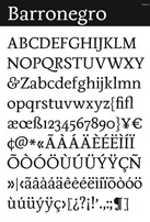
- Barronegro (2009) is a text family on which he has been working between 2006 and 2009. Barronegro is based on the cultural heritage of Oaxaca, as found on local posters, menus, shops, clothing, and art.
- Miniblock (2009, by Manuel Guerrero) is created to stack letters next to each other to look like labyrinths. It won an award in the Tipos Latinos 2008 competition for best text family.
- Optica (2008, Manolo Guerrero) is a tribute to Colombian artist Omar Rayo's optical art.
- Block02 (2009, Manolo Guerrero) is a FontStruct font that is part pixelized, part stencil.
- Optica (2008, Manolo G) is an optical experiment.
- Chicha (2012, Diego Sanz) is based on Peruvian market signs.
- Quincha (2009, Diego Sanz) is the quechua word for stone wall. Letters can be packed together in a way that reminds one of ancient Inca art.
- Casiopea (2010) is a corporate or signage type family that comes in six weights including Bold and Thin.
- Zipolite (2011). A mix of grotesk and humanist. See also Zipolite Rounded (2013). Zipolite won an award at Tipos Latinos 2014.
- Hola is a text typeface that won an award at Tipos Latinos 2014. In addition, it won the Gold Prize in the Latin category at the Morisawa Type Design Competition 2014.
- Calmetta (2017). Designed at Dalton Maag as an extension of Dalton Maag's wayfinding font Pantograph originally created by Marc Weymann.
- Speaker at ATypI 2018 in Antwerp (together with Eloise Parrack) on a revival project summarized as follows: In November 2017 an international cohort on the Expert Class in Type Design, based in the UNESCO world heritage site of the Museum Plantin-Moretus, embarked upon a collaborative project to research and revive a Renaissance-era typeface of the Flemish punchcutter Hendrik van den Keere from the collection of Christophe Plantin. Comparing Van den Keere's well-known Real Romain (1575) and Ascendonica Romain (1577) with his Small Pica Roman (1578), and investigating the patterning, proportions, and details, our research led to the design of a revival using Small Pica Roman at 9-point Didot size as a departure. Evaluations of the approaches of working in metal and standardization in type design at different optical sizes were considered, and were contrasted to methods and tools of digital typeface design today. The unique and rich historic archive of punches, matrices, and printed materials provided an exciting basis for our research, leading to some surprising discoveries counter to our expectations and to accepted theories found in many typography and type design texts. This project provoked a wide range of interpretations, approaches, and opinions about how to create a contemporary usable digital typeface, whilst honouring and imagining the intentions of Van den Keere five centuries past.
Klingspor link. [Google]
[MyFonts]
[More] ⦿
|
CRR TNN
[Antonio Cerri]
|
 Antonio Cerri (b. 1972, Catania, Italy) freelances in web, graphic and motion design from San Giovanni La Punta, Sicily. He created some typefaces in 2010, such as the futuristic CRR NTN (+Outline).
 In 2011, he made Labyrinthus, a multilined all caps family: inspect each glyph and note that there is one point of entrance and one exit. Still in 2011, the decorative family Atlantide and the futuristic all caps typeface Silver Chisel appeared. In 2012, he designed the techno family Steel. Typefaces from 2013: Firebird (techno, automotive, speed font family). In 2014, he made Luna Crescente, a layered multicolor 3d typeface. Typefaces from 2016: Xandra (script), Xova (a 5-layer techno/logo font), Xova Rounded, Maria Script (heavy signage script). Typefaces from 2020: Bilya Layered, Xova Layered, Labyrinthus Rounded. Typefaces from 2021: Astralys (futuristic caps), Labyrinthus Pro (labyrinthine). View Antonio Cerri's typefaces. [Google]
[MyFonts]
[More] ⦿
|
Daniel Ryves
|
Eastleigh, UK-based designer (b. 1983) of the 3d multiline labyrinthine font Maze (2008), and of Boo (2009). He ran Dlight Graphics. Dafont link. [Google]
[More] ⦿
|
Deliberate Design
[Eric Eaton]
|
Eric Eaton is a graduate from the California College of Arts and Crafts, San Francisco, CA (1997). He is a design director at Wired Digital in San Francisco, since 1996. He has made some experimental fonts (not downloadable): Bricks Are is a 2001 take on Akzident Grotesque, JAT is a 2000 serif face. Deliberately (2001) is a stencil face, Labyrinth (1999) is the ultimate pixel face, 3 by 3. Popva (1993) is based on a version of a logo for the City of New York (Street Cinema). [Google]
[More] ⦿
|
Denise Koehler
|
 Partner of Jan Koehler in Deniart Systems, which operated from 1993-2009 in Toronto, and then in Litomerice (Czech Republic). Her typefaces include: Skeleton Alphabet, Sanskrit Writing, White Magick Symbols, Theban Alphabet, Tolkien Tengwanda Namarie, Tolkien Tengwanda Gothic, Sublimina, Semaphore, RongoRongo (a system of glyphs discovered in the 19th century on Easter Island), Powers Of Marduk, Phaistos Disk Glyphs, Passing The River, Old Persian Cuneiform (1995), Morse Code, Meso Deko, Maya Month Glyphs, Maya Day Names, Masonic Writing, Malachim Writing, Magi Writing, Hypnotica, Egyptian Hieroglyphics Basic, Egyptian Hieroglyphics - The Egyptologist, Hebrew Basic, Greco (Greek face), Futhark, Enochian Writing, Egyptian Hieroglyphics - Deities, Medieval Dragons, Dinosauria, Egyptian Hieroglyphics - Dendera, Daggers Alphabet, Coptic Alphabet, Chinese Zodiac Symbols, Tolkien Certar, Celtic Astrologer Symbols, Celestial Writing, Castles&Shields, Braille Alpha, Black Magick, Aztec Day Signs, Astrologer Symbols, Angelica, American Sign Alphabet, Alchemy Symbols, Tolkien Aglab, Fontazia AquaFlorium (2010, fish tank dingbats), Snow Crystals (2010, followed by Snow Crystals 2 in 2012), Star Crystals (2010, more snow-like structures but having 8 instead of 6 axes of symmetry), Karika Swirls (2010), Karika Hearts (2010), Karika Encore (2011), Fontazia Chateaux (2011), Fontazia Chateaux Deux (2011), Fontazia Insomnia (2011), 21 Emmerson (2011), 4 Point Greek Fret (2011: labyrinthine), 4 Point Florals (2011), 4 Point Deco (2011), Mykonos (2011, labyrinthine), Harmonics (2011, a zig-zag face), Fontazia Motyl (2011, butterfly dings), Holiday Penguins NF (2011, Christmas dingbats), Fontazia Christmas Tree (2011), Eggs Galoe (2012, Easter egg font), Border Glyphs (2012, hieroglyphic), Fontazia Christmas Baubes (2012), Fontazia Christmas Tree 2 (2013), Karika Hypnotica (2014, hypnotic or kaleidoscopic glyphs), Symcaps Vario X1, Symcaps Vario X2, Symcaps Vario X3 (2016, op-art design). Klingspor link. [Google]
[MyFonts]
[More] ⦿
Partner of Jan Koehler in Deniart Systems, which operated from 1993-2009 in Toronto, and then in Litomerice (Czech Republic). Her typefaces include: Skeleton Alphabet, Sanskrit Writing, White Magick Symbols, Theban Alphabet, Tolkien Tengwanda Namarie, Tolkien Tengwanda Gothic, Sublimina, Semaphore, RongoRongo (a system of glyphs discovered in the 19th century on Easter Island), Powers Of Marduk, Phaistos Disk Glyphs, Passing The River, Old Persian Cuneiform (1995), Morse Code, Meso Deko, Maya Month Glyphs, Maya Day Names, Masonic Writing, Malachim Writing, Magi Writing, Hypnotica, Egyptian Hieroglyphics Basic, Egyptian Hieroglyphics - The Egyptologist, Hebrew Basic, Greco (Greek face), Futhark, Enochian Writing, Egyptian Hieroglyphics - Deities, Medieval Dragons, Dinosauria, Egyptian Hieroglyphics - Dendera, Daggers Alphabet, Coptic Alphabet, Chinese Zodiac Symbols, Tolkien Certar, Celtic Astrologer Symbols, Celestial Writing, Castles&Shields, Braille Alpha, Black Magick, Aztec Day Signs, Astrologer Symbols, Angelica, American Sign Alphabet, Alchemy Symbols, Tolkien Aglab, Fontazia AquaFlorium (2010, fish tank dingbats), Snow Crystals (2010, followed by Snow Crystals 2 in 2012), Star Crystals (2010, more snow-like structures but having 8 instead of 6 axes of symmetry), Karika Swirls (2010), Karika Hearts (2010), Karika Encore (2011), Fontazia Chateaux (2011), Fontazia Chateaux Deux (2011), Fontazia Insomnia (2011), 21 Emmerson (2011), 4 Point Greek Fret (2011: labyrinthine), 4 Point Florals (2011), 4 Point Deco (2011), Mykonos (2011, labyrinthine), Harmonics (2011, a zig-zag face), Fontazia Motyl (2011, butterfly dings), Holiday Penguins NF (2011, Christmas dingbats), Fontazia Christmas Tree (2011), Eggs Galoe (2012, Easter egg font), Border Glyphs (2012, hieroglyphic), Fontazia Christmas Baubes (2012), Fontazia Christmas Tree 2 (2013), Karika Hypnotica (2014, hypnotic or kaleidoscopic glyphs), Symcaps Vario X1, Symcaps Vario X2, Symcaps Vario X3 (2016, op-art design). Klingspor link. [Google]
[MyFonts]
[More] ⦿
|
Diederik Mulder
|
Den Haag-based designer of the labyrinthine font Lost In A Maze (2013). [Google]
[More] ⦿
|
DigitalDreamDesign
[Yoshiyasu Ito]
|
Yoshiyasu Ito's free fonts (Roman and Katakana): the gorgeous Calligraphism, the interesting Labyrinthism. More complete list: D3-Archism, D3-Archism-I, D3-Beatmapism, D3-Beatmapism-Curve, D3-Beatmapism-Neo, D3-Biscuitism, D3-Biscuitism-Bold, D3-Calligraphism, D3-Concretism-typeA, D3-Concretism-typeB, D3-Cosmism, D3-Cosmism-Hiragana, D3-Cosmism-Hiragana-Oblique, D3-Cosmism-Katakana, D3-Cosmism-Katakana-Oblique, D3-Cosmism-Oblique, D3 Craftism (3d face), D3-Cubism, D3-Digitalism, D3-Digitalism-Italic, D3 Egoistism (octagonal), D3-Euronism, D3-Factorism-Alphabet, D3-Factorism-Italic, D3-Factorism-Katakana, D3-Factorism-Katakana-Italic, D3-Guitarism, D3-Honeycombism (hexagonal), D3-Honeycombism-Bold, D3-Honeycombism-Sorround, D3-Isotopism, D3-Labyrinthism-katakana, D3-Labyrinthism, D3-Mochism, D3-Mouldism-Alphabet, D3-Mouldism-Round-Italic, D3-Mouldism-Katakana, D3-Mouldism-Round-Alphabet, D3-Parallelism, D3-PazzlismA, D3-PazzlismB, D3-PipismS, D3-PipismW, D3-RoundSquarism, D3-Stonism, D3-Streetism, D3-Streetism-Katakana, D3-Sufism, D3-Surfism_I, D3-Surfism_IO. Alternate download place where you can also find D3-Circuitism, D3-Circuitism-Oblique, D3-Concretism-typeA, D3-Concretism-typeB, D3-Cozmism, D3-Cozmism-Hiragana, D3-Cozmism-Hiragana-Oblique, D3-Cozmism-Katakana, D3-Cozmism-Katakana-Oblique, D3-Cozmism-Oblique, D3-Electronism, D3-Electronism-Katakana, D3-Smartism-TypeA, D3-Smartism-TypeB, D3-Witchism. Dafont link. Klingspor link. Fontspace link. [Google]
[More] ⦿
|
Djordje Jovanovic
|
Graduate of the Academy of Fine Arts, Sarajevo, class of 2009. Freelance graphic designer in Sarajevo, who designed the free labyrinthine typeface Lavirint (2011, FontStruct). Dafont link. [Google]
[More] ⦿
|
Edomoji Type
[Aiden Catbagan]
|
 American designer / programmer Aiden Catbagan describes himself in this way: Aiden Catbagan uses a combination of programming and traditional design tools to create typefaces from historical sources. By his using the latest technology and methods available the design process is streamlined and the results are of the highest quality.
 In 2021, he published New Kakuji, as well as the most common surnames in Japan, in addition to many other historically and culturally significant words, going well beyond the scope of characters that were used in the Edo period. No other font has expanded the character set of the Kakuji Style to the same extent as New Kakuji. [Google]
[MyFonts]
[More] ⦿
|
Elí Castellanos Chávez
[Cocijotype]
|
 [MyFonts]
[More] ⦿
[MyFonts]
[More] ⦿
|
Elis Bello
|
Athens, Greece-based designer of the labyrinth-based typeface The Maze (2016). He designed The Maze (2016), which was inspired by the movie The Maze Runner. [Google]
[More] ⦿
|
Eric Eaton
[Deliberate Design]
|
[More] ⦿
|
Eric Mourier
|
Danish graphic designer, b. 1939, who was trained as a lithographer in 1961 at The Graphic College and in 2008 at Denmark's Media and Journalism College, specializing in graphic design. He then taught at the Grafische Højskole between 1966 and 1981 and set up his own drawing room with his wife Mette Mourier. His type designs include the labyrinthine alphabet Mourier in 1971, which was revived by Sébastien Hayez in 2002 and published at the open source type foundry Velvetyne in Paris in 2011. Then, in 2020, Ukraininan designer Alex Ash (Alexander Kondratenko) proposed a Cyrillic alphabet expansion of the font, of which he had imagined the capitals. Ariel Martin Perez took this opportunity and developped lowercase letters for Latin and Cyrillic scripts (with feedback from Alex Ash for the Cyrillic), added diacritics and symbols, mastered the font and also created several sets of alternates. [Google]
[More] ⦿
|
ETH Productions
|
 Fontstructor who made Dot Serif (2012), fs Gold (2012, kitchen tile face) and Kidnapper (2012, dot matrix face).
 In 2013, he added fs Slyte, fs Kingsletter (blackletter), fs Gardenia, fs Accordion, fs Badminton (+Mono), fs Lollipop Script, fs Monopixel (Serif, Regular), fs Sphinx, fs Quotable, fs Recalibur, fs Informe 04, FS Typewriter (a huge font that covers Latin and Cyrillic), FS Uno (monospaced), Menora, Excalibur, Cirplex (a circular font), 5x5 Monopixel, Medievia, fs Tahoma 8px, Standard Serif, Zapphire Round (kitchen tile face), fs Smilies, fs Gridded (+lc), fs Midnight Gambler, fs Semiserif Mono, fs Almostencil, fs Glass (textured face), fs Will I Am Not, fs Magnifique (a connected script), fs Karmina, fs Kursiv, fs Handwritten, fs Markitaraz, fs Neon, fs Himali (a connect-the-dots typeface), fs Fontstruct, fs Phille (kitchen tile font), fs Phoneta, fs Curves, fs Wizdom, fs Handwritten, fs Sly Small, fs Quark, Williomnot, fs Sanstruct, fs Direction (arrowed letters). Typefaces from 2014: FS Score 3D, FS Vincent, FS Vandyx, FS Wizdom, FS Dot Serif, FS Handwritten, FS Lost (a labyrinthine font for Latin and Cyrillic that won an award in the 2014 FontStruct InLine Font Competition). Other typefaces from 2014 include FS Cookie, FS Cookie Clean, FS Pentagale, FS Gardenia, FS Monopixel Regular, FS Shattern (glaz krak face), FS Zeblin, FS Intrepid (labyrinthine). Typefaces from 2015: FS Pentagale (a marker pen font). [Google]
[More] ⦿
|
Faberfonts
[Frank Béla]
|
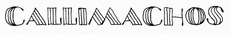 Frank Béla (b. 1978, Orosháza, Hungary) is a graphic design student at Krea Art School in Budapest who uses the pseudonym Fabergraph. Home page. Blog. In 2010, he started out commercially as Faberfonts. Dafont link. Behance link. Klingspor link.
 He created the ink trap font Portrait Of A Lady (2009), FR Irisz (2009, didone family), Pontifex (2009), the hand-printed Munkácsy 1120 (2009), the unicase Reka Sans (2009), the thick-thin Azur (2009), the simple sans Babyface (2009), the medieval sorcery font Elmulas (2009), the Valentine;s Day font Sapet (2009), the avant garde sans family Hopper Sans (2009) and the ultra-fat typeface Rendezvous (2009). Callimachos (2009) is a fun triple-lined hand-printed headline typeface (with a Cyrillic version added in). Azur Title Font (2009) is a hairline slabbed typewriter type. Pasta Simpla (2009, followed by FR Pasta Mono in 2010) is another experimental jewel. Hobbista (2009) mixes symbols and glyphs. FR Rama Nous (2009) is a free modular font. In 2009, he also made Arrow, Enamel Paint Type, Belonging (Roman caps). Commercial fonts made in 2010: FR Unalom, FR Sniccer (stencil), FR Ceruza, FR Minta (a dingbat typeface to make labyrinthine patterns; +Two), FR Tabula (beveled face), FR Smaragdina, FR Mintry One and Two (pattern fonts), and a custom alphabet for Esquire Russia, FR Hopper (monoline sans family). Activity in 2011: A didone-inspired typeface called MFA Dagi that was was commissioned for a catalog of an exhibition at The Museum of Fine Arts (Budapest, Hungary). [Google]
[MyFonts]
[More] ⦿
|
Fatih Selim Aydin
[Selim Aydin Design]
|
[MyFonts]
[More] ⦿
|
Felipe Ibañez
|
Felipe (b. 1984) graduated from Universidad Tecnológica Metropolitana de Santiago de Chile in 2007. For the type design course there, he created Tabon. Tabon is a squarish and almost labyrinthine typeface that was inspired by the textile patterns in the Mapuche culture. Home page. [Google]
[More] ⦿
|
Frank Béla
[Faberfonts]
|
 [MyFonts]
[More] ⦿
[MyFonts]
[More] ⦿
|
Frank Marciuliano
[Marciuliano Design]
|
[MyFonts]
[More] ⦿
|
Gene Buban
|
 Gene Buban (aka geneus1) is the creative and prolific designer at FontStruct in 2008-2009 of these typefaces:
 - Aerologica (2009): 3-d headline face.
- Alphadings: DeTracks.
- Altitudinus (2010).
- Amplifica (+Carved, 2010).
- Arkham Bloodletters (2008).
- bay6
- Bauhaus style: Slink (2009) is a tribute to Josef Albers---one could also call it a piano key font. Codename Bauhaus (2010).
- Arc Brick 1:1 and 2:2 (2010).
- Bevelicious (2009): 3d shadow face.
- Bezziaiare (2010): an imitation of Futura.
- Brikd is a fantastic headline face.
- Bubble Lab EF (2008) and Bubble Lab Bang (2008): dingbat fonts.
- Calligraphique (2010).
- Candella (2013).
- ChequereBoard (2008): a 3d face.
- Christmas fonts: Kallosia Decorative (2009, blackletter), Snowflakes (2009).
- Clone War (2008).
- code2
- Codename Bauhaus (2010).
- Country Fried (Western style)
- Crossfyre (2010).
- Crystles (2014). He writes: In 1983, Atari released the Crystal Castles video game. You play Bentley Bear walking around castles and collecting gems. Trimetric instead of isometric. Interestingly enough, the initials of the highest scorer in the leaderboard is used to build the first castle. This font version is created using the same thin plated tiles that the player traverses through the castles.
- Decorata (stylized art deco)
- Didone fonts: Legality (2009, sharply serifed), Petrissage (2009).
- Digibubble (2014: pixelish face).
- Dingbats: DeTrayne (graffiti-clad trains), Happy Halloween (2009).
- Egalite (2010): a blackletter face.
- Direktype (2014: striped).
- Elektronika (2009) and Circularities (2015). Pixelish.
- ElSeeDee (2008, white on a black grid, inspired by the baggage claim LED scrolling message system at the Oakland Airport)
- Effleurage (2009).
- Eurostijl (2008)
- Exersia, Excursia
- Ferno (hell?)
- Filmstryp (2008)
- Flameon (2008) is a vertically striped athletic lettering font.
- Fluoralei (2008) and Fluoralyte (2008) are all caps floral-themed typefaces.
- Futuro (2008) and Futuro Extra Bold (2008).
- Futurity Watch (2009).
- Fragg (2014: a rounded stencil face).
- Framestore (2008).
- G1 Construx (2012). An arched textured typeface for "under construction" signage.
- G1 Stenzilla (2012). A piano key stencil face. G1 Twyne (2014: Celtic knots), G12 Brayed (2014: Celtic knots), G1 Explo (2014), G1 Fasttrax (2013).
- Gappy and Gappy LC (2010).
- Geolateral
- Glossierre (2009).
- Graffikki (2010): graffiti face.
- Hammerslab (2008) is a very thick heavy slab serif face.
- Happy Halloween (2008): Halloween dingbats.
- HellStruct (2008): flamed letters.
- hollo, holloback, holloblack
- HulkSmash has the look of cracked concrete blocks---has to be seen to be believed!
- HyperLynk (2010).
- Indiglo (2010).
- Interblok Cylindrome (2011) and Interblok Stroke (2009): labyrinthine / Celtic knot / texture typefaces.
- IronManic (2008, letters resemble armor steel plates with bolts)
- IsoMatrix 3D (2009, an Escher deception in 3D), Bevelluzian (2010, 3d beveled checkerboard illusion).
- Jaggs (2010): angular.
- Karuso 68 (2009).
- Leefer is a kitchen tile font.
- Legere (2010, a roman face).
- LegoManiax (2008).
- G1 Lovelines (2016). A multiline typeface with embedded hearts that won an award in the 2016 FontStruct competition on the theme of love.
- Lucid (2009).
- Lush Alienne Caps (2014).
- Microboto (2014).
- Modulus and Modulus Black, ultra fat fonts.
- Motternal (2011), a version of Othmar Motter's Motter Tektura.
- Mucro Bold, a heavy metal band font
- Multiverse Diagonality (2009).
- Nontroppo (2010).
- Outlier (2010).
- Paradoxx (2011). Peignotian.
- Periculum (2010): monoline sans.
- pixsle
- Pixsle (2010).
- Predatoric ad Predatoric2 (2010).
- Prikkle (2010): angular.
- Ray Type Alpha (2014). A game font based on Konami's 1981 game Scramble.
- Renovare S1 (2010) and Renovare S2 (2015). a slab serif.
- Requiemme Decorum (Sept. 14th, 2009): blackletter. He writes: Exactly one year ago two of my cousins, Chris and Cleofe, got into a dealer-loaned Lexus for a trip after their main car was being repaired. Cleofe's husband, a CHP officer, was driving and their teen daughter was along for the ride. While on the freeway, the accelerator became stuck and they lost control of the car. As the runaway vehicle sped up to over 100 mph, all four passengers were killed in a fiery crash in the San Diego River. The loss was unquantifiably devastating. This immensely tragic event led my aunt to testify before congress with damning evidence that would initiate the recall of millions of Toyota vehicles. Requiemme Decorum was created on the way down to southern California for the funeral services. For Chris, Cleofe, Mark, and Mahala, may you all rest in peace and love.
- Renovare (2010, +Renovare S1, S2): a slab serif.
- Roboscript (2008): an upright connected school script.
- Rubrix (2008): a Rubik cube dingbat font.
- Sanserity (2013).
- Scipio (2010).
- Scribble Not (2010) is a texture face.
- Sequencia (2010).
- sedagive
- Seriface and Seriface 2.0 (2010, a roman all-caps set).
- Sharp-serifed almost modern typefaces: Legality, Petrissage, Effleurage, Karuso68.
- Sinaloco (2014: in the style of Sinaloa).
- Sirkles (2015). a dot-matrix typeface.
- Sonorous (2010). Broadway-style art deco typeface.
- Spartan Tech (2010): inspired by the multiplayer game Halo3.
- Stanley Twobrick (pointy minimalist face)
- Startrek typefaces: Transformicon (2009).
- Stencilline (2014).
- Streamlyne (2010, squarish, outlined).
- Structurocca and Structurozza (2009): Horizontally stencilled black typefaces.
- Swizelle (2015). A lava lamp typeface.
- Tangience and Tangience Solid (2008) are fonts in which the glyphs are built up from circles glued together.
- Tetrisyde
- The Pax Man (2009): metallic whatever.
- Trelief and Trelief Rounded (2010): multilined 3d beveled typefaces.
- Tubric (2010): counterless.
- Upriteous and Upriteous Black, condensed protestant fonts.
- Victoriana (Victorian caps)
- Vindicta Dualine (2011: Blackboard bold).
- Wall-F: white squarish letters in black circles
- Waverly, with scary pointed barbs like on German WWI helmets.
- Weaver (Celtic knot-themed letters)
- Xerro (2010): like Helvetica.
- Yeomamuh, a fat look face.
- Wypeout (2010)
- Zorea (2014, inline font).
[Google]
[More] ⦿
|
Gray Ng
|
 Kuala Lumpur, Malaysia-based creator of vector format fonts such as RoundCondensed (2014: piano key style), Hue Font (2014: op-art), Foury (2014: kitchen tile font), Trimental (2014: a 3d typeface), Playful Kid (2014), Maze Font (2014), Roundty Condensed (2012), Shape Guide (2014: a compass-and-ruler font), Veuz Italic (2014: poster font), Reel Love Joining Font (2014).
 In 2015, he made the experimental Prime Font and the paleolithic writing style font Paleo (2015). Behance link. [Google]
[More] ⦿
|
Green Adventure Studio
[Ardi Parwito]
|
Kediri, Indonesia-based designer (b. 1995) of the stencil / neon font Softbox (2019) and the script typeface Samurai (2019). Typefaces from 2020: The Flybirds (a dry brush script), Creatours (script), Astagina Signature, Milli Nathan, Lastnocis (script), Moonday, Shofar (monoline sans), Roasted (a circlar monoline sans), Rush Hour (monoline script), Gallant (a grungy mural font), gaston Villa, Patricia safari, Aletheia (script), Hellena, Hillal (a signature script), Pulang Malam, Mister Child, Zippy, Labirin, Arsenic, Forza (brush), Bottom Scooter, Brontoseno. [Google]
[More] ⦿
|
Happy Island
|
Japanese foundry, also called "Noize of Zappin". Their free Mac and PC fonts, all made in 2002-2003, include 25th-Miseducation, Bit-Boy!---d, Bit-Boy!, Dockin'-Dots-Bold, Dockin'-Dots, Don't-Make-Me-Blue, Go-Right!!---italic, I-wanna-be-a-Happy-Star!, It-is-so-Busy, Laser-Grill, Mozaix-Matrix-reMix---d, Mozaix-Matrix-reMix, Open-----Bind-*advanced---d, Open-<->-Bind-*Advanced, Open-<->-Bind, Piled-Boy,-Stackin'-Girl---d, Piled-Boy,-Stackin'-Girl, Pinch-Up-Bold, Pinch-Up, Shi-No-Bi---d, Shi-No-Bi, TYO-Jimbouchoh, TYO-Kamata, TYO-Kameido, TYO-Kichijohji, TYO-Monzen-nakachoh, TYO-Nishi-Shinjuku, TYO-Shiodome, TYO-Tsukiji, TYO-Udagawachoh, Transforming-Trancer, Vivid-*-Curry---d, Vivid-Curry, Vivid-Stew---d, Vivid-Stew, Wipe-in, Wipe-in, blinkin'-blicks, chill-out---c, chill-out---f, degaussed-pipeline, diecut, trickish-tribute. The Mozaix series is in a kitchen tile style. Most others are pixelized. Update in 2004: TYO-Jimbouchoh (gorgeous oriental simulation font), TYO-Kichijohji, TYO-Kameido, TYO-Kamata (pixel face), TYO-Monzen-nakachoh (labyrinth face), TYO-Nishi-Shinjuku (3d blocky look), TYO-Shiodome (multiline face), TYO-Tokiwa (oriental simulation face), TYO-Tsukiji, TYO-Tokyo (pixel face), TYO-Tokyo---d, TYO-Udagawachoh. [Google]
[More] ⦿
|
Harold Lohner
[Harold's Fonts]
|
 [More] ⦿
|
Harold's Fonts
[Harold Lohner]
|
 Harold Lohner was born in upstate New York in 1958. He received an MFA in printmaking from the University at Albany and is Professor of Visual Arts at Sage College of Albany. He began making fonts in 1997 and starting distributing them the next year through Harold's Fonts. He lives in Albany, NY, with his partner, Al Martino. Originally, most of his typefaces were freeware or shareware, but gradually, he started selling most on his site or via FontBros. His typefaces:
 Link at Dafont. . Abstract Fonts link. [Google]
[More] ⦿
|
Igor Rossi
|
 Designer who used FontStruct in 2008-2010 create these fonts: Dutch (gridded), IR Fritz The Fat, IR Zephyr Light (geometric, IR Kohler (multiline), IR Dotted Condensed, IR Pieces, IR City Blocks, IR-2Stijl-Box, IR-2Stillj-Regular (both are De Stijl fonts, one the negative of the other), IR-Beringer, IR-Blackfolded, IR-Depthorama, IR End of the Line (multiline), IR-Fitzgerald-Heavy-Display, IR-Fountain, IR-HugoTheHuge, IR-Kohler (multiline), IR-Labyrinth, IR-MechanicalChildScript-Regular, IR-Pixel-Condensed, IR-RetroBlocks-Display, IR-Spiral, IR-Stones-Deco, IR-Summer-Drops-Display (extreme contrast and didone balls), IR-UniSans-Heavys, Crouwel's Paper Cuts (kitchen tile), Crouwel's Stedelijk Alphabet (pixel face), IR UniSans Heavy, IR Zephyr Black, IR Zephyr Black, IR Letters and Stripes, IR Summer Games. [Google]
[More] ⦿
Designer who used FontStruct in 2008-2010 create these fonts: Dutch (gridded), IR Fritz The Fat, IR Zephyr Light (geometric, IR Kohler (multiline), IR Dotted Condensed, IR Pieces, IR City Blocks, IR-2Stijl-Box, IR-2Stillj-Regular (both are De Stijl fonts, one the negative of the other), IR-Beringer, IR-Blackfolded, IR-Depthorama, IR End of the Line (multiline), IR-Fitzgerald-Heavy-Display, IR-Fountain, IR-HugoTheHuge, IR-Kohler (multiline), IR-Labyrinth, IR-MechanicalChildScript-Regular, IR-Pixel-Condensed, IR-RetroBlocks-Display, IR-Spiral, IR-Stones-Deco, IR-Summer-Drops-Display (extreme contrast and didone balls), IR-UniSans-Heavys, Crouwel's Paper Cuts (kitchen tile), Crouwel's Stedelijk Alphabet (pixel face), IR UniSans Heavy, IR Zephyr Black, IR Zephyr Black, IR Letters and Stripes, IR Summer Games. [Google]
[More] ⦿
|
Isaac Gonzalez
|
Spanish creator of Karlstad (2014: octagonal typeface), The Hummel Font (2013: squarish, rounded), Reactor Sans (2013, octagonal), Dysfunctional (2013, gridded face), Isaac Script 2 (2013, brush script), Yummy (2013), a (free) squarish outline shadow titling typeface. Odessa (2013) is an octagonal stencil typeface. Error Stencil (2013, known as Artificial Stencil at FontStruct) is a De Stijl typeface pushed to the extreme. It was the basis of Artificial Script (2013) and Artificial Serif (2013). Isaac Gonzalez works as 1saac at FontStruct. His FontStructions from 2011 include the black pixel typeface Minimalist (2011) and the labyrinthine typeface Thessalonica (2011). In 2012, still at FontStruct, he added Redondo (art deco), Pilot V Ball Pen, Dynamic 12, Buzz1, Talk, Eroded Pixel v1, Belica (Regular, Oversized), Odessa (stencil face), Belica Rude (octagonal typeface), Yummy (3d shadow face) and Friendly Rounded 1. [Google]
[More] ⦿
|
Isra Safawi
|
 New Delhi, India-based designer of the square-shaped labyrinthine typeface Carre (2017). She also designed Urdu Drop Caps (2017). [Google]
[More] ⦿
New Delhi, India-based designer of the square-shaped labyrinthine typeface Carre (2017). She also designed Urdu Drop Caps (2017). [Google]
[More] ⦿
|
J. Fürst Gardiner
[Aeolien]
|
[More] ⦿
|
Jay Cobs
|
Jay Cobs (Aix-en-Provence and Marseille, France, b. 1994) created the free typeface Abstract Labyrinth Rounded in 2013. Rockbuchet (2014) is a weird split personality typefaces created as a mixture of Rockwell Bold and Trebuchet MS. His chiseled rock font Rockfire (2015) is free. In 2018, he designed the free blackletter font DreiFraktur that is based on a hexagonal grid. Dafont link. Behance link. Tumblr link. FontStruct link. [Google]
[More] ⦿
|
Jayde Garrow
|
 Buffalo, NY-based creator of the logotype typeface NHL (2013). It includes the logos of all the NHL teams. He also made Warzone Stencil (2020), Get Rekt (2020: grungy), Warzone 99 (2020), Jersey 716 (octagonal, a varsity font), Big Marker (2019), Ancient One (2019: a labyrinthine font), Secret Files (2019), Deadlist (2019: a glitch font), VG Knights (2019), Bills Mafia (2019), Charred Zard (2019: octagonal), Z28 (2019), nWorder (2019: grunge), Pirate Scroll (2019), Dark Knight (2018), Clean Sports (2018), Sharp Core (2015), Bold Killer (2015), 10 Bucks (2014, engraved lettering for money), Jersey Sharp (2014), Blacklisted (2014), Be a Pro (2014), NFL Red Zone (2014), Pirate Ship (2014), Monsterz (2014, a hairy font), Caution (2014), Hard Grunge (2014), Royalty Savior (2014, possibly a tattoo font), Damage Inc (2014, a grungy stencil), Angry Letter (2014), Bold Curse (2014), Sweet Jersey (2014: athletic lettering), Cash Currency (2014: a textured money font), King of the Hill (2014, shadow font), Print Oldyz (2014: a textured typeface), Bob's Burgers (2014), Earth Bound (2014), Grungy (2014), Kill Em All (2014, grunge), LMAO (2014, circle-based font), Dark Ministry (2014), Hard Sports (2014), Rugrats (2014, comic book style), Break It (2013, a glaz krak face), Kenan&Kel (2013, cartoon font), Merrie Melodies (2013, cartoon font), Zany Sharp (2013), American Dad (2013), Wrestle Mania (2013), Survivor Series (2013), Hogan Mania (2013, gothic), Wrist Tat (2013, spurred constructivist), Destroy Humans (2013, grunge), NHL Wild (2013), Bang 4 Ya Buck (2013, grungy stencil), WWE Raw (2013), Army Rust (2013, a grungy military stencil face), Bad Grunge (2013), NHL Bruins (2013), NHL Flames (2013), NHL Ducks (2013), Royal Rumble (2013, stencil face), Write It Right (2013, fat finger typeface), Exp Font (2013, stencil), NHL Sabres (2013), Battleground (2013), Power Rangers (2013), Papa Grape (2013, hand-printed), How Bout That, EZ Sharpz (2013, angular and octagonal), Payback (2013), High Def (2013, sci-fi), Ridiculousness (2013), Rusto (2013, grunge) and We Wrestle (2013, a scratchy typeface).
 Dafont link. Old URL. [Google]
[More] ⦿
|
Jennifer Kinon
[OCD: Original Champions of Design]
|
[More] ⦿
|
John Moore
|
 Born in 1951, John Moore is a Venezuelan type designer. He studied graphic design in the Institute of graphic design Neumann from 1972 until 1976. In 1980 he took a workshop with Milton Glaser and since 1983 he has worked as an art director and creative director in many advertising agencies. He designs type since 1976.
 His typefaces Gordis (a fattish comic book family) and Tepuy won awards at Tipos Latinos 2008 in the non-text and experimental typeface categories, respectively. At Tipos Latinos 2010, he won twice in the display category, for Victorina and Radio Time. His typefaces: (New) Maracay (2013, a large layered Victorian signage family), Fine Art OT (2013, brushy typeface), Roadline Italic (2013, a retro script), JMTF Robin (2013, a layered post-modernist display family), Virgin Script (2013), Radio Time (2013, fat retro signage script), Radio Time Icons (2013), Palaima (2013, an aboriginal style face), Factor (2012, a layered geometric font), Onda (2012, a wavy psychedelic face), Blockee (2012), Aliykit Open (2012, a multiline typeface), VE Inconexa (2006, outline architectural face), VE Makiritare (2006, a double labyrinthine script that is based on symbolisms used by the Makiritare or Yecuana, river people who live in the village of Santa Maria de Erebato in the Venezuelan jungle on the border with Brazil), VE Moho (2006; or simply Moho in 2014), VE Palaima (2006, futuristic, Amazonian), Radio Time (fifties style script, with Alejandro Paul at Sudtipos), Fruta (stencil, influenced by Glaser?), Glaser Stencil Round, Gothike (sharp-edges), Aqua (ultra round), Club, Caracas (sans; +Caracas Pro, 2015; see also Caracas Stencil Pro, 2015), Factor (hookish), Space Lab (futuristic family), Robin (headline), Victorina (multiline Victorian poster typeface which won an award at Tipos Latinos 2010), Victorina Black Shadow (2011), Waterman (2010, a flowing undulating script family), Spacelab (2010, futuristic) and RobinBienalII (2005). Sudtipos sells these fonts of his via MyFonts: Makiritare (bilined, based on woven baskets), Palaima (experimental, runic), Precolombino (petroglyphs), Tepuy (rounded version of Makiritare), Roadline (2009, fifties diner font), Sacred Geo (2011, a geometric dingbat font that won an award at Tipos Latinos 2012), DeCoro (2011, art deco family), Sacred Geo Tiling (2011), Primate (2012, an African look typeface family), Morenita (2012, a connected fifties or school script), Takox (2012), Petroglifos (2012), Xtencil (2012, a rounded stencil influenced by Milton Glaser; followed by Xtencil LC and UC in 2013 and Xtencil Pro in 2015). Typefaces from 2014: Moho Sport Pro (layered athletic lettering typeface family), Scripta Pro and Gothic (40s-style lettering typeface inspired by the style of L.H. Copeland), InkArt Labels, Moho (named after Laszlo Moholy-Nagy), MohoBis Pro (a multilined version of Moho), Moho Condensed, Moho Script, Duvall (named after Edward J. Duvall, who published Modern Sign Painting in the late 1940s; Duvall won an award at Tipos Latinos 2014). In 2015, the Moho series continued with Moho Style. He also made Arthaus (2015, a fantastic Bauhaus font family inspired by Herbert Bayer's universal alphabet), MyCard (a techno type), NeoScript Pro and Hierra (after a font by Dan Solo) in 2015. In 2016, he designed Artime (a sci-fi font), Virtual. Typefaces from 2017: FunFont (cartoon style). Klingspor link. MyFonts link. Behance link. Poster. View John Moore's typefaces. [Google]
[MyFonts]
[More] ⦿
|
Jon Forss
[Non-Format]
|
 [More] ⦿
|
Kevin Seguin
|
FontStructor who created Maze Glyph (2012, labyrinthine) [Google]
[More] ⦿
|
Laura Rozand
|
FontStructor who made the labyrinthine typeface Patatartiner (2016). [Google]
[More] ⦿
|
Leandro Nogueira
[Noinfonts]
|
[More] ⦿
|
Line Creative (or: Line Studio)
[Ari Juanda]
|
 Banda Aceh, Indonesia-based designer, b. 1987, of display typefaces. In 2019, Line Creative released Netron (a futuristic typeface), Gello (a condensed all caps sans for movie credits), Bornco, Chokie, Exon (a minimalist all caps sans), Queen and Laser (a sci-fi typeface).
 Typefaces from 2020: Shibe (a display font inspired by graffiti), Bogen (a techno or sports font), Igoe (squarish and monospaced), Masked Hero (a speed or techno logo font), Black Bison (squarish), Thuner (a chamfered chunky bold typeface), Kumachi (tall and hand-lettered), Silver Crown (an interlocking letter font), Bord (a thorny all caps futuristic display sans), Klone (an all caps vintage industrial slab serif), Kane (a slab serif), Amoba (a sledge hammer slab serif), Boysand, Agron (a decorative sans). Typefaces from 2021: Room Shambles (art deco), Blue Venom (decorative, multiline; for logos), Cyber City, Mexon (a futuristic typeface), Mightyline (a compressed rounded sans characterized by many interlocking pairs), Gumok (a minimalist all caps sans), Choir (a multiline maze-inspired sans), Phyco (caps), Mando (a Western typeface), Chicken Wings (a rounded sans for fast food wrappers), Black Mustang (a blocky poster typeface with constructivist elements), Sinyal (an oblique speed font), Qore (a sci-fi typeface). Typefaces from 2022: Black Home (a bold poster typeface), Shone (a massive chamfered slab serif), Nigo (a rounded blocky display typeface), Trace (sci-fi caps), Minio (squarish and blocky). [Google]
[MyFonts]
[More] ⦿
|
Luis Alberto Vargas Zuñiga
[Zootype Foundry]
|
[More] ⦿
|
M Hilmi Farizqi
|
Bogor, Indonesia-based designer of Maze (2018). [Google]
[More] ⦿
|
Manfred Klein
[TypOasis 2006]
|
 [MyFonts]
[More] ⦿
[MyFonts]
[More] ⦿
|
Manohar Mathiyalagan
|
During his studies in Melbourne, Manohar Mathiyalagan designed the pixel typeface Missing Pixel (2012). He used FontStruct to make the labyrinthine typeface Labrynth (2013). FontStruct link. [Google]
[More] ⦿
|
Manuel Viergutz
[Typographic Design]
|
 [MyFonts]
[More] ⦿
[MyFonts]
[More] ⦿
|
Marciuliano Design
[Frank Marciuliano]
|
 Fonts made by New Yorker Frank Marciuliano: at Linotype, Abstract, Automat (1997), Bordeaux, Breeze (nice), Charleston, Constitution, Isilda (1997), Labyrinth, Mediterraneo (1997), Lindy (very avant-garde). At ITC, ITC Jaft (1996), ITC Jambalaya (1996, party time!), and ITC Schizoid (1997). Finally, from Frank directly: Burst, CurlyWurly, GellyBelly, Display, Goo-Goots, Isilda Italic, Stiletto, JellyBelly and Sprockets.
 FontShop link. Klingspor link. View Frank Marciuliano's typefaces. [Google]
[MyFonts]
[More] ⦿
|
Marit Angenita Otto
|
 Dutch type designer who published the experimental typeface Jazmo in 2012 at URW: Jazmo is an offspring of an assignment I did for a Dutch architect. A classic building and coincidently the place of my studio in my hometown Zwolle, Netherlands, needed to be renovated. My job was to design the house numbers and signs for this building. This building I refer to was built in 1932 and designed according to the New objectivity architecture. Now it accommodates several artist and craftsmen and also houses students. In my design I used elements of the Art Nouveau.
 In 2013, she published Smooth Buggaloo (URW++), a typeface that was inspired by the music of the sixties. Le Rock (2013, URW++) is a bouncy freeform display typeface. Labyrindo (2013, URW++) is inspired by Greek labyrinths. In 2014, Marit published Pipeline (URW++), a gaspipe or paperclip typeface, Filistique (URW++, a flowing informal unconnected script typeface), and Nipon (URW++), a display typeface. In 2015, still at URW++, she created the stylish display typeface Democrazia, the hybrid oriental/Arabic emulation typeface Eurabia, the display typeface family Kosmique, the meccano typeface C-Nation, the squarish stencil typeface Constructa, the squarish revolutionary typeface Picastro (the name is a contraction of Picasso and Castro; not to be confused with Leon Hulst's signage typeface Picastro, made a year earlier), and the display typeface New Daily. Typefaces from 2016: Roundabout (an elliptical sans, URW++), Beyond Babylon (an Arabic simulation typeface, URW++) [Google]
[MyFonts]
[More] ⦿
|
Mattia Inghlieri
|
Milan, Italy-based designer of the free font Maze (2019). [Google]
[More] ⦿
|
McFood
|
FontStructor who created these typefaces in 2012: Tetris (the Gameboy Tetris font), Maze Sanz (labyrinthine), Boxes, Morse Code, Calculator (LED typeface based on the TI-30XIIS calculator), Windows Command Prompt, Bloxxy, Braille, and Binary. Dafont link. [Google]
[More] ⦿
|
Mehmet Reha Tugcu
|
 Mehmet Reha Tugcu (Tugcu Design Company, Istanbul, Turkey) designed these typefaces:
 - In 2020: Calamity (squarish), Blight (a spurred typeface), Kasumi (a rounded all caps sans), Nezuko (a Saul Bass style poster font), Avalon (a glitch font), Anima (a horror font), Belmont (medieval), Starforge (sci-fi).
- In 2019: Bios (octagonal), Magnate (a trilined art deco typeface), Megaton (a great stencil typeface), Polaris (cyber typeface), Quartz (art deco), Visage (an all caps titling sans), Solaire, Cinderheart (a cutout typeface), Osiris (a sci-fi typeface), Pandemic (dry brush), Loki (a comic book font), Coven, Valencia (an art deco font).
- In 2018: Mistlock, Wraith (a super wide sci-fi typeface), Sojourn, Gore (blocky), Grind (grunge), Junkdog, Wisteria (foliated caps), Brigmore, Lash (a free weathered font), Halcyon, Kusanagi (futuristic), Periwinkle, Minerva (art deco).
- In 2017: Vera (a vintage all caps typeface), Odachi (a free rough brush font), Quas, Stargaze (retro-futuristic), Derelict (a macho octagonal typeface), Noatun (hispter sans), Nigma (dry brush), Wisp, Honeysuckle (watercolor brush), Kohm (vintage), Nectar (sans), Emporia (art deco), Drip, Ghoul, Voyager (trekkie font), Heatwave, Njord (a hipster sans), Robinson (a free poster typeface family with various texture styles), Grimtotem (handcrafted).
- In 2016: Ico (multilined, labyrinthine), Nikopol (comic book style), Aoki (rounded sans), Jotunheim (rune emulation typeface), Hikou (sans), Quas, Brigmore (art deco sans), Sumac (hand-painted), Okami (rough brush font), Björn (a sharp-edged Scandinavian sans), Grind (eroded style), Equinox (sans), Bonfire, Covenant (brush font), Cormier (art deco).
- In 2015, he created Beast (brush font), Glaive (inspired by metal rock), Prospekt (a squarish headline typeface family), Primal (a squarish futuristic typeface), Muertos (a cartoon font named after Day of the Dead), Brigand (spurred Western font), Fairwind (rounded all caps sans), Portico (layered multi-style all caps headline sans typeface), Ironclad (art deco), Cred, Muertos, Beast (brush face), Mecha 08 (a free futuristic typeface), Robinson (vintage newspaper titling typeface with many styles such as Regular, Shadow, Press, Rough, Oblique, Distorted, Urban, Corroded, Diagonal, Inline, Outline), Bronco (+Inline), Centauri (futuristic), Omicron (circle-based sans), Hyperion (futuristic), Atone (a brush font), Venge (a fashionable sans), Thiket (an interlocking poster typeface), Phage (a free squarish font), Fenrir, the Soviet propaganda typeface Sputnik, the brush typeface Veritus, the retro-futuristic Dagon, the stencil typeface Ember, the tall condensed typeface Ogre (+Inline), the art deco / avant garde typeface Metropolis, the free display typeface family Geist, the hipster typeface Pandora, the handcrafted typeface Saryn, the techno sans typeface Helios, the stylish art deco typeface Fontaine (+Rough, +3D), free inline typeface Timber, the great inline slab serif typeface Decurion, and the commercial typefaces Solaris (fururistic), Sledge (grungy black sans), Behemoth, Zephyr (sans), and Manticore (brush).
- In 2021: Witch (a Halloween font), Scourge (a grungy rune simulation font), Azurite (a sci-fi font), Monolith.
Behance link. Creative Market link. [Google]
[More] ⦿
|
Mike Wolf
|
 Born in 1960, this German or American designed several 3d typefaces such as Twister (2006, Escher trompe-l'oeuil face), Aragon (2010), Ribbon (2006), Greek To Me (2011, Greek simulation face), Inner City (2011, an Escheresque face), A Ripping Yarn (2011, texture face), Helixx (2006), Strip Joint (2011), Wicker Man (2011), and Atomic Picnic (2006). Other typefaces include Tapestry (2011), Stonehenge (2011, textured), Tape Deck (2011), Bad Escher (2011), Swirl (2011, labyrinthine), and Grounf (sic) Round (2011). [Google]
[More] ⦿
Born in 1960, this German or American designed several 3d typefaces such as Twister (2006, Escher trompe-l'oeuil face), Aragon (2010), Ribbon (2006), Greek To Me (2011, Greek simulation face), Inner City (2011, an Escheresque face), A Ripping Yarn (2011, texture face), Helixx (2006), Strip Joint (2011), Wicker Man (2011), and Atomic Picnic (2006). Other typefaces include Tapestry (2011), Stonehenge (2011, textured), Tape Deck (2011), Bad Escher (2011), Swirl (2011, labyrinthine), and Grounf (sic) Round (2011). [Google]
[More] ⦿
|
minidonut
|
 FontStructor who made Greyscale Road (2014), Tealquoise Ultra (2014), Chess of Clans (2014), Try Again (2014, a gaming pixel font), Plumber's Favorite World (2014), FB Initiatis (2014), iFB Kerblampf (2014, cartoon face), FB Semper (2014), FB Mega Maze (2014), Binary00 (2014), Calculetter (2014), fb Floralis (2014, +Cyrillic), Minisular (2014), Parallelle (2014), Monokube (2014, 3d and pixelish), Kerblam (2014), En Ligne (2014), Gribouillé (2014, textured font), Musician (2014), Aerobat Regular (pixelized art deco face), Blackmono New (2014: pixelized blackletter), Coffee (2014), Nonogram Alpha (2014), Typewritten (2014, grungy pixel face), Typura (2014), Blackmono (2013, pixel face), Stripe (2013), Stream (2013), April Fools (2013), Sideview (2013), Defontstructed (2013), Written Hand (2013), Connect (2013), Bullseye (2013, a labyrithine typeface), 2x7 Steelstone (2013), Script O Flip (2013, white on black pixel script), Fontcity (2013, pixelish dingbats), fs Fusilli (2013), fs Spaghetti (2013, a monopixel font), fs Antistencil (2013), fs Threedee (2013), fs Typewriter (2013), fs Handy 2.0 (2013), fs Fins (2012), Lines and Dots (2012), Chart (2012), Glossy (2012, texture face), Shadows (2012), Digittal (2012, digital clock numerals), Tall (2011, ultra condensed face), Anti Alias (2012), Default Pixel (2011), and a few other pixel typefaces such as Crazy Pixel Extended Extended (2012). [Google]
[More] ⦿
FontStructor who made Greyscale Road (2014), Tealquoise Ultra (2014), Chess of Clans (2014), Try Again (2014, a gaming pixel font), Plumber's Favorite World (2014), FB Initiatis (2014), iFB Kerblampf (2014, cartoon face), FB Semper (2014), FB Mega Maze (2014), Binary00 (2014), Calculetter (2014), fb Floralis (2014, +Cyrillic), Minisular (2014), Parallelle (2014), Monokube (2014, 3d and pixelish), Kerblam (2014), En Ligne (2014), Gribouillé (2014, textured font), Musician (2014), Aerobat Regular (pixelized art deco face), Blackmono New (2014: pixelized blackletter), Coffee (2014), Nonogram Alpha (2014), Typewritten (2014, grungy pixel face), Typura (2014), Blackmono (2013, pixel face), Stripe (2013), Stream (2013), April Fools (2013), Sideview (2013), Defontstructed (2013), Written Hand (2013), Connect (2013), Bullseye (2013, a labyrithine typeface), 2x7 Steelstone (2013), Script O Flip (2013, white on black pixel script), Fontcity (2013, pixelish dingbats), fs Fusilli (2013), fs Spaghetti (2013, a monopixel font), fs Antistencil (2013), fs Threedee (2013), fs Typewriter (2013), fs Handy 2.0 (2013), fs Fins (2012), Lines and Dots (2012), Chart (2012), Glossy (2012, texture face), Shadows (2012), Digittal (2012, digital clock numerals), Tall (2011, ultra condensed face), Anti Alias (2012), Default Pixel (2011), and a few other pixel typefaces such as Crazy Pixel Extended Extended (2012). [Google]
[More] ⦿
|
MMC typengine (was: MMC Typodrome)
[André Themoteo Alves Correa]
|
 André Themoteo Alves Correa (b. 1986, Rio de Janeiro) is a Brazilian type designer who founded MMC Typodrome in 2013 in Rio de Janeiro. Aka Andréground-MMC, he is, in his own words, a sacred geometer, optical illusionist, enthusiast of Gestalt phenomena, artist, designer, typographer, calligrapher, graffiti writer, beginning engraver and aspiring sculptor. MMC was originally a clan of graffiti artists.
 In 2021, he replaced MMC Typodrome by MMC-TypEngine, and reminds us that MMC stands for Multimedia Mastering Creative-Types. Earlier acronyms included Macacos me Mordam and Many Meanings Challenge. His first typeface was the Escher-inspired Penrose Geometric (2013, extended to 22 styles in 2021). In 2015, he published Technical Signature (18 styles: labyrinthine) and Technical Scripture (18 styles). In the labyrinthine genre, this family is close to perfection. In 2020, he released the 22-style MMC Grafik and in 2021 the related MMC Insignia (32 styles). [Google]
[MyFonts]
[More] ⦿
|
Mohammed Abd El Khaliq
|
Giza, Egypt-based designer of the free Latin / Arabic blackboard bold typeface MaxType (2016), the free Maze Font (2016, a multiline Arabic typeface), and the free Arabic dot matrix typeface Dofi (2016). In 2017, he published the free font Arabic Cabo, and in 2018 Mutawazi. Typefaces from 2019: Buroj (free). [Google]
[More] ⦿
|
Multiline fonts: Mike Yanega
|
Mike Yanega has the ultimate listing of multiline fonts. Let me group them for you: - Agfa/Monotype: Zeppelin.
- From the book Homage to the Alphabet: Churchward Metallic (also Italic), Dektiv, Aki Lines, Maxie Lined, Prismania K, Skin & Bones.
- FontBank: Skinny, Legerdemain (Elektrik), Neptune (Neon).
- George Williams: Mirage, Picadilly..
- Elsner + Flake: Pump Triline (+ Initials).
- ParaType: Dublon.
- Blue Vinyl: Macrame Super.
- T26: Kaa, Maxigroove, F-Groove 76, F-Groove 77, F-Groove 78, F-Groove 79, F-Groove 80, F-Groove 81, 21st Outline (+ Italic).
- DustBust: Dreamland, Vectroid Astro.
- Sparky Fonts: Thri.
- ITC: ITC Neon.
- Font-a-licious: Rolloglide, Supreme, Gemini Outline, Gemini 1972.
- Linotype: Labyrinth.
- Churchward Type: Churchward Design Lines.
- Fontlicker Fonts: Phatburner.
- You Work For Them: Trisect.
- DS4.Sale: DS Lane.
- Typotek: La Chaufferie (Basic, Basic Special, Super, Super Special).
- Fontomas: Mass Striped.
- Fenotype: 79 Retro.
- Nick Curtis: Buenos Aires.
- Ray Larabie: Mexcellent, Mexcellent 3D, Soul Mama, Street Cred.
- Red Rooster: Roller.
- C-Font: Crossbar.
- Fenotype: Automania.
- Miguel Hernandez (Atomic Media): Groobit.
- From a Spanish Letraset catalog: Oxford, Michel (by Michel Waxman), Stack, Stripes (1973), Optex (1970), Yagi Link Double (see picture here), Good Vibrations (1973, Trevor Hatchett).
- Axel Pfaender: Excellence (1997).
- Canada Type: Gala (Biline, Triline).
[Google]
[More] ⦿
|
Nexxis
|
Designer at FontStruct in 2009 of Labyrinth (a pixelish face). [Google]
[More] ⦿
|
Nick Curtis
[Art deco typefaces by Nick Curtis: I]
|
 [MyFonts]
[More] ⦿
[MyFonts]
[More] ⦿
|
Nick Curtis
[Nick Curtis: Victorian typefaces]
|
 [MyFonts]
[More] ⦿
[MyFonts]
[More] ⦿
|
Nick Curtis
[Nick Curtis: Typefaces from 2004]
|
[MyFonts]
[More] ⦿
|
Nick Curtis
[Nick Curtis: Typefaces from 2005]
|
 [MyFonts]
[More] ⦿
[MyFonts]
[More] ⦿
|
Nick Curtis
[Nick Curtis: Typefaces from 2006]
|
 [MyFonts]
[More] ⦿
[MyFonts]
[More] ⦿
|
Nick Curtis
[Nick Curtis: Typefaces from 2007]
|
 [MyFonts]
[More] ⦿
[MyFonts]
[More] ⦿
|
Nick Curtis
[Nick Curtis: Typefaces from 2008]
|
[MyFonts]
[More] ⦿
|
Nick Curtis
[Nick Curtis: Typefaces from 2009]
|
 [MyFonts]
[More] ⦿
[MyFonts]
[More] ⦿
|
Nick Curtis
[Nick Curtis: Typefaces from 2010]
|
 [MyFonts]
[More] ⦿
[MyFonts]
[More] ⦿
|
Nick Curtis
[Nick Curtis: Typefaces from 2011]
|
 [MyFonts]
[More] ⦿
[MyFonts]
[More] ⦿
|
Nick Curtis: Typefaces from 2004
[Nick Curtis]
|
 Typefaces made by Nick Curtis from 2004, not listed elsewhere on these pages. Bayern Handschrift, De Rigueur NF, Refugio Rustic WBW, Refugio Refined WBW, Ponte Vecchio NF, Brazzaville NF (based on Congo, a 1910 font by Barnhart Brothers \& Spindler), Moonshine Script NF (a casual connected script patterned after an offering from the 1930s chapbook 60 Alphabets by The Hunt Brothers), West Coast Antics (based on a showing from Carl Holmes' 1950s book, ABC of Lettering), Nanki Poo NF (based on Mikado from the Boston Type Foundry), Picture Postcard NF (a Broadway style typeface based on work by lettering artist Alf Becker), Curly Shuffle NF (described as a mix of Alf Becker's style and Leslie Cabarga's), Hardy Har Har NF (based on Samoa from BB&S, 1900), Krazy Kracks NF (based on the so-called California style of lettering used extensively in travel posters of the 30s to the 50s. This version is based on its interpretation by Carl Holmes in a Walter T. Foster artbook entitled ABC of Lettering), Whoa Nelly NF (a comic book face--based on Dan X. Solo's Funhouse), Bushwacked, Cressida (triline face), New Boston (far West typeface of the "italian" kind), Rumble Seat, Kartoon Kutz 3&4 NF, Magic Twanger NF, Snoodle Toons NF, Beanie Kopter NF, Delysian NF (based on Greeting card from the 1923 catalog of BB&S), Mazurka NF (based on Swagger Capitals and Gothic Novelty title from the 1923 catalog of BB&S), Jungle Holiday Cuts NF (based on holiday ornaments by Carl S. Junge, 1929), Stone Soup NF (based on lettering for a 1925 Buster Keaton movie), Tintern Abbey NF (based on the lettering for a 1905 poster for the Austrian National Highway by artist Gustav Jahn), Period Borders NF, Parsnip and Parsnip Outline (Will Ransom designed the exemplar for this series for Barnhart Brothers&Spindler in the early 1900s---the typeface was originally named Parsons (1918), after the advertising director of a Chicago department store), Wurstwagen (suggested by a poster for beer, designed by German artist Ludwig Hohlwein around 1920), Jackson Park NF (1920s style), Kenosha Antique NF (from the 1903 Racine typeface of Barnhart Brothers&Spindler), Catty Wumpas (based on lettering of Ross F. George). [Google]
[MyFonts]
[More] ⦿
Typefaces made by Nick Curtis from 2004, not listed elsewhere on these pages. Bayern Handschrift, De Rigueur NF, Refugio Rustic WBW, Refugio Refined WBW, Ponte Vecchio NF, Brazzaville NF (based on Congo, a 1910 font by Barnhart Brothers \& Spindler), Moonshine Script NF (a casual connected script patterned after an offering from the 1930s chapbook 60 Alphabets by The Hunt Brothers), West Coast Antics (based on a showing from Carl Holmes' 1950s book, ABC of Lettering), Nanki Poo NF (based on Mikado from the Boston Type Foundry), Picture Postcard NF (a Broadway style typeface based on work by lettering artist Alf Becker), Curly Shuffle NF (described as a mix of Alf Becker's style and Leslie Cabarga's), Hardy Har Har NF (based on Samoa from BB&S, 1900), Krazy Kracks NF (based on the so-called California style of lettering used extensively in travel posters of the 30s to the 50s. This version is based on its interpretation by Carl Holmes in a Walter T. Foster artbook entitled ABC of Lettering), Whoa Nelly NF (a comic book face--based on Dan X. Solo's Funhouse), Bushwacked, Cressida (triline face), New Boston (far West typeface of the "italian" kind), Rumble Seat, Kartoon Kutz 3&4 NF, Magic Twanger NF, Snoodle Toons NF, Beanie Kopter NF, Delysian NF (based on Greeting card from the 1923 catalog of BB&S), Mazurka NF (based on Swagger Capitals and Gothic Novelty title from the 1923 catalog of BB&S), Jungle Holiday Cuts NF (based on holiday ornaments by Carl S. Junge, 1929), Stone Soup NF (based on lettering for a 1925 Buster Keaton movie), Tintern Abbey NF (based on the lettering for a 1905 poster for the Austrian National Highway by artist Gustav Jahn), Period Borders NF, Parsnip and Parsnip Outline (Will Ransom designed the exemplar for this series for Barnhart Brothers&Spindler in the early 1900s---the typeface was originally named Parsons (1918), after the advertising director of a Chicago department store), Wurstwagen (suggested by a poster for beer, designed by German artist Ludwig Hohlwein around 1920), Jackson Park NF (1920s style), Kenosha Antique NF (from the 1903 Racine typeface of Barnhart Brothers&Spindler), Catty Wumpas (based on lettering of Ross F. George). [Google]
[MyFonts]
[More] ⦿
|
Nick Curtis: Typefaces from 2005
[Nick Curtis]
|
 Typefaces made by Nick Curtis from 2005, not listed elsewhere on these pages. Chantilly Lace NF (2005: uppercase letters by Bergling and lowercase letters by Roland W. Paul), Edda MorganaNF (medieval English), Gnarly Dude NF (rough script based on material of Ross F. George), Whirled Peas NF (based on a typeface called Whitestone Scrawl by Dan X. Solo in his "Showcard Alphabets"), Cool Cat Jim NF (based on a 1953 headline by Jim Flora in Park East Magazine), Sulphur Springs WBW (bone font), Grand Rapids (based on a typeface named Archer from the 1905 specimen book from Barnhart Brothers&Spindler), Hasta La Pasta (designed after a typeface from a pre-1900 specimen book from the Central Type Foundry of St. Louis, called Spiral), La Coupole (based on lettering on a 1927 menu by prominent poster artists Razzia), Shadowlands (this is like Wilcox Initials from the 1992 Solotype Catalog), Possum Saltare NF (a Trajan column style caps face), Pismo Clambake NF (a connected formal script typeface after a Richard Gans handwriting typeface from 1933, Gloria), Ransom Clearcut NF (an extension of Will Ransom's 1920s caps-only typeface Clearcut Shaded Caps for BBS), Almost Heaven (sold in the early 1900s as Perfection), Goodbye Crewel World (stitching font), Jimbatz NF (dingbats inspired by album cover artist Jim Flora), Bad Dookie NF (from The Advertising Cartoon Clip Art Book, 1971), Maple Leaf Rag NF (revival of Nova Bold by Continental Typefounders), Surely You Jest NF (called Arbor in the 1890's type specimen catalog from Farmer, Little&Co), Merry Old Soul NF (a display typeface discovered in one of the many books on sign writing produced by Eric Matthews), Funky Tut NF (205; the caps are based on J.M. Bergling's Morocco (1914), and the lower cases on Bergling's Kermaic Text (1914)), Groove Thang NF (based on a font called Dado), Novadam Obese (geometric black modern typeface based on a logotype by the same name of Joan Trochut Blanchard, ca. 1940s), Smackeroo NF (2005, engraved US dollar-bill style typeface based on Steelplate, a monocase typeface from ca. 1900 by Barnhart Brothers&Spindler), Snooty Fox NF (an elegant typeface found in Pen&Brush Lettering and Practical Alphabets, Blandford Press, Ltd., London, 1929), Chez Nous (based on Card Italic from a 1930s Mergenthaler Linotype Company specimen book), Slapdash Deco NF (2005, based on a showcard alphabet presented by Cecil Wade in his Manual of Lettering), Rockin Roman NF (from Blandford Press' Pen&Brush Lettering and Practical Alphabets), Kunstgewerbe NF (artsy typeface after work by J.M. Bergling, 1914), Details Details NF (a geometric design from Pen and Brush Lettering and Practical Alphabets), Escondido NF (inspired by an Austrian travel poster designed by Johann Süssenbek in the 1930s), Ballyhaunis NF (based on Celtic lettering by Laurence Schall, early 1900s), Inglenook Corner NF (based on art nouveau lettering by Laurence Schall, early 1900s), Mohair Sam NF (caps based on letters of Samuel Welo, and lower case based on ATF's Romany Script), Partenkirchen NF (a Basque style display face), Helena Handbasket NF (after Antique Light, found in the 1888 edition of the James Conner & Sons United States Type Foundry specimen book), Kudos Kaps NF (2006: five nice ornamental caps and associated alphabet and border sets, including a Lombardic set, an engraved set; they are based on typefaces from Ludwig&Mayer). [Google]
[MyFonts]
[More] ⦿
Typefaces made by Nick Curtis from 2005, not listed elsewhere on these pages. Chantilly Lace NF (2005: uppercase letters by Bergling and lowercase letters by Roland W. Paul), Edda MorganaNF (medieval English), Gnarly Dude NF (rough script based on material of Ross F. George), Whirled Peas NF (based on a typeface called Whitestone Scrawl by Dan X. Solo in his "Showcard Alphabets"), Cool Cat Jim NF (based on a 1953 headline by Jim Flora in Park East Magazine), Sulphur Springs WBW (bone font), Grand Rapids (based on a typeface named Archer from the 1905 specimen book from Barnhart Brothers&Spindler), Hasta La Pasta (designed after a typeface from a pre-1900 specimen book from the Central Type Foundry of St. Louis, called Spiral), La Coupole (based on lettering on a 1927 menu by prominent poster artists Razzia), Shadowlands (this is like Wilcox Initials from the 1992 Solotype Catalog), Possum Saltare NF (a Trajan column style caps face), Pismo Clambake NF (a connected formal script typeface after a Richard Gans handwriting typeface from 1933, Gloria), Ransom Clearcut NF (an extension of Will Ransom's 1920s caps-only typeface Clearcut Shaded Caps for BBS), Almost Heaven (sold in the early 1900s as Perfection), Goodbye Crewel World (stitching font), Jimbatz NF (dingbats inspired by album cover artist Jim Flora), Bad Dookie NF (from The Advertising Cartoon Clip Art Book, 1971), Maple Leaf Rag NF (revival of Nova Bold by Continental Typefounders), Surely You Jest NF (called Arbor in the 1890's type specimen catalog from Farmer, Little&Co), Merry Old Soul NF (a display typeface discovered in one of the many books on sign writing produced by Eric Matthews), Funky Tut NF (205; the caps are based on J.M. Bergling's Morocco (1914), and the lower cases on Bergling's Kermaic Text (1914)), Groove Thang NF (based on a font called Dado), Novadam Obese (geometric black modern typeface based on a logotype by the same name of Joan Trochut Blanchard, ca. 1940s), Smackeroo NF (2005, engraved US dollar-bill style typeface based on Steelplate, a monocase typeface from ca. 1900 by Barnhart Brothers&Spindler), Snooty Fox NF (an elegant typeface found in Pen&Brush Lettering and Practical Alphabets, Blandford Press, Ltd., London, 1929), Chez Nous (based on Card Italic from a 1930s Mergenthaler Linotype Company specimen book), Slapdash Deco NF (2005, based on a showcard alphabet presented by Cecil Wade in his Manual of Lettering), Rockin Roman NF (from Blandford Press' Pen&Brush Lettering and Practical Alphabets), Kunstgewerbe NF (artsy typeface after work by J.M. Bergling, 1914), Details Details NF (a geometric design from Pen and Brush Lettering and Practical Alphabets), Escondido NF (inspired by an Austrian travel poster designed by Johann Süssenbek in the 1930s), Ballyhaunis NF (based on Celtic lettering by Laurence Schall, early 1900s), Inglenook Corner NF (based on art nouveau lettering by Laurence Schall, early 1900s), Mohair Sam NF (caps based on letters of Samuel Welo, and lower case based on ATF's Romany Script), Partenkirchen NF (a Basque style display face), Helena Handbasket NF (after Antique Light, found in the 1888 edition of the James Conner & Sons United States Type Foundry specimen book), Kudos Kaps NF (2006: five nice ornamental caps and associated alphabet and border sets, including a Lombardic set, an engraved set; they are based on typefaces from Ludwig&Mayer). [Google]
[MyFonts]
[More] ⦿
|
Nick Curtis: Typefaces from 2006
[Nick Curtis]
|
 Typefaces made by Nick Curtis from 2006, not listed elsewhere on these pages: Magic Lantern NF, Duly Noted NF (after an ATF typeface from 1912 called Freeahand), Got That Bling NF (a connected script based on the work of Al Mack, from his Lettering: Brush&Pen in the Single Stroke), Haarlem Nights NF (based on a 1920 Dutch poster for Public Placement Services by Johan Dijsktra), Architectuur NF (based on De Stijl type lettering by H. Th. Wijdeveld, 1925), Gandy Dancer NF (a revival of Tabard, ca. 1912, ATF), Pomfrit Dandy NF (based on Frys Ornamented No. 2 by Stephenson Blake), Smith Premier (Clean and Schmutzy) NF (a typewriter pair after the letters of the Smith Premier No. 3), ed Hot Mama NF (2006), Jumbo Mumbo NF (a revival of Independant done in 1930 by Collette and Dufour), Union Telegraph NF (2006), Major Production NF (which was followed in 2009 by Major Pro Extras NF), Teeny Boppin NF (gleaned from Schrifti Alphabeti, a book of Cyrillic alphabets published in Kiev in 1979), Rutin Tutin NF (based on Wild West lettering found in Schrifti Alphabeti, 1979), Jampact NF (2006, an ultra fat headline face), Beagle Boyz NF (a bouncy typeface based on a Cyrillic alphabet presented in the book Schrifti Alphabeti, 1979), Midtown Tessie NF and Downtown Tessie NF (mosaic tile typefaces), Scary Scrimshaw (based on a 1968 poster for a Doors concert), Speedball No1, Speedball No2 SW (2001), Speedball No3 (2001), Bellagio NF (an interpretation of Robert Wiebking's 1917 font Advertisers Gothic, designed for BB&S), High Society NF (2006, a fashion mag typeface based on an alphabet found in Lettering for the Commercial Artist by Blandford Press, 1946), Osiyo Dohitsu NF (based on letterforms in the Cherokee Syllabary, reputedly devised by Sequoyah in the early nineteenth century; it has petroglyphs as well), Micro Manager NF (pixel face), Paper Caper NF (2006), Shady Grove (a condensed version of Thorne Shaded), American Pi NF (2006: ATF ornaments from the catalogs between 1913-1934, including some designed by Will Bradley, Frederic Goudy and George Trenholm), The Donald NF (a hyper-curly decorative face), Boo Meringue NF (a Halloween font based on Lithotint (1897, ATF)), Lesser Arcana (a mystical type), Zyklop NF (2006), Deux Chasses NF (based on ATF's Thermotype), Bon Mot NF (based on Barnhart Brothers&Spindler's Engravers Upright Script), Munchkin Land NF (based on a work called Thor, issued by Frederic Wesselhoeft Ltd of London in the 1930s), Didgeree Doodle NF (2006, a curly cursive originally released as Bernhard Heavy Antique Cursive by the Bauersche Giesserei by Lucien Bernhard), Kudo Kaps One, Two, Three and Four NF (a total of eight classical initial caps typefaces), Crane Titling NF (medieval-inspired uppercase letters drawn by famed book illustrator Walter Crane with charming, if somewhat quirky, lowercase letters by J. W. Weekes), DecimoSexto NF (+italic) (includes Spanish Roman letters and Griffo style italics, both hand-drawn by Francisco Lucas in Madrid, 1577), Visillo Adornado (a caps typeface based on the typeface Vesta, originally designed by Albert Auspurg for H. Berthold AG, Berlin in 1926), Edsel Font, Deco Dingbats. [Google]
[MyFonts]
[More] ⦿
Typefaces made by Nick Curtis from 2006, not listed elsewhere on these pages: Magic Lantern NF, Duly Noted NF (after an ATF typeface from 1912 called Freeahand), Got That Bling NF (a connected script based on the work of Al Mack, from his Lettering: Brush&Pen in the Single Stroke), Haarlem Nights NF (based on a 1920 Dutch poster for Public Placement Services by Johan Dijsktra), Architectuur NF (based on De Stijl type lettering by H. Th. Wijdeveld, 1925), Gandy Dancer NF (a revival of Tabard, ca. 1912, ATF), Pomfrit Dandy NF (based on Frys Ornamented No. 2 by Stephenson Blake), Smith Premier (Clean and Schmutzy) NF (a typewriter pair after the letters of the Smith Premier No. 3), ed Hot Mama NF (2006), Jumbo Mumbo NF (a revival of Independant done in 1930 by Collette and Dufour), Union Telegraph NF (2006), Major Production NF (which was followed in 2009 by Major Pro Extras NF), Teeny Boppin NF (gleaned from Schrifti Alphabeti, a book of Cyrillic alphabets published in Kiev in 1979), Rutin Tutin NF (based on Wild West lettering found in Schrifti Alphabeti, 1979), Jampact NF (2006, an ultra fat headline face), Beagle Boyz NF (a bouncy typeface based on a Cyrillic alphabet presented in the book Schrifti Alphabeti, 1979), Midtown Tessie NF and Downtown Tessie NF (mosaic tile typefaces), Scary Scrimshaw (based on a 1968 poster for a Doors concert), Speedball No1, Speedball No2 SW (2001), Speedball No3 (2001), Bellagio NF (an interpretation of Robert Wiebking's 1917 font Advertisers Gothic, designed for BB&S), High Society NF (2006, a fashion mag typeface based on an alphabet found in Lettering for the Commercial Artist by Blandford Press, 1946), Osiyo Dohitsu NF (based on letterforms in the Cherokee Syllabary, reputedly devised by Sequoyah in the early nineteenth century; it has petroglyphs as well), Micro Manager NF (pixel face), Paper Caper NF (2006), Shady Grove (a condensed version of Thorne Shaded), American Pi NF (2006: ATF ornaments from the catalogs between 1913-1934, including some designed by Will Bradley, Frederic Goudy and George Trenholm), The Donald NF (a hyper-curly decorative face), Boo Meringue NF (a Halloween font based on Lithotint (1897, ATF)), Lesser Arcana (a mystical type), Zyklop NF (2006), Deux Chasses NF (based on ATF's Thermotype), Bon Mot NF (based on Barnhart Brothers&Spindler's Engravers Upright Script), Munchkin Land NF (based on a work called Thor, issued by Frederic Wesselhoeft Ltd of London in the 1930s), Didgeree Doodle NF (2006, a curly cursive originally released as Bernhard Heavy Antique Cursive by the Bauersche Giesserei by Lucien Bernhard), Kudo Kaps One, Two, Three and Four NF (a total of eight classical initial caps typefaces), Crane Titling NF (medieval-inspired uppercase letters drawn by famed book illustrator Walter Crane with charming, if somewhat quirky, lowercase letters by J. W. Weekes), DecimoSexto NF (+italic) (includes Spanish Roman letters and Griffo style italics, both hand-drawn by Francisco Lucas in Madrid, 1577), Visillo Adornado (a caps typeface based on the typeface Vesta, originally designed by Albert Auspurg for H. Berthold AG, Berlin in 1926), Edsel Font, Deco Dingbats. [Google]
[MyFonts]
[More] ⦿
|
Nick Curtis: Typefaces from 2007
[Nick Curtis]
|
 Typefaces made by Nick Curtis from 2007, not listed elsewhere on these pages: Dundee Castle NF (based on lettering by Harvey Hopkins Dunn, 1930), Sheik Of Araby NF (2007), Aethelred NF (a unicase typeface, with alternate characters in several of the lowercase positions, is patterned after Mosaik, designed by Martin Kausche for Schriftgiesserei Stempel in 1954; Sultan (2005, Canada Type) is also based on Mosaik). Cerulean NF (a sans based on Lining Gothic No. 71 (BBS and ATF, 1907)), Rimshot NF (script), Jaunty Gent NF (based on the upright connected script Forelle, aka Rheingold Kräftig, by Erich Mollowitz in 1936-1937 for the Hamburg foundry of J. D. Tennert&Sohn), Baby Cakes NF (a bubblegum face based on a 1974 release by Karlgeorg Hoefer at the Ludwig&Mayer foundry called Big Band), Amper Sans NF (after Hobby, a script designed in 1956 by Werner Rebhuhn for Schriftgießerei Genzsch&Heyse), Wacky Duck NF (2007), By George Titling NF (inspired by silent movie lettering), Dinky Rink NF (partially based on Steile Futura), Fuller Brush NF (a bouncy signage script from The New Lone Pine ABC of Showcard and Ticketwriting by Australian author C. Milnes), Tiddly Winks NF (2007), Iraan (a stars and stripes typeface based on the ATF typeface Rodeo), Haut Relief (a 3d typeface based on a 1960s typeface called Sculpture), Fiddle Sticks (based on West Banjo (Dave West, 1960s)), Djibouti (an African theme font modeled after African Queen (Dave West, 1960s), Wacky Duck NF (2007), Turing Car NF (2007, a monospaced typeface based on a lineprinter font from the 1960s, the Unisys 0776), Route 66 NF (based on the typefaces used on U.S. Highway signs from the 1930s to the 1950s), Anna Nicole NF (2007, based on the upright semiscript Mirabelle (1926, Wagner&Schmidt); Nick Curtis: Round, firm and fully-packed, it is sure to get attention anywhere it is used.), Keynote Speaker NF (an awkward blocky typeface patterned after Bloomsbury (1920s, P. M. Shanks&Sons)), Twitty Bird NF (2007, an architectural drawing font based on Dan X. Solo's Conway), Balder Dash NF (the caps are based on Breda-Gotisch (1928, H. Berthold AG) and the lowercase on Goudy Text)), Outer Loop NF (2007), Tutti Paffuti NF (after Stymie Black Flair by Dave West for Photolettering), Weedy Beasties NF (after a variation of Seymour Chwast's Blimp), Bully Pulpit NF (2007), Keepon Truckin NF (a 3d typeface based on Milton Glaser's Baby Fat). In the 1970s, Vincent Pacella made a Photolettering Egyptian headline typeface called Blackjack, which was digitized in 2007 by Nick Curtis as Flap Jacks NF. ITC Jeepers and Woodley Park (based on Naudin) won awards at the TDC2 Type Directors Club's Type Design Competition 2002. Artone (Seymour Chwast, 1968) was revived as Loose Caboose NF (2007). Edwin Sisty's upright curly semiscript Belcanto (1970s, Photolettering) was revived in 2007 by Nick Curtis as Glissando NF. F.W. Kleukens' Kleukens Antiqua (1910) was digitized by Nick as Kleukens Antiqua NF (2007). Holo Fernes NF (2007) is based on Christian Heinrich Kleukens' Judith Type (1923), a hookish hell-inspired face. Pudgy Puss (2007) is an ultra-fat modern display type based on Fat Face (Herb Lubalin, Tom Carnase). Omaha Bazoo (2007) is patterned after Viola Flare, issued by Franklin Photolettering in the 1970s. Lateral Incised NF (2007) is an engraved old style typeface originally released in 1929 as Gravure by the London foundry of C. W. Shortt. Tall Scrawl NF (2007) is an original Curtis hand-printed font. Alfred Riedel's Domino (Ludwig&Mayer, 1954) was revived as Idle Fancy NF (2007). Boxcar Willie NF (2007) is a quaint curly face. [Google]
[MyFonts]
[More] ⦿
Typefaces made by Nick Curtis from 2007, not listed elsewhere on these pages: Dundee Castle NF (based on lettering by Harvey Hopkins Dunn, 1930), Sheik Of Araby NF (2007), Aethelred NF (a unicase typeface, with alternate characters in several of the lowercase positions, is patterned after Mosaik, designed by Martin Kausche for Schriftgiesserei Stempel in 1954; Sultan (2005, Canada Type) is also based on Mosaik). Cerulean NF (a sans based on Lining Gothic No. 71 (BBS and ATF, 1907)), Rimshot NF (script), Jaunty Gent NF (based on the upright connected script Forelle, aka Rheingold Kräftig, by Erich Mollowitz in 1936-1937 for the Hamburg foundry of J. D. Tennert&Sohn), Baby Cakes NF (a bubblegum face based on a 1974 release by Karlgeorg Hoefer at the Ludwig&Mayer foundry called Big Band), Amper Sans NF (after Hobby, a script designed in 1956 by Werner Rebhuhn for Schriftgießerei Genzsch&Heyse), Wacky Duck NF (2007), By George Titling NF (inspired by silent movie lettering), Dinky Rink NF (partially based on Steile Futura), Fuller Brush NF (a bouncy signage script from The New Lone Pine ABC of Showcard and Ticketwriting by Australian author C. Milnes), Tiddly Winks NF (2007), Iraan (a stars and stripes typeface based on the ATF typeface Rodeo), Haut Relief (a 3d typeface based on a 1960s typeface called Sculpture), Fiddle Sticks (based on West Banjo (Dave West, 1960s)), Djibouti (an African theme font modeled after African Queen (Dave West, 1960s), Wacky Duck NF (2007), Turing Car NF (2007, a monospaced typeface based on a lineprinter font from the 1960s, the Unisys 0776), Route 66 NF (based on the typefaces used on U.S. Highway signs from the 1930s to the 1950s), Anna Nicole NF (2007, based on the upright semiscript Mirabelle (1926, Wagner&Schmidt); Nick Curtis: Round, firm and fully-packed, it is sure to get attention anywhere it is used.), Keynote Speaker NF (an awkward blocky typeface patterned after Bloomsbury (1920s, P. M. Shanks&Sons)), Twitty Bird NF (2007, an architectural drawing font based on Dan X. Solo's Conway), Balder Dash NF (the caps are based on Breda-Gotisch (1928, H. Berthold AG) and the lowercase on Goudy Text)), Outer Loop NF (2007), Tutti Paffuti NF (after Stymie Black Flair by Dave West for Photolettering), Weedy Beasties NF (after a variation of Seymour Chwast's Blimp), Bully Pulpit NF (2007), Keepon Truckin NF (a 3d typeface based on Milton Glaser's Baby Fat). In the 1970s, Vincent Pacella made a Photolettering Egyptian headline typeface called Blackjack, which was digitized in 2007 by Nick Curtis as Flap Jacks NF. ITC Jeepers and Woodley Park (based on Naudin) won awards at the TDC2 Type Directors Club's Type Design Competition 2002. Artone (Seymour Chwast, 1968) was revived as Loose Caboose NF (2007). Edwin Sisty's upright curly semiscript Belcanto (1970s, Photolettering) was revived in 2007 by Nick Curtis as Glissando NF. F.W. Kleukens' Kleukens Antiqua (1910) was digitized by Nick as Kleukens Antiqua NF (2007). Holo Fernes NF (2007) is based on Christian Heinrich Kleukens' Judith Type (1923), a hookish hell-inspired face. Pudgy Puss (2007) is an ultra-fat modern display type based on Fat Face (Herb Lubalin, Tom Carnase). Omaha Bazoo (2007) is patterned after Viola Flare, issued by Franklin Photolettering in the 1970s. Lateral Incised NF (2007) is an engraved old style typeface originally released in 1929 as Gravure by the London foundry of C. W. Shortt. Tall Scrawl NF (2007) is an original Curtis hand-printed font. Alfred Riedel's Domino (Ludwig&Mayer, 1954) was revived as Idle Fancy NF (2007). Boxcar Willie NF (2007) is a quaint curly face. [Google]
[MyFonts]
[More] ⦿
|
Nick Curtis: Typefaces from 2008
[Nick Curtis]
|
Typefaces made by Nick Curtis from 2008, not listed elsewhere on these pages: Dave West's Nickelodeon was revived by Curtis as Lily Hilo NF (2008). Funky Rundkopf NF (2008) is an adaptation of an LED simulation font of Ray Larabie, called Dignity of Labour. Daffadowndilly NF (2007-2008) is based on art work by Alf Becker from the 1940s. Babes In Toyland NF (2008) has some of the Rennie Mackintosh charm and is based on "Sheet music for Babes in Toyland, USA, 1903". Anagram Shadow NF (2008) is based on handlettering from a 1928 poster for a steamship line by renowned British artist Austin Cooper. Kandinsky NF (2008) is based on shapes found on Kandinsky's painting Succession (1935). An experimental typeface by Jeremy Pettis, illustrating the concept of kangaroo, inspired Pal Joey NF (2008). One of René Knip's experiments, a unicase typeface with an Arabic feel, was digitized by Nick Curtis as Turban Hey NF (2008). Calamity Jane (2008) is a stylish Edwardian script based on a 1930s logotype for the Theatre Moderne in Paris. Orion Radio NF (2008) is a 1930s style display typeface on an African theme. Quinceanera NF (2008) is a a new take on an old dry-transfer standard from the 70s named Barrio. Jobber Wacky NF (2008) is a bouncy handlettering font based on designs of Alan Denney found on greeting cards in the 1950s and 1960s. Franciscan Caps (2008) is based on a 1932 typeface by Frederic Goudy called Franciscan. Morning Glory (2008) is a simple display typeface that goes back to the Cleveland Type Foundry, 1893. Tickety Boo (2008) is a take on Goudy Fancy (or: Goudy Black Elongated Swash). Yo Quiero Taquitos uses letters taken from Rotalución Decorativa (Barcelona, 1940s), Disco 79 (2008, multiline), Eclectic Crumpany (2008, multiline monocase neon or paperclip typeface based on The Electric Company TV Show), Fire Down Below (2008, block gothic), Joufflou NF (2008, very fat), Bala Cynwyd NF (2001) is an Arts&Crafts style poster typeface inspired by lettering of Dard Hunter. Csiszarz Latein NF (2008) recreates an old typeface (ca. 1910) of J.V. Csiszarz. Owah Tagu Siam NF (2008) is a faux Thai font. Langoustine Rouge NF (2008) is based on Dan Solo's Sorbonne. Cecil Wade again provided inspiration for Bloc Party NF (2008). My Little Eye NF (2008) is an elegant piano key font. Roundabout NF (2008) is rounded octagonal. Neubank NF (2008) is Nick Curtis's take on Bank Gothic. Warp Three NF (2008) is a Bank Gothic-style family with an uppercase as in Agency Gothic (1932-1933, Morris Fuller Benton) and a lowercase from Square Gothic (1888, James Conner). [Google]
[MyFonts]
[More] ⦿
|
Nick Curtis: Typefaces from 2009
[Nick Curtis]
|
 Typefaces made by Nick Curtis from 2009, not listed elsewhere on these pages: Society Page NF (semi-script based on Morris Fuller Benton's Announcement, 1916), Glyphix One NF (dingbats), Glyphix Two NF (dingbats), Velveteen Round NF (based on Vellvé's only font, 1971), Steno Stout NF (the venerable Underwood Victoria typewriter on steroids), Diosa Rubia NF (condensed headline face), Mono Amono NF (octagonal), Turista Flaca NF (based on Baltimore Type Foundry's Tourist Extra Condensed), Boop Boop NF (based on handlettering found on Hallmark Studio Cards of the 1950s), Samosata NF (based on Bernhard Gothic), Waddem Choo NF (based on Tschichold's Transito from 1931), Jane Plain NF (architectural blueprint style), Hacky Sack NF (a zany typeface based on Ross F. George's Stunt Roman), Free Holeys NF (after the 1972 Letraset font Beans by Dieter Zembsch), Kingstown NF (semiscript), Kudos Kaps NF (2006: five nice ornamental caps and associated alphabet and border sets, including a Lombardic set, an engraved set; they are based on typefaces from Ludwig&Mayer), Melvin Eustace NF (handlettered), Weekly Bazaar NF (based on Harpers by the Central Type Foundry), Really Big Shoe NF (after a Cleveland Type Foundry typeface called Oxford), Bellwether Antique NF (after a 1913 typeface by Georg Belwe), Garmisch Rund NF (inspired by Rundgotisch, Emil Rudolf Weiss, 1937), Whitefriars NF (based on a font from the Blackfriars Type Foundry in London), Society Page NF (a curly serif typeface based on Morris Fuller Benton's Announcement Roman, designed for American Type Founders in 1917), USA Resolute NF (a unicase headline typeface based on Morris Fuller Benton's Eagle, ATF, 1934), Saturday Morning Toast (2001, based on the logotype font of the Saturday Evening Post from the 1920s), Examiner NF (based on Dwiggins' Metro from the 1930s). Hans Lijklema's Free Font Index has a CD which contains AirstreamNF-Italic, CalamityJaneNF-Bold, CalamityJaneNF, DaddyLonglegsNF, HamburgerHeavenNF, HeavyTrippNF, HutSutRalstonNF (2001), OrionRadioNF, ParkLaneNF, PhattPhreddyNF, RhumbaScriptNF (a silent movie font), Riot Squad NF (2000, after Otto Heim). [Google]
[MyFonts]
[More] ⦿
Typefaces made by Nick Curtis from 2009, not listed elsewhere on these pages: Society Page NF (semi-script based on Morris Fuller Benton's Announcement, 1916), Glyphix One NF (dingbats), Glyphix Two NF (dingbats), Velveteen Round NF (based on Vellvé's only font, 1971), Steno Stout NF (the venerable Underwood Victoria typewriter on steroids), Diosa Rubia NF (condensed headline face), Mono Amono NF (octagonal), Turista Flaca NF (based on Baltimore Type Foundry's Tourist Extra Condensed), Boop Boop NF (based on handlettering found on Hallmark Studio Cards of the 1950s), Samosata NF (based on Bernhard Gothic), Waddem Choo NF (based on Tschichold's Transito from 1931), Jane Plain NF (architectural blueprint style), Hacky Sack NF (a zany typeface based on Ross F. George's Stunt Roman), Free Holeys NF (after the 1972 Letraset font Beans by Dieter Zembsch), Kingstown NF (semiscript), Kudos Kaps NF (2006: five nice ornamental caps and associated alphabet and border sets, including a Lombardic set, an engraved set; they are based on typefaces from Ludwig&Mayer), Melvin Eustace NF (handlettered), Weekly Bazaar NF (based on Harpers by the Central Type Foundry), Really Big Shoe NF (after a Cleveland Type Foundry typeface called Oxford), Bellwether Antique NF (after a 1913 typeface by Georg Belwe), Garmisch Rund NF (inspired by Rundgotisch, Emil Rudolf Weiss, 1937), Whitefriars NF (based on a font from the Blackfriars Type Foundry in London), Society Page NF (a curly serif typeface based on Morris Fuller Benton's Announcement Roman, designed for American Type Founders in 1917), USA Resolute NF (a unicase headline typeface based on Morris Fuller Benton's Eagle, ATF, 1934), Saturday Morning Toast (2001, based on the logotype font of the Saturday Evening Post from the 1920s), Examiner NF (based on Dwiggins' Metro from the 1930s). Hans Lijklema's Free Font Index has a CD which contains AirstreamNF-Italic, CalamityJaneNF-Bold, CalamityJaneNF, DaddyLonglegsNF, HamburgerHeavenNF, HeavyTrippNF, HutSutRalstonNF (2001), OrionRadioNF, ParkLaneNF, PhattPhreddyNF, RhumbaScriptNF (a silent movie font), Riot Squad NF (2000, after Otto Heim). [Google]
[MyFonts]
[More] ⦿
|
Nick Curtis: Typefaces from 2010
[Nick Curtis]
|
 Typefaces made by Nick Curtis from 2010, not listed elsewhere on these pages.
 Typefaces made in 2010: Conners Corners NF (2010: gleaned from the 1888 specimen books of James Conner's Sons United States Type Foundry), Tumbling Dice NF and Banner Year NF (both were done after scroll typefaces featured in the 1869 MacKellar Smiths and Jordan specimen book), Standing Room Only NF (after Broadway, designed by Morris Fuller Benton for ATF in 1928, originally named Broadway Poster), Proud Mary NF (a plump typeface based on Joseph Churchward's Marianna), Slapsie Maxi NF (based on a Carl Holmes alphabet found in Holmes's ABC of Lettering), Umbriago NF (trying to do a Cooper Black Swash Italic), Picaro NF (based on Harlequin), Palo Pinto NF (based on Pacella Vega Extended 10, a 1960s typeface by Vincent Pacella), Cartella NF (a 3d beveled shadow typeface based on a Morris Fuller Benton 1934 offering for American Type Founders called Poster Gothic), Pracht Antiqua NF (a faithful rendering of the cuddly headline script typeface Pracht Antiqua Schmallfett, which was designed by Carl Pracht for the Norddeutsche Schriftgießerei in 1942), Gitfiddler NF (a futuristic oblique typeface based on the lettering on a package of Gibson guitar strings from the 1950s), Seta Reta NF (after Walter Diethelm's 1965 VGC typeface Arrow), Kleukens Kursiv NF (after Kleukens Scriptura, 1926 by F.W. Kleukens), Kallilu NF (a display face, after George Piscitelle's VGC typeface Thomac from the 1960s), Occidental Tourist NF (an avant-garde sans inspired by Dave West's Futura Casual), Schelter Grotesk NF (after Schelter's Breite Grotesk, 1886), Vuvuzela NF (a casual, almost sign-painted, and nearly African display face), Block Party NF (2008, a 3d face), Cromwell NF (a faithful digitization of Cromwell, 1913, Morris Fuller Benton, ATF), Liguria NF (2010, after a typeface found in a Nebiolo specimen book, ca. 1900), Pony Express NF (2010, after Palmer and Rey's Courier from 1885), Linndale Square NF (a beefed up version of Geometric, 1885, Cleveland Type Foundry---a typewriter style face), Binghamton NF was inspired by the wedge-serifed angular typeface Bingham (Vincent Patella, PLINC). Albert Kapr designed Faust in 1959, so Nick's derived sans typeface is called Kaprice NF. Double D NF (2010, +Fill, +Outline) is a 3d beveled typeface based on Dave Davison's Dimensional from the 1970s. Old Softy NF (2010) is a rounded typeface based on Round Gothic (Keystone Type Foundry, 1884 catalog). [Google]
[MyFonts]
[More] ⦿
|
Nick Curtis: Typefaces from 2011
[Nick Curtis]
|
 Typefaces made by Nick Curtis from 2011, not listed elsewhere on these pages: Jersey City NF (modeled after Times Gothic (1905, ATF)), Petty Despot NF (2011, also modeled after Times Gothic, and possibly renamed from Jersey City NF after Berthold---yes, the same Berthold again---complained about the name Jersey since one of its fonts by Gustav Jaeger was named Jersey. This is my educated guess..., and two thumbs up to Nick for picking the appropriate name Petty Despot NF). Olde Megrat NF is patterned after Antikva Margaret, designed by Zoltán Nagy for VGC in the mid-60s. Herkimer Bunrab NF is an upright scriptish typeface with bunnyears that is based on Hercules (1926, Amsterdam Type foundry). Blackbarry NF (2011) is a faithful revival of Deutsch Black (1966, Barry Deutsch, VGC), a unicase piano key typeface. Bindlestiff NF (2011), which won the 2011 Devroye Memorial Medal for funniest typeface name, revives Schmallfette Binder Style (1959, Joseph Binder, Stempel AG), a squarish tightly set headline face. Decked Out NF (2011) is a fat inline typeface modeled on Dektiv in Homage to the Alphabet. Bazoo Tow NF (2011) is a fun fattish headline typeface that is a faithful reroduction of Basuto (1927, Stanley Baxter for Stephenson Blake). Are You Shaw NF (2011) is an all-caps blackboard bold typeface inspired by Pygmalion, a typeface found in Homage to the Aplhabet. Hoodoo U NF (2011) is a roly-poly romp through the alphabet, based on Jürgen Riebling's irrepressible Mr. Big from the 1970s. Big, bold, bubbly and a little brash, it's a natural choice for happy headlines. The handlettered Mikeys Roman NF (2011) has an uppercase based on the work of Mike Stevens, and a lowercase based on the work of Alf Becker. Outgribe NF (2011) is a rough, raw typeface that is based on the lettering in Ben Shahn's iconic poster protesting the execution of Nicolo Sacco and Bartolomeo Vanzetti in 1927. Nellie Kay NF (2011) is a monoline script face, based on an example by Ross F. George. Shaq Attack NF (2011) is a wooden plank style or brushy typeface inspired by an alphabet of Alf R. Becker. Relampago NF (2011) revives Hans Möhring's bilined typeface Elegante Lichte (1928). Squirrely Shirley NF (2011) is a bouncy typeface based on Phoenix (unknown creator) in Schriftatlas. Spread Out NF (2011) is modeled after Ross F. George's Split Caps. Salzburger Plakat NF (2011) is based on an Austrian winter sports festival poster from 1907 by Swiss poster designer Otto Baumberger (1889-1961). Rightly So NF (2011) is a squarish typeface based on Geometric Gothic (1884, Palmer and Rey)---it is hard to imagine that this almost pixelish style was around at that epoch. Kenotaph NF (2011) is a condensed headline slab serif modeled after Stymie Obelisk (1930s, Morris Fuller Benton). Vasari NF (2011) is based on Ancient Gothic (1891, William W. Jackson, Keystone Type Foundry). Moslem (Boston Type Foundry) was revived as Suffiya NF (2011). Looky Cookie NF (2011) has eyes placed on the glyphs. Iago NF (2011) is a powerful headline sans inspired by two ATF typefaces from the 1880s, Othello and ATF Black Caps. Big Bag NF (2011) is called an industrial-strength titling face by Nick Curtis---it has design elements of Hans Eduard Meier's Syntax Antiqua. Highpoint Gothic NF (after Morris Fuller Benton's 1932-1935 typeface Raleigh Gothic Condensed). Fernburner NF is an all caps shadow face, modeled after Hans Bohn's 1929 typeface Orplid. Planscribe NF is based on types used by the Leroy Automatic Lettering Machine, a tool for architects. [Google]
[MyFonts]
[More] ⦿
Typefaces made by Nick Curtis from 2011, not listed elsewhere on these pages: Jersey City NF (modeled after Times Gothic (1905, ATF)), Petty Despot NF (2011, also modeled after Times Gothic, and possibly renamed from Jersey City NF after Berthold---yes, the same Berthold again---complained about the name Jersey since one of its fonts by Gustav Jaeger was named Jersey. This is my educated guess..., and two thumbs up to Nick for picking the appropriate name Petty Despot NF). Olde Megrat NF is patterned after Antikva Margaret, designed by Zoltán Nagy for VGC in the mid-60s. Herkimer Bunrab NF is an upright scriptish typeface with bunnyears that is based on Hercules (1926, Amsterdam Type foundry). Blackbarry NF (2011) is a faithful revival of Deutsch Black (1966, Barry Deutsch, VGC), a unicase piano key typeface. Bindlestiff NF (2011), which won the 2011 Devroye Memorial Medal for funniest typeface name, revives Schmallfette Binder Style (1959, Joseph Binder, Stempel AG), a squarish tightly set headline face. Decked Out NF (2011) is a fat inline typeface modeled on Dektiv in Homage to the Alphabet. Bazoo Tow NF (2011) is a fun fattish headline typeface that is a faithful reroduction of Basuto (1927, Stanley Baxter for Stephenson Blake). Are You Shaw NF (2011) is an all-caps blackboard bold typeface inspired by Pygmalion, a typeface found in Homage to the Aplhabet. Hoodoo U NF (2011) is a roly-poly romp through the alphabet, based on Jürgen Riebling's irrepressible Mr. Big from the 1970s. Big, bold, bubbly and a little brash, it's a natural choice for happy headlines. The handlettered Mikeys Roman NF (2011) has an uppercase based on the work of Mike Stevens, and a lowercase based on the work of Alf Becker. Outgribe NF (2011) is a rough, raw typeface that is based on the lettering in Ben Shahn's iconic poster protesting the execution of Nicolo Sacco and Bartolomeo Vanzetti in 1927. Nellie Kay NF (2011) is a monoline script face, based on an example by Ross F. George. Shaq Attack NF (2011) is a wooden plank style or brushy typeface inspired by an alphabet of Alf R. Becker. Relampago NF (2011) revives Hans Möhring's bilined typeface Elegante Lichte (1928). Squirrely Shirley NF (2011) is a bouncy typeface based on Phoenix (unknown creator) in Schriftatlas. Spread Out NF (2011) is modeled after Ross F. George's Split Caps. Salzburger Plakat NF (2011) is based on an Austrian winter sports festival poster from 1907 by Swiss poster designer Otto Baumberger (1889-1961). Rightly So NF (2011) is a squarish typeface based on Geometric Gothic (1884, Palmer and Rey)---it is hard to imagine that this almost pixelish style was around at that epoch. Kenotaph NF (2011) is a condensed headline slab serif modeled after Stymie Obelisk (1930s, Morris Fuller Benton). Vasari NF (2011) is based on Ancient Gothic (1891, William W. Jackson, Keystone Type Foundry). Moslem (Boston Type Foundry) was revived as Suffiya NF (2011). Looky Cookie NF (2011) has eyes placed on the glyphs. Iago NF (2011) is a powerful headline sans inspired by two ATF typefaces from the 1880s, Othello and ATF Black Caps. Big Bag NF (2011) is called an industrial-strength titling face by Nick Curtis---it has design elements of Hans Eduard Meier's Syntax Antiqua. Highpoint Gothic NF (after Morris Fuller Benton's 1932-1935 typeface Raleigh Gothic Condensed). Fernburner NF is an all caps shadow face, modeled after Hans Bohn's 1929 typeface Orplid. Planscribe NF is based on types used by the Leroy Automatic Lettering Machine, a tool for architects. [Google]
[MyFonts]
[More] ⦿
|
Nick Curtis: Victorian typefaces
[Nick Curtis]
|
It is difficult to precisely define a Victorian typeface. They range from the ridiculously ornate typefaces from 1850-1870 to awkwardly balanced display typefaces and the pre-art nouveau trends. Nick Curtis's revivals in this genre are listed below. - Alto Rey NF (2014). A revival of a Victorian typeface issued by the Palmer and Rey Type Foundry of San Francisco in 1884.
- AnagramShadowNF. A free font. Commercial version in 2008. Anagram Shadow NF is based on handlettering from a 1928 poster for a steamship line by renowned British artist Austin Cooper.
- Angler NF (2014). After Anglo, which appears in the Barnhart Brothers and Spindler catalog of 1895.
- Beantown Bounce NF (2007) revives Century, an ornamental display typeface from the 1898 catalog of the Boston Type Foundry.
- Brownwood NF (2011). The inspiration for this semi-Victorian semi-art nouveau typeface came from a 1906 travel poster, promoting the Hotel Braunwald, located in the Swiss Alps.
- Cinnci Card Ornaments NF (2014) is a collection of design elements used in logotypes and calling cards from the Victorian era.
- Cleveland Litho NF (2007), a curly Victorian face, appeared in the 1898 specimen book of the Cleveland Type Foundry, under the name of Litho, while Yum Yum NF (1898) appeared in Cleveland's 1893 specimen book as Mikado.
- DoctorJekyllNF. A free font.
- Durham Abbey NF (2005). Based on a Victorian era font called Romanesque, which can be found in the Dan X. Solo collection.
- Dury Lane (2007) is based on a Victorian era release by Blake Type Foundry called Blackfriars.
- FancyPantsNF. A free font.
- Federlyn NF (2010) and Federlyn Initials NF (2011). Based on the Edwardian-era Artcraft by Robert Wiebking.
- Filibuster NF (2007). This curly über-Victorian typeface is based on Congress, an ornamental typeface found in H. C. Hansen Type Foundry's catalog of 1909.
- GingerPeachyNF. A free font.
- Great Sage NF (2010). That ugly duckling Victorian typeface Karnac (1888, ATF) [not to be confused with the Egyptian typeface Karnak by R.H. Middleton] led Nick Curtis to Great Sage NF.
- Habana Sweets NF (2012). Based on Cuban (1873, Richard & Miller).
- HardlyWorthit. A free font.
- HornswoggledNF. A free font.
- HutSutRalstonNF (2001). Based on a 1915 example in a Speedball Pen book.
- LabyrinthCapital, Labyrinth (1999, 2007). A free font family based on this poster.
- Londonderry Air NF (2002-2004) is based on Canterbury Old Style, a typeface designed by Morris Fuller Benton in 1920-1926 at ATF.
- MarchMadnessNF (2003). A free font. Inspired by lettering from a 1920s Italian poster by legendary postermeister Marcello Dudovich.
- MetropolisNF. A free font. Based on this movie poster from 1927 by Hungarian Josef Bottlik.
- Millrich Reading NF (2010). A Victorian typeface that revives a 1918 Miller&Richard face. Millrich Olivian NF (2014) revives Olivian.
- Nickelodeon NF (1999). A free font. This is sometimes compared with silent movie fonts.
- Nickley Normal (1997). A free font based on arts and crafts lettering by William Joseph Dard Hunter.
- Oaken Bucket NF (2009).
- Oh You Klid NF (2009). Based on a Victorian typeface by Central Type Foundry called Euclid (1880s).
- Palmer Oxonian NF (2011). Based on Oxford (Palmer&Rey, 1884).
- PasticheCapital, Pastiche. A free font.
- PayzantPenNF (2001). A free font, with a commercial version in 2010. Payzant Pen NF is based on Frank H. Atkinson's A Show at Sho-Cards: Comprehensive, Complete, Concise, published in 1918, executed with the then-state-of-the-art Payzant Reservoir Pen.
- Plus de Vagues NF (2006). Based on a curly semi-Victorian alphabet by Stephenson Blake called Recherché.
- Putney Junction NF (2007). Based on a BBS typeface called Design, ca. 1900.
- RhumbaScriptNF. A free font. Based on Tango Kursiv (1913, Ernst Deutsch), it is often compared with silent movie fonts.
- Shady Lady NF (2005). An ornamental shaded caps typeface called Umbra in the 1907 Barnhart Brothers&Spindler type specimen catalog.
- ShangriLaNF, ShangriLaNFSmallCaps (2002). A free font family. The commercial version was done in 2008. Based on a Victorian alphabet from the 1922 chapbook Modern Show Card Writing, by Joseph Bertram Jowitt.
- Sil Vous Plait NF (2009). A Victorian text typeface based on a 1917 font by Morris Fuller Benton called Invitation.
- SouciSans (1999). A free font. Based on a type design by Sam Welo shown in Lettering Modern and Foreign (1930).
- Speedball No1, Speedball No2 SW (2001), Speedball No3 (2001). SpeedballNo1NF-Bold, SpeedballNo1NF, SpeedballNo2NF-Bold, SpeedballNo2NF, SpeedballNo2SW, SpeedballNo3, SpeedballNo3NF-Bold, SpeedballNo3NF. This series is based in part on alphabets by Samuel Welo.
- Storybook Initials NF (2014).
- Streamers NF (2005). A Victorian-era typeface called Fillet revived.
- Tanglewood Tales (2000). A free font.
- Vidalia Sunshine NF (2007). An extension of the 1888 all caps typeface Ornamented No. 5 from MacKellar, Smiths&Jordan.
- Vintage Panels NF (2011): Victorian panels.
- VlaanderenChiseledNF, VlaanderenRoundNF, VlaanderenSquareNF. A free font family. These are based on an untitled work by Dutch designer André Vlaanderen from 1928. These are ugly ducklings because they mix various inconsistent styles without much thought.
[Google]
[MyFonts]
[More] ⦿
|
Niki Z. MacRae
|
Student at the University of Western England in 2011. Creator of the labyrinthine typeface Broken Record (2011, FontStruct). [Google]
[More] ⦿
|
Noah Ross
|
 Californian FontStructor (aka winty5, b. 2002) who made these typefaces in 2012: 5Stenserif, 5Stencipix, 5GeoZtenzil, 5GeoSolid, 5 Quadrislash (kitchen tile face), 5 Micropix, 5Reverserif, 5Curvo, Shadow, Circlex (kitchen tile face), Quadrupus, Dissolvis, Rossian Alphabet, Fatty, Payperklipz, Roboto Sans and Roboto Serif, Krakk, Arkadeland (pixel face), Pew Pew Pew, Kalium Sans, Tini, Hexa, Pyramis, Doodley, Maaschine, Hexor, Digitus, Quark, Blobbie, W5's Remix, Laser Cannon, Poke, Razorblade, Titanium and Titanium II (blocky monospaced stencil).
 Typefaces from 2013: 5Zanin, 5Tintin, Chyldren, 5 Goldminer (Western font), 5 Circuit Board, 5 Mikrothin (pixelish), 5 Crayoned, 5Blockletter, 5 Mikropix, 5 Computron, 5 Letterblack, 5 Singlebrik, 5 Kitty, 5 Mikrodotz, 5 Didgit (+Solid, +Stencil), 5 Microchip, 5 Hexpix, 5 Band (ultra-condensed), 5 Futurex, 5 Zero, 5 Pixwriter, 5 Caveman, 5 Ultramini, 5 Foundation, 5 Structonix, 5 Stenserif, 5 Psycho (labyrinthine), 5 Med Grids, Skribal, 5 Carnival (Western, slab serif), Undersea, Jester, 5 Winter Sans, 5 Zlash, 5 Darius, 5 Drop That Bass, 5 Computerized (LED face), 5 Kallum Sans Neue (octagonal), 5 Final Frontier, 5 Muta Sans, 5 Med Grid, 5 Dagger Unicase, 5 Threezy, 5 Curvo, 5 Railway Script (upright connected script), 5 Champagne, 13/5 Atom Sans, S Tekknosystem (techno), 5 Maach, 5 Dotmatrix 1979, 5 Skware cat Scratch Fever, 5 Pixdeath, 5 Metrik (octagonal), Droido, Skribble Black, Kindergarten, 5 Recieptprint (pixel face), 5 Monopix (pixel face), 5 Contrastio, 5 Beans, 5 Beans II, 5 Geomedings, 5 Fatal Error, 5 Identification Mono, 5 Megabam, 5 Futurebit, 5 Space Station, 5 Computers in Love. Typefaces from 2014: 5 Kreeper, Mad Pixels, 5 Zonex, Robot Killer, Roman New Times (grunge), Devastation. Dafont link. Another Dafont link as Noah the Awesome. Aka Winter Design Studio. [Google]
[More] ⦿
|
Noinfonts
[Leandro Nogueira]
|
Noinfonts is the foundry of Brazilian type designer and teacher Leandro Nogueira, who is based in Sao Paulo. He studied graphic design at UNESP Baura from 1996-2001. Leandro designed these fonts: - Nabirinto, a labyrinthine experimental typeface.
- Merlim, a vernacular gothic typeface.
- Broto.
- Bzorro, a tattoo font.
- Cavinette, a condensed hand-printed typeface.
- Nadaco, a techno / signage typeface.
- Nasfaia.
- Natelle, a bubblegum typeface.
- Neurostyle (+Condensed).
- Nilarab, an Arabic simulation typeface.
- Noin and Noin Minus, a hyper-experimental sci-fi pair of typefaces.
- No Playground.
- Naskov (Cyrillic simulation face).
- Nuneline.
- Nelitza, a sci-fi typeface.
- Newold, a rounded monoline sans.
- Nix and its swashy version, Nixoton.
- Nongalilei.
- Nother.
- Nuglube.
[Google]
[More] ⦿
|
Non-Format
[Jon Forss]
|
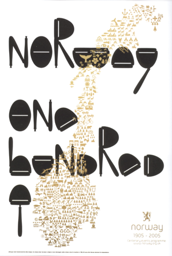 Ekhornforrss Limited / Non-Format is an Anglo-Scandinavian creative direction and design team. Creative directors and founding partners Kjell Ekhorn (from Norway) and Jon Forss (from the UK) started the company in 2000. In their own words: They work on a range of projects including art direction, design and illustration for arts&culture, music industry and fashion and advertising clients. They also art direct Varoom: the journal of illustration and made images. Nominated for Best Design Team in Music Week's Creative and Design Awards 2001. Non-Format is based in London, UK and Minneapolis, USA. In 2006, Kjell Ekhorn and Jon Forss designed a poster for the Royal Norwegian Embassy in London, which won an award at TDC 27. Their work has been published here: The Anatomy of Design, Adobe Magazine, Archive, Brain, Campaign, CD-Art, Communication Arts, Creative Review, D&AD Annual 2005, The Creator Studio, Design Week, Dos Logos, DVD-Art, Etapes, Eye Magazine, 55 Degrees North, Grafik, Graphic, Idea, IdN, It's A Matter Of Packaging, The Layout Look Book, Limited Edition, Mag-Art, Maximalism, Music Week, New Typographic Design, North by North, 1000 Type Treatments, Print, Printed Matter, Romantik, Sampler 2&3, Serialize, Sonic, Tokyo TDC Volume 17&18, Type-One, Type Specific, Typographics 4&5, Typography 27, Typography Workbook.
 Typefaces by them include Heroine (2008), a titling typeface created for Very Elle Magazine, and Otto (2009, their first commercial family). Gridiron (2013-2014) is a custom typeface family commissioned by ESPN magazine for their 2013 College Football Preview issue. Three versions of the Gridiron typeface were developed for different applications: The lightest weight, Quarterback, is used for headlines. The two bolder weights are Fullback and the more intricately structured Touchdown. These three styles cover the entire spectrum from athletic lettering to labyrinthine extravaganza. The hipster typeface Coleman Air (2015) is a special version of their Nomi typeface, created for Coleman's Japanese catalogue of outdoor gear. In 2017, for SModa Magazine, they designed the summa cum laude partly curvy typeface Sølve. Klingspor link. Behance link. [Google]
[More] ⦿
|
OCD: Original Champions of Design
[Jennifer Kinon]
|
 Branding and design agency in New York City. Subpage for the free labyrinthine typeface Free (2013) that won an award at TDC 2014. Free was co-designed by Matt Kay, Jennifer Kinon and Bobby C. Martin.
 Times Premier (for The New York Times) is a masthead blackletter done by Jennifer Kinon, Bobby C. Martin Jr, Matt Kay, Jonathan Lee and Michael McCaughley based on lettering by Matthew Carter. For the Museum of African Art, Jesse Ragan created the Afri Sans typeface family. In 2018, they created the custom branding and logo typeface Dartmouth Ruzicka for Dartmouth University, based on type on a bicentennial seal and plaque designed by Rudolph Ruzicka, a typeface designer who retired in Hanover, NH. [Google]
[More] ⦿
|
Olga Ryabinkina
|
Kursk, Russia-based designer of the 3d outline typeface Leshy (2003, with Fedor Saveliev at Paratype) and the labyrinthine font Labrus (2016). Klingspor link. Behance link. [Google]
[MyFonts]
[More] ⦿
|
Oporto Design
[Alexandre Venancio]
|
Sao Paulo-based design studio. MyFonts link. Its designer is Alexander Venancio, who graduated in Industrial Design from the Faculdade de Belas Artes de Sao Paulo. Creator of Speaking Corporate (2011, office and business dingbats), Maze (2009, multiline typeface), Landmark (2009), Thaitype (2009, Thai simulation typeface made with Felippe Duque), Ale's Script (2009, comic book script), Capa (2009, hairline art deco typeface done with Felippe Duque and Cristiano Vinciprova), and Oporto (2009). Indice (2009) is another hairline uber-geometric face. Typefaces from 2012: Bolha (counterless ultra-fat face). Biteme (2011, organic and minimal) was co-designed by Guilherme Rizzatti, Makoto Saito and Alexandre Venancio. Home page. [Google]
[MyFonts]
[More] ⦿
|
Oskar Lübeck
[Bold]
|
[More] ⦿
|
Paloma Goulart
|
Rio de Janeiro-based designer of the labyrinth-of-Minotaur-inspired typeface Dubta (2015). [Google]
[More] ⦿
|
Patrick Seymour
|
 Super-talented Montreal-based illustrator and digital artist. Home page. He created several modular typefaces in 2011.
 In 2012, he created Muse, Gotham Streets (a prismatic typeface), Slinky, Stencil, Tulipe (counterless), Bad Billy (multilined, art deco), The Great Carnival (beveled caps), Web Font (prismatic), Jump Jump Font (octagonal), Fashion (a horizontally striped typeface), OK (prismatic), The Aviator (horizontally striped poster face), La Bonne Aventure (prismatic and slightly art deco), the rope-themed typeface Noeud Marin, the shaded boat name typeface Bleu Marine, the multiline caps typeface Origami, the moustache-inspired caps typeface Mous Type (ornamental moustache-shaped capitals), the multilined display typeface Empire, the hand-drawn Une Typo Faite A La Main, and the prismatic typeface Anabelypster. After a bout of salmonella, he created Intestino, still in 2012. In Motion (2012) is an awesome prismatic art deco typeface. Images of his stunning work from 2011: i, ii, ii, iv, v, vi, vii, viii, ix, x. His Cathédrale project (2011) starts from a squarish face and transforms it gradually into one that contains the features of a cathedral. Creations in 2013: Shapes (geometric font), Gold Deco, Dentelle, Twist, Sleek (a thin slab serif), Say Say Say (multiline, prismatic, hypnotic), Metrick (a gridded typeface), Film Noir (an overlay type system), Tam Tam, Diner (a striped all caps typeface), Spot Light Font (prismatic), Flora, Bright Diamond, Incandescent, XVII (multilined display face), Konga (a multiline script), Shiny Diamond, Splash (paint font), Chicago (prismatic neon tube face), Taxi (a wonderful multiline typeface), Papale (religious symbology alphabet made to mock the papal system), Empreinte (pure op-art), Broken Arrow Font (multiline caps face), Liquid Paper Font, Sunset (prismatic), Boogie (Broadway-style art deco family), New Art Deco (prismatic art deco face), Poule de Luxe, Burnout (a prismatic typeface), Marble Maze Font, M Gagnon (ornamental caps influenced by the design work of Denis Gagnon). FontStruct fonts: Test3 (2012), Jump Jump 2 (2012). Typefaces made in 2014: Moiré, Decora, Magnetic, Noise (TV noise emulation), Yes (multilined font), Broderie (braided letters), SAS (multilined), Full House, Heart Font (prismatic), 1976 (inspired by the 1976 Olympic Games in Montreal), Gold (prismatic art deco typeface), Lace, Bike. Typefaces from 2015: Detour, Allie X, Grad Font, Duct Tape, Mint Julep (bilined art deco beauty), Hourglass, Stuntman (prismatic), La Dame de Coeur (playing card font), Fog. Typefaces from 2016: Road Free (a free prismatic font), Solitaire (card font), Joliette, Denis (named after Montreal's mayor, Denis Coderre), Montreal (a prismatic typeface based on the logo of the city of Montreal), Cherry Cola Font, Bro & Co (multilined art deco beauty), Macramee (multilined). Typefaces from 2017: The Simple Font (sans), Le Cabinet (multilined neo deco). Typefaces from 2018: Atrium (a sublime multiline art deco beauty), Pride (a color font to support the LGBT community). Typefaces from 2019: Columbarium (a beveled typeface), The Invisible Font, The Usual Font, Recettes d'Ici (handcrafted style for menu design), Vinyl (multiline), Gasoline (a gasoline spill textured font), Reflet, Mint Soda (a fashion mag extravaganza), Glamarrr (a sailor or pirate font). Typefaces from 2020: Siren (a wonderful mermaid-themed initial caps font, half Engravers MT and half mermaid), Homa (decorative caps), Luna (blocky caps), Chicken Bone, Happier (an all caps 3d color font), Dollara (a polygonal typeface), Stay Home, Mundo Disko (prismatic). Typefaces from 2021: Deliria, The National Bank Open font (created for a tennis tournament). Behance link. Hellofont link (for buying his fonts). Typefaces from 2022: Trumpets (deco caps). [Google]
[More] ⦿
|
ppplern
|
FontStructor who made the labyrinthine typeface Maze PPP (2013). [Google]
[More] ⦿
|
Putra Cetol Studio
[Putra Novembria Candra Kusuma]
|
 Karanganyar, Indonesia-based designer, b. 1989, of these typefaces in 2018:
 - Oriental simulation fonts: Japanese Emperor (2022: emulating Japanese).
- The spurred typeface Darkrise.
- The circus font The Circus Show.
- The futuristic typeface Digitechno.
- The curly script typeface Valentijn.
- The monoline poster typeface Revalate.
- The monoline cursive script typefaces Simplyline, Cinta Cantik, Antiqueline, The Beautyline, Aiushtya, Skywave, Simbok Pudjie and Yesie.
- The vintage typeface Nuri.
- The retro signage script typeface Vintage Party.
- The tall octagonal typeface Armor.
- The display typefaces Ratigk, Deco Tech, Horstail and Murai.
- Playlines.
- The tiki font Tikiland.
- The script typefaces Jofi, Beauty Love, Bigfun, and Rhonde (a free swashy calligraphic typeface).
- The upright scripts Shathika, Sweetyhearts and Shaquilla.
- The brush typefacesAuthorfun and Pax Suyud.
- The weathered condensed Therlalu.
- The color fonts Garis Lengkung and Circuitra.
- The textured typeface Quiltrix.
- The poster typeface Audrey.
Typefaces from 2019, mainly calligraphic except if specified otherwise: Attaira (art deco and script), Arshaka (a great vampire blackletter font), Honey Berry, Vanetta, Safiar (font duo), Havina, Eurolite (a modular sans), Florita (font duo), Silky Candy, Ultimate Slayer (brush), Zahiya (a ronde), Networld (a mesh font), Stranger Creature, Amella, Grimscy, Visaka (a tall spurred wedge serif), Micayla, Rougher (brush), Slatter, Rygid (a straightened script), Mixy Missy (an oily script), Qunky (a formal script), Marceila (upright script), Glamoury (calligraphic), Thicxer, Madhen (script), Secret Darling, Keshia, Mahaputra (a spurred swashy Victorian typeface), Busther (brush style), Sherley, Shanela, Rotters (script), Sweety Lovers (script), Aliyah, Laureta, Tashia, Smash Wall (a glaz krak typeface), Delacruz (techno), Elvino (techno), Crava (a vintage display typeface), Bornena (curly script), Vintage Queens (for vintage signage), Kanaya, Yuanita, Daysha, Thickline, Maze Line (labyrinthine), The Doctor (a signature font), West Kingdom (fat signage script), Pixel Bit, Barstrip, Arjunka, Waffle Latte (monoline and connected), Strip Deco (Broadway style), Corlita Script, Fathur (signature script), Royal King (inline, vintage), Boldest (an oily fat font), High Mount (titling sans), Stasya, Ultimate Class (a thin monline script), Hai Eisya (geometric sans), Dirty Rock (grunge), Hello Eisya, Boldline, Dvorak (dry brush), Ayana, Bigdot, Ghaya, Scary Night, Keytip (Victorian), Melodious Script, Lusya, Nachelle. Typefaces from 2020: Techno Board (a circuit font), Happy Christmas Party, Roadstone (a signage script), Cavilay Script (wild calligraphy), Urban Sketart (a fine mural art font), Shecarea, Rose Thorns, Retroparty (a bold script), Lovely Couple, Macrosty (a bold script), Amarithe, The Bold Street (a fat graffiti font), Rahaely (script), Nightcrow (a fiery font), Vintage King (a grungy vintage signage script), Vintage Party (a signage script), Gayesha, Water Splash, Clarinta (a wide hairline calligraphic script), Kinghawk, Audrena (a monoline script), Royal Queen, Headbrush, Coldcoast (script), Mahacara, Goldenlife (an upright signage script), Lyodra (a monoline script), Mayla (wild inky calligraphy), Faylake (a fat finger font), Grandmora (monoline script), Qonitya, Clowney (an inky script), Shafiqa (a rabbit ear script), Spirly (curly, Victorian), Quentara, Roxer, The Excited (signature script), Street Road (modular), Rasputia (a calligraphic script), Retroking. Typefaces from 2021: Antique Vignette (a stylish script with extreme contrast), Love Paradise (a scrapbook font), Vintage Reclame (an upright retro advertizing script), Bulky Book (in the piano key genre), Scarf Bandana, Double Pineapple, Lychee Farmland, Single Tangelo (a cuddly casual typeface), Grandtown (a bold retro script), Dizzy Fence (a beatnik font), Cheesy Bread (a bold supermarket font), Roughpen, The Night Lamp (a horror brush font), Monokind Script (a monoline script), Cristaloak (a script with a weathered outline), Cute Love Story (a scrapbook font), My Love Letter (a monoline scrapbook script), Feldberg (a dynamic display typeface), Morrello (a rounded wide display serif), Quaker Ladies (Victorian), Spooky Monsta, Abstract Style (a geometric solid typeface), Ballsye (a fat finger font), Burning Hammer (a font with flaming letters), Falsetto Signature, Kharinniswa (a bold and wide serif typeface), Roshmary (a condensed monolinear sans), Unpredictable (a condensed display sans), Surprise Spring (script), Handaru (a wide script), Queen Veronica (a monolinear script), Strong Grandpa (a bold retro signage font), Rahardian (a signage script), Candrika (a vintage spurred typeface), Euphoria Party (a psychedelic font), Spookies Identity (this is what a font infected with pestilence or leprosy would look like), Alvarisky, Springate (script), The Knight (script), Hello Audrey (an upright script), Winslet (a bold script), Hello Audrey (an upright script), Winslet (a bold script), My Beautiful Story (an inky script), Romantic Dates (calligraphic), Blossom Heart (script), Happy New Year Party. Typefaces from 2022: Japanese Emperor (emulating Japanese), Binlay (script), Child Krafter, Fresh Spring (a scrapbook script), Our Infinity Love (a wonderful connected script with a warm rhythm), East Aurora (a bold slab serif), Heathfield (a bold vintage serif). Creative Fabrica link. [Google]
[MyFonts]
[More] ⦿
|
Putra Novembria Candra Kusuma
[Putra Cetol Studio]
|
 [MyFonts]
[More] ⦿
[MyFonts]
[More] ⦿
|
Qimplef
|
FontStructor whose fonts in 2011 include several pixel typefaces, as well as Kinex (dotted outline face), Amazeling (white on black mazed letters), Blocked, Way Too Long (super-tall letters), Sketch, Split, Block Stack, TI-83 (based on the Texas Instruments TI-83 calculator), Impossibly Thin (the tallest pixel font in existence), Xtra Wide, 3 by 3 smooth, Blah, Royal Tile, Space Out, Triangular and Gridlines, Stripes, FS Logo Deco Version, Tilt A Grid, Grille, Outline, Px 7x13, Mission (dot matrix face), Simple (stencil), Easygoing (mechanical / octagonal), PX 8x8 (pixel face), Nine Zero (squarish), Insanity (labyrinthine), Mainframe (an octagonal typewriter face), Highlight (3d shadow face), Ribbon (piano key face), Paper Cut (kitchen tile face). Creations from 2012: Double Vision, Brackets, Super 8, Chunky, Pipeline (outlined), Fontstruct2 (monospaced fat pixel face), No Signal, Machete. In 2013, he made Square Weave. [Google]
[More] ⦿
|
Rachel Reveley
|
Designer at FontStruct of Base2 (2008, a Bauhaus like font), The First Revelation (2008) and Greco Key Stone (2008, labyrinthine, inspired by Greek key stone patterns). [Google]
[More] ⦿
|
Raihan Nizar
|
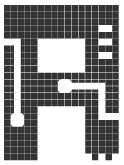 Raihan Nizar (b. 1977) is the Indonesian FontStructor who made Cubos (2011, squarish and geometric), Pixelized Handwriting (2011), Lost in Future (2011, sci-fi face), Valdero (2011), Simplicity (2011, kitchen tile face), Bold Type (2011, octagonal), Fat Cribbo (2011, gridded), Block Out (2011, in the style of the commercial typeface Pincoya), Smooth (kitchen tile face), Quadro, Minimal (geometric, gridded, almost a kitchen tile face), Zkratchy (scratchy face), Retro Mania (almost a Western face), Techno Light, Blockz, Box Building (3d outline face), Metropol (outline techno face), Space Adventure, Electric City, Cubix, Revolution, Pixel, High Volume, and Letters In The Blocks in 2011. Many of these typefaces are pixelish.
 Typefaces from 2012: Dequatrion (fat stencil face), Konnekto (electrical circuit font), Devoltas, Forsid (cubist painting font), Etnis (squarish), Electro (counterless and octagonal), Mr. Ken (very fat face), Squadlest (squarish), Neonize (dot matrix face), Simplicity (kitchen tile face), Sound System (squarish), High Volume, Bajaj Sans (gaspipe sans), Bulat (fat counterless typeface), Elektro (blocky, counterless), Elektro Forest, The Slabbers (Egyptian), Kotakisme (counterless and geometric), Bhekhathe (thin geometric typeface), Insomnia, Siliko (metal band logo font), Motakku (labyrinthine, op-art). Typefaces from 2013: Yamko Rambe Yamko (alchemic typeface), Farmhand Script (poster script), Luikeza, The Ugly Script, Gerobak (fat, counterless). Aka cablecomputer. Fontspace link. FontStruct link. [Google]
[More] ⦿
|
Rainer Will
[Will Software]
|
[More] ⦿
|
Rania Talal
|
Beirut-based creator of the labyrinthine typeface Maze (2013). Behance link. [Google]
[More] ⦿
|
raynnier
|
FontStructor who made the labyrinthine typeface CCCC (2011). [Google]
[More] ⦿
|
Revnede
|
Designer of the dry brush font Matelda (2017) and the labyrinthine muultiline typeface Eqiva (2017). [Google]
[More] ⦿
|
Rodrigo Navarro Bolado
|
Designer in Tampico, Mexico, b. 1986, who created the tattoo font Garbancera (2011), the clawed overlay font family Nahual or Nahual Claw (2011), the informal sans typeface Carnala (2010), and the blackletter typeface Vestigia (2011). Kimiko Demi Bold (2011) is an elegant fat poster face. Guadalupe FF (2011) is a display sans. In 2020, he released the labyrinthine typeface Laberintia. [Google]
[MyFonts]
[More] ⦿
|
Ron Ruedisueli
[Sed4 Type Foundry (or: Sed4tives)]
|
 [More] ⦿
|
Ronin Design
|
Malang, Indonesia-based designer of Origin Tech (2020: a techno or circuit font), Radio Classic (a signage script) (2020), the upright script Lily Liana (2020), the glitch font Split On (2020), the monoline script typeface Sefiyah (2020) and the squarish De Stijl-like stencil typeface New System (2020). Typefaces from 2021: Encrypto (labyrinthine), Jeztec Empire (blackletter), Anticode (a marquee font), The Beast (all caps, chamfered), Moonllys (display serif), Wrecked Ship (an eroded font), Talidia (a squarish sans), Night Hunt (an eerie font), Beatles (an upright rabbit ear calligraphic script). [Google]
[MyFonts]
[More] ⦿
|
Runikh Art
[Amarpreet Singh]
|
Brescia, Italy-based designer of the brush font Zenoo (2019), the free multiline labyrinthine typeface Daidalos (2016), some free weather icons (2015), and the free squarish typeface Efesto (2017). Behance link. [Google]
[More] ⦿
|
Sabrina Franklin
|
During her studies, Sabrina Franklin (Fleet, UK) designed the Maze typeface (2016). [Google]
[More] ⦿
|
Sawdust
|
 Design studio of Rob Gonzalez and Jonathan Quainton located in London's Hoxton area. Creators in 2009 of two art deco custom typefaces for Middle Boop magazine, and of many other types for visual identities and projects. One, the art deco typeface New Modern, can be bought exclusively from HypeForType. They also created this type poster for The Last Days of Decadence (2008).
 In 2012, Sawdust published Ivory, a stencilish typeface. Shanghai Ranking Numerals (2013) is a multiline typeface commissioned by Shanghai Ranking for Shanghai Jiao Tong's Top 200 Research Universities book. Wired UK (2013) is a commissioned hipster typeface. Lunetta (2013, Hype For Type) is a great multilined labyrinthine headline typeface. Fast Company (2014) is geometric and experimental. In 2015, they created the custom typefaces Kobe Bryant and Kevin Durant for Nike / Jordan and NBA basketball player Kevin Durant, and the spring-themed typeface Electric Word for an issue of Wired. Still in 2015, they published a geometric alphabet in Nylon, a book curated by Bernstein and Andriulli. Still in 2015, Jonathan Quainton and Rob Gonzalez created a custom typeface for LeBron James. In 2016, they designed the successful display typeface Audi for Audi Magazine, UK, in which the letters themselves are adapted to the sleek lines of the Audi Quattro. The fashion mag typeface Quainton (2008) was first published as a retail typeface in 2016. Hype For Type link. Typefaces from 2020: Neuro X (ultra-condensed, in 12 styles). [Google]
[MyFonts]
[More] ⦿
|
sbrunoj
|
Designer of the multiline labyrinth-look typefaces Maze, Maze Black, Maze Illegible and Maze Fat (2008, FontStruct) and of the strange Leberkase (2008, FontStruct). Add to that list Myrdle and Myrdle Condensed, constructivist typefaces. [Google]
[More] ⦿
|
Sed4 Type Foundry (or: Sed4tives)
[Ron Ruedisueli]
|
 Dutch professional music producer and audio engineer who founded his own record label. He also makes (mostly free) fonts. His work:
 - A FontStruct series called STF Letters op Maat, which attempts to recreate all alphabets designed by Dutch Bauhaus designer Jurriaan Schrofer (1926-1990). That list: STF Cutout 1985 (+Solid), STF JS Bevel (+Fill), STF Grafisch, STF Etage Aanduiding (17x17-Inline 1, 17x17-Inline 2, 17x17-Medium Fill, 17x17-Multiline, 17x17-Full Fill, 5x5 Matrix, Hi-res) [op-art, prismatic], STF Gemeentereiniging, STF Berlage (after the letters Schrofer originally designed for The "Beurs Van Berlage", a commodity market building located in the centre of Amsterdam. Later it was also digitalized and used to for the Dutch passport), STF Elevated (3d shadow typeface), STF Semiotica (Incised Outline, Incised, Book, Regular, Title), STF Sater, STF Sans Severe (Light, Heavy, Outlined, Multilines), STF Sans Rounded, STF Avant-Garde i10, STF Schrofer Modular Blocks, STF Social Human Trends (Outlined, Solid, Fill Isolated, Outined Isolated), STF Girokantoor, STF Marx (Solid, Striped), STF Squared Sans, STF Onleesbaar Alfabet (Stroke, Solid, Outlined), STF Bols Jaarverslag, STF Bredero (for the Bredero Bouwbedrijf), STF A.S.C. Communications, STF Connaissance et Langage, STF Paspoort, STF Last Warning (v1), STF Connected Squares (+Fill, +v2 Headline, +v2 Fill, +v2 Outline).
- Other FontStruct typefaces, now over 180 in all, made in 2017-2018. Included are STF Down Vote, STF Slab Inn (a Western font), STF Polygon Window (hexagonal), STF Kalender (based on a 1976 calendar with octagonal letters by Wim Crouwel), STF See You in 2019 (a tiled font), STF Uni (a varsity font), STF Geo Gothique, STF Tegel (a kitchen tile font), STF Don't Count on Me, STF Hyster (a modernist stencil), STF Der Zyklus, STF Scriptorium (blackletter), STF Paradox, STF Sutoraipu Origami Multiline, STF Sutoraipu Origami Filled Stencil, STF Futureline, STF Frescher (Escher-inspired), STF Whiskey-A-Go Go, STF Labrat (op-art, prismatic), STF Tranziztor, STF Otto Font Schirach (mosaic lettering), STF BFG (condensed piano key style), STF Ace of Maze, STF Amsterdam School, STF Neon Flux, STF Wendingen 1922 (based on a old brochure by Wendingen for the Internationale Theater Tentoonstelling Amsterdam 1922; letters designed by Hendricus Theodorus Wijdeveld (1885-1987)), STF Van Nelle (based on an early 1900's poster ad for Van Nelle coffee), STF Purple Maze, STF Militia Stencil, STF Idiocracy (stencil), STF Rode Draad, STF Praesens (based on the lettering found in the second issue of Polish avant garde architectural magazine Praesens), STF Fabricon (a De Stijl stencil; +Outline, +CrossSection), STF Defrag, STF Trilineae, STF Bolsjewie (constructivist), STF Kraftwerk (a tiled typeface; after a 2015 poster by Chuck Sperry for Kraftwerk), STF De Stijl, STF Portfolio Peeters (a tribute to Belgian modernist artist Jozef Peeters (Antwerp, 1895-1960), based on the folder art for his 1921 linocut portofolio), STF Sector 7 (military stencil).
- Pax Romana. Based on the capitalis monumentalis seen at the base of Trajan's Column.
- STF Espionaje. Inspired by the lettering found on a vintage sheet music cover art for "La Java bousculée" (1924).
- STF Oudvreugde's Ontwaken. Based on the Dutch deco lettering of Dutch graphic designer Frederika Sophia (Fré) Cohen (1903-1943). The letters were taken from a book cover design for the "Arbeiders-jeugdcentrale Amsterdam" which was published in 1924.
- Typefaces from 2019: STF Blauhaus (Bauhaus-inspired), STF Type O Negative, STF Bodidone, STF Textualis Batavicum (blackletter), STF Alhambra Blvd, STF Type O Negative, STF Ein Berliner, STF Geo Grotesque (in the style of TT Norms and LL Circular), STF Innercity (art deco), STF Photonia (futuristic), STF Square Grylls, STF Mizollen (labyrinthine), STF Mr Bob Doubalina, STF Plateau Disco (groovy), STF Uncialis Modularis (uncial).
- Typefaces from 2020: STF Schlanke Schöne, STF Care Sensitive.
FontStruct link. [Google]
[More] ⦿
|
Selim Aydin Design
[Fatih Selim Aydin]
|
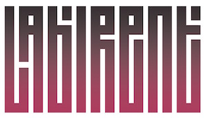 Turkish designer of the squarish labyrinthine typeface Labirent (2019). [Google]
[MyFonts]
[More] ⦿
Turkish designer of the squarish labyrinthine typeface Labirent (2019). [Google]
[MyFonts]
[More] ⦿
|
SeungJoo Lee
|
Seoul-based designer of a few experimental Hangul typefaces (2014) such as Miro Maze and Chess Font. [Google]
[More] ⦿
|
Smile
|
During his/her studies in Hanoi, Vietnam, "Smile" designed the prismatic Silver Loop Alphabet (2015) and the labyrinthine Golden Labyrimaze Alphabet (2015). [Google]
[More] ⦿
|
Stelios Constantinides
|
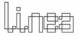 Designer who used FontStruct to make Bouldo (2010, dotted face), TNR Bold (2009), Balltype (2009), Octastruct (2009), Weejie (2009), Times Neue Roman (2009, called the illegitimate child of Times New Roman and Helvetica Neue (Condensed)), Elion (2009, dor matrix pixel script), Tweed (2009, squarish), Akia (2009, experimental slab serif), Tesla (2009, dotted font based on Superpois), Pressure (2009, severe octagonal family; +Compressed, +Extended), Simplest (2009), Agora, Agora3D and Agora Dots (2009), Simplest (2009), Billboard (2009), Avant (2009), Imprinted (2009, dotted lines), Pivot Fill (2009), Pivot (2009), Handgloves Neue (2009), Paperclipped (2009), Handgloves (2009), Heart (2009), Foldstruct Pix (2009), Foldstruct (2009), Lino (2009), Linea (2009), Eurotype (2009), Stack (2009), Bloc Stripe (2009), Bloc (2009), Stencileaf (2009), Paul Was Here (2009), Sweetness (2009), Squidlike (2009), Rokice (2009), Current (2008), Theory (2008), Apatype (2008), Dot Script (2008), Dotize (2008), Poiis (2008), Poiis Wide (2008), Wired (2008, white on black), Bloct (2008, pixel shadow font), Construct (2008, like Bloct with a crane effect), Mazal (a great rectangular white on black idea), Keyal (Indic simulation with multilines), Squarial (pixelish), Classico, Unireal, Yoko (simple stencil), Splice (squarish condensed), Goodmorning Tokyo (labyrinth-like glyphs), Poii (pixel face), Gogic, Giant, Wikial (diner script simulation), Futoni (squarish letters). [Google]
[More] ⦿
Designer who used FontStruct to make Bouldo (2010, dotted face), TNR Bold (2009), Balltype (2009), Octastruct (2009), Weejie (2009), Times Neue Roman (2009, called the illegitimate child of Times New Roman and Helvetica Neue (Condensed)), Elion (2009, dor matrix pixel script), Tweed (2009, squarish), Akia (2009, experimental slab serif), Tesla (2009, dotted font based on Superpois), Pressure (2009, severe octagonal family; +Compressed, +Extended), Simplest (2009), Agora, Agora3D and Agora Dots (2009), Simplest (2009), Billboard (2009), Avant (2009), Imprinted (2009, dotted lines), Pivot Fill (2009), Pivot (2009), Handgloves Neue (2009), Paperclipped (2009), Handgloves (2009), Heart (2009), Foldstruct Pix (2009), Foldstruct (2009), Lino (2009), Linea (2009), Eurotype (2009), Stack (2009), Bloc Stripe (2009), Bloc (2009), Stencileaf (2009), Paul Was Here (2009), Sweetness (2009), Squidlike (2009), Rokice (2009), Current (2008), Theory (2008), Apatype (2008), Dot Script (2008), Dotize (2008), Poiis (2008), Poiis Wide (2008), Wired (2008, white on black), Bloct (2008, pixel shadow font), Construct (2008, like Bloct with a crane effect), Mazal (a great rectangular white on black idea), Keyal (Indic simulation with multilines), Squarial (pixelish), Classico, Unireal, Yoko (simple stencil), Splice (squarish condensed), Goodmorning Tokyo (labyrinth-like glyphs), Poii (pixel face), Gogic, Giant, Wikial (diner script simulation), Futoni (squarish letters). [Google]
[More] ⦿
|
Stephen Delgado
|
Burbank, CA-based designer of the free labyrinthine vector format typeface family Remus (2016). [Google]
[More] ⦿
|
Steric
|
FontStructor who made these typefaces in 2010: Cabaret (Broadway style art deco), Maximini, Paquebot, Seveneight, SeveneightBW, SeveneightWB, WTM01, Labyrinth 01 and 02. Most of these are gridded and/or squarish. [Google]
[More] ⦿
|
Steven R. Zimmermann
|
Designer of an unnamed labyrinthine typeface in 2013, which was done while studying graphic design at PCAD (Pennsylvania College Of Art and Design). [Google]
[More] ⦿
|
Sunny Tudu
|
 Dhaka, Bangladesh-based designer, who created the cursive script typeface Autograph (2013), the organic display typeface Radius (2013), Cartoon (2013, a comic book family in Solid, Bevel, Border and Shadow styles), Script (2013), Quarto (2013, a thin organic sans), Blackbelt (2013, futuristic), and Story (2013, hand-printed). Other typefaces from 2013 include Acute, Paradox (bilined), Summer, Kinetic (bilined), Romantica, Ranger, Erode, Bermuda, Turning, Techno, Floral, Century (futuristic), Master.
 In 2014, Sunny published the scratchy typeface Bristle, the multilined typefaces Echo and Have A Nice Day, Denim, Broken (glaz krak), Creator, Euclidean, Medieval, Revelation, Supreme, Bravado, Origami, Grand Hand, Typeart, Redled, Techfont, Metallic, Because, Elegantia, Author, Rejoice, Mazematics, Serenity, Fruity, Inspired, Inbox, Stonehenge, Intense, the sharp-edged sans typeface Pleasant, the graceful script typeface Sprinter and the flowing script typeface Charcoal. Typefaces from 2015: Brave (futuristic), Increment, New Direction, Devils Hand, Oxygen, Cozy Sans, January, Ascent, Geometric, Fontana. Typefaces from 2016: Regards (connected handwriting font). Typefaces from 2017: Black Road, Select, Concept (connected retro diner script), Dependable (a great hand-printed script), Ready (signature font), Fresh Air, Mark (brush font), Gray River. Typefaces from 2018: Mustang (signature font), Horizontal (a signature or architectural lettering font), Keep On Shining. Purchase his fonts at Graphic River. [Google]
[More] ⦿
|
tdn253
|
FontStructor who made several typefaces, including MyFont 1 (2013, labyrinthine). [Google]
[More] ⦿
|
Ting Yen
|
Graphic designer in San Francisco who created the labyrinthine typeface Maze (2015) and the free Food and Drink Icons (2015). [Google]
[More] ⦿
|
TypOasis 2006
[Manfred Klein]
|
 Fonts published in 2006 by Manfred Klein: Mironikas, BatsStuff, CIAThePeaceWatchers, Expressiones, Faces, FirstLove, FischersFritzen, GodsAndHeroes, Hispanish, LifeIsAMovie, NewsFromAbsurdistan, PrivateLuck, BookBeings, DaddyGrid, LineArtVectoria, AbstractToConcrete, AfricainBats, Gestalten, GloriaVectoria, ModernTimesMrChaplin, PhotosToVectors, PixelBats, SurrealismK, BlaxArties, CoolDrawings, DogsFewCats, MKBrokenTypes, NearModernArt, Piepmaetze2006, Poppenspeeler, SportsAnimals, WithALittleHelp, AllWeathers, BienMayaInvers, CarnevaleConCarne, RenaissBeings, Sagenwelt, Scissoria, Sketcheria2, StrandgutC, TrainWhatVectorMeans, CuxhavenFraktur, CuxhavenInitials, MK-Skulls, ModernHeros, MouseArt, WillkommenLeute, WreckageCuttings, CurrentBlack, AtLastATshirt, Holzschnitte, OpticalArt, Taucher, WebArtSigns, ArteVectoria, OldStyleTravel, PicturesA, Trust YourDentist, GutenbergGoesAbstract, MouseFruitFaces, Silhouettes02, SomeCapsStories, HandsDown, HandsUp, HumanPartsStore, PhantaToons, ArteFacts02, BlackBeckMan, GeoEyes01, RockFonts01, Sketchbook01, Sketchbook02, WitchesStuff, Vampyrish-ABC, AfricArtes, ArtistTracesTwo, BirdsInfluenced, KidsDrawings02, LogosLogo, MesoFauna02, MyHouse, PhaistosFingers, ReligiousSymbols, TypographicTangos, EmkaBats, GeldRegiertDie Welt, GnomesTwo, KaleidoBats, KaleidoTypes03, StrongEuro, BigShadows, BigShadowsLeftOblique, Bradbury-Oblique, BuschButGerman, DillElefantenTwo, EgyptRund, KaleidWieynckFrax, KaleidoTypesCinque, KaleidoTypesQuattro, SomeTypesSilhous, LogoPhantasies, LogoSketchesMK, MKsketches, MonAmourFraktur-Broken, PlanetarishBats, SmallTypeWriting, SmallTypeWriting-Medium, StagesAfterEarthquake, StencilStamps, WoMan, Working, ImresCorrodetCaps, OldLettresOmbrees, GingkoFraktur, LufrakturBricks, MonAmourCaps, HeadfeeterO2, MangaManjana, MangaTypes, MrVector, OnStreet, PetitButtoni, Amputata, Chaplone, KleidosChaplina, VeryBrokenFrax, AbstractClassicCuts, BauhausOSix, ComicHeadsBeings, GeoStructures2, Kaleido04Invers, MechanicsActors, SuchLifeC, BerlinCaps, BrushPenMK-Medium, LettersSnakesAndMore, ComicChars, FineArts, ForCongrats, Frames, OldfashionPeopleTwo, PeopleButtons, PiCollection, SilhousOldfashion, SomeArtists01, AntikAlphaBeta, CorrodetInitials, DrunkenSailor, MendelsohnsTochter, AnimalsOldfashion, ColumbusAntePortas, CuriousVisitors, DadaPeople01, Malheur, OldDrawingsOne, WetterKapriolen, CatsAlphabet, DigitalisHistory, Duodez, EatMyHat, FlorAlphabet, InitialenFramed-MK, ArmsIdeasNParts, BirdsNPlants, Petrographs, SomeArtistsSquares, TypoJewels, TypoJewelsSquare, ClassicRomanCaps, IllustratedAlphabet, KleinHeadline, MKGreco, ArtParticles, ChildrensDarlings, Clowns, Devils, DongbutsBeings, HistoricMedicine, K-Labyrinths, WoodcutFurniture, Nighthawk, ToleCaps, CaveBeings, DesignElemente, DinoSilhous, StreetGraffArts, TribalBats, VignettesNFrames, Reclamare (art deco), AstroSymbols3, BlacKLinoleum, CaveLife, Krabbeltiere, LandAnimals, LionsClub, OldArtTools, OldScissorCuts, ZooloVectoriA, MotherAndChild, GermanFatman, Botanish, CrazyWeather, HeadImprovisations, Masks_K, MiddleAgers, Nipponia, DelitzschCaps, ImresDiscs, EgyptMythOne, LessIsMore, Protectors, SpaceBeingsTwo, ZooBats, HappyFrax, CorneredBirds, ExtraTerrestrial, Gargoyle, GargoyleRings, HeadSketches, IndiansToday, InTwilight, MardiKrass, OldCastles, AffigMonkeys, AngelsOrDevils, FlyingPioneers, MaritimK, MonkeysTheatre, PardonAgain, PardonThankYou, PetroglyphMarks, PixelFifties, SmallEdgedFrax, TextEmptyStickers, M-AnimalsUno, PhantasyDolls, SilhouettenPeople, TribalDesigns, ZodiacsSignStars, FacesAlphabetBeta, FatFineFree, AstrobatsInvers, BlackArt, BusyPeople01, GoodOldEyeCatchers, L'ArtPourL'Art, NipponFlorales, OtherShapes, Rock'nRollTime, RunningBeings, AstrologyCeltic, ColtecsBats, DesignParts, EgyptChildren, ElectricFaces, Kidsfont01, MediBats01, MediCartoons, OldTimers, TribalBirdsMissingGap, Archaeological, BeforeAlphabetsGallery, BlackWhiteMinimalism, DancingLetters, EveryPictureTellsAntique, FemalesNMales, HeadsGallery, ImprovisationsAboutK, KleinsBrokenGotik, KleinsKruschKursiv, MusiciansOne, OldRomaUno, OurLittleDarlings-One, ParmaInitialenMK, RunningZigzags, RunningZigzagsTwo, ScrapArt, SpaceWorkers, StripedSansBlack, SzeneInFrames, TypoDisturbances, Wacomian-Regular, ZoologicalGardenOne, ZoologicalGardenThree, ZoologicalGardenTwo, AlphabetismHand, KlungerCaps, RememberScribbledInv, Tequila, LudwigHohlwein, CatSketches, HeadSketches02, Krizzeleyn, PowerWoman, RosettaCalligraphia01, ThingsFound, TypoSymbols, VectorAnimals, Fraxboxes, RodgauCaps, OhRosetta, Olisillus, DeKonitials, Buddhism, Roylich, Grotesk, BigBrotherClassizismCaps, K-LettresOmbrées, TreeLike, InsectsTwo, Woodcutter, OldAntique, MKGrecoExtraBold, AbstractFaces, Africaans, AfricanGhosts, EmotionDrawings, GeoFacesBold, MirosWitchesMedium, Neighbours, PrimaryBats, RoundPieces06, StoneAgeBats, TypoSignals, SlabRoundSerif-Light, VictorianInitialsOne, Techno06, Artists, MasKs, Masks03, MythologicalArts, MythoBats, OldBoysToys, OldPictures, StarsStripesBullets, Woodcuts01, FischersFritze, HistoricPeople, HotelPrisoner, MythologicalSquares, OrnataUno, PatternArt, PatternaliaMK, WoodcutsFontissimo, ZooCages, AfricaArt, Meeting, Pumpkins2006, ElephantaBlack, FatSansRound, FishFaces, FlagHolder, HiddenSigns, HinduismK, Jugendstil-Medium, ManneKen, MobileSquares, OrnamHeads, PrivateAstroBats, RosettaMutanta, Schonan-Black, ScribbledFraktur-XHeavy, SomeImprosBats, VectorFaces, VikingsArt, AfricanissimaOSix, ApishOne, AxeBlack, CircusBoldSquares, EiDesKolumbus-Improvisations, FamilyLifeBats, HiddenSignsRings, KidSignsThree, KochsLongCapsSquares, SketchesX, TreesAndCo, VectorDrawingsOne, BlackWhiteSigns, BoringSansBold, CuxhavenInitialsRound, FrakturNitials, GeometricConstructs, HandsAndFeet-Two, HeadsNBirds, IrishHalfUncialisBricks, IrishUncialfabeta-Bold, MaennekinTwo, MutantA-MediumOblique, MyMaestroMrMiro, RomanaCapsClassicSquares, RoundBats, RoundFacesTwo, SansThirteenBlack, SchabLonski, TypographicRosettas, WinterSports, PopUp, Gotic Caps, Fun Bats, HappyXmasBats, MKlothes, MKomicsV2, AllDaysJokes, Blackbirds, DiscoverBats, EgyptianSilhouettes, FiftyYearsAgo, HumanRelations, MKoepfeBold, NewDarkTimes, PeaceTools, SilhouettSketches, SpaceMeetings, ComicFaces, MK-Heads, NewKoeppes, PetrasBauhausXmas, SilhousSimplex, StonesAgeButtons, ZagzagHeads02, BigMummy, CircusBoldSquaresInvers, EmastEtcetera, MKanzleiCaps-One, ReadersBats, SimPlexBats, XmasImprovisations, AnimalsPrey, Cartoons, Weihnacht2006, AxelsWoodTypesMK, CowBats, KleinsLittleDings. [Google]
[MyFonts]
[More] ⦿
Fonts published in 2006 by Manfred Klein: Mironikas, BatsStuff, CIAThePeaceWatchers, Expressiones, Faces, FirstLove, FischersFritzen, GodsAndHeroes, Hispanish, LifeIsAMovie, NewsFromAbsurdistan, PrivateLuck, BookBeings, DaddyGrid, LineArtVectoria, AbstractToConcrete, AfricainBats, Gestalten, GloriaVectoria, ModernTimesMrChaplin, PhotosToVectors, PixelBats, SurrealismK, BlaxArties, CoolDrawings, DogsFewCats, MKBrokenTypes, NearModernArt, Piepmaetze2006, Poppenspeeler, SportsAnimals, WithALittleHelp, AllWeathers, BienMayaInvers, CarnevaleConCarne, RenaissBeings, Sagenwelt, Scissoria, Sketcheria2, StrandgutC, TrainWhatVectorMeans, CuxhavenFraktur, CuxhavenInitials, MK-Skulls, ModernHeros, MouseArt, WillkommenLeute, WreckageCuttings, CurrentBlack, AtLastATshirt, Holzschnitte, OpticalArt, Taucher, WebArtSigns, ArteVectoria, OldStyleTravel, PicturesA, Trust YourDentist, GutenbergGoesAbstract, MouseFruitFaces, Silhouettes02, SomeCapsStories, HandsDown, HandsUp, HumanPartsStore, PhantaToons, ArteFacts02, BlackBeckMan, GeoEyes01, RockFonts01, Sketchbook01, Sketchbook02, WitchesStuff, Vampyrish-ABC, AfricArtes, ArtistTracesTwo, BirdsInfluenced, KidsDrawings02, LogosLogo, MesoFauna02, MyHouse, PhaistosFingers, ReligiousSymbols, TypographicTangos, EmkaBats, GeldRegiertDie Welt, GnomesTwo, KaleidoBats, KaleidoTypes03, StrongEuro, BigShadows, BigShadowsLeftOblique, Bradbury-Oblique, BuschButGerman, DillElefantenTwo, EgyptRund, KaleidWieynckFrax, KaleidoTypesCinque, KaleidoTypesQuattro, SomeTypesSilhous, LogoPhantasies, LogoSketchesMK, MKsketches, MonAmourFraktur-Broken, PlanetarishBats, SmallTypeWriting, SmallTypeWriting-Medium, StagesAfterEarthquake, StencilStamps, WoMan, Working, ImresCorrodetCaps, OldLettresOmbrees, GingkoFraktur, LufrakturBricks, MonAmourCaps, HeadfeeterO2, MangaManjana, MangaTypes, MrVector, OnStreet, PetitButtoni, Amputata, Chaplone, KleidosChaplina, VeryBrokenFrax, AbstractClassicCuts, BauhausOSix, ComicHeadsBeings, GeoStructures2, Kaleido04Invers, MechanicsActors, SuchLifeC, BerlinCaps, BrushPenMK-Medium, LettersSnakesAndMore, ComicChars, FineArts, ForCongrats, Frames, OldfashionPeopleTwo, PeopleButtons, PiCollection, SilhousOldfashion, SomeArtists01, AntikAlphaBeta, CorrodetInitials, DrunkenSailor, MendelsohnsTochter, AnimalsOldfashion, ColumbusAntePortas, CuriousVisitors, DadaPeople01, Malheur, OldDrawingsOne, WetterKapriolen, CatsAlphabet, DigitalisHistory, Duodez, EatMyHat, FlorAlphabet, InitialenFramed-MK, ArmsIdeasNParts, BirdsNPlants, Petrographs, SomeArtistsSquares, TypoJewels, TypoJewelsSquare, ClassicRomanCaps, IllustratedAlphabet, KleinHeadline, MKGreco, ArtParticles, ChildrensDarlings, Clowns, Devils, DongbutsBeings, HistoricMedicine, K-Labyrinths, WoodcutFurniture, Nighthawk, ToleCaps, CaveBeings, DesignElemente, DinoSilhous, StreetGraffArts, TribalBats, VignettesNFrames, Reclamare (art deco), AstroSymbols3, BlacKLinoleum, CaveLife, Krabbeltiere, LandAnimals, LionsClub, OldArtTools, OldScissorCuts, ZooloVectoriA, MotherAndChild, GermanFatman, Botanish, CrazyWeather, HeadImprovisations, Masks_K, MiddleAgers, Nipponia, DelitzschCaps, ImresDiscs, EgyptMythOne, LessIsMore, Protectors, SpaceBeingsTwo, ZooBats, HappyFrax, CorneredBirds, ExtraTerrestrial, Gargoyle, GargoyleRings, HeadSketches, IndiansToday, InTwilight, MardiKrass, OldCastles, AffigMonkeys, AngelsOrDevils, FlyingPioneers, MaritimK, MonkeysTheatre, PardonAgain, PardonThankYou, PetroglyphMarks, PixelFifties, SmallEdgedFrax, TextEmptyStickers, M-AnimalsUno, PhantasyDolls, SilhouettenPeople, TribalDesigns, ZodiacsSignStars, FacesAlphabetBeta, FatFineFree, AstrobatsInvers, BlackArt, BusyPeople01, GoodOldEyeCatchers, L'ArtPourL'Art, NipponFlorales, OtherShapes, Rock'nRollTime, RunningBeings, AstrologyCeltic, ColtecsBats, DesignParts, EgyptChildren, ElectricFaces, Kidsfont01, MediBats01, MediCartoons, OldTimers, TribalBirdsMissingGap, Archaeological, BeforeAlphabetsGallery, BlackWhiteMinimalism, DancingLetters, EveryPictureTellsAntique, FemalesNMales, HeadsGallery, ImprovisationsAboutK, KleinsBrokenGotik, KleinsKruschKursiv, MusiciansOne, OldRomaUno, OurLittleDarlings-One, ParmaInitialenMK, RunningZigzags, RunningZigzagsTwo, ScrapArt, SpaceWorkers, StripedSansBlack, SzeneInFrames, TypoDisturbances, Wacomian-Regular, ZoologicalGardenOne, ZoologicalGardenThree, ZoologicalGardenTwo, AlphabetismHand, KlungerCaps, RememberScribbledInv, Tequila, LudwigHohlwein, CatSketches, HeadSketches02, Krizzeleyn, PowerWoman, RosettaCalligraphia01, ThingsFound, TypoSymbols, VectorAnimals, Fraxboxes, RodgauCaps, OhRosetta, Olisillus, DeKonitials, Buddhism, Roylich, Grotesk, BigBrotherClassizismCaps, K-LettresOmbrées, TreeLike, InsectsTwo, Woodcutter, OldAntique, MKGrecoExtraBold, AbstractFaces, Africaans, AfricanGhosts, EmotionDrawings, GeoFacesBold, MirosWitchesMedium, Neighbours, PrimaryBats, RoundPieces06, StoneAgeBats, TypoSignals, SlabRoundSerif-Light, VictorianInitialsOne, Techno06, Artists, MasKs, Masks03, MythologicalArts, MythoBats, OldBoysToys, OldPictures, StarsStripesBullets, Woodcuts01, FischersFritze, HistoricPeople, HotelPrisoner, MythologicalSquares, OrnataUno, PatternArt, PatternaliaMK, WoodcutsFontissimo, ZooCages, AfricaArt, Meeting, Pumpkins2006, ElephantaBlack, FatSansRound, FishFaces, FlagHolder, HiddenSigns, HinduismK, Jugendstil-Medium, ManneKen, MobileSquares, OrnamHeads, PrivateAstroBats, RosettaMutanta, Schonan-Black, ScribbledFraktur-XHeavy, SomeImprosBats, VectorFaces, VikingsArt, AfricanissimaOSix, ApishOne, AxeBlack, CircusBoldSquares, EiDesKolumbus-Improvisations, FamilyLifeBats, HiddenSignsRings, KidSignsThree, KochsLongCapsSquares, SketchesX, TreesAndCo, VectorDrawingsOne, BlackWhiteSigns, BoringSansBold, CuxhavenInitialsRound, FrakturNitials, GeometricConstructs, HandsAndFeet-Two, HeadsNBirds, IrishHalfUncialisBricks, IrishUncialfabeta-Bold, MaennekinTwo, MutantA-MediumOblique, MyMaestroMrMiro, RomanaCapsClassicSquares, RoundBats, RoundFacesTwo, SansThirteenBlack, SchabLonski, TypographicRosettas, WinterSports, PopUp, Gotic Caps, Fun Bats, HappyXmasBats, MKlothes, MKomicsV2, AllDaysJokes, Blackbirds, DiscoverBats, EgyptianSilhouettes, FiftyYearsAgo, HumanRelations, MKoepfeBold, NewDarkTimes, PeaceTools, SilhouettSketches, SpaceMeetings, ComicFaces, MK-Heads, NewKoeppes, PetrasBauhausXmas, SilhousSimplex, StonesAgeButtons, ZagzagHeads02, BigMummy, CircusBoldSquaresInvers, EmastEtcetera, MKanzleiCaps-One, ReadersBats, SimPlexBats, XmasImprovisations, AnimalsPrey, Cartoons, Weihnacht2006, AxelsWoodTypesMK, CowBats, KleinsLittleDings. [Google]
[MyFonts]
[More] ⦿
|
Typographic Design
[Manuel Viergutz]
|
 Berlin-based FontStruct artist from Stuttgart (b. 1986, Esslingen) who studied at Johannes-Gutenberg-Schule Stuttgart (class of 2007) and studied in 2008 in Esslingen at the European School of Film and Design. He set up Typographic Design. The theme of most of his typefaces is erosion, deconstruction and grunge.
 He made the striped techno fonts heavyLOUDedge, heavyLOUDedge_lineH, heavyLOUDedge_lineV, heavyLOUDedge_quad, heavyLOUDedge_raw in 2009. He also made Fat Cowboy (2009, FontStruct), QRcodeX (2009, like those airline ticket codes), Low Down Cut (2009), WebPixel (2009), ScrFibble (2009), ScriptSERIF (ransom note face), and Back To Heavy Coat Fat Ground (white on black family) in 2009. Typefaces done between 2010 and 2013: SKATEBOaRDbraNds (2010, ransom note face), Gothic Hand Dirty (2010), SansLigraphy, Slice n Dice (2009), Riptape, Riptrash (2010, grunge), BackToHeavyCoatFatGround, Curly Lava Bubble (2010, dotted family), Hand Times (2010, a sketched Times Roman), BlockHead (2010), kiddySans (2010), webpixelbitmap (2010), dirtyDeoHandInk (2011), Modern Hand Fraktur (2011), Elegant Hand Script (2011), Wear Fat T Shirt (2011, squarish), Giraffenhals (2011, hand-printed), Phone Scan (2011), Slanted Italic Shift (2011), Neon Club Music (2011), Raw Delta Hand Street (graffiti), India Snake Pixel Labyrinth Game (2012, labyrinthine). Typefaces from 2013: Hand Retro Sketch Times (layered poster headline family), Dirty Bubble Gum Grunge, Hand Skribble Sketch Rock, Hells Kitchen Devil God, Hand Scribble Sketch Times, Shaky Hand Some Comic, RawStreetWall (Volcano Type: grunge), Tag Hand Graffiti Trash, Viktors Littl Creepy Horror. Still in 2013, these commercial typefaces were published: Rip TRASH, Dirty Deo Hand Ink, Elegant Hand Script, Gothic Hand Dirty, Rip TAPE, MODERN Hand Fraktur, Giraffenhals, Raw Delta Hand Street, WEAR FAT SHIRT, HeavyLOUDedge, Soul Lotion, Webpixel Bitmap, India Snake Pixel Labyrinth Game, Kiddy Sans, MEGA SLANT LINE, NEON CLUB MUSIC, Slanted ITALIC Shift, Block Head, Happy Brain Creepy Thalamus. Typefaces from 2014: Konstructa Humana Stencil, Hand Stamp Play Rough Serif. Typefaces from 2015: Hand Sketch Rough Poster, Hand Stamp Swiss Rough Sans. Typefaces from 2016: Hand Stamp Gothic Rough, Raw Street Wall (Volcano type). Typefaces from 2017: Brush Poster Grotesk (2017, a fun semi grungy typeface designed for the children's exhibition 1,2,3 Kultummel from Labyrinth Kindermuseum Berlin by xplicit, Berlin (Annette Wüsthoff, Alexander Branczyk and Mascha Wansart) and Manuel Viergutz; loaded with glyphs and decorative extras like arrows, dingbats, emojis, symbols, geometric shapes, catchwords and decorative ligatures), Netherlands Dirty Numbers (a hacker style font), Mallorca Dirty Numbers (another hacker font), Hand Stamp Slab Serif Rough. Typefaces from 2018: Hand Print Stamp Rough, Typewriter 1950 Tech Mono (a great old typewriter font family). Typefaces from 2019: Icons Dingbats Symbols Set, Czykago Rough (with Alexander Branczyk). Typefaces from 2020: One United Font (+icons), Hand Stamp Wood, Klein Rough Gemein (with Inga Luft: a font family that includes an icon set and several styles that emulate old German rubber stamps), LED pixel (65 styles), Boom Pang Pow (a cartoon font), TWIGS 4 kids (2020: designed for a garden exhibition for children by Daniela Costa, Julia Stanossek, Alexander Branczyk and Manuel Viergutz), DIY Fantasy Stamp, Euro Icon Kit, Brush Hand Marker, Chalk Hand Marker. Typefaces from 2021: Wood Sans (a 12-style vintage wood type and letterpress emulation family), Pixel Pattern (a 9-style pixel font family), Hand Writing of Janina, Face Type, Hand of Hannah (a fat finger script), Plakat Wood (wood type emulation), Drunken Pixel, GDR Traffic Symbols, Hearts Love Smile (amorous dingbats), Open Tech Neue (Sans Serif, Invert, Outline, Slab Serif, Stretch, Box Puzzle and Icons). Cat Finger (a rough brush font), Kloetzchen (a set of blocky display types based on a 3d (physical) wood type by Peter Eckartz). Dafont link. Alternate URL. MyFonts link for his commercial fonts. Klingspor link. Behance link. Blogspot link. Old MyFonts foundry link. Abstract Fonts link. Volcano Type link. View Manuel Viergutz's typefaces. [Google]
[MyFonts]
[More] ⦿
|
Ulay&Ulay
[Ayse Ulay]
|
Ayse Ulay of Ulay&Ulay (Detroit, MI) designed DF Diversions (1994, Letraset), a dingbat font that is in the Letraset, ITC and Corel collections. Other fonts in the Ulay&Ulay collection: UU Borges Labyrinthe (ancient dingbats), UU Borges (alphabet), UU Circulus, UU Critters (animal dingbats), UU Cubitus (dice), UU Morel, UU Quadratus, UU Resonus, UU Scriba, UU Sumeria (Sumerian letters), UU Triquetrus. Most fonts are geometric drawings with mathematical undertones. Klingspor link. Linotype link. FontShop link. [Google]
[MyFonts]
[More] ⦿
|
unravel
|
Designer who used FontStruct in 2008 to create Unravel and Sonics. The latter is an experimental typeface combining ideas from labyrinths and connected scripts. He also made Mini (caps with scissored cuts). [Google]
[More] ⦿
|
Velimir Pavic
|
Croatian Masters student in graphics technologies and engineering in Zagreb, 2010-2011. He created the modular display typeface Fade (2010) which makes creative use of ball terminals. Quarity (2011) is an experimental labyrinthine face. In 2013, during his doctoral studies at the Faculty of Arts in Zagreb, he created Touch, a piano key typeface on a didone base. [Google]
[More] ⦿
|
Vince Connare
[Vincent Connare]
|
 Vincent Connare (b. 1960, Boston) is an ex-painter turned type designer, who holds an MA in typeface design from the University of Reading in 1999. In the late eighties/early nineties Connare worked in the Ikarus, Intellifont and TrueType teams for Agfa/Compugraphic, and was one of the first type designers to learn TrueType hinting. Then he joined Microsoft, where he designed Trebuchet (1996) and Comic Sans (1995).
 At Connare.com (Seattle), he designed the transitional book text typeface Magpie in 2000. Vincent Connare joined Dalton Maag in the spring of 2001 as production manager. At Dalton Maag he was part of the team that developed Ubuntu and Nokia Pure. His own Magpie typeface was published in 2008 at Dalton Maag as Magpie Typo. Lesser known fonts by Connare include WildStyle (done for the Agfa Creative Alliance), Fabula (a font for children's texts in Basque, Catalan, Dutch, English, French, Frisian, Irish, Spanish and Welsh), Amaze (for mazes), and Vixar ASCII (1995, for Microsoft). Connare also enjoys a reputation as an expert font hinter. There is a movement by Isaac Stanfield to ban Comic Sans, discussed at Typographica and Typophile. Interview by Karen Huang. Piece by Emily Steel. Can Comic Sans look good in design? Check Markku Ylisirniö's Comic Sans poster. At Ampersand in 2011, he concluded "I just wanted to let it go; it just looks ridiculous" explaining why he was not involved with Ascender's Comic Sans Pro. Video: Influencers and Innovation: Comic Sans (2013). [Google]
[More] ⦿
|
Vincent Connare
[Vince Connare]
|
[More] ⦿
|
Weknow
[Wino Sutarmin Kadir]
|
 Weknow is the foundry of Indonesian type designer Wino Sutarmin Kadir (b. 1979), who is based in Bogor, Jakarta. Weknow produced a large collection of free fonts from 2009 until 2012. He started making commercial fonts in 2012.
 Creator of the unicase sans typeface Weknow (2009) and the roundish MisstyPoland (2009). From 2010: Helenfont (2010), Dennis Vallera (2010), Kasumichan, Karitza, Mozzie, Wings, Sharon, Noakatz, dearladysandra, arachnidlove, Alexandra, Monica (2010), Natalie, Wayner 8088, Anime Queen (2010, pixelized), Nano (2010, pixel face), Glover (2010, circular face), Frozen Pandaman (geometric), Joenine (circular), Fun Record (geometric), Gembira (circular), Gabrielle, Solgas (circular), lifeforfun (2010), znowwhite (2010), Snowmask (2010), Nine (2010), Znowwhite (2010), Cecile (2010, experiment with triangles), Coreldraw (2010, geometric, monoline), DennisVallera (2010, inspired by the vector art of Canadian Dennis Vallera), Helenfont (2010). Designs from 2011: Michelle (circle-based), Emmilia (circle-based), Raynaliz, Polysoup, Seba, Selfregion (concentric glyphs), Wings of the dragons (octagonal), Spider, The Training Artist, Chewed Kandi, Sandra, Saintfighteraqua (geometric), Alexey (circle-based), Kristina (circle-based), Graphic Dream, Crystalcore (techno), Dominique (fat rounded), Formalart, Henderson (circle-based), Intanputripratiwi (circle-based), Kioshima (geometric), Gitchgitch (geometric), Justta, Dismecha, Self Region (labyrinthine), Alberto (monoline geometric), Abstrasctik (rounded and experimental), Nicole, Robotoc, Laggastic, Masterpanda, Mohr, Maruciel, Gabrielle, Carlos (a circle-based face), Life For Fun (geometric monoline sans), Lois Cesarano (hexagonal), Heather Thomas (circles and lines), Picaee (modular and leafy), Owaikeo (a circle and arc face), Celeste, The World, Future, Lanitta, Earthearth, Basic, Beautiful, Internationalist (monoline rounded sans caps face), Midnight Show, Plastic, Victory, Perfect, Superpower, Katarzyna, Invasion, Block, Wonderfull, Sweetest, Direction, Funrecord, Eternal Flame, Coreldarw, James Glover (circle-based), Superstar, Inside, Parallel, Million, Ocean, Never Ending Maze, Silverbend, Dragon Fly, Whatever You Want, Swinging Swan, Funatic, Soulmate, Superhero, Zetland, Letting The Cable Sleep, Weknow World, Universalisme, Ocean, Smiley Turtle, Family&Friend, Flower in the window, You&Me&Everyone Else, Astonishing, Grass Hopper, Merpati Putih, Extra Hot, Trees of Happiness, Blowing Bubble, Brain Storm, Good Morning, Flower Lover, Honestly, Jaguar, Modern Aristocrat, Pure and Simple Everytime, Ride the lightning, Proffesional (sic), Flight Stewardess, Antique Retro, Natural Technologies, Ethereal Sky, Conversation, Earth Heart. Free typefaces from 2012: Serta Kayu (multiline script), Emerald, Sweater (texture face), Fish Bone, Delicious Ketchup. The Dark Knight, String and Wire, Little Ant, Xtrapower, Standard International, Nice dream come true, Bavaria, Queen of the modern age, Science Fiction, Greatest View, Queen of the Modern Age, Made in earth, Arabian Knight, Emperor of Japan, Bill Gates Windows, Maximum Kilometer, Mineral Oil Resources, Motorcycle (curly caps), Eskimo and Polar Bear, Gladiator Sport, Aero Dynamic, Optical Fiber, High Logic, Generation (a nice all-caps shadow face), My Heart, Play Ground (multiline face), Cartoon Character, Windows in Japan, Quantum Leap (dymo label face), Computer Love, Electric City, and Copper, Valentine In Love, Weknow Windows, Punk, Graphic Design, Billy Jean Style, LMAO (rounded bold sans face), Take and Give, Indonesia Tanah Air, Swimmer Browser, Diamonds are forever (hexagonal and rounded), Tortoise, My Dear, Get Ready, Export Import, Miracle, Digital Ninja, Funtastic Million Moment, Funny and Cute, Samurai in UK, Bookmark, Once Upon A Time, Bird Feather, Respect, Aruna Aira Jasmine, Extra Cheese, Beauty and the beast, Kung Fu Master (oriental simulation typeface), Game Player (art deco), Modern Building, Trade and Mark, Grovy (sic) Kind of Life, King of Font and Typography, ABC (comic book face), Metro City (extended monoline typeface), The Art, Sprout and the bean, Scooter experiment, Sundown Sunrise (a rounded monoline sans), Art Heart, WindowsObject, Authentic Love, Dolphin Ocean Wave, British Pop Music, Master (sci-fi), Sneak Peeks, Like This, Crumble, Zebra Cross, Star Constellation, Water and Gasoline, Autumn, Aviator, So Cute, Crow Chief (bow and arrow font), Beard Rider, Skateboard, Panel, Swallow Sky Night, Hotel Motel (fat finger face), Techno Various, Zooming Track, Robo Cop, Dance Fever, West Java, Ivory Culture, Push The Button (art deco), Highway Patrol (blocked black typeface), Sausage, Little Atom, Mick Jagged, Life Is Final (copperplate), Total Hammer, Cybertooth, Modern Craft, Riding The World, Boarder (counterless), Essential Arrangement, Sensation, Helmet, Smile, Little Think Big Impact, Airplane, Young and Free, The Futurist, Creative Mind, House Builder, Falling in love, My Font (a rounded monoline oblique sans), Proffesional (sic) Edition, Young Forever, Brown Fox, We Know, Prehistoric, Frankenstein Monster, Great Adventure, You Makes Me Happy, The One and Only Me, Wireframe (3d face), Ceramic (3d face), Winner, The Amazing Me, Cycle, Asia Pacific, Written on the hand, Love is blind, Luxurious Sexy, Robotic, Nano (dot matrix face), King Of The World, Roller Blade, Antelope Run, Elemental, Champion Coffee Cup, Bandit, Arcade, Zetland, The Training Artist, Technique, Neon Glow, Fruit Vegetable, Archieve, Experiment Butterfly, French Fries, Remember Memory, Rocksteady, Electro Static Rain, Science Channel (stencil face), Surfing and Play, Umbrella, The Wizard, Great Leader, Bare Knuckle Fight, The Wizard of One Click, Extra Large, Stabilo Spidol, Onion Rings, Strawberry, Lets Do It Again, Modern Script, Amazing Symphony, Psychedelic, Jump Street, The Earth (modular), Brigade Army, Extraordinary, Cobra on Coconut Tree, Natural Beauty, Anything Mean Everything, Smoke on the water, Write A Letter, Everybody, Together, Planting And Seeding, Savior Light Our Way, All Around The World, Think More For Solution, Yesterday, Techno Tech, Prudent, Metamorphosys, Keep quite and simple (sic), India Hair Style, Catalyst, Bamboo Shoot, Global Capitalism, Water Drop, Thunder Jagger, The Science Archaeologist, The Happy Face Smile, Pyramid Inverted, Jailbreak, Game of Life, Fun Raiser, Athletic, Android Robot (sci-fi), Croissant Sandwich, Ocean Free, Thursday, Crochet Pattern, Firework, Futuristic, Pocket (rounded bold sans), Entertainment, Technology (bubblegum face), So This Is It (inline caps face), Everything (circle-based font), Auto Mobile, Futurism, Rhinoceros Break, Enormous (angulat headline face), The Quick (octagonal), Over The Mountain (wavy face), Frame Work, Interplanetary, Antariksa (rounded sans), Airwaves, Strong in the Heart, Pure And Simple Everytime (rounded organic sans), Gitchgitch (rounded organic sans), Monica, The Lazy Dog (grunge), True Self Reliant, Think Techno, Street, Symbol (constructivist), Post Rock, Moon Light (plump and round), Jumping Running, Green Avocado, Bunga Melati Putih, Bizzare, World Word, Little Rainy Day (dot matrix), Animaline (animal dingbats), Smart Watch, At Most Sphere, Sweet Lollipop (curly), Painting The Light, Flattered, Earth Aircraft Universe, Daydreamer, Earth Aircraft Universe, Flattered, Welcome to Planet Earth, People Quark, Friendly Robot, Biological, Splashing, Freezer, Ragatnia Clara (a nice script), The Happy Face Return. Typefaces from 2013: Cat Eyes, Stay True, Where Wolf, The Sound, Royal Jelly, Grumpy Cat, Aku Cinta Kamu, Yellow, Innovation, Invisible Man, Archieve, Electro Magnet, Bamboo Chopsticks, Valentine's Day, True Love, Club Golf, Your Smile, Guitar On Stage, Karate (oriental simulation), Recognition, Sleeping Beauty (plump lettering), Gelombang Radio, Frozen Ice, Sport Center, Reflection, Enjoy The Time, Fillet O Fish (brushed caps), Artistic, Flower Generation (psychedelia), Heart Shaped, Adore You, Jelang (textured typeface), Stargazer, Army Of Me, Xtreme Bike, Atomic, Fancy Curly, Mastermind, Scientist, Brother, Bahasa Indonesia (sans), Cyber, Photography, Super Creative, Black Stallion (script), Cartoon, Exposure (shadow face), The Ticket, Mercury (retro-futuristic), Agriculture (lava lamp typeface), Electronic, Transformation, The Night (gothic typeface), King Cobra, Bionic Heart, Goddess of Fortune, Guitar Acoustic, Magenta Flower, Java Island (lava lamp typeface), Ready Steady Go, Cute Monster, High Speed, Machine Gun, Random Face 1 (dingbats), Dear Diary, Shinobi Ninja, Stranger (octagonal), Discovery, Translation, Japan (oriental simulation), Digital Gothic, Techno, Butterfly (lava lamp typeface), Candlelight (eax drip face), Maverick, Movie Script Ending, Monochrome, Japan, Chunky Bar, The Greatest High (blackboard bold), Featured, Random Thing 1 (cartoon dingbats), Straw Hat, Where Are You, Plant On Lawn, The Innocent Face, Beat of Drum, ASDFA, Creamy Butter, Monster Rock, Plumbing, Mexicano Chili Sauce, Air Show (bubblegum face), This Is True, Fresh Mint, Laser Gun, My Game, Black Mamba, Drako Heart, Children Stories, Play The Game (with a McDonald's M), Let it be, Everlasting Song, Logotype, Blessing Son, Wino Sutarmin Kadir, Bad Boy, Bold and Blue, Quantum (sci-fi face), Oceanography, Elementary, Sailorman, Heart And Love, High Thin Light, Vintage Postcard (spurred), The Bartender (spurred), Inside The Boxes (rhombic type), Herbalism, Happy Home (lava lamp typeface), Wave Zone, Market Leader, The Monkey, Engine Power, Gamer, Story Telling (lava lamp typeface), High Flagship, Back to Nature, The Quick Motorcross (bilined, caps only, with a McDonalds M), Fisherman (lava lamp typeface), Step Forward, King of Pirate (art nouveau caps), Heritage, High in Love, Thin Decorative (spurred typeface), Little Cowboy, What The Fun, Aha Experience, Glitch (pixel face), Portable. Typefaces from 2014: Enjoy The Show (bubblegum font), Right Power, Xerxes, Selamat Hari Raya, Sincere Heart, Thermometer, My Angle (fat script), Restaurant, Life is font, Material Science, Wave Zone, Everything is a test, The kind of feeling, The President, Blue Ocean, Heavy Metal Gaze, Air-Planet, FOREST-THING (a black poster font), Here-Comes-The-Sun, VICE-VERSA, Wajah-mu-Malaikat, The Miracle, Over The Sky, Eternal Love, Under Stand, Lets Get It On, Salute, Please Forgive Me, Forest Jump. Dayak Shield, Golden Bar (piano key stencil face), Life To Find, Make Peace, Rocket Brothers, Space Truckin, Silver Knight, Zeppelin, Banana Split, Funny Sport, Material Science, Cinta Adalah Perhatian, Love is Attention, Philosophy, Swampthing, Something, Great Job, I Love You, Baby Metal, Millenium 3, White Sock, Liberate, Life Is Font, Chasing Tail, Listening, Sghining Pearl, Hall of Fame, The Good Life, Funky Claw, Pretty Clever, Breath, Continue, Eyes Believer, Samurai Sword, About, God is Watching us, Smile at face, Guitar Rumble, Si Cantik, She is Beautiful, Joker Shoes, Welcome to the jungle (brush face), Maximum High Tension, First Love, Great Heart, Computer Robot, Question of Science, Book Shelves, Billy The Kid (Western font), Times New Romance, Techno Capture, Chemistry, City Shine, Samurai and Blade, Hexagonal. Typefaces from 2015: Brigade of Love, Creative Culture, Axe For Warrior (dingbats), Bogor, Teleport Machine, Construction, Architecture, Underground (octagonal), King will be king, Knight of Light (medieval), Barbarian, Every Day, Thumbs Up, Defragmented (pixel face), Garden of Rose, House Music, Giant Universe, Element (a connect-the-dots typeface), Kingdom of Heart, Smart Talk, Take On Me, Symbolism, The Happiness, Dark Empire, Space of Time, Game Robot, Made in Indonesia, Morning Sunshine (art deco), Gravity Relationships, All About Love, City of Rock, Dear Baby, My Pleasure, Dear Lovely, Drea Reality, Charming Prince, Warehouse Project (geometric solids), Stone Rock, Script Machine, Pray Boy, Copy Paste, Baby Cuttie, Treasure Island, Impulse of Heart (fat rounded stencil), Extraordinary Craft, Brand New Colony (connected script), Digital Handmade, Learning, Aero Glass, Rainbow In Love, Catatan Harian, Sky Liner, A Lot of Love, Take Me Home, Shake It Off, Everything More, Qualified Good, We are the Word, Tshirt, Valuable, Weknow, Metal Kingdom, Phytoplankton, Kissing The Rain, Sunset Beach, Jazz Music, Dear Lovely, Dream Reality, My Pleasure, Boarder, Entertaintment-Show, Guardian, Indonesia, This-is-internet, Picture-of-you. Typefaces from 2016: Big Burger, Blues Melody, Kangaroo Punch, Dark, Amazing Day Everyday, Delicious Choice (lava lamp script), Panda Robot, Wijaya Fresh, Megapolitan Jakarta, Chalk Board, Mother Father, Knowledge Power, Singing Bird, Extra Machine (stencil), Airwave (rounded sans), Human Alter Ego (octagonal), Grand Prix, Serat Kayu, Daniel, Greatest Map, Jazz Sound, Amazing Sound, Algorithm (techno), Brother Army (upright connected script), Cannon Ball, Senorita Spain, Billionaire, Most Famous, The Innocent Army, Guitar Electric, Bracelet, Batman, Phenomenon, Arabian Prince, Taring Serigala, Happy Everydays Day, Coffee Time, Revolver (Western style), Space Object, Black Arrow, Candle-Light, Evergreen, Green Tea (foliate typeface), Harley Queen, Masquerade. Typefaces from 2017: Red Light Special, The Brain, Entrance, Auto Bots, Alive in Science Fiction, Harmonic Vibration, Hydraulics System, Mountain Dew, Flying Bird, Next Century (outlined), Read Book (trilined), Just Do Good, Purpose, Kasih Dan Sayang, Tobacco (scratchy typeface), Baby Superhero, Life in Digital Age, Black Star, Start Revolution, Artistic, Army of Me, Anything Mean Everything, Antariksa, Animaline Dingbats, Android Robot, Amazing Symphony, A Lot of Love, All Around The World, All About Love, The Ugly Font, Switch System, Across The Night, I Am A Robot, Polygon Star, The Creation, Amazing Day Everyday, A Lot of Love, Western Eastern (Far West font), Gangsters, Armored, All Around The World, Great Britain, Chintya Awuy, King and Queen, City of Rain, Sub Urban City, Spicy Paprika, King of Everything, Pondok Ratu Intan, Celestial Love, After Party, Underground 2. Typefaces from 2018: Age of Science and Technology, Autopilot, Age of Awakening. Typefaces from 2019: Primitive Heart. Typefaces from 2020: Thefotosintesis. Alternate URL. Behance link. Dafont link. Fontspace link. Klingspor link. Fontm link. Creative Market link. [Google]
[MyFonts]
[More] ⦿
|
Will Software
[Rainer Will]
|
Rainer Will Softwareentwicklung (Schöffengrund, Germany) developed many school and cursive writing fonts, ca. 1996-2005. They sell their fonts in 10 to 30-font packages, such as handwriting, Altdeutsche schrift, Barcodes, Schulschriften (school fonts). There are also East-European, Cyrillic, Greek, Thai and IPA fonts. Here, we have demos for various programs, and if you download and unzip them, you will discover these alphading fonts: FT-BruchTon, FT-HochztsGlocken, KD-Kaesweich, HB-Kegel, HB-Kegelhardt, HB-Kegelweich, KD-Pilz, KD-Singvogel, and these dingbat fonts: NW-BioBlatt (leaves, 1998), Pikto5 (1997). The caps font IN-Barock is here. Will Software made hundreds of fonts, including the handwriting fonts Jeff and HW Stone (1998), KL-Antiqua2, Old-London, Fraktur. A fuller list, by type: - Alte Schriften (blackletter): Black-For, Chevalin, Civotype, Fleisman, Fraktur, German-Script, Germen-Type, Ghiollier, Goethe, Gotik, Gudenberg, Heinrich-Kanzlei, IN-Barock, IN-Barock2, IN-Barock3, IN-Florentine, IN-Fraktur2, IN-Fraktur3, IN-Geometric, IN-Gothic, IN-Gothic1880, IN-Innsbruck, IN-Jugendstil, IN-Jugendstil1920, IN-Jugendstil3, IN-LaRose, IN-OldGothic, IN-Schwabach, IN-Silhouette, IN-Uncial1475, IN-Walbot1, IN-Woodcut, IN-Woodcut2, KL-Antiqua1, KL-Antiqua2, KL-CapitalisQuadrata, KL-Fraktur1, KL-Gotic1, KL-Gotic2, KL-HKursive1, KL-HKursive2, KL-HKursive3, KL-Karolin1, KL-MKursive1, KL-MKursive2, KL-Rotunda1, KL-Rotunda2, KL-Unziale1, KL-Unziale2, Limpach, Luthan, MA-BastardAnglicana, MA-Bastarda1, MA-Bastarda3, MA-Current, MA-FereTextura, MA-GKursiv1, MA-GKursiv2, MA-Gotbuch, MA-Gotic, MA-InsularMinuscule, MA-Kurrent1814, MA-KurrentBarock, MA-Minuskel1, MA-Minuskel2, MA-Schreibschrift1900, MA-Schreibschrift1900Bold, MA-Urkunde, Meriage, Offenbacher, Old-Germen, Old-London, Petjes, Ried, Romand-Genealogie, Schlei, Schwaben, Suetterlin-2, Theudan, Verdn17, Verdn2, Walbot, Zentar-Bold, Zentar.
- Alte Schriften 2 (more blackletter fonts): AD-AlbrechtDuerer, AD-AltSchwaben, AD-Ballo, AD-Barock1720, AD-Blackpool, AD-British, AD-Burgundy, AD-CalligraphicAntiqua, AD-CalligraphicFraktur, AD-CalligraphicTextura, AD-Celtic, AD-CelticCollege, AD-Coburg1, AD-Coburg2, AD-Diagoth, AD-Dublin900, AD-Fraktur2, AD-GothQuad, AD-Gothisch, AD-Gotisch2, AD-Gotisch3, AD-GottfriedLeibniz, AD-Handschrift1, AD-Handschrift2, AD-Handschrift3, AD-Handschrift4, AD-Handschrift5, AD-Handschrift6, AD-Hans, AD-Herefordshire, AD-Hohenstein, AD-Huddersfield, AD-Italia1650, AD-Kaiser, AD-Odin, AD-Offenbach, AD-OldEire, AD-Patron, AD-Ponti, AD-Renaissance, AD-Sachsen, AD-Stebark, AD-Thingvellir, AD-Toulouse, AD-Turin, AD-University, AD-Wallgau, AD-Zierfraktur, Col-Barock, Col-Barock3, Col-Celtic, Col-Florentine, Col-Fraktur3, Col-Geometric, Col-Gothic, Col-Gothic1880, Col-Jugendstil, Col-Jugendstil1920, Col-Jugendstil3, Col-LaRose, Col-OldGothic, Col-Uncial1475, Col-Woodcut, Col-Woodcut2, Suetterlin-2, Suetterlin-4, Suetterlin.
- Familienschriften (fonts for kids, alphadings, dingbats): ArGlas3, ArSchatten7, Calos-Glas1, EffOutline, FT-Amor, FT-BruchGlas, FT-BruchTon, FT-GluecksKaefer, FT-GluecksKlee, FT-GluecksSchwein, FT-HerzanHerz, FT-Herzhardt, FT-Herzkranz, FT-Herzweich, FT-HochztsGlocken, FT-HochztsHerz, FT-Karneval, FT-Klecks, FT-Osterhase, FT-Sektknall, FT-Trommler, FT-WeihnachtsBaum, FT-WeihnachtsMann, Fingprnt-1, HB-Brfmarkclassic, HB-Brfmarkhardt, HB-Dart, HB-Fackel, HB-Fechten, HB-Filmklappe, HB-FrzBlattHardt, HB-Kegel, HB-Kegelhardt, HB-Lorbeerkranz, HB-Palette, JD-Halali, JD-Kerbe, JD-Pille, JD-Popblut, JD-Pseudokinese, JD-Pseudonippon, JD-Pseudoruski, JD-Schachhardt, JD-Timur, JD-Wurm, KD-Blumehardt, KD-Esel, KD-Franja, KD-Handschrift, KD-Kaeshardt, KD-Kaesmaus, KD-Katze, KD-LKW, KD-Lamm, KD-Nacht, KD-Obstigel, KD-Schneemann, KD-Zwerg, Revont-Kraeusel1, Teje.
- Festtagsschriften (holiday-themed fonts): FT-Amor, FT-Babyputte, FT-Babystorch, FT-Bethand, FT-Betkind, FT-BruchGlas, FT-BruchTon, FT-Clownslachen, FT-Cupido, FT-Eihardt, FT-Eikranz, FT-Eiweich, FT-Familienbande, FT-Getreide, FT-GluecksKaefer, FT-GluecksKlee, FT-GluecksSchwein, FT-HerzanHerz, FT-Herzbruch, FT-Herzhardt, FT-Herzkranz, FT-Herzweich, FT-HochztsGlocken, FT-HochztsHardt, FT-HochztsHerz, FT-HochztsJubilaeum, FT-HochztsKranz, FT-HochztsPaar, FT-Hufeisen, FT-Kalenderblatt, FT-Kanzel, FT-Karneval, FT-Kerze, FT-Klecks, FT-Kreuzlamm, FT-Menora, FT-Osterhase, FT-Schule, FT-Sektknall, FT-Spiegelfrau, FT-Spiegelmann, FT-Spukhaus, FT-Torte, FT-Trauerzweig, FT-Trommler, FT-Trompeter, FT-WeihnachtsBaum, FT-WeihnachtsMann, FT-ZuckrtuetHardt, FT-ZuckrtuetWeich, FTH-Fische, FTH-Jungfrau, FTH-Krebs, FTH-Loewe, FTH-Schuetze, FTH-Skorpion, FTH-Steinbock, FTH-Stier, FTH-Waage, FTH-Wassermann, FTH-Widder, FTH-Zwillinge, HB-Fackel, HB-Lorbeerkranz, HW-Handpic, KD-Blumebundt, KD-Lamm, KD-Nacht, KD-Schneemann, SP-Blume, SP-DRHH2, SP-DRHH3, SP-Face, WinterNacht.
- Geheimschriften (codes or secret fonts): SP-DRBYQuadrat, SP-DRHHQuadrat, SR-Abstrakt1, SR-Abstrakt2, SR-Abstrakt3, SR-Abstrakt4, SR-Abstrakt5, SR-Abstrakt6, SR-Astro, SR-Blatt, SR-Braille, SR-Chaos, SR-ChaosBold, SR-ChaosItalic, SR-Finger, SR-Geheim0, SR-Gesicht, SR-Labyrinth, SR-LabyrinthBold, SR-Marine, SR-Morse, SR-Puzzle, SR-Radierer, SR-Rune, SR-Schatten, SR-Schiffe, SR-Schloss, SR-Schmetterling, SR-Skyline, SR-Strichmann, SR-Tiere, SR-Wabe, SR-WabeBold, SR-Wappen.
- Handschriften: A1, A2, A3, Agnieszka, F1, F10, F2, F3, F4, F5, F6, F7, F9, Ghiollier, Goethe, HW-Agilo, HW-Andrew, HW-Brouet, HW-Burg, HW-Clay, HW-Emmi, HW-Feliks, HW-Foster, HW-Guga, HW-Handpic, HW-Harico, HW-Hilly, HW-Jeff, HW-Jesco1, HW-Jesco3, HW-Jesco7, HW-Josh, HW-Marbo, HW-Pablo, HW-Phil, HW-PizPaz, HW-Renate, HW-Sarx, HW-Schneid, HW-Stone, HW-Tolomeo, HW-Tommi, HW-Turandot, HW-Veneto, HW-Vincent, HW-Vogel, HW-Volker, Handwrites-CTrac, KD-Handschrift, KG-Hand, Limpach, Offenbacher, Ried, Rw2, Schlei, Teje, Uggy, Verdn17, Verdn2.
- Handschriften 2: HW-Alec, HW-Allan, HW-Armand, HW-Bjarne, HW-Brian, HW-Carlo, HW-Cathy, HW-Claude, HW-Danielle, HW-Dario, HW-Eleanor, HW-Enrico, HW-Estelle, HW-Fabio, HW-Federico, HW-Giorgio, HW-Giovanna, HW-Giuliano, HW-Hakon, HW-Harald, HW-Jacques, HW-Jaro, HW-Jelena, HW-Juri, HW-Justine, HW-Kuno, HW-Larissa, HW-Laslo, HW-Lennart, HW-Lizzy, HW-Luitpold, HW-Manolo, HW-Marcello, HW-Murielle, HW-Nadine, HW-Paolo, HW-Pascal, HW-Pietro, HW-Roxana, HW-Thery, HW-Valerian, HW-Vittorio, HW-Wally, HW-Wilma.
- Schulschriften (lined fonts, didactic fonts): DR-HH, DR-HH1, DR-HH1Bold, DR-HH2, DR-HH2Bold, DR-HH3, DR-HH3Bold, DR-HH4, DR-HH4Bold, DR-HHBold, DR-HHEl, DR-HHEl1, DR-HHEl1Bold, DR-HHEl2, DR-HHEl2Bold, DR-HHEl2Italic, DR-HHEl3, DR-HHEl3Bold, DR-HHEl3Italic, DR-HHEl4, DR-HHEl4Bold, DR-HHEl4Italic, DR-HHElBold, DR-HHElItalic, DR-HHOL, LA-El, LA-El1, LA-El1Bold, LA-El2, LA-El2Bold, LA-El3, LA-El3Bold, LA-El4, LA-El4Bold, LA-ElBold, LA-ElOL, MA-Schreibschrift1900, Offenbacher, SAS-1, SAS-2, SAS-2Bold, SAS-3, SAS-3Bold, SAS-4, SAS-4Bold, SAS-Bold, SAS-OL, SAS, SP-AnlEssen, SP-AnlHaus, SP-AnlTiere, SP-Anlaut1, SP-Anlaut2, SP-Anlaut8, SP-Anlaut9, SP-Bear, SP-Blume, SP-DRHH1, SP-DRHH2, SP-DRHH3, SP-DRHHKubik, SP-DRHHQuadrat, SP-Dino, SP-Face, SP-VAKubik, SP-VAQuadrat, SPAnlMensch, Suetterlin-2, Suetterlin-4, Suetterlin, VA-Ansi, VA-Pe, VA-Pe1, VA-Pe1Bold, VA-Pe2, VA-Pe2Bold, VA-Pe3, VA-Pe3Bold, VA-Pe4, VA-Pe4Bold, VA-PeA, VA-PeABold, VA-PeBold, VA-PeOL.
[Google]
[More] ⦿
|
Wino Sutarmin Kadir
[Weknow]
|
 [MyFonts]
[More] ⦿
[MyFonts]
[More] ⦿
|
Yehor Lisnyi
[Artyway]
|
[MyFonts]
[More] ⦿
|
Yoshiyasu Ito
[DigitalDreamDesign]
|
[More] ⦿
|
Zootype Foundry
[Luis Alberto Vargas Zuñiga]
|
Chilean type foundry offering both free and commercial fonts. It was founded by Rodrigo Araya Salas and Luis Alberto Vargas Zuñiga (Stigma Studio) in Santiago, Chile, in 2013. Rodrigo Araya Salas is also known in the type community as Rodrigo German, the founder of RAS Design. The name Zootype should not to be confused with the trademarked name of Victor Garcia's award-winning font Linotype Zootype (1997). In fact, it is quite surprising that the Linotype lawyers have not caught up on this. Read up on the history of Victor Garcia's typeface. - Free fonts: Laika (2013, a Cyrillic simulation comic book typeface by Rodrigo Araya), Monster Happy (2013, Rodrigo Araya), Guakala (2013, Rodrigo Araya).
- Pay fonts: Maze (2013, Luis Alberto Vargas), Mona (2013, a fat rounded sans by Rodrigo Araya), Könga (2013, a plump display sans by Rodrigo Araya and Andrey Kudryavtsev that won an award at Tipos Latinos 2016), Pony (2013, Rodrigo Araya), Alboroto (2013, a hand-drawn poster typeface by Rodrigo Araya), Loyola (2013, a titling sans by Rodrigo Araya).
Dafont link. Behance link. Another Behance link. [Google]
[More] ⦿
|

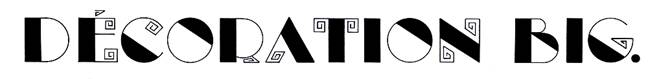
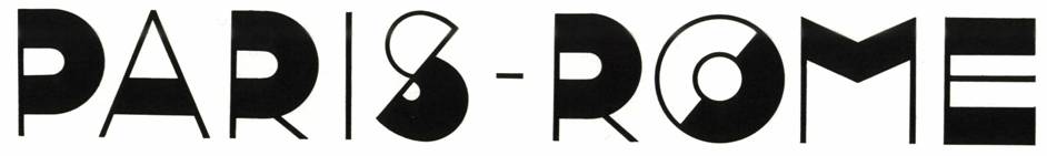
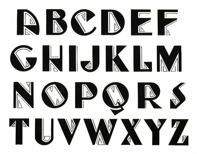
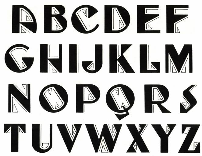
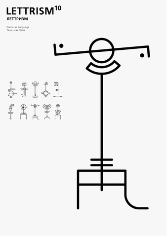
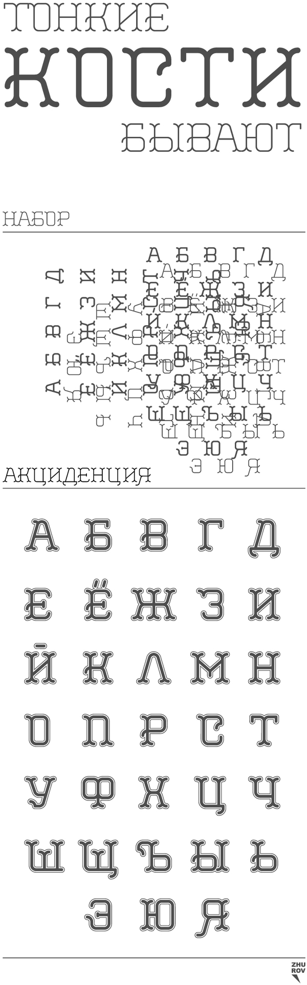
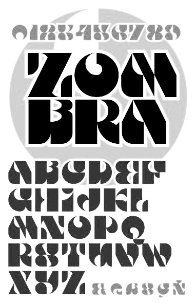
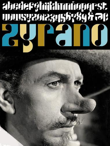
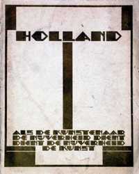
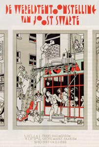
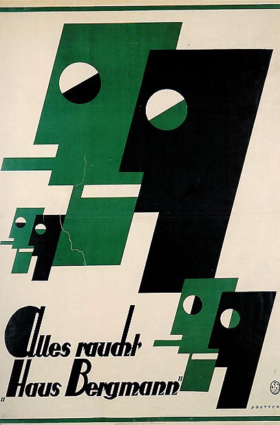
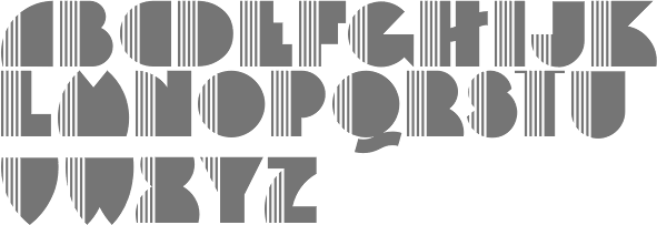
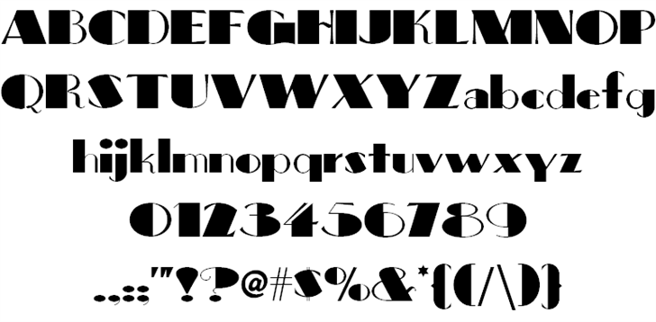
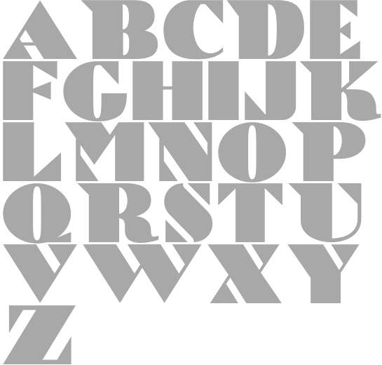
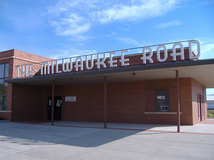
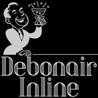
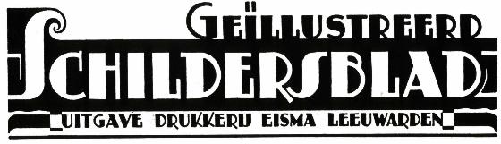
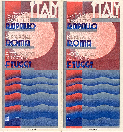
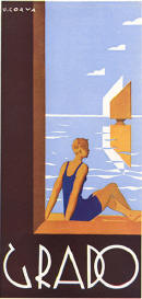
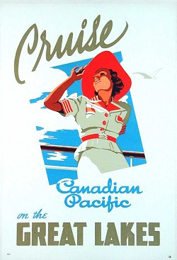
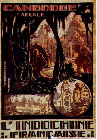
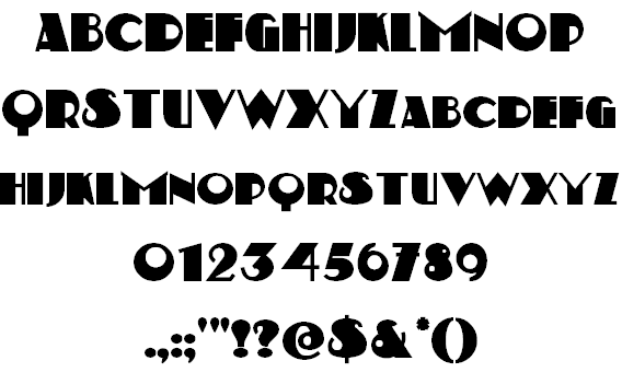
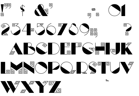
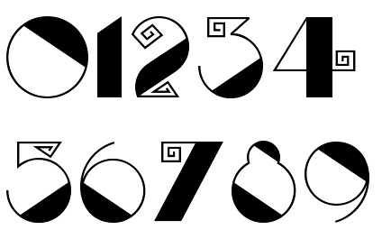
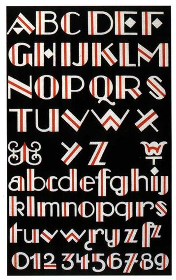
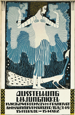
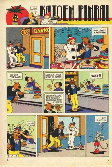
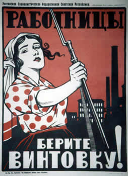
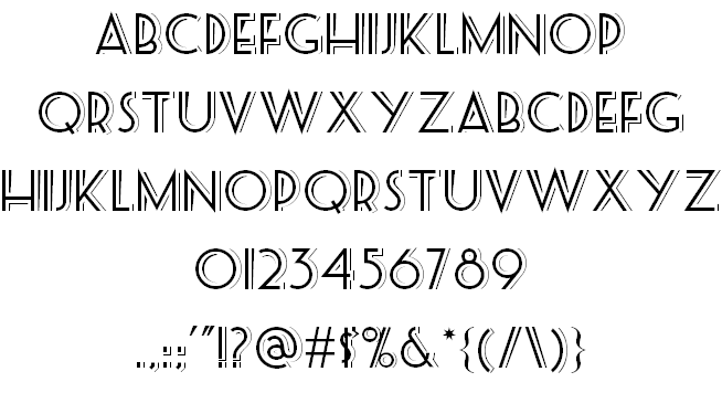
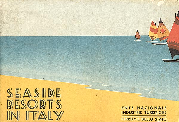
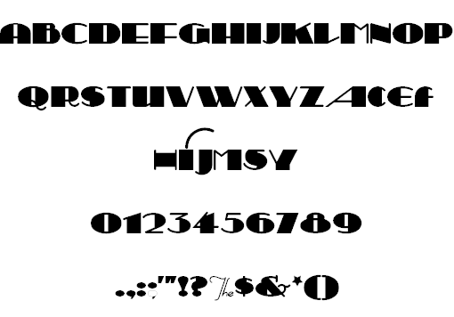
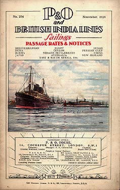
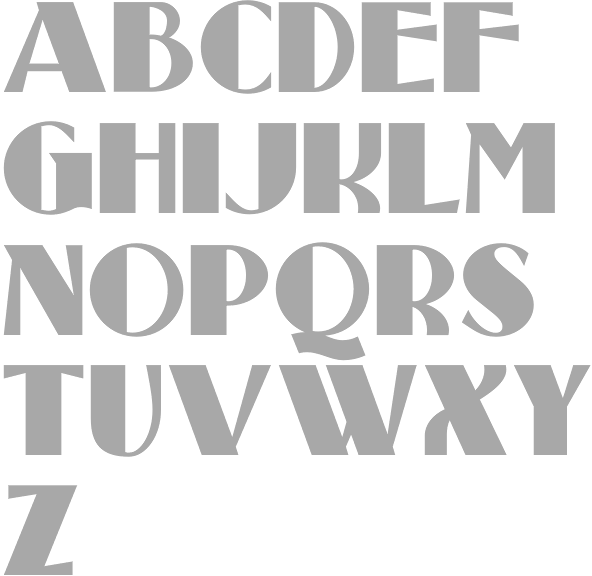
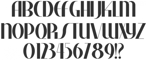
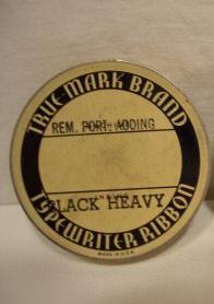
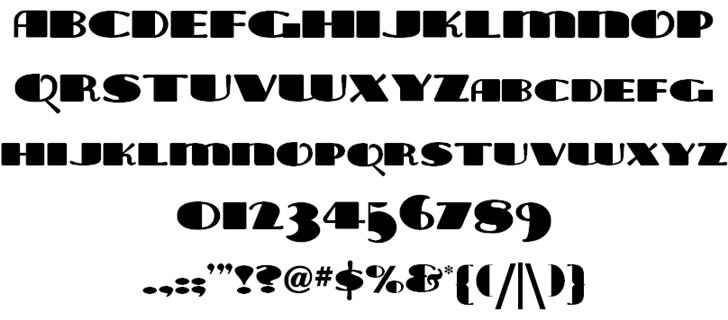
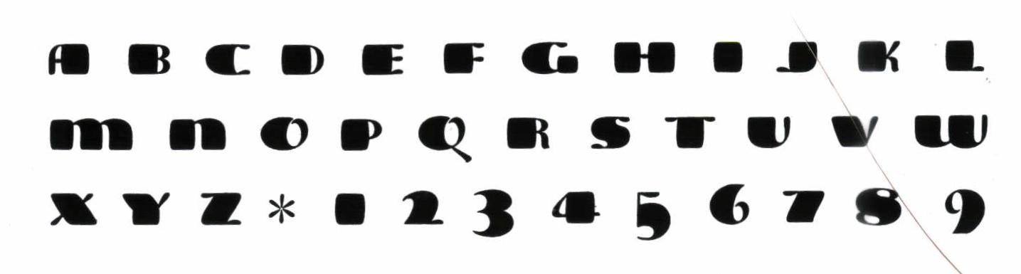
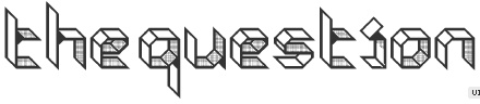
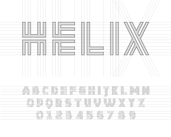
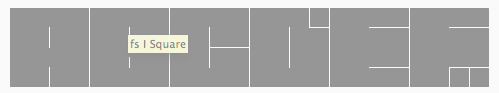
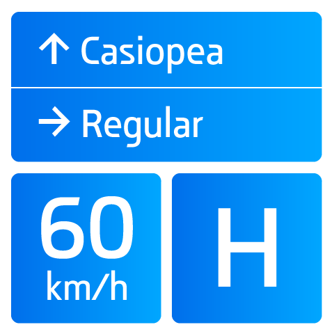
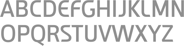
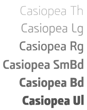
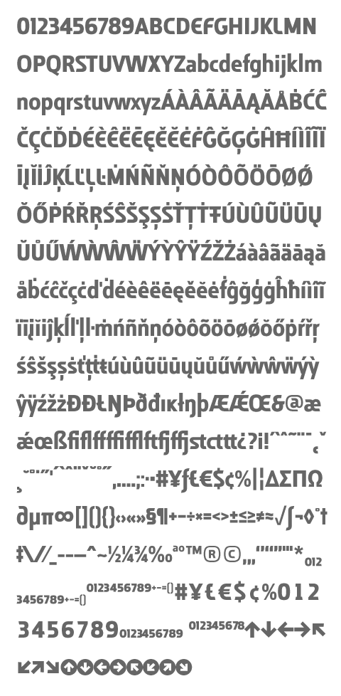
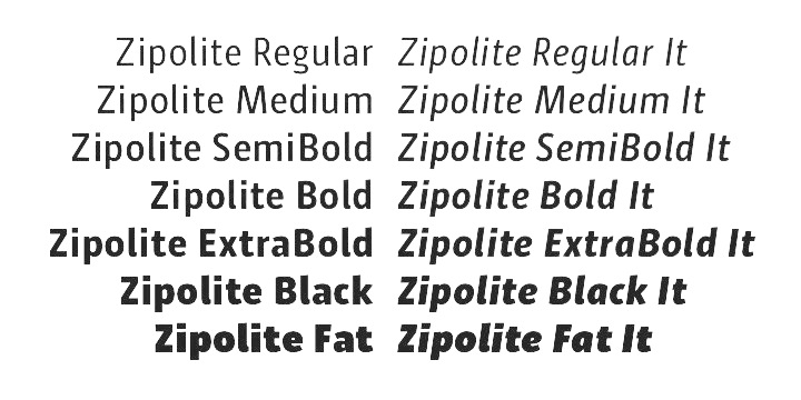
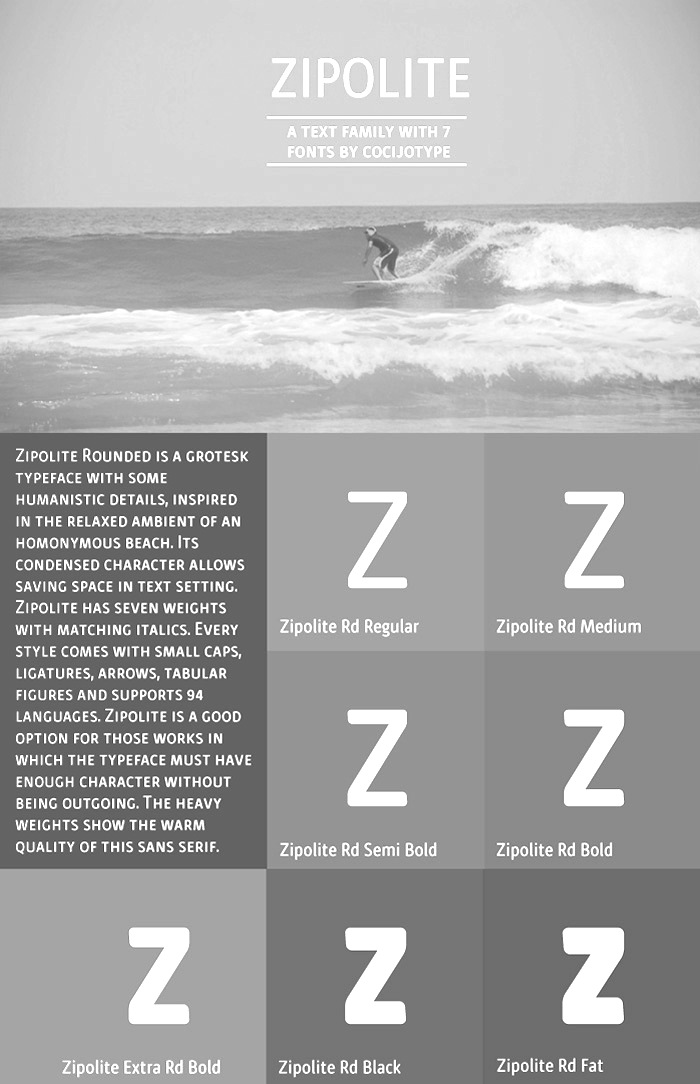
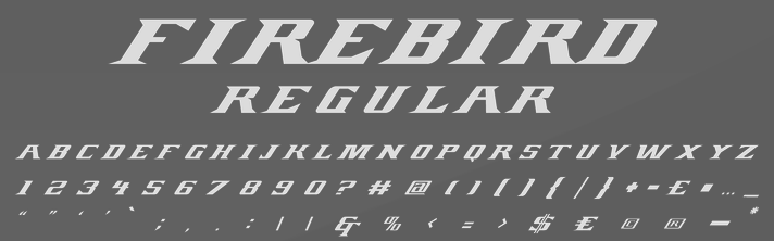
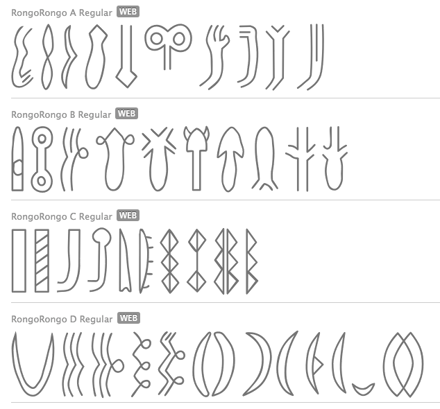
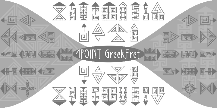
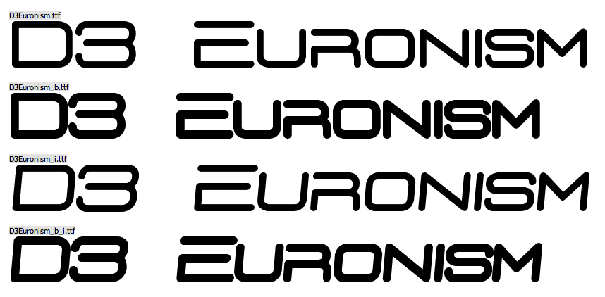
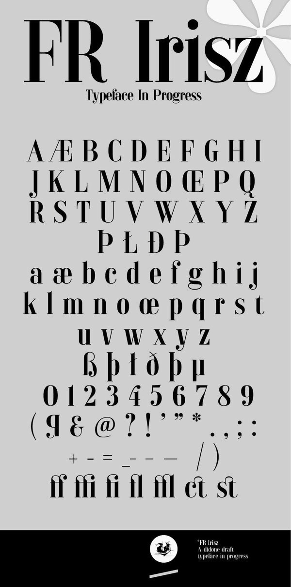
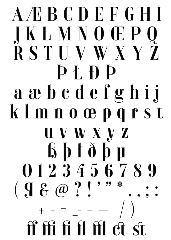
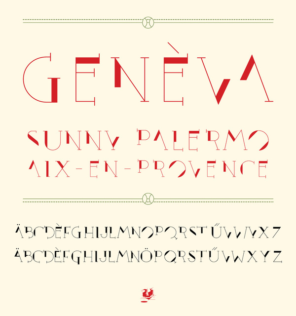
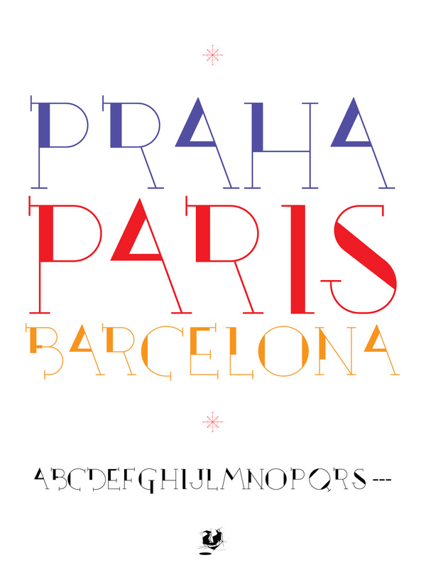
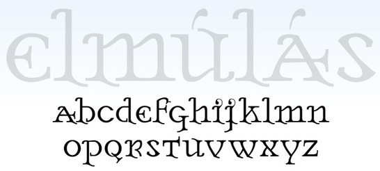
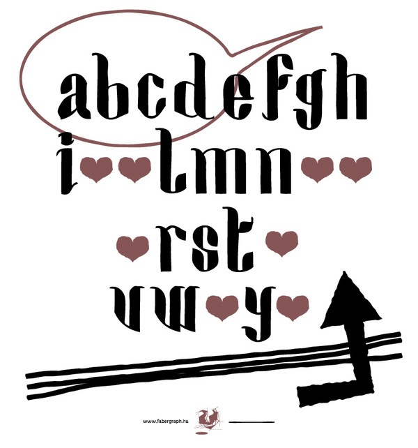
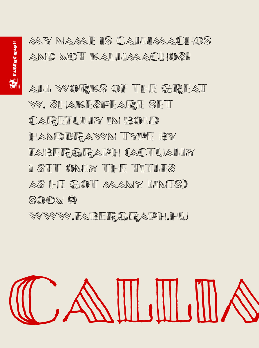
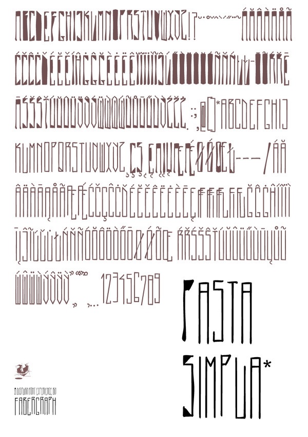
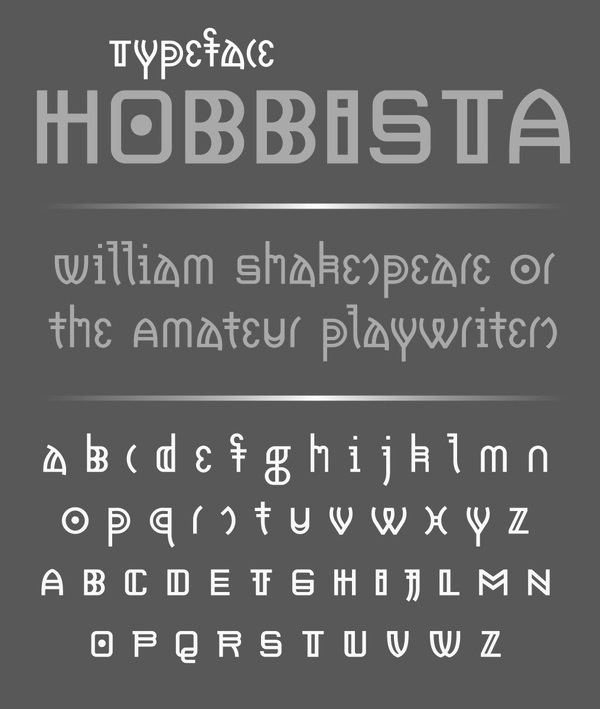
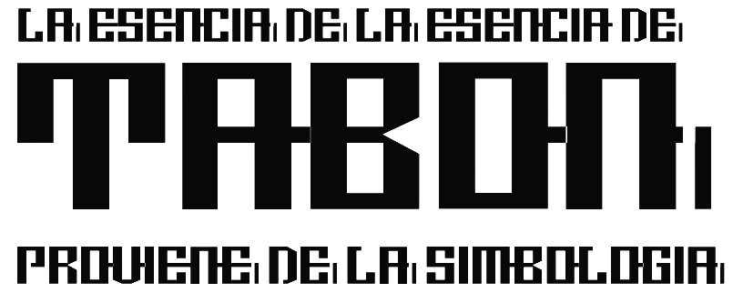
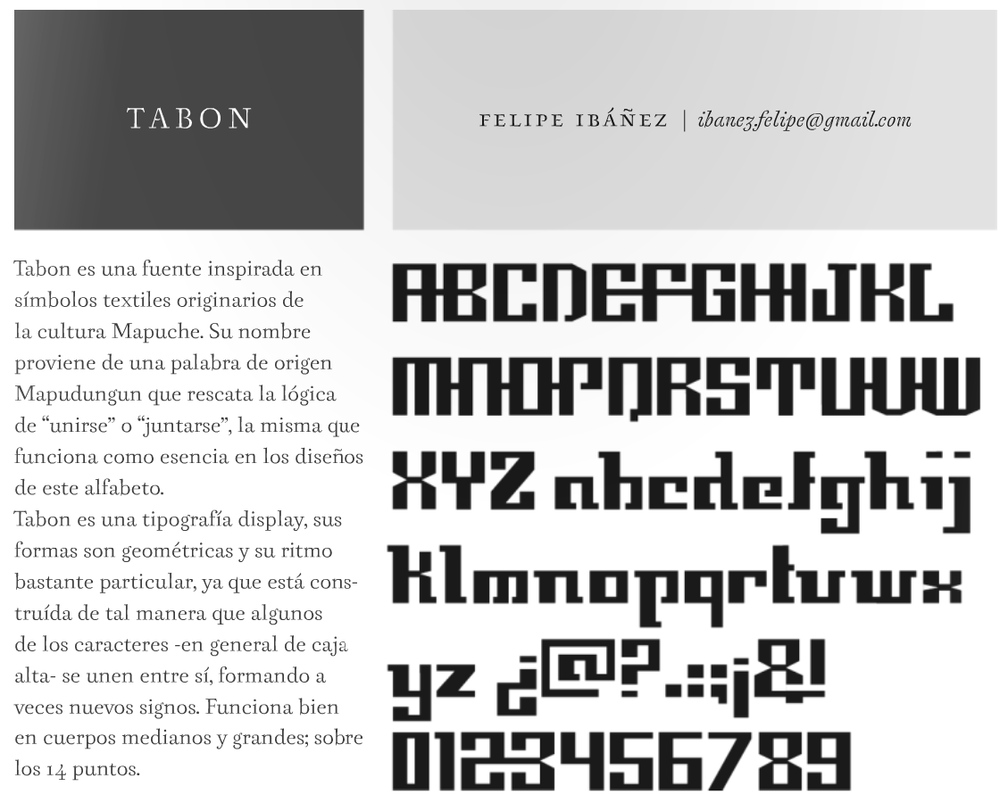
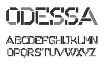
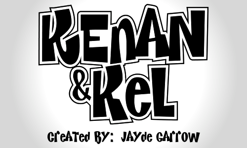
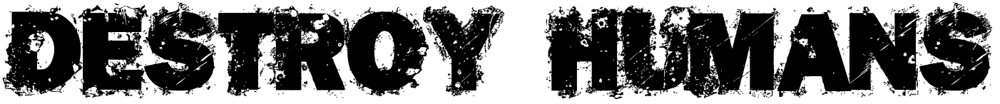
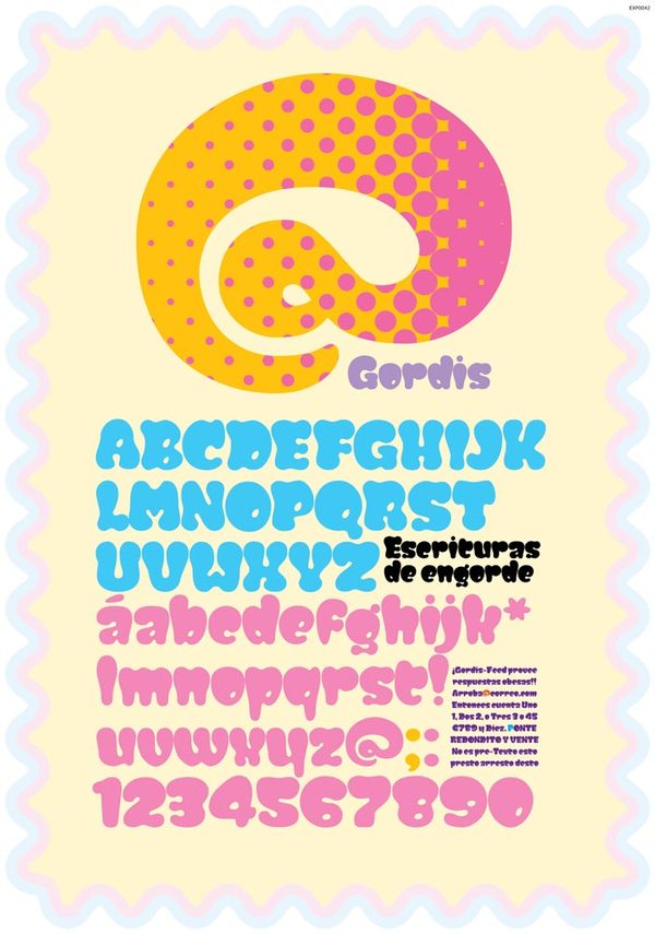
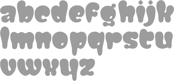
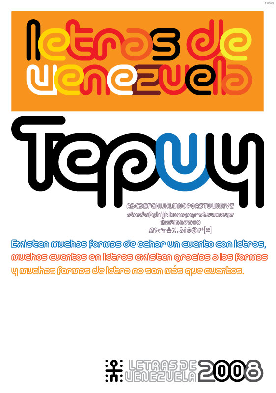
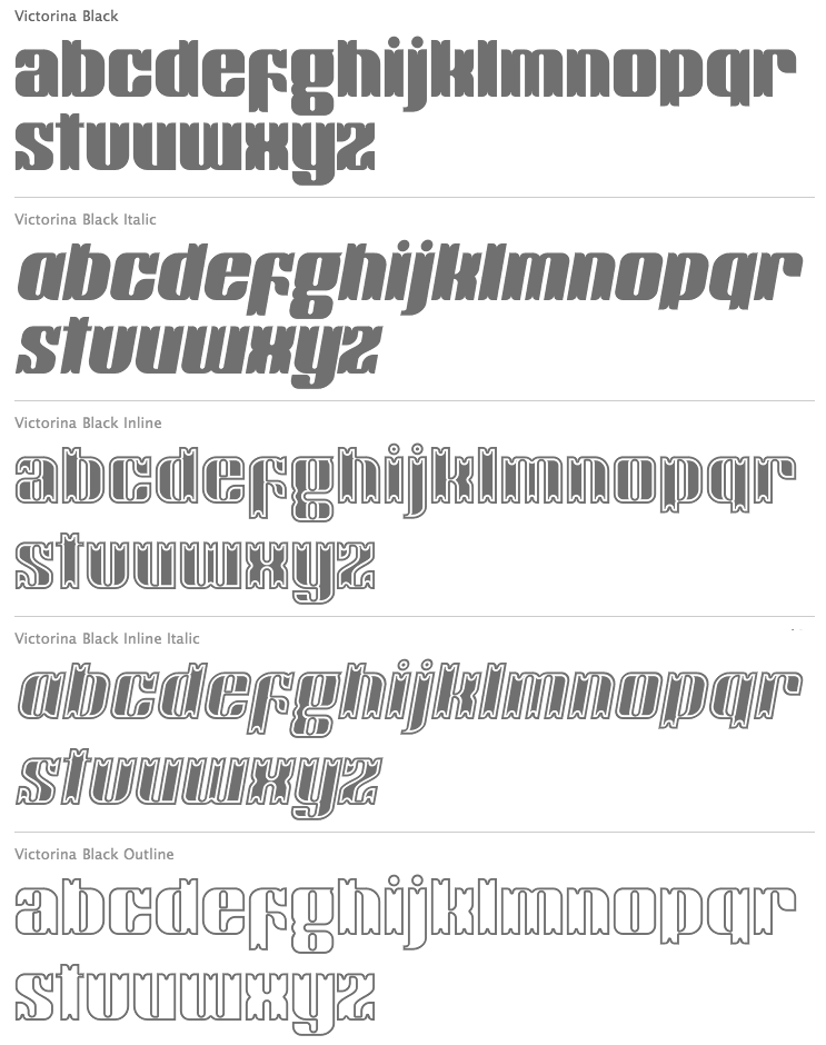
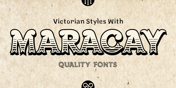
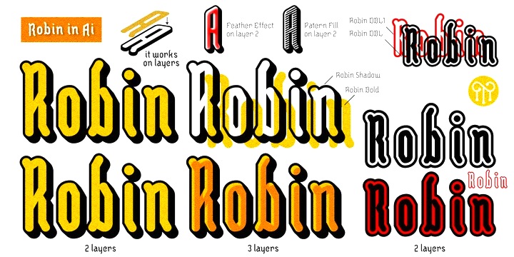
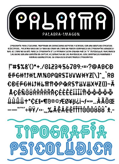
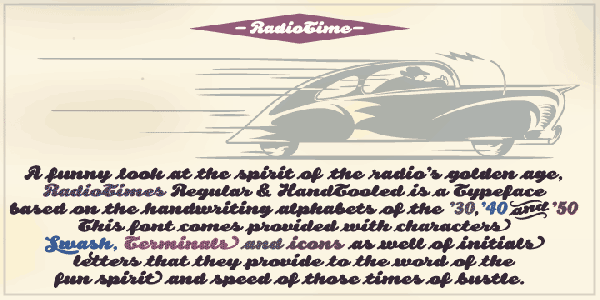
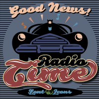
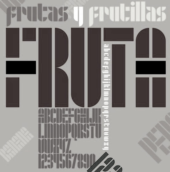
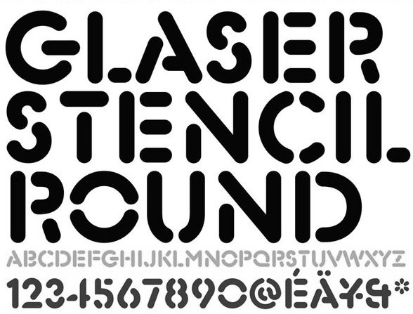
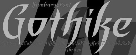
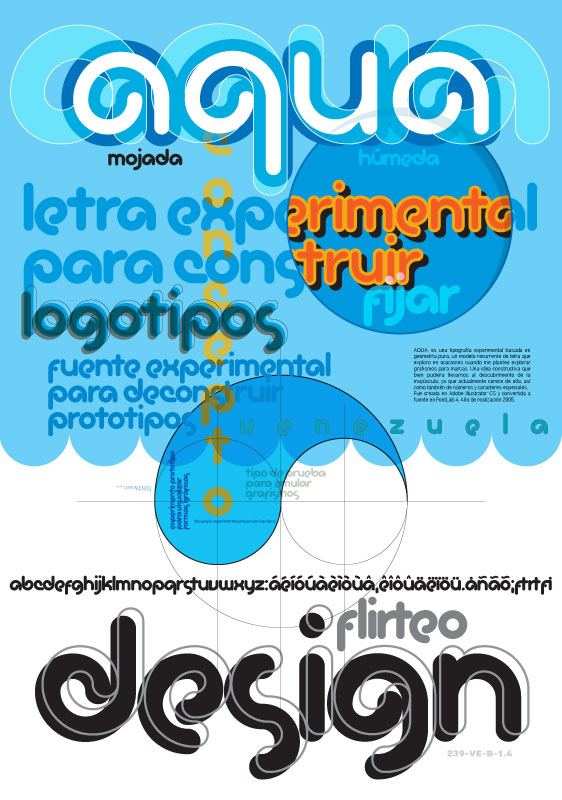
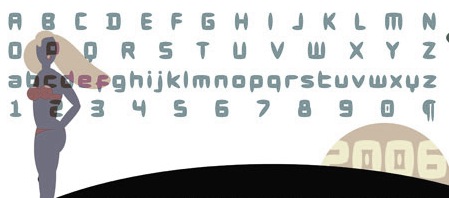
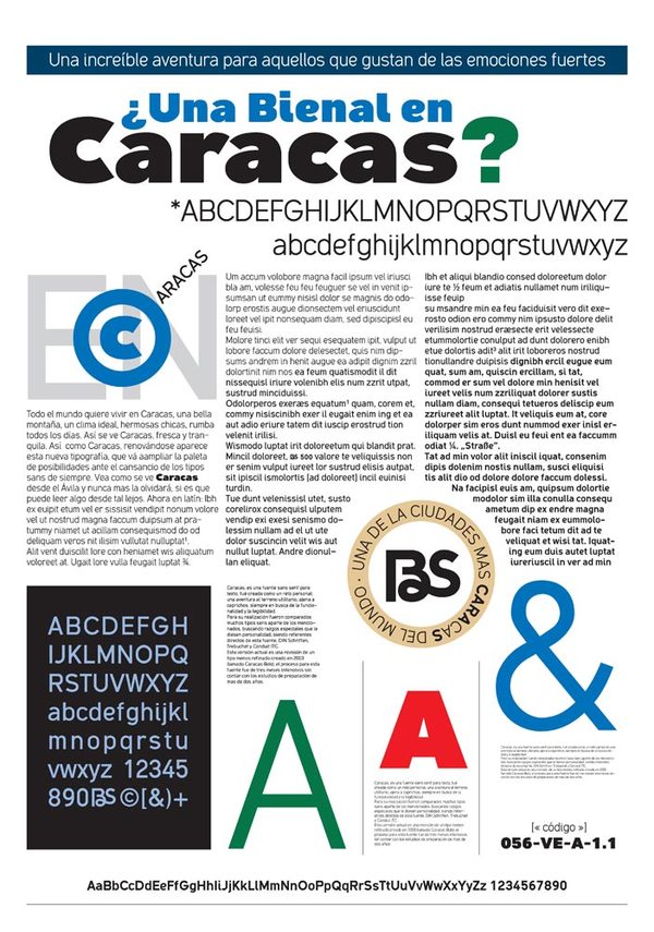
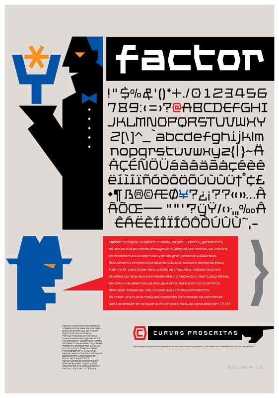
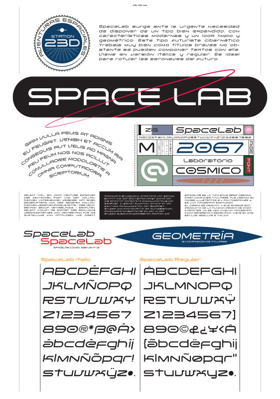
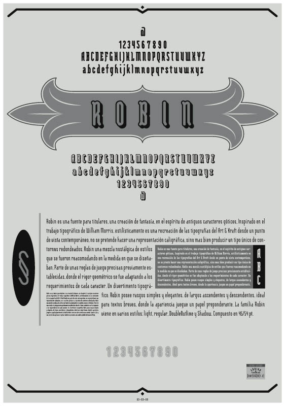
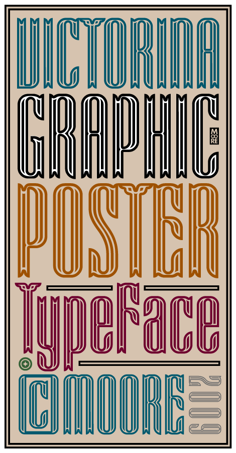
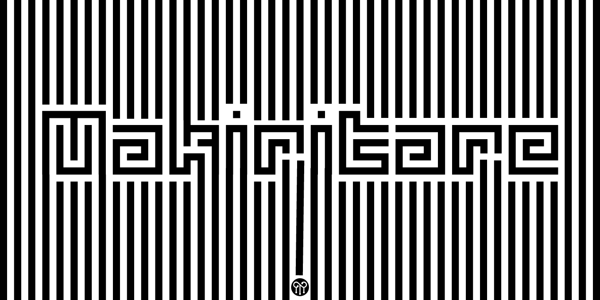
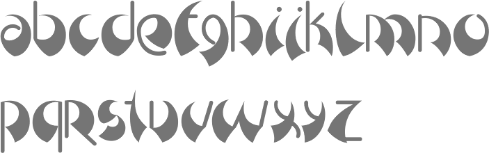
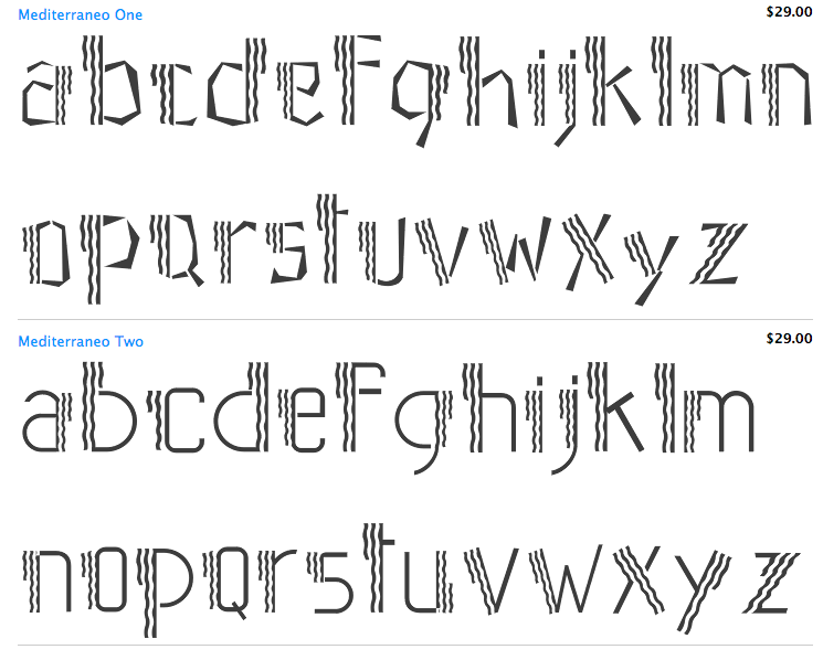
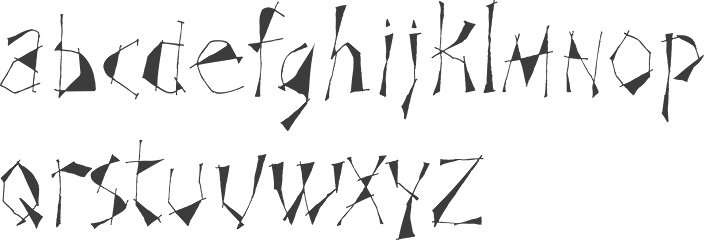
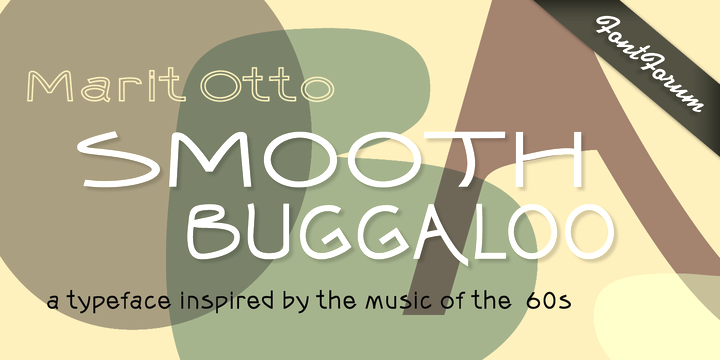
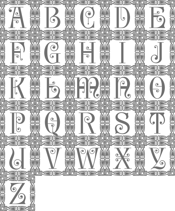
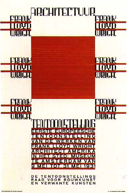
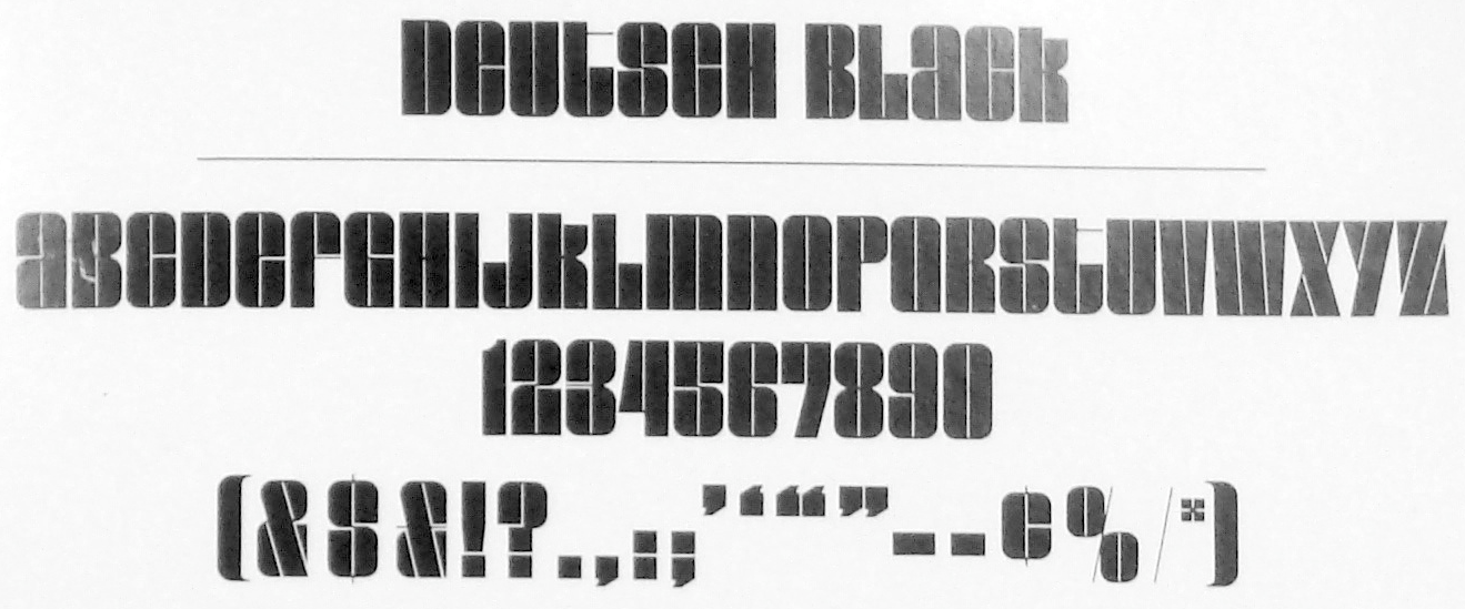
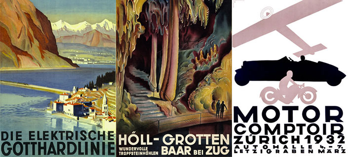
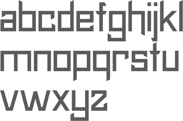
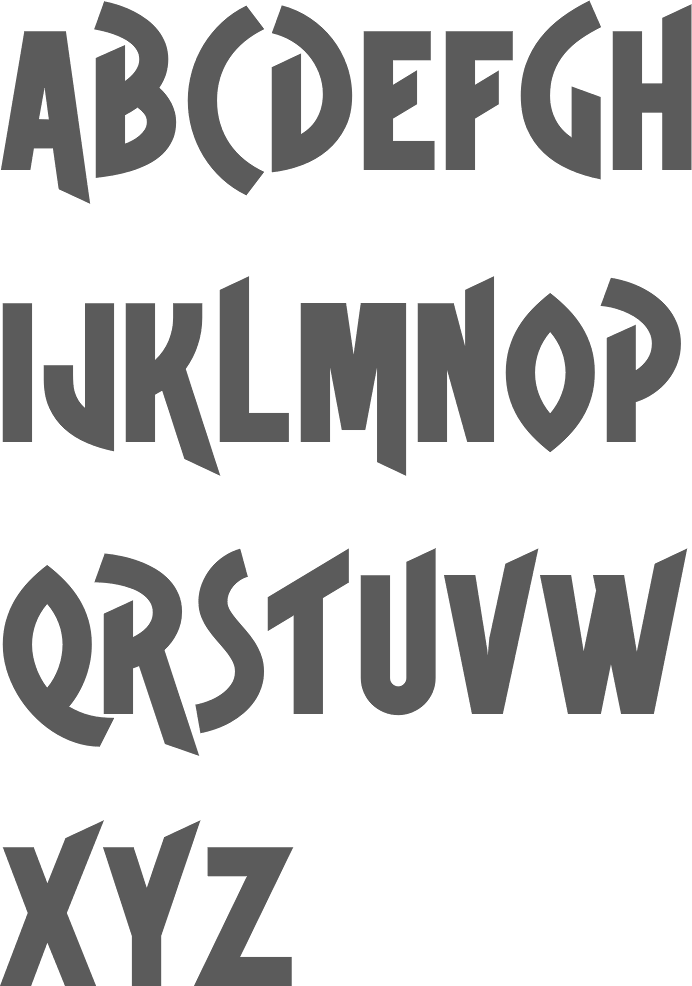
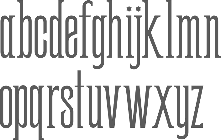
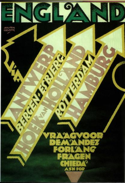
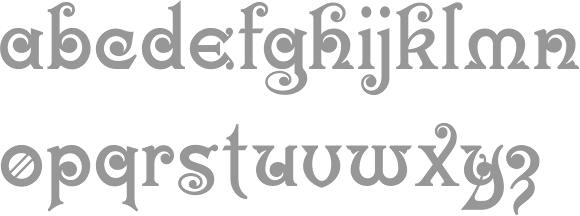
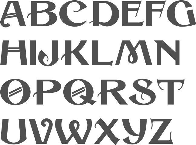
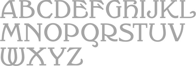
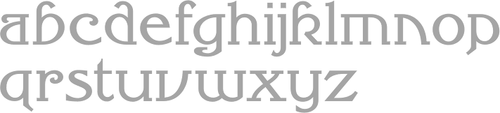
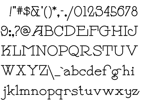
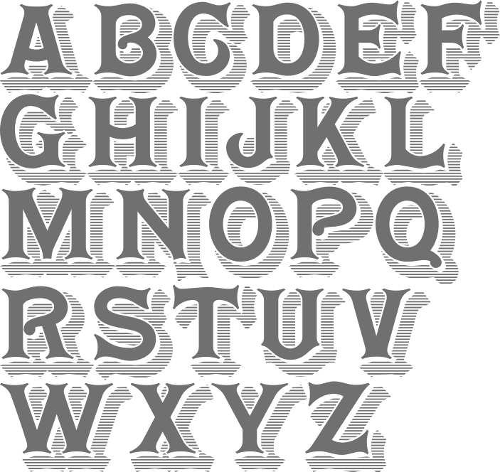
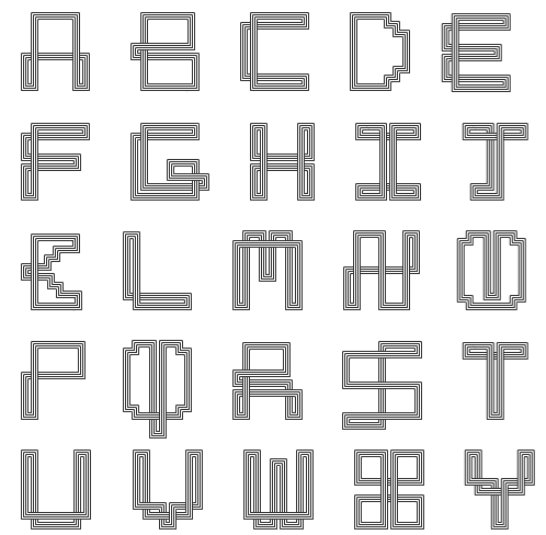
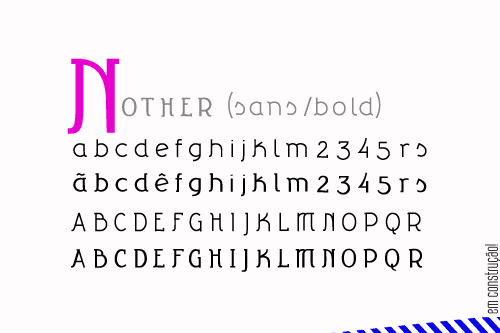
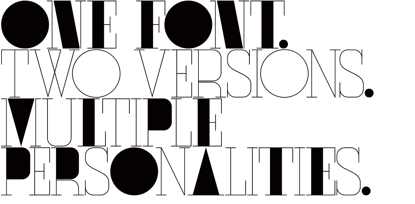
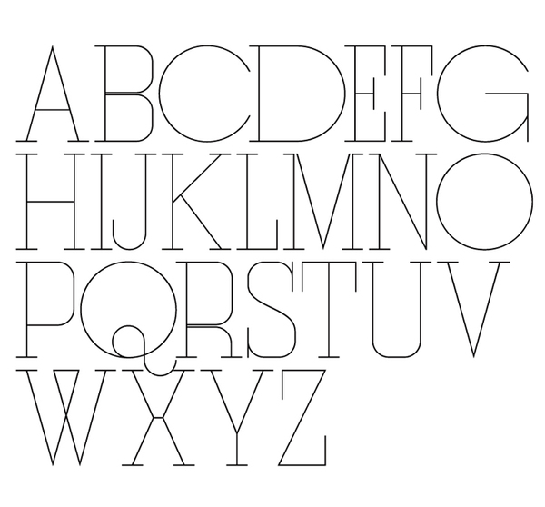
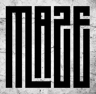