| | |
Acolina
|
Small rune font archive. Has, for example, from Ecological Linguistics, their Maya glyph fonts DaysBF, DaysCodBold, DaysCodBoldItalic, DaysCodItalic, DaysCod, all made in 1994. From the American Philological Association, Jeffrey Rusten's Greek font Athenian (1991). Also, the Maya glyph fonts Abaj, AbajBold, TunBold, Tun, Wuuj, WuujBold, WuujBoldItalic, WuujItalic. [Google]
[More] ⦿
|
Adolfo Ocadiz
|
Aguascalientes, Mexico-based designer of the decorative caps typeface Muximbal (2016), a typeface based on Mayan patterns developed during his studies at Universidad Autonoma de Aguascalientes. [Google]
[More] ⦿
|
Aga Silva

|
 Aga Silva (aka Mme. Ping) is an ex-architect/urban designer, who now lives in Krakow, Poland. Creator of the Glitter family (kaleidoscopic, star-shaped, and possibly of use as snow fonts), Stars Promo (2012), Ivy Tiles (2012), Lillius (2012, floral and froggy dingbats), Maya Tiles (2012), Ballpen (2012, hand-printed), Mickey Script (2012), and Nillie's Love Letters (2012).
 In 2011, she designed Grand Duchess (script face), Rosette110621 (kaleidoscopic dingbats), Brasserie (connected script), Marker Script, Skarpa LT (an avant-garde hairline face), Skarpa Regular, Skarpa Bold, Auld Magick (blackletter), Two Am, and Fantasy Dingbats. Typefaces from 2013: Monmica (an upright copperplate script), Skarpa 2.0, Trufla (English round hand, copperplate script), Trufla Words (calligraphic), Calissa (copperplate script), Calissa Words. Typefaces from 2014: Mavblis, Lavenda (a connected copperplate script), Roicamonta (connected script). Typefaces from 2015: Skarpa Round, Nistiver (calligraphic script), Lavenda (calligraphic script). Typefaces from 2016: Lidaxid (connected script), Hinzatis (calligraphic script), Roicamonta Basic (an upright connected calligraphic script), Monmica Fancy, Bisalir (heavy script), Piambis (thick signage script), Piambis Round, Piambis Sharp. Typefaces from 2020: Skarpa (a revised version of her 2011 typeface), Skarpa Condensed. Typefaces from 2021: Timernis (a 9-style humanist sans based on 1940 stone engraving commemorative plaque). [Google]
[MyFonts]
[More] ⦿
|
Alan Parker
[Parker Creative]
|
[MyFonts]
[More] ⦿
|
Alejandra Rodriguez
|
Mexican designer of the deco typeface Progessist (2017), the symbolic typeface Maya (2017), the frilly typeface Talaverains (2017) and the experimental Max Font (2017) and Another Rectangular Font (2017). [Google]
[More] ⦿
|
Alexandra Leopoldovna Gophmann
|
 Russian designer of typefaces who collaborates with Ivan Zeifert and specializes in revivals, cyrillizations and beautiful digitizations, some of them done with Anatole Gophmann. There have been complaints about her practice of borrowing fonts from type designers without asking. One typophile writes: I have cracked open fonts she claims as hers, Bolero, Bickham and others, she has copied and pasted glyphs, copyright data, added Cyrillic and changed the copyright string. As an example, Angelica is a copy of Alejandro Paul's Miss Fajardose. Alejandro has drawn the numerals in his font in 2004 to accompany the letters found in an old catalog of alphabets. There is no other source of the numerals, and Angelica has them. Michael Clark writes: I initiated a battle with the illustrious Alexandra "Bitch" from Russia who has renamed Pouty (FontBureau) and copyrighted [it as] Bolero. She and her partner Anatoly shithead. Available on Fonts101.com for anyone who wants it free. The ass's site, Jagdesh, is in Pakistan and we cannot touch him. 260+ viewings and 140+ downloads. Let's see that is 1400$ I will never see! Others have complained as well about her practice of taking and extending fonts without permission. Anyway, her "fonts" are:
 - A: Adine_Kirnberg (2005, the Cyrillic version), Advokat Modern (2008), Afisha, Afisha Cap, Agatha-Modern, AlexandraScript, Amadeus, American Text C, American-Retro (2008), Ametist [based on Lorelei] (2008), AmpirDeco, Andantino-script (2008), Andantinoscript, Anfisa Grotesk (2008), Angelica, Annabelle, Antikvar (2008), Antikvar Shadow (2008), Antonella Script (2008), Antonella Script X (2008), Antract, Aquarelle, Ariadnascript, Ariston-Normal, Arkadia (2008), Arkhive, Arlekino, Art-Decoretta (2008), Art-Decorina (2008), Art-Metropol, Art-Nouveau Initial (2008), Art-Nouveau1895, Art-Nouveau1895-Contour, Art-Nouveau1900, Art-Nouveau1910, Art-Victorian (2008), ArtNouveau-Bistro, ArtNouveau-Cafe, Artemis Deco (2008), Artemon (2008, psychedelic), Arthur Gothic, Artist-Modern, Astoria Deco (2008), Atlas Deco A (2008), Atlas Deco B (2008), Auction, Augusta One, Augusta Two, AvalonMedium.
- B: Ball-Point Pen, Bankir-Retro, Barocco Floral Initial (2008), Barocco Initial (2008), Baron Munchausen, Batik Deco (2008), Belukha, BelukhaCapital, BickhamScriptAltFour, BickhamScriptAltOne, BickhamScriptAltThree, BickhamScriptAltTwo, BickhamScriptOne, BickhamScriptThree, BickhamScriptTwo, Birusa (2008), Bodoni Initials (2008), Boleroscript, Bonapart-Modern, Briolin, Brokgauz&Efron, Brokgauz&Efron-Italic.
- C: Caberne, Cafe Paris C, Calligraph-Medium, Campanella (2008), Capitol Deco (2008), Carmen, Carolina, Casanova (art nouveau) (2008), Cassandra, Castileo (2008), Certificate of Birth (2008), Chocogirl (2008), ClassicDecor (ornaments), Classica-One (2008), Classica-Two (2008), Cleopatra (2008), Conkordia (2008), Cordeballet, Corinthia, Corleone, CorleoneDue.
- D: Dama Bubey (grunge) (2008), Debut (art deco in the style of Broadway) (2008), Decadance Cursiv (2007), Decor Initial (2009: decorative caps, a Cyrillic extension of a typeface by Pampa Type), Decor Line (2008), DeutschGothic (blackletter), Donaldina (2008).
- E: Edisson (blackletter), Egipet-Bold, Ekaterina_Velikaya_One (2005), Ekaterina_Velikaya_Two (2005), English Rose (2008), EnglishScript, EseninscriptOne, EseninscriptTwo, Evgenia Deco (2008).
- F: Fairy Tale (2008), Fantasia (2008), Fata Morgana, Favorit, Favorit Grotesk (2008), Flamingo (2008), Fortuna Gothic FlorishC (2009, blackletter).
- G: Geisha (2006), Gertruda Victoriana (2008), Globus (2006), Gloriascript, Goudy Decor InitialC (2009, ornamental caps), Goudy Decor ShodwnC, Goudy OrnateC, Graceful Mazurka (2008).
- H: HeatherScriptOne, HeatherScriptTwo, HeinrichText, Hogarth_script (2005).
- I: Isabella-Decor, Italy-A (2008), Italy-B (2008), Izis One (monoline sans), Izis Two.
- K: Kabriolet Decor (2009), Kamelia (2009, Victorian face), Kareta-A (2007), Kareta-B (2008), KarnacOne, KarnacTwo, Konkord-Retro, Konrad-Modern (2008), Konstrukto-Deco (2008) (2008), Kot Leopold (2008), Kumparsita.
- L: Lastochka (2008), Le Grand, Leokadia Deco (2008), Lombardia, Lombardina One, Lombardina Two, Lombardina-Initial-One (2008), Lombardina-Initial-Two (2008), Lombardina-One-Roman (2008), Lombardina-Two (2008), Ludvig_van_Bethoveen (sic) (2005).
- M: Majestic X-2, Majestic-, MajesticX, Malahit-Bold, Margaritascript, Marianna, MarkizdeSadscript, MartaDecor One and Two, MartaDecorTwo, Martina Script C, Masquerade (2008), Matilda, Matreshka, Maya (2008), Medieval English, Melange Nouveau (2008), Menuetscript, Metro Modern, Metro Retro B (2008), Metro Retro C (2008), Metro-Retro A (2008), ModernistNouveau, ModernistOne, ModernistThree, ModernistTwo, ModernoNouveau, ModernoOne, ModernoThree, ModernoTwo, Modestina (Victorian), Mon Amour Two (both jointly copyrighted with David Rakovsky) (2008), Mon Amoure One (2008), Monte-Carlo, Monte-Kristo, Monti-Decor A B, Moonlight, Moonstone, Moonstone Stars, Morpheus, Moulin Rouge (2008).
- N: Nocturne (2005), Nostalgia (2008).
- O: Old Comedy, OldBoutique, Olietta-script-BoldItalic (2008), Olietta-script-Lyrica-BoldItalic (2008), Olietta-script-Poesia-BoldItalic (2008), Orpheus, Ouverture Script (2004, calligraphic).
- P: Parisian, Picaresque One, Picaresque-Two (2008), Pilotka (2008), Plimouth, Port-Arthur (2008), Poste Retro (2008), Postmodern One, Postmodern Two, Promenad Deco (2008), Prospect-Deco (2008), Pudelina (2008), Pudelinka (2008).
- R: Red Sunset, Regina Kursiv (2008), Renaldo Modern, Rochester, RochesterLine, RockletterSimple, RockletterTransparent, Romantica Script, Romashka Deco (2008), Romashulka (2008), Rondo Ancient One (2008), Rondo Ancient Two (2008), Rondo Calligraphic (2008), Rondo Twin (2008), Rosa Marena, Rosalia (2008), RosamundaOne-Normal, RosamundaTwo, Rotterdam, Rubius, Rurintania (sic) (2005).
- S: Samba DecorC (2006), San Remo, Sapphire C (2008), Scriptorama (a clone of Scriptina), Secession-Afisha, Sevilla Decor X, SevillaDecor, Sladkoeshka (2008), Stereovolna (2008), Stereovolna Black (2008), Stradivari Script (2008), Stradivari Script [the Latin part copyrighted by Grosse Pointe Group] (2008), Stravinski Deco (2008).
- T: Taverna, Teddy Bear [Latin by House Industries] (2008), Telegraph, TelegraphLine, TelegraphShodwn, TelegraphSmall, Terpsichora (2008, psychedelic), Theater (2009, Victorian), Theater Afisha, Topaz, Trafaret Kit (2008), Trafaret Kit Hatched (2008), Trafaret Kit Transparent (stencil) (2008), Traktir-Modern, Traktir-Modern3-D, Traktir-ModernContour, Turandot.
- V: Valentina (2008), Variete (2008), VenskiSadTwo-Medium, VenskisadOne-Medium, Vera Crouz, VeronaGothic (blackletter), VeronaGothicFlourishe (blackletter), Veronica-script-One (2008), Veronica-script-Two (2008), Victorian-Gothic-One (2007), Victorian-Gothic-Two (2008), Victoriana, Vizit (2010, engraved face).
- W: Wolfgang Amadeus Mozart (2005), Wonderland (2008), Wonderland Star (2008).
- Z: ZanerianTwo, [Google]
[More] ⦿
|
Anthony James
|
 Anthony James (Manchester, UK) is a talented British type designer. iHis typefaces, in chronological ordr:
 - Kaiju (2014). A dashing art deco typeface. Kaiju II followed in 2015.
- Chase (014). A free monoline sans.
- QG (2014). A minimalist free typeface.
- Argö (2014). A commercial decorative fashion mag didone typeface.
- Global (2014). A slender ball terminal-laden typeface meant for magazine titling.
- Goku (+Regular, +Stencil; 2014). A multilingual didone fashion mag typeface, initially designed as a stencil font for the Basel & Geneva Watch Launch Event for Watches of Switzerland.
- Giza (+free Stencil; 2015). A fashion mag didone. It was unfortunately named, as David Berlow's famous Egyptian typeface is also called Giza. After I wrote this in June 2015, I noticed that Giza became Giaza in July 2015.
- Kingston (2016). A fashion mag typeface derived from didones.
- Jitzu (2016). A multilingual high-contrast fashion didone in ten styles.
- Osgard (2017). A swashy blackletter.
- Ghost Cove (2017).
- Indulge Script (2017). Formal calligraphy.
- Kenjo (2018). Fashion mag headline type.
- Omega Sans (2018).
- Solar Vesta (2018). A font duo.
- Qavo (2018). A sharp-edged monoline all caps sans.
- Mojita (2019). A geometric display typeface, inspired by Japanese art deco, as well as Aztec & Mayan pattern design.
Facebook page. Buy his commercial typefaces here. [Google]
[MyFonts]
[More] ⦿
|
Archaeological Fonts (by Bonneville Electronics)
|
The was a commercial site located in West Clinton, Utah, that was run by Scott T. Smith from Clinton, Utah. It had Mayan, hieroglyphs, cuneiform, Syriac, Etruscan, old Greek, old Hebrew and archeological fonts as well as Native American dingbats. [Google]
[More] ⦿
|
Architaraz Type (or: Kassymkulov Design)
[Zhalgas Kassymkulov]
|
 Architaraz Type (Kassymkulov Design) is located in Shanghai, China, and Taraz, Kazakhstan. Its type designer, Zhalgas Kassymkulov, was born in 1986 in Kazakhstan. His initial type designs were all done with the help of FontStruct. In 2013, he went commercial as Architaraz Type.
 He made a gridded modular typeface called Targeted (2011). Sliced (2011) is a counterless stencil face. Discostructed (sic) (2011) is a texture face. Mono Dot (2011) is a thin dot matrix face. Mono Hor (2011) is a horizontally striped version of it, Mono Ver (2011) a vertically striped version, and Mono Bold (2011) a bold version. Promo (2011) is purely geometric. Semiz (2011) and Semiz Light (experimental) are partly art deco. Audio (2011) is based on the logo of audiojelly. Arro (2011) has letters with arrowed terminals. Hexa (2011) is hexagonal. Happi (2011) is a fat finger face. Semiz Black (2011) is a free fat pixel face. Creations from 2012: Pearls of Margar, Korgan, Phunni, Carbo, Carbo ii, Lenta, Phunni, Jambul, Extraterrestrial (sci-fi), Rap My Hip-Hop, Armada 1991 (monospaced), Venus (white on black), Garage Garbage (bold avant-garde design), WHAQ, Extra Fontestrial, Algae, A Tasbaqa, Salem (rounded bold typeface), Thaiana Jones, Salem (fat rounded face), Audio 2012, Balapan, Dalmat, Bonn (an art nouveau army stencil face), Mgla, Teris (white on black), Degoratix (curly), Barney Stencil (a fantastic brushy stencil), Lentalicious, Blackway Str, Schengbers (a great piano key stencil family), Tramcar Typo, Mgia, Brushure (a fat curvy display face), Extralien, Serrific Terif, Missinger, Tolkyn, Murt, Twisture, Soliture, Threedure, Antillic, Garage Garbage, Arro, Happi, Schengbergs Hi. Typefaces from 2013: AT Dombra (psychedelic typeface after Motter Ombra), AT Hoppy (fat letters), AT Liniya (blackboard bold), AT Karagai, Hed Kandi (techno face), AT Traffa Stencil, AT Schema, Naation, AT Nayman, AT Roughin, AT Rooktura Stencil, AT Duba, AT Archistency, AT Liena, AT Bombarda (fat stencil face), AT Sulfur ii, AT Mad Pilot, AT Tasbaqa, Vaia Con Dios, Betaport, Mooltyashka, AT Stincel (a lively stencil font), Millio, Tamshy, Offelia, Jalgas (retro script: a winner in the FontStruct Connected Script Competition), Laffa (connected stencil script), Dlinalys, Diagona, Kitara (psychedelic), Archtitalic, Bonn (bony stencil), Teka 1, Teka 2, Unknownim, Khara (ultra-heavy slab face), Shlab (slab serif), Unknownim (slab serif), Archtalic, Argyn, Linea Runde, Mechatraps (+Plain), Eliksir, Drilliant, Katamaran (art deco), Lagman, Neurojet (experimental), Jazzure (bullet hole display face), Diagon, Aroth, Pharaoh's Delight (piano key / art deco typeface), Cocomi, AT Burshak, AT Sulfur, AT Taspa, AT Affina. Commercial typefaces done in 2013: KD William, William Shakespears, AT Archistency (piano key stencil face) AT Bombarda (piano key stencil face), AT Audio, AT Argyn. Typefaces from 2014: AT Sudoku (each letter is actually a sudoku puzzle!), AT Tactica (tic tac toe voard), AT Sudoku+, AT Pixtensans, AT Ayna, AT Kerey, AT Giveaway, AT Lagman, AT Asotika, AT Tugan, AT Yertegi, AT Nudgera, AT Diagona, AT Golovkin (stencil typeface named after middleweight boxer Gennady GGG Golovkin), AT Arachis (stencil), AT Tugan (fat rounded sans), AT Baktera, AT Jumpa Jumpa (stencil), AT Nudgera, AT Digitta, AT Archaus, AT Ladya (ball terminal stencil), AT Yin Yang, At Keste, AT Yazyk (rounded stencil), AT Sulfurian (techno stencil), AT Fasten Your Seatbelts (diagonally cut stencil), AT Buckle Up (like AT Fasten Your Seatbelts), AT Droppix, AT Knitka (knitting font), AT Sagat, AT Wild Archid (african theme font), AT Steglo. Typefaces from 2015: ATAday, ATArchistruct, ATAttache, ATBogomol, ATCastleryRock, ATChaperon, ATKitay (oriental simulation), ATQuba, ATRaushan, ATRoyal, ATShlanga, ATSkos, ATTrassa, AT Giveaway 4, AT Sherit, AT Ribborn. Typefaces from 2016: ATArchaus2, ATArchistructOutline, ATDornach, ATDrogo, ATEnschede, ATExtrema, ATGiveawayNo5, ATGiveawayNo6, ATHadamard, ATTwelve, Windows Icon Font. Typefaces from 2017: ATBals, ATBevelour, ATEsrever, ATHitchook, ATImagiro, ATLauda, ATMigdalia, ATRozalla, ATUniversiade, ATYangster, ATZabor, ATThinnetry. Typefaces from 2018: KD Eight, KD Tramcar, KD Algae Brush, Forza Juve (inspired by Juventus FC's logo), KD Hachure (a multiline typeface family), KD Half Arc, KD Space Band, KD Hachure (+Inline, +Outline), KDAnniversary, Armiya (army stencil), KD Baba Yaga (multiline). Typefaces from 2019: KD Para, KD Pempo (a multiline art deco font). Typefaces from 2021: KD Ziberia (based on Antonio J. Morata's Ziberia typeface from 2011), KD Dekorat (a modular labyrinthine or Maya genre set of capital letters). FontM link. Behance link. FontStruct link. [Google]
[MyFonts]
[More] ⦿
|
Armando Hernández Marroquín
|
Mexican designer of the TrueType fonts Chess Alfonso-X, Chess Chess Harlequin, Condal, Chess Leipzig, Chess Kingdom, Chess Magnetic, Chess Mark, Chess Marroquin, Chess Maya, Chess Mediaeval, Chess Merida, Chess Millennia, Chess Miscel, Chess Motif, Chess Usual. All freeware. Also made the free PostScript font set FigurineSymbol (6 typefaces) for use in text. Armando lives in San Cristobal de Las Casas, Chiapas. [Google]
[More] ⦿
|
Ava O'Byrne
|
Graphic designer in Paris who created these typefaces: Institut du Monde Arabe (2018), Maya (2018). [Google]
[More] ⦿
|
Chess Materials Desktop Publishing
|
Many free chess fonts, including Chess-Magnetic, Chess-Mark, Chess-Marroquin, Chess-Maya, Chess-Millennia-D, Chess-Millennia-L, Chess-Miscel, Chess-Mediaeval, Tilburg3 (by Chessworks Unlimited), Skak, Chess-Utrecht. [Google]
[More] ⦿
|
chess.com
|
Chess font arghive: Chess-7, Chess-Berlin, Chess-Harlequin, Chess-Kingdom, Chess-Leipzig, Chess-Mark, Chess-Marroquin, Chess-Maya, Chess-Motif, ChessDiagrammPirat, ChessFigurinePirat, ChessFigurinePiratBold, ChessFigurinePiratItalic, ChessKomponentPirat. [Google]
[More] ⦿
|
Daniel Johnson
|
 Canadian type designer. His typefaces:
 - Aguardiente (2010, heavy sans).
- Deka (2010, a monospace font designed for very small display sizes).
- Didact Gothic (2010, a simple and readable sans i in the form most often used in elementary classrooms).
- He contributed to the GNU Freefont project. In particular, he created by hand a Cherokee range specially for FreeFont to be "in line with the classic Cherokee typefaces used in 19th century printing", but also to fit well with ranges previously in FreeFont. Then he made Unified Canadian Syllabics in Sans, and a Cherokee and Kayah Li in Mono. And never to be outdone by himself, then he did UCAS Extended and Osmanya. His GNU Freefont ranges:
- Armenian (serif) (U+0530-U+058F)
- Cherokee (U+13A0-U+13FF)
- Unified Canadian Aboriginal Syllabics (U+1400-U+167F)
- UCAS Extended (U+18B0-U+18F5)
- Kayah Li (U+A900-U+A92F)
- Tifinagh (U+2D30-U+2D7F)
- Vai (U+A500-U+A62B)
- Latin Extended-D (Mayanist letters) (U+A720-U+A7FF)
- Osmanya (U+10480-U+104a7)
- Grana Padano (2010).
- Judson (2010, designed for African literacy).
- Jura (2009). A sans family with support for Burmese, Cyrillic and Greek; redesigned and improved by Alexei Vanyashin in 2016; a variable font was added in 2019 by Mirko Velimirovic). Johnson explains: Jura is a family of sans-serif fonts in the Eurostile vein. It was originally inspired by some work I was doing for the FreeFont project in designing a Kayah Li range for FreeMono. (Kayah Li is a language used by a minority people group in Burma. Because the Burmese government suppresses the teaching of minority scripts, the Kayah Li script is taught only in schools in refugee camps in Thailand.) I wanted to create a Roman alphabet using the same kinds of strokes and curves as the Kayah Li glyphs, and thus Jura was born. Github link for Jura.
- Megrim (2010, a monoline drawing table sans).
- Pacaya (2013, a medium-weight sans).
- Pfennig (2010, an extensive humanist sans family).
- Rahel (2009, Hebrew).
- Sacco-Vanzetti (2009, sans).
- Stanislav Caps (2013).
- Travelogue (2008).
- Triad Postnaya (2010). An old Church Slavonic typeface and its Latin simulation twin. Free at the Open Font Library. Triod Postnaya attempts to mimic the typefaces used to publish Old Church Slavonic service books prior to the 20th century. It also provides a range of Latin letters in the same style.
Klingspor link. Fontspace link. Dafont link. Kernest link. Fontsquirrel link. Google Plus link. [Google]
[More] ⦿
|
Deniart Systems
[Jan Koehler]
|
 Great fonts for astrology, hieroglyphics, alchemy and the occult, by Toronto's Jan and Denise Koehler, mostly designed between 1993 and 1995. They moved to Litomerice and then Teplice, the Czech Republic, recently. MyFonts sells the fantastic Meso Americano dingbats, Hypnotica, AlchemySymbols (two fonts), BlackMagick, Border Twins (2010), CastlesShields, Curly Jane (2010), Cubista Geometrica (2010: op art), DaggersAlphabet, Dendera (ancient Egyptian Zodiac symbols), Dragons, Eggnog (2010), Fontazia Floradot (2012), Fontazia Papilio (2009), Fontazia Pop62 (2011, dingbats of flowers), Fontazia AquaFlorium (2010, fishtank dingbats), Fontazia Mazzo (2010, vases), Fontazia Stiletto (2011), Fontazia Y3K (2009, aliens), the Hieroglyph family (dingbats, really), Jolly Jester (2010, curly hand), MagiWriting, Meandros (2010, a paperclip design inspired by the Greek Key, or Fret, motif), Phaistos, Pocket Wrench (2010, octagonal), Polka Dot Wrench (2010), PowersofMarduk, Praha Deco (2010, inspired by the Prague art deco movement), the RongoRongo family (Easter Island script), SkeletonAlphabet, Sublimina, Superchunk, WhiteMagick, Yenda (2010, bold and angular).
 List of font packages: Aglab, Alchemy Symbols, American Sign Alphabet, Ancient Writings Vol. 1, Ancient Writings Vol. 2, Angelica, The Astrologer Bundle, Astrologer, Aztec Day Signs, Black Magick, Braille Alphabet, Castles&Shields, Celestial Writing, Celtic Astrologer, Certar, Chinese Zodiac, Coptic Alphabet, Daggers Alphabet, Dendera, Dinosauria, Dragons, Egyptian Deities, Enochian Writing, Egypt. Hieroglyphics Vol 1, Egypt. Hieroglyphics Vol 2, Egypt. Hieroglyphics Vol 3, Egypt. Hieroglyphics Vol 4, Futhark, Greco, Hebrew Basic, Hypnotica, Magi Writing, Magick&Mystic, Malachim Writing, Masonic Writing, Maya Day Names, Maya Month Glyphs, Meso Americano, Meso Deko, Morse Code, Old Persian Cuneiform, Passing the River, Phaistos, Pike's Alphabets, Powers of Marduk, Sanskrit Writing, Semaphore Code, Signals&Signs, Skeleton Alphabet, Sublimina, Tengwanda Gothic, Tengwanda Namarie, Theban Alphabet, The Egyptologist, Tolkien Scripts, WhiteMagick, Skeleton Alphabet, Hebrew Basic, Sanskrit Writing. Note: I cannot find an entry for Jan Koehler at MyFonts, where all Deniart fonts are said to have been made by Denise Koehler. [Google]
[MyFonts]
[More] ⦿
|
Denise Koehler
|
 Partner of Jan Koehler in Deniart Systems, which operated from 1993-2009 in Toronto, and then in Litomerice (Czech Republic). Her typefaces include: Skeleton Alphabet, Sanskrit Writing, White Magick Symbols, Theban Alphabet, Tolkien Tengwanda Namarie, Tolkien Tengwanda Gothic, Sublimina, Semaphore, RongoRongo (a system of glyphs discovered in the 19th century on Easter Island), Powers Of Marduk, Phaistos Disk Glyphs, Passing The River, Old Persian Cuneiform (1995), Morse Code, Meso Deko, Maya Month Glyphs, Maya Day Names, Masonic Writing, Malachim Writing, Magi Writing, Hypnotica, Egyptian Hieroglyphics Basic, Egyptian Hieroglyphics - The Egyptologist, Hebrew Basic, Greco (Greek face), Futhark, Enochian Writing, Egyptian Hieroglyphics - Deities, Medieval Dragons, Dinosauria, Egyptian Hieroglyphics - Dendera, Daggers Alphabet, Coptic Alphabet, Chinese Zodiac Symbols, Tolkien Certar, Celtic Astrologer Symbols, Celestial Writing, Castles&Shields, Braille Alpha, Black Magick, Aztec Day Signs, Astrologer Symbols, Angelica, American Sign Alphabet, Alchemy Symbols, Tolkien Aglab, Fontazia AquaFlorium (2010, fish tank dingbats), Snow Crystals (2010, followed by Snow Crystals 2 in 2012), Star Crystals (2010, more snow-like structures but having 8 instead of 6 axes of symmetry), Karika Swirls (2010), Karika Hearts (2010), Karika Encore (2011), Fontazia Chateaux (2011), Fontazia Chateaux Deux (2011), Fontazia Insomnia (2011), 21 Emmerson (2011), 4 Point Greek Fret (2011: labyrinthine), 4 Point Florals (2011), 4 Point Deco (2011), Mykonos (2011, labyrinthine), Harmonics (2011, a zig-zag face), Fontazia Motyl (2011, butterfly dings), Holiday Penguins NF (2011, Christmas dingbats), Fontazia Christmas Tree (2011), Eggs Galoe (2012, Easter egg font), Border Glyphs (2012, hieroglyphic), Fontazia Christmas Baubes (2012), Fontazia Christmas Tree 2 (2013), Karika Hypnotica (2014, hypnotic or kaleidoscopic glyphs), Symcaps Vario X1, Symcaps Vario X2, Symcaps Vario X3 (2016, op-art design). Klingspor link. [Google]
[MyFonts]
[More] ⦿
Partner of Jan Koehler in Deniart Systems, which operated from 1993-2009 in Toronto, and then in Litomerice (Czech Republic). Her typefaces include: Skeleton Alphabet, Sanskrit Writing, White Magick Symbols, Theban Alphabet, Tolkien Tengwanda Namarie, Tolkien Tengwanda Gothic, Sublimina, Semaphore, RongoRongo (a system of glyphs discovered in the 19th century on Easter Island), Powers Of Marduk, Phaistos Disk Glyphs, Passing The River, Old Persian Cuneiform (1995), Morse Code, Meso Deko, Maya Month Glyphs, Maya Day Names, Masonic Writing, Malachim Writing, Magi Writing, Hypnotica, Egyptian Hieroglyphics Basic, Egyptian Hieroglyphics - The Egyptologist, Hebrew Basic, Greco (Greek face), Futhark, Enochian Writing, Egyptian Hieroglyphics - Deities, Medieval Dragons, Dinosauria, Egyptian Hieroglyphics - Dendera, Daggers Alphabet, Coptic Alphabet, Chinese Zodiac Symbols, Tolkien Certar, Celtic Astrologer Symbols, Celestial Writing, Castles&Shields, Braille Alpha, Black Magick, Aztec Day Signs, Astrologer Symbols, Angelica, American Sign Alphabet, Alchemy Symbols, Tolkien Aglab, Fontazia AquaFlorium (2010, fish tank dingbats), Snow Crystals (2010, followed by Snow Crystals 2 in 2012), Star Crystals (2010, more snow-like structures but having 8 instead of 6 axes of symmetry), Karika Swirls (2010), Karika Hearts (2010), Karika Encore (2011), Fontazia Chateaux (2011), Fontazia Chateaux Deux (2011), Fontazia Insomnia (2011), 21 Emmerson (2011), 4 Point Greek Fret (2011: labyrinthine), 4 Point Florals (2011), 4 Point Deco (2011), Mykonos (2011, labyrinthine), Harmonics (2011, a zig-zag face), Fontazia Motyl (2011, butterfly dings), Holiday Penguins NF (2011, Christmas dingbats), Fontazia Christmas Tree (2011), Eggs Galoe (2012, Easter egg font), Border Glyphs (2012, hieroglyphic), Fontazia Christmas Baubes (2012), Fontazia Christmas Tree 2 (2013), Karika Hypnotica (2014, hypnotic or kaleidoscopic glyphs), Symcaps Vario X1, Symcaps Vario X2, Symcaps Vario X3 (2016, op-art design). Klingspor link. [Google]
[MyFonts]
[More] ⦿
|
Derek Revenge
[Tre2 (was: mural division, or: Casa Phunk Phonts)]
|
[More] ⦿
|
Dick Pape
[Dick Pape: Mayan Signs]
|
 [More] ⦿
|
Dick Pape
[Dick Pape: Digital Clipart]
|
[More] ⦿
|
Dick Pape
[Dick Pape]
|
 Dallas, Texas-basedc Dick Pape (b. 1938) has been digitizing images and alphabets for many years. His typefaces include many revivals, all very true to the original images. Early in 2013, we agreed to host his 1,600 fonts on our site. Storage alone is initially of the order of 700 megabytes. Because of the sheer size of the collection, we have a download section, easily accessible for both individual or batch downloads. In addition, we have subpages with discussion, information and images. The typefaces have been partitioned into these groups: Aboriginal Art, Aesop, Aridi, Artville, Ben-Tour, Binny & Ronaldson, Briar Press, British Museum, Buddhist Images, Butterfly, Carbajo, Celtic Designs, DXS-Art Deco Display (alphabets), DXS-Celtic and Medieval, Daniels-Segura, Design Elements, Digital clipart, Dover Publications, FHA, Fonto Fonts, French Alphabets, Go Media, Graffiti Words, Hula Fonts, Hunt Bros 101, Incredible Pulps, Individual Artists, KCK, LFD, LHF Ornaments, Mada Alpha-a-day, Mayan Signs, Mindofone-Other, Misc Alphabets, Misc Silhouettes, Misc Symbols, Moderne-Solo, Music Song Covers, Myth & Fantasy, Neubau, Octopus, Paul Lacroix, Pepin Press, Rattlesnake Jack's Western, Schneidmeister, Sketch Type-HandDrawn, Sonja Steiner-Welz, Soviet Posters, Super Fonts, Traditional Turkish Designs, Trees-silhouettes, Tribal Tattoo, USF Decorative Fonts, ViaFaceDon, Viking Design, Virgin Vectors, Walden Font, Zelek.
 Download here. [Google]
[More] ⦿
|
Dick Pape
[Dick Pape]
|
[More] ⦿
|
Dick Pape
[Dick Pape: ornamental typefaces]
|
 [More] ⦿
|
Dick Pape: Digital Clipart
[Dick Pape]
|
A collection of digital clipart typefaces made by Dick Pape in 2011: DigitalClipart-ATVRiders, DigitalClipart-AbstractCurves, DigitalClipart-AncientEgypt, DigitalClipart-AncientMasks, DigitalClipart-AncientMaya, DigitalClipart-AnimaeFighter, DigitalClipart-AnimalBracelet, DigitalClipart-Bats, DigitalClipart-BiomechanicsDe, DigitalClipart-Butterflies, DigitalClipart-Cats, DigitalClipart-CelticA, DigitalClipart-CelticB, DigitalClipart-CelticC, DigitalClipart-CelticD, DigitalClipart-ClassicTribe1, DigitalClipart-ClassicTribe2, DigitalClipart-Cosmetics, DigitalClipart-CrazyTribals1, DigitalClipart-CrazyTribals2, DigitalClipart-CyberHorses, DigitalClipart-CyberSkulls, DigitalClipart-Cyborgs, DigitalClipart-DesignLizards, DigitalClipart-Dinosaurs, DigitalClipart-Dragons1, DigitalClipart-Dragons2, DigitalClipart-Elly, DigitalClipart-ExtremeSports, DigitalClipart-FantasticWarriors, DigitalClipart-FantasyGirls, DigitalClipart-FantasySkulls, DigitalClipart-FantasyZodiac, DigitalClipart-FlamboyantAni, DigitalClipart-Flowers, DigitalClipart-Flowers2, DigitalClipart-FlowersLeaves, DigitalClipart-FlowersTattoos, DigitalClipart-Football, DigitalClipart-GirlTattoos1, DigitalClipart-GirlTattoos2, DigitalClipart-GirlTattoos3, DigitalClipart-Goblins, DigitalClipart-GraffitiWords, DigitalClipart-HeartsFlowers1, DigitalClipart-HeartsFlowers2, DigitalClipart-HeartsFlowers3, DigitalClipart-HorizontalDragons, DigitalClipart-Hotrods, DigitalClipart-Indians, DigitalClipart-LinesDragons, DigitalClipart-Mascots1, DigitalClipart-Mascots2, DigitalClipart-MonsterFlowers, DigitalClipart-MumsKids, DigitalClipart-MuscleCars, DigitalClipart-MusicalInstruments, DigitalClipart-NightWolves, DigitalClipart-OffRoadSyms1, DigitalClipart-OffRoadSyms2, DigitalClipart-PinupGirls, DigitalClipart-Pirates, DigitalClipart-PiratesSwords, DigitalClipart-Racing1, DigitalClipart-Racing2, DigitalClipart-RussianFolkArt, DigitalClipart-Soldiers, DigitalClipart-SpecialTransports, DigitalClipart-StreetRacing, DigitalClipart-TatFlowers1, DigitalClipart-TatFlowers2, DigitalClipart-TribalBikes1, DigitalClipart-TribalBikes2, DigitalClipart-TribalBracelet, DigitalClipart-TribalDragons, DigitalClipart-TribalPets1, DigitalClipart-TribalPets2, DigitalClipart-TribalPets3, DigitalClipart-TribalPredators, DigitalClipart-TribalRacing, DigitalClipart-TribalZodiac, DigitalClipart-VignetteDragons, DigitalClipart-VignetteHorses, DigitalClipart-Vikings. Download here. [Google]
[More] ⦿
|
Dick Pape: Mayan Signs
[Dick Pape]
|
 Dick Pape created the following Indian ornamental typefaces: MayanAffixesA, MayanAffixesB, MayanMainSignsA, MayanMainSignsB, MayanProfiles (2006). All these Mayan symbol typefaces are based on The Mayan Epigraphic Database Project (MED). Furthermore, he created NativeDesigns-MexicoPeru (1, 2 and 3, done in 2009, and credited to Maarten Hesselt van Dinter), NativeDesignsfromIndia.
 Download page. [Google]
[More] ⦿
|
Dick Pape: ornamental typefaces
[Dick Pape]
|
 Ornamental typefaces made in 2008-2010 by Dick Pape: 2 Cute 4 U (+Block), Abstract Alphabet (2009), Aged Ornaments (2009), Ancient Mortises (2008), Angel Alpha (2009), Angelica Alpha (2009), Ani-Red Jello Alpha (2009), Antique Alphabet (2009), Arabesque Design (2009), Art Deco Dingbat Images (2010), Art Deco Frames (2010), AlphabetArt, AndrewHolmesArtA, AndrewHolmesArtB, AndrewHolmesArtC, AndrewHolmesArtD, AndrewHolmesArtE, AndrewHolmesArtF, Angel Alpha, Angelica Alpha, Ani Red Jello Alpha (2009), AvonInitials, BritishAirwaysNumbers, CaFaitDur, CelticDesignDark, CelticDesigns-Light, Continnental, EckenFlowerBorders, GermanGothicManuscript, KafkaFlourishes, LaxtonCommonRevival, NiceOldAlphabet, Portent, RomanoAlphabet, Weissranken-Initialen, Babylon Initials (2009), Bird Drawings Alphabet (2008), Black Buttons (2010, +Bold), Bold Cameo (2009), Bubble Gum (2010, +Condensed, +Extended), Bultaco (2010, after the motorcycle brand), Cardio Black and White (2010, ECG-inspired), Charcoal family (2010, crayon typefaces), Checkerboard (2010), Chinese Flowers (2008), Chiswick Press (2007), Chocolate Type (2011), ChrisGreen (2010), Calligraphia Latina (2010), Dough (2011), Electronic Alphabet (2011), Elo (2010), EstupidoEspezial1, EstupidoEspezial2 (2010, based on the Hoefler Swash variant of OCR_A), TokoFont, Clip People (2010), Clothes Pin Font, Compass Rose (2008), Coptic Letters (2010), Cubes, Cups, Cute Lolo Animals, Dark Herald (2011, Celtic caps), Dave's Glyphs, Design Images, Digital Auto Sampler, Drinking Scenes, Drinking Utensils, DunHuang Art, Eating Signs, EcoLeaf, Eduardo Recife, Eggs And Milk, Eroding Alphabet Italic (2010), Extra Initials, Extra Ornaments, Fantasy Butterflies, Fantasy Dragon FX, Fantasy Monster Skulls, Far Away Places Images, Festival Books Borders, Festival Books Initials, Festival Books Ornaments, Fire Letters, Fire Letters Cameo, Fire Letters Monospaced, Fire Letters Monospaced, Floral Initials, Florentine Initials, Florentine Initials Reverse, Flower Panels, Flower Panels Outline, Flower Vines, Fresh Fish, Funky (2010), Funny Numbers, Furore Mexican (2011), Futorisugi Face, Garden Nouveau Initials, Gill Canterbury Capitals (2011), Give me a break, Gothic Metal Initials, Goudy Initials, Graph Glyphs (2010), Halbfette Egyptienne (2008), Hat Dance Alpha, Haunted Initials (2010), Hellenic Sketch (2010), Hollandisch-Gothic (2008), Holly Alpha, Hula Ribbon, Hula Ribbon 2, Hula Ribbon1, Humanistic Alphabet 106 Italic (2011), Humanistic Alphabet 108 (2011, uncial), India Designs, Irina Batkova HRG (2010, based on Giger's paintings), Japanese Design Parts, Japanese Design Templates A, Japanese Design Templates B, Jugendstil A, Jugendstil B, Kelt Ornaments 1, Kelt Ornaments 2, Kleft Bold (2011, dot matrix face), Lichte Jonisch, Madeleine Shaded (2010), Mayan Affixes A, Mayan Affixes B, Mayan Main Signs A, Mayan Main Signs B, Mayan Profiles, Mc Call's Magazine, Metal Branches (2010), Mimbres Pottery, Moderne-Zelda (2010, after a Dan X. Solo alphabet), Moderne-Zelda Black, More Drinkings Scenes, Mostly Fish, Moto Bykes, Mythological&Fantastic I, Mythological&Fantastic II, Mythological&Fantastic III, Mythological&Fantastic IV, Mythological&Fantastic V, Mythological&Fantastic VI, Mythological&Fantastic VII, Native Designs-Mexico&Peru 1, Native Designs-Mexico&Peru 2, Native Designs-Mexico&Peru 3, New Music, Objects of Nature, Old English Images, Ondawall Versal (2011, Celtic), Panels&Frames, Parapam (2010), Pinto Inline (2010, +Speckled), Random Doodles, RangeMurata, Rankin-Initialen, Really Black Alphabet (2010), Robu Bold (2010), Rons Old Patterns, Rons Old Patterns Bare, Rosart Initials, Rustic Alphabet, Sacon Inititals, Saks (2010, bilined), Schmale Jonisch, Sea Shells of Nature, Shuttershock Vector Demo, Simple Alphabet, Simple China Images, Simple Doodles, Snails&Slugs, Softsquare, Some Guitars, Soviet Founders, Soviet Life Posters I, Soviet Life Posters II, Soviet Life Posters III, Soviet Life Posters IV, Soviet Propaganda Posters, Splish-Splash (2009), Strange Black Blobs, Tauba Auerbach, The Goetia, Tribal Dividers, Tribal Flames, ViaFaceDon Black, ViaFaceDon Black Hats, ViaFaceDon Outline, ViaFaceDon Speckled, Victorine (2010, Tuscan typeface), Viking Design A, Viking Design B, White Buttons Bold (2010), Wood Type Cheltenham Bold (2010), ZEart Designs, Zelek, Zelek Black, Zelek Boldline, Zelek Shadline.
 From 2012: French Onion. Download here. [Google]
[More] ⦿
|
Dixie's Delights
[Michelle Dixon]
|
 This used to be a wonderful page, but Michelle Dixon seems to have retired from the font making business. There used to be five shareware dingbats fonts: African Ornaments One, Cave Painting Dingbats One, Mayan Dingbats, Pre-Columbian Ornaments One, and Printers' Ornaments One (Mac PS), plus about 45 other original fonts (not shareware). In her wonderful collection, the following of Michelle Dixon's creations stand out: Arrighi Copybook, ItalianMosaicOrnaments, Beautiful, LondonHouse, Love Letter Typewriter, Gaudy Medium, Rusty Nail-Medium (the last four are all old typewriter fonts), and the display fonts Isla Bella (art nouveau), La Negrita, Arty Nouveau, Victorian, Art Nouveau Fonts, Bad Dog-Black, Berlin, Caslon Frenzy, Dixon's Vixens Caps, AntiqueMonoTW, DangerousTypoWriter, Elegant Nouveau Initial Caps, Fruitbasket, Matador, Manhattan, Modern Scribe, Ovid, Spillage, Tacos, Tolstoy, Typewriter, Love Letter, Basketcase, ChiliPepperDingbats, Postage Stamps, Garish Monde, Taco Modern, and Beautiful Ink. All fonts are between 5 and 30 dollars a piece, but often there are four fonts per face. In August 98, the absolutely gorgeous calligraphic font Beautiful Ink became available as a 10USD shareware font in Windows TrueType. Many designs are by Blake Haber, who is Michelle Dixon's husband. Located in Santa Barbara, CA.
 Dafont link. Alternate URL. [Google]
[More] ⦿
|
EBI Guatemala
|
Free Mayan dingbat fonts from 1995: Ab'ajA, TunA, WuujA. Plus the phonetic font OKMAFonetica (1996) and the old language font Maya (1994). [Google]
[More] ⦿
|
Ecological Linguistics
[Lloyd Anderson]
|
Located at P.O. Box 15156, Washington, D.C., 20003, this outfit published Arab language fonts, as well as fonts for Sinhalese, Tamil, Bengali, Gujarati, Hindi, Kannada, Malayalam, Punjabi, Telugu, and Tibetan. In addition, it had Kharoshti, Brahmi and Harappan symbols, and sold typefaces for many "complex alphabets". Free truetype fonts with plenty of Maya icons, made in 1997 by "Ecological Linguistics": Abaj, AbajBold, DaysBF, DaysCodBold, DaysCodBoldItalic, DaysCodItalic, DaysCod, TunBold, Tun, Wuuj, WuujBold, WuujBoldItalic, WuujItalic. See also here. The Times-Roman-like font AlaBas (1998) is also due to Ecological Linguistics. [Google]
[More] ⦿
|
Elite Latina
|
Free fonts at this Guatemalan site include Ab'ajA (1995, Mayan dingbats), TunA (1995, same as previous one), WuujA (1995, more Mayan dingbats), Maya (1994, Mayan numerals), OKMAFonetica (1996, phonetic font). See also here. [Google]
[More] ⦿
|
Eric Drapier
|
Creator of the free pixelish square dingbat font Maya Calendric (2013). Eric writes that he was inspired by "An Outline Dictionary of Maya Glyphs: With a Concordance and Analysis of Their Relationships" (William Gates, 1931), and by the work of Ivan Van Laningham. [Google]
[More] ⦿
|
Font Monkey
[P.D. Magnus]
|
Font Monkey (P.D. Magnus) offers these free fonts: 4fun_lib (LED font), 4fun_str, Fearth, Gomo (oriental look), HSRunesAlethic, HSRunesSimple, Ambages (Mayan look lettering), DecoCard, Memo2Self (handwriting). Alternate URL. [Google]
[More] ⦿
|
Fontikon
[Michela Graziani]
|
 Rome, Italy-based designer. In her Fontikon font project (2020), ishe has produced eight fonts, each with letters and culture symbols: Alchemy Complex, Adinkra Wisdom, Aztec Empire, Celtic Iron, Lovecraftian Neue, Japan Kamon, Viking Norse, Slavian Ustav.
 Her Symbolikon set (2020) contains over 800 symbols / icons from the following cultures: Adinkra, Africa, Alchemy, American Native Rock Art, Ashtamangala, Asia, Astrology, Aztec, Buddhism, Celtic, Central America, Central Europe, Chakra, Christianity, Egyptian, Flowers, Greek Mythology, Hopi, Inca, Islam, Lakota Sioux, Latvian, Lovecraftian Mythos, Maori, Mapuche, Maya, Mu, Norse, Norse Runes, North America, North Europe, Pacific Area, Sacred Geometry, Slavic, South America, South Europe, Taino, Tarot Major Arcana. [Google]
[More] ⦿
|
From Parts Unknown
[Steven Waring]
|
 Manchester, UK-based designer of these typefaces, often experimental and exploratory:
 - The free 1970s style headline typeface Kayfabe (2015) that combines Americana, love, paranoia and psychedelia in a fantastic package. Styles include Block, Block Outline, Round and Round Outline.
- The Flo Headline family: Typeface creation that began life as a few letters for a Mexican Hotel logotype. The initial reference was Mayan symbology, however was unused for its initial intention. The project became more personal as it developed and various incarnations of the typeface ensued.
- In 2017, he designed the free 13-weight modular typeface family Nona and the experimental typeface Ephemera.
- The Leat Sans (2017). A bespoke stencil typeface family for wayfinding.
[Google]
[More] ⦿
|
Gabriel Martinez Meave
[Kimera Type (was: Diseño Kimera)]
|
 [MyFonts]
[More] ⦿
[MyFonts]
[More] ⦿
|
Geetika Alok
|
 Geetika Alok is a graphic designer and works on projects in London and India. She graduated from the Royal College of Art with an MA in Communication, Art&Design and had previously completed her Bachelor's degree from the National Institute of Design with specialisation in Graphic Design. With Henrik Kubel, she designed the typeface India (2011). In 2014, she completed the TDi program at the University of Reading.
 In 2011, she created the absolutely fantastic ornamental caps typeface Saudade, which consists of overlapping circles. She writes: Poster for a talk of Marina Willer. Saudade is the most beautiful word in Brazilian Portuguese. It means something a bit like nostalgia. Typeface: In collaboration with Henrik Kubel. Maya (2011) and Sea Shells (2011) are typefaces that were inspired by Indian architecture. Behance link. [Google]
[More] ⦿
|
George Douros
[Unicode Fonts for Ancient Scripts]
|
 [More] ⦿
|
GNU Freefont (or: Free UCS Outline Fonts)
[Steve White]
|
 The GNU Freefont is continuously being updated to become a large useful Unicode monster. GNU FreeFont is a free family of scalable outline fonts, suitable for general use on computers and for desktop publishing. It is Unicode-encoded for compatability with all modern operating systems. There are serif, Sans and Mono subfamilies. Also called the "Free UCS Outline Fonts", this project is part of the larger Free Software Foundation. The original head honcho was Primoz Peterlin, the coordinator at the Institute of Biophysics of the University of Ljubljana, Slovenia. In 2008, Steve White (aka Stevan White) took over. URW++ Design&Development GmbH. URW++ donated a set of 35 core PostScript Type 1 fonts to the Ghostscript project.
 - Basic Latin (U+0041-U+007A)
- Latin-1 Supplement (U+00C0-U+00FF)
- Latin Extended-A (U+0100-U+017F)
- Spacing Modifier Letters (U+02B0-U+02FF)
- Mathematical Operators (U+2200-U+22FF)
- Block Elements (U+2580-U+259F)
- Dingbats (U+2700-U+27BF)
Yannis Haralambous and John Plaice. Yannis Haralambous and John Plaice are the authors of Omega typesetting system, which is an extension of TeX. Its first release, aims primarily at improving TeX's multilingual abilities. In Omega all characters and pointers into data-structures are 16-bit wide, instead of 8-bit, thereby eliminating many of the trivial limitations of TeX. Omega also allows multiple input and output character sets, and uses programmable filters to translate from one encoding to another, to perform contextual analysis, etc. Internally, Omega uses the universal 16-bit Unicode standard character set, based on ISO-10646. These improvements not only make it a lot easier for TeX users to cope with multiple or complex languages, like Arabic, Indic, Khmer, Chinese, Japanese or Korean, in one document, but will also form the basis for future developments in other areas, such as native color support and hypertext features. ... Fonts for UT1 (omlgc family) and UT2 (omah family) are under development: these fonts are in PostScript format and visually close to Times and Helvetica font families. - Latin Extended-B (U+0180-U+024F)
- IPA Extensions (U+0250-U+02AF)
- Greek (U+0370-U+03FF)
- Armenian (U+0530-U+058F)
- Hebrew (U+0590-U+05FF)
- Arabic (U+0600-U+06FF)
- Currency Symbols (U+20A0-U+20CF)
- Arabic Presentation Forms-A (U+FB50-U+FDFF)
- Arabic Presentation Forms-B (U+FE70-U+FEFF)
Yannis Haralambous and Wellcome Institute. In 1994, The Wellcome Library The Wellcome Institute for the History of Medicine 183 Euston Road, London NW1 2BE, England, commissioned Mr. Haralambous to produce a Sinhalese font for them. We have received 03/09 official notice from Robert Kiley, Head of e-Strategy for the Wellcome Library, that Yannis' font could be included in GNU FreeFont under its GNU license: Sinhala (U+0D80-U+0DFF). Young U. Ryu at the University of Texas at Dallas is the author of Txfonts, a set of mathematical symbols designed to accompany text typeset in Times or its variants. In the documentation, Young adresses the design of mathematical symbols: "The Adobe Times fonts are thicker than the CM fonts. Designing math fonts for Times based on the rule thickness of Times =,, +, /, <, etc. would result in too thick math symbols, in my opinion. In the TX fonts, these glyphs are thinner than those of original Times fonts. That is, the rule thickness of these glyphs is around 85% of that of the Times fonts, but still thicker than that of the CM fonts." Ranges: Arrows (U+2190-U+21FF), Mathematical Symbols (U+2200-U+22FF). Valek Filippov added Cyrillic glyphs and composite Latin Extended A to the whole set of the abovementioned URW set of 35 PostScript core fonts, Ranges: Latin Extended-A (U+0100-U+017F), Cyrillic (U+0400-U+04FF). Wadalab Kanji Comittee. Between April 1990 and March 1992, Wadalab Kanji Comittee put together a series of scalable font files with Japanese scripts, in four forms: Sai Micho, Chu Mincho, Cho Kaku and Saimaru. The font files were written in custom file format, while tools for conversion into Metafont and PostScript Type 1 were also supplied. The Wadalab Kanji Comittee has later been dismissed, and the resulting files can be now found on the FTP server of the Depertment of Mathematical Engineering and Information Physics, Faculty of Engineering, University of Tokyo: Hiragana (U+3040-U+309F), Katakana (U+30A0-U+30FF). Note that some time around 2009, the hiragana and katakana ranges were deleted. Angelo Haritsis has compiled a set of Greek type 1 fonts. The glyphs from this source has been used to compose Greek glyphs in FreeSans and FreeMono. Greek (U+0370-U+03FF). Yannis Haralambous and Virach Sornlertlamvanich. In 1999, Yannis Haralambous and Virach Sornlertlamvanich made a set of glyphs covering the Thai national standard Nf3, in both upright and slanted shape. Range: Thai (U+0E00-U+0E7F). Shaheed Haque has developed a basic set of basic Bengali glyphs (without ligatures), using ISO10646 encoding. Range: Bengali (U+0980-U+09FF). Sam Stepanyan created a set of Armenian sans serif glyphs visually compatible with Helvetica or Arial. Range: Armenian (U+0530-U+058F). Mohamed Ishan has started a Thaana Unicode Project. Range: Thaana (U+0780-U+07BF). Sushant Kumar Dash has created a font in his mother tongue, Oriya: Oriya (U+0B00-U+0B7F). But Freefont has dropped Oriya because of the absence of font features neccessary for display of text in Oriya. Harsh Kumar has started BharatBhasha for these ranges: - Devanagari (U+0900-U+097F)
- Bengali (U+0980-U+09FF)
- Gurmukhi (U+0A00-U+0A7F)
- Gujarati (U+0A80-U+0AFF)
Prasad A. Chodavarapu created Tikkana, a Telugu font family: Telugu (U+0C00-U+0C7F). It was originally included in GNU Freefont, but supoort for Telugu was later dropped altogether from the GNU Freefont project. Frans Velthuis and Anshuman Pandey. In 1991, Frans Velthuis from the Groningen University, The Netherlands, released a Devanagari font as Metafont source, available under the terms of GNU GPL. Later, Anshuman Pandey from Washington University in Seattle, took over the maintenance of font. Fonts can be found on CTAN. This font was converted the font to Type 1 format using Peter Szabo's TeXtrace and removed some redundant control points with PfaEdit. Range: Devanagari (U+0900-U+097F). Hardip Singh Pannu. In 1991, Hardip Singh Pannu has created a free Gurmukhi TrueType font, available as regular, bold, oblique and bold oblique form. Range: Gurmukhi (U+0A00-U+0A7F). Jeroen Hellingman (The Netherlands) created a set of Malayalam metafonts in 1994, and a set of Oriya metafonts in 1996. Malayalam fonts were created as uniform stroke only, while Oriya metafonts exist in both uniform and modulated stroke. From private communication: "It is my intention to release the fonts under GPL, but not all copies around have this notice on them." Metafonts can be found here and here. Ranges: Oriya (U+0B00-U+0B7F), Malayalam (U+0D00-U+0D7F). Oriya was subsequently dropped from the Freefont project. Thomas Ridgeway, then at the Humanities And Arts Computing Center, Washington University, Seattle, USA, (now defunct), created a Tamil metafont in 1990. Anshuman Pandey from the same university took over the maintenance of font. Fonts can be found at CTAN and cover Tamil (U+0B80-U+0BFF). Berhanu Beyene, Prof. Dr. Manfred Kudlek, Olaf Kummer, and Jochen Metzinger from the Theoretical Foundations of Computer Science, University of Hamburg, prepared a set of Ethiopic metafonts. They also maintain the home page on the Ethiopic font project. Someone converted the fonts to Type 1 format using TeXtrace, and removed some redundant control points with PfaEdit. Range: Ethiopic (U+1200-U+137F). Maxim Iorsh. In 2002, Maxim Iorsh started the Culmus project, aiming at providing Hebrew-speaking Linux and Unix community with a basic collection of Hebrew fonts for X Windows. The fonts are visually compatible with URW++ Century Schoolbook L, URW++ Nimbus Sans L and URW++ Nimbus Mono L families, respectively. Range: Hebrew (U+0590-U+05FF). Vyacheslav Dikonov made a Braille unicode font that could be merged with the UCS fonts to fill the 2800-28FF range completely (uniform scaling is possible to adapt it to any cell size). He also contributed a free Syriac font, whose glyphs (about half of them) are borrowed from the free Carlo Ator font. Vyacheslav also filled in a few missing spots in the U+2000-U+27FF area, e.g., the box drawing section, sets of subscript and superscript digits and capital Roman numbers. Ranges: Syriac (U+0700-U+074A), Box Drawing (U+2500-U+257F), Braille (U+2800-U+28FF). Panayotis Katsaloulis helped fixing Greek accents in the Greek Extended area: (U+1F00-U+1FFF). M.S. Sridhar. M/S Cyberscape Multimedia Limited, Mumbai, developers of Akruti Software for Indian Languages (http://www.akruti.com/), have released a set of TTF fonts for nine Indian scripts (Devanagari, Gujarati, Telugu, Tamil, Malayalam, Kannada, Bengali, Oriya, and Gurumukhi) under the GNU General Public License (GPL). You can download the fonts from the Free Software Foundation of India WWW site. Their original contributions to Freefont were - Devanagari (U+0900-U+097F)
- Bengali (U+0980-U+09FF)
- Gurmukhi (U+0A00-U+0A7F)
- Gujarati (U+0A80-U+0AFF)
- Oriya (U+0B00-U+0B7F)
- Tamil (U+0B80-U+0BFF)
- Telugu (U+0C00-U+0C7F)
- Kannada (U+0C80-U+0CFF)
- Malayalam (U+0D00-U+0D7F)
Oriya, Kannada and Telugu were dropped from the GNU Freefont project. DMS Electronics, The Sri Lanka Tipitaka Project, and Noah Levitt. Noah Levitt found out that the Sinhalese fonts available on the site metta.lk are released under GNU GPL. These glyphs were later replaced by those from the LKLUG font. Finally the range was completely replaced by glyphs from the sinh TeX font, with much help and advice from Harshula Jayasuriya. Range: Sinhala (U+0D80-U+0DFF). Daniel Shurovich Chirkov. Dan Chirkov updated the FreeSerif font with the missing Cyrillic glyphs needed for conformance to Unicode 3.2. The effort is part of the Slavjanskij package for Mac OS X. range: Cyrillic (U+0400-U+04FF). Abbas Izad. Responsible for Arabic (U+0600-U+06FF), Arabic Presentation Forms-A, (U+FB50-U+FDFF), Arabic Presentation Forms-B (U+FE70-U+FEFF). Denis Jacquerye added new glyphs and corrected existing ones in the Latin Extended-B (U+0180-U+024F) and IPA Extensions (U+0250-U+02AF) ranges. K.H. Hussain and R. Chitrajan. Rachana in Malayalam means to write, to create. Rachana Akshara Vedi, a team of socially committed information technology professionals and philologists, has applied developments in computer technology and desktop publishing to resurrect the Malayalam language from the disorder, fragmentation and degeneration it had suffered since the attempt to adapt the Malayalam script for using with a regular mechanical typewriter, which took place in 1967-69. K.H. Hussein at the Kerala Forest Research Institute has released "Rachana Normal" fonts with approximately 900 glyphs required to typeset traditional Malayalam. R. Chitrajan apparently encoded the glyphs in the OpenType table. In 2008, the Malayalam ranges in FreeSerif were updated under the advise and supervision of Hiran Venugopalan of Swathanthra Malayalam Computing, to reflect the revised edition Rachana_04. Range: Malayalam (U+0D00-U+0D7F). Solaiman Karim filled in Bengali (U+0980-U+09FF). Solaiman Karim has developed several OpenType Bangla fonts and released them under GNU GPL. Sonali Sonania and Monika Shah covered Devanagari (U+0900-U+097F) and Gujarati (U+0A80-U+0AFF). Glyphs were drawn by Cyberscape Multimedia Ltd., #101, Mahalakshmi Mansion 21st Main 22nd "A" Cross Banashankari 2nd stage Banglore 560070, India. Converted to OTF by IndicTrans Team, Powai, Mumbai, lead by Prof. Jitendra Shah. Maintained by Monika Shah and Sonali Sonania of janabhaaratii Team, C-DAC, Mumbai. This font is released under GPL by Dr. Alka Irani and Prof Jitendra Shah, janabhaaratii Team, C-DAC, Mumabi. janabhaaratii is localisation project at C-DAC Mumbai (formerly National Centre for Software Technology); funded by TDIL, Govt. of India. Pravin Satpute, Bageshri Salvi, Rahul Bhalerao and Sandeep Shedmake added these Indic language cranges: - Devanagari (U+0900-U+097F)
- Gujarati (U+0A80-U+0AFF)
- Oriya (U+0B00-U+0B7F)
- Malayalam (U+0D00-U+0D7F)
- Tamil (U+0B80-U+0BFF)
In December 2005 the team at www.gnowledge.org released a set of two Unicode pan-Indic fonts: "Samyak" and "Samyak Sans". "Samyak" font belongs to serif style and is an original work of the team; "Samyak Sans" font belongs to sans serif style and is actually a compilation of already released Indic fonts (Gargi, Padma, Mukti, Utkal, Akruti and ThendralUni). Both fonts are based on Unicode standard. You can download the font files separately. Note that Oriya was dropped from the Freefont project. Kulbir Singh Thind added Gurmukhi (U+0A00-U+0A7F). Dr. Kulbir Singh Thind designed a set of Gurmukhi Unicode fonts, AnmolUni and AnmolUni-Bold, which are available under the terms of GNU license from the Punjabu Computing Resource Center. Gia Shervashidze added Georgian (U+10A0-U+10FF). Starting in mid-1990s, Gia Shervashidze designed many Unicode-compliant Georgian fonts: Times New Roman Georgian, Arial Georgian, Courier New Georgian. Daniel Johnson. Created by hand a Cherokee range specially for FreeFont to be "in line with the classic Cherokee typefaces used in 19th century printing", but also to fit well with ranges previously in FreeFont. Then he made Unified Canadian Syllabics in Sans, and a Cherokee and Kayah Li in Mono! And never to be outdone by himself, then did UCAS Extended and Osmanya.... What next? - Armenian (serif) (U+0530-U+058F)
- Cherokee (U+13A0-U+13FF)
- Unified Canadian Aboriginal Syllabics (U+1400-U+167F)
- UCAS Extended (U+18B0-U+18F5)
- Kayah Li (U+A900-U+A92F)
- Tifinagh (U+2D30-U+2D7F)
- Vai (U+A500-U+A62B)
- Latin Extended-D (Mayanist letters) (U+A720-U+A7FF)
- Osmanya (U+10480-U+104a7)
George Douros, the creator of several fonts focusing on ancient scripts and symbols. Many of the glyphs are created by making outlines from scanned images of ancient sources. - Aegean: Phoenecian (U+10900-U+1091F).
- Analecta: Gothic (U+10330-U+1034F)
- Musical: Byzantine (U+1D000-U+1D0FF)&Western (U+1D100-U+1D1DF)
- Unicode: many miscellaneous symbols, miscellaneous technical, supplemental symbols, and mathematical alphanumeric symbols (U+1D400-U+1D7FF), Mah Jong (U+1F000-U+1F02B), and the outline of the domino (U+1F030-U+1F093).
Steve White filled in a lot of missing characters, got some font features working, left fingerprints almost everywhere, and is responsible for these blocks: Glagolitic (U+2C00-U+2C5F), Coptic (U+2C80-U+2CFF). Pavel Skrylev is responsible for Cyrillic Extended-A (U+2DEO-U+2DFF) as well as many of the additions to Cyrillic Extended-B (U+A640-U+A65F). Mark Williamson made the MPH 2 Damase font, from which these ranges were taken: - Hanunóo (U+1720-U+173F)
- Buginese (U+1A00-U+1A1F)
- Tai Le (U+1950-U+197F)
- Ugaritic (U+10380-U+1039F)
- Old Persian (U+103A0-U+103DF)
Primoz Peterlin filled in missing glyphs here and there (e.g., Latin Extended-B and IPA Extensions ranges in the FreeMono family), and created the following UCS blocks: - Latin Extended-B (U+0180-U+024F)
- IPA Extensions (U+0250-U+02AF)
- Arrows (U+2190-U+21FF)
- Box Drawing (U+2500-U+257F)
- Block Elements (U+2580-U+259F)
- Geometrical Shapes (U+25A0-U+25FF)
Jacob Poon submitted a very thorough survey of glyph problems and other suggestions. Alexey Kryukov made the TemporaLCGUni fonts, based on the URW++ fonts, from which at one point FreeSerif Cyrillic, and some of the Greek, was drawn. He also provided valuable direction about Cyrillic and Greek typesetting. The Sinhala font project has taken the glyphs from Yannis Haralambous' Sinhala font, to produce a Unicode TrueType font, LKLUG. These glyphs were for a while included in FreeFont: Sinhala (U+0D80-U+0DFF). Fontspace link. Crosswire link for Free Monospaced, Free Serif and Free Sans. Download link. [Google]
[More] ⦿
|
Graham David Blakelock
[Grummedia]
|
[MyFonts]
[More] ⦿
|
Grummedia
[Graham David Blakelock]
|
Ilkley, UK-based foundry of Graham David Blakelock (b. 1947, York, England). MyFonts sells his fonts. These include typefaces used in role playing games, often with a medieval look, all published in 2005: Fifteen36 (Venetian with rough edges), Fourteen64 (Venetian with rough edges), High German (blackletter), ItalicHand (inspired by 11th or 12th century Carolingian hand-drawn cursive), Old Russian (fake Cyrillic), Ye-As-Ta (rotated brush style caps), Good Taste (2006), Hieroglyph Informal (2006), Kanjur (2006, Indic simulation face), Mayan (2006, dingbats and Mayan-looking letters), Pepper (2006), Salt (2006). View Graham David Blakelock's typefaces. [Google]
[MyFonts]
[More] ⦿
|
Gustavo Garcia
[Papanapa]
|
 [MyFonts]
[More] ⦿
[MyFonts]
[More] ⦿
|
Hans Bodlaender
[True Type chess fonts]
|
[More] ⦿
|
Harun Zankel
|
Harun Zankel (Brooklyn, NY) created the calligraphic Maya's Alphabet (2012). Behance link. [Google]
[More] ⦿
|
J. Eric S. Thompson
|
Author of A Catalog of Maya Hieroglyphs (1962, University of Oklahoma Press). It is a catalogue of most of the glyphs known up to the time of its publication. [Google]
[More] ⦿
|
Jan Koehler
[Deniart Systems]
|
 [MyFonts]
[More] ⦿
[MyFonts]
[More] ⦿
|
Jasper Habicht
|
 Between 2005 and 2012, Jasper Habicht (Accipiter Media, Germany) created the free typefaces Roaat Regular (for Khmer), Al Saqr (for Arabic), Maya Modern, Pixelfont, Ukussa (for Sinhala), Kayah Li (for Karen), Deutsche Kurrent (deutsche Schreibschrift), Blissymbolics, PixelFraktur, Vexillogic Symbols, Braille, Airport (a segmented font), and Karakorum (for Mongolian) in 2012.
 Behance link. Jasper was born in 1986 in Duisburg, Germany, and is affiliated with the University of Köln, where he specializes in Modern Chinese Studies. [Google]
[More] ⦿
|
Javier Viramontes
|
Javier Viramontes (Brooklyn, NY) was born and raised in El Paso, Texas. He holds a B.F.A. in Design from the University of Texas at Austin. He has worked for various multi-cultural advertising agencies including LatinWorks (Austin, TX), XL Alliance, and BBDO Contrapunto in Madrid. He also studied at The Cooper Union for the Advancement of Science and Art, and is presently Lecturer at the University of New Haven. His typefaces include Aldine (2011, Lost Type), a wood-look headline typeface based on original proofs of a 19th Century American Wood Type alphabet, Aldine Expanded, and embellished by Javier Viramontes at the University of Texas, Austin. In 2016, he published the display sans typeface Kawak that is characterized by an asymmetric mouth of its C, at Latinotype, which wrote: Kawak is a sans inspired by Mayan glyphs from the Tzolk'in ritual cycle. Kawak marries modernist typographic tradition with Pre-Hispanic formalism, creating a perfect blend between cleanliness, readability, objectivity, and the Mayan super-ellipse. Kawak was designed by Javier Viramontes during the Type@Cooper, Extended Program under the careful guidance of Jesse Reagan and an amazing repertoire of visiting critics. The project was finalized by Alfonso Garcia and the Latinotype team. [Google]
[MyFonts]
[More] ⦿
|
John Carter
|
John Carter made Maya Solid, Maya Outline and Maya Drop Shadow. [Google]
[More] ⦿
|
John Nahmias
[Jonah Fonts]
|
 [MyFonts]
[More] ⦿
[MyFonts]
[More] ⦿
|
Jonah Fonts
[John Nahmias]
|
 Type and logotype company in Polanco (and now Mexico City), Mexico, run by John Nahmias (b. 1935, New York City). John is a graphic designer who started his career in 1952 in a New York studio with Lucian Bernhard. He left that company in 1958. He now lives in Mexico where he paints and runs his own studio. John's typefaces, mostly but not exclusively scripts, are sold by MyFonts.
 - A: Advent (2015: slab serif), Agave (2017: sans), Altura (2007, a serif family for covers), Amplia (2008, connected script in the style of Mistral; see also New Amplia (2010) and Amplia Pro (2017)), Angelviews (2020), Annabel Lee (2011, upright connected monoline script), Applaud (2017), Aquarel (2014), Aristide (2007, grunge), Aros (2009) Arroba (2010, a directionally challenged heavy slab serif), Artichoke (2011, fat signage script), Artistica (2019), Atlantica (2021: a ten-font sans with surgical cuts).
- B: Bernhard Signature (2019: after the letters in a small logo that Lucian Bernhard used on his art), Bonafide (2009, sans family), Bonnie Bay (2017), Bonnie Bay Roman (2017), Botegga (2018), Brougham (2012, techno), Brush Swipe (2016), Buggy Ride, Bulwark (2011, oddly-serifed), Burgerbun (2014).
- C: Caravan Script (2007), Caseta Slab (2014), Caseta Sans (2014), Caseta Regular (2014), Casual Brush (2007), Catapult (2020), Chatter Pro (2010-2019, influenced by signage), Cherry Lane (2011, fat round signage face), Chit Chat (2009, comic book style), Circuitry (2007, rounded octagonal face), Claxon (2009), Clic (2012: rounded comic book style family), Coliseum (2007), Cornerstone, Cornerstone Flair, Cornerstone Pro (2014), Credititle (2009), Crotona (2014), Crotona Sans (2014), Cuppa Tea (2015, cursive script).
- D: Designers Gothic (2009, a poster sans family), Dogwood (2019).
- E: Epoch (2009, organic), Espada (2015), eSpectrum (2019), Etiquette (2009, casual script).
- F: Fabius (2008, a fat-nibbed pen face), Feather Pen (2007), Fidelity Caps (2009), Flavian (2013, a text typeface), Fountain Pen (2007), Front Page (2011; followed in 2015 by Front Page Pro), Frugality Pro (2014, an antiqua).
- G: Gallivant (6 styles), Garabato (2008, informal hand), Gavel (2016), Georgie (2011, upright connected script), Gianna (2016: a connected calligraphic script), Goya (2012, a heavy signage script), Granada (2014).
- H: Hacienda (2008, hand-printed), Honcho (2007). Lucian Bernhard's Magnetype font series is being revived in 2010 by John Namias, starting with Bernhard's Community Low and Community Condensed, which is called Harpsichord. Hebron Hebrew (2019). Hi Five is an art deco typeface.
- I: Interum (2007).
- J: Janagrace (2007, flowing script), Jonah Brush (2010, basic signage font), Jonahpad (2008, hand-printed), Joyscript (2007; Joyscript Two was done in 2013), Juggler (2010, signage / comic book face), Juke Box (2009, calligraphic).
- L: La Quinta (a creamy cursive typeface) (2021), La Rotonda (2009), Lyanna (2008, brush script).
- M: Manor Script (2013, connected), Mark (2010, a grungy marker script), Mavin (2015, a vintage serifed typeface), Medalist (2008, flat-nibbed pen script), Meridia Script (2009), Metrolite (2011), Metrolite Pro (2014), Micron (2016), Monoreal (a monospaced programming font) (2022), Montego (2014, monoline sans), Mulberry Road (2011, fat retro diner script).
- N: Nebbiolo (2012, a monoline fashion mag sans family), New Epoch (2020: a solid sans), Newmark (2014: techno sans), Newmark Hebrew (2018), Novela (uncial) (2021).
- O: Open Air (2014, a stencil font---caps only), Organo, Oregano Sans.
- P: Pageantry (2020: based on Souvenir), Pageantry Hebrew (2021), Palazzo (2007), Paloma (connected script), Palomar (2012, condensed organic sans), Papagayo (2020: a 4-style sans with almost amputated descenders and ascenders), Pantext (2015), Pedigree (2020), Pennyscript (2014, a connected brush script), PenPal (penmanship script), Pine Nuts, Pine Nuts United (2017), Pinot Noir (2009, calligraphic), Poncho (2013, signage script), Pony Tale (2009, signage face; the Pro and Pony TailLight Pro versions appeared in 2014), Potus Uncial (2021), Puzzle Face (2019).
- Q: Qualico (2009, semi-serif 1970s family), Quickline Slab,(2020), Quickline (2020: a sans), Quintana (2017). The Hebrew verson of Quintana Light is Komunidad Hebrew Script (2019).
- R: Ratatouille (2020: inspired by wood type), Rave (2011), Regalo (2010, an organic family; see also Regalo Pro, 2014), Reto (2012).
- S: Saguenay (2017), Scriptonah Pro (2014), See Saw (a dancing baseline font) (2022), Sevoya (2012, fat signage script), Scriptelle (2007), Scriptonah (2007; John Downer writes: Scriptonah, in any of its four weights, is not particularly pretty or delicate, but it is far from homely. It is firm and fibrous. It is raw.), Scriptonite (2010, a packaging script), Showtime (2011), Sideline (2018, a music nib font), Sign Brush (2010, a lively signage face), Single Tyne (a display serif) (2021), Singular (2009), Snowpuffs (2013), Stage (2015), Starlette (2009), Starry Eyed (2018), Steletto (2007, condensed), Steletto Oldstyle, Steletto OS Flair, Steletto Serif, Steletto Neue (2015), Stumpy (2011, display sans), Suite Slab (2011), Summit (2015, hexagonal circuit font).
- T: Taglocaps (2017), Talento (2007, script), Tiggly Wiggly (2009, hand-printed), Tingle (2009, comic book face), TransRim Display (2018), Trebla Square (2020), Trumpet (2013), Tubo, Twiggs (2009, hand-printed), Twopenny (2013, bilined), TypeOgraf Pro (2018), Typogravure (a flared family, in 12 styles) (2020).
- U: Unico (2013: a condensed geometric sans), Unigram (2011, monoline unicase family).
- V: Vantage (2013, a humanist sans).
- W: Whisk (2017), Wordscript (2007, almost a brush script).
- Y: Yacqui (2009, Mayan look face), Yom Tov (Latin and Hebrew) (2021), Yonkers (2014).
- Z: Ziggy (2007).
View John Nahmias's typefaces. [Google]
[MyFonts]
[More] ⦿
|
Jorge Letona
|
Guatemalan graphic designer in Mixco. Creator of the alchemic typefaces Balam (2011: inspired by the Mayan culture; can be bought at Ten Dollar Fonts), Imperio Pastel (2012), Teepee One and Two (2012, Ten Dollar Fonts), Confusa (2012), and Hunab Ku (2012). [Google]
[More] ⦿
|
Juan Guillermo Navarro Barrios
[Zilap (or: Mr. Zilap, or Zilap Estudio)]
|
 [More] ⦿
|
Justin Buto
|
Graphic designer in Danbury and/or Stambury, CT, who graduated from Western Connecticut State University. Creator of Sci Noir (2012): "Sci-Noir" is a genre of both film and literature that combines the dark and mysterious elements of Film Noir and classic Science Fiction. In 2019, he published the sci-fi typeface Xibalba, the Mayan-themed caps typeface Muyal, and the glitch typeface Paramorfosi. Fontspace link. [Google]
[More] ⦿
|
Karla Vazquez
|
Creator of the Mayan culture-inspired typeface Mayan (2015). [Google]
[More] ⦿
|
Kimera Type (was: Diseño Kimera)
[Gabriel Martinez Meave]
|
 Kimera Type (was: Diseño Kimera) is a commercial Mexican design firm founded in 1994 by Gabriel Martinez Meave (b. Mexico City, 1972), who is by far Mexico's most prolific and talented type designer. The only freebie is Presidencia at the Mexican Government site.
 Meave.org deals with illustrations and other occult arts. Behance link. Speaker at ATypI 2009 in Mexico City. Interview. Some of his early typefaces were published at Tiypo. Diseño Kimera has made numerous custom fonts for Mexican clients. His typefaces: - Arcana (2000, +Manuscript) won an award at Bukvaraz in 2001. The script font Arcana was traced out with a pointed metal quill and then digitized to give it a thoroughly 19th century look. It won an award at TDC 2000.
- In 2006, he made the powerful serif typeface Artifex.
- Aztlan (1998) is a fun artsy slab serif.
- Basilica (1999, +Rotunda) is an extra-condensed experimental font based on a modern high-contrast design. Award winner at TDC2.
- Comanda (handwritten).
- Darka (2005) is a roman blackletter face. This typeface won an award at TDC2 2006.
- Economista is a text typeface created for the Mexican business newspaper El Economista.
- Ferra Sabs, commisioned by the department stores El Palacio de Hierro.
- Fulgora. Inspired by late-medieval Basarda and Civilité blackletter styles, the Kannada and Sinhala writing systems from Southern India, Celtic uncials, and diverse vernacular Mexican scripts, it includes a Black and a Negra style. Released by Sudtipos in 2019.
- Indio (handwriting). Commissioned for a beer ad.
- Integra: a contemporary roman sans family. It was republished by Sudtipos in 2019.
- Jumex Sans (2012). Custom font for a fruit juice advertising campaign.
- For Lagarto (2001) is based on the hand of Luis Lagarto, a colonial illuminator and scribe, working in Mexico City and Puebla in the late 1500s. It won an award at Bukvaraz 2011 and an Award of Excellence at the Type Directors Club of New York annual competition.
- Liverpool Sans (2015). A corporate avant garde sans family of fonts for Liverpool, a Mexican chain of department stores.
- Mexica (1996) is a large octagonal font family created to set text in náhuatl, the tongue of the Aztecs, but also the lingua franca of ancient Mexico. Mexica received an Award of Excellence at the Type Directors Club of New York annual competition. It was republished by Sudtipos in 2019.
- Mystix is a rune font based on a secret alphabet for a Delaware Punch promotional program.
- Neocodex (1996) is an organic family.
- At Adobe he designed Organica (2000), a display semiserif. That typeface family was republished in 2021 by Sudtipos as Organica Pro.
- Pearson Calligraphic (1999).
- Presidencia (2008, free at the Mexican Government site) won an award at TDC2 2008 and at Tipos Latinos 2008 (for extensive text family). He writes about Presidencia Sans: Inspired by Toltec and Aztec architecture, the letterforms of Presidencia follow a humanist sans-serif scheme that combines Mexican character with Latin structure. This grand family was commissioned by the Mexican Federal Government, to suit its new identity program, impeccably designed by Mexican firm Ideograma. The type family comprises twenty variants, to cover a full spectrum of possibilities, from official documents to corporate signage, billboards and nation-wide campaigns in all media.
- Puuc, according to Meave, was inspired by the Mayan puuc style of modular architecture.
- Rondana (2002) is a rounded character family in the style of VAG Round. It was republished by Sudtipos in 2019, which writes that Rondana is a typographic tribute to the retro-futuristic aesthetics of the 1960s and 70s, as well as an exercise in purity of line.
- Sol and Solida. Sol was made for a beer ad.
- In 2011, he created the Telcel Sans family, which was commissioned by Mexico's main telecommunications company for use in corporate communication, advertising and printed matter, as well as billboards, television and many other visual media. It won an award at Tipos Latinos 2012.
- Tlatoani Sans won an award at Tipos Latinos 2010.
- Tolteca.
- Wordless Script (2019, at Sudtipos). A penmanship script with weathered outlines. Sudtipos writes: Wordless Script is the font of choice for writing those things that go beyond words. Based on the connected-scripts of the late 18th-century England, this typeface preserves the irregular finish and stroke gestures of the pointed nib. It is, so to speak, a personal rendition of the English roundhand as originally executed with the bird's quill. Imbued with a rococo, neoclassic, romantic spirit, Wordless Script radiates the gallantry of a time when the celebrated douceur de vivre that Talleyrand was so fond of was still alive and well; echoes of which still haunt us in our eclectic 21st-century, that now has once again come to appreciate again these magnificent styles of old. Wordless Script [...] is meant to be read with the eyes only or to be whispered into someone's ear.
Klingspor link. Behance link. Old Kimera type link. [Google]
[MyFonts]
[More] ⦿
|
Klaus Johansen
[Listemageren Fontarkiv]
|
[More] ⦿
|
Laura Caso Barrera
|
Obtained a Ph.D. degree in 2001 on the topic of Mayan culture. She spoke at ATypI 2009 in Mexico City on the Mayan codices and script, which initially was not known to be phonetic. [Google]
[More] ⦿
|
LCR Fonts (or: Le Chef René)
[René Miller]
|
Alphadings and dingbats by René Miller, aka LeChefRene, from St. Petersburg, FL: AlphaBizzyBee, AlphaPencils, GardeningWithSue, LCRAmericaPraysLSF, LCRAmericanPresidents, LCRAmericasAngelLSF, LCRAmericasHeartLSF, LCRAngelicHearts, LCRAngelsWatching, LCRAutumn, LCRAutumnHarvest, LCRAutumnHarvestDings, LCRAutumnSunflowers, LCRAwwwLexy, LCRBorderDesignz, LCRBunnyBrunch, LCRCatNap, LCRCatsMeow, LCRChefTools, LCRCowboysRest, LCRCreateAFace, LCRCroakerKing, LCRCroakerQueen, LCRCupidsHeart, LCRCutesyCupid, LCRFirghtfulTree, LCRFlowersFromMyHeart, LCRFootballFanatic, LCRFrankenFright, LCRFrightfulFrames, LCRFrogiisAngel, LCRFunFrames, LCRFunFramesII, LCRHeartfulRose, LCRHeartsAfire, LCRItzPartyTyme, LCRItzSnowflakes, LCRJoyfulNoise, LCRJustDuckie, LCRKatsCattitude, LCRKitchenDings, LCRKylezNazcar, LCRLeChef, LCRLesleysCrafts, LCRLisasPumps, LCRLuvToPaint, LCRMayasLetters, LCRMeeses, LCRMomsRoseBasket, LCROlympicPride, LCROnlyAMemory, LCROntheFarm, LCRPansyPeepers, LCRParrotTalk, LCRPartyDings, LCRPartyHardy, LCRPeekABoo, LCRPlayfulDolphin, LCRPresidentialPen, LCRPrestigiousTeddies, LCRPrissyPig, LCRPumpkinFace, LCRRainyDaze, LCRSchoolDaze, LCRSheProudlyWavesLSF, LCRShelbysFlower, LCRSpaceWalk, LCRSpencersKarateKick, LCRStitchedbyanAngel, LCRSueNPaul, LCRTeachersPet, LCRTeddyTyme, LCRTigerCat, LCRTulipz, LCRUnitedWeStandLSF, LCRWeRememberLSF, LCRWhenElephantsFly, LCRWorksofHeart. Interview. Direct access. More direct access. Dafont link. [Google]
[More] ⦿
|
Leonardo Vázquez Conde
[Macizo.com (or: Macizotype)]
|
[MyFonts]
[More] ⦿
|
Listemageren Fontarkiv
[Klaus Johansen]
|
 In the late 1990s, Klaus Johansen from Odense made gorgeous (free) dingbat typefaces such as Fabeldyr, Ancient Heads, Art Nouveau Headers, Art Nouveau Women, Atleter, Border DingCats, Devils and Dragons, Dutchmen Dingbats, Dingbat Cats, Engleknapper, Fandom Dingbats, Gabriel's Angels, Great Detectives, NY Dingbats, Malacates, Masonic Symbols, Mayan Dingbats, Mexican Ornaments, Mythago Wood, New Dingcats (1997), Ornamenter 1 through 5, Panda, Relieffer, Spirits, Square Ornaments, Statuer, Zodiac Signs, Zodiac02 (1998), Traesnit, Traesnit2, Woodcut1, Woodcut2 and Aeroplanes. Listemageren fonts also include Hans Christian Andersen Papercuttings, and the following alphabet fonts: Carmencita (ornamental Victorian), Preciosa (Victorian), Tropicana (almost like caps), Domino-samlingen, 1998 A, 1998 B, 1998 experimenter..., Fantomet, Karen Helenes Haandskrift, Klaus Johansens Haandskrift, Lewis F. Day No. 191, Lisbjerg, William J. Pearce No. 213 [note: this is named after an alphabet by Walter John Pearce...], Takker. All postcardware! More complex designs: Children, WW1-A (bicycles), WW1-B, WW1-C, WW1-Planes.
 Dafont link. [Google]
[More] ⦿
|
Lloyd Anderson
[Ecological Linguistics]
|
[More] ⦿
|
Lola M. Naranjo
|
Based in Medellin, Colombia, Lola Naranjo designed the ribbon typeface Serilla and the multilined Mayatype in 2013. She also has great typographic posters, such as one called In The Frenetic City (2013). Behance link. [Google]
[More] ⦿
|
Maciej Chodakowski
|
Polish creator of the free display typefaces Swordlings (2013), Inklings (2013), Binary Soldiers (2013, +II), Magic Sticks (2013), and Maya Culpa (2013). Fontspace link. Dafont link. [Google]
[More] ⦿
|
Macizo.com (or: Macizotype)
[Leonardo Vázquez Conde]
|
Leonardo Vázquez is a graphic and type designer in Mexico City. After finishing his studies in Mexico City, Leonardo worked in several design studios and advertising agencies. In 1998 he settled in France where he studied at Atelier National en Recherche Tipographique in Nancy. Leonardo returned to Mexico in 2001, where he works in his own studio, Macizotype. His typefaces include: - Bunker (2005). A monolithic display face, which won an award at the TDC2 2005 type competition. It uses the rounded stone features found in Aztec sculptures and designs. >LI>Señal Mexico (2000). A Mexican highway signage typeface, with four styles called Rural, Nacional, Mediana and Asfalto. See also here. He writes that this was his first typeface and that it was conceived at Atelier National en Recherche Tipographique.
- Proteo (2005). A sans typeface.
- Lectura (2007). A text family in Regular, Negro and Versalitas styles designed for the Artes de Mexico Publishing House in Mexico City.
- Libre.
- In 2016, he made a custom typeface for the magazine Algarabia, together with Victoria Garcia Jolly. That typeface was further developed and published as a retail typeface in 2020 as Algarabia and Algarabia Seccion (with Luna Kindler).
Speaker at TypeCon 2007 and at ATypI 2009 in Mexico City and at ATypI 2013 in Amsterdam, where he introduces his Mayan transcription font Mayathan, and talks about the importance of designing typefaces for oral languages as a way of spreading their culture. [Google]
[MyFonts]
[More] ⦿
|
Manfred Klein
[Manfred Klein: Mexico]
|
[MyFonts]
[More] ⦿
|
Manfred Klein
[TypOasis 2004]
|
 [MyFonts]
[More] ⦿
[MyFonts]
[More] ⦿
|
Manfred Klein: Dingbats
|
Manfred Klein's dingbat typefaces: 160MKSDKT, 20thCenturyArt01, 20thCenturyTwo, AbstractFaces, AbstractFaces, AbstractFacesThree, AbstractOrnamentBatsTwo, AbstractToConcrete, Abstractions, AgroFont, AlwaysBigEatsSmallers, AmericanBeforeColumbusDue, Archaeological, ArmadaPirata, AroundTheClock, Associations, AtHome, AtLastATshirt, AufmBauConstructions, BauhausOSix, BeautyWorks, BigCats, BirthdayDigits, BlackBats, BlackWhiteMinimalism, BlackWhiteSigns, BlaxArties, BlindReading, BlowinTwo, BoatsShipsAhoi, BoatsTraces, BookBeings, Books, BooksBats, Botanicals, BotanishAndRelatives, BrailleHeadline, BrailleLatin, BrickToBrick, BuildYourSecond, CalendarDigits, CarpetPartsCFS, CarpetPartsFS, Caviarbats, CentreClimbers, CircleFaces, CircleMixes, CircledHeads, ColtecsBats, CompositLetters, CoolDrawings, CrazyDingdingsOne, CreaturesShadows, Crosses, CrossesCirclesEtc, CryArgentina, CurvedBeings, DaddyGrid, DancingTraces, DeepSwimmers, DenkMal, DeutscherSchmuck, DigitsCarpet, DingsbumsBats, DingsbumsPlus, DuploSketchesPlus, DynamicBeings, EasterAnimalsFour, EasterIslandsPopart, EasterIslandsToday, Eastereggs, EiDesKolumbus-Improvisations, EierEggsOvo, EighteenMayanMonths, EinsteinsWorlds, ElectricFacesOne, Emkabats, EveryPictureTellsAntique, ExcuseMe, Exhumations, FabCreaturesInverted, Fabulous, FaceToolsbox, Farmfont, FiftyYearsAgo, FineArts, FingerSigning, FlagsAndTemplates, FlagsMaritime, FlagsToolbox, Floranimals, FlyingCarpetsOSeven, FlyingHistory, FlyingOne, FlyingOpArts, FlyingPioneers, FontBetaOne, FoodnDrinksOne, Forbidden, FromTheMoon, FunBats, GeldRegiertDieWelt, GeoFacesBold, Geobatz, GeometricConstructs, GeometricStructuresTwo, Geoplays, GerManishTwo, GiveEuroAFace-Etudes, GloriaVectoria, GreeceArtDesign, GreekArt, GreekMythes, HabSpassHaveFun, HallelujaEngelandMedium, HallelujaLosAngeles, HalloWien, HalloweenTwo, HappyNewYear, HappyXmasBats, Hardware, Haringe, HelloCleoPetra, HelmbuschCrestSymbols, HeraldryPartsOne, HiddenSigns, HiddenSignsRings, HistoricMedicineBats, HistoricMoments, HuMunKuli, HumanInside, HumorixOne, HypocriSymbols, IAmSailing, ImprovisatedBats, ImprovisationsAboutK, ImprovisationsOne, InCrossFires, InGarden, InTwilight, IndustrialBats, InternationalSigns, JeffsLittleHelpers, KLArtIFacts, KLabyrinths, Karlchens, KassandrasMonogramme, KleeriKaleRRound, Kleinigkeiten, KleinsElectronicJokes, KleinsLittleDings, KleinsTypen, Kringel, KringelPlus, KritzelOneItalic, KritzelThree, Krizzeleyn, LArtPourLArtOne, LMKidFrames, LandAndTownScapes, Landscapes, LandscapesFS, LandscapesToolbox, LaughOrNot, LeftClimbers, LessIsMoreOne, Letterly, LettersSnakesAndMore, LineArtVectoria, LiveStyle, LivingYesterday, LogoPhantasies, LogoSketchesMK, LogosExercises, LogosLogo, LucPlantsGrowinAgain, LucsPlantsComeUp, LucsPlantsInWind, LucsPlantsWestwind, M-sKetches, MArteFact, MBats, MKBats, MKBatsMedium, MKBatsMedium, MKSkulls, MKSymbols, MKaos-Regular, MKaosSpirals, MKomicsVers2, MKonstrukTshirts-Medium, MKsketches, MPictures, MammotishSquares, MangaManjana, ManiaK, MarineBats, MaritimK, Maritime, MaritimeSquares, MasereelThree, MasereelTwo, MatisseTraces2007, MayaKowski-Discs, Mdoodled, Medalh?o, MedibatsOne, MeteoSat, MiscellenDecO4-Zwo, MobileSquares, ModernArtBats, ModernGarbage, MoreSilhousFrame, MotherAfricaArchetypo, MotionTools, MourningTrauer, MourningTrauerInverse, MouseArt, MouseBits, MouseFruitFaces, MouseScribblesKTwo, MouseScribblesMK, MouseToons, MouseToonsTwo, MouseTraces, Movieboards, MrVector, MsKetches, MusicInstruments, MusicMuseal, Musicelements, MusiciansFriends, Musicus, MyFreudsWorld, MyHouse, MyRobots, NanaBallett, NastyHorrorShow, NewsFromAbsurdistan, NewsRoar, NipponBats, NipponFlorales, Nipponia, NipponsMonsBats, NonSense, NowTheWeather, Occasiones, Offbeat, OldAdPosters, OldAmericanSymbols, OldArtGallery, OldArtTools, OldBoysToys, OldCastles, OldFriends, OldRomaUno, OldScissorCuts, OldScissorCuts, OldSignArtsOne, OldStyleTravel, OldTestament, OlderTypographicTraces, OliKleinBats, OlisWebButtonsInvers, OlympicToys-Framed, OlympicToys, OnStreet, OsterinselPlus, Othermil, PadBats, Panique, PatternArt, Peculiar, PescesBizarri, PescesBizarriFS, PetitButtoni, PetitSketches, PetrasBauhausXmas, PhantasyDolls, Pharaonica2007, PhotosToVectors, PickUpBats, Picollection, Pifont, Piratical, PiratsSymbolsArtefacts, PlantenNBlomen, PoesieConcreteRound, PointToPoint, Polygonish, PrimaryBats, Proportions, PrositBats, Pumpkins2006, PuzzleParts, QuadrigAlphabetTwo, RainmansWeatherreport, ReadersBats, RefuelStation, ReligSymbols, ReligionSpirituality, Religionen, ReligiousSymbols, ReligiousSymbols, RememberBauhausFaces, RememberZwartDeStjl-Inverse, RememberZwartDeStjl, RenaissanceWoodcuts, RightClimbers, RoaringTwentieNine, RockFontsOne, RohrschachEtcetera, RomansAntePortas, RoundBats, RoundMouseBats-Medium, RunningZigzags, RunningZigzagsTwo, Sagenwelt, ScienceBats, ScissorCuts, Scissoria, SecretWriting, Seefahrer, ShadowPlaying, ShipsNBoats, Signals, SignalsTypoTwo, SimPlexBats, SimplyDrawings, SketchBatsMedium, SketchBatsinvers, SketcheriaTwo, SmileAndTrain-ExtraLight, SomeImprosBats, SomeSketches, SomeSymbols, SometimesDocCanHelp, SpiralTraces, SportsCartoons, StadtLandFont, Stages, StagesAfterEarthquake, StandingButtonS, StarsStripesBullets, StillLebenFourKinds, StreetGraffArts, StrongEuro, SuchLife, SunAndFriends, SundriesBats, SuprematismFour, SuprematismThree, Swinging, TafelrundeKnights, TangramBam, TangramBlack, TangramWhiteBlack, Tattoolike, Taucher, Taucher, TaxTaxation, TestRoom, TestroomThree, TextEmptyStickers, TheIkeaUniform, TheManyMKFaces, TheManyMKFacesVersionTwo, ToolsInstrumentsGadgets, ToolsMK, ToolsSymbols, Traffic, Traffic, TrafficTransportations, TrafficVehicles, TravelEtc, TreesAndCo, TrialNError, Trivialiartes, TshirtsSpringtimeFS, TwoToTeaBlues, TypeBoxesRoundedTwo, TypicalFaces, TypoAlphabetReaders, TypoPieces, TypoSignals, TypogrBanners, TypologicalAccidents, Typomolecule, UmDieEckePlus, UpUpAndAway, UpUpAndAway, Users, VIPVeryImportantPersons, VampyrBats, VariationsInGeoDur, VectorDrawingsOne, Vehicles, Viechereien, VignettSketches, VignettesNFrames, VikingDesigns, VikingsArt, VisionMKGDev-Light, VisionMKGKan, VisionMKGTam, VisionMKGTellight, VisualObsessions, WappneDich-Now, WaterFrontAndFriends, WeLoveAmericasWisdom, WeatherBats, WebArtSigns, WetWorld, WinterSports, ZagzagHeadsTwo, imperativestables. Download page. Download all these fonts in onze zip file. [Google]
[More] ⦿
|
Manfred Klein: Mexico
[Manfred Klein]
|
 On the subject of Mexico, the Mayas and the Aztecs, Manfred Klein made these typefaces: AmericanBeforeColumbus, Aztecish, Aztekbats, BienMaya, EarlyAmericans, MayanMexicanSymbols, MexiKOrnaments, OpenButtons, OpenButtonsSquare, OpenButtonsThree, PreColumBats, PreColumbus.
 Download page. Download all these fonts in onze zip file. [Google]
[MyFonts]
[More] ⦿
|
Marcel Othman
|
German designer of Maya Modern (2016). [Google]
[More] ⦿
|
Mayuri Prabhu
|
Indian designer of the Maya art inspired typeface Maya (2019). [Google]
[More] ⦿
|
Megan
|
Kansas City, MO-based student, who created the display font Mayan Style (2003). [Google]
[More] ⦿
|
Michela Graziani
[Fontikon]
|
[More] ⦿
|
Michelle Dixon
[Dixie's Delights]
|
[More] ⦿
|
Miguel Angel Hernández Montoya
|
 Miguel Hernandez is a graphic designer, type designer, illustrator and teacher in Santiago de Chile. Born in 1977 in Concepcion Chile, he studied Graphic Design at Universidad del BioBio State University in Chillan, Chile. He currently teaches Typography at Universidad Diego Portalesand and Universidad de las Americas in Santiago de Chile. Miguel contributed greatly to the early success of the Chilean type foundry Latinotype which he cofounded in 2007 with Felipe Soto in Concepción, Chile. In 2011, he cofounded Los Andes Type. Some time in or just before 2015, he broke his relationship with Latinotype. In 2015, he set up ABC Alphabets by Chileans together with Tania Chacana. In 2020, Joaquin Contreras and Miguel Hernandez Montoya set up Archetypo.xyz from their new base in Germany. His typefaces:
 - AA Actual Mono (2020) A monospaced typeface family in 10 styles by Joaquin Contreras and Miguel Hernandez Montoya. .
- Arquitecta (2014, Latinotype), Arquitecta Standard (Latinotype), Arquitecta Office (Latinotype).
- The Google Web Font Ceviche One (2011). This is an angular yet curvy extra black expressionist sans serif type.
- Chela One (2012). A bold condensed brush script, free at Google Web Fonts.
- Fatta (2011, Los Andes). Round and fat.
- Fiancé (2011, Sudtipos). A fat signage typeface.
- Paro (2021). A condensed sans with some oomph; by Miguel Hernandez and Miguel Hernandez Montoya at Frutitype.
- Lolita (2012, Latinotype). A playful rounded sans family.
- Mija (2011, Latinotype). Inspired by vernacular signs.
- Patagon (2011, Latinotype): a rounded wood-inspired poster typeface done with Daniel Hernandez and Luciano Vergara.
- Sail (2012). A didone script.
- Sofia (2012). An upright script, free at Fontsquirrel.
- Texta (2014, Latinotype), Texta Narrow (Latinotype). a geometric sans for everyone.
- Tikal Sans (2012, Latinotype).
- Uomo (2014, with Tania Chacana) is a contemporary typographic system that explores the geometric sans style and Italian art deco in combinations of four widths and three weights.
Before Latinotype, Miguel Hernandez created many pixel typefaces. The typefaces made in that period before 2007 include: |
Natalia Lopez Chaux
|
Natalia Lopez Chaux (b. 1991) created Mayan Square (2015), which is based on Mayan themes. [Google]
[More] ⦿
|
Native Languages of America
|
Jump page for native languages of America. Their list: - Algonquian Languages (Algic, Algonkian): Abenaki-Penobscot, Algonquin, Arapaho, Attikamekw (Tête-de-Boule), Blackfoot, Cheyenne, Cree, Etchemin, Gros Ventre-Atsina, Kickapoo, Lenape Delaware, Loup A/B, Lumbee (Croatan, Pamlico), Mahican (Mohican), Maliseet-Passamaquoddy, Menomini, Mesquakie-Sauk (Sac and Fox), Miami-Illinois, Michif (Metis), Mi'kmaq (Micmac), Mohegan-Pequot), Montagnais Innu, Munsee Delaware, Nanticoke, Narragansett, Naskapi Innu, Ojibwe (Chippewa, Ottawa), Potawatomi, Powhatan, Shawnee, Wampanoag, Wiyot, Yurok; possibly Beothuk (Red Indian)
- Arawakan Languages: Amuesha, Arawak, Ashaninka, Garifuna, Taino, Timucua
- Athabaskan Languages (Na-Dene): Ahtna, Apache, Beaver, Carrier, Chilcotin, Chipewyan, Gwichin, Haida, Hupa, Kaska, Navajo, Slavey, Tlingit
- Caddoan Languages: Arikara, Caddo, Pawnee
- Cariban Languages: Carib, Macushi
- Chibchan Languages: Arhuaco (Ika), Bribri, Cofan, Chibcha, Cuna (Kuna)
- Eskimo-Aleut Languages: Aleut, Alutiiq, Inuktitut
- Gulf Languages: Atakapa, Chitimacha, Natchez
- Hokan Languages: Chimariko, Chumash, Havasupai, Karuk, Kashaya, Mohave, Pomo, Yuma-Quechan
- Iroquoian Languages: Cayuga, Cherokee (Tsalagi), Huron-Wyandot, Mohawk, Oneida, Onondaga, Seneca, Susquehannock, Tuscarora
- Kiowa-Tanoan Languages: Kiowa, Tewa, Tiwa, Towa
- Macro-Ge Languages: Apinaye, Bororo, Xavante
- Mayan Languages: Ch'ol, Itza, Yucatec Maya
- Muskogean Languages: Alabama, Apalachee, Chickasaw, Choctaw, Coushatta, Miccosukee, Muscogee
- Oto-Manguean Languages: Amuzgo, Zapotec Panoan Capanahua, Mayoruna
- Penutian Languages: Alsea, Cathlamet, Chinook, Chinook Jargon, Coos, Klamath, Maidu, Miwok, Nez Perce, Nisgaa, Ohlone, Tsimshian, Wintu, Yakama, Yokuts
- Salishan Languages: Bella Coola, Chehalis, Coeur d'Alene, Cowichan, Cowlitz, Flathead Salish, Lillooet, Quinault, Saanich, Skagit-Snohomish, Squamish
- Siouan Languages: Assiniboine, Biloxi, Catawba, Crow, Dakota-Lakota, Hidatsa, Hochunk, Kansa, Mandan, Omaha-Ponca, Osage, Otoe, Quapaw
- Tucanoan Languages: Orejon
- Tupian Languages: Guarani
- Uto-Aztecan Languages: Cahuilla, Chemehuevi, Cocopah, Comanche, Diegueno, Gabrielino-Tongva, Hopi, Huichol, Juaneno, Luiseno, Nahuatl (Aztec), Paiute, Papago-Pima, Shoshone, Tarahumara, Ute, Yaqui
- Wakashan Languages: Bella Bella, Haisla, Kwakiutl, Makah, Nootka
- Other North American Indian Languages: Cayuse, Keres, Kootenay, Tonkawa, Yuchi, Zuni
- Other Central American Indian Languages: Mixe-Zoque, Misumalpan, Totonacan
- Other South American Indian Languages: Alacalufan, Arawan, Arutani-Sape, Aymara, Barbacoan, Cahuapanan, Chapacuran, Chocoan, Chon, Guaicuruan, Guahiboan, Harakmbet, Katukinan, Jivaroan, Lule-Vilelan, Makú, Mascoian, Matacoan, Mura, Nambiquaran, Quechua, Saliban, Uru-Chipayan, Witotoan, Yaguan, Yanomam, Zamucoan, Zaparoan
[Google]
[More] ⦿
|
Oliver Conte
[Oliver Conte Design]
|
[More] ⦿
|
Oliver Conte Design
[Oliver Conte]
|
Custom creations by Oliver Conte at Oliver Conte Design (Fairfax, VA) in PostScript and TrueType. Free fonts: Grootesk (1997), Grunge (1997), Logoonripple (1997), Maya Symbol, Munstermash (1997), Perspection (1997), Presshure, SansChiseled (1997), Skechie (1997), Twylite Zone (1997). Commercial fonts: Shards, Gainly, Gainlier, Scathed, Unscathed, TwyliteZone-Book (1997). I can't find the commercial fonts any more. Fontspace link. [Google]
[More] ⦿
|
Otani Hideaki
[zx26 (also: Zero Xenon 26)]
|
[More] ⦿
|
Papanapa
[Gustavo Garcia]
|
 Papanapa is a Sao Paulo-based multidisciplinary design studio founded by Gustavo Garcia. Designer of these typefaces:
 - 2004: Almaga, Sketch Book, Tokiorama (oriental simulation).
- 2005: Chubby Round, Chubby Square, Classic 1952, Ishtencil Popular, Round Balcony.
- 2006: Bonfim (paper-fold face), Com Las Manos.
- 2007: Bad Tattoo Artist, Brocos Tortos, Electro Punk, Molecula Toxica, Roundin.
- 2008: Flat Pipe, a typeface that won an award at Tipos Latinos 2008 in the experimental type category.
- 2012: PeKu is a free alchemic display typeface inspired by the Mayan fabric patterns. It was developed especially for the tenth edition of PechaKucha in Brazil. Gigla is an avant garde typeface. George is a hand-drawn poster face. Hot Kiss is an informal sans. Divinitus is a mini-slabbed typeface family.
In 2020, Thiago Bellotti released Tocco (which is based on chunks of wood type; it includes a variable style) at Papanapa. Thiago also created the custom typeface Bib Sans (2021) at Papanapa. Behance link. [Google]
[MyFonts]
[More] ⦿
|
Parker Creative
[Alan Parker]
|
 Lake Mary and/or Orlando, FL-based designer of Logico Sans (2017) and Nova Classic (2017). In 2018, he published the headline sans typeface PC Navita, Versa Block (elliptical sans), Darla Script, Quantik, Provoke (an inline family), the free squarish typeface Beepo, the sans family Greenstyle, and the free wide sans typeface Broadwell.
 Typefaces from 2019: Expat, Monarch North (wide, with hatching as in money fonts), Vitala (a workhorse sans). Typefaces from 2020: Robonix, Portsmith (blocky; +Inline), Technology UI Line Icons, Retro-86 (an octagonal video game font), Jensen (script), Airwings, Mayaglyph, Ardin (a rugged wedge serif). Typefaces from 2021: Kuloko (a tropical / tiki inline typeface), Riverwest, Cozee (hand-printed), Docket (emulating a weathered typewriter), Greenstyle, Street Cred (font duo), New Adventures (font duo). Typefaces from 2022: Bayfront (textured and speckled). [Google]
[MyFonts]
[More] ⦿
|
Patricia Pelaez
|
Creator of the display typeface Akbaal (2015), which is named after the Mayan seal Akbal. [Google]
[More] ⦿
|
P.D. Magnus
[Font Monkey]
|
[More] ⦿
|
Radomir Tinkov
[RST Fonts]
|
 [MyFonts]
[More] ⦿
[MyFonts]
[More] ⦿
|
Rafael Saldaña
|
 Mexican creator of the teddy bear alphading family Rilakkuma (2011).
 The dingbat font Mayan Glyphs (2012) is based upon Mayan glyphs from the Catalog of Maya Hieroglyphs (1962, J. Eric S. Thompson, University of Oklahoma Press), pages 719 to 781. Dotgrid (2012) is a textured and pixelized typeface. Circles and Sticks (2012) uses only arcs and straight line segments. In 2014, he created Ribbons. Devian Tart link. [Google]
[More] ⦿
|
René Miller
[LCR Fonts (or: Le Chef René)]
|
[More] ⦿
|
Renee Alvarez
|
Student at Columbia College in Chicago, class of 2015. Creator of Nu-Maya (2014), a typeface based on the dots-and-dashes Mayan numerical system. Behance link. [Google]
[More] ⦿
|
Rita Saad
|
Lebanese designer of the experimental typeface Mesomorph (2008). She explains: Mesomorph is digitally created and modified using a variety of repeated geometric forms that often echo the forms of arabesque or meso-american culture, such as Maya and Aztec. Initially derived from Islamic architechtural shapes these forms, taken together, embody a never-ending pattern. Dafont link. [Google]
[More] ⦿
|
RST Fonts
[Radomir Tinkov]
|
 Radomir Savov Tinkov (RST Fonts) is a Bulgarian type designer. Creator of these typefaces:
 - The clean monoline sans typefaces Usumaru (2009) and Shinbi (2009).
- RST (2009, techno).
- Chibi (2009).
- Toast (2009, ultra-black).
- The military stencil Pondera (2009).
- The fat counterless typeface Tenshu (2010).
- The monoline extended sans family Cillian (2010).
- The fat geometric typeface Tenshu Extra Black (2011).
- The monoline sans face Selly (2011).
- The headline sans Alasar.
- Nexa Rust (2014, Fontfabric) is a set of 83 weathered letterpress emulation fonts that evolved from Nexa and Nexa Slab. This was a project by Radomir Tinkov, Ani Petrova, Svetoslav Simov and Vasil Stanev.
- Muller (2015, Fontfabric). This Hairline-to-Heavy 20-weight Latin / Cyrillic sans family was designed for universal use, and is a tad wider than normal. It is characterized by flush vertical or horizontal terminals. Muller Narrow was added in 2016.
- In 2015, Ani Petrova, Svetoslav Simov and Radomir Tinkov co-designed the 214-style mammoth font system Intro Rust, a rough version of Fontfabric's Intro. The fonts are partitioned over Intro Rust, Intro Script, Intro Head and Intro Goodies.
- Qanelas (2015). A 20-weight geometric sans typeface family (+Cyrillic). Made warmer and friendlier in the 2016 release of Qanelas Soft.
- Sensa (2015, Radomir Tinkov and Svetoslav Simov) is a handcrafted 21-style family divided into the subfamilies Sensa Brush, Sensa Pen, Sensa Wild, Sensa Sans, Sensa Serif and Sensa Goodies.
- Maya Script.
- Alasar (2015). A narrow sans family.
- Ridley Grotesk (2016). A modern sans serif workhorse family.
- Gilroy (2016). A 20-style geometric sans typeface family.
- In 2019, Svet Simov, Radomir Tinkov and Stan Partalev designed the 72-strong Noah family of geometric sans typefaces, which is partitioned into four groups by x-height from small (Noah Grotesque) to medium (Noah and Noah Text) to large (Noah Head).
Behance link. Creative Market link. Klingspor link. [Google]
[MyFonts]
[More] ⦿
|
Steve Cloutier
|
 Quebec-based designer (b. 1971) in 2010 of the outline face Elégante and of the grunge typefaces Apocalypse Regular, Arbre, Autodestruction, Papineau (hand-printed), de Lorimier, Gardien d'herbe, Elusion (organic), Cataclysme (grunge), Wolfred Nelson (rubber stamp caps), Chénier (grunge), Crack and Bold, Fleur de Lys (dingbats that are useful pour mon pays), Manuscrit, Ancien (grungy inline face), Confusion, Patriote 1837 Regular, Arbre (hand-printed) and Cloutier Script (hand-printed).
 Typefaces created in 2011: Sioux Caps (ornamental caps: a scanbat face), Flower Cap (floriated caps), Damned (a grungy horror movie typeface), Sketch Me (a sketched face). Typefaces from 2012: Dill Francis, I Hate Futur, Fabrics (stitch font), Stucco, Children, Hacking Trashed, Flower (floriated caps), Arbre, Patriotes 1837, Damned Deluxe, Trashed Light (grunge), Leather (ornamental caps), Punk Rock Show, Crack And Bold, Ana Eve (grunge), British Museum 1490 (ornamental caps), Nature Font (grungy caps), Chenier (grunge), Mosaique (a textured typeface), Motor Pieces (commercial), Mixtec Codice (Maya, Aztec or Inca dingbats), Parkinson (grungy outlines), Ludger Duvernay, Monster, Sponge, Napoleon (a nice fat poster face), Negative Film, Nelson Old Newspaper, Fuck Autority (sic), Rene Levesque (hand-printed), First Nation (an Indian scanbat face), Pustule, Emilie (hand-printed caps), Papineau (hand-printed), Sixties, Dali, Midnight (brush face), Fairy Tale (ornamental caps), Tiger Balloon (African-themed), Rafael (fat poster face), Sacred Place (heavy poster family), Pistache Regular (unicase Plakat font), Morning Stress, Hippie Gypsy (ornamental caps), FBI Old Report (old typewriter face), Mitsouskos, Ten O Clock (a multiline hand-printed face), Strawbwrry, Jewels, CF Night of the Damned, CF One Two Trees (tree-themed), Hagadou (bejeweled letters), CF Punk Forever (white on black grunge), CF Anabelle (curly script), CF Samurai Bob, CF Marie-Eve, CF Christmas Shit, CF Pinceau (fat brush face), CF Deco 1492, CF Cracked Stone, CF Metropolis Serif, CF Punky, CF Snowball (snow-capped glyphs), CF Tuques, CF Revolution, CF Fashion, CF Tissus, CF Christmas Letters, CF Diamond (diamond-studded letters), CF Stencil Orama, CF Dallas Stars (stars and stripes face), CF Old Photograph Credit Font, CF Christmas Letters. Typefaces from 2013: CF National Stitches, CF Spaceship, Historia (sans caps), CF WireFrame, CF NaVia, CF Sortilege, CF Spirality, CF Charlie, CF Fredo Style, CF Little Monsters (alphadings), CF Tissus, CF I Love Montreal (fat finger face), CF Jungle, CF Paris (art deco caps), CF Marie Eve Cartoons, CF Circuit Electrique, CF Jack Story, CF Punk Attitude, CF Billabong, CF I Want To Believe Comp (grunge), CF Zombie Party (crayon or lipstick font), CF Life Is Beautiful (paint font), CF Gothika (grungy blackletter), CF Manifesto (painted letters), CF Rise of Nations, CF The Lost Batallion, CF Armageddon, CF Electronic Board, CF Old Typography (letterpress font), CF Modern 165, CF Hockey Players (dingbats published on the day the Montreal Canadians were humiliated, 6-1, by the Ottawa Senators in the Stanley Cup playoffs), CF Nelson Old Caracters (sic), Peru Adventure, CF Montreal High School (athletic lettering), Urban Life (textured font), CF Same Old Story (grunge), CF Plants And Flowers, CF Cant Change The World (clean, hand-printed), CF Jeanne Mance, CF Jeans Collection (textured), CF Alien Abduction, CF Rebelle (brush font), CF Jungle Adventure, CF Never Trust A Hippy, CF Anarchy (ransom note font), CF Life Is A Dream (grunge), CF Farwest, CF Typocraft, CF Politicians Killers (blood drip face), CF Technomania, CF Technorama, CF I Love Ugly Fonts, CF Ribbon, CF Tree Of Life, CF Revenge, CF Back to School, CF Nut And Bolts, CF Final Conflict (brush script), CF Nostalgia (brush face), CF Industrial Fabrics (textured face), CF Font Shading, CF Rock Age, CF Nouvelle France (antiqued alphabet), CF My Bloody Valentine, CF Ceinture Flechee (multilined typeface), CF Disappointed, CF Atlantide, CF Bucherons (texture face), CF Simon Marchessault (hand-printed), CF Haunted House (brush face), Gray Texture, CF Space Cowboy (textured typeface), CF Louis Cyr. Typefaces from 2014: CF Goliath, CF Alone on Earth, Stencil of Rama, Bad News (textured face), CF Xerography, CF Milk, CF Springtime, CF Crayons, CF Dwarf, CF Asshole Politicians, CF Old Milwaukee (spurred typeface), CF Paris Old Style (grungy Peignotian typeface), Creature of Darkness (textured typeface), Quebec Stamp (grungy stencil), Schizophrenia (neurotic typeface), La Belle Helene, CF William Wallace, CF Dots 521, CF LCD 521, CF America, CF Left Behind, CF Jacques Cartier, CF My Best Friend, Flowers of Destiny. Typefaces from 2015: CF Rise of Nation (bold poster typeface), CF Punk (grungy capitals), Baron Rouge, General Tao (oriental simulation font), CF Mother Board (circuit font), CF John Doe (sketched), CF Crayons de Plomb, CF US Army (textured type), CF White Trash (Treefrog style), CF Punk Rock Show, CF Denim Jeans, CF School Handwriting, CF Nuclear War (very grungy caps face), CF Jack Story, CF Civilisation Maya (textured typeface), CF Punk Is Not Dead, CF Calligraphia, CF Life Is A Dream (grungy textured font), CF Blueprint, CF Far West Regular, CF Samuel de Champlain, CF Azteques (Mexican decorative font)., CF Fleurs de Lys (dingbats), CF Chevalier de Lorimier (connected script), CF Bonaparte, CF Expedition, CF Boston Regular (casual script), CF Jacques Parizeau (a grungy font named after a racist and pompous former political figure in Quebec), CF Trash Zone (grungy stencil), CF I Dont Want To Grow Up, CF Metro Parisien (art deco), CF Craig Robinson, CF Paradise City, CF Great Destiny, CF Robert Nelson, CF Grand Nord (a snow-capped design), CF Green Monster (slab serif). Typefaces from 2016: CF Showbizz, CF Halloween (dripping blood font), CF La Sorciere Noire (vampire script), CF Green Corn (white on black), CF Engraved, CF Ghost Stories, CF Legends of the Fall, CF Bad Cops, CF Cherokee (wood block printing emulation), CF School Zone (crayon font), CF Snowboard Project (grunge), CF Oak Island, CF Peterson. Typefaces from 2017: I Robot, Christmas Stitch, Nightmare (dripping blood font), Tangerine (inline typeface), CF Klondike (spurred Western font), CF Letterpress Type, CF Brothers in Arms, CF Etoffe du Pays (a dusty typeface), CF Second Son, CF The Rock (textured), CF Old School, CF Pretty Trees. Typefaces from 2018: CF Le Dernier Empereur (oriental emulation), CF Sacred Planet, CF Glitch City, CF Remington Typewriter, CF Cyborg, CF Punk vs Cyborg, CF The Ocean Song (monoline connected script), CF Wild West (Tuscan), CF Three Dimensions, CF Mexicana. Typefaces from 2019: CF Le Grand Cirque (a circus font), CF Saturn 21, CF World at War (an old typewriter font), CF Night of Terror (a dripping blood font), CF Blackboard (a chlak font), CF Punk Fashion, CF Punk Songwriter. Typefaces from 2020: CF Punk Posters (a ransom note font), CF University of Nowhere (a grungy varsity font), CF Letterpress Type Two, CF Band of Brothers. [Google]
[More] ⦿
|
Steve Ross
|
Canadian graduate (b. Ottawa) from the type design program at the University of Reading in 2010. He grew up in Halifax. Interested through his wife in the Mayan culture, Steve designed the typeface Yukatek at Reading. His motivation: A modern text typeface for books, with custom features for Mayan languages. In 2011, Steve joined the Adobe Type Team. Steve also designed fonts for House Industries, such as Plinc Italiano (2015: a digital revival by Steve Ross and Ken Barber at House Industries of Dave West's 1960s Photo Lettering Inc Bodoni-style italic called Italiano). Grid Büro link. [Google]
[More] ⦿
|
Steve White
[GNU Freefont (or: Free UCS Outline Fonts)]
|
[More] ⦿
|
Steven Waring
[From Parts Unknown]
|
 [More] ⦿
|
tegakifont design
|
Seiichi Watanabe's page with the free font Maya (by himself) and some commercial fonts. In Japanese. [Google]
[More] ⦿
|
Thauan Iago
|
Sao Paulo, Brazil-based designer of the ornamental multiline typeface Tonatiuh (2017) that embeds symbols from the pre-Colombian cultures (Inca, Aztec, Maya). [Google]
[More] ⦿
|
Tony Delalande
|
Creator of The Maya Font (2009, FontStruct). [Google]
[More] ⦿
|
Tre2 (was: mural division, or: Casa Phunk Phonts)
[Derek Revenge]
|
Free graffiti fonts by UK-based Derek Revenge: Callahan, CAPconstruct, Hardcore, FATTIP, Inthacity, Meglaphoid, Pleiades, UrbanScrawlButtah, UrbanScrawlChill, UrbanScrawlDown, WestSidePlain, BrooklynKid, One8seven20, Eclipse-Designs. At Mural Divsion (or: Md Malarky Fonts), he made Pleiades, Acid House, Blufunken, Asylum, Maya AllStars, Meglaphoid), and by Derik Revenge (SquarePusher (pixelish), Minimal, Sickness). Later he made MooWall and Reticulum (a graffiti font). Because Md Malarky Fonts changed some copyright notices in Casa's fonts, Casa asked Md to remove all his fonts. Atari Kids is an Asian simulation font. Dafont link. Fontspace link. Dafont link. Fontspace link. Direct access. Dafont link. Fontspace link. [Google]
[More] ⦿
|
True Type chess fonts
[Hans Bodlaender]
|
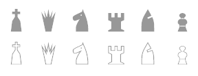 Hans Bodlaender's chess font archive: very useful! It includes many fonts by Armando Hernandez Marroquin (Figurine Symbol fonts, Chess-Alfonso-X, ChessAdventurer, Chess-Condal, Chess-Harlequin, Chess-Kingdom, Chess-Leipzig, Chess-Line, ChessLucena, Chess-Magnetic, Chess-Mark, Chess-Marroquin, Chess-Maya, Chess-Merida, Chess-Millennia-D, Chess-Millennia-L, Chess-Miscel, Chess-Motif, Chess-Mediaeval), Chess Utrecht (by Hans Bodlaender), Chess Cases (by Matthieu Leschemelle), Chess Montreal, the Checkers or Draughts font by Hans Bodlaender (b. 1960, Bennekom, the Netherlands). Many links to chess board generating filters. [Google]
[More] ⦿
Hans Bodlaender's chess font archive: very useful! It includes many fonts by Armando Hernandez Marroquin (Figurine Symbol fonts, Chess-Alfonso-X, ChessAdventurer, Chess-Condal, Chess-Harlequin, Chess-Kingdom, Chess-Leipzig, Chess-Line, ChessLucena, Chess-Magnetic, Chess-Mark, Chess-Marroquin, Chess-Maya, Chess-Merida, Chess-Millennia-D, Chess-Millennia-L, Chess-Miscel, Chess-Motif, Chess-Mediaeval), Chess Utrecht (by Hans Bodlaender), Chess Cases (by Matthieu Leschemelle), Chess Montreal, the Checkers or Draughts font by Hans Bodlaender (b. 1960, Bennekom, the Netherlands). Many links to chess board generating filters. [Google]
[More] ⦿
|
TypOasis 2004
[Manfred Klein]
|
 Manfred Klein's typefaces from 2004: Bauernschrift (the original Bauernschrift, published in 1911 by Bauersche Gießerei, had a Jugendstil form and a classical gothic form), ArthritishSpringtime, Declared, DigitsCarpet, FraktKonstruct, GalleriaGeometricaA, GalleriaGeometricaB, Logotrainer, MKLatin-Bold, MKLatin-BoldOblique, MKLatinLight, MkLatinLight-Oblique, OldiesButGoodies, RomaMonumentalBC, SportSatyre-Medium, Uncitronica-Medium, Nasenbear, CircusEarth, FolksXXHeavy, PoliticiansWorking, AlkoInitialsFramed, AlkoInitials, CutAwayOne, FragmentBO4, FragmentF, LetterSoupMainz, MKaos-Regular, Menschenskinder, RodGauApesInitials, StoneCapsIngrid, TangramBlack, TangramWhiteBlack, TixBats, TypoApish, Ubahn-Light, Ubahn, UltraCondensedSansSerif, WalbaumTorsoThree-Regular, ArrowFaces, Associations, AssociationsBirds, DotCapsMK, FrakturaFonteria, GuernicaMemories, MultiCapsOne, MultiCapsTwo, Schwabach, SketchesOfSpain, DotsCapsTwo, KleerikaleConBlack, ManiaK, MonksWriting, MonospaceTypewriter, PablosChildren, RuebenNosesFour, SometimesSmiley, TherapeuticApplications, TraditionellSans-Bold, TraditionellSans-Normal, VForVictory, EuroGyptians, Fabeltiere04, GiambattistaDueMille-Oblique, GiambattistaDueMille, KlillLightCondensed, PhonebookFont, PreColumbus, StrokeBorn-Bold, StrokeBorn, TracesOfKandinsky, Amputation, EarthquakeTypewriter, HandwrittenSlim, MyPrivateZoo, PotatoMonsters, RoundOpArt, Sansumi-DemiBold, Sansumi-Regular, Sansumi-UltraLight, Santana-Black, Santana-BlackCondensed, Santana-Bold, Santana-RegularCondensed, Santana, SantanaXtraCondensed, WacObats, Warlord, AfterAtomWar, AnAlphaBetIsmXtreme, AnalphabetismBats, Eulenspiegel, FlyingWomen, FraktalConPablos, KleinsTypen, Napoleodoni, BackgroundBricks, Decreations, Faustant, Faustitalic, GeoGraphics, GuantanamoHumanism, LipoDVectorized, MKritzeleien, Napoleodoni-Bold, ReadingRailroad3D, ReadingRailroad, SchoenspergerCaps, StageGlyphs, StageGlyphsTwo, CarneVale, Cock-Bold, Cock-Italic, Cock (high ascender face), FranklySpokenTwo, GenManipulated, GenManipulatedRounded, KarlasAndManfreds, Lipsiantiqua-Regular, PostConstructivism, PostConstructivismInvers, SketchedCassiusBroken, SpaceGarbage, WinterCoat, Artistiques-Bricks, DoubleBrokenTextura, GoetheGothic, GoetheGothicBold, GoetheGothicOblique, PabloSansCaps, PreRomanCaps, RodgauHeads, ScribblesCalligraphique, SomeParts, SomePartsAlphabet, WomanWithDoveTwo, WritersFont, Russian, SpikyBrush, TechnoMK, Bastarda-K, LuFraktorso, OldGreekButtons, SchwabachScribbles, ToscanButtons, TrajanusBricks, Couples, LookForLeonardo, Morphes, NanaBallett, Rocky, BeastlyBats, ChildrenSketchings, CloseUp, IdenOfMarch, OrnaRosettes, StrangePeople, SurReal, TrajanSmallCaps, Aprilapril, Confuseyecons, Cucumbers, DuererUnd, Exhumations, MankBalloons, MankZieglers, OptimusPrinceps, OptimusPrincepsSemiBold (roman Trajan style), SlabRomana-Bold, SlabRomana-BoldOblique, SlabRomana-Oblique, SlabRomana, CapsRandomish, CapsRandomishBricks, CondensansPaneurope-Medium, CondensansPaneurope-MediumOblique, CondensansPaneurope-Oblique, CondensansPaneurope, HansSchoenspergerRandomish, HelloSirPeter, MankSans-Medium, MankSans-MediumOblique, MankSans-Oblique, MankSans, StencilBricksMK, StencilBricksRandom, AfriquArtes, EggsOne, EggsTwo, EggsnPills, FaceToFace, KarlasWelt, LookBrokenTypes, Schablonski-LessFat, Schablonski (stencil), BlaxxOnGrid, DancingVampyrish, EmkaSansCondensed-Bold, EmkaSansCondensed, Othermil, OwlsNOtherWitches, PrisonBricks, Renaiss-Italic, Runners, VignettSketches, AbsoluteImprovisations, Aparta, BlackLiving, Blowing, BullerBuPapercut-BoldOblique, BullerBuPapercut, CryArgentina, EnFace, EyeBeings, KidsPhantasies, Klats, Linearus, LinearusCentSix, Monofred-UltraLight, Pabloesques, Planless-Bold, Planless, ScribbleDichFrei, SilhouettesAnimalish, Spontifex, Spontifex, TokyoFrankfurtRound, XamStern, BlackSplinters, Linolphabet, Tomahawked, Typobricks, AmericanInhabitants, HypocriSymbols, LastWit, MK-Symbols, StrokesFonds, ThinkBats, UseBats, Klimes, MonoSpatial, Architypogra, CaslonDadaesque, Cuneate, CuneateCaps, MauMauKlein, FatGrafCalliKlein, CavePaint, Goblins, NudesSilhous, RainyDay, AidaSerifaShadow, BodonisBulemy, SuperSansCondLight, Adonis-Bold, Batmania, CactusBlossom, CrazyCrazySans, Eyeballs, FacesAndCaps, FigaroFigaro, FraxBricKs, LaughBajazzo, M-sKetches, MKGrotesque, MoreMonK, NextGeneration, Orcas, PragRoman, RomanGridCaps, StrangeCharacters, TypoTracesOne, Typotraces-Cinque, Typotraces-Four, Typotraces-Three, Typotraces-Zwo, UmDieEckePlus, Vampyrish, VespasianCaps, VespasiansFlorials, Wacofaces04, ZagzagHeads, Klexalfabeta, GotischeMajuskel, PompejiPetit, Birrrdds, Spontcomic, SprayersSujets, TypoElements, WacoMusish, BemBolz, BrokenRoman-Bold, MarinumBreezed, SansFat, Africaans, AllHands, AlwaysPeople, BauAHaus-Black, DeconstructaWide-ExpandedUltra, GrafFittyPunk, LeArchitect, MiszellenKOne, MiszellenTwo, OhLauri, Shamanbats, TrajanusBriX-Invers, TrajanusBricks, TrajanusBricksXtra, Wenceslas-Oblique, Wenceslas, Monofred Ultralight Update, GenotypiPrototype, VivaBodoni, WhatsHappened, Cancellereska, JuniusIrish, LombardPlattfuß, SketchesDuererInvers, TornielloInitials, Birds-Relaunch, KoeppHeads, MiszellenThree, ImperiumCond, KleinsWrittenCaps, SigismundoDiFanti, Zwiebelfisch, ChildWritten, KleinKallig, GoGo, FantasyBats, KarlasMiszellen, LosAngelesBold, MiszCinque, MiszellenQuattro, MouseTraps, LittleRock, Dinotiqua-Heavy, MountFirtree, FarmFont, Karlas704, MesoFaunaBats, PhaistosAlphabet, Quicktypes, AbstractBats, AztecBats, BienMaya, ForefathersSketches, HumanDeformations, MiszellenJuly, NativeAmericans, OldEgyptGlyphs, PeoplesParts, RainmansWeatherreport, SheAndHe, MKlimesCondensed, SansBlack, WinterthurCondensed, MonoSerifBased70, Rehacles, RustiCalligraphia, ScrapDealer, Vampyriqua, Zebraesq, FracturiaSketched, FracturiaSketchedCaps, OrnamentInitials, CavePeoplePainting, FontBetaOne, HierobatsSketches, PrehistFantasies, Roundlings, VampyrBats, WacoheadsTwo, Cybatiqua, HassianUncial, PittoresqJugendstil, BonFood, PoeticRound, ReligionSpirituality, Running Gnomes, WesternPastHeroes, WritersReaders, AdAstra, Practiqua, DistroyA, DottyShadow, QuickMary, QuickMax, StrokeyHand, EasterIslandsToday, EthnicReconstructions, MotherAfrica, Scherenschnitt, Napoleon, Newspaper, RoundSlabSerif, DisPropBold, FishHooks, VariationsForImre, GoticaBastarda, ImresFraktur (modeled after a blackletter by Reiner), ToskanaCapsRound, KidsStuff, MKDingBats, Offbeats, PeopleSketches, StrangeTypes, WeatherBats, MoldauQua, Postertypes, ThinManGiambattista, AnimalTypeFaces, DoubleFaces, ItalianEvolution, TodayRunes, BeachBats, MiszellenEight, PrettyPeople, ZeroPoints, Scherenschnitt, ScissorThree, Crosses, MayanMexican, MKarlasBats, LimesCondensed, SkiCargo, MonogramsToolbox, SerifCaps, SpaceDreams, TaxTaxation, ArrowsCompetition, Damaged, TypewriterCondensed, AfricanAngels, AfricanArtifacts, AfricanQueens, CaviarBats, CircusClowns, Hands, HelloDoc, MedicoBats, ModernPeace, SchoolStuff, LatinumTall-X, LucaPacioliCaps, LucaPacioliRough, UnclassicQuill-Condensed, ChildrenBats, Sketched, Egypt, SlimSans, WeekdaysRomanSlant, AbcariFond, Gastronom, HalfEnough-Bold, HelloweeniA, Mkristall, Stoerung, WildQuill, Artests, Burlesque, Exercises, FacesFaces, MenFiftyTwo, MSkizzen, BradbOGilvy, Centuriqua-Ultra, Ogirema, Africain, Angelinos, Assoziazione, BadCircumstances, FacesTypes, Gymnastics, HalloweenTwo, KidsStuffAdded, Proportions, Roaring29, ToyToy, WellnessBoom, WoodcutsOne, WoodcutsTwo, Bamboo, SansBlackSmall, FilledABC, FolksInCubes, SprayersTypes, JoeCaxton04, AfricEggs, BusinessPeople, DueMillePix, EarlyMidage, Musicus, NiceBoys, Sculpturs, SilhouettA, WildAnimalsOne, WoodcutAnimals, RomanSerif, RomanSerifOblique, DiskO-LightInverse, GreeKish, BatsDa, Djungle, E-Motions, EyesTests, HalloweensUfos, OldEgyptOne, OldEgyptTwo, RareClothes, SeeItInMuseum, SFAliens, Shamanish, TrafficVehicles, Users, Sansibar-CXCondensed, KidsFirstABC, KleinsKrempelTypes, QuasimodoCaps, VisitCard, ZigZagThree, QuadrataRomaMediumOblique, Climbers, EmkaBats, Homunculus, ReligiousSymbols, Schoolish, GrotesqueBoldTallX, RightSo, RomanWoodcut, Diogenes, HappyBirdsday, ProthesisBlack, StylosCapitale, Kinderkram, ReallyAnimalishOne, ReallyAnimalsTwo, VoteMe, JoaoCond-Light, JoaoImprovisations, LeiterplattenSans, ProthesisCaribiqu, ArmadaPirata, Bikers, DancingPeople, DeepSwimmers, Engel, MusicMuseal, PiratesOne, PiratesTwo, PiratesThree, PiratesSymbols, PreColumbats, RohrschachEtcetera, SciencesBats, Swimming Beautys, TrialNError, TwelveYearsAfter, WintersAbstract, WoodcutsAgain, YoungScene, UglyQua, SchneidlerSolitaires, Bibelschrift (with Petra Heidorn), CircusAir, FreeLife, Mirodish, Pixelsoup, PrositBats, Sports, Unlucky, WorkingClassHero, XmasOne, Zoobats, GeosansLightOblique, HoffmanFL, HamletOrNot (with Petra Heidorn), AstroCalligraphs, AstroDingbats, AtHome, BiblishPictures, BusyPeople, FamousBuildings, Landscapes, MoreDancing, Neighbours, RomansAntePortas, Seefahrer, Shopping, TheaterSymbols, Callimundial, OgiremaSlab, Delitsch Initialen, HartzVier, Hingehudelt, Hingeschludert-Black, MatisseThree, MrKlein, RemiDur, Burgfest, DelitschInitialen, UncialeOrnamentale, UncialeXpressLight, AbermalsAnimals, Buddhism, BuyMe!, LifeEyecons, LifeIcons, Tourists, Wintersports, FourEarsArrows, MensFriends, MKartoonsHeads, OetzisTimesWillCome, SportsTraining, XmasBatzz, ClassicBats, FramesAnd, HistoricMoments, OldFramesSymbols, PabloInTown, RomanArchitectura, Sleep, VeryBusy, BrokenHand, Burtinomatic (blackletter based on Burte Fraktur), MonumentA, Athena, DisPropSans, Zyprian, MiscellenDec04, MiszellenK, MoreBusy, OldTestament, ScienceFictions, Taucher, XmasOnMoon, Weiß Fraktur (with Petra Heidorn), DeutscherSchmuck (with Petra Heidorn, based on Schmuck für Deutsche Druckschrift by E. Ege, 1922), SchmaleGotischMK (after type by Ernst Schneidler), SchmalfetteGotisch (with Petra Heidorn, again based on Ernst Schneidler), SchneidlerSchwabachInitials, Serpentina, Schooltime, HistoricPeople, WYSIWYG, MK-Signatures, TheManyMKFaces. [Google]
[MyFonts]
[More] ⦿
Manfred Klein's typefaces from 2004: Bauernschrift (the original Bauernschrift, published in 1911 by Bauersche Gießerei, had a Jugendstil form and a classical gothic form), ArthritishSpringtime, Declared, DigitsCarpet, FraktKonstruct, GalleriaGeometricaA, GalleriaGeometricaB, Logotrainer, MKLatin-Bold, MKLatin-BoldOblique, MKLatinLight, MkLatinLight-Oblique, OldiesButGoodies, RomaMonumentalBC, SportSatyre-Medium, Uncitronica-Medium, Nasenbear, CircusEarth, FolksXXHeavy, PoliticiansWorking, AlkoInitialsFramed, AlkoInitials, CutAwayOne, FragmentBO4, FragmentF, LetterSoupMainz, MKaos-Regular, Menschenskinder, RodGauApesInitials, StoneCapsIngrid, TangramBlack, TangramWhiteBlack, TixBats, TypoApish, Ubahn-Light, Ubahn, UltraCondensedSansSerif, WalbaumTorsoThree-Regular, ArrowFaces, Associations, AssociationsBirds, DotCapsMK, FrakturaFonteria, GuernicaMemories, MultiCapsOne, MultiCapsTwo, Schwabach, SketchesOfSpain, DotsCapsTwo, KleerikaleConBlack, ManiaK, MonksWriting, MonospaceTypewriter, PablosChildren, RuebenNosesFour, SometimesSmiley, TherapeuticApplications, TraditionellSans-Bold, TraditionellSans-Normal, VForVictory, EuroGyptians, Fabeltiere04, GiambattistaDueMille-Oblique, GiambattistaDueMille, KlillLightCondensed, PhonebookFont, PreColumbus, StrokeBorn-Bold, StrokeBorn, TracesOfKandinsky, Amputation, EarthquakeTypewriter, HandwrittenSlim, MyPrivateZoo, PotatoMonsters, RoundOpArt, Sansumi-DemiBold, Sansumi-Regular, Sansumi-UltraLight, Santana-Black, Santana-BlackCondensed, Santana-Bold, Santana-RegularCondensed, Santana, SantanaXtraCondensed, WacObats, Warlord, AfterAtomWar, AnAlphaBetIsmXtreme, AnalphabetismBats, Eulenspiegel, FlyingWomen, FraktalConPablos, KleinsTypen, Napoleodoni, BackgroundBricks, Decreations, Faustant, Faustitalic, GeoGraphics, GuantanamoHumanism, LipoDVectorized, MKritzeleien, Napoleodoni-Bold, ReadingRailroad3D, ReadingRailroad, SchoenspergerCaps, StageGlyphs, StageGlyphsTwo, CarneVale, Cock-Bold, Cock-Italic, Cock (high ascender face), FranklySpokenTwo, GenManipulated, GenManipulatedRounded, KarlasAndManfreds, Lipsiantiqua-Regular, PostConstructivism, PostConstructivismInvers, SketchedCassiusBroken, SpaceGarbage, WinterCoat, Artistiques-Bricks, DoubleBrokenTextura, GoetheGothic, GoetheGothicBold, GoetheGothicOblique, PabloSansCaps, PreRomanCaps, RodgauHeads, ScribblesCalligraphique, SomeParts, SomePartsAlphabet, WomanWithDoveTwo, WritersFont, Russian, SpikyBrush, TechnoMK, Bastarda-K, LuFraktorso, OldGreekButtons, SchwabachScribbles, ToscanButtons, TrajanusBricks, Couples, LookForLeonardo, Morphes, NanaBallett, Rocky, BeastlyBats, ChildrenSketchings, CloseUp, IdenOfMarch, OrnaRosettes, StrangePeople, SurReal, TrajanSmallCaps, Aprilapril, Confuseyecons, Cucumbers, DuererUnd, Exhumations, MankBalloons, MankZieglers, OptimusPrinceps, OptimusPrincepsSemiBold (roman Trajan style), SlabRomana-Bold, SlabRomana-BoldOblique, SlabRomana-Oblique, SlabRomana, CapsRandomish, CapsRandomishBricks, CondensansPaneurope-Medium, CondensansPaneurope-MediumOblique, CondensansPaneurope-Oblique, CondensansPaneurope, HansSchoenspergerRandomish, HelloSirPeter, MankSans-Medium, MankSans-MediumOblique, MankSans-Oblique, MankSans, StencilBricksMK, StencilBricksRandom, AfriquArtes, EggsOne, EggsTwo, EggsnPills, FaceToFace, KarlasWelt, LookBrokenTypes, Schablonski-LessFat, Schablonski (stencil), BlaxxOnGrid, DancingVampyrish, EmkaSansCondensed-Bold, EmkaSansCondensed, Othermil, OwlsNOtherWitches, PrisonBricks, Renaiss-Italic, Runners, VignettSketches, AbsoluteImprovisations, Aparta, BlackLiving, Blowing, BullerBuPapercut-BoldOblique, BullerBuPapercut, CryArgentina, EnFace, EyeBeings, KidsPhantasies, Klats, Linearus, LinearusCentSix, Monofred-UltraLight, Pabloesques, Planless-Bold, Planless, ScribbleDichFrei, SilhouettesAnimalish, Spontifex, Spontifex, TokyoFrankfurtRound, XamStern, BlackSplinters, Linolphabet, Tomahawked, Typobricks, AmericanInhabitants, HypocriSymbols, LastWit, MK-Symbols, StrokesFonds, ThinkBats, UseBats, Klimes, MonoSpatial, Architypogra, CaslonDadaesque, Cuneate, CuneateCaps, MauMauKlein, FatGrafCalliKlein, CavePaint, Goblins, NudesSilhous, RainyDay, AidaSerifaShadow, BodonisBulemy, SuperSansCondLight, Adonis-Bold, Batmania, CactusBlossom, CrazyCrazySans, Eyeballs, FacesAndCaps, FigaroFigaro, FraxBricKs, LaughBajazzo, M-sKetches, MKGrotesque, MoreMonK, NextGeneration, Orcas, PragRoman, RomanGridCaps, StrangeCharacters, TypoTracesOne, Typotraces-Cinque, Typotraces-Four, Typotraces-Three, Typotraces-Zwo, UmDieEckePlus, Vampyrish, VespasianCaps, VespasiansFlorials, Wacofaces04, ZagzagHeads, Klexalfabeta, GotischeMajuskel, PompejiPetit, Birrrdds, Spontcomic, SprayersSujets, TypoElements, WacoMusish, BemBolz, BrokenRoman-Bold, MarinumBreezed, SansFat, Africaans, AllHands, AlwaysPeople, BauAHaus-Black, DeconstructaWide-ExpandedUltra, GrafFittyPunk, LeArchitect, MiszellenKOne, MiszellenTwo, OhLauri, Shamanbats, TrajanusBriX-Invers, TrajanusBricks, TrajanusBricksXtra, Wenceslas-Oblique, Wenceslas, Monofred Ultralight Update, GenotypiPrototype, VivaBodoni, WhatsHappened, Cancellereska, JuniusIrish, LombardPlattfuß, SketchesDuererInvers, TornielloInitials, Birds-Relaunch, KoeppHeads, MiszellenThree, ImperiumCond, KleinsWrittenCaps, SigismundoDiFanti, Zwiebelfisch, ChildWritten, KleinKallig, GoGo, FantasyBats, KarlasMiszellen, LosAngelesBold, MiszCinque, MiszellenQuattro, MouseTraps, LittleRock, Dinotiqua-Heavy, MountFirtree, FarmFont, Karlas704, MesoFaunaBats, PhaistosAlphabet, Quicktypes, AbstractBats, AztecBats, BienMaya, ForefathersSketches, HumanDeformations, MiszellenJuly, NativeAmericans, OldEgyptGlyphs, PeoplesParts, RainmansWeatherreport, SheAndHe, MKlimesCondensed, SansBlack, WinterthurCondensed, MonoSerifBased70, Rehacles, RustiCalligraphia, ScrapDealer, Vampyriqua, Zebraesq, FracturiaSketched, FracturiaSketchedCaps, OrnamentInitials, CavePeoplePainting, FontBetaOne, HierobatsSketches, PrehistFantasies, Roundlings, VampyrBats, WacoheadsTwo, Cybatiqua, HassianUncial, PittoresqJugendstil, BonFood, PoeticRound, ReligionSpirituality, Running Gnomes, WesternPastHeroes, WritersReaders, AdAstra, Practiqua, DistroyA, DottyShadow, QuickMary, QuickMax, StrokeyHand, EasterIslandsToday, EthnicReconstructions, MotherAfrica, Scherenschnitt, Napoleon, Newspaper, RoundSlabSerif, DisPropBold, FishHooks, VariationsForImre, GoticaBastarda, ImresFraktur (modeled after a blackletter by Reiner), ToskanaCapsRound, KidsStuff, MKDingBats, Offbeats, PeopleSketches, StrangeTypes, WeatherBats, MoldauQua, Postertypes, ThinManGiambattista, AnimalTypeFaces, DoubleFaces, ItalianEvolution, TodayRunes, BeachBats, MiszellenEight, PrettyPeople, ZeroPoints, Scherenschnitt, ScissorThree, Crosses, MayanMexican, MKarlasBats, LimesCondensed, SkiCargo, MonogramsToolbox, SerifCaps, SpaceDreams, TaxTaxation, ArrowsCompetition, Damaged, TypewriterCondensed, AfricanAngels, AfricanArtifacts, AfricanQueens, CaviarBats, CircusClowns, Hands, HelloDoc, MedicoBats, ModernPeace, SchoolStuff, LatinumTall-X, LucaPacioliCaps, LucaPacioliRough, UnclassicQuill-Condensed, ChildrenBats, Sketched, Egypt, SlimSans, WeekdaysRomanSlant, AbcariFond, Gastronom, HalfEnough-Bold, HelloweeniA, Mkristall, Stoerung, WildQuill, Artests, Burlesque, Exercises, FacesFaces, MenFiftyTwo, MSkizzen, BradbOGilvy, Centuriqua-Ultra, Ogirema, Africain, Angelinos, Assoziazione, BadCircumstances, FacesTypes, Gymnastics, HalloweenTwo, KidsStuffAdded, Proportions, Roaring29, ToyToy, WellnessBoom, WoodcutsOne, WoodcutsTwo, Bamboo, SansBlackSmall, FilledABC, FolksInCubes, SprayersTypes, JoeCaxton04, AfricEggs, BusinessPeople, DueMillePix, EarlyMidage, Musicus, NiceBoys, Sculpturs, SilhouettA, WildAnimalsOne, WoodcutAnimals, RomanSerif, RomanSerifOblique, DiskO-LightInverse, GreeKish, BatsDa, Djungle, E-Motions, EyesTests, HalloweensUfos, OldEgyptOne, OldEgyptTwo, RareClothes, SeeItInMuseum, SFAliens, Shamanish, TrafficVehicles, Users, Sansibar-CXCondensed, KidsFirstABC, KleinsKrempelTypes, QuasimodoCaps, VisitCard, ZigZagThree, QuadrataRomaMediumOblique, Climbers, EmkaBats, Homunculus, ReligiousSymbols, Schoolish, GrotesqueBoldTallX, RightSo, RomanWoodcut, Diogenes, HappyBirdsday, ProthesisBlack, StylosCapitale, Kinderkram, ReallyAnimalishOne, ReallyAnimalsTwo, VoteMe, JoaoCond-Light, JoaoImprovisations, LeiterplattenSans, ProthesisCaribiqu, ArmadaPirata, Bikers, DancingPeople, DeepSwimmers, Engel, MusicMuseal, PiratesOne, PiratesTwo, PiratesThree, PiratesSymbols, PreColumbats, RohrschachEtcetera, SciencesBats, Swimming Beautys, TrialNError, TwelveYearsAfter, WintersAbstract, WoodcutsAgain, YoungScene, UglyQua, SchneidlerSolitaires, Bibelschrift (with Petra Heidorn), CircusAir, FreeLife, Mirodish, Pixelsoup, PrositBats, Sports, Unlucky, WorkingClassHero, XmasOne, Zoobats, GeosansLightOblique, HoffmanFL, HamletOrNot (with Petra Heidorn), AstroCalligraphs, AstroDingbats, AtHome, BiblishPictures, BusyPeople, FamousBuildings, Landscapes, MoreDancing, Neighbours, RomansAntePortas, Seefahrer, Shopping, TheaterSymbols, Callimundial, OgiremaSlab, Delitsch Initialen, HartzVier, Hingehudelt, Hingeschludert-Black, MatisseThree, MrKlein, RemiDur, Burgfest, DelitschInitialen, UncialeOrnamentale, UncialeXpressLight, AbermalsAnimals, Buddhism, BuyMe!, LifeEyecons, LifeIcons, Tourists, Wintersports, FourEarsArrows, MensFriends, MKartoonsHeads, OetzisTimesWillCome, SportsTraining, XmasBatzz, ClassicBats, FramesAnd, HistoricMoments, OldFramesSymbols, PabloInTown, RomanArchitectura, Sleep, VeryBusy, BrokenHand, Burtinomatic (blackletter based on Burte Fraktur), MonumentA, Athena, DisPropSans, Zyprian, MiscellenDec04, MiszellenK, MoreBusy, OldTestament, ScienceFictions, Taucher, XmasOnMoon, Weiß Fraktur (with Petra Heidorn), DeutscherSchmuck (with Petra Heidorn, based on Schmuck für Deutsche Druckschrift by E. Ege, 1922), SchmaleGotischMK (after type by Ernst Schneidler), SchmalfetteGotisch (with Petra Heidorn, again based on Ernst Schneidler), SchneidlerSchwabachInitials, Serpentina, Schooltime, HistoricPeople, WYSIWYG, MK-Signatures, TheManyMKFaces. [Google]
[MyFonts]
[More] ⦿
|
Unicode Fonts for Ancient Scripts
[George Douros]
|
 This is a fantastic source of free high-quality fonts for scripts of the greater Aegean vicinity, Egyptian Hieroglyphs, Meroitic, Sumero-Akkadian Cuneiform, Musical Symbols and all Symbol Blocks in the Unicode Standard. George Douros is their Greek font designer. His free fonts come with this exemplary footnote: In lieu of a licence: Fonts in this site are offered free for any use; they may be opened, edited, modified, regenerated, posted, packaged and redistributed. Many of his fonts contributed to important section in the GNU Freefont project. Here is the list:
 - Abidos (2018). An attempt to catalogue about 8000 Egyptian hieroglyps. His Nilus font (2018) catalogues the Gardiner hieroglyphs.
- Aegean (2007-2012). Covers Basic Latin, Greek and Coptic, Greek Extended, some Punctuation and other Symbols, Linear B Syllabary, Linear B Ideograms, Aegean Numbers, Ancient Greek Numbers, Ancient Symbols, Phaistos Disc, Lycian, Carian, Old Italic, Ugaritic, Old Persian, Cypriot Syllabary, Phoenician, Lydian, Archaic Greek Musical Notation. Other things in it: Linear A, Cretan Hieroglyphs, Cypro-Minoan, Ancient Greek Alphabets, Phrygian, Old Italic Alphabets (Cumaean, Archaic Etruscan, Neo Etruscan, Ancient Latin, Lugano, Faliscan, Marsiliana, Messapic, Middle Adriatic South Picene, North Picene, Oscan, Umbrian), the Arkalochori Axe and Anatolian Hieroglyphs.
- Aegyptus (2007-2020) and Gardiner. Over 7000 hieroglyphs. In addition, we have Basic Latin, Greek and Coptic, Egyptian Transliteration characters, some punctuation and other symbols.
- Akkadian (2007). Basic Latin, Greek and Coptic, some Punctuation and other Symbols, Ugaritic, Cuneiform, Cuneiform Numbers and Punctuation.
- Alexander (2007, text typeface built around the Greek letters originally designed by Alexander Wilson in 1744; compare with Wilson Greek (1996, Matthew Carter) and Junicode (2006, Peter S. Baker)). The Latin and Cyrillic parts are based on Garamond.
- Alfios. Lowercase upright Greek were designed in 1805 by Firmin Didot (1764-1836) and cut by Walfard and Vibert. The typeface, together with a complete printing house, was donated in 1821 to the new Greek state by Didot's son, Ambroise Firmin Didot (1790-1876). Lowercase italic Greek were designed in 1802 by Richard Porson (1757-1808) and cut by Richard Austin. They were first used by Cambridge University Press in 1810. Capitals, Latin and Cyrillic, as well as the complete bold weights, have been designed in an attempt to create a well-balanced font. The font covers the Windows Glyph List, Greek Extended, various typographic extras and some Open Type features (Numerators, Denominators, Fractions, Old Style Figures, Historical Forms, Stylistic Alternates, Ligatures); it is available in regular, italic, bold and bold italic.
- Anaktoria. Douros: Grecs du roi was designed by Claude Garamond (1480-1561) between 1541 and 1544, commissioned by king Francis I of France, for the exclusive use by the Imprimerie Nationale in Paris. Greek in Akaktoria is based on a modern version of Grecs du roi prepared by Mindaugas Strockis in 2001. Lowercase Latin stems from the titles in the 1623 First Folio Edition of Shakespeare. Scott Mann & Peter Guither prepared a modern version for The Illinois Shakespeare Festival in 1995. Cyrillic has been designed to match the above Greek and Latin.
- Analecta (2007, Byzantine style). An ecclesiastic scripts font, in Byzantine uncial style, covering Basic Latin, Greek and Coptic, some Punctuation and other Symbols, Coptic, typographica varia, Specials, Gothic and Deseret.
- Anatolian
- Aroania: In 1927, Victor Julius Scholderer (1880-1971), on behalf of the Society for the Promotion of Greek Studies, got involved in choosing and consulting the design and production of a Greek type called New Hellenic cut by the Lanston Monotype Corporation. He chose the revival of a round, and almost monoline type which had first appeared in 1492 in the edition of Macrobius, ascribable to the printing shop of Giovanni Rosso (Joannes Rubeus) in Venice. Aroania is a modern recast of Victor Scholderer's New Hellenic font, on the basis of Verdana.
- Asea (2020, Latin-Greek-Cyrillic). A modern font based on Firmin Didot's Greek type.
- Assyrian.
- Atavyros. Douros writes: Robert Granjon (1513-1589) produced his Parangonne Greque typeface (garmond size) at the instigation of Christophe Plantin as a counterpart to Garamond's Grec du roi, in Antwerp Holland, between 1560--1565. It was used in Plantin's multilingual Bible of 1572. Versions of Granjon's type were used for the 1692 edition of Diogenes Laertius and for the Greek-Dutch edition of the New Testament in 1698, both published by Henric Wetstenium in Amsterdam. A digital revival was prepared by Ralph P. Hancock for his Vusillus font in 1999. Latin and Cyrillic are based on a Goudy typeface.
- Avdira. Douros: Upright is based on the lowercase Greek letters in the typeface used by Demetrios Damilas for the edition of Isocrates, published in Milan in 1493. A digital revival was prepared by Ralph P. Hancock for his Milan (Mediolanum) font in 2000. Italic Greek were designed in 1802 by Richard Porson (1757-1808) and cut by Richard Austin. They were first used by Cambridge University Press in 1810.
- Maya. Maya covers the glyphs in J. Eric S. Thompson's A Catalog of Maya Hieroglyphs (1962, University of Oklahoma Press).
- MusicalSymbols (2007) or Musica (2013). Basic Latin, Greek and Coptic, some Punctuation and other Symbols, Byzantine Musical Symbols, (Western) Musical Symbols, Archaic Greek Musical Notation. There is also the Greek musical notation font EE Music (2018) for Hellenic ecclesiastic music.
- UnicodeSymbols (2007, in the Computer Modern style) and UniDings (2013). It has every imaginable symbol: Basic Latin, Latin-1 Supplement, Latin Extended-A, IPA Extensions, Greek, Cyrillic, Cyrillic Supplementary, General Punctuation, Superscripts and Subscripts, Combining Diacritical Marks for Symbols, Letterlike Symbols, Number Forms, Arrows, Mathematical Operators, Miscellaneous Technical, Control Pictures, Optical Character Recognition, Box Drawing, Block Elements, Geometric Shapes, Miscellaneous Symbols, Dingbats, Miscellaneous Mathematical Symbols-A, Supplemental Arrows-A, Supplemental Arrows-B, Miscellaneous Mathematical Symbols-B, Supplemental Mathematical Operators, Miscellaneous Symbols and Arrows, CJK Symbols and Punctuation, Yijing Hexagram Symbols, Vertical Forms, Combining Half Marks, CJK Compatibility Forms, Specials, Tai Xuan Jing Symbols, Counting Rod Numerals, Mathematical Alphanumeric Symbols, Mahjong Tile Symbols, Domino Tile Symbols.
- Symbola (2013) is an unbelievably rich font. It contains Basic Latin, IPA Extensions, Spacing Modifier Letters, Combining Diacritical Marks, Greek and Coptic, Cyrillic, Cyrillic Supplement, General Punctuation, Superscripts and Subscripts, Currency Symbols, Combining Diacritical Marks for Symbols, Letterlike Symbols, Number Forms, Arrows, Mathematical Operators, Miscellaneous Technical, Control Pictures, Optical Character Recognition, Box Drawing, Block Elements, Geometric Shapes, Miscellaneous Symbols, Dingbats, Miscellaneous Mathematical Symbols-A, Supplemental Arrows-A, Braille Patterns, Supplemental Arrows-B, Miscellaneous Mathematical Symbols-B, Supplemental Mathematical Operators, Miscellaneous Symbols and Arrows, Supplemental Punctuation, Yijing Hexagram Symbols, Combining Half Marks, Specials, Byzantine Musical Symbols, Musical Symbols, Ancient Greek Musical Notation, Tai Xuan Jing Symbols, Counting Rod Numerals, Mathematical Alphanumeric Symbols, Mahjong Tiles, Domino Tiles, Playing Cards, Miscellaneous Symbols And Pictographs, Emoticons, Ornamental Dingbats, Transport And Map Symbols, Alchemical Symbols, Geometric Shapes Extended, Supplemental Arrows, and Symbols of occasional mathematical interest. It is one of a hanful fonts that dares to have a glyph that shows the middle finger. Github link for free download. see also Symbola Goomoji (2013).
- Unidings. Various glyphs and icons.
Since George permits redistribution, I am offering his work for download here. [Google]
[More] ⦿
|
Victor Daniel Sheckels
|
Des Moines, IA-based artist. Alternate URL. Creator of the Mayan symbology fonts MaianNeptune (2007), MaianQuiet (2007), MaianTempest (2007). [Google]
[More] ⦿
|
zeventymilliontoday
|
American creator of Crazy Bludish (2011, dripping blood font), Maya (2011, hand-printed), Sketched (2009, Fontcapture) and Heathkeit (2011). Ake Heathkeit. [Google]
[More] ⦿
|
Zhalgas Kassymkulov
[Architaraz Type (or: Kassymkulov Design)]
|
 [MyFonts]
[More] ⦿
[MyFonts]
[More] ⦿
|
Zilap (or: Mr. Zilap, or Zilap Estudio)
[Juan Guillermo Navarro Barrios]
|
 Juan Guillermo Navarro Barrios runs the design and illustration studio Zilap in Medellin, Colombia. In 2014, he created the hipster typeface Zilap Normal. In 2015, with the cooperation of LJ Design, he created the free futuristic typeface TRG Zilap and the alchemic occult typeface Zilap Geometrik. Zilap Tribu (2016) is an alchemic African tribal font, Zilap Oriental (2016) is an alchemic oriental simulation font, Zilap Corporative (2016) is designed for corporate indentities, Zilap Natural (2016) is a rounded sans typeface, Zilap Alien (2016) is an alien dingbat font, and Zilap Espacial (2016) is an alchemic space era font. Gabi Barnat designed the tribal font Zilap Barnat in 2016. Zilap Marine (2016) is a wavy display typeface. Zilap Urban (2016) is a funky hipster typeface.
 Typefaces from 2017: Zilap Sound (hipster style), Zilap Precolombino, Zilap Mystery, Zilap Combat, Zilap Africa, Zilap Monograma, Zilap Black Storm, Zilap Nitro (a racetrack font), Zilap Evolution, Zilap Deep Sleep. Typefaces from 2018: Zilap Sensitive, Zilap Russia (constructivist, Cyrillic simulation), Zilap Exclusive (pearled), Zilap Orion (futuristic). It is unclear if Juan Navarro is the same as Luis Jaramillo, because his fonts are published under Luis Jaramillo's label, LJ Design. Typefaces from 2019: Zilap Destiny. Typefaces from 2020: Zilap Romance. Fontspace link. Facebook link. Fontspace link. LJ Design Studios link. [Google]
[More] ⦿
|
zx26 (also: Zero Xenon 26)
[Otani Hideaki]
|
Free Mac and Windows fonts. Fonts at this Japanese site include Zasf, Vzx, Zxr, ZX26, Xecrics, 35base, 35rounds, 35lines, 35base-wide, WA50 (katakana), WA100 (kata), Cookai (strange kanjis), Zecoo (stranger kanjis), Toyokuni (are these old Japanese glyphs?), Izumo (weird glyphs), Ahiru (same), Ainu (runes), Maya2012 (Maya dingbats), Jet 1999 (under construction), Hotsuma (runes). All fonts are futuristic and may (?) have been made by Otani Hideaki from Tokyo. Hint: click on the 24 buttons on the left part of the cockpit. [Google]
[More] ⦿
|

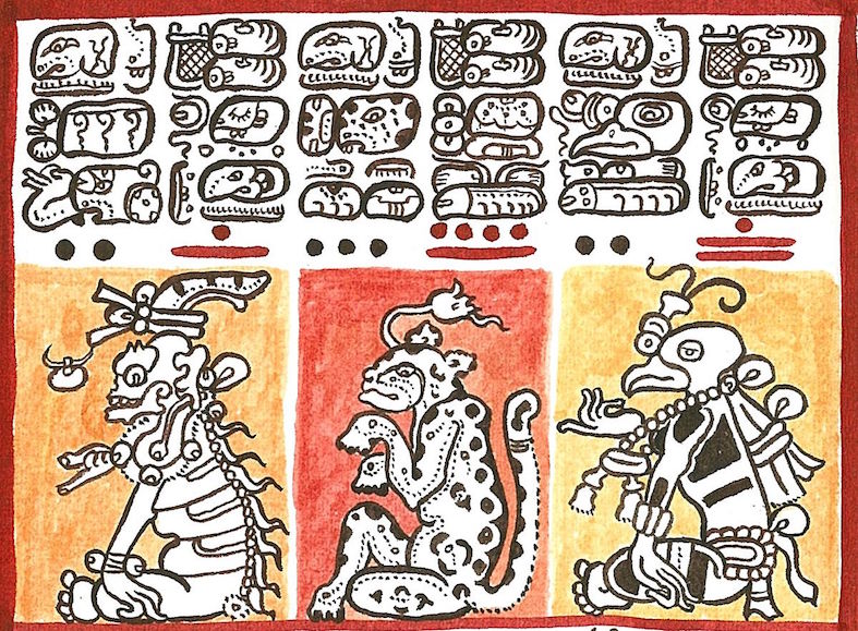
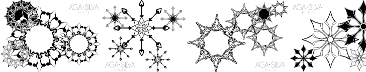
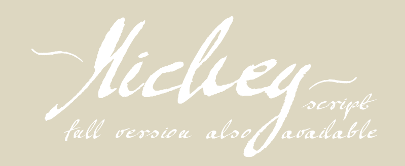
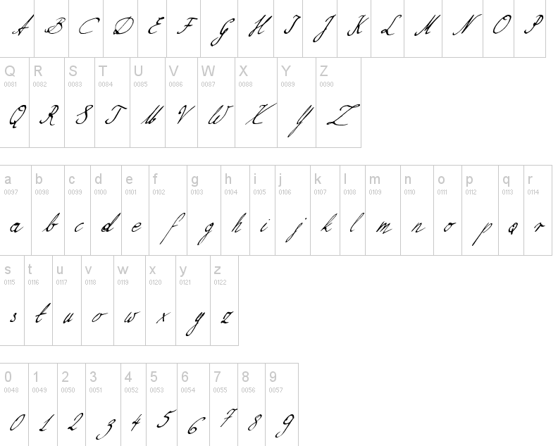
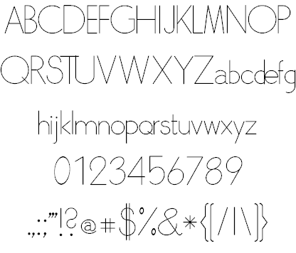
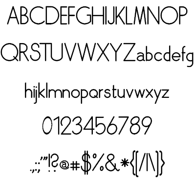
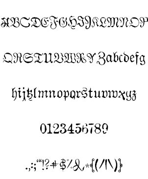
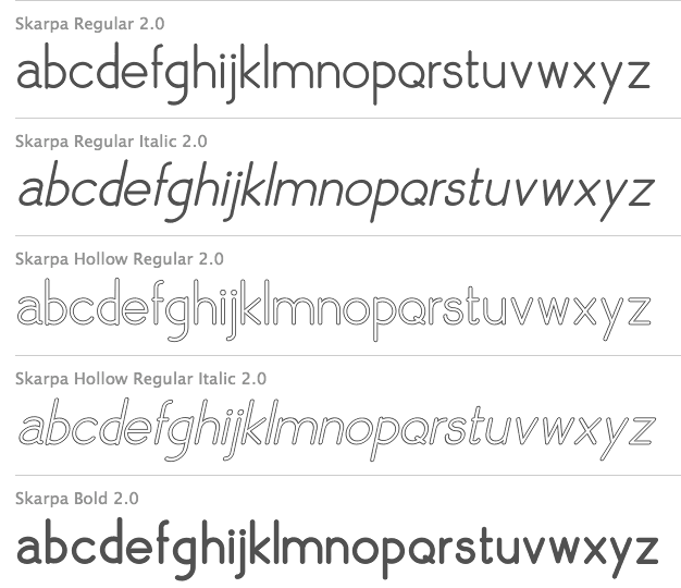
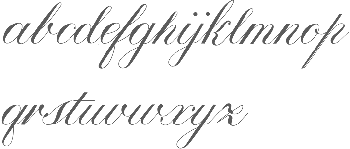
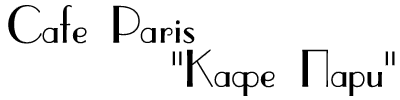
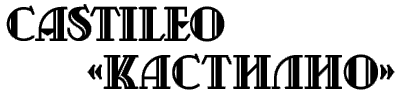
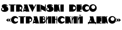
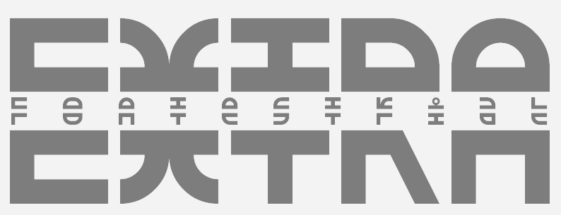
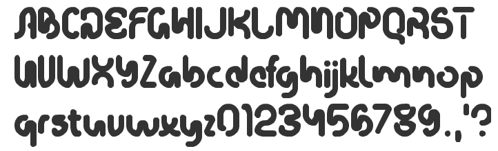
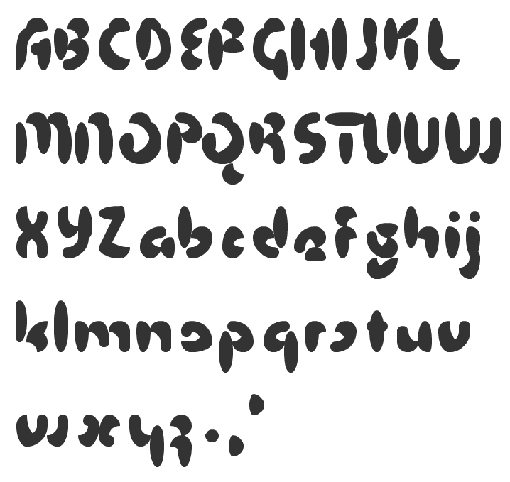
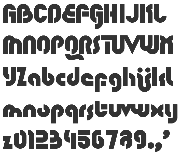
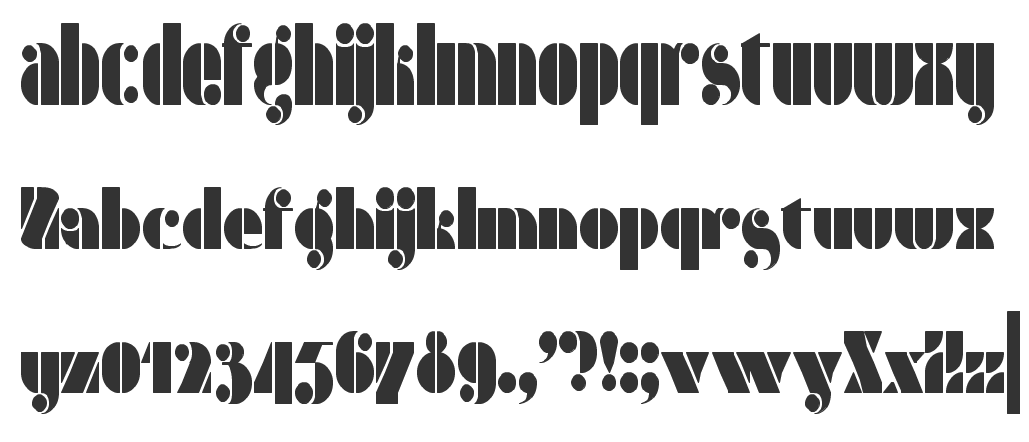
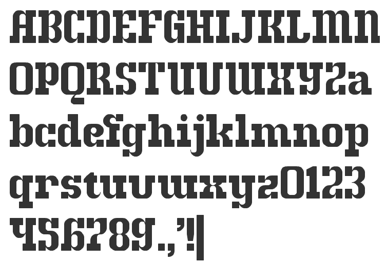
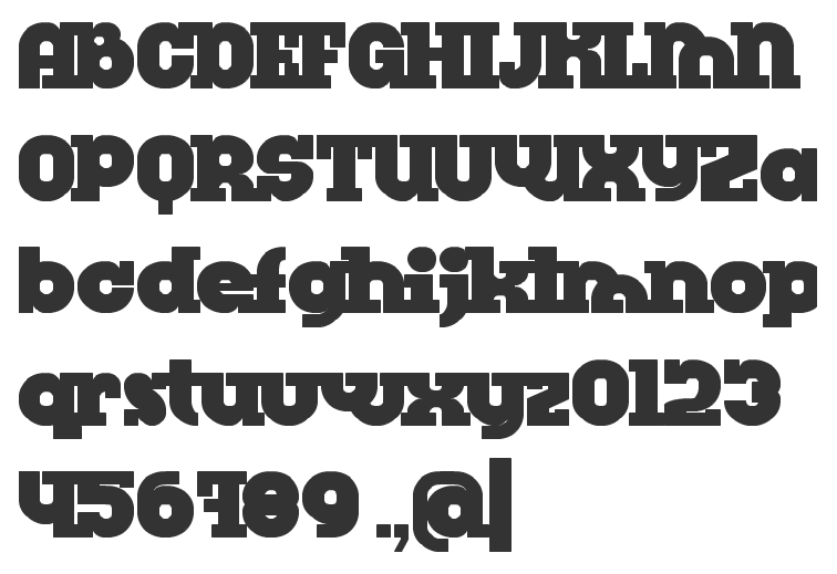
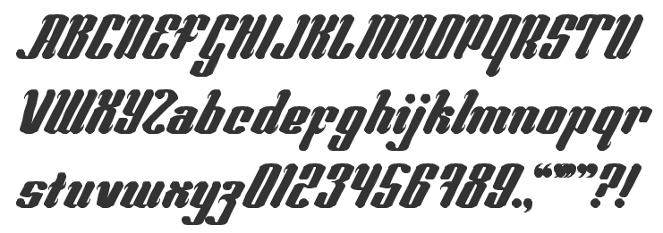
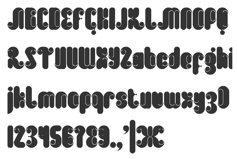
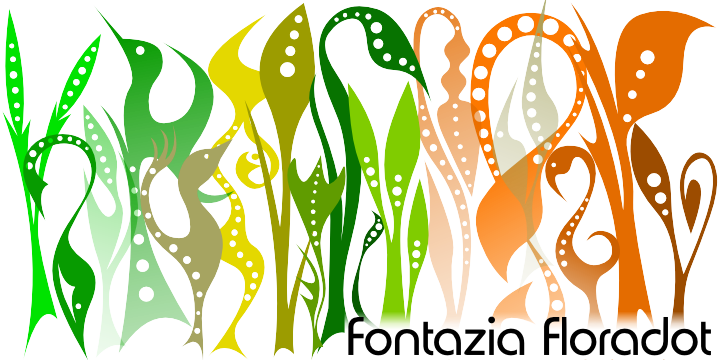
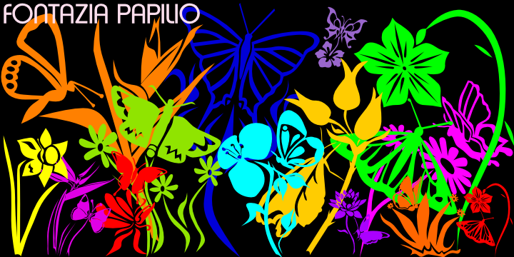
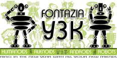
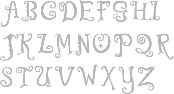
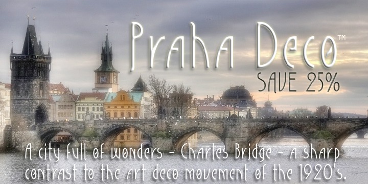
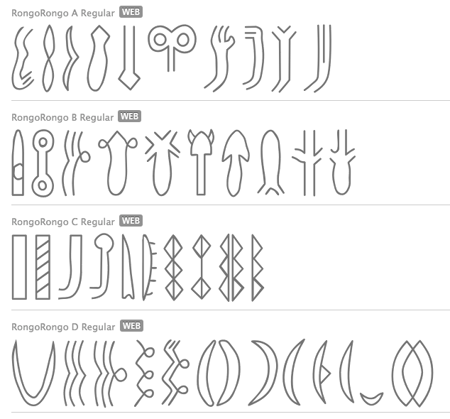
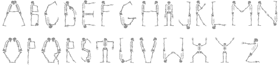
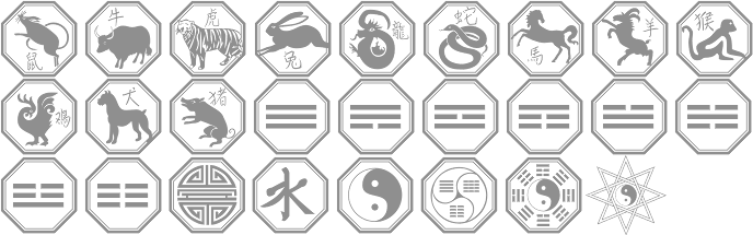
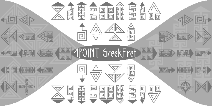
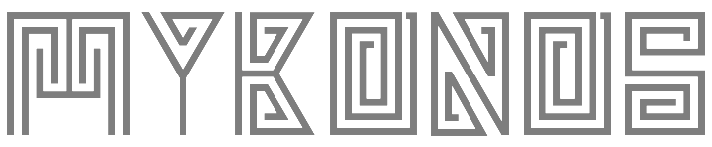
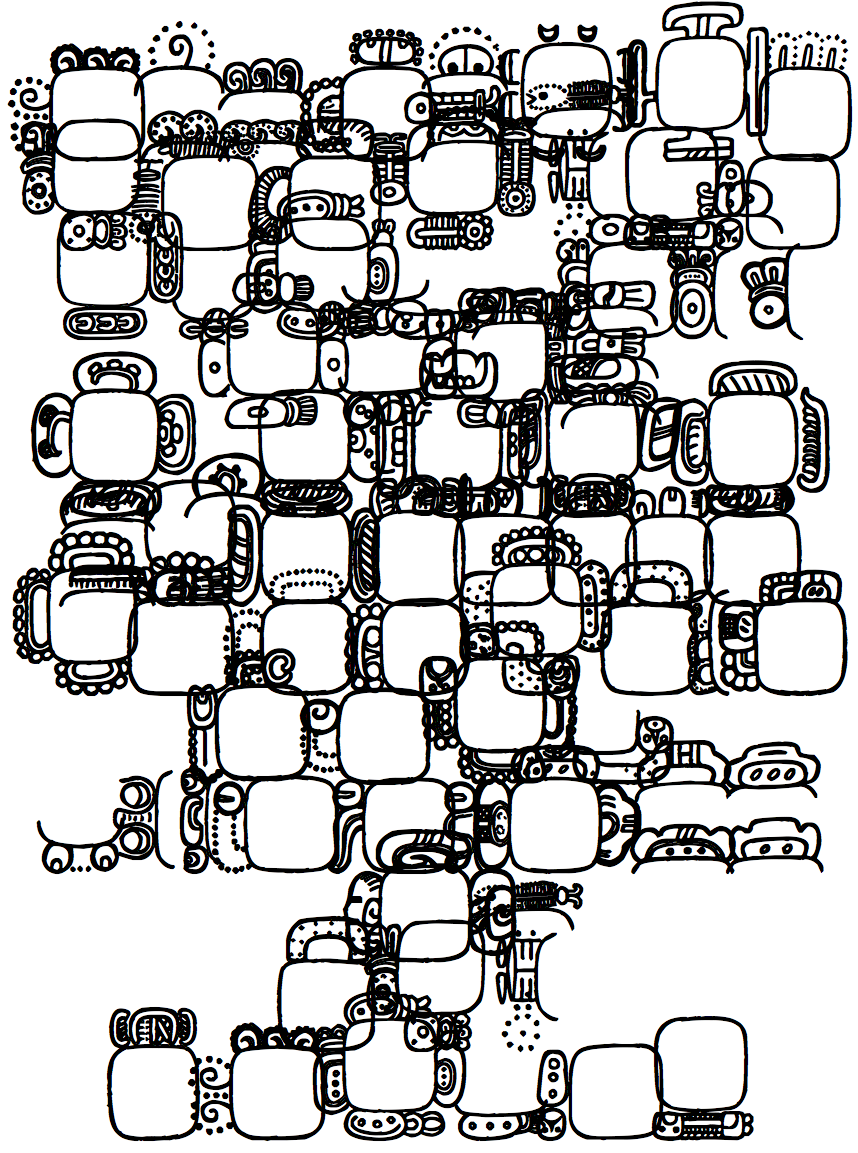
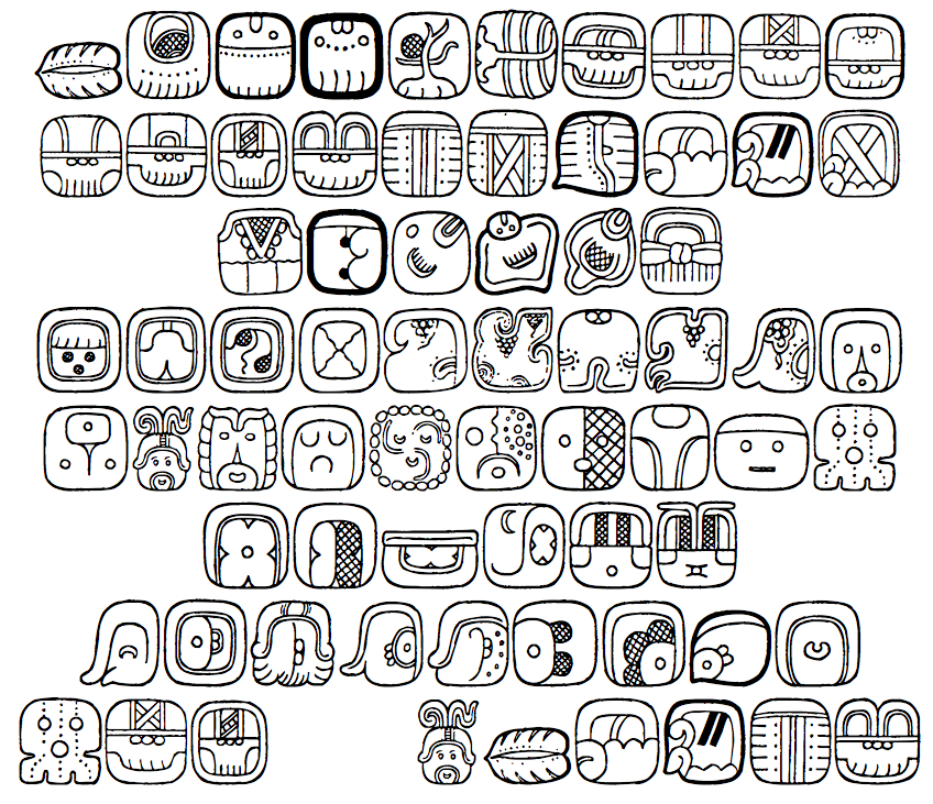
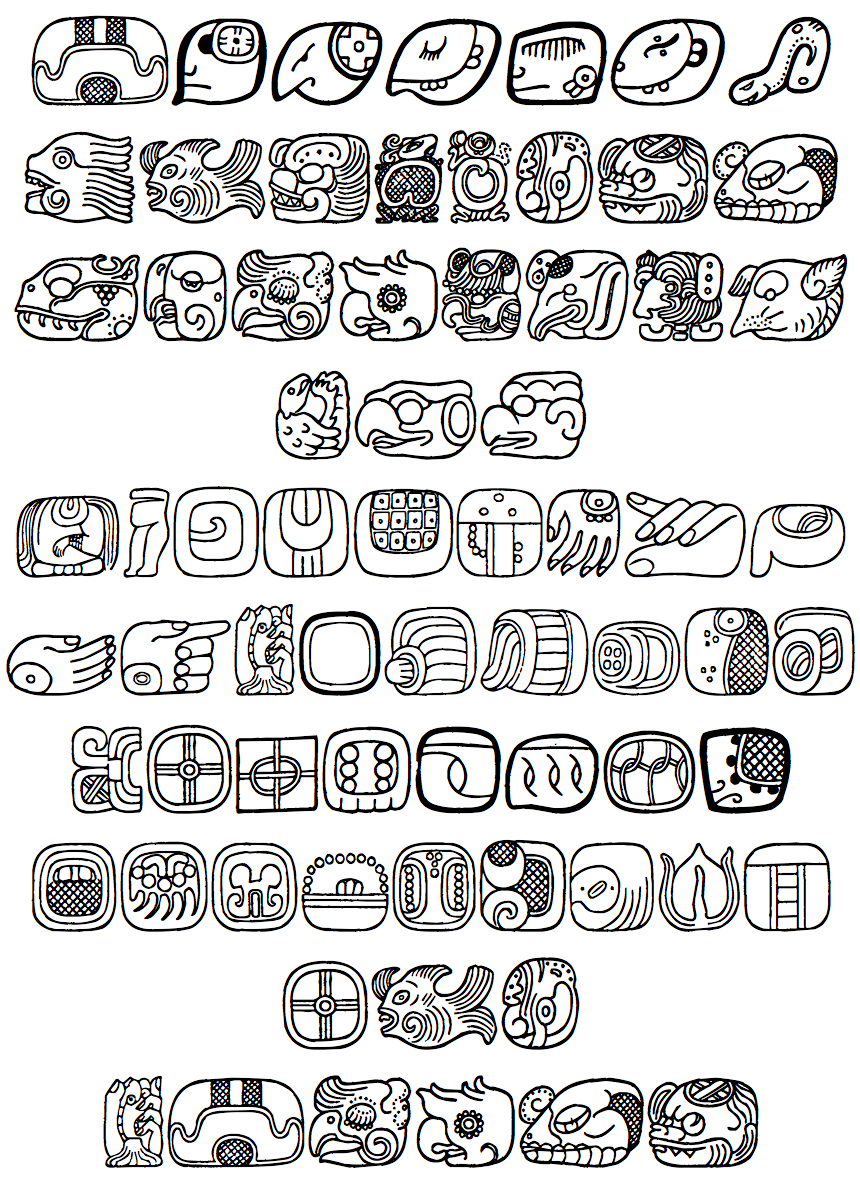
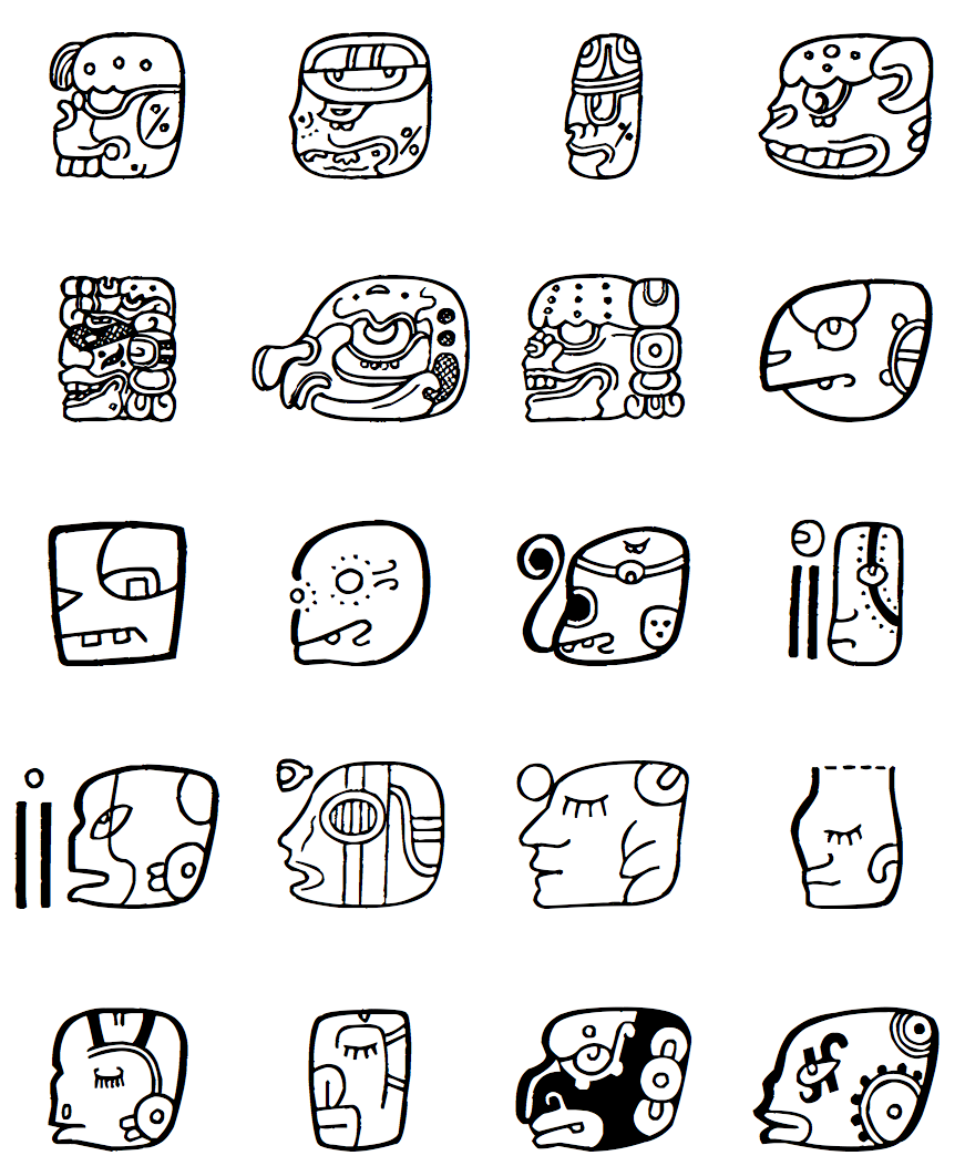
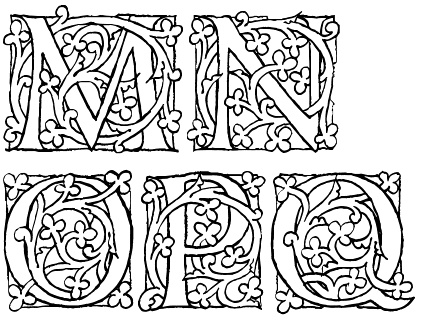
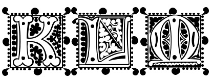
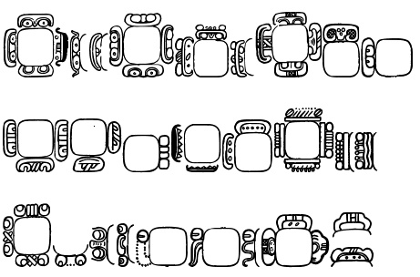
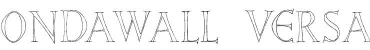
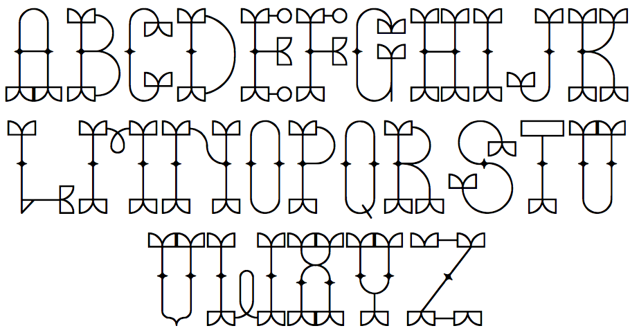
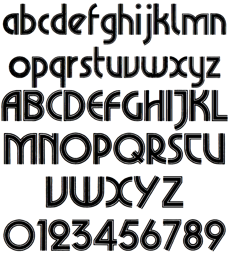
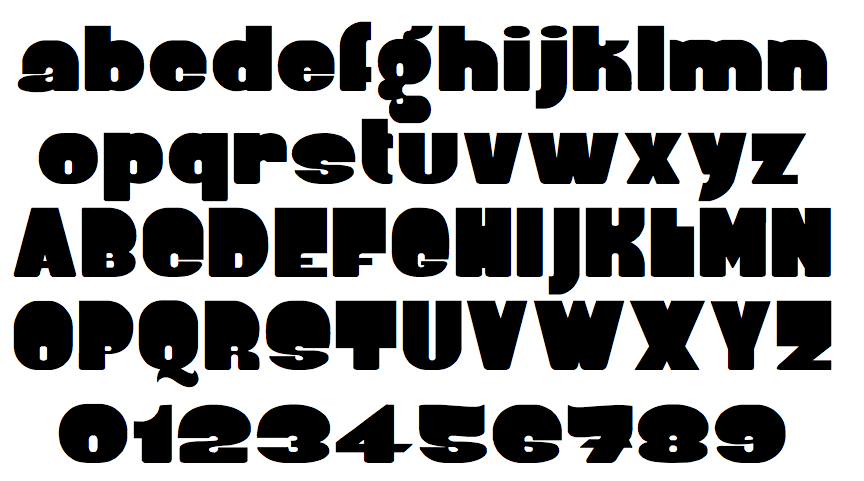
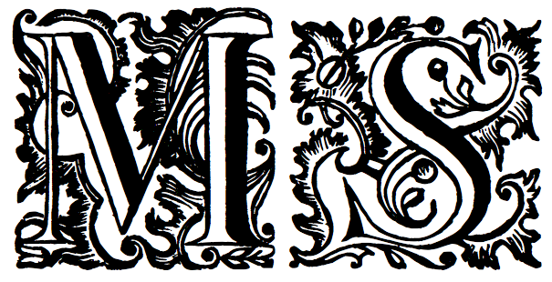
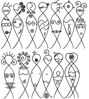
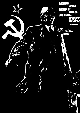
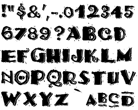
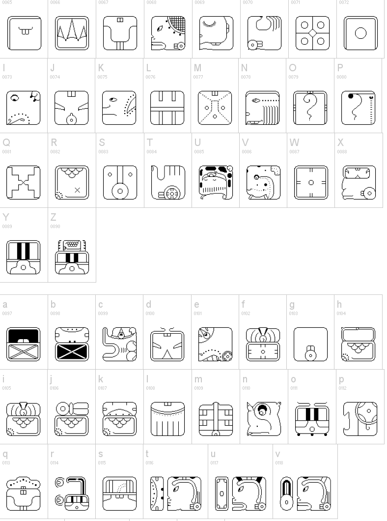
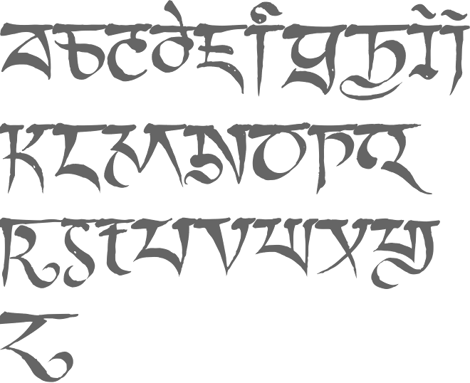
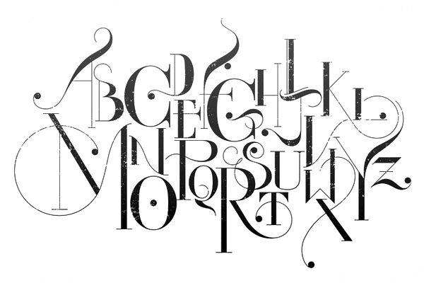
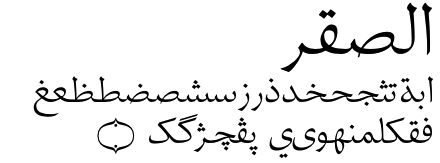
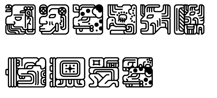
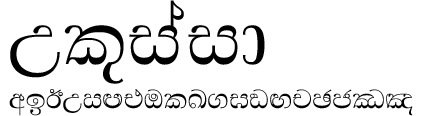
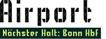
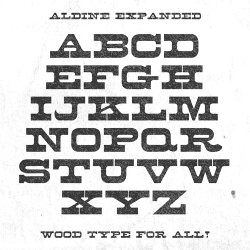
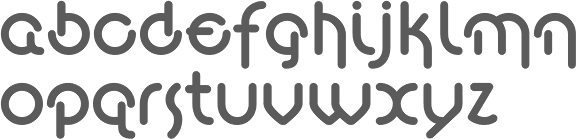
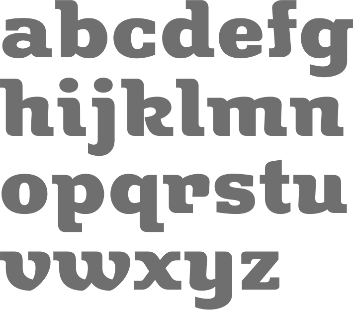
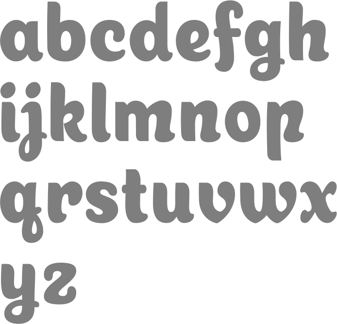
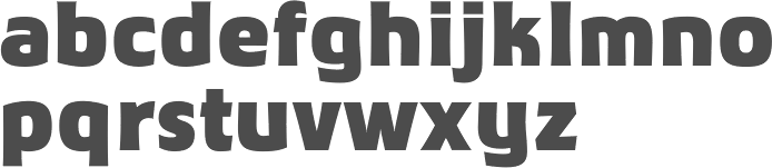
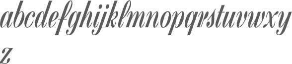
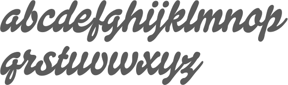
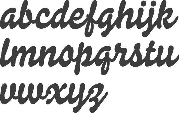
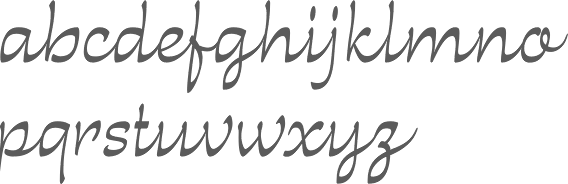
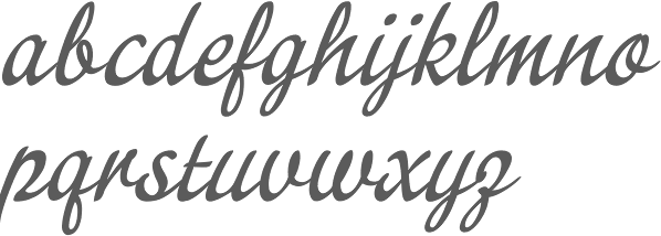
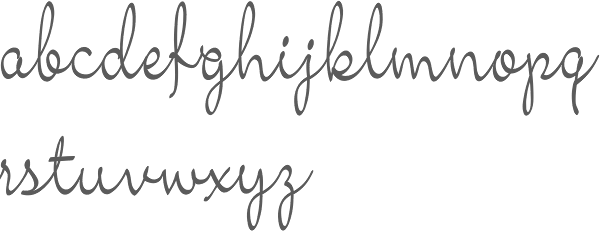
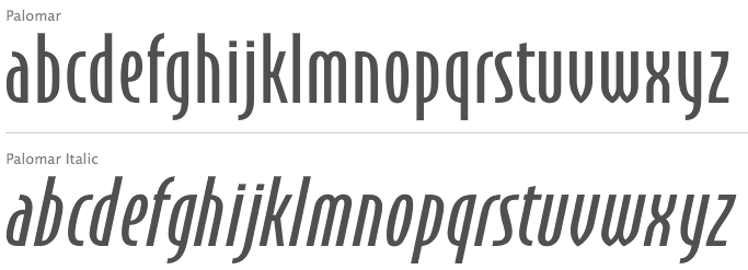
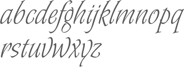
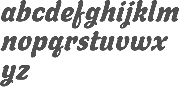
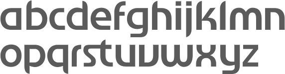
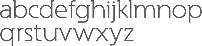
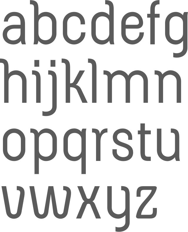
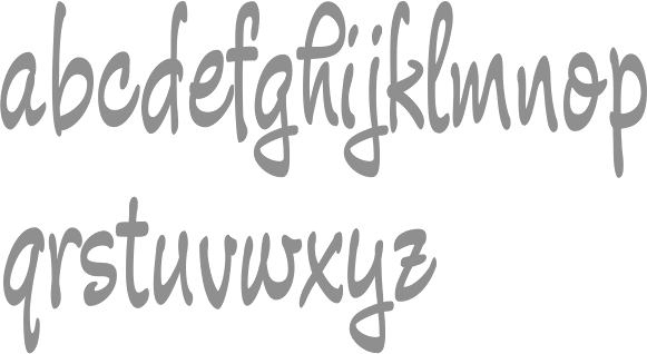
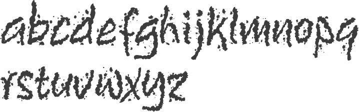
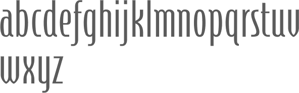
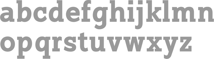
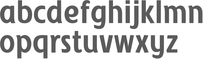
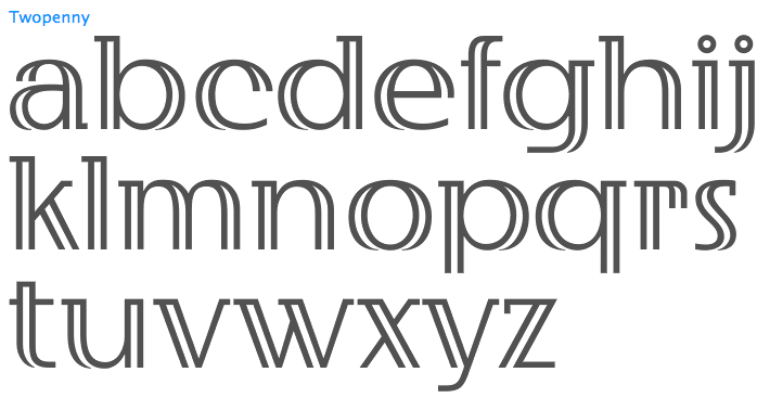
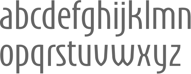
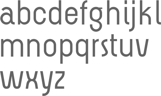
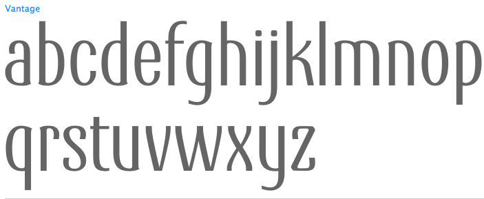
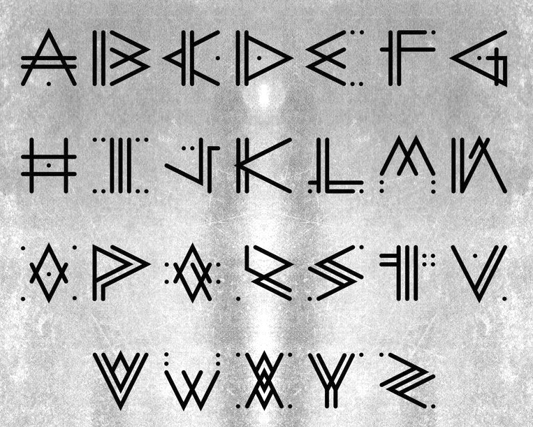
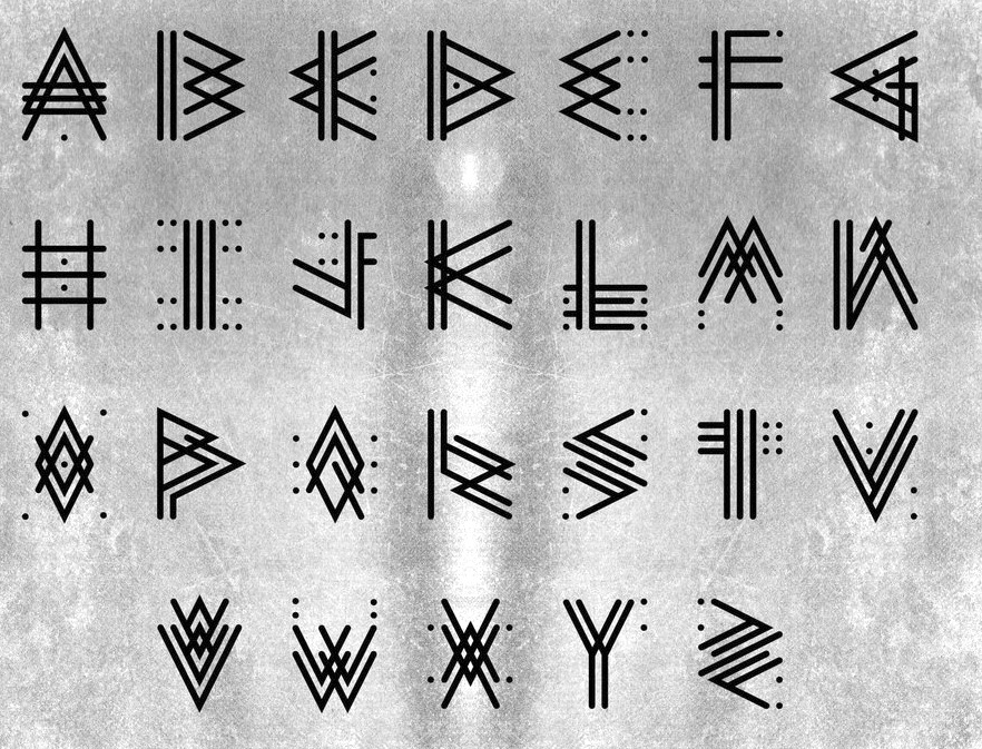
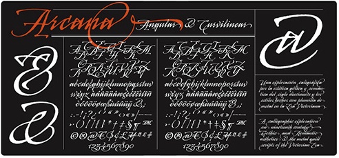
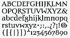
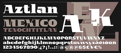
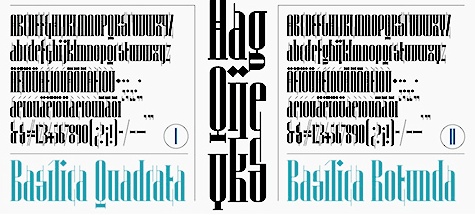
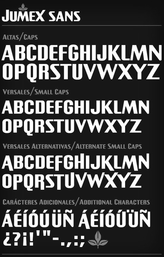
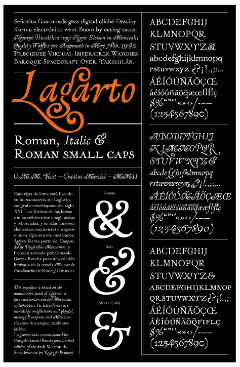
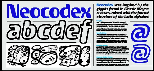
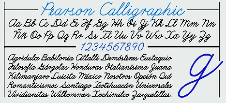
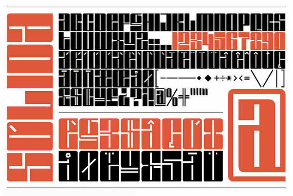
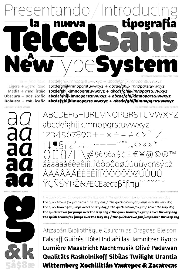
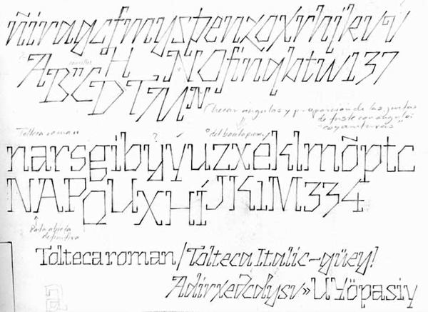
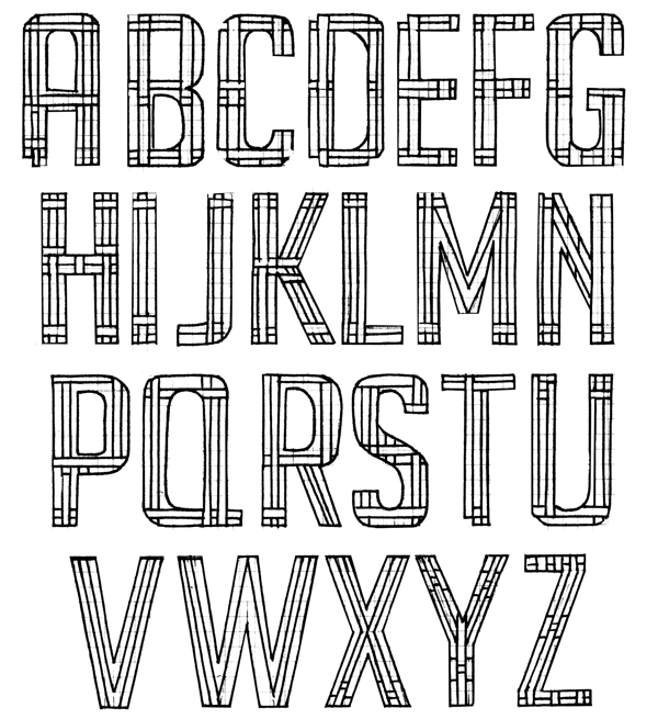
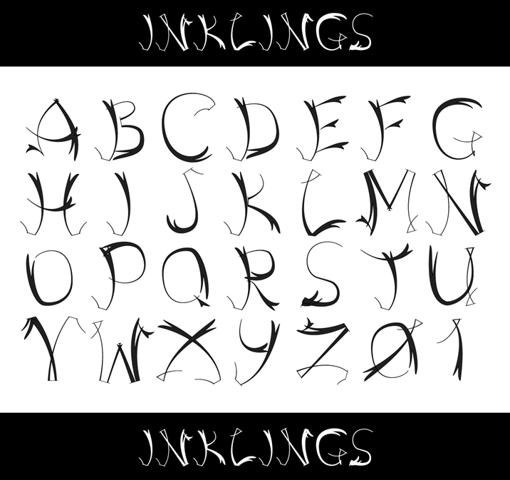
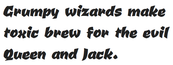
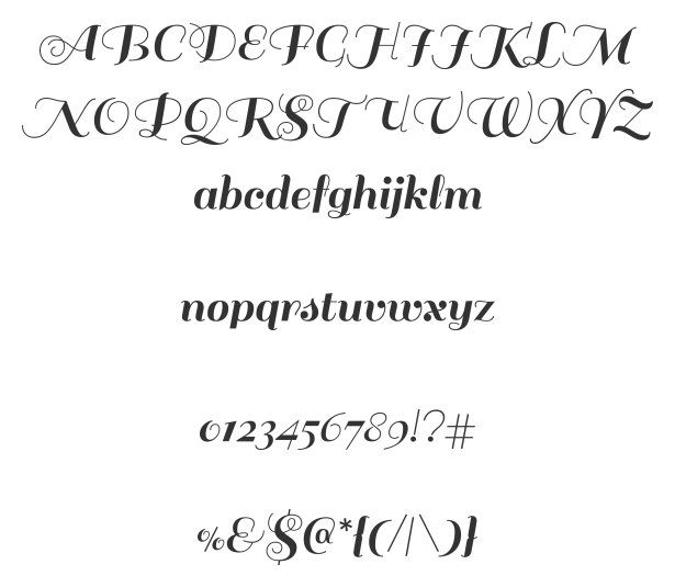
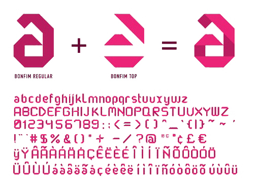
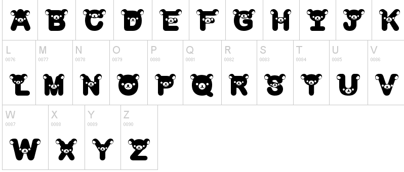
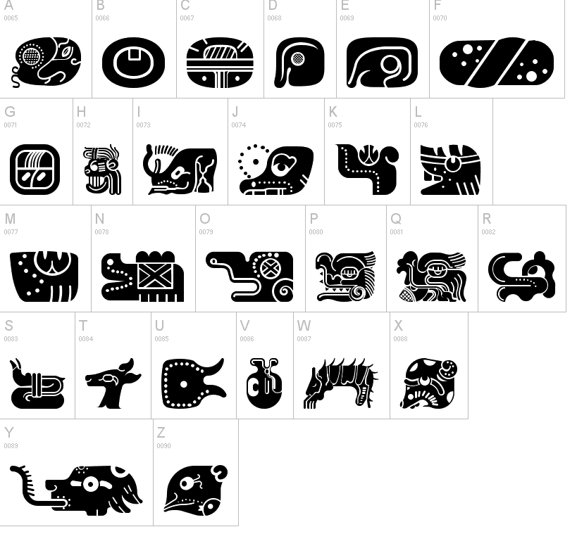
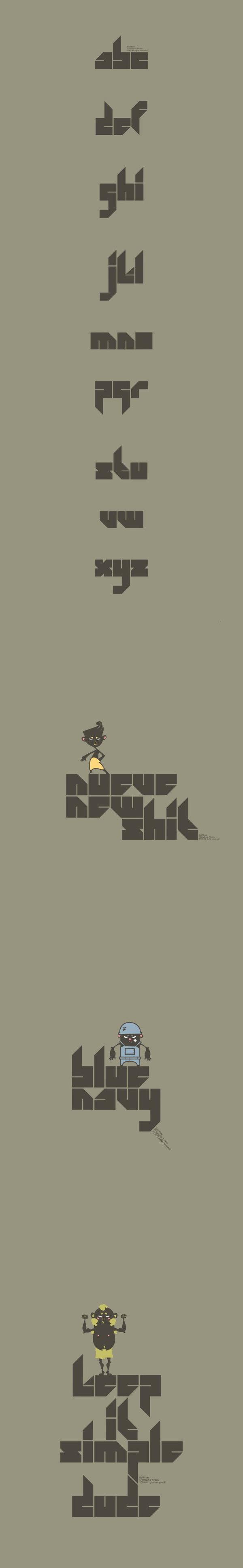
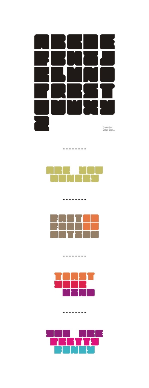
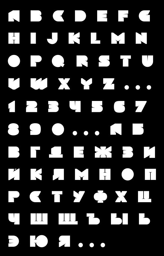
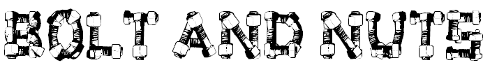
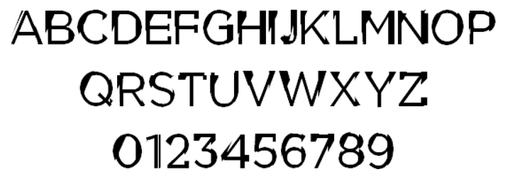
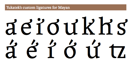
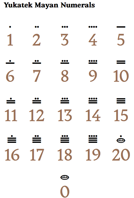
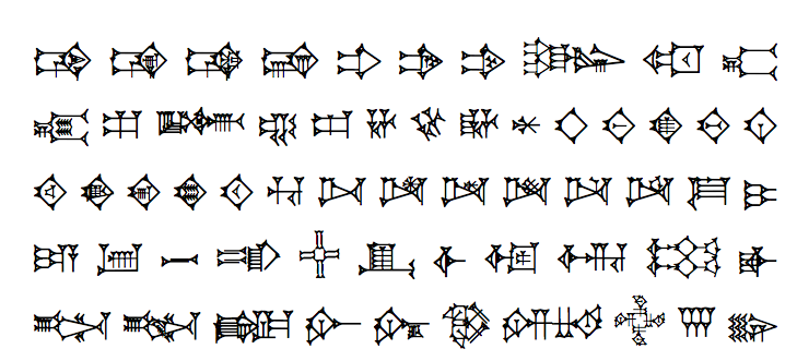
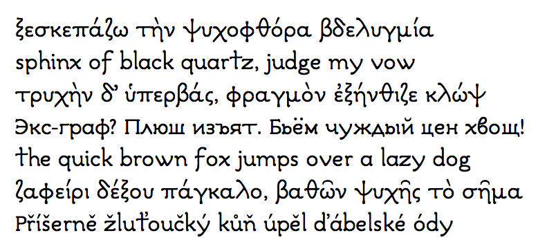