TYPE DESIGN INFORMATION PAGE last updated on Sat May 16 08:02:56 EDT 2026
FONT RECOGNITION VIA FONT MOOSE

|
|
|
|
|
Type design in Quebec | ||
|
|
|
|
SWITCH TO INDEX FILE
A defunct Montreal foundry run by Denis Dulude and cofounded by him and Fabrizio Gilardino in 1995. Denis Dulude closed shop in 2011 and returned all rights of fonts to their creators. [I wish everyone would be so generous...]. Most fonts can now be found in the FontHaus collection. The designers included Annie Bastien (Sofa, Scratch), Robert Beck (Table Manners), Christine Côté (the handwritten Nacht), Denis Dulude (Razzia), Patrick Giasson (Proton 102), Fabrizio Gilardino (Babbio), Marie Laberge-Milot (funny dingbats Fred Family), Anna Morelli (Quattr'Occhi), Serge Pichii (Thais Light), Clotilde Olyff (Douff: geometry in action), Martijn Oostra (Mold Family), Marc Tassell (Pilgrim Family), and Michel Valois (Perceval Family). MyFonts link. View the typefaces made by FontHaus / 2 Rebels. [Google] [MyFonts] [More] ⦿ | |
Graphic designer in Montreal who created the sans typeface Detektiv (2013): Detektiv is a playful sans-serif display font inspired by vintage Polish children's books and derived from DIN 1451. Work in progress. Behance link. [Google] [More] ⦿ | |
Graphic designer and photographer in Montreal, who created Module Sans in 2015. Behance link. [Google] [More] ⦿ | |
In the book Divertimento (Editlivre, Paris), Albert Legault (UQAM, Montreal, Canada) published the decorative art nouveau caps alphabet Eugene Grasset (2015). PDF file for the Eugene Grasset alphabet [120MB]. [Google] [More] ⦿ | |
Albertine Nerevan
| |
Albertine's Fonts
|
Devian tart link. Fontsy link. Klingspor link. Dafont link. Abstract Fonts link. [Google] [More] ⦿ |
Art director in Montreal where he is with Paris Associates. Behance link. At FontStruct, he made the dot matrix typefaces Augustis (2011) and Augustis Squared (2011). [Google] [More] ⦿ | |
His typefaces include:
Speaker at ATypI 2013 in Amsterdam: Forma, Dattilo, Modulo. Nebiolo's last effort to produce a 'universal' typeface. Organizer of ATypI 2017 in Montreal. Speaker at ATypI 2018 in Antwerp. [Google] [MyFonts] [More] ⦿ | |
Montreal-based designer who created the free modular typeface Megas (2012). Behance link. [Google] [More] ⦿ | |
During his studies at UQAM in Montreal, Alexandre De Sève created the mini-serifed display typeface Cask (2015). [Google] [More] ⦿ | |
Quebec City-based designer of the rounded grid-based typeface Nantes (2017) and Brush (2017). In 2018, she designed the free typeface Boom. [Google] [More] ⦿ | |
Alexandre Saumier Demers
| |
Montreal, Quebec (was: Madrid, Spain)-based designer of a prismatic set of initials in 2016. [Google] [More] ⦿ | |
For the Australian wine brand Swoon, Amanda Mocci drew the hairline avant-garde typeface Swoon in 2010. Amanda is a graphic designer in Montreal. [Google] [More] ⦿ | |
| |
Industrial designer. Amy's typeface Aalto (2012) is inspired by the well-known Finnish architect and designer Alvar Aalto. She also made the custom font Articule (2012) for a gallery in Montreal. [Google] [More] ⦿ | |
Graphic designer who has worked at the McGill Daily in Montreal (1997-1999) and at SUNY (New Paltz, NY, 2003-2004), where she obtained an MFA in Intermedia Design in 2005. She wrote a thesis in which features of OpenType are used to replace bad words with good ones. From 2006 until 2009, Amy was an Assistant Professor of Graphic Design at the University of Bridgeport in Connecticut. Currently, Amy is an Assistant Professor of Graphic Design and Foundation at the State University of New York at New Paltz. She is one of the cofounders of Alphabettes. Flash demo which does not work on several browsers. Scribbly handwriting fonts (no downloads) include Sugar and Spice, Shy Slacker, Francophile and Cranky Kid. [Google] [More] ⦿ | |
Montreal-based designer of Deco Sans (2014). Behance link. [Google] [More] ⦿ | |
Montreal-based graphic and web designer who created the beveled geometric all caps typeface Geo Edge (2015). Behance link. [Google] [More] ⦿ | |
Rouyn-Noranda, Québec-based designer who created these typefaces;
Klingspor link. Behance link. PsyOps link. [Google] [MyFonts] [More] ⦿ | |
Quebec City-based designer of a piano key typeface for the identity and logo of the Musée du Jouet de Nantes (France) in 2011. [Google] [More] ⦿ | |
Quebec City-based designer of the alchemic typeface Absolu in 2013, the stencil typeface Soft Ocean in 2017, and the decorative stencil typeface ABC in 2016. Creative Market link. [Google] [More] ⦿ | |
Angele Sage
| |
| |
During her studies, Anne Catherine Verrettre (Quebec City) created the thin italic typeface Kennedy (2013). [Google] [More] ⦿ | |
Graphic designer in Montreal, who created the angular text typeface Adrat (2015). [Google] [More] ⦿ | |
Designer whose fonts may be bought from 2Rebels in Montreal. Some creations: NuclearReactor, ScratchNsniff (1997), SemiSans, Sofa (at UQAM in 1995, as a student there). Annie grew up in Laval, near Montreal, and is a graphic designer in Montreal. See also here. FontShop link. [Google] [MyFonts] [More] ⦿ | |
Anouk Pennel
| |
Ashley West (Montreal, Quebec) designed the oily signage typeface Florida Macaroni (2013) and the dot matrix typeface Peggo (2013). Behance link. [Google] [More] ⦿ | |
The conference blurb: Join the global typographic community in Montréal, Quebec, Canada, September 12-16, 2017. ATypI is celebrating sixty years of typographic education and camaraderie this year. As an organization founded by Charles Peignot of the famed Deberny & Peignot foundry in Paris, it's fitting that we commemorate this milestone in a grand French-speaking capital. The theme of ATypI's 2017 conference is Atypique. Montréal is known for many things: for its blend of new and old; for its bilingualism and pluralistic society. Montréal is a city of dualities: East Side and West Side, English- and French-speaking, the old city and the new, European sophistication and American casual. It's a laid-back city enjoying the benefits of a low-inequality society. It is an atypical city compared to the rest of Canada and the United States. In a broader context, Atypique means something more daring; something that doesn't quite follow convention; something a little bit rebellious and edgy. Atypique holds a mirror to history and understands tradition, but dares to be different. In typographical terms, Atypique hints at all things---products, practices, processes, people---escaping the rules or bending paradigms. Atypique evokes, to paraphrase Alan Fletcher, looking sideways at all facets of contemporary types and typography: from technology to aesthetics, from economics to politics, from Latin to the world writing systems, from hand lettering to screen legibility, and from education to the very notion of authorship. The three tremendous keynote speakers: Roger Black, Paula Scher, and Rod McDonald. The identity of ATypI was expertly and daringly designed by Julien Hébert, who is based in Montreal. From the euphoric and "atypique" color palette, to the choice of a Montreal-grown typeface, Guillon (by Feedtype and Coppers and Brasses), and a series of stunning posters, this is identity design at its best. The speakers and workshop leaders: Sahar Afshar, Shani Avni, Sofie Beier, Jordan Bell, Bruno Bernard, John D. Berry, Ann Bessemans, Aaron Bowes, Veronika Burian, Stephen Coles, Peter Constable, Matthieu Cortat, Nicole Dotin, John Downer, Nathalie Dumont, Rachel Elnar, Victor Gaultney, Tom Grace, Will Hill, Lauren Johnson, Quinn Keaveney, Joyce Ketterer, Jerome Knebusch, Gloria Kondrup, Borys Kosmynka, Indra Kupferschmid, Kevin Larson, Edwina Lee, Taekyeom Lee, Paul Luna, Jose Manuel Lopez Rocha, Bruno Maag, Simon Mager, Wei Ming, Aoife Mooney, Bill Moran, Jim Moran, Gillian Mothersill, Megan O'Connell, Sharon Oiga, Riccardo Olocco, Toshi Omagari, Santiago Orozco, Jason Pamental, Elena Papassissa, Laurence Penney, Yves Peters, Thomas Phinney, Judith Poirier, Carolyn Porter, Daniel Rhatigan, Emilie Rigaud, David Jonathan Ross, Christopher Rouleau, Jay Rutherford, Tetsuo Sakomura, Jose Scaglione, Lucas Sharp, Paul Shaw, Nick Shinn, Matt Soar, Michael Stinson, Arina Stoenescu, Sumner Stone, Andres Torresi, Sergio Trujillo, Ferdinand Ulrich, Underware, Petr van Blokland, Malou Verlomme, Guy Villa Jr., Wen Wang, Taro Yamamoto. Twitter feed. Videos of the talks. Photobooth and party pictures by Benoit Vermette. Pictures by Henrique Nardi and Norman Posselt. [Google] [More] ⦿ | |
Au fin fond de nulle part
| Au fin fond de nulle part is Montreal's Lucie Grenier's site, where she offers free and shareware dingbats: FFwebsuite (2000), Wateverding (2000), Casas (2000), FFFrames (2000), poste (2000), FFLiens (2000), fletp (or: FF Livres et Plumes, 2001), FF Fruits&Légumes (2002). Commercial dingbats: FF Holiday Webset 2, FF Websuite 3, 4, 5 and 6, FF Babioles. She also has beautiful fractals, well worth a visit. Lucie moved to Newfoundland around 1992. [Google] [More] ⦿ |
Montreal-based art director who created the geometric solid typeface Artwork in 2015. [Google] [More] ⦿ | |
Freaky Typeface (2013) is a collaborative experimental school project of Aurélien Guerout and Michael Descharles at Ecole d'Art Maryse Eloy under the supervision of Eva Kubinyi and Jean Widmer. Aurélien lives in Montreal. Behance link. Linkedin link. [Google] [More] ⦿ | |
Montreal-based astrologer and author, who obtained an MA in history from the University of Toronto in 1964. [Google] [More] ⦿ | |
Web and graphic designer in Montreal, who created the deco typeface Modern (2016). [Google] [More] ⦿ | |
| |
BaseLAB
|
|
| |
Montreal-based designer. During her studies at Concordia University, she created the free floriated caps typeface Floralism (2013), a font whose glyphs are shaped like in Novecento, one of the "in" typefaces of early 2013. Its decoration is inspired by art nouveau and psychedelia from he 1960s. Behance link. [Google] [More] ⦿ | |
Based in Quebec and born in 1994, Bella Alma created the pixel typeface What A Pity (2010, FontStruct). [Google] [More] ⦿ | |
Gatineau, Quebec-based designer of the vintage map font Mythrandir (2016). Behance link. [Google] [More] ⦿ | |
Bill Jancewicz
| |
Her typefaces:
| |
Bruno Nadeau
| |
Graphic designer in Montreal who created the italic didone typeface Vogue in 2017---her Vogue is not at all related to the well-known geometric sans Vogue. Behance link. [Google] [More] ⦿ | |
Originally from Montreal, Camille studies graphic design at Anderson University in South Carolina. During her studies, she created the quaint mini-serifed typeface Ado (2012). Behance link. [Google] [More] ⦿ | |
During his studies in Montreal, Carl Bergeron-Gagnon designed the text typeface Ernest (2016). [Google] [More] ⦿ | |
During her studies in Montreal, Carolane Montcalm designed the thin slabbed display typeface Tricoti (2014). [Google] [More] ⦿ | |
Montreal-based designer of Dot Typeface (2015), a hairline display typeface with embedded dots. [Google] [More] ⦿ | |
During her design studies at Concordia University in Montreal, Cassandra Carosello created the astrology-inspired geometric display typeface Galaxix (2015). [Google] [More] ⦿ | |
| |
Graphic designer in Montreal, who created the Escheresque typeface Penrose (2012). [Google] [More] ⦿ | |
Montreal-based illustrator and graphic designer who created the impossible 3d typeface Penrose Font in 2015. Behance link. [Google] [More] ⦿ | |
Youngster from Quebec City, b. 1989. Designer of Noises Pop (2007, a futuristic face). No downloads. [Google] [More] ⦿ | |
Marie-Louise Pépin's page on medieval resources and "enluminures". Has a Heraldic (uncial) truetype font for download. Medieval resources in Québec. Addresses and links. [Google] [More] ⦿ | |
Design student at UQAM in Montreal, who in 2009 won a typography award from the Fondation de l'UQAM. He designed a sans in 2009 that was showcased on pages 34-35 of Pica Magazine, volume 1. [Google] [More] ⦿ | |
| |
Charles Daoud
| |
Early 20th century designer of letters, such as this Modern Roman typeface. He was an editor of Graphica (The Herald Press, Montreal and Toronto). [Google] [More] ⦿ | |
Creator of the typeface X+Y 3D (2014). Charles is based in Montreal. [Google] [More] ⦿ | |
Charles Leroux
| |
Graphic designer in Chicoutimi, Quebec, who created the mini-serifed display typeface Uncut (2014). Behance link. [Google] [More] ⦿ | |
Chester Jenkins
| |
His fonts include Syzygy, Schmelvetica (at FontShop), Psyche (unreleased), Orbit (2003, with Rob Irrgang), Rheostat (1996, a grunge dot matrix font family), HateNote, Panderella (2000-2001, ultra geometric), Eclogues (1999, an absolutely stunning romantic high-ascender-descender family), LoveHateCollection, JohnHadANightmareLastNight (2001), Alexey (2003, a stencil family, with Rick Valicenti), Apex Serif (2003, with Rick Valicenti), Exchange (dot matrix), Pizzelle Italic, Phatso (2003), Satchel Paige (2003, a wood type typeface made with Tracy Jenkins), Pixella (2003, pixel font), Nillennium (2000, an octagonal family), Freedumb (2004), Galaxie Polaris (2004, a sans) and Virgil, the last twelve fonts at Thirstype. At Village, he published Mavis (2005), Apex Sans (2004, with Rick Valicenti), and then Apex New (2006), which has a hairline weight, Apex Thin, and Apex Rounded (2010). In 2009, he co-designed the large x-height text family Galaxie Copernicus with Kris Sowersby at Village. In 2010, he and Jeremy Mickel made the poster type family Aero, which took inspiration from Roger Excoffon's Antique Olive. It won an award at TDC2 2011. His custom-made typefaces from 2006-2007 include these: Rewards (with Kris Sowersby), Always Radio (with Markus Rakeng), 2Wice Egyptian, Apex Compact, Apex New Condensed, Baro Heavy, Baro Light, Baro Medium, Baro Super, DPA Gothic, Endzone, Galaxie Ariane, Galaxie Copernicus, LMVDR, Modernismo, Snickers. [Google] [MyFonts] [More] ⦿ | |
Designer of the paper fold typeface Paper&Love (2010). Chris was born in and lives in Montreal. [Google] [More] ⦿ | |
Calligrapher who started out as a graffiti artist in Montreal. Presently he teaches at Cegep Marie-Victorin. In the early part of his career, he created the pixel / dot matrix typeface family Knitmap in 2004 at 2Rebels in Montreal. After the sale of 2Rebels to Fonthaus, one can obtain the typeface via FontHaus. [Google] [MyFonts] [More] ⦿ | |
Christian Plourde
| |
Montreal-based designer of the slab serif typeface Bonanno (2014). [Google] [More] ⦿ | |
Designer whose fonts may be bought from 2Rebels in Montreal. Some creations: Nächt. [Google] [MyFonts] [More] ⦿ | |
Art director in Montreal who created the handcrafted font duo Bliss and Blush and the hand-drawn typefaces Tropicalling and Send My Love in 2018. Creative Fabrica link. [Google] [More] ⦿ | |
Montreal-based graphic designer. His work includes a typeface, Plateaux (2009, a hairline architectural drawing face)---clean as a whistle, it seems to have been used in some movie titles. [Google] [More] ⦿ | |
| |
Designer from Lasalle, Quebec who created a Chinese zodiacal sign typeface in 1979. Google patent link. [Google] [More] ⦿ | |
Dafont link. Yet another URL. Abfonts carries many of his fonts. Fontspace link. His typefaces:
| |
During her studies, Claudia Trudeau (Sherbrooke, Quebec) created an all caps sans typeface specifically for use in logos. [Google] [More] ⦿ | |
| |
The Colgate Collection at McGill University is Canada's finest type book and specimen collection. It probably rivals any collection in North America as well. The link leads you to just the first half of the type specimen collection (Text format for most of that list). Part of the collection on typography. Part of the collection on typefounding and type-cutting. I know that there are fine books at Harvard and other Ivy League libraries, but none (!!!) allows the use of scanners or digital cameras in the rare books divisions. Duplication is possible at a cost well above the purchase price of the (rare) book if you need a reasonable number of copies. But McGill is open for business. Free, democratic, accessible to "the people", even the poor, the way it should be. Cameras and scanners are allowed. [Google] [More] ⦿ | |
At Concordia University in Montreal. Pankaj Kamthan's page on PostScript. [Google] [More] ⦿ | |
Constellation
|
|
Coppers & Brasses
|
Creators of these typefaces in 2012: Martha (monospaced slabby grotesque done by both founders), Sardine (fat signage typeface by Bonn), Freitt (blackletter typeface by Bonn). Nicole (2012) is an elegant basic sans typeface by Olivier Mercier-Chan Kane. In 2013, Etienne graduated from the Type & Media program at KABK in Den Haag. In 2014, Alexandre in turn graduated from the Type & Media program at KABK. For his graduation, Alexandre developed the didone typeface family Lewis. He writes: Lewis is a typeface designed for mathematical typesetting, specifically for the TeX typesetting system. It consists of 3 text styles (Roman, Bold, Italic) and 3 math styles (Math Italic, Greek, Blackboard) for use as variables. The text Italic relates to the Roman while the Math Italic stand out with its cursive construction. Likewise, the Greek differentiate easily from Latin characters. The Blackboard inlines are adapted for text sizes with their wide and open cut. Lewis features many size variants and extending shapes, ideal in displayed equations. The list of their retail and custom fonts:
Alexandre spends most of his time since 2016 working on variable font projects for The Type Network (ex-Font Font Bureau). Home page of Alexandre Saumier Demers. Behance link for Coppers and Brasses. [Google] [More] ⦿ |
Catherine (aka Coy Dreamer, b. 1992) lives in Quebec and made the handwriting font Thirteen Candles (2008). She also runs a small script archive where one can find ALCharisma, ALHeavenly, AmazoneBT-Regular, AmbianceBTSwash-Regular, Annabelle, AriosoNormal, BrockScript, CACChampagne, CACLaskoCondensed, CACPinafore, Cheeseburger, Cheri, Cookies, DiscoMonkey, DreamLover, Elegant, Fontana, GoodGirl, GoodVibrationsScript, HappyBirthday, HoneyLight, JackieO, KristenITC-Regular, LainieDaySH, Laurell, MarketingScript, MeaCulpa, NadineScriptExtra, PassionsConflictROB, Qwigley, RivaLetPlain, Ronita, ScriptMTBold, Shimmer, SloopScriptTwoLessSlant, StereoHifi, TheNautiGalROB, Thursdoo, TwinkleStarROB, UpDock, WendyMedium, WendyMedium, akaDylanPlain. Alternate URL. [Google] [More] ⦿ | |
CreeKeysLT
| At this site of the Cree Cultural Institute in Opemiska Meskino, Oujé-Bougoumou, Quebec, we find free Unicode and non-Unicode Cree fonts BJECreeBold, BJECree, BJCreeUNI, BJCreeUNI-Bold, all designed in 2000 by Bill Jancewicz, NDC Kawawachikamach Quebec, Canada. [Google] [More] ⦿ |
Curious Flux
| Francisco Castro Miranda (aka Curious Flux) created DeLorimier, an experimental display font created in 2009 when he spent a summer in Montreal. [Google] [More] ⦿ |
Laval, Quebec-based designer of the hipster typeface Oniris (2016), which is based on ITC Lubalin Graph Book Oblique (1974, Herb Lubalin). Behance link. [Google] [More] ⦿ | |
Designer at Apostrophic Laboratory, of Desyrel (handwriting font) and Lilly in 2000. Born in Québec, she now lives in Los Angeles. Obsolete URL. [Google] [More] ⦿ | |
Miller is a supporter of free and open-source fonts, as well as free and open-source software. He uses FontForge for design, and releases all his work under free licenses: I really just want people to be able to use my designs, improve them and share them. First, on a pragmatic level, I know that my work will be imperfect, and I'd like others to be able to use their judgment to make adjustments (which I hope they'll also release under a free license). Second, I think that too much material (and not just fonts) is behind barriers of restricted access and artificial scarcity. This kind of thing---useful tools and information---wants to be free, so let it out for everybody to use. | |
Free interleaved 2 of 5 barcode TrueType font at the BarCode1 site. Also free EAN-13, UPC-A and UPC-E barcodes by Daniel Lajeunesse at the same site. [Google] [More] ⦿ | |
Daniel Robichaud
| |
Daniel U. Thibault
| |
Fellow Montrealer who created Spencerian Flourish Moustaches (2011). Behance link. [Google] [More] ⦿ | |
Danny Demers
| |
Quebec City-based designer of the decorative typeface Flos (2016). [Google] [More] ⦿ | |
Art director of Strut Magazine in Montreal. [Google] [More] ⦿ | |
Designer in Gatineau, Quebec. Creator of Mr. Font (2011). [Google] [More] ⦿ | |
Graphic designer from Quebec City. He created the commercial pixel typefaces David Sans (2005), David Sans Condensed (2005) and David Device (2005). Dafont link. [Google] [More] ⦿ | |
Graphic designer in Montreal. While taking a course from Colizzi at UQAM, he designed the hexagonal typeface Hexactly (2012). [Google] [More] ⦿ | |
Montreal-based graphic designer who created the fancy geometric typeface Rocko (2011). [Google] [More] ⦿ | |
Former ballet dancer. Montreal designer and owner and founder (with Fabrizio Gilardino) of 2Rebels in Montreal (since 1995). He teaches type design at UQAM (University of Quebec in Montreal). Two Rebels was sold to FontHaus in 2007. Some typefaces were published with T26. Dulude's fonts:
FontShop link. MyFonts link. Klingspor link. Home page. [Google] [MyFonts] [More] ⦿ | |
While studying at Concordia University in Montreal, Desislava Davidova designed the free brush typeface Flow (2015). [Google] [More] ⦿ | |
Dialekt Design (was: Robert Beck Design)
| Canadian graphic designer and creative director Bob Beck has been living in the Montreal area since 1995. In 1999, he set up Dialekt Design. His typographic oeuvre is extensive:
Klingspor link. [Google] [MyFonts] [More] ⦿ |
Digital Empires
| Original display fonts by Orlando-based ex-Montrealer and ex-McGiller Stephen Tune: Men In Blue (1998), IronCladBolted (1997), IronClad (1997), Odishi (oriental simulation) (1997), Fantique Four (1997), Seafaring (1997), Spawned (1997) and Draft Gothic (1997). Type based on the logos of popular comic books and movies. Free demo samples only. Dead link. The web site closed its doors in 2003. |
| |
Typefounder located at 780 Craig Street in Montreal, and active in the late 19th century. They were typefounders to the government of Canada and acted as exclusive agent for the American Typefounders Company (ATF). In 1895, R.G. Starke was its president. [Google] [More] ⦿ | |
Montreal-based designer of Jocaste (2016). Behance link. [Google] [More] ⦿ | |
DR Fonts
| Originally from Montreal, Daniel moved to Los Angeles to create visual effects and contributed to the movies Apollo 13, The Fifth Element and Titanic. He developed an interest in animation, created the short film Tightrope, and directed the feature-length cartoon Pinocchio 3000. Daniel Robichaud worked for the Canadian Broadcasting Corporation, Digital Domain and FOX. At Letraset, he published the semi-stencil typeface Epitaphe. In 2021, he set up DR Fonts and released the 20-style techno sans font family Absentia Sans (2021) and the 20-style Absentia Slab. [Google] [MyFonts] [More] ⦿ |
Montreal-based creator of the plant-inspired display typeface Livingtype (2014). [Google] [More] ⦿ | |
Montreal-based designer of the multiline typeface Triplé (2014). Triplé is based on Cassandre"s Peignot. [Google] [More] ⦿ | |
Graphic designer in Montreal, who created a few experimental scratchy and ink spill typefaces in 2014. [Google] [More] ⦿ | |
Graphic designer in Montreal. In Etienne Aubert-Bonn's course at UQAM, she designed the crisp display typeface Citadine (2020), and the display serif typeface Marie (2020), which was inspired by the Marie Reine du Monde Cathedral in Montreal. [Google] [More] ⦿ | |
Montreal-based creator of the hipster typeface Quadeam Littera (2015), a typeface based on ITC Avant Garde. [Google] [More] ⦿ | |
| |
Montreal-based designer of the free caps only sans typeface Queeny (2017). Behance link. [Google] [More] ⦿ | |
During her studies in Montreal, Emilie Lavigne created the lachrymal typeface Flores (2013). [Google] [More] ⦿ | |
Emilie René-Véronneau is a Montreal-based freelance graphic designer of Techno Peignot (remix of Peignot) and of a tribal font, Amazon. No downloads. View samples at ERV Design. [Google] [More] ⦿ | |
Based in Montreal, Emilie Turcotte created the display sans typeface Sucré in 2014. [Google] [More] ⦿ | |
Quebec-based designer (b. 1987) of the handcrafted typefaces Weztern (2017) and Pineapplez (2017), and the geometric sans typeface Lavigne (2018). [Google] [More] ⦿ | |
Book containing specimen of 6300 commercial digital typefaces, compiled by Paul Morency and josé Perez (2004). It comes with a handy on-line font database. Paul Morency has been in the advertising and printing field for more than 20 years. José Perez is a self-employed pre-press technician, providing services to printers, digital photography, page layout and printing services. Both are based in Montreal. [Google] [More] ⦿ | |
Montreal-based French designer in 2014 of the free fonts Crack, Slurp (wide and monospaced), KC Regular (octagonal), Wigz and Ligne. Behance link. Dafont link. Fontspace link. [Google] [More] ⦿ | |
Eric Russ
| |
Chi Huynh (Ethan Cote) from Montreal interviews type designers. [Google] [More] ⦿ | |
In 2012, he designed the signage typeface Sardine and the blackletter typeface Freitt. Together with Alexandre, he created Martha (a monospaced slabby grotesque), still in 2012. At The Cooper Union, he created Barapa (2012). His fonts at Coppers Brasses:
| |
During a workshop in 2016 at ENSAD in Paris, Etienne Murphy (Montreal, Canada) designed the gothic typeface Pankow (2017), which is named after a neighborhood in Berlin. Behance link. [Google] [More] ⦿ | |
Originally from Quebec where he was art director at Ubisoft, Etienne Poulin is a graphic designer and art director in Vancouver, Canada. He created a thin pixelish typeface called Pixel & Cie (2013). Behance link. [Google] [More] ⦿ | |
Montreal-based graphic designer who made the octagonal typeface Paradoxa in 2014. Designer of the trilined hockey-inspired Stick Typeface (2020). [Google] [More] ⦿ | |
Eve Duhamel from Montreal is into illustration and design. She designed the hand-printed Wonderland font in 2010. Behance link. [Google] [More] ⦿ | |
Creator of Samman (2011, Arabic), Castile (2011, kufic style), Nasser (2010), Zawiya (2008). In 2012, he made Eyadish (Latin and Cyrillic): Eyadish is specifically designed for commercial, educational, cultural, and social purposes related to infants, babies, kids, and children, Loyolliams (2012, squarish, a renamed version of Concordia) and Alfarooq (2013). Typefaces from 2014: Kindah (a modern Kufic font named after Kindah, an ancient Yemeni tribe), Nusaibah (a modern, geometric, and headline Arabic display typeface. Typefaces from 2015: Ghibli (a free Latin text typeface). Typefaces from 2016: Matwin (a children's script), Thwaites (named after his Canadian friend James Douglas Thwaites). Typefaces from 2018: Danah. Typefaces from 2019: Awwam (a wide headline Arabic typeface). Typefaces from 2020: Yusyad (a tall condensed display family). In 2025, he designed the extensive typeface family Ibnmuqlah, named after famed Arabic calligrapher Ibn Muqlah. The typeface supports a wide range of Arabic character sets, making it suitable for composing text (i.e., alphabetical and numerical) in languages such as Arabic, Urdu, Persian, and also Kurdish. Its design is particularly striking and eye-catching in large printed formats, making it ideal for headlines, titles, brand names, packaging, and signage. Consequently, it is well-suited for book covers, large advertisements (such as light boards), magazine and newspaper titles, products, logos, and artistic applications in public spaces like streets, metro stations, and satellite channels. This modern scripting typeface delivers full, seamless integration of essential Arabic diacritics, including damma, shadda, sukūn, fatḥa, and ka. This robust feature ensures flawless, practial application and maximum utility across the demanding scripts of Arabic, Urdu, Persian, and Kurdish, making it the perfect choice for professional typographic projects seeking maximum market adaptability and authenticity across diverse linguistic contexts. [Google] [MyFonts] [More] ⦿ | |
Dafont link. Aka The Wondermaker. Dividing time between Paris and Montreal. Old URL. [Google] [More] ⦿ | |
Frenchman who started out in Grenoble in Paris, but is now based in Montreal. Designer of the octagonal paper fold typeface Danses Libres (2012) and the titling font Nougatine (2012). These fonts are free. In 2014, he created the great free mechanical octagonal typeface Motorless, which was made with FontStruct. | |
Milanese cofounder with Denis Dulude of the Montreal-based type foundry 2Rebels in Montreal, at the zenith of the grunge era. Montreal-based designer whose fonts may be bought from 2Rebels in Montreal. Some creations: Angry (1998, grunge), Babbio (1995), Boggle, Carbon, Hanbuhrs, Manesca, Nonlinear, Nunavik (1995: Inuktitut simulation typeface), Scritto Politto Freako (1996), Toxin, Duchamp-Dirty (2001), DV9 (with Marie-France Garon). 2Rebels was absorbed into / bought by FontHaus. FontShop link. Klingspor link. View Fabrizio Gilardino's typefaces. [Google] [MyFonts] [More] ⦿ | |
During her studies in Montreal, Fannie D created the didone display typeface Demice (2015), which is based on Fenice. [Google] [More] ⦿ | |
During his graphic design studies at Concordia University in Montreal, Feipe Munoz created the free sci-typeface Crystal (2014). Behance link. Open Font Library link. [Google] [More] ⦿ | |
Figure Studio
| Figure Studio is the showcase of designer Jeremy Hally in Quebec. He made some experimental typefaces in 2010. [Google] [More] ⦿ |
Font Compare is a handy little utility that allows one to compare three true-type fonts at a time and to easily see whether a font contains all the numbers and punctuation, as well as the international characters needed for writing French. Free Windows utility by Lav Plourde. Direct download. [Google] [More] ⦿ | |
Font Forestry
|
Typefaces from 2018: Monique Script, Maveryk. Typefaces from 2022: Marlowe (all caps serif). Creative Market link. Behance link. Newest Behance link. [Google] [More] ⦿ |
Fontsrepo
| Free font site heavily burdened by ads. In early 2019, it had about 330 fonts. It is possible that (Gatineau, Quebec) has a stake in it. [Google] [More] ⦿ |
Freelance designer in Montreal. Creator of the Felt Gothic family at [T-26] in 1996. [Google] [MyFonts] [More] ⦿ | |
During his studies at Université du Québec en Outaouais, Gatineau, Quebec-based François Côté designed the free pixel typeface Aztec Ruinz (2016). [Google] [More] ⦿ | |
Alma, Quebec-based teacher, b. 1963. To help young readers, she the sans typeface FDL (2013). Dafont link. [Google] [More] ⦿ | |
Montreal-based designer of Punto (2017), a typeface obtained by subtracting from Futura Light. [Google] [More] ⦿ | |
Francisco Castro Miranda
| |
Montreal-based designer and artist, who created a paper cutout / dada typeface in 2013 called Not Everything Is Easy. Behance link. [Google] [More] ⦿ | |
During her studies at UQAM in Montreal, Frédérique Huré designed a display typeface (2019). [Google] [More] ⦿ | |
Computer scientist and computational artist who teaches at the Department of Computing Goldsmiths, University of London, since 2004. He studied at Polytechnique Montreal (class of 1986), McGill University (MEng, 1989) and Brown University (PhD, 2002). He researches creative robotics. He is the co-founder of London Geometry (in 2011), a leading consultancy, providing professional training for the games industry and developing serious games and interactive graphics solutions. In 2021, he supervised Daniel Berio's PhD thesis entitled AutoGraff: Towards a computational understanding of graffiti writing and related art forms. The abstract of this spectacular work that mixes art and mathematical modeling: The aim of this thesis is to develop a system that generates letters and pictures with a style that is immediately recognizable as graffiti art or calligraphy. The proposed system can be used similarly to, and in tight integration with, conventional computer-aided geometric design tools and can be used to generate synthetic graffiti content for urban environments in games and in movies, and to guide robotic or fabrication systems that can materialise the output of the system with physical drawing media. The thesis is divided into two main parts. The first part describes a set of stroke primitives, building blocks that can be combined to generate different designs that resemble graffiti or calligraphy. These primitives mimic the process typically used to design graffiti letters and exploit well known principles of motor control to model the way in which an artist moves when incrementally tracing stylised letterforms. The second part demonstrates how these stroke primitives can be automatically recovered from input geometry defined in vector form, such as the digitised traces of writing made by a user, or the glyph outlines in a font. This procedure converts the input geometry into a seed that can be transformed into a variety of calligraphic and graffiti stylisations, which depend on parametric variations of the strokes. [Google] [More] ⦿ | |
Montrealer Gary Katch designed a beautiful symmetric (up=down) chess font called Chess Montreal. Truetype, shareware. [Google] [More] ⦿ | |
Gary Paitre (Digital Dude) is an American-born Montrealer, whose design work took him to the "bubbly" logo for BUI Optometrics (2010). [Google] [More] ⦿ | |
GautFonts
|
Interview. Fontspace link. Dafont link. Klingspor link. [Google] [More] ⦿ |
FontShop link. Klingspor link. Alternate link. View Gérard Mariscalchi's typefaces. [Google] [MyFonts] [More] ⦿ | |
During her studies in Montreal, Geneviève Lagacé designed the sketched typeface Il Était Une Fois (2015), starting from Adrian Frutiger's Glypha. [Google] [More] ⦿ | |
Geneviève Rose (Laval, Quebec) created the wave-themed display typeface Ocean (2013). [Google] [More] ⦿ | |
Georges Yannopoulos is a graphic and web designer and illustrator in Montreal. In 2018, he created the free simplified blackletter typeface Monolith. In 2019, he published the free techno typeface Kubos. [Google] [More] ⦿ | |
Goluska had a book typeface designed in his honour by Nova Scotia-based type designer Rod MacDonald. The typeface, simply called Goluska, was published in 2021 at Canada Type, where Patrick Griffin oversaw the production and the addition of some variable fonts. Goluska admired Dwiggins, so Goluska, the typeface, was influenced by the puppeteer's work, especially the Scotch roman typeface Caledonia. | |
Greg Nicholls
| |
Grype
|
Obliterate GRP (2013) is a grungy letterpress typeface. In 2016, Brian J. Bonislawasky and Jim Lyles published the rugged octagonal mega typeface family Tradesman, the rounded sans Tailwind, and the techno typeface Offroad at Grype. In 2017, they added Jukebox Hero (stencil), Lustra (a mechanical sans), Lustra Text, and Sunblock Pro (2017, by Brian J. Bonislawasky and Jim Lyles). Typefaces from 2018: Aspire Narrow SmallCaps, Aspire SmallCaps, Aspire, Aspire Narrow. Typefaces from 2019: Decade (a logotype inspired by an alphabet in Letters and Lettering (1938, Paul Carlyle and Guy Oring)). Typefaces from 2020: Binder (a revival of the ultra-condensed movie credit typeface Binder Style by Joseph Binder for D. Stempel in 1959), Avionic (a 40-style sci-fi family, inspired by aerodynamics and the Air China company logotype). Typefaces from 2022: Midsole SC, Midsole (a 40-style squarish sans with square counters). [Google] [MyFonts] [More] ⦿ |
Montreal-based graphic designer, who created the display typeface MOEA (2013). [Google] [More] ⦿ | |
Sherbrooke, Quebec-based designer of the all caps typeface Division (2015). [Google] [More] ⦿ | |
Gyom (Guillaume) Séguin
| |
| |
Montreal, Quebec and/or Portsmouth, UK-based designer of several sets of icons, and the typeface pair Pigeon Scout Sans and Pigeon Scout Serif (2018). [Google] [More] ⦿ | |
Tom Kouri's Montreal-based graphic design and web company. Involved in "Branding&Web", Tom Kouri is partially involved in custom font design. [Google] [More] ⦿ | |
For Ludovine Loiseau's course at ERG in Brussels, Ingrid Bourgault (b. Quebec) created the free font Brush Lettering One (2014, OFL), which is based on Eben Sorkin's Merriwaether Bold Italic (2013). In 2015, she drew an experimental alphabet based on the grid system of the excellent Belgian newspaper Le Soir [on par with De Standaard], and created an experimental multicolor modular typeface. Behance link. [Google] [More] ⦿ | |
Montreal-based designer of the Peignotian typeface PIF (2017). Behance link. [Google] [More] ⦿ | |
Montreal-based designer of the counterless geometric typeface Hays & Co (2019). [Google] [More] ⦿ | |
Montreal-based art director and designer. Creator of the creamy script typeface Silhouette (2015), whgich is based on the logo of Danone's Solhouette yoghurt. [Google] [More] ⦿ | |
Jacques Bertrand works in the Department of Psychology at the University of Trois-Rivières, Québec, Canada. He designed the Mac fonts Amour Tendre, Bertrand, Jean Camil, Nancy Blue, Petit Bonheur (see also here), Provence, Puccini and Steinbeck (Mac only). [Google] [More] ⦿ | |
| |
Montreal-based designer of the round fat blackletter typeface Black Velvet (2016). [Google] [More] ⦿ | |
Janice Wong (Run Comrade, Chicago, IL) is studying at the Illinois Institute of Technology (IIT) in Chicago, working towards her Masters of Design and MBA (2013). She created some custom handlettered typefaces called Custom POP Fonts in 2010 for the POP Montreal festival. [Google] [More] ⦿ | |
During her studies, Gatineau, Quebec-based Janie Legault created the alchemic typeface Eska (2014). Behance link. [Google] [More] ⦿ | |
During a course of Alessandro Colizzi in Montreal, Janilie Fleury created the Peignotian typeface Styletto (2012). [Google] [More] ⦿ | |
Art director in Quebec City who designed the blackboard bold typeface Madame Carmélia in 2013. [Google] [More] ⦿ | |
Montreal-based type designer who created the bubblegum shadow typeface Urban Streets (2011). [Google] [MyFonts] [More] ⦿ | |
Director of Obx Labs and professor of design at Concordia University, Montreal, since 2002. With Bruno Nadeau, he developed creative type software called Mr. Softie. His bio at Concordia: Jason Lewis is an Assistant Professor of Computation Arts program at Concordia University. His research explores the semantics of interaction, and his creative practice revolves around experiments with dynamic, interactive and performative text. He teaches Interactive Media and Advanced Topics in Computational Media. Before entering academia he spent ten years leading projects in places such as Interval Research and the Institute for Research on Learning. He studied philosophy and computer science at Stanford University, and then art and design at the Royal College of Art, London, where he received an MPhil. [Google] [More] ⦿ | |
Bogota, Colombia, and Montreal-based designer of the great poster series Puscifer (2016) and the handcrafted typeface Nuvoo (2018). [Google] [More] ⦿ | |
Typographer who emigrated from New York to Montreal. His mostly unreleased fonts are of the "extreme" type: Compounda, Michalski Glacial Roman, and X-Height. He released Treble (2002), a techno font, at T-26. [Google] [MyFonts] [More] ⦿ | |
Montreal-based creator (b. 2000) of these free typefaces:
Dafont link. [Google] [More] ⦿ | |
| |
Jean-Baptiste Levée
| |
Designer whose fonts were sold by 2Rebels in Montreal. Some creations: Kidy, Freysk. Klingspor link. [Google] [MyFonts] [More] ⦿ | |
| |
During her studies, Jeannine Dederichs Gélinas (Gatineau, Quebec) created the wiry typeface Passion (2014). [Google] [More] ⦿ | |
Jellyka (was: Cutty Frutty)
|
Dafont link. Other names used by her: Jey d'Edvikhan and Jellyka Nerevan. Another URL. Yet another URL. Fontsy link. Klingspor link. Abstract Fonts link. [Google] [More] ⦿ |
Jeremy Hally
| |
Jeremy Vessey
| |
Jeremy Vessey
| |
Jey Stevens
| |
J.F.Y. Daniel Gauthier
| |
Joancarles P. Casasín
| |
| |
John Goodger was involved in a firm called Goodger Valleau and Associates at 2050 Mansfield Street [now Hotel Saint Germain] in Montreal. At a certain point Goodger Valleau and Associates began using the names Artisart for the art studio, Artistat for the stat house, and Art Etc., for design projects. John designed the Visual Graphics Corporation font Goodger Pointy (a phototype) in the early 1970s. Some peop;le on the Typedia blog say that Goodger Pointy appears to be similar to the Mergenthaler Linotype style Metro, designed by W. A. Dwiggins. Acknowledgment: Thanks go to Montreal-based graphic designer Gerry L'Orange who used to work under Goodger. [Google] [More] ⦿ | |
Quebec-based designer of the experimental typeface Smashed at UQAM (2003). [Google] [More] ⦿ | |
Mont-Rolland, Québec-based designer (b. 1984) of Idiot (2007, grunge), karabinE (2007, pencil-shadow grunge), 84 Rock (2006, grunge), Charles S (2006), Chocolat Bleu (2006), Desperado (2006), Docteur Atomic (2006, grunge), Alfred 24 (2006, grunge), Trop Flou (2006, grunge), 1-2-3-Go (2006, grunge), reflet électrik (2006), Verdy (2006, grunge), Verdy Evolution (2006, grunge). Home page. Dafont link. [Google] [More] ⦿ | |
He writes about French Grotesque: French Grotesque is roughly based on a series described simply as "lettres grotesques" (grotesque letters) shown in a specimen sheet issued by the Deberny foundry in Paris in 1910. Deberny produced the series as outline and fill fonts for two-colour printing in 18 pt., 24 pt. and 36 pt. sizes. A hollow version, similar to the outline but with no fill, was available in 10, 12, 18, 24 and 36 points. Jonathan completed and refined this art nouveau design. All fonts are freeware or shareware. Abstract Fonts link. [Google] [More] ⦿ | |
Quebec-based designer (b. 1988) who created Westfalia Sans (2010), the grungy Black Metal Sans (2009) and the handwritten Jon Sans (2009). [Google] [More] ⦿ | |
Montreal-based designer of a squarish deco typeface in 2019. [Google] [More] ⦿ | |
Lebanese student who was at McGill University in Montreal. Developer of a free Mac font, Mesha, based on the Phoenician script from the Mesha stela. She also has some interesting exercises on Arabic typography from the American University in Beirut (AUB). [Google] [More] ⦿ | |
Journée Grafika was held on September 16, 2003 in Montreal. Speakers included Erik Spiekermann, Ed Fella, and Denis Dulude. [Google] [More] ⦿ | |
In 2013, she produced a typographic short movie, Two Weeks Two Minutes, that won the Canadian Film Institute Award for Best Canadian Animation at the Ottawa International Animation Festival. The idea is very clever---just transfer letterpress directly to 35mm film stock. The hallucinating images remind me of noisy movie fragments used in Hitchcockian thrillers. [Google] [More] ⦿ | |
Julia Kafri (Montreal, Quebec) created Continuum (2013, a hand-printed caps typeface). [Google] [More] ⦿ | |
During her studies at UQAM in Montreeal, Julia Welch designed the inversed stress typeface Form Sans (2018). [Google] [More] ⦿ | |
| |
Montreal-based designer of Le Conservatoire (2013), a display / poster typeface family based on Helvetica. [Google] [More] ⦿ | |
Behance link. [Google] [More] ⦿ | |
Montrealer who wrote a thesis in 2006 on typography while studying in Paris. It includes a 2-minute video clip on the influence of geometric elements in typefaces, and draws on the work of Kurt Schwitters. He is working on a very original geometric outline font called Carousel (2007) [Google] [More] ⦿ | |
Graphic designer who made the geometric experimental typeface Tangram (2011). Juliette is now based in Geneva, Switzerland, after previous jobs and training in Paris and Montreal. [Google] [More] ⦿ | |
At Cegep de Sainte-Foy, Quebec, Justine Roy designed the decorative caps typeface Dentelle (2018). [Google] [More] ⦿ | |
Karen Karnoug
| Graphic designer in Montreal who created an elegant display sans typeface for her own identity in 2012. Home page. [Google] [More] ⦿ |
Karen Kasbarian
| |
Karine Provençal-Leblanc
| |
Montreal-based designer. Behance link. Creator of the decorative curly typeface Amary (2011). [Google] [More] ⦿ | |
Pointe Claire, Quebec-based designer of the elegant freeware font Menuetto (1994; available from the FontFreak site and revived by Dieter Steffmann), Floralies (1994), and Obtuse Highlight. [Google] [More] ⦿ | |
Originally from Rio de Janeiro, Brazil, Ketlin moved to Canada in 2008. She studied at Emily Carr University of Art & Design and the British Columbia Institute of Technology in Vancouver. She is working as a freelancer in Montreal. In 2013, she designed the modular fashion mag typeface ABC. In 2015, she designed Skinny Pete and Hairy Gary. Behance link. [Google] [More] ⦿ | |
KreaXion Design
| Christian Plourde (KreaXion Design) is the Montreal-based designer of the grunge font Stcum (2003). He states: "Font done with scans of the Montreal's subway and bus tickets." He also made the destructionist font Krunchy (2004), Sketch (2004), Fast, Tuyau, Values (2004), CP (2004, handwriting), Special Blend (2004, a grunge face), Grind (2004, a grunge face) and Fishy (2004, a gorgeous typeface with letter shapes made up from various fish). [Google] [More] ⦿ |
| |
Gatineau, Quebec-based designer of the free all-caps poster typeface Cough (2014). [Google] [More] ⦿ | |
Lara Assouad Khoury was born in Montreal, and graduated from the American University of Beirut with a Bachelor in Graphic Design degree (BGD) in 1998. She worked as a designer at LeoBurnett (Lebanon, 1998-2000). After one year in Cairo, she moved to Dubai (UAE) and worked as a Senior Designer for Landor Associates (2001-2005) where she was involved in the design of extensive corporate identity projects for large Middle Eastern companies and institutions, such as the visual branding for the country of Jordan. She has graduated with an MA from the Atelier National de Recherche Typographique in Nancy (France), where she studied under renowned type designers such Hans-Jürg Hunziker, André Baldinger, and others. She has researched and is in the process of developing her own extensive Arabic Naskh font. She taught graphic design and Arabic typography courses, at the American University in Dubai. She is an independent type and graphic designer since 2005. She embarked on a project in 2005 with Fred Smeijers to make an Arabic sister, Fresco Arabic, for Smeijers' Fresco family. For this, she takes inspiration from calligraphic samples of the Maghrebi script. Fresco Arabic won an award at TDC2 2008. Her geometric experimental Arabic typeface Tabati (2010) won an award at TDC2 2011. [Google] [More] ⦿ | |
Last Soundtrack
|
Home page. Dafont page. Another URL. And another URL. And another one. And another one. In 2010, he went commercial at MyFonts under his real name, Guillaume Séguin. MyFonts link for Last Soundtrack. [Google] [MyFonts] [More] ⦿ |
Quebec City-based designer who designed a decorative texutured all caps typeface during her studies in 2017. [Google] [More] ⦿ | |
Graphic designer in Anderson, SC. Creator of Catwalk (2012). Behance link. [Google] [More] ⦿ | |
Québec City-based creator (b. 1952) of the octagonal font Vegesignes (2009-2017, FontStruct). This font also appeared in 2010 at Open Font Library. It consists of almost 7,615 glyphs. Designed for: Afrikaans, Aghem, Akan, Albanian, German, Amharic, English, Western Apache, Arabic, Armenian, Asou, Assamese, Asturian, Azerbaijani, Bashkir, Bafia, Bambara, Low German, Lower Sorbian, Basque, Bassa, bemba, bena, Bengali, Belarusian, Burmese, Bodo, Bosnian, Breton, Bulgarian, Cape Verdean, Catalan, Cebuano, Chambala, Checha, Chicacha, Choctaw, Cisena, Cornish, Corsican, Mauritian Creole, Croatian, Danish, Diola-Fogny, Dogri, Douala, Dzongkha, Embou, Erzya, Spanish, Esperanto, Estonian, Ewe, Ewondo, Faroese, Filipino, Finnish, French, Friulian, West Frisian, Ga, Scottish Gaelic, Galician, Welsh, Ganda, Greek, Guarani, Gujarati, Gusii, Hausa, Upper Sorbian, Hawaiian, Hebrew, Hindi, Hungarian, Yakut, Ido, Igbo, Indonesian, Interlingua, Inuktitut, Irish, Icelandic, Italian, Javanese, jju, kabyle, kako, kalaallisut, kalendjin, kamba, kannada, kazakh, khmer, kiga, kikuyu, kinyarwanda, kyrgyz, kölsch, konkani, koyra chiini, koyraboro senni, kpellé, kurd, kurd sorani, kwasio, lakota, langi, Lao, Latvian, Lingala, Lithuanian, Lojban, Luba-katanga, Luo, Luxembourgish, Luyia, Maasai, Macedonian, Maïthili, makhuwa-meetto, makonde, malay, maldivian, malagasy, maltese, manipuri, manx, maori, mapuche, marathe, matchamé, mazanderani, meru, meta', mohawk, mongol, moundang, n'ko, nama, navajo, northern ndebele, Southern Ndebele, Dutch, Nepalese, Ngiemboon, Ngomba, Nkole, Norwegian Bokmål, Norwegian Nynorsk, Nuer, Occitan, Odia, Oromo, Ossetian, Uighur, Urdu, Uzbek, Pashto, Punjabi, Persian, Fulani, Nigerian Pidgin, Polish, Portuguese, Quechua, Romansh, Rombo, Romanian, Roundi, Russian, Rwa, Samburu, Northern Sami, Inari Sami, Samoan, Sango, Sangu, Sanskrit, Sardinian, Serbian, Shona, Sicilian, Sindhi, Slovak, Slovenian, Soga, Somali, Northern Sotho, Southern Sotho, Sundanese, Soureth, Swedish, Swiss German, Swahili, Swati, Tajik, Taita, Tamazight, Tamil, Taroko, Tasawaq, Tatar, Czech, Chechen, Chuvash, Telugu, Teso, Thai, Tibetan, Tigrigna, Tongan, Tsonga, Tswana, Turkish, Turkmen, Tyap, Ukrainian, Venda, Vietnamese, Vunjo, Walloon, Walser, Wolof, Xhosa, Yangben, Yiddish, Yoruba, Zarma, Zulu, Scripts: Arabic, Armenian, Bengali, Burmese, Korean, Cyrillic, Devanagari, Unknown script, Ethiopic, Gurmukhi, Greek, Gujarati, Hebrew, Japanese, Kannada, Khmer, Lao, Latin, N'ko, Nastaliq, Odia, Canadian Aboriginal syllabary unified, syriac, tamil, telugu, thai, thana, tibetan. Dafont link. Fontspace link. Vegesignes download. Home page. Aka Leaurend-Lavie-Hyppere (Laval) Chabon and as Joseph Rosaire Laval Frandey Leaurend Lavie Hyper Chabom. [Google] [More] ⦿ | |
A few cute fonts from the net are archived here. Incredibly, the page belongs to 13-year old Marie Claude from Montreal. She even offers to make your web logos. Link died. [Google] [More] ⦿ | |
Montreal-based designer of the poster typeface family Peach Waffles (2015). [Google] [More] ⦿ | |
Graduate of Concordia University in 2015. Montreal-based designer of the thin display typeface Inkton (2016). [Google] [More] ⦿ | |
Lee-Jeff Bell
| |
Art director in Montreal who designed the free duck tape typeface Ducktype (2016). [Google] [More] ⦿ | |
Designer in Montreal, aka Whateyefeel. Creator of the 6-style sans typeface Almondin (2014). Behance link. [Google] [More] ⦿ | |
Louise is from Montreal, worked in Los Angeles for a time, and is a graduate student in art direction at ECAL, Ecole cantonale d'art de Lausanne (University of Art and Design Lausanne) in Switzerland. At Font Bureau, she worked on a revival project in 2010. There she revived Recta, an old typeface by Aldo Novarese, about which Sam Berlow said: I like it because it is clunky and sweet at the same time. Sort of Futura, Din, Haas Grotesk...smashed together. [Google] [More] ⦿ | |
Graphic designer in Quebec City, who designed the (great!) slatted sketched slightly eerie font Limbo (2018) during his studies at Cegep sainte-Foy. [Google] [More] ⦿ | |
During his studies in Montreal, Louis-Pier Charbonneau created the typeface Skole (2014). Behance link. [Google] [More] ⦿ | |
Montreal-based graphic designer and photographer, who graduated from UQAM in 1990. Creator of the mini-serifed typeface Fonte 1999 (2012). Behance link. [Google] [More] ⦿ | |
Calligrapher from Québec (born in Ottawa, working in Montreal). [Google] [More] ⦿ | |
Designer in Montreal who is working on an art deco font, Lychee. [Google] [More] ⦿ | |
Lucie Grenier
| |
Lucie Lacava (b. Italy) is a design consultant based in Montreal. Her company Lacava Design Inc. founded in 1992 has developed an international expertise in editorial design and visual identity, recognized for its architectural approach to design and streamlined use of custom typography. Her most prestigious awards include the Society for News Design "Best of Show" and "World's Best Designed Newspaper". Lacava has lectured internationally on the topics of newspaper design and typography. She has served as a judge for news and design organizations and has been published in critical books on the topic of newspaper design. Lacava is past president of the Society for News Design (2001). As Lacava Design Inc, she has her finger in almost every newspaper design contract in Canada, and has designed a large number of newspapers all over the world. In 2003, she redesigned La Presse in Montreal (and at that occasion, she created the italic typeface Montreal). In 2008, she did El Espectador in Colombia, and The National. In 2009, the redesign of the Atlanta Journal-Consitution was hers. She is best known for the designs of Le Devoir and The Baltimore Sun. Wikipedia link. [Google] [More] ⦿ | |
Montreal-based designer (b. Venezuela) of the octagonal typeface Collineo (2016), Behance link. [Google] [More] ⦿ | |
| |
Quebec-based designer of the experimental typeface Cape (2004). [Google] [More] ⦿ | |
Montrealer who created the 3d outline typeface Isometype (2013), the monoline techno typeface Katoe (2013), the wavy typeface OC Type (2013), and the sans display typeface Reach The Sky (2013). Behance link. [Google] [More] ⦿ | |
Montreal-based graphic designer. Creator of Azoumbie (2007), a typeface with blackletter roots. [Google] [More] ⦿ | |
Montrealer who designed the gothic font Bakus (2002, Chank). [Google] [More] ⦿ | |
During his studies in Montreal, Marc-Alain Grenon designed the free futuristic typeface Evaa (2018) and the free experimental tilted typeface Meredith (2018). [Google] [More] ⦿ | |
Quebec-based designer whose first font as a student is Emile (2003). [Google] [More] ⦿ | |
Montreal-based designer of the free vector format broken glass typeface Crumbold (2017). Behance link. [Google] [More] ⦿ | |
Vancouver, BC-based industrial designer (b. Montreal) who studied at the University of Montreal and at Elisava in Barcelona. He created the modern deco typeface Gula (2015). [Google] [More] ⦿ | |
Graphic designer based in Montreal, who was born and raised in Sucre, Bolivia, and graduated at Concordia University in Montreal. In 2016, she designed the free brush typeface Anana (2016). Behance link. [Google] [More] ⦿ | |
Designer whose fonts may be bought from 2Rebels in Montreal. Some creations: Fred (1996), a funny dingbat font. [Google] [MyFonts] [More] ⦿ | |
Graphic designer in Montreal, who created the oily typefaces Olive Oil (2019) and Balsamic Vinegar (2019). [Google] [More] ⦿ | |
Montreal-based designer of the counterless cut-out typeface Eloize (2014), which was created during her graphic design studies. [Google] [More] ⦿ | |
Designer whose fonts may be bought from 2Rebels in Montreal. Some creations: Chicane (1998), DV9 (with Fabrizio Gilardino), Midlaw, DV9, LeftBrain, RightBrain and Superman-u. FontShop link. [Google] [MyFonts] [More] ⦿ | |
Montreal-based graphic designer who created the angular display typeface Winkel (2016). [Google] [More] ⦿ | |
| |
Trois-Rivières, Quebec-based graphic designer who published the free display typefaces Aery (didone stencil) and Fancy in 2014. In 2015, she created the free blackboard bold typeface Stoked. Home page. Behance link. [Google] [More] ⦿ | |
During his studies in Montreal, Marko Aguirre co-designed the experimental minimalist typeface Emmentype (2016) with Marie Chénier. [Google] [More] ⦿ | |
For a school project at Collège Ahuntsic in Montreal, Marlène Dulude added lacy things and curly endings to a Didot when she made the feminine didone typeface Quinte (2015). Behance link. [Google] [More] ⦿ | |
Martin L'Allier is a graphic design specialist in Montreal. His list of type and design links is very useful. Quebec-based designer of the experimental pixelized blackletter typefaces Ostrogoth and Wisigoth at UQAM (2003). A graphic design student at the University of Quebec in Montreal, his first typefaces can be bought at MyFonts. These include the monospaced and blocky Kg Stuttgart 1930 (2004) where Kg stands for Kunstgewerbeschule Stuttgart: it is based on a printed sample of a typeface designed in 1930 at the Stuttgart School of Applied Arts, and shown in ABZ, more alphabets and other signs (J. Rothenstein and M. Goodings). Home page. In 2005, he created the FF Karo family (blackletter pixelized, FontShop). [Google] [MyFonts] [More] ⦿ | |
Digital artist in Canada (b. 1978) who created tam-bd (2004, a comic book face). Alternate URL. [Google] [More] ⦿ | |
Mathieu Desjardins
| |
British-born Matt Soar is an intermedia artist and filmmaker in the Department of Communication Studies at Concordia University, Montreal. He has written extensively about graphic design, visual communication, and cultural production for scholarly and professional audiences. Soar's project Lost Leaders (2011 onwards) is an archival, scholarly, and artistic exploration of the histories of US film leader standards. Soar is co-founder and director of the Montreal Signs Project, a growing collection of commercial and civic signs from around the city. He is in post-production on Les Enseignistes de Montréal, a web documentary on the histories of signmaking. On his web site, there are interesting articles on Roger Excoffon's typefaces Nord, Banco, Choc and Mistral, as found on the streets of Montreal. Speaker at ATypI 2017 Montreal. [Google] [More] ⦿ | |
Graphic designer and digital artist in Montreal. Behance link. His typefaces include DNA (2010, experimental), and Code (2010). [Google] [More] ⦿ | |
For a type design class of Alessandro Colizzi at UQAM in Montreal, Maud Pillet (Toulouse, France) designed Simon (2016), a typeface influenced by early humanist French types, and named after Simon de Colines (1480-1547). Behance link. [Google] [More] ⦿ | |
Montreal-based designer of Carouselle (2012), a ball terminal display face. Behance link. [Google] [More] ⦿ | |
MaxiGamer
|
|
Montreal-based designer. Home page. He made Toolbox (2010). [Google] [More] ⦿ | |
French illustrator, designer and art director in Montreal, who created the angular calligraphic typeface Form in 2016. His company is called Bizarre Bizarre. Cargo Collective link. Behance link. [Google] [More] ⦿ | |
Maxime Maynard
| |
Illustrator and designer in Quebec City. Creator of the LED style typeface 8 Bis (2011) as well as the Angle logotype (2011). [Google] [More] ⦿ | |
Maxime Savary
| |
The rare books collection at McGill University in Montreal has hundreds of books on typography donated to the library by William George Colgate of Toronto ("the William Colgate collection"). It has over 13,000 monographs now on type design and the history of the book, and many specimen books dating from 1850-1950, including a lot of the work of W.A. Dwiggins. Try a keyword search for "type" and "specimen"! The curator is Richard Virr. The person in charge of the Colgate Collection is Donald Hogan. [Google] [More] ⦿ | |
| |
At College Ahuntsic in Montreal, Mei-Li Trahan-Perreault designed the decorative didone typeface Aguichante in 2016. Behance link. [Google] [More] ⦿ | |
MEKA
|
|
Montreal-based designer of the spiky angular typeface Incantation (2016). [Google] [More] ⦿ | |
Montreal-based graphic designer. He used the tall hand-drawn poster lettering in vogue since about 2011 for a freehand window display for Citizen Vintage x POP Montreal in 2012. Behance link. [Google] [More] ⦿ | |
| |
Michel Troy
| |
Montreal-based designer whose fonts may be bought from 2Rebels in Montreal. His creations include Perceval family (1997, also at Psy/Ops). FontShop link. Klingspor link. [Google] [MyFonts] [More] ⦿ | |
Mike McDougall
| |
Nova Scotian who works at GrammaTech in Ithaca, NY. Mike McDougall (ex-University of Pennsylvania Ph.D. student) created a random type 3 font called Tekla (1994) as an undergraduate student at McGill University, under the supervision of Luc Devroye. He used several handwritten samples as parents to create random offspring. A companion article entitled Random Fonts for the Simulation of Handwriting has appeared in "Electronic Publishing" in 1995. See also here. [Google] [More] ⦿ | |
| |
Miladinov Design
|
Linotype link. [Google] [MyFonts] [More] ⦿ |
Canadian designer of the shaky finger-painted font Neige (2015). [Google] [More] ⦿ | |
Software developed in Jason Lewis's group at Concordia University in Montreal. It is graphics software developed by and for artists, and permits experimentation on letter shapes. One of its chief developers is Bruno Nadeau. Examples have been created by Tania Alvarez and Anna Oguienko, among others. [Google] [More] ⦿ | |
Indonesian designer (aka Smprvl) of the techno typeface SMPRVL (2011). He studied graphic design at ADVY Yogyakarta, but lives in East Montreal. Behance link. Devian tart link. [Google] [More] ⦿ | |
A list of typefaces that are either called Montreal or are related to Montreal. [Google] [More] ⦿ | |
| |
Graphic designer in Laval, Quebec, who created a hipster typeface during her studies in 2016. [Google] [More] ⦿ | |
Nadia Samadi
| |
During her studies in Montreal, Naomie Marleau designed the display sans typeface mist (2017). [Google] [More] ⦿ | |
Montreal-based designer who obtained an MA in typeface design from the University of Reading. She is working on the text family Gabrielle since her student days at Reading. Co-moderator of LeTypographe.com. Professor at Concordia University in Montreal. Speaker at various meetings such as at ATypI 2014 in Barcelona and ATypI 2017 Montreal. [Google] [More] ⦿ | |
Winter-Hébert is a boutique design studio comprised of a husband and wife team, Nathaniel and Lana Winter-Hébert. They are located in Lac Simon, Québec. In 2012, they created Simon Sans (Ten Dollar Fonts and The Designers Foundry). Behance link. [Google] [More] ⦿ | |
Or Nick Losacco. Montreal-based designer of the free typeface Miter (2018), a titling typeface inspired by industrial machinery and the playfulness derived from perfect circles. In 2019, at Pangram Pangram, he published the sharp-serifed Cirka and the grotesk typeface Telegraf which is characterized by superelliptical counters. In 2019, he set up Rip Type together with Brooklyn-based Ciaran Brandin. Designer of the blackletter typeface Generator (2021, Rip Type), a 9-style utilitarian workhorse that includes a variable font. [Google] [More] ⦿ | |
Nicolas Baillargeon (Montreal) is a talented art director. His campaign for Tabasco (2011) is outstanding. In 2011, he made an unnamed 3d typeface and the curly family Shoelace. Reserva (2011) is a vintage stencil family made for a brand called Reserve 51 for the Bâton Rouge restaurant. [Google] [More] ⦿ | |
Fellow Montrealer who is an art director and graphic designer, and has on occasion created typefaces for his design work. Over The Breaks Studio. [Google] [More] ⦿ | |
Montreal-based creator of the liquid glyph typeface Zapato (2011). [Google] [More] ⦿ | |
Montreal-based designer of the teardrop school project typeface Grappe (2014). [Google] [More] ⦿ | |
North Type (was: Charles Daoud Type, or: CD Type)
|
|
Nu School
|
|
Oliver Chank
| Graphic designer in Montreal who is known both as Olivier Mercier-Chan Kane and Oliver Chank. His sans typeface Nicole (2012, Coppers ∧ Brasses) is a sans-serif typeface inspired by the humanist FF Meta. Behance link. [Google] [More] ⦿ |
Montreal, Quebec-based designer of the arc-based typeface Circulaire (2012). [Google] [More] ⦿ | |
Olivier Mercier-Chan Kane
| |
Pangram Pangram Foundry
|
In 2016, he designed Supply Mono (which could be used for programming), the (free for personal use) 7-weight geometric sans font family Pangram and the (free for personal use) Fuji Sans. In 2017, he published Chronos Serif, which is also free for personal use. In 2018, he designed the grotesque typefaces Formula Condensed, Neue Montreal (together with Sebastien Tremblay; advertized as a great replacement of Helvetica) and Radio Grotesk, the warm and fluid text typeface Woodland, the wide display sans Monument Extended (version 2 appearing in 2020), Casa Stencil and Gosha Sans (influenced by Futura and Russian constructivism; contains Cyrillic as well). Typefaces from 2019: Hatton (a collaboration with London-based design studio Two Times Elliott, Hatton is a homage to the history of the London diamond trade district, Hatton Garden), Editorial New (a partly free editorial text font family), Neue Machina (inspired by the aesthetics of robotics and machines, this powerful variable opentype typeface family is characterized by monospace/geometric features and deep ink traps; designed by Mathieu Desjardins and Vasjen Katro / Baugasm). It is inspired by the aesthetics of robotics and machines). Typefaces from 2020: Neue World (an 48-style and variable cut modern serif with roots in vintage display type). Typefaces from 2021: Pangram Sans V2 (with Valerio Monopoli: 144 styles, and a 3-axis variable font; Pangram Sans was originally published in 2015; followed by Pangram Sans Rounded (2021)), Editorial New Version 2.0. |
Montreal-based art director and web designer. Creator of the dot matrix typeface Raster (2009). [Google] [More] ⦿ | |
| |
Nicolet, Quebec-based designer of the avant garde sans typeface Insomnie (2017). Creative Market link. [Google] [More] ⦿ | |
Quebec-based designer of the experimental typeface Trisch at UQAM (2003). [Google] [More] ⦿ | |
Quebec-based computer scientist who has been involved in the multilingual and Unicode world. He was one of the authors of a proposal adding Tifinagh to Unicode. He is currently working with people in France and Niger on the development of OpenType fonts to support Tuareg. He is also involved in other African scripts such as Moroccan and Sahelian Arabic and a recent script from the Congo (Mandombe). [Google] [More] ⦿ | |
Quebec-based designer of the experimental typeface Hamlet at UQAM (2003). [Google] [More] ⦿ | |
| |
| |
In 2012, he created Muse, Gotham Streets (a prismatic typeface), Slinky, Stencil, Tulipe (counterless), Bad Billy (multilined, art deco), The Great Carnival (beveled caps), Web Font (prismatic), Jump Jump Font (octagonal), Fashion (a horizontally striped typeface), OK (prismatic), The Aviator (horizontally striped poster face), La Bonne Aventure (prismatic and slightly art deco), the rope-themed typeface Noeud Marin, the shaded boat name typeface Bleu Marine, the multiline caps typeface Origami, the moustache-inspired caps typeface Mous Type (ornamental moustache-shaped capitals), the multilined display typeface Empire, the hand-drawn Une Typo Faite A La Main, and the prismatic typeface Anabelypster. After a bout of salmonella, he created Intestino, still in 2012. In Motion (2012) is an awesome prismatic art deco typeface. Images of his stunning work from 2011: i, ii, ii, iv, v, vi, vii, viii, ix, x. His Cathédrale project (2011) starts from a squarish face and transforms it gradually into one that contains the features of a cathedral. Creations in 2013: Shapes (geometric font), Gold Deco, Dentelle, Twist, Sleek (a thin slab serif), Say Say Say (multiline, prismatic, hypnotic), Metrick (a gridded typeface), Film Noir (an overlay type system), Tam Tam, Diner (a striped all caps typeface), Spot Light Font (prismatic), Flora, Bright Diamond, Incandescent, XVII (multilined display face), Konga (a multiline script), Shiny Diamond, Splash (paint font), Chicago (prismatic neon tube face), Taxi (a wonderful multiline typeface), Papale (religious symbology alphabet made to mock the papal system), Empreinte (pure op-art), Broken Arrow Font (multiline caps face), Liquid Paper Font, Sunset (prismatic), Boogie (Broadway-style art deco family), New Art Deco (prismatic art deco face), Poule de Luxe, Burnout (a prismatic typeface), Marble Maze Font, M Gagnon (ornamental caps influenced by the design work of Denis Gagnon). FontStruct fonts: Test3 (2012), Jump Jump 2 (2012). Typefaces made in 2014: Moiré, Decora, Magnetic, Noise (TV noise emulation), Yes (multilined font), Broderie (braided letters), SAS (multilined), Full House, Heart Font (prismatic), 1976 (inspired by the 1976 Olympic Games in Montreal), Gold (prismatic art deco typeface), Lace, Bike. Typefaces from 2015: Detour, Allie X, Grad Font, Duct Tape, Mint Julep (bilined art deco beauty), Hourglass, Stuntman (prismatic), La Dame de Coeur (playing card font), Fog. Typefaces from 2016: Road Free (a free prismatic font), Solitaire (card font), Joliette, Denis (named after Montreal's mayor, Denis Coderre), Montreal (a prismatic typeface based on the logo of the city of Montreal), Cherry Cola Font, Bro & Co (multilined art deco beauty), Macramee (multilined). Typefaces from 2017: The Simple Font (sans), Le Cabinet (multilined neo deco). Typefaces from 2018: Atrium (a sublime multiline art deco beauty), Pride (a color font to support the LGBT community). Typefaces from 2019: Columbarium (a beveled typeface), The Invisible Font, The Usual Font, Recettes d'Ici (handcrafted style for menu design), Vinyl (multiline), Gasoline (a gasoline spill textured font), Reflet, Mint Soda (a fashion mag extravaganza), Glamarrr (a sailor or pirate font). Typefaces from 2020: Siren (a wonderful mermaid-themed initial caps font, half Engravers MT and half mermaid), Homa (decorative caps), Luna (blocky caps), Chicken Bone, Happier (an all caps 3d color font), Dollara (a polygonal typeface), Stay Home, Mundo Disko (prismatic). Typefaces from 2021: Deliria, The National Bank Open font (created for a tennis tournament). Behance link. Hellofont link (for buying his fonts). Typefaces from 2022: Trumpets (deco caps). [Google] [More] ⦿ | |
Montreal-based designer of the neurotic typeface Adrenaline (2015). [Google] [More] ⦿ | |
Montreal-based designer of an informal sans face (2004). [Google] [More] ⦿ | |
Quebec-based graphic designer of the display typeface Mecanica (2018). [Google] [More] ⦿ | |
Pica Magazine
| Annual type and design publication, started in 2009 by three graphic design students at UQAM in Montreal: Ariane Perpignani, Gabrielle Lamontagne and Nadia Samadi. [Google] [More] ⦿ |
Pierre Duff
| |
Graphic designer and student in Quebec City. Creator of this cool casual hand-lettered face (2006). [Google] [More] ⦿ | |
Pixel Surplus
|
Typefaces from 2017: Harvester (script), Particle Regular (all caps sans), Hunter River (signature script), Garment District (a free monoline script designed together with Alex Joganic), Ciderhouse (free all caps sans), The Woodlands (a free brush script), Rustico (a free dry brush font), Chisel Mark (free, by Savanas Design), Ocean Six (free brush typeface), Terrain (condensed sans), Gritstone Script Bold, The Brewers Collection, The Woodblock Collection, Bourbon Grotesque (free). Typefaces from 2018: Schoolhouse (a free chalkboard SVG font), Rock N Roll (a free dry brush script), Calibre Super Condensed (free), Blackstone Script. Typefaces from 2019: JV Signature SVG, Bellanche, (a free curly calligraphic typeface), Lightshow (dry brush), Carlanta (by Faras Dina), Highfield (a free Peignotian sans), Heavy MFG, The Woodlands (brush script), Gallagher (a vintage font family), Whiskey Sour (font duo), Rose Blush (SVG opentype brush font), Emily Smiles (brush script), Rhythmic (a dry brush SVG font), Ashfort (dry brush), Flintstock. Typefaces from 2020: PS Botanical, Montero (script), Aelyn (a free art nouveau font), Paradizo (a didone-inspired typeface), Athletic Dept, Skream (a free horror dry brush font), Traverse (a painted SVG font), Blackshore (a painted SVG font), Morning Brew (grungy letters), Halden (SVG brush font), Strive (a dry brush SVG font). Typefaces from 2021: Hatfield Park (a baseball script), Avondale (a monoline script), Drag Race SVG (brush), Portside (an old map font), Wild Youth (script), Melrose (a rough-edged script), PS Ambiance (a signature script), Drag Race SVG (dry brush), Strive (dry brush, SVG), Underground Ink SVG (painted), Earthtone (dry brush), Kinlock (a stencil serif), Presque, Haute (a decorative serif), Le Grand Amour (a wild calligraphic script), Adventurist (a free SVG format dry brush script), Game Day (dry brush). Typefaces from 2022: Montgrove (a luxury serif), Rigero (a reverse contrast display typeface), Patheos (a sharp-edged decorative serif). [Google]
[More] ⦿
|
Montreal-based designer (b. 1990) of Pixie Dust (2009, handwriting). [Google] [More] ⦿ | |
Polices True Type pour codes secrets
| Baden Powell Society offers an archive of free "secret code" fonts, including semaphor, morse, tictactoe, and letter permutation fonts. Maintained by Pierre Duff, an Akela from Repentigny near Montreal. Pierre also designed CodeCarre, Semaphore (1996) and TICTACTO (1996). This site carries the following scouting fonts by Duff: Alpha-decale-apres, Alpha-decale-avant, Alpha-inverse, Chiffrage-simple, Code-carre, Semaphore, Tic-tac-toe, Voyelles-chiffr*e, all made ca. 1996. [Google] [More] ⦿ |
Production Type
|
Speaker at ATypI 2013 in Amsterdam and ATypI 2014 in Barcelona. Speaker at ATypI 2016 in Warsaw. Behance link. Old URL. Klingspor link. Home page of Jean-Baptiste Levée. [Google] [More] ⦿ |
Chelsea, Quebec-based designer of the very curly script typeface Gigi (2014). [Google] [More] ⦿ | |
Montreal-based designer (b. 1968) of the monoline organic elliptical sans typeface Tarpino (2017, with Juan Madrigal). [Google] [More] ⦿ | |
Based in Montreal, Raku Inoue created the (commercial) display typeface Space Boy in 2014. Behance link. [Google] [More] ⦿ | |
Random fonts
| Mike McDougall (ex-University of Pennsylvania Ph.D. student) created a random type 3 font called Tekla (1994) as an undergraduate student at McGill University, under the supervision of Luc Devroye. Tekla uses several handwritten samples as parents to create random offspring. Tekla's letters vary every time a character is needed. A type 3 font of unique versatility, Tekla may be used to simulate drunkenness, and, as the sample shows, varying degrees of instability on one page. His font has a "craziness" parameter, by which we could actually extrapolate beyond the convex polyhedron determined by the master fonts. It should prove useful in testing character recognition software. A companion article entitled Random Fonts for the Simulation of Handwriting has appeared in "Electronic Publishing" in 1995. See also here. Additional URL. [Google] [More] ⦿ |
Montreal-based designer of the modular typeface family Bousculade (2018). [Google] [More] ⦿ | |
Montrealer who designed the sans typeface Ubiquity (2003) and the monospaced mono-width sans typeface Feed Mono (2007). With Anouk Pennel, he founded the design studio Feed in 1999. Together, they designed Wigrum (2011-2013), a sans serif with strong references to both geometrical sans of the thirties, and to their current influence. It can be bought from BAT Foundry. [Google] [More] ⦿ | |
Creator of the free phonetic typeface Apicar. | |
Montreal-based designer of Candaman (2016), a font created as a hybrid of Candara and Bookman Old Style. [Google] [More] ⦿ | |
| |
Montreal-based designer who made the free dot matrix typeface Alpha Digital (2017, FontStruct). [Google] [More] ⦿ | |
Robert Beck
| |
In 2013, he added the modular typeface Katoe and the 3d futuristic outline typeface Space. In 2018, he published the free linocut typeface Peter Peich in honor of Paul Peter Piech (b. 1920, Brooklyn, NY, d. 1996, Portcawl), printer and linocut artist. [Google] [More] ⦿ | |
Rogé Rogé
| Sylvain Rogé is an art director in Montreal. His company is called Rogé Rogé. Behance link. He created the asymmetrically slabbed typeface Yacht Club (2011) and the related Captain Type (2011). [Google] [More] ⦿ |
Rook Supply (was: Designer Toolbox, or: Rook Design Supply)
|
Typefaces from 2017: Pure Heart (dry brush, SVG), Freshly Squeezed (brush), Something Fresh (brush), Explorers (Palestone, Mystic, Blatchford), Westmount (geometric sans), Lakeshore (brush), Woodcrafter Sans, Bushfire (slab serif), Kicking Horse (weather wood emulation font), Treadstone (weathered octagonal typeface), Forever Young (heavy brush), Revelstoke (a vintage all caps sans family). Typefaces from 2018: Parkson, Silva (an SVG dry brush script), Tremblay (an all caps weathered SVG font), Outback (an inky brush font), Always Thankful (SVG brush), Beforth (SVG brush), Timber Wolf (SVG brush), Stranger Times (SVG brush), Take Charge (watercolor SVG font), Hunters (SVG Opentype brush font), Lion and Hare (condensed grotesque), Sanhurst (block sans serif), Belmont, Almonte (Opentype SVG brush font). Typefaces from 2019: Riverstone, Rexton (all caps sans), Total Rage (an SVG brush font), Born Strong (octagonal), South Island (dry brush), Outbacker (brush font), Port Blair (script). Typefaces from 2020: Obscura (a weathered condensed titling sans). [Google] [MyFonts] [More] ⦿ |
Montreal-based designer of the blackletter-inspired typeface family Black Gasp (2019), which was developed during her studies at UQAM under the supervision of Etienne Aubert-Bonn. [Google] [More] ⦿ | |
Quebec-based designer of the experimental typefaces Kiev Winter and Kiev Summer at UQAM (2003, with Sofia Madafi). [Google] [More] ⦿ | |
Royalty Font Foundry
| Specializing in handwritten typefaces, free fonts here include Gribouille1, NoMoreDiet and RoyalHand. Fonts by Maxime Savary (Ecole d'actuariat, Laval University, Québec). [Google] [More] ⦿ |
Rubicon Computer Labs Inc.
|
Yet another URL. This site offers free demo fonts by Rubicon: Bentley (Bembo-like), BurnettDemo-Normal, FrobisherCondDemo-Normal, FrobisherCondDemo, FrobisherDemo-Normal, FrobisherDemo, GisborneDemo, GuilfordDemo-Normal, GuilfordDemo, HilbertNeue, HilbertNeueCondDemo-Normal, HilbertNeueCondDemo, HilbertNeueDemo-Normal, HudsonCondDemo, HudsonDemo, IGaramondDemo-Normal, IGaramondDemo, Karat, KaratDemo-Normal, OpulentDemo-Normal (humanist sans), OpulentDemo, SGaramondDemo-Roman, SGaramondDemo, TribuneCondDemo, TribuneDemo, UranusCondDemo-Normal, UranusCondensedDemo, UranusDemo-Normal, UranusDemo. [Google] [More] ⦿ |
Rustic Orange Design
| Angele Sage (Rustic Orange Design, Sherbrooke, Quebec) created the nice handcrafted poster typeface Orangimelo in 2015. Creative Market link. [Google] [More] ⦿ |
Ruxandra created the angular text typeface Botanica (2014, as a project at EINA), and the blackletter-inspired Textura Nova (2014, for the modern monk). In 2016, she designed the free knotted typeface Royal. [Google] [More] ⦿ | |
Designer based in Montreal, New York and Bern. Devian Tart link. He created the roundish high-contrast art deco typeface Artificial Timepiece (2011). [Google] [More] ⦿ | |
At Cegep de Sherbrooke in Quebec, Sabrina Bourque designed a deco typeface (2013). [Google] [More] ⦿ | |
Sherbrooke, Quebec-based creator of the squarish typeface Abcdaire (2014). [Google] [More] ⦿ | |
Creator of Scoop (2013, a script typeface based on the 1956 board game Scoop) and Ryder (2013, Victorian caps). [Google] [More] ⦿ | |
| |
Graphic designer in Montreal, who created the display sans typeface Base in 2015. Base has its roots in Myriad. [Google] [More] ⦿ | |
Montreal-based designer of the minimal sans typeface PASB (2015). [Google] [More] ⦿ | |
Quebec-based designer (b. 1994) of the outlined pixel typeface Bitxel (2012), and of Unknown Regularity (2012) and June Day (2012, hand-printed). [Google] [More] ⦿ | |
| |
Graphic designer in Montreal, who created the didone typeface Panamera in 2017. [Google] [More] ⦿ | |
Sébastien Théraulaz
| |
Designer in Montreal, b. 1995. In 2015, he created the pixelish typeface Haversham. Dafont link. [Google] [More] ⦿ | |
Montreal-based Canadian art director, b. 1978, Granby, Quebec. He started his own foundry, Seb Dub, in 2012. His grungy typeface Dubtone was first designed in 2003 for a movie title on a poster, and finally published as a font in 2012. It emulates halftones used in old newspapers. A great grunge typeface overall. Dafont link. Behance link. [Google] [MyFonts] [More] ⦿ | |
Designer, type designer and illustrator in North Vancouver, whose early fonts could be bought from 2Rebels in Montreal. His early creations: Elder, Stoned OldStyle, Thais (2rebels, 1997), ITC Drycut (1997), ITC Ancestor (1997), ITC Gramophone, and ITC Ironwork (1997). At Alphabets Inc, check Coupage, Mager, Mira, Pattern, General and Sharp. SP Cutouts (dingbats) won an award at the 1999 Type Directors Club. SP Situations is a fun dingbat font. Other fonts from 2011-2012 include SP Celtic, SP Leopolis and SP Greece (pixelish). In 2011, he joined the FontStruct crowd, and published the pixelized family Ruthenoreum A1 through A5, and Ruthenorum B1, and Greece A1. FontStructions from 2012 include Serge Pichii Veles A, B, C, D, E and G. In 2013, he created a set of four typefaces under the name SP Halloween Dingbats. FontShop link. [Google] [MyFonts] [More] ⦿ | |
| |
Yannick Desranleau and Chloe Lum are visual artists and musicians who started collaborating in 2002 under the nom de guerre Seripop. Based in Montreal, Seripop has earned international attention for its stylistically distinct, silkscreened street posters. In 2005, Lum and Desranleau began experimenting with sculptural print installations which merge notions of city politics and visual perception. Creators of some experimental typefaces. [Google] [More] ⦿ | |
During her studies in Montreal, Shelley tran designed the circle-based typeface Twist (2013). Behance link. [Google] [More] ⦿ | |
Montreal-based designer of Heart Hand font (2006). [Google] [More] ⦿ | |
Montreal-based designer of Tetyou Script (2017). Behance link. [Google] [More] ⦿ | |
During his graphic design studies in Montreal, Simon Langlois designed the alchemic typeface Swing Sans (2013). One can buy it here. Behance link. Hellofont link. [Google] [More] ⦿ | |
Slobodan Miladinov
| |
Quebec-based designer of the experimental typefaces Kiev Winter and Kiev Summer at UQAM (2003, with Roxana Zegan). [Google] [More] ⦿ | |
| |
During her studies at UQAM in Montreal, Sophie Giraldeau designed Müwgli (2017). Behance link. [Google] [More] ⦿ | |
Quebec City-based designer of the display typeface L'abécédaire des robots (2012). Behance link. [Google] [More] ⦿ | |
Type foundry in Montreal. French creator of Cry One Duc (2012), a graffiti font created in memory of CRY1, a graffiti artist in the 1980s. Dafont link. [Google] [MyFonts] [More] ⦿ | |
| |
Codesigner with Jeremy Vessey of Genuine Sans and Script (2017). [Google] [More] ⦿ | |
During her studies in Montreal, Stephanie Belanger created a curly descendant of Ellington MT and called it Vaudou (2014). [Google] [More] ⦿ | |
Montreal-based designer of the free script typeface Westchester (2016, published by Pixel Surplus). [Google] [More] ⦿ | |
An apprenticeship with Alessandro Colizzi at UQAM in Montreal led Stephanie Sansregret to the design of Casseau Italic (2012). [Google] [More] ⦿ | |
Stephen Tune
| |
Abitibi, Quebec-based media personality. He is working on MigrationSans (2005). [Google] [More] ⦿ | |
Typefaces created in 2011: Sioux Caps (ornamental caps: a scanbat face), Flower Cap (floriated caps), Damned (a grungy horror movie typeface), Sketch Me (a sketched face). Typefaces from 2012: Dill Francis, I Hate Futur, Fabrics (stitch font), Stucco, Children, Hacking Trashed, Flower (floriated caps), Arbre, Patriotes 1837, Damned Deluxe, Trashed Light (grunge), Leather (ornamental caps), Punk Rock Show, Crack And Bold, Ana Eve (grunge), British Museum 1490 (ornamental caps), Nature Font (grungy caps), Chenier (grunge), Mosaique (a textured typeface), Motor Pieces (commercial), Mixtec Codice (Maya, Aztec or Inca dingbats), Parkinson (grungy outlines), Ludger Duvernay, Monster, Sponge, Napoleon (a nice fat poster face), Negative Film, Nelson Old Newspaper, Fuck Autority (sic), Rene Levesque (hand-printed), First Nation (an Indian scanbat face), Pustule, Emilie (hand-printed caps), Papineau (hand-printed), Sixties, Dali, Midnight (brush face), Fairy Tale (ornamental caps), Tiger Balloon (African-themed), Rafael (fat poster face), Sacred Place (heavy poster family), Pistache Regular (unicase Plakat font), Morning Stress, Hippie Gypsy (ornamental caps), FBI Old Report (old typewriter face), Mitsouskos, Ten O Clock (a multiline hand-printed face), Strawbwrry, Jewels, CF Night of the Damned, CF One Two Trees (tree-themed), Hagadou (bejeweled letters), CF Punk Forever (white on black grunge), CF Anabelle (curly script), CF Samurai Bob, CF Marie-Eve, CF Christmas Shit, CF Pinceau (fat brush face), CF Deco 1492, CF Cracked Stone, CF Metropolis Serif, CF Punky, CF Snowball (snow-capped glyphs), CF Tuques, CF Revolution, CF Fashion, CF Tissus, CF Christmas Letters, CF Diamond (diamond-studded letters), CF Stencil Orama, CF Dallas Stars (stars and stripes face), CF Old Photograph Credit Font, CF Christmas Letters. Typefaces from 2013: CF National Stitches, CF Spaceship, Historia (sans caps), CF WireFrame, CF NaVia, CF Sortilege, CF Spirality, CF Charlie, CF Fredo Style, CF Little Monsters (alphadings), CF Tissus, CF I Love Montreal (fat finger face), CF Jungle, CF Paris (art deco caps), CF Marie Eve Cartoons, CF Circuit Electrique, CF Jack Story, CF Punk Attitude, CF Billabong, CF I Want To Believe Comp (grunge), CF Zombie Party (crayon or lipstick font), CF Life Is Beautiful (paint font), CF Gothika (grungy blackletter), CF Manifesto (painted letters), CF Rise of Nations, CF The Lost Batallion, CF Armageddon, CF Electronic Board, CF Old Typography (letterpress font), CF Modern 165, CF Hockey Players (dingbats published on the day the Montreal Canadians were humiliated, 6-1, by the Ottawa Senators in the Stanley Cup playoffs), CF Nelson Old Caracters (sic), Peru Adventure, CF Montreal High School (athletic lettering), Urban Life (textured font), CF Same Old Story (grunge), CF Plants And Flowers, CF Cant Change The World (clean, hand-printed), CF Jeanne Mance, CF Jeans Collection (textured), CF Alien Abduction, CF Rebelle (brush font), CF Jungle Adventure, CF Never Trust A Hippy, CF Anarchy (ransom note font), CF Life Is A Dream (grunge), CF Farwest, CF Typocraft, CF Politicians Killers (blood drip face), CF Technomania, CF Technorama, CF I Love Ugly Fonts, CF Ribbon, CF Tree Of Life, CF Revenge, CF Back to School, CF Nut And Bolts, CF Final Conflict (brush script), CF Nostalgia (brush face), CF Industrial Fabrics (textured face), CF Font Shading, CF Rock Age, CF Nouvelle France (antiqued alphabet), CF My Bloody Valentine, CF Ceinture Flechee (multilined typeface), CF Disappointed, CF Atlantide, CF Bucherons (texture face), CF Simon Marchessault (hand-printed), CF Haunted House (brush face), Gray Texture, CF Space Cowboy (textured typeface), CF Louis Cyr. Typefaces from 2014: CF Goliath, CF Alone on Earth, Stencil of Rama, Bad News (textured face), CF Xerography, CF Milk, CF Springtime, CF Crayons, CF Dwarf, CF Asshole Politicians, CF Old Milwaukee (spurred typeface), CF Paris Old Style (grungy Peignotian typeface), Creature of Darkness (textured typeface), Quebec Stamp (grungy stencil), Schizophrenia (neurotic typeface), La Belle Helene, CF William Wallace, CF Dots 521, CF LCD 521, CF America, CF Left Behind, CF Jacques Cartier, CF My Best Friend, Flowers of Destiny. Typefaces from 2015: CF Rise of Nation (bold poster typeface), CF Punk (grungy capitals), Baron Rouge, General Tao (oriental simulation font), CF Mother Board (circuit font), CF John Doe (sketched), CF Crayons de Plomb, CF US Army (textured type), CF White Trash (Treefrog style), CF Punk Rock Show, CF Denim Jeans, CF School Handwriting, CF Nuclear War (very grungy caps face), CF Jack Story, CF Civilisation Maya (textured typeface), CF Punk Is Not Dead, CF Calligraphia, CF Life Is A Dream (grungy textured font), CF Blueprint, CF Far West Regular, CF Samuel de Champlain, CF Azteques (Mexican decorative font)., CF Fleurs de Lys (dingbats), CF Chevalier de Lorimier (connected script), CF Bonaparte, CF Expedition, CF Boston Regular (casual script), CF Jacques Parizeau (a grungy font named after a racist and pompous former political figure in Quebec), CF Trash Zone (grungy stencil), CF I Dont Want To Grow Up, CF Metro Parisien (art deco), CF Craig Robinson, CF Paradise City, CF Great Destiny, CF Robert Nelson, CF Grand Nord (a snow-capped design), CF Green Monster (slab serif). Typefaces from 2016: CF Showbizz, CF Halloween (dripping blood font), CF La Sorciere Noire (vampire script), CF Green Corn (white on black), CF Engraved, CF Ghost Stories, CF Legends of the Fall, CF Bad Cops, CF Cherokee (wood block printing emulation), CF School Zone (crayon font), CF Snowboard Project (grunge), CF Oak Island, CF Peterson. Typefaces from 2017: I Robot, Christmas Stitch, Nightmare (dripping blood font), Tangerine (inline typeface), CF Klondike (spurred Western font), CF Letterpress Type, CF Brothers in Arms, CF Etoffe du Pays (a dusty typeface), CF Second Son, CF The Rock (textured), CF Old School, CF Pretty Trees. Typefaces from 2018: CF Le Dernier Empereur (oriental emulation), CF Sacred Planet, CF Glitch City, CF Remington Typewriter, CF Cyborg, CF Punk vs Cyborg, CF The Ocean Song (monoline connected script), CF Wild West (Tuscan), CF Three Dimensions, CF Mexicana. Typefaces from 2019: CF Le Grand Cirque (a circus font), CF Saturn 21, CF World at War (an old typewriter font), CF Night of Terror (a dripping blood font), CF Blackboard (a chlak font), CF Punk Fashion, CF Punk Songwriter. Typefaces from 2020: CF Punk Posters (a ransom note font), CF University of Nowhere (a grungy varsity font), CF Letterpress Type Two, CF Band of Brothers. [Google] [More] ⦿ | |
| |
Studio Digitalys
| Graphic design studio in Montreal headed by Karine Provençal-Leblanc. Alternate URL. Designers of the handwriting font Carnage (2006, no downloads) and the grunge typeface Sission (2006, no downloads). [Google] [More] ⦿ |
Studio Feed (or: Feedtype)
|
Old Studio Feed link. Behance link. Newest Behance link. [Google] [More] ⦿ |
Subtitude
|
MyFonts site. Dafont link. Behance link. [Google] [MyFonts] [More] ⦿ |
Syed Hyder was one of the founders of the School of Computer Science at McGill University. At McGill, Syed, together with Olivier Maquelin and Amar Goudjil developed high-quality nonlinear context-sensitive Arabic fonts. One of the greatest hackers anywhere, Olivier wrote an in-house TrueType to PostScript converter in C in two afternoons. Paola Maleh and Laleh Tajrobekhar helped out with the programming for context-sensitive Arabic glyph placement. Laleh's brother in Iran, one of the leading calligraphers there, provided the team with wonderful Nastalique glyphs. A few years before his death, Syed tried to convince Microsoft to use his solution for automated Arabic glyph placement in their software, but no deal was struck. The project was then abandoned. Syed Hyder died in Pakistan on Easter Sunday, 2006. [Google] [More] ⦿ | |
Sylvain Rogé
| |
Graphic designer in Montreal. Behance link. Creator of a pixel typeface (2012), 3 ponts (2011, stencil face), S (2014), Type Box (2014), and Reach The Sky (2011, condensed organic sans face). [Google] [More] ⦿ | |
Her early typefaces: 1 | 2 | 3 | 4 | 4 | 5 | 6 | 7 | 8 | 9 | 10 | Sukkhos (Mr. Softie) | Overseas Type (2010, done at Concordia University in Montreal) | Moda Barcelona (2011). In 2010, she designed the map face Cartola, which grew out of a project at EINA in Barcelona and is based on Mrs Eaves. Mar 34 (2011) designed exclusively for the identity of Estruch, a restaurant located at the Plaza of the Cathedral in downtown Barcelona. The project was made in collaboration with Raquel Quevedo, who used the typeface for designing a graphic system for the identity. Both the face&the graphic design are based on postal service paraphernalia. Momo (2011) is a typeface that is developed based on the concepts of dada by El Lissitsky&Kurt Schwitters. In 2013, she graduated from the Type & Media program at KABK in Den Haag with a text typeface called Botanica that is geared towards scientific publications. In 2018, she published Tara at Indian Type Foundry. Designed for immersive reading, it has considerable contrast and wedge serifs. | |
Thibaut Désiront
| |
Graphic designer in Montreal, who created FRotesk (an elegant all-caps grotesk face), HM Brush 1 and HM Chalk 1 in 2014. [Google] [More] ⦿ | |
Montreal-based designer of the grungy brush typeface Wet N Wild (2017). Behance link. [Google] [More] ⦿ | |
During her studies, Tina Migneault (Gatineau, Quebec) created the straight-edged typeface La Forêt (2014). [Google] [More] ⦿ | |
| |
Great pages on Unicode by Patrick Andries. In French. [Google] [More] ⦿ | |
In the B.A. program for graphic design at the Université du Québec a Montreal, there are about five typography courses. Instruction in French. [Google] [More] ⦿ | |
Urban Pixel (or: UP Font Studio)
|
Behance link. Dafont link. Klingspor link. Their fonts:
|
Urhixidur Fonts Type Foundry
| Daniel U. Thibault (computer scientist at RDDC Valcartier, Quebec) designed the Kzinti (2002, his interpretation of Larry Niven's "dots-and-commas" Kzinti script), 3Strands-Regular (2002, rope font), Apollonian (2002, a Greek-based late-mediaeval secret alphabet attributed to Apollonius of Tyana), Deseret (2002), Drow_Angular, Drow_Rounded (2002, originally designed by the on-line Elven Kingdom of Arèthane), KhemiticHieratic (2003, role-playing face), MIB2 (2002, alien glyphs from Men in Black II), Matoran (2003, glyphs by the LEGO group for its Bionicle world), Nug-Soth (2002, a secret alphabet), Passage_du_Fleuve (2002, an occult script derived from Hebrew). [Google] [More] ⦿ |
Art director and illustrator in Montreal. Designer of Subinter (2003) at Subtitude, together with Sébastien Théraulaz. She also designed Subytro (2006, a didone titling face), Subalde (2005), Subelek (2009, a heavy geometric face) and Suboel (2005, Christmas icons pixelized; with Theraulaz). Behance link. [Google] [More] ⦿ | |
Montreal-based graphic designer, who created the arrowed typeface Quahetam (2012). [Google] [More] ⦿ | |
Art director in Montreal who created the calligraphic script typeface Helas in 2017. Behance link. [Google] [More] ⦿ | |
During her studies in Montreal, Vanessa Grenier designed the sketched typeface Becke's (2015). [Google] [More] ⦿ | |
Mascouche, Quebec-based designer of the multiline deco typeface Iki (2016). Behance link. [Google] [More] ⦿ | |
Art director at McCann. Montreal-based designer of the free didone stencil typeface Saint George (2018) which is loosely based on Carter's Georgia. In 2015, he made the free blackletter typeface Blackberg. In 2019, he released the free beveled typeface Supremacy. [Google] [More] ⦿ | |
Montrealer (or Frenchman in Nantes?) who created the Fuck School display font, Bullet Font, El Dino Font, and the constructivist Post Vivo typeface in 2012. In 2013, he created Zulu Crack (free vector format font). Behance link. Hellofont link. [Google] [More] ⦿ | |
Montreal-based designer of the free sans typeface Calmont (2012), which was made in Toulouse.C Free download. Behance link. [Google] [More] ⦿ | |
Montreal-based designer of Dirty Font (2014). [Google] [More] ⦿ | |
As a student in Sherbrooke, Quebec, William Thibault designed the modular typeface Suvculture (2016). [Google] [More] ⦿ | |
Wyld Type
| WyldType is an independent type design firm and typographic technology research lab located in Montreal. The WyldType catalog started with typefaces created with common type design tools and techniques, with the intention of expanding the list with more complex designs and experimental typefaces procedurally generated with the use of the custom tools we create. Wyld Type, est. 2010, is run by type software ace Bruno Nadeau (b. 1982). Bruno lives in Levis, Quebec. His first commercial typeface is Geiger (2010 a geometric typeface inspired by type found in the intros of Commodore 64 games). [Google] [MyFonts] [More] ⦿ |
Montreal-based designer at Spotful. His typefaces:
| |
| |
Istanbul-based designer, with Ayse Sismanoglu, of the free Most Powerful Font (2018). The letters are taken from the signatures of the G7 leaders that met in Charlevoix, Quebec in June 2018. [Google] [More] ⦿ | |
Daegu, South Kore-based designer (b. 1992) of the hand-printed Latin typeface Soljik Dambaek (2013, free) and the squarish typeface Ylee Polymnia Framed (2013). He started studying mathematics at McGill University in Montreal in 2011. In 2014, he created the hyper-curly typeface Ylee Dalkom Roll Cake and the handwriting typeface Ylee Mortal Heart Immortal Memory. Dafont link. [Google] [More] ⦿ | |
Montrealer who designed the free display font Bold Display 19412K at Chank (2002). [Google] [More] ⦿ | |
Montreal-based designer of the free pixel typeface Zuptype and of the experimental typeface Zuptype SIM (2013). In 2015, he used FontStruct to make Zuptype Pica. Dafont link. [Google] [More] ⦿ |

 [
[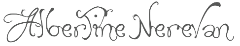 Albertine Nerevan is a Quebec-based designer, b. 1973.
  Alessandro Colizzi (b. Rome, 1966) is associate professor at Milan's Politecnico, Department of Design, where he teaches graphic design history, typography, and type design. He was professor at the Ecole de design of UQAM (Montreal) from 2005 to 2019, and visiting professor at the Design Academy Eindhoven (2014/15). He holds a PhD from the University of Leiden (with a thesis on Bruno Minari), an MA in Type Design from The Hague's
  [
[ Graphic designer, illustrator and photographer in Montreal, who designed the fantastic nostalgic typeface Alice in 2020. [
 Designer whose fonts may be bought from
 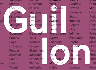 [
[ American cartoonist and illustrator, b. Cote Saint-Luc, Quebec, 1958, who grew up in Montreal, graduated from The Ontario College of Art and Design, and moved to the US in 1989. He is known for his New Yorker covers and as a regular contributor to the op-ed page of The New York Times. One of his favorite cartoon subjects is Donald Trump. Blitt creates his works in traditional pen and ink, as well as watercolors. His shaky handlettering is distinctive, yet unexplored by the type design community.
  Barcelona-based foundry involved in custom font work, est. 2005. Original fonts: Inclusive (2007), Urbanium (2005, a bold display face), Handwritten, Eixample (2008, octagonal and rounded), Screech (2008) and Begyptienne. Modified fonts (or re-fonts in their words) include Le Grand Palais (stencil, for La Force de l'Art, Paris, 2006), BeTV (for a Belgian TV channel), and VijfTV (a modification of Chalet for a Flemish TV station). Their custom types include
  Montreal-based creator of the monospaced negatively tilted futuristic typeface Lights Out Noir (2008). In 2017, he designed the athletic lettering font
  Brigitte Schuster is a graphic designer, calligrapher and lettering artist who graduated in 2008 from Concordia University in Montreal (only one block away from Luc's house...). She wrote about herself: I am an independent Art Director (Graphic Design), Print Artist and Photographer practicing in Montreal, Canada. I am currently teaching typography and photography courses in the Graphic Design department of a college in Montreal. After attending a three-year graphic design program in Munich, Germany, I spent a few years working there both as an employee for print and web agencies, and as a freelancer. In 2005, I completed a Bachelor in Fine Arts, with a specialization in painting from the Italian Academy of Fine Arts of Carrara, Italy. [...] I moved to Canada in 2005 where I continued working in and for the graphic design industry. In 2008 I completed the Graduate Certificate in Digital Technologies in Design Art Practice at Montreal's Concordia University. In my graphic design practice I ideally work in editorial design, also corporate branding, with a focus on typography. Over the last year or two, I developed a great interest in type, which I express in my
  Graphic designer in Montreal who created Tits Mono (2014). She founded the Collectif Pointbarre in 2010. [
 Graphic designer in Quebec City. She played around with a roman capitals typeface and designed
  [
[ [
[ [
[ With just one name (the other one was lost in an accident!), Chester, the type designer, was born in Montreal in 1971. In 1995 Chester moved to Chicago to work with Rick Valicenti and eventually become a partner in his digital type foundry, Thirstype. In 2004, he started up the type coop
  Montreal-based studio with a French-only web site. Designers of the gorgeous Split (2015), the geometric solid typeface Braziu (2015), the multilined prismatic art deco typeface Brooklyn Fat Black (2015) and the pixel typeface Pixies (2015).
  Quebec-based typographer and type designer (aka Diogene) who specializes mainly in revivals of obscure or old typefaces.
  During her studies in Montreal, Claudie Leger was inspired by Alphonse Mucha when she designed the ornamental art nouveau typeface Freyja (2014). [
 Constellation is a creator and publisher of contemporary typefaces and is run by its two partners, Chester Jenkins (based in New York, born in Montreal) and Tracy Jenkins. They also feature typefaces by Magnus Rakeng, Patrick Giasson, Kris Sowersby, Rick Valicenti, and Jeremy Mickel. Constellation contains the main elements of the previous Village and Thirstype foundries. Typefaces including
  Quebec-based type type foundry Coppers & Brasses was set up in 2011 by
  Daniel Benjamin Miller (b. 2000, New York) is an undergraduate student in philosophy at McGill University. His type design work:
  Montreal-based graphic designer who made a great typographic poster called
  During his studies in Montreal, Emile Lord Ayotte created the German expressionist typeface Badblood (2014), which can be bought
  Étienne is a graduate of the graphic and type design program at UQAM in Montreal. Cofounder in 2011 of
  Eyad Al-Samman is a graphic designer, typographer, photographer, translator, and freelance literary journalist. He was born in Sana'a city, Yemen, in 1976. Eyad has a Bachelor's Degree in electrical engineering. He started working as a graphic designer in 1999. His first typeface was
  French designer (b. 1985) of the grunge typefaces
  Font Forestry (Charlottetown, Prince Edward Island, Canada) is yet another venture of Jeremy Vessey, this time in cooperation with his companion, Stephanie Arsenault. I assume that it too is actually based in Montreal. Established in 2017, their initial fonts include Tuesday Night (a
  J.F.Y. Daniel Gauthier (GautFonts) was born in Montreal in 1964, and lives in Hamilton, Ontario. His fonts from 2005 and before include BarrelOfMonkeys, ChainFontOpen, ChangChang, ChangChangWoodcut, DirtyDarren, FireStarter, GriffinDucks, Jenna Myles, LollipopLettering, Lymphnodes, PooCorny, PooSmooth, Quake3ArenaBats (scanbats),
  Montrealer who designed
  Glenn Goluska (b. 1947, Chicago; d. 2011, Montreal) was a Canadian book designer and typographer. He came to Canada as a student at the University of Toronto. After graduating he worked for some time in the United States before returning to Canada to work at Coach House Press. He left Coach House Press to focus on letterpress printing first in Toronto and later in the Saint Henri neighborhood of Montreal under the labels Imprimerie Dromadaire and Nightshade Press. Goluska was awarded the Robert R. Reid Award for lifetime achievement or extraordinary contributions to the book arts in Canada by the Alcuin Society in 2011.
  [
[ Grype was set up by
  Graphic designer in Montreal. At UQAM, for a course given by Étienne Aubert Bonn and Alexandre Saumier Demers, she designed an untitled but very beautiful Viennese Secession style typeface in 2014.
  Montreal-based designer of the school project font Partition (2014). [
 Montreal-based designer of AF Dingbats (2016), which is based on the mechanical parts of an old film camera. In 2017, he designed Cybernetic Display.
  [
[ Montreal-based designer of the decorative caps typeface Montreal Vernacular (2019). [
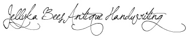 Quebec-based creator (b. 1991) of the handwriting or script fonts Jellyks
  [
[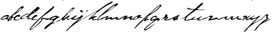 [
[ [
[ Graphic designer in Montreal. During her studies at UQAM, she created the stylish rococo titling typeface Louis Black (2016) that is characterized by its sharp wedge serifs. [
 Jonathan Paterson (d. 2024) was based in Montreal. His typefaces include
  Judith Poirier is professor at UQAM in Montreal. She developed an interesting wood-based modular typeface,
  During her studies at Concordia University in Montreal, Julie Tremblay created
  Montreal-based designer, illustrator and digital artist who created the wonderful
  Montreal-based designer of some icons for the ALT Hotel in Halifax in 2013.
 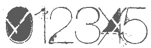 Canadian designer who lives in Grenville, Quebec, and works in Hawkesbury, Ontario. He is praised for some of the best grunge typefaces ever made. His work includes All Used Up (2006),
  Montreal-based creator of an animal caps typeface,
  Graduate of UQAM in Montreal in 1997 who now works as a graphic designer at ICI ARTV in Montreal. Creator of the stylish display typeface Kangourou (2007) which was developed during Lucas de Groot's master class at Laval University.
  [
[ Maxime Maynard (aka MaxiGamer) is the Quebec-based designer of these free typefaces:
  Meghan Dove (Meghan Dove Design, Montreal) created a vectorized version of Geoffroy Tory's Champ Fleuri (2015).
  Thibaut Désiront (b. France) is an art director and illustrator in Montreal. His company is called MEKA or Chez Meka. In 2014, he created the handcrafted poster slab serif typeface Bleed, and the condensed display typeface NYC (or: New York City). In 2015, he designed the (commercial) rounded blackletter / tattoo typeface Hell Gothic. In 2018, he published the fat blocky sci-fi typeface Mech.
  Graphic designer in Montreal, who created the text typeface Valdonega in 2016, named after Giovanni Mardersteig's Stamperia Valdonega. He writes: Valdonega is a transitional geometric typeface that was created in a modern approach to serve both for editorial design and for titling. It has a strong contrast between downstrokes and upstrokes, an amplification of the serifs to facilitate the readability of long texts and a strong inspiration of the calligraphic pen.
  Michel Sabbagh is a Montreal-based lettering artist and calligrapher, who studied at Laval University in Quebec and then at ESAD in Amiens, France. His graduation typeface there in the postgraduate course in type design was
  Currently living in Montreal, Slobodan Miladinov is the Serbian-born designer of the calligraphic
  Thuong attended ESAD Amiens for Graphic Design and later pursued a career in type design. In 2018, she received an MFA in Type Design from the Ecole Estienne in Paris. She collaborated with type foundries Coppers and Brasses and Type Network prior to joining New York City-based
  Charles Daoud is a graphic designer and art director in Laval, near Montreal. He was born in Montreal in 1980. He set up Charles Daoud Type, or CD Type, in 2013 and renamed his type foundry North Type in 2018. His typefaces include:
  Mathieu Desjardins (Pangrampangram) is a senior art director in Montreal, who created the
  Graphic designer and illustrator in Montreal, who created the powerful display typeface Gauche in 2018. It was designed in Alessandro Colizzi's class at UQAM. [
 Patrick Giasson runs Behaviour Design in Montreal. He studied type design at Reading in 2004, and worked for some time at Wolff Olins and Agfa Monotype UK. At ATypI 2005 in Helsinki, he spoke on The typographic inception of the Cherokee syllabary. He states: [
 Art director in Quebec City who created a Frutiger / Univers-style sans typeface called Kether Gothic and the custom inline lettering typeface Funhouse in 2015.
  Super-talented Montreal-based illustrator and digital artist.
  Jeremy Vessey set up Hustle Supply Co in 2014. In 2016, he founded Pixel Surplus in Montreal. His first fonts there are Wild Youth (brush script), St. Jacques (a free avant-garde font), Buffalo (connected script font), Old Growth, Ambarella (free script), Greenstone (connected script), Summer Hearts (brush), Wayward, Wayward Sans (
 Jean-Baptiste Levée is a French type designer based in Paris. He is a co-founder of the Bureau des Affaires Typographiques, and teaches typeface design at ESAD Amiens (and before that, at the Caen-Cherbourg school of Arts & Media and at the University of Corte). His latest work is mostly published at
  Rip Type was set up in 2019 by Nick Losacco (who is based in Montreal) and Ciaran Brandin (Brooklyn, NY). Their typefaces:
 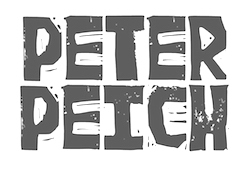 Designer in Montreal who studied at UQAM (class of 1997) and created the circle-and-arc typeface
  Vancouver and/or Montreal, Canada-based designer of the brush script fonts Twin Oaks (2016), Wellaway (2016), Bold Vision (2016) and Mount Baker (2016, dry brush), the rough brush typefaces Outshine (2016), Postmark (2016) and Sunrise Waves (2016), Sunfast (2016), and the weathered stamp typeface Tofino (2016).
  In Chelsea, Québec, Lee-Jeff Bell designed many type families that are patterned after major historical type families, mimicking what Bitstream did in the late eighties. He also developed Thames and Helv Condensed, and Unifont. Rubicon claims that their fonts are optimally hinted for even very small screen resolutions. The fonts:
  Born in Iasi, Romania, Ruxandra Duru moved first to Casablanca and then to Montreal. In 2011, she studied at EINA in Barcelona.
  Montreal-based designer of the didone typeface Bijoux (2016), which was inspired by women's jewelry. [
 Graphic designer Samuel Larocque (Montreal, Quebec) created the connect-the-dots typeface
  [
[ Montreal-based designer of these display typefaces in 2016: Lizet, Anorak (a one-style text typeface with lots of individuality), Velan (fat octagonal typeface), Stabilo (a wide rounded sans), Vecteur, Mum Mono. [
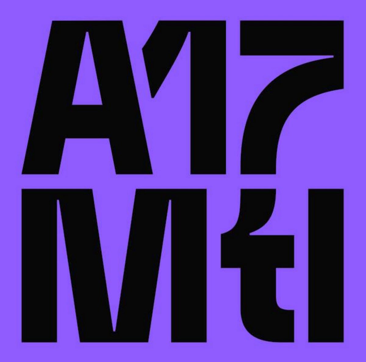
 His next move made him lots of friends in Montreal---he selected a locally developed typeface,
  The second speaker was
  It is a noble and charitable effort---here is one of the world's top designers spending countless hours fine-tuning and developing Inuktitut fonts for a readership of not more than 30,000 people.
  For a change of pace,
  After his lively delivery, straight from the heart, he urged all of us to disconnect from our computers and devices and enjoy writing, drawing and creating.
 The section flag font, and the two weights of display, are in the Kufi style, which is the oldest form of Arabic calligraphy, while the cursive text is designed in a contemporary Naskh style. The redesign of Singapore's
 Montreal-based designer of Hotel Display (2015), an experimental UQAM school project typeface based on Futura. [
 Quebec-based designer (b. 1971) in 2010 of the
  Studio Caserne is a general branding and design outfit in Montreal. People involved include
  Studio Feed (or: Feedtype) is a Montreal-based studio, est. 1999. Its typefaces:
  Sébastien Théraulaz from Lausanne lives in Montreal since 1997. There, he started his type foundry Subtitude (as part of Sub Communications Inc). The first fonts: Subix (2005, bitmap font), Subedge (2005),
  Talented Mexican graphic designer and digital artist (b. 1985) who was based in Montreal but is now back in Mexico City. She pushed the boundaries of experimental typography with creations like Fabric Type (2009), which was developed at Concordia University in Montreal, where she obtained a BFA in design in 2009. She continued her studies at EINA in Barcelona, graduating in 2010.
  [
[ TZDZ is Bernardo Pereira (graduate in graphic design from ESDI/UERJ in 2004) and Aline Rodrigues (a graduate in print and pattern design at SENAI). Originally located in Brazil, they now operate out of Montreal.
  Foundry in Montreal, est. 2008 by
  French graphic designer who lives and works in Montreal. He created
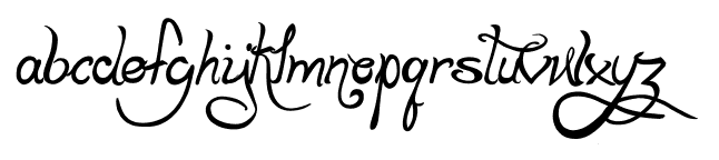
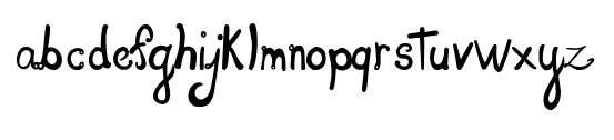
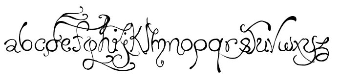
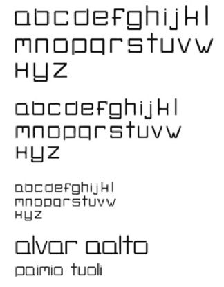
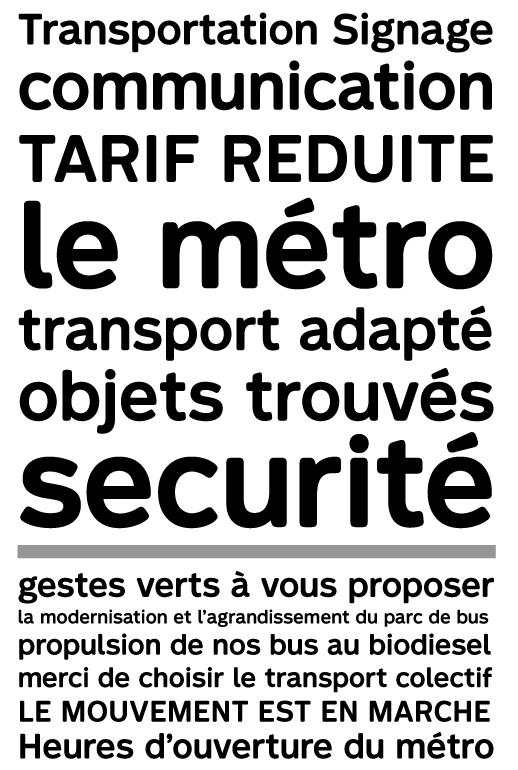
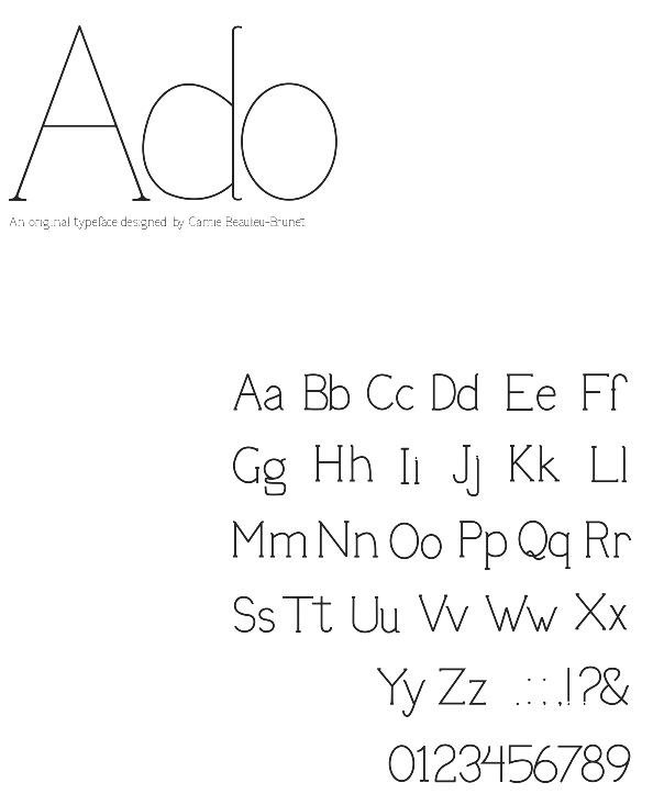
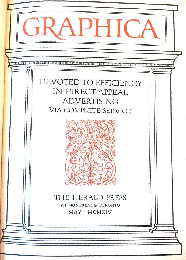
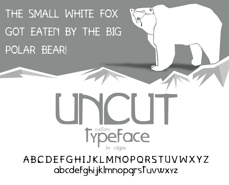
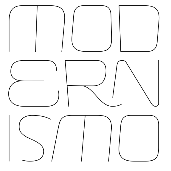
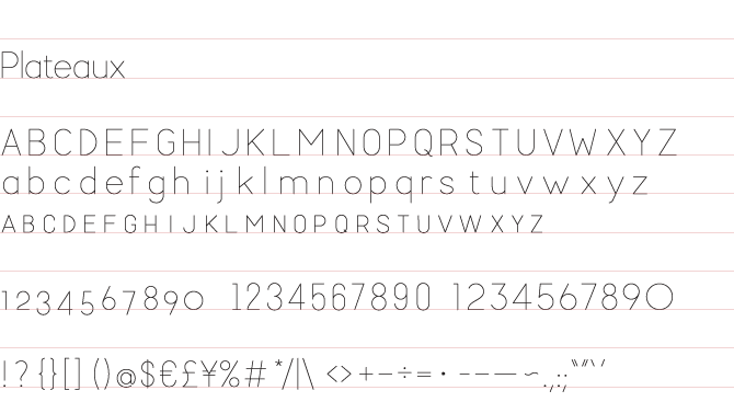
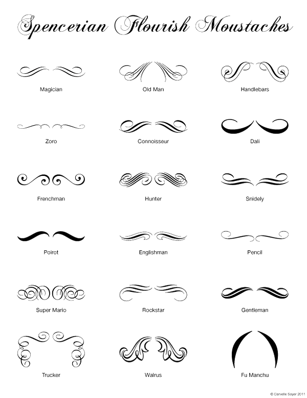
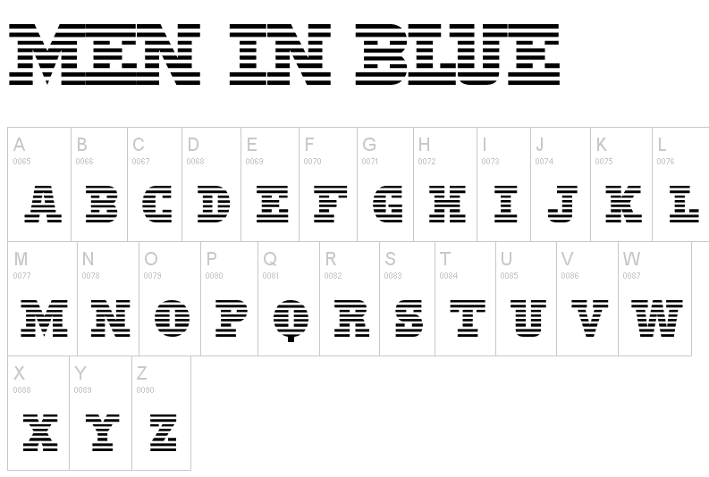
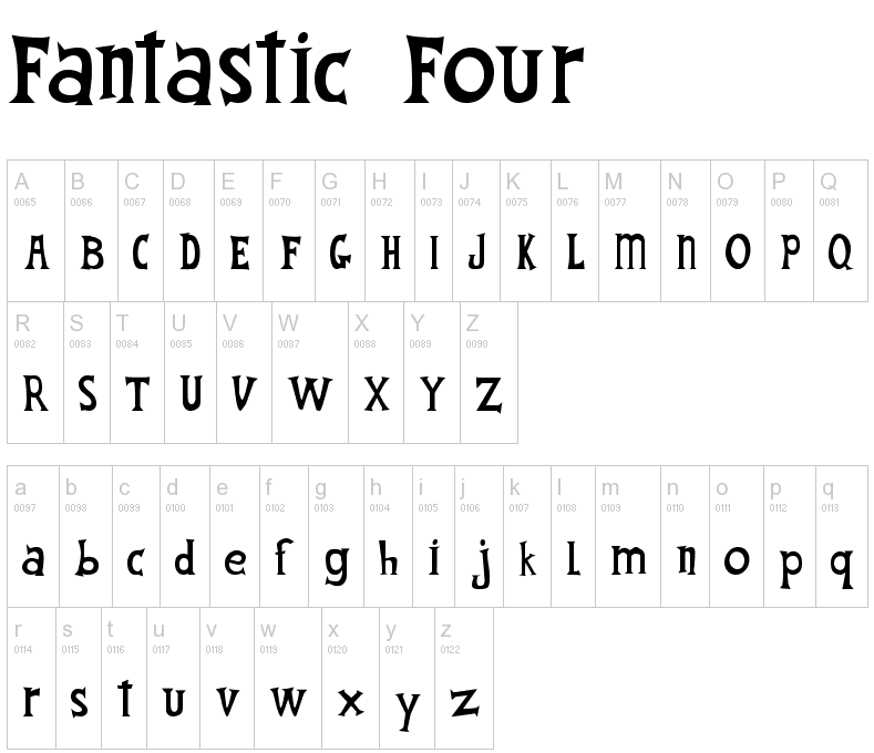
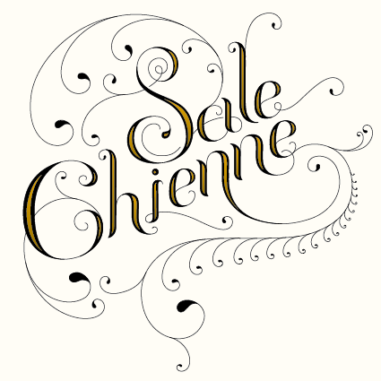
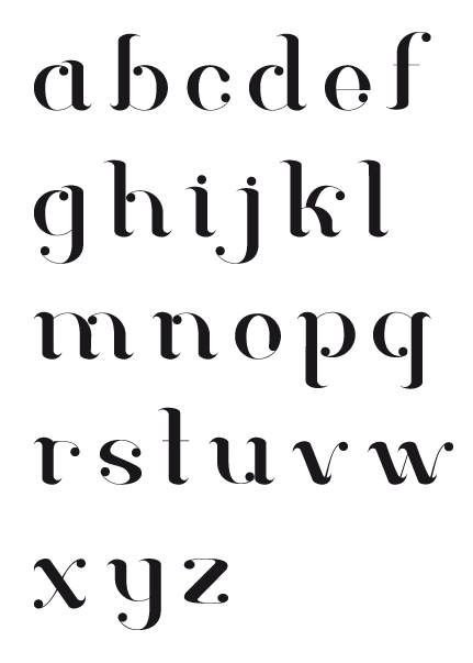
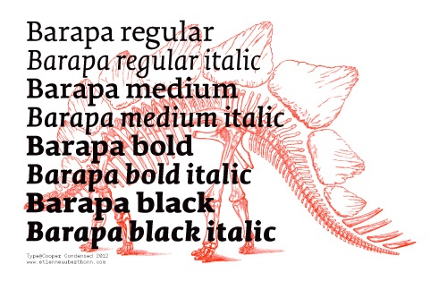
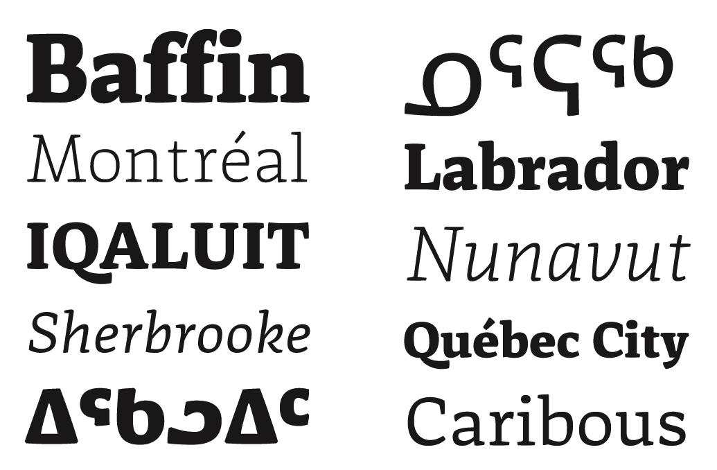
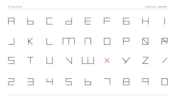
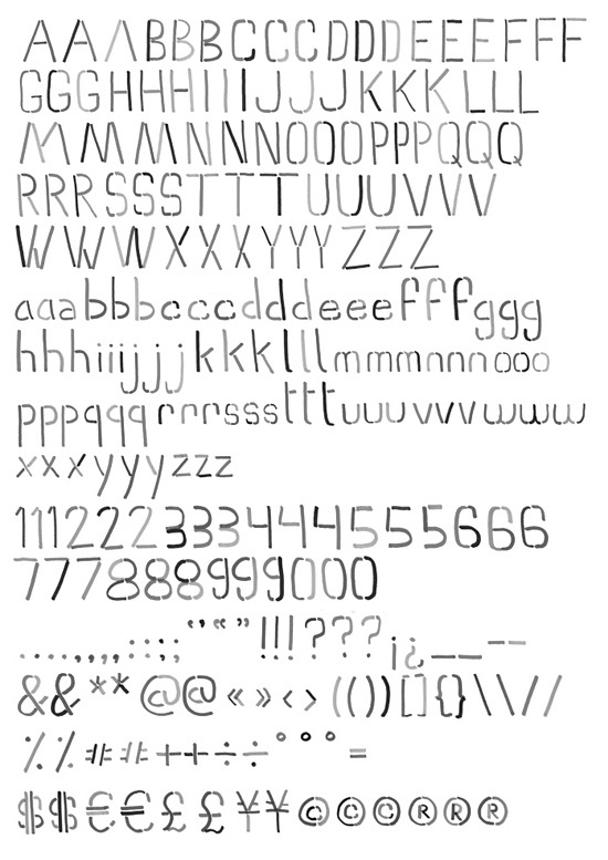
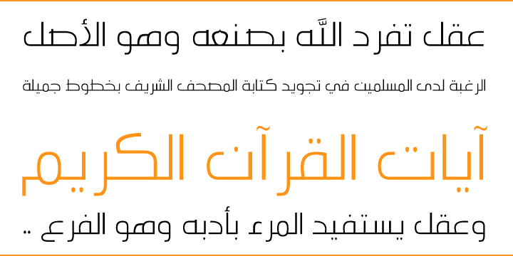
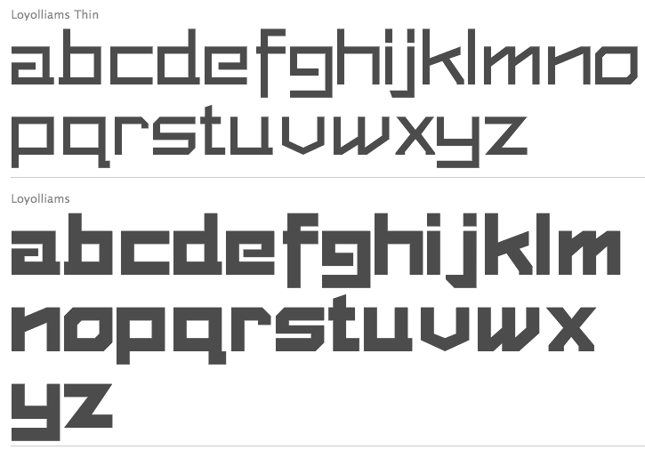
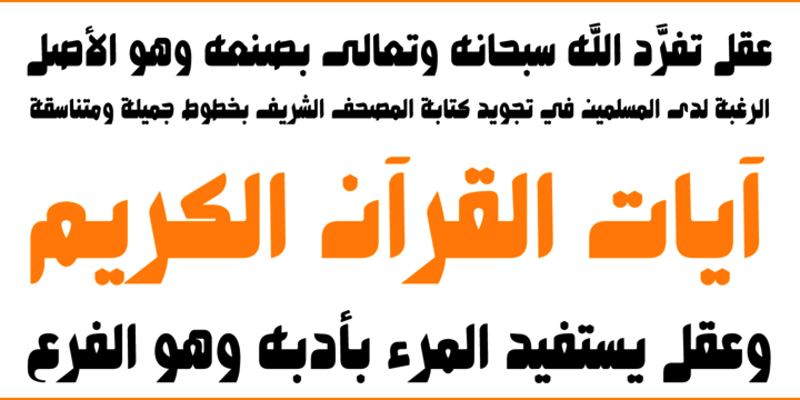
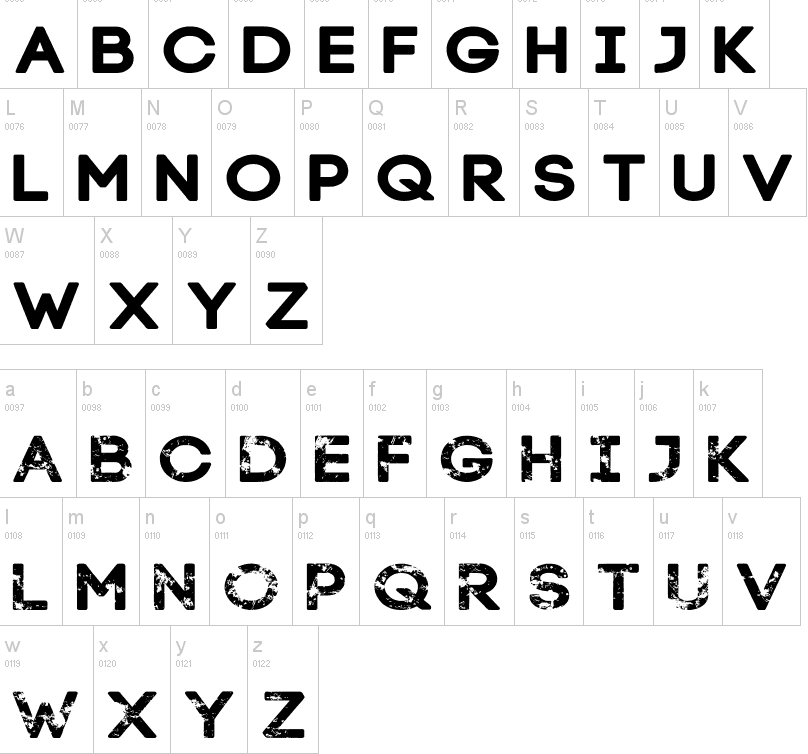
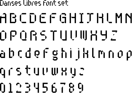
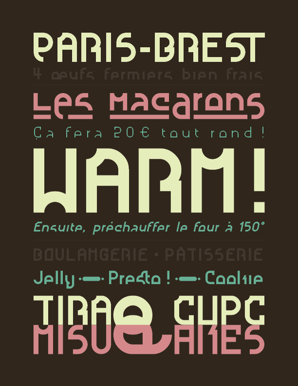
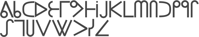
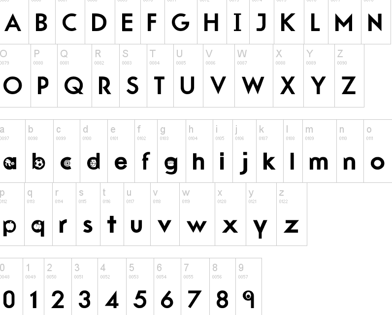
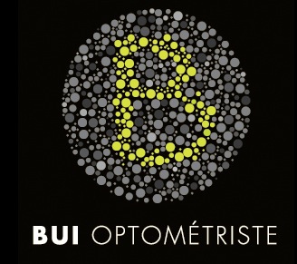
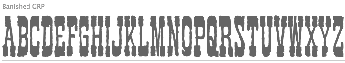
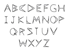
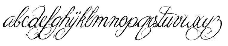
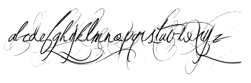
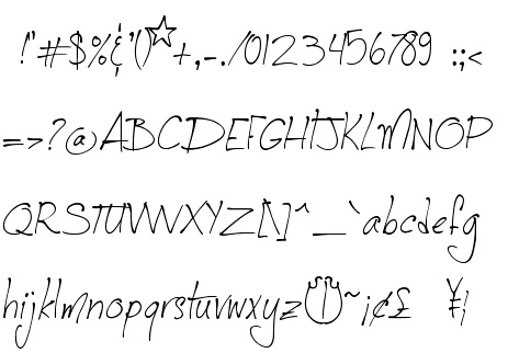
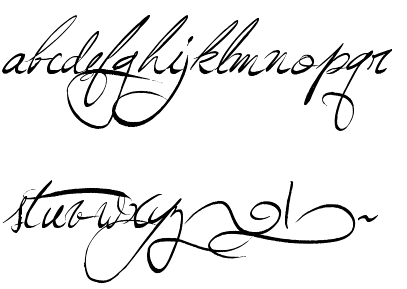
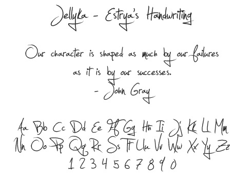
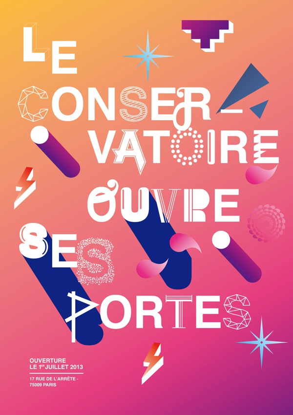
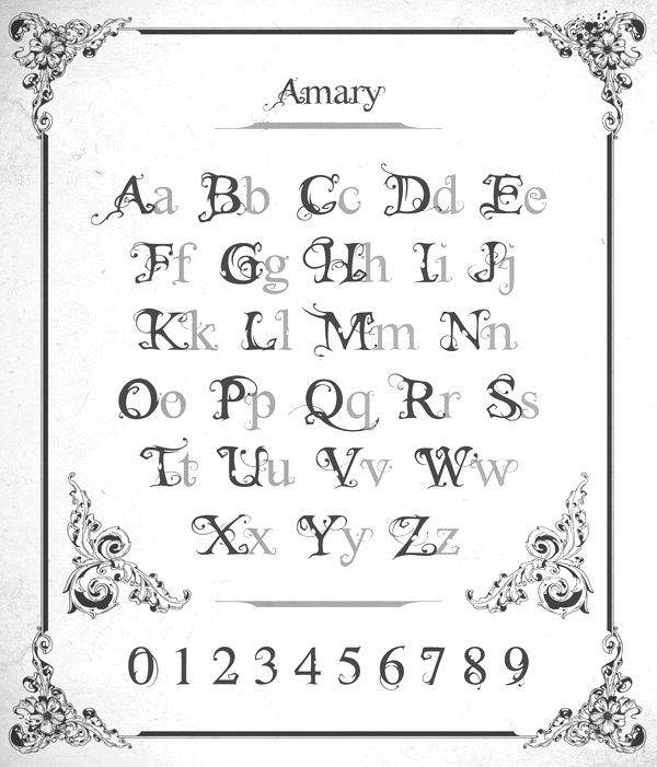
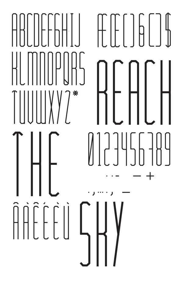
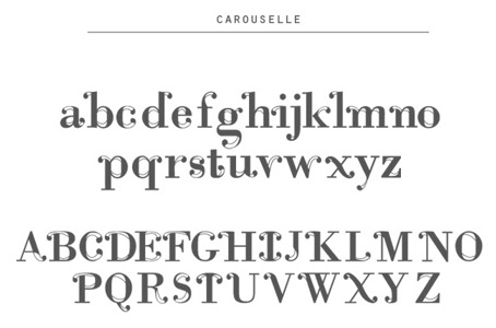
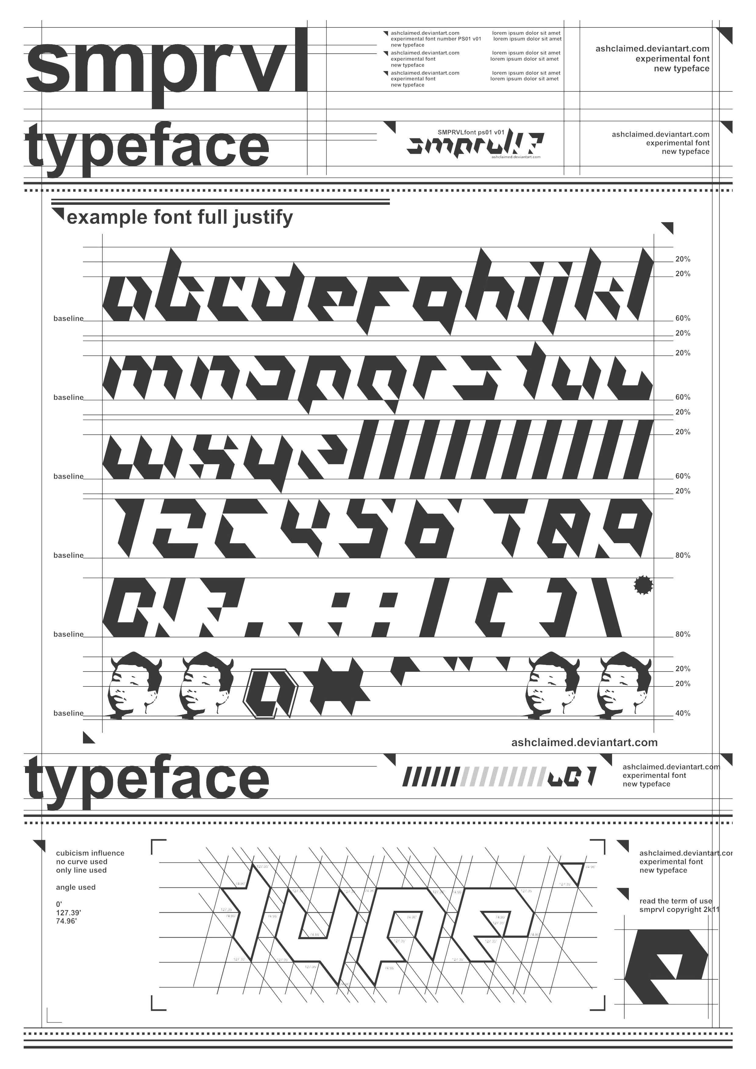
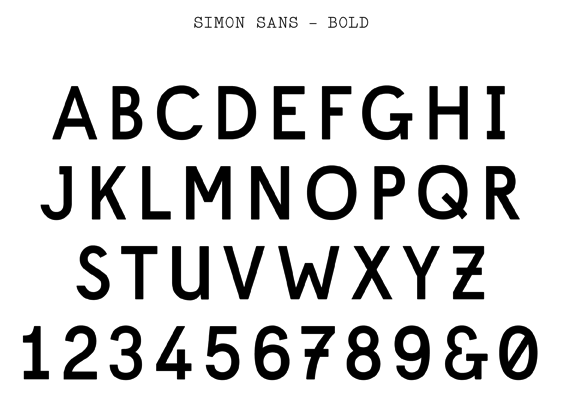
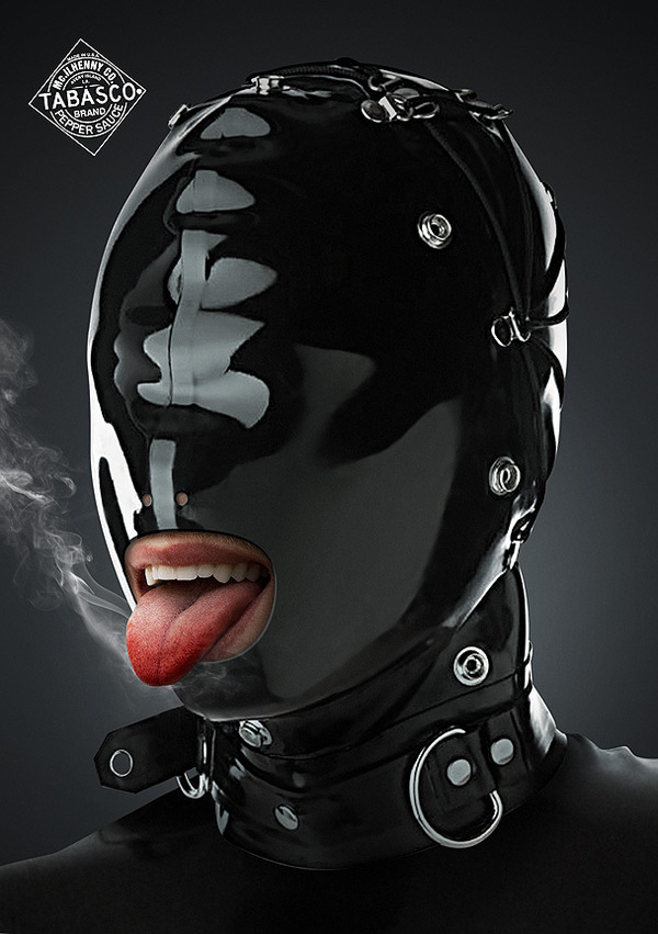
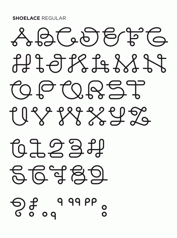
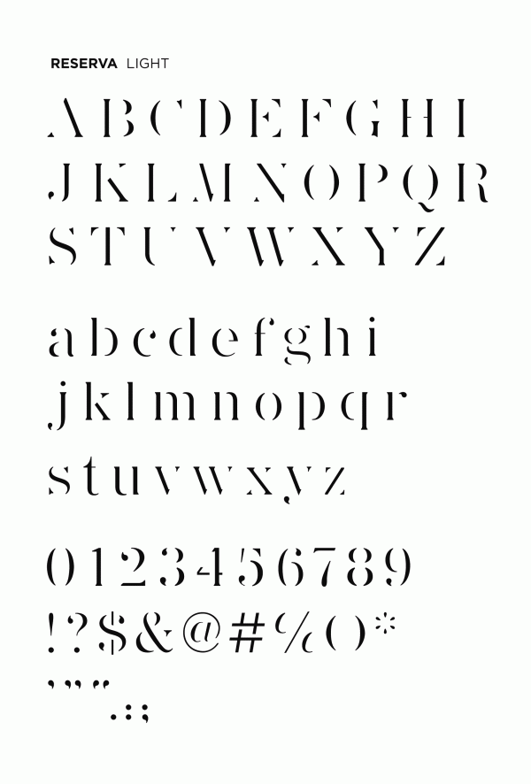
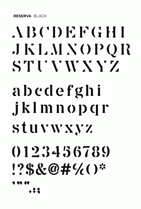
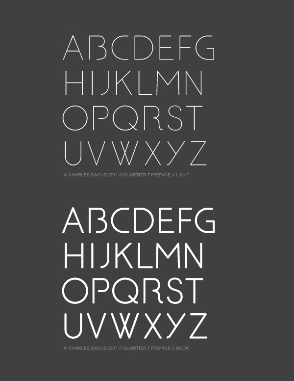
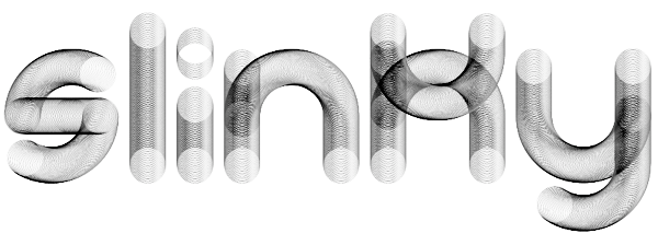
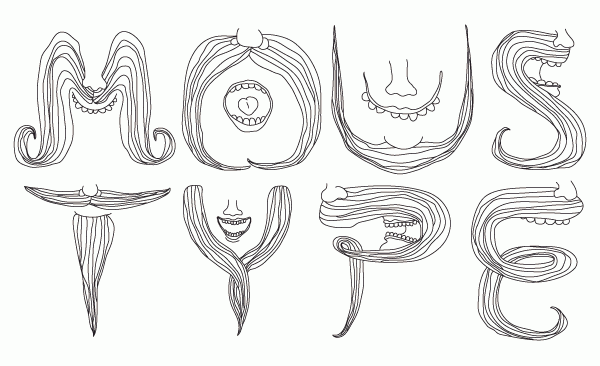
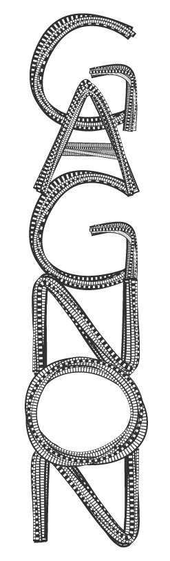
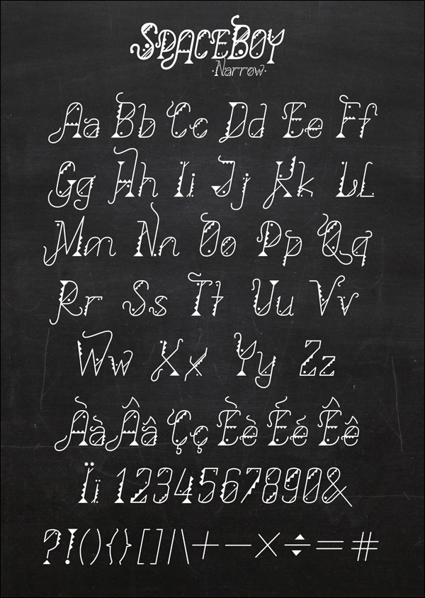
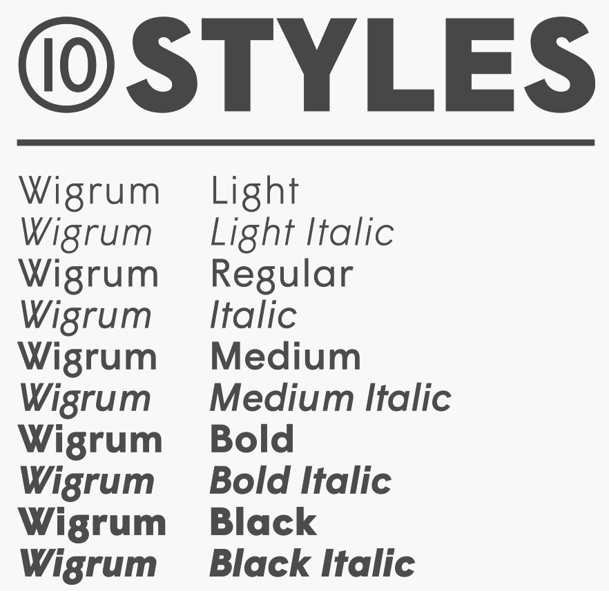
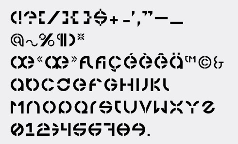
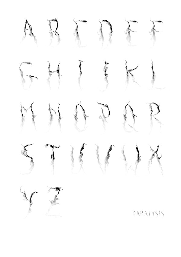
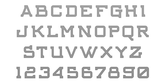
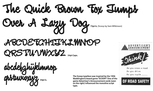
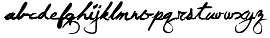
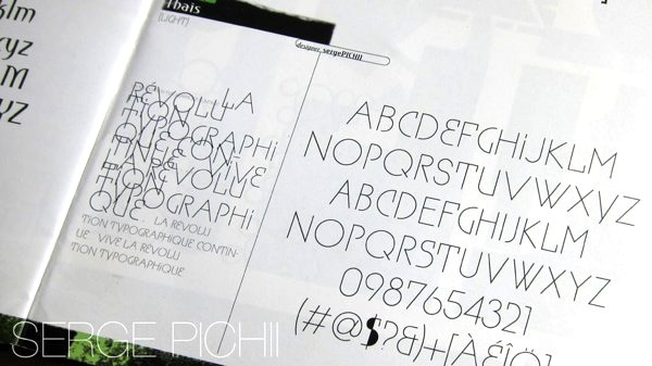
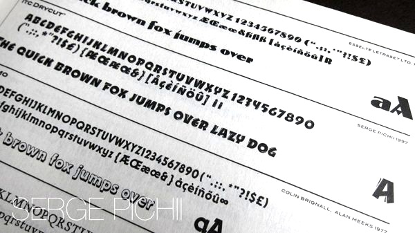
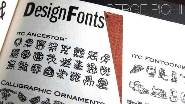
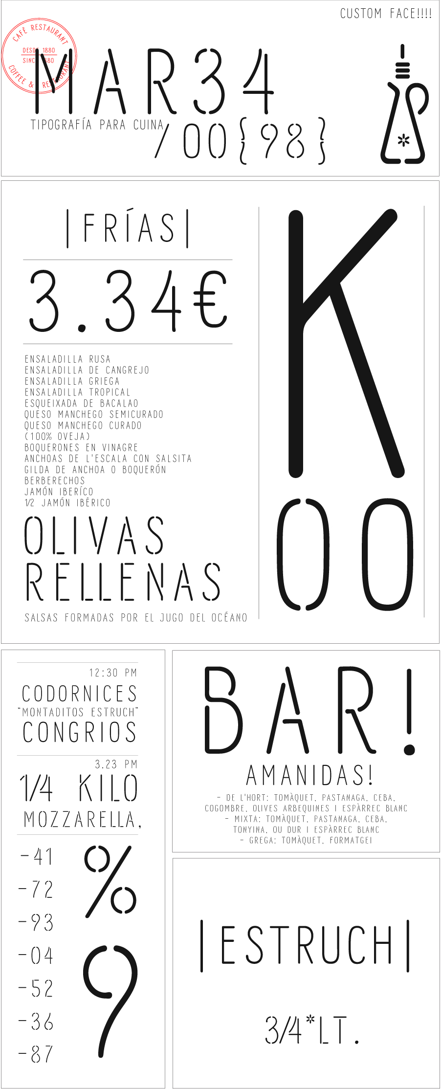
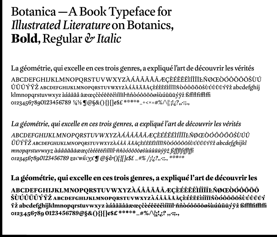
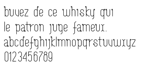
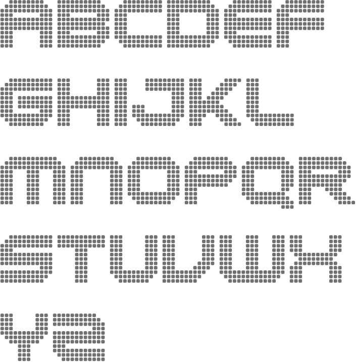
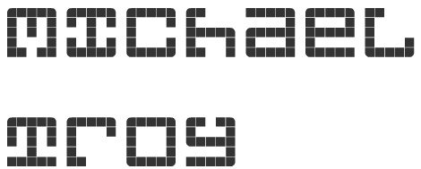
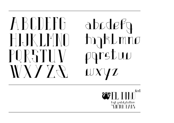
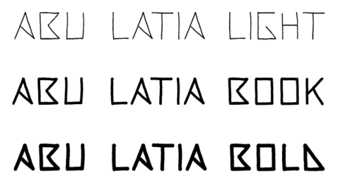
|
|
|
|