| | |
100types
[Ben Archer]
|
Educational and reference site run by Ben Archer, a designer, educator and type enthusiast located in England (who was in Auckland, New Zealand, before that). Glossary. Timeline. Type categories. Paul Shaw's list of the 100 most significant typefaces of all times were recategorized by Archer: - Religious/Devotional: Gutenbergs B-42 type, Gebetbuch type, Wolfgang Hoppyl's Textura, Breitkopf Fraktur, Ehrhard Ratdolt's Rotunda, Hammer Uncial, Zapf Chancery, Peter Jessenschrift, Cancellaresca Bastarda, Poetica.
- Book Publishing&General Purpose Text Setting: Nicolas Jenson's roman, Francesco Griffo's italic, Claude Garamond's roman, Firmin Didot's roman, Cheltenham family, Aldus Manutius' roman, William Caslon's roman, Pierre-Simon Fournier's italic, Ludovico Arrighi da Vicenza's italic, Johann Michael Fleischmann's roman, ATF Garamond, Giambattista Bodoni's roman, Nicolas Kis' roman, Minion multiple master, Unger Fraktur, John Baskerville's roman, Lucida, Optima, Bauer Bodoni, Adobe Garamond, Scotch Roman, Romanée, ITC Stone family, Trinité, ITC Garamond, Sabon, ITC Novarese, Charter, Joanna, Marconi, PMN Caecilia, Souvenir, Apollo, Melior, ITC Flora, Digi-Grotesk Series S.
- Business/Corporate: Akzidenz Grotesk, Helvetica, Univers, Syntax, Courier, Meta, Rotis, Thesis, Antique Olive.
- Newspaper Publishing: Times Roman, Bell, Clarendon, Century Old Style, Ionic, Imprint.
- Advertising and Display: Futura, Robert Thorne's fat typeface roman, Vincent Figgins' antique roman (Egyptian), Memphis, Fette Fraktur, Avant-Garde Gothic, Deutschschrift, Peignot, Erbar, Stadia/Insignia, Penumbra, Compacta, Bodoni 26, WTC Our Bodoni.
- Prestige and Private Press: Romain du Roi, Golden Type, Johnston's Railway Sans, Doves Type, Walker.
- Signage: William Caslon IV's sans serif, Trajan.
- Historical Script: Snell Roundhand, Robert Granjon's civilité, Excelsior Script.
- Experimental/expressive: Mistral, Beowolf, Dead History, Behrensschrift, Eckmannschrift, Neuland, Element, Remedy, Template Gothic.
- Onscreen/multimedia: Chicago, Oakland, OCR-A, Base Nine and Base Twelve, Evans and Epps Alphabet.
- Telephone Directory publishing: Bell Gothic.
Link to Archer Design Work. [Google]
[More] ⦿
|
Agfa Monotype
|
Fraktur typefaces sold by Agfa Monotype (including Elsner&Flake and Linotype typefaces): Linotype Buckingham Fraktur, Fette Fraktur, Fraktur, EF Fraktur Bold, EF Fraktur Bold Dfr, EF Fraktur CE Bold, EF Fraktur T Bold, EF Fraktur, Hoyerswerda Fraktur, EF Justus Fraktur Bold, EF Justus Fraktur Bold Dfr, EF Justus Fraktur Regular, EF Justus Fraktur Regular Dfr, Linotype Luthersche Fraktur, Linotype Luthersche Fraktur DFR, EF Neue Luthersche Fraktur Medium, EF Neue Luthersche Fraktur Medium Alt, EF Neue Luthersche Fraktur Medium Dfr, EF Neue Luthersche Fraktur Medium Titel, EF Neue Luthersche Fraktur Regular, EF Neue Luthersche Fraktur Regular Alternate, EF Neue Luthersche Fraktur Regular Dfr, EF Neue Luthersche Fraktur, Linotype Richmond Fraktur, Walbaum Fraktur, EF Walbaum Fraktur CE Regular, EF Walbaum Fraktur Regular, EF Walbaum Fraktur Regular Dfr, EF Walbaum Fraktur T Regular, EF Walbaum Fraktur, Wittenberger Fraktur Bold, Wittenberger Fraktur, Alte Schwabacher, EF Alte Schwabacher, Fette Gothic, EF Gotisch Bold, EF Gotisch Bold Dfr, EF Gotisch, Weiss Rundgotisch, Weiss Rundgotisch Antique, EF Weiss Rundgotisch Regular, EF Weiss Rundgotisch Regular Dfr, EF Weiss Rundgotisch, Wilhelm Klingspor Gotisch. [Google]
[More] ⦿
|
Alter Littera
[José Alberto Mauricio]

|
 Spanish foundry, est. ca. 2009, and on the web since 2012. It is located in Madrid. Alter Littera's fonts and web site are designed and managed by José Alberto Mauricio, who holds a doctorate degree in Economics and Business Administration, and is Associate Professor of Econometrics at the Universidad Complutense de Madrid.
 Alter Littera produces and markets opentype fonts reviving some of the most beautiful bookhands from medieval Western manuscripts, as well as some of the finest European and North-American typefaces from the mid-fifteenth through the early-twentieth centuries. The "Bookhand", "Oldtype" and "Initials" font collections cover gothic and/or blackletter letter forms. The typefaces: - Gutenberg (B42-type) A (Johann Gutenberg, Mainz, ca. 1455). Includes the full set of special characters, alternates and ligatures from The 42-line Bible. Under development.
- Gutenberg (B42-type) B (Johann Gutenberg, Mainz, ca. 1455). Includes the full set of special characters, alternates and ligatures from The 42-line Bible. Published as Gutenberg B in 2012, this is a clean, smooth rendition of the B42-type used by Johann Gutenberg in his famous 42-line Bible. The font includes a comprehensive set of special characters, alternates and ligatures, plus Opentype features, that can be used for typesetting (almost) exactly as in Gutenberg's Bible and later incunabula. He says: The main historical sources used during the font design process were high-resolution scans from several printings of Gutenberg's Bible. Other sources were as follows: Kapr, A. (1996), Johann Gutenberg - The Man and his Invention, Aldershot: Scolar Press (ch. 7); De Hamel, C. (2001), The Book - A History of The Bible, London: Phaidon Press (ch. 8); Füssel, S. (2005), Gutenberg and the impact of printing, Burlington: Ashgate (ch. 1); and Man, J. (2009), The Gutenberg Revolution, London: Bantam (ch. 7).
- Gutenberg (B42-type) C (Johann Gutenberg, Mainz, ca. 1455). Includes the full set of special characters, alternates and ligatures from The 42-line Bible. Published in 2012 as Gutenberg C, this is a slightly roughened version of the Oldtype "Gutenberg B" Font, simulating irregularities and ink spreads associated with old metal types, papers and parchments.
- Psalterium (Psalter-type) (Peter Schoeffer, Mainz, 1457). Includes the full set of special characters, alternates and ligatures from The Mainz Psalter (Psalterium Moguntinum). He writes: A clean, smooth adaptation of the magnificent gothic types used by Johann Fust and Peter Schöffer in their famous Mainz Psalter (Psalterium Moguntinum) of 1457, also used in their Canon of the Mass (Canon Missae) of 1458, and in their Benedictine Psalter (Psalterium Benedictinum) of 1459. [Although these works were published after Gutenberg's break with Fust, it is generally agreed that Gutenberg was working along with Fust and Schöffer on the Mainz Psalter while the 42-line Bible was still being printed.] In addition to the usual standard characters for typesetting modern texts, the font includes a comprehensive set of special characters, uncial initials (adapted from both the Mainz Psalter and early sixteenth-century Dutch types by Henric Pieterszoon), alternates and ligatures, plus Opentype features, that can be used for typesetting (almost) exactly as in the Mainz Psalter and later incunabula.
- Oude Hollandse (Henric Pieterszoon "Lettersnijder", Antwerp, 1492). Under development.
- French Textura (Joos Lambrecht, Ghent, 1541). Under development.
- Flamand A (Hendrik van den Keere, Antwerp, 1571). Under development.
- Flamand B (Hendrik van den Keere, Antwerp, 1571). Under development.
- Nederduits (Johann M. Fleischmann, Haarlem, 1733). Under development.
- Psalter Gotisch (Benjamin Krebs Nachfolger, Frankfurt am Main, 1890). Under development.
- Manuskript Gotisch (Bauersche Giesserei, Frankfurt am Main, 1899). Under development.
- Munthe Schrift (Gerhard Munthe, Offenbach am Main, 1904), Under development.
- Deutsche Schrift (Rudolf Koch, Offenbach am Main, 1910). Includes both normal and large, ornamental capitals (two sets), plus several finial characters and ornaments from Koch's original designs. He writes:A comprehensive and faithful rendition of Rudolf Koch's first release, usually referred to as "Fette Deutsche Schrift" or "Koch-Schrift". In addition to the regular character set, the font includes a large number of alternates and ligatures, plus two sets of ornamental initials (Initialen mit Zierstrichen und Punkten zur Koch-Schrift, and Initialen zur halbfetten deutschen Schrift). The main sources used during the font design process were a sample page from Hendlmeier, W. (1994), Kunstwerke der Schrift, Hannover: Bund für Deutsche Schrift und Sprache (p. 164), and several specimen sheets from the Gebrüder Klingspor Type Foundry for Koch's Deutsche Schrift type family.
- Maximilian (Rudolf Koch, Offenbach am Main, 1914). Includes normal, small (Klein), and roman (Antiqua) capitals, plus ornamental capitals and alternates (Zierbuchstaben). Under development.
- Wilhelm Klingspor Schrift (Rudolf Koch, Offenbach am Main, 1925). Includes both normal (wide) and narrow capitals, plus the full set of alternates, ligatures and finial characters from Koch's original designs.
- Caslon Gotisch (D. Stempel A.G., Frankfurt am Main, 1926). Produced in 2012 as Caslon Gotisch, it is a faithful adaptation of the "Caslon-Gotisch" type acquired (among several other types) by D. Stempel A.G. in 1919 from the Leipzig printer Wilhelm E. Drugulin, and further developed by Stempel in later years. Details: In addition to the usual standard characters for typesetting in modern Western languages, the font includes a comprehensive set of special characters, alternates and ligatures, plus Opentype features, that can be used for typesetting as in antique writings and printings. The main sources used during the font design process were as follows: A sample page from Typographische Mitteilungen - XXIII Jahrgang - Heft 2 (1926), and a sample page from Hendlmeier, W. (1994), Kunstwerke der Schrift, Hannover: Bund für Deutsche Schrift und Sprache (p. 37).
- Gótico Cervantes (Fundición Tipográfica Richard Gans, Madrid, 1928). Under development.
- Wallau (a rotunda by Rudolf Koch, Offenbach am Main, 1930). Includes German, Uncial, and Ornamental capitals. Under development.
- Alter Gothic (Alter Littera, Madrid, 2012), or Alter Gothisch. This is Alter Littera's first original design. They write: Two specific sources must be acknowledeged: (1) the "Black" type from William Caslon's A Specimen of Printing Types (1785), and (2) the "Caslon Gotisch" type by D. Stempel A.G. (1926).
- Gothic A. After late Carolingian and early Gothic manuscripts (12th century). Under development.
- Gothic B. After Erhard Ratdolt's Lombardic Capitals (1491). Under development.
- Gothic C. After Henric Pieterszoon's Uncials (1508). A comprehensive set of initials (usually referred to as Uncials, Lombardic Initials, or Lombards) of the Germanic variety, designed after Henric Pieterszoon's Gothise Monnikke Letteren as appearing in Enschedé, J. (1768), Proef van Letteren, Haarlem (p. 120); also mentioned as Great Primer Uncials and 2-line Brevier Uncials in Vervliet, H.D.L. (1968), Sixteenth-Century Printing Types of the Low Countries, Amsterdam: Hertzberger (pp. 54-55, and 212-213).
- ATF Cincinnati, ATF Caxton, ATF Missal. From American Type Founders Company's American Specimen Book of Type Styles (1912). Under development.
- Initials Bergling (2012, Alter Littera) is a comprehensive set of initials (usually referred to as Uncials, Lombardic Initials, or Lombards) of the French variety, adapted from Bergling's book Art Alphabets and Lettering (Second Edition) (1918, Chicago: Blakely-Oswald Printing Company).
- Bergling B. From J.M. Bergling's Art Alphabets and Lettering (1918). Under development.
- Morris. From William Morris's The Kelmscott Chaucer (1896). Under development.
- Initials ATF Cloister (2012). After F.W. Goudy's Cloister Initials (1917).
- Roman Square Capital. From 1st century B.C. onwards. Under development.
- Roman Rustic. 1st to 6th centuries. Under development.
- Uncial. 3rd to 6th centuries. Under development.
- Artificial Uncial. 6th to 10th centuries. Under development.
- Roman Half-Uncial. 3rd to 9th centuries. Under development.
- Insular Majuscule. 6th to 9th centuries. Under development.
- Insular Minuscule. From 6th century onwards. Under development.
- Luxeuil Minuscule. 7th and 8th centuries. Under development.
- Beneventan Minuscule. 8th to 13th centuries. Under development.
- Carolingian Minuscule. 8th to mid-12th centuries. Under development.
- Early Gothic. 11th and 12th centuries. Under development.
- Gothic Textura Quadrata. 13th to 15th centuries. Under development.
- Gothic Textura Prescisus. 13th to 15th centuries. Under development.
- Gothic Rotunda. 12th to 16th centuries. Under development.
- Gothic Littera Bastarda. From 13th century onwards. Under development.
- Fraktur. From 15th century onwards. Under development.
- Humanistic Book Script. From 15th century onwards. Under development.
- Humanistic Cursive. From 15th century onwards. Under development.
- ATF Missal Caxton (2012): A comprehensive set of initials, frames and borders, adapted from American Type Founders (ATF) Company's American Specimen Book of Type Styles, Jersey City, 1912 (pp. 944-5). The font contains over one hundred glyphs, including clean renditions of both Missal Initials and Caxton Initials, plus adaptations of Department Store Initials and French Cast Squares. Caxton Initials were first designed by F. Goudy in 1905. Missal Initials is originally due to Will Bradley in 1904.
- Alter Headletter (2012). An original from Alter Littera in the style of Century Bold Condensed.
- The Oldtype Gutenberg A Font (2012, free) is a free abridged edition of the full-featured Gutenberg B and Gutenberg C fonts.
[Google]
[MyFonts]
[More] ⦿
|
Anton Koberger
|
Nürnberg-based printer who created many interesting typefaces in the late 15th century, as narrated by Christoph Reske in Eine neue Entdeckung zur Druckgeschichte der Schedelschen Weltchronik (note: Schedelschen Weltchronik (1492) is a book by Hartmann Schedel). These include a gorgeous Rotunda and Schwabacher (1492), a Druckbastarda, and other original Fraktur typefaces, called No. 9 and No. 11 by Reske. Koberger was first and foremost a printer, who made the first illustrated bible in 1475, and printed, as hinted to above, Schedelschen Weltchronik (1492). He died in 1515. MyFonts page. Modern digital types based on Koberger abound: - Manfred Klein created the blackletter typeface FF Koberger for Fontfont.
- Ernst H. Wulfert created a blackletter typeface called Koberger.
- Paulo W created ScotoKobergerFrakturN11 (2007) and ScotoKobergerFrakturN9 (2007). He chose the name because of Ottaviano Scotus, whose blackletter types were similar to Koberger's. Paulo W writes: Ottaviano Scotus headed a distinguished family of Venetian printers. Born of a noble family of Monza, he came to Venice at the age of 35 and operated a press there between 1479 and 1484. He continued as an editor until 1499 whereupon his heirs, including his brothers and nephews, undertook their own activity (1499-1532).
[Google]
[MyFonts]
[More] ⦿
|
Bauersche Giesserei blackletter fonts
|
 Andreas Seidel lists the blackletter typefaces published by the Bauersche Giesserei (and I added a few more):
 - Flinsch Privat, 1919
- Renata, 1914. Digital revivals as renata by Gerhard Helzel, and later by Peter Wiegel.
- Bernhard Fraktur, 1913-22
- Frankfurter Fraktur, 1905 / after 1911 renamed to Flinsch Fraktur
- Flinsch Germanisch, 1876
- Zentenar Fraktur, 1937, named after the 100-year anniversary of the Bauer Foundry
- Herkules-Gotisch (1898)
- Hoyer Fraktur, 1935-37
- Weiß Gotisch, 1936, E. R. Weiß
- Weiß Rundgotisch, 1937
- Weiß Fraktur, 1914
- Element, 1933
- Gotika, 1933
- Laudan Kanzlei, 1913
- Manuskript Gotisch (1905-1923; note: I thought the correct date was 1899), made after letters created by Wolfgang Hopyl in 1514.
- Leipziger Fraktur, 1909
- Wieynck Fraktur, 1912, Prof. Heinrich Wieynck
- Gotisch, 1906, Georg Barlösius
- Enge Gotisch (1880). Digital version by Gerhard Helzel done in 2008.
[Google]
[More] ⦿
|
Bauersche Schriftgiesserei
|
 Frankfurt-based foundry started in 1837 by Johann Christian Bauer. At the end of the 19th century, the new owner was Georg Hartmann. On its staff, it had designers such as Konrad F. Bauer [Alpha (1954), Beta (1954), Folio (1956-63), Imprimatur (1952-55), Volta (1956), Verdi (1957), Impressum (1963), all made with Walter Baum], Lucian Bernhard [Bernhard Condensed, 1912], Hugo Steiner-Prag [Batarde, 1916], Julius Diez [vignetten, 1910-1912], Henri Wieynck [Trianon, 1906; Cursive Renaissance, 1912; Wieynck-Kursiv, 1912], Georg Hartmann, Paul Renner [Futura, 1937], Emil Rudolf Weiß [Weiß Fraktur, 1924], Berthold Wolpe [Handwerkerzeichen, 1936; Hyperion, 1931; Rundgotisch, 1938] and F.H. Ernst Scheidler [Legend, 1937]. In its glory period, Bauer's leader was Heinrich Jost (1889-1949), from 1922 until 1948, who with punchcutter Louis Hoell made a beautiful version of Bodoni, now known as Bauer Bodoni. A New York office was set up in 1927, but after the 1960s, the foundry declined and finally closed its doors in 1972. Its typefaces were passed on to its Barcelona branch, Fundición Tipográfica Neufville. See also here. Digitized typefaces include Futura ND (Paul Renner, redigitized by Marie-Therésè Koreman at Neufville in 1999), Edison Swirl SG (late 1800s, digitized by Spiece Graphics), Gable Antique Condensed SG (late 1800s, digitized by Spiece Graphics), Weiß (Bitstream, based on a family made in 1924-1931 by Emil Rudolf Weiss), Bauer Bodoni (1926, FT Bauer, made by Heinrich Jost and Louis Hoell), Bauer Bodoni (Adobe version), Candida (1936, now digitized at FT Bauer), Charme (1957, now available from FT Bauer), Impressum, Imprimatur, Venus (1907-1927, now at FT Bauer), Venus and Hermes (both available at Linotype; Venus is also at URW), Volta (1955), and Phyllis (1911, aka Wieynck Cursive). Other typefaces: Bernhard Cursive (1962), Constantia, Hellenic Wide (1962), Lucian (1962), Cantate (1962), Gillies Gothic (1962), Horizon (1962), Folio (1962), Bauer Beton (1962), Bauer Topic (1962), Bauer Classic (1962), Elizabeth (1962), Cartoon (1962), Trafton Script, Astoria, Lilith, Legend (1937), Fortune, Folio Kursiv, Folio Grotesk (1960), Cantate (1958), Papageno (1958), Verdi (1957), Amalthea (1957), Magic (1955), Steile Futura Kursiv (1955), Columna (1955), Maxim (1955), Tivolischmuck (1950), Symphonie (1938, by Imre Reiner, in 1945 called Stradivarius), Weiß Antiqua (1950), Legende (1950), Quick (1950), Ballé Initials (1940), Beton (1940), Corvinus (1934), Bernhard Roman (1930), Hyperion (1931), Volta Kursiv (1955), Rundgotisch (1938), Hoyer Fraktur (1935), Gotika (1934), Jubilaeums-Initialen (1902), Jubilaeums Antiqua (1902), Victoria Antiqua (1902), Künstler Grotesk, Lichte Futura (1931), Weiß Fraktur (1924), Reklameschrift Herkules, Herkules-Gotisch (1898), Enge Gotisch (ca. 1880: digital version by Gerhard Helzel), Ehmcke Antiqua (1921), Batarde (1916), Wieynck-Kursiv (1912), Zweifarbige Grotesk Kursiv, Cursive Renaissance (1912), Manuskript Gotisch (1899; after Wolfgang Hopyl, 1514), Graziosa (1914 or earlier, script face), Kleukens Antiqua (1910), Barlösius Schrift (1906-1907, H. Barlösius), Trianon (1906), Hohenzollern (1902, + Initialen), Telefunken (1959), Sinfonia (script), Amerikanische Alt-Gotisch (1903, influenced by Henry William Bradley's and Joseph Warren Phinney's 1895 art nouveau face, Bradley). Some of their vignettes were captured in Dieter Steffmann's Schluss Vignetten (2002). In house samples: AntiquaBrotschriften-IX-Garnitur, Einfache Kanzlei (ca. 1830), Enge halbfette Zeitungsfraktur, Fette Gotisch, Moderne halbfette Fraktur, Gotisch. [Google]
[MyFonts]
[More] ⦿
Frankfurt-based foundry started in 1837 by Johann Christian Bauer. At the end of the 19th century, the new owner was Georg Hartmann. On its staff, it had designers such as Konrad F. Bauer [Alpha (1954), Beta (1954), Folio (1956-63), Imprimatur (1952-55), Volta (1956), Verdi (1957), Impressum (1963), all made with Walter Baum], Lucian Bernhard [Bernhard Condensed, 1912], Hugo Steiner-Prag [Batarde, 1916], Julius Diez [vignetten, 1910-1912], Henri Wieynck [Trianon, 1906; Cursive Renaissance, 1912; Wieynck-Kursiv, 1912], Georg Hartmann, Paul Renner [Futura, 1937], Emil Rudolf Weiß [Weiß Fraktur, 1924], Berthold Wolpe [Handwerkerzeichen, 1936; Hyperion, 1931; Rundgotisch, 1938] and F.H. Ernst Scheidler [Legend, 1937]. In its glory period, Bauer's leader was Heinrich Jost (1889-1949), from 1922 until 1948, who with punchcutter Louis Hoell made a beautiful version of Bodoni, now known as Bauer Bodoni. A New York office was set up in 1927, but after the 1960s, the foundry declined and finally closed its doors in 1972. Its typefaces were passed on to its Barcelona branch, Fundición Tipográfica Neufville. See also here. Digitized typefaces include Futura ND (Paul Renner, redigitized by Marie-Therésè Koreman at Neufville in 1999), Edison Swirl SG (late 1800s, digitized by Spiece Graphics), Gable Antique Condensed SG (late 1800s, digitized by Spiece Graphics), Weiß (Bitstream, based on a family made in 1924-1931 by Emil Rudolf Weiss), Bauer Bodoni (1926, FT Bauer, made by Heinrich Jost and Louis Hoell), Bauer Bodoni (Adobe version), Candida (1936, now digitized at FT Bauer), Charme (1957, now available from FT Bauer), Impressum, Imprimatur, Venus (1907-1927, now at FT Bauer), Venus and Hermes (both available at Linotype; Venus is also at URW), Volta (1955), and Phyllis (1911, aka Wieynck Cursive). Other typefaces: Bernhard Cursive (1962), Constantia, Hellenic Wide (1962), Lucian (1962), Cantate (1962), Gillies Gothic (1962), Horizon (1962), Folio (1962), Bauer Beton (1962), Bauer Topic (1962), Bauer Classic (1962), Elizabeth (1962), Cartoon (1962), Trafton Script, Astoria, Lilith, Legend (1937), Fortune, Folio Kursiv, Folio Grotesk (1960), Cantate (1958), Papageno (1958), Verdi (1957), Amalthea (1957), Magic (1955), Steile Futura Kursiv (1955), Columna (1955), Maxim (1955), Tivolischmuck (1950), Symphonie (1938, by Imre Reiner, in 1945 called Stradivarius), Weiß Antiqua (1950), Legende (1950), Quick (1950), Ballé Initials (1940), Beton (1940), Corvinus (1934), Bernhard Roman (1930), Hyperion (1931), Volta Kursiv (1955), Rundgotisch (1938), Hoyer Fraktur (1935), Gotika (1934), Jubilaeums-Initialen (1902), Jubilaeums Antiqua (1902), Victoria Antiqua (1902), Künstler Grotesk, Lichte Futura (1931), Weiß Fraktur (1924), Reklameschrift Herkules, Herkules-Gotisch (1898), Enge Gotisch (ca. 1880: digital version by Gerhard Helzel), Ehmcke Antiqua (1921), Batarde (1916), Wieynck-Kursiv (1912), Zweifarbige Grotesk Kursiv, Cursive Renaissance (1912), Manuskript Gotisch (1899; after Wolfgang Hopyl, 1514), Graziosa (1914 or earlier, script face), Kleukens Antiqua (1910), Barlösius Schrift (1906-1907, H. Barlösius), Trianon (1906), Hohenzollern (1902, + Initialen), Telefunken (1959), Sinfonia (script), Amerikanische Alt-Gotisch (1903, influenced by Henry William Bradley's and Joseph Warren Phinney's 1895 art nouveau face, Bradley). Some of their vignettes were captured in Dieter Steffmann's Schluss Vignetten (2002). In house samples: AntiquaBrotschriften-IX-Garnitur, Einfache Kanzlei (ca. 1830), Enge halbfette Zeitungsfraktur, Fette Gotisch, Moderne halbfette Fraktur, Gotisch. [Google]
[MyFonts]
[More] ⦿
|
Ben Archer
[100types]
|
[More] ⦿
|
Bertram Kaiser
[Kaiser Type]
|
[MyFonts]
[More] ⦿
|
Bieler Press
|
Gerald Lange's Bieler Press was founded in 1975. Available from The Bieler Press are several nice collections of metal type from various domestic and foreign foundries: - Bernhard Modern Roman [American Type Founders. Lucian Bernhard, 1937].
- Bulletin Typewriter [Barnhard Brothers & Spindler. 1925, 1933].
- Claudius Fraktur [Klingspor. Rudolf Koch, 1931-1934].
- Dominante, Dominante Italic, Dominante Bold [Ludwig & Mayer. Johannes Schweitzer, 1959].
- Domino [Ludwig & Mayer. Alfred Riedel, 1954].
- Folio Medium Extended [Bauer. Konrad F. Bauer/Walter Bauer, 1957-1962].
- Information Grotesque [Klingspor. Heinrich Schmidt, 1924].
- Lydian [American Type Founders. Warren Chappell, 1938-1946].
- Nubian [American Type Founders. W. T. Sniffin, 1928].
- Rundgotisch (16D/18), Uhlen Rundgotisch (16D/18, 24, 30, 22/24) [Hansestadt Letter Foundry (English Monotype Supercaster). Emil Rudolf Weiss, 1937].
- Sachsenwald (16D/18), Sachsenwald Light (24D, 30D), Sachsenwald Gotisch (22D/24, 48) [Hansestadt Letter Foundry (English Monotype Supercaster). Berthold Wolpe, 1937].
[Google]
[More] ⦿
|
Bookhands
[Peter R. Wilson]
|
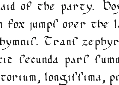 Renton, WA-based Peter R. Wilson's metafont code (2000-2003) for the "bookhands" series of fonts. It was his intention to provide the main examples of manuscript hands from the first century until the invention of printing. Included are the following:
 [Google]
[More] ⦿
|
Callifonts
[Kirby Lee Gosnell]
|
Located in Dallas, TX, Callifonts is run by Kirby Lee Gosnell. It sells a 75-font package of calligraphic, medieval and blackletter typefaces. [Google]
[More] ⦿
|
Calligraphy Shop
|
Daniel Quinn's calligraphy shop in Firenze shows nice examples of these hands (names in Italian): Onciale, Maiuscola Insulare, Minuscola Insulare, Carolina, Gotico Antico, Textura Quadrata, Capitali Gotiche, Beneventana, Rotunda, Capitali Rotunda, Bastarda Cancelleresca, Batarde Français, Fraktur Tedesca, Capitali Bastarde, Cadel, Capitali Longobarde, Foundational. [Google]
[More] ⦿
|
Carter Scholz
|
Fonts designed by Lou Harrison and implemented by Carter Scholz include Pluma, Rotunda, Lou Casual, Federov, Lou Titling, Aptos Uncial. He also made Kepatihan Cipher Notation Font, a typeface for cipher notation based on the Central Javanese system called kepatihan, which includes symbols for punctuating instruments, octave dots, phrase markings, bowing marks and more. [Google]
[More] ⦿
|
CAT Design Wolgast
[Peter Wiegel]
|
 Wolgast-based type designer Peter Wiegel (b. 1955) runs CAT Design Wolgast. Designer of these free fonts:
 - In 2019: Kufi Pattern.
- In 2018: Aurach Tri (a trilined typeface), Googee (monoline circle-themed sans), Gianna (medieval script), Hamburger Schwabacher.
- In 2017: Eyechart (heavy slab serif), Border Control (inline), Espresso Dolce (rounded sans), Gotisch Weiss, Halt (a dry brush typeface after Walter Hoehnisch's Stop from 1939), Kanzler, Llewie (rounded sans), Schulze Werbekraft (expressionist, after Arthur Schulze, 1926).
- In 2016: Ronaldson Gothic (after a MacKellar, Smiths & Jordan Co original), Vorgang (a great 1920s geometric sans), 5by7 (LED pixel font), BP 12-22 (industrial sans), u DIN 1451 Mittelschrift, Flubby, Gaeilge (Irish / uncial), Junior CAT (after Hans Heimbeck, 1936), CAT Liebing Gotisch (after Kurt Liebing), Tippa (an old typewriter font based on Adler Tippa 1).
- In 2015: Nuernberg (blackletter), CAT Schmalfette Thannhaeuser (blackletter), Offenbacher Reform (a revival of Offenbacher Reform, a blackletter typeface by Roos & Junge), Autobahn (blackletter), Barloesius Schrift (after Georg Barloesius's Barlösius Schrift, 1906), CAT-Franken-Deutsch (after Alfons Schneider, 1936), Fuckin Gwenhwyfar, CAT Kurier (a script after Herbert Thanhaeuser's Kurier from 1939), CAT Linz, CAT Rhythmus (a sharp-edged black grotesk after a Schriftguss AG original), DIN Schablonierschrift (DIN-based stencil), CAT North Licht, Feronia, Fette National Fraktur (after Walter Hoehnisch, 1934), Grobe-Plakat-Fraktur, CAT Childs (fifties style cursive typeface), Jena Gotisch (decorative caps), Kabinett Fraktur (after Johann Friedrich Unger, 1793-1794), Wattauchimma (heavy hipster sans), Friedolin (blackletter), Lorem Ipsum, Symphonie (a calligraphic script, reviving Imre Reiner's Symphonie (1938), also called Stradivarius (1945)), Power (a retro techno typeface), Krugmann Brush, Omega.
- In 2014: BernerBasisschrift1, BernerBasisschrift2 (school script), Berolina, Brausepulver (after Brause & Co., 1912), Fette Mikado (psychedelic style oriental look), Germanica, Gloria, HentimpsCirclet (blackletter), Hofstaetten (blackletter), Kleinsemmering, KuenstlerGotisch (blackletter), LacledeCAT (psychedelic), NeptunCAT, Neue Zier Schrift (a mischievous curly script), Pommern Gotisch, Reclame, CAT Report (retro brush script), Rueck-Italic, Rueck, RueckLeft, RueckLicht, RundschriftCAT (hairline ronde), Standard Graf (German expressionist and hexagonal typeface), Teutonic, VerzierteFavorite, VictoriaCAT, AdmiralCAT (a retro script), Dynamo (poster font), Des Malers Fraktur, Kanzleyrath (blackletter), Ober-Tuerkheim (art nouveau), PopplFrakturCAT (blackletter), Rundkursiv, Modeschrift (fifties script), Biedermeier Kursiv, Ehmcke Federfraktur (after a 1935 font by F.H. Ehmcke), Wernicke Schwabacher (after an original by Emmi Wernicke), Gotische Missalschrift, Hand Textur (after a 1935 font by F.H. Ehmcke), Renata (after a 1914 bastarda by Bauersche Giesserei), Rundgotisch Rauh (possibly after a Schelter & Giesecke design from 1903), Offenbacher Schwabacher (after Kurt Wanschura's bastarda from 1900), Incopins Clusters (multilined typeface), BadGong, Bernardo Moda (Bold, Semibold, Moda, Contrast: modeled after Lucian Bernhard's Bernhard fashion), CAT-Hohenzollern (after a 1902 art nouveau font by Bauersche), CATNorth, CATNorthLicht, CATNorthShadow, CAT Zentenaer Fraktur UNZ1 (a blackletter after a 1937 original by F.H.E. Schneidler), Coggers-Tariqa, EirikRaude, Fabrik (a geometric sans), Grobe Deutschmeister (German expressionist face), Harry Piel (or Piehl--a tattoo font), Kanalisirung, Klaber-Fraktur, Peter Obscure, Rumburak (a fat retro script), Flottflott (retro script), Indira K, Regent UNZ (a Schwabacher), Postamt, TGL 0-1451 Engschrift (a DIN-like font).
- In 2013: Spartakus (+Round), Cut Me Out (white on black sans), 5by9 (dot matrix face), Tartlers End (high-contrast ball terminal face), Alpha 54 (rounded flared script face), Chunk Five Ex (slab serif; he writes: With permission of Meredith Mandel, the original author of the ASCII-Font Chunk Five, I have extended Chunk Five Ex to a full featured unicode font with all figures used in Latin and Cyrillic writing), Simple Print (simple sans), Fette Bauersche Antiqua (a didone fat face), Manuskript Gothisch (after Manuskript Gotisch (1899, Bauersche), which was modeled after Wolfgang Hopyl's 1514 Textura), Quast (hairy font).
- Still in 2013, he published a number of school scripts, including Neue Rudelskopf, Deutsche Normalschrift, Imrans School, Rastenburg (German school font), and Bienchen.
- In 2012: Hardman (connected fifties script), Immermann (a quaint slab serif), Quast (grunge), Fundamental Brigade (sans family), DiffiKult (a bilined face), Men Nefer (a Memphis lookalike), Fette Unz Fraktur (like Fette Fraktur), Mutter Krause (for the reconstruction of the 1929 silent movie "Mutter Krausens Fahrt ins Glück", where it is used for intertitles, that where missing. The font is redrawn from the original intertitles), Youbilee (a font with laurels).
- In 2010: Alfabilder (dingbats), Gondrin (athletic lettering with a 3d effect), Helvetia Verbundene (making Helvetica into a school script? The original typeface was by Carl Albert Fahrenwaldt 1901), Proletarsk (a grotesk face), Vis-à-vis (great idea--a double-storied serif face), ApolloASM (Victorian), BertholdrMainzerFraktur, Doergon-Regular (license plate font), DoergonBackshift, DoergonShift, Eureka (Victorian, ornamental face), GoeschenFraktur (1880-style Fraktur used in Sammlung Göschen books), Makushka, MakushkaKontura, MakushkaQuadriga, MakushkaSecunda, Moderne3DSchwabacher, ModerneGekippteSchwabacher, StrassburgFraktur, TGL0-16 (same as DIN 16), TGL0-17 (same as DIN 17), TGL0-17Alt, Tank (emblems of gas companies), EricaType-Bold, EricaType-BoldItalic, EricaType-Italic, EricaType-Regular (typewriter), ErikaOrmig, Fibel Vienna (2012, a high-legged sans), GreifswalderTengwar-Regular, GreifswalerDeutscheSchrift (German Schreibschrift), Midroba-Regular (a strong mechanical octagonal face), MidrobaSchatten, MMX2010 (futuristic), Präsent60, Rotunda Pommerania (blackletter), TengwarOptime, TengwarOptimeDiagon, cbe-Bold, cbe-BoldItalic, cbe-Italic, cbe.
- In 2009: 18thCenturyInitials, 18thCenturyKurrent-Regular, 18thCenturyKurrentAlternates, German writing from the 18th century), CentreClaws, CentreClawsBeam1, CentreClawsSlant, Cöntgen Kanzley Regular (blackletter), Cöntgen Kanzley Aufrecht (2009), ElficCaslin, H1N1, Loxembourg1910Shadow (an art nouveau-influenced stencil face), Luxembourg1910, Tschichold, VarietScala (an art deco sans family), Varietee, VarieteeArtist, VarieteeCabaret, VarieteeCascadeur, VarieteeCasino, VarieteeCirque, VarieteeColege, VarieteeConferencier, VarieteeFolies, VarieteeIkarier, VarieteeJongleur, VarieteeMirage, VarieteeRevue, VarieteeTheatre, KochFetteDeutscheSchrift (blackletter), MoradoFelt-Regular (upright connected script), MoradoMarker (2009), MoradoNib, PreussischeVI9 (DIN-like family), PreussischeVI9Linie, PreussischeVI9Schatten-Linie, PreussischeVI9Schatten, SchatternvonPreussischeVI9, Stage (art deco), Ring Matrix (dot matrix), Nathan, Amptmann Script (2009, upright connected script), Cat Shop, Blankenburg (blackletter), Murrx (arched face), Schwaben Alt (1988, bastarda), Vrango, 14LED (Regular, Phattt-Heavy, Rised-Black), 24LED (+Bright, +Grid, +Modul), DIN1451fetteBreitschrift1936-Regular, FibelNord (basic sans family with an architectural twist), FibelSued (family), PaneuropaBankette, PaneuropaCrashbarrier-Black, PaneuropaFreeway, PaneuropaHighway, PaneuropaRoad, PaneuropaStreet, PaneuropaWrongWay, Quirkus (family), RingMatrix (dot matrix family), RingMatrix3D, RingMatrixTwo, DiscipuliBritannica (connected script), GruenewaldVA-Regular (connected school script), Rudelskopfdeutsch-Aufrecht, WiegelLatein (connected school script), WiegelLateinMedium (2009), Morado, Moebius Bicolor (art deco), Elbaris (sans), ElbarisOutline, Nomitais (multiline face), RostockKaligraph, Waschkueche, WaschkuecheGrob-Ultra, WiegelKurrent (traditional German school script), WiegelKurrentMedium, XAyax, XAyaxOutline (2009), Kaufhalle (squarish), Quimbie (art deco), CasaSans-Regular, Elb-Tunnel, MeyneTextur (blackletter), Yiggivoo, TGL 31034-1 (futuristic sans), Beroga (a simple organic sans).
- Before 2009: Xayax, PreussischeIV44Ausgabe3 (2006, a severe sans), Utusi Star (1989, very condensed all-caps face), Avocado (2006, script face), CbeNormal (2006, script face), Leipzig Fraktur (+Bold) (2006), Berlin Email (2006, a condensed sans family, followed in 2009 by Berlin Email Serif), MaassslicerItalic (2006, a futuristic typeface made for Rudolf Maass + Partner GmbH), Powerweld (a gorgeous avant-garde typeface made for OPTI Pumpen und Technik GmbH), WolgastScript (2005), WolgastTwo (2006, connected script), WolgastTwoBold, ZeichenDreihundert-Regular, ZeichenHundert-Regular, ZeichenVierhundert-Regular, ZeichenZweihundert-Regular (2006, traffic dingbats), Djerba simplified (Arabic font, Computer and Technologie, Hamburg, 1995; it can be downloaded here), Titus FrakturBaltic (1998), TITUS FrakturEast Normal (1998), and TITUS FrakturWest Normal (1998) [which used to be downloadable here; these fonts were retired and the Titus name dropped; most of the glyphs made it to Schwaben Alt].
Dafont link. One more URL. Fontspace link. Yet another URL. Font Squirrel link. Fontsy link. The list of his truetype and opentype typefaces as of 2011: 18thCenturyInitials, 18thCenturyKurrentStart, 18thCenturyKurrentText, Alfabilder, AlteDIN1451Mittelschrift, AlteDIN1451Mittelschriftgepraegt, AmptmannScript, ApolloASM, Avocado, Barnroof, BerlinEmail, BerlinEmail2, BerlinEmailBold, BerlinEmailBold, BerlinEmailHeavy, BerlinEmailHeavy, BerlinEmailOutline, BerlinEmailOutline, BerlinEmailSchaddow, BerlinEmailSchaddow, BerlinEmailSemibold-Bold, BerlinEmailSemibold-Bold, BerlinEmailSerif, BerlinEmailSerif, BerlinEmailSerifSemibold, BerlinEmailSerifSemibold, BerlinEmailSerifShadow, BerlinEmailWideSemibold, BerlinEmailWideSemibold, Beroga, Beroga, BerogaFettig-Bold, BerogaFettig-Bold, BertholdMainzerFrakturUNZ1A-Italic, BertholdMainzerFrakturUNZ1A, BertholdrMainzerFraktur, Blankenburg-Regular, BlankenburgUNZ1A-Italic, BlankenburgUNZ1A, CasaSans-Regular, CasaSans, CasaSansFettig-Bold, CatShop, CentreClaws, CentreClawsBeam1, CentreClawsSlant, ChunkFiveEx, CntgenKanzley-Regular, CntgenKanzleyAufrecht, DIN1451fetteBreitschrift1936-Regular, DiscipuliBritannica, DiscipuliBritannicaBold, Doergon-Regular, DoergonBackshift, DoergonShift, DoergonWave-Regular, Elb-Tunnel, Elb-TunnelSchatten, Elbaris, ElbarisOutline, ElficCaslin, EricaType-Bold, EricaType-BoldItalic, EricaType-Italic, EricaType-Regular, ErikaOrmig, Eureka, FibelNord-Bold, FibelNord-BoldItalic, FibelNord-Italic, FibelNord, FibelNordKontur, FibelSued-Bold, FibelSued-BoldItalic, FibelSued-Italic, FibelSued, FibelSuedKontur, GoeschenFraktur, GoeschenFrakturUNZ1A-Italic, GoeschenFrakturUNZ1A, Gondrin, GreifswalderTengwar-Regular, GreifswalerDeutscheSchrift, GruenewaldVA-Regular, GruenewaldVA1.Klasse, GruenewaldVA3.Klasse, H1N1, HelvetiaVerbundene, KochFetteDeutscheSchrift, KochFetteDeutscheSchriftUNZ1A-Italic, KochFetteDeutscheSchriftUNZ1A, LeipzigFrakturBold, LeipzigFrakturHeavy-ExtraBold, LeipzigFrakturLF-Bold, LeipzigFrakturLF-Normal, LeipzigFrakturNormal, LeipzigFrakturUNZ1A-Bold, LeipzigFrakturUNZ1A-BoldItalic, LeipzigFrakturUNZ1A-Italic, LeipzigFrakturUNZ1A, Luxembourg1910, Luxembourg1910Contur, Luxembourg1910Ombre, MMX2010-Regular, Maassslicer3D, Maassslicer3D, MaassslicerItalic, MaassslicerItalic, Makushka, MakushkaKontura, MakushkaQuadriga, MakushkaSecunda, MeyneTextur, MeyneTexturUNZ1A-Italic, MeyneTexturUNZ1A, Midroba-Regular, MidrobaSchatten, Moderne3DSchwabacher, ModerneFetteSchwabacher, ModerneFetteSchwabacherUNZ1A-Italic, ModerneFetteSchwabacherUNZ1A, ModerneGekippteSchwabacher, MoradoFelt-Regular, MoradoMarker, MoradoNib, MoradoSharp-Regular, Murrx, Nathan-CondensedRegular, Nathan-ExpandedRegular, Nathan-Semi-expandedRegular, Nathan, NathanAlternates-CondensedRegular, NathanAlternates-ExpandedRegular, NathanAlternates-Semi-expandedRegular, NathanAlternates, Nomitais, Nomitais, Numikki, Numukki-Italic, Numukki-Italic, Numukki, Powerweld, PreussischeIV44Ausgabe3, PreussischeIV44Ausgabe3, PreussischeVI9, PreussischeVI9Linie, PreussischeVI9Schatten-Linie, PreussischeVI9Schatten, Proletarsk, Prsent60, Quimbie, Quimbie3D, QuimbieShaddow, QuimbieUH, Quirkus-Bold, Quirkus-BoldItalic, Quirkus-Italic, Quirkus, QuirkusOut, QuirkusUpsideDown, RostockKaligraph, RotundaPommerania, RotundaPommeraniaUNZ1A-Italic, RotundaPommeraniaUNZ1A, Rudelskopfdeutsch-Aufrecht, SchatternvonPreussischeVI9, Schulfibel-Nord-Linie-2, SchwabenAlt-Bold, SchwabenAltUNZ1A-Italic, SchwabenAltUNZ1A, Stage, StrassburgFraktur-Regular, TGL0-16, TGL0-17, TGL0-17Alt, TGL31034-1, TGL31034-1, TGL31034-2, TGL31034-2, Tank, TengwarOptime, TengwarOptimeDiagon, TitilliumMaps29L-1wt, TitilliumMaps29L-400wt, TitilliumMaps29L-800wt, TitilliumMaps29L-999wt, TitilliumText22L-1wt, TitilliumText22L-250wt, TitilliumText22L-400wt, TitilliumText22L-600wt, TitilliumText22L-800wt, TitilliumText22L-999wt, TitilliumTitle20, UtusiStar-Bold, UtusiStar, VarietScala, Varietee, VarieteeArtist, VarieteeCabaret, VarieteeCascadeur, VarieteeCasino, VarieteeCirque, VarieteeColege, VarieteeConferencier, VarieteeFolies, VarieteeIkarier, VarieteeJongleur, VarieteeMirage, VarieteeRevue, VarieteeTheatre, Via-A-Vis, Vrng, Waschkueche, Waschkueche, WaschkuecheGrob-Ultra, WaschkuecheGrob-Ultra, WiegelKurrent, WiegelKurrent, WiegelKurrentMedium, WiegelKurrentMedium, WiegelLatein, WiegelLateinMedium, WolgastScript, WolgastScript, WolgastTwo, WolgastTwo, WolgastTwoBold, WolgastTwoBold, XAyax, XAyax, XAyaxOutline, XAyaxOutline, YiggivooUnicode-Italic, YiggivooUnicode-Italic, YiggivooUnicode, YiggivooUnicode, YiggivooUnicode3D-Italic, YiggivooUnicode3D-Italic, YiggivooUnicode3D, YiggivooUnicode3D, ZeichenDreihundert-Regular, ZeichenDreihundertAlt, ZeichenHundert-Regular, ZeichenHundertAlt, ZeichenVierhundert-Regular, ZeichenZweihundert-Regular, ZeichenZweihundertAlt, cbe-Bold, cbe-BoldItalic, cbe-Italic, cbe, kaufhalle, kaufhalle, kaufhalleblech, kaufhalleblech, moebius. His type 1 fonts as of 2011: Avocado, BerlinEmail, BerlinEmail2, BerlinEmailBold, BerlinEmailHeavy, BerlinEmailOutline, BerlinEmailSchaddow, BerlinEmailSemibold-Bold, BerlinEmailSerif, BerlinEmailSerifSemibold, BerlinEmailSerifShadow, BerlinEmailWideSemibold, Beroga, BerogaFettig-Bold, CasaSans, Elb-Tunnel, Elb-TunnelSchatten, Maassslicer3D, MaassslicerItalic, Numukki-Italic, Numukki, Powerweld, PreussischeIV44Ausgabe3, Quimbie, QuimbieUH, RostockKaligraph, TGL31034-1, TGL31034-2, UtusiStar-Bold, UtusiStar, Waschkueche, WaschkuecheGrob-Ultra, WolgastScript, WolgastTwo, WolgastTwoBold, YiggivooUnicode-Italic, YiggivooUnicode, YiggivooUnicode3D-Italic, YiggivooUnicode3D, cbe-Bold, cbe-BoldItalic, cbe-Italic, cbe, kaufhalle, kaufhalleblech. A list of typefaces in alphabetical order, with descriptive comments provided by Reynir Heidberg Stefansson from Iceland: 18th Century Kurrent (Kurrent-style handwriting, Wiegel-coded), Alfabilder (Alphabetic picture font for the German alphabet), Amptmann Script (Partly-connected, upright writing, used on Prussian Railways pattern drawings), ApolloASM (Jugendstil, vaguely resembling an ornate Bocklin), Avocado (Handwriting, broad-nib pen-style), Berlin Email (Narrow sans-serif, based on emailled signage; Wiegel-coded), Berlin Email Serif (Narrow serif, based on emailled signage; Wiegel-coded), Beroga (All-minuscule, rounded marker-style sans-serif with ca. 8° slope), Berthold Mainzer Fraktur (Fraktur in Wiegel (Regular only) and UNZ1(A) coding), Blankenburg (Semicondensed Tannenberg in Wiegel (Regular only) and UNZ1(A) coding), Casa Sans (Squarish, broad-nib pen-style block writing), CatShop (Serif, soft of an acid-washed didone), cbe Normal (Sans-serif, narrow, somewhat cuneiform), Centre Claws (Sans-serif, Art Deco display, a bit like Broadway), Cöntgen Kanzlei (Cöntgen Kanzley) (Fraktur-based calligraphy by Heinrich Hugo Cöntgen, Wiegel coding), DiffiKult (Sans-serif, display, no horizontal lines), DIN 1451 fette Breitschrift 1936 (The now-withdrawn Wide version of DIN 1451 traffic font), Discipuli Britannica (UK school handwriting), Doergon (Slab-serif, narrow-ish, all majuscule), CAT Eckmann, Elabris (Elbaris) (Sans-serif, caps/smallcaps, shades of DIN1451 Engschrift), Elb-Tunnel (Sans-serif, based on signage in the old Elbe tunnel in Hamburg), Elbic Caslon (Elfic Caslon, Elfic Caslin) (a Caslon for the Queen Galadriel), Erika Type (Erica Type) (Slab-serif, typewriter, comes from Wiegel's old Erika typewriter), Eureka (Serif, caps/smallcaps, Art Deco/Jugendstil), Fibel Nord (2009, sans-serif, based on German school primer), Fibel Sued (2009, sans-serif, based on German school primer), Fibel Vienna (Sans-serif, based on Austrian school primer), Fundamental Brigade (Sans-serif, geometric, some UNZ1 ligatures), Göschen Fraktur (Goeschen Fraktur) (Fraktur with a biblical feel, Wiegel (Rg only) and UNZ1 coding), Gondrini (Gondrin) (Sans-serif, geometric, display, shaded outlines, cookie-cutter), Greifswalder Deutsche Schrift (Handwriting, based on Rudolf Koch's Offenbacher Kurrent, Wiegel coding), Greifswalder Tengwar (Tengwar handwriting in Offenbach style), Gruenewald VA (Latin-style schoolhand, Wiegel coding), H1N1 (Heavy display typeface made of parallel wavetrains), Hardman (Heavy, wide, squarish logotype with connecting letters), Helvetia Verbundene (Swiss handwriting), Immermann (Display, resembles a seriffed Radio/Rundfunk, UNZ1 coding), Kaufhalle (Display, recreation of HO Kaufhalle logotype), Koch Fette Deutsche Schrift (Very plain fraktur, Wiegel (Rg only) and UNZ1 coding), Leipzig Fraktur (Fraktur for bread text, Wiegel coding), Leipzig Fraktur UNZ1A (Fraktur for bread text), Luxembourg 1910 (Sans-serif, Jugendstil display typeface from old spice drawers), Maass Slicer (Maassslicer) (Sans-serif, oblique display face, orig. logotype), Makushka (Sort-of an Elabris with minuscules, looks overlayable), Men Nefer (Slab-serif, geometric, UNZ1 coding), Midroba (Spur-serif, display, all-majuscule, heavy, octal), MMX2010 (Sans-serif, display, caps/smallcaps, TV game machine feel), Moderne Schwabacher (Heavily reworked, Wiegel coding), Moderne Fette Schwabacher UNZ1A (Heavily reworked, Wiegel coding), Möbius (moebius) (Sans-serif, display, bicolour (u/c = non-spacing fills, l/c = spacing outlines)), Morado (Connected handwriting with nib or marker pen), Murrx (Heavy display typeface made from ellipsoids on NE-SW axis), Mutter Krause (Serif, slanting, Jugendstil-feel), CAT Neuzeit and CAT Neuzeit Schatten (2012-2014), Nathan (Slab-serif, hand-drawn.), Nomatais (Nomitais) (Elabris with multiple levels of outlines), Numukki (Conlang, knotted-line, good for separators and scenebreaks), Powerweld (Sans-serif, Bauhaus style, all-minuscule), Präsent 60 (PI font with various East German logos), Preussische IV 44 (PreussischeIV44Ausgabe3) (Repro of Prussian Railways pattern type IV 44 version 3), Preussische VI 9 (Repro of Prussian Railways pattern type VI 9 version 2), Proletarsk (Sans-serif, monoline, doubled-up questionmark), Quast (Brush type, all-majuscule, very rough outline), Quimbie (Sans-serif, all-majuscule, resembles Amelia), Quirkus (Sans-serif), Ring Matrix (LED matrix with ring LEDs, solid LEDs and ring LEDs with shadow), Rostock Kaligraph (Very round calligraphy, resembles rotunda), Rotunda Pommerania (Rotunda style, Wiegel-code (Regular only) or UNZ1-coded), Rudelskopf deutsch (Sans-serif, based on Kurrent-style letterforms), Schwaben Alt (Schwabacher in Wiegel- (Rg only) or UNZ1-coding.), Stage (Sans-serif, narrow, Art Deco, fleeting taste of Broadway), Strassburg Fraktur (Handwritten fraktur, ornate majuscules, Wiegel-coding), Tank (PI font with (gas/petrol) tank station logos), TengwarOptime (Optima for Tengwar), TGL 0-16/0-17 (East German versions of DIN 16 and DIN 17 blueprint types), TGL 31034-1, TGL 31034-2 (East German versions of DIN 6776 / DIN EN ISO 3098 blueprint types), Utusi Star (Sans-serif, slight resemblance with Rundfunk), Varieté (Sans-serif, all-majuscule or caps/smallcaps), Vis-A-Vis (Serif, all-majuscule, split in middle), Volk Redis (Kurrent handwriting, anno 1930-1941), Vrångö (LED matrix type like Ring Matrix), Waschküche (Serif, resembles Antykwa Torunska), Wiegel Kurrent (Kurrent-style handwriting), Wiegel Latein (Latin-style handwriting), Wolgast Script (Sloppy-looking handwriting with a broad-nib pen), Wolgast Two (Latin/Cyrillic handwriting), XAyax (Serif, Jugendstil, narrow, all-majuscule), Yiggivoo Unicode (Sans-serif, wide, tall x, board game packaging feel), Youbilee (PI font with various jubilee laurels), Verkehrszeichen (Zeichen) (PI fonts with traffic signs (in layers)), Verkehrszeichen alt (Zeichen Alt) (PI fonts with old traffic signs (in layers)). Abstract Fonts link. Dafont link. Kernest link. Klingspor link. CAT Fonts link. Fontesk link. [Google]
[More] ⦿
|
Copypaste
[Fredrick R. Brennan]
|
 Quezon City, The Philippines-based designer of the free font Some Time Later (2016), which is based on the beatnik lettering used in the credits of the SpongeBob Squarepants Nickelodeon show. He also made the free font LCD (2015) and the free blackletter typeface KJV 1611 (2018), which revives the typeface found in the 1611 King James Bible.
 Typefaces from 2019: TT2020 (an extensive multilingual typewriter family with about 7000 glyphs per font, released in 2020), Quaerite Regnum Dei (a libre rotunda font based on a Spanish rotunda hand found in the Misal rico de Cisneros (early 16th century) commissioned by cardinal Francisco Jimenez de Cisneros from Toledo), Open Baybayin (sharing some glyphs with Noto Tagalog), Chomsky (a free blackletter typeface in the style of the masthead of The New York Times). Github link. Typefaces from 2020: FRBCistercian. Github link. Open Font Library link. Fontsquirrel link. Github link. [Google]
[More] ⦿
|
Damià Rotger Miró
[Dúctil]
|
 [More] ⦿
|
Darri Ulfsson
|
Icelandic graphic designer. In 2008, during a course called Holy Geometry at the Academy of the Arts in Iceland, he created the geometric modular typeface Rotunda. In 2009, he made the sans headline face Vesuvio. [Google]
[More] ⦿
|
Delbanco-Frakturschriften
[Gerda Delbanco]
|
 Gerda Delbanco's German foundry in Ahlhorn, specializing in blackletter fonts. Great web presentation, and gorgeous glyphs. The company is owned by Gerda Delbanco, but it is not clear if she designed some or all of the typefaces. Some fonts were designed by Gerhard Helzel, and others by Christian Spremberg. This is one of the best sources of blackletter fonts in the world. Names of the fonts, which are nearly all historical revivals of the great blackletter fonts: Alte Schwabacher, Andreas Schrift, Breitkopf Fraktur, Caslon Gotisch, Claudius (1998, after Rudolf Koch, 1934-1937), Deutsche Kursive, Deutsche Werkschrift (+halbfett), Deutsche Zierschrift, Eckmann Schrift, Eisenacher Fraktur (1994, by Christian Spremberg), Ehmcke Schwabacher, Fette Gotisch, Fichte Fraktur, Frühling (after Rudolf Koch's original from 1917) [sample 1, sample 2, sample 3], DS-Garalang, DS-Garamond, DS Gotenbrg, Hermersdorf, Humboldt Fraktur (after a typeface by H. Rhode), Kleist Fraktur (1996, after the Walter Tiemann original from 1927-1928), Wilhelm Klingspor Schrift, Koch Fraktur, Rudolf Koch Kurrent (after the original school alphabet by Koch, done in 1935), Kurrent (a connected writing font based on examples from J.B. Henning, ca. 1817), Lincoln Gotisch, DS Maximilian Gotisch, DS Maximilian Zierbuchstaben, Normal Fraktur (this is a nameless typeface in the group of Biedermeier-Fraktur typefaces which also includes Schelter's Schulfraktur; also known elsewhere as Armin-Fraktur, Bürenstein-Fraktur, Mars-Fraktur and Pressa-Fraktur), Offenbacher Schwabacher (1996, after the 1899 font by Gustav Ruprecht at Rudhardsche), Old English, Peter Jessen Schrift (1997, after the original from 1924-1929 by Rudolf Koch), Post Fraktur, DS Ratdolt Rotunda, DS Salzmann Fraktur, DS Schmuck, Strassburg, DS Suetterlin, Tannenberg (after a 1933 Stempel typeface by Emil Meyer), DS Thannhaeuser Fraktur, DS Unger Fraktur (1999), DS Walbaum Fraktur, DS Wallau (1996, after Rudolf Koch, 1924-1936), Wartburg Fraktur, DS Weiss Gotisch, DS Wilhelm Klingspor Schrift, Wohe Kursive and Zentenar Fraktur (1997 (after F.H.E. Schneidler's original from 1937).
 Some of the copyright notices refer to the Bund für deutsche Sprache und Schrift, and others to PrimaFont, and this may explain some of the foundry's history. 1994 catalog. Part of the 1999 catalog. Part of the 2002 catalog. [Google]
[More] ⦿
|
Die Entwicklung unserer Schrift
[Peter Doerling]
|
Peter Doerling's visual overview of the styles of writing in Germany, for books, official documents (Urkunden) and in letters. For books, he takes us here: - 200-300: Roman capitals.
- 300-500: Quadrata.
- 500 on: Uncial.
- 900 on: Karolingian minuscules.
- 1200 on: Gothic minuscules.
- Textura.
- 1400 on: Rotunda.
- 1500 on: Schwabacher.
- 1600 on: Fraktur.
- 1500 on: Humanistic style.
- 1570 on: Antiqua.
- 1900 on: Grotesk, Egyptian. [Note that he omits the modern style.]
- 1960 on: Helvetica. (???)
For official documents: - 200-300: Roman capitals.
- 400-600: Rustica.
- 500 on: Half Uncial.
- 900 on: Karolingian minuscules.
- 1500 on: Notula.
- 1600 on: Canzlei (Cantzley, Kanzlei).
- 1600 on: Humanistic Canzlei
- 1875: Ronde, Rondo, Rundschrift.
- 1915: Jugendstil.
- 1930: Tannenberg.
For letters: - 200-300: Roman capitals.
- 400 on: Young Roman cursive.
- 900 on: Karolingian minuscules.
- 1300 on: Cursive.
- 1600 on: Cancellaresca [refined formal script].
- 1600 on: Kurrente.
- 1600 on: Humanistic cursive.
- 1800 on: deutsche Schreibschrift.
- 1800 on: Lateinische (Latin) Schreibschrift.
- 1930: Tannenberg.
[Google]
[More] ⦿
|
Dieter Steffmann
|
 FontShop was the name of Dieter Steffmann's foundry in Kreuztal, Germany (not to be confused with the FontShop foundry and font vendor). He made about 600 self-proclaimed "old-fashioned" fonts, and among these many Fraktur fonts. His site became too expensive to run, and was for about two decades hosted by Typoasis. His fonts can now de downloaded afrom 1001 Fonts. Alternate URL. Current list of fonts. See also here. New stuff. Fontspace link. A nice essay about Fraktur fonts accompanies the fonts. News. As Dieter puts it: I am not a designer but I add missing letters to public domain fonts in order to get a complete character set and I hint the fonts and create new weights (shadow, inline etc.) His Christbaumkugeln font, and how it was made. The font families:
 - Acorn Initialen (2000), Adine Kirnberg (2000, after David Rakowski's Adine Kirnberg Script, 1991), AI Parsons (1999: a simple conversion to truetype of AI Parsons (1994, Inna Gertsberg ans Susan Everett), which in turn revived Will Ransom's Parsons from the 1920s), Albert Text (2000), Alpine (2000), Altdeutsche Schrift (1998: a rotunda), Alte Caps (2000: white on black), Alte Schwabacher (2000, +Shadow), Ambrosia (2000), American Text (2000: a blackletter), Aneirin (2000: Lombardic), Angel (2000: an ironwork font), Anglican Text (2000: a frilly blackletter), Angular (1999: +Inline, +Shadow), Ann-Stone (2000: boxed art nouveau caps), Antique No. 14 (2000: fuzzy hand-crafted letters), Arabella (2000: script), ArabesqueInitialen (2002), Argos George (1999, an art nouveau font after Georges Lemmen's George-Lemmen-Schrift (1908); Steffmann added Argos Geirge Contour), Aristokrat Zierbuchstaben (2002, after a house font at Ludwig&Mayer, 1911), Ariston Script (2000: a formal calligraphic script), Art Nouveau Initialen (1999), Attic Antique, Augusta (2000: a rotunda; +Shadow).
- Baldur (2000: art nouveau; +Shadow, +RoughSliced; after a schelter typeface from 1895), Ballade Bold (2002, a Schwabacher font based on Ballade Halbfette designed by Paul Renner in 1937; +Contour, +Shadow), Barock Initialen (2002: an incomplete decorative initials typeface), Becker (1999; +Shadow, +Inline), Beckett-Kanzlei (2001), Behrens-Schrift (2002: an art nouveau-inspired blackletter typeface based on an original by Peter Behrens), Belshaw (2000: a Victorian decorative serif), Belwe (2002, after an original by Georg Belwe, 1913; Gotisch, Vignetten), Benjamin Franklin Antique (2000, after a warm wood type designed in 1991 by Walter Kafton-Minkel simply called Benjamin), Berlin Squiggle Condensed, Bernhard Schmalfett, Bier und Wein Vignetten (2002, based on drawings from the Bauersche Giesserei), Billboard, Bizzaro, Black Forest (2000, blackletter; +Text, +ExtraBold), Black Knight (1999: blackletter), Blackletter (2001; +ExtraBold, +Shadow), Blackwood Castle (2000: an almost Lombardic blackletter; +Shadow), Breitkopf Fraktur (2000), Bretagne Gaelic (1999), Brian James Bold (2000, +Contour), Bridgnorth, Broadcast Titling (2000, 3d caps), Broadway Poster, Brock Script (2000: formal calligraphic script).
- Cabaret (2000: all caps, +Contour, +Shadow), Campanile (2000: Victirian), Camp Fire (2000: wooden plank font), Canterbury Old English (2001: blackletter), Cardiff (2000: textured caps), Cardinal (2000: almost Lombardic; +Alternate, +Anglican), Carmen (1998: art nouveau style; +Shadow), Carrick Caps (2000), Caslon Antique, Caslon Fette Gotisch, Cavalier (2000), Celtic Frames (2000), Celtic Hand (2000), Challenge (2000; +Contour, +Shadow), Chelsea (2000: a serif), Chopin Script (2000, a formal penmanship script identical to Polonaise), Christbaumkugeln (1999: art nouveau alphadings consisting of Christmas ornaments), Chursächsische Fraktur, Cimbrian (2001: blackletter), Circus Ornate Caps (2001, a Western or circus font), Cloister Black Light (2001: blackletter), Coaster Black (2001, +Shadow), Coelnische Current Fraktur (2000), Colchester Black (2001: an ornamental blackletter), College, Courtrai (2000: a decorative blackletter), Coventry Garden, Cruickshank (2000: art nouveau caps).
- Damn Noisy Kids (2002: a heavy brush font), Davy's Dingbats, Debussy, Decorated Roman Initials (2003), Deutsch Gotisch (2002: an expressive blackletter font; +Dutesch Gotisch Heavy, +Outline, +Shadow), Deutsche Uncialis (+Shadow) (2000), Deutsche Zierschrift (2002, after Rudolf Koch, 1919-1921), Devinne Swash (2000), Digits (2000), Direction (2000: letters with embedded arrows), Dobkin Script (2000: after David Rakowski, 1992, Domino, Domo Arigato (1999: oriental emulation), Dover, Driftwood Caps (2000: a wooden plank font), Due Date (2000: a grungy stencil typeface), Duerer Gotisch (2001), Duo Dunkel (+Licht), Durwent (2001: a rotunda).
- Easter Bunny (after a 1994 font by Apropos Creations), Easter Egg (2001; after a 1994 font by Apropos Creations), Eckmann Initialen (2002, after the famous art nouveau typeface from 1900 by Otto Eckmann), Eckmann Plakatschrift (2002), Eckmann-Schrift (2002), Eckmann Titelschrift (2002), Eckmann Schmuck (2002), Egyptienne Zierinitialen (2002), Egyptienne Zierversalien (2002), Ehmcke-FrakturInitialen (2002), Ehmcke-Schwabacher Initialen (2002), Eichenlaub Initialen (2000), Eileen Caps (2000; after David Rakowski, 1992), Eisenbahn (2002, based on train vignettes at Bauersche Giesserei), Elzevier Caps (2000; after David Rakowski), Enge Holzschrift (2000; +Shadow), English Towne Medium (2000: a Fraktur), Epoque (1999; an art nouveau typeface; +Shadow, +Inline), Erbar Initialen, Estelle, Evil of Frankenstein, Express (1999).
- Faktos (1998; a rip-off of Cory Maylett's Faktos, 1992; +Striped, +Contour, +Shadow), Fabliaux (2000: Lombardic caps), Fancy Card Text (2000: a textura), Fat Freddie (2000: a fat all caps font; +Shadow, +Outline), Faustus (2000: a Schwabacher), Fenwick Woodtype (blackletter: 2001), Fette Caslon Gotisch (2001), Fette Deutsche Schrift (2002, a revival of a Rudolf Koch font from 1908), Fette Egyptienne, Fette Haenel Fraktur (2000), Fette Kanzlei (2002), Fette Mainzer Fraktur (2001), Fette Steinschrift (2002), Fette Thannhäuser (2002; after Herbert Thannhäuser, 1937-1938; +Schattiert), Fette Trump Deutsch (20002, after Georg Trump, 1936), Firecat, Flaemische Kanzleischrift (2000: calligraphic), Flowers Initials (2000: floriated caps), Forelle (2002: a retro script; +Shadow), Fraenkisch Spitze Buchkursive (2002; after Lorenz Reinhard Spitzenpfeil, 1906), Fraktur Coelnische Current (2000), Fraktur Schmuck (2001: ornaments), Fraktur Shadowed (2001), Fraktur Theuerdank (2000: a Schwabacher), Frederick Text (2001: a blackletter), Futura Script.
- Gabrielle (1999: a retro script), Ganz Grobe Gotisch (2000), Gebetbuch Fraktur (2000: a Schwabacher), Gebetsbuch Initialen (2001), Germania (2001, a revival of the 1903 blackletter typeface by Heinz König called Germania as well), Germania-Versalien, Gille Fils Zierinitialen (2002, after Gillé Fils, ca. 1820), Gingerbread Initials (Victorian initials, after an original from ca. 1890), Globus, Gloucester Initialen (2001), Gorilla Black (2000: rounded elephant feet font), Gotenburg A+B (2002, after Friedrich Heinrichsen), Gothenburg Fraktur (2000), Gotische Initialen (two different sets with the same name, one from 2000 and one from 2002), Gotisch Schmuck (2002, Fraktur), Goudy Initialen (2000), Goudy Medieval (2000), Goudy Thirty (2000), Grange (1999), GrenzschInitials (2001), Grusskarten Gotisch (2001), Gutenberg Textura (2000).
- Haenel Fraktur Fett, Hansa (1999: art nouveau), Hansa Gotisch (2001: a textura), Hansen (1998; +Contour, +Shadow), Happy Easter (1994, by Apropos Creations: art deco caps), Harrowgate (2001: a textura), Hazard Signs (2000), Headline Text (2001: a textura), Hercules (1999: art nouveau), Herkules (2004: art nouveau), Hermann-Gotisch (2002; after an original by Herbert Thannhaeuser, 1934), Herold (2002), Hippy Stamp (2000: after rubber stamps from the 1960s), Hoedown (2000; +Shadow), Holla (2001; after Rudolf Koch), Holidayfont, Holtzschue(2000: a circus font, after David Rakowski, 1992), Honey Script (2000: a retro script), Horror Dingbats (2000; after Letters from the Claw, 1998), Houtsneeletter, Humboldt Fraktur (2002-2005; after a Schwabacher font by Hiero Rhode, 1938; +Zier, +Initialen).
- Iglesia Light (2002), Iron Letters (2000), Isadora Original.
- Jan Brad, Journal Dingbats, Jahreskreis (seasonal dingbats, 2002), JSL Blackletter Antique (2000, by Jeffrey S. Lee), Jugendstil Fraktur (originally designed by Heinz Koenig, 1907-1910), Jugendstil Ornamente (2002, art nouveau ornaments, after Schelter & Giesecke).
- Kabinett Fraktur, Kaiserzeit Gotisch (2001), Kanzle (2001)i, Kanzlei Initialen (2002), Kalenderblatt Grotesk (2000), Kashmir (2001: an arts and crafts typeface), Kinder Vignetten (2002), KingsCross (2001: blackletter), Kinigstein Caps (2000: art nouveau initials after David Rakowski, 1990), Klarissa (2000), Kleist Fraktur + Zierbuchstaben (2002, after Walter Tiemann, 1928), Koch Antiqua (2002), Koch Antiqua Zierbuchstaben (2002), Koch Initialen (2000, after Rudolf Koch, 1922), Koenigsberger Gotisch (2001), Koenig-Type (2002; a Jugendstil Fraktur originally designed by Heinz Koenig, 1907-1910), Kohelet (2001), Koloss, Konanur Kaps (2000, after David Rakowski, 1991), Kramer, Krone Bold.
- La Negrita (2000, +Shadow), Latina (2001: script), Lautenbach (2001, +Zierversalien), Legrand (1999: art nouveau), Lemiesz (2000), Lettres ombrées ornées (2002, based on a typeface by Schriftgiesserei J. Gillé, 1820), Linolschrift (2000, +Heavy, a linocut font as in the Munch paintings), Lintsec (2000, a stencil typeface, after David Rakowski, 1992), Liturgisch + Zierbuchstaben (2002, after Otto Hupp, 1906), Logger (2000, after David Rakowski, 1991), Lohengrin Fraktur (2000), Long Island Antiqua, Louisianne (1998-2000: +Contour, +Shadow; a bold upright connected script), Ludlow Dingbats (2000, after Ludlow, 1930), Luthersche Fraktur (2000).
- Mainzer Fette Fraktur, Marker Felt (2001), Marketing Script (1999, +Shadow, +Inline), Marlboro (2000), Maximilian (2002, a Fraktur font and decorated caps based on Rudolf Koch, 1914; +Zier), Mayflower Antique (2000), Mediaeval Caps (2000), Medici Text (2002: an ornamental blackletter), Menuetto (1994, after K.R. Field), Messing Lettern (2000), Metropolitain (2000, an art nouveau font like the ine used for the Paris metro; +Contour, +Condensed), Middle Saxony Text (2001), Moderne Fraktur (1999), Monats-Vignetten (2002, based on drawings by Franz Franke for Bauersche Giesserei, 1920), Montague (2000), Monument (2002, after Oldrich Menhart, 1952), Mordred (2000), Morgan Twenty-Nine (1999: Victorian caps), Morris Roman Black (2002, after William Morris, 1893), Morris Initialen (2000, after William Morris).
- Napoli Initialen (2000), Neptun Gotisch (1999), Neugotische Initialen (2002, after an original from 1890), North Face (2000), Nougat (2000), Nougat Nouveau Drop Caps (2000), Nubian (after Walter T. Sniffin's font from 1928).
- Olde English, Old English Five (2000: blackletter), Old Town (2000: Western), Old London (2000: blackletter).
- Packard Antique (2000), Paganini Text (2000: blackletter), Pamela (2000: an ornamental blackletter), Paris Metro (1998; +Outline), Parsons Heavy (2000, after Bill Ransom, 1918), Paulus Franck Initialen (2002), Penelope (2000, Victorian), Peter Schlehmil (2002, after Walter Tiemann, 1918-1921), Peter Schlemihl Fraktur, Picture Alphabet (2000; after an original from 1834), Pilsen Plakatschrift (2000), Pinewood (2000, like wooden branches), Pinocchio (based on a psychedelic typeface by Gustav Jaeger, TypeShop, 1994), Plakat-Fraktur (2001), Plakat Antiqua, Plastisch (2002: ornamental caps), Plastische Plakat Antiqua (2002), Plum Script (2000: an upright script)), Pointage (2000; after David Rakowski, 1992), Polonaise (1999: a formal calligraphic script), Polo Semi (2000), Powell Antique (2000), Prince Valiant (1999: blackletter), Printer's Ornaments One (after Blake Haber, 1994), Prisma (2003, a four-line typeface inspired by Rudolf Koch's Prisma), Progressive Text (2001), Puritan (2000, +Swash).
- Quentin Caps (2001: Tuscan).
- Rediviva (2002), Rediviva Zierbuchstaben (2002: a Schwabacher font after a 1905 typeface at Benjamin Krebs designed by Franz Riedinger), Reeperbahn (1999; aka Rope), Regatta Relief, Reiner Script, Relief Grotesk (2003), Revue Decor, Reynold Art Deco (2000: arts and crafts; +Contour), Rheinische Fraktur (1999: after a 1905 Stempel font called Arminius Fraktur and Rheinische Fraktur), Rio Grande, Rockmaker (2000, after David Rakowski, 1992), Roland 92000. +Shadow, +Contour), Rolling No. 1 ExtraBold (2000), Roman Antique (+Italic) (2000), Romantik Initialen (2000), Romantiques (2002: ornamental caps, perhaps a circus font), Rondo, Rosemary Roman (2001: a great calligraphic script based on Rosemary Hall's Rosemary Roman), Roskell (1998: a poster font, +Bold, +Shadow), Roslyn Contour (2000), Rossano (2000, +Shadow), Rothenburg Decorative (2000: a frilly blackletter), Rothenburg Fraktur, Royal Initialen (1999), Roycroft Initials (2000), Rudelsberg (Schrift, Initialen, Schmuck: a typeface family in Munch Jugendstil style, based on Otto Eckmann's Eckmann from 1901).
- Saddlebag Black (2000: Western), Saloon ExtraBold, Saltino, Salto, Sans Plate Caps (2000), San Remo (2000: a Parisian art nouveau typeface), Sans Serif Shaded (2000, after a font by Stephenson Blake), Savings Bond, Schampel Black (2001: a blackletter), Schmalfette Fraktur (2000; +Schattiert), Schluss-Vignetten (2002, also from Bauersche Giesserei), Schmale Anzeigenschrift + Zierbuchstaben (2002, after Rudolf Koch's Deutsche Anzeigenschrift, 1916-1923), Schmuck Initialen (2001), Schwabacher (2002), Sebaldus-Gotisch (2002, a blackletter after H. Berthold's Sebaldus Gotisch from 1926), Sentinel (decorative caps from 2001), Sesame (2000, +Shadow), Shaded (2002, a take on Sans Serif Shaded by Stephenson, Blake & Co. Ltd., Sheffield), Sholom (1999: Hebrew emulation), Showboat Caps (2000), Shrapnel (2000: in the font, we find a reference to David Rakowski, 1992), Siegfried (2001, art nouveau, based on a typeface by Wilhelm Woellmer), Simplex, Sixties, Snowtop Caps (2001), Starburst (2000; after a 1990 font by David Rakowski), Steelplate Textura (2002), Stencil Display, Subway (2001: Black, Shadow), Supermarkt.
- Tanach (2003: Hebrew emulation), Tannenberg (Fette Gotisch, Fett, Umrandet, Schattiert: after Emil Meyer, 1933-1935), Thannhaeuser Fette Fraktur, Thannhäuser Zier (2002; original by Herbert Thannhauser, 1937/38), Theuerdank Fraktur (2000; after Schoensperger's Theuerdank, 1517), Thorne Shaded (2002, a shaded didone based on a Robert Thorne design of 1810), Tierkreiszeichen (2002, zodiac signs, based on drawings by Franz Franke for Bauersche Giesserei), Tintoretto (2000, after a Schelter & Giesecke original), Titania (2001; after Titania by Haas, 1906), Titling Roman Antique, Tobago Poster (2001; +Shadow), Tone And Debs (2002; after a 1991 snow capped font by D. Rakowski; identical to Snowtop Caps in 2001), Tonight (2002: a marquee font), Topic, Toskanische Egyptienne Initialen (2003: after a 1889 font by Schelter & Giesecke), Transport Pictorials, Tribeca (2001, after a David Rakowski original), Trocadero Caps, Trucker Style ExtraBlack, Turtles (2000; an extension of Turtles by Neale Davidson), Typographer Caps (2000), Typographer Fraktur (2002), Typographer Gotisch (2002), Typographer Holidayfont (2002: Christmas dingbats), Typographer Rotunda (2002), Typographer Subway (2011), Typographer Textur (2002, Fraktur), Typographer Uncial Gotisch (2002), Typographer Woodcut Initials (2002), Typographer's Schmuck-Initialen.
- Uechi Gotisch, Uncialis Deutsche, Unger Fraktur Zierbuchstaben (2002; after an ornamental caps typeface by Julius Nitsche done in 1908), Unicorn (2000).
- Vadstena Rundgotisch, Varah Caps, Ventura Bold (2000), Verve (+Shadow, 2000), Victorian Initials (2001), Victorian Text (2001), Viking (2000), Vivian (2000, +Shadow), Vogeler Initialen (2002, aka Vogeler Caps), Volute (1999: art nouveau caps).
- Walbaum Fraktur (after Justus Erich Walbaum, 1800), Wallau Deutsch, Wallau Rundgotisch, Wallau Unzial and Wallau Zierbuchstaben (2002; originals by Rudolf Koch 1925-1930), Walthari Text, Washington Text, Waterloo Relief, Wave, Weiß Initialen (2000), Weiss Lapidar (2002, revival of a typeface by Emil Rudolf Weiss), Weiss Rundgotisch (1998; Bold and Shadow), Werbedeutsch (2002, original by Herbert Thannhaeuser, 1934), Westminster Gotisch (2001: Lombardic), Wharmby (2000, a shadow font), White Bold (2003, a shadow font), Wieynk Fraktur (2002, +Initialen, + Caps Round; after a Schwabacher by Heinrich Wieynck, 1912), Wieynk Fraktur Vignetten (2001), Will-Harris Caps (2002, after David Rakowski, 1992), Woodcut.
- Yellow Submarine (1995; after Stanley Davis's Amelia, 1966), Yentus (2001: Hebrew emulation), Yonkers (2001: a Rundgotisch font), Yorktown (2000: a Western wood type emulation font).
- Zallman Caps (2000, after David Rakowski, 1991), Zentenar Fraktur (2003: after Friedrich Hermann Ernst Schneidler, 1937), Zentenar Zier (2002; after F.H.E. Schneidler, 1937), Zierinitialen 1 (2002, after an original from ca. 1800), Zierinitialen Two (2002; based on Deutsche Zierschrift by Rudolf Koch), Ziffern und Pfeile, Zither Script, Zodiac Pictorials.
A set of TeX service files for many of the decorative caps fonts was published by Maurizio Loreti from the University of Padova. The collection is now also available in OpenType. 1001Fonts link. Fontsquirrel link. Dafont link. Fontspace link. Abstract Fonts link. Home page. [Google]
[More] ⦿
|
Dieter Steffmann's blackletter typefaces
[Tim Larson]
|
 A list of Dieter Steffmann's blackletter typefaces, as compiled by Tim Larson (Christ Trekker). Download them here.
 - Fraktur: Breitkopf Fraktur, Chursaechsische Fraktur, Cimbrian, DS Ballade, DS Luthersche, DS Walbaumfraktur, Durwent, Ehmcke-Fraktur Initialen, Fette deutsche Schrift, Fette Haenel Fraktur, Fraktur Shadowed, Gebetbuch Fraktur, Humboldt Fraktur, Kabinett-Fraktur, Kanzlei, Kleist-Fraktur, Koenig-Type, Moderne Fraktur, Neptun, Paganini, Peter Schlemihl, Plakat-Fraktur, Rediviva, Rothenburg Decorative, Schampel, Schmale Anzeigenschrift, Schmuck Initialen, Theuerdank Fraktur, Typographer Fraktur, Unger-Fraktur Zierbuchstaben, Walbaum Fraktur, Wallau, Washington Text, Wieynk Fraktur, Yonkers, Zentenar Fraktur.
- Rotunda: Typographer Rotunda, Weiss Rundgotisch.
- Schwabacher: Alte Schwabacher, Schwabacher.
- Textura: American Text, Anglican Text, Beckett-Kanzlei, Black Forest, Blackletter Blackwood Castle, Canterbury, Cloister Black, Coelnische Current Fraktur, Colchester, Courtrai, Deutsch-Gotisch, DS Caslon Gotisch, DS Fette Gotisch, DS Weiss-Gotisch, DS Zierschrift, English Towne, Faustus, Fette Trump-Deutsch, Frederick Text, Ganz Grobe Gotisch, Gotenburg, Gothenburg Fraktur, Grusskarten Gotisch, Gutenberg Textura, Hansa Gotisch, Harrowgate, Headline Text, Iglesia, Kaiserzeit Gotisch, Kings Cross, Koenigsberger Gotisch, Liturgisch, Lohengrin, Maximilian, Medici Text, Middle Saxony Text, Old English Five, Old London, Olde English, Pamela, Prince Valiant, Progressive Text, Steelplate Textura, Tannenberg, Thannhaeuser Zier, Typographer Gotisch, Typographer Textur, Victorian Text, Werbedeutsch, Westminster Gotisch.
- Script: DS Admiral.
- Unclassified: Alpine, Aristokrat Zierbuchstaben, Augusta, Belwe, DS FetteThannhaeuser, DS HermannGotisch, DS Wallau, Fraenkisch, Lautenbach, Neugotische Initialen, Typographer Uncialgotisch, Zentenar Zier.
[Google]
[More] ⦿
|
Dúctil
[Damià Rotger Miró]
|
 Damià Rotger Miró (b. 1981, Ferreries, Menorca) is a type designer, letterer and graphic designer at Dúctil in Palma de Mallorca. He also is professor at EDIB. Since 2015, he is organizing the summer type design course Gliglifo in the picturesque Sos del Rey Catolica near zaragoza, Spain.
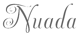
 His creations in 2008-2009: Lullius (2009, a blackletter named in honor of Ramon Llull (Palma de Mallorca, 1232-1316)), Dúctil (2009, sans family), Crespell (2008, a soft organic sans), Miona (2008, an award winning and stunning serif), Concu (2007, sans family), Lullius Rotunda (2009). In 2010, these fonts were added: Cintax (octagonal, modular), Lullius Textura, Lullius Borders, Moll (+Italic). The sans family Ductil was designed in 2011. In 2012, we find these new typefaces: Nuada (a chancery script), Lullius Textura Modula. Other typefaces include FernandezCoca, an informal script named after illustrator Antonio Fernández Coca. Unostiposduros page. Behance link. [Google]
[More] ⦿
|
Eko Setiawan
[Emyself Design]
|
 [More] ⦿
|
Elsner&Flake
|
 German type foundry in Hamburg established in 1986 by Veronika Elsner and Günther Flake. They offer original fonts as well as improved versions of classical fonts. There are many non-Latin fonts as well. In-house designers include Jessica Hoppe (Carpediem), Verena Gerlach (Aranea), Petra Beisse (Petras Script), Uwe Melichar, Manuela Frahm (Fritz Dittert), Ralf Borowiak, Lisa von Paczkowski, and Achaz Reuss.
 Additions in 2005 include the dingbat typefaces Beautilities EF Alpha, Ornamental Rules EF, Diavolo Rules EF, Squares EF (Alpha, Beta and Gamma), Topographicals EF Alpha, Typoflorals EF Alpha, Typographicals EF Alpha, Typomix EF Alpha, Typosigns EF Alpha, Typospecs EF Alpha and Beta (which have several fists), Typostuff EF Alpha, Diavolo EF, Schablone EF, Gigant EF, Maloni EF, OCRA EF, EF Unovis (a 16-weight family inspired by Quadrat). In the hand-printed category, let us mention Filzerhand. Their blackletter collection includes some bastardas (Alte Schwabacher, Lucida Blackletter), some frakturs (Fraktur, Fette Fraktur EF, Justus Fraktur, NeueLutherscheFraktur, Walbaum-Fraktur), some rotundas (Weiss-Rundgotisch), and some texturas (Gotisch, Old English). Commissioned fonts include Castrol Sans (2007). Selected additional typefaces: Garamond Rough Pro (2018), Bluset Now Mono (2018), Newspoint (2017, based on Morris Fuller Benton's News Gothic), Meier Kapitalis (2013, a lapidary typeface based on a 1994 sketch by Hans Eduard Meier in his book Die Schriftentwicklung), Gillies Gothic EF (after William S. Gillies's 1935 original), EF Medieva, Bank Sans Caps EF, Metropolitain (1985) (after a 1905 art nouveau typeface by Fonderie Berthier). Fonts4ever link (2008). Listing at Fontworks. Future events schedule. New fonts. List of their fonts. Catalog of their typefaces [large web page warning]. See also here. [Google]
[MyFonts]
[More] ⦿
|
Emil Rudolf Weiß
|
 German typographer, graphic artist, book artist, painter, type designer, poet and teacher, b. 1875, Lahr, d. 1942, Meersburg. His typefaces include
 - Weiss Roman (1926). Digital versions include one at Adobe.
- Weiss-Fraktur (1909). This was commercialized in 1913 by Bauersche Giesserei. Digital versions: Weiss Fraktur (2004, Petra Heidorn and Manfred Klein), Emilia Fraktur (2021, Ralph Unger).
- Weiss-Fraktur Kursiv (1923-1924, Bauer).
- Weiss Antiqua (1928). Digital versions: W 690 Roman (SoftMaker), Emilia (2016, Ralph Unger), Weiss Antiqua (URW). In 2019, Rutherford Craze did his own revival.
- Weiss Lapidar mager (1931). Revived as Weiss Lapidar in 2002 by Dieter Steffmann.
- Neue Weiss-Fraktur (1935).
- Lichte Initialen (1935). Revived by Manfred Klein in 2005 as WeissGotnitials.
- Weiss-Gotisch (1936). A Textura typeface at Bauer, revived by Petra Heidorn in 2004 under the same name, by Delbanco as DS-Weiss-Gotisch, and by Ralph Unger as Emilia Gotisch in 2016.
- Weiss-Kapitale (1931).
- Weiss-Rundgotisch (1937, Bauer). Digitized by Fraktur.de, Nick Curtis (as Garmisch Rund NF, 2009), Elsner and Flake (as Weiss Rundgotisch), and Softmaker (as Gothic).
- Weiss Rundgotisch Inititalen (1939), at the Bauersche Giesserei.
- Rundgotisch and Uhlen Rundgotisch (1937), at Hansestadt Letter Foundry. Uhlen Rundgotisch became a Monotype font in 1938.
- Weiß Initials (Series I, II, II Bold, III), the 1920's. Digital versions: Wellsbrook Initials SG (2004, Spiece Graphics), URW Weiss Titling, and Quadrivium NF (Nick Curtis).
In 2011, Gerald Cinamon published E.R. Weiss: The Typography of an Artist (Oldham: Incline Press). Bio at Linotype, and at DdS. Footnote: Many textbooks incorrectly credit Weiss with Memphis (Stempel, 1929)---these include Mac McGrew, Rookledge, and Jaspert&Berry. Memphis was made by Rudolf Wolf. View Emil Rudolf Weiss's typefaces. Klingspor link. FontShop link. [Google]
[MyFonts]
[More] ⦿
|
Emyself Design
[Eko Setiawan]
|
 Denpasar, Bali-based designer of the connected script typefaces San Joaquin (2018), Lightober (2018), Lakeland (brush font), Winterskol (2018: formal calligraphy), Lofinight (2018), Faithless (2018: font duo), Anaheim Script (2018: free), Neira (2018) and Senja (2018), and the handcrafted typefaces Windasa (2018), Sarada (2018, a slab serif), Inku (2018, a slab serif) and Shinigami (2018: a haunting brush font). He also designed the blackletter typeface Fullerton (2018), the font duo Ourense (2018) and the flared terminal typeface Queenstown (2018).
 Typefaces from 2019: Kurashiki Brush, Yerington, De Ginkgo (a stylish serif), San Francisco (font duo), Blue Lagoon (a bold sans and a glitch style called Wave), Sunset Road (a rounded blackletter), Alma Toran (a rotunda), Furano Gyo (a condensed slab serif), Furano (a condensed serif), Desuka Slab, Reschensee (a Speedball font), Swampcity, Novodevichi (Russian emulation font), Bielefeld (blackletter). Typefaces from 2020: ED Vitinia (blackletter), ED Ashglen Script, ED Northridge Sans (a 9-style sans), ED Lithosphere (a fashion mag serif), Candytuft (a thorny-serifed typeface), Bielefeld Next (blackletter), Black Orchid (blackletter), Balsamine Script, Lungwort (a text typeface), ED Celandine (blackletter), Cyrene Sans, Point Dume (a font duo), The Broads (a roman family), Failynn (thorny-serifed), Washboard (condensed), Fullerton Next (blackletter), Palmdale (a smooth script), Corbyn, Corbyn Serif (7 styles), Baliem (a blackletter), Kudoes, Logrono (a brush script), Silverdale, Pink Coast, Francoeur, Rosinweed, Nevers, Golden Cape. Typefaces from 2021: ED Phoebe, ED Lavonia (a stylish calligraphic script), ED Muglins (a display serif), ED Bienova, (a condensed display serif), ED Bedivere (a 10-style sans), ED Begonia (a blackletter with flower petal terminals and a jogging capital K), ED Cerfoglio (a serif), ED Daffodil (a Schwabacher with smooth edges), ED Faliraki (a modern gothic), ED Vacaville Script, ED Fettle, ED Ocher, ED Fettle Serif (10 styles), ED Morrigan (blackletter), ED Randgrid (a display serif), ED Sonar (a cursive typeface), ED Eklutna (a didone display serif with Q-tip terminals), ED Muskrat, ED Brigid (Celtic, uncial), ED Cretheus (a display serif), ED Fayetteville Script (calligraphic), ED Floriane Serif. Typefaces from 2022: Type department link. [Google]
[More] ⦿
|
Erhardt Ratdolt
|
Augsburg-born printer (1447-1527). A master printer and type designer, he worked from ca. 1474 until ca. 1486 in Venice, where he printed many fine books. Ratdolt returned home and produced the first printer's type specimens sheet with a beautiful decorative initial and 15 different fonts to announce the occasion. He had the first type specimens sheet in the world, showing rotunda, roman and Greek typefaces in various sizes (date: 1486). Ratdolt specialized in missals, liturgical works, calendars, astronomical, astrological, and mathematical subjects, and often included masterful diagrams to illustrate the text. In 1482, he printed Euclid's Elements of Geometry, which became William Morris's reference source for his "while-wine" decorative borders. Erhard Ratdolt died in 1527 or 1528. See DS Ratdolt-Rotunda (Delbanco), a digital version based on a 1989 design by Wolfgang Hendlmeier in 1989. Type sample. Bio by Nicholas Fabian. See also here. [Google]
[MyFonts]
[More] ⦿
|
Farkas Zsuzsanna Gaia
|
Budapest-based artist and student, b. 1990. Creator of some rotunda alphabets in 2011. [Google]
[More] ⦿
|
Fontscape: Blackletter
|
Fontscape shows many font examples in each of these blackletter categories: - Bastarda (in German: Schwabacher): based on cursive writing. It is typified by an 'o' which is pointed at the top and bottom.
- Fraktur, the most common form, with o's that are D-shaped.
- Textura (in German: Gotisch; also: Old English): An angular family of blackletter type, characterised by a hexagonal 'o'.
- Rotunda (in German: Rundgotisch): the Italian version of Textura blackletter type, called Rundgotisch in German, typified by a smooth circular 'o'.
[Google]
[More] ⦿
|
Fontscape: Rotunda
|
Commercial Rotunda fonts listed at Fontscape: Weiss Rundgotisch, Cresci Rotunda, San Marco (Adobe). [Google]
[More] ⦿
|
Fraktur.de
[Markwart Lindenthal]
|
Wonderful new foundry run by Friedemann, Volker and Markwart Lindenthal, and specializing in redigitizations of Fraktur fonts. Fonts: Gilgengart (Hermann Zapf, 1938), Gutenberg-Bibelschrift, Jaguar, Legende, Mainzer Fraktur (Carl Albert Fahrenwaldt, 1901), Post Fraktur (Herbert Post, 1933-1935), Rhapsodie (Ilse Schüle at Ludwig&Mayer, 1949-1951), Thannhaeuser Fraktur (Mager, magere Zierversalien, Schmalfett and Halbfett) (Herbert Thannhaeuser, 1937-1938), Wallau (Rudolf Koch, 1926-1934), Weber Mainzer, Weiss Rundgotisch (Emil Rudolf Weiß, 1937), Wilhelm Klingspor Schrift (Rudolf Koch, 1926), Zentenar Fraktur (Friedrich Hermann Ernst Schneidler, 1937-1938). There were plans to digitize Werbedeutsch and HermannGotik. Alternate URL. Yet another URL. [Google]
[More] ⦿
|
Fredrick R. Brennan
[Copypaste]
|
 [More] ⦿
|
Gabriel Martinez Meave
[Kimera Type (was: Diseño Kimera)]
|
 [MyFonts]
[More] ⦿
[MyFonts]
[More] ⦿
|
Gebrochene Schriften
|
Proposed classification of blackletter typefaces. Main page, by Bernhard Schnelle. He has: - Xa Gotisch. Examples: Bamberg, Belwe Gotisch, Caslon-Gotisch, Cloister Black, Fette Gotisch, Ganz Grobe Gotisch, Goudy-Text, Manuskript-Gotisch, Maximilian, Sebaldus-Gotisch, Trump-Deutsch, Weiß-Gotisch Wilhelm-Klingspor-Gotisch.
- Xb Rundgotisch. Examples: Gotico, Kühne-Schrift, San Marco, Uhlen-Rundgotisch, Wallau, Weiß-Rundgotisch.
- Xc Schwabacher. Examples: Alte Schwabacher, Ehmcke-Schwabacher, Neue Schwabacher, Nürnberger Schwabacher, Rediviva, Renata-Schwabacher.
- Xd Fraktur. Examples: Amts-Fraktur, Breitkopf-Fraktur, Fette Fraktur, Fichte-Fraktur, Humboldt-Fraktur, König-Type, Luthersche Fraktur, Mainzer Fraktur, Poppl-Fraktur, Thannhaeuser-Fraktur, Unger-Fraktur, Walbaum-Fraktur, Wieynk-Fraktur, Wittenberger Fraktur (Monotype, 1904 or 1906; Adobe's digital Wittenberger Fraktur), Zentenar-Fraktur.
- Xe Fraktur-Varianten. Examples: Claudius, Engravers Text, Fette Deutsche Schrift (Koch), Fette Kanzlei, Hermann-Gotisch, Hölderlin-Fraktur, London Text (Blackletter 686), Post-Fraktur, Rhapsodie, Wedding Text (Blackletter 681).
[Google]
[More] ⦿
|
George Williams
|
 George Williams's site (now defunct) site was a discovery! George Williams (b. 1959) wrote spline-generating code and then went on to produce several fonts with his software between 1987 and 1998:
 - Art nouveau style: Carmen, Ambrosia (1989), Fantaisie Artistique, Baldur, Monopol, Parisian, Peignot, Bocklin, Edda.
- Lombardic: Lombardic.
- Victorian: Caprice, Ringlet.
- Uncial: Uncial Animals, Roman Uncial Modern.
- Ornamental caps: Versal, Decorative, Square Caps, Extravagant Capitals, Floral Caps, Morris, Andrade.
- Display typefaces: Crystal, Flash, Cupola, Santa Barbara Streets (2013-2014; after the street signs in Santa Barbara, CA).
- Blackletter: Rotunda (1998), Bastarda, Textura Modern, Fractur (a remake of Wittenbach).
- Art deco: Piccadilly, Mirage (1999, prismatic).
- Calligraphic: Humanistic.
- Text: Caslon.
- Slab: Monospace.
- Sans: Caliban.
- Bamboo Gothic (2007).
- TIS620-2529 (a Thai font).
George Williams writes: I have been slowly working to provide free unicode postscript fonts for the three major groupings of styles used by European (Latin, Greek and Cyrillic anyway) type designs: serif, sans-serif and typewriter (or Times, Helvetica and Courier). Monospace is my approximation to Courier. Close examination will reveal that it is a bad copy of courier. Caslon Roman (1992-2001) is a serif font (designed by William Caslon in 1734), it's not a bad copy of Times, it's a bad copy of something else. Caliban is a bad copy of Helvetica. If Microsoft can call their version of Helvetica Arial, then Caliban seems appropriate for mine. Yet another URL. George Williams is best known as the inventor and creator of FontForge, the biggest and best free font editor today. It made him the darling of the Open Software community. Interview with OSP. Fontspace link. Dafont link. Abstract Fonts link. [Google]
[More] ⦿
|
Gerda Delbanco
[Delbanco-Frakturschriften]
|
 [More] ⦿
|
Gerhard Helzel
|
 Diplom Engineer, turned type designer and painter, b. Pößneck, DDR, 1948, d. Hamburg, 2025. In 1991, he started digitizing blackletter fonts and offered them for sale on his website. In his last digital leaflet, dated September 2022, he showcased 531 predominantly blackletter fonts, which would make Helzel the leading provider of blackletter fonts in the world. He was involved in the Bund für Deutsche Schrift und Sprache. Twice annualy, Helzel republished the 1939 suspended newspaper Hamburger Nachrichten in blackletter typesetting featuring modern local news.
 Around 1953, Helzel's parents moved to Ludwigshafen in then West Germany, where Gerhard went to primary and high school. He went on to study electrical engineering in Karlsruhe (Diplomingenieur). After moving to Hamburg, he studied Latin and Greek and became interested in art. He lived from private lessons for grammar school students. Helzel led a modest life as he invested most of his earnings in books, painting materials and technical equipment. He lived alone in a small flat in the north of Hamburg. Helzel was the designer at Delbanco-Frakturschriften of DS-DtWerkschrift (1997), DS-Fruehling (1996), DS-MaximilianGotisch (1994), DS-MaximilianTitel (1994), DS-Post-Fraktur (1997). He hand-digitized over 200 blackletter fonts, including: - BreitkopfInitialen (2000). Breitkopf Fraktur was made in the 18th century.
- ElementSchmalfett (1998). Element is a modern Textura by Max Bittrof (1933, Bauersche Giesserei).
- Fichte Fraktur, after M. Tiemann, 1934.
- GotenburgA and GotenburgB (1998-2000). Gotenburg was originally designed by Friedrich Heinrichsen (1935-37, Stempel AG).
- HamburgerDruckschriftFett (1996). Hamburger Druckschrift is due to Friedrich Bauer (1904, Genzsch&Heyse). According to "Blackletter: Type and National Identity", Hamburger Druckschrift "is an accomplished entry in this category of hybrid typefaces made before the 1st World War. They work within the black-letter tradition while borrowing lighter weight, softer curves and more open proportions from roman. Bauer maintained the structure of broken script, but subdued any flourishes. The width of his letters are generally wider than in traditional frakturs and, as in Jugendstil hybrids, some lowercase letterforms are modernized." It has been used as headliner for "Hamburger Nachrichten" which was stopped by the Nazis in 1939. Today's "Hamburger Abendblatt", the daily Hamburg Times, is still using it as headliner.
- Humboldt Fraktur (2000, gross and klein). Humboldt Fraktur was made originally by Hiero Rhode (1938, Stempel AG).
- KochFrakturSchmaleHalbfette (2000). This font is due to Rudolf Koch (1910-1921, Gebr. Klingspor), and was originally named Deutsche Schrift. Digitized in 1998.
- Mainzer Fraktur. After an original in 1901 by Carl Albert Fahrenwaldt.
- Mars Fraktur (1995, free family).
- RatdoltRotunda (1998). Named after Erhard Ratdolt (1443-1528), typesetter. Designed by Wolfgang Hendlmeier in 1989. Available at Delbanco. Tannenber (after E. Meyer, 1934).
- Weber Fraktur.
- WieynckGotischLicht (2001). A font by by Heinrich Wieynck (1926, Schriftguss Dresden), inspired by William Morris' work.
Helzel also offers a free "Frakturconverter" program for Windows which transforms Antiqua fonts into Fraktur fonts. List of his fonts as of 2009: (Anker-)Schul-Fraktur, Accidenz-Gotisch, Akzidenz-Gotisch, Aldine, Albion-Gotisch, Alt-Fraktur, Alt-Gotisch (Bradley), Alt-Deutsch (after Ferdinand Theinhardt, 1851), Alte Münchner Fraktur (after a 1850 typeface by Gustav Lorenz), Alte deutsche Schreibschrift, Alte Schwabacher, Amts-Fraktur (after Heinrich Wilhelm Hoffmeister), Andreae Fraktur, Andreas-Schrift, Angelsächsisch, Angelsächsisch, Verzierte, Antike Gotisch, Aramäische Quadratschrift, Astra, Bastard, Bernhard-Fraktur, Bismarck-Gotisch, Breite deutsche Anzeigenschrift, Breite Kanzlei, Breitkopf-Fraktur, Britannia (Alt-Gotisch), Büxenstein-Antiqua, Büxenstein-Fraktur (after a house style at D. Stempel, 1912), Canzlei, Caxton, Caxton-Type, Claudius, Courante Gotisch, Danziger Fraktur (after A. W. Kafemann), Derby, Deutsche Reichsschrift (after a 1910 typeface by Wilhelm Woellmer), Deutsche Schrägschrift, Deutsche Schreibschrift (Bismarck-Zeit and Goethe-Zeit: school fonts), Deutsche Schrift, Deutsche Werkschrift, Deutsche Zierschrift, Deutsch-Gotisch, Deutschland, Dresdner Amts-Fraktur, Eckmann-Schrift, Einfache Kanzlei, Elegant, Element, Enge Gotisch (2008, after an 1880 font by Bauersche Giesserei), Enge moderne Kanzlei, Enge König-Type, Enge Kanzlei, Englische Antiqua, Faust-Fraktur, Fette Gotisch, Fette Schwabacher, Fichte-Fraktur, Fractur, Französische Antiqua, Frühling-Fraktur (1997, after Koch's original from 1917), Garamond-Antiqua, Genzsch-Antiqua, Germanen-Fraktur (this is the same as Stempel's Normannia from 1905), Germanisch, Goethe-Fraktur (after Wilheml Woelmmer), Gotenburg, Graeca, Gronau-Gotisch (after Heinrich Ehlert, 1850), Gursch-Fraktur, Gutenberg-Fraktur, Gutenberg-Bibelschrift, Gutenberg-Gotisch, Haenel-Antiqua, Halbfette Aldine, Halbfette Kanzlei, Halbfette Normalfraktur, Halbfette Schwabacher-Flinsch, Halbfette Wallau, Hamburger Druckschrift, Hamburger Fraktur, Hamburger Schwabacher, Hammonia-Gotisch, Hansa-Fraktur, Hansa-Gotisch (after a Genzsch & Heyse original), Hebräisch, Hellenistische Antiqua "Graeca", Hölderlin (after Eugen Weiss, 1937), Holländische Gotisch, Hoyer-Fraktur, Humboldt-Fraktur, Hupp-Fraktur, Ideal-Fraktur, Jean-Paul-Fraktur, Jubiläumsfraktur, Kaiser-Gotisch, Kanzlei, Karl-May-Fehsenfeld-Fraktur, (after a 1870 font used in the Karl-May books) Karl-May-Radebeul (after a 1890 font used in the Karl-May books), Kirchengotisch, Moderne, Kleist-Fraktur, Kleukens-Fraktur, Koch-Antiqua, Koch-Fraktur, König-Fraktur G14, König-Type, Kühne-Gotisch, Kühne-Schrift, Kurante Gotisch, Kurmark, Lichte National, Liebing-Type, Liturgisch (after Otto Hupp, 1906), Logos, Ludlow-Wartburg-Fraktur (after Ludlow, ca. 1920), Magere Wallau, Mainzer Fraktur, Manuskript-Gotisch, Mars-Fraktur, Maximilian-Gotisch, Mediaeval-Gotisch, Leipziger Altfraktur (after a 1912 typeface by Carl Kloberg), Midoline (after Jean Midolle's typeface from 1840 at Julius Klinkhardt), Moderne Kanzlei, Moderne Kirchen-Gotisch (based on an original from ca. 1880), Mönchs-Gotisch, Morris-Gotisch (Uncial-Gotisch, Unzial-Gotisch, after Emil Gursch), Münster-Gotisch, Neu-Gotisch klein, Neudeutsch(-Hupp), Neue (moderne) Fraktur, Neue Schwabacher, Nordisch-Antiqua, Normal-Fraktur (1999, after the font by Gustav Schelter, 1835), Normannia-Fraktur, Nürnberg, Offenbach, Post-Fraktur, Psalter-Gotisch, Ratdolt-Rotunda, Reklame-Fraktur halbfett, Renaissance-Fraktur, Renaissance-Kanzlei, Renata (after a Schwabacher of the Bauersche Giesserei, 1914), Richard-Wagner-Fraktur, Romeo Fraktur (2009, after a Stempel font from 1910), Rundgotisch, Russisch-Römisch, Salzmann-Fraktur, Schmale Accidenz-Gotisch, Schmale Haas-Gotisch, Schmale halbfette Fraktur, Schmale halbfette Gotisch, Schneidler-Schwabacher, Schraffierte Gotisch "Stella", Schreibschrift, Schul-Fraktur, Schwabacher, Schwabacher Mager Gross (after Albert Anklam, 1876), Sonderdruck-Antiqua (2008, after a 1913 typeface by Deberny and Peignot), Stahl (2007, after a 1937 typeface by Hans Kühne), Stahl Kursiv (2009, after Hans Kühne), Stella, Stempel-Fraktur, Straßburg (a blackletter based on fter H type by H. Berthold, 1926), Tannenberg, Thannhaeuser-Fraktur, Tiemann-Fraktur, Tiemann-Gotisch, Tiemann-Mediaeval, Unger-Fraktur, Verzierte Angelsächsisch, Verzierte Musirte Gotisch, Victoria-Gotisch (Viktoria-Gotisch), Wallau, Wartburg-Fraktur, Weber-Fraktur, Weiß-Fraktur, Werkschrift Germanisch, Wieynck-Gotisch, Wilhelm-Klingspor-Gotisch, Wohe-Kursive (after Wolgang Hendlmeier, 1988), Wohe Textura (2009, after Wolfgang Hendlmeier), Zeitungs-Fraktur, Zeitungs-Schwabacher (halbfette Neue Zeitungs-Schwabacher, to be more precise---based on a 1900 typeface by Pustet), Zentenar-Buchschrift. Catalog from 1996. Article in 1995 by him on Normal Fraktur. Another catalog, in pieces: I, II, III, IV, V, VI, VII, VIII. Antiqua catalog. Three free blackletter fonts. I would like to thank Wolfgang Hendlmeier and Harald Süß for providing additional information about the Gerhard Helzel's life. [Google]
[More] ⦿
|
Gilles Le Corre
[GLC --- Gilles Le Corre]
|
 [MyFonts]
[More] ⦿
[MyFonts]
[More] ⦿
|
Giraldo Fernandes de Prado
|
Or Giraldo del Prado (b. ca. 1535, d. Almada, 1592). Paulo Heitlinger writes about him in Cadernos vol. 16, 2010. De Prado was a painter, and acted as the calligrapher of the Teodosio II, the duke of Bragança. His home was in Guimaraes, but from 1580 on he lived in Almada. Author of the writing manual Caderno manuscrito de Caligrafia (1560, Lisbon). He seems to have been the first calligraphy specialist in Portugal. Heitlinger used Prado's examples to make his Lomabardian typeface Uncialis in 2009. Scans: Geometrically formed letters, Chancery hand (1560-1561), Another chancery hand (same year), And another one, Gotica rotunda (1560-1561). [Google]
[More] ⦿
|
Gisele Maiotte
|
During her graphic design studies in Sao Paulo, Gisele Maiotte created the decorative blackletter typefaces Celta (2014), Gotica (2014) and Gotica Rotunda (2014). [Google]
[More] ⦿
|
GLC --- Gilles Le Corre
[Gilles Le Corre]
|
 French painter born in Nantes in 1950, who lives in Talmont St Hilaire. His fonts include 2010 Cancellaresca Recens (inspired by a chancery type of Francisco Lucas from the late 16th century), 2009 Handymade (comic book style), 2009 Lollipop (chancery style), 2009 GLC Plantin, 2009 Primitive (2009, a rough-edged roman script), 2008 Script 2 (2008), GLC Ornaments One (2008) and 2008 Xmas Fantasy (2008: blackletter). In 2008, he started GLC -- Gilles Le Corre and became commercial. Creative Market link. He is best known for his historic revivals:
 - 161 Vergilius (2010)
- 750 Latin Uncial (2010): inspired by the Latin script used in European monasteries from circa 5th to 8th, before the Carolingian style took over. The uppercases were mainly inspired by a 700's manuscript from Fécamp's abbey in France.
- 799 Insular (2010): inspired by the so-called insular style of Latin script that was used in Celtic monasteries from about 600 until 820.
- 825 Karolus (2009), and 825 Lettrines Karolus (2009).
- 1066 Hastings (2009).
- 1350 Primitive Russian (2012) was inspired by a Russian Cyrillic hand of Russkaja Pravda. It has rough-edged Latin charaters and many old Russian glyphs.
- 1420 Gothic Script (2008).
- 1431 Humane Niccoli (2010), after writings of Florence-based calligrapher Niccolo Niccoli (1364-1437).
- 1456 Gutenberg (2008, based on a scan of an old text). Followed by 1456 Gutenberg B42 Pro, which was based on the so called B42 character set used for the two Gutenberg Latin Bibles (42 and 36 lines).
- 1462 Bamberg (2008).
- 1467 Pannartz Latin (2009): inspired by the edition De Civitate Dei (by Sanctus Augustinus) printed in 1467 in Subiaco by Konrad Sweynheym and Arnold Pannartz, who was the punchcutter.
- 1470 Sorbonne (2010) was inspired by the first French cast font, for the Sorbonne University printing shop. The characters were drawn by Jean Heynlin, rector of the university based on examples by Pannartz. It is likely that the cutter was Adolf Rusch.
- 1470 Jenson-SemiBold (2008).
- 1475 BastardeManual (2008, inspired by the type called Bastarde Flamande, a book entitled Histoire Romaine (by Titus Livius), translated in French by Pierre Bersuire ca. 1475, was the main source for drawing the lower case characters).
- 1479 Caxton Initials (2009): inspired by the two blackletter fonts used by the famous William Caxton in Westminster (UK) in the late 1400s.
- 1483 Rotunda Lyon (2010): inspired by a Venetian rotunda found in a 1483 book called Eneide printed in Lyon by Barthélémy Buatier (from Lyon) and Guillaume Le Roy (from Liège, Belgium).
- 1484 Bastarda Loudeac (2008).
- 1470 Jenson Latin (2009), inspired by the pure Jenson set of fonts used in Venice to print De preparatio evangelica in 1470.
- 1491 Cancellarasca Normal and Formata (2009): inspired by the very well known humanist script called Cancellaresca. This variant, Formata, was used by many calligraphers in the late 1400s, especially by Tagliente, whose work was mainly used for this font.
- 1492 Quadrata (2008).
- 1495 Lombardes (2008): a redrawn set of Lombardic types, which were used in Lyon by printers such as Mathias Huss, Martin Havard or Jean Real, from the end of 14OOs to the middle of 1500s.
- 1495 Bastarde Lyon (2008, based on the font used in the "Conte de Griseldis" by Petrarque).
- 1499 Alde Manuce Pro (2010): inspired by the roman font used by Aldus Manutius in Venice (1499) to print Hypnerotomachia Poliphili, the well-known book attributed to Francesco Colonna. Francesco Griffo was the punchcutter. The Italic style, carved by Francesco Colonna, illustrates the so-called Aldine style.
- 1509 Leyden (2008; a Lombardic typeface inspired by the type used in Leyden by Jan Seversz to print Breviores elegantioresque epistolae).
- 1510 Nancy (2008, decorated initial letters was inspired by those used in 1510 in Nancy (France, Lorraine) for printing of Recueil ou croniques des hystoires des royaulmes d'Austrasie ou France orientale[...] by Symphorien Champion; unknown printer).
- 1512 Initials.
- 1514 Paris Verand (based on initial caps that Barthélémy Verand employed for the printing of Triumphus translatez de langage Tuscan en François.
- 1522 Vicentino (2011). Based on Ludovico Vicentino Arrighi's 1522 typeface published in La Operina.
- GLC 1523 Holbein (2010, after Hans Holbein's Alphabet of Death.
- GLC 1525 Durer Initials (2010). Sample R.
- 1529 Champ Fleury Pro and 1529 Champ Fleury Initials (2010): based on Geofroy Tory's original drawings and text face.
- 1532 Bastarde Lyon (2008, based on work by an anonymous printer in Lyon (France) to print the French popular novel Les Grandes et inestimables Chroniques du grand et enorme geant Gargantua).
- 1533 GLC Augereau Pro: inspired by one of Antoine Augereau's three roman typefaces: the Gros Romain size, used in 1533 to print Le miroir de l'&aciorc;me..., a poetic compilation by Marguerite de Navarre, sister of the French king François I.
- 1534 Fraktur (2009; inspired by the early Fraktur style font used circa 1530 by Jacob Otther, printer in Strasbourg (Alsace-France) for German language printed books).
- 1536 Civilité manual (2011). Based on a handwritten copy of Brief story of the second journey in Canada (1535) by French explorer Jacques Cartier.
- 1538 Schwabacher (2008, based on a font used by Georg Rhan in Wittemberg (Germany) to print Des Babsts Hercules [...], a German pamphlet against roman catholicism written by Johannes Kymeus).
- 1540 Mercator Script was inspired by an alphabet of Gerardus Mercator, who is known for his maps as well as his Literarum Latinarum, quas Italicas cursoriasque vocant, scribendarum ratio (1540).
- 1543 Humane Petreius (2012) was inspired by the typeface used in Nuremberg by Johannes Petreius for De Revolutionibus Orbium Coelestium, the well-known mathematical and astronomical essay by Nicolas Copernicus.
- 1543 German Deluxe (2009): a Schwabacher inspired by the sets of fonts used in 1543 by Michael Isengrin, printer in Basel, to print New Kreüterbuch, which is a book with numerous nice pictures, the masterpiece of Leonhart Fuchs, father of the modern botany.
- 1543 HumaneJenson-Bold (2008, after the typeface used in Vesalius' 1543 book De humani corporis fabrica).
- 1543 HumaneJenson-Normal (2008, same source).
- 1545 Faucheur (2011) is a rough garalde typeface that was inspired by the set of fonts used in Paris by Ponce Rosset, aka Faucheur, to print the story of the second travel to Canada by Jacques Cartier, first edition, printed in 1545.
- 1546 Poliphile (2009), inspired by the French edition of Hypnerotomachie de Poliphile ("The Strife of Love in a Dream") attributed to Francesco Colonna, 1467, and printed in 1546 in Paris by Jacques Kerver.
- 1550 Arabesques (2008, caps).
- 1557 Civilité Granjon (2010).
- 1557 Italique (2008, based on Italic type used by Jean de Tournes in Lyon to print La métamorphose d'Ovide figurée).
- 1565 Renaissance (2010), inspired by French renaissance decorated letters.
- 1565 Venetian Normal (2008, initial decorated letters that are entirely original, but were inspired by Italian renaissance engraver Vespasiano Amphiareo's patterns published in Venice ca. 1568).
- 1584 Rinceau (2008, a set of initial letters is an entirely original creation, inspired by French renaissance patterns used by Bordeaux printers circa 1580-1590).
- 1584 Pragmatica Lima (2011). Based on fonts used in 1584 by Antonio Ricardo to produce the first publication ever printed in Southern America.
- 1585 Flowery (2009): inspired by French renaissance decorated letters.
- 1589 Humane Bordeaux (2008, inspired by the Garamond fonts used by S. Millanges (imprimeur ordinaire du Roy) in Bordeaux ca. 1580-1590. The alphabets were used to reprint L'instruction des curés by Jean Gerson).
- 1590 Humane Warszawa is a rough-edged garalde typeface inspired by a font carved circa 1590 for a Polish editor.
- 1592 GLC Garamond (2008, inspired by the pure Garamond set of fonts used by Egenolff and Berner, German printers in Frankfurt, at the end of sixteen century. Considered the best and most complete set at the time. The italic style is Granjon's).
- 1610 Cancellaresca (2008, inspired by the Cancellaresca moderna type of 1610 by Francesco Periccioli who published it in Sienna).
- 1613 Basilius (2012) was based on the hand-drawn types used by Basilius Besler (Germany) for the carved plates of his botanical manual Hortus eystettensis.
- GLC 1619 Expédiée (2015). A grungy Civilté.
- 1621 GLC Pilgrims (2010).
- 1634 René Descartes (2009), based upon his handwriting in a letter to Mersenne.
- 1638 Civilité Manual (2010). Inspired by a French solicitor's document dated 1638.
- GLC 1648 Chancellerie (2011). Inspired by the hand-written 1648 Munster peace treaty signed by roi Louis XIV and Kaiser Ferdinand II.
- 1651 Alchemy (2010): a compilation created from a Garamond set in use in Paris circa 1651.
- GLC 1669 Elzevir (2011) was inspired by the font typefaces used in Amsterdam by Daniel Elzevir to print Tractatus de corde, the study of earth anatomy by Richard Lower, in 1669. The punchcutter was Kristoffel Van Dijk.
- GLC 1672 Isaac Newton (2012) is based on the hand of Isaac Newton.
- GLC Morden Map (2011). Based on an engraved typeface used on a pack of playing cards published by Sir Robert Morden in 1676.
- 1682 Writhed Hand: very irregular handwriting.
- 1689 GLC Garamond Pro (2010): inspired by Garamond fonts used in an edition of Remarques critiques sur les oeuvres d'Horace by DAEP, published in Paris by Deny Thierry and seprately by Claude Barbin.
- 1689 Almanach (2009): inspired by the eroded and tired fonts used by printers from the sixteenth century to the early years of twentieth for cheap or fleeting works, like almanacs, adverts, gazettes or popular novels.
- 1695 Captain Flynt.
- 16th Arabesques (2008, an exquisite ornamental caps scanfont).
- 1715 Jonathan Swift (2011). An example of the hand of Irish poet and novelist Jonathan Swift (1667-1745). It is a typical exemple of the British quill pen handwriting from about 1650-1720.
- GLC 1726 Real Espanola (2012). Based on the set of typefaces used by Francisco Del Hierro to print the first Spanish language Dictionary from the Spanish Royal Academy (Real Academia Española, Dictionario de Autoridades) in 1726. These transitional styles are said to have been the first set of official typefaces in Spain.
- 1741 Financiere (2009): inspired by the Fournier's font Financière. While it appears handwritten, it was in fact carved in 1741 by Pierre Simon Fournier le jeune and published in his Manuel Typographique in Paris (1764-1766).
- 1742 Frenchcivilite (2008).
- 1751 GLC Copperplate (2009), a 6-style family about which Gilles says: This family was inspired by an engraved plate from Diderot&Dalembert's Encyclopedia (1751), illustrating the chapter devoted to letter engraving techniques. The plate bears two engravers names: "Aubin" (may be one of the four St Aubin brothers?) and "Benard" (whose name is present below all plates of the Encyclopedia printed in Geneva). It seems to be a transitional type, but different from Fournier or Grandjean.
- 1756 Dutch (2011).
- 1776 Independence (inspired mainly from the font used by John Dunlap in the night of 1776 July 4th in Philadelphia to print the first 200 sheets of the Congress' Declaration of Independence establishing the United States of America).
- 1781 La Fayette (2010): a formal bâtarde coulée script with caitals inspired by Fournier (1781).
- 1785 GLC Baskerville (2011). Le Corre explains: The Baskerville's full collection was bought by the French editor and author Pierre-Augustin Caron de Beaumarchais who used it to print---in Switzerland---for the first time the complete work of Voltaire (best known as the Kehl edition, by the "Imprimerie de la société littéraire typographique"). We have used this edition, with exemplaries from 1785, to reconstruct this genuine historical two styles.
- 1786 GLC Fournier (2010), based on several books printed in Paris just before the Didot era set in. The Titling characters are based on hymns printed by Nicolas Chapart.
- 1790 Royal Printing (2009): inspired by various variants of Romain du Roy.
- 1791 Constitution (2011).
- 1792 La Marseillaise (2011). Based on the original manuscript of the French revolutionary song La Marseillaise which later became the French national hymn---it was composed in one night (April 25, 1792) by captain Rouget de Lisle.
- 1805 Austerlitz Script Light: a typical French handwriting style from that period, named after one of the few battles that Napoleon actually won.
- 1805 Jaeck Map (2011). Inspired by the engraved characters of a German map, edited in Berlin at the end of 1700s. The engraver was Carl Jaeck or Jaek (1763-1808).
- 1809 Homer (2011), a grungy typeface named after the "homer" message pigeons.
- 1815 Waterloo (2008): a handwriting typeface originating in Napoleon's government. Why do I feel that GLC is nostalgic for the era of Napoleon? Their own present dwarf-version of Napoleon is not exactly a huge success.
- 1820 Modern (2009) was inspired by a didone font used in Rennes by Cousin-Danelle, printers, for a Brittany travel guide.
- 1822 GLC Caslon (2010): inspired by a Caslon set used by an unknown Flemish printer from Bruges, in the beginning of 1800s, a little before the revival of the Caslon style in the 1840s.
- 1845 Mistress (2009): calligraphic script.
- 1848 Barricades Italic, a quill pen italic.
- 1859 Solferino (2009).
- 1863 Gettysburg (2008; inspired by a lot of autographs, notes and drafts, written by President Abraham Lincoln, mainly the Gettysburg address).
- 1864 GLC Monogram Initials (2011) was inspired by a French portfolio containing about two hundred examples of Chiffres---deux lettres, created for engravers and jewelers in Paris in 1864, and drawn by French engraver C. Demengeot.
- 1871 Victor Hugo (2011). Based on manuscripts from the final part of the life of Victor Hugo (1802-1885).
- 1871 Whitman Script (2008) and 1871 Dreamer Script (2008): inspired by manuscripts by American poet Walt Whitman. See also 1871 Dreamer 2 Pro (2012).
- 1880 Kurrentschrift (2010): German handwriting, based on late medieval cursive. It is also known as "Alte Deutsche schrift" ("Old German script"). This was taught in German schools until 1941.
- 1883 Fraktur (2009): inspired by fonts used by J. H. Geiger, printer in Lahr, Germany.
- 1885 Germinal: based on notes and drafts written by Émile Zola (1840-1902).
- GLC 1886 Romantic Initials (2012).
- 1890 Registers Script (2008): inspired by the French "ronde".
- 1890 Notice (2009): a fat didone family.
- 1902 Loïe Fuller (art nouveau face).
- 1906 Fantasio (2010): inspired by the hatched one used for the inner title and many headlines by the popular French satirical magazine Fantasio (1906-1948).
- 1906 French News: a weathered Clarendon-like family based on the fonts used by Le Petit Journal, a French newspaper that ran from 1863 until 1937.
- 1906 Fantasio Auriol (2010), inspired by the set of well known Auriol fonts used by the French popular satirical magazine Fantasio (1906-1948).
- 1906 Titrage (2009): a didone headline typeface from the same newspaper.
- Underwood 1913 (2007, an old typewriter font, whose commercial version is Typewriter 1913), and 1913 Typewriter Carbon (2008).
- 1920 French Script Pro (2010).
- 1920 My Toy Print Set, 1925 My Toy Print Deluxe Pro (2010): inspired by rubbert stamp toy print boxes called Le petoit imprimeur.
- 1968 GLC Graffiti (2009).
- 1917 Stencil (2009; with rough outlines).
- 2010 Dance of Death (2010): based on Hans Holbein's Alphabet of Death.
- 2009 Primitive (2016).
- 2009 GLC Plantin Pro (2016).
- 2010 Pipo Classic: a grungy typewriter slab serif family.
- 2010 Cancellaresca Recens (2016).
- 2011 Slimtype (2011, +Italic) and 2011 Slimtype Sans (2011): an old typewriter typeface.
Creative Market link. Fontspring link. [Google]
[MyFonts]
[More] ⦿
|
Gustav Mori
|
Type designer (1872-1950) who reconstructed Gutenberg-Textura (1928, Stempel). In 1916, he published a book on the Frankfurt-based foundry of Benjamin Krebs, Nachfolger, Die Schriftgiesserei Benjamin Krebs Nachf., Frankfurt a.M. Ein Beitrag zur Geschichte des Frankfurter Schriftgiesser-Gewerbes. Die Hochdeutschen Schriften aus dem 15ten bis zum 19ten Jahrhundert der Schriftgiesserei und Druckerei was published in 1919 at Elsevier. [Google]
[More] ⦿
|
Hans Vollenweider
|
German type designer (1888-1954). Designer of Rotunda (1948, Johannes Presse; with Walter Schneider; based on the 15th century type Rotunda). [Google]
[More] ⦿
|
Hansestadt Letter Foundry
|
 Foundry which produced typefaces like Sachsenwald (1937, Berthold Wolpe), Rundgotisch and Uhlen Rundgotisch (1937, both by Emil Rudolf Weiss). [Google]
[More] ⦿
Foundry which produced typefaces like Sachsenwald (1937, Berthold Wolpe), Rundgotisch and Uhlen Rundgotisch (1937, both by Emil Rudolf Weiss). [Google]
[More] ⦿
|
Heinrich Wallau
|
German printer, b. 1852, Mainz, d. 1925, Zwingelberg. Author of Aesthetik der Druckschrift, which served as a motivation and example for Rudolf Koch, when Koch designed his Wallau blackletter family starting in 1924. This project lasted until 1936, with the rotunda or Rundgotisch typefaces magere Wallau (1931-1933), fette Wallau (1933-1934), Schmale Wallau (1933-1934), and halbfette Wallau (1933-1936). There were also various Versalien (Antiqua-Versalien, Fraktur-Versalien and Schmuck-Versalien) along the way. [The link leads to a short bio by Wolfgang Hendlmeier, written in 1987.] Digital versions of Wallau include RMU Wallau (2019, Ralph M. Unger), Wallau No1 Pro, Wallau No2 Pro by SoftMaker, Alter Littera's Wallau (2012), Wallau (1996, by Delbanco; called Wal at PrimaFont), Wallau (by Gerhard Helzel), DS Wallau (Dieter Steffmann), Wallaby (SoftMaker), and the 2002 series WallauDeutsch-Bold, WallauRundgotisch-Heavy, WallauRundgotischOsF-Heavy, WallauUnzial-Bold and WallauZierBold (2002) by Dieter Steffmann. [Google]
[More] ⦿
|
HiH (Hand in Hand)
[Tom Wallace]
|
 Tom Wallace's foundry, HiH (est. 2005), was first located in Woodbridge, CT. Subsequently, Tom Wallace (b. 1944) moved from Woodbridge to Naugatuck to Waterbury and finally in 2009 to New Britain, CT. His type designs are based on historical letterforms:
 - Augsburger Initialen and Augsburger Schrift (2001), an art nouveau pair found in Ludwig Petzendorfer's Treasury of authentic art nouveau alphabets, decorative initials, monograms, frames and ornaments (1984, Dover). Augsburger Schrift is originally due to Peter Schnorr (1901, Berthold). In 2007, Wallace added Augsburger Ornamente.
- Figgins Tuscan (2005) is based on the first metal Tuscan typeface by Figgins in 1817.
- Freak, based on Bamboo (1889, The Great Western Type Foundry). HiH explains: Great Western became Barnhart Brothers & Spindler in 1868. At some point, prior to 1925, Freak was renamed Bamboo by BB&S. It was delisted when BB&S was absorbed by ATF in 1929. Compare with Dan Solo's Bamboo (2004).
- Gradl Initialen (2005): based on caps designed by Max Joseph Gradl ca. 1900 for engraving on his art nouveau jewelry in Germany. Samples are in Petzendorfer.
- Huxley Alt (2005), an alternative to the ultra-condensed Lutherian church font Huxley Vertical (or Aldous Vertical) by Walter Huxley (ATF). Huxley Amore (2006) is a major extension of this, and Huxley Cyrillic (2008) adds Russian characters.
- Künstler Grotesk (2005): a simple blackletter caps typeface based on a design seen in Petzendorfer's book.
- Page No. 508 (2006): Page No. 508 was designed by William H. Page in 1887 as one of a series of designs for die-cut wood types for the firm of Page & Setchell of Norwich, CT. Page & Setchell was the successor to The William H. Page Wood Type Company and was sold to the Hamilton Manufacturing Company of Two Rivers, Wisconsin in 1891.
- Pekin (2005): first designed by Ernst Lauschke in 1888 at the Great Western Foundry under the name Dormer.
- Schnorr Dekorativ, Demi Bold and Initialen (2007), all due to Peter Schnorr (ca. 1900), as well as Schnorr Gestreckt (2006), an art nouveau typeface from 1898.
- Rundgotisch (2005): based on a design by Schelter and Giesecke, ca. 1900.
- Edison (2005) is based on Edison Swirl SG, a Spiece Graphics digitization of a late 18-th century design of the Bauersche Giesserei.
- Bethlehem Star (2005) is based on the typeface Accent with the permission of URW++: HiH only added stars to the glyphs.
- Antique Tuscan No. 9 (2006). One of the earlier wood-type designs by William Hamilton Page. It was first shown among the specimens produced in 1859, shortly after Page entered into a new partnership with Samuel Mowry, owner of the Mowry Axle Company. Antique Tuscan No.9 is an extra-condensed version of the tuscan style that had been released in moveable type by Vincent Figgins of London in 1817.
- Secession (2006): a sans family with art nouveau twists.
- French Plug (2007): A sign painters font based upon work of Frank H. Atkinson, a popular Art Nouveau sign painter in Chicago, who worked for Cadillac, and published Sign Painting in 1908.
- T-Hand Monoline (2007): a printed script family.
- Figgins Antique (2007): an all-caps black slab serif headline typeface based on Figgins, ca. 1815.
- Mulier Moderne (2007): Based on a font designed ca. 1894 by E. Mulier, a French art nouveau era artist.
- Regina Cursiv (2007): an art nouveau design that revives a typeface published by H. Berthold Messinglinienfabrik und Schriftgiesserei around 1895.
- Edelgotisch (2007): a bold Jugendstil design (with caps), based on a design released by Schelter & Giesecke of Leipzig, Germany about 1898 and is very similar to Eckmann-Schrift released by Rudhard'schen Giesserei (later Klingspor) during the same period.
- Teutonia (2007), a revival of Teutonia by Roos & Junge, a squarish art nouveau face. HiH writes: There are many quite similar attempts in the field of topography. In 1883, Baltimore Type Foundry released its Geometric series. In 1910, Geza Farago in Budapest used a similar letter design on a Tungsram light bulb poster. In 1919 Theo van Doesburg, a founder with Mondrian and others of the De Stijl movement, designed an alphabet using rectangles only -- no diagonals. In 1923, Joost Schmidt at Bauhaus in Weimar took the same approach for a Constructivist exhibit poster. The 1996 Agfatype Collection catalog lists a Geometric in light, bold and italic that is very close to the old Baltimore version. And in 2008, HiH itself published Baltimore Geometric.
- Austin Antique, based on Richard Austin's 1827 antique typeface.
- Morris Gothic, Morris Ornaments and Morris Initials One and Two (2007): The gothic that Morris designed was first used by his Kelmscott Press for the publication of the Historyes Of Troye in 1892. It was called Troy Type and was cut at 18 points by Edward Prince. It was also used for The Tale of Beowulf. The typeface was re-cut in at 12 points and called Chaucer Type for use in The Order of Chivalry and The Works of Geoffrey Chaucer. Morris' objective is designing his gothic was to preserve the color and presence of his sources, but to create letters that were more readable to the English eye. ATF copied Troy and called it Satanick. Not only was the ATF version popular in the United States; but, interestingly, sold very well in Germany. There was great interest in that country in finding a middle ground between blackletter and roman styles -- one that was comfortable for a wider readership. The Morris design was considered one of the more successful solutions.
- Larisch (2007): a hand-lettered design by the Austrian calligrapher and teacher, Rudolf von Larisch. The original was used for the title page of the 1903 edition of Beispiele Kunstlerischer Schrift Examples of Artistic Writing).
- Patent Reclame (2007): an art nouveau typeface first cast around 1895 by Schriftgeisserei Flinsch, and then by Stephenson Blake, ca. 1896.
- Jugendstil Initials (2007): an all caps decorative blackletter typeface designed by Heinrich Vogeler around 1905.
- Wedding (2007): a multi-style English blackletter family, based on a Morris Fuller Benton original called Wedding Text.
- Brass (2007): two blackletter typefaces from the early 1500s described by Alexander Nesbitt in his Decorative Alphabets And Initials (Mineola, NY, 1959) as initials and stop ornaments from brasses in Westminster Abbey.
- Auchentaller (2007), a monoline art nouveau typeface inspired by a travel poster by Josef Maria Auchentaller (b. Vienna, 1865, d. Grado, 1949; studied at the Vienna Academy, professor in Munich, member of the secession from 1898, artist) in 1906.
- Phinney Jenson (2007): a Venetian by Nicolas Jenson from the 15th century, about which Wallace writes: In 1890 a leader of the Arts & Crafts movement in England named William Morris founded Kelmscott Press. He was an admirer of Jensons Roman and drew his own somewhat darker version called Golden, which he used for the hand-printing of limited editions on homemade paper, initiating the revival of fine printing in England. Morris' efforts came to the attention of Joseph Warren Phinney, manager of the Dickinson Type Foundry of Boston. Phinney requested permission to issue a commercial version, but Morris was philosophically opposed and flatly refused. So Phinney designed a commercial variation of Golden type and released it in 1893 as Jenson Oldstyle. Phinney Jenson is our version of Phinneys version of Morris' version of Nicolas Jensons Roman.
- Advertisers Gothic (2008): based on Robert Wiebking's tasteless 1917 design for Western Type foundry. HiH writes: Advertisers Gothic is bold and brash, like the city it comes from, Chicago. It was designed by the accomplished German-American matrix engraver, Robert Wiebking, for the Western Type Foundry in 1917. As its name suggests, it was designed for commercial headliner work, much as Publicity Gothic by Sidney Gaunt for BB&S the year before. See our Publicity Headline.
- Publicity Headline (2006): an allcaps version of Sidney Gaunt's advertising typeface, Publicity Gothic (1916, Barnhart Brothers & Spindler). Its heavy weight and robust strength allows it to be used against complex backgrounds or reversed out on dark backgrounds without getting lost.
- Herold (2008): a revival of Berthold Herold Reklameschrift BQ (Hermann Hoffmann, 1901), an art nouveau advertising typeface.
- Yes Dear (2008) is a funny hyper-curly blackletter face.
- Besley Clarendon (2008) is the HiH version of the Clarendon registered by Robert Besley and the Fann Street Foundry in 1845. This condensed typeface was very popular in the 19th century, and was copied by most foundries of that era. It was followed by Gutta Percha (2008), a Clarendon in which the upper case letters are dropcaps.
- Waltari (2008): a revival of Walthari (1899, Heinz König for the Rudhardsche Giesserei), a Jugendstil type.
- Hispania Script (2008): revival of a pirate map script typeface called Sylphide by Schelter & Giesecke (1896) (and not Schelter & Giesecke's Hispania).
- Cloudy Day (2008), an alphading.
- HiH stumbled on a 1902 publication by Bruno Seuchter called Die Fäche, in which he found the art nouveau typeface that HiH revived in 2008 as Seuchter Experimental.
- Petrarka ML (2006). HiH writes: Petrarka may be described as a Condensed, Sans-Serif, Semi-Fatface Roman. Huh? Bear with me on this. The Fatface is a name given to the popular nineteenth-century romans that where characterized by an extremity of contrast between the thick and thin stroke. The earliest example that is generally familiar is Thorowgood, believed to have been designed by Robert Thorne and released by Thorowgood Foundry in 1820 as "Five-line Pica No. 5." Copied by many foundries, it became one of the more popular advertising types of the day. Later, in the period from about 1890 to 1950, you find a number of typeface designs with the thin stroke beefed up a bit, not quite so extreme. What you might call Semi-Fatfaced Romans begin to replace the extreme Fatfaces. Serifed designs like Bauer's Bernard Roman Extra Bold and ATF's Bold Antique appear. In addition, we see the development of semi-fatface lineals or Sans-Serif Semi-Fatfaces. Examples include Britannic (1906, Stephenson Blake), Chambord Bold (Olive), Koloss (Ludwig & Mayer), Matthews (ATF) and Radiant Heavy (Ludlow). Petrarka has much in common with this latter group, but is distinguished by two salient features: it is condensed and it shows a strong blackletter influence, as seen in the H particularly. See also Nick Curtis's Petrushka NF (2012). Footnote: Fonts in Use refer to the metal typeface Petrarka by Schelter & Giesecke (1900) and Milton (by Societa Augusta). The Solotype catalog has a related typeface, Ophelia.
- Haunted House (2008), Halloween-themed fonts.
- Gothic Tuscan One (2008) is an all-caps condensed gothic with round terminals and decorative Tuscan center spurs. It was first shown by William H. Page of Norwich, CT, among his wood type specimen pages of 1859.
- HiH Firmin Didot (2008) is a one-style didone based on an 1801 version of Didot. It led to a combined alphabet/stick people alphading called Gens de Baton (2008) after a lower case alphabet that appeared in the Almanach des Enfants pour 1886 (Paris, 1886) under the title Amusing Grammar Lessons.
- Shout (2008), a Compacta-like fat headline sans about which HiH writes: Its lineage includes the Haas Type Foundrys 19th century advertising font, Kompakte Grotesk, which Jan Tschichold (1902-1974) dryly described as extended sans serif and which graphic designer Roland Holst (1868-1938) would have disapprovingly referred to as a shout, as opposed to the quiet presentation of information that he believed was the proper function of advertising. In 1963 Letraset released what appears to be an updated variation in multiple weights designed by Frederick Lambert called Compacta. Shout draws heavily on Compacta, as well as other similar fonts of the 50s and 60s like Eurostile Bold Condensed and Permanent Headline. In weight, it falls about halfway between Compacta Bold and Compacta Black.
- The heavy art deco typefaces Guthschmidt and Guthschmidt Condensed (2008) are based on a 1924 KLM Royal Dutch Airline poster designed by Anthonius Guthschmidt. The poster draws on the imagery of the legend The Flying Dutchman.
- Cherub and Cherub Caps (2008) are based on Phinney Jenson. Not to be confused with the many fonts that already existed with that name, such as Cherub from House of Lime, Twopeas, Graph Edge Fonts, and Fuelfonts.
- HiH Large (2009) is a poster sans.
- Mira (2009) is an art nouveau / Victorian typeface patterned after a font by the Roos & Junge Foundry in Offenbach, ca. 1902.
- Thorowgood Sans (2009): A three-dimensional all-cap font for title use, Thorowgood Sans Shaded was released by the Fann Street Foundry of W. Thorowgood & Co. in 1839. Interestingly, it more closely resembles Figgins' Four-Line Emerald Sans-Serif Shaded of 1833 than Fann Street's own Grotesque Shaded of 1834 (with light and shadow reversed).
- Fantastic ML (2009): an art nouveau typeface originally released as "Modern Style" by Fonderie G. Peignot & Fils, Paris, France some time before 1903.
- Gundrada ML (2010): a medieval style typeface inspired by the lettering on the tomb of Gundrada de Warenne, who was buried at Southover Church at Lewes, Sussex, in the south of England in 1085.
- Wedge Gothic (2010). HiH writes: Wedge Gothic ML is the original name of this font released by Barnhart Bros. and Spindler of Chicago in 1893. [...] The typeface was dropped for awhile -- it does not appear in the 1907 catalog for example -- but reappeared in 1925 as Japanette. McGrew says that the new name was Japanet. It was recast by ATF in 1954.
- Norwich Aldine ML (2010) is an all caps typeface with enlarged serifs, designed and produced in wood by William H. Page of Norwich, CT in 1872.
- Rodchenko Constructed ML (2010) is constructivist (Latin and Cyrillic).
- Cruickshank ML (2012): a decorative typeface from the late Victorian period. The typeface was designed by William W. Jackson and released by MacKellar, Smiths and Jordan Type Foundry of Samson Street, Philadelphia, Pennsylvania in 1886.
- Habana Deco ML (2013).
- Chicago Ornaments (2015). a collection of decorative cuts cast by the Chicago Type Foundry of Marder, Luse & Co. of Monroe Street in Chicago, Illinois. This collection was shown in their 1890 catalog. Some of them were designed by William F. Capitain. Included in the font are a set of Victorian caps inspired by Ernst Lauschke's Dormer (or Pekin, 1888).
View Tom Wallace's fonts. View the typefaces designed by Tom Wallace. MyFonts link. [Google]
[MyFonts]
[More] ⦿
|
History of blackletter fonts
|
Birgit Stehno tells the story of black letter fonts. (1) Textura (written typeface developed in France in the 13th c.). (2) Rotunda, a "soothed" form of Textura, important in Southern Europe in the 15th c. (3) Humanistic Minuscule, written in Italy in the 15th century, and developing into the Antiqua typeface (4) At the end of the 1th century, Bastarda appears (more ornaments and curved strokes): the first printed books use Textura, Rotunda and Bastarda (5) Schwabacher appears around 1481, used in Martin Luther's bible; the umlauts are minuscule e's; until the 19th c. most books in Bavaria are in Schwabacher (5) The German emperor Maximilian (1493-1519) directed that a new typeface based on traditional 'German' fonts had to be created; thus, the Fraktur was designed by the calligrapher Leonhard Wagner; this type was adopted by the Renaissance artist Albrecht Dürer and by the reformation movement, and soon became popular all over Europe. [Google]
[More] ⦿
|
Intaglio
|
 Prolific designer of these typefaces at FontStruct in 2008: Mausoleum, Quarantino, Strontium (heavy octagonal), Redactor (inline; athletic lettering), Coppertones, Copperthief Gothic, Disarticulate, Adamantine, Spindlery, Thalamicus, Monolog, Abstruction, Banned Rotunda, Less Rotunda, Blabbermouth, Hackney, Circumfence, Circle Play, Outlandish, Cannibaal, Valedictory, Hegemony, Sansibal, Shoptima, Toobatu, Dwarven, Evonce, Magog, Fuego, Empyreus, Upscale, Quickie, Svengali, Amanuensis (hairline), Whitechapel, Interzone, Annexia, Mugwump, Misterioso, Slitcom, Mud Indigo, Integer, Optimist, Interim, Tredd (athletic lettering face), Brilliant Corners, Palimpsest, Trudge Fix, Plangent Shaven, Plain James Bond, Spikeful, Plain James, Portia, Juliette, Rotunda One, Dystopian, Fed Up, Mag Lev, Eensy, Simpatico, Afterburn, Fongeray, Less-Sirvere, Levio-sah, Oddity-oldstyles, Planar-light, Plangent, Plangent-semi-serif, Plangent-shaven, Prester-John, Spin Doctrine, Tabula, X-Sirvere, abricado, aubrey, chunki-phat, chunki-slim, chunki, cold-shoulders, emerald-city, epistrophy, experiment, flawa-pawa, fongamatah, gematria-experiment1, gematria, malinki, massif, modnera, nutty-slab, okey-dokey, patina, planar-book, planar, plangent, simplex-b, slantfest, slinky, solidad, solitude, souvlaki, space-oddity, spin-doctrine, splayful, too-much-caffeine, travelclock-alt, travelclock, tredd, trudge-fix, Zinzan (blocky headline face), Sir Vere (haha---he writes A Bodoni that won't take its meds; still, a great-looking simulation of Bodoni's balls), More Sirvere and Less Sirvere (derived from Sir Vere), Ugly Beauty, Tito Puente, Plain James Bold (octagonal), and First Sampler.
 Faces from 2009: Infrastruct Hairline, Untag, Scansion, Manganesi, Curly Queues, Culdeslack, Clerestory, Snurkle, Arabica, Mishmash, Processor, Insomnia, Spatial Test, Furtiva, Wedgistry, Semiotica, Prince Edward, Imprimatur, Reverie, Spikenard (octagonal), Brusque (heavy slab serif), Flikki Crude, Crudenza, Arvid, Makizmo (black mechanical), Purdy, Whaddya, Timaru, jehoshophat, Octane, Purdy, spikenard, Slabba Dabba Doo, Attempa, Meshugge, Shvoss, Ruffian, Leterodoxi, Anuva, Jehoshophat, Tagliana (typewriter style), Mocktura (fat octagonal), Pustulate, Fuego, Souvlaki, Palimpsest, Onsquared (about which he writes Please excuse the X. He badly needs to go for a pee), Octavia (octagonal art deco face), Queasy Peasy, Slubgob, Squibnib, Micro Splotchika, Mixter (octagonal), Odile, Transept. Typefaces from 2010: Ropey Sans, Compositor, Dooble Trouble, Flopsical, Dulcet, Sprig Latin, Flux, Yabadaba, Holdem (Western style), Elvira (octagonal), Adhoc, Little Schema, Fiddledy-Dee, Triplecheck, Rusty Blades, Crudenza, Zingaling (kitchen tile), Ornery, Strictly Boardroom, Serif Test, Merenge, Ugly Sister, Cholestera (heavy mechanical face), Prefab. Production in 2011: Albedo (Egyptian), Candyrock Mountain, Cooperite (Cooper Black relative), Ran Tan, Rangitoto (fat, almost-blackletter face), This Little Piggy, Boxica (an angry angular face), Carpathian (almost blackletter), Kinnybuns (almost art deco), Wallachia (stencil blackletter), Ubend (organic, almost LED face), Quickstep, Basket Case, Flik Flack, Effigy, Laguna, Barbary. Typefaces from 2012: Vertical Hold, Heresy Arcfun (a play on positive and negative spaces), Morphology (wide elliptical display face), Sausinges. Typefaces from 2013: Chinoiserie. [Google]
[More] ⦿
|
Italian penmanship and calligraphic teaching books
|
Nice set of articles by Gio Fuga on some Italian penmanship books from the late 19th and 20th centuries---see also here and here. He discusses - Modello di Calligrafia---Metodo La Manna (Prof. Francesco La Manna 1947-1948, Casa Editrice Carlo Signorelli di Milano).
- Modelli di Calligrafia (Prof. Primo Scapellato, 1953, Casa Editrice Giuseppe Principato di Milano).
- Stile---Corso di bella scrittura (Enrica Magenta Piatti and Sergio Franchini, 1950s).
- La Calligrafia nelle Scuole medie (Prof. Angelo Mona).
- Modelli di Calligrafia per le Scuole Medie. Metodo Lamanna (approvato dal Ministero della Pubblica Istruzione) (Prof. Cav. Francesco La Manna). La Manna worked at the Reale Scuola tecnica Bonaventura Cavaliera di Milano. [Sample of the Metodo La Manna.]
- Metodo razionale di calligrafia, ad uso delle scuole tecniche, normali, complementari, commerciali e degli aspiranti al diploma di calligrafia (1921, Prof. Tullio Giaconi edited in Livorno by R. Giusti).
- Metodo di Calligrafia (1938, Prof. Gaetano Filosa). Other publications by Filosa include Trattato di calligrafia (1904, Litografia Democratica), Corso completo di calligrafia, per le scuole medie, professionali, commerciali e militari (1911), L'arte calligrafica nelle scuole medie: Raccolta di prospetti, intestazioni commerciali e composizioni calligrafiche (1913, Tipografia G. Federici), and Metodo di calligrafia (1958, ed. A. Garzanti).
- Modello di calligrafia (1899, Eliodoro Andreoli, Milano). Andreoli was a renowned calligrapher.
- La Calligrafia. Metodo teorico pratico (Prof. Giovanni Tonso). Tonso taught at Regio Istituto Sommeiller and at la Scuola Lagrange di Torino at the end of the 19th century. This book is not just about teaching calligraphy---it also covers writig for professionals, for the industry, the government and schools, and is a comprehensive manual on penmanship.
- Il bello scrivere. Studio completo di calligrafia svolto con i più moderni sistemi e con procedimento teorico, pratico, nazionale (Giuseppe Ferrini, ca. 1902). This is a series with instructions for English, gothic (blackletter), Lapidary, Aldine, and Rotunda. Samples: i, ii, iii.
- Calligrafia Moderna (Prof. Nicola D'Urso): this was used in high schools and graphic arts schools. [Sample of scrittura italiana, and of scrittura rotonda.]
- La Calligrafia per le Scuole Medie. Metodo teorico-pratico diviso in 15 quaderni (Antonio Agostini): published in the early part of the 20th century in Treviglio, this book won a silver medal at the Fifth Esposizione Internazionale di Roma in 1903.
- Manuale di Calligrafia per uso delle classi elementari (Cav. Michele Favaloro, Palermo).
- The didactical worksof Bologna-based Fausto Saggiotti such as Esemplare di scrittura con massime di ben vivere per uso delle Scuole tecniche e normali (1882, Litografia G. Wenk, Bologna), Metodo per apprendere con facilità l'arte dei contorni per saggi di calligrafia, disegni, ecc. (1888, Stab. Litografico F. Barbieri, Bologna), Metodo di calligrafia (1888, Lit. G. Wenk, Bologna).
- Metodo teorico---pratico illustrato (Prof. Giovanni Mundici, Società Tipografica Modenese). Sample of calligrafia inglese.
- Metodo Teorico Pratico di Calligrafia (Prof. Ettore La Creta, Libreria Editrice Baroni, Lucca).
- Metodo Cobianchi (Pietro e fratelli Cobianchi, Intra).
- Metodo di calligrafia per le scuole elementari (Carlo Rossi). This book series was approved in Udine in 1878 and used in Friuli.
- Metodo di Calligrafia (1889, Torello Bianchi): used in Umbria.
[Google]
[More] ⦿
|
Jana Hoffmann
|
During her studies at Hochschule Trier in Germany, Jana Hoffmann designed the bold script typeface Sueka Bold that takes elements of the rotunda. After graduating from Trier n 2020, she started masters studies at Fachhochschule Nordwestschweiz FHNW in Basel, Switzerland. [Google]
[More] ⦿
|
J.G. Schelter&Giesecke
[Johann Schelter]
|
 Leipzig-based foundry started in 1819 by punchcutter Johann Schelter and typefounder Christian Friedrich Giesecke (1793-1850). It evolved in 1946 into Typoart in Dresden, the official East German government's press. Its early history is told in Schelter & Giesecke 75 Jahre (1894, Leipzig).
 The descendants of Giesecke were also involved, because we find patents filed in the USA by Georg F. Giesecke for typefaces such as Italian Renaissance (1883, blackletter), an ornamental caps typeface (1889), a boxed alphabet (1881), a Celtic caps typeface (1883), Gothic Initials (1883), Zierschrift 1328 (1889), Zierschrift 1400 (1889), Akantrea (1883, borders and ornaments), an early border typeface (1878), Silhouette Border Series 63 (1884), a Lombardic typeface (1885), some script typefaces (1887, 1892), Kartuschen Einfassung serie 72 (1887, ornaments), an ornamental caps typeface with angels (1888), Shieldface A (1881, caps), Shieldface Combinationpieces (1881, ornamental) and Toskanische Egyptienne Initialen (1889; revival by Dieter Steffmann in 2003). Typefaces include the script typefaces Hispania Script (1890, a pirate map face), Koralle (1915), Flamme (1933, brush-like script), Fanal (1933, angular blackletterish script face), Sakia (1931, by Jan Tschichold), Shakespeare Mediäval (1930), Koralle (1929; Georg Kraus mentions the date 1915, as does Nick Curtis, who based his Koralle NF (2012) and Koralle Rounded NF (2014) on this typeface; see also the recent revival Koralle RMU (2018, Ralph M. Unger)), Belwe (1929, by Georg Belwe), Gnom (1928), breite Gnom (1928), Perkeo (1928), Tauperle (1928), Kolibri (1928), Wieland (1927, Georg Belwe), Belwe Antiqua (1927, Belwe), Alt Latein (1924, modified modern), Dolmen (1923, Max Salzmann), Titan and breite Titan (1915), Watteau-Schrift and Watteau Schmuck (1913: aka Kartenschrift Watteau; a non-connected script; ornaments by artists Erich Gruner, Professor Flinzer and Louis Oppenheim), Die Zierde (1913, ornaments by F.H. Ernst Schneidler), Salzmann Antiqua (1913, Max Salzmann), Monos (1912), Salzmann Fraktur and Kräftige Salzmann Fraktur (1911, Max Salzmann), Salzmannschrift and halbfette and schmale Salzmannschrift (1910, Max Salzmann), Roland Grotesk and Roland Kursiv (1910), Rundgotisch (1909; others say 1902-1903), Mimosenzierat (1909, Heinz Keune), Meierschrift (1904-1908, C.F. Meier), Walgunde mit Zieraten (1908, Eduard Lautenbach), Schmale Anker Romanisch (1908, a German romanesque), Leipziger Lateinschrift (1908), Liane (1908), Schmale fette Schelterantiqua (1908), Kalender Vignetten (1907, Max Salzmann), Initialen zur Rousseau (1907), Fee (1907, handwriting), Fata Morgana (1907, handwriting), Schmale fette Edelgotisch und Zierat (1907), Schmale Medieäval (1840: revived in 2020 by Ralph M. Unger as Schmale Mediaeval), Akropolis Ornamente (1907), Patriz Huber Ornamente (1906, Patriz Huber), Reklameschrift Radium (1904-1906), Schelter Kursiv (1906), Schelter Antiqua (1906---and its extensions in 1907, Leipziger Lateinschrift and Tauchnitz-Antiqua; revived in 2020 by Oliver Weiss as Schelter Antiqua WF), Fafner (1905, + Schraffierte; revived by Oliver Weiss in 2020 as WF Fafner), Biedermeierzierat (1905), Rosenzierat Serien 534 und 535 (1905, Heinz Keune), Accidenz-Zierat (1902), Edelgotisch (1901, Albert Knab), Belwe Antiqua (Georg Belwe), Belwe Kursiv (Georg Belwe), Schul-Fraktur (1886, + Fette, 1890, + Schmale fette, 1918; digitization by Delbanco as DS-Schulfraktur in 2001), Gutenberg-Gotisch (1885; the original by F.W. Bauer and Th. Friebel dates from 1880; Halbfette Gutenberg-Gotisch was done in 1890), Borghese (1904, art nouveau: revived in 2015 by Ralph M. Unger as Borghese), Münster-Gotisch (1896; revived in 2009 by Paulo W as Münster Gotische; Gerhard Helzel also did a revival), Jugend-Fraktur (ca. 1900), Breite Kanzlei (1835; other publications mention 1890...), Halbfette Kanzlei (1860), Baldur (1895; for a digital revival, see Alan Jay Prescott's New Baldur APT, 1996, and Dieter Steffmann's Baldur from 2000), Moderne enge halbfette Fraktur (1886), Schmale Steinschrift (1898, Grotesk), Schlanke Grotesk (1886, Grotesk), Breite Grotesk (1886, a typeface that influenced the Bauhaus movement and that become the forefather of Helvetica; revived by Nick Curtis as Schelter Grotesk NF in 2010, and by Arve Båtevik as Sagen Grotesk in 2015), Breite Halbfette Grotesk and Breite magere Grotesk. Ornaments found in their 1902 catalog formed the inspiration for the digital family Allerlei Zierat (2008, Intellecta Design). Comments by Paul Hunt in 2005 on Schelter Antiqua (1906): Schelter & Giesecke had launched Schelter-Antiqua as their own original in-house design with very elaborate and beautiful specimens, an essay on its features, and a warning that they had protected it under German law (gesetzlich geschützt). It was intended as a very serious contender in the legibility stakes and the Schelter & Giesecke specimen contains a fascinating 4-page article on it. There is much emphasis on the care put into avoiding over-fine hairlines and achieving good spacing. Benton's 1914 ATF typeface Souvenir is a cuddly soft version of Schelter Antiqua. Ed Benguiat (Photo-Lettering) did a faithful phototypesetting revival of Benton's typeface in his Souvenir Graphic (1967) and Souvernir Balloon, and that typeface in turn evolved (and was expanded) into the digital typeface ITC Souvenir. Books: Probensammlung Schelter&Giesecke, Zweite Folge (1894), Probensammlung (1888), Type specimen book of Schelter & Giesecke (1899), Schriften und Zierat (1909), Type specimen book of Schelter & Giesecke (1912), Type specimen book of Schelter & Giesecke (ca. 1932). Scans of some typefaces: Altromanisch Kursiv, Cancellaresca, Dante, Edda (art nouveau), Edelgotisch-Initialen, Edelgotisch (art nouveau), Galathea, Hispania, Iris, Müstergotisch, Petrarka (1900, an art nouveau typeface revived in 2012 by Nick Curtis as Petrushka NF), Rundgotisch, Sylphide, (see Hispania Script, 2008, Tom Wallace), Thalia (art nouveau), Tintoretto (for digital versions, see Dieter Steffmann (2000) or Ralph M. Unger, 2009), Washington, Altromanische Antiqua, Halbfette Altromanisch Versalien, Romanische Antiqua, Romanische Kursive No 20, Schmale Halbfette Romanisch, Schmale Muenster Gotisch, Sylphide, Sylphide. View some digital typefaces that are derived from the Schelter & Giesecke library. FontShop link. [Google]
[MyFonts]
[More] ⦿
|
Johann Schelter
[J.G. Schelter&Giesecke]
|
 [MyFonts]
[More] ⦿
[MyFonts]
[More] ⦿
|
Johann von Amerbach
|
Printer in Basel, Switzerland, who had a foundry in his shop, which he ran from 1477 until 1513. He issued over a hundred (mainly religious) books. One of his rotunda typefaces, simply known today as Veröffentlichungen der Gesellschaft für Typenkunde des 15. Jahrhunderts Typ.1:184G GfT883, was digitally revived in 2013 by Shane Brandes as Amerbach 883. [Google]
[More] ⦿
|
Johannes Presse
|
German foundry. Designers of typefaces such as Rotunda (1948; by Walter Schneider and Hans Vollenweider, based on the 15th century type Rotunda). [Google]
[More] ⦿
|
José Alberto Mauricio
[Alter Littera]
|
 [MyFonts]
[More] ⦿
[MyFonts]
[More] ⦿
|
Julien Chazal
|
Frenchman who has a wonderful historic overview of the calligraphic styles. Here are his categories: - Renaissance, starting with Gutenberg, and the re-use of Greek and Roman architecture and lettering. It has the chancery hand (or italic) and the humanist (or antiqua). But also in this category are the ronde (upright curvacious scripts), the Flemish cursive (stunning calligraphy) and the fine or modern chancery.
- Gothic, or medieval, alphabets: Primitive gothic (S, T, U, V), textura (P, Q, R), cursive gothic (D, E, F, G, H), bastarda (A, B, C), rotunda (M, N, O), and Fraktur (I, J, K, L). Chazal adds to these six groups the Lombardian (lettre tourneure: A, B, C, D, E, F, G), the tourneure gestuelle (modern hand-printed version of the Lombardian: A, B, C), and the lettres cadeaux (overly ornamental caps).
- Anglaises: voluptuous and difficult calligraphy.
- Gestuelles in modern calligraphy: the cola pen, the tire-ligne, the flat nib, and the pointed nib.
Additional scans of his work: The letter G | Happy 2005 | Abcdefg | Fine chancery alphabet | Lettres cadeaux | Starting alphabet for the lettres cadeaux | Trial 1 | Trial 2 | Trial 3. [Google]
[More] ⦿
|
Justina Leston
|
 Graduate from FADU, University of Buenos Aires, who created the rotunda (?) typeface Fatty (2009). [Google]
[More] ⦿
Graduate from FADU, University of Buenos Aires, who created the rotunda (?) typeface Fatty (2009). [Google]
[More] ⦿
|
Jürgen F. Schopp
|
From the University of Tampere, Finland, Jürgen F. Schopp's list of books on typography. He also has a nice page on type classification. For "broken" typefaces (gebrochene Schriften), Schopp proposes this: - Gotisch: e.g., Cloister Black, Engravers Old English, Manuskript-Gotisch, Weiß-Gotisch, Wilhelm-Klingspor-Schrift.
- Rundgotisch: e.g., Rhapsody, Weiß-Rundgotisch, Wallau.
- Schwabacher: e.g., Alte Schwabacher.
- Fraktur: e.g., Kanzlei fett, Neue Luther-Fraktur, Zentenar-Fraktur, Unger-Fraktur, Walbaum-Fraktur.
- Frakturvarianten: e.g., American Text.
[Google]
[More] ⦿
|
Kaiser Type
[Bertram Kaiser]
|
 Munich, Germany-based designer of the classical antiqua typeface Equipe (2015)---think lively Didot. He also made a series of calligraphic alphabets in his Schriftfamilie project (2015).
 In 2019, he released the calligrpahic blackletter font Kaiser Fraktur, which was inspired by original manuscripts of Johann Neudörffer and Leonhard Wagner. In 2021, he published Pontina (a 6-style ball terminal didone) and the chancery script Humanista , which features a choice of calligraphic swash caps or Zapf-like italic caps (in the Pro version only). Typefaces from 2022: Triole 21 (a rotunda). [Google]
[MyFonts]
[More] ⦿
|
Karl Klingspor
[Klingspor (or: Gebrüder Klingspor)]
|
[MyFonts]
[More] ⦿
|
Karlgeorg Hoefer
|
 German scribe, type designer and unbelievable calligrapher, b. 1914 in Schlesisch-Drehnow, d. 2000 in Offenbach. Following schooling in Schlesien and Hamburg, he served a four-year typesetting apprenticeship from 1930-1934 in Hamburg and later at the Kunstgewerbeschule (School of Arts and Crafts) in Offenbach am Main. From 1939 until 1945 he was in active military service and became a prisoner of the Russians. After that ordeal, he became a calligraphy teacher at the Werkkunstschule in Offenbach, and developed a universal pen with novel writing and drawing techniques for the company Brause. It is at that point that Hoefer started designing types as well. From 1970 to 1979, Hoefer was a lecturer and later professor at the HfG (School of Design) in Offenbach. From 1981 to 1988, Hoefer ran summer calligraphy workshops in the USA (Los Angeles, San Francisco, Boston, New York, Washington, and other cities). In 1982, Karlgeorg Hoefer founded a calligraphy workshop in Offenbach for everyone, with evening courses and summer school, and in 1987, the registered association "Calligraphy Workshop Klingspor, Offenbach, Supporters of International Calligraphy." From 1987 to 1995, he was the chairman of the association while teaching continuing courses and summer school classes with leading foreign calligraphers. Hoefer has written two books about calligraphy: "Das alles mit einer Feder" (Brause, 1953) and "Kalligraphie, gestaltete Handschrift" (Econ, 1986). Numerous articles about Hoefer's work have appeared in calligraphy journals in Holland, France, the USA, and Japan. In 1989, the book "Schriftkunst/Letterart Karlgeorg Hoefer" was published as part of Calligraphy-Editions Herbert Maring (Die Kalligraphie Edition, Hardheim, Germany, 1989). For his activities as a calligrapher, Hoefer received the Order of Merit of the Federal Republic of Germany in 1993. His typefaces:
 - At Klingspor: Salto (1952), Saltino (1953), Saltarello (1954), Monsun (1954). Salto is a famous and often-copied brush script.
- At D. Stempel: Prima (1957), Zebra (1963-1965, D. Stempel, a script that plays on the simulation of grey and the use of two colors; revived by Colin Kahn in 2007 as P22 Zebra).
- At Ludwig&Mayer: Permanent (1962-1969, a large Grotesk family developed over many years---this was revived by Daylight in 2010 as Permanent Massiv; URW sells Permanent Headline URW D without even a word about the original designer; Softmaker has Plakette Serial and P700 sans; Castcraft has OPTI Permanent and OPTI Pinacle; Marcus Sterz published Letterpress Headline in 2009), Stereo (1963, an outline poster headline script developed between 1957 and 1968; digitally revived in 1993 as Stereo (Tobias Frere-Jones, Font Bureau)), Elegance (1964, a handwriting script, which was the basis for Sincerely (2005, Canada Type)), Big Band (1974, a fat poster script revived in 2007 by Nick Curtis as Baby Cakes NF (2007)), Big Band Terrazzo (1974, a glaz krak face), Headline (1964, a poster typeface that emanated from Permanent).
- Programm-Grotesk (1970): Hoefer's first digital typeface, commissioned by JT Hellas for the Greek telephone books It was first used in the digital machine Digiset of Dr. Ing. Hell in Kiel.
- From 1978 until 1980, Karlgeorg got involved in the development of a German license plate font that could withstand forgery by black marker pens. The typeface, FE Mittelschrift/Engschrift, had also input from other sources.
- Lateinischen Ausgangsschrift (1974): a school script for the Linotype phototypesetter. This led later to VA Schrift (Berthold and Linotype).
- At Linotype: Omnia (1990, a unicase typeface with a Celtic uncial feel), San Marco (1990, round gothic / Rundgotisch), Notre Dame (1991-1993, a full blackletter face), Dominatrix (1994), Sho (1992, an Asian brush script), Beneta (1992, a French bastarda inspired by the Littera beneventana, the script of the Benedictine scribes from the 10th to the 12th century).
Linotype page. FontShop link. View Karlgeorg Hoefer's typefaces. [Google]
[MyFonts]
[More] ⦿
|
Kimera Type (was: Diseño Kimera)
[Gabriel Martinez Meave]
|
 Kimera Type (was: Diseño Kimera) is a commercial Mexican design firm founded in 1994 by Gabriel Martinez Meave (b. Mexico City, 1972), who is by far Mexico's most prolific and talented type designer. The only freebie is Presidencia at the Mexican Government site.
 Meave.org deals with illustrations and other occult arts. Behance link. Speaker at ATypI 2009 in Mexico City. Interview. Some of his early typefaces were published at Tiypo. Diseño Kimera has made numerous custom fonts for Mexican clients. His typefaces: - Arcana (2000, +Manuscript) won an award at Bukvaraz in 2001. The script font Arcana was traced out with a pointed metal quill and then digitized to give it a thoroughly 19th century look. It won an award at TDC 2000.
- In 2006, he made the powerful serif typeface Artifex.
- Aztlan (1998) is a fun artsy slab serif.
- Basilica (1999, +Rotunda) is an extra-condensed experimental font based on a modern high-contrast design. Award winner at TDC2.
- Comanda (handwritten).
- Darka (2005) is a roman blackletter face. This typeface won an award at TDC2 2006.
- Economista is a text typeface created for the Mexican business newspaper El Economista.
- Ferra Sabs, commisioned by the department stores El Palacio de Hierro.
- Fulgora. Inspired by late-medieval Basarda and Civilité blackletter styles, the Kannada and Sinhala writing systems from Southern India, Celtic uncials, and diverse vernacular Mexican scripts, it includes a Black and a Negra style. Released by Sudtipos in 2019.
- Indio (handwriting). Commissioned for a beer ad.
- Integra: a contemporary roman sans family. It was republished by Sudtipos in 2019.
- Jumex Sans (2012). Custom font for a fruit juice advertising campaign.
- For Lagarto (2001) is based on the hand of Luis Lagarto, a colonial illuminator and scribe, working in Mexico City and Puebla in the late 1500s. It won an award at Bukvaraz 2011 and an Award of Excellence at the Type Directors Club of New York annual competition.
- Liverpool Sans (2015). A corporate avant garde sans family of fonts for Liverpool, a Mexican chain of department stores.
- Mexica (1996) is a large octagonal font family created to set text in náhuatl, the tongue of the Aztecs, but also the lingua franca of ancient Mexico. Mexica received an Award of Excellence at the Type Directors Club of New York annual competition. It was republished by Sudtipos in 2019.
- Mystix is a rune font based on a secret alphabet for a Delaware Punch promotional program.
- Neocodex (1996) is an organic family.
- At Adobe he designed Organica (2000), a display semiserif. That typeface family was republished in 2021 by Sudtipos as Organica Pro.
- Pearson Calligraphic (1999).
- Presidencia (2008, free at the Mexican Government site) won an award at TDC2 2008 and at Tipos Latinos 2008 (for extensive text family). He writes about Presidencia Sans: Inspired by Toltec and Aztec architecture, the letterforms of Presidencia follow a humanist sans-serif scheme that combines Mexican character with Latin structure. This grand family was commissioned by the Mexican Federal Government, to suit its new identity program, impeccably designed by Mexican firm Ideograma. The type family comprises twenty variants, to cover a full spectrum of possibilities, from official documents to corporate signage, billboards and nation-wide campaigns in all media.
- Puuc, according to Meave, was inspired by the Mayan puuc style of modular architecture.
- Rondana (2002) is a rounded character family in the style of VAG Round. It was republished by Sudtipos in 2019, which writes that Rondana is a typographic tribute to the retro-futuristic aesthetics of the 1960s and 70s, as well as an exercise in purity of line.
- Sol and Solida. Sol was made for a beer ad.
- In 2011, he created the Telcel Sans family, which was commissioned by Mexico's main telecommunications company for use in corporate communication, advertising and printed matter, as well as billboards, television and many other visual media. It won an award at Tipos Latinos 2012.
- Tlatoani Sans won an award at Tipos Latinos 2010.
- Tolteca.
- Wordless Script (2019, at Sudtipos). A penmanship script with weathered outlines. Sudtipos writes: Wordless Script is the font of choice for writing those things that go beyond words. Based on the connected-scripts of the late 18th-century England, this typeface preserves the irregular finish and stroke gestures of the pointed nib. It is, so to speak, a personal rendition of the English roundhand as originally executed with the bird's quill. Imbued with a rococo, neoclassic, romantic spirit, Wordless Script radiates the gallantry of a time when the celebrated douceur de vivre that Talleyrand was so fond of was still alive and well; echoes of which still haunt us in our eclectic 21st-century, that now has once again come to appreciate again these magnificent styles of old. Wordless Script [...] is meant to be read with the eyes only or to be whispered into someone's ear.
Klingspor link. Behance link. Old Kimera type link. [Google]
[MyFonts]
[More] ⦿
|
Kirby Lee Gosnell
[Callifonts]
|
[More] ⦿
|
Klaus-Peter Schaeffel
[KPS Fonts]
|
 [More] ⦿
|
Klingspor (or: Gebrüder Klingspor)
[Karl Klingspor]
|
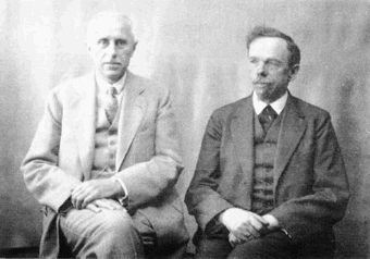 German foundry established in 1906 by brothers Karl Klingspor (1868-1950) and Wilhelm Klingspor (1871-1925) in Offenbach am Main. About half of its catalog consists of blackletter types (as listed in 2000 by Harald Süß), and many of its typefaces were designed by German über-designer Rudolf Koch. History (in German, PDF), resummarized here:
 - 1892: Carl Klingspor (1839-1903), the father, buys the Rudhardsche Gießerei in Offenbach am Main in 1892, which was originally founded in 1842 by Johann Peter Nees, Phillip Rudhard and Johann Michael Huck.
- 1899: Heinz König designs Walthari (a light Fraktur font).
- 1900: Otto Eckmann designs the Fraktur font Eckmann Schrift, and Kurt Wanschura (from Leipzig) designs the Fraktur font Offenbacher Schwabacher. Reform appears!
- 1901: Peter Behrens publishes Behrensschrift (art nouveau style). Offenbacher Fraktur appears too.
- 1902: Behrens Schrift by Peter Behrens. Fette Eckmann Schrift und Ziermaterial by Peter Behrens. Vignetten by Emil Doepler d.J., and Schmuck für Bücher und Akzidenzen by Robert Engels, München.
- 1903: Reform Kursiv.
- 1904: Karl and Wilhelm Klingspor become the sole owners of the Rudhardsche Gießerei. As a private typeface, they decide on Munthe Schrift by Norwegian Gerhard Munthe.
- 1905: Heinz König designs König Antiqua. Breitkopf Fraktur is published, based on the original design of Joh. Gottl. Immanuel Breitkopf (1719-1794). Also new is Auszeichnungsschriften für Fraktur, as well as Die Leidensstationen by Robert Engels.
- 1906: The form is renamed Gebr. Klingspor. Otto Hupp makes Liturgisch (another Fraktur font). Jugendschrift is published.
- 1907: Peter Behrens publishes Behrens-Kursiv.
- 1908: Peter Behrens publishes Behrens Antiqua. Otto Hupp makes Neue Anzeigen Schriften. Halbfette Reform is published.
- 1909: Otto Hupp makes Hupp Antiqua (a Basque "A" in here!), Hupp Unziale. Walter Tiemann designs Tiemann Mediäval.
- 1910: Rudolf Koch designs Fette Deutsche Schrift (Fraktur) and Fette Kochschrift (are these not the same?). Hupp Fraktur appears. The company publishes Kalender Bilder by Heinrich Vogeler.
- 1911: Tiemann makes Halbfette Tiemann Mediäval.
- 1912: Tiemann makes Tiemann Mediäval. Kursiv and Tiemann-Kursiv. Koch makes Halbfette Deutsche Schrift and Deutsche Schrägschrift.
- 1913: Peter Behrens publishes Behrens Mediäval. Koch makes Schmale deutsche Schrift.
- 1914: Rudolf Koch publishes Frühling, Maximilian Gotisch, Maximilian-Antiqua and Maximilian. Walter Tiemann makes Peter Schlemihl and Tiemann Fraktur.
- 1915: Klingspor acquires F. W. Aßmann and Wilhelm Gronau in Berlin.
- 1917: Albert Windisch makes Windisch Kursiv.
- 1919: Karl Michel designs Schraffierte Antiqua. Some cooperation is established with D. Stempel AG, which acquires some shares.
- 1920: Tierbilder-Probe is published.
- 1921: Rudolf Koch publishes Deutsche Zierschrift (Fraktur) and Magere deutsche Schrift. Walter Tiemann makes Narziß. The company publishes Elfenschmucjk, as well as Schräge Schwabacher. Leo Wackerle makes Kalender Bilder.
- 1922: Rudolf Koch designs Koch Antiqua and Koch Antiqua Kursiv. Otto Hupp publishes Deutsche Schrägschrift. Ernst Engel designs Mörike Fraktur, a private typeface just created for the Ernst Engel Presse.
- 1923: Rudolf Koch designs Koch Antiqua Kursiv and Neuland. Walter Tiemann designs Tiemann Antiqua.
- 1924: Koch designs Grosse Koch Antiqua, and Tiemann makes Tiemann Gotisch.
- 1925: Wilhelm Klingspor dies. Rudolf Koch designs Wilhelm-Klingspor-Schrift (Fraktur), and Victor Hammer creates an uncial font, Hammerschrift.
- 1926: Tiemann makes Tiemann Antiqua Kursiv and Koch publishes Klingsporschrift.
- 1927: Rudolf Koch designs Kabel.
- 1928: Rudolf Koch designs Neuland Licht. Walter Tiemann makes Kleist Fraktur.
- 1929: Rudolf Koch creates Zeppelin.
- 1930: Rudolf Koch designs Wallau (rotunda) and Jessen-Schrift (Fraktur).
- 1931: Heinrich Maehler makes Salut.
- 1932: Rudolf Koch designs Holla.
- 1934: Walter Tiemann makes Fichte Fraktur.
- 1935: Rudolf Koch creates Koch Kurrent.
- 1937: Rudolf Koch publishes Claudius.
- 1940: Rudo Spemann's Gavotte appears.
- 1944: A bombardment destroys a lot of material and drawings.
- 1950: Karl Klingspor dies. Walter Tiemann makes Offizin. According to Chronik und Stammfolge der Familie Klingspor (1989, Reinhard Klingspor and Gerhard Moisel), Karl Klingspor died on January 1, 1951, but everywhere on the web we find 1950.
- 1951: Karl Hermann Klingspor (1903-1986), son of Wilhelm, takes over the company.
- 1952: Karlgeorg Hoefer makes Salto.
- 1953: Karlgeorg Hoefer publishes Saltino. Victor Hammer makes Hammer Unziale. The Klingspor Museum in Offenbach is created.
- 1954: Hans Kühne designs Andreas Schrift (Fraktur) and Kühne Schrift (Fraktur). Joachim Romann makes Constanze (a formal script) and Queen. Alfred Finsterer designs Duo Licht and Duo Dunkel.
- 1955: Karlgeorg Hoefer makes Monsun.
- 1956: D. Stempel AG buys the remaining shares of Klingspor, and incorporates many of its types in its own catalog.
That library included typefaces by these designers: - H. Kühne: Andreas Schrift (1954, carried by Delbanco and Gerhard Helzel), Kühne Antiqua (1954), Kühne Schrift (1954), Stahl (1933-1939).
- P. Behrens: Behrens Antiqua (1907), Behrensschrift (offered by Intecsas as Sprecher Gothic), Behrens Initialen (called Sprecher Initials at Intecsas).
- Rudolf Koch: Claudius (carried by Delbanco), Deutsche Schrift (1910), Frühling (1917, carried by Delbanco), Deutsche Zierschrift (1921, offered by Delbanco and Gerhard Helzel), Holla (1932), Jessen-Schrift (1924-1929, carried by Delbanco), Kabel (1927, at Linotype now; called Geometric 231 at Bitstream, and Kalten at PrimaFont, and Koch Original at LetterPerfect), Koch Antiqua (1922, published by Linotype now; available from Alphabets Inc as AI Koch Antiqua MM; called Eva Antiqua SG at Spiece Graphics), Zeppelin (1929, available from Agfa now), Koch Kurrent (1935, offered by Delbanco), Koch Fraktur (offered by Delbanco, Gerhard Helzel, and Christian Richter), Marathon (1938), Maximilian (1917, available at Castle Systems, and carried by Delbanco), Maximilian-Gotisch (carried by Gerhard Helzel and by Walden Font), Neuland (1923, available from Linotype; available from Alphabets Inc as AI Koch Neuland, and at Bitstream as Informal 011, and at PrimaFont as Newfish, and at Keystrokes as Neuland inline), Prisma (1928; a multiline typeface revived in 2003 by Dieter Steffmann, and extended in the large family LL Prismaset at Lineto), Wallau (1926-1934, carried by Delbanco, and called Wal at PrimaFont), Wilhelm Klingspor-Schrift (1925, carried by Delbanco and Linotype; Wilhelm Klingspor-Gotisch is called Wilson at PrimaFont).
- J. Romann: Constanze (1954), Queen (1954, called Ferrante by Intecsas).
- Walter Tiemann: Daphnis (1929), Fichte Fraktur (1934-1939, carried by Delbanco and Gerhard Helzel), Kleist Fraktur (1928, revived by Dieter Steffmann in 2002, and carried by Delbanco), Narziss (1921, available from Font Bureau and Spiece Graphics as Narcissus), Offizin (1952), Peter Schlemihl (revived by Walden Font, and by Dieter Steffmann in 2002), Tiemann Mediäval (carried by Gerhard Helzel), Tiemann Antiqua (1923, now at Linotype).
- A. Finsterer: Duo licht/Duo dunkel (1954).
- O. Eckmann: Eckmann Schrift (1900, called Freeform 710 at Bitstream, and called Eckmann at Elsner&Flake, ScanGraphic, Linotype, URW++, Gerhard Helzel and Delbanco), Eckmann Initialen (called Jan Bent at Intecsas).
- Kurt Wanschura: Offenbacher Schwabacher (1900, Offered at Delbanco).
- H. König: Falstaff (1906).
- H. Schardt: Folkwang (1949).
- R. Spemann: Gavotte (1940, available from Linotype).
- V. Hammer: Hammerschrift (1923, available as Martel at Scriptorium), Hammer Unziale (1953). [Linotype has it as Neue Hammer Unziale. Agfa carries Uncial, which is really Neue Hammer Unziale. The Electric Typographer calls it Electric Uncial. Elsner&Flake have a version called American Uncial.]
- O. H. W. Hadank: Ornata (1943).
- H. Bohn: Orplid (1929).
- O. Hupp: Liturgisch (1906, carried by Gerhard Helzel), Hupp Antiqua (1909).
- F.K. Sallwey: Information breitfett (1958).
- A. Kumlien: Kumlien Antiqua.
- R. Bauer: Magnet (1906).
- K. Hoefer: Monsun (1955), Salto (1952, now at Linotype), Saltino (1953, carried by TypeRevivals), Saltarello (1954).
- H. Maehler: Salut (1931, version available from Agfa).
An unclassified condensed elongated Victorian fat face, Slimback-style, is Figura. No date known. View the Klingspor typeface library. [Google]
[MyFonts]
[More] ⦿
|
KPS Fonts
[Klaus-Peter Schaeffel]
|
 Swiss calligrapher in Basel who made and sells various medieval and historically important script fonts. Dedicated page. These included the paleographic (PAL) series and the KPS series. He lives in Ühlingen--Birkendorf, Germany. His fonts are uniformly of high quality and are usefl for illustrating historical alphabets.
 His early commercial collection: KPS Anglaise (calligraphic script), KPS Antiqua (+Kapitälchen), KPS Capitalis (classic Trajan caps), KPS Cicero, KPS Epona (calligraphic), KPS Fein (hand-printed), KPS Hand (calligraphic), KPS Horaz (calligraphic), KPS Iris (calligraphic), KPS Petit (calligraphic), KPS Plinius, KPS Spitzfelder, KPS Vitruv (calligraphy), PAL Bastarda, PAL Cancellaresca, PAL Carolina, PAL Gotisch, PAL Humanistica, PAL Lombarden, PAL Quadrata, PAL Rotunda, PAL Rustica, PAL Textura, PAL Uncialis, PAL Uncialis Roemisch, Weissranken Initialen, Ranken Initialen (Celtic capitals). Since September 2013, all of his fonts are free. They were renamed and have conveniently the date of original creation in the font name. The fonts dated in the 1990s and 2000s are new typefaces or creative revivals by Klaus-Peter. The list of revivals: 0100DeBellisMacedonicis [Pre-uncial letters from the fragment "de bellis macedonicis", ca. 1st century], 0300Petros [Greek hand from the oldest surviving copies of St. Peter's epistles, dated 3th / 4th century], 0362Vitalis [Roman Minuscule Cursive from the so called Vitalis letter, written before 362 on papyrus (Strasburg)], 0480VergiliusRomanus [Capitalis Rustica from the Vergilius Romanus written in Rome, ca. 480], 0500VergiliusSangallensis [Capitalis Quadrata from the Vergil fragments in Stiftsbibliothek St.Gallen], 0512Dioskurides [Greek Uncials from the Vienna Dioskurides (about 512)], 0746Beda [from Beda Venerabilis: Historia ecclesiastica gentis Anglorum, Northumbria, dated 746], 0800Kells [Half Uncials from the Book of Kells], 0800Remedius [So called "Lombardic-Raetic Minuscule" from Codex 348 of the Stiftsbibliothek St. Gallen], 0800 Theophanes [Greek Hand after a 9th century Theophanes manuscript], 0850CarolinaTours [Carolingian Minuscule], 0850Carolinaundulata [Carolingian Minuscule from the Scriptorium of Tours], 0864Folchart [St. Gall Carolingian from the Folachart Psalter], 1012Otto [Late Carolingian Minuscule from the Perikopes of Heinrich II, written at the Reichenau, donated to the dome of Bamberg in 1012], 1258FridericusII [Gothic Rotunda from the falcon book of Emperor Friedrich II, Southern Italy 1258-1266], 1400Wenzel [Bohemian Textura from Vienna], 1450Sebastos [Humanistic Greek hand from Homer, Ilias, Vatican Library], 1455GutenbergB42 [Gothic Textura types from the 42 line Gutenberg Bible], 1458GutenbergB36 [Gothic Textura types from the 36 line Gutenberg Bible], 1470Jenson [an antiqua by Nicolas Jenson], 1475HumanisticaCursiva [Humanistic Cursive of the kind Bartolomeo Sanvito of Padua wrote, after Cod. Pal. Lat. 1508], 1480Humanistica [Humanistic Book Hand from Valerius Maximus: Facta et dicta memorabilia, ca. 1480-1485. The calligraphy is attributed to Antonio Sinibaldi from Florence and the titling capitals to Bartolomeo Sanvito from Padua], 1483Koberger [Incunabula type from the Koberger Bible, printed in Nuremberg in 1483], 1485Grueninger [Incunabula type from the Grueninger Bible, printed in Strasburg in 148], 1493SchedelRotunda [Incunabula type from the Latin edition of Hartmann Schedel's World Chronicles, printed by Koberger at Nuremberg in 1493], 1501Manutius [First printed Italic Antiqua by Aldus Manutius (Venice 1501)], 1513Gebetbuch [Fraktur from Emperor Maximilian's Prayer Book, printed in Augsburg in 1513], 1517Gilgengart [Fraktur type from Emperor Maximilian's 1517 private print "Gilgengart"], 1517Teuerdank [Fraktur type from Emperor Maximilian's "Teuerdank", printed at Augsburg in 1517], 1519NeudoerfferFraktur [Fraktur alphabet from a woodblock model in Johann Neudoerffer the Elder's Calligraphy book "Fundament", Nuremberg 1519], 1739Bickham [Copperplate or running hand after models from "The Universal Penman" by George Bickham, printed in London 1743], 1741Bickham [Bickham's round hand from Universal Penman], 1782Thurneysen [Baroque Antiqua Type of J. Jacques Thourneysen fils, Basel 1782]. Original versions by Schaeffel, with date of design in the font name: 1999Anglaise1, 1999Anglaise2, 1999Cancellaresca, 1999Carolina (Carolingian minuscule), 1999Livius, 1999LiviusBold, 1999LiviusItalic, 1999LiviusSmC, 1999LiviusTitel, 1999Ovidius, 1999Stylus, 1999Textualis, 2000Bastarda, 2000Cicero, 2000Humanistica, 2000Plinius, 2000PliniusItalic, 2000Seneca-Italic, 2000Seneca, 2000TextualisFormata, 2000Uncialis, 2001RotundaFormata, 2002Cato, 2002Horatius, 2002Vitruvius, 2003Epona, 2003Lombarden, 2004CapitalisQuadrata, 2004CapitalisRustica, 2004Iris, 2004UncialisQuadrata, 2004UncialisRomana, 2008-Noeuds-1 [for making Celtic knots], 2008-Noeuds-2, 2008-Noeuds-3, 2009Xenophon, 2010Filigrane, 2010Gouttes, 2010Labyrinthe [squarish], 2010Pointu [a calligraphic blackletter], 2010Vergilius [a great calligraphic face]. Old URL. [Google]
[More] ⦿
|
Lars Bergquist
[Timberwolf Type]
|
 [MyFonts]
[More] ⦿
[MyFonts]
[More] ⦿
|
Lazar Dimitrijevic
[Posterizer KG]
|
 [MyFonts]
[More] ⦿
[MyFonts]
[More] ⦿
|
Lee Hendrix
|
Lee Hendrix and Thea Vignau-Wilberg wrote The Art of the Pen Calligraphy from the Court of the Emperor Rudolf II (2002, Getty Publications, Getty Museum, Los Angeles). The promotional blurb about this beautiful booklet: The court of Holy Roman Emperor Rudolf II produced nothing more amazing than the Mira colligrophioe monumenta, a flamboyant demonstration of two arts-calligraphy and miniature painting. The project began when Rudolf's predecessor commissioned the master calligrapher Georg Bocskay to create a model book of calligraphy. A preeminent scribe, Bocskay assembled a vast selection of contemporary and historic scripts. Many were intended not for practical use but for virtuosic display. Years later, at Rudolf's behest, court artist Joris Hoefnagel filled the spaces on each manuscript page with images of fruit, flowers, insects, and other natural minutiae. The combination of word and images is rare and, on its tiny scale, constitutes one of the marvels of the Central European Renaissance. The manuscript is now in the collections of the Getty Museum. Forty-eight of its pages are reproduced in this book, containing samples of classic italic hands; historical, invented, and exhibition hands; Rotunda, a classicizing humanist script based on Carolingian minuscule; classically based scripts; and Gothic blackletter and chancery. Other publications include An Abecedarium: Illuminated Alphabets From The Court Of Emperor Rudolf Ii An Abecedarium: Illuminated Alphabets From The Court Of Emperor Rudolf II (1997). [Google]
[More] ⦿
|
Lou Harrison
|
Musician. Interestingly, Lou Harrison (b. Portland, 1917) designed a few fonts that were subsequently implemented by Carter Scholz: Pluma, Rotunda, Lou Casual, Federov, Lou Titling, Aptos Uncial. Web page. Interview. Biography. [Google]
[More] ⦿
|
Luisa Ponce
|
At UNAM in Mexico City, Luisa Ponce designed the blackletter typeface Petite Rotunda (2019) and the text typeface Mastretta (2019). [Google]
[More] ⦿
|
Lukas Schneider
[Revolver Type Foundry]
|
 [MyFonts]
[More] ⦿
[MyFonts]
[More] ⦿
|
Manfred Klein
[TypOasis, 2002]
|
 [MyFonts]
[More] ⦿
[MyFonts]
[More] ⦿
|
Manfred Klein
[Manfred Klein: Blackletter, Fraktur, Rotunda]
|
 [MyFonts]
[More] ⦿
[MyFonts]
[More] ⦿
|
Manfred Klein: Blackletter, Fraktur, Rotunda
[Manfred Klein]
|
 Manfred's fascination with blackletter and its German roots is apparent from the tens of typefaces he designed that are either revivals of historic typefaces or playful and not so playful extensions. Here we go:
 - ArthritishSpringtime
- BarlosRandom, BarlosRandomRings
- BarlosiusEdged (2007)
- Bastarda-K, BastardaButtonsBeta, BastardaMajuskel1300, BastardusSans
- BauernFraktur (2004, after the 1911 original by Bauersche)
- BayreuthFraktur, Bayreuther-BlaXXL (2005, a variation of Schneidler's Bayreuth)
- BigBroken, BigBrokenTwo
- BigElla
- Brahms-Gotisch (2005, with Petra Heidorn: a revival of Heinz Beck's 1937 typeface at Genzsch&Heyse)
- BrokenAlphabetTradition, BrokenBrainsFrax, BrokenCapsJumperB, BrokenHand-Bold, BrokenHand, BrokenHandLight, BrokenRoman-Bold, BrokenSansCaps, BrokenSansCapsJumper, BrokenWoodtypes, BrokentTraditionRound
- BruchRund
- BruchschriftMK
- Burte-Fraktur
- Burtine (2003: handwritten freestyle version of Burte Fraktur, 1928), Burte-Fraktur, Burtinomatic, Burtinomatic-DemiBold
- Burtinomatic-DemiBold, Burtinomatic
- CancellerescA
- CantaraGotica
- Cantzley Inverse Caps (2007), CantzleyAD1600 (2005)
- CaslonishFraxx
- ClaudiusImperator
- Clausewitz-Fraktur (2005). Designed in memory of Klaus Burkhardt.
- CaslonishFraxx
- ClaudiusImperator
- CowboyCaxton
- Cuxhaven Initials Round (2006), CuxhavenFraktur (2006), CuxhavenInitials (2006), CuxhavenTimes (2002). All named in honor of Petra Heidorn, who is from Cuxhaven.
- DecadentaFrax (2007)
- DirtyThinkwitz (2003). In honor of his good friend Klaus Burkhardt.
- DizzyBrokenWritten
- DolbyFraxCaps (2005)
- DornspitzGrotesk
- DoubleBrokenTextura
- Druckschrift-Initialen
- DrunkenSailor (2006)
- DuerersMinuskeln
- ElectrUnciale (2005)
- ElephantaBlack (2006)
- FatFreeFrax
- FlyingHollander (2005)
- FracturiaSketched, FracturiaSketchedCaps
- FraktKonstruct, FraktSketch, FraktSketchFS, FraktalConPablos, FrakturInRings (2007), FrakturInitials07 (2007), FrakturNitials (2006), FrakturaFonteria, FrakturaFonteriaSlim (2006)
- FrakturCondensedHeadline, FrakturCondensedHeadlineExtra
- FraxBoxes, FraxBricKs, FraxBrix, FraxHandwritten-RoundCaps, FraxHandwritten, FraxHandwrittenXtrem-Medium, FraxInCage, FraxInCageLeftOblique, FraxInCageRightOblique, FraxInitials, FraxMouseSketches, FraxxSketchQuill
- FrungturaFS
- GGothiqueMK
- GermanFatman (2006)
- GingkoFraktur (2006)
- GoldenSwing
- GotenborgFraktur (2007)
- GothicLetters (2007)
- Gotic Caps (2006), GoticaBastard, GotischeMajuskel, GothicMajuscles
- GotikaButtons (2005, after Imre Reiner's Gotika from 1933)
- GutenbergsGhostypes, GutenbergsTraces
- HamletOrNot, HamletTobeornot
- HansFraktur
- HansSachsCaps (2007)
- HansSchoenspergerRandomish
- HappyFrax (2006)
- Haunted-Normal, HauntedBricks
- Heimat
- Holland Gotisch (with Petra Heidorn; a revival of Nederduits by Johann Michael Fleischmann, ca. 1750)
- ImresFraktur, ImresFraxCaps (2007)
- Incunitials
- IronFraktur
- JessicaPlus
- JoeCaxton
- JohannesBricks, JohannesButtons-02, JohannesGDiamonds, JohannesGLastTraces (2007), JohannesTraces
- Jugendstil (2006)
- KaiserRotbartCaps (2007)
- KL1CiviliteEdges
- Kl1RheumaticFraktur
- KleinSchwabach (2005)
- KleinsBrokenGotik (2006)
- KlungerCaps (2006)
- Leibniz-Regular
- LombardPlattfuss, Lombardic
- LookBrokenTypes
- LuFraktorsoBroad
- LudwigHohlwein (2006)
- LufrakturBricks (2006)
- LutherDuemille, LutherMousedrawn-Bold, LutherMousedrawn
- MKBritishWriting
- MK Broken Types (2006)
- MKFraxConstr (2007)
- MKImresTshirtsA
- MKalligFrax, MKalligFrax-MediumItalic
- MKancellerescaCaps (2005)
- MKantzley (2005), MKanzleiCaps-One (2006)
- MKapitalisRusticaMedium
- MKaslonTextura
- MoKsford, MoKsfordBold, MoKsfordDemiBold, MoKsfordExtraLight, MoKsfordLight
- MonAmourCaps (2006), MonAmourFraktur-Broken (2006), MonAmourFrakturRegular
- MonksWriting
- MorbusParcinsonFraxx
- MorscheKnochen
- MountFirtree
- MousefraKtur
- Münchner-Fraktur (2005). A revival of Renaissance Fraktur by Heinz König, 1885, Genzsch&Heyse.
- MyElectronicSchwabach
- NeuGothic-Bold
- Neudoerffer, NeudoerfferScribbleQuality. Both codex style typefaces are from 2003. Manfred writes that Neudoerffer is an unaltered version of the original Neudoerffer Initialen from 1660.
- OKsfordBadFat, OKsfordItalic
- OldTypographicSymphony-Regular, OldTypographicSymphony-Round
- PopFraxFrankfurt (2007), PopFraxFrankfurtCondensed (2007)
- PrinzEugen
- Potsdam (2005, a revival of a 1934 typeface by Robert Golpon)
- Prothesis-Black, Prothesis-Caribiqu, Prothesis-Caripix
- RandomFrax
- ReadableGothic
- RememberReinerFS
- RotundaEspagna
- Schaftstiefel Kaputt (2003)
- SchmaleGotischMK, SchmalfetteGotisch
- SchneidlerSchwabacher, SchneidlerSolitaires, SchneidlerSolitairesRound
- Schwabach, SchwabachDuemille, SchwabachScribbels, SchwabachScribbelsSecond
- ScribbledFrakturX-Heavy (2006)
- SketchedCassiusBroken
- SmallEdgedFrax (2006)
- Snoutlike (2003)
- SpaceWinningFrax (2007)
- TizonaDance
- TshirtsForFrax
- TypoasisBoldGothic (2003)
- VanDoesburgBrokenFS
- VeryBrokenFrax
- WaldarbeiterGotisch
- WeimarInline
- WeissGotischRandom
- Weissgotnitials (2005, based on Weiss's Lichte Initialen, 1935)
- WittewittMajuscles-Flourish, WittewittMajuscles-FlourishBricks
- WrittenFrax (2007)
Download page. Download all these fonts in onze zip file.               
[Google]
[MyFonts]
[More] ⦿
|
Manuel Barata
|
Lisbon-born calligrapher. Author of Arte de Escrever (1572, Lisbon), a writing manual. Posthumously, in 1590, Antonio Alvares published this book, Exemplares de diversas sortes de letras tirados da Polygraphia de Manoel Barata Escritor Portuguez acrecentadas pelo mesmo Author para comum proveito de todos. Derigido ao Excelentissimo D. Theotonio Duque de Bragança e de Barcellos Condestavel dos Reynos de Portugal (Lisbon). Scans, all from 1572: Chancery hand, rotunda, calligraphy. [Google]
[More] ⦿
|
Markwart Lindenthal
[Fraktur.de]
|
[More] ⦿
|
Maurice Göldner
|
Type designer born in Germany who graduated from the Hochschule für Grafik und Buchkunst in Leipzig in 2009 and the Burg Giebichenstein University of Arts and Design Halle. His research project on the history of Dresden's Brüder Butter foundry has been published in the Typography papers 9, Hyphen Press. Maurice is type design lecturer at the Kunsthochschule Berlin Weissensee and cofounder of Camelot Typefaces. Creator of the Meran family (OurType) in 2008. OurType says: Its design grew out of an exercise to construct capital letters from strips of black paper. The letters were later translated into digital form and given matching roman and italic lowercase designs together with figures. Meran is not easy to characterize. A sanserif? Undoubtedly, but much more too: with its fresh and distinctive look we might call it a 'contemporary rotunda'. A display type that works well as text, or a text typeface that performs impressively in display? It's both! Meran is a sanserif with an edge, which offers an exceptional blend between character and utility. His second retail typeface is Stan (and Stan Plus, 2012, Our Type), and StandingType (2012, OurType). His custom typefaces include - Weinviertel (2009). A headline typeface designed for Weinviertel Tourismus GmbH under the direction of Bauer Konzept & Gestaltung Vienna Austria. It was based on the handwriting of Katharina Wohlrab, and developed in collaboration with Thomas Thiemich.
- Hivo Slab (2007). A custom typeface in three weights for Hirschvogel GmbH & Co. KG. Executed in collaboration with Peter Mohr.
- Rando and Rando Display (Camelot Typefaces). Rando won an award in the TDC Typeface Design competition in 2017.
Typedia link. Typecache link. [Google]
[More] ⦿
|
Mauricio Amster
|
 Polish-Spanish designer, 1907-1980, who fled Spain in 1939 to Chile on board of the Winnipeg, and who revolutionized editorial design in Chile. He worked on the mag Zig-Zag. Examples of his sublime lettering: calligraphy, Cancellaresca, Gotica Bastarda, Romana Antigua, Romantica Humanistica, Rotunda.
 Photo. Joaquin Contreras wrote a thesis at the Faculty of Architecture of the University in Chile in 2007 entitled Diseño de fuentes tipográficas, basadas en los libros integramente caligrafiados por Mauricio Amster en Chile. I quote from a talk given by Contreras in 2021: Mauricio Amster Cats is a leading Polish editorial designer who worked for 40 years in Chile as a publisher, potter, lettering artist and teacher. He published two books on graphic standards to support his classes at the school of journalism and design hundreds of books. Son of Jewish parents persecuted by the Nazi regime, as a young man he studied graphic arts in Germany. Together with his friend Mariano Rawicz he travelled to Spain to take part in the civil war. In Madrid he designed newspapers, pamphlets, posters and books, the best known being the Cartilla Escolar Antifascista, a study book for militiamen. As a refugee he travelled to Chile on the Winnipeg, a ship prepared by Pablo Neruda (Chilean poet, diplomat, winner of the Nobel Prize) where he arrived with his wife Adina, a Spanish bookbinder with whom he shared his life. In Chile he started out as an anarchist, but as time went by he became part of Chilean culture until he became probably the most important designer of the last century. [Google]
[More] ⦿
|
Misha Vlasov
|
Or Mikhail Vlasov. Verona, Italy-based designer of these typefaces: - From 2017: Fast Gothic, Gothic Ornamental, Minimum Sharpness, Modern Stencil, Fast Left Hand Script, Ordine and Textura Nouveau.
- From 2021: Goratrix (a death metal blackletter font), Vedrana (a stylish sans), Ondina (a display italic), B Sign (an industrial stencil font for Latin and Cyrillic), Arina (a display serif for Latin and Cyrillic inspired by the (Slavic) ustav style).
- From 2022: Rotunda Divina (a rotunda blackletter), Braleyhlex (a medieval / Lombardic font inspired by a Verdun altarpiece in Klosterneuburg), Kelsi (a bubble graffiti font).
[Google]
[More] ⦿
|
Monotype blackletter typefaces
|
 Old metal era blackletter typefaces at Monotype: Armin-Fraktur (1904), Helen-Fraktur (Robert Haas), Halbfett Kasseler Fraktur, Wittenberger Fraktur (or Mars-Fraktur) (1904), Würzburger Fraktur. Their digital blackletter typefaces include LucidaBlackLetter, ClementeRotunda, Cresci Rotunda, Gothique, OldEnglish, Old English Text, Rudolph, Wedding Text, Engravers Old English, Goudy Text.
 View Monotype's blackletter typefaces. [Google]
[More] ⦿
|
MyFonts: Rotunda
|
Top-ranked Rotunda fonts at MyFonts. [Google]
[More] ⦿
|
Nick Curtis
[Nick Curtis: Typefaces from 2004]
|
[MyFonts]
[More] ⦿
|
Nick Curtis
[Nick Curtis: Typefaces from 2005]
|
 [MyFonts]
[More] ⦿
[MyFonts]
[More] ⦿
|
Nick Curtis
[Nick Curtis: Typefaces from 2006]
|
 [MyFonts]
[More] ⦿
[MyFonts]
[More] ⦿
|
Nick Curtis
[Nick Curtis: Typefaces from 2007]
|
 [MyFonts]
[More] ⦿
[MyFonts]
[More] ⦿
|
Nick Curtis
[Nick Curtis: Typefaces from 2008]
|
[MyFonts]
[More] ⦿
|
Nick Curtis
[Nick Curtis: Typefaces from 2009]
|
 [MyFonts]
[More] ⦿
[MyFonts]
[More] ⦿
|
Nick Curtis
[Nick Curtis: Typefaces from 2010]
|
 [MyFonts]
[More] ⦿
[MyFonts]
[More] ⦿
|
Nick Curtis
[Nick Curtis: Typefaces from 2011]
|
 [MyFonts]
[More] ⦿
[MyFonts]
[More] ⦿
|
Nick Curtis: Typefaces from 2004
[Nick Curtis]
|
 Typefaces made by Nick Curtis from 2004, not listed elsewhere on these pages. Bayern Handschrift, De Rigueur NF, Refugio Rustic WBW, Refugio Refined WBW, Ponte Vecchio NF, Brazzaville NF (based on Congo, a 1910 font by Barnhart Brothers \& Spindler), Moonshine Script NF (a casual connected script patterned after an offering from the 1930s chapbook 60 Alphabets by The Hunt Brothers), West Coast Antics (based on a showing from Carl Holmes' 1950s book, ABC of Lettering), Nanki Poo NF (based on Mikado from the Boston Type Foundry), Picture Postcard NF (a Broadway style typeface based on work by lettering artist Alf Becker), Curly Shuffle NF (described as a mix of Alf Becker's style and Leslie Cabarga's), Hardy Har Har NF (based on Samoa from BB&S, 1900), Krazy Kracks NF (based on the so-called California style of lettering used extensively in travel posters of the 30s to the 50s. This version is based on its interpretation by Carl Holmes in a Walter T. Foster artbook entitled ABC of Lettering), Whoa Nelly NF (a comic book face--based on Dan X. Solo's Funhouse), Bushwacked, Cressida (triline face), New Boston (far West typeface of the "italian" kind), Rumble Seat, Kartoon Kutz 3&4 NF, Magic Twanger NF, Snoodle Toons NF, Beanie Kopter NF, Delysian NF (based on Greeting card from the 1923 catalog of BB&S), Mazurka NF (based on Swagger Capitals and Gothic Novelty title from the 1923 catalog of BB&S), Jungle Holiday Cuts NF (based on holiday ornaments by Carl S. Junge, 1929), Stone Soup NF (based on lettering for a 1925 Buster Keaton movie), Tintern Abbey NF (based on the lettering for a 1905 poster for the Austrian National Highway by artist Gustav Jahn), Period Borders NF, Parsnip and Parsnip Outline (Will Ransom designed the exemplar for this series for Barnhart Brothers&Spindler in the early 1900s---the typeface was originally named Parsons (1918), after the advertising director of a Chicago department store), Wurstwagen (suggested by a poster for beer, designed by German artist Ludwig Hohlwein around 1920), Jackson Park NF (1920s style), Kenosha Antique NF (from the 1903 Racine typeface of Barnhart Brothers&Spindler), Catty Wumpas (based on lettering of Ross F. George). [Google]
[MyFonts]
[More] ⦿
Typefaces made by Nick Curtis from 2004, not listed elsewhere on these pages. Bayern Handschrift, De Rigueur NF, Refugio Rustic WBW, Refugio Refined WBW, Ponte Vecchio NF, Brazzaville NF (based on Congo, a 1910 font by Barnhart Brothers \& Spindler), Moonshine Script NF (a casual connected script patterned after an offering from the 1930s chapbook 60 Alphabets by The Hunt Brothers), West Coast Antics (based on a showing from Carl Holmes' 1950s book, ABC of Lettering), Nanki Poo NF (based on Mikado from the Boston Type Foundry), Picture Postcard NF (a Broadway style typeface based on work by lettering artist Alf Becker), Curly Shuffle NF (described as a mix of Alf Becker's style and Leslie Cabarga's), Hardy Har Har NF (based on Samoa from BB&S, 1900), Krazy Kracks NF (based on the so-called California style of lettering used extensively in travel posters of the 30s to the 50s. This version is based on its interpretation by Carl Holmes in a Walter T. Foster artbook entitled ABC of Lettering), Whoa Nelly NF (a comic book face--based on Dan X. Solo's Funhouse), Bushwacked, Cressida (triline face), New Boston (far West typeface of the "italian" kind), Rumble Seat, Kartoon Kutz 3&4 NF, Magic Twanger NF, Snoodle Toons NF, Beanie Kopter NF, Delysian NF (based on Greeting card from the 1923 catalog of BB&S), Mazurka NF (based on Swagger Capitals and Gothic Novelty title from the 1923 catalog of BB&S), Jungle Holiday Cuts NF (based on holiday ornaments by Carl S. Junge, 1929), Stone Soup NF (based on lettering for a 1925 Buster Keaton movie), Tintern Abbey NF (based on the lettering for a 1905 poster for the Austrian National Highway by artist Gustav Jahn), Period Borders NF, Parsnip and Parsnip Outline (Will Ransom designed the exemplar for this series for Barnhart Brothers&Spindler in the early 1900s---the typeface was originally named Parsons (1918), after the advertising director of a Chicago department store), Wurstwagen (suggested by a poster for beer, designed by German artist Ludwig Hohlwein around 1920), Jackson Park NF (1920s style), Kenosha Antique NF (from the 1903 Racine typeface of Barnhart Brothers&Spindler), Catty Wumpas (based on lettering of Ross F. George). [Google]
[MyFonts]
[More] ⦿
|
Nick Curtis: Typefaces from 2005
[Nick Curtis]
|
 Typefaces made by Nick Curtis from 2005, not listed elsewhere on these pages. Chantilly Lace NF (2005: uppercase letters by Bergling and lowercase letters by Roland W. Paul), Edda MorganaNF (medieval English), Gnarly Dude NF (rough script based on material of Ross F. George), Whirled Peas NF (based on a typeface called Whitestone Scrawl by Dan X. Solo in his "Showcard Alphabets"), Cool Cat Jim NF (based on a 1953 headline by Jim Flora in Park East Magazine), Sulphur Springs WBW (bone font), Grand Rapids (based on a typeface named Archer from the 1905 specimen book from Barnhart Brothers&Spindler), Hasta La Pasta (designed after a typeface from a pre-1900 specimen book from the Central Type Foundry of St. Louis, called Spiral), La Coupole (based on lettering on a 1927 menu by prominent poster artists Razzia), Shadowlands (this is like Wilcox Initials from the 1992 Solotype Catalog), Possum Saltare NF (a Trajan column style caps face), Pismo Clambake NF (a connected formal script typeface after a Richard Gans handwriting typeface from 1933, Gloria), Ransom Clearcut NF (an extension of Will Ransom's 1920s caps-only typeface Clearcut Shaded Caps for BBS), Almost Heaven (sold in the early 1900s as Perfection), Goodbye Crewel World (stitching font), Jimbatz NF (dingbats inspired by album cover artist Jim Flora), Bad Dookie NF (from The Advertising Cartoon Clip Art Book, 1971), Maple Leaf Rag NF (revival of Nova Bold by Continental Typefounders), Surely You Jest NF (called Arbor in the 1890's type specimen catalog from Farmer, Little&Co), Merry Old Soul NF (a display typeface discovered in one of the many books on sign writing produced by Eric Matthews), Funky Tut NF (205; the caps are based on J.M. Bergling's Morocco (1914), and the lower cases on Bergling's Kermaic Text (1914)), Groove Thang NF (based on a font called Dado), Novadam Obese (geometric black modern typeface based on a logotype by the same name of Joan Trochut Blanchard, ca. 1940s), Smackeroo NF (2005, engraved US dollar-bill style typeface based on Steelplate, a monocase typeface from ca. 1900 by Barnhart Brothers&Spindler), Snooty Fox NF (an elegant typeface found in Pen&Brush Lettering and Practical Alphabets, Blandford Press, Ltd., London, 1929), Chez Nous (based on Card Italic from a 1930s Mergenthaler Linotype Company specimen book), Slapdash Deco NF (2005, based on a showcard alphabet presented by Cecil Wade in his Manual of Lettering), Rockin Roman NF (from Blandford Press' Pen&Brush Lettering and Practical Alphabets), Kunstgewerbe NF (artsy typeface after work by J.M. Bergling, 1914), Details Details NF (a geometric design from Pen and Brush Lettering and Practical Alphabets), Escondido NF (inspired by an Austrian travel poster designed by Johann Süssenbek in the 1930s), Ballyhaunis NF (based on Celtic lettering by Laurence Schall, early 1900s), Inglenook Corner NF (based on art nouveau lettering by Laurence Schall, early 1900s), Mohair Sam NF (caps based on letters of Samuel Welo, and lower case based on ATF's Romany Script), Partenkirchen NF (a Basque style display face), Helena Handbasket NF (after Antique Light, found in the 1888 edition of the James Conner & Sons United States Type Foundry specimen book), Kudos Kaps NF (2006: five nice ornamental caps and associated alphabet and border sets, including a Lombardic set, an engraved set; they are based on typefaces from Ludwig&Mayer). [Google]
[MyFonts]
[More] ⦿
Typefaces made by Nick Curtis from 2005, not listed elsewhere on these pages. Chantilly Lace NF (2005: uppercase letters by Bergling and lowercase letters by Roland W. Paul), Edda MorganaNF (medieval English), Gnarly Dude NF (rough script based on material of Ross F. George), Whirled Peas NF (based on a typeface called Whitestone Scrawl by Dan X. Solo in his "Showcard Alphabets"), Cool Cat Jim NF (based on a 1953 headline by Jim Flora in Park East Magazine), Sulphur Springs WBW (bone font), Grand Rapids (based on a typeface named Archer from the 1905 specimen book from Barnhart Brothers&Spindler), Hasta La Pasta (designed after a typeface from a pre-1900 specimen book from the Central Type Foundry of St. Louis, called Spiral), La Coupole (based on lettering on a 1927 menu by prominent poster artists Razzia), Shadowlands (this is like Wilcox Initials from the 1992 Solotype Catalog), Possum Saltare NF (a Trajan column style caps face), Pismo Clambake NF (a connected formal script typeface after a Richard Gans handwriting typeface from 1933, Gloria), Ransom Clearcut NF (an extension of Will Ransom's 1920s caps-only typeface Clearcut Shaded Caps for BBS), Almost Heaven (sold in the early 1900s as Perfection), Goodbye Crewel World (stitching font), Jimbatz NF (dingbats inspired by album cover artist Jim Flora), Bad Dookie NF (from The Advertising Cartoon Clip Art Book, 1971), Maple Leaf Rag NF (revival of Nova Bold by Continental Typefounders), Surely You Jest NF (called Arbor in the 1890's type specimen catalog from Farmer, Little&Co), Merry Old Soul NF (a display typeface discovered in one of the many books on sign writing produced by Eric Matthews), Funky Tut NF (205; the caps are based on J.M. Bergling's Morocco (1914), and the lower cases on Bergling's Kermaic Text (1914)), Groove Thang NF (based on a font called Dado), Novadam Obese (geometric black modern typeface based on a logotype by the same name of Joan Trochut Blanchard, ca. 1940s), Smackeroo NF (2005, engraved US dollar-bill style typeface based on Steelplate, a monocase typeface from ca. 1900 by Barnhart Brothers&Spindler), Snooty Fox NF (an elegant typeface found in Pen&Brush Lettering and Practical Alphabets, Blandford Press, Ltd., London, 1929), Chez Nous (based on Card Italic from a 1930s Mergenthaler Linotype Company specimen book), Slapdash Deco NF (2005, based on a showcard alphabet presented by Cecil Wade in his Manual of Lettering), Rockin Roman NF (from Blandford Press' Pen&Brush Lettering and Practical Alphabets), Kunstgewerbe NF (artsy typeface after work by J.M. Bergling, 1914), Details Details NF (a geometric design from Pen and Brush Lettering and Practical Alphabets), Escondido NF (inspired by an Austrian travel poster designed by Johann Süssenbek in the 1930s), Ballyhaunis NF (based on Celtic lettering by Laurence Schall, early 1900s), Inglenook Corner NF (based on art nouveau lettering by Laurence Schall, early 1900s), Mohair Sam NF (caps based on letters of Samuel Welo, and lower case based on ATF's Romany Script), Partenkirchen NF (a Basque style display face), Helena Handbasket NF (after Antique Light, found in the 1888 edition of the James Conner & Sons United States Type Foundry specimen book), Kudos Kaps NF (2006: five nice ornamental caps and associated alphabet and border sets, including a Lombardic set, an engraved set; they are based on typefaces from Ludwig&Mayer). [Google]
[MyFonts]
[More] ⦿
|
Nick Curtis: Typefaces from 2006
[Nick Curtis]
|
 Typefaces made by Nick Curtis from 2006, not listed elsewhere on these pages: Magic Lantern NF, Duly Noted NF (after an ATF typeface from 1912 called Freeahand), Got That Bling NF (a connected script based on the work of Al Mack, from his Lettering: Brush&Pen in the Single Stroke), Haarlem Nights NF (based on a 1920 Dutch poster for Public Placement Services by Johan Dijsktra), Architectuur NF (based on De Stijl type lettering by H. Th. Wijdeveld, 1925), Gandy Dancer NF (a revival of Tabard, ca. 1912, ATF), Pomfrit Dandy NF (based on Frys Ornamented No. 2 by Stephenson Blake), Smith Premier (Clean and Schmutzy) NF (a typewriter pair after the letters of the Smith Premier No. 3), ed Hot Mama NF (2006), Jumbo Mumbo NF (a revival of Independant done in 1930 by Collette and Dufour), Union Telegraph NF (2006), Major Production NF (which was followed in 2009 by Major Pro Extras NF), Teeny Boppin NF (gleaned from Schrifti Alphabeti, a book of Cyrillic alphabets published in Kiev in 1979), Rutin Tutin NF (based on Wild West lettering found in Schrifti Alphabeti, 1979), Jampact NF (2006, an ultra fat headline face), Beagle Boyz NF (a bouncy typeface based on a Cyrillic alphabet presented in the book Schrifti Alphabeti, 1979), Midtown Tessie NF and Downtown Tessie NF (mosaic tile typefaces), Scary Scrimshaw (based on a 1968 poster for a Doors concert), Speedball No1, Speedball No2 SW (2001), Speedball No3 (2001), Bellagio NF (an interpretation of Robert Wiebking's 1917 font Advertisers Gothic, designed for BB&S), High Society NF (2006, a fashion mag typeface based on an alphabet found in Lettering for the Commercial Artist by Blandford Press, 1946), Osiyo Dohitsu NF (based on letterforms in the Cherokee Syllabary, reputedly devised by Sequoyah in the early nineteenth century; it has petroglyphs as well), Micro Manager NF (pixel face), Paper Caper NF (2006), Shady Grove (a condensed version of Thorne Shaded), American Pi NF (2006: ATF ornaments from the catalogs between 1913-1934, including some designed by Will Bradley, Frederic Goudy and George Trenholm), The Donald NF (a hyper-curly decorative face), Boo Meringue NF (a Halloween font based on Lithotint (1897, ATF)), Lesser Arcana (a mystical type), Zyklop NF (2006), Deux Chasses NF (based on ATF's Thermotype), Bon Mot NF (based on Barnhart Brothers&Spindler's Engravers Upright Script), Munchkin Land NF (based on a work called Thor, issued by Frederic Wesselhoeft Ltd of London in the 1930s), Didgeree Doodle NF (2006, a curly cursive originally released as Bernhard Heavy Antique Cursive by the Bauersche Giesserei by Lucien Bernhard), Kudo Kaps One, Two, Three and Four NF (a total of eight classical initial caps typefaces), Crane Titling NF (medieval-inspired uppercase letters drawn by famed book illustrator Walter Crane with charming, if somewhat quirky, lowercase letters by J. W. Weekes), DecimoSexto NF (+italic) (includes Spanish Roman letters and Griffo style italics, both hand-drawn by Francisco Lucas in Madrid, 1577), Visillo Adornado (a caps typeface based on the typeface Vesta, originally designed by Albert Auspurg for H. Berthold AG, Berlin in 1926), Edsel Font, Deco Dingbats. [Google]
[MyFonts]
[More] ⦿
Typefaces made by Nick Curtis from 2006, not listed elsewhere on these pages: Magic Lantern NF, Duly Noted NF (after an ATF typeface from 1912 called Freeahand), Got That Bling NF (a connected script based on the work of Al Mack, from his Lettering: Brush&Pen in the Single Stroke), Haarlem Nights NF (based on a 1920 Dutch poster for Public Placement Services by Johan Dijsktra), Architectuur NF (based on De Stijl type lettering by H. Th. Wijdeveld, 1925), Gandy Dancer NF (a revival of Tabard, ca. 1912, ATF), Pomfrit Dandy NF (based on Frys Ornamented No. 2 by Stephenson Blake), Smith Premier (Clean and Schmutzy) NF (a typewriter pair after the letters of the Smith Premier No. 3), ed Hot Mama NF (2006), Jumbo Mumbo NF (a revival of Independant done in 1930 by Collette and Dufour), Union Telegraph NF (2006), Major Production NF (which was followed in 2009 by Major Pro Extras NF), Teeny Boppin NF (gleaned from Schrifti Alphabeti, a book of Cyrillic alphabets published in Kiev in 1979), Rutin Tutin NF (based on Wild West lettering found in Schrifti Alphabeti, 1979), Jampact NF (2006, an ultra fat headline face), Beagle Boyz NF (a bouncy typeface based on a Cyrillic alphabet presented in the book Schrifti Alphabeti, 1979), Midtown Tessie NF and Downtown Tessie NF (mosaic tile typefaces), Scary Scrimshaw (based on a 1968 poster for a Doors concert), Speedball No1, Speedball No2 SW (2001), Speedball No3 (2001), Bellagio NF (an interpretation of Robert Wiebking's 1917 font Advertisers Gothic, designed for BB&S), High Society NF (2006, a fashion mag typeface based on an alphabet found in Lettering for the Commercial Artist by Blandford Press, 1946), Osiyo Dohitsu NF (based on letterforms in the Cherokee Syllabary, reputedly devised by Sequoyah in the early nineteenth century; it has petroglyphs as well), Micro Manager NF (pixel face), Paper Caper NF (2006), Shady Grove (a condensed version of Thorne Shaded), American Pi NF (2006: ATF ornaments from the catalogs between 1913-1934, including some designed by Will Bradley, Frederic Goudy and George Trenholm), The Donald NF (a hyper-curly decorative face), Boo Meringue NF (a Halloween font based on Lithotint (1897, ATF)), Lesser Arcana (a mystical type), Zyklop NF (2006), Deux Chasses NF (based on ATF's Thermotype), Bon Mot NF (based on Barnhart Brothers&Spindler's Engravers Upright Script), Munchkin Land NF (based on a work called Thor, issued by Frederic Wesselhoeft Ltd of London in the 1930s), Didgeree Doodle NF (2006, a curly cursive originally released as Bernhard Heavy Antique Cursive by the Bauersche Giesserei by Lucien Bernhard), Kudo Kaps One, Two, Three and Four NF (a total of eight classical initial caps typefaces), Crane Titling NF (medieval-inspired uppercase letters drawn by famed book illustrator Walter Crane with charming, if somewhat quirky, lowercase letters by J. W. Weekes), DecimoSexto NF (+italic) (includes Spanish Roman letters and Griffo style italics, both hand-drawn by Francisco Lucas in Madrid, 1577), Visillo Adornado (a caps typeface based on the typeface Vesta, originally designed by Albert Auspurg for H. Berthold AG, Berlin in 1926), Edsel Font, Deco Dingbats. [Google]
[MyFonts]
[More] ⦿
|
Nick Curtis: Typefaces from 2007
[Nick Curtis]
|
 Typefaces made by Nick Curtis from 2007, not listed elsewhere on these pages: Dundee Castle NF (based on lettering by Harvey Hopkins Dunn, 1930), Sheik Of Araby NF (2007), Aethelred NF (a unicase typeface, with alternate characters in several of the lowercase positions, is patterned after Mosaik, designed by Martin Kausche for Schriftgiesserei Stempel in 1954; Sultan (2005, Canada Type) is also based on Mosaik). Cerulean NF (a sans based on Lining Gothic No. 71 (BBS and ATF, 1907)), Rimshot NF (script), Jaunty Gent NF (based on the upright connected script Forelle, aka Rheingold Kräftig, by Erich Mollowitz in 1936-1937 for the Hamburg foundry of J. D. Tennert&Sohn), Baby Cakes NF (a bubblegum face based on a 1974 release by Karlgeorg Hoefer at the Ludwig&Mayer foundry called Big Band), Amper Sans NF (after Hobby, a script designed in 1956 by Werner Rebhuhn for Schriftgießerei Genzsch&Heyse), Wacky Duck NF (2007), By George Titling NF (inspired by silent movie lettering), Dinky Rink NF (partially based on Steile Futura), Fuller Brush NF (a bouncy signage script from The New Lone Pine ABC of Showcard and Ticketwriting by Australian author C. Milnes), Tiddly Winks NF (2007), Iraan (a stars and stripes typeface based on the ATF typeface Rodeo), Haut Relief (a 3d typeface based on a 1960s typeface called Sculpture), Fiddle Sticks (based on West Banjo (Dave West, 1960s)), Djibouti (an African theme font modeled after African Queen (Dave West, 1960s), Wacky Duck NF (2007), Turing Car NF (2007, a monospaced typeface based on a lineprinter font from the 1960s, the Unisys 0776), Route 66 NF (based on the typefaces used on U.S. Highway signs from the 1930s to the 1950s), Anna Nicole NF (2007, based on the upright semiscript Mirabelle (1926, Wagner&Schmidt); Nick Curtis: Round, firm and fully-packed, it is sure to get attention anywhere it is used.), Keynote Speaker NF (an awkward blocky typeface patterned after Bloomsbury (1920s, P. M. Shanks&Sons)), Twitty Bird NF (2007, an architectural drawing font based on Dan X. Solo's Conway), Balder Dash NF (the caps are based on Breda-Gotisch (1928, H. Berthold AG) and the lowercase on Goudy Text)), Outer Loop NF (2007), Tutti Paffuti NF (after Stymie Black Flair by Dave West for Photolettering), Weedy Beasties NF (after a variation of Seymour Chwast's Blimp), Bully Pulpit NF (2007), Keepon Truckin NF (a 3d typeface based on Milton Glaser's Baby Fat). In the 1970s, Vincent Pacella made a Photolettering Egyptian headline typeface called Blackjack, which was digitized in 2007 by Nick Curtis as Flap Jacks NF. ITC Jeepers and Woodley Park (based on Naudin) won awards at the TDC2 Type Directors Club's Type Design Competition 2002. Artone (Seymour Chwast, 1968) was revived as Loose Caboose NF (2007). Edwin Sisty's upright curly semiscript Belcanto (1970s, Photolettering) was revived in 2007 by Nick Curtis as Glissando NF. F.W. Kleukens' Kleukens Antiqua (1910) was digitized by Nick as Kleukens Antiqua NF (2007). Holo Fernes NF (2007) is based on Christian Heinrich Kleukens' Judith Type (1923), a hookish hell-inspired face. Pudgy Puss (2007) is an ultra-fat modern display type based on Fat Face (Herb Lubalin, Tom Carnase). Omaha Bazoo (2007) is patterned after Viola Flare, issued by Franklin Photolettering in the 1970s. Lateral Incised NF (2007) is an engraved old style typeface originally released in 1929 as Gravure by the London foundry of C. W. Shortt. Tall Scrawl NF (2007) is an original Curtis hand-printed font. Alfred Riedel's Domino (Ludwig&Mayer, 1954) was revived as Idle Fancy NF (2007). Boxcar Willie NF (2007) is a quaint curly face. [Google]
[MyFonts]
[More] ⦿
Typefaces made by Nick Curtis from 2007, not listed elsewhere on these pages: Dundee Castle NF (based on lettering by Harvey Hopkins Dunn, 1930), Sheik Of Araby NF (2007), Aethelred NF (a unicase typeface, with alternate characters in several of the lowercase positions, is patterned after Mosaik, designed by Martin Kausche for Schriftgiesserei Stempel in 1954; Sultan (2005, Canada Type) is also based on Mosaik). Cerulean NF (a sans based on Lining Gothic No. 71 (BBS and ATF, 1907)), Rimshot NF (script), Jaunty Gent NF (based on the upright connected script Forelle, aka Rheingold Kräftig, by Erich Mollowitz in 1936-1937 for the Hamburg foundry of J. D. Tennert&Sohn), Baby Cakes NF (a bubblegum face based on a 1974 release by Karlgeorg Hoefer at the Ludwig&Mayer foundry called Big Band), Amper Sans NF (after Hobby, a script designed in 1956 by Werner Rebhuhn for Schriftgießerei Genzsch&Heyse), Wacky Duck NF (2007), By George Titling NF (inspired by silent movie lettering), Dinky Rink NF (partially based on Steile Futura), Fuller Brush NF (a bouncy signage script from The New Lone Pine ABC of Showcard and Ticketwriting by Australian author C. Milnes), Tiddly Winks NF (2007), Iraan (a stars and stripes typeface based on the ATF typeface Rodeo), Haut Relief (a 3d typeface based on a 1960s typeface called Sculpture), Fiddle Sticks (based on West Banjo (Dave West, 1960s)), Djibouti (an African theme font modeled after African Queen (Dave West, 1960s), Wacky Duck NF (2007), Turing Car NF (2007, a monospaced typeface based on a lineprinter font from the 1960s, the Unisys 0776), Route 66 NF (based on the typefaces used on U.S. Highway signs from the 1930s to the 1950s), Anna Nicole NF (2007, based on the upright semiscript Mirabelle (1926, Wagner&Schmidt); Nick Curtis: Round, firm and fully-packed, it is sure to get attention anywhere it is used.), Keynote Speaker NF (an awkward blocky typeface patterned after Bloomsbury (1920s, P. M. Shanks&Sons)), Twitty Bird NF (2007, an architectural drawing font based on Dan X. Solo's Conway), Balder Dash NF (the caps are based on Breda-Gotisch (1928, H. Berthold AG) and the lowercase on Goudy Text)), Outer Loop NF (2007), Tutti Paffuti NF (after Stymie Black Flair by Dave West for Photolettering), Weedy Beasties NF (after a variation of Seymour Chwast's Blimp), Bully Pulpit NF (2007), Keepon Truckin NF (a 3d typeface based on Milton Glaser's Baby Fat). In the 1970s, Vincent Pacella made a Photolettering Egyptian headline typeface called Blackjack, which was digitized in 2007 by Nick Curtis as Flap Jacks NF. ITC Jeepers and Woodley Park (based on Naudin) won awards at the TDC2 Type Directors Club's Type Design Competition 2002. Artone (Seymour Chwast, 1968) was revived as Loose Caboose NF (2007). Edwin Sisty's upright curly semiscript Belcanto (1970s, Photolettering) was revived in 2007 by Nick Curtis as Glissando NF. F.W. Kleukens' Kleukens Antiqua (1910) was digitized by Nick as Kleukens Antiqua NF (2007). Holo Fernes NF (2007) is based on Christian Heinrich Kleukens' Judith Type (1923), a hookish hell-inspired face. Pudgy Puss (2007) is an ultra-fat modern display type based on Fat Face (Herb Lubalin, Tom Carnase). Omaha Bazoo (2007) is patterned after Viola Flare, issued by Franklin Photolettering in the 1970s. Lateral Incised NF (2007) is an engraved old style typeface originally released in 1929 as Gravure by the London foundry of C. W. Shortt. Tall Scrawl NF (2007) is an original Curtis hand-printed font. Alfred Riedel's Domino (Ludwig&Mayer, 1954) was revived as Idle Fancy NF (2007). Boxcar Willie NF (2007) is a quaint curly face. [Google]
[MyFonts]
[More] ⦿
|
Nick Curtis: Typefaces from 2008
[Nick Curtis]
|
Typefaces made by Nick Curtis from 2008, not listed elsewhere on these pages: Dave West's Nickelodeon was revived by Curtis as Lily Hilo NF (2008). Funky Rundkopf NF (2008) is an adaptation of an LED simulation font of Ray Larabie, called Dignity of Labour. Daffadowndilly NF (2007-2008) is based on art work by Alf Becker from the 1940s. Babes In Toyland NF (2008) has some of the Rennie Mackintosh charm and is based on "Sheet music for Babes in Toyland, USA, 1903". Anagram Shadow NF (2008) is based on handlettering from a 1928 poster for a steamship line by renowned British artist Austin Cooper. Kandinsky NF (2008) is based on shapes found on Kandinsky's painting Succession (1935). An experimental typeface by Jeremy Pettis, illustrating the concept of kangaroo, inspired Pal Joey NF (2008). One of René Knip's experiments, a unicase typeface with an Arabic feel, was digitized by Nick Curtis as Turban Hey NF (2008). Calamity Jane (2008) is a stylish Edwardian script based on a 1930s logotype for the Theatre Moderne in Paris. Orion Radio NF (2008) is a 1930s style display typeface on an African theme. Quinceanera NF (2008) is a a new take on an old dry-transfer standard from the 70s named Barrio. Jobber Wacky NF (2008) is a bouncy handlettering font based on designs of Alan Denney found on greeting cards in the 1950s and 1960s. Franciscan Caps (2008) is based on a 1932 typeface by Frederic Goudy called Franciscan. Morning Glory (2008) is a simple display typeface that goes back to the Cleveland Type Foundry, 1893. Tickety Boo (2008) is a take on Goudy Fancy (or: Goudy Black Elongated Swash). Yo Quiero Taquitos uses letters taken from Rotalución Decorativa (Barcelona, 1940s), Disco 79 (2008, multiline), Eclectic Crumpany (2008, multiline monocase neon or paperclip typeface based on The Electric Company TV Show), Fire Down Below (2008, block gothic), Joufflou NF (2008, very fat), Bala Cynwyd NF (2001) is an Arts&Crafts style poster typeface inspired by lettering of Dard Hunter. Csiszarz Latein NF (2008) recreates an old typeface (ca. 1910) of J.V. Csiszarz. Owah Tagu Siam NF (2008) is a faux Thai font. Langoustine Rouge NF (2008) is based on Dan Solo's Sorbonne. Cecil Wade again provided inspiration for Bloc Party NF (2008). My Little Eye NF (2008) is an elegant piano key font. Roundabout NF (2008) is rounded octagonal. Neubank NF (2008) is Nick Curtis's take on Bank Gothic. Warp Three NF (2008) is a Bank Gothic-style family with an uppercase as in Agency Gothic (1932-1933, Morris Fuller Benton) and a lowercase from Square Gothic (1888, James Conner). [Google]
[MyFonts]
[More] ⦿
|
Nick Curtis: Typefaces from 2009
[Nick Curtis]
|
 Typefaces made by Nick Curtis from 2009, not listed elsewhere on these pages: Society Page NF (semi-script based on Morris Fuller Benton's Announcement, 1916), Glyphix One NF (dingbats), Glyphix Two NF (dingbats), Velveteen Round NF (based on Vellvé's only font, 1971), Steno Stout NF (the venerable Underwood Victoria typewriter on steroids), Diosa Rubia NF (condensed headline face), Mono Amono NF (octagonal), Turista Flaca NF (based on Baltimore Type Foundry's Tourist Extra Condensed), Boop Boop NF (based on handlettering found on Hallmark Studio Cards of the 1950s), Samosata NF (based on Bernhard Gothic), Waddem Choo NF (based on Tschichold's Transito from 1931), Jane Plain NF (architectural blueprint style), Hacky Sack NF (a zany typeface based on Ross F. George's Stunt Roman), Free Holeys NF (after the 1972 Letraset font Beans by Dieter Zembsch), Kingstown NF (semiscript), Kudos Kaps NF (2006: five nice ornamental caps and associated alphabet and border sets, including a Lombardic set, an engraved set; they are based on typefaces from Ludwig&Mayer), Melvin Eustace NF (handlettered), Weekly Bazaar NF (based on Harpers by the Central Type Foundry), Really Big Shoe NF (after a Cleveland Type Foundry typeface called Oxford), Bellwether Antique NF (after a 1913 typeface by Georg Belwe), Garmisch Rund NF (inspired by Rundgotisch, Emil Rudolf Weiss, 1937), Whitefriars NF (based on a font from the Blackfriars Type Foundry in London), Society Page NF (a curly serif typeface based on Morris Fuller Benton's Announcement Roman, designed for American Type Founders in 1917), USA Resolute NF (a unicase headline typeface based on Morris Fuller Benton's Eagle, ATF, 1934), Saturday Morning Toast (2001, based on the logotype font of the Saturday Evening Post from the 1920s), Examiner NF (based on Dwiggins' Metro from the 1930s). Hans Lijklema's Free Font Index has a CD which contains AirstreamNF-Italic, CalamityJaneNF-Bold, CalamityJaneNF, DaddyLonglegsNF, HamburgerHeavenNF, HeavyTrippNF, HutSutRalstonNF (2001), OrionRadioNF, ParkLaneNF, PhattPhreddyNF, RhumbaScriptNF (a silent movie font), Riot Squad NF (2000, after Otto Heim). [Google]
[MyFonts]
[More] ⦿
Typefaces made by Nick Curtis from 2009, not listed elsewhere on these pages: Society Page NF (semi-script based on Morris Fuller Benton's Announcement, 1916), Glyphix One NF (dingbats), Glyphix Two NF (dingbats), Velveteen Round NF (based on Vellvé's only font, 1971), Steno Stout NF (the venerable Underwood Victoria typewriter on steroids), Diosa Rubia NF (condensed headline face), Mono Amono NF (octagonal), Turista Flaca NF (based on Baltimore Type Foundry's Tourist Extra Condensed), Boop Boop NF (based on handlettering found on Hallmark Studio Cards of the 1950s), Samosata NF (based on Bernhard Gothic), Waddem Choo NF (based on Tschichold's Transito from 1931), Jane Plain NF (architectural blueprint style), Hacky Sack NF (a zany typeface based on Ross F. George's Stunt Roman), Free Holeys NF (after the 1972 Letraset font Beans by Dieter Zembsch), Kingstown NF (semiscript), Kudos Kaps NF (2006: five nice ornamental caps and associated alphabet and border sets, including a Lombardic set, an engraved set; they are based on typefaces from Ludwig&Mayer), Melvin Eustace NF (handlettered), Weekly Bazaar NF (based on Harpers by the Central Type Foundry), Really Big Shoe NF (after a Cleveland Type Foundry typeface called Oxford), Bellwether Antique NF (after a 1913 typeface by Georg Belwe), Garmisch Rund NF (inspired by Rundgotisch, Emil Rudolf Weiss, 1937), Whitefriars NF (based on a font from the Blackfriars Type Foundry in London), Society Page NF (a curly serif typeface based on Morris Fuller Benton's Announcement Roman, designed for American Type Founders in 1917), USA Resolute NF (a unicase headline typeface based on Morris Fuller Benton's Eagle, ATF, 1934), Saturday Morning Toast (2001, based on the logotype font of the Saturday Evening Post from the 1920s), Examiner NF (based on Dwiggins' Metro from the 1930s). Hans Lijklema's Free Font Index has a CD which contains AirstreamNF-Italic, CalamityJaneNF-Bold, CalamityJaneNF, DaddyLonglegsNF, HamburgerHeavenNF, HeavyTrippNF, HutSutRalstonNF (2001), OrionRadioNF, ParkLaneNF, PhattPhreddyNF, RhumbaScriptNF (a silent movie font), Riot Squad NF (2000, after Otto Heim). [Google]
[MyFonts]
[More] ⦿
|
Nick Curtis: Typefaces from 2010
[Nick Curtis]
|
 Typefaces made by Nick Curtis from 2010, not listed elsewhere on these pages.
 Typefaces made in 2010: Conners Corners NF (2010: gleaned from the 1888 specimen books of James Conner's Sons United States Type Foundry), Tumbling Dice NF and Banner Year NF (both were done after scroll typefaces featured in the 1869 MacKellar Smiths and Jordan specimen book), Standing Room Only NF (after Broadway, designed by Morris Fuller Benton for ATF in 1928, originally named Broadway Poster), Proud Mary NF (a plump typeface based on Joseph Churchward's Marianna), Slapsie Maxi NF (based on a Carl Holmes alphabet found in Holmes's ABC of Lettering), Umbriago NF (trying to do a Cooper Black Swash Italic), Picaro NF (based on Harlequin), Palo Pinto NF (based on Pacella Vega Extended 10, a 1960s typeface by Vincent Pacella), Cartella NF (a 3d beveled shadow typeface based on a Morris Fuller Benton 1934 offering for American Type Founders called Poster Gothic), Pracht Antiqua NF (a faithful rendering of the cuddly headline script typeface Pracht Antiqua Schmallfett, which was designed by Carl Pracht for the Norddeutsche Schriftgießerei in 1942), Gitfiddler NF (a futuristic oblique typeface based on the lettering on a package of Gibson guitar strings from the 1950s), Seta Reta NF (after Walter Diethelm's 1965 VGC typeface Arrow), Kleukens Kursiv NF (after Kleukens Scriptura, 1926 by F.W. Kleukens), Kallilu NF (a display face, after George Piscitelle's VGC typeface Thomac from the 1960s), Occidental Tourist NF (an avant-garde sans inspired by Dave West's Futura Casual), Schelter Grotesk NF (after Schelter's Breite Grotesk, 1886), Vuvuzela NF (a casual, almost sign-painted, and nearly African display face), Block Party NF (2008, a 3d face), Cromwell NF (a faithful digitization of Cromwell, 1913, Morris Fuller Benton, ATF), Liguria NF (2010, after a typeface found in a Nebiolo specimen book, ca. 1900), Pony Express NF (2010, after Palmer and Rey's Courier from 1885), Linndale Square NF (a beefed up version of Geometric, 1885, Cleveland Type Foundry---a typewriter style face), Binghamton NF was inspired by the wedge-serifed angular typeface Bingham (Vincent Patella, PLINC). Albert Kapr designed Faust in 1959, so Nick's derived sans typeface is called Kaprice NF. Double D NF (2010, +Fill, +Outline) is a 3d beveled typeface based on Dave Davison's Dimensional from the 1970s. Old Softy NF (2010) is a rounded typeface based on Round Gothic (Keystone Type Foundry, 1884 catalog). [Google]
[MyFonts]
[More] ⦿
|
Nick Curtis: Typefaces from 2011
[Nick Curtis]
|
 Typefaces made by Nick Curtis from 2011, not listed elsewhere on these pages: Jersey City NF (modeled after Times Gothic (1905, ATF)), Petty Despot NF (2011, also modeled after Times Gothic, and possibly renamed from Jersey City NF after Berthold---yes, the same Berthold again---complained about the name Jersey since one of its fonts by Gustav Jaeger was named Jersey. This is my educated guess..., and two thumbs up to Nick for picking the appropriate name Petty Despot NF). Olde Megrat NF is patterned after Antikva Margaret, designed by Zoltán Nagy for VGC in the mid-60s. Herkimer Bunrab NF is an upright scriptish typeface with bunnyears that is based on Hercules (1926, Amsterdam Type foundry). Blackbarry NF (2011) is a faithful revival of Deutsch Black (1966, Barry Deutsch, VGC), a unicase piano key typeface. Bindlestiff NF (2011), which won the 2011 Devroye Memorial Medal for funniest typeface name, revives Schmallfette Binder Style (1959, Joseph Binder, Stempel AG), a squarish tightly set headline face. Decked Out NF (2011) is a fat inline typeface modeled on Dektiv in Homage to the Alphabet. Bazoo Tow NF (2011) is a fun fattish headline typeface that is a faithful reroduction of Basuto (1927, Stanley Baxter for Stephenson Blake). Are You Shaw NF (2011) is an all-caps blackboard bold typeface inspired by Pygmalion, a typeface found in Homage to the Aplhabet. Hoodoo U NF (2011) is a roly-poly romp through the alphabet, based on Jürgen Riebling's irrepressible Mr. Big from the 1970s. Big, bold, bubbly and a little brash, it's a natural choice for happy headlines. The handlettered Mikeys Roman NF (2011) has an uppercase based on the work of Mike Stevens, and a lowercase based on the work of Alf Becker. Outgribe NF (2011) is a rough, raw typeface that is based on the lettering in Ben Shahn's iconic poster protesting the execution of Nicolo Sacco and Bartolomeo Vanzetti in 1927. Nellie Kay NF (2011) is a monoline script face, based on an example by Ross F. George. Shaq Attack NF (2011) is a wooden plank style or brushy typeface inspired by an alphabet of Alf R. Becker. Relampago NF (2011) revives Hans Möhring's bilined typeface Elegante Lichte (1928). Squirrely Shirley NF (2011) is a bouncy typeface based on Phoenix (unknown creator) in Schriftatlas. Spread Out NF (2011) is modeled after Ross F. George's Split Caps. Salzburger Plakat NF (2011) is based on an Austrian winter sports festival poster from 1907 by Swiss poster designer Otto Baumberger (1889-1961). Rightly So NF (2011) is a squarish typeface based on Geometric Gothic (1884, Palmer and Rey)---it is hard to imagine that this almost pixelish style was around at that epoch. Kenotaph NF (2011) is a condensed headline slab serif modeled after Stymie Obelisk (1930s, Morris Fuller Benton). Vasari NF (2011) is based on Ancient Gothic (1891, William W. Jackson, Keystone Type Foundry). Moslem (Boston Type Foundry) was revived as Suffiya NF (2011). Looky Cookie NF (2011) has eyes placed on the glyphs. Iago NF (2011) is a powerful headline sans inspired by two ATF typefaces from the 1880s, Othello and ATF Black Caps. Big Bag NF (2011) is called an industrial-strength titling face by Nick Curtis---it has design elements of Hans Eduard Meier's Syntax Antiqua. Highpoint Gothic NF (after Morris Fuller Benton's 1932-1935 typeface Raleigh Gothic Condensed). Fernburner NF is an all caps shadow face, modeled after Hans Bohn's 1929 typeface Orplid. Planscribe NF is based on types used by the Leroy Automatic Lettering Machine, a tool for architects. [Google]
[MyFonts]
[More] ⦿
Typefaces made by Nick Curtis from 2011, not listed elsewhere on these pages: Jersey City NF (modeled after Times Gothic (1905, ATF)), Petty Despot NF (2011, also modeled after Times Gothic, and possibly renamed from Jersey City NF after Berthold---yes, the same Berthold again---complained about the name Jersey since one of its fonts by Gustav Jaeger was named Jersey. This is my educated guess..., and two thumbs up to Nick for picking the appropriate name Petty Despot NF). Olde Megrat NF is patterned after Antikva Margaret, designed by Zoltán Nagy for VGC in the mid-60s. Herkimer Bunrab NF is an upright scriptish typeface with bunnyears that is based on Hercules (1926, Amsterdam Type foundry). Blackbarry NF (2011) is a faithful revival of Deutsch Black (1966, Barry Deutsch, VGC), a unicase piano key typeface. Bindlestiff NF (2011), which won the 2011 Devroye Memorial Medal for funniest typeface name, revives Schmallfette Binder Style (1959, Joseph Binder, Stempel AG), a squarish tightly set headline face. Decked Out NF (2011) is a fat inline typeface modeled on Dektiv in Homage to the Alphabet. Bazoo Tow NF (2011) is a fun fattish headline typeface that is a faithful reroduction of Basuto (1927, Stanley Baxter for Stephenson Blake). Are You Shaw NF (2011) is an all-caps blackboard bold typeface inspired by Pygmalion, a typeface found in Homage to the Aplhabet. Hoodoo U NF (2011) is a roly-poly romp through the alphabet, based on Jürgen Riebling's irrepressible Mr. Big from the 1970s. Big, bold, bubbly and a little brash, it's a natural choice for happy headlines. The handlettered Mikeys Roman NF (2011) has an uppercase based on the work of Mike Stevens, and a lowercase based on the work of Alf Becker. Outgribe NF (2011) is a rough, raw typeface that is based on the lettering in Ben Shahn's iconic poster protesting the execution of Nicolo Sacco and Bartolomeo Vanzetti in 1927. Nellie Kay NF (2011) is a monoline script face, based on an example by Ross F. George. Shaq Attack NF (2011) is a wooden plank style or brushy typeface inspired by an alphabet of Alf R. Becker. Relampago NF (2011) revives Hans Möhring's bilined typeface Elegante Lichte (1928). Squirrely Shirley NF (2011) is a bouncy typeface based on Phoenix (unknown creator) in Schriftatlas. Spread Out NF (2011) is modeled after Ross F. George's Split Caps. Salzburger Plakat NF (2011) is based on an Austrian winter sports festival poster from 1907 by Swiss poster designer Otto Baumberger (1889-1961). Rightly So NF (2011) is a squarish typeface based on Geometric Gothic (1884, Palmer and Rey)---it is hard to imagine that this almost pixelish style was around at that epoch. Kenotaph NF (2011) is a condensed headline slab serif modeled after Stymie Obelisk (1930s, Morris Fuller Benton). Vasari NF (2011) is based on Ancient Gothic (1891, William W. Jackson, Keystone Type Foundry). Moslem (Boston Type Foundry) was revived as Suffiya NF (2011). Looky Cookie NF (2011) has eyes placed on the glyphs. Iago NF (2011) is a powerful headline sans inspired by two ATF typefaces from the 1880s, Othello and ATF Black Caps. Big Bag NF (2011) is called an industrial-strength titling face by Nick Curtis---it has design elements of Hans Eduard Meier's Syntax Antiqua. Highpoint Gothic NF (after Morris Fuller Benton's 1932-1935 typeface Raleigh Gothic Condensed). Fernburner NF is an all caps shadow face, modeled after Hans Bohn's 1929 typeface Orplid. Planscribe NF is based on types used by the Leroy Automatic Lettering Machine, a tool for architects. [Google]
[MyFonts]
[More] ⦿
|
Oldrich Menhart: Classification of blackletter types
|
Oldrich Menhart compares and classifies various blackletter typefaces in his book Nauka o Pismu (1954). He also compares Quadrata and Rustica in the uncial genre. [Google]
[More] ⦿
|
Paul Hayden Duensing
[The Private Press and Type foundry]
|
[More] ⦿
|
Paul Shaw
|
Paul Shaw's choice of 100 best typefaces of all times: - 1-10: Gutenberg's B-42 type, Nicolas Jenson's roman, Francesco Griffo's italic, Claude Garamond's roman, Firmin Didot's roman, Akzidenz Grotesk, Gebetbuch type, Cheltenham family, Helvetica, Aldus Manutius' roman.
- 11-20: William Caslon IV's sans serif, William Caslon's roman, Pierre-Simon Fournier's italic, Futura, Times Roman, Chicago, Bell, Ludovico Arrighi da Vicenza's italic, Univers, Romain du Roi.
- 21-30: Johann Michael Fleischmann's roman, Clarendon, ATF Garamond, Giambattista Bodoni's roman, Century Roman, Nicolas Kis' roman, Minion multiple master, Unger Fraktur, John Baskerville's roman, Lucida.
- 31-40: Ionic, Golden Type, Robert Thorne's fat typeface roman, Wolfgang Hopyl's textura, Vincent Figgins' antique roman (Egyptian), Johnston's Railway Sans, Optima, Bauer Bodoni, Adobe Garamond, Breitkopf Fraktur.
- 41-50: Bell Gothic, Courier, Trajan, Mistral, Doves Type, Scotch Roman, Syntax, Snell Roundhand, Memphis, Robert Granjon's civilité.
- 51-60: Fette Fraktur, Ehrhard Ratdolt's rotunda, Romanee, ITC Stone family, Trinité, ITC Garamond, Avant-Garde Gothic, Oakland, Deutschschrift, Hammer Uncial.
- 61-70: Beowolf, Meta, OCR-A, Sabon, ITC Novarese, Zapf Chancery, Rotis, Base Nine and Base Twelve, Peter Jessenschrift, Excelsior Script.
- 71-80: Bitstream Charter, Peignot, Erbar, Cancellaresca Bastarda, Joanna, Dead History, Behrensschrift, Eckmannschrift, Poetica, Marconi.
- 81-90: PMN Caecilia, Stadia, Imprint, Souvenir, Thesis, Apollo, Penumbra, Melior, Neuland, Flora.
- 91-100: Element, Walker, Remedy, Template Gothic, Digi-Grotesk Series S, Compacta, Antique Olive, Bodoni 26, Evans and Epps Alphabet, WTC Our Bodoni.
[Google]
[More] ⦿
|
Paulo Heitlinger
|
 Portuguese author of Tipografia: origens, formas e uso das letras (2006, Paulo Heitlinger, Lisbon) and Alfabetos, Caligrafia e Tipografia (2010, Lisbon). Born in Lisbon, he studied nuclear physics in Germany. He lectured on communication design at the Universidade do Algarve. His pages (in Portuguese) are quite complete, with a great glossary, a beautiful section on the history of type, a mag called Cadernos de Tipografia, links to type design in the world in general, and in Brazil, Spain and Portugal in particular, and more general information on type. Font-making how to. Useful timeline of 16th century writing manuals. An absolute must. He has also created or revived a number of typefaces, which can be bought on-line.
 An incomplete list of his typefaces: - Sinalética: A sober serif typeface for excellent legibility.
- CantoneirosRegular (2008), Cantoneiros-Thin (2008): art deco / avant-garde.
- Transito (2008): the famous 1930s stencil face of Jan Tschichold at Lettergieterij Amsterdam, with reinvented forms for f, g and y. [Note: the pic on the right-hand-side is Transito, as grabbed from Heitlinger's page---the grammatical error is not mine.]
- Sturmblond-Medium (2008): Revival of simple lettering of Herbert Bayer.
- Bayer Condensed: Revival of simple lettering of Herbert Bayer.
- Imperatorum (2008)
- Ratdoldt (2008): a blackletter typeface made from scans, and attributed to Erhard Ratdolt.
- Valentim (2008): a blackletter typeface made from scans of the book Vita Christi. Named after Valentim Fernandes, a printer active in Lisbon, ca. 1480-1519.
- Incunabulo Normalizado (2008): a blackletter typeface made from scans of the book Vita Christi.
- Uhertype-Medium (2007): Revival of another Bauhaus era typeface, by Joost Schmidt.
- Arkitekto: A Bauhaus style piano key font based on an image found in a book of Kurt Weidemann.
- His Spanish collection includes Bastarda de Francisco Lucas, a versão espanhola da Cancelleresca italiana do século XVI. Um ponto alto da Caligrafia del Siglo de Oro.
- Redondilla de Francisco Lucas, a penmanship font based on Arte de Escribir (1577).
- Gótica Rotunda Gans.
- Juan Bravo, based on azulejos (tiles).
- Segovia, a titling font.
- Centauro, a decorative font.
- Kurrsiva, inspired by scripts from the 1960s.
- Deco de Avila, an avant-garde face.Bertrand (2008): an art deco typeface patterened after the shop sign of Livraria Bertrand in Chiado, Lisbon.
- Rotunda:
- Visigotica: based on the calligraphic writings of the 10th and 11th centuries. This font has many alternates. Based on scans of a text of the 10th century called Actas de Concilio de Caledonia de 451. Styles: Imperatorum, Isidoro.
- Typefaces based on the calligraphic work of Francisco Lucas, 1570: Bastarda de Lucas Italic (2009), Bastarda de Lucas (2009), Redondilla de Lucas (2009).
- Uncialis (2009): a Lombardian type based on a 16th century model of Giralde de Prado.
- Escolar Portugal (Fino, Forte) and Escolar Brasil are school fonts of the "upright connected script" style that were made in 2008. For more on didactic fonts, read the booklet Caderno de Tipografia e Design Nr. 14 (March 2009).
[Google]
[More] ⦿
|
Peter Doerling
[Die Entwicklung unserer Schrift]
|
[More] ⦿
|
Peter R. Wilson
[Bookhands]
|
[More] ⦿
|
Peter Wiegel
[CAT Design Wolgast]
|
 [More] ⦿
|
Philip Bouwsma
|
 Type designer born in Boston in 1948 who created many exquisite designs such as Alexia (1992), Sallando Italic, Dorothea or Cresci Rotunda. His work shows the influence of masters such as Arthur Baker.
 View Philip Bouwsma's typefaces. [Google]
[MyFonts]
[More] ⦿
|
Pia Frauss
|
 German designer (whose real name is Marianne Steinbauer) of these beauuuuuuutiful (free) fonts:
 - Francisco Lucas Llana Regular (2003, chancery hand). Pia writes: Written in Madrid in 1570, by a man called Francisco Lucas. He classified it as a Bastarda; but actually, it is a humanist cursive -- the type of writing that is mostly known under the name of Chancery.
- Francisco Lucas Brioso Regular (2003, medieval hand). Also based on Francisco Lucas.
- WirWenzlawRough (2003). Pia writes: This is a genuine Bastarda, written at Prague in the year 1400, at the chancery of one Wenzlaw who was king of Bohemia and Roman king. His elixir of life was booze, his first occupation fighting off a brother who tried and retried to have him dethroned for insanity, his favourite pasttime having people drowned in the Moldava, and his only claim at immortality causing thereby the death of a court clerk called John of Pomuk, who afterwards became renowned as a saint.
- XenippaRegular (2003). Absolutely original Rotunda capitals mixed in with French Bastarda.
- XirwenaRegular (2003). A swash font invented by Pia.
- Dei Gratia (2005): This font is rather closely based on a charter issued in 1275 by Rudolf of Hapsburg (the first of his house to make it on the German throne).
- JaneAusten (2005): handwriting based on Jane Austen's hand.
- Tagettes and Tagettes Plus (2005): Pia writes Tagettes&TagettesPlus are the type of Italian chancery cursive of the 16th and 17th century that is mostly called Cancellaresca. Swashes galore!
- Xiparos (2005): an extract of some German charters issued nine hundred years ago by Henry, the last of the Salic kings. This medieval typeface was followed by Xiparos Lombard (2005).
- XiBeronne (2005): "XiBeronne is, of course, plain Black Letter -- at least as far as the lower case glyphs are concerned. They were inspired by a very beautiful and very celebrated French manuscript written at the beginning of the 15th century, containing -- and splendidly illustrating -- Gaston Phoebus' Book of the Hunt."
- EtBoemieRex (2007): a 14-th century blackletter face. Boemie means Bohemia...
- Tycho's Recipe: based on the Antiqua used by Peter Payngk (Denmark, 1575-1645) or his helpers in copying astronomer Tycho Brahe's recipe against the plague, ca. 1610.
- Love's Labour (2007): a blackletter based on a sample that Pia Frauss suspects is due to Michael Baurenfeind, ca. 1716.
- aeiou (2007): a blackletter based on the chancery used by the Hapspurg's who reigned from 1440 to 1493.
- XalTerion (2007): another blackletter.
- Mala Testa (2012). A chancery hand based on a writing sample titled Lettere piacevolle taken from A booke containing divers sortes of hands, published by J. de Beauchesne and J. Baildon, in 1571.
- Mitre Square (2012). A script typeface based on a handwriting dsample from the files of the Jack The Ripper case in 1888.
- Son of Time (2012). Based on the handwriting of Giovanni Borgia (Joan Borja), duke of Gandia, who was the son of a pope and the grandfather of a saint.
- Tycho's Elegy (2012). Based on the chancery hand of Tycho Brahe (1597, Denmark).
Dafont link. Yet another URL. Klingspor link. Abstract Fonts link. [Google]
[More] ⦿
|
Posterizer KG
[Lazar Dimitrijevic]
|
 Lazar Dimitrijevic, who set up the foundry Posterizer KG, was born in 1981 in Bajina Basta, Serbia, and lives in Kragujevac, Serbia. He obtained a Master of Graphic Design from the Department of Graphic Design, FILUM Kragujevac, Serbia. Presently, he is art director at Design Studio BOX.
 His first font, Art Decor (2009), is a brush typeface in the style of Treefrog. Koma Latin (2009) is a roughly outlined script face. Bajka (2010) is a wonderfully entertaining Baskerville family (Latin, Cyrillic, dingbats, ornamental caps) made for children's fairy tale books. Scarface (2010) is a sublime scratchy hand ideal for torture movies. Kaligraf Latin (2010) is a rough-edged calligraphic face. In 2012, he published Collage BB (hand-drawn didone), the heavy Egyptian typeface Posterizer KG at DizajnDesign. This font was created for Celebration of 5 years anniversary of Design Studio Box from the city of Kragujevac (KG), the industrial city of Serbia. Posterizer KG (+Rounded) contains all the Latin and Cyrillic glyphs. Posterizer KG Inline and Posterizer KG Rough (a letterpress emulation version) were added in 2013. Posterizer KG Sketch followed in 2015. Still in 2012, he designed the ink splatter typeface Oops, and the calligraphic typefaces Cal Humanistic Cursive (a renaming of Cal Humanist Corsiva, posibly under pressure from Monotype), Cal Humanist Minuscule and Cal Humanist Corsiva. He also creates stunning calligraphic works. Cal Roman Capitals (2012) is a Trajan typeface. In the same calligraphic series, we find Cal Rustic Capitals (2012), Cal Square Capitals (2012), and Cal Uncial (2012). Typefaces from 2013: Posterizer KG Sketch, Cal Expressive, Cal Bakerly (calligraphic script in the style of Arthur Baker), Cal Cursive Roman, Cal Rustic Black, Cal Neuland Bold (after the German expressionist typeface Neuland by Rudolf Koch), Cal Gothic Bastard, Cal Gothic Fraktur, Cal Fraktur Modern, Cal Rotunda, Cal Gothic Textura, Cal Carolingian Minuscule, Cal Carolingian Gothic, Cal Insular Minuscule, Cal Insular Majuscule, Cal Beneventan Minuscule. Typefaces from 2014: Cal Neuland Shadow, Mozzart Sketch (a decorative hand-sketched version of Mozzart Sans, a slightly rounded, neo-Grotesque corporate font, that was originally created for the Belgrade-based company Mozzart DDO; followed in 2015 by Mozzart Rough). In 2015, he designed Drina (brush typeface), My Way (a TreeFrog style handwritten face). Typefaces from 2016: Bali Beach (brush script), Omorika (a rustic handcrafted sketched serif typeface). Typefaces from 2017: Workshop Brush (dry brush), Workshop Marker, Workshop Pencil. Typefaces from 2018: Miro (after the lettering in Joan Miro's art), Ernest (based on the hand of Ernest Hemingway), Natron (rounded condensed sans; +Pictograms). Typefaces from 2019: My Tara (a thick brush script), Natron Rough, Kalli Hand, Kalli Sketch. Typefaces from 2020: Panorama KG (based on the principle nothing below the baseline), Hubble (a rhythmic display typeface with thorny serifs), Liceum (a rhythmic calligraphic script for Latin and Cyrillic), Cal Fraktur Brush, Cal Roman Black, Cal Roman Modern, Cal Uncial Rough. Typefaces from 2021: PKG Roman Capitals (Trajan capitals with a hand-drawn finish, for Latin and Cyrillic), Monodia (a slab serif and its glitched version). [Google]
[MyFonts]
[More] ⦿
|
Proportional Lime
[Shane Brandes]
|
 Oberlin, OH-based foundry of Shane Brandes (b. Lakefield, MN, 1974), who made the historic semi-blackletter revival Augsburger2009 (2009), which was inspired by one of Ernhardt Ratdolt's (1442-1528) many beautiful typefaces. Ratdolt was a printer from Augsburg, hence the name. River Liffey (2009) is based on a typeface used by James Williams an Irish printer active in Dublin during the late 18th century. Rising Sun (2009, blackletter) was inspired by Gering and Remboldt's work during the late 1490s in Paris.
 Charlemagne (2010) is an imaginary medieval script. Fleurious (2010) are ornaments. Sweynheym Pannartz (2010) is modeled after an example Conrad Sweynheym and Arnold Pannartz used in their early printing venture in Subiaco, Italy which began around 1465. Ballard (2010) was inspired by a font used by Henrie Ballard, who operated on Fleet Street at the Signe of the Bear in London from ca. 1597-1608. White Now (2010) is a music note font. Enn'agrammaton (2010) is a cryptographic font. Pluton (2010) is a fixed width font with over 1400 glyphs. Old Venexia (2010) simulates an irregular medieval type. Black Tie (2010) is a simple monoline sans family. Azabercna (2010) is based on gothic principles. Alchimistes (2010) is a medieval symbol face, while Florati (2010) provides a set of ornamental caps. Wappenstein (2010) is an angular stone-carved face: The font Wappenstein was inspired by the carving on a memorial stone located in Paderborn, Germany. The stone was a Epitaph of the Brenkener family, and the carver is known as the Meister des Brenkener Familienepitaphs. The carving, dating to 1562, currently is curated by the Erzbischöfliches Diözesanmuseum in the city of Paderborn and was originally in the Brenkener Pfarr Kirche. Boston 1851 (2010) is based on a stereotype used by Wier and White, Printers of Boston, that was created by the New England Stereoype Foundry under the auspices of Hobart and Robbins, also of Boston. Cruxially (2010) is a 500-glyph dingbat font with crosses. Gaspardo (2011) is an art deco display face. Anguillette (2011) is a quaint grungy face. Ernst (2011) is a very simple but large hand-printed face. The blackletter typeface Schoeffer (2011) is based on Typ.7:146/148G also known as Gesellschaft für Typenkunde plate no. 258, by Peter the Younger (son of Peter Schoeffer), cut ca. 1509-1520. Printers in Marks is a printer mark dingbat typeface created in 2011. Cat E Poultry (2011) is a scanbat typeface of cats. Lucas Brandis (2011) is based on section headings used by printer Lucas Brandis, the first printer to operate in the city of Lübeck around 1473. Creations in 2012: Vine Street, Nicolaus Kesler (a blackletter type based on one of the typefaces of Basel-based Nicolaus Kessler, 15th century), Modality Antiqua (straight-edged and mechanical), Martin Crantz (2012: Martin Crantz (or sometimes Krantz) of the three, including Ulrich Gering and Michael Friburger, that set up a press at the Sorbonne in 1470 was likely the fellow who had the technical know how how to cast the type itself, hence the name of this new typeface that is based on his work.). Modality Antiqua and Modality Novus are explorations of the octagonal principle. Zainer is a rough-edges renaissance era typeface named after Augsburg-based printer Günther Zainer who was active from 1468 until 1478. Swine And Roses is based on a Free Mason script. Ammurapi is a Ugaritic script face. Typefaces from 2013: Michael Wenssler (an incunabula / blackletter typeface based on Michael wenssler typeface from 1482), Andreae (a Fraktur based on a 16th century font by Hieronymus Andreae, who first worked as woodblock cutter and then became a publisher in the city of Nuremberg until his death in 1565), Dropsomaniacal (Lombardic), Therhoernen (grungy medieval script after a Cologne-based printer Arnold Therhoernen, active from 1470 until 1483), Rusch (a 1000-glyph revival of a late 15th century antiqua by Adolf Rusch von Ingweiler, who was active in Strasbourg from 1460 until 1489), Gutknecht (a Schwabacher based on a font used by Jobst Gutknecht, a printer in Nuremburg from 1514 until 1542). The rough blackletter typeface Kachelofen and Konrad Kachelofen are named after Konrad Kachelhofen, a printer in Leipzig active from 1482 until 1529. Albrecht Pfister (2013) is a textura typeface based on Biblia Paperum, which was printed by Pfister in Bamberg, ca. 1460. Amerbach 883 (2013) is a rotunda typeface based on a typeface by Basel-based printer and typefounder Johann von Amerbach, who was active from 1477 until 1513. Typefaces from 2014: Willie Caxton (a blackletter used by William Caxton in his 1476 edition of Chaucer's Canterbury Tales), Azabercna, Lion of Antwerp (an incunabula typeface: Gerard Leeu met his untimely end in a work-related altercation in 1492. He was a notable printer in both the cities of Gouda and Antwerp. This font typeface is based on the "Die gesten of gheschienisse van romen" typeface, ca. 1481.), Hildegardis (an alphabetic cipher that was invented in the 12th century by Hildegard von Bingen to obscure a language called Lingua Ignota. The exemplar was found in the Riesencodex), Lady Vittoria (vampire script based on a German cross stitch pattern from the 1870s), Trowel. Typefaces from 2016: Holle There (a re-cut of a typeface that Lienhart Holle used in his epic edition of Ptolemy's Cosmographia that dates to the early 1480's, even predating italics). Typefaces from 2017: Archbishop (based on the legal documents of Archbishop Arnold von Selenhofen, who granted Hildegard von Bingen and her nuns rooms at the Rupertsberg Monastery in the year 1150), Schoensperger Der Altere (after a blackletter font used by the first female printer, Anna Ruuml;gerin, who was Johann Schönsperger der Altere's sister; Johann was a famous printer in Augsburg, Germany, during the last 20 years of the 15th century). Typefaces from 2018: Zell (a rough blackletter based on 15th century German typeface by Ulrich Zell), Captain Cookie (based on the original font used to print a short history of Captain Cook's exploits around the world), Adelheid (a great curly blackletter based on a 16th century Swiss publication), Feodorov (named after Russia's first printer, Ivan Feodorov). Creative Market link. Klingspor link. [Google]
[MyFonts]
[More] ⦿
|
R. Kneip
[R. Kneip: The main German blackletters]
|
[More] ⦿
|
R. Kneip: The main German blackletters
[R. Kneip]
|
 Kneip's list of the main German blackletter typefaces. Made in 1979:
 - 1899 Neudeutsch (Hupp)
- 1906 Liturgisch (Hupp)
- 1909 weiss-Fraktur (Weiss)
- 1910 Koch-Schrift
- 1911 Hupp-Fraktur
- 1912 König-Type (König)
- 1913 Frühling (Koch)
- 1914 Maximilian (Koch)
- 1923 Jessen-Schrift (Koch)
- 1924 Tiemann-Gotisch (Tiemann)
- 1925 Wilhelm-klingspor-Schrift (Koch)
- 1927 Koch-Kurrent
- 1928 Kleist-Fraktur (Tiemann)
- 1930 Wallau (a rotunda by Koch)
- 1935 Post-Fraktur (Post) and Fichte-Fraktur (Tiemann)
- 1936 Trump-Deutsch (Trump) and Weiss-Gotisch (Weiss)
- 1937 Claudius (Koch), Weiss-Rundgotisch and Zentenar-Fraktur (Schneidler)
- 1938 Hölderlin (Eugen Weiss) and Humboldt-Fraktur (Hiero Rhode)
- 1939 Gilgenart (Zapf)
- 1941 Andreas-Schrift (Hans Kühne)
- 1951 Rhapsodie (Ilse Schüle)
[Google]
[More] ⦿
|
Rainer Will
[Will Software]
|
[More] ⦿
|
Ralph Michael Unger
[RMU (Ralph Michael Unger Typedesign)]
|
 [MyFonts]
[More] ⦿
[MyFonts]
[More] ⦿
|
Revolver Type Foundry
[Lukas Schneider]
|
 German type designer born in Frankfurt in 1973. He studied in Offenbach at the Hochschule für Gestaltung. He assisted Akira Kobayashi with some projects, and still lives in Frankfurt. In 2017, Lukas Schneider set up Revolver Type Foundry.
 At Typeoff.de, he created the Western billboard typeface Jeans (2004), AT Stencil (2004) and the kitchen tile typeface Disco3000 (2004). At the Hochschule, he created Gazoline, a grotesk face. Lukas Schneider has free-lanced for companies in Frankfurt as well as for the magazine form and for Linotype. He runs his own studio in Frankfurt, called Protago Graphic, and most recently started Snider Inc, also in Frankfurt. In 2007-2008, his masterpiece appeared in the FontFont collection: FF Utility, 15 styles of Bank Gothicalized alphabets specially made for information design. See also YB Utility Slab. He custom designed in 2006-2007, under the supervision of Prof. Johannes Bergerhausen and Prof. Ulysses Voelker at Fachhochschule Mainz the Plus family (for the Plus supermarket). In particular, one font is called Plus Exklusiv Medium. Another custom design is DRAFTFB for Eikes Grafischer Hort, a hand-printed typeface that covers Latin and Cyrillic. In 2013, he graduated from the Type and Media program at KABK in Den Haag. His graduation typeface was the delicate and quite readable text family Damien, which was created for editorial design. In 2016, Lukas published Expose at Indian Type Foundry. This 4-style sans typeface is "constructed" or "engineered" for use in headlines. Free version at Fontshare. Typefaces at Revolver Type Foundry: Damien (2017, in Display and Text subfamilies), Dinamit (2016: a terrific DIN Breitschrift, abandoned by the German DIN norming institute around 1936), Mondial Text (2016: a striking didone based on Hans Bohn's Mondial from 1930), Mondial Display (2016), Newson (a low contrast wayfinding sans with plenty of dingbats---hey, Frankfurt Airport managers, is anyone paying attention?). Designer of DTL Gros Canon at Dutch Type Library, which writes: The first part of the DTL [Gros] Canon Project included the digitization of three types by the Flemish Renaissance punchcutter Hendrik van den Keere (ca.1540-1580): Gros Canon Flamande (textura type, 1571), Gros Canon Romain (roman type, 1573), and Canon d'Espaigne (rotunda type, 1574). The latter is almost ready for release. Typecache link. Klingspor link. FontShop link. Type Network link. Old Snider Inc link. [Google]
[MyFonts]
[More] ⦿
|
RMU (Ralph Michael Unger Typedesign)
[Ralph Michael Unger]
|
 Ralph M. Unger (b. 1953, Thuringia, East Germany) says this about himself at MyFonts: Typesetter from the composing stick via Linotype setting machines to the Mac. Jobs in various Thuringian printeries. Barred further education by Communist authorities due to political reasons. Imprisoned in East Germany. Since 1988 in the state of Baden-Wuerttemberg, former West Germany. Jobs in several newspaper printing houses as advertisement compositor. Own office since 1995, in Aalen, Baden-Wuerttemberg. He lives in Schwaebisch Gmuend, and was a freelance type designer for Profonts and URW++, where he contributed frequently to their libraries between 2002 and 2009. In 2009, he founded RMU. MyFonts link. I split his contributions into two groups, the URW / Profonts group, and the RMU group. The prefix FontForum refers to a subseries of URW++ fonts. Unless specifically mentioned, all the following fonts are at URW++ and/or Profonts:
 - FontForum Admiral Script (2005): revival of Middleton's Admiral script from 1953.
- Amitié (2009): a garalde family.
- Arabella Pro (2006): after the script by Arnold Drescher from 1936, published at Joh. Wagner.
- Fontforum Atrament (2006): architectural lettering. Do not confuse with a Suitcase Type Foundry font from 2003 by the same name.
- Atze (2010): a comic book family.
- Behrensschrift D (2007): after the jugendstil typeface Behrens Schrift, 1902, by Peter Behrens.
- FontForum Bernhard Script (2005): after Bernhard Script from the 1920s.
- Bradley (2005): blackletter, after the original by William H. Bradley.
- Breite Kanzlei (2007).
- Breitkopf Fraktur (2003): after the original by Johann Gottlob Immanuel Breitkopf, done in 1793.
- Brocken (2011) is a signage typeface inspired by a design of Volker Küster (1960s).
- Profonts Bureau (2010, Profonts): a minimalist rounded sans family.
- FontForum Calypso (2005): a revival of Roger Excoffon's Calypso (1958).
- Card Pro (2006): a decorative display based on Ella Cursief (1916, Sjoerd Hendrik de Roos, Lettergieterij Amsterdam).
- Chaweng (2006, Profonts): an oriental all caps simulation face.
- Civilite URW (2005).
- Compliment (2004, casual script). Based on a 1965 script by Helmu Matheis for Ludwig & Mayer.
- Cranach (2007): a blackletter typeface modeled after Kuenstler Gotisch from the Krebs Foundry.
- Dominante (2007): a serif family based on Johannes Schweitzer's font by that name, 1959.
- Dominique (2010, profonts): an informal typeface.
- FontForum URW Ecsetiras (2005): revival of Ecsetirás (Zoltan Nagy, 1967, a brush face).
- Edda Pro (2008). An art nouveau typeface that revives a Heinrich Heinz Keune typeface from 1900.
- Energia Pro (2008, Profonts): connected monowidth script, based on Arno Drescher's Energos from 1932.
- Estro (2003, Western lettering). Seems close to Nebiolo's Estro from the 60s.
- Eurobrush Pro (2007, Profonts): handwriting.
- EuroSans (2008).
- Euroscript Pro (2006, Profonts): school script typeface based on his own handwriting.
- Flashes (2007): a revival of Crous-Vidal's Flash, 1953.
- Fox (2007): a brush script based on W. Rebhuhn's original from the 1950s.
- Gamundia (2010): a calligraphic copperplate script inspired by Excoffon's Diane.
- Ganz Grobe Gotisch (2006): a fat blackletter modeled after the original by F.H.E. Schneidler.
- Gmuender Elan Pro (2011) is a 1950s style script face.
- Gradl Nr 1 (2008): based on hand-drawn art nouveau upper case characters by M. J. Gradl, ca. 1900.
- Graphique Pro (2008): shaded caps face, based on Graphique, which was originally created by Swiss designer Hermann Eidenbenz in 1945, and issued as hot metal font by Haas'sche Schriftgießerei. See also New Graphique Pro (2011).
- Handel Slab (2009): a 6-style extension of Trogram's 1980 typeface Handel Gothic.
- Hanseat (2010): a grotesque family done at Profonts. It was heavily inspired by Germany's official DIN 1451 Engschrift.
- Iova Nova (2007): based on Jowa Script, designed by J. Wagner in 1967.
- Profonts>Impression (2008): art deco.
- Jessen Schrift (2004): after the Rudolf Koch blackletter typeface by that name.
- FontForum URW Konzept Pro (2005): revival of Konzept (1968, Martin Wilke's handprinting face).
- Legende (2002): a script typeface based on the original typeface of Friedrich Hermann Ernst Schneidler (1937).
- Leipziger Antiqua. The original Leipziger Antiqua by Alfred Kapr at Typoart dates from 1971 until 1973. The digital version of Leipziger Antiqua was developed by Ralph M. Unger in 2005.
- Manuskript Antiqua (2005): after Oldrich Meinhart's Manuskript Antiqua.
- The Maszynysta family of heavy industrial sans typefaces (2010) have a textured style (Struktura), a Shadow, and a plain Roman.
- Maxim (2003, Profonts): The heavy brush typeface Maxim was originally designed by Peter Schneidler in 1956 for the Bauer foundry.
- New Bayreuth (2008): after Friedrich Hermann Ernst Schneidler's Bayreuth from 1932.
- Old Borders and Lines (2010). A free font.
- Ornella (2008): Jugendstil.
- Peter Schlemihl (2008, Profonts): a revival of a blackletter by Walter Tiemann.
- Pedell (2009): a casual script.
- Polo (2002): a brush face modeled after Carl Rudolph Pohl's Polo (1960).
- In 2012, Ivana Koudelkova co-designed the grungy headline typeface Retroactive Pro with Ralph M. Unger at Profonts.
- Fontforum Rhapsody (2006): a revival of Ilse Schüle's rotunda face.
- Roberta (2003): art nouveau typeface after obert Trogman's typeface for FotoStar.
- FontForum Signs and Symbols (2006).
- Splendor (2009): a revival of a brush script typeface by Wilhelm Berg, Schriftguss, 1930. See also Splendor Pro (2014).
- Sportowy (2009): an outline face.
- Stanford (2011). A sports lettering face.
- Stiletto (2006): a medieval script.
- Fontforum Stripes (2007): a multistripe op art display typeface based on a Letraset font from 1973 by the same name.
- Fontforum Thalia (2006): retro font.
- Tintoretto (2006): shadow display face based on an origonal by Schelter & Giesecke.
- Tip Top Pro (2008): a Julius Klinkhardt art nouveau typeface revival.
- FontForum Unciala (2005): a revival of Oldrich Menhart's typeface Unciala (1953, Grafotechna).
- Unger Chancery (2005).
- Unger Script (2003): based on H. Matheis' Slogan typeface designed for Ludwig&Mayer in 1957.
- Veltro (2007): after a 1931 original by G. da Milano at Nebiolo.
- Profonts Woodpecker (2008).
The list of RMU fonts: - Affiche (2017). A revival of Helios Reklameschrift of the Klinkhardt foundry.
- Aldo Manuzio (2017). After a house typeface from 1897 by Schelter&Giesecke.
- Amati Pro (2010): after Georg Trump's condensed didone face, Amati, 1951.
- Antiqua Florenz (2021). A revival and extension of Paul Zimmermann's Antiqua Florenz (1960, Ludwig & Mayer), which is based on Venetian romans.
- Avus Pro (2012). A sans family that extends Gert Wunderlich's Maxima (1970).
- Baroque Pearl (2016). A pearly typeface that revives Peter A. Demeter's Fournier Geperlt (1922, Schriftguss).
- Behrens Kursiv (2013). After a 1906 original by Peter Behrens.
- RMU Belvedere (2020). A revival of Heinrich Wieynck's art nouveau / fin-de-siècle typeface Belvedere (1906, Bauer).
- RMU Bison (2020). A revival of Julius Kirn's brush script Bison (1935-1938, C.E. Weber).
- Bernhard Blackletter (2016). After Lucian Bernhard's extrafette Bernhard Fraktur (1921).
- Bernhard Cursive Extra Bold (2010).
- Borghese (2015). An art nouveau font after a Schelter & Giesecke original from 1904.
- Borgis Pro (2012). A Clarendon-style text family.
- Boulette (2015, a fat creamy script).
- RMU Bowery (2019) A revival of Old Bowery (1933, ATF)).
- Bravura Pro (2013). After G.G. Lange's Publica.
- Bricklayers (2012). An original fat slab display face.
- Brillant (2009): art nouveau and ultra heavy.
- Butti (2011). A script family paterned after Fluidum (1951, Alessandro Butti, Nebiolo).
- Cable Condensed (2014). Based on Koch's Kabel.
- Caesar Pro (2011). A flared sans typeface after Caesar Schrift (1913, Georg Schiller, C.F. Rühl).
- Capitol Pro (2012). An art deco typeface based on Capitol (Karl Hermann Schaefer for Schriftguss, 1931).
- Carina Pro (2017). A calligraphic script typeface based on Rautendelein (1929, Schriftguss).
- Carla Pro (2013). A broad-nibbed script modeled after Ballantines Script (Elsner & Flake, 1974; see also Ballantines Serial by SoftMaker).
- Carlsbad (2018). A couple of art nouveau typefaces based on originals from 1895 by H. Berhold called Regina Cursiv and Hansa Cursiv.
- Caslon Gotisch (2009): after the original by William Caslon from 1763.
- Celebration (2009): blackletter.
- Circensis (2016). A Western circus font based on a concept of Fritz Richter.
- Claudius (2010): after a 1937 blackletter font at Klingspor.
- Constanze Pro (2012). A light cursive typeface based on Constanze (1954, Joachim Romann, Klingspor).
- Contact Pro (2010): after Contact, a 1963 font by Helmut Matheis.
- Dante Alighieri (2018). Based on a Schelter & Giesecke original.
- Daphnis (2016). A revival of Daphnis (1929, Walter Tiemann).
- Deutschmeister (2017). A textura blackletter typeface after Deutschmeister by Berthold Wolpe for Ludwig Wagner in 1934. (Some dispute that Wolpe made this font.)
- Diamant Pro (2012). A transitional serif face.
- Emilia (2016). Based on Weiss Antiqua (1928) by Emil Rudolf Weiss.
- Neue Echo (2016). Based on Echo for Schriftguss.
- Elbflorenz (2020). A revival of Albert Auspurg's display typeface Miami (1934, Schriftguss).
- Emilia Gotisch (2016). After Weiss Gotisch (1936) by Emil Rudolf Weiss.
- Emilia Fraktur (2021). A revival of Emil Rudolf Weiss's Weiss Fraktur (1913).
- Erler Titling (2015). After Erler Versalien (1953, Herbert Thannhaeuser for Typoart).
- Eurotech Pro (2011): a slabby techno family.
- Faulkner Pro (2011): a connected heavy signage script based on Alan Meeks's Kestrel.
- Fette Kanzlei (2019).
- Fette Unger Fraktur (2010).
- Fichte Fraktur (2020). After Walter Tiemann's Fichte Fraktur (1934).
- Fontanesi RMU. An ornamental caps typeface that revives Aldo Novarese's Fontanesi (2018).
- Forelle Pro (2010): after the original Forelle script typeface by Erich Mollowitz, 1936.
- Frankenberg Pro (2012). An antique script face.
- Gabor Pro (2014). A connected copperplate script.
- Gaby Pro (2017). A revival of Hans Möhring's script typeface Gabriele (1938 or 1947, C.E. Weber).
- Garamond Antiqua Pro (2015).
- RMU Gilgengart (2020). A revival of Hermann Zapf's Fraktur font Gilgengart (1938).
- Gillray Pro (2015). A copperplate script after Hogarth Script (by Harald Bröder for Typoart).
- RMU Gloria (2019). After Gloria (1898, Emil Gursch).
- RMU Gong (2020). Based on Arno Drescher's Super Grotesk Schmalfett first released in 1933 at Schriftguss.
- Gmuender Gravur (2011). A 3d shadow face. Gmuender Antiqua Pro (2015) is influenced by the metal font Imprimatur (1952-1955, Konrad F. Bauer and Walter Baum). Gmuender Kanzlei (2018) is a blackletter typeface.
- Goethe Fraktur (2022). A revival of a blackletter typeface by Wilhelm Woellmer (1905).
- Gravira (2021). A revival of Herbert Thannhaeuser's Gravira, released by Schelter & Giesecke in 1935 .
- Haenel Antiqua (2020, based on a 19th century antiqua by Eduard Haenel) and Haenel Fraktur (2011, after Haenel Fraktur, ca. 1840).
- Hanse Textura (2020). A revival of a textura by Hermann Zapf.
- RMU Helion (2020). A revival of the 3d titling typeface Helion (1935, Arno Drescher for Schriftguss Dresden).
- RMU Herkules (2019). After a late 19th century font by Bauer and Berthold called Reklameschrift Herkules.
- Hoelderlin (2018). After Eugen Weiss's Hoelderlin blackletter font (1937).
- Hoyer Script (2017). After Hanns Thaddeus Hoyer's Hoyer Schoenschrift (1939, Stempel).
- Hupp Fraktur (2016). After Otto Hupp, 1911.
- Impuls (2010): a brushy typeface based on Paul Zimmermann's Impuls (1945).
- Initials RMU One (2012) consists of revivals of Rudhardsche Initialen (Otto Eckmann, ca. 1900) and Walthari Initials (ca. 1900, Rudhardsche Giesserei). Initials RMU Two (2012) consists of revivals of Jubilaeumsinitialen (by Bauersche) and Augsburger Initialen (by Peter Schnorr, 1901).
- Jean Paul Fraktur (2021). A revival of Breitkopf's Fraktur font Jean-Paul-Schrift (1798).
- Jobs Gravure (2011). It had to happen---a few days after Steve Jobs' death, Unger released the beveled engraved typeface Jobs Gravure, which is an extension of Trump Gravur (1954, Weber).
- Jolly Polly (2012): a curly non-connected script face.
- Kis Antiqua Pro (2018). A revival of Hildegard Korger's Kis Antiqua at Typoart.
- Kleist Fraktur (2010): after Walter Tiemann's original.
- Kompress Pro (2013). Two compressed sans typefaces.
- RMU Kontrast (2021). An art deco typeface that revives Kontrast (1930, F.H.E. Schneidler at Weber).
- Koralle RMU (2018). A revival of Schelter and Giesecke's Koralle (1915).
- Korpus Pro (2014). A text typeface family. Followed later in 2014 by Korpus Sans Pro.
- Korpus Serif Pro (2021). A revival and extension of Timeless (Typoart) that covers Greek, Latin and Cyrillic.
- Leibniz Fraktur (2012) is modeled after the famous Genzsch & Heyse blackletter font.
- Lenbach (2021). Inspired by a German font from the Victorian era.
- Liliom Pro (2012). A beautiful fat didone typeface based on an original from the Fonderie Française.
- Lipsia Pro (2011). An angular serif family.
- Literatura Pro Book (2012).
- Litfass (2021). A revival of an art nouveau font by Flisch.
- Lutetia Nova (2014). A fresh two-style take on Jan van Krimpen's Lutetia (1924).
- RMU Luchs (2021). A redesign of Jakob Erbar's inline all caps art deco font Lux (Ludwig & Mayer, 1929).
- Luxor Pro (2010): a Victorian/Western display face.
- Lyrica (2014). A revival of the informal blackletter typeface Lyrisch (1907, Georg Schiller).
- RMU Magnet (2021). A redesign and revival of Magnet (1951, Arthur Murawski at Ludwig & Mayer).
- RMU Manolo (2019). Based on the art nouveau typeface Manolo (Ludwig & Mayer).
- Manutius Pro (2012).
- Meister Antiqua (2011, +Bold, +Book). A Typoart original from 1951 in the tall flared ascender serif genre, revived and extended.
- Mitropaschrift (2016). An octagonal original.
- Mobil Pro (2011). A semi-script typeface in the fifties style of Matheis.
- Monument (2010): a 3d shadow roman caps face created after Oldrich Menhart's Monument.
- Narziss (2018). A revival of Walter Tiemann's Narziss from 1921.
- RMU Neptun (2021). A revival and extension of the art nouveau typeface Neptun by Aktiengesellschaft fuer Schriftgiesserei und Maschinenbau, Offenbach.
- Neue Kurier (2011). Typoart's popular signage script font in a new, completely remastered version.
- Neue Muenchner Fraktur (2010).
- Neue Schwabacher (2021). After Albert Anklam's Neue Schwabacher (Genzsch & Heyse, 1876).
- Neue Thannhaeuser (2011).
- Old Towne Pro (2010): a Western font.
- RMU Omega (2020). After Omega, an art deco typeface by Friedrich Kleukens at Stempel in 1926.
- Orbis Pro (2016). A revival of Walter Brudi's shadow typeface Orbis (1953, Stempel).
- Orplid Pro (2019). a layerable typeface that revives and extends Hans Bohn's all caps Bauhaus era typeface Orplid (1929).
- Parcival Antiqua (2016). A revival of Parcival Antiqua (1926, Herbert Thannhaeuser).
- Parfum (2013). A low x-height script that was inspired by Howard Allen Trafton's Quick (1933, bauer).
- Parler Fraktur (2018). A revival of Friedrich Poppl's Poppl Fraktur.
- Parler Gotisch (2011). A blackletter face.
- RMU Pittoreske (2019). A decorative Victorian typeface.
- Plastica Pro (2015, a chiseled typeface inspired by a J. Lehmann design).
- RMU Pergola (2021). A vintage shadow typeface inspired by a late-19th century font of Georg Giesecke.
- Post Fraktur (2014) and Postillon (2014). After Herbert Post, 1933-1937.
- Primana Pro (2012). A seductive geometric grotesk family.
- Prinzess Gravur (2010): a blackletter typeface modeled after Prinzeß Kupferstichschrift (1905, Berthold).
- Prisma Pro (2011). Revival and extension of Rudolf Koch's multiline typeface Prisma (1931).
- Reklame Fraktur (2016). After Reklame Fraktur by Albert Christoph Auspurg, 1914.
- Reflex Pro (2018). All caps, with an inline style.
- Reznicek Pro (2011) is a post-Victorian pre-art nouveau typeface named after Ferdinand von Reznicek (1868-1909), one of the leading artists and illustrators of those times.
- Rekord Antiqua (2020). A revival of the art nouveau era text typeface Rekord Antiqua (1911, Wagner & Schmidt).
- Rhythmus Pro (2016). After a Schriftguss AG and Schelter&Giesecke original grotesk, and extended to cover Cyrillic.
- Ridinger Std (2012). Based on Riedingerschrift (Franz Riedinger, 1906, for Benjamin Krebs Succ.).
- Ronde Pro (2011): roundhand script.
- Royal Grotesque (2021). A revival of Wotan by Wagner & Schmidt, 1914. Did this typeface become RMU Royal Sans (2022)?
- Salzmann Fraktur (2019). A revival of Max Salzmann's blackletter font released by Schelter & Giesecke in 1912.
- Saskia Pro (2016). Revival of Jan Tschichold's Saskia (1931, Schelter & Giesecke).
- Schmale Anzeigenfraktur (2009): based on Koch's Schmale Deutsche Anzeigenschrift, 1923, Klingspor.
- Schmale Mediaeval (2020). Based on Schelter & Giesecke's Schmale Mediäval (1840).
- Schmuckinitialen (2009): an ornamental caps typeface in the art nouveau style based on Walthari Initials [Walthari (1899, Heinz König for the Rudhard'sche Giesserei) in the upper case and Eckmann Initials (ca. 1900, by Otto Eckmann, Germany's chief art nouveau type designer) in the lower case].
- Schreibmeister (2021). Ralph's interpretation of Arno Drescher's formal cursive typeface for Ludwig Wagner (1958, Leipzig).
- Schwabacher Book (2013).
- Sebaldus (2019). A heavy blackletter typeface, after Sebaldus Gotisch (1926, H. Berthold).
- Senatsfraktur (2020). After Friedrich Bauer's Senats Fraktur done in 1907 for Genzsch & Heyse.
- Concordia (2020). A revival of Sensation Schmalfett (1914, Heinrich Hoffmeister).
- Siegfried Pro (2017). A revival of the art nouveau typeface Siegfried (1900, Wilhelm Woellmer).
- RMU Skizze (2021). This revives Walter Höhnisch's script typeface Skizze (1935, Ludwig&Mayer).
- Staxx Pro (2013). A prismatic typeface.
- Staufer Gotisch (2015). An engraved blackletter typeface modeled after Herbert Thannhaeuser's Hermann Gotisch (Schriftguss, 1934).
- Steinschrift Pro (2015). A single style condensed sans serif.
- Sylphe Pro (2019). A vintage script font that revives Schelter & Giesecke's Isabel (not Sylphide, as claimed by him).
- Tablica (2017). After Karl-Heinz Lange's DDR telephone directory font Minima (1984).
- Thannhaeuser Fraktur (2013) is a redesign of Typoart's Thannhaeuser Fraktur.
- Thomasschrift (2014). A rustic typeface that revives and extends Thomas-Schrift by Friedel Thomas (1957-1958, Typoart).
- Titanschrift (2011). A yummy soft and fat display face.
- Tombola (2018). After an alphabet from the 1920s by Otto Heim.
- RMU Trianon, renamed RMU Trifels (2020). After Heinrich Wieynck's Trianon (1905, Bauersche Giesserei).
- Trocadero Pro (2010): an extension and revival of Trocadero Kursiv, 1927, Albert Auspurg, Trennert.
- Troubadour Pro (2010): In Medium and Engraved styles.
- Trump Deutsch (2011): a blackletter face, after the 1935 original by Georg Trump.
- Trybuna (2013). Based on Herbert Thannhaeuser's Liberta Antiqua (1958), but completely redrawn.
- Turnier (2019). A revival of G.G. Lange's derby (1952-1953).
- Tyton Pro (2013). A brush script after Heinz Schumann's famous 1964 Stentor.
- Typoskript Pro (2010): a revival of Hildegard Korger's Typoskript, first done at TypoArt in 1968.
- Unger Fraktur (2010): after a 1793 design by Johann Friedrich Unger; includes fett and mager.
- Walbaum Antiqua Pro (2013). A revival of Justs Erich Walbaum's didone classic.
- RMU Wallau (2019). After Rudolf Koch's rotunda typeface Wallau (1926-1934).
- Werbedeutsch (2021). A revival of the blackletter typeface Buchdeutsch (Ernst Schneidler, 1926).
- Wieynck Fraktur (2019). after Heinrich Wieynck's Wieynck Fraktur (1912).
- Wieynck Gotisch (2018). After Wieynck Gotisch (1926, Heinrich Wieynck).
- Zentenar Fraktur (2010): mager and halbfett; after the 1937 workhorse by Ernst Schneidler at Bauer.
- Zierfraktur (2010): after Deutsche Zierschrift, an engraved blackletter font that was cut by Rudolf Koch between 1919 and 1921 for Klingspor.
Ralph made some typefaces outside URW/Profonts and RMU, such as Stripes (2014, a prismatic typeface puvlished by Thinkdust). Klingspor link. View Ralph M. Unger's typefaces. [Google]
[MyFonts]
[More] ⦿
|
Rotunda Terratani
|
Creator of the rotunda blackletter typeface Terrotunda (2011). [Google]
[More] ⦿
|
Rudolf Koch
|
 Great German type designer (b. Nürnberg, 1876; d. Frankfurt, 1934) who worked mainly at the Klingspor foundry. He founded the Offenbach Werkstatt in 1921.
 Many of his typefaces can be classified as German expressionist. These include Kabel (a sans), and Neuland (an angular poster face). An early Nazi sympathizer and supporter, Koch's fonts were heavily used by the Nazi regime. This page lists 158 royalty-free Christian symbols drawn by Rudolf Koch, a religious Lutheran, with the collaboration of Fritz Kredel (1900-1973) (see also here). His typefaces, with notes on digitizations: - Claudius (1931-1934, 1937, D. Stempel AG). His son Paul Koch followed Rudolf's instructions to make one weight in 1931-1934. Klingspor completed it in 1937. Delbanco (as DS-Claudius) and Klaus Burkhardt (1991) digitized it. Based on the latter, Manfred Klein made ClaudiusImperator (2001). Dieter Steffmann made Claudius, ClaudiusAlternate, and ClaudiusHeadline in 2003. Ralph M. Unger published Claudius in 2010.
- Deutsche Anzeigenschrift (1913-1914), Deutsche Anzeigenschrift schmal (1916-1923, D. Stempel AG). revivals include SchmaleAnzeigenschrift (2002) and SchmaleAnzeigenschriftZier (2002) by Dieter Steffmann, and Schmale Anzeigenfraktur (2009) by Ralph Unger. Later weights by Koch: Deutsche Anzeigenschrift eng (1923) , Deutsche Anzeigenschrift breit (1923, D. Stempel AG) , Deutsche Anzeigen. schmalhf. (1934, D. Stempel AG).
- Deutsche Schrift (1908-1921), consisting of Deutsche Schrift schmal (1913, Gebr. Klingspor), Deutsche Schrift fett (1910, Gebr. Klingspor), Deutsche Schrift mager (1918, Gebr. Klingspor) and Deutsche Schrift halbfett (1912, Gebr. Klingspor). Also known as Koch Fraktur. Revived by Gerhard Helzel as KochFrakturSchmaleHalbfette (2000), by Christian Richter as Rudolf Koch (2003), and by Delbanco as DS Koch Fraktur. It was a popular family, known in England as Oxford. For comparison, here is a phototype version. Deutsche Schrift fett, aka Fette Deutsche Schrift, was revived by Dieter Steffmann in 2002 (as Fette Deutsche Schrift) and by Alter Littera in 2012 as Deutsche Schrift.
- Deutsche Schrägschrift (1912, Gebr. Klingspor).
- Deutsche Werkschrift (1934, D. Stempel AG) and Deutsche Werkschrift hablfett (1934, D. Stempel AG): This is really the "mager" version of Deutsche Anzeigenschrift. Delbanco revived it digitally as DS Deutsche Werkschrift.
- Deutsche Zierschrift (1919-1921, Gebr. Klingspor). Revived as Dutesche Zierschrift (2002) and Zierinitialen> (2002) by Dieter Steffmann. See also Delbanco's DS Deutsche Zierschrift.
- Frühling (1913-1917, Gebr. Klingspor). A blackletter that seems to have been executed with a shaky hand---it is definitely one of Koch's weakest and ugliest designs. Incredibly, the revival gang was still eager to spring into action: it was revived and interpreted by Frantisek Storm in Monarchia. See also Delbanco's DS Frühling. For another revival, see Next Stringtime by Manfred Klein (2003). Frühling is sometimes called Kartenschrift.
- Geschriebene Initialen zur Grotesk (1930, Gebr. Klingspor).
- Grotesk Initialen (1933, Gebr. Klingspor). Paul Hayden Duensing made Koch Initials (metal).
- Holla (1932, Gebr. Klingspor). Digitized by Dieter Steffmann in 2001.
- Jessen Schrift (1924-1930) is a hybrid of gothic (blackletter) minuscules and roman capitals (including the characteristic Basque capital A) designed and cut without preliminary drawings in Offenbach am Main by Rudolf Koch for The Four Gospels, which was printed at the Klingspor press in 1926 and published by Koch himself. Formerly named Bibel-Gotisch, the type was developed between 1924 and 1929 as Peter Jessen Schrift and released as Jessen in several sizes by the Klingspor foundry in 1930. See DS-Jessen-Schrift (1998, Christian Spremberg), Peter Jessen Schrift (Delbanco), Jessica Plus (2002) and JessicaSerif (2003) by Manfred Klein, Peter Jessen Schrift Pro (Softmaker, 2016), and Jessen Schrift (2004, Ralph M. Unger). Jessen Mittel 14 and Jessen Cicero 12 were developed by Alexis Faudot and Rafael Ribas in 2016 during an ANRT workshop in Valence, France.
- Kabel (1927, Gebr. Klingspor), Klingspor's competing design for Paul Renner's Futura. The most famous digitization of this Koch Sans family is by Victor Caruso in ITC Kabel (1976), and with its exaggerated x-height, much larger than the original, it is a poor bastard. The modern Bitstream version is called Geometric 231. Softmaker calls it Koblenz. Poster by Jorge Martinez. At Linotype, Marc Schütz designed the large family Neue Kabel (2016) that revives Kabel by making it more consistent. This version overshadows all previous digital versions or extensions of Kabel. Dates of the various weights: Kabel Kursiv (1929, Gebr. Klingspor), Kabel groß (1928, Gebr. Klingspor), Kabel Kursiv groß (1930, Gebr. Klingspor), Norm Kabel (1930, Gebr. Klingspor): LinotypeLibrary, Kabel fett (1929, Gebr. Klingspor): LinotypeLibrary, Kabel schmal (1930, Gebr. Klingspor), Kabel schmalhalbfett (1929, Gebr. Klingspor).
- Koch Antiqua (or: Locarno) (1920-1922, Gebr. Klingspor). It was sold by Continental Type in the United States as Eve. This gorgeous tall-legged and flared typeface was designed in 1917, but cut in 1922. Koch Kursiv (1923, Gebr. Klingspor) is the Kursiv version of Koch Antiqua. See also Koch Kursiv groß (1929, Gebr. Klingspor) and Koch Antiqua fett (1926, Gebr. Klingspor: some give the date 1923-1924). Rivoli is a similar metal typeface. Digital versions include Rudolf Antiqua (2018, Now Type), Eva Antiqua, Eva SG (Spiece Graphics), Eva (Monotype), AIKochAntiqua (a multiple master font by Randall Jones for Alphabets Inc), Astaire Pro (2004, Bergslund Design, or Hackberry), Koch Altschrift (2004, Moorstation crew), Locarno (1985, Alan Meeks for Letraset), Kuenstler 165 (Bitstream), Koch Antiqua (Adobe, Linotype), Evadare (David Nalle), Hellen (2019, Genilson Lima Santos).
- Koch Kurrent (1933, Gebr. Klingspor). This is Koch's version of school scripts, a variant of his earlier proposal, Offenbacher Schrift (1927). It was only cut in 1935. See Rudolf Koch Kurrent at Delbanco .
- Koch Schrift (1909) is a Schwabacher first known as Neudeutsch and later as Koch Schrift. It was used by the Deutsche Reichsbahn, ca. 1930. For a digital revival, see, e.g., Koch Schrift (1998-2021) by Ingo Zimmermann.
- Marathon (1930-1938, Gebr. Klingspor). Digitized by Linotype in 2003 as Marathon LT (by Ute Harder, aka Frau Jenson), and by Softmaker a bit earlier. The best digital version is by the Koch Memorial team of Petra Heidorn under the name Romantha (a permutation of the letters) in 2003 (it preserves the original x-height better, for example).
- Maximilian Antiqua (1913-1917, Gebr. Klingspor). Digitization by Manfred Klein, who made Maximilian Antiqua (2003) and MaximilianAntiquaSmallCaps (2003). For an initial caps extension, see Typograf's Maximilian Antiqua Initialen (2015).
- Maximilian (Gotisch) (1914-1917, Gebr. Klingspor). Walden Font has a revival. See also Maximilian at Delbanco. Castletype made MaximilianCS. In 1995, Doug Olena revived it as Maximilian. Dieter Steffmann made Maximilian (2002) and Maximilian Zier (2002). Maximilian (2012) is due to Alter Littera. Drawings for Maximilian-Gotisch. Gerhard Helzel's revival from 1995. Stephen Miggas's revival is called Gothicus (2006).
- Neu Fraktur (1933-1934, Gebr. Klingspor): Koch's last Fraktur.
- Neuland (1923, Gebr. Klingspor) and Neuland licht (1928, Gebr. Klingspor), an outline version of Neuland. Neuland is all caps German expressionist typeface chiseled directly by Koch from metal. Copied by Monotype in 1929 as OthelloMT. Digitized by Linotype Library. Also digitized as Newland Black by Andrey Mel'man. In 1995, Doug Olena (Keystrokes) revived it as FFD Neuland (1995). A lower case and hair-serifed extension was created by Manfred Klein as On Kochs Roots (2002) and KochNeu-ExtraBlack (2003). Nick Curtis made Jungle Fever and Jungle Fever Shaded (2008) after Neuland. In 2010, Ian Lynam published yet another update, Neuerland. In 2013, Lazar Dimitrijevic created Cal Neuland Bold.
- Offenbach (1928-1934, Gebr. Klingspor). Made for display in church windows, Koch designed the "mager" weight (1931) and an uncial version. His student Hans Kühne finished the "halbfett" and the gothic after his death.
- Prisma (1928-1931, Gebr. Klingspor): A four-lined art deco face. Revived by Dieter Steffmann (2003-2004) as Prisma, and by Ralph Unger as Prisma Pro (2011). See also the 10-style typeface family LL Prismaset at Lineto (2003-2017, Mauro Paolozzi, James Goggin, Alex Rich, Arve Båtevik, and Raphael Koch).
- Stahl (1933-1939): Done with H. Kühne. Revived by J.F.Y.Daniel Gauthier (GautFonts) as StahlSteel (2003) and StahlSteelRiveted (2003).
- Wallau (1924-1932, Gebr. Klingspor), Wallau halbfett (1930, Gebr. Klingspor), Wallau fett (1935, Gebr. Klingspor), Wallau schmal (1934, Gebr. Klingspor). See Wallaby on the SoftMaker MegaFont XXL CD, 2002, or Wallau by Fraktur.de or DS Wallau by Delbanco, or Wallau (2012) by Alter Littera. Pictures by Dan Reynolds about Klingspor's Wallau speciman book (1939). Wallau, which comes in rotunda (Rundgotisch) and uncial, was named after Heinrich Wallau (1852-1925), a printer from Mainz. Originally, the typeface was going to be called Missale. Also revived by Dieter Steffmann (as WallauDeutsch-Bold (2002), Wallau Rundgotisch Heavy (2002), Wallau Rundgotisch OsF Heavy (2002), WallauUnzial-Bold (2002) and WallauZierBold (2002)) iand by PrimaFont.
- Wilhelm-Klingspor-Schrift. (1920-1926, Gebr. Klingspor): This was originally called Missal. To commemorate Wilhelm Klingspor, who died in 1925 from a war injury, it was renamed Wilhelm-Klingspor-Gotisch. Paul Hayden Duensing made a metal version under the latter name. Digitizations by Fraktur.de and Delbanco. See also Wilhelm-Klingspor-Schrift at LinotypeLibary, Wilhelm Klingspor Schrift (2012) by Alter Littera, Wilhelmschrift (2006) by Stephen Miggas, and Missal by Dieter Steffmann (2003). Matching decorative caps were made in 2004 by Paul Lloyd under the name Holzschnitt-Initialen.
- Zeppelin (1929, Gebr. Klingspor). This is a decorative (inline) version of Kabel. Revived as Zeppelin (2003, Dieter Steffmann) and Evadare (1993, David Nalle).
In 1984, Wolfgang Hendlmeier discussed the blackletter typefaces in Koch's oeuvre: A, B, C, D, E, F, G. Brief bio by Wolfgang Hindlmeier (1984). Koch's involvement in handwriting education in Germany led to these Schreibschrift examples from 1930 (also called Deutsche Verkehrsschrift), and to the development by Martin Hermersdorf of the Deutsche Schreibschrift for fourth graders in Bavaria in 1950. Wood engraving of Koch by Bernard Brussel-Smith. Publications by Rudolf Koch: - Die Schriftgießerei im Schattenbild, Offenbach 1918.
- Das Schreiben als Kunstfertigkeit, Leipzig 1921.
- Das ABC-Büchlein, Leipzig 1934.
- Das Schreibbüchlein, Kassel 1939.
- Klassiche Schriften.
- Das Zeichenbuch. This book contains 493 old-world symbols, monograms and runes and was reprinted in 1955 in the Dover Pictorial Archive Series as The Book of Signs.
- Das Blumenbuch.
References: - Gerald Cinamon: Rudolf Koch: Letterer, Type Designer, Teacher (2000, Oak Knoll Press and The British Library).
- Georg Haupt: Rudolf Koch der Schreiber, Leipzig 1936.
- Wilhelm H. Lange: Rudolf Koch, ein deutscher Schreibmeister, Berlin, Leipzig 1938.
- Oskar Beyer: Rudolf Koch. Mensch, Schriftgestalter und Erneuerer des Handwerks, Berlin 1949.
- Friedrich Friedl, Nicolaus Ott (Editor), Bernard Stein: Typography An Encyclopedic Survey of Type Design and Techniques Throughout History, Könemann Verlagsgesellschaft mbH.
Rudolf Koch's carved lettering inspired spin-offs like PGF Americas (2021, Pedro Gonzalez). FontShop link. Klingspor link. Biography by Nicholas Fabian. Bio at Linotype. Bio in German. The Koch Memorial page [now defunct] offered historical notes and many free revivals of his typefaces. View digital typefaces based on Rudolf Koch's work. [Google]
[MyFonts]
[More] ⦿
|
Rudolf Koch - Ein virtuelles Denkmal
|
 Dead link. Extraordinary pages by Petra Heidorn and her group of type designers (Manfred Klein, Dieter Steffmann, Daniel Gauthier, Paul Lloyd, Graham Meade and Harold Lohner) to commemorate the 70th year of Koch's death (1876-1934). The free fonts, revivals and interpretations include, by designer:
 - Dieter Steffmann: Claudius, ClaudiusAlternate, ClaudiusHeadline (2003), DeutscheZierschrift (2002), FettedeutscheSchrift (2002), Holla (2001), KochAltschrift-Bold, KochAltschrift, KochAltschriftAlt, KochAltschriftInitialen, KochAltschriftKursiv-Bold, KochAltschriftKursiv (2003), Maximilian (2002), MaximilianZier (2002), Missal (2003), Prisma (2003), SchmaleAnzeigenschrift, SchmaleAnzeigenschriftZier (2002), WallauDeutsch-Bold, WallauRundgotisch-Heavy, WallauRundgotischOsF-Heavy, WallauUnzial-Bold, WallauZierBold (2002), Zeppelin (2003).
- Manfred Klein: ClaudiusImperator (2001), JessicaPlus, JessicaSerif (2003), KochNeu-ExtraBlack (2003), KochWoodcut (2003), Kochfragments (2003), KochsBricksInvers (2004), KochsGries (2003), Kochwood-Light (2003), KochwoodQuill (2003), MaximilianAntiquaSmallCaps (2003), NextSpringtime (2003), OnKochsRoots (2002), RootsKochThree (2001), SacredOldSymbols (2003).
- Paul Lloyd: Holzschnitt-Initialen (2004).
- Daniel Gauthier: StahlSteel, StahlSteelRiveted (2003).
- Graham Meade: Rudolphin (2004), Rudolphin Oblique (2004).
- Graham Meade and Manfred Klein: ABC-LongLegs (2004).
- Harold Lohner: KochRivoli (2000).
- The entire team: Koch-Defrag (2003), Romantha (2003).
[Google]
[More] ⦿
|
Schriftarten
|
Horst Enzensberger's pages on German ways of writing, and type forms. He deals briefly with these type forms: Antiqua; Bastarda; Beneventana; Buchschrift; Capitalis; Fraktur; gotische Minuskel; Halbkursive; Halbunziale; Kalligraphie; Kanzleischrift; karolingische Minuskel; Kurrentschrift; Kursive; Lateinschrift; Ligatur; Nationalschriften; Rotunda; Textura; Unziale; Urkundenschrift. [Google]
[More] ⦿
|
Schriftklassifikation nach DIN 16 518
|
 Type classification (in German) according to the DIN 16 518 system invented in 1964. Pages by Bernhard Schnelle. I will use his German nomenclature, and quote his examples of each style.
 - I. Venezianische Renaissance-Antiqua: Amalthea, Ascot, Berkeley Old Style, Centaur, Concorde, Deepdene, Eusebius, Goudy Italian, Guardi, Horley Old Style, Jersey, Lutetia, Menhart-Antiqua, Normandy, Seneca, Schneidler-Mediaeval, Trajanus, Verona, Weidemann, Worcester Round.
- II. Französische Renaissance-Antiqua [garalde types]: Aeterna, Aldus-Buchschrift, Bembo, Berling, Charter, Comenius-Antiqua, Garamond, Granjon, Leipziger Antiqua, Meridien, Michelangelo, Octavian, Palatino, Perpetua, Plantin, Sabon-Antiqua, Trump-Mediaeval, Van Dijck, Vendome, Weiß-Antiqua.
- III. Barock-Antiqua [transitional types]: Baskerville, Bernhard Modern, Bookman, Caledonia, Caslon, Century, Century Schoolbook, Cheltenham, Cochin, Diotima, Ehrhardt, Imprimatur, Janson, Life, Nicolas Cochin, Poppl-Antiqua, Raleigh, Schoolbook, Scotch, Tiffany, Times.
- IV. Klassizistische Antiqua [modern or didone types]: Bauer Bodoni, Bodoni-Antiqua, Linotype Centennial, Corvinus, De Vinne, Linotype Didot, Ellington, Falstaff, Fat Face, Fenice, Madison-Antiqua (Amts-Antiqua), Normande, Tiemann-Antiqua, Torino, Walbaum-Antiqua.
- V. Serifenbetonte Linear-Antiqua [slab serif]: Aachen, Clarendon, Memphis, Old Towne, Pro Arte Schadow-Antiqua, Serifa, Volta.
- VI. Serifenlose Linear-Antiqua [sans]: Akzidenz-Grotesk, Antique Olive, Avant Garde Gothic, Cosmos, Delta, Erbar-Grotesk, Eurostile, Folio, Franklin Gothic, Frutiger, Futura, Gill, Helvetica, Univers.
- VII. Antiqua-Varianten: Abbot Old Style, Amelia, Americana, Arnold Böcklin, Banco, Calypso, Churchward, Cooper Black, Dynamo, Eckmann, Glaser Stencil, Hobo, Lasso, Mexico Olympic, Plastica, Profil, Souvenir, Stop, Superstar, Tintoretto, Traffic, Washington, Windsor, Zipper.
- VIII. Schreibschriften [scripts]: Arkona, Amazone, Bison, Boulevard, Brush Script, Caprice, Charme, Choc, Diskus, Englische Schreibschrift, Künstler-Schreibschrift, Lithographia, Mistral, Reiner Script, Rondo, Signal, Swing, Vivaldi.
- IX. Handschriftliche Antiqua: American Uncial, Antikva Margaret, Arcade, Codex, Delphin Dom Casual, Hadfield, Klang, Koch-Antiqua, Libra, Lydian, Ondine, Poetica, Post-Antiqua, Prima, Ritmo, Solemnis, Studio, Time Script.
- X. Gebrochene [Fraktur, blackletter], subdivided into Xa Gotisch, Xb Rundgotisch, Xc Schwabacher, Xd Fraktur, Xe Fraktur-Varianten.
- XI. Fremde Schriften [foreign types]: all non-Latin typefaces.
[Google]
[More] ⦿
|
Schrift-Klassifikationen
|
Type classification at typografie.info. By Ralf Hermann. Interesting to get used to the German terminology, so here we go: - Venezianische Renaissance-Antiqua (ca. 1470): Venetians such as Berkeley Old Style, Centaur, Deepdene, Horley Old Style, Kennerley Old Style, Trajanus, Schneidler-Mediaeval, Seneca.
- Französische Renaissance-Antiqua (ca. 1540, humanist): Garamond, Aldus-Buchschrift, Bembo, Berling, Diethelm-Antiqua, Goudy, Palatino, Sabon-Antiqua, Trump-Mediäval, Weiss-Antiqua.
- Barock-Antiqua (1750, transitional): Baskerville, Caslon, Imprimatur, Janson-Antiqua, Poppl-Antiqua, Tiffany, Times-Antiqua.
- Klassizistische Antiqua (1800, didone, modern): Bodoni-Antiqua, Didot, Madison-Antiqua, Torino, Walbaum-Antiqua.
- Serifenbetonte Linear-Antiqua (1850, slab serif) Egyptienne: American Typewriter, Beton, City, Lubalin Graph, Memphis, Rockwell, Serifa, Stymie.
- Serifenbetonte Linear-Antiqua Clarendon: Clarendon, Impressum, Melior, Volta.
- Serifenbetonte Linear-Antiqua Italienne: Figaro, Hidalgo, Memory, Old Towne, Pro Arte.
- Serifenlose Linear-Antiqua (1850, sans): Akzidenz-Grotesk, Avant Garde Gothic, Avenir, Berthold Imago, Franklin Gothic, Frutiger, Futura, Folio, Gill Sans, Helvetica, Kabel, Meta, Neuzeit-Grotesk, Rotis Sans, Stone Sans, Syntax, Univers.
- Antiqua-Varianten: Arnold Böcklin, Blur, Eckmann, Exocet, Mambo Bold, Moonbase Alpha, Revue.
- Schreibschriften: Ariston, Ballantines, Berthold-Script, Commercial Script, Diskus, Englische Schreibschrift, Künstlerschreibschrift, Lithographia, Mistral, Slogan.
- Handschriftliche Antiqua: Arkona, Delphin, Dom Casual, Express, Impuls, Justlefthand, Poppl-College, Post-Antiqua, Vivaldi.
- Gebrochene Schriften (blackletter): Gotisch (Fette Gotisch, Wilhelm-Klingspor-Gotisch), Rundgotisch (Tannenberg, Wallau, Weiss-Rundgotisch), Schwabacher (Alte Schwabacher, Renata), Fraktur (Fette Fraktur, Neue Fraktur, Unger-Fraktur, Walbaum-Fraktur, Zentenar-Fraktur), Fraktur-Varianten (Breda-Gotisch, Breite Kanzlei, Rhapsodie).
[Google]
[More] ⦿
|
Sébastien Hayez
|
 Type and graphic designer and art teacher, b. 1978, Lyon, France, who is based in Villeurbanne. He was artistic director at Crescend'O and curator of sifgners-book.com (2009-2018) and agfronzoni.com (2012-2018). His typefaces are mostly released at Frank Adebiaye's Velvetyne Type Foundry, which is committed to the Open Source movement---all fonts are free.
 In 2011, he created the experimental typefaces Mourier (based on a geometric alphabet created in 1973 by Danish graphic designer Eric Mourier. The font uses square of 7 x 7 units and consists of unclosed lines. The first and only use was in the booklet The Myth about Bird B by Knud Holten), Semicir, BipHop, Broom, Flaubertine (with Olivier Dolbeau), Hangul and Rotunda. In 2013, he added Victorianna (thin Victorian slab serif), Runic Sans (inspired by a runic semi-uncial callygraphy seen on the Book of Kells), Courrrier (with three r's---a monospaced experimental typewriter face), Process (geometric, experimental), Lment (hipster typeface), Gnaw. In 2014, he designed the free font VTF Victoriianna Thin at Velvetyne. In 2020, with Ariel Martin Perez, he released the free typeface Cantique at Velvetyne. Cantique was inspired by some hand-carved titles used in post-romantic French bookplates, both for their ornamental qualities and for their kind of medieval mood. Klingspor link. Velvetyne Type foundry, where one can download most of his fonts. Old URL. Behance link. Sébastien Hayez at Velvetyne. [Google]
[More] ⦿
|
Shane Brandes
[Proportional Lime]
|
 [MyFonts]
[More] ⦿
[MyFonts]
[More] ⦿
|
Textura
|
A gothic letterform that first appeared at the end of the XIIth century. More or less like a heavy form of blackletter, it endured until the XVIth century. Example of German Textura from 1494. Nicolaus Everardi de Middelburgo's example of Rotunda and French Textura (1516). The original form of Textura is called Textura Quadrata. Also called Gothic or Gotisch, Textura spread around Europe from ca. 1140 together with Gothic art and architecture. Textura Quadrata has diamond-shaped heads and feet, whereas Textura Prescisus is castrated (no feet). Around 1400, nearly all books in Europe were in Textura handwriting, and so, Gutenberg's first movable type was also based on this form. But soon afterwards, it was replaced by Schwabacher and Antiqua. Wynken de Worde brought a Textura font of type to England in 1480. Old English types of the 19th Century are sometimes based on typefaces that developed out of his contribution. Textura (gotisch) examples of digital types: - From Bitstream: Cloister Black, Engravers Old English, Wedding Text.
- From Castle Type: CloisterBlack, GoudyTextOldStyle.
- From Ingrimayne: BeneScriptine.
- From ITC: ITC Agincourt, ITC Old English.
- From Lanston: GoudyText.
- From Omine: GoticaLumina.
- From Parkinson: Amador, Cabazon.
- From Preusstype: SinkwitzGotisch.
- From Aerotype: Octoberfest.
- From Mecanorma: Gothique.
- From Linotype: FetteGotisch, TexturGotisch.
- From URW++: Old English Standard, FetteGotisch, OldEnglish.
- From Adobe: GoudyText, LinoText, NotreDame, WilhelmKlingsporGotisch.
[Google]
[More] ⦿
|
The Private Press and Type foundry
[Paul Hayden Duensing]
|
Paul Hayden Duensing (1928-2006) was a typographer and type designer who ran The Private Press and Type foundry, in Vicksburg, MI. Designer of Sans Descender, Chancery Italic (1966), Rustica Sixteenth Century Roman, Quadrata II, Janson Open (experimental), Van Krimpen Open Capitals (numerals only; designed by Will Reuter and cut by Duensing), Octavian Caps, Unciala, and Dartmouth (designed by Will Carter, cut by Duensing). In 1990, he published a gorgeously hand-set booklet entitled "Deutsche Druckschriften", in which he says: "The present portfolio attempts no campaign for Fraktur; rather it makes only a quiet appeal for consideration of a great, if neglected, calligraphic typeface." The blackletter types shown there are, I presume, made by him: Heinzemann No99M, Heinzemann No100M, Dürer No.256, Wallau, Jessen, Kasseler No. 40 Teutonic Text, Theuerdank No. 392, Wilhelm-Klingspor-Schrift, Blücher No. 387 and Koch Initials. He was a generous man, who in the last year of his life donated his typefounding machines, matrices and effects to young people. Mac McGrew explains Andromaque's genesis: Andromaque is a cursive form of uncial letter, mixing Greek forms of aeklmnstz with Roman forms of the other letters, yet retaining legibility and harmony. The original size was cut by Victor Hammer and cast in France. The 14-point size was begun by Hammer, but left unfinished at his death. The font was completed by his long-time friend, R. Hunter Middleton, in the early 1980s, and cast by Paul H. Duensing. Paul Baker did a digital version of Andromaque in 1995. Duensing died on November 9, 2006. [Google]
[More] ⦿
|
Tim Larson
[Dieter Steffmann's blackletter typefaces]
|
[More] ⦿
|
Timberwolf Type
[Lars Bergquist]
|
 Lars Bergquist is the Swedish type designer (b. 1936) who runs Timberwolf Type in Sollentuna, just outside Stockholm. Bergquist designed numerous successful text families and display typefaces, including the free Beryll typeface. In 2016, the collection moved over to (was bought by?) 3IP. Some offerings:
 - Old Style romans: Sarabande (1998; based on Jean Jannon's famous "Garamond" of 1621), Pavane (1998, based on a text typeface by Rudolf Koch), Philomela (2000, also at PsyOps), Montrachet (2002, Fountain: a garalde family), Monteverdi (Fountain: with Granjon's Plantin Ascendonica italic).
- Baroque/transitional: Leyden, Leyden News (PsyOps, 2000), Baskerville 1757 and Baskerville Caps (1998; winner of a Bukvaraz award in 2001, available at Type Quarry).
- New Style Romans: Millennium, Eleonora (1999), Prospero (1998, a didone family), Waldstein (2003, Fountain: a Scotch typeface).
- Sans typefaces: Millennium, Millennium Sans, Millennium Linear, New Millennium, New Millennium Sans and New Millennium Linear (2000).
- Display typefaces: Diorite (2005, a calligraphic angular family), Corsiva Italica (2003), Paracelsus (2003, Fountain: a modern version of Schwabach), Foliant Blackletter (German 15th C Textur), Zeppelin Bauhaus Gothic, Berserk Scandinavian runes, Escorial (at PsyOps), Paestum (2001, a Greek simulation family), Sekhmet (2000), Praetorian, Pressroom (2003), Proconsular, Palaestra (the latter three are inspired by informal, painted Roman wall writing), Triumphalis Caps (also inspired by Roman imperial inscriptions), Bucintoro (1999, a modern version of the rotunda blackletter), Midnight (2000; a neon light/ blackboard bold family), Karolin Fraktur (at Psy/Ops: Fraktur modeled after the Bible of King Charles XII, printed in Stockholm in 1703), Rococo Titling (2001, ornate titling caps based on work done by Jacques-François Rosart (1714-1777) and Pierre Simon Fournier (1712-1768), and the Renaissance family Ronsard (at PsyOps, 2000).
Some fonts are available at Fountain, Psy/Ops and Type Quarry. Bukvaraz gave him an award for Absolut Type, a classic Renaissance family, so I wonder if that is not the same as Baskerville 1757. Lars says that Absolute Vodka complained, so the type is sold by Psy/Ops as Aalborg (2002). He published Whitenights at Linotype in 2003. FontShop link. Klingspor link. [Google]
[MyFonts]
[More] ⦿
|
Tom Wallace
[HiH (Hand in Hand)]
|
 [MyFonts]
[More] ⦿
[MyFonts]
[More] ⦿
|
Typedia: Typeface classification
|
The classification from the Typedia community: - Blackletter
- Fraktur: A German form of Blackletter with broken strokes. Classic example: Fraktur.
- Old English: The English blackletter style. Classic example: Cloister Black.
- Rotunda: A Blackletter style featuring wider lowercase with more rounded strokes.
- Schwabacher: A German form of Blackletter with simplified, rounded strokes.
- Textura: A Blackletter style featuring tall, narrow lowercase made mostly of straight strokes.
- Calligraphic
- Chancery: A script style of calligraphy made with a broad-point pen with slightly sloping, narrow letters that are the basis for italics in serif typefaces. Capitals may or may not have flourishes. Originated during the Renaissance. Classic example: Zapf Chancery.
- Etruscan: An early Roman form of calligraphy drawn with a flat brush held at a steep angle. Caps only, as lowercase had not been invented yet. Classic example: Adobe Pompeii.
- Uncial: A Celtic style of calligraphic script with forms created by a broad-nibbed pen at an almost horizontal angle, but sometimes more tilted in later variants. Roman lowercase is derived from Uncial forms. There is only one case in pure Uncial designs. Used during the middle ages. Classic example: American Uncial.
- Inscriptional---Roman Inscriptional: Stone-cut serif style from the late Roman Empire. The basis of modern roman capitals. Classic example: Trajan.
- Non-alphanumeric
- Dingbats
- Ornaments
- Pictorial
- Ornamented, Novelty
- Art Deco: A geometric display typeface style popular in the 1920s and 1930s. Classic example: Broadway.
- Art Nouveau: Display typefaces with a flowing, organic style popular in the early 20th Century. Classic example: Arnold Bocklin.
- Comic Strip Lettering: A style meant to look like the hand-drawn letters associated with comics or cartoons. This style is usually san serif, often having a loose, informal structure and is sometimes based on brush lettering. Classic example: Balloon.
- Dot Matrix: A style whose characters are composed of a pattern of dots used mainly for low-resolution impact printers, or to simulate the look of the output of such printers. Classic example: FF Dot Matrix.
- Futuristic: A style meant to suggest a futuristic theme. Often cold, brutal and geometric with a machine aesthetic and simplified construction. Classic example: Stop.
- Machine Readable: A style designed to be read by machine. These fonts are usually san serif and often feature unusual character shapes to make them more distinguishable from one another. Classic example: OCR-B.
- Pixel: A style whose characters are composed of pixels (usually represented as squares) used mainly for low-resolution computer display. Outline fonts are sometimes made to look like Pixel Fonts. Classic example: Silkscreen.
- Pseudo Foreign Script: A style intended to mimic non-Western letters. For example, a font that looks like Chinese, but is actually composed of Latin characters. Faux Chinese/Arabic/Hebrew. Classic example: Bruce Makita.
- Victorian: A whimsical, eclectic display style popular in the late 19th Century. Classic example: Skjald.
- Sans Serif
- Gothic: A sans serif style with moderate stroke contrast and modern proportions particular to the U.S. Usually features a two-story lowercase g, angled strokes on C and S, and a sloped, non-cursive italic. Classic example: Franklin Gothic.
- Grotesque: A sans serif style with moderate stroke contrast and modern proportions particular to the U.K. Usually features a two-story lowercase g, closed strokes (usually curving in slightly) on C and S, and a sloped, non-cursive italic. Classic example: Bureau Grot.
- Geometric Sans: A sans serif style made with rigidly geometric forms and little to no stroke contrast. Classic example: Futura.
- Grotesk: A sans serif style with low stroke contrast and modern proportions. Usually features a one-story lowercase g, closed or angled strokes on C and S, and a sloped, non-cursive italic. Classic examples: Akzidenz Grotesk, Helvetica.
- Humanist Sans: A sans serif style with proportions modeled on old-style typefaces. Characterized by open strokes on characters like C and S. Italics of this style often are more cursive in appearance, rather than a simple slanted version of the roman. Often has more slightly stroke contrast than other sans serifs. Classic examples: Gill Sans, Frutiger.
- Square Gothic: A sans serif style composed mainly of straight or nearly straight lines and (often) curved corners. Stroke contrast is usually low. Classic example: Bank Gothic.
- Swiss Gothic: A sans serif style with noticeable stroke contrast, straight sides on round characters, modern proportions, and large x-height. Usually features a one-story lowercase g and closed strokes on C and S. Classic example: Jay Gothic.
- Script
- Brush Script: Typefaces modeled after lettering made with a brush. Strongly associated with advertising in the mid-20th Century on. Classic example: Brush Script.
- Casual Script: Typefaces based on a style of lettering characterized by informal appearance, somewhat like handwriting, but more refined. Similar to Brush Script or Sans Serif. Classic example: Murray Hill.
- English Roundhand: A connecting-script style of calligraphy made with a flexible tipped pen. The characters are usually steeply sloped and capitals are often very elaborate. Popular in the 18th and 19th Century. Sometimes called Copperplate Script. Classic example: Bickham Script.
- French Roundhand: A connected-script style of calligraphy, sometimes with upright characters, a high stroke contrast and decorative capitals. Used in France in the 17th through 19th Century. Also called Civilité. Classic example: Typo Upright.
- Handwriting: A script style based on ordinary handwriting. Characters may or may not be connected. Classic example: Felt Tip Roman.
- Rationalized Script: A script style with sans serif qualities, low stroke contrast, and a formal appearance. Characters may or may not connect. Associated with 20th Century commercial design. Classic example: Gillies Gothic.
- Serif
- Grecian: A typically heavy display typeface with octagonal shapes where curves are normally used. Also known as Chamfered or Beveled. Popular in the 19th Century for wood types. Classic example: Acropolis.
- Latin: A serif style with large triangular or wedge-shaped serifs. Stroke contrast is medium to low. Popular in the 19th Century for wood types. Classic example: Latin.
- Modern: A serif style with high stroke contrast and vertical stress. Classic example: Modern No. 20.
- Didone: A serif style with high stroke contrast and vertical stress. Serifs are usually unbracketed. Classic examples: Bodoni (Italian), Didot (French).
- Scotch Modern: A serif style with medium to high stroke contrast and vertical stress, known for large serifs and tiny aperture. Serifs are usually bracketed. Classic examples: Modern No. 20, Scotch Modern.
- Old Style: A serif typeface with relatively low stroke contrast, angled stress, angled serifs. Classic example: Bembo.
- Antique: A serif style with moderate stroke contrast, bracketed serifs and usually vertical stress. Serifs are angled as in Old Style. Popular in the 19th Century. Classic example: Bookman.
- Dutch Old Style: A serif style with somewhat angled stress, bracketed serifs, and medium to high stroke contrast. Characteristic of Dutch and English types of the 18th Century. Classic examples: Caslon, Plantin, Times Roman.
- French Old Style: A serif style with angled stress on rounds; usually features a small eye on the lowercase e; soft, bracketed serifs and moderate stroke contrast. Classic example: Garamond.
- Spanish Old Style: A serif style with soft, bracketed serifs, medium to high stroke contrast, and often highly angled stress. Classic example: Rongel.
- Venetian Old Style: A serif style with angled stress on rounds; usually a tilted crossbar on the lowercase e; usually has somewhat low stroke contrast. Serifs are sometimes unbracketed. This style is associated with very early printing (Incunabula) in the West. Classic example: Jenson.
- Slab Serif: A serif style with serifs equal to or nearly the same thickness of the main strokes. Main strokes usually have low contrast. Classic example: Rockwell.
- Clarendon: A slab serif style with heavy, bracketed serifs, modern proportions and construction, low stroke contrast. Classic example: Clarendon.
- Egyptian: A serif style with heavy, unbracketed serifs, modern proportions, low stroke contrast. Basic construction is similar to Modern, but with low stroke contrast. Sometimes called Antique. Classic example: Egiziano.
- French Clarendon: A serif style with reverse stress (horizontal strokes thicker than vertical strokes) and slab serifs, sometimes bracketed, usually condensed. Popular in the 19th Century. Classic example: Playbill.
- Geometric Serif: A serif style made with rigidly geometric forms. Usually features slab serifs. Classic example: Stymie.
- Spur Serif: A serif style with very small serifs. Usually similar in design to san serif typefaces, except for the serifs. Usually very little stroke contrast. Classic example: Copperplate.
- Transitional: A serif style which, historically, bridges the gap between Old Style and Modern. Stroke contrast is stronger than old style, but less than modern. Bracketed serifs. Stress is mainly vertical. Characteristic mainly of English types around 1800. Classic example: Baskerville.
- Scotch Roman: A serif style with medium contrast and vertical stress, medium-sized bracketed serifs. Classic examples: Miller, Caledonia.
- Tuscan: A serif style with splayed or ornate serifs. Classic example: Thunderbird.
[Google]
[More] ⦿
|
TypOasis, 2002
[Manfred Klein]
|
 The fonts produced in 2002 by Manfred Klein: Bauhouse, ClassiCaps Xmas 2002, GGothique MK, Lombardic, Mouse Traces, Music Elements, DreiDreiDreiBlack, Griffo's Font, Noisy Buttons, Hamlet ToBeOrNot, Oszillo Caps, Cave Paintings, Rodgauer (a CODEX-like font), Prinz Eugen (medieval font), DreiDee Sketches, Typo Cubes, AustralBats, RoundMouseBats, Torynitialen, Wood Cutted, FlowerPower, Graf Typo (a CODEX-like family), Solitaire, Breeze, Eyes, Lead Types Heap, Petit Fleur, ABCari, Floralalpha, Karlas ABC-Start, OliJo Bold, Athena Handwritten, The BroadWay, MK Squares, Incunitials, Luc's Plants, Monte Petito, Before Alphabets 4, Threedimensional, Blind Reading, Zebral Caps, Before Alphabets 3, Braille Latin, Tangoasis, Katrins (handwriting of Katrin Dillmann, Manfred's daughter), Laurens Erste (handwriting of Laurens Dillmann, Manfred's grandson), Tangodoni, Typesetters TV, Unscreen, Caps MKS, Haunted, Mouse Scribbles, RunishMK, Fatsans, Rotten Script, Stormy, Strong Dots, Caro Mio, Reduce 2 Max, Pudels Kerning, Cheerio, Gersans, ArabDances (Arabic simulation font, with Cybapee), Slab Serif Written, Shalom (Hebrew simulation), Bloxx Serif, Kara Ben Nemsi (an Arabic simulation font), Remember Cassandre, Wieynk Caps Round, Fragment Caps, Golden Swing, Tango Macabre (a gorgeous font in which letters are made with skeletons), Eye Beings, Frax Handwritten, HotsBlots, Latin China (oriental lettering), Dinos Fragments, HotchPotch, SketchBats, AmorE, Chinawestern (oriental simulation), Valentine Flies, AmorEatPersia, AmorEmoticons, Artfacts, The Kiddies, ConstrAccident, Kochs Roots, AnimSilhous, Framed Frax Caps, K-Arrows, GridEx Gallery, K-Arrows B, Swinging Petidoni, Big Swinging SlabS, Relief Caps, Shapes 1-3, Petitscript, Shapes Four, Fullsize Sans, Petitscript Italic, Shapes A 1-3, Imperium Serif, Big Broken, Semaphore, MKalligFrax, Pix Caps, Slabsoft, Windy City, Slabsoft, Windy City, Timeless, Against Rules, Berolina, FabCreatures, CookinDada, FoodnDrinks One, HabSpass-HaveFun, Mighty, Klammeraffen Italic, Elefontitis Xtreme, Cairotiqua Freestyle, Eastereggs, Cave People, RandoMiKa, Big Ella, Hands Subversive 1+2, Build Your Own People, Antroposofia, EasterChicken, GridRiding, Irish Sketches, KidPicts, MatrixbuK, Dornspitz Grotesk, PeaceBats, Arte FS, Eagles Buttons, BlowinInWind, Cave Popart, Karla 1B, Crosses, SharkJockey, Toscanienne, SilhousTwo, Kleins Three Pixel, Religionen, Shapes One-Popart, Shapes Two, ShapesTwo, QuickBats, QuickWritten, KidsDrawings, QuickBats 1.1, Shapes Strokebrushes, SteepQuickHand, Steepiqua, Sleepklill, Steepodoni, New Aliens, SteepTypewriter, CarpetParts, Fourfeeters, Steepidien, Yumiya Arrows, HotHats FS, Eyes Gallery, Steeprump, Zebra Shapes, GrafFitty, KidsArt, Klones, Belly Sans Condensed, Tshirts Springtime, Landscapes, Pastfuturum, typOasis Uncial, ABC Thru, Parma Petit, SpaceLiving, FS Funkturm, TorysTools, Aero Sans, MouseToons, Parma Petit Outline, KL1 MonoCaseKrux, Remember Reiner, Frungtura FS, Perforation Strip, Weimar, Gothic Caps, HumanPartsPoetry, Archetypo Bricks, Human Parts, Big Dots, Spiders Club, MirrorBlack, Mirror Chicken, MonoMouse, MousefraKtur, AmericanNatives, DaVincy Cut, Mouse Liturgic Sketches, MKlunger FS, Waldoni New Torsi, Bradburys Shadow Paseo, Horses, Jessica Plus, Farm Animals, Fat Free Frax, BugsNFriends, Gut Joe Black, People Sketches, Human Parts, Cycling, MousePen, Unknown Heads, NowTheWeather, Qbicle MK, Strange Friends, AfroBats, AmNativeTwo, Bayreuth Fraktur, FingerSinging, Cuxhaven Times, Schwabach Duemille, Balloons, MathRosetts, Folks, Frankophile, Caslonish Fraxx, Has Bodoni Scribbled, Peace Damaged, Wrong Types Shadows, AnimaliaScissored, Bredda, Variations In Geo Dur, QuarrelerPlus, Montages Surrealistiques, Twinset Sans, The Muscle Fetish, Mammothisch, Animali Silhouetti, EleFontissimo, Neopan, Animals Two, Loopings, Logovals, Spiderish FS, Jugendstil FS, LucSan Faces, Crazy Written, Luc Plants Growin Again, Klein Hollywood, For Kids, Total Krass, Pesces Bizarri, Headbirthes Two FS, Stampede, Tribut to Warhol, DadaSchwitters, Van Doesburg, KleinScribere, MK Uncilae, FranKlein, Tschich and Near Jan Tschich (unicase type suggested by Jan Tschichold in 1929), MK Logo Sketches, Something FS, Stencilia, Kritzel Three, Steep Oldstyle, Steepimbo, Cairotiqua Light, SteepSlab, Toms Beings (a great!!!! collection of critters), FraktSketch, MouseGrafitty, Luther Stencil, RudolfsBats, Blackberry Plants, Circus Klein, Klein Reunion, Squashed Random, Strokey, Uncial Buttons, WaComToon, JohannesButtons, BlackWhiteGrids, Johannes Buttons / Bricks+Traces, MAntiKwa, Vehicles, EyesNStrokes, Babelfish Children, Chaos, MKarolingish, Swiss Cheese, Archibeta, Frankly Spoken, Hardware, Neptunia, Rotunda Espagna, Hardware, Arabuttons, Bodoni Flying, Eggheads Crying, PopNonsens, ScrapTiqua, St Dinah, Confusica, Crazygrams, Human Redesign, Crazyness, MKorsair, Big Caesar, MoveU, MyMedieval, RodauButtons, RodauButtonsInverse, Owls&Friends, Obliqua Romana, Oggi Angular, JohG Diamonds, Ornamen, SlabStick, Morbus Parkinson Fraxx, FolksTypo, AidaSerifaCondensed, Big Cheese, Viecher, MKOCR, Decollagena, Concrete Poets, Swinging Sans, KlausBFraktur, Peitinho, Openbuttons, MCapitals, Cavebats 1-4, BonSans, Folks, Gotica Caps, SketchesForPainting, XmasSketches, FolksCircleNegative, FolksCirclePositive, FolksDecoon-Light, KarlasBats, KleinSlabSerif, KleinSlabSerifBold, CantaraGotica (Fraktur), Logomatique (experimental, minimalist), LogomatiqueShadow, LogomatiqueBold, WorkWithGrids1202, WorkWithGridsButtons, WorkWithGridsRandom, WorkWithGridsStageC, Living Yesterday, Xmas 2002, Schneesterne, CaveBats 1A+2B, Nautilus, LateBirds, SpiralusKrux, SpiralusFaces, Smokescreen (with Petra Heidorn). [Google]
[MyFonts]
[More] ⦿
The fonts produced in 2002 by Manfred Klein: Bauhouse, ClassiCaps Xmas 2002, GGothique MK, Lombardic, Mouse Traces, Music Elements, DreiDreiDreiBlack, Griffo's Font, Noisy Buttons, Hamlet ToBeOrNot, Oszillo Caps, Cave Paintings, Rodgauer (a CODEX-like font), Prinz Eugen (medieval font), DreiDee Sketches, Typo Cubes, AustralBats, RoundMouseBats, Torynitialen, Wood Cutted, FlowerPower, Graf Typo (a CODEX-like family), Solitaire, Breeze, Eyes, Lead Types Heap, Petit Fleur, ABCari, Floralalpha, Karlas ABC-Start, OliJo Bold, Athena Handwritten, The BroadWay, MK Squares, Incunitials, Luc's Plants, Monte Petito, Before Alphabets 4, Threedimensional, Blind Reading, Zebral Caps, Before Alphabets 3, Braille Latin, Tangoasis, Katrins (handwriting of Katrin Dillmann, Manfred's daughter), Laurens Erste (handwriting of Laurens Dillmann, Manfred's grandson), Tangodoni, Typesetters TV, Unscreen, Caps MKS, Haunted, Mouse Scribbles, RunishMK, Fatsans, Rotten Script, Stormy, Strong Dots, Caro Mio, Reduce 2 Max, Pudels Kerning, Cheerio, Gersans, ArabDances (Arabic simulation font, with Cybapee), Slab Serif Written, Shalom (Hebrew simulation), Bloxx Serif, Kara Ben Nemsi (an Arabic simulation font), Remember Cassandre, Wieynk Caps Round, Fragment Caps, Golden Swing, Tango Macabre (a gorgeous font in which letters are made with skeletons), Eye Beings, Frax Handwritten, HotsBlots, Latin China (oriental lettering), Dinos Fragments, HotchPotch, SketchBats, AmorE, Chinawestern (oriental simulation), Valentine Flies, AmorEatPersia, AmorEmoticons, Artfacts, The Kiddies, ConstrAccident, Kochs Roots, AnimSilhous, Framed Frax Caps, K-Arrows, GridEx Gallery, K-Arrows B, Swinging Petidoni, Big Swinging SlabS, Relief Caps, Shapes 1-3, Petitscript, Shapes Four, Fullsize Sans, Petitscript Italic, Shapes A 1-3, Imperium Serif, Big Broken, Semaphore, MKalligFrax, Pix Caps, Slabsoft, Windy City, Slabsoft, Windy City, Timeless, Against Rules, Berolina, FabCreatures, CookinDada, FoodnDrinks One, HabSpass-HaveFun, Mighty, Klammeraffen Italic, Elefontitis Xtreme, Cairotiqua Freestyle, Eastereggs, Cave People, RandoMiKa, Big Ella, Hands Subversive 1+2, Build Your Own People, Antroposofia, EasterChicken, GridRiding, Irish Sketches, KidPicts, MatrixbuK, Dornspitz Grotesk, PeaceBats, Arte FS, Eagles Buttons, BlowinInWind, Cave Popart, Karla 1B, Crosses, SharkJockey, Toscanienne, SilhousTwo, Kleins Three Pixel, Religionen, Shapes One-Popart, Shapes Two, ShapesTwo, QuickBats, QuickWritten, KidsDrawings, QuickBats 1.1, Shapes Strokebrushes, SteepQuickHand, Steepiqua, Sleepklill, Steepodoni, New Aliens, SteepTypewriter, CarpetParts, Fourfeeters, Steepidien, Yumiya Arrows, HotHats FS, Eyes Gallery, Steeprump, Zebra Shapes, GrafFitty, KidsArt, Klones, Belly Sans Condensed, Tshirts Springtime, Landscapes, Pastfuturum, typOasis Uncial, ABC Thru, Parma Petit, SpaceLiving, FS Funkturm, TorysTools, Aero Sans, MouseToons, Parma Petit Outline, KL1 MonoCaseKrux, Remember Reiner, Frungtura FS, Perforation Strip, Weimar, Gothic Caps, HumanPartsPoetry, Archetypo Bricks, Human Parts, Big Dots, Spiders Club, MirrorBlack, Mirror Chicken, MonoMouse, MousefraKtur, AmericanNatives, DaVincy Cut, Mouse Liturgic Sketches, MKlunger FS, Waldoni New Torsi, Bradburys Shadow Paseo, Horses, Jessica Plus, Farm Animals, Fat Free Frax, BugsNFriends, Gut Joe Black, People Sketches, Human Parts, Cycling, MousePen, Unknown Heads, NowTheWeather, Qbicle MK, Strange Friends, AfroBats, AmNativeTwo, Bayreuth Fraktur, FingerSinging, Cuxhaven Times, Schwabach Duemille, Balloons, MathRosetts, Folks, Frankophile, Caslonish Fraxx, Has Bodoni Scribbled, Peace Damaged, Wrong Types Shadows, AnimaliaScissored, Bredda, Variations In Geo Dur, QuarrelerPlus, Montages Surrealistiques, Twinset Sans, The Muscle Fetish, Mammothisch, Animali Silhouetti, EleFontissimo, Neopan, Animals Two, Loopings, Logovals, Spiderish FS, Jugendstil FS, LucSan Faces, Crazy Written, Luc Plants Growin Again, Klein Hollywood, For Kids, Total Krass, Pesces Bizarri, Headbirthes Two FS, Stampede, Tribut to Warhol, DadaSchwitters, Van Doesburg, KleinScribere, MK Uncilae, FranKlein, Tschich and Near Jan Tschich (unicase type suggested by Jan Tschichold in 1929), MK Logo Sketches, Something FS, Stencilia, Kritzel Three, Steep Oldstyle, Steepimbo, Cairotiqua Light, SteepSlab, Toms Beings (a great!!!! collection of critters), FraktSketch, MouseGrafitty, Luther Stencil, RudolfsBats, Blackberry Plants, Circus Klein, Klein Reunion, Squashed Random, Strokey, Uncial Buttons, WaComToon, JohannesButtons, BlackWhiteGrids, Johannes Buttons / Bricks+Traces, MAntiKwa, Vehicles, EyesNStrokes, Babelfish Children, Chaos, MKarolingish, Swiss Cheese, Archibeta, Frankly Spoken, Hardware, Neptunia, Rotunda Espagna, Hardware, Arabuttons, Bodoni Flying, Eggheads Crying, PopNonsens, ScrapTiqua, St Dinah, Confusica, Crazygrams, Human Redesign, Crazyness, MKorsair, Big Caesar, MoveU, MyMedieval, RodauButtons, RodauButtonsInverse, Owls&Friends, Obliqua Romana, Oggi Angular, JohG Diamonds, Ornamen, SlabStick, Morbus Parkinson Fraxx, FolksTypo, AidaSerifaCondensed, Big Cheese, Viecher, MKOCR, Decollagena, Concrete Poets, Swinging Sans, KlausBFraktur, Peitinho, Openbuttons, MCapitals, Cavebats 1-4, BonSans, Folks, Gotica Caps, SketchesForPainting, XmasSketches, FolksCircleNegative, FolksCirclePositive, FolksDecoon-Light, KarlasBats, KleinSlabSerif, KleinSlabSerifBold, CantaraGotica (Fraktur), Logomatique (experimental, minimalist), LogomatiqueShadow, LogomatiqueBold, WorkWithGrids1202, WorkWithGridsButtons, WorkWithGridsRandom, WorkWithGridsStageC, Living Yesterday, Xmas 2002, Schneesterne, CaveBats 1A+2B, Nautilus, LateBirds, SpiralusKrux, SpiralusFaces, Smokescreen (with Petra Heidorn). [Google]
[MyFonts]
[More] ⦿
|
Typograf
|
 Moldovan creator of these free fonts:
 - Berry Rotunda (2016).
- Excalibur Nouveau (2015). Pure art nouveau.
- Dyer Arts and Crafts (2015).
- Behrens Antiqua Initialen (2015, after Peter Behrens, 1907). A revival font.
- Morris Jenson Initialen (2015). Contains many of William Morris's art nouveau initial letters done for Kelmscott Press. A revival font.
- Feinsliebchen Barock (2015). Also known as Kanzlei Initialen, an excessively ornate set of blackletter initials.
- Maximilian Antiqua Initialen (2015). An initial caps version of Rudolf Koch's Maximilian Antiqua.
- Blumenstrauss Caps (2018).
[Google]
[More] ⦿
|
Une petite histoire de la calligraphie
|
On the history of calligraphy: great French pages. Learn about the differences between Rotunda, Uncial, Textura, Roman, Gothic and Humanist. [Google]
[More] ⦿
|
Vero Pallardo
|
Graduate of EASD in Valencia, Spain. Valencia-based based designer of the didone-serifed fashion mag typeface Vero (2018). [Google]
[More] ⦿
|
Walter Schneider
|
German type designer. Designer of Rotunda (1948, Johannes Presse; with Hans Vollenweider; based on the 15th century type Rotunda). [Google]
[More] ⦿
|
Will Software
[Rainer Will]
|
Rainer Will Softwareentwicklung (Schöffengrund, Germany) developed many school and cursive writing fonts, ca. 1996-2005. They sell their fonts in 10 to 30-font packages, such as handwriting, Altdeutsche schrift, Barcodes, Schulschriften (school fonts). There are also East-European, Cyrillic, Greek, Thai and IPA fonts. Here, we have demos for various programs, and if you download and unzip them, you will discover these alphading fonts: FT-BruchTon, FT-HochztsGlocken, KD-Kaesweich, HB-Kegel, HB-Kegelhardt, HB-Kegelweich, KD-Pilz, KD-Singvogel, and these dingbat fonts: NW-BioBlatt (leaves, 1998), Pikto5 (1997). The caps font IN-Barock is here. Will Software made hundreds of fonts, including the handwriting fonts Jeff and HW Stone (1998), KL-Antiqua2, Old-London, Fraktur. A fuller list, by type: - Alte Schriften (blackletter): Black-For, Chevalin, Civotype, Fleisman, Fraktur, German-Script, Germen-Type, Ghiollier, Goethe, Gotik, Gudenberg, Heinrich-Kanzlei, IN-Barock, IN-Barock2, IN-Barock3, IN-Florentine, IN-Fraktur2, IN-Fraktur3, IN-Geometric, IN-Gothic, IN-Gothic1880, IN-Innsbruck, IN-Jugendstil, IN-Jugendstil1920, IN-Jugendstil3, IN-LaRose, IN-OldGothic, IN-Schwabach, IN-Silhouette, IN-Uncial1475, IN-Walbot1, IN-Woodcut, IN-Woodcut2, KL-Antiqua1, KL-Antiqua2, KL-CapitalisQuadrata, KL-Fraktur1, KL-Gotic1, KL-Gotic2, KL-HKursive1, KL-HKursive2, KL-HKursive3, KL-Karolin1, KL-MKursive1, KL-MKursive2, KL-Rotunda1, KL-Rotunda2, KL-Unziale1, KL-Unziale2, Limpach, Luthan, MA-BastardAnglicana, MA-Bastarda1, MA-Bastarda3, MA-Current, MA-FereTextura, MA-GKursiv1, MA-GKursiv2, MA-Gotbuch, MA-Gotic, MA-InsularMinuscule, MA-Kurrent1814, MA-KurrentBarock, MA-Minuskel1, MA-Minuskel2, MA-Schreibschrift1900, MA-Schreibschrift1900Bold, MA-Urkunde, Meriage, Offenbacher, Old-Germen, Old-London, Petjes, Ried, Romand-Genealogie, Schlei, Schwaben, Suetterlin-2, Theudan, Verdn17, Verdn2, Walbot, Zentar-Bold, Zentar.
- Alte Schriften 2 (more blackletter fonts): AD-AlbrechtDuerer, AD-AltSchwaben, AD-Ballo, AD-Barock1720, AD-Blackpool, AD-British, AD-Burgundy, AD-CalligraphicAntiqua, AD-CalligraphicFraktur, AD-CalligraphicTextura, AD-Celtic, AD-CelticCollege, AD-Coburg1, AD-Coburg2, AD-Diagoth, AD-Dublin900, AD-Fraktur2, AD-GothQuad, AD-Gothisch, AD-Gotisch2, AD-Gotisch3, AD-GottfriedLeibniz, AD-Handschrift1, AD-Handschrift2, AD-Handschrift3, AD-Handschrift4, AD-Handschrift5, AD-Handschrift6, AD-Hans, AD-Herefordshire, AD-Hohenstein, AD-Huddersfield, AD-Italia1650, AD-Kaiser, AD-Odin, AD-Offenbach, AD-OldEire, AD-Patron, AD-Ponti, AD-Renaissance, AD-Sachsen, AD-Stebark, AD-Thingvellir, AD-Toulouse, AD-Turin, AD-University, AD-Wallgau, AD-Zierfraktur, Col-Barock, Col-Barock3, Col-Celtic, Col-Florentine, Col-Fraktur3, Col-Geometric, Col-Gothic, Col-Gothic1880, Col-Jugendstil, Col-Jugendstil1920, Col-Jugendstil3, Col-LaRose, Col-OldGothic, Col-Uncial1475, Col-Woodcut, Col-Woodcut2, Suetterlin-2, Suetterlin-4, Suetterlin.
- Familienschriften (fonts for kids, alphadings, dingbats): ArGlas3, ArSchatten7, Calos-Glas1, EffOutline, FT-Amor, FT-BruchGlas, FT-BruchTon, FT-GluecksKaefer, FT-GluecksKlee, FT-GluecksSchwein, FT-HerzanHerz, FT-Herzhardt, FT-Herzkranz, FT-Herzweich, FT-HochztsGlocken, FT-HochztsHerz, FT-Karneval, FT-Klecks, FT-Osterhase, FT-Sektknall, FT-Trommler, FT-WeihnachtsBaum, FT-WeihnachtsMann, Fingprnt-1, HB-Brfmarkclassic, HB-Brfmarkhardt, HB-Dart, HB-Fackel, HB-Fechten, HB-Filmklappe, HB-FrzBlattHardt, HB-Kegel, HB-Kegelhardt, HB-Lorbeerkranz, HB-Palette, JD-Halali, JD-Kerbe, JD-Pille, JD-Popblut, JD-Pseudokinese, JD-Pseudonippon, JD-Pseudoruski, JD-Schachhardt, JD-Timur, JD-Wurm, KD-Blumehardt, KD-Esel, KD-Franja, KD-Handschrift, KD-Kaeshardt, KD-Kaesmaus, KD-Katze, KD-LKW, KD-Lamm, KD-Nacht, KD-Obstigel, KD-Schneemann, KD-Zwerg, Revont-Kraeusel1, Teje.
- Festtagsschriften (holiday-themed fonts): FT-Amor, FT-Babyputte, FT-Babystorch, FT-Bethand, FT-Betkind, FT-BruchGlas, FT-BruchTon, FT-Clownslachen, FT-Cupido, FT-Eihardt, FT-Eikranz, FT-Eiweich, FT-Familienbande, FT-Getreide, FT-GluecksKaefer, FT-GluecksKlee, FT-GluecksSchwein, FT-HerzanHerz, FT-Herzbruch, FT-Herzhardt, FT-Herzkranz, FT-Herzweich, FT-HochztsGlocken, FT-HochztsHardt, FT-HochztsHerz, FT-HochztsJubilaeum, FT-HochztsKranz, FT-HochztsPaar, FT-Hufeisen, FT-Kalenderblatt, FT-Kanzel, FT-Karneval, FT-Kerze, FT-Klecks, FT-Kreuzlamm, FT-Menora, FT-Osterhase, FT-Schule, FT-Sektknall, FT-Spiegelfrau, FT-Spiegelmann, FT-Spukhaus, FT-Torte, FT-Trauerzweig, FT-Trommler, FT-Trompeter, FT-WeihnachtsBaum, FT-WeihnachtsMann, FT-ZuckrtuetHardt, FT-ZuckrtuetWeich, FTH-Fische, FTH-Jungfrau, FTH-Krebs, FTH-Loewe, FTH-Schuetze, FTH-Skorpion, FTH-Steinbock, FTH-Stier, FTH-Waage, FTH-Wassermann, FTH-Widder, FTH-Zwillinge, HB-Fackel, HB-Lorbeerkranz, HW-Handpic, KD-Blumebundt, KD-Lamm, KD-Nacht, KD-Schneemann, SP-Blume, SP-DRHH2, SP-DRHH3, SP-Face, WinterNacht.
- Geheimschriften (codes or secret fonts): SP-DRBYQuadrat, SP-DRHHQuadrat, SR-Abstrakt1, SR-Abstrakt2, SR-Abstrakt3, SR-Abstrakt4, SR-Abstrakt5, SR-Abstrakt6, SR-Astro, SR-Blatt, SR-Braille, SR-Chaos, SR-ChaosBold, SR-ChaosItalic, SR-Finger, SR-Geheim0, SR-Gesicht, SR-Labyrinth, SR-LabyrinthBold, SR-Marine, SR-Morse, SR-Puzzle, SR-Radierer, SR-Rune, SR-Schatten, SR-Schiffe, SR-Schloss, SR-Schmetterling, SR-Skyline, SR-Strichmann, SR-Tiere, SR-Wabe, SR-WabeBold, SR-Wappen.
- Handschriften: A1, A2, A3, Agnieszka, F1, F10, F2, F3, F4, F5, F6, F7, F9, Ghiollier, Goethe, HW-Agilo, HW-Andrew, HW-Brouet, HW-Burg, HW-Clay, HW-Emmi, HW-Feliks, HW-Foster, HW-Guga, HW-Handpic, HW-Harico, HW-Hilly, HW-Jeff, HW-Jesco1, HW-Jesco3, HW-Jesco7, HW-Josh, HW-Marbo, HW-Pablo, HW-Phil, HW-PizPaz, HW-Renate, HW-Sarx, HW-Schneid, HW-Stone, HW-Tolomeo, HW-Tommi, HW-Turandot, HW-Veneto, HW-Vincent, HW-Vogel, HW-Volker, Handwrites-CTrac, KD-Handschrift, KG-Hand, Limpach, Offenbacher, Ried, Rw2, Schlei, Teje, Uggy, Verdn17, Verdn2.
- Handschriften 2: HW-Alec, HW-Allan, HW-Armand, HW-Bjarne, HW-Brian, HW-Carlo, HW-Cathy, HW-Claude, HW-Danielle, HW-Dario, HW-Eleanor, HW-Enrico, HW-Estelle, HW-Fabio, HW-Federico, HW-Giorgio, HW-Giovanna, HW-Giuliano, HW-Hakon, HW-Harald, HW-Jacques, HW-Jaro, HW-Jelena, HW-Juri, HW-Justine, HW-Kuno, HW-Larissa, HW-Laslo, HW-Lennart, HW-Lizzy, HW-Luitpold, HW-Manolo, HW-Marcello, HW-Murielle, HW-Nadine, HW-Paolo, HW-Pascal, HW-Pietro, HW-Roxana, HW-Thery, HW-Valerian, HW-Vittorio, HW-Wally, HW-Wilma.
- Schulschriften (lined fonts, didactic fonts): DR-HH, DR-HH1, DR-HH1Bold, DR-HH2, DR-HH2Bold, DR-HH3, DR-HH3Bold, DR-HH4, DR-HH4Bold, DR-HHBold, DR-HHEl, DR-HHEl1, DR-HHEl1Bold, DR-HHEl2, DR-HHEl2Bold, DR-HHEl2Italic, DR-HHEl3, DR-HHEl3Bold, DR-HHEl3Italic, DR-HHEl4, DR-HHEl4Bold, DR-HHEl4Italic, DR-HHElBold, DR-HHElItalic, DR-HHOL, LA-El, LA-El1, LA-El1Bold, LA-El2, LA-El2Bold, LA-El3, LA-El3Bold, LA-El4, LA-El4Bold, LA-ElBold, LA-ElOL, MA-Schreibschrift1900, Offenbacher, SAS-1, SAS-2, SAS-2Bold, SAS-3, SAS-3Bold, SAS-4, SAS-4Bold, SAS-Bold, SAS-OL, SAS, SP-AnlEssen, SP-AnlHaus, SP-AnlTiere, SP-Anlaut1, SP-Anlaut2, SP-Anlaut8, SP-Anlaut9, SP-Bear, SP-Blume, SP-DRHH1, SP-DRHH2, SP-DRHH3, SP-DRHHKubik, SP-DRHHQuadrat, SP-Dino, SP-Face, SP-VAKubik, SP-VAQuadrat, SPAnlMensch, Suetterlin-2, Suetterlin-4, Suetterlin, VA-Ansi, VA-Pe, VA-Pe1, VA-Pe1Bold, VA-Pe2, VA-Pe2Bold, VA-Pe3, VA-Pe3Bold, VA-Pe4, VA-Pe4Bold, VA-PeA, VA-PeABold, VA-PeBold, VA-PeOL.
[Google]
[More] ⦿
|
Wolfgang Hendlmeier
|
 München-based German typographer and type designer (b. 1942, Marienbad). A blackletter specialist, Wolfgang Hendlmeier wrote many interesting articles on this topic for die deutsche Schrift, a magazine that he managed in the 1990s. He created these blackletter typefaces:
 PDF catalog of Hendlmeier's typefaces. [Google]
[More] ⦿
|

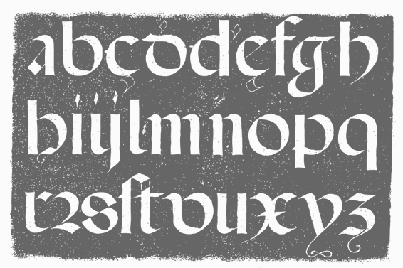
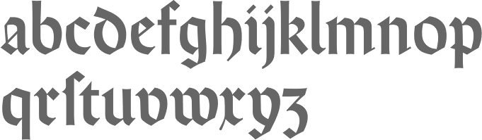
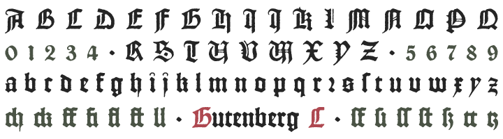
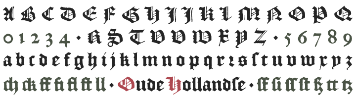
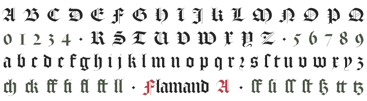
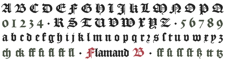
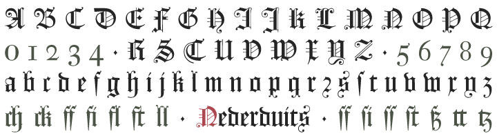
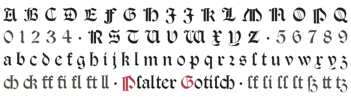
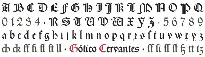
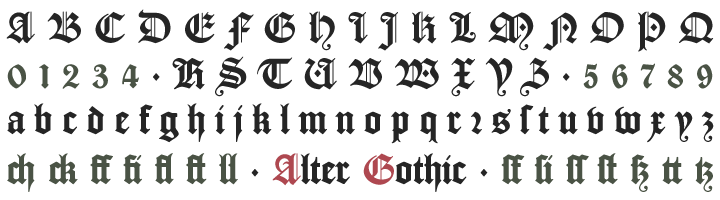
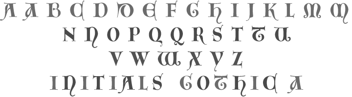
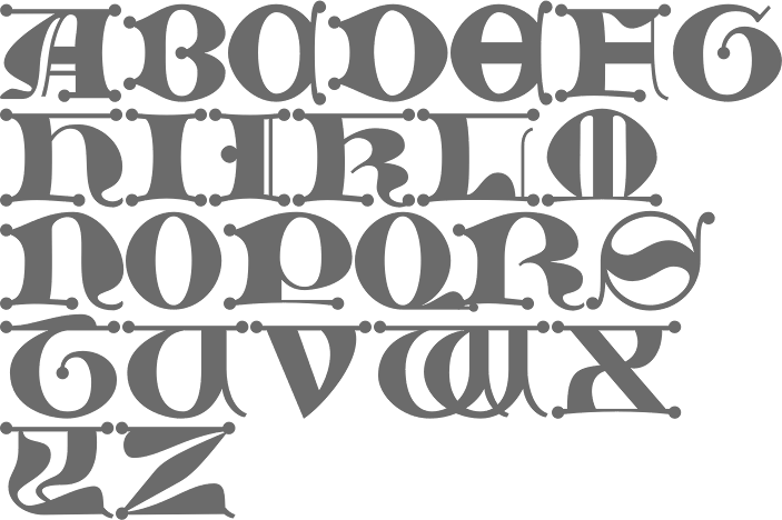
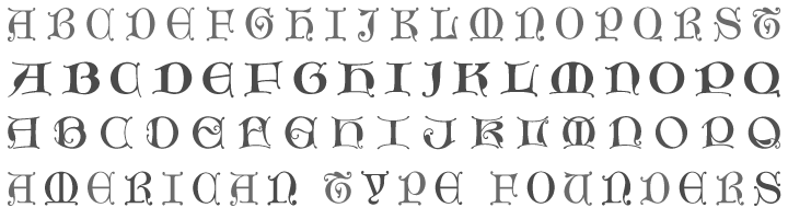
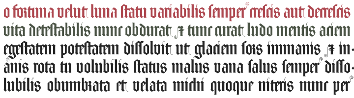
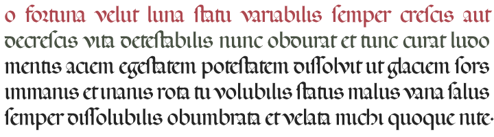
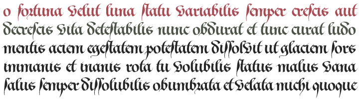
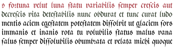
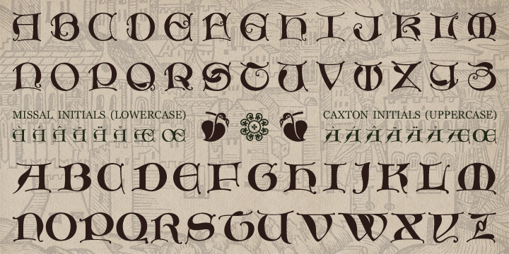
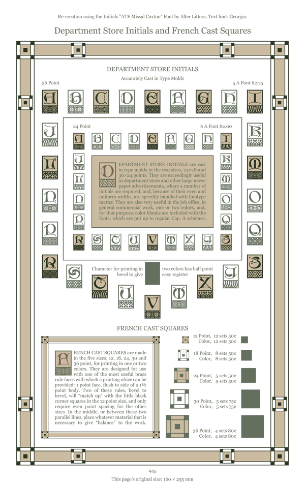
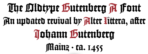
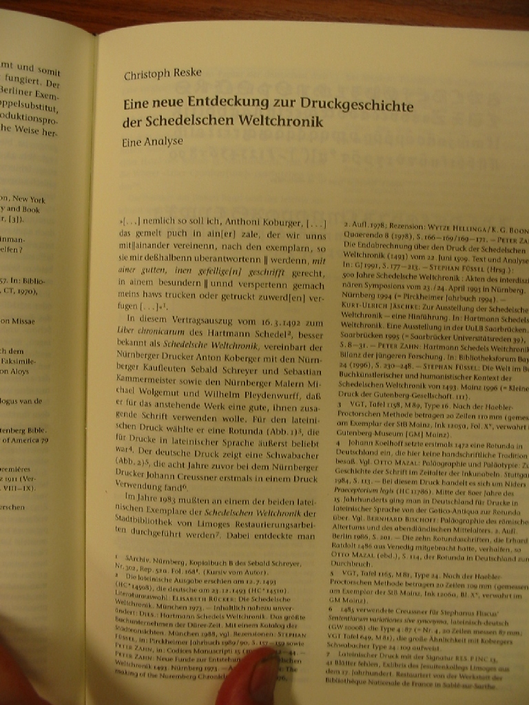
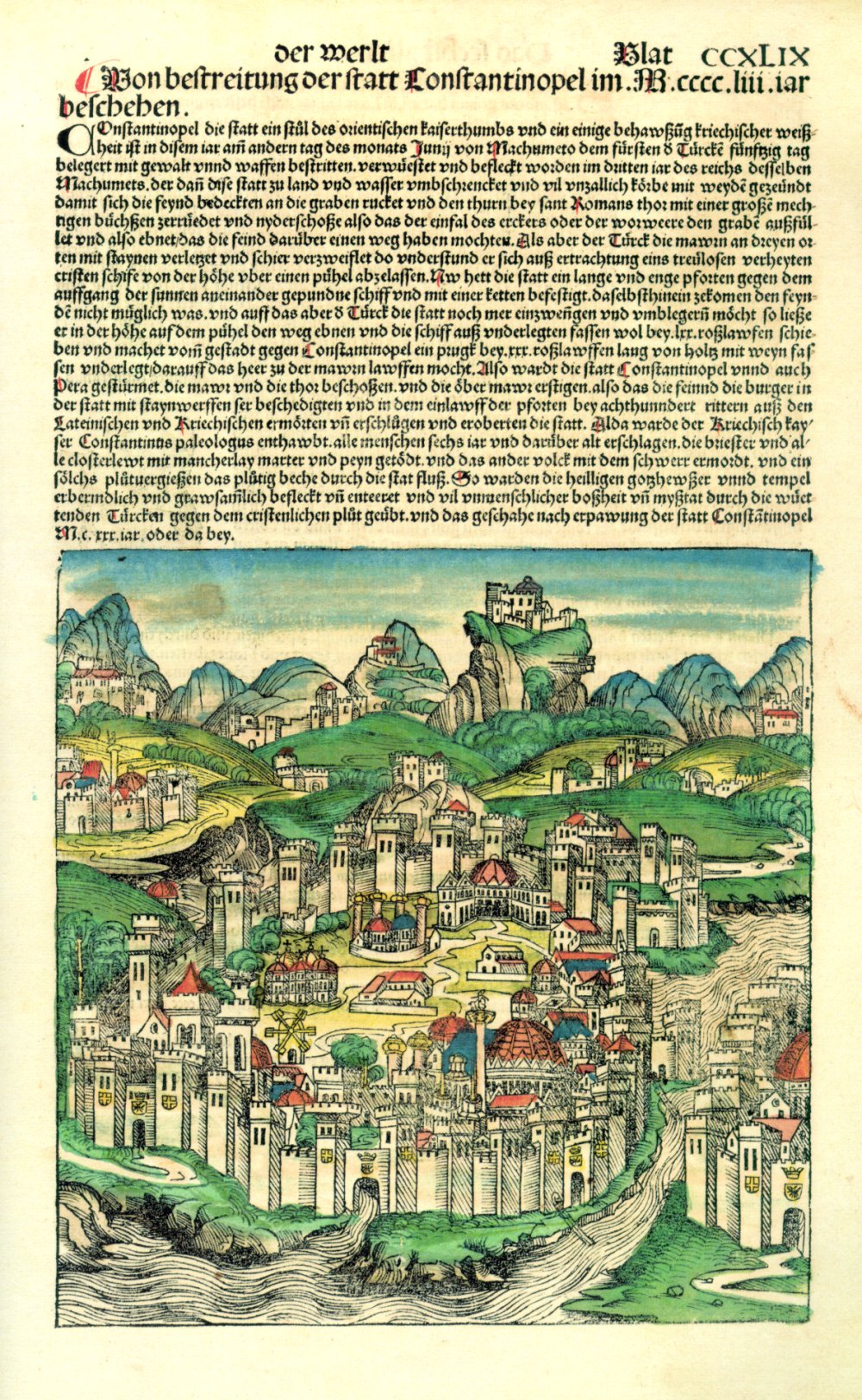
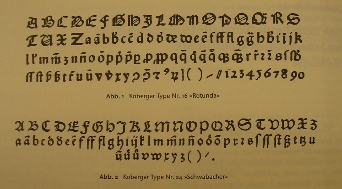
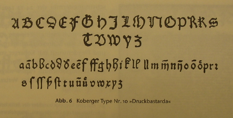
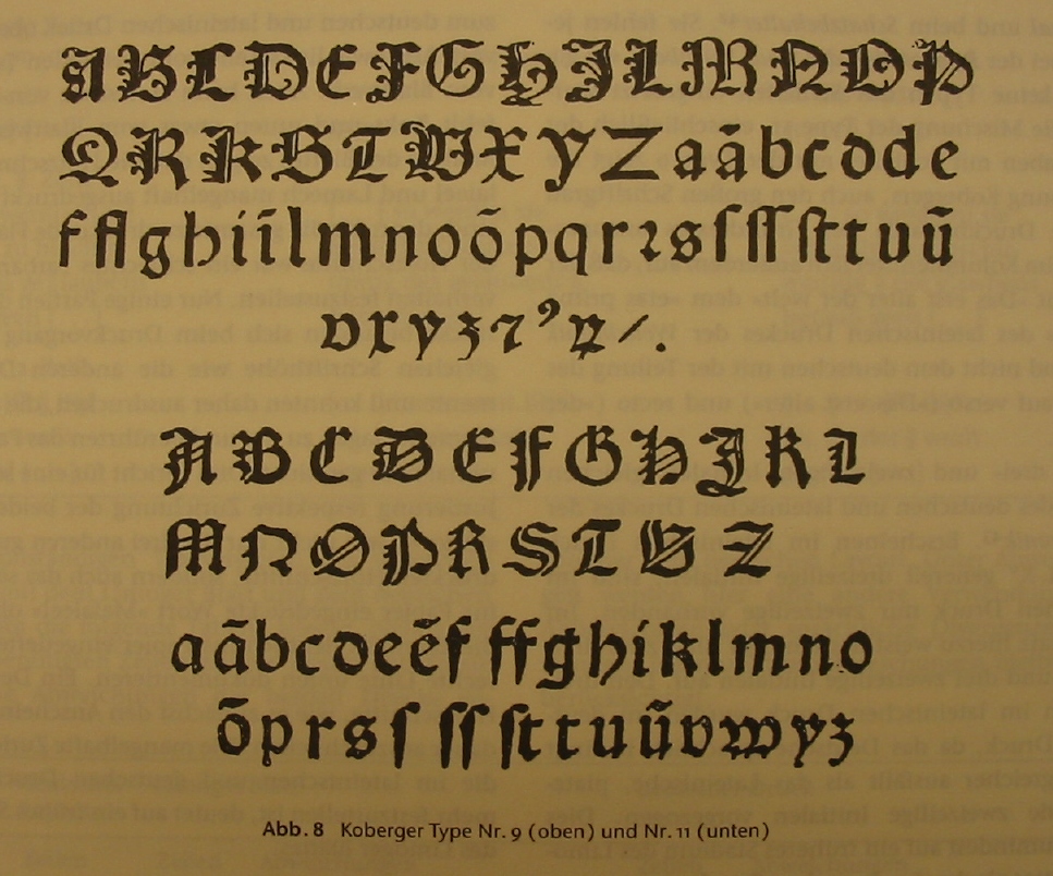
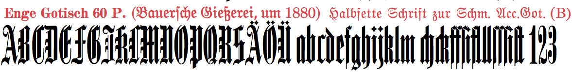
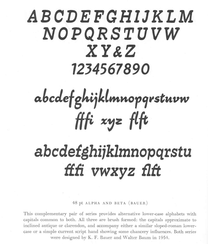
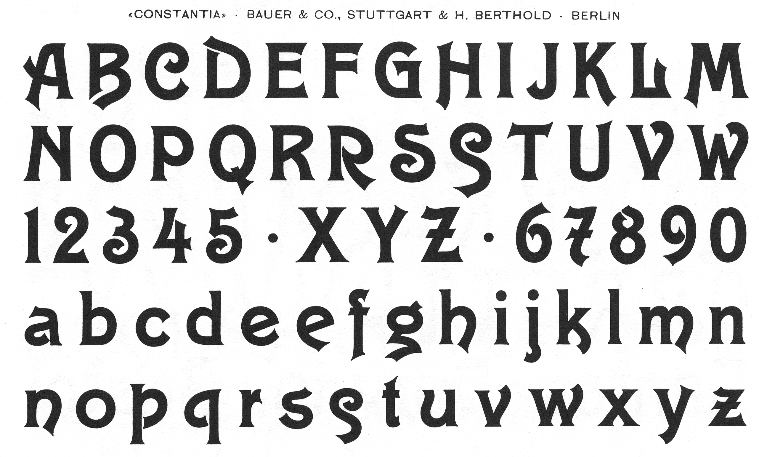
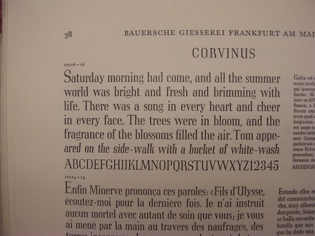
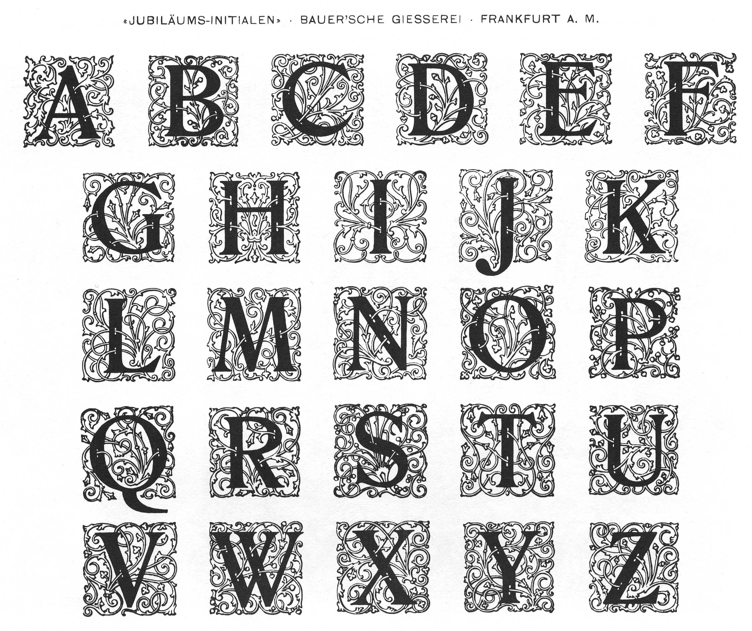
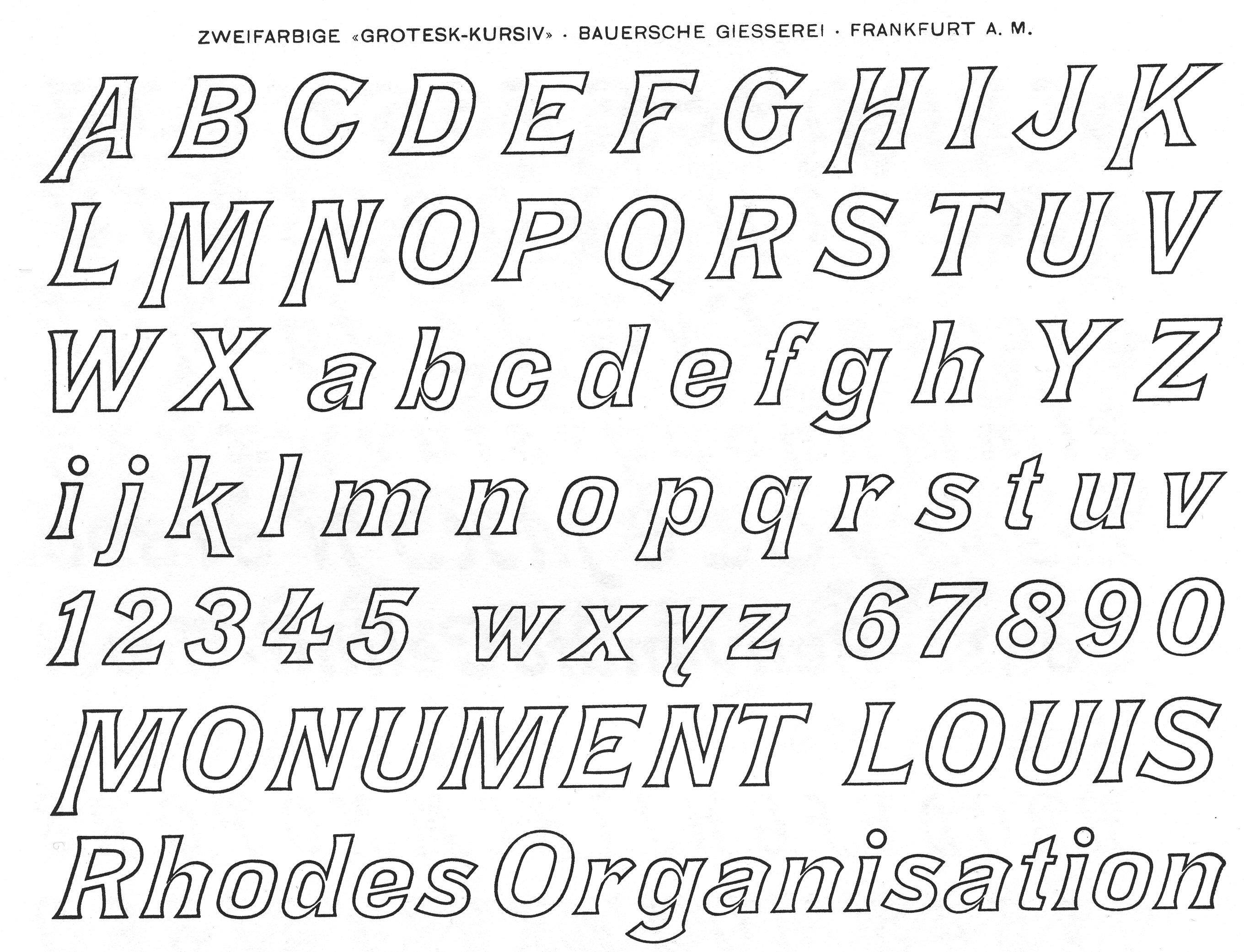
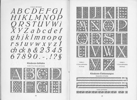
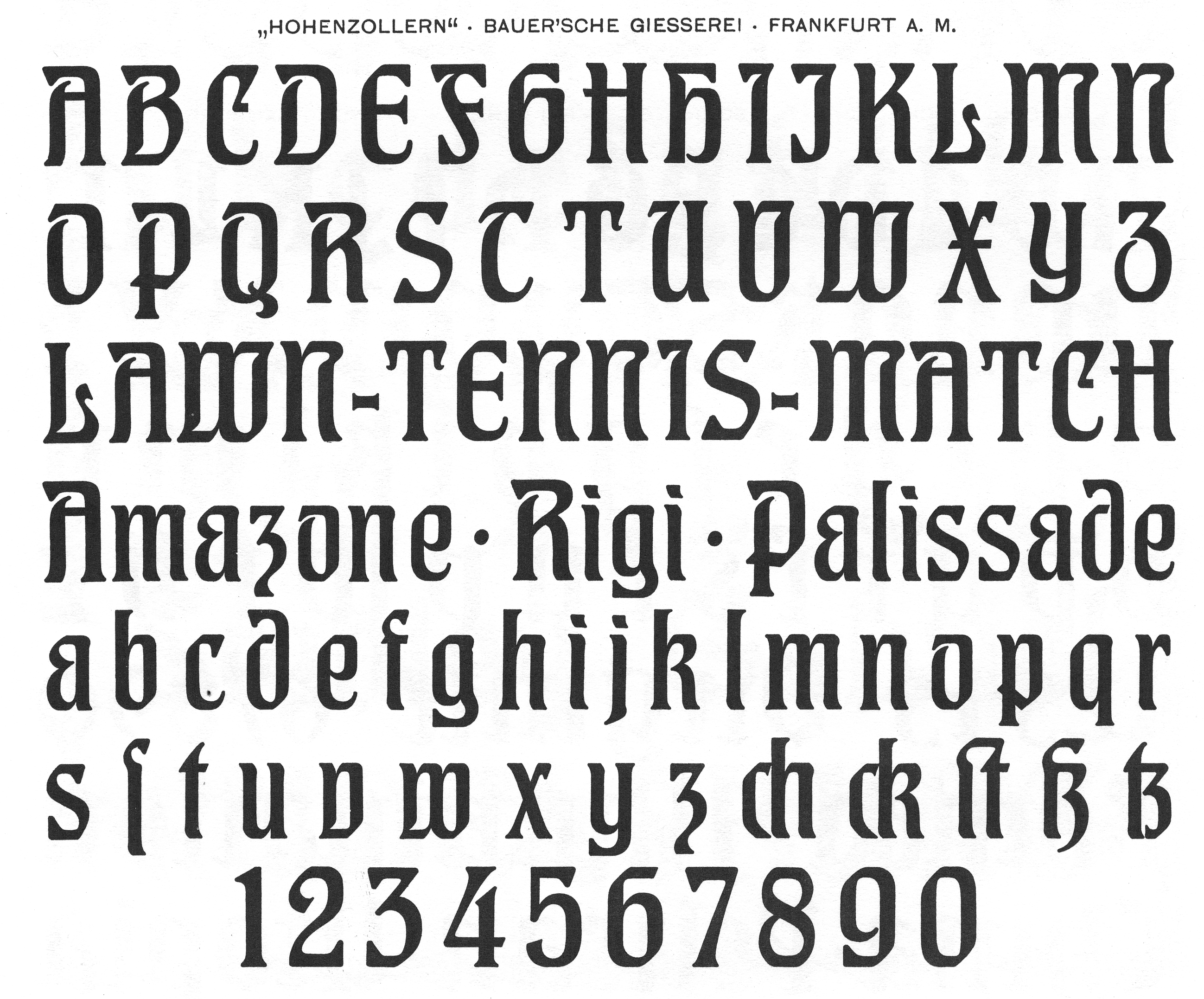
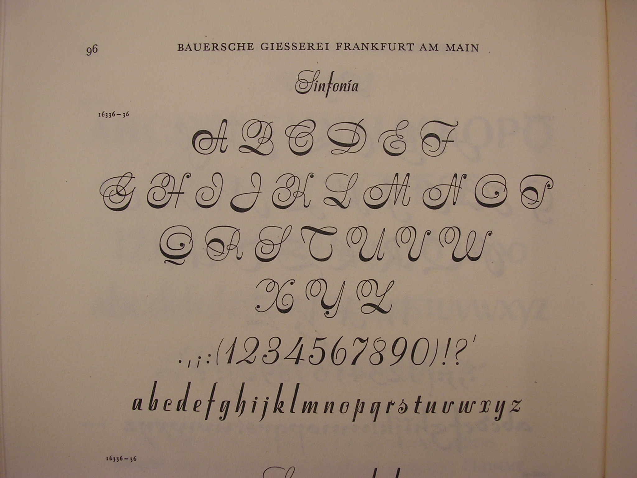
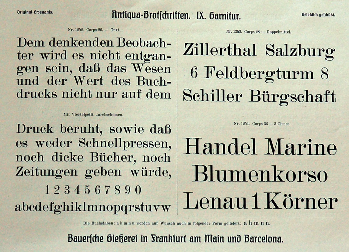
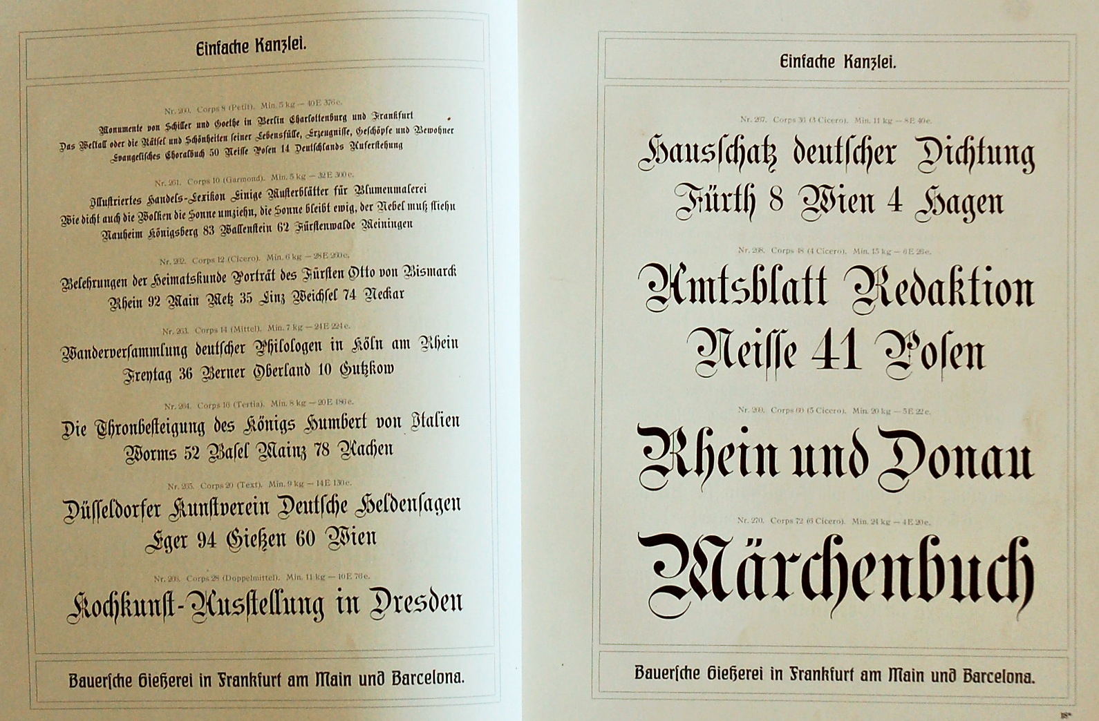
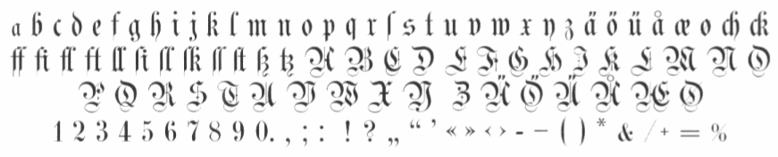
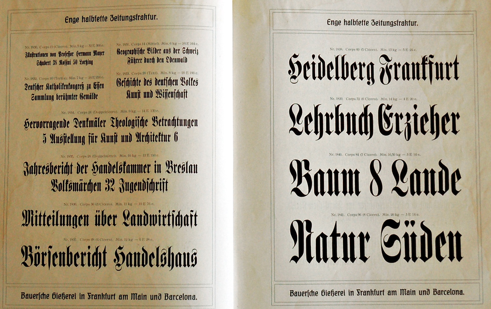
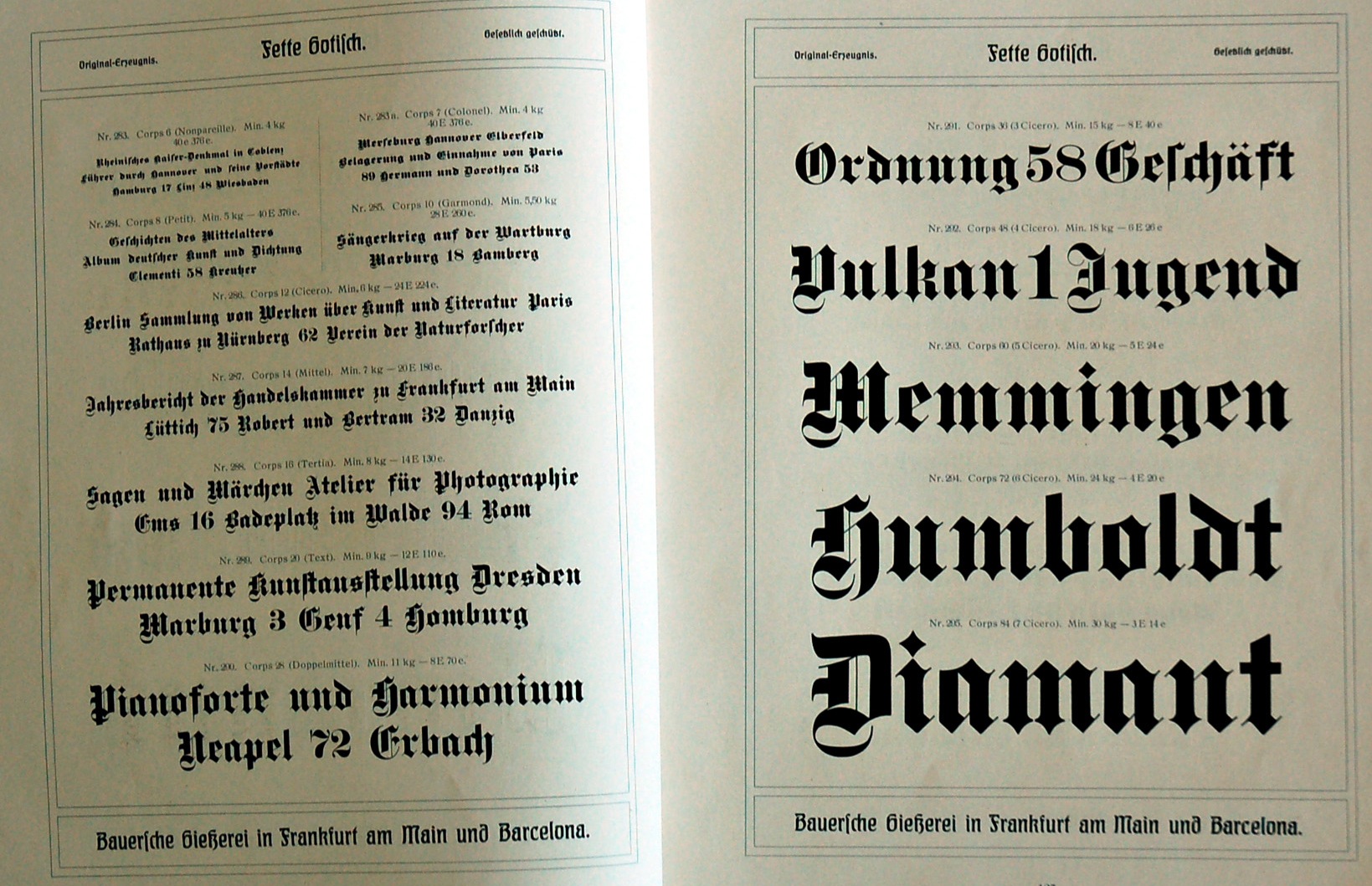
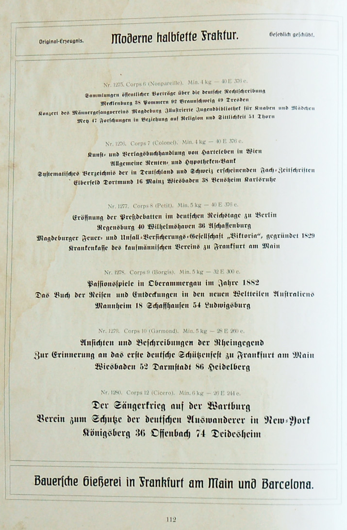
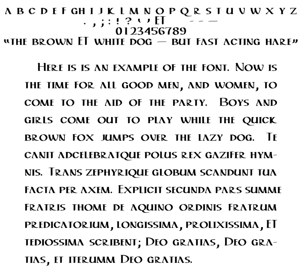
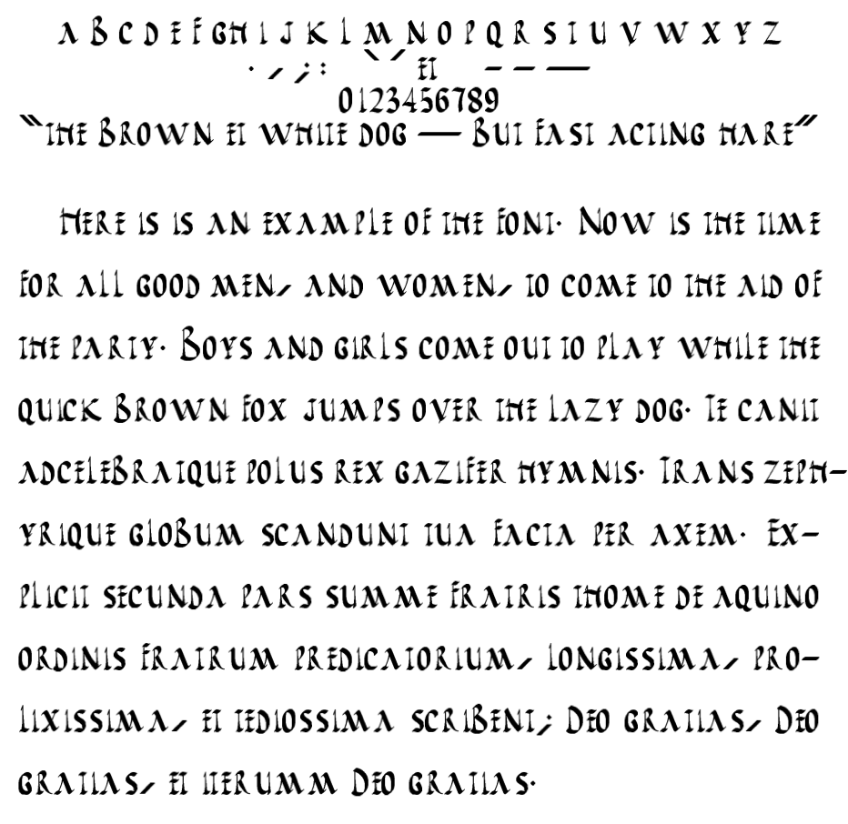
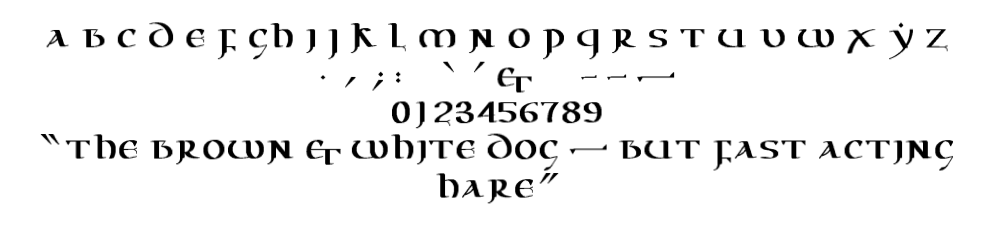
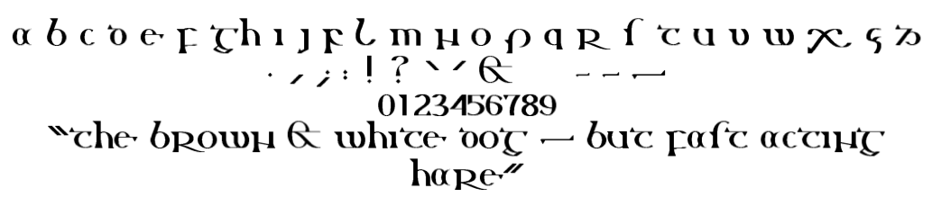
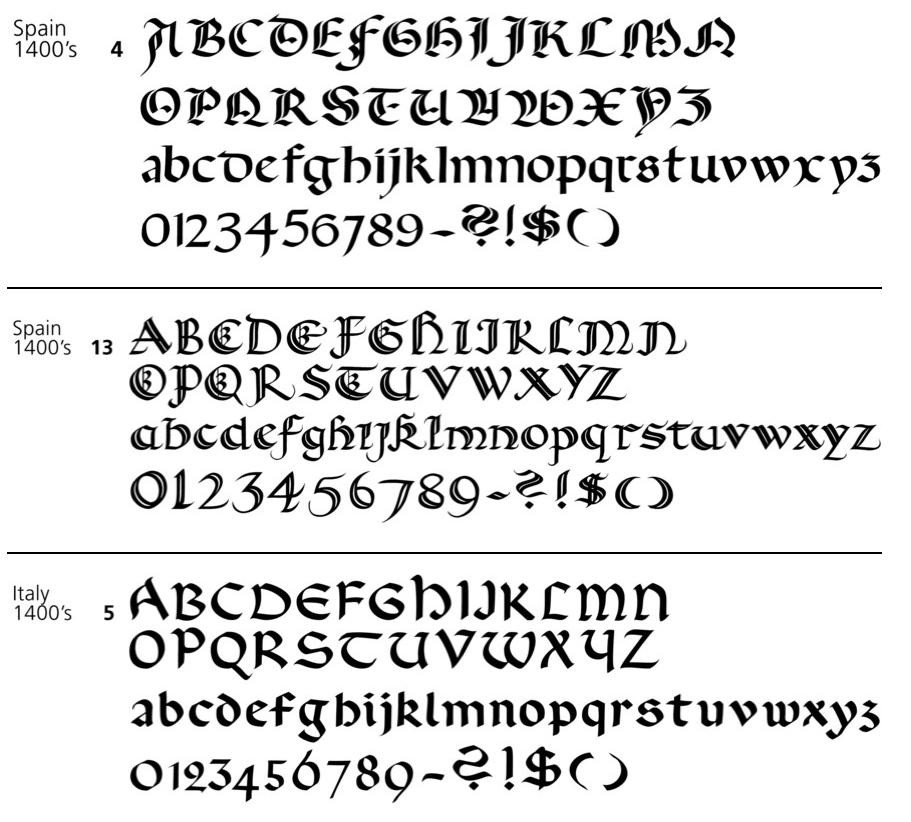
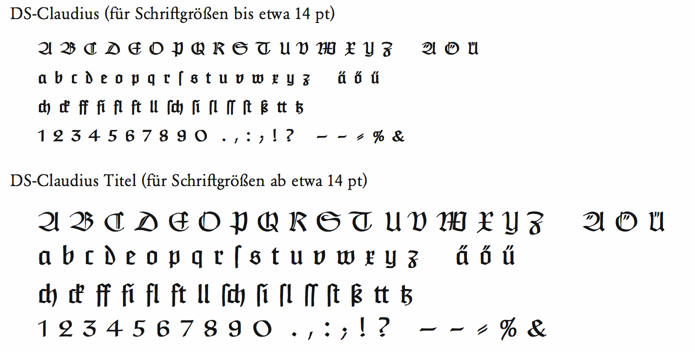
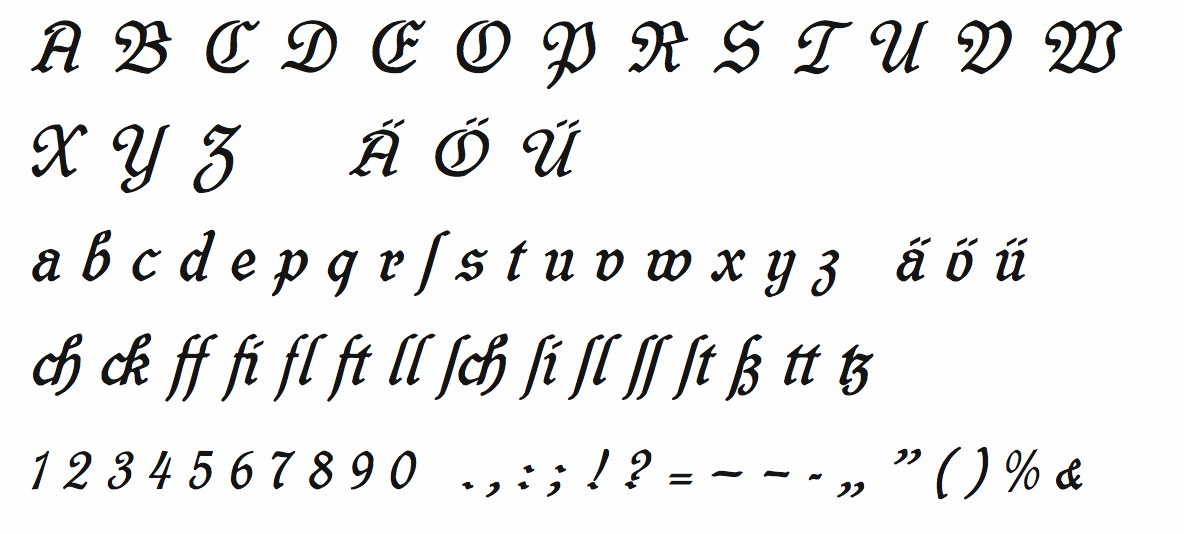
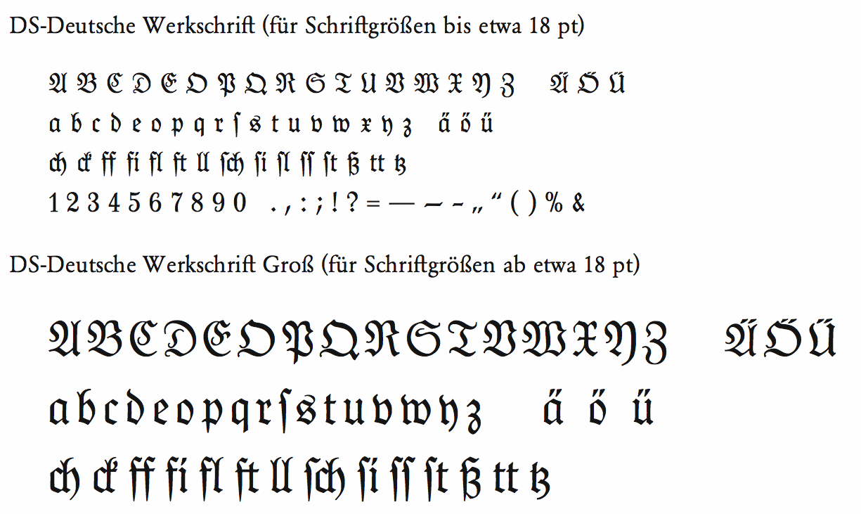
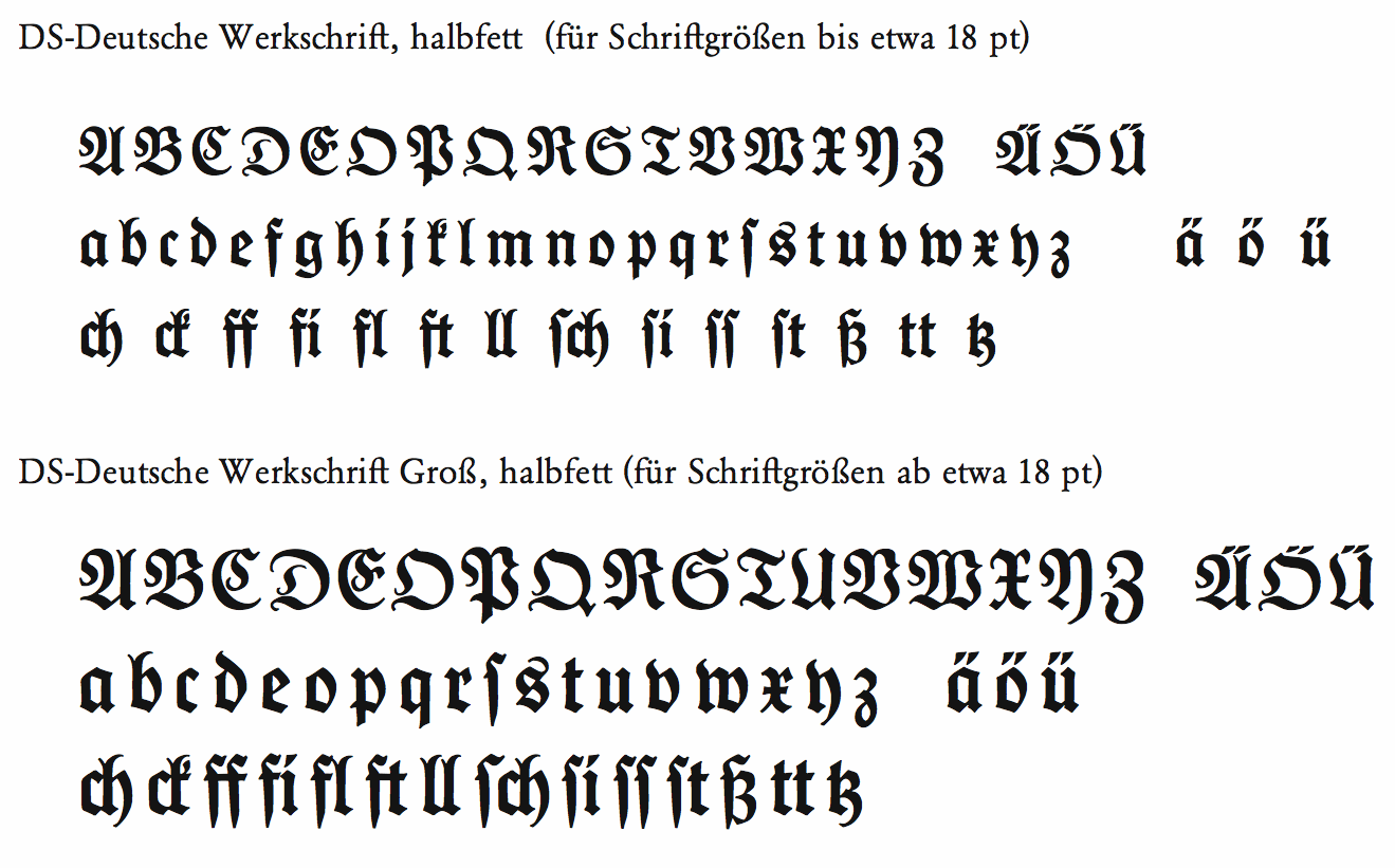
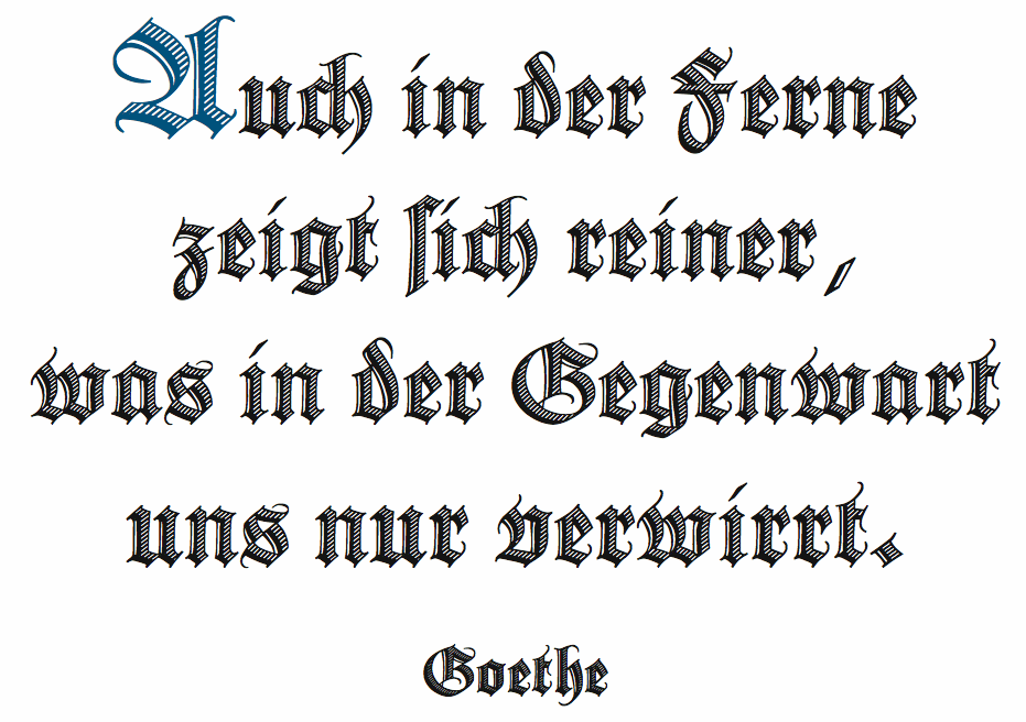
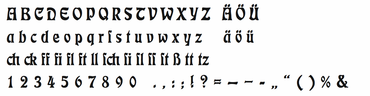
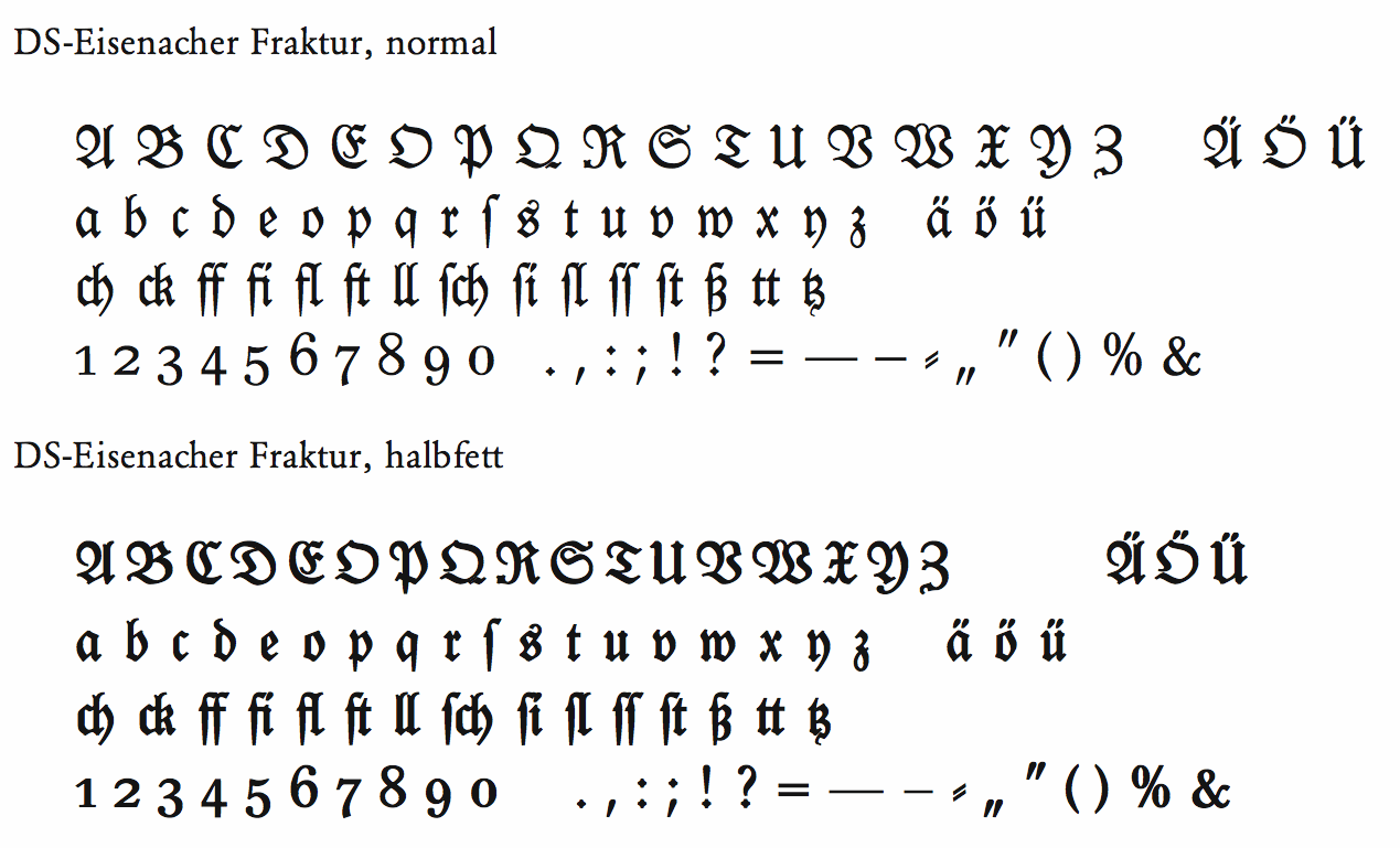
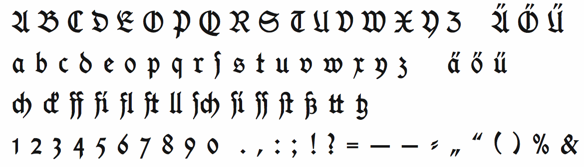
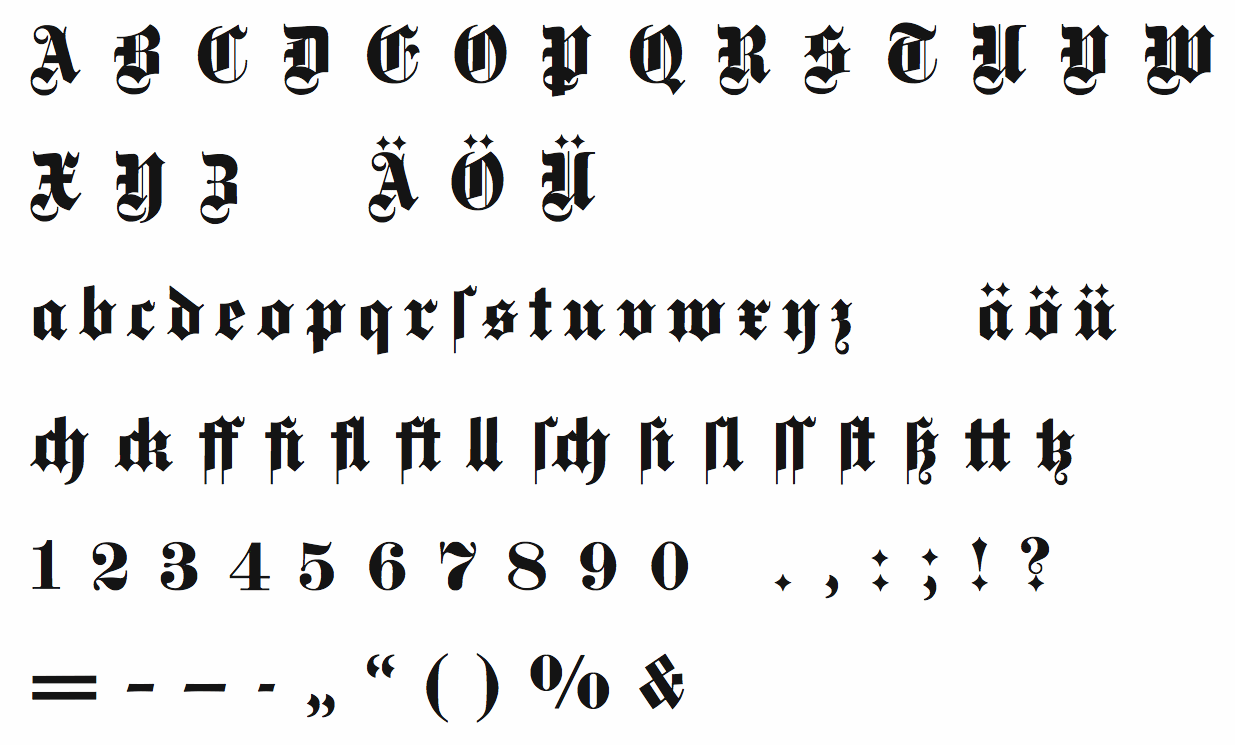
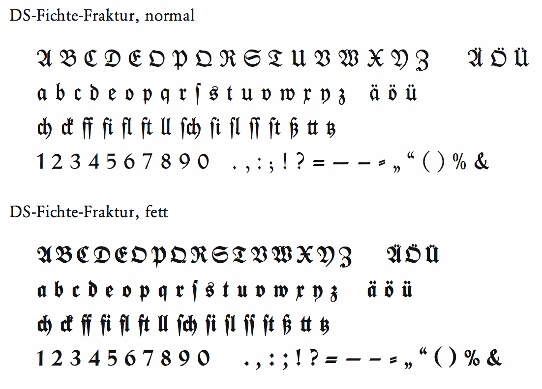
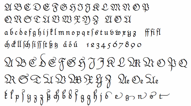
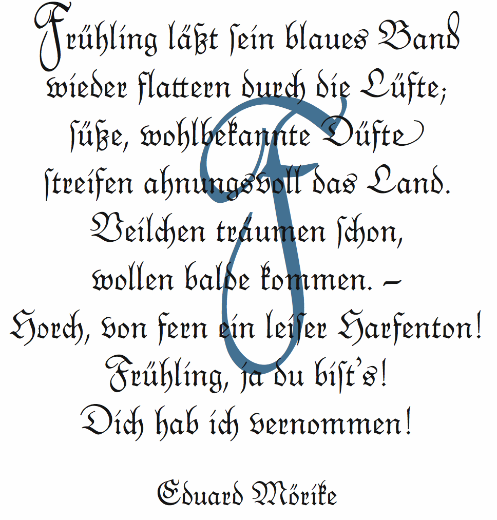
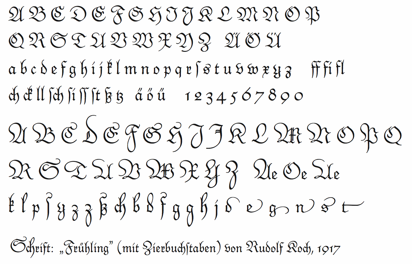
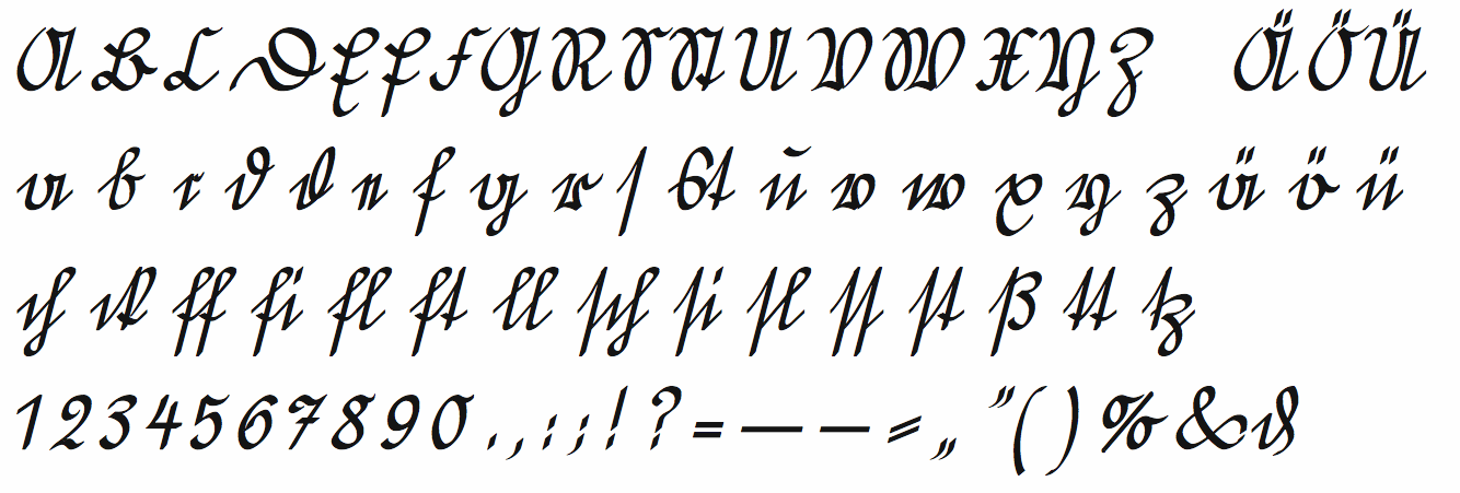
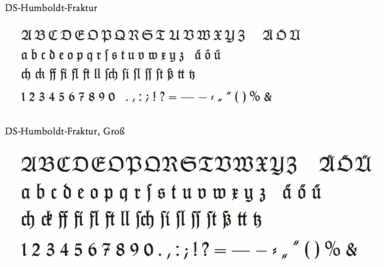
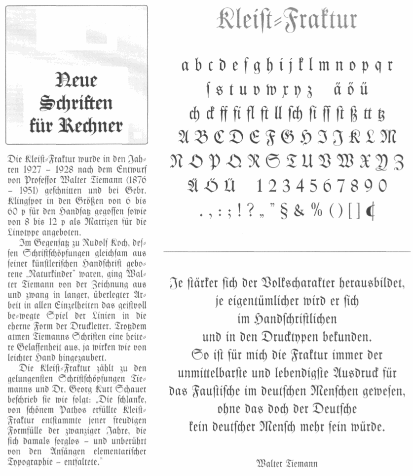
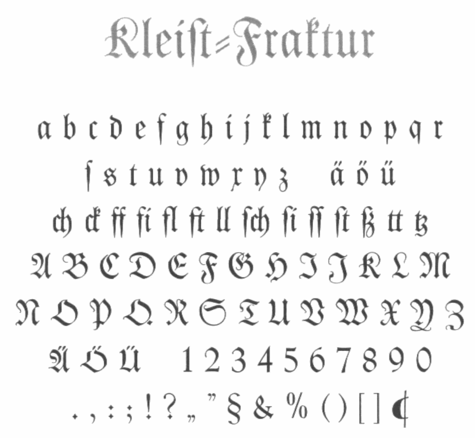
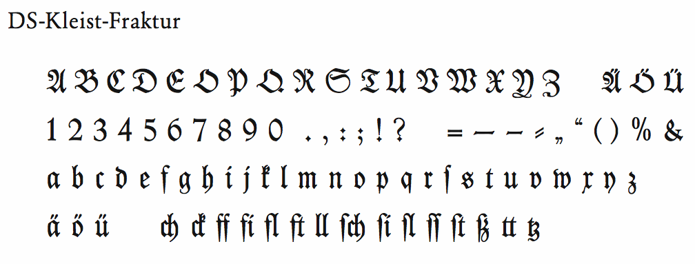
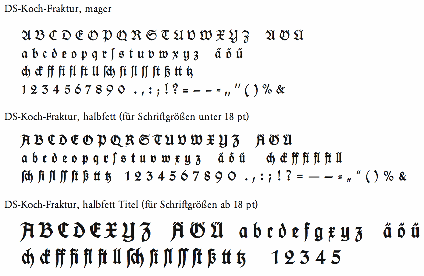
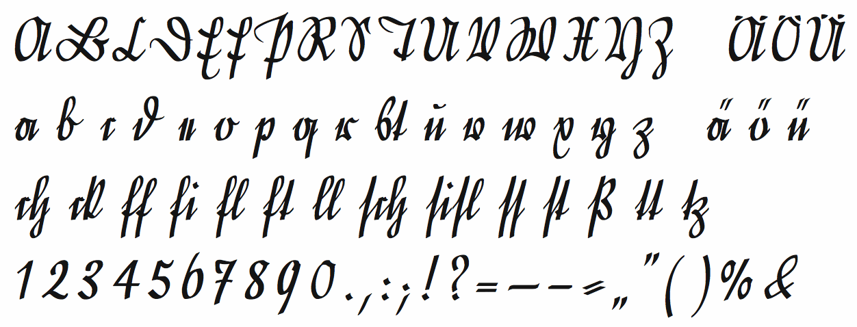
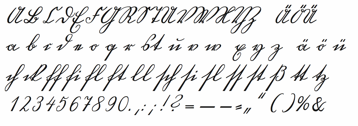
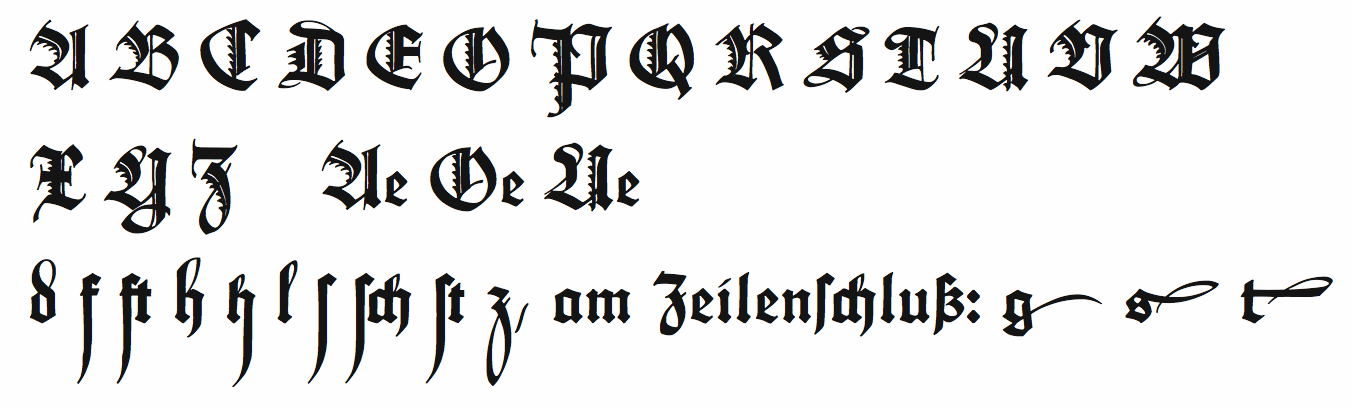
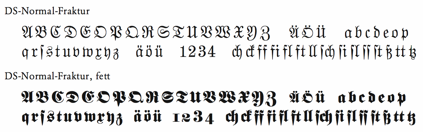
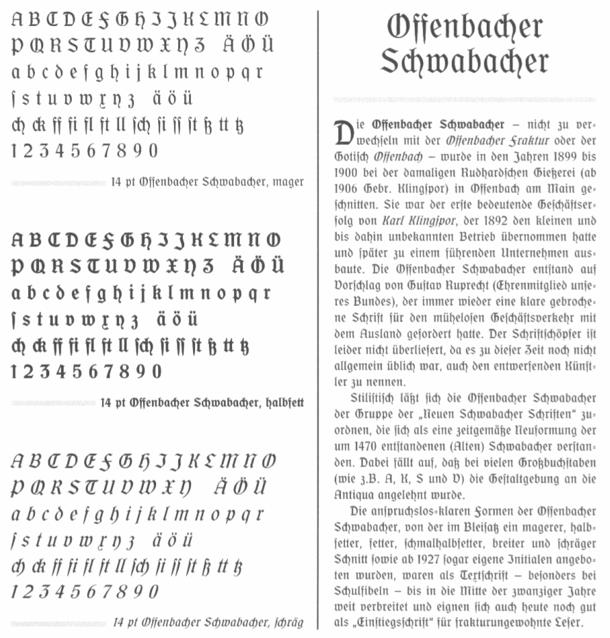
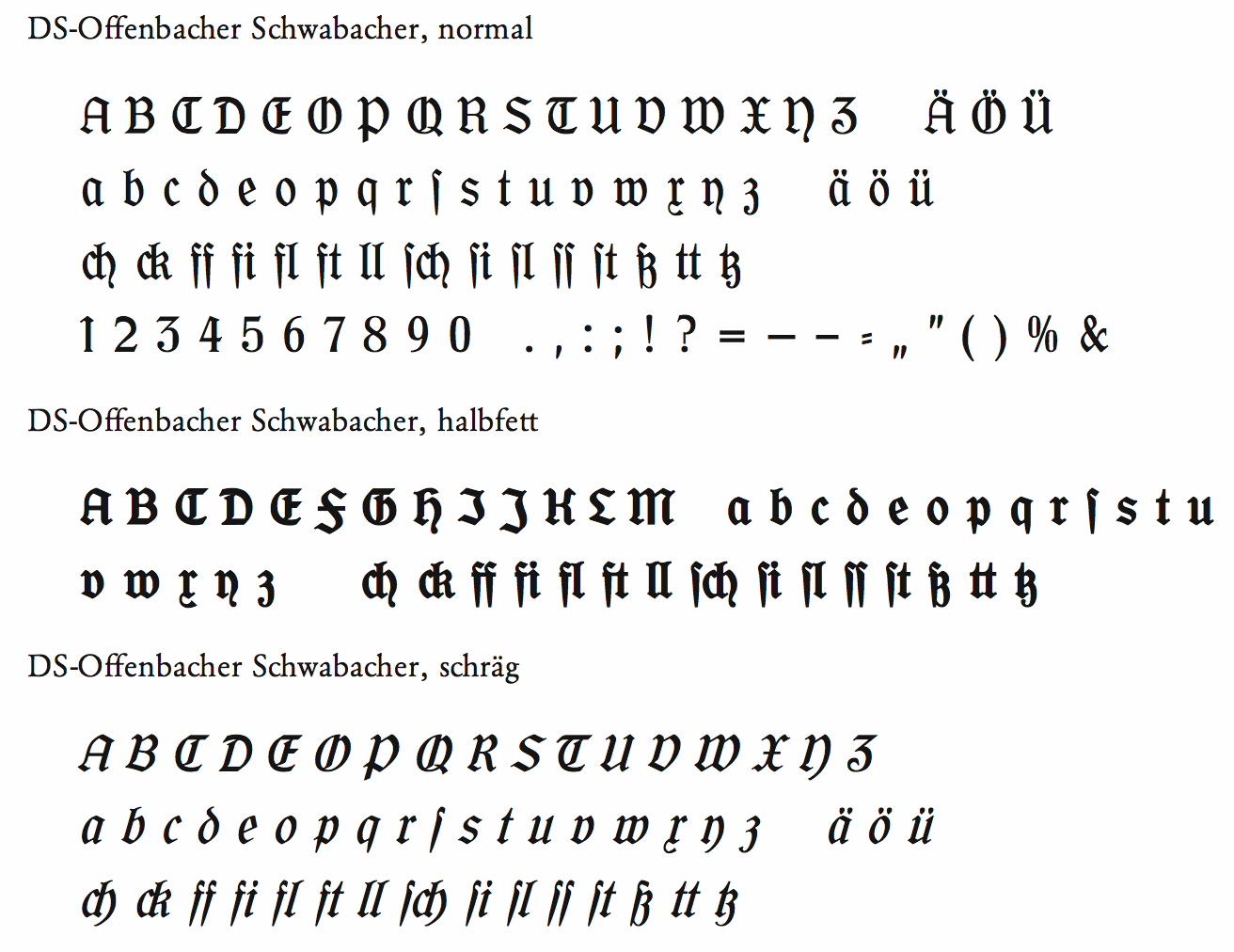
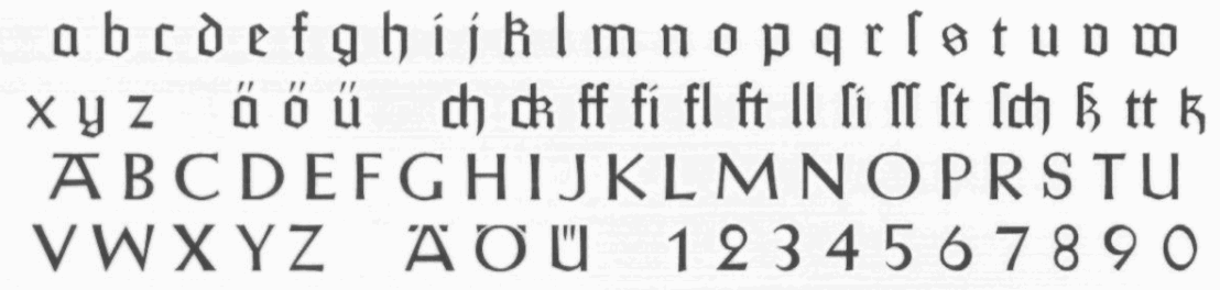
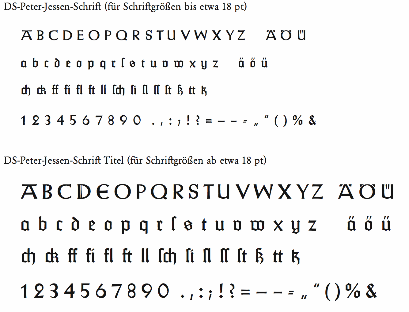
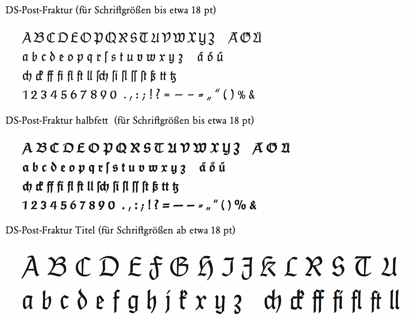
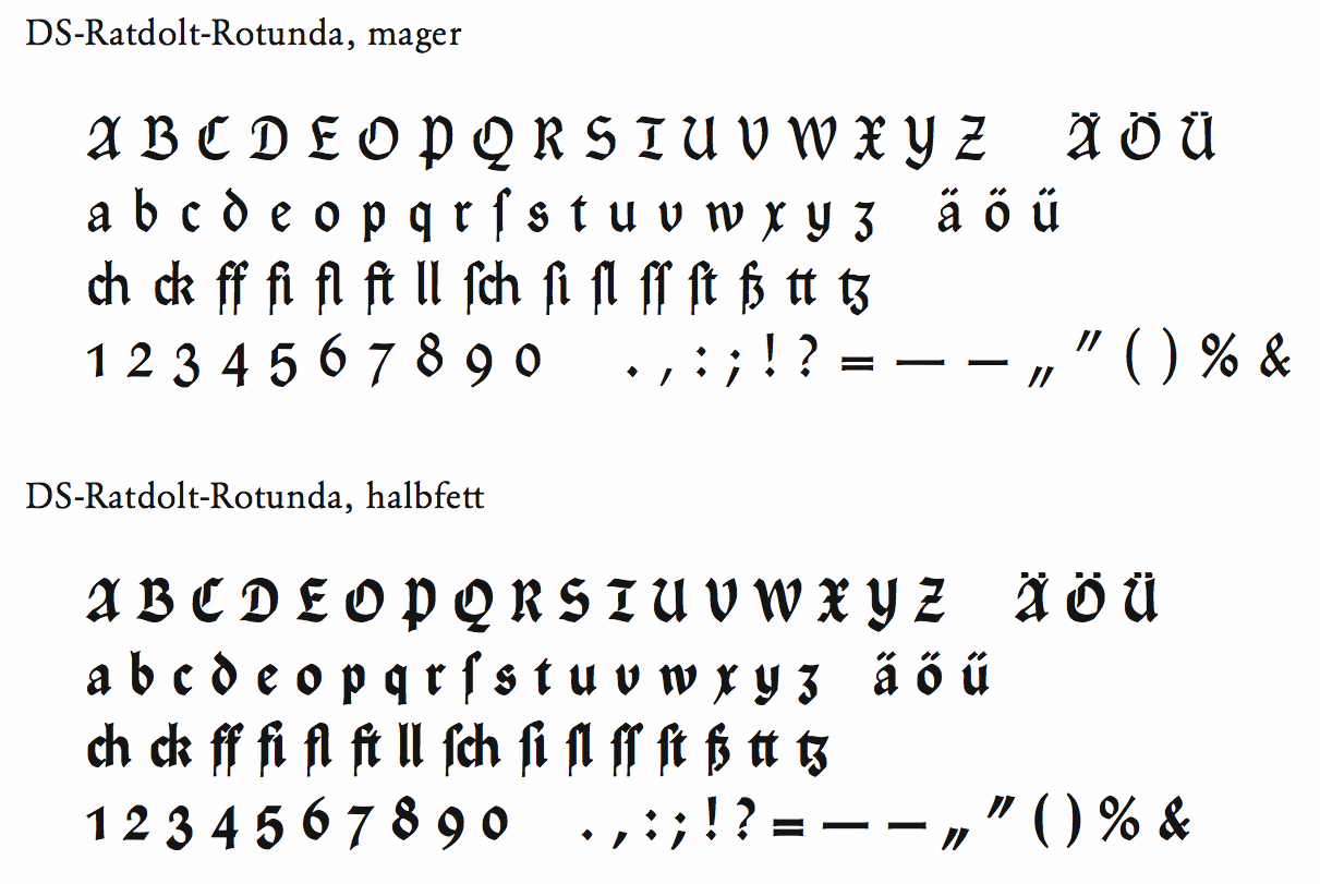
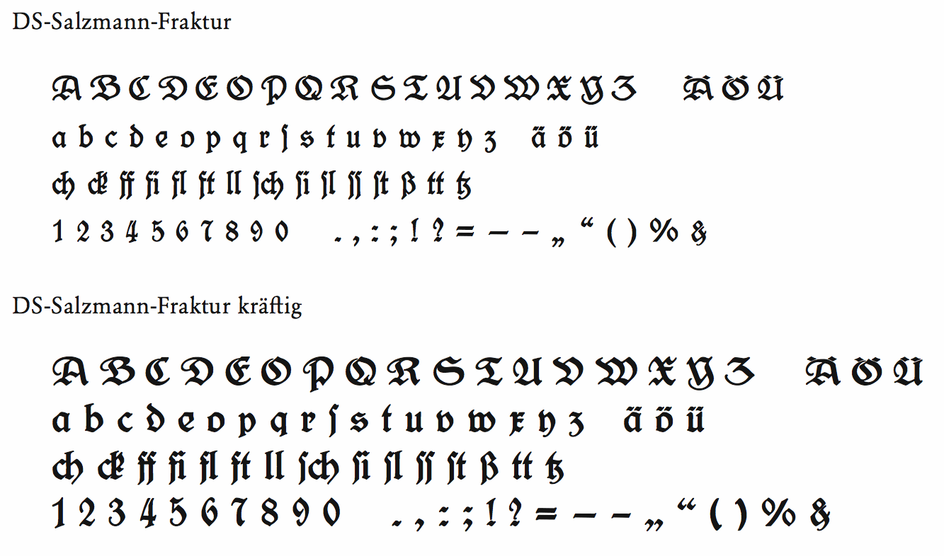
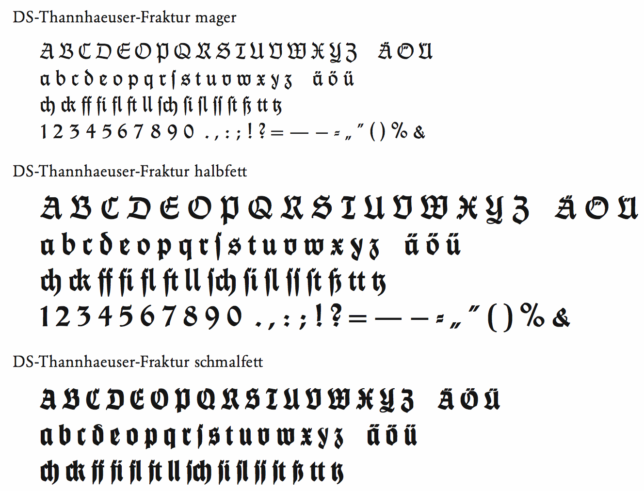
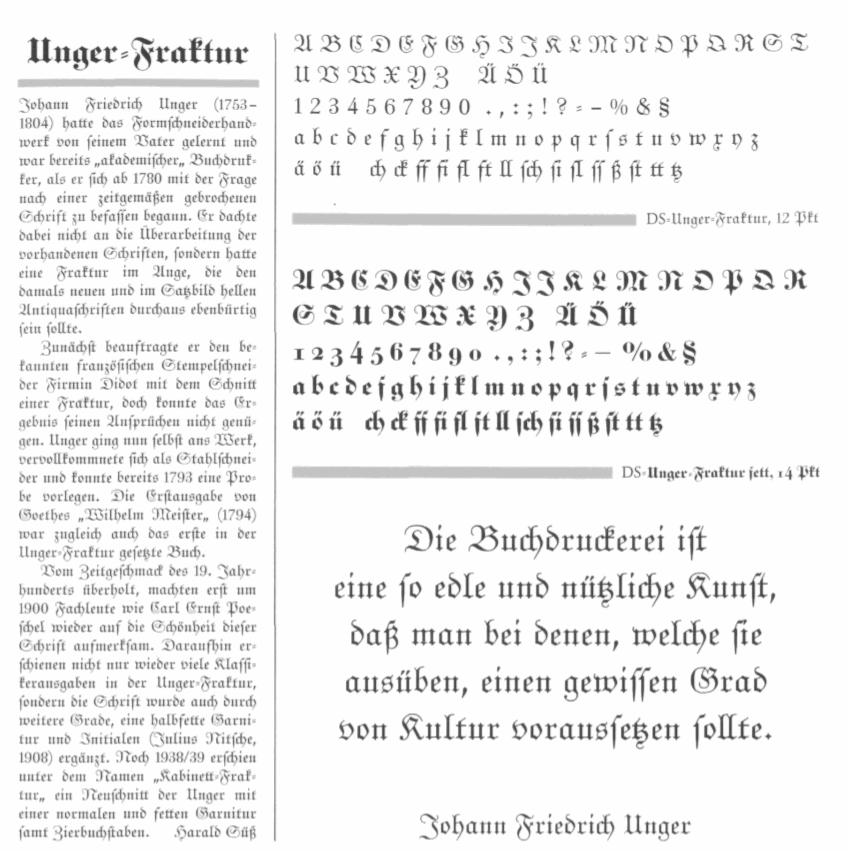
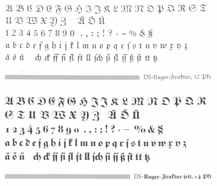
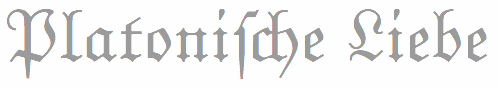
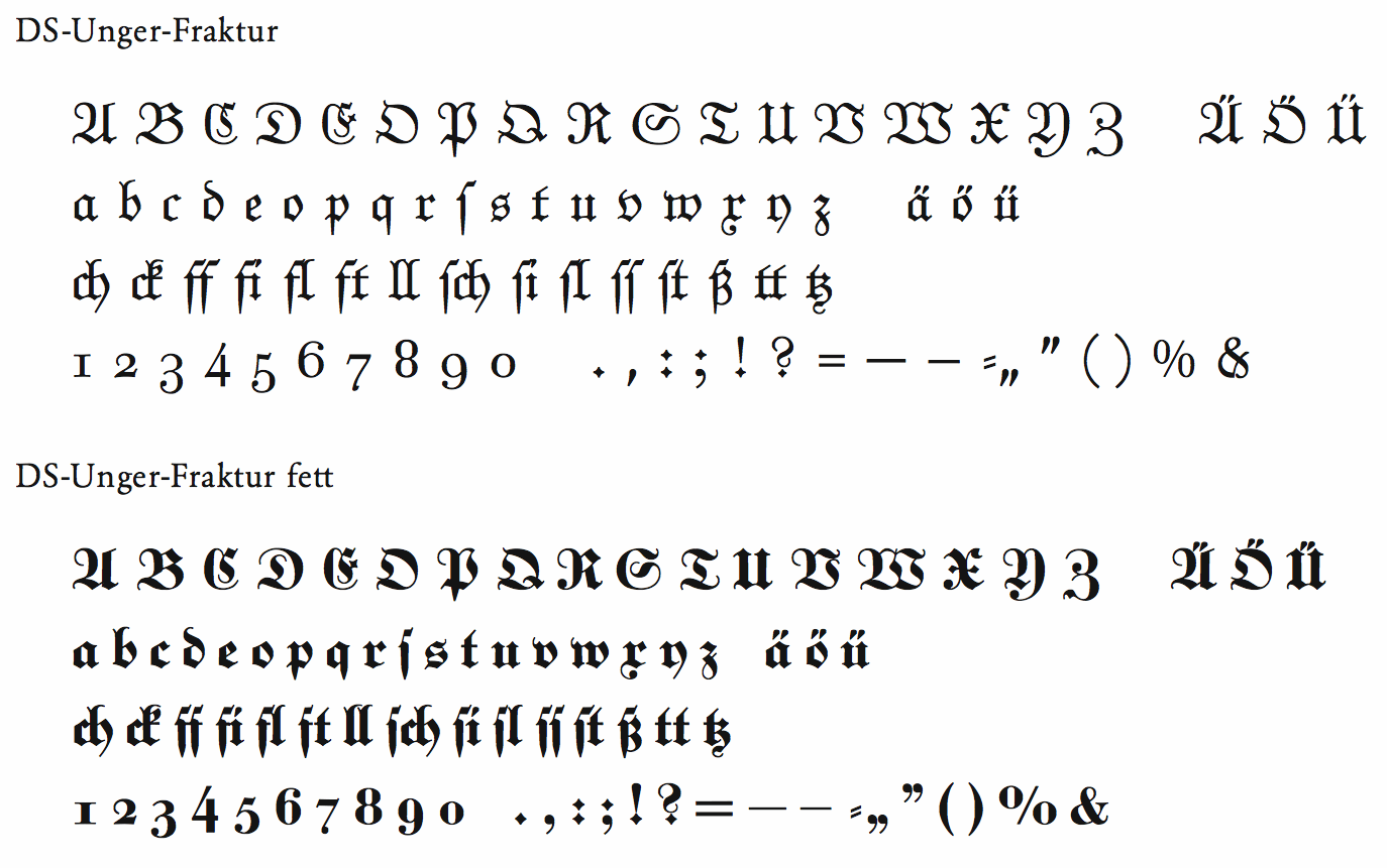
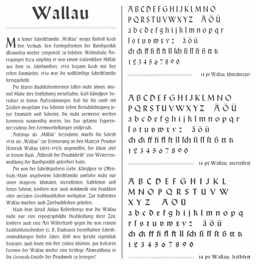
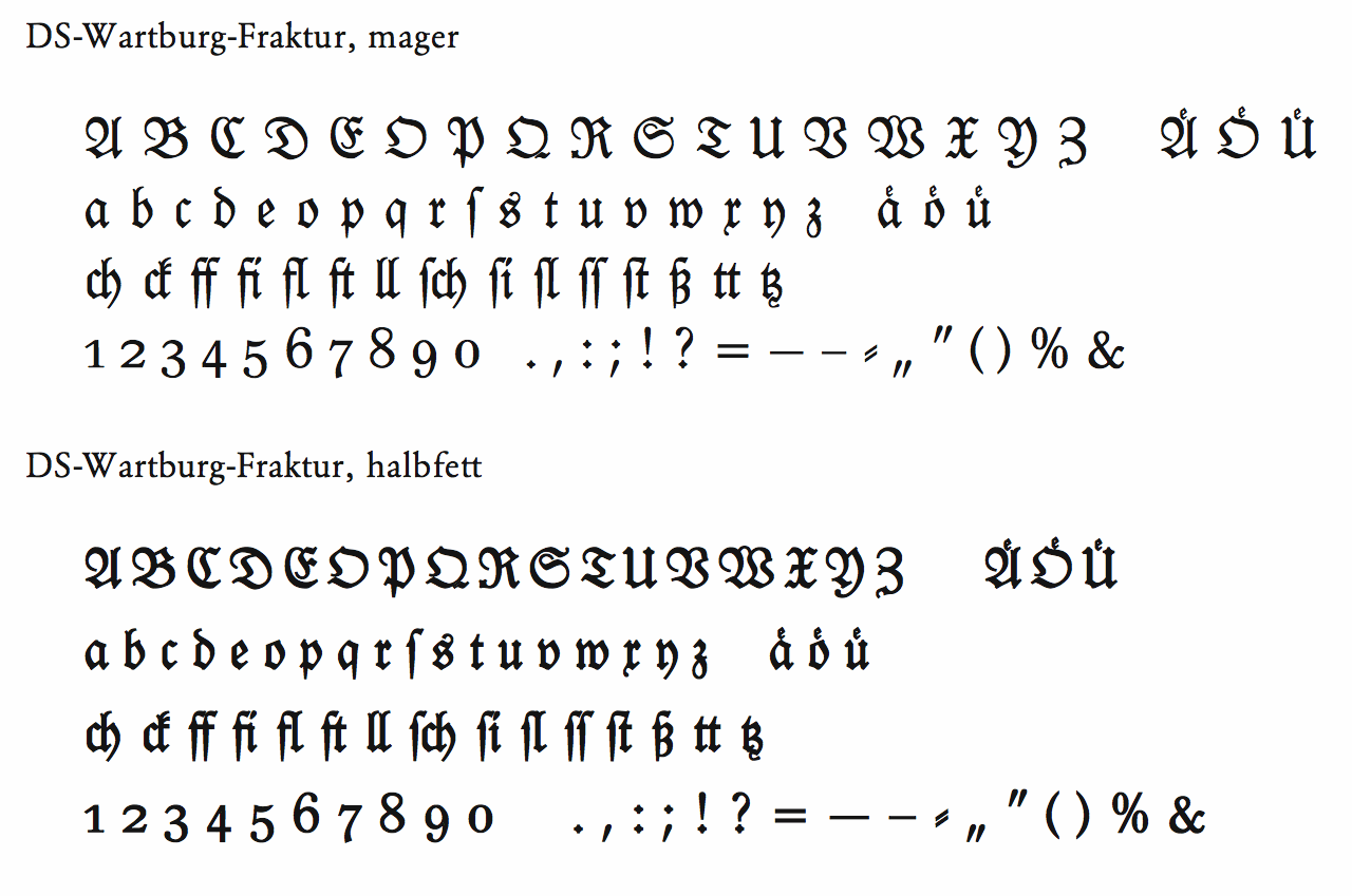
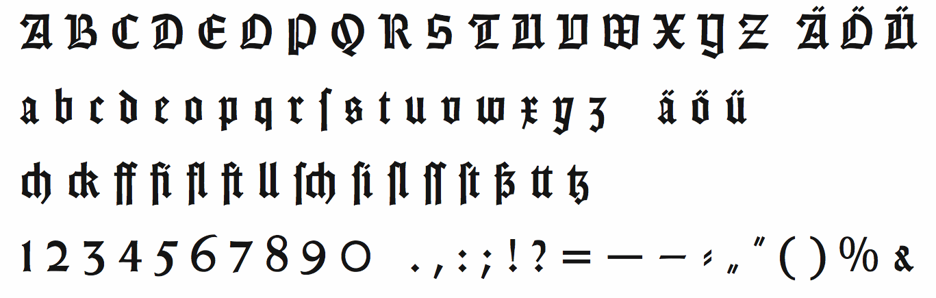
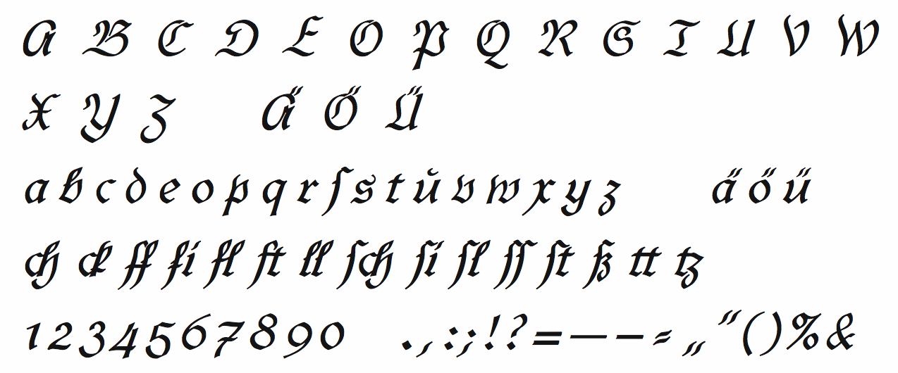
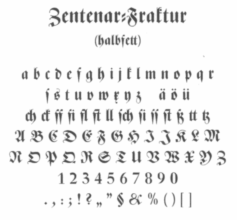
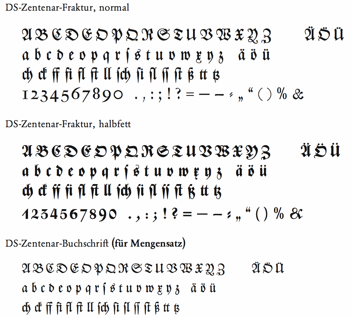
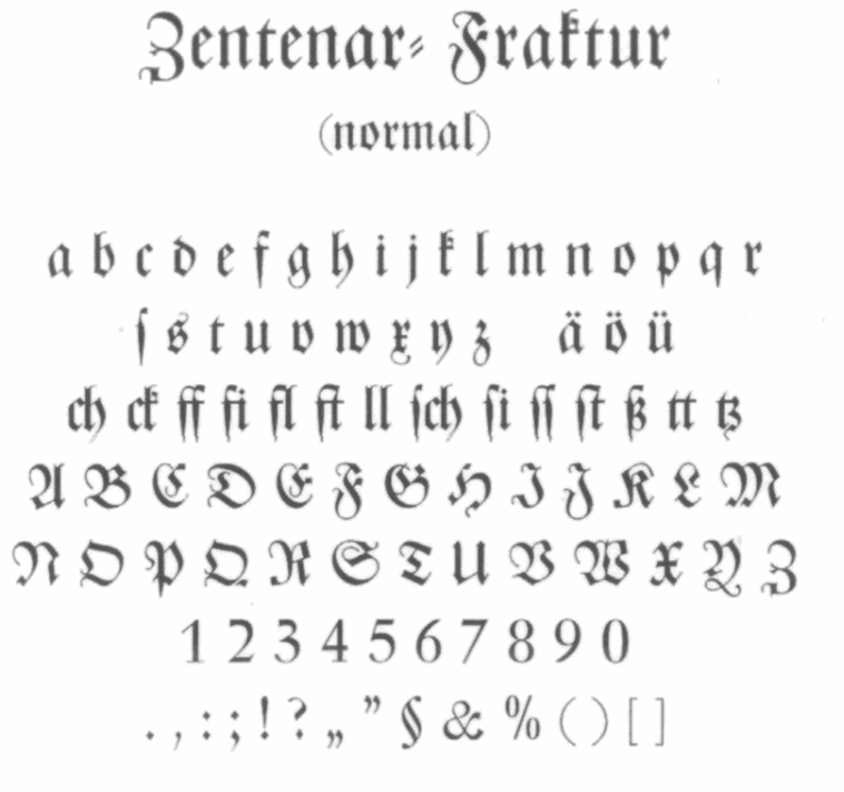
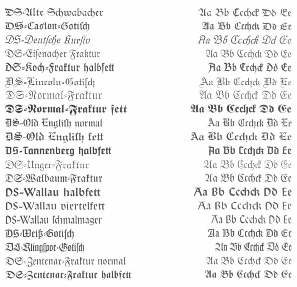
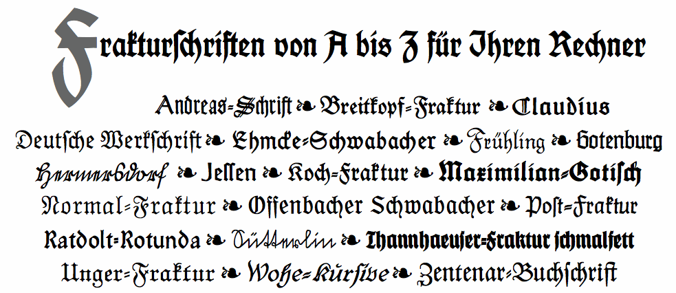
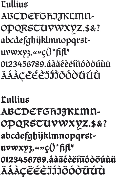
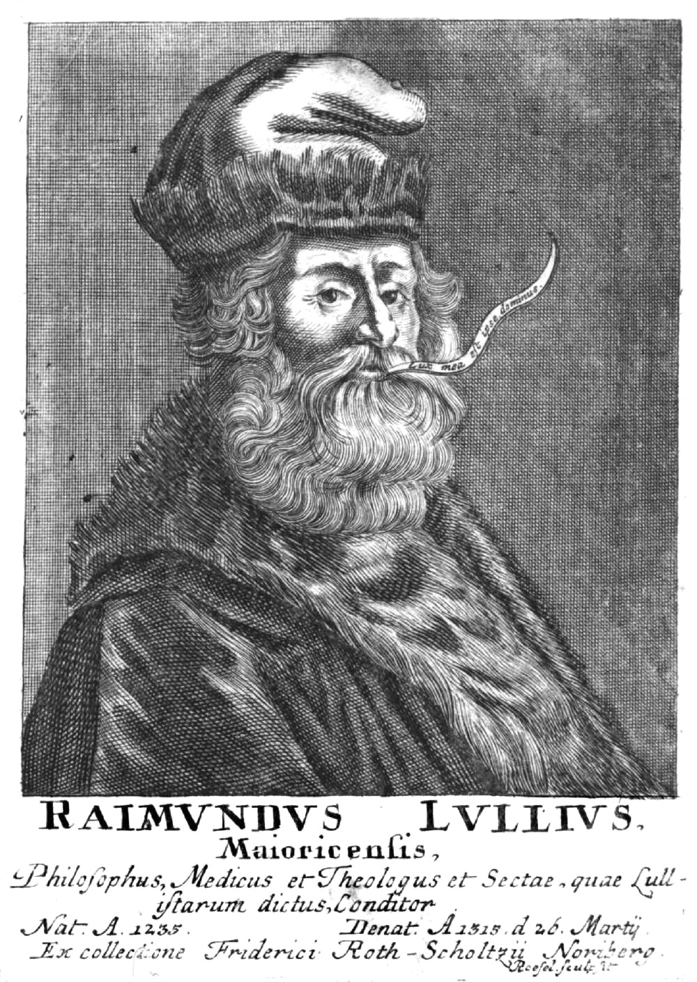
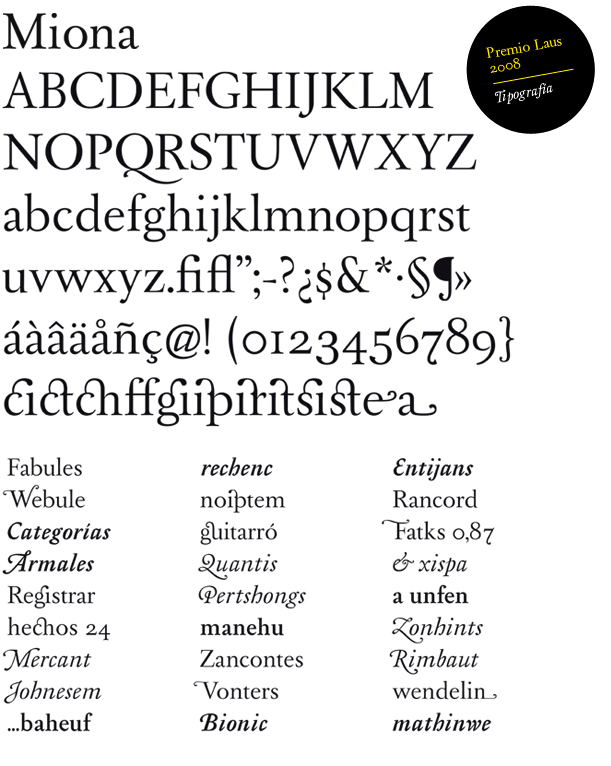
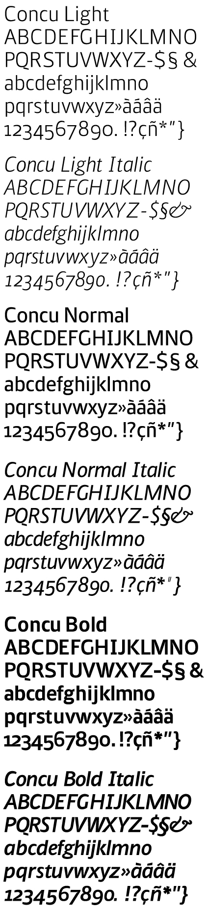
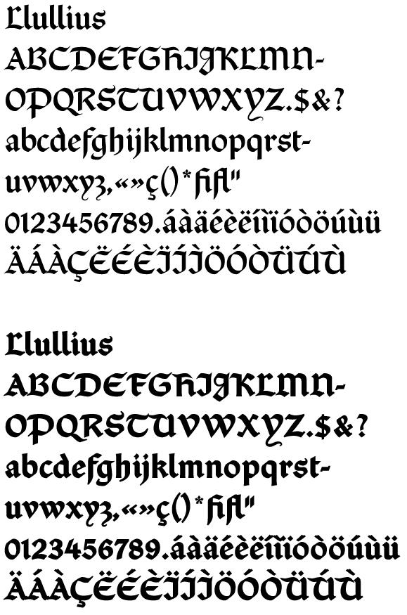
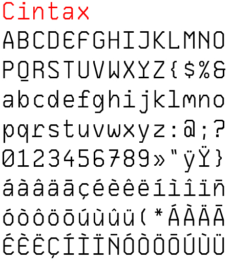
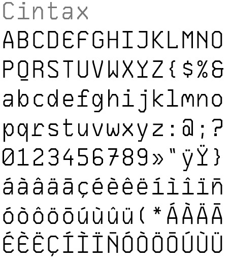
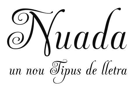
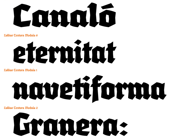
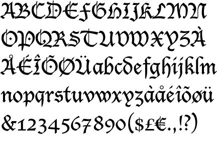
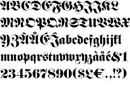
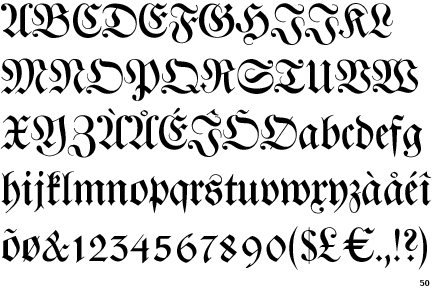
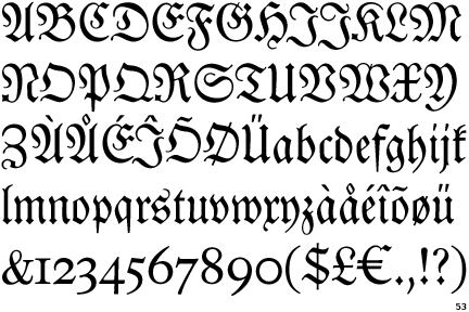
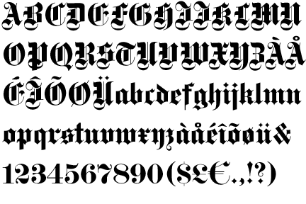
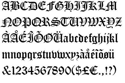
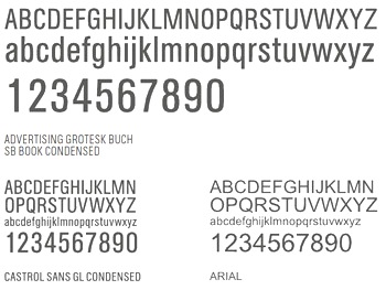
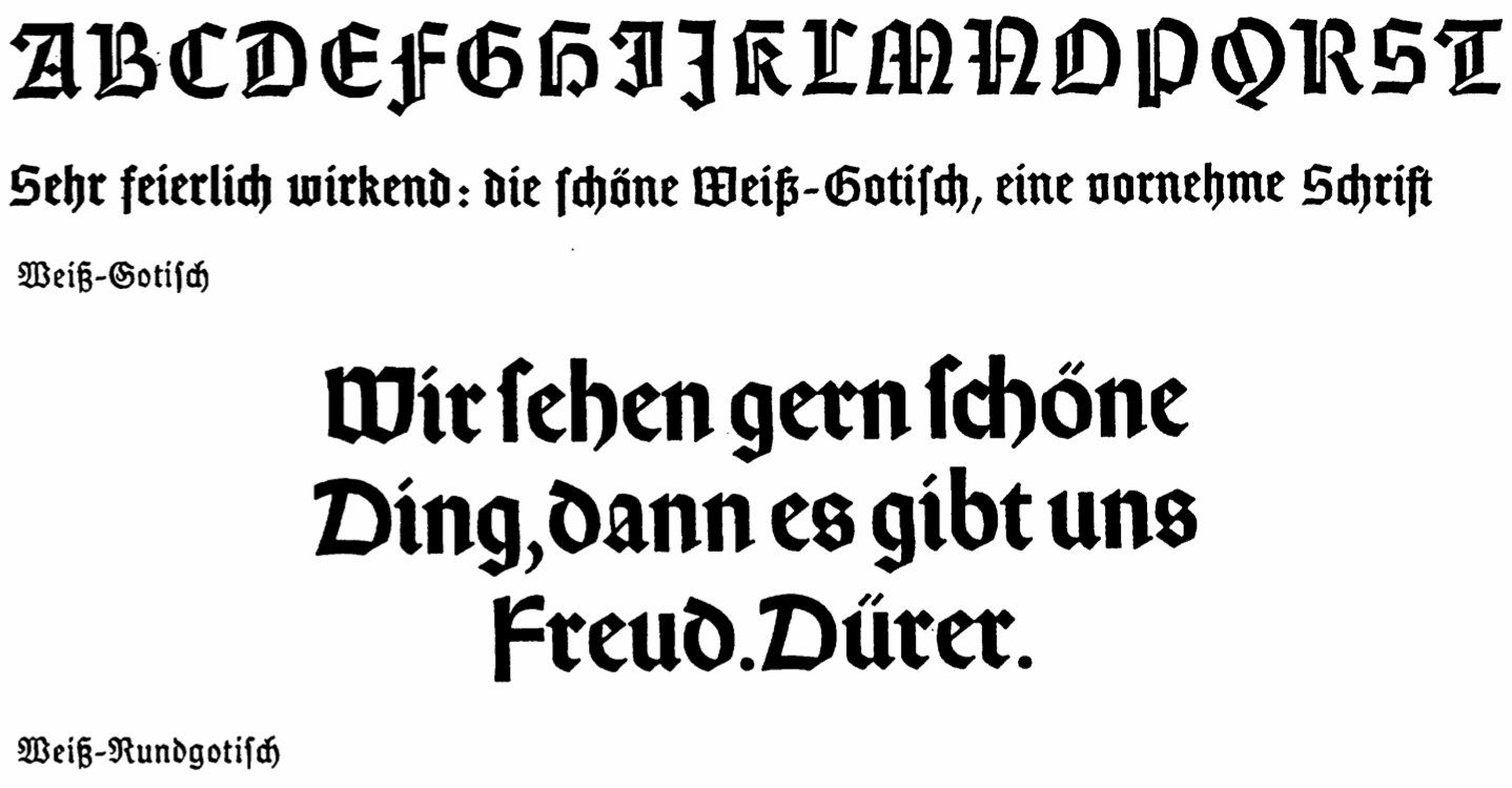
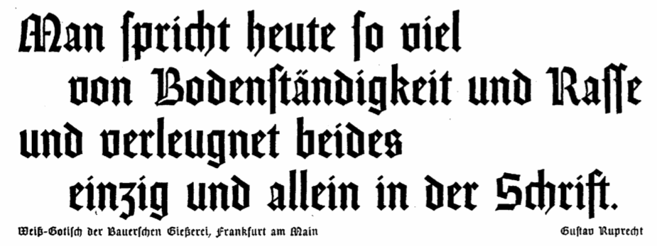
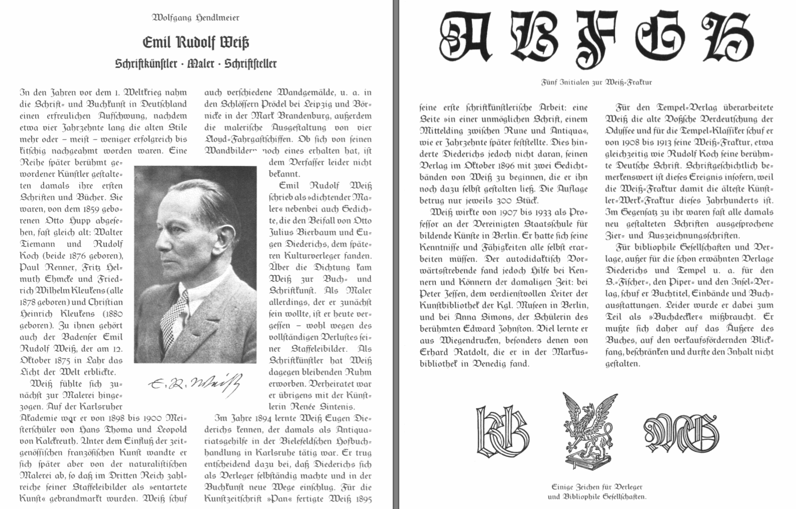
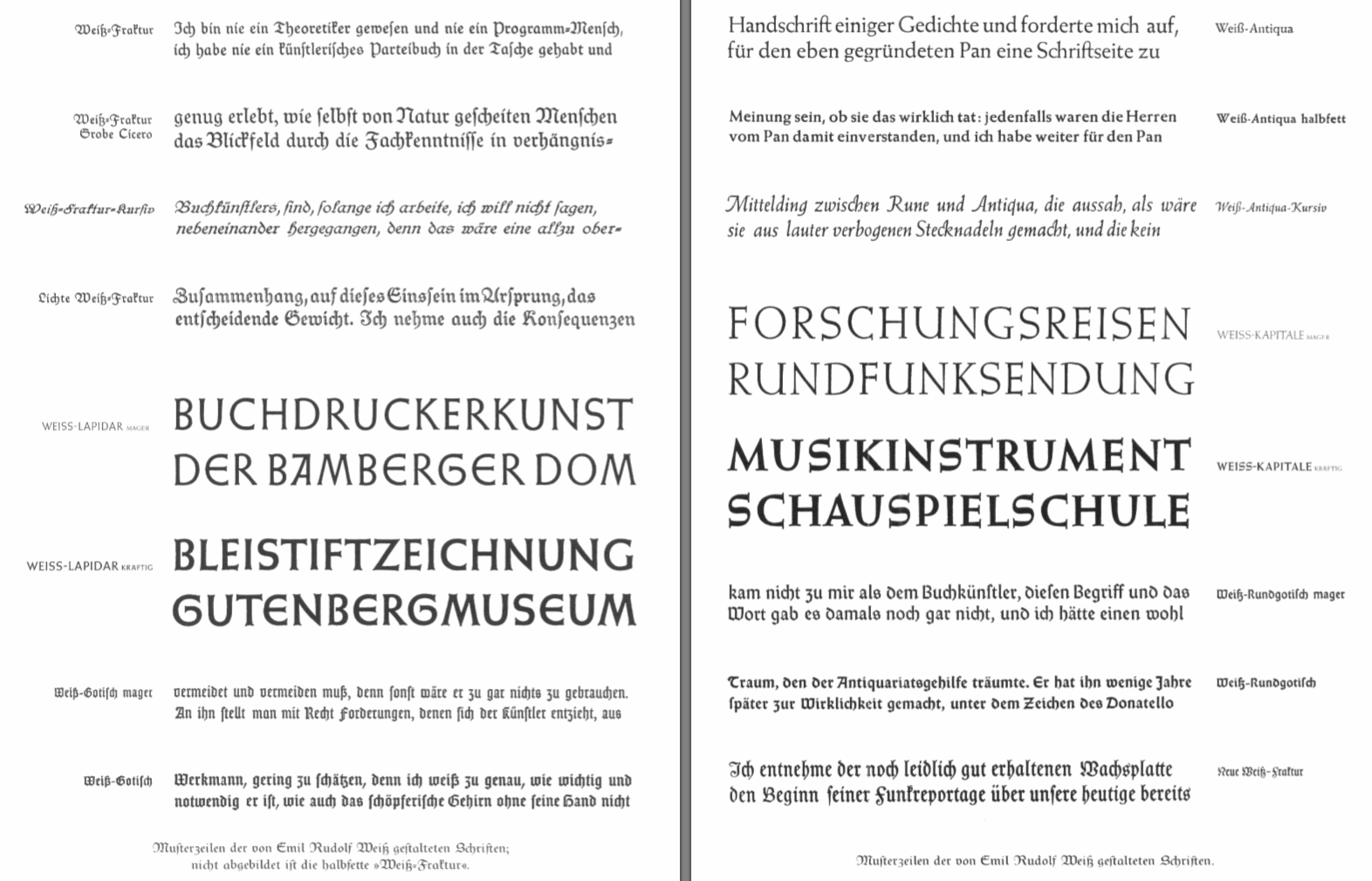
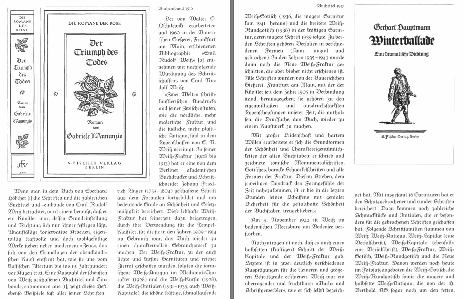
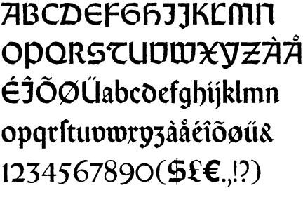
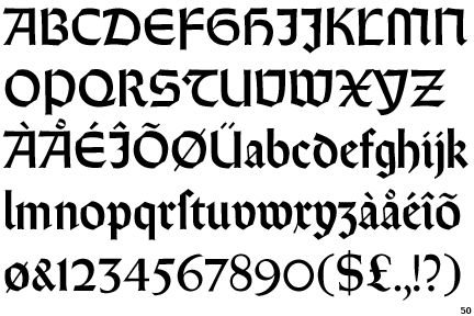
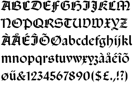
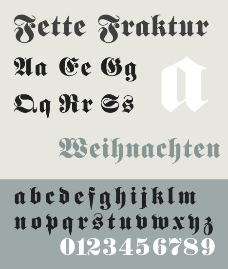
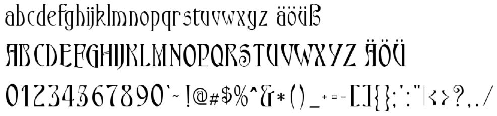
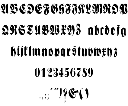
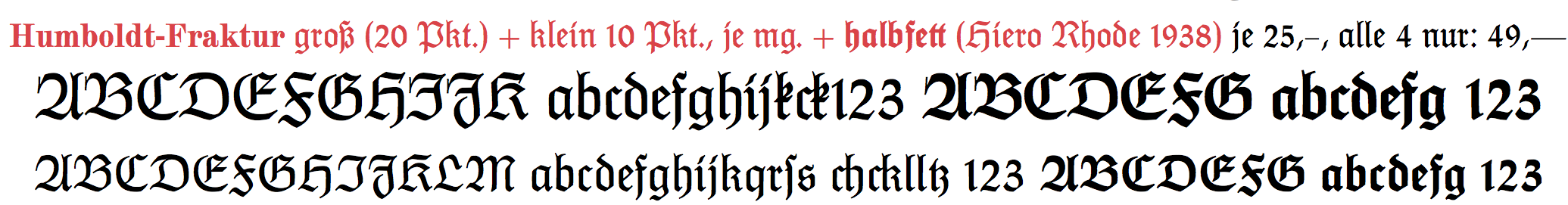
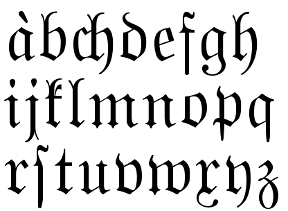
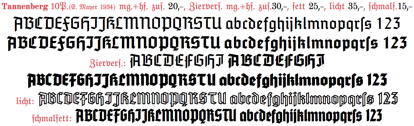
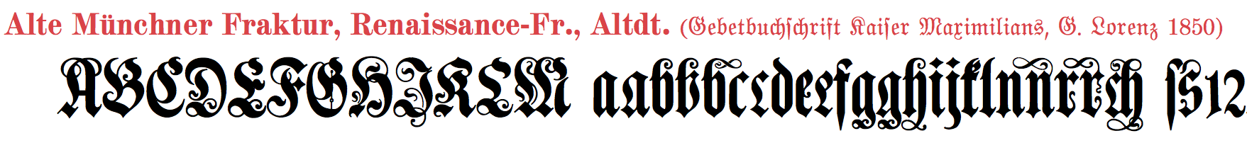
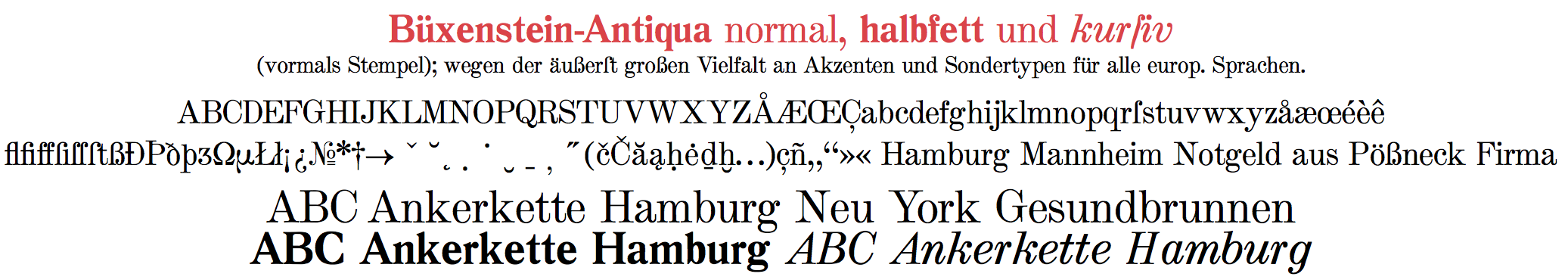
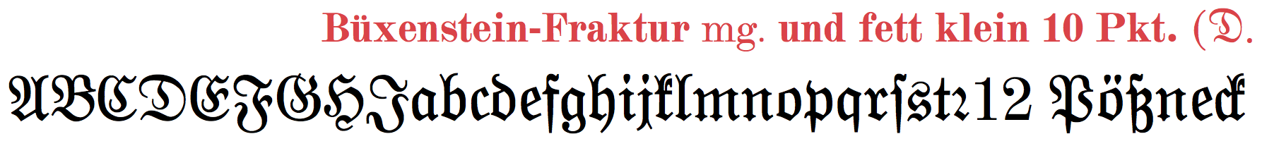
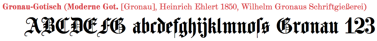
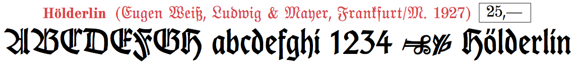
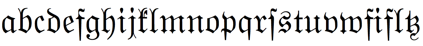
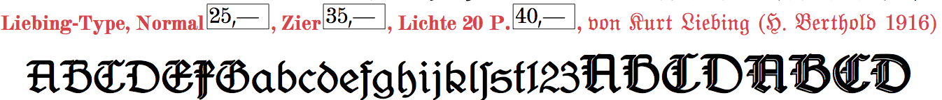
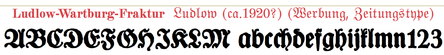
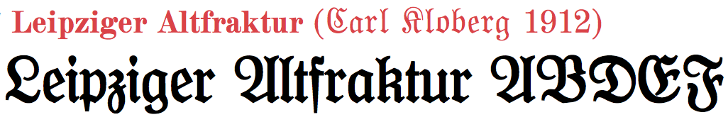
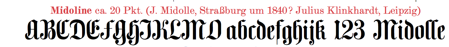
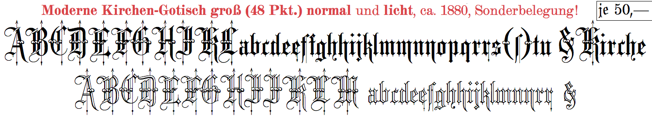
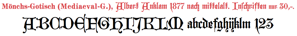
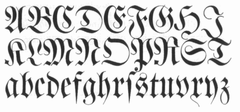
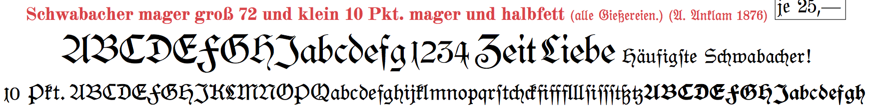
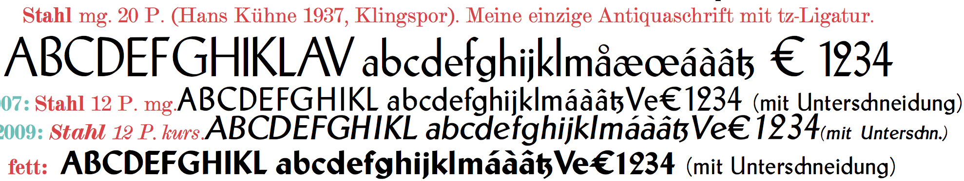
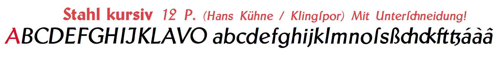
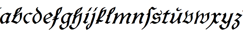
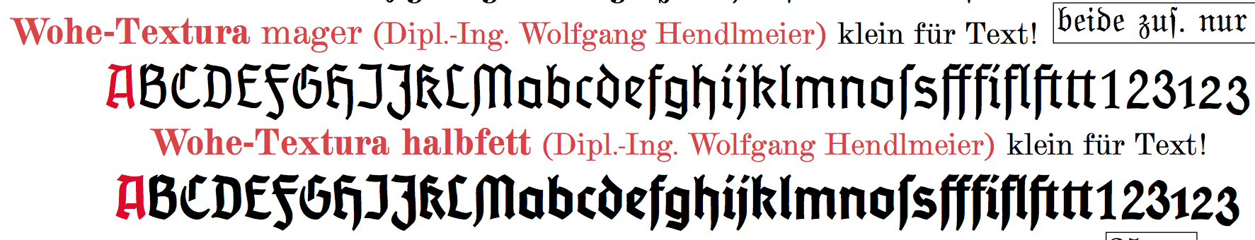
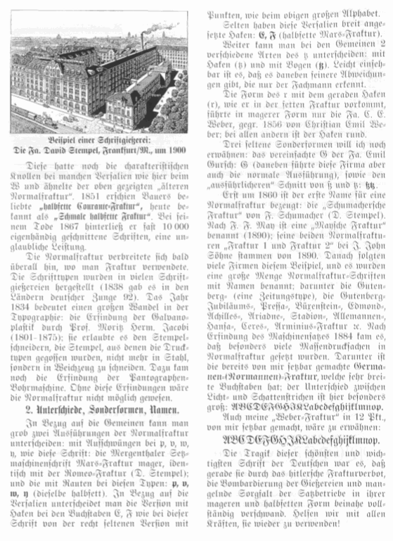
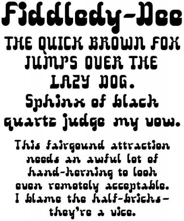
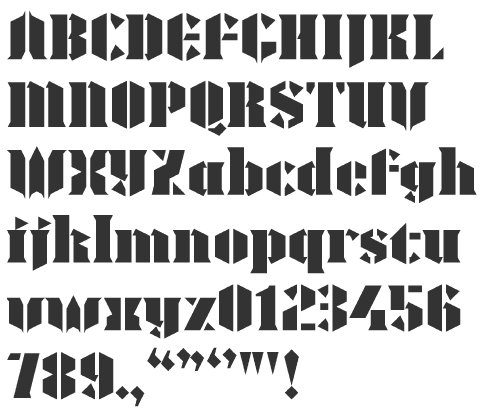
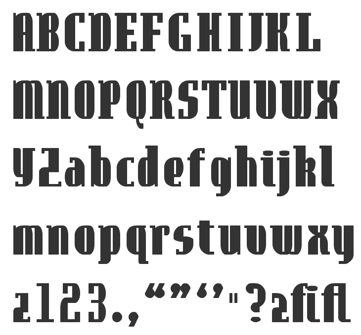
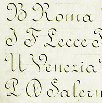
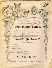
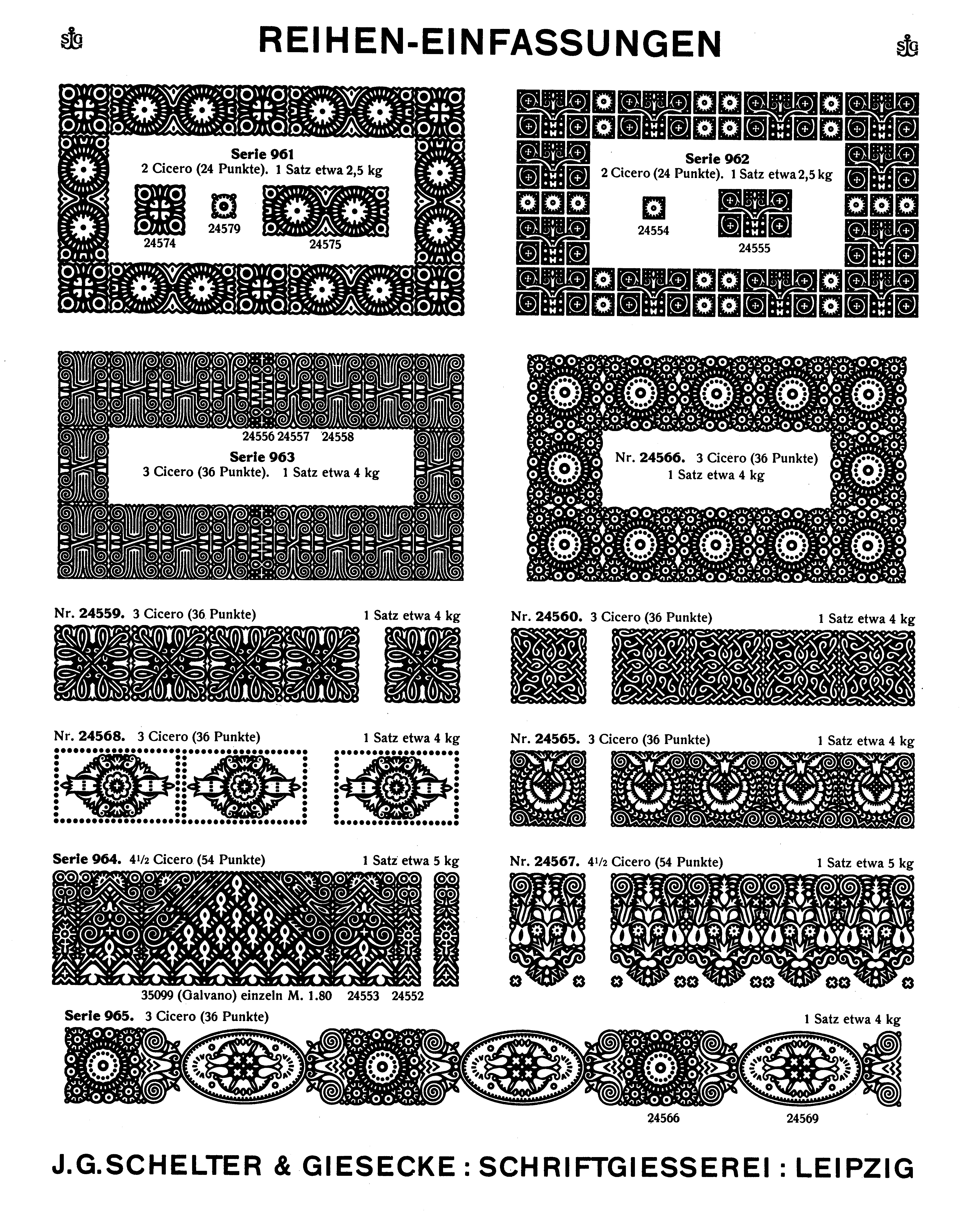
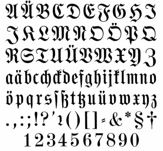
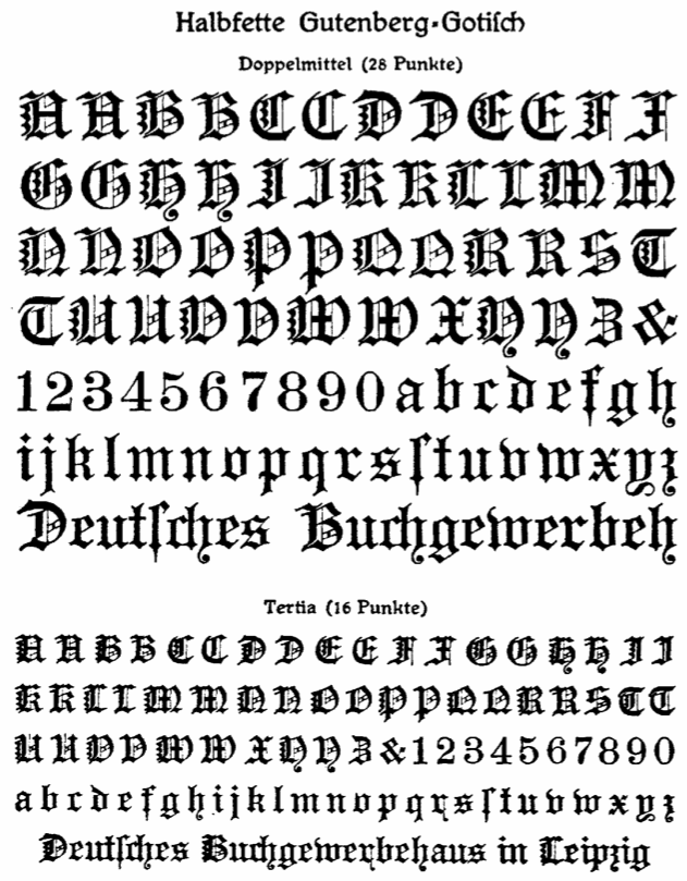
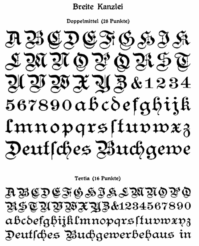
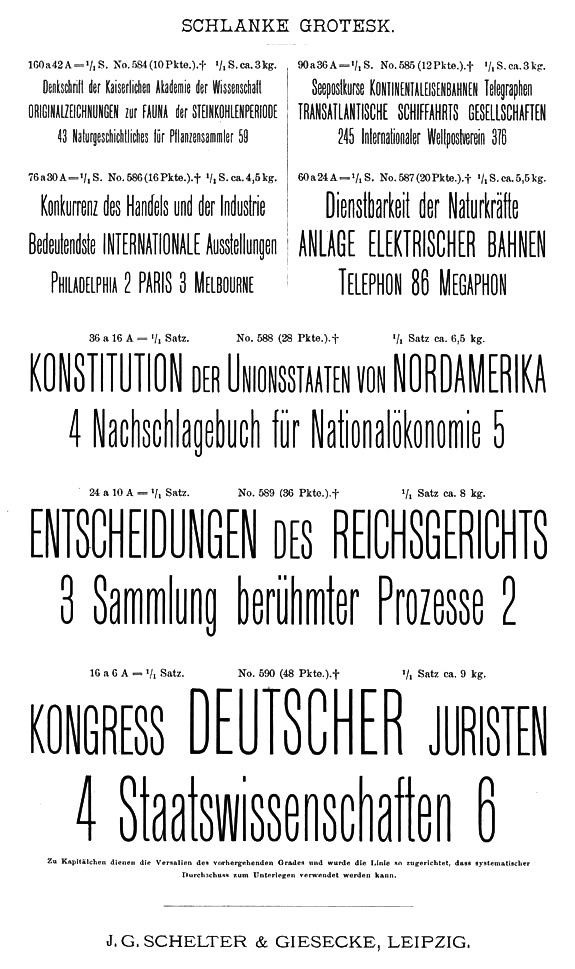
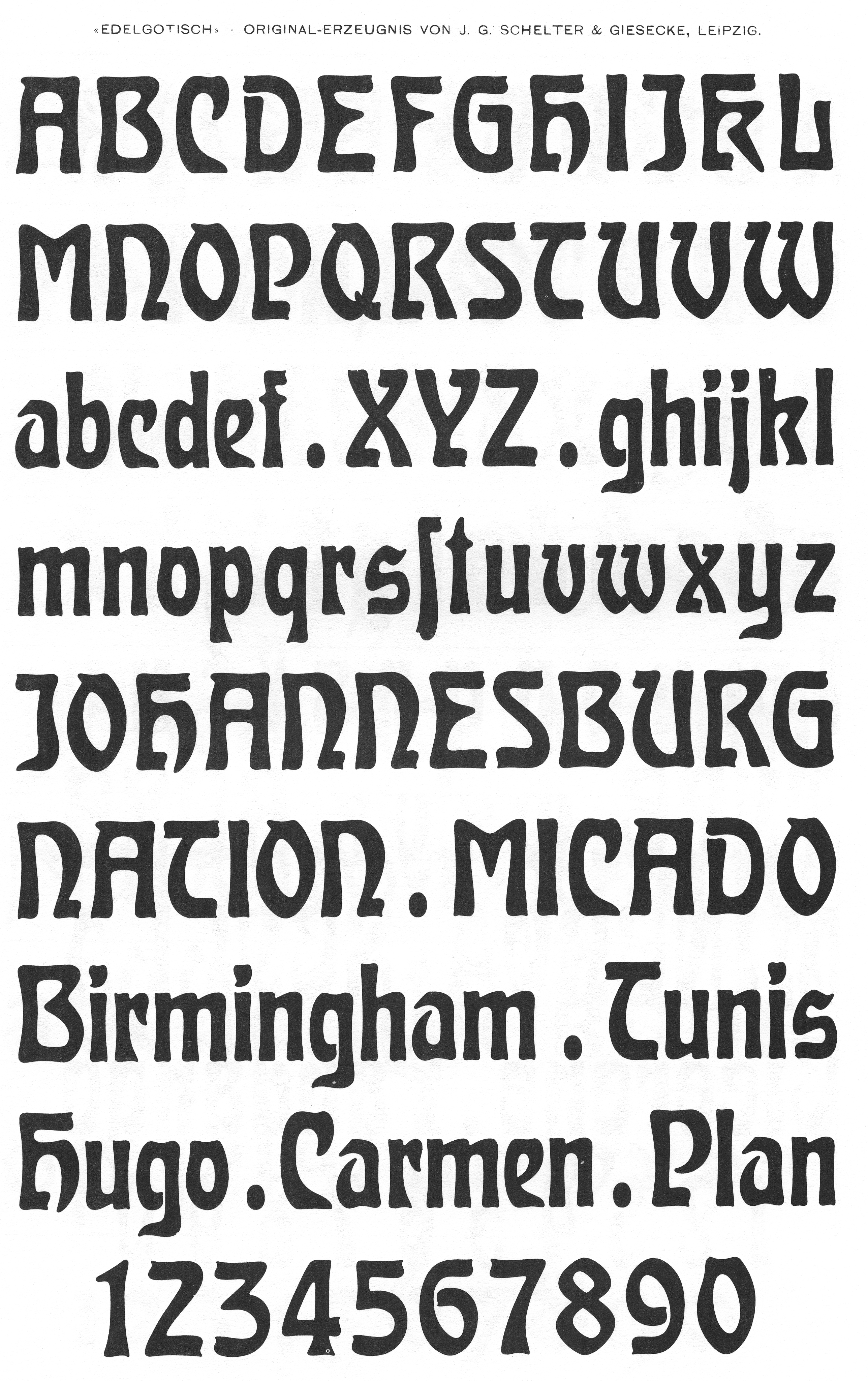
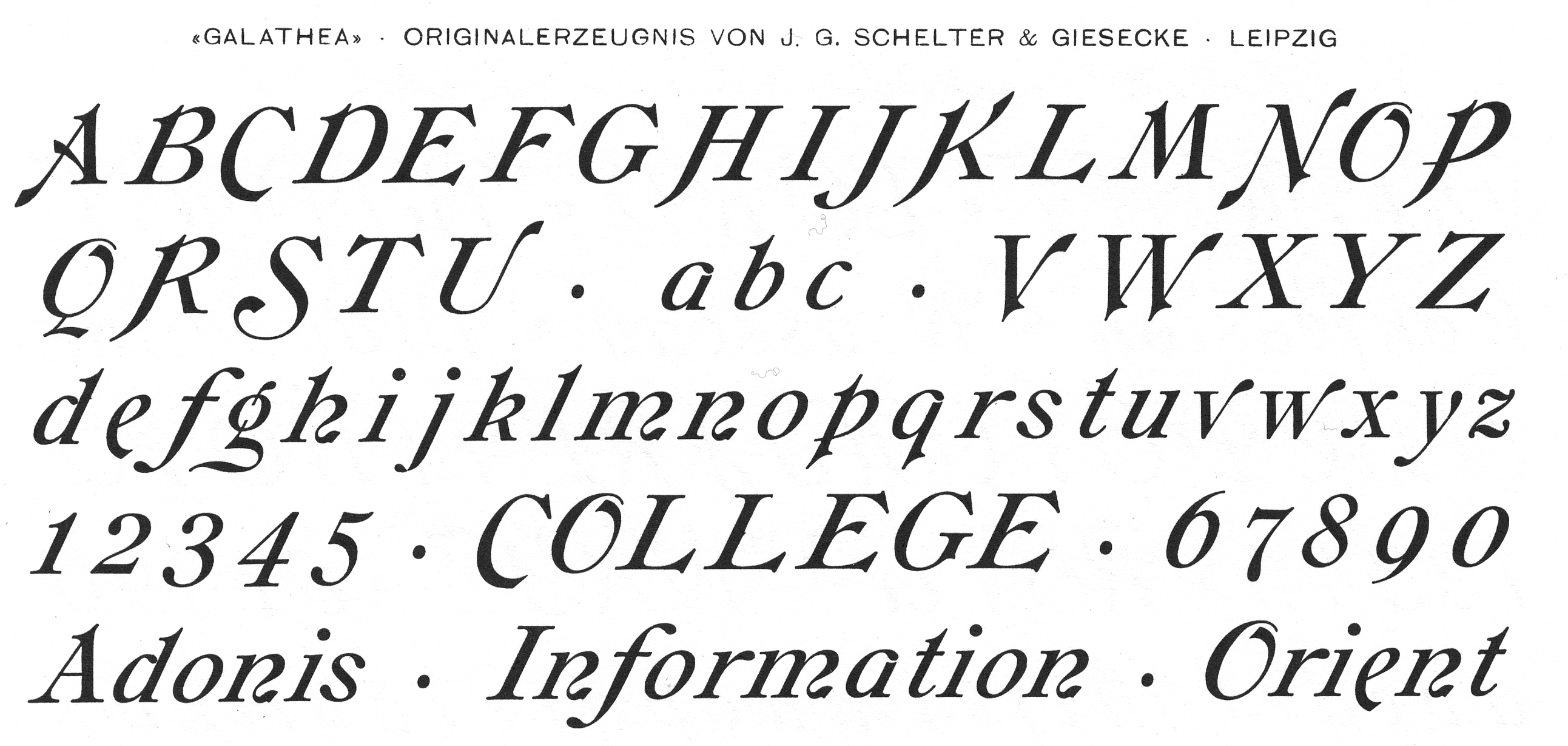
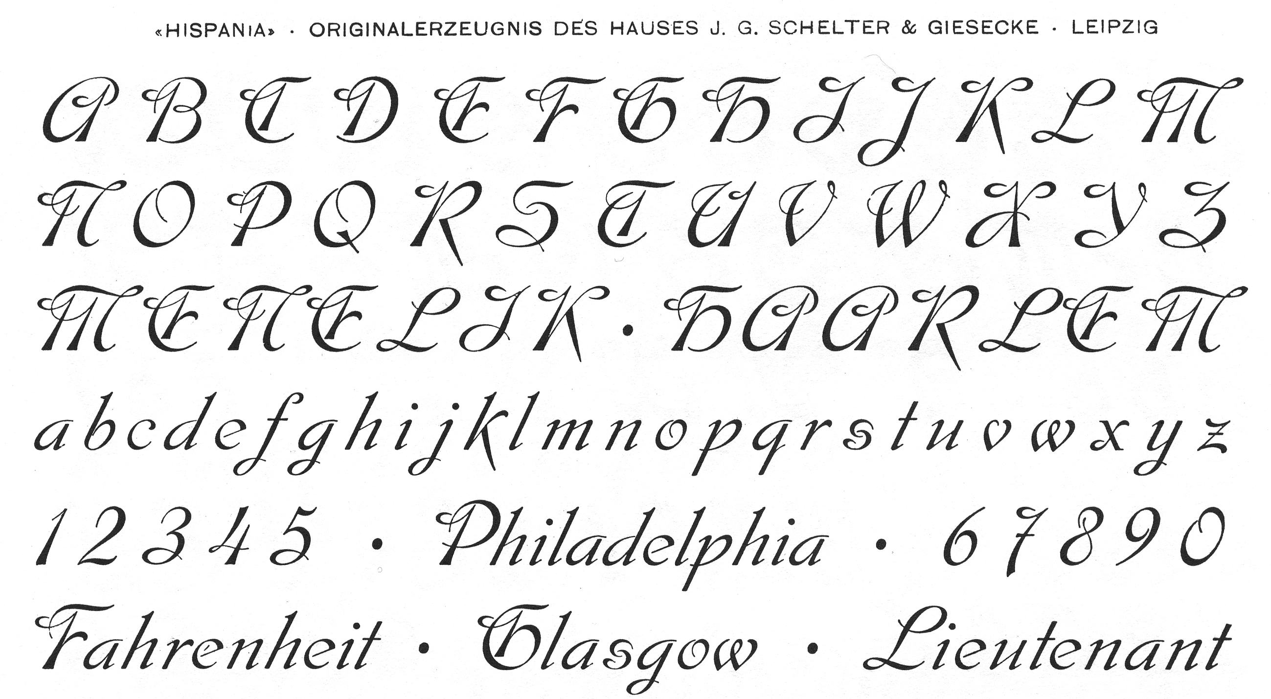
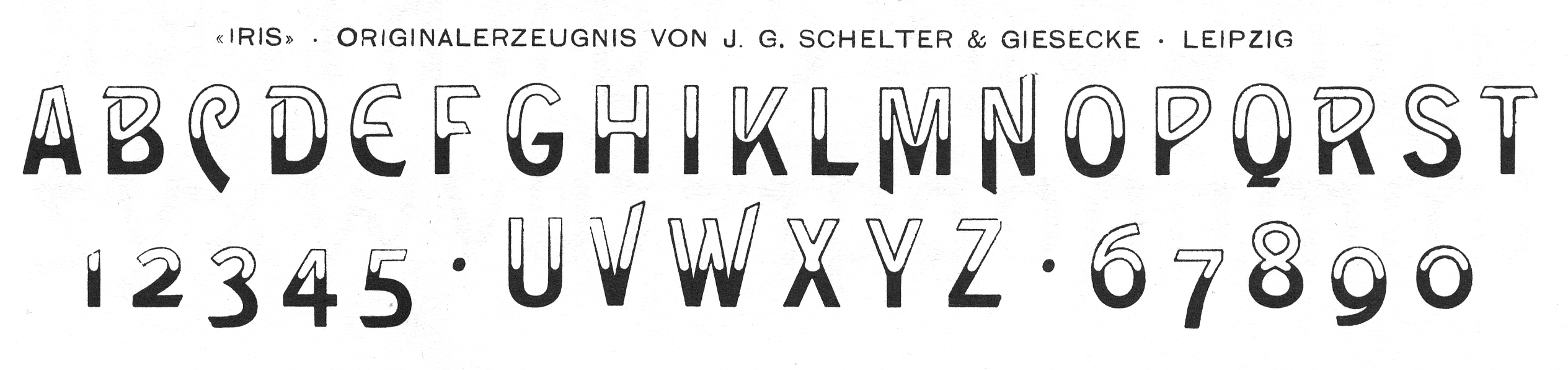
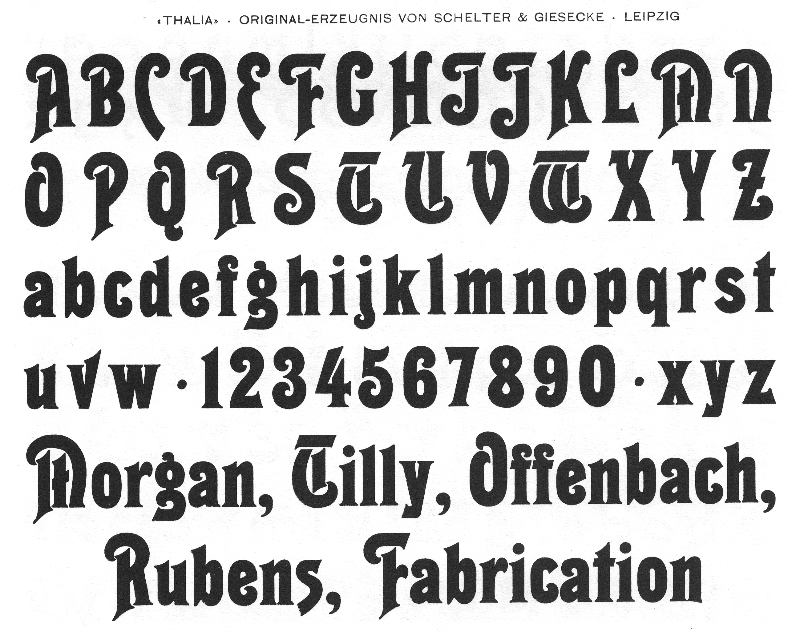
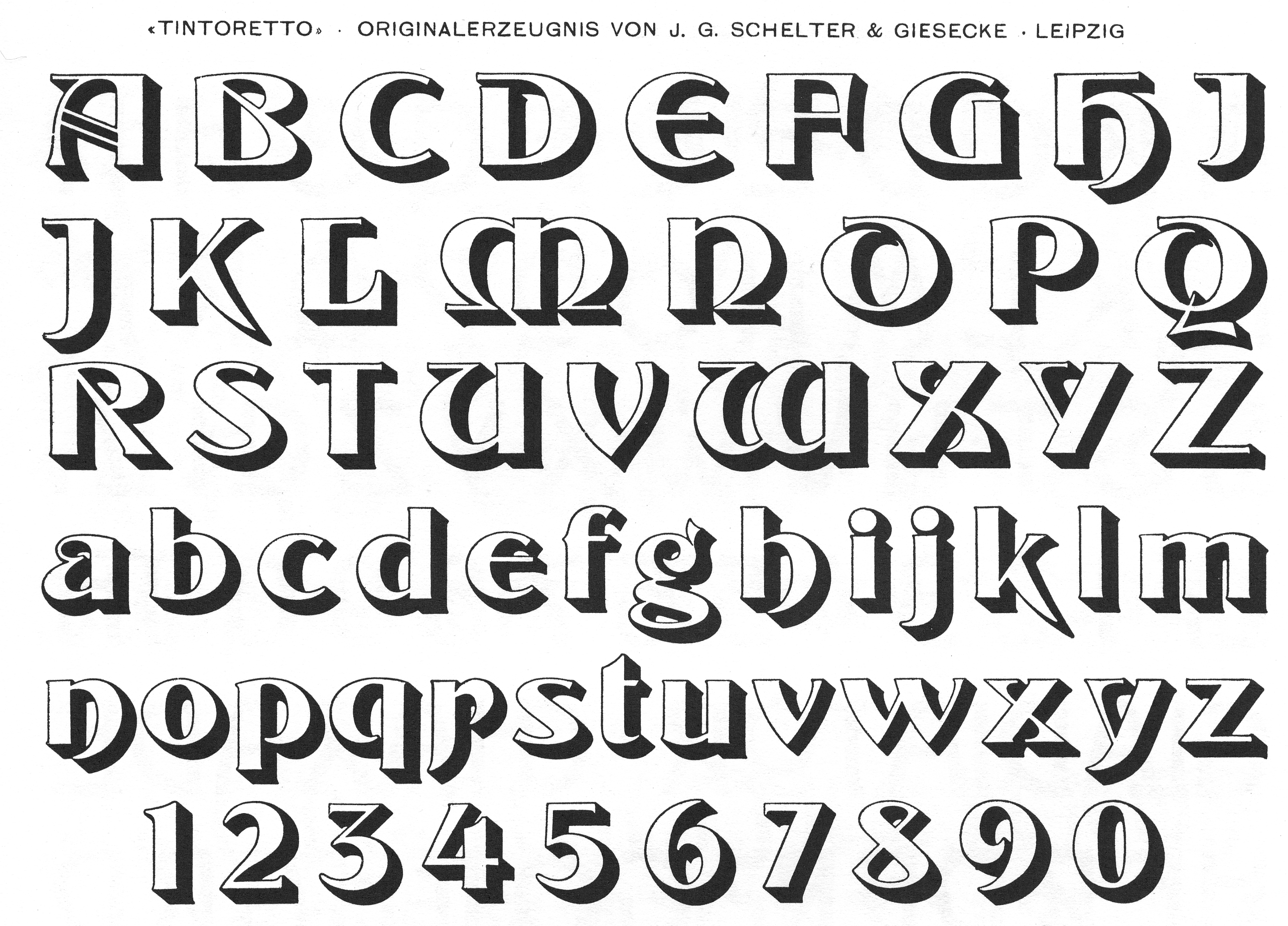
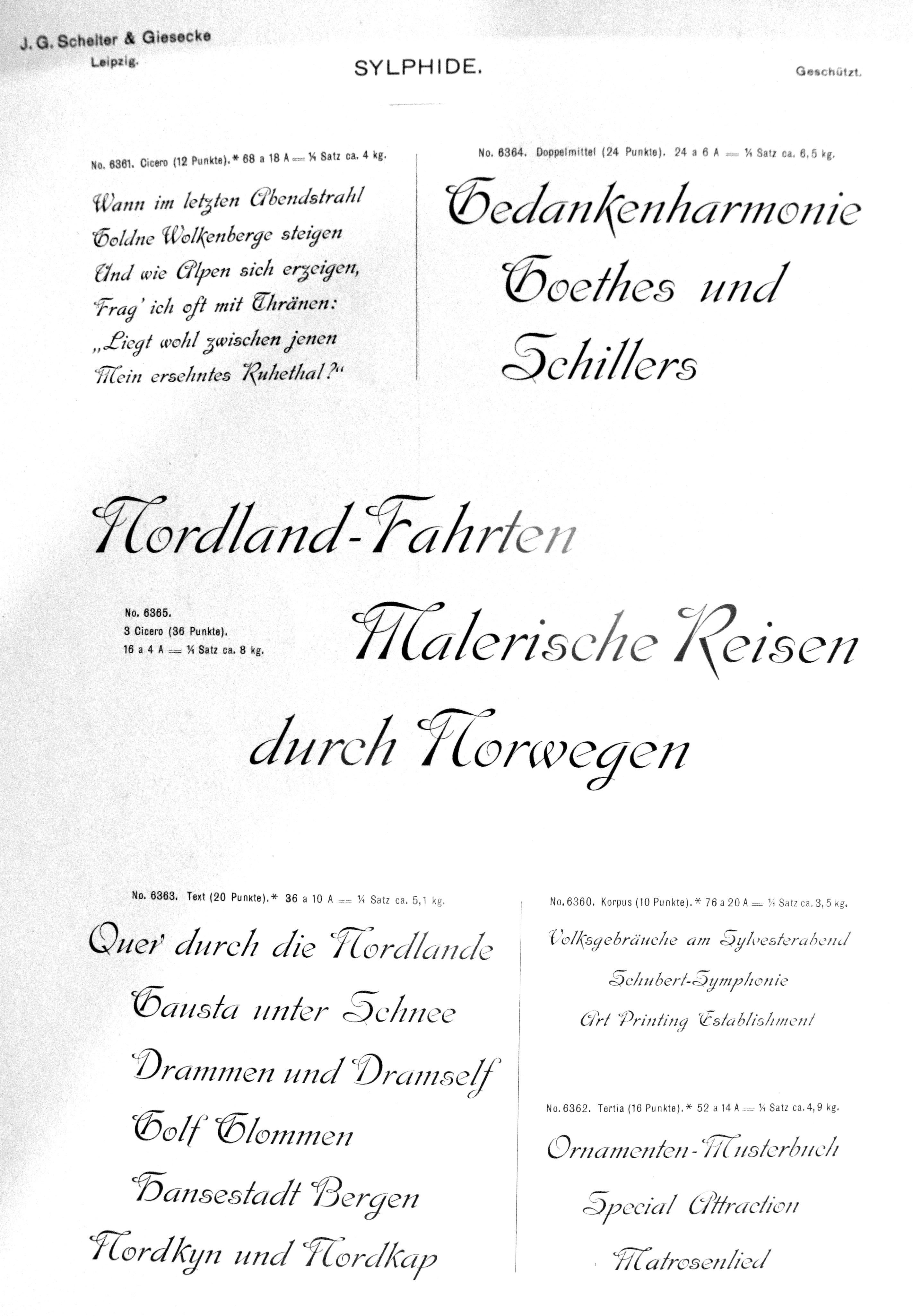
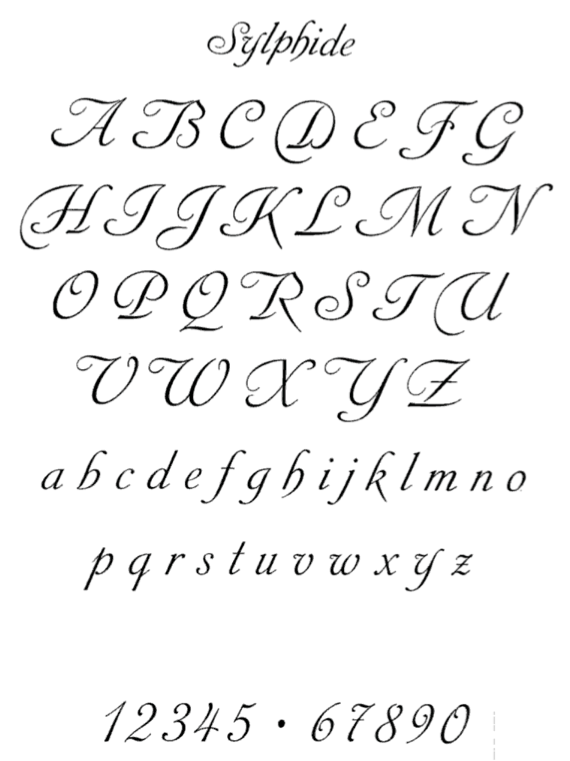
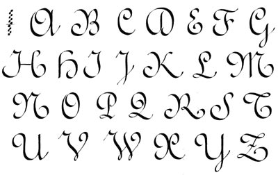
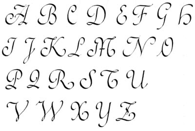
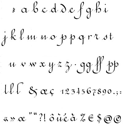
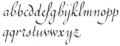
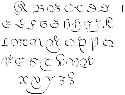
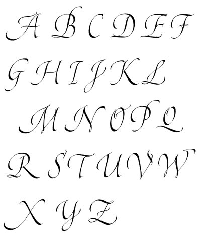
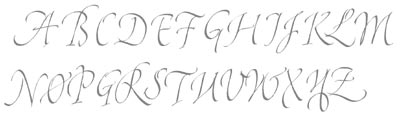
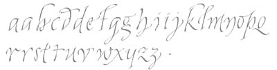
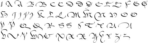
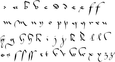
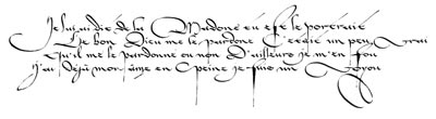
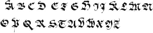
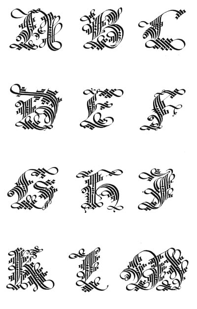
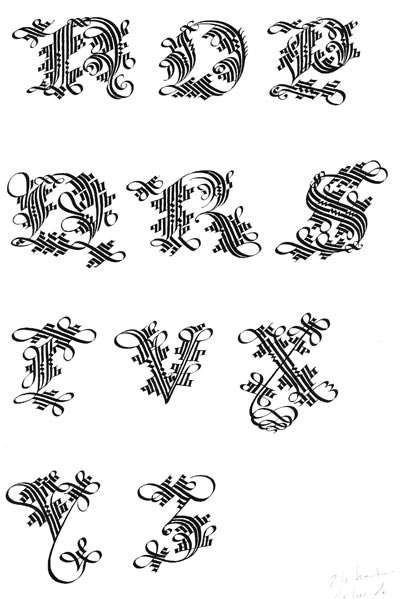
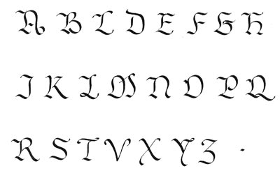
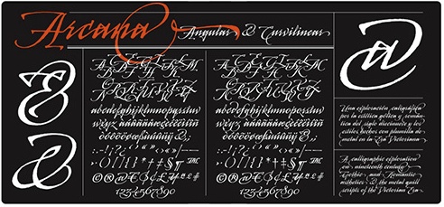
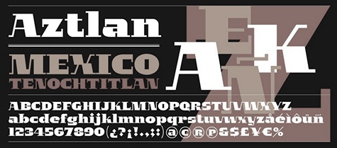
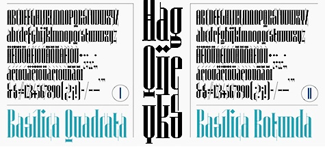
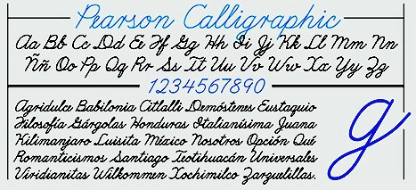
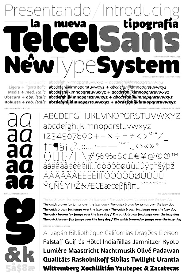
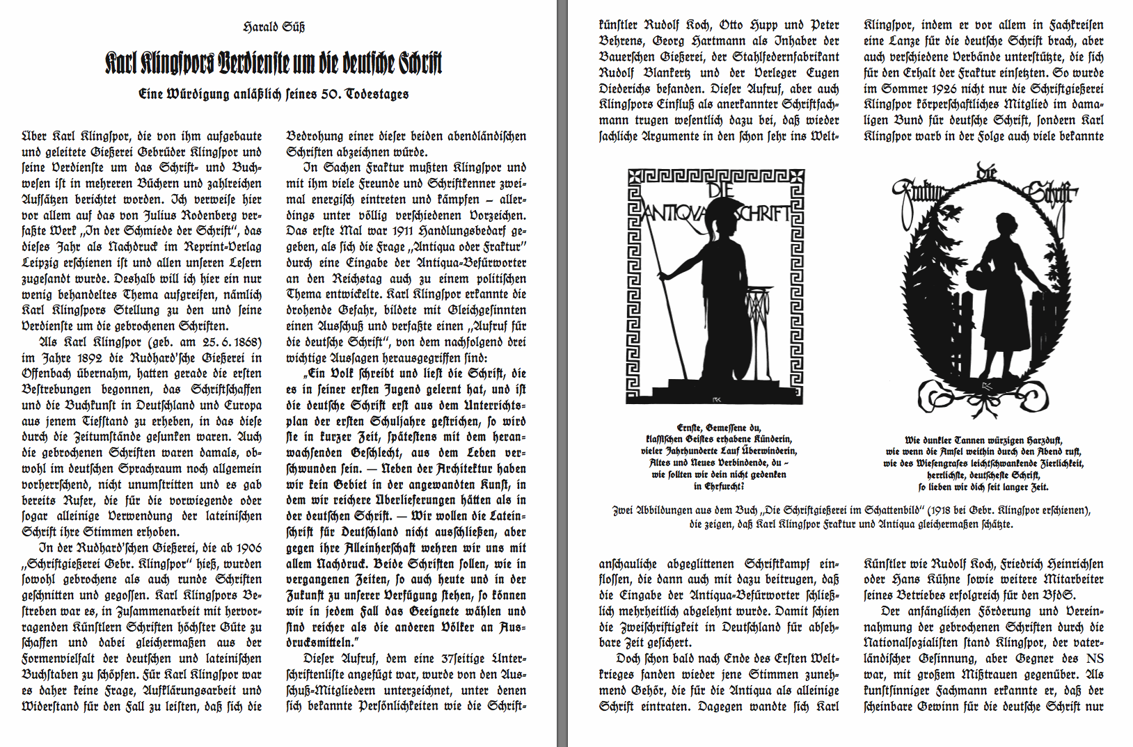
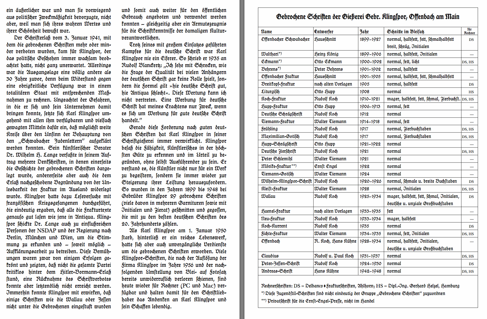
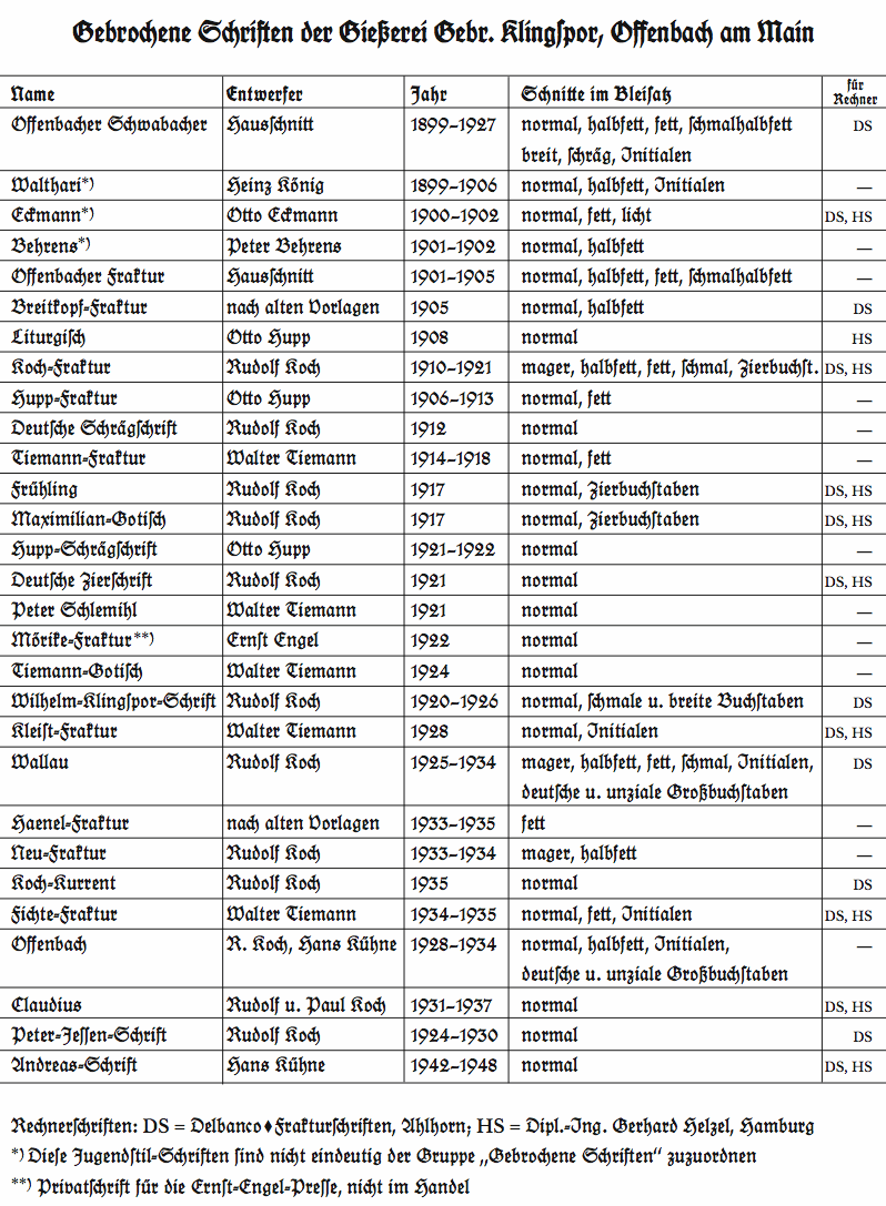
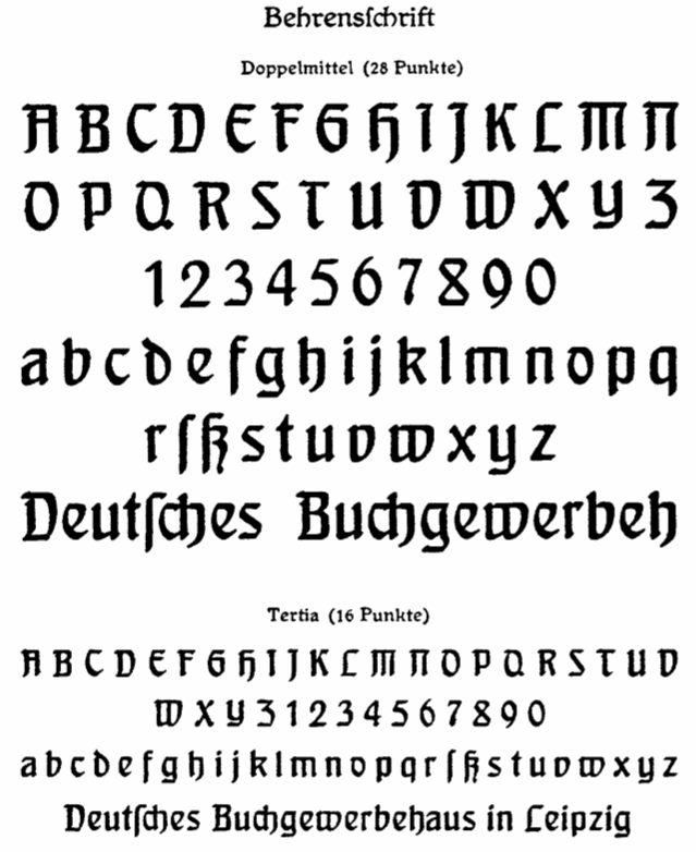
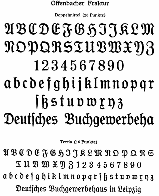
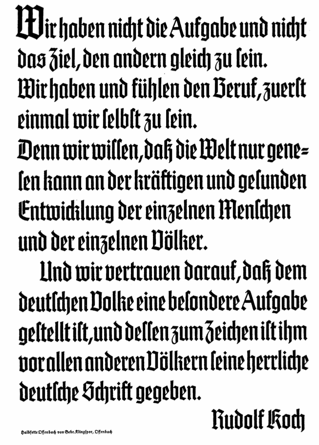
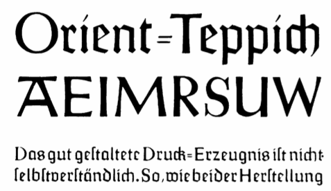
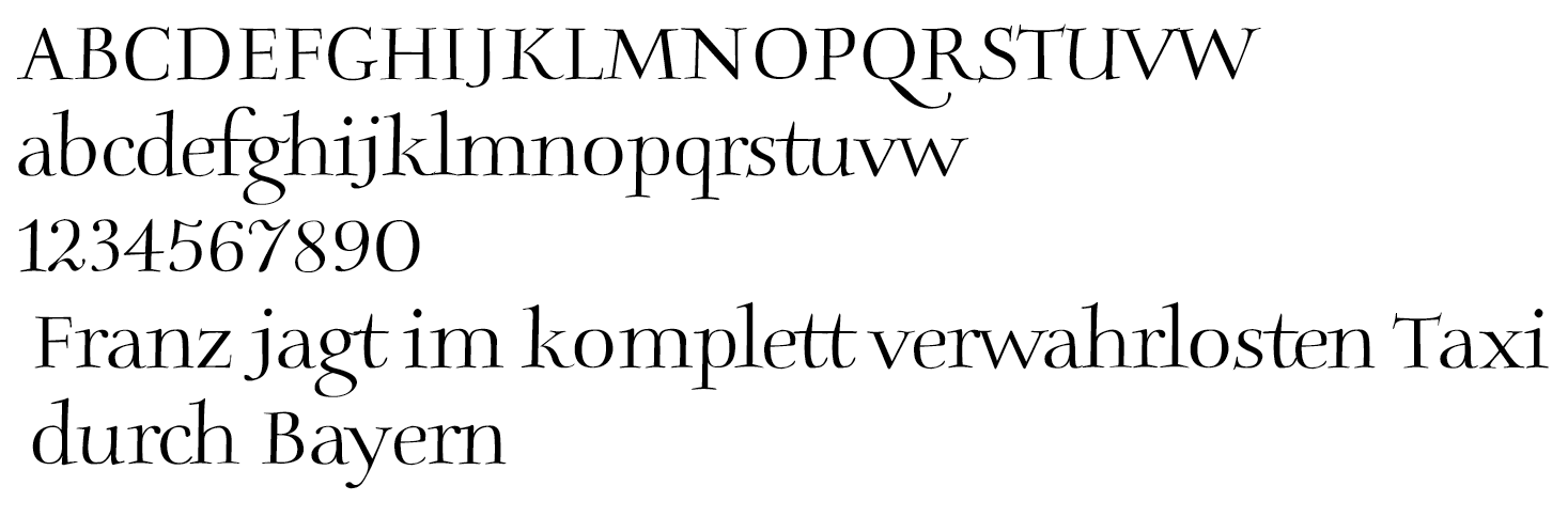
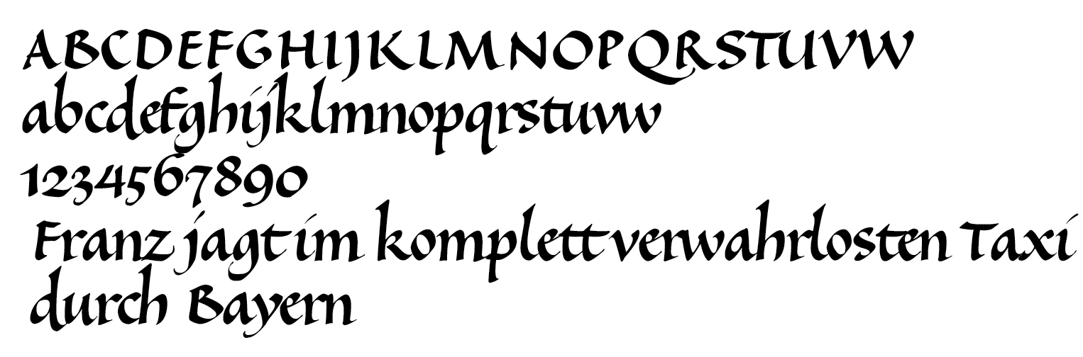
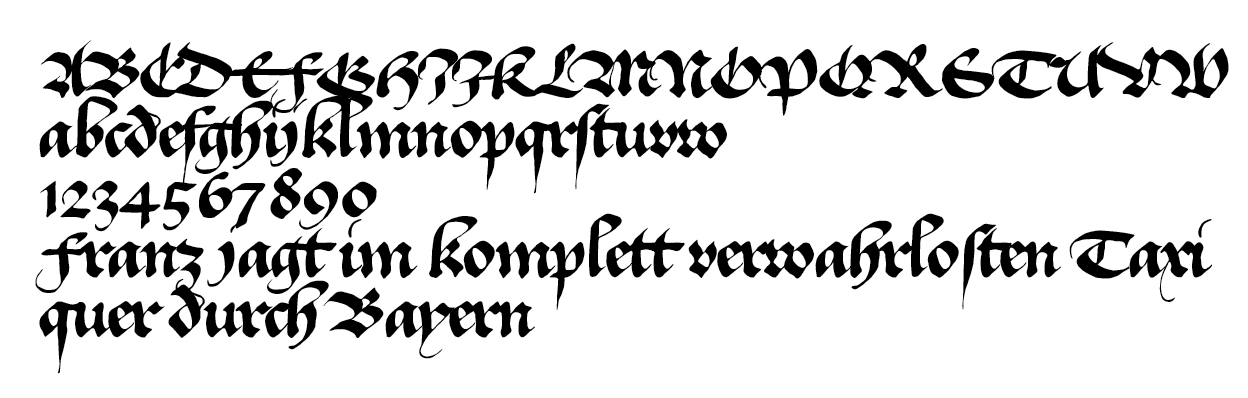
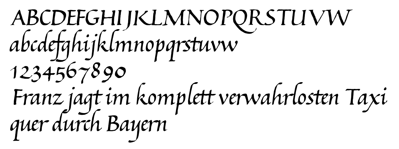
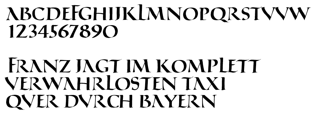
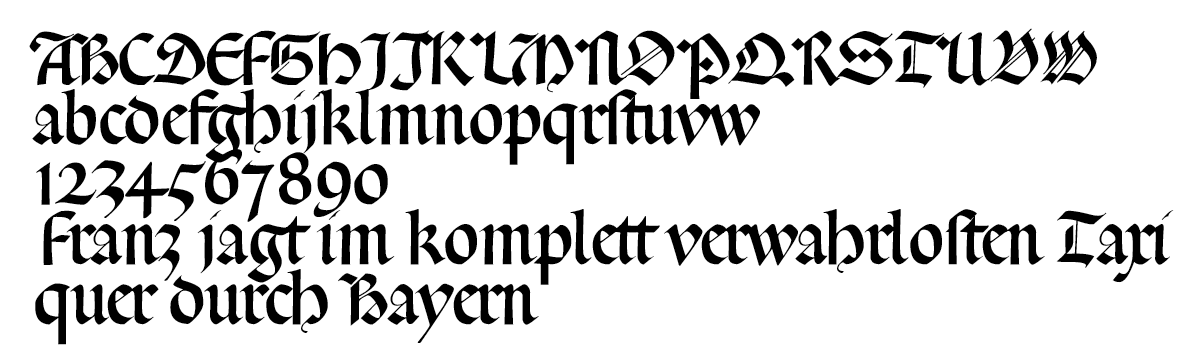
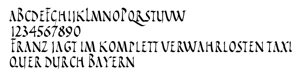
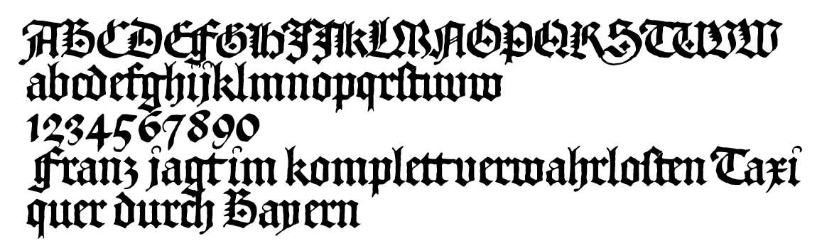
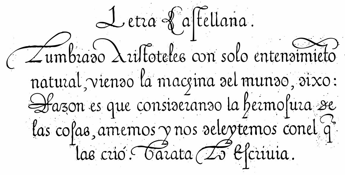
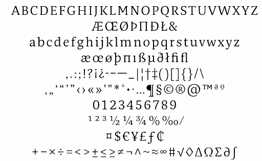
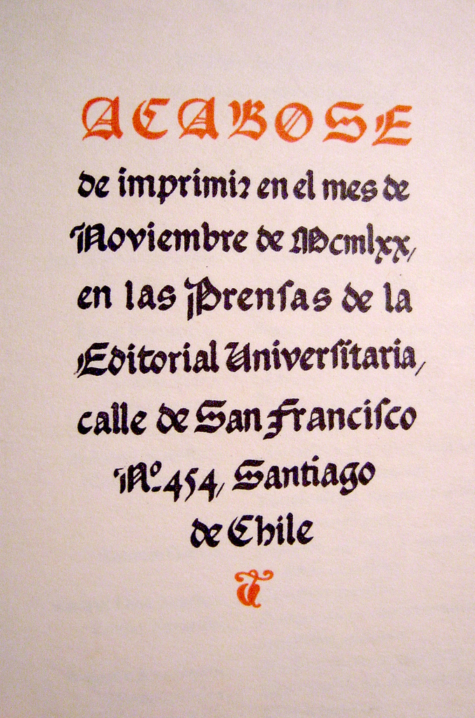
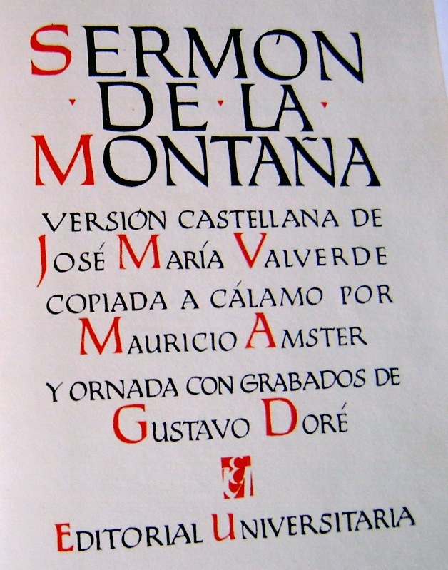
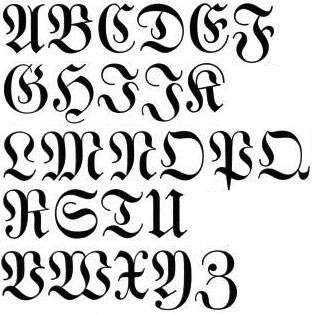
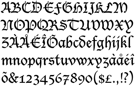
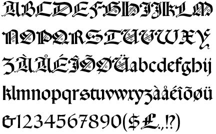
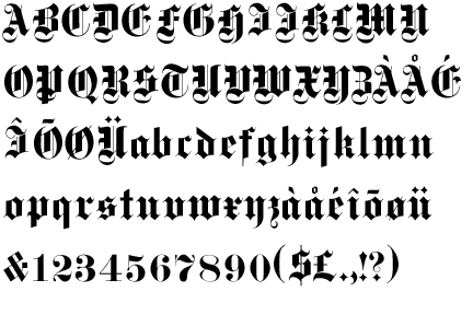
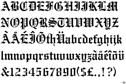
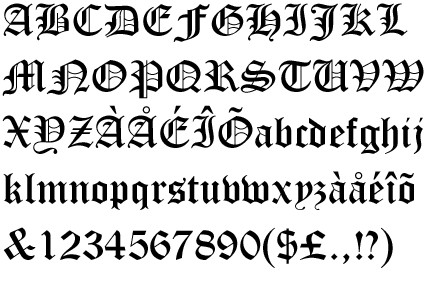
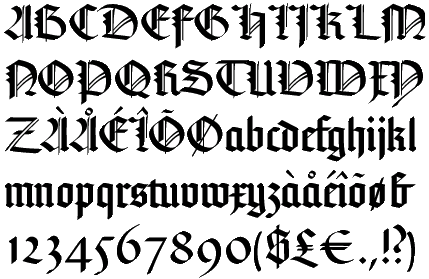
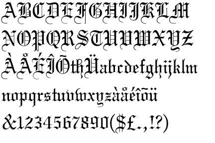
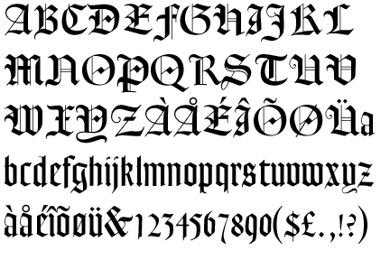
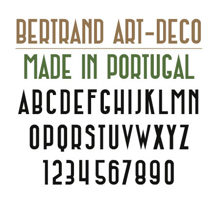
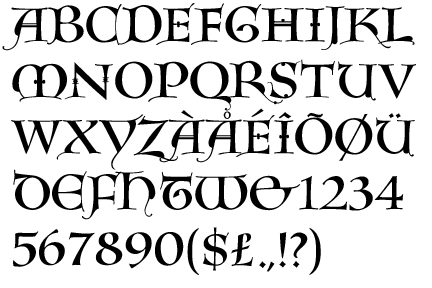
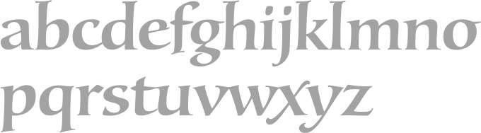
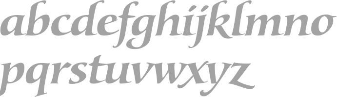
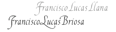
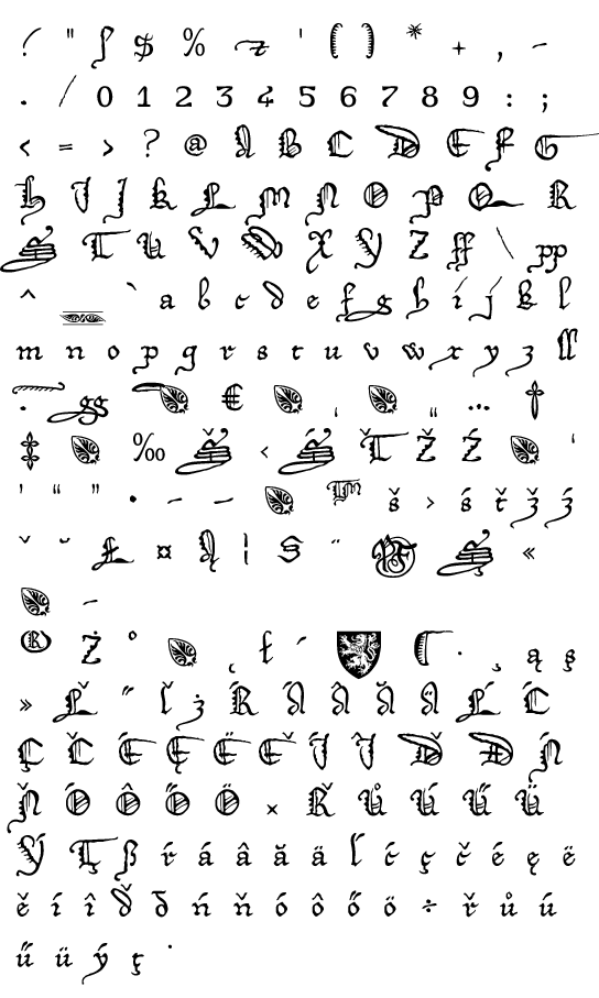
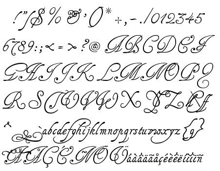
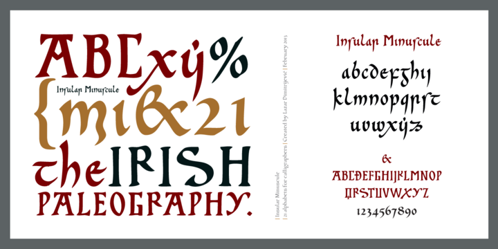
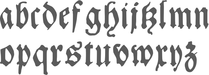
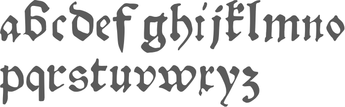
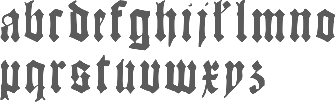
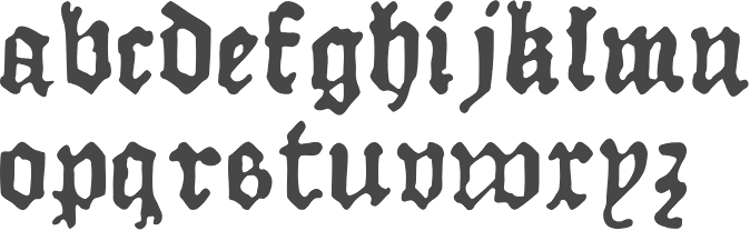
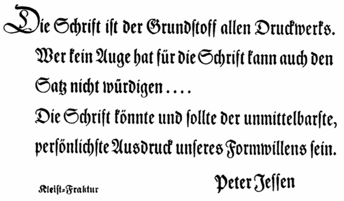
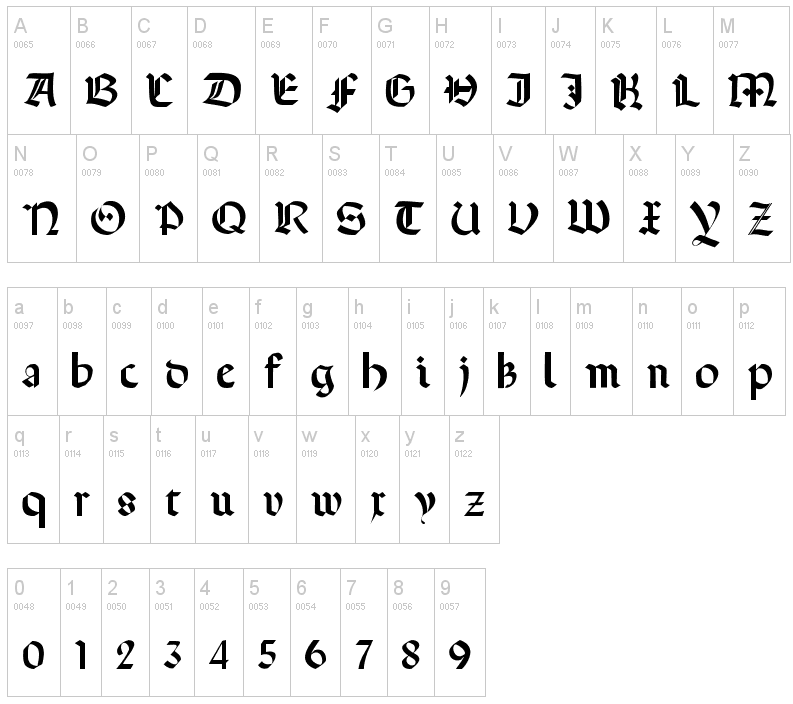
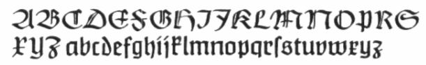
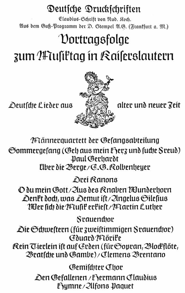
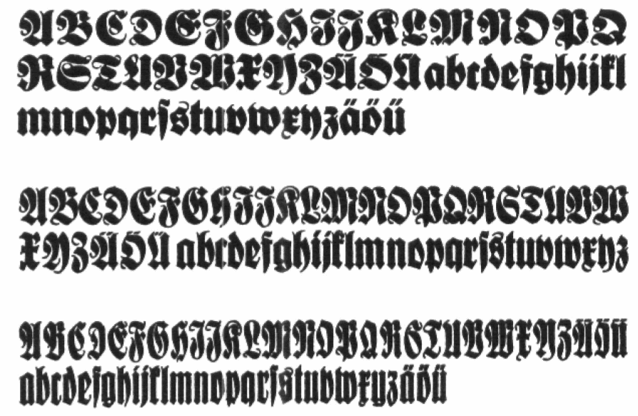
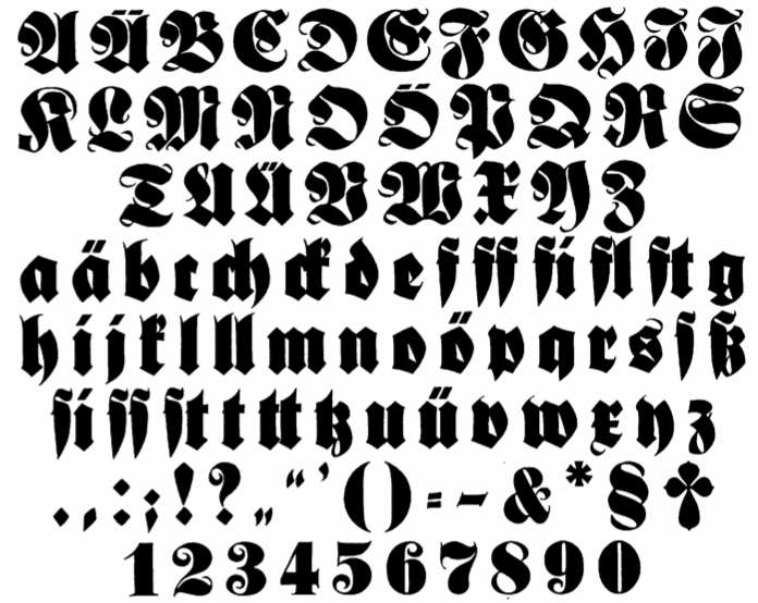
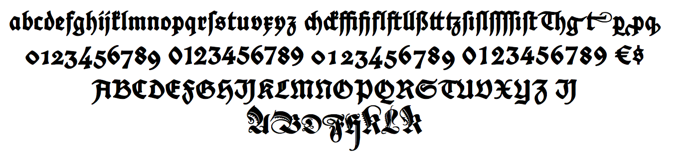
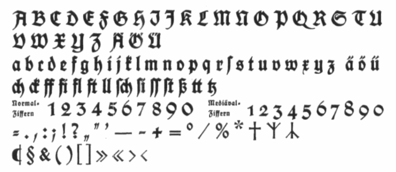
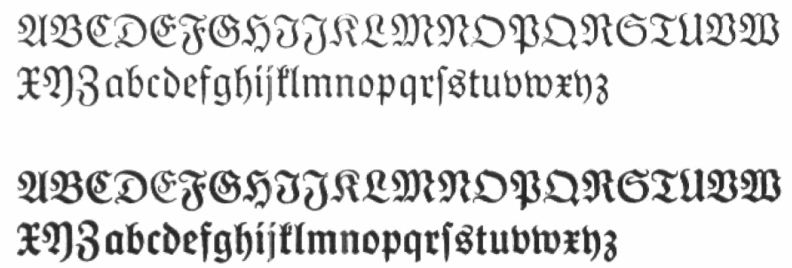
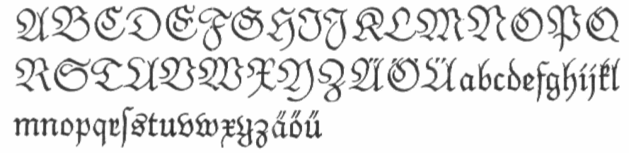
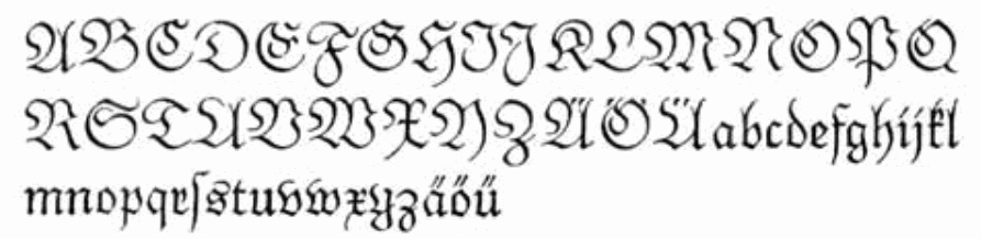
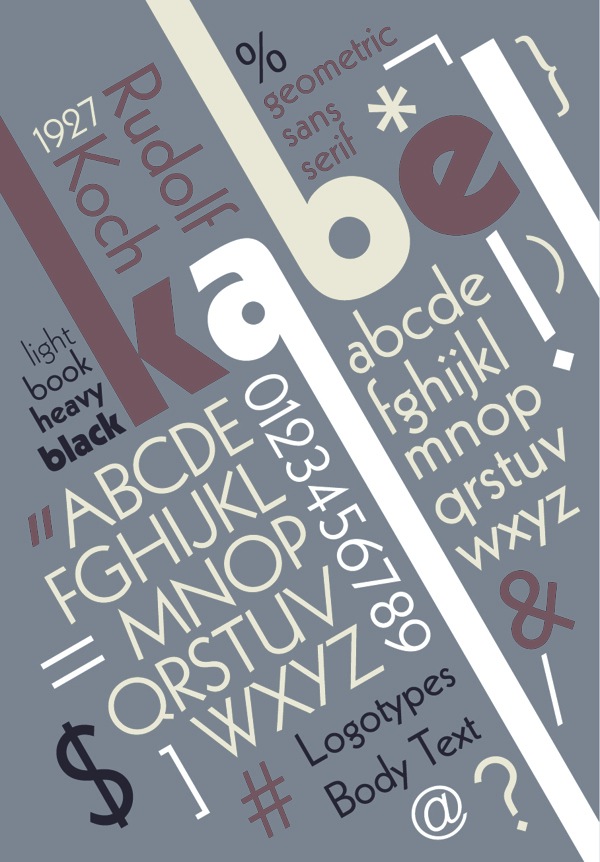
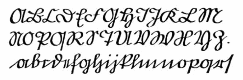
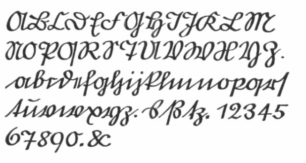
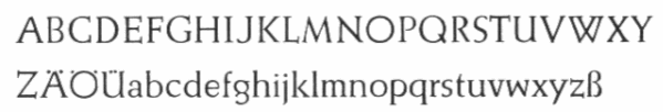
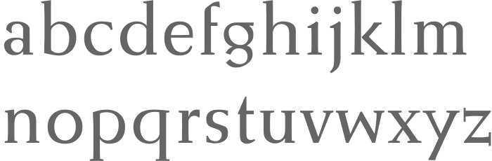
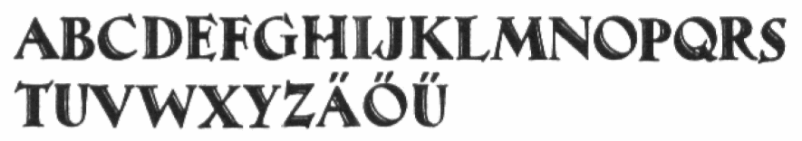
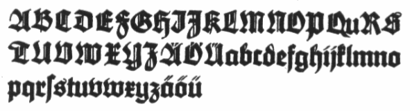
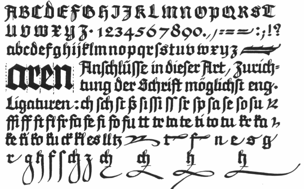
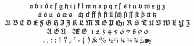
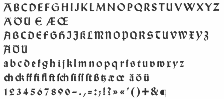
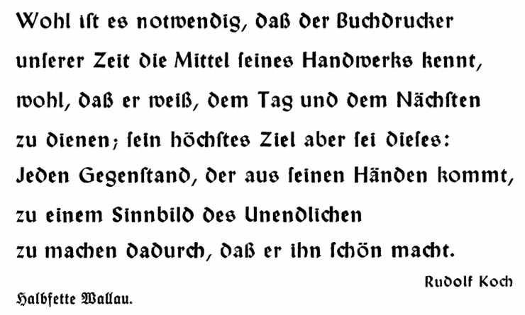
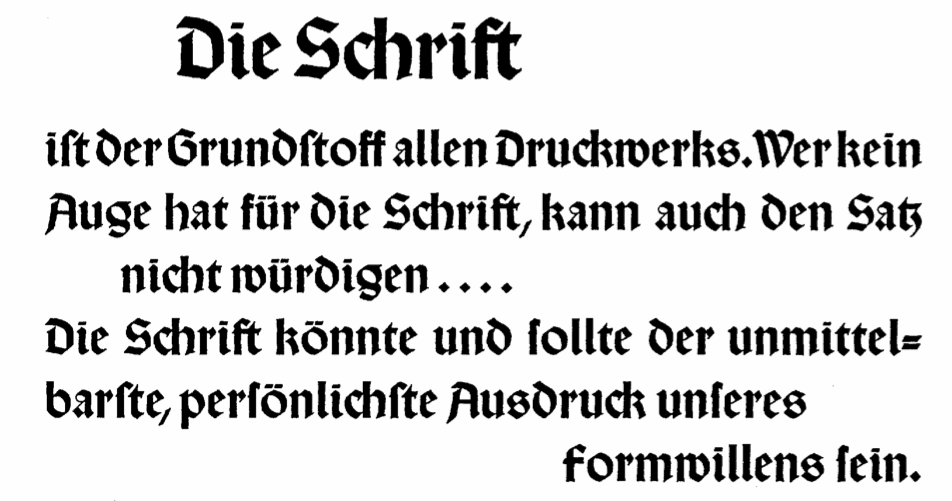
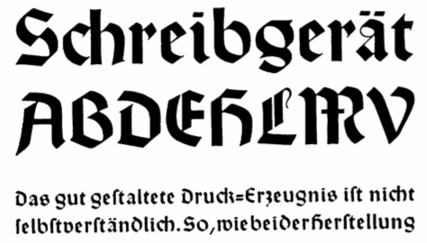
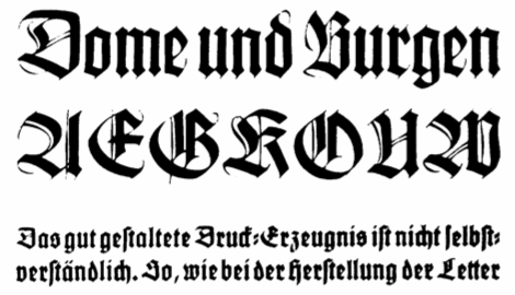
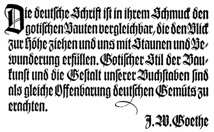
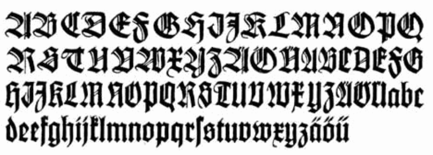
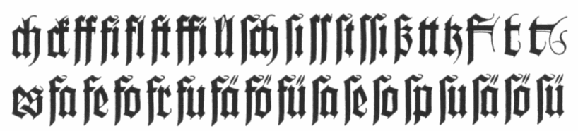
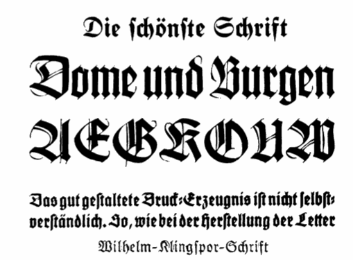
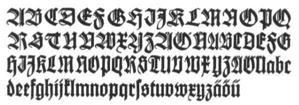
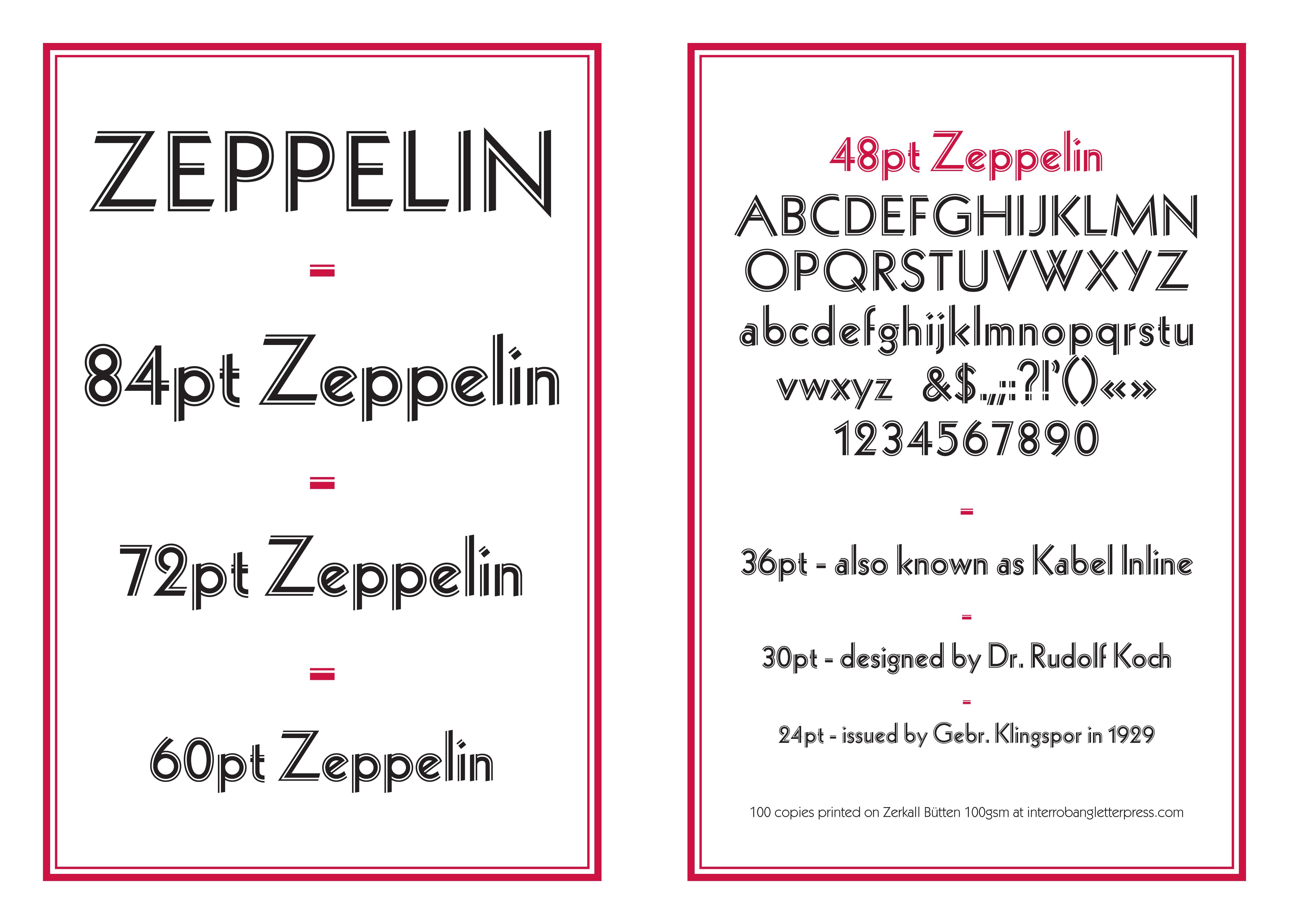
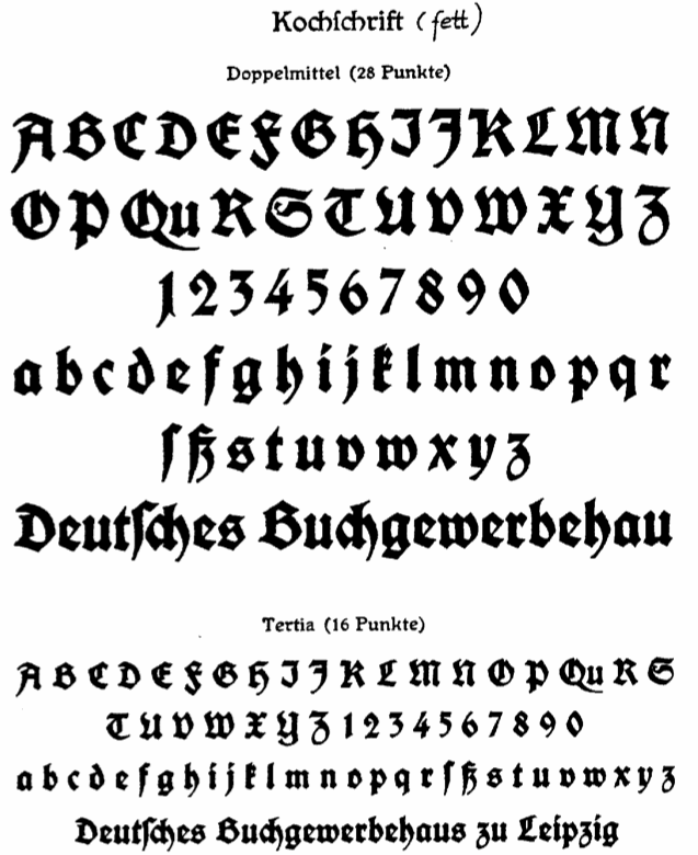
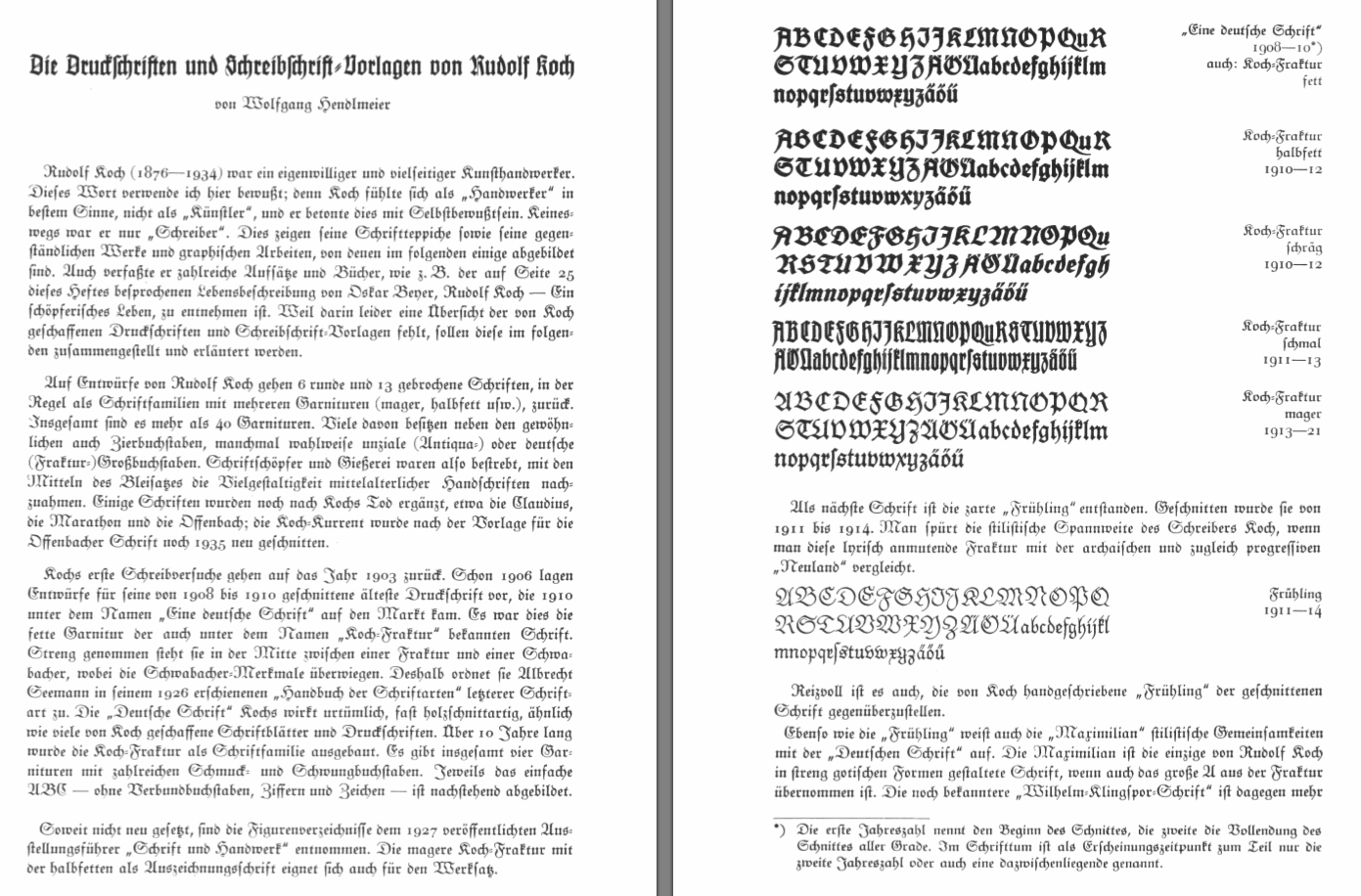
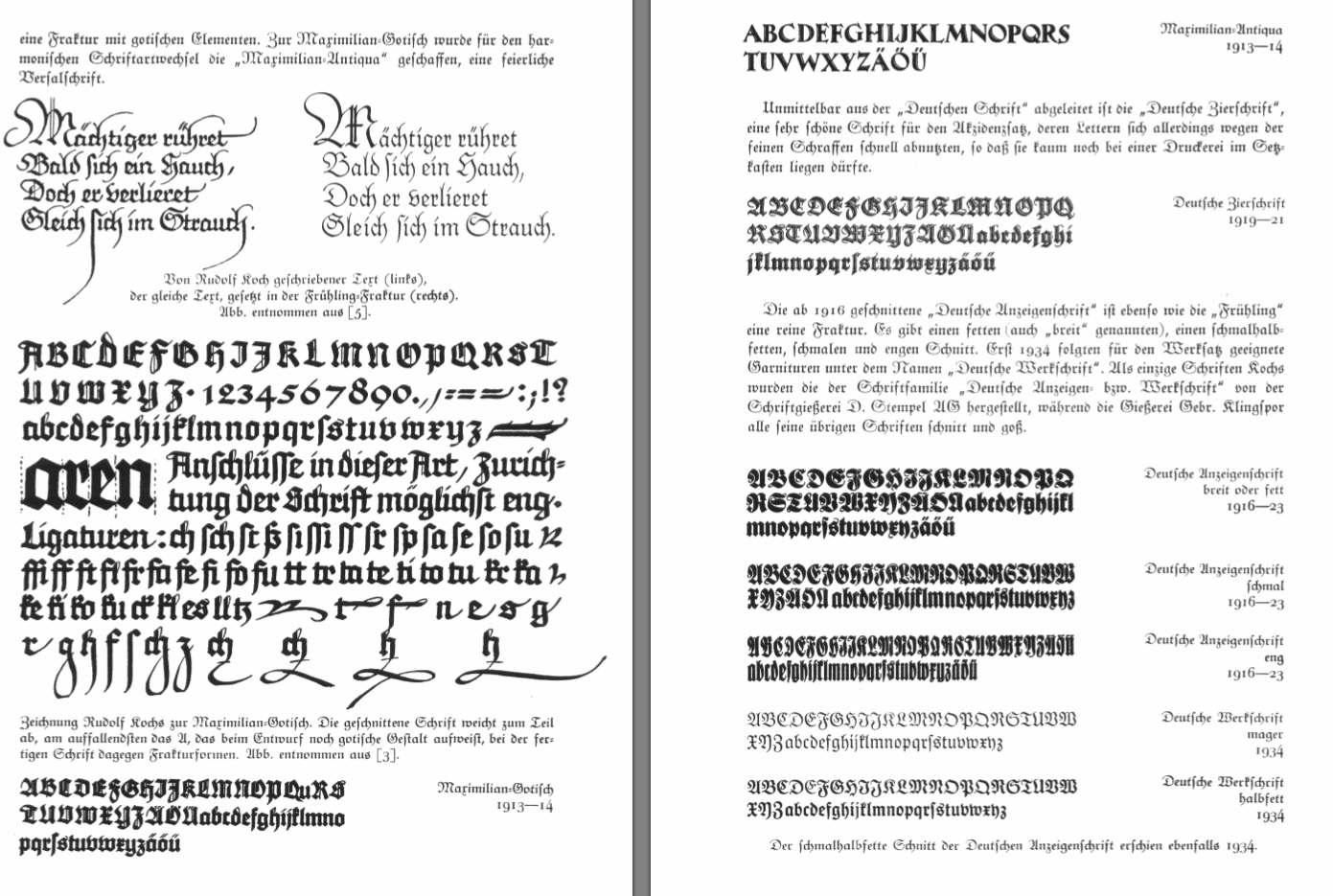
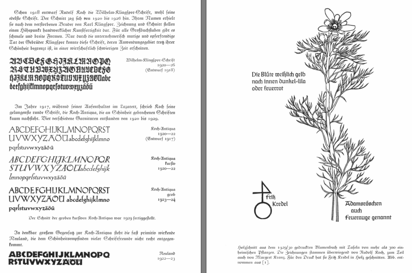
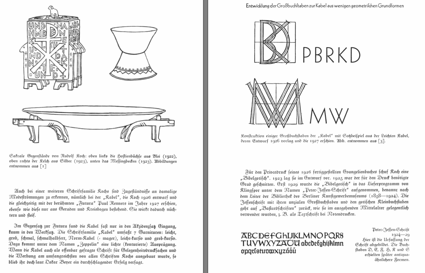
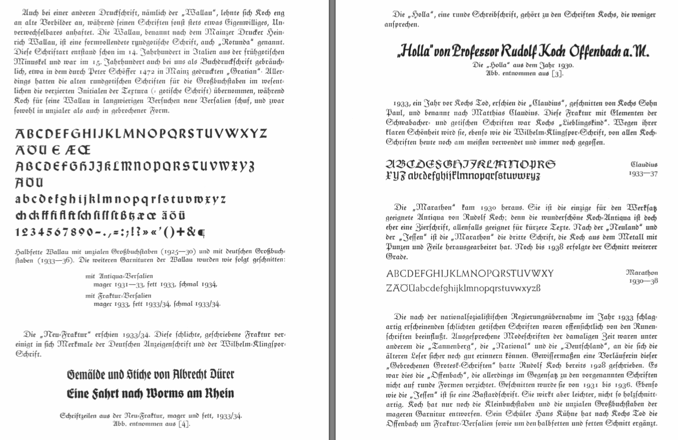
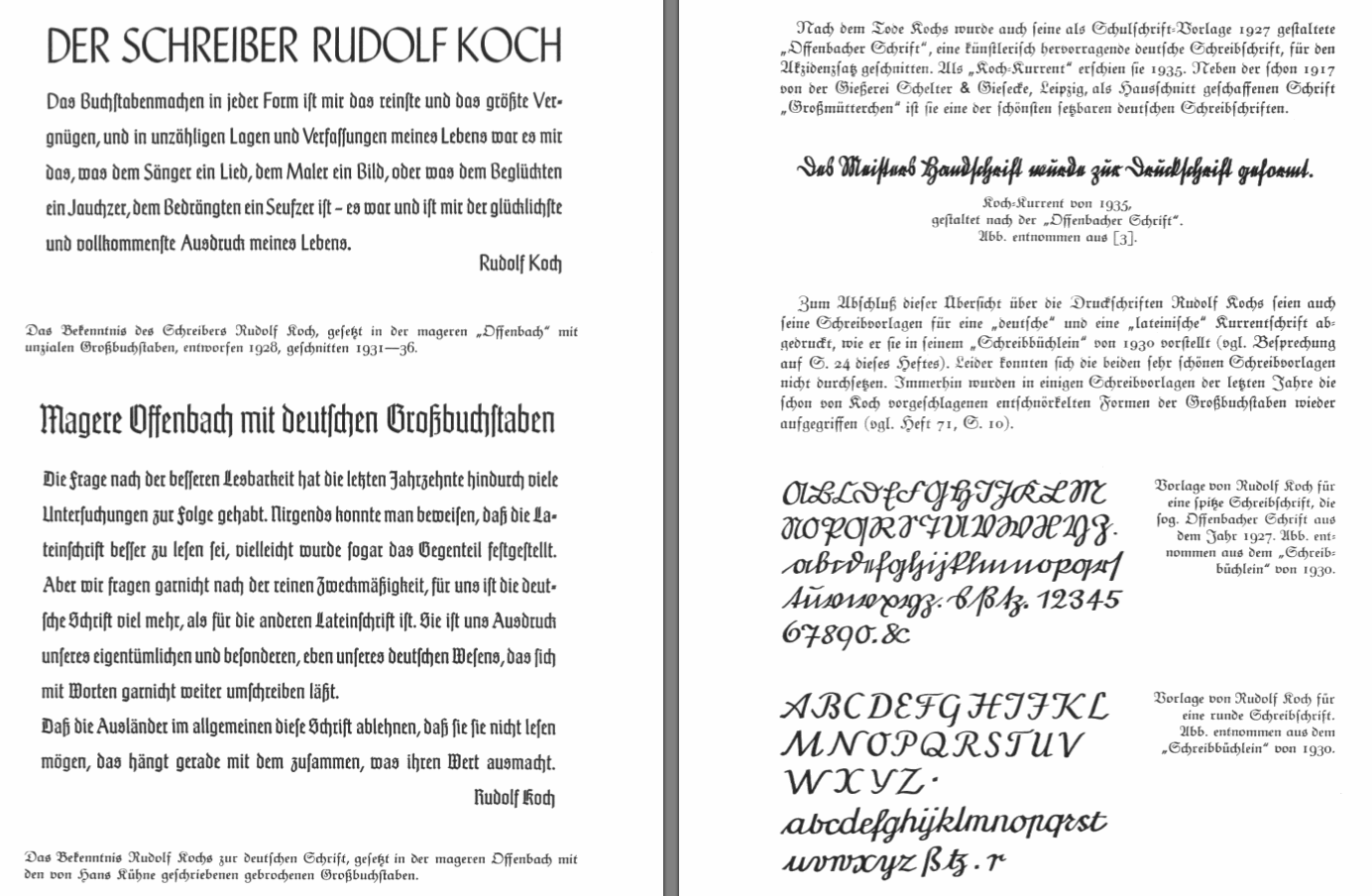
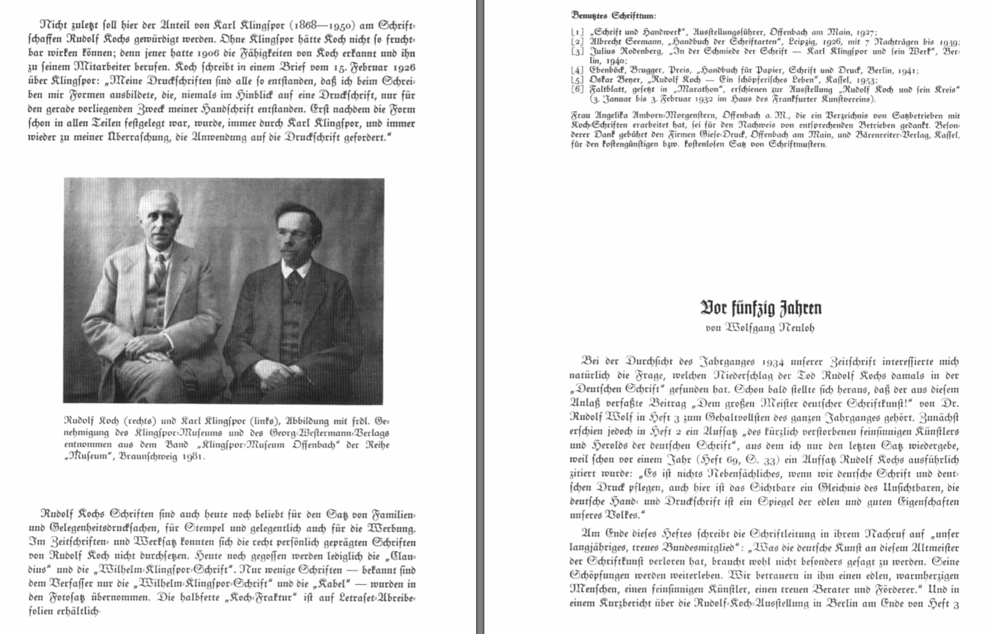
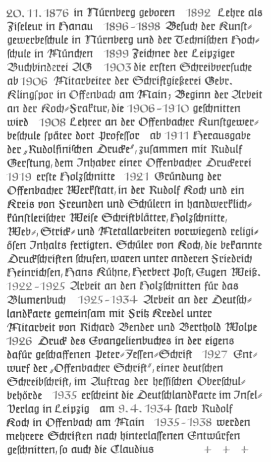
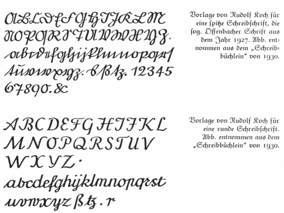
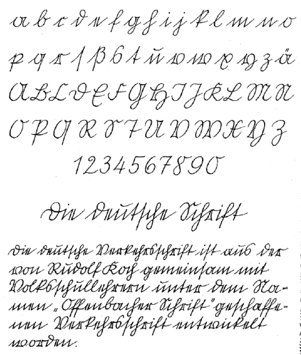
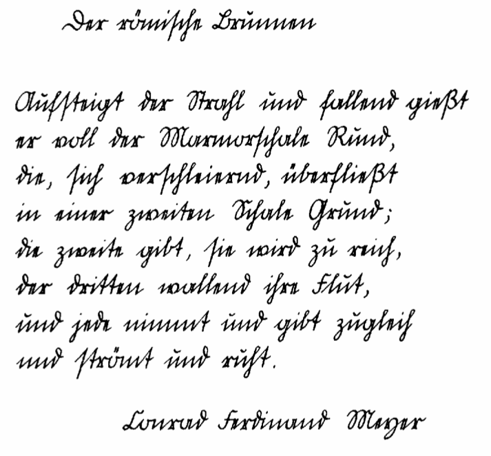
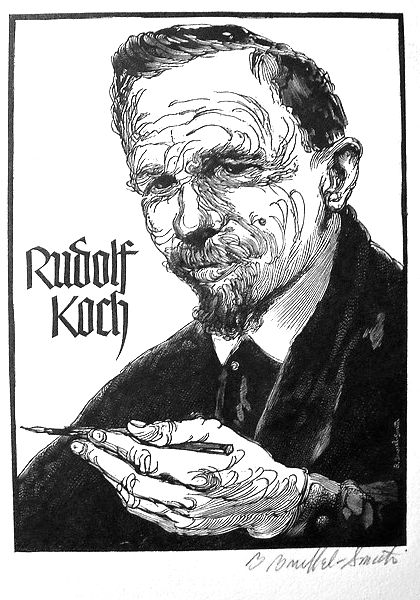
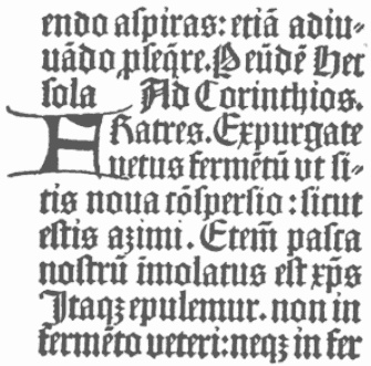
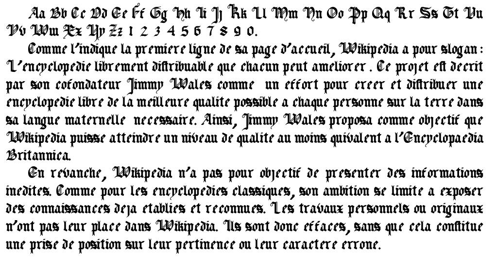
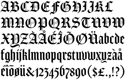
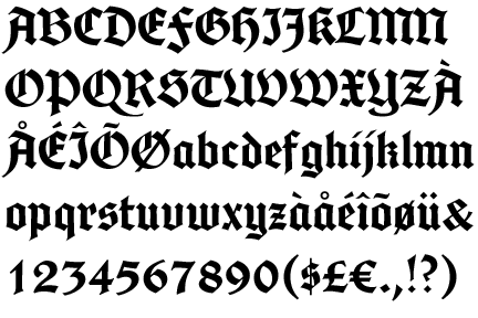
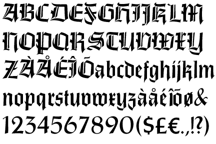
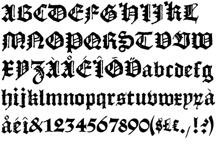
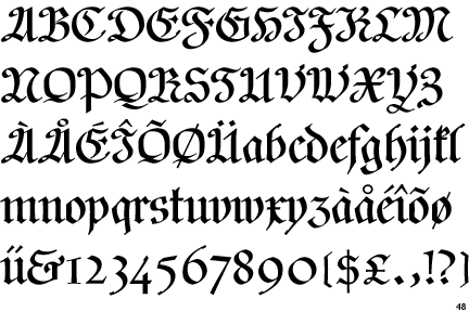
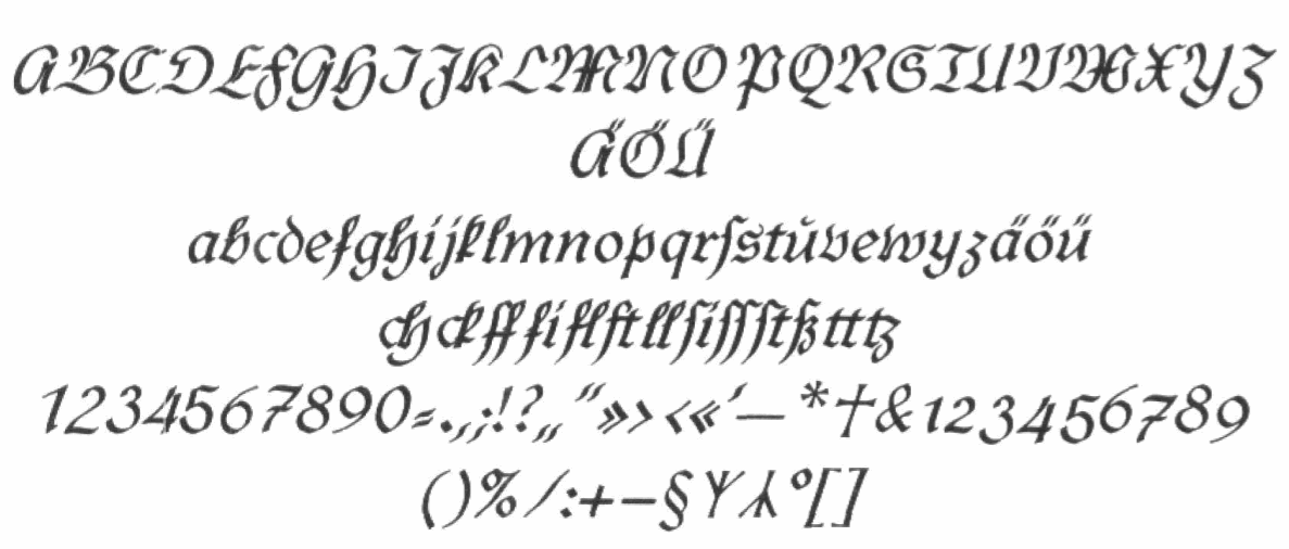
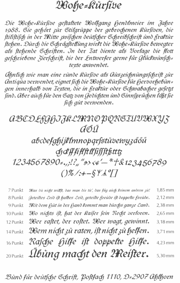
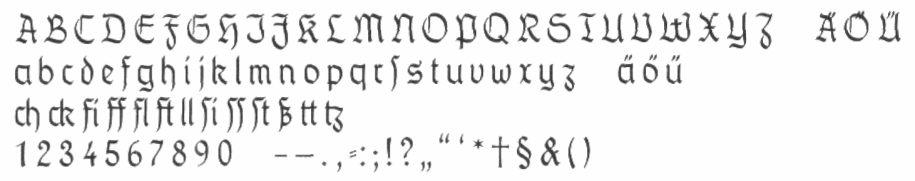
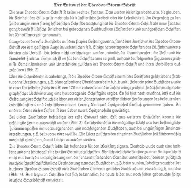
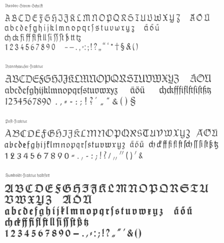
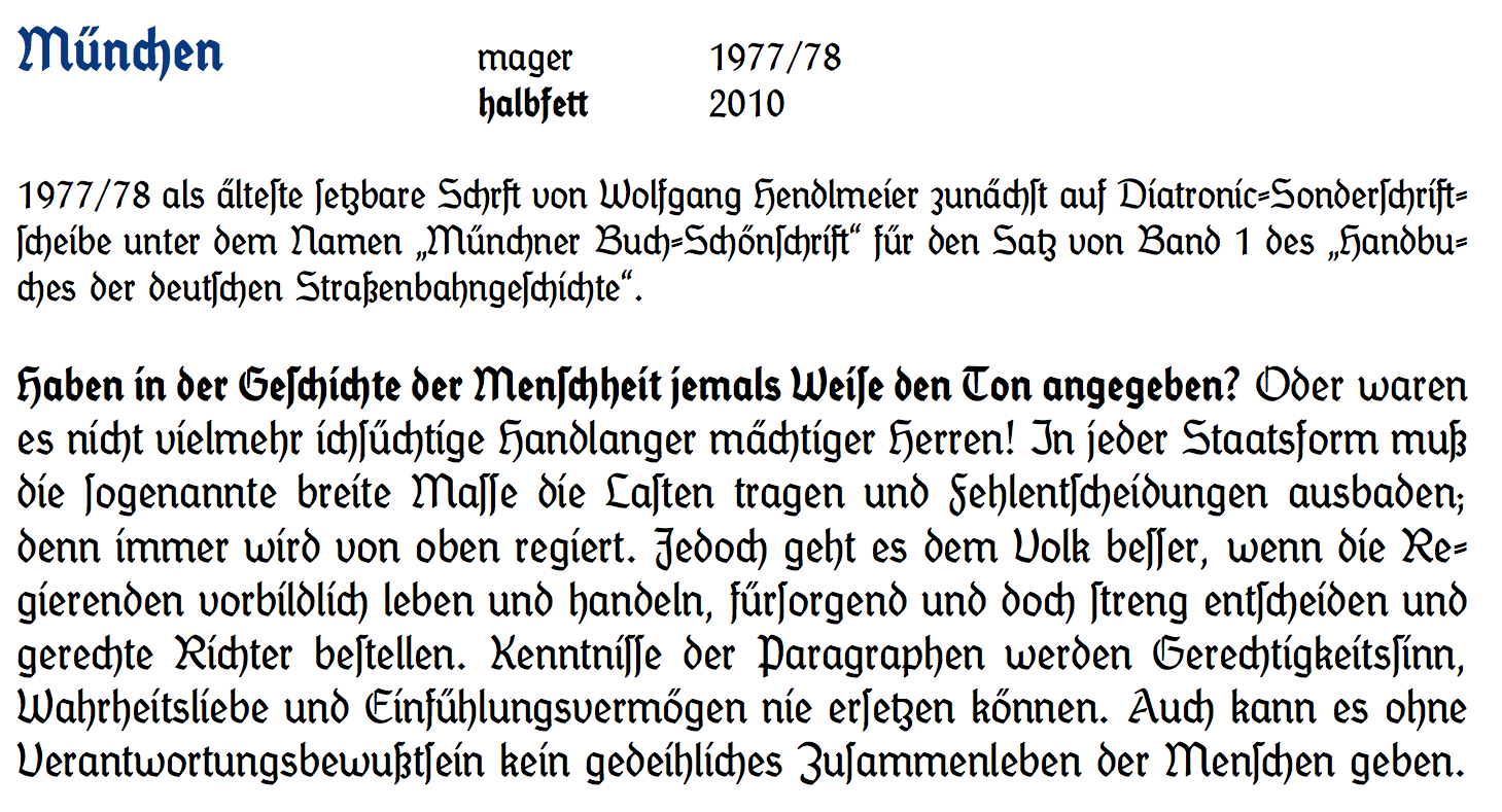
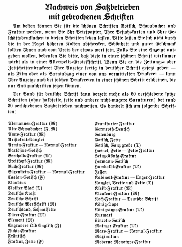
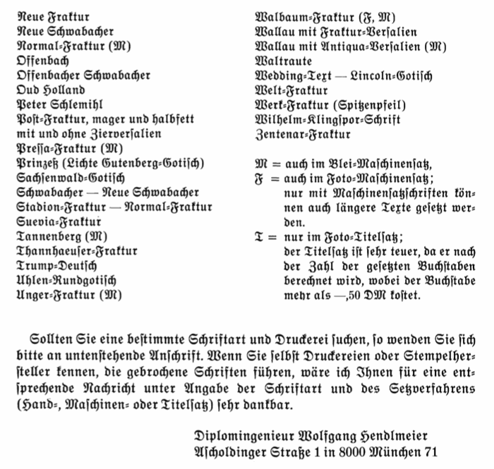