TYPE DESIGN INFORMATION PAGE last updated on Wed May 6 15:54:38 EDT 2026
FONT RECOGNITION VIA FONT MOOSE

|
|
|
|
|
Type in Scotland | ||
|
|
|
|

SWITCH TO INDEX FILE
Alan Brown (Scotland, b. 1983) runs Alan Brown Design. He designed the free font Velocity in 2007. Stereofunk (2011) is a techno face. [Google] [More] ⦿ | |
Aka Alan Alan and as I Like Fonts. Edinburgh, Scotland-based designer of the freeware fonts Meat Raffle (2016), Milk (2002), Jobby (2002, grunge), Matchbox (2002), Dirty Fox (2012, nice grungy caps), Laundry Day (2011), Gorestep (2011, dripping paint font), Stylo (2011), Cable Guy (2011), Bodypump (2002), Aztec Hipster (2012, Mexican simulation typeface), Afro House (2012, tribal), Mashed (2012: a grungy stencil take on the Mash logo), Original Junglist (2012: white on black poster face), Tower Blocks (2013), and AP Digibats (2002). Many of these fonts have no punctuation. Dafont link. [Google] [More] ⦿ | |
During his studies at Clyde College (Cardonald) in Glasgow, Scotland, Alex Burrowes created an untitled blackletter typeface (2014). [Google] [More] ⦿ | |
Born in Scotland, Alex Hunter grew up in the USA and is now based in Charlotte, NC. She created great lettering for her poster Ask Me To Stay (2013). [Google] [More] ⦿ | |
Berry, Johnson and Jaspert write: Ronaldson Old Style (Monotype, 1903) is an old face practically identical with Old Style. Originally cut in 1884 by the American founders, MacKellar, Smiths & Jordan, and no doubt named after one of the original founders of their house, James Ronaldson. It is easily distinguished by the beak-like serifs on the capitals and lower case and by the squared-up shoulders of m and n. The type can be converted to Old Style No. 1 by changing a few characters. In the italic the serifs are more normal and the design becomes very like Old Style italic. The Monotype Corporation's version has short ascenders and descenders and capitals not rising above the ascenders. Mac McGrew: Ronaldson Old Style was designed and cut by MS&J in 1884, and subsequently copied by various other foundries. It was notable for the exaggerated serifs on a number of letters, and the name is now associated with these peculiarities, which were also applied to various other typefaces in the nineteenth century. Monotype cut a reasonably good copy of the foundry face, although modified to fit mechanical requirements, while Linotype cut a set of conversion characters which could be substituted for the regular characters of Old Style No.7. A similar set of conversion characters was cut for Linotype and Intertype Old Style No.1 (q.v.), which is a somewhat lighter face. Keystone called its version Keystone Old Style. Other versions of Ronaldson did not last long into the twentieth century. Digital revivals of Ronaldson Old Style:
Digital revivals of Binny Old Style include Monotype's as Binny Old Style MT. [Google] [MyFonts] [More] ⦿ | |
Scottish type designer, b. 1935. He studied architecture and graphic design in London and founded Marshall Arts. In 1980, he moved to Santa Barbara, CA. Creator of Ingram BT (2004, Bitstream), a tall typeface with Arts and Crafts features. [Google] [MyFonts] [More] ⦿ | |
Punchcutter. From MyFonts: Scottish punchcutter (b. Edinburgh, 1829, d. Chelsea, MA, 1894) active in the revival of oldstyle designs at Miller&Richard in the 1850s. He went to America in 1861, working at the Bruce type foundry for two years, and then for the Dickinson foundry. In 1872 this foundry was ravaged by fire; Phemister was made a partner by its founder Samuel Nelson Dickinson and worked there until retirement in 1891. MyFonts missed the boat on this one! Phemister was the first man to design the famous Bookman. His typefaces include these:
Some images below by Alex Delgado. FontShop link. Klingspor link. View and compare Bookman-style commercial typefaces. [Google] [MyFonts] [More] ⦿ | |
Scottish typefounder, b. St. Andrews, 1714, d. Edinburgh, 1784. Educated in London, he started the Wilson foundry in 1742 at St. Andrew's in a partnership with John Baine, and set up shop in Glasgow in 1744, where he began work with Glasgow University Printers, Robert and Andrew Foulis. William Miller (who later started Miller&Richard), Richard Austin and Johann Christian Bauer all worked for Wilson. Wilson's first known specimen sheet was issued in 1772. However, William Rind seems to be using these types as early as February, 1770 in his Virginia Gazette. The business was left to his son Andrew and later to his grandson Alexander. Under Alexander's tenure, it went bankrupt in 1845. Several specimen books exist, including A specimen of printing types by Alexander Wilson&Sons, dated 1783. Life and Letters of Alexander Wilson (by Alexander Wilson) was reprinted in 1983 by Diane Publishing Company, and is freely viewable at Google. They are credited with the first British modern face, Scotch Roman, whch became very popular in the United States. Mac McGrew: Scotch Roman is derived from a typeface cut and cast by the Scotch foundry of Alexander Wilson&Son at Glasgow before 1833, when it was considered a novelty letter. The modern adaptation of the typeface was first made in 1903 by the foundry of A. D. Farmer&Sons, later part of ATF. It is a modern face, but less mechanical than Bodoni, and has long been popular. Capitals, though, appear heavier than lowercase letters and tend to make a spotty page. Hansen's National Roman is virtually the same face, with the added feature of an alternate r with raised arm in the manner of Cheltenham Oldstyle. When Monotype copied Scotch Roman in 1908, display sizes were cut to match the foundry face, but in keyboard sizes, necessarily modified to fit mechanical requirements, the caps were lightened and the entire typeface was somewhat regularized. Scotch Open Shaded Italic, a partial set of swash initials, was designed by Sol Hess in 1924. Similar swash letters, but not shaded, were also drawn by Hess and made by Monotype for regular Scotch Roman Italic. Linotype had adapted Scotch Roman to its system in 1903, retaining the heavier capitals, but in 1931, by special permission of Lanston Monotype, brought out Scotch No.2 to match the Monotype version. Compare Atlantic, Bell, Caledonia, Original Old Style. [Google] [MyFonts] [More] ⦿ | |
Glasgow-based illustrator and designer. Creator of the handcrafted typeface Des Medecins Malades (2017). Behance link. [Google] [More] ⦿ | |
Brazilian graphic design graduate from IADE, Portugal (in 2011), who is now located in Glasgow. Creator of Pinho (2010), a modular typeface made from nuts. She also made Hardcopy (2012, for the Hardcopy magazine). As an example of her typography in branding and logos, check out the work she did for Galeria Barbara Longhi in Porto Alegre, Brazil. Dafont link. [Google] [More] ⦿ | |
Andrea Leksen
| |
Andrew McCluyskey designed the free LED-inspired Kinglify (2011), Digital Display (2012), and Princelify (2011). Manly Man (2011), Metal Arhyrthmetic (2011) and Ace Futurism (2011) are semi-octagonal. Consider Me Vexed (2011) and Pixel Flag (2011) are pixel typefaces. In 2012, he made She Curls in the Mist, Xero's Karma, Pastcorps (army stencil), Gnome Splinters, Fought Knight, Vermin Vibes (futuristic), Vermin Vibes 1989 (pixel face), Vermin Vibes 2, Vermin Vibes 3 (2014), Vermin Vibes Diet, Vermin Vibes Redux, Dubbing Star (futuristic), Sorrier Statements, Particulator (an octagonal paper fold typeface), Coder's Crux (a pixel typeface created for programmers, FontStruct), Triggering Fanfares (octagonal), Alt West, Notalot25 (pixel face), Notalot35 (pixel face), Lord Juusai (inspired by the logo for Lord Tensai from WWE), Zephyr Jubilee (an alien language simulation typeface), Bevel Fifteen, Xero's Theorem (sci-fi), Sawchain (2012, FontStruct), Dubbing Step and Here Be Dubstep (FontStruct), Italic Bricks, Gang Wolfik (angular, +Blade), Ruaturecu, Quous Inno, Electramaniacal, Xodohtro-Nu (a black octagonal typeface), Distortion of the Brain, Berate the elementary (techno face), Not sure if weird or just regular, Opulent Fiend, Rawhide Raw 2012 (techno, inspired by the WWE Raw logo of 2012), Particulator II (octagonal), The Missing Link (trekkie), Thunderstrukk, Understrukk, Ganf Wolfik Blade (a pointy Blade style font). Typefaces made in 2013: Call of Ops Duty, Spinebiting, Laceration, Casual Hardcore, Zany Races, Vermin Vibes 2 Nightclub, Exoskeleton, Perspire, Piston Pressure (sans), Particulator III, Liberty City Ransom (grunge), Zdyk Leo, Variety Killer (grunge), Savantism, Vermin Vision, Zdyk Sagittarius (a circle-based experimental font), Milestone One (a gaspipe sans), Comfortably Fucked, Noasarck (+Sporadico, +Quattro), Future Time Splitters, Heart Breaking Bad, Jan Hand, Erhank, Exoskeleton, The Rave Is In Your Pants, Minecraft Evenings (inspired by the Minecraft logo), FoughtKnight Victory (a video game font), Piescese, Comic Spans, Cauterise, Dead Font Walking (rough-edged poster font), Cutthroat Clawmarks, Eride (grunge), Effervescent Superbeings, Front Page News, Kill The Noise (brush script), Distort You A Lesson (grungy), Vermin Vibes 2 Black, Vermin Vibes 2 White, Vermin Vibes 2 Soft, Dubstep Cadence, Relapse Into Madness, Kings of Kings Lynn (dadaist), Smorgasbord, Scream When You'Re Ready, I Phone You Phone, Respire, Perspire, Vermin Vibes Slant, Sharp, Cursivertex, Rick Lobster (stencil face), Cursivertex, Vermin Vibes Dystopia (cyberpunk), Wabbit Sans, Calligraphy Aquiver, Agra Axera (knife-edged sci-fi face), The Keepsake Days, See You At The Movies, Xero's Proof, Vermin Vibes Out Of Ink (textured), Melancholic Roadeo, Wickermanor (a stiletto typeface), Lord Juusai Rises, Vermin Vibes Ex, Vermin Vibes Roundhouse, Just in the Firestorm, Stuntcroft (modular), Ghetto Magnetic (grunge), QA Reports (fat finger typeface), Y-Andermo (stiletto style), Dragon Slapper. Typefaces from 2014: Man Flu (FontStruct), Zany Races, Big Quicksand, Modern Caveman, Alpha Sapphire (a Pokemon typeface), Omega Ruby (a Pokemon typeface), Schweiz, Beta (FontStruct), Jawbreaker (FontStruct), Tomorrow Wind, Embezzler, Royal, Final Gambit (grungy athletic lettering), NAL Hand, Fingbanger, Dont Waste That Napkin (squarish font), Bold Testament, Cisgender, NonchalantLove, Grelsey Kammar (sic), Valiant (stencil), Anger Management, Italipixel, Ultramarine, Nero (sci-fi font), Bamboozler, Seriffic, High Jinks, Iregula (sic), LNR Phonetic Alphabet, Primary School, Playtime (3d face), Electromagnetic Lungs, Node to Nowhere, Alienated (trekkie font), Questrian, Scars, Da Se Nei (art deco), Dance Floor (dot matrix face), Edge Cutting, Lord Juusai reigns, Superpower Synonym (fat brush), Fought Knight Die (techno), The Thrill of the Kill, Lay of the Land, Deavantgar (art deco), Confidel, Fight Night, Comeback of the Damned, Vermin Vibes Corrupto, Chandstate, Scars, Bustin Jieber (pixel typeface), A Dash of Salt, Come Rain or Fall, Xsotik, Sanseriffic (avant-garde sans), Cassius Garrod, Effortless Tattoo, Coder's Crux 2, Radaro, Overdrive Sunset (brush face), Dead CRT, Fatality's Edge, Tolerant, Coder's Crux 2 (dot matrix), Consider Me Vexed (pixel face), Diamante, Pixel Flag, Aardvark CWM Type, Enter The Grid, Vermin Vibes 2 EDM XTC, Byron, See You at the Movies 2, And Then It Ends, God Hates Westboro, Writing Without Ink, Zdyk Aquarius, Curvert, Superdie, Rocky Road, Animal Silence (constructivist), Gnaw Hard, 19th Century Renegade, Trip Trap, Freudian Slit, Digital Dismay (LED face), Zdyk Pisces (circle-based typeface), Zdyk Scorpio, Guilty Treasure (techno), Wolfganger (inspired by Wolfgang Gartner), Xero's Retreat, Sitdown (octagonal), Stencylette, No More Justice (blackletter), Masterblast (sci-fi), Kesha (sci-fi), Primal Dream, Grandma's Television, Keyboard Warrior, Foughtknight, Blissful Thinking, Positive Reinforcement, The End of Days. Typefaces from 2015: This Sucks (pixel font), Front Page Neue, Vermin Vibes Mert, Rock Elegance, Stripes. Typefaces from 2016: Enter The Grid, Fill In The Gaps, FoughtKnight, Grunge Tank, Alt West. Dafont link. Most of his typefaces were made using FontStruct, where he is known as NAL or Notalot. Fontspace link. [Google] [More] ⦿ | |
In 2010, he created the Swastika Grid Font. ISOG (2010) is a futuristic techno font. [Google] [More] ⦿ | |
Andy Benedek
| |
ANFS Foundry
| UK-based ANFS foundry groups the following designers: Freddy Taylor (b. London, a graduate of the Edinburgh College of Art, art director at KesselsKramer), Noah Collin, Shaun Dowling. Their typefaces: Monomodern, Das Neue, Biblo, Basic, Drop, Lucid, Plotter, Forms. In 2014, Freddy Taylor contributed the free font London Citype to Citype. Typecache link. [Google] [More] ⦿ |
Archibald Binny (ca. 1762-1838) was a punchcutter from Edinburgh who emigrated to Philadelphia in 1795, where he met James Ronaldson, a businessman also from Edinburgh. In 1796, they started Binny&Ronaldson, the first real American type foundry. In 1809 and 1812, they published America's first specimen books. [Google] [MyFonts] [More] ⦿ | |
He designed Migrant (2017), a simplified version of the ancient Hungarian script that was used by nomadic Hungarian tribes who migrated for centuries before settling down. Migrant was published during his studies in Edinburgh, Scotland. [Google] [More] ⦿ | |
Edinburgh, Scotland-based company specializing in books for dyslexic children. For that purpose, they developed or acquired a very legible proprietary font. [Google] [More] ⦿ | |
| |
Scottish illustrator (b. Nottingham) who designed Animals (2004), a dingbat font available from Union Fonts. Ben Morris began his career as a graphic designer at two of Scotland's best known design agencies, Tayburn and Teviot. In 1993 he became a freelance illustrator and has subsequently contributed to many periodicals, such as Radio Times, Which? Magazine, Daily Express and Time Magazine. He lives in Edinburgh. [Google] [More] ⦿ | |
Bindustries Heavy Metal
| Brian McFeely (Bindustries Heavy Metal) is a designer at Fontmonster who is based in Edinburgh. He made Aulden Times, Trident, Rustic Laminate, Unconform and Unconform Round (in which some letters are stenciled). Dafont link. [Google] [More] ⦿ |
Binny&Ronaldson
| In 1796, Archibald Binny (ca. 1762-1838) and James Ronaldson (1769-1841 or 1842) (some say 1768-1842) started the first permanent American type foundry in Philadelphia in 1796, called Binny&Ronaldson. James, a business man from Edinburgh was the financial fhalf of the pair. In 1809 and 1812, they published America's first specimen book. The only complete copy of this book is at the Rare Book and Manuscript Library of Columbia University, and is entitled A specimen of metal ornaments cast at the letter foundery of Binny and Ronaldson (20 pages, printed by Fry and Kammerer, Philadelphia, USA, 1809) and Specimen of printing types from the foundry of Binny & Ronaldson (1812, Philadelphia, Fry and Kammerer, printers). Local download of the 1812 book. James Ronaldson published Specimen of Printing Type, from the Letter Foundry of James Ronaldson, Successor to Binny&Ronaldson; Cedar, Between Ninth and Tenth Streets, Philadelphia (Philadelphia: J. Ronaldson, 1822). Acquired by Johnson&Smith in 1833, it became L. Johnson&Co. in 1843, and finally MacKellar, Smiths&Jordan in 1867. The latter company was the largest typefounder in America when in 1892 it was amalgamated with many others into ATF. About digital typefaces that are derived: MyFonts sells Isabella, a font by ATF/Kingsley that can be traced back to Binny&Ronaldson. It also offers Really Big Shoe NF (Nick Curtis, 2009), which is based on Ronaldson's Oxford. Dick Pape published the free fonts Binny & Ronaldson English Two Line Orn (2010), Binny & Ronaldson Great Primer Two Pica (2010), and Binny & Ronaldson Primer Two Line Orn (2010). [Google] [MyFonts] [More] ⦿ |
Boulevard Lab
| Or just Sam G. Hughes. An experimental design studio in Edinburgh, Scotland and/or Canada that made some fonts starting in 2019: Avenue (+Mono), Arctic, Sometimes Times, Oatmeal Sans, George Display, Melody Sans, Alt Display. In 2020, he designed Lothian Sans (with harsh angles to accompany the uniform neo-grotesk design, influenced by the early-20th-century Cubist movement) and Kale Mono. Behance link for Sam G. Hughes. [Google] [More] ⦿ |
| |
Scottish designer of the 7-style minimalist uppercase sans typeface Glaschu (2020, +Inline) and the script typeface Hey Hogmanay (2020). Typefaces from 2021: Climbing Nevis (a 3-style outdoors or nature park signage font), Whisky Fudge (a brush script). [Google] [MyFonts] [More] ⦿ | |
Brian McFeely
| |
Alan J. Flavell (Glasgow University) discusses the interface between fonts and browsers. A list of Unicode-compliant fonts is given. There is also information on monospaced fonts. Regarding Webdings, he explains that the font is not Unicode-compliant and thus is inappropriate for web use, as HTML looks for unicode mappings. In other words, the name Webdings is inappropriate. [Google] [More] ⦿ | |
Bruce Type Foundry
| Founded in New York in 1813, and acquired by ATF in 1901, this foundry made fonts such as Bruce Old Style (now Bitstream), Madisonian (now available from Présence Typo), Ornamented No. 1007 (Mac McGrew: Old Bowery is an ATF revival, in 1933 and again in 1949, of Round Shade No.2, originated by Bruce, one of its predecessor companies, about 1854, as Ornamented No. 1007.), and Old Style 7 (Linotype, Adobe). Also called D.&G. Bruce, George Bruce, George Bruce&Co., George Bruce's Son, George Bruce's Son&Co., and V.B. Munson. They published a 592-page specimen book in 1901: Bruce Type Foundry: Our Handy Book of Types, Borders, Brass Rule and Cuts, Printing Machinery&General Supplies.. In 1869, George Bruce (b. 1791, Edinburgh, Scotland; d. 1866, New York) published An abridged specimen book Bruce's New York Type-Foundry (1869), now available as a free Google book. Page with specimen of Great Primer Ornamented No. 5, Meridian Black Open (blackletter), Canon Teutonic Ornamented, Small Pica No. 2, Double Pica Graphotype, all taken from An Abridged Specimen of Printing Types Made at Bruce's New-York Type-Foundry (1868) and stolen from Luc Devroye's web site. Fists by the Bruce Foundry. Revivals: Bruce Ornamented No. 6 was digitized by Iza W from Intellecta Design in 2006 as GeodecBruceOrnamented. Gold Rush (2008, FontMesa) is a family of Western style typefaces based on a Bruce type family from 1865. FontMesa also made Belgian (2008) based on a Bruce Type Foundry design from the 1860s. Bruce 532 Blackletter (2011, Paulo W, Intellecta Design) is an excessively ornamental blackletter face. Michael Hagemann's slab serif family Gold (2011) is based on Bruce's Gold Rush (1865) after removing the shadows. RMU Bowery (2019, Ralph M. Unger revives Old Bowery). [Google] [MyFonts] [More] ⦿ |
| |
The CRMFontCo headed by George R. Grant specialises in typefaces based upon the letterforms of Mackintosh. They published multiple styles of these fonts: Rennie Mackintosh (1993, the original by George R. Grant), Rennie Mackintosh Glasgow (2007, with lowercase letters added), and Rennie Mackintosh Artlover (1995: art deco dingbats by George Grant and Joanna McKnight). Later additions include The Classic Charles Rennie Mackintosh Font, The Charles Rennie Mackintosh Artlover Font, The Charles Rennie Mackintosh Stems Font, The Charles Rennie Mackintosh Glasgow Font, The Charles Rennie Mackintosh Renaissance Font, The Charles Rennie Mackintosh Hillhouse Font, The Charles Rennie Mackintosh Moonlight Font, The Charles Rennie Mackintosh Scotland St. Font, and The Charles Rennie Mackintosh Venezia Font<. Poster by Ryan Irven (2010). See also the free font Nouveau (1992) by Alan Cairns. CRM company link. View Charles Rennie Mackintosh's typefaces. [Google] [MyFonts] [More] ⦿ | |
As a student in Edinburgh, Scotland, Charlie Jennings created the experimental minimalist sans typeface Beyond (2015). Behance link. [Google] [More] ⦿ | |
Craig Black is a Scottish-born graphic designer, lettering artist and typographer, who graduated from University West of Scotland in 2013. Having spent the first few years of his career in leading design agencies in London, he currently runs his own design studio in Gourock, Scotland. In 2020, Monotype released FS Renaissance, a stencil serif typeface by Pedro Arilla and Craig Black. [Google] [MyFonts] [More] ⦿ | |
CRMFontCo
|
View the typefaces designed by CRM Font Co. [Google] [MyFonts] [More] ⦿ |
In 2014, he made Creepy Scrawly, Balloon Floats (alphadings), King Dubstepikz. Magic Marbles, Smooth Circular (a circle-based sans), Vampire Raves (fat art deco sans), GoGo Poster Punch (heavy sans caps), Sophisticated Slims, Happy Potatoes, Freaky Paper Cutouts, Absolute Zero (FontStruct), Big Bad Blocks (FontStruct), CheerioOldChap, CrazyInkSplats, Dadiomouse, Da Mad Rave (FontStruct), ExtinctionEvent (FontStruct), FriendlyFeltTips, NeonNanoborg (a neon emulation font made with FontStruct), NightmareInk, NinjaRush (FontStruct), Oilslick, Sandscrape, StretchedElectrons (FontStruct), SyntheticSharps (2014, FontStruct), TowerBlock, Ghostly Prints, Kurly Kyoots. Typefaces from 2016: Paint Blobs, Chalk Dash, Go Faster Brush, Splay Brush, Cartoon Marker, 3D Hand Drawns, Serial Killers, Thick Marker Talls, Alphabet-Souplings, Barbed-Wires, Cartoon-Inkstrokes, Dot-Stick-Doodles, Jelly-Wobblers, Kiddy-Paints, Taped-Up-Tight, Angular-Anarchy, Balloon-Friends, Bead-Necklace, ChunkyFunks, Circular-Abstracts, Fat-Brush, Inky-Scrawls, Long-Loving-Letters, Prehistoric-Caveman, Volcanic-Dungeon (glaz krak style), Roundy Rainbows, Digital Dreamers, Scifi Adventure, Space Superstars, Slim Thin Pixelettes, Scrapbook Scribblers, Dark Scroll Scripts. Typefaces from 2017: Marshmallows, Swirltastic, Sweetpaint, Shockers, Cyborg City, Baubles, Funny & Cute, Splatink, Snowblobs, Dear Santa, Paint Brush, Noise Machine (sci-fi), Curvy Thins, Skinny Things, Chublings (fat cartoon font), Snowy Skies, Zombiebites, Skinny Sunbeams, Japanese 3017 (oriental simulation), Robot Crush (squarish), Virtual Rave, Outliners, Christmas Curls, Vector Waves, Signboard, Signup, Signoff, Horrorshow, Mad Meka, Gameshow, Cute Notes, Perfect Princess, Bankjob, Paintling, Spooky Light, Playtime, Stringz, Comictastic, Loveables, Technotot (octagonal), Boss Fight (rough brush), Adorable, Tokyo 2097 (sci-fi), Awesome (beatnik), Knick Knack, Ninja Strike, Fairies (uncial), Wowsers, Funhouse, Sourdough, Love and Romance, Kissy, Ultrathins, Skin and Bones, Skinnymalink, Board Marker, Rockbiter (Flintstone font), Hackattack, Rosegarden, Grungelings, Splatlings, Rush, Sketchalot, Trashtalk, Blobtastics, Madjumbles, Daydreamer, Moonlight, Inkbleeds, MooMoo, Maximum Impact, Boxy Brush, Wibble, Exquisite, Dragonlands, Cut It Out, Inkling (inky font), Shiny Darks, Quirky Thins, Off Kilter, Coarse Fuzz, Scraggly, Flowing Flowers, Zebra Blobs, Shiver, Bare-Bones, Fats Are Good, Fighting Force, Inked-Out, Kid-Marker, Love-Me, Neon Adventure, Quiet Streets, Slice, Scribble Lines, Square Chunks, Da Serif Kid, Squidgy, Crazy Guy, Madhouse, Alien Beasts, Cogs and Bolts (octagonal), Spatial Anomaly, Fun Smiles, Balloonish, Chunky Cheese, Pirate Plunder, Squiggler, Scribble Wire, Quicky Brush, Scratchies, Nerdy Norms, Cartoonlings, Neat Chalk, Spidery (crayon style), Speeding Brush, Super Sketch, Patchwork Stitchings, Skinny Marker, Blob-Toon-Shadows, Brisk-Bristle-Brush, BurntFirewood, Childlike-Blobs, Comical-Cartoon, Drunk-Handwriting, Mad-Stick-Brush, Pipecleaners, Roundish-Toons, Scribbletastic-Brush, Sick-Sketchlings, Sloppy-Paint, Almost-Outlines, Archaic-Asian-Inks (oriental brush font), Brisk-Bristle-Brush, Chunky-Boulder-Outlines, Expressive-Inks, Fast-Flat-Brush, Fat-Wobble-Outlines, Rapid-Inks, Rough-Comic-Outlines, Single-Stroke-Inks, Square-Brush, Swirly-Curly-Inks, Thin Toon Outlines. Typefaces from 2018: Superfats, Toon Balloon, Comic Queens, Big Black Bear, Mad Hacker (a glitch font), Space Quest, Aliens Among Us, Neon Overdrive, Tech Headlines, Megalopolis X, Neon Vortex (octagonal), Son of a Glitch, Space cadets, House on Mars, Robotronics, Alien Cyborg, Dreamlands, This is the Future, Alien Robot, Zen Os, Speed Freaks, Martian Sunrise, GoGo Hack, Squaresharps, Quirky Robot, Android Assassin, Positrons, Virtual Realm, Robot Reavers, Dark Dimension, Alien Wars, Whimsical Lovelies, Superchunky, Bunny Ears, Sunshiny, Lovehearts, Only Organic, Mars Mission, Alien Android, Angry Android, Baby Blues, Cryogenix, Robot Renegades, Invasion, Reavers, Haunting, Ghastly, Ghost House, Extra Fruity, Blueberry, Gingerbread, Iced Cookies, Turnaround, Chunky Chalk, Chalk About, Raptors, Calamitech, Robot Radicals, Juice Monster, Silky Smooth, Slender Scratch, Super Scratchy, Wide Scratch, Megabomb, Pink Rocket, Nebulari, Solaria, Sunspire, Slimbots, Jumping, Sleeping, Walking, Lovelings, Xenosphere, Lovebuzz, Shadowkingz, Western Wonderment, Sudden Desires, Cookies, Starborn, Slimlines, Solid Grooves, Delicious, Martian Wars (constructivist), Ironworks, Newsflash, Space Madness, Neon Machine, Kings Feast (great fat caps), Casual Caps, Crazy Dots, Splatter Kings, Squidgy Slimes, Ghostz, Android, Casual Friday, Quickly, Quioet Meows, Lovely Serifs, Penelope, Chubby, Fireworks Kid, Fat Cat, Dreamwalks, Cartoons 23, Rise & Shine, Bright & Early, Alien Mushrooms, Monsterz, Digital Dare, Kinda 3D, Flower Powers, Simply Be, Balloon Pops, Heart to Heart, Boardgamers, Cloudheads, Game Over Dude, Roundish, Snake Chan, Cactus Cuties, Veggie Seedlings (monoline handcrafted typeface), Martian Signpost, Forever After, Curved Square, Happy Bomb, Machinations, Super Turnips, Summer Love, Kawaii Stitch, Cutesy Kisses, Toon Cats, Comic Kings, Mushy Love (beatnik style), Patchy Robots, Robot Blocks, Robotica, Kids Stuff, Aine, Begorra, Malarky, Shenanigans, Spring in My Step, Never Surrender, Juicy Fruity, Gorgeous Girls, Knife Princess, Massive Bassline, Jelly Kids, Magic Moons, Fairies Are Real, Super Sweet, Unconditionally, Love The Fonts, Forever, Jelly Donuts, Cute Stitch, Ninja Note, Comic Panels, Love You Angel, Shine With Me, Express Yourself, Superstar, Rave King, I Am Awake, Android 101, Robot Children, Machine Madness, Kissy Hugs, Natural Sugars, Fresh Cream, Planetoid, Asteroid 7337, Zombie Apocalypse, Russian Dollmaker (constructivist), Sunshine Smiles, Sushi Roll, Snowy Sparkles (textured), Lovely Madness (beatnik style), Hello Angel, Dubstep Heroes, Space Crusader, Pixelopolis 9000, Dungeons, Stroketastic, Brushalot, Delicious Doom, Skinny Dipping, Sparkly Hearts, Swirlstory, Circuitboard, Yours Truly, Scawlamajig. Fonts from 2019: Chinatown Champs (oriental simulation), Modern Machine, Hyper Helix, Alien Mine, Robot World, Future Worlds, Pumpkin King, Vampire Wars, Halloween Treats, Zombie Night, Deadly Cute, School Play, Love The Trees, Moonbase Omega, Japanese Robot, To Japan, Moonlighting, Cyberjunkies (sci-fi), Spotsticks, Chalktastic, Megabot Five, Xen Galaxy (trekkie font), Gorgeous Grafix, Comic Marker Deluxe, Speedy Marker, Maxi Marker, Love Marker, Natural Marker, Juice It Up, Oldschool Tag, Marker, Cutout City, Renegade Moons, Marker Notes, Angelic Child, Natural Toons, Miss Chalkboard, Quirky Cat, Delicious Scrawl, Super Tasty, Patchwork Stitchlings, Neptune Lander, Saturn 3, Supernova, Moonbase Delta (a heavy octagonal typeface), Daydreamers (marker pen font), Marker Notes (marker pen font), Martian Robotiocs (mechanical), Super Sunrise (marker pen font), Space squadron (squarish), Robotronica, Retronoid, Mechacubes, Beyond The Stars, Neon Vampire, Magical Markers, Lovely Notes, Super Toons. Typefaces from 2020: Cartoon Fun, Robot Z, Scary Horrors, Pumpkin Soup, Halloween Hex, Ultraquick, Killer Bassline, Blackmoon Quest, Toy Box, Alien-Realities, Cyberpunks, GoGo-Poster-2020, Japanese-2020 (oriental emulation), Monster-Mech, Stitchy-Missy, ToyBox. Typefaces from 2021: Ninja Attack, Squaremaze, Gen Z, Big 500, Drum N Bass, Deadly Advance, Deadman, From Beyond, Alien Skyline, Never Better, Flourish, Dubai Dubstep, Zef Rave. Creative Fabrica link. [Google] [More] ⦿ | |
Graduate of the National College of Art and Design in Dublin. In 2013, he obtained an MDes from the Glasgow School of Art, specializing in animation. Now based in London, he designed Newer Alphabet (2013), which was inspired by Wim Crouwel's unicase proposal New Alphabet (1967). [Google] [More] ⦿ | |
Born in Edinburgh, Scotland, David Bruce was the brother of George Bruce. Together, they ran the Bruce Type Foundry in New York from 1818 onwards. George gave his attention to the enlargement and development of the type-founding business, while David concentrated on stereotyping, a process he was the first to introduce in North America. [Google] [MyFonts] [More] ⦿ | |
Scottish designer (b. Galashiels, Scotland, 1962) who studied graphic design in Manchester and moved to London where he worked for eight years. He headed the Graphic Arts Department at Liverpool School of Art and Design. A professor now, he is head of the School of Design at Manchester Metropolitan University. Designer in the FUSE 16 collection (1997) of Mega and in the FUSE 8 collection of Creation 6, mechanical-looking dingbats. Designer of the Alphapeg family (2001) and Dialogue (1999, a Hebrew simulation font done with Yaki Moicho). Designer of FF Beadmap (2002, with Ian Wright). FontShop link. Klingspor link. [Google] [MyFonts] [More] ⦿ | |
Edinburgh, Scotland-based designer of the free handcrafted typeface Hamburgh (2016). [Google] [More] ⦿ | |
David Kettlewell
| |
Edinburgh, Scotland-based graphic designer, illustrator, writer, artist and photographer. Designer of the avant garde typeface famly Sketchbook Bold (2014). Behance link. [Google] [More] ⦿ | |
Derek Green
| |
Studio in Glasgow, Scotland. Designers of the tweetware vintage advertizing font Kraftig (2013). Behance link. [Google] [More] ⦿ | |
Donna M. Stewart
| |
Author of Printing Type Designs - A New History from Gutenberg to 2000 (Akros Publications, Fife, Scotland, 2000). [Google] [More] ⦿ | |
Effek-Tive
| Effektive (Greig Anderson) practices graphic design and communication in the UK. Among its many creations are some experimental typefaces such as Circul8 (2009) and Pixel8 (2009). Behance link. Originally from Aberdeen, Scotland, Greig graduated with a BA (Hons) Graphic Design degree in 2004 and previously spent 4 years working withinn the Scottish/UK design industry at multi disciplinary agency Curious (Previously CuriousOranj) based in Glasgow. Greig spent the academic year 2008-2009 in Sydney. [Google] [More] ⦿ |
London-based graphic designer who graduated from Glasgow School of Art and the Royal College of Art. Creator of the inline caps typeface Betsy Works (2011). Behance link. [Google] [More] ⦿ | |
Elena Genova
| |
Edinburgh, Scotland-based designer of Elph Chubba (2005, fat comic book face). Dafont link. [Google] [More] ⦿ | |
Designer in Edinburgh, Scotland, who created the pixelish display typeface Rixel in 2016. Behance link. [Google] [More] ⦿ | |
Edinburgh, Scotland-based designer of the brush-drawn The Swedish Alphabet (2016). Behance link. [Google] [More] ⦿ | |
Fatfonts
|
Numerals in vector fonts developed by the team have a thickness that is proportional to their value. Numerals can also be nested. The (free) fonts were converted to opentype by Richard Wheeler (a PhD student at The Sir William Dunn School of Pathology of Oxford). Uta Hinrichs designed Gracilia, Cubica, and Rotunda. She co-designed Miguta with Miguel Nacenta. Finally, Richard Wheeler himself created the LED typeface 7Segments. [Google] [More] ⦿ |
Feòrag NìcBhrìde
| |
Feorag's Place
| Nice designs by Feòrag NìcBhrìde (or Feòrag Forsyth) from Edinburgh, Scotland. Her Mac TrueType and PostScript fonts are mostly reproductions of historic type. Styl, Styl Round, Astradyne and DaySquareCut are futurist in inspiration. Chapbook and Chapbook Italic are based on 17th century type and Vespasian is taken from a late 7th century manuscript. Symbats and Orkney Runes are of particular interest to occultists. Flgheadh, my first shareware font, makes the creation of knotwork rows as easy as typing three characters which happen to be next to one another on the keyboard. Viking Runes from the Orkney Isles, Taisean (2010, angular uncial), Accelerando (2009, nice simple techno face), Day Square Cut (1997; based on lettering designed by Lewis Day, some time around 1900), Cianán (Mac type 1 font based on an old Irish manuscript, 1998), Astradyne (based on the font used on Ultravox's Vienna LP from 1980), Symbats (1997-2008, a Pagan dingbats font), Innsmouth Plain (2011, hand-printed), Skelett (2011, blackletter), Maeshowe (2014, Futhark runes), Orkahaug (2014, a grungy version of Maeshowe), Lindberg (2007-2014, a beer bottle font), Lindberg Caffeine (2014), Springmarch (2014). In 2016, he designed the Victorian typeface Whittier. Dafont link. Older URL for her free stuff. [Google] [More] ⦿ |
Font Factory
|
|
Glasgow-based graphic designer. Creator of the flared lapidary typeface Orsini (2013). She writes: Orsini is an inscriptional font, designed for titling and advertising. The goal of this project was to create a peculiar typeface capable to give a strong personality to words and sentences. Orsini features, as large apertures, high contrast and particular terminals, were designed in order to stress the unmistakable character of this font. Orsini was inspired by an inscription placed on the facade of the Basilica di Santa Maria Sopra Minerva in Rome. These letteres have nothing to do with Roman capital letters as those on the Trajan Column. The inscription was engraved in 1453 to mention Conte Orsini's aid to the construction and many imperfections reveal an untrained hand. [Google] [More] ⦿ | |
Francis Fonye
| |
Freddy Taylor
| |
Glasgow, UK-based designer of Hairplay (2018). [Google] [More] ⦿ | |
Gallusness
|
|
Illustrator and web designer in Falkirk, Scotland, who made the great ultra-fat experimental typeface Flabby (2010) and the experimental geometric typeface Geograde (2013). Behance link. [Google] [More] ⦿ | |
Gawr Juhs
|
In 2013, he made Char, Impression and Gioma (a free Latin / Greek prismatic typeface created for a woman in southern Crete). In 2016, he designed the free all caps art deco typeface Decodent. Behance link. [Google] [More] ⦿ |
Typefaces from 2014: Baddit (bilined), Cobac (shadow face). [Google] [More] ⦿ | |
Quoting From Appleton's Cyclopedia of American Biography, edited by James Grant Wilson and John Fiske. 6 vols. New York: D. Appleton and Company, 1887-1889.: Bruce, George, type-founder (proprietor of the Bruce foundry), born in Edinburgh, Scotland, 5 July, 1781: died in New York City, 6 July, 1866. He immigrated to the United States, where his brother David had preceded him in July, 1795, and at first attempted to learn the bookbinder's trade, but, his master being tyrannical and exacting, he left him, and by his brother's persuasion apprenticed himself to Thomas Dobson, printer in Philadelphia. In 1798 the destruction of Dobson's office by fire, and the prevalence of yellow fever, led the brothers to leave the city. George had yellow fever at Amboy, but recovered through his brother's care. The two went to Albany and obtained employment there, but after a few months returned to New York. In 1803 young Bruce was foreman and a contributor to the Daily Advertiser, and in November of that year printer and publisher of the paper for the proprietor. In 1806 the two brothers opened a book printing office at the corner of Pearl street and Coffeehouse slip. The same year they brought out an edition of Lavoisier's Chemistry, doing all the work with their own hands. Their industry and personal attention to business soon brought them abundant employment, and in 1809, removing to Sloat lane, near Hanover square, they had nine presses in operation, and published occasionally on their own account. In 1812 David went to England, and brought back with him the secret of stereotyping. The brothers attempted to introduce the process, but encountered many difficulties, which it required all their ingenuity to surmount. The type of that day was cast with so low a beveled shoulder that it was not suitable for stereotyping, as it interfered with the molding and weakened the plate. They found it necessary, therefore, to cast their own type. They invented a planing-machine for smoothing the backs of the plates and reducing them to a uniform thickness, and the mahogany shifting-blocks to bring the plates to the same height as type. Their first stereotype works were school editions of the New Testament in bourgeois, and the Bible in nonpareil (1814 and 1815). They subsequently stereotyped the earlier issues of the American Bible society, and a series of Latin classics. In 1816 they sold out the printing business, and bought a building in Eldridge street for their foundry. Here, and subsequently in 1818, when they erected the foundry still occupied by their successors in Chambers Street, George gave his attention to the enlargement and development of the type-founding business, while David confined his labors to stereotyping. In 1822 David's health failed, and the partnership was dissolved. George soon relinquished stereotyping, and gave his whole attention to type-founding, and introduced valuable improvements into the business, cutting his own punches, making constantly new and tasteful designs, and graduating the size of the body of the type so as to give it a proper relative proportion to the size of the letter. In connection with his nephew, David Bruce, Jr., he invented the only typecasting machine That has stood the test of experience, and is now in general use. His scripts became famous among printers as early as 1832, and retained their pre-eminence for a generation. The last set of punches he cut was for a great primer script. He was at the time in his seventy-eighth year, but for beauty of design and neatness of finish, the type in question has rarely been excelled. Mr. Bruce was a man of large benevolence, of unflinching integrity, and great decision of character. He was president for many years of the Mechanics' Institute, and of the type-founders' association, and an active member of and contributor to, the historical society, St. Andrew's society, the typographical society, and the general society of mechanics and tradesmen. [Google] [MyFonts] [More] ⦿ | |
George Bruce
| |
George R. Grant
| |
Glasgow, Scotland-based designer of the Startrek-style octagonal font Frame (2015). Free download. Behance link. [Google] [More] ⦿ | |
GoodEggs Type Foundry is a foundry co-founded by Apolline de Luca and Alessandro Prepi Sot. Their typefaces include the display serif Diaspora. Diaspora is a display font inspired by Italian immigration to Scotland between 1880 and 1920. The font expresses the hybrid identities of the Scottish-Italian diaspora through additions including seven alternates for the letters A, E, M, N, T, U, V and W. [Google] [More] ⦿ | |
Graeme Hardie
| |
Designer of free grunge, signpainting or comic book style typefaces: Grantcookyfont, Granterodedfont, Grantmessyfont, Grantscrapfont, grant_solidsober. All fonts were made in 2008. Grant is from Tongue in the north of Scotland, but moved to Innsbruck, Austria. [Google] [More] ⦿ | |
Graphic design studio in Glasgow. They made the arc-of-circle typeface Green Flame Type (2010). [Google] [More] ⦿ | |
Greig Anderson
| |
Scottish author of Modern type display and the use of type ornament (1911, Edinburgh), a book which can be found in full on the web. See also here. PDF of that book, and the text file. Most of the specimens discussed in the text are from H.W. Caslon Typefounders, Stephenson Blake, Charles Reed and Miller & Richard. [Google] [More] ⦿ | |
Henry Taylor Wyse writes in 1911 in Modern type display and the use of type ornament: Scottish printers received their supplies of type in the early days of printing from Holland. The first Scottish type-founder was Alex. Wilson, a native of St Andrews, who migrated to London in 1737 as an assistant apothecary. Accompanied by a friend, he was conducted over a type foundry there, and, thinking he could improve upon the current methods of type-founding, he started, along with a Mr Baine, a type foundry in his native town in 1742. The business prospered to such an extent, that the foundry was soon removed to Camlachie, a small village near Glasgow. While in Glasgow, Wilson formed many friendships with the professors of the University there, and also with Robert and Andrew Foulis, the University printers. He is probably best known by the magnificent founts of Greek letters which he cut, and which were used for the splendid edition of the Greek classics issued by the University. In 1834 the Glasgow Type Foundry, as it was called, was transferred to London. In 1845 the firm became bankrupt, and most of the punches and matrices were bought by the Caslons. William Miller, a foreman in the Glasgow Foundry, started business in Edinburgh in 1809 as Wm. Miller & Co. In 1822 the title of the firm was changed to William Miller. In 1832 Mr Richard was admitted as a partner, the firm again becoming Wm. Miller & Co. In 1838 it was styled Miller and Richard. To this firm belongs the credit of being the first British Foundry to successfully introduce machines for casting type. William Miller died in 1843. Mr Richard and his son carried on the business till 1868 when Mr Richard, senior, retired, the conduct of the business devolving upon Mr J. M. Richard and Mr W. M. Richard, whose sons are the present proprietors. Messrs Miller & Richard are now the only type-founders in Scotland. [Google] [More] ⦿ | |
Henry Taylor Wyse writes in 1911 in Modern type display and the use of type ornament: GUTENBERG, the inventor of printing, as well as his immediate successors, cut their own punches, made their own matrices, and cast their own type. In the early part of the sixteenth century } however, as the number of printers increased, type-founding as a regular business began to be developed, and periodical markets for the sale of type were held throughout Europe. In England the pioneers of printing, Caxton, Wynkn de Worde, and Pynson, were founders as well as printers, casting type however mostly for their own use. One of the most noted of these founder-printers was John Day, who began business in 1546. He cut founts of Roman, Saxon, and Italic letters, and was the first English founder-printer who cut Roman and Italic letters which would range as one fount. After Day's death, English printers had to depend upon Dutch matrices from which to receive their supplies of type. The year 1585 witnessed a revival of the Oxford University Foundry and Press under Joseph Barnes. During the next century it received two important gifts. Dr John Fell, its Chancellor, in 1677 presented it with a complete foundry, consisting of over seventy sets of punches and matrices for Roman, Italic, Oriental, Saxon, and black letter founts, as well as all the necessary utensils and apparatus requisite for a complete printing office. In the same year Francis Juvinus presented similar gifts to the University. In the middle of the seventeenth century type-founding and printing began to be carried on as separate businesses in England. Joseph Moxon (1659-1683), Robert and Sylvester Andrews (1683-1733), and Thomas and John James (1710-1782) all figure as early English type-founders. Joseph Moxon combined the business of type-founder and printer with that of hydrographer to the King. In 1669 he printed what is supposed to have been the first type-founders' specimen issued in England. Moxon was suc- ceeded by Robert Andrews and his son Sylvester, who had established a type-foundry in Oxford. This was purchased in 1733 and removed to London by Thomas James, who had been an apprentice to Robert Andrews, but had left his service before 1710, being joined by his son John at a later date. It does not appear that they cut any punches for themselves ; they depended upon Holland for their supply of matrices. By 1758 James' Foundry had absorbed no fewer than nine of the old English foundries. Varying fortunes of the Caslon firm form an interesting chapter in the history of type-founding in England. William Caslon I. (1692-1766) may be said to have been the first English type-founder who whole-heartedly devoted himself to the cutting of punches and the casting of type. Originally an engraver of gun barrels, he attracted the attention of Mr Watts, an eminent printer of his day. This printer, struck by the neatness and taste displayed by Caslon in his engraving, and being in need of a new fount of type, enquired whether he thought he could cut letters for him. After one day's consideration, he replied that he thought he could, and straightway began to cut a series of punches for the type which is now known as Caslon Old Face. It is inter- esting to know that Benjamin Franklin, who later became the well-known American printer, ambassador, and statesman, was at this time a journeyman printer in the service of Mr Watts. The efforts of Caslon gave such satis- faction the type he had produced was so much better than that in common use that the Society for the Promotion of Christian Knowledge, being in need of a new Arabic fount, commissioned him to cut it for them. In the same year (1720) he cut a Pica Roman and Italic fount. His next perform- ance was a Pica Coptic fount for Dr Wilkins' edition of the Pentateuch. These successful founts soon made him famous, and by 1730 he had eclipsed most of his competitors, and secured the exclusive custom of the King's printer. About 1733 he cut a black letter fount, and in 1734 issued his first specimen from Chiswell Street, and it contained no fewer than thirty-eight founts, all of which, with the exception of three, were from his own hand. These thirty-five founts represented the untiring industry of fourteen years. The production of this specimen placed Caslon at the head of his profession, and his type was regarded as the standard. It was illustrated in the second edition of Ephraim Chambers's Cyclopaedia in 1738. In 1739 Caslon purchased half of Robert Mitchell's matrices, the other half being bought by John James. In 1742 Caslon assumed his eldest son, Wm. Caslon II., as a partner, and in the specimen of the same year the firm appears as Wm. Caslon & Son. Caslon II. was as expert as his father at punch-cutting, and the following notice appears in " Ames' Typographical Antiquities," published in 1749: "The art seems to be carried to its greatest perfection by William Caslon and his son, who, besides the type of all manner of living languages now by him, has offered to perform the same for the dead, that can be recovered, to the satisfaction of any gentleman desirous of the same." The "Universal Magazine" of June 1750 contains an article on letter-founding, accompanied by a picture of the interior of Caslon's Foundry. The print includes representations of four casters at work, one rubber (Joseph Jackson), and one dresser (Thomas Cottrell). Punch-cutting and justifying was carried on in secret by the Caslons themselves, but Jackson and Cottrell found means to observe them at work, and learned for themselves the manual part of the "art and mystery." In the year 1757 a movement for higher wages was made by the men in Caslon's employment. The increase of wages was granted, but Jackson and Cottrell, the ringleaders, were dismissed. In the specimen of 1764 eighty-two different founts were illustrated, more than twice as many as had been shown in the specimen of 1734. Most of the new founts had been cut by Caslon II. Caslon I. was in many ways a cultured man, being extremely fond of music. He was married three times. His first family consisted of one daughter and two sons William, who succeeded him, and Thomas, who became an eminent bookseller. Caslon I. died at Bethnal Green on January 23, 1766, aged seventy-four. In 1766 Caslon II., who had succeeded to the business on the death of his father, issued a specimen on the title-page of which the original name of Wm. Caslon appears. Caslon II. died in 1778, aged fifty-eight, leaving the business to his son William (Caslon III.). In 1792 Caslon III. disposed of his interest in Chiswell Street to his mother and sister-in-law. Mrs Caslon senior died in 1795, and as her will was the object of some litigation, the estate was thrown into Chancery, and the foundry put up to auction. It was bought by Mrs Henry Caslon for 520, whereas seven years previously one-third share of the concern had been sold for 3000. In buying the foundry, Mrs Henry Caslon determined to revive the business, and for this purpose secured the services of Mr John Isaac Drury, who cut new Canon, Pica, and Double Pica founts. At the same time, Mr Nathaniel Catherwood, a distant relative, was introduced as a partner. By 1808 the foundry had regained its former position. Both Mrs Henry Caslon and Mr Catherwood died in 1809. In 1802 the firm appeared as Caslon & Catherwood, but in 1809 it was styled Wm. Caslon & Son once more. From 1814 to 1821 the partnership included John James Catherwood, brother of a former partner. From 1830 to 1834 it was styled Caslon & Livermore, then in 1839, Caslon Son and Livermore ; in 1846 Caslon & Son ; and in 1850, H. W. Caslon & Co., Ltd. the name by which it is now so widely known. When, in 1757, Wm. Caslon I. summarily dismissed his two workmen, Joseph Jackson and Thomas Cottrell, he little thought that his action would lead to the starting of two new businesses, which would develop into rivals of his own and his successors. Thos. Cottrell started as a type-founder in 1757, and had associated with him for some time, Joseph Jackson, his unfortunate coadjutor. Cottrell's business eventually developed into that of Sir Charles Reed & Sons, while Jackson's foundry, established in 1763, at length became that of Stephenson, Blake & Co., both firms being joined under the same management in 1906. The story of the ups and downs of these firms would be too lengthy for narration in such a work as this, but it may be interesting to relate that the foundries, or at least the punches and matrices of about a dozen concerns were absorbed by Thos. Cottrell's successors. These belonged to Joseph Moxon, 1659-1683 ; R. & S. Andrews, 1683-1733 ; Thomas & John James, 1710-1782 ; Fry and Pine, 1764-1776 ; Joseph Fry & Co., 1776-1782 ; Edmund Fry & Co., 1782-1794 ; Edmund Fry and Isaac Steele, 1794-1799 ; Fry, Steele & Co., 1799-1808 ; and Edmund Fry & Son, 1816-1829, at which date William Thorowgood, who was the then living successor of Thos. Cottrell, took over the business of Edmund Fry & Son, then known as the Polyglot Letter Foundry. In 1838 the style of the firm was Thorowgood & Besley ; in 1849, Besley & Co. ; in 1861, Reed & Fox; and in 1877, Sir Charles Reed & Sons. The foundry started by Joseph Jackson in 1763 was put up to auction after his death in 1792, and was acquired by Caslon III., who had left the Chiswell Street firm. In 1807 it belonged to Wm. Caslon, Junior, son of Caslon III. In 1819, Wm. Caslon, Junior, disposed of the foundry to Blake, Garnett & Co., who had become partners for the purpose of acquiring it, and the entire stock was removed to Sheffield. In 1830 the firm was known as Blake & Stephenson, while in 1841, it went under the style of Stephenson, Blake & Co., the name which, in association with Sir Charles Reed & Son, it now bears. An obituary notice of Thomas Cottrell, written by his friend Nicols, throws a curious light upon the usages of the time, and is as follows : " Mr Cottrell died, I am sorry to add not in affluent circumstances, though to his profession of a letter founder, were superadded that of a doctor for the toothache, which he cured by burning the ear ! " It is interesting to notice that many of the early type-founders forsook other occupations to follow that of punch-cutting. Joseph Moxon was a hydrographer ; Caslon I. was an engraver of gun barrels ; Alex. Wilson of St Andrews, the first Scotch type-founder, and Joseph and Edmund Fry were all doctors, while John Baskerville of Birmingham was successively a footman, a writing master, a printer, and finally a type-founder. Baskerville seems to have been in many ways a remarkable man. He spent six years of effort and over 600 in improving the typography of his own day. He made everything required for his business, punches, matrices, type, ink, and even printing presses. His type was of beautiful and elegant form ; and the issue in 1757 of the first book printed with it (Virgil) was hailed with delight by the entire literary world. This was not sufficient, however, to compensate him for the years of labour he had spent on his founts. The printers of his own day preferred the bold Caslon Old Face, which had taken them by storm. He spared no effort to bring his founts into the market, but without success. His entire stock of type-punches and matrices were eventually purchased by Beaumarchais for the "Societe Litteraire Typographique " for 3,700, and transferred to France. [Google] [More] ⦿ | |
Imogen Ayres
| |
Jumplist for IPA fonts at the International Phonetic Association site. Pages run by Michael K. C. MacMahon, Phonetics Laboratory, Department of English Language, University of Glasgow, Glasgow G12 8QQ, UK. [Google] [More] ⦿ | |
Jack Albert Batchelor (b. 1994) is a graphic designer and photographer in Glasgow. During and after his studies at Glasgow School of Art, he designed these typefaces:
| |
In 2016, he designed the free handcrafted typeface Dragonfly. Behance link. Dafont link. [Google] [More] ⦿ | |
Jack Oatley
| Aka Brixdee, Bitty and peps1992. Dundee, UK-based designer (b. 1990) of the pixel / video game typefaces Rubber Down (2018), South Circle (2018), Phantomonia (2018), Razor Ephinea (2018), Scanline (2018), Square Mile (2018), Octavius (2018), Pix Riddim (2018), Little Conquest (2018: inspired by the type in Sid Meier's Colonization from 1994), Ikkle (2016), Ikkle4 (2018) and Little Monster (2015), Teachers Student (2018), North Square (2018, FontStruct), Rampart (2018), and the paperclip font Clippersnip (2018, a FontStruct typeface by Francis Fonye). Most fonts were made using FontStruct. Typefaces from 2019: Penguin, Computer Love, Queen Age, Etchstone, Velarah (octagonal), Medieval Scroll, Baby-Soft-Stitches, Rubber Wear, Space Horizon, Sky of Eden (a monoline sans), Acta Amour, Little Sweet Thing (an oily font), Clippersnip Office, The Ribbon Line, Ostelia (brush), Crayonara (a crayon font). Typefaces from 2020: Scary Monster, Crash (a shadow font), Fourth Gear, Delta Heavy, CRT Overscan, Speed Bolt, Bubblegum, Pixel Bit, Doomed (a pixel font), Moon Cheese, Bare Riddim, The Students Teacher, Skinny Headline, Aquatic Shellfish, Orbital (circle-based), Paper Mache, Pixel Inversions, Big Monster (a pixel font). [Google] [More] ⦿ |
In 2015, he published the art deco typefaces Plaza (art gallery style) and Xthlx (dystopian). In 2016, he designed the hand-printed typefaces Spagwetti and Dragonfly. In 2019, he released his second dystopian (this time, origami-inspired) typeface, Origama, and the high-contrast film noir font Jean-Luc. [Google] [More] ⦿ | |
Scottish scholar (1573-1620) who in 1616 in Roma published The Virga Aurea---Seventy-two magical and other related alphabets. The Virga Aurea was published as a large engraving. The engraving consists of a listing in four columns of the 72 alphabets, which include various Latin and Greek alphabets, as well as Hebrew, Arabic, Etruscan, Assyrian, Armenian, Gothic, Scythian, Scottish, Hibernian, Coptic and Chaldaic. [Google] [More] ⦿ | |
Scottish architect, 1862-1940. He was part of the Arts and Crafts movement. Examples of his alphabets include Modern Roman Capitals. [Google] [More] ⦿ | |
Scottish designer who created some free fonts in the mid 1990s. He used to run a site called Floor 13. [Google] [More] ⦿ | |
In 2014, Dave Foster and Paul Barnes (Commercial Type) designed Marr Sans. They write: The influence of Scotland in typefounding belies the nation's small size. Marr Sans, a characterful grotesque design, was inspired by a typeface from the 1870s found in the work of James Marr & Co. in Edinburgh. From a few lines in three sizes, and only one weight, Paul Barnes and Dave Foster have expanded the family from Thin to Bold, plus an Ultra Black weight, a wider companion to the six lighter weights. Marr revels in the individuality of the nineteenth century, and is like an eccentric British uncle to Morris Fuller Benton's Franklin and News Gothics. [Google] [More] ⦿ | |
Edinburgh, UK-based designer of the alchemic typeface Evolution (2013). It was an experiment for his thesis: Based on Paul Renner's Futura (1928), it begins as archetypal Roman letterforms and gradually disintegrates into abstraction and illegibility. The aim was to represent how current typographers have taken what we recognise through association & cultural agreement to be our alphabet and modified it through ornamentation, subtraction or deviation to unreadable extents. This typeface, in its journey from perfect alphanumeric characters to illegible symbols, brings the notation of language to paradoxically its most abstract and most core forms: coded visual marks, decrypted into linguistic and semantic meaning. [Google] [More] ⦿ | |
James Ronaldson
| |
Glasgow-based graphic designer. Home page. He created a pixacao-inspired typeface in 2011. [Google] [More] ⦿ | |
Aberdeenshire, Scotland-based designer of the modular logotype City Diner (2014). [Google] [More] ⦿ | |
During his graphic design studies in Glasgow, Jamie Shirra created the outlined square-shaped typeface Block Dot (2013). [Google] [More] ⦿ | |
Aberdeen, Scotland-based designer of a modular display typeface in 2019. [Google] [More] ⦿ | |
Graphic designer in Glasgow, Scotland, who created the counterless Pof Dont in 2016. [Google] [More] ⦿ | |
Behance link. [Google] [MyFonts] [More] ⦿ | |
Creator of some great typographic posters such as a series called Inky Bottles (2014) done for Hot Rum Cow magazine. Jenny works in Edinburgh, Scotland. Behance link. [Google] [More] ⦿ | |
Scottish book designer, talented illustrator, and artist in abroad sense (b. New Kilpatrick, Dunbartonshire, 1875-d. Kirkcudbright, 1949). In Kirkcudbright, Scotland, she founded Green Gate Close, a center for women artists. Often, her illustrations included hand lettering. A children's book Art Nouveau style illustration from 1898 gave Richard Every the inspiration to make ITC Greengate from 1996 until its release in 2002. She left behind a collection of beautiful illustrations and floral borders. [Google] [MyFonts] [More] ⦿ | |
Jim Richardson
| |
David Macfarlane hypothesizes that J.M. Dent created a Venetian typeface for the production of Hero and Leander (1909, Ballantyne Press, Edinburgh, Scotland). He bases this on the publisher's note by J.M. Dent in that book: In attempting the production of a beautiful type, I make no pretence to originality of idea or artistic accuracy of form. I have simply taken the Jenson type as my basis, and have endeavoured to give the letters such character that when combined they may give each word an individuality of its own. The first essential by which it must be judged is its clear and easy readableness; and the more definite the personality of each letter, the quicker will each word be recognised. Perhaps, if the types of William Morris had been at my disposal, I should not have made this attempt, though I am pleasing myself with the idea that there is a touch more of idiosyncrasy, and what one understands by the word "quality," in this version of Jenson's beautiful work, than in those produced by the master, who worshipped, perhaps, his great originals too whole-heartedly, so that he reproduced their faults as well as their virtues. I would like to acknowledge my indebtedness to my friend Mr. Hanson for the care with which he has cast the type and printed from it so perfectly. The paper I may also say is made by Messrs. Dickinson, and is of the very finest quality made in England. I have long desired to print the rarer pieces of verse and of prose which the lovers of the byways of literature alone know and care for, and which cannot appeal to a large number of readers. The volumes which I now hope to publish are the fulfillment of my desire, and are, at any rate as far as I can make them, perfect in format, and printed in a type, I hope, worthy of their ever living beauty. It is unknown whether this J.M. Dent is the same as the English book publisher Joseph Malaby Dent (b. Darlington, 1849, d. 1926). [Google] [More] ⦿ | |
Born in Scotland in 1975, Joanna helped George R. Grant with the artwork of the Rennie Mackintosh Artlover font (1995, CRMFontCo). [Google] [MyFonts] [More] ⦿ | |
Joe Farquharson
| |
As a student in Edinburgh, Scotland, Joel Masson designed the display typeface Madison (2016). [Google] [More] ⦿ | |
Calling herself an ink evangelist, Johanna Basford (Aberdeen, UK) created exquisite ornamental capis typefaces called Alphabots (2012) and Alphabotanics (2012). She graduated in 2005 from Duncan of Jordanstone College of Art and Design in Dundee. Behance link. [Google] [More] ⦿ | |
Scottish type founder from Edinburgh who was active during the second half of the 17th century. He started out in St. Andrews in 1742 in partnership with Alexander Wilson when thwey co-founded the Wilson Foundry there, but moved in 1744 to Glasgow and in 1749 to London (when his partnership with Wilson ended) and in 1768 to Edinburgh. In 1787, he published "A Specimen of Printing Types, By John Baine&Grandson in Co", and emigrated to Philadelphia, where he set up a foundry. The elder Baine died in 1790, and his grandson continued until 1799, when he sold the equipment to Binny&Ronaldson for $300. [Google] [More] ⦿ | |
| |
Artist in Edinburgh, Scotland, who created the tool-inspired typeface Tool (2014). Behance link. [Google] [More] ⦿ | |
During his studies, Aberdeen, Scotland-based Jonathan Bell designed Stoneywood (2018). [Google] [More] ⦿ | |
Dundee, Scotland-based designer (b. 1996) of Bad Handwriting (2015). Dafont link. [Google] [More] ⦿ | |
Kajika
| Japanese art site run by Donna M. Stewart ("Kajika") (b. 1985), who lives in Scotland. Alternate URL. She created Urbain and his pigs organ (2005, comic book script) and Perry's Magic Hat (2005). [Google] [More] ⦿ |
During her graphic design studies at Cardonald College, Karen Donald (Glasgow, Scotland) created an untitled all caps typeface, just a week before the Scottish vote on independence in 2014. [Google] [More] ⦿ | |
Scottish illustrator who lives in London. She made Flint's Pictorial Alphabet (2011), an all-caps ornamental alphabet that consists of fantastic creatures and pieces of morphine dreams. [Google] [More] ⦿ | |
During her studies in Aberdeen, Scotland, Kayleigh Kellas designed the modular typeface Kayleigh (2016). [Google] [More] ⦿ | |
| |
Glasgow-based designer of the octagonal typeface Brake (2016). [Google] [More] ⦿ | |
During his studies in Edinburgh, Scotland, Kieran Turner designed the blocky typeface Lithic (2020). [Google] [More] ⦿ | |
Aberdeen, Scotland-based student=designer of the squarish typeface Laura (2017). [Google] [More] ⦿ | |
Leksen Design
|
|
In 2020, he released the (variable) text typeface Fulmar at CAST, and wrote: Named after a practical seabird, Fulmar is a modern Scotch intended for extended reading. More European than American, it draws on a range of influences from around the North Sea, from Fife's Alexander Wilson to 17th-century French experiments in modulation and 18th-century Belgian flash, and combines them with contemporary structure and proportions.. [Google] [MyFonts] [More] ⦿ | |
Designer from Aberdeen, Scotland, whose studio is called Aekido. He created Relic (2011, an abstract geometric caps face), UniStenc (2011, stencil face), Wonderland (a simplistic sans headline face), Body (2011, monoline geometric typeface with some stenciled letters), and Diamond Sans (2011, caps only). In 2012, he designed Blackjack Gothic, and Body Shop (a thin stencil typeface for The Body Shop). In 2013, he published Oznacheniya (inspired by Bulgarian signage), Pipeline (a gaspipe caps only typeface), Modular, and Black Grape (a monospaced sans typeface). | |
Lewis MacDonald
| |
Aberdeen, Scotland-based designer of the slab serif typeface Valentina (2018), which is named after the first female astronaut, Valentina Tereshkova. It pays homage to the space race of the 1960's, and 2001: A Space Odyssey. [Google] [More] ⦿ | |
Edinburgh, Scotland-based designer of the caps only free thin outlined display typeface Coco (2017). In 2018, she designed the Bauhaus-inspired LM Banana Bread (free). [Google] [More] ⦿ | |
Scottish digital artist who designed the handwriting font Loveable Scruff (2007, Papertank). Devian tart link. [Google] [More] ⦿ | |
Edinburgh, Scotland-based designer of Circle Font (2015). [Google] [More] ⦿ | |
Scotland-based designer of the sans typeface Lima Charlie (2018). [Google] [More] ⦿ | |
Designer in Glenrothes, Scotland, who created an unnamed LED style typeface in 2013, and a curvy stencil typeface in 2015. Behance link. [Google] [More] ⦿ | |
Lucie Will (Edinburgh, Scotland) created the typeface Three Shapes (2013) using just three geometric shapes, a triangle, a rectangle, and a circle. The result is remarkably classy, and shows, once again that imposing design limitations ahead of a task often leads to pleasing results. [Google] [More] ⦿ | |
During her studies, photographer Lynn Smith (Lochgelly, Scotland) drew a great typographic bike (2014). Behance link. [Google] [More] ⦿ | |
Scottish graphic designer who is based in Edinburgh. Creator of Symmetrical Typeface (2012), a free hairline geometric sans that has the feature that each glyph is the same if flipped horizontally. He also made the hairline octagonal typeface Mono (2012), a monowidth, monospaced font in which each glyph of the same width and height. Behance link. [Google] [More] ⦿ | |
Mark-Jan Nederhof has a Computer Science degree from the University of Nijmegen, The Netherlands, class of 1990. He obtained his PhD in 1994 from the same university. In 2006, he joined the faculty at the School of Computer Science of the University of St Andrews, Scotland. In 2020, he designed the hieroglyphic font New Gardiner. This font contains the 1071 glyphs from 0x13000 to 0x1342E, forming the section from document WG2/N3349R that deals with Egyptian Hieroglyphs. [Google] [More] ⦿ | |
Dutch graphic designer. During her studies at the University of Edinburgh's Edinburgh College of Art in Scotland, she designed Amsterdam (2017), an experimental typeface inspired by the street map of Amsterdam. [Google] [More] ⦿ | |
Michael Woodcock (Edinburgh, Scotland) designed the display typeface family Cube Age in 2014. [Google] [More] ⦿ | |
During his graphic design studies in Edinburgh, Scotland, Michal Grazewicz designed the vertical stencil typeface 1210 (2007). [Google] [More] ⦿ | |
Graphic designer in Glasgow, who created the rounded geometric sans typeface Leaf (2013). Behance link. [Google] [More] ⦿ | |
Miller&Richard
|
From their 1912 catalog: Grotesque No4, Grotesque No4 Italic, Grotesque No7, Grotesque No7. Revivals:
|
For the metal type they called Bell, Monotype were working from types that had been newly cast by Stephenson Blake from original matrices that were made from punches cut by Richard Austin for the foundry of John Bell in the 1780s. They were used by the University Press at Cambridge in 1930 to print Stanley Morison's monograph on John Bell. Their text size seems to be based on the original English (about 14 point) type, which they scaled down to make the smaller sizes. For the 8 point the descenders were greatly reduced, but the design does not seem to have been radically redrawn. For 18 point and above (the metal type was cut in sizes up to 36 point) Monotype's model was a larger type, the Great Primer cut by Austin. This has greater contrast in the capitals and a flat footed letter a. There is also a digital version by URW. Mosley comments: [...] URW's model seems to have been Monotype's smaller sizes, whereas for their own digital Bell Monotype appears to have used a single model, their 18-point cut for metal. The metal type of 1931 had been excellently made, since by then Monotype were past masters in adapting historical models to the demands of machine setting. Their Caslon of 1915 was a good example of this, in which every single size was as near as possible a facsimile of the metal types (in which all the sizes were different) cast by the Caslon foundry. Their Series 146 of 1921, called Old Roman and later known by the US name Scotch Roman, was a similar near-facsimile, size by size, of the revived early-19th-century type (possibly also the work of Richard Austin) of the Edinburgh foundry Miller & Richard. These types have to be called near-facsimiles since some characters needed to be slightly redrawn to fit the 18-unit system on which the Monotype line justification system depended, which sometimes meant stretching or compressing them slightly---a compromise that was rarely mentioned at the time. [Google] [More] ⦿ | |
Möbel Type
| Möbel Type was founded by Imogen Ayres in Glasgow, Scotland. Their retail typefaces include Lacuna, Beach Goth (blackletter), Furniture (sans), Zetkin and Ripley (polygonal). Bespoke typefaces include Horizon (rounded stencil), Noam, Eyvin (sans), Phew, Doves Flare, Geo (a geometric art deco stencil typeface; for Paulin watches in Glasgow), and Paws N Claws. [Google] [More] ⦿ |
My Creative Land (was: Mosquito Place)
|
She designed these commercial typefaces in 2014: Ariadne (connected curly script), Veryberry (curly script, + Cyrillic), Handy Sans Condensed (+Distressed; for Latin and Cyrillic), Handy Casual Condensed. In 2015, she designed the brush typefaces Celestial, Dessert Menu (Sans and Script), Botanica (Sans, Script, Ornaments) and Evenfal and the script typefaces Storyteller (a great connected script in Script and Casual sub-styles ideally suited for children's books), Allegretto Script (calligraphic), Catfish (monoline and connected), Rosalinda Script, Aristelle Script (+Aristelle Sans: identical to Ariadne) and La Veronique. Typefaces from 2016: Sunshine Daisies (handwritten type system), Nefelibata (in Brush and Sans versions), La Parisienne, La Veronique Two, New Storyteller. Typefaces from 2017: Above the Sky, Lovingly Friends (a collection of sixteen handcrafted typefaces), Scandiebox, Brushability, Rockeby (32 fonts, which she describes as slightly more geometric than Block Berthold but much softer than the industrial Din Next; see also Rockeby SemiSerif and Rockeby Brush). Typefaces from 2018: Adventures Unlimited (a connected monoline script and a super-condensed sans companion), Brushberry (dry brush script), Absolute Beauty (a monoline signature script and accompanying thin serif), Combinado (Sans, (a didone) Serif, Text, Script), Brooklyn Heritage (Sans and Script), Palomino (a crayon script), Beautiful Minds (a fashion mag typeface family; +Stencil). Typefaces from 2019: Contempora Script and Contempora Sans Condensed, Freethinker, Hello Bloomie (a watercolor SVG font), Above the Beyond, Lumios Marker (a marker pen font), Lumios Typewriter (old typewriter), Beautifully Delicious (Sans+Script duo). Typefaces from 2020: Dreaming Outloud (a fat finger font), Roca (a plump serif influenced by Windsor and Cooper Black), The Youngest, Praline MCL (a chocolate store Serif and sans pair), Balerno Serif (a lachrymal didione). Typefaces from 2021: Parlare (a flowing script), Lumios Brush (a bold brush script), Boss Jock JNL (an informal font based on the title and credits from the 1965 film Strange Bedfellows), Peachi (a 6-style soft serif typeface with rounded terminals), Carelia (a didone display typeface for Latin and Cyrillic). Creative Market link. Behance link. [Google] [MyFonts] [More] ⦿ |
New Renaissance Fonts (was: New Fontografia, or: David's Fontografia 2006)
| David Kettlewell (b. Edinburgh, Scotland, 1946, d. Bollstabruk, Sweden, 2011) moved to Sweden in 1984 to take the role of head of music at a college. He was soon putting his musical and linguistic talents to researching and performing early Swedish church and choral music. He was a guest lecturer at four of Sweden's universities and for a period a professor at Tartu University in Tallin, Estonia. He worked from his forest farmhouse in Bollstabruk, Northern Sweden. Kettlewell also ran Fontografia, a medieval and calligraphic type site featuring subpages on Ludovico Vicentino [degli Arrighi], Giovambattista Palatino, and Giovanniantonio Tagliente. He also told us why Fontlab is so much better than Fontographer when developing fonts from scans. Obituary. David Kettlewell is a harper, renaissance musicologist and conductor who illuminate his work with text and type. His own work through New Renaissance Fonts is mostly with medieval and renaissance scripts, calligraphic alphabets and ornamental capitals. Direct acess. MyFonts link for New Renaissance. Klingspor link. Free fonts: AliceScrolltipRoman, AndersFancyCapitals, AndersPlainCapitals, BickhamSwashCaps, Cartouches, CelticNoadProtoype, Chiswickblack, DagmarIlluCaps, Davies-RomantiqueCaps, DaviesIlluminatedcapitals, DaviesRoundhand, DaviesSapphire, DeBeauChesneRoman, FantasiaCaps, GothicCaps, KarinsFreeLombardyCaps (2006, with Karin Skoglund), KingRichard2Caps, Kurbits3, Lettreornee, LubnaCaps, NesbittDecoratedCaps-Medium, RicksClassicItalic, RicksDecoratedUncial-Medium, RicksFolkloreRoman, RicksRelaxedHand-Italic, Samuel, SevilliaDancingText, Sevilliastandingtext, Sevilliatiles, ShawDecoratedInitials1, ShawDecoratedInitials4-Medium, Taliente-IlluCaps, WestminsterMemorialBrasses-Medium. Other fonts (some no longer available or shown): Soest St. Mary (2006, decorative capitals from embroidery work in a German church), Kurbits, Samuel, Celtic Noad, Dagmar IlluCaps, Lettre ornée, Phalesiodecor (medieval caps, 1998), American Uncial (adaptation of a URW font), FinalRomanfat or FatRoman50 (adaptation of an RWE font), Marshall (made from an 1822 parchment). Some fonts are developed in conjunction with Richard Bradley. Others involved more loosely include Adam Twardoch, Karin Skoglund, Dagmar Varaksits and Anders Rosen. MyFonts offers fonts like Chiswick Illuminated Caps (2009, Lombardic), Alice Scrolltip (2006), Albrecht Fraktur (2011), Edward's Uncial 1904 (2011, after an alphabet drawn by Edward Johnston), Davids Roundhand, Karins Lombardy Caps, Sevillia (2006, with Richard Bradley), and Soest St Mary. View the New Renaissance Fonts library. [Google] [MyFonts] [More] ⦿ |
Astronomer and physicist at the University of Glasgow. Designer in 1991-2017 of the font Feyn (metafont), which can be used to produce relatively simple Feynman diagrams within equations in a LaTeX document. He writes: The other Feynman diagram package which exists is Thorsten Ohl's feynmf/feynmp package. That works by creating Metafont or MetaPost figures using a preprocessor. It's more general than this package, but is at its best when creating relatively large diagrams, for figures. In contrast, the present system consists of a carefully-designed font with which you can write simple diagrams, within equations or within text, in a size matching the surrounding text size. [Google] [More] ⦿ | |
Edinburgh, United Kingdom-based designer of a modular stencil font and an isometric (3d) font in 2019. [Google] [More] ⦿ | |
Aberdeen, Scotland-based designer of the trilined typeface Threeton (2016) and the techno typefaces Celeri Motus (2016, a vintage racing typeface) and Neonova 1989 (2016, based on pre 1989 socialist neon culture). [Google] [More] ⦿ | |
Designer in Edinburgh, Scotland. Creator in 2013 of Halfcut (a contemporary geometric sans-serif) and Republicca (a sturdy bold slab serif based on traditional Central European broadsheet newspaper typefaces). [Google] [More] ⦿ | |
Designer in Aberdeen, Scotland, where he runs Akira Studios. Behance link. Creator of Helwell (2012, a slab typeface that marries Helvetica with Rockwell), Just Another Tag (2012, graffiti face), and Boxing Wizards (2012, a display sans). [Google] [More] ⦿ | |
Paul Reid
| |
Designer located in Glasgow, Scotland. In 2015, Pearse created the free counterless blocky typeface Slyd (2015) which was inspired by punk magazines. Behance link. [Google] [More] ⦿ | |
Pete was born just outside Glasgow, Scotland in 1981. He graduated from the Glasgow School of Art in 2006. He has created various logotypes and came up with a multilined design proposal called London '12. Behance link. [Google] [More] ⦿ | |
Polytype
|
Typefaces from 2017: Hellenic Typewriter, Chromatica (a geometric sans). Typefaces from 2020: Roquefort, Freizeit (a neo grotesk), Spoof (Lewis: Spoof takes cues from rationalist predecessors like Futura, Neuzeit Grotesk and Avant-Garde, but subverts the style with some exaggerated proportions and more grotesque elements). Typefaces from 2021: Gela (a high-contrast display typeface). Type Department link. [Google] [MyFonts] [More] ⦿ |
During her graphic design studies Edinburgh College of Art, Rachel Millar created the experimental typefaces Shatter (2012) and Fracture (2013: a bone fracture or glaz krak typeface). [Google] [More] ⦿ | |
Graphic designer who graduated from the Edinburgh College of Art. She created an organic typeface in 2012. [Google] [More] ⦿ | |
He writes: Jessie Marion King (1875-1949) began her professional career as a book designer and illustrator, but over time her creativity found its outlet in many forms, including posters, jewelry, ceramics, wallpaper, fabrics, murals, interior design and costumes. After eventually settling in Kirkcudbright, Scotland, she founded Green Gate Close, a center for women artists. Although her style is reminiscent of the Art Nouveau artist, Aubrey Beardsley, King's aesthetic was an offshoot of the "Glasgow Style," a Scottish hybrid of the Arts and Crafts movement and Art Nouveau. Often, her illustrations included hand lettering. It was just this kind of lettering that gave Richard Every his inspiration for ITC Greengate. When he saw some children's book illustrations that King created in 1898, he knew on the spot he had to complete the hand lettering as a typographic font. FontShop link. [Google] [MyFonts] [More] ⦿ | |
One of the most remarkable digital revivals and extensions of his work is also called Austin. Originally designed by Paul Barnes as headline type for the British magazine of fashion Harper's & Queen, of Hearst Magazines UK, Austin is a loose revival of the typefaces cut by Richard Austin in the late 18th century. Referencing Austin's original creation, Paul Barnes turned up the contrast, tightened the spacing and came up with a fresh, new, bold and beautiful look for the constantly changing world of fashion. Barnes himself describes the face as "a British Modern with the styling and sheen of New York in the 1970s." The Cyrillic version was designed in 2009 and 2016 by Ilya Ruderman (CTSM Fonts). FontShop link. Klingspor link. Wikipedia link. View Richard T. Austin's typefaces. Alexa Stephenson's detailed image of Bell. View Richard Austin's typefaces. [Google] [MyFonts] [More] ⦿ | |
Glasgow, Scotland-based designer of the rounded sans display typeface Glasberg (2020). [Google] [More] ⦿ | |
Bindu is a circle-based experimental display font designed during Rishabh Arora's UKIERI student exchange at Adam Smith College in Scotland. He lives in New Delhi. [Google] [More] ⦿ | |
Illustrator in Glasgow. Creator (b. 1981) of the hand-printed outline typefaces Running on Empty (2010), Twenty Twenty (2009, Fontcapture), and Biscuit Thin (2009, Fontcapture) Located in Glasgow. Dafont link. [Google] [More] ⦿ | |
View the typefaces made by Robert Hunter Middleton. [Google] [MyFonts] [More] ⦿ | |
Edinburgh, Scotland-based designer of Axial (2015, an origami font). Behance link. [Google] [More] ⦿ | |
Half Scottish, half Spanish, Rona Marin Miller studied graphic design at Universidad de Salamanca and at Aberdeen College. She created a light movement alphabet called Rona's Font (2011). Behance link. [Google] [More] ⦿ | |
Ross Turnbull is based in Edinburgh, Scotland. He created the fat (vernacular, dadaist) poster typeface RT DIY-Tape (2014). Dafont link. [Google] [More] ⦿ | |
Scottish typographer and scholar, b. near Newton Stewart, Galloway, 1917, d. 2006. McLean was raised in Oxford and spent most of his life in London. He started as a designer for Penguin books on their Puffin Picture Books line. Author of these texts: | |
| |
Ryan Smith
| |
Samuel Glen Hughes
| |
Wikipedia: Scotch Roman refers to a class of typefaces popular in the early nineteenth century, particularly in the United States and to a lesser extent the United Kingdom. These typefaces were modeled on an original 1839 design by Samuel Nelson Dickinson, founder of the Dickinson Type Foundry in Boston, who had the design cut by Richard Austin, and cast by Alexander Wilson and Son in Glasgow, Scotland. This is wrong, because Richard Miller died in 1830. The William Miller foundry's Scotch Roman is from 1813. The Scotch Roman typefaces are in the modern (didone) style, with long ascenders and an elegant aura that make them agreeable to the eye. Present day typefaces in the shadow of Scotch Roman include Caledonia, Georgia (Matthew Carter), and Escrow (Font Bureau). Mac McGrew: Scotch Roman is derived from a typeface cut and cast by the Scotch foundry of Alexander Wilson&Son at Glasgow before 1833, when it was considered a novelty letter. The modern adaptation of the typeface was first made in 1903 by the foundry of A. D. Farmer&Sons, later part of ATF. It is a modern face, but less mechanical than Bodoni, and has long been popular. Capitals, though, appear heavier than lowercase letters and tend to make a spotty page. Hansen's National Roman is virtually the same face, with the added feature of an alternate r with raised arm in the manner of Cheltenham Oldstyle. When Monotype copied Scotch Roman in 1908, display sizes were cut to match the foundry face, but in keyboard sizes, necessarily modified to fit mechanical requirements, the caps were lightened and the entire typeface was somewhat regularized. Scotch Open Shaded Italic, a partial set of swash initials, was designed by Sol Hess in 1924. Similar swash letters, but not shaded, were also drawn by Hess and made by Monotype for regular Scotch Roman Italic. Linotype had adapted Scotch Roman to its system in 1903, retaining the heavier capitals, but in 1931, by special permission of Lanston Monotype, brought out Scotch No.2 to match the Monotype version. Compare Atlantic, Bell, Caledonia, Original Old Style. [Google] [More] ⦿ | |
During his studies at Minnesota State University Moorhead, Scotia MacNeil (Lino Lakes, MN) designed a handcrafted typeface called Glasgow University Type (2016). [Google] [More] ⦿ | |
Scott MacMichael
| |
Hawick, Scotland-based designer who studied at the University Of Abertay, Dundee. Creator of the free circle-themed typeface Snircles (2016). [Google] [More] ⦿ | |
Edinburgh, Scotland-based creator of a typographic poster called The Boy Who Wanted To Play The Violin (2013). She explains: Commissioned by Craigmillar Communiversity in conjunction with newly established Small + Crummy Press to work with illustrator Andrew Crummy to develop a special edition book. The launch of this publication was planned to coincide with the opening of the 'Arts: The Catalyst (for social change)' exhibition at Edinburgh's City Art Centre. The book's first edition sold out on the night! [Google] [More] ⦿ | |
Designer who made Genome (2001) at Fontmonster (a site that expired). Born in Scotland in 1973, he studied in Glasgow and Edinburgh focusing on type design and experimental typography. After graduating with a degree in Visual Communication he briefly taught font design and development at Edinburgh College of Art. Now working as a freelancer out of Denmark, his clients include Deaconn Clothing, Edinburgh International Film Festival, Icon and Sony. He designed Don't Listen (2005), an anti-Bush anti-war font which won an award at the 2005 FUSE type competition. Aka A-Bombe. [Google] [More] ⦿ | |
Edinburgh, Scotland-based designer of the display typefaces Clef (2019) and Czerny (2019). [Google] [MyFonts] [More] ⦿ | |
Italian graphic designer based in Edinburgh, Scotland. In 2016, she designed the free FontStruct typeface Eidyn (Citype). [Google] [More] ⦿ | |
Graphic designer in Edinburgh, Scotland, who studied at Duncan of Jordanstone Art & Design College in Dundee, Scotland. Co-creator, with Iordanis Passas, of the free squarish typeface Lulu Monospace (2018) for Latin and Greek. [Google] [More] ⦿ | |
In 2012, he created the stencil typeface Muirside, and published a modular compose-as-you-go blackletter type system called Granimator or Blackpack. Together with Gary Greenall (XLN Telecom), he created the headline sans typeface Langdon (2013). He has produced a few interesting type posters. Behance link. HypeForType link. [Google] [More] ⦿ | |
Stimuli Typo.Graphics
| Joe Farquharson's upstart foundry in Edinburgh, Scotland. Fonts: Temp.Measure, Creamdealer, Lazy Bastard Alert, Full Frontal. Here, we find mention of freeware Mac fonts, Dotrimental, Kelman, Magnitude (soon to be a commercial font), PointsevenFive, but only Dotrimental can be downloaded now. He also made the pixel font LesserMagnitude (2002). Working on the display typeface Magnitude (2007). [Google] [More] ⦿ |
| |
SUMO Design (or: Hello Fonts)
| Jim Richardson studied graphic design in Dundee, Scotland. In 1999, he started fontmonster.org (Fontmonster [dead link!] offered fonts such as Armadillo, Torn, Ringpull (handwriting), Akei (LCD font), Bad Lobster and VELCRO). SUMO Design was founded in 2000 in Newcastle, UK. In 2003, he set up Hello Fonts as an outlet for his own fonts such as Golden Bus Co, Chello, Hello Sans and Cassidy. In 2003, he started Union Fonts, and he is working on new typefaces such as Richmond Sans (2003), the hip and cheerful Chello (2004), Cassidy (2004, an ultra thin techno font), Zonso (2004), and Golden Bus Co (2003). [Google] [More] ⦿ |
Superposition Kitty
| Superposition Kitty are Ryan&Jen Smith (no relation) who practice graphic design in Dundee, Scotland. Ryan Smith made Pixl (2009, a pixel family) and Segmental (2010, an LED font). Free demo at Dafont. [Google] [More] ⦿ |
Swell Studio
| Graeme Hardie (Preset Works, or Swell Studio) is located in Scotland. In 2017, he designed the handcrafted typefaces Julien and Mike. [Google] [More] ⦿ |
Graphic design student at Edinburgh's Telford College. Creator of the geometric counterless typeface Typecast (2011). [Google] [More] ⦿ | |
Edinburgh, Scotland-based designer of the brush script typeface Hellon (2017). [Google] [More] ⦿ | |
A robust text typeface designed in 1997 at Font Bureau by Matthew Carter, Tobias frere-Jones and Cyrus Highsmith. Recommended for newsprint. Textism wrote: Matthew Carter's Miller is a very successful modern interpretation of the bulky, utilitarian style known traditionally as Scotch Roman. It's well-equipped, featuring requisite parts such as small caps, and is available in a svelte display weight. Miller stands up very well to unpredictable printing situations such as laser printing and newsprint. [Google] [More] ⦿ | |
Pittsburgh-based creator (b. 1980) of the dingbat fonts Fnord-Hodge and Fnord-Podge (2006). On another site, he claims to be born in 1973 and to live in Fife, Scotland. Home page. Names used include Toa, Synaptyx and Nurbldoff. [Google] [More] ⦿ | |
Glasgow, Scotland-based designer of Lego Technik (2014), complertely made with Lego pieces. [Google] [More] ⦿ | |
Tony Blow
| |
Tracer Tong (was: WhoAmI Type&Design)
| Beautiful original fonts (freeware, shareware) by Glasgow-based Paul Reid, aka Tracer Tong. A partial list: Vannoidyk (2012, techno), Xiaxide (2012, circuit simulation typeface), Cursed Law (2012, grunge), Pixcel (2012), Ablattive (2012), Scratch To Reveal (2011), Techno Hideo (2011), High Score Hero (2011, horizontally striped glyphs), Hunter Squared (2011, a sci-fi typeface based on the movie The Predators), Nioc tresni (2011, dot matrix face), Lightman (2011, texture/[ixel family), Coalition (2010, a charcoal face), OhMyGod, Stars&Moons, Arrgh, Blokk, BulletHolz, DriftTypeSolid, DriftType, Emoticons, Encounter, FilmStrip, LiandriBETA, MatrixSchedule, OhMyGodStarsMoons, PixelBlock, Serifsy, TroubledGenius, WhereCracksAppear, ZX Font Pack (pixel typefaces), Dyers Eve, DecayedOptical, DirtyHead, DumbAss, Fade2Back, GameLogos (2003), HobbesFriend, InvisibleKiller, Obliquo, OhMyGodStars, Stryx, VenetiaMonitor, Gothikka, MedicationNeeded, Recognition, RecognitionNekkid, SeeTheBeast, Shredded, SirClive, Sucaba, WhatPossUse, ZX81, ZXSpectrum, Rekkoy (font with embedded Morse code), Staley (Alice in Chains), Abstrakt (nice!), Pliskin Snake Eyes (2006, a John Carpenter movie credit font), Top Billing (2006), Unrealised (2008), Steel Tongs (2006, an adaptation of Larabie's Steelfish), Playstation Buttons, Dirtyhead, Dumbass, Fenix Blackleter Caps (2011), Fade2Back, Gothikka, HobbesFriend, Invisible Killer (1997), Luggerbug, (the Gallahad inspired font) Mordred, Recognition (a barcode type font), See the Beast (crosshaired letters), ZX-Spectrum Keyboard, Steeltongs, Stigmata (this will be a classic display font!), DropCaps, Springfield Mugshots (dingbats), Intergalactic Megastar (2007, based on Digital Strip by Blambot), Jacinto Sans (2009, grungy typeface based on the titles for Gears of War), Universal-Accreditation (2006, condensed sans). At Dafont, we find these fonts: BulletHolz, Coalition, DriftType-Solid, DriftType, DropCapsSans, DropCapsSerif, DumbAss, Dymeda, Gothikka, InvisibleKiller, JacintoSans, LiandriBETA, LuggerBug, MedicationNeeded, Obliquo, OhMyGodStars, PhatBoySlim-Bold, PhatBoySlim-BoldItalic, PhatBoySlim-Italic, PhatBoySlim, PhatboySlim Rough, Phatboy Slim College, PlaystationButtons, SeeTheBeast, Serifsy, Shredded, SpringfieldMugShots, Spyh, Sucaba, TroubledGenius, UniversalAccreditation-Italic, UniversalAccreditation, Unrealised, USPF Liberty (2018: a starship font), VenetiaMonitor, ZX81, ZXSpectrum. Links: Typoasis site. Mirror site. Alternate page. Dafont link. Dafont link #2. Fontspace link. Klingspor link. Abstract Fonts link. [Google] [More] ⦿ |
Typescape
| From Edinburgh, Scotland, Typescape is Tony Blow's Glasgow-based outfit, where he sells his fonts: Poetic, Matter, Pinched Fat and Invasive. He also runs Pointsize Online, a design outfit in Glasgow, where you can find his logofonts and commercial work. At fontmonster, he created the free fonts Pinched Fat, Poetic, Jotter, Invasive. [Google] [More] ⦿ |
Uta Hinrichs
| |
During her studies at NASCOL (North East of Scotland College), Edinburgh, Scotland-based Victoria King designed the display typeface Stoneywood (2017). [Google] [More] ⦿ | |
W. Turner Berry and A.F. Johnson published "Catalogue of Specimens of Printing Types by English and Scottish Printers and Founders 1665-1830", New York: 1983. [Google] [More] ⦿ | |
Scottish typefounder. He first worked at Alexander Wilson's foundry in Glasgow. Later he started his own foundry in Edinburgh in 1809. In 1838, his son-in-law Walter Richard joined him. The foundry then became Miller&Richard. [Google] [MyFonts] [More] ⦿ | |
William Miller
|

 Type designer and punchcutter, b. Edinburgh, Scotland, 1827, d. Philadelphia, 1905. Born Alexander Thompson MacKaye, he apprenticed with a bookbinding tools manufacturer, and went to London in 1850, where he worked for punch-cutting expert John Skirving. He cut typefaces for English typefounders such as Henry Caslon, Vincent Figgins, and the Stephenson Blake company. After that, he joined L. Johnson&Co. in Philadelphia in 1854, where he changed his surname from MacKaye to Kay. He stayed with L. Johnson&Co (later Binny&Ronaldson, then MacKellar, Smith&Jordan) for 40 years, until he lost much of his sight to cataract. His most famous typefaces are Binny Old Style and Ronaldson Old Style (1884, MacKellar, Smith&Jordan). Ronaldson Old Style, which is characterized by beaks on the top serifs, is generally considered to be the first typeface designed in North America.
  Independent game developer Andrew McCluskey (NAL Games, Dundee, Scotland, b. 1991) published hundreds of free typefaces before 2015 under the NAL label. In 2015, Andrew McCluskey, after becoming Allison James, joined forces with Daniel Johnston and set up
  Andrew Talbot is a designer and programmer from Helensburgh, Scotland, who is studying towards a BA(Hons) in Graphic Design at the Arts University College at Bournemouth (2012).
  Glasgow-based graphic designer. He made the refined and architecturally-inspired
  Graduate of the City Of Glasgow College and Glasgow Caledonian University. Creator of an unnamed sans typeface in 2013. In 2015, he published Twenty One Degrees, a monoline compass-and-ruler sans typeface that was inspired by European rail travel.
  During his graphic design studies at Edinburgh Napier University, London-based Cameron Gibson created Ferro (2015) and writes about this 3d experimental typeface: Ferro is a typeface made up of strong Neodymium Magnets and Ferrofluid. Cameron also created Connectivity (2015). In 2021, he released the display serif typeface Fidra at
 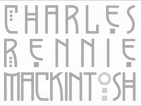 Lettering artist and architect in Glasgow (b. Glasgow, 1868, d. London, 1928). He was a designer in the Arts and Crafts movement and also the main exponent of Art Nouveau in the United Kingdom. Some speculate that he had Asperger's Syndrome. Typefaces based on his lettering include
  The Charles Rennie Mackintosh Font Company is located in Glasgow, Scotland. It specialises in typefaces based upon the letterforms of Scotland's artist, architect and designer, Charles Rennie Mackintosh. In 1993, designer
  [
[
 Gallusness (Alloa, Scotland) is run by Scott MacMichael. He designed Scotoilets (Scottish toilet icons) in 2012, and Candybet in 2014.
  Derek Green (Gawr Juhs, Edinburgh, Scotland) specializes in visual communication and branding. He offers some
  Aka Bud White. Dundee, Scotland-based creator of
  Type-founder (b. Edinburgh, Scotland, 1781, d. New York City, 1866). He and his brother David emigrated to the United States, where they started the Bruce Type Foundry in New York City in 1813. David was precoccupied with a new printing process, stereotyping, while George was the type-founder who created many beautiful and refined designs. Together, they invented a useful type-casting machine. In 1865, George Bruce published
  [
[ Graduate of the City of Glasgow College and Caledonian University. During his studies, Glasgow, Scotland-based Jack Thompson created the display typeface Astraco (2014), the hipster typefaces Dystopia (2015, multilined) and the
  Graduate of Glasgow College and Glasgow Caledonian University. Glasgow, Scotland-based designer of the titling sans typeface Alterner (2019). The typeface and presentation were influenced by the typographic work of Jean-Luc Godard.
  Type foundry in Edinburgh, Scotland, successors to Alexander Wilson & Sons.
  Jason Aitcheson (b. Glasgow) grew up in Glasgow. He graduated from Duncan of Jordanstone College of Art and Design. He started an apprenticeship at The Northern Block in 2013. In 2014, The Northern Block published his first typeface,
  Dundee, Scotland-based designer of Alphabots (2014).
  You've got to like the poster by Glasgow-based
  Andrea Leksen (Leksen Design, Seattle, WA) has a Master of Design degree from Duncan of Jordanstone College of Art & Design, Dundee, Scotland, and a BA in Music Arts Administration from Whitworth University, Spokane, WA. She has been a freelance designer since 2003. She teaches at Seattle Pacific University. Her typefaces include:
 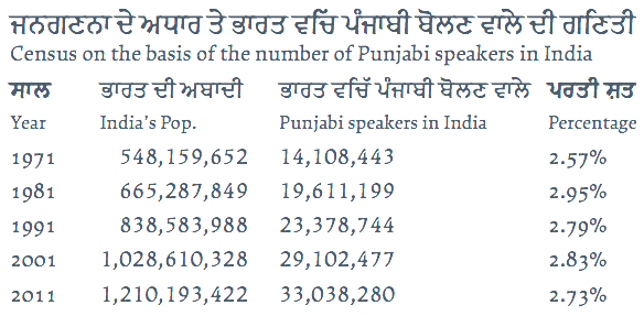 MyFonts lists him as Leo Philip, but it should be Leo Philp, without an i. Scottish student-designer at the University of Reading of Makar (2014), a Latin / Gurmukhi / Cyrillic / Greek typeface family whose angular forms confirm Philp's description of
  [
[ Founded by
  Monotype's hot metal Bell series from 1931 is based on original types made by the punchcutter Richard Austin for the foundry of John Bell in the 1780s. The different sizes of Monotype's series were not all based on the same model. Type historian James Mosley writes on
  Elena Genova (My Creative Land, Edinburgh, Scotland) specializes in digitized handwriting fonts. In 2021, My Creative Land joined
 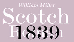 MyFonts selection for Scotch typefaces. [
 South African designer of
  London-based punchcutter (1768-1830) who had his own foundry, The Imperial Letter Foundry, in London. Before that, he had worked at John Bell's British Letter Foundry from 1788-1798 (when the foundry closed) as a punchcutter, and at William Miller's foundry in Edinburgh. His typefaces:
  American designer (b. Glasgow, 1898, d. Chicago, 1985), who spent his entire life at Ludlow Typograph Company (retiring in 1971) and built an impressive type library, creating over 100 typefaces. He received a doctorate in Fine Arts from Transylvania University. Ludlow hired him in 1923, where he became type director in 1993. He retired from the Ludlow Typograph Company in 1971. At Ludlow, he had to create solid commercial variations of existing typefaces for the Ludlow machine and come up with practical new designs.
  Edinburgh, Scotland-based student-designer of the
  Graphic designer in Stirling, Scotland. He created some fonts and designed some letters for
  Glasgow, Scotland-based designer of the display typeface Solaris (2017). [
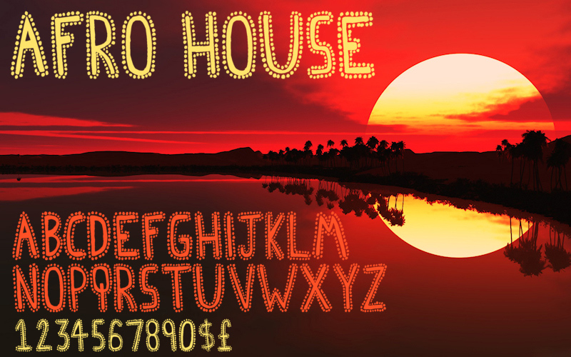
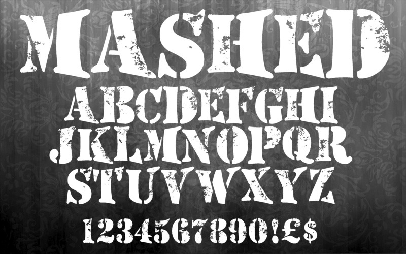
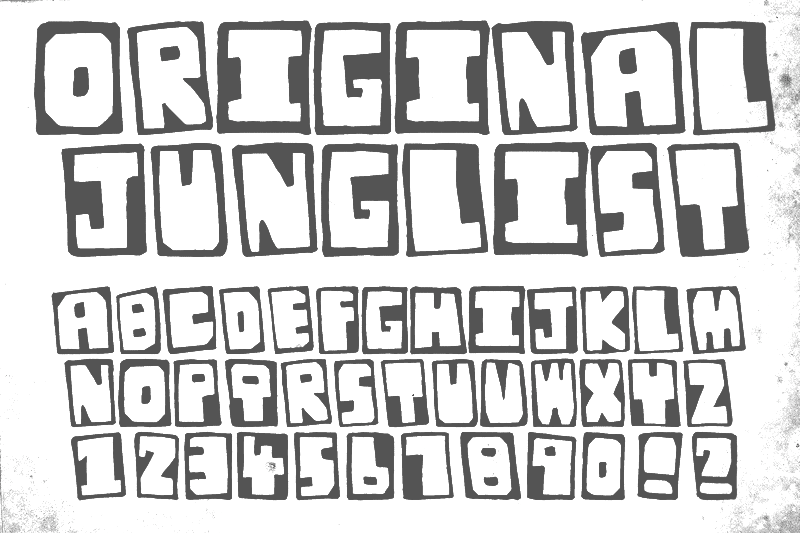
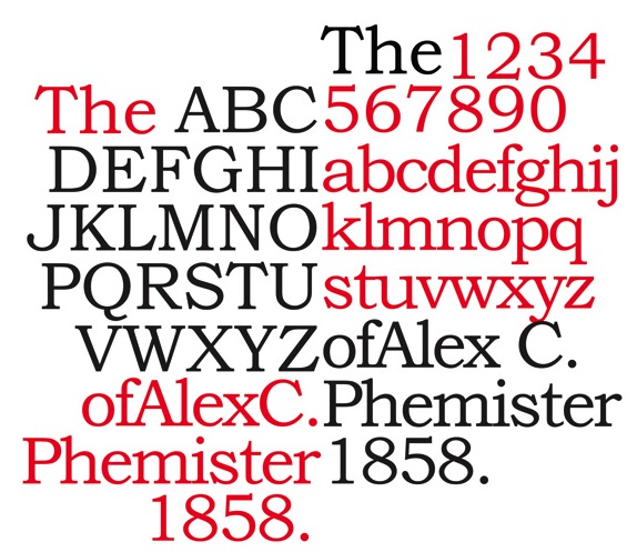
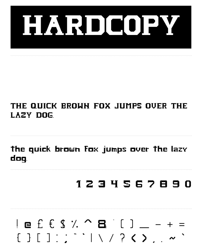
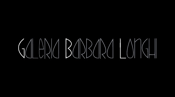
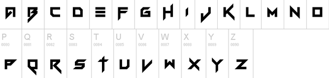
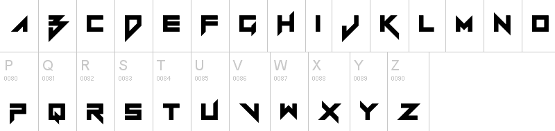
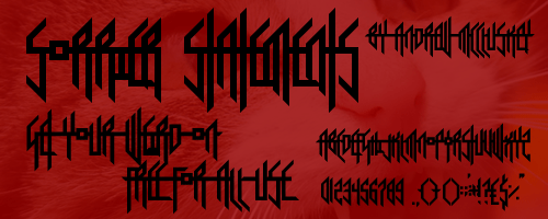
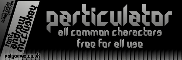
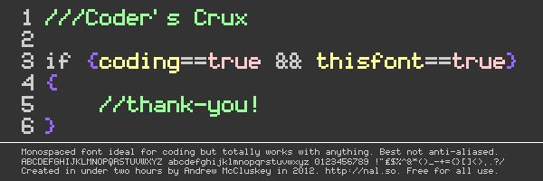
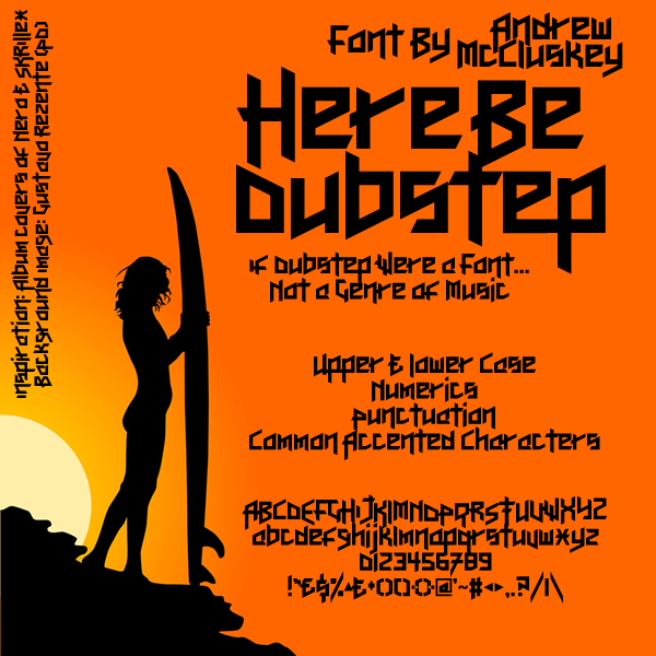
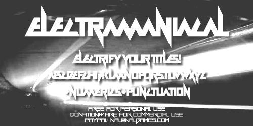
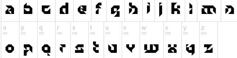
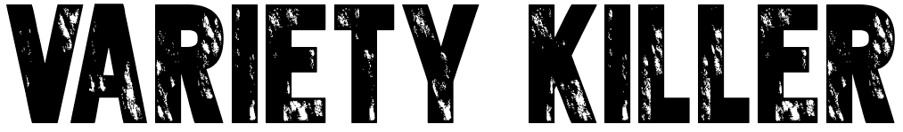
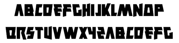
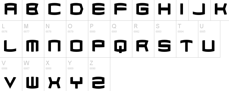
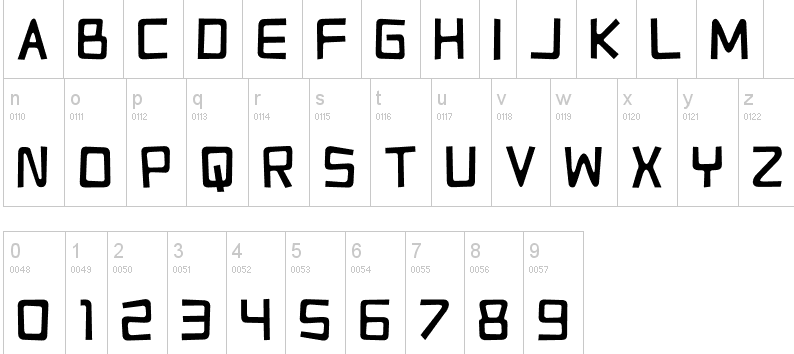
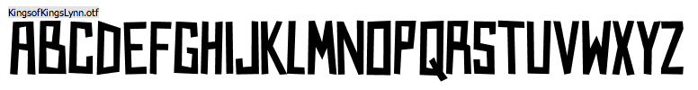
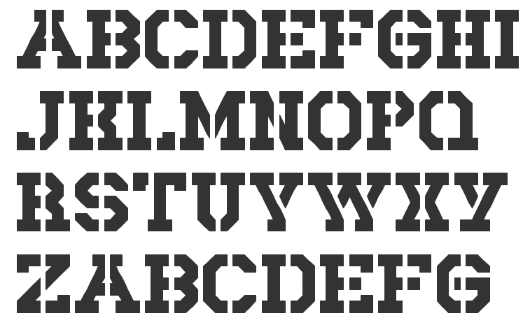
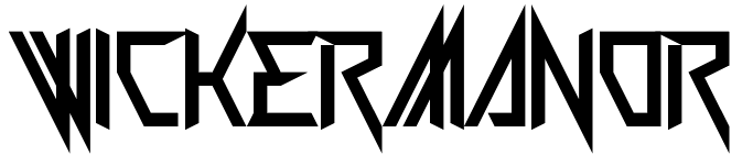
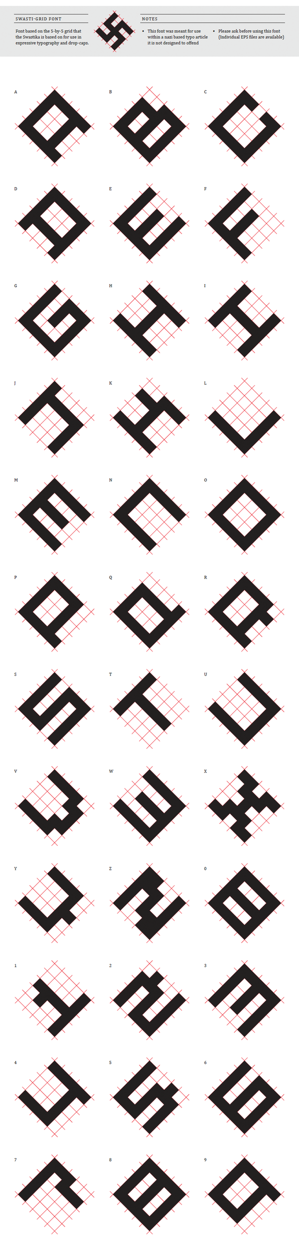
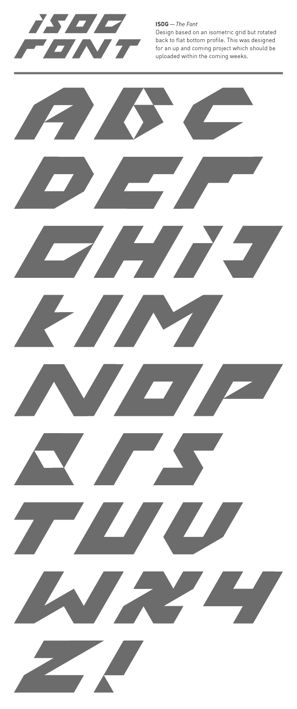
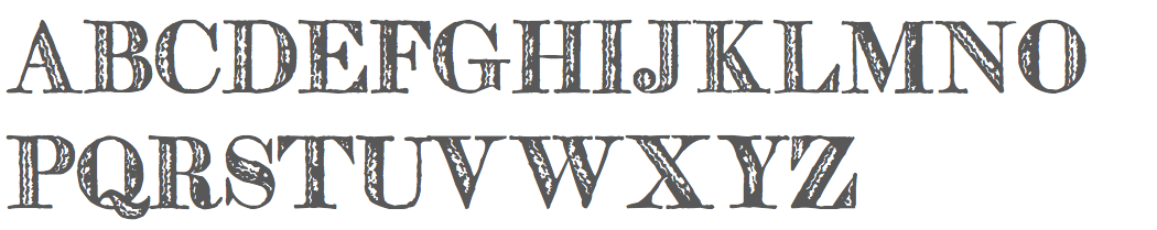
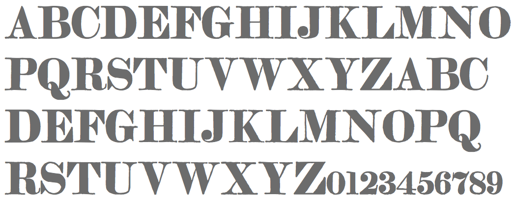
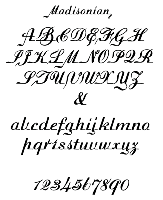
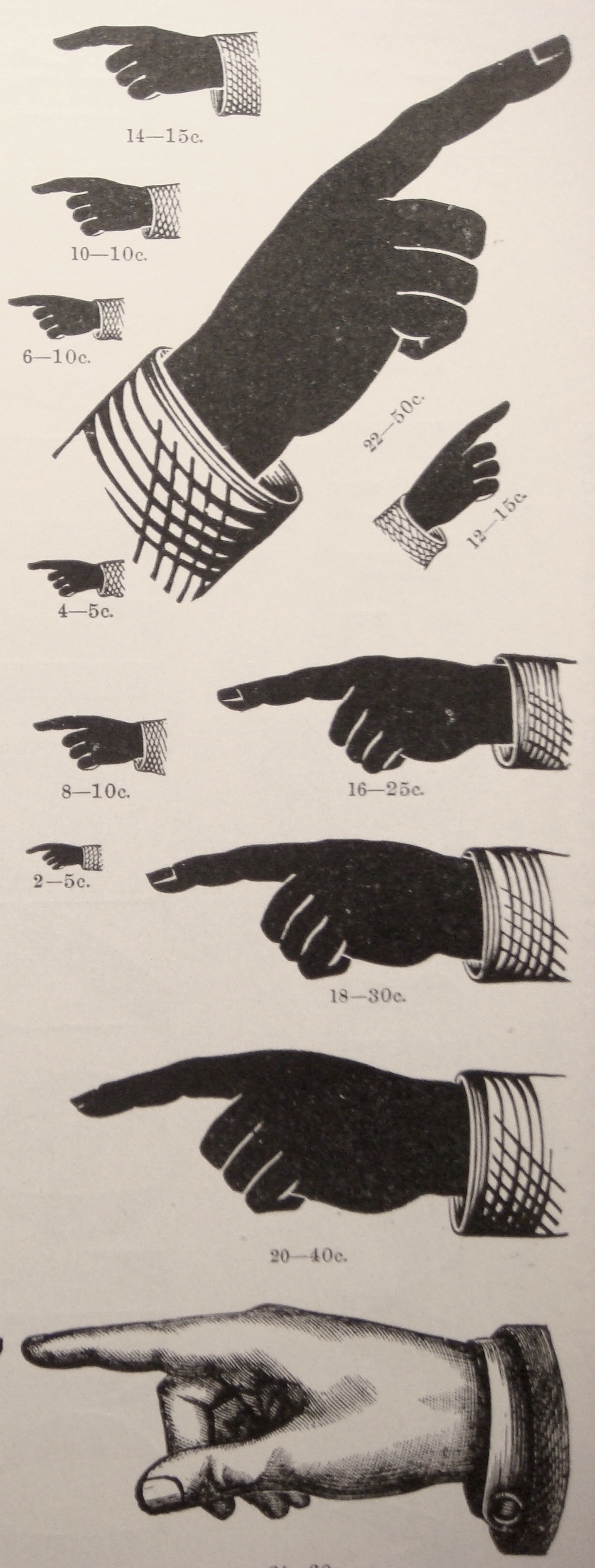
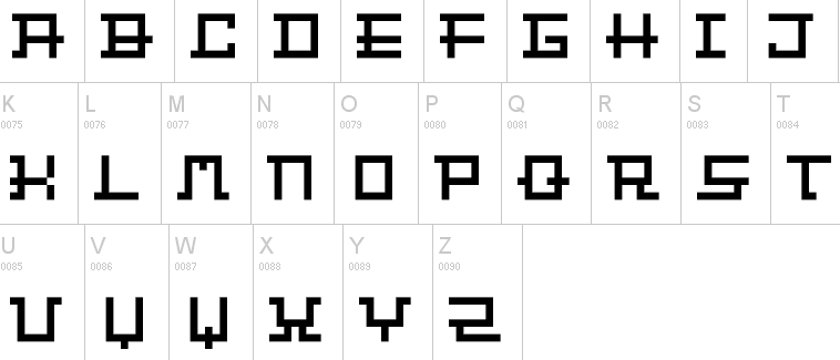
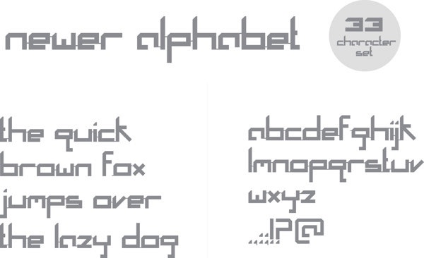
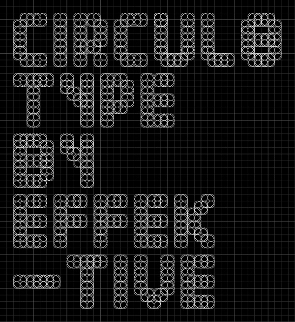
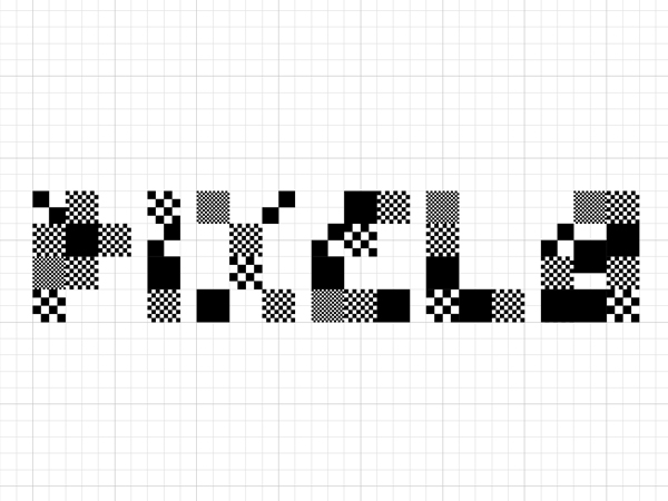
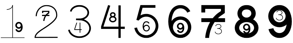
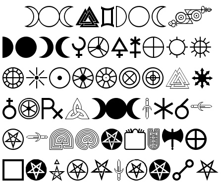
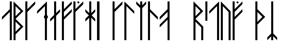
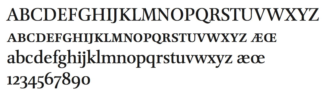
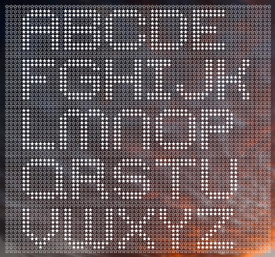
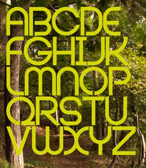
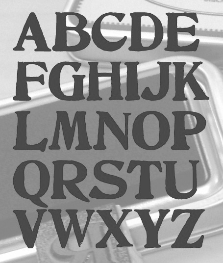
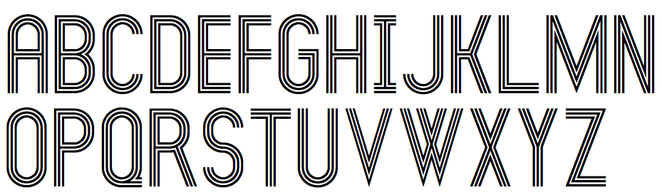
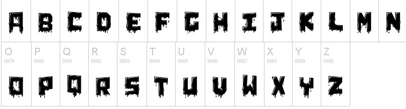
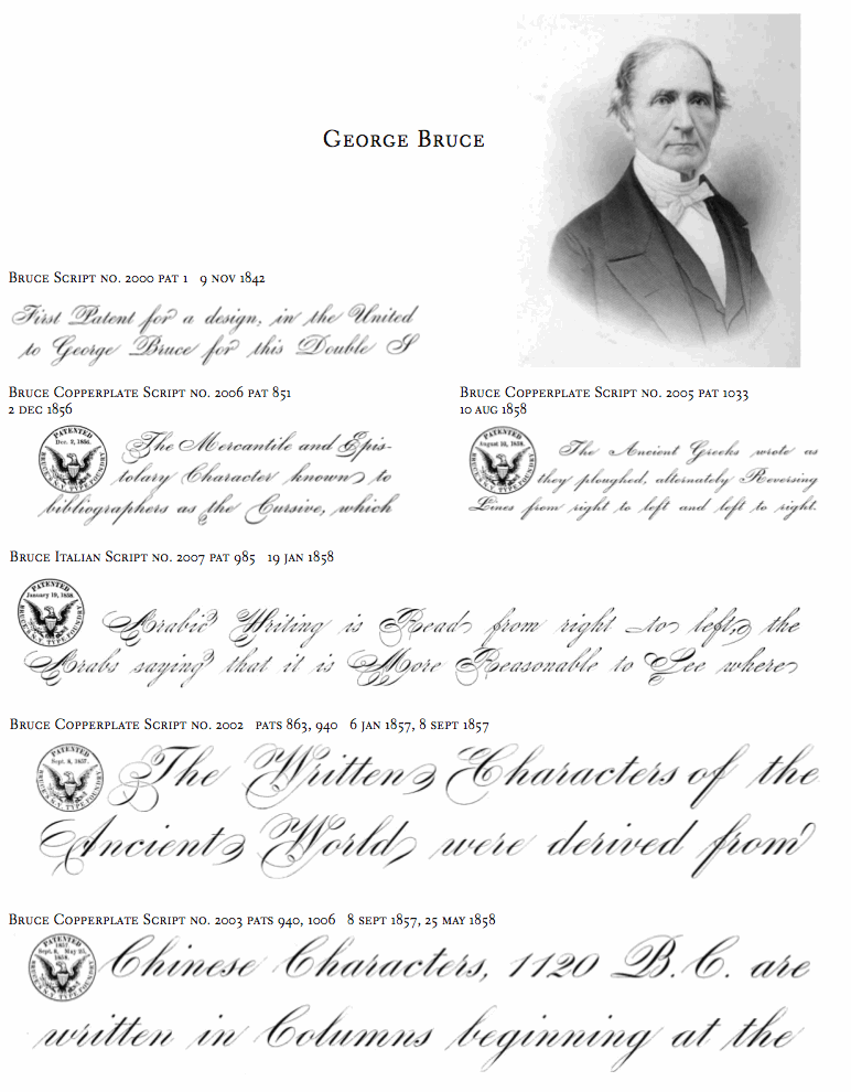
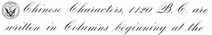
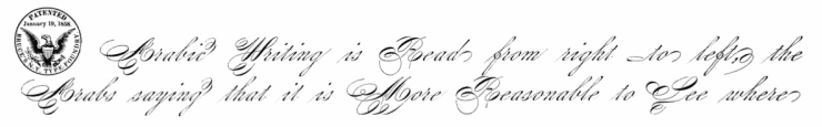
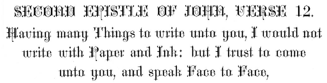
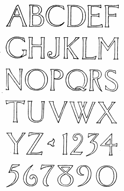
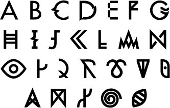
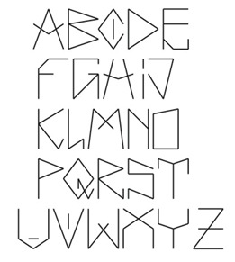
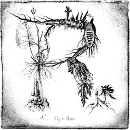
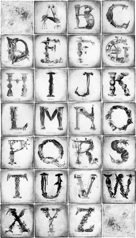
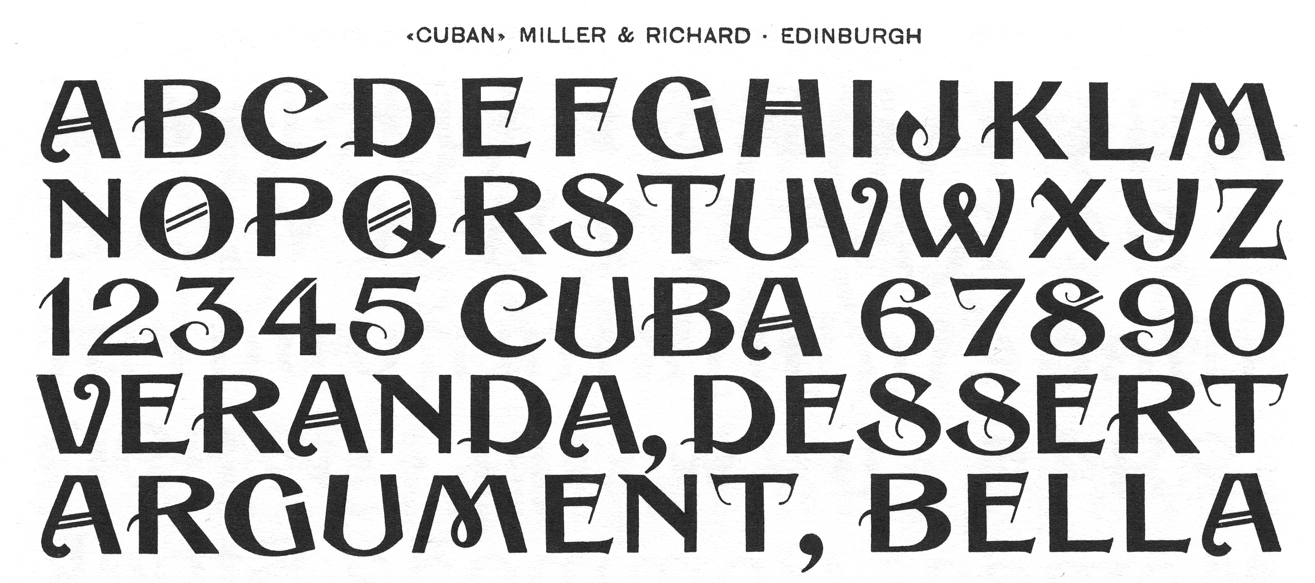
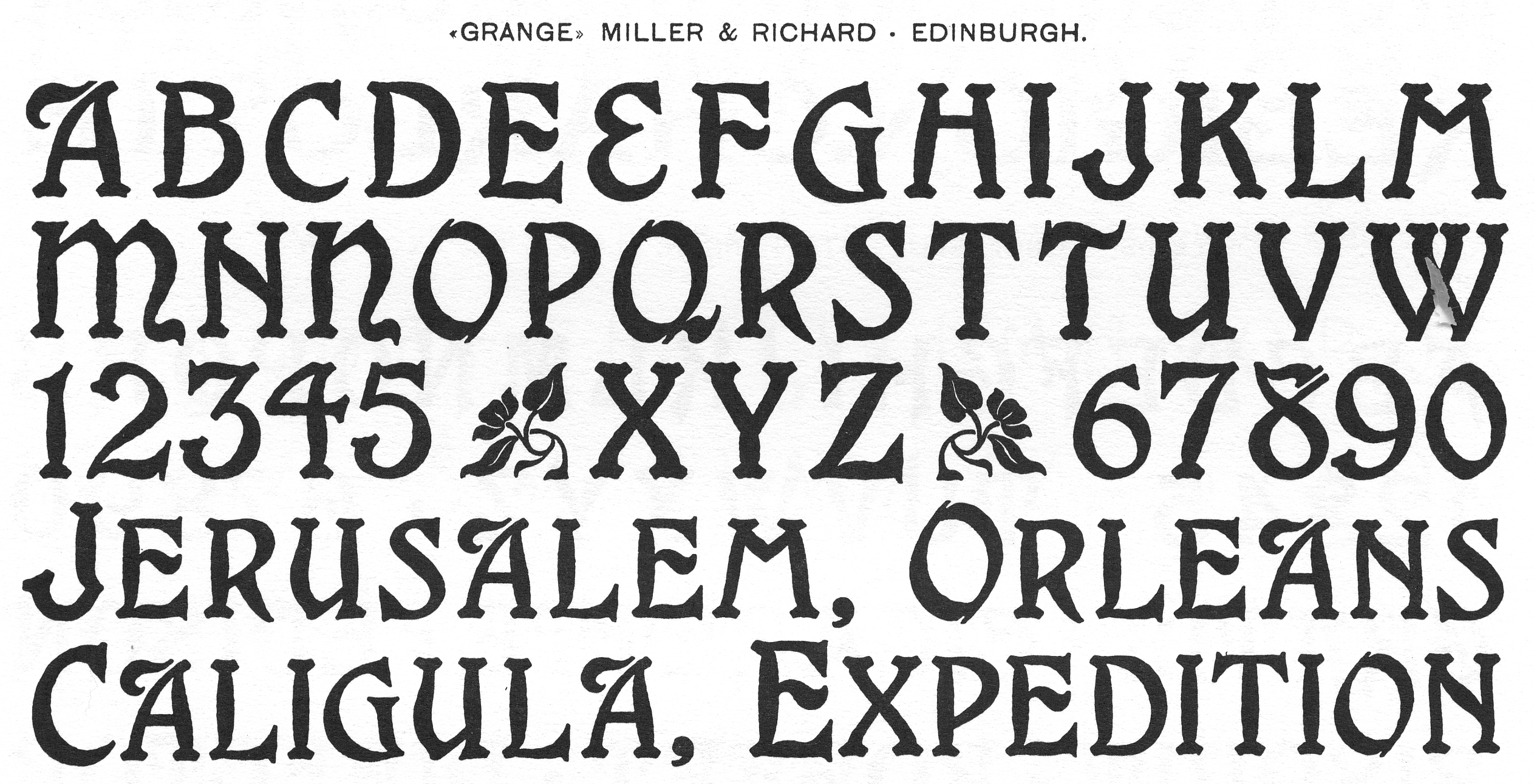
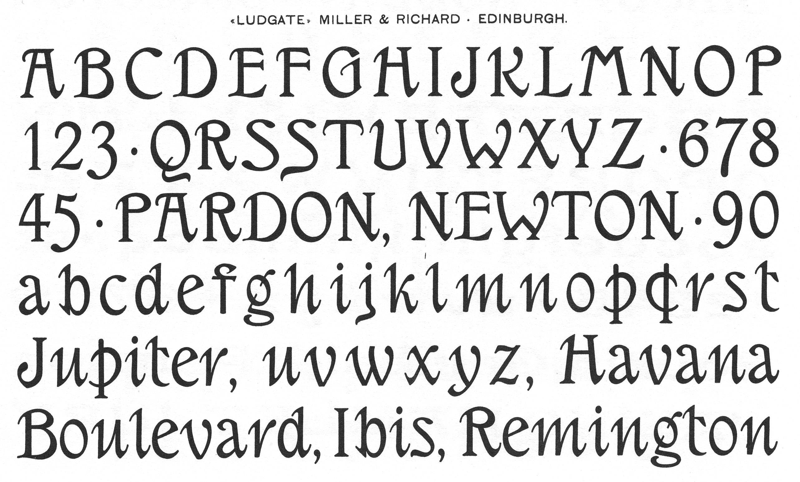
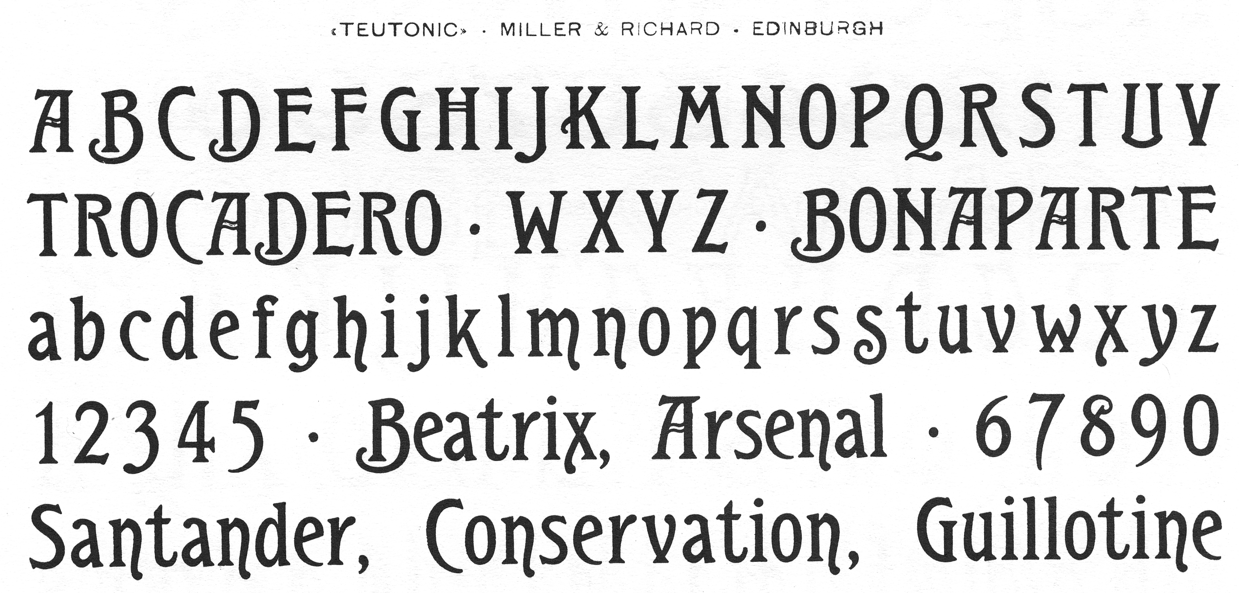
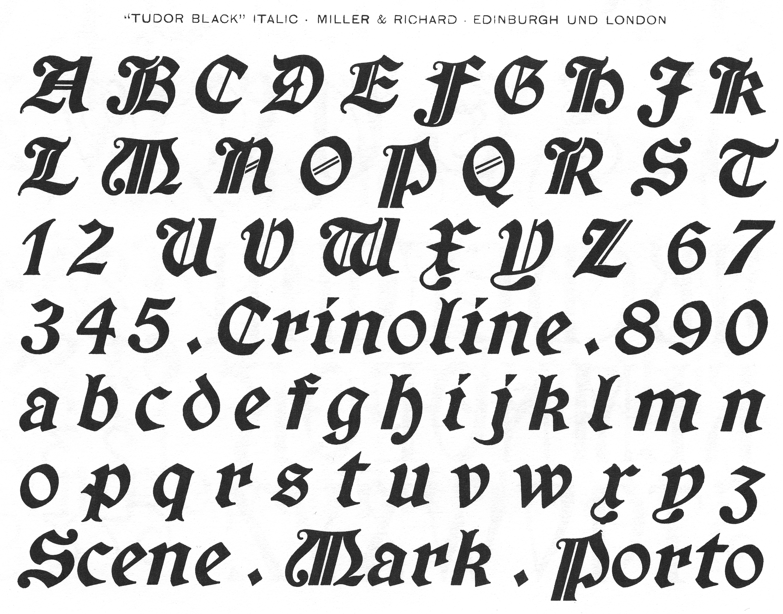
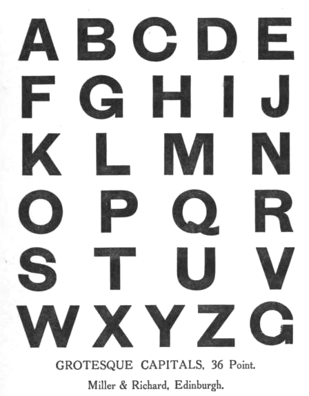
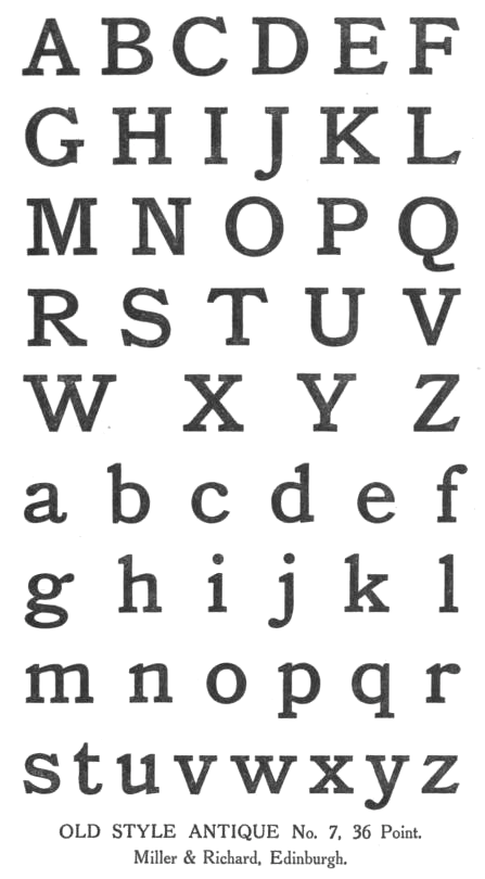
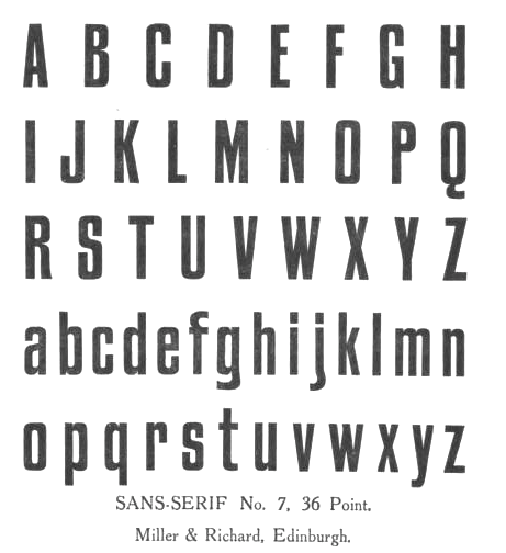
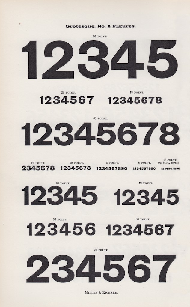
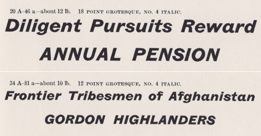
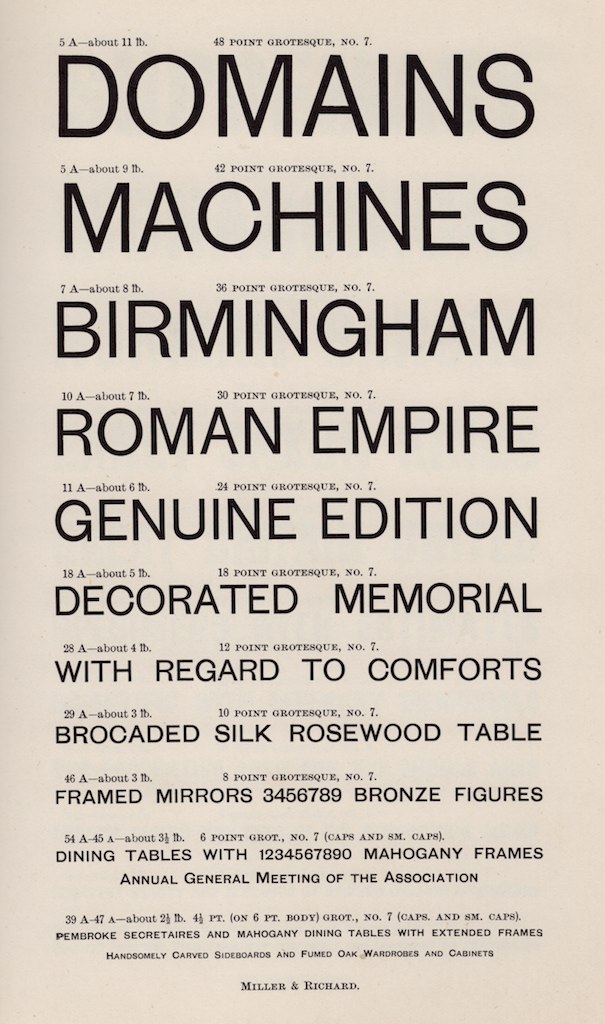
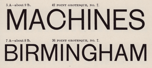
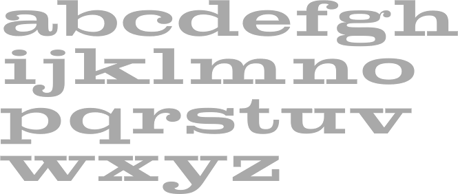
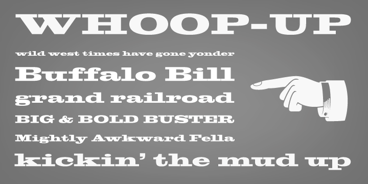
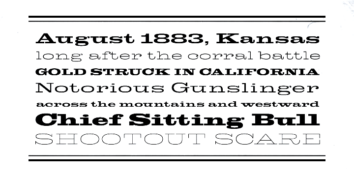
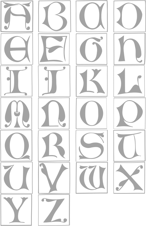
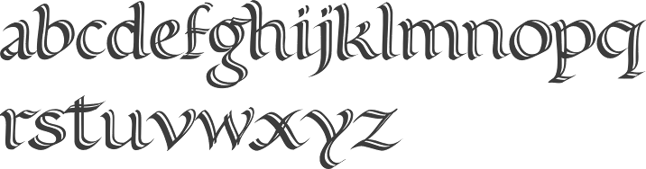
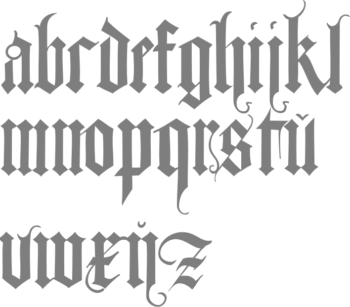
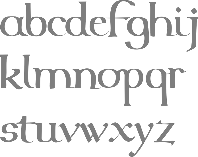
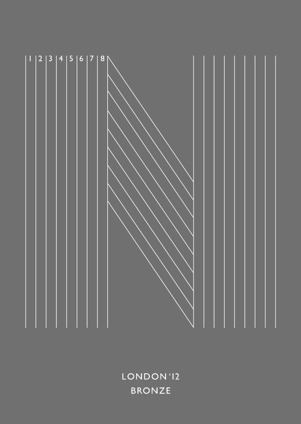
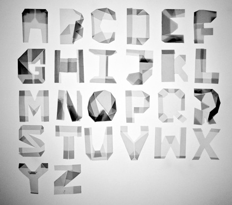
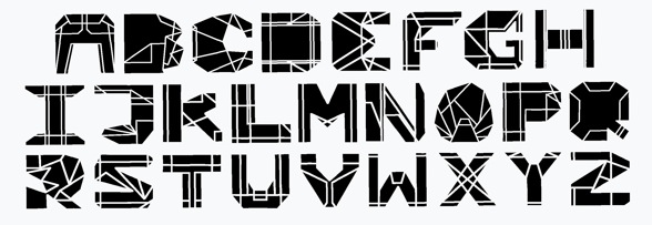
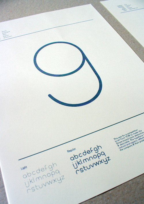
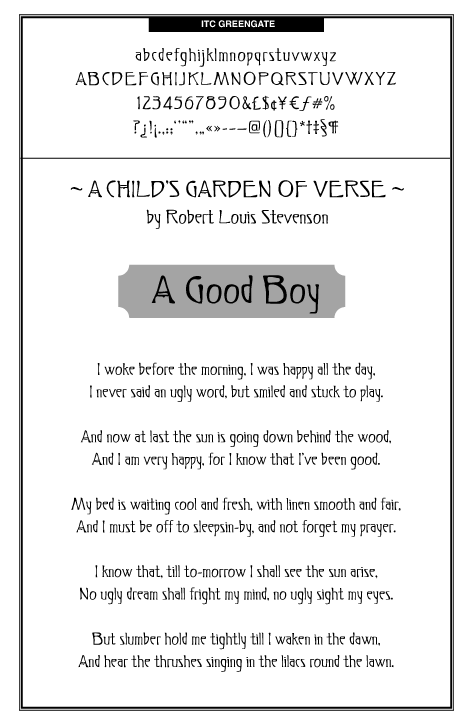
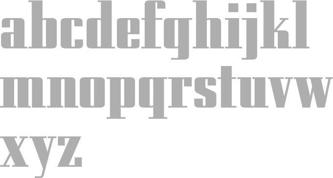
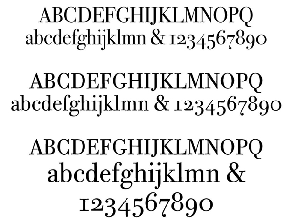
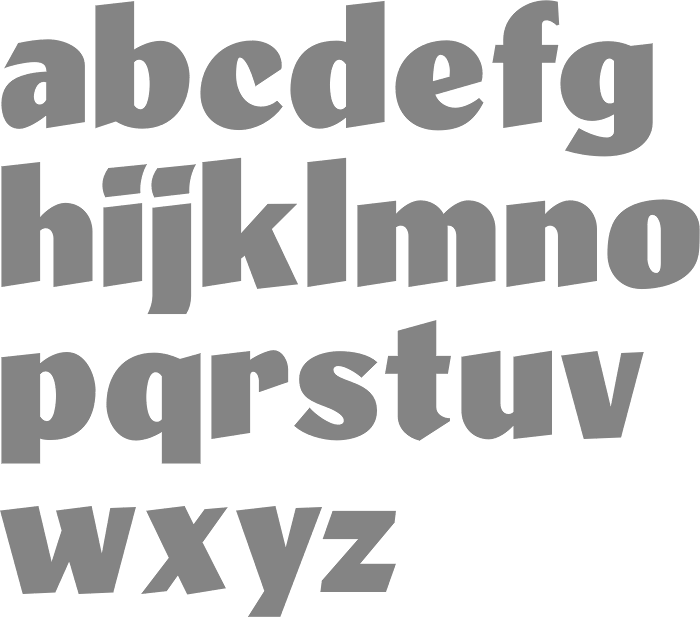
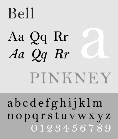
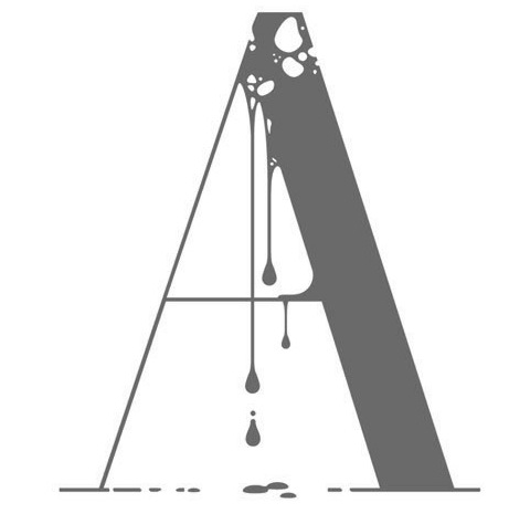
|
|
|
|