| | |
A New Machine
[Kent Swecker]

|
 Foundry, est. 2011, in Raleigh, NC, by Kent Swecker. A New Machine created the beautiful hairline hand-printed typeface Hair Line (2011), Sweck Sans (2011, a sans with some contrast and a large x-height), Unstable (2011, a paper cut face), the sketch typeface Crosshatch (2011), and the modular FontStruct-like typeface Model UR (2011).
 In 2012, he made Quarry (an outlined hand-drawn shadow font), Holt Sans (a Peignotian family), Unstable Slab, Mitosis (using bubbly dots), Radial (prismatic), and Airwave (techno). Typefaces from 2013: Benthic (decorative geometric caps), Tubbs (a beefy poster face), Dot To Dot (a dotted and lined pair of school fonts), Emjay (sketched blackboard bold typeface). Typefaces from 2014: Art Party (a festive hand-drawn typeface co-designed with with Erin Solomon), Carawan (a rounded sans family), Back and Forth, Fat Nib (splatter brush face), Smoot (whimsical typeface). Typefaces from 2015: El Guapo (a handcrafted typeface co-designed with Erin Solomon), Nervy, Current (thin connected script). Typefaces from 2016: Etymon (Skyline style), Big Trees (Victorian, Western), Igor (a beatnik style font). Typefaces from 2017: Down With The King (a great techno headline typeface). Typefaces from 2018: Thickness (hand-drawn), Chisel Brush, Dot to Dot, Dot To Dot Cursive (dotted line font, perhaps for teaching children in school). Typefaces from 2019: Artie Deco, Marie Jeanne. Klingspor link. [Google]
[MyFonts]
[More] ⦿
|
Abdul Malik Wisnu
[Almarkha Type]
|
 [MyFonts]
[More] ⦿
[MyFonts]
[More] ⦿
|
Ahmad Ramzi Fahruddin
[Arterfak Project]
|
 [MyFonts]
[More] ⦿
[MyFonts]
[More] ⦿
|
Alec Julien
[Haiku Monkey]
|
 [MyFonts]
[More] ⦿
[MyFonts]
[More] ⦿
|
Alejandro Paul
|
 Designer who lives in Buenos Aires and who teaches graphic design and typography at the Universidad de Buenos Aires. He has worked as an art director in prestigious Argentina-based studios, handling high-profile corporate brands such as Arcor, Marta Harff, Morph, SC Johnson, Danone, and Movicom. He runs Estudio Paul. Professor at Facultad de Arquitectura, Universidad de Buenos Aires. Co-creator, with Apostrophe at Apostrophic Laboratory, of Usenet (2000), FontCop I through IV (2000) and the pixel font family Cayetano. Published the dot matrix font Stardust with T-26 in 2000. Designed the gorgeous font Elektora in 2000. He developed with Michael Lynch a 17-font Tennis set of grid-based pixel fonts. At Typeworx, he published Reflex (2002), a commercial 6-style unicase font family. Another web site by Alejandro. Cofounder of DAS, a design studio in Buenos Aires.
 Cofounder of Sudtipos (2003), where he does custom work and creates new typefaces. His work there includes Tierra (a titling face), Latinaires (2003-2018: originally called Latina Sans), Reflex, Downtempo (2003), Stardust and Mosaico (1999, pixel face). Still at Sudtipos, he digitized the beautiful handwriting/calligraphic typefaces by Angel Koziupa called Alma (2005), Murga, Habano and Tiza, which together with his script typeface Argenta (2004), Oxida (2005), the medieval script typeface Mama Script (2004, designed with Alfredo Graziani), Divina (2004, with Alfredo Graziani), and the sans family Kautiva (2004) can be bought via Umbrella Type. For children's orthography, he developed Estrada Hand, on commission for Editorial Estrada. He was working on the serif family Libertina (2004). Herencia (2004, a handwriting typeface done with Diego Giaccone), Grover (2004, slab serif), Milk Script (2004, with Alfredo Graziani), Mama Script (2004, with Alfredo Graziani), Politica (2004, a techno typeface with a very thin Thin weight) are at Sudtipos. The Bluemlein Scripts (2004-2005, Umbrella and Veer) are based on the calligraphic renderings of Charles Bluemlein, shown in a 1943 ink catalog: Miss Le Gatees, Mr Rafkin, Mr Keningbeck, Mr Lackboughs, Lady Dawn, Mrs Von Eckley, Mr Sheppards, Mr Dafoe, Mr Canfields, Mr Stalwart, Mr Sandsfort, Mr Leopolde, Mr DeHaviland, Mr Blaketon, Miss Stanfort, Miss Packgope, Miss Fajardose, Mrs Saint-Delafield, Mrs Blackfort, Mr Sopkin, Mr Sheffield, Miss Lankfort, Herr Von Muellerhoff, Dr Sugiyama, Dr Carbfred. (Note: Soft Horizon's Lainie Day (1993) is an earlier free font in the style of Lady Dawn and Mr Lackboughs). In 2011, that series was made available at Google Web Fonts. Sudestada (2005, Sudtipos) is a handwriting script developed with Diego Giaccone. Cuisine (2005, Umbrella Type) is an informal bold script. Mousse Script (2005, Sudtipos) is based on Glenmoy, a 1932 Stephenson Blake typeface. Suave Script (2005) is a 4am jazz bar script. Ministry (2005) is related in style but less funky, Chocolate (2005) is for sales ads, and Cenizas (2005, with Angel Koziupa) is straight from an old manuscript. Whomp (2006, Umbrella) was based on a partial sign-painting font by Alf Becker (1930s), and so was Buffet Script (2006, Sudtipos). Affair (2006, Umbrella) is swashy and calligraphic, while Candy Script (2007) and its italic version Sugar Pie (2011) are based on Argentina's market lettering. Galgo Script (2007) is a brush calligraphic font based on a design of Angel Koziupa. Burgues Script (2007) is an ornate calligraphic script based on the lettering of calligraphy teacher Louis Madarasz (1859-1910) (award at TDC2 2008). Burgues Script, Adios Script (2008: it won an award at TDC2 2009), Feel Script and Sugar Pie all won awards at Tipos Latinos 2008. Sinfonieta (2006) and Buffet Script are fifties style connected scripts. Feel Script (2007) is based on lettering that calligrapher and logo designer Rand Holub created in 1950 and that was subsequently captured in Intertype's typeface Monterey (1958). Some letterforms were redrawn from vintage American magazine ads (some by Holub himself), Cuisine (2008, food advertising script), Pronto (2008, comic book style, by Alejandro Paul and Angel Koziupa), Grover (2004, rounded sans family), Grover Slab (2004). Burgues Script, Adios Script, Feel Script and Sugar Pie all won awards at Tipos Latinos 2008. Calgary Script (2008, Umbrella) is a pure signpainting job. Accolades from all typophiles for his calligraphic wunderkind, Compendium (2008). The 2009 haul: Sugar Pie (signage font), Bravissima Script, Theorem (upright semi-script). Speaker at ATypI 2009 in Mexico City. The year 2010 starts off with a bang, five awards at Tipos Latinos 2010: a grand prize for Brownstone Sans, and four standard awards, for Semilla, Kewl Script (for food packaging and store windows), Calgary Script, and for Business Penmanship. Typefaces from 2010 include the baseball lettering typeface Fan Script and the tattoo script face Piel Script (piel=skin), which was influenced by Burgues Script and more remotely by showcard lettering by B. Boley (1930s, Sign of the Times Magazine). Piel Script won an award at Tipos Latinos 2012. In 2011, he and Koziupa made the fat signage typeface Aventura and Viento (a grunge version of their earlier 2004 face, Brisa). He added one retro connected signage font to the Filmotype collection in 2012, called Filmotype Kitten (original from 1955). Filmotype Zephyr (2012) is an italic roman formal script. Filmotype Yukon (2012) is inspired by the classic Palmer style of penmanship. Storefront (2012) is a swashy signage typeface based on an incomplete alphabet by Alf Becker. His signage script typeface Hipster Script won an award in the TDC 2012 competition and at Tipos Latinos 2012. Typefaces from 2013: Rolling Pen (a connected script that recalls the business penmanship genre), Bellissima Script (based on a copperplate calligraphic alphabet from Bellezas de la Caligrafía by Ramón Stirling, 1844). In 2014, he helped Panco Sassano, a lettering artist and illustrator from Mar del Plata, who designed the wide connected semi-calligraphic handwriting typeface Horizontes Script (Horizontes subsequently won an award at Tipos Latinos 2016). Still in 2014, he published the fat packaging or signage script Bowling Script, which is based on Freely Drawn Italic, a non-font alphabet by Ernst Bentele (1953). In 2015, Alejandro Paul, Yani Arabena and Guille Vizzari combined forces in the signage script typeface Quotes (Script+Caps) (2015, Sudtipos). Merengue Script (2015, with Panco Sassone) is a fun creamy script, ideal for pastry shops, tea rooms or supermarkets. Steak (2016) is a connected vintage signage script based on an Alf Becker design. Envelove (2017) is a script typeface family consisting of Script, Icons, and Caps, designed at Sudtipos by Yani Arabena, Guille Vizzari, and Alejandro Paul. Winner at Tipos Latinos 2018 of a type design award for Envelove. Still in 2017, Guille Vizzari and Alejandro Paul co-designed the great Moleskine notebook-inspired typeface family Proprietor. Proprietor comes in Script, Icon, Deco, Wide, Open and Roman styles. It won an award at Tipos Latinos 2018. Rigatoni (2017): A skyline didone based on mid-20th century example by Eugen Nerdinger. Bibliophile Script (2017). A pair of copperplate calligraphic typefaces. Fixture (2018: a 72-font grotesk family published by Sudtipos). Newbery Sans Pro (2018). A simple workhorse sans typeface family that is inspired by German industrial design and the lettering of Eugen Nerdinger. Winner at Tipos Latinos 2018 of a type design award for Tennis Set, Bibliophile Script, French Bulldog, Envelove, La Taqueria, and Speakeasy Set (a collection of (copperplate) script, sans, modern, flare and gothic substyles). From 2019: Hot Salsa (a retro brush script; with Ximena Jimenez), Old Letterhand, Clockmaker (arts and crafts style), Steak Script (inspired by an old alphabet by Alf Becker), Address Sans Pro (a sans family inspired by Butti and Novarese). In 2019, Alejandro Freitez and Claire Menager, under the art directoship of Alejandro Paul, designed the multistyle wood type look / Western / Victorian / reverse stress / hyper-decorative Presley Slab. Typefaces from 2020: Apothicaire (a wonderful quaint serif family in the frivolous didone genre; three variable fonts, 16 styles in all), Inglesa (a penmanship script), Dilemma, Dilemma Serif (Dilemma is a sans/serif type system with 42 styles; it is inspired by the anonymous Polyphème, Cyclopéen and Extra Condensé designs from the early 1900s at the Peignot Fonderie; two variable fonts are included), Sporty Pro (a large sports / athletics font family). Typefaces from 2021: Plethora (an 18-style family and two variable fonts that build on Julius Herriet's Old Style Ornamented for Bruce Type Foundry; Alejandro added various frills, ligatures, weights, exaggerating in true Victorian spirit), Magari (a fat face or Normande; Alejandro likens it to Italian classics of the 19th century though), Regional (27 styles, plus variable styles). Typefaces from 2022: Wienerin (a revival and expansion of Olympia (1929) by Carl Otto Czeschka, one of the members of The Wiener Werkstätte). [Google]
[MyFonts]
[More] ⦿
|
Alex Sheldon
[Match&Kerosene]
|
 [MyFonts]
[More] ⦿
[MyFonts]
[More] ⦿
|
Almarkha Type
[Abdul Malik Wisnu]
|
 Indonesian designer of the brush script Sometimes (2019), the high contrast serif typeface Quakiez (2019), the serif typeface Romerio (2019), the condensed all caps piano key typeface Romestone (2019), and the script typefaces Cherolina (2019), Photorichies (2019), Photography Script (2019), Retrochips (2019), Mountecarlo (2019: monoline), Beautinela (2019: monoline), Ophelie (2019, Script+Sans), Denalova (2019), Shelline (2019), and Mathelline (2019).
 Typefaces from 2020: Banana Juice, Bella Sweety, Bubble Bobble (a bubblegum font), Dear Sunshine, Oatlander (retro baseball script), Sweet Purple, Monieta (an inky and creamy rabbit ear script), Orange Milk (a playful handcrafted typeface), Rockbitz (a children's book font), Seathera, Avocado Creamy, Bolyvina, Charlie Angela (an inky calligraphic script), Lovemy, Chadelova (an enhanced script), Grumbear, The Mezirane, Charlotte Amalie, Crash Soul (a dry brush script), Costiera (a dry brush script), Handestonie (a monoline script), Mentality (a signage script), Technovier (a monolinear squarish sans), Antiquesta (a dry brush script), Belgium Catherine, Cronisse (a display serif), Pronave (an all caps display typeface), Uniser (condensed all caps sans), Westack (a display serif), Avone (a stencil serif), The Roletta (a dry brush script), Waluxe (a fashion mag all caps sans with flared stems), Dear Sunshine, Mikalotta (poster script), Walker Knight (a vintage all caps typeface), Towards (stencil), Cronisse (a decorative serif), Avaneonz (a neon font), The Heista Killer (a dry brush horror font), Someone (a dry brush font), Vicenza (an all caps skyline font), Bristone (a wide sans in six styles; perhaps for car tire ads), Shutterlocks (a dry brush script), Romantics (a creamy script), Revoxa, Yippie Yeah, Wonderful Day (calligraphic), Girly (a girly script), Kamelitta (a wild curvy script), Roadstore (a spurred vintage all caps typeface), Springloved (a paper cutout typeface and a a fine inline poster font), Saturated, Choxr, Blackheat (a super condensed all caps sans), Retrohols, Alibabe, Lordcorps (an octagonal sports or military font; with a stencil style), Headcorps (a sports shirt or military stencil font), Pineforest (with soft spurs), Airborne 86 (a military stencil), Orchide (a dry brush script), Beneficha (wild calligraphy), Radens (a retro bold signage script), Brokenz (a heavy condensed sans), Delninoys (a playful sans), Lorenza (sans), Elcatraz (Mexican simulation font), Hubby Bunny, Rosadetta (script), Swingsnug, Chickens Lovers, Rollinkland, Grumbear, Bubble Bobble (a bubblegum font), Blackheat (a heavy ultra condensed typeface), Brokenz (a muscular display sans), Lorenza (a fashion mag sans), Belgium Catherine (a signature script), Amazed Breath (script), Rockmore (a brush script), Empirez (an octagonal slab serif sports font), Amazed Breath. Typefaces from 2021: Neurock (pure sci-fi), The Cheelaved (spurred, Victorian), Headbears (a sports font), The Antique (a vintage typeface), Vespalogy (a vintage display font), Bestorika (a decorative serif by Abdul Malik Wisnu and Rivo Adriansyah), Quakerhack (a rough brush font), Balietta (a flowing script), Brothery (a retro signage script), Beauticella (a signature script), Glamorez (a luxurious serif), Reloaded (a military stencil font), Austragen (a bold sharp-edged display typeface), Bearetta (script), Keawneta (a display font), Racerz (a speed font), Stangith (a decorative serif co-designed with Rivo Adriansyah), Quick Letter (a wide signature script), Arcinoll (a graffiti font), Charlie Brocklin (a thin signature script), Retrolight (a multiline neon sign typeface), Mokalatte (a wild script), Thugolatz (an all caps typeface with many interlocking ligatures), Author Think (a signature script), Bionetha (calligraphic), Bouncyland (a stylish wild script), Little Knight (a scrapbook typeface), The Brushentica (a beautiful dry brush script), The Soulmate (a dry brush script), Bettawork (a dry brush script), Philips Dutcher (a signature script), Recons (a techno font), Heezpiero (futuristic), Milky Quaker (a playful supermarket font), Rostemary (a fat finger font), Therestone (a Flintstone font), The Checkmate, Chick Chack (a heavy rushed script), Retroman (an Italian Western font), Brown House (a national park font), Emeralde Chamerions (a serif and script duo), Redzein (an octagonal slab serif), Rostera (a bold script), Sketchup (a sketched font), Thealiens (a condensed all caps sans), Williesh (a meaty display serif), Amazing Sweety (a scrapbook font), Heellaaz (an all caps children's book font), Almeira, Americans Classy, The Corps 86 (a military stencil), Brexo (a techno font with solid and stencil versions), Romeline (a scrapbook font), Yippie Yeah (a rounded monolinear marker pen font), Avaneonz (a neon or paperclip font), Sangira (a stylish serif), The Blackheads (a bold script), Kandaline, Marinaga (a creamy brush script), Mochalosta (script), Morning Sweety, Rockmore (a bold script), Deloire (a 4-style all caps sans), Montelova (script), Quinger (a monolinear decorative serif), Wonderella, Wonderful Sunset, Bellachia (a scrapbook script), Choxr (a very condensed all caps sans), Keepsmile (a rounded children's book font), Lovely Sweetie (a scrapbook font), Melanista (a wild script), Rollinkland (a brush font), Bellamona (a monolinear script), Bettanesia (handwriting), Bonalisha (script), Overwave (wavy), Beautimy (a wild script), Melatie (a wild script), Memorita (a wild script), The Handnature (a Treefrog script), Heinch (a 5-style all caps sans), Sweetie Banana (a scrapbook script), Sweetie Moment (a wild calligraphic script), The Dear (a retro script), Winterline (a wild script), Young Evaline (a signature script), Salt + Pepper, Sindenetta (a signature script), Autumnilla, Bella Ciao, Rosadetta (a wild calligraphic script), Saturated (a wild calligraphic script), Wondiletta, Bubblez, Lovely Orange, Milkalotta, Luxoorea (a stylish fashion-model-skinny all caps typeface), Momotako (a paper cutout font), Neonblitz (a neon font), Unione Force (an octagonal sports or military font; with a stencil style), Westman (a Western font), Delamoore (an all caps high-contrast display serif), Delaproza (an all caps display serif), Kinglead (a cartoonish font), Modesfa (an all caps display serif), Hexore (a slab serif), Deluxes (a stylish display sans), Kenzomaru (an oriental brush font), Lumbero (wooden plank font), Pineforest (a Victorian label or sign painting font), Beneficha (a wild calligraphic script), Brokenz (a bold condensed sans), Orchide (a dry brush script), Revoxa (a 4-style sans), Romantics (script), Schein (a sans and slab serif pair), Someone (a dry brush script), Towards (a minimalist stencil font), Averox (a futuristic all caps sans), Chicken Lovers (a playful informal font), Hubby Bunny (a cute display sans), Swingsnug (an informal monolinear sans). As Typotypea">Typotypea, he published the script typeface Manthoels (2020) and the roman all caps typeface Stinker (2020). Typefaces from 2022: Signattimes (a signature script), Thematheka (a constructivist font published on the day Putin invaded Ukraine), Overbillions (a dry brush script), Brolachess (a stylish all caps semi-serif), Suntage (a wide vintage all caps font). Typefaces from 2021 published by Gassstype but made by Abdul Malik Wisnu: Ruthless (a heavy dry brush font), Timeless Nature (script), Unranked (a rough mural font). Creative Fabrica link. [Google]
[MyFonts]
[More] ⦿
|
André Simard
|
Rouyn-Noranda, Québec-based designer who created these typefaces; - The sans typeface ITC Migration Sans (2009, ITC and now, Monotype).
- Harfang Pro (2010, Psy/Ops: a 12-style transitional family).
- OurType Corbeau Pro (2012). The sans family Corbeau comes in three times eight styles and was completed with Fred Smeijers, and produced and released by OurType.
- A font for the Cree and Naskapi in Northern Quebec developed with assistance of Bill Jancewicz. This font, started in 2013 and tentatively called Goosebreak, is being extended to also include all the Unified Canadian Aboriginal Syllabics (Athapascan, Blackfoot, Carrier, Cree, Naskapi, Nunavik, Sayisi Dene, etc.). The Latin part of the semiserif typeface is based on Harfang.
- Carouge (2013, Psyops). See also Carouge Pro (2020).
- Goosebreak (2017). A syllabic typeface based on harfang. Goosebreak is a family of twelve syllabic fonts designed for Canadian Aboriginal languages.
- Bronsimard (2019). A skyline or piano key typeface that was inspired by Henri-Paul Bronsard's Kébek 101 (1972) which was used for the logo and headlines of the daily newspaper Le Jour which was founded in 1978.
- Grandheron Sans (2020). An 18-style corporate sans characterized by squarish lower case a and f glyphs.
Klingspor link. Behance link. PsyOps link. [Google]
[MyFonts]
[More] ⦿
|
Ann Pomeroy
|
Designer of fonts such as ETwentyFive (1990). At FontHaus, she designed the modern typeface APCorvinus Skyline, Bubba Bold, DecoWave, FSKeyNote, Sitcom, Spire (FontHaus, after an original condensed skyline didone by Sol Hess now in the Lanston Collection as LTC Spire; since 2006, also available at Group Type), Stadion, Tata One, and Tutu One. In 2006, when Solsburg's Group Type was started, some of her fonts started appearing there, such as Spire, Spire Monoline, Spire Extra Light, a condensed didone family heavily based on Sol Hess's Spire (Lanston), Corvinus Skyline (1991; a revival of a condensed modern family by Imre Reiner by the same name), Sitcom. Klingspor link. [Google]
[MyFonts]
[More] ⦿
|
Apfel Type Foundry
|
Apfel Type Foundry (London, UK) was launched in 2020. The initial team consists of Kirsty Carter (Director), Emma Thomas (Director), Daniel Griffiths (Associate Director), Joanna Rutter (Senior Designer), Olivia Diaz (Senior Designer), Matt Kay (Junior Designer) and Jason Wolfe. Apfel stands for A Practice for Everyday Life. It engages in custom and retail type. Initially, in 2020, it had four retail typefaces: - Marquis (2021). A humanist sans by Jason Wolfe. This is a contemporary reinterpretation of the Stephenson Blake typeface Granby (1930), which was itself influenced by the letter forms of Johnston and Futura.
- Certeau. A sans typeface with a short-legged e. They write: Influenced both by geometric Modernist monoline typefaces and by examples of Dutch and German sans-serif typography from the 1930s, Certeau evolved through research into type styles that strike a balance between rationality and idiosyncrasy.
- Lining. A sans with large counters designed by Jason Wolfe. Apfel writes: A contemporary reinterpretation of a sans-serif typeface family first advertised by the American Type Founders Company in 1897.
- Remnants. Remnants is a skyline style typeface that is based on a display type found on an old Serbian book cover, and was expanded to encompass a full Latin character set which captures a sense of the beauty of the Cyrillic alphabet.
- Periferia. An experimental stencil typeface.
Apfel also released these typefaces made by Jason Wolfe: Asia Art Archive, the various Camper typefaces, and Friedel (2021). Custom typefaces include Piloti (a light flared sans with large x-height, for Feilden Fowles), Elle Play Display (2017, a headline typeface for Elle UK), House of Voltaire, Apfel AB (a quadrangulated typeface done with Anthony Burrill), Camulodunum (2011; Display and Stencil), Camper (2014; in SS15, SS16 and AW15 styles), V&A Dundee (stencil), Royal Docks, Asia art Archive Display. [Google]
[More] ⦿
|
Arterfak Project
[Ahmad Ramzi Fahruddin]
|
 Ahmad Ramzi Fahruddin (aka Ramzehhh and as Ramz Fahruddin, b. 1993) established Arterfak Project in 2015. He is the Palembang, Indonesia-based designer of the display typefaces Aidah (2015, spurred), Temenyut (2015, spurred), Basenglah (2015, a geometric solid typeface), Local Genius (2015), Oropitem (2015, blackletter), Cakmacak (2015), Maeninaja (2015), Yagitudeh (2015, a free doodle font), Cagar (2015, free), Pletakrutuk (2015) and Beguyur (2015), the free experimental techno typeface Semravut (2015), the lava lamp typeface Cagar (2015) and the free spurred vintage typeface Outromoro (2015).
 Typefaces from 2016: Anehena (a beveled ornamental typeface), Bongoknian (spurred), Sebasengan (sketched, arched, stitched, textured, eroded and embossed substyles), Sekatoon (Victorian), Bekelakar (Victorian), Sambeltigo, Wayawaya (free bilined art deco), Geroboktuo, Bedengkang, Ringam, Cindo Kato (spurred Victorian typeface), Ngopi Doken (a layered handcrafted typeface family), Bedesau (Victorian), Temenyut (spurred Victorian style), Sirugino (a spurred tattoo / blackletter type), Buyanbengak (spurred), Geradakan (dry brush type). Typefaces from 2017: Martinez (Tuscan), Hughoney, Rockrace, Monabelia (Victorian), Philosophiya, Love Quake, Childwood, Circulat Decorative Frames, Dakmodal, Yasaman, Bsakoja, Meringam, Besigetz (Victorian), Bedempank, Ngamboel (a modern inline), Jemahok (an inline typeface), Sirunian (decorative blackletter), Belinjangan (brush style), Cerudikan, Kanjian (Victorian deco). Typefaces from 2018: Mirandah (monoline, vintage), Subversia (Victorian), Bertha (a free display family that includes Shadow Line, Sans and Spurred substyles), Quickers, Marchelle (art deco), Lourena, Mellynda, Leophard (octagonal), Wishteria, Slashback, Katheryna, Febiolla, Tropicane, Maretha (a monoline script). Typefaces from 2019: Requeiro (a spurred inline vintage font), Mourich (an all caps display typeface), Newston (a tall condensed news headline typeface family), The Black Sugare (blackletter-inspired), Magnies (an elegant stencil), Hermona (a spurred vintage label font), Bronzier (a sports font), Mayhena (a monoline script), Amnestia (a vintage all caps typeface), Highrush (font duo), Humeira (for children's books), Montheim (retro signage font), Hodgeson (a slab serif family), Delaroca, (a spurred black metal band font) Banda Niera, Bargers Distressed (spurred, Victorian), The Realita, Newston (a compressed skyline-style font), Ariestha Script, The Black Square, Requiem (Victorian or rococo inline caps), Invasible, Ferguson (an almost monoline slab serif family), Mirenath (a rounded vintage monoline typeface), Afolkalips (a tribal painted font inspired by the Papuan culture), Mellandry, Masterson (a slab serif western font), Marsheila (art deco), Kanjian, Belinjangan, Sirunian (a decorative spurred typeface), Quickers, Marcheile (slightly art nouveau), Marcheile, Monabelia, Nourishe (a fashion mag sans). Typefaces from 2020: Trashbone, Burgery (a monolinear all caps children's book font), The Brande and Lotaline (a decorative serif), Rimba Andalas (a tribal font), Bronela (a decorative serif), Wonder Night (a beatnik font), Malinsha (a signage script), Marones (spurred, vintage, all caps), Katenila (a fat finger font), Meliana Script (a brush script), Romelio (sans / script pair), Bondrians (a vintage label font), Black Ravens (a dry brush font), Shinkoya (vernacular lettering), Brothership, Novante (stylish caps), Almatine Script (a flat pen calligraphic script, with perhaps a touch of Arabic script emulation), Almatine Sans, Wargate (a military stencil font family), Bragley (a cartoon font), Varino (a rounded unicase sans family), Ranille (a bold display serif), Neilvard (a vintage label font family), Nagietha, Khodijah (an Arabic emulation font), Sometimes Rough, Savaneta (a vintage all caps typeface), Valmera (a Peignotian sans), Hargalia (classic calligraphy), Cherione (a unicase font), Revans (a display sans). Typefaces from 2021: Larantuka (an informal font with a dancing baseline), Bolandes (a weathered monoline sans), Delauney (a formal art deco typeface), Chieezy Burger (grungy, vernacular), Ranmor (a vintage slab serif), Andalia (a signage script), Insiders (a dry brush script), Granesta (a dry brush font), Abigral (a Peignotian serif), Suzanstein (a dripping blood font), Broken Console (a retro video game pixel font), Naluka (a tiki or nature park font), Lovatine (a scrapbook script), Rushen (vintage caps in curvy, regular, distressed, stencil and shadow versions), Siegra (futuristic), Komersie (a bold supermarket font), Borensa (a reverse stress font), Rashavine (a dry brush font), Blankone (a brush font), Montagna (a monolinear script), Hadnich (a heavy signage script), Sallomae (a scrapbook font), Vankours (a dry brush font), Wonderful Melanesia (a decorative serif), Albertson (a Tuscan font), Rantika (a bold brush script), Rusthack (a stylish brush typeface), Mustopha (an upright typeface in arabesque style), Marviona (a marker pen font), Marviona (a marker pen font), Niquitta Mirzani (script), Shikamaru (emulating a Japanese brush), Mortend (a 5-style expanded all caps sans), Barlock (an all caps and spurred varsity font), Northash (stencil), Motteka (a beatnik font), Sharely (a brush font), Rompies (a condensed titling sans), Beardsons (a vintage label font), Broken Crush (dry brush). Typefaces from 2022: Bradrock (a vintage semi-Tuscan Western font), Market Written (a fat finger font), Almalik (Arabic emulation), Vanitha (a brush script), Rambors (prismatic caps with four parallel lines), The Last Shuriken (emulating Japanese), Warzone (an all caps echno / sci-fi font), Kalidony (calligraphic with heart-themed tittles), Lemands (a stocky condensed display typeface). Dafont link. Creative Market link. Behance link. Graphicriver link. Creative Fabrica link. [Google]
[MyFonts]
[More] ⦿
|
Bauersche Schriftgiesserei
|
 Frankfurt-based foundry started in 1837 by Johann Christian Bauer. At the end of the 19th century, the new owner was Georg Hartmann. On its staff, it had designers such as Konrad F. Bauer [Alpha (1954), Beta (1954), Folio (1956-63), Imprimatur (1952-55), Volta (1956), Verdi (1957), Impressum (1963), all made with Walter Baum], Lucian Bernhard [Bernhard Condensed, 1912], Hugo Steiner-Prag [Batarde, 1916], Julius Diez [vignetten, 1910-1912], Henri Wieynck [Trianon, 1906; Cursive Renaissance, 1912; Wieynck-Kursiv, 1912], Georg Hartmann, Paul Renner [Futura, 1937], Emil Rudolf Weiß [Weiß Fraktur, 1924], Berthold Wolpe [Handwerkerzeichen, 1936; Hyperion, 1931; Rundgotisch, 1938] and F.H. Ernst Scheidler [Legend, 1937]. In its glory period, Bauer's leader was Heinrich Jost (1889-1949), from 1922 until 1948, who with punchcutter Louis Hoell made a beautiful version of Bodoni, now known as Bauer Bodoni. A New York office was set up in 1927, but after the 1960s, the foundry declined and finally closed its doors in 1972. Its typefaces were passed on to its Barcelona branch, Fundición Tipográfica Neufville. See also here. Digitized typefaces include Futura ND (Paul Renner, redigitized by Marie-Therésè Koreman at Neufville in 1999), Edison Swirl SG (late 1800s, digitized by Spiece Graphics), Gable Antique Condensed SG (late 1800s, digitized by Spiece Graphics), Weiß (Bitstream, based on a family made in 1924-1931 by Emil Rudolf Weiss), Bauer Bodoni (1926, FT Bauer, made by Heinrich Jost and Louis Hoell), Bauer Bodoni (Adobe version), Candida (1936, now digitized at FT Bauer), Charme (1957, now available from FT Bauer), Impressum, Imprimatur, Venus (1907-1927, now at FT Bauer), Venus and Hermes (both available at Linotype; Venus is also at URW), Volta (1955), and Phyllis (1911, aka Wieynck Cursive). Other typefaces: Bernhard Cursive (1962), Constantia, Hellenic Wide (1962), Lucian (1962), Cantate (1962), Gillies Gothic (1962), Horizon (1962), Folio (1962), Bauer Beton (1962), Bauer Topic (1962), Bauer Classic (1962), Elizabeth (1962), Cartoon (1962), Trafton Script, Astoria, Lilith, Legend (1937), Fortune, Folio Kursiv, Folio Grotesk (1960), Cantate (1958), Papageno (1958), Verdi (1957), Amalthea (1957), Magic (1955), Steile Futura Kursiv (1955), Columna (1955), Maxim (1955), Tivolischmuck (1950), Symphonie (1938, by Imre Reiner, in 1945 called Stradivarius), Weiß Antiqua (1950), Legende (1950), Quick (1950), Ballé Initials (1940), Beton (1940), Corvinus (1934), Bernhard Roman (1930), Hyperion (1931), Volta Kursiv (1955), Rundgotisch (1938), Hoyer Fraktur (1935), Gotika (1934), Jubilaeums-Initialen (1902), Jubilaeums Antiqua (1902), Victoria Antiqua (1902), Künstler Grotesk, Lichte Futura (1931), Weiß Fraktur (1924), Reklameschrift Herkules, Herkules-Gotisch (1898), Enge Gotisch (ca. 1880: digital version by Gerhard Helzel), Ehmcke Antiqua (1921), Batarde (1916), Wieynck-Kursiv (1912), Zweifarbige Grotesk Kursiv, Cursive Renaissance (1912), Manuskript Gotisch (1899; after Wolfgang Hopyl, 1514), Graziosa (1914 or earlier, script face), Kleukens Antiqua (1910), Barlösius Schrift (1906-1907, H. Barlösius), Trianon (1906), Hohenzollern (1902, + Initialen), Telefunken (1959), Sinfonia (script), Amerikanische Alt-Gotisch (1903, influenced by Henry William Bradley's and Joseph Warren Phinney's 1895 art nouveau face, Bradley). Some of their vignettes were captured in Dieter Steffmann's Schluss Vignetten (2002). In house samples: AntiquaBrotschriften-IX-Garnitur, Einfache Kanzlei (ca. 1830), Enge halbfette Zeitungsfraktur, Fette Gotisch, Moderne halbfette Fraktur, Gotisch. [Google]
[MyFonts]
[More] ⦿
Frankfurt-based foundry started in 1837 by Johann Christian Bauer. At the end of the 19th century, the new owner was Georg Hartmann. On its staff, it had designers such as Konrad F. Bauer [Alpha (1954), Beta (1954), Folio (1956-63), Imprimatur (1952-55), Volta (1956), Verdi (1957), Impressum (1963), all made with Walter Baum], Lucian Bernhard [Bernhard Condensed, 1912], Hugo Steiner-Prag [Batarde, 1916], Julius Diez [vignetten, 1910-1912], Henri Wieynck [Trianon, 1906; Cursive Renaissance, 1912; Wieynck-Kursiv, 1912], Georg Hartmann, Paul Renner [Futura, 1937], Emil Rudolf Weiß [Weiß Fraktur, 1924], Berthold Wolpe [Handwerkerzeichen, 1936; Hyperion, 1931; Rundgotisch, 1938] and F.H. Ernst Scheidler [Legend, 1937]. In its glory period, Bauer's leader was Heinrich Jost (1889-1949), from 1922 until 1948, who with punchcutter Louis Hoell made a beautiful version of Bodoni, now known as Bauer Bodoni. A New York office was set up in 1927, but after the 1960s, the foundry declined and finally closed its doors in 1972. Its typefaces were passed on to its Barcelona branch, Fundición Tipográfica Neufville. See also here. Digitized typefaces include Futura ND (Paul Renner, redigitized by Marie-Therésè Koreman at Neufville in 1999), Edison Swirl SG (late 1800s, digitized by Spiece Graphics), Gable Antique Condensed SG (late 1800s, digitized by Spiece Graphics), Weiß (Bitstream, based on a family made in 1924-1931 by Emil Rudolf Weiss), Bauer Bodoni (1926, FT Bauer, made by Heinrich Jost and Louis Hoell), Bauer Bodoni (Adobe version), Candida (1936, now digitized at FT Bauer), Charme (1957, now available from FT Bauer), Impressum, Imprimatur, Venus (1907-1927, now at FT Bauer), Venus and Hermes (both available at Linotype; Venus is also at URW), Volta (1955), and Phyllis (1911, aka Wieynck Cursive). Other typefaces: Bernhard Cursive (1962), Constantia, Hellenic Wide (1962), Lucian (1962), Cantate (1962), Gillies Gothic (1962), Horizon (1962), Folio (1962), Bauer Beton (1962), Bauer Topic (1962), Bauer Classic (1962), Elizabeth (1962), Cartoon (1962), Trafton Script, Astoria, Lilith, Legend (1937), Fortune, Folio Kursiv, Folio Grotesk (1960), Cantate (1958), Papageno (1958), Verdi (1957), Amalthea (1957), Magic (1955), Steile Futura Kursiv (1955), Columna (1955), Maxim (1955), Tivolischmuck (1950), Symphonie (1938, by Imre Reiner, in 1945 called Stradivarius), Weiß Antiqua (1950), Legende (1950), Quick (1950), Ballé Initials (1940), Beton (1940), Corvinus (1934), Bernhard Roman (1930), Hyperion (1931), Volta Kursiv (1955), Rundgotisch (1938), Hoyer Fraktur (1935), Gotika (1934), Jubilaeums-Initialen (1902), Jubilaeums Antiqua (1902), Victoria Antiqua (1902), Künstler Grotesk, Lichte Futura (1931), Weiß Fraktur (1924), Reklameschrift Herkules, Herkules-Gotisch (1898), Enge Gotisch (ca. 1880: digital version by Gerhard Helzel), Ehmcke Antiqua (1921), Batarde (1916), Wieynck-Kursiv (1912), Zweifarbige Grotesk Kursiv, Cursive Renaissance (1912), Manuskript Gotisch (1899; after Wolfgang Hopyl, 1514), Graziosa (1914 or earlier, script face), Kleukens Antiqua (1910), Barlösius Schrift (1906-1907, H. Barlösius), Trianon (1906), Hohenzollern (1902, + Initialen), Telefunken (1959), Sinfonia (script), Amerikanische Alt-Gotisch (1903, influenced by Henry William Bradley's and Joseph Warren Phinney's 1895 art nouveau face, Bradley). Some of their vignettes were captured in Dieter Steffmann's Schluss Vignetten (2002). In house samples: AntiquaBrotschriften-IX-Garnitur, Einfache Kanzlei (ca. 1830), Enge halbfette Zeitungsfraktur, Fette Gotisch, Moderne halbfette Fraktur, Gotisch. [Google]
[MyFonts]
[More] ⦿
|
Catharsis
[Christian "Cinga" Thalmann]
|
 Catharsis is located in Leiden, The Netherlands. Before that, Christian Thalmann's page Cinga.ch was run out of Switzerland, when he was a student at ETH Zürich. Thalmann is an astrophysicist by training.
 Catharsis had free typefaces such as the great Arabic simulation typeface Catharsis Bedouin (2004), CatharsisCircular, CatharsisRequiem (a unicase pair), CatharsisRequiemBold, CatharsisCargo, Cirnaja Bookhand and Cirnaja Calligraphy (made for his artificial language, Obrenje), Catharsis Macchiato (2005), CatharsisEspresso (2005). At Catharsis, the commercial foundry, he published Octant in 2013: Octant is an original steampunk display typeface drawing inspiration from Victorian-age steel and brass engineering, as well as from blackletter typography. Gryffensee (2013, in styles called Eins, Zwei and Drei) is designed to be the Futura of blackletter, combining the time-honored gravity and relentlessness of the Gothic script with the clean, contemporary freshness of the geometric sans. It also covers Cyrillic. Backstein (2013), baked brick, took its inspiration from the broken antiqua lettering in Berlin's old subway stations. Volantene Script (2013) is a (free) uncial display typeface inspired by the penmanship of Lady Talisa Maegyr-Stark as seen on HBO's Game of Thrones. Numina (2013, Glamour and Glory substyles) is an extensive condensed fashion-oriented typeface family related to Skyline and Corvinus. Maestrale (2013) adds calligraphic and flamboyant extenders to a decorative text typeface for a dramatic effect. Choose between Maestrale Manual (swashy) and Manuale Text. Blumenkind (2013) is inspired by an instance of metal-strip lettering found on the Bürgermeister Kornmesser Siedlung residential building complex in Berlin from the 1960s. Brilliance (2013) is a glamorous contemporary display blackletter combining the rich tapestry of Textura with a hint of the airy lightness of Spencerian script. Let's say that it is a light-hearted Textura. In 2015, he made the free 45-style classic serif typeface family Cormorant, which includes several unicase fonts. This typeface started out in 2014 as Paramond, a light, contrasted, space-taking Garalde with impossibly tiny counters and long extenders. Links to the Google Font directory: Cormorant, Cormorant Garamond, Cormorant Infant, Cormorant SC, Cormorant Unicase, Cormorant+UprightCormorant Upright. See also CTAN. In 2016, he created the humanist geometric sans typeface family Quinoa for Latin, Cyrillic, Greek and Hebrew. Typefaces from 2017: Tesserae (kitchen tile style), Traction. Traction was originally conceived and designed by Christian Thalmann. Chiara Mattersdorfer and Miriam Suranyi expanded, completed and produced the font family. This typeface sports signature serifs, soft edges and a fluid, organic design. In 2018, Christian started work on a blackletter-themed stencil typeface, first called Komik Ohne (the German for Comic Sans) and later named Kuschelfraktur (2019). Between 2016 and 2019, he developed Eau de Garamond---a sans distilled from the essence of Garamond---, which was later renamed Ysabeau. Github link. In 2020, we find another fork, Isabella Sans. Overbold (2019) is described by him as follows: Overbold is an unapologetic display typeface inspired by an illustration in Eric Gill's Essay on Typography (p.51), in which he demonstrates how not to make letters. In particular, he shows that increasing the weight of the downstroke in a serif A without structural adjustments yields an absurd, overbold result. I found the letter so charming that I decided to blatantly disregard Gill's wisdom and draw an entire overbold typeface. Here is the result. I'm not sorry. 1001 fonts link. Yet another URL. Fontspace link. Behance link. Klingspor link. Dafont link. Open Font Library link. Github link. [Google]
[MyFonts]
[More] ⦿
|
Charles Daoud
[North Type (was: Charles Daoud Type, or: CD Type)]
|
 [MyFonts]
[More] ⦿
[MyFonts]
[More] ⦿
|
Christian "Cinga" Thalmann
[Catharsis]
|
 [MyFonts]
[More] ⦿
[MyFonts]
[More] ⦿
|
Colin Kahn
|
 Type designer from Buffalo, NY. His typefaces were mostly developed at P22. Klingspor link. A partial list of his fonts:
 - In 2008, he revived and extended Cigno, a 1950s script typeface by Aldo Novarese, and called it P22 Cigno.
- LTC Circled Caps.
- P22 Civilité is a joint effort of Colin Kahn, Richard Kegler and Milo Kowalski.
- P22 Curwen. P22 Curwen Poster is a digitized version of a rare wood type used by the Curwen Press in England in the early 20th Century for poster work. P22 Curwen Maxima is a new hyper-stylized re-interpretation of Curwen Poster.
- The great display/comic book font Ebin (and Ebin Outline).
- In 2006, he created the P22 Gauguin font family (Regular, Alternate, Brush and Extras), a script font set based on the writings and sketches of post-impressionist artist Paul Gauguin.
- Glamour (2006, P22/Lanston; also called LTC Glamour Grotesque) is based on the 1948 design by the same name done at Lanston Monotype, which in turn is based on Imre Reiner's Corvinus.
- P22 Goudy Aries (2004, P22, by Richard Kegler and Colin Kahn). This typeface revives Goudy's aries from 1926.
- Goudy Sans (2006, P22/Lanston, 6 styles): Goudy Sans Bold was originally designed by Frederic Goudy in 1922 as a less formal gothic and finished in 1929. The Light was designed in 1930 and the Light Italic in 1931. Colin Kahn digitized them in 2006 to make a 6-style Goudy Sans family, which includes a Goudy Sans Hairline.
- In 2008, he revisited Richard Kegler's P22 Platten, which was based on lettering found in German fountain pen practice books from the 1920s, and created the extended typeface P22 Platten Neu.
- Internship (2003), or St G Schrift. P22 swrites: St. G Schrift (2005, P22) is a font based on the type designs of German poet Stefan George. This sans-serif typeface features a few variations found in books published by George in Berlin. Includes P22 St. G Schrift One, P22 St. G Schrift Two and P22 St. G Italic (an art nouveau version of the roman, newly designed). The original font was cast in 1907 by a small foundry in Germany and was used primarily for the works of George as well as other books including a monumental edition of Dante's Divine Comedy. This may or may not contradict the fact that Marcus Behmer designed Stefan George-Schrift in 1904.
- P22 Tuscan Expanded is a digitization of the mid-19th century wood type font Antique Tuscan Expanded - Wells&Webb 1854.
- P22 Vale (2007, in Roman and Kings Fount styles) are based on types by Charles Ricketts that were used by the Vale Press (which in turn were based on Jenson). The Kings Fount is originally dated 1903.
- In 2007 still, he revived Zebra (P22), a font originally designed in 1963-1965 by Karlgeorg Hoefer.
View Colin Kahn's typefaces. [Google]
[MyFonts]
[More] ⦿
|
Corvinus
|
Corvinus is a didone family developed between 1932 and 1935 by Imre Reiner, consisting of Corvinus, Corvinus italic, Corvinus semibold, Corvinus semibold, Corvinus bold, and Corvinus Skyline. It was published by Ludwig&Mayer and separately by Bauersche Giesserei. Lanston's 1948 font Glamour was based on it. Many digital versions exist: - Group Type (Mark Solsburg, Ann Pomeroy): Corvinus Skyline (1991).
- Font Bureau (Jane Patterson): Skyline was commissioned from Font Bureau by Condé Nast specifically for Traveler magazine. In 1992, Patterson designed the headline typeface Skyline Bold Condensed.
- P22/Lanston: LTC Glamour (2006, Colin Kahn), based in first instance on Lanston's 1948 font Glamour.
- The Font Company: Corvinus Skyline (1993).
- Dennis Ortiz-Lopez: OL Corvinus Bold Condensed (1993), OL Corvinus Versailles.
- FontHaus: APCorvinus Skyline (Ann Pomeroy). It is this version that later became Group Type's through Ann's association with that foundry.
- Opticast/Castcraft: OPTICorvinus-Skyline.
- Image Graphics: Corvinus Skyline.
- Softmaker (Martin Kotulla): C794 Roman.
[Google]
[More] ⦿
|
Craft Supply
[Nazzar Saputra]
|
 Kediri, Indonesia-based designer of the monoline script and sans typeface Quetty (2017), the rhythmic script font Quitman (2017), the geometric sans typeface Francy (2017), the signage script font Danilla (2017), the all caps sans typeface family Stockport (2017), Stockport Rounded (2017) and the great creamy super-heavy signage script typeface Kidding Script (2017).
 Typefaces from 2018: Rustelyn (script), Sweet Buttermilk (Script, Sans), Lucylane (a monoline script), Blusty Script, Riffle (a skyline typeface), Melvis, Deluce (a luxury serif), Dutchy, Aguero (a luxury serif font), Finland, Finland Rounded (rounded monoline sans), Coldiac (an all caps luxury serif), Tigreal (a vintage slab serif), Road Race, Road Race Extra, Logam (sans), Houston Sports (spurred), Studly (a layered font), Morning Gold, Houston Italic, Comodo (sans), Rainly (brush SVG), Offlander (condensed sans), Offlander Rough (free), Salvalyn, Bafora (dry brush SVG font), the sans typeface Bondie Condensed, Bondie Extrude, Troye Serif (display didone), Troye Sans, Troye Script, Boardley Script (layerable retro signage font), Rotterin (a free signage script), Giveny (caps only fashion serif), CS Mulan (Victorian), Pastelyn, Belgium (a distinguished all caps sans), Finland (sans), Rickies (brush), Bravely, Houston (a semi-octagonal font by Wahyu Hadi Yuana), Pommel (a free script by Wahyu Hadi Yuana), Prestage (condensed all caps sans), Prestage Outline, Lovelyn (display serif), Espoir (a Peignotian font by Wahyu Hadi Yuana and Nazzar Saputra), Espoir Serif, CS Juicy (a color font), Retrocycles (monoline display sans), Fadelyn (script and sans), CS Gordon, CS Harley (sans), CS Maria, CS Nancy (sketched), CS Rocky, CS Roger, CS Rosalia, CS Sandreas. Typefaces from 2019: Giroud (a free copperplate font), Cattus, Rovey, Vendeur, Colbiac, Angelic Bonques Script, Angelic Bonques Sans (a formal sans), Railly (dry brush), Gold Coast (vintage, all caps), Gold Coast Rough, Souther (brush script), Passtyn (Script, Sans), Larissa, Duskey (a weathered vintage typeface by Wahyu Hadi Yuana and Trio Nazzar Saputra), Rolves, Kitten Days, Jadyn Maria (signature script), Betty Rose, Fenord (a heavy sans), Adelya, Groce, Qualey, CS Nancy Inline, Manyland, Marques (wedge serif), Jocker (a vintage layered spurred typeface family), Nordin (sans), Masitha (script), Croco (Peignotian sans). Typefaces from 2020: Marques Vintage, Monocole (all caps sans), Mondeur, Espano (all caps, serif), Celine Peach (Sans, Script), Marlyn. Typefaces from 2022: Funkley (funky and psychedelic). [Google]
[MyFonts]
[More] ⦿
|
Daria Prokuda
|
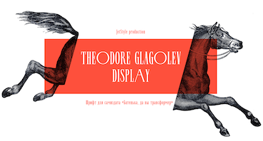 Daria Prokuda (Yekaterinburg, Russia) designed the elegnat super-condensed Skyline style Latin / Cyrillic typeface Theodore Glagolev Display (2016). Behance link. [Google]
[More] ⦿
Daria Prokuda (Yekaterinburg, Russia) designed the elegnat super-condensed Skyline style Latin / Cyrillic typeface Theodore Glagolev Display (2016). Behance link. [Google]
[More] ⦿
|
David Berlow
|
 David Berlow (b. Boston, 1955) entered the type industry in 1978 as a letter designer for the Mergenthaler, Linotype, Stempel, and Haas typefoundries. He joined the newly formed digital type supplier, Bitstream, Inc. in 1982. After Berlow left Bitstream in 1989, he founded The Font Bureau, Inc. with Roger Black. Font Bureau has developed more than 300 new and revised type designs for The Chicago Tribune, The Wall Street Journal, Entertainment Weekly, Newsweek, Esquire, Rolling Stone, Hewlett Packard and others, with OEM work for Apple Computer Inc. and Microsoft Corporation. The Font Bureau Retail Library consists mostly of original designs and now includes over 1,000 typefaces. In a video made for Mike Parker's TDC medal in 2011, Mike Parker says that David Berlow is the most talented type designer he ever met. David lives in Martha's Vineyard.
 At ATypI 2004 in Prague, David spoke about Daily types. At ATypI 2009 in Mexico City, he spoke on The heart of my letter, (and the online version). Since that time he has been very active and vocal on the issue of high quality web fonts. Speaker at ATypI 2011 in Reykjavik and at ATypI 2014 in Barcelona. David Berlow Type Specimens (free pdf). Another type specimen booklet. Interview by A List Apart in 2009. Speaker at ATypI 2010 in Dublin. FontShop link. www.typovideo.de/david-berlow. David Berlow on web fonts. Interview by The Boston Globe. His typefaces: - Agency FB (1995). After Morris Fuller Benton's squarish typeface from 1932-1933 for American Typefounders.
- Amstelvar (2017). A variable (or parametric) font at Font Bureau. Contributors include David Berlow, Santiago Orozco, Alexandre Saumier Demers, and David Jonathan Ross. Open Font Library link, where one can download the font. Github link.
- Apres (2008, a sans with 40 styles). David Berlow and staff drew Apres as part of a series designed originally for the Palm Pre smart phone, for use both on the device and in print marketing. Simple, open letterforms and generous proportions provide a clear, comfortable, and inviting experience for navigation and readability.
- Belizio (1987-1988), a beautiful Clarendon-style slab serif modeled after the 1958 original slab serif by Aldo Novarese called Egizio Corsiva Nero. Claudio Piccinini would have liked Font Bureau to acknowledge Aldo Novarese's Egizio as the source of this family.
- Belucian (1990, by David Berlow and Kelly Ehrgott Milligan. Several weights exist, including Demi and Ultra.
- Berlin Sans (1997).
- Bureau Grotesque (1989). This 27-style family is now called Bureau Grot. Font Bureau's blurb: The current family was first developed by David Berlow in 1989 from original specimens of the grotesques released by Stephenson Blake in Sheffield. These met with immediate success at the Tribune Companies and Newsweek, who had commissioned custom versions at the behest of Roger Black. Further weights were designed by Berlow for the launches of Entertainment Weekly and the Madrid daily El Sol, bringing the total to twelve styles by 1993. Jill Pichotta, Christian Schwartz, and Richard Lipton expanded the styles further, at which point the family name was shortened to Bureau Grot.. Note: there is a custom version called M&C Saatchi Grotesque with truetype data created by dtpTypes in 1998.
- CalifornianFB.
- CheltenhamFB.
- Custer RE (2014), a typeface for small on screen use. The Font Bureau blurb: In 2009, a book from 1897 in the library of the University of Wisconsin caught David Berlow’s attention. It was set in a clear text face---a predecessor of Bookman---cast by the Western Type Foundry who called it Custer. Upon noting how well the typeface worked in point sizes of 6 and 7 points, Berlow developed it into a member of the Reading Edge series specifically designed for small text onscreen. Custer RE is a broad and approachable typeface drawn large on the body with a tall x-height to maximize its apparent size when set very small. The minimal stroke contrast and the hefty serifs let it stay exceptionally clear down to a font-size of 9px. Font Bureau.
- Decovar (2017). A variable font. Github link, where one can freely download the font family. See also Open Font Library.
- Desdemona (1992). An art nouveau face.
- Eagle (1889-1994). This art deco typeface Font Bureau Eagle was started in 1989 for Publish. David Berlow designed a lowercase, finished the character set, and in 1990 added Eagle Book for setting text. In 1994, Jonathan Corum added Eagle Light and Eagle Black to form a full series.
- Eldorado.
- Empire.
- Esperanto (1995).
- ITC Franklin Gothic (1991). In 2008, David Berlow added Condensed, Compressed and Extra Compressed widths to Vic Caruso's 1979 ITC Franklin interpretation (which had Light, Medium, Bold and Black), and Font Bureau sells a complete ITC Franklin now. In 2010, Berlow completed his definitive revision of ITC Franklin, a single new series of six weights in four widths for a total of 48 styles. Typeface review at Typographica.
- Giza (an Egyptian family.
- Hitech (1995).
- Juliana Text (2009), a rebirth of Sem Hartz's Juliana (1958, Linotype), a popular narrow legible paperback text face.
- Kis FB (2007): a revival of old style types by Nicholas Kis from ca. 1700.
- Letras Oldtsyle (1998). Letras Oldstyle was commissioned by Letras Libres, the reigning literary magazine published by Enrique Krauze in Mexico City. This garalde series was inspired by the earliest typefaces cut in the Americas in the early 1600s by printer Henrico Martinez. Proofs survive in the Biblioteca Nacional. Letras Oldstyle stands as the first typeface ever cut in the Americas, the root of American type design.
- Meyer Two (1994). Based on a 1926 type by L.B. Meyer.
- Millenium BT Bold Extended (1989, Bitstream). Also known by insiders as Starfleet Bold Extended, this font was used on federation starship hull markings until episode ten. MyFonts link.
- Moderno FB (1995): an exhibitionist didone in 32 styles, for Esquire Gentleman. In 1996 Berlow cut new styles with Richard Lipton for El Norte. In 1997, Roger Black ordered new weights for Tages Anzeiger. It grew further when the Baltimore Sun, with FB Ionic as text, was redesigned. The whole series was then revised for Louise Vincent, Montreal Gazette, with further styles added in 2005 for La Stampa. [It is my favorite type family at Font Bureau.]
- Momentum (2018). An in house variable font family for use on the Type Network web site.
- Nature (1995).
- Numskill (1990).
- Old Modern.
- Online Gothic (1995).
- Ornaments.
- Phaistos (1990-1991). A flared angular design done with Just van Rossum, and inspired by Rudolf Koch's Locarno.
- Poynter Agate.
- Reforma: Based on Giza.
- Rhode (1997).
- Roboto Flex (2017). A large free variable typeface family by David Berlow on commission for Google; based on Christian Robertson's original Roboto. Google Fonts link. Github link. Google redits Font Bureau, David Berlow, Santiago Orozco, Irene Vlachou, Ilya Ruderman, Yury Ostromentsky and Mikhail Strukov.
- Romeo.
- Scotch Roman (1993).
- Skia (1993, Apple). A Greek simulation sans, in the style of Twombly's Lithos, co-designed with Matthew Carter for Apple's QuickDraw GX project.
- Skyline.
- Titling Gothic FB (2005): Berlow spent 10 years developing FB Titling Gothic in seven weights of seven widths each for use as display and headline romans. It was inspired by the popular ATF Railroad Gothic and grew out of Berlow's own Rhode.
- Throhand: a classic family based on metal type found at the Plantin Moretus Museum in Antwerp.
- Truth FB (1995).
- Village.
- Vonness (2007): a newspaper sans family. Font Bureau: Vonness was designed by David Berlow working closely with Neville Brody on corporate redesign for Jim Von Ehre at Macromedia. Core weights are loosely based on Bauersche Giesserei's Venus, 1907-1910. Berlow expanded the ideas behind the series to 56 fonts.
- Yurnacular (1992, part of FUSE 4).
- Zenobia (1995).
View David Berlow's typefaces. Another catalog of David Berlow's fonts. Speaker at ATypI 2018 in Antwerp. [Google]
[MyFonts]
[More] ⦿
|
David Matos
|
Berlin-based designer. With FontStruct, David designed the modular typefaces Ines Stencil (2013) and Ines Regular (2013). In 2019, David Matos went commercial and released the tall condensed slab serif Unicorn. He writes that Unicorn was inspired by lettering in a furniture ad in Domus vol. 192, 1943. Domus was an architecture magazine. [Google]
[MyFonts]
[More] ⦿
|
David Quay
|
 British type and graphic designer (b. 1948, London) who graduated from Ravensbourne College of Art&Design in 1967, and after working as a graphic designer in London, founded Quay&Gray Lettering with Paul Gray in 1983. David Quay Design started in 1987, and finally, in 1990, he co-founded The Foundry with Freda Sack and Mike Daines in London. The Foundry also develops custom typefaces, marks and logotypes for companies inernationally these include a special typeface to be readable at very small sizes for Yellow pages, corporate fonts for BGplc (British Gas) NatWest Bank, and signage typefaces for both RailTrack in the UK and the Lisbon Metro system in Portugal. After Freda's death, he set up The Foundry Types with Stuart de Rozario. He taught typography and design at the Academie St. Joost, Hogeschool Brabant from 2001-2003. He taught part-time at IDEP in Barcelona, and lives and works in Amsterdam. In 2009, he started selling his fonts at MyFonts. He is also a designer at Retype in Den Haag, The Netherlands. His fonts, in chronological order:
 - Custom lettering and type for the Penthouse calendar.
- 1983: Santa Fe (monoline script), Agincourt (1983, Letraset and ITC, blackletter), Blackmoor (1983, ITC, English-style blackletter).
- 1984: Titus, Vegas.
- 1985: Quay, Milano.
- 1986: Bronx (brush script).
- 1987: Bordeaux (a skyline font family, Letraset), Bordeaux Script.
- 1988: Latino Elongated, Mekanik.
- 1989: Aquinas, Robotik, Helicon (1989, Berthold).
- 1990: Quay Sans (a humanist sans based on Syntax), Digitek, Teknik.
- 1991: Letraset Arta.
- 1992: Coptek, La Bamba, Lambada (1992, Victorian; Letraset), Scriptek (angular design, ITC).
- 1993: Marguerita (curly vampire script).
- 2010: Kade (Re-Type---it is a display/semi display sans family of fonts based on vernacular lettering photographed around the harbours of Amsterdam and Rotterdam).
- 2011: Bath (2010-2011), a typeface developed with Ramiro Espinoza for the signage and orientation of the city of Bath. It comes in Bath Serif and Bath Sans versions.
- Foundry Gridnik (2016, The Foundry). Influenced by Wim Crouwel's work: Foundry Gridnik was developed from the single weight monospaced typewriter face, originally created by Dutch designer Wim Crouwel in the 1960s.
- Foundry Tiento (2020). A magnificent very Latin didone family with exquisite hairline ligatures.
- Fernhout (2021). The prototypical kitchen tile typeface. Quay was inspired by an icomplete alphabet Wim Crouwel designed in 1963 for an exhibition poster font the Dutch painter Edgar Fernhout at the Van Abbemuseum.
List of his typefaces, or revivals, at MyFonts: Bordeaux (Elsner+Flake), Bronx (Elsner+Flake), Agincourt (ITC), Aquinas (ITC), Blackmoor (ITC), Bordeaux (ITC), Bronx (ITC), Coptek (ITC), Digitek (ITC), La Bamba (ITC), Lambada (ITC), Latino Elongated (ITC), Letraset Arta (ITC), Marguerita (ITC), Mekanik (ITC), Milano (ITC), ITC Quay Sans (ITC), Robotik (ITC), Santa Fe (ITC), Scriptek (ITC), Teknik (ITC), Vegas (ITC), Titus (Linotype), Kade (Re-Type), Metallic Sky (SoftMaker), Foundry Sans (The Foundry), VLNL Hollandsche Nieuwe (VetteLetters). View David Quay's typefaces. Klingspor link. FontShop link. Linotype link. View David Quay's typefaces. [Google]
[MyFonts]
[More] ⦿
|
Denis Gorohovskiy
|
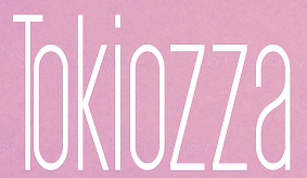 Kiev, Ukraine-based "designer" of the sans typefaces Axiom (2016) and Equilibrium (2016), Arsenal Slab (2016), Parabola (2016, geometric display font), the hairline avant-garde typeface Amsterdam (2016), the minimal rounded sans typeface family Straus (2016), the sans family Aurora (2016), the condensed sans display typeface Tokiozza Light (2016) and the circle-based display typeface Parabola (2016).
 Typefaces from 2017: Arson (sans family), Arthur, Adderley, Ashley, Azalea, Havana (a great super-heavy display sans), Atlas, Alicia, Martin, Apollo, Aroma, Tilt (modern geometric sans), Napster (ultra-condensed sans), Equilibrium, Arizona (condensed rounded sans), Argentina (a smooth high-contrast brush typeface), Aroma, Melony Sans, Argo (rounded monospaced sans), Aura (squarish sans), Bloke, Arnold Thin, Arnold Black (heavy geometric titling sans), Anima (rounded sans), Axiom Sans, Arcadia (minimalistic sans), Diod (a tall minimalist sans), Diod Bold, Aurora Thin, Emerald Modern Serif (a skyline typeface), Aqueduct, Arcanzas (a didone, +3D), Alabama (squarish and tall small caps), Antsy (a slab serif that comes across as a typewriter font), Steady Hand (handcrafted caps). Graphicriver link. Now, alert typophiles have pointed out that most---if not all---of Gorohovskiy's fonts are renamed and plainly stolen fonts. I leave the images on my site for the historical record. Here is a list of equivalences, as reported by this Italian blog: - Bebas Neue (Adderley)
- Canter Bold (Alabama)
- Chivo (Arthur)
- Dense (Aroma)
- Gotham with unofficial (pirated corporate) Cyrillic part (Arson Pro)
- Josefin Sans (Arsenal Sans)
- Josefin Slab (Arsenal Slab)
- Long Tall Sally EEN Plain (Emerald)
- Source Sans (Equilibrium)
- TT Chocolates (Arnold)
- Uniform Black by Miller Type Foundry (Tilt)
- Vidaloka (Arcanzas)
- Vollkorn (Martin)
As a result, Gorohovskiy's Creative Market account has been suspended. But why did Creative Market let this matter go on for a full two years? Incompetent editors? As a matter of fact, another distributor, Graphicriver, still has not removed his account as of late February 2018. His sales there amount to about 900 dollars, so this is plain theft. But then again, is this very different from Book Antiqua (Monotype's copy of Palatino) and Fotura (Linotype's not-so-subtle copy of Futura)? [Google]
[More] ⦿
|
Dennis Ludlow
[Sharkshock]
|
 [MyFonts]
[More] ⦿
[MyFonts]
[More] ⦿
|
Dennis Ortiz-Lopez
|
 Prolific NY-based designer (born in East Los Angeles) who specializes in faithful revivals of old masters and logotype, in Latin and Hebrew. He made over 500 fonts including. He is also a translator and illuminator of Biblical period Hebrew and Aramaic. His clients include The Vatican (Pope John Paul II's Holocaust commemerative CD) and Hadassah, the Women's Zionist Organization of America. His specialties are translations worded in the language and style of the period in which the Biblical text was composed. His translation and enumeration of kabbalistic writings, otherwise known as Hebrew Mysticism and numerology, demonstrate the mathematical base of Biblical miracles.
 MyFonts wrote this analysis of his work: Dennis Ortiz-Lopez is a hugely talented New York type designer. lettering artist&typographer, with around 600 typefaces to his credit. Typographic quality in the magazine market doesn't get much better than Rolling Stone magazine---well, guess who was their typographer (as well as InStyle, Sports Illustrated, People, etc.). Dennis made a successful transition to the digital era around 1989, keeping up his prodigious output. Dennis is also known by his Hebrew name, Siynn bar-Diyonn. Dennis follows the footsteps of great American type designers such as Morris Fuller Benton and Herb Lubalin. And he likes contrasts, too: his typefaces are very narrow or very wide, very thin or very fat. If you love Franklin Gothic but always felt like it's not fat and wide enough. try [Google]
[MyFonts]
[More] ⦿
|
Design Lab SRL, Milan
[Jane Patterson]
|
 Jane Patterson founded Design Lab SRL in Milan, Italy. She is a partner in Design Lab with Sebastiano Castiglioni. Jane Patterson designed or co-designed
 - FB Californian (1994). Based on Goudy's California Oldstyle from 1938. Lanston issued Californian in 1958. The Font Bureau story: Carol Twombly digitized the roman for California in 1988. David Berlow revised it for Font Bureau with italic and small caps. Jane Patterson designed the bold. In 1999, assisted by Richard Lipton and Jill Pichotta, David Berlow designed the black and the text and display series.
- FB Cheltenham (1992). Ingalls Kimball sketched the basic weight while architect Bertram Grosvenor Goodhue completed drawings in 1901. Morris Fuller Benton finished the ATF version in 1902, beating Mergenthaler by two years. In 1906 he drew Bold Extra Condensed, which David Berlow adapted for the SF Examiner, later a Font Bureau release.
- Eldorado (1993-1994). W. A. Dwiggins's Eldorado was released by Mergenthaler in 1953. He followed an early roman lowercase, cut in the 16th century by Jacques de Sanlecque the elder (Granjon). Berlow, Frere-Jones, and Rickner revived and expanded the series in 1993-1994 for Premiere magazine, with versions not only for text and display, but a Micro for six point and smaller.
- Skyline (1992). Skyline was commissioned from Font Bureau by Condé Nast as headletter for Traveler magazine. This typeface dating from 1929-1934 by Imre Reiner was known in Europe as Corvinus.
- John Downer's Simona.
[Google]
[MyFonts]
[More] ⦿
|
Dmitriy Sychiov
|
Aka Dmitriy Sychoff. Russian designer of many Latin / Cyrillic typefaces at FontStruct. These include Fontain (2021), Kabriolet (2021), High Platform (2021), Mortido (2020), Zpheres C (2020: a Cyrillization of a font by Elmoyenique), Gruz (2020), Fat Thin Co (2018), Kuliboni (2018: a dot matrix font derived from Bodoni), Underground C (2018), Chekhova (2018), Antodot sans (2017: dot matrix style), Chrysalide Old Face (2017: dot matrix font), Zychotropic C (2016: a Western / Italian font), Kirpich (2016: a Western font), Mainz C (2016: blackletter), Dry Heat Cyrillic (2016: a Cyrillization of Christian Munk's Arabic emulation typeface Dry Heat), and Belltower C (2016: a compressed all caps text typeface). [Google]
[More] ⦿
|
Eric Ochaya
[Ochaya Designs]
|
[More] ⦿
|
Etcetera Type Company (or: ETC; was: Finck Font Co)
[Tyler Finck]
|
 Graphic designer and musician (b. 1982) at the New York studio AWP who grew up in Maine and is currently based in Ithaca, NY. In 2018, he founded Etcetera Type Company, which is based in Spencer, NY.
 His typefaces: - The fat counterless caps typefaces Blackout and Blackout Midnight (2008). Blackout Sunrise (2013) is an outlined face and Blackout 2am is a reversed font. Blackout Noon followed in 2014. Free download of Blackout at the League of Movable Type.
- Ostrich Sans (2011). This typeface comes in many weights, including a beautiful Ostrich Sans Inline and a hairline. In 2016, this was followed by the layered monoline sans typeface family Ostrich Proper (+Inline).
- Knewave (2011, Google Web Fonts). A brush signage face. League of Movable Type link.
- Porter Sans (2013). A large wide headline type family. It has a free inline outline weight. Later additions include Porter Sans Ink (2014) and Porter Rough (2016). Porter FT, which includes new rounded styles, was added in 2017.
- Elm (2013). Hand-printed.
- Lickety Split (2013). A crayon or brush face.
- Almost (2013). A poster typeface.
- Guilder (2011-2013). A free typeface family with an inline thrown in.
- Ithaca Sans (2013).
- Fartlek Sans (2014). A handcrafted poster typeface.
- Katahdin (2014). A free font.
- Upstater (2014). A a classical American gothic with shaded and layered styles.
- Grandstander (2014). A comic book face. Grandstander Classic (2017). In 2020, Grandstander became a free Google font---and a two-axis variable font was added for the occasion.
- Boo City (2014). A pixel face.
- Didactic Display (2014). A grungy typeface.
- Upstater Ink (2014). A grungy typeface.
- Finck32A (2014).
- Saturnight (2014). A heavy brush typeface.
- Typocopia (2014). A letterpress emulation typeface.
- Taurus Mono (2014). An outline font.
- Southpaw (2014). A nice informal hand.
- Chawp (2014). A crayon face.
- Mr. Brunch (2014). A brush face.
- Gluten FT (2014).
- Flabbergast (2015). A didone.
- Korsque (2015). A layered typeface.
- Bico (2015). A rounded condensed organic typeface.
- Ichabod (2016). An antiqued serif typeface.
- Altitude Condensed (2016).
- Imbue (2016). A condensed didone poster typeface (also called a skyline typeface) at Google Fonts. See also Imbue FT (2017). ETC Imbue (2019) is a variable font version of Imbue with a variation in optical size from Text to Display.
- Retrograde (2016). A monoline and monospaced organic sans.
- Plainview (2016). A squarish and fat typeface.
- Nonesuch (2016). A condensed sans.
- Juju (2016). An octagonal layered typeface family.
- Atiga (2017).
- Mr Brunch FT (2017). A children's book font.
- League Mono (2017). A free font.
- ETC Gluten (2018). An organic font family.
- ETC Epilogue (2018). A variable sans font. Github link. Google Fonts link. Prologue (2020) is a reworking of ETC Epilogue.
- ETC Anybody (2018-2020). A 72-style variable font with weight, width and slant axes. Free at Google Fonts. He writes: Anybody is a big family that combines an affinity for Eurostile plus a heavy dose of 90s inspiration. It's flexible enough to adapt to a variety of situations. From UltraCondensed to ExtraExpanded, type set in Anybody can take up a tiny amount of horizontal space or so much space that you'll need several lines. Its high x-height and low cap height help exaggerate extreme widths and weights. Github link.
- Furrow (2018). A grungy sans.
- Cease (2018). A squarish techno typeface.
- ETC Trispace (2019). A variable font with weight and width axes, based on League Mono.
- ETC Tourney (2019). A variable octagonal font, playing on the theme of outline versus inline. Free Google Fonts download (2020-2021). Github link.
- Struthio (2019). A rounded sans.
- Birdo (2020). An inline typeface.
- Gluten (2021). A free script font family at Google Fonts.
Alternate URL, called The League of Movable Type. Typedia link. Kernest link. League of Movable Type link. Creative Market link, Klingspor link. Dafont link. Home page. Creative Market link. Abstract Fonts link. Google Plus link. YWFT link. Old home page. Behance link. Github link. [Google]
[MyFonts]
[More] ⦿
|
Eugen Nerdinger
|
German type and graphic designer (b. 1910, Augsburg, d. 1991, Augsburg) who created this text family in 1945. Coauthor with Lisa Beck of Schriftschreiben Schriftzeichnen (1977, München) and Kalligraphie (1988, München). Older texts by him include Alphabete (1974, München), Zeichen, Schrift und Ornament (1960, Callwey, München), and Buchstabenbuch (1954, Callwey, München). Nerdinger was active in the German resistance against the Nazis and was arrested in 1942 by the Gestapo and convicted to three and a half years of prison and forced labor. After the war, he worked chiefly at the Augsburger Kunstschule. One of his alphabets led to Lola (2013, Laura Meseguer). The workhorse Newbery Sans Pro (2018, Alejandro Paul) and the skyline didone Rigatoni (2017, Alejandro Paul) are also based on Nerdinger's examples. [Google]
[More] ⦿
|
Flop Design
[Kato Masashi]
|
 Japanese site with original fonts by Kato Masashi (b. 1973), who lives in Takasaki (Gunma prefecture, Japan): Parismatch (2004), SAKUalp (2000, handwriting), Steeltype, Broadband, Hivision, Cinematime, Ultracomic, Ice Cream, Be Happy, Summer Beauty, Flyermix, Cheerscript, Breakstyle, Breakfont, Round, H-Five, Natsucomi, Long Vacation, Lovers, Breakfont (2003, graffiti style), Pokkaman, BeHappy, Natsucomi, Momolcan, Seasons Dings, Electron, Round, Lovers, FlyerMix (fifties style), CheerScript (comic book style), Hi-Five (pixel font), Summer Beauty, SummerDrive, White Day, Long Vacation, Amayadori (high contrast kana font), Fuyucomi, Icecream, Pickett, 321, Pingpong, Frontline, Ginza, Yago (nice free dings), Polaris, 321eng, 321kana, APPLE, CLIQUE, Clover (kitchen tile font, 1998), DIGI, Eneneng, Enenhira, FDalp, FDwhie, Hnoodle, Hanko (free black on white stamp font, 1998, see also here), MKCuer, MOOGIRLALP, MOOMILKKANA, Noodle, Origami, Pers, SA0kmh, SA100kmh, SA50kmh, SK0kmh, SK100kmh, SK50kmh, Template6, Tenten, Ami Font, Speedfont, Supercar, Sakura, Regoty, Shopping Famiry, Ticket, Yohic, Recording, Akachan, Wafont, Frontbit7, MusicNetwork, Yakitori (free handwriting font), Ticket, Folkdance (pixelized people), Human Building (dings of famous buildings), Bunny (free), Frontline0, Side5 (pixel font), Side6, Side7. Some pixel fonts, many techno fonts, some kana fonts, and the Japanese kids dingbat font, Folkdance. Some fonts, such as his Latin/Japano font ShoppingFamily (1998), are sold by Font Pavilion. Major Japanese free font links.
 In 1999, he published the AMI screen pixel font series in Digitalogue's DPI72 package. Other commercial fonts: Pine Apple, the WM family, Cutie Girl, Astratic, PictPlasma, Minivan, Frontbit 7, Ginza, Zoological. Free fonts as of 2007: Aiko, a 4-weight rounded sans with support for Latin and kana (see also here). Fonts made in 2007-2008: MobileDisco, AbbeyRoad-Alternative, HighwayStar, Kompakt, AbbeyRoad, Prefuse, Readymade (didone inspired by Corvinus and Giorgio). Additions in 2009: Kanna W4, Sweet Doughnuts (rounded sans). Fonts made between 1998 and 2008: 321, AirExpress, AirTickt, AMAYADORI, AMIFONT, APPLE, ASTRA, AYANO, BeHappy, bitneon, BORDER7, BREAKFONT, BroadBand, BUNNY, CALENDER, CheerScript, CinemaTime, CLIQUE, CLOVER, CutieGirl, Departure, DIGIT, ELECTRON, FlyerMix, FolkDance, FOLKDANCE2, FrontBit, FRONTLINE, FRONTLINE01, FUYUCOMI, GINZA, HANKO, HappyEnd, hiFive, HumanBuild, IceCream, ICHIGO, JAPON2, KAKIZOME, KEYMODE, LabLife, LongVacation, LoversMINIMONO, MKCUTTER, MOMOKAN, MooFont, MusicNet, NATSUCOMI, Nenga, Noodele, OnePiece, oneBox, Origami, ParisMatch, Pers, Pickett, PICTdings, PictPlasma, PineApple, PingPong, pokkaman, Polaris, PopStar, Puzzle, Recoya, REGO, ROUND, SAKURA, SAMACAN, Seazons, Shopping, SIDE5, SIDE51byte, SIDE6, SIDE61byte, SIDE7, SPEED, STAMPER, SteelType, SummerBeauty, SummerDrive, SuperCar, Template5, TenTen, Ticket2, UltraComic, WHITEday, Yabako, Yago, Yakitori (handwriting of Mayumi Kakegawa), Yothic, Zoological, Nippondings, Caredings, TraficSignsWLD, TraficSigns, JPN, Kamondings, Kamondings2, Kurashidings, Okonomi, FunnyFace, Hotsuma, Toyokuni, Constellation, SunnyDay, BOXdings, Machinedings, CLICKdings, Berrys, Container Box, Twinkleline, Minivan, Akachan. Dingbats: Kurashidings, IchigoC, TraficsignsWLD, TraficsignJPN, Nenga, Kamondings2, Kamondings, Breakstyle, Pictdings, Zoological, Caredings, Clickdings, Funnyface, seasons, Pictplasma, Humanbuilding, Nippondings, Yago, Boxdings, Toyokuni, Constellation (astrological symbols), Machinedings, Hotsuma, Folkdance, Calender. Japanaese handwriting fonts: Aiko, Haruka, Syuntaro, YUKI, Ryunosuke. Futuristic/ geometric fonts: MobileDisco, AbbeyRoad-Alternative, HighwayStar, Kompakt, AbbeyRoad, Prefuse. "Funny" fonts: IchigoR, Ultracomic, Amayadori, Parismatch, hanko, LongVacation, Cinamatime, Natsucomi, Okonomi, IceCream, Yakitori, Cutiegirl, Monokan Wa, Shopping, Lovers, Fuyucomi, Berrys, Akachan, Bunny, Clover, Pokkaman, Pickett, Electron. Cool fonts: Sunnyday, HiVision AirTicket, Lablife, Flyermix, Popstar, AirExpress, Broadband, Recording, Breakfont, Frontline, Ami, Minivan, Side5, Side6, Summerdrive, Digit, Supercar, Frontline00, BeHappy, Steeltype, Onepiece, Puzzle, Astlatic, Stamper. Download page of their free silhouette dingbat images. In 2014, they created the free art deco typeface Jazzkissa. In 2018, they published the full CJK font Soukou Mincho (by Ken Lunde and Masataka Hattori) at Fontsquirrel for free download. Dafont link. Abstract Fonts link. Fontspace link. Direct access. Alternate URL for free stuff. And another URL. Klingspor link. Fontsquirrel link. [Google]
[More] ⦿
|
Font Forestry
[Jeremy Vessey]
|
 Font Forestry (Charlottetown, Prince Edward Island, Canada) is yet another venture of Jeremy Vessey, this time in cooperation with his companion, Stephanie Arsenault. I assume that it too is actually based in Montreal. Established in 2017, their initial fonts include Tuesday Night (a free signature script), Mr. Quincy, Harvester (script), Fischer (rounded industrial octagonal sans), Henrik (a free letterpress emulation typeface), Quartz Grotesque, Cymbria (free weathered sans), Waves (a great caps only skyline font) and Seaport (brush script).
 Typefaces from 2018: Monique Script, Maveryk. Typefaces from 2022: Marlowe (all caps serif). Creative Market link. Behance link. Newest Behance link. [Google]
[More] ⦿
|
Frere Jones Type
[Tobias Frere-Jones]
|
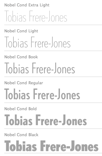 Celebrated type designer, born in 1970 in New York City. Frere-Jones received a BFA in Graphic Design from the Rhode Island School of Design in 1992. He moved to Boston, where he worked at the Font Bureau until 1999. He joined the faculty of the Yale University School of Art in 1996 and has lectured throughout the United States, Europe and Australia. From 1999 until 2014, he worked for and with Jonathan Hoefler in New York. In 2015, he set up his own type foundry, Frere Jones Type. His old Font Bureau typefaces can be bought since 2020 at Frere Jones / Type Network. His work is in the permanent collections of the Victoria & Albert Museum in London and the Museum of Modern Art in New York. In 2006, The Royal Academy of Visual Arts in The Hague (KABK) awarded him the Gerrit Noordzij Prijs, for his contributions to typographic design, writing and education. In 2013 he received the AIGA Medal, in recognition of exceptional achievements in the field of design.
 His Font Bureau typefaces: - Armada (1987-1994). A rigid elliptical sans in many styles. This is a surprisingly beautiful family despite its self-imposed design restrictions. The Compressed Black is a piano key typeface in the style of Wim Crouwel. Font Bureau: An experiment in algorithmic design, Armada follows the verticals and flat arches so often to be found in the architectural geometry of cast iron and brickwork in 19th century American cityscapes.
- Asphalt (1995). Font Bureau: Who hasn't admired the energy of Antique Olive Nord? All other ultrabolds seem sluggish in comparison. Nord exudes Excoffon's animation and Gallic impatience with the rules. Tobias Frere-Jones cross-bred the weight, proportion, and rhythms of Nord with the casual grace of his own Cafeteria, gaining informality and a dancing vitality on the page.
- Benton Sans (1995-2003). Created by Tobias frere-Jones and Cyrus Highsmith, it is a revival of Benton's 1903 family, News Gothic, and one of Font Bureau's bestsellers. It is a very complete family, ranging from regular widths to Condensed, Compressed and ExtraCompressed subfamilies. The Small Caps set is complete as well.
- Benton Modern (1997-2001). Benton Modern was originally undertaken by Tobias Frere-Jones to improve text at The Boston Globe. Widening the text face for the Detroit Free Press, he returned Century's proportions to Morris Fuller Benton's turn-of-the-century ATF Century Expanded, successfully reviving the great news text type. The italic, based on Century Schoolbook Italic, was designed by Richard Lipton and Christian Schwartz, who also added the Bold.
- Cafeteria (1993). Font Bureau about this cartoonish font: The irregularities normally found in script can enliven sans-serif letterforms. In Cafeteria, Tobias Frere-Jones took special care to balance activity with legibility on the paper napkin that served as his sketchpad, drawing a freeform sans-serif that is condensed but in no way stiff.
- Citadel (1995).
- CochinOldstyle (1992), CochinBlack (1991).
- Eldorado (1993-1994).
- Epitaph (1993). Drawn around 1880 at the Boston Type Foundry (the Boston branch of American Type Founders), Epitaph was modeled on a graceful Art Nouveau letterform that was bringing a new vitality to gravestone inscriptions at the time. The energy and life of the Vienna Secession alphabet drew the attention of Tobias Frere-Jones, who digitized the original set of titling capitals and added alternate characters for its Font Bureau release.
- Garage Gothic (1992). In three weights, it is based on parking garage ticket lettering but very reminiscent of license plate characters.
- Grand Central (1998). Grand Central was designed for 212 Associates from late-twenties capitals hand-painted on the walls of Grand Central Station. Font Bureau writes: The design is a distinguished Beaux Arts descendant of the great French Oldstyle originated by Louis Perrin in Lyons in 1846, known across Europe as Elzevir and in the U.S. as De Vinne.
- Griffith Gothic (1997-2000). A revival of Chauncey Griffith's telephone book directory typeface, Bell Gothic (1937-1938).
- Hightower (1994-1996). A Venetian typeface originally done for the Journal of the American Institute of Graphic Arts. Font Bureau: Dissatisfied with others' attempts to bring Nicholas Jenson's 1470 roman up to date, Frere-Jones prepared his version of this calligraphic roman, with his own personal italic.
- Interstate (1993, Font Bureau). Done for the United States Federal Highway Administration, but later released as a type family by Font Bureau. Interstate Mono (done with Christian Schwartz) followed in 2000, also at Font Bureau. The family is a reinterpretation of Highway Gothic, which has been the official typeface for American highway signage for decades. Its design is ultimately based on signage alphabets developed in the late 1940s by Dr. Theodore Forbes, assisted by J.E. Penton and E.E. Radek.
- Miller. A Scotch Roman finished in 1997 together with Matthew Carter and Cyrus Highsmith at Font Bureau.
- Niagara (1994). Almost a skyline typeface. Contains Niagara engraved.
- FB Nobel (1993). An exquisite geometric sans family based on old ideas of De Roos at Amsterdam who explored alternative character sets to enliven basic Futura forms. Frere-Jones views Nobel as Futura cooked in dirty pots and pans. FB Nobel showcased. The Extra Lights were added by Cyrus Highsmith and Dyana Weissman.
- Pilsner (1995). A beer bottle typeface. Font Bureau: Sitting in a Paris cafe with a bottle of beer, Tobias Frere-Jones gave his attention to the label. It was set in a roman design wearing blackletter-like clothes, probably to suggest an origin in Alsace or points to the East. Unable to forget the design, with its blocky, straight line emphasis, Tobias designed Pilsner, an exercise in straight lines in an angle-centered scheme.
- Poynter Old Style (1997, Font Bureau).
- FB Reactor (1996). This was first a FUSE7 font in 1993). Reactor destroys itself as it is put to use.
- Reiner Script (1993). Based on a 1951 brush script by Imre Reiner (ATF).
- Stereo (1993). After a typeface by Karlgeorg Hoefer, 1963 (Font Bureau says 1968).
At FontFont, he designed the children's fonts FF Dolores (1991) and FF Dolores Cyrillic. At FUSE 15, he designed Microphone (1996). At FUSE 10, he published Fibonacci, a font consisting just of lines. His custom work includes WorthGothic (1996), WorthLogo1996 (1995), WorthText (1995), GQGothic (1995), Halifax, Commonwealth (1995), Belizio-TwentySix (Font Bureau), HermanMillerLogo (1999, Font Bureau). Cassandra, Vitriol (1993), Quandry (1992-1994) and Chainletter (1993). Retina Agate (2001, specially made for small-print stock listings at the Wall Street Journal) netted him a Bukvaraz 2001 award and an AIGA 2003 Design Award. From 1999 until 2014, he designed for the Hoefler Type Foundry, which he joined as an equal partner (and the new company became Hoefler & Frere-Jones (in 2004), or H&FJ). He claims that he brought with him to H&FJ a lot of typefaces including Whitney, Whitney Titling, Elzevir, Welo Script, Archipelago (Shell Sans), Type 0, Saugerties, Greasemonkey, Vive, Apiana, and Esprit Clockface. It is not expicitly stated at the H&FJ site which typefaces he had a hand in, but one can safely assume that it must have been nearly every typeface made since he entered into the partnership. In 2014, Tobias sued Jonathan for half of the company in a 20-to-80 million dollar lawsuit since he claims that Hoefler reneged on his promise to give him his half. The typefaces at H&FJ he had a hand in include: Archer (2001, by Jonathan Hoefler and Tobias Frere Jones). A humanist slab serif originally designed for Martha Stewart Living. It has a great range of features, including a classy hairline style. Some say that Archer is just Stymie with some ball terminals. Nevertheless, it became a grand hit, and has been used by Wes Anderson in The Budapest Hotel, and by Wells Fargo for its branding. David Earls on Archer: with its judicious yet brave use of ball terminals, and blending geometry with sexy cursive forms, all brought together with the kind of historical and intellectual rigour you fully expect from this particular foundry, Archer succeeds where others falter. - HTF Retina (2002). For use in the Wall Street Journal.
- Gotham (2001). A sans serif done with the help of Jesse M. Ragan. In fact, the orignal design in 2000 was for GQ magazine. Read about it here. In 2007, he published the rounded version Gotham Round. Gotham was used in 2008 by Obama in his presidential campaign. Joshua Brustein (Business Week): Gotham is one hell of a typeface. Its Os are round, its capital letters sturdy and square, and it has the simplicity of a geometric sans without feeling clinical. The inspiration for Gotham is the lettering on signs at the Port Authority, manly works using "the type of letter that an engineer would make," according to Tobias Frere-Jones, who is widely credited with designing the font for GQ magazine in 2000. Critics have praised Gotham as blue collar, nostalgic yet exquisitely contemporary, and simply self evident. It's also ubiquitous. Gotham has appeared on Netflix (NFLX) envelopes, Coca-Cola (KO) cans, and in the Saturday Night Live logo. It was on display at the Museum of Modern Art from 2011 to 2012 and continues to be part of the museum's permanent collection. It also helped elect a president: In 2008, Barack Obama's team chose Gotham as the official typeface of the campaign and used it to spell out the word HOPE on its iconic posters. Hoefler produced versions in 2016 such as Gotham Office and Gotham Narrow Office.
- Cyclone (2003).
- In 2010, he and Jonathan Hoefler designed the sans family Forza.
- Giant (2003).
- Knoz (2003).
- Topaz (2003).
- Verlag (2006). Developed together with Jonathan Hoefler.
- Whitney (2004). This is an amazing 58-style sans family designed for the Whitney Museum, but now generally avalaible from Hoefler, and touted as a great family for infographics. A derivative, Whitney-K, is the house font of Kodak. Whitney's sales blurb: While American gothics such as News Gothic (1908) have long been a mainstay of editorial settings, and European humanists such as Frutiger (1975) have excelled in signage applications, Whitney bridges this divide in a single design. Its compact forms and broad x-height use space efficiently, and its ample counters and open shapes make it clear under any circumstances.
- With Hoefler, he collaborated on projects for The Wall Street Journal, Martha Stewart Living, Nike, Pentagram, GQ, Esquire, The New Times, Business 2.0, and The New York Times Magazine. In all, he has designed over five hundred typefaces for retail publication, custom clients, and experimental purposes. His clients have included The Boston Globe, The New York Times, The Cooper-Hewitt Museum, The Whitney Museum, The American Institute of Graphic Arts Journal, and Neville Brody. He has lectured at Rhode Island School of Design (from which he graduated with a BFA in 1992), Yale School of Art, Pratt Institute, Royal College of Art, and Universidad de las Americas. His work has been featured in How, ID, Page, and Print, and is included in the permanent collection of the Victoria&Albert Museum, London.
Interview. Interviewed by Dmitri Siegel. He created Estupido Espezial for fun, but it actually made it into an issue of Rollingstone. Catalog of his typefaces at Font Bureau. Keynote speaker at Typecon 2014. View typefaces designed by Tobias frere-Jones. Another page with typefaces created by Tobias Frere-Jones. [Google]
[MyFonts]
[More] ⦿
|
Gabriel Pacifico
|
During his studies at Universidade Federal do Ceara, Fortaleza, Brazil-based Gabriel Pacifico designed the tall modern fashion mag typeface Esguia (2016). [Google]
[More] ⦿
|
Gerald Giampa
[Lanston Type Co]
|
 [MyFonts]
[More] ⦿
[MyFonts]
[More] ⦿
|
Gilar Studio
[Gumilar Pratama Adiatna]
|
 Serang, Indonesia-based designer (b. 1990) of the free handwriting fonts Rafiosa (2019) and Hasta La Vista (2019), and the script typefaces Gilani Sign, Galinah (a rabbit ear script), Patlystic, Raline, Gilar Saleh, Aminarthie, Charlotte Bellamy, Gallillea, Hellowish, Hokie, Holiday Script, Isabela, Jhon Wick, Pandora, Riverlands Tully, Rudolp, Samudera, Santuy, Sella Callista, Shalitta, Starlight, Sunday Rully, and Taman Signature.
 Typefaces from 2020: Fontana, Houston (inline caps), Goord (titling caps), El Fonte (all caps), Norland, Bonjour (condensed caps), Sigtia (calligraphic), Honney (calligraphic), Bigola, Axilia, Sunkisa, Santhin, Sulqata, Nagisha, Rithey, Rodelia, Betharia, Celya, Sonetha, Ruang Teduh, Reality, Jallu Salafi, Tagonda, Sigoda. Typefaces from 2021: Bunny Flowers (a scrapbook font), We Are Allstar (a playful font, perhaps even beatnik), African Paradise (a beatnik font), House Easter (a scrapbook font), Nona Manis (a beatnik font), Anak Sultan (a scrapbook font), Luar Galaxy, Lovely Unicorn (a scrapbook typeface), Ikan Salmon (a beatnik font), The Crafty (a scrapbook font), The Funy Times (a scrapbook font), Lovely Unicorn, Fontena (an all caps arts-and-crafts sans), Amoselia (a wild calligraphic script), Bontour (a skyline font), Goordy (a classical roman caps typeface with unbracketed serifs), Hatolie (display wedge serif caps), Marisa, Cameta Cuttes (wild calligraphy), Hello Crimsons (blackboard bold), Chris Master (wild and calligraphic), Carilos (an all caps decorative serif), Budyloves (a romantic script), Valentina (an upright Valentine's day script), Berylover (a wild calligraphic script), Love Birdy (a wild calligraphic script), Loving Hearty (a lovers' script), Night City (a forceful script), Beach Loves (wild and inky calligraphy), Kity love (wild calligraphy), Love Angel (wild calligraphy), Lovely Valentine, Helo Xmas (wild calligraphy), Karoline (wild calligraphy), Looqie (a display font), Mettalian (a wild calligraphic script), Royante (a signage script), Verali (a wild calligraphic script), Quality Times (a wild script). Typefaces from 2022: Collager (an 18-style display serif family). [Google]
[MyFonts]
[More] ⦿
|
Grosse Pointe Group LLC
[Mark Solsburg]
|
 The Grosse Pointe Group LLC is located in Westport, CT, and is run by Mark Solsburg, who also owns Group Type, ansd who was involved in or ran FontHaus and TypoBrand. Under the Grosse Pointe label, we find a digital font called Stradivarius (1992), named after Imre Reiner's 1938 formal script font Symphonie (Bauer; renamed Stradivarius in 1945). At Group Type or the other outfits of Solsburg, we find these fonts: Carpenter (a 1995 revival of an old connected ATF script by James West), Aquiline (an absolutely wonderful 16th century script), Bank Gothic (1994, a revival of Morris Fuller Benton's original---see also Bank Gothic BT), Aries (a 1995 revival of a lapidary by Eric Gill), Schneidler Initials (a 1995 revival of Friedrich Hermann Ernst Schneidler's Trajan-style typeface), Raleigh Gothic (a 1995 typeface based on Morris Fuller Benton's design. See also Raleigh Gothic RR for a different revival), Ovidius Script (a medieval simulation script, dated 2006, designed by Thaddeus Szumilas; in Light, Demi and Bold weights), Metro Sans (2006, a great Bauhaus style sans family based on William Addison Dwiggins' Metro #2), Corvinus Skyline (1991; a revival of a condensed modern family by Imre Reiner by the same name, 1934), Cloister Initials (2006, a revival of an illuminated caps typeface by Goudy), Regular Joe (2006, an out-of-place childish handwriting font), and Caslon Antique (1993; based on an original by Bernd Nadall). [Google]
[More] ⦿
The Grosse Pointe Group LLC is located in Westport, CT, and is run by Mark Solsburg, who also owns Group Type, ansd who was involved in or ran FontHaus and TypoBrand. Under the Grosse Pointe label, we find a digital font called Stradivarius (1992), named after Imre Reiner's 1938 formal script font Symphonie (Bauer; renamed Stradivarius in 1945). At Group Type or the other outfits of Solsburg, we find these fonts: Carpenter (a 1995 revival of an old connected ATF script by James West), Aquiline (an absolutely wonderful 16th century script), Bank Gothic (1994, a revival of Morris Fuller Benton's original---see also Bank Gothic BT), Aries (a 1995 revival of a lapidary by Eric Gill), Schneidler Initials (a 1995 revival of Friedrich Hermann Ernst Schneidler's Trajan-style typeface), Raleigh Gothic (a 1995 typeface based on Morris Fuller Benton's design. See also Raleigh Gothic RR for a different revival), Ovidius Script (a medieval simulation script, dated 2006, designed by Thaddeus Szumilas; in Light, Demi and Bold weights), Metro Sans (2006, a great Bauhaus style sans family based on William Addison Dwiggins' Metro #2), Corvinus Skyline (1991; a revival of a condensed modern family by Imre Reiner by the same name, 1934), Cloister Initials (2006, a revival of an illuminated caps typeface by Goudy), Regular Joe (2006, an out-of-place childish handwriting font), and Caslon Antique (1993; based on an original by Bernd Nadall). [Google]
[More] ⦿
|
Group Type
[Mark Solsburg]
|
 Mark Solsburg's outfit located in Westport, CT. Before GroupType, Solsburg worked at ITC, which he left in 1989 to start FontHaus. Later he started TypoBrand and Grosse Pointe Group LLC. Solsburg headed the Type Directors Club for a few years. He is presently located in Ann Arbor, MI. He is President / CEO of DsgnHaus (1989-present), and partner in TypoBrand LLC (2004-present), a specialized typographic consulting firm founded by type designer, Mark van Bronkhorst; former type designer for Adobe, Linnea Lundquist, and Mark Solsburg. It seems that the FontHaus collection is now being marketed under the Group Type label at MyFonts. Group Type does technology consultation in the field of providing software and type typeface fonts for designers, publishers and typographers, related to the selection, purchase and use of design software and type typeface fonts for use in graphic, industrial, interactive and communications design. They specialize in revivals. Their fonts include
 - Aquiline. An absolutely wonderful 16th century script.
- Arbor Brush (2012). A brush font that seems almost painted.
- Aries. A 1995 revival of a lapidary typeface by Eric Gill.
- Bank Gothic (1994). A revival of Morris Fuller Benton's original---see also Bank Gothic BT. Now also Bank Gothic Distressed.
- Bristol (1994). In Adornado and Solid substyles. Based on a design by Stevens Shanks.
- Broadway Poster.
- Carpenter Script (1995). Revival of an old connected ATF script by James West.
- Caslon Antique (1993). Based on an original by Bernd Nadall.
- Cloister Initials (2006). A revival of an illuminated caps typeface by Goudy.
- Cooper Poster.
- Corvinus Skyline (1991). By Ann Pomeroy. A revival of a condensed modern family by Imre Reiner by the same name.
- Craw Modern (2012). A revival of Craw Modern by Freeman Craw (1958, ATF).
- Diane Script.
- Fortis (2012), formerly Atlas. In the wood style of Latin Wide, with heavy sharp triangular serifs.
- Girder Poster.
- Gotico Black. A blackletter.
- Grosse Pointe Metro (2006-2009). A great Bauhaus style sans family based on William Addison Dwiggins' Metro #2). See also Detroit Metro.
- Grotesca (1995).
- Laughin. Andrew Smith contributed his Laughin, which was earlier at FontHaus.
- Maxim.
- Ovidius Script. A medieval simulation script, dated 2006, designed by Thaddeus Szumilas. Comis in Light, Medium and Bold.
- Poster Gothic.
- Raleigh Gothic (1995). A typeface based on Morris Fuller Benton's design. See also Raleigh Gothic RR for a different revival.
- Regular Joe (2006). An out-of-place childish handwriting font.
- Ronde Script (2012). This ronde comes from the French side. Group ype says that it was modeled after Parisian Ronde by the Chappelle foundry in Paris, but its roots go back to Nicolas Gando.
- Schneidler Initials (1995). Revival of Friedrich Hermann Ernst Schneidler's Trajan-style typeface.
- Sitcom. Ann Pomeroy contributed Sitcom.
- Spire. By Ann Pomeroy. A condensed didone family heavily based on Sol Hess's Spire (Lanston).
- Stradivarius.
View the Group Type typeface libary. [Google]
[MyFonts]
[More] ⦿
|
Gumilar Pratama Adiatna
[Gilar Studio]
|
[MyFonts]
[More] ⦿
|
Haiku Monkey
[Alec Julien]
|
 Commercial foundry, est. 2007 in Burlington, VT, by Alec Julien (b. 1965). Fonts sold through MyFonts include Doctor Cyclops (2009), Grundlagen (2009, retro display sans), I Am A Bird (2009), Yacht (2009, a 1930s movie poster style family), Predicate (+Rounded) (2008, sans), Steel Sedan (2008, a condensed slab serif family), Monumint (2008, comic book style), Aerohop (2008, a sans family), Chittenden (2008, an artsy blackboard math style face), Rany (2008, hand-printed), Ashbery (2008, Asian jungle look stick font), Banyan (2007, brush typeface with a jungle look), Loge (2007, a high-contrast sans), Joules (2007, hand-printed family, whose development is described here), Tara (2007, a jungle-look face), Sinn (2007), Set Theory (2007), Bad Marker (2007), Counterfact (2007), Sharp Nine (2007), Good Robot (2007), Groovin Up Slowly (2007), Fractal Caps (2007), Classy Diner (2007), Anthem (2007), Zooey (2007), Imagination Theory (2007), 89 (2007), Skrawl (2007), Zerega (2007), AJ Hand (2007), Scandal (2008), Zone 52 (2008, techno), Gno (2008, techno), Gno Serif (2008), Abbott (2008, a cool hand-printed script). Most of these fonts resulted from drawing or doodling experiments.
 Free fonts: Lavoisier (2009, sans), Skritch (2008, handwriting), Geekium (2008, a math symbols font based on Gentium), 36 Dots (dot matrix face), Teacher Sez (2007, blackboard script). Devian Tart carries these free fonts/demos: Skritch, Rany, Teacher Sez, Steel Jalopy (2008, based on Steel Sedan), Insolent (2009), I Am A Bird (2009, slab serif family), Myrna (2009). Lavoisier (2009) is a free monoline font, later cyrillicized by Sergey Tkachenko. Working on Modus (2009). Additions in 2010: Lockwood (a strong all-caps sans display face), m7 (a slab serif typewriter face), Blues Vity (condensed display face), m13 (fat slab serif), Mineola, Hunk (fat all-caps display face). Creations from 2011: Zurdo (hand-printed). Typefaces from 2012: Shockproof (a tall display face). Typefaces from 2013: Arcation (techno). In 2014, Alec Julien published the skyline typeface family Lexave. Typefaces from 2015: Gilmour (a sturdy slab serif, +Cyrillic). Typefaces from 2016: Gama (octagonally cut Star Trek font). Typefaces from 2018: Syd, Sid. Interview by Seven Days. Fontsquirrel link. Klingspor link. Kernest link. View Alec Julien's typefaces. [Google]
[MyFonts]
[More] ⦿
|
High Contrast Serifs: Stephen Coles's List
|
 Stephen Coles points out the jewels in the FontShop store.
 [Google]
[More] ⦿
|
Ian Lynam
[Wordshape]
|
 [MyFonts]
[More] ⦿
[MyFonts]
[More] ⦿
|
Imre Reiner
|
 Typographer, architect, designer and type designer, b. Versec, Hungary, 1900, d. Lugano, Switzerland, 1987. He emigrated from Hungary, and studied at the Staatliche Bildhauerschule Zalatua, the Kunstgewerbeschule Frankfurt, and the Kunstgewerbeschule in Stuttgart, where Prof. F. H. Ernst Schneidler was his teacher. After a brief stint (1923-1925) as a graphic designer in London, Paris, New York and Chicago, he returned to study with Schneidler, and from 1931 onwards, he worked in Ruvigliana near Lugano as painter, graphic designer and illustrator. His list of fonts includes:
 - Bazaar or Bazar (1956, D. Stempel; this brush typeface was revived in 2005 by Patrick Griffin, Canada Type, as Boondock).
- The brush script Contact (Deberny&Peignot, 1952; Ludwig&Mayer, 1968 (according to Jaspert), and 1963 according to others).
- Corvinus (Bauersche Giesserei, 1934; Swisstypedesign mentions 1932-1935). See also here. Corvinus Skyline (1934). Digital typefaces derived from this include Corvinus Skyline (1991, Group Type), Skyline (1992, Jane Patterson, Font Bureau).
- Figaro (1940).
- Floride or Florides Initiales (Deberny&Peignot, 1938): 3d horizontally shaded caps.
- The Gotika fraktur font (Bauersche Giesserei, 1933), revived as Gotika by Petra Heidorn (2005, no downloads) and as Leather by Canada Type (2005). Manfred Klein created Gotika Buttons (2005) based on Petra Heidorn's Gotika. Gotika discussion on Typophile. Eric West intends to do a digitization as well, and Neufville is not cooperating.
- London Script (1957). This was digitized twice at Canada Type, once by Phil Rutter in 2004 as Almanac, and once in 2007 by Rebecca Alaccari as Reiner Hand.
- Matura MT (1938, Monotype), Matura Swash (1938).
- Mercurius MT (1957).
- Meridian (1930, Klingspor: a fat display face). Swisstypedesign says 1929.
- Mustang (1956, D. Stempel, a brush script revived in 2005 by Canada Type as Hunter).
- Pepita MT (1959).
- Reiner Black (1955, Berthold, a brush script). For a digital vrsion, see Rough Script (2012, SoftMaker).
- Reiner Script (1951, Amsterdam). Digitizations of this brush script under the same name include those of Dieter Steffmann and Tobias Frere-Jones (Font Bureau, 1993).
- Sassa (1939).
- Stradivarius (1945, identical to his Symphonie; Bauersche Giesserei, 1938), a formal script font with a compressed straightened lower case alphabet. [Note: Neufville copied it in its Sinfonia later, and in 2005, Petra Heidorn made a digitized version called Symphonie.] Martin Z. Schröder discusses its origins here. Also called Neue Symphony (1938). Digitizations include the free font Symphonie (2015, Peter Wiegel) and the commercial typeface by Group Type (1993) called Stradivarius.
- Amsterdam Primula Ornaments. A digital version by Ari Rafaeli is called Ornaments 5 (2010).
In 1992, Manfred Klein made Tokay-MK after one of Reiner's ideas. In 2004, he added VariationsForImre, a playful typeface based on Reiner's lettering, and this was followed in 2005 by Magyarish. Reiner wrote several books, including Modern and Historical Typography An Illustrated Guide (1946, Paul A. Struck, New York, and 1948, Zollikofer and Comp., St. Gallen). Linotype page on him. FontShop link. Klingspor link. View Imre Reiner's typefaces. [Google]
[MyFonts]
[More] ⦿
|
Jane Patterson
|
 An American type designer and President of Design Lab SRL (in partnership with Sebastiano Castiglioni), a digital font foundry in Milan, Italy. Jane Patterson holds degrees in fine and computer arts from Colorado College and the School of Visual Arts in New York. After an apprenticeship with Benguiat, she joined Font Bureau in 1991.
 Author of the essay entitled Copyright&Fonts In The Age of Cyber Space. Jane Patterson designed or co-designed - FB Californian (1987-1994, with Carol Twombly and David Berlow). In 1938, Goudy designed California Oldstyle for the University of California Press. In 1958, Lanston issued it as Californian. Carol Twombly digitized the roman in 1988 at Adobe. David Berlow revised it for Font Bureau with italic and small caps. Jane Patterson designed the bold. In 1999, assisted by Richard Lipton and Jill Pichotta, Berlow designed the black and the text and display series.
- FB Cheltenham (1992).
- Eldorado (Font Bureau). W. A. Dwiggins created the gorgeous oldstyle font Eldorado during WWII. It was released by Mergenthaler in 1953. Goudy followed an early roman lowercase, cut in the 16th century by Jacques de Sanlecque the elder, aka Granjon. David Berlow, Tobias Frere-Jones, and Thomas Rickner revived and expanded the series in 1993-1994 for Premiere magazine, with versions not only for text and display, but a Micro for six point and smaller.
- Skyline (1992). Skyline was commissioned from Font Bureau by Condé Nast as headletter for Traveler magazine. Based on Imre Reiner's Corvinus (1929-1934)], and John Downer's Simona.
In 1995, Maurizio Osti reconstructed and redesigned Ben Shahn's Folk Alphabet, which was originally created as lettering in 1940, with the consent and approval of Mrs. Bernarda Shahn, Shahn's second wife, and the Estate of Ben Shahn, under license from VAGA (New York). FF Folk (2003, Marizio Osti and Jane Patterson) is the only authorized and officially endorsed digital version of Shahn's well-known protest poster lettering. FontShop link. View Jane Patterson's typefaces. [Google]
[MyFonts]
[More] ⦿
|
Jane Patterson
[Design Lab SRL, Milan]
|
[MyFonts]
[More] ⦿
|
Jeff Levine
[Jeff Levine: Additional typefaces]
|
 [MyFonts]
[More] ⦿
[MyFonts]
[More] ⦿
|
Jeff Levine: Additional typefaces
[Jeff Levine]
|
 This is a list of fonts by Jeff Levine not categorized anywhere else on my pages.
 - A: Adelanto JNL (2009), Adhesive Letters JNL (2011), Adhesive Serif Letters JNL (2015), Adventure Film JNL (2021: a casual sans based on the titles and credits for Texas Across the River, 1966), Afternoon Edition JNL (2015), Air Circus JNL, Aisle Seats JNL (2006, based on letters cut by the Redikut Letter Company of Hawthorne, CA), Album Cover JNL (2008), Alleway JNL (2012, a condensed sans), Allograph JNL (2007), Alphacal JNL (2008, outlined, and like Juneway JNL, based on water-applied decals once made by the Duro Decal Company (now Duro Art Industries) of Chicago), Alton JNL (2010: a bold display sans), Amateur Printer JNL (2007, grunge), Ampersorts JNL (2011: ampersands), And So Forth JNL (2011), Anecdote JNL (2009), Announcement Board JNL (2018: white-on-black), Antique Packaging JNL (2019: Victorian), Antique Price Tags JNL (2019), Arcaro JNL (2013, a calligraphic typeface based on the movie credits of the ABC TV series Naked City, 1958-1963, starring detective Frank Arcaro), Antique Show Card JNL (2018: based on an alphabet from the first Speedball Lettering Book in 1915), Arch Creek JNL (2010, an all caps revival of Beton), Ardball (2006), Arrevederci JNL (2018), Arrow Callouts JNL (2021: an arrow-themed alphading font), Art Deco Monograms JNL (2015), Arte Critique JNL (2009), Artist Colony JNL (2009), Arts District JNL (2014), Art Student JNL (2010), Art Techno JNL (2017), Astrospy JNL (2008: techno), Awkward Gothic JNL (2008), Axelby JNL (2013).
- B: Backpage Article JNL (2010), Bal Harbour JNL (2008), Balcony Seats JNL (2007, narrow retro sans), Ball Game JNL (2018), Bandmaster JNL (2021: based on the opening movie titles from the 1940 musical comedy Strike up the Band starring Judy Garland and Mickey Rooney), Barricade (2011, a great shadowed caps face), Bayview JNL (2008, based on Inland Type Foundry's Studley), Best Bet JNL (2014, a slab serif redesign of Beton), Bike Decals JNL (2008), Billing and Shipping JNL (2010), Bingo Player JNL (2010), Birch Beer JNL (2008), Bitmap Typewriter JNL (2017), Bit Part JNL (2017: extra condensed), Bit Player JNL (extra-condensed tall poster font) (2015), Bloktor Mosaik JNL (2007), Blue Parrot (2006), Bluesman JNL (2014: based on the lettering of the blues album "I'm Jimmy Reed" released on the legendary Vee-Jay label out of Chicago), Bold Display Sans JNL (2016: based on an imge in a Speedball book), Bonehead JNL (2013, bones), Bookkeeper JNL (2019: based on R. Hunter Middleton's slab serif, Karnak), Bookkeeping JNL (2019, like an extra bold version of R. Hunter Middleton's slab serif Karnak (1936)), Boss Jock JNL (2021: an informal font based on the title and credits from the 1965 film Strange Bedfellows), Box Lunch JNL, Brass Rail JNL (2015), Brazil Nut JNL (2015), British Cinema JNL (2021, based on the hand lettered titles and credits from the 1945 British film The Way to the Stars), British Vehicle JNL (2020; based on the UK license plate font created by Charles Wright in 1935; with Ahmed Eraqi), Broadcast JNL (2015), Broadletter JNL (2009), Brochure Sans JNL (2022: based on Sans Serif No.7 from the 1921 Miller & Richard type specimen book), Brogado (2006), Brookside JNL (2016), Brushmark JNL (2011), Brush Off JNL (2017), Bulk Weight JNL (2017), Bum Steer JNL (2015), Burger Joint (2006), Burger Royale JNL (2007), Burlesk Queen JNL (2020: blocked letters), Business Helpers JNL (2014), Business Letter JNL (2021: based on the squarish typeface Geometric in the 1894 catalog of the John Ryan Foundry in Baltimore, MD).
- C: Calendar Blocks JNL (2009), Calling Card JNL (2010), Callouts JNL (2011, in Circle and Square styles; white letters on black background), Canby (2006, a squarish caps face), Candle Wax JNL (2014, based on the movie poster for Bell, Book and Candle starring James Stewart), Cast And Crew JNL (2015, condensed monoline), Cast Shadow JNL (2010), Casual Lunch JNL (2009), Casual Friday JNL (2008, roman lettering), Casual Tune JNL (2015), Catalog Serif JNL (2015), Catalog Sheet JNL (2022: based on an extra condensed serif typeface from the 1892 MacKellar, Smiths & Jordan type foundry specimen book), Catch Words JNL (2009), Channel Tuning JNL (1999), Channel Surfing JNL (2010), Charlies Bar BQ JNL (2008, heavy slab serif), Charmer JNL (2014), Chive Turkey JNL (2007), Chunky Nouveau JNL (2020), Circuletter JNL (2016), Ciribiribin JNL (2014), Classification JNL (2015), Classroom JNL (2009), Cling Vinyl JNL (2009), Coal Train (2004), Cocktail Hour JNL (2016, a beatnik typeface based on the opening title for the 1962 Blake Edwards film Days of Wine and Roses starring Jack Lemmon and Lee Remick), Coffee Bar JNL (2021: a squarish typeface), Coldfield JNL (2008), College Nouveau JNL (2018), Colmar JNL (2018), Columnist JNL (2020, after Morris Fuller Benton's News Gothic, 1908, ATF), Commentary JNL (2010, almost typewriter type---easy on the eye), Composer JNL (2017), Concierge JNL (2014), Conscription JNL (2017), Corkboard JNL (2010: a rounded all caps family), Cornfield JNL (2008), Crepe Paper JNL (2018), Criminal Intent JNL (2018: based on the trailer of the 1942 movie Mr. and Mrs. North), Crown Heights JNL (2007, slab serif caps), Cruise Director JNL (2021: an inline typeface based on a hand-lettered title on the poster for the 1933 musical comedy film Melody Cruise), Courtship JNL (2018), Cover Letter JNL (2019), Curtain Up JNL (2018), Cyberglass (2010, techno), Cybrox JNL (2012, grunge).
- D: Dance Hall JNL (2011), Dance Lesson JNL (2015, a wedge serif in the style of Latin Wide), Rotisserie Menu JNL (2021: based on a 1928 menu for the restaurant Rotisserie Du Cardinal), Dangits JNL (2009), Danish Script Initials JNL (2019, based on letters designed by Copenhagen-born industrial artist and letterer Gustav Boerge Jensen (1898-1954), Date Book JNL (2021; based on the credits of the movie The Awful Truth, 1937), Decal (2006), Decalcomania JNL (2017), Deco Of Tomorrow JNL (2014), Deconstructed JNL (2012), Decorative Panels JNL (2009), Deco Template JNL (2018: squarish), Deerfield JNL (2006, Bank Gothic style), Department Store JNL (2019), Desk Jockey JNL (2008), Deskplate JNL (2011: an all caps copperplate font), Desk Job JNL (2018), Detective Client JNL (2021: based on the cast credits of the 1941 film, The Maltese Falcon), Detention JNL (2007, hand-printed), Diamond Callouts JNL (2019, letters in triangles), Diamond Jim (2010), Diamondwood JNL (2015, rhombic), Dip Pen JNL (2017, rounded, handcrafted), Disclaimer JNL (2010, condensed thin headline face), Display Board JNL (2020: based on Paul Renner's Futura Display from 1932), Display Inline JNL (2009), Displayced (2006, LED font), Display Roman JNL (2014), Doggone It JNL (2019: based on the movie posters for the 1962 film, Mono Cane), Do It Yourself JNL (2008), Doo Wop Initials JNL (2007), Doowop (2006), Dormitory Decals JNL (2009), Double Take JNL (2008), Drafting Class JNL (2021: based on an all caps alphabet in The Essentials of Lettering by Thomas E. French and Robert Meiklejohn (circa 1912)), Dreamy JNL (2017), Dual Line Roman JNL (2021: an inline titling typeface), Duonor JNL (2010), Durable JNL (2016, based on a 1940s cover of a catalog for the Duro Decal Company of Chicago).
- E: Eastport JNL (2019: an interpretation of Morris Fuller Benton's 1931 classic, Stymie Extra Bold), Eat More Fruit JNL (2016), Eccentric Sans JNL (2018), Edessa JNL (2009: chiseled stone look, faux Greek), Editorial Comment JNL (2009, grotesk caps-only headline face), Edits and Credits JNL (2008), Egg Farm JNL (2021: based on the opening titles and credits of the 1947 film comedy The Egg and I), Electric Newspaper JNL (2021: a dot matrix font based on the moving message board electric newspaper from 1931 installed by the Los Angeles Times---in partnership with the Richfield Oil Company---on its building), Electrostatic JNL (2017, textured), Elite Resort JNL (2017, slab serif), Elsinor (2006), Endless Journey JNL (2009), Ensemble Inline JNL (2014), Entitled JNL (2007, squarish as in Bank Gothic), Evening Edition JNL (2009), Evening Event JNL (2021; based on hand lettering from the title credits for the 1950 film All about Eve), Evening Paper JNL (2015), Evening Walk JNL (2018), Expressions (smilies).
- F: Factual JNL (2010,headline face), Fairgrounds (2006), Fancy Free JNL (2016: decorative caps), Fancy Show Card JNL (2021), Farragut JNL (2008, hairline geometric), Fastenating JNL (2012, paper clip font), Federal Agent JNL (2021: a condensed typeface based on the opening title of the 1959 premiere season of The Untouchables), Feltboard JNL (2008), Fence Post JNL (2012), Festival Nights (fancy letters), File Clerk JNL (2020, Jeff Levine: based on Cushing (1897)), File Folder JNL (2010, Bank Gothic style family), Film Crew JNL (2009), Fincastle JNL (2011, all caps sans titling face), First Responder JNL (2017: a left-slanted version of Catalog JNL), Flagstaff JNL (2010), Flatbush Beanery (2006), Flipboard JNL (2011), Flivver (2006, a slab-serif display font), Floor Tiles JNL (2009), Florida (2006, retro), Food Vendor JNL (2011), Fordham JNL (2011, all caps slab serif), Formal Invite JNL (2021: thin, condensed serif lettering found in a 1937 magazine ad for Chris Craft boats), Formal Notice JNL (2020: a revival of an alphabet by Samuel Welo in Studio Handbook for Artists and Advertisers), Frankly Plain JNL and Franky Ornate JNL (2010, all caps typefaces after Franklin Gothic), Frantic Pace JNL (2016, a bouncy retro party font), Free Form Retro JNL (2021: an all caps sans based on the titles and credits from the 1960 French film Le Passage Du Rhin), French Calligraphic JNL (2019), French Cinema JNL, French Serif Moderne JNL (2009), French Slab Serif JNL (2018: based on the 1934 French lettering instruction book L'Art du Tracé Rationnel de la Lettre), French Song JNL (2021: a whimsical typeface based on the titles and credits of the 1952 British comedy Song of Paris), Freunlaven JNL (2006, psychedelic), Front Row JNL (2017: a tall condensed typeface that reinterprets Morris Fuller Benton's Empire from 1937), Fruit Juice JNL (2020), Fun and Games (2011, a casual retro typeface redrawn from the lettering found on the cover of a 1935 Speedball Lettering Pen book).
- G: Gene Condensed JNL (2014), Generic Sans JNL (2022: modeled after Condensed Blair from the 1907 specimen book of the Inland Type Foundry), Generic Gothic JNL (2013: an interpretation of Franklin Gothic Condensed), Genesee JNL (2010), Gift List JNL (2016), Gift Wrap JNL (2014), Gilbert JNL (2011, after Eric Gill's sans), Go Home JNL (2017), Good Sport JNL (2019), Goose Creek JNL (2021: based on hand lettered credits from the 1942 British film comedy The Goose Steps Out), Go To Town JNL (casual inline type style) (2015), Gothic Grotesk JNL (2020; a revival of Royal Gothic (1930s, Stevens, Shanks & Sons), which in turn was based on Charter Oak (1899, Keystone Foundry)), Greenwich Village JNL (2014), Groovy 3D Caps JNL, Groovy Happening JNL (2005, psychedelic, in the style of Action Is), Groovy Summer (2006, a casual sans), Guadalajara JNL (2014, a Mexican party font), GummedAlphabet JNL (2011), Gummed Letters JNL (2010).
- H: Halavah Twist JNL (2007; see also its extension Zydeco JNL in 2009), Hallandale (2006), Halliday JNL (2013: an outlined typeface based on Beton Open Condensed), Handbills And Posters JNL (2015), Handmade Caslon JNL (2015), Handmade Dropshadow JNL (2010), Handmade Gothic JNL (2011, inspired by lettering samples in a 1941 Speedball Lettering Pen instructional booklet), Handmade Headline JNL (2018: a 1940s style typeface), Handmade Roman JNL (2011), Hand Stamped JNL (2006, rubber stamp look), Hanford (2010, a sans headline family), Hash and Beans JNL (2007), Headstone Roman JNL (2015), Hectonoid JL (2008), Heller Sans JNL (2019: after an experimental alphabet by Steven Heller), Highbrow Cafetorium JNL (2009), Hippie Comics JNL (2021: based on poster lettering in the 1920 edition of How to Paint Signs and Sho Cards by E. C. Matthews), Home Address JNL (2019), Home Economics JNL (2018), Home Room JNL (2009), Horse Puckey JNL (2008), Hotel Suite JNL (2017), Hoxie JNL (2008).
- I-J: Impecunious JNL (2017), Impressionable JNL (2012, based on a rubber stamp set), Incarceration JNL (2020), Industriality JNL (2015), Informational Gothic (2013: The Wood-Regan Instruments Company (Wrico) of New Jersey manufactured for decades a line of lettering kits called the Wrico Sign Maker. With only special ink pens, plastic templates and a template guide anyone could letter clean, clear signs, posters and notices. This typeface is based on one of those kits), Informational Sans JNL (2021: squarish, caps only), Initial Seals JNL (2012), Inkpad Letters JNL (2011), Inline Lettering JNL (2011, inspired by the opening title of a classic 1940s horror film, The Invisible Man's Revenge), Inlet JNL (2017), Inline Square JNL (2017), Innerspring JNL (2015), Intermediate JNL (2019: based on a home movie titling kit from circa the 1950s or 1960s called the Magna Tech Titler Number 312, modeled after Futura Bold), Interoffice Memo (2011), Intrigue JNL (2014, based on the hand-lettered movie titles from one of the William Powell / Myrna Loy Thin Man series of films), Island Time JNL (2015), Jalopy (2014), Jive Jump (2006), Jobseeker JNL (2011: hand-printed), Juneway (2006, modeled after a set of water-applied decals made by the Duro Decal Company of Chicago), Jungle Drums JNL (2017, African theme), Junior Printer JNL (2015), Just Great JNL (2016: angular display typeface).
- K-L: Katydid JNL (2015, a connect-the-dots typeface), Katz Pajamas JNL (2017), Keyden Drop Caps JNL (2021: a set of slab serif framed capitals based on John Alden Initials, shown in the 1906 edition of the Keystone Type Foundry specimen book), Key Largo JNL (2011, all caps slab serif), Lakeland JNL (2013), Kiddie Blokz JNL (2010), Kids Activities JNL (2017, handcrafted), Lamp Post JNL (2012, an interpretation of Post Old Style, ca. 1901), Last Date JNL (2018), Lasting Impression JNL (2008), Late Breaking News JNL (2016, headline sans), Late Hours JNL (2021: inspired by the hand lettered titles for the 1961 film The Children's Hour), Lecture Hall JNL (2012), Lefferts (2006, squarish display face), Legal Brief JNL (2021), Legal Eagle JNL (2017, with engraved lines), Les Folies JNL (2009, Victorian), Lettering Lesson JNL (2021: a bold serif typeface based on the 1922 instructional booklet from the St. Louis Show Card School), Lettering Pen JNL (2015, handcrafted), Library Book Initials JNL (2018: Library Book Initials JNL was modeled from examples of Sidney Gaunt's Publicity Initials; originally sold in metal type by Barnhart Brothers and Spindler as a companion to the Publicity Gothic typeface), Liebestraum JNL (2014, a decorative caps font), Limited Appeal JNL (2016), Linem Up (2010), Lobby Card JNL (2010), Local News JNL (2021: a condensed sans based on the hand lettered title for the 1954 film Power of the Press), Location JNL (2017), Longbranch Initials (2006, for decorative monograms), Longacre JNL (2013, fat rounded sans), Long And Thin Initials JNL (2015), Loose Leaf JNL (2010), Love Notes JNL (2011: alphadings), Luminum JNL (2007).
- M: Made in Japan (2014), Mailbox Letters JNL (2008), Main Feature JNL (2017, a marquee sans), Mainline JNL (2014), Manual Typewriter JNL (2017: allegedly after a 1933 example by Morris Fuller Benton), Manufactory JNL (2019, a wedge serif not unlike the ones used in advertizing in the late 19th century), Manufacturer JNL (2020: a reinterpretation of the Extra Bold Extended weight of Bauersche's Venus Grotesk (ca. 1907)), Marble Cutter JNL (2015, based on dies used for stamping text into marble headstones or other monuments manufactured by The Vermont Marble Company (Vermarco), which operated from the 1880s until 1976), Marching Band JNL (2019), Margate JNL (2013, based on water-applied decals manufactured in 1962 by the American Decalcomania Company for Goodyear), Marketing Strategy JNL (2017), Marking Device JNL (2014), Maryland JNL (2014), Matchbook JNL (2014: based on lettering on a matchbook from the Carrousel Restaurant in Miami Beach), Mayville JNL (2009), McCadden JNL (2013, inspired by the hand-lettered credits for the George Burns and Gracie Allen Show [1950-1958]), Meal Ticket JNL (2008, squarish), Merchandiser JNL (2010), Merchandising JNL (2014, brush signage script), Merchant Trade JNL (2020, after the Matthews Series by Inland Type Foundry, 1901), Merrymakers JNL (2020), Midnite Movie JNL (2017, inspired by the hand lettered title credits from the 1961 Hammer Pictures film Curse of the Werewolf), Millport (2006, squarish display face), Mimeograph Template JNL (2019: based on a plastic lettering guide manufactured by the Albert Blake Dick Company of Chicago), Misdirection JNL (2009), Mixed Messages JNL (2007, ransom note), Mocombo JNL (2010, an African look typeface that is a slightly modified version of one of the numerous alphabets created by the late Alf R. Becker for Signs of the Times Magazine during the period of the 1930s through the 1950s), Model Railroad JNL (2015), Moderator JNL (2013), Modern Appliances JNL (2014), Monoline Rounded JNL (2014), Monster Movies JNL (2018: a Halloween font), Monthly Meeting JNL (2013), Monthly Newsletter JNL (2011), Monthly Statement JNL (2018: based on the 1934 French lettering instruction book L'Art du Tracé Rationnel de la Lettre), Morning Edition JNL (2021), Morning Paper JNL (2015), Morningside Heights JNL (2015), Morningstar JNL (2012, named after Jeff's friend, Estella Dawn Roberts of Stella Roberts Fonts), Movieland JNL (2008), Movie Night JNL (2011), Movie Set JNL (2021: an all caps wedge serif based on a 1911 movie poster for the film How Bella Was Won), Movie Show JNL (2021: an all caps wedge serif based on a 1911 movie poster for the film How Bella Was Won), Moving Message JNL (2015, dot matrix typeface), Musical Arrangements JNL (2014), Musical Comedy JNL (2021: hand-printed), Musical Score JNL (2015), Music Course (2019), Mystery Show JNL (2018: modeled after the hand lettered titles found on various early episodes of the 1950s TV suspense program Alfred Hitchcock Presents).
- N: Naroid Initials JNL (2010, one of the most ultra-compressed sets of initials available in digital type), Narrow Minded JNL (2014), National Spirit JNL (2009), Newark JNL (2014: a strong slab serif), New Car Tag JNL (2020: based on the new license plates in Florida, which were introduced in 2018), Newsbreak JNL (2008), Newsbreaker JNL (2016; a vintage newspaper titling typeface), News Crew JNL (2017), Newshawk JNL (2007, a condensed sans), Newspaper Publisher JNL (2021: based on a headline in the 1917 edition of Logansport, Indiana Pharos-Observer), Newsprint JNL (2011), Newsreel Caps JNL (2014), Newsreel Text JNL (2021), News Ticker JNL (2021: based on the New York Times Square ticker operational in the 1930s), Newsworthy JNL (2011: a condensed headline sans), New Thin Roman JNL (2019, based on an alphabet called Compressed Roman in Essentials of Lettering, 1912), Nightcap JNL (2011), Nighthawk JNL (2009, a retro headline sans), No Entry JNL (2021: a bold blocky slab serif based on the hand lettered titles and credits from the 1958 war film The Young Lions), Nondescript JNL (2012), Nouveau Date JNL (2021: arts and crafts style), Nouveau Fashion JNL (2018), Nouveau Spur JNL (2019: neither art nouveau nor spurred), Nouveau Standard JNL (2018), Nouveau Handlettered JNL (2017), Nouveau Lettering JNL (2019, based on a 1916 slab serif alphabet by Thomas Wood Stevens), Nouveau Romance JNL (2017), Nouveau Roundcorner JNL (2015), Nouveau Square JNL (2017, squarish), Nouveau Standard JNL (2018), Nouveau Work JNL (2018), Nouveau Years JNL (2019), Nouveau Yorke JNL (2015), Novelty Nouveau JNL (2021), Now Playing JNL (2010).
- O: Oblogram JNL (2008, techno), Occidental Tourist JNL (2009), Odditype JNL (2006, computer simulation), Off Duty JNL (2021: based on the hand lettering from the titles and credits of the 1964 French film comedy Le Gendarme de Saint-Tropez), Office Staff JNL (2021: a version [with serifs added] of Popularity JNL---a condensed art deco design based on a popular typeface known as Radiant), Office Space JNL (2021: based on Condensed Edina from the 1921 Miller & Richard type specimen book), Office Work JNL (2021: a squarish typeface based on the title and credits of the 1965 film Mirage), Off The Wall JNL (2008). Old Bodoni Wide JNL (2016), Old Songs JNL (2018), Old Tijuana JNL (2018: in the serape style of pseudo-Mexican lettering found on ad designs of the 1930s and 1940s), Order Form JNL (2021: after MacKellar, Smiths & Jordan's Lining Gothic Extended from their 1892 catalog), Ordinary Gothic JNL (2017: gaspipe style), Outline Sans JNL (2018), Overnight JNL (2017), Oversimplified JNL (2019), Overton JNL (2017, based on early letter designs of Rudolf Wolf).
- P-Q: Pacific Atoll JNL (2021: a stylized slab serif type design based on the movie title lettering for the 1942 wartime film Pacific Rendezvous), Pacific Island JNL (2017: a tiki font based on the sheet music cover for the title song from the 1957 Marlon Brando movie Sayonara), Packaged Cookies JNL (2021; based on the first Oreo Sandwich package from 1923), Packaged Goods JNL (2016), Park Slope JNL (2014), Parfum de Paris JNL (2014), Paint Store JNL (2006), Parking Lot Sale JNL (2021: a flag font), Parkitechture (2006), Part and Parcel JNL (2009), Partial Eclipse JNL (2012), Patriotica JNL (2011, American flag face), Pavement JNL (2010, based on the extra-condensed lettering used on roadway information signs as revised by the U.S. Government in 2000), Pendraw Roman (2006), Pen Elegant JNL (2018, after an alphabet from a 1918 lettering instruction book by William Hugh Gordon), Pen Gothic JNL (2017: a rounded sans), Penmanshift JNL (2006, ronde style), Pen Nib Square JNL (2019), Penny Wise JNL (2017), Pen Sans Rounded (2019: based on a Speedball book from 1940), People Talk JNL (2021; a squarish all caps typeface based on a title card with cast credits for the 1935 movie The Whole Town Talking starring Edward G. Robinson and Jean Arthur), Performer JNL (2014, re-drawn from condensed hand lettering found on a piece of vintage sheet music), Personal Invitation JNL, Personalization (2019: a squarish typeface), Personal Note JNL (2011), Photo Developer JNL (2021), Picz JNL (2009), Pillow Puff JNL (2008, fluffy and cloud-like lettering), Pistol Twelve JNL (2008), Pitkin JNL (2006, a hand-lettered sans), Plastic Display JNL (2010, sketched from photo examples in an old sales promotion sheet for the Movitex Do-It-Yourself Plastic Sign Kit by Pryor Marking Products of Chicago), Plastic Template JNL (2011), Pleasantville JNL (2012, a condensed slab serif), Pocket Initials JNL (2008), Podunk JNL (2007), Political Poster JNL (2021: a condensed casual sans inspired by the hand lettering on a 1940 campaign poster for Franklin Delano Roosevelt), Pool Deck JNL (2015), Popstix JNL (2013), Pop Tune JNL (2014), Popularity JNL (2014, after Radiant), Port Of Call JNL (2015), Postal JNL (2009, white on black, as on stamps), Poster Contoured JNL (2018), Poster Pen JNL (2017), Poster Inline JNL (2014), Poster Plain JNL (2012), Poster Project JNL (2020), Post Production JNL (2021: a slab serif modeled after title card of the 1950 Humphrey Bogart and Gloria Grahame drama In a Lonely Place), Prehysteric JNL (2010), Presentation JNL (2011, a slabby family), Press Run JNL (2015, a reinterpretation of the classic typeface Cheltenham Condensed), Pricing Labels JNL (2010), Printed Letters (2006, made from stamped impressions made by a 1940s childrens sign making set), Printing Set JNL (2006, based on a rubber stamp alphabet), Printing Sorts JNL (2009), Prismatiq JNL (2009, shadow face), Privilege Sign JNL (2021: based on above-the-store signage for many newspaper stands, soda shops, candy stores, luncheonettes and pharmacies of the 1950s and early 1960s), Privilege Sign Two JNL (2021: based on decorative signage for many drive-ins, motels, food stores and other businesses of the 1940s), Promotional Copy JNL (2012), Proofreader JNL (2011, a rounded slab serif face), Prospect Heights JNL (2015), Public Notice JNL (2009), Public Transportation JNL (2008), Public Utility JNL (2012), Public Works JNL (2007: emulates the hand-cut lettering silk screened onto metal), Publication JNL (2010, a revival of DeVinne, 1890), Punch Tape JNL (2016, dot matrix font), Quick Meal (2019: a hand lettered interpretation of Morris Fuller Benton's 1905 design Miehle Extra Condensed Title), Quick Poster JNL (2019), Quick Response JNL (2015, based on QR codes), Quick Titling JNL (2019), Quorfid JNL (2010).
- R: Raccoon Coat JNL (2014), Radio Interference (2019: grungy), Radio Show JNL (2019: based on a logo from the TV show Car 54 Where Are You?), Rail Bum JNL (2016, basically Morris Fuller Benton's Hobo with slab serifs added), Railway Station (2019: a spurred wedge serif), Recording Artist JNL (2019), Record Jacket JNL, Recreation JNL (2013, outlined shadow face), Red Border Labels JNL (2015), Rendering (2011, architectural draftman's lettering), Reprint JNL (2013), Restaurant And Lounge JNL (2015, handcrafted), Retail Merchant (2006), Retail Monoline JNL (2021: a stylish thin headline typeface), Retail Packaging JNL (2019), Recruitment JNL, Retail Price JNL (2021, +Inline; for catchy price cards), Retail Shop JNL (2018: based on vintage New York City neon signage), Retirement JNL (2021: a flared headline typeface based on the hand lettered film credits for the 1937 movie Make Way for Tomorrow), Retro Packaging JNL (2018), Retro Resort JNL (2011), Reveler JNL (2019), Reverberation JNL (2011, horizontally striped face), Reverse Calendar Blocks JNL (2011), Rhineland Roman JNL (2017), Ritz Slab Serif JNL (2018), Road Picture JNL (2021: modeled after the hand lettered title and credits for the 1940 Bob Hope-Bing Crosby semi-musical comedy Road to Singapore), Roadside Diner JNL (2021: a signpainting font in the style of pre-war Miami), Rockaway JNL (2006, titling sans), Rock Concert JNL (2021; an all caps curly Victorian typeface inspired by the opening title and credits for the 1964 motion picture comedy Send Me No Flowers starring Rock Hudson, Doris Day, and Tony Randall), Roma Initial Caps JNL (2009), Rotisserie Menu JNL (2021: based on a 1928 menu for the restaurant Rotisserie Du Cardinal), Rough Print JNL (2012, rubber stamp lettering), Roundpoint Pen JNL (2011, based on instructional lettering found in an old Speedball Pen textbook), Roughshod (2006), Running Board JNL (2017, monoline, pen-lettered), Rural Route JNL (2010), Rustic Inn JNL (2014).
- S: Salad Bar JNL (2013), Sales Convention JNL (2021: a squarish typeface based on a menu printed in 1937 for the Starlight Room of the Waldorf-Astoria in New York City), Sales Pitch JNL (2014), Sales Slip JNL (2013), Sandcastle JNL (2011), Sans Poster Bold + 3D, Savings And Loan JNL (2014), Scandals JNL (2017), School Project JNL (2015, based on self-adhesive poster board letters once made by the E-Z Letter Stencil Company and sold under the name Quik Stik), Schoolroom JNL (2020: a school font based on the type style used for the Superior Sign and Chart Printer No. 929), School Age (2019: based on Trixy Toy Educator, a 1930s-era set of letters and numbers for teaching children, manufactured by the Durrel Company of Gardner, MA), Schoolyard Blues JNL (2018), Sea Cruise JNL (2015), Scoreboard JNL (2014: dot matrix typeface), Screentext JNL (2010, pixel), Screenwriter JNL (2021; based on the all caps hand lettered credits from the 1950 Humphrey Bogart film In a Lonely Place), Second Guess JNL (2017), Second Impression JNL (2008), Sennetarium JNL (2008, after lettering in a Charlie Chaplin movie), Semi Calligraphic JNL (2018), Sentzoff Coupon (2006, stitched), Series A Signage JNL (2018: this is based on Highway Gothic, also known as FHWA, by the United States Federal Highway Administration; the widths varied from A (condensed) to F (wide), but A was discontinued, hence the motivation to create Series A Signage), Serif Callouts JNL (2017), Sew What JNL (2010, stitching face), Shareholder JNL (2015), Shelf Numbers JNL (2008), Shelf Tags JNL (2017), Shicken Zoop JNL (2008, Hebrew), Shipping Carton JNL (2012), Sign and Poster JNL (2009, die-cut letters), Sign and Display JNL (2019: a companion of Sign and Poster), Shopkeeper JNL (2010, after a a vintage rubber stamp sign and chart printing set), Shopping Guide (2019), Short Subject JNL (2016, based on some hand-lettered title cards from various vintage Columbia Pictures two-reel comedies), Show Card Freehand JNL 2021; based on the title and credits for the 1951 Dick Powell and Rhonda Fleming film Cry Danger), Show Card Pen JNL (2021: based on an alphabet in the 1920 edition of How to Paint Signs and Sho Cards by E. C. Matthews), Show Card Sans JNL (2021: based on an alphabet in the 1922 book Modern Show Card Writing), Showmanship JNL (2017), Show Poster JNL (2021: A vernacular typeface based on a design from the 1960 edition of Samuel Welo's Studio Handbook for Artists and Advertisers), Shutterbug JNL (2021: a blocky typeface based on the signage of Jerry Lewis's Camera Exchange on Vine Street in Hollywood in 1950), Sightseeing Boat JNL (2021: based on the titles and credits for the 1966 romantic comedy The Glass Bottom Boat), Sign Expert JNL (2021: based on an alphabet in The Expert Sign Painter, 1922), Sign Studio JNL (2019: a multiline typeface modeled after an alphabet found in Martin Meijer's Album de Lettres Arti (1949)), Sign Template JNL (2015, based on one of the many plastic lettering guides manufactured by the now-defunct Wright-Regan Instrument Company also known as Wrico), Silent Film JNL (2021: a display slab serif used by the Uptown Theater in Wichita, Kansas, in 1928), Silent Movies JNL (2021; a rounded monolinear sans of the interbellum period), Silly Behavior (2019: a shaded bouncy letter font that revives a 1930 alphabet from 100 Alphabets Publicitaires dessinés par M. Moullet), Simplicity JNL (2014), Simply Grotesk JNL (2012, Peignotian), Simply Nouveau JNL (2017), Slab Compact JNL (2019), Sleuth JNL (2013, after the trailer for the 1936 movie After The Thin Man), Slim Chance JNL (2015, an ultra-narrow font based on an image of vintage packaging for Aquapruf Ear Drum Protectors), Slim Nouveau JNL (2017), Snack Shop JNL (2007, the retro diner look in a bold outline face), Snorkel JNL (2014), Snow Job JNL (2017, inspired by the hand-lettered titles for the 1964 Rankin-Bass animated holiday classic Rudolph the Red Nosed Reindeer), Socialite JNL (2009), Soda Fountain JNL (2015, bilined), Solid Serif JNL (2014), Songbook JNL (2014), Song Composer JNL (2017), Song Merchant JNL (2017), Song Plugger JNL (2014), Song Publisher JNL (2015), Song Stylist JNL (2016), Song Vendor JNL (2017), So Unusual JNL (2021: based on the hand lettered credits for the 1942 film comedy I Married a Witch), Southwest Serenade JNL (2015), Special Edition JNL (2021: based on a newspaper headline font used in 1924), Specimen Book JNL (2020: based on Lining Antique (1889. Illinois Type Foundry) and Central Lining Antique (1892, Central Type Foundry)), SplintersJL (2004), Sporting Event JNL (2021: a slab serif based on the title and credits of a British boxing film from 1953 called The Square Ring), Sportsboard JNL (2020: a flipboard font), Sport Shaded JNL (2009), Spring Fashion JNL (2010), Spring Season JNL (2020: textured caps), Spur Handlettered JNL (2008), Squarity JNL (2008), Stage Production JNL (2020), Stage Show JNL (2021: based on the movie credits for 9 Garcons...Un Coeur starring Edith Piaf), Stamp of Approval JNL (2007), Stamped Metal JNL (2012, beveled), Starlight Sans, Stationer JNL (2018), Stellator JNL (2006, a high-tech modular font), Stenographer JNL (2021: close to Bank Gothic Condensed), Stickball JNL (2017), Stonecut JNL (2014), Store Clerk JNL (2020: outlined), Store Tags JNL (2011), Streetcar JNL (2019: a vintage railroad wagon lettering font), Streeter JNL (2013, based on Beton Bold Condensed), Stylish Title JNL (2021: based on the cover title of the July 1935 issue of Harper's Bazaar), Subscription JNL (2018), Summer Holiday JNL (2021; based on the hand lettered production credits for the 1930 film Holiday), Summertime Breeze JNL (2021: based on the opening title sequence for the 1958 film The Long, Hot Summer), Sunlight JNL, Sunny South JNL (2015), Sunshine Susie JNL (2018), Supporting Cast JNL (2011), Surf Bum (2019), Swing Band JNL (2013: inspired by the title lettering from "Hi-De-Ho", a 1930s all-black cast film starring legendary bandleader Cab Calloway), Swing Vote JNL (2020: a beatnik font).
- T: Tabloid Edition JNL (2021: based on a headline newspaper font from UK's Daily Mail in 1918), Tabloid News (2019: an all caps condensed slab serif), Tabloid Press JNL (2015), Take Charge JNL (2016, based on the opening title card for the 1936 film The Charge of the Light Brigade starring Errol Flynn, Olivia de Havilland, Donald Crisp and David Niven), Tallahassee Chassis JNL (2007, modeled from a toy rubber stamp set imported from Japan), Tall And Narrow JNL (2015), Tamiami JNL (2009, Victorian, known as "Cuba"), Tea Bag JNL (2013), Tea Time JNL (2014), Technerd JNL (2011, a thin technical/mechanical face), Technopen JNL (2013: a rounded techno sans from a 1929 instructional booklet for the Esterbrook Drawlet Pens), Teenagers JNL (2021: a beatnik font that was inspired by the hand lettered opening credits for The Many Loves of Dobie Gillis, a teen-oriented television comedy that ran from 1959 to 1963 on CBS), Teen Years JNL (2021: a blocky sans inspired by the hand lettered name for the Joyce Records label (circa 1956)), Template Basic JNL (2021: a simple sans), Template Sans (2019: based on a lettering template by the Wright-Regan Instrument Company (Wrico)), Template Shadow (2019), Tenement JNL (2020: based on a Cooper Black style alphabet by Harry Lawrence Gage that was shown in Thomas Woods Stevens's book Lettering (1916)), Terrace JNL (2015), Terror JNL, That Stuff JNL (2009), Theater Lights JNL (2014), Theater Tickets JNL (2021: Based on the marquee signage for Detroit's Majestic Theater built in 1934), Theatrics JNL (2009, 3d face), Thin Mint JNL (2011), Thinly Disguised JNL (2016), Three Day Pass JNL (2009), Tiler JNL (2012, a gridded face), Title Block Sans JNL (2011, an avant-garde titling face), Too Much Information JNL (2007), Top Billing JNL (2008, dot matrix), Top Forty (2019: handcrafted), Topographic Sans JNL (2018: a mapmaking sans featured in a U.S. Army Corps of Engineers topographic drafting manual), Toucan Tango JNL (2007, multiline face), Tough Guy (2006, shaded titling face), Tough Stuff JNL (2008), Toy Decals JNL (2018), Toy Letters JNL (2018: based on die-cut letters and number by Village Toys (circa 1930s or 1940s)), Toyprint JNL (2009, grunge), Trade Journal JNL (2010), Trade Printer JNL (2007, Victorian-era sans emulation), Train Car JNL (2021: based on the hand-lettered opening credits of Alfred Hitchcock's Strangers on a Train (1951)), Transactive JNL (2007, dot matrix), Transcendental JNL (2017), Tribal Council JNL (2011, jungle lettering with a linocut look), Trilium JNL (2010, triline face), Tropicano JNL (2013, a wavy typeface), Tunesmith JNL (2014, Victorian), Twelve Oaks (2006), Two Cents Plain JNL (2012), Two Reeler JNL (2006; see also its follow-up typeface Positive Vibe JNL, 2007, both modeled after title cards of an early Charlie Chaplin movie), Two Step Nouveau JNL (2018), Type Catalog (2011, bilined all caps face), Typemonger JNL (2022: based on Two Line Sans Serif from the British type specimen book of Vincent Figgins (circa 1860)), Typesetter JNL (2011), Type Vendor JNL (2012), Typewriter Sans JNL (2015), Type Wronger JNL (2013, old typewriter typeface).
- U-V: Unpretentious JNL (2014), Urmeba JNL (2012, named after amoebas and co-designed with Ray Larabie; a barf font), Used Cars (2012), Utica JNL (2010, squarish all caps face), Vacation Resort JNL (2021: based on the hand lettered cast and production credits for the 1942 musicl comedy Holiday Inn starring Bing Crosby and Fred Astaire), Vaudevillian JNL (2017), Utility Signage JNL (2017), Vehicle JNL (2010, a condensed block font as for car plates), Vendor JNL (2010, Victorian era ribbon face), Vertical Roundpoint JNL (2011, found in a 1941 edition of the Speedball Lettering Pen instruction book and re-drawn digitally by Jeff Levine), Victorian Typewriter JNL (2020), Vintage Designs JNL (2009, dingbat which has some fists), Vintage Price Tags JNL (2015), Vododeo JNL (2014).
- W: Washington Heights JNL (2016), Wavely (2010), Weekend Date JNL (2020), Weeneez JNL (2011, wiener-shaped glyhs), Welcome Home JNL (2009), Werble JNL (2010), What A Night JNL (2018), Whoosh JNL (2007), Wild About Myself JNL (2015), Willoughby JNL (2006, based on 1950s toothpaste lettering), Window Sign JNL (2013), Wine Cellar JNL (2014), Winery JNL (2012: a soft-serifed caps face), Winkle Picker JNL (2021: a cut paper font based on the 1963 movie poster for an Italian documentary called Sexy Nudo), Winter Garden JNL (2017), Wireline JNL (2021: a paperclip font), Wire Mesh JNL (2009), Work Force JNL (2011), Wynwood JNL (2009).
- X-Y: Yankee Doodle Boy JNL (2017), Yard Sale JNL (2013), Yargo JNL (2009, hand-printed), Yayazout JNL (2008, fun titling face), Yorso Square JNL (2007).
- Z: Zera JNL (2007, intersecting rings), Zodor JNL (2010), Zoning Department JNL (2012), Zydeco JNL (2009).
[Google]
[MyFonts]
[More] ⦿
|
Jeremy Vessey
[Font Forestry]
|
[More] ⦿
|
Julian Hrankov
|
 Julian Hrankov (Art Machine, Berlin, Germany), a logo and corporate design specialist, created the elegant didone-based skyline typeface Grandesque in 2015. This high contrast beauty should find a cozy home as a titling typeface in many fashionable publications. Behance link. [Google]
[More] ⦿
Julian Hrankov (Art Machine, Berlin, Germany), a logo and corporate design specialist, created the elegant didone-based skyline typeface Grandesque in 2015. This high contrast beauty should find a cozy home as a titling typeface in many fashionable publications. Behance link. [Google]
[More] ⦿
|
Justin Lichunho
|
Hong Kong-based designer of the display typeface Moon (2013) and the tall thin skyline typeface Rangy (2016). [Google]
[More] ⦿
|
Katerina Kiricheva
|
 Sofia, Bulgaria-based designer of the Cyrillic typefaces Quirinus Cyrillic (2015) and Onyx Cyrillic (2015, extending Gerry Powell's original from 1937), and the Latin / Cyrillic piano key stencil typeface Zebra Sans (2015, a school project). [Google]
[More] ⦿
Sofia, Bulgaria-based designer of the Cyrillic typefaces Quirinus Cyrillic (2015) and Onyx Cyrillic (2015, extending Gerry Powell's original from 1937), and the Latin / Cyrillic piano key stencil typeface Zebra Sans (2015, a school project). [Google]
[More] ⦿
|
Kato Masashi
[Flop Design]
|
 [More] ⦿
|
Keith Bates
[K-Type]
|
 [MyFonts]
[More] ⦿
[MyFonts]
[More] ⦿
|
Kelly Ehrgott-Milligan
|
 American designer of Belucian (Font Bureau, 1990, with David Berlow, after a 1928 design by Lucian Bernhard; +Ultra weight) and FB Empire (Font Bureau, 1989, with David Berlow). FontShop link. [Google]
[MyFonts]
[More] ⦿
American designer of Belucian (Font Bureau, 1990, with David Berlow, after a 1928 design by Lucian Bernhard; +Ultra weight) and FB Empire (Font Bureau, 1989, with David Berlow). FontShop link. [Google]
[MyFonts]
[More] ⦿
|
Kent Swecker
[A New Machine]
|
 [MyFonts]
[More] ⦿
[MyFonts]
[More] ⦿
|
K-Type
[Keith Bates]
|
 K-Type is Keith Bates' (b. 1951, Liverpool) foundry in Manchester, UK, est. 2003. Keith works as an Art&Design teacher at a Salford High School. They custom design type, and sell some of their own creations.
 Commercial typefaces: - Adequate (2012). A basic geometric monoline sans family.
- Adventuring (2010, comic book style)
- Alan Hand (2005, based on some blobby lettering, handwritten by printer and mail artist, Alan Brignall)
- Alex (2002-2004)
- Alright (2004, cursive script)
- Anna (2002-2007).
- Argot (2019). Characterized by square counters, this typeface family exhales brutalism and industrialism. See also Argot Machine (2019).
- Artist Hand (2019).
- Axis
- Bank of England (2012, blackletter): Bank of England is loosely based on blackletter lettering from the Series F English twenty pound banknote introduced in 2007. The font also takes inspiration from German Kanzlei (Chancery) typefaces and the 17th century London calligrapher, John Ayres.
- Banks & Miles (2018). Inspired by the geometric monoline lettering created for the British Post Office in 1970 by London design company Banks & Miles, a project initiated and supervised by partner John Miles, which included Double Line and Single Line alphabets. The new digital typeface is a reworking and extension of both alphabets.
- Barbica (2015). A glyphic typeface.
- Bricola (2020).
- Brush Hand New (2013): Brush Hand New is a full font based on a copy of Flash Bold called Brush Hand marketed by WSI in the 1990s and more recently distributed through free font sites. Brush Hand was an anonymous redrawing of Flash which simplified, slightly lightened, smoothed out ragged edges, and improved the legibility of the original classic created by Edwin W. Shaar in 1939.
- Building&Loan (2007, engaved face)
- Bigfoot (2005, a Western font based on the slab capitals used by Victor Moscoso in his 1960s psychedelic rock posters)
- Bolshy (2009)
- Bolton750 (2003, a mechanical typeface done with John Washington).
- Chancery Lane (2021). An italic text typeface that is based on chancery scripts.
- Charles Wright (2016). A set of fonts based on the UK license plate fonts.
- Chock (2009)
- Circa (geometric sans)
- Cloudbuster (2019). Inspired by Imre Reiner's Corvinus Skyline of 1934.
- Club.
- Coinage Caps (2017). Coinage Caps is a trilogy of small caps fonts based on the roman lettering used for the designs of British coinage. Coinage Caps Eric Gill is a regular weight, spur serif style drawn by Eric Gill for silver coin designs in the 1920s which were rejected by the Royal Mint. Coinage Caps Humphrey Paget is a medium weight serif based on the lettering of Thomas Humphrey Paget, designer of the Golden Hind Halfpenny first struck in 1937. This font simulates the soft, slightly rounded corners of the minted letterforms. Coinage Caps Kruger Gray is a glyphic, flare serif font typical of the bold style engraved by George Kruger Gray for numerous British and Commonwealth coins during the 1920s and 30s. This font also simulates the slightly rounded corners of the minted letterforms.
- Collegiate (2009)
- Component (2012). A font for lost civilizations and dungeon rituals.
- Context (experimental)
- Credit Card (2010, font for simulating bank cards)
- Curwen Sans (2018). A monoline sans from the early 1900s originally created for in-house use at the Curwen Press in London.
- Cyberscript (2006, connected squarish face)
- Deansgate (2015). Deansgate and Deansgate Condensed are based on the clearest and most distinctive of the sans-serif letterforms used on Manchester street nameplates, and easily identified by a pointy Z and pointed middle vertices on M and W.
- Designer
- Digitalis
- English
- Enamela (2013). Keith writes: Enamela (rhymes with Pamela) is based on condensed sans serif lettering found on vitreous enamel signage dating from the Victorian era and widely used in Britain for road signs, Post Office signs, the plates on James Ludlow wall postboxes, railway signs, direction signs and circular Automobile Association wayfinding plaques throughout the first half of the twentieth century. The original model goes back to Victorian times, ca. 1880.
- Engravia (2018). Engravia is a didone display typeface supplied in three varieties of engraving---Inline, Shaded and Sawtooth---plus a plain basic font.
- Example (2017). A workhorse neo-grtesque typeface family.
- Excite
- Flip (2011), a western grotesk billboard face.
- Flyer (2009, techno)
- Frank Bellamy (2009, an all-capitals family based on the hand lettering of English artist Frank Bellamy, who is most famous for his comic art for Eagle and TV21, and his Dr Who illustrations for Radio Times)
- Future Imperfect
- Gill New Antique (2003)
- Greetings
- Helvetiquette
- Hapshash (2010): an all capitals font inspired by the 1960s psychedelic posters of British designers Hapshash and the Coloured Coat (Michael English and Nigel Waymouth), in particular their 1968 poster for the First International Pop Festival in Rome. A dripping paint font.
- Irish Penny (2016). An uncial typeface based on the lettering from Percy Metcalfe's influential pre-decimal coinage of Ireland, the Barnyard Collection.
- Ivan Zemtsov (2009)
- Kato (2007, oriental simulation face)
- Keep Calm (2015). A geometric sans inspired by a British war poster from 1939.
- Keith's Hand
- Klee Print (2010, Klee Print is based on the handwriting of American artist Emma Klee)
- Latinate (2013). A vintage wedge serif wood style typeface, and a rough version.
- Lexie (an improved or "adult" version of Comic Sans) and Lexie Readable (2006, modified in 2015). Keith writes: Lexie Readable (formerly Lexia Readable) was designed with accessibility and legibility in mind, an attempt to capture the strength and clarity of Comic Sans without the comic book associations. Features like the non-symmetrical b and d, and the handwritten forms of a and g may help dyslexic readers.
- Licencia (2016). A blocky typeface inspired by the tall, soft-cornered lettering on vehicle licence and registration plates world-wide.
- Londinia (2016).
- Matchbox
- Max
- Ming
- Modernist Stencil (2009).
- Monterey Pop (2020). A psychedelic / popart typeface based on Tom Wilkes's poster lettering for the Monterey International Pop Festival in June 1967.
- Mythica (2012). A slightly condensed lapidary roman with copperplate serifs.
- Modulario (2010): a contemporary sans.
- New Old English (2010, blackletter)
- Norton (2006)
- Nowa (2004, a play on Futura)
- NYC (octagonal)
- Openline (2008, an art deco pair)
- Oriel Chambers Liverpool: A Lombardic small caps font based on the masonry lettering on Peter Ellis's 1864 building, Oriel Chambers, on Water Street in Liverpool.
- Pentangle (2008, based on album lettering from 1967)
- Pixel
- PixL (2002-2004)
- Plasterboard (2004-2005)
- Pop Cubism (2010) is a set of four texture fonts, combining elements of cubism and pop art.
- Poster Sans (2006). A wood type family based on Ludlow 6 EC. See also Poster Sans Outline.
- Rick Griffin (2006, more psychedelic fonts inspired by a 1960s Californian artist)
- Rima (2020). A stencil typeface with heavy slabs.
- Roundel (2009, white on black)
- Runestone (2010, runic).
- Sans Culottes (2008, grunge)
- Serifina
- Solid State (2008, art deco blocks)
- Solus (2004, a revival of Eric Gill's 1929 typeface Solus which has never been digitized; read about it here)
- Stockscript (2008, down-to-earth script based on the pen lettering of the writer, Christopher Stocks)
- Susanna (2004)
- Ticketing (2011): pixelish.
- Total and Total Eclipse (2004, squarish display typefaces based on the four characters of Jaroslav Supek's title lettering for his 1980s mailart magazine, Total)
- Transport New (2009: a redrawing of the typeface designed for British road signs. In addition to the familiar Heavy and Medium weights, Transport New extrapolates and adds a previously unreleased Light weight font originally planned for back-lit signage but never actually applied. Originally designed by Jock Kinneir and Margaret Calvert beginning in 1957, the original Transport font has subtle eccentricities which add to its distinctiveness, and drawing the New version has involved walking a tightrope between impertinently eliminating awkwardness and maintaining idiosyncrasy.)
- Union Jack (octagonal)
- Victor Moscoso (2008, psychedelic)
- Wanda (2007, art nouveau)
- Waverly
- Wes Wilson (2007, psychedelic, inspired by 1960s psychedelic poster artist Wes Wilson).
- 3x5
- Zabars (2001): a Western face.
His free fonts: - Blue Plaque (2006: a distressed font based on English heritage plaques)
- Blundell Sans (2009)
- Celtica (2007) has Celtic influences
- Dalek (2005, stone/chisel face: Dalek is a full font based on the lettering used in the Dalek Book of 1964 and in the Dalek's strip in the TV21 comic, spin-offs from the UK science fiction TV show, Doctor Who. The font has overtones of Phoenician, Greek and Runic alphabets). See also Dalek Pinpoint (2018).
- Designer Block (2006)
- Flat Pack (2006)
- Future Imperfect (2006, grunge)
- Gommogravure (2005)
- Greetings (2006), Greetings Bold (2006)
- Insecurity (2005, experimental) won an award at the 2005 FUSE type competition.
- International Times (2006, inspired by the masthead of the International Times underground newspaper of the 1960s and 1970s)
- Keep Calm (2011). Related to London Underground.
- Kindersley Sans (2017). A modernized version of David Kindersley's 1950s type used for many street name plates in Britain, about which Bates writes: Kindersley Sans is a humanist sans-serif that conserves the Gill-inspired character and some of the calligraphic qualities of Kindersley's lettering, it retains the Roman proportions and its Britishness, but traditional prettiness and intricacy are discarded in favour of a clean modernity.
- Klee Capscript (2005: based on the handwriting and capitals drawn by artist Emma Klee (USA) for her Color Museum Mail Art invitation. The upper case is based on Emma's capitals and the lower case is freely adapted from her script)
- Lexia and Lexia Bold (2004)
- MAGraphics (2004)
- Magical Mystery Tour (2005, outlined shadow face), Magical Mystery Tour Outline Shadow (2005), Magica (2015, a serifed titling typeface family).
- Mailart (2004), Mailart Rubberstamp (2004), Mailart Rubberstamp Sans (2018).
- Mandatory (2004, a UK number plate font based on the Charles Wright typeface used in UK vehicle registration plates).
- McKnight Kauffer (2021). A retro poster font in the style of poster artist Edward McKnight Kauffer.
- Motorway (2015), a companion typeface to Transport, the British road sign lettering. This is an extension of an original design by Jock Kinneir and Margaret Calvert: The Motorway alphabet was created for the route numbers on motorway signage, and is taller and narrower than the accompanying place names and distances which are printed in Transport. However, for Motorway Jock Kinneir and Margaret Calvert created only the numbers 0 to 9, the capitals A, B, E, M, N, S and W, ampersand, slash, parentheses and a comma. So, although the lettering made its first appearance on the Preston bypass in 1958, K-Type Motorway is the first complete typeface and contains all upper and lower case letters, plus a full complement of punctuation, symbols and Latin Extended-A accented characters. As with the Transport alphabet the starting point was Akzidenz Grotesk, Motorway taking inspiration from condensed versions. Changes were mainly driven by a quest for legibility, resulting in some reduced contrast between horizontal and vertical strokes, and Gill-esque straight diagonal limbs on the 6 and 9, and high vertex for the M.
- Penny Lane (2014). A a sans serif derived from twentieth-century cast-iron signs displaying Liverpool street names.
- Possible (2020). A 10-style mini-serif typeface.
- Provincial (2014). A Victorian set of outline fonts.
- Ray Johnson (2006-2008)
- Roadway (2005, based on New York roadside lettering).
- Romanica (2017). A humanist sans.
- Sam Suliman (2020). A condensed squarish typeface which was inspired by lowercase lettering on a Sarah Vaughan album cover designed by Sam Suliman in 1962. Suliman was born in Manchester, England in 1927. After working for McCann Erikson in London, he moved to New York where he took on freelance work designing album covers, particularly celebrated are his striking minimalist designs for jazz records. He moved back to England in the early 1960s, designing many book jackets, film titles and fabrics, also working in Spain and India before settling in Oxford in the 1980s.
- Savor (2011). An art nouveau family.
- Sgt Peppers Lonely Hearts Club (2014).
- Sinkin Sans (2014, free) and Sinkin Sans Narrow (2015, commercial). Open Font Library link.
- Soft Sans (2010)
- Subway Ticker (2005)
- Taxicab (2016). A squarish style.
- This Corrosion (2005).
- Toppler (2018). A modern and full range top-heavy cartoon font family that includes a Popdots style. Bates was striving to improe on 1990s clasics such as Baby Kruffy (Ben Balvanz), Comix Heavy (WSI) and Startling (Dave Bastian).
- Wildcat (2016). An athletics typeface family.
- Zinc (2018). A monoline sans with diagonal nubs.
- Colnage Caps Kruger Gray (2018). Coinage Caps is a trilogy of lapidary small caps fonts based on the Roman lettering used for the designs of British coinage.
- Dalek Pinpoint (2018). Based on Dalek comic book lettering from the 1960s.
- Icky Ticket Mono (2018). IckyTicket Mono is a monospaced font based on the coarsely printed numbering from 1960s bus tickets.
- Sexbomb (2018). A psychedelic typeface family.
- Mancunium (2019). A monoline sans family.
- Straight Line (2020). An outlined font with chamfered corners and straight edges, possibly useful as a blackboard bold type.
- We The People (a blackletter font based on the peamble of the American constitution).
- Bowdon (2021). A six-style warm, Bodoni-inspired English Modern, influenced by the 1930s lettering of designer Barnett Freedman.
- Oxford Street (2021). A condensed grotesque with horizontal and vertical stem terminals; it is a street a signage font that began as a redrawing of the capital letters used for street nameplates in the borough of Westminster, which in turn were designed in 1967 by the Design Research Unit using custom lettering based on Adrian Frutiger's Univers 69 Bold Ultra Condensed.
Custom / corporate typefaces: With Liverpool-based art director Liz Harry, Bates created a personalized font, loosely based on Coco Sumner's handwritten capitals, for the band I Blame Coco. Medium and Semibold weights of Gill New Antique were commissioned by LPK Design Agency. Stepping Hill Hospital and Bates created Dials, a pictorial font to help hospital managers input data about improvements. A custom font was designed for Bolton Strategic Economic Partnership. Abstract Fonts link. View Keith Bates's typefaces. Dafont link. Yet another URL. Fontspace link. Fontsy link. Behance link. [Google]
[MyFonts]
[More] ⦿
|
Lanston Type Co
[Gerald Giampa]
|
 The Lanston Type Co was based in PEI, Canada, moved in 2002 to Vancouver, and moved later that year to Espoo, Finland. In 2004, Lanston was sold to P22. Its fonts can be licensed via P22 and The Type Founders. It has classic and wonderful offerings such as Albertan, Bodoni, Caslon, Deepdene (Frederic Goudy, 1929-1934; see D690 Roman on the SoftMaker MegaFont XXL CD, or URW Deepdene, or Barry Schwartz's Linden Hill (a free font)), Goudy Oldstyle, Jacobean Initials, Kennerly, Kaatskill, Water Garden and Jefferson Gothic. Owned by Gerald Giampa (b. 1950, d. Vancouver, 2009), who wrote me this: Frederic Goudy worked for us for 29 years. We manufactured Monotype casters and keyboards. The English sister company sold casters to England and the Commonwealth and we sold to the Americas and wherever else practical. Tolbert Lanston, our founder, was the inventor of Monotype. We still sell matrices and were punching them until several years ago. Soon we expect to have the equipment moved and operational once again. We are placing it into America's largest printing museum which is in Andover close to Boston. However there is a possibility that it will end up in Hull Québec. Our previous type director was Jim Rimmer of Vancouver, noted type designer. He designs, cuts and cast type in lead. Our typeface Albertan was designed by Jim and is very successful. John Hudson and Ross Mills of Tiro were directly inspired by our facilities in Vancouver. I encouraged them towards type design. The beautiful Bodoni 26 (unicase) can be bought at FontShop. Atlantic 35 (1909-1935) is a modern family first used by the Atlantic Monthly in 1909.
 The fonts: Albertan No. 977, Albertan Bold No. 978, Albertan Title No. 980,&Inline No. 979, Bodoni No. 175, Bodoni Bold No. 2175, Bodoni 26 (a Lanston unicase based on an interpretation by Sol Hess), No. 175, Caslon Old Style No. 337, Caslon Bold No's 637,&537, Deepdene No. 315, Figures Square No. 132, Flash No. 373, Fleurons C, Fleurons Granjon Folio, Fleurons Folio One, Forum No. 274, Francis No. 982, Garamont No. 248, Globe Gothic No's 240,&239,&230, Goudy Initials No. 296, Goudy Old Style No. 394, Goudy Thirty No. 392, Goudy Village (#2) No. 410, Hadriano Stone-Cut No. 409, Hadriano Title No. 309, Jacobean Initials, Jefferson Gothic No. 227, Jenson Old Style No. 508, Kaatskill No. 976, Kaufmann (Lanston Swing Bold) No. 217, Kennerley Old Style No. 268, Metropolitan No. 369, Obelisk No. 2577, Pabst Old Style No. 45, Pabst Old Style Open, Spire No. 377, 20th Century No. 605, Vine Leaves C, Vine Leaves Folio One, Vine Leaves Folio Two, Water Garden Ornaments. P22 writes this about Lanston: In the late 1800s, Tolbert Lanston licensed his technology to an English sister company and became a major international force. Lanston grew rapidly with America's pre-eminent type designer, Frederic Goudy, holding the position of art director from 1920-1947. The Philadelphia-based Lanston Monotype eventually parted ways with its English counterpart. English Monotype became simply known as Monotype from that time forth. Lanston was acquired by American Type Founders in 1969. After a series of other owners, the company found its way to master printer Gerald Giampa, who moved it to Prince Edward Island in 1988. During its time of transition, Lanston continued supplying the American market for monotype casters until January 21, 2000, when the hot-metal component of Lanston was tragically destroyed by a tidal wave. Giampa was one of the earliest developers of PostScript fonts. After the loss, he focused on digitization to an even greater extent. Under his stewardship, Lanston's classic typefaces were digitized in a style that was true to the sources, which are the brass and lead patterns from which the metal type was made. The past few years have seen Giampa and Lanston travel from Canada to Finland, and back again. Now, Lanston has completed another journey back to the United States to come under the care of a new steward: P22. Giampa is answering the call of the sea. He has traded his type founder's hat for that of a ship's captain to sail the northern Pacific coast. During his shore leaves, Giampa will act as typographic consultant to Lanston-P22. The P22 Lanston collection (2005-2006) was designed wih the help of people such as Paul Hunt and Colin Kahn. It includes these typefaces: - LTC Archive Ornaments (2014, Richard Kegler and Miranda Roth).
- LTC Artscript.
- LTC Athena.
- LTC Bodoni 175. Digital version by Paul Hunt. This is supposed to be close to the original Bodoni.
- LTC Bodoni 26.
- LTC Bodoni Bold.
- LTC Broadway. By Sol Hess.
- LTC Californian.
- LTC Camelot.
- LTC Caslon Remix.
- LTC Caslon.
- LTC Christmas Ornaments.
- LTC Circled Caps.
- LTC Cloister.
- LTC Creepy Ornaments.
- LTC Deepdene.
- LTC Figures.
- LTC Flash.
- LTC Fleurons Garamont.
- LTC Fleurons Granjon.
- LTC Fleurons Rogers.
- LTC Forum Title.
- LTC Fournier Le Jeune. A decorative all caps combines the font designed by Simon Fournier for the Peignot Foundry in 1768 with a more elaborate "Vogue Initials" caps offered by ATF in the 1920s.
- LTC Garamont.
- LTC Glamour. LTC Glamour was originally released by Lanston Monotype in 1948. It is based on Corvinus, designed by Imre Reiner. P22 designer Colin Kahn has added some unusual variants.
- LTC Globe Gothic.
- LTC Goudy Extras.
- LTC Goudy Handtooled.
- LTC Goudy Heavyface.
- LTC Goudy Initials.
- LTC Goudy Modern.
- LTC Goudy Oldstyle.
- LTC Goudy Open.
- LTC Goudy Ornate.
- LTC Goudy Sans. Goudy Sans Bold was originally designed by Fredric Goudy in 1922 as a less formal "gothic" and finished in 1929. The light was designed in 1930 and the Light Italic in 1931. Colin Kahn digitized them in 2006 to make a 6-style Goudy Sans family at P22/Lanston, which includes a Goudy Sans Hairline.
- LTC Goudy Text.
- LTC Goudy Thirty.
- LTC Hadriano.
- LTC Halloween Ornaments.
- LTC Hess Monoblack.
- LTC Holiday Ornaments.
- LTC Holly Leaves.
- LTC Italian Old Style (2007, by Paul Hunt, after Goudy Italian Oldstyle, 1924). Remastered in 2011 by Paul Grieshaber as LTC Italian Old Style Pro: LTC Italian Old Style is not to be confused with the English Monotype font also called "Italian Old Style", which is an earlier design from 1911 based on William Morris's Golden Type that is based on Nicholas Jenson's Roman face. Goudy went back to Jenson's original Roman and other Renaissance Roman typefaces for his inspiration and the result is what many consider to be the best Renaissance typeface adapted for modern use. Bruce Rogers was one of the biggest admirers of Italian Old Style and designed the original specimen book for Italian Old Style in 1924 using his trademark ornament arrangement. These ornaments are now contained in the pro versions of the Roman styles- Regular Pro and Light Pro.
- LTC Jacobean Initials.
- LTC Jefferson Gothic.
- LTC Jenson. LTC Jenson Oldstyle was designed by J. W. Phinney of the Dickinson Type Foundry in 1893 and is based on Morris's Golden Typeface. This remastered set features a true italic based on the 1893 ATF italic version as well as a newly digitized Jenson Regular (P22) and Jenson Heavyface (P22) based on Phinney's design of 1899.
- LTC Kaatskill. The italic was completed by Jim Rimmer.
- LTC Kennerley.
- LTC Keystone Ornaments.
- LTC Law Italic (Lanston's digital version from 2006). Mac McGrew: Law Italic is said to have originated as an imitation of formal styles of penmanship used for legal documents. The most common of several substantially different varieties is ATF's Law Italic No. 520, which originated with Marder, Luse about 1870. Several of the capitals are swash-like, while lowercase f and g have distinctive shapes. It has long thin serifs and sharp contrast between thick and thin strokes. Inland called the same design Caledonian Italic. Hansen had Barrister Italic. Monotype's Law Italic No. 23 is a sloped roman, somewhat similar to Ronaldson. Other Law Italics are obsolete.
- LTC Metropolitan.
- LTC Nicolas Cochin.
- LTC Obelysk Grotesk. A reconstruction of Sol Hess's Spire (1937) (digital versions first by Gerald Giampa and then by Colin Kahn).
- LTC Octic Gothic.
- LTC Ornamental Initials. Floriated caps.
- LTC Ornaments Animalia.
- LTC Ornaments One.
- LTC Ornaments Three.
- LTC Ornaments Two.
- LTC Pabst Oldstyle.
- LTC Powell.
- LTC Record Title.
- LTC Remington Typewriter.
- LTC Spire.
- LTC Squareface. By Sol Hess.
- LTC Swing Bold.
- LTC Tourist Gothic. By Sol Hess.
- LTC Twentieth Century.
- LTC Village No 2.
- LTC Vine Leaves.
- LTC Water Garden Ornaments.
- LTC Winchell (2021, Richard Kegler). A revival of Inland Type Foundry's Winchell (1906).
Fonts can be purchased from MyFonts where all fonts have the prefix LTC. Obituary of Giampa and links to obituaries. Catalog of the Lanston typeface library. View the typefaces designed by Lanston. A more extensive page of Lanston Monotype typefaces. [Google]
[MyFonts]
[More] ⦿
|
Ludwig&Mayer
|
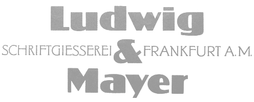 Big German foundry active in the first half of the 20th century. It was absorbed by Neufville in 1984, which will make its typefaces available in digital form. Type designers and typefaces:
 - House typefaces: Allemannia Fraktur (1908, or: Alemannia Fraktur; a digital revival in 2018 by Mew Varissara Ophaswongse), Allright (1936), Altenburger Gotisch (1928), Aristokrat Zierbuchstaben (1911: digital revival by Dieter Steffmann in 2002), Bastard Mediaeval, Beatrice (1931), Chic, Cochin (1922), Commerciale, Die Mode (1914-1915), Diplomat (1964, see the digital version Diploma by Hans van Maanen, 2009), Excelsior (1914, script face), Firmin Didot (1929), Hallo (1956), Kombinette (1932), Kupferplatte (1950), Largo (1939), Magnet (1951), Manolo (art nouveau: revival in 2019 by Ralph Unger as RMU Manolo), Nelson (1902, art nouveau), Wren, Samson Script, Luminous, Behrens. Kudos Kaps NF (2006, Nick Curtis) is a set of five nice ornamental caps and associated alphabet and border sets, including a Lombardic set, and an engraved set--they are based on typefaces from the Ludwig&Mayer library.
- Albert Christoph Auspurg: Rasse (1924), Mona Lisa (1930), Brigitte (1935), Krimhilde (1934)
- Hans Bohn: Allegro (1936-1937)
- Jakob Erbar: Erbar-Grotesk (1922-1930), Lucina, Lumina, Lux, Phosphor, Koloss (1923), Candida (1936, a mediocre didone family), Feder Grotesk (1910), Fette Feder Grotesk, Erbar
- Hace Frey: Charleston (1967, Alphonse Mucha-style display face)
- G. Germroth: Germroth-Deutsch (1935, blackletter)
- Erhard Grundeis: Achtung (1932)
- Karlgeorg Hoefer: Stereo (1968), Permanent (1962), Headline (1964), Elegance (1968), Big Band (1974)
- Walter Höhnisch: Tempo (1930), Werbeschrift Deutsch (1933), National (Fraktur, 1933-1934), Schräge National (1937), Skizze (1935, a script face), Stop (1939), Antiqua die Schlanke (1938-1939), Express (1952), Candida Italic (1937), Slender (1939)
- Heinrich Jost: Aeterna (or Jost Mediaeval, 1927)
- Walter Ferdinand Kemper: Colonia (1938-1939, a humanist sans)
- Wilhelm Krause: Professor-Krause-Fraktur (1930, blackletter)
- Paul Eduard Lautenbach: Prägefest (1926)
- Richard Ludwig: Augenheil (1908)
- Helmut Matheis: Charme (1957-1958, calligraphic), Slogan (1959, connected script), Primadonna (1956, a formal script), Matheis Mobil (1960), Compliment (1965, an angular vertical script)
- Joshua Reichert: Reichert-Gotisch (1930s).
- Imre Reiner: Contact (Deberny&Peignot, 1952; Ludwig&Mayer, 1968 (according to Jaspert), and 1963 according to others), Corvinus (ca. 1932), Stradivarius (1945)
- Lorenz Reinhard Spitzenpfeil: Welt-Fraktur (1910), Werk-Fraktur (1918)
- Alfred Riedel: Domino (1954: a fat face)
- Georg Schiller: Lyrisch (1907)
- Arthur Schulze: Werbekraft (1926)
- Ilse Schüle: Rhapsodie (1949-1951, bastarda)
- Johannes Schweitzer: Dominante (1959)
- Francesco Simoncini: Aster (or Aster Simoncini, 1958), Life (1965), Armstrong (1970), Simoncini Garamond (1961)
- K. Sommer: Dynamo (1930)
- Hans Wagner: Altenburger Gotisch (1928, Fraktur font), Welt (1931, slab serif), Wolfram (1930, a heavy upright italic).
- Eugen Weiss: Hoelderlin (1937-1938, blackletter)
[Google]
[MyFonts]
[More] ⦿
|
Mark Solsburg
[Group Type]
|
[MyFonts]
[More] ⦿
|
Mark Solsburg
[Grosse Pointe Group LLC]
|
[More] ⦿
|
Mary Catherine Pflug
|
 Boston-based American type designer who joined MyFonts as a foundry specialist in 2016. She is also one half of Type Sisters (with Lily Feinberg). Mary has a BA in International Business from Rollins College, class of 2016.
 Mary designed the beautiful pottery-style fattish poster typeface Dumpling (2012, Positype). This was a cooperation with Neil Summerour during her internship at Positype (2011-2016), but I let him explain the experience: Dumpling was drawn, digitized and mastered by an 18-year old over a semester-long Senior Concentration in Graphic Design at the South Carolina Governor's School for the Arts. Seriously, think about that! What were you doing when you were a senior in high school? I watched this unfold as her teacher, guiding where I needed to, encouraging when necessary, but ultimately putting her through a ridiculously tedious, painful and compressed process. She did not falter, she did not complain, she worked. In her own words (taken from an excerpt of her concentration paper), "In the middle of all this, I went to Charlotte, NC and saw and opera, the set designer was Jun Kaneko, [and afterwards] went to the Mint where we attended his talk (subsequently meeting him) and then perused a gallery of his work. His large ceramic forms made me realize how connected type is to sculpture. The medium may be different, but the ideas of negative space and forms interacting with each other and the view to convey a message are essentially the same. Architecture too, is surprisingly connected to type. I find myself gravitating towards the word, entasis a way of describing my letterforms, though they have no reference to the Parthenon or Classicism. In type you need balance, continuity, a little unexpectedness, and a good amount of math." [...] Mary Catherine, after completing her digitization, final tweaks, etc. in FontLab, turned the font over to me for OpenType coding and testing. In 2015, she co-designed Couture with Neil Summerour. This elegant typeface was inspired by Corvinus (Imre Reiner). On August 26, 2017, she presented the results of the second Font Purchasing Habits Survey in a 40-minute talk at TypeCon in Boston, MA. Twitter link. Dribble link. FontShop link. Home page. [Google]
[MyFonts]
[More] ⦿
|
Match&Kerosene
[Alex Sheldon]
|
 Match&Kerosene is Alex Sheldon's Detroit-based graphic design and typographic illustration company, est. 2008.
 Klingspor link. Behance link. Typefaces designed by Sheldon (b. Michigan, 1984) include Slab Sheriff (2009), Western, Kerosene Boxley (2009, a multiline art deco revival of a Solotype font; some say that it is based on a pair of 1972 alphabets by Marcia Loeb called Zig Zag and Rainbow), Kerosene Woodtype (2009), Kerosene Retroface, Kerosene Stereo (2009, revival of an Italian typeface from 1869), Kerosene Killowatt, White Wolf (2009, condensed horror movie face). Typefaces designed in 2011: Quimby (Copperplate Gothic style titling face), Black Bear (2011, straight-edged display family), Swifty (2011), Grizzly Bear (a set of 12 constructivist titling typefaces), Detroit (a modular family for superpositions), Prismatic (another superimposable multi-purpose family), Duotone (2011, Duotone is a layered font system that allows one to title two-tone headlines), Volcano Gothic (+Inline), Volcano Island (jungle look family), Lightyears. [Google]
[MyFonts]
[More] ⦿
|
Michel Troy
[Urban Pixel (or: UP Font Studio)]
|
[MyFonts]
[More] ⦿
|
Morris Fuller Benton
|
 Prolific American type designer (b. 1872, Milwaukee, d. 1948, Morristown, NJ), who published over 200 alphabets at ATF. He managed the ATF type design program from 1892 until 1937. Son of Linn Boyd Benton. MyFonts page on him. Nicholas Fabian's page. Linotype's page. Klingspor page. Unos tipos duros page. His fonts include:
 - 1897: Cloister Old Style (ATF). [Stephenson Blake purchased this from ATF and called it Kensington Old Style, 1919] [Cloister (2005, P22/Lanston) is based on Jim Rimmer's digitization of Benton's Cloister.]
- 1898: Roycroft. Mac McGrew on Roycroft: Roycroft was one of the most popular of a number of rugged typefaces used around the turn of the century, when printing with an antique appearance was in vogue. It was inspired by lettering used by the Saturday Evening Post. then a popular weekly magazine, and has been credited to Lewis Buddy, a former Post artist and letterer, but ATF says it was designed "partly" by Morris Benton, about 1898. Gerry Powell, director of typographic design for ATF in the 1940s, says, "Roycroft was first known as Buddy, changed when it was adopted by Elbert Hubbard for the Roycroft Press." Henry L. Bullen, ATF librarian and historian, says, "The first font of type to be made from matrices directly engraved on the Benton machine was 24-point Roycroft. October 4, 1900." While the machine was originally designed in 1884 to cut punches rather than matrices, it is doubtful that no fonts of mats were cut before 1900. Roycroft is also said to be the first typeface for which the large size of 120-point was engraved in type metal, with matrices made by electrotyping. Many typefaces of the day had a number of alternate characters. For this face. ATF gave specific instructions for their intended use: "M with the short vertex, in words the letters of which are open; R with the long tail, as a final letter in all-cap words; the wide h, m, and n, as a final letter only; t with the swash tail, as a final letter but not too frequently; u with the descending stroke, in words having no descending letters; ct ligature, wherever possible; the long s and its combinations, in antique work." Roycroft Open was cut in 1902, probably from the same patterns as the parent face. Roycroft Tinted is a very unusual face, in which the typeface is engraved with the equivalent of a halftone screen of about 25 percent tone value, with a black shadow on the right side; this typeface was cut by the Dickinson Type Foundry branch of ATF in Boston, and includes the same special characters as Roycroft. Compare Post Oldstyle.
- 1900: Century Expanded (1900: poster by Heather Leonhardt). This was a complete redraw of Century Roman which was designed in 1894 by his father, Linn Boyd Benton, for Theodore Low DeVinne, the publisher of Century Magazine. Digitizations by Elsner&Flake, Bitstream and URW.
- 1901: Linotext (aka WedddingText).
- 1901-1910: Engravers.
- 1901: Wedding Text (some put this in 1907), Old English Text, Engravers' Old English (a blackletter font remade by Bitstream). Wedding Text has been copied so often it is sickening: Wedding Regular and Headline (HiH, 2007), Dan X. Solo's version, Comtesse, Elite Kanzlei (1905, Stempel), Meta, Lipsia, QHS Nadejda (QHS Soft), Blackletter 681, Marriage (Softmaker), Wedding Text TL (by Tomas Liubinas).
- 1902: Typoscript.
- 1902-1912: Franklin Gothic. Digital versions exist by Bitstream, Elsner&Flake (in a version called ATF Franklin Gothic), Red Rooster (called Franklin Gothic Pro, 2011), Linotype, and ITC (ITC Franklin Gothic). Discussion by Harvey Spears. Mac McGrew: Franklin Gothic might well be called the patriarch of modern American gothics. Designed in 1902 by Morris Fuller Benton, it was one of the first important modernizations of traditional nineteenth-century typefaces by that designer, after he was assigned the task of unifying and improving the varied assortment of designs inherited by ATF from its twenty-three predecessor companies. Franklin Gothic (named for Benjamin Franklin) not only became a family in its own right, but also lent its characteristics to Lightline Gothic. Monotone Gothic, and News Gothic (q.v.). All of these typefaces bear more resem- blance to each other than do the typefaces within some other single families. Franklin Gothic is characterized by a slight degree of thick-and-thin contrast; by the double-loop g which has become a typically American design in gothic typefaces; by the diagonal ends of curved strokes (except in Extra Condensed); and by the oddity of the upper end of C and c being heavier than the lower end. The principal specimen here is Monotype, but the basic font is virtually an exact copy of the ATF typeface in display sizes, except that Monotype has added f- ligatures and diphthongs. Franklin Gothic Condensed and Extra Condensed were also designed by Benton, in 1906; Italic by the same designer in 1910; and Condensed Shaded in 1912 as part of the "gray typography" series. Although Benton started a wide version along with the others, it was abandoned; the present Franklin Gothic Wide was drawn by Bud (John L.) Renshaw about 1952. Franklin Gothic Condensed Italic was added by Whedon Davis in 1967. Monotype composition sizes of Franklin Gothic have been greatly modi- fied to fit a standard arrangement; 12-point is shown in the specimen-notice the narrow figures and certain other poorly reproportioned characters. The 4- and 5-point sizes have a single-loop g. Gothic No. 16 on Linotype and Inter- type is essentially the same as Franklin Gothic up to 14-point; in larger sizes it is modified and more nearly like Franklin Gothic Condensed. However. some fonts of this typeface on Lino have Gagtu redrawn similar to Spartan Black. with the usual characters available as alternates; 14-point is shown. Western Type Foundry and later BB&S used the name Gothic No.1 for their copy of Franklin Gothic, while Laclede had another similar Gothic No. 1 (q.v.). On Ludlow, this design was originally known as Square Gothic Heavy with a distinctive R and t as shown separately after the Monotype diphthongs; when the name was changed to Franklin Gothic in 1928, it was redrawn, closer to Franklin Gothic but still a bit top-heavy; the unique R was retained in standard fonts but an alternate version like that of ATF was made available separately; also a U with equal arms, a single-loop g, and a figure 1 without foot serifs. Ludlow Franklin Gothic Italic, partially shown on the third line of the specimen, is slanted much more than other versions, to fit the standard 17 -degree italic matrices of that machine. Modern Gothic Condensed and Italic (q.v.) are often though not properly called Franklin Gothic Condensed and Italic, especially by Monotype users. Also see Streamline Block.
- 1903: Alternate Gothic (ATF). See Alternate Gothic Pro Antique (Elsner&Flake), Alternate Gothic No2 (Bitstream), Alpin Gothic (by Team77), League Gothic (2009-2011, The League of Movable Type), and Alternate Gothic No1, No2 and No3 (see the URW version). Mac McGrew: Alternate Gothic was designed in 1903 by Morris F. Benton for ATF with the thought of providing several alternate widths of one design to fit various layout problems. Otherwise it is a plain, basic American gothic with no unusual features, but represents a more careful drawing of its nineteenth-century predecessors. The Monotype copies in display sizes are essentially the same as the foundry originals, with the addition of f-ligatures. The thirteen alternate round capitals shown in the first line of Alternate Gothic No.1 were designed by Sol Hess in 1927 for Monotype, hence the "Modernized" name; with these letters the design is sometimes referred to as Excelsior Gothic. Monotype keyboard sizes, as adapted by Hess about 1911, are considera- bly modified to fit a standard arrangement; caps are not as condensed as in the original foundry design. In 6-point, series 51 and 77 are both the same width, character for character, but some letters differ a bit in design. Note that these two narrower widths are simply called Alternate Gothic on Monotype, while the wider version is Alternate Gothic Condensed! Alternate Gothic Italic, drawn about 1946 by Sol Hess for Monotype matches No.2, but may be used with other widths as well. Condensed Gothic on Ludlow, is essentially a match for Alternate Gothic No.1, but has a somewhat different set of variant characters, as shown in the third line. There is also Condensed Gothic Outline on Ludlow, introduced about 1953, essentially an outline version of Alternate Gothic No.2. On Linotype and Intertype there is Gothic Condensed No.2 which is very similar to Alternate Gothic No. 1 in the largest sizes only, but with even narrower lowercase and figures. Also compare Trade Gothic Bold and Trade Gothic Bold Condensed. For a free version of Alternate Gothic No. 1, see League Gothic (2009-2011, The League of Movable Type).
- 1904: Bold Antique, Whitin Black [see OPTI Bold Antique for a modern digitization], Cheltenham (digitizations by Bitstream and Font Bureau, 1992), Cloister Black (blackletter font, see the Bitstream version: it is possible that the typeface as designed by Joseph W. Phinney).
- 1905: Linoscript (1905). Originally at ATF it was named "Typo Upright". Clearface, about which McGrew writes: Clearface was designed by Morris Benton with his father, Linn Boyd Benton, as advisor. The bold was designed first, in 1905, and cut the following year. The other weights and italics were produced through 1911. As the name implies, the series was intended to show unusual legibility, which it certainly achieved. The precision of cutting and casting for which ATF is noted produced a very neat and handsome series, which had considerable popularity. Clearface Heavy Italic has less inclination than the lighter weights, and is non-kerning, a detail which helped make it popular for newspaper use; the specimen shown here is from a very worn font. Some of the typefaces have been copied by the matrix makers. But the typeface Monotype calls Clearface and Italic is the weight called Bold by other sources. Monotype also includes Clearface Italic No. 289, a copy of the lighter weight. Revival and expansion by Victor Caruso for ITC called ITC Clearface, 1978. Also, American Extra Condensed, an octagonal mechanical typeface revived in 2011 by Nick Curtis as Uncle Sam Slim NF.
- 1906: Commercial Script (versions exist at Linotype, URW, Bitstream (called English 144), SoftMaker (2012), and Elsner&Flake), Miele Gothic, Norwood Roman.
- 1907: Lincoln Gotisch, named after Abraham Lincoln. This found found its way from ATF to Schriftguss, Trennert und Sohn, and Ludwig Wagner. Digital revivals include Delbanco's DS Lincoln-Gotisch. Compare with Comtesses, Lipsia, Elite Kanzlei, Lithographia and Wedding Text.
- 1908: News Gothic, Century Oldstyle (digital versions by Bitstream, Elsner&Flake, and URW), Clearface Gothic (1907-1910: digital revivals include Clear Gothic Serial (ca. 1994, SoftMaker) and Cleargothic Pro (2012, SoftMaker). McGrew: Clearface Gothic was designed by Morris Benton for ATF in 1908, and cut in 1910. It is a neat, clean gothic, somewhat thick and thin, which incorporates some of the mannerisms of the Clearface (roman) series. However, it can hardly be considered a part of that family. There is only one weight, and fonts contain only the minimum number of characters.
- 1909-1911: Rugged Roman. McGrew: Rugged Roman was designed for ATF by Morris F. Benton in 1909-11. It was patented in 1915, but the earliest showing seems to have appeared in 1917. It is a rugged face, as the name says, of the sort that was popular early in the century, but appears to have no relation to other typefaces having the name "Rugged." It somewhat resembles Roycroft, but is lighter. But to add to the uncertainty, fonts contained a number of ligatures of the kind which were more common in the early 1900s, in addition to the usual f-ligatures.
- 1910: Cloister Open Face, Hobo (1910, strongly influenced by the Art Nouveau movement; Hobo Light followed in 1915), ATF Bodoni (Bitstream's version is just called Bodoni, and Adobe's version is called Bodoni Book or Bodoni Poster or Bodoni Bold Condensed, while Elsner&Flake call theirs Bodoni No Two EF Ultra; Font Bureau's version has just two weights called BodoniFB-Bold Condensed and Compressed). McGrew writes about Hobo: Hobo is unusual in two respects---it is drawn with virtually no straight lines, and it has no descenders and thus is very large for the point size. It was designed by Morris F. Benton and issued by ATF in 1910. One story says that it was drawn in the early 1900s and sent to the foundry without a name, which was not unusual, but that further work on it was continually pushed aside, until it became known as "that old hobo" because it hung around so long without results. More time elapsed before it was patented in 1915. The working name was Adface. Hobo was also cut by Intertype in three sizes. Light Hobo was also drawn by Benton, and released by ATF in 1915. It is included in one list of Monotype typefaces, but its series number is shown elsewhere for another Monotype face, and no other evidence has been found that Monotype actually issued it.
- 1911-1913: Venetian, Cromwell. Mac McGrew: Cromwell is a rather playful typeface, designed by Morris Benton in 1913 but not released by ATF until three years later. It uses the same capitals as Cloister (q.v.) and has the same small x-height with long ascenders and descenders, but otherwise is quite different, with much less formality. Notice the alternate characters and the double letters including overhanging f's.. Cromwell was digitized by Nick Curtis in 2010 as Cromwell NF. Mac McGrew on Venetian: Venetian and Italic were designed by Morris F. Benton for ATF about 1911, with Venetian Bold following about two years later. They are rather reserved transitional typefaces, almost modern, instead of classic designs of Venetian origin as the name implies. The result is closer to Bodoni than to Cloister. The working title was Cheltenham No.2, but the relationship to that family is not apparent. It is carefully and neatly done, but never achieved widespread use. Compare Benton, a later typeface by the same designer, which has similar characteristics but more grace and charm.
- 1914: Adscript, Souvenir, Garamond (with T.M. Cleveland).
- 1916: Announcement, Light Old Style, Goudy Bold. Mac McGrew writes: Announcement Roman and Announcement Italic were designed by Morris F. Benton in 1916, adapted from steel or copperplate engravings, but not completed and released until 1918. These delicate typefaces have had some popularity for announcements, social stationery, and a limited amount of advertising work, but are a little too fancy for extensive use. Oddly, some of the plain caps shown in the specimens, both roman and italic, do not seem to appear in any ATF specimens. Foundry records show that a 48-point size of the roman was cut in 1927, but no other listing or showing of it has been found. In fact, sizes over 24-point were discontinued after a few years, and all sizes were discontinued in 1954.. Digitizations: Announcement Roman was revived by Nick Curtis in 2009 and called Society Page NF. Rebecca Alaccari at Canada Type revived it as Odette in 2004. See also Castcraft's OPTI Announcement Roman.
- 1916-1917: Invitation. For a digital revival, see Sil Vous Plait (2009, Nick Curtis).
- 1917: Freehand.
- 1917-1919: Sterling. Digitizations include Howard (2006, Paul D. Hunt), Argentina NF (2009, Nick Curtis), and Argentina Cursive NF.
- 1918: Century Schoolbook (1918-1921). (See ITC Century (Tony Stan, 1975-1979), or the Century FB-Bold Condensed weight by Greg Thompson at Font Bureau, 1992. For Century Schoolbook specifically, there are versions by Elsner&Flake, Bitstream and URW. Bitstream has a monospaced version.) URW Century Schoolbook L is free, and its major extension, TeXGyre Schola (2007) is also free.
- 1920: Canterbury. Mac McGrew: Canterbury is a novelty typeface designed by Morris F. Benton for ATF in 1920, when trials were cut, but not completed for production until 1926. It features a very small x-height, with long ascenders and descenders; monotone weight with minute serifs; and a number of swash capitals. It is primarily suitable for personal stationery and announcements. Compare Camelot Oldstyle. Digital versions were done by Nick Curtis in his Londonderry Air NF (2002-2004), and Red Rooster in the series Canterbury, Canterbury OldStyle, and Canterbury Sans.
- 1922: Civilité. Mac McGrew on the ATF Civilité: Civilite in its modern adaptation was designed by Morris Benton in 1922 and cut by ATF in 1923-24. The original version was cut by Robert Granjon in 1557 to imitate the semi-formal writing then in vogue, and is believed to be the first cursive design cut in type. It became popular for the printing of poetry and for books of instruction for children, where the type itself could serve as a perfect model of handwriting. The first of these books was titled La Civilite puerile, printed at Antwerp in 1559. The books were so popular that the design came to be known as "civility" type. Other interpretations of the letter have been made, including Cursive Script, cut in the nineteenth century in 18-point only from French sources by ATF predecessors and by Hansen, but Benton's seems more attractive and legible to modern eyes. The French pronunciation of ci-vil'i-tay is indicated by the accented e, which was used only in ATF's earliest showings. The many alternate characters were included in fonts as originally sold; later they were sold separately and finally discontinued, although the basic font was still listed in recent ATF literature. Also see ZapfCivilite. Compare Freehand, Motto, Verona.
- 1924: Schoolbook Oldstyle.
- 1926-1927: Typo Roman.
- 1927: Chic (American Typefounders; doubly shaded capitals and figures), Gravure, Greeting Monotone, Goudy Extra Bold. The art deco typeface Chic was revived by Nick Curtis as Odalisque NF (2008) and Odalisque Stencil NF (2010).
- 1928: Parisian, Bulmer (revival of William Martin's typeface from 1792 for the printer William Bulmer; digital forms by Monotype, Adobe, Linotype, and Bitstream), Broadway (1928-1929, see two styles offered by Elsner&Flake, Linotype, Bitstream, and 11 weights by URW), Goudy Catalogue, Modernique, Novel Gothic (ATF, designed with Charles H. Becker), Dynamic. Novel Gothic has seen many digital revivals, most notably Telenovela NF (2011, Nick Curtis), Naked Power (Chikako Larabie) and Novel Gothic SG (Jim Spiece). Images of Bulmer: i, ii, iii, iv, v, vi, vii, viii, ix, x, xi, xii.
- 1929: Louvaine. McGrew: Louvaine series was designed by Morris F. Benton for ATF in 1928. It is an adaptation of Bodoni (the working title was Modern Bodoni), and many of the characters are identical. Only g and y are basically different; otherwise the distinction is in the more abrupt transition from thick to thin strokes in this series. In this respect, Ultra Bodoni has more affinity to Louvaine than to the other Bodoni weights. The three weights of Louvaine correspond to Bodoni Book, Regular, and Bold. This series did not last long enough to appear in the 1934 ATF specimen book, the next complete one after its introduction. Compare Tippecanoe.
- 1930: Benton, Engravers Text, Bank Gothic (see Bitstream's version), Garamond-3 (with Thomas Maitland Cleland), Paramount (some have this as being from 1928: see Eva Paramount SG by Jim Spiece). McGrew: Paramount was designed by Morris Benton in 1930 for ATF. It is basically a heavier companion to Rivoli (q. v.), which in turn is based on Eve, an importation from Germany, but is heavier than Eve Bold. It is an informal typeface with a crisp, pen-drawn appearance. Lowercase is small, with long ascenders and short descenders. Vertical strokes taper, being wider at the top. It was popular for a time as an advertising and announcement type.
- 1931: Thermotype, Stymie (with Sol Hess and Gerry Powell). Stymie Obelisk is a condensed Egyptian headline face---the latter was revived by Nick Curtis as Kenotaph NF (2011).
- 1932: Raleigh Gothic Condensed (the digital version by Nick Curtis is Highpoint Gothic NF (2011)), American Text (blackletter). Mac McGrew: Raleigh Gothic Condensed was designed by Morris F. Benton for ATF in 1932. It is a prim, narrow, medium weight gothic face, with normally round characters being squared except for short arcs on the outside of corners. The alternate characters AKMNS give an even greater vertical appearance than usual. At first, this typeface was promoted with Raleigh Cursive as a stylish companion face, although there is no apparent relationship other than the name. Compare Phenix, Alternate Gothic, Agency Gothic.
- 1933: American Backslant, Ultra Bodoni (a great Bodoni headline face; see Bodoni FB (1992, Font Bureau's Richard Lipton). About Agency Gothic, McGrath writes: Agency Gothic is a squarish, narrow, monotone gothic without lower- case, designed by Morris F. Benton in 1932. It has an alternate A and M which further emphasize the vertical lines. Sizes under 36-point were added in 1935. Agency Gothic Open was drawn by Benton in 1932 and introduced in 1934; it follows the same style in outline with shadow, and probably has been more popular than its solid companion. Triangle Type Foundry, a Chicago concern that manufactured matrices, copied this typeface as Slim Open, adding some smaller sizes. ATF's working titles for these typefaces, before release, were Tempo, later Utility Gothic and Utility Open. Compare Raleigh Gothic Condensed, Poster Gothic, Bank Gothic. Digital versions include Warp Three NF (2008, Nick Curtis), which borrows its lowercase from Square Gothic (1888, James Conner's Sons), FB Agency (1995, David Berlow at FontBureau), Agency Gothic (by Dan Solo) and OPTI Agency Gothic (by Castcraft).
- 1934: Shadow, Tower (heavy geometric slab serif), Whitehall. Font Bureau's Elizabeth Cory Holzman made the Constructa family in 1994 based on Tower. Digital versions include Warp Three NF (2008, Nick Curtis), which borrows its lowercase from Square Gothic (1888, James Conner's Sons), FB Agency Gothic (1995, David Berlow at FontBureau) and Agency Gothic by Castle Type. Eagle Bold followed in 1934. McGrew: Eagle Bold is a by-product of the depression of the 1930s. The National Recovery Administration of 1933 had as its emblem a blue eagle with the prominent initials NRA, lettered in a distinctive gothic style. Morris Benton took these letters as the basis for a font of type, released later that year by ATF, to tie in with the emblem, which businesses throughout the country displayed prominently in advertising, stationery, and signs; naturally it was named for the eagle. Compare Novel Gothic. USA Resolute NF (2009, Nick Curtis) is based on Eagle Bold.
- 1935: Phenix. This condensed artsy sans was revived in 2011 at Red Rooster by Steve Jackaman and Ashley Muir as Phoenix Pro.
- 1936: Headline Gothic. For a digital version, see ATF Headline Gothic (2015, Mark van Bronkhorst, Igino Marini, & Ben Kiel at American Type Founders Collection).
- 1937: Empire. This ultra-condensed all caps skyline typeface was digitally remade and modernized by Santiago Orozco as Dorsa (2011). Jeff Levine reinterpreted it in 2017 as Front Row JNL. Bitstream also has a digital revival.
Linotype link. FontShop link. Picture. Typefaces alphabetic order: - Adscript
- Agency Gothic (+Open
- Alternate Gothic No.1 (+No.2, +No.3)
- American Backslant
- American Caslon&Italic
- American Text
- Announcement Roman&Italic (1916). For digital revivals or influences, see Friendly (2012, Neil Summerour), Odette (2004, Canada Type) and Society Page NF (2009, Nick Curtis).
- Antique Shaded
- Bank Gothic Light (+Medium, +Bold, +Light Condensed, +Medium Condensed, +Bold Condensed). For digital versions, see Bank Gothic AS Regular and Condensed (2008, Michael Doret).
- Baskerville Italic
- Benton (Whitehall)&Italic
- Bodoni&Italic (+Book&Italic, +Bold&Italic, +Bold Shaded, +Bold Open)
- Bold Antique (+Condensed)
- Broadway (+Condensed). The prototyical art deco typeface (1928-1929).
- Bulfinch Oldstyle (1903).
- Bulmer&Italic
- Canterbury
- Card Bodoni (+Bold). 1912-1916.
- Card Litho (+Light Litho)
- Card Mercantile
- Card Roman
- Century Expanded&Italic
- Century Bold&Italic (+Bold Condensed, +Bold Extended)
- Century Oldstyle&Italic (+Bold&Italic, +Bold Condensed)
- Century Catalogue&Italic
- Century Schoolbook&Italic (+Bold)
- Cheltenham Oldstyle&Italic (+Condensed, +Wide)
- Cheltenham Medium&Italic (+Medium Condensed, +Medium Expanded, +Bold&Italic, +Bold Condensed&Italic, +Bold Extra Condensed&Title, +Bold Extended, +Extrabold, +Bold Outline, +Bold Shaded&Italic, +Extrabold Shaded, +Inline, +Inline Extra Condensed, +Inline Extended)
- Chic
- Civilite
- Clearface&Italic (1907, +Bold&Italic, +Heavy&Italic)
- Clearface Gothic: a flared version of Clearface.
- Cloister Black
- Cloister Oldstyle&Italic (+Lightface&Italic, +Bold&Italic, +Bold Condensed, +Cursive, +Cursive Handtooled, +Title&Bold Title)
- Commercial Script
- Copperplate Gothic Shaded
- Cromwell.
- Cushing Antique (1902).
- Della Robbia Light
- Dynamic Medium
- Eagle Bold
- Empire (1937). A skyline typeface.
- Engravers Bodoni
- Engravers Old English (+Bold)
- Engravers Bold
- Engravers Shaded
- Engravers Text
- Franklin Gothic&Italic (+Condensed, +Extra Condensed, +Condensed Shaded)
- Freehand (1917). Mac McGrew: Freehand, a typeface based on pen-lettering, was designed for ATF by Morris Benton in 1917. The working title before release was Quill. Derived from Old English, it is an interesting novelty, and has had quite a bit of use. Compare Civilite, Motto, Verona.
- Garamond&Italic (+Bold&Italic, +Open)
- Globe Gothic (+Condensed, +Extra Condensed, +Extended, +Bold&Italic)
- Goudy Bold&Italic (+Catalogue&Italic, +Extrabold&Italic, +Handtooled&Italic, +Title)
- Gravure
- Greeting Monotone
- Headline Gothic
- Hobo&Light Hobo (1910). For digital versions, see Informal 707 (Bitstream), Hobbit (SF), Homeward Bound (Corel), Hobo No2 (2012, SoftMaker), Bogo (2016, Harold Lohner), and Hobo (Bitstream).
- Invitation (+Shaded)
- Light Oldstyle
- Lightline Gothic&Title (1908). For a revival, see Benton Gothic Thin NF (2014, Nick Curtis).
- Lithograph Shaded (1914, with W.F. Capitain).
- Louvaine Light&Italic (+Medium&Italic, +Bold&Italic)
- Miehle Extra Condensed&Title
- Modernique
- Monotone Gothic&Title
- Motto (1915). Mac McGrew: Motto is a calligraphic typeface designed by Morris F. Benton for ATF in 1915. It is similar to the same designer's Freehand, drawn a couple of years later, but has plainer capitals, heavier thin strokes, and shorter descenders. But letters combine into legible words with a pleasant, hand-lettered appearance. Also compare Humanistic, Verona. For a digital version, see Motto by Juan Kafka.
- News Gothic (+Condensed, +Extra Condensed&Title)
- Norwood Roman
- Novel Gothic
- Othello
- Packard (+Bold)
- Paramount
- Parisian
- Pen Print Open
- Phenix
- Piranesi Italic (+Italic Plain Caps, +Bold&Italic, +Bold Italic Plain Caps)
- Poster Gothic (1934).
- Raleigh Gothic Condensed (1934).
- Rockwell Antique
- Roycroft
- Rugged Roman
- Schoolbook Oldstyle
- Shadow
- Souvenir (1914). Revived in 1977 by Ed Benguiat as ITC Souvenir, but a total failure as a type design. Simon Garfield: Souvenir was the Comic Sans of its era, which was the 1970s before punk. It was the typeface of friendly advertising, and it did indeed appear on Bee Gees albums, not to mention the pages of Farrah Fawcett-era Playboy. Mark Batty from International Typeface Corporation (ITC) on one of his best-selling fonts: A terrible typeface. A sort of Saturday Night Fever typeface wearing tight white flared pants. Garfield also retrieved this quote by type scholar Frank Romano in the early 1990s: Real men don't set Souvenir. Digital revivals also include Sunset Serial by Softmaker, and ITC Souvenir Mono by Ned Bunnel.
- Sterling&Cursive
- Stymie Light&Italic (+Medium&Italic, +Bold&Italic, +Black&Italic)
- Thermotypes
- Tower Condensed (1934). Revived by Photo-Lettering Inc as PL Tower.
- Typo Roman&Shaded
- Typo Script and Typo Script&Extended (1902)
- Typo Shaded
- Typo Slope
- Typo Upright&Bold
- Ultra Bodoni&Italic (+Condensed, +Extra Condensed)
- Venetian&Italic (+Bold)
- Wedding Text&Shaded
View Morris Fuller Benton's typefaces. A longer list. A listing of various digital versions of News Gothic. More News Gothic-like typefaces. Even more News Gothic-like typefaces. [Google]
[MyFonts]
[More] ⦿
|
Nazzar Saputra
[Craft Supply]
|
 [MyFonts]
[More] ⦿
[MyFonts]
[More] ⦿
|
North Type (was: Charles Daoud Type, or: CD Type)
[Charles Daoud]
|
 Charles Daoud is a graphic designer and art director in Laval, near Montreal. He was born in Montreal in 1980. He set up Charles Daoud Type, or CD Type, in 2013 and renamed his type foundry North Type in 2018. His typefaces include:
 - Dense (2013). A free geometric sans serif typeface family.
- Dual (2014). A geometric sans with many features that will make hipsters happy. Dual 100 is one of the finest hairline sans typefaces of the recent past. Dual 300 is free.
- Locke (2016). A stunning stylish slab serif typeface family.
- Quartier (2011). A sans headline typeface.
- Radio Canada (2017). A custom corporate humanist sans typeface for the French TV network in Quebec, co-designed by Charles Daoud and Alexandre Saumier-Demers of Coppers and Brasses. Google Fonts link. Github link.
- Voga (2014). A stylish high-contrast skyline condensed didone with a free Medium weight.
- Grand (2018). He writes: Inspired by old school sign painting techniques, Grand is a display condensed sans serif that isn't shy to put its foot down. Regular and Italic are free.
[Google]
[MyFonts]
[More] ⦿
|
Nour Atef
|
 Egyptian designer of the condensed Latin typeface Comley (2017). [Google]
[More] ⦿
Egyptian designer of the condensed Latin typeface Comley (2017). [Google]
[More] ⦿
|
Ochaya Designs
[Eric Ochaya]
|
 Fredericton, New Brunswick, Canada (was: Ottawa, Canada)-based designer of the free textured typeface Khepri (2017), which was inspired by Egyptian hieroglyphics. He also designed Voyager (2017), the textured typeface Embers (2017), the 22-style art deco sans Dianna (2017), and the letterpress emulation typeface family Barry (2017).
 Typefaces from 2018: Barlet (a free display sans), Portia (film noir caps). [Google]
[More] ⦿
|
Paul H. Neville
|
 Boston-based designer. His typefaces:
 - The display skyline sans serif FF Kath Condensed (1992, FontFont). It is accompanied by a gorgeous Inline. Four styles in all.
- FF Extra Condensed (1995, FontFont), one of the first blocky ultra-fat typefaces. FF Extra Black (1995, FontFont) is as black as you can get.
FontShop link. Klingspor link. [Google]
[MyFonts]
[More] ⦿
|
Santiago Orozco
[Typemade]
|
 [MyFonts]
[More] ⦿
[MyFonts]
[More] ⦿
|
Sharkshock
[Dennis Ludlow]
|
 Dennis Ludlow (Sharkshock Productions, Raleigh, NC) started making mostly free fonts in 1999. On August 28, 2001, Dennis announced that he would stop producing fonts, forever. To prove himself wrong, he became more prolific trhan ever, and ultimately started designing retail fonts as well.
 His early typefaces include Hot Pizza (2001), Hawaiian Punk, Royal Acidbath, Little Caesar, Subway, Holiday India, Mobsters, Dallas Cowboys (Western look, 2004), Dark Crystal, Queen of Camelot (2015), Green Eggs and Spam (2015), Ludlow Strong Ale (2015, German beer label font), Space Angel (2014), Electrox, Cowboys, Dolphins, Viking Stencil, Lexust (2002), Padaloma (2002), Fujita Ray (2002), Willy Wonka, Hursheys, Grinched (a Halloween or beatnik font), Honda, Busch Gardenz, Holiday India (2000), Simpsons, Blockbusted, IHOP, Chicken Fool A, Playtoy (2000: like the masthead of Playboy), Cowboys (2001), Dreamscar (2001, has a Cyrillic version), Mr. Goodbaur, Dr. Peppers, Oreos, Air Millhouse, Fruitopia, Raiders, TGI Friday, Jolly-Raunchy, Mouser, Pirate-Keg, Fujita Ray (2015), Modeccio (2015, art deco), Wendyville (2015, Western), Vonique 64 (2015, avant-garde style), Your Royal Majesty (2015, a unique blackletter-inspired vampire script), Hackney Block (2015), Thunder Lord (2015, an outlined variant of Raiderfont), Republica Minor (2015), News of the World (2015: a news headline font), TH3 Machine (2015), Funkrocker (2015, inky, grungy), Tiki Tropic (2015: a tiki font), TypoGraphica (2015, a strong geometric sans), Vonique 92 (2015, circle-based fashion sans), Reisenberg (2015, a black titling sans; v2.0 dates from 2018). There is also a medium-sized categorized archive, with subsections such as cartoon fonts and movie fonts. Typefaces from 2016: Twiddlestix, Konigsberg (rounded sans), Wicked Mouse (looney tunes typeface), Heathergreen (a tall condensed sans), Wonderbar (psychedelic), College Block (athletic lettering), Death Star, Ring of Kerry (uncial style), Blockletter (octagonal), Café Françoise, Cronus (round monoline sans), Suissnord (a wide sans display typeface), Grinched 2.0 (an update of Grinched), Red Seven (futuristic), Enchanted Land (derived from the blackletter genre), Freakshow (ornamental ransom note font), Deutschlander (a condensed sans for movie credits and similar applications). Typefaces from 2017: Lemonade Stand, Dark & Black, Hennigar (a heavy compact sans in the spirit of Impact), Durango Western, Banbury (a heavy display didone), United Kingdom (techno), Goldoni, Kingsmen. Typefaces from 2018: Bloomsburg (a 6-style organic sans; +Cyrillic), Stupid Meeting (an all caps display typeface), Medusa Gothic, Carson (tall grotesque), Collegeblock 2 (an octagonal varsity font), Medusa Gothic, Royal Crescent (sans), Praetoria, Papaya Sunrise, Helmswald Post (blackletter). Typefaces from 2019: Deutschlander 2.0 (an organic monoline sans, with coverage of Cyrillic and Greek), Zanzabar (a genie lamp or Arabic emulation typeface), Vonique 43 (an organic fashion mag sans), Delacorso Outlines (tall decorative caps), Kwixter Sketch (for Latin and Cyrillic). Typefaces from 2020: Stupid Meeting (an all caps sans with a comic book feel, appropriately named to describe most COVID era Zoom work sessions), Toyster (a plumpish typeface), Wonderbar 2 (psychedelic, all caps), Boldstrom (a tightly spaced heavy industrial sans), Reisenberg, Snicker Snack, Crosshatcher (a sketched font), Czesko (a skyline font), Storybook Ending (a mix of uncial and Tuscan), Toyster (a bubblegum font). Typefaces from 2021: Kamryn (a display serif), Mouser (an organic geometric sans in six styles), Dottingham (a Victorian typeface), Tempestua (a sharp bold display sans), Lemonade Stand, Brontoburger (a vernacular typeface). Typefaces from 2022: Jumbalo (a bubblegum font). Abstract Fonts link. Creative Fabrica link. [Google]
[MyFonts]
[More] ⦿
|
Skyline Fonts
|
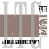 Skyline fonts are fonts that are ultra narrow or condensed in a style often seen in American magazines in the 1930s and 1940s. This group contains fonts such as Swifty (2011, Alex Sheldon, Match & Kerosene), Empire (1989-1994, David Berlow and Kelley Ehrgott-Milligan, Font Bureau), Spire (Ann Pomeroy, Group Type), LTC Spire (2005, Lanston), Corvinus Skyline (1991, Ann Pomeroy, Group Type), Niagara (1994, Tobias Frere-Jones, Font Bureau), and Manygo Serif (2012, Michel Troy).
 Font Bureau's Empire is a 7-style extension of the Empire type designed in 1937 by Morris Fuller Benton for Vogue, where it was used as a headline style. A year later, in 1938, Sol Hess created an ultra-narrow didone caps only family called Spire, which similar magazine titling applications. It was that typeface that was extended in digital form by Ann Pomeroy of Group Type and by Lanston in 2005. The typeface family Niagara by Tobias Frere-Jones revisits both styles. A separate duckling with its ultra large x-height is Corvinus Skyline, designed in 1934 by Imre Reiner. It was digitized in 1991 by Group Type. [Google]
[More] ⦿
|
Sol Hess
|
 American typographer and type designer, b. 1886, Philadelphia, d. 1953. He was a man with class and style, who influenced many through his work. He managed the Lanston library from early in the 20th century (he joined Lanston in 1902) until the second World War. He created many of its typefaces himself, and commissioned many from Frederic W. Goudy. His typefaces (LTC stands for Lanston Type Company):
 - Alternate Gothic Modernized.
- LTC Artscript (Lanston Monotype, 1940; digital version in 2005 at P22/Lanston). McGrew: Artscript is a delicate calligraphic letter designed by Sol Hess for Monotype, which calls it "an attempt to convert into rigid metal the graceful penmanship of the ancient scribe. ..based on the writing of Servidori of Madrid (1798)." It was designed in 1939 but not released until 1948, because of wartime restrictions. It is a pleasing design for limited use, but its delicacy requires special care in handling. Compare Heritage, Lydian Cursive, and Thompson Quillscript.
- In 1928, he created the now famous Broadway Engraved. P22 writes: LTC Broadway was originally designed by Morris Benton. Sol Hess added a lower case in 1929 and also drew Broadway Engraved for Lanston Monotype. That font is now available in digital format from LTC/P22. Other digital fonts include OPTI Broadway Engraved from Castcraft, Broadway Inline (Softmaker), B820 Deco (Softmaker), B821 Deco (Softmaker), Deco 901 (Bitstream) and Bravo (Corel).
- Bodoni 26: a unicase interpretation of Bodoni by Hess at Lanston, designed by Giampa; digital version at P22/Lanston in 2005.
- Bodoni No. 175 (remastered in 2006 by Paul Hunt).
- LTC Bodoni Bold.
- Bruce Old Style No. 31: a transitional font at Lanston Monotype in 1909. Now a Bitstream face. Based on Bruce Old Style No. 20 from Bruce Foundry (1869).
- Linotype states that Sol Hess is responsible for a version of Cochin Bold (1921): Georges Peignot designed Cochin based on copper engravings of the 18th century and Charles Malin cut the typeface in 1912 for the Paris foundry Deberny&Peignot. The font is named after the French engraver Charles Nicolas Cochin (1715-1790) although its style had little to do with that of the copper artist's. The font displays a curious mix of style elements and could be placed as a part of the typographical Neorenaissance movement. Cochin is especially large and wide and was very popular at the beginning of the 20th century. Note: Cochin is now sold by Linotype, Adobe, Monotype, URW++ and Bitstream (as Engravers' Oldstyle 205).
- English Caslon no 37.
- Flash.
- Goudy Bible (1948). Mac McGrew: Goudy Bible is a modification of Goudy Newstyle (q.v.), adapted by Bruce Rogers with the assistance of Sol Hess for use in the Lectern Bible Rogers designed for World Publishing Company in 1948.
- Goudy Bold Swash.
- Goudy Heavyface Open (1926) and Condensed (1927). Mac McGrew: Goudy Heavface and Italic were designed by Goudy in 1925 in response to a strong request by Monotype for a distinctive typeface on the order of the very popular foundry Cooper Black. Such typefaces had little appeal for Goudy, and he always felt that Monotype was disappointed in his efforts, but the result is more informal than other similar types, and has had considerable popularity. Note the extra set of figures and the unusual number of tied characters and ornaments in the font. Goudy Heavyface Open is a variation produced by Monotype in 1926, probably designed by Sol Hess, who designed Goudy Heavyface Condensed in 1927. Compare Cooper Black, Ludlow Black, Pabst Extra Bold. See LTC Goudy Heavyface, or Goudy Heavyface (Bitstream).
- Hadriano Stone-Cut.
- Hess, Hess Bold (1910). Mac McGrew: Hess Bold was designed by Sol Hess for Monotype about 1910, as a companion typeface for Goudy Light, drawn earlier by Frederic W. Goudy. Of medium weight, it accurately reflects the characteristics of the lighter face with a high degree of legibility, but neither typeface is distinguished. There is also an italic by Hess.
- Hess Monoblack. A great display poster typeface that looks like a hand-drawn version of Nicolas Cochin. Mac McGrew: Hess Monoblack is a Monotype typeface that no doubt was drawn by Sol Hess, but it has not been found in any accounts of his work nor in the regular specimen books. The showing here is reproduced from Monotype's "specimen on request" sheet; no other information has been found except that there are only two sizes with seventy-seven characters each, a practical minimum for cap-and-lowercase fonts. Compare Greco Bold. See P22/Lanston for a digital version called LTC Hess Monoblack done by Paul Hunt in 2005.
- Hess New Bookbold (1946). Mac McGrew: Hess New Bookbold was designed for Monotype in 1946 by Sol Hess. with italic the following year; both were released in 1948. An adaptation of Garamond Bold, the typeface was reproportioned to fit a new standard arrangement which was intended to make it readily available for use with several standard oldstyle typefaces still in common use at the time, but little use seems to have been made of it. Ascenders and descenders are shorter than in Garamond, anticipating later phototype trends, weight is slightly greater, and letters are more tightly fitted.
- Hess Old Style (1920-1923). Mac McGrew: Hess Old Style was designed about 1920 (one source says 1912) by Sol Hess for Monotype, which says it was modeled after a typeface shown by Nicolas Jenson about 1479. It is neat, but does not have much in common with Centaur, Cloister, and other typefaces based on Jenson's work. However, it is a little heavier than most of them and so works to good advantage on smooth papers. The italic followed in 1922. Revived by Steve Jackaman in 1993 as Hess Old Style RR.
- Hess Neobold (1933-1934). Mac McGrew: Hess Neobold was designed by Sol Hess for Monotype in 1934. It is a narrow, bold, and very squarish gothic with small serifs, designed for attention-getting display in a style of the day, but never made in more than one size. Compare Airport Tourist (Futura Display), Othello.
- Hess Title (+Italic, 1910). Mac McGrew: Hess Title and Italic were the first type designs drawn by Sol Hess. Produced in 1910 as advertising types, they were designed for and first used by a prominent New York department store. Only the roman was made in display sizes.
- Italian Old Style Wide.
- Janson.
- LTC Jefferson Gothic: an adaptation of News Gothic Extra Condensed drawn by Sol Hess in 1916; digital version at P22/Lanston in 2005. Mac McGrew: Jefferson Gothic was originally Monotype's copy of News Gothic J Extra Condensed, using the same foundry name. In 1916 Sol Hess designed several alternate round capitals; matrix fonts include both styles of these letters, but no lowercase. Baltimore Type called it Tourist Extra Condensed. Compare Phenix.
- Kennerley Open Caps.
- Laurentian.
- Martin (+Italic). Mac McGrew: Martin and Italic are listed as a Monotype production of 1945, adapted by Sol Hess from old sources, but no specimen or further information has been found.
- New Bookman.
- Onyx Italic (1939, for Monotype). The italic version of Gerry Powell's 1937 ATF typeface Onyx, a condensed version of Poster Bodoni.
- Pendrawn (1934). Mac McGrew: Pendrawn was designed for Monotype about 1933 by Sol Hess. It retains much of the quality of sixteenth-century hand-lettering, and is generally modem in character without the severity typical of most modem types. Serifs are long and thin, slightly concave, but those at the top of lowercase stems are slanted as in oldstyle types. Stems taper slightly toward the ends, and figures are hanging. Round letters tend toward an egg shape, with the small end down. It has been made only in two sizes: regular 36-point as a complete font and 36H4 as oversize capitals only.
- Postblack Italic.
- Post-Stout Italic.
- Poster or Hess Poster. Mac McGrew: Poster or Hess Poster is a heavy, narrow, very compact gothic designed by Sol Hess for Monotype. Its general appearance suggests a contemporary serifless design but in fact there is a slight hint of serifs. The slightly splayed M and the single-bowl g are suggestive of British grotesques. Ascenders and descenders are short, giving a large x-height, and the typeface is closely fitted.
- Slimline (1939). Mac McGrew: Slimline was designed by Sol Hess in 1939 for Monotype. It is a lightweight, very narrow, monotone typeface with tiny serifs and a number of alternate round characters. It has had some use for stationery. Compare Huxley Vertical.
- Spire (1937): a condensed didone, see the digital LTC Spire in the Lanston collection. Mac McGrew: Spire is a modernization of the old modern roman extra-condensed style. drawn by Sol Hess for Monotype in 1937. There is no lowercase, but there are several alternate round characters. Compare Greenwich, Modern Roman Extra Condensed, also Empire, Slimline. Spire is also the name of a dissimilar BB&S face, cut in 1898 or earlier and shown as late as 1927. Spire has been digitized/revived by Ann Pomeroy under the same name for FontHaus and then Group Type. LTC Obelysk Grotesk was designed by the Lanston Drawing Office in the late 1980s. This typeface is a reconstruction of Spire. The skeleton of Spire Roman stands with the serifs removed. Like Spire, this font has no lower case, but does offer alternate cap styles in some of the lower case positions.
- Squareface (1940). Now available digitally as LTC Squareface from LTC/P22. Mac McGrew: Squareface was designed by Sol Hess in 1940 as a variation of Stymie Extrabold. A number of characters are the same for both typefaces, but normally round letters have been squared considerably, with only slightly rounded corners. It makes a vigorous display face, and harmonizes well with other square-serif designs.
- Stationers Gothic (1942-1948). Mac McGrew: Stationers Gothic Light and Bold were designed by Sol Hess for Monotype in 1942, and Medium in 1944, but wartime and post-war conditions delayed their release until 1948. They are similar to the Bank Gothics. following a style of squared letter popular for copperplate engraved stationery and announcements, and in effect constitute a more contemporary form of the style typified by Copperplate Gothics. Like the others, there are several sizes on each of several different bodies, making various cap-and-small-cap combinations easily practical.
- Style Script (1940). Mac McGrew: Style Script was designed by Sol Hess for Monotype in 1940. It is a popular bold thick-and-thin cursive style, which has had considerable use in advertising. It is somewhat like the earlier Coronet Bold of Ludlow, but heavier and with a greater x-height; some characters seem to make a conscious effort to differ.
- Stymie.
- Tourist Gothic (Lanston, 1909; now available digitally as LTC Tourist Gothic from LTC/P22). Mac McGrew: Tourist Gothic is a Monotype copy of Modern Condensed Gothic with a set of several round alternate caps designed by Sol Hess in 1928. (Sizes under 14-point continued under the Modern Condensed Gothic name, without the alternates.) In 1938 Hess drew a matching Tourist Gothic Italic, which added to the popularity of the face, although it lacks the round characters. The Outline Gothic Medium Condensed (or Franklin Gothic Condensed Outline) from some sources is actually an open version of Tourist Gothic. Tourist Extra Condensed of Baltimore Type is a copy of Phenix (q.v.) in 24- to 48-point sizes, and is Jefferson Gothic (q.v.) in larger sizes.
- Twentieth Century was designed by Hess between 1936 and 1947 as a monoline version of Paul Renner's Futura. Mac McGrew: Twentieth Century is Monotype's copy of Futura (q.v.), and in display sizes is essentially an exact copy, while composition sizes are only slightly modified. Several additional versions were drawn for Monotype by Sol Hess, including Twentieth Century Bold Italic and Extrabold Italic in 1937, Extrabold Condensed Italic in 1938, Ultrabold in 1941, Ultra bold Condensed in 1944, and Medium Condensed Italic and Ultra bold Italic in 1947. Some of these weights have different names than their counterparts in the original Futura series or other copies; see the list under Futura for comparison of these names as well as technical data. The main version is sold by Monotype as Twentieth Century MT. The digital type foundry Lanston, or LTC, sells LTC Twentieth Century. Hess Gothic Round NF (2008, Nick Curtis) is based on Twentieth Century. The design was reinterpreted by Herb Lubalin as Avant Garde in the 1970s. Curtis' version softens the harsh geometry of the original designs with rounded line endings. Revivals and derivations of Twentieth Century Poster include Renard Moderne NF (2010, Nick Curtis).
- Ward (1942). McGrew: ard or Montgomery Ward is an adaptation by Sol Hess in 1942 of Memphis Light, specially redesigned for use in the large catalogs of that mail-order company. Strokes are lightened a bit, and the x-height is increased slightly. It was cut by Monotype for private use. One reference says there were light and medium weights; another says there were roman and italic in normal width and also an extended version. The latter account seems more authentic.
Digital descendants of Sol Hess: LTC Hess Monoblack (Lanston Type Company), Hess Old Style (Red Rooster Collection), Hess Gothic Round NF (Nicks Fonts), Twentieth Century (Monotype), LTC Squareface (Lanston Type Company), Broadway Engraved SH (Scangraphic Digital Type Collection), Bruce Old Style (Bitstream), LTC Jefferson Gothic (Lanston Type Company), LTC Spire (Lanston Type Company), LTC Swing Bold (Lanston Type Company), LTC Artscript (Lanston Type Company), LTC Twentieth Century (Lanston Type Company), LTC Tourist Gothic (Lanston Type Company), Renard Moderne NF (Nicks Fonts), Goudy Heavyface (Bitstream), Broadway (Monotype), LTC Broadway (Lanston Type Company), Broadway (Linotype), LTC Hadriano (Lanston Type Company), Cochin (Linotype), LTC Bodoni 175 (Lanston Type Company), Stymie (Bitstream), Engravers Oldstyle 205 (Bitstream), LTC Bodoni 26 (Lanston Type Company), LTC Obelysk Grotesk (Lanston Type Company), Century Gothic (Monotype), Spire (GroupType), Havel (T4), Alternate Gothic Pro Antique (Elsner+Flake). Klingspor link. FontShop link. Linotype link. [Google]
[MyFonts]
[More] ⦿
|
Stanislav Chiganov
|
 Saint Petersburg, Russia-based designer of the Latin / Cyrillic calligraphic typeface Antarctic (2018) and the Latin / Cyrillic skyline typeface Journalism (2016). [Google]
[More] ⦿
Saint Petersburg, Russia-based designer of the Latin / Cyrillic calligraphic typeface Antarctic (2018) and the Latin / Cyrillic skyline typeface Journalism (2016). [Google]
[More] ⦿
|
The Font Company
|
 Dan Barthell's Phoenix, AZ-based foundry, was founded in 1988. It produced about 400 fonts. It was merged into Precision Type Foundry in 1993. Its fonts can now be bought via URW or Ascender.
 Stuart Sandler (The Font Diner) explains: Dan Barthel was the owner of The Font Company out of Phoenix, AZ and now lives in Ft Myers, FL . . . I have his phone number if you wanted to REALLY get all the inside scoop . . . Generally speaking, he was among the first groups along with a handful of young employees he trained to scan and digitize fonts from filmstrips and did a number of conversions for Harry Brodjian of Alphatype typefaces in the late 1980s. Among those included were Parade and Contemporary Brush Bold which were eventually licensed by Robert Norton for Microsoft . . . I'm certain they used the Ikarus system to make their digitizations . . . The Font Company eventually went on to digitize a good amount of typefaces and nearly all of them were distributed by the Precision Type Company until it closed its doors in the mid-2000s . . . Get your hands on one of those catalogs to see the entire library they released . . . At some point in the 1990s Dan decided to close up shop and tossed all the assets digital or otherwise and start over in another business but walked away from the font business all together regardless . . . The fonts: Abbey, Accolade, Adelon (patterned after Albertus MT), Adroit, Advertisers, Aggie, Amanda, Amber, American, Annual, Apache, April, Art Gothie, Artcraft, Ashley, Atrax, Avalon, Avon, Baker Signet, Ballantines, Balloon, Balzac, Baucher Gothic (a headline, tall and geometric typeface designed by URW Studio in 1995 according to some sources---unclear where it originated), Bauer Topic, Beacon, Beale, Bee, Benjamin, Bernhard, Bible, Bluejack, Boa Script, Brittany, Bulmer, California Grotesk, Cartel, Cartoon, Casablanca, FC Caslon, Century Expand, Charter Oak, Chevalier, Chinat, Cloister, Contemporary Brush, Continental, Cooper Old Style, Corporate, Corvinus Skyline, Craw Modern, Criterion, Danmark, FC Deepdene, Diamante, Didoni, Digital, Din 16, Disco, Egizio, Elaine, Erbar, Expressa, Fanfare, Firmin Didot, Florentine, Frency, Gatsby, Geshexport, Glamour, Glasgow, Globe, Gorden, Harem, FC Heldustry, Helenic, Helium, Helserif, FC Highway Gothic, Hildago, Hobo, Holly Script, Howland, Hudson, Huxley Vertical, Impact, Introspect, Inverserif, Japanette, Jay Gothic, Kelles, Kennerley, Kenneth, Koloss, Largo, Leasterix, Legothic, Lightline Gothic, Lucida Type, Marcato, Martin Gothic, Martinique, Mr Big, Napoli, Nashville, Newport Land, Novel Gothic, Neuland, Ondine, Organ Grinder, Ornitons Heavy, Paladin, Pandora Black, Parade, Pasadena, Pekin, Permanent Headline, Philly Sport, Pinnochio, Plakat, Polonaise, Precis, Pretoria, Promoter, Publicity, Quratz, Quint, Racer, Radiant, Regency, Reiner, Rochester, Roger, Rolling Stone, Roman Shaded, Roman Stylus, Roman Solid, Ronda, Roundest, San Serif, Scenario, Sevilla, Shotgun, Siegfried, Souvenir Gothic, Spire, Stanza, Stark, Thor, Ticonderoga, Timbre, Toledo, Torino, Umbra, Veracruz, Viant, Viking Gothic, Village, Vixon, Woodcut, Wordsworth, Yorkshire, Zanzibar and Zola. Other fonts: AGBuch, AGrotesk, Accent-Normal, Aggie-Normal, AlternateGothic, AmericanGothic, AntiqueOlive, Apache, BAVGarde, BOSGoudy, BakerSignet, Bauer Topic (1999-2002), BernhardModern, BrodyNormal, CaslonC224, CaslonC37, CaslonC637, Centaur, CenturyExpanded, Cochin, DisneyPrint, ECBGill, Exquisit, Flash, Folio, GaramondM, Grotesk, IceAge, ImpactCondensed, Imprint, Jenson, Latin, Laudatio, Lynton, MagicSymbols, MBrighton, Michelangelo (a roman caps typeface based on Hermann Zapf's Michelangelo from 1950), NewportLand, NovelGothic, Nueland, Panache, QuaySans, RealtyExecutives, Roman, SpiritCraw, Univers, Venus. In 2009, the elegant transitional---almost modern--- high-legged typefaces Roman Solid and Roman Stylus (outlines) are shown as part of the URW++ collection. Ascender sells these fonts: Accent, Amber, Amber Italic, Amelia, American Text, American Uncial Regular, April, Artcraft Pro, Avon, Balloon Bold, Balzac, Baucher Gothic, Bernhard Gothic Light, BoaScript, Cartoon, Chinat, Contemporary Brush, Cowgirl, Devinne, Digital, N 16, Erbar, Expressa, Fanfare, Florentine, Geshexport, Glasgow ExtraBold, Handel Gothic, Hastings, Hobo, Hobo Bold, Holly Script, Hudson, Koloss, LeAsterix, Nashville, Novel Gothic, Nueland, Nueland Inline, Opportunity, Pasadena Family, Philly Sport, Pretoria, Quartz, Reiner, Resonance, Souvenir Gothic, Stanza, Thor, Ticonderoga, Umbra, Viant, Woodcut, Zanzibar, Zola. [Google]
[More] ⦿
|
Tobias Frere-Jones
[Frere Jones Type]
|
 [MyFonts]
[More] ⦿
[MyFonts]
[More] ⦿
|
Tyler Finck
[Etcetera Type Company (or: ETC; was: Finck Font Co)]
|
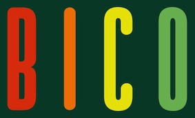 [MyFonts]
[More] ⦿
[MyFonts]
[More] ⦿
|
Typemade
[Santiago Orozco]
|
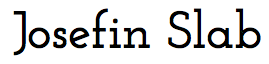 Santiago Orozco (b. 1981, Monterrey) is Typemade in Monterrey, Mexico. He is currently also working for DaniloBlack / Type Network as an information architect. iHis present headquarters is in San Pedro, Nuevo Leon, Mexico.
 He created the free geometric typeface Josefin Sans (2010) using a small x-height---people have suggested it as a free alternative for Neutraface. Josefin Sans was followed by Josefin Slab [see this poster by Cauex Pascoa], and both were extended to many weights. Free downloads from the Google Font Directory. In 2011, he published Dorsa (a modern interpretation of the ultra-condensed skyline typeface Empire (1937, Morris Fuller Benton, ATF) with some personal details thrown in), Antic, and Clark Hairline, a sans serif with a calligraphic touch. He explains: The idea to create this typeface was to make it geometric, elegant and kind of vintage, special for titling. It is based on 1927 Rudolf Koch's Kabel, 1930 Rudolf Wolf's Memphis, 1927 Paul Renner's Futura. Typefaces from 2012: Antic Slab (Google Web Fonts: designed for use in the headlines of newspapers and magazines), Antic Didone (Google Web Fonts). Italiana (Google Fonts) was designed for use in the headlines of newspapers and magazines. It is inspired by the calligraphy of the Italian masters. In 2015, Khaled Hosny and Santiago Orozco cooperated on the Latin / Arabic typeface Reem Kufi. Github link. Khaled, who designed the Arabic part, explains: Reem Kufi is a Fatimid-style decorative Kufic typeface, as seen in the historical mosques of Cairo. It is largely based on the Kufic designs of the late master of Arabic calligraphy, Mohammed Abdul Qadir, who revived this art in the 20th century and formalized its rules. Speaker at ATypI 2017 Montreal, where his motto was Kill the pointer, kill the mouse, referring to user interfaces for font selection and variable fonts. Google Plus link. Klingspor link. Behance link. Google Font Directory link. [Google]
[MyFonts]
[More] ⦿
|
Urban Pixel (or: UP Font Studio)
[Michel Troy]
|
 Foundry in Montreal, est. 2008 by Michel Troy (b. 1969).
 Behance link. Dafont link. Klingspor link. Their fonts: - Their pixel or dot matrix fonts, which can be had from MyFonts, include Urbix (2008, a large family), Urbix Nu (2009), Urbox (2008, a great dot matrix family), Urbox Nu (2009), Javelist Head (2008), Javelist Arm (2008), Thyme Nu (2009), Stock Board (2008), Scratch Up (2008), Melko (2010, a dot matrix family), and Kolly (2011).
- The free pixel typeface UP Tiny LCD Four 8 (2008).
- At FontStruct, Michael Troy (a.k.a Upixel) made the gridded monospace family Kyra (2010), Kabog (2010), the constructivist Upixel, the pointy ghouly Barko (2010), the ultra-fat Fatex (2010), the narrow display typeface Lingo (2010), the constructivist Akroy (2010, pixelish), Nuebrick (2010, white on black), Karbo 1986 (2010, honeycomb techno), Mobivus (2010, bold sans), Melko (2010), Kolly (texture face), En Sans New (2010), and the slanted Blax (2010).
- In 2011, he created Quino (slabby, FontStruct), Gothic XS Hand, Blax Slab (textured alphabet, a slab version of Blax), MIKA (very fat), Melko Rip (2012, dot matrix), Kilix (2012), Grecian 1896 (2012, wood-style slab face).
- Typefaces from 2012 include the ultra condensed typeface Manygo Serif (+Semi Serif). This American magazine style belongs to the category of skyline fonts.
- Typefaces from 2013: Stiff Script (a winner in the FontStruct Connected Script Competition in the Suetterlin style of school scripts).
Typefaces from 2014: Fraline (this inline blackletter typeface was a winner in the FontStruct Inline Font Competition in February 2014). Typefaces from 2015: Gothic Ax Hand (shadow typeface). Gothic AX Hand (a hand-drawn gothic shadow font). [Google]
[MyFonts]
[More] ⦿
|
Victoria Herrera
|
Guatemalan designer and art director currently based in New York City. In 2017, she created the skyline typeface Sky. Behance link. [Google]
[More] ⦿
|
Viktor Andersson
|
Art director in Stockholm, who created Fohrsmark (2014, a conndensed skyline typeface) during his studies at Södertörn University. [Google]
[More] ⦿
|
Wordshape
[Ian Lynam]
|
 Commercial fonts at this boutique type foundry and publisher operating in Tokyo, jointly run by Ian Lynam and Thien Huynh. Ian Lynam is a New Yorker who studied Graphic Design at Portland State University (B.S.) and California Institute of the Arts (M.F.A.). He is professor at Temple University Japan, as well as at Vermont College of Fine Arts. He operates the Tokyo design studio Ian Lynam Design and the hybrid publishing imprint and type foundry Wordshape. MyFonts link. Images of most of Ian Lynam's typefaces.
 - Cern (2013). A sans family based on Helvetica, Akzidenz Grotesk and Univers, with large x-heights.
- Vaud (2013). Ian writes: Vaud is a family of 40 weights of neutral, yet formally nuanced grotesk typefaces that takes inspiration from Helvetica, Akzidenz Grotesk, Univers and the original metal types from Switzerland, yet had a slightly larger x-height for more pronounced legibility.
- Plural (2013). A futuristic sans family.
- Sketch Caslon Italic (2013).
- Raffish (2013). This is an ornamental caps typeface based on Henk Krijger's Raffia typeface.
- Entity (2012). A basic sans family with slightly rounded corners.
- Okojo (2012), Okojo Slab (2012) are geometric sans and slab serif typefaces influenced by the type designs of Paul Renner and Herb Lubalin. They were followed by Okojo Slab Display (2012) and Okojo Display (2012). In 2016, he rebundled everything as Okojo Pro and Okojo Slab Pro, Okojo Pro Stack and Okojo Slab Pro Stack.
- Pompeian Cursive (2010). An elegant calligraphic script based on the original drawings by Oswald Cooper for BBS in 1927.
- His Cooper series. Cooper Swash Italic Traditional & Cooper Swash Italic Custom, Cooper Italic (2010, after Cooper's original from 1924), Boul Mich (2010, after Oswald Cooper's 1927 art deco typeface), Cooper Initials (2010), Cooper Old Style (2010), Cooper Capitals (2010), Cooper Text (2010), Cooper Black Condensed (2010), Cooper Black Swash (2010), Cooper Screamers (2010, oversized exclamation points), Cooper Black Italic Pro (2013), Cooper Italic Pro (2013), Cooper Fullface Italic Pro (2013).
- Cruller (2010). A spidery display typeface that is based on lettering from a 1910 German lettering book.
- Hanger (2004).
- Rubber Vloeren. A geometric display typeface adapted from an alphabet used by Piet Zwart in the Netherlands for a series of advertisements for rubber flooring.
- Ensenada is a typeface designed based on hand-cut lettering that adorns businesses throughout the city of Ensenada in Baja California in Mexico.
- Clobber Grotesk (2010) is a grotesk typeface designed for readability at very small sizes. It is accompanied by a nice stencil style.
- International Blackletter (2010) is a collaborative display typeface designed for fun, together with Simon Gane and Selena Hoy.
- Devil's Advocate is a digital version of the heavy blackletter typeface Cathedral Text found in the 1934 ATF typeface from the American Specimen Book of Type Styles (by ATF).
- Sandberg Honorarium (2003) is inspired by the work of Dutch typographer Willem Sandberg.
- Inversion (2010) is an uncial face.
- Designer with Eli Carrico of the heavy stencil typeface Black-Out (2010, Wordshape) and the paperclip family Interno (2004), which was based on Walter Ballmer's logo for Olivetti in 1960.
- Neuerland (2010) is an update of Rudolf Koch's Neuland.
- Dorsal (2011) is a splendid versal lettering typeface that cries Absinthe Overload.
- Off Broadway (2011) is a casual art deco face related to Oz Cooper's Boul Mich and to Nubian (ATF).
- Cinta Adhesiva (2011, done with Mexican designer One Eye) began as a typeface designed for the masthead of a graffiti fanzine called Free Copy---the monumental letters painted by L.A.-based graffiti writers Crae and Hael greatly influenced the feel of the typeface.
- Maat (2011) is a modular geometric stencil piano key face. It is a loose interpretation of a handlettered alphabet by the late Dutch designer Jurrian Schrofer called Sans Serious which was included in Wim Crouwel's publication Letters of Maat. It is inflected with a bit of influence from British designer Ken Garland's similar lettering form the cover of his textbook, The Graphics Handbook.
- Effete (2011) is a tall stylish typeface similar in weight and proportion to fonts like Imre Reiner's skyline typeface Corvinus.
- Adora (2011) is a typeface similar to Walter Tracy's AdSans.
- Kihachiro Swash Italic (2011) has garalde forms but Caslonian curved terminals and weighty serifs. Kihachiro Geometric (2011) recalls Antique Olive and Futura.
- Kirimomi Swash (2011) is a pair of garalde typefaces. Kirimomi Geometric (2011) is a humanist sans.
- Kommisar (2012) is Lynam's version of the Trajan capitals alphabet.
- Smythe Sans (2012) is a contemporary geometric sans serif family that is quite readable on-screen and in print.
- Stebl Grotesk (2012) and Stebl Slab (2012) are workhorse typefaces for sturdy jobs.
- Raker (+Stencil) and Raker Display (+Stencil) is a 40-style octagonal typeface family published in 2015. It was inspired by science fiction and space travel.
- Iggy (2015) is based on the lettering of Australia-based Oklahoman artist, animator and lifelong skater Darin Bendall.
- Stamen (2016). A 12-style sans typeface lost in time.
- Smythe Sans Pro (2016) and Smythe Soft Pro (2016).
- Biwa and Biwa Display (2017). A grotesk family by Ian Lynam and James Todd.
- Glot (2019). A 10-style flared terminal sans family by James Todd and Ian Lynam. See also Glot Round from 2020.
Speaker at ATypI 2019 in Tokyo on the topic of From Bijin-ga to Brutus, in which he explains the work of graphic designers Hokuu Tada (1889-1948) and Seiichi Horiuchi (1933-1987). [Google]
[MyFonts]
[More] ⦿
|

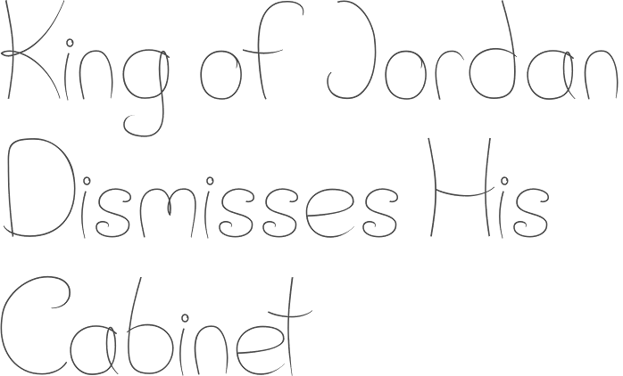
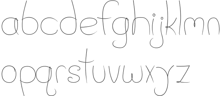
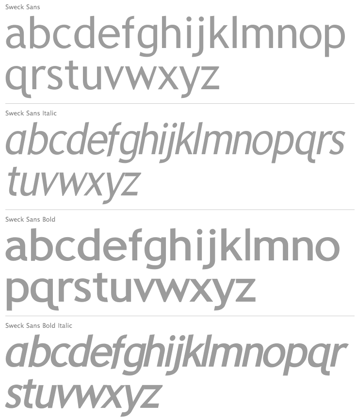
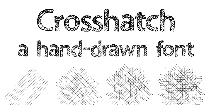
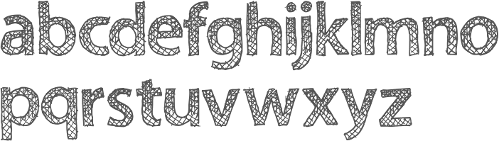
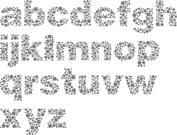
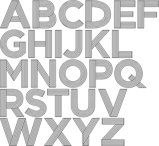
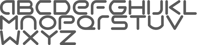
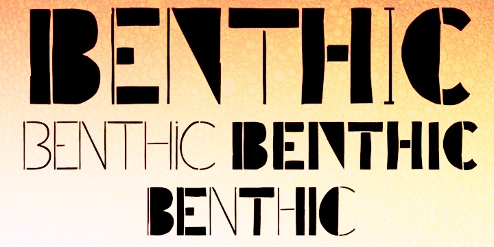
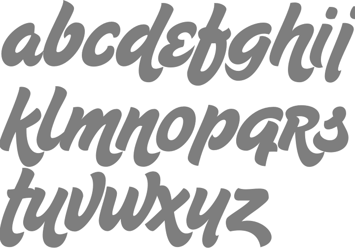
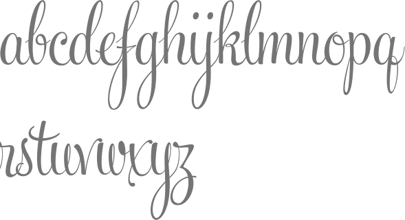
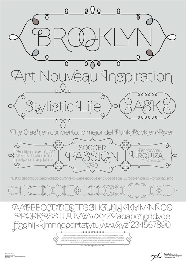
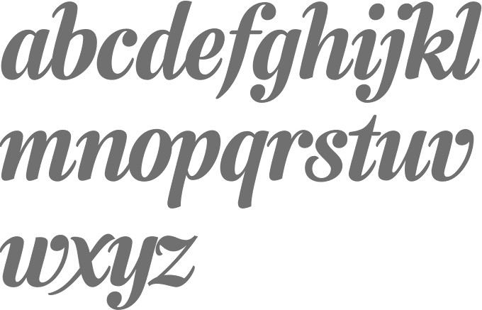
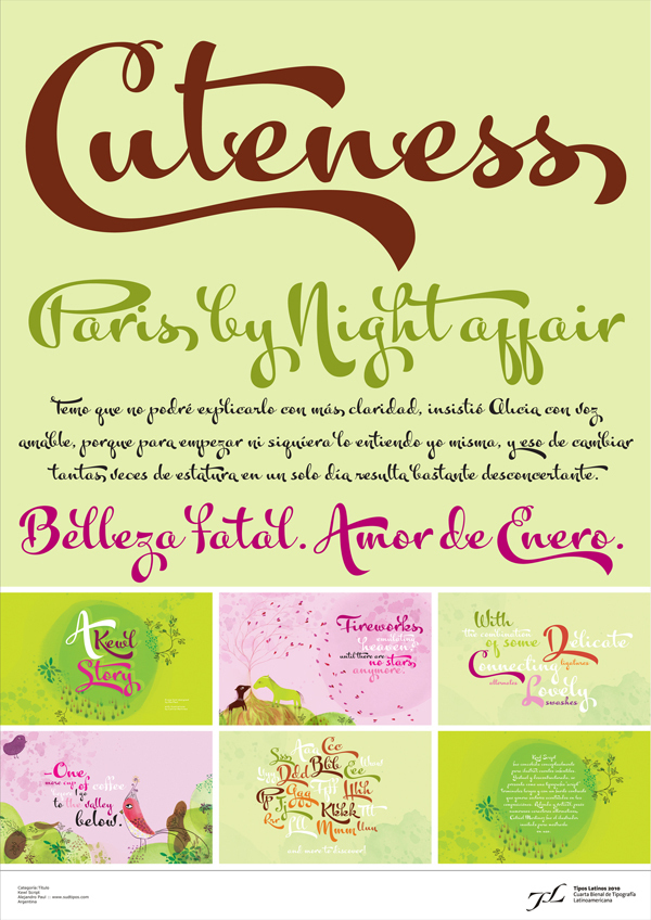
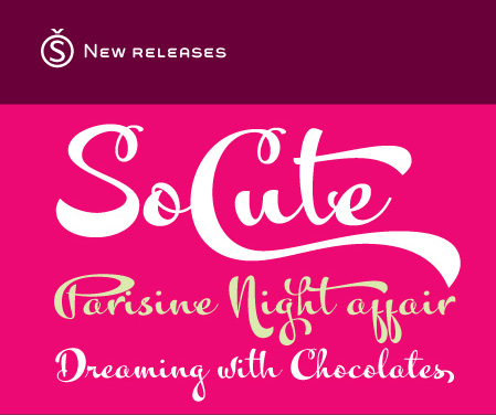
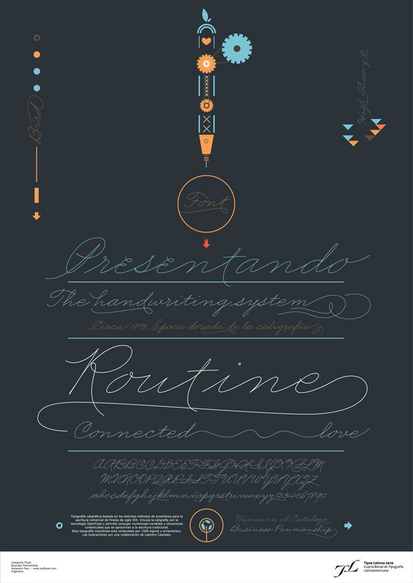
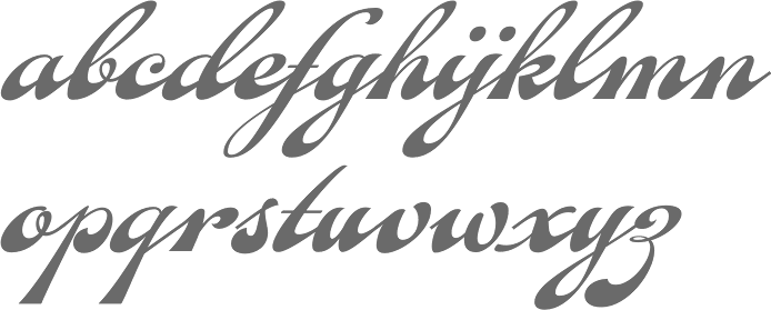
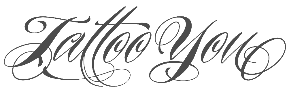
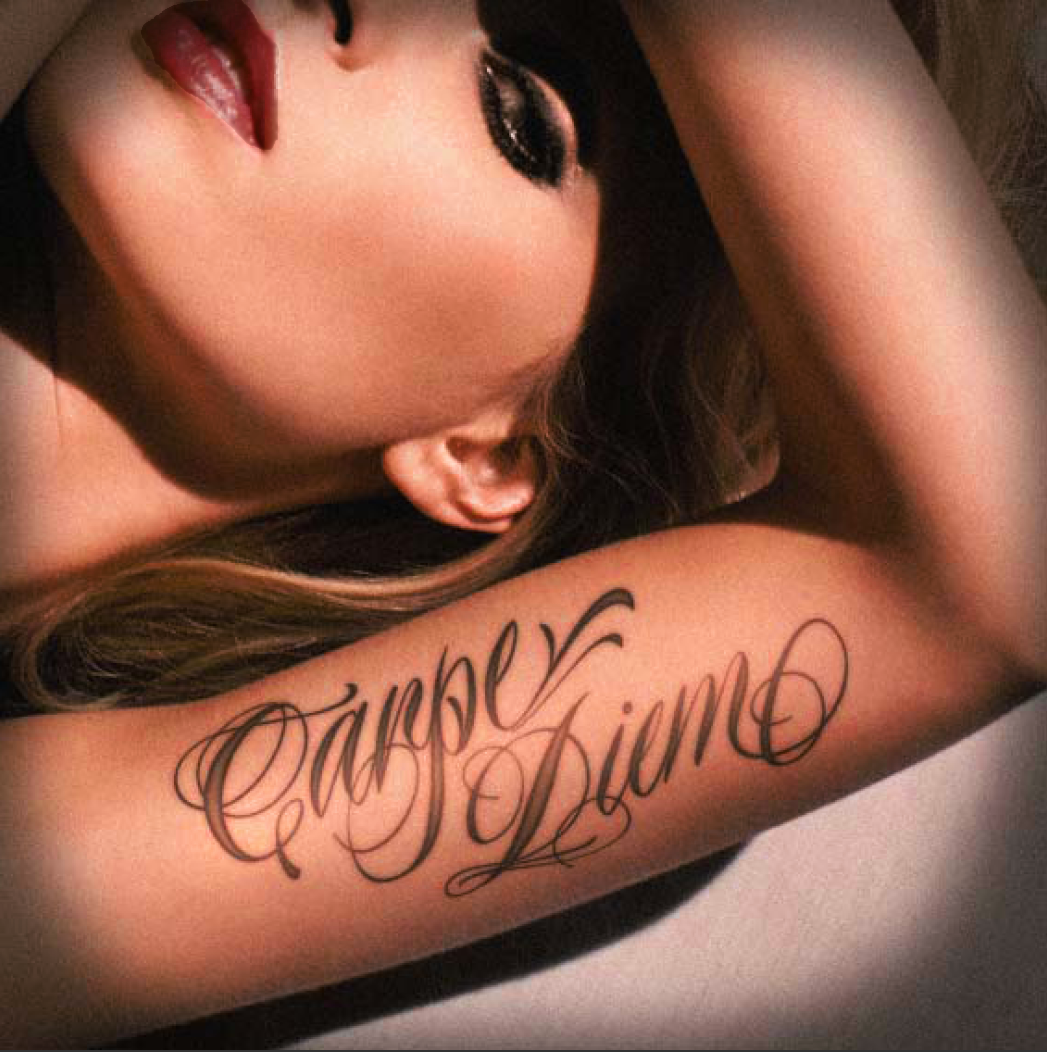
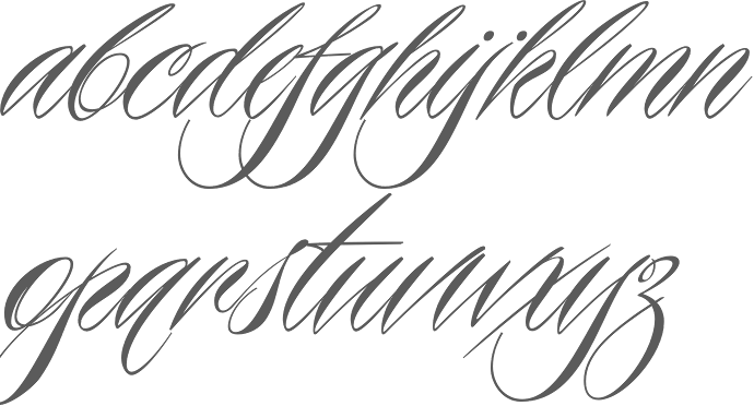
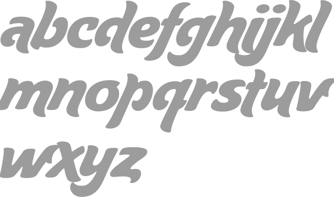
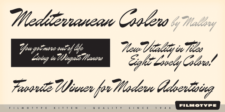
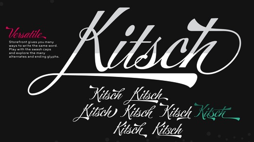
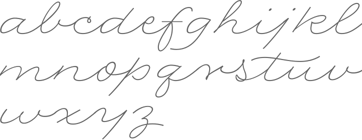
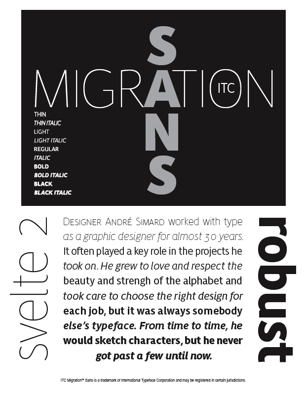
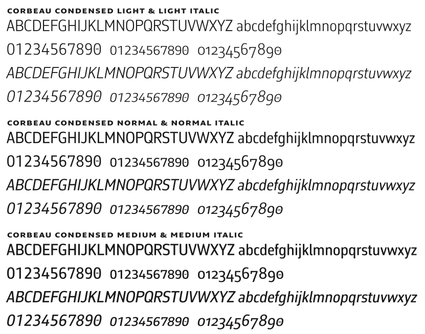
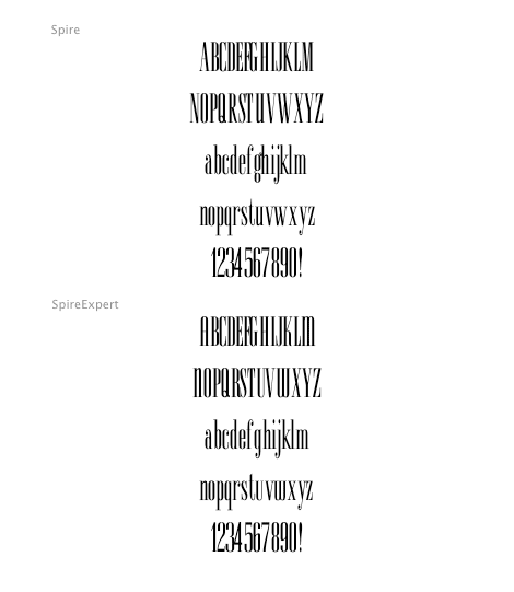
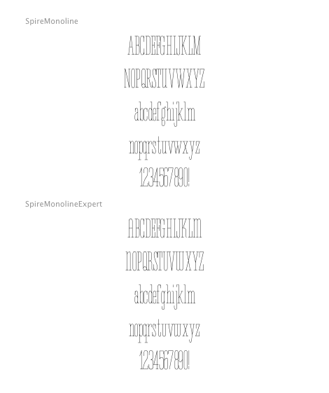
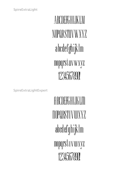
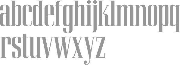
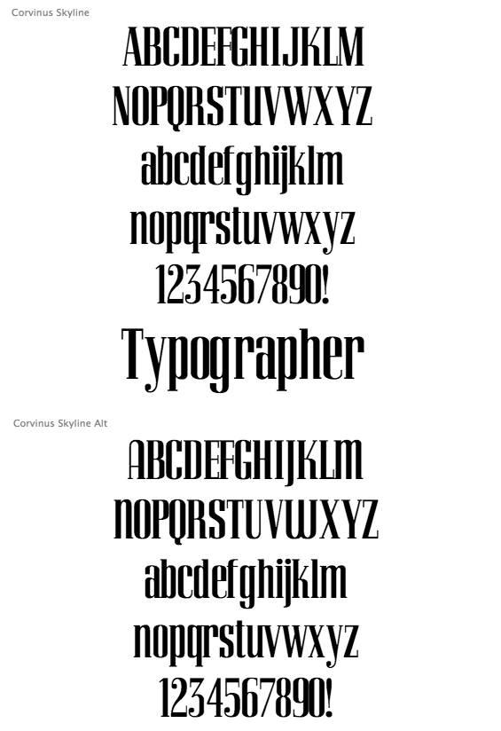
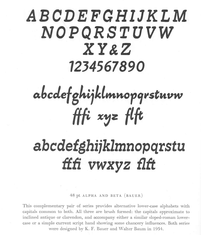
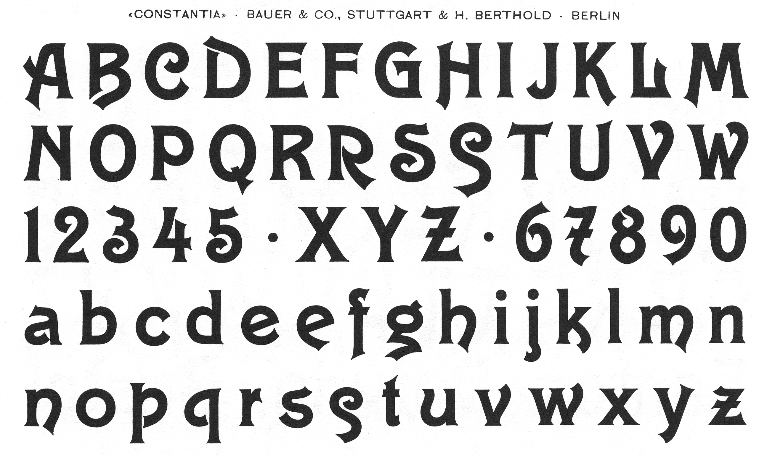
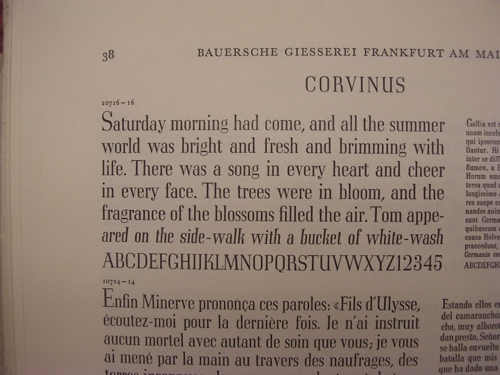
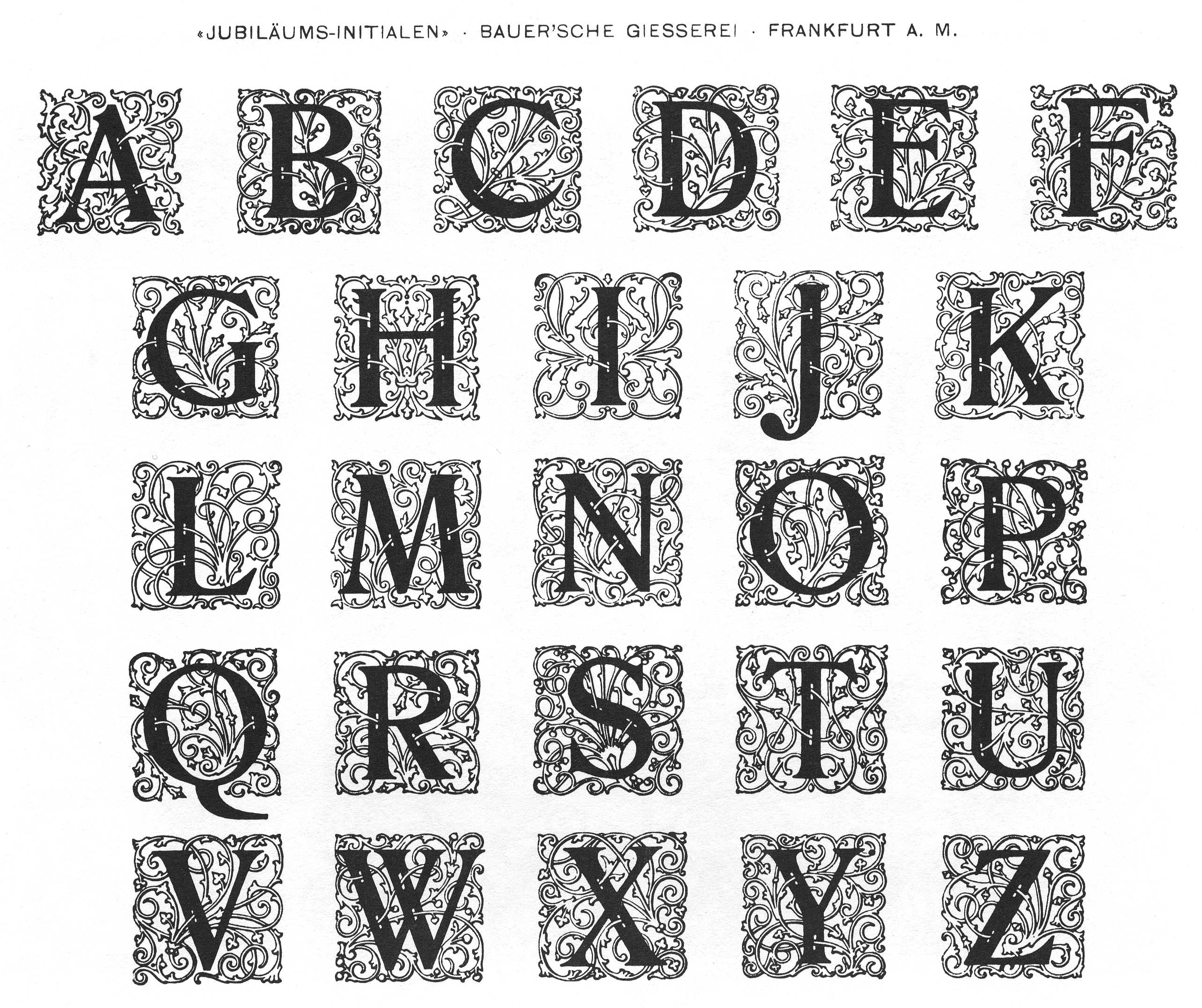
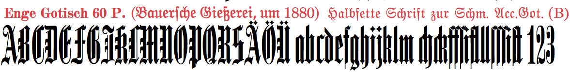
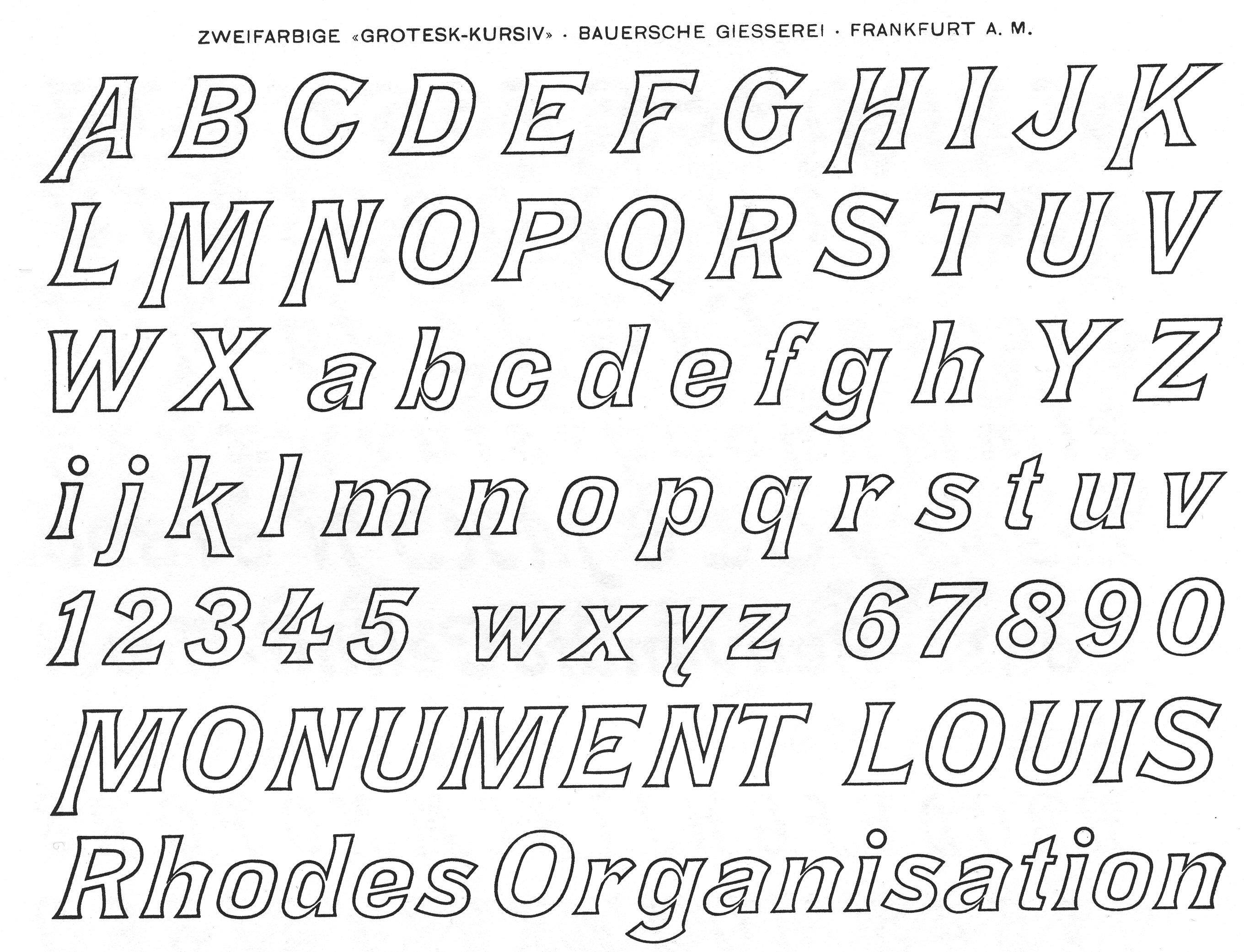
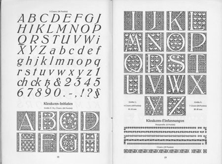
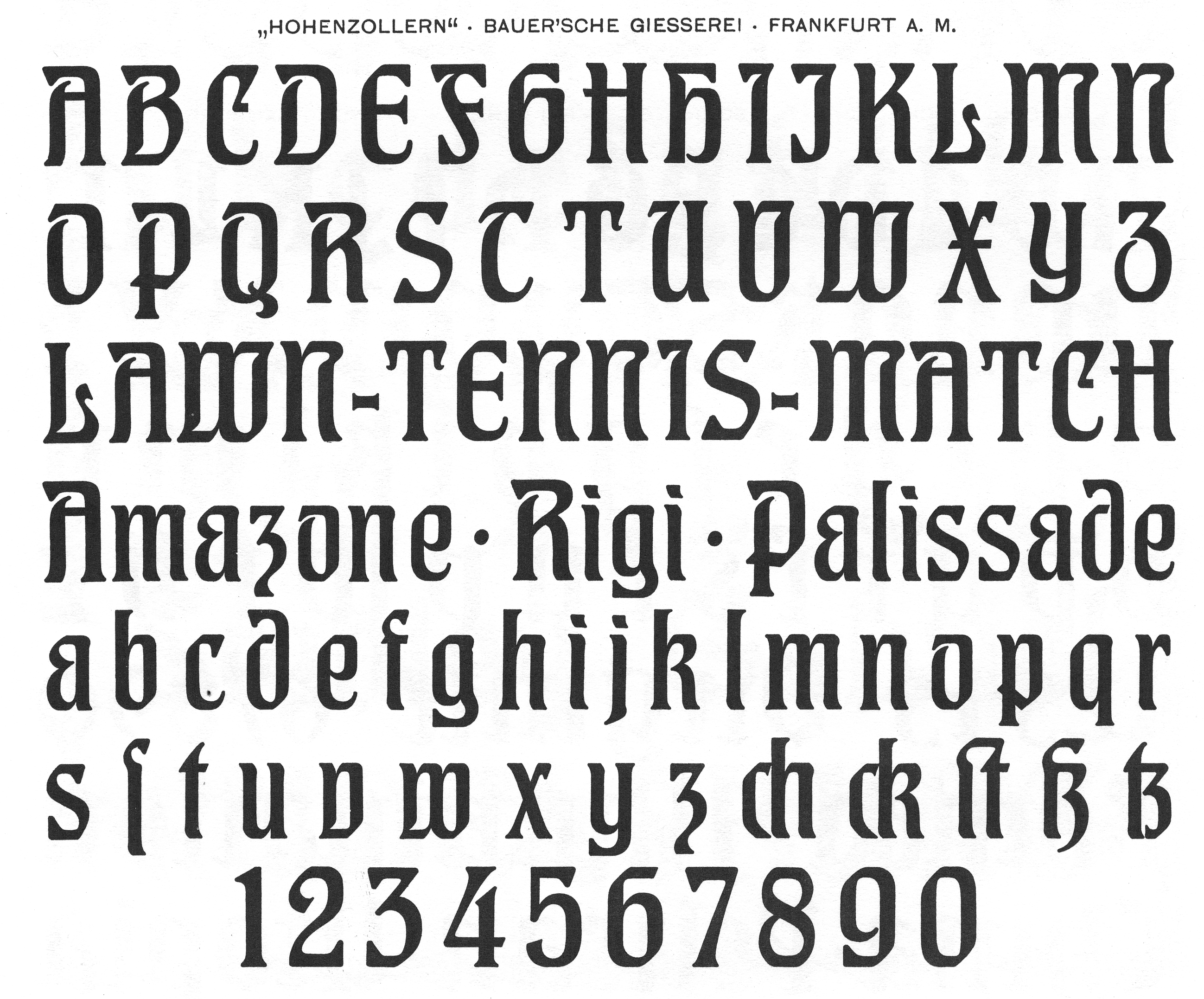
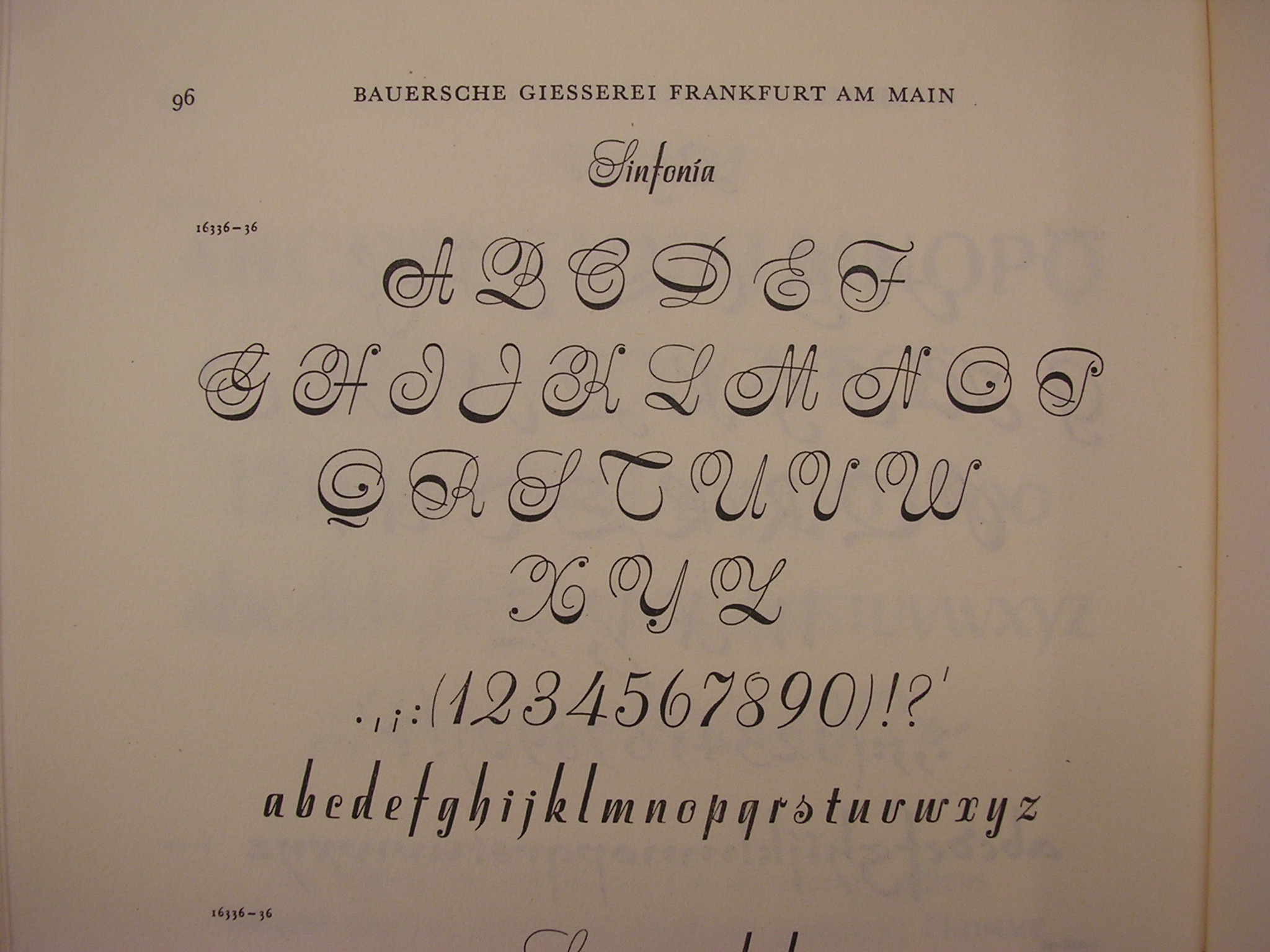
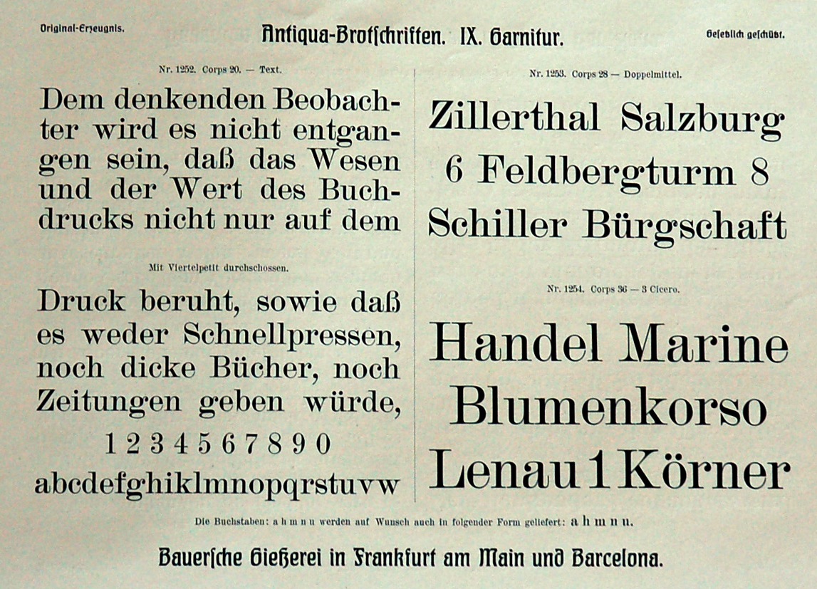
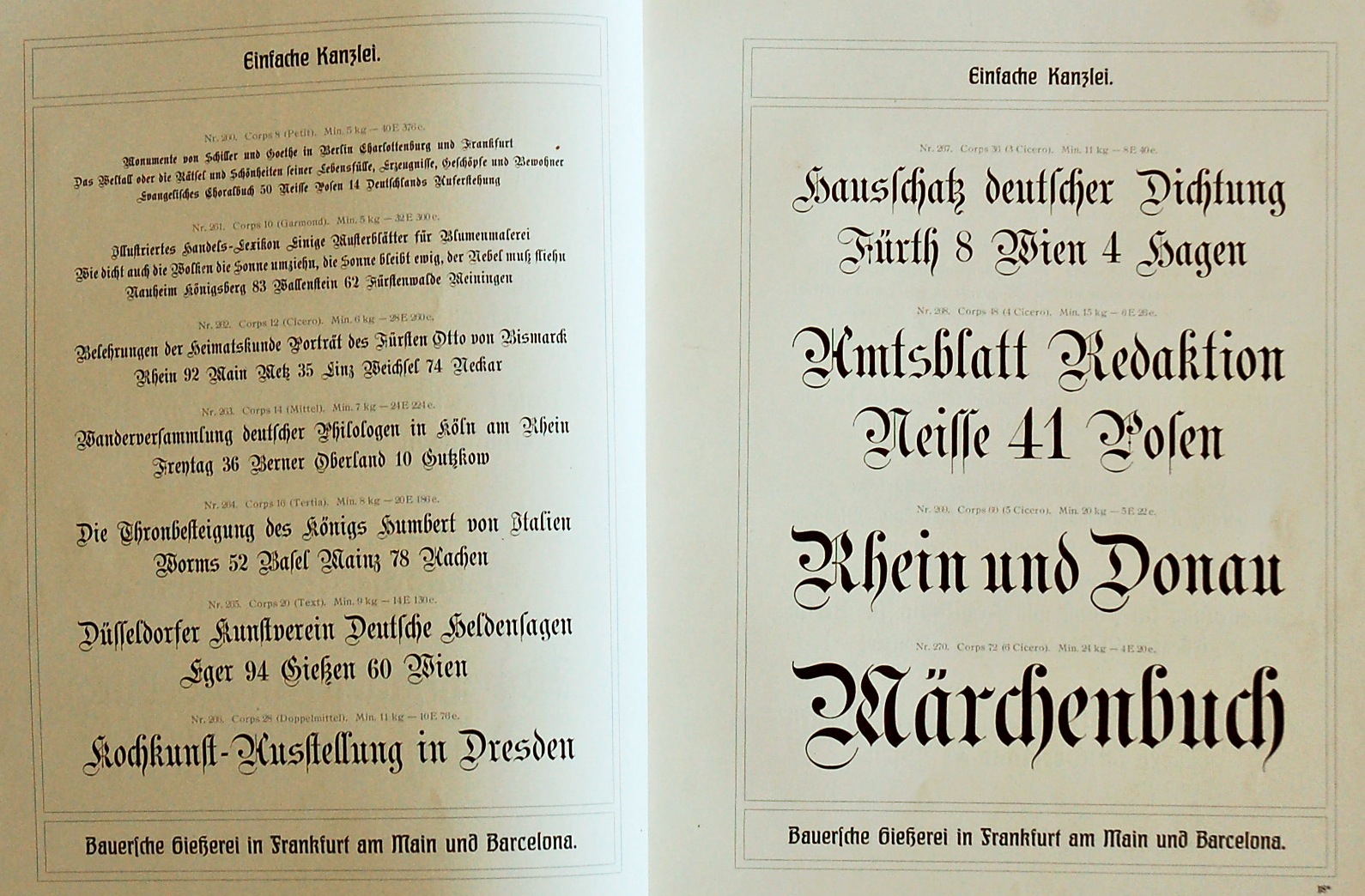
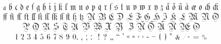
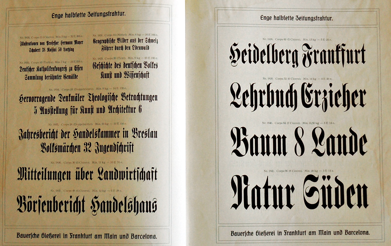
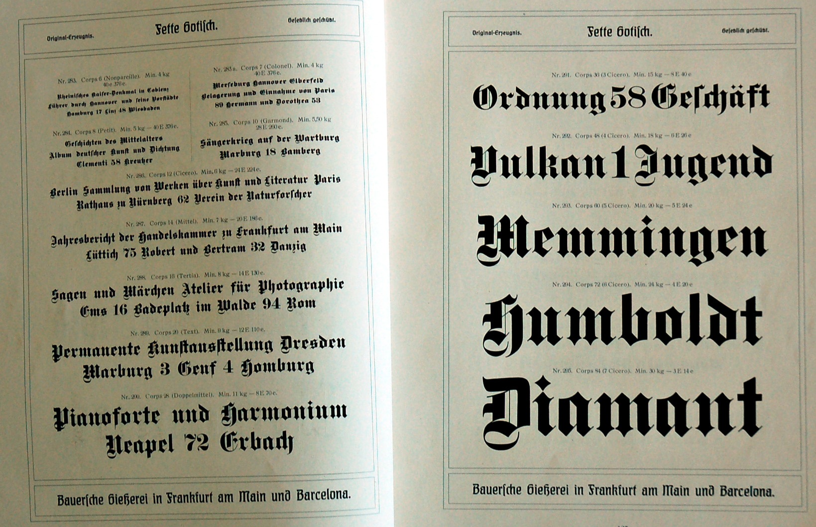
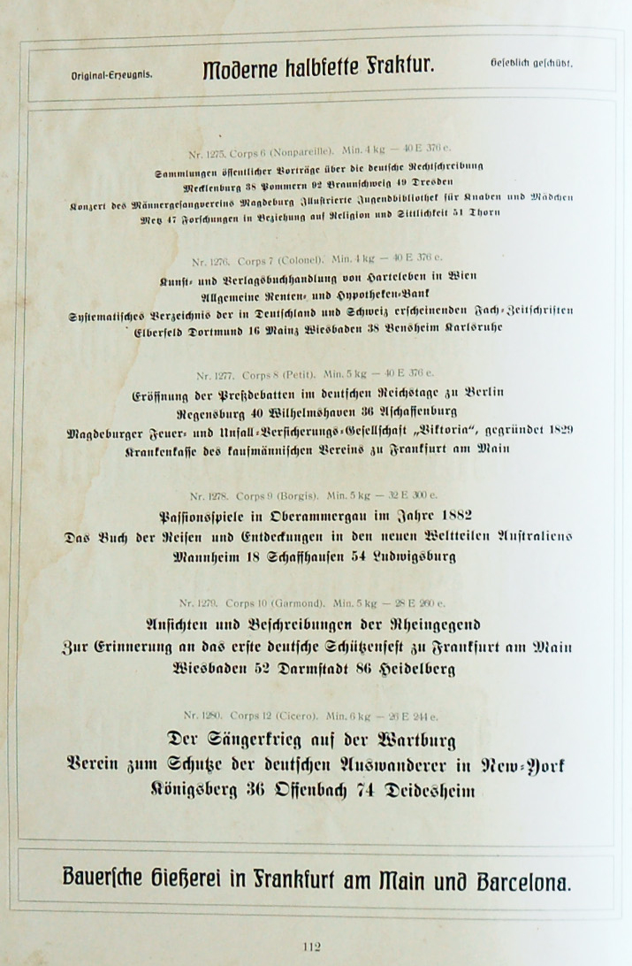
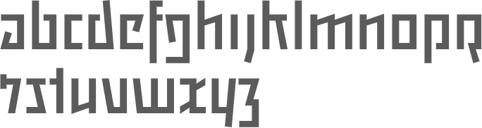
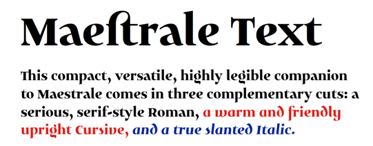
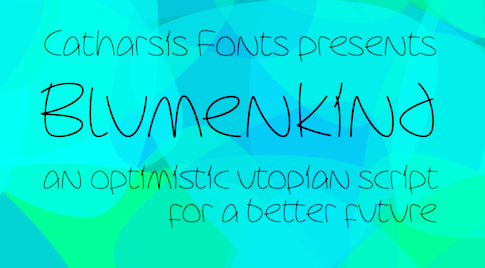
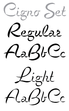
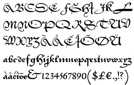
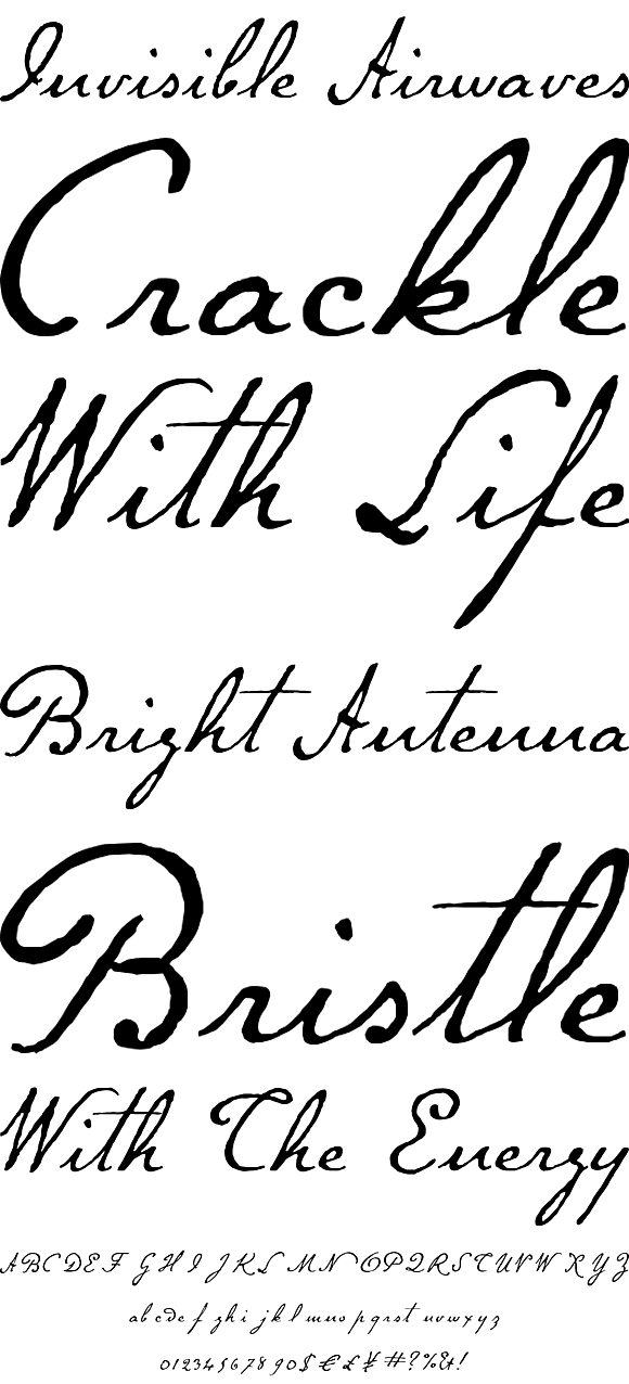
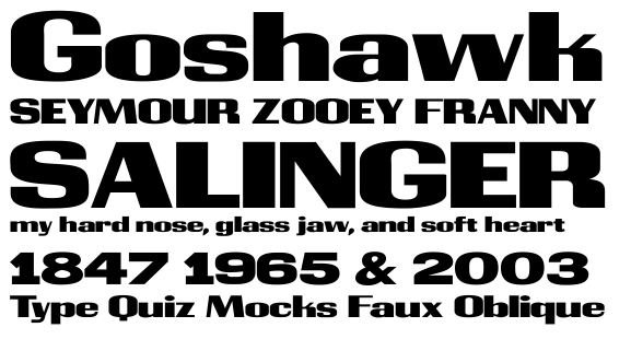
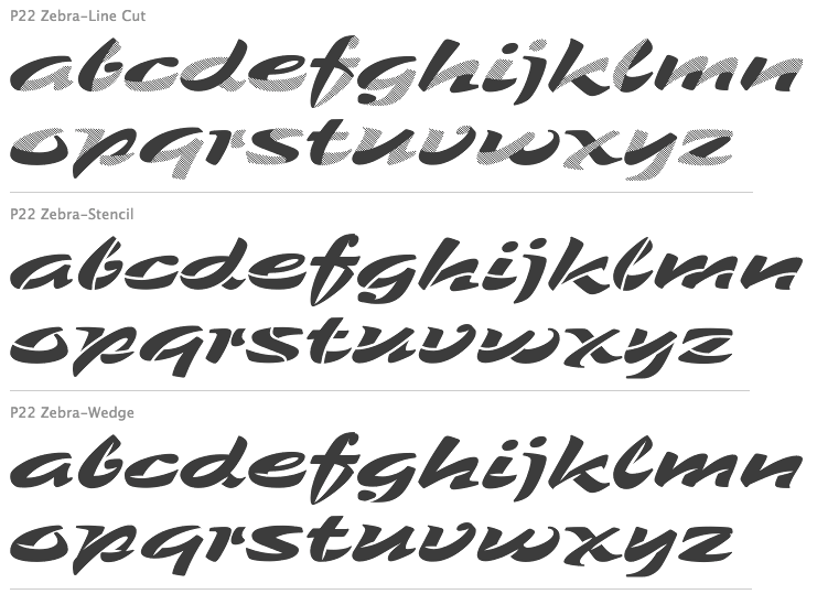
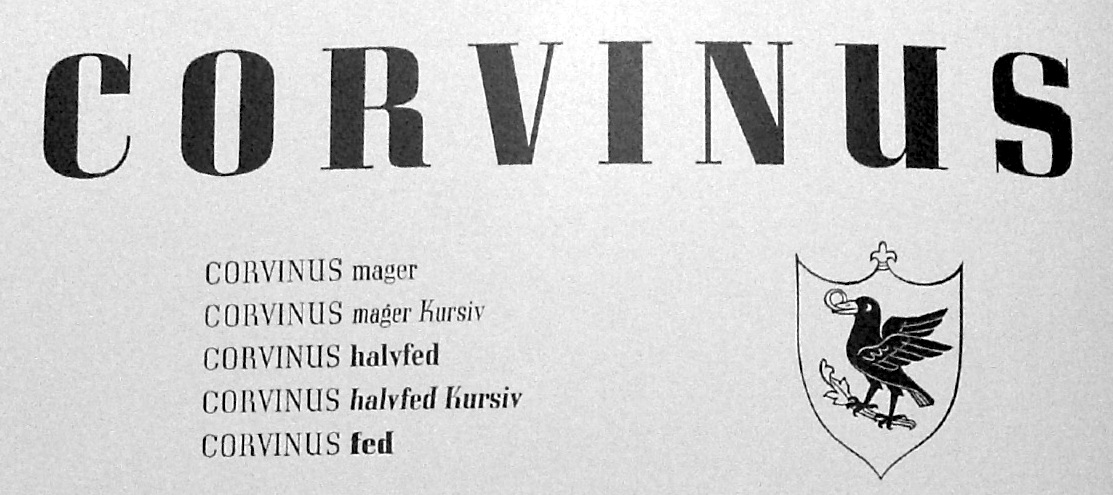
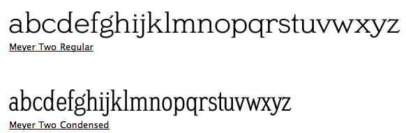
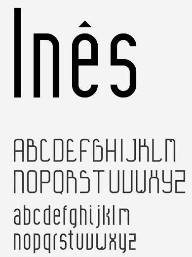
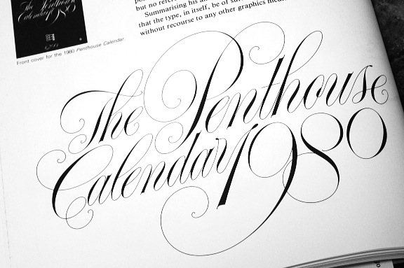
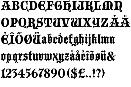
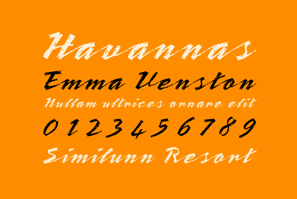
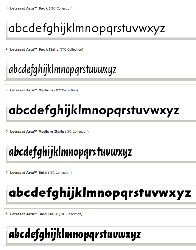
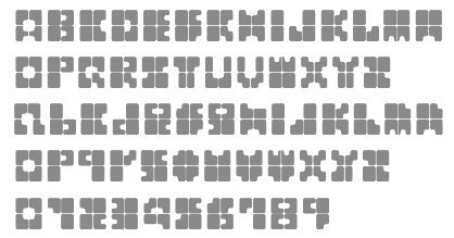
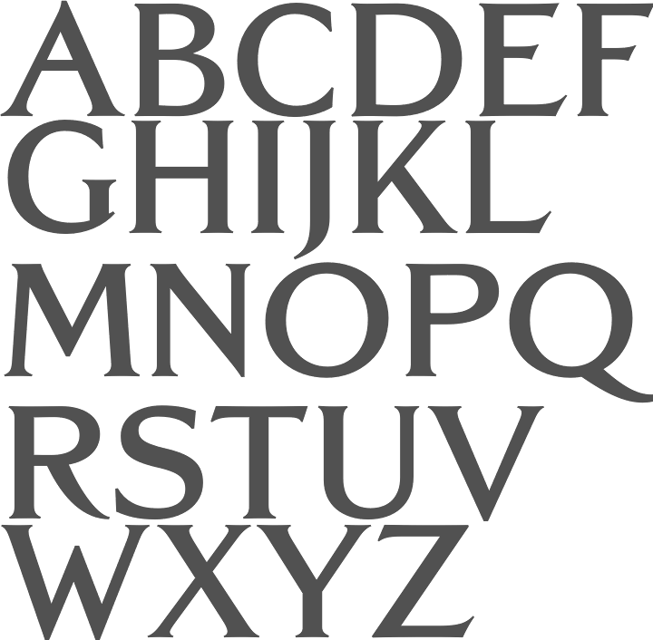
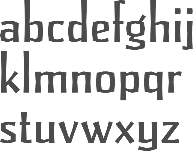
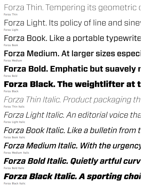
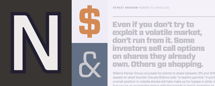
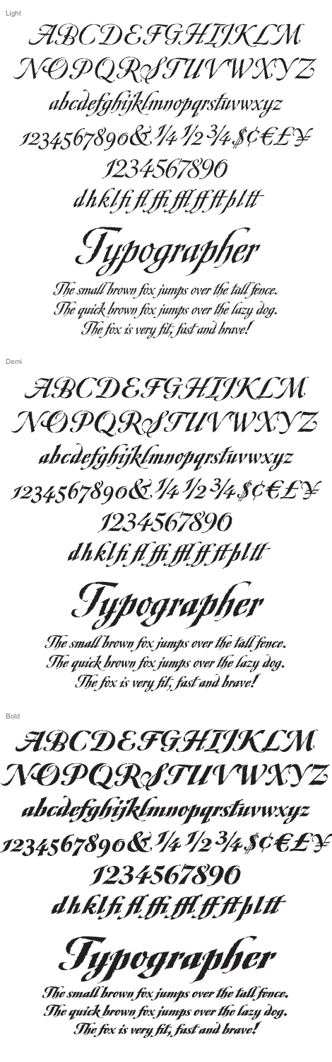
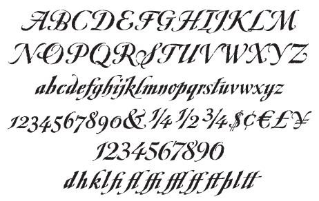
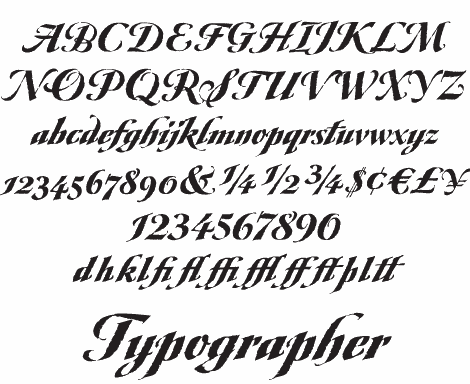
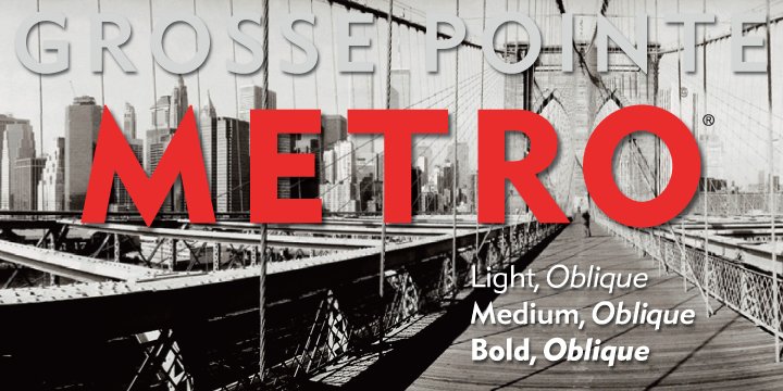
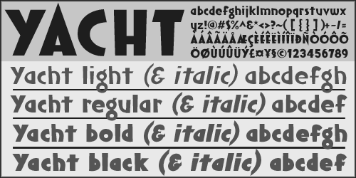
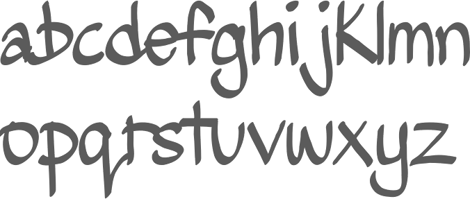
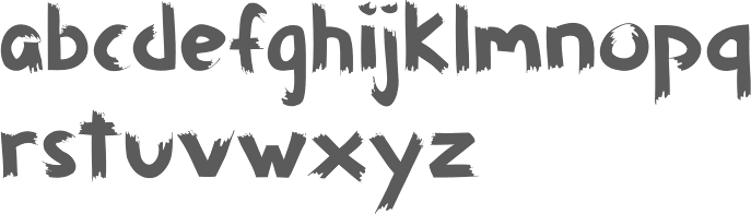
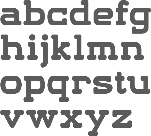
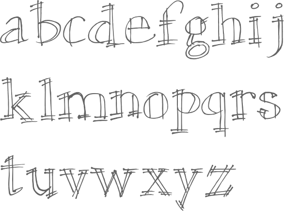
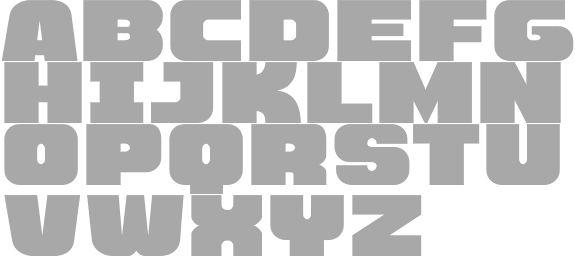
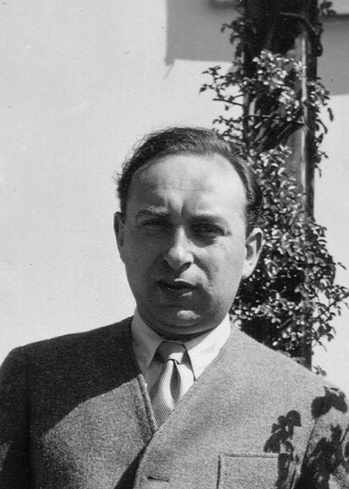
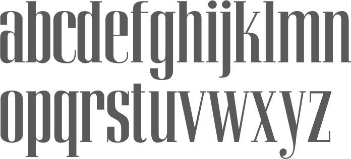
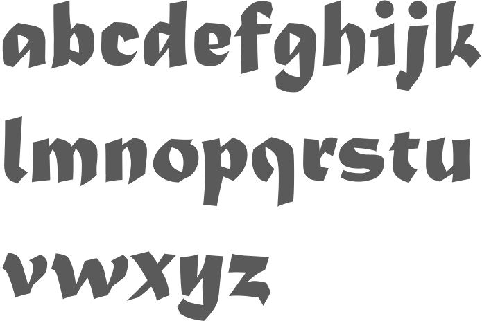
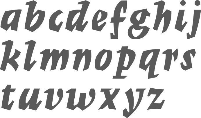
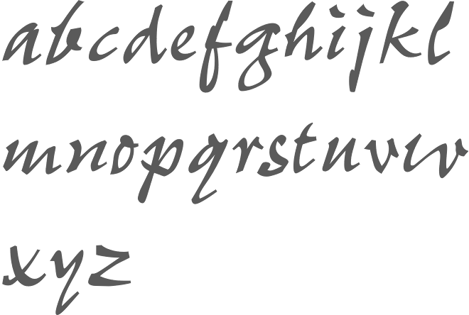
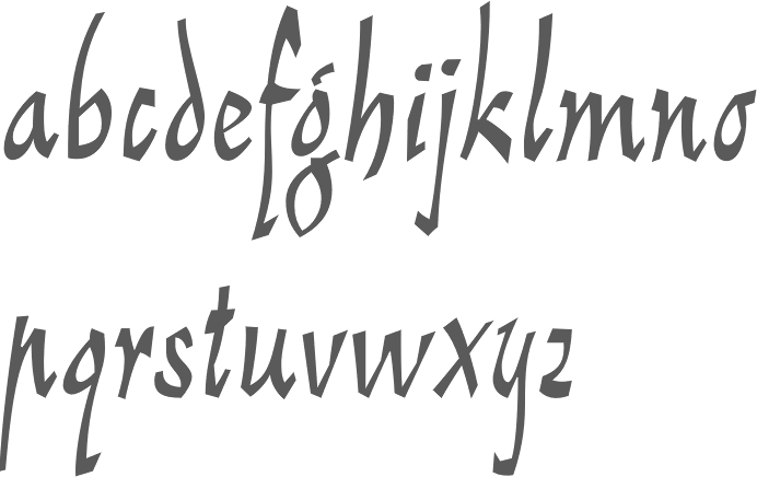
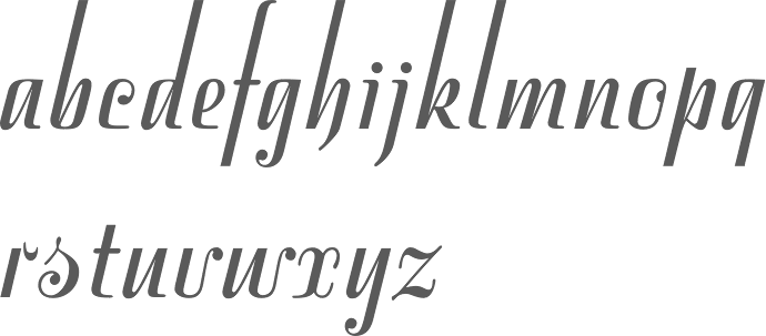
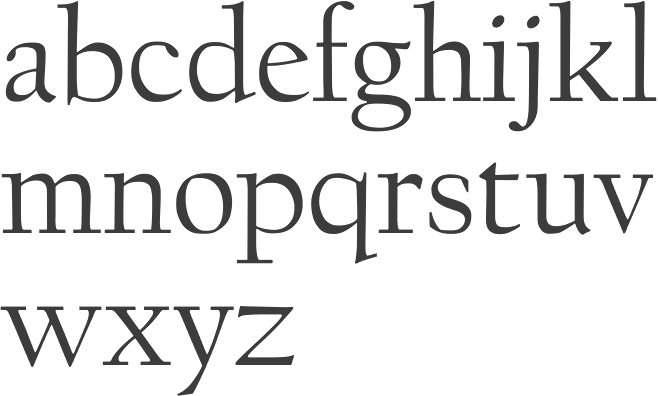
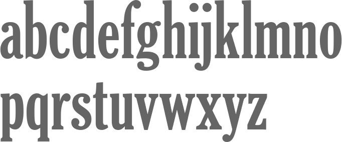
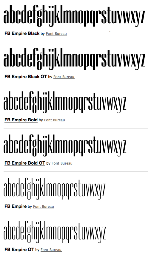
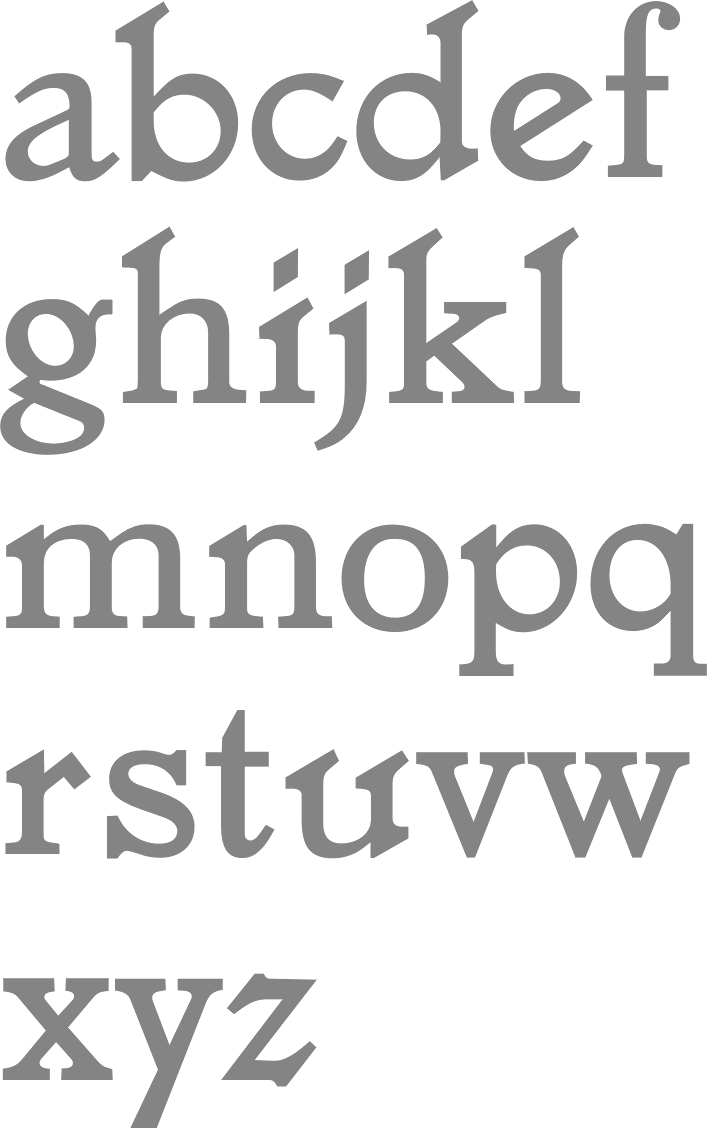
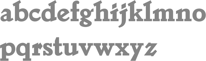
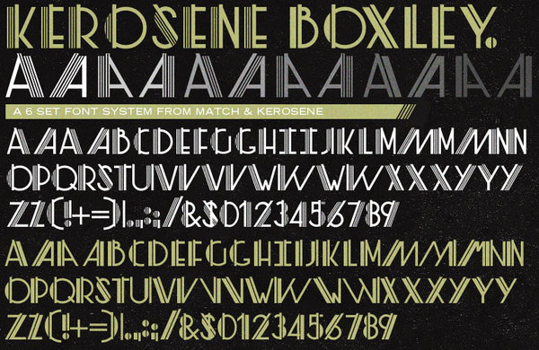
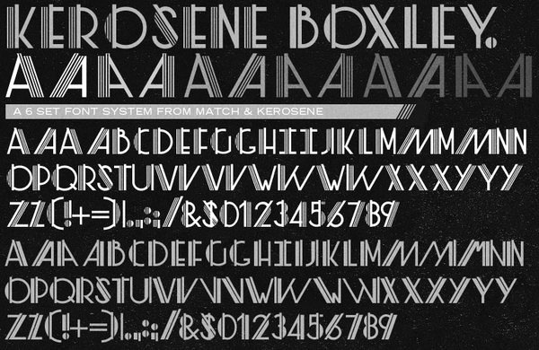
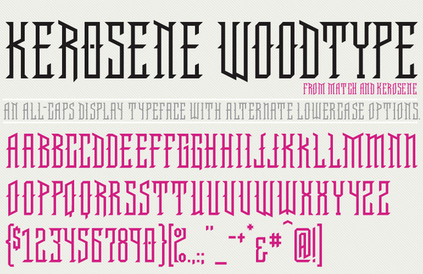
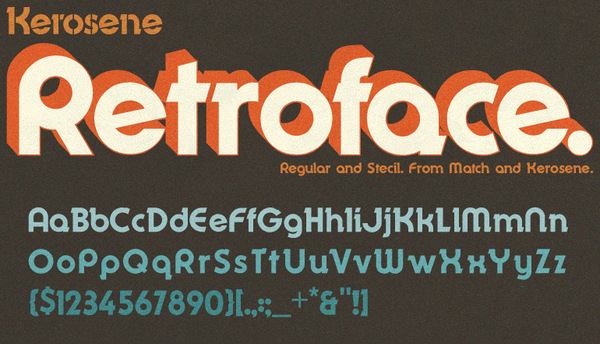
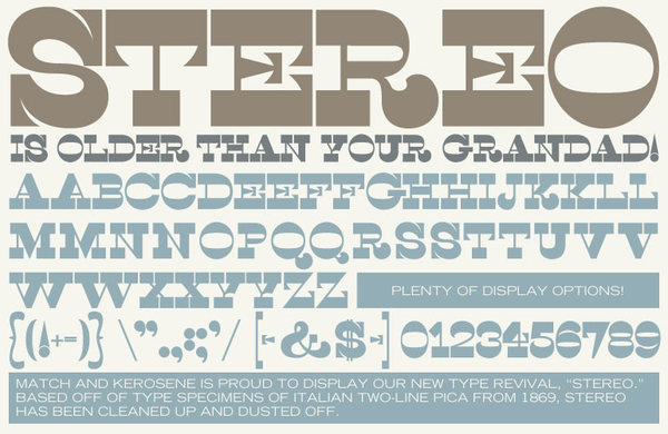
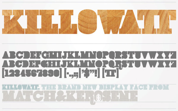
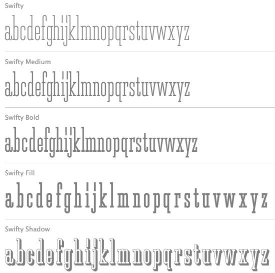
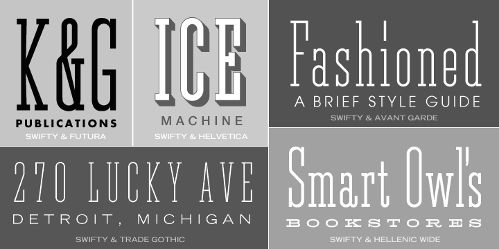
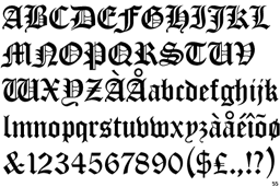
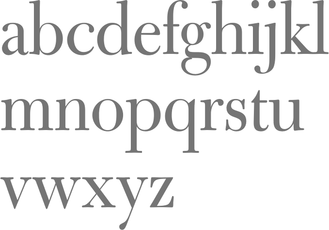
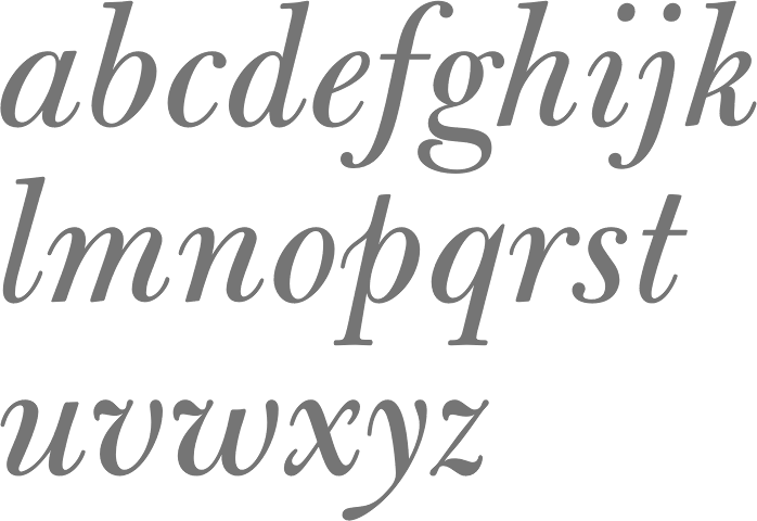
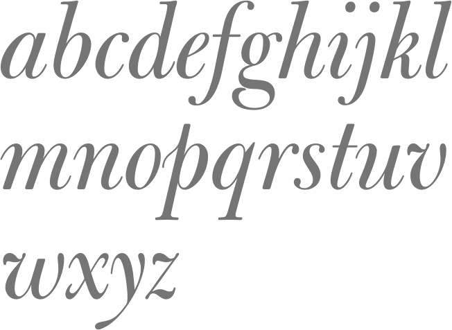
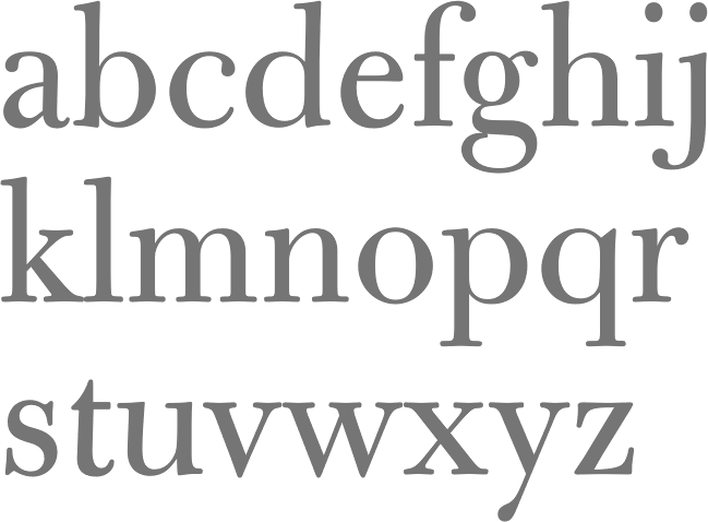
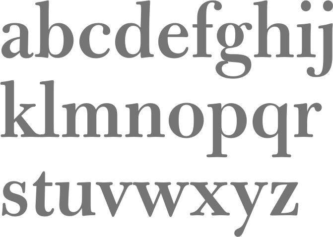
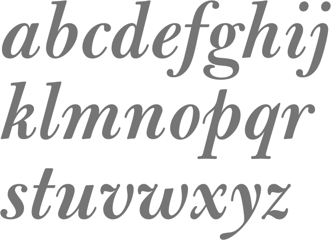
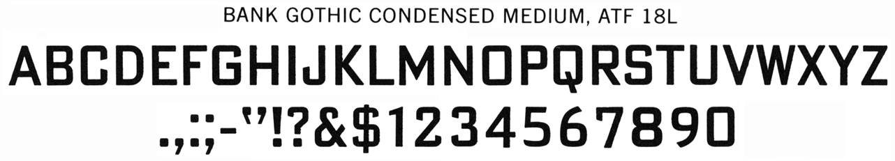
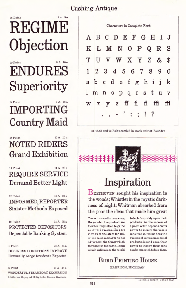
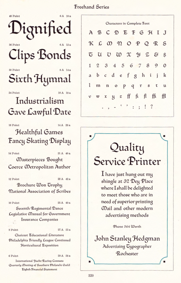
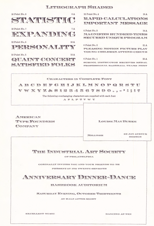
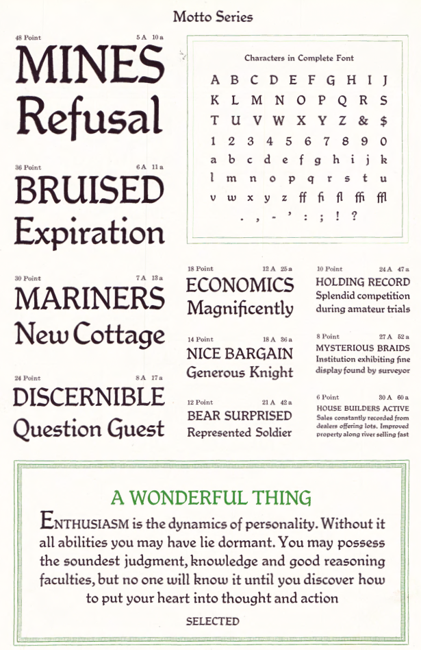
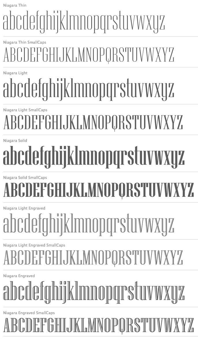
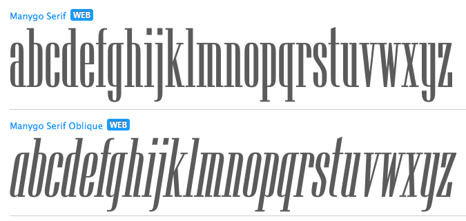
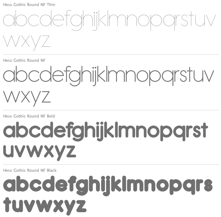
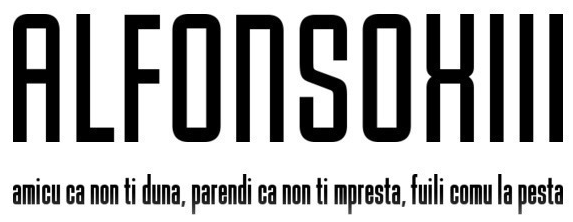
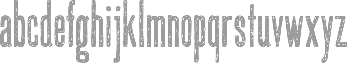
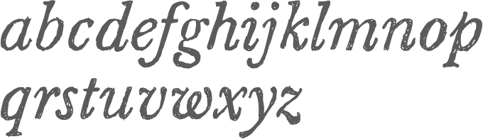
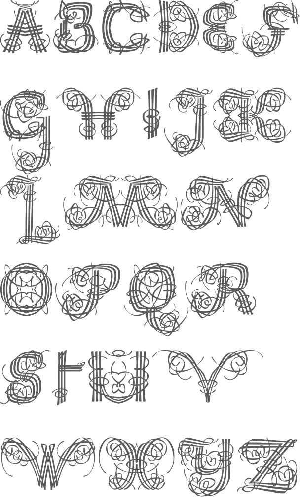
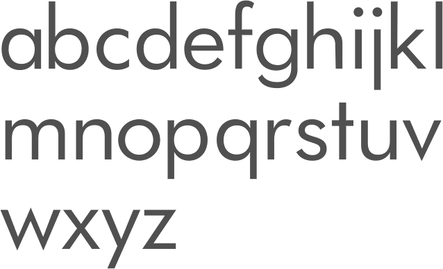
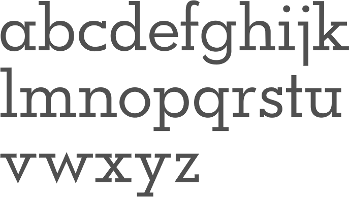
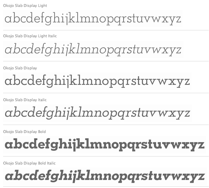
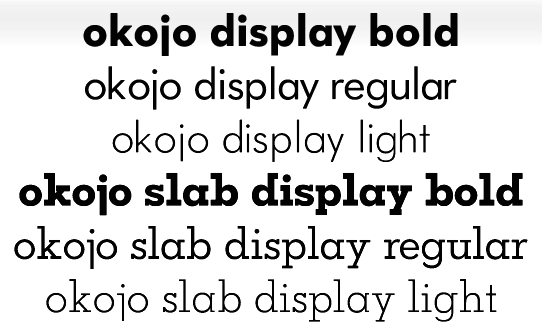
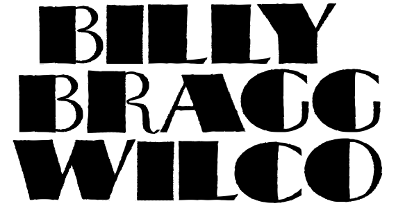
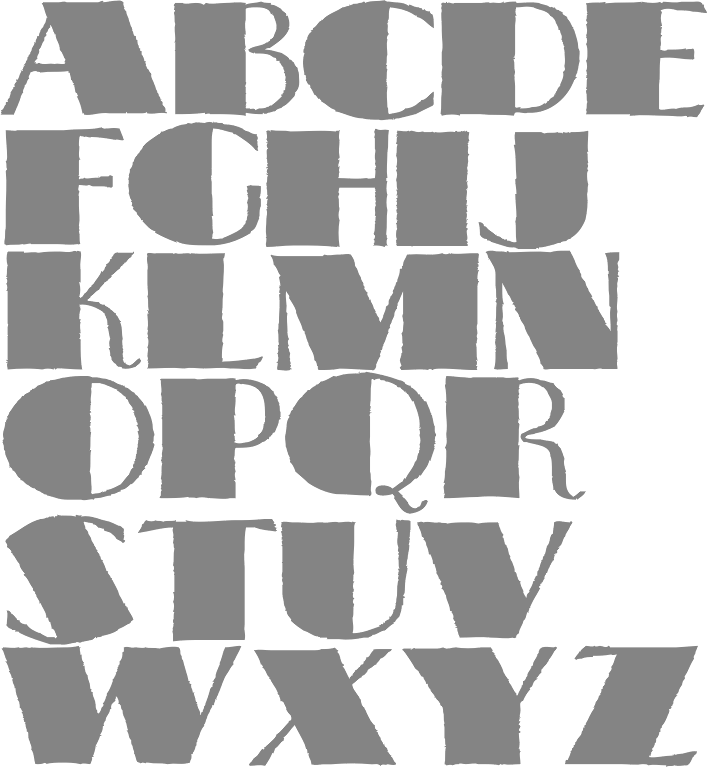
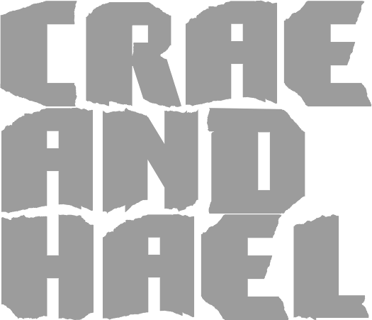
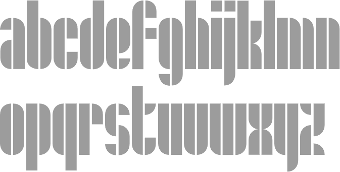
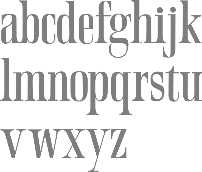
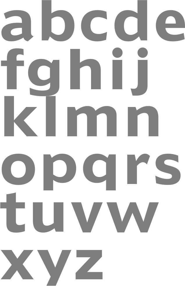
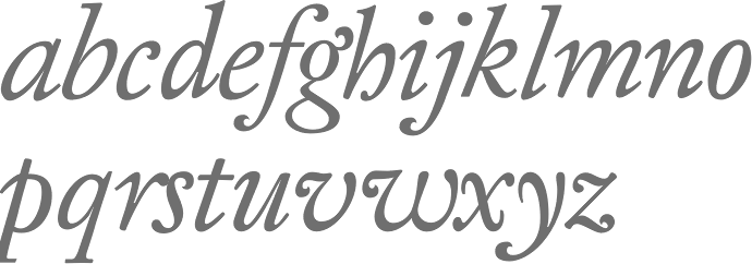
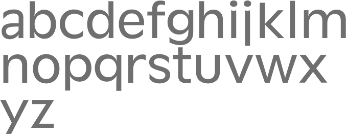