TYPE DESIGN INFORMATION PAGE last updated on Mon Mar 9 16:07:55 EDT 2026
FONT RECOGNITION VIA FONT MOOSE

|
|
|
|
|
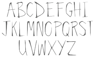
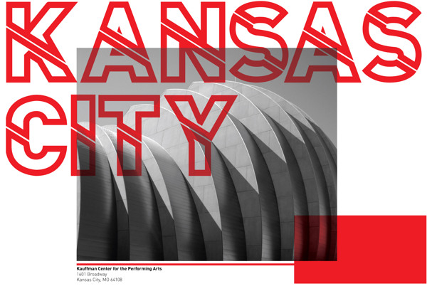
Type scene in Kansas | ||
|
|
|
|

SWITCH TO INDEX FILE
A Comparison of Popular Online Fonts: Which is Best and When? | A study in 2007 at Wichita State University (Kansas) by Michael Bernard, Melissa Mills, Michelle Peterson and Kelsey Storrer compared these font types: Agency FB (Agency), Arial, Comic Sans, Tahoma, Verdana, Courier New (Courier), Georgia, Goudy Old Style (Goudy), Century Schoolbook (Schoolbook), Times New Roman (Times), Bradley Hand ITC (Bradley), Monotype Corsiva (Corsiva). They conclude: First, no significant difference in actual legibility between the font types were detected. There were, however, significant differences in reading time, but these differences may not be that meaningful for most online text because these differences were not substantial. It may, on the other hand, be helpful to consider using font types that are perceived as being legible. In this study, the font types that were perceived as being most legible were Courier, Comic, Verdana, Georgia, and Times. Courier and Times were perceived as being the most business-like, whereas Comic was perceived as being the most fun and youthful. [Google] [More] ⦿ |
Overland, KS-based designer of the outlined typeface Nin-Nah (2016). [Google] [More] ⦿ | |
Frontenac, KS-based designer of the free handcrafted typeface The Friendly Ghost (2016). In 2017, he designed the free font Piedmont. In 2019, he released the free typefaces Aaro Sans and Aaro Sans Hairline. [Google] [More] ⦿ | |
During her studies in Lawrence, KS, Abigail Harris designed the stitching font Over One (2017). [Google] [More] ⦿ | |
Aida Hall (Basehor, KS) designed an unnamed display typeface in 2013. [Google] [More] ⦿ | |
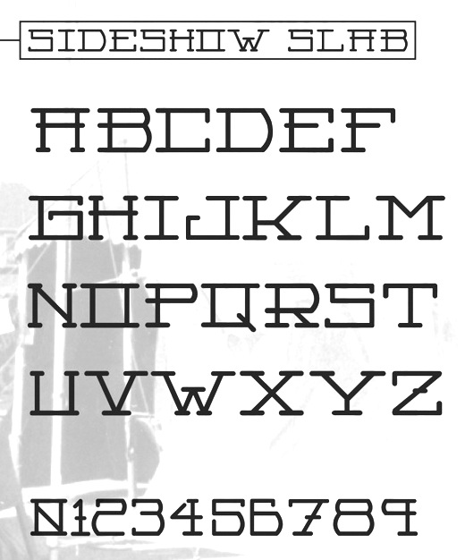
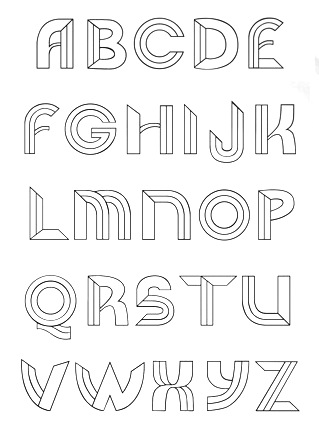
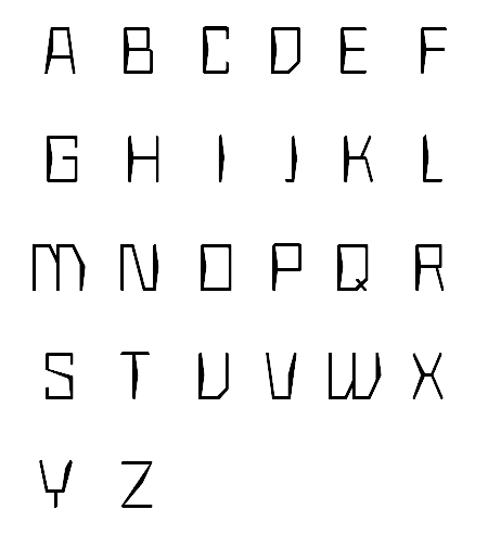
During his studies at the University of Kansas in Lawrence, KS, Alex Anderson designed the squarish all caps typeface Nomadic (2012) and the straight-edged heavy metal band typeface Robotz Death Metal (2012). In 2013, Alex published Sideshow Slab. [Google] [More] ⦿ | |
Alex Grecian
| |
At Wichita State University, Alex Haro designed the arch-themed typeface Bellatrix (2017). [Google] [More] ⦿ | |
Lawrence, KS-based student-designer of the sans typeface Biscuit (2017). [Google] [More] ⦿ | |
Lawrence, KS-based graphic design student. She created the poster typeface Noted (2012). [Google] [More] ⦿ | |
During her studies at the University of Kansas in Lawrence, Alex Tatro created the experimental typeface Chevwrite (2014). In 2018, she published the free fashion mag typeface V Fancy. [Google] [More] ⦿ | |
During her studies at the University of Kansas in Lawrence, KS, Alex Tatro designed the fashion mag sans typeface V Fancy (2017) and an experimental noisy screen typeface (2017). [Google] [More] ⦿ | |
Lawrence, KS-based designer of the modular typeface Charleb (2014). [Google] [More] ⦿ | |
Behance link. [Google] [More] ⦿ | |
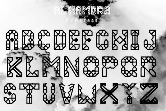
During her studies in Lawrence, KS, Aliaa El Kalyoubi designed the typeface Alhambra (2014), which was inspired by Granada's Alhambra. Ekra (2014) is an experimental blackboard bold typeface inspired by Greek and futuristic letterforms. Aliaa also produced a wonderful set of illustrations on the properties of Paul Renner's Futura (1927). Behance link. [Google] [More] ⦿ | |
Graphic design student at the University of Kansas in Lawrence. She created the curly typeface Sprightly (2012). [Google] [More] ⦿ | |
Lawrence, KS-based designer of the dot matrix / pixel typeface family Pixillusion (2017). In 2015, she designed the retro futuristic typeface MidCentury. [Google] [More] ⦿ | |
During her graphic design studies in Lawrence, KS, Allie Fields created a few handlettered alphabets (2014). [Google] [More] ⦿ | |
Graphic design student at the University of Kansas, who lives in Lawrence, KS. She created the curvy typeface Novo (2012). Behance link. [Google] [More] ⦿ | |
For a school project, Allie Welch (Lawrence, KS) created an octagonal futusistic typeface in 2013 called Spacegirl. [Google] [More] ⦿ | |
During her graphic design studies at the University of Kansas in Lawrence, KS, Amanda Caracci created the circle-based typeface Candy Cane (2012). Behance link. [Google] [More] ⦿ | |
During her studies at the University of Kansas in Lawrence, Amelia Hernandez created the hexagonal typeface Amp (2014). [Google] [More] ⦿ | |
At The University of Kansas, Lawrence, KS-based AmyDeHart designed the slab serif typeface Cheeky (2017). [Google] [More] ⦿ | |
During her studies at the University of Kansas, Amy DeHart (Lawrence, KS) designed the display typeface Underneath (2015, FontStruct). [Google] [More] ⦿ | |
Graphic designer who works typography into some of her work, such as this Baskerville poster (2010). Behance link. She lives in Kansas City. [Google] [More] ⦿ | |
Originally from Lawrence, KS, Andrew designed an unnamed lachrymal typeface in 2012 with Paul Gonzalez during his studies at Ringling College of Art and Design in Sarasota, FL. [Google] [More] ⦿ | |
Lawrence, KS-based typographer and graphic designer. Creator of Chehuly (2010). [Google] [More] ⦿ | |
Lawrence, KS-based student-designer of the heavy modular typeface Zagreb (2017). [Google] [More] ⦿ | |
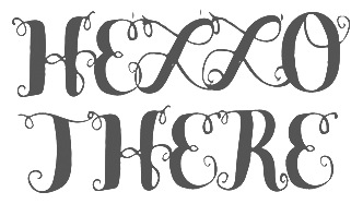
Lawrence, KS-based designer of the University of Kansas school project font Hello (2014). [Google] [More] ⦿ | |
Olathe, KS-based designer, at the University of Kansas, of the hexagonal typeface Honeycomb (2018). [Google] [More] ⦿ | |
During his graphic design studies at the University of Kansas, Anthony Schmiedeler created Mr. Wright (2012), a font with architectural elements drawn from Frank Lloyd Wright's work. | |
Lawrence, KS-based design student (at the University of Kansas) who created Acer Slab (2014) for a school project. [Google] [More] ⦿ | |
Ashlee Burlie (Wichita, KS) created the modular foliate typeface Leafline (2013). [Google] [More] ⦿ | |
Lawrence, KS-based designer of the dadaist typeface Scissor (2014). [Google] [More] ⦿ | |
Graphic design student at the University of Kansas in Lawrence. She created the Closer typeface (2012) during her studies. [Google] [More] ⦿ | |
During her studies at the University of Kansas, Lawrence, KS-based Bailey Saville designed the modular typeface Modmen (2017). [Google] [More] ⦿ | |
During her graphic design studies at the University of Kansas in Lawrence, KS, Bailey Wells created the art nouveau caps typeface Lancet (2012). | |
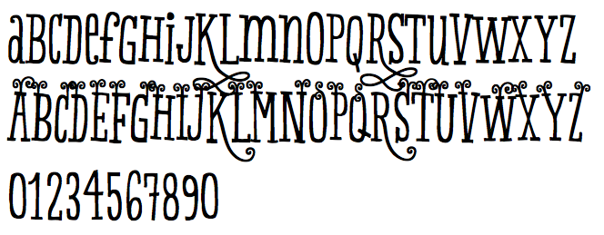
Baseline Fonts
|
Fonts:
|
During her studies in Lawrence, KS, Beth Snow designed the origami typeface Fold (2017). [Google] [More] ⦿ | |
In 2017, he published the script typeface Feverish at Veil of Perception. While only published in 2017, this typeface has a history, as explained by LaFever: Feverish was a font borne out of perceived need in the marketplace. Hallmark retired font designer and master letter designer Myron McVay first approached Bill LaFever to collaborate on a project to design a semiformal calligraphic script that could be set as text copy with a large variety of swash and alternative characters and small caps. Bill penned the initial forms and Myron did the digital conversions and initial technical work. After Myron passed away, Terry Lee, a protégé of Myron's at Hallmark---also retired---took over and the project was completed. [Google] [MyFonts] [More] ⦿ | |
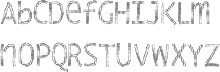
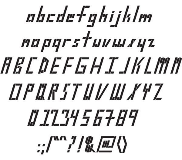
FontStructor in Fort Riley, KS, b. 1974, who made several heavy and severe-looking octagonal typefaces in 2010 and 2011, including Brakemen CLE, Bullhorn, Commando 2011, Wild Bull, Rudius, Battalion, Goth Spike, Brakeman New, Universitario, Tuff Commando, Saber, Vengeance2, Valley Forge, Griff (loosely based on the NHL 2011 All Star Game font), Assault Vertical, Bullhorn Spike, Universitario Trace, Vengeance, Rails, Assault Hockey, Emerald City, Brigade, Amateur Pacifist (2011, athletic lettering), Paradise, Vengeance 2011, Assault, Brakemen CLE. Some fonts are in the techno / futuristic style, and others are tattoo fonts. Typefaces made in 2013: Railroader (octagonal), 2nd Brigade, Emerald City (octagonal). Typefaces from 2016: All American. Abstract Fonts link. Dafont link. Another Abstract Fonts link. [Google] [More] ⦿ | |
Blake Fry studied law at the University of Kansas (BA, 2001) and at Lewis&Clark Law School (JD, 2009). He wrote Why typefaces proliferate without copyright protection. This is a thoroughly interesting paper. The text below are the author's conclusions. This paper has demonstrated how several mechanisms collaborate to create an environment in which an abundance of typefaces are designed, even though typefaces in the United States cannot now, or maybe ever, be copyrighted. Typefaces are functional objects, necessary for literate societies who print words on paper or display them on screens. As such, some typefaces must exist. And as long as some exist, the type design industry will be subject to the mechanisms that allow it to be innovative. Technology is one of those mechanisms. Because different technologies have limitations that affect typefaces, new designs, compensating for the limitations, have to be made when a technology is introduced. New technologies also allow typefaces to have features or benefits that were not previously possible. The market demands, and is willing to pay for, access to these features and benefits. Technology has also lead to the digitization of the type design process. This has caused an explosion in the number of type designers, and typeface designs. Though digitization of the industry has decreased the quality of designs in some cases, it has just as often increased quality. Because the type design industry is relatively small and close-knit, norms within the industry are effective at mitigating plagiarism within it. This phenomenon comports both with general theories of norms, and with observations from other industries in intellectual property law’s open areas that also effectively employ norms to reduce copying. Even when norms fail, typefaces, especially those that require the most time and investment to design, are resistant to plagiarism. Typefaces are also subject to the vagaries of artistic movements and fashion-like cycles. As tastes change, which they do rather quickly, new typefaces have to be made to comport with the new aesthetic. Advertising and the advertising industry is an important cog in this process helping, among other things, to speed the fashion-cycle. Typefaces are also non-rivalrous, almost always existing as digitized computer fonts. They are therefore subject to file-sharing, like any other digital media. However, file-sharing probably has not damaged the type design industry. Among the most likely culprits for the reduction in the price of computer fonts is the practice of bundling computer fonts with operating systems and other software. This is especially true among software geared to graphic design professionals. Adobe, among the largest foundries in the world, primarily creates new typefaces to make its software, which is a much more lucrative business for it, more attractive. Other analyses of industries operating in the open areas of intellectual property law have shown how they, too, can be innovative, creating significant new expressive works. The more interesting question is not how any one industry operates in intellectual property law's open areas, but whether any industry now protected by intellectual property laws would be sufficiently innovative if protection were taken away. The small number of industries that have been examined so far are probably not a large enough sample set from which an answer can be derived. More observations are therefore needed. What might become apparent upon such a cataloging is a general principle. This paper has shown how many mechanisms work together to encourage innovation in the typeface industry. This suggests that other industries could also have several mechanisms that work together, often in unexpected ways that could never be predicted by mere theory, to produce innovation in expressive works without protection from copyright or other intellectual property laws. [Google] [More] ⦿ | |
| |
| |
Graphic designer in Lawrence, KS, who created the broken letter typeface Submerge in 2017. [Google] [More] ⦿ | |
During his studies at the University of Kansas, Chloe Hubler (Olathe, KS) designed the display typeface Forge (2015, FontStruct). [Google] [More] ⦿ | |
Codesigner with Nathan Williams at Baseline Fonts in Wichita, KS, of Country Fang (2003). [Google] [More] ⦿ | |
Brian White
| |
During her studies at the University of Kansas in Lawrence, KS, Brielle Green designed the gothic serif typeface Luster (2017). [Google] [More] ⦿ | |
Overland Park, KS-based designer of the squarish poster typeface Jumpy (2017). [Google] [More] ⦿ | |
During her graphic design studies, Zelda, KS-based Brttany Westerman created Support Font (2014) in the trendy hipster style. [Google] [More] ⦿ | |
Caitlin Workman grew up in Saint Charles, Missouri, close to Saint Louis. She is a visual communication student at the University of Kansas in Lawrence, KS. She designed the ultra-fat round typeface Glee (2011) and the display typeface Sir Quincy (2013). Behance link. [Google] [More] ⦿ | |
During his studies at the University of Kansas, Caleb Newberg designed the monospaced sans serif typeface Astro in 2012. Still at UK, he created the tweetware constructivist typeface family Headcase (2013). [Google] [More] ⦿ | |
A legibility study in 2006 at Wichita State University (Kansas) by Barbara S. Chaparro, A. Dawn Shaikh and Alex Chaparro shows that Cambria is more legible than Constantia, and both are far more legible than Times New Roman. [Google] [More] ⦿ | |
Wichita, KS-based designer of the floral typeface Perennial (2017). [Google] [More] ⦿ | |
| |
| |
During her studies at the University of Kansas, Chloe Hubler (Leawood, KS) designed a deco typeface (2015, FontStruct). [Google] [More] ⦿ | |
Kansas City, MO-based designer of the squarish Italian typeface Jupiter (2014). Behance link. [Google] [More] ⦿ | |
| |
During her studies at the University of Kansas, Claire Anderson (Lawrence, KS) designed several hand-lettered alphabets (2016). [Google] [More] ⦿ | |
Lawrence, KS-based designer of Homeward (2013, an alchemic typeface), which was created during her studies there. It can be bought at Ten Dollar Fonts. [Google] [More] ⦿ | |
During her graphic design studies in Lawrence, KS, Claire Zimmerman designed an unnamed paperclip typeface (2013). Her second typeface, Seams (2012-2015), is a carefully designed sans specially made for white tee shirts. Kiosk (2015) is an all caps display typeface. She graduated from the University of Kansas in 2016. Home page. [Google] [More] ⦿ | |
Cody Green (Wichita, KS) created Slab Gaelic in 2014. Slab Gaelic mixes a slab serif with the Gaelic style. Behance link. [Google] [More] ⦿ | |
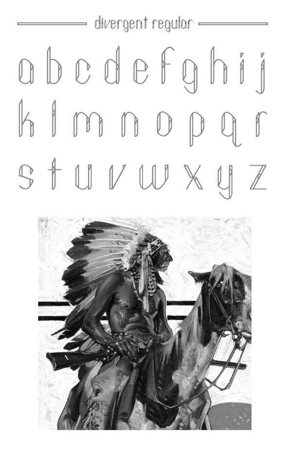
Kansas-based designer of Sleek (2012) and Divergent (2013, blackboard bold typeface family). Behance link. [Google] [More] ⦿ | |
As a student at Wichita State University in Wichita, KS, Collin Ensz designed the art deco typeface Up To Snuff (2015). [Google] [More] ⦿ | |
McPherson, KS-based designer of these typefaces in 2015: Revolution (rounded display sans), Prescott (slab serif). [Google] [More] ⦿ | |
Lawrence, KS-based designer of the techno typeface Liftoff (2017). [Google] [More] ⦿ | |
Lawrence, KS-based creator of a ghoulish typeface in 2012. [Google] [More] ⦿ | |
As a student at Wichita State University in Wichita, KS, Crystal Frost designed the thin display typeface Cadence (2015). Behance link. [Google] [More] ⦿ | |
Dana De Cicco
| |
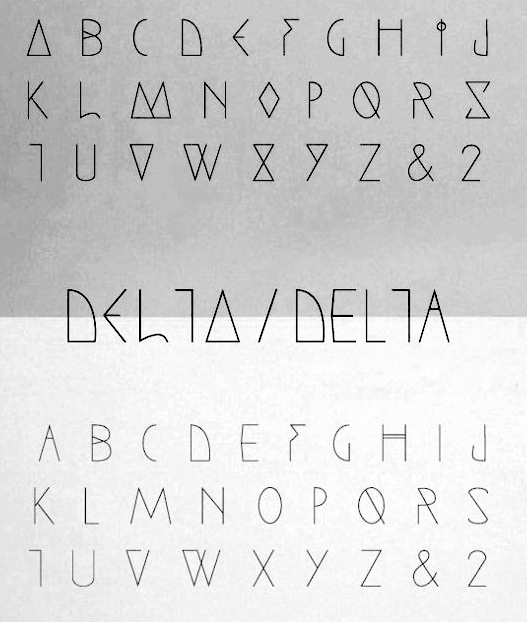
Graphic design student at the University of Kansas in Lawrence. She created the thin hand-printed caps typeface Delta (2012). [Google] [More] ⦿ | |
Lawrence, KS-based designer (b. 2001) at the University of Kansas of the fine display sans typeface Xotzky (2020). [Google] [More] ⦿ | |
His typefaces: Dancin' (1995), the dingbat ITC Dave's Raves One (1994), Expressions (1995), Faithful Fly (1994), ITC Juice (1995), Bang (1993), Mo Funky Fresh (1993, now at Linotype), Moderns (1994, influenced by masters such as Picasso and Kandinsky), ITC Snap (1995), Tag (1994), Bluntz (1994), DF Wildlife LET Plain (1994), and Kool Beans (2008, Umbrella Type). Linotype link. FontShop link. Klingspor link. View david sagorski's typefaces. [Google] [MyFonts] [More] ⦿ | |
Dawn Shaikh received her PhD in human factors psychology in 2007 from Wichita State University. Throughout graduate school, she worked on a grant from Microsoft's Advanced Reading Technologies group. Her master's thesis focused on line length in news&narrative articles. She worked on the legibility of ClearType fonts, and on that of onscreen fonts. Her dissertation focused on the perception of typeface personality. After graduation, ironically---despite Microsoft scholarships throughout her life---, she joined arch enemy Google, where she worked on Google Web Fonts, Docs, Ebooks, Android, and Internationalization. Speaker at ATypI 2011 in Reykjavik on the topic of typefaces for Android OS (with Steve Matteson). [Google] [More] ⦿ | |
Dawn Shaikh
| |
Dawn Shaikh
| |
Dayna Hoock (Wichita, KS) created the counterless octagonal typeface Three Shapes Font (2013). [Google] [More] ⦿ | |
Student at the University of Kansas in Lawrence. Creator of Arcotype (2012), a geometric typeface that was influenced by the shapes of the 1962 Arco lamp. [Google] [More] ⦿ | |
Design by Luke
| Luke Englert studies visual communication at the University of Kansas. During his studies, in 2012, he created a typeface that was inspired by gothic arches. [Google] [More] ⦿ |
Design Outside Studio (or: DO Studio)
|
|
Dillon James Sherman is a web and graphic designer who graduated from Kansas State University (Wichita, KS) and who is now located in Dallas, TX and/or Austin, TX. Creator of the free steam-powered Western typeface Sedgwick Co (2012). In 2013, as Lemoine, he created the decorative blackboard bold typefaces Shelley Alive and Shelley Dead. Aka Hogwash Studio. Fontspace link. Fontsquirrel link. Behance link. Old URL. Creative Market link (for buying his typefaces). [Google] [More] ⦿ | |
During her graphic design studies at the University of Kansas in Lawrence, KS, Drue Davis created the ball terminal typeface Perennial (2012). Behance link. [Google] [More] ⦿ | |
Elemeno
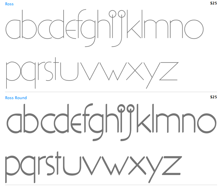
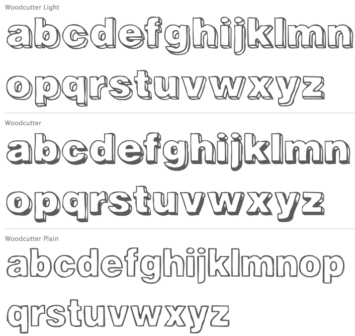
| Elemeno is a foundry in Topeka, Kansas, where one can buy fonts made by graphic designer Alex Grecian (b. Hospital, 1969), who markets his fonts through MyFonts. Partial list of typefaces: Aldersgate, Betabet (2002, a scratchy sketched typeface), Bindle, Black Bull (2005), Boller, Borealis, Bungalow, Cadence, Camryn, Cerulean, Dragon Drop, Plummet (2006), Handwriting fonts Boller, Benchley (2004), Chalk, Parmesan Serif, Trade Dress, Chockablock (comic book face), Broadway, Classical Drop Caps (2002), Classical Engraved (2002), Chocolate Shop (2005, display face), Christy Marie (curly face), Circus Peanut, Zero Tolerance Block, Zero Tolerance College, Zero Tolerance Serif, Kryptonite, Zap Bats, Extreme Junction, Grecian Empire, Helvetian Times, Platypus (2002), Saint Vitus, Saturday Night, Vibraphone, Xanthippe, Christy Marie (2002, crazy curly font), Zero Tolerance, Kings in Disguise, Peaches, Betabet (2004), Minuitia, Natural Dark, Wittgenstein, Drop Down, Erector Dysfunction, Flaster Platypus, Gorey, High Water, Hypewriter, Iteration Grap, Jejune Bebug, La Brea Typist, Macon Tracks, Merkin, Nicodemus, Orbiculate, Parker (2004), Parmesan Serif, Pillow talk, Reading Railroad, Rejoinder, Rock Bottom, Ross (2004: an avant-garde geometric monoline regualr face), Ross Round (2004), Rubric Cuped, Salutation, Saturday Night, Trade Dress, Structure, Salutatorian, Spiroglyph, Tattersall, Tenpenny Dreadful, Times Kangaroo Down, Trivet, Wendigo, Whiffle (2004), Woodcutter (2005), Woollcott, Wordplay, Writers Block, Zap Bats. View Alex Grecian's typefaces at Elemeno. [Google] [MyFonts] [More] ⦿ |
During her studies at the Universoty of Kansas in Lawrence, KS, Elizabeth Hixon created Hexablock (2014). [Google] [More] ⦿ | |
Behance link. [Google] [More] ⦿ | |
Lawrence, KS-based designer of the school project font Toast (2014). [Google] [More] ⦿ | |
Wichita, KS-based designer of Picklehauben Font (2015), which is used to illustrate Little Red Riding Hood (2015). [Google] [More] ⦿ | |
Lawrence, KS-based student-designer of the modular typeface Labyrinth (2018). [Google] [More] ⦿ | |
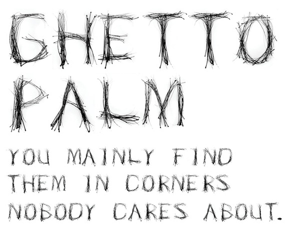
Eric Carver (Kansas City, KS) designed the condensed squarish caps typeface Fong (2011, a typeface inspired by the artwork of Barry McGee) and the scratchy typeface Ghetto Palm (2011). [Google] [More] ⦿ | |
Lawrence, KS-based designer, at the University of Kansas, of the modular piano key typeface Glitz (2018). [Google] [More] ⦿ | |
Lawrence, KS-based student-designer of the modular typeface Freestyle (2017). [Google] [More] ⦿ | |
For a school project, Erika Ruiz (Lawrence, KS) created an octagonal techno typeface in 2013. [Google] [More] ⦿ | |
Erin McLaughlin
| |
Flow14
| Kyle Johnston (Flow14) is the Overland Park, KS-based designer of the free graffiti font Milk (2002), Bodolive (2003, a mix of Bodoni and Antique Olive), Sporty (2002, college lettering font, free in the Rumpus sub-page), Meteors (free download, click on Rumpus), Midwest (click on Work, then Type; based on Senator Ultra, on commission for Midwest Graphics), and Jellyphant Round (2002). Creative director at Garmin. Behance link. Linkedin link. [Google] [More] ⦿ |
FontFuel (formerly PhotoshopIsland, and Ridpath Creative Partners)
| Roger Ridpath (b. 1964, Wichita, KS, and located in Kansas City, Missouri) is a photography expert who designed the hand-printed Designer Notes (2009) and Leaves Symbol Font (2013). At MyFonts, one can buy Iron Grunge (2010), PSI Leaves (2010, dingbats), Angie Lou (2010, grunge), Designer Notes Pro (2012, hand-printed), and Grungy Old Typewriter. Home page. Klingspor link. Dafont link. Creative Market link. [Google] [MyFonts] [More] ⦿ |
Fontwala (was: Hindi Rinny)
|
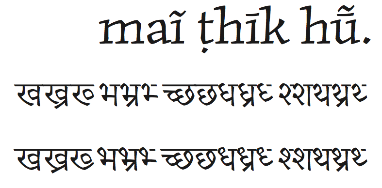
She designed Katari for her thesis. Originally from Milwaukee, she received a BFA in Graphic Design from the Minneapolis College of Art & Design before her MA at Reading. Erin created an angular typeface---à la Oldrich Menhart---, and added a matching Devanagari style---the harmonious ensemble is called Katari. This typeface earned her the 2011 SoTA Catalyst award. In 2015, she published the free Google Web Font typeface Khula for Latin and Devanagari. The Latin is based on Steve Matteson's Open Sans. GitHub link. Still in 2015, she published the useful free Devanagari typeface family Yantramanav at Google Web Fonts, to accompany Christian Robertson's Roboto. Adobe Kannada was also designed in 2015---the Latin part of that font was by Robert Slimbach. Typefaces from 2016 include Hubballi (a free monolinear typeface for Kannada; Google Fonts link). In 2019, she aided with the Devanagari part of the free Google Fonts typeface IBM Plex Sans Devanagari (by Mike Abbink, Paul van der Laan, Pieter van Rosmalen, Erin McLaughlin). In 2021, Erin McLaughlin and Wei Huang developed the traditional workhorse sans serif typeface Tenorite for Microsoft for use as one of the default fonts in Office apps and Microsoft 365 products. Elements such as large dots, accents, and punctuation make Tenorite comfortable to read at small sizes on screen. In 2020, she published BhuTuka Expanded One at Google Fonts. BhuTuka Expanded One, originally designed in 2017, is a Gurmukhi companion to Aoife Mooney's BioRhyme Expanded Light typeface. Home page. Github link. Personal home page. [Google] [MyFonts] [More] ⦿ |
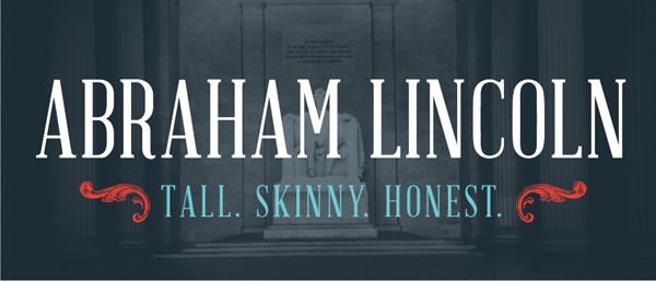
She created the free font Abraham Lincoln (2012, Lost Type). [Google] [More] ⦿ | |
Kansas City-based designer of the slab serif titling typeface America (2016). [Google] [More] ⦿ | |
During her studies at the University of Kansas in Lawrence, Grace Cantril createdome experimntal typefaces (2014). [Google] [More] ⦿ | |
During her studies at the University of Kansas, Grace Heitmann (Lawrence, KS) designed the display typeface Avid (2015, FontStruct). [Google] [More] ⦿ | |
Lawrence, KS-based student-designer of the modular typeface Beamer (2017). [Google] [More] ⦿ | |
During her studies at the University of Kansas, Chloe Hubler (Lawrence, KS) designed the display typeface Terrestrial (2015, FontStruct). Behance link. [Google] [More] ⦿ | |
During her studies in Lawrence, KS, Haley Hennier designed the futuristic typeface Terrestrial (2015). Behance link. [Google] [More] ⦿ | |
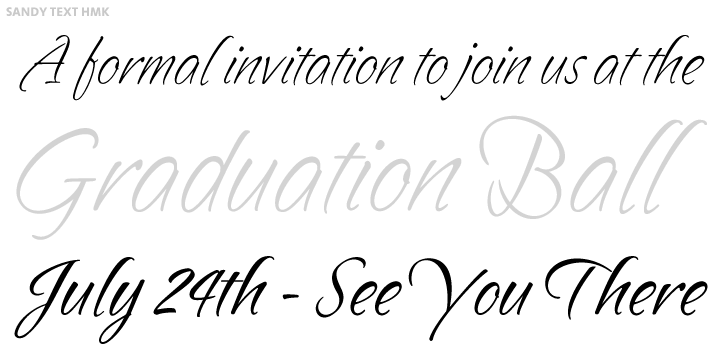
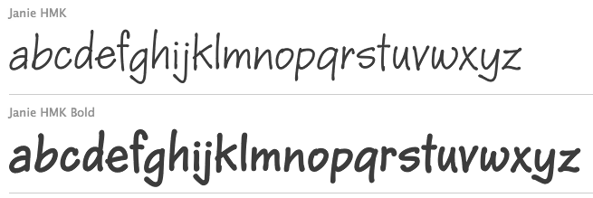
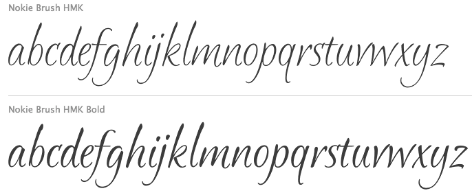
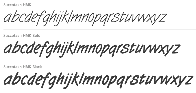
In 2008, careful hackers found these fonts in the flash files of Hallmark and posted them on alt.binaries.fonts: AngelinaHMK, AnnouncementRomanHMK, CoronaSansHMK, CrownRomanHMK, DuneHMK (2008), InkberryCondensedBoldHMK, KarasHMK, KingsHatBoldHMK, MizquitoHMK, PatriciaHMK, PoobyrdHMK, ZincHMK-Regular. One hacker points out that AnnouncementRomanHMK is a rework of Castcraft's AnnouncementRoman, adding the Euro, so Hallmark seems to have its hands in the cookie jar, unless there is an intestinal link to Castcraft (but I am not aware of any). In 2010, some people extracted fonts from Hallmark e-cards with these names: BetaCrownRomanBFA, BetaMars, BluesOnePKA, DoverA1, EdPS-Script, EvereadyOnePKA, GriegoOnePKA, InkberryCondensedBoldA1, KingsHatSansTextBoldPKA-Regular, KingsHatSansTextBoldPKA, KreamyPKA, Minion-HMK, PSOneBoldPKA, PahtooieOneSolidPKA, PahtooieTwoSolidPKA, PeanutsA1-Regular, QubitTwoBoldPKA, SlashKA, StoryBookPKA. In 2010, Ascender started selling the Hallmark fonts. The first set includes Bix Antique Script HMK, Cluff HMK, Forget Me Not HMK, Fultoon HMK, Geeoh HMK, Hasty HMK, Havix HMK, Jewels HMK, Kat Tail HMK, McBoo HMK, Okrien HMK, Ottum HMK, Starbabe HMK, Succotash HMK and Wallow HMK. The second set, published in 2011, has BoogieWoogie HMK, Calcium HMK (2010, skeletal font), Gweet HMK, Karrot HMK, Pan HMK, Slash HMK, Splint HMK, Tuf Medium HMK (2011), Twizot HMK (1999). But then Ascender was gobbled up by Monotype, so who knows what will happen? In 2012, we find a file with 107 free fonts on the Hallmark site as a support file for Hallmark Card Studio 2012. That collection: AliceFrancesHmk, BaaBookHmk, BaaBookHmkBold, BernhardFasD, BernhardFashionHmk, BernhardMordern, BethsCuteHmk, BethsCuteHmkBold, BixAntiqueScriptHmk (2009, a copperplate script), BixAntiqueScriptHmkBold, BoogieWoogieHmk, BoogieWoogieHmkBold, CallieHmk, CandyBuzzBTN, CandyBuzzBTNBold, CapriHMK, CarmineTango, CaslonAntT, CaslonNo540SwaD-Ital, ChrisHmk, ChrisHmkBold, CluffHmk, CluffHmkBold, CopperplateT-Bold, CopperplateT-Ligh, CopperplateT-Medi, DesertDogHmk (2008), DomCasualBT-Regular, DomCasualD-Regu, ForgetMeNotHMK, FrancineHmk, FrancineHmkBold, FultoonHmk (2010, a great painter's script), FuturaBT-Medium, Garamond, GaramondBold, GaramondBoldItalic, GaramondItalic, GeeohHmk (2009), GeeohHmkBold, GilliesGotD-Ligh, GrilledCheeseBTNCn, GweetHmk, GweetHmkBold, HankBT-Roman, HastyHMK (2006), HavixHmk (1998, calligraphic), HavixHmkBold, Humanist531BT-RomanA, JanieHmk (2008), JanieHmkBold, JewelsHmk (2008), KatTailBoldHMK, KatTailHMK (2009), LamboHmk, LamboHmkBold, LiorahBT-Regular, MaritaTextBookHMK, MaritaTextMediumHMK, McBooHmk (2009), MelanieBT-Roman, MissyBT-Roman, NimbusRomD-Regu, NimbusRomdBold, NimbusRomdItalic, NimbusSanT-Regu, NimbusSanT-ReguCond, NimbusSanTConBold, NokieBrushBoldHMK, NokieBrushHMK (2009), NotnorvalHmk, NotnorvalHmkBold, OkrienHmk (1999, camp site script), OkrienHmkBold, OttumHmk (2010, formal connected script), OttumHmkBold, PamHMK (2009), ParkAveD, PegsannaHMK, RegisterSansBTN, RegisterSansBTNBold, RyanBT-Heavy, SandyTextHmk (1997, formal script), SandyTextHmkBold, Shannon-Book, ShannonExtraBold, SlashHmk, SlashHmkBold, SplintHmk (2008), SplintHmkBold, StarbabeHmk (2009), StarbabeHmkBold, SuccotashHmk (1999, technical memo script), SuccotashHmkBlack, SuccotashHmkBold, Symphony, SymphonyBlack, TwizotHmk (1999), URWAlcuinT-Regu, URWImperialT-Regu, WackyActionBTN, WackyActionBTNBold, WallowHmk (1999), WallowHmkBold, WritetyperHmk, YearbookSolid. Hallmark's SMC animations font download site has the free fonts Hmk Handjive, Handshake, Handlebar, Handstand, Handspring, Handsome, all made in 2010. Additional fonts not mentioned above include Butch HMK (2008), Amberger Sans One, Angelina, Announcement Roman HMK, Constanze Mono One Med, Corona Sans, Crocka Doodle One, Crown Roman (regular, italic), Drummer Man, Dune, Inkberry Cond Bold, Karas, Kings Hat (bold, italic), Mizdemeanor One, Mizfit, Mizquito, Patricia Medium, Poobyrd, Zinc. As of the early 2010's, Hallmark had two full-time font designers in its department, Terry Lee and Josh Scruggs, and could still count on Myron McVay, who officially retired from Hallmark a few years ago and died in 2013. The type department was headed by Rick Cusick. More recently, Hallmark started to work exclusively on proprietary font designs, including fonts for various Hallmark subsidiaries. By 2016, Rick Cusick and Terry Lee also retired, leaving Hallmark with just two full-time designers: Josh Scruggs and Lila Symons. To read about type design at Hallmark, consult What Our Lettering Needs The Contribution of Hermann Zapf to Calligraphy & Type Design at Hallmark Cards by Rick Cusick. [Google] [MyFonts] [More] ⦿ | |
At Wichita State University in Wichita, KS, Jaci Ignudo designed the Braille-inspired typeface Perception (2017) and the script typeface Jace (2017). [Google] [More] ⦿ | |
During his studies at the University of Kansas in Lawrence, Jackson Byam created the squarish stencil typeface All America (2014). [Google] [More] ⦿ | |
| |
Graphic design student at the University of Kansas in Lawrence, KS. Creator of the display typeface Carneval (2011). [Google] [More] ⦿ | |
Jay Vidheecharoen
| |
Jeff Bortniker
| |
During her studies at the University of Kansas, Jen Ham (Lawrence, KS) designed the pixelish typeface Glitch (2015, FontStruct). [Google] [More] ⦿ | |
During her studies at the University of Kansas in Lawrence, KS, Jennifer Cox designed Stone Cut (2019). [Google] [More] ⦿ | |
During her studies at the University of Kansas, Jennifer Faucett (Overland Park, KS) designed the sci-fi typeface Stargaze (2015, FontStruct). [Google] [More] ⦿ | |
During her studies at the University of Kansas, Jenny O'Grady designed the modular skateboard-inspired display typeface Nollie (2015). [Google] [More] ⦿ | |
Jeremy Shellhorn
| |
Student at the University of Kansas in Lawrence, KS, in 2014. Creator of the constructivist typeface Tundra (2014). [Google] [More] ⦿ | |
Past type designer and lettering artist at Hallmark Cards. [Google] [More] ⦿ | |
| |
Leawood, KS-based designer of the squarish typeface Tropic (2015). Home page. [Google] [More] ⦿ | |
Wichita, KS-based designer of the blackboard bold typeface Moonflower (2015, a school project at Wichita state University). [Google] [More] ⦿ | |
Kansas City-based designer of the sturdy display typeface Buran (2018). [Google] [More] ⦿ | |
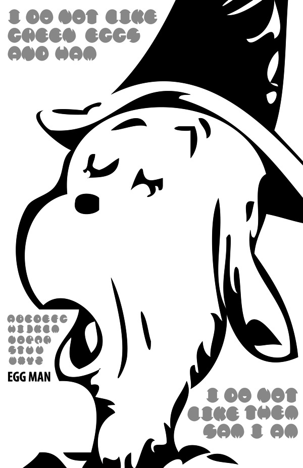
Wichita, KS-based designer of display typefaces such as Constructura (2013, triangulated glyphs), and Egg Man (2013, an ovate typeface). [Google] [More] ⦿ | |
Lawrence, KS-based designer of the thin sans display typeface Kauffman (2014), which is named after the Kauffman Foundation. [Google] [More] ⦿ | |
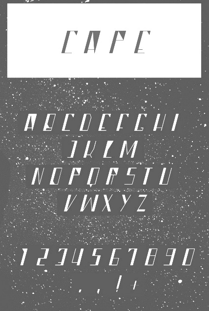
During his studies at the University of Kansas in Lawrence, KS, John Reynolds created the sci-fi typeface Cape (2012) and the anthroposophic typeface Hijack (2013). [Google] [More] ⦿ | |
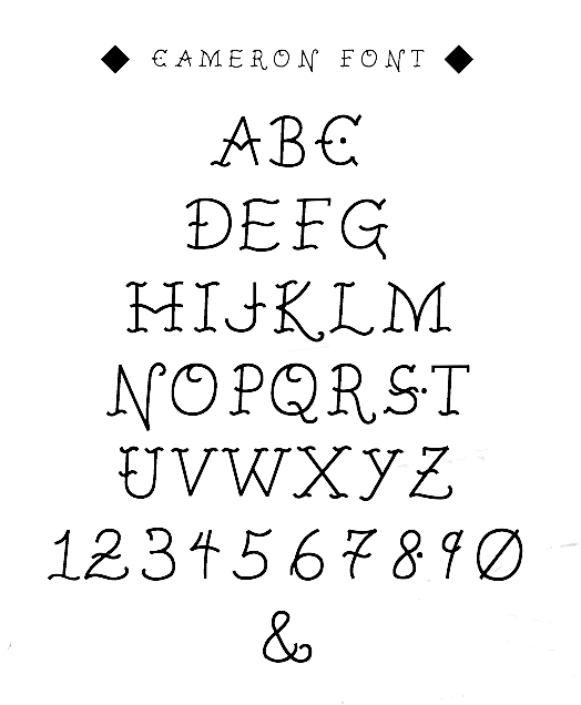
As a student at the University of Kansas in Lawrence, Jon Marzette designed the wavy display typeface Cameron (2012). [Google] [More] ⦿ | |
During his studies at the University of Kansas in Lawrence, KS, Jonathan Heter designed a few free fonts in 2014: Barnstormer (a prismatic all caps, display typeface influenced by the stunt pilots of the early 20th century), Dogfighter, Wingwalker. [Google] [More] ⦿ | |
Kansas-based creator of the Mexican-themed typeface Porton (2012). [Google] [More] ⦿ | |
Graphic design graduate from the University of Kansas (2011). His Alejandro Blackletter (2010) is a carefully crafted typeface done at Fachhochschule Trier (Germany) in 2010 under the guidance of Andreas Hogan. Unlike the name suggests, this typeface is not a blackletter at all, but is rather round. [Google] [More] ⦿ | |
Josh Scruggs
|
|
Josh Scruggs
| |
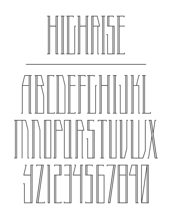
During his studies in Wichita, KS, Josiah Zimmerman designed the condensed bilined typeface Highrise (2013). [Google] [More] ⦿ | |
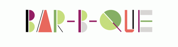
KS-based graphic designer. She created some logotypes such as BBQ (2011). [Google] [More] ⦿ | |
Justin Bell is a graphic design student at the University of Kansas, 2008-2012. Behance link. In 2010, he created a modified version of Helvetica by using horizontal stripes and filling in the counters. [Google] [More] ⦿ | |
During her graphic design studies at the University of Kansas in Lawrence, KS, Kacie Eberhart created the Ringmaster typeface in 2012. Behance link. [Google] [More] ⦿ | |
During her studies at the University of Kansas in Lawrence, KS, Kaitlyn Mulroney designed the modular typeface Ecliptic (2015). [Google] [More] ⦿ | |
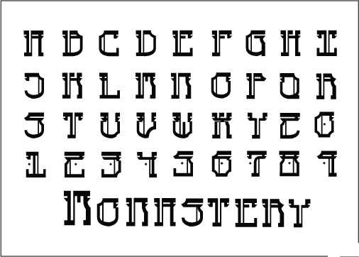
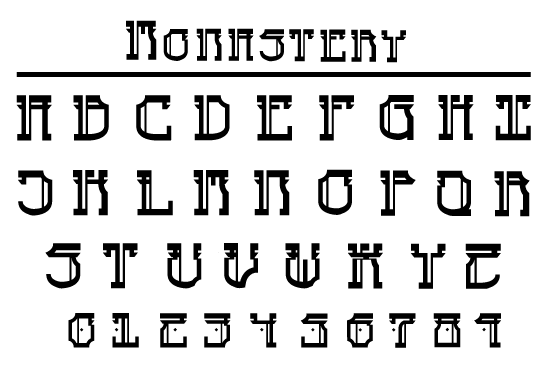
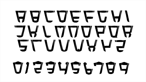
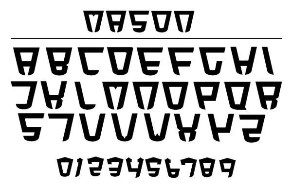
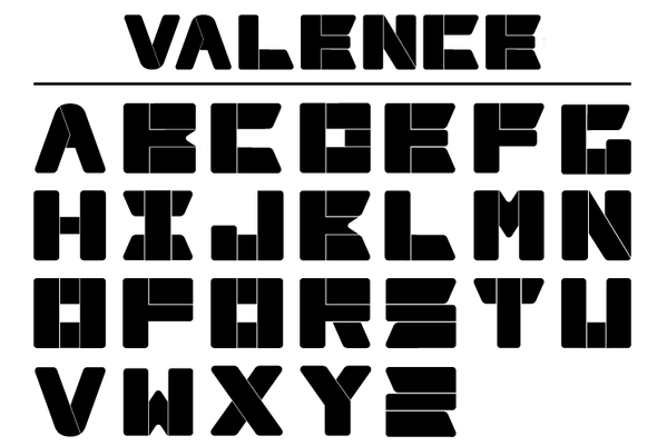
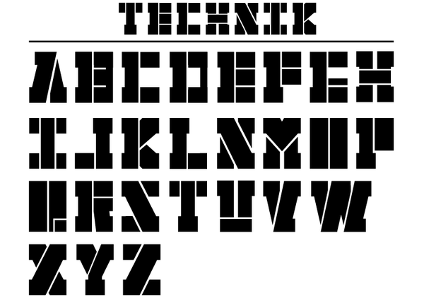
Student at Kansas State University in Manhattan, KS. He created the mysterious Monastery font in 2010, and the logo font Mason in 2011. Also in 2011, he added Valence and Technik (technical fat stencil). Behance link. [Google] [More] ⦿ | |
At Wichita State University in Wichita, KS, Kandyse Davenport designed the ECG-themed typeface Heartbeat (2017). [Google] [More] ⦿ | |
| |
Kansas City, KS-based student-designer at the University of Kansas of the high-contrast display typeface Divine (2018). During her studies at the University of Kansas, Karley Pearson (Kansas City, KS) designed the display sans typeface Quirk (2020). [Google] [More] ⦿ | |
Lawrence, KS-based designer of the bitmap typeface Amioala (2014). [Google] [More] ⦿ | |
Overland Park, KS-based student-designer (at KU) of the hairline sans typeface Kindred (2018). [Google] [More] ⦿ | |
Lawrence, KS-based designer of the prismatic school project font Parts Make The Whole (2014). [Google] [More] ⦿ | |
As a student based in Spring Hill, KS, Kaysie Meeker designed the geometric display typeface Scout (2017), and a set of icons depicting cardinals. [Google] [More] ⦿ | |
During her studies at the University of Kansas, Kelley McQuillen (Lawrence, KS) designed the display typeface New Wave (2015, FontStruct). [Google] [More] ⦿ | |
Lawrence, KS-based designer of the art deco typeface Retro Cinema (2014). [Google] [More] ⦿ | |
Student at the University of Kansas in 2014. Lawrence, KS-based designer of the organic sans typeface Leaf (2014). [Google] [More] ⦿ | |
During her studies in Lawrence, KS, Kelsey Coleman designed the modular typeface Organic Leaf (2018). [Google] [More] ⦿ | |
During his studies at KU in Kansas City, KS, Kevin Baynham designed the soft-edged poster typeface Ouija (2017) and the rounded set of numbers Loaded (2017). [Google] [More] ⦿ | |
Topeka, KS-based designer of the modular typeface NeoFuture (2018) for a school project at KU. [Google] [More] ⦿ | |
During her studies in Wichita, KS, Krissy Buhrer created Fox Tail Font (2014). [Google] [More] ⦿ | |
Olathe, KS-based designer of the pixelized typeface Sioux (2013), which was done for a school project. [Google] [More] ⦿ | |
During her studies at The University of Kansas, Kristin Enyart (Lawrence, KS) designed Paimio (2016), a unicase typeface that is inspired by the Paimio chair. [Google] [More] ⦿ | |
During her studies at the University of Kansas in Lawrence, KS, Kristina Foster designed the dotted display typeface Renegade (2017). [Google] [More] ⦿ | |
Fonts produced by the University of Kansas, Structure and Tectonics GIS Laboratory, 1998. Only useful with the ESRI Arcview software (Arc/Info). Page maintained by Ross Black. [Google] [More] ⦿ | |
Kyle Johnston
| |
During her graphic design studies at the University of Kansas in Lawrence, KS, Kylee Alvarez created the sci-fi typeface Orbit (2013). Behance link. [Google] [More] ⦿ | |
During his studies at the University of Kansas, Kyleigh Rowe (Lawrence, KS) designed the native American symbolism typeface Roweboat (2015, FontStruct). Behance link. [Google] [More] ⦿ | |
Lawrence, KS-based designer of the modular school project font Bend (2014). Behance link. [Google] [More] ⦿ | |
During her studies at the University of Kansas in Lawrence, KS, Kylie Dressman designed the flared stem typeface Nolan (2017). [Google] [More] ⦿ | |
Laura Bolter
| |
Laura Bolter Designs
| Graphic designer in Lenexa, KS, who created these commercial hand-drawn typefaces in 2014: LBBrushy, LBSweetieBold, LBSweetie. In 2015, she designed Anne with an E (handcrafted), and LB Pie (curly script). In 2017, she created Bonjour Mon Ami (calligraphic brush font) and Little Princess. Creative Market link. Behance link. [Google] [More] ⦿ |
Lawrence, KS-based designer of the modular typeface Jake (2017). [Google] [More] ⦿ | |
During her studies at the University of Kansas in Lawrence, KS, Lauren Murphy designed the display typeface Derby (2017) and a set of food truck icons (2016). [Google] [More] ⦿ | |
| |
License Plate Fonts of the United States, Canada, and Mexico
| Ward Nicholson of Leeward Productions in Wichita, KS, explains many license plate fonts. He also gives a quick rundown of available license plate fonts, as of 2008:
|
During her studies at the University of Kansas in Lawrence, Lindsay Plattner created the geometric display typeface Sharp (2014). [Google] [More] ⦿ | |
Lawrence, KS-based designer, at the University of Kansas, of the modular art deco sans typeface Corretto (2018). [Google] [More] ⦿ | |
During her studies at the University of Kansas in Lawrence, KS, Liz Knochelmann (b. Kentucky) created the triangle-based typeface Anti Ethereal (2014). [Google] [More] ⦿ | |
During her graphic design studies at the University of Kansas in Lawrence, KS, Lori Novak created the geometric typeface Native (2012). Behance link. [Google] [More] ⦿ | |
Luke Englert
| |
Wichita, KS-based designer of the display typefaces Inka (2013) and Rotunda (2013: circle-based). [Google] [More] ⦿ | |
Behance link. [Google] [More] ⦿ | |
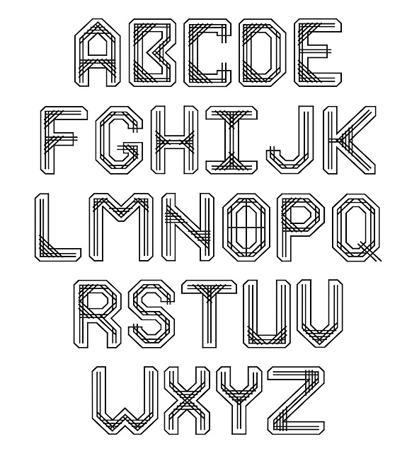
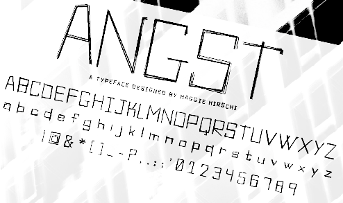
Graphic design student at the University of Kansas, who lives in Lawrence, KS. Creator of Angst (2011). [Google] [More] ⦿ | |
Lawrence, KS-based designer of the high contrast display typeface Awol (2017). [Google] [More] ⦿ | |
Overland Park, KS-based student-designer of the modular hipster typeface Salem (2017). [Google] [More] ⦿ | |
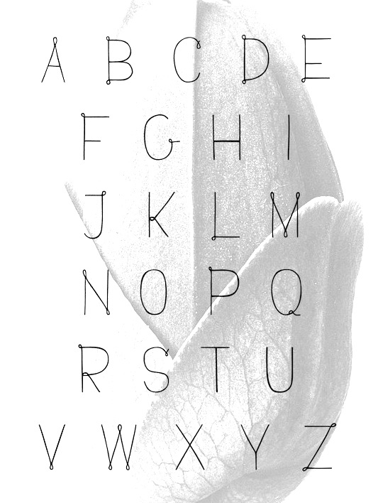
Lawrence, KS-based creator of Fernie (2012): Fernie is a typeface inspired by the works of Karl Blossfeldt (1865-1932). He was a German photographer, sculptor, teacher & artist who is best known for his close-up photographs of plants and living things, published in 1929 as Urformen der Kunst. [Google] [More] ⦿ | |
For a school assignment, Wichita, KS-based Marcus Graeff created Pipedream (2015) by modifying Rockwell. [Google] [More] ⦿ | |
During her studies at Wichita State university in Wichita, KS, Mariah Seward designed the blackboard bold typeface Pinstripe (2016). [Google] [More] ⦿ | |
Graphic design student at the University of Kansas in Lawrence. She created the Piper typeface (2012) during her studies. [Google] [More] ⦿ | |
During her studies at the University of Kansas in Lawrence, Mary Sniezek created the paperclip typeface Modular (2014). [Google] [More] ⦿ | |
| |
Max Ayalla
| |
During her studies, Meagan Garrett (Lawrence, KS) designed the monoline circle-based typeface Leisure (2018). [Google] [More] ⦿ | |
| |
During her studies at the University of Kansas, Megan Snelten (Lawrence, KS) was inspired by Amsterdam's leaning houses when she designed Gable in 2017. Design at KU link. Behance link for Design at KU. [Google] [More] ⦿ | |
During her studies at the Kansas City Art Institute, Melissa Huynh designed the octagonal typeface Aeron (2012, FontStruct). Behance link. [Google] [More] ⦿ | |
During her graphic design studies at the University of Kansas in Lawrence, KS, Melissa Meyers created Groovy Chopsticks (2012), a typeface that is based on the shape of the Volkswagon bus. Behance link. [Google] [More] ⦿ | |
During his studies at in Lawrence, KS, Michael Hornsby created the multilined textured typeface Shutters (2014) and the octagonal typeface Chamfer (2016). [Google] [More] ⦿ | |
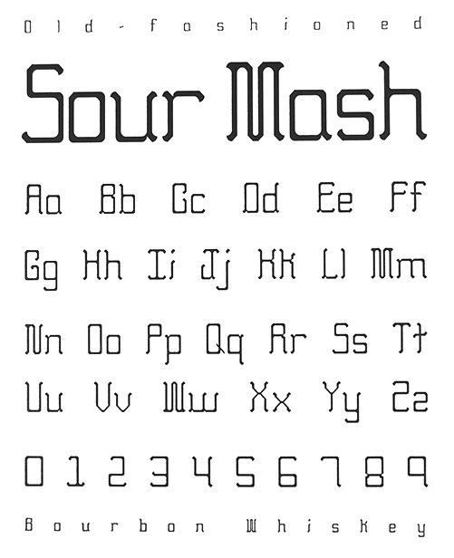
During his studies at the Kansas City Art Institute in 2011, michael Jumper designer Sour Mash Whiskey (2011). Behance link. [Google] [More] ⦿ | |
| |
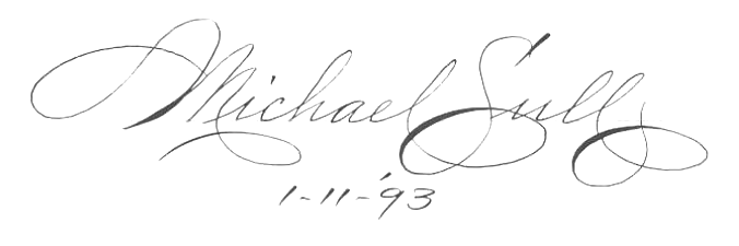
Michael R. Sull's Penmanship Hall of Fame from his 1989 book Spencerian Script and Ornamental Penmanship discusses 26 master penmen from the golden era of American penmanship (between the Civil War and World War II). [Google] [More] ⦿ | |
Creator in 1997 of the KuldIPA phonetic font at Kansas University. [Google] [More] ⦿ | |
Millieangelo Design Co
|
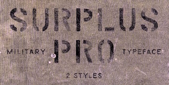
In 2016, now located in Kansas City, MO, he designed the rough stencil typeface Surplus Pro. Typefaces from 2017: Sumner (soft edge sans), Union Made (a vintage typeface family: It offers that bit of that masculine, whiskey drinking, machine using, denim wearing, ass-kicking touch to any design or logo), Argentine (a great roughened poster font), Kansas City, Pueblo Blackletter (tattoo font), Sylvester (headline sans), Soft Block (vintage octagonal typeface). Typefaces from 2018: Homestead, MDC Uptown, Vintage Athletic, Venice Gothic, Bevel Block. Behance link. Creative Market link. Old URL. [Google] [More] ⦿ |
Overland Park, KS-based designer of the highly original square display typeface Chopstix (2017). [Google] [More] ⦿ | |
During her studies at the University of Kansas in Lawrence, KS, Mollie Hanselman designed the neo deco typeface Luna (2017). [Google] [More] ⦿ | |
During her studies at the University of Kansas, Morgan Dees (Lawrence, KS) designed the dot matrix typeface Build (2015). [Google] [More] ⦿ | |
Morgan Stockton was born in Merced, CA, and grew up in Lansing, KS. During her studies in Kansas City, MO, she created the display typeface Jemma (2014). [Google] [More] ⦿ | |
During her studies at the University of Kansas, Naomi Shultz (Lawrence, KS) designed the arched display typeface Capitol (2015, FontStruct). [Google] [More] ⦿ | |
Lawrence, KS-based student-designer of the squarish typeface Silicon (2018). [Google] [More] ⦿ | |
During his studies, Nathan Holthus (McPherson, KS) created Jonquil Sans (2015) and Midnight (2016). Behance link. [Google] [More] ⦿ | |
Nathan Williams
| |
Neo Font
| NeoFont is a Korean type foundry. Among its designs, we find Neo (2013, avant-garde Latin face) by Yi Min (Hays, KS). There are, of course, tens of Hangul (Korean) fonts as well. Behance link. [Google] [More] ⦿ |
Lawrence, KS-based designer of the beveled school project font Sombra (2014, University of Kansas). [Google] [More] ⦿ | |
During her studies at the University of Kansas in Lawrence, KS, Olivia Feathers designed the modular typeface Forest (2017), Jaws Movie Icons (2018) and Handsome (2018). [Google] [More] ⦿ | |
During her studies at the University of Kansas, Paige Drummond (Lawrence, KS) designed the squarish typeface Glimmer (2015, FontStruct). [Google] [More] ⦿ | |
Wichita, KS-based designer of the pixelish display typeface Be Square (2014). [Google] [More] ⦿ | |
During her studies at the University of Kansas in Lawrence, Paige Steiert created the hexagonal display typeface Orifice (2014). [Google] [More] ⦿ | |
For a school project at the University of Kansas, Patrick Blanchard (Lawrence, KS) created a pixelized typeface in 2013. [Google] [More] ⦿ | |
Paul A. McKlveen (Overland Park, KS) made and sells the Handbell Notation Font, in all formats. Fonts include Hbell and Hbellfin. [Google] [More] ⦿ | |
During her studies at the University of Kansas, Rachel Donovan (Olathe, KS) designed the stencil typeface Digital Dash (2015, FontStruct). [Google] [More] ⦿ | |
| |
During her studies in Lawrence, KS, Rachel Roth designed the modular typefaces Stereophonic (2014) and Dapper (2014). Behance link. [Google] [More] ⦿ | |
Lawrence, KS-based creator of the techno typeface Propel (2011). Rebekah is a student at the University of Kansas in Lawrence. [Google] [More] ⦿ | |
In 2013, Rebekah Rose (Emporia, KS) designed the vampirish typeface So Vain. This font was created during her studies. [Google] [More] ⦿ | |
RedEyeType
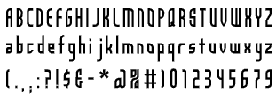
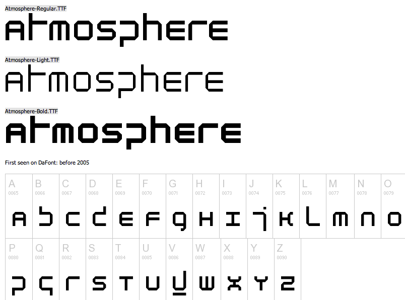
| RedEyeType offers these fonts by Jay Vidheecharoen (Chicago, IL): AngelaSans (1999: based on Neville Brody's Industria, so Jay says), Imitari (1999: for Imitari magazine), Atmosphere (1999, octagonal: free at Dafont), Memento Mori (1999: wow!), and Van Hooser (1997: a curly font for Hallmark cards based on the lettering style of Hallmark illustrator Donna Van Hooser). Jay worked in the lettering department at Hallmark in 1997. In earlier days, Jay ran Invisible Studio Fonts, but that link is now dead. He also worked at the University of Kansas and for PC Gamer Magazine. Dafont link. Klingspor link. [Google] [More] ⦿ |
Calligrapher, b. Stockton, CA. Art director of Letter Arts Review magazine since 1992. Designer of Nyx (1997-2002, Linotype, Adobe). Presently, Rick was Manager of Font Development at Hallmark Cards near Kansas City, MO, until some time between 2012 and 2016. Nyx won an award at Bukvaraz 2001. Author of What Our Lettering Needs The Contribution of Hermann Zapf to Calligraphy & Type Design at Hallmark Cards (2012, RIT Cary Graphic Arts Press). This books deals with Hermann Zapf's years (1966-1973) as a consultant to Hallmark Cards. Zapf's typefaces there include Crown Roman, Jeannette, Hallmark Uncial, Crown Italic. Linotype link. [Google] [MyFonts] [More] ⦿ | |
River City Rubber Works
| River City Rubber Works (Haysville, KS) is a company that designs and manufactures art rubber stamps and images. The business began in 1994 as a greeting card company called Spirit Works Greetings. River City Rubber Works was created as a division of that company in 1997. MyFonts sells its fonts, such as River City Sandwriting (2009). The designer is Dana De Cicco (b. Oklahoma). She got interested in fonts as a student at Oklahoma State University, where she graduated with a BFA with an emphasis in drawing and painting. In 1994 she and her partners founded Spirit Works Greetings. Klingspor link. [Google] [MyFonts] [More] ⦿ |
Graphic designer from Kansas who made several experimental fonts in 2011. [Google] [More] ⦿ | |
| |
Roger Ridpath
| |
Illustration student at the University of Kansas in Lawrence. Creator of the ornamental caps typeface Sanswich (2012). Behance link. [Google] [More] ⦿ | |
During her studies at the University of Kansas in Lawrence, KS, Chicago-native Sabrina Sheck designed the modular bubblegum font Puffle (2017). Behance link. [Google] [More] ⦿ | |
Wichita, KS-based designer of the straight-edged typeface Stroke (2014). [Google] [More] ⦿ | |
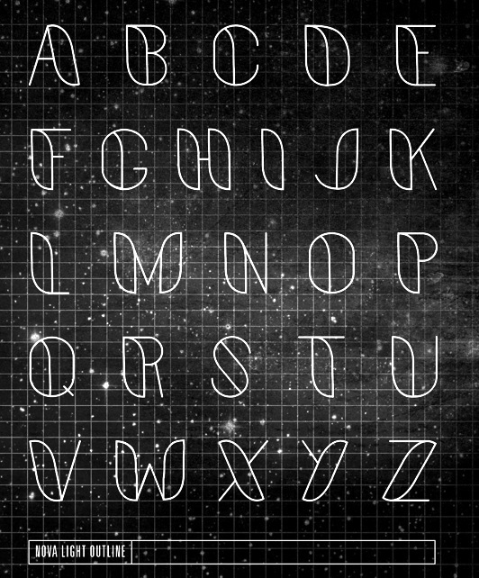
During her graphic design studies at the University of Kansas in Lawrence, KS, Sally Carmichael designed Nova (2012), a modular outlined typeface. Behance link. [Google] [More] ⦿ | |
Sam Small (Kansas City, MO) designed the ultra-contrasted minimalist squarish typeface Minutia (2012) during his studies at the Kansas City Art Institute. Behance link. [Google] [More] ⦿ | |
Visual communication student at the University of Kansas. Creator of a hexagonal typeface called Steipe (2012) that was inspired y the architecture in Trier, Germany. Behance link. [Google] [More] ⦿ | |
Student at the University of Kansas in Lawrence. Creator of the display typeface Strike (2012), which was designed on the basis of DIN. [Google] [More] ⦿ | |
For a school project at the univrsity of Kansas, Sarah Smith (Lawrence, KS) designed the geometric solid typeface Transcendent (2018). [Google] [More] ⦿ | |
Wichita, KS-based designer of a bilined typeface in 2019. [Google] [More] ⦿ | |
During her studies at the University of Kansas, Savannah Wakefield designed the thin modular sans typeface Paradise (2018). [Google] [More] ⦿ | |
Born in 1986 in Grand Junction, CP and educated in art&graphic design at Western State College of Colorado, Scott now works as a freelance designer in Wichita, KS. Creator of the handwriting font Scotosaurus (2011) and the blackletter typeface Cartographer (2011). Ellephont (2011) is hand-printed. Dafont link. Klingspor link. [Google] [More] ⦿ | |
Shae Miller (Wichita, KS) designer the art deco style typeface Park Ave in 2013 during her studies at Wichita State University. [Google] [More] ⦿ | |
Behance link. [Google] [More] ⦿ | |
| |
At the Department of Psychology, Wichita State University, Wichita, KS, various (mostly Microsoft) fonts were compared for speed of reading, and legibility. Conclusions: "o significant differences in reading efficiency were detected between the font types at any size. There were, however, significant differences in reading time. Generally, Times and Arial were read faster than Courier, Schoolbook, and Georgia. Fonts at the 12-point size were read faster than fonts at the 10-point size. In addition, a font type x size interaction was found for the perception of font legibility. In general, however, Arial, Courier, and Georgia were perceived as the most legible. For font attractiveness, Georgia was perceived as being more attractive than Arial, Courier, and Comic, while Times was perceived as more attractive than Courier. This contrasts with participants' general preference for a particular font type. Overall, Verdana was the most preferred font, while Times was the least preferred. Thus it seems that the Georgia and Times serif fonts are considered more attractive, but they are generally less preferred. Of the fonts studied, Verdana appears to be the best overall font choice. Besides being the most preferred, it was read fairly quickly and was perceived as being legible.". For font legibility, Tahoma 10pt, Courier 12pt and Georgia 10pt came out the winners. Research by Michael Bernard, Bonnie Lida, Shannon Riley, Telia Hackler, and Karen Janzen. Alternate URL [Google] [More] ⦿ | |
Behance link. [Google] [More] ⦿ | |
Student from McPherson, KS, who is studying graphic design a the University of Kansas. She created a colorful poster to announce an AIGA event in 2012. [Google] [More] ⦿ | |
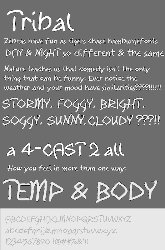
Stephen McBride (b. 1967) is based in Kansas City, MO, and before that in Edwardsville, KS and Earle, AR. He is the man behind the SWMCA Catalogs (est. 2012). An ex-signpainter, he is now turning his typefaces into digital fonts. Creator of the free hand-printed font Tribal (2012). The explanation is interesting: Tribal was first drawn in 1979 as Indian. For many years it was one of the most popular SWMCA fonts. Shortly there after there was a heavy movement among Native American tribes about being called "Indians". They'd constantly complain that they weren't from India or an Arabic nation. In response, SWMCA changed the name to Typeface (later Typefont) of Native American Honor. It was redrawn in 2012 and sent to Font Panda to be digitalized and came back more "liquidity" and much more playful than the original. Tribal was followed by Tribal Schoolhouse (2012). In 2013, he designed the hand-printed typeface families Fun Euro Schoolhouse, 2013 SWMCA Demo, Watermelon Stand, 2013 Demo of Cadaver's Script (eerie), Midtown Roman, Hexagonal Delight (angular script), Ol West Rustik, Disco Grudge and 12 Steps. Typefaces from 2014: Pupil Light, Kansas City Gothic Caps (blackletter), Kabbalah, Area 51 UFO (+Apocalypse, a glazkrak typeface). In 2015, he designed the free brush typeface 99% Occupy in support of the Occupy Movement. Dafont link. Home page. Dafont link. Fontspace link. [Google] [More] ⦿ | |
| |
During her studies in Lawrence, KS, Taylin Wells designed the modular typeface Big Digital (2019). [Google] [More] ⦿ | |
Born in southeastern Oklahoma, Talor Goad now works as a designer for Gardner Design in Wichita, KS. His typeface Alexis (2011, free at Lost Type) is a take on the Italian woodstyle. It was fontified by Nathan Williams. Cargo Collective link. [Google] [More] ⦿ | |
Originally from Minneapolis, MN, Taylor Hillestad studied at the Kansas City Art Institute, where she created the display chic typeface Highcraze (2013). [Google] [More] ⦿ | |
Terry Lee
| |
The Effect of Typeface on the Perception of Email
| A study in 2007 at Wichita State University (Kansas) by A. Dawn Shaikh, Doug Fox and Barbara S. Chaparro showed test subjects emails in Calibri, Comic Sans and Gigi. The selection of the three fonts used for the neutral email was based on previous work by Shaikh, Chaparro, and Fox (2006) that examined user perception of how appropriate 20 fonts were for 25 uses (i.e., business documents, web pages, email). The ranking of those 20 fonts: Calibri, Corbel, Candara, Cambria, Verdana, Arial, Times New Roman, Constantia, Georgia, Century Gothic, Comic Sans, Courier New, Consolas, Monotype Corsiva, Kristen ITC, Agency FB, Rage Italic, Gigi, Rockwell Extra Bold, Impact. Interestingly, in questions of ethos, Comic Sans and Colibri are almost equal, well ahead of Gigi. [Google] [More] ⦿ |
The Effect of Website Typeface Appropriateness on the Perception of a Company's Ethos
| A study in 2007 at Wichita State University (Kansas) by A. Dawn Shaikh reveals that among a handful of typefaces, readers of company web sites order them as follows: Calibri, Cambria, Arial, Calisto, Georgia, Courier New (way down), and at the bottom, Monotype Corsiva, Lucida Hand, Informal Roman, Viner Hand and Curlz. [Google] [More] ⦿ |
Wichita, KS-based designer of the 1920s movie poster font Broadway Figura (2015). [Google] [More] ⦿ | |
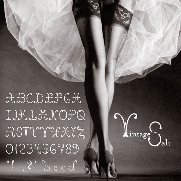
Creator of the ornamental display typeface Vintage Salt in 2012, during her studies at KU in Overland Park, KS. | |
During her graphic design studies in Lawrence, KS, Triana Thompson designed the tall modular typeface Pipe Dream (2013). [Google] [More] ⦿ | |
TriLion Studios Market
|
Typefaces from 2017: Block Print, Prospective (a tech font family). Creative Market link. Behance link. [Google] [More] ⦿ |
This web site is dedicated to an e-book on typography and type designers written in 2011 by Lance Schmittling, Jennifer Higerd (from Union, MO), and Dominic Flask (from Wichita, KS). It is more biased towards graphic design, and has few sections on type design. [Google] [More] ⦿ | |
During her studies in Lawrence, KS, Valery Herman designed the circle-based typeface Queen Anne Arches (2013). [Google] [More] ⦿ | |
Veil of Perception
| Terry Lee is a graduate of the University of Kansas. He worked for Hallmark Cards in Kansas for some time. His typefaces there include Runyan, which is based on lettering by Terry Runyan, Write Typer (typewriter emulation), and Ultra Jason, which is based on lettering by Amber Goodvin. In 2015, he set up his own type foundry, Veil of Perception. His typefaces at his own foundry include Feverish (2017; well, this one is made by Bill LaFever for Veil of Perception), Tragicomic (2016: a comic book typeface), Occam (2016: an informal calligraphic script face) and Hadron (2016, a gothic calligraphic typeface family). [Google] [MyFonts] [More] ⦿ |
Kansas-based creator of the handwriting font Feindseligkeit (2000). Alternate URL. [Google] [More] ⦿ | |
Vitatype Digital Fonts
|
Klingspor link. [Google] [MyFonts] [More] ⦿ |
During her graphic design studies at the University of Kansas in Lawrence, KS, Voranouth Supadulya created the outlined typeface Vaulted (2012), which was inspired by the arches of gothic vaults in European cathedrals. In 2013, she created the free sci-fi typeface family Astro (2013). | |
Ward Nicholson
| |
Wichita, KS-based designer of the wide display typeface Midnight Passion (2013). [Google] [More] ⦿ | |
Lawrence, KS-based student-designer of the pixel typeface Pixel (2017). [Google] [More] ⦿ | |
Yi Min
| |
|

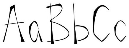
 Design student in Lawrence, KS. She created the angular typeface
  Foundry in Wichita, KS, founded in 1999 by Nathan Williams (b. Concordia, KS, 1973), formerly from the University of Kansas Art Museum Library. Its motto: The goal of the foundry is to provide uninterpreted revivals of type samples generated through disappearing printing methods, and create new fonts for dissemination in the type community. Order through
 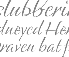 Bill LaFever studied art and calligraphy at St. Ambrose College (which was run by famous calligrapher and liturgical artist Fr. Edward Catich), class of 1970. From 1970 until 2008, Bill worked at Hallmark Cards as a calligrapher, lettering artist and graphic designer. Bill currently designs fonts out of his home in Prairie Village, Kansas.
  Born in Topeka, KS, 1911-1995. Head of Mademoiselle magazine, and a general master of design. He served on the faculty of the Yale School of Art for over thirty years. Typographically, he is best known for his proposal, published in Westvaco Inspirations 180 in 1950, to have a unicase alphabet, tentatively called
  Sterling, KS-based designer of the fine radio era retro display typeface Funke (2016). [
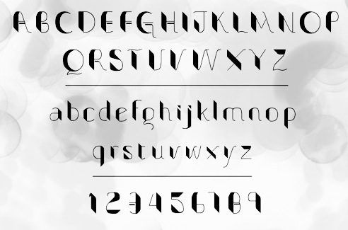
 As a student at the University of Kansas in Lawrence, Carolyn Applebaum designed a lively display typeface family,
  Graduate of The University of Kansas, class of 2011, who studied Visual Communications, Graphic Design and Illustration. She created
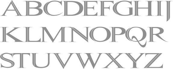
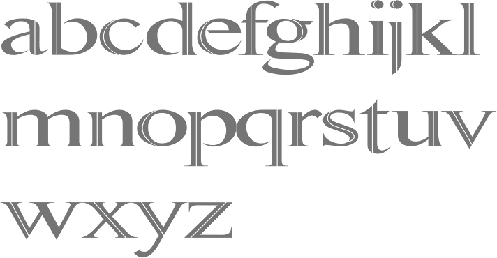
  Lawrence, KS-based graphic designer who created the Victorian typeface
  Born in Kansas, David Sagorski moved to southern Florida to study at the Art Institute of Fort Lauderdale. He then moved to New York City and created several display typefaces and picture fonts for ITC and Letraset. David worked on oil rigs and pipelines in the bayous of Louisiana. He was encouraged to peruse type design based on the suggestions of friends and associates who admired his handlettering and other works of art.
  A cooperative founded by Jeremy Shellhorn, who teaches design at the University of Kansas. Together with Jenny O'Grady (a graduate of the University of Kansas), Chloe Hubler (a graduate of the University of Kansas) and Andrea Herstowski (associate professor of visual communication design at the University of Kansas), he designed the free 4-style rounded sans family
  During her studies at the University of Kansas in Lawrence, KS, Elizabeth Post created a display typeface called
  [
[
 A native of Wichita, Kansas, Frances MacLeod completed a Bachelor of Fine Arts in Advertising Art Direction and Graphic Design at Columbia College Chicago. She also studied at Type@Cooper and has worked with teams in Chicago and New York, most notably the Department of Design at Leo Burnett. She is currently based in Brooklyn.
  Overland Park, KS-based designer of the squarish typeface Ephemera (2019). [
 [
[ During her graphic design studies at The University of Kansas in Lawrence, KS, Jessica Robertson designed an octagonal typeface (2013) and created many hand-lettered alphabets. [
 Josh Scruggs is a graduate from Kansas University, who teaches type design there starting in January 2009. He is also an in-house type designer at Hallmark Cards. His type blog was called
  Children's book illustrator in Olathe, KS, b. 1977. Creator of the gorgeous free font
  During her studies in Lawrence, KS, Lexi Griffith (now in Dallas, TX) created the
  Illustrator who studied design at Kansas University in 2008. His work there involved the development of a futuristic architectural typeface,
 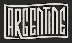 [
[ During her studies at the University of Kansas (class of 2017), Lawrence, KS-based Megan Snelten created Isometric Typeface (2014, hexagonal design) and the great architecturally-inspired and intentionally crooked typeface Gable (2016). [
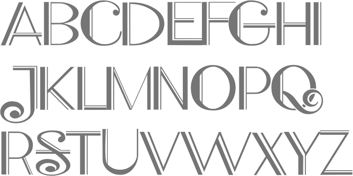
 Mission, KS-based designer of the spurred Victorian display typeface
  [
[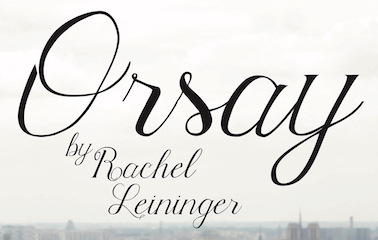 Rachel Raye Leininger grew up in Russia, and lives in Kansas City, KS. In 2017, she designed the calligraphic typeface Orsay. [
 Visual communication student at the University of Kansas in Lawrence. During his studies, he created a nice Eurostile poster (2012) and the striped experimentel typeface Papes (2014). [
 Lawrence, KS-based graphic design student. She shows a lot of promise in her display typeface
  During her studies at Kansas State University, Manhattan, KS-based Shelby Lueckenotto created the beautiful rounded sans typeface
 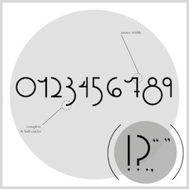 During her studies in Lawrence, KS, Stephanie Roche (b. 1991) designed the beautiful sans display typeface
  During her design studies at the University of Kansas (Lawrence, KS), Sydney Goldstein created the (excellent!)
  Lawrence, KS-based designer of the sans titling typeface Extendo (2015), the grungy Grumpy Ol Troll (2016), and the techno typeface Lion Sans (2016).
 At the University of Kansas in Lawrence, KS, Zoe larson designed the striking sharp-edged display typeface Gecko (2019), and Jurassic Park Icons (2019). [
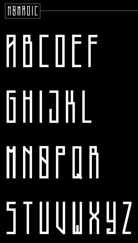
|
|
|
|