| | |
Aaron Spriggs
|
Graphic designer and photographer in Milwaukee, WI. Behance link. He gridified / pixelized Adobe Myriad Pro and called it Aluminum Life Semibold (2012). [Google]
[More] ⦿
|
Aboutype
[Joffre LeFevre]

|
 Aboutype (est. 1991) was Joffre LeFevre's small Boston-based foundry and custom font bureau. LeFevre (b. 1945, Muskegon, WI, d. 2022, Proctorsville, VT) has been making typefaces since about 1970. He studied Fine Arts (illustration) at Kendall College of Art and Design and Fine Arts (graphic design) at Grand Valley State University. He also received an honorary Masters in Fine Arts from Babson College. For twenty years serving as principal type designer and type product designer for Compugraphic/Agfa Corporation before founding Aboutype Associates, Inc., a type design studio and custom digitizing service in 1989. He retired to Vermont in 2009. Joffre LeFevre's 1997 Volkswagen font series is floating around in web space however. As he says, The Volkswagen fonts were hand-drawn by me to a specification based on a long neglected display version of Futura that was developed by a photo composition type foundry in the early seventies. Similar to the type used in the introduction of the first VW Beetle.
 LeFevre's fonts include Antique Central (shop sign font), Bitters, Boot Stitch, Capital, Crombury (2006, elegant high-ascendered display family), Cullens Shoes, Downtown, Elongated Roman, Erasurehead, Everett Mill, Free Zone (2001, geometric sans), Granger (2007), Hemmings, Hunter (2001, a slab serif family in the style of Beton), Hunter Poster, Mac Sans Outline Poster, Max Stitch, Merchant, Minernil (2006, slab serif family), Mulsanne (race car font), New Horizon (inscriptional, Trajan), New Horizon Titling, New Prairie (2001, transitional family), Pemberton, Pitch Pipe (2001, modern, bold), Putney (shop sign font), Ravenna, Rays Cafe, Redeye (2001, a religiously condensed and quite unreadable face), Redeye Sans, Revenue, Saloon, Sparrow (2007), Vanquish (2001, geometric sans), Wade Vernacular, Whitingham, and Zone. Some fonts now sold through MyFonts: Antique Central, Bitters, Boot Stitch, Capital, Crombury, Cullens Shoes, Downtown, Elongated Roman, Erasurehead, Everett Mill, Free Zone, Hemmings, Hunter, Hunter Poster, Max Stitch, Merchant, Mulsanne, New Horizon, New Prairie, Pemberton, Pitch Pipe, Putney, Ravenna, Rays Cafe, Redeye, Redeye Sans, Redeye Serif, Revenue, Saloon, Vanquish, Wade Vernacular, Zone, Sydney, Charles, Merrimac, Willem, Float, Proceed, Salonika. Klingspor link. View Aboutype's typefaces. Obituary. [Google]
[MyFonts]
[More] ⦿
|
Active Depth
[C.C. Marshall]
|
C.C. Marshall (b. 1985, Richland Center, WI) is a type designer in Madison, WI. He graduated from Minneapolis College of Art and Design, and founded the multimedia shop and font foundry Active Depth in 2000. Designer of Catenary (2010, an organic sans family). This family includes a Stencil style and a grungy Guerrilla style. At Dafont, one can download the grungy Catenary Stamp (2011). In 2018, he designed Blackscript. [Google]
[MyFonts]
[More] ⦿
|
Adam C. King
|
Designer of the Arabic simulation (or "faux Arabic") font Imperialist (2003), a protest against the American approach in the Middle East. Adam C. King is based at UW-Stout in Menomonie, WI. [Google]
[More] ⦿
|
Adam Lehl
|
Hudson, WI-based designer, with Ryan Hood, of the experimental typeface Melatonin (2003). [Google]
[More] ⦿
|
Alec Hildebrand
|
Milwaukee, WI-based creator of a plant-inspired caps alphabet (2011). [Google]
[More] ⦿
|
Alejandro Perez
|
Alex Perez is a designer in Madison, WI. Behance link. He created an unnamed typeface in 2010. [Google]
[More] ⦿
|
Alex Mogens Galt
|
Green Bay, WI-based web producer who is working on a hand-printed version of Bodoni/Didot: see here. [Google]
[More] ⦿
|
Alex Pichette
|
Neenah, WI-based designer of the thin circular typeface Arches (2016). [Google]
[More] ⦿
|
Alivia
|
Designer from wisconsin who created the free hand-printed typefaces Olive's Messy Signature (2012), Olive's Loose (2012) and Olive's Stitched Font (2012). [Google]
[More] ⦿
|
Allison Biesboer
|
Wisconsin-based graphic designer, who obtained a BFA from University of Wisconsin-Madison. She created the futuristic typeface Moonboots (2011). [Google]
[More] ⦿
|
Amanda Selin
|
Student at the University of Wisconsin Milwaukeem, who will get a Bachelor's degree in Architecture in 2012. Creator of the angular straight-line typeface Cosmos (2011). [Google]
[More] ⦿
|
Andrew McConville
|
 Designer in Milwaukee, WI. Behance link. Creator of the experimental typeface Tik (2011). [Google]
[More] ⦿
Designer in Milwaukee, WI. Behance link. Creator of the experimental typeface Tik (2011). [Google]
[More] ⦿
|
Angie Stumpf
|
Designer of the display font In the Name of Disco (2003). Angie Stumpf is based at UW-Stout in Menomonie, WI. [Google]
[More] ⦿
|
Anisur Rahman
|
Sgaon or Sonar Gaon is a Bangla font designed by Anisur Rahman from Milwaukee, WI, in the early 1990s. From the designer: "The Bangla font sgaon is a HP Laserjet softfont. In this implementation, the softfonts are converted to PostScript and the groff fonts are also generated from the Adobe Font Metrics, encoding, and map files." [Google]
[More] ⦿
|
Ann Stretton
[The Dingbatcave (was: Ann-S-Thesia)]
|
[MyFonts]
[More] ⦿
|
Anna Horst
|
During her studies at Marquette University, Milwaukee, WI-based Anna Horst designed a retro telephone book typeface (2016). Behance link. [Google]
[More] ⦿
|
Anne Frey
|
Graphic designer in Dallas, TX, who graduated in 2012 from the University of Wisconsin (B.Arts) in Madison, WI. Creator of the free display typefaces Diminuendo, Wedged, and Crossed Wires Condensed in 2012. Dafont link. [Google]
[More] ⦿
|
Anthony Gribben
|
Fond Du Lac, WI-based designer of the free hand-printed typeface Tommy Lee (2016). Behane link. [Google]
[More] ⦿
|
Antonia Schneider
[Yoruba Fonts]
|
[More] ⦿
|
Arien Epic
|
Madison, WI-based designer (b. 1992) of the mysterious typeface Unown (2013). [Google]
[More] ⦿
|
Ashley Hohnstein
|
Graphic designer and UW-Stout student Ashley Hohnstein (Oconomowoc, WI) created the multilayered typeface family Foofaraw (2012), combining curlicues with a tall condensed sans. Behance link. [Google]
[More] ⦿
|
Austin Gullixson
|
Graphic design student at UW-Stout in Menomonie, WI. Designer of Handscrift (2004), a typeface that took inspiration from old medieval manuscripts. [Google]
[More] ⦿
|
Austin Holland
|
During his graphic design studies at Washtenaw Community College, Austin Holland (Brighton, MI) created the sci-fi poster typeface Alphenia (2014). [Google]
[More] ⦿
|
Bai Mellon
[Sideshow]
|
[MyFonts]
[More] ⦿
|
Becca
|
East Troy, WI-based designer (b. 1990). She designed the simple handwriting font Believe (2008). [Google]
[More] ⦿
|
Ben Orozco
|
 Ben Orozco is an artist, designer, and illustrator based in Madison, WI. He uses traditional neon techniques to illustrate imagined spaces and explore effects of visual perception. A recipient of the 2018 Art Alliance for Contemporary Glass Visionary Scholarship Award, Orozco seeks to combine his formal design training with a historic glass material. He is currently studying Neon and Graphic Design at the University of Wisconsin Madison for his Bachelors of Fine Arts. At the University of Wisconsin-Madison, Ben Orozco designed the geometric sans typeface family Raviolo (2016). [Google]
[More] ⦿
Ben Orozco is an artist, designer, and illustrator based in Madison, WI. He uses traditional neon techniques to illustrate imagined spaces and explore effects of visual perception. A recipient of the 2018 Art Alliance for Contemporary Glass Visionary Scholarship Award, Orozco seeks to combine his formal design training with a historic glass material. He is currently studying Neon and Graphic Design at the University of Wisconsin Madison for his Bachelors of Fine Arts. At the University of Wisconsin-Madison, Ben Orozco designed the geometric sans typeface family Raviolo (2016). [Google]
[More] ⦿
|
Benton, Waldo & Co
|
Milwaukee, WI-based typefounder active in the latter part of the 19th century. [Google]
[More] ⦿
|
Benton&Cramer
|
Milwaukee-based foundry, also called Benton, Gove&Co., Benton, Waldo&Co., and the Northwestern Type Foundry. [Google]
[More] ⦿
|
Beth Janelle
|
Graphic design student at UW-Stout in Menomonie, WI. Designer of the grunge typeface Remnant (2003). [Google]
[More] ⦿
|
Bethany Armstrong
|
Designer, educator and artist who studied at the University of Wisconsin. She created Lady Killer (custom typeface and logo designed for Lilly Red Studio, Wedding Photography and Invitation Design, Chicago), Stylo Neuf (2009, a contrasted sans done in laser-cut letterpress), and Foundry Type (2008). [Google]
[More] ⦿
|
Bfred Design
|
Wisconsin-based designer of Frederick Sans (2020), an all caps typeface for sports applications. [Google]
[More] ⦿
|
Bill Moran
[Blinc Publishing]
|
[MyFonts]
[More] ⦿
|
Blake Spiegel
|
During his studies at UW Stout in Menomonie, WI, Blake Spiegel designed the free slab serif typeface Handbook Editor (2017). [Google]
[More] ⦿
|
Blank is The New Black
[Thomas Johnson Quinn]
|
 Graphic design studio located in Chicago, IL, which was founded in 2011 by graphic designer Thomas Johnson Quinn (b. 1980, Two Rivers, WI), a graduate of the Rhode Island School of Design (2003).
 In 2009, he created the 4-style pixel/dot matrix family Versteeg. Along the same theme, he made Niemi (2010), Toews (2010) and Huet (2010). In 2012, he created the extreme contrast didone typeface Volterra. In 2016, he made Pocketknife (sharp-edged and influenced by constructivism). Klingspor link. Behance link. Newer Behance link. Creative Market link. [Google]
[MyFonts]
[More] ⦿
|
Blinc Publishing
[Bill Moran]
|
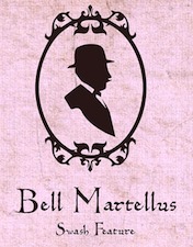 Bill Moran is Artistic Director of Hamilton Wood Type & Printing Museum in Two Rivers, Wisconsin. He also teaches typography and printing history at the University of Minnesota. Together with his brother Jim, Museum director, they are third generation letterpress printers, presiding over the largest collection of printing equipment and wood type in the U.S.
 At Blinc Publishing (est. 1996, St. Paul, MN) he released Goshen, Gommorah, and Prospect, typefaces that were done together with Darrel Austin at Chank. He also created Gideon (2001, 999USD!!!!!), Bell Martellus (2006, a Carolingian script family commissioned by the James Ford Bell Library at the University of Minnesota; co-designed with Chank Diesel), and Sodom (1999, with Chank). Hamilton Offset (2002, Chank) was based on an alphabet from the Hamilton Wood Type Printing Museum. He also made Flour Sack (2006). He writes: As a youngster in Green Bay, Bill began his career as an apprentice in his father's print shop [Jim Moran]. He honed his graphic design skills at the University Of Wisconsin-Stout and proceeded to work for Norwest Banks, The Artist known as Prince, and 3M before starting his own business. Bill serves as the Artistic Director for the Hamilton Woodtype and Printing Museum. Chank link. Blinc specializes in turn-of-the-century wood and lead type. [Google]
[MyFonts]
[More] ⦿
|
Bonnie Breyer
|
Graphic design student in Hudson, WI, who created the striped video game typeface Press Start in 2016. [Google]
[More] ⦿
|
Boris Pelcer
|
Boris Pelcer is a Bosnian-born artist and designer based in Milwaukee, WI. He has a BFA from the Milwaukee Institute of Art & Design, and an MFA from the University of Idaho's College of Art and Architecture, Moscow, ID. In 2013, he created a gothic calligraphic typeface called Allure (Ten Dollar Fonts). Behance link. [Google]
[More] ⦿
|
Bradley Poulson
|
Designer of the Trondheim runes font, which can be downloaded here. Harold Sauer, an MD at Michigan State University writes: Bradley Poulson, M.D. was a dear friend and medical classmate of mine. He was also an avid Macintosh user, buying his first Mac on the first day the computer was available in January of 1984. He was an internist in Manitowoc/Two Rivers, Wisconsin, U.S.A. who also liked to design fonts, like Trondheim. Bradley (1953-1990) met an untimely end in a car accident in his adopted Wisconsin on a snowy and icy day in December of 1990. [Google]
[More] ⦿
|
Brady Hollenbeck
|
Student from Delavan, WI, who designed Euroclip (2012, a sans). [Google]
[More] ⦿
|
Brea Heth
|
Designer from Milwaukee, WI, who created the flared sans display typeface Sophia (2011). Behance link. [Google]
[More] ⦿
|
Bree McMahon
|
Graphic artist in Racine, WI. Her Nouveau Font (2013) is a school project---its name suggests art nouveau, but it is actually an avant-garde font. [Google]
[More] ⦿
|
Brendan Sikes
|
Hudson, WI-based designer of Vortex Sharp (2015). [Google]
[More] ⦿
|
Brew City Type
[Daniel Nisbet]
|
Daniel Nisbet (Brew City Type, Milwaukee, WI) designed the wood style slab serif titling typeface Porter in 2016. In 2018, he designed Harvest Stout (an all caps grotesk). [Google]
[More] ⦿
|
Brian Kraimer
|
Kraimer worked at Ascender Corporation since 2004 until it was sold to Monotype. He has worked at the Chicago Tribune, and at Monotype Typography and Agfa Monotype, where until 2004, he was Vice President, responsible for managing the Worldwide Font Development Team. Today, he works at the Accounts Office of Monotype from Elk Grove Village, IL. [Google]
[More] ⦿
|
Briana Zajac
|
Designer based at UW-Stout in Menomonie, WI, who created the minimalist experimental font Broken Arrow (2003). [Google]
[More] ⦿
|
Brittany Lischka
|
During her studies at Minnesota State University, Mankato, MN, Brittany Lischka (Kewaunee, WI) created a spurred modular typeface called Wild Rose (2014). [Google]
[More] ⦿
|
Brittany Menor
|
 Menomonie, WI-based student at UW Stout, class of 2013. Creator of the fun Western look typeface Jim Jam (2013). [Google]
[More] ⦿
Menomonie, WI-based student at UW Stout, class of 2013. Creator of the fun Western look typeface Jim Jam (2013). [Google]
[More] ⦿
|
Brittany Sweney
|
Brittany Sweney (Minnesota) graduated from UW-Stout with a BFA in Graphic Design. In 2011, she created a beautiful ornamental caps alphabet for a mock Sokol Blosser Vineyard annual report. Other typefaces include Havana (2012), Dr. Beezy's (2013, hand-drawn). Behance link. [Google]
[More] ⦿
|
Brooke Ewert
|
Kenosha, WI-based designer of the thin display typeface Sprightly (2016). [Google]
[More] ⦿
|
Caitlin Hottinger
|
During her studies at the University of Wisconsin-Madison, Saint Paul, MN-based Caitlin Hottinger designed the architectural font Cahedral (2016). Home page. [Google]
[More] ⦿
|
Cal Lautenbach
|
Milwaukee, WI-based designer of the Pacman-inspired typeface Arcade (2015). [Google]
[More] ⦿
|
Carl Saenger
|
Kenosha, WI-based designer of the display typeface Longevity (2016). [Google]
[More] ⦿
|
Carrie Schrank
|
Graphic design student at UW-Stout in Menomonie, WI. Designer of Synapses (2004), an all caps typeface in which letters are made up of axons, dendrites and synapses. [Google]
[More] ⦿
|
Carsyn Taylor McKenzie
|
Graphic designer in Milwaukee, WI. Creator of hand-rendered 3d alphabet in 2013. [Google]
[More] ⦿
|
Caylin Rosene
|
Graduate of University of Wisconsin-Stout in Menomonie, WI, class of 2017. In 2017, she designed the poster typeface Readymade. Behance link. [Google]
[More] ⦿
|
Caylin Rosene
|
Menomonie, WI-based designer of the pixel typeface Gravity (2015). This typeface was created for a course at University of Wisconsin-Stout. [Google]
[More] ⦿
|
C.C. Marshall
[Active Depth]
|
[MyFonts]
[More] ⦿
|
Chad Lindemann
|
Born in Canby, MN, Chad Lindemann graduated from Augustana College and Kansas State University. At Kansas State University, he taught figure drawing. At Mid-Plains Community College in North Platte, Nebraska, he taught art. Today, he is Associate Professor of Art at Wisconsin Lutheran College (in Milwaukee, WI) teaching primarily printmaking and media design. He created one typeface, PF Lindemann Sans (2011, Parachute). [Google]
[MyFonts]
[More] ⦿
|
Charity Ekpo
|
Graduate of MIAD. Milwaukee, WI-based designer of Video Game Type (2014) and Rep Type (2015). Behance link. [Google]
[More] ⦿
|
Charles E. Hughes
|
Graphic artist, b. 1930, Chicago, IL, d. 2017, Edina, MN. Hughes moved to Minnesota in 2002, but he spent most of his career as a lettering artist in Chicago and Milwaukee. He worked briefly for ATF in 1948. Hughes designed ads for the yellow pages in Milwaukee and worked for ten years as a letter designer at the Milwaukee Journal. At age 30 he became a freelancer, drawing letters for international ad agencies and design studios such as J. Walter Thompson and Leo Burnett. Hughes gained a reputation for his versatility as a lettering artist. He designed fonts for several food products, including Raisin Bran, DiGiorno Pizza and Quaker Oat Bran, and developed an entire alphabet for Marlboro. He once was given the job of designing the catchphrase for Tony the Tiger, the cartoon mascot for Kellogg's Frosted Flakes. His retail typefaces include Indy Italic (1990, Letraset), an informal script, and Century Nova (American Typefounders, 1966, one of the last metal typefaces), the latter as a variation on Century Expanded. FontShop link. Obituary. [Google]
[MyFonts]
[More] ⦿
|
Charles Gibbons
[Oddsorts]
|
 [MyFonts]
[More] ⦿
[MyFonts]
[More] ⦿
|
Chase Patt
|
During his graphic design studies, Chase Patt (Milwaukee, WI) created the hipster typeface Tokyo Streetlights (2013). [Google]
[More] ⦿
|
Chelsea Bunkelman
|
At UW-Stout, Chelsea Bunkelman (Menomonie, WI) designed Neon Lights Typeface (2016). Behance link. [Google]
[More] ⦿
|
Chelsea Shaw
|
Milwaukee, WI-based creator of the knitted look type family Knit & Purl (2012). [Google]
[More] ⦿
|
Chris M. McCullough
|
Self-proclaimed dark artist from Montello, WI, b. 1988. Designer of the grunge typeface Untitled Slop (2006). Alternate URL. [Google]
[More] ⦿
|
Chris Wiemer
|
At the Milwaukee School of Engineering, Chris Wiemer designed the modular typeface Analex (2019). [Google]
[More] ⦿
|
Chrystel Paulson
|
Madison, WI-based designer of the multilined typeface Stitch Regular (2015), which was completed for a school project at UW Madison. She also created the modular typeface Vagus (2015). [Google]
[More] ⦿
|
Ciara Rouze
[Saige Rouze]
|
During her studies at Milwaukee Institute of Art and Design, Milwaukee, WI Ciara Rouze (Mammoth Lakes, CA) designed the handcrafted silhouette alphabet font Bad Cabbage (2017). [Google]
[More] ⦿
|
Claire Colton
|
Milwaukee, WI-based creator of the curvy and spiky typeface Luna (2012). [Google]
[More] ⦿
|
Claire Larkins
|
As a student in Madison, WI, Claire Larkins designed a set of lifestyle icons and the modular typeface Slice in 2016. Behance link [Google]
[More] ⦿
|
Clara Bonikowske
|
During her graphic design studies at NWTC in Green Bay, WI, Clara Bonikowske (Waupaca, WI) created the poster typeface Take Note (2013). [Google]
[More] ⦿
|
Clare Alyce
|
Wisconsin-based designer (b. 1987) of Love You Long Time, BLINGladash, Clare's-Special-Sauce, Could-Be-Infected, Got-Ballz, Retro-Stylee, Scrapbooking-Special, Sooper-Cool and stellar-handwriting, all handwriting fonts made in 2007. She also made the western look font WANTED-Dead-Or-Alive! (2007) and the script font Love You Long Time (2007). [Google]
[More] ⦿
|
Claren McLaughlin
|
Kenosha, WI-based creator of the counterless hand-printed typeface Steamroller (2011). She also designed some beautiful ornamental caps in her Earth Day Poster (2011). Home page. [Google]
[More] ⦿
|
Classification of initials by Jim Moran
|
Jim Moran (Hamilton Wood Type and Printing Museum, Wisconsin) classifies initial caps using these designations: - Calligraphic: Those letters that reflect the stroke of the flat-nibbed pen.
- Criblé: A stippled dot pattern in the background.
- Floriated: Letterforms that incorporate plant and/or flower motifs.
- Historiated: Letterforms that employ people or places from a given story.
- Inhabited: Those characters that have people, mythical beings, or faces in them.
- Ornamental: A term that describes decoration that is nonrepresentational.
- Speaking: Designs that represent the first letter of the subject matter, eg., P for Piper.
- Zoomorphic: Letterforms that include animals.
[Google]
[More] ⦿
|
Cody Hartleben
|
Cory Harleben (Monomonie, WI) created the all-caps display typeface Hambone Notch in 2013 at the University of Wisconsin-Stout. Behance link. [Google]
[More] ⦿
|
Cody Petts
|
During his studies at UW Stout in Menomonie, WI, Cody Petts created Pine (2013), a sturdy arrow-tailed sans display face. Behance link. [Google]
[More] ⦿
|
Collin Konetzke
|
During his studies at the University of Wisconsin, Madison, Collin Konetzke designed the textured typeface Golden Brown (2017) and Bright Cellars Icons (2017). [Google]
[More] ⦿
|
Cyrus Highsmith
[Occupant Fonts]
|
 [MyFonts]
[More] ⦿
[MyFonts]
[More] ⦿
|
Dan Taylor
|
Co-designer (from Milwaukee, WI?) with Stu Sandler of the comic book / beatnik typeface Taylors (1998, Font Diner), who describes this typeface as follows: Meet like-minded hipsters for martinis and chit-chat to a rhumba beat!. [Google]
[MyFonts]
[More] ⦿
|
Daniel Fleming
|
Milwaukee-based painter and illustrator, who created a mob-themed alphabet, Mob War (2010), with all glyphs based on Redford BV. [Google]
[More] ⦿
|
Daniel Nisbet
[Brew City Type]
|
[More] ⦿
|
Daniel Strash
|
Kenosha, Wisconsin-based designer, b. 1982, of the modular typeface Swamp Dog (2014). [Google]
[More] ⦿
|
Danielle Hagye
|
During her studies, Danielle Hagye (Muskegon, WI) created the typeface Zebra Print (2014). [Google]
[More] ⦿
|
Danika Smith
|
Graphic designer in Chippewa Falls, WI, who created the inline typeface Neon in 2016. [Google]
[More] ⦿
|
Darrel
|
Graphic and web designer in St. Paul, MN, who studied at UW-Stout. He created Black eagle, a logotype, in 2007. [Google]
[More] ⦿
|
Dathan Boardman
[Open Window]
|
 [MyFonts]
[More] ⦿
[MyFonts]
[More] ⦿
|
Dave Cohen
[Sideshow]
|
[More] ⦿
|
David Cohen
|
 Squid (aka Dave Cohen) is a font designer, sculptor, illustrator and musician. He has executed hundreds of prototypes for the toy, ceramics and gift industries, such as tiki mugs. Squid's fonts are published exclusively by Sideshow Foundry. You can see his other musings at SquidArt. Google Font Directory link. With Stuart Sandler, he created the wooden plank look font Bamboozle (2008, Sideshow), the whacky comic book typefaces Goofball (2008), Weird Bill (2008, with Stuart Sandler), Weirdbats (2008, with Stuart Sandler), Doinky, Doinky Inline (multiline version of Doinky) and Doinkbats (2008), Zombie Rot (2010, with Stuart Sandler), Squidtoonz (2010, a comic book typeface done with Stuart Sandler), Motobats (2010, with Stuart Sandler), Skritchy (2010, a sketch font done with Stuart Sandler), Kitchenbats (2010, with Stuart Sandler), Beachcomber (2009, a wooden plank style face; with Stuart Sandler), Beachbats (2010, with Stuart Sandler), Office Blogger (2010, with Stuart Sandler, hand-printed), Western Dressing (2010, with Stuart Sandler), Canned Corn (2010, with Stuart Sandler).
 In 2010, as Wisconsin-based Sideshow, he placed a number of free fonts at the Google Directory, all mostly hand-drawn typefaces: Walter Turncoat, Unkempt, Sunshiney, Slackey, Kranky (blackboard bold), Irish Growler (comic book style), Irish Grover, Chewy (bubblegum face), Rock Salt. Faces from 2011 at Sideshow: Rancho Deluxe (with Stuart Sandler), Creepster Pro (with Stuart Sandler), Permanent Marker Pro, Rochester (a Victorian upright connected script). In 2012, David Cohen and Stuart Sandler published these typefaces at Neapolitan: Irish Grover Pro (2010, a bouncy face), Satisfy Pro (2011, a connected retro script face), and Slackey Pro (2010, a paper cut out style face). Typefaces made in 2012: Mystery Quest (a curly Victorian and/or psychedelic typeface that is free at Google Web Fonts), Seaweed Script (Google Web Fonts), Griffy (spooky face, Google Web Fonts), Skranji (Google Web Fonts). Typefaces made in 2013: Impala Script (retro script; with Stuart Sandler), Fuzzbox (a funky typeface; with Stuart Sandler), Ramparts (funky font, with Stuart Sandler), Seaweed Script Pro, Griffy Pro, Blinky (chalky, hand-drawn). Typefaces from 2014: Tradewinds Pro (with Stuart Sandler), Flavors Pro (with Stuart Sandler), Flavors Pro Spicy (with Stuart Sandler), Oyster Shore, Rumpus Room Filled (with Stuart Sandler), Rumpus Room (with Stuart Sandler). Typefaces from 2015: Mystery Quest Pro (wacky, wobbly, funky, offbeat and groovy), Frijoles (with Stuart Sandler, at Neapolitan), Snackbar (an 18-style fifties diner script family by David Cohen and Stuart Sandler). Typefaces from 2019: Grannys Greenhouse (a beatnik font by David Cohen and Dathan Boardman). Klingspor link. Fontspace link for some free fonts. [Google]
[MyFonts]
[More] ⦿
|
David H. Shepard
|
Inventor of the optical reader, b. Milwaukee, 1923, d. San Diego, 2007. Shepard majored in electrical engineering at Cornell and earned a masters degree in mathematics from the University of Michigan. Obituary in the New York Times, from which I quote: Mr. Shepard sketched out the familiar boxy numbers on credit cards, called the Farrington B numeric font, on a cocktail napkin at the Waldorf-Astoria Hotel, his wife said. The shapes were meant to be as simple and open as possible because gasoline station pump islands were among the earliest places optical character recognition was used; the shapes were meant to minimize the effects of smearing with grease, oil and other substances. The font with a 7 that looks like two sides of a rectangle has persisted even as the numbers have faded from use: the magnetic strip on the cards back now carries the necessary information. [Google]
[More] ⦿
|
David Kargol
|
 Madison, WI-based art director, who created the splended sprinkled deco typeface Springtype (2015) and an equally impressive prismatic art deco typeface, also in 2015. [Google]
[More] ⦿
Madison, WI-based art director, who created the splended sprinkled deco typeface Springtype (2015) and an equally impressive prismatic art deco typeface, also in 2015. [Google]
[More] ⦿
|
Demetrio Garces
|
Kenosha, WI-based designer of the display typeface All Nighter (2017). [Google]
[More] ⦿
|
Dena Hoewisch
|
Located in Menomonie, WI, Dena Hoewisch created the cool typographic composition NY Color (2010). [Google]
[More] ⦿
|
Derrick Huss
|
Kaukauna, WI-based designer of the spurred typeface Trinity (2018). [Google]
[More] ⦿
|
Drew Koch
|
Milwaukee, WI-based graphic designer. He used geometric patterns to create the futuristic typeface Orion (2011). [Google]
[More] ⦿
|
Emma Kumer
|
Wisconsin-based designer (b. 1998) of the handcrafted typeface Kaleidoscope (2016). [Google]
[More] ⦿
|
Eric Oehler
[Kiwi Media (Eric Oehler)]
|
[More] ⦿
|
Erica Winship
|
Milwaukee, WI-based creator of the hand-printed poster typeface Overly Obnoxious (2014). [Google]
[More] ⦿
|
Erin McLaughlin
[Fontwala (was: Hindi Rinny)]
|
 [MyFonts]
[More] ⦿
[MyFonts]
[More] ⦿
|
Ernst Frederic Detterer
|
 Born in Lake Mills, Wisconsin, 1888, Ernst Frederic Detterer worked as a designer, instructor and calligrapher, and in particulat at the Ludlow Typograph Company in Chicago. He died in Chicago in 1947. The main typeface he designed was Nicolas Jenson (1923). The type was renamed Eusebius in 1941. Nicolas Jenson was based on the original work of fifteenth century designer Nicolas Jenson.
 Jim Spiece's Nicolas Jenson SG is based on Eusebius and on extensions of Eusebius by Detterer's student, Robert Hunter Middleton. McGrew writes about Eusebius: Eusebius is Ludlow's distinctive adaptation of the types of Nicolas Jenson, which were first used about 1470 and have served as inspiration for many of the best roman typefaces ever since. This typeface was designed by Ernst Detterer in 1923, and issued as the Nicolas Jenson series. Robert H. Middleton, who had been an art school student of Detterer's, was first hired by Ludlow for the temporary assignment of seeing this typeface through production. By 1929 he had designed matching bold, italics, and open. Slight modifications were later made to the Nicolas Jenson series by Middleton (who remained at Ludlow for a distinguished career, designing scores of typefaces over forty-seven years), and it was reintroduced in 1941 under the series name of Eusebius. This name comes from the 1470 book in which Jenson's original type was first used. In the specimen of Eusebius, the J and f shown separately at the end are the original Detterer design of the letters most obviously redesigned; other changes were minor. In addition to the characters shown in the specimens here, with the usual ligatures for all fonts, oldstyle figures were available for Eusebius and Italic and Open, while QU and Qu combinations with long tails and f combinations with overhangs were made for regular, Bold, and Open. Compare Centaur, Cloister, Italian Old Style. He created the Newberry Library Bindery Type ca. 1935. [Google]
[MyFonts]
[More] ⦿
|
Fadwa Abulughod
|
Communication design student in Milwaukee, WI, who made Embodiment (2011), a typeface for genies. [Google]
[More] ⦿
|
Florian Zietz
[Librito.de]
|
[MyFonts]
[More] ⦿
|
Font Diner (or: Stu's Font Diner)
[Stuart Sandler]
|
 Stuart Sandler (Minneapolis) runs six foundries: Font Diner (est. 1996), Sideshow, Breaking The Norm, the Tart Workshop, Font Bros (est. 2006), and Filmotype (est. 2006). He runs a handful of other companies and web shops as well, including Mister Retro (est. 2004). He is passionate about retro type. DaFont link for their free fonts. Fontspace link. Interview.
 Catalog of the best selling Font Diner fonts. Images of Stuart Sandler's best-selling fonts. Free fonts: Rickles (2007, script), AirConditioner (2002, fifties style upright script), BahamaSlim (2004), BlackNight (2002, blackletter), BlackWidow, BubbleMan, ChannelTuning, Corrupter, CreakyFrank, DecayingKuntry, FeaturedItem, FontOnAGrain, FontOnAStick, Fontdinerdotcom (one of the earlist beatnik style digital typefaces), FontdinerdotcomHuggable, FontdinerdotcomLoungy, FontdinerdotcomSparkly, Fontdinerdotcom Jazz Dark, Fontdinerdotcom Jazz Light, Hothead, KeeponTruckinFW, Leftovers (2002), MaverickBE (stencil face), Musicals, PickAx, Rickles (2009; upright script), RocketScript (2002, retro script), Schnookums, SinsofRhonda, Spacearella (2002), StencilGothicBE, ThatsSuper, Turnpike (2009), Witless, XerkerFW. Commercial fonts: Continental Railway (1998, retro connected script), Anastasia, Chatty Cocktails (1998, art deco), El Nino, Guest Check, Hamburger Sandwitch (1998), Jumping Bean (1998, comic book style), Lionel Classic (1998, an art deco all caps face), Milwaukee, Motor Oil, and the greatest of them all, Coffee Shop (1998, exaggerated ascenders), a must! Other typefaces: Permanent Waves (1998, + Expanded: retro connected script), Yarn Sale (curlies), Fat Sam (not bad!), Etiquette, Taylors (1998, another great display font; co-designed with Dan Taylor), Kentucky Fried (1998, comic book / signage style), Beer Wip, Seuss, Jack Bisio and FinerDiner, Shivering, Dry Cleaners (2002), Singlesville Script (2002), Dripping Blood, Bowlorama, Action Is, Automatic, Chicken King (2002), CocktailShaker (2002, at Chank), Concurso Italian and Concurso Moderne (2003), DoggieBagScript, Johnny Lunchpail (2000, comic book style), Kitchenette (connected retro script), Lil Tipsy (2003), Milwaukee Neon (1998), Milwaukee Neon Shadow (1998), Motorcar Atlas (2000), Regulator, Stovetop (2002), Swinger (2002), WARNING (2002, rough stencil), BEBlob, BECROSS, DecayingAlternate, Decaying, EvilBrew, TheBlob, Insane Asylum, Creepy Crawly, Crossover, Fire Baaaad!, Rotten Teeth, Candy Good, EvilOfFrankenstein, HMan, HManPt2, PlasmaRain, Chicken Basket (2004), Chowderhead (2004), Cocktail Script (2004, upright), Country Store (2004, Western style), Dairyland (2004), Emblem Chief (2004, fifties diner script), Motel King (2004), Queen Rosie (2004), Sweet Rosie (2004, blackboard bold), Secret Recipe (2004), Square Meal (+Hearty) (2004), Bahama Slim (2004), Space Immortalizer, Matchbook and BE Streetwalker. Many font have a cool retro/fifties look. The InFlight Meal font set (2001) includes Al's Motor Inn, American Highway, Kiddie Cocktails, Lionel Text, Mosquito Fiesta, New York to Las Vegas, Pink Flamingo, Refreshment Stand, Starlight Hotel, Volcano King. The LasVegas font set: El Ranchero (2002), Hamburger Menu, Hamburger Menu Marquee, Holiday Ranch, International Palms, Lamplighter Marquee, Lamplighter Script, Las Vegas to Rome (stone chisel face), Leisure Script, Leisure Script Marquee, Mirage Bazaar (2002), Mirage Zanzibar (Arabic theme face), Mister Television, StarburstLanes, Starburst Lanes Twinkle, Vegas Caravan. At ITC, he published ITC Kiddie Cocktail (2003), ITC Mosquito Fiesta (2003), ITC Volcano King (2003). In 2006, Font Diner acquired the Filmotype collection and its trademark, Filmotype. Sandler writes: Filmotype initially manufactured a simple manual phototype machine utilizing display typeface designs on 2-inch filmstrips. Additional films were sold to start-up typesetting companies in order to increase their product selection. Font Diner will create new digital versions of the Filmotype collection, recreating it to meet todays graphic design standards. [...] We intend to release the Filmotype library in OpenType format so the original designs can be fully realized with a dynamic feature set including alternate glyph forms and automatic substitutive ligatures. In 2007, Font Diner started publishing digitizations of the collection: Glenlake (condensed Bank Gothic, by Mark Simonson), MacBeth (script), Alice (casual script), Zanzibar (calligraphic), La Salle (brush writing originally by Ray Baker in the 1950s, named after Chicago's LaSalle Street), Ginger (Mark Simonson; masculine headline typeface genetically linked to Futura), Austin (paintbrush), Brooklyn (hand-printed), Honey (handlettered script), Jessy (handwriting), Modern, Vanity, Filmotype Ford. In 2010, Stuart Sandler published a book entitled Filmotype by the Letter, in which he details the company's history. Free fonts on the Google Directory, dated 2010: Fontdiner, Swanky, Cherry Cream Soda, Permanent Marker, Homemade Apple, Schoolbell. In 2012, David Cohen and Stuart Sandler published these typefaces at Neapolitan: Irish Grover Pro (2010, a bouncy face), Satisfy Pro (2011, a connected retro script face), and Slackey Pro (2010, a paper cut out style face). At the same place, he also published Crafty Girls Pro (2010, co-designed with Crystal Kluge). With Crystal Kluge, he also co-designed the flowing connected script typeface Aya Script (2012). At Sideshow, he published the pen-drawn connected script Mister Brown (2013) and the retro signage script typeface Cocktail Sauce (2014). View Stuart Sandler's typefaces. Jolly Lodger (2012, Google Web Fonts) is an informal retro script. Typefaces from 2018: Cherry Soda, Deviliette, Fat Sam, Doggie Bag Script, Cherry Soda, Deviliette, Fat Sam, Doggie Bag Script, Black Night (an eerie blackletter), American Cheese (retro display style). Typefaces from 2019: Madelinette Grande (by Stuart Sandler and Crystal Kluge: created by hand with traditional pointed pen, it includes calligraphic penmanship and rustic styles). Typefaces from 2021: Bon Marche (a curly vernaculat script by Stuart Sandler and Crystal Kluge), Los Angelino (a script by Stuart Sandler and Crystal Kluge), La Bohemienne deLuxe (a calligraphic script by Stuart Sandler and Crystal Kluge), Epicursive Pro (a script by Stuart Sandler and Crystal Kluge). [Google]
[MyFonts]
[More] ⦿
|
Font Seed
|
Font Seed is based in Eau Claire, WI. Dathan Boardman and Stuart Sandler co-designed the display sans typeface Discount in 2018. They also published Aaron James Draplin's DDC Hardware in 2018. [Google]
[More] ⦿
|
Fontwala (was: Hindi Rinny)
[Erin McLaughlin]
|
 Hindi Rinny is a great Indian type blog and news place run by Erin McLaughlin (b. 1985), a graphic designer in Wichita, KS (and before that, Minneapolis, MN). After graduation from the type design program at the University of Reading in 2010, she joined Hoefler&Frere-Jones in New York. Erin has worked with independent foundries Frere-Jones Type, Universal Thirst, TypeTogether, as well as Adobe, IBM, Microsoft, and Google.
 She designed Katari for her thesis. Originally from Milwaukee, she received a BFA in Graphic Design from the Minneapolis College of Art & Design before her MA at Reading. Erin created an angular typeface---à la Oldrich Menhart---, and added a matching Devanagari style---the harmonious ensemble is called Katari. This typeface earned her the 2011 SoTA Catalyst award. In 2015, she published the free Google Web Font typeface Khula for Latin and Devanagari. The Latin is based on Steve Matteson's Open Sans. GitHub link. Still in 2015, she published the useful free Devanagari typeface family Yantramanav at Google Web Fonts, to accompany Christian Robertson's Roboto. Adobe Kannada was also designed in 2015---the Latin part of that font was by Robert Slimbach. Typefaces from 2016 include Hubballi (a free monolinear typeface for Kannada; Google Fonts link). In 2019, she aided with the Devanagari part of the free Google Fonts typeface IBM Plex Sans Devanagari (by Mike Abbink, Paul van der Laan, Pieter van Rosmalen, Erin McLaughlin). In 2021, Erin McLaughlin and Wei Huang developed the traditional workhorse sans serif typeface Tenorite for Microsoft for use as one of the default fonts in Office apps and Microsoft 365 products. Elements such as large dots, accents, and punctuation make Tenorite comfortable to read at small sizes on screen. In 2020, she published BhuTuka Expanded One at Google Fonts. BhuTuka Expanded One, originally designed in 2017, is a Gurmukhi companion to Aoife Mooney's BioRhyme Expanded Light typeface. Home page. Github link. Personal home page. [Google]
[MyFonts]
[More] ⦿
|
Frank Lloyd Wright
|
 American architect, artist and designer, b. Richland Center, WI, 1867, d. Phoenix, AZ, 1959. He was associated with the Arts and Crafts movement. His lettering inspired many to create typefaces based on them. The Frank Lloyd Wright museum is near the University of Chicago. He lived in Oak Park, IL, two blocks away from Luc Devroye's daughter. A partial list of fonts related to FLW:
 - David Siegel made Eaglefeather (1994-1999) for the Frank Lloyd Wright Foundation, which owns various manuscripts with his beautiful lettering. P22 made a few typefaces based on his hand.
- Christina Torre (P22) created P22 FLW Exhibition and P22 FLW Terracotta in 2000 (revival in 2018), based on alphabets by Frank Lloyd Wright published in 1931 and in 1896-1897 (in his book The House Beautiful), respectively.
- Paul Hunt made the FLW Midway font family (2006-2018), comprising Midway One, Two and Ornaments. This set is based on the lettering found on the Midway Gardens working drawings of Frank Lloyd Wright---tall-legged and casual.
- There are several free fonts. For example, swiftw5 created the typeface Hendrikus Wijdeveld (2010), based on a Hendrikus Wijdeveld poster entitled Architecture Exhibition / Frank Lloyd Wright from 1931.
- Funky Lloyd Wright (2002) by Kristian Walker (Eurekaville) is an experimental font based on Frank Lloyd Wright's ideas.
FontShop link. View Frank Lloyd Wright fonts. [Google]
[MyFonts]
[More] ⦿
|
Galati
|
Racine, WI-based designer of the free modular typeface Gala (201), which was made with FontStruct. [Google]
[More] ⦿
|
Gene Gable
|
Gene Gable on the history of typewriters. I cite: Typewriter patents date back to 1713 or older, according to many sources, but nearly everyone ascribes the invention of the modern typewriter to Americans Christopher Sholes, Carlos Glidden, and Samuel Soule, in 1873. The three Milwaukee businessmen soon sold their patents to the Remington arms company, who went on to popularize the typewriter. [Google]
[More] ⦿
|
George Gorton Machine Co
|
 Engraving machine company in Racine, WI. They created several typefaces including Gorton Normal, Gorton Extended, Gorton Moderne, Gorton Stamp Series, and Gorton Script. Digital versions of these types include Gordon (URW++: caps only, and not really a good approximation) and the rounded sans typeface Gorton (Josh Krämer). [Google]
[More] ⦿
Engraving machine company in Racine, WI. They created several typefaces including Gorton Normal, Gorton Extended, Gorton Moderne, Gorton Stamp Series, and Gorton Script. Digital versions of these types include Gordon (URW++: caps only, and not really a good approximation) and the rounded sans typeface Gorton (Josh Krämer). [Google]
[More] ⦿
|
Geppetto
|
Madison, WI-based creator of this sans face (2004). [Google]
[More] ⦿
|
Grace Meurer
|
During her graphic design studies in Madison, WI, Grace meurer created the monoline display typeface family Purl (2015), which has one textured style with a knitted look. Behance link. [Google]
[More] ⦿
|
Great Lakes Lettering
[Molly Jacques Erickson]
|
 Great Lakes Lettering in Eau Claire, WI, showcases the type designs of Dathan Boardman and (Detroit, Michigan-based) Molly Jacques (formerly Molly Jacques Erickson). They jointly designed the illustrative handwriting font Frosted in 2012.
 In 2013, they designed the script typefaces Asterism (Asterism Clean, Asterism Clean Bold and Asterism Monoline in 2015), Kailey Force (signage script in three styles, The Bold, The Brave, The Beautiful), Icing and Saint Agnes. Typefaces from 2014: Brushy Mini, Helsing (a quirky serif inspired by Bram Stoker's Dracula (1897) and Edward Gorey's rendition of that story), Icing Blizzard, Frosted Blizzard. Typefaces from 2015: Backlash (Molly Jacques Erickson, Dathan Boardman: the next step in gonzo splatter lettering scripts). Typefaces from 2016: Kota Mini (brush), Butterskotch, Mon Voir (by Dathan Boardman, based on the calligraphic script of illustrator Jenna Rainey). Typefaces from 2017: Tarot (beatnik style), Calla Script (with Dathan Boardman), Raindrop (a flirty handcrafted typeface family for editorial illustration). Typefaces from 2018: Bon Voyage (based on the handwriting of Taryn Sutherland of Twinkle and Toast). Creative Market link. Newest Creative Market link. [Google]
[MyFonts]
[More] ⦿
|
Ground Control (was: Penny Font Foundry, or: Pennyzine)
[Jason Ramirez]
|
As part of the (ex-) Chank Army, Jason Ramirez (b. 1978, Wisconsin) offers free and commercial fonts. He started out as Pennyzine or Penny Fonts, or Penny Font Foundry, with free fonts that were typically made with the Data Becker software program. Later, his fonts became commercial, and the new site changed its name to Ground Control. The list of their free fonts, which are mostly in the grunge style that was in vogue ca. 2000: Locals Only (2011), Cocaine Nosejob (2008), Made (2004, grunge blackletter), Strip Club Motion Sickness (2003), One Fell Swoop (2003, scratchy calligraphic), Fear of a Punk Planet (2005), Futon Revolutionist (2002), Bill Hicks (2002, grungy blackletter), Elliot Swonger (2002), Elliots Bad Day (grunge), Don Giovonni (2006, grungy typewriter), Don Giovonni Makin Enemies (2006), Gumuski (2002), DUMMY (1999), Acid Reflux Baby (2002), Avenge Me (2004, multiline, octagonal), Times-New-Omen (1999), punk rock rummage sale (2001), Thatluvinfeelin1 (2001, a sexual positions font), cut-n-paste (1999), Maydogg (1999-2002, handwriting), My-wife-sucks (1999), Stamped-out (1999), Stank (1999), StankII (1999), uncle-tom (1999), uno (1999), Coopdeville (2002), Dirtysocks, FourMoreYears (2003), Punkrockrummagesale (2001), Theregoestheneighborhood (2003), Thiskettle (2002, handwriting), Mr. Rogers (2003), Regime Change (2004), Hotel Coral Essex (2006, grunge), Limp Noodle (2006). Commercial fonts: Sparkle House (2011), Chompsky Fancy (2011), Redneck Superstar (2002, Chank's). Dafont link. Yet another URL. Fontspace link. Abstract Fonts link. Alternate URL. Direct downloads. Alternate direct download path. Ground Control web site. [Google]
[More] ⦿
|
Gudrun Buehnemann
|
Gudrun Buhnemann's page on transliteration fonts for Sanskrit. You can download John Smith's CSX+ fonts (Courier, Helvetica, New Century Schoolbook, Palatino, Times), and the Times-Norman fonts designed by Professor K. R. Norman of the University of Cambridge for use in printing Indian language material in Roman script. [Google]
[More] ⦿
|
Hamilton Holly Wood Type Co. (or: Hamilton Manufacturing Company)
[James Hamilton]
|
 Founded by Edward J. Hamilton as the J. E. Hamilton Hollywood Type Company after the introduction in 1880 of Hollywood type. Located in Two Rivers, Wisconsin, this company was the successor firm to the William H. Page Wood Type Company, Morgans and Wilcox, and Vanderburgh, Wells&Company, and thus possessed most wood type in the USA in 1906. In 1906, they published a specimen book of all the wood-type designs in their possession, and, incredibly, destroyed all the original paper designs and patterns for the individual letters. This brought a heavy blow to the wood type industry. The lithograph dealt it another blow, and wood type became obsolete soon afterwards. Samples of their specimen books are starting to appear on the web. See here and here for samples of pointing hands from the 1901 catalog, and here for fists from their 1900 catalog. About their start: Just after 1880, Max Katz finances the business, and it becomes Hamilton&Katz for a few years. Katz sells out to William Baker, and the name of the firm becomes The Hamilton Co., or Hamilton&Baker. A bit later, Hamilton buys out Baker, to form the Hamilton Manufacturing Company. And then the takeovers start in earnest: in 1891, they buy the William H. Page Wood Type Company, then in 1898 Heber Wells, in 1899 Morgans and Wilcox Mfg Co., and in 1918 Tubbs Mfg Co. Amazingly, the company lasted until 1985, and enjoyed the lion share of the wood type business in the 20th century.
 Hamilton Wood Type Catalog #14 (1899) can now be viewed on-line. Ross Connard's PDF file of that same catalog. Scans from the 1899 catalog: Fist, Page 27, Page 30, Page 35, Page 36, Page 39, Page 65, Page 66, Page 68, DeVinne Condensed, Devinne Double Extra Condensed, Jenson Old Style, Bradley, The Inland, Page 106. Additional typefaces: Ben Franklin (1895, distressed edge font---other fonts in that style include Plymouth, Pabst and Blanchard), Bradley (1900, based on an ATF typeface by Will Bradley), Old Style (1900, after William Caslon IV's Caslon, ca. 1816), Cheltenham (1891, 1900), Cheltenham Black Expanded (1900), Clarendon Condensed (1899, after the original by Bill Stark & Co., 1853), Cooper Black (ca. 1900). DeVinne Condensed (1895), French Clarendon (1890), Antique No7 (1889), Antique Tuscan (1881, after Wells&Webb, 1854), Etruscan No4 (1895). A note on digitizations of the collection. There are two main sources, one commercial, and one free. The commercial revival project of Richard Kegler / P22 is called HWT, or Hamilton Wood Type. The free font project is by Dick Pape, who digitized many of Hamilton's typefaces in his American Wood Type collection. Download page for Dick Pape's fonts. Jeff Levine addded a few revivals of his own. These include Wood Clarendon JNL (2020: after Hamilton Clarendon Condensed, 1899), Wood Sans Narrow JNL (2017), West Fork JNL (2020: after Hamilton's Latin Extended from 1999) and County Clerk JNL (2020: after Gothic Special). References: Wood Type (Hamilton Manufacturing Co., Two Rivers, WI, 1938). [Google]
[More] ⦿
|
Hamilton Wood Type and Printing Museum
|
Wood type museum in Two Rivers, Wisconsin. [Google]
[More] ⦿
|
Hamilton Wood Type (HWT)
[Richard Kegler]
|
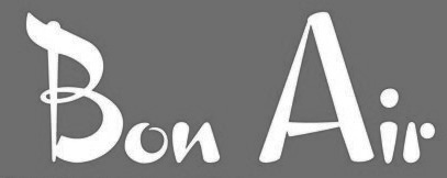 Hamilton Wood Type (HWT), established in 2012, is a joint venture between P22 type foundry and the Hamilton Wood Type & Printing Museum. The designs in this collection are based on printed specimens and actual wood type from the historic Hamilton Museum in Two Rivers, WI. HWT is based at P22 headquarters in Buffalo, NY. Typefaces are contributed by its founder, Richard Kegler, but also by Miranda Roth and Terry Wüdenbachs. In 2021, Hamilton Wood Type Collection joined The Type Founders.
 In 2012, they published HWT American Chromatic (Richard Kegler, Terry Wüdenbachs), a multilayered Western or circus font based on 19th Century Chromatic. HWT Antique Tuscan No. 9 (2012) is a very condensed 19th century Tuscan style wood type design with a full character set and ligatures. This font was first shown by Wm H Page Co in 1859. It is the first digital version of this font to include a lowercase and extended European character set. HWT Borders One (2012) contains 80 modular decorative elements that are based on the designs offered by the Hamilton Manufacturing company at the end of the 19th Century. In 2013, Richard Kegler released the refreshing retro typeface HWT Bon Air, which is one of a series of script typefaces cut into wood by the Hamilton Manufacturing Company for the Morgan Sign Machine Co. (makers of the Line-o-Scribe showcard press) ca. 1950). He also digitized HWT Star Ornaments and HWT Republic Gothic (with Miranda Roth). In 2013, James Todd designed the wood type revival family HWT Unit Gothic for Hamilton Wood Type Foundry. The Unit Gothic series was released by Hamilton Manufacturing Co. in 1907, and comprises a flexible range of widths from compressed to very wide. Still in 2013, William Page's Antique No. 4 is revived as HWT Slab (Antique, Columbian), one with unbracketed square serifs, and one with bracketed serifs as in Clarendons. In 2020, they added HWT Showcard Script (Terry Wüdenbachs) [Google]
[MyFonts]
[More] ⦿
|
Hannah Helgerson
|
Student at UW Stout, who created a typographic emu in 2011. [Google]
[More] ⦿
|
Harrison Mulrine
|
Graphic designer in Menomonie, WI< who created Anchor Script in 2014 (I think). [Google]
[More] ⦿
|
Heather Ullven
|
Graphic design student at UW-Stout in Menomonie, WI, who resides in Victoria, WI. Designer of Gestation (2004), a typeface in which the letters develop differently. [Google]
[More] ⦿
|
Hector Salazar
|
Green bay, WI-based designer of the wedge-serif typeface Diamante (2016). [Google]
[More] ⦿
|
Hieronymous Boschian
|
Dead link. A fontmaking workshop at the University of Wisconsin-Stout in Menomonie, WI in April 1997 resulted in this font, in which each participant drew one character. These were: by chank diesel, darryl austin, eric sorensen, kyle hames, ejaz saifullah, tom michlig, kari muellner, becki zaglifa, eric burke, amy fries, chank foo, paula sorter, andrew ciske, stefan peters, jason wittwer, jon bon jovi, stacy smoczyk, jessica yach, britt lundberg, sabine panse, jason gilmour, eric kattner, chank, and justin p. [Google]
[More] ⦿
|
HiH (Hand in Hand)
[Tom Wallace]
|
 Tom Wallace's foundry, HiH (est. 2005), was first located in Woodbridge, CT. Subsequently, Tom Wallace (b. 1944) moved from Woodbridge to Naugatuck to Waterbury and finally in 2009 to New Britain, CT. His type designs are based on historical letterforms:
 - Augsburger Initialen and Augsburger Schrift (2001), an art nouveau pair found in Ludwig Petzendorfer's Treasury of authentic art nouveau alphabets, decorative initials, monograms, frames and ornaments (1984, Dover). Augsburger Schrift is originally due to Peter Schnorr (1901, Berthold). In 2007, Wallace added Augsburger Ornamente.
- Figgins Tuscan (2005) is based on the first metal Tuscan typeface by Figgins in 1817.
- Freak, based on Bamboo (1889, The Great Western Type Foundry). HiH explains: Great Western became Barnhart Brothers & Spindler in 1868. At some point, prior to 1925, Freak was renamed Bamboo by BB&S. It was delisted when BB&S was absorbed by ATF in 1929. Compare with Dan Solo's Bamboo (2004).
- Gradl Initialen (2005): based on caps designed by Max Joseph Gradl ca. 1900 for engraving on his art nouveau jewelry in Germany. Samples are in Petzendorfer.
- Huxley Alt (2005), an alternative to the ultra-condensed Lutherian church font Huxley Vertical (or Aldous Vertical) by Walter Huxley (ATF). Huxley Amore (2006) is a major extension of this, and Huxley Cyrillic (2008) adds Russian characters.
- Künstler Grotesk (2005): a simple blackletter caps typeface based on a design seen in Petzendorfer's book.
- Page No. 508 (2006): Page No. 508 was designed by William H. Page in 1887 as one of a series of designs for die-cut wood types for the firm of Page & Setchell of Norwich, CT. Page & Setchell was the successor to The William H. Page Wood Type Company and was sold to the Hamilton Manufacturing Company of Two Rivers, Wisconsin in 1891.
- Pekin (2005): first designed by Ernst Lauschke in 1888 at the Great Western Foundry under the name Dormer.
- Schnorr Dekorativ, Demi Bold and Initialen (2007), all due to Peter Schnorr (ca. 1900), as well as Schnorr Gestreckt (2006), an art nouveau typeface from 1898.
- Rundgotisch (2005): based on a design by Schelter and Giesecke, ca. 1900.
- Edison (2005) is based on Edison Swirl SG, a Spiece Graphics digitization of a late 18-th century design of the Bauersche Giesserei.
- Bethlehem Star (2005) is based on the typeface Accent with the permission of URW++: HiH only added stars to the glyphs.
- Antique Tuscan No. 9 (2006). One of the earlier wood-type designs by William Hamilton Page. It was first shown among the specimens produced in 1859, shortly after Page entered into a new partnership with Samuel Mowry, owner of the Mowry Axle Company. Antique Tuscan No.9 is an extra-condensed version of the tuscan style that had been released in moveable type by Vincent Figgins of London in 1817.
- Secession (2006): a sans family with art nouveau twists.
- French Plug (2007): A sign painters font based upon work of Frank H. Atkinson, a popular Art Nouveau sign painter in Chicago, who worked for Cadillac, and published Sign Painting in 1908.
- T-Hand Monoline (2007): a printed script family.
- Figgins Antique (2007): an all-caps black slab serif headline typeface based on Figgins, ca. 1815.
- Mulier Moderne (2007): Based on a font designed ca. 1894 by E. Mulier, a French art nouveau era artist.
- Regina Cursiv (2007): an art nouveau design that revives a typeface published by H. Berthold Messinglinienfabrik und Schriftgiesserei around 1895.
- Edelgotisch (2007): a bold Jugendstil design (with caps), based on a design released by Schelter & Giesecke of Leipzig, Germany about 1898 and is very similar to Eckmann-Schrift released by Rudhard'schen Giesserei (later Klingspor) during the same period.
- Teutonia (2007), a revival of Teutonia by Roos & Junge, a squarish art nouveau face. HiH writes: There are many quite similar attempts in the field of topography. In 1883, Baltimore Type Foundry released its Geometric series. In 1910, Geza Farago in Budapest used a similar letter design on a Tungsram light bulb poster. In 1919 Theo van Doesburg, a founder with Mondrian and others of the De Stijl movement, designed an alphabet using rectangles only -- no diagonals. In 1923, Joost Schmidt at Bauhaus in Weimar took the same approach for a Constructivist exhibit poster. The 1996 Agfatype Collection catalog lists a Geometric in light, bold and italic that is very close to the old Baltimore version. And in 2008, HiH itself published Baltimore Geometric.
- Austin Antique, based on Richard Austin's 1827 antique typeface.
- Morris Gothic, Morris Ornaments and Morris Initials One and Two (2007): The gothic that Morris designed was first used by his Kelmscott Press for the publication of the Historyes Of Troye in 1892. It was called Troy Type and was cut at 18 points by Edward Prince. It was also used for The Tale of Beowulf. The typeface was re-cut in at 12 points and called Chaucer Type for use in The Order of Chivalry and The Works of Geoffrey Chaucer. Morris' objective is designing his gothic was to preserve the color and presence of his sources, but to create letters that were more readable to the English eye. ATF copied Troy and called it Satanick. Not only was the ATF version popular in the United States; but, interestingly, sold very well in Germany. There was great interest in that country in finding a middle ground between blackletter and roman styles -- one that was comfortable for a wider readership. The Morris design was considered one of the more successful solutions.
- Larisch (2007): a hand-lettered design by the Austrian calligrapher and teacher, Rudolf von Larisch. The original was used for the title page of the 1903 edition of Beispiele Kunstlerischer Schrift Examples of Artistic Writing).
- Patent Reclame (2007): an art nouveau typeface first cast around 1895 by Schriftgeisserei Flinsch, and then by Stephenson Blake, ca. 1896.
- Jugendstil Initials (2007): an all caps decorative blackletter typeface designed by Heinrich Vogeler around 1905.
- Wedding (2007): a multi-style English blackletter family, based on a Morris Fuller Benton original called Wedding Text.
- Brass (2007): two blackletter typefaces from the early 1500s described by Alexander Nesbitt in his Decorative Alphabets And Initials (Mineola, NY, 1959) as initials and stop ornaments from brasses in Westminster Abbey.
- Auchentaller (2007), a monoline art nouveau typeface inspired by a travel poster by Josef Maria Auchentaller (b. Vienna, 1865, d. Grado, 1949; studied at the Vienna Academy, professor in Munich, member of the secession from 1898, artist) in 1906.
- Phinney Jenson (2007): a Venetian by Nicolas Jenson from the 15th century, about which Wallace writes: In 1890 a leader of the Arts & Crafts movement in England named William Morris founded Kelmscott Press. He was an admirer of Jensons Roman and drew his own somewhat darker version called Golden, which he used for the hand-printing of limited editions on homemade paper, initiating the revival of fine printing in England. Morris' efforts came to the attention of Joseph Warren Phinney, manager of the Dickinson Type Foundry of Boston. Phinney requested permission to issue a commercial version, but Morris was philosophically opposed and flatly refused. So Phinney designed a commercial variation of Golden type and released it in 1893 as Jenson Oldstyle. Phinney Jenson is our version of Phinneys version of Morris' version of Nicolas Jensons Roman.
- Advertisers Gothic (2008): based on Robert Wiebking's tasteless 1917 design for Western Type foundry. HiH writes: Advertisers Gothic is bold and brash, like the city it comes from, Chicago. It was designed by the accomplished German-American matrix engraver, Robert Wiebking, for the Western Type Foundry in 1917. As its name suggests, it was designed for commercial headliner work, much as Publicity Gothic by Sidney Gaunt for BB&S the year before. See our Publicity Headline.
- Publicity Headline (2006): an allcaps version of Sidney Gaunt's advertising typeface, Publicity Gothic (1916, Barnhart Brothers & Spindler). Its heavy weight and robust strength allows it to be used against complex backgrounds or reversed out on dark backgrounds without getting lost.
- Herold (2008): a revival of Berthold Herold Reklameschrift BQ (Hermann Hoffmann, 1901), an art nouveau advertising typeface.
- Yes Dear (2008) is a funny hyper-curly blackletter face.
- Besley Clarendon (2008) is the HiH version of the Clarendon registered by Robert Besley and the Fann Street Foundry in 1845. This condensed typeface was very popular in the 19th century, and was copied by most foundries of that era. It was followed by Gutta Percha (2008), a Clarendon in which the upper case letters are dropcaps.
- Waltari (2008): a revival of Walthari (1899, Heinz König for the Rudhardsche Giesserei), a Jugendstil type.
- Hispania Script (2008): revival of a pirate map script typeface called Sylphide by Schelter & Giesecke (1896) (and not Schelter & Giesecke's Hispania).
- Cloudy Day (2008), an alphading.
- HiH stumbled on a 1902 publication by Bruno Seuchter called Die Fäche, in which he found the art nouveau typeface that HiH revived in 2008 as Seuchter Experimental.
- Petrarka ML (2006). HiH writes: Petrarka may be described as a Condensed, Sans-Serif, Semi-Fatface Roman. Huh? Bear with me on this. The Fatface is a name given to the popular nineteenth-century romans that where characterized by an extremity of contrast between the thick and thin stroke. The earliest example that is generally familiar is Thorowgood, believed to have been designed by Robert Thorne and released by Thorowgood Foundry in 1820 as "Five-line Pica No. 5." Copied by many foundries, it became one of the more popular advertising types of the day. Later, in the period from about 1890 to 1950, you find a number of typeface designs with the thin stroke beefed up a bit, not quite so extreme. What you might call Semi-Fatfaced Romans begin to replace the extreme Fatfaces. Serifed designs like Bauer's Bernard Roman Extra Bold and ATF's Bold Antique appear. In addition, we see the development of semi-fatface lineals or Sans-Serif Semi-Fatfaces. Examples include Britannic (1906, Stephenson Blake), Chambord Bold (Olive), Koloss (Ludwig & Mayer), Matthews (ATF) and Radiant Heavy (Ludlow). Petrarka has much in common with this latter group, but is distinguished by two salient features: it is condensed and it shows a strong blackletter influence, as seen in the H particularly. See also Nick Curtis's Petrushka NF (2012). Footnote: Fonts in Use refer to the metal typeface Petrarka by Schelter & Giesecke (1900) and Milton (by Societa Augusta). The Solotype catalog has a related typeface, Ophelia.
- Haunted House (2008), Halloween-themed fonts.
- Gothic Tuscan One (2008) is an all-caps condensed gothic with round terminals and decorative Tuscan center spurs. It was first shown by William H. Page of Norwich, CT, among his wood type specimen pages of 1859.
- HiH Firmin Didot (2008) is a one-style didone based on an 1801 version of Didot. It led to a combined alphabet/stick people alphading called Gens de Baton (2008) after a lower case alphabet that appeared in the Almanach des Enfants pour 1886 (Paris, 1886) under the title Amusing Grammar Lessons.
- Shout (2008), a Compacta-like fat headline sans about which HiH writes: Its lineage includes the Haas Type Foundrys 19th century advertising font, Kompakte Grotesk, which Jan Tschichold (1902-1974) dryly described as extended sans serif and which graphic designer Roland Holst (1868-1938) would have disapprovingly referred to as a shout, as opposed to the quiet presentation of information that he believed was the proper function of advertising. In 1963 Letraset released what appears to be an updated variation in multiple weights designed by Frederick Lambert called Compacta. Shout draws heavily on Compacta, as well as other similar fonts of the 50s and 60s like Eurostile Bold Condensed and Permanent Headline. In weight, it falls about halfway between Compacta Bold and Compacta Black.
- The heavy art deco typefaces Guthschmidt and Guthschmidt Condensed (2008) are based on a 1924 KLM Royal Dutch Airline poster designed by Anthonius Guthschmidt. The poster draws on the imagery of the legend The Flying Dutchman.
- Cherub and Cherub Caps (2008) are based on Phinney Jenson. Not to be confused with the many fonts that already existed with that name, such as Cherub from House of Lime, Twopeas, Graph Edge Fonts, and Fuelfonts.
- HiH Large (2009) is a poster sans.
- Mira (2009) is an art nouveau / Victorian typeface patterned after a font by the Roos & Junge Foundry in Offenbach, ca. 1902.
- Thorowgood Sans (2009): A three-dimensional all-cap font for title use, Thorowgood Sans Shaded was released by the Fann Street Foundry of W. Thorowgood & Co. in 1839. Interestingly, it more closely resembles Figgins' Four-Line Emerald Sans-Serif Shaded of 1833 than Fann Street's own Grotesque Shaded of 1834 (with light and shadow reversed).
- Fantastic ML (2009): an art nouveau typeface originally released as "Modern Style" by Fonderie G. Peignot & Fils, Paris, France some time before 1903.
- Gundrada ML (2010): a medieval style typeface inspired by the lettering on the tomb of Gundrada de Warenne, who was buried at Southover Church at Lewes, Sussex, in the south of England in 1085.
- Wedge Gothic (2010). HiH writes: Wedge Gothic ML is the original name of this font released by Barnhart Bros. and Spindler of Chicago in 1893. [...] The typeface was dropped for awhile -- it does not appear in the 1907 catalog for example -- but reappeared in 1925 as Japanette. McGrew says that the new name was Japanet. It was recast by ATF in 1954.
- Norwich Aldine ML (2010) is an all caps typeface with enlarged serifs, designed and produced in wood by William H. Page of Norwich, CT in 1872.
- Rodchenko Constructed ML (2010) is constructivist (Latin and Cyrillic).
- Cruickshank ML (2012): a decorative typeface from the late Victorian period. The typeface was designed by William W. Jackson and released by MacKellar, Smiths and Jordan Type Foundry of Samson Street, Philadelphia, Pennsylvania in 1886.
- Habana Deco ML (2013).
- Chicago Ornaments (2015). a collection of decorative cuts cast by the Chicago Type Foundry of Marder, Luse & Co. of Monroe Street in Chicago, Illinois. This collection was shown in their 1890 catalog. Some of them were designed by William F. Capitain. Included in the font are a set of Victorian caps inspired by Ernst Lauschke's Dormer (or Pekin, 1888).
View Tom Wallace's fonts. View the typefaces designed by Tom Wallace. MyFonts link. [Google]
[MyFonts]
[More] ⦿
|
Hilgraeve Inc
|
Monroe, WI-based company which offers HyperFont (1993), a free monosapaced slashed zero font designed for showing computer code. [Google]
[More] ⦿
|
Hunt Brothers
[Walter Bernard "Ben" Hunt]
|
 Walter Bernard "Ben" Hunt (b. 1888, Greenfield, WI, d. 1970) was an American artist, outdoor educator and author. His books covered native American arts, woodworking, scouting, pioneering, jewelry making, metalworking, and calligraphy. Quoting wikipedia: Hunt was born in Greenfield, Wisconsin and grew up in a log cabin. He attended Milwaukee's South Division High School, but did not graduate, dropping out to become lithographic engraver at the Bruce Publishing Company. Hunt moved to Hales Corners, Wisconsin with his wife, Laura, in 1920. In 1924, Hunt, along with his father-in-law and his brother, Edwin C. Hunt, built a log cabin behind his home. The cabin, a 16x28-foot structure, made of tamarack logs, was the subject of Hunt's first article, How We Built Our Log Cabin. During the late 1930s, Hunt began to study the work of Native American artists. As part of his research, Hunt met with artists and leaders such as Nick Black Elk, Frank Smart (or Chief Gogeoweosh), and James F. "Buck" Burshears. Hunt shared his knowledge of "Indian lore" with Milwaukee's boy scout leaders and, in 1942, Hunt started writing articles for Boy's Life. He became a regular member of its staff, ultimately writing over 1,000 articles. Hunt's work for Boy's Life, led him to serve on the staff of the National Boy Scout Jamboree in 1950, 1953, 1957, and 1960.
 Edwin and Ben Hunt published Fifty Alphabets (1931), Lettering of Today (1935, revised in 1941), 60 Alphabets (1935, Bruce Publishing), and 101 Alphabets (1954, 1958). Several digital typefaces resulted from those publications. Grouped by type designer: - Pablo Mateu: HFF Hunts Deco (2012). Based on an alphabet designed by the Hunt Brothers in Lettering of Today.
- Nick Curtis: Moonshine Script NF (2004). A casual connected script patterned based on 60 Alphabets (Hunt Brothers, Bruce Publishing, 1935).
- Dick Pape created 11 fonts in 2012 that are based on 101 Alphabets, all named HuntBros101Plate followed by a plate number. Plate 02 is a Trajan typeface. Plate 5 is a Trajan face. Plate 6 is an art nouveau face. Plate 7 is a flared caps typeface. Plate 10 is a textured poster typeface. Plate 11 is an ornamental caps face. Plate 13 is a condensed caps face. Plate 14 could be considered as a Mexican vernicular typeface. Plate 18 is an antique italic face. Plate 25 is an upright script. Plate 26 Brush is fifties brush signage at its best. Plate 29 (octagonal), Plate 46 (Celtic), Plate 52 (German expressionist), Plate 54 Blackletter, Plate 56 (Lombardic), Plate 62 (uncial), Plate 63 Script, Plate 65 (Victorian ornamental caps), Plate 66 (Western typeface), Plate 74 (Mexican fiesta font), Plate 68 (Arabic simulation), Plate 71, Plate 76 (architectural lettering), Plate 77 (inline caps) and Plate 83 (stencil face) complete the collection.
Download some typefaces based on the latter publication. Flickr site sith images of 101 Alphabets, courtesy of Diane Zerr. Local download of 101 Alphabets. Download link for Pape's typefaces. [Google]
[More] ⦿
|
imagexs (IMXS)
|
Foundry based in Madison, WI, that sells most of its fonts, such as IMXSdes1, IMXSbuildings, IMXSdoors. Free fonts include IMXSarrows (1999), IMXStypew (1999, typewriter font), IMXSsym1 (1999), IMXSflares (1999). Logo truetype font service (20 USD). [Google]
[More] ⦿
|
Jackson Sandler
|
Type designer from Eau Claire, WI. Creator of the children's handwriting typeface Schoolbell Pro (2012, Neapolitan) when he was in Second Grade. I suspect that Jackson is Stuart Sandler's son. [Google]
[MyFonts]
[More] ⦿
|
Jacob Berchem
|
Madison, WI-based creator of the pixelized typeface Metropolis (2014), which was finished during his studies at the University of Wisconsin. He also designed the distressed typeface family Underwood (2014-2015), which is not related to the typewriter. [Google]
[More] ⦿
|
Jake Thielmann
|
During his studies in Kiel, WI, Jake Thielmann designed the arc-based experimental typeface Eclipse (2012). [Google]
[More] ⦿
|
James Edward Hamilton
|
Aka Edward James Hamilton, born and died in Two Rivers, WI, 1852-1940. Wood type designer and producer active with the Hamilton Manufacturing Co. His innovations led to the production of high quality wood type. Hamilton Manufacturing Co dominated wood type in that era. He designed many wood typefaces, such as Trenton Condensed (1889), digitized in 2005 by Jordan Davies. [Google]
[MyFonts]
[More] ⦿
|
James Hamilton
[Hamilton Holly Wood Type Co. (or: Hamilton Manufacturing Company)]
|
 [More] ⦿
|
James Klahn
|
Madison, WI-based designer of the monolinear modular typeface Exosphere (2020). [Google]
[More] ⦿
|
Jason Ramirez
[Ground Control (was: Penny Font Foundry, or: Pennyzine)]
|
[More] ⦿
|
Jason Walzer
|
Based in Madison, WI, Jason designed the beautiful free Christmas flakes font Spunkflakes (2002) at Chank's place, together with Jeff Johnson and Jack Wilcox. Jason is affiliated with Spunknation.com in Minneapolis. Home page. [Google]
[More] ⦿
|
Jay Miles
|
During his studies at the University of Wisconsin-Stout in Menomonie, WI, Jay Miles designed the tall ultra-condensed typeface 02x30 (2013, FontStruct). [Google]
[More] ⦿
|
Jena Kast
|
Green Bay, WI-based designer of the script typeface Bonjour Mon Amour (2018). [Google]
[More] ⦿
|
Jenna Beaupre
|
Menomonie, WI-based designer of a stencil font (2015). [Google]
[More] ⦿
|
Jennifer Ann
|
Jennifer Ann (Coral Antler Creative, Sturgeon Bay, WI) designed the handcrafted typeface Hippie Shack (2016). Typefaces from 2017: Magnolia Blues, New Foundland. Creative Market link. [Google]
[More] ⦿
|
Jessica M. Repovsch
|
Graphic design student at UW-Stout in Menomonie, WI, who designed the display font Nostalgia (2003), as well as the handwriting typeface Intimacy (2003) and Urgency (2003). [Google]
[More] ⦿
|
Jill Albarado
|
Designer based at UW-Stout in Menomonie, WI, who created the caps font Kidsplay (2003). [Google]
[More] ⦿
|
Jill Hilliger
|
During his studies in Whitewater, WI, Jill Hilliger created an octagonal typeface (2014). [Google]
[More] ⦿
|
Jim Ford
[VersaType]
|
 [MyFonts]
[More] ⦿
[MyFonts]
[More] ⦿
|
Jim Kennelly
[JK Design]
|
[More] ⦿
|
Jim Moran
|
Jim Moran received his apprenticeship from Moran's Quality Print Shop in Green Bay, Wisconsin, while serving as printer's devil, pressman, partner, and owner for 29 years. He became the Director of Hamilton Wood Type & Printing Museum in 2009, where he maintains the collection of wood type, runs and repairs the museum's presses, teaches workshops, archives and restores the museum's collection of 20th-century decorative and advertising plates, and oversees museum operations. Speaker at ATypI 2017 in Montreal and at ATypI 2018 in Antwerp. In Antwerp, his talk, Old Beer New Type, presented together with Fred Smeijers, is concerned with the typographic revival of one of the Plantin Moretus' oldest (17th century) posters, promoting beer. [Google]
[More] ⦿
|
JK Design
[Jim Kennelly]
|
Milwaukee, WI-based designer of the retro highway font Jandus Road (2019). [Google]
[More] ⦿
|
Joel Carter
|
Joel Carter (Carter Design, Milwaukee, WI) created the typeface Linked (2012). Behance link. [Google]
[More] ⦿
|
Joffre LeFevre
[Aboutype]
|
[MyFonts]
[More] ⦿
|
Jordan JP
|
Milwaukee, WI-based designer of the modular typeface Font 2.0 (2019). [Google]
[More] ⦿
|
Josh Krecioch
|
Milwaukee, WI-based designer (as a student based in Oconomowoc, WI) of the great Opentype SVG-format floral caps typeface Posy (2018). [Google]
[More] ⦿
|
Josh Peters
|
Graphic design student at UW-Stout in Menomonie, WI, who lives in Chaska. He made the pixel typefaces Insidior (2004) and Afton (2004). [Google]
[More] ⦿
|
Joshua Lee Sondelski
|
Illustrator and designer in Portland, OR, Mosinee, WI, and/or Marshfield, WI, who created the blocky poster typeface Attack (2015), the squarish inline typeface Thin White Line (2010) and the slab serif typeface Slumbo (2013). Behance link. Home page. [Google]
[More] ⦿
|
Josiah Werning
[The Good Type]
|
[MyFonts]
[More] ⦿
|
Justine Nagan
[Typeface]
|
[More] ⦿
|
Karaka Singh
|
Oak Creek, WI-based designer of a dot matrix typeface in 2015. [Google]
[More] ⦿
|
Kari Elizabeth Stevenson
|
Designer (b. 1980) of the experimental stencil font RAMI (2003). Kari Elizabeth Stevenson is based at UW-Stout in Menomonie, WI. [Google]
[More] ⦿
|
Karissa Cable
|
During her studies at University of Wisconsin-Stout, Karissa Cable (now in Elk River, MN) created Bitsans (2015). In 2016, she designed Double Type. [Google]
[More] ⦿
|
Kat Manor
|
As a student at University of Wisconsin Stout, Kat Manor (Menomonie, WI) created the display typeface Skeleparts (2015) which is based on parts of the human skeleton. Behance link. [Google]
[More] ⦿
|
Kate Forslund
|
Menomonie, WI-based FontStructor aka katerz1118 who made these typefaces in 2012: Odd Future, Line-o-Type (vertically striped), Double Vision (texture face), Distraction (sci-fi face), Infamous (2012), Sasquatch Hunting (2012). [Google]
[More] ⦿
|
Katherine Sandheinrich
|
Madison, WI-based designer of the dot matrix typeface Ohio Star (2015). [Google]
[More] ⦿
|
Kathleen Klinger
|
During her studies at UW Stout, Kathleen Klinger (Menomonie, WI) created the thin experimental typeface Interstice (2014). [Google]
[More] ⦿
|
Kayla Smith
|
During her studies at the University of Wisconsin Stout, Kayla Smith (Hudson, WI) designed the script typeface Skinny Latte (2016) and Italian Icons (2016). [Google]
[More] ⦿
|
Kelly Christina
|
Madison, WI-based designer and illustrator who created the Treefrog-style ink spill typeface Encre in 2015. [Google]
[More] ⦿
|
Kelsey Elder
|
Kelsey grew up in Detroit and Minneapolis. He received his BFA from the Minneapolis College of Art and Design, and his MFA from Cranbrook Academy of Art. Graduate of the TDi program at the University of Reading, UK, 2017. He is on the faculty at VCU. Elder is the sole owner of a small type foundry called Lowered Case, which he uses as a platform to publish typefaces that investigate how de-skilled landscapes attribute to (and define) senses of community identity. [Google]
[More] ⦿
|
Ken Lunde
|
Dr. Ken Lunde is Manager of CJKV Type Development at Adobe Systems Incorporated, San Jose, CA. He holds a Ph.D. (1994) in Linguistics from The University of Wisconsin-Madison. He wrote Understanding Japanese Information Processing (O'Reilly&Associates, 1993), and CJKV Information Processing (O'Reilly&Associates, 1999). He also wrote CJKV Information Processing: Chinese, Japanese, Korean&Vietnamese Computing (O'Reilly). In 2010, Adobe will release the first genuinely proportional Japanese font, Kazuraki (by Japanese type designer Ryoko Nishizuka), which was developed at Adobe in 2009 under his management. Ken managed the Source Han Sans project---these are open source fonts released in 2014 by Adobe and Google for Japanese, Chinese and Korean. He also headed the development of Source Han Serif. In 2018, Ken Lunde and Masataka Hattori co-designed Soukou Mincho (free at Fontsquirrel). In 2019, he created the experimental variable font Width at Adobe. Github link. Speaker at ATypI 2019 in Tokyo on the topic of The History of Japan's Era Name Square Ligatures, and in particular, the two-kanji square ligatures for the five most recent eras, Reiwa (2019), Heisei (1989), Shouwa, Taishou and Meiji. [Google]
[More] ⦿
|
Kirsten Engen
|
At the University of Wisconsin-Milwaukee, Kirsten Engen designed the decorative caps Alphabet Stretch (2016). [Google]
[More] ⦿
|
Kiwi Media (Eric Oehler)
[Eric Oehler]
|
Fonts by Eric Oehler from Middleton, WI: - Display fonts: Interim (1997, deconstructed), Morpheus (1996, ingenious), Nosferatu (1996, after the German expressionist silent film by that name), Ogilvie (1994, spindly gothic font), Singothic (1993, very original).
- "Somewhat sans": Astigma (1991-1996), Chyelovek (1997), Galaxia (1997), Ambient (1991), Ultraworld (1993).
- Scripts: Creepygirl (1996), Devotion (1993, based on brush strokes by Anton Corbijn), Kroebern (1993, from a German script, ca. 1750), Violation (1994, based on the lettering of Anton Corbijn), Apologia (1999, based on the handwriting of Gavin Friday).
- Dingbats: Modebats (1994, based on Depeche Mode fandom), Trekbats (1995).
Dafont link. Klingspor link. Fontspace link. [Google]
[More] ⦿
|
Kristen Goffard
|
Kristen Goffard from Menomonie, WI, created the minimalist octagonal typeface Trap Doors (2011). [Google]
[More] ⦿
|
Kristen Petranek
|
Designer in Madison, WI. Creator of the Helen Highwater typeface family (2013, a subtle slab serif). [Google]
[More] ⦿
|
Kristin Gay
|
Designer based at UW-Stout in Menomonie, WI, who created the wooden plank font Treehouse (2003). [Google]
[More] ⦿
|
Kristin Pratt
|
Graphic design student at UW-Stout in Menomonie, WI. Designer of Inkblot (2004), a typeface that inverses the terminals on Keedy Sans (round becomes square and square becomes round). [Google]
[More] ⦿
|
Kyle Fletcher
|
Graphic design student at UW Stout (b. 1985) who worked with Luis Fitch. At Chank's place, he designed the Tuscan wood type Dickens McQueen (2006). Now based in Hudson, WI, he created the experimental typeface Algo Right (2007). [Google]
[More] ⦿
|
Kylie Hernandez
|
Madison, WI-based designer of Nectar (2016). [Google]
[More] ⦿
|
Lacey Werner
|
Graphic design student at UW-Stout in Menomonie, WI. Designer of Female Font (2004). [Google]
[More] ⦿
|
Laura Kelly
|
During her photography studies at Milwaukee Institute of Art and Design, Laura Kelly (Milwaukee, WI) created the textured clored didone caps typeface Moths (2016). Behance link. [Google]
[More] ⦿
|
Lead Type
|
This small foundry in Madison, WI, was selling these fonts: Beavis (handwriting), VeryRoman, Broken and FreakShow. [Google]
[More] ⦿
|
Leb Weisnicht
|
During his studies in Madison, WI, Leb Weisnicht designed the techno typeface Replicant (2016). [Google]
[More] ⦿
|
lettucing
|
Wisconsin-based designer (b. 1991) of the hand-printed Evil Spork Girl (2010). Dafont link. [Google]
[More] ⦿
|
Librito.de
[Florian Zietz]
|
 Florian Zietz (b. Salzgitter-Bad, Germany, 1967) studied graphic design at Fachhochschule Hildesheim and participated in the German art and design school's exchange program with the University of Wisconsin-Stout. Since completing his studies in 1994, he has been working as a freelance graphic designer and illustrator for a variety of clients. Creator of the dingbats typeface FF Headz (2005), which won an award at TDC2 2006. Librito is the web outfit of Agnes von Beöczy and Florian Zietz, who are located in Hamburg, Germany. They are involved in graphic and type design, calligraphy and illustration. Besides FF Headz (dingbats), they created Just Seven (2010, a child's hand), Cutz (informal script that is way better than Comic Sans), Segmenta (2008, modular, octagonal, slightly stencilish; based on grids similar to those used in train station and airport signage), Stars (2009, dingbats), and Zansibar (a great type project concerned wit the reconstruction of an old map alphabet). Viktor (2011) is based on wood type.
 In 2012, he published the Sketchimpact family (a sketched version of Impact) and the roughened antiqua typeface Argento. Typefaces from 2014: Ahoy (based on cruise line posters), Neometrix (3d, layered, outlined and hand-drawn). Typefaces from 2015: Fatone (a high contrast semi-didone caps family, with wood type ancestry). FontShop link. Klingspor link. Librito link. [Google]
[MyFonts]
[More] ⦿
|
Lindsay Gergen
|
Originally from Minnesota, Lindsay Gergen is a graphic design student at the University of Wisconsin-Stout. She created the modular typeface Kink (2011). [Google]
[More] ⦿
|
Lindsey Bock
|
Graphic designer who graduated in 2010 from Menomonie, WI. Behance link. She made a nice wood type poster in 2010, based on material from the Hamilton Wood Type Museum. [Google]
[More] ⦿
|
Linlu Zhou
|
Madison, WI-based designer of the prismatic typeface Umbrella & Lantern (2015). [Google]
[More] ⦿
|
Lisa Schickert
|
Graphic design student at UW-Stout in Menomonie, WI, who made a caps typeface in which all letters are based on Celtic knots (2004). [Google]
[More] ⦿
|
Liza Keller
|
Student at UW-Milwaukee, who made the display typeface Primitive Type (2011). [Google]
[More] ⦿
|
Logan Sprangers
|
De Pere, WI-based creator of the sans typeface Ludovico (2014). [Google]
[More] ⦿
|
Maria Bhatti
|
During her graphic design studies in Milwaukee, WI, Maria Bhatti created the delicate script typeface Peacock (2013). [Google]
[More] ⦿
|
Mark Gleim
|
Graphic designer in Oshkosh, WI. Behance link. He created the hairline condensed typeface Rossen (2011). [Google]
[More] ⦿
|
Mark Thomas
|
Mark Thoams (Waukesha County Technical College, Pewaukee, WI) designed Pig calligram in 2017. [Google]
[More] ⦿
|
Matt Erickson
|
Matt Erickson (Matt Erickson Design, Menomonie, WI) created the squarish Cloak typeface in 2014. He studied at UW Stout. Behance link. [Google]
[More] ⦿
|
Matt Frost
|
 Matt Frost Type is located in Madison, WI. Matt designed some fonts at Chank's place, including Cowboy Rhumbahaut (2000), a take on a mid 19-th century ornamental face. His home page. In 2011, he set up Matt Frost Foundry.
 His commercial typefaces include - Aegean (2012). A swashy take on roman capitals. The spurred version is Cirque (2012).
- Antler (2014-2016). A spurred woody letterpress vintage family of typefaces Antler has your back for beer bottles, fantasy novels, taco shops, beekeepers, cattle rustlers, tattoo artists, druids, hair bands, and bounty hunters, is how Matt descrives the typeface family. The Western typefaces Antler East, Antler North, Antler West (spurred; in Regular, Wood and 3d) and Antler South (Tuscan) were published in 2016. In 2017, he added Antler.
- Baron of Arizona (2011). A Victorian ornamental face.
- Baboon (2015). A handcrafted poster typeface.
- Cirque (2012).
- Cow Boss (2015). A Tuscan Western typeface.
- Dubliners (2011). A signage script face.
- Escape From Budapest (2011). Art deco, based on a type specimen in the Communist Sculpture graveyard outside of Budapest.
- King Of Prussia (2011). An angular Halloween face.
- Praha Nouveau (2011). Art nouveau. Praha Nouveau is based on a type specimen on the statue of Jan Hus in Prague's Old Town Square. The statue was designed in 1903 by Ladislav Saloun.
- Quijibo (2011). A quaint handmade slab serif.
- Street of Crocodiles (2011). Inspired by the main title of the Quay Brothers film Street of Crocodiles (based on the 1934 Bruno Schultz book).
View Matt Frost's typefaces. [Google]
[MyFonts]
[More] ⦿
|
Matt Inglese
|
Student in Milwaukee who created Native Arrowhead (2014). [Google]
[More] ⦿
|
Matt Vanden Boomen
|
Green Bay, WI-based designer of Hand-Drawn Display Font (2012, an octagonal typeface). [Google]
[More] ⦿
|
Matthew Carter
|
 Matthew Carter (born in London in 1937, and son of Harry Carter) is one of today's most influential type designers. He trained as a punchcutter at Enschedé in 1956. In 1963 he was hired by Crosfield, a firm that pioneered the new technology of photo-typesetting, to lead their typographic program. He worked for Mergenthaler Linotype (1965-1981), and co-founded Bitstream Inc. with Mike Parker in 1981, adapting many fonts to digital technology. In January 1992, he founded Carter&Cone with Cherie Cone, and often collaborated with Font Bureau. In 1995, he won the Gold Prize at the annual Tokyo Type Directors Club competition for Sophia. In 1997, he received the TDC Medal for significant contributions to the life, art, and craft of typography. In 2010, he received a MacArthur grant. He lives in Cambridge, MA.
 John Berry on Carter's art (2002). Apostrophe comments on Berry's article. Interview. His fonts: - The Microsoft screen fonts Verdana (1996), Georgia (1996), Georgia Greek, Georgia Cyrillic, Nina and the humanist sans typeface Tahoma (1994). Georgia (in roman and italic only) is a screen version of Miller, Carter's Scotch design. Nina was designed to address the requirements on smaller screens such as phones, and was used in Windows Mobile smartphones before Microsoft switched to Segoe. The Greek and Cyrillic versions of Nina were developed by François Villebrod. Georgia Pro (2010, Ascender) was developed from Georgia with the help of Steve Matteson. For Verdana Pro (2010, Ascender), Carter was assisted by David Berlow and David Jonathan Ross.
- Apple's Skia (1993), a sans serif designed with David Berlow for Apple's QuickDraw GX technology, now called AAT. [Carter's Skia and Twombly's Lithos are genetically related.]
- Monticello (2003), based on Linotype's Monticello (1950), which in turn goes back to Binny&Ronaldson's Monticello from 1797, a typeface commissioned by Princeton University Press for the Papers of Thomas Jefferson. It is in the Scotch roman style.
- Miller (1997, Font Bureau), an extremely balanced family co-designed by Carter, Tobias Frere-Jones and Cyrus Highsmith. Carter explains: Miller is a Scotch Roman, a style that had its beginnings in the foundries of Alexander Wilson In Glasgow and William Miller in Edinburgh between about 1810 and 1820. It is considered that the punchcutter Richard Austin was responsible for the types of both Scottish foundries. Miller is a revival of the style, but is not based on any historical model. Now, there is also a 16-weight newspaper version, Miller Daily (2002), and an 8-weight Miller Headline (2002). This was followed by News Miller, a typeface designed for the Guardian. Note: Georgia (1996) is a screen version of Miller, and Monticello (2002) is a later modification. A comparison of these typefaces.
- Alisal (1995, +Bold).
- ITC Galliard (1978), a recreation of Robert Granjon's garalde letters. This typeface was originally conceived in 1965. Bringhurst recommends a Carter and Cone version of this font, called Galliard CC: it has old style figures and small caps. Further versions include Aldine 701 (Bitstream), Matthew (Softmaker), ITC Galliard Etext (2013, Carl Crossgrove, Linotype), and Gareth (Softmaker).
- The ITC Charter family (1987 for Bitstream and known as Bitstream Charter; licensed to ITC in 1993; see the Elsner&Flake version of ITC Charter). An upgraded commercial version was released by Bitstream in 2004 under the name Charter BT Pro.
- Vincent (1999), a font commissioned for use in Newsweek. It is named after Vincent Figgins, an English foundry owner and punch cutter who lived in the late 18th century.
- Walker (1994), designed for The Walker Art Center.
- Ionic Number One (1999, Carter&Cone).
- Mantinia (1993, Font Bureau), based on inscriptional forms, both painted and engraved, by the Italian renaissance artist Andrea Mantegna.
- Big Caslon (1994, Font Bureau), a display typeface based on the largest romans from William Caslon's foundry.
- Big Figgins (1992) and Big Figgins Open (1998, based on the decorative didone types shown in the specimens of Vincent Figgins of 1815 and 1817). Big Figgins was called Elephant and Elephant Italic in Microsoft's Truetype Fontpack 2.
- Sammy Roman (1996), loosely based on the 17th century romans of Jean Jannon. A beautiful typeface designed to accompany kanji and kana typefaces produced by Dynalab in Taiwan.
- Sophia (1993, Font Bureau), a mix with Greek, uncial and classical Roman influences.
- Shelley Script (1972), a family of formal scripts, split into Andante, Volante and Allegro. It is based on intricate English scripts of the 18th and 19th centuries attributed to George Shelley.
- Cochin (1977, at Linotype). MyFonts writes: In 1913 Georges Peignot produced a typeface based on Nicolas Cochin's eighteenth century engravings. In 1977, Matthew Carter expanded this historic form into a three part series.
- Bell Centennial (Linotype-Mergenthaler, 1975-1978), a legible heavily ink-trapped family designed by Matthew Carter as a replacement of Bell Gothic at Mergenthaler. There are also digital Linotype and Bitstream versions. AT&T commissioned the font to replace their previous typeface choice Bell Gothic for their 100th Anniversary.
- Cascade Script (1965-1966, Linotype, now also known as Freehand 471 BT in the Bitstream collection). Paratype's extension of Freehand 471 to Cyrillic is by Oleg Karpinsky (2011).
- New Century Schoolbook was designed from 1979-1981 in the New York Lettering office of Merganthaler Linotype based on Morris Fuller Benton's Century Schoolbook from 1915-1923. It was the second face, after New Baskerville, that was digitized and expanded using Ikarus (digital technology). The Bitstream version [Century Schoolbook] is a virtually exact copy, only being moved from a 54 unit to a 2000 or so unit design.
- Auriol (Linotype), an art nouveau family (including Auriol Flowers 1 and 2 and Auriol Vignette Sylvie) based on the lettering of the painter and designer Georges Auriol. MyFonts explains: Auriol and Auriol Flowers were designed by Georges Auriol, born Jean Georges Huyot, in the early 20th century. Auriol was a French graphic artist whose work exemplified the art nouveau style of Paris in the late 19th and early 20th centuries. In 1900, Georges Peignot asked Auriol to design fonts for Peignot&Sons. The resulting Auriol font was the basis for the lettering used by Hector Guimard for the entrance signs to the Paris Metro. It was re-released by Deberny&Peignot in 1979 with a new bold face, designed by Matthew Carter. These decorative fonts with a brush stroke look are well-suited to display settings. The Peignot drawing office insisted on a more normal appearance in the boldface, calling it Robur. Matthew Carter has returned to Auriol's original design for the whole series.
- Helvetica Greek (Linotype).
- Helvetica Compressed (Linotype, 1974, with Hans-Jörg Hunziker).
- Wilson Greek (1995), compatible with Miller Text, and based on a type cut by Alexander Wilson for the Glasgow Homer of 1756. See here.
- Olympian (1970, Linotype), designed for newspaper use. This is Dutch 811 in the Bitstream collection. The custom typeface Milne (Carter&Cone) done for the Philadelphia Inquirer is based on Olympian.
- Gando, a French "ronde" typeface based on the work of Nicholas Gando (mid 1700s), and designed for photo-typesetting at Mergenthaler by Carter and Hans-Jörg Hunziker in 1970. Very similar to Bitstream's Typo Upright.
- Fenway (1998-1999, Carter&Cone), commissioned by Sports Illustrated to replace Times Roman.
- Snell Roundhand (1965-1966): a connected cursive script based on the 18th-century round hand scripts from English writing masters such as Charles Snell. Early in the digital era, Matthew published this in the Bitstream collection as Roundhand BT. A Cyrillic version by Isabella Chaeva and Vladimir Yefimov was released by ParaType in 2013.
- Auriga (1970). (Wallis dates this in 1965 at Linotype.)
- CRT Gothic (1974).
- Video (1977).
- V&A Titling (1981).
- Deface (in the FUSE 18 collection).
- Madrid (2001), done for the Spanish newspaper El País.
- Milne, done for the Philadelphia Inquirer (a revised version of Olympian). Not available.
- Durham, a sans serif family for US News&World Report.
- Airport.
- Century 725 (Bitstream, for the Boston Globe: after a design by Heinrich Hoffmeister).
- For Microsoft: Georgia, Verdana, Tahoma (1994), Nina.
- Freehand 471 (Bitstream). A chunky slightly angular script.
- New Baskerville. [Matthew Carter says that this is wrongly attributed to him. It was directed by John Quaranta.]
- Postoni [or Post-Bodoni], for the Washington Post, which is still using it. See here.
- Le Bé, a Hebrew typeface that was used in the Pennyroyal Caxton Bible.
- Rocky (2008, Font Bureau, with Richard Lipton), for the Herald in Scotland.
- Time Caledonia.
- Wiredbaum, for WIRED.
- Wrigley (for Sports Illustrated). Matthew Carter designed Roster in the 1990s, and it was adopted as a display face for Sports Illustrated under the name Wrigley. Jesse Ragan was instrumental in later expanding the family from its original seven styles to the current 60. In 2015, Carter & Cone and Font Bureau released an expanded 60-style family of this typeface under the new name Roster.
- Benton Bold Condensed (for Time Magazine).
- Foreman Light (for the Philadelphia Inquirer).
- Newsbaum (for the New York Daily News).
- Carter Latin: Matthew was commissioned in 2003 to create a new design to be cut in wood type by the Hamilton Wood Type&Printing Museum in Two Rivers, WI. He came up with an all-caps, chunky, Latin-serif design.
- Times Cheltenham (2003), which replaces in 2003 a series of headline typefaces including Latin Extra Condensed, News Gothic, and Bookman Antique.
- The Yale Typeface (2004), inspired by the late fifteenth-century Venetian typeface that first appeared in Pietro Bembo's De Aetna, published by Aldus Manutius. This extensive family is freely available to members of Yale University.
- DTL Flamande (2004, Dutch Type Library), based on a textura by Hendrik van den Keere. Since 2018, available from URW++. Additions to DTL Flamande by Lukas Schneider.
- Meiryo UI, Meiryo UI Bold, Meiryo UI Bold Italic, Meiryo UI Italic (2004). Meiryo is a modern sans serif Japanese typeface developed by Microsoft to offer an optimal on screen reading experience and exceptional quality in print, as part of the Cleartype project. The Japanese letterforms are generously open and well-proportioned; legible and clear at smaller sizes, and dynamic at larger display sizes. The beauty of Meiryo is that it sets text lines in Japanese with Roman seamlessly and harmoniously. Meiryo was designed by a team including C&G Inc., Eiichi Kono, Matthew Carter and Thomas Rickner. It won a 2007 type design prize from the Tokyo Type Directors.
- Suntory corporate types (2003-2005), developed with the help of Akira Kobayashi and Linotype from Linotype originals: Suntory Syntax, Suntory Sabon, Suntory Gothic, Suntory Mincho.
- Rocky (2008, Font Bureau): A 40-style high contrast roman family that is difficult to classify (and a bit awkward). Developed with Richard Lipton.
- Carter Sans (2010, ITC), based on epigraphic letters used in inscriptions. Created for the identity of the Art Directors Club 2010 class of its Hall of Fame, one the laureates in the 2010 Hall of Fame. Codesigned by Dan Reynolds, this chiseled typeface is loosely based on Albertus.
- In 1997, he designed Postoni for the The Washington Post's headlines, a sturdy Bodoni.
- MS Sitka (2013). A typeface with six optical sizes that are chosen on the fly if an appropriate application is present. Developed at Microsoft with the help of John Hudson (Tiro Typeworks) and Kevin Larson (who carried out extensive legibility tests). German link. Typophile link. Sitka won an award at Modern Cyrillic 2014.
- Van Lanen Wood Type (Hamilton Wood Type, 2002-2013). Carter started work on the wood type in 2002, but technical accuracy issues postponed the implementation. Digital versions were finally done in 2013 by P22's Hamilton Wood Type.
- Big Moore (2014, Font Bureau): A 1766 specimen by Isaac Moore, former manager of Joseph Fry's foundry in Bristol, England, shows many types inspired by John Baskerville. But a century later, standardization had foisted inept lining figures and shortened descenders upon these designs. Matthew Carter remedies the tragedy with Big Moore. Oldstyle figures, full-length descenders, and historic swashes are restored to this regal serif in two styles. Big Moore won an award in the TDC 2015 Type Design competition.
- Role (2019, Sans, Slab, Serif, Soft). A superfamily published at Morisawa and Fontelier. Matthew Carter, Shotaro Nakano, and Kunihiko Okano co-designed Role Serif at Morisawa.
Speaker at ATypI 2013 in Amsterdam. Speaker at ATypI 2019 in Tokyo on the topic of Expressing Vocal Tones through Typography. Linotype link. FontShop link. Favorite quote: Watching me work is like watching a refrigerator make ice. Another quote: A typeface is a beautiful collection of letters, not a collection of beautiful letters. View Matthew Carter's typefaces. Matthew Carter's fonts. The typefaces made by Matthew Carter. See also here. Wikipedia page. Klingspor link. [Google]
[MyFonts]
[More] ⦿
|
Matthew J. Vanderloop
|
Designer based at UW-Stout in Menomonie, WI, who created the experimental font Virus (2003) and a handwriting font (2003). [Google]
[More] ⦿
|
McDonald Business Academy
|
Company in Milwaukee, WI, that published Penman's Leisure Hour (1894). [Google]
[More] ⦿
|
Megan Hyler
|
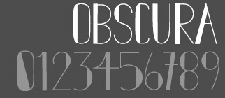 Graphic designer in Wisconsin, who made the art deco display typeface Obscura (2011). [Google]
[More] ⦿
Graphic designer in Wisconsin, who made the art deco display typeface Obscura (2011). [Google]
[More] ⦿
|
Melanie Jenner
|
During her studies, Kenosha, WI-based Melanie Jenner created the handcrafted typeface Mutiny (2017). [Google]
[More] ⦿
|
Melissa Marie Taylor
|
Milwaukee, WI-based designer of Font Meow (2013). Behance link. [Google]
[More] ⦿
|
Melissa Poellinger
|
Wisconsin-based designer of the grungy Serif In Distress (2012). [Google]
[More] ⦿
|
Metalarts
|
Metal Arts was established seventy-five years ago in Milwaukee, Wisconsin, in a small two-story foundry and finishing factory. In the beginning casting aluminum letters and seals for the United States Postal Service, that soon expanded to bronze plaques and letters for business, government and organizations. Metal Arts had become a successful business in Milwaukee, employing fifteen skilled craftsmen and artisans. Their 2009 Metal font catalog led Abdul to create these fonts and post them on alt.binaries.fonts in 2011: Metalarts101Futura, Metalarts10420thCentury, Metalarts105CDGothic, Metalarts107Block, Metalarts204FlatFaceRoman, Metalarts302CDDPModernRibbon. [Google]
[More] ⦿
|
Michael Jason Browers
|
 Duluth, MN-based designer (b. La Crosse, WI, 1977) of Ekkehard (2020: inspired by multiple blackletter typefaces that appeared in an 1862 printing of "The Doctrine of the Simple and the Power of the Powerless" by Hans Nielsen Hauge), Gladstone Street (2019), Jayce (2018, +Fleurons), Dulcyna Hand (2018), Bombastic (2010, grunge), Jeyran (2010, a blotchy hand-printed typeface done with Elnara Browers), Gladstone (2009, a readable blackletter), Diegeometrische (2008, a stencil for Latin and Cyrillic), Menim Elim (2007, cursive hand), Ellaroza (2007, gorgeous fleurons), Konscript (2007, old typewriter face), Geistig (2006, classical caps), Sophiazoya (2006, Victorian era ornaments), Dovshan (2007, more Victorian era ornaments), Loza (2006, curly antique face), Disjecta (2006, a shaken serif face), Formasi (2006, grunge face), Mehriban (2007, grunge), Mehriban Outline (2008), Squarefill (2008, grungy stencil), Squarefix (2008, grungy stencil), Wingbrush (2008), Somatica (2006, grunge) and Isoglyphics (2005, dingbats).
 MyFonts page. Alternate URL at MyFonts. View Michael Jason Browers's typefaces. [Google]
[MyFonts]
[More] ⦿
|
Mikala Dale
|
Student in Menomonie, WI, who created the textured typeface Virgo (2012, FontStruct). [Google]
[More] ⦿
|
Mikayla Fernandez
|
West Allis, WI-based designer of the deco typeface Chillin (2016). [Google]
[More] ⦿
|
Mike Rohde
[Roh Design]
|
[MyFonts]
[More] ⦿
|
Mitchell Wagner
|
Designer of the display font Bleed Black (2003). Mitchell Wagner is based at UW-Stout in Menomonie, WI. [Google]
[More] ⦿
|
Molly Jacques Erickson
[Great Lakes Lettering]
|
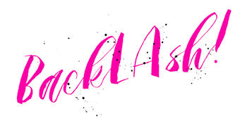 [MyFonts]
[More] ⦿
[MyFonts]
[More] ⦿
|
Morris Fuller Benton
|
 Prolific American type designer (b. 1872, Milwaukee, d. 1948, Morristown, NJ), who published over 200 alphabets at ATF. He managed the ATF type design program from 1892 until 1937. Son of Linn Boyd Benton. MyFonts page on him. Nicholas Fabian's page. Linotype's page. Klingspor page. Unos tipos duros page. His fonts include:
 - 1897: Cloister Old Style (ATF). [Stephenson Blake purchased this from ATF and called it Kensington Old Style, 1919] [Cloister (2005, P22/Lanston) is based on Jim Rimmer's digitization of Benton's Cloister.]
- 1898: Roycroft. Mac McGrew on Roycroft: Roycroft was one of the most popular of a number of rugged typefaces used around the turn of the century, when printing with an antique appearance was in vogue. It was inspired by lettering used by the Saturday Evening Post. then a popular weekly magazine, and has been credited to Lewis Buddy, a former Post artist and letterer, but ATF says it was designed "partly" by Morris Benton, about 1898. Gerry Powell, director of typographic design for ATF in the 1940s, says, "Roycroft was first known as Buddy, changed when it was adopted by Elbert Hubbard for the Roycroft Press." Henry L. Bullen, ATF librarian and historian, says, "The first font of type to be made from matrices directly engraved on the Benton machine was 24-point Roycroft. October 4, 1900." While the machine was originally designed in 1884 to cut punches rather than matrices, it is doubtful that no fonts of mats were cut before 1900. Roycroft is also said to be the first typeface for which the large size of 120-point was engraved in type metal, with matrices made by electrotyping. Many typefaces of the day had a number of alternate characters. For this face. ATF gave specific instructions for their intended use: "M with the short vertex, in words the letters of which are open; R with the long tail, as a final letter in all-cap words; the wide h, m, and n, as a final letter only; t with the swash tail, as a final letter but not too frequently; u with the descending stroke, in words having no descending letters; ct ligature, wherever possible; the long s and its combinations, in antique work." Roycroft Open was cut in 1902, probably from the same patterns as the parent face. Roycroft Tinted is a very unusual face, in which the typeface is engraved with the equivalent of a halftone screen of about 25 percent tone value, with a black shadow on the right side; this typeface was cut by the Dickinson Type Foundry branch of ATF in Boston, and includes the same special characters as Roycroft. Compare Post Oldstyle.
- 1900: Century Expanded (1900: poster by Heather Leonhardt). This was a complete redraw of Century Roman which was designed in 1894 by his father, Linn Boyd Benton, for Theodore Low DeVinne, the publisher of Century Magazine. Digitizations by Elsner&Flake, Bitstream and URW.
- 1901: Linotext (aka WedddingText).
- 1901-1910: Engravers.
- 1901: Wedding Text (some put this in 1907), Old English Text, Engravers' Old English (a blackletter font remade by Bitstream). Wedding Text has been copied so often it is sickening: Wedding Regular and Headline (HiH, 2007), Dan X. Solo's version, Comtesse, Elite Kanzlei (1905, Stempel), Meta, Lipsia, QHS Nadejda (QHS Soft), Blackletter 681, Marriage (Softmaker), Wedding Text TL (by Tomas Liubinas).
- 1902: Typoscript.
- 1902-1912: Franklin Gothic. Digital versions exist by Bitstream, Elsner&Flake (in a version called ATF Franklin Gothic), Red Rooster (called Franklin Gothic Pro, 2011), Linotype, and ITC (ITC Franklin Gothic). Discussion by Harvey Spears. Mac McGrew: Franklin Gothic might well be called the patriarch of modern American gothics. Designed in 1902 by Morris Fuller Benton, it was one of the first important modernizations of traditional nineteenth-century typefaces by that designer, after he was assigned the task of unifying and improving the varied assortment of designs inherited by ATF from its twenty-three predecessor companies. Franklin Gothic (named for Benjamin Franklin) not only became a family in its own right, but also lent its characteristics to Lightline Gothic. Monotone Gothic, and News Gothic (q.v.). All of these typefaces bear more resem- blance to each other than do the typefaces within some other single families. Franklin Gothic is characterized by a slight degree of thick-and-thin contrast; by the double-loop g which has become a typically American design in gothic typefaces; by the diagonal ends of curved strokes (except in Extra Condensed); and by the oddity of the upper end of C and c being heavier than the lower end. The principal specimen here is Monotype, but the basic font is virtually an exact copy of the ATF typeface in display sizes, except that Monotype has added f- ligatures and diphthongs. Franklin Gothic Condensed and Extra Condensed were also designed by Benton, in 1906; Italic by the same designer in 1910; and Condensed Shaded in 1912 as part of the "gray typography" series. Although Benton started a wide version along with the others, it was abandoned; the present Franklin Gothic Wide was drawn by Bud (John L.) Renshaw about 1952. Franklin Gothic Condensed Italic was added by Whedon Davis in 1967. Monotype composition sizes of Franklin Gothic have been greatly modi- fied to fit a standard arrangement; 12-point is shown in the specimen-notice the narrow figures and certain other poorly reproportioned characters. The 4- and 5-point sizes have a single-loop g. Gothic No. 16 on Linotype and Inter- type is essentially the same as Franklin Gothic up to 14-point; in larger sizes it is modified and more nearly like Franklin Gothic Condensed. However. some fonts of this typeface on Lino have Gagtu redrawn similar to Spartan Black. with the usual characters available as alternates; 14-point is shown. Western Type Foundry and later BB&S used the name Gothic No.1 for their copy of Franklin Gothic, while Laclede had another similar Gothic No. 1 (q.v.). On Ludlow, this design was originally known as Square Gothic Heavy with a distinctive R and t as shown separately after the Monotype diphthongs; when the name was changed to Franklin Gothic in 1928, it was redrawn, closer to Franklin Gothic but still a bit top-heavy; the unique R was retained in standard fonts but an alternate version like that of ATF was made available separately; also a U with equal arms, a single-loop g, and a figure 1 without foot serifs. Ludlow Franklin Gothic Italic, partially shown on the third line of the specimen, is slanted much more than other versions, to fit the standard 17 -degree italic matrices of that machine. Modern Gothic Condensed and Italic (q.v.) are often though not properly called Franklin Gothic Condensed and Italic, especially by Monotype users. Also see Streamline Block.
- 1903: Alternate Gothic (ATF). See Alternate Gothic Pro Antique (Elsner&Flake), Alternate Gothic No2 (Bitstream), Alpin Gothic (by Team77), League Gothic (2009-2011, The League of Movable Type), and Alternate Gothic No1, No2 and No3 (see the URW version). Mac McGrew: Alternate Gothic was designed in 1903 by Morris F. Benton for ATF with the thought of providing several alternate widths of one design to fit various layout problems. Otherwise it is a plain, basic American gothic with no unusual features, but represents a more careful drawing of its nineteenth-century predecessors. The Monotype copies in display sizes are essentially the same as the foundry originals, with the addition of f-ligatures. The thirteen alternate round capitals shown in the first line of Alternate Gothic No.1 were designed by Sol Hess in 1927 for Monotype, hence the "Modernized" name; with these letters the design is sometimes referred to as Excelsior Gothic. Monotype keyboard sizes, as adapted by Hess about 1911, are considera- bly modified to fit a standard arrangement; caps are not as condensed as in the original foundry design. In 6-point, series 51 and 77 are both the same width, character for character, but some letters differ a bit in design. Note that these two narrower widths are simply called Alternate Gothic on Monotype, while the wider version is Alternate Gothic Condensed! Alternate Gothic Italic, drawn about 1946 by Sol Hess for Monotype matches No.2, but may be used with other widths as well. Condensed Gothic on Ludlow, is essentially a match for Alternate Gothic No.1, but has a somewhat different set of variant characters, as shown in the third line. There is also Condensed Gothic Outline on Ludlow, introduced about 1953, essentially an outline version of Alternate Gothic No.2. On Linotype and Intertype there is Gothic Condensed No.2 which is very similar to Alternate Gothic No. 1 in the largest sizes only, but with even narrower lowercase and figures. Also compare Trade Gothic Bold and Trade Gothic Bold Condensed. For a free version of Alternate Gothic No. 1, see League Gothic (2009-2011, The League of Movable Type).
- 1904: Bold Antique, Whitin Black [see OPTI Bold Antique for a modern digitization], Cheltenham (digitizations by Bitstream and Font Bureau, 1992), Cloister Black (blackletter font, see the Bitstream version: it is possible that the typeface as designed by Joseph W. Phinney).
- 1905: Linoscript (1905). Originally at ATF it was named "Typo Upright". Clearface, about which McGrew writes: Clearface was designed by Morris Benton with his father, Linn Boyd Benton, as advisor. The bold was designed first, in 1905, and cut the following year. The other weights and italics were produced through 1911. As the name implies, the series was intended to show unusual legibility, which it certainly achieved. The precision of cutting and casting for which ATF is noted produced a very neat and handsome series, which had considerable popularity. Clearface Heavy Italic has less inclination than the lighter weights, and is non-kerning, a detail which helped make it popular for newspaper use; the specimen shown here is from a very worn font. Some of the typefaces have been copied by the matrix makers. But the typeface Monotype calls Clearface and Italic is the weight called Bold by other sources. Monotype also includes Clearface Italic No. 289, a copy of the lighter weight. Revival and expansion by Victor Caruso for ITC called ITC Clearface, 1978. Also, American Extra Condensed, an octagonal mechanical typeface revived in 2011 by Nick Curtis as Uncle Sam Slim NF.
- 1906: Commercial Script (versions exist at Linotype, URW, Bitstream (called English 144), SoftMaker (2012), and Elsner&Flake), Miele Gothic, Norwood Roman.
- 1907: Lincoln Gotisch, named after Abraham Lincoln. This found found its way from ATF to Schriftguss, Trennert und Sohn, and Ludwig Wagner. Digital revivals include Delbanco's DS Lincoln-Gotisch. Compare with Comtesses, Lipsia, Elite Kanzlei, Lithographia and Wedding Text.
- 1908: News Gothic, Century Oldstyle (digital versions by Bitstream, Elsner&Flake, and URW), Clearface Gothic (1907-1910: digital revivals include Clear Gothic Serial (ca. 1994, SoftMaker) and Cleargothic Pro (2012, SoftMaker). McGrew: Clearface Gothic was designed by Morris Benton for ATF in 1908, and cut in 1910. It is a neat, clean gothic, somewhat thick and thin, which incorporates some of the mannerisms of the Clearface (roman) series. However, it can hardly be considered a part of that family. There is only one weight, and fonts contain only the minimum number of characters.
- 1909-1911: Rugged Roman. McGrew: Rugged Roman was designed for ATF by Morris F. Benton in 1909-11. It was patented in 1915, but the earliest showing seems to have appeared in 1917. It is a rugged face, as the name says, of the sort that was popular early in the century, but appears to have no relation to other typefaces having the name "Rugged." It somewhat resembles Roycroft, but is lighter. But to add to the uncertainty, fonts contained a number of ligatures of the kind which were more common in the early 1900s, in addition to the usual f-ligatures.
- 1910: Cloister Open Face, Hobo (1910, strongly influenced by the Art Nouveau movement; Hobo Light followed in 1915), ATF Bodoni (Bitstream's version is just called Bodoni, and Adobe's version is called Bodoni Book or Bodoni Poster or Bodoni Bold Condensed, while Elsner&Flake call theirs Bodoni No Two EF Ultra; Font Bureau's version has just two weights called BodoniFB-Bold Condensed and Compressed). McGrew writes about Hobo: Hobo is unusual in two respects---it is drawn with virtually no straight lines, and it has no descenders and thus is very large for the point size. It was designed by Morris F. Benton and issued by ATF in 1910. One story says that it was drawn in the early 1900s and sent to the foundry without a name, which was not unusual, but that further work on it was continually pushed aside, until it became known as "that old hobo" because it hung around so long without results. More time elapsed before it was patented in 1915. The working name was Adface. Hobo was also cut by Intertype in three sizes. Light Hobo was also drawn by Benton, and released by ATF in 1915. It is included in one list of Monotype typefaces, but its series number is shown elsewhere for another Monotype face, and no other evidence has been found that Monotype actually issued it.
- 1911-1913: Venetian, Cromwell. Mac McGrew: Cromwell is a rather playful typeface, designed by Morris Benton in 1913 but not released by ATF until three years later. It uses the same capitals as Cloister (q.v.) and has the same small x-height with long ascenders and descenders, but otherwise is quite different, with much less formality. Notice the alternate characters and the double letters including overhanging f's.. Cromwell was digitized by Nick Curtis in 2010 as Cromwell NF. Mac McGrew on Venetian: Venetian and Italic were designed by Morris F. Benton for ATF about 1911, with Venetian Bold following about two years later. They are rather reserved transitional typefaces, almost modern, instead of classic designs of Venetian origin as the name implies. The result is closer to Bodoni than to Cloister. The working title was Cheltenham No.2, but the relationship to that family is not apparent. It is carefully and neatly done, but never achieved widespread use. Compare Benton, a later typeface by the same designer, which has similar characteristics but more grace and charm.
- 1914: Adscript, Souvenir, Garamond (with T.M. Cleveland).
- 1916: Announcement, Light Old Style, Goudy Bold. Mac McGrew writes: Announcement Roman and Announcement Italic were designed by Morris F. Benton in 1916, adapted from steel or copperplate engravings, but not completed and released until 1918. These delicate typefaces have had some popularity for announcements, social stationery, and a limited amount of advertising work, but are a little too fancy for extensive use. Oddly, some of the plain caps shown in the specimens, both roman and italic, do not seem to appear in any ATF specimens. Foundry records show that a 48-point size of the roman was cut in 1927, but no other listing or showing of it has been found. In fact, sizes over 24-point were discontinued after a few years, and all sizes were discontinued in 1954.. Digitizations: Announcement Roman was revived by Nick Curtis in 2009 and called Society Page NF. Rebecca Alaccari at Canada Type revived it as Odette in 2004. See also Castcraft's OPTI Announcement Roman.
- 1916-1917: Invitation. For a digital revival, see Sil Vous Plait (2009, Nick Curtis).
- 1917: Freehand.
- 1917-1919: Sterling. Digitizations include Howard (2006, Paul D. Hunt), Argentina NF (2009, Nick Curtis), and Argentina Cursive NF.
- 1918: Century Schoolbook (1918-1921). (See ITC Century (Tony Stan, 1975-1979), or the Century FB-Bold Condensed weight by Greg Thompson at Font Bureau, 1992. For Century Schoolbook specifically, there are versions by Elsner&Flake, Bitstream and URW. Bitstream has a monospaced version.) URW Century Schoolbook L is free, and its major extension, TeXGyre Schola (2007) is also free.
- 1920: Canterbury. Mac McGrew: Canterbury is a novelty typeface designed by Morris F. Benton for ATF in 1920, when trials were cut, but not completed for production until 1926. It features a very small x-height, with long ascenders and descenders; monotone weight with minute serifs; and a number of swash capitals. It is primarily suitable for personal stationery and announcements. Compare Camelot Oldstyle. Digital versions were done by Nick Curtis in his Londonderry Air NF (2002-2004), and Red Rooster in the series Canterbury, Canterbury OldStyle, and Canterbury Sans.
- 1922: Civilité. Mac McGrew on the ATF Civilité: Civilite in its modern adaptation was designed by Morris Benton in 1922 and cut by ATF in 1923-24. The original version was cut by Robert Granjon in 1557 to imitate the semi-formal writing then in vogue, and is believed to be the first cursive design cut in type. It became popular for the printing of poetry and for books of instruction for children, where the type itself could serve as a perfect model of handwriting. The first of these books was titled La Civilite puerile, printed at Antwerp in 1559. The books were so popular that the design came to be known as "civility" type. Other interpretations of the letter have been made, including Cursive Script, cut in the nineteenth century in 18-point only from French sources by ATF predecessors and by Hansen, but Benton's seems more attractive and legible to modern eyes. The French pronunciation of ci-vil'i-tay is indicated by the accented e, which was used only in ATF's earliest showings. The many alternate characters were included in fonts as originally sold; later they were sold separately and finally discontinued, although the basic font was still listed in recent ATF literature. Also see ZapfCivilite. Compare Freehand, Motto, Verona.
- 1924: Schoolbook Oldstyle.
- 1926-1927: Typo Roman.
- 1927: Chic (American Typefounders; doubly shaded capitals and figures), Gravure, Greeting Monotone, Goudy Extra Bold. The art deco typeface Chic was revived by Nick Curtis as Odalisque NF (2008) and Odalisque Stencil NF (2010).
- 1928: Parisian, Bulmer (revival of William Martin's typeface from 1792 for the printer William Bulmer; digital forms by Monotype, Adobe, Linotype, and Bitstream), Broadway (1928-1929, see two styles offered by Elsner&Flake, Linotype, Bitstream, and 11 weights by URW), Goudy Catalogue, Modernique, Novel Gothic (ATF, designed with Charles H. Becker), Dynamic. Novel Gothic has seen many digital revivals, most notably Telenovela NF (2011, Nick Curtis), Naked Power (Chikako Larabie) and Novel Gothic SG (Jim Spiece). Images of Bulmer: i, ii, iii, iv, v, vi, vii, viii, ix, x, xi, xii.
- 1929: Louvaine. McGrew: Louvaine series was designed by Morris F. Benton for ATF in 1928. It is an adaptation of Bodoni (the working title was Modern Bodoni), and many of the characters are identical. Only g and y are basically different; otherwise the distinction is in the more abrupt transition from thick to thin strokes in this series. In this respect, Ultra Bodoni has more affinity to Louvaine than to the other Bodoni weights. The three weights of Louvaine correspond to Bodoni Book, Regular, and Bold. This series did not last long enough to appear in the 1934 ATF specimen book, the next complete one after its introduction. Compare Tippecanoe.
- 1930: Benton, Engravers Text, Bank Gothic (see Bitstream's version), Garamond-3 (with Thomas Maitland Cleland), Paramount (some have this as being from 1928: see Eva Paramount SG by Jim Spiece). McGrew: Paramount was designed by Morris Benton in 1930 for ATF. It is basically a heavier companion to Rivoli (q. v.), which in turn is based on Eve, an importation from Germany, but is heavier than Eve Bold. It is an informal typeface with a crisp, pen-drawn appearance. Lowercase is small, with long ascenders and short descenders. Vertical strokes taper, being wider at the top. It was popular for a time as an advertising and announcement type.
- 1931: Thermotype, Stymie (with Sol Hess and Gerry Powell). Stymie Obelisk is a condensed Egyptian headline face---the latter was revived by Nick Curtis as Kenotaph NF (2011).
- 1932: Raleigh Gothic Condensed (the digital version by Nick Curtis is Highpoint Gothic NF (2011)), American Text (blackletter). Mac McGrew: Raleigh Gothic Condensed was designed by Morris F. Benton for ATF in 1932. It is a prim, narrow, medium weight gothic face, with normally round characters being squared except for short arcs on the outside of corners. The alternate characters AKMNS give an even greater vertical appearance than usual. At first, this typeface was promoted with Raleigh Cursive as a stylish companion face, although there is no apparent relationship other than the name. Compare Phenix, Alternate Gothic, Agency Gothic.
- 1933: American Backslant, Ultra Bodoni (a great Bodoni headline face; see Bodoni FB (1992, Font Bureau's Richard Lipton). About Agency Gothic, McGrath writes: Agency Gothic is a squarish, narrow, monotone gothic without lower- case, designed by Morris F. Benton in 1932. It has an alternate A and M which further emphasize the vertical lines. Sizes under 36-point were added in 1935. Agency Gothic Open was drawn by Benton in 1932 and introduced in 1934; it follows the same style in outline with shadow, and probably has been more popular than its solid companion. Triangle Type Foundry, a Chicago concern that manufactured matrices, copied this typeface as Slim Open, adding some smaller sizes. ATF's working titles for these typefaces, before release, were Tempo, later Utility Gothic and Utility Open. Compare Raleigh Gothic Condensed, Poster Gothic, Bank Gothic. Digital versions include Warp Three NF (2008, Nick Curtis), which borrows its lowercase from Square Gothic (1888, James Conner's Sons), FB Agency (1995, David Berlow at FontBureau), Agency Gothic (by Dan Solo) and OPTI Agency Gothic (by Castcraft).
- 1934: Shadow, Tower (heavy geometric slab serif), Whitehall. Font Bureau's Elizabeth Cory Holzman made the Constructa family in 1994 based on Tower. Digital versions include Warp Three NF (2008, Nick Curtis), which borrows its lowercase from Square Gothic (1888, James Conner's Sons), FB Agency Gothic (1995, David Berlow at FontBureau) and Agency Gothic by Castle Type. Eagle Bold followed in 1934. McGrew: Eagle Bold is a by-product of the depression of the 1930s. The National Recovery Administration of 1933 had as its emblem a blue eagle with the prominent initials NRA, lettered in a distinctive gothic style. Morris Benton took these letters as the basis for a font of type, released later that year by ATF, to tie in with the emblem, which businesses throughout the country displayed prominently in advertising, stationery, and signs; naturally it was named for the eagle. Compare Novel Gothic. USA Resolute NF (2009, Nick Curtis) is based on Eagle Bold.
- 1935: Phenix. This condensed artsy sans was revived in 2011 at Red Rooster by Steve Jackaman and Ashley Muir as Phoenix Pro.
- 1936: Headline Gothic. For a digital version, see ATF Headline Gothic (2015, Mark van Bronkhorst, Igino Marini, & Ben Kiel at American Type Founders Collection).
- 1937: Empire. This ultra-condensed all caps skyline typeface was digitally remade and modernized by Santiago Orozco as Dorsa (2011). Jeff Levine reinterpreted it in 2017 as Front Row JNL. Bitstream also has a digital revival.
Linotype link. FontShop link. Picture. Typefaces alphabetic order: - Adscript
- Agency Gothic (+Open
- Alternate Gothic No.1 (+No.2, +No.3)
- American Backslant
- American Caslon&Italic
- American Text
- Announcement Roman&Italic (1916). For digital revivals or influences, see Friendly (2012, Neil Summerour), Odette (2004, Canada Type) and Society Page NF (2009, Nick Curtis).
- Antique Shaded
- Bank Gothic Light (+Medium, +Bold, +Light Condensed, +Medium Condensed, +Bold Condensed). For digital versions, see Bank Gothic AS Regular and Condensed (2008, Michael Doret).
- Baskerville Italic
- Benton (Whitehall)&Italic
- Bodoni&Italic (+Book&Italic, +Bold&Italic, +Bold Shaded, +Bold Open)
- Bold Antique (+Condensed)
- Broadway (+Condensed). The prototyical art deco typeface (1928-1929).
- Bulfinch Oldstyle (1903).
- Bulmer&Italic
- Canterbury
- Card Bodoni (+Bold). 1912-1916.
- Card Litho (+Light Litho)
- Card Mercantile
- Card Roman
- Century Expanded&Italic
- Century Bold&Italic (+Bold Condensed, +Bold Extended)
- Century Oldstyle&Italic (+Bold&Italic, +Bold Condensed)
- Century Catalogue&Italic
- Century Schoolbook&Italic (+Bold)
- Cheltenham Oldstyle&Italic (+Condensed, +Wide)
- Cheltenham Medium&Italic (+Medium Condensed, +Medium Expanded, +Bold&Italic, +Bold Condensed&Italic, +Bold Extra Condensed&Title, +Bold Extended, +Extrabold, +Bold Outline, +Bold Shaded&Italic, +Extrabold Shaded, +Inline, +Inline Extra Condensed, +Inline Extended)
- Chic
- Civilite
- Clearface&Italic (1907, +Bold&Italic, +Heavy&Italic)
- Clearface Gothic: a flared version of Clearface.
- Cloister Black
- Cloister Oldstyle&Italic (+Lightface&Italic, +Bold&Italic, +Bold Condensed, +Cursive, +Cursive Handtooled, +Title&Bold Title)
- Commercial Script
- Copperplate Gothic Shaded
- Cromwell.
- Cushing Antique (1902).
- Della Robbia Light
- Dynamic Medium
- Eagle Bold
- Empire (1937). A skyline typeface.
- Engravers Bodoni
- Engravers Old English (+Bold)
- Engravers Bold
- Engravers Shaded
- Engravers Text
- Franklin Gothic&Italic (+Condensed, +Extra Condensed, +Condensed Shaded)
- Freehand (1917). Mac McGrew: Freehand, a typeface based on pen-lettering, was designed for ATF by Morris Benton in 1917. The working title before release was Quill. Derived from Old English, it is an interesting novelty, and has had quite a bit of use. Compare Civilite, Motto, Verona.
- Garamond&Italic (+Bold&Italic, +Open)
- Globe Gothic (+Condensed, +Extra Condensed, +Extended, +Bold&Italic)
- Goudy Bold&Italic (+Catalogue&Italic, +Extrabold&Italic, +Handtooled&Italic, +Title)
- Gravure
- Greeting Monotone
- Headline Gothic
- Hobo&Light Hobo (1910). For digital versions, see Informal 707 (Bitstream), Hobbit (SF), Homeward Bound (Corel), Hobo No2 (2012, SoftMaker), Bogo (2016, Harold Lohner), and Hobo (Bitstream).
- Invitation (+Shaded)
- Light Oldstyle
- Lightline Gothic&Title (1908). For a revival, see Benton Gothic Thin NF (2014, Nick Curtis).
- Lithograph Shaded (1914, with W.F. Capitain).
- Louvaine Light&Italic (+Medium&Italic, +Bold&Italic)
- Miehle Extra Condensed&Title
- Modernique
- Monotone Gothic&Title
- Motto (1915). Mac McGrew: Motto is a calligraphic typeface designed by Morris F. Benton for ATF in 1915. It is similar to the same designer's Freehand, drawn a couple of years later, but has plainer capitals, heavier thin strokes, and shorter descenders. But letters combine into legible words with a pleasant, hand-lettered appearance. Also compare Humanistic, Verona. For a digital version, see Motto by Juan Kafka.
- News Gothic (+Condensed, +Extra Condensed&Title)
- Norwood Roman
- Novel Gothic
- Othello
- Packard (+Bold)
- Paramount
- Parisian
- Pen Print Open
- Phenix
- Piranesi Italic (+Italic Plain Caps, +Bold&Italic, +Bold Italic Plain Caps)
- Poster Gothic (1934).
- Raleigh Gothic Condensed (1934).
- Rockwell Antique
- Roycroft
- Rugged Roman
- Schoolbook Oldstyle
- Shadow
- Souvenir (1914). Revived in 1977 by Ed Benguiat as ITC Souvenir, but a total failure as a type design. Simon Garfield: Souvenir was the Comic Sans of its era, which was the 1970s before punk. It was the typeface of friendly advertising, and it did indeed appear on Bee Gees albums, not to mention the pages of Farrah Fawcett-era Playboy. Mark Batty from International Typeface Corporation (ITC) on one of his best-selling fonts: A terrible typeface. A sort of Saturday Night Fever typeface wearing tight white flared pants. Garfield also retrieved this quote by type scholar Frank Romano in the early 1990s: Real men don't set Souvenir. Digital revivals also include Sunset Serial by Softmaker, and ITC Souvenir Mono by Ned Bunnel.
- Sterling&Cursive
- Stymie Light&Italic (+Medium&Italic, +Bold&Italic, +Black&Italic)
- Thermotypes
- Tower Condensed (1934). Revived by Photo-Lettering Inc as PL Tower.
- Typo Roman&Shaded
- Typo Script and Typo Script&Extended (1902)
- Typo Shaded
- Typo Slope
- Typo Upright&Bold
- Ultra Bodoni&Italic (+Condensed, +Extra Condensed)
- Venetian&Italic (+Bold)
- Wedding Text&Shaded
View Morris Fuller Benton's typefaces. A longer list. A listing of various digital versions of News Gothic. More News Gothic-like typefaces. Even more News Gothic-like typefaces. [Google]
[MyFonts]
[More] ⦿
|
Mychaela Bueche
|
Madison, WI-based designer of the circle-themed typeface Circuit (2017). Behance link. [Google]
[More] ⦿
|
Nate Eul
|
Nate Eul was born and raised in Faribault, MN, and is currently studying graphic design at the University of Wisconsin Stout in Menomonie. Behance link. Creator of the art deco typeface Hoodwink (2012), which is supposed to be used on a slant. Good for slogans. [Google]
[More] ⦿
|
Nate Siebert
|
Milwaukee, WI-based designer of Mugglebrush (2016), the children's script font Jonas in the Fifth (2016), the handcrafted Timberhavn (2016), the brsush script Mountain Man (2016) and Shock Block Display Font (2016). [Google]
[More] ⦿
|
Nathan Fetherston
|
Graduate of MIAD, class of 2018. Milwaukee, WI-based designer of the colored decorative all caps typeface Roman Archi-Type (2018). [Google]
[More] ⦿
|
Nathaniel Killam
|
Menomonie, WI-based designer of the neon sign or paperclip font Liqud Fire (2016), which was published during his studies at the University of Wisconsin Stout. [Google]
[More] ⦿
|
Nick Hammond
|
Graphic designer in Milwaukee, WI. He created the free geometric typeface Circles (2010). Behance link. Dafont link. [Google]
[More] ⦿
|
Occupant Fonts
[Cyrus Highsmith]
|
 Senior designer at Font Bureau since 1997, after graduating that year from the Rhode Island School of Design. Born in Milwaukee, WI, he now is a faculty member at RISD, where he teaches typography in the department of Graphic Design. He regularly offers a summer course on Digital Type Design, Summer Institute of Graphic Design, Rhode Island School of Design. His sketchbooks are now on line. In 2016, he set up Occupant Fonts as part of the Type Network.
 In September 2017, Morisawa announced the establishment of "Morisawa Providence Drawing Office" in Providence, RI, as its new base for developing Latin fonts. Cyrus Highsmith, who had served as a designer for Font Bureau for many years, and who started Occupant Fonts in 2015, has been appointed as its creative director. By this move, Morisawa acquired Occupant Fonts. Author of Inside Paragraphs, written for a foundational typography course. Matthew Carter writes: Cyrus Highsmith takes the lid off a paragraph of type and shows its inner workings. There is nothing you need to understand about using type that's not in this book. Cyrus explains the correct terms for the typographic components of form and space that make a letter, a word, a line, a paragraph, and he does it with clear drawings, simple language, and a legible typeface for the text. Interview at MyFonts. Cyrus created wonderful typefaces such as Loupot (1997, with Laurie Rosenwald, based on the lettering on Charles Loupot's St. Raphael poster from 1948), Eggwhite (2000-2018, for comics), Relay (2002, a somewhat art deco sans serif family that will be in vogue for years to come!), Benton Sans (1995-2003, with Tobias Frere-Jones, a revival of Benton's 1903 family, News Gothic; see also Benton Sans Wide, 2013), Occupant Gothic (2000-2018, angular), Prensa (2003, a simple 24-style serif family), Prensa Display (2012), Dispatch (1999-2000), Halo (2003), the 12-weight Stainless family (2001), and Daleys Gothic (1998). The Wall Street Journal uses his D4ScotchD4Scotch family (2001). He made a modified Palatino for the newspaper El Mercurio, and designed Zocalo or El Universal for the newspaper El Universal. He won Bukvaraz 2001 awards for Prensa and Relay. His Amira (Font Bureau) and (Spanish-feeling) Zocalo (Font Bureau) won awards at TDC2 2004. At ATypI 2004 in Prague, he spoke about the wealth of typefaces. In 2006, Escrow (Font Bureau) was published, an out-of-this-world 44-style subdued Scotch family that is used by The Wall Street Journal. In 2007, still at Font Bureau, he created Antenna, a 56-style sans family, as well as Biscotti, a delicate connected (wedding) script commissioned in 2004 by Gretchen Smelter and Donna Agajanian for Brides magazine. His calligraphic copperplate script Novia (2007, Font Bureau) was commissioned to grace the pages of Martha Stewart Weddings. Still in 2007, he won an award for his newspaper type family Quiosco (Font Bureau). Font Bureau writes: With Quiosco, Cyrus Highsmith continues an examination of themes and possibilities which he first explored in Prensa, inspired by the work of W. A. Dwiggins---specifically a dynamic tension between inner and outer contours. However, the crackling, electrical energy of Prensa here gives way to a more fluid, mercurial muscularity in Quiosco. See also Quiosco Display. In 2006, he designed Scout for Geraldine Hessler's redesign of Entertainment Weekly, under the influence of DIN, Venus and Cairoli. Scout is a utilitarian sans serif series that was followed in 2013 with Scout RE---four styles optimized for screen text and small sizes in print. In 2016, he added Scout Text. In 2010, at Font Bureau, he published the extensive families Ibis Text and Ibis Display, which he says were influenced by Walbaum (1919) and Melior (1952). The Webtype version IbisRE is poorly kerned / displayed in my browser though. From 2007 until 2010, he developed Salvo Sans and Salvo Serif (Font Bureau), which were originally called Boomer Sans and Serif. They were released in 2011. In 2012, he published Serge (an angular script family in three styles: a frisky, acrobatic typeface that dashes off decorative blurbs, signs, and headlines with a lively, angular zest), Heron Sans and Heron Serif at Font Bureau, which writes: Heron Serif and Sans are born of hard iron and steel, but galvanized with Cyrus Highsmith's warmth and energy. In 2013, he published Icebox at Font Bureau---a font that is based on a set of magnetic letters found at a variety store. Typefaces from 2014: Tick and Tock, two stencil styles. Typefaces from 2015: Antenna Serif. Typefaces from 2016: Gasket, Gasket Unicase, Gasket Uncial. Typefaces from 2017: Allium. Typefaces from 2018: Allium Text. Speaker at ATypI 2013 in Amsterdam: Don't design web fonts Its theme is: The successful type series of the future will be the ones that can move between media. He says that new typefaces should be smarter than the devices that use them. In 2015, he received the coveted Gerrit Noordzij Prijs. His illustrations were the subject of an exhibition and a book, both called Products Of A Thinking Hand (Typotheque / KABK, 2018). View Cyrus Highsmith's typefaces. Klingspor link. FontShop link. MyFonts interview. Old Font Bureau link. [Google]
[MyFonts]
[More] ⦿
|
Oddsorts
[Charles Gibbons]
|
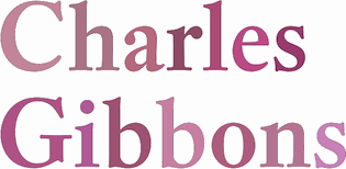 Charles Gibbons (b. 1967, Lynn, MA) received an MFA in graphic design from the Rhode Island School of Design. Gibbons spent much of the nineties as a designer for the University of Minnesota in Minneapolis and later as assistant professor of Graphic Design at the University of Wisconsin / Stout where he taught typography and publication design. In 2001, he joined the Library of Congress as the chief designer for the United States Copyright Office. Chuck has partnered with various typefoundries such as Bitstream, Filmotype, Sideshow, Tart Workshop, Device, and Cultivated Mind. The Ciao Bella ornaments he designed with Cultivated Mind's Cindy Kinash represent the first commercially available auto-chromatic fonts: each font can be set in two colors. Working with Stuart Sandler and Crystal Kluge at Tart Workshop, he developed the method by which their Aya Script delivers its characteristic curlicue ribbons. His types grace book covers, greeting cards, film titles, museum façades, and the seal of the United States Copyright Office. At present, he teaches typography and type design at Tufts University in Boston. In 2015, he set up Oddsorts. His typefaces, in more or less chronological order:
 - Aphasia BT (2000, Bitstream). He writes: A meeting of Byzantine and Art Deco forms, Aphasia began as a series of handwritten captions to accompany drawings in the early 1990s.
- At Oddsorts, he published Bradley Wayside and Bradley Chicopee in 2015: Begun in 2000 as a wedding gift for the designer's wife and used privately for years, they're finally available to the public. The fonts were inspired by the masterful art nouveau lettering of Will H. Bradley, whose posters for Ault & Wiborg printing inks and Victor Bicycles continue to draw collectors after more than a century. Wayside and Chicopee expand the twenty-odd characters Bradley drew into a comprehensive multiscript system that includes modern Greek and extended Cyrillic alphabets, ordinals, automatic fractions, and ornaments.
- In 2014, Charles Gibbons and Cindy Kinash co-designed Ciao Bella (first published at Cultivated Mind, and in 2016 at Oddsorts). It features a handcrafted copperplate script style, and several flower ornaments about which they write: The Ciao Bella ornaments he designed with Cultivated Mind's Cindy Kinash represent the first commercially available auto-chromatic fonts: each font can be set in two colors. What's truly innovative about Ciao Bella's ornaments is that most of the characters come in pairs that can be set in multiple colors without any stacking, layering, or aligning. They work in any application that supports kerning---even most word processors.
- Full Moon Suite (2001, Bitstream). Co-designed with Mary Trafton. Includes FM Black Cherry Moon, Alternate, Ligature, and Doubles. FullMoon BT won an award at the TDC2 2003 competition.
- Fleischmann BT Pro (2002). A family heralded by the typophiles as outperforming the DTL Fleischmann.
- Various Filmotype fonts for Stuart Sandler's Filmotype project. In 201, he designed the identical lively freestyle typefaces Filmotype Nemo (original from 1953), Filmotype Niro, and Filmotype Nero. The renaming was done under various scenarios of pressure. In 2011, he also made the signage typeface Filmotype Atlas. In 2012, he created the art deco fat didone typeface Filmotype Rose, and the fine brush letter signage typeface Filmotype Havana. Filmotype Adonis (2012) is a clean hand-drawn typeface. Filmotype Royal (2012) is a transitional typeface family. Typefaces from 2013: Filmotype Orlando (cartoonish), Filmotype Parade (cartoonish), Filmotype Zeal (a formal almost-copperplate script). In 2014, he added Filmotype Western (an italian, or reversed stress, typeface based on a Filmotype design from 1955), and in 2015 Filmotype Wand. Filmotype Maxwell (2019) is a revival of an interlocking Filmotype font from the 1960s.
- Greenleaf (2019).
- Local Market (2014). With Cindy Kinash. A hand-drawn collection of typefaces.
- True North (+Extras, +Textures: a vintage letterpress emulation set of fonts designed for posters and banners), 2014-2015. Done together with Cindy Kinash.
- Winooski (2015) is a fun cartoon typeface.
FontShop link. Oddsorts link. [Google]
[MyFonts]
[More] ⦿
|
Olivia Harris
|
Graduate of Clarke University (class of 2016), who is based in Madison, WI. In 2016, she designed the sharp-edged display typeface Rock Candy. Behance link. [Google]
[More] ⦿
|
Open Window
[Dathan Boardman]
|
 Dathan Boardman (Open Window) is an American type designer who lives in Eau Claire, WI, and was born in 1979. He went to UW Stout to get his BFA in Graphic Design.
 Fontspace link. Klingspor link. Fontsquirrel link. Google Plus link. His typefaces: - Afternoon Tea (2010), an art deco typeface that is inspired by a lettering specimen featured in Letters and Lettering by Paul Carlyle and Guy Oring published in 1938.
- Art Club (2013) and Art Club Roman (2014).
- Backlash (2015, Molly Jacques Erickson and Dathan Boardman). The next step in gonzo splatter lettering scripts.
- Baseline Script (2013). A thin-lined upright script.
- Caesar Dressing Pro (2011). A Greek simulation / stone chisel face.
- Calla Script (2017). By Molly Jacques and Dathan Boardman.
- Calligraffitti (2010). Free at Google Fonts.
- Clarendon Paint (2010).
- College Dropout (2010): a sketch typeface based on athletic lettering glyphs.
- Coming Soon and Calligraffiti (2010): free fonts at the Google Font Directory. The Pro versions are commercial.
- Cowboy Stories (2013).
- Deco and Deco Hatched (2010): art deco headline typefaces.
- Distinction (2020). A script released by Great Lakes Lettering.
- Doriss Girls (2013). A marquee typeface family.
- Farm Girl (2011). A hand-printed face.
- Gold Diggin (2011) hearkens back to posters from the Gold Rush Era.
- Grannys Greenhouse (2019). A beatnik font by David Cohen and Dathan Boardman).
- Hand of Joy (2011) is a thin connected script face.
- Headbanger (2012). A heavy metal album cover font.
- Jacky Hand. Based on the handwriting of a 6-year old child.
- Liquor Store (2019).
- Metal Mania (2012). A spurred heavy metal band font, free at Google Web Fonts.
- Miniver Pro (2011) and Miniver Air Raid Pro (2012) are based on the titling for the 1942 movie Mrs. Miniver.
- Pen Swan (2016).
- Raindrop (2017). A flirty handcrafted typeface family for editorial illustration.
- Rifleman (2012) is a painted wide-slabbed typeface.
- Shag Script (2011). Was this renamed Shrag Script?
- Sketchura (2011) is a sketch face.
- Skyline Hotel (2014).
- Some Assembly (2012). A rounded organic sans family.
- Spur Rust (2011) is a disheveled take on the spicy classic Hellenic Wide.
- Undercoat (2011). A painted version of Helvetica.
- Velvet Hammer (2014). A calligraphic script co-designed with Jen Maton.
- Wide Noise (2010) is grungy.
Great Lakes Lettering in Eau Claire, WI, showcases the type designs of Dathan Boardman and Molly Jacques Erickson. They jointly designed the illustrative handwriting font Frosted in 2012. In 2013, they co-designed the hand-drawn typefaces Saint Agnes and Icing, and the script typeface Kailey (2013). View Dathan Boardman's typefaces. Dafont link. Creative Market link. [Google]
[MyFonts]
[More] ⦿
|
Outside The Line Fonts
[Rae Kaiser]
|
 Outside The Line Fonts was founded by Rae Kaiser (b. 1951, Marshfield, WI), and is based in Eau Claire, WI, on the shores of Lake Monona. Rae's fonts include
 - Typefaces from 2019: Wilderness and Home Collection(Architectural Lettering, Plz Print Bold Condensed, Best Regardz, Wilderness Doodles, Woodland Doodles, Dickybirds, Lake Vacation Doodles, House Doodles, Farm Doodles, Home Sweet Home Dingbats)
- Typefaces from 2016: Wilderness Doodles, Rae's Monogram Family (hand-lettered styles, and a set of dingbats called Rae's Monogram Doodles).
- Typefaces from 2015: Dear Rae, Love Dad (watercolor script), Dickybird Doodles.
- Typefaces from 2014: Nautical Doodles, Flourishes & Ornaments, Kitchen Doodles, Woodland Doodles.
- Typefaces from 2013: RSVP Brush (a fat brush face), Farm Doodles, Chicago Doodles, Happy Hour Doodles.
- Typefaces from 2012: Flower and Leaf Borders, New Orleans Doodles, Ultra Condensed, Birthday Doodles, Reading and Writing Doodles.
- Waikiki Doodles (2011), Vibrant Women (2011, female figure dingbat typeface done with Nancy Vala), London Doodles (2011), Woof (2011, dog silhouettes done with Nacy Vala), Lake Vacation Doodles (2011), Drop Cap One (2011), Cowboy Doodles (2011), Cordially Yourz (2011, hand-printed).
- Yuletide Doodles (2010), House Doodles (2010), Paisley and Swirl Doodles (2010), Fondly Yourz (2010, hand-drawn serif face), Paris Doodles (2010---a great dingbat face), Leaf Doodles (2010).
- Knitting And Sewing Doodles (2009), Just People (2010, with justine Childs), Just Shoes and Purses (2009), Sincerely Yourz (2009, child's hand), Flower Doodles (2009), Just Flower Pots (2009, dingbats; with Justine Childs), Just Christmas (2009, Xmas dings done with Justine Childs), Just Frames (2009: with Justine Childs), Frames and Borders (2009, followed by Frames and Borders Too, 2010).
- Wedding Doodles (2008, dingbats, followed in 2009 by Wedding Doodles Too), Hearts and Swirls (2008, heart dingbats), Fruit and Veggie Doodles (2008), Crowns (2008, with Justine Childs), Yourz Truly (2008), Font Doodles Too (2008, a 31-glyph food clipart dingbat font), Home Sweet Home Dingbats (2008), Hodgepodge (2008, +Handlettered, 2010), Dearest John (2008, handwriting), Doodles (2008), Diva Doodles (2008), Architectural Lettering (2008), Plz Script (2008, brush), Plz Print (2008, brush), BlobsBrushstrokesAndBalloons (2009), Baby Doodles (2008), Doodles Too (2008), Guy Doodles (2008), Party Doodles (2007), Party Doodles Too (2008).
- Christmas Doodles (2007, dingbats), Christmas Doodles Too (2008), Holiday Party Words (2007, comic book style letters), Fleurons of Paris (2007), Ornaments of Paris (2007), Heart Doodles (2007, followed by Heart Doodles Too in 2008).
- Coffee and Tea Doodles (2006), Diva Doodles Too (2006, fun diva dingbats), Justine (2006, with Justine Childs), Architectural Lettering (1999), Cross Stitch, Doodles, DoodlesTheAlphabet, Food Doodles, Fooddoodles, Hat Doodles (2006), Tall Skinny Condensed.
See also here. Agfa/Monotype sells Architectural Lettering, Cross Stitch, CurlyQ, Doodles, DoodlesTheAlphabet, Food Doodles, Holiday Doodles, Office Doodles, Plz Print, Plz Print Brush, Plz Print Bold Condensed, Plz Script, the hand-printed series (Best Regardz, Dearest John, Yourz Truly and Sincerely Yourz, 2009) and Tall Skinny Condensed (1999). MyFonts link. Font Bros link. MyFonts interview. Klingspor link. Creative Market link. View Rae Kaiser's typefaces. [Google]
[MyFonts]
[More] ⦿
|
Pepper Font
|
In the Phonology Project at the University of Wisconsin, the free Pepper Font family was developed: each font contains 43 regular and bold phonetic symbols for all of the American English consonants, vowels, and diphthongs, and 45 diacritic symbols and special characters. [Google]
[More] ⦿
|
Rachel Hughes
|
Graphic design and sociology student at the University of Wisconsin Milwaukee. She created Modified Helvetica (2012). [Google]
[More] ⦿
|
Rae Kaiser
[Outside The Line Fonts]
|
 [MyFonts]
[More] ⦿
[MyFonts]
[More] ⦿
|
Randy Szarzynski
[Szar Design]
|
[MyFonts]
[More] ⦿
|
Raymond Mawst
|
Graphic design student at UW Milwaukee. He created the fat geometric typeface Night Fowl (2010). [Google]
[More] ⦿
|
Richard Kegler
[Hamilton Wood Type (HWT)]
|
 [MyFonts]
[More] ⦿
[MyFonts]
[More] ⦿
|
Roh Design
[Mike Rohde]
|
 Mike Rohde (Roh Design, Milwaukee, WI) writes on sketching, drawing, technology, travel cycling and books. Author of The Sketchnote Handbook, the illustrated guide to visual note taking (2013, The Peachpit Press). For this book, he created a hand-printed typeface family, Sketchnote (2013, +Text, +Square), which can be bought from Delve Fonts. He also created Sketchnote Dingbats (2014). Creative Market link. [Google]
[MyFonts]
[More] ⦿
Mike Rohde (Roh Design, Milwaukee, WI) writes on sketching, drawing, technology, travel cycling and books. Author of The Sketchnote Handbook, the illustrated guide to visual note taking (2013, The Peachpit Press). For this book, he created a hand-printed typeface family, Sketchnote (2013, +Text, +Square), which can be bought from Delve Fonts. He also created Sketchnote Dingbats (2014). Creative Market link. [Google]
[MyFonts]
[More] ⦿
|
Russell
|
Wisconsin-based designer (b. 1982) of Crow Graffiti (2004, based on the letters used in The Crow: City of Angels). [Google]
[More] ⦿
|
Ryan Clayton
|
Milwaukee, WI-based designer of the monoline organic sans typeface Groove (2012). Behance link. [Google]
[More] ⦿
|
Ryan Hood
|
Hudson, WI-based designer, with Adam Lehl, of the experimental typeface Melatonin (2003). [Google]
[More] ⦿
|
Ryan Huettl
|
Graphic design student at the University of Wisconsin-Stoutr. Based in Menomonie, WI, he created the typeface Reticulum (2012), which is entirely composed of straight sticks. Behance link. [Google]
[More] ⦿
|
Ryan Martinson
[Yellow Design Studio]
|
 [MyFonts]
[More] ⦿
[MyFonts]
[More] ⦿
|
Saige Rouze
[Ciara Rouze]
|
[More] ⦿
|
Sara Link
|
New Richmond, WI-based designer of the arts-and-crafts typeface Fearless (2018). [Google]
[More] ⦿
|
Sarah Jane Peck
|
Milwaukee, Wisconsin-based designer of the caps typeface Paper Cuts (2011). In 2012, she made the hand-printed poster typeface Summer Camp. [Google]
[More] ⦿
|
Sarah Nagorski
|
During her studies in Milwaukee, WI, Sarah Nagorski created the counterless geometric headline typeface Barklep (2012). [Google]
[More] ⦿
|
Sarah Osborn
|
Designer of the Thai simulation font Jesticulate (2003). Sarah Osborn is based at UW-Stout in Menomonie, WI. [Google]
[More] ⦿
|
Sarah Wells
|
Graphic designer in Chippewa Falls, WI, who created the display typeface Dark Maiden (2014). [Google]
[More] ⦿
|
Schomer Lichtner
|
American artist (b. 1905, Peoria, IL, d. 2006, Milwaukee, WI) in Wisconsin, known for paintings of ballerinas and dairy cows and his regionalist murals. He married fellow-artist Ruth Grotenrath in 1934, and both became involved in the Federal Works Progress Administration's (WPA) art programs, Treasury Relief Art Project (TRAP) and the Public Works Art Project (PWAP). He created the stick figure Ballerina Alphabet as a serigraph in 1990. [Google]
[More] ⦿
|
Shanna Knueppel
[Shanna Rose]
|
 Aka Shanna Rose. Graphic designer in Wisconsin who created the modular typefaces Tight Squeeze, Brick by Brick, and Rush in 2012. These are FontStruct fonts.
 FontStruct link. [Google]
[More] ⦿
|
Shanna Rose
[Shanna Knueppel]
|
[More] ⦿
|
Sideshow
[Bai Mellon]
|
Eau Claire, WI-based outfit who sell their fonts at MyFonts and Font Diner: Sideshow was developed as an offshoot boutique type foundry of the Font Diner retro display font foundry. Their first work is a collection of calligraphic borders called the Certified Series (2008, by Stuart Sandler of Font Diner and Bai Mellon from France). Other work includes Goofball (2008, retro lettering by David Cohen and Stuart Sandler), Cocktail Shaker (2008, a retro font typical for Stuart Sandler), Bamboozle (2008, wooden plank look by David Cohen and Stuart Sandler), Blackcat (brush typeface by Sam Gambino and Stu Sandler), Creaky Frank (2008), Creaky Solid (2008), Creaky Tiki (2008) [all wood-style typefaces made by Sandler and Derek Yaniger], Blackcat Fever (2008), Weird Bill (2008), Weirdbats (2008, by Cohen and Sandler) and Toylab (2008, by Molly Zakrajsek and Stuart Sandler). Sandler added Derekbats (in cooperation with Derek Yaniger), Savage Hipsters (a bebop curly display face), Weird Bill (with David Cohen), Coffee Drinker (connected script) and Coffee Service (a signage face) in 2008. At Google Web Fonts in 2011: Creepster (Halloween font), Trade Winds (pirate font), Frijole [image], Flavors [link]. Free fonts done in 2012: Rock Salt (hand-drawn). Fontsquirrel link. View the Sideshow typeface library. [Google]
[MyFonts]
[More] ⦿
|
Sideshow
[Dave Cohen]
|
 Company whose fonts can be bought via Stuart Sandler's Font Bros. They include mostly playful display typefaces: Bamboozle, Blackcat Chopper, Blackcat Fever, Cocktail Shaker, Creaky Wiggling Fingers, Creaky Frank Wiggling, Creaky Tiki Wiggling, Snoiplash Bold, Sniplash Quacker, Toylab Mechanical, Derekbats, Doinkbats. At Google Font Directory, we learn that the designer is Dave Cohen. A free font there is the brush script typeface Satisfy (2011). He also posted Creepster Caps (2011) at Google Web Fonts just in time for Halloween.
 Typefaces made in 2012: Grilled Chicken (angular hand-printed typeface), Mystery Quest (a curly Victorian and/or psychedelic typeface that is free at Google Web Fonts), Seaweed Script (Google Web Fonts). In 2015, they published Jazznik (a sixties beatnik typeface family with accompanying dingbat fonts Jazznik Rhythms and Jazznik Riffs). Klingspor link. Google Plus link. [Google]
[More] ⦿
|
Silver Buckle Press
|
Madison, WI-based publishers of Specimen Book of Wood Type (1998), designed and printed by Rachel Davis, and of Specimen Book of Wood Type from the collection of the Silver Buckle Press. Introduction by Rob Roy Kelly. Foreword by Stephen O. Saxe (1999). In 1988, they published the calendar of ornamental material from the Silver Buckle Press (University of Wisconsin at Madison). [Google]
[More] ⦿
|
Sound of Design Foundry
[Ty Lettau]
|
Sound of Design Foundry was established in 2004 by Ty Lettau, who teaches design at the University of Wisconsin at Milwaukee since 2003. He sells classy typefaces, such as the (digital) wood types Gothic Extended, Concave Tuscan X Condensed, Latin No. 500, Aetna, Roman Extended, Grecian X Condensed, Kurilian Eureka, Teniers Unique No. 165, and the ornamental types Ornaments No. 1 and No.2. [Google]
[More] ⦿
|
Sports Fonts
|
Wisconsin-based designer of the free athletic lettering stencil font NFL Packers (2015). [Google]
[More] ⦿
|
Square One Communications
|
Square One Communications will take anyone's signature and convert it into a Windows TrueType Font. A demo font is available by FTP. From Muskegon, Wisconsin. [Google]
[More] ⦿
|
STA Events
|
The STA is a professional association for designers in Chicago, originally established in 1927 as the Society of Typographic Arts. Recent past events: April 2, 2002: "New typography requires new typefaces", a presentation by Chester at Chicago's Columbia College, Center for Book and Paper Arts. April 13-14, 2002: A drive up to the Hamilton Wood Type Museum in Two Rivers, WI, and a visit of the Paul Rand retrospective exhibition at the William F. Eisner Museum in Milwaukee. [Google]
[More] ⦿
|
Stephen Stoffel
|
Milwaukee, WI-based designer of a geometric octagonal typeface (2011). [Google]
[More] ⦿
|
Steve Day
|
Graphic design student at UW-Stout in Menomonie, WI. Designer of Humanality (2004), a typeface in which all minuscules receive dots (heads). There is no upper case. He also made a typeface based on woodcuts (2004), and Interface (2004). [Google]
[More] ⦿
|
Stuart Sandler
[Font Diner (or: Stu's Font Diner)]
|
 [MyFonts]
[More] ⦿
[MyFonts]
[More] ⦿
|
Szar Design
[Randy Szarzynski]
|
Randy Szarzynski (Szar Design) is a type designer from Maple Plain, MN, who was born in 1952 in Beloit, WI. Typefaces: Zar Brush (2011, +GothicM), Zar Bold Serif (2011), Zar Casual (2011), TILT (2011, cartoon face), Zar 2 Script (2011, fat signage script), Zar 2 Casual (2011), Zar Condensed (2012). Images of the typefaces by Szar Design. Klingspor link. [Google]
[MyFonts]
[More] ⦿
|
Tami Severinsen
|
During her graphic design studies in Menomonie, WI, Tami Severinsen created the modular display typeface (2013). [Google]
[More] ⦿
|
The Dingbatcave (was: Ann-S-Thesia)
[Ann Stretton]
|
 The Dingbatcave offers many dingbat fonts by Ann Stretton from Racine, WI. Ann Crawlers (crawlers!) is free. Borders, spiders, ringbats, ornaments, annaments. The spirals (5 fonts) are absolutely wonderful! Fonts include EyeEyeMate, Characters, Wreck Tangles, WebBats, BrideofWebbats, Victorian Frames, VictorianTriplets, Scrollbars, Decobands, GuestStars, Shaped Spheres, Satellite, Frets, RolyPoly (great circles), Wreck Tile, Ornaborder, Butterfly Scrolls, Annuals MorningGlories, Pansies, Petunias, Poppies and Zinnias, Wingnuts, Kaleidoblocks, Gothblocks Tetrascopes, Spinafores, Pinaforms, Patchquirks and Interlochs, Mandalarama Florascopes, Cross Scrolls, Triangles, HexaGlyphs, DecoGlyphs. Seconds One and Two were free at some point. Stan Starbuck's Stan Nipple family of ornamental circles is great (Pallas, Plato's Laws, Timaeus). Nearly all fonts are commercial now. Alternate URL to Ann-S-Thesia.
 At the now defunct OmegaFrog site she published some fonts that may have disappeared or improved, so I will list them for the historical record only: Annaments, Basketweave, Borders, DecoFrieze, DecoGlyphs, DingBatik, Florascopes, Frieze, GothicFrieze, HexaGlyphs, Kaleidoblocks, Ringbats, Roundabouts, Scrolls, Speyerals (one of the greatest spiral fonts on earth!), Spinwheels, Spirals, Woodblocks. A quote from that site: Her art is abstract, geometric, embellished, decadent and fun. She's the webmistress behind The S.S.Studio, also known as Ann-S-Thesia's Gallery of Digital Delights. At Garagefonts, check Baroquoco (borders). Finally, several fonts can be bought at MyFonts, such as the great gender symbol and astrological font family Ann's Astro. One also finds Speyerals, Dividers, EyeEye Mate (eyes), Decorative Bands, GothBlocks, WreckTile, Deco Glyphs, Spirals, Ann's Valentines, Satellite, Victorian Franmes, Shaded Spheres, Butterfly Scrolls, Guest Stars (scanbats), Bijous, Quadtiles, Stellars, Florascopes, FriezeFrame, Scrolls, Savvy Navvy, Characters, Modules, Annaments, Gingerbread Borders, Victorian triplets, Borders, OctOs, Cross Scrolls, Crop Circuits, Scrollbars, Web Bats, Framemaker, WreckTangle, TimePieces, NatureSwirls, Primotifs, Breakfast at TifAnnie's, Annuals, Bride of WebBats, Whirligigs, Basketweave, Dingbatik, Wingnuts, Frets, Ornaborder. Gone are Anns Butterfly, Breakfast Muffins, Stan Bugs, and Wingnut5. Dafont link. FontShop link. Klingspor link. [Google]
[MyFonts]
[More] ⦿
|
The First Typewriter
|
Darry Rehr on the history of typewriters. I cite: ... "It was called the "Sholes&Glidden Type Writer," and it was produced by the gunmakers E. Remington&Sons in Ilion, NY from 1874-1878." ... "The idea began at Kleinsteuber's Machine Shop in Milwaukee, Wisconsin in the year 1868. A local publisher-politician-philosopher named Christopher Latham Sholes spent hours at Kleinstuber's with fellow tinkerers." ... "Sholes proceeded to construct a machine to do the whole alphabet. The prototype was eventually sent to Washington as the required Patent Model. The original still exists, locked up in a vault at the Smithsonian." ... "Sholes lacked the patience required to penetrate the marketplace, and sold all of his rights to Densmore, whose belief in the machine kept the enterprise afloat. Remington agreed to produce the device beginning in 1873. The "Glidden" part of the name came from Carlos Glidden, one of the Kleinstuber Machine Shop gang, who had been something of a help to Sholes." [Google]
[More] ⦿
|
The Good Type
[Josiah Werning]
|
The Good Type is Josiah Werning's foundry in Milwaukee, WI. Josiah Werning (b. 1984, Brookfield, WI) created Forestry (2010) and White Rose (2012). He writes about White Rose: White Rose is an original hand-drawn typeface that was made for the White Rose Catholic Worker house in Chicago. White Rose (the Catholic Worker house) follows a long tradition of providing hospitality, being active and involved in the community and living a sustainable lifestyle. In the same way, White Rose (the typeface) follows a long tradition of typefaces, mimicking Old Style and Transitional forms while retaining an element of style. Dafont link. [Google]
[MyFonts]
[More] ⦿
|
The Silver Buckle Press Collection
|
Located at the University of Wisconsin, this site offers some copies of old type specimen books for viewing. There are neither PDF downloads nor high resolution scans, but one can get a feel of the contents. The list (as of early 2012) is below: - Add "punch" to your printing with Hamilton wood type. 1951
- American line type book: borders and ornaments price list, printing machinery and material. 1906
- ATF Spartan: medium and italic.
- Automatic white space.
- Bauer types in use.
- The Blue Streak Linotypes: master models 31 & 32.
- The Blue Streak Linotypes: model fourteen.
- Hamilton printing plant equipment / manufactured by Hamilton Manufacturing Company. Hamilton Manufacturing Co. (Two Rivers, Wis.) ([1922-1932])
- Instruction on installation, care and operation of the chandler & price 10x15 and 12x18 craftsman press with rice automatic feeder 1934. Chandler & Price company (1934)
- [Letter from Ray C. Cook, sales director of Hamilton Manufacturing Company regarding Hamilton wood type catalog no. 25]. Cook, Ray C. (1951)
- La lettre d'imprimerie: origine, développement, classification & 12 notices illustrées sur les arts du livre. Thibaudeau, F (1921)
- La lettre d'imprimerie: origine, développement, classification & 12 notices illustrées sur les arts du livre. Thibaudeau, F (1921)
- Linotype news. 1963
- Nickel-alloy type: Keystone Type Foundry. 1906
- The Nubian: A New Fashion in Types (1928). Local download.
- Price list of printing type and typographic material. Mackellar, Smiths & Jordan Co (1891)
- The printing arts: selected from a detailed description of all guilds. Sachs, Hans, Ammann, Jost (1968)
- Two-series modernage typography introduced by the American Type Founders Company.
- Type specimen book. Democrat Printing Co. (Madison, Wis.) ([1940])
- Types: fancy metal rules and metal furniture too.
- Wood 2. Morgan Press ([1964])
- Wood type. Hamilton Manufacturing Co (1938)
- Wood type. 1897
- Woodcock's printers' and lithographers' weekly gazette. 1881
- Woodtype: selective emphasis for fine typography. 1960
[Google]
[More] ⦿
|
Theda Berry
|
Madison, WI-based designer of the paperclip typeface Tubing (2018), which was developed during her studies at the University of Wisconsin-Madison. [Google]
[More] ⦿
|
Thomas A. Rickner
|
 American type designer, born in Rochester in 1966, who has worked for various foundries including Monotype. He graduated from the Rochester Institute of Technology. He lives in Madison, WI, and is currently employed by Monotype, after a short period at Ascender. He co-designed a revival of W.A. Dwiggins' beautiful Eldorado family, Amanda (1996), Hamilton, the Western font Buffalo Gal (1992-1994, TTGX variations font done while he was at Apple). He worked at Monotype from 1994 onwards, where he hinted Carter's Georgia, Tahoma, Nina and Verdana fonts, for example, commissioned by Microsoft. While employed by Apple Computer, Tom oversaw the development of the first TrueType fonts to ship with Apples System 7. He worked on a freelance basis for Font Bureau for the last 12 years. He has worked on custom font solutions for companies such as Adobe Systems, Apple Computer, Hewlett-Packard, IBM, Lexmark, Lotus, Microsoft and Nokia. His custom fonts include a revival of Bodoni to serve Lexmark as their new corporate typeface. His experience with non-Latin scripts is broad, having designed fonts for the Greek, Cyrillic, Hebrew, Thai, Thaana and Cherokee scripts. Tom also played a key role in the development of fonts for Agfa Monotype's proprietary stroke font format. In his own words, However I did the bulk of the drawing for Siegel's Graphite, and I did about 1/2 of the Tekton MultipleMaster (with Jill Pichotta and Tobias Frere-Jones on the other half of the masters) while in Palo Alto. In 2004, he co-founded Ascender Corporation, where he published
 - Arial Mono (Ascender).
- Buffalo Gals (1992 and 2016): Buffalo Gals is one of the very first variable fonts, originally made in 1992 for an Apple TrueType GX developer CD. It was intended to push the boundaries on the number of stylistic axes in a font, with 6 axes in total, none of them being weight or width. Based upon wood type of the late 1800s, Buffalo Gals enables control over features with names like Cookies, Fringe, Hooves, Concavity and Bracketing. It offers 144 distinct combinations of these attributes, and seemingly infinite intermediate interpolations as well. Free download here.
- Circus Poster Shadow (2005): based an 1890s Tuscan style wood type.
- Goudy Borders (2009) and Goudy Forum Pro (2009), a revival and expansion Frederic W. Goudy's "Forum Title" (1911, inspired by Roman inscriptions on the Trajan's column monument).
- Hamilton (Ascender). A wood type face.
- Rebekah Pro (2006): a revival of ATF's Piranesi family, the regular being designed by Willard Sniffin, and the remaining weights designed by Morris Fuller Benton. Tom Rickner first revived Benton's Italic for use in his wedding invitations for his marriage to Rebekah Zapf in 2006. He completed the character set in 2009.
Will-Harris interview. Agfa bio. Ascender Corporation bio. FontShop link. MyFonts link. Klingspor's PDF. [Google]
[MyFonts]
[More] ⦿
|
Thomas C. Robinson
|
Designer at BBS of Adstyle Borders (1908), who lived in Appleton, WI, at the time. Mac McGrew: Although these are primarily decorative border units rather than type fonts, they had considerable popularity for expressing names and slogans in the borders of ads and otherwise. Designed by T. C. Robinson in 1908, the letters are a plain gothic style, somewhat thick and thin, similar to nineteenth-century designs. There are seven series: No.1: negative characters in rimmed circle. No.2: positive characters in circle. No.3: negative characters in plain circle. No.4: positive characters in square. No.5: negative characters in square. No.6: positive characters in diamond. No.7: negative characters in diamond. Monotype Special Reversed Figures No. 132S are very similar to Adstyle Border No.5, and in the 12-point size they include X, period, and comma, and single and double figures to 20. [Google]
[More] ⦿
|
Thomas Johnson Quinn
[Blank is The New Black]
|
[MyFonts]
[More] ⦿
|
Tim Rolands
[Tim Rolands Digital Studio (was: TR Typographic Services, Phont Typographics, Stylus Digital Typography, Studio Renaissance)]
|
[MyFonts]
[More] ⦿
|
Tim Rolands Digital Studio (was: TR Typographic Services, Phont Typographics, Stylus Digital Typography, Studio Renaissance)
[Tim Rolands]
|
 Tim Rolands (b. St.Louis, MO, 1970, based in Kirksville, MO and London, UK, but also in Stevens Point, WI) is an independent digital type developer, producing TrueType and Postscript typeface families for MacOS and Windows. He founded Tim Rolands Digital Design in 2001. Other names for his company include TR Typographic Services, Phont Typographics, Stylus Digital Typography, Studio Renaissance. His fonts can be bought at MyFonts.
 Tim's creations include Orlando (free), Anvil (also available in OpenType), Valor (2006, an experimental modern typeface that combines geometry and mediaeval Lombardic ideas), Miranda (an Aldine, roman caps family: Pro version appeared in 2012), Aegis, Prospero (1997, inspired by the early Romans of Nicolas Jenson; see Prospero Pro (1997-2008)), Illiad, Kimberly, Timotheus, Envoy (2001, garalde family), Odyssey (2001, classical Roman caps; see Odyssey Pro in 2017), Alexander, Runik Futhark (based on the earliest Germanic-Norse runes, known as the Elder Futhark). View Tim Rolands's typefaces. [Google]
[MyFonts]
[More] ⦿
|
Tom Wallace
[HiH (Hand in Hand)]
|
 [MyFonts]
[More] ⦿
[MyFonts]
[More] ⦿
|
Toni Hall
|
Toni Hall (Menomonie, WI) created the multilayered art deco typeface Foxy Boxy (2012). [Google]
[More] ⦿
|
Trevor Gessay
|
 Milwaukee, WI and now Chicago, IL-based creator of these typefaces in 2012-2013: Yeti (squarish), Paris 1889, Abakka (futuristic, octagonal), Neue School (octagonal, athletic lettering), Runaway, Bastard.
 In 2014, he designed Fruit Stand (vernacular signage face), the modular sans typefaces Maceland and Lynial, and the stylish Centurion. Behance link. [Google]
[More] ⦿
|
Ty Lettau
[Sound of Design Foundry]
|
[More] ⦿
|
TypeCon 2012
|
TypeCon 2012 took place at the Inercontinental Milwaukee, from July 31 until August 5, 2012. There was a close cooperation with the Hamilton Wood Type&Printing Museum in nearby Two Rivers, WI. The speakers: Bethany Armstrong, Jo De Baerdemaeker, Steve Bardolph, Nathan Adam Beadel, Roger Black, Scott Boms, Antonio Cavedoni, Nancy Sharon Collins, Rafael Diaz, John Downer, Nathalie Dumont, Craig Eliason, James Fritz, Patrick Giasson, Emily Gordon, The Heads of State, Cyrus Highsmith, Mark Jamra, Akira Kobayashi, Craig Kroeger, Indra Kupferschmid, Gerry Leonidas, Jean-Baptiste Levee, Ian Lynam, Kamal Mansour, Ricardo Martins, Steve Matteson, Erin McLaughlin, Kathleen Meaney, Ketty Miranda, Vince Mitchell, Gillian Mothersill, Bill Moran, Jim Moran, Sharon Oiga, Amy Papaelias, Matthew Peterson, Thomas Phinney, Ashley John Pigford, Dan Reynolds, Daniel Rhatigan, Steve Ross, Jay Rutherford, Yvette Rutledge, Stuart Sandler, Rainer Erich Scheichelbauer, Amie Segal, David Shields, Julie Spivey, Sumner Stone, Neil Summerour, Jason Cranford Teague, Tricia Treacy, Guy Villa, Erik Vorhes, Carey Watters. [Google]
[More] ⦿
|
Typeface
[Justine Nagan]
|
Documentary made in 2008 by Justine Nagan about the Hamilton Wood Type Museum in Two Rivers in rural Wisconsin. Justine Nagan has produced or helped produce various films at Kartemquin Films. She has a Masters Degree from the University of Chicago, 2004. Another URL. [Google]
[More] ⦿
|
Vanessa Wainwright
|
Graphic designer in Milwaukee, WI, who created a Caslon poster in 2010. Behance link. [Google]
[More] ⦿
|
Vatsalaa Jha
|
During her studies in Madison, WI, Vatsalaa Jha created the pixelish typeface Mehndi (2013), the dot matrix typeface Bubbles (2013), and the square typeface Qbert (2013). [Google]
[More] ⦿
|
VersaType
[Jim Ford]
|
 Versa Type is Jim Ford's foundry. Jim graduated in graphic design from Columbia College in Chicago. He received his BFA in Graphic Design in 2005. Jim lives in Delavan, Wisconsin. He joined Ascender Corp in 2005, and Monotype in 2013.
 At Ascender, he co-designed Ayita (2006), a decorative sans family, with Steve Matteson. Pokerface (2009, Ascender) is an industrious mixed-case display font devised on the theme of playing cards. Captain Quill (2008, Ascender Corp) is calligraphic. Moire (2008, Microsoft) is a sans face. Jimmy Crack Corn (2009, Ascender) is an ordinary handwriting font. Ford's Folly (2010, Ascender) is a felt tip pen face. He also made Artcraft Pro (Ascender). Dempster (2010, Ascender) is a geometric sans with angular terminals; it was reissued in 2016 and Steve Matteson's name was adeed to the list of designers. He also designed the Segoe Chess Font (2006, Ascender, with Steve Matteson). He co-designed Segoe Mono in 2012 with Steve Matteson at Ascender. In 2013, Jim joined Monotype as a type designer. The Halloween font Wolfsblood was designed in 2013. In 2014, he created Quire Sans (a humanist sans) at Monotype. In 2015, he designed Esca (Monotype). Richie (2016, Monotype) is a brush script typeface inspired by the work of Czech type designer Oldrich Menhart, who liked angular calligraphic outlines. Posterama (2016, Monotype) is a 63-font set that pays homage to the 20th century. Its base set is Posterama Text (Latin, Greek, Cyrillic). Additional subfamilies include Posterama 1901 (art nouveau), Posterama 1913 (abstract art, as seen at the Armory Show, or 1913 Exhibition of Modern Art), Posterama 1919 (Bauhaus), Posterama 1927 (related to Metropolis, The Jazz Singer and Paul Renner's Futura), Posterama 1933 (art deco), Posterama 1945 (constructivism and Russian propaganda), Posterama 1984 (sc-fi and video game era, with a bit of George Orwell thrown in), and Posterama 2001 (inspired by Stanley Kubrick's science fiction movie). Still in 2016, he designed Ernie, a funky animated typeface, intended as a complimentary serif design to Freeman Craw's fun retro hit, Ad Lib. Typefaces from 2017: Beefcakes (butcher shop type), Masqualero, a display typeface family with a luxurious look and a sparkly smooth finish: Like the legendary jazz song of the same name, Masqualero is haunting and sophisticated. Drawn as a tribute to Miles Davis, its letterforms are as beautiful as his Masqualero composition. I approached drawing the letters as if they were marble sculptures. Typefaces from 2018: Hideout (a sturdy typeface family inspired by the flared serif lettering of antique tobacco tins), Alfie (a casual script). Typefaces from 2021: Guzzo (an informal, humble and naive sans family with 18 styles that takes its name from American artist Jeremy Pinc, aka the painter Guzzo Pinc; Guzzo channels the quirky, funny and poignant qualities of his paintings). View Jim Ford's typefaces. [Google]
[MyFonts]
[More] ⦿
|
Vicki Clayton
|
Graphic design student at UW-Stout in Menomonie, WI. Designer of the display font Stressless (2003). [Google]
[More] ⦿
|
Walter Bernard "Ben" Hunt
[Hunt Brothers]
|
[More] ⦿
|
Will Eckhoff
|
Design student at UW-Stout in Menomonie, WI, who made Stereotype (2003, a display font). [Google]
[More] ⦿
|
Will Gunderson
|
Designer in Menomonie, WI, who is working on Trainyard (20040. [Google]
[More] ⦿
|
William J. Krupinski
|
Bill Krupinski is a designer at SignDNA who made mostly shopping center sign typefaces and comic book typefaces: Bill's Holiday (a children's playground face), Cube a Rama, Toon Copy, Panel Jam, squoil, Snap, Swine, Toon Copy, Med Ved, Toon Block. His bio at SignDNA: Born in Milwaukee, signpainter, artist and cartoonist Bill Kripinski now brings his unique perspective to the outside world from small town-rural Wisconsin. Although he claims his ideas come from "living in my head while going out of my mind," he draws from a deep inner wellspring clarified by his experience as a self-made artist. Early influences were Dr. Seuss, Disney and Mad Magazine and later included Zap Comix author, Edward Abbey and activist, Walt Bresette. "Walt always urged us to put our words into action." And it's those actions that Bill feels make his pictures worth (at least) 1000 words. Sign DNA link. Klingspor link. [Google]
[More] ⦿
|
Yellow Design Studio
[Ryan Martinson]
|
 Yellow Design Studio is a fine art, graphic design and typography studio based in Sanibel, FL, and before that, in Madison, Wisconsin. The font designer is Ryan Martinson (b. 1972), who is from Chetek, WI. Rena Martinson is the other partner in the venture. Its fonts can be licensed via The Type Founders.
 Via MyFonts, they sell fonts such as Cardium (2021: an almost geometric font family in 54 styles), Draft Natural (2019), Draft (2018: a 144-style sans superfamily, followed by Draft B later in 2018), Lullabies (2016, watercolor brush script), Kiln (2016, an eroded caps only letterpress typeface), Canvas Acrylic Megafamily (2016, by Ryan and Rena Martinson), Sucrose (2015, a letterpress emulation family with eight levels of textured distress), Sant Elia Script (2015), Lulo (2014, a stackable chromatic typeface family), Lulo Clean (2014), Thirsty Soft (2014, a vintage signage script family), Eveleth (2014, a detailed vintage letterpress emulation family), Gist (2014, an inline slab serif; one weight is free), Gist Rough (2014, rough letterpress), Verb (2012, a very open sans family; +Verb Condensed, 2013, +Verb Compressed, 2013 +Verb Extra Condensed, 2013), Thirsty Script (2012, a retro connected signage script, which by his own admission, is based on Jack Edmondson's Wisdom Script, a fact he did not originally mention in the typeface description), Thirsty Script Shadow (2012), Thirsty Rough (2012), Thirst Script Extrabold (2014), Anodyne (2012, grungy caps), Veneer (2012, letterpress style), Veneer Clean (2016), and Veneer Extras (2012, dingbats), Melany Lane (2011, a connected school script), Skitch (2011, sketch / blackboard bold face); +Skitch Shaded, Magesta Script (2010, a grungy calligraphic script), and Wausau (2010, an all caps grunge face). Klingspor link. Creative Market link, Dafont link. [Google]
[MyFonts]
[More] ⦿
|
Yoruba Fonts
[Antonia Schneider]
|
Shareware Yoruba language fonts developed at the University of Wisconsin-Madison Yoruba program by Antonia Schleicher. Truetype for Mac and PC. 20USD for the full font, free for lower case letts only. [Google]
[More] ⦿
|
Zac Jacobson
|
Milwaukee-based graphic designer who made a Didot Typography poster in 2010. [Google]
[More] ⦿
|


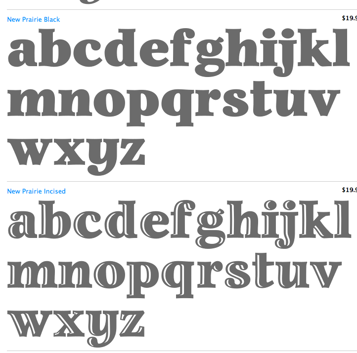
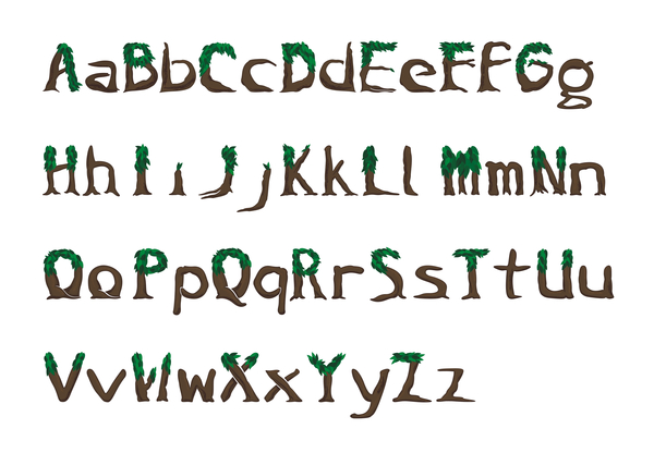
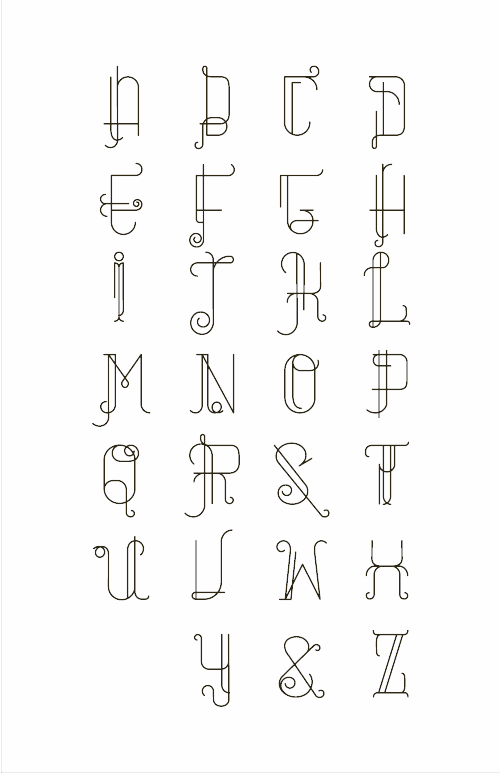
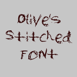
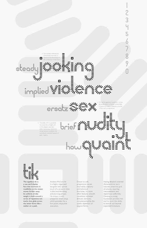
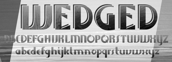
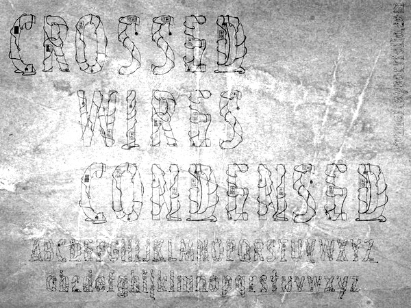
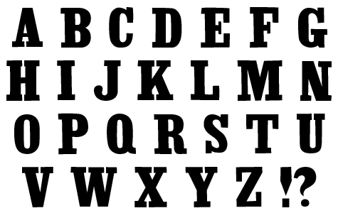
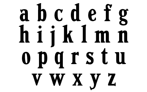
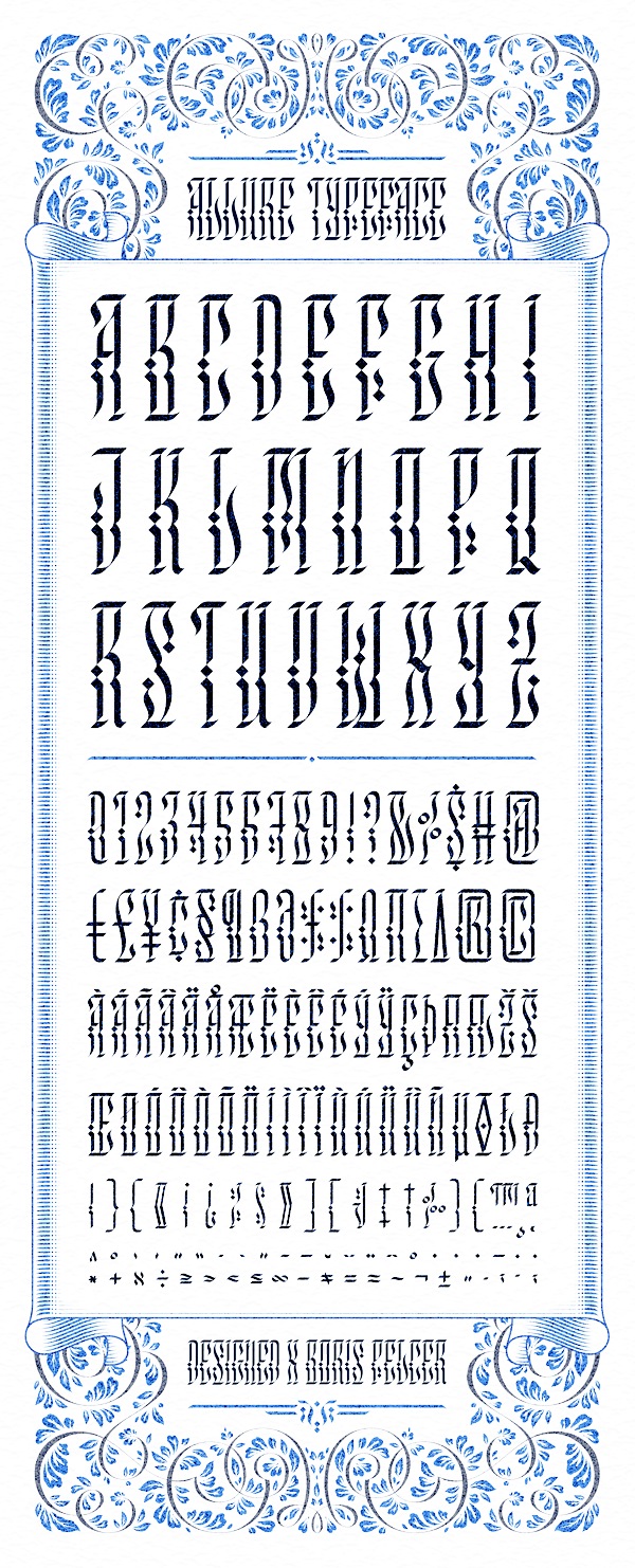
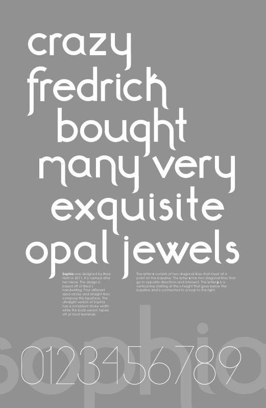
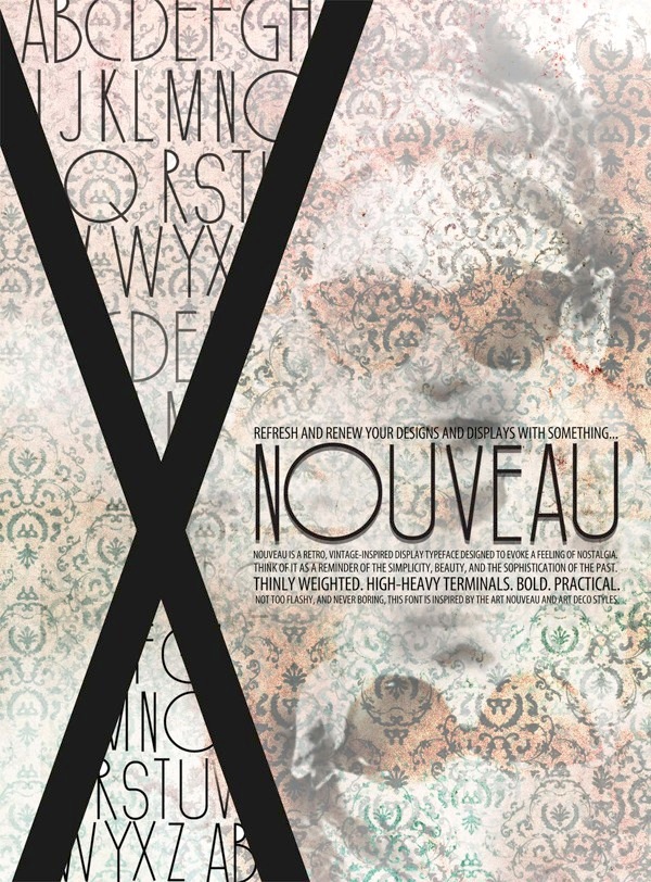
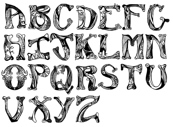
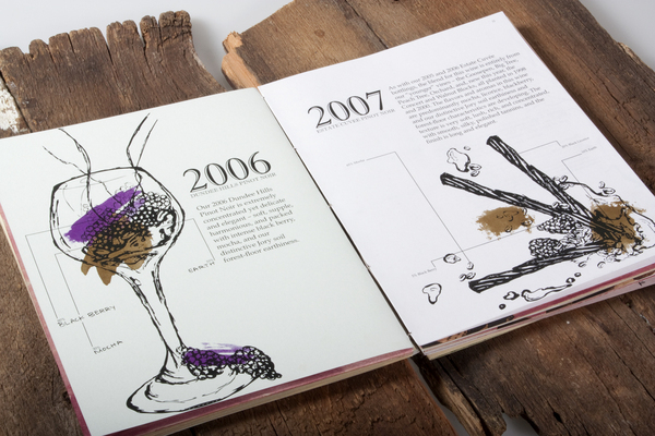
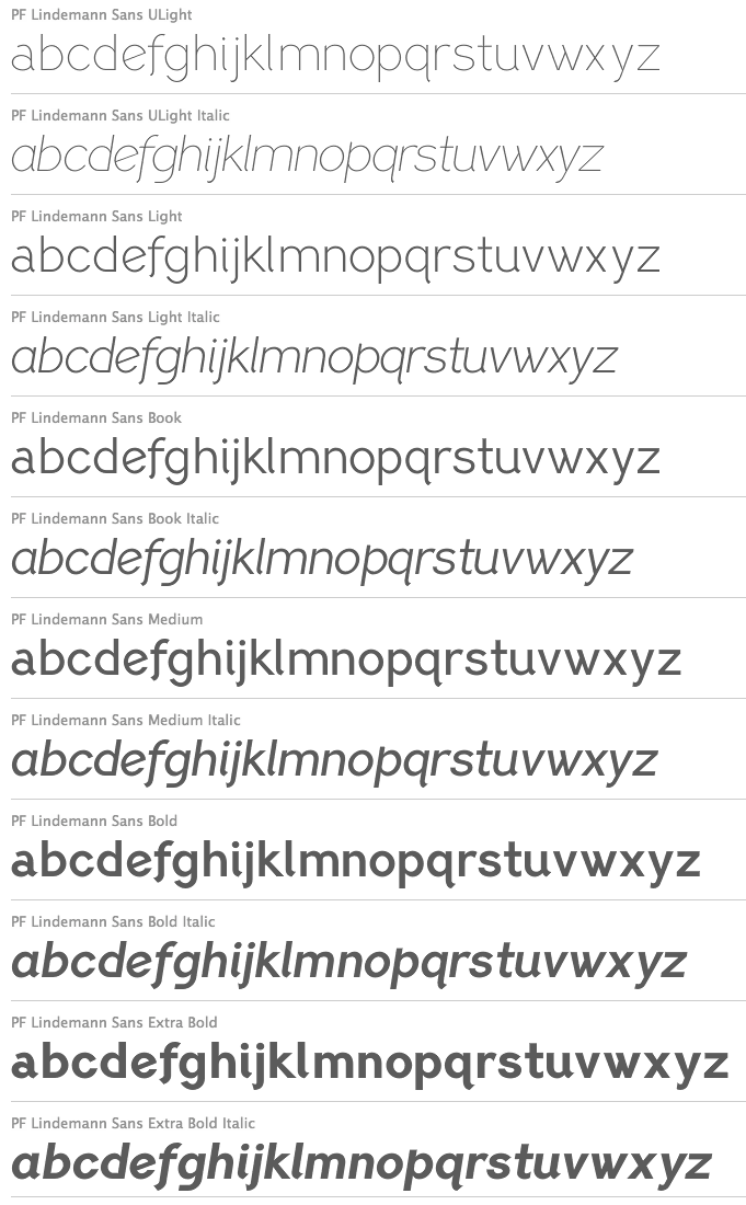
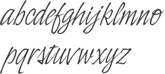
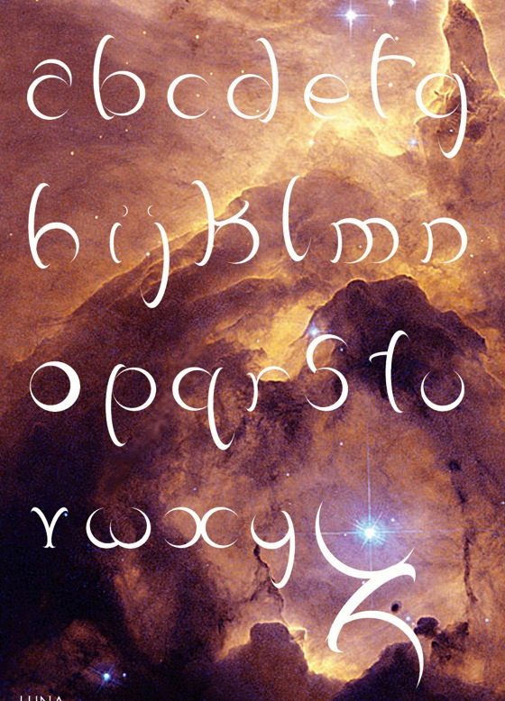
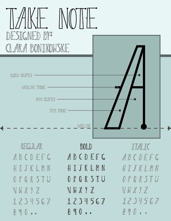
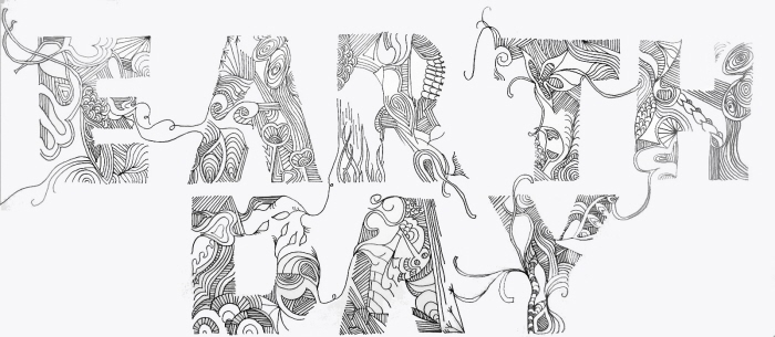
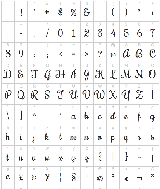
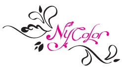
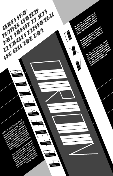
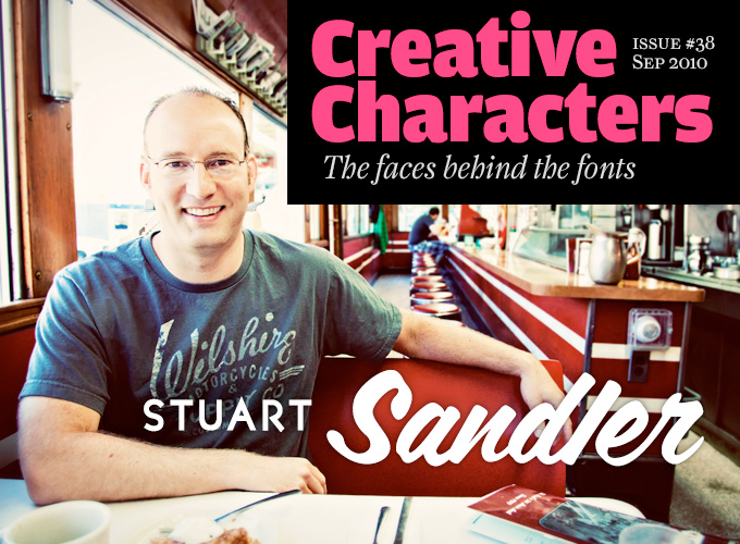
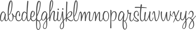
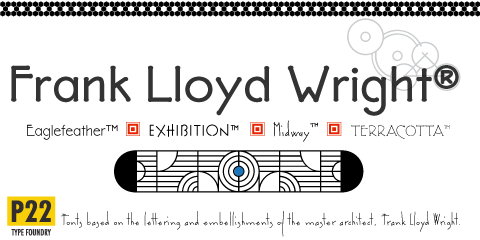
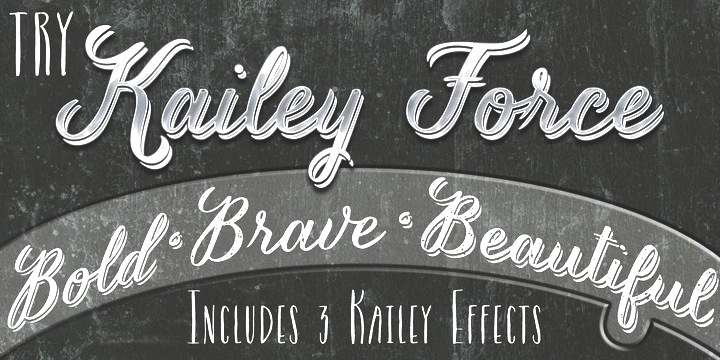
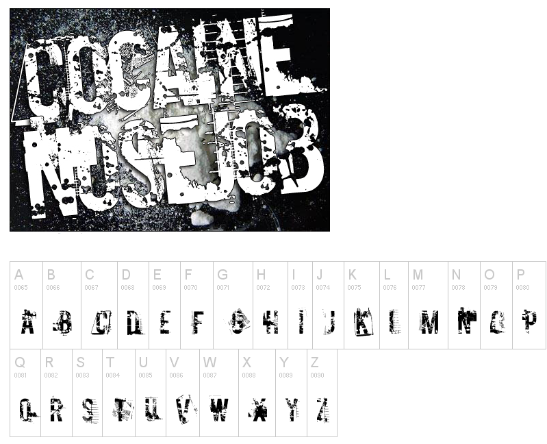
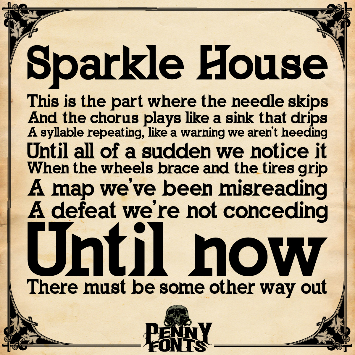
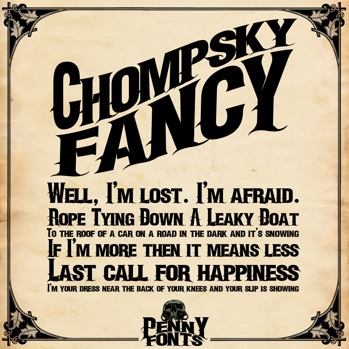
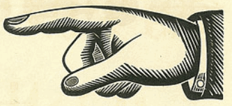
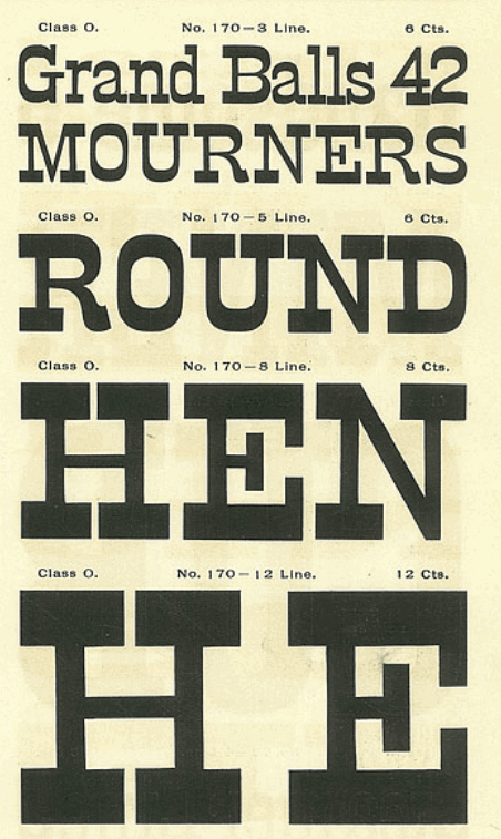
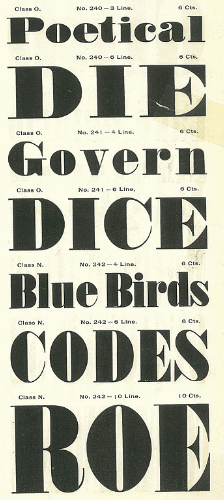
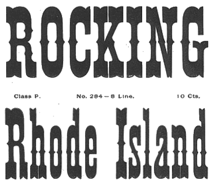
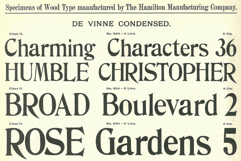
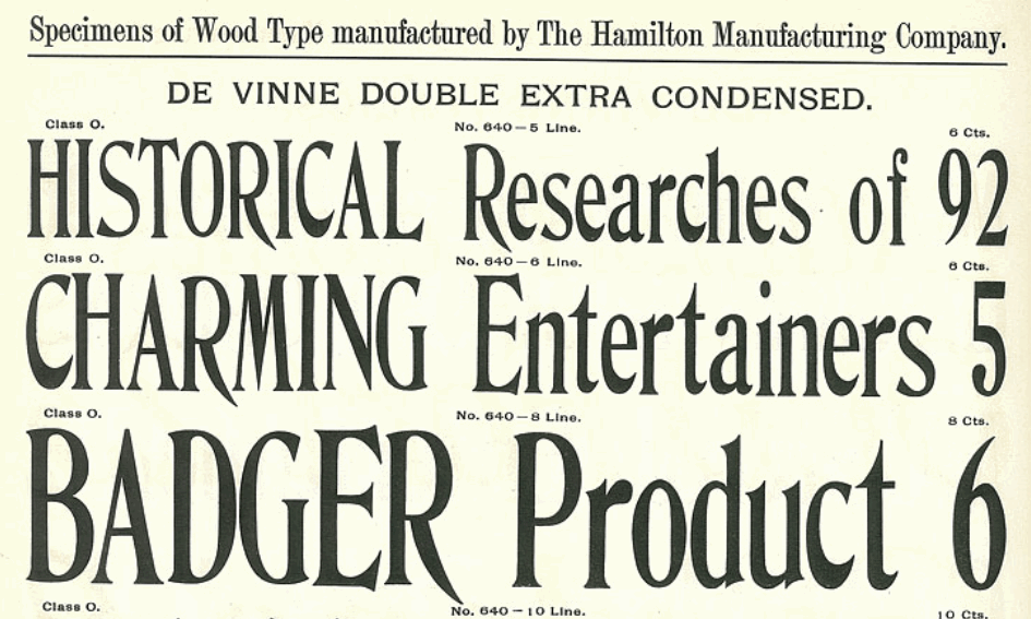
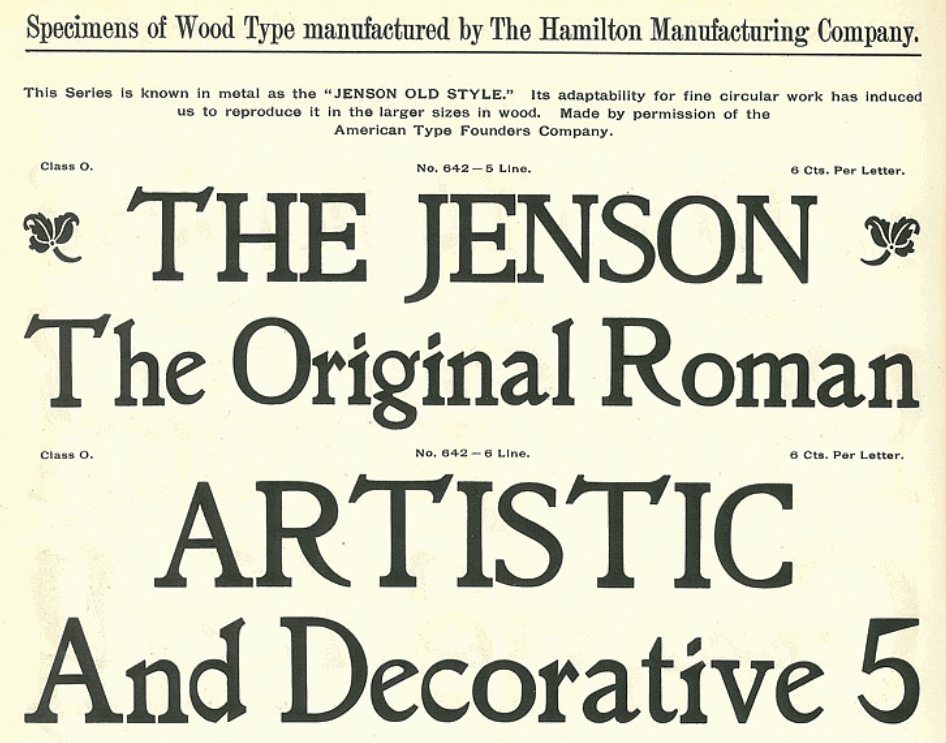
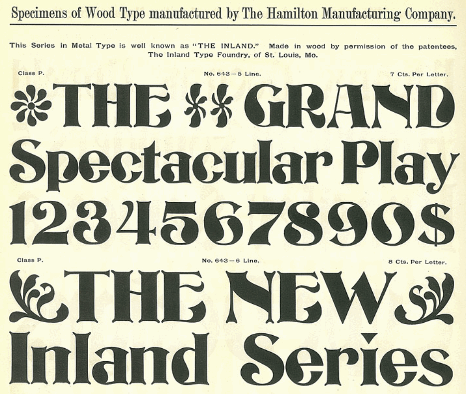
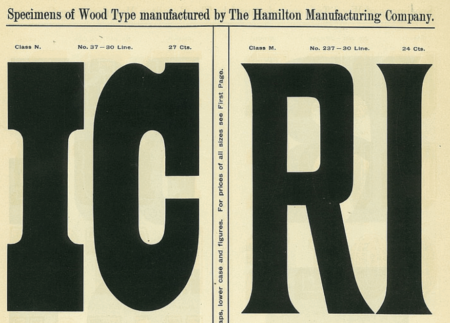
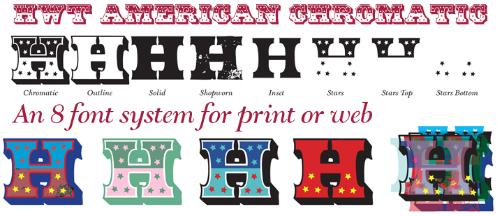
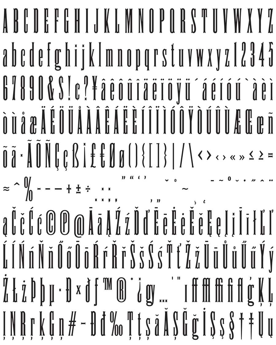
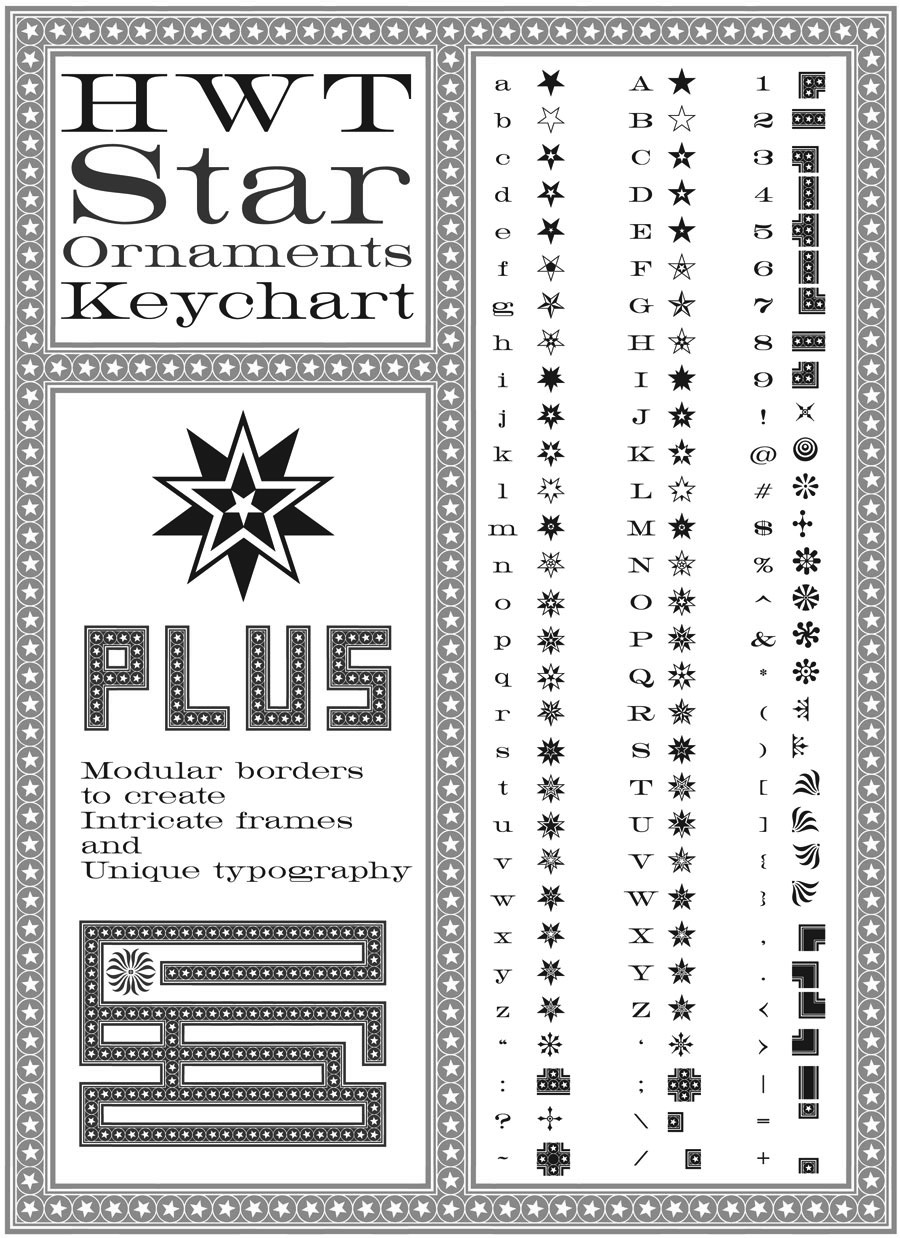
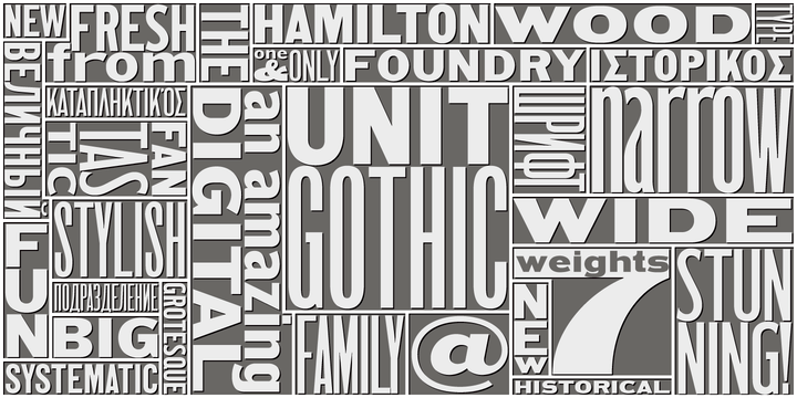
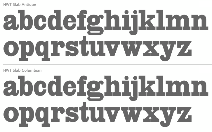
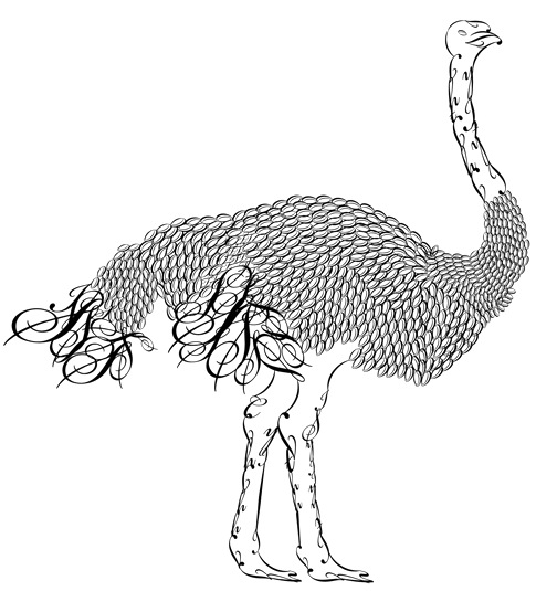
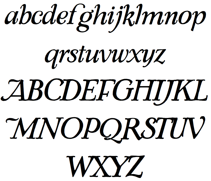
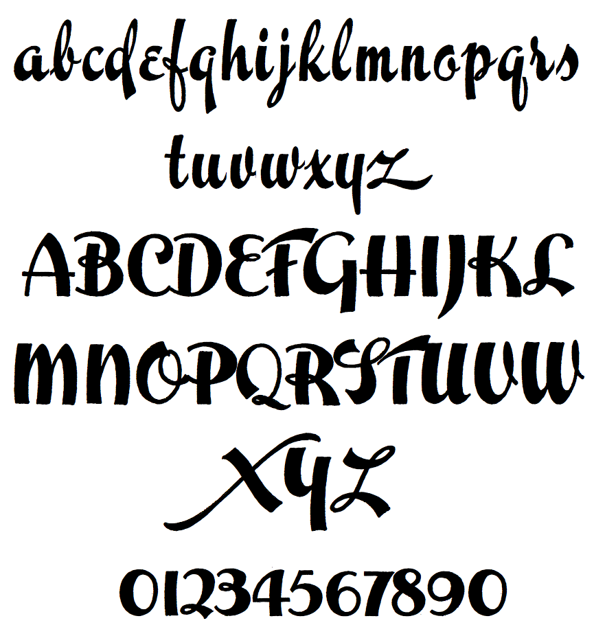
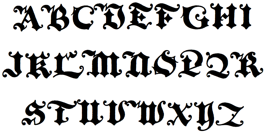
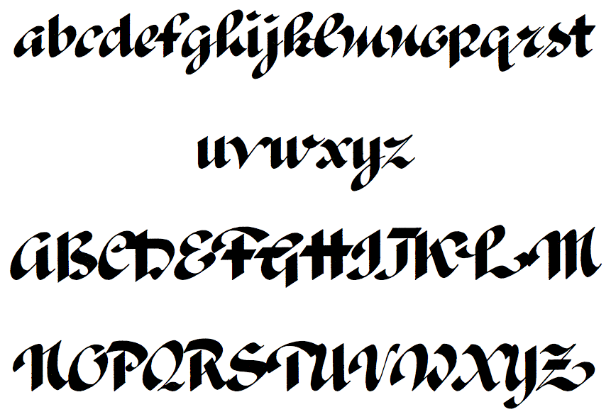
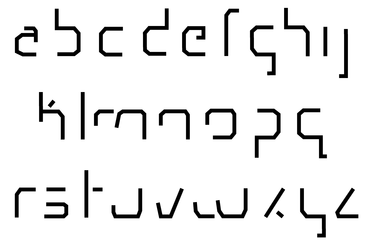
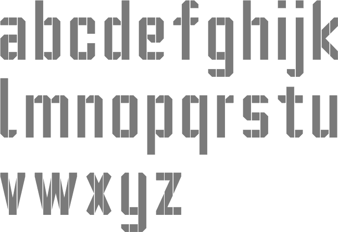
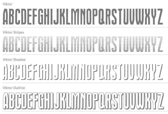
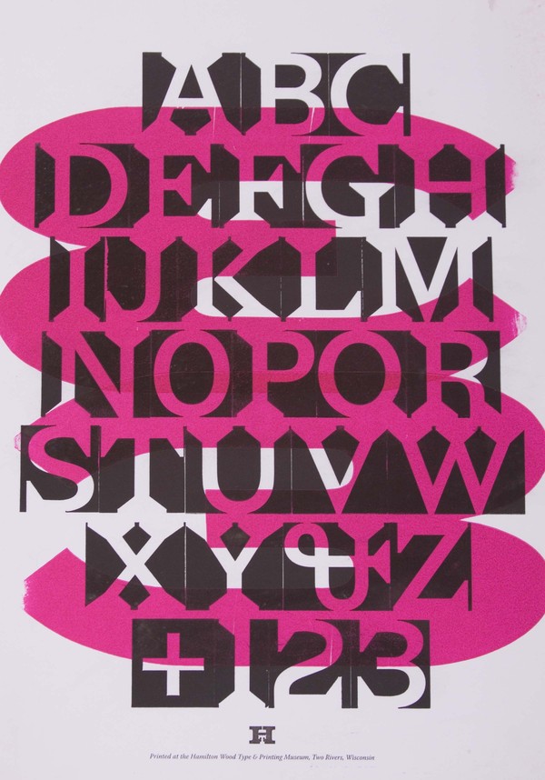
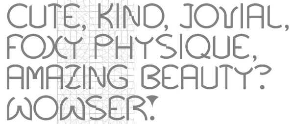
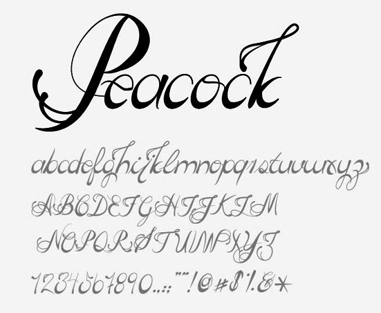
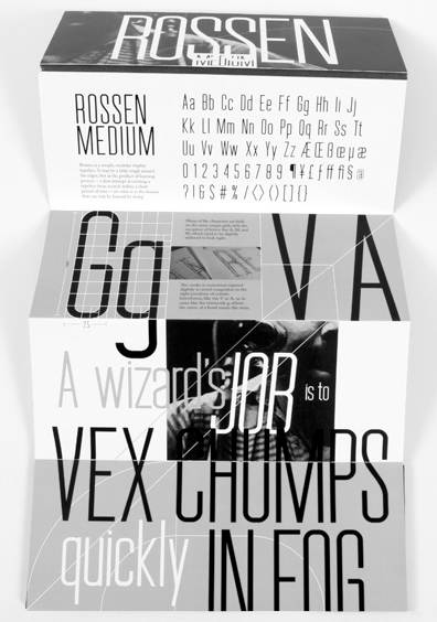
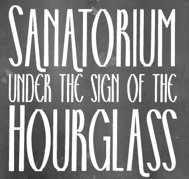
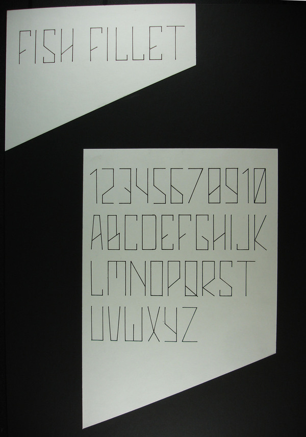
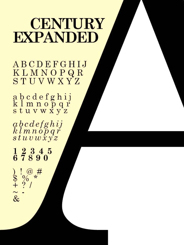
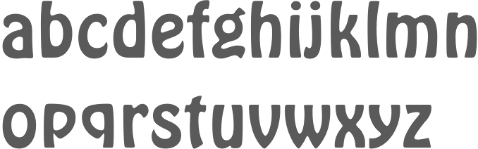
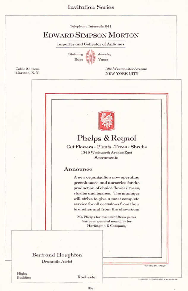
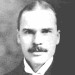
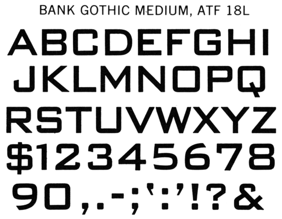
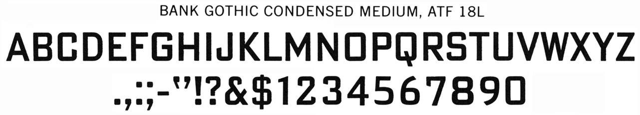
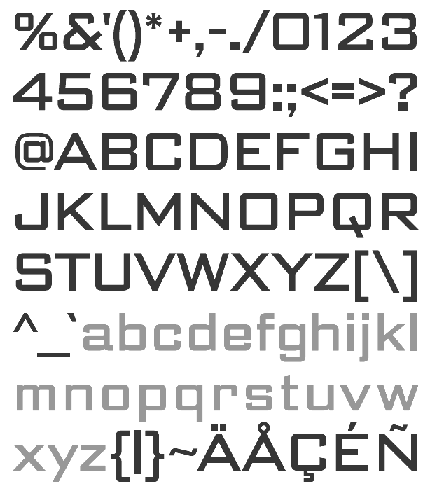
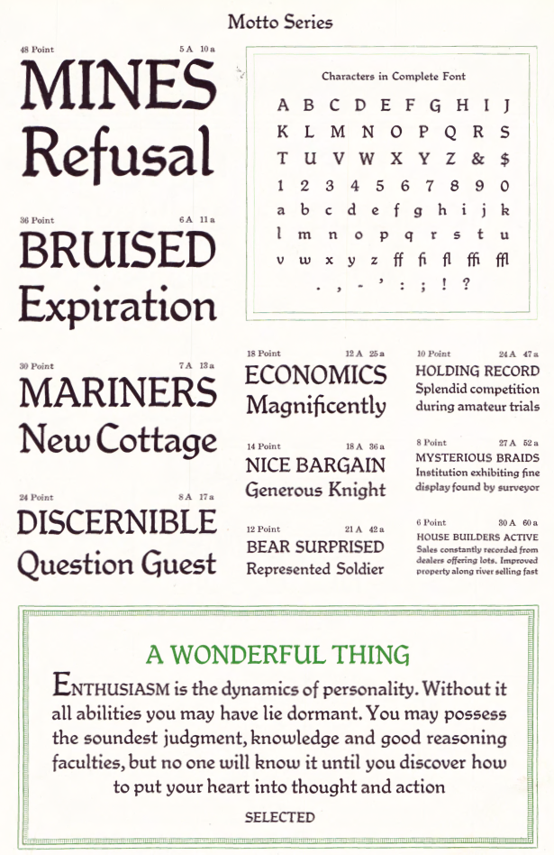
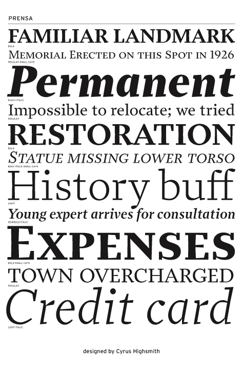
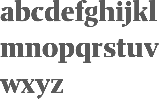
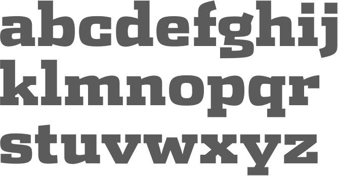
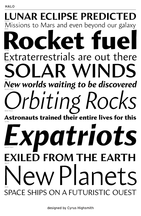
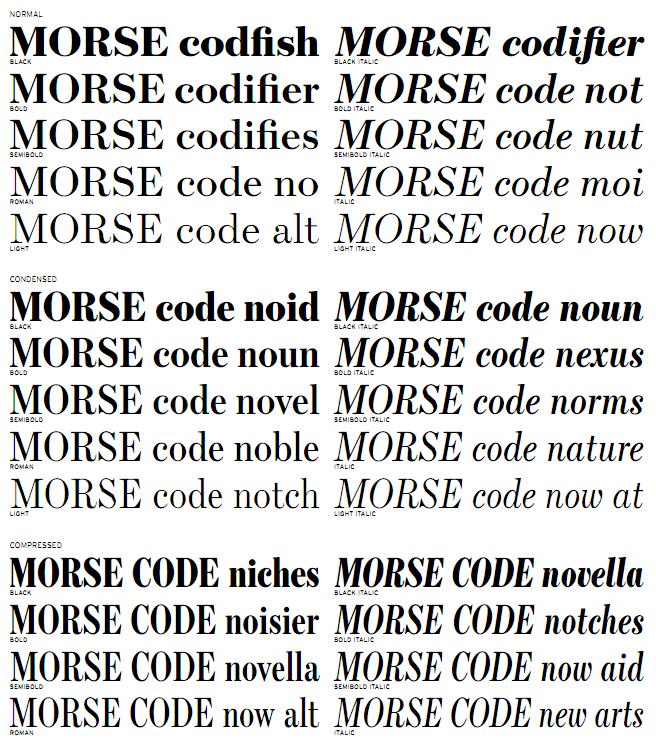
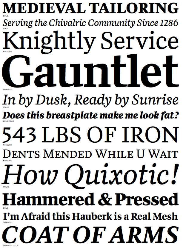
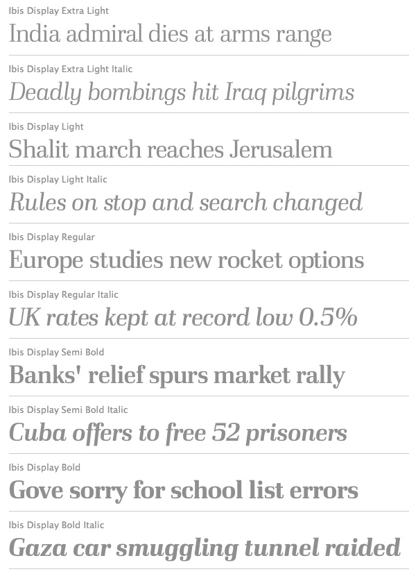
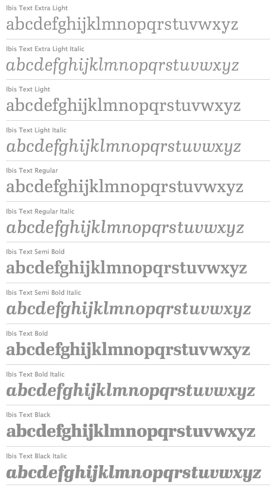
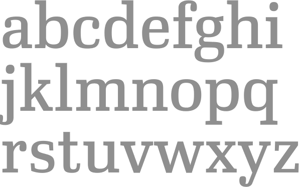
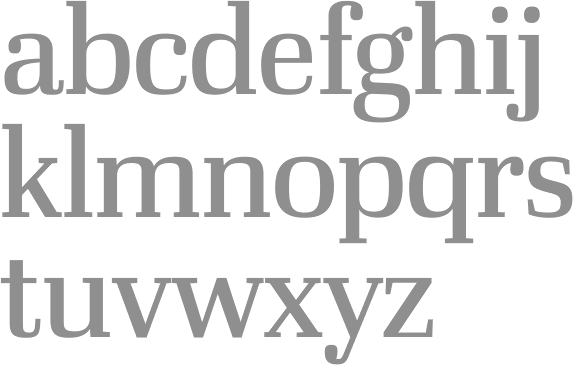
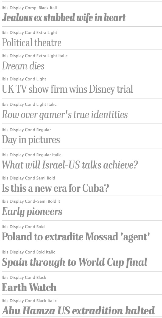
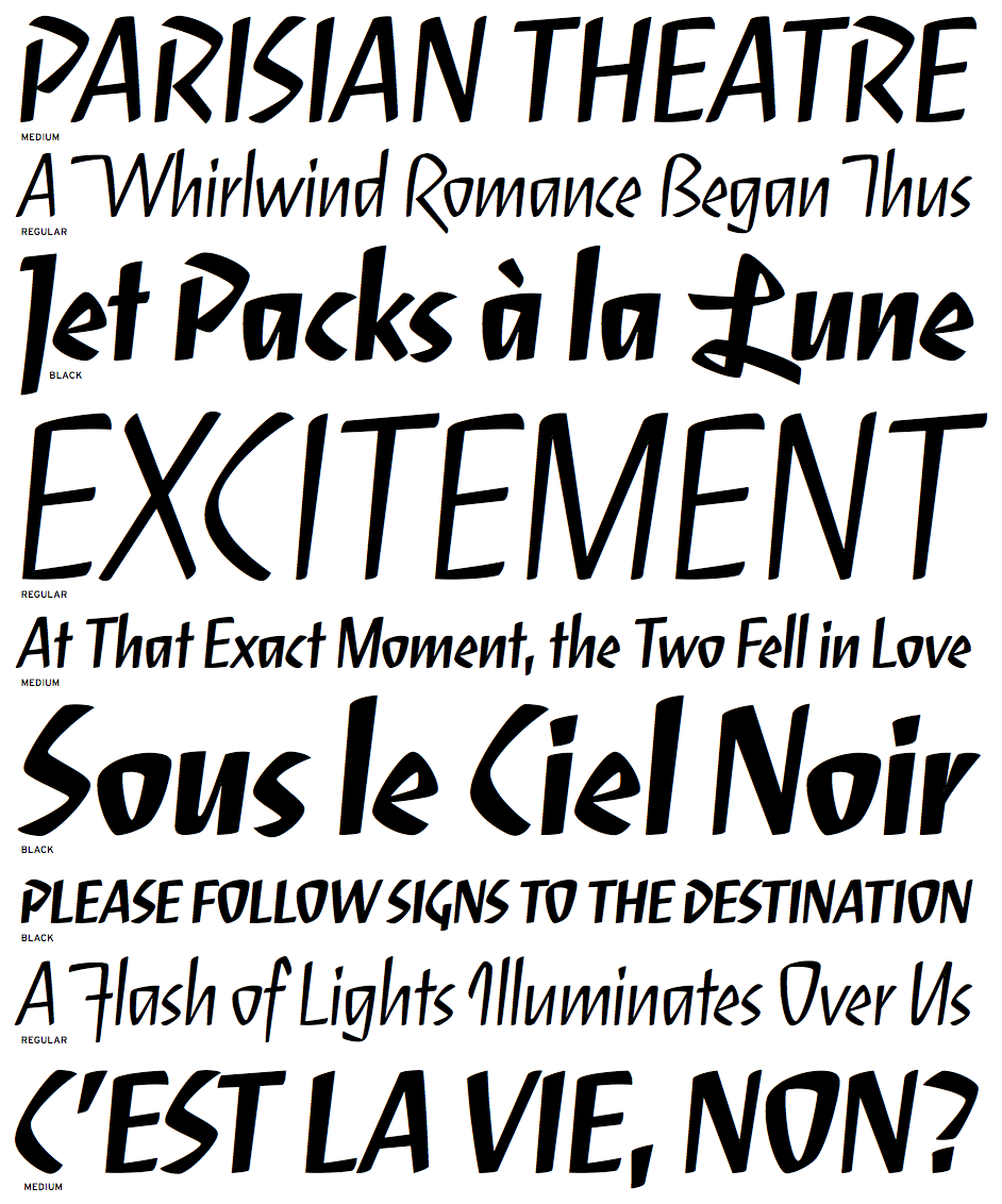
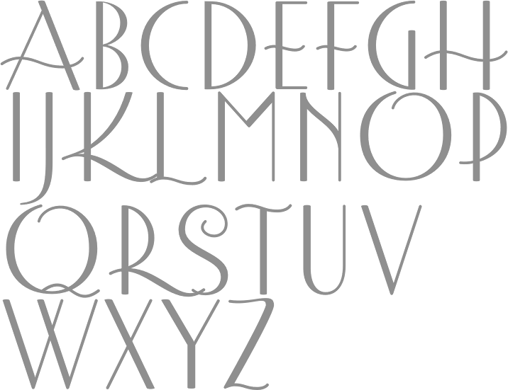
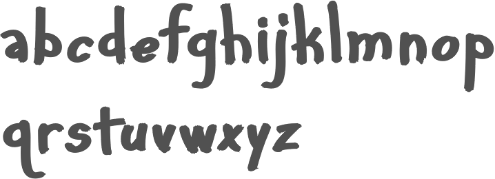
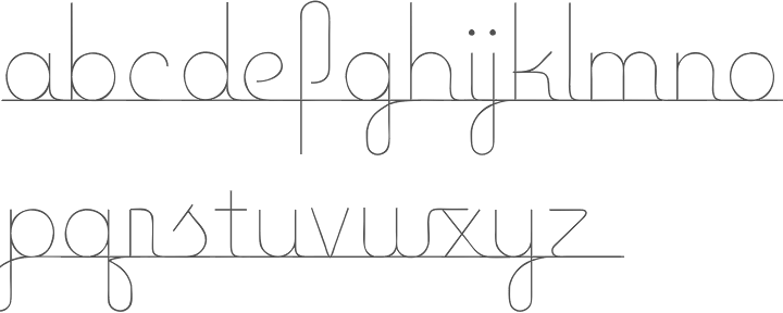
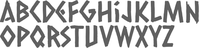
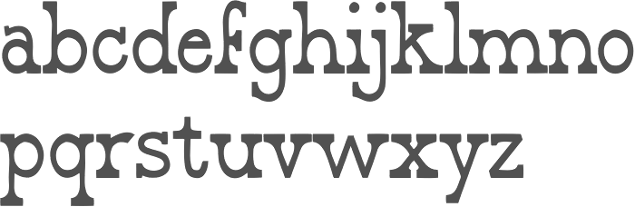
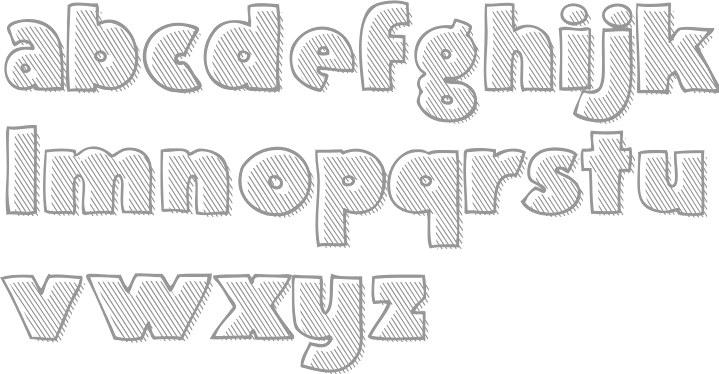
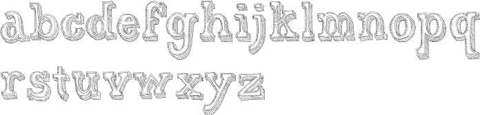
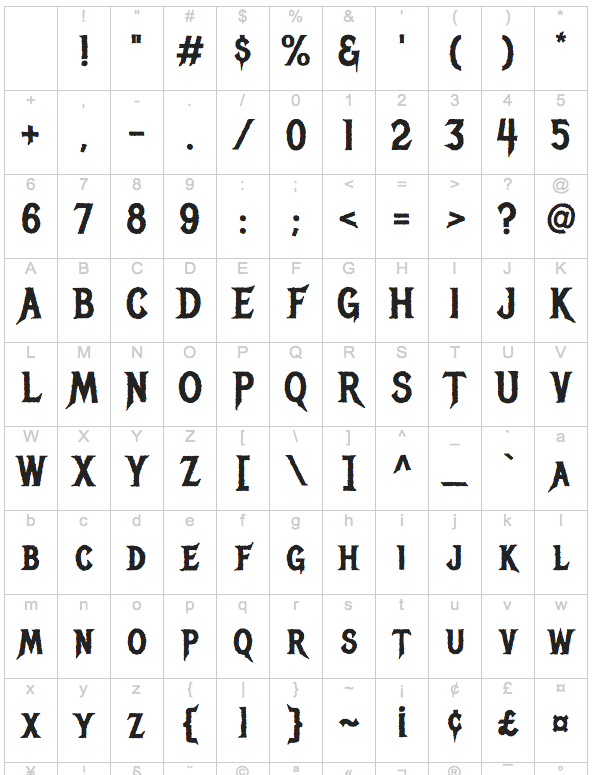
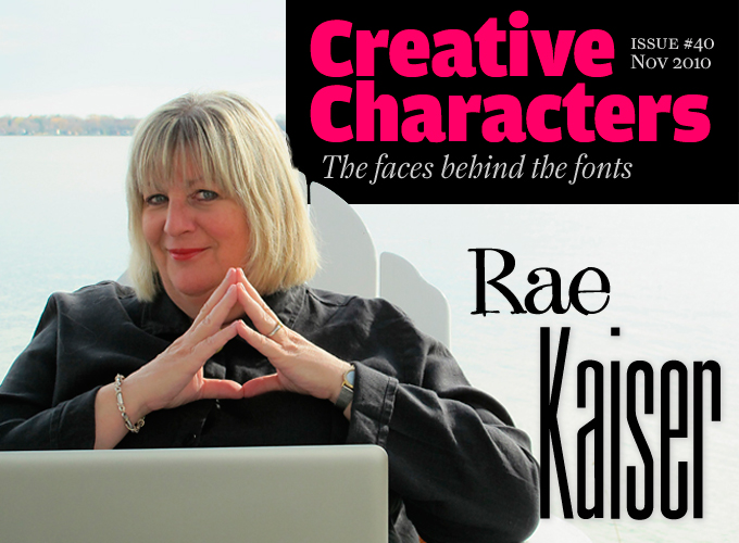
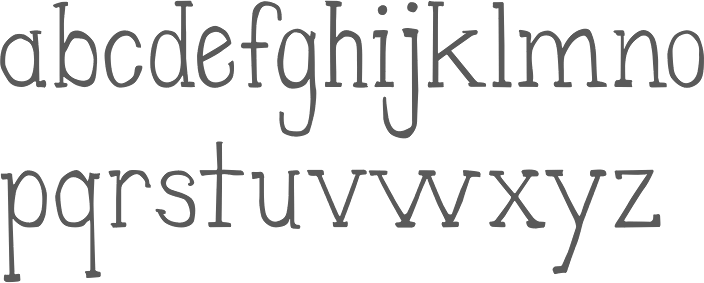
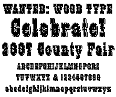
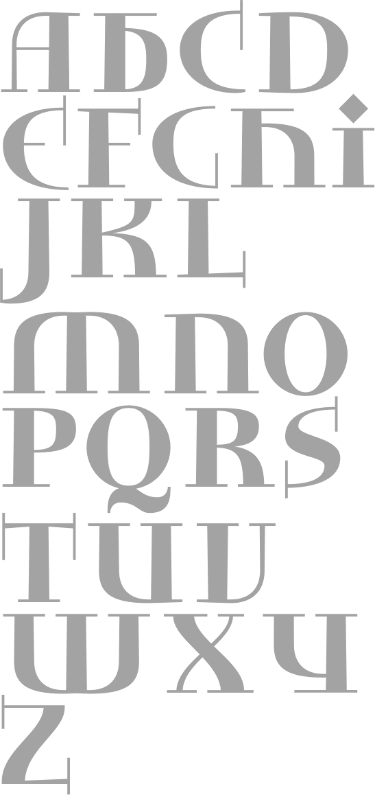
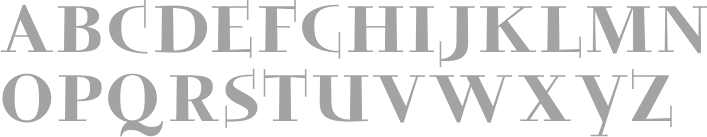
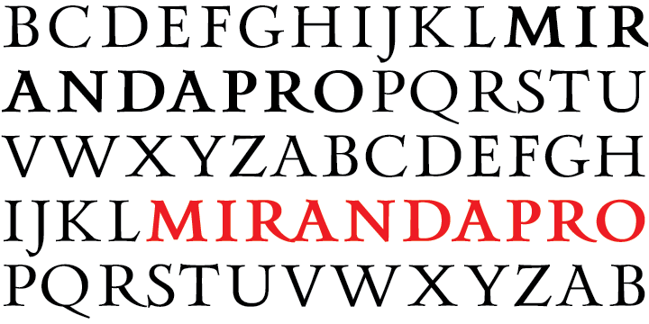
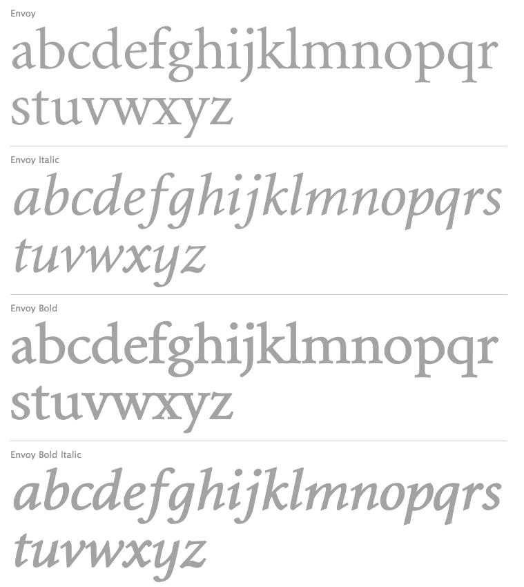
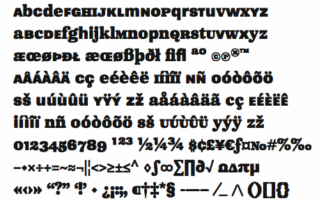
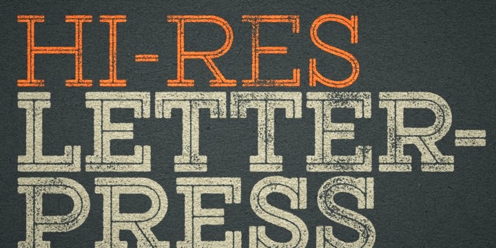
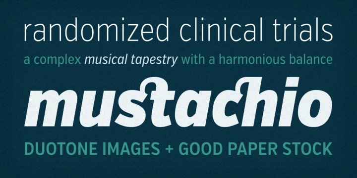