TYPE DESIGN INFORMATION PAGE last updated on Wed May 6 15:57:27 EDT 2026
FONT RECOGNITION VIA FONT MOOSE
|
|
|
|
|
The Brazilian type scene | ||
|
|
|
|
SWITCH TO INDEX FILE
Brazilian site located in Sao Paulo. Behance link. Creators of Ludo sans and Ludo serif (2011), both ink trap typefaces. [Google] [More] ⦿ | |
Brazilian creator (b. 1985) of az (2011, experimental). [Google] [More] ⦿ | |
a Falange Studio
| Sao Paulo, Brazil-based Elvis H. Martuchelli (b. 1978) designed the Ingrate condensed sans family in 2005. It can be downloaded here. [Google] [More] ⦿ |
Tia Olga (2000) is a free handwriting font by A. Karr (Freemesmo) from Sao Paulo, Brasil. [Google] [More] ⦿ | |
During his design studies at PUC Rio, Abdallah Seoud (Rio de Janeiro) created the beautiful techno font Equalize (2013). [Google] [More] ⦿ | |
Salvador, Brazil-based designer of Pantallon Sans (2017). Behance link. [Google] [More] ⦿ | |
ABFonts Santos FC 2012 Numerals (2012) is an orphaned athletic lettering font. We read at ABFonts (where the font can be downloaded): ABFonts Santos FC 2012 Numerals is based on the numbers used on the jersey of Brazilian football club, Santos FC, which is outfitted by Nike. The font was created on request and the image that was provided only showed the jersey numbers of Santos FC. Based on photographs, the player's name is not shown on the jersey explaining the absence of letters in the font. It appears that the source image was created by Cleiton Fabiano of www.futbr.com. [Google] [More] ⦿ | |
Pelotas, Brazil-based designer of the wavy display typeface Jubarte (2015). This typeface is inspired by the shapes and curves of the humpback whale. [Google] [More] ⦿ | |
Sao Paulo, Brazil-based designer of Elefont (2015). [Google] [More] ⦿ | |
Adalbero Neto
|
|
Adalberto Barbosa
| |
Brazilian art director, graphic designer and illustrator based in Los Angeles. Born in 1981 in Sao Paulo. Behance link. He designed various display typefaces for his projects: Mariana (2005) is an experimental typeface for the Havaianas web site. Cristiane (2005) is a Bank Gothic-inspired sans. Mathews (2005) and Ana Rayssa (2005, upright connected script) are experimental types. Antonio (2005) is a fat rounded sans. Josefa (2005) is a grunge typeface created for Brahma Bier. Adilson (2005) is a super-fat display face. Rose (2005) and Douglas (2005, also a super-fat display face) were created for Sensorama ID. Other typefaces include Mark, Mike and Cris. [Google] [More] ⦿ | |
Adilson Gonzales de Oliveira
| |
Sao Paulo, Brazil-based designer of a set of computer numerals in 2014. [Google] [More] ⦿ | |
Adreson Vilson Vita de Sá
| |
During her studies in 2015, Bauru, Brazil-based Adriana Oshiro created a squarish typeface. [Google] [More] ⦿ | |
Sao Paulo, Brazil-based designer of the vernacular typeface Chorume (2015). Behance link. [Google] [More] ⦿ | |
Farroupilha, Brazil-based designer of the experimental typeface Planetarium (2015). [Google] [More] ⦿ | |
During his studies in Sao Paulo, Adriano Iha designed the sci-fi typeface Kyra (2013). [Google] [More] ⦿ | |
During her studies at ESPM SUL in Porto Alegre, Brazil, Adrienni Klering created the hipster typeface Klering (2015). [Google] [More] ⦿ | |
Aka Adryan Mac and Adr Raz. Graphic designer in Aracaju, Brazil, who created the free typeface Prima HC in 2016. Behance link. [Google] [More] ⦿ | |
Afronsu Afronsu
| |
Sao Paulo, Brazil-based designer of Pretucasu (2019). [Google] [More] ⦿ | |
Agonz
| Adilson Gonzales de Oliveira Junior, or just Agonz, is a Brazilian designer who graduated from UNESP Design University in Sao Paulo. He is currently based in Bauru, Brazil. Inspired by aircraft models from the 1940s, Agonz created the free condensed sans typeface Ailerons (2015) and Skyer (2017). Behance link. [Google] [More] ⦿ |
Sao Paulo-based designer of the tweetware circle-based typeface Gogoia (2015). [Google] [More] ⦿ | |
Based in Porto Alegre, Brazil, Alana Camboim designed Gold (2013), a geometric typeface that consists of circle arcs and straight line segments. [Google] [More] ⦿ | |
Fortaleza, Brazil-based designer of the dagger or stiletto style display typeface Albertch (2015). [Google] [More] ⦿ | |
During her studies at Universidade Federal do Rio de Janeiro, Alessandra Duruy created the comic book typeface Postypo (2015). Behance link. [Google] [More] ⦿ | |
Sao Paulo, Brazil-based designer. During her studies at senac, she created the modular display typeface Hadoni (2017). [Google] [More] ⦿ | |
Graphic designer in Sao Paulo, Brazil, who created Vero Bold (2013). [Google] [More] ⦿ | |
During his graphic design studies in Maranguape, Brazil, Alessandro Valentim created the dadaist typeface Luzitana (2014). [Google] [More] ⦿ | |
Brazilian type designer who works at Tipos do aCaso. His fonts include Rec Block. [Google] [More] ⦿ | |
Sao Paulo-based designer of the organic serif typeface Thereza (2006). [Google] [More] ⦿ | |
During his industrial design studies in Vitoria, Brazil. Alex Larusso designed the fatalist script typeface The One (2016). [Google] [More] ⦿ | |
During his studies in Curitiba, Brazil, Alexander Antunes designed the rounded sans typeface Auchme (2016). [Google] [More] ⦿ | |
| |
Barueri, Brazil-based designer of a modular typeface in 2015. [Google] [More] ⦿ | |
In 2011, Alexandra Karmirian (Rio de Janeiro, Brazil) created the art nouveau-inspired typeface Karmirian. [Google] [More] ⦿ | |
Brazilian designer of the free stone age typeface Beanesdrock (2015) and the counterless typeface Lola (2019). [Google] [More] ⦿ | |
Typographer and designer at TV Globo, Brazil. He designed the squarish typefaces Retour (2012) and Sauer (2011). Cargo collective link. [Google] [More] ⦿ | |
Alexandre Bobeda
| |
Graphic designer in Sao Paulo who created the sci-fi typeface Invader and the steampunk typeface Clockworks in 2017. [Google] [More] ⦿ | |
Graphic designer in Sao Paulo who designed a beautiful set of hand-lettered posters on the theme of Jimi Hendrix in 2013. [Google] [More] ⦿ | |
Brazilian creator of the fat finger typeface Giesbrecht (2011, iFontMaker). [Google] [More] ⦿ | |
Together, Filipe Motta, Denis Rizzoli and Alexandre Matias created the organic sans typeface Triade (2013) during their studies at Universidade Federal do Espirito Santo, under supervision of Ricardo Esteves. Alexandre Matias, who is based in Vitoria, designed Triade Text in 2016. [Google] [More] ⦿ | |
Graphic designer in Sao Paulo, who created the display typeface Padinga (2013). [Google] [More] ⦿ | |
Alexandre Ruda
| |
Brazilian graphic designer and type designer who works at OnMedia - ALMAP/BBDO, Brazil, a corporate branding and ad agency. [Google] [More] ⦿ | |
Alexandre Venancio
| |
Sao Paulo, Brazil-based designer of the display typeface Holograma (2014). [Google] [More] ⦿ | |
Brazilian designer of the squarish typeface Quadratta (2011, FontStruct). [Google] [More] ⦿ | |
During her studies in Manaus, Brazil, Alice Araujo designed the handcrafted typeface Tipatinhas (2019). [Google] [More] ⦿ | |
Typographer from Brazil who received an honorable mention at the Tipografia Brasilis in the dingbat category, 2001, for her font "Chop". [Google] [More] ⦿ | |
Sao Paulo-based designer of the art deco typeface Garagem (2013). [Google] [More] ⦿ | |
Belo Horizonte, Brazil-based student-designer of the vernacular typeface Castanha (2018). [Google] [More] ⦿ | |
Natal, Brazil-based designer of the connect-the-dots typeface Stargazer (2015), which was created during her studies at the Federal University of Rio Grande do Norte. Behance link. [Google] [More] ⦿ | |
Salvador-based Brazilian designer of the handwriting typeface Dez Real (2004). She runs a graphic design and corporate identity studio, Papaya Design. [Google] [More] ⦿ | |
A design student at ESPM Sul, Porto Alegre, Brazil-based Alicia Camejo published the art deco geometric sans typeface Jazz deco in 2019. [Google] [More] ⦿ | |
During her studies at ESPM-Sul, this Porto Alegre, Brazil-based designer created the lava lamp typeface Subvision (2013). She also made Round It (2013), a Peignotian typeface created with compass and ruler. [Google] [More] ⦿ | |
Aline is based in Sao Paulo. With Henrique erzinger, she created the squarish typeface TypeSquare One (2009, FontStruct). [Google] [More] ⦿ | |
Aline Hessel (Sao Paulo, Brazil) created the rounded monoline sans typeface Linech in 2014 during her studies at SENAC. [Google] [More] ⦿ | |
Or just Aline Kaori. Aline Kaori is a freelance lettering artist, calligrapher and aspiring type designer based in Sao Paulo, Brazil. She did some custom lettering for companies such as Budweiser, Vivo, Natura, and Tiffany&Co, and did internships with or studied under masters such as John Stevens, Julian Waters, Claudio Gil, Ale Paul, Martina Flor and Fiona Ross. Winner at Tipos Latinos 2018 of a type design award for Pitaya Italic. In 2020, Aline Kaori joined Neil Summerour's Positype Flourish. [Google] [More] ⦿ | |
Brazilian designer of the dot matrix typeface Fita (2011), which was designed at Universidade Federal de Pernambuco. [Google] [More] ⦿ | |
Design student in Campinas, Brazil. Designer of Brotinho (2014, a display typeface). [Google] [More] ⦿ | |
| |
At the School of Design in Ribeirao Preto, Brazil, Aline Turatti created Indian Type (2013), an outlined typeface inspired by Indian symbolism. Behance link. [Google] [More] ⦿ | |
Graphic designer in Baixo Guandu, Brazil. Creator of the hand-drawn typeface Lucimar ASO (2014). [Google] [More] ⦿ | |
Type designer from Porto Alegre, Brazil, b. 1980. He is the creator of the futuristic typeface Aerodynamik (2011). MyFonts foundry link. Behance link. Home page. Klingspor link. [Google] [MyFonts] [More] ⦿ | |
Sao Paulo-based designer of the paperclip / neon typeface Caqui (2013), which is designed by ruler and compass. [Google] [More] ⦿ | |
Curitiba, Brazil-based designer of the display typeface Grampont (2013), which was a school project at UTFPR. [Google] [More] ⦿ | |
Colombian designer of the free Sao Paulo-style graffiti font Muro SP (2020). [Google] [More] ⦿ | |
Rio de Janeiro-based designer at FontStruct of the modular typeface Balalaica (2016). Behance link. [Google] [More] ⦿ | |
During his studies in Sao Paulo, Allan Pedro created the monoline compass-and-ruler sans typeface Diori Square (2014). [Google] [More] ⦿ | |
Alvaro Franca
| |
Alvaro Thomáz Oliveira
| |
Alvo Type (or: ATF, or: Alvaro Thomaz Fonts)
|
Typefaces made in 2012: Flex Display (a free thin sans), Meva (geometric sans), Duase Light (a thin rounded avant-garde geometric sans), Tenue Sans (a distinguished sans---tuxedo required), Cridigo Sans, Cogga (a display sans face), Homizio (a free 6-style geometric sans family), Aliquam, Regencie, Blouding (from blood samples?), Quinfo (avant garde family), Frugal Sans, Agnele Modern (a didone titling face), Salutino, Bondoluo (geometric avant-garde sans, +Light, +Display), Duase (rounded monoline sans). Typefaces from 2013: Panjo (humanist titling sans inspired by Eric Gill), Grieff (a DIN-like sans), Burne (a geometric all caps sans with elements of Futura and Avant Garde), Suicca (hairline sans), Datidi (custom slab face). Typefaces from 2014: Homizio Nova (sans), Amper. Typefaces from 2015: Savass Sans. Typefaces from 2016: Cerko (a gemoetric circle-based futuristic typeface). Typefaces from 2017: Beaga (a slab serif named after Belo Horizonte). Typefaces from 2019: Antropil (a rounded sans), Finis Grotesk (inspired by the Bauhaus movement), Finis Text, Finis Text Soft. Typefaces from 2020: Dumont (a 27-style structural geometric sans named after Brazilian aviation pioneer Alberto Santos dumont), Hauslan (a sans family). Home page. Fontspace link, where he is known as authimie. Another Fontspace link. About me page. Behance link. Another Behance link. About Me link. Dafont link. Aka Alvaro Ovelha. Creative Market link. Future URL. Home page of Alvaro Thomaz. [Google] [MyFonts] [More] ⦿ |
Graphic designer in Marilia, Brazil, who created the ornamental typeface Maia Maori (2012). [Google] [More] ⦿ | |
Graphic designer in Vitoria, Brazil, who created the text typeface Prongs in 2016 with Jessica Serafim during her studies at UFES. [Google] [More] ⦿ | |
Sao Jose do Rio Preto, Brazil-based designer of the fun children's font Squarepants (2016). [Google] [More] ⦿ | |
Belo Horizonte, Brazil-based designer of Patricinhas (2014, a school project typeface at Universidade Estadual de Minas Gerais). [Google] [More] ⦿ | |
Flores da Cunha, Brazil-based student-designer of Tie Exclusive (2015). [Google] [More] ⦿ | |
Sao Paulo, Brazil-based designer of the vernacular handcrafted typeface Largo (2015). [Google] [More] ⦿ | |
Graphic design student at Miami Ad School / ESPM, who is originally from Sao Paulo, Brazil. In Luciano Cardinalli's class, she designed the wedge serif typeface Mandi (2012). [Google] [More] ⦿ | |
Sao Paulo-based designer of a bilined display typeface in 2007 at the Universidade Anhembi Morumbi. [Google] [More] ⦿ | |
Graphic designer in Brasilia, Brazil, who created a modular typeface in 2015. [Google] [More] ⦿ | |
During her studies in Curitiba, Brazil, Amanda Monteiro designed the bilined squarish typeface Beco (2013). [Google] [More] ⦿ | |
During her studies in Rio de Janeiro, Amanda Nogueira created the display typeface Olympus (2015). [Google] [More] ⦿ | |
Rio de Janeiro, Brazil-based designer of the display typeface Wizard (2019). [Google] [More] ⦿ | |
Graphic designer in Lins, Brazil. She created the curly typeface Delsarte (2012). Behance link. [Google] [More] ⦿ | |
In 2018, during their studies at Universidade Federal do Rio Grande do Norte, Matheus Nogueira (Natal, Brazil), Beatriz Freire, Amannda Cavalcante (Natal, Brazil) and Zenobio Almeida co-designed the free ironwork dingbat typeface Firula. [Google] [More] ⦿ | |
Taguatinga, Brazil-based designer of the circle-based typeface Baun Round (2014). Behance link. [Google] [More] ⦿ | |
Campinas, Brazil-based designer of the vernacular typeface Baiano (2013), which was a school project. [Google] [More] ⦿ | |
Brasilia, Brazil-based designer of the pixelish FontStruct typefaces Almost Regular (2016) and Almost Rounded (2016). Behance link. [Google] [More] ⦿ | |
During her studies in Rio de Janeiro, Ana Beatriz Guimaraes designed the fishing hook-inspired typeface wanhook (2015). [Google] [More] ⦿ | |
During her studies at UF Pelotas in Pelotas, Brazil, Ana Beatriz Leal created the tall handcrafted display typeface Jardim (2015). [Google] [More] ⦿ | |
Rio de Janeiro-based student-designer of the hexagonal typeface Quebra (2017). [Google] [More] ⦿ | |
During her design studies in Porto Alegre, Brazil, Ana Carolina Aguiar created the display typeface Schloss (2014). [Google] [More] ⦿ | |
| |
| |
During her studies at UFSC in Florianopolis, Brazil, Ana Carolina Schneider created the connect-the dots typeface Minkar (2015) together with classmate Raissa Ishida Sanfelice. [Google] [More] ⦿ | |
Born and raised in Governador Valadares, Brazil, Ana Carvalho designed the vernacular typeface Krenaque in 2012 during her graphic design studies at UNIVALE, Universidade Vale do Rio Doce. In 2010, Ana Carvalho and Ricardo Lafuente co-designed PropCourier. [Google] [More] ⦿ | |
Sao Paulo, Brazil-based designer of a colorful typegraphic poster in 2017. [Google] [More] ⦿ | |
Brazilian designer from Curitiba, b. 1988. Creator of the free upright script typeface Callani (2008). Dafont link. [Google] [More] ⦿ | |
Ana Clara Dantas de Carvalho
| |
Rio de Janeiro, Brazil-based designer of Dots (2018). [Google] [More] ⦿ | |
During her studies at ESDI, this Rio de Janeiro-based designer created the expressive typeface Papagaio Semi Sans (2013). [Google] [More] ⦿ | |
| |
As a student at Centro Universitario Belas Artes in Sao Paulo, Brazil, Ana Cristina Chimabuco created an open-eyed sans typeface (2015). [Google] [More] ⦿ | |
For a project at Universidade Feevale, Ana Cruz (Porto Alegre, Brazil) designed the soccer shity typeface Mannschaft (2017). [Google] [More] ⦿ | |
Graphic designer in Curitiba, Brazil, who created the squarish typeface Carmen Sandiego (2015). [Google] [More] ⦿ | |
| |
At Universidade do Sagrado Coracao, Brazil-based Ana Piragine designed the condensed display typeface Vincent (2018). [Google] [More] ⦿ | |
Garibaldi, Brazil-based designer of the modular typeface Burj (2018), which was inspired by the Burj El Arab skyscraper. [Google] [More] ⦿ | |
In 2019, she co-designed Muda, a corporate typeface for the fashion brand Oficina Muda with Carlos Mignot, Gabriel Menezes and Rodrigo Saiani. In 2021, Ana Laura Ferraz, Valter Costa, Carlos Mignot and Rodrigo Saiani designed the handcrafted black poster and branding typeface Vinila for the identity of grammar teacher Eduardo Valladares' personal brand EDU VLLD (Edu stands for Eduardo and Education while VLLD represents Valladares and Vulnerability). [Google] [More] ⦿ | |
In 2019, Henrique Beier and Ana Leydner, assisted by Luisa Leitenperger, co-designed Kiperman at Harbor Type. This sturdy 4-style text typeface family pays homage to Brazil's publishing icon Henrique Leao Kiperman (d. 2017). Also in 2019, Ana Laydner and Estudio Passeio co-designed Nektar Dingbats. In 2021, she assisted with the design of Salva (Fabio Haag Type), a versatile workhorse sans family: Eduilson Coan was the lead designer. He was supported by the Fabio Haag Type team of Henrique Beier, Ana Laydner and Fabio Haag himself. [Google] [MyFonts] [More] ⦿ | |
| |
Lajeado, Brazil-based designer of the hand-printed typeface Memory (2017-2019), which is based on letters that were drawn while blindfolded. [Google] [More] ⦿ | |
Rio de Janeiro-based designer of the kitchen tile typeface Clara (2013). [Google] [More] ⦿ | |
Brazilian designer of the geometric monoline display typeface Mizu (2012). [Google] [More] ⦿ | |
Sao Paulo-based designer of Tamir Sans (2012), a display typeface that was created during her graphic design studies. [Google] [More] ⦿ | |
During her studies in Belo Horizonte, Brazil, Ana Milagres created an untitled hexagonal typeface (2014). [Google] [More] ⦿ | |
Ana Monica Moura (b. Joao Pessoa, Brazil) created the squarish stencil typeface Flepa in 2014. [Google] [More] ⦿ | |
| |
Brazilian designer in Campos. Her work includes many nice typographic posters. Flickr stream. [Google] [More] ⦿ | |
Argentinian (Brazilian?) editorial designer. In 2012, she made an exceptionally graceful free Google Web Font text typeface that should withstand small sizes. Called Lusitana, the two-weight family was inspired by the type found in the 1572 first edition of "The Lusiads", a Portuguese epic poem by Luís Vaz de Camões. Award winner at Tipos Latinos 2010 for her text and IPA typeface Voces (done with Pablo Ugerman). The latter typeface appeared in 2012 at Google Web Fonts. [Google] [More] ⦿ | |
Brazilian designer (b. 1984) who created Vidas Secas (2008) and Vidas Secas Dingbats (2008), both desert or western style fonts. [Google] [More] ⦿ | |
Brazilian designer who created the hand-drawn typeface William Morris (2012). [Google] [More] ⦿ | |
Curitiba, Brazil-based designer of the sans display typeface Forest (2017). [Google] [More] ⦿ | |
Manaus, Brazil-based designer of the cigaret-themed typeface Steampunk Rounded (2020). [Google] [More] ⦿ | |
During her studies in Curitiba, Brazil, Ana Polezel created the art nouveau typeface Pink La Vie (2015). [Google] [More] ⦿ | |
In 2014, Ana created the pre-art nouveau typeface Vida Capixaba. [Google] [More] ⦿ | |
Brazilian graphic design graduate from IADE, Portugal (in 2011), who is now located in Glasgow. Creator of Pinho (2010), a modular typeface made from nuts. She also made Hardcopy (2012, for the Hardcopy magazine). As an example of her typography in branding and logos, check out the work she did for Galeria Barbara Longhi in Porto Alegre, Brazil. Dafont link. [Google] [More] ⦿ | |
Andarilho Design
| Andarilho Design is Felipe Perazza (b. 1987) in Sao Paulo, Brazil. He created the free stencil typeface Andarilho (2010). [Google] [More] ⦿ |
Recife, Brazil-based designer of the display typeface Monsters (2014) and the pixel typeface Games (2014). [Google] [More] ⦿ | |
Designer in Sao Paulo, Brazil. Behance link. Creator of the octagonal typeface KRD (2011). [Google] [More] ⦿ | |
Brazilian designer of the experimental typeface Venom (2002) while he was a student in Sao Paulo at Senac de Comunicações e Artes. [Google] [More] ⦿ | |
During his studies at UFRJ in Rio de Janeiro, in a course taught by Nair de Paula Soares, Anderson Junqueira designed the display typeface Sumpt (2013). Sumpt stands for sumptuous. [Google] [More] ⦿ | |
Brazilian codesigner with Fábio Henrique, Leonardo Rosa Borges and Carlos Santos of the calligraphic typeface Amor e Odio (2005, Tipos do aCASO). [Google] [More] ⦿ | |
Batel, Curitiba, Brazil-based foundry of Anderson Maschio (b. 1980, Curitiba). Creator of the ultra-fat decorative typeface Chumbitos (2007, a winner in the experimental type category at Tipos Latinos 2008), available from MyFonts (this was followed by Chumbit02). He also made the experimental type family consisting of Anark Diet Stencil, Anark Fat Stencil, and Anark Natural Stencil (2007). Creator of Magricela (2009, octagonal). He is working on Austera (2007, a basic sans) and Phyta (2007, an experimental typeface with stretched out connected letters). In 2016, he made a custom font for Juliano Monteiro Studio. Check also his gorgeous art work based on Chumbitos. Link to Fictilia. [Google] [MyFonts] [More] ⦿ | |
Anderson Maschio
| |
At Universidade Federal do Ceara, Anderson Nagelo (Quixada, Brazil) designed the hand-printed typeface Tayge (2019). [Google] [More] ⦿ | |
| |
Santa Catarina, Brazil-based designer (b. 1981) of the black bowl font Biliz Blur (or Blitz) in 2007. Dafont link. [Google] [More] ⦿ | |
Brazilian designer of Zigfrida (2019: a modular logo font family for Latin and Cyrillic). [Google] [MyFonts] [More] ⦿ | |
Brazilian creator of the pixel fonts Asai Analogue (2014) and Asai Haxxor (2014, FontStruct). Aka Minoru Asai. Dafont link. [Google] [More] ⦿ | |
Graphic designer from Brasilia who is working on this sans (2006) and this serif typeface (2006). [Google] [More] ⦿ | |
Co-designer, with Juliana Moore, of Muzza Sans (2014). Her typeface Leluja (2015) won an award at Tipos Latinos 2016 and at Bienal de Design Gráfico da ADG. Andrea's fun vernacular or food packaging typeface Olar won an award at Tipos Latinos 2018. [Google] [More] ⦿ | |
Graphic designer in Porto Alegre, Brazil, who created the leaf-themed typeface Folha (2012). [Google] [More] ⦿ | |
Campinas, Brazil-based designer of the rough brush script Lets Punk (2017). [Google] [More] ⦿ | |
Sorocaba, Brazil-based designer of the display typeface Cow Head (2017), which was deceloped together with Felipe Bueno and Rafael Tadeu, this typeface was inspired by the architecture of Rem Koolhaas. [Google] [More] ⦿ | |
Reproducing his bio: I'm a graphic designer graduated from PUC-Rio and co-author of the illustration book "FUNK what beat is this," published in 2009 by Aeroplano. During 2010, I gave lectures on the development process of the book at PUC-Rio and ESDI. I have specialization in Printmaking at the Rhode Island School of Design and Business Management at IBMEC-Rio. I have worked at 19 design, O Globo Online and Yahoo! Brazil. I currently live in New York and attend the MFA in Communication Design at Pratt Institute. During the summer of 2012, I was part of the creative team of the Rio2016 Olympic and Paralympic games. His typefaces include Ubique Infotype (2013, with Rob Gonzales). Ubique overlays several typefaces to create a special effect. [Google] [More] ⦿ | |
During his studies at Campus Agreste da UFPE, Caruaru, Brazil-based André Felipe (b. 1997) designed the modular typeface Eferena (2016), the pixel typeface Sneak Attack (2016), the squarish typefaces Soccer Jersey (2016), Porque (2016) and Quatro (2016, inspired by Bauhaus), the pixel font Peepo (2016), Beheaded (2016), and the slatted typeface Retrosynthwave (2016). Typefaces from 2017: Greetings (experimental). Typefaces from 2018: Revolta (pixacao style). [Google] [More] ⦿ | |
André Freitas (ampinas, Brazil) created ADE (2011), a blocky outline face. [Google] [More] ⦿ | |
Visual artist in Cuiaba, Brazil. Designer of the tribal font Protoglifo (2016). [Google] [More] ⦿ | |
Dafont link. Klingspor link. Font Squirrel link. Carbonmade link. [Google] [More] ⦿ | |
During his studies in Sao Paulo, André Keusseyan created the Latin typeface Armenian (2015). [Google] [More] ⦿ | |
Curitiba, Brazil-based designer of the flowing art nouveau titling typeface Bear (2016) which evolved from the logo of a short film. [Google] [More] ⦿ | |
Campinas, Brazil-based creator of the grungy vernacular typeface Alcides (2014). [Google] [More] ⦿ | |
During his studies in Campinas, Brazil, André Matiazzo created the vernacular typeface Alcides (2013). [Google] [More] ⦿ | |
Graphic designer in Sao Paulo, Brazil, who created the simple organic monoline sans typeface Tesla (2012). Behance link. [Google] [More] ⦿ | |
Sao Paulo based designer of Eribalto (2012), a purely geometric typeface created during André's studies at Senac. [Google] [More] ⦿ | |
Brazilian designer from Recife who makes type at Tipos do aCaso. [Google] [More] ⦿ | |
Sao Paulo, Brazil-based designer of the angular typeface Rodrigues (2015). [Google] [More] ⦿ | |
Curitiba, Brazil-based designer (b. 1989) of the octagonal typeface Chanfrada (2014). Dafont link. Home page. [Google] [More] ⦿ | |
Sao Paulo, Brazil-based illustrator, b. 1987. Creator of the old map script typeface Separaçao Script (2010). Smelly Cat typographic poster (2009). Dafont link. [Google] [More] ⦿ | |
André Themoteo Alves Correa
| |
He created the beautiful commercial font Contrasto in 2013. Behance link. Dafont link. [Google] [More] ⦿ | |
Based in Sao Paulo, Andrés Bertachini Deranian created the art deco typeface Slayer (2013). Behance link. [Google] [More] ⦿ | |
Andreas Wastian
| |
| |
Ararangua, SC, Brazil-based designer, b. 1999, of the shaky upright script typeface Handrey Sans (2018). [Google] [More] ⦿ | |
Graphic designer based in Rio de Janeiro. Creator of the experimental typeface Bossa (2011). [Google] [More] ⦿ | |
| |
| |
During her studies in Sao Paulo, Andressa Medeiros created the graffiti typeface Sampa (2014). [Google] [More] ⦿ | |
Andrey Damo (DEZ Propaganda, Porto Alegre, Brazil) co-designed the kitchen tile typeface Black Saul with Juliano Weide in 2013 as a present for Saul Duque. Behance link. [Google] [More] ⦿ | |
Together, Andreza Bernardes, Felipe Galante and Luan Bernardes of the Centro Universitário Belas Artes in Sao Paulo created a typeface-on-a-diet for a vegetarian restaurant in 2010. [Google] [More] ⦿ | |
During his studies in Curitiba, Brazil, Andrezza Libel created Azul Colonial (2012), a typeface that was inspired by the Portuguese azulejos. [Google] [More] ⦿ | |
Motion designer in Sao Paulo, Brazil, who created the display typeface Persephone in 2018. [Google] [More] ⦿ | |
Andros De Souza
| Belo Horizonte, Brazil-based designer (b. 1996) of the free decorative typefaces Enguarda (2020) and EnGarde (2019), which were inspired by old school martial arts movies. [Google] [More] ⦿ |
Angela Detanico
| |
Angela Detanico and Rafael Lain
| Brazilian designers of an architectural dingbat font inspired by Oscar Niemeyer buildings, called Utopia (2006). [Google] [More] ⦿ |
A graduate of the Parsons School of Design in New York, Angela works as a graphic designer in Sao Paulo. Her motto is borrowed from Massimo Vignelli: The life of a designer is a life of fight. Fight against the ugliness. Just like a doctor fights against a disease. In 2012, she created the modular typeface Fire Sans. [Google] [More] ⦿ | |
Designer in Recife who made some typefaces in 2013, such as Tetris, Aguardente De Canna (copperplate) and Raspa Raspa. [Google] [More] ⦿ | |
As a graphic design student in Rio de Janeiro, Angelo Souza created a display typeface in 2015. [Google] [More] ⦿ | |
Graphic designer in Aracariguama, Brazil, b. 1981. In 2018, he designed Adega Serif. In 2020, he released Adega Altered (an all caps sans) and the fat finger font Mark Market. [Google] [More] ⦿ | |
Brazilian visual artist who did some beautiful lettering pieces in 2013. Behance link. [Google] [More] ⦿ | |
During her design studies in Campinas, Brazil, Anna Kelmer designed the vernacular typeface Duaz Irma (2013). [Google] [More] ⦿ | |
Anna Paula Silva Gouveia is a researcher and professor at the State University of Campinas Art Institute (IA-UNICAMP). With Priscilla Farias, she spoke at ATypI 2010 in Dublin about replications of architectonic epigraphs. [Google] [More] ⦿ | |
Brazilian designer of OralSex, PaintBrush-Draws, Peace-Symbol, Psicadelic, Sex-Machine, Shaking-Bones, Scully, Sacha, Demon-Bones, Vaca, Virus, Eraser (2006). [Google] [More] ⦿ | |
Graphic designer in Sao Paulo, Brazil, who made the hand-printed Quixeramobim in 2009. Dafont link. [Google] [More] ⦿ | |
Sao Paulo-based designer of the grungy poster typeface Sijunho (2014), It Began in Africa (2013), the titling typeface Planalto (2013), the rounded sans signage typeface Street Market (2013), the sans headline typeface Kuatia (2013), the paintbrush font Ink Revolution (2013), and the warm serif typeface Serifado (2013). Behance link. [Google] [More] ⦿ | |
Originally from St. Petersburg, Russia, Anton moved to The Netherlands to study graphic design at KABK (Royal Academy of Art) in Den Haag, where he will graduate in 2013. Creator of Coldline (2013), an angular typeface about which he writes: I designed this typeface under the influence of broad nib calligraphy and broken strokes of Gothic scripts. [Google] [More] ⦿ | |
Brazilian student at UFPE who makes type at Tipos do aCaso. [Google] [More] ⦿ | |
Brazilian designer of the experimental typeface Perspective (2002) while he was a student in Sao Paulo at Senac de Comunicações e Artes. [Google] [More] ⦿ | |
During his studies at Universidade Federal do Cear$aacute;, Maranguape, Brazil-based Antonio Diego Moura created the tweetware font HG Insular (2015). [Google] [More] ⦿ | |
For a school project, Antonio Duarte (Rio de Janeiro, Brazil) created DSN Text (2015). [Google] [More] ⦿ | |
Behance link. [Google] [More] ⦿ | |
Rio de Janeiro-based creator of Eiffel Alphabet (2014), a typeface that simulates metal structures of the Eiffel tower. [Google] [More] ⦿ | |
Author of Cartilha de Bitu (1955, 6a ed., Sao Paulo: Companhia Editora Nacional), a school writing book for use in Brazil. [Google] [More] ⦿ | |
Area Type (was: GType)
|
Designer of the Victorian typefaces Broser (2015), Romant (2015) and Moyers (2014). In 2015, he made the connected script typefaces Madelina Script, Smoothline Script (calligraphic), Adediala and Adamenya, the poster typeface Wolder, the connected brush script Sannie, and the hand-lettered typefaces Alastrina and Quintessa. Typefaces from 2016: Sheraton Script (calligraphic), Mahogany Script (calligraphic), Monisa (calligraphic script), Strongman Script, Natalia Script, Agustine (script), Amberland (calligraphic script), Mallicot Script (calligraphic), Sifrand Script (brush), Chamelia Script, Moodnight Script, Flowerroom Script (curly script), Ismelda Script (calligraphic script), Charissa Script (brush script), Shartica Script, Morenthya Script, Aintzane (connected script). Typefaces from 2017: Wasatch Brush (dry brush), Shanti Script, Hottemp Brush, Darling Harbour, Matterhon Script, Blishfully, Motisan Script, Anindita Script, Authentic Script, Sentosha Script (a great wild calligraphic (wedding) script), Heritage Script, Strengthen Script (calligraphic), Redheads Script. Typefaces from 2019: Anthony Script, Lucinda Script (calligraphic). Typefaces from 2020: Charissa Script, Sifrand Script (a dry brush script), Salbatora Script, Natalia Script, Platipus Script, Moodnight Script (a dry pen script), Electrophorus (script), Amelina Script, Hilsa (a great dry brush script), Bignay (wild calligraphy), Motherly Script, Black Line, Chaliya Script, Highland Script, Darling Harbour (a dry brush script). Typefaces from 2021: Majors (a stylish serif with wind-swept ascenders and descenders), Maroon And Black (a swinging display typeface), Morissa (a delightful display serif with a didone skeleton), Mitogen Display (a display serif), Bigbone, Flower Rose (a brush script), Mustang Script, Marsya Script. [Google] [MyFonts] [More] ⦿ |
Florianopolis, Brazil-based designer of the organic typeface Vassa (2020). [Google] [More] ⦿ | |
During her studies in Belo Horizonte, Brazil, in 2014, Ariane Vieira created two untitled typefaces. One is inspired by glasses, while the other is a creamy script. [Google] [More] ⦿ | |
Designer in Goiania, Brazil, who created the free sans typeface family Polt (2014). Behance link. [Google] [More] ⦿ | |
Ariel Sullivan
| |
Santa Catarina, Brazil-based student-designer of Tetris (2015). [Google] [More] ⦿ | |
Armasen
|
Behance link. [Google] [MyFonts] [More] ⦿ |
Sao Jose dos Campos, Brazil-based designer of the squarish typeface Guarana (2016). [Google] [More] ⦿ | |
In 2019, Luiz Felipe (Blumenau, Brazil), Pedro Bogo (Indaial, Brazil), Arthur Otaviano (Blumenau, Brazil), and Eduarda Cristina Towe (Jaragua do Sul, Brazil) designed the squarish typeface Monday. [Google] [More] ⦿ | |
During his graphic design studies at Universidade Estadual de Minas Gerais in Belo Horizonte, Bazil, Arthur Reis created the fluid wavy modular typeface Chasing Mavericks (2013). [Google] [More] ⦿ | |
Marilia, Brazil-based designer. Together with Jonathan Amoroso, he created Aso (2010), a free font available from Dafont. [Google] [More] ⦿ | |
During his graphic design studies at Fortaleza, Brazil, Arthur Tavares created a compass and pen logotype calle O Tipo da Fonte (2012). [Google] [More] ⦿ | |
Graphic designer in Blumenau, Brazil, and/or London, UK, who created these typefaces:
| |
During his studies in Campinas, Brazil, Arturo Anghinoni Campedelli designed the handcrafted brush typeface Kerouac (2017), which is named after American writer Jack Kerouac. [Google] [More] ⦿ | |
Juiz de Fora, Brazil-based designer who created the free condensed display sans typeface Enila (2015), the free squarish typeface Elcsa, the free handcrafted typeface Juiz de Fora, the free sans typeface Ardnas, and the free outlined typeface Tresdias in 2015. Dafont link. [Google] [More] ⦿ | |
Itabira, Brazil-based designer (b. 1983) of these free fonts in 2011: Xilosa (angular poster face). He lives in Itabara, Minas Gerais. In 2012, Atila added the minimalist typeface Conhaq. Typefaces from 2018: maningue Staile (textured). Cargo Collective link. [Google] [More] ⦿ | |
Typefaces from 2016: Circuits (tweetware). Behance link. [Google] [More] ⦿ | |
| |
| |
Augusto Icaro
| |
Caxias do Sul, Brazil-based creator of Alfabeto Caligarfico (2013), a blackletter caps alphabet. [Google] [More] ⦿ | |
During her studies at IFPE, Recife, Brazil-based Aurea Didier designed the titling typeface Youth (2017). [Google] [More] ⦿ | |
Aurelio J. Foerster Filho
| |
| |
Graphic design student in Sao Paulo. Creator of the oblique typeface 45 Degrees (2012). [Google] [More] ⦿ | |
Azor Design
| In 2016, for school projects in Curitiba, Brazil, Thiago Rosa designed the monline avant garde sans typefaces La Belle (free) and Azor Avant (free). [Google] [More] ⦿ |
Designer based in Fortaleza, Brazil. At Type Cooper 2020, Benedicto developed the text typeface Oniresii with diacritics for the Yoruba language wh=hich is spoken in Nigeria. [Google] [More] ⦿ | |
Based in Campinas, Brazil, Babuino created Gans Baai (2012), a modular squarish display typeface. Free download. Behance link. [Google] [More] ⦿ | |
Sao Caetano do Sul, Brazil-based designer of the text typeface Quenya (2017). Behance link. [Google] [More] ⦿ | |
Fontstructor who made the octagonal typeface Brazil Jersey 2011 B (2013). [Google] [More] ⦿ | |
Graphic designers in Belo Horizonte, Brazil, who created Pixels Geek (2013) during her studies at UEMG. [Google] [More] ⦿ | |
At Faculdade Paulista de Artes, Barbara Lima (Sao Paulo, Brazil) designed Bitmap Typeface (2016). Behance link. [Google] [More] ⦿ | |
During her studies at the Federal University of Rio de Janeiro, Rio de Janeiro-based Barbara Procopio created the headline sans typeface Olivia Sans (2010). [Google] [More] ⦿ | |
| |
During her studies in Campinas, Brazil, Barbara Ribeiro created the modular typeface Parallel Pen (2013). [Google] [More] ⦿ | |
Student at the European Institute of Design in Sao Paulo. She created a modular geometric face, the round display typeface Fonte bem querer and an experimental typeface in 2010. [Google] [More] ⦿ | |
| |
| |
Barbara Visserini is based in Sao Paulo, Brazil. She created an unnamed typeface in 2013 that has the curviness of art nouveau. [Google] [More] ⦿ | |
Brazilian graphic design student. Creator of Lovato Serif (2012). [Google] [More] ⦿ | |
Rio de Janeiro, Brazil-based designer of the minimalist zen-evoking organic circle-themed sans typeface Bowl (2019). [Google] [More] ⦿ | |
Recife-based designer of the dot matrix typeface Bibik (2011). [Google] [More] ⦿ | |
Curitiba, Brazil-based designer of the handcrafted typeface Evil Queen (2016). Behance link. [Google] [More] ⦿ | |
During her studies in Sao Paulo, Beatriz Furlanetto (Sao Caetano do Sul, Brazil) co-designed William Sans (2016) with Gabriel Santos. Devian Tart link. [Google] [More] ⦿ | |
During her studies, Sao Bernardo Do Campo, Brazil-based Beatriz Landa designed the octagonal grid-based typeface Ponto Cruz (2015). [Google] [More] ⦿ | |
During her graphic design studies in Sao Paulo in 2013, Beatriz Pacini created secveral pixel and modular typefaces. [Google] [More] ⦿ | |
Or Beatriz Hemmelmann Prada. Graduate of Centro Universitario Belas Artes. Sao Paulo, Brazil-based designer of the modular circle-based typeface Prada Type (2019). [Google] [More] ⦿ | |
Brazilian designer. During her studies at SENAC in 2010, she created the sans typeface Pepper. [Google] [More] ⦿ | |
During her studies at UFPE, Recife, Brazil-based Beatriz Saegesser designed Extra (2016). [Google] [More] ⦿ | |
Graduate of UFRJ. Rio de Janeiro-based designer of the handcrafted typeface Iris (2019). [Google] [More] ⦿ | |
Based in Rio de Janeiro, Bela Ouassé created a curly vampire script typeface in 2014. [Google] [More] ⦿ | |
| |
Rio de Janeiro-based designer of the modular display typeface Rhoncus (2017). [Google] [More] ⦿ | |
Pernambuco-based company which created the dingbat typeface Lego System (2007). Alternate URL. [Google] [More] ⦿ | |
Beth Lula
| |
Recife, Brazil-based designer of the lava lamp typeface Brisa (2017). [Google] [More] ⦿ | |
Graphic designer and visual artist in Rio. Creator of the monoline display typeface Jung Lu (2009). [Google] [More] ⦿ | |
Typographer and graphic designer in Sao Paulo, where he is art director at MTV. He made some typographic posters like Tipos Maleficos. [Google] [More] ⦿ | |
During her graphic design studies at ESPM in Rio de Janeiro, Bettina Muzzio created the typeface Kamy (2013, FontStruct). [Google] [More] ⦿ | |
Bia Andrade
| |
During their studies in Goiania, Brazil, in 2015, Natasha Hoshino, Kaiky Fernandez and Bia Menezes co-designed Drame Sans. [Google] [More] ⦿ | |
Firenze, Italy-based designer of the modular typeface Lupe (2013). [Google] [More] ⦿ | |
| |
Salvador, Brazil-based designer of a handcrafted typeface in 2016. [Google] [More] ⦿ | |
| |
Sao Paulo, Brazil-based designer of the modular typeface Space Attack (2017, FontStruct) during her studies at FMU. FontStruct link. [Google] [More] ⦿ | |
| |
During her studies in Rio de Janeiro, Bianca Mello created the thin modular typeface Minu (2015). [Google] [More] ⦿ | |
Brazilian creator (b. 1996) of Uper (2014) and Bibs First Handwrite (2014). [Google] [More] ⦿ | |
Fonts from 2019: Talk Sing, New Garden Two (a circle-based sans), Hearts Garden, Garden Black, Adalgisa, Mellissa, Mattisse, Universal Sans, Universal Script, The Light, Campesina, Babeface, Soulstice, Movements, Love Empure, No Stress (grungy sans), Flowers (script), Magical Day, North Shore (a weathered slab serif), Theodora, Amandita, Brilhant, Alamoana, Palomita, Superworld, Black Rose, Mistical, Rocks (grungy), Marvelous, Dinasty, Magic Touch, Hot Jacket (brush script), Simplicity (beatnik face), Ibiza Crystal, Mystical Eyes, Allicia, Misterios del Amor, Sugar Kisses, Gonna Getha (weathered sans), Valentine Day, Secretss, Honey Lips, Got to be real, Afternoon in Stereo, Hotel Costes, Wall Paper, Fonts from 2018: Children's Party, Music Magic, Awesome Season, Lavelle, Wonderful Night, Chapter One, Atmospherica, Lost Sunset, Claudina, Run To The Hills, Placid Pool, New Balance, Euphoria, Claudia, Barbecue, Salsa Parrilla, Pilsen Extra, Morphine, Love is the Law, United Forces, Smell a Daisy, Allegratta, Hamburguer, Gingerale, Anette, Marshmallow, Bunch of Flowers, Cinderela, Antonine, Sepetiba, Anastasia Script, Alliance, Mustard, Superstar, Makeup, Flowers of Summer, Honeybe, Mirella, Fantastic (signage script), Inked Skin, Girls Got Rhythm, Dirty Queen, Ipanema, Antidote, Galaxie, Moving Star, Miraflor, Beredith, Allessa, Worldwide, Andorra, Single case, Carpenters, Monster Party (eerie font), Dontchastop, Love Strong, The Hills, Romantica, Attraction, Burning Heart (monoline script), Local Motion, Summer Daisy, Pumpkins, Space Jam, Sweet Movements, California Sun, Body & Soul, Choppers, Magical Waste, Over The Seas, Vegan Yummy, Glamour Girls, Flower Power, Quick Kiss, Star Light, Costa Rica, Nuclear Boots, Amore Mio, Lovely Summer, Roses Everywhere, Love Is The Antidote, Wisdom Words, Limousines, Mysteries of Passion, Moving Pictures, Blackberry Jam, Movie Poster, Beauty Mountains, Bunch Blossoms, Flora, Inked Angels (tattoo font), Loveland, Beautiful Lovers, Belle et Belle, Cherry Blossom, Let It Be, Casual Chance, Caranda, Aromabar, Capable of Loving, Miss Daisy, Mardi Gras, Last Frontier, Nouvelle Vague, Travel Light, Mind Rescue, Bella Fashion, Amarula, Sweet Easy, Indian Strength, Everlast, Megan, Hello Beauty, Vegan Style, Andaluzia, Ambar Pearl, New Era, Candice, Hometown, Sunrise Place, Lemon Jelly, Nature Beauty, Natural Beauty, Black Pearl, Tan Pumpkins, Acid Label II, Thrasher, Inked Babes, Ribbons in the wind, Calligraphy (inky), Amsterdam, Sweet Sixteen, Sunset Beach, Star King, Countryside, Crazy Love, Little Sister, Creature, House Queen, Dr Phibes (beatnik style), Moskitoes, Nirvana (script), Iceland, The Cure, Mr. Fink (beatnik style), Sea Balance, Hot Dog, Blow Up, Blow Me (crayon font), Sunrise, Joes Burguer, Splatted, Moonbeam, Tomatoes, Beautiful People, Hamsters, Vacations in Paradise, Lover Artefacts, School Days, Traffic, Campus (weathered athletics font), Universidad (weathered athletics font), Sundance, Siberian, Rich The Barber, Aurora, Dove of Peace, Clipper, The Quick Fox, Daisy Days, Dieselpower (grungy texture), Progress, Loud and Clear, Generator, Wannabees, Ripmonsters, Shity Chats, Death Before Chocolate, Karmacoma, Clever Couple, Astrovegan, Clarification, Breakfast on the beach, Graceland (signage script), Beauty Bright, Atlantida (letterpress grunge), Cassandra, Gene Loves Jezabel (brush), Great Cities, Crackerdown, Lost Ages, Bite Chocolate (script), Sunflowers (script), Mon Cherry (script), Lovely Day (heart font), Miracle Place, Ebony Eyes, Skywalker, Zabritzkyes, Black (grungy octagonal slab serif). Fonts from 2017: Waiting a Silver Moon, Master of Comics, Millenia, Fantastic Reason (signage script), Varukers (dry brush), Awakening (grunge), Majestic (signage script, Emotional Rescue, Misstral, Elements, Alouette, Cure of Pain (ink splash type), Farenheight (octagonal), Peacemaker (upright retro script), Altavista (creamy script), Ananda (script), Alexandra (script), Paper Rib (script with paper rib outlines), Honeymoon (script), Gotcha (heavy headline type), Christmas Day (signage script), Clarice, Orange (signage script), Indiana (baseball script), Magnificent (blackletter), Sketching Summer (signage), September Five, Cross Town (weathered), Saturday Nights (signage script), Blessed (baseball script), Blobbers (baseball script), Jam Sessions, Moon Walker (dry brush), Drawing Nature, Sketching Stars, Lone Wolf, Cubika Script, Bonneville Co, Walk (wide wood type), Rio Black (counterless), Secret Agent, Trouble (blackletter), Trouble II (blackletter), Living Colours, Crystal, Sepia (letterpress poster font), Rainbow Bridge, Black Diamonds (signage script), Candy Shop, Enthrall (sharp-edged retro signage script), Movie Makers (script), Sunshine Boulevard, Black Napkins (grungy), Brush Stroke, Carolina Mountains, South Gardens, Calling Angels, Cherry Kisses (candy script), Messenger Pigeons (script), Shine, Carolina Hills, Shave The Whales (tattoo script), Diamonde (baseball script), Yananeska, Black Ball, Miss Hanna (signage script). Fonts from 2016: Sweet Sensations, Breeze (brush script), Christmas Time (script), Propaganda Sight, Modern Stencil, Eyes Wide Open, Bella Donna, Safira Shine, Heaven Matters, Electricity (fifties script), Maccrap Asphalt (textured), Blockhead Dude (beatnik style), Weekend Flower Hunters, Sunset Clouds (tattoo script), Bikinis, Chedelparedon (scartchy font), Dattermatter (connected script), Granada-Blues (connected script), Mistery-Curse (connected script), Walking-Stones (calligraphic), Moderata, Spring Time (calligraphic), Desert Queen, Marriage Moment (wedding script), Angel Tears Neue, Germanika (blackletter), Great Day, Sunday Morning, Texas Tango (weathered Western font), Stenciled, Casablanca Noir, Brasileirinha, Carioca, Asphaltic Grain, Asphaltic Scratch, Nova Stamp (grungy), Bananas (brush script), Enjoy, Reminiscent Drive, Bananas (signage script), Mandela Script, Altamonte (baseball script), Landscape, Landscape Land, Old Type, Sedex, Good News, IA Type, Satisfaction (heavy creamy signage script), Sebastiana (baseball script), Urgh Type (grunge), Texas Tango (spurred Western font), Factory (textured), Rio Glamour (sans), Like (Italian style Western font), Heaven Gate (connected script), Colt (Western font). Fonts from 2014: BackStab (metal band blackletter font), Strongbox (concave Western font), Goiabada, Bonesoup, Blanc Chateau (tattoo script), Botas Sujas (grungy letterpress font), Bigbobs (cartoon face), Yukathin N Conte Smile, Sambahollyc, Cherry Jam, Cacha (grunge), Rubber Stamp, Yukafont (hand-printed), Cabriolet (brush script), Sweet Correction Roth (tattoo script). Fonts from 2011: Tabu, Caribbean Tool (roman caps face), Pijamas (hand-printed 3d outline face), Nova Solid (Nova Regular and Bold are from 2014), Chocolate Dealer, Happy Family (dingbats), Save The Mini, Tosca Zero (grunge), Epidemia (grunge), Skt and Destroy (grunge), High on fire, Manabu, Masterplan, Thrashline (multiline), Triumph Rewind, The Dreamer, Why, Uranium Mafia, Blessed Day, Caribbean Tool (floral caps face), Lost Winner, Dove Love (curly valentine's Day font), Safe Iodine (texture face), Easy Trouble, ArgelFont, BUTECO (sketch font), DIAMONDDUST, Dropping, Ink In The Meat (tattoo font), NORMAL, Popcorn (a great grunge hand-drawn Futura Black), POPCORNSKETCHSKETCH (a sketched face), ROCKETAIR, ShitHappens-Cursive. Panhead (grunge Western face). Fonts made in 2010: Thrashline, Dotled (a fuzzy texture face), Refurbished, PUNKBABE, CANDYINC, GreenPillow, DIRTYBAGBOLDTRIAL, LEDLIGHT, MAJORGUILTY, Network Vampires, NEWESTTRIAL (Western face), VATOS, Billy Argel Font (calligraphic), ACIDLABEL, BeyondSky-trial, HURTMOLD, TOSCAZERO, TABU (grunge), EASY TROUBLE, BOMBFONT (puffy letters), BILLYARGELFONT (calligraphic), Soap Store (grunge), ANGELTEARS (calligraphic), BUTOXQUEEN-trial, ELECTRICHANDS (cursive hand), FLOWERFLOW-trial, HAPPYFAMILY-TRIAL, HEARTQUAKE (grunge), MSKITOKILLA (grunge), NIGHTSTALKER-TRIAL (grunge), RAINFOREST (handwriting with rough edges), ROADMOVIE, ROSE TATTOO (an outlined hand-printed beauty), TWINPINES (brush), WANNABEME (sketched), WEDDINGNIGHTMAREStrial (calligraphic), BEERNOTE, GREENMIND (grunge), PORNFASHION, MASTERPLAN (grunge), SNIPERSHOT. Fonts from 2009: COOLECTOR, BODYHUNTER-Bold (grunge), CLUBHAUS-Bold (ultra black, mechanical/octagonal), MAKEMEALPHA (grunge), NewGardenLight, TRIUMPHREWIND (grunge), Nachos and TV, Oxidisaster, Helloween, Lemon Day Semibold (a sketch font), Tosca Zero, Outlaw (Western face), Gangland (scratchy brushy face), B Side (vertical stencil). Fonts from 2008: Plastic Pill (fat art deco face), Bedspread Assassin, A Bite (grunge), Dirty and Classic (grunge calligraphy), Gas Mask (grunge stencil), PANHEAD (grungy Western billboard font), My Turtle, Cubiculo Gallery (created for the Cubiculo Gallery in Sao Paulo), Ginga (grunge calligraphic--think award-winning grunge!!!), Wallrider, TOY_SOLDIERS-Bold (grunge), Abite (grunge), ACIDLABEL, Bulldozer, Cheap Stealer, DONOTEXIST, HANGUP (3-d bouncy letters), HYERBA (Far West font), LAZYDAY (hand-printed outline caps face), LEDLIGHT, Mon Bijoux (ornamental), MANABU (futuristic), PEIXEFRITO, Positiv-A, Killed DJ (multiline grunge), Sniper (grunge), Black Oak (smudged face), ShAnKed, Fonts from 2007: Olho de Boi (a great scratchy handwriting font inspired by the first Brazilian postage stamp which was released on August 1, 1843), Skull TS2 (skull dingbats), REBOARD, Hurtmold (rounded octagonal face), PDRPT (grunge), the Soma family (modern stencil), Caatinga (2006, artsy display face), Santos Dumont (handwriting: free at DaFont). Klingspor link. Dafont link. Abstract Fonts link. [Google] [More] ⦿ | |
Billy Bacon
| |
Billy Bacon
| |
Bittersweet (Brazil) created the paper fold font Folds (2010). [Google] [More] ⦿ | |
Branding studio in Brasilia, Brazil. Creators of Old Navy Type (2014, a tattoo font) and Ritalina Type (2014). [Google] [More] ⦿ | |
Blackletra
|
He won an award at Tipos Latinos 2012 and at TDC 2013 for Karol. In 2012, he won the Silver Prize in the Latin category of the Morisawa Type Design Competition for Hashar, a beautiful angular connected script face. In 2013, he published Karol at Type O Tones. Falado (2013) is a delicate display typeface commissioned by Estudio Mucho for the graphic identity of the Spanish orchestra La Filarmónica. It won a Gold Medal at Laus'13. In 2014, he designed the superb angular script typeface Haltrix (Village). Karol Sans was published at Type-o-Tones in 2014. Haltrix, Gandur (which was inspired by other geometric texturas, specially Max Bittrof's Element (1933)) and Karol Sans all won awards at Tipos Latinos 2014. Expectedly, Haltrix won an award in the TDC 2015 Type Design competition. Gandur New (German expressionist) and Gandur Alte (closer to Textura) followed in the summer of 2014. In 2015, he released Silva (Text, Display), a typeface co-designed with Chester Jenkins. Gothiks (2015, Village), Gothiks Compressed (2016) and Gothiks Condensed (2016), a family of condensed typefaces of varying widths and thicknesses that hearken back to the gothic wood types, and Latam Sans (2015, a custom typeface for Latam Airlines) won awards at Tipos Latinos 2016. Typefaces from 2016 include Ofelia Std, a corporate sans family characterized by a lower case f that looks like a stretched s. Typefaces from 2017: Noka (a sci-fi geometric sans characterized by its curvy f and hipster g). Typefaces from 2019: STC Forward (a bespoke sans typeface for Saudi Telecom Company), Gothiks Round Compressed, Gothiks Round Condensed, Gothiks Round. Typefaces from 2020: Elizeth and Elizeth Condensed (a slab serif by Daniel Sabino, Lucas Gini and Henrique Beier), Skol Display (a forceful poster sans), Ofelia Text and Display, Ekos (an all caps typeface designed for the Natura Ekos brand). Typefaces from 2021: Silva Display (a 16-style serif). Winner at Tipos Latinos 2018 of a type design award for Elizeth. Village link (since 2014). Behance link. [Google] [MyFonts] [More] ⦿ |
Blackletter: classification
|
|
Design studio in Sao Paulo. At Behance, one can see the geometric typeface Cirilo Avogados (2010), constructed with the ruler and compass methods of the Romain du roi. [Google] [More] ⦿ | |
Blind Fontes (Fé Cega)
| Blind Fontes is a Brazilian foundry located in Rio and run by Marcelo Rosauro. Bad URL. [Google] [More] ⦿ |
blue eighty four (was Portfolio Virtual; or azul84)
| The Sao Paulo-based type designer Jose (Zeh) Fernando (Rorshack) (b. 1977, Sao Paulo) runs blue eighty four (was Portfolio Virtual; or azul84). Home page. His freeware fonts include the pixel typefaces Nokia Cellphone FC (2003), Perfect DOS VGA 437 (2002), NokiaCellphone-Small (2001), Pixelzim-3x5 (2000) and Pixelzim-3x5-Bold, as well as Hardmob (2001) and Gaming Channel F Standard. Fonts that were either projected but never finished or deleted include Waris, Lanner, Vicio, Babyscreamer, Catadings, Catalatas, Roundtable, neoTokyo, Hardedge, Ansi Art Elite Down, Ansi Art Elite Up, Skatter (1998, graffiti face), Sutaker. Direct downloads. Fontspace link. Dafont link. He wrote The death of the pixel font in 2004. [Google] [More] ⦿ |
Brazilian designer from Sao Paulo who created the typefaces Manguebat 3 and 4 (both with "Buggy") at Tipos do aCASO (2005). Educated at UFPE. [Google] [More] ⦿ | |
BR Type
|
He created Deriva (2012, based on the scibbles of a homeless person in Sao Paulo), Folha Seca (2012, images of dry leaves), Jalo (2011, hand-printed), Tremida (2010, a shaky handwriting set), Pimba (2010, a splashy face), Arbusto (2009, floral dings), Broxa (2009, a roman brush face), Montada (2008, grunge; followed in 2011 by Montada Clean), Borboleta (2008, butterfly dingbats), Boqueta (2006, a modular sans), Adrenalina SP (2004, based on graffiti tags in Sao Paulo, or pixacaos), Elegante (2006), Sampa (2008, Sao Paulo-themed dingbats) and Flozo (2007, flower dings). Dafont link. He went commercial in 2007. Based on a concept by Danilo Siqueira and Fred Sekkel, the grungy Times To Go was designed in 2009 by Danilo Siqueira and Gustavo Lassala at BrType. Free download. View the typefaces made by BR Type. [Google] [MyFonts] [More] ⦿ |
For a project at UTFPR, Breda Naia (Curitiba, Brazil) designed the liquid typeface Fluxo (2017). She also modified Hoefler's Archer Headline and called it Archer Liquida (2017). [Google] [More] ⦿ | |
Vilnius, Lithuania-based designer of several typefaces in 2014. Behance link. [Google] [More] ⦿ | |
| |
Brazilian graphic designer based in San Bernardino, CA. She created the vernacular typeface Graninha Extra (2016) which is based on mural ads in Sao Luis, Maranhao, Brazil. [Google] [More] ⦿ | |
Brazilian graphic designer. He created Sertoes, which can be bought at Crimes Tipograficos. [Google] [More] ⦿ | |
Bric Type
|
His typefaces include Den Dekker (2006), and the roundish liquid creations such as Virgem, Rejane, Liquida (2002) and Dizain. No downloads. More recent typefaces: Duin (2007, octagonal), REMF (2006, stencil), DC (2007, ultra-fat), Fake Human (2005, script), Jana (2006, unicase), War (2007, octagonal), Fuck Shit Up (2007, stencil), Charlie Dee (2002, hairline stencil), Marina Lima (2002), Lasagna (2008, Re-Type: a fat geometric poster family, produced with the help of Miguel Hernandez). In 2009-2010, he created the Adidas Unity typeface [images: i, ii, iii]. In 2011, he designed the multiline headline typeface Andoverpis. The Dog House Nike (2010) is a custom typeface for The Dog House Athlete center for runners in Amsterdam. Klingspor link. [Google] [MyFonts] [More] ⦿ |
Typeface classification according to "British Standards 2961:1967" (or BS 2961), British Standards Institution, London, 1967.
| |
Sao Paulo-based designer of Orin (2009). Studio. [Google] [More] ⦿ | |
Brock Marques
|
Blog. Flickr site. Behance link. [Google] [More] ⦿ |
Bru Perini (Porto Alegre, Brazil) did some exquisite lettering entitled Havana Libre (2012). [Google] [More] ⦿ | |
Sao Paulo-based designer of the rounded modular monoline typeface Jewish Arc (2014). [Google] [More] ⦿ | |
Rio de Janeiro-based designer of the organic monoline sans typeface Lapa (2019). [Google] [More] ⦿ | |
Rio de Janeiro-based designer of the hairline sans typeface Fina (2015) and of the experimental modular typeface Fony Font (2015). [Google] [More] ⦿ | |
| |
Sao Paulo, Brazil-based designer of the modular typeface Robotic Inside (2017). [Google] [More] ⦿ | |
Illustrator and art director in Recife, Brazil, who created a typeface out of moving light called Typo Photografic (2013), and an untitled mosaic font in 2013. [Google] [More] ⦿ | |
Recife, Brazil-based graphic designer, who made the dot matrix typeface Bloom (2011). [Google] [More] ⦿ | |
During her studies, Bauru, Brazil-based Bruna Raiado designed the lively handcrafted typeface Kiwi Amarelo (2018). [Google] [More] ⦿ | |
Art director in Belo Horizonte, Brazil, who created the display typeface POerdita (2016). Behance link. [Google] [More] ⦿ | |
During her graphic design studies, Goiania, Brazil-based Bruna Rodrigues created a great typographic poster entitled Black Swan (2015), after a movie starring Natalie Portman. This poster was co-designed by Nathali Fernandes. [Google] [More] ⦿ | |
| |
Bruna Tralci is from Sao Paulo. She created Guillotine (2010). [Google] [More] ⦿ | |
Digital artist in Sao Paulo, Brazil, who created the pixelish typeface Fawkes (2013). [Google] [More] ⦿ | |
Brazilian designer of the Avant Garde-inspired Ultravioleta (2008). I am unsure if this Dafont designer of Huggies (2012, an uncial typeface made with FontStruct) is the same Bruno Camargo. [Google] [More] ⦿ | |
Porto Alegre, Brazil-based designer of the new deco / avant garde typeface Avant Vita Gothic (2017). Behance link. [Google] [More] ⦿ | |
During his studies in Curitiba, Brazil, Bruno Andrade designed the sci-fi stencil typeface Starkiller (2015) and the vernacular handcrafted typeface Po de Guarana (2015). [Google] [More] ⦿ | |
During his studies in Rio de Janeiro in 2015, Bruno Biolchini created a condensed deco font. [Google] [More] ⦿ | |
Recife, Brazil-based designer of the school project font Modular (2014). [Google] [More] ⦿ | |
Bruno Christofoli (Porto Alegre, Brazil) designed the counterless typeface Blocks (2013). [Google] [More] ⦿ | |
Brazilian designer of the pixacao graffiti font Pixo Reto (2021). [Google] [More] ⦿ | |
Bruno Costa
| |
Londrina, Brazil-based designer of the sans typeface Peroba (2017), which was specially created for Universidade Estadual de Londrina. [Google] [More] ⦿ | |
Rio de Janeiro-based designer (b. 1993) of the modular techno typeface Krugovis (2013, free). This typeface was designed during his studies at Unicarioca. It can be downloaded for free at Fontspace and Dafont. [Google] [More] ⦿ | |
Florianopolis, Brazil-based designer of the display typeface B Wayne (2013). Its outlines are based on Chinese calligraphic principles, and were influenced at the same time by the movie Batman. [Google] [More] ⦿ | |
Born in 1973, Bruno lives in Pernambuco, Brazil. He created Intuitive (2011, hand-printed, OFL) and Peleja (2013, a poster typeface, OFL). Known at Flickr as Kyle Satori. Open Font Library link. [Google] [More] ⦿ | |
Brazilian graphic designer in Sao Paulo. He created this amazing typographic poster of an eagle. [Google] [More] ⦿ | |
Londrina, Brazil-based designer of the free blackletterish typeface Delirium (2017), the music evoking typeface KYXH (2017), and the experimental connect-the-dots typeface Nygotha (2017). [Google] [More] ⦿ | |
Japanese-born Brazilian designer based in Toronto, Canada. Creator of the free lower case-only blackletter font Delirium (2019). [Google] [More] ⦿ | |
Porto Alegre, Brazil-based designer of the free pixacao-inspired typeface Pixelute (2016). [Google] [More] ⦿ | |
Graphic designer in Sao Paulo who created unnamed modular and serif typefaces in 2012, and is working on Malleable Sans. [Google] [More] ⦿ | |
| |
Rio Claro, Brazil-based designer of a vernacular supermarket sign typeface in 2017. [Google] [More] ⦿ | |
Brazilian creator at Unique Types of the free connected dot typeface Connect (2011). [Google] [More] ⦿ | |
Designer in Sao Paulo who made the squarish display typeface family Arcadia (2012). [Google] [More] ⦿ | |
During his studies in Santo Andre, Brazil, Bruno Meira created the sturdy strong-as-black-coffee wedge serif typeface Mocha Classic Serif (2013). [Google] [More] ⦿ | |
Bruno Mello
| |
Tribuna (2012) is a newspaper headline and text family, short and stocky. Suba (2012) is a big sans serif type family with several weights, with a male and a female version. In 2015, Bruno Mello designed the spectacular geometric sans typeface family Objektiv at Dalton Maag. Its subfamilies, Mk1, Mk2 and Mk3 progressively zoom from macro into micro typography. Typefaces from 2020: Basco (at Typofonderie: an 18-style sturdy serif family released by Typofonderie in 2020 and in Pro version in 2021, advertized as a mix of renaissance and calligraphy, with a touch of tropical atmosphere). [Google] [MyFonts] [More] ⦿ | |
Designer in Sao Paulo, Brazil, who created Fat Angle Italic (2013). [Google] [More] ⦿ | |
Bruno Morais (Belo Horizonte, Brazil) created several modular typefaces in 2012. Behance link. [Google] [More] ⦿ | |
Brazilian art director who created a typographic poster of Charlie Chaplin in 2011. [Google] [More] ⦿ | |
Sao Paulo, Brazil-based designer of the ggeometric display typeface Mercury (2019). [Google] [More] ⦿ | |
Designer and illustrator in Sao Paulo, Brazil, who created the modular typeface Desgranhentos (2013). Behance link. [Google] [More] ⦿ | |
Creator (b. 1984, Braganca Paulista, Sao Paulo, Brazil) of the free circle-based sans typeface Comunica Type (2013). This font was part of a project at ESAD.CR in Caldas da Reinha, Portugal. Behance link. [Google] [More] ⦿ | |
Brazilian, b. 1987. He created the fat hand-printed typeface Muringa (2008). [Google] [More] ⦿ | |
Presidente Prudente, Brazil-based designer of a futuristic typeface in 2016, during his studies at UNOESTE. [Google] [More] ⦿ | |
Designer in Sao Paulo who created the sportsy sans Vero Regular (2012) and the tall display typeface First Line (2012). [Google] [More] ⦿ | |
Bruno Vasconcelos
| |
During his studies in Caruaru, Brazil, Bruno Verissimo designed the metal grill-themed typeface Tipogo (2017). [Google] [More] ⦿ | |
Aka Gaia Runes, BryanGu and BryAlien. Brazilian creator (b. 1999) of Gate for Mars (2011), Neo Gate for Mars (2011), Neo-Sci-Fi (2011, FontStruct), Neo Sci-Fi v. 2 (2012) and of Gaia Runes (2011, white-on-black pixel face). In 2012, he made Araknas (a pixel script face), Pluto, Pluto 0, Pluto Zero and Pluto Androids. In 2013, he added Pluto Revolution. In 2018, he designed the tall ascender typeface Ex Vitrum. In 2019, he released the octagonal typeface Brutl. [Google] [More] ⦿ | |
Graphic designer from Rio do Sul, Brazil. In 2010, he created a geometric alphabet constructed on the basis of a grid, using a compass only. [Google] [More] ⦿ | |
During his studies at Escola De Design UEMG in Belo Horizonte, Brazil, Cadu Braga designed the architectural typeface Alla Fontana (2016), which was inspired by the architecture of the La Fontana neighborhood of Milan. [Google] [More] ⦿ | |
| |
Café Cult (or: Fcraft)
|
Dafont link. [Google] [More] ⦿ |
| |
Caio Designer
| Serrano, Sao Paulo, Brazil-based designer. His typefaces include Zews (2029, a free multiline font) and Porao (2019: a free severe-looking squarish, and perhaps a tattoo, font). [Google] [More] ⦿ |
Caio Garavazzo
| |
In 2015, at the Universidade do Estado de Minas Gerais, Caio Gomides (Belo Horizonte, Brazil) designed the curly typeface DElegance. Behance link. [Google] [More] ⦿ | |
Graphic designer in Sao Paulo, Brazil. Creator of the ironwork typeface Sabrosa (2014). [Google] [More] ⦿ | |
During his studies in Bauru, Brazil, Caio Henrique designed Castamere Sans (2013, a humanist sans developed during his studies at UNSESP in Sao Paulo). This free font, which was inspired by the A Song of Ice and Fire books and TV Series, can be downloaded at Dafont. [Google] [More] ⦿ | |
Brazilian designer of Setima Sans (2010). [Google] [More] ⦿ | |
In 2019, Caio Kondo designed the custom typeface Wixx Mono. In 2020, he co-founded Inari Type with Satsuki Arakaki in Campinas, Brazil. With Satsuki Arakaki, he designed Nikkei Maru (2020) and Mori Gothic (2020), a seven-style geometric sans. Nikkei Maru is a tribute to Japanese immigration done typographically. The project started from a collection of photographs of the ships that brought Japanese immigrants to the American continent, and from our interest in researching the history of immigration, fueled by our own ancestry. In addition to the intercontinental transit, the research also addresses the arrival and establishment of Nikkei---Japanese living abroad and their descendants---on the new continent. The immigration process inspired other aspects of typography, such as newspapers from the Nikkei communities that were a reference for the lower case, and different experiences lived by immigrants which are represented in the dingbats. In 2021, he published the 3-weight decorative serif family PP Eiko at Pangram Pangram. Characterized by sharp triangular serifs, PP Eiko is inspired by the work of Eiko Ishioka, a multitalented Japanese artist. It seeks to convey the spirit of his work in these typographic explorations. It is an original serif font with high contrast, including the syllable alphabet kana (hiragana and katakana), it can be seemlessly paired with Mincho style kanji fonts. [Google] [MyFonts] [More] ⦿ | |
During his graphic design studies at Savannah College of Art and Design, Rio de Janeiro-based Caio Logato designed the confident display typeface Cintura (2013). [Google] [More] ⦿ | |
Caio Luan graduated from Universidade Anhembi Morumbi in 2014. Nopw a web designer in Sao Paulo, Caio created the typeface Decoratifs (2014). Behance link. [Google] [More] ⦿ | |
During his studies in Curitiba, Brazil, Caio Oliveira created the rope font Navy (2014). [Google] [More] ⦿ | |
Brazilian designer of a modular molecular typeface in 2018. [Google] [More] ⦿ | |
Fortaleza, Brazil-based designer of a set of decorative capitals in 2017. Behance link. [Google] [More] ⦿ | |
Graphic designer from Sao Paulo. He created the didone typeface Cortigiana (2011) during his studies. [Google] [More] ⦿ | |
Behance link. [Google] [More] ⦿ | |
During his design studies in Sao Paulo, Caio Vital created a paper-fold typeface (2013). [Google] [More] ⦿ | |
During his studies, Sumare, Brazil-based Caique Castro designed the textured display typeface Ankor (2013). [Google] [More] ⦿ | |
Camila Brasi (Indaiatuba, Brazil) created the fat brush typeface Chave de Cadeia (2013). [Google] [More] ⦿ | |
Sao Paulo, Brazil-based designer of the multiline typeface Tridimensional (2015) and a few other display typefaces. [Google] [More] ⦿ | |
| |
Olinda, Brazil-based designer of Umbrella type (2015), which was based on DJB Holly Berry Wonderland. Behance link. [Google] [More] ⦿ | |
With three of her classmates (Fabiano Coelho, Jessica Caires and Symony Monteiro), Camila Hervé (Sao Paulo, Brazil) designed the mini-slabbed typeface Ocelo (2012). [Google] [More] ⦿ | |
During her studies at SENAC in Sao Paulo, Brazil, Camila Lazinho created the text typeface Aina Regular (2014). [Google] [More] ⦿ | |
Sao Paulo, Brazil-based designer of Aina Text (2017). [Google] [More] ⦿ | |
At Universidade Federal do Ceara, Camila Leal designed the upright cursive typeface ewa in 2018. [Google] [More] ⦿ | |
| |
As a student at UNICSUL, Camila Lima (Sao Paulo, Brazil) designed the handwriting typeface Yolanda (2016). [Google] [More] ⦿ | |
Camila Lobo (Porto Alegre, Brazil) designed the informal typeface Sofia Sans (2013). [Google] [More] ⦿ | |
Lorena, Brazil-based creator of Naipial (2011, a playful take on Arial). Behance link. [Google] [More] ⦿ | |
Sao Paulo, Brazil-based designer of Handmade (2017, a circle-themed font) and Tridimensional (2017, a trilined typeface). [Google] [More] ⦿ | |
Campinas, Brazil-based designer of O Faroll (2015, a vernacular signage typeface) and Black Chalk (2015, a rounded sans typeface). [Google] [More] ⦿ | |
Pelotas, Brazil-based designer of the free monoline squarish typeface Zigek (2014). Behance link. [Google] [More] ⦿ | |
Brazilian graphic designer and photographer. She drew the handrinted typeface Pincelanis (2010). [Google] [More] ⦿ | |
| |
Sao Paulo, Brazil-based designer of a slab serif typeface in 2015. [Google] [More] ⦿ | |
Graphic designer Camilia Busarello (Florianopolis, Brazil) was inspired by the mosaics of Rodrigo de Haro when she created the broken piece font Alexandria (2011). [Google] [More] ⦿ | |
Cao Fila (was: Amatraca Design Grafico)
| Cao Fila was set up in Sao Paulo, Brazil, by Marcelo Sodré, who earlier ran Amatraca Design Grafico. Originally, he designed free fonts, such as Ju Gulart (2012, thin curly face), Tia Marcia (2009, upright script; almost a ronde), FSM Sans (2005), Zoi Mao (2005, handwriting), Mix Serif Condense (2012, pixel font), Fonte Mundo (2014, upright connected script) and Amatraca Grotesque (2014). His commercial fonts include Setter (2020), a strong slightly rounded casual sans family with large x-height. [Google] [MyFonts] [More] ⦿ |
Goiana, Brazil-based graphic designer. He used simple programming for the creation of the multiline prismatic typeface Font Code (2013). Behance link. [Google] [More] ⦿ | |
Carambola Fontes
| Carambola Fontes is a Brazilian foundry located in Rio and run by Angelo Bottino and Guilherme Capilé, who designed two freeware fonts, BrodyTitleA and X5foooont, both donated to Superfunk.com around 2000. [Google] [More] ⦿ |
Sao Paulo-based designer of the 2-style organic sans typeface family Interessante (2014), which was created during her studies. [Google] [More] ⦿ | |
During her studies, Novo Hamburgo, Brazil-based Carla Musa and Gabriel Ratzlaff co-designed the script typeface Juntos (2015). [Google] [More] ⦿ | |
During his studies, Pacatuba, Brazil-based Carlos Darthanhan created the decorative octagonal caps typeface Capitulares (2015). [Google] [More] ⦿ | |
Aracaju, Brazil-based designer of Meu Estilo (2017), which was created for a school project. [Google] [More] ⦿ | |
Niteroi, Brazil-based illustrator and graphic designer. Creator of the squarish typeface Tilt (2015). [Google] [More] ⦿ | |
Cotia, Brazil-based designer of an artsy display typeface in 2017. [Google] [More] ⦿ | |
In 2021, Ana Laura Ferraz, Valter Costa, Carlos Mignot and Rodrigo Saiani designed the handcrafted black poster and branding typeface Vinila for the identity of grammar teacher Eduardo Valladares' personal brand EDU VLLD (Edu stands for Eduardo and Education while VLLD represents Valladares and Vulnerability). Carlos Mignot and Felipe Casaprima designed the corporate family iN Serif and iN Sans (+Mono) for iN Consultoria de Marcas in 2021. Still in 2021, Carlos Mignot and Rodrigo Saiani designed a few hip typefaces for the Brazilian TV channel Canal Brasil. At Plau, he published the 10-style humanist ans typeface Redonda. [Google] [More] ⦿ | |
Brazilian designer in Sao Paulo of an unnamed origami typeface (2013). [Google] [More] ⦿ | |
Brazilian codesigner with Anderson Kleber, Fábio Henrique and Leonardo Rosa Borges of the calligraphic typeface Amor e Odio (2005, Tipos do aCASO). [Google] [More] ⦿ | |
Graphic design student in Sao Paulo. He created Little Charles Cubic Font (2012, octagonal). [Google] [More] ⦿ | |
Rio de Janeiro, Brazil-based designer of the printed calligraphic typeface Amelia (2016). [Google] [More] ⦿ | |
Brazilian designer of the handcrafted typefaces Needle Sans (2017), Black Magic (2016) and Goodnight (2016). Aka Caracol. [Google] [More] ⦿ | |
Recife, Brazil-based designer of the Victorian display typeface New York (2014), which was developed during her studies at UFPE. [Google] [More] ⦿ | |
Florianopolis, Brazil-based designer of Aesthetic (2018). [Google] [More] ⦿ | |
| |
During her studies in Rio de Janeiro, Carol Salim designed Metrocity (2016). [Google] [More] ⦿ | |
During her studies in Curitiba, Brazil, Carolina Baronio created the curly script typeface Bouclé (2014). [Google] [More] ⦿ | |
Pelotas, Brazil-based designer of the free hipster typeface Witchcraft (2017). [Google] [More] ⦿ | |
Graphic designer in Rio de Janeiro. Creator of the oriental simulation typeface Houchou (2017). [Google] [More] ⦿ | |
During her studies, Salvador, Brazil-based Carolina Costa designed the steampunk typeface Steamtime (2017). [Google] [More] ⦿ | |
During her graphic design studies in Sao Paulo, Carolina Fernandez created Gothic Fernandez (2013, a hand-printed typeface). She also designed Shopping pictograms in 2013. [Google] [More] ⦿ | |
Farroupilha, Brazil-based designer of the display typefaces Melody (2017), Enosado (2017) and Glicinia (2017). [Google] [More] ⦿ | |
Sao Paulo, Brazil-based designer of the connected cursive Koi Fish Font (2016), which was developed during her studies. [Google] [More] ⦿ | |
Student at Universidade FUMEC, class of 2016. Graphic designer in Belo Horizonte, Brazil, who created a serifed typeface in 2015. [Google] [More] ⦿ | |
| |
| |
Rio de Janeiro, Brazil-based creator of Space Tracker (2012, sci-fi face). [Google] [More] ⦿ | |
During her studies, Fortaleza, Brazil-based Caroline Oliveira created the 3d typeface Geometric (2015). [Google] [More] ⦿ | |
Graphic designer in Sao Paulo, Brazil, who created the curvy display typeface Vanilla Powder (2016). [Google] [More] ⦿ | |
Carolini Simionato (Flores da Cunha, Brazil) designer 80s Type in 2013 during her graphic design studies. [Google] [More] ⦿ | |
During her studies in Rio de Janeiro in 2013, Carollyna Ximenes (Niteroi, Brazil) created the modular typeface Urbano Modular. [Google] [More] ⦿ | |
Carpenter Type
| A Brazilian type foundry run by Paulo Roberto Purim from Curitiba, Parana. His typefaces are Antarctica (1998), Blumenbach Beta (1998), Minimum Wage (1998, dingbats), Commedia, Hill House, Gaffe, Gaffe Bold, Gaffe Family, Gaffe Slender, Nostromo, SK Black (1998), SK Bold, SK Family, SK Regular, and Woodwinds. Dafont link. [Google] [More] ⦿ |
Carta & Carta
| Fortaleza, Brazil-based designer of the free thin hipster typeface Votu (2017). They explain: Some of the elements were inspired by the Brazilian indigenous typology. Votu means 'wind' in Tupi-guarani (Brazilian indian language). The font was originally designed for the Matheus Santiago new album. All the images presented here have a free license (Kawahara Keiga, 1823-1829 / Zacharias Wagener, 1641). Behance link. [Google] [More] ⦿ |
Cartazes e Latras is a Brazilian outfit that published these free fonts in 2012: Frango (by Gustavo Higashi), Supermarket Sans (by Guilherme Tavares), Dona Benta (by Felipe Sarmento), Bisucco (by Felipe Yatabe), Lariel (by Felipe da Costa), Maionese (by Isabella Pisaneski). [Google] [More] ⦿ | |
Typographer from Sao Paulo who won second prize at the Tipografia Brasilis in display typography 2001 with his font Buril. Also second prize in the dingbat category with "Street". He also made Brutus, Typofiction and the shareware font Speedfreek (Fontalicious, 1999). Some of his fonts can be seen here (click on Typo). [Google] [More] ⦿ | |
During their studies at Rochester Institute of Technology /University of Espirito Santo, in Vitoria, Brazil, industrii design students Ana Quinelato, Brenno Mello, Cassio Ferreira, Filipe Motta and Myriam Fabris codeveloped UFES Sans (2014), a wayfinding sans typeface for the signage at their university, UFES. The team leader was Professor Ricardo Esteves Gomes. During her graphic design studies at Ufes in Vitoria, Brazil, Lilian Albani (Vila Velha, Brazil) co-created the typewriter-style slab serif typeface Eureka Serif (2013) with Cassio Ferreira. [Google] [More] ⦿ | |
Sao Paulo, Brazil-based designer of the modular typeface Wire (2015) and the circle-based avant-garde typeface OxType (2015). [Google] [More] ⦿ | |
Belo Horizonte, Brazil-based designer of the rounded sans typeface Ourissanga Condensed (2019). [Google] [More] ⦿ | |
During her studies at Universidade Federal de Pelotas in Pelotas, Brazil, Celina Lemos created the curly hand-drawn typeface Dolphin Type (2014). [Google] [More] ⦿ | |
A Brazilian university with several campuses. One can get a baccalaureate degree in design and visual communication at the campus near Sao Paulo. There are some type design courses, taught by Priscila Farias and Nikolas Lorencini. [Google] [More] ⦿ | |
Brazilian designer, b. 1985, of the dingbat typeface Feira da Sulanca (2019). [Google] [More] ⦿ | |
Designer from Salvador, Brazil. During his studies at Universidade Federal da Bahia, he created Rand Type (2012). Behance link. [Google] [More] ⦿ | |
Chiba Chiba
| Frederico Antunes (Chiba Chiba) is a designer From Porto Alegre, Brazil. At T-26, he published the runic display face Pixo (2007). In 2009, he created the boxy rave and drugs-inspired Fiasco (YouWorkForThem) and the experimental Cabulosa (YouWorkForThem). Other fonts include VoidJam and Cachorra (based on urban Brazilian street calligraphy called pixacao). MyFonts link. YouWorkForThem link. MyFonts foundry link. Personal home page. Klingspor link. [Google] [MyFonts] [More] ⦿ |
Chico Baldini is a Brazilian designer. At ByType, a foundry in Sapiranga, Brazil, he published the Easter-themed dingbat typeface The World is a Bunny (2007, co-designed with Fabio Luiz Haag). [Google] [MyFonts] [More] ⦿ | |
Chico Neto (Fortaleza, Brazil) created the vernacular typeface Toca in 2012. He writes: The Toca Font was born in the small village of Várzea Queimada, Piauí, during the project A Gente Transforma. Sans serif glyphs were printed and carved by craftsman tire rubber José Reis, exposing the typeface and soul of the community. Stamped, photographed and vectored, the font sprang to life in all project materials and SPFW's installations. Behance link. [Google] [More] ⦿ | |
Brazilian designer of the pixel typeface Dream It (2007). Blog. Dafont link. [Google] [More] ⦿ | |
Free Christmas font archive by Sandra Avoletta. [Google] [More] ⦿ | |
Capitolina won an award at Tipos Latinos 2016. [Google] [More] ⦿ | |
Behance link. [Google] [MyFonts] [More] ⦿ | |
Designer in Belem, Brazil, who created a grungy typeface for a game called Semente (2013). [Google] [More] ⦿ | |
Fortaleza, Brazil-based designer of the paperclip typeface Grampuh (2017). [Google] [More] ⦿ | |
Belo Horizonte, Brazil-based designer of the counterless typeface Tropicalista (2018). [Google] [More] ⦿ | |
He published the books "Projet Tipográfico" (Ed. Rosari), "Trajan e Franklin Gothic" (Ed. Rosari), and "Tipografia Comparada" (Ed. Rosari). Claudio now lives in Treviso, Italy, from where he launched the type magazine Tipoitalia in 2009. FontShop link. Klingspor link. [Google] [MyFonts] [More] ⦿ | |
Natal, Brazil-based designer of the free monolinear minimalist thin organic sans typeface Allegro (2019-2020). [Google] [More] ⦿ | |
During her studies at URJ, Clara Klein (Rio de Janeiro) created the Peignotian typeface Hairsville (2015). [Google] [More] ⦿ | |
Brazilian graphic designer who seems to have made some typefaces. [Google] [More] ⦿ | |
Designer at Die Gestalten of Arvore (2003, experimental). A'Brasil link. [Google] [More] ⦿ | |
She created some remarkable ornamental caps, such as Dessert Rose, and a dollar sign. At Type Paris in 2015, she designed Iño, a humanist typeface influenced by Garamond. Type Paris link. [Google] [More] ⦿ | |
Claudia Rocha Franco
| |
During her studies in Sao Jose do Rio Preto, Brazil, Claudia Rodrigues created an untitled display typeface (2014). [Google] [More] ⦿ | |
Graphic designer in Natal, Brazil. Creator of the art deco typeface Chan Art DC (2013). [Google] [More] ⦿ | |
Claudio Reston
| |
Sao Paulo-based graphic designer, photographer and lettering artist. He created ABC Zoo (+English) (2010, Intellecta Design): animals made with letters. Klingspor link. [Google] [MyFonts] [More] ⦿ | |
Cleber Rafael de Campos
| |
Sao Paulo, Brazil-based designer of the bilined typeface Creta (2016). [Google] [More] ⦿ | |
Brazilian graphic designer in Sao Paulo, who studies at Senac. He created the roman typeface Rafikit (2010). [Google] [More] ⦿ | |
Graphic designer in Campos, Brazil. In 2012, he created the geometric display typefaces Esquadros and Arco. [Google] [More] ⦿ | |
Typographic cooperative in Porto Alegre, Brazil, consisting of Henrique Beier of Harbor Type, Ana Laydner (the designer of Gigio), Alice Neumann and Saue Ferlauto. In 2017, they published the experimental decorative caps typeface Alfabeto Plomo. Behance link. [Google] [More] ⦿ | |
Corisco Design Grafico
|
She also made 1RialCT (2006, hand-printed), Pontes, Silicone, 1rial CT, Capoeira Light and Capoeira Black (by Damiao Santana), but I do not know how to download them. The company is run by Damiao Santana (a photographer and visual artist) and Fátima Finizola. They make type as part of visual identity projects. Free font downloads: Pontes, Capoeira (light and black), Silicone, 1rial. Fátima Finizola & Damiâo Santana won an award at Tipos Latinos 2014 for Dingbat Carroceria. Klingspor link. [Google] [MyFonts] [More] ⦿ |
Cort9.com
|
|
Costa Type
| CostaType is a personal typography project by Bruno Costa, a Brazilian designer and art director, based in Madrid, Spain. In 2020, he published the graffiti typeface Vandalismo 26. [Google] [MyFonts] [More] ⦿ |
| |
Brazilian designer (b. 1988) of the geometric sans Crop Types (2008). Alternate URL. At FontStruct, he made Mary Jane (2008) and Utitled Yet (2009, dot matrix face). [Google] [More] ⦿ | |
| |
During her studies in Bauru, Brazil, Cristiane Ogawa designed a video game typeface using FontStruct (2017). [Google] [More] ⦿ | |
Brazilian designer of Almost There (2014, a fat finger font). [Google] [More] ⦿ | |
Graduate from Curitiba, Brazil. Now based in Sao Paulo where she works as Estudio Chaleira, she designed the school project font Fineza (2015). [Google] [More] ⦿ | |
Passos, Brazil-based designer of the art deco typeface Majesty (2014). [Google] [More] ⦿ | |
Sao Paulo-based designer of a purely geometric typeface, Festa Junina (2012). [Google] [More] ⦿ | |
| |
At Universidade de Sao Paulo, Cristina Tamada designed the curly typeface Samsara (2017). [Google] [More] ⦿ | |
Curitiba, Brazil-based student-designer of the display typeface Salvador (2019), which was inspired by Salvador's architecture. [Google] [More] ⦿ | |
Crystian Cruz
| |
Cubo
|
In 2008, Florent started selling fonts at Myfonts: Cyclo (which used to be free), Cortex (2010, monoline sans), Maline (2008, an upright script), Phylactere (2008, a technical, almost architectural, script), Mercurio, Delicate (2009, connected script typeface renamed Delikaat some time later). In 2009, Florent added Chaman (Tibetan influences) and Pixo (named after the graffiti style in Sao Paulo, pixação). The 3d interlocking character font family Volume was designed in 2011. In 2012, Florent Courtaigne and Grégoire Pierre co-designed the Leonardian typeface family. Courtaigne created Liliming (2012), a slab serif family that was orginally designed for Liliming, a famous Shanghainese feminine fashion brand. Typefaces from 2013: Crealab (an organic techno font family originally designed for CREALAB, a company in Shanghai). In 2014, Courtaigne made the circuit font poster Hack Yizu. Typefaces from 2022: Fluid (a fluid, liquid typeface). Klingspor link. Dafont link. Behance link. Old URL for Cubo. View all typefaces by Cubo Type / Florent Courtaigne. [Google] [MyFonts] [More] ⦿ |
Curitiba, Brazil-based designer of the typographic poster Curityba (2017), which evokes the typography in 19th century Curitiba. This work was done in cooperation with designers Pedro Gonzalez and Gustavo Aguiar and plastic artists André Mendes, Fernando Franciosi and Rimó Guimarãs. [Google] [More] ⦿ | |
| |
Nova Petropolis, Brazil-based designer of Molina (2015). [Google] [More] ⦿ | |
Batatais, Brazil-based designer of DapzSans (2016). Behance link. [Google] [More] ⦿ | |
Brazilian designer of the pixelfont Maga Sans (2022). [Google] [More] ⦿ | |
During her studies at UFPel in Pelotas, Brazil, Daiele Rosa designed the triangulated space era typeface Estellar (2015). [Google] [More] ⦿ | |
Brazilian designer from Bahia who published Vincent (2001, ear dingbats), at Tipos do aCaso. He is the principal of Corisco Design in Recife. Fátima Finizola & Damiâo Santana won an award at Tipos Latinos 2014 for Dingbat Carroceria. Home page. Another URL. [Google] [More] ⦿ | |
Graphic designer in Sao Paulo, Brazil who created the titling and video game pixel font family Happix and the octagonal typeface Octogon in 2016. [Google] [More] ⦿ | |
Sao Paulo-based designer of the display typeface Pytsbolin (2015). Behance link. [Google] [More] ⦿ | |
Curitiba, Brazil-based designer, b. 1985. Alternate URL. Creator of Dalledone (2008, her own handwriting) and Gill Sonos (2008, a take on Gill Sans). [Google] [More] ⦿ | |
Curitiba, Brazil-based designer of the layered font family Chorosinho (2017). [Google] [More] ⦿ | |
At the Universidade de Brasilia, Daniel Batista de Oliveira designed the video game typeface Blockade (2016). Behance link. [Google] [More] ⦿ | |
Fortaleza, Brazil-based designer of Moscou (2014), a display typeface that is inspired by the city (and by snow flakes). [Google] [More] ⦿ | |
Brazilian designer of the bitmap typeface Kuadriculado (2007). Dafont link. [Google] [More] ⦿ | |
Foundry in Sao Paulo, Brazil. Daniel Fontenele Saracho studied at the School of Advertising and Design in Sao Paulo, Brazil. Creator of Sampa New Symphony (2011, letters based on music notes). He is credited by Bung Letter for part of the design of the calligraphic typeface Dayton Script (2020). [Google] [MyFonts] [More] ⦿ | |
Creator in Porto Alegre, Brazil, of Mostarda (2010), which consists of letters created with the help of a tube of mustard. [Google] [More] ⦿ | |
Porto Alegre, Brazil-based designer of the display typeface Hunter (2017). [Google] [More] ⦿ | |
Sao Paulo, Brazil-based designer of the floriated ornamental caps typeface Baroque (2012). [Google] [More] ⦿ | |
Daniel Justi
| |
Brazilian codesigner with Maurício Nunes, Luciana Medeiros, Daniel Pinheiro, Nara Rocha and Virgulino Melo of the typeface Sodoma (2005, Tipos do aCASO). [Google] [More] ⦿ | |
Daniel Maciel Costa da Silva is the Belo Horizonte, Brazil-based designer of Magrilinha (2009, hand-printed, all caps), Atomico (2009, bold hand-printed face) and of the hand-drawn 3d headline typeface Esquisito (2009). Fontsy link. Fontspace link. Dafont link. Abstract Fonts link. [Google] [More] ⦿ | |
Daniel Morena
| |
Itajai, Brazil-based designer (b. 1990, Itajai) who studied at UNIVALI---Universidade do Vale do Itajai. Creator of the circular arc typeface In Rainbows (2018). [Google] [More] ⦿ | |
Daniel Fagundes de Noronha (b. 1986) lives in Bauru, Brazil. He designed the Pixel Dart typeface in 2014. It was originally indended for a game called Aldart. Other fonts from 2014 include Poser (3d face), Nameator, Countdowner, Piano Fonte (a piano key face) and Turnineable. In 2016, he designed the horizontally striped typeface Sun Blinds, the pixel fonts Pix Tall, Pixillegble, Pixideal and Pixway, the boxy AntiBiased, and the shadow typefaces Square Scribed and Funtle Caps. In 2020, he released the pixel fonts Shellybu, Vastantonius, Pharaobolos, Jorolks, Frampoase, Bleo, Plonbic, Enopstal, Astalemtim, Cavalhatriz, Zardoloni and PixAmuse. [Google] [More] ⦿ | |
Brazilian codesigner with Daniel Lopes, Maurício Nunes, Luciana Medeiros, Nara Rocha and Virgulino Melo of the typeface Sodoma (2005, Tipos do aCASO). [Google] [More] ⦿ | |
Daniel Poeira was Daniel Leal Werneck. Researcher at midia@rte - Multimedia Lab at the School of Fine Arts / UFMG (Brazil). Visual artist who lives in Belo Horizonte, b. 1979. Designer of the handwriting typefaces Dwerneck (2005) and Alex Toth (2010), of Papercuts (2007), of Sonic Comics (2009, comic book face), of Monteiro Lobato (2007, grunge), of Metropolitan Regular (2010, grunge), of Glagolitsa (2008, runic), of Brecht (2008, squarish), and of Psicopatologia de la Vida Cotidiana (2005). Alternate URL. Alternate URL. Alternate URL. FADU-UBA link. [Google] [More] ⦿ | |
During his studies in Rio de Janeiro, Daniel Rocha created the display typeface East Road (2014). This hybrid semi-serif titling typeface was designed for a newspaper in Cambridge as part of the Design Practice II module in the Cambridge School of Arts. In 2017, Daniel Rocha, Flora de Carvalho and Rodrigo Saiani jointly designed the handcrafted branding typeface Dariquim. Earlier, they cooperated on Leblon Arquitectura. Behance link. [Google] [More] ⦿ | |
Daniel Sabino
| |
During his design studies in Rio de Janeiro, Daniel Schramm created the circle and arc-based typeface Lapadax (2015). [Google] [More] ⦿ | |
Brazilian art director unrelated to the real DSK. Creator of the hand-drawn poster font Two Colorideas Sans (2011). [Google] [More] ⦿ | |
Jundiai, Brazil-based codesigner, with Giovanna Santos, of the spurred typeface Quina (2017). [Google] [More] ⦿ | |
Brazilian designer and freelancer, who also makes type at Tipos do aCaso. Educated at UFPE. [Google] [More] ⦿ | |
Based in Curitiba, Brazil, Daniela Kool designed Junk Of The Font (2013, hand-drawn) during an internship at Universidade Positivo, also in Curitiba. [Google] [More] ⦿ | |
Bauru, Brazil-based designer of the techno inline typeface Endless (2014), which was designed during her studies at Unesp. [Google] [More] ⦿ | |
Designer of Conviva (2021), a vernacular font based on a pixacao found near the Universidade Federal de Santa Catarina in Brazil. [Google] [More] ⦿ | |
Daniela Zatti
| |
While studying in San Roque, Brazil, Daniele Coimbra designed the experimental geometric typeface La Luna (2013). [Google] [More] ⦿ | |
For a project in Priscila Lena Farias's course at University of Sao Paulo's School of Architecture and Urbanism, Danieli Matsumoto, Aline Yoshimatsu, Fernanda Abe and Victoria Koki co-designed a modular typeface (2015). [Google] [More] ⦿ | |
Graduate of FAAP (Fundação Armando Alvares Penteado) in Brazil. Sao Paulo-based graphic designer who created the lava lamp typeface Damascus in 2015. [Google] [More] ⦿ | |
Recife, Brazil-based creator of the pixelish typeface Gordina (2015). [Google] [More] ⦿ | |
Designer in Sao Paulo, Brazil. During her studies at SENAC, she created the warm serif typeface Humbond Regular (2012) and the Victorian display typeface Deffugia (2012). In addition, she created Adventure Game Icons (2011) and Alien Pictogram Set (2011). [Google] [More] ⦿ | |
During her studies at Universidade do Estado de Minas Gerais, Danielle Santiago (Belo Horizonte, Brazil) created the chromatic display typeface Bolinho (2015). [Google] [More] ⦿ | |
Designer in Sao Paulo. In 2011, Danilo created an unnamed avant-garde sans face. [Google] [More] ⦿ | |
Santos, Brazil-based creator (b. 1985) of the free angular typefaces Angrydubs (2013) and Angrydubs 2 (2014), and the pixacao typefaces Tosca (2015), Pincel (2014), Fosca (2014), and Rolinho (2014). In 2016, he made the graffiti font Vida Loca. Dafont link. Behance link. Creative Market link. [Google] [More] ⦿ | |
Campinas, Brazil-based designer of the handcrafted typeface Ilhabela Wild (2015). [Google] [More] ⦿ | |
| |
Brazilian brand designer, who lives in Miami, FL. Behance link. Creator of the rounded monoline custom typeface Plural (2012). [Google] [More] ⦿ | |
Typefaces from 2016: Mikelis (connected upright script), Cartame (an urban vernacular signage brush typeface). Typefaces from 2018: Handnilo. Typefaces from 2019: Librasnilo (Brazilian sign language), Cordenilo (an angular vernacular typeface). [Google] [More] ⦿ | |
Brazilian graphic designer. Behance link. Creator of Actiontypes (2011), an experimental metallic linkage face. [Google] [More] ⦿ | |
Brazilian designer. Based on a concept by Danilo Siqueira and Fred Sekkel, the grungy Times To Go was designed in 2009 by Danilo Siqueira and Gustavo Lassala at BrType. Free download at Unique Types. [Google] [More] ⦿ | |
Sao Paulo, Brazil-based designer of Comic Bold (2017). [Google] [More] ⦿ | |
Osasco, Brazil-based designer of Brick (2019). [Google] [More] ⦿ | |
Balneario Camboriu, Brazil-based designer of the octagonal typeface Frostbit (2015) and the pixel font Spacebit (2015). [Google] [More] ⦿ | |
For a school project, Recife, Brazil-based Danuta Conrado designed the display typeface Sertao (2016). [Google] [More] ⦿ | |
Creator of a couple of great Bodoni posters. I also like the geometric typography in the brand design of Karaoke Kafe. [Google] [More] ⦿ | |
Aracaju, Brazil-based designer of a medieval typeface in 2018. [Google] [More] ⦿ | |
Visual communication student at Universidade Federal do Rio de Janeiro (UFRJ). He designed the display typeface d.ball (2011). [Google] [More] ⦿ | |
Brazilian illustrator who designed the fun typeface Alphonse (2002) while he was a student in Sao Paulo at Senac de Comunicações e Artes. [Google] [More] ⦿ | |
Portuguese-Brazilian multidisciplinary graphic designer in Santos / Sao Paulo, who created the expressionist typeface Dora (2015) and the sticky tape typeface Marker (2015). In 2016, he designed the pen emulation typeface Dora, the octagonal typeface tick tack, which was inspired by alarm clocks from the 1990s. It wa originally created for the visual identity of the video channel Tick Tack. Behance link. Link to Congaa. Behance link for Congaa. Newer Behance link. [Google] [More] ⦿ | |
Sao Paulo-based Brazilian Portuguese creator from Portugal, of Dora (2012, calligraphic caps). He also made a series of unnamed display typefaces in paperfold, ocragonal and gridded styles. In 2013, he made Joy, a bespok typeface for Brazilian furniture maker Artesian. Behance link. [Google] [More] ⦿ | |
During her studies in Embu das Artes, Brazil, Dayana Barbosa designed the sci-fi typeface Moon Sides (2017). [Google] [More] ⦿ | |
Design student at Universidade do Estado de Minas Gerais in Belo Horizonte, Brazil. She created an unnamed modular octagonal typeface in 2011, as well as a rounded scriptish typeface called Skeight (2011). [Google] [More] ⦿ | |
Article explaining the demise of the pixel font in 2007 for Flash pages. [Google] [More] ⦿ | |
Illustrator and graphic designer in Recife, Brazil, who created an unnamed curly typeface in 2013. Behance link. [Google] [More] ⦿ | |
Deborah Grandinetti (Belo Horizonte, Brazil) created the soft serif typeface Quasimodo (2010) while studying graphic design. [Google] [More] ⦿ | |
| |
Belo Horizonte, Brazil-based photographer, b. 1976, who graduated in graphic design from UEMG (Universidade do Estado de Minas Gerais). Creator of the free font family Litos Script (2011). Fontspace link. [Google] [More] ⦿ | |
Brazilian graphic designer who studied type design in Buenos Aires. At Tipos Latinos 2012, Alfonso García and Deiverson Ribeiro won an award for their text typeface Bueh Medium, a large x-height typeface designed for newspaper web sites and long texts. His graduation typeface in 2012 at FADU UBA (University of Buenos Aires) is the lively text typeface Bolsillo. Deiverson lives in Sao Paulo. Before his degree at UBA in 2012, he studied at the Federal University of Pernambuco in 2007. He grew up in Recife. Behance link. [Google] [More] ⦿ | |
Or Deivith Silva, based in Fortaleza, Brazil. During his studies at Universidade Federal do Ceará, Eduardo Novais (project leader), Deivith Silva, Demetrius Abreu, Onofre Paiva, and Rodrigo Almeida co-designed the circuit-inspired blackletter typeface CiberGotica (2014). [Google] [More] ⦿ | |
| |
Delírios de um cinemaníaco
| Delírios de um cinemaníaco is the title of a 1957 movie that tells the story of painter and cineast José de Oliveira from Sao Carlos, b. 1930. Samuel Leal (Arvore Amarela Design, Rio de Janeiro) digitized the font used in that film and called it Jose de Oliveira (2013). Dafont link. [Google] [More] ⦿ |
Fortaleza, Brazil-based creator of an electronic circuit-inspired blackletter typeface called Cyber Gothic or Cibergotica (2014). This typeface was developed during his studies at Universidade Federal do Ceará, together with Eduardo Novais (project leader), Deivith Silva, Onofre Paiva, and Rodrigo Almeida. [Google] [More] ⦿ | |
During his studies in UNISO, Sorocaba, Brazil, Denis Angheben designed an alchemic typeface (2013). [Google] [More] ⦿ | |
During her studies at UFRJ, Rio de Janeiro-based Denise Cardoso designed the typeface family Lina (2015). [Google] [More] ⦿ | |
Denise Escudeiro (Recife, Brazil) created the modular typeface Estridente in 2014 for a school project. [Google] [More] ⦿ | |
Or Dennnis Rodolfo. Jaboatão dos Guararapes, Brazil-based designer of the handcrafted school project typeface Aldaciosa (2015). It is based on vernacular type seen in the streets of Recife. [Google] [More] ⦿ | |
Sao Paulo, Brazil-based designer of the sports shirt typeface Dart (2018). [Google] [More] ⦿ | |
Design Creatipos
| Jonas Mello Kühner (of Design Creatipos) is the Brazilian designer of free grunge-style fonts such as Arialda, Entulho, Epletica, Fatal, Grafiteurbana, MutantE, Nanka, Pegajosa, AgressivaMedium. [Google] [More] ⦿ |
Sao Paulo, Brazil-based designer (b. 1994) of the handcrafted typeface Degeneradamente Agressiva (2016). [Google] [More] ⦿ | |
Dhan Ghete
| |
Di Barros
|
|
Brazilian multimedia and web designer in Sao Paulo who was born in 1984 in Recife, Brazil. Creator of a geometric display sans called Something (2009). Behance link. Dafont link. Abstract Fonts link. [Google] [More] ⦿ | |
Santa Cruz do Sul, Brazil-based designer of the handcrafted typeface Stampo (2018). [Google] [More] ⦿ | |
Meeting on December 22, 2008, in Sao Paulo's Miami Ad School ESPM, organized by Henrique Nardi and Luciano Cardinali. Speakers: Gustavo Garcia, Fernando Mello, Gustavo Soares and Claudio Rocha. Picture report. [Google] [More] ⦿ | |
| |
Dick Pape
| |
Dick Pape: Eduardo Recife's cartoons
| In his scanbat typeface Eduardo Recife (2007), Dick Pape digitized many of Brazilian artist Eduardo Recife's cartoons. [Google] [More] ⦿ |
Brazilian multimedia artist who created the modular primitive typeface Alonsinógena (2011). [Google] [More] ⦿ | |
Creator at Unique Types of the free experimental typeface Pé da letra (2011) and of Diego (2011, FontStruct). [Google] [More] ⦿ | |
During his studies, Betim, Brazil-based Diego Arnoud designed the handcrafted typeface Luxella (2017). [Google] [More] ⦿ | |
Graphic designer in Campinas, Brazil. Creator of Inny Sans (2013). Behance link. [Google] [More] ⦿ | |
Brazilian type designer who is studying at UFPE in Recife and who runs the foundry Tipos do aCASO. Fonts: Cabra-da-peste (Western dingbats), Wayana. [Google] [More] ⦿ | |
Sao Paulo-based graphic designer. He used FontStruct in 2011 to create the pixelish typeface Drop. Home page. [Google] [More] ⦿ | |
Florianopolis, Brazil-based designer of the thin monoline avant garde typeface Aba (2014). [Google] [More] ⦿ | |
Designer in Valinhos, Brazil (b. 1987) of the free industrial-strength octagonal font Power Chord (2011). Behance link. [Google] [More] ⦿ | |
During his studies in Universidade Positivo, Curitiba, Brazil-based Diego Ferreira Santos designed the blackboard bold typeface Zelda Neue (2015) and the display typefaces Pieka (2016) and Merope (2016). [Google] [More] ⦿ | |
As a student in Florianopolos, Brazil, Diego Godinho designed the graceful handwriting font Saramago Script (2016) which is named after author José Saramago (1922-2010). [Google] [More] ⦿ | |
Graphic designer in Rio de Janeiro who graduated in 2011 from the College of Digital Design, Instituto Infnet. He created the intriguing square-shaped experimental font Cubica2 in 2014. [Google] [More] ⦿ | |
Rio de Janeiro, Brazil-based designer (b. 1997) of Victoire (2020: a free vintage display typeface) and Boldness (2020: a free modular monolinear sports typeface). Typefaces from 2021: Fagrak (a free bold display sans). [Google] [More] ⦿ | |
Diego Maldonado
| |
Brazilian designer in Sao Paulo of the octagonal typeface That's a Warp (sic) (2012). [Google] [More] ⦿ | |
| |
Recife, Brazil-based designer of Bloodyface (2013). Behance link. [Google] [More] ⦿ | |
Dimitre Lima
| |
Graphic designer in Athens, Greece. Creator of Legion Ornament (2011) and Legion (2011). [Google] [More] ⦿ | |
Dingbats Brasil is an exhibition that features the first decade (1996-2006) of Brazil's production of digital pictorial alphabets - the dingbats - through thirty-five projects by 22 prominent contemporary designers. Curated by Brazilian graphic designer Bruno Porto in 2006 while acting as Coordinator of Illustration Studies for the Visual Arts Institute of Rio de Janeiro's UniverCidade, the exhibition has traveled South American countries in universities and academic events. This blog is not only intended to record the exhibition but also to keep track of the upcoming Brazilian symbol fonts (in +dingbatsbrasil) and related matters (in the dingblog). [Google] [More] ⦿ | |
| |
During his studies in Rio de Janeiro, Diogo Bueno created the free Greek simulation font Deva (2013). [Google] [More] ⦿ | |
Sorocaba, Brazil-based designer of the groovy display typeface Stab (2013), which is based on the Microsoft system font Vrinda. [Google] [More] ⦿ | |
Graphic designer in Curitiba, Brazil, who created a typographic wine bottle in 2013. [Google] [More] ⦿ | |
Rio de Janeiro-based designer of Mag Deco (2013). [Google] [More] ⦿ | |
Design student in Sao Paulo, who created Diamond Sans (2012) during his studies. [Google] [More] ⦿ | |
| |
Sao Paulo, Brazil-based designer of the free handcrafted typeface Tipassim (2017). [Google] [More] ⦿ | |
Florianopolis, Brazil-based student at UFSC in 2014. Designer of Tree Type (2014, with Marta Souza). [Google] [More] ⦿ | |
During his design studies in Florianopolis, Brazil, Djeimys Souza created the pixacao-inspired typeface Xarpi (2016). [Google] [More] ⦿ | |
Conference in Sao Paulo, held from 15-19 March 2005. Speakers include Claudio Rocha, Tony de Marco, Priscila Farias, Fabio Lopez, Rodolfo Capeto, Henrique Nardi, Claudio Ferlauto, Hugo Cristo, Marcos Mello, Vincenzo Scarpellini, Massimo Gentile, Chico Homem de Melo, Bruno Porto, Billy Bacon, Akira Kobayashi, Pancho Galvez, Luis Siquot, Bruno Steinert, GHabriel Martinez Meave, Baixo Ribeiro, Wagner, Jorge de Buen and Herbert Baglione. [Google] [More] ⦿ | |
Behance link. [Google] [More] ⦿ | |
During his studies at Universidade do Estado de Minas Gerais in 2014, Donisete Lemos created the surfboard-inspired Collona Surf typeface. [Google] [More] ⦿ | |
Brazilian art director and graphic designer who has done some custom type design. [Google] [More] ⦿ | |
DooType
|
Klingspor link. Creative Market link. Behance link. MyFonts interview. [Google] [MyFonts] [More] ⦿ |
During her studies at Universidade Positivo in Curitiba, Brazil, Dora Suh created the display typeface Cold Sun (2015, with Gabriel Chang). [Google] [More] ⦿ | |
Doug Alves
| |
Goiania, Brazil-based designer of the display typeface D Holic (2016). [Google] [More] ⦿ | |
Goiania, Brazil-based designer (b. 1970) of the free sans typefaces Rounded Elegance (2015) and Soft Elegance (2015). [Google] [More] ⦿ | |
At UTFPR, Curitiba, Brazil-based Douglas Ferraz designed the shifted typeface Divided (2018). [Google] [More] ⦿ | |
Sao Paulo, Brazil-based designer of a copperplate typeface in 2016. [Google] [More] ⦿ | |
| |
Typefaces from 2020: VTKS Beleza Pura (calligraphic script), Classical Hit, Lovecure, VTKS Smile (modular), VTKS Blocketo (a pixel font). Typefaces from 2019: VTKS Dracena (a dirty brush script), VTKS HyperBoldi (all caps, grungy), VTKS Amplexus (dancing letters), VTKS Dynamic (grunge), VTKS Unamour. Typefaces from 2018: Vtks Rockino v2, Vtks Bela Vista (a treefrog script), Vtks Core Reason, Vtks Hand Made, Vtks Blacqui Letter (a decorative inline blackletter), Vtks La Prensitcha, Vtks Brilhante, Vtks Beautizinea, Vtks The Dark, Vtks Lettering, Vtks Urbanizart, Vtks Textones, Vtks Autorized, Vtks BoldCool, Vtks Sportage, Vtks Relpius, Vtks Escape, Vtks Demolition (grunge), Vtks Challenge (weathered), Vtks Propriedade, Vtks Cafezito (coffee klatsch font), Vtks Propaganda (grunge), Vtks Lightness, Vtks Success. Typefaces from 2017: Carbo 753 (grunge), RokiyoSan, BlowUp (splashy brush), Madalena, Mural, Heavy Duty (grunge), Krueza, Azeitona, Mindfulness, Carruagem, VTKS Sal Grosso, VTKS Realm (grunge), Mercado, Dreamland 223, Dreamland 777. Typefaces from 2016: Vtks Colored Soul, Vtks Lombriga, Vtks Karmapolis, Vtks Katiassa, Peacemakers (art nouveau), Vtks Gran Moda (brush), Vtks Obscena (curly font), Vtks Zamioyn (childen's script), Vtks Long Time (painted letters), Vtks Solaris (hand-drawn), Vtks Zuadinha, Vtks Peace and Love, VTKS Shine (brush script), VTKS Kacilds (children's script), VTKS Friaka, VTKS MockUp, VTKS Amarelli, VTKS Perereca, VTKS Raladeira, VTKS Rough Col, VTKS Integral, VTKS Voluntario (brush script), Vtks Burning (curly and bewitched), Vtks Simplex Beauty (ornamental caps), Vtks Raladeira, VTKS Black Hair (a fun irregular brush script), VTKS Felicidade (script). Typefaces from 2015: VTKS Love U, VTKS Mockup, VTKS Academy, Family, Poster (grunge caps), Hunt, VTKS Articles (Treefrog-style script), VTKS Sonho (Treefrog), Lounge Set, Vacancy, Red Line, Old Mobile, Raining, Happiness Always, Good Day, Nicely, Desgaste (spurred), Basic Lines, Water Lily. Typefaces from 2014: VTKS Painel (brush), VTKS Motor (handcrafted), VTKS Super Funny, VTKS Tender Love (vampire script), Limpeza (signage script), Delicious, VTKS Hotel, Propolis (brushy script), VTKS Rash (irregular hand), Pedra Azul (vampire script), MRD 67 VTKS (grunge), VTKS Samanbaia (Treefrog-style script), VTKS Channels, VTKS Dreamer, VTKS Money, VTKS Belinha (inky script), VTKS University (striped typeface), VTKS Classicuda, VTKS Authentic, VTKS Burning, VTKS Modern Look, VTKS Beta, VTKS Bandoleones, VTKS Pedra Bruta (rough brush script), VTKS Recover MB 1, VTKS Simplex Beauty, VTKS Dirty Letters. Typefaces made in 2013: VTKS Rust, VTKS Easy Work, VTKS New One, VTKS Old Tee, VTKS Free Soul (Victorian), VTKS Have A Nice Day (grunge), VTKS University, VTKS Piscina, VTKS Divertida, VTKS Modern, VTKS Lovely, VTKS Back To Basics, VTKS Sujinha, VTKS Inked, VTKS Grungy, VTKS Thanks You, VTKS Love Is Everything (curly font), VTKS Dura 3D (showboat Western), VTKS Youth Spirit, VTKS Lightness, VTKS Premium, VTKS Authentic (a calligraphic brush script), VTKS Rafia, VTKS Have A Nice Day, VTKS Classical Hit, VTKS Lumina, VTKS Dirty 2, VTKS Good Day (Treefrog-style hand), VTKS Boutique, VTKS Storm 2 (grunge). Typefaces made in 2012: VTKS Street Vision (graffiti font), VTKS Show, VTKS Lounge Set, VTKS Total Flux Disturbed, VTKS Total Flex Clean, VTKS Love Love, VTKS Ballerina, VTKS Contrast, VTKS Friendly, VTKS Orbital, VTKS Exame (dirty stencil face), VTKS Future (stencil face), VTKS Fresh, VTKS Laundry, VTKS Curumin, VTKS Citrino (a spurred inline face), Vtks Squizita (grunge), Vtks Blank, VTKS Broadband, VTKS Logic (grungy texture typeface), VTKS Expert (grunge), VTKS Worker, VTKS Chalk 79 (chalk font), VTKS Vinte e Cinco, Good Vibration, VTKS Bagacao, VTKS Message, VTKS Keystorm (texture face), VTKS Scratch, VTKS Minus, VTKS Fail, VTKS Busseta (dymo label font), VTKS Assign, VTKS Carrier (grunge), VTKS Lovers Italic, VTKS Good Vibration 2, VTKS Encounter (grunge), VTKS Natural, VTKS Seven. Typefaces made in 2011: VTKS Message (grunge), VTKS Lovers (frilly), VTKS Carrier (grunge), VTKS Contact (texture typewriter face). Designs from 2010 include VTKSSIGNOFTIMES, VTKSSIGNOFTIMESbold, VTKS Unidade, VTKS Scream, VTKS Personal, VTKS Noise (texture face), VTKS Mint, VTKS Legal (Treefrog-style hand), VTKS Fresh Mint, VTKS Ink, VTKS Study (a sketch face), VTKS Morning Rain (+3D, +Bold), VTKSEMBROIDERY, VTKSLowRider, VTKSLowRiderBox, VTKSREVERSO, VTKSREVERSOOPTIONB, VTKSURBANTIME, VTKSURBANTIME3d, VTKSURBANTIMEbold, VtksBeautifulDreams, VtksVictory, vtksRudeMetalshadow, vtksarmy, vtksarmy3d, vtksshow, vtkssolution, vtkssolution3d, vtkssolutionbold, vtkssuper, vtkswhitepage3d, VTKSCOMIC, VTKSHIGHLIGHT (2010, a sketched face), VTKSHIGHLIGHT2, VTKSHIGHLIGHT3, VTKSXtra, vtkscrazytime, vtksmorningrain, vtksmorningrain3D, vtksmorningrainBOLD, VTKS Trunkset, VTKS Control, VTKSCURVE, VTKSDOWNTOWN (chalk or brush face), VTKSLOVEANDPEACE, VTKSSOLUOCRIATIVA, VTKSSOLUOCRIATIVADOIS. In 2009 he designed vtks Water cristals, vtksControl, vtkskeystorm, vtkstrunkset, VTKS Distress (grunge), VTKS Deja Vu, VTKS Giz, VTKS Sunny Day, VTKS Mercearia, VTKSRASURADA (grunge), VTKSSABONETE (grunge), Vtksespinhuda (grungy), and vtkssbadodechuva (grungy). In 2008, he created VTKSSKULLS, VTKS Focus (curly letters), vtksRascunhoErrado (hand-printed), vtksanimal2 (brush/paint), VTKSFLOWERSINOURSOUL, VtksRelaxingBlaze (double script), Quadrada e Gordinha, VTKS Velhos Tempos (great scratchy script face), Squizita, Mural, VTKS Revolt, VTKS General Use, VTKS Good Luck For You, VTKS-BEAUTY, VTKS-CHIP-SET, VTKS-CHOICE, VTKS-CORE, VTKS-No-Name, VTKS-SKULLZ-ME, VTKS-SummerLAnd, Vtks-Blank, Vtks-FININHA, Vtks-Hardness, Vtks-Noba, vtks-alcalina, vtks-caveirada, vtks-squares, vtks-syndicate, VtksCapsLoco (all caps), VtksEntulho (grunge), VtksSonho (elegant scratchy script), vtksalcalina, vtkscaveirada (grunge), vtkstrutagem (grunge), VTKS Encantar (grunge). In 2007, he designed VtksDesgaste, VtksWineLabel, VtksWineLabelTwo, VTKSBlackLabelNormal, VTKSBlackLabelNormalFilete, VtksBlack, VtksBlackLabel, VTKS Untitled (grunge), VTKS-News-Label, VTKS-ROCK-GARAGE-BAND, VTKS-SCRUBBED, vtks-REPORT-erRoR, VTKS Clean, VTKS Easy Way (informal outline lettering), VTKS Hardness (grunge), VTKS Mural (scratchy script), VTKS Alpes, VTKS No Name (ornamental caps), VTKS Beauty (ornamental caps), VTKS Refused (grunge), VTKS Gore, VTKS Estilosa, VTKS Bandana, VITKS Furious, VITK Colagem, VTKS36, VTKSDearLove (curly lettering), vtks38 (double-lined hand), vtksLemonDrop (comic book face). Fonts made in 2005 include D_OLD_MODERN, D_OLD_MODERN2, Scretch (scratchy face), Busseta, D Old Miner, Assign (handwriting), Fail (grunge) and Minus (scratchy face). Pay fonts include Beautiful Dreams, Black, Black Label, Bronze Age, Desgaste, Design Pencil, Embroidery, Funny Lines, Good Vibrations, Keep Your Mind Clean, Low Rider, Mixed Job, Natural Style, Number Zero, power Age, Sexy Lines, Shadow, Urban art, Victory, VTKS V2, Warrior, Wine Label, Xtra. FADU-UBA link. Fontspace link. Fontsy link. Dafont link. Abstract Fonts link. Old URL. Font Squirrel link. [Google] [More] ⦿ | |
Campos dos Goitacazes, Brazil-based designer of the paper-fold typeface Tipos de Papel (2015). [Google] [More] ⦿ | |
Porto Alegre, Brazil-based designer of the free vector format graffiti typeface Bueno (2015). [Google] [More] ⦿ | |
Pelotas, Brazil-based designer of the angular angry loud metal band typeface Taranis Statik (2014). [Google] [More] ⦿ | |
In 2021, Edileno Capistrano Filho and Genilson Santos designed Milagre, a free display font based on text on azulejos [tiles] at Fundação Casa de Jorge Amado in Largo do Pelourinho, Salvador, Brazil, with text by writer James Amado, lettering by artist Floriano Teixeira and engraving on the tiles by ceramist Udo Knoff in 1987. [Google] [More] ⦿ | |
During her studies in Sao Paulo, Brazil, Edna Alves de Oliveira designed Tetrismade (2017, FontStruct). FontStruct link. [Google] [More] ⦿ | |
Edna Lucia Cunha Lima (b. Sao Paulo, Brazil) studied at PUC-Rio and has a Ph.D. from ECO-UFRJ in Rio de Janeiro. She practices as a graphic designer since 1970 and since 1998 she is a professor in the department of Arts & Design of PUC-Rio. She researches the history of type design in Brazil, and published the survey article Fundido tipos moveis no Rio de Janeiro, no seculo dezenove (Tupigrafia 11, 2015). Speaker at ATypI 2018 in Antwerp. [Google] [More] ⦿ | |
Ednei Sousa based his Skells font (2013) on the Book of Kells. He is based in Rio de Janeiro. [Google] [More] ⦿ | |
During his studies, Edpo Luis Francisco (Sororoca, Brazil) created the dot matrix typeface Muse (2015). Behance link. [Google] [More] ⦿ | |
Graphic designer and illustrator in Nossa Senhora de Docorro, Brazil. A graduate of Universidade Federal de Sergipe (UFS), he reated the comic book typeface Edson Boom in 2014. [Google] [More] ⦿ | |
Sao Paulo-based designer of the art deco typeface family Noir (2015, +Noir Blinds). [Google] [More] ⦿ | |
Multimedia designer Edu Silva (Sao Paulo, Brazil) created Laloted (2010). [Google] [More] ⦿ | |
For a school project in Sao Paulo, Eduarda Castro designed the display typeface Vitruvian (2017). [Google] [More] ⦿ | |
In 2019, Luiz Felipe (Blumenau, Brazil), Pedro Bogo (Indaial, Brazil), Arthur Otaviano (Blumenau, Brazil), and Eduarda Cristina Towe (Jaragua do Sul, Brazil) designed the squarish typeface Monday. [Google] [More] ⦿ | |
Rio de Janeiro, Brazil-based designer of the text typeface Petit Cosette (2015). [Google] [More] ⦿ | |
Uruguayan type designer (born in 1952 in Montevideo), one of the pioneers of Brazilian type, dabbling mainly in corporate type in Brazil, such as for Vasp (1985), Cia. Hering, Bardahl and Continental 2001. [Google] [More] ⦿ | |
| |
Brazilian creator at Unique Types of the free semi-stencil typeface Horizontes (2011, with Karen Sampaio). [Google] [More] ⦿ | |
Sao Paulo-based designer, b. 1985. Creator of the experimental typeface Jesus Chorou (2010), the alchemic typeface Shuv (2013), the art deco typeface Terecodeco (2012) and the poster face Grossa (2010). In 2013, he designed Cities in Construction. Home page. Dafont link. Behance link. Hellofont link (for buying his fonts). [Google] [More] ⦿ | |
| |
Brazilian type designer, who made fonts such as Nossa Senhora do Bom Sucesso. He studied at and is currently professor at the Universidade de Minas Gerais in the School of Graphic Design. Based in Sao Paulo. [Google] [More] ⦿ | |
During his graphic design studies in 2015, Eduardo Calvetti (Curitiba, Brazil) designed Savage Universe (2015). [Google] [More] ⦿ | |
During his studies in Curitiba, Brazil, Eduardo Calvetti designed the octagonal typeface savages (2018). [Google] [More] ⦿ | |
Brazilian designer of the nibbed pen informal typeface Lukado (2017). [Google] [More] ⦿ | |
Brazilian student at UFPE from Recife who created the typeface Tipofilme at Tipos do aCASO (2005). [Google] [More] ⦿ | |
Brazilian / Portuguese type designer, who won an award in the kanji category at the 22nd Morisawa Type Design competition in 2019 for Mimizuku. [Google] [More] ⦿ | |
Designer in Recife, Brazil, who is studying at UFPE. His creations include the sturdy sans typeface Vinagre (2010) and the organic typeface Cardapio (2009). Behance link. [Google] [More] ⦿ | |
Aka Eduardo "Duds" Lima. Uberlandia, Brazil-based designer of the typographic poster Essa Moca Ta Diferente (2015). [Google] [More] ⦿ | |
Located in Criciuma, Brazil, Eduardo Lourenco created a multixcolored puzzle font called Tetris (2013). [Google] [More] ⦿ | |
Brazilian designer of the hand-printed all caps typeface Ruchedo Basico (2007). [Google] [More] ⦿ | |
Rio de Janeiro-based designer of the multiline deco typeface Nem Sempre Acondece (2014). [Google] [More] ⦿ | |
Designer in Sorocaba, Brazil, who created the outline typeface Vertices (2011). [Google] [More] ⦿ | |
Eduardo Nobrega (Recife, Brazil) created the Boomerang alphabet in 2012. He is a graduate of the Universidade Federal de Pernambuco (2010). [Google] [More] ⦿ | |
Lincoln, UK-based designer, born in Brazil, of the free italic display typeface Amada (2015). Dafont link. [Google] [More] ⦿ | |
Eduardo Omine
| |
Aracaju, Sergipe, Brazil-based creator (b. 1982) of the angular school project font Poconeh (2014) which was developed at the Federal University of Sergipe, Brazil. [Google] [More] ⦿ | |
Eduardo Recife
| |
Rio de Janeiro-based designer of the blocky typeface Dureks (2015). Behance link. [Google] [More] ⦿ | |
Brazilian graphic designer. Creator of Muerte (2011, FontStruct). Behance link. A vernacular bar sign inspired him to create the script typeface Barbosa (2011). An old poster for aguardente de cana gave enough material for a Tuscan typeface called Sao Paulo (2011). [Google] [More] ⦿ | |
Eduardo Tallia (Sao Paulo, Brazil) created the brush typeface Kando in 2013. [Google] [More] ⦿ | |
During his studies, Passo Fundo, Brazil-based Eduardo Werlang designed the spiky spurred typeface Blessed With A Curse (2016). [Google] [More] ⦿ | |
Sao Bernardo do Campo, Brazil-based designer of the display typeface family Crummers (2016). [Google] [More] ⦿ | |
Eduilson Wessler Coán
| |
Elaine Cristina (Elaine Fortes, Sao Paulo, Brazil) created the architectural elliptical typeface Indefinit in 2015 during her studies. [Google] [More] ⦿ | |
During her studies at the Faculdade de Belas Artes of the Universidade do Porto in 2013, Elaine Cristine created several pixelized typefaces using FontStruct as a tool. In 2015, now based in Joinville, Brazil, she designed the decorative typeface Saudade, which is based on Portuguese azulejos. [Google] [More] ⦿ | |
Joao Pessoa, Brazil-based designer of the tall condensed sans typeface The Folks (2016). [Google] [More] ⦿ | |
Belo Horizonte, Brazil-based designer of the free bilined all caps typeface Parallels (2016). [Google] [More] ⦿ | |
| |
Elementar (2012) is a student project at the Escola de Belas Artes da Universidade Federal da Bahia, carried out by these students: Henrique Sales (Salvador), Howfens Cavalcante (Salvador), Marcelo Vanzillota, Roberto Souza (Salvador), Victor Fonseca. It is concerned with the compass and ruler design of a bauhaus style geometric sans typeface. [Google] [More] ⦿ | |
Designer, type designer and professor in Salvador, Brazil. He made Benedicta (2006), a blackletter-inspired sans. See also here. He also made the geometric blackletter typeface Tex (2006). [Google] [More] ⦿ | |
Fortaleza, Brazil-based student-designer of the thin monoline display sans typeface Ambar (2017). [Google] [More] ⦿ | |
Cuiaba, Brazil-based designer of Magnox Display (2019: an industrial sans) and the handcrafted rounded sans typeface Mangaba Pro (2018-2019). In 2020, he published Argo Nova (a 10-style display sans) and Auge Unicase. Typefaces from 2021: Argo Supernova (a 16-style superelliptical sans). [Google] [MyFonts] [More] ⦿ | |
During her graphic design studies in Belo Horizonte, Brazil, Eline Pimenta created the display typeface Shield (2014). [Google] [More] ⦿ | |
Graphic designer in Rio de Janeiro, Brazil. She created a neon light typeface called New Retro Font (2009). [Google] [More] ⦿ | |
During her graphic design studies at Universidade do Vale do Itajai, Tijucas, Brazil-based Eliza Viana de Melo created the artistic square-shaped typeface Conceitual (2015). [Google] [More] ⦿ | |
Recife, Brazil-based designer of the vintage script typeface Arcaico (2015). [Google] [More] ⦿ | |
Eller Type
|
In 2017, he designed the innovative hybrid (sans / serif) typeface Sagarana. Typefaces from 2021: Itacolomi. He explains: Itacolomi is a result of an extensive investigation into Scottish style types produced in Brazil around 1820. A possible connection between Brazil and Scotland. In short, it preserves the qualities of the famous 19th-century Scotch Roman types while adding a personal approach with unique features from the early Brazilian models. In 2019, supervised by Frank E. Blokland at the Plantin Institute of Typography, he developed the (garlde) Glossa type family. In 2021, he released the slab serif Perva, which is accompanied by Perva Reverse (a Western font) and Perva Black (an old English blackletter). [Google] [MyFonts] [More] ⦿ |
Elvis H. Martuchelli
| |
Sao Paul-based designer of a modular typeface in 2019. [Google] [More] ⦿ | |
Campinas, Brazil-based creator of the vernacular poster typeface Mundano (2013), which was a school project. [Google] [More] ⦿ | |
Emerson Eller
| |
During his studies in Fortaleza, Brazil, Emerson Felipe designed the watercolor typeface Water Coffee Display (2019). [Google] [More] ⦿ | |
Sao Luis, Brazil-based designer of the vernacular typeface Legado (2017). [Google] [More] ⦿ | |
Ponta Grossa, Parana, Brasil-based inddustrial designer. Creator of the stencil typeface New Stencil (2006) and the graffiti typeface StreetBlok (2006). [Google] [More] ⦿ | |
Rio de Janeiro, Brazil-based designer of Fonte Display No 4 (2019). [Google] [More] ⦿ | |
Art director in Fortaleza, Brazil, who created the bubblegum typeface Colombia (2015). [Google] [More] ⦿ | |
Piracicaba, Brazil-based creator of the curly typeface Hepburn Type (2014), which was finished during her graphic design studies. [Google] [More] ⦿ | |
During his studies in Rio de Janeiro, Enrick Magalhaes designed the techno typeface Shift (2017). [Google] [More] ⦿ | |
Sao Paulo, Brazil-based designer of the pixacao-style typeface Mosquito (2019). [Google] [More] ⦿ | |
Born in Rancágua, Enrique Cuevas was raised in Vila Izabel, Brazil. During his studies at Universidade Tecnolúgica Federal do Paraná, Curitiba-based Cuevas created the custom connected script typeface Mosai (2014) for a surfboard company. Behance link. [Google] [More] ⦿ | |
Eric Delbosque (Sao Paulo, Brazil) created Consline (2012, a serifed typeface) and Tipo Modular (2012). [Google] [More] ⦿ | |
Brazilian designer Eric Fiori created the sans typeface Quick Juno in 2011 under the guidance of type teacher Fernanda Henriques. Behance link. [Google] [More] ⦿ | |
Eric Fontoura (Rio de Janeiro) created the geometric typeface Migli (2012). Behance link. [Google] [More] ⦿ | |
Typefaces from 2011: Melkslijter (2011, a stylish art deco typeface based on a brochure by Dutch graphic artist Dirk Hart), Polyspring (2011, a Victorian typeface hand-drawn based on Italia Condensed, Keystone, 1906), Berimbau (2011), Populaire (2011, a hand-drawn poster caps typeface that was inspired by the electrifying posters from May 1968 by Atelier Populaire, and loaded with alternates to give a random effect), Manicuore (2011, a hand-drawn typeface inspired by Italian movie posters by the prolific movie poster artist Symeoni, aka Sandro Simeoni), Smashing (2011, a fat hand-printed poster face), Smashing (2011, a fat hand-printed poster face), Chancellor (2011), the eccentric poster face Polygraph (2011, based on lettering of the Polish poster artist Leszek Zebrowski. Images: i, ii, iii, iv, v, vi, vii, viii, ix, x), the vintage serif typeface Organically (2011), Transitore (2011: Transitore is a lively hand-drawn font with loads of alternates and ligatures which, managed by advanced OpenType features, help create a convincing handcrafted look), the poster display typeface Sforzando (2011; +Alto), the signage typeface Jongleur (2011). Typefaces from 2010: the Cuban poster typeface Transmogrifier (2010, based on lettering by Cuban poster artist Eduardo Muñoz Bachs), the ultra-fat art deco typeface Loudine (), Crocante (2010, comic book face), Love Birds Pattern (2010), Swung Note (2010), Amarelinha (2010, hand-printed), Cuadrifonte (2010, a fat hand-printed family including styles called Pics, Sketch (regular), Fill and Line), Xylo Sans (2010, wooden texture face), Ritornelos (2010, a curly all caps hand-printed face), Roadway (2010, based on wood Clarendons), Bandoliers (2010, an informal hand-printed sketched face, with 3D versions such as Beefy, High and Rocky), Changing (2010), Vitrines (2010, hand-printed), Prokaryotic (2010, a "bacterial attack" face), Football World (2010, soccer silhouettes), Singela (2010), Butterfly Effect (2010), Tonal (2010, ultra-fat with mini-counters), Dynatomic (2010, inspired by the hand-drawn lettering of a 1964 polish movie poster designed by Andrzej Krajewski), Lovebirds (2010, bird silhouettes), Somewhat (2010, hand-drawn), Oyster (2010, hand-drawn dingbats), Grante (2009, a lively poster face), Mondiale (2009), Nanquim (2009, sketched letters), Merceria Antique (2009) and Arca (2009, + Dashed). All have an informal and attractive look, and were co-designed with Ricardo Marcin. The prints of Horst Janssen had a characteristic uneven hand-printed lettering that led Erica Jung and Ricardo Marcin to design the multi-featured opentype typeface Horst (2010). Nova Horst followed in 2012. Creative Market link. Klingspor link. [Google] [MyFonts] [More] ⦿ | |
Brazilian (b. 1987) based in Curitiba. Designer of Cash Font (2007). [Google] [More] ⦿ | |
Belem, Brazil-based designer of a vernacular outlined typeface in 2018. [Google] [More] ⦿ | |
| |
During his studies at Anhembi Morumbi University in Sao Paulo, Brazil, in 2016, Erick Lisboa designed P3 Poli (Sans and Serif). In 2017, he seems to be based in Melbourne, Australia. Typefaces from 2017: Melbvetica Sans. Behance link. Home page. [Google] [More] ⦿ | |
Graduate in Business Administration from the University of Pernambuco (UPE), class of 1996. He graduated in graphic design at the Federal University of Pernambuco (UFPE), class of 2005. Recife, Brazil-based creator of Dingbat Pernambucana (2017). Home page. [Google] [More] ⦿ | |
His fonts include Philosopher (2008, an organic sans done with Jovanny Lemonad), Chantilly Lace (2011, a thin vertically striped beauty), Old-Gothic (2008, blackletter, done with FontStruct), The-Adrian-Frutiger-Experience (2008, FontStruct), Blow (2008, FontStruct), Todays Meal (2011, chalky face), Yellow Magician (2008, organic headline face, made with FontStruct) and Zillah (2008, using FontStruct). HandTest (2009) was made with Fontcapture. In 2012, he published the hand-printed typeface Van B. Medusa (2014) is a dingbat font inspired by jellyfish. Gaspar Italic (2014) is based on a Hungarian Holy Bible. His graduation project at Senac Sao Paulo was the rounded octagonal typeface Makki (2014). In 2015, he designed Typejet for inkjet printing. Special attention is paid to ink traps and to strength under the color blending process. Behance link. Dafont link. FontStruct link. [Google] [More] ⦿ | |
Type designer from Curitiba (Brazil) who won third prize at the Tipografia Brasilis in display typography 2001 with his calligraphic font Pero Vez. He runs Straub Design. In 2005, he co-custom-designed EstadoSerif with Eduilson Wessler Coan and Fabio Augusto for the Jornal O Estado do Paraná. [Google] [More] ⦿ | |
Erik Bruun (b. 1926, Viipuri) is a Finnish graphic designer. In 1953 he founded his own design studio, where he produced the most of his work. Bruun's work includes posters, postcards, stamps. He also designed the reverse sides of the last ever series of the Finnish Markka banknotes in 1986. [Google] [More] ⦿ | |
Brazilian designer, b. 1991. Home page. Creator of Unik Type (2010, FontStruct) and the rounded pixelish typeface Garland (2011). Klingspor link. [Google] [More] ⦿ | |
Sao Paulo, Brazil-based designer of Steel Pipe Font (2015). [Google] [More] ⦿ | |
Belem, Brazil-based Fontstructor who made Geom Type (2014). [Google] [More] ⦿ | |
As a design student in Curitiba, Brazil, Erika Lourenco created the prismatic typeface David Bowie (2014). [Google] [More] ⦿ | |
Escaphandro (or: Rafael Cervi Barrozo)
|
Typefaces from 2019: the dot matrix typeface Ghouls (attributed to Rafael Cervi Barrozo). Typefaces from 2020:
Typefaces from 2021: Volume Round (Volume Round takes its cousin Volume Dealer structure to a retro-weird leve; it too is inspired by late 1960s photo typesetting designs, and in particular the works of Peter Steiner, adding a little sci-fi flair to the details). Typefaces from 2022: Ghosts (a 4-style experimental geometric display font), CMYK (an experimental textured typeface). |
Estela Nascimento's school project typeface in Rio de Janeiro was Morticia Adams (2013), a condensed modular typeface that was made with the help of FontStruct. [Google] [More] ⦿ | |
Esteriografica (was: Familia Design)
|
At ATypI 2013 in Amsterdam, he spoke about typefaces for Brazilian indigenous languages. At ATypI 2018 in Antwerp, he spoke on wood type in Brazil. [Google] [MyFonts] [More] ⦿ |
Brazilian designer. The cubist painting Les demoiselles d'Avignon by Pablo Picasso (1907) inspired Estevao Lucas to create an award-winning broken-up cubist alphabet in 2009. [Google] [More] ⦿ | |
Estranho Tipo (was: Adreson 74)
| Adreson V.V. de Sa (b. Ilha Solteira, SP, Brazil, 1974, aka Adreson74, or: Capa da Cyberjapa) is a Brazilian designer who lives in Porto Alegre. Creator of the free experimental fonts Quadradinho (2004), Aline II (2007, sans), Garrancho (2001, handwriting), Juliana (2002), Julifesta (2002), Bebete (2007, old typewriter), Rita (2007, fuzzy dots; caps only), and Drek (2002). In 2007, he went commercial and started Estranho Tipo (also at MyFonts). His first type family there was the condensed tall sans family Aline II (2007). This was followed by Bebete (2007, old typewriter face). Future MyFonts font: Possessa (2008-?). Alternate URL. Dafont link. Blog. Alternate URL. Blog (in Portuguese). Behance link. [Google] [MyFonts] [More] ⦿ |
Graphic designer in Goiania, Brazil, who created the blackletterish typeface York (2017). [Google] [More] ⦿ | |
Estudio Cao
|
Behance link. Home Page. Behance link. [Google] [More] ⦿ |
Estudio Crop
| Brazilian graphic design studio which recently branched out into type design. Located in Batel, Curitiba, it is founded and run by Anderson Maschio (b. 1980, Curitiba). Maschio designed Anark Stencil (2007). MyFonts link. Fonts at MyFonts, all by Dado Queiroz: Tritura (2009, grunge textura typeface by Dado Queiroz), Marisco (2007), Riff (2009, slab serif). Postuma (2005) is a calligraphic typeface by Beto Janz. [Google] [MyFonts] [More] ⦿ |
Sao Paulo, Brazil-based studio of the outlined headline typeface Vitra (2016). [Google] [More] ⦿ | |
Sao Paulo, Brazil-based designer of the tweetware circle-based typeface Neuza (2016) and the free Indic simulation typeface Ladjane (2018). [Google] [More] ⦿ | |
Graphic design studio in Sao Paulo, Brazil. Creators of the tweetware display typeface Neuza (2014). Behance link. [Google] [More] ⦿ | |
Estudio Room
| During his studies, Leonardo Tavares (Londrina, Brazil) designed the wide sans typeface Type 1617 (2019) and the free modular angular semi-blackletter typeface Kunt (2017). Behance link. Behance link for Estudio Room, his company. [Google] [More] ⦿ |
Sao Paulo, Brazil-bsed designer of SkullSupplyCo (2014). [Google] [More] ⦿ | |
During her studies, Evelyn Duerre (Sao Luis, Brazil) created the piano key typeface Major Mission (2015) and the hexagonal typeface Odessa (2015). [Google] [More] ⦿ | |
While studying graphic design in Salvador, Brazil, Everton de Souza designed the modular typeface Modele Pro (2013) and the sans typeface Lothus (2013). LDC Pro Type (2013) is hand-printed. [Google] [More] ⦿ | |
Archive of a type exhibition in Sao Paulo, held in June 2002, showcasing the work of the students at Senac de Comunicações e Artes in Sao Paulo. [Google] [More] ⦿ | |
Old URL. Behance link. Klingspor link. [Google] [More] ⦿ | |
Brazilian designer (b. 1977) of the hand-printed font Fafers (2002), of Fafers Ireegular Serif (2010), and of the architectural typeface Fafers Technical (2010). Dafont link. [Google] [More] ⦿ | |
Brazilian codesigner with Anderson Kleber, Leonardo Rosa Borges and Carlos Santos of the calligraphic typeface Amor e Odio (2005, Tipos do aCASO). [Google] [More] ⦿ | |
Fátima Finizola
| |
During her studies in Sao Paulo, Brazil, Fabi Lima designed the display typeface Delicacy (2017), which is inspired---in her own words---by elegance and curvas femininas. [Google] [More] ⦿ | |
Brazilian designer of the comic book typefaces Comiquita Sans (2008), Three Hours (2008), and of the pixelish typefaces Yapix (2010) and Bugged Bit (2008). She also made the TV dingbat typeface Bonohadavision (2008), Magnus Jockey (2011, display serif), the thin sans Rara Dolor (2011), and the dingbat typeface The Beetles (2009). She runs Megalopolis, a Portuguese language blog. At her other blog, she showed Hard Kiss (2010, FontStruct) Suicida Sans (2010, organic), Reticula (2010, dot matrix face), Blockhead (2010, pixel typeface done at FontStruct), and Hello Joana (2010). FontStruct link. Klingspor link. Dafont link. [Google] [MyFonts] [More] ⦿ | |
During her studies at ESPM-SP, Fabiane Sanda (Sao Paulo, Brazil) designed a modular art deco typeface (2017) and a text typeface called Xayah (2019). [Google] [More] ⦿ | |
Piracicaba and/or Sao Paulo, Brazil-based graphic designer who created the decorative high-contrast fat face didone Coltrane in 2014 and the Coltrane Display v2 in 2016. These typefaces are no longer available. [Google] [More] ⦿ | |
| |
Sao Paulo-based designer of Stripes (2016). [Google] [More] ⦿ | |
| |
Fabio Franco (aka Nagash) is the Sao Paul-based Brazilian designer (b. 1982) of Gametaz (2009, experimental, with glyphs looking like connected graphs). Behance link. Devian Tart link. [Google] [More] ⦿ | |
Fabio Haag Type (was: ByType, and: Foco Design)
|
Fabio Haag designed FH After (2006, futuristic display typeface to which After Text and After Headline were added in 2007), FH Foco (2003) (a large x-height sans), this futuristic typeface (2003), and Minas Headline, a custom family made for the government of Minas Gerais. He was working on this display font (2005). In 2006, Foco became a Dalton Maag Ltd font family, and Fabio Haag became the new Creative Director of the Brazilian wing of Dalton Maag in 2008. MyFonts sells Foco and Foco Corp (2007). Designer (with Jonas Schudel) of a grotesque sans at Dalton Maag, 2007-2009, called Effra, which was inspired by a 1816 design from the Caslon font foundry. Discussion at Typophile. Followed in 2013 by Effra Corp (Dalton Maag) which also supports Greek and Cyrillic. In 2007, he created the organic sans typeface IronThree. Cordale (2008) is a workhorse serif typeface jointly done with Lukas Paltram at Dalton Maag. Cordale Corp, the corporate edition, includes Latin Extended A, Greek and Cyrillic characters sets. Cordale Arabic was published in 2013. In 2009, Foco Italics was published. At ATypI 2009 in Mexico City, he spoke about Dalton Maag and about the elements necessary to make it in the type business today. In 2012, the Dalton Maag Brazil team designed the font for the Rio 2016 Olympic Games The 5448-character connected script font Rio2016 was developed by Dalton Maag Brazil, and involved a team that includes Fabio Haag, Fernando Caro and Gustavo Soares. Beth Lula is the Branding Director of the Rio 2016 Olympic and Paralympic Games Organising Committee. Passages of the press release: Each letter expresses a characteristic of Rio 2016 Games, its people and city. The letters are written with a single continuous linework, with a fast and fluid movement, suggesting the movements of the athletes in action. The variety of curves in the letters has a unique informality, inspired by the joyfulness of the Brazilian people. Fabio Haag: As a Brazilian typophile, designing the Rio 2016 font was a dream job. This is a milestone for the design scene in Brazil---it's a great example of how type designers can collaborate with graphic designers, sharing their expertise to strengthen an identity. In 2013, Fabio designed Almaq, a pair of sans display typefaces in cuts called Refined and Rough. Codesigner with Bruno Mello, Fernando Caro, Rafael Saraiva and Ron Carpenter of Soleto (2014, Dalton Maag), a sans typeface that won an award at Tipos Latinos 2014. Setimo (2015) was co-designed by Fernando Caro, Ken Gitschier, Fabio Haag and Lukas Paltram at Dalton Maag, and won an award at Tipos Latinos 2016. In 2016, Fabio Haag published Lembra (a sans that was created specifically for branding, characterized by tapered terminals) at his new type foundry, Fabio Haag Type, set up after he left Dalton Maag after eight years. Fabio Haag Type grew in 2020 to a team of four, now also including Ana Laydner, Henrique Beier and Eduilson Coan. In 2019, a variable font option was added top Lembra. In 2017, he designed the 28-unit legible humanist sans variable font family Margem (Fabio Haag Type), which includes a yummy Rounded subfamily. Still in 2017, he developed the sans typeface Sua, which as a variable option. In 2018, he published pictograms for SporTV, a forceful constructivist font for the World Cup 2018 also for SporTV and Furacão (for Atletico Paranaense). Typefaces from 2019: Suzano Sans (a commissioned rounded branding typeface done for Suzano). Typefaces from 2020: Margem (a fine 7-style rounded sans family by Henrique Beier, Ana Laydner and Eduilson Coan). Typefaces from 2021: Seiva (by Henrique Beier, Eduilson Coan and Fabio Haag: a distant relative of Didot, this exotic sans family is partitioned into Text, Display and Poster subfamilies, and welcomes variable font technology), Salva (2021, Fabio Haag Type). A versatile workhorse sans family: Eduilson Coan was the lead designer. He was assisted by the Fabio Haag Type team of Henrique Beier, Ana Laydner and Fabio Haag himself. View Fabio Haag's typefaces. Fabio Haag Type. [Google] [MyFonts] [More] ⦿ |
Rio de Janeiro-based designer of the text typeface Colonia (1999-2004), and of the experimental typeface Ryad. Graphic designer. Co-founder of the group Fontes Carambola. In 2016, his typeface Mini Rio won an award at Tipos Latinos 2016. [Google] [More] ⦿ | |
Fabio Luiz Haag
| |
| |
Sao Paulo, Brazil-based designer of Magnolia Sans (2019). [Google] [More] ⦿ | |
Sao Paulo-based creator of an unnamed paper fold typeface in 2013. Behance link. [Google] [More] ⦿ | |
Fabio Santana (San Luis, Brazil) created the pixelish typeface family Maximize in 2012 for a branding job. [Google] [More] ⦿ | |
Designer in Sao Paulo, Brazil. His typefaces from 2012: Artmarker, Belezera, Putana, Putana Negrita, Banga. [Google] [More] ⦿ | |
Fortaleza, Brazil-based codesigner, with Aristeu Severino, of the creamy vernacular typeface Diluvio (2015). [Google] [More] ⦿ | |
Fabricio Alves
| |
Fabrika de Typos
|
In 2017, he created the colored Memphis-style typeface Denoise. Commercial typefaces: Circus de Terror, Rapariga (curly), Indiana, Hard Core, Iemanjai, Disorder, Joy, Deusdeti, Deux ex Machina, Comunista, Destroyer, Off Set, Pleasures Poesie Noire, Helena, Base, Clean, Casulo, Serial killer. Creations in 2012: Big Pig, Suicidal Tendencies. In 2015, he made FDT Wonderland. Dafont link. Yet another URL. Behance link. [Google] [MyFonts] [More] ⦿ |
Fantastic Frilly Bits Typography Inspiration
|
|
Design coop in Ribeirao Preto, Brazil. Creator of the free gridded typeface UPixel (2012, Unique Types). Behance link. [Google] [More] ⦿ | |
Designer at FontStruct in 2008 of fcraft_pixel. In 2010, they added minimal-pixel-pixel, and Basica (a pixel face). In 2011, Quadrata (a dark counterless face) followed. Home page. [Google] [More] ⦿ | |
Belo Horizonte, Brazil-based creator of Sans Wings (2013, a modular typeface) and Folding (2013, an origami font). Behance link. [Google] [More] ⦿ | |
During his studies in Curitiba, Brazil, Felipe Andre designed the simple sans typeface Luther (2017). Behance link. [Google] [More] ⦿ | |
Porto Alegre, Brazil-based designer. In 2013, Felipe created Neptune's Garden Typeface. [Google] [More] ⦿ | |
Brazilian designer of the polygonal typeface Techno Poly (2017). [Google] [More] ⦿ | |
Brazilian creator at Unique Types of the free fat counterless octagonal typeface No Access (2011). [Google] [More] ⦿ | |
| |
Designer from Recife, Brazil, b. 1985. In 2009, he created the free fonts Negobom (2010, dingbats of girl typefaces), Parkour (exercise dingbats). He is part of Coletivo NEGOBOM. [Google] [More] ⦿ | |
In 2020, Naipe released Pacaembu. Advertized as a tropical art deco sans, this seven-style sans serif typeface by Alvaro Franca and Felipe Casaprima finds its roots in Brazilian soccer. In particular, it took inspiration from the stone lettering found in the 1940 art deco style Sao Paulo Municipal Stadium, also known as Estadio Pacaembu. A variable style is included. Carlos Mignot and Felipe Casaprima designed the corporate family iN Serif and iN Sans (+Mono) for iN Consultoria de Marcas in 2021. Naipe published Discordia in 2021. Discordia is an experimental type family with various styles of contrast; by Felipe Casaprima and Alvaro Franca; and a Hebrew extension thanks to Ben Nathan. Future Fonts link. [Google] [MyFonts] [More] ⦿ | |
| |
Designer and student in Rio de Janeiro, who created the origami typefaces Origami and Tucura in 2014. [Google] [More] ⦿ | |
Designer in Sao Paulo. He created the bone-themed font DVCO for a skateboarding company in 2015. [Google] [More] ⦿ | |
Sertãozinho, Brazil-based designer of the condensed sans typeface Zicartola (2014), which was created to honor Angenor de Oliveira, aka Cartola. [Google] [More] ⦿ | |
Brazilian illustrator and designer, who graduated in Multimedia Design from the Panamericana School of Art and Design, and is currently studying graphic design with emphasis on typography at the University Anhembi Morumbi. Designer of Worm (2010, a hand-printed display face). Home page. [Google] [More] ⦿ | |
During his studies in Florianopolis, Brazil, Felipe Genuino designed New Deco (2013). Behance link. [Google] [More] ⦿ | |
Felipe Giglio "Feijao" (Sao Paulo, Brazil) created a few unnamed experimental typefaces in 2013. Cargo Collective link. [Google] [More] ⦿ | |
Felipe Goes
| |
Brusque, Brazil-based art director and graphic designer. He created the octagonal typefaces Futura WEFT (2010) and Futura Weby (2014). Behance link. [Google] [More] ⦿ | |
Brazilian designer of the children's book typeface Primacta (2017). [Google] [More] ⦿ | |
Graphic designer in Tatui, Brazil, who designed Satellis Type (2013), a hexagonal sci-fi typeface. [Google] [More] ⦿ | |
During his graphic design studies at UFRJ in Rio de Janeiro, Felipe Lemos created the modular display typeface Monumental (2013). [Google] [More] ⦿ | |
Graphic designer in Olinda, Brazil, who made an unnamed modular typeface in 2013. [Google] [More] ⦿ | |
With a Bachelor's degree in design from PUC in Rio, Felipe (Rio de Janeiro, b. 1977) is involved in brand design for various companies. His Archimedes Memória typeface (2002) was created for the DBA's brand identity design. It is on the popular Bank Gothic typeface. Designer of the ultra-geometric experimental typefaces Memoria (2000), done for Power Systems Research, and Archimedes (2002), done for DBA Engenharia de Sistemas. [Google] [More] ⦿ | |
Curitiba, Brazil-based designer of the arc-based typeface Tunifork (2015). [Google] [More] ⦿ | |
During his studies at ESPM in Rio de Janeiro, Felipe Meneses created Hallow Typo (2015). [Google] [More] ⦿ | |
Elias Fausto, Brazil-based designer of an alchemic typeface. Behance link. [Google] [More] ⦿ | |
Areia, PB, Brazil-based designer, b. 1989. His typefaces include Nike90 (2013, inspired by ancient cuneiform writing from Mesopotamia) and Nexus FPS (2017, based on segmented rounded glyphs that emulate DNA). [Google] [More] ⦿ | |
Felipe Perazza
| |
Art director in Sao Paulo, who created the rounded blackletterish typeface Bowl Gothic (2013). [Google] [More] ⦿ | |
Sao Paulo, Brazil-based designer of the signage typeface Mountain Dew Brazil (2015). Behance link. [Google] [More] ⦿ | |
Sao Paulo, Brazil-based designer of the lava lamp typeface Inside (2017). [Google] [More] ⦿ | |
Felipe Roque Dolce
| |
Lajeado, Brazil-based designer of the display typeface Buena (2018). [Google] [More] ⦿ | |
Brazilian designer from Sorocaba (b. 1987) who created the comic book typeface Imagine in 2006. No downloads though. Behance link. [Google] [More] ⦿ | |
Brazilian creator at Unique Types of the free typeface I Help AACD (2011). [Google] [More] ⦿ | |
Sao Paulo, Brazil-based designer, b. 1988. Creator of the angular alomst architectural typeface Vazari Sans Serif (2006). Flickr page. Fontsy link. [Google] [More] ⦿ | |
| |
Codesigner with Alexandre Venancio of the Thai simulation typeface Thaitype (2009, Oporto Design). With Alexandre Venancio and Cristiano Vinciprova, he made the hairline art deco typeface Capa (2009, Oporto Design). [Google] [MyFonts] [More] ⦿ | |
At UFPEL, Pelatoas, Brazil-based Fellipe Iacks designed the thin stencil typeface Iridium77 (2018). [Google] [More] ⦿ | |
| |
Fermello
|
Fernando designed Adobe Tamil in 2012. At Fontsmith, he and Jason Smith released FS Joey (an organic sans family) and FS Jack (a confident sans family that was awarded at Tipos Latinos 2010). In 2008, he co-designed FS Silas Sans with Jason Smith, Bela Frank and Phil Garnham). In 2011, he designed the FS Pimlico family at Fontsmith. FS Pimlico won an award at Tipos Latinos 2012. In 2012, Jason Smith and Fernando Mello co-designed the sans typeface family FS Truman at Fontsmith. Still at Fontsmith, he published the 4-style text typeface FS Brabo in 2015---it is named after Brabo in Antwerp, where he was inspired by the Plantin Moretus museum and the garalde styles (Bembo, Garamond, Plantin). FS Brabo won an award at Tipos Latinos 2016. FS Untitled (2016, Jason Smith and Fernando Mello) was developed for screens. In 2017, he designed the incisive sans typeface FS Irwin that was inspired by New York City. Winner at Tipos Latinos 2018 of a type design award for FS Irwin. In 2018, FS Industrie (with Phil Garnham) was released by Fontsmith. FS Industrie is a 70-style techno / mechanical sans family. Codesigner with Jason Smith of FS Split Sans and FS Split Serif (2019). FS Split has a variable type option. Klingspor link. [Google] [MyFonts] [More] ⦿ |
Sao Paulo, Brazil-based designer of the straight-edged City Font (2017). [Google] [More] ⦿ | |
Graphic designer in Belo Horizonte, Brazil. She created a psychedelic font tentatively called Hippie (2012). [Google] [More] ⦿ | |
During her studies at ESPM, Fernanda Cucco (Rio de Janeiro, Brazil) designed the pixel typeface Cucco (2019). [Google] [More] ⦿ | |
| |
Graphic design student in Campos dos Goitacazes, Brazil. Creator of the blackletter / tattoo font Fonte Santos (2012). [Google] [More] ⦿ | |
During her design studies at ESPM Sul in Porto Alegre, Brazil, Fernanda Keller designed the serif typeface Mynt (2013). [Google] [More] ⦿ | |
Sao Paulo, Brazil-based designer of the text typeface Allocer (2017). [Google] [More] ⦿ | |
Belo Horizonte, Brazil-based designer of the creamy signage typeface Marinho (2012). [Google] [More] ⦿ | |
Brazilian type designer in Belem, Amazonia who studied at Sao Paulo University, the Basel School of Design (with Wolfgang Weingart and André Gürtler), and UFPA (where she obtained a Masters in vusual culture). She has a PhD in History of Design in ESDI/UERJ, where her thesis was Printing in Para from 1820 to 1910. She does corporate type in general and is the CEO of Mapinguari Design in Belem, a small design business curating, for example, the Floating Letter project. Fernanda created the beautiful Bananas font (2001, letters shaped with bananas), Brasilia (1995, a sans face), the highwage signage typeface Graal (1998), Transbrasil (1999/2000) and Alphanumer (2000, some letters are replaced by mirrored or rotated numbers). She is working on the sans family FM Ruben (2001), which was started in the sixties by her father, Ruben Martins, who died in 1968. Brief CV. Speaker at ATypI 2018 in Antwerp. [Google] [More] ⦿ | |
During her studies at Universidade Federal do Rio de Janeiro, Brazil, Fernanda Monteiro designed the lava lamp typeface Narguileacute; (2015). [Google] [More] ⦿ | |
During her studies in Curitiba in 2012, Fernanda created a hand-printed typeface. [Google] [More] ⦿ | |
Brazilian designer with Paulo W of Kurrent Kupferstich (2006), a medieval handwriting revival. Alternate URL. [Google] [MyFonts] [More] ⦿ | |
Sao Paulo-based designer of Arabia (2014). [Google] [More] ⦿ | |
Sao paulo, Brazil-based designer of Cutepunk (2018). [Google] [More] ⦿ | |
| |
Fernanda Sousa (Bauru, Brazil) writes this about her display typeface Lost Woods: Lost Woods is a font created during my fifth semester at UNESP Bauru, in 2014. My main inspiration was the game "The Legend of Zelda: Majora's Mask". I had the idea while I was taking pictures at the Horto-Florestal in Bauru, which is the city's forest reserve area (and the place of the background pictures used in this presentation). Lost Woods is a recurring location in the Legend of Zelda series: a mysterious, forested region, so the font's design is mainly inspired in long trees. [Google] [More] ⦿ | |
Recife, Brazil-based designer of the organic sans typeface Lemonade Regular (2014) and the roundish Meu Consolo (2014). [Google] [More] ⦿ | |
Brazilian designer of the lettering typeface Xilotype (2002) while she was a student in Sao Paulo at Senac de Comunicações e Artes. See also here for a sample. [Google] [More] ⦿ | |
During his studies in Pelotas, Brazil, Fernando affonso designed an unnamed curly typeface (2013). [Google] [More] ⦿ | |
Graphic designer in Natal, Brazil, who created the circle-based deco typeface Decode in 2016. [Google] [More] ⦿ | |
Art director in Florianopolis, Brazil, who created the deco Sleek Numbers in 2015. Behance link. [Google] [More] ⦿ | |
Fernando de Mello Vargas
| |
In 2012, the Dalton Maag Brazil team designed the font for the Rio 2016 Olympic Games. Theis 5448-character connected script font Rio2016 was developed by Dalton Maag Brazil, and involved a team that includes Fabio Haag, Fernando Caro and Gustavo Soares. Beth Lula is the Branding Director of the Rio 2016 Olympic and Paralympic Games Organising Committee. Passages of the press release: Each letter expresses a characteristic of Rio 2016 Games, its people and city. The letters are written with a single continuous linework, with a fast and fluid movement, suggesting the movements of the athletes in action. The variety of curves in the letters has a unique informality, inspired by the joyfulness of the Brazilian people. Fabio Haag, Creative Director at Dalton Maag: As a Brazilian typophile, designing the Rio 2016 font was a dream job. This is a milestone for the design scene in Brazil---it's a great example of how type designers can collaborate with graphic designers, sharing their expertise to strengthen an identity. Codesigner with Bruno Mello, Fabio Haag, Rafael Saraiva and Ron Carpenter of Soleto (2014, Dalton Maag), a sans typeface that won an award at Tipos Latinos 2014. In 2014, Bruno Maag, Ron Carpenter, Fernando Caro and Rafael Saraiva co-designed the rounded organic sans typeface Oscine (Dalton Maag). Another winner flowed from Fernando's desk in 2015---the coroporate sans typeface family Setimo (Dalton Maag). Setimo was co-designed by Fernando Caro, Ken Gitschier, Fabio Haag and Lukas Paltram, and won an award at Tipos Latinos 2016. [Google] [MyFonts] [More] ⦿ | |
Art director in Natal, Brazil, who created the hipster typeface Adrinis (2015). [Google] [More] ⦿ | |
Brazilian designer at FontStruct in 2008 of asdasd. [Google] [More] ⦿ | |
Fernando Henrique de Sousa
| |
Graphic designer in Sao Paulo who created the monoline display sans typeface F2 in 2017. [Google] [More] ⦿ | |
Sao Paulo-based designer of Bitshadow (2011). [Google] [More] ⦿ | |
Brazilian creator of the fat finger typeface Peitinho (2011) in which the letters are reversed. At Dafont, it is said that Paola Santana is the codesigner. [Google] [More] ⦿ | |
| |
Professor at Universidade Salvador in Salvador, Brazil, b. 1981. Creator of the signage / comic book typeface Bonoco (2005) and the vernacular typeface Suburbana (2003, graffiti or market lettering). These fonts were inspired by street lettering in Salvador. Dafont link. [Google] [More] ⦿ | |
Brazilian designer of the Plakat font Thereza Miranda (2005). Rocha is affiliated with the PUC in Rio. [Google] [More] ⦿ | |
Art director in Sao Paulo, Brazil. Creator of the free hand-printed typeface Being Jorge (2011). [Google] [More] ⦿ | |
Talented Brazilian illustrator. Creator at Unique Types of the free experimental typeface Yezza (2011). [Google] [More] ⦿ | |
Brazilian designer (b. 1992) at FontStruct in 2009 of Its Gonna Be OK (2009, pixelish), Jumbo (2009), Nueva (2009, pixel script), Fotos (blocky tiled pixel face), ABC..pixel, DOÇRA, cannoa, Candy (pixel), rosa, Evolucion, Prettygirl, Bellafonte, and Circles. Alternate URL. [Google] [More] ⦿ | |
Filipe Aryel
| |
During his design studies at FAAUSP in Sao Paulo, Brazil, Filipe Ferreira an untitled hexagonal gothic typeface in 2015, together with Thais Mendes. [Google] [More] ⦿ | |
Natal, Brazil-based designer of the free typeface Tropichaos (2014). [Google] [More] ⦿ | |
Together, Filipe Motta, Denis Rizzoli and Alexandre Matias created the organic sans typeface Triade (2013) during their studies at Universidade Federal do Espirito Santo, under supervision of Ricardo Esteves. Winner at Tipos Latinos 2018 of a type design award for Grande Vitorinha. Filipe Motta is located in Vitoria, Brazil. [Google] [More] ⦿ | |
Olinda, Brazil-based designer of the free crop circle typeface ET Crop (2017). [Google] [More] ⦿ | |
Fio Gonç�alves
| Or just Fio Gonçalves. Bauru, Brazil-based designer who studied at Universidade Estadual Paulista (FAAC-UNESP). In 2019, he released the condensed and wide all caps typeface Tambau, which was inspired by Brazilian concert posters and wood types at the Oficina Tipografica Sao Paulo. At Type Cooper 2021, he developed Itapema Display. In 2021, he designed Guaruja Grotesk. Free demo. In 2022, he released the 6-style reverse stress typeface Acarau Display. [Google] [MyFonts] [More] ⦿ |
Graphic designer in Campinas, Brazil, who created the playful alphabet Monster Font (2013). Behance link. [Google] [More] ⦿ | |
Free font academic project organized by Prodessor Chico Neto at the Federal University of Ceara, Brazil for his course Fundamentals of Visual Communication. Several display typefaces by students can be downloaded for free. The typefaces from 2014: 3D Font (Mateus Lotif), Ultra Pixcel (Leonardo Barbosa), A Casa (Jorge Vidal), Lady Letter (Laura Angeli), A culpa e das estrelas (Brenna de Alencar), Pin Up (Lucineide Fonseca), Classuda (Thalis Gonçalves), Squarcle (Diego Moura), Clock Carf (Carlos Almi da Rocha), AP McChild (Antonio Placido), Colegial (Jessyca Alcantara: hand-printed), Geo Modern (Mariana Marques), Grenade Rock Star (Fernando Santos), Comics Scaroman (Alan Castro), Jolie (Joana Pereira), Clown (Samara Rocha), Juno (Iury Sales), Cicledown (Pedro Lucas Bezerra: a bicycle font), Naive Wall (Smaley Cavalcante), Wall Bricks (Thais Evangelista, or Thais Franco), Skate off the streets (Bruno Nascimento), Allan o Santo (Rafaela Caminha), Starwave (Alynne Albuquerque), Rupestrus Peace (Rosana Batista), Zebra Print (Gabriel de Oliveira), Fake Impact (Ravi Yuji Couto). [Google] [More] ⦿ | |
Flamula Estudio Criativo
|
|
Graphic design student at UEMG in Belo Horizonte, Brazil. During her studies in 2012, she designed the hairline typeface Skinny Heels. [Google] [More] ⦿ | |
During her studies, Flavia Camargo (Sao Jose dos Pinhais, Brazil) designed the curly typeface Florence (2019). [Google] [More] ⦿ | |
Flavia's school project in Campina, Brazil, involved the development of a vernacular typeface. Her Jabaquara typeface (2013) is based on a sign found on the Jabaquara beach, in Ilhabela-SP. [Google] [More] ⦿ | |
Sao Paulo, Brazil-based designer of the outlined display typeface lettera Madre (2017). [Google] [More] ⦿ | |
Porto Alegre, Brazil-based designer of a Memphis-style typeface in 2018. [Google] [More] ⦿ | |
Flavia Zimbardi
| |
Future Fonts link. Older Future Fonts link. Note: MyFonts incorrectly calls her Flavia Zambardi. [Google] [MyFonts] [More] ⦿ | |
Freelance designer in Olinda, Brazil, who designed the vernacular signage typeface Jobson Arts (2016) and the relief typeface Corta Corta (2016). [Google] [More] ⦿ | |
FontShop link. Klingspor link. Type-o-tones link. [Google] [MyFonts] [More] ⦿ | |
During his studies in Recife, Brazil, Flavio Sales created the pixel typeface Logic Type (2014) and the roundish typeface Bloom (2014). [Google] [More] ⦿ | |
Belo Horizonte, Brazil-based designer of a brush typeface in 2018. [Google] [More] ⦿ | |
Brazilian type designer located in Rio de Janeiro. In 2016, Rodrigo Saiani and Flora de Carvalho co-designed the typewriter typeface Odisseia (called Leblon Arquitectura during development). In 2017, Daniel Rocha, Flora de Carvalho and Rodrigo Saiani jointly designed the handcrafted branding typeface Dariquim. In 2018, she designed the sturdy sans typeface family Vinila at Plau, also with Rodrigo Saiani. [Google] [MyFonts] [More] ⦿ | |
Florent Courtaigne
| |
Designer in Sao Paulo. Creator of the arts and crafts typeface I Want To Be A Ballerina for Capricho Magazine. [Google] [More] ⦿ | |
Fondue Fontes
|
|
| |
Big Brazilian font archive run by Marcelo de Castro. Warning: many pop-ups and cookies. [Google] [More] ⦿ | |
The Brazilian font scene explained in Portuguese. By graphic designer Paulo Moretto, and originally published in PROJETODESIGN vol. 244 in June 2000. A description of Tipografia Brasilis held in 2000. [Google] [More] ⦿ | |
Sandra Avoletta's page highlighting Brazilian designers. Some downloadable fonts, such as MinimumWageincomplete (dingbats, 1998) and the absolutely wonderful running ink font Blumenbach by Paulo Roberto Purim (Carpenter Type) (beta version--capitals only), Mandin-Bold and the Mandinga family by Dui (of the "Burritos do Brasil" studio), Medalhao (by Sandra-Nat, 2000), and Marola (graphically deformed letters, avilable for free at Dafont) by the Subvertype Studio. [Google] [More] ⦿ | |
Forte Type
| Foundry est. in 2007 in Vitória, ES, Brazil, by Jarbas Gomes (b. Vitória, 1981) from a work experience with Outras Fontes foundry, of Ricardo Esteves Gomes. A graphic designer, he graduated from Espérito Santo Federal University in 2005. In 2007, he designed the gorgeous ultra-contrasted black family Boldoni (T26). The monoline circular arc typeface Cirkel Pro was published in 2010. Boldoni Gray won an award at Tipos Latinos 2008. MyFonts link. MyFonts personal link. Behance link. Klingspor link. [Google] [MyFonts] [More] ⦿ |
Author of Pixaçao: Sãp Paulo Signature (2007, XGPress), and Cholo Writing: Latino Gang Graffiti in Los Angeles (2009, Dokument Press). [Google] [More] ⦿ | |
During her multimedia studies in Sao Paulo, Brazil, Francielly Antunes created an attractive squarish typeface (2015). [Google] [More] ⦿ | |
During her studies in Porto Alegre, Brazil, Francielly Pereira created the architecture-inspired decorative caps typeface Arquitetando (2015). Behance link. [Google] [More] ⦿ | |
Brazilian designer (b. 1983) who lived in Belo Horizonte, after graduating in graphic design from Universidade FUMEC. He then moved to Sao Paulo. His typeface Nova Sans (2008: an ultra-geometric circular-themed family; free at Dafont) won an award at Tipos Latinos 2008 in the non-text typeface category. His contribution to the counterless fat craze is SuperBlack (2010, LoligoVulgaris). Behance link. Dafont link. He sells his work via MyFonts. [Google] [MyFonts] [More] ⦿ | |
A poor orphan born in the remote Gram-Para region of Brazil, Madureira is a pioneer in the Brazilian type scene according to type researchers Fernanda Martins and Edna Lucia Cunha Lima. Brazil's Para province was a poor place in the 1820s. Madureira never left his home province of Gram-Para. Printing authorization in Brazil was granted only after the arrival of the Portuguese royal family in 1808, with the installation of the Royal Press in Rio de Janeiro. Joao Francisco Madureira built---from scratch---a complete type shop in 1821 and printed some material for the government based on pictures prints he had seen. He cut, made punches, and cast the type. There was no metal type, or strikes, or any material the he could use for the task. [Google] [More] ⦿ | |
Author of Caligrafia Vertical (1956), a school writing book for use in Brazil, which adopts the north american vertical writing system as seen, e.g., in Barnes' Barnes; National Vertical Penmanship (1899). [Google] [More] ⦿ | |
| |
Sao Paulo, Brazil-based designer of Disto (2017). [Google] [More] ⦿ | |
Sao Luis, Brazil (and before that, Vancouver, Canada)-based creator of Flaot Stencil (2013, a modular stencil face), Obvious (2013, a hairline geometric experimental typeface) and Hideseek (2013, a straight-edged experimental typeface). In 2014, he created the ultra-fat typeface Dreew. In 2016, he published Modernista which was inspired by the work of Brazilian Architect Oscar Niemeyer. In 2020, he released Andarillo (a display typeface inspired by vintage travel posters and magazines). Typefaces from 2021: Sarttori (a stylish 6-weight display serif). [Google] [MyFonts] [More] ⦿ | |
Brazilian creator of Peoplefreak (2009, dingbat font with typefaces) and Amareleta (2009, hand-printed). [Google] [More] ⦿ | |
Frederico Antunes
| |
Frederico Mattos
| |
Marinha Grande, Portugal-based designer of the techno sans typeface Fabril (2017). [Google] [More] ⦿ | |
During his studies in Curitiba, Brazil, Frederico Westphalen designed the anthroposophic display typeface Oca (2017), which is inspired by the Guarani Indian culture. Behance link. [Google] [More] ⦿ | |
Free Goodies for Designers (or: FGD)
|
In 2015, Marcelo made the tweetware fonts Parabola and Bellaboo, the clean sans typeface Bavro, and the tweetware font Melo. In 2016, he made the tweetware multiline typeface Lines, the free avant garde sans typeface Boot Camp, the free Impact-style sans headline typeface Alberto, the Bauhaus-inspired Alva, and the tweetware brush script typeface Tindra. Typefaces from 2017: Kung (brush style), Sans Jose (a free Peignotian typeface), Rimbo (a great fat poster typeface). Typefaces from 2018: Brux (dry brush), Eighties, Kung (brush), Bolden (a free condensed black sans). Typefaces from 2019: Bavro Pro, Serifina (a high-contrast all caps typeface). Typefaces from 2020: Wired. Marcelo was born in Sao Paulo, graduated from Belas Artes University there, and settled in Stockholm. Marcelo Reis Melo. Behance link. [Google] [More] ⦿ |
| |
Friday Fresh Free Fonts (was: Abduzeedo)
| Friday Fresh Free Fonts (Abduzeedo) is a Brazilian blog about design. Collection of some of the nicest free fonts found on Devian Tart. He also has Friday Fresh Free Fonts #23. The type pages are brought to you by Paulo Canabarro. Direct links: i, ii, iii, iv, v. [Google] [More] ⦿ |
Small free font showcase by Provience, RI-based Brazilian-born Paulo Canabarro. [Google] [More] ⦿ | |
Funk The Hype
| Funk The Hype is Thiago Marques in Campinas, Brazil. He created the hexagonal typeface Funk The Type (2012). [Google] [More] ⦿ |
Funtimod (Fundição de Tipos Modernos, est. 1932) was the largest and first industrial scale type manufacturer in Brazil with national reach. Considered an important Brazilian type foundry, it used to import matrices from European countries, especially Germany, to fabricate the modern types. Examples of their typefaces include Memphis Meio Preto (1960s), which is similar to Rudolf Wolf's iconic slab serif typeface, Memphis. At ATypI 2015 in Sao Paulo, Isabella Ribeiro Aragao and Priscila Farias report on their research into Funtimod. [Google] [More] ⦿ | |
Curitiba, Brazil-based designer of the techno sans typeface family Noah Nova (2014). [Google] [More] ⦿ | |
Graphic designer in Recife, Brazil. In 2017, she created the display typeface Anabela. [Google] [More] ⦿ | |
Brazilian designer of Kasper (2010, octagonal) and Lugon-Moulin (2010, a didone face). [Google] [More] ⦿ | |
Porto Alegre, Brazil-based designer of the octagonal origami typeface Triangular (2017). Behance link. [Google] [More] ⦿ | |
Sao Paulo, Brazil-based designer of the Brodowski typeface (2017). [Google] [More] ⦿ | |
Campo Bom, Brazil-based designer of the pixacao typeface Pixo (2016). [Google] [More] ⦿ | |
Londrina, Brazil-based designer of the distinguished sans typeface Farth (2018). [Google] [More] ⦿ | |
Sao Paulo, Brazil-based designer of a handcrafted blacknoard bold typeface in 2018. [Google] [More] ⦿ | |
Born in 2001 in Fortaleza, Brazil, Gabriel Cunha created the free typeface X-Prism in 2014 and X-Prisma in 2015. Home Page. [Google] [More] ⦿ | |
Gabriel de Souza
| |
Born in 1974, this Brazilian designer created GFAM Comic (2012) and ImeoKoOl (2012). Dafont link. [Google] [More] ⦿ | |
For a school project, Gabriel Ferreira designed Diario Serif (2016). [Google] [More] ⦿ | |
Gabriel Figueiredo
| |
Sao Paulo-based designer of the vernacular brush typeface Marido de Alaguel (2016). [Google] [More] ⦿ | |
During her studies in Florianopolis, Brazil, Gabriel Haas designed a playful all caps typeface called Bite Me (2016). [Google] [More] ⦿ | |
Graphic designer in Poreto Alegre, Brazil, who studied at the Universidade Federal de Santa Caterina. He is working on Quirky Sans (2005). [Google] [More] ⦿ | |
As a graphic design student in Campinas, Brazil, Gabriel Kazuo created the Victorian era circus font Retro (2016). [Google] [More] ⦿ | |
Graphic designer, b. Curitiba, Brazil. In 2018, he designed Space O Mono. [Google] [More] ⦿ | |
During his design studies at UFRJ in Rio de Janeiro, Gabriel Lira Nascimento created the experimental monoline sans typeface Lira (2013). [Google] [More] ⦿ | |
As a student at UFRJ in Rio de Janeiro, Gabriel Melo created the modular display typeface Colossi in 2015. [Google] [More] ⦿ | |
Art director in Sao Paulo, Brazil. Designer of the free dry brush typeface Sawage (2017). Behance link. [Google] [More] ⦿ | |
During his studies at the University of Campinas, Brazil, Gabriel Monteiro created the vernacular / comic book typeface Jabuticaba (2014). [Google] [More] ⦿ | |
Graphic designer, illustrator, painter and photographer in Rio de Janeiro. During his studies, he created the text typeface Gladius (2014). Behance link. [Google] [More] ⦿ | |
Art director in Sao Paulo who made the modular logotype Kawa (2011). [Google] [More] ⦿ | |
During his studies at Universidade Federal do Ceara, Fortaleza, Brazil-based Gabriel Pacifico designed the tall modern fashion mag typeface Esguia (2016). [Google] [More] ⦿ | |
Novo Hamburgo, Brazil-based art director (b. 1982). Together with Carla Musa and Emilly Trees, he designed the script typeface Juntos (2015). In 2018, together with Leonardo Ratzlaff, he designed the outlined typeface Coffee Shop (2018). In 2018, Leonardo and Gabriel Ratzlaff set up the type foundry Typa and in 2019 Ratzlaff Type. In 2019, Leonardo and Gabriel Ratzlaff co-designed the neon font Late At Night. [Google] [More] ⦿ | |
Gama, Brazil-based designer of the curly typeface Fancy Script (2018). [Google] [More] ⦿ | |
During his studies in Sao Paulo, Gabriel S. Santos co-designed William Sans (2016) with Beatriz Furlanetto. [Google] [More] ⦿ | |
| |
Behance link. [Google] [More] ⦿ | |
Gabriel Souza
| |
Gabriela Araujo (Recife, Brazil) created Horror Type (2011, a pixel face). At FontStruct, she made Missing (2011, pixel face). [Google] [More] ⦿ | |
Web designer in Ribeirao Preto, Brazil, who created the poster typeface Che Guevara (2014). [Google] [More] ⦿ | |
| |
Sao Paulo-based designer of an untitled typeface in 2014. [Google] [More] ⦿ | |
In 2015, Gabriela Fantini (Florianopolis, Brazil) and Andresa Brati co-designed the vernacular supermarket signage typeface Ofertão while studyig at Universidade Federal de Santa Catarina. [Google] [More] ⦿ | |
At Faculdade UniRitter in Porto Alegre, Brazil, Gabriela Ferreira designed the genie lava lamp typeface Mrs Potts (2015). [Google] [More] ⦿ | |
For a type design course at UFPE in Recife, Brazil, Gabriela Machado designed these typefaces: Armstrong (2016, pixelish), Scorpiton (2016, angular), 9x9 (dot matrix type), Andrade Modelada (2016, signage typeface) and Andrade Tentacao (2016, vernacular style). [Google] [More] ⦿ | |
Behance link. [Google] [More] ⦿ | |
Graphic designer in Brasilia, Brazil, who created the modular typeface Conserf Light in 2016. [Google] [More] ⦿ | |
Joinville, Brazil-based designer of Alfabeto 3D (2018), a free vector format typeface. [Google] [More] ⦿ | |
During her studies at ESAMC in Campinas, Brazil, Gabriela Sanches designed the creamy Chocolate Syrup font (2015). [Google] [More] ⦿ | |
Belo Horizonte, Brazil-based designer of the architecturally inspired typeface Quintana (2016) for a project at UEMG. For another university project, she created the rounded circle-based sans typeface Circum (2016). [Google] [More] ⦿ | |
Tatui. Brazil-based designer of the script typeface Amate (2018). [Google] [More] ⦿ | |
Fortaleza, Brazil-based designer of the futuristic Cybertype (2017). [Google] [More] ⦿ | |
Graphic designer in Sao Paulo, Brazil, who created Monomino (2013) and VAG 6 Roman (2013, an adaptation of VAG Rounded) during her design studies. [Google] [More] ⦿ | |
Brazilian graphic designer in Sao Paulo. She created an experimental typeface in 2010. [Google] [More] ⦿ | |
At ESPM in Sao Paulo, Gabrielle Zambelli designed the grid-based typeface Arcs (2018). [Google] [More] ⦿ | |
At Unesp in Bauru, Brazil, Gabrielli Alves designed the all caps sans typeface Lord Sans (2017). [Google] [More] ⦿ | |
Brazilian designer in 2009 over at FontStruct of fonts such as Cube Style (kitchen tile face). [Google] [More] ⦿ | |
Creator of the experimental Almost Sanskrit (2009), Zodiac Nice (2009, astrological symbols), Xilo in Zodiac (2009), Xilo-Cordel-Literature (2009, dingbats), Cordel Circo Mambembe (2010), Inside Issue (2009), Stretched Signature Flex (2009), Action of the time (2009, grunge), the dingbat typeface Ugly Cars (2010), the grunge typeface Capitão Galdino (2008), the grunge typeface Saltpeter-N-Fungus (2010), Texture Road (2010, more grunge), BSB DF 50 (2010, grunge), Fine Serif (2009), and the nice dingbat typeface Ochent Silibrina (2009). Fonts made in 2010: Sport 4 Ever (dingbats for Olympic Games), 60sPop (multiline face), DotSpot (dot matrix), IRON H METAL (tattoo, gothic), IngaStoneSigns (stone age glyphs), Ode2PasteUp (hand-printed), WideSquare (pixelish), ActionoftheTimeNewUL, BSBDF50, Haus-Sweet-Haus, INSIGHT-ISSUE-NEW, Movie Filmstrip, SquareChalk, Action Of The Time New (grunge), CordelValentine (dingbats), IngaStoneSigns (petroglyphs), SustainableAmazon, VeryDamaged (grunge), ParkTechCG (letters as in wired circuits), kidSWritten, Iron H MetallLight, LaceNice (knitted look), Ode2PasteUp, TextureRoad (grunge). Fonts from 2011: Booklet Cordel (sketched), Cordel Encarnado, Nuclear Accident (texture face), Noncircular (techno), Old Press (grunge), Old Typography (grunge). Fonts made in 2012: New Press (condensed sans family, +Eroded), Sketch Wall, Comic Gibi, Own Written, Comica BD (comic book shadow font), Cartoon Relief (a 3d cartoon typeface), Riscada Doodle (scratchy hand), Sketch Nice, Needlework Good (a stitching font), Biscuit Made, Just Skinny, Crazy Style, After Cheret (hand-drawn 3d shaded outline face), Spots in the mirror, TNT Xplosion, Escrita Toska (curly script), Cordel Movies (moviemaking dingbats), Fine N Tall, Cordel Groteska, From Street Art (free graffiti font), Sketch College (sketched athletic shirt font), Thin Press (grungy vernacular type), Sketch Serif, Relief BD, Maxxi Serif (very heavily slabbed serif face), Semi Cursive Gut, Sketch Coursive (sketch face), Salt Pet Non Eroded, Advanced Architecture, Very Fine Serif (a monoline Egyptian), Sketch Nothing, Freehand Nothing, Shark Attack (curly), Do Doodle, Maybe Pollock (dust texture face), Xilo Prosa (grunge), Thin Design, Amazon Palafita (hand-drawn 3d outline face), Snow Times, Snow Traces, USSR Army (rough army stencil with a Russian feel), Needlework US (stitch font), Old Scribe (Greek lapidary face), Nickel Bumpy, Soviet Style (stencil face), Top Modern (heavy slab serif), Lettering Set New, Carton East, Not Tuned TV (sketch font), Scar Bleed (scary font), Maxxi Dots (texture face, +Shadows), Dots Land Gotika (grungy blackletter), Stefanie Dots (textured letters), Karamuruh (textured caps), Broken Type (grunge: a glaz krak font), Touppeka (a Kafkaesque, tribal or painter's font), Old Dreams (grungy), Bad King (sketched typeface), False 3D (hand-printed 3d outline typeface), True2D, I Wrote All, Resistance Until The End. Typefaces from 2013: Serifa Comica (comic book slab), Press Style Serif (letterpress style), Press Style Large, Triatlhon In (sic: a Greek simulation face), Go 2 Old Western (grungy wood type), Old Serif Gut, Press Style (letterpress style typeface), Dust Serif, Thing Press, Thin Grotesk Serif, Before Collapse (glaz krak face), Stencil Style New (a military stencil), Damaged Serif, Press Serif Cool, Press Feeling, Sketch Toska, Link Parties, Almost Cartoon, Cartoon Toy, Toy Toy Toon, Fine Style (didone caps), Fine Sans (Peignotian), Beyond Blackboard, Forgotten Junk (grunge). Typefaces from 2014: Simply Rounded, Cartoon 2 Packages, Pain N Bleed, Yummy Lollipop, Hippie Movement, Rotunda Geo, Old Figaro Cursive, Cute Cartoon, Sketch Gothic School (sketched blackletter), Fine College (hatched athletic lettering face), Press Felling Eroded (letterpress emulation), School Book New (sketched), Stencil Cargo Army (military stencil), Fine Eroded, Grunge Poster, Education Is A Way, Cartoon Blocks, Cartoon Bones, Cursive Option, Odd Press (letterpress emulation), Cartoon Tunes, From Cartoon Blocks (3d), Hippie Movement, Yummy Lollipop, Needlework Perfect, Press Gutenberg (blackletter), Unic Calligraphy, Roundfed Eroded, Children's Book (outlined), Neon 2 News, Good Choice (shaded letterpress emulation), Cartoon 2 Us, O 10 Type, Dust West (grungy Western style), Comic Balloon, Caligraf 1435 (pirate era script), No Name Sans, Top Secret Stamp (grungy stencil), Fine Blackboard (blackboard bold, inline), Press Style Extra L (letterpress), Sounds Good (geometric sans), Sounds Eroded (shaded letterpress font), Cartoon Blocks Christmas, Street 2 Art (graffiti font). Typefaces from 2015: Snaps Taste (a grocery store or comic book font), Snaps Taste Christmas, Calligraphy Hand Made, Silly Aliens (dingbats), Sketch Match (3d, sketched), Cartoon 4 Sports (dingbats), Kids Book, Almost Japanese (oriental simulation font, +Comic, +Cartoon), Inga Stone Redesigned, Money Money Plus (engraved money font emulation), Thin Cool, Old N New Media (dingbats), Thinkers World (scanbats of famous intellectuals), Magical Cord, Quick Writing, Eroded 2 Much, Stencil Army WW I (military stencil), Stencil WW II (military stencil), D-Day Stencil (military stencil), Western Bang Bang (weathered Western font), Modern Serif, Modern Serif Eroded, Money Money (handcrafted engraved currency font), Almost Japanese Smooth (oriental simulation typeface), Write Righ, Ease Christmas (dingbats), Sketch Script Cool, Ficticcia College. Typefaces from 2016: Doodle Cafe Scents (dingbats), Christmas Cookies, Coffee Written, Soft Marshmallow, Niagra Faults, Sketch Toronto, Sketch Fine Serif, Sketch Handwriting, Typewriter Press, Typewriter Style, Sketch 3D, Maple 3 Cartoon (snow-covered letters). Typefaces from 2017: Crazy Krabs, Old Barbwire, Gregory Packaging, Ghost Army Stencil, Old Wise Sketch (sketched blackletter), Packaging Funny, Blackboard Restaurant, Kavernosa (bony typeface), Little Kid. Typefaces from 2018: 1927 Epoque, Cartoon Toy Turbo, Old Wise Lord (blackletter), Handmade Memories, Silly Cartoon, Old Press Original, Pet Shop, Cute Script, Dust West College (hatched), New Comic BD. Typefaces from 2019: Eco Bamboo (Cartoon, Fun), Karamuruh Turbo (all caps with a quilted texture), Cordel Junina, Cordel de Mangai (240 dingbats), Cordel Rustika. | |
Gary McCarthey
| |
Typefaces from 2017: Hibiscus, Blackye (a delicious black rounded sans for Latin, Greek and Cyrillic), Somma (geometric sans), Tryal (formal calligraphic), Love Moon, Urbanpolis (sans). Typefaces from 2019: Dynamo (a retro-futuristic typeface), Hellen (a revival of the flared classic Koch Antiqua from 1922). Typefaces from 2020: Auster (a serif family), Giovanna and Giovanna Sans (a luxurious roman caps typeface). Typefaces from 2021: Yacht (a ligature-themed display serif), Milagre (by Edileno Capistrano Filho and Genilson Santos; a free party font based on text seen on azulejos [tiles] at Fundação Casa de Jorge Amado in Largo do Pelourinho, Salvador, Brazil, with text by writer James Amado, lettering by artist Floriano Teixeira and engraving on the tiles by ceramist Udo Knoff in 1987), Arienne (a frivolous all caps font), Mirabela (a fashion mag serif), Serafina (a decorative serif). Typefaces from 2022: Kolbo (a pure wedge serif display typeface), Amabella (a sharp-edged serif). [Google] [More] ⦿ | |
Brazilian codesigner with José Fabio, Melissa Trigueiro, Ricardo and Paula Robalinha of the experimental typeface Geometrica (2005, Tipos do aCASO). [Google] [More] ⦿ | |
For a school project, Sao Paulo-based Geovani Pagotti designed Rippetica (2016), a ripped up version of Helvetica. [Google] [More] ⦿ | |
Graduate of Politecnico di Milano, Italy, PUC/PR, Brazil, and Instituto Federal de Santa Catarina, Brazil. Florianopolis, Brazil-based designer of the modular typefaces Phantom (2019) and Schaefer (2019). [Google] [More] ⦿ | |
Maceio, Brazil-based designer, b. 1991, of the free pattern typeface Bordado File Alagoano (2020). [Google] [More] ⦿ | |
Gestu
|
In 2020, he released Closeby (ultra-condensed, rounded, italic) and Tocco (which is based on chunks of wood type; it includes a variable style) at Papanapa. Thiago also created the custom typeface Bib Sans (2021) at Papanapa. [Google] [MyFonts] [More] ⦿ |
Brazilian creator at Unique Types of the free grunge typeface Difference (2011). [Google] [More] ⦿ | |
Gian Santos (Juiz de Fora, Brazil) created the blocky typeface Tetris in 2016. [Google] [More] ⦿ | |
Giangiorgio Fuga
| |
Porto Alegre, Brazil-based designer of the watercolor brush script typeface Dallegrave (2015). [Google] [More] ⦿ | |
Gilberto Gil, Brazilian musician and minister of culture, spoke at McGill University in February 2008 on new models needed to deal with copyright. Citing from the article: Brazil has shown some of the boldest counter-cultural initiatives when it comes to copyright. A few years ago, the Brazilian government warned American pharmaceutical companies that if they refused to lower their prices on life-saving AIDS drugs for the country's poor, they would simply break the patents and offer their own generic versions. When Microsoft offered to install Windows computers in Brazil's public schools, the country declined in favour of cheap open-source alternatives. A government official then compared Microsoft to a "drug dealer" - the first hit is free, then you get hooked. [Google] [More] ⦿ | |
Brazilian designer of Savatage, an angry and angular typeface created for the music group by that name. Alternate URL. Dafont link. [Google] [More] ⦿ | |
Designer of the sans typeface family Mathe (2017), which was developed at the University of Brasilia, Brazil, and HGB Leipzig, where Gilmar was supervised by Fred Smeijers. [Google] [More] ⦿ | |
Giò Fuga Type
|
|
Sao Paulo, Brazil-based designer of the titling typeface Pupila (2019). [Google] [More] ⦿ | |
During her studies at Pontifical Catholic University (PUC) in Rio de Janeiro, Giovana malka created the display typeface Traingl (2016). [Google] [More] ⦿ | |
Brazilian graphic designer who studied at UNESP Baura. She created the modular typeface Espoleta (2011). [Google] [More] ⦿ | |
Sao Paulo-based student at FAAP in 2017, who created a bitmap typeface in 2017. [Google] [More] ⦿ | |
During her studies at Universidade Federal do Ceara, Fortaleza. Brazil-based Giovanna Magda designed the decorative didone typeface Aurora (2017). [Google] [More] ⦿ | |
Americana, Brazil-based codesigner, with Daniel Uliano, of the spurred typeface Quina (2017). [Google] [More] ⦿ | |
During her studies in Sao Paulo, Brazil, Giovanna Souza created the display typeface Zion (2014) and the squarish typefaces Squared (2015) and Squarecity (2015). [Google] [More] ⦿ | |
Londrina, Brazil-based designer of a colorful paper folding set of letters (2015). [Google] [More] ⦿ | |
Designer and illustrator in Brazil. He created an experimental typeface in 2012. [Google] [More] ⦿ | |
Graphic design student in Brasilia in 2014. Creator of the experimental pixel typeface Giof (2014). Behance link. [Google] [More] ⦿ | |
During her studies at Universidade Federal de Santa Maria (Brazil), Gisela Berlesi designed the cursive typeface Alteza (2019). [Google] [More] ⦿ | |
Rio de Janeiro, Brazil-based student at PUC Rio in 2017. Designer of the art nouveau typeface Conac Bisquit (2017). [Google] [More] ⦿ | |
During her graphic design studies in Sao Paulo, Gisele Maiotte created the decorative blackletter typefaces Celta (2014), Gotica (2014) and Gotica Rotunda (2014). [Google] [More] ⦿ | |
Curitiba, Brazil-based designer of the deco typeface Pick (2015). [Google] [More] ⦿ | |
During her studies at Universidade de Caxias do Sul (UCS), Brazil, Giulia Andreazza created the hand-drawn typeface Youngtype (2015). [Google] [More] ⦿ | |
Giulia Gallucci (Universidade Anhembi Morumbi, Sao Paulo) created an unnamed gridded school project font in 2013. [Google] [More] ⦿ | |
Art director and graphic designer from Sao Paulo, Brazil. She created this excellent type poster in 2009. [Google] [More] ⦿ | |
During her studies at Universidade Anhembi Morumbi in Sao Paulo, Giulia Wenzel designed the rounded monoline sans typeface Donut (2019). [Google] [More] ⦿ | |
| |
During her graphic design studies in Rio de Janeiro, Giuliana Fantauzzi created the hexagonal typeface Hectone (2015). [Google] [More] ⦿ | |
Graphic design student in Sao Paulo, who created the curvy display typeface Sapomco (2014). [Google] [More] ⦿ | |
At Universidade do Estado de Minas Gerais, Glaucia Graciano (Uba, Brazil) designed the lava lamp typeface Luta (2019). [Google] [More] ⦿ | |
Brazilian designer. During his studies in Savannah, GA, Gleisson Cipriano created Disguise sans (2014). Behance link. Dafont link. [Google] [More] ⦿ | |
Anapolis, Brazil-based designer of the free squarish sans typeface Anapolino (2016, with Danilo Inacio, Joao Ricardo and Patrick Neves), which was inspired by lettering seen in the old train station of Anapolis. [Google] [More] ⦿ | |
Goodfela Supply
| Curitiba, Brazil-based designer of the weathered inline typeface Stripess (2019). [Google] [More] ⦿ |
| |
During her studies in Sao Paulo, Brazil, Grazieli Cunha created the typeface Vendome (2014). [Google] [More] ⦿ | |
During his graphic design studies at Universidade Federal de Goias, Brazil, Gregory Camargo created Omni Sans (2015). [Google] [More] ⦿ | |
Gringo
| Gringo is the personal foundry of illustrator / typographer Henrique Lima (b. 1984, Belo Horizonte), who lives in Sao Paulo. He created the hand-printed typefaces Betta (2010, free), Woolt (2010), Magrela (2011) and West of Here (2010). Behance link. Klingspor link. [Google] [MyFonts] [More] ⦿ |
Curitiba, Brazil-based designer of the watercolor brush typeface Baracho (2016) during his studies at Universidade Positivo. [Google] [More] ⦿ | |
Piracicaba, Brazil-based designer of these typefaces in 2014: Mermaid Hooker, Scheibe (Greek simulation font), Heavy Fancy. [Google] [More] ⦿ | |
Rio de Janeiro-based designer of the free renaissance typeface Patrizia (2021). [Google] [More] ⦿ | |
Guilherme Capilé
| |
Guilherme Carneiro, a designer in Bauru, Brazil, created the disco style 1980s typeface Metronomy in 2013. [Google] [More] ⦿ | |
Art director in Ribeirao Preto, Brazil, who designed the intergalactic typeface Stellar (2015) and the foliate typeface Leaf (2015). [Google] [More] ⦿ | |
Florianopolis, Brazil-based designer of the thin deco typeface Simple (2015). [Google] [More] ⦿ | |
| |
At the Universidade Federal de Pernambuco, Guilherme Franca (Recife, Brazil) designed the free handcrafted vernacular typeface Tapioca (2016). In 2017 he added the sharp-edged typeface Razor. [Google] [More] ⦿ | |
Brazilian creator of this great Baroque typography poster. He lives in Porto Alegre. [Google] [More] ⦿ | |
Graphic design student at Universidade Federal de Pernambuco, Brazil.He created the vernacular typeface Vitamina (2011). [Google] [More] ⦿ | |
| |
Brazilian graphic designer in Recife who created Dingbat Cobogo (2013). The symbols were created based on pierced elements found in photographs by Josivan Rodrigues in his book Cobogó of Pernambuco. [Google] [More] ⦿ | |
Belo Jardim, Brazil-based designer of Atlas (2019). [Google] [More] ⦿ | |
Designer in Belo Horizonte, Brazil, who created the informal sans typeface Kawaii Fruits (2013) for a school project at the Universidade do Estado de Minas Gerais. [Google] [More] ⦿ | |
Brazilian designer, b. 1961, who lives in Rio de Janeiro. He created the organic family Gaussian blur (2010), and the oblique techno typeface TEX-Work (2010). [Google] [More] ⦿ | |
Guilherme Padovani Bensone
| |
Industrial designer in Espirito Santo and/or Vitoria, Brazil. Designer of the outlined sci-fi typeface Spacelistic (2014). [Google] [More] ⦿ | |
Brazilian graphic designer who made the monoline sans typeface Rounder (2009) and the soft display sans typeface Arcade (2009). [Google] [More] ⦿ | |
Sao Paulo-based designer of Biteme (2011, with Makoto Saito and Alexandre Venancio). [Google] [MyFonts] [More] ⦿ | |
During his studies at Universidade do Estado de Minas Gerais in 2014, Guilherme Sander (Belo Horizonte, Brazil, and/or Bowling Green, OH) designed the oil spill / lava lamp typeface Smile At Me (2014-2015). In 2015-2016, he created the curvy typeface Crescent Moon (2016). [Google] [More] ⦿ | |
In 2014, during his studies at Parsons in New York, he created the wedge serif typeface Eckford. In 2015, he published the free font Marsh Stencil (a revival of a stencil typeface produced by the American company Marsh Stencil Machines during WWII). Behance link. Graphic River link. Specimen of Kraftstoff. Another Behance link. [Google] [More] ⦿ | |
Guilherme Silva (b. 1993) is based in Piracicaba, Brazil. He designed a geometric sans typeface for posters called GS Revolucion (2013). [Google] [More] ⦿ | |
Designer in Marilia, Brazil. He created experimental typefaces such as a counterless ultra fat face and a geometric display face (2010). [Google] [More] ⦿ | |
Sao Paulo-based designer of the hand-printed typeface Desert Way (2013). [Google] [More] ⦿ | |
Graphic designer in Sao Paulo, Brazil, who created the serifed typeface Sequoia (2013). [Google] [More] ⦿ | |
Designer in Londrina, Brazil. In 2016, Henrique Mantovani Petrus and Gustavo André co-designed the squarish all caps typeface Maquinada for a school project at Universidade Estadual de Londrina, Brazil. [Google] [More] ⦿ | |
Curitiba, Brazil-based designer of the display sans typeface Movement G (2018) and Galaxyy (2018). [Google] [More] ⦿ | |
Sao Paulo, Brazil-based designer of the straight-edged typeface Risco (2019). [Google] [More] ⦿ | |
Gustavo Cordeiro (b. 1987, Rio de Janeiro, Brazil) created the mini-stenciled typeface Maymay (2012). [Google] [More] ⦿ | |
Rio de Janeiro-based designer of the connect-the-dots typeface Cassiopeia (2014), a typefaces designed in a course at EBA, UFRJ. [Google] [More] ⦿ | |
Gustavo Ferreira
| |
| |
Gustavo Garcia
| |
Brazilian student at UFPE, b. 1984, who created the typeface Tipofilme at Tipos do aCASO (2005). With Buggy, he made the dingbat typefaces Manguebat 2 and 4 (2005) and Armoribat 1 (which won an award at Tipos Latinos 2008). [Google] [More] ⦿ | |
Based in Sao Paulo, Brazil, Gustavo Henrique designed a pixelish typeface in 2013 that was inspired by Tetris. [Google] [More] ⦿ | |
During his studies in Porto Alegre, Brazil, Gustavo Jardim created PLK Primitive Street (2012), a typeface that is modeled after pixacao graffiti. He also designed Le Gusta Deco (2013), an organic sans typeface. [Google] [More] ⦿ | |
Gustavo Kira (Curitiba, Brazil) designed Bodoni Cubista (2012). [Google] [More] ⦿ | |
Gustavo Lassala
| |
Brazilian graphic and web designer who now lives in Toronto. Before that, he was a professor of graphic design at the Catholic University of Campinas in Brazil. In 2008, he created Greenland2008, Greenland2025, Greenland2050, Greenland2100, Greenland-2100-Extra-Light, fonts done in the context of his web site Type For Change. [Google] [More] ⦿ | |
Graphic designer in Sao Paulo, who created Redoonda (2013, sans typeface). [Google] [More] ⦿ | |
Recife, Brazil-based designer of the free outlined typeface Divina Regular (2016, FontStruct). [Google] [More] ⦿ | |
During his studies at SENAC in Sao Paulo, Brazil, Gustavo Pinheiro created Square (2014). [Google] [More] ⦿ | |
Brazilian graphic designer (b. 1972) who lives in Sao Paulo where he runs Rex Design with Marco Aurélio Kato and Valter Botoso. Gustavo also teaches typography at Faculdades Senac de Comunicaçao e Arts and is a member of the board of directors of ADG Brasil (Brazils Graphic Designers Association). In 1997, he founded the graphic and digital design company Rex Design with Aurélio Kato and Valter Botoso in Sao Paulo. Brief CV at Tipografia Brasilis. Klingspor link. His fonts:
| |
At UTFPR, Gustavo santos (Curitiba, Brazil) designed Expetimental types (2019). [Google] [More] ⦿ | |
Sao Paulo, Brazil-based designer of the informal all caps display typeface Gusi (2017). [Google] [More] ⦿ | |
Alternate URL. Behance link. Old URL. [Google] [MyFonts] [More] ⦿ | |
Art director in Sao Paulo, Brazil. Creator at Unique Types of the free typeface Ubiratan (2009, Gustavo Terra: bike dingbats). [Google] [More] ⦿ | |
Sao Luis, Brazil-based designer of the vintage handcrafted typeface Bacuri (2017). It is based on shop lettering seen in Sao Luis de Maranhao. [Google] [More] ⦿ | |
Cabo de Santo Agostinho, Brazil-based designer of E Dia de Feira (2015), a supermarket signage font created for a school project. In 2016, he designed the octagonal typeface Geometria. [Google] [More] ⦿ | |
Hamo Design
| In 2016, Maikel Morais and Hamel Design (Curitiba, Brazil) created the visual identity typeface Sirene for the bar Sirène de Curitiba. Behance link. Home page foir Maikel Morais. [Google] [More] ⦿ |
During his studies, Handersson Mendes (Joao Pessoa, Brazil) created the organic sans typeface Moderno (2015). [Google] [More] ⦿ | |
Graduate of the Universidade Federal de Pernambuco, Brazil, class of 2013. As an exchange student at Universidad del Pais Vasco in Leiao, Bilbao, Spain-based Hannah Sa designed the pixel typeface Alma Terix Down (2016, FontStruct). She also made the striking display typeface Gandaya (2016). Behance link. [Google] [More] ⦿ | |
During his graphic design studies in Rio de Janeiro, Hanry Abreu designed the ethnic typeface Guarany Serif (2014), and the informal custom typeface Lorenzo Sans (2014). [Google] [More] ⦿ | |
Happax
| Brazilian designer of Allegro Sans (2021), a 6-style straightened sans family. [Google] [MyFonts] [More] ⦿ |
Harbor Type
|
In 2014, he created the free font Densia Sans, which is condensed and has a tall x-height and some contrast. Graviola (2014) is a soft sans family, with possible applications in information design and wayfinding. It won an award at Tipos Latinos 2016. In 2016, he published Graviola Soft, an even softer version. He also published the fresh corporate sans typeface family Malva, which can be recognized by the typically Latin American curvy tail on the lower case a and l. Malva was a winner at Tipos Latinos 2018. A variable font option was added in 2019. In 2017, Henrique Beier published Rocher, a wonderful layered stone emulation font, Flintstone style. It won an award at Tipos Latinos 2018. He has a free variable color version with bevel and shadow axes, Rocher Color (2018). In 2019, Henrique Beier and Ana Leydner, assisted by Luisa Leitenperger, co-designed Kiperman at Harbor Type. This sturdy 4-style text typeface family pays homage to Brazil's publishing icon Henrique Leao Kiperman (d. 2017). Harbor Type also released the branding and packaging sans typeface family Dona in 2019. In 2020, Henrique Beier joined Fabio Haag Type, where he promptly published the circular sans family Igual. In 2021, he assisted with the engineering and design of Salva (Fabio Haag Type), a versatile workhorse sans family: Eduilson Coan was the lead designer. He was supported by the Fabio Haag Type team of Henrique Beier, Ana Laydner and Fabio Haag himself. Seiva (2021). Designed by Henrique Beier, Eduilson Coan and Fabio Haag, this distant relative of Didot is an exotic sans family. Partitioned into Text, Display and Poster subfamilies, it also welcomes variable font technology. [Google] [MyFonts] [More] ⦿ |
The Hasklig monospaced programming font family was designed by Paul D. Hunt and Teo Tuominen from 2010-2012. At (Brazilian UI developer) Thiago Lucio Bittencourt's Github site. Another Github site. [Google] [More] ⦿ | |
Hattori Supply Co (was: Corgi Astronaut)
|
Typefaces from 2018: Palash. Typefaces from 2019: Okana (a 16-style condensed sans), Lucita (rounded sans), Camilie (thin sans). Typefaces from 2020: Perugia (a decorative didone). [Google] [More] ⦿ |
For a project at UNIMEP (Universidade Metodista de Piracicaba, Brazil), Heitor Aversa created the deco typeface Curab (2014). [Google] [More] ⦿ | |
Valinhos, Sao Paulo, Brazil-based designer (b. 1985) in 2020 of Kabarovsk (Cyrillic emulation), Holy Sans, LAL Proto, and Berguerand. [Google] [More] ⦿ | |
| |
During his studies in Porto Alegre, Brazil, Heitor Latosinski created Golden Sans (2013, squarish typeface) and Fail Font (2013, hand-printed typeface). [Google] [More] ⦿ | |
Santos, Brazil based designer of the free game font Gravity Rush (2016). Behance link. [Google] [More] ⦿ | |
Brazilian illustrator and type designer who works at Tipos do aCaso. His fonts include Grea, a children's printing face. [Google] [More] ⦿ | |
Belo Horizonte, Brazil-based designer of the octagonal typeface Urbano (2018). [Google] [More] ⦿ | |
Art director in Campinas, Brazil, who designed the italic techno typeface Pro Elite in 2015. [Google] [More] ⦿ | |
During her design studies at UFPel in Pelotas, Brazil, Helena Flor Cavalcanti created the ethnic symbol-inspired typeface Futetnica (2014). The name refers to the basic shapes of the font that were borrowed from Futura. [Google] [More] ⦿ | |
Graduate of IFPE, class of 2016. Olinda, Brazil-based designer of a feathered decorative caps monogram typeface in 2017. [Google] [More] ⦿ | |
Sao Paulo-based designer of the tall mini-serifed typeface Manhattan (2015). [Google] [More] ⦿ | |
Graphic design student in Fortaleza, Brazil, who created an octagonal paper-fold typeface called Lola Sans Serif (2012). [Google] [More] ⦿ | |
| |
Sao Luis, Brazil-based designer of Boxxxy Free Type (2014, free). Behance link. [Google] [More] ⦿ | |
Henrique Beier
| |
Scientist in Sao Paulo, b. 1988. With Aline Delmonte, he created the squarish typeface TypeSquare One (2009, FontStruct). [Google] [More] ⦿ | |
Graduate of UNI-BH in Belo Horizonte, Brazil. Behance link. He created the experimental symbolic SOE BOAT font (2011). [Google] [More] ⦿ | |
Brazilian designer (with Viváine Rebouças of Belo Horizonte) of Cafe e cha (2009, handwriting font). [Google] [More] ⦿ | |
Sao Paulo, Brazil-based designer of Coffee Bar Type (2015). Behance link. [Google] [More] ⦿ | |
Campos dos Goytacazes, Brazil-based designer of the all caps sans typeface FF Alvis (2016). [Google] [More] ⦿ | |
Henrique Lima
| |
| |
| |
During his graphic design studies in Curitiba, Brazil, Henrique Monich created the vernacular typeface Fusca (2013). [Google] [More] ⦿ | |
Henrique Nardi
| |
During his industrial design studies, Santa Maria, Brazil-based Henrique Pivetta Viero created the modular curvy typeface Vento Norte (2016). [Google] [More] ⦿ | |
Art director in Sao Paulo, Brazil. Designer of the cachaca-inspired vernacular typeface Mario Samanez (2016). [Google] [More] ⦿ | |
During his studies, Porto Alegre, Brazil-based designer Henry Silveira created the free hairline display typeface Krasa Krasa (2014). [Google] [More] ⦿ | |
Recife, Brazil-based designer of the handcrafted poster typeface Gelata (2016). [Google] [More] ⦿ | |
From Sao Paulo, Roberto Lyra's explanation on the origins of Arabic numerals: "Each Arabic number we use today is itself an ideogram created by Abu Ja'far Muhammad ibn Musa al-Khwarizmi (c.778 - c.850). Al-Khwarizmi was born in central Asia in what is known as Uzbekistan, and moved to Baghdad were he worked as a mathematician during the first golden age of Islamic science, at the "House of Wisdom". Using the abacus notations he developed the manuscript decimal system. By the end of the 12th century (Middle Ages) the academic word was divided between the algorists, followers of al-Khwarizmi, and the abacists, who used the abacus as a means of dealing with the unwieldy Roman notation. The oldest dated European manuscript containing Arabic numbers is the Codex Vigilanus written in Spain in 976. In 1202 Leonardo of Pisa (also know as Leonard Fibonacci) published his Liber Abaci, a book of arithmetic and algebraic information. The earliest French manuscript using the new number system was written in 1275. During the 14th century Arabic numerals became widely used by merchants in Italy." [Google] [More] ⦿ | |
HiType (was: DMTR.ORG)
| Dimitre Lima is a Sao Paulo-based Brazilian designer (b. 1979) who created a few typefaces in his Fluid Typeface Project in 2005. In 2005, Dimitre Lima set up DMTR.ORG and started selling his fonts at MyFonts. These include O AFerrugem (unicase, techno), Opus (2005, a computer-look modular sans), Gatu (2005, futuristic semicircle face), Clave de Fá (2006, experimental), O Geena (2007, straight-lined outlines), Arame (2006, an octagonal family including a stencil version), Velocipede (2009) and O Decomputer (techno sans). In 2010, he started HiType [initial catalog]. Typefaces from 2012 include Geena Mono (a techno or programming monospaced font). In 2015, he created the metalband typeface Metal. |
Holitter Studios
| Aurelio J. Foerster Filho, aka Biffe Holitter (Holitter Studios), is the Brazilian designer (b. 1983) of these free fonts at Open Font Library, all dated 2008-2009: Biffe's-Calligraphy, GDS_Infinity, Holitter-Block, Holitter-Forge, Holitter-Gothic, Holitter-Lines, Holitter-Spike, Holitter_Tittanium, Pointened, SoulCalibuR, Soul of Holitter (+Alternative). He also made Xenogears (2009, futuristic face), Cabal (2011), Dragon Force (2013, tattoo font), Holitter Halfimp (2013, art deco), Holitter Titan (2013). Alternate URL. Another URL. Fontspace link. Dafont link. Abstract Fonts link. Possible second Dafont link. Home page. [Google] [More] ⦿ |
Holofontes
| Holofontes is a Brazilian foundry, established in 2004 by Hugo Cristo from Jd da Penha, Vitoria. Typefaces: HF Bayer, HF Ceramic, HF Conillon Black, HF Contras, HF Daft, HF Design Az San, HF Dutra, HF Fastne, HF Health, HF Health Blac, HF Janaina Roman, HF Logic, HF Maxwell, HF Minotau, HF Neo Bodoni, HF Newslin, HF Painted, HF Phocus San, HF Quadredondo, HF Round Gothi, HF Slab, HF Tecnométric, HF Tim Maia, HF Visualice. Before Holofontes, Hugo Cristo ran Design AZ. He also makes custom type, such as this face specially designed for reading from TV screens. [Google] [More] ⦿ |
House of X
| Alexandre Bobeda is a type and digital designer, writer, author and publisher from Rio de Janeiro, Brazil, whose studio is House Of X. His typefaces include the experimental dystopian typeface Tecmo (2020) and the display typeface Weyni (2020). [Google] [More] ⦿ |
During his studies in Campinas, Brazil, Hudson Souza created the vernacular hand-drawn typeface Kilimanjaro (2013). [Google] [More] ⦿ | |
Hugo Cristo
| |
Graphic designer in Rio de Janeiro. Creator of the squarish typeface Veautica (2013). [Google] [More] ⦿ | |
Rio-based graphic designer in Brazil who made FirstRound (2010), a typeface entirely based on arcs of circles. [Google] [More] ⦿ | |
Salvador, Brazil-based designer (b. 1999) of the tiled typeface Poxel (2020), which was done for a university project. [Google] [More] ⦿ | |
Sao Paulo-based designer of Bardi Sans (2015). [Google] [More] ⦿ | |
Paraiba, Brazil-based designer of the squarish typeface Modern Hangeul Roman (2014). [Google] [More] ⦿ | |
During his studies in Rio de Janeiro, Ian Cairo created a Latin typeface called Hebraic (2014). [Google] [More] ⦿ | |
Ian Sampaio
| |
Brazilian designer who looks like Woody Allen. His typefaces include Chora na Rampa (2012, signage family), Fonte Gorda (2011, pixelish) and Fonte Galhos (2010, dot matrix face). [Google] [More] ⦿ | |
Iara Principe (aka illustrissima) is a French-Brazilian-Italian freelance illustrator and graphic designer who resides in Paris. She drew a fat roundish face, ABC (2011). [Google] [More] ⦿ | |
Niteroi, Brazil-based designer of the gridded connect-the-dots typeface Unlock (2016). Behance link. [Google] [More] ⦿ | |
Studio in Campos dos Goitacazes, Brazil, who created Xilotipo (2013). The actual designers of this vernacular typeface are Cleyton Nunes and Bianca Honóri. Clayton created the triangular typeface Esquadros in 2013. [Google] [More] ⦿ | |
Belo Horizonte, Brazil-based creator of the thin fashion display font Sasha (2013), named after and inspired by porn actress Sasha Gray. Free with a tweet. [Google] [More] ⦿ | |
Sao Paulo-based designer of the dadaist vernacular typeface Mainha (2014), which emulates the technique of xilogravura. [Google] [More] ⦿ | |
Brazilian designer, b. 1993, who lives in Sao Paulo. Creator of Lignum Melle (sans face, 2012). Dafont link. [Google] [More] ⦿ | |
| |
Brazilian FontStructor (b. 1980) whose fonts include Altus (2011, thin ultra-condensed pixel face), GNH Regular (2011, slab face) and Zil Demi Slab (2011). He started selling his creations on Graphic River: Liz Sans (2013), New Order (2012, spurred and modular), Balbina (2011). Dafont link. Logo. [Google] [More] ⦿ | |
Behance link. [Google] [More] ⦿ | |
Natal, Brazil-based designer of the vernacular typeface Petiscos (2017). [Google] [More] ⦿ | |
Branding and digital artist from Salvador, Brazil, who has produced a great type poster in 2009 entitled The Power of Typo. [Google] [More] ⦿ | |
In 2015, Igor Nobre and Andressa Sales (Fortaleza, Brazil) co-designed the deco typeface Igor e Andressa. [Google] [More] ⦿ | |
At USP in Sao Paulo, Brazil, Igor Parazzi designed the handcrafted typeface Marazzi in 2016. [Google] [More] ⦿ | |
Graduate of the ESDI School of Design in Rio de Janeiro. Creator of a lively squrish typeface called Geomeletrica (2012). [Google] [More] ⦿ | |
Brazilian makers of the free fonts Caligrafia (handwriting) and OPS (futuristic). [Google] [More] ⦿ | |
Graphic designer in Sao Paulo, who created Geotype (2017). [Google] [More] ⦿ | |
Curitiba, Brazil-based designer of a high contrast modular typeface Moduler (2016). [Google] [More] ⦿ | |
Santa Maria, Brazil-based designer of the free squarish typeface Foxy Regular (2017). [Google] [More] ⦿ | |
Inari Type
| Inari Type is an independent type foundry with Japanese roots, which specializes in both Latin and non-Latin typefaces. Based in Campinas, Brazil, it was established in 2020 by Caio Kondo and Satsuki Arakaki. Caio Kondo and Satsuki Arakaki co-designed Mori Gothic (2020), a seven-style geometric sans, and the connect-the-dots typeface Inari (2020). [Google] [MyFonts] [More] ⦿ |
During her studies at UFRJ (Rio de Janeiro), Ingrid Barbedo created the art deco typeface Lunar (2013). [Google] [More] ⦿ | |
During her studies, Recife, Brazil-based Ingrid Fraga created Cine (2015), a counterless typeface inspired by 1920s movie theater lettering. [Google] [More] ⦿ | |
During her studies, Ingrid Masutti (Sao Paulo, Brazil) designed the solar punk typeface Solaris (2018). This wishing for a better world typeface was co-designed by Fernando Koti Meneghetti, Gabriel Lopes Alpiste, Ingrid de Carlo Masutti, Luiz Antonio Rodrigues and Maria Gabriella Liberato. [Google] [More] ⦿ | |
Insane Machina
|
In 2014, he created Julia Black (blackletter typeface) and Lemurika. In 2016, he designed the handcrafted Teacher Notes. Dafont link. . [Google] [More] ⦿ |
Intellecta Design (or: Monocracy Types)
|
Dafont link. MyFonts. MyFonts link. Abstract Fonts link. YWFT link. Behance link. Blog. Home page. Fonthaus. Monotype. Eshops. Facebook. Flickr. Klingspor link. Wordpress. Devian tart. T26. Linkedin. Identifont. Linotype. ITC. Faces.co. His typefaces:
|
In 2018, Ion Neto, Lara Benedet and Nicholas Auler, all students at Universidade Federal de Santa Catarina in Florianopolis, Brazil, co-designed the free brutalist typeface BoBardi. [Google] [More] ⦿ | |
Ipanema Gráfica
|
Rubén Prol created the sans face Carme (2011), which is free at Google Font Directory. Ancient Galician stone inscriptions led Prol to design Uralita (2012, +Bold, 2013), which is also free. In 2016, he designed the soccer shirt lettering typeface Hibernia, and the multilined Starman. In 2014, he designed the custom soccer shirt typeface RCD Carme Condensed for the new (2014-2015) RC Deportivo kits. Typefaces from 2017: Chuca Mono, Lordela (an angular German expressionist typeface), Abisinia (a unicase poster font). Dafont link. Behance link. Old URL. Behance link for Ruben Prol. [Google] [MyFonts] [More] ⦿ |
Rio de Janeiro, Brazil-based designer of Modernidade (2017) and Bear Blade (2017). Behance link. [Google] [More] ⦿ | |
Isaac AraGuim, a student at IESB in Brasilia, Brazil, created the hand-printed caps typeface Trilo (2012). [Google] [More] ⦿ | |
Brasilia, Brazil-based designer of the handcrafted typeface Trilo (2016). [Google] [More] ⦿ | |
During her design studies at PUC (Rio de Janeiro), Isabela Avellar created the woody typeface Primavera (2015). [Google] [More] ⦿ | |
Brazilian creator of a vernacular signage face in 2011. [Google] [More] ⦿ | |
During her studies in Sao Paulo, Brazil, Isabela D. Caragelasco designed the floral caps typeface Beautiful Power (2018). [Google] [More] ⦿ | |
Recife, Brazil-based designer of the dot matrix typeface Bolota (2014), which was a school project at UFPE. Behance link. [Google] [More] ⦿ | |
Isabela Soares de Lima (Belo Horizonte, Brazil) created the barbed typeface Xote das Letras in 2015 during her graphic design studies. [Google] [More] ⦿ | |
During her studies at Universidade do Estado de Minas Gerais, Belo Horizonte, Brazil-based designed the curly typeface Cleidiane (2017). [Google] [More] ⦿ | |
Natal, Brazil-based designer of the free unicase painted letter font Frieda (2019), which is named to honor Frieda Kahlo. [Google] [More] ⦿ | |
Graphic design student in Campos, Brazil, who created the spurred typeface Nobre (2012). [Google] [More] ⦿ | |
Brazilian graphic designer in Sao Paulo who is studying at SENAC. She designed Old Hope Edessa (2011). [Google] [More] ⦿ | |
For her PhD at UFPE (in Recvife, Brazil) and USP (in Sao Paulo, under Priscila Farias), Isabella Ribeiro Aragao researched Funtimod (Fundição de Tipos Modernos, est. 1932), the largest and first industrial scale type manufacturer in Brazil with national reach. Considered an important Brazilian type foundry, it used to import matrices from European countries, especially Germany, to fabricate the modern types. Examples of their typefaces include Memphis Meio Preto (1960s), which is similar to Rudolf Wolf's iconic slab serif typeface, Memphis. At ATypI 2015 in Sao Paulo, Isabella Ribeiro Aragao and Priscila Farias reported on their research into Funtimod. [Google] [More] ⦿ | |
| |
Isac Correa Rodrigues
| |
Isaco Type
|
Facebook page. Behance link. Creative Market link. Klingspor link. [Google] [MyFonts] [More] ⦿ |
During her studies at UFRJ in Rio de Janeiro, Isadora Duarte designed the great cutout typeface Fenda (2018) and the vernacular cutout typeface Beira (2018). [Google] [More] ⦿ | |
| |
Ribeirao Preto, Brazil-based designer of the art nouveau style typeface Toulouse Lautrec (2014). [Google] [More] ⦿ | |
Brazilian visual designer who is based in Antibes, France. Creator of the tall thin sans typeface Vitral (2013). [Google] [More] ⦿ | |
Graphic designer in Florianopolis, Brazil, who created Neue Scharf 18 (2018) after a 16th century curly blackletter found in F. Delamote's book The Book of Ornamental Alphabets: Ancient and Mediaeval. [Google] [More] ⦿ | |
| |
Israel Dias de Oliveira
| Sao Paulo, Brazil based joyrnalist and editor. Designer of the ransom note font Fidalga (2019), which was inspired by the lambe lambe letterpress lettering of Grafica Fidalga. [Google] [More] ⦿ |
At UNESP in Bauru, Brazil, Israel Teixeira designed the blackletter typeface Modern Gothic (2016). [Google] [More] ⦿ | |
Belo Horizonte, Brazil-based designer of the threaded outline typeface Fantasia (2019). [Google] [More] ⦿ | |
For a branding project for Abanca Bar Café, Iury Borel () designed the vernacular typeface Bem Vindis (2016). Behance link. [Google] [More] ⦿ | |
Rio de Janeiro-based designer of the playful all caps typeface Victor Victoria (2018). [Google] [More] ⦿ | |
Curitiba, Brazil-based designer (at Universidade Positivo) of Duke Sans (2017). [Google] [More] ⦿ | |
Curitiba, Brazil-based designer of Olinda Grande (2018). [Google] [More] ⦿ | |
Productions in 2008: Basilissa (flowery caps), Calligraphia Latina Soft, Chyrllene (curly Victorian family), Clea (caps), Fridha (undrerstated and 3d calligraphy), Hostetler Kapitalen 2, Litho Romana Inland (a caps family), Ogden (calligraphic), Olivetti Typewriter (5 styles), Syl (frilly Victorian caps), Tissot (2008, fine caps), Triball (headline blackletter family), TTF TATTOEF 8 (tattoo dings). MyFonts says The mysteriously-named Iza W shares most of the development activities at Intellecta Design with Paulo W. She specializes in revivals of historic advertising types, specifically metal and wood display types of the Americas, from the early 19th to mid 20th century. and lists these fonts at the end of 2008 as having been designed by her: Advantage, Agua (2007, an extension of Heinrich Maehler's 1931 font, Salut), Alta, AltDeutsch, Anatomy, Antiqua Shaded, Apolo Decorative, Ariana, Basilissa, Biza, Black, Boliche, Bruce Borders, Bruce Flourished, Bruce Hairline, Bruce Miscelania, Bruce Ornament, Cadels, Calligraphia Latina Soft, Catania, Centennial Script Fancy (+Three), Chancelaresca Spanola, Chyrllene, Clea, Cleo (Lombardic ornamental caps), Cresciesco, Deco Experiment 2, Deco Experiment 3, Deco Experiment 4, Deco Experiment 5, Deco Experiment 6 (2007), Deco Experiment 7, Deutsche Poster Steinschrift, Donald, Drianh, Easy Callig, Egipcia, Elara (2009), Elegancy, Engel, Estiliza, Evangeliaire Uncial, Faroeste, Feosa, Figgins Brute, Fin Fraktur, Flower Essences, Flower Jars, Fofucha (2007, a psychedelic typeface modeled after Seymour Chwast's Artone from 1968), Frames 1, Francesco Decorative, Fridha, Frompac, Fry's Alphabet, Furniet Roman (2008, after Fournier), Gans Animals, Gans Carmen Adornada, Gans Cornucopia, Gans Gotico Globo, Gans Italiana, Gans Royality, Gans Sport Club, Gans Titania, Gans Titular Adornada, Gans Transportation, Gans Vessels Fishes, Geodec Bruce Ornamented (2006, a tribute to George Bruce), Geodec Minuskel, Geodec N9, Geodec Petras Enhanced, Glaciana, Gloo Biloo (2010, spooky alphading face), Gothic Handtooled Bastarda, Gotische, Gotische Frame, Gottar (blackletter), Gradl Initialen, Grid, Grissom (insect dingbats), Grolier (caps), Grolier Beveled (2011, free at Dafont), Half Flower, Hannover, Hostetler Kapitalen, Imperio Romano (2009, roman heads), Intellecta Bodoned (+Two, +Trash), Intellecta Borders, Intellecta Crowns (royal crowns), Intellecta Grotesca Compacta, Intellecta Slab Bold, Intellecta Square, Intellecta Typewriter, Intellecta Typewriter 2, Japonesa (2010, oriental simulation), Julisa Script, Kocham, Latinish, Laureatus, Lettering Deco (2008, art deco, +Shadow), Litho Romana Inland, Littler Serifada, Magro, Majestade, Malvinna, Manuscript XIV Century, Merona, Missal, Monograms Soft (2010, with Paulo W), Naturella (2009, leaf and grape dingbats), Neretta (2008, +Italic), Numbers, Ogden, Olivetti Typewriter, Orchis, Palermo, Paola Decorative, Peloponeso, Porcupine, Questy, Remington Elite Typewriter, Samuello, Schneider Kontrast, Schneidler Zierbuchstablen, Schwandner Versalia (2010, ornamental caps based on an alphabet by Austrian penman Johann Georg von Schwandner), Schwandner Black Fleurons (2010), Schwandner Ornaments (2010), Selena, Sinfonia, Southern Flight, Speedball, Standard Typewriter, Suciellid, Sunamy (oriental simulation, after lettering by Ross F. George), Surrey (2008), Syl, Tissot, Tondella, Triball, TTF TATTOEF 4, TTF TATTOEF 6, TTF TATTOEF 7, TTF TATTOEF 8, Tuska, Underwood Typewriter (+Underscore), Uthan, Versatile Initials, Victorian Exotical Capitals, Warp, Woodball, Yanna, Zooth. From 2009: Calligraphia Latina Soft3, Cantate (+Beveled), Remington Weather (old typewriter), Xyla (caps), Polen, Polen Two (2007), Arrius (calligraphic), Catilina, Pentagraph (upright connected script), Renania (calligraphic), Renania Double Line (free), Samantha (caps), Silius Engraved (caps), Stencil Intellecta (+Trash), Tatooyn, Urszula (caps), Victorio (caps), Elfort (formal calligraphy after Poppl Exquisite, a typeface by Friedrich Poppl), Pretoria Gross (2009), Holy Church (2009, blackletter), Holy Church Fleurons (2009), Single Silhouettes (2009). Typefaces done in 2010: Penabico (a calligraphic script; with Paulo W), Baltimore Typewriter (a great typewriter family, with a black-on-white typewriter keys style added), Izouda (an art deco Broadway-style beauty), Bernardo (an italic family, with swash initials thrown in, named after Lucian Bernhard), Netuno, Supermarket (shop signage family), Bruce Influence (interpretation of Great Primer Ornamented No. 30, from the Bruce's TypeFoundry 1869 catalog), Pretoria Gross (a Victorian family done with Paulo W), Reliant (2010, with Dmitrij Greshnev: a free interpretation of Bernhard Schönschrift (Lucian Bernhard) and Liberty, which was designed by W.T. Sniffin for ATF in 1927, following the original designs by Lucian Bernhard), Reliant Limited (2012, free version). Gostosinhos (2010) are hilarious faces put together in a dingbat font. Centennial Onaments (2010) was done with Paulo W. Calligraphic Birds is pure penmanship.
Creations in 2012: Spirulina, Promotion Script, Soft Ornaments (+Two, +Three, +Four, +Five, +Six, +Seven, +Eight, +Nine, +Ten, +Eleven, +Twelve, +Thirteen, +Fourteen, +Fifteen, +Sixteen, +Seventeen, +Eighteen, +Nineteen, +Twenty, +21), Soft Garden (ornaments), The Black Shapes, Sabor Words, Sabor Digital (textured), Sabor Rasgos Escritura (upright connected script), Floreart (floral dingbats), Mirella Script (French bastarda penmanship script), Soft Flowers, Derriey Vignettes (after Charles Derriey), Gracious Azaleas (flowery dings). Design from 2013: Bruce Ornaments Collection, Invitation Script (after the calligraphy of Andrade de Figueiredo, 1722), Mirella Initials Ornamentals (a swashy calligraphic script done with Paulo W), Menina Graciosa (ornamental caps), Menina Gostosa (Loira (caps), Morena (calligraphic), Ornamentos (floral)), Alien Trees. [Google] [MyFonts] [More] ⦿ | |
Izabela de Lima ("Elfa do PhotoScape", b. 1993) is the Brazilian creator of the hand-printed typefaces Bella J =K A Better Place (2012), Bella K Don't Blink (2012), Bella K Brackets (2012), Bella K. Hopeless (2012), and Bella K. Mad (2012). Fonts from 2013: Bella K. Dings are Cool, Bella K. Hopeless (script font). Fontspace link. Dafont link. [Google] [More] ⦿ | |
La Coruña, Spain-based designer of pixaçao ABC (2014), a typeface based on Brazilian graffiti. Behance link. [Google] [More] ⦿ | |
Jackson Alves
| |
Jackson Tadeu Amaral
| |
As a student at ESPM-SUL in Porto Alegre, Bazil, Jacques Palermo designed Kill Me Please (2012, a scratchy hand-printed typeface) and Memorial (2012). [Google] [More] ⦿ | |
During his studies in Florianopolis, Brazil, Jadna saibert created the cut-out vernacular typeface Maracatu Pulsa (2014). [Google] [More] ⦿ | |
Sao Paulo-based creator of Loop (2012) and Partout (2014). [Google] [More] ⦿ | |
Rio de Janeiro-based designer of Foxy Font (2016) during her studies at ESPM-RJ (class of 2017). Behance link. [Google] [More] ⦿ | |
Jair Martins
| |
Jair Martins
| |
Pernambuco, Brazil-based designer (b. 1991) of High Techish (2021). It is based on an old computer game font. [Google] [More] ⦿ | |
Brazilian designer---I think---of the stencil typeface Columbina (2018) for a branding project. [Google] [More] ⦿ | |
Curitiba-based Brazilian designer of the liquid typeface Setor (2004), Wcom, the pixel typeface Cube (2004), the Cyrillic display typeface Poka (2004), and the futuristic DNA (2004). [Google] [More] ⦿ | |
Balneario Camboriu, Brazil-based designer (b. 1978) of the fat brush typeface Abstracto (2014). [Google] [More] ⦿ | |
Glasgow-based graphic designer. Home page. He created a pixacao-inspired typeface in 2011. [Google] [More] ⦿ | |
During her studies in Sao Roque, Brazil, Janaina Lima designed the graffiti-inspired typeface Sevati (2015). [Google] [More] ⦿ | |
Brazilian designer of Janepix Handwriting (2011). [Google] [More] ⦿ | |
During her studies at Universidade de Pelotas, Brazil, Janis Odara created Tipo Escama (2014), a display typeface based on fish scales. [Google] [More] ⦿ | |
Salvador, Brazil-based designer of the minimalist sans typeface Mind The Gap (2015). [Google] [More] ⦿ | |
Jarbas Gomes
| |
Designer in Curitiba, Brazil, who created Minimo Stella (2014, an avant garde caps typeface) and Deco Avenue (2014, art deco typeface). [Google] [More] ⦿ | |
During his studies in Sao Paulo, Jason Nona created an unnamed informal typeface (2013). [Google] [More] ⦿ | |
During his studies, J.C. Reis (Guarulhos, Brazil) designed Oscar Sans (2018) to honor famous Brazilian architect Oscar Niemeyer. [Google] [More] ⦿ | |
Jean Bros (Venancio Aires, Brazil) created Le Pixel (2013). [Google] [More] ⦿ | |
Jean Luc Louis (Porto Alegre, Brazil) designer of the sci-fi font Louis Futuristic (2015), which was a school project. [Google] [More] ⦿ | |
Jean Wojciechowski
| |
Jean Wojciechowski
| |
Brazilian designer of Square Alphabet (2011, geometric, experimental), and the dot matrix typeface Digt R (2011). [Google] [More] ⦿ | |
Born in 1981 in Joinville, Brazil, Jeferson Jacob de Souza created the handcrafted typeface Guapos in 2015. [Google] [More] ⦿ | |
Curitiba, Brazil-based designer of the art deco typeface Grande Londrina (2019). [Google] [More] ⦿ | |
Sao Jose do Cedro, Brazil-based designer of the compass-and-ruer typeface Geoclidia (2015). [Google] [More] ⦿ | |
Londrina, Brazil-based designer of the handcrafted typeface Buk (2017), named in honor of Charles Bukowski (1920-1994). [Google] [More] ⦿ | |
Jefferson Cortinove
| |
Jefferson Cortinove
| |
Brazilian designer who graduated from Unesp. Creator in 2003 of Concept (pixel face), Superout (pixel-based) and Dual (techno). [Google] [More] ⦿ | |
During her studies at UEMG (Universidade do Estado de Minas Gerais), Jenifer Abad (Belo Horizionte, Brazil) created an untitled connect-the-dots typeface (2014). [Google] [More] ⦿ | |
Campos dos Goitacazes, Brazil-based creator of Natural Nouveau (2013), a typeface that contains certain art nouveau elements. [Google] [More] ⦿ | |
Recife, Brazil-based designer of Mauricea (2012), a blackletter typeface based on lettering on a bottle of cachaça. Surreal (2012) is based on Trajan Pro. Goo Font (2013) is a puixelish typeface. All these fonts were created during Jennifer's studies at Universidade Federal de Pernambuco. [Google] [More] ⦿ | |
Pompeia, Brazil-based designer of BausQ (2015), a Bauhaus-inspired display sans typeface. [Google] [More] ⦿ | |
Designer in Porto Alegre, Brazil, who, during her studies at ESPM, created a clean sans typeface (2015) [Google] [More] ⦿ | |
During her studies in Sao Paulo, Jessica Boscardin created the octagonal typeface Letras Geometricas (2014). [Google] [More] ⦿ | |
Jessica Furtado (b.Sao Luis, Maranhao, Brazil) moved to Portugal in 2008, and is based in Aveiro. During her studies at the Unversity of Coimbra, she designed Fer 150 (2016). [Google] [More] ⦿ | |
Design student in Recife, Brazil, who created the ballet-inspired Noir (2015) for a school project at UFPE. [Google] [More] ⦿ | |
Sao Paulo-based designer of the display typeface Latte (2014). [Google] [More] ⦿ | |
Designer and illustrator in Joinville, Brazil, who created the display typeface Initus (2013). [Google] [More] ⦿ | |
In 2015, Jessica Reis (Maranhao, Brazil), Emerson Muniz, Maria Cecilia de Freitas and Milena Carvalho co-designed a handcrafted vernacular typeface for a school project. [Google] [More] ⦿ | |
Graphic designer in Olinda, Brazil, who created the venacular font Jessie in 2015. [Google] [More] ⦿ | |
Graphic designer in Vila Velha, Brazil, who created the text typeface Prongs in 2016 with Amanda Ardisson during her studies at UFES. [Google] [More] ⦿ | |
| |
Brazilian designer of the typeface Leon Regular, which won an award at Tipos Latinos 2014. [Google] [More] ⦿ | |
Brazilian type designer who works at Tipos do aCaso. Her fonts include the children's handwriting font Toinho, designed with Renata Faccenda. [Google] [More] ⦿ | |
Graduate of Universidade Lusofona and of PUC in Rio de Janeiro. Based in Lisbon, Joana created a pixacao style graffiti font called Pixo Type (2012). Behance link. [Google] [More] ⦿ | |
Santos, Brazil-based designer of the vernacular typeface Veio Abusado (2016). [Google] [More] ⦿ | |
At Universidade de Fortaleza (Unifor, Fortaleza, Brazil), Joana Vidal designed the handcrafted typeface Joa Hand (2015) and Joana (2015). In 2018, Joana Vidal and Lorena Araujo co-designed the vernacular typeface Batok. [Google] [More] ⦿ | |
Graphic design student in Belo Horizonte, Brazil. Creator of the curvy display typefaces Modular (2012) and Lindha (2012) while studying at UEMG. [Google] [More] ⦿ | |
Recife, Brazil-based designer at UFPE of the spurred typeface Paraiso (2016). [Google] [More] ⦿ | |
Rio de Janeiro-based designer of the squarish modular typeface Modularum (2015). [Google] [More] ⦿ | |
Florianopolis, Brazil-based designer of the yextured typeface Viceras Neue (2015). [Google] [More] ⦿ | |
Brazilian creator of the serifed typeface family Edith Book (2012). It is possible that this is the same Joao Costa who co-designed the thin lachrymal typeface Zitrone FY in 2014 at FontYou with Jérémie Hornus and Alisa Nowak. [Google] [MyFonts] [More] ⦿ | |
Caruaru, Brazil-based designer of the modular typeface Modtype 47 (2018). [Google] [More] ⦿ | |
Joao Pessoa, Brazil-based designer of the free vector format multi-width sans display typeface Celestina (2017), which was developed for the branding of Cosmica. Behance link. [Google] [More] ⦿ | |
Brazilian FontStructor who made the piano key typeface Phyllon (2010) and Bar Dot (2009). [Google] [More] ⦿ | |
Gravatai, Brazil-based designer of the display typeface Dovahkin (2016). [Google] [More] ⦿ | |
Lucca (2013) is a flared humanist sans typeface that was inspired by Italian Renaissance fonts like Poliphilus, Blado, Centaur and Arrighi. Typefaces from 2015: Pleiad (seven interchangeable scripts published by URW++: Pleiad Alcyone, Pleiad Celeno, Pleiad Electra, Pleiad Maia, Pleiad Merope, Pleiad Sterope, Pleiad Taygete). Typefaces from 2017 at URW++: Meyling (emulating painted letters, or perhaps an oriental brush). Typefaces from 2020: Slazer (futuristic, sci-fi). Author of Elements of Manga Style. [Google] [MyFonts] [More] ⦿ | |
Brazilian designer (b. 1997) of the monoline squarish typeface Razer Black Widow (2016). [Google] [More] ⦿ | |
During his studies at Centro Universitario FIEO in Osasco, Sao Paulo, Brazil, Joao Manuel Correia created the handcrafted digital poster typeface Cordel (2016). [Google] [More] ⦿ | |
Graphic designer in Fortaleza, Brazil, who created a layered geometric typeface calle Cor Modular (2012) during his studies at Centro Universitário Estácio do Ceará. [Google] [More] ⦿ | |
As a design student in Farroupilha, Brazil, Joao Pedro Anselmi created Ribbon Furled Typeface (2013). [Google] [More] ⦿ | |
Campinas, Brazil-based designer of the vernacular outlined typeface Sagafé (2015). [Google] [More] ⦿ | |
Brasilia, Brazil-based designer of the octagonal typeface Diaga (2016). Behance link. [Google] [More] ⦿ | |
Joao Pedro Jacques
| |
Jundiai, Brazil-based designer of the rounded techno typeface family Oma (2018). [Google] [More] ⦿ | |
Sao Jose dos Campos, Brazil-based designer of the free rounded monoline sans font Nita (2014). Dafont link. Behance link. [Google] [More] ⦿ | |
Vila Velha, Brazil-based designer of the fat finger typeface Homer Simpson (2015) and the handcrafted typeface Open Season (2016). Dafont link. [Google] [More] ⦿ | |
Senior designer at Interbrand Sydney who was born in Brazil. For Melbourne Theatre Company (MTC) he created MTC Neon (2013, with Chris Maclean). Behance link. [Google] [More] ⦿ | |
| |
Rio de Janeiro-based designer of the modular sports shirt typeface Una (2018), which was finished during his studies at PUC Rio. [Google] [More] ⦿ | |
Florianopolis, Brazil-based creator of Square Fold (2011, paper fold face). [Google] [More] ⦿ | |
Joinville, Brazil-based designer of the plumpish display typeface Queer (2020). [Google] [More] ⦿ | |
Taubate, Brazil-based designer of the native art-inspired outline typeface Xingum (2017). [Google] [More] ⦿ | |
During his design studies in Rio de Janeiro, Joao Vitor Santos created Paper Punch (2014). [Google] [More] ⦿ | |
During his studies in Curitiba, Brazil, Joao Vitor Scarpim designed the free squarish typeface Long Johnson (2018). [Google] [More] ⦿ | |
Graphic designer in Joao Pessoa, Brazil, who created the gothic typeface Hellvetica (2012). [Google] [More] ⦿ | |
Sao Paulo, Brazil-based designer of the curvy typeface Halt (2014). [Google] [More] ⦿ | |
Brazilian designer in Rio de Janeiro (b. 1985) who graduated from ESPM-RJ. Designer of Bar Dot (2010), Faraco Hand (2009), and Phyllon (2010, piano key face). Home page. Fontsy link. Behance link. Another home page. [Google] [More] ⦿ | |
During his studiies at UFSC, Florianopolis, Brazil-based João Gabriel Oliveira created the grungy typeface Corrompida (2014). Behance link. [Google] [More] ⦿ | |
| |
Sao Paulo-based Brazilian designer in 2007 of the hookish hand-printed typeface Original Olinda Style, and of Lego System (dingbats). FADU-UBA link. Dafont link. Klingspor link. [Google] [More] ⦿ | |
Brazilian ex-student of UFPE, b. 1981, who created the typeface Tipofilme at Tipos do aCASO (2005). From Paraibo, she works now as a designer. [Google] [More] ⦿ | |
| |
Brazilian creator at Unique Types of the free experimental typeface Somos Todos Perfeitos (2011). [Google] [More] ⦿ | |
Graphic design student in Sao Paulo. Behance link. Creator of the thin monoline sans typeface Voil Light (2012). [Google] [More] ⦿ | |
Designer in Recife, Brazil, who created the modular typeface F Font (2013). [Google] [More] ⦿ | |
Jonas Mello Kühner
| |
Sao Caetano do Sul, Brazil-based designer of the sans typeface Geometrya Sans (2018) and the display typefaces Arco (2019) and Atom Heart Mother (2019). [Google] [More] ⦿ | |
Jonatan Xavier
| |
Brazilian graphic design student in Fortaleza who created the plumpish Air Balloon font (2015). [Google] [More] ⦿ | |
Designer of Asteristico (2021), a digital typeface that is inspired by vernacular design. It was created for an academic assignment at UFPR (Federal University of Parana). The typeface references the urban lettering found in the city of Curitiba, Brazil. [Google] [More] ⦿ | |
During his studies at UNIMEP in 2014, Jonathans Trevisan (Piracicaba, Brazil) created the paper cutout typeface Sealtype. [Google] [More] ⦿ | |
During his studies, Itu, Brazil-based Jonathas Beloni designed the display sans typeface Beloni Unclosed Sans (2015). [Google] [More] ⦿ | |
Osasco, Sao Paulo, Brazil-based designer (b. 2004) of the pixel typeface Reblinking (2020). [Google] [More] ⦿ | |
Goiania, Brazil-based graphic design studentr at Universidade Federal de Goiás in 2015, when she created the italic typeface Hadnos in cooperation with Guilherme Marques and Thiago Augusto. [Google] [More] ⦿ | |
Monte Mor, Brazil-based designer of the vernacular signage typeface Toronto (2017). [Google] [More] ⦿ | |
Sao Paulo, Brazil-based designer of the psychedelic typeface Slime Type (2014). [Google] [More] ⦿ | |
During his studies at Universidade Federal do Ceara, Fortaleza, Brazil-based Jorge Luis Vidal designed the decorative ivy-themed all caps typeface A Casa (2015). [Google] [More] ⦿ | |
Sao Paulo, Brazil-based designer of the Peignotian typefaces Arkivo (2017) and Limb (2017). Behance link. [Google] [More] ⦿ | |
Jorge Teivelis (Bauru, Brazil) designed the squarish typeface Pipe Type (2012) according to a strict grid design. [Google] [More] ⦿ | |
During his studies, Americana, Brazil-based Jose Claudio Alves Neto created a display typeface that was inspired by Japanese rice (2015). [Google] [More] ⦿ | |
Jose Zeh Fernando (Rorshack)
| |
Jose Zeh Fernando (Rorshack)
| |
Nova Olinda, Brazil-based designer of the squarish display typeface Do Kariri (2017). [Google] [More] ⦿ | |
Illustrator and graphic designer from Vitoria, Brazil, who is now located in Bremen, Germany. On his Behance page, we can find many great typographic posters. In 2014, he created a scratchy multiline typeface called Scratching Font. [Google] [More] ⦿ | |
Sao Paulo-based designer of Bellini (2013), which was done at the Escuela de Arte de Granada. The typeface is based on Antigua Progreso (Gans, 1923). Not be confused with yet another typeface called Bellini (1999, A. Pat Hickson), which revived the same Richard Gans font. [Google] [More] ⦿ | |
Brazilian codesigner with Melissa Trigueiro, Ricardo, George Vinícios and Paula Robalinha of the experimental typeface Geometrica (2005, Tipos do aCASO). [Google] [More] ⦿ | |
José R. d'Elboux
| |
Brazilian creator of the hand-printed typeface Fonte (2013) and the grungy Pragana's (2013). Behance link. Fontspace link. [Google] [More] ⦿ | |
| |
| |
JOSO
| Zózimo Neto (JOSO) (b. 1984) is a Brazilian design student at UFPE in Recife since 2003. He created the free dingbat font Macumbats (2007). [Google] [More] ⦿ |
Editorial and graphic designer in Buenos Aires. She created the minimalist monoline sans family Donna in 2010. [Google] [More] ⦿ | |
Bauru, Brazil-based designer of the UNESP school project font Techtype (2016). [Google] [More] ⦿ | |
| |
Gravata, Brazil-based designer of the display typeface Marujo (2016). Behance link. [Google] [More] ⦿ | |
Jrmuitos
| Campinas, Brazil-based designer of the children's hand-printed typeface Dias Irregulares (2020). [Google] [MyFonts] [More] ⦿ |
Brazilian illustrator and designer of computer games. On Behance, he says that he lives in Spain. Designer of the fat counterless family Mantequilla (+Congelada) in 2010. [Google] [More] ⦿ | |
During her studies at UFRN (Universidade Federal do Rio Grande do Norte), Juciara Rodrigues (Natal, Brazil) designed the outlined Bauhaus-style font Staatliches (2016). [Google] [More] ⦿ | |
Brazilian designer of the geographical symbol font Sigmoda. [Google] [More] ⦿ | |
Finland-born and Londrina, Brazil-based designer of Oliveira's Neon (2013), a FontStruct typeface that was inspired by neon signs from the 1920s. [Google] [More] ⦿ | |
Brazilian designer (b. 1997) of the pixel typeface Outer Space (2016, FontStruct). [Google] [More] ⦿ | |
Julia
|
|
Julia took an ordinary Bodoni, and fiddled with the serifs---making them asymmetric and wedged--- in the creation of Nuova Bodoni (2012). She is based in Rio de Janeiro. [Google] [More] ⦿ | |
During her studies in Porto Alegre, Brazil, Julia Canton designed a floriated all caps typeface (2018). [Google] [More] ⦿ | |
During her graphic design studies at Universidade Federal de Pelotas in Pelotas, Brazil, Julia Capinos created the wavy threaded typeface Gaia (2013). [Google] [More] ⦿ | |
Graphic designer in Sao Paulo, Brazil, who started from old metal type matrices and created a grungy pair of free typefaces, Carimbado (2015) and Carimbado Light (2015). Behance link. Dafont link. [Google] [More] ⦿ | |
Recife, Brazil-based designer of the free display typeface Crono (2016). [Google] [More] ⦿ | |
During her studies at FACAMP in Campinas, Brazil in 2013, Julia Franco created a modular typeface. [Google] [More] ⦿ | |
During her design studies in Sao Paulo, Julia Kaffka created the modular techno typeface Bandit (2015). [Google] [More] ⦿ | |
Brazilian designer of the round monoline sans typeface Lulia (2011). [Google] [More] ⦿ | |
Sao Paulo, Brazil-based designer of Elenvars (2016). [Google] [More] ⦿ | |
Sant Andre, Brazil-based designer, with a group of co-students, of the rounded sans typeface Abatjul (2018). [Google] [More] ⦿ | |
Sao Paulo-based designer of the display typeface Ayni (2015). [Google] [More] ⦿ | |
Brazilian designer of Tape Font (2012), a multichromatic paper-fold typeface. [Google] [More] ⦿ | |
| |
Florianopolis, Brazil-based designer of a curly typeface (2015). [Google] [More] ⦿ | |
Sao Paulo, Brazil-based designer of the display sans typeface Xilo (2016) and a sign alphabet (2016). [Google] [More] ⦿ | |
Designer from Rio de Janeiro (b. 1987) who designed Refrigerator Notes (2008, handwriting) and Allura Script (handwriting). Dafont link. [Google] [More] ⦿ | |
| |
Rio de Janeiro-based designer of the stencil typeface Urban (2017). [Google] [More] ⦿ | |
Illustrator/ designer in Nova Iguacu, Brazil, who designed a beautiful typographic anti-smoking poster in 2013. [Google] [More] ⦿ | |
Sao Paulo-based creator of Bidu (2012), an octagonal counterless typeface. [Google] [More] ⦿ | |
Sao Paulo, Brazil-based designer of the display typeface Orakulo (2017). Behance link. [Google] [More] ⦿ | |
Juliana Marques (Sao Paulo) created the school project typeface Avalon (2014). [Google] [More] ⦿ | |
Designer in Ribeirao Preto, Brazil. Creator of Tube Type (2012). [Google] [More] ⦿ | |
During her studies in Sao Paulo, Juliana Nogueira created the copperplate typeface Nogs Bold (2013). [Google] [More] ⦿ | |
During her studies at UFES, Vitoria, Brazil-based Juliana Pimenta designed the handcrafted titling typeface Juventina (2019). [Google] [More] ⦿ | |
Rio de Janeiro-based designer of Art Deju (2012, art nouveau). [Google] [More] ⦿ | |
Juliana Soares (Mogi das Cruzes, Brazil) made Pixel (2011) during her studies at Centro Universitário Belas Artes de São Paulo. [Google] [More] ⦿ | |
Juliano Augusto
| |
As a student at Faculdade da Serra Gaucha (FSG) in 2014, Juliano Caglioni (Caxios do Sul, Brazil) designed the display typeface Sword Dance. [Google] [More] ⦿ | |
Designer in Porto Alegre, Brazil, who created a typeface called Terror (2012). [Google] [More] ⦿ | |
Sao Paulo-based graphic designer who created typographically inspiring lettering for Imperio Bartenders in 2010. [Google] [More] ⦿ | |
Juliano Weide (Porto Alegre, Brazil) co-designed the kitchen tile typeface Black Saul with Andrey Damo in 2013. Behance link. [Google]
[More] ⦿
| |
Julian was born in Brasil and grew up in New York City where he practices design and photography. Neu Kahlon (2012) is an italic-based sans serif font made up of thick geometric lines. Its design was influenced by fonts like Akkurat and Avant Garde. Behance link. [Google] [More] ⦿ | |
Graphic designer in Fortaleza, Brazil, who made the sci-fi typeface Space Type (2013). [Google] [More] ⦿ | |
Curitiba, Brazil-based designer of the avant garde typeface The Unbearable Lightness Of The Font (2017). [Google] [More] ⦿ | |
Curitiba, Brazil-based creator of the rounded sans poster font Around Sans (2012). [Google] [More] ⦿ | |
| |
| |
Brazilian designer associated with Mono Artes Graficas in Sao Paulo. Creator of Mandinga at Burritos do Brasil (1998). Other typefaces by Dui include Jardelina (connect the dots face), GK (stencil), Burti (sans), Original (shaded caps), Nitra Mono (techno), Samakaka (organic sans), Ngola (stencil), Kapital, Federal, Secreta, and Esportiva. Fontspace link. Dafont link. Behance link. [Google] [More] ⦿ | |
During his studies at UTFPR, Curitiba, Brazil-based Julio Teodoro created an unnamed modular typeface (2013). [Google] [More] ⦿ | |
Or Julio Cesar Tripadalli. Sorocaba, Brazil-based designer of the free blackletter font The Lazy Fancy (2019). [Google] [More] ⦿ | |
Web designer in Sao Paulo, Brazil. Creator of a gorgeous Christian Louboutin shoe illustration poster in 2013. Behance link. [Google] [More] ⦿ | |
Graphic designer in Olinda, Brazil, who created the squarish techno typeface Delta Squad in 2014. [Google] [More] ⦿ | |
Brazilian creative director who was born in Campinas in 1977. Creator of the vernacular hand-drawn typeface Nao (2013). Behance link. [Google] [More] ⦿ | |
Just Bia
|
|
Just in Type (was: Tipomovel)
|
As a type designer, he created over 50 typefaces for the newspaper Noticias Populares, for America Online, and the magazines Moderna, Saraiva, FTD and Atica. Free fonts at the Tipomovel site included Ariana, Beabá, Bloco, CyberComix, Cyber Rounded, Cyber-Zinha, Digital Typewriter, Egly (my favorite--a Bodoni with curly serifs), Futura Vítima, Futura Vítima Bold, Futura Vítima Extra Bold, Games, Genoveva, Helvetica Backlight, Illinoise, Macmania Bold, Neurastenic, Notícias Populares, Oficina Bold, Pin ups, Pixel, Pravda, Sequestro, Simbolo, Splash, Stalin, Sumô, Super Braille (created for the Dorina Nowill Foundation), Times Change, Tipografia, Toxic Bodoni, Web Power, Zine. Samba LT (2003, Linotype, designed with Carlo de Marco; this art deco typeface was inspired by the lettering art of J. Carlos, a Brazilian illustrator during the early 20th century) won an award at the Linotype International Type Design Contest 2003. Just in Type typefaces include HallowHell Dingbats (2006, Halloween dingbats), Drop It (2005, dot matrix), Illinoise (2005, techno-grunge, by Tony and Caio de Marco), Kindergarten (a school font), Pixel Zoo (2008, dingbats), Inferno Dingbats (2008), Brazil Pixo Retro (2007, rune simulation), Fractal (2010), Concreta (2011, a stencil typeface in the style of Josef Albers, done with Niko Fernandez). In 2012, Tony de Marco and Diego Maldonado co-designed Garoa (a black rounded sans). Influenced by Herb Lubalin, it was derived from the free font Garoa Hacker Clube (done with Diego Maldonado). In 2014, Bernardo Faria and Tony de Marco created the masculine typeface family Terrorista, and wrote this blurb: Terrorista is a homage to everyone who fought against the Millitary Regime in Brazil from 1964 to 1985. The Terrorista Marighella features generous inktraps, fits perfect for small sizes. Terrorista Dilma has the same design as the Marighella, but without inktraps, made for display. The last typeface from the package is Terrorista Lamarca, stencil version. This is the font for the political propaganda machine. Completely in line with Tony's exuberant and delightfully mischievous views, he published Represent (2017), a typeface with sexual orientation symbols that can be compared with Luc Devroye's own Sekushii font from 2002. In 2019, Tony de Marco and Monica Rizzolli released the free octagonal typeface family Tomorrow at Just in Type. Github link. Open Font Library link. Typefaces from 2020: Letrix1 (a programmed experimental variable font). Typefaces from 2021: Just Pixo (a seven-weight pixacao font by Tony de Marco and Monica Rizzolli designed for monumental type sizes and vertical alignments, and released by Latinotype; +a variable font). Fontspace link. MyFonts link. Dafont link. Klingspor link. [Google] [MyFonts] [More] ⦿ |
Justi Design
|
His typefaces: Geleia Text (2015, which won an award at Tipos Latinos 2016), Farloni (2013, monospaced, quirky, and inspired by typewriters), Darling (2013, an opentype-programmed informal decorative sans, perhaps for children's books), Arnica (2010, minimalist geometric), Silent Light (2009, monoline sans), Ataxia (2010, a text family that should hold up well in small sizes), Mood Type (a modular type experiment), Jsans (2009, an open sans family), and Jslab (2009, a slab counterpart). Behance link. MyFonts link. Klingspor link. Cargo Collective link. [Google] [MyFonts] [More] ⦿ |
Graphic designer in Santo André, Brazil, who created an unnamed typeface in 2013. [Google] [More] ⦿ | |
Typefaces from 2015: Vintage Break (letterpress emulation). Behance link. Creative Market link. Gumroad link. [Google] [More] ⦿ | |
| |
Sao Paulo-based designer of the free font Estreita Condensed (2015). Behance link. [Google] [More] ⦿ | |
Sao Paulo, Brazil-based designer of the ball terminal-laden text typeface Maroge (2019) for a school project at Belas Artes College. [Google] [More] ⦿ | |
Rio de Janeiro, Brazil-based designer of the video game font Game Over (2019). [Google] [More] ⦿ | |
Digital artist from Ribeirao, Brazil. He created the fat and semi-psychedelic outline typeface Sarry's Rounded (2011) and the outlined display typeface Valar (2014). Behance link. [Google] [More] ⦿ | |
Goiania, Brazil-based designer of the free font Elefonte (2020). [Google] [More] ⦿ | |
Sao Paulo-based graphic designer. Behance link. She created the oddly serifed typeface Falta Alguma Coisa (2010). That typeface and the experimental typeface Somos Fortes (2011) can be freely downloaded at Unique Types. With Eduardo Batiston, she made the semi-stencil typeface Horizontes (2011). [Google] [More] ⦿ | |
During her studies at UNESP in Bauru, Brazil, Karina DeLuca designed the modular sans typeface Redonda (2017) after models like ITC Kabel and Motter Tektura. [Google] [More] ⦿ | |
At Universidae Positivo in Curitiba, Brazil, Karina Dias created a beautiful art deco display typeface (2013). [Google] [More] ⦿ | |
Graphic designer in Rio de Janeiro. Creator at Unique Types of the free experimental typeface Pequeninos (2011). [Google] [More] ⦿ | |
During her design studies in Sao Paulo, Karina Katsumata created the round sans typeface family Tag (2016), which has two extra styles, Outline and Parts. [Google] [More] ⦿ | |
During her studies, Poa, Brazil-based Karina Rodrigues designed the display typeface Line Font (2017). [Google] [More] ⦿ | |
Brazilian creator of the student project typeface Captivus (2012) [Google] [More] ⦿ | |
Designer in Campinas, Brazil, who created the angular poster typeface Aerofont in 2014. [Google] [More] ⦿ | |
Santa Barbara d'Oeste, Brazil-based designer of the fun bike-inspired display typeface Pedala Familia (2015). Behance link. [Google] [More] ⦿ | |
During her studies at UFPE in Pernambuco, Brazil, Kataliny Oliveira designed the rounded handcrafted typeface Maria Antonieta (2017). [Google] [More] ⦿ | |
Presidente Prudente, Brazil-based designer of the oriental brush font Japonesa (2019). [Google] [More] ⦿ | |
Sao Paulo, Brazil-based designer of the circus font Mula (2018). [Google] [More] ⦿ | |
Brazilian creator of the modular typeface Staedler (2014). [Google] [More] ⦿ | |
| |
Brazilian codesigner with Buggy, Bosco and Plínio Uchoa Moreira of the dingbat typeface Manguebat 4 (2005, Tipos do aCASO). [Google] [More] ⦿ | |
Designer in Porto Alegre, Brazil. Creator of Kel (2014, a free organic sans typeface). [Google] [More] ⦿ | |
During his studies in Bauru, Bazil, Kenzo Hamazaki designed the free artsy sans typeface Woom (2017) and its curly companion, Woom Flow (2017). [Google] [More] ⦿ | |
Fortaleza, Brazil-based designer of the delicate typeface Paola (2017) and the thin display sans typeface Moenda (2019). [Google] [More] ⦿ | |
Originally from Rio de Janeiro, Brazil, Ketlin moved to Canada in 2008. She studied at Emily Carr University of Art & Design and the British Columbia Institute of Technology in Vancouver. She is working as a freelancer in Montreal. In 2013, she designed the modular fashion mag typeface ABC. In 2015, she designed Skinny Pete and Hairy Gary. Behance link. [Google] [More] ⦿ | |
Illustrator and designer in Sao Paulo, Brazil, who designed the display typeface Bondé in 2016. [Google] [More] ⦿ | |
Kikuto
| Augusto Icaro (aka Kikuto) is at the Centro de Pesquisa em Matemática Computacional of CPMAT, in the CalaMgo lab. He studied computational origami in the Mathematics Department of the Universidade Federal do Estado de Alagoas, class of 2011. In this conext, it is no surprise that he used FontStruct to make the origami typefaces Origami Typo and Origami Typo Dual Color (2015). Outspoken Open Source supporter. FontStruct link. [Google] [More] ⦿ |
King Kern Studio
| Graduate of at West Kent College and The School of Communication Arts in Vauxhall, London, who is presently art director in London. Designer of Rodondo (2013, a sharp-edged sans caps typeface). In 2021, he released the Tuscan typeface Palestra Moderna to celebrate the culture and heritage of the Brazilian football club Palmeiras, formerly known as Palestra Italia. [Google] [MyFonts] [More] ⦿ |
Graduate of Centro Universitario Tiradentes (UNIT) in Sao Paulo, Brazil. During his studies at Miami Ad School in Sao Paulo, he designed the copperplate font Pepper (2017) and the soccer shirt typeface family Canarinho (2018). [Google] [More] ⦿ | |
Kollontai researches typography and native languages of Brazil. She obtained her bachelors degree in graphic design from the University of Brasilia in 2007, and during that time she was a trainee at the Fundação Nacional do Índio, the governmental protection agency for indigenous people interests and culture, where she worked on editorial projects in various native languages. She won the young scientist award from the Brazilian Society of Information Design. She currently works in the Institute for Brazilian Studies at the University of São Paulo. Speaker at ATypI 2009 in Mexico City on the topic of type and native languages in postcolonial America. She lives in Sao Paulo. [Google] [More] ⦿ | |
Belo Horizonte, Brazil-based designer of the mechanical slab serif geometric typeface Machine (2014). [Google] [More] ⦿ | |
Influenced by the Korean suburb of Sao Paulo called Bom Retiro, graphic designer Laila Szafran (Sao Paulo, Brazil) created the Hangul emulation typeface Bom Retiro (2015). She also created the vernacular typeface Toynbee (2015). [Google] [More] ⦿ | |
Graphic and web designer in Sao Paulo, Brazil. Creator of the informal typeface Limão (2014). [Google] [More] ⦿ | |
At UFRJ in Rio de Janeiro, Lais Almeida created the pearly display typeface Bolleans Type (2015). [Google] [More] ⦿ | |
Sao Paulo, Brazil-based designer of a lego-inspired typeface in 2018. [Google] [More] ⦿ | |
Graphic designer who studied at Universidade de Sorocaba in Brazil. She created the alchemic typeface Helvetian (2012). [Google] [More] ⦿ | |
| |
Creator of the school project fonts Reef (2013) and Quilhas (2013) at the Escola de Design da Universidade do Estado de Minas Gerais, Belo Horizonte, Brazil. [Google] [More] ⦿ | |
During her studies, Lais Patricio (Recife, Brazil) created the hexagonal typeface Hexagonus (2014). [Google] [More] ⦿ | |
| |
During her studies, Lais Santiago (Goiania, Brazil) created the high-contrast display typeface Madu (2015). [Google] [More] ⦿ | |
Graphic designer in Bauru, Brazil. Creator of the modular typeface Geni (2012). [Google] [More] ⦿ | |
Visual communication student at SENAC in Brazil, where she designed the pointy and arrow-based typeface Flash (2011). [Google] [More] ⦿ | |
Lamatype
| During his studies at São Paulo State University (UNESP Bauru), Renan Bassan designed Caribantu (a ten-style geometric grotesque with curved terminals) (2021). [Google] [MyFonts] [More] ⦿ |
Rahma Projekt (Criciuma, Brazil) created some lambe-lambe simulation posters in 2014. [Google] [More] ⦿ | |
Brazilian typographic and art direction studio in Americana. Behance link, where it runs under the name Foncati. Creators of some experimental geometric alphabets in 2009. At this sub-site called Psicotipos, one can download free fonts such as Pasion and Fagulha (2009). [Google] [More] ⦿ | |
Rio de Janeiro, Brazil-based designer of the nature-inspired typeface Virga (2015). [Google] [More] ⦿ | |
In 2018, Ion Neto, Lara Benedet and Nicholas Auler, all students at Universidade Federal de Santa Catarina in Florianopolis, Brazil, co-designed the free brutalist typeface BoBardi. [Google] [More] ⦿ | |
Lara Miranda, a graphic designer in Rio de Janeiro, designed the sans typeface family Lina Sans in 2016. Behance link. [Google] [More] ⦿ | |
Graphic designer in Americana, Brazil, who crated the poster typeface Tarantino in 2014. [Google] [More] ⦿ | |
During her design studies in Bauru, Brazil, Larissa Blanco designed The Awesome Fox typeface (2013). [Google] [More] ⦿ | |
Recife, Brazil-based creator of the Victorian typeface Perdiçao (2015), the pixel typeface Cambito Sans (2013) and of the modular typeface Tarantina (2012). [Google] [More] ⦿ | |
During her graphic design studies in Curitiba, Brazil, Larissa Mastra created a curvy typeface called Atramis (2013). [Google] [More] ⦿ | |
During her studies, Porto Alegre, Brazil-based Larissa Morais designed the rounded sans typeface Elipse (2016). [Google] [More] ⦿ | |
During her studies in Belo Horizonte, Brazil, Larissa Ribeiro created the typeface I Love Cake (2015). [Google] [More] ⦿ | |
At the University of Belo Horizonte, Brazil, Andressa Castro, Jessica França, Larissa Silva, and Paulo Matos created Astroletria (2015), a geometric typeface. [Google] [More] ⦿ | |
During her design studies at UTFPR, Curitiba, Brazil-based Larissa Wiggers created the hand-painted sans typeface Straylight (2015). [Google] [More] ⦿ | |
The modular typeface Follage was created by Olinda, Brazil-based Larysaa Wannele in 2012. Behance link. [Google] [More] ⦿ | |
Rio de Janeiro, Brazil-based designer of the old school tattoo typeface Take A Breath (2016). [Google] [More] ⦿ | |
During her studies in Sao Paulo, Laura Mello created the handcrafted typeface rasm (2016). [Google] [More] ⦿ | |
Designer in Porto Alegre, Brazil, who created the octagonal typeface Diamond in 2013. [Google] [More] ⦿ | |
During her studies at UFPel in Pelotas, Brazil, Laura Wahlbrink Padilha created the weathered typeface Enmarañado (2014). [Google] [More] ⦿ | |
Lavos Design
| Luiz Lavos (Lavos Design) (b. 1980) lives in Sao Paulo, Brazil. Designer of the hand-printed typeface Lavos Handy (2009). Dafont link. [Google] [More] ⦿ |
Graphic designer and illustrator in Belo Horizonte, Brazil, who created the display typeface Breeze (2015). [Google] [More] ⦿ | |
Brazilian creator of Prof Jorge (2013, hand-printed), CO2 (2011) and No Perfect People Dingbats (2011, scanbats). Dafont link. [Google] [More] ⦿ | |
Brazilian type designer who studied at UFPE in Recife. Aka "Buggy". He made Cordel (1997), the bitmap font Disquete, Oxe, Palm, Stone (a rune face), Ferro de Boi and Regua at Tipos do aCaso. He created the Manguebat dingat series there, together with some others. Armoribat 1 (codesigned with Gustavo Gusmao) and Armoribat 2 (codesigned with Matheus Barbosa) won awards at Tipos Latinos 2008. [Google] [More] ⦿ | |
Brazilian creator at Unique Types of the free experimental modular fat typeface United (2011). [Google] [More] ⦿ | |
Brazlian creator of Jazz Font (2012). Behance link. [Google] [More] ⦿ | |
Visual designer in Amsterdam. Designer of the elliptical typeface Yon (2010), a typeface designed during a course at Politecnico in Milan where he studied under Gio Fuga. Leandro is from Belo Horizonte, Brazil. Other typefaces:
Behance link. [Google] [More] ⦿ | |
| |
Leandro Nogueira
| |
Itapema, Brazil-based student-designer (at Universidade do Vale do Itajai UNIVALI) of the dot matrix typeface Time (2015). [Google] [More] ⦿ | |
Leandro Ribeiro
|
In 2013, he published the display typeface Dogo and explains: Dogo (Spanish) is a type inspired by the shapes of the Bulldog dog breed originating from England. Her personality is described as playful and affectionate, despite the brave face. In 2014, he created the organic sans typeface Cogan. In 2015, he designed the sans typefaces Birica (organic), Anevena and Anevena Rounded. Typefaces published in 2015: Guonia (text typeface), Hacuia (organic sans), Infiilus (text typeface with modulated strokes), Jabore (an information design sans), Coges (squarish), Dustria (squarish), Ernon (with mini slabs), Feiris, Kanellus, Lecharin, Orffela, Pagnua (teardrop font), Quisnue (another teardrop typeface), Resneo, Mufflu (organic sans), Niffica. In fact, in 2015, he set out to design a typeface for every letter of the alphabet. His complete list: Anevena, Birica, Coges, Dustria, Ernon, Feiris, Guonia, Hacuia, Infiilus, Jabore, Kanellus, Lecharin, Mufflu, Niffica, Orffela, Pagnua, Quisnue, Resneo, Sengoa, Thulu, Umunu, Velinse, Wence, Xecrian, Yuruy, Zongri. Typefaces from 2016: Cogtan (a free shadow font). Behance link. Dafont link. [Google] [MyFonts] [More] ⦿ |
Leandro Ribeiro Machado
| |
Born in Sao Paulo in 1981, Leandro Rodrigo studied at Carlos Drummond de Andrade and Universidade Anhembi Morumbi, both in Brazil. He created the vernacular typeface Havaianas (2014). Behance link. [Google] [More] ⦿ | |
Graphic designer in Rio de Janeiro, Brazil. At FontStruct, he designed the free squarish typeface Skyscraper (2015). [Google] [More] ⦿ | |
Leo Barbosa (aka Ceccatto) is the Brazilian creator of the ultra-fat counterless typeface Cubo (2010). Other FontStructions by him include the squarish typefaces Half D and Aqui (2010). [Google] [More] ⦿ | |
During his studies in Rio de Janeiro, Leo de Almeida designed the squarish deco typeface Varal (2018). [Google] [More] ⦿ | |
Leo Eyer
| |
Brasilia, Brazil-based designer of the display sans typeface Ioluca (2014). [Google] [More] ⦿ | |
| |
Fortaleza, Brazil-based designer of Pokxel (2018) during his studies at Unifanor-Wyden. [Google] [More] ⦿ | |
Sorocaba, Brazil-based designer of the vernacular (school project) typeface OfFantasy (2016). [Google] [More] ⦿ | |
For an academic project, Sao Paulo, Brazil-based Leonardo Augusto designed a rounded monoline sans typeface family (2016). [Google] [More] ⦿ | |
Leonardo Buggy
| |
Rio de Janeiro-based creator of Pixel Nostalgia (2014). This font was inspired by the games Fez and Spelunky. In 2016, he designed Blox. [Google] [More] ⦿ | |
During his studies, Santa Barbara d'Oeste, Brazil-based Leonardo de Matos created the free sci-fi typeface Magnetype (2015). [Google] [More] ⦿ | |
During his studies at UFRJ, Rio de Janeiro-based Leonardo Hurovich created Cirth Erebor (2014), which is based on alphabet by J.R.R. Tolkien. [Google] [More] ⦿ | |
Graphic designer in Sao Paulo, Brazil, who published the free Pulp Fiction-inspired octagonal typeface Ezequiel 25:17 in 2018. [Google] [More] ⦿ | |
Art director in Sao Paulo, Brazil, who designed the blackboard bold typeface Leonna (2018). [Google] [More] ⦿ | |
Leonardo Lorenzo (Salvador, Brazil) created Breuer (2012), a typeface named after one of the Bauhaus artists, Marcel Breuer. His G-Type (2012) is a monoline sans named after Eric Gill. [Google] [More] ⦿ | |
| |
During his studies in Sao Paulo, Leonardo Napolitano designed an unnamed stitching typeface (2013). [Google] [More] ⦿ | |
Rio das Pedras, Brazil-based student-creator of an untitled modular typeface (2014). [Google] [More] ⦿ | |
Leonardo Prause graduated from the University of Passo Fundo - UPF (Southern Brazil). Creator of the alchemic typeface Dicto (2012, Ten Dollar Fonts). [Google] [More] ⦿ | |
In 2018, Leonardo and Gabriel Ratzlaff set up the type foundry Typa. [Google] [More] ⦿ | |
Leonardo Ratzlaff
| |
Graduate of ESPM, class of 2014. Sao Paulo, Brazil-based designer of the sans typeface Bardi Sans (2016). Behance link. [Google] [More] ⦿ | |
Brazilian codesigner with Anderson Kleber, Fábio Henrique and Carlos Santos of the calligraphic typeface Amor e Odio (2005, Tipos do aCASO). [Google] [More] ⦿ | |
Sorocaba, Brazil-based designer of the handcrafted typeface Toc (2017). [Google] [More] ⦿ | |
Rio de Janeiro, Brazil-based designer of the experimental stencil typeface Neo Path (2017). [Google] [More] ⦿ | |
Leonardo Tavares
| |
Vitoria, Brazil-based designer of the bespoke circle-based sans logo typeface Unique (2017). [Google] [More] ⦿ | |
Brazilian designer who made a few typefaces in 2010, including an art deco face. He created Handin (2010, hand-printed) and Mimography (2010, hand-printed, co-designed with Aline Monaris). [Google] [More] ⦿ | |
| |
Brazilian designer from Sao Paulo who created the typefaces Cacografia, Caligrafia and OPS at Tipos do aCASO (2005). [Google] [More] ⦿ | |
LESTE
| LESTE is the graphic design studio of Marcos Leme based in Rio de Janeiro. In 2012, he created the typeface Sistema Arterial. In 2008, he created a typeface for the Guarana Kuat identity. [Google] [More] ⦿ |
During her studies at Universidade Nove de Julho, Sao Paulo, Brazil-based Leticia Baptistiolli designed Bugtype (2018). [Google] [More] ⦿ | |
Graphic designer in Ribeirão Preto, Brazil, who created an experimental poster typeface in 2017. [Google] [More] ⦿ | |
Sao Paulo, Brazil-based designer and illustrator. Creator of Retro Baby (2019). [Google] [More] ⦿ | |
Brazilian graphic designer. As an exercise for Central Saint Martin's Summer School in London, she created the playful gin stick-themed ornamental caps typeface called Gin O'Clock (2011). [Google] [More] ⦿ | |
During her studies at FAUUSP (Faculdade de Arquitetura e Urbanismo da Universidade de São Paulo), Leticia Lopes created the modular typeface Halevi (2015). [Google] [More] ⦿ | |
During her design studies, Leticia Martins (Taboao da Serra, Brazil) created the minimalist sans typeface Line Font (2015). [Google] [More] ⦿ | |
Sao Joao del Rei, Brazil-based designer of a modular typeface in 2017. [Google] [More] ⦿ | |
Belo Horizonte, Brazil-based designer of Adichie Script (2019). [Google] [More] ⦿ | |
Rio de Janeiro-based designer of the display typeface Banzar (2017). Behance link. [Google] [More] ⦿ | |
During her graphic design studies in Belo Horizonte, Brazil, Leticia Robini created Dotty (2014). [Google] [More] ⦿ | |
| |
Leticia Gouvea Rumjanek wrote a Masters thesis at ESDI (Univ. of the state of Rio de Janeiro, Brazil) on readability entitled Tipografia para crianças: um estudo de legibilidade (2009). [Google] [More] ⦿ | |
During her studies at UFPE, Recife, Brazil-based Leticia Viegas designed the experimental circle-themed typeface Elementar (2017). [Google] [More] ⦿ | |
Letra Um
| Letra Um is a foundry, est. in 2008 in Belo Horizonte, Minas Gerais, Brazil. It is run as a cooperative by type designers Tiago Porto (b. Belo Horizonte, 1984), Vicente Repolês Pessôa (b. Ipatinga, 1986) and Zed Martins (b. Belo Horizonte, 1977). Martins cofounded Sete Oitavos. They published a 10-style 2d and 3d pixel font family called Processual (2008). [Google] [MyFonts] [More] ⦿ |
LeType
|
Typefaces made in 2013: Only You Sexy, Only You Sexy Icons, Only You Icons (frames, kitchen dings, romantic dingbats), Only You Pro (a curly hand-printed set of typefaces). Behance link. [Google] [MyFonts] [More] ⦿ |
During her studies in Sao Paulo, Brazil, Lia Novaes created the squarish typeface Narua (2016). [Google] [More] ⦿ | |
Liber Type Foundry
| Andreas Wastian (Liber Type Foundry, est. 2010) is an Austrian type designer, b. 1973, Sao Paulo, Brazil. His typefaces include Liber Serif (a 14-style family) and Liberix (a pixel font family). He writes: was inspired by Silica from Sumner Stone, Egyptienne from Adrian Frutiger, Floris from Lucas de Groot, Le Monde from Jean-François Porchez and of course the Garamond. [Google] [MyFonts] [More] ⦿ |
Sao Paulo, Brazil-based designer of the transitional typeface Pianissimo (2018). [Google] [More] ⦿ | |
Rio de Janeiro-based designer of the geometric typeface Tres (2012). [Google] [More] ⦿ | |
During her graphic design studies at Ufes in Vitoria, Brazil, Lilian Albani (Vila Velha, Brazil) co-created the typewriter-style slab serif typeface Eureka Serif (2013) with Cassio Ferreira. [Google] [More] ⦿ | |
Lisle Meneses (Rio de Janeiro) designed the artsy Cordel typeface (2012). Behance link. [Google] [More] ⦿ | |
Discussion list on type and calligraphy. In Portuguese. List manager: Roberto Marques and Sapien Design. [Google] [More] ⦿ | |
Print and graphic designer in Vitoria, Brazil, who used ear plugs as a theme in the design of the curly "plugged" typeface Plugged (2010). [Google] [More] ⦿ | |
| |
Design student in Curitiba, Brazil, who created the sketched typeface Rococon (2013) during her studies. [Google] [More] ⦿ | |
Florianopolis, Brazil-based designer of the free rough brush font Not Posterman (2015), which was finished during her studies at Universidade Federal de Santa Catarina. Behance link. [Google] [More] ⦿ | |
Lizard Sharkragon
|
Brazilian designer (b. 1988) of Crash-a-Like (2010), SharkFormalFunnyness (2010), Shark Party (2010, comic book face), SharkMadeInJapan (2010, hand-printed), Shark Army (2010, stencil), SharkHandWrittenABC (2010), Shark Random Funnyness 2 (2009), Shark Claw Damage (2009), Shark Trouble (2009), Shark Claw Damage (2009, hand-printed), Super Mario Bros Alphabet (2009), Shark Got Your Hand (2009), Shark Soft Bites (2009), SharkCrash (2009, comic book style), FOP Title Style (2009, comic book face), Onomato Shark (2009, comic book style), FOP Title Style (2009, comic book face), Shark Super Hand (2009), FairlyOddFont (2008, comic book style), Shark Supah FX (2008, comic book style), Shark Heavy ABC (2008), Shark Hands (2008, comic book outline face), SharkRandomFunnyness (2008, comic book style) and the pixel typefaces SMWHudNameFont (2008) and SMWTextFont (2008), used in the Super Mario games. He also made Shark Scratching (2008). FairlyOddFont (2008) is based on a font shown in the cartoon Fairly Oddparents, by Butch Hartman. |
During her studies at UFRJ, Rio de Janeiro-based designer Lizie Evangelista created the Saitama font in 2013, which is based on the logo of the band Siam Shade. Behance link. [Google] [More] ⦿ | |
Loanne Molin's final school project in Belo Horizonte, Brazil, involved the design of a typeface. Hers is a curly creature, Wavin (2014). Behance link. [Google] [More] ⦿ | |
Vitoria, Brazil-based designer of the tourist guide dingbat font Grande Vitorinha (2016, by Filipe Motta, Alex Furtado, and Thais Melotti), which won an award at Tipos Latinos 2018. [Google] [More] ⦿ | |
Sao Paulo, Brazil-based designer of the octagonal typeface Adaga (2018) and the squarish typeface Minim-A (2018). [Google] [More] ⦿ | |
Dafont link. [Google] [More] ⦿ | |
At Universidade de Fortaleza (Unifor, Fortaleza, Brazil), Joana Vidal and Lorena Araujo co-designed the vernacular typeface Batok (2018). [Google] [More] ⦿ | |
Sao Paulo, Brazil-based designer of the confident display typeface Dayork (2019). [Google] [More] ⦿ | |
Pelotas, Brazil-based designer of the free display typeface Starlight (2014). [Google] [More] ⦿ | |
Brazilian designer (b. 1992) of the horror font Diacrisis 2 Lost in Hell (2020) for a video game. [Google] [More] ⦿ | |
Fortaleza, Brazil-based designer of the bilined all caps typeface Clid (2018). [Google] [More] ⦿ | |
Novo Hamburgo, Brazil-based designer of Minimal Type (2015). [Google] [More] ⦿ | |
During her studies, Luana Catiste (Sao Paulo, Brazil) createc the art deco typeface Manbow (2015). [Google] [More] ⦿ | |
Farroupilha, Brazil-based designer of the tall minimalist sans typeface Forma (2015), the pop art typeface Pop na Arte (2015), the handcrafted typeface Manuscrita (2015), and the fun retro poster typeface Fina (2015). [Google] [More] ⦿ | |
Recife, Brazil-based designer of the condensed roundish sans typeface Granfina (2016). [Google] [More] ⦿ | |
Uberlandia, Brazil-based designer of the all caps decorative typeface Uberlandia (2014). [Google] [More] ⦿ | |
During her studies at Universidade Positivo, Luana Santos (Curitiba, Brazil) designed the sans typeface Intuos (2017). [Google] [More] ⦿ | |
During her studies at Universidade Estadual Paulista (UNESP), Bauru, Brazil-based phtographer and designer Luana Tumiatti created the rounded sans typeface Abracadabra (2018). [Google] [More] ⦿ | |
At Universidade Federal De Goias in Goiania, Brazil, Luane Dourado designed a typographic bicycle in 2015. [Google] [More] ⦿ | |
During her studies, Luanna Bittencourt (Indaiatuba, Brazil) created the vernacular typeface cachaca (2014). [Google] [More] ⦿ | |
Lucas Almeida
| |
| |
Lucas Blat lage currently studies Graphic Design at Centro Universitário Belas Artes de São Paulo, and works as a Motion and Graphic Designer based in Sáo Paulo, Brazil. Designer of the typeface called Circumactio (2012, sold by Ten Dollar Fonts). In 2014, he designed the experimental typeface Cisa. Cargocollective link. HypeForType link. Behance link. [Google] [MyFonts] [More] ⦿ | |
Olinda, Brazil-based designer of the modular typeface Nyan Catchair (2015). [Google] [More] ⦿ | |
Brazilian illustrator and fashion world designer. He created the sexy caps typeface Objeto (2012). [Google] [More] ⦿ | |
Sao Paulo, Brazil-based designer, at Centro Universitario Belas Artes, of the duct tape font Lukoi (2018). [Google] [More] ⦿ | |
During his studies at Universidade Federal do Ceara, Lucas de Almeuda (Fortaleza, Brazl) designed the hipster typeface Angles (2017). [Google] [More] ⦿ | |
As a student at UFPE in Recife, Brazil, Lucas D'Emery created these typefaces in 2016: Aplica se Botao (vernacular style), Ponto Perdido (pixel font), E O Bambu (bamboo-inspired display type). [Google] [More] ⦿ | |
Graphic designer in Guaratingueta, Brazil, who created the circle-and-grid-based display typeface Lord Byron in 2017. [Google] [More] ⦿ | |
During his graphic design studies, Lucas Dutra (Rio de Janeiro, Brazil) created the octagonal 90s style typeface Nova (2015). [Google] [More] ⦿ | |
In 2017, Lucas Fechio (Guarulhos, Brazil) and Hanni Tatiely designed the deco typeface BlackBoard. [Google] [More] ⦿ | |
Lucas Fernandes
| |
At Instituto Federal de Pernambuco, Recife, Brazil-based Lucas Ferreira designed the free oriental emulation typeface Asian Shape (2019). [Google] [More] ⦿ | |
Piracicaba, Brazil-based student-designer of the neon font Hey Mr DJ (2014) and the striped TV screen typeface Lotaçao (2014). [Google] [More] ⦿ | |
Lucas Franco
| |
Londrina, Brazil-based designer (b. 1983) of Vikingueiro (2013). [Google] [More] ⦿ | |
In 2020, he co-designed the vernacular script typeface Cada Dia Sadia with Crystian Cruz for a refrigerated food company in Brazil. Other typefaces from 2020 include the vernacular Chef Aprendiz and the free variable rectangular cutout typeface Unbox. [Google] [More] ⦿ | |
Graphic and web designer in Londrina, Brazil, who created the FontStruct typeface Botequeiro Boiadeiro (2014). [Google] [More] ⦿ | |
Recife, Brasil-based designer of the squarish typeface Ninebox (2013, FontStruct) and of the subway-inspired Urbana (2013). FontStruct link. [Google] [More] ⦿ | |
Sao Paulo, Brazil-based student-designer of the display typeface Anchor (2017). [Google] [More] ⦿ | |
Curitiba, Brazil-based designer of the comic book font Zelda (2016). [Google] [More] ⦿ | |
During his studies, Lucas Ilustra (Rio de Janeiro, Brazil) created the creamy typeface Onirica (2014). Behance link. [Google] [More] ⦿ | |
Lucas Kurz (Pelotas, Brazil) designed the spurred monoline typeface Piledriver Waltz in 2013 during his studies at UFPel. [Google] [More] ⦿ | |
Belo Horizonte, Brazil-based creator of slightly grungy free serifed typeface Palovsky (2012). Dafont link. Behance link. [Google] [More] ⦿ | |
During his studies in Belo Horizonte, Brazil, Lucas Lima designed the creamy display typeface Cheshire Crisis (2014). [Google] [More] ⦿ | |
Art director in Sao Paulo, who created the paperclip typeface Sotaque (2014). [Google] [More] ⦿ | |
Americana, Brazil-based designer of Moontype (2014) and UNIMEP Pictograms (2015). [Google] [More] ⦿ | |
For a school project at PUC Rio, Lucas Martinelli (Rio de Janeiro) designed the modular typeface Baloon Sans (2016). [Google] [More] ⦿ | |
Campinas, Brazil-based designer of a decorative textured all caps typeface in 2017. [Google] [More] ⦿ | |
Graphic designer in Sao Bernardo do Campo, Brazil. Lucas "Matuda" Torres created the thin hairline sans typeface Diztinta (2012). [Google] [More] ⦿ | |
Sao Paulo, Brazil-based designer of the Greek simulation typeface Poseidon (2015). [Google] [More] ⦿ | |
Sao Paulo, Brazil-based designer of the free octagonal typeface Ribbons (2014). Behance link. [Google] [More] ⦿ | |
Belo Horizonte, Brazil-based designer of the outlined typeface Noite (2016). [Google] [More] ⦿ | |
Porto Alegre, Brazil-based creator of Maze Without Destination (2011, outline face). Dafont link. [Google] [More] ⦿ | |
Lucas Oriel (Belo Horizonte, Brazil) created the curly display typeface Carnaval do Recife (2012) aty the Universidade do Estado de Minas Gerais (UEMG). He also designed Caminha 1 (2009), a calligraphic typeface based on the Letter of Pero Vaz de Caminha, written in 1500---the year Brazil was discovered by Portuguese adventurer Perdro Alvares Cabral. Behance link. [Google] [More] ⦿ | |
Lucas Perdidaão
| Lucas Almeida is also known as Lucas Perdidaão. He is a Brazilian web developer and art director located in Londrina. Behance link. Creator of the free grid-based art deco typeface Bobber (2012, in ai format; developed with Dmitry Goloub). In 2014, he finished Alpine. [Google] [More] ⦿ |
Marilia, Brazil-based designer of the display typeface Fixed Type (2014). [Google] [More] ⦿ | |
Brazilian graphic designer (b. 1984) who graduated from Escola de Design/UEMG, Belo Horizonte/MG. Creator of the stylish free font Carbona (2009). Klingspor link. Dafont link. [Google] [More] ⦿ | |
Brazilian creator (b. 1992) of the sans typeface Diztinta (2011). [Google] [More] ⦿ | |
| |
Lucaz Mathias
| |
Sao Paulo, Brazil-based designer of the fat finger font Lemon Strudel (2020). [Google] [More] ⦿ | |
In 2013, she created G Font (a pixel face) and Pirassununga (a modular typeface). [Google] [More] ⦿ | |
Brasilia, Brazil-based designer of the squarish typeface Yellowtape (2016, FontStruct). At FontStruct, she works as Saturno. [Google] [More] ⦿ | |
Recife-based designer in Brazil, who made the dingbat font 3x4 at Tipos do aCaso. [Google] [More] ⦿ | |
Brazilian codesigner with Daniel Lopes, Maurício Nunes, Daniel Pinheiro, Nara Rocha and Virgulino Melo of the typeface Sodoma (2005, Tipos do aCASO). [Google] [More] ⦿ | |
Born in 1994, this designer from Rio is present on Devian Tart, and has her own web site called Starguides. She created the hand-printed outline font Starguides (2009, hand-printed look), and Whatever (2009, basic hand-printed look). Alternate URL. [Google] [More] ⦿ | |
Brazilian creator of the iFontMaker fonts Autalinha (outline, hand-printed), Garrancho, Setetres. [Google] [More] ⦿ | |
Sao Paulo-based Brazilian graphic designer (since 1981) and type designer who studied at FAAP and is professor at Miami Ad School / ESPM since 2005. His company is called Tipomakhia. He designed Aknathon (1994) and Cardehal (1998). He also made Ghentileza Original, a sign post font used by the prophet Gentileza, the sans serif Kashemira, Reich, Paulistanhia, and Atrophia, a minimalist font. He designed Thanis, a text family for the magazine ADG. Winner at Tipos Latinos 2018 of a type design award for Ahsurini. FADU-UBA link. [Google] [More] ⦿ | |
Brazilian codesigner with Priscila Bahiense of Soldiers of Hell (2010), a toy soldier silhouette dingbat font. [Google] [More] ⦿ | |
Brazilian designer who runs Assys Technologies. He created the pointillist typeface Assys (2004), LS Font (2012) and the pixilish typeface Skor (2012). [Google] [More] ⦿ | |
Teresina, Brazil-based designer of the avant garde sans typefaces Amira (2017) and Enif (2017), and the minimalist sans typeface Good Lingua (2017). [Google] [More] ⦿ | |
Belo Horizonte, Brazil-based designer of the vernacular hand-drawn typeface Algodão Doce (2014) and of the hand-drawn typeface Cute Fruit (2014). [Google] [More] ⦿ | |
During his studies at IFSUL in Pelotas, Brazil, Luís Henrique Robaldo Tavares created the techno typeface Mema (2014). [Google] [More] ⦿ | |
During his studies at the Universidade Federal de Goiás (UFG) in Brazil, Luis Araujo designed the display typeface Naomi (2013), which is based on Robert Slimbach's Minion (1990). [Google] [More] ⦿ | |
Brazilian designer (b. 1983) who lives in Santa Rita do Sapucaí, Minas Gerais. Home page. Creator of the curly handwriting font Dirty Lady (2005), which can be found on Dafont. [Google] [More] ⦿ | |
Salvador, Brazil-based designer of the brush typeface Itacimirim (2018). [Google] [More] ⦿ | |
Porto Alege, Brazil-based designer of the sans typeface Sahut (2018). [Google] [More] ⦿ | |
Graphic designer in Curitiba, Brazil, who created the thin industrial Market typeface in 2013. [Google] [More] ⦿ | |
Santa Barbara d'Oeste, Brazil-based designer of Pedalar (2014), a typeface that was inpired by bicycle pedals. [Google] [More] ⦿ | |
Sao Paulo-based designer who studied at FAAD. He created the avant-garde sans Estrondo Sans (2011) and the geometric texture typeface Conj Nacional (2011). [Google] [More] ⦿ | |
Brazilian designer in Belo Horizonte of Neoben (2011, blackletter) and Gnose (2011, Peignotian sans). [Google] [More] ⦿ | |
Luis Sevilio
| |
Monuments and Museums (2012) was commissioned by the Greek design studio Bric-a-Brac for a visual identity for Greece's museums and monuments. Bligh is a 3-weight sans-serif type family designed from scratch during her time working at Dalton Maag, published in 2015. [Google] [More] ⦿ | |
Rio de Janeiro-based designer of the fantasy horror font Gaslighting (2016). [Google] [More] ⦿ | |
Designer in Porto Alegre, Brazil, who created the outlined sans typeface Kuhn in 2016. [Google] [More] ⦿ | |
| |
During her studies at FADU / UBA in Buenos Aires in 2010, Luisa Malheiros (Brasilia, Brazil) designed the curvy bold display typeface Matska. [Google] [More] ⦿ | |
Luisa Massi de Almendra Freitas (Rio de Janeiro, Brazil) designed the outlined typeface Woody Sans (2016), which she uses for obtaining a wood textured look. [Google] [More] ⦿ | |
During her studies in Sao Paulo, Luisa Napoli created Imagine Regular (2013), an outlined squarish typeface, and 40 design Stuff Icons (2013). [Google] [More] ⦿ | |
Belo Horizonte, Brazil-based graphic designer who created the inky typeface Forró (2011). [Google] [More] ⦿ | |
Rio de Janeiro, Brazil-based designer of Neon Light (2018). [Google] [More] ⦿ | |
During her design studies, Farroupilha, Brazil-based Luise Tonett Alfonso created a circuit of subway map-based typeface (2013). [Google] [More] ⦿ | |
Brazilian designer of (dot matrix) typefaces that mimic the lettering on some HP devices: HP-82143A-CharSet-4, HP-82240-ECMA94-CharSet, HP-82240-ROMAN8-CharSet, HP-Classic-LED-Set, HP-DotMatrix-1-Menu, HP-DotMatrix-1, HP-DotMatrix-2, HP-DotMatrix-3, HP-Platinum-LCD, HP-Voyager-Character-Set, HP10BII-CharSet-1, HP10BII-KeySet-2, HP30S, HP30S_7, HP33S-CharSet-3, HP41-Character-Set-Xtended, HP41-Character-Set, HP42SCharSet-3, HP71BCharSet-1, HP9S-CharSet, KeySet-4, HP42SCharSet 3 (char42s.ttf), HP 82240 ROMAN8 CharSet (char82240_R.ttf), HP 82240 ECMA94 CharSet (char82240_E.ttf), HP 82143A CharSet 4 (char82143_E.ttf). Alternate URL. Most fonts are dated 2004. [Google] [More] ⦿ | |
Designer born in 1968 and located in Belo Horizonte, Brazil. His design studio, Alias. Creator of RM Midserif (2008), an organic font. Alternate URL. [Google] [More] ⦿ | |
Sao Paulo, Brazil-based designer of the rounded poster typeface Guarana (2014). [Google] [More] ⦿ | |
In 2019, Luiz Felipe (Blumenau, Brazil), Pedro Bogo (Indaial, Brazil), Arthur Otaviano (Blumenau, Brazil), and Eduarda Cristina Towe (Jaragua do Sul, Brazil) designed the squarish typeface Monday. [Google] [More] ⦿ | |
During his studies in Sao Paulo, Brazil, Luiz Felipe Souza Soares designed the sans typeface Procmatika (2014). Later he created the free hairline sans typeface Speck Display (2016). Typefaces from 2017: B & B Stencil (octagonal style). | |
Brasilia, Brazil-based designer of the hand-crafter Coffer Draw (2017). [Google] [More] ⦿ | |
Graphic designer (n. 1977) in Sao Jose dos Campos, Brazil. In 2010, he created the motorsports lettering font Motoplatio. [Google] [More] ⦿ | |
Itapecerica da Serra, Brazil-based creator of the grid-based typeface Luiz Henrique (2013). This typeface was a school project at Centro Universitario Senac. [Google] [More] ⦿ | |
Brasilia, Brazil-based designer of the free pixacao typeface Conspurcar (2016, made with FontStruct). [Google] [More] ⦿ | |
Luiz Lavos
| |
Based in Curitiba, Brazil, Luiz Lazaro Camoes created the squarish display typeface Pictocracia (2013), the circle arc typeface Vegetal (2013), and the lachrymal titling typeface Larga (2013). He studied at the University of Salvador. Behance link. [Google] [More] ⦿ | |
Web designer in Fortaleza, Brazil, who created the fat squarish typeface AV2 (2015). Behance link. [Google] [More] ⦿ | |
Luiz Marques
| |
Brazilian graphic design student in Recife who made the pixel typeface Chunky (2011). [Google] [More] ⦿ | |
Graphic designer in Rio de Janeiro. At TypeParis 2017, she designed the large x-height creamy brush typeface Chocolat. [Google] [More] ⦿ | |
Sao Paulo-based designer of the dot matrix display typeface Glauco Mattoso Serif (2014). [Google] [More] ⦿ | |
Rio de Janeiro-based graphic designer and illustrator. In 2017, she created the Broadway-style art deco typeface Rockin Bodo. In 2018, she published the vernacular typeface Risinho. [Google] [More] ⦿ | |
Natal, Brazil-based designer of the hand-sketched didone typeface Dobino (2016). [Google] [More] ⦿ | |
During her studies at ESPM, Porto Alegre, Brazil-based Luiza Hoefel designed the monoline sans typeface Iridescent (2015). [Google] [More] ⦿ | |
Caxias do Sul, Brazil-based designer of the futuristic typeface Space (2016). [Google] [More] ⦿ | |
| |
During her studies at ESPM, Niteroi, Brazil-based Luiza Panaro designed the free all caps stencil typeface Maresia (2017). [Google] [More] ⦿ | |
Brazilian designer (b. 1985) of Thereza (2006, a beautiful hand-printed display face) while she was at PUC in Rio. Alternate URL. [Google] [More] ⦿ | |
During her graphic design studies in Sao Paulo, Brazil, Luiza Ramiro created the sans typeface Joluma Light (2014). [Google] [More] ⦿ | |
During her studies at UFRN, Natal, Brazil-based Luiza Saad de Moura designed the display sans typeface Didatica (2018). [Google] [More] ⦿ | |
During her studies at PUC Rio, Luiza Vieira (Rio de Janeiro) designed the modular typeface Summer (2015). [Google] [More] ⦿ | |
As a student in Sao Paulo, Luiza Weber designed the serifed typeface Lunot (2012) and the art deco typeface entitled Tipografia Modular (2012). [Google] [More] ⦿ | |
Lukas Guinard (Rio de Janeiro, Brazil) created the modular high-contrast display typeface Salomon (2013) during his studies at ESPM RJ. [Google] [More] ⦿ | |
Lula Rocha
| |
Americana, Brazil-based designer of Fuji Brush (2017). [Google] [More] ⦿ | |
During her studies in Sao Paulo, Brazil, Luri Mabe (b. 1992) designed the text typeface Melano (2016). [Google] [More] ⦿ | |
She had an influence on some type designs. A partial list:
| |
Brazilian designer from Recife who makes type at Tipos do aCaso. [Google] [More] ⦿ | |
Márcio Shimabukuro
| |
Studio in Rio de Janeiro. Designer(s) of these typefaces: Airbook (2005), Ding Bunker (2001, scanbats), Gill Centro (2003). [Google] [More] ⦿ | |
Graphic designer in Salvador, Brazil, who created the bold blocky typeface mago sans (2021). [Google] [More] ⦿ | |
Recife, Brazil-based designer of a paper cutout stencil typeface in 2018. [Google] [More] ⦿ | |
Rio de Janeiro-based designer of a tall organic school project font in 2014. [Google] [More] ⦿ | |
Maiara Verra (Rio de Janeiro) designed the sans typeface Mai in 2013 for a school project. [Google] [More] ⦿ | |
Porto Alegre, Brazil-based designer of the polygonal typeface Moka (2019). [Google] [More] ⦿ | |
Maikel Morais
| |
Bauru, Brazil-based designer of the triangulated experimental typeface family Swamp (2017). [Google] [More] ⦿ | |
Based in Fortaleza, Brazil, Maisa Moreira designed the display typeface Ludica in 2012 while studying at Escola Superior de Artes e Design (ESAD) in Matosinhos, Portugal. [Google] [More] ⦿ | |
Sao Paulo-based designer of Biteme (2011, with Guilherme Rizzatti and Alexandre Venancio). [Google] [MyFonts] [More] ⦿ | |
Makumba
| Cleber de Campos is a Brazilian graphic designer based in London. He works mainly on editorial and identity projects. In 2017, he set up the commercial type foundry Makumba. In 2017, he designed the informal sans typeface Kinky and wrote: The development of the typeface started in 2015, inspired by neon signs, the aesthetic of sex clubs, and typefaces such as Suburban (Emigre), Lyon (Radim Pesko) and Euclid Flex (Swiss Typefaces). [Google] [MyFonts] [More] ⦿ |
During her studies in Tijucas, Brazil, Mallu Poggetti created the ink splatter typeface Drop (2014). [Google] [More] ⦿ | |
Natal, Brazil-based designer of the art deco typeface Mangeo One (2015) during his studies at Federal University of Rio Grande do Norte (UFRN). [Google] [More] ⦿ | |
Bauru, Brazil-based designer of the vampire typeface Schwarze Witwe (2014, lit. black widow). [Google] [More] ⦿ | |
During his studies at UFPE Manu Correia (Recife, Brazil) created the ball-terminal-themed typeface Elvis (2014), for which Abril Fatface was used as a skeleton. [Google] [More] ⦿ | |
Author of A Cartilha do Povo (1954), a school writing book for use in Brazil. [Google] [More] ⦿ | |
During her studies in Olinda, Brazil, Manuella Jatoba created the modular typeface Amnesia (2013). [Google] [More] ⦿ | |
Pelotas, Brazil-based designer of the glitch art typeface Tilt (2016). [Google] [More] ⦿ | |
| |
Sao Paulo-based designer of the ultra fat typeface Hong Kong (2010) and of this experimental face (2010). [Google] [More] ⦿ | |
Brazilian FontStructor in Rio de Janeiro who created the Hebrew simulation typeface Marcelle Abigail Dip (2012). Behance link. [Google] [More] ⦿ | |
Fortaleza, Brazil-based designer of the vernacular typeface Tipos de Muro (2014). [Google] [More] ⦿ | |
Designer of Metalbitt Manetrix (2003), a white on black face. Marcelo (b. 1982) lives in Curitiba, Brasil. [Google] [More] ⦿ | |
Lorena, Brazil-based creator of the experimental typeface Hyperlink (2011). [Google] [More] ⦿ | |
| |
Brazilian designer of the dot matrix typeface Drop-It (Just in Type). [Google] [MyFonts] [More] ⦿ | |
Brazilian graphic designer and type designer who works at Tipos do aCaso. His fonts include Celo Bold. [Google] [More] ⦿ | |
Brazilian designer of Sharpie Script (2017), Shelton Script (2017), Mr. Roosevelt Handwritten (2017, a signature font), Bellathin (2017), Facino Dolce (2017), Gracious Script (2017), Fascinating Signature (2017), Hairstroke Script (2017), Sinker (2017), Glamorous Script (2017), Spectacular Script (2017) and Absolute Script (2017). Typefaces from 2018: Blanc Signature. Creative Market link. Graphicriver link. [Google] [More] ⦿ | |
Marcelo Leme
| |
Marcelo Magalhães Pereira
| |
Typographer from Rio de Janeiro (Brazil) who won third prize at the Tipografia Brasilis in the dingbat category, 2001, with his "Agli Feices" (read: ugly typefaces). [Google] [More] ⦿ | |
Graphic designer in Sao Paulo who created a hairline art deco typeface called Trinca (2013), which was inspired by architectural lettering seen on buildings in his city. [Google] [More] ⦿ | |
Marcelo Reis Melo
| |
Brazilian designer (b. 1976) of Rizzetto Script (2012) and Razing (2013, brush script). [Google] [More] ⦿ | |
Illustrator and web designer at Kaus Media in Rio de Janeiro. Creator of the hand-printed typeface Kaus Tripa (2012). Behance link. Dafont link. [Google] [More] ⦿ | |
Marcelo Rosauro
| |
Cascavel, Brazil-based designer of the scratchy typeface Trevor Philips (2018). [Google] [More] ⦿ | |
Curitiba, Brazil-based designer of the ultra-narrow typeface Sublime (2015). [Google] [More] ⦿ | |
Marcelo Sodré
| |
Designer in Rio de Janeiro who created the typeface Medieval in 2013. [Google] [More] ⦿ | |
Milan-based and Sao Paulo-born designer of Rolo (2013), a typeface that was inspired by Sao Paulo's pixacao style. Hellofont link. [Google] [More] ⦿ | |
For a school project at Universidade de Sao Paulo, Marcia Silva and Nicollas Oti co-designed the deco typeface Marushia (2016). [Google] [More] ⦿ | |
Marilia, Brazil-based digital artist (b. 1976), who studied at Faac-Unesp and teaches in Marilia. Marcio created the techno typeface Nucleo (2010) and the organic experimental typeface Wabi MD (2009, free). The organic typeface Sayuri followed in 2010. Creator of the free fonts Textbox Stencil (2010) and Textbox Regular (2013). At FontStruct, he made Nucleo (2011) and Geo MD (2012, octagonal). In 2013, he set up SeaTypes together with Jefferson Cortinove. Slab MD (2013) is a slab serif typeface and Di Grado (2012) is a dadaist / beatnik poster typeface after the lettering of Brazilian book cover designer Vicente Di Grado in tge 1960s. In 2015, Duarte published the modular elliptical sans typeface Hollyday (sic) at Sea Types. Behance link. Dafont link. Behance klink for SeaTypes. [Google] [More] ⦿ | |
Rio de Janeiro, Brazil-based designer of the bilined all caps typeface Asphalto (2014). [Google] [More] ⦿ | |
Marcio Hirosse
| |
During his studies at Instituto Infnet in Rio de Janeiro, Marcio Lemos created the computer typeface Elemental (2013). In 2016, he published a brush-lettered alphabet. Behance link. [Google] [More] ⦿ | |
| |
Designers of the hand-printed Caipirinha (2008). [Google] [More] ⦿ | |
Marck Al
| |
Goiania, Brazil-based designer of the flowing script typeface Contemple (2016). Behance link. [Google] [More] ⦿ | |
Behance link. [Google] [More] ⦿ | |
Rio de Janeiro-based designer of the blackletter typeface Fruktura (2016), a typeface developed during his studies at ESPM-RJ. [Google] [More] ⦿ | |
Marco Vinicius (Belo Horizonte, Brazil) created an untitled curly typeface in 2013. [Google] [More] ⦿ | |
Marconi G. Lima
| |
During his graphic design studies at Facamp in Campinas, Brazil, Marconi Soares created the vernacular typeface Fundo de Quintal (2013), which was extended from the word Fundos seen on a sign at the Fundo de Quintal. [Google] [More] ⦿ | |
Marcos Aurelio Morais (Recife, Brazil), created the pixel typeface Uomo and the display typeface Popcorn in 2015 during his studies at UFPE. [Google] [More] ⦿ | |
Born in 1977, this Brazilian graphic and web designer in Florianopolis created an experimental geometric typeface, Duotonic (2009). Behance link. [Google] [More] ⦿ | |
Brazilian type designer who works at Tipos do aCaso. His fonts include Estruturas, Cafeina, Poracaso, and Quadra (pixel font). Residing in Recife, he was educated at UFPE. Dafont link, where one can find Passarela (2007, female silhouettes) and Cafeina Dig. [Google] [More] ⦿ | |
Brazilian creator of the dingbat / scanbat typeface Icones do Brasil (2009). [Google] [More] ⦿ | |
Brazilian illustrator who drew Type Distortion Love (2012), a 3d Escheresque alphabet. [Google] [More] ⦿ | |
Graphic designer. Professor of typography and design at the Anhembi-Morumbi University. Founder of the Oficina Tipográfica Sao Paulo. [Google] [More] ⦿ | |
Marcos Mello
| |
Designer at Universidade Federal do Ceara in Fortaleza, Brazil, of the free slab serif typeface Gate (2015). [Google] [More] ⦿ | |
Mogo Mirim, Brazil-based designer of Doomed Blades (2018), which is inpired by the game of Doom. [Google] [More] ⦿ | |
During his studies in Sao Paulo, Brazil, Marcos Pinheiro designed the decorative typeface Chavoso Alohomora (2019). [Google] [More] ⦿ | |
Typographer from Sao Paulo (Brazil) who showed his De Veras Cartoon font at the Tipografia Brasilis 2. [Google] [More] ⦿ | |
| |
Sao José dos Campos, Brazil-based designer of the sans typeface Legolet (2016) for a school project at UFPE. [Google] [More] ⦿ | |
Designer in Americana, Brazil. He made the free font Fast Gash (2011), an angular scary thing. [Google] [More] ⦿ | |
Marginalia
| Very beautiful, original and informative Brazilian blog (in Portuguese) run by Paulo W. This is at the top of the heap, even if your Portuguese is rusty. Last update in 2011. [Google] [More] ⦿ |
In Solange Coutinho's type design course at Universidade Federal de Pernambuco, Mari Guilarducci (Recife, Brazil) created the free typeface Tetris (2014). [Google] [More] ⦿ | |
During her studies in Rio de Janeiro, graphic designer Maria Carolina Caldas created the fat poster typeface Gordinha (2014), and the vernacular typeface Livro de Receitas (2014---she did not name it like that, but it was designed for a book of recipes). Behance link. [Google] [More] ⦿ | |
Brazilian designer of the all caps Dutch deco typeface Marie Thin (2020). [Google] [More] ⦿ | |
Industrial designer in Rio de Janeiro who created the foliate typeface Fonte Folha (2013). [Google] [More] ⦿ | |
Maria Eduarda Obladen
| |
| |
During her studies at Escola de Design UEMG in Belo Horizonte, Brazil, Maria Fernanda de Sa created a circle-based typeface (2015). [Google] [More] ⦿ | |
Designer in Sao Paulo, who created the typeface Victor (2012). [Google] [More] ⦿ | |
Rio de Janeiro, Brazil-based student-designer of the heavy typeface Florex (2017). [Google] [More] ⦿ | |
Designer from Lagoa Santa, Brazil, who created a beautiful modular stencil typeface in 2011, as well as a sans typeface called Blackemo (2011). [Google] [More] ⦿ | |
Brazilian graduate of the MATD program at the University of Reading, class of 2019. Maria's graduation typeface there was Libri, a family of 11 styles across the Latin, Cyrillic and Arabic scripts. Libri is intended for use in cultural or historical projects, brands, and publications, andis lapidary in conception. The Arabic script is in the Naskh style. [Google] [More] ⦿ | |
Rio de Janeiro-based designer of the lava lamp typeface Cloudy Night (2014) and the calligrapghic font Gritt (2015). She studied at PUC-Rio. Devian Tart link. [Google] [More] ⦿ | |
Recife, Brazil-based designer of Fleur (2014, a dot matrix font), Fabulous (2015, a pixelish script), and Beatles (2015). [Google] [More] ⦿ | |
Florianopolis, Brazil-based designer of the brush typeface Jean-Michel (2019). [Google] [More] ⦿ | |
Belo Horizonte, Brazil-based designer of a hipster school project font in 2013. [Google] [More] ⦿ | |
Curitiba, Brazil-based designer of the brush font Into The Wild (2019). [Google] [More] ⦿ | |
During her graphic design studies at UEMG in 2014, Belo Horizonte, Brazil-based Maria Raquel F. Correa created the cute children's typeface Pose Kawaii (2014). [Google] [More] ⦿ | |
Brazilian type designer, who graduated from UFPE in Recife in 2000. She works in a foundry in Pernambuco, Tipos do aCASO. [Google] [More] ⦿ | |
Sao Paulo-based designer of Sarakali (2014). Behance link. [Google] [More] ⦿ | |
During her studies at PUC in Rio de Janeiro, Maria Victoria Albuquerque designed the modular sci-fi typeface Timer (2015). [Google] [More] ⦿ | |
Graphic designer in Balneario Camboru, Brazil, who created several display typefaces in 2016 such as Fileteada, Mond Min (inspired by Piet Mondrian) and Cosmic. [Google] [More] ⦿ | |
Graphic artist in Pelotas, Brazil, who designed the hipster or native symbolism font Espaco Amerindio in 2013. It is based on pre-Colombian graphic culture. [Google] [More] ⦿ | |
Brazilian graphic designer who lives and works in New York at Fluid NY. Creator of the bold display typeface Cestaria (2012). [Google] [More] ⦿ | |
During her studies at Universidade Federal de Pelotas in Pelotas, Brazil, Mariana Couto designed the soft-edged yummy typeface Cactacea (2015). [Google] [More] ⦿ | |
During her studies in Recife, Brazil, Mariana de\0França designed an unnamed modular typeface (2013). [Google] [More] ⦿ | |
Pelotas, Brazil-based designer of the hand-drawn poster typeface family Paper Sans (2014). [Google] [More] ⦿ | |
| |
Brazilian or Portuguese designer The Lucky Strike (2019). [Google] [More] ⦿ | |
During her studies at ESPM, Sao Paulo, Brazil-based Mariana Kouno designed the rhythmic text typeface Uirapuru (2019). [Google] [More] ⦿ | |
| |
Rio de Janeiro, Brazil-based designer of the colored geometric solid typeface Convex (2018). [Google] [More] ⦿ | |
Fortaleza, Brazil-based designer of the free sans typeface Geo Modern (2015). [Google] [More] ⦿ | |
Rio de Janeiro-based designer of the modular typeface Banana Split (2016). [Google] [More] ⦿ | |
During her studies at Senac in Sao Paulo, Mariana Nitta created the modular display typeface Titari (2014) and the classy multiline caps typeface Indian Type (2014). In 2014, she added Maze Type. [Google] [More] ⦿ | |
| |
Pelotas, Brazil-based designer of the amoebic typeface Amelia (2015: a school project at UFPEL, Universidade Federal de Pelotas). [Google] [More] ⦿ | |
Sao Paulo, Brazil-based designer of a bitmap typeface and a display typeface called Samba e Amor in 2017. [Google] [More] ⦿ | |
Rio de Janeiro-based designer of the display typeface Ghosma (2017). Behance link. [Google] [More] ⦿ | |
At the University of New South Wales, Mariana Vargas (Porto Alegre, Brazil) created the thin display typeface Fat Type (2016). [Google] [More] ⦿ | |
Recife, Brazil-based designer of a dot matrix typeface in 2015. [Google] [More] ⦿ | |
Recife, Brazil-based designer of the vernacular typeface Marly (2016). [Google] [More] ⦿ | |
Marina Castro (Marina Neto) is based in Belo Horizonte, Brazil. She created the geometric slab typeface Truck (2013) during her studies at Universidade Estadual de Minas Gerais. [Google] [More] ⦿ | |
Belo Horizonte. Brazil-based designer of the stencil typeface Fluffy (2016). [Google] [More] ⦿ | |
Marina G. Santos (Sao Paulo, Brazil) created the hand-printed typeface Tapas ES (2013) during her studies at Senac. Behance link. [Google] [More] ⦿ | |
During her studies in Sao Paulo, Marina Garcia dos Santos designed the free handcrafted typeface Tapas (2012) and Pet Shop Icons (2013). [Google] [More] ⦿ | |
She spoke at ATypI in Lisbon on vernacular Brazilian type and the current state of Brazilian type design. On her site we can find some sketchbooks, and a proposal for a blackletter face, among many other type-related goodies. At KABK, she designed the type system Chic (2011). This family includes fashion mag styles from a roman sans to curly caps and a "chic" didone. In 2013, she created the beveled caps typeface O Melhor de Sao Paulo, which is based in part on Jackson Cavanaugh's Alright Sans Ultra. In 2014, Crystian Cruz and Marina Chaccur co-designed the sans custom typeface UOL for the Brazilian internet provider. Behance link. [Google] [More] ⦿ | |
Recife, Brazil-based designer of the pixel typeface Ponto Cruz (2013). Behance link. [Google] [More] ⦿ | |
Dafont link [Google] [More] ⦿ | |
| |
Brazilian student at UFPE from Recife who created the typeface Tipofilme at Tipos do aCASO (2005). [Google] [More] ⦿ | |
Marina Reis in Pelotas, Brazil, designed the pixelish typeface 2001 (2011). She says: The source of inspiration are the ones developed by Wim Crouwel, Saul Bass, Neville Brody and the grid of the Experimental Jetset. [Google] [More] ⦿ | |
Marina is a graphic designer, film maker and partner at Pentagram Design based in London. Perhaps best known for the Tate identity (produced with Brian Boylan) during her time as Head Creative Director at Wolff Olins in 1999, Brazilian-born Willer first came to London 15 years ago to study at the Royal College of Art. For 13 years at Wolff Olins, Marina worked on major identity schemes that include the Southbank Centre, Amnesty International and Russian telecoms operator Beeline. Creator of a beautiful ornamental caps alphabet (2011). Typocircle link. [Google] [More] ⦿ | |
| |
Sao Paulo-based designer of Sqar Sans (2015, a thin modular typeface) and Maraca Sans (2015, a thick handcrafted poster typeface based on Maracatu de Nação, an Afro-Brazilian performance genre popular in the state of Pernambuco, Brazil). [Google] [More] ⦿ | |
Brazilian creator of the Space Invaders stytle font Space Crazy Zone (2013, Open Font Library). [Google] [More] ⦿ | |
| |
Brazilian designer of the simple hand-printed typeface Billy (2010). Born in 19078, he lives in Sao Paulo. Home page. [Google] [More] ⦿ | |
Belo Horizonte, Brazil-based designer of the pixacao typeface Quebrada (2017). [Google] [More] ⦿ | |
Aracaju, Brazil-based designer of the free handcrafted all caps typeface Cactus (2017). In 2018, Marlon designed the free pixel font Pharmakon, the free typeface Broken Glass, and the free modulated typeface Run To The Hills. [Google] [More] ⦿ | |
At Universidade do Estado de Minas Gerais in Belo Horizonte, Brazil, Marlon Lama designed the monoline sans typeface Audacity (2016). [Google] [More] ⦿ | |
The modern art of Jean Michel Basquiat inspired Ribeirao Preto, Brazil-based Marlon Trovao to create the hand-drawn typeface Basquiat (2014). [Google] [More] ⦿ | |
Sao Paulo, Brazil-based designer of a pixel font in 2016. [Google] [More] ⦿ | |
Florianopolis, Brazil-based designer of the display typeface De Pandora (2016), which seems to be a school project at Universidade Federal de Santa Catarina. Behance link. [Google] [More] ⦿ | |
Massimo Studio
|
|
Muriae, Brazil-based graphic and industrial designer. Creator of Vendi Si (2015), a vernacular market signage typeface. Behance link. [Google] [More] ⦿ | |
Belo Jardim, Brazil-based designer at UFPE of the icon font Dingrest (2019). [Google] [More] ⦿ | |
Brazilian designer (b. 2000) of the dry brush script Iara Script (2021), which is inspired by the Brazilian folklore figure, Iara. [Google] [More] ⦿ | |
At PUC in Rio de Janeiro, Mateus Fassheber designed the display typeface Orivrau (2019). [Google] [More] ⦿ | |
Anapolis, Brazil-based designer of Maria Script (2019, free at Pixel Surplus). [Google] [More] ⦿ | |
Santa Catarina, Brazil-based designer of a modular typeface in 2014. [Google] [More] ⦿ | |
During his studies at UFPE, Mateus Ramgund (Recife, Brazil) created the display typeface Aratanha (2014), which was inspiered by a rótulo de cahaça. [Google] [More] ⦿ | |
Caxias do Sul, Brazil-based designer of the geometric typeface Simetriq (2013). [Google] [More] ⦿ | |
During his studies in Rio de Janeiro, Matheus A. Monteiro designed the Harry Potter-inspired Elder Font (2017). [Google] [More] ⦿ | |
Matheus Barbosa
| |
Marila, Brazil-based designer of the circle-and-arc themed typeface Orb (2012, with Vanessa Koga). [Google] [More] ⦿ | |
Curitiba, Brazil-based designer of the geometric solid typeface Tipogrfia em Quadros (2014). [Google] [More] ⦿ | |
Graphic designer in Sao Paulo, Brazil, b. 1999, who created the thin sans display typeface Loremipsum (2019). [Google] [More] ⦿ | |
During his industrial design studies in Santa Maria, Brazil, Matheus Cunegato designed the round slab typeface Slabr (2016). [Google] [More] ⦿ | |
Matheus Fio Gonçalves
| |
| |
Aka Typeog. Dafont link. [Google] [More] ⦿ | |
Graphic designer in Sao Paulo, Brazil, who created the school project typeface Daft Punk together with Wesley Marinho in 2017. [Google] [More] ⦿ | |
Sao Paulo, Brazil-based designer of the counterless typeface Bold in 2018. [Google] [More] ⦿ | |
In 2018, during their studies at UFRN, Matheus Nogueira (Natal, Brazil), Beatriz Freire, Amannda Cavalcante (Natal, Brazil) and Zenobio Almeida co-designed the free ironwork dingbat typeface Firula. [Google] [More] ⦿ | |
Sao Paulo, Brazil-based designer of the pixel typeface Arkeide (2017). [Google] [More] ⦿ | |
Brazilian designer of a handcrafted typeface in 2017. [Google] [More] ⦿ | |
Sao Paulo, Brazil-based designer of the display typeface Xicobull (2018). [Google] [More] ⦿ | |
Typefaces from 2018: Marielle Franco. This typeface was politically motivated as it pays homage to Marielle Franco (b. 1979 as Marielle Francisco da Silva, d. 2018), a Brazilian politician, feminist, and human rights activist. After earning a master's degree in public administration from the Fluminense Federal University, she served as a city councillor of the Municipal Chamber of Rio de Janeiro for the Socialism and Liberty Party (PSOL) from January 2017 until her death. On 14 March 2018, while in a car after delivering a speech, Franco and her driver were shot multiple times and killed by two murderers in another vehicle, in Northern Rio de Janeiro. Franco had been an outspoken critic of police brutality and extrajudicial killings, as well as the February 2018 federal intervention by Brazilian president Michel Temer in the state of Rio de Janeiro which resulted in the deployment of the army in police operations. Typefaces from 2016: Aleijadinho, Aiuruoca. Typefaces from 2015: Elis (inspired by a dream about singer Elis Regina). Typefaces made in 2014: Cassiopea, Ignoto, Minguarana (a display sans). Typefaces from 2013: Neroli, Jailed Celts, Demodée (art deco). Typefaces made in 2012: Endora (gothic), Nix, Sampa Midnight (a spurred typeface), Olho de Peixe, Peixes e subpeixes, Rita Mouse. Creations from 2011: Gotham Lullaby (2011, a blackletter tattoo face), Lizard (2011), Glix (2011), Linea (2011, a squarish face), ClassIndicativa (2011), Atomium (2011), Maquina Pneumatica (2011), Futurafrica (2011), Amorphica (2011). Typefaces made before 2011: Vieira (2010), Hobo Signs (2010), Knights Who Say Ni (2010), Antibios (2010, slab serif), Oleo (2010, wedge serif face), Jet Black Night (2009), King Pineapple (2009), Glove (2009, avant garde sans), Quanta (2009), Arcoverde (2009, display face), Wax (2009), Crazy Circles (2005, hand-printed) and Xylogravura (2009, inspired by crude woodcut typography printing practiced in northeastern Brazil). Home page. Fontspace link. Creative allies link. Flickr pages. Devian tart link. Morguefile link. Multimedia stock page. Twitter page. [Google] [More] ⦿ | |
Sao Paulo, Brazil-based designer of the cold war font Detente (2016). [Google] [More] ⦿ | |
During his design studies in Saio Paulo, Matthews Camargos created the hand-printed vernacular poster typeface Matriz (2013). [Google] [More] ⦿ | |
Recife, Brazil-based designer of the modular octagonal typeface Tavarez (2013). [Google] [More] ⦿ | |
Brazilian codesigner with Daniel Lopes, Luciana Medeiros, Daniel Pinheiro, Nara Rocha and Virgulino Melo of the typeface Sodoma (2005, Tipos do aCASO). [Google] [More] ⦿ | |
Designer in Sao Paulo. During his studies at SENAC in 2011, he created a hand-printed typeface called Messtype for subtitles of a children's magazine. [Google] [More] ⦿ | |
Brazilian designer of MND Pinballer (2008, two styles). Born in 1984, he lives in Sao Paulo. Flickr site. [Google] [More] ⦿ | |
Arapongas, Brazil-based designer of the Volkswagen beetle-inspired typeface Fuscalet (2016). Fuscalet was conceived during his studies at UNOPAR (Universidade Norte do Paran&aaacute;). [Google] [More] ⦿ | |
Brazil-born Mauricio Mir now works as a designer in Oakland, CA. From 2011 until 2013, he studied at Laney College, where a school project led him to develop the Avon typeface. [Google] [More] ⦿ | |
Mauro Espindola (Rio de Janeiro, b. 1962) created the techno typeface Blank in 2014. Dafont link. [Google] [More] ⦿ | |
During his graphic design studies in Benos Aires, Maximiliano Bregoli designed the straight-edged typeface Gotark (2013). [Google] [More] ⦿ | |
Brazilian student and artist who made the pixelish typeface Synth (2011). [Google] [More] ⦿ | |
During her studies at Centro Universitario Senac in Sao Paulo, Mayara Cruz designed Tipobis (2015, a squrish pixelish typeface) and an untitled curly typeface (2015). [Google] [More] ⦿ | |
Graphic designer in Santo André, Brazil, who designed Triangulares and Razor Geometric in 2015. [Google] [More] ⦿ | |
Fortaleza, Brazil-based designer of a handcrafted typeface in 2015. [Google] [More] ⦿ | |
Sao Paulo, Brazil-based designer of the vernacular typeface Sono Eterno (2019). [Google] [More] ⦿ | |
Brazilian designer of the display typeface Compasso (2019). [Google] [More] ⦿ | |
During her studies at UFRJ in Rio de Janeiro, Mayara zavoli created the thin display typefaces Marte (2013) and Venus (2013). [Google] [More] ⦿ | |
Aka Baguy, and as Radio GaGa. Belo Horizonte, Brazil-based designer of the display typeface Bulbos (2012). [Google] [More] ⦿ | |
Sao Paulo-based designer of the triangulated typeface Triangle (2015). [Google] [More] ⦿ | |
Megaart Design
|
In 2014, he designed the ultra-geometric fat typeface Paulistana Maraba. Paulistana 1922 is based on the catalog by Di Cavalcanti for the Week of Modern in the Municipal Theater of Sao Paulo in February 1922. All his fonts are free. His company is Mega Arte Design [old URL]. Fontspace link. [Google] [More] ⦿ |
Mel Purple Crystal
| Brazilian creator of the free dot matrix fonts Mobitec 6x6 (2014), LED 8x6 (2013), Inova 13x7 (2013), Marcopolo 13x9 (2012), Dimelthoz Mini (2012) and Dimelthoz 11x96 (2012), which are based on Dimelthoz LED panels. All the fonts are made with FontStruct. In 2014, he designed the dot matrix typeface family Lightdot (7x6, 8x8, 11x6, 13x6, 13x9, 16x10). Dafont link. Home page. [Google] [More] ⦿ |
Brazilian codesigner with José Fabio, Ricardo, George Vinícios and Paula Robalinha of the experimental typeface Geometrica (2005, Tipos do aCASO). [Google] [More] ⦿ | |
During her graphic design studies in Buenos Aires, Mery Pujato created the blackletter typeface family Maui (2014). Behance link. [Google] [More] ⦿ | |
Fortaleza, Brazil-based designer of Galeto (2017). [Google] [More] ⦿ | |
During her studies in Sao Paulo, Brazil, Michaela Ricci designed the simpla sans typeface Amazing Grace (2019). [Google] [More] ⦿ | |
Graphic designer in Sao Paulo, who created Music Regular (2011), the display typeface Zezao (2013), based on the graffiti of street artist José Augusto Amaro Capela (Sao Paulo), better known as Zezão. The typeface was specially created for the cultural magazine Raizee. She also published the octagonal typeface Geometrica (2013), Fonte 3D (2013), Alfabeto Isometrico (2013, 3d), and the modular typefaces Black Regular (2013) and Fonte Modular (2013). In 2014, upon graduating from UAM, she created the basic sans typeface Circuito Regular (2014) together with Camilla Cianelli, Ricardo Martins, Roseli Yajima and Sara Santana. Wayana (2016) is a labyrinthine typeface influenced by geometric indiginous patterns. [Google] [More] ⦿ | |
At Universidade Positivo, Curitiba, Brazil-based Michelle Cury de Lima designed the experimental typeface Slab in 2017. [Google] [More] ⦿ | |
Marilia, Brazil-based designer of the free scratchy typeface Escopo (2015, with Milene Mariano). [Google] [More] ⦿ | |
Brazilian creator of the hand-printed typeface Alegra Uno (2011, iFontMaker). [Google] [More] ⦿ | |
Brazilian type designer from Recife who works at Tipos do aCaso. His fonts include the great experimental font Arqueo, Bolha, Xilot and Snake. [Google] [More] ⦿ | |
Pelotas, Brazil-based designer of the free thin sans typeface Sober (2016). [Google] [More] ⦿ | |
Curitiba, Brazil-based designer of the decorative alphabet MT Letters (2016). [Google] [More] ⦿ | |
Graphic designer based in Sao Paulo, Brazil. Designer in 2021 of Niju (a 3d or shadow font). [Google] [MyFonts] [More] ⦿ | |
Art director in Salvador, Brazil, who graduated from the Belas Artes in Sao Paulo. She created a paperfold typeface in 2013. [Google] [More] ⦿ | |
Curitiba, Brazil-based designer of Sauren Sans (2014). [Google] [More] ⦿ | |
Sao Paulo-based creator of a logotype for a CD cover for Florence and the Machine (2012). Designer of the fat rounded monoline typeface Fredoka One (2011, Hafontia), which is free at Google Fonts, where it was published in 2012. See also here. Fredoka is accompanied by Fredoka Dingbats. A variable font with weight and width axes was added in 2022. Typefaces from 2017: Quitanda (brush script), Jazzling (script and sans), Zenith (monoline script), Fruit Salad (brush script). 1001 Fonts link. Behance link. Creative Market link. [Google] [More] ⦿ | |
Milena Dowslay Severi (Recife, Brazil) created a few experimental typefaces in 2013 during her studies at Universidade Federal de Pernambuco. These include Cursive Gone Mad (pixel face), Remote Controle, and Aracuan (a Western typeface with a 3d style). [Google] [More] ⦿ | |
For a project at UFPE Recife, Milena Fernandes (Recife, Brazil) designed the informal monoline typeface Sabidinha (2017). Behance link. [Google] [More] ⦿ | |
| |
Brazilian student at UFPE from Recife who created the typeface Tipofilme at Tipos do aCASO (2005). [Google] [More] ⦿ | |
For a course at UFRJ in Rio de Janeiro, Millena Borges developed the smooth script font Maestra (2013). [Google] [More] ⦿ | |
In 2001-2002, Claudio Rocha and Millor Fernandes co-designed the free-spirited hand-lettered 3d typeface Persplexitiva (Now Type). [Google] [More] ⦿ | |
Brazilian illustrator. In 2017, together with Crystian Cruz, he designed Acremist, a free cryptographic font based on glyphs created by Bruno Borges, whoch are in turn based Manual do Escoteiro Mirim, a collection of books for childen published in the 1970s. [Google] [More] ⦿ | |
Brazilian creator (b. 1984) of KOF Dingbats (2008, scanbats) and The King of Fighters Family (2008). [Google] [More] ⦿ | |
Minhocossauro Emporium (was: Minhocossauro Tipografia)
|
Typefaces from 2016: Cinema Novo (handcrafted). Typefaces from 2017: Disco Voador (stencil). In 2018, he designed the handcrafted Party Popper, the deco typeface family Mystax and the stencil typeface Farofa. Typefaces from 2020: Pipoca (a great rounded stencil typeface), Milchkaffee (handcrafted), Delirante (squarish and stylish). Fontspring link. Behance link. Graphicriver link. [Google] [More] ⦿ |
Graphic designer in Paraiba, Brazil, who created the curly typeface Whimsyshire (2015). [Google] [More] ⦿ | |
Professor of computer science and graphic design at CCBEU in Sorocaba, Brazil. She created the angular typeface 15 Degrees (2012). [Google] [More] ⦿ | |
Born in 1987, Mitsue lives in Florianópolis, Brazil. Creator with Saulo Deboni and Silvia Cristina Medeiros of the curly display typeface Franklin Cascaes (2007). This font was inspired by Franklin Cascaes Joaquim (b. 1908, San Jose, d. 1983, Florianopolis), who was a researcher of Azorean culture, folklorist, potter, printmaker and author. Free download. [Google] [More] ⦿ | |
Misprinted Type
|
Earlier versions of this site could be found at TypOasis (dead link) and Dafont. Many of his fonts are also here and here. Klingspor link. Creative Market link. Fontspace link. Dafont link. [Google] [MyFonts] [More] ⦿ |
MMC typengine (was: MMC Typodrome)
|
In 2021, he replaced MMC Typodrome by MMC-TypEngine, and reminds us that MMC stands for Multimedia Mastering Creative-Types. Earlier acronyms included Macacos me Mordam and Many Meanings Challenge. His first typeface was the Escher-inspired Penrose Geometric (2013, extended to 22 styles in 2021). In 2015, he published Technical Signature (18 styles: labyrinthine) and Technical Scripture (18 styles). In the labyrinthine genre, this family is close to perfection. In 2020, he released the 22-style MMC Grafik and in 2021 the related MMC Insignia (32 styles). [Google] [MyFonts] [More] ⦿ |
During his studies at ESPM in Rio de Janeiro, Moisés Lerner Lebenberg created a frew display typefaces such as Sky Blue (2016) ad Rock Geometry (2016). Behance link. [Google] [More] ⦿ | |
Sao Paulo, Brazil-based photographer and designer, who created the swashy script typeface Beccari in 2018. [Google] [More] ⦿ | |
Brazilian artist located in Sao Paulo. In 2019, Monica Rizzolli and Tony de Marco (Just in Type) published the octagonal typeface family Tomorrow, which can be downloaded from Google Fonts. Github link. In 2019, Tony de Marco and Monica Rizzolli released Tomorrow at Just in Type. Github link. Open Font Library link. Typefaces from 2021: Just Pixo (a seven-weight pixacao font by Tony de Marco and Monica Rizzolli designed for monumental type sizes and vertical alignments, and released by Latinotype; +a variable font). [Google] [MyFonts] [More] ⦿ | |
Designer in Ceara, Brazil. Creator of the boneyard font Fonte Esqueletica (2012). Behance link. [Google] [More] ⦿ | |
Sao Paulo, Brazil-based designer of the text typeface Senpai (2016). [Google] [More] ⦿ | |
| |
Graphic designer and illustrator in Olinda, Brazil, who made a nice poster for a dengue awareness campaign in 2012. [Google] [More] ⦿ | |
At Centro Universitario Ritter dos Reis in Porto Alegre, Brazil, Muriel Righes Mancio designed the decorative caps typeface Minions (2016). Linkedin link. [Google] [More] ⦿ | |
During his studies at Technology Senac University in Sao Paulo, Murillo Beraldo designed the techno typeface Straight Jam (2016). [Google] [More] ⦿ | |
Recife, Brazil-based designer of the signage typeface Tipografia Vernacular (2015). [Google] [More] ⦿ | |
Mururu Design
|
Dafont link. [Google] [More] ⦿ |
Mushroom
|
Mushroom Type home page. Behance link. Behance link for Mushroom Type. [Google] [MyFonts] [More] ⦿ |
Gifs with Disney charcters and letters. All by Thais Fonseca from Brazil. [Google] [More] ⦿ | |
Nacionale
|
|
Web designer and digital artist in Sao Paulo. Behance link. HQ Spirit by Will Eisner inspired her to design a light-hearted comic book face in 2010. [Google] [More] ⦿ | |
Brazilian designer in Belo Horizonte, who created Modular (2011) and Patricius (2011) while studying at the Universidade do Estado de Minas Gerais. [Google] [More] ⦿ | |
During her studies in Caxias do Sul, Brazil, Naiara Ghisleni Bussmann designed an unnamed display typeface (2013). [Google] [More] ⦿ | |
Naipe Foundry
|
In 2016, he created the 9-width titling or poster typeface family Bonde and wrote: It is the result of a year long research project on the hand painted lettering used in Rio de Janeiro tramways between 1868 and 1966. The carioca engineers who lettered the original signs used compression and expansion of letters so that station names of all sizes would occupy the same horizontal space. Because they didn't have lettering training or a model to follow, they had to come up with their own unique solutions for the problem of width variation in letterforms. Bonde applies these quirky and ingenious designs to a multi width type family, but adapts letterforms for contemporary use in their original function: signage and wayfinding. In 2016, he designed the informal typeface Noturna. In 2017-2018, he participated in the Type Expert program at the Plantin-Moretus Institute in Antwerp. He won an award at Tipos Latinos 2018 for Discordia (Naipe Foundry and Future Fonts): Developed originally for use in magazines, the goal was to create a concise text family that blurred the lines of type classification, mixing things that normally don't go together but which could be persuaded to play nice this one time. In 2020, Hebrew support was added thanks to Ben Nathan. In 2021, MyFonts published Discordia and credited Felipe Casaprima and Alvaro Franca. In 2020, Naipe released Pacaembu. Advertized as a tropical art deco sans, this seven-style sans serif typeface by Alvaro Franca and Felipe Casaprima finds its roots in Brazilian soccer. In particular, it took inspiration from the stone lettering found in the 1940 art deco style Sao Paulo Municipal Stadium, also known as Estadio Pacaembu. A variable style is included. Future Fonts link. https://fonts.ilovetypography.com/fonts/naipe-foundry">I Love Typography link. [Google] [MyFonts] [More] ⦿ |
Brazilian graduate from the Universidade do Estado de Minas Gerais, who lives in Belo Horizonte. She created the circle-themed typeface monoline sans Copacabana (2011). [Google] [More] ⦿ | |
Recife, Brazil-based designer of the decorative typeface Bloco de Gia (2014), which is named after a samba carnaval group, and features frogs. In 2014, she added the blackletter typeface Organ. [Google] [More] ⦿ | |
Brazilian designer. His Tailandia family (2011) is a faux-oriental typeface that mimics Thai writing. [Google] [More] ⦿ | |
Brazilian codesigner with Daniel Lopes, Maurício Nunes, Luciana Medeiros, Daniel Pinheiro and Virgulino Melo of the typeface Sodoma (2005, Tipos do aCASO). [Google] [More] ⦿ | |
Natália Manfrin (Sao Paulo, Brazil) created the geometric typeface Hive (2015) using the shapes of the Hive Shelving Unit created by Chris Ferebee. Behance link. [Google] [More] ⦿ | |
Graphic designer in Rio de Janeiro. In a type design course of Nair de Paula, she created the dadaist Durex and Durex Sem Falhas typeface in 2011. Free downloads here and here and here. [Google] [More] ⦿ | |
| |
Graphic designer in Sao Paulo. With Raphao Freire, she designed the organic sans typeface Miltom (2013). She created the plump curly typeface Gula in 2012. With Camila Caligari and Suzana Nakamura, she created a number of fine illustrations entitled Sofa Cafe (2012). Behance link. [Google] [More] ⦿ | |
Graphic designer in Canoas, Brazil, who created an experimental alphabet in 2014. [Google] [More] ⦿ | |
During her studies in bauru, Brazil, Natalia Sentanin created the curvy decorative typeface Venezi (2014). [Google] [More] ⦿ | |
During a course at ESPM in Brazil, Natalia Vale created the stressed serif textface Amapola (2013) [not to be confused with several other similarly named typefaces, including Dan Solo's Amapola]. [Google] [More] ⦿ | |
Sao Paulo, Brazil-based designer of Psyxel (2019), Baulaus (2019) and Bubly (2019: a rounded sans). [Google] [More] ⦿ | |
Belo Horizonte, Brazil-based designer of the display typeface Nalino (2014). [Google] [More] ⦿ | |
Brazilian designer in 2007 of the beautiful Venetian masks dingbat font Mascaras de Veneza. Alternate URL. [Google] [More] ⦿ | |
Designer in Guarulhos, Brazil. Creator of the futuristic typeface Saturno (2013). [Google] [More] ⦿ | |
As a student based in Balneario Camboriu, Brazil, Natan Goncalves designed a video game font (2016). [Google] [More] ⦿ | |
During their studies in Goiania, Brazil, in 2015, Natasha Hoshino, Kaiky Fernandez and Bia Menezes co-designed Drame Sans. [Google] [More] ⦿ | |
| |
| |
Graphic design student in Belo Horizonte, Brazil. In 2011, she created several modular typefaces during her studies. [Google] [More] ⦿ | |
During her studies, Sao Paulo, Brazil-based Nathali Albuquerque designed the multilined typeface Autoral Pop Art (2017). [Google] [More] ⦿ | |
Nathalia Cury is from Sao Paulo. She made the organic typeface Flip (2010). [Google] [More] ⦿ | |
| |
Brazilian creator (b. 1990) of Alliewriting (2009, handwriting). [Google] [More] ⦿ | |
Curitiba, Brazil-based designer of the display typeface Grampo (2017). [Google] [More] ⦿ | |
Designer in Santos, Brazil, whose first typeface is the prismatic Titanium (2013). Devian Tart link. [Google] [More] ⦿ | |
Nova Lima, Brazil-based designer of the bilined typeface Bem Vindo (2018). [Google] [More] ⦿ | |
Sao Paulo, Brazil-based designer of the sans typeface Belonida (2017). [Google] [More] ⦿ | |
Nauan Gustavo (or Darkkinder) is a Brazilian youngster (b. 1991), who created a few nice free typefaces, such as Engine (2007, an all-caps display face), WitchCraft (2007, gothic), Scribble (2007), Robotization (2006, futuristic), Alienable Halloween (2006, scary), TheMachine (2006), Alien Earth (2006, scary futuristic) and Future Font (2006, also eerie in style). [Google] [More] ⦿ | |
Caruaru, Brazil-based student-designer of the praying mantis-themed font Mane Magro (2017) and the ironwork window-themed decorative caps font Tipogo (2017). [Google] [More] ⦿ | |
Pernambuco, Brazil-based designer of Boole Type (2016). [Google] [More] ⦿ | |
Nayane Nathalie (Florianopolis, Brazil) designed the text typeface Horizonte in 2013. Behance link. [Google] [More] ⦿ | |
At the Universidade de Brasilia, Brazil, Nayara Correa designed the FontStruct typeface Nobody (2016). Behance link. [Google] [More] ⦿ | |
Neder Font Foundry
| Neder Font Foundry, or Neder Type, is Rafael Neder's outfit in Belo Horizonte, Brazil. Neder is a graphic designer. He created Discord (2006, an octagonal monoline type family with some grunge and stencil styles thrown in), Eklipse (2009, a fat octagonal face), Neder Pixeleite (2005), a free pixel face. Pixeleite was published with T-26 in 2005. Nova Sans (2009, with Francisco Martins) is a modern geometric sans-serif font which captures the spirit of Bossa Nova. HypeForType link. Klingspor link. [Google] [MyFonts] [More] ⦿ |
Rio de Janeiro, Brazil-based designer of Valkyrie (2018). [Google] [More] ⦿ | |
Curitiba, Brazil-based designer of the monoline modular unicase typefaces Biggy (2017, free) and Allegiant (2017, free). [Google] [More] ⦿ | |
| |
| |
Nelson Fraga
| |
Neostudio
| Nelson Fraga (Neostudio, Sao Paulo, Brazil) designed the free typefaces Downtown and Mobile Sans in 2016. Behance link. [Google] [More] ⦿ |
Brazilian archive with 2000+ fonts. Dingbat subarchive. Barcode subarchive. [Google] [More] ⦿ | |
During his studies in Campinas, Brazil, Neto Andrade created the hand-drawn typeface Salamandra (2013). [Google] [More] ⦿ | |
Neuralbrand Studio
| Studio in Goiania, Brazil. Designer of the free bold sans typeface Milico Sans (2020), which is inspired by lettering near a military base in Goiania---I think possibly to warn people of the dangers posed by Bolsonaro. In 2015, the studio designed the custom typeface Inquieta. [Google] [More] ⦿ |
In 2018, Ion Neto, Lara Benedet and Nicholas Auler, all students at Universidade Federal de Santa Catarina in Florianopolis, Brazil, co-designed the free brutalist typeface BoBardi. In 2019, he designed the free informal typeface family Spurce Sans. In 2021, Auler released Esquinera (a variable font for wayfinding applications). [Google] [More] ⦿ | |
Creator of Gossip Regular (2014), a text typeface developed during his studies at Senac, Sao Paulo, Brazil. [Google] [More] ⦿ | |
| |
Art director in Sao Paulo, Brazil, who created the thin display typeface Cali in 2015. Behance link. [Google] [More] ⦿ | |
Rio de Janeiro, Brazil-based designer of the pyramid-inspired Wegypt (2014). [Google] [More] ⦿ | |
| |
| |
During her studies at Farnham university, Fleet, UK-based Nicole Allman designed the triangulated crystallized typeface Divide (2017). [Google] [More] ⦿ | |
Rio de Janeiro-based designer of the geometric sans typeface Soul Regular (2015). [Google] [More] ⦿ | |
During her graphic design studies at Universidade Positivo in Brazil, Nicole Böhler created Bohler (2012, display caps typeface) and Sapataria (2012, display face). [Google] [More] ⦿ | |
Sao Paulo-based designer of Moonlight (2014, a didone typeface). [Google] [More] ⦿ | |
| |
As a graphic design student in Porto Alegre, Brazil, Nicole Gazzola Viana created the display typeface Folk (2016). [Google] [More] ⦿ | |
During her studies at UFRJ, Rio de Janeiro-based Nicole Morim designed the textured typeface Bluster (2018). [Google] [More] ⦿ | |
During her studies in bauru, Brazil, Nicole Moura designed the modular video game typeface Nostalgic (2019). [Google] [More] ⦿ | |
Nicole Sigaud (Humanoid Exotik Designs) is the designer of ANACOM (1997-2002), a font consisting of quarter circles, quarter negative circles and halved squares. This is used in the ANACOM project in which tilings and patterns are described in a simple mathematical manner. The idea is fill position (x, y) of a 2d grid with character/glyph f(x, y) where f is any function. Another proposal is to define a certain order of a path on the grid, and fill the path based on the repetition of a given finite sequence of glyphs. [Google] [More] ⦿ | |
As a design student in Curitiba, Brazil, Nicolle Arzua created the hand-printed typeface Arzua (2012). Today, she is a lettering artist in Curitiba. Behance link. [Google] [More] ⦿ | |
Hortolandia, Brazil-based designer of the wavy typeface Wave Shadow (2016). [Google] [More] ⦿ | |
Klingspor link. [Google] [MyFonts] [More] ⦿ | |
Nilson Art Design
| Sao Paulo, Brazil-based designer of the squarish typeface Quadratic (2019). Typefaces from 2020: Bolchray (an artsy script), Rotundum (a dadaist poster typeface). [Google] [MyFonts] [More] ⦿ |
Nilson Lima
| |
During her studies at SENAC in Sao Paulo, Nina Falci created the Morgana Condensed typeface (2016). [Google] [More] ⦿ | |
During her architecture studies in Fortaleza, Brazil, Nina Tangerina designed the pixelish typeface Strfckr (2017). Behance link. [Google] [More] ⦿ | |
Originally from Brazil, Nina Zulian investigated type patterns for her masters in graphic design in Barcelona in 2008---she used squares and circles only to make an alphabet. Currently, she works in Amsterdam. Home page. [Google] [More] ⦿ | |
No Hype For Me
|
In 2009, Forster made the all caps sans typeface NoType, and made an organic didone, Voor. These typefaces are free. Klingspor link. Dafont link. Behance link. [Google] [More] ⦿ |
Designer in Cairo, Egypt. In 2018, she created a typeface that was inspired by Hermann zapf's Optima. [Google] [More] ⦿ | |
Noinfonts
| Noinfonts is the foundry of Brazilian type designer and teacher Leandro Nogueira, who is based in Sao Paulo. He studied graphic design at UNESP Baura from 1996-2001. Leandro designed these fonts:
|
Sao Paulo, Brazil-based designer of the graffiti typeface Rabera (2018). [Google] [More] ⦿ | |
Notdef Type
|
Behance link. Old URL. Creative Market link for Just in Type. [Google] [MyFonts] [More] ⦿ |
Now Type
|
|
Brazilian site with ten fonts, including the BerlinSansFB family, OldEnglishTextMT and LucidaHandwriting-Italic. [Google] [More] ⦿ | |
Nú-Dës
|
Nu-des is a Brazilian foundry located in Rio that is involved in visual identity. They are experimenting with type. Its main designer, Billy Bacon, created the scribbly font Pasmado (1996) and Marola (1996). In 1997, he created the foundry Subvertaipe. In 2006, he made the blood-drip grunge typeface Caracura Professor at PUC-Rio and at Kabum! Escola de Artes e Tecnologia. Dafont link. [Google]
[More] ⦿
|
Nubefy
| Nubefy groups Ale Cota and Rosana Martinez. Based in Sao Paulo, Brazil, they designed the floral typefaces Spring Color (2018), Spring Noir (2018), Autumn Color (2018), Autumn Noir (2018) and Spring (2018), the decorative caps typeface Winter Light (2018), the wavy Copacabana (2017), the display typefaces Dark Forest and Green Forest (2017), the colorful Summer Bold (2017), Summer (2017), and Summer Light (2017, + dingbats). Home page of Rosana Martinez. [Google] [More] ⦿ |
During her studies, Cariacica, Brazil-based Nubia Dalila Penha designed the fashion mag typeface Designdone (2017). [Google] [More] ⦿ | |
Nuke Type
| Nuke Type is a Brazilian foundry located in Rio and run by Leo Eyer. [Google] [More] ⦿ |
Ocio Criativo
| Marilia, Brazil-based design group consisting of Felipe Roque Dolce (the type designer), Arthur Sandrini Pinto, and Jonathan Amoroso de Lima. Creators of the thin octagonal futuristic typeface Aso (2010) and the monoline sans Curly Type (2012). Behance link. [Google] [More] ⦿ |
Octavio Cariello (b. Recife, Brasil, 1963) lived in Sao Paulo, and is now based in Lisbon, Portugal. He created some free and commercial fonts: Pagador (1992-2006, a simple sans; +Greek, +Cyrillic), Zibrat (2009, a humanist italic), Domo (2007, techno), Brindisi (2007, a display sans), Rizzo, Della Strada, Calil, AvPaulista, Dumonde, Dozo, Momentum, Yupanko, Pagador, Strega, Graphypem, Alaxyas, Hattia, Almanaque, Ikestrips, Kidturbo, Podunk. Many of his fonts have Cyrillic letters in addition to Latin letters. [Google] [More] ⦿ | |
As a student in Rio de Janeiro, Brazil, Octavio Lacerda designed the arrowed connect-the-dots typeface Bullseye (2016). [Google] [More] ⦿ | |
Oficina Tipográfica
| Marcos Mello and Cláudio Rocha run the Oficina Tipográfica site in Sao Paulo. Together, they are offering a number of typography courses. [Google] [More] ⦿ |
| |
Oliveira37
|
Typefaces from 2021: Chocco (a fun family of six chunky fonts). Old home page. [Google] [MyFonts] [More] ⦿ |
Olly Wood
| |
Omine Type
|
He designed Literal Sans, Literal Bitmap, Lira Bitmap (2003), Lira Sans (2002, 4 weights), Prompt (pixel font), Gotische (2004, blackletter), and the display font Maest (2003; see also here). Beret (2003, a sans family with some flares, published at Linotype) won an award at the Linotype International Type Design Contest 2003. The following typefaces can now be bought at MyFonts: Bunker (stencil), Gotica Lumina (2005, blackletter), Beret (2004), Ultra Gotica (2006, fat blackletter), Maest (a straight-lined script face), Nabuco (2006). Epistle and Lalo are in progress. |
Oporto Design
| Sao Paulo-based design studio. MyFonts link. Its designer is Alexander Venancio, who graduated in Industrial Design from the Faculdade de Belas Artes de Sao Paulo. Creator of Speaking Corporate (2011, office and business dingbats), Maze (2009, multiline typeface), Landmark (2009), Thaitype (2009, Thai simulation typeface made with Felippe Duque), Ale's Script (2009, comic book script), Capa (2009, hairline art deco typeface done with Felippe Duque and Cristiano Vinciprova), and Oporto (2009). Indice (2009) is another hairline uber-geometric face. Typefaces from 2012: Bolha (counterless ultra-fat face). Biteme (2011, organic and minimal) was co-designed by Guilherme Rizzatti, Makoto Saito and Alexandre Venancio. |
Graduate of the Digital Design School, Instituto Infnet, Rio de Janeiro, and freelance designer since 2009. Based in Rio de Janeiro, Oscar Machado created the hand-printed typefaces Nataly and Nataly Brush in 2013. Behance link. [Google] [More] ⦿ | |
| |
Coelho Neto, Brazil-based designer of the vernacular signage typeface Lavauto (2015), whish was inspired by garage signage on the island of Sao Luis. [Google] [More] ⦿ | |
Brazilian illustrator active in the 1980s. [Google] [More] ⦿ | |
Mandaguari, Brazil-based designer of the paperclip typeface Incomplete Letter (2017). [Google] [More] ⦿ | |
FontStructor in Porecatu, Brazil, who made the free squarish sharp-edged typeface Tryangular (2014) for a school project. Behance link. [Google] [More] ⦿ | |
As a student at Academy of Art University, Belo Horizonte, Brazil-based Otavio Rabelo created the pixacao-inspired typeface Da Rua (2015-2016). Behance link. [Google] [More] ⦿ | |
Aka Teco Lopes. Curitiba, Brazil-based creator (b. 1993) of the outline typeface Every Truetype is a Wisefont (2011). [Google] [More] ⦿ | |
Brazilian designer of caps fonts, dingbats, Celtic lettering fonts and some hand-printed alphabets, all done in 2002-2003: CapitularFloral, CapitularMoldurada, Formasgeometricas2, Formasgermetricas1, Personalidades1, PincelCaps, Pincel2Plain, Simbolos1, Sports1, CapitularMoldurada2, FolhasCaps, Ramo2Caps, RamoCaps, RebuscadaCaps, RetaCaps. Another URL. [Google] [More] ⦿ | |
Outras Fontes
|
Their fonts include the flowing script Maryam (2007, Ricardo Esteves Gomes; this typeface won an award at Tipos Latinos 2008; also available from T-26), the Celtic script Jana Thork (2007-2008; see here for this typeface which won an award at Tipos Latinos 2008), Gaia (2008, ornamental dingbats), Hachura (2008, impressionist sketched garalde) and the medieval script Scrivano (2007, also at T-26). In 2009, he published the ultra-black slightly techno sans family Force, which includes a great Force Dingbats typeface. It won an award at Tipos Latinos 2010. The powerful inline and headline family Alegria was published in 2010. In 2010, Outras Fontes made the custom typeface for the Brazilian Coca-Cola Light Plus campaign. This hand-printed typeface was ordered by Ana Couto Branding & Design studio. In 2012, he published the grungy typefaces Rebellia and Rebellia Dingbats. In 2013, he published Progressiva (a lively sans family with oomph that won an award at Tipos Latinos 2014), and Directa Serif, a typeface family with condensed letters of large x-height and low contrast. In 2019, Ricardo Gomes published Capellina (Script and Caps). I Love Typography link. [Google] [MyFonts] [More] ⦿ |
Behance link. [Google] [More] ⦿ | |
Graphic designer in Sao Paulo, Brazil, who created a typeface based on the Pixacao (Brazilian style graffiti) called Fonte Das Ruas (2012). [Google] [More] ⦿ | |
| |
Belo Horizonte-based graphic designer, who created the round fat counterless typeface Manifesto (2010). His company is RTK Design. [Google] [More] ⦿ | |
Padovas
| Sao Paulo, Brazil-based designer of the pixel typeface Pixiel (2019). [Google] [More] ⦿ |
| |
Rio de Janeiro-based designer of the labyrinth-of-Minotaur-inspired typeface Dubta (2015). [Google] [More] ⦿ | |
Petropolis, Brazil-based designer of a handcrafted typeface in 2017. [Google] [More] ⦿ | |
Florianopolis, Brazil-based designer of the dot matrix typeface Bilhard (2014). [Google] [More] ⦿ | |
Fortaleza, Brazil-based designer of a vernacular typeface in 2017. [Google] [More] ⦿ | |
Curitiba, Brazil-based designer of the angular inline typeface Beer Type (2017). [Google] [More] ⦿ | |
During her studies at FAU-USP in Sao Paulo, Paola Fernandes created the modular techno typeface Halevi (2015). [Google] [More] ⦿ | |
Papanapa
|
In 2020, Thiago Bellotti released Tocco (which is based on chunks of wood type; it includes a variable style) at Papanapa. Thiago also created the custom typeface Bib Sans (2021) at Papanapa. Behance link. [Google] [MyFonts] [More] ⦿ |
Graphic designer in Mesquita, Brazil. A painting by Herbert Bayer inspired Patricia Acosta to create the art nouveau typeface Bayou (2014). [Google] [More] ⦿ | |
Graphic designer in Paulista, Brazil. She created the modular typeface Inky (2012). [Google] [More] ⦿ | |
In 2016, Patricia Carrion was studying at Pontifical Catholic University in Rio de Janeiro. She designed these typefaces: Valyrian (2016, to write Game of Thrones' Valyrian language), Dothraki (2016, to write Game of Thrones' Dothraki language). [Google] [More] ⦿ | |
Brazilian design student who created the wedge serif roman typeface Julio Cesar (2012). [Google] [More] ⦿ | |
Rio de Janeiro-based designer of a dot matrix font (2017) and a squarish typeface (2017), both made with FontStruct. Home page. [Google] [More] ⦿ | |
During her studies at Universidade Federal do Maranhao, Sao Luis, Brazil-based Patricia samela created the vernacular typeface fuscografia (2015). [Google] [More] ⦿ | |
Pelotas, Brazil-based student-designer of the cog-inspired Quartzo (2014). [Google] [More] ⦿ | |
| |
Porto Alegre, Brazil-based designer of the Peignotian sans typeface Batalha (2014), which was finished during her studies at ESPM-Sul. [Google] [More] ⦿ | |
Brasilia, Brazil-based designer of the text typeface Alidag (2017). [Google] [More] ⦿ | |
During her studies in Porto Alegre, Brazil, Paula Hentges designed the free monoline cursive typeface Hentges (2016). [Google] [More] ⦿ | |
Brazilian codesigner with José Fabio, Melissa Trigueiro, Ricardo and George Vinícios of the experimental typeface Geometrica (2005, Tipos do aCASO). [Google] [More] ⦿ | |
Paula Yoko (Sao Paulo, Brazil) created the modular typeface Pimenta in 2013. [Google] [More] ⦿ | |
Joinville, Brazil-based designer of the graffiti font Vandalbier (2016). Behance link. [Google] [More] ⦿ | |
Brazilian designer of Tengwar v.3, v.4 and v.5 (1994). Alternate URL. See also here. Dafont linbk. Fontspace link. [Google] [More] ⦿ | |
Paulo Augusto Andrade (Curitiba, Brazil) created the eerie typeface Mentes Secretas in 2013. [Google] [More] ⦿ | |
At Tipos Latinos 2012, Sao Paulo, Brazil-based type designer Paulo André Chagas won an award for his text typeface Nassau. [Google] [More] ⦿ | |
Creator at Unique Types of the free experimental typeface Iguais (2011). Behance link. Home page. [Google] [More] ⦿ | |
Paulo Canabarro
| |
Paulo Canabarro
| |
Paulo Caparica Junior
| |
Brazilian designer of Moloko (2005, hand-printed), Parla (2005), Broken (2005, scratchy), Chinela Brush (2005, oriental brush face) and Freakomix (2005, cereal box face). Dafont link. [Google] [More] ⦿ | |
Art director at Ogilvy & Mother and later at Neogama, Sao Paulo, Brazil. Creator of Black Street Type (2014, graffiti typefaces) and Snooker Font (2014, an experimental circle-based typeface). Behance link. [Google] [More] ⦿ | |
| |
Brazilian creator of Angeloid Runes (2011), a hand-printed font based on the Enochian script. [Google] [More] ⦿ | |
Based in Goiana, Brazil, Paulo Henrique Gomes designed the octagonal typeface Air Drone (2013). [Google] [More] ⦿ | |
Graphic design student at Universidade Federal de Pelotas in Brazil. He created the wood vein typeface Sertão (2011). [Google] [More] ⦿ | |
Brazilian creator at Unique Types of the free exaggerated ink trap sans typeface Juntas (2011). [Google] [More] ⦿ | |
| |
Graphic designer in Limeira, Brazil, who created the calligraphic / blackletter font family Gothyres (2014). One of its styles, Gothyres Capitular Musicalm, is designed for music event posters. [Google] [More] ⦿ | |
Pelotas, Brazil-based designer of the squarish typeface Trillium (2019) during his studies at UFPEL. [Google] [More] ⦿ | |
Paulo Roberto Purim
| |
| |
During his studies at FMU Vila Mariana I in Sao Paulo, Paulo Vitor Germinari created an untitled display typeface (2014). [Google] [More] ⦿ | |
Paulo W
| |
Paulo W
| |
Recife-based graphical artist. He created the display typeface Asaph Sans in 2012. [Google] [More] ⦿ | |
Designer, illustrator and photographer in Rio de Janeiro. Creator of the toilet paper-inspired collage typeface Reolo (2012, done for a project at IFPE) and of the curvy lachrymal typeface Petal (2012). Her typefaces are free. Fontspace link. Cargocollective link. Dafont link. Behance link. [Google] [More] ⦿ | |
Brazilian designer from Perbambuco, b. 1989. She is the creator of the doll dingbat font BonecaS de Pano (2008) and the bread cookie lettering font Boneca de Pano (2008). Nice to see that the latter free font won an award at Tipos Latinos 2010. Behance link. Fontsy link. [Google] [More] ⦿ | |
Brazilian creator of Braille Printing (2016). [Google] [More] ⦿ | |
During his studies in Recife, Brazil, Pedro Alb Xavier created a Tuscan circus font called Esquecida (2014). [Google] [More] ⦿ | |
| |
Motion designer in Sao Paulo, Brazil. Creator of the neurotic squarish typeface Fragmento (2014). Home page. [Google] [More] ⦿ | |
In 2019, Luiz Felipe (Blumenau, Brazil), Pedro Bogo (Indaial, Brazil), Arthur Otaviano (Blumenau, Brazil), and Eduarda Cristina Towe (Jaragua do Sul, Brazil) designed the squarish typeface Monday. [Google] [More] ⦿ | |
Sao Paulo-based designer of the rounded organic sans typeface Delgado Black Sans (2014). [Google] [More] ⦿ | |
Art director in Fortaleza, Brazil, who designed Capitulars in 2017. Behance link. [Google] [More] ⦿ | |
Brazilian designer who created Trajeta (2012) during his studies at UFRJ in Rio de Janeiro. Trajeta was loosely based on Museo. [Google] [More] ⦿ | |
Creator of the avant-garde typeface Poker Face (2013) while studying at the Universidade Federal de Pelotas, Brazil. [Google] [More] ⦿ | |
Graduate of ESPM (Superior School of Marketing and Advertising, Rio de Janeiro) and the School of Visual Arts of Parque Lage (Rio de Janeiro). Creator of the judoka typeface Judotype (2013). Behance link. [Google] [More] ⦿ | |
During his studies in Sao Paulo, Pedro Furtado designed the experimental 3d typeface Planas (2012). [Google] [More] ⦿ | |
In 2014, he started work on Gill Bright. Newest Behance link. [Google] [More] ⦿ | |
Graphic designer in Rio de Janeiro. Creator of the modular typeface Absume Sans (2012). Behance link. [Google] [More] ⦿ | |
Illustrator and cartoonist in Caxias do Sul, Brazil, who designed the modular techno font SciFont in 2016. [Google] [More] ⦿ | |
During his studies in Recife, Pedro Hagah designed an unnamed modular spurred typeface (2013). [Google] [More] ⦿ | |
Brasilia, Brazil-based graphic designer. Behance link. Creator of the pipeline typeface Singular (2012). [Google] [More] ⦿ | |
Brazilian designer who studied at Universidade Federal da Bahia. During his design studies, he developed the geometric outline typeface Nouvelle Vague (2012), influenced by the movies of Godard and Truffaut. [Google] [More] ⦿ | |
During his studies in Votorantim, Brazil, Pedro Henrique Messias designed these typefaces: Luxo Ocursus (2017: all caps), Dali (2017). [Google] [More] ⦿ | |
Brazilian creator (b. 1982) of PH Rocha Scrypt and PHR Scrypt II (2009, handwriting). He lives in Anápolis. [Google] [More] ⦿ | |
Sao Paulo, Brazil-based designer of some typefaces during his studies at USPM: [Google] [More] ⦿ | |
During their studies at UFSC in Florianopolis, Brazil, Pedro Kirsten and Jadna Saibert co-designed the paper cutout typeface Maracatu (2014). [Google] [More] ⦿ | |
| |
In 2016, Pedro Lima Santos (Universidade Anhembi Morumbi, Sao Paulo, Brazil) designed the angular typeface Recordina, which emulates the woodcut style used in "cordel" Brazilian poetry. [Google] [More] ⦿ | |
Maracanaú, Brazil-based creator of the free circle- and bicycle-inspired typeface Cycledown (2014), a typeface he finished during his studies. [Google] [More] ⦿ | |
Golonia, Brazil-based graphic designer. He created some nice logotypes. [Google] [More] ⦿ | |
At Universidade Federal do Espirito Santo, Vitoria, Brazil-based Pedro Marinho designed the free handcrafted Snapes Sans (2019) and the free signature font Alecrim Sans (2019). [Google] [More] ⦿ | |
Designer in 2009 at FontStruct of x6PixelSerif. [Google] [More] ⦿ | |
During his studies at UFPel, Pelotas, Brazil-based Pedro Matheus designed the free handcrafted typeface Sans Perfection (2017). [Google] [More] ⦿ | |
Graphic designer in Rio de Janeiro who created Shape Type (2014), a typeface inspired by surfboards. In 2015, he created Chucrute Script. [Google] [More] ⦿ | |
Pedro Mello
| |
Pedro Mello Type Foundry
| Vitoria, Brazil-based designer of the 4-style slab serif typeface Alfredo (2020). [Google] [MyFonts] [More] ⦿ |
Pedro Moura
| |
Porto Alegre, Brazil-based designer (b. 1999) of the monospaced squarish typeface Steudel, which was a custom job for photographer Lucas Steudel. [Google] [More] ⦿ | |
Sao Paulo-based designer (b. 1992, Joao Pessoa, Brazil) of the free wavy font Visionair (2012). Behance link. Devian tart link. Dafont link. Behance link. [Google] [More] ⦿ | |
Brazilian graphic designer who created the free font Fornida (2006-2008). Home page. Check also his Nu Jass lettering. [Google] [More] ⦿ | |
Belo Horizonte, Brazil-based designer of the 3d Escher-style typeface Twisted Blocks (2014). [Google] [More] ⦿ | |
Pelotas, Brazil-based designer of the free octagonal typeface Gothic Tangram (2015). Behance link. [Google] [More] ⦿ | |
Pedro Reis is a designer from Belo Horizonte, Brazil. His typefaces, all co-designed with Marina Cote, and freely downloadable:
| |
Graphic design student at Universidade Estadual Paulista (Unesp) in Brazil, who libves in Bauru. Creator of the elegant fashionable (and free) ultra-contrast geometric typeface Intent (2012). Behance link. [Google] [More] ⦿ | |
Designer in Sao Paulo, Brazil. He named his informal typeface Giovanna Serif (2011) after his girlfriend, Giovanna Libório. [Google] [More] ⦿ | |
Belo Horizonte Brazil-based designer of the mechanical display typeface Lisieux (2017). [Google] [More] ⦿ | |
Brazilian designer in Sao Paulo, b. 1989, who created Octopustype (2011, angular---almost blacklettered), and Ginga Inter or Ginga PV (2010, octagonal). [Google] [More] ⦿ | |
Pedro Zandonadi studied at Universidade de Taubaté. Now a graphic designer in Cacapava, Brazil, he created the native pattern-themed typeface Puri in 2017. [Google] [More] ⦿ | |
Brazilian designer (b. 1991). She created Pratginestos (2009, handwriting). [Google] [More] ⦿ | |
Art director in Sao Paulo, Brazil, who published the squarish / techno / futuristic typeface Unispace Sans in 2018. [Google] [More] ⦿ | |
Brazilian truetype font archive. Contains about ten Indian language fonts. [Google] [More] ⦿ | |
Sao Paulo, Brazil-based designer (b. 1992) of Pixel Bug (2014). [Google] [More] ⦿ | |
Osasco, Brazil-based designer. For a course given by Priscila Farias, he designed Marvel Comics Dingbats (2016). [Google] [More] ⦿ | |
Philip Lucas (or Lucas Felipe) is a graphic designer in Braganca Paulista, Brazil. He created the free macho sans typeface Bioweapon (2012). Nathalia Moron (a sans typeface made in 2013) was inspired by a person who inspired my life, he writes. Free download. This typeface caused a controversy because it was a rip-off of Oblik by Tour De Fonts. The font was subsequently removed. [Google] [More] ⦿ | |
Type designer in Brazil. His typefaces include Square (2012), which is a composition of geometric objects. [Google] [MyFonts] [More] ⦿ | |
Graphic designer who studied at UFPE in Recife, Brazil. During his studies, he created the blackletter typeface Wyskana (2014). [Google] [More] ⦿ | |
In 2015, he made the free fashion mag (art deco) display typeface Bauru (2015). Behance link. [Google] [More] ⦿ | |
PintassilgoPrints
|
Their typefaces include Petulante (scratchy caps) (2021), Skaligari (eighties punk) (2021), Slotrip (2021), Soapy (foam-textured caps) (2021), Conversa (2021), Tenacious Brush (2021), Clarks (2021: a modular typeface based on the work of Lygia Clark, one of the giants of Brazilian postwar art), Cachalote (a poster typeface) (2021), Search (an all caps dry brush font) (2020), Grok (2020), Pickles (2020), Pain de Mie (2020), Outside (2020), The King (2020), The Spoilers (2020), Altogether (2020: a doodling beauty with eight choices for each glyph), Ars Nova (2019: art nouveau), Pind-O-Rama (2019), Pieches (2019: a linocut font inspired by the powerful political and social posters by Paul Peter Piech), Soundstar, Clafoutis (2019), Pedrita (2018), Transmogrified (2018), Melodia (2018), Minute (2018), Mindset (2018), Salted (2018), Plunct Plact (2017: a children's script), Manihot (2017), Brushtones (2017), Strange Times (2017), Mudstone (2017), Plumcake (2017), Cordelia (2017), Dunkelbunt (2016, inspired by the eccentric artist, architect and designer Friedensreich Hundertwasser), Chronic (2016, influenced by the work of HAP Grieshaber and Willem Sandberg; expanded in 2020 to Anachronic), Unboring (2016), Sunbeat (beatnik style), Hand It (2016, a childish script), Botanique (2016, after Lucian Bernhard's Schmalfette Bernhard Antiqua, 1912), Somehand (2015), Gumdrop, Granz (2015: retro lettering based on a Porgy & Bess album cover by David Stone Martin), Stabile and Stabile Toys (2015, handcrafted), Cluster (2015, a layered letterpress emulation typeface), Stick Around (2014), Marker Aid, Unpack, Felt Noisy (fat brush), Blueshift (2014), Daft Brush (2014, a vernacular brush), Tuesnight (2014, offbeat poster font), Periplus (2013), Marujo (2013: a decorative typeface inspired by paintings of Arthur Bispo do Rosário, a Brazilian artist who lived for 50 years in a psychiatric institution), Brush Up (2013: a rough brush script), Undersong (a stackable script system), Tremendous (2013: a retro poster typeface), Rockinstead (2013), Runcible (2013, +Cleft, its glaz krak version), Mamute (2013: a layered letterpress style type system), Sabotage (2013: squarish poster font inspired by the iconic Vertigo movie poster by Saul Bass), Gentil (2012, an all caps poster font), Card-o-mat (2012, bird dingbats), Kokoschka (2012, based on the lettering on the poster of an expressionist play by Austrian painter, printmaker and writer Oskar Kokoschka in 1909), Sundowners (2012), YWFT Duncan (2012), Rather Jazzy (2012), Rather Loud (2012), Soundtrack (2012), Monstrinhos (2012, dingbats), Monstro (2012, fat poster face), Attic (2012), Melkslijter (2011, a stylish art deco typeface based on a brochure by Dutch graphic artist Dirk Hart), Polyspring (2011, a Victorian typeface hand-drawn based on Italia Condensed, Keystone, 1906), Berimbau (2011), Populaire (2011, a hand-drawn poster caps typeface that was inspired by the electrifying posters from May 1968 by Atelier Populaire, and loaded with alternates to give a random effect), Manicuore (2011, a hand-drawn typeface inspired by Italian movie posters by the prolific movie poster artist Symeoni, aka Sandro Simeoni), Ziclets (2011, a bubblegum typeface), Smashing (2011, a fat hand-printed poster face), Chancellor (2011, a plakatstil style caps face), the eccentric poster face Polygraph (2011, based on lettering of the Polish poster artist Leszek Zebrowski. Images: i, ii, iii, iv, v, vi, vii, viii, ix, x.), the vintage serif typeface Organically (2011), Transitore (2011: Transitore is a lively hand-drawn font with loads of alternates and ligatures which, managed by advanced OpenType features, help create a convincing handcrafted look), the poster display typeface Sforzando (2011; +Alto), the signage typeface Jongleur (2011), the Cuban poster typeface Transmogrifier (2010, based on lettering by Cuban poster artist Eduardo Muñoz Bachs), the ultra-fat art deco typeface Loudine (), Crocante (2010, comic book face), Love Birds Pattern (2010), Swung Note (2010), Amarelinha (2010, hand-printed), Cuadrifonte (2010, a fat hand-printed family including styles called Pics, Sketch (regular), Fill and Line), Xylo Sans (2010, wooden texture face), Ritornelos (2010, a curly all caps hand-printed face), Roadway (2010, based on wood Clarendons), Changing (2010), Vitrines (2010, hand-printed), Prokaryotic (2010, a "bacterial attack" face), Football World (2010, soccer silhouettes), Singela (2010), Bandoliers (2010, an informal hand-printed sketched face, with 3D versions such as Beefy, High and Rocky), Butterfly Effect (2010), Tonal (2010, ultra-fat with mini-counters), Dynatomic (2010, inspired by the hand-drawn lettering of a 1964 polish movie poster designed by Andrzej Krajewski: caps only), Grante (2009, a lively poster face), Somewhat (2010, hand-drawn), Mondiale (2009), Merceria Antique (2009), Nanquim (2009, sketched letters), Lovebirds (2010, bird silhouettes), Oyster (2010, hand-drawn dingbats), and Arca (2009, +Dashed). All have an informal and attractive look, and were co-designed with Erica Jung. Dafont link. He created the grunge typeface Talvezassim (2009) and the fat geometric typefaces Parafuse Ultrablack (2009, +Outline, Shadow) and DeLarge (2009). Monster Boxes (2009) is a dingbat face. Oyster (2010) is hand-printed. The prints of Horst Janssen had a characteristic uneven hand-printed lettering that led Erica Jung and Ricardo Marcin to design the multi-featured opentype typeface Horst (2010). Nova Horst was published in 2012. Alternate URL. Open Font Library link. Fontspace link. YWFT link. Creative Fabrica link. Fontsy link. Klingspor link. Creative Market link. View all of Pintassilgo's typefaces. [Google] [MyFonts] [More] ⦿ |
Campinas, Brazil-based designer of the handcrafted typeface Casemiro (2015) and the counterless poster typeface Powerpoint (2015). Pinterest link. Behance link. [Google] [More] ⦿ | |
Plau (was: Niramekko)
|
Saiani's first typeface was Swiss: Motiva Sans (2009). Plau (2011) and Plau Italic (2012) are organic sans typefaces. In 2013, Saiani published Guanabara Sans and Primot (an upright fat connected gelateria script). Coralinda (2014) is a didone-based custom headline typeface. Tenez (2015) is a didone display typeface family for use in logos and titling. It won an award at Tipos Latinos 2016. In 2016, Rodrigo Saiani and Flora de Cavalho co-designed the typewriter typeface Odisseia, which was originally designed for the brand identity for Leblon Arquitetura, a Rio de Janeiro-based architecture firm. In 2017, Daniel Rocha, Flora de Carvalho and Rodrigo Saiani jointly designed the handcrafted branding typeface Dariquim. Collaboration between Plau and Rede Globo, Globotipo (2018: a collaboration between Plau and Rede Globo) is a family of 30 fonts made exclusively for the Brazilian TV chain Rede Globo. In 2018, he designed the custom restaurant menu and branding typeface Chez Lalu, the creamy retail typeface Manteiga, and the sturdy sans typeface family Vinila (with Flora de Carvalho). Typefaces from 2019: Reserva (Sans, Serif, Display), Muda (a corporate typeface for the fashion brand Oficina Muda; type design by Ana Laura Ferraz, Carlos Mignot, Gabriel Menezes and Rodrigo Saiani). Typefaces from 2020: Salsero (a display typeface with Latin vibes), the video game font family (+stencil, +Cyrillic) either called Killing Sans or Nine to Five, co-designed with Carlos Mignot. Plau joined forces with the NotCo creative team in 2021 to design their custom typeface, NotFont. The brief was to create a typeface with unexpected logic. The Kabel-style geometric typeface won a bronze medal at the Brasil Design Award 2021 competition. Other bronze medal winners at that competition by Plau include custom typefaces for In Brands (called In Type), XP Investimentos (XP Lighthouse is the name of the typeface) and Exame Invest (a didone). In 2021, Ana Laura Ferraz, Valter Costa, Carlos Mignot and Rodrigo Saiani designed the handcrafted black poster and branding typeface Vinila for the identity of grammar teacher Eduardo Valladares' personal brand EDU VLLD (Edu stands for Eduardo and Education while VLLD represents Valladares and Vulnerability). Still in 2021, Carlos Mignot and Rodrigo Saiani designed a few hip typefaces for the Brazilian TV channel Canal Brasil. Their Canal Brasil woin the gold medal and grand prize at the Brasil Design Award 2021 competition. MyFonts link. Behance link. Logo. Klingspor link. Behance link for Saiani. Old Niramekko link. Old home page. Behance link for Plau Design. Type Network link. [Google] [MyFonts] [More] ⦿ |
Brazilian codesigner with Buggy of the dingbat typeface Manguebat 1 (2005, Tipos do aCASO). He co-designed Manguebat 4 (2005) with Kboco, Bosco and Buggy. [Google] [More] ⦿ | |
Art director from Sao Paulo. Designer of the display sans typeface Clara (2008). [Google] [More] ⦿ | |
Recife, Brazil-based designer of the pixelish typeface Block (2015, FontStruct). This was a school project at Universidade Federal de Pernambuco. Another schopol project resulted in the display typeface Gato Preto (2015), which is based on the label of Gato Preto brand of cachaca. She also designed the modular typeface Draco (2015). [Google] [More] ⦿ | |
Pretty Faces Typefaces
| Jean Wojciechowski is a Barcelona-based graphic designer, who hails from Curitiba, Brazil, and spent some time in New York City. His typefaces:
|
Designer from Recife, Brazil, b. 1983. Her typeface Srip Alic is based on the city street signs in Porto de Galinhas. Soldiers of Hell (2010, co-designed with Luciano Gonçalves) is a toy soldier silhouette dingbat font. Dafont link. [Google] [More] ⦿ | |
Priscila Justina
| |
Priscial Farias (b. 1964, Sao Paulo, Brazil) has a doctorate in communication from the Pontifícia Universidade Católica de Sao Paulo and was affiliated with the foundry Tipos do acaso. She is head of the design program at SENAC Sao Paulo, and professor at FAU, USP (University of Sao Paulo's School of Architecture and Urbanism), president of the Brazilian Information Design Society (SBDI), and editor of the book Fontes digitais brasileiras: de 1989 a 2001 (Sao Paulo: ADGBrasil/Rosari). Author of Tipografia digital: o impacto das novas tecnologias (2AB Editora, 1998). At ATypI 2009 in Mexico City, she spoke on Brazilian vernacular type design and digital technologies. Biography. Speaker at ATypI 2010 in Dublin and at ATypI 2015 in Sao Paulo, where she reported on the defunct Brazilian type foundry, Funtimod. Klingspor link. At [T-26] she designed Cryptocomix10, LowTech, Quadrada (1998), Seu Juca (2009, 3-d, hand-printed) and Nova (a text family started in 2002). She also designed Disneybats, Ruraldings and Juca. [Google] [MyFonts] [More] ⦿ | |
Priscila Siqueira (Pelotas, Brazil) created Prisans (2012) during her studies. [Google] [More] ⦿ | |
Visual communication student at Centro Universitario Senac Sto Amaro, Brazil. She created the squarish typeface Quadrata Piano (2010). Behance link. [Google] [More] ⦿ | |
Sao Paulo-based designer of the modular typeface Sect (2013, FontStruct). Behance link. [Google] [More] ⦿ | |
Rio de Janeiro-based creator (b. 1992) of the dot matrix font The Invaders (2012). [Google] [More] ⦿ | |
Promodesign
|
He obtained an MA in typeface design from The University of Reading (2009), based on his type family Quartzo, a typeface system for magazines. He lectured at IED Sao Paulo and is currently undertaking a PhD and teaching at the University of Newcastle, Australia. His fonts:
Behance link. Speaker at ATypI 2016 in Warsaw. [Google] [More] ⦿ |
Brazilian design studio. Creators of the bold grotesk display typeface USPFM (2008). [Google] [More] ⦿ | |
Rabisco (was: AfroBreak)
| Aka afronsu Afronsu. Crazy Sao Paulo-based Brazilian designer (b. 1986) of the grunge typeface Antropofagia (2010). Born in 1986. He also made Urbana (2020), Futurista (2019: an experimental font), Afronsu (2011), Estaktu (2012, influenced by Sao Paulo's graffiti or pixacao), and Abstract Rua (2012). [Google] [More] ⦿ |
During her studies at the University of Brasilia, Rachel Denti modified Underware's Bello to develop the baseball script Foul Ball (2012). [Google] [More] ⦿ | |
Rael Dideoli
| |
Brazilian designer of the display sans typeface Roses (2017). [Google] [More] ⦿ | |
Brazilian designer of a pixel font in 2011. [Google] [More] ⦿ | |
Brazilian designer of the display typefaces Antique Blue Beetle (2010) and Tchuli Gothic Std (2010). [Google] [More] ⦿ | |
Born in 1985, this designer in Rio de Janeiro created the hand-printed typeface Rodrix (2011, iFontMaker), as well as Gothira (2011, iFontMaker), Sparatrap (2012), Harakiri (2012, oriental simulation face), Dotnation (2012), Blocknation (2012, iFontMaker), Typeotape (2012), Albion (2012) and the texture typeface Sublev (2011). Typefaces from 2013: Taping Your Hand (straight-edged face). [Google] [More] ⦿ | |
Porto Aegre, Brazil-based designer of the minimalist techno font Dinamo (2007, T-26), of the piaxacao graffiti-inspired typeface Boladona (2013), and of the fat counterless typeface Quadra (2013). Behance link. MyFonts link. [Google] [MyFonts] [More] ⦿ | |
Joao Pessoa, Brazil-based designer of the squarish logotype Sementes (2016). [Google] [More] ⦿ | |
Balneario Camboriu, Brazil-based designer of a pixel typeface in 2019. [Google] [More] ⦿ | |
Rafael Dietzsch
| |
Located in Santo André, Sao Paulo, Rafael created the geometric typeface Fluxo (2011), and the display typeface Diamante (2011). [Google] [More] ⦿ | |
Artist and designer in Sao Paulo, Brazil. Creator of the emotional hand-drawn lettering alphabet Leite de Onça (2009). Pinterest link. Facebook link. Cargo Collective link. Behance link. [Google] [More] ⦿ | |
Rafael Ferreira Design
| Rafael Ferreira (Campinas, Nrazil) designed the great handwriting font Falhado. Alternate download site. [Google] [More] ⦿ |
Fortaleza, Brazil-based designer of the text typeface Sinfonia (2019). [Google] [More] ⦿ | |
Rio Claro, Brazil-based designer of the hand-printed Soft Gates Type (2013). [Google] [More] ⦿ | |
Rafael Gomes
| |
Based in Sao Paulo, Brazil, Rafael Guimaro created the free squarish typeface Quadratum (2013). Behance link. [Google] [More] ⦿ | |
Rahma Projekt. Behance link. Dafont link. Behance link. [Google] [More] ⦿ | |
Designer in Osasco, Brazil. Creator of a quaint typeface in 2012. [Google] [More] ⦿ | |
Salvador, Brazil-based designer of the frilly decorative caps typeface Capitulares (2018). [Google] [More] ⦿ | |
Graphic designer in Sao Paulo, Brazil, who graduated from Escola Panamericana de Arte e Design in 2012. He created the vernacular typeface Fatika in 2013. [Google] [More] ⦿ | |
Rio de Janeiro-based designer of Gamer (2014), a modular display typeface. [Google] [More] ⦿ | |
During his studies in Vitoria, Brazil, Rafael Magalhães designed the display typeface Inner (2017). [Google] [More] ⦿ | |
Rio de Janeiro-based designer who created Rafael Sans (2012, art deco caps face). [Google] [More] ⦿ | |
Rafael Nascimento
| |
Rafael Neder
| |
Belo Horizonte, Brazil-based designer of the free sans typeface Dream Attack Grotesk (2017). Behance link. [Google] [More] ⦿ | |
Graduate of the Universidade do Vale do Itajaí (UNIVALI), Vrazil. Sao Paulo-based designer of the paper cutout typeface DDRD (2014). [Google] [More] ⦿ | |
During his studied at the Belas Artes college in Sao Paulo, Rafael Ortiz created the octagonal grid-based typeface New Eclipse (2013). [Google] [More] ⦿ | |
Rafael Peixoto Ferreira
| |
Rafael Prado (Nakedz Crew, Sao Paulo, Brazil) created the experimental typeface Heavysquare (2013). Behance link. [Google] [More] ⦿ | |
During his graphic design studies at Universidade Federal de Pernambuc, Rafael Qumesht (Recife, Brazil) created Banguela (2013, pixel typeface), Deliciosa (2013, a vintage signage typeface), and Comecome (2013, counterless and modular). [Google] [More] ⦿ | |
Graphic designer in Sao Paulo, who created the pixel typeface Pixel Type (2012). Behance link. [Google] [More] ⦿ | |
Sao Paulo-based designer of the roman text typeface Khaz (2015). [Google] [More] ⦿ | |
During his studies at Faculdade de Arte e Administração de Limeira (Brazil), Rafael Rodrigues Gomes created the street graffiti font Tipografia de Beco (2014). [Google] [More] ⦿ | |
Codesigner with Bruno Mello, Fabio Haag, Fernando Caro and Ron Carpenter of Soleto (2014, Dalton Maag), a sans typeface that won an award at Tipos Latinos 2014. In 2014, Bruno Maag, Ron Carpenter, Fernando Caro and Rafael Saraiva co-designed the rounded organic sans typeface Oscine (Dalton Maag). In 2021, he designed the solid and inline (variable) sports font family Shader. [Google] [MyFonts] [More] ⦿ | |
Goiania, Brazil-based creator of Quinah Display (2013, FontStruct). Behance link. [Google] [More] ⦿ | |
Graphic designer in Sao Paulo, who created the free squarish typeface Sampa in 2018. [Google] [More] ⦿ | |
Brazilian creator at Unique Types of the free brush typeface Touching Letters (2011). Dafont link. [Google] [More] ⦿ | |
During his studies in Recife, Brazil, Rafael Tavares designed the calligraphic typeface Dona Eliane (2017) and the pixel typeface Decaimento (2017). [Google] [More] ⦿ | |
Pelotas, Brazil-based designer of the handcrafted typeface Generoso (2019). [Google] [More] ⦿ | |
Bauru, Brazil-based designer of the display typeface Acies Composta (2018). [Google] [More] ⦿ | |
In 2019. he designed the free display sans typeface family Woodchuck. [Google] [More] ⦿ | |
Sao Paulo-based web designer. For his graduation project, he created Lisser Sans Light (2012). [Google] [More] ⦿ | |
Rio de Janeiro-based designer of the informal typeface Chmura (2014). [Google] [More] ⦿ | |
During her studies at the Universidade Federal de Santa Catarina, Brazil, Rafaela de Conto (Florianopolis, Brazil) and Mariana Pöpper created the free modular display typeface Anitta (2013). Dafont link. Behance link. [Google] [More] ⦿ | |
During her studies at ESPM in Sao Paulo, Brazil, Rafaela Konstantyner designed the Elas typeface (2016). [Google] [More] ⦿ | |
Rafaela Rolfsen
| |
Sao Paulo-based designer of the eyelashed handcrafted typeface Cracatua (2015). [Google] [More] ⦿ | |
| |
Designer in Santo Andre, Brazil, who created the counterless Pacman-style typeface Devo in 2013. [Google] [More] ⦿ | |
Graphic and type designer in Sao Paulo. Devian Tart Behance link Creator in 2010 of the free fonts PaFFileAssignature, PaFFileBandanaRoyal, PaFFileBandana, PaFFileDashed, PaFFileGraffiti, PaFFileGraffitiThin, PaFFileModerna, PaFFileRounded, PaFFileRoundedBold, PaFFileRoundedOutline, PaFFileSemiRounded, PaFFileSerif. [Google] [More] ⦿ | |
Brazilian illustrator in Rio de Janeiro, b. 1976. Designer of the dingbat typefaces Cadeiras (2010, chairs), Capetalismo and Família Dings, and the brush typeface Arranha (2007). Another URL. Dafont link. [Google] [More] ⦿ | |
As a student at IFPE campus Recife, Raianne Florencio designed the typeface Fine Point (2017). [Google] [More] ⦿ | |
Graphic and Industrial Design student at Universidade de Brasília in Brazil who created the calligraphic school project font Caos in 2012-2013. Behance link. [Google] [More] ⦿ | |
Railton Neto (Campina, Brazil) created the vernacular typeface Xeique Xiko (2013). [Google] [More] ⦿ | |
Belo Horizonte, Brazil-based designer of the display typeface Link's Legacy (2015). Behance link. [Google] [More] ⦿ | |
Or Raphao Freire. Graphic designer in Sao Paulo. With Natalia Garcez, he designed the organic sans typeface Miltom (2013). He also created the sans display typeface Extensa (2016). Behance link. [Google] [More] ⦿ | |
Designer from Marilia, Brazil. Creator (with Nathalia Cavalhieri) of the hairline sans typeface Ideale (2011) while he was studying at UNIVEM Marília. [Google] [More] ⦿ | |
During his studies in Sao Paulo, Raphael H. E. Morales created the horizontally-striped typeface Efemero (2013). Behance link. [Google] [More] ⦿ | |
Brazilian designer, b. 1983. He created the grunge typeface Verdana Hand (2006). Dafont link. [Google] [More] ⦿ | |
Brazilian designer in Sao Paulo (b. 1983) who created Imaginário Digital (2005, lettering based on one of the paintings of Portuguese painter José Maria Fernandes Marques). No downloads. Behance link. Alternate URL. [Google] [More] ⦿ | |
During his studies in Belo Horizonte, Brazil, Raphael Sathler created the text typeface Rabiola (2014). Rabiola New Serif (2015) can be bought at Graphic River. [Google] [More] ⦿ | |
Bauru, Brazil-based designer of Cyanocorax (2016), a display typeface developed for a school project at UNESP. [Google] [More] ⦿ | |
Graphic and type designer and graffiti artist from Sao Paulo, who runs Minimix Design Studio. He made the art deco typeface Sekuela (2008). [Google] [More] ⦿ | |
Graphic designer in Belo Horizonte, Brazil, who created a hand-printed display typeface in 2014. [Google] [More] ⦿ | |
Designer in Rio de Janeiro. Creator of the decorative typeface Mallows (2013). [Google] [More] ⦿ | |
| |
Ratzlaff Type (was: Typa)
| Typa and Ratzlaff Type (est. 2019) are Brazilian type foundries started by two design students, Leonardo Ratzlaff and Gabriel Ratzlaff. Based in Sapriranga and/or Novo Hamburgo in the south of Brazil, their fonts were originally free, but became later commercial. Together they designed Bends (2018: a monoline sans), Berlin, Coliseum (a linearly modulated display type), Pamplona, and Vienna (a cursive typeface). In 2019, Leonardo and Gabriel Ratzlaff co-designed the neon font Late At Night. In 2020, they designed the upright notepad script font November Notes and New Ways (a 4-style monolinear elliptical sans). Typefaces from 2021: Pace (an 18-style squarish speed font family). [Google] [MyFonts] [More] ⦿ |
During his studies at Anhembi Morumbi, Sao Paulo, Brazil-based Raul Betelli Arakaki created the thin display typeface Rome (2014). [Google] [More] ⦿ | |
Brazilian graphic designer in Rio de Janeiro (and now Sao Paulo), b. 1977. Creator of the techno typeface Nozstudio (2004) and the serif typeface Gregoire (2010). 1ogro is his studio. Behance link. [Google] [More] ⦿ | |
Simoes Filho, Brazil-based designer (b. 2000) of the artificial language typeface Haury (2019). [Google] [More] ⦿ | |
During her studies in Rio de Janeiro, Rayane Alvim designed a decorative set of caps (2017). Behance link. [Google] [More] ⦿ | |
Rayane Maranhao (Aracaju, Brazil) created several unnamed typefaces in 2013, including one that is solely based on arcs of circles. She designed the children's script font Benjamin (2016), Arie Sans (2016) and Omni Sans (2016). [Google] [More] ⦿ | |
Olinda, Brazil-based designer of Tipografia Vernacular (2015). [Google] [More] ⦿ | |
Rayssa Araujo (Brasilia, Brazil) used FontStruct to design the modular sci-fi typeface Kaizen (2015). Behance link. [Google] [More] ⦿ | |
| |
Fortaleza, Brazil-based designer of the display typeface Arcos Lunares (2017). [Google] [More] ⦿ | |
Brazilian graphic designer who lives in Aracaju and studied communication at UFBA in Bahia. Studio. She created Egito (2009), an out-of-focus optical illusion font. The papyrus font Egypt Typography was done in 2003 during her studies. Aka Bebecca. [Google] [More] ⦿ | |
Illustrator in Belo Horizonte, Brazil. In 2017, he designed a circle-enclosed vernacular typeface. [Google] [More] ⦿ | |
Renan Bassan
| |
| |
Based in Rio de Janeiro, Renan Esteves designed the pixacao typeface Dogali (2015). [Google] [More] ⦿ | |
During his design studies At Unesp, Bauru, Brazil-based Renan Estivan designed the flowing display typeface Windblown (2015). [Google] [More] ⦿ | |
Brazilian creator (b. 1991) of Guill (2011, text face), Drama Type (2011, blackletter). Dafont link. [Google] [More] ⦿ | |
Sorocoba, Brazil-based designer of the techno typeface Remota (2012). [Google] [More] ⦿ | |
Brazilian graduate of the TypeMedia program at the Royal Academy of Art (KABK) in Den Haag, The Netherlands, class of 2020. His graduation typeface was called Diafone. [Google] [More] ⦿ | |
| |
Art director in Cachoeiro de Itapemirim and Vila Velha and Sao Paulo, Brazil. He designed the techno typefaces Kropp (2011) and Vosky (2011), and the weathered typeface Wrot (2011). In 2014, he designed the vernacular hand-drawn typeface Sabrazila and the curly typeface Vila. In 2015, he created the blocky futuristic typeface Apolo. In 2016, he designed the cursive typeface Married, and the teardrop-themed Amadeus. | |
Florianopolis, Brazil-based creator of Black Sea Type (2013), a curvy fat didone typeface. He also created Walking Stick Typeface (2016). [Google] [More] ⦿ | |
For a school project in Curitiba, Brazil, Renan Willian created the paperclip-themed typeface Clipster (2013). [Google] [More] ⦿ | |
Brazilian type designer who works at Tipos do aCaso. Her fonts include the children's handwriting font Toinho, designed with Joana Amador. [Google] [More] ⦿ | |
During her studies at UFRJ, Renata Loureiro (Niteropi, Brazil) created the display typeface Bolhão (2014). [Google] [More] ⦿ | |
In 2020, she published the blackletter typeface family Grenze Gotisch at Github / Omnibus Type, and Google Fonts. [Google] [More] ⦿ | |
Brazilian co-designer, with Jean Wojciechowski, of Linsingen (2017). Linsingen comes in Vintage, Moderna and Stencil styles, and was inspired by Brazilian lithographic tea barrel labels from the early 1900s. [Google] [MyFonts] [More] ⦿ | |
| |
Renato Forster
| |
Sao Paulo, Brazil-based designer of the decorative octagonal typeface Papiernica (2016). [Google] [More] ⦿ | |
At ESPM, Sao Paulo, Brazil-based Renato Jim Coelho designed the free old style text typeface Manibus Solutum (2019). [Google] [More] ⦿ | |
| |
Renato Mendes (Fortaleza, Brazil) designed the modular typeface Staccata in 2013. [Google] [More] ⦿ | |
Brazilian designer at AOA Design. Creator of the (free) handwriting font Denise Sans. Dafont link. [Google] [More] ⦿ | |
Typographer from Sao Paulo (Brazil) who won first prize at the Tipografia Brasilis in the dingbat category, 2001, with his "Skate". [Google] [More] ⦿ | |
Multimedia designer in Rio de Janeiro. Renato created the modular display typeface Caliga (2012). [Google] [More] ⦿ | |
Rio de Janeiro-based designer of the matchstick font Fosforo (2017). Behance link. [Google] [More] ⦿ | |
In a course in Fortaleza, Brazil, Reno Beserra created the free semi-stencil deco typeface R Judas Sans (2014) which was inspired by British urban art and Bauhaus. [Google] [More] ⦿ | |
Sao Paulo, Brazil-based designer of the free pixel font RevMiniPixel (2018, FontStruct). [Google] [More] ⦿ | |
Sao Paulo-based designer who created the scanbat typeface Cinebat (2013). Rey graduated from Senac in 2012. [Google] [More] ⦿ | |
Brazilian designer of New Wave 2009 (2009, FontStruct), a counterless headline face. [Google] [More] ⦿ | |
Brazilian codesigner with José Fabio, Melissa Trigueiro, George Vinícios and Paula Robalinha of the experimental typeface Geometrica (2005, Tipos do aCASO). [Google] [More] ⦿ | |
In 2013, he published Pacaembu, an extraordinary multilined typeface family inspired by graphic patterns of Brazilian indians. Carona (2013) is a vernacular typeface based on wall writing. Lock Type (2013) is a heavy rounded techno sans typeface family. In 2014, he published the dadaist paper-cut typeface Pulso, the octagonal typeface Louco, and the plump bubblegum typeface Burle Marx, which shares the roundness of the official Olympics 2016 typeface. The vernacular typeface Copa (2014) was designed to honor the world cup in 2014 in Brazil. It is based on street painting. This project was supported by illustrations made by Henrique Mamede. Hincha (2015) is a paper tape font used for soccer posters. Block (2015) and United Squad (2015) are soccer lettering fonts. Behance link. Another Behance link. Dafont link. [Google] [More] ⦿ | |
Ricardo Esteves Gomes
| |
During his studies at the Universidade do Estado do Pará in Belem, Brazil, Ricardo designed the squarish typeface Blind Box (2013). [Google] [More] ⦿ | |
| |
Ricardo Lobato (Belo Horizonte, Brazil) designed Modern Leaf (2010, modular) and SK 2010 (2010, informal hand-printed signage face) as part of his course work at Escola de Design, Universidade do Estado de Minas Gerais (UEMG). [Google] [More] ⦿ | |
Ricardo Marcin
| |
Graphic designer and illustrator in Rio de Janeiro. Creator of the curly typeface Vintage (2013), which was inspired by Greek arabesques. [Google] [More] ⦿ | |
Sao Jose dos Campos, Brazil-based designer of a monoline blackboard bold typeface in 2016. [Google] [More] ⦿ | |
Bauru, Brazil-based designer of Olbrich type (2011), a clean sans typeface done during his studies. [Google] [More] ⦿ | |
Bauru, Brazil-based designer of the experimental geometric typeface Typo Seven (2012). Behance link. [Google] [More] ⦿ | |
Rio 2016
|
Passages of the press release: Each letter expresses a characteristic of Rio 2016 Games, its people and city. The letters are written with a single continuous linework, with a fast and fluid movement, suggesting the movements of the athletes in action. The variety of curves in the letters has a unique informality, inspired by the joyfulness of the Brazilian people. Fabio Haag, Creative Director at Dalton Maag: As a Brazilian typophile, designing the Rio 2016 font was a dream job. This is a milestone for the design scene in Brazil---it's a great example of how type designers can collaborate with graphic designers, sharing their expertise to strengthen an identity. PDF file instructing organizations how to use the Rio 2016 fonts. Note that for text use, Rio 2016 commissioned Lucas Fonts (Lucas De Groot) to develop two text families, TheSansRio2016, and TheSerifRio2016. [Google] [More] ⦿ |
FontStructor who made Pixaçao (2010), inspired by the Brazilian pixaçao style of graffiti. Interestingly, the font is a tall condensed display face. He also made the ultra-condensed typeface Risc v2 (2011). [Google] [More] ⦿ | |
Porto Alegre, Brazil-based creator of the free artsy poster typeface Otun (2013) and of the avant-garde typeface Minimal (2013). [Google] [More] ⦿ | |
Behance link. Devian Tart link. [Google] [More] ⦿ | |
Paragominas, Brazil-based designer of the geometric sans typeface Winter Urban (2017). [Google] [More] ⦿ | |
Aracaju, Brazil-based creator of an untitled display typeface in 2013. [Google] [More] ⦿ | |
He wrote Words at Play (with Matteo Bologna, Adobe, 2004), about which he says: This book showcases type portraits of well-known writers in a playful homage to the power of words and the beauty of typography. In 2010, he designed a PDF brochure for TDC in New York entitled How To Make Love To Your Type [and the typophiles as a group are a cranky bunch without any sense of humor]. In 2021, he released Tuppence at Delve Fonts. Tuppence is a contemporary interpretation (including a variable font) of Blackfriars, a reversed-contrast Victorian typeface released in 1910 by London foundry Stephenson Blake. Typographic picture by TDC, 2009. Another URL. Klingspor link. Adobe link. [Google] [More] ⦿ | |
| |
| |
Brazilian designer (b. Curitiba, 1981) who joined estudioCrop in 2005. He created the five-weight (slightly grungy) calligraphic family Postuma (2005). [Google] [MyFonts] [More] ⦿ | |
Designer in Sorocaba, Brazil. Inspired bu the Canadian rock band Arcade Fire, he created the hand-drawn typeface Arcade Type in 2014. Behance link. [Google] [More] ⦿ | |
Roberto Teixeira
| |
Aguas Lindas de Goias, Brazil-based designer of the pixacao graffiti font Rooftop (2016). [Google] [More] ⦿ | |
During his industrial design studies at Universidade Federal de Santa Maria in Santa Maria, Brazil, Robson Godoy created the rounded sans typeface Haia (2014). Behance link. [Google] [More] ⦿ | |
Rio de Janeiro-based designer of a textured geometric solid typeface (2016). [Google] [More] ⦿ | |
Brazilian designer of the nice outline font Bernardino (1999), who worked at Megaart Design. Dafont link. Yet another URL. Fontspace link. [Google] [More] ⦿ | |
Sao Paulo, Brazil-based illustrator who made the display typeface Cadeado (2011). Behance link. [Google] [More] ⦿ | |
Brazilian graphic designer who also does consulting in the field of networking and Internet, and is a part-time teacher at the ESDI, Escola Superior de Desenho Industrial, in Rio de Janeiro (which is also the school where he studied). His foundry. He was commissioned to design Houaiss (2002) for the Portugese dictionary by that name. He also designed V2000, Tyson (2003), and Karole (2003). [Google] [More] ⦿ | |
Minas Gerais-based designer, b. 1992, who created the brushy typeface Carol e Alexandre (2011) and the hand-printed typeface Ludi (2013). Memetica (2011) is a great set of memes. In 2013, he made Forrobodo. [Google] [More] ⦿ | |
Brazilian creator at Unique Types of the free upright script typeface Com a outra (2011). [Google] [More] ⦿ | |
At UFSC, Florianopolis, Brazil-based Rodolpho Malvestiti designed the modular typeface Bubble (2019). [Google] [More] ⦿ | |
Graduate of Senac in Rio de Janeiro, Brazil. Rio-based designer of the handcrafted typeface Handed Painty (2016) and thmodular e techno typeface Cutted Future (2016). [Google] [More] ⦿ | |
Brazilian creator in 2008 of an Avant Garde style font RavenGarde for TIM Festival 2008. He works at Tátil Design. [Google] [More] ⦿ | |
Designer with Lula Rocha at Sugiro Design in Brazil of Skova (1999). [Google] [More] ⦿ | |
Porto Alegre, Brazil-based designer of the painted brush Beatnik typeface Beat (2014). [Google] [More] ⦿ | |
Brazilian designer of the experimental octagonal typeface Type Tube (2011). [Google] [More] ⦿ | |
Born in 1972, this industrial designer in Rio de Janeiro created the flowing display typeface Myque (1998). Dafont link. [Google] [More] ⦿ | |
| |
During his studies in Florianopolis, Brazil, Rodrigo Dos Santos created a straight-edged poster typeface (2015). [Google] [More] ⦿ | |
Sao paulo, Brazil-based designer of the organic typeface Tarsila (2018), which honors tthe plastic artist Tarsila do Amaral. [Google] [More] ⦿ | |
Graphic designer from Belo Horizonte, Brazil. He made the 3d typeface Shove It (2010). [Google] [More] ⦿ | |
Designer of the blocky stencil typeface Lawrence (2013), which follows the De Stijl movement and was done for Studio Lawrence. Rodrigo is based in Sao Paulo, Brazil. [Google] [More] ⦿ | |
Creator at Unique Types of the free circle-themed typeface Eric Oliveira (2011). [Google] [More] ⦿ | |
Graphic designer in Sao Paulo, b. 1989. He used FontStruct to make Modulare (2009). [Google] [More] ⦿ | |
Rodrigo Gomes de Oliveira
| |
Graduate from the Graphic Design program at Universidade do Estado de Minas Gerais (UEMG) in 2010, who currently lives in Belo Horizonte, Brazil. Home page. Creator of the experimental typeface Banca (2011). [Google] [More] ⦿ | |
Rodrigo Leite (Sao Paulo, Brazil) created the tweetware font CompLaden All Caps (2013). [Google] [More] ⦿ | |
Paraiba, Brazil-based designer of the brush typeface simply called Brush (2016). [Google] [More] ⦿ | |
Designer in Recife, Brazil, who created the typeface family Taquaritinga Sans (2013). [Google] [More] ⦿ | |
| |
Illustrator and graphic designer from Navegantes, Brazil. He created the grunge typeface TudoJunto Sans (2010). [Google] [More] ⦿ | |
Americana, Brazil-based illustrator. Designer of Kombi (2013), an organic rounded sans typeface. Behance link. [Google] [More] ⦿ | |
Brazilian type designer from Recife (b. 1976) who works at Tipos do aCaso. His fonts include Chango (grungy brush hand), Estuque (scratchy hand), Quadrinaits and Rano Light (very experimental). He runs Studio Setemeia. Fontsy link. [Google] [More] ⦿ | |
Rodrigo Rocha Saiani
| |
Art director in Sao Paulo, who designed the vernacular typeface Funilaria in 2014. Behance link. [Google] [More] ⦿ | |
Joinville, Brazil-based designer. Fontstructor who made I Pixel U in 2015. Dafont link. [Google] [More] ⦿ | |
Rodrigo Tavares (Salvador, Brazil) created the counterless typeface Boxxy (2012) and the modular geometric typefaces Mehw (2011), RT 2011 (2011), and Cilo (2011). In 2013, he designed Boxxxy (with three, not two, x's). Behance link. [Google] [More] ⦿ | |
Sao Paulo-based creator of the children's handwriting typeface Rafael Univers (2003). [Google] [More] ⦿ | |
Rodrigo Veloso (Salvador, Brazil) created the didone typeface Umane and the display typeface Jeet Kune in 2013. [Google] [More] ⦿ | |
Illustrator in Caxias do Sul, Brazil. During his studies, Rodrigo created the titling sans HQ Type (2013). [Google] [More] ⦿ | |
Sao Paulo, Brazil-based designer of Orichalcum (2018). [Google] [More] ⦿ | |
Sao Paulo, Brazil-based photographer, consultant and web designer (b. 1983). Creator of the free octagonal font Typograff (2009). Abstract Fonts link. [Google] [More] ⦿ | |
Graduate of Centro Universitario Senac in Sao Paulo, Brazil. In 2016, he designed the beer label font Beer Type. Behance link. [Google] [More] ⦿ | |
Art director in Sao Paulo, Brazil, who designed the artificial language font Wakanda (2018), the all caps typeface Beer Type (2014) and the PSD-format Brush Type (2014). [Google] [More] ⦿ | |
Brasilia, Brazil-based graphic and poster designer. He works a lot of type into his projects. Designer of the flowery experimental font Goteira (2006), which I think would be just right to headline a novel on Roman orgies. [Google] [More] ⦿ | |
Sao Paulo-based designer of Brush Type (2014: free download), the octagonal typeface Typograff (2014) and of Beer Type (2014). [Google] [More] ⦿ | |
Digital content manager in Porto Alegre, Brazil. Creator of a handcrafted typeface in 2014. [Google] [More] ⦿ | |
Graduate of Senac in Sao Paulo, ca. 2006. Designer from Sao Paulo (b. 1988) of Caramella (2006), a typeface made with the help of Leandro Quaresma (italic), Paula Saito (bold) and Danilo Agra (bold-italic). [Google] [More] ⦿ | |
| |
Typefaces from 2016: Moinho (a free ireegular handcrafted typeface), Kool (free), GOH (free beveled typeface), Grah (free, vector format). Typefaces from 2017: Moinho (free handwriting font). Typefaces from 2018: Prfecox (a spurred condensed stencil family). Typefaces from 2019: Macahe (a widely spaced polygonal slab serif), Hatchway (a 35-style monospaced Laatin / Cyrillic display typeface with rounded corners, suitable for headlines and short passages of text. Hatchway has a tall x-height and unusually short ascenders and descenders), Protocol (pixelated). [Google] [MyFonts] [More] ⦿ | |
Graphic designer in Sao Paulo, Brazil. In 2018, he created Hoch Sans. [Google] [More] ⦿ | |
Ronald Andhrad (Rio de Janeiro, Brazil) was inspired by Kubrick's Clockwork Orange and a building in Rio in the design of his art deco / Futura-style stencil typeface Clockwork Orange (2011). [Google] [More] ⦿ | |
Designer of the Tengwar font Tencele Latinwa (2004, Mans Björkman's Tengwar Parmaite), Elfetica (2004, based on Max Miedinger's Helvetica), and Tengwar Hereno (2004, a completion of Paulo A. Otto's 1994 font Tengwar 04). He also made the rune font Gondolinic (2003). Designer at FontStruct in 2008 of connexa, metrica. Another URL. Another URL. [Google] [More] ⦿ | |
Graphic designer in Brasilia, Brazil, who created the Bauhaus-style font Bauhofi (2014). [Google] [More] ⦿ | |
Rosana Martinez
| |
Brazilian designer from Santa Catarina, b. 1994. At FontStruct, she made the pixelish typeface Scrept in 2009. [Google] [More] ⦿ | |
Brazilian design student, and designer of the soft sans typeface Rosie (2010). Home page. [Google] [More] ⦿ | |
During his studies at Universidade Estadual Paulista Julio de Mesquita Filho in Sao Pualo, Brazil, Ruan Augus (Bauru, Brazil) designed the modular condensed movie titling typeface Nostra (2016). [Google] [More] ⦿ | |
Rubén Prol
| |
Brazilian illustrator, artist and type designer, who made the beautiful Leonardo desde Vinci display font (2000). [Google] [More] ⦿ | |
Art director in Sao Paulo, Brazil, and Lisbon, Portugal, who created the hexagonal typeface Hype Condensed in 2015. [Google] [More] ⦿ | |
| |
Sao Paulo-based designer of the liquid display typeface Abreus RD (2004). [Google] [More] ⦿ | |
Jaragua do Sul, Brazil-based creator of the modular sans typeface Los Humildes (2015). [Google] [More] ⦿ | |
Brazilian graphic designer and occasional type designer. [Google] [More] ⦿ | |
Pelotas, Brazil-based designer of the ornamental caps typeface Ladri (2014). This project was finished during her graphic design studies. [Google] [More] ⦿ | |
During her studies, Florianopolis, Brazil-based Sabrina Feltens designed the vintage display typeface Little Devil (2018). [Google] [More] ⦿ | |
Porto Alegre, Brazil-based designer at ESPM of the school project typeface Simple (2015). [Google] [More] ⦿ | |
During her studies in Brasilia, Brazil, Samantha Araujo designed the pixel typeface Quadradin (2016, FontStruct). [Google] [More] ⦿ | |
During her studies in Sao Paulo in 2017, Samantha Araujo designed a display typeface. [Google] [More] ⦿ | |
Sami Artur Mandelbaum
| |
Art director at the Centro de Estudos Matemáticos in Florianopolis, Brazil. Designer of the 3d typeface Farish (2015) and the icon set Grid Sixteen Icons (2012). His graduation typeface was Soprana (2015, a sans). [Google] [More] ⦿ | |
Samtype
| Sao Paulo, Brazil-based designer of Pirkei Avot (2008), a calligraphic Hebrew font modeled after the Hebrew Book by the same name. It has a GNU license and was designed for biblical Hebrew applications. Free download. Another free download. In 2019, he published the Hebrew typeface Tora Calligrasphy. Typefaces from 2020: Magalith Tanach Pro (for a Hebrew prayer book), Magalith (a Hebrew typeface inspired by prayer books from the early 1900s). Typefaces from 2021: Hebrew Dot III, Hebrew Sara, Hebrew Century (from the Xth century), Hebrew Marge, Hebrew Castel, Hebrew Mairi, Hebrew Europa, Hebrew Marge Tanach, Hebrew Kria Tanach, Hebrew Ariel Std, Hebrew Ariel Tanach, Hebrew Text Tanach, Hebrew Karina, Hebrew Caligraphic Stam, Hebrew Tsefat, Hebrew Stam, Hebrew Frank Tanach, Hebrew Dot II, Hebrew Rinat Kids, Hebrew Vilna Old Style Tanach, Hebrew Crown, Hebrew Esther Std, Hebrew Esther Tanach, Hebrew Classic Tanach (as in Hebrew prayer books), Hebrew Torah Sans, Hebrew Dot, Hebrew Rose Pro, Hebrew Vilna Std, Rinat (a Hebrew font), Hebrew Juless. Typefaces from 2022: Hebrew Caligraphic Stam Std, Hebrew Liane Std, Hebrew Le Be Tanach (based on Guillaume le Bé's Hebrew typeface), Hebrew Le Be Std, Hebrew Alter Rebbe of Liadi, Hebrew Gigi Std, Hebrew Sevilha Tanach, Hebrew Julit, Hebrew Moses Std VF, Hebrew Esther Tanach VF, Hebrew Kria Tanach VF, Hebrew Liane Tanach. [Google] [MyFonts] [More] ⦿ |
| |
Designer in Belo Horizonte (b. 1983) of the hand-printed typeface Cordelina (2011). The typeface pays homage to J. Borges. [Google] [More] ⦿ | |
Brazilian creator at Unique Types of the free experimental typeface Importância (2011). [Google] [More] ⦿ | |
Samuel Leal
| |
Fortaleza, Brazil-based designer of the fantasmagoric font Coraline (2018). [Google] [More] ⦿ | |
Brazilian designer of the alphading font Medalhao (2000) under the label Sandra-Nat. [Google] [More] ⦿ | |
In 2019, as part of his doctoral thesis in the Graduate Program in Design of the Universidade Federal do Rio Grande do Sul, and supervised by Airton Cattani and Edna Cunha Lima, he designed Letra Brasileira, a script typeface to support handwriting lessons based on three main guidelines: simplicity, accessibility, and tradition. It includes a cursive, a simple style, a contemporary style, as well as the traditional Brazilian continuous cursive model. [Google] [More] ⦿ | |
Designer and illustrator in Curitiba, Brazil. Creator of Tyson Fun (2015, a handcrafted typeface; co-designed with Priscila Grassi). [Google] [More] ⦿ | |
During his studies in Pelotas, Brazil, Sandro Peres designed the hipster and Africa-themed typeface Dafrica (2016). [Google] [More] ⦿ | |
During her studies at ESPM in Sao Paulo, Brazil, Sara de Carli designed the text typeface Pelago (2018). [Google] [More] ⦿ | |
Graphic designer in Sao Paulo, who created the display typeface Mayer in 2016. [Google] [More] ⦿ | |
During her studies, Sao Luis, Brazil-based Sarah Andrade designed the vernacular typeface Aghora (2017). [Google] [More] ⦿ | |
Bauru, Brazil-based creator of the hexagonal typeface Hexa (2012) and the outlined poster typeface Rosita (2013, a school project). Behance link. [Google] [More] ⦿ | |
During her graphic design studies at PUC Rio, Sarah Sampaio (Rio de Janeiro) created the dagger-inspired horror movie font Dracula (2015). [Google] [More] ⦿ | |
Satsuki Arakaki
| |
Brazilian creator, with Silvia Cristina Medeiros and Mirian Mitsue Yanai of the curly display typeface Franklin Cascaes (2007). This font was inspired by Franklin Cascaes Joaquim (b. 1908, San Jose, d. 1983, Florianopolis), who was a researcher of Azorean culture, folklorist, potter, printmaker and author. Free download. [Google] [More] ⦿ | |
During his studies, Salvador, Brazil-based saymon Costa designed the poster typeface Tamo Junto (2015). [Google] [More] ⦿ | |
Sea Types
|
Typefaces from 2014: Nautikka, Metric Navy (a thin monoline architectural lettering font, followed in 2015 by Metric Navcy Pro), Cambirela (a 12-style superelliptical typeface family for Latin and Cyrillic). Typefaces from 2015: Buozzi (a text typeface inspired by sketches and notes by Sao Paulo-based printer Walter Buozzi), Add (circle-based decorative typeface). Typefaces from 2016: Kareemah (humanist sans typeface family), Hercilio (inspired by the architectural forms of the Hercilio Luz Bridge in Florianopolis). Typefaces from 2017: DiGrado (after the book cover lettering in the 1960s by Brazilian designer Vicente Di Grado). Typefaces from 2018: Ballarih (humanist sans), Agake (a comic book or cartoon font), Selma. Behance link. Dafont link. Another Dafont link. Another Behance link. [Google] [MyFonts] [More] ⦿ |
In 2016, he designed the free 28-style octagonal (or athletic lettering) ink-trapped typeface family Bedel and the free pixacao graffiti font Essipe. Behance link. [Google] [More] ⦿ | |
Sela Preta
| Sela Preta is a Brazilian foundry located in Rio and run by Daniel Morena. [Google] [More] ⦿ |
| |
Sergio Haruo
| |
Sergio Salgado
| |
Serifa Co
| Rio de Janeiro, Brazil-based designer of the free molecular typeface family Serifa Sans (2018). [Google] [More] ⦿ |
Sete Std
| Brazilian designer of the stencil typeface STP Stencil (2019) and the octagonal typeface STP Display (2019). In 2020, Anderson Ruda and Alexandre Ruda released STP Display Cyrillic (all caps, octagonal) and STP Stencil Cyrillic (all caps, octagonal). [Google] [MyFonts] [More] ⦿ |
Shadz XIII
|
In 2013, Rafaela designed TUA (hexagonal typeface: free download). [Google] [More] ⦿ |
Brazilian art site specializing in street art posters and sticker dingbats. Dafont link. Makers of the free dingbat font Shn PC (2003). [Google] [More] ⦿ | |
Rio de Janeiro-based design studio that created the free octagonal typeface Synteka (2012). Behance link. [Google] [More] ⦿ | |
During her studies at Universidade Federal do Ceará in Fortaleza, Brazil, Sibele Castro co-designed the script font Gary Script (2014) with Raphael Carmo and Lorena Raíssa under the guidance of Eduardo Novais. [Google] [More] ⦿ | |
Design student at Universidade do Estado de Santa Catarina in Florianopolis, Brazil, who created the hand-drawn anthroposophic and alien language typeface Hylian (2014). [Google] [More] ⦿ | |
During her studies in Sao Paulo, Silvana de Oliveira created the mini-serifed typeface Nota Regular (2014). [Google] [More] ⦿ | |
Brazilian designer of the graffiti-inspired typeface Jequiti (2007). [Google] [More] ⦿ | |
Florianopolis-based creator, with Saulo Deboni and Mirian Mitsue Yanai, of the curly displaytype face Franklin Cascaes (2007). This font was inspired by Franklin Cascaes Joaquim (b. 1908, San Jose, d. 1983, Florianopolis), who was a researcher of Azorean culture, folklorist, potter, printmaker and author. Free download. Behance link. [Google] [More] ⦿ | |
Lisbon-based designer (b. Brazil, 1977) of Digital Circuit (2013), a typeface inspired by pieces of a subway map. Behance link. [Google] [More] ⦿ | |
Brazilian graphic designer who graduated from FAAP who is based in Sao Paulo since 1990. Simone made the font family Mack for Universidade Mackenzie. Other fonts include Tipogranfome (graffiti lettering) and Tipogranfina. [Google] [More] ⦿ | |
Sofia's typeface Fit Hop (2013) is a basic monoliune sans that was inspired by urban hip hop. Sofia Coeli lives in Belo Horizonte, Brazil. [Google] [More] ⦿ | |
In 2013, she created Café Brasil, a plump typeface inspired by the shape of coffee beans. Café Brasil won an award at Tipos Latinos 2014. Nido / Nido Dingbats (2014, Sofia Mohr, Latinotype) is a fun typeface family for use in children's books. Sabores Script (2015, also at Latinotype) is a beautiful calligraphic coffee shop script family, complete with dingbats. In 2016, Sofia published the upright unconnected script family Culinary at Latinotype. Culinary Script is the connected version, and Culinary Borders is a delightful addition. Furniture design inspired Sofia to design Hogar (2016, Latinotype), which comes in Sans, Script and Dingbat subfamilies. See also Hogar Slab (2016). Typefaces from 2017: Aromatica (retro connected monoline script and accompanying sans, Latinotype), Estampa Script (a high contrast formal connected script typeface that inherits elements from copperplate and didone; at Latinotype). Typefaces from 2018: Mohr Rounded ( a rounded humanist sans published by Latinotype), Blauth (a rounded small x-height sans family), Amazonia Script (MyFonts link for Amazonia), Mohr (a large sans family published by Latinotype). Typefaces from 2019: Moranga (a warm heavy sans; she writes that its design is a mixture between Café Brasil's flowing, organic shapes and elements from popular fonts from the seventies such as Cooper and Souvenir), Cookery (a useful brush pen script, released at Los Andes). Typefaces from 2020: Anguita Sans (a 16-style condensed sans), Aguila (a sharp-edged Peignotian family of 9 fonts), Mangueira (a geometric sans with wide welcoming counters). Typefaces from 2021: Singolare (a five-style geometric sans supplemented with a gaggle of stencil fonts and some layerable styles), Amarela Stencil. [Google] [MyFonts] [More] ⦿ | |
Sao Paulo, Brazil-based designer of a handcrafted star-themed typeface in 2019. [Google] [More] ⦿ | |
During her studies at FADU / UBA, Buenos Aires-based Sofia Persico designed the delicate condensed handcrafted typeface Femenine (2018). [Google] [More] ⦿ | |
Joao Pessoa, Brazil-based designer of a paperclip-styled techno font in 2015 for a school project. [Google] [More] ⦿ | |
Graphic designer and illustrator in Rio de Janeiro. Creator of the tweetware font Pamplona Scribble (2015). Behance link. [Google] [More] ⦿ | |
Soteropolitypes
| Brazilain outfit run by Ian Sampaio from Sao Paulo. [Google] [More] ⦿ |
Spacedfonts
| Sao Paulo-based creator (b. 1993) of Think Positive (2013). Dafont link. [Google] [More] ⦿ |
Digital artist in Curitiba, Brazil, who created the curly typeface Arte Nova in 2013. [Google] [More] ⦿ | |
Brazilian designer of the foliate typeface Suculetras (2017). [Google] [More] ⦿ | |
Brazilian creator of the hand-printed typeface Orpheus (2010. [Google] [More] ⦿ | |
Brazilian designer (b. 1992) of the scribbly typeface Strnger Things (2020). [Google] [More] ⦿ | |
Subvertaipe
| Subvertaipe is a Brazilian foundry located in Rio set up in 1997 by Billy Bacon. [Google] [More] ⦿ |
Sugiro Design (was Rocha Design)
| Brazilian foundry of Lula Rocha which evolved from Rocha Design in 2003. Lula Rocha designed the freeware typefaces Enigmaquatro (1999, disturbed pixel font), Hellvetikacinquenta (1999, gothic) and Skova (1999, with Rodrigo Bleque, LED influences). In 2016, he experimented with features of Adobe Illustrator in the design of Mondrian Type and Scrolling Pen Type. Lula Rocha is a professor at PUC Rio. Personal web page. Behance link. [Google] [More] ⦿ |
Sullivan Studio
|
Typefaces from 2021: Trovoada Mono (an old typewriter emulation font). [Google] [MyFonts] [More] ⦿ |
Brazilian designer of the purely geometric experimental typeface Roulé Sans (2010). [Google] [More] ⦿ | |
During her studies at the Universidade de Brasília, Brazil, Suzana Maria created the sans typeface Laura (2013). [Google] [More] ⦿ | |
| |
| |
Sweet Cake
| Brazilian designer of the hand-printed typeface Light Up (2020). [Google] [MyFonts] [More] ⦿ |
Brazilian FontStructor who made Bolinhos ou Pasteis de Bacalhau (2011, pixelish alphadings), Marina (2011, fat rounded face), and Sao Paulo (2011, texture marquee face). [Google] [More] ⦿ | |
Publisher in Brazil that released the school writing manual Cartilha do Guri in 1962 and 1968. [Google] [More] ⦿ | |
Itabaiana, Sergipe, Brazil-based designer of the modular typeface Poseidonia (2017, FontStruct). [Google] [More] ⦿ | |
| |
Rio de Janeiro-based graphic design student who created the decorative typeface Blackat (2015) for a course at PUC-Rio. [Google] [More] ⦿ | |
During her graphic design studies at the Instituto Federal de Pernambuco in Olinda, Brazil, Taissa Vasconcelos designed the experimental typeface Missing Pieces (2013) and the vernacular hand-printed typeface Namidairo (2013). [Google] [More] ⦿ | |
Curitiba, Brazil-based designer of Tal (2019), an Africa-inspired font. [Google] [More] ⦿ | |
During her studies in Rio de Janeiro, Tamara Bravo created the lively Latin display typeface Merenda (2013). [Google] [More] ⦿ | |
Graphic designer in Sao Paulo who made a display typeface in 2013. [Google] [More] ⦿ | |
At UNESP in Baura, Brazil, Tami Ribeiro designed the steampunk typeface Distopia (2016). [Google] [More] ⦿ | |
Rio de Janeiro-based designer of the pixelish typeface Geometri (2014). [Google] [More] ⦿ | |
At KABK, she designed the Guia family in2010 for pedestrian wayfinding. In 2009, she did a revival (still at KABK) of Frank Hinman Pierpont's 1925 face, Horley Old Style. In 2016, she designed the pixel font TatiFox (FontStruct). Also check her type portraits: Ang San Suu Kyi, Jose Ramon Horta, Mahatma Gandhi, Martin Luther King, Nelson Mandela. In 2018, House Industries published Coryn Didot and writes: Coryn Didot updates the Modern type style's elegant hairline strokes and crisp serifs by introducing a seductive squircular silhouette. Truly a font for lovers of alluring typography. Coryn Didot is based on a Photo-Lettering alphabet drawn by C.E. "Les" Coryn. The original appeared in the company's 1965 Alphabet Thesaurus Vol. 2 under the name Galax Didot. A revised design, introduced in the early 70s as Galaxy Didot, served as the basis for House Industries' version which was digitized by Tania Raposo in 2013. [Google] [More] ⦿ | |
Designer of the grunge fonts TK smartypants, TK mouse, TKturtlesoup, TKstamped font, TKhoneydo and TKdoodle (2006, calligraphic script). Some are here. It is a mystery to me how Ligia Rego Cruz (b. 1986), a Brazilian designer from Pernambuco, can claim TK Doodle as hers on Dafont. [Google] [More] ⦿ | |
Graphic designer in Sao Paulo, Brazil. He created the tribal typeface Kasibue in 2014. [Google] [More] ⦿ | |
Sao Paulo, Brazil-based designer of the Greek simulation typeface Kasibue (2015). He explains that it is actually influenced by the simplicity of Amazon tribes. Behance link. [Google] [More] ⦿ | |
Rio de Janeiro-based designer of the Celtic font Mordor Kells (2015). [Google] [More] ⦿ | |
Based in Cambé, Brazil, Tarciso Silva created a techno typeface in 2014. [Google] [More] ⦿ | |
Brazilian creator of El Ingenioso Hidalgo (2011). [Google] [More] ⦿ | |
Rio de Janeiro, Brazil-based designer of a modular typeface made with the help of FontStruct in 2018. [Google] [More] ⦿ | |
During his studies at UFRJ (Federal University of Rio de Janeiro), Tarso Moura created the mini-serifed typeface Hella (2012). Behance link. [Google] [More] ⦿ | |
Tassiane Castro (b. Porto Alegre, Brazil) studied at PUC Camoinas and at SENAC. In 2014, she created the prismatic typeface Prisma. She is now based in Pelotas, Brazil. [Google] [More] ⦿ | |
Florianopolis, Brazil-based designer of the curly typeface Wendy (2014). [Google] [More] ⦿ | |
Brazilian designer of the black titling typeface Cybernetica Type (2002) while she was a student in Sao Paulo at Senac de Comunicações e Artes. [Google] [More] ⦿ | |
Porto Alegre, Brazil-based designer of a school project architectural typeface in 2015. [Google] [More] ⦿ | |
Brazilian designer from Belo Horizonte, Minas Gerais, who is working on this modular experimental face (2006). [Google] [More] ⦿ | |
Brazilian llustrator, type designer, art director and letterer, who made the comic book typeface Underdog (2011). Larica (2010) may or may not be a typeface. Behance link. Home page. [Google] [More] ⦿ | |
During her graphic design studiers in Manaus, Brazil, in the heart of the Amazon forest, Tayna Vital created the decorative Western circus font Sand And Thorns (2015). [Google] [More] ⦿ | |
During her studies at UniverCidade Ipanema, Rio de Janeiro-based Tayrah Mattos created the bilined display typeface Roxy (2013). [Google] [More] ⦿ | |
Brazilian designer of Frankenstein (2012, a semi-octagonal typeface). [Google] [More] ⦿ | |
The Brazilian font scene explained in Portuguese. By graphic designer Paulo Moretto, and originally published in PROJETODESIGN vol. 255 in May 2001. [Google] [More] ⦿ | |
Graphic designer in Fortaleza, Brazil, b. 1985. Dafont link. He created the heavy square typeface Elvi Esna (2009). [Google] [More] ⦿ | |
Senior designer in Porto Alegre, Brazil, who created the children's hand-printed typeface Magrela (2013) for dramatic text effects. Osso Type (2013) is based on mechanical pivots. Concret Jungle (2013) is a vertically striped multiline display face. [Google] [More] ⦿ | |
During her studies at Universidade Federal de Santa Maria, Teresa Kurek (Santa Maria, Brazil) created the handcrafted poster typeface Juli (2015). [Google] [More] ⦿ | |
Baura, Brazil-based designer of the brush script typeface Agnes (2016), which was finished during her studies at UNESP. [Google] [More] ⦿ | |
Original fonts from Brazil: 04b03rev (a revision of Yuji Oshimoto's 04b03 pixel font), Amod, ACMEExplosiveREV (a revision of a Blambot font), BayaoHandNormal, Bithand1, DroughNormal, FightDurdenNormal, Serta1, matrix, Mississipiblues. [Google] [More] ⦿ | |
TH1
| TH1 is Thiago Matsunaga's studio. Thiago is a graphic designer from Curitiba, Brazil, b. 1987. In 2011, he published the low-contrast text typeface Allejo (in one style only). Creator of the organic typeface Bertold Brecht (2009). Dafont link. Abstract Fonts link. [Google] [MyFonts] [More] ⦿ |
Brazilian graphic designer in Sao Paulo who made the boozy curly Fat Vodka typeface in 2010, as well as Licking Drops (2010, a sweet script face). In 2013, she created Discreet (a sans typeface). For her Masters in Graphic Design in 2014 at the Universidade do Porto, she created the serifed typeface Fronte. Alternate URL. Devian Tart link. Dafont link. [Google] [More] ⦿ | |
Born in Rio, Thaira Bouhid (b. Rio de Janeiro) lives in Vancouver. She designed Orlo (2013), a techno display typeface that is inspired by the beaches of Ipanema and Leblon. [Google] [More] ⦿ | |
During her studies at UFPE, Caruaru, Brazil-based Thais Duarte designed the children's script typeface Brutha (2017) and the dingbat font Caruaru (2017). [Google] [More] ⦿ | |
| |
Sao Paulo-based designer at T26 of Genu, Motus (rounded pixel face) and GenStencil (2000). [Google] [MyFonts] [More] ⦿ | |
During her studies in Curitiba, Brazil, Thais Mehl Cavalheiro created the rounded sans typeface Matita (2014). [Google] [More] ⦿ | |
During her design studies at FAAUSP in Sao Paulo, Brazil, Thais Mendes an untitled hexagonal gothic typeface in 2015, together with Filipe Ferreira. Behance link. [Google] [More] ⦿ | |
During her studies at UFPE, Recife, Brazil-based Thais Pinheiro created the display sans typeface Venerdi (2014). [Google] [More] ⦿ | |
During her studies at FAAC, UNESP in Bauru, Brazil, Thais Rehder created the alchemic typeface Altius (2013). [Google] [More] ⦿ | |
During her graphic design studies in Porto Alegre, Brazil, Thais Sperhacke created SteamPunk Type (2015). [Google] [More] ⦿ | |
Designer in Sao Paulo, Brazil, who created the art deco typeface Estudio Garagem in 2013. [Google] [More] ⦿ | |
Graphic designer from Rio de Janeiro (b. 1982) who created a mecano-style typeface called Articulada (2011) and the basic geometric shape typeface Patriota (2012, based on the Brazilian flag). Articulada won an award at Tipos Latinos 2012. In 2015, Thales designed the pixel typeface Nativa over at FontStruct. | |
Curitiba, Brazil-based designer of the all caps art deco typeface Meia Lua (2016). [Google] [More] ⦿ | |
| |
Brasilia, Brazil-based designer of the caps only blackletter typeface Fraktur TS (2016). Behance link. [Google] [More] ⦿ | |
Illustrator in Blumenau, Brazil, who drew the calligraphic alphabet Tharso in 2015. Behance link. [Google] [More] ⦿ | |
Santos, Brazil-based designer of the text typeface Harley (2017). [Google] [More] ⦿ | |
Sao Paulo, Brazil-based designer of the ornamental multiline typeface Tonatiuh (2017) that embeds symbols from the pre-Colombian cultures (Inca, Aztec, Maya). [Google] [More] ⦿ | |
Porto Alegre, Brazil-based designer of the experimental typeface Mozaik (2014). [Google] [More] ⦿ | |
During her studies in Florian´polis, Brazil, Thayse Cristina Reboledo designed the handcrafted typeface Kanjitte (2015). [Google] [More] ⦿ | |
Porto Alegre, Brazil-based designer of the display typeface Rehab (2013). [Google] [More] ⦿ | |
The death of the pixel font
| Piece by Jose Fernando (Rorshack) on why pixel fonts will not be needed any longer in Flash MX 2004, which will rely entirely on on-the-fly antialiasing. The hinting in the font will be ignored. [Google] [More] ⦿ |
| |
Thiago Bellotti
| |
Thiago Bellotti
| |
Sao Paulo-based graphic designer (b. 1986). He created Balonez Fantasia (2009). Flickr site. Behance link. Cargocollective link. [Google] [More] ⦿ | |
Brazilian creator at Unique Types of the free typefaces Continue Caminhando (2011, sign language face), Mobilidade Social (2011), Nova Tipo (2011, experimental) and Escada X (2011, a caps typeface inspired by wayfinding signs). [Google] [More] ⦿ | |
Thiago Fontin (Aracaju, Brazil) has a Bachelor's degree in Graphic Design from Universidade Tiradentes and is a designer at Artefato Design. Creator of a gridded typeface and some 3d derivatives, called MyPerspective (2011). [Google] [More] ⦿ | |
Sao Paulo, Brazil-based designer of the pixacao typeface Pixex (2015). [Google] [More] ⦿ | |
Recife, Brazil-based designer of the free pixel typeface balance (2018) and the calligraphic typeface Wonderland (2017). [Google] [More] ⦿ | |
| |
Thiago Marques
| |
Thiago Matsunaga
| |
Graphic designer in Sao Paulo who created the hexagonal typeface Filomena in 2014. [Google] [More] ⦿ | |
Thiago Oliveira
| |
Thiago Pestillo (Bauru, Brazil) created the display typeface FOI in 2014. [Google] [More] ⦿ | |
Joinville, Brazil-based designer (b. 1989) of the triangle-themed typeface Azo (2019). [Google] [More] ⦿ | |
Thiago Rosa
| |
Manaus, Brazil-based designer of the squarish pixelish typeface Jaraca Mono (2015) and the hipster typeface that was inspired by Amazonian art, Azona (2016). [Google] [More] ⦿ | |
Thiago Scatolin Barbosa
| |
Art director in Sao Paulo, Brazil, b. Sao Jose dos Campos. Creator of the curvy thin display typeface Gaviota (2013) and of the graffiti-inspired threatening typeface Neva Busted (2013). His modular typeface Leptoc (2013) and his graffiti font Fozzie Got A Posse (2013) are free. Typefaces from 2014: Nugget (heavy brush face), Black Delphia (graffiti typeface in Philadelphia's style). Dafont link. [Google] [More] ⦿ | |
Rio de Janeiro-based graphic designer and photographer, who created the angular all caps poster typeface Hawaii (2014). [Google] [More] ⦿ | |
Osasco, Brazil-based designer of the rune emulation typeface Valhalla Rising (2018). [Google] [More] ⦿ | |
Brazilian graphic designer who graduated from UEMG. Behance link. Creator of the nice handlettered typeface Elke (2011). [Google] [More] ⦿ | |
Brazilian creator of the tromple l'oeil typefaces Maurits Sharp and Maurits Rounded (2012). This set was drawn during his graphic design studies at UFPEL. [Google] [More] ⦿ | |
Graphic designer and typographer in Curitiba, Brazil. Creator of the beautiful unicase avant garde typeface Repo Type (2010), the Barnbrookish typeface Vicctoria (2010), and the Peignotian typeface RBSC (2010). Behance link. Another Behance link. He is credited with the free chisel font Nosewritten (2009, a Greekish typeface created without using any hands; see Unique Types). Behance link. [Google] [More] ⦿ | |
As a graphic design student in Porto Alegre, Brazil, Tiago Peter created the display typeface Almika (2012). [Google] [More] ⦿ | |
Tiago Pompeu lives in Itapira, Sao Paulo, and was born in 1978. He designed the minimalist monoline display sans typeface Paola (2010), the octagonal typeface CEAB (2010) and Swim (2010, a scanbat font of swimmers). [Google] [More] ⦿ | |
Brazilian codesigner with Vicente Repolês Pessôa and Zed Martins of the 10-style 2d and 3d pixel font family called Processual (2008, Letra Um). Born in 1984 in Belo Horizonte. Klingspor link. [Google] [MyFonts] [More] ⦿ | |
Votarantim, Brazil-based designer of the techno logotype Singol (2013). Behance link. [Google] [More] ⦿ | |
Porto Alegre, Brazil-based designer of the experimental typeface UUBA (2015). Dafont link. [Google] [More] ⦿ | |
In 2012, he created a free icon set called 24 Things. In 2013, he added the sans typeface Franzina Condensed Hairline. Cargo Collective link. [Google] [More] ⦿ | |
Graphic design student at Centro Universitário SENAC, Brazil. She created the mini-serifed typeface Delfos (2011). [Google] [More] ⦿ | |
During her studies in Brasilia, Brazil, Tiffani Felske created the free vector format font Luke Skywalker (2015). [Google] [More] ⦿ | |
| |
Brazilian/Swiss design student and freelancer in Barcelona. In 2014, during his studies, Tino created the free modular typeface family Paragon (or Paragon Cleaners). In 2017, he designed Massa (a lachrymal typeface) and Grand Finale (a modular sans). Behance link. Home page. Dafont link. [Google] [More] ⦿ | |
Tipocracia
| Tipocracia is the foundry of Henrique Nardi. Nardi is a Brazilian designer from Sao Paulo, who in 2003 cofounded Tipocracia: Estado Tipografico with Márcio Shimabukuro. He has a Bachelor's degree in Graphic Design, Anhembi Morumbi, Graphic Technology from SENAI and a Master's degree in Visual Arts from UNESP. Speaker at ATypI 2006 in Lisbon, and at ATypI 2009 in Mexico City, where he spoke on Lambe-lambe letters: Grafica Fidalga, São Paulo. Coorganizer with Luciano Cardinali in December 2008 of DiaTipo Natal in Sao Paulo in which the speakers were Gustavo Garcia, Fernando Mello, Gustavo Soares and Claudio Rocha. Main organizer of ATypI 2015 In Sao Paulo, even though he was based in Madison, WI for an extended period. [Google] [More] ⦿ |
Tipoforme
|
Matheus Barbosa (Tipoforme) is a graphic designer Fortaleza, Brazil, who studied design at the Universidade Federal de Pernambuco. He is studying typography at Universidad de Buenos Aires in the Masters program of CDT-UBA. His Armoribat 2, co-designed with Buggy, won an award at Tipos Latinos 2008. He also does calligraphic work. |
Awards at the Tipografia Brasilis competition in 2001 in display typography: first prize Brasilero (by Crystian Cruz), second prize Buril (by Cassiano Saldanha), third prize Pero Vaz (by Ericson Straub). In the dingbat category we have: first prize Renato Pacicco Lofti with Skate, second prize Cassiano Saldanha with Street, third prize Marcelo Martinez with Agli Feices. [Google] [More] ⦿ | |
Exhibition of type in Sao Paulo, March 27-April 16, 2001. And the main Brazilian type conference. Report. [Google] [More] ⦿ | |
Conference and exposition in Brazil held in November 2002. Distinguished speakers include Bruno Maag, David Berlow, and Rubén Fontana. [Google] [More] ⦿ | |
Tipograma Fontes
| Tipograma Fontes is the Sao-Paulo based foundry of Marcio Shimabukuro, who cofounded Tipocracia: Estado Tipografico with Henrique Nardi. Shimabukuro designed Blurdoni, Boggy, Cego, Heresia, Omelete, Pins, Pixal, Sound and Zoin. He is no longer making typefaces. [Google] [More] ⦿ |
Tipopotamo Fontes
| Tipopotamo Fontes is a Brazilian foundry in Rio de Janeiro (also called Elesbao e Haroldinho) offering 27 free fonts. Designers: Claudio Reston, José Bessa, Fabio Eis. Their fonts: AlmanaqueItalic, AlmanaqueNormal, AlmanaqueOutlineItalic, AlmanaqueOutline, AMassaFalida1, AMassaFalida2, AngularMedium, BacanaMesmoMedium, BacanaMedium, BlendadaNormal, BrailleSerif, BrasilisBold, Buchada (handwriting), Cadela (handwriting), CassulaDingbats (little men), CassulaTypeface (handwriting), Cistema (pixel font), EmboliaLunar (curly letters), LatrinaBlack, MobralMedium, NervosaNormal (handwriting), OdaraSemiBold (geometric experimental), SambambersBold, Supersonica, Surraundi (squarish letters), TechnocrataItalic, TechnocrataNormal. All fonts made in 1999-2001. Behance link. [Google] [More] ⦿ |
Tipos do aCaso
| In 1998 a group of friends decided to study typography and produce digital types in Pernambuco, Brazil. Two years later they organize an exhibition of their work and established Tipos do aCASO as the first Brazilian Northeast digital type foundry. In the following years they sold and distributed their own types from catalogs, small objects and merchandising stuff. The group gained national prominence participating and being rewarded in competitive design exhibitions like Tipografia Brasilis, Pernambuco Design Conference, Biennial of Design by ADG-Brasil and Biennial Tipos Latinos. Soon the invitations to give lectures and workshops around the country started. The collective turns into a business and developes important dingbat projects for the Pernambuco's Government such as Manguebats and Armoribats. Today, Tipos do aCASO returned to its origins and works as a collective again. Managed by its founder, Buggy (author of the only Brazilian type design book written in Portuguese) the type foundry undertakes researches and promotes educational activities focusing on letterpress, typography and typeface design. Some designers:
Leonardo Buggy was born in Brazil in 1976. In 1998, two years before he graduated in design from UFPE, Buggy founded the first digital type foundry in northeastern of his country, Tipos do aCASO. Later, he worked as a graphic designer and art director collaborating and providing services to companies like Ford, Unilever, WalMart and Nannai Beach Resort. Between 2003 and 2006 he was cultural director of the Professional Association of Designers from Pernmabuco, APD-PE, and manager of Visual Arts and Design Centers of Recife City. At the same time he became CEO at Fundicio Design & Technology, member of Pernambuco's IT cluster. Still in 2006 he took a master's degree in Design also at UFPE. One year later, he wrote O MECOTipo, the first book published in Brazilian Portuguese about type design. In January 2008 he founded the Course of Technology in Graphic Design at Barros Melo College in Olinda City. He coordinated this first graphic design course offered in Pernambuco by a private institution until 2009, when he joined the staff of UFPE professors. He also organized and participated actively in conferences, exhibitions and competitions in Brazil and abroad, having been awarded on the 7th and 9th Biennial of Graphic design from ADG-Brasil, the 2004 and 2008 Biennial Tipos Latinos and the 2nd and 3rd Pernambuco Design. Currently, he works on post graduate programs in graphic design around his country and teaches typeface design, history of typography and printing techniques at the Design Center of CAA, UFPE. His most important fonts are Cordel, Disquete, Bitmap, Oxe, Regua, AvantBuggy, Lia and Fatwood. Located in Fortaleza, Brazil, he teaches at UFC. Klingspor link. [Google] [MyFonts] [More] ⦿ |
The Fifth Biennial of Latin American Typography---Tipos Latinos 2012 took place in Sao Paulo from August 25-26, 2012, at the Lapa Scipiao campus of SENAC. Speakers included Andrea Kulpas, Eduilson Coan, Ronald Kapaz, Luciano Cardinali, Daniel Sabino, Paulo André Chagas, Crystian Cruz, and Fabio Lopez. There was a type critique session with Crystian Cruz, Fabio Lopez, and Marina Chaccur. [Google] [More] ⦿ | |
Tipos Paulistanos
|
|
Tipos Pereira Type Foundry
|
In 2008, he designed the slightly grungy comic book family Folk (+Outline, Shadow, Sketches, Solid) and the minimalist circular organic sans typefaces Giro Outline (2010) and Giro Light (2009, his graduation work at Faculdade Senac de Comunicação e Artes). Creator of the sans typeface Mono MMM 5 (2009). Initially, his typefaces were free (see Dafont, Abstract Fonts, or FontSquirrel). In 2010, he went commercial as Tipos Pereira. In 2012, he published the Londrina family of poster typefaces in four styles, Solid, Shadow, Outline and Sketches. These fonts are free at Google Web Fonts. Clinton Street (2012) is a titling typeface that was developed while Marcelo was at The Cooper Union in New York. Google Font Coiny (2015, Github link: a rounded yummy vernacular typeface for Latin and Tamil). In 2017, he designed Stubby, an 11-style rude, fat, widish rounded sans family inspired by vernacular type. It was followed in 2019 by Stubby Rough. In 2018, he published the 3d signage color font Pool. Tyepfaces from 2020: East Broadway (a 40-style and variable font family based on vinyl cut letters found in the Lower East Side neighborhood, from the East Broadway subway station to 13th Street and 1st Avenue in New York). Dafont link. Klingspor link. Kernest link. Abstract Fonts link. Google Plus link. Behance link. Fontspace link. Font Squirrel link. [Google] [MyFonts] [More] ⦿ |
Tipos Populares do Brasil
| Brazilian fonts that are inspired by daily life in Brazil in general and in Salvador in particular. Pedro Moura (Niteroi, Brazil) manages the site. Original link. Free downloads:
|
TipoV (was: Tipografia Artesanal Urbana)
| Tipografia Artesanal Urbana was a Brazilian free font foundry run by Vinicius Guimaraes, a designer who graduated from UFRJ in Rio. His fonts, all made in 2007: TAUcabea (hand-printed headline face), TAUcontexto, TAUfilezin, TAUx-tudo (dingbats). In 2014, he set up the commercial Vinicius Guimaraes type foundry, which was renamed TipoV after a short period. His commercial typefaces include Grand Pix (2014, pixel font). [Google] [MyFonts] [More] ⦿ |
Sao Paulo, Brazil-based designer of Quantio (2013), a very Latin titling typeface. [Google] [More] ⦿ | |
Tony de Marco
| |
During his design studies, Tulio Carvalho (Bauru, Brazil) created Desertian (2011). [Google] [More] ⦿ | |
Tupi Type
| Sao Paulo, Brazil-based calligrapher, draftsman, lettering artist, and type and graphic designer. Creator of the free showboat typeface Bule (2013). As a result of a typographic exploration during his Type Design Masters program at UBA, Luis developed the semi-revival Sonetto (2021). Initial drawings were based on Griffo's italics and early 16th century Italian manuscripts. The resulting 3-style family is intended to be used for poems. [Google] [MyFonts] [More] ⦿ |
Tupigrafia
| Brazilian type and calligraphy magazine edited by Claudia Rocha Franco and Tony de Marco. Great list of links to Brazilian typographers. Based in Sao Paulo. There is an English addendum. Order here. [Google] [More] ⦿ |
Tupiniquim Design
| Sao Paulo, Brazil-based designer of the flower dingbat typeface Tupiniquim Flora (2010). [Google] [More] ⦿ |
Creator of Tutano (2012), a beautiful bold monoline minimalist rounded rans face. [Google] [More] ⦿ | |
Type Box
|
Typefaces from 2017: Serifa (hand-painted), Berinjela, Sanctum (spurred style), Sanctum ShadeLines, Trincha (a vernacular type). Behance link. Dafont link. [Google] [More] ⦿ |
Type classification systems
| Dead link. Joao Pedro Jacques' Brazilian page listing type classification systems: Maximilien Vox (1954), ATypI (1961), DIN 16518 (1964), BS 2961 (1967), Monotype (1970), Bitstream (1986), Linotype (1988), Adobe (1991), Microsoft (1991), URW++ (1996), PANOSE Latin (1997). [Google] [More] ⦿ |
Type Curitiba Foundry
|
In 2012, he published the pointy calligraphic typeface Bispo---free at MyFonts and at Fontspring. Nova Bispo (2013) and Bispo Pro (2013) are available from MyFonts. In 2015, he designed a custom typeface for the Brazilian beer Kaiser. Behance link. [Google] [MyFonts] [More] ⦿ |
TypeFolio Digital Foundry
|
|
Typeoca
|
In 2014, he set up his own commercial type foundry, Typeoca, in Belo Horizonte, Brazil. His first typeface at Typeoca is Pixel Reto (2014). It was followed by the fist-only typeface The Dada (2015). In 2018, he designed Grauna, a revival with smoother outlines of Block Heavy (by Hermann Hoffmann, 1908). Typefaces from 2021: Ferpa (an angular industrial strength typeface consisting of straight lines). Fontown link. [Google] [MyFonts] [More] ⦿ |
Types and Boats
|
In 2017, he designed the partially free super-fat typeface families Split and Pink Doodle, and the free Mafalda Normal. Typefaces from 2018: Painterman (brush paint style). [Google] [More] ⦿ |
Typographias
|
|
Typography Mania
| Typography Mania is a weekly post series that comes around every Wednesday with the best of Typography design works on the web, from type videos to images everything is full of great design and typography inspiration. Users can submit their typography designs. It is managed by Paulo Canabarro, a web designer from Brazil currently living in Providence RI, USA. Last post dates from 2011. [Google] [More] ⦿ |
Belo Horizonte-based design studio. Creator of the wavy experimental typeface Agua San Serif (2013). [Google] [More] ⦿ | |
Typophobia
| Campinas, Brazil-based designer of the children's hand-printed typeface Dias Irregulares (2020). [Google] [MyFonts] [More] ⦿ |
| |
Rio de Janeiro-based designer of a dot matrix typeface in 2017. [Google] [More] ⦿ | |
Graphic designer in Sao Paulo. She made a light sans mix between 20db and Gill Sans Light in 2009. [Google] [More] ⦿ | |
Fortaleza, Brazil-based designer of the cursive typeface Partitura (2016), which in the style of Monotype Corsiva. [Google] [More] ⦿ | |
Launched in 2009, Unique Types is a special collection of fonts inspired by children suffering from physical disabilities. Each font is created under the Creative Common license and is free of rights and limitations on use. Free fonts include Ubiratan (2009, Gustavo Terra: bike dingbats), Nosewritten (2009, Welab), Iguais (2011, Paulo Bruno), Pequeninos (2011, Karina Duarte), Efeito Borboleta (2011, Yuri Chagas Lobo), Upixel (2011, Fata Comunicação), Pe da Letra (2011, Diego Araujo), Eric Oliveira (2011, Rodrigo Franz), Times To Go (2011, Danilo Siqueira), Importancia (2011, Samuel Ferreira), United (2011, Leandro Fortuna), Touching Letters (2011, Rafael Takeo), Com a outra (2011, Rodolfo Sarno), Somos Fortes (2011, Karen Sampaio), FaltaAlgumaCoisa? (2011, Karen Sampaio), Horizontes (2011, Karen Sampaio and Eduardo Batiston), Juntas (2011, Paulo Medeiros Carvalho (Feijão), NoAccess (2011, Felipe Bellintani), Connect (2011, Bruno Magalhaes), I Help AACD (2011, Felipe Vidal), Continue Caminhando (2011, Thiago Camargo), Escada X (2011, Thiago Camargo), Mobiludade Social (2011, Thiago Camargo), Nova Tipo (2011, Thiago Camargo), Yezza Font (2011, Fernando Volken Togni), Difference (2011, Giancarlo Meneghini), Perfect Font (2011, Johlen Teixeira). AACD stands for Associação de Assistência à Criança Deficiente. [Google] [More] ⦿ | |
Universidade de Brasilia
|
|
At the FAU (Faculty of Architecture and Urbanism) of USP (University of Sao Paulo, pronounce "oospee"), one can take type design courses from the likes of Priscila Farias, on the way to an undergraduate degree in design. [Google] [More] ⦿ | |
| |
Aka Valdeir Junior and Junior Souza. Brazilian creator of the hexagonal typefaces Cubic (2011) and CubicRefit (2013) and the squarish typeface Tower (2013). In 2014, he created the avant garde sans typeface Poets. [Google] [More] ⦿ | |
| |
Valerio Di Lucente
| |
Based in Rio de Janeiro, Valter Bispo (b. 1988) studied at PUC-Rio. Dafont link. He created the octagonal typeface VLOBJ (2010). [Google] [More] ⦿ | |
In 2021, Ana Laura Ferraz, Valter Costa, Carlos Mignot and Rodrigo Saiani designed the handcrafted black poster and branding typeface Vinila for the identity of grammar teacher Eduardo Valladares' personal brand EDU VLLD (Edu stands for Eduardo and Education while VLLD represents Valladares and Vulnerability). [Google] [More] ⦿ | |
Sao Paulo, Brazil-based creator of the display typeface Miudin (2017). [Google] [More] ⦿ | |
Sao Paulo-based designer of the monoline organic sans typeface Cogbogo (2015). [Google] [More] ⦿ | |
Curitiba, Brazil-based designer of a handcrafted typeface in 2015. [Google] [More] ⦿ | |
Sao Paulo, Brazil-based designer of the text typeface Margarida (2019). [Google] [More] ⦿ | |
Vernacular
| Vernacular is Priscila Justina's digital type foundry based in Brazil. Vernacular does custom type design inspired by hand lettering in Brazil's streets and shops. In 2021, Vernacular released Bilhete and Sycaba (named after Belo Horizonte's Sycaba Avenue). [Google] [MyFonts] [More] ⦿ |
Graphic designer in Sao Paulo who created the display typeface Crype in 2014. [Google] [More] ⦿ | |
In 2012, Marcio Duarte designed the free beatnik / dada font Di Grado after Di Grado's lettering. PDF file on Di Grado's work by Debora Gigli Buonano (Museu Belas Artes de Sao Paulo). [Google] [More] ⦿ | |
Brazilian author of "A revoluçao dos tipos". [Google] [More] ⦿ | |
During his studies at UFS, Aracaju, Brazil-based Vicente Henrique created the informal rounded sans typeface Cobogo (2012). [Google] [More] ⦿ | |
Brazilian designer of Processual (with Tiago Porto and Zed Martins), a typeface that won an award at Tipos Latinos 2008 in the pixel category. [Google] [More] ⦿ | |
Brazilian codesigner with Tiago Porto and Zed Martins of the 10-style 2d and 3d pixel font family called Processual (2008, Letra Um). Born in 1986 in Ipatinga. [Google] [MyFonts] [More] ⦿ | |
Brazilian designer of the counterless geometric typeface Booblegoom (2011). [Google] [More] ⦿ | |
Creator of the nice art deco typeface Berbel Serif (2011), and of the free hairline swashy typeface Boros Rounded (2012). Dafont link. Behance link. Old URL. [Google] [MyFonts] [More] ⦿ | |
During his studies at PUC in Rio de Janeiro, Victor Chagas created the kitchen tile typeface Circus (2014). [Google] [More] ⦿ | |
Piracicaba, Brazil-based designer of the display typeface Mercori (2015). [Google] [More] ⦿ | |
Victor Cruz (Marilia, Brazil) designed the beveled modular techno typeface LightV in 2016. Behance link. [Google] [More] ⦿ | |
Sao Paulo-based founder of Estudio Arnold, b. Sao Paulo. Victor has a degree in industrial design from Mackenzie University. Creator of the letterpress emulation typeface Muinto (2015), named after a Brazilian interior design studio. They explain the design: We thoroughly researched old letterpress studios to find the best combination of wooden typefaces, later printed, selected and digitalized to compose Muinto Display, which uses two different typesets combined to represent the Brazilian plurality and unevenness. Behance link. [Google] [More] ⦿ | |
Graphic designer in Rio de Janeiro. Creator of the stellar typeface Cosmic Love (2012). [Google] [More] ⦿ | |
| |
During his studies in Sao Paulo, Brazil, Victor Henrique designed the sans typeface ASAP (2016). [Google] [More] ⦿ | |
During his design studies in Recife, Brazil, Victor Lacerda created the vernacular handcrafted typeface Indigno (2015). [Google] [More] ⦿ | |
During his studies in Rio de Janeiro, Victor Mattoni designed the free pixelish typeface Fluffy (2017) and handcrafted typeface Victor (2016). [Google] [More] ⦿ | |
In 2014, he designed the free condensed titling font Ministry. Behance link. [Google] [More] ⦿ | |
During his studies at STAC in Circiuma, Brazil, Victor Tramontin designed the free runes and totems-inspired sans display typeface Arcanista (2017). [Google] [More] ⦿ | |
Sao Paulo, Brazil-based designer of the free roundish display typeface Zoika (2019). [Google] [More] ⦿ | |
Brasilia-based design student at the University of Brasilia who created the modular typeface Synced (2011). [Google] [More] ⦿ | |
During her studies at ESPM in Sao Paulo, Brazil, Victoria Uebe designed a modular display typeface (2017). [Google] [More] ⦿ | |
Graduate in graphic design from Escola de Belas Artes da Universidade Federal do Rio de Janeiro, Brazil. FontStructor who made the dot matrix typeface Canos (2014). [Google] [More] ⦿ | |
Brazilian lettering artist and creative director living in Londonm, who currently works at Bulletproof London. At Type Cooper in 2020, he designed Ginga, a casual energetic display type that was inspired by vernacular signage in Brazil's streets. [Google] [More] ⦿ | |
At UEMG (Universidade do Estado de Minas Gerais), Belo Horizonte, Brazil-based Vinicio Fernandes created the circuit font Circuit (2015). [Google] [More] ⦿ | |
Sao Paulo, Brazil-based graphic designer (b. 1988) and art director. Creator of the ultra black typeface SubSquare (2009). Aka "subdoom". Dafont link. Devian Tart link. Behance link. [Google] [More] ⦿ | |
| |
Brazilian designer of the typeface Zezao, which won an award at Tipos Latinos 2014. [Google] [More] ⦿ | |
| |
In 2014, Vinicius Bonifacio (Santa Barbara d'Oeste, Brazil) proposed a typeface, Sens, for use by the blind. [Google] [More] ⦿ | |
At Instituto Federal de Pernambuco in Recife, Brazil, Vinicius Cirino designed the inline typeface Aqua (2017) and the all caps typeface Mystery (2017). [Google] [More] ⦿ | |
| |
Vinicius Guimaraes
| |
For a school project in Sao Paulo, Brazil, Vinicius Mezalira, Paloma Silva, Pedro Takeda and Paulo Moraes co-designed the text typeface Bigorna (2018). [Google] [More] ⦿ | |
Sao Paulo, Brazil-based illustrator. Designer of the sharp-edged sans display typeface De La Bamgh (2015). [Google] [More] ⦿ | |
Student at ESPM in Sao Paulo. Creator of the squarish typeface Fontineschi (2011). [Google] [More] ⦿ | |
Vinicius Reis (Franca, Brazil) created Sauber Sans (2011, elliptical face). [Google] [More] ⦿ | |
Designer of the squarish typeface Tetris Mania type (2010). Born in 1990, Vinicius lives in Marilia, Brazil. Flickr page. [Google] [More] ⦿ | |
Salvador, Brazil-based game designer who created the heavy handcrafted typeface Sao Roque in 2018. [Google] [More] ⦿ | |
Jacarei, Brazil-based designer of a decorative all caps typeface in 2016. [Google] [More] ⦿ | |
Designer of Libertine Sans (2012). Vinicius lives in Santo Andre, Brazil. [Google] [More] ⦿ | |
Pelotas, Brazil-based designer of the experimental typeface Temporgal (2016). [Google] [More] ⦿ | |
Sao Paulo-based designer of LOTT (2010), a simplified sans face. LOT stands for Lion Of The Tribe. Abstract Fonts link. [Google] [More] ⦿ | |
Brazilian codesigner with Daniel Lopes, Maurício Nunes, Luciana Medeiros, Daniel Pinheiro and Nara Rocha of the typeface Sodoma (2005, Tipos do aCASO). [Google] [More] ⦿ | |
Vitor Bravin
| |
Sao Paulo, Brazil-based designer of the text typeface Berezniak (2019). [Google] [More] ⦿ | |
Art direcrtor in Aracaju, Brazil. During his studies, he created the floriated typeface Arabescus (2014). [Google] [More] ⦿ | |
Olinda, Brazil-based designer (b. 1988) of Adesiva (2016), a vernacular typeface inspired by street lettering in Recife. [Google] [More] ⦿ | |
Sao Paulo, Brazil-based designer of the native American-themed typeface Tupan (2019). [Google] [More] ⦿ | |
| |
Brazilian designer, b. 1990, Sao Paulo. Behance link. He created a slabby typeface called Duchness Regular (2011). [Google] [More] ⦿ | |
During his studies in Sao Paulo, Vitor Manduchi created the marker pen typeface Bueno Regular (2013). [Google] [More] ⦿ | |
Sao Paulo-based creator of Font Inversao (2013, with Eric Endo of Mee Design), a hip display typeface with two styles, regular and inversed. [Google] [More] ⦿ | |
Sao Paulo-based designer of a circular typeface (2015). [Google] [More] ⦿ | |
During her studies in Sao Paulo, Brazil, Vitoria Alves designed the decorative multi-outline typeface Mockingjay (2018). [Google] [More] ⦿ | |
During her studies at ESPM Sul, Porto Alegre, Brazil-based Vitoria Brandao designed the free handcrafted vernacular typeface Washing Dishes (2018). [Google] [More] ⦿ | |
Porto Alegre, Brazil-based student-designer of the sharp-edged Dementor Kiss (2017). [Google] [More] ⦿ | |
Graduate of Universidade Feevale, Novo Hamburgo, Brazil, who studied at AMFI---Amsterdam Fashion Institute, Amsterdam, The Netherlands, 2014-2015 In 2015, she published the handcrafted typeface Adelai. [Google] [More] ⦿ | |
Graphic designer in Curitiba, Brazil, who created a display typeface in 2013 together with Juliana Maeji. [Google] [More] ⦿ | |
Brazilian designer (with Henrique Faria) of Cafe e cha (2009, handwriting font). She lives in Belo Horizonte. Blog. [Google] [More] ⦿ | |
During her studies in Fortaleza, Brazil, Vivian Sakahara designed the curvy upright script typeface Humming Bird (2016). [Google] [More] ⦿ | |
Brazil-based designer of the curly typeface Hummingbird (2017). [Google] [More] ⦿ | |
Graphic designer in Sao Caetano do Sul, Brazil. In 2016, she created the striking organic display eco magazine typeface Leafy (2016). [Google] [More] ⦿ | |
Brazilian designer of the curly almost Victorian typeface Flowicca (2017). [Google] [More] ⦿ | |
Designer in Londrina, Brazil, who created the origami typeface Fold in 2017. [Google] [More] ⦿ | |
| |
Brazilian designer of the grunge typeface Black Nouveau (2011). Behance link. [Google] [More] ⦿ | |
Graphic designer in Criciuma and Florianopolis, Brazil, b. 1989. Creator of the monoline avant garde sans typeface Caos Light (2010), the handrprinted Mierda (2011), and the minimalist organic typeface Nawger Sans (2011). Home page. [Google] [More] ⦿ | |
Rio de Janeiro, Brazil-based designer (b. 1983) of the fat modular display typeface Super Mustache Bros (2021). It is based on the logo of the Super Mario Bros video game. [Google] [More] ⦿ | |
Art director in Fortaleza, Brazil. Designer of the art deco typefaces Duplic (2016) and Vinil Retro (2016). [Google] [More] ⦿ | |
Designer in São Luis, Brazil. Creator of the rounded wavy typeface Turu (2014), which is named and shaped after slimy wood-eating worms. [Google] [More] ⦿ | |
Designer of the decroative typeface Falando Com Meus Botoes (2014). Waline is based in Curitiba, Brazil. [Google] [More] ⦿ | |
Americana, Brazil-based designer of the art deco caps typeface Artipo (2018). [Google] [More] ⦿ | |
For course work at IFPB in Paraiba, Brazil, Wallace Lopes designed the warm and slightly curvy sans typeface Gabriella (2017). He is presently based in Sao Paulo. [Google] [More] ⦿ | |
Wecsley Oliveira
| |
At Insa (Instituto Nacional do Semiarido), Paraiba, Brazil-based Wedscley Melo (b. 1979) designed the free display typefaces Fiado (2016), Fora (2016), Oxe (2016), Rapadura (2016) and Tonelada (2016). Dafont link. Home page. [Google] [More] ⦿ | |
Studio in Belo Horizonte, Brazil. They made the free fonts Nosewritten (2009, a Greekish face, Unique Types), Baurete (2009, a fat liquid bubble letter face), Prima09 (2009, a wall paint style face). Behance link. [Google] [More] ⦿ | |
Sao Paulo, Brazil-based designer of the display typeface Octopus (2018). [Google] [More] ⦿ | |
Sao Paulo-based Lenzi (b. 1988) designed the pixel stencil typeface Shuin Sans (2009). [Google] [More] ⦿ | |
Brailian designer of an untitled display typeface in 2014. [Google] [More] ⦿ | |
Sao Paulo-based designer of Fezoca (2013, octagonal typeface). [Google] [More] ⦿ | |
Brazilian illustrator who made the straight-edged typeface Rochedo (2012). [Google] [More] ⦿ | |
Will Silva
| |
Will Silva Design
|
|
Brazilian creator (b. 1992) of the brick-themed typeface Bricks Constructions (2011). Willamis Design is located in Recife, Brazil. [Google] [More] ⦿ | |
Barueri, Brazil-based designer of the crayon / chalk blackboard typeface Float (2016). [Google] [More] ⦿ | |
Sao Paulo, Brazil-based designer (b. 1995) of the free monoline circle-based typeface Blue Rabbit (2018). In 2020, he made the squarish typeface Longatta. [Google] [More] ⦿ | |
| |
Fortaleza, Brazil-based designer of the free connect-the-dots typeface Conexao (2017). Behance link. [Google] [More] ⦿ | |
Rio de Janeiro, Brazil, and/or Amsterdam, The Netherlands-based designer of the hiragana-inspired typeface Hiragama (2017). In 2019, he designed Ekko (a monoline display sans made with compass and ruler), Oky (an outlined typeface) and Geom (a 3d typeface). [Google] [More] ⦿ | |
Americana, Brazil-based creator of an all caps typeface in 2014. [Google] [More] ⦿ | |
Brazilian graphic designer, aka Caio Amorim. For a college project in 2018, he designed the brush typeface Pixim. [Google] [More] ⦿ | |
Chapeco, Brazil-based designer of some interesting lettered pieces, one of which is called Orgasmatic (2014). [Google] [More] ⦿ | |
During her design studies in Rio de Janeiro, Yasmin Avila designed a modular typeface (20124). [Google] [More] ⦿ | |
During her studies, Recife, Brazil-based Yasmin Godoy designed the handcrafted typeface Walter (2017). [Google] [More] ⦿ | |
During her studies in Bento Goncalves, Brazil, Yasmin Provenzi designed the dagger-themed typeface Fonte Poligono (2016). [Google] [More] ⦿ | |
Sao Paulo-based studio which developed the Pixex alphabet in 2010, which is based on the famous pixacao graffiti style. [Google] [More] ⦿ | |
Author of A Cartilha Moderna (1964), a school writing book for use in Brazil. [Google] [More] ⦿ | |
Yomar Augusto
| |
During her studies at UTFPR in Curitiba, Brazil, Yumi Tanimoto designed the condensed hand-styled Finia typeface (2017). [Google] [More] ⦿ | |
Moscow-based designer of several Latin and Cyrillic display typefaces, ca. 2016. Behance link. [Google] [More] ⦿ | |
Brazilian eighth grader, who made Yuri Manimals (free font) at Tipos do aCaso. [Google] [More] ⦿ | |
Designer, illustrator and art director in Rio de Janeiro who created the display typefaces Paper Clips (2015) and Lowpoly (2015, a triangulated font). [Google] [More] ⦿ | |
Brazilian designer of the free minimalist sans typeface Mamada (2017), which was made with the template app Calligraphr. [Google] [More] ⦿ | |
Brazilian creator at Unique Types of the free experimental dotted typeface Efeito Borboleta (2011). [Google] [More] ⦿ | |
Brasilia, Brazil-based designer, b. 1988. Creator of the geometric counterless typeface Recorte (2010) and the elegany squarish typeface Alachua (2010). Dafont link. Another URL. [Google] [More] ⦿ | |
Guarulhos, Brazil-based creator of the twitterware typeface Switch (2014). [Google] [More] ⦿ | |
Rio de Janeiro, Brazil-based designer of the modular (student project) typeface Ways (2017). [Google] [More] ⦿ | |
Zed Martins
| |
Fontstructor who made these typefaces in 2012: FIEL, Laviva (octagonal), NoHole, Imgres, Distorted, Nool, Sportfan, Brasil 2011 (based on the lettering of Brazil's soccer team). [Google] [More] ⦿ | |
Zimbardi (was: Zimbardi Calomino)
| The Brazilian duo of Flavia Zimbardi (b. Rio de Janeiro) and Caetano Calomino, a signpainter and lettering artist in Brooklyn, NY, formed Zimbardi Calomino. In 2018, using a speed stroke technique, Caetano developed the signpainter font ZC Casual together with Flavia. In 2019, Flavia Zimbardi released Lygia at Future Fonts: Lygia explores the duality of sharp and round forms with stylish cues and historical references from 16th-century masterpieces by Robert Granjon to the geometric approach of W.A. Dwiggins. An homage to Brazilian neo-concrete artist Lygia Clark, originally designed in 2017 as Flavia Zimbardi's degree project for the Type@Cooper extended program in New York. Lygia is a variable font with a weight axis. After Type@Cooper, Flavia settled in Berlin, Germany. In 2021, she released the companion typeface family Lygia Sans, with a further update in 2022. Future Fonts link. Older Future Fonts link. [Google] [More] ⦿ |
Natal, Brazil-based designer of the straw font Canudilhos (2013). [Google] [More] ⦿ | |
Brazilian archive with over 44,000 fonts. You need to register first. [Google] [More] ⦿ | |
Zózimo Teixeira Pinto Neto
|
|
|
|
|


 Brazilian designer (b. 1997) based in Bairro Manoel Satiro. As an architecture student at Universidade de Fortaleza, he created the blueprint / architectural drawing font Adalbs (2021). [
 During his studies at UFRJ in Rio de Janeiro, Alexander Mendes designed the great arts and crafts / art deco typeface Geometrum (2017). [
 During her graphic design studies in Brazilia, Aline Sayuri created a beautifully lively text typeface in one weight called
  [
[ [
[ Ipatinga, Minas Gerais-based (or Santa Barbara-based, or Belo Horizonte-based) designer of these typefaces in 2011:
  During her studies at UFMA (Federal University of Maranhão, Brazil), Ana Carolina Aquino (Sao Luis, Brazil; b. 1994) developed the vernacular typeface Traco (2014, with Bianca Alcantara) based on lettering by Caio Oliveira found in one of the university's buildings.
  Graphic designer in Belo Horizonte, Brazil. During her studies, she designed the Peignotian typeface
  During her graphic design studies, Francisco Morato, Brazil-based Ana Claudia Alves Maia created the sans typeface Belamy (2015, FontStruct). [
 Located in Recife, Brazil, Ana Elisa Ribeiro, a student at UFPE, created
  Brazilian graphic designer at Plau (Rio de Janeiro, Brazil), who lives in Köln, Germany.
  Graphic designer in Porto Alegre, Brazil, who currently works as type designer at
  Using iFontMaker, Ana Leticia Amaral created
  Graphic designer in Sao Paulo, Brazil, who created the handcrafted poster typeface Tipoisso in 2015. [
 During their studies at Rochester Institute of Technology /University of Espirito Santo, in Vitoria, Brazil, industrial design students Ana Quinelato, Brenno Mello, Cassio Ferreira, Filipe Motta and Myriam Fabris codeveloped UFES Sans (2014), a wayfinding sans typeface for the signage at their university, UFES. The team leader was Professor Ricardo Esteves Gomes.
  Pinheiro Ma, Brazil-based designer (b. 1988) of the sign language fonts Libras Black 2020 (2020) and Libras 2019 (2019). [
 Or Deia Kulpas. Sao Paulo, Brazil-based designer who studied in Buenos Aires.
  Brazilian creator the rhythmic and flowing hand-printed HarabaraHand (2009), and of the organic techno sans typeface familiess Harabara and HarabaraNeo (2009) and Harabara Mais (2013) for Latin and Cyrillic. In 2015 he made AliciOne and in 2018 KIQ.
  Brazilian creator in Sao Paulo (b. 1989) of
  Salvador, Brazil-based designer of the
  Graduate of Universidade Anhembi Morumbi. Fashion designer in Sao Bernardo do Campo, Brazl, who created a poster celebrating Stanley Kubrick's Clockwork Orange (2017). [
 Sao Paulo, Brazil-based designer of the multiline art deco typeface Linea (2017).
  Prolific and talented Brazilian designer in London and Brasilia, who created the modular monoline display typeface
 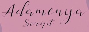 Brazilian or Indonesian designer, known as Dan Ghete, Dhan Ghete, Ambia Ambia and just Ambia. His/her foundry was first called
  Armasen is a group of young students and type designers based in Sao Paulo, Brazil. Their fonts:
  At the Universidade Federal do Ceará in Fortaleza,
  ATypI 2015 was held in Sao Paulo, Brazil, from 14-17 October, at the wonderful FAAP in Higienopolis, which is both a school and a museum (housing, for example, the original cubist painting Negresses by Samson Flexor, 1947). The main organizer was Henrique Nardi, who was assisted by many others, including Claudio Rocha, Diego Maldonado, Marina Chaccur and Crystian Cruz.
  ATypI 2015 was held in Sao Paulo, Brazil, from 14-17 October. As part of the conference, there was a very interesting exhibition of letterpress posters. The exhibition, Letterpress Reloaded, was curated by Paulo Moretto, an architect (1991) with a Masters (2004) in graphic design for which he researched Brazilian posters, studying more than 7,000 pieces made between 1950 and 2000s. Henrique Nardi and Claudio Rocha conceivved the idea, and Henrique helped with the execution and production. [
 Brazilian graphic designer who lives in Curitiba. Creator of the geometric sans typeface
  Sao Paulo, Brazil-based student-designer of a curvy modular typeface in 2017. [
 For a school project at Universidade Tecnologica Federal do Parana, Curitiba, Brazil-based Barbara Tamilin designed the vintage text typeface Roman Holiday (2016). [
 Curitiba, Brazil-based designer of
 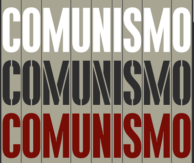 Bernardo Faria is a Brazilian designer specialized in logo and editorial designs. In 2014, he and Tony de Marco (Just in Type) created the masculine typeface family
  [
[ During her studies in New York City, Bianca Alcantara designed the geometric solid caps style Box Alphabet (2015). Earlier, at UFMA (Federal University of Maranhao, Brazil), in 2014, she created the vernacular typeface Traço together with
  Sao Paulo, Brazil-based designer of the display sans typeface Macchi (2016). [
 During her studies at UFSM, Bianca Marchesan (Santa Maria, Brazil) designed the great monoline organic no-nonsense sans typeface Papaya (2019). [
 Brazilian type designer Daniel Sabino de Souza studied under Laura Meseguer at the Eina-Escuela Superior de Disseny in Barcelona. His foundry in Sao Paulo is called Blackletra (est. 2012). He has taught type design at IED/Sao Paulo.
 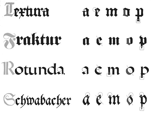 Porto Alegre, Brazil-based
 Belo Horizonte, Brazil-based designer of the all caps vector format monster alphabet Tipos Figurativos (2017). [
 Bric Type is a typography consultant company based in Brazil and The Netherlands, run by
  Born in 1987, Luiz Marques, who uses the pen name Brock Marques, studied at University Center North and settled in Manaus in the middle of the Amazon. He made the graffiti fonts Brock 165 (2012), Pixo Reto (2010) and Brock Vanadalo (2009).
  Sao Paulo-based designer of the Clarendon-style typeface
  Based in Rio de Janeiro, graphic designer Bruna Souza created the smooth typeface
  During his studies in Barueri, Brazil, illustrator Bruno Lhaes designed the wonderful eerie
  [
[ Brazilian designer (b. 1987) who graduated from Universidade Federal de Santa Maria RS and lives in Sao Paulo where he works for Dalton Maag. His
  Sao Paulo, Brazil-based designer of the layerable circus style typeface Junina (2018). [
 Fabricio Alves is
  Sao Paulo-based Brazilian codesigner with Tony de Marco of
  During his studies in Piracicaba, Goiania, Brazil, Caio Kondo designed the sans typeface Goiania (2014), the blackletter typeface York (2016) and the
 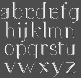 Caio Vita created the art deco typeface
  Graphic designer in Sao Paulo. Her typefaces include
  Florianopolis, Brazil-based designer of the
  Graphic designer in Rio de Janeiro associated with Plau Design. At Miami Ad School, as a student, he created Minimal Fraktur (2015). In 2018, he designed the corporate art deco typeface Chez Lalu 70. In 2019, he co-designed Muda, a corporate typeface for the fashion brand Oficina Muda with Ana Laura Ferraz, Gabriel Menezes and Rodrigo Saiani. In 2020, still at Plau, he designed the custom all caps sports company typeface Brio. With Rodrigo Saiani, Carlos Mignot designed the video game font family (+stencil, +Cyrillic) either called Killing Sans or Nine to Five (2020). Still in 2020, Mignot designed the flared Koch Antiqua-style custom typeface Xilo.
  Bauru, Brazil-based designer of the handcrafted vampire script typeface Surrada (2016). [
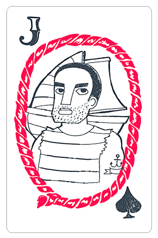 Sao Luis, Brazil-based designer of an untitled vernacular typeface in 2012. She also made a very original card deck called Encantos Maranhenses (2014).
 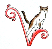 During her studies in Sao Paulo, Carolina Takara created the initial caps alphabet Cat Nouveau (2014) and the decorative handcrafted typeface Ganache (2014). [
 Graphic designer in Curitiba, Brazil, who created the book type
  Aka Chyrllene K. Daughter of Iza W, who designed many typefaces at Intellecta Design starting in 2010. She studied applied mathematics and graphic design, and works as COO of Intellecta Design. In 2013, she wrote a
  Cofounder of Now Type,
 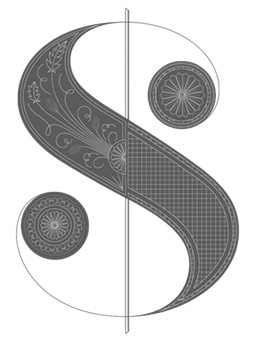 Claudia grew up in the south of Brazil and moved to the USA to attend college. She has BFA in Graphic Design from the School of Visual Arts in New York City where she has also taught. Claudia worked for nearly 10 years as a designer and Art Director in New York before moving to San Francisco in 2013 to serve as Design Director at WIRED. She has worked for The New York Times, T: The New York Times Style Magazine, Blender, More Magazine, New York Magazine, Domino Special Editions, Gourmet Special Editions and Men's Health. In 2012, Claudia redesigned Real Simple Magazine, marking the beginning of her design studio with WIRED pal Margaret Swart.
  Brazilian design company located in Recife, which lists type and design events in Brazil. Fatima Finizola is the Recife-based Brazilian designer (b. 1975, Recife) of the dingbat typefaces
 Brazilian designer of the high-contrast Peignotian sans typeface
  Codesigner with Alexandre Venancio and Felippe Duque of the hairline art deco typeface Capa (2009, Oporto Design). [
 [
[ Florent Courtaigne graduated in graphic design - ENSAD / Art Décoratifs de Paris. He founded created Cubo Fonts in 2008, and works as a graphic designer and drawing teacher in the LISAA Design School in Paris. Now a graphic designer, illustrator and art director based in Paris, Florent Courtaigne is the creator of the free circle arc and straight-line fonts Cyclo and Cyclo Bold (2006).
 [
[ [
[ Art director in Sao Paulo, Brazil, who created the stunning deco display typeface Geom in 2015. In 2021, Steve Harrison extended these designs to
  Marilia, Brazil-based designer (b. 1985) of the music score emulation typeface Musicografi (2013), the script typefaces Cursiva (2015) and Bico de Pena (2015), the outlined typeface Tubolacao (2015), and the handcrafted shaded typeface Riscada (2015, +Black).
 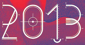 Graphic designer in Rio de Janeiro, who created the techno-lettered poster Werner Klatt 2013 (2013) with
  Delfina Duarte was Cristiane Delfinah. This Brazilian created the curly girlish script
 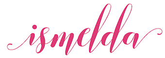 [
[ Brazilian designer of the retro display typeface
  Type workshop in 2017 in Rio de Janeiro, organized by Iara Cunha, Paula Cruz, Tarso Moura and Vinicius Guimaraes. The workshop participants collectively designed a decorative all caps alphabet for postage stamps. [
 [
[ During his studies at UFRJ Universidade Federal do Rio de Janeiro, Diego Rodas (Catanduva, Brazil) designed the Greek God figurine typeface Adonis (2017). [
 Rio Claro, Brazil-based designer of an untitled art deco typeface in 2014. [
 Pelotas, Brazil-based designer of the creamy curvy typeface Fiss (2014). [
 During her studies in Firenze, Italy,
  Curitiba-based Brazilian digital type foundry, est. in 2008 by the successful and talented type designer
  Sao Paulo, Brazil-based designer of the op-art typeface Portifa (2018). In 2018, he did a revival of Martin Jacoby-Boy's Bravour (1912) called -Bravour Meio Prata. [
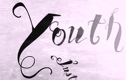 Brazilian resident who specializes in original grunge designs. His typefaces are mostly free. Some commercial typefaces are available via
  Salvador, Brazil-based game and industrial designer who graduated from Escola de Belas Artes at the University of Bahia (UFBA) and from the State University of Bahia. His 2009 graduation project involved an experimental 4 to 6-person
  As a graphic design student in Rio de Janeiro, Eduardo Barves created the FontStruct font Insecta Sans (2016). [
 Brazilian ex-student at the University of Reading who designed
  [
[ [
[ [
[ Brazilian illustrator in Sao Carlos, b. 1974. Creator of the Kafkaesque wood cut style typeface
  Emerson Nunes Eller is a Brazilian graphic designer based in Lisbon, Portugal. He has a Masters from UEMG in Belo Horizonte, Brazil, in 2014, and his thesis there was entitled
  [
[ Brazilian printmaker, graphic artist and illustrator, b. 1975. Her fonts are created together with Ricardo Marcin at
  Brazilian graphic and type designer who worked for Massimo Studio in Curitiba, Brazil. In cooperation with Soulcraft and Nelson Balaban, he created the geometric display typeface Moncloa (2015) for the Moncloa Tea Boutique. In 2018, Massimo Studio designed the bespoke wide sans typeface family Massimo. It is unclear who designed this great typeface---Behance associates it with
  Brazilian graphic and type designer and illustrator from Rio de Janeiro, b. 1983. Formed in Graphic Design at SENAI/RJ Technical School and student of Industrial Design at UNESA College. He worked at Dinamo Design and is currently based in Sao Paulo.
  Rafael Nascimento (b. 1977) is a Sao Paulo, Brazil-based graphic designer whose fonts are mostly free.
  Rafael Dietzsch ran
  Lucaz Mathias (Estudio Cao, Jacarei, Brazil) designed the blackboard bold art deco typeface family
  Brazilian graphic designer from Sao Paulo. He made the 9x6 pixel fonts
  Editorial designer in Santa Maria, Brazil, who studied at Universidade Federal de Santa Maria (UFSM). Designer of the
  Sao Paulo, Brazil-based creator of the geometric sans pair Big John (2015) and Slim Joe (2015).
  Fabio Haag Type is Fabio Haag's type foundry in Brazil. Earlier, he ran
  [
[ During his studies in Bauru, Brazil, Fabio Martins created the
  Fabrika de Typos is a Brazilian fondry run by Marcio Hirosse (b. 1969) in Sao Paulo. He made
  Examples of a 2006-2008 style of typography with frills and swashes, spearheaded by the designs of Si Scott. Others in this "movement" include Hydro74, Marian Bantjes, Ginger Monkey, SHCH, Lee25, Maria karkova, Doug Alves, Daniel Gordon, Craig Ward, Nick Keppol, ElBarbon, Joao Oliveira, Lily Piyathaisere, Dhanank Pambayun, 5ive, Bechira Sorin, Fabio Sasso. The list and the examples were compiled by Daniela Zatti, a graphic and product designer from Porto Alegre, Brazil. [
 Passo Fundo, Brazil-based designer of the monoline sans typeface family Titex (2017). [
 Brazilian graphic and type designer, who co-founded Naipe Foundry with Alvaro Franca in Rio de Janeiro in 2018. A graduate of ESDI Cartapaccio, Felipe has interned at Coppers & Brasses in Montreal. He is also associated with Rodrigo Saiani's type foundry
  Graphic designer from Brazil, b. 1989. Designer of FDHelwoodica (2008), a grungified Helvetica (2008), and similarly grungy FD Stenciluxe (2008), FDBateek (2009), FD Stripped for BUP (2009, arched Times New Roman face), FD J Borges (2009, extremely funny dingbats based on the work by Brazilian artist J. Borges), FDIlhoscript (2009, handwriting) and FD Carimboh (2009).
  Recife, Brazil-based designer of the linocut / xylographic typeface Lampiao (2018). [
 Or Ferdi Henriques. Graphic and type design professor at UNESP Baura, Brazil, who has a doctorate from Pontifícia Universidade Católica de São Paulo, Brazil. The work done by her students is nicely presented on her web site, and has quite a few interesting type designs. Here is a listing of the typefaces designed in 2011 in various courses:
  Graphic designer and illustrator Fernando de Mello Vargas (or: Fermello, or just, Fernando Mello) is located in Sao Paulo, Brazil. He is the designer (with Vicente Gil Filho) of the text typeface
  During her studies at FMU, Sao Paulo-based Fernanda Esteves created the blackboard bold typeface Prisma (2014). [
 Fortaleza, Brazil-based designer of the Bauhaus style stencil typeface Deutz (2017), which is named after a suburb of Köln. [
 [
[ Graphic designer in Sao Paulo. Creator of the fat didone Burlesque (2015), which is promised to be free.
  Flamula Estudio Criativo is Frederico Mattos's studio in Belo Horizonte, Brazil. Creator of an artistic all caps alphabet, the Azulejo Portugues font and Bjork Font (hipsterish) in 2015. [
 Flavia Zimbardi is a type designer and visual artist from Rio de Janeiro, based in Berlin. From 2005 to 2013 she worked for some of the leading magazines in Brazil. Flavia is a graduate of the Type@Cooper Extended Program at the Cooper Union, class of 2017. In 2018, she started
  Brazilian illustrator who is based in Barcelona. Designer at type-o-tones (Barcelona) of
  [
[ Marcelo Dante (b. 1965) and Juliano Augusto founded the
  The first step in font design can be Adobe Illustrator. One can take
  François Chastanet (b. 1975, Bordeaux) is an architect and a graphic designer in Toulouse, France. He specializes in signage systems for transportation networks. Graduate of the École d'Architecture et de Paysage de Bordeaux, he pursued research in 2001 at the Atelier National de Recherche Typographique in Nancy, and completed a DEA in architectural&urban history at the École d'Architecture de Paris-Belleville in 2002. He currently teaches graphic design and typography at the École Supérieure des Beaux-arts de Toulouse. At ATypI 2006 in Lisbon, he spoke on Pixaçao letterforms, the shantytown graffiti letterforms found in the 1990s in Sao Paulo. In 2009, he and Alejandro Lo Celso cooperated with two students, Laure Afchain and Géraud Soulhiol, on an identity type for the city of Toulouse called
  Rio de Janeiro-based designer who created a beautiful rounded organic sans typeface family called Lolla in 2014. [
 The site
  Design consultancy in Lajeado, Rio do Sul, Brazil. In 2014, they published the
  [
[ Brazilian designer (b. 1989) who lives in Sao Paulo. His first font is Bartolomeu Sans (2008).
  Rio de Janeiro-based creator of the calligraphic script typeface
  During her studies at Senac in Sao Paulo, Gabriela Bento de Paula designed a great typographic poster called Mulan (2016). [
 Graphic designer in Sao Paulo, who created the text typeface
  Cartoonist from Recife, Brazil, b. 1966, whose sense of humor and artsistic prowess shine in his dingbat fonts.
 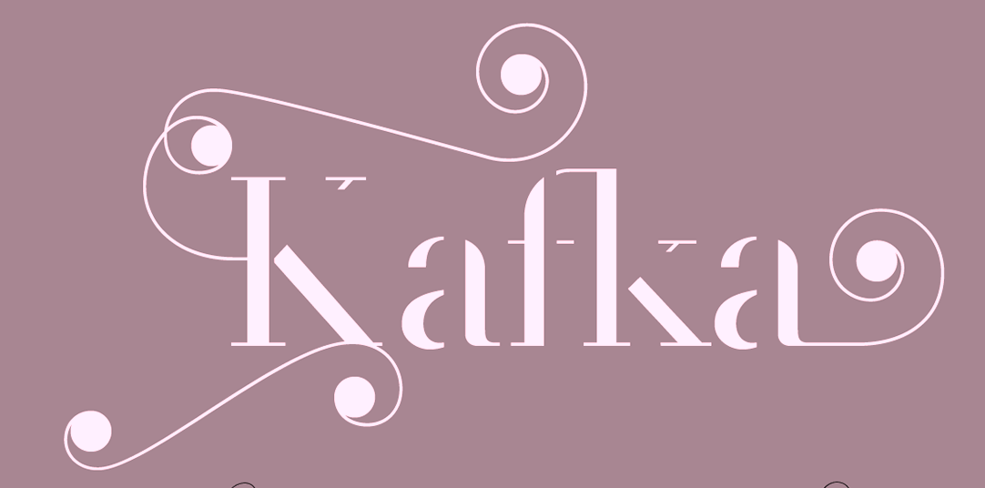 Genilson Lima Santos is the Salvador, Brazil-based designer (b. 1985, Bahia) of Stilu (2015, sans), Jenelson (2006), the stroked font Styllo (2007), the brushy
  Brazilian type foundry, est. 2016 by Thiago Bellotti. The first typeface by Bellotti at Gestu is the calligraphic pointed brush script
 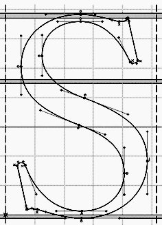 An Italian type foundry by Milan-based type designer Giangiorgio Fuga, ATypI member, teacher of typography at the Istituto Europeo of Milan, Politecnico of Milan, Italy and Unisinos of Porto Alegre, Brasil. His great
  Designer in Sao Paulo. Creator of the well-designed calligraphically inspired text font Zoia (2013) that should be very useful for smaller print.
  Design group in Brasilia, Brazil, who created Dingbats Brasilia in 2015.
  Brazilian graphic designer in Rio de Janeiro.
  Sao Paulo, Brazil-based designer of these typefaces in 2017: the art deco typeface family Bermudas, the experimental typeface Lanogaid, Quantum (sci-fi), Wide, Lardo, So Below, Alien, 104, Palette (hexagonal), Astrix, Gear, Rion Type. [
 Talented Bauru, Brazil (and now, New York City)-based creator of the
  Brazilian designer (b. 1977, Rio de Janeiro) who worked in Amsterdam, The Netherlands, and is based in Cunha, Brazil. In 2009, he founded
  [
[ Graduate of the
  Henrique Beier (Harbor Type, Porto Alegre, Brazil) is the designer of the excellent angular semi-calligraphic text typeface
  Jundiai, Sao Paulo-based designer of Joliet Serif (2017), Millenia (2017), Filena (2017, a sans family), Boxing (2017, a mini-spurred slab serif), Gotcha (2017), Sprout (2017, thin condensed sans), Clutch (2017), Longway (2017, copperplate style), Destrukt (2017), Bridal (2017, a condensed family with some free weights), Alyssum (sans), Space Cowboy (2017), Cookit (2017, a
  Valinhos, Brazil-based designer of the fine pair of typefaces called Berguerand (2017), a calligraphic serif font and an accompanying sans. In 2018, he published the monoline Holy Sans, and the Cyrillic simulation / constructivist / supermacist font Kabarovsk. It was developed for the board game Kabarovsk. [
 Blumenau, Brazil-based designer of the wide monospaced titing typeface Katherine (2016), which was inspired by the shape of a futuristic car. [
 [
[ Designer and illustrator in Rolandia, Brazil. In 2016, Henrique Mantovani Petrus and Gustave André co-designed the squarish all caps typeface Maquinada for a school project at Universidade Estadual de Londrina, Brazil.
  Born in Brazil, but based in Marinha Grande, Portugal, Henrique Martinowski designed the German expressionist typeface Geoblack in 2019. [
 Sao-Paulo-based illustrator (b. 1976) who designed Coverface SE (2014, a great rounded sans typeface family),
  Type and graphic designer in Porto Alegre, Brazil. In his first big commercial typeface project, he published the multilingual text typeface
  Brazilian illustrator residing in Joinville, SC. Creator (b. 1992) of the free blackletter typefaces Hairline Quadrata (2013) and
  Intellecta Design is a design company in Brazil run by
  Ruben Prol is based in A Coruña, Spain. He used to run
  During her graphic design studies in Fortaleza, Brazil, Isabelle Cunha created the vintage display typeface Spatito (2014). [
 [
[ Isaco Type is a type foundry in Vacaria, Brazil, est. 2009. Its founder is
  Palhoça, Brazil-based designer of the decorative caps typeface Bauhaus Flow (2019). [
 Florianopolis, Brazil-based designer of the art deco typeface
  Iza W is a Brazilian type designer who works with Paulo W at intellecta Design.
  Fonts done in 2011:
  [
[ [
[ [
[ Graduate of UFG, where he studied graphic design. Goiana, Brazil-based designer of the
  Ananindeua, Brazil-based creator (b. 1986, Brazil) of
  During his studies at IED in Firenze, Italy, Joao Pucci, who hails from Brazil, designed
  Graphic design student at PUC in Rio de Janeiro in 2014. During that year, he created the modular typeface Svalbard. [
 Graphic designer in Sao Paulo, b. 1986. Designer of the display typeface Raul (2014) and the squarish modular typeface Guedes (2014). [
 Aka Josias de Moraes Silva. During his studies, Josias Moraes (Diaderna, Brazil) created the
  Recife, Brazil-based designer (b. 1970) designer of the fighting silhouette typeface Cangaceiros (2021) and the feminist slogan font Femme (2021, with Taina Palhano). [
 During her studies in Pelotas, Brazil, Joyce Oliveira designed the beautiful artistic Japanese brush typeface Brumic (2017:
  Julia is Valerio Di Lucente (Italy), Erwan Lhuissier (France) and Hugo Timm (Brazil). They met at the Royal College of Art in London having come from different professional backgrounds in editorial design, web and art direction. The studio Julia was founded in 2008 upon their graduation. Together, they work on books, typefaces, posters, websites, identities and exhibition design. They teach as visiting lecturers at Kingston University. Typefaces:
  Bauru, Brazil-based design student in the College of Architecture, Arts and Communication from Estadual Paulista Júlio Mesquita Filho University, who created Petit Noveau (2014), a typeface inspired by art nouveau. [
 While studying design at SENAC in Brazil in 2009, Juliana Demarque designed the avant-garde typeface
  Pacajus, Brazil-based designer of these typefaces:
  Sao Paulo, Brazil-based designer of an engraved money typeface and a calligraphic Fraktur alphabet in 2017. Earlier he designed the typefaces Aline Text (2017), Gafieira and Primeira. Winner at
  Bia Andrade (b. Brazil) has a degree in South American literature. She moved to Europe, where she settled near the Lago di Como in Italy. In 2020, she published the hand-printed fonts

 Kadu Supanik (Joinville, Brazil) created the
  During their studies at UFG in Goiania, Brazil, in 2015, Natasha Hoshino, Kaiky Fernandez and Bia Menezes co-designed Drame Sans. Goiania, Brazil-based calligrapher, lettering artist and designer. In 2019, he published Liturgica Dingbats for the identity of Igreja Crista Farol Esperança. [
 Designer in Porto Alegre, Brazil, who created a sketched art deco typeface, Modern Folkwood (2015), for carving on wood. [
 Art director at W3Haus in Porto Alegre, Brazil, who created the tall elegant serifed typeface
  Art director in Americana, Brazil. During her studies at Senac Campinas, she created the exquisite high-contrast art deco typeface Opponimus (2015). [
 Designer and illustrator from Sao Paulo. He created
  Graphic design graduate of the Universidade Paulista, who started designing typefaces in 2012. In 2012, still based in Sao Paulo, he published the cell phone dingbat typeface
  [
[ Aka Borro, Leo Malachias de Oliveira is a graphic artist in Sao Paulo, Brazil. He is also a street (graffiti) artist. His
  During his studies at Universidade Anhembi Morumbi, Sao Paulo, Brazil-based Leonardo Morais designed the angular text typeface Sufoco Serif in 2017 together with Camila Hata, Marcus Vinicius, Marjorie Nunes, Michel Carvalho and Thais Aquino. [
 Web designer and developer in Sapiranga, Brazil. In 2015, he created the paperfold typeface Dawn. In 2018, together with Gabriel Ratzlaff, he designed the outlined typeface Coffee Shop (2018).
  During his studies at Universidade Federal de Santa Catarina, Florianopolis, Brazil-based Leonardo Vermöhlen designed the deco typeface Kandinsky (2019). [
 Brazilian graphic designer. Creator of a
  Type foundry in Bahia, Brazil, run by Gabriel de Souza. Creator of the 72-font sans typeface families
  Rio de Janeiro-based Livia Prata created the multi-serifed typeface Lichia in 2013 during her studies at Universidade Federal do Rio de Janeiro. [
 Loïs Lancaster (aka Ronceveaux) is the Brazilian designer of the nice revolutionary graffiti typeface
  Rio de Janeiro-based designer.
  Type and graphic designer in Sao Paulo. His typefaces include Arcadum (2018: pixel-based) and Ficus (2017), a typeface family whose shapes are like those of the Figueira Mata-Pau tree in the Brazilian Pantanal.
  Brazilian designer associated with Nakata Studio. During his studies in Bauru, he created
  Graphic designer in Recife, Brazil.
 Graduate in industrial design from Universidade Federal de Santa Maria, Brazil, class of 2018. Calligrapher and type designer active at Harbor Type. In 2021, she released the German expressionist typeface
  During her studies, Rio de Janeiro-based Luiza Morgado created the hairline avant garde sans typeface Hiper Cool (2015) and the modular octagonal typeface Box (2015). She also designed a set of playing cards based on the work of Cassandre. [
 Lygia Pimentel Lins (b. Belo Horizonte, Brazil, 1920, d. Rio de Janeiro, 1988), aka Lygia Clark, was a Brazilian artist and painter. She was often associated with the Brazilian constructivist movements of the mid-20th century and the Tropicalia movement. She started the Frente movement in 1954. Along with Brazilian artists Amilcar de Castro, Franz Weissmann, Lygia Pape and poet Ferreira Gullar, Clark co-founded the Neo-Concrete movement---The Neo-Concretists were interested in how art could be used to express complex human realities. From 1960 on, Clark introduced ways for viewers to interact with her (often abstract) art works.
  Recife, Brazil-based designer of Le Chocolat (2015, a display typeface derived from OPTI Caslon Two) and Elza (2016, hand-drawn vernaculat yypeface done as a project at UFPE). [
 [
[ [
[ Graphic designer in Balneario de Camboriu, Brazil. Marcio R. M. Martinson and Roberto Machado Jr. co-designed the brush signage typeface
  Marco Moreira is Magel Studio in Sao Paulo. Creator of the leaf-shaped typeface
  [
[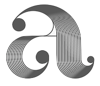 Aka Marcos Oliveira. Porto Alegre, Brazil-based designer of a prismatic decorative set of initials in 2017, with some impossible Escher-style glyphs thrown in. [
 Brazilian design student. Creator of the text typeface
  During her studies at St John's University, New York City-based Mariana Guilarducci created these typefaces: Angels (2016: handcrafted), Homi (2016: based on an antique tobacco package seen in Casa Loma, Toronto), Escorrega (2016: a fancy typeface based on the lettering on old cachaca bottles). At the Universidade Federal de Pernambuco in 2014, she designed the pixelish typeface Tetris (2014). [
 Sao Paulo, Brazil-based designer of these calligraphic scripts in 2015: Scriptica, Brush Hand, Louis. In 2016, she designed Box Rounded. [
 Graphic designer in Belo Horizonte, Brazil. She created two beautiful typefaces in 2012. The first one is a
 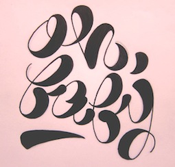 Marina is a Brazilian graphic designer and teacher, who graduated from Fundação Armando Alvares Penteado FAAP. She has an MA from the London College of Communication. In 2011, she obtained a
  Graphic design student at Senac, Brazil, b. 1991, Sao Paulo. For her school project, Marina Nunes designed
  During her studies at ESPM, Porto Alegre, Brazil-based Marina Peixoto created the mini-serifed typeface Rapsodia (2015). [
 During her design studies in Porto alegre, Brazil, marini cavalheiro created the lachrymal typeface Boft & Co (2015).
  During his studies, Mario Wischral (Jaragua do Sul, Brazil) designed the deco typeface Topissimo (2016). [
 Designer and writer in Rio de Janeiro. Codesigner with Marconi Lima of
  During his studies, Brasilia, Brazil-based Matheus Gomes designed a pixelish typeface using FontStruct and the free geometric sans typeface family Ginora Sans in 2016.
  Matias Romero was born Eduardo Alves da Silva in the city of Santos. He is a Brazilian nature photographer and multimedia artist, b. 1965. Currently, he is based in Sao Thomé das Letras, MG.
 During her studies in Recife, Brazil, Milena Leimig designed the
  Brazilian cartoonist, b. Rio de Janeiro, 1923, d. Rio de Janeiro, 2012. In an interview in 2002, he explained his style of 3d lettering: I started making letters out of necessity, for the titles in my newspaper column and then I get bored. From there I just started making titles in three dimensions. There, innovation was to draw a letter with the wrong perspective in relation to the other, in the same word. But the great invention was to make the wrong perspective in the letter itself, in all directions. The curious thing is that it ends up getting light, the words seem to float.
  Architect and designer in Sao Paulo, who runs Minhocossauro Tipografia. He created Salyma (2015, part vampire script, part curly Victorian extravaganza), Essential Coffee (2015, stencil), Militante (2015, stencil font), Cogumelo (2014, a retro futuristic unicase typeface), Biotech (2014, techno), Action Flick (stencil font), Morango (2015, handcrafted Western font), and Cinema Novo (2015, handcrafted typeface).
 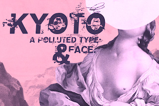 Misprinted Type (est. 1998) offers free and commercial old typewriter and grunge fonts designed by
  André Themoteo Alves Correa (b. 1986, Rio de Janeiro) is a Brazilian type designer who founded
  Graphic designer in Aguascalientes, Mexico. Creator of
  Wecsley Oliveira (b. 1978) runs Mururu Design in Aracaju, Brazil. Creator of
  Mushroom Type is a Sao Paulo-based foundry established in 2013 by Brazilian graphic designer Thiago Bellotti. Typefaces:
  Brazilian graphic artist and illustrator based in Los Angeles, CA.
  Naipe Foundry is the type design, lettering & font production company set up in 2018 by
  Graphic designer in Sao Paulo. She took some
  Designer of
 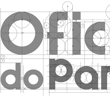 Rio de Janeiro-based graphic designer. Her
  Sao Paulo, Brazil-based designer who created a gorgeous titling typeface for Elle Brasil called Elle Sports (2016).
  Brazilian graphic designer and well-known illustrator in Curitiba, Brazil, b. 1989. Creator of the high-contrast fashion mag typeface Accent (2011,
  Creative director in Sao Paulo, who designed
  Graphic designer and illustrator Nick Ed (b. 1986) studied at Universidade Santa Cecíliaand at Institue Quero. Basedin Sao Vicente, Brazil, he designed the excellent gothic / tattoo font Gotika Grafica in 2015. [
 Graphic designer in Porto Alegre, Brazil, and before that, in Pelotas, Brazil. Creator of the oil can-themed alphabet called
  Nicolas Szernek is a graphic designer in Curitiba, Brazil. He created the high-contrast didone titling typeface
  Graphic designer in Curitiba, Brazil. In 2014, she designed the poster typeface The Incredible Font. [
 As a reaction against HypeForType and other hyped up outfits, No Hype For Me (
 A disciple of Tony de Marco, this Sao Paulo, Brazil-based designer has worked on digital magazines in Brazil such as Elle (fashion), Audi Magazine (lifestyle) and Trip (lifestyle). He set up
  Brazilian type foundry run by Lucas Franco (Italian Brazilian, b. 2001), his father Claudio Rocha (Italian Brazilian, b. 1957) and his mother, Milena Mainieri (Italian Brazilian, b. 1969), which is currently based in The Netherlands. Their typefaces:
  Sao Paulo-based illustrator who has occasionally used interesting lettering on his fun posters (ca. 2014). [
 Known as Jack Tadeu, Jackson Tadeu, Jackson Amaral, and Jackson Tadeu Amaral. Belo Horizonte, Brazil-based designer of Allure,
  Eduardo Omine (b. 1981, Sao Paulo, Brazil) graduated from the School of Architecture and Urbanism, Sao Paulo University (FAUUSP) in 2002, where he was taught by Vicente Gil and Priscila Farias. An architect/designer, he founded Omine Type in 2004.
 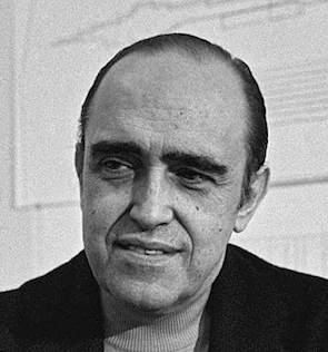 Celebrated Brazilian architect considered to be one of the key figures in the development of modern architecture. Oscar Ribeiro de Almeida Niemeyer Soares Filho (1907, d. 2012, Rio de Janeiro) was best known for his design of civic buildings for Brasilia, a planned city that became Brazil's capital in 1960, as well as his collaboration with other architects on the headquarters of the United Nations in New York. He held socialist and communist views, and was an outspoken atheist. For political reasons, he fled Brazil and could only return home in 1985, after the fall of the right-wing dictatorship. [
 A Brazilian digital type foundry located in Rio de Janeiro. It was founded in 2006 by Vitoria, Brazil-based
  Pablo de Mello is a graphic designer in Rio de Janeiro. He made the
  Art director, graphic designer, and illustrator in Belo Horizonte, Brazil. He designed the art deco typeface
  Sao Paulo-based graphic designer who created the decorative textured typeface
 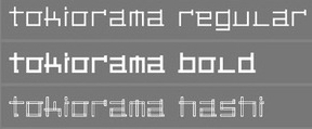 Papanapa is a Sao Paulo-based multidisciplinary design studio founded by Gustavo Garcia. Designer of these typefaces:
  Design student in Uberlandia, Brazil. In 2011, he created a great letter-based
 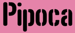 [
[ Brazilian designer and art director who is based in Dubai. Creator of Brasil 2014 (2014), the original typeface developed by Nike for the Brazilian National Football Team in 2014. [
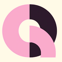 Rio de Janeiro-based designer of the striking bicolored geometric poster / logo typeface Fluxorama (2017).
 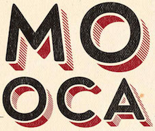 Aka Mr. Pow. Sao Paulo-based designer of a few great lambe lambe posters (2016).
  [
[ During his graphic design studies at INFNET in Rio de Janeiro, Pedro Angelo created the
  Visual communication designer in Nova Iguacu, Brazil. He created the calligraphic typeface
  Para, Brazil-based designer of the brush script typefaces Breakaway (2015) and Rebel Heart (2015, inspired by Madonna's album Rebel Heart), and the connected script typeface Confessions (2015; inspired by Madonna's album Confessions On A Dance Floor). In 2016, he made Awesome as Fuck, Noel Gallagher (based on the cover of Noel Gallagher's High Flying Birds album), and TrueBlue (connected script after Madonna's album by the same name).
  Caixias do Sul and/or Florianopolis, Brazil-based designer of the free blocky typeface
  Brazilian printmaker, graphic artist and illustrator in Vitoria, b. 1973, Rio de Janeiro. His fonts are created together with Erica Jung at
 Promodesign is a Brazilian graphic design company of
  Criciuma, SC, Brazil-based designer (b. 1983) of the free pixelish typeface Danish Bricks (2014) and the free handcrafted Gabi Sans Irregular (2015, inspired by the drawings of a 9-year old child). In 2016, he designed the free display font family Mantenha Distancia, which is based on types seen on Brazilian trucks. In 2017, he created the vernacular typeface Abençoada.
  [
[ Rafael Saraiva is a Brazilian / Portuguese type designer located in Rio de Janeiro who works for Dalton Maag as font developer. Graduate of Escola de Belas Artes at UFRJ, and the
  Brasilia, Brazil-based designer of
  At UNESP in Bauru, Brazil, Rafaella Bortolan designed the display typeface Australia (2016). [
 During her studies at USPM, Porto Alegre, Brazil-based Raquel Griesang created the avant garde typeface Tropicalia (2015). [
 Rio de Janeiro-based designer, b. 1990. During her type design studies at Senac, she created the piano key typeface
  Sao Paulo-based creator of a typographic poster entitled
  Brazilian type designer. Winner at
  For a school project at UEMG, Belo Horizonte-based Ranato Enoch designed the circle-based typeface
  Designer in Sao Paulo, who created the Bauhaus-inspired geometric typeface Neu Rund (2015). [
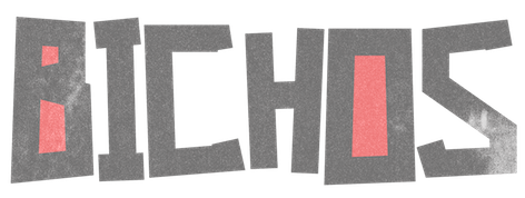 Brazilian graphic and type designer in Sao Paulo, b. 1990. He made the hand-printed brushy typeface
  [
[ Brazilian illustrator and cartoonist in Belo Horizonte. With the help of Paulo W (Intellecta Design), his alphabets became funny digital cartoon-inspired and hand-printed digital fonts in 2007:
 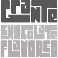 [
[ The fantastic and highly appreciated display font for the Rio 2016 Olympic Games was published just before the 2012 London Games. The 5448-character connected script font
  Illustrator, lettering artist and graphic designer in Vitoria, Brazil. Creator of the great bold poster sans typeface Condensa (2016) and the vintage (art deco) display font
  Brazilian graphic and type designer, who teaches at Type Cooper West (in San Francisco) and is a renowned restaurant branding designer. Bembo's Zoo is Roberto de Vicq de Cumptich's children's book with all drawings integrated with glyphs from Bembo. He also published
  Illustrator and designer in Jaragua do Sul, Brazil. In 2014, he drew a fantastic Bestiary Alphabet. [
 Belo Horizonte, Brazil-based designer of Candycane (2014, a rounded cursive typeface), and Autobahn (2014, a dashed typeface influenced by an album by Kraftwerk). [
 Brazilian type designer based in Maringá, Paraná (b. 1981, Canoas City, Rio Grande do Sul). He created the square metric typeface
  Sao Paulo, Brazil-based designer of the children's book script font Bolinha (2015). [
 [
[ Sao Paulo-based
  During his studies at USPM in Rio de Janeiro, Romulo Gobira designed the
  [
[ Illustrator and art director in Sao Paulo. He uses great
  Samuel Casal (b. 1974, Cazias do Sul, Brazil) is a professional illustrator, cartoonist, engraver and tattoo artist. He created two very funny and expressive dingbat fonts,
  Sandro Roberto Fetter (Porto Alegre, Brazil) has a PhD from the
 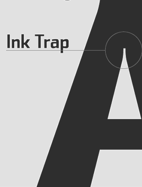 Sea Types is the partly free partly commercial type foundry of Jefferson Cortinove (artist, designer, teacher, sailor and wine maker) and publicist Márcio Duarte in Florianopolis and Marilia, Brazil, est. 2007. Their initial typefaces include
  Sao Paulo-based designer of the ultra-fat hookish
  Graphic design student in Brazil. Designer at
  [
[ [
[ Shadz XIII is Rafaela Rolfsen. Based in Bauru, Brazil, and Falmouth, UK, she made the bilined typeface
  Sofia Mohr (b. 1978, São Leopoldo, Rio Grande do Sul, Brazil) studied architecture at UFRGS, Brazil, and type design at Universidad Católica de Chile. She works as graphic, web and type designer in her own studio (called Sofia Mohr) in Santiago, Chile.
  Brazilian engineer with an interest in design, photography and film. He writes: I am from Oscar Niemeyer's old school: I like to combine beauty and function, but without frills, and, like Niemeyer, I don't die in love with straight lines. He creates his typefaces with a stylus and an iPad instead of traditional font design programs. In 2020, he released
  Graphic designer in Sao Paulo.
  Brazilian graphic design student. Creator of the iFontMaker font
  During her studies at UFRJ in Rio de Janeiro, Taíssa Maia created the soft italic typeface
  Graphic designer from Portugal who obtained a Bachelors in Graphic Design from ESAD.CR in Caldas da Rainha, and a
  During her studies at UFRJ, Rio de Janeiro-based Thais Gioia created the skab typeface Mafia (2014). [
 During her studies at UFPE, Thalita Oliveira (Olinda, Brazil) created the blackboard bold typeface Chodo (2015), the display typeface Risa (2014) and the video game typeface Game Over (2013). [
 Brazilian type foundry set up in 2021 by the people who started Pintassilgo Prints two decades earlier, Erica Jung and Ricardo Marcin. Their typefaces:
  [
[ Graphic designer in Sao Paulo, who made the delicate award-quality hand-printed typeface
 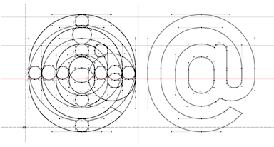 Graphic designer in Curitiba, Brazil. He created the
  Manaus, Brazil-based designer of the decrative floral all caps typeface Rebeca (2018). [
 Typeface discovery project in Sao Paulo led by
 Designer in Florianópolis, Brazil.
  Graphic designer in Bauru, Brazil, who created the ball terminal typeface
  Jackson Fausto Alves (Type Curitiba foundry) is a Brazilian graphic and type designer, illustrator and teacher located in Curitiba. He also designs exclusive lettering for clients around the world.
 Brazilian graphic designer and illustrator who worked in Torino, Italy.
  Jonatan Xavier is a Brazilian graphic designer based in Curitiba. In 2014, he set up Types and Boats. Jonatan created the art deco typeface
  Typographias is Thiago Oliveira's foundry in Sao Paulo, Brazil. In 2017, he published the classical text typeface family Paciencia, which is rooted in calligraphy.
  TZDZ is Bernardo Pereira (graduate in graphic design from ESDI/UERJ in 2004) and Aline Rodrigues (a graduate in print and pattern design at SENAI). Originally located in Brazil, they now operate out of Montreal.
  Digital artist in Ribeirao Preto, Brazil, who made the grungy typeface
  Porto Alegre, Brazil-based designer of the teardrop-themed fashion mag or display typeface V (2016). [
 [
[ Brazilian graphic designer, 1922-2005. From ca. 1950 until ca. 1970, he was the main book cover designer at Editora Clube de Livro. The lettering on his exquisite posters and book covers is discussed by Marcio Duarte and Monica Moura in
  Brazilian art director in Campinas. Initially his fonts were free via Dafont, but in 2012, he set up shop at MyFonts.
  Fortaleza, Brazil-based designer of the psychedelic typeface Oczy (2018). [
 Sao Paulo-based creator of the
  During his studies at Senac in Sao Paulo, Vinicius Alves created the foliate typeface Brocolis (2014). [
 Graphic designer in Sao Paulo. Creator of these typefaces in 2014: Fungeo (a geometric experiment), Hashi (named and patterned after Japanese chopsticks).
  Candido Mota, Brazil-based designer of the display typeface
  [
[ During his studies at PUC in Rio de Janeiro, Vitor Linhares designed Bauhaus dingbats (2017), which represent famous people from the Bauhaus movement. [
 Volnei Antonio Matté is a teacher, graphic and type designer in Santa Maria, RS, Brazil. His work and research focuses on typography and calligraphy, subjects he teaches at the Universidade Federal de Santa Maria. In 2015, he designed the techno sans family
  [
[ Art director in Sao Paulo, who designed the logotype Soul (2016). In 2019, he designed the free display typefaces Jack Russel (sic) (squarish), Boxer, Bolton (piano key style), Pointer, Husky, and Yorkshire (trilined). [
 During his studies at Universidade Cruzeiro do Sul, Sao Paulo, Brazil-based Willy Souza designed the ultra tall typeface Shoujo Dreams (2017). [
 [
[