| | |
2000 Pyro
|
Makers of the Tomb Raider movie fonts in 2000: TRHeavy, TRIcon (dingbats), TRNormal. [Google]
[More] ⦿
|
Abhilasha Jaiswal
|
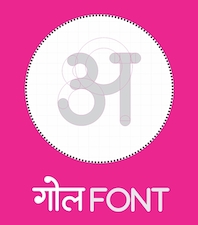 Varanasi, India-based designer of the modular Latin typeface Elegance (2016). During her studies at IIT Jabalpur, Abhilasha Jaiswal designed the compass-and-ruler monoline rounded sans typeface Gol (2016) for Devanagari. She drew a textured set of zodiac symbols, a blackletter alphabet, and a Latin poster alphabet in 2016. [Google]
[More] ⦿
Varanasi, India-based designer of the modular Latin typeface Elegance (2016). During her studies at IIT Jabalpur, Abhilasha Jaiswal designed the compass-and-ruler monoline rounded sans typeface Gol (2016) for Devanagari. She drew a textured set of zodiac symbols, a blackletter alphabet, and a Latin poster alphabet in 2016. [Google]
[More] ⦿
|
Active Images (or: Comic Book Fonts, or: Comicraft)
[Dave Lanphear]
|
Rita Simpson and Richard Starkings' company which specialized in comic book fonts. The newest Tekton-lookalike font, Hellshock, was designed by Dave Lanphear. Some typefaces: Achtung Baby (1997), Adamantium, Chills, DivineRight, DoubleBack, DutchCourage Elsewhere, IncyWincySpider, RunningWithScissors, Spills StandBy4Action, Stormtrooper, TheStorySoFar, Thrills, ToBeContinued, Alchemite, Astro City, Bithead, Bronto Burger, CarryonScreaming, ClobberInTime, Comicrazy, Flameon, Frostbite, GrimlyFiendish, JimLee, JoeMad, Meltdown, MonsterMash, PhasesOnStun, PulpFictioon, ResistanceIs, SezWho/SezYou, SpookyTooth, Splashdown, TimSale, Wildwords (129 USD!), YuleTideLog, Zoinks. Most fonts by John Roshell. [Google]
[More] ⦿
|
Alex Révész
[Stichting Malatië Adventures]
|
[More] ⦿
|
Alexander Lange
|
 Karlsruhe-based software developer. Creator of the large (and free) Unicode font Quivira (2005). It covers mathematics, chess, astrological symbols, arrows, fists, Latin, Greek, Cyrillic, Hebrew, Armenian, Georgian, Tifinagh, Coptic, emoticons, Vai, and Braille, to name just a few ranges. Alexander graduated in computer science at the Hochschule Mannheim University of Applied Sciences (degree: Diplom-Informatiker (UAS)). [Google]
[More] ⦿
Karlsruhe-based software developer. Creator of the large (and free) Unicode font Quivira (2005). It covers mathematics, chess, astrological symbols, arrows, fists, Latin, Greek, Cyrillic, Hebrew, Armenian, Georgian, Tifinagh, Coptic, emoticons, Vai, and Braille, to name just a few ranges. Alexander graduated in computer science at the Hochschule Mannheim University of Applied Sciences (degree: Diplom-Informatiker (UAS)). [Google]
[More] ⦿
|
Alexey Kustov
[Type Market]
|
[More] ⦿
|
Alicia Souza
|
 Based in Melbourne, Alicia Souza is an illustrator who drew and created the monster ding font Monsterocity (2009) as well as Smile Baby Smile (2010) and Alphabots (2009). Zodiac poster.
 Dafont link. [Google]
[More] ⦿
|
Alisa Nowak

|
 French type designer who studied at Fachhochschule Düsseldorf (2009) and at the Ecole supérieure d'art et de design d'Amiens, France, class of 2011. At ESAD her graduation typeface was called Eskapade. In 2012, the blackletter typeface Eskapade Fraktur was published by Type Together. The angular weights Eskapade Regular and Eskapade Italic were added in 2012.
 With Sebastien Degeilh, she is a partner in Nowak & Degeilh, a French type foundry started in 2012. At Nowak & Degeilh, she created the 3d geometric overlay font family Carton (2012). For the next few yours, her work was published by Fontyou: - She co-designed the stylish Egyptian typeface Achille FY (2012) with Gia Tran, Gregori Vincens, Valentine Proust and Bertrand Reguron, and Achille II FY (2014) with Valentine Proust and Gregori Vincens.
- With Gia Tran, Gregori Vincens, Valentine Proust and Elvire Volk, she co-designed the monoline sans display typeface Younion FY (2013). Younion One FY is free at Dafont.
- Codesigner of Kaili FY (2013): an exotic typeface with crazy ligatures, inspired by Indian scripts, designed by Gregori Vincens, Bertrand Reguron, Gia Tran and Alisa Nowak.
- The EPS format display typeface Alice FY (2013). Co-designed by Alisa Nowak, Micaela Neustadt, Gia Tran, Bertrand Reguron and Valentine Proust. Alice FY was inspired by Adrien Genevard's lettering. Sub-themes are Alice in Wonderland and playing cards.
- The EPS format frilly script typeface Lullaby FY (2013), co-designed by Alisa Nowak, Micaela Neustadt, Gia Tran, Bertrand Reguron and Valentine Proust at Fontyou. It too was inspired by Adrien Genevard's lettering.
- Exquise FY (2013). A fashion mag didone co-designed by Bertrand Reguron, Alisa Nowak, Valentine Proust, Elvire Volk and Gia Tran at Fontyou.
- Bruum FY (2013) by Gia Tran, Alisa Novak, Micaela Neustadt, Bertrand Reguron and Grégori Vincens. Bruum FY is a curvy stressed elliptical sans typeface.
- Four typefaces done with Luis Gomes and Jeremie Hornus: Booster FY (2013: a rounded sans), Gauthier FY (2013: a transitional typeface family, followed in 2014 by Gauthier Next FY), Lean-O FY (2013: a slab serif with leaning asymmetrical brackets; see also LeanO Sans in 2014), Marianina FY (2013: a contemporary condensed 24-style headline sans family with simple strokes. Characterized by kinks in the ascenders).
- Gregori Vincens, Gia Tran, J&eacxute;rémie Hornus and Alisa Nowak co-designed the humanist sans typeface Klaus FY (2013).
- The slender display typeface Sérafine FY (2013). Co-designed with Jason Vandenberg and Jérémie Hornus.
- Codesigner with Mr. Zyan of the alchemic hipster font Pyrenees FY (2013).
- She collaborated with Jérémie Hornus and Fabien Gailleul on the design of the astrological simulation typeface Astral FY (2013). The same group of three collaborated in 2014 on Naive Gothic FY.
- In 2014, Adrien Midzic, Jason Vandenberg, Jérémie Hornus, Julien Priez and Alisa Nowak co-designed the creamy script Vanilla FY. It was renamed Vanille FY after a few days.
- Still in 2014, Adrien Midzic, Jérémie Hornus and Alisa Nowak co-designed the very humanist sans family Saya FY and Saya Semisans FY.
- Luis Gomes, Jérémie Hornus and Alisa Nowak co-designed the rounded sans typeface family Booster Next FY in 2014.
- Joao Costa co-designed the thin lachrymal typeface Zitrone FY in 2014 at FontYou with Jérémie Hornus and Alisa Nowak.
- In 2014, Monica Munguia, Alisa Nowak and Jérémie Hornus co-designed the blackletter typeface Blackmoon FY.
- In 2014, Matthieu Meyer, Alisa Nowak and Jérémie Hornus co-designed the wedge serif typeface Ennio FY at FontYou.
- The punchy poster typeface Kraaken FY (2014) was designed by the FontYou team of Bertrand Reguron, Alice Resseguier, Valentine Proust, Julien Priez, Gia Tran, Jérémie Hornus, and Alisa Nowak.
- In 2014, Joachim Vu, Jérémie Hornus and Alisa Nowak co-designed the classical copperplate script typeface Vicomte FY.
- Codesigner with Jan Dominik Gillich of Sperling FY (2014, FontYou), a didone-inspired headline or fashion mag display typeface family.
- Designer of Marianina Wide FY (2014).
- In 2014, Alisa Nowak, Gregori Vincens and Andrey Kudryavtsev created Achille II Cyr FY.
- Codesigner of Hansom Slab FY (2014, Gia Tran, Jeremie Hornus and Alisa Nowak).
- Still in 2014, Julien Priez, Hugo Dumont, Jérémie Hornus and Alisa Nowak co-designed Rowton Sans FY, a sans family patterned after Gill Sans in six weights, from Hairline to Bold---named after Arthur Eric Rowton Gill, it has the Gillian lower case g but italic lowercase is a bit too far afield for my own taste, especially the squeezed g.
In 2015, Jérémie Hornus, Clara Jullien and Alisa Nowak co-designed the spurless / organic slightly inflated sans typeface family Diodrum at Indian Type Foundry. Diodrum Rounded (2020, by Manushi Parikh, Jérémie Hornus, Clara Jullien and Alisa Nowak) is a spurless organic sans family. In 2016, Alisa Nowak, Julie Soudanne and Jean-Baptiste Morizot co-designed Graphico (Indian Type Foundry): Its letterforms are industrial and square-sided. The typeface looks like the product of precision mechanics: it should be featured together with tech---either old tech like appliances or watches, or new tech like apps and laptop stands. In 2016, Alisa Nowak designed the all caps art deco / avant garde typeface family Inbox that comes with many great ligatures and interlocking glyph pairs. It was published at Indian Type Foundry. Alpinist (2016) is a humanist sans with a small x-height optimized for magazine design and other editorial applications. The edges are slightly rounded for easy reading. It was designed by Jeremie Hornus and Alisa Nowak. Somehow, it evolved into Alpino at Fontshare. In 2016, Jeremie Hornus and Alisa Nowak released Associate Sans and Slab (+Stencil), and Associate Mono at Indian Type Foundry. This is a family with an American gothic look. Vesterbro (Jeremie Hornus, Alisa Nowak, Ilya Naumoff, Black Foundry, 2017) is a high-contrast Latin / Cyrillic typeface with a Viking feel that won an award at Granshan 2017. Papelli (2016) is an informal typeface family by Alisa Nowak and Julie Soudanne. At Fontstore / Fontshare, she released the 6-weight sans typeface Excon in 2017. Excon is named after and a tribute to French designer Roger Excoffon (1910–1983). Excon's letters are top-heavy, a rarely-explored idea in type design Excoffon himself experimented with. In 2017, Jérémie Hornus, Théo Guillard, Morgane Pambrun, Alisa Nowak and Joachim Vu co-designed Bespoke Sans, Bespoke Serif and Bespoke Slab at Fontstore / Fontshare. In 2020, Bespoke Stencil was added. In 2017, Jérémie Hornus, Julie Soudanne and Alisa Nowak designed the attractive titling didone typeface Zesta. Zodiak (2021, Jérémie Hornus, Gaetan Baehr, Jean-Baptiste Morizot, Alisa Nowak, and Théo Guillard at Fontshare) is a free 24-style text family with Century-like newspaper roots and sturdy bracketed slab serifs that was originally named Claire (2020). In 2020, Jeremie Hornus, Theo Guillard, Morgane Pambrun, Alisa Nowak and Joachim Vu co-designed Bespoke Stencil (2020, Fontstore). [Google]
[MyFonts]
[More] ⦿
|
Allen Edwall
[AstroWin]
|
[More] ⦿
|
Amondo Szegi
[FONTana Typestudio]
|
[MyFonts]
[More] ⦿
|
Anastasia Dimitriadi
[DimitriAna]
|
 [MyFonts]
[More] ⦿
[MyFonts]
[More] ⦿
|
Andreas Hild
[Hild Design]
|
[MyFonts]
[More] ⦿
|
Andreas Illig
|
Astrological symbol archive with Alchimistische-Symbole, Astrologische-Symbole, dsasymb (Ralf D. Renz), Nanduria, Zhayad. And the caps font AugsburgInitials (Font Bureau). [Google]
[More] ⦿
|
Andreas Seidel
[astype.de (or: Astype)]
|
 [MyFonts]
[More] ⦿
[MyFonts]
[More] ⦿
|
Andreas Stötzner
[SIAS (or: Signographical Institute Andreas Stötzner)]
|
 [MyFonts]
[More] ⦿
[MyFonts]
[More] ⦿
|
Andrew D. and Lise C. Taylor
|
Orem, Utah-based designers of the beautiful dingbat font ArborisFolium (1976), and of Agathodaimon (runes and astrological symbols) and Animal Tracks. At Plazm, Andrew D. Taylor published Avenatha (1995). Avenatha at Mindcandy. Agathodaimon (alternate site). Dafont link. Abstract Fonts link. [Google]
[More] ⦿
|
Andrey Belonogov
|
Russian designer (b. 1975, Moscow) who won an award at Bukvaraz 2001 for Handmade (hand sign font), and for Rouble, a minimalist Latin/Cyrillic font made in 1999-2001. He received a TypeArt 05 award for the dingbat family Astra. Other typefaces include Lenta, Moloko and Svoboda. He graduated from Moscow State University of Art (named after S. Stroganov in 2001). The astronomical signs font Astera was published by Paratype in 2008. Other Paratype fonts by him include Brusque (2008, renamed Rouble), Cliche (2008, stencil face), FastFingers (2008, remake of Handmade), Powerview (2010, with Yana Kutyina), Chetwerg (2014, which won an award at Modern Cyrillic 2014), and Vataga (2008, a human typefaces dingbat font co-designed with Yana Kutyina). [Google]
[MyFonts]
[More] ⦿
|
Ann Stretton
[The Dingbatcave (was: Ann-S-Thesia)]
|
[MyFonts]
[More] ⦿
|
Anna Terentieva
|
Designer at Type Market of the zodiac sign fonts Zodiac1 and Zodiac2 in 1994. [Google]
[More] ⦿
|
Annie Konst
|
 Icon designer. Some of her icon sets in her 2021 catalog: Woodland, Picasso, Matisse, Tropical Matisse, Rural Folk, Halloween, Boho Soul, Wild West, Western, Australian Animals, Plantlovers, Orange Chill, Halcon Libre, Antique, Zodiac, Face To Face, Totemica, Flora, Mermaids, Magic Stellar Insects. [Google]
[More] ⦿
Icon designer. Some of her icon sets in her 2021 catalog: Woodland, Picasso, Matisse, Tropical Matisse, Rural Folk, Halloween, Boho Soul, Wild West, Western, Australian Animals, Plantlovers, Orange Chill, Halcon Libre, Antique, Zodiac, Face To Face, Totemica, Flora, Mermaids, Magic Stellar Insects. [Google]
[More] ⦿
|
Anthony I.P. Owen
[Astrofonts]
|
[More] ⦿
|
Antonis Tsolomitis
[Laboratory of Digital Typography and Mathematical Software]
|
 [More] ⦿
|
Applied Meta Projects (was: Tunera Type Foundry, Ariel Graphisme)
[Ariel Martin Perez]
|
 Born in the Canary Islands, Ariel Martín Pérez is a freelance art director and illustrator based in Paris. He set up Ariel Graphisme. In 2020, he founded Tunera Type Foundry with Anton Moglia. In 2021, he started Applied Meta Projects. Parisian designer of Nord Sud Boulenger (2015), a squarish all caps typeface based on the tiled letters used in the subway in Paris on the Nord-Sud line (now lines 12 and 13). It is named after the Boulenger tile factory, also known as the Choisy-Le-Roi tile factory.
 In 2018, he designed the display typeface CMT and the free typeface Ouroboros (at Velvetyne), a font for alchemists, witches, heretics and outsiders that has art nouveau elements. In 2021, he improved some curves and added some symbols suggested by artist Hélène Mourrier. Typefaces at Tunera: - Brassia (Ariel Martin Perez). A wavy typeface designed in 2019.
- Canarina (Ariel Martin Perez). Canarina (2020) is an angular font inspired by the Canary Islands, that celebrates its history and culture. Perez writes: Canarina is a fingerprint, a phonolitic stone, the leaf of a succulent plant, the silhouette of a volcanic rock against the sky, a feeling that is hard to translate.
- In 2020, with Sébastien Hayez, he released the free typeface Cantique at Velvetyne. Cantique was inspired by some hand-carved titles used in post-romantic French bookplates, both for their ornamental qualities and for their kind of medieval mood.
- Générale Station (Ariel Martin Perez). In 2017, he designed the free typeface families Générale Mono (octagonal, bi-width), NordSudA, NordSudB and NordSudC. Générale Mono was extended in 2019 to Générale Station.
- Kobata (Ariel Martin Perez). An experimental pixelish typeface from 2020.
- Manosque (Ariel Martin Perez). Manosque (2019) is a bulky rounded typeface inspired by lettering found in the train station of Manosque, a city in the south of France.
- Paysage (Anton Moglia). Paysage is a redesigned and extended version of Garcia Regular, a typeface started in 2016. This humanist sans released in 2020 was inspired by Roger Excoffon's Antique Olive.
Behance link. Open Font Library link. Old link to Ariel Graphisme. Ariel Martin Pérez at Velvetyne. [Google]
[More] ⦿
|
Aradia Font
|
Aradia is a free runes and astrology font developed in 2000 by Merlin Software. [Google]
[More] ⦿
|
Ari Rafaeli
[ARTypes]
|
 [MyFonts]
[More] ⦿
[MyFonts]
[More] ⦿
|
Ariel Martin Perez
[Applied Meta Projects (was: Tunera Type Foundry, Ariel Graphisme)]
|
 [More] ⦿
|
ARTypes
[Ari Rafaeli]
|
 ARTypes is based in Chicago, and is run by Ari Rafaeli, earlier possibly known as Richard Everds. List of their typefaces categorized by revival type:
 - Hermann Eidenbenz: Graphique (1946) now called Graphique AR, a shadow face.
- Jan van Krimpen (Enschedé) revivals: Romulus Kapitalen (1931), Romulus Open (1936), Curwen Initials (Van Krimpen did these in 1925 for The Curwen Press at Plaistow, London), and Open Kapitalen (1928).
- Jacques-François Rosart: Rosart811, a decorative initial typeface that is a digital version of the 2-line great primer letters cut by J. F. Rosart for Izaak&Johannes Enschedé in 1759 (Enschedé no. 811).
- Stephenson Blake revivals: Borders, Parisian Ronde.
- Rudolf Koch (Klingspor) revivals: Holla, Koch-Antiqua-Kursiv Zierbuchstaben, Maximilian-Antiqua, Neuland 24pt.
- Bernard Naudin (Deberny&Peignot) revival: Le Champlevé.
- W. F. Kemper (Ludwig&Mayer) revival: Colonia. P.H. Raedisch: Lutetia Open (2007) is based on the 48-pt Lutetia capitals engraved by P. H. Raedisch under the direction of Jan van Krimpen for Enschedé in 1928.
- Richard Austin: Fry's Ornamented (2007) is a revival of Ornamented No. 2 which was cut by Richard Austin for Dr. Edmund Fry in 1796. Stephenson, Blake&Co. acquired the type in 1905, and in 1948 they issued fonts in 30-pt (the size of the original design), 36-, 48- and 60-pt.
- Max Caflisch (Bauer) revival: Columna.
- Elisabeth Friedlaender (Bauer) revivals: Elisabeth-Antiqua, Elisabeth-Kursiv (and swash letters). Linotype Friedlaender borders.
- Herbert Thannhaeuser (Typoart) revival: Erler-Versalien.
- O. Menhart (Grafotechna) revivals: Manuscript Grazhdanka (cyrillic), Figural, Figural Italic (and swash letters). Also, Grafotechna ornaments (maybe not by Menhart).
- Hiero Rhode (Johannes Wagner) revival: Hiero-Rhode-Antiqua (2007).
- F. H. E. Schneidler (Bauer) revival: Legende.
- Herbert Post revival: Post-Antiqua swash letters.
- Georg Trump (Weber) revivals: Trump swash letters, Trump-Gravur (called Gravur AR now). The outline caps typeface Forum I-AR is derived from the Forum I type designed by Georg Trump (1948, C. E. Weber). Signum AR-A and Signum AR-B (2011) are based on Trump's Signum (1955, C.E. Weber). Palomba AR (2011) is based on Trump's angular calligraphic typeface Palomba (1954-1955, C.E. Weber). Amati AR (2011) is based on a Georg Trump design from 1953.
- Hermann Zapf revival: Stempel astrological signs.
- F.H. Ernst Schneidler: Zentenar Initialen is based on the initials designed by Prof. F. H. E. Schneidler, ca. 1937, for his Zentenar-Fraktur types.
- Isaac Moore: Old Face Open (Fry's Shaded) is a decorative Baskerville which was probably cut by Isaac Moore for Fry ca. 1788. A revival was issued in eight sizes by Stephenson Blake in 1928.
- Border units and ornaments: Amsterdam Apollo borders, Gracia dashes, Primula ornaments, Bauer Bernhard Curves, Weiß-Schmuck, Curwen Press Flowers, Klingspor Cocktail-Schmuck, Nebiolo fregi di contorno, Attika borders, English (swelled) rules, Künstler-Linien, an-Schmuck, Primavera-Schmuck.
- Freie Initialen are derived from initials made for the Stempel Garamond series. The type was issued in 1928 in three sizes (36, 48, and 60 pt); the AR version follows the 60-pt design.
- Initiales Grecques, based on Firmin Didot's design, ca. 1800.
- Emil A. Neukomm revivals: Bravo AR (2007; originally 1945).
- Ernst Bentele revivals: Bentele-Unziale (2007).
- Joseph Gillé: Initiales ombrées (2007) is based on Gillé's original all caps typeface from 1828.
- Maria-Ballé-Initials (2007), after an original font from Bauersche Giesserei.
- Raffia Initials (1952, Henk Krijger): revived by ARTypes in 2008 as Raffia.
- Ornaments 1 AR (2010): from designs from 18th and 19th century typefounders that were ancestors of the Stephenson Blake foundry.
- Ornaments 2 AR (2010): Ornaments 2 contains designs for the Fanfare Press by Berthold Wolpe (1939) and for the Kynoch Press by Tirzah Garwood (ca. 1927).
- Ornaments 3 AR (2010): based on designs by Bernard Naudin for Deberny et Peignot, c. 1924; and ornaments based on designs by Oldrich Menhart, Karel Svolinsky and Jaroslav Slab for the state printing office of Czechoslovakia and Grafotechna.
- Ornaments 4 AR (2010): based on the Amsterdam Apollo and Gracia ornaments and the Amsterdam Crous-Vidal dashes (designed by Crous-Vidal).
- Ornaments 5 AR (2010): based on the Amsterdam Primula ornaments designed by Imre Reiner, 1949.
- Ornaments 6 AR (2010): based on designs for the Curwen Press by Edward Bawden and Percy Smith.
- Yü Bing-nan revival: Freundschafts-Antiqua AR (2010). Freundschafts-Antiqua (which was also called Chinesische Antiqua) was designed in 1962 by the Chinese calligrapher Yü Bing-nan when he was a student at the Hochschule für Grafik und Buchkunst at Leipzig in 1960.
- Sans Serif Inline (2011). Based on the 36-point design of the Amsterdam Nobel Inline capitals (1931).
- Hildegard Korger revivals: Typoskript AR (2010) is based on a metal type which was produced in 1968 by VEB Typoart, Dresden, from a design of the German calligrapher and lettering artist Hildegard Korger.
- Hans Kühne revival: Kuehne-Antiqua AR (2010) revives a Basque typeface by Hans Kühne.
- The Troyer AR ornaments (2010) are based on the first series of ornaments designed for American Type Founders by Johannes Troyer in 1953.
- The Happy Christmas font (2011) is a snowflake font that is based on designs by Amsterdam and Haas, c. 1950. December Ornaments (2011) contains the 36 Amsterdam designs which were originally issued in 24 and 36 point.
- Walter Diethelm: Diethelm AR (2011) revives Walter Diethelm's Diethelm Antiqua (1948-1951, Haas).
- Walter Brudi revivals: Pan AR (2010, based on a 1957 font by Brudi).
- Hermecito (2013) is a 46-style type system based on an angular serif. It covers Cyrillic, Latin, Greek and several other scripts. Besides being eminently readable, it also has extensive coverage of mathematical and phonetic symbols. Renzo (2013) is along the same lines but with sharpened serifs.
- Spiral (2014) is a revival of a typeface called Spiral designed by Joseph Blumenthal and cut bu Louis Hoell in 1930. In 1936, Monotype reissued that type as Emerson 320.
- Custom typefaces include Fabrizio (2016), a classical serif typeface family for Hebrew, Latin, Cyrillic and Greek, with hints of Garamond and Caslon. Ari writes that Fabrizio made its first appearance in Saggi di Letteratura Italiana: Da Dante per Pirandello a Orazio Costa, by Lucilla Bonavita, printed at Pisa in March 2016 by Fabrizio Serra Editore for whom the type was specially designed.
MyFonts link. View the typefaces made by Ari Rafaeli / ARTypes. [Google]
[MyFonts]
[More] ⦿
|
Association for Insight Meditation (or: Aimwell)
[Bhikkhu Pesala]
|
 Bhikkhu Pesala, a Buddhist monk based in London, designs free fonts. His original we page was called Aimwell (Association for Insight Meditation). On that site dedicated to Pali fonts, there was a file with Bhikkhu Pesala's free fonts. Most of Pesala's fonts have well over 1000 glyphs, cover Latin, Vietnamese and Greek, and have an enormous set of symbols including chess symbols and astrological signs.
 The present list of fonts, with some older ones removed: - Acariya (2016): a Garamond style typeface derived from Guru, but with suboptimal kerning.
- Akkhara (2006). Derived from Gentium.
- Balava (2014): a revival of Baskerville derived from Libre Baskerville.
- Cankama (2009). A Gothic, Black Letter script.
- Carita (2006). An all caps roman.
- Garava (2006). Designed for body text. It has a generous x-height and economical copy-fit. The family includes Extra-Bold and Extra-Bold Italic styles besides the usual four. Typeface Sample
- Guru (2008). A condensed Garamond style typeface designed for economy of copyfit in Buddhist publications. 100 pages of text set in the Pali typeface would be about 94 pages if set in Garava, or 92 pages if set in Guru.
- Hari (2016): a hand-writing script derived from Allura by Robert E. Leuschke, released under the SIL license.
- Hattha (2007). A felt marker pen typeface.
- Jivita (2012): an original sans typeface for body text.
- Kabala (2009). A sans serif typeface designed for display text or headings. Kabel?
- Lekhana (2008). Pesala's version of Zapf Chancery.
- Mahakampa (2016): a hand-writing script derived from Great Vibes by Robert E. Leuschke.
- Mandala (2007). A geometric sans designed for decorative body text or headings. Has chess symbols.
- Nacca (2016): a hand-writing script derived from Dancing Script by Pablo Impallari.
- Odana (2006). A calligraphic almost blackletter brush font suitable for titles, or short texts where a less formal appearance is wanted.
- Open Sans (2016): a sans font suitable for body text. Includes diacritics for Pali and Sanskrit.
- Pali: Pesala's version of Hermann Zapf's Palatino.
- Sukhumala (2014): derived from Sort Mills Goudy.
- Talapanna (2007). Pesala's version of Goudy Bertham, with decorative gothic capitals and extra ligatures in the Private Use Area.
- Talapatta.
- Veluvana (2006). A heavy brush style. The Greek glyphs are from Guru. Small Caps are greater than x-height.
- Verajja (2006). A Pali word meaning "variety of kingdoms or provinces." It is derived from Bitstream Vera.
- Verajja Serif.
- Yolanda (2008). Calligraphic.
[Google]
[More] ⦿
|
Astro Academia
|
The AstroAcademia Font Foundry specializes in creating fonts for use in astrological text and graphics. The fonts will soon be ready. [Google]
[More] ⦿
|
astro1
|
Astrology, horror and symbol font archive (200+ fonts). [Google]
[More] ⦿
|
Astrofonts
[Anthony I.P. Owen]
|
Astrological fonts: StarFont Sans and Serif (1993) by Anthony Owen, and AstroFont (2000, by Astrolars). Anthony Owen is from Copenhagen. A type 1 version of StarFont exists, as well as Latex/TEX code for using the font (the latter by Matthew Skala). [Google]
[More] ⦿
|
Astrologie CURA
|
The truetype font Astrol. [Google]
[More] ⦿
|
Astrologische Studiengesellschaft Hamburger Schule e.V. (or: ASHS astrolars)
|
Makers of the free astrological font AstroFontASHSastrolars (2000). [Google]
[More] ⦿
|
Astrologix
|
Archive with an alchemy, American Indian and astrology symbol font from Laser Printing Solutions. [Google]
[More] ⦿
|
Astrology fonts
|
Free astrology fonts for the Mac, by Naoya Tozuka: Astro-Medium, Astro-Light. [Google]
[More] ⦿
|
Astrology for Lovers
|
Two astrological fonts by Windows On Wisdom: WOWSansSerif (1994), WOWSerif (1994). [Google]
[More] ⦿
|
AstroSym
[Peter Schmitt]
|
Peter Schmitt (Institut für Mathematik, Universität Wien) is the designer of the metafont AstroSym between 1992 and 2002. [Google]
[More] ⦿
|
AstroWin
[Allen Edwall]
|
From Vista, CA, Allen Edwall's free AtroWin font. When you installed the free AstroWin package, you'll get the truetype fonts HoraryGlyphs (1996) and Page by Allen Edwall. [Google]
[More] ⦿
|
AstroWin 3.5
[Ingo Böhme]
|
Commercial astrology package, which includes some astrological symbol fonts. Free truetype fonts: Peter Orban's symbol font, and the horoscope font Wingdings_Regular by Ingo Böhme. [Google]
[More] ⦿
|
astype.de (or: Astype)
[Andreas Seidel]
|
 Astype.de is a German foundry started in 2003 by illustrator and type designer Andreas Seidel (b. 1975, bad saarow, near Berlin, Germany). He lives in Cottbus, Germany. In 1998, he obtained a Masters degree in business administration. In 2007, he and Ingo Preuss set up The German Type Foundry. In 2017, he joined the initial crew at Fust & friends. The typefaces:
 - One of his first typefaces was Crayfish (originally a URW font, but withdrawn by Seidel from URW in 2002). Crayfish is a display type originally designed for an American Football club. The Crayfish typefaces are sold as Thunder Bold and Titan Bold.
- Check his nice weather symbols (not a font).
- He finished Ornaments Thanksgiving and the great ASTYPEOrnaments-WineGrape A (2004).
- He is working on 14th century initials (2003).
- He created Sattler (2003): Joseph Kaspar Sattler, one of the great German art nouveau artists created these nice initials in 1897 for the famous royal monumental book project Die Nibelunge for the Reichsdruckerei Berlin. Only 200 exclusive signed masterpieces were printed in four years from 1900 till 1904. Joseph Sattler was the art director, type designer and designer in one person. The Reichsdruckerei showed samples of the unfinished work in 1900 at the world exhibition in Paris to advertise the high craftsmanship of the German presses.
- He made Heraut (2003), an art nouveau lettering typeface based on a 1901 design of Hermann Hoffmann called Herold Reklameschrift.
- He created Sveva AS Versal (2003, art nouveau).
- About Missa Solemnis, he writes: Solemnis was designed by Günter Gerhard Lange and first cut in metal 1953 (this is the date he quotes himself, other sources mention 1950 or 1952). It seems to be one of his earliest typeface designs that he had done as a freelancer for H. Berthold AG in Berlin. [...] Missa Solemnis AS is a new, remastered and extended version of Mr Lange's typeface. The font is available in the OpenType format and comes in two styles: 1953 and 2003. The 1953 style contains all characters of the original metal type, as well as a few additions. [...] The 2003 cut is more delicate and makes extensive use of the OpenType format. It contains over 650 glyphs, covering Roman-based languages of Western and Central Europe. His Solemnis inspired Simeon AS (2003), a 650-glyph uncial style face.
- In 2004, he created Missale Incana, an interpretation of a typeface from Herbert Thannhaueser.
- Still in 2004, he created ASTYPE Ornaments Christmas A2 and ASTYPE Ornaments Christmas A. These were followed in 2005 by ASTYPE Ornaments Christmas B.
- He made Missale Lunea (2004). This has astroligical symbols, moon phases and medieval characters.
- In 2005, the exquisite calligraphic script typeface Gracia was added, consisting of Gracia No. 44, 45, 54 and 55 (graceful calligraphic script), and Gracia Solo.
- Paola is a redesigned, new interpretation of a brush typeface from Carl Rudolf Pohl.
- He made Adana (2005): The roots of Adana going back to the year 1930, to the Berlin-based German graphic designer Wilhelm Berg. His typeface can be interpreted as an answer to Lucian Bernhards Schönschrift. The Initials are nearly close to the original drawings but the Circular typeface was changed dramaticly. Excentric, unusual forms and loops were changed to fit todays needs. Due to the lack of a corresponding Roman letter form, the Regular version was designed including small caps, fitting the contrast and swinging shapes of Adana Circular. Both typefaces play well together in all kinds of adverts, as well with designs like Bodoni or Didot.
- Alea AS Initials (2005) is a floral faced based on the drawings of Maria Ballé.
- Taiko (2006). A revival of Otto Arpke's Arpke Antiqua (1928, copperplate).
- ASTYPE Ornaments Accolades A (2007), and ASTYPE Ornaments Accolades C (2011).
- GTF Toshna Std (2008, German Type Foundry) is a garaldic type family in three optical weights, after a 1955 family called Tschörtner-Antiqua by Hellmuth Tschörtner that was very popular in the DDR.
- Secca (2009, German Type Foundry) is a simple sans family rooted in early German grotesque type designs. See also Secca Soft (2014) and Secca Stencil (2015).
- Nepos (2010) is an experimental modular type kit consisting of ready-made typefaces and a set of special BUILD fonts to build your own letters and ornaments. These BUILD fonts can be used on layers with different colors and overprinting for special effects. The effects like Antiplex can be considered as kitchen tiles. There are also color inversions and stencil types.
- Secca Saloon (2011) is a versatile ornamental Western family.
- Popsil (2011) is a white-on-black hand-printed poster face.
- Ademo (2011) is a classic shaded layered 3d caps face, based on two typefaces designed by Carl Albert Fahrenwaldt that were published in 1931-1932 by Schriftguss AG.
- Wood Bonnet Antique No.7 (2012) is based on real vintage wood type blocks from Switzerland.
- VTG Stencil US No. 4 (2012) is based on plate US No. 4 from New York Stencil Works. This revolving stencil-plate was invented by Eugene L. Tarbox and patented in 1868. The military stencil fonts VTG Stencil US No. 2 (+Ornaments), VTG Stencil US No. 51, VTG Stencil UK No. 76, VTG Stencil Germany No. 101 (2014, modeled after historic blackletter stencil plates from Bavaria), and VTG Stencil US No. 72 followed in 2014. In 2016, he added Vtg Stencil DIN.
- VTG Stencil Germany No. 1 (2013) is a set of nicely executed didone stencil typefaces based on real models used in Germany from 1871-1918 and later. There is a Sketch style.
- Wood Poster Eight (2015) is a free wood type slab serif.
- Alea Initials (2017, floriated caps).
- Wood Bonnet Grotesque No 4 (2017).
- The Vtg Stencil France series (2017) in substyles Vtg Stencil France No1, Vtg Stencil France No3 and No. 5.
- The expressionist typeface Alarm (2017, Fust & Friends), which is based on an old design of Heinz König also called Alarm (1928, at Trennert).
- Presto (2017, Fust & Friends), a revival of a script by Helmut Matheis (1970).
- Vtg Stencil Italy No2 (2018).
- Rocaie (2018). Decorative caps base on antique rococo letters from a gilding workshop.
- Wood Heinz No.4 (2019). Wood Heinz No.4 offers up to four printed look variations of all the Latin base letters and figures. An OpenType letter rotator is programmed into the fonts to emulate the randomness of wood type printing. Also: Wood Heinz No.2 (2019).
- Missale Solis (2019). An uncial typeface that overhauls Missale Lunea (2004).
- Vtg Stencil UK No2 (2019).
- Vtg Stencil Marsh (2020). Based on one inch stencils, cut by a Marsh machine. Marsh was an American stencil machine maker in the 1920s.
- Bonnet Grotesque Narrow (2020). A condensed grotesque family.
Behance link. Creative Market link. Fust & Friends link. Klingspor link. Home page. See also here. View Andreas Seidel's typefaces. [Google]
[MyFonts]
[More] ⦿
|
ATRI
|
Russian type foundry. Their Cyrillic/Latin fonts include: AZ HighWay (Leonid Silkin, 1990-1995, based on Broadway by Morris Fuller Benton, ATF, 1928), AZ LatinWide (1990-1995, by Kirill Tchouvashew, based on Stephenson Blake's Wide Latin), AZ LifeSigns (1990-1995, Serge Agronsky: astrological symbols), AZ McLeud (1990-1995, by Victor Kuchmin, based on American Uncial by Victor Hammer, 1943), AZ NewsPaper (1990-1995, by Andrey Andreev, based on News Gothic by Morris Fuller Benton, ATF, 1908), AZ ParagonNord (1990-1995, by Serge Agronsky, based on Elizavetinskaya, Lehmann type foundry (St. Petersburg, 1904-1907), which in turn was based on Russian metal typefaces of the mid-18th century), AZ Poligon (1990-1995, by Leonid Silkin: a kitchen tile font). [Google]
[More] ⦿
|
Aure Font Design
[Aurora Isaac]
|
 Aurora Isaac (Aure Font Design, Issaqua, WA) is a California-born type designer. She created the uncial typeface Aure Westra LP (2011) and the Victorian family Aure Zeritha LP (2011).
 Typefaces from 2018: Aure Brash (an outline font that speaks with the cheeky inuendo of a sassy parrot), Aure Nox (semi-haunted; with modulated stems), Aure Teddy (art nouveau style), Aure Declare (a text typeface family accompanied by several sets of extraordinary and quite complete astrological symbols), Aure Sable (also with astrological symbols), Aure Wye, Aure Jane. Typefaces from 2019: Aure Zeritha. [Google]
[MyFonts]
[More] ⦿
|
Aurora Isaac
[Aure Font Design]
|
 [MyFonts]
[More] ⦿
[MyFonts]
[More] ⦿
|
Axel Harvey
|
Montreal-based astrologer and author, who obtained an MA in history from the University of Toronto in 1964. [Google]
[More] ⦿
|
Bart Claeys
[Bart Claeys Font Design]
|
[More] ⦿
|
Bart Claeys Font Design
[Bart Claeys]
|
 The original link disappeared. Exclusive donationware (mostly grunge, graffiti and grunge) fonts by Bart Claeys (Belgium) at Fontasia International: Antiphun BC, Barrow Irregular BC, Brockx Normal BC, Colloquial Prickle BC, Heamorrhage BC, Phlox BC, Probe BC, Prolix BC, Stoneware BC, Thrill BC, (the nice grunge font) Zoophyte BC, Chemical Symbols BC, Zodiac BC, Smart BC, Kosovo BC, Navis BC (ships), and the animal silhouette dingbat font Founa BC.
 In the 1990s, he ran Fontasia International by BarClaey [dead link] and called himself Maestro Cicero. It was a very useful and thickly packed font jump page, that included lists of ITC fonts [Google]
[More] ⦿
|
Behram Cooper
[Zoroastrian truetype fonts]
|
[More] ⦿
|
Ben Balvanz
[Fontalicious]
|
[MyFonts]
[More] ⦿
|
Bhikkhu Pesala
[Association for Insight Meditation (or: Aimwell)]
|
 [More] ⦿
|
calsymbols
|
calsymbols is a metafont for astronomical symbols, made by Lars Alexandersson, based on work by Eric A. Slutz. [Google]
[More] ⦿
|
Charter Design
[Patrick Adamove]
|
Patrick Adamove (Charter Design) is the Hamburg-based designer of Horoscopia (2000, dingbats) and CharterD-Normal (1999, grungy) at Garagefonts. At Charterdesign, he created Dementia 13 and Planquadrata. Klingspor link. FontShop link. Garagefonts link. [Google]
[More] ⦿
|
Christopher J. Noyes
[Golden Dawn Research Center]
|
[More] ⦿
|
Christopher J. Noyes
[Christopher J. Noyes Software]
|
[More] ⦿
|
Christopher J. Noyes Software
[Christopher J. Noyes]
|
Christopher J. Noyes made the CJN Astrology Fonts: AstGlyphs (1993), Astro-Pi#1 (1993), CJNPiFont!1 (1993). [Google]
[More] ⦿
|
Claude Belhumeur
|
Designer from Lasalle, Quebec who created a Chinese zodiacal sign typeface in 1979. Google patent link. [Google]
[More] ⦿
|
Coruja do Norte
|
Fraktur, medieval, uncial and astrological font archive. [Google]
[More] ⦿
|
Cosmorama (or: Laser Printing Solutions)
[Kenneth Hirst]
|
Esoteric fonts and special symbols by Kenneth Hirst. Includes shareware and full version ($$) fonts such as Astro (1993), Alchemy, American Indian (2001, dingbats), Arabic, Flowchart, SpecialPi, Sequoyah (for Cherokee), CircleBullets, ArrowBullets, GD Enochian (2011, Enochian and Astrology symbols based on the Golden Dawn system), Siddiqua (Arabic: Laser Printing Solutions. P.O. Box 5362, Irvine, CA 92616), Starfisher Uni (2014, an astrological & sans font originally designed by Laser Printing Solutions). Some of his fonts. Fontspace link. Another Fontspace link. Open Font Library link. [Google]
[More] ⦿
|
Cumberland Fontworks
[Samuel John Ross]
|
 Game writer, game designer, graphic artist, and the creator and owner of Cumberland Games & Diversions, b. Cumberland, MD, 1971. He lived in Austin, TX, but is in Denver, CO, since 2014. Typefaces by S. John Ross include Sex Nerd (2021), Guacamole Quickstep (2019), Cynocel Poster (2019), Monesque (2019), Flagstones (2018), Kentucky Fireplace (2016), Bad Guy Black (2015, an engraved currency font), Silvery Tarjay (2015), Iron and Brine (2015), Afton James (2015), Fountain Avenue (2013), Axe Handel (2013, grunge), Sans Sara (2011, geometric organic sans), Growly Grin (2011, grunge), Gelio (2011, Greek simulation family; +Pasteli), Shock Shimmy (2011), Gelio Greek Diner (2011, Greek simulation face), Rugged Ride (2010, a texture font), A Love of Thunder (2010), The Day That Love Came To Play, Unity Dances (2009), Knits and Scraps (2008), Heirany Slight (2007), Merchant Copy (2006), Hexpaper (commercial: font for printing out hex paper (for puzzles and such)), RisusLCBDingbats, RisusLCBKringlebats, TemphisSweatermonkey, HultogSnowdrift (2006), Hultog Engraved (2006), Encounter Critical, Erthe Gaming Systems (art nouveau), Tender Goliath (a heavy slab serif), Temphis Spidersilk (2005), Ten Ton Ballyhoo (2005, grunge), Vermin Magic (2005), Uneasy, Tombs of Rivulax, Almanac of the Apprentice (2005), Yemite Snow Letters (2005), Seven Miles to Heirany (2005), Bold Marker (2005), Apostate Cancer (2005), Bydee Man (2005, based on the handwriting of Austinite Brian Joseph), Uresia (2005, runic), Dragon Harbour (2005), A Kringle in Time (2004, Christmas dingbats), Vanthian Ragnarok (2004), Regal Demise (2004), Nobody Small (2004), Earwax Wit (2004), Always Joking (2004), Hill Country (2004), Barrel House (2004), Iron Lung (2004), Art Greco (2004, a stone cutter face), Powell and Geary (2004), Wolves Engraven (2003), Homespun (2003), Cup and Talon (2003), Glyphs of Hax (2003), Invader Candy (2003), Temphis Runes (2003, commercial), Temphis Laundry Marker (2012), Temphis Brick (2003), Temphis Knotwork (2003), Temphis Dirty (2005), Struck Dead (2003), Double Slug (2003), Oddbats (2003), Phaeton John (2003), Scrawlings (2003, a gothic font), FountainAvenue (2002), Pokethullu (2002), AtlasoftheMagi (2002), Skuntch (2001), Prison Walls (2002), Downtown Auto (2002), Arvigo (2002), Beccaria (2002, very old typewriter font), Cheap Seven Inches (2002), Nicotine Stains (2002), Apple Butter (2002), Merchant Copy (2006), Mexlar (2002), Eye Socket (2002), Spacedock Stencil (2001), Rutherford (2001), SPARKSScrapbook2001 (2001), Sparks ("from skeletal necromancers to doughty Dwarf warriors to Bigass Ogres to chicks with guns - and now an entire science-fiction set!"), Skull Salad (2001), The Temphis Runes (commercial rune font set), Cock Boat (2001, co-designed with Amy Miles), Marshmallow (2001, by his wife Sandra Ross), Yank (2001, handwriting, by Sandra Ross), Focal Deviance (2001), Darn Ya (2001, typefaces), Punkinhead (jack-o-lantern shaped letters), Rocket Yo-Ho (2001), Thunder Thighs (2001), Dirty Headline (2001, and Dirty Headline v2, 2012: The most successful of the Cumberland stress-fonts is an unlikely typographic hero, released as it was with huge chunks of even the basic U.S. keyboard set missing (it had no apostrophe, for example, and no smart-quotes). Why so limited? I built it for one thing and one thing only, so it only had what it needed. I never expected to see it spread across the globe on buses, TV and movie screens, book coves, web-banners, lottery tickets, signs and clothing. I also never expected it to introduce me to roller derby girls (a whole team of them!), or to hook me up with a pen-pal who means a lot to me, but it's done all those things and more.), Ninja Bootleg (2001), Face Front, Nameless Harbor, Martian Hull Markings (1999), ProtoRooftops (2001), Zarking (2001), Graalek, High Fiber (2001), LastUniform, Wolves&Ravens (2000), Wolves&Ruin (2003), Pigeon Street (2001), Gravel (2001), TheAlchemist (2001), Deco Freehand (2001), Archipelago (2001), Flagstones (commercial), Newfie (handwriting, by Sandra Ross), Hultog (2000), and Lunatic Regular (handwriting, 1999). 15 USD fontmaking service. At Apostrophic Lab in 2001, he designed FuturexApocalypse. The Temphis Runes font set is commercial.
 Fontspace link. Dafont link. Klingspor link. Abstract Fonts link. Wikipedia link. [Google]
[More] ⦿
|
Curtis Clark
|
Curtis Clark of the Biological Sciences Department at California State Polytechnic University in Pomona, CA, designed these fonts between 1992 and 1998: Linear B, Piecharts, Female and Male Symbols (1996), Moon Phases, Celtic Ogham, Elder Futhark, Beth-Luis-Rearn, Beth-Luis-Nion and Woolbats (occult dings, astrological symbols). Free downloads. His site is also called Mockingbird Font Works. Dafont link. Fontspace link. [Google]
[More] ⦿
|
Czytelnia
|
The astrological signs font Astrolog. [Google]
[More] ⦿
|
Darden Studio
[Joshua Darden]
|
 Joshua Darden is an exceptionally gifted typeface designer with a studio in Brooklyn, NY. Joshua Darden (b. 1979, Northridge, CA) founded the ScanJam Design Company in 1993, together with Tim Glaser. At ScanJam, he designed numerous retail and custom typefaces. In 2000, Josh Darden left Scanjam to work for the Hoefler Type Foundry. In 2004, he founded Darden Studio. In 2005, he joined the type coop Village. He has lectured at the University of California Santa Barbara and at Parsons School of Design and School of Visual Arts. Interview with Josh Darden. Old URL. FontShop link.
 Typefaces designed by Darden: - Index (Garage, with Tim Glaser), review by Fred Showker).
- Birra Stout (2008): a free chunky beer label font. Followed by Birra Bruin (2019, by Elena Schneider at darden Studio): a German expressionist typeface.
- Jubilat (2008). Darden writes: Commissioned by Michael Picon for First; further development underwritten by Tatler Asia&La Semaine. Recipient of a Type Directors Club award as Untitled. Jubilat explores the history of the slab serif in six weights, with generous curves and efficient spacing in both dimensions. Its large lowercase and high contrast make it suitable for headlines, decks, and sidebars.
- Bergamot (under development).
- Profundis (1999, with Timothy Glaser; Profundis andd Profundis Sans in three styles each, all accompanied by Ornaments).
- Vittoria.
- OUT (Garage, with Tim Glaser).
- Grosvenor.
- Firth.
- di Valzer.
- Hauteur.
- Cassandra.
- GarageFont.
- HolyCalliope (1999, with Timothy Glaser).
- Omnes (2005, Village). This has a hairline weight.
- Diva (Garage, with Tim Glaser, 1996). See also Omnes Cyrillic (designed by Eben Sorkin, John Hudson, Joshua Darden, Maxim Zhukov, and Viktoriya Grabowska) and Omnes Arabic (designed by Joshua Darden and Titus Nemeth).
- Locus.
- Interact (Garage).
- Freight (2004-2009, Garage): an extensive, all-round family of typefaces including Freight Sans Pro, Freight Display Pro, Freight Micro Pro, Freight Text Pro, and Freight Big Pro (2005; its heavier weights are high-contrast didones). The slab serif, sans and serif versions are related and derived from each other, in some cases, by snap-on technology (in the spirit of Thesis or Scala or Nexus). Freight Sans Condensed Pro followed in 2012 and Freight Sans Compressed Pro in 2015. Freight Micro Pro (2009) was specifically created for use in phone books and small size applications. Freight Macro Pro is more suited for corporate branding. Review by John Berry. Freight Neo Pro (a humanist sans) was published in 2013. In 2015, he offered the free font Freight Big Bold (2005) via Open Font Library. Freight Round Pro was added in 2016. Finally, in 2017, Freight moved to Type Network.
- Josh Darden collaborated with Chrstian Schwartz on Erik Spiekermann's FF Meta Headline (2005).
- Virtuoso Life (2005): a proprietary custom display typeface for the Virtuoso Limited magazine.
- Corundum Text (2006): a fantastic and full family based on Fournier's pre-modern alphabet from 1742. It covers all European languages and comes with almanac symbols, ligatures, zodiac symbols, the works. Corundum Text won an award at TDC2 2007.
- Untitled (2006, Joshua Darden Studio). It won an award at TDC2 2007.
- Dapifer (2011) and Dapifer Stencil (2015). Commissioned by Mucca Design for One Atlantic. By Joshua Darden, with design and production assistance by Thomas Jockin, Scott Kellum, Noam Berg, and Lucas Sharp.
- Halyard (2017). An information design sans typeface family by Joshua Darden, Lucas Sharp and Eben Sorkin.
[Google]
[MyFonts]
[More] ⦿
|
Dave Lanphear
[Active Images (or: Comic Book Fonts, or: Comicraft)]
|
[More] ⦿
|
David A. Occhino
[David Occhino Design (was: Treehouse Graphic Design)]
|
[More] ⦿
|
David Charles Randolph Rakowski
|
 Type designer and composer, born in St. Albans, VT, in 1958. He was one of the early free/shareware type designers, well-known for creating revivals of 19th century typefaces. He was the Walter W. Naumburg Professor of Composition at Brandeis University, and has previously taught at Harvard University, Columbia University, and Stanford University.
 List of Rakowski's fonts: 3-DWedgie, Aarcover, AdineKirnberg-Script, Ann-Stone, Beachman, Beffle (1991, after Fry's Ornamented No. 2 from Stephenson Blake), Bizarro, BrailleFont, BunnyEars, ChristensenCaps, Crackling, DaBigKeyCaps, DavysCrappyWriting, DavysDingbats, DavysKeyCaps, DavysNewOther, DavysOtherDingbats, DavysRibbons, DeBalme Initials, DieterCaps, Diner-Fatt, Diner-Obese, Diner-Regular, Diner-Skinny, Dobkin-Script, Dragonwick, Dubiel (1991), Dupuy-Light, DupuyBALloon, Eileen, EileenCaps, EileensMediumZodiac, Elizabeth-Ann, Elzevier, EraserDust, Firecat, Gallaudet (a sign language font), Garton (1993), Gessele-Script, GriffinOne, Harting (an old typewriter font), Headhunter, Holtzschue, Horst, Ian-Bent, Jeff-Nichols, Jumble, Kinigstein, Konanur, KoshgarianLight, Kramer, Lassus (1993), LeeCaps, Lemiesz (a free version of Publicity Gothic, 1916), Lilith-Heavy, Lilith-Initals, Lilith-Light, Lintsec, Logger, LowerEastSide, McGarey-Fractured, Multiform, Nauert, NixonInChina (oriental simulation), ParisMetro, Pixie, Pointage, Polo, Rechtman-Script, ReliefDeco, ReliefInReverse, Reynolds, Rockmaker, Rothman [note: poster by Lauren Buroker], Rounded, Rudelsberg (a Munch Jugendstil style font), Salter, Shotling, Showboat, Shrapnel, Starburst, TejaratchiCaps, TenderleafCaps, ToneAndDebs, Tribeca, Uechi, UpperEastSide (1990), UpperWestSide (lettering from the New Yorker magazine), VarahCaps, Wedgie, Wharmby, WhatA-Relief, Will-Harris, Zaleski, and Zallman-Caps. Some downloads: Uechi, Rothman, Tejaratchi, Eileen Caps and Elzevier Caps, Paris Metro, Davy's Dingbats (see also here). With Klaus Herrmann, of Intecsas in Düsseldorf, he started updating his fonts from 1992-1999. Those fonts can be bought at Will-Harris. Here is an interview with David. Download 120 of his fonts here. And finally, a text file with the names of most of his fonts. Mark Johansson explains the history of Rakowski's fonts. Dafont link. MyFonts page. Abstract Fonts link. Font Squirrel link. Fontspace link. Klingspor link. [Google]
[MyFonts]
[More] ⦿
|
David Occhino Design (was: Treehouse Graphic Design)
[David A. Occhino]
|
Treehouse Graphic Design was David Occhino's font outlet. It is now called David Occhino Design. The Treehouse collection specialized in Startrek, futuristic, Disney and Indiana Jones style fonts, but has widened lately. Most fonts are commercial, but there are a few free ones: - Exclusive Designs: Tangaroa (2009, tiki font), TradeWind, Nautilus, Graviton, Voyager, Cinema, Firefly, Forest, Emblem.
- Signage typefaces: Craftsmen (2010), Craftsmen Ornaments (2010).
- Movie Fonts: Safari (1996, based on the famous Indiana Jones movie logo created by Mike Salisbury and David Willardson; version 2 in 2011), Venture, Astro, Galax-E, Time Travel, Iron Hero, Knight, Blade, Aeronaut (1997, avant-garde).
- Art Deco Fonts: Aeronaut (1997; Aeronaut 2.0 in 2011), Cinema, Pan-Pacific (2010: based on the classic 1940s lettering style that was used for the signage for the famous Pan-Pacific Auditorium).
- Theme Park Fonts: Kingdom (1996, blackletter), Mansion, Encounter, World.
- Sci-Fi Fonts: Astro SE, Basestar, Blade, Encounter, Galax-E, Graviton, Nautilus, Time Travel, Voyager.
- Halloween Fonts: Hocus Pocus, Nautilus, Mansion 3.0 (1996-2009), MansionCryptBats (2009, free).
- Education Fonts: School.
- Free Fonts: Aurebesh (for Star Wars, 1997), Forbidden Eye, Tangaroa Glyphs (Hawaiian petroglyphs, 2009), World Symbols, Big Thunder Dingbats (2009: Western dingbats).
- Western fonts: Big Thunder (2009).
- Fonts I can no longer find: Aurebesh, DNealianArrows, DNealianGuides, DNealianRegular, Starspeeder, StarspeederUpright, Pyramid's Venture, Victorian Mansion.
Abstract Fonts link. [Google]
[More] ⦿
|
Deniart Systems
[Jan Koehler]
|
 Great fonts for astrology, hieroglyphics, alchemy and the occult, by Toronto's Jan and Denise Koehler, mostly designed between 1993 and 1995. They moved to Litomerice and then Teplice, the Czech Republic, recently. MyFonts sells the fantastic Meso Americano dingbats, Hypnotica, AlchemySymbols (two fonts), BlackMagick, Border Twins (2010), CastlesShields, Curly Jane (2010), Cubista Geometrica (2010: op art), DaggersAlphabet, Dendera (ancient Egyptian Zodiac symbols), Dragons, Eggnog (2010), Fontazia Floradot (2012), Fontazia Papilio (2009), Fontazia Pop62 (2011, dingbats of flowers), Fontazia AquaFlorium (2010, fishtank dingbats), Fontazia Mazzo (2010, vases), Fontazia Stiletto (2011), Fontazia Y3K (2009, aliens), the Hieroglyph family (dingbats, really), Jolly Jester (2010, curly hand), MagiWriting, Meandros (2010, a paperclip design inspired by the Greek Key, or Fret, motif), Phaistos, Pocket Wrench (2010, octagonal), Polka Dot Wrench (2010), PowersofMarduk, Praha Deco (2010, inspired by the Prague art deco movement), the RongoRongo family (Easter Island script), SkeletonAlphabet, Sublimina, Superchunk, WhiteMagick, Yenda (2010, bold and angular).
 List of font packages: Aglab, Alchemy Symbols, American Sign Alphabet, Ancient Writings Vol. 1, Ancient Writings Vol. 2, Angelica, The Astrologer Bundle, Astrologer, Aztec Day Signs, Black Magick, Braille Alphabet, Castles&Shields, Celestial Writing, Celtic Astrologer, Certar, Chinese Zodiac, Coptic Alphabet, Daggers Alphabet, Dendera, Dinosauria, Dragons, Egyptian Deities, Enochian Writing, Egypt. Hieroglyphics Vol 1, Egypt. Hieroglyphics Vol 2, Egypt. Hieroglyphics Vol 3, Egypt. Hieroglyphics Vol 4, Futhark, Greco, Hebrew Basic, Hypnotica, Magi Writing, Magick&Mystic, Malachim Writing, Masonic Writing, Maya Day Names, Maya Month Glyphs, Meso Americano, Meso Deko, Morse Code, Old Persian Cuneiform, Passing the River, Phaistos, Pike's Alphabets, Powers of Marduk, Sanskrit Writing, Semaphore Code, Signals&Signs, Skeleton Alphabet, Sublimina, Tengwanda Gothic, Tengwanda Namarie, Theban Alphabet, The Egyptologist, Tolkien Scripts, WhiteMagick, Skeleton Alphabet, Hebrew Basic, Sanskrit Writing. Note: I cannot find an entry for Jan Koehler at MyFonts, where all Deniart fonts are said to have been made by Denise Koehler. [Google]
[MyFonts]
[More] ⦿
|
Denise Koehler
|
 Partner of Jan Koehler in Deniart Systems, which operated from 1993-2009 in Toronto, and then in Litomerice (Czech Republic). Her typefaces include: Skeleton Alphabet, Sanskrit Writing, White Magick Symbols, Theban Alphabet, Tolkien Tengwanda Namarie, Tolkien Tengwanda Gothic, Sublimina, Semaphore, RongoRongo (a system of glyphs discovered in the 19th century on Easter Island), Powers Of Marduk, Phaistos Disk Glyphs, Passing The River, Old Persian Cuneiform (1995), Morse Code, Meso Deko, Maya Month Glyphs, Maya Day Names, Masonic Writing, Malachim Writing, Magi Writing, Hypnotica, Egyptian Hieroglyphics Basic, Egyptian Hieroglyphics - The Egyptologist, Hebrew Basic, Greco (Greek face), Futhark, Enochian Writing, Egyptian Hieroglyphics - Deities, Medieval Dragons, Dinosauria, Egyptian Hieroglyphics - Dendera, Daggers Alphabet, Coptic Alphabet, Chinese Zodiac Symbols, Tolkien Certar, Celtic Astrologer Symbols, Celestial Writing, Castles&Shields, Braille Alpha, Black Magick, Aztec Day Signs, Astrologer Symbols, Angelica, American Sign Alphabet, Alchemy Symbols, Tolkien Aglab, Fontazia AquaFlorium (2010, fish tank dingbats), Snow Crystals (2010, followed by Snow Crystals 2 in 2012), Star Crystals (2010, more snow-like structures but having 8 instead of 6 axes of symmetry), Karika Swirls (2010), Karika Hearts (2010), Karika Encore (2011), Fontazia Chateaux (2011), Fontazia Chateaux Deux (2011), Fontazia Insomnia (2011), 21 Emmerson (2011), 4 Point Greek Fret (2011: labyrinthine), 4 Point Florals (2011), 4 Point Deco (2011), Mykonos (2011, labyrinthine), Harmonics (2011, a zig-zag face), Fontazia Motyl (2011, butterfly dings), Holiday Penguins NF (2011, Christmas dingbats), Fontazia Christmas Tree (2011), Eggs Galoe (2012, Easter egg font), Border Glyphs (2012, hieroglyphic), Fontazia Christmas Baubes (2012), Fontazia Christmas Tree 2 (2013), Karika Hypnotica (2014, hypnotic or kaleidoscopic glyphs), Symcaps Vario X1, Symcaps Vario X2, Symcaps Vario X3 (2016, op-art design). Klingspor link. [Google]
[MyFonts]
[More] ⦿
Partner of Jan Koehler in Deniart Systems, which operated from 1993-2009 in Toronto, and then in Litomerice (Czech Republic). Her typefaces include: Skeleton Alphabet, Sanskrit Writing, White Magick Symbols, Theban Alphabet, Tolkien Tengwanda Namarie, Tolkien Tengwanda Gothic, Sublimina, Semaphore, RongoRongo (a system of glyphs discovered in the 19th century on Easter Island), Powers Of Marduk, Phaistos Disk Glyphs, Passing The River, Old Persian Cuneiform (1995), Morse Code, Meso Deko, Maya Month Glyphs, Maya Day Names, Masonic Writing, Malachim Writing, Magi Writing, Hypnotica, Egyptian Hieroglyphics Basic, Egyptian Hieroglyphics - The Egyptologist, Hebrew Basic, Greco (Greek face), Futhark, Enochian Writing, Egyptian Hieroglyphics - Deities, Medieval Dragons, Dinosauria, Egyptian Hieroglyphics - Dendera, Daggers Alphabet, Coptic Alphabet, Chinese Zodiac Symbols, Tolkien Certar, Celtic Astrologer Symbols, Celestial Writing, Castles&Shields, Braille Alpha, Black Magick, Aztec Day Signs, Astrologer Symbols, Angelica, American Sign Alphabet, Alchemy Symbols, Tolkien Aglab, Fontazia AquaFlorium (2010, fish tank dingbats), Snow Crystals (2010, followed by Snow Crystals 2 in 2012), Star Crystals (2010, more snow-like structures but having 8 instead of 6 axes of symmetry), Karika Swirls (2010), Karika Hearts (2010), Karika Encore (2011), Fontazia Chateaux (2011), Fontazia Chateaux Deux (2011), Fontazia Insomnia (2011), 21 Emmerson (2011), 4 Point Greek Fret (2011: labyrinthine), 4 Point Florals (2011), 4 Point Deco (2011), Mykonos (2011, labyrinthine), Harmonics (2011, a zig-zag face), Fontazia Motyl (2011, butterfly dings), Holiday Penguins NF (2011, Christmas dingbats), Fontazia Christmas Tree (2011), Eggs Galoe (2012, Easter egg font), Border Glyphs (2012, hieroglyphic), Fontazia Christmas Baubes (2012), Fontazia Christmas Tree 2 (2013), Karika Hypnotica (2014, hypnotic or kaleidoscopic glyphs), Symcaps Vario X1, Symcaps Vario X2, Symcaps Vario X3 (2016, op-art design). Klingspor link. [Google]
[MyFonts]
[More] ⦿
|
Dick Pape
[Dick Pape: Design Elements]
|
 [More] ⦿
|
Dick Pape: Design Elements
[Dick Pape]
|
 Dick Pape's digitization of design elements, in 43 truetype fonts called Design Elements. Created in 2010, this is a gold mine of useful dingbats. Typeface design Elements 4g contains chess pieces. My preferred typeface is 6e, which has tens of fists. Font 7a has snow crystals. Number 6a consists of arrows.
 Download here. [Google]
[More] ⦿
|
Dieter Steffmann
|
 FontShop was the name of Dieter Steffmann's foundry in Kreuztal, Germany (not to be confused with the FontShop foundry and font vendor). He made about 600 self-proclaimed "old-fashioned" fonts, and among these many Fraktur fonts. His site became too expensive to run, and was for about two decades hosted by Typoasis. His fonts can now de downloaded afrom 1001 Fonts. Alternate URL. Current list of fonts. See also here. New stuff. Fontspace link. A nice essay about Fraktur fonts accompanies the fonts. News. As Dieter puts it: I am not a designer but I add missing letters to public domain fonts in order to get a complete character set and I hint the fonts and create new weights (shadow, inline etc.) His Christbaumkugeln font, and how it was made. The font families:
 - Acorn Initialen (2000), Adine Kirnberg (2000, after David Rakowski's Adine Kirnberg Script, 1991), AI Parsons (1999: a simple conversion to truetype of AI Parsons (1994, Inna Gertsberg ans Susan Everett), which in turn revived Will Ransom's Parsons from the 1920s), Albert Text (2000), Alpine (2000), Altdeutsche Schrift (1998: a rotunda), Alte Caps (2000: white on black), Alte Schwabacher (2000, +Shadow), Ambrosia (2000), American Text (2000: a blackletter), Aneirin (2000: Lombardic), Angel (2000: an ironwork font), Anglican Text (2000: a frilly blackletter), Angular (1999: +Inline, +Shadow), Ann-Stone (2000: boxed art nouveau caps), Antique No. 14 (2000: fuzzy hand-crafted letters), Arabella (2000: script), ArabesqueInitialen (2002), Argos George (1999, an art nouveau font after Georges Lemmen's George-Lemmen-Schrift (1908); Steffmann added Argos Geirge Contour), Aristokrat Zierbuchstaben (2002, after a house font at Ludwig&Mayer, 1911), Ariston Script (2000: a formal calligraphic script), Art Nouveau Initialen (1999), Attic Antique, Augusta (2000: a rotunda; +Shadow).
- Baldur (2000: art nouveau; +Shadow, +RoughSliced; after a schelter typeface from 1895), Ballade Bold (2002, a Schwabacher font based on Ballade Halbfette designed by Paul Renner in 1937; +Contour, +Shadow), Barock Initialen (2002: an incomplete decorative initials typeface), Becker (1999; +Shadow, +Inline), Beckett-Kanzlei (2001), Behrens-Schrift (2002: an art nouveau-inspired blackletter typeface based on an original by Peter Behrens), Belshaw (2000: a Victorian decorative serif), Belwe (2002, after an original by Georg Belwe, 1913; Gotisch, Vignetten), Benjamin Franklin Antique (2000, after a warm wood type designed in 1991 by Walter Kafton-Minkel simply called Benjamin), Berlin Squiggle Condensed, Bernhard Schmalfett, Bier und Wein Vignetten (2002, based on drawings from the Bauersche Giesserei), Billboard, Bizzaro, Black Forest (2000, blackletter; +Text, +ExtraBold), Black Knight (1999: blackletter), Blackletter (2001; +ExtraBold, +Shadow), Blackwood Castle (2000: an almost Lombardic blackletter; +Shadow), Breitkopf Fraktur (2000), Bretagne Gaelic (1999), Brian James Bold (2000, +Contour), Bridgnorth, Broadcast Titling (2000, 3d caps), Broadway Poster, Brock Script (2000: formal calligraphic script).
- Cabaret (2000: all caps, +Contour, +Shadow), Campanile (2000: Victirian), Camp Fire (2000: wooden plank font), Canterbury Old English (2001: blackletter), Cardiff (2000: textured caps), Cardinal (2000: almost Lombardic; +Alternate, +Anglican), Carmen (1998: art nouveau style; +Shadow), Carrick Caps (2000), Caslon Antique, Caslon Fette Gotisch, Cavalier (2000), Celtic Frames (2000), Celtic Hand (2000), Challenge (2000; +Contour, +Shadow), Chelsea (2000: a serif), Chopin Script (2000, a formal penmanship script identical to Polonaise), Christbaumkugeln (1999: art nouveau alphadings consisting of Christmas ornaments), Chursächsische Fraktur, Cimbrian (2001: blackletter), Circus Ornate Caps (2001, a Western or circus font), Cloister Black Light (2001: blackletter), Coaster Black (2001, +Shadow), Coelnische Current Fraktur (2000), Colchester Black (2001: an ornamental blackletter), College, Courtrai (2000: a decorative blackletter), Coventry Garden, Cruickshank (2000: art nouveau caps).
- Damn Noisy Kids (2002: a heavy brush font), Davy's Dingbats, Debussy, Decorated Roman Initials (2003), Deutsch Gotisch (2002: an expressive blackletter font; +Dutesch Gotisch Heavy, +Outline, +Shadow), Deutsche Uncialis (+Shadow) (2000), Deutsche Zierschrift (2002, after Rudolf Koch, 1919-1921), Devinne Swash (2000), Digits (2000), Direction (2000: letters with embedded arrows), Dobkin Script (2000: after David Rakowski, 1992, Domino, Domo Arigato (1999: oriental emulation), Dover, Driftwood Caps (2000: a wooden plank font), Due Date (2000: a grungy stencil typeface), Duerer Gotisch (2001), Duo Dunkel (+Licht), Durwent (2001: a rotunda).
- Easter Bunny (after a 1994 font by Apropos Creations), Easter Egg (2001; after a 1994 font by Apropos Creations), Eckmann Initialen (2002, after the famous art nouveau typeface from 1900 by Otto Eckmann), Eckmann Plakatschrift (2002), Eckmann-Schrift (2002), Eckmann Titelschrift (2002), Eckmann Schmuck (2002), Egyptienne Zierinitialen (2002), Egyptienne Zierversalien (2002), Ehmcke-FrakturInitialen (2002), Ehmcke-Schwabacher Initialen (2002), Eichenlaub Initialen (2000), Eileen Caps (2000; after David Rakowski, 1992), Eisenbahn (2002, based on train vignettes at Bauersche Giesserei), Elzevier Caps (2000; after David Rakowski), Enge Holzschrift (2000; +Shadow), English Towne Medium (2000: a Fraktur), Epoque (1999; an art nouveau typeface; +Shadow, +Inline), Erbar Initialen, Estelle, Evil of Frankenstein, Express (1999).
- Faktos (1998; a rip-off of Cory Maylett's Faktos, 1992; +Striped, +Contour, +Shadow), Fabliaux (2000: Lombardic caps), Fancy Card Text (2000: a textura), Fat Freddie (2000: a fat all caps font; +Shadow, +Outline), Faustus (2000: a Schwabacher), Fenwick Woodtype (blackletter: 2001), Fette Caslon Gotisch (2001), Fette Deutsche Schrift (2002, a revival of a Rudolf Koch font from 1908), Fette Egyptienne, Fette Haenel Fraktur (2000), Fette Kanzlei (2002), Fette Mainzer Fraktur (2001), Fette Steinschrift (2002), Fette Thannhäuser (2002; after Herbert Thannhäuser, 1937-1938; +Schattiert), Fette Trump Deutsch (20002, after Georg Trump, 1936), Firecat, Flaemische Kanzleischrift (2000: calligraphic), Flowers Initials (2000: floriated caps), Forelle (2002: a retro script; +Shadow), Fraenkisch Spitze Buchkursive (2002; after Lorenz Reinhard Spitzenpfeil, 1906), Fraktur Coelnische Current (2000), Fraktur Schmuck (2001: ornaments), Fraktur Shadowed (2001), Fraktur Theuerdank (2000: a Schwabacher), Frederick Text (2001: a blackletter), Futura Script.
- Gabrielle (1999: a retro script), Ganz Grobe Gotisch (2000), Gebetbuch Fraktur (2000: a Schwabacher), Gebetsbuch Initialen (2001), Germania (2001, a revival of the 1903 blackletter typeface by Heinz König called Germania as well), Germania-Versalien, Gille Fils Zierinitialen (2002, after Gillé Fils, ca. 1820), Gingerbread Initials (Victorian initials, after an original from ca. 1890), Globus, Gloucester Initialen (2001), Gorilla Black (2000: rounded elephant feet font), Gotenburg A+B (2002, after Friedrich Heinrichsen), Gothenburg Fraktur (2000), Gotische Initialen (two different sets with the same name, one from 2000 and one from 2002), Gotisch Schmuck (2002, Fraktur), Goudy Initialen (2000), Goudy Medieval (2000), Goudy Thirty (2000), Grange (1999), GrenzschInitials (2001), Grusskarten Gotisch (2001), Gutenberg Textura (2000).
- Haenel Fraktur Fett, Hansa (1999: art nouveau), Hansa Gotisch (2001: a textura), Hansen (1998; +Contour, +Shadow), Happy Easter (1994, by Apropos Creations: art deco caps), Harrowgate (2001: a textura), Hazard Signs (2000), Headline Text (2001: a textura), Hercules (1999: art nouveau), Herkules (2004: art nouveau), Hermann-Gotisch (2002; after an original by Herbert Thannhaeuser, 1934), Herold (2002), Hippy Stamp (2000: after rubber stamps from the 1960s), Hoedown (2000; +Shadow), Holla (2001; after Rudolf Koch), Holidayfont, Holtzschue(2000: a circus font, after David Rakowski, 1992), Honey Script (2000: a retro script), Horror Dingbats (2000; after Letters from the Claw, 1998), Houtsneeletter, Humboldt Fraktur (2002-2005; after a Schwabacher font by Hiero Rhode, 1938; +Zier, +Initialen).
- Iglesia Light (2002), Iron Letters (2000), Isadora Original.
- Jan Brad, Journal Dingbats, Jahreskreis (seasonal dingbats, 2002), JSL Blackletter Antique (2000, by Jeffrey S. Lee), Jugendstil Fraktur (originally designed by Heinz Koenig, 1907-1910), Jugendstil Ornamente (2002, art nouveau ornaments, after Schelter & Giesecke).
- Kabinett Fraktur, Kaiserzeit Gotisch (2001), Kanzle (2001)i, Kanzlei Initialen (2002), Kalenderblatt Grotesk (2000), Kashmir (2001: an arts and crafts typeface), Kinder Vignetten (2002), KingsCross (2001: blackletter), Kinigstein Caps (2000: art nouveau initials after David Rakowski, 1990), Klarissa (2000), Kleist Fraktur + Zierbuchstaben (2002, after Walter Tiemann, 1928), Koch Antiqua (2002), Koch Antiqua Zierbuchstaben (2002), Koch Initialen (2000, after Rudolf Koch, 1922), Koenigsberger Gotisch (2001), Koenig-Type (2002; a Jugendstil Fraktur originally designed by Heinz Koenig, 1907-1910), Kohelet (2001), Koloss, Konanur Kaps (2000, after David Rakowski, 1991), Kramer, Krone Bold.
- La Negrita (2000, +Shadow), Latina (2001: script), Lautenbach (2001, +Zierversalien), Legrand (1999: art nouveau), Lemiesz (2000), Lettres ombrées ornées (2002, based on a typeface by Schriftgiesserei J. Gillé, 1820), Linolschrift (2000, +Heavy, a linocut font as in the Munch paintings), Lintsec (2000, a stencil typeface, after David Rakowski, 1992), Liturgisch + Zierbuchstaben (2002, after Otto Hupp, 1906), Logger (2000, after David Rakowski, 1991), Lohengrin Fraktur (2000), Long Island Antiqua, Louisianne (1998-2000: +Contour, +Shadow; a bold upright connected script), Ludlow Dingbats (2000, after Ludlow, 1930), Luthersche Fraktur (2000).
- Mainzer Fette Fraktur, Marker Felt (2001), Marketing Script (1999, +Shadow, +Inline), Marlboro (2000), Maximilian (2002, a Fraktur font and decorated caps based on Rudolf Koch, 1914; +Zier), Mayflower Antique (2000), Mediaeval Caps (2000), Medici Text (2002: an ornamental blackletter), Menuetto (1994, after K.R. Field), Messing Lettern (2000), Metropolitain (2000, an art nouveau font like the ine used for the Paris metro; +Contour, +Condensed), Middle Saxony Text (2001), Moderne Fraktur (1999), Monats-Vignetten (2002, based on drawings by Franz Franke for Bauersche Giesserei, 1920), Montague (2000), Monument (2002, after Oldrich Menhart, 1952), Mordred (2000), Morgan Twenty-Nine (1999: Victorian caps), Morris Roman Black (2002, after William Morris, 1893), Morris Initialen (2000, after William Morris).
- Napoli Initialen (2000), Neptun Gotisch (1999), Neugotische Initialen (2002, after an original from 1890), North Face (2000), Nougat (2000), Nougat Nouveau Drop Caps (2000), Nubian (after Walter T. Sniffin's font from 1928).
- Olde English, Old English Five (2000: blackletter), Old Town (2000: Western), Old London (2000: blackletter).
- Packard Antique (2000), Paganini Text (2000: blackletter), Pamela (2000: an ornamental blackletter), Paris Metro (1998; +Outline), Parsons Heavy (2000, after Bill Ransom, 1918), Paulus Franck Initialen (2002), Penelope (2000, Victorian), Peter Schlehmil (2002, after Walter Tiemann, 1918-1921), Peter Schlemihl Fraktur, Picture Alphabet (2000; after an original from 1834), Pilsen Plakatschrift (2000), Pinewood (2000, like wooden branches), Pinocchio (based on a psychedelic typeface by Gustav Jaeger, TypeShop, 1994), Plakat-Fraktur (2001), Plakat Antiqua, Plastisch (2002: ornamental caps), Plastische Plakat Antiqua (2002), Plum Script (2000: an upright script)), Pointage (2000; after David Rakowski, 1992), Polonaise (1999: a formal calligraphic script), Polo Semi (2000), Powell Antique (2000), Prince Valiant (1999: blackletter), Printer's Ornaments One (after Blake Haber, 1994), Prisma (2003, a four-line typeface inspired by Rudolf Koch's Prisma), Progressive Text (2001), Puritan (2000, +Swash).
- Quentin Caps (2001: Tuscan).
- Rediviva (2002), Rediviva Zierbuchstaben (2002: a Schwabacher font after a 1905 typeface at Benjamin Krebs designed by Franz Riedinger), Reeperbahn (1999; aka Rope), Regatta Relief, Reiner Script, Relief Grotesk (2003), Revue Decor, Reynold Art Deco (2000: arts and crafts; +Contour), Rheinische Fraktur (1999: after a 1905 Stempel font called Arminius Fraktur and Rheinische Fraktur), Rio Grande, Rockmaker (2000, after David Rakowski, 1992), Roland 92000. +Shadow, +Contour), Rolling No. 1 ExtraBold (2000), Roman Antique (+Italic) (2000), Romantik Initialen (2000), Romantiques (2002: ornamental caps, perhaps a circus font), Rondo, Rosemary Roman (2001: a great calligraphic script based on Rosemary Hall's Rosemary Roman), Roskell (1998: a poster font, +Bold, +Shadow), Roslyn Contour (2000), Rossano (2000, +Shadow), Rothenburg Decorative (2000: a frilly blackletter), Rothenburg Fraktur, Royal Initialen (1999), Roycroft Initials (2000), Rudelsberg (Schrift, Initialen, Schmuck: a typeface family in Munch Jugendstil style, based on Otto Eckmann's Eckmann from 1901).
- Saddlebag Black (2000: Western), Saloon ExtraBold, Saltino, Salto, Sans Plate Caps (2000), San Remo (2000: a Parisian art nouveau typeface), Sans Serif Shaded (2000, after a font by Stephenson Blake), Savings Bond, Schampel Black (2001: a blackletter), Schmalfette Fraktur (2000; +Schattiert), Schluss-Vignetten (2002, also from Bauersche Giesserei), Schmale Anzeigenschrift + Zierbuchstaben (2002, after Rudolf Koch's Deutsche Anzeigenschrift, 1916-1923), Schmuck Initialen (2001), Schwabacher (2002), Sebaldus-Gotisch (2002, a blackletter after H. Berthold's Sebaldus Gotisch from 1926), Sentinel (decorative caps from 2001), Sesame (2000, +Shadow), Shaded (2002, a take on Sans Serif Shaded by Stephenson, Blake & Co. Ltd., Sheffield), Sholom (1999: Hebrew emulation), Showboat Caps (2000), Shrapnel (2000: in the font, we find a reference to David Rakowski, 1992), Siegfried (2001, art nouveau, based on a typeface by Wilhelm Woellmer), Simplex, Sixties, Snowtop Caps (2001), Starburst (2000; after a 1990 font by David Rakowski), Steelplate Textura (2002), Stencil Display, Subway (2001: Black, Shadow), Supermarkt.
- Tanach (2003: Hebrew emulation), Tannenberg (Fette Gotisch, Fett, Umrandet, Schattiert: after Emil Meyer, 1933-1935), Thannhaeuser Fette Fraktur, Thannhäuser Zier (2002; original by Herbert Thannhauser, 1937/38), Theuerdank Fraktur (2000; after Schoensperger's Theuerdank, 1517), Thorne Shaded (2002, a shaded didone based on a Robert Thorne design of 1810), Tierkreiszeichen (2002, zodiac signs, based on drawings by Franz Franke for Bauersche Giesserei), Tintoretto (2000, after a Schelter & Giesecke original), Titania (2001; after Titania by Haas, 1906), Titling Roman Antique, Tobago Poster (2001; +Shadow), Tone And Debs (2002; after a 1991 snow capped font by D. Rakowski; identical to Snowtop Caps in 2001), Tonight (2002: a marquee font), Topic, Toskanische Egyptienne Initialen (2003: after a 1889 font by Schelter & Giesecke), Transport Pictorials, Tribeca (2001, after a David Rakowski original), Trocadero Caps, Trucker Style ExtraBlack, Turtles (2000; an extension of Turtles by Neale Davidson), Typographer Caps (2000), Typographer Fraktur (2002), Typographer Gotisch (2002), Typographer Holidayfont (2002: Christmas dingbats), Typographer Rotunda (2002), Typographer Subway (2011), Typographer Textur (2002, Fraktur), Typographer Uncial Gotisch (2002), Typographer Woodcut Initials (2002), Typographer's Schmuck-Initialen.
- Uechi Gotisch, Uncialis Deutsche, Unger Fraktur Zierbuchstaben (2002; after an ornamental caps typeface by Julius Nitsche done in 1908), Unicorn (2000).
- Vadstena Rundgotisch, Varah Caps, Ventura Bold (2000), Verve (+Shadow, 2000), Victorian Initials (2001), Victorian Text (2001), Viking (2000), Vivian (2000, +Shadow), Vogeler Initialen (2002, aka Vogeler Caps), Volute (1999: art nouveau caps).
- Walbaum Fraktur (after Justus Erich Walbaum, 1800), Wallau Deutsch, Wallau Rundgotisch, Wallau Unzial and Wallau Zierbuchstaben (2002; originals by Rudolf Koch 1925-1930), Walthari Text, Washington Text, Waterloo Relief, Wave, Weiß Initialen (2000), Weiss Lapidar (2002, revival of a typeface by Emil Rudolf Weiss), Weiss Rundgotisch (1998; Bold and Shadow), Werbedeutsch (2002, original by Herbert Thannhaeuser, 1934), Westminster Gotisch (2001: Lombardic), Wharmby (2000, a shadow font), White Bold (2003, a shadow font), Wieynk Fraktur (2002, +Initialen, + Caps Round; after a Schwabacher by Heinrich Wieynck, 1912), Wieynk Fraktur Vignetten (2001), Will-Harris Caps (2002, after David Rakowski, 1992), Woodcut.
- Yellow Submarine (1995; after Stanley Davis's Amelia, 1966), Yentus (2001: Hebrew emulation), Yonkers (2001: a Rundgotisch font), Yorktown (2000: a Western wood type emulation font).
- Zallman Caps (2000, after David Rakowski, 1991), Zentenar Fraktur (2003: after Friedrich Hermann Ernst Schneidler, 1937), Zentenar Zier (2002; after F.H.E. Schneidler, 1937), Zierinitialen 1 (2002, after an original from ca. 1800), Zierinitialen Two (2002; based on Deutsche Zierschrift by Rudolf Koch), Ziffern und Pfeile, Zither Script, Zodiac Pictorials.
A set of TeX service files for many of the decorative caps fonts was published by Maurizio Loreti from the University of Padova. The collection is now also available in OpenType. 1001Fonts link. Fontsquirrel link. Dafont link. Fontspace link. Abstract Fonts link. Home page. [Google]
[More] ⦿
|
Digital Type Foundry
[James Banner]
|
Digital Type Foundry is James Banner's (extinct) Seattle-based foundry that produced typefaces such as Angelic, Bamberg-Initials, Bamberg, Burton, Caxton-Initials, Daggers, Enochian, FetteFraktur, Fraktur, Futhark-Gothic, Futhark, Hebrew, Hermetica, Titling-Ornaments-1 and Turkish, around 1991-1992. Some fonts can be downloaded for free at Fontspace. He wrote: I started making fonts in 1988 and still produce work, although as it became more difficult to upload my work or share it using the University of Michigan FTP server, I haven't released much. Most recently, I issued the Geoffroy Tory initial letters as a Type 1 font and separately as EPS files as Freeware. I've produced 20-30 fonts since the DTF Volume Three bundle package came out. The foundry disappeared. The licensing today is unclear. Fontspace link. Old URL. Defunct URL. [Google]
[More] ⦿
|
DimitriAna
[Anastasia Dimitriadi]
|
 Athens, Greece-based designer of the free Latin / Greek handcrafted poster typeface Sunday (2014, Fontfabric) and the commercial poster typeface Silhouette (2014).
 In 2015, she and Iordanis Passas created the gorgeous Finos, which was inspired by Greek retro cinema (buy it here and check the free demo). Her second typeface of 2015 is the equally impressive deco script typeface family Magellan (in Deco and Script sub-styles). Marpesia (2015) is a connected calligraphic script typeface. Charming (2015) is a free spurred vintage tattoo typeface for Latin, Greek and Cyrillic. Adalberta (2015) is a great connected script typeface. Typefaces from 2016: Sketchbook Script (+Pro), Old Harbour (vintage lettering collection consisting of Blue waves, Blue waves striped, Captain's pipe, Captain's pipe Sans, Sailor's tattoo, Sailor's tattoo Sans, Old Ship, Old Anchor, Old Lighthouse, Seashells, Starfish, Old Harbour dingbats), Juvenile. Typefaces from 2017: Lady Marmalade (a textured, almost painted, coffee shop lettering font), Footbridge (brush script), Novaturient (Latin / Greek; a wild calligraphic font), Thirsty Heart. Typefaces from 2018: Hayao's Letters (fantastic drop caps that pay tribute to Hayao Miyazaki and his magical films), Chalky Letters (a multilayered font collection). Typefaces from 2020: French Armoire (a formal calligraphic typeface), Patmos Sans, Patmos Serif (an old Slavonic emulation typeface for Latin, Greek and Cyrillic). Typefaces from 2021: Folk Zodiac Signs. [Google]
[MyFonts]
[More] ⦿
|
Donald Tarallo
[Tarallo Design]
|
 [MyFonts]
[More] ⦿
[MyFonts]
[More] ⦿
|
Ekaterina Koroleva
|
 Illustrator in Berlin, whose brush and pen lettering on fashion posters is distinctive and powerful. Of particular beauty are her Zodiac sign illustrations (2011) and her fashion drawings (2012).
 Behance link. [Google]
[More] ⦿
|
Electra Vasiliadi
|
Athens, Greece-based designer of the zodiac-inspired typeface Zodiac (2016). [Google]
[More] ⦿
|
ESONET Area FTP Fonts
|
Italian archive with old language fonts, alchemy symbol fonts, rune fonts, and dingbats. Contains MarseilleTarotA (1997). [Google]
[More] ⦿
|
Fabien Gailleul
|
 French designer who graduated in 2011 with a DSAA from ESDRA in Lyon. Paris-based creator of Potemkin (constructivist face), Fractions (experimental), Sex Type (fun), Frogs, Glossy Bitch (connected paint simulation face), Western Spaghetto and Face Cachée.
 In 2013, he collaborated with designers Jérémie Hornus and Alisa Nowak at FontYou on the design of the astrological simulation typeface Astral FY. The same group of three collaborated in 2014 on Naive Gothic FY. In 2014, fabiel Gailleul and the Fontyou team co-designed Seawave FY. Behance link. [Google]
[MyFonts]
[More] ⦿
|
Fantasy Fonts Archive
|
Fantasy fonts archive. Includes CRL_1 (Greek), several Startrek fonts (such as STCardassian), KeplerAstro and Hermetic (astrology fonts), rune fonts (such as Enochian and Dethek-Dwarvish-FR), and Tim Gathercole's Tencton. [Google]
[More] ⦿
|
Filmhimmel
[Jens R. Ziehn]
|
 Jens Ziehn (Filmhimmel, aka Jay R. Zay or JRZ) designed fonts on the theme of films. Filmhimmel closed its web doors ca. 2007. The list: 007-GoldenEye, 13th-Ghostwrite-JRZ, 28-Days-Later, a-bug's-life---debugged, a-bug's-life, AVP, AVPyramid, Alien-Resurrection, Anatomie-2, Apocalypse-Now, Blade-2, Chocolate-Factory, Elektra, Goonies, Highlander, Insomnia, Jurassic-Park, Koyaanisqatsi, Mars-Attacks, Men-In-Black-Credits, Monster-AG, Nightmare-Before-Christmas (a German expressionist typeface), One-Flew-Over-The-Cuckoo's-Nest, Planet-of-the-Apes, Road-to-Perdition, Shaun-of-the-Dead, Sin-City, Sleepy-Hollow-3.0, The-Sixth-Sense, The-Thirteenth-Floor, Van-Helsing, Signs---Zeichen-2.0 (old typewriter font, and grungy zodiac sign emulation capitals), The-Incredibles, The-Ring (handwriting), Daredevil, Durchgeknallt, Findet-Nemo, Lost-Highway, Phone-Booth.
 He also created Hannibal Lecter, about which we learn this: Officially, Hannibal Lecter font does not exist because it is an exact copy of P22 Cezanne (that font is expensive). Some time ago, Mr. Ziehn had a legal issue with the designer who created Cezanne. After that, he had to remove HL from his site. But since HL was once claimed as free and there are no terms of use in the font file, it appears here and there for download until they get a warning from the P22 foundry. The website of Jens R. Ziehn seems to not exist anymore either. BTW, LD Fierro is also very similar to P22 Cezanne, but it is not a 100% copy and you can obtain it legal way. Dafont link. Alternate URL. Another URL. Still another URL. And another one. Old (dead) URL. Abstract Fonts link. [Google]
[More] ⦿
|
Flop Design
[Kato Masashi]
|
 Japanese site with original fonts by Kato Masashi (b. 1973), who lives in Takasaki (Gunma prefecture, Japan): Parismatch (2004), SAKUalp (2000, handwriting), Steeltype, Broadband, Hivision, Cinematime, Ultracomic, Ice Cream, Be Happy, Summer Beauty, Flyermix, Cheerscript, Breakstyle, Breakfont, Round, H-Five, Natsucomi, Long Vacation, Lovers, Breakfont (2003, graffiti style), Pokkaman, BeHappy, Natsucomi, Momolcan, Seasons Dings, Electron, Round, Lovers, FlyerMix (fifties style), CheerScript (comic book style), Hi-Five (pixel font), Summer Beauty, SummerDrive, White Day, Long Vacation, Amayadori (high contrast kana font), Fuyucomi, Icecream, Pickett, 321, Pingpong, Frontline, Ginza, Yago (nice free dings), Polaris, 321eng, 321kana, APPLE, CLIQUE, Clover (kitchen tile font, 1998), DIGI, Eneneng, Enenhira, FDalp, FDwhie, Hnoodle, Hanko (free black on white stamp font, 1998, see also here), MKCuer, MOOGIRLALP, MOOMILKKANA, Noodle, Origami, Pers, SA0kmh, SA100kmh, SA50kmh, SK0kmh, SK100kmh, SK50kmh, Template6, Tenten, Ami Font, Speedfont, Supercar, Sakura, Regoty, Shopping Famiry, Ticket, Yohic, Recording, Akachan, Wafont, Frontbit7, MusicNetwork, Yakitori (free handwriting font), Ticket, Folkdance (pixelized people), Human Building (dings of famous buildings), Bunny (free), Frontline0, Side5 (pixel font), Side6, Side7. Some pixel fonts, many techno fonts, some kana fonts, and the Japanese kids dingbat font, Folkdance. Some fonts, such as his Latin/Japano font ShoppingFamily (1998), are sold by Font Pavilion. Major Japanese free font links.
 In 1999, he published the AMI screen pixel font series in Digitalogue's DPI72 package. Other commercial fonts: Pine Apple, the WM family, Cutie Girl, Astratic, PictPlasma, Minivan, Frontbit 7, Ginza, Zoological. Free fonts as of 2007: Aiko, a 4-weight rounded sans with support for Latin and kana (see also here). Fonts made in 2007-2008: MobileDisco, AbbeyRoad-Alternative, HighwayStar, Kompakt, AbbeyRoad, Prefuse, Readymade (didone inspired by Corvinus and Giorgio). Additions in 2009: Kanna W4, Sweet Doughnuts (rounded sans). Fonts made between 1998 and 2008: 321, AirExpress, AirTickt, AMAYADORI, AMIFONT, APPLE, ASTRA, AYANO, BeHappy, bitneon, BORDER7, BREAKFONT, BroadBand, BUNNY, CALENDER, CheerScript, CinemaTime, CLIQUE, CLOVER, CutieGirl, Departure, DIGIT, ELECTRON, FlyerMix, FolkDance, FOLKDANCE2, FrontBit, FRONTLINE, FRONTLINE01, FUYUCOMI, GINZA, HANKO, HappyEnd, hiFive, HumanBuild, IceCream, ICHIGO, JAPON2, KAKIZOME, KEYMODE, LabLife, LongVacation, LoversMINIMONO, MKCUTTER, MOMOKAN, MooFont, MusicNet, NATSUCOMI, Nenga, Noodele, OnePiece, oneBox, Origami, ParisMatch, Pers, Pickett, PICTdings, PictPlasma, PineApple, PingPong, pokkaman, Polaris, PopStar, Puzzle, Recoya, REGO, ROUND, SAKURA, SAMACAN, Seazons, Shopping, SIDE5, SIDE51byte, SIDE6, SIDE61byte, SIDE7, SPEED, STAMPER, SteelType, SummerBeauty, SummerDrive, SuperCar, Template5, TenTen, Ticket2, UltraComic, WHITEday, Yabako, Yago, Yakitori (handwriting of Mayumi Kakegawa), Yothic, Zoological, Nippondings, Caredings, TraficSignsWLD, TraficSigns, JPN, Kamondings, Kamondings2, Kurashidings, Okonomi, FunnyFace, Hotsuma, Toyokuni, Constellation, SunnyDay, BOXdings, Machinedings, CLICKdings, Berrys, Container Box, Twinkleline, Minivan, Akachan. Dingbats: Kurashidings, IchigoC, TraficsignsWLD, TraficsignJPN, Nenga, Kamondings2, Kamondings, Breakstyle, Pictdings, Zoological, Caredings, Clickdings, Funnyface, seasons, Pictplasma, Humanbuilding, Nippondings, Yago, Boxdings, Toyokuni, Constellation (astrological symbols), Machinedings, Hotsuma, Folkdance, Calender. Japanaese handwriting fonts: Aiko, Haruka, Syuntaro, YUKI, Ryunosuke. Futuristic/ geometric fonts: MobileDisco, AbbeyRoad-Alternative, HighwayStar, Kompakt, AbbeyRoad, Prefuse. "Funny" fonts: IchigoR, Ultracomic, Amayadori, Parismatch, hanko, LongVacation, Cinamatime, Natsucomi, Okonomi, IceCream, Yakitori, Cutiegirl, Monokan Wa, Shopping, Lovers, Fuyucomi, Berrys, Akachan, Bunny, Clover, Pokkaman, Pickett, Electron. Cool fonts: Sunnyday, HiVision AirTicket, Lablife, Flyermix, Popstar, AirExpress, Broadband, Recording, Breakfont, Frontline, Ami, Minivan, Side5, Side6, Summerdrive, Digit, Supercar, Frontline00, BeHappy, Steeltype, Onepiece, Puzzle, Astlatic, Stamper. Download page of their free silhouette dingbat images. In 2014, they created the free art deco typeface Jazzkissa. In 2018, they published the full CJK font Soukou Mincho (by Ken Lunde and Masataka Hattori) at Fontsquirrel for free download. Dafont link. Abstract Fonts link. Fontspace link. Direct access. Alternate URL for free stuff. And another URL. Klingspor link. Fontsquirrel link. [Google]
[More] ⦿
|
Fontalicious
[Ben Balvanz]
|
 Original fonts by Ben Balvanz from Cedar Rapids, Iowa (b. Cedar Rapids, 1975), who now lives in South California. His original Fontalicious domain ceased in 2005 but was repurchased in 2007 with the help of Font Bros. Some fonts can be downloaded here and here. The list: Topanga (2017), Coney Island (2002), Cheeseburger (2002), Tabletron (2002, LCD font), Senor Pooglins, Plush (2001), Slide, Discotech, Galaxy, Pacfont, Rusty, PinniePoker, Geeves (tall letters--great), Moonpie Cadet, Fidelle, FontTwelve, Mister Easy, Mister Dope, Frosty, Chankenstein, Discotech, VintageVacation, Dazzler, Joinks!, Cyberwhiz, Swinkydad, Sonic Superpowers, Mikey Jax, Klink-o-mite, Caveman, Gloo Gun, Skylab 600, Cyberpop, Cyberjimmy, Smartie Capos, Jenkins, Earwax, Pimpbot 5000, Dreamy, Quinkie, Milkfresh, DateRape (great), SpaceAce, GirlieLeslie, Groovalicious Tweak, Porky's, International Chunkfunk, SuperTrooper, Chachie, Zodiastic, Great Head (dingbats), Chick (sassy!), the Eight Track family, Speedfreek, the Odyssey family, AlphaStep, Alpha Clown, dopenakedfoul, Lounge Bait, SpaceBeach, Jubie, Bean Town, Funkotronic, UndieCrust, and Poppycock, Pornhut, Robokid, Kinkie (Valentine's Day font), BorderMon (dingbat), Technicolor, Tennis (stencil), Moloky, JabbieJunior, Rave Queen, Alpha Niner, Croobie, Wednesday, Populuxe, the nice BoozeBats, Geekbats, Garage Sale, Arcade, Glamocon Retrobats, Fontalicious Thingbats, Good Head, Baby Kruffy, Kruffy, Fine-O-Mite, Disco Inferno, Jokewood, Toggle, Swinger, SurfSafari, OmegaMax, Pogo, Elvis, Trendy University (stencil), Hoedown, Fat, Atomic, Rocket, 12 Good, Moonpie Cadet Good, Dynomite, Superstar DJ (dingbat), Kravitz, Kravitz Thermal, hungrumlaut, Sporto, Sabadoo, Snappy, Chickabiddies (geek dingbats), Mandingo (1999, buncy hand-printed style), Heartbreaker, Smilage, 52 Pickup, Return of the Retrobats (wow!), Wunderland, Omega, Great Head, Air, Blackjack, BlackjackRollin, Borneo, CharlesAtlas, Cheri, CheriLiney (2001, Valentine's Day theme), DeejaySupreme, DigitCube, DigitLoFiShift, DigitLoFi, Digit, DimitriSwank, Dimitri, DiscoInferno, DunebugAlternates45MPH, DunebugAlternates, Dunebug, Dunebug45MPH, Freestyle, Garanimals, Gas, GleeClub, Jenkinsv20, Jenkinsv20Thik, JenkinsKeepinitReal (1998), KravitzExtraThermal, Moderna, MoogSchmoog, Moog, PussycatSassy, PussycatSnickers, Queer, Redensek, Sanka, Schmotto, SchmottoPlotto, Squarodynamic01 through 10 (pixel fonts), Stretch, SupervixenHoneyedOut, Digit, Digit Cube, Supervixen, TheKids (1999), TrendyUniversity, UltraSupervixenHoneyedOut, UltraSupervixen, WeLoveCorey, Manchester (great), Weltron (stencil font), Weltron Power, Mullet, Rolloglide, Planet, Gravity, Alba, BilloDream (2001), Stretch, Pasteris (based on the handwriting of Matthew Pasteris), PornStarAcademy (sports shirt lettering), Mullet, SuperStars (stars), Krupke (2002), Fresh Bionik, Stoney Billy (2001, not free), Hustle (2001, not free), Rustler (2001, Western font, not free).
 At T-26: Marshmallow (2001, rounded monoline geometric face), Superfly (2002, a Western font), Thursdoo (2002), Pacfont Good (2002), Thug (2002), Dokyo (2002, a free competitor of Futura Extra Black and Folio Extra Bold), Supreme (2002), Fresh (2002, at Chank's place), Juice (2002), Pinball (2002, not free), RunTron1983 (2002), Pixel Pirate (2002), Odysseus (2002). Rascal Miniatures, Wonderkid, Smilage Regular, Milk with Peanut Butter and Barnaby Candy machine are 2009 comic book style creations. Other 2009 fonts include Gringo Enchilada, Brute Strength, Blonk and Sparkle, Cheri Liney, Metroflex, Weltron (techno family), Sanka, Rolloglide (multiline), Pussycat, Poppycock, Pasteris, Moog Schmoog, Moog Synthesizer, Magnum, Krupke, Joinks, Jabbie, Hustle, Hungrumlat, Gravity, Fresh, FineOMite, Dunebug 45mph, Coney Island, Blackjack, Atomic, Air Regular, Shatner, Pixel Pirate, Munkeyshine, Thursdoo, Swinkydad, Surf Safari, Supreme, Stoney Billy, Speed Freaks, Bike Riding Chopper (Tuscan), Popcorn Loaded (ultra fat), Malibu Oceanside, Snafurter (Sinaloa?), Der Weiner Stentzel (stencil), Wordworth Byte, Blingo Diamond and Tiger Roams Jungle (art deco chic). Fonts from 2014: Blonk, Kangaroo, Giant, Jingles, Rascal, Coopman, Sinafurter (Sinaloa meets Frankfurter), Supergum (bubblegum font), Tiger, Popcorn, Der Weiner Stentzel (rounded stencil), Milk, Plague (scary font), Wonder (popart), Globitron (art deco), Death Squad (brush face), Spring Break, Tigra (stencil),Tigra (stencil), Fantastic, Parker (signage script) and the vector sets Mid Century Patterns, Banners (01, 02, 03, 05), Campus (01, 02, 03, 04: athletic lettering), Chickabiddles, Holiday 03, Jewelry, Lip Service 03, Optical Illusions, Seals, On The Radio, Viva, Hipster, Geometric Patters (+02). Interview. Alternate URL. Dafont link. Yet another URL. And another one. Many fonts sold since 2007 by Font Bros (see here for the announcement). URL from 2005-2007. Behance link. [Google]
[MyFonts]
[More] ⦿
|
FONTana Typestudio
[Amondo Szegi]
|
 FONTana is a font design studio in Szeged, Hungary, started in 1999. Free and commercial typefaces (39USD/piece) by Gabor Kóthay (La Danse, Luxury, Sehrgut (Fraktur), Faximile (1999), L&R (1999), Monsoon (1999)), and Amondó Szegi (Telegdi family, which is based on the worn typefaces used by Abbot Nicolaus Telegdi at the Vienna Jesuit press in the 16th Century; Velorex (1999)). Very beautiful web page, and fantastic fonts in all respects!
 Free typefaces: Zodiac (2000), Cards (Gyula Zsigri, 2001), Maldoror, Domino (Gabor Kóthay), Count, Csenge (a Hungarian rune font by Csaba Dávid), Qwerty (Gabor Kóthay, 2000), Y2K (Gabor Kóthay, 2000). Early commercial fonts: Woodini (caps), Sleeping Beauty (caps), Zimbalo (1999, Amondó Szegi), Pacalsone (1999, Amondó Szegi), Paradox (1999, Amondó Szegi), Construct (2001, Amondó Szegi), Binario (2000, Amondó Szegi), Bikewrench (2001, Amondó Szegi), Cabin (2001, Gábor Kóthay). At T-26, in 2001, Amondó Szegi published the commercial typefaces MuseFace (art nouveau), Glosso (2003), Xodus (2001, Regular, Italic, Forgotten), Kozma-Ornaments, all showing old Slavonic and/or Armenian influences in Latin letters. In 2000, he made Alian Ornaments (floral ornaments) for T-26. At T-26, Gábor Kóthay published Adagietto (2000), Minerva (2000), Archetype (2000). At PsyOps, Gábor Kóthay published the formal script Anglia (2001), Berill (2001), and Plexo (2001). Amondó Szegi's typefaces at T-26: Nexodus (2008, medieval style), Zenthes (2008), Alien Ornaments, Glosso, Iskola (2002, a Victorian typeface done with Silas Dilworth), Kozma (great ornaments), Melico, Melico Ornaments (2004, another great set), Xodus. At P22, Szegi designed the curly typeface Mantra (2005). Amondó Szegi's Telegdi family is since 2001 available from P22. At The Type Trust, he created the playful Gepetto (2006). Typefaces from 2013: Ma (avant-garde, constructivist, done as an hommage to Lajos Kassak), Overdose, Sorry (kitchen tile typeface), Atett (hommage to Lajos Kassak), Street Soul, Samizdat, Velorex (brush script), Zsir (fat octagonal face), Kedves (hipster font). Typefaces from 2014: Iseum, Pix Gotisch. Among their custom corporate identity jobs, the Losonczi Hair Salon work (2012) is quite outstanding. Dubstep (2012) is an experimental triangulated grid-based typeface. In 2013, Glosso Novum (2013, Fontana Type Foundry), a remastering of Glosso (2003), was published. Nexodus (2013) is a reworking of his 2001 typeface Xodus, with new ornaments and zodiac signs, and more weights. Xodus (2001, Regular, Italic, Forgotten) revives work by Miklós Kis Misztótfalusi (Nicholas Kis), who was one of the first designers of Armenian type: He prepared his first set of exotic types before September 1685 for the Armenian printing house in Amsterdam. It was the knowledgeable mayor of Amsterdam who requested that those types be founded. These types were used to print the mayor's (Nicolaes Witsen) work entitled Noord en Oost Tartarye. Misztótfalusi's name appears in the colophon of the book. Later, in 1687, he found Georgian types, which were, in many respects, similar to the Armenian set. Since there was no printing house in Georgia, he designed the types on the basis of some manuscripts. Unfortunately, as legend has it, the types never reached the Georgian court, which had commissioned Misztótfalusi to design them. They were either lost or stolen somewhere in Sweden. However, a sample sheet survived and was found in 1980 in Amsterdam. It may seem to make no sense to re-Latinise the types of Misztótfalus, who himself was a great master in founding Latin types, and for whom Armenian types meant the first step in a new direction. Typefaces from 2016: Crave Sans. Klingspor link. Fontspace link. Behance link. Dafont link. Creative Market link. [Google]
[MyFonts]
[More] ⦿
|
Fontmunkások
[Gábor Kóthay]
|
 Gábor Kóthay (Fontmunkások) is a Hungarian type designer (b. 1962) who lives in Szeged. Gábor Kóthay's fonts include:
 - At T-26: Alphabet2, Alphabet4, Archetype, Axis No 1, Bacchus, and Tyrnavia in 2000, and the Roman inscription inspired family Minerva Modern, Minerva Display (a Roman family) in 2002. Also, Betabet sans, Betabet web, Gnosis (hairline italic), Oceanus (2004, hairline sans), Pelso (2004, hairline), Laureate (2004, hairline art deco), Picaresque (2004, irregular handwriting).
- At FONTana: LaDanse, Y2K, Domino, QwertyRegular and Luxury, all in 1999-2000.
- At P22: Driade (2005, Regular, Linea and Aged: calligraphic futuristic experiments), Zephyr (2001, curly; +Open Face), Schwarzkopf (2003, a Schwabacher face), La Danse (2001), Ambient (2001), the Schwabacher Fraktur font SchwarzKopf (2002), Caffe (2009: originally designed for the Artz Gallery Cafe in Budapest Hungary. The design is a contemporary handwriting style adapted from examples in lettering exercise books. It has been redrawn and expanded into six styles. The four weights were created by drawing the style using different mediums: Cappuccino in pen, Pastry in felt-tip, Lemonade in brush and Tobacco, the original, in pencil, and Poster and Poster Inline are additional styles).
- At PsyOps: the formal script Anglia (2001), Berill (2001), SchwarzKopf (2002, Fraktur) and Plexo (2001).
- At Job Art Studio (his own studio in Szeged, which he founded): Cats (free dingbats), Disasters (dingbats), Bubble (comic book font), 103 kék.
- At Fountain: Zanzibar (2003, nice script face), Incognito (2007, a typical old map typeface), Dessau (2007-2008, a collection of eleven Bauhaus and Bauhaus stencil styles).
- At Fontana: Zodiac, Tisza (2001-2007), a sans family. And Kinesis (2003), a sans typeface based on geometrically precise instructions.
- At Cinqueterre Type Foundry: Eva (wedge serif; sample, another sample).
- At Fontmunkások: Birdland (1999-2002), a minimalist face; Asphalt and Asphalt Signs (1996-2000), a slightly grungy set of fonts; Arcade (1999); Adagietto (2000); Flyer and Flyer Fossil (2002), a curly family.
- Custom typefaces: Aqua Futurist (2008): a hairline unicase sans family with uncial influences. It is unclear if he had a hand in the typography of stockings, which I found on his site.
Blog. Dafont link. FontShop link. [Google]
[More] ⦿
|
Francesca Iovino
|
Graphic designer in Naples, Italy, who created a graffiti alphabet and a handcrafted asrological alphabet, Zodiaco, in 2016. [Google]
[More] ⦿
|
Franz Franke
|
Vignette designer at the Bauersche Giesserei. His astrological symbols were revived in 2002 by Dieter Steffmann as Tierkreis1, Tierkreis2 and Tierkreis3. Some of his vignettes from 1920 were recreated by Dieter Steffmann as MonatsVignetten1 (2002). [Google]
[MyFonts]
[More] ⦿
|
Freie Universitaet Berlin
|
At this astrology site, we find three astrological fonts, Alchemy and Astro (2 weights), by Cosmorama Enterprises. [Google]
[More] ⦿
|
Gábor Kóthay
[Fontmunkások]
|
 [More] ⦿
|
Galdino Otten
|
 Cartoonist from Recife, Brazil, b. 1966, whose sense of humor and artsistic prowess shine in his dingbat fonts. Dafont link. Fontsy link.
 Creator of the experimental Almost Sanskrit (2009), Zodiac Nice (2009, astrological symbols), Xilo in Zodiac (2009), Xilo-Cordel-Literature (2009, dingbats), Cordel Circo Mambembe (2010), Inside Issue (2009), Stretched Signature Flex (2009), Action of the time (2009, grunge), the dingbat typeface Ugly Cars (2010), the grunge typeface Capitão Galdino (2008), the grunge typeface Saltpeter-N-Fungus (2010), Texture Road (2010, more grunge), BSB DF 50 (2010, grunge), Fine Serif (2009), and the nice dingbat typeface Ochent Silibrina (2009). Fonts made in 2010: Sport 4 Ever (dingbats for Olympic Games), 60sPop (multiline face), DotSpot (dot matrix), IRON H METAL (tattoo, gothic), IngaStoneSigns (stone age glyphs), Ode2PasteUp (hand-printed), WideSquare (pixelish), ActionoftheTimeNewUL, BSBDF50, Haus-Sweet-Haus, INSIGHT-ISSUE-NEW, Movie Filmstrip, SquareChalk, Action Of The Time New (grunge), CordelValentine (dingbats), IngaStoneSigns (petroglyphs), SustainableAmazon, VeryDamaged (grunge), ParkTechCG (letters as in wired circuits), kidSWritten, Iron H MetallLight, LaceNice (knitted look), Ode2PasteUp, TextureRoad (grunge). Fonts from 2011: Booklet Cordel (sketched), Cordel Encarnado, Nuclear Accident (texture face), Noncircular (techno), Old Press (grunge), Old Typography (grunge). Fonts made in 2012: New Press (condensed sans family, +Eroded), Sketch Wall, Comic Gibi, Own Written, Comica BD (comic book shadow font), Cartoon Relief (a 3d cartoon typeface), Riscada Doodle (scratchy hand), Sketch Nice, Needlework Good (a stitching font), Biscuit Made, Just Skinny, Crazy Style, After Cheret (hand-drawn 3d shaded outline face), Spots in the mirror, TNT Xplosion, Escrita Toska (curly script), Cordel Movies (moviemaking dingbats), Fine N Tall, Cordel Groteska, From Street Art (free graffiti font), Sketch College (sketched athletic shirt font), Thin Press (grungy vernacular type), Sketch Serif, Relief BD, Maxxi Serif (very heavily slabbed serif face), Semi Cursive Gut, Sketch Coursive (sketch face), Salt Pet Non Eroded, Advanced Architecture, Very Fine Serif (a monoline Egyptian), Sketch Nothing, Freehand Nothing, Shark Attack (curly), Do Doodle, Maybe Pollock (dust texture face), Xilo Prosa (grunge), Thin Design, Amazon Palafita (hand-drawn 3d outline face), Snow Times, Snow Traces, USSR Army (rough army stencil with a Russian feel), Needlework US (stitch font), Old Scribe (Greek lapidary face), Nickel Bumpy, Soviet Style (stencil face), Top Modern (heavy slab serif), Lettering Set New, Carton East, Not Tuned TV (sketch font), Scar Bleed (scary font), Maxxi Dots (texture face, +Shadows), Dots Land Gotika (grungy blackletter), Stefanie Dots (textured letters), Karamuruh (textured caps), Broken Type (grunge: a glaz krak font), Touppeka (a Kafkaesque, tribal or painter's font), Old Dreams (grungy), Bad King (sketched typeface), False 3D (hand-printed 3d outline typeface), True2D, I Wrote All, Resistance Until The End. Typefaces from 2013: Serifa Comica (comic book slab), Press Style Serif (letterpress style), Press Style Large, Triatlhon In (sic: a Greek simulation face), Go 2 Old Western (grungy wood type), Old Serif Gut, Press Style (letterpress style typeface), Dust Serif, Thing Press, Thin Grotesk Serif, Before Collapse (glaz krak face), Stencil Style New (a military stencil), Damaged Serif, Press Serif Cool, Press Feeling, Sketch Toska, Link Parties, Almost Cartoon, Cartoon Toy, Toy Toy Toon, Fine Style (didone caps), Fine Sans (Peignotian), Beyond Blackboard, Forgotten Junk (grunge). Typefaces from 2014: Simply Rounded, Cartoon 2 Packages, Pain N Bleed, Yummy Lollipop, Hippie Movement, Rotunda Geo, Old Figaro Cursive, Cute Cartoon, Sketch Gothic School (sketched blackletter), Fine College (hatched athletic lettering face), Press Felling Eroded (letterpress emulation), School Book New (sketched), Stencil Cargo Army (military stencil), Fine Eroded, Grunge Poster, Education Is A Way, Cartoon Blocks, Cartoon Bones, Cursive Option, Odd Press (letterpress emulation), Cartoon Tunes, From Cartoon Blocks (3d), Hippie Movement, Yummy Lollipop, Needlework Perfect, Press Gutenberg (blackletter), Unic Calligraphy, Roundfed Eroded, Children's Book (outlined), Neon 2 News, Good Choice (shaded letterpress emulation), Cartoon 2 Us, O 10 Type, Dust West (grungy Western style), Comic Balloon, Caligraf 1435 (pirate era script), No Name Sans, Top Secret Stamp (grungy stencil), Fine Blackboard (blackboard bold, inline), Press Style Extra L (letterpress), Sounds Good (geometric sans), Sounds Eroded (shaded letterpress font), Cartoon Blocks Christmas, Street 2 Art (graffiti font). Typefaces from 2015: Snaps Taste (a grocery store or comic book font), Snaps Taste Christmas, Calligraphy Hand Made, Silly Aliens (dingbats), Sketch Match (3d, sketched), Cartoon 4 Sports (dingbats), Kids Book, Almost Japanese (oriental simulation font, +Comic, +Cartoon), Inga Stone Redesigned, Money Money Plus (engraved money font emulation), Thin Cool, Old N New Media (dingbats), Thinkers World (scanbats of famous intellectuals), Magical Cord, Quick Writing, Eroded 2 Much, Stencil Army WW I (military stencil), Stencil WW II (military stencil), D-Day Stencil (military stencil), Western Bang Bang (weathered Western font), Modern Serif, Modern Serif Eroded, Money Money (handcrafted engraved currency font), Almost Japanese Smooth (oriental simulation typeface), Write Righ, Ease Christmas (dingbats), Sketch Script Cool, Ficticcia College. Typefaces from 2016: Doodle Cafe Scents (dingbats), Christmas Cookies, Coffee Written, Soft Marshmallow, Niagra Faults, Sketch Toronto, Sketch Fine Serif, Sketch Handwriting, Typewriter Press, Typewriter Style, Sketch 3D, Maple 3 Cartoon (snow-covered letters). Typefaces from 2017: Crazy Krabs, Old Barbwire, Gregory Packaging, Ghost Army Stencil, Old Wise Sketch (sketched blackletter), Packaging Funny, Blackboard Restaurant, Kavernosa (bony typeface), Little Kid. Typefaces from 2018: 1927 Epoque, Cartoon Toy Turbo, Old Wise Lord (blackletter), Handmade Memories, Silly Cartoon, Old Press Original, Pet Shop, Cute Script, Dust West College (hatched), New Comic BD. Typefaces from 2019: Eco Bamboo (Cartoon, Fun), Karamuruh Turbo (all caps with a quilted texture), Cordel Junina, Cordel de Mangai (240 dingbats), Cordel Rustika. Typefaces from 2020: Beach Party Cartoon. [Google]
[More] ⦿
|
Geckodude (or: Sleepy Gecko)
[Steve Harrison]
|
 Steve "Gecko" Harrison of the Sleepy Gecko Chillout Bar on Cam Nam island off Hoi An, and also Danang, Vietnam, b. 1952, designed these typefaces:
 - Rocodecoco (2019). An art deco, Broadway style typeface based on a hybrid of Grock (1935) and Roco (1973).
- Motter Alustyle. After a 1972 font by Othmar Motter.
- Rabbit Moon (2019). Based on a few glyphs drawn by Kenneth Anger for an alternative film).
- In 2020, he did a proper revival of Gene Eidy's iconic oriental simulation typeface Sukiyaki (1968, Lettergraphics), which can be downloaded here.
- Together with Blair Massey, he designed the Victorian typeface Brand New Memorial (2020), which improves on Dan Solo's Memorial
- Razor Face (2020). A revival of the spurred film font Scott Gothic (Photolettering). Free download.
- Castaway (2020). A huge improvement and extension of Dan X. Solo's Stowaway, in Inline, Fill, Solid and Outline styles. Free download.
- Alpha Nouveau (2020). A free all caps art nouveau typeface based on old signage.
- Bergling Nouveau Display (2020). An ornamental art nouveau typeface based on an alphabet by John M. Bergling (1923). Download.
- Skedaddle (2020). An all caps sans. Download.
- Balsamic Display (2020). A tall all caps display serif. Download.
- Snicket Initials (2020). After an alphabet called Initial Letters by John O. Ohnimus (1906). Download.
- Typefaces modeled after Ross F. George: Doolally (2020; Ross F. George, 1938), Dawdling (2020; Ross F. George, 1935), Dawdling Snowflake (2020; Ross F. George, 1935), Bogeyed (2021: art deco), Faffinabout (2021).
- Seraphime (2017). Download.
- Skaliwag Display (2020). A decorative art nouveau typeface inspired by an alphabet in John M. Bergling's Art Alphabets and Lettering (1914, 1918, 1923). Download.
- Astrologos (2021). An exquisite zodiac symbol font.
- Cordwrangler (2021). A display typeface inspired by Kenneth Williams from the "Carry On" movies.
- Lettres Ornes Blonde, Lettres Ornes Noire and Lettres Ornes Lignes (2021). Three exquisite decorative caps typefaces modeled after Joseph Gillé's Lettres Ornées (1820).
- Ruffinit (2021). An alphabet for emulating mural signage.
- Floral Poppl (2021). Steve's attempt to decorate one of the Friedrich Poppl faces, making it all flowery.
- Odessa (2021). A joyous and prototypical art nouveau typeface.
- Hullabaloo (2021). A nearly art nouveau typeface from Dan X. Solo's treasure chest of oldies but goodies.
- Doubleback Display (2021). A revival and clean-up of a Letraset rub down lettering typeface.
- The prismatic typeface family Stripes (2021). This is an enormous expansion of the similarly named typeface Stripes (1972, Tony Wenman), which was made available by Letraset for dry-transfer lettering as part of Letragraphica 11 in 1973. It comprises eleven fonts from a nine-stripe version (note: Wenman had eight prismatic lines) down to a solid one-line version. Along the same lines, he created the prismatic typefaces Sixty Eight and Sixty Eight Plus (2021) based on Lance Wyman's lettering for the 1968 Mexico Olympics.
- Schlubert Rounded and Schlubert Round Stencil (2021). Two squarish typefaces.
- Vermin (2021). Based on an old typeface called Voodoo.
- Geometricfix Eighteen and GeometricfixThirtySix (2021). Textured typefaces based on geometric / techno designs by Brazilian designer Danilo Gusmão Silveira.
[Google]
[More] ⦿
|
GNU Freefont (or: Free UCS Outline Fonts)
[Steve White]
|
 The GNU Freefont is continuously being updated to become a large useful Unicode monster. GNU FreeFont is a free family of scalable outline fonts, suitable for general use on computers and for desktop publishing. It is Unicode-encoded for compatability with all modern operating systems. There are serif, Sans and Mono subfamilies. Also called the "Free UCS Outline Fonts", this project is part of the larger Free Software Foundation. The original head honcho was Primoz Peterlin, the coordinator at the Institute of Biophysics of the University of Ljubljana, Slovenia. In 2008, Steve White (aka Stevan White) took over. URW++ Design&Development GmbH. URW++ donated a set of 35 core PostScript Type 1 fonts to the Ghostscript project.
 - Basic Latin (U+0041-U+007A)
- Latin-1 Supplement (U+00C0-U+00FF)
- Latin Extended-A (U+0100-U+017F)
- Spacing Modifier Letters (U+02B0-U+02FF)
- Mathematical Operators (U+2200-U+22FF)
- Block Elements (U+2580-U+259F)
- Dingbats (U+2700-U+27BF)
Yannis Haralambous and John Plaice. Yannis Haralambous and John Plaice are the authors of Omega typesetting system, which is an extension of TeX. Its first release, aims primarily at improving TeX's multilingual abilities. In Omega all characters and pointers into data-structures are 16-bit wide, instead of 8-bit, thereby eliminating many of the trivial limitations of TeX. Omega also allows multiple input and output character sets, and uses programmable filters to translate from one encoding to another, to perform contextual analysis, etc. Internally, Omega uses the universal 16-bit Unicode standard character set, based on ISO-10646. These improvements not only make it a lot easier for TeX users to cope with multiple or complex languages, like Arabic, Indic, Khmer, Chinese, Japanese or Korean, in one document, but will also form the basis for future developments in other areas, such as native color support and hypertext features. ... Fonts for UT1 (omlgc family) and UT2 (omah family) are under development: these fonts are in PostScript format and visually close to Times and Helvetica font families. - Latin Extended-B (U+0180-U+024F)
- IPA Extensions (U+0250-U+02AF)
- Greek (U+0370-U+03FF)
- Armenian (U+0530-U+058F)
- Hebrew (U+0590-U+05FF)
- Arabic (U+0600-U+06FF)
- Currency Symbols (U+20A0-U+20CF)
- Arabic Presentation Forms-A (U+FB50-U+FDFF)
- Arabic Presentation Forms-B (U+FE70-U+FEFF)
Yannis Haralambous and Wellcome Institute. In 1994, The Wellcome Library The Wellcome Institute for the History of Medicine 183 Euston Road, London NW1 2BE, England, commissioned Mr. Haralambous to produce a Sinhalese font for them. We have received 03/09 official notice from Robert Kiley, Head of e-Strategy for the Wellcome Library, that Yannis' font could be included in GNU FreeFont under its GNU license: Sinhala (U+0D80-U+0DFF). Young U. Ryu at the University of Texas at Dallas is the author of Txfonts, a set of mathematical symbols designed to accompany text typeset in Times or its variants. In the documentation, Young adresses the design of mathematical symbols: "The Adobe Times fonts are thicker than the CM fonts. Designing math fonts for Times based on the rule thickness of Times =,, +, /, <, etc. would result in too thick math symbols, in my opinion. In the TX fonts, these glyphs are thinner than those of original Times fonts. That is, the rule thickness of these glyphs is around 85% of that of the Times fonts, but still thicker than that of the CM fonts." Ranges: Arrows (U+2190-U+21FF), Mathematical Symbols (U+2200-U+22FF). Valek Filippov added Cyrillic glyphs and composite Latin Extended A to the whole set of the abovementioned URW set of 35 PostScript core fonts, Ranges: Latin Extended-A (U+0100-U+017F), Cyrillic (U+0400-U+04FF). Wadalab Kanji Comittee. Between April 1990 and March 1992, Wadalab Kanji Comittee put together a series of scalable font files with Japanese scripts, in four forms: Sai Micho, Chu Mincho, Cho Kaku and Saimaru. The font files were written in custom file format, while tools for conversion into Metafont and PostScript Type 1 were also supplied. The Wadalab Kanji Comittee has later been dismissed, and the resulting files can be now found on the FTP server of the Depertment of Mathematical Engineering and Information Physics, Faculty of Engineering, University of Tokyo: Hiragana (U+3040-U+309F), Katakana (U+30A0-U+30FF). Note that some time around 2009, the hiragana and katakana ranges were deleted. Angelo Haritsis has compiled a set of Greek type 1 fonts. The glyphs from this source has been used to compose Greek glyphs in FreeSans and FreeMono. Greek (U+0370-U+03FF). Yannis Haralambous and Virach Sornlertlamvanich. In 1999, Yannis Haralambous and Virach Sornlertlamvanich made a set of glyphs covering the Thai national standard Nf3, in both upright and slanted shape. Range: Thai (U+0E00-U+0E7F). Shaheed Haque has developed a basic set of basic Bengali glyphs (without ligatures), using ISO10646 encoding. Range: Bengali (U+0980-U+09FF). Sam Stepanyan created a set of Armenian sans serif glyphs visually compatible with Helvetica or Arial. Range: Armenian (U+0530-U+058F). Mohamed Ishan has started a Thaana Unicode Project. Range: Thaana (U+0780-U+07BF). Sushant Kumar Dash has created a font in his mother tongue, Oriya: Oriya (U+0B00-U+0B7F). But Freefont has dropped Oriya because of the absence of font features neccessary for display of text in Oriya. Harsh Kumar has started BharatBhasha for these ranges: - Devanagari (U+0900-U+097F)
- Bengali (U+0980-U+09FF)
- Gurmukhi (U+0A00-U+0A7F)
- Gujarati (U+0A80-U+0AFF)
Prasad A. Chodavarapu created Tikkana, a Telugu font family: Telugu (U+0C00-U+0C7F). It was originally included in GNU Freefont, but supoort for Telugu was later dropped altogether from the GNU Freefont project. Frans Velthuis and Anshuman Pandey. In 1991, Frans Velthuis from the Groningen University, The Netherlands, released a Devanagari font as Metafont source, available under the terms of GNU GPL. Later, Anshuman Pandey from Washington University in Seattle, took over the maintenance of font. Fonts can be found on CTAN. This font was converted the font to Type 1 format using Peter Szabo's TeXtrace and removed some redundant control points with PfaEdit. Range: Devanagari (U+0900-U+097F). Hardip Singh Pannu. In 1991, Hardip Singh Pannu has created a free Gurmukhi TrueType font, available as regular, bold, oblique and bold oblique form. Range: Gurmukhi (U+0A00-U+0A7F). Jeroen Hellingman (The Netherlands) created a set of Malayalam metafonts in 1994, and a set of Oriya metafonts in 1996. Malayalam fonts were created as uniform stroke only, while Oriya metafonts exist in both uniform and modulated stroke. From private communication: "It is my intention to release the fonts under GPL, but not all copies around have this notice on them." Metafonts can be found here and here. Ranges: Oriya (U+0B00-U+0B7F), Malayalam (U+0D00-U+0D7F). Oriya was subsequently dropped from the Freefont project. Thomas Ridgeway, then at the Humanities And Arts Computing Center, Washington University, Seattle, USA, (now defunct), created a Tamil metafont in 1990. Anshuman Pandey from the same university took over the maintenance of font. Fonts can be found at CTAN and cover Tamil (U+0B80-U+0BFF). Berhanu Beyene, Prof. Dr. Manfred Kudlek, Olaf Kummer, and Jochen Metzinger from the Theoretical Foundations of Computer Science, University of Hamburg, prepared a set of Ethiopic metafonts. They also maintain the home page on the Ethiopic font project. Someone converted the fonts to Type 1 format using TeXtrace, and removed some redundant control points with PfaEdit. Range: Ethiopic (U+1200-U+137F). Maxim Iorsh. In 2002, Maxim Iorsh started the Culmus project, aiming at providing Hebrew-speaking Linux and Unix community with a basic collection of Hebrew fonts for X Windows. The fonts are visually compatible with URW++ Century Schoolbook L, URW++ Nimbus Sans L and URW++ Nimbus Mono L families, respectively. Range: Hebrew (U+0590-U+05FF). Vyacheslav Dikonov made a Braille unicode font that could be merged with the UCS fonts to fill the 2800-28FF range completely (uniform scaling is possible to adapt it to any cell size). He also contributed a free Syriac font, whose glyphs (about half of them) are borrowed from the free Carlo Ator font. Vyacheslav also filled in a few missing spots in the U+2000-U+27FF area, e.g., the box drawing section, sets of subscript and superscript digits and capital Roman numbers. Ranges: Syriac (U+0700-U+074A), Box Drawing (U+2500-U+257F), Braille (U+2800-U+28FF). Panayotis Katsaloulis helped fixing Greek accents in the Greek Extended area: (U+1F00-U+1FFF). M.S. Sridhar. M/S Cyberscape Multimedia Limited, Mumbai, developers of Akruti Software for Indian Languages (http://www.akruti.com/), have released a set of TTF fonts for nine Indian scripts (Devanagari, Gujarati, Telugu, Tamil, Malayalam, Kannada, Bengali, Oriya, and Gurumukhi) under the GNU General Public License (GPL). You can download the fonts from the Free Software Foundation of India WWW site. Their original contributions to Freefont were - Devanagari (U+0900-U+097F)
- Bengali (U+0980-U+09FF)
- Gurmukhi (U+0A00-U+0A7F)
- Gujarati (U+0A80-U+0AFF)
- Oriya (U+0B00-U+0B7F)
- Tamil (U+0B80-U+0BFF)
- Telugu (U+0C00-U+0C7F)
- Kannada (U+0C80-U+0CFF)
- Malayalam (U+0D00-U+0D7F)
Oriya, Kannada and Telugu were dropped from the GNU Freefont project. DMS Electronics, The Sri Lanka Tipitaka Project, and Noah Levitt. Noah Levitt found out that the Sinhalese fonts available on the site metta.lk are released under GNU GPL. These glyphs were later replaced by those from the LKLUG font. Finally the range was completely replaced by glyphs from the sinh TeX font, with much help and advice from Harshula Jayasuriya. Range: Sinhala (U+0D80-U+0DFF). Daniel Shurovich Chirkov. Dan Chirkov updated the FreeSerif font with the missing Cyrillic glyphs needed for conformance to Unicode 3.2. The effort is part of the Slavjanskij package for Mac OS X. range: Cyrillic (U+0400-U+04FF). Abbas Izad. Responsible for Arabic (U+0600-U+06FF), Arabic Presentation Forms-A, (U+FB50-U+FDFF), Arabic Presentation Forms-B (U+FE70-U+FEFF). Denis Jacquerye added new glyphs and corrected existing ones in the Latin Extended-B (U+0180-U+024F) and IPA Extensions (U+0250-U+02AF) ranges. K.H. Hussain and R. Chitrajan. Rachana in Malayalam means to write, to create. Rachana Akshara Vedi, a team of socially committed information technology professionals and philologists, has applied developments in computer technology and desktop publishing to resurrect the Malayalam language from the disorder, fragmentation and degeneration it had suffered since the attempt to adapt the Malayalam script for using with a regular mechanical typewriter, which took place in 1967-69. K.H. Hussein at the Kerala Forest Research Institute has released "Rachana Normal" fonts with approximately 900 glyphs required to typeset traditional Malayalam. R. Chitrajan apparently encoded the glyphs in the OpenType table. In 2008, the Malayalam ranges in FreeSerif were updated under the advise and supervision of Hiran Venugopalan of Swathanthra Malayalam Computing, to reflect the revised edition Rachana_04. Range: Malayalam (U+0D00-U+0D7F). Solaiman Karim filled in Bengali (U+0980-U+09FF). Solaiman Karim has developed several OpenType Bangla fonts and released them under GNU GPL. Sonali Sonania and Monika Shah covered Devanagari (U+0900-U+097F) and Gujarati (U+0A80-U+0AFF). Glyphs were drawn by Cyberscape Multimedia Ltd., #101, Mahalakshmi Mansion 21st Main 22nd "A" Cross Banashankari 2nd stage Banglore 560070, India. Converted to OTF by IndicTrans Team, Powai, Mumbai, lead by Prof. Jitendra Shah. Maintained by Monika Shah and Sonali Sonania of janabhaaratii Team, C-DAC, Mumbai. This font is released under GPL by Dr. Alka Irani and Prof Jitendra Shah, janabhaaratii Team, C-DAC, Mumabi. janabhaaratii is localisation project at C-DAC Mumbai (formerly National Centre for Software Technology); funded by TDIL, Govt. of India. Pravin Satpute, Bageshri Salvi, Rahul Bhalerao and Sandeep Shedmake added these Indic language cranges: - Devanagari (U+0900-U+097F)
- Gujarati (U+0A80-U+0AFF)
- Oriya (U+0B00-U+0B7F)
- Malayalam (U+0D00-U+0D7F)
- Tamil (U+0B80-U+0BFF)
In December 2005 the team at www.gnowledge.org released a set of two Unicode pan-Indic fonts: "Samyak" and "Samyak Sans". "Samyak" font belongs to serif style and is an original work of the team; "Samyak Sans" font belongs to sans serif style and is actually a compilation of already released Indic fonts (Gargi, Padma, Mukti, Utkal, Akruti and ThendralUni). Both fonts are based on Unicode standard. You can download the font files separately. Note that Oriya was dropped from the Freefont project. Kulbir Singh Thind added Gurmukhi (U+0A00-U+0A7F). Dr. Kulbir Singh Thind designed a set of Gurmukhi Unicode fonts, AnmolUni and AnmolUni-Bold, which are available under the terms of GNU license from the Punjabu Computing Resource Center. Gia Shervashidze added Georgian (U+10A0-U+10FF). Starting in mid-1990s, Gia Shervashidze designed many Unicode-compliant Georgian fonts: Times New Roman Georgian, Arial Georgian, Courier New Georgian. Daniel Johnson. Created by hand a Cherokee range specially for FreeFont to be "in line with the classic Cherokee typefaces used in 19th century printing", but also to fit well with ranges previously in FreeFont. Then he made Unified Canadian Syllabics in Sans, and a Cherokee and Kayah Li in Mono! And never to be outdone by himself, then did UCAS Extended and Osmanya.... What next? - Armenian (serif) (U+0530-U+058F)
- Cherokee (U+13A0-U+13FF)
- Unified Canadian Aboriginal Syllabics (U+1400-U+167F)
- UCAS Extended (U+18B0-U+18F5)
- Kayah Li (U+A900-U+A92F)
- Tifinagh (U+2D30-U+2D7F)
- Vai (U+A500-U+A62B)
- Latin Extended-D (Mayanist letters) (U+A720-U+A7FF)
- Osmanya (U+10480-U+104a7)
George Douros, the creator of several fonts focusing on ancient scripts and symbols. Many of the glyphs are created by making outlines from scanned images of ancient sources. - Aegean: Phoenecian (U+10900-U+1091F).
- Analecta: Gothic (U+10330-U+1034F)
- Musical: Byzantine (U+1D000-U+1D0FF)&Western (U+1D100-U+1D1DF)
- Unicode: many miscellaneous symbols, miscellaneous technical, supplemental symbols, and mathematical alphanumeric symbols (U+1D400-U+1D7FF), Mah Jong (U+1F000-U+1F02B), and the outline of the domino (U+1F030-U+1F093).
Steve White filled in a lot of missing characters, got some font features working, left fingerprints almost everywhere, and is responsible for these blocks: Glagolitic (U+2C00-U+2C5F), Coptic (U+2C80-U+2CFF). Pavel Skrylev is responsible for Cyrillic Extended-A (U+2DEO-U+2DFF) as well as many of the additions to Cyrillic Extended-B (U+A640-U+A65F). Mark Williamson made the MPH 2 Damase font, from which these ranges were taken: - Hanunóo (U+1720-U+173F)
- Buginese (U+1A00-U+1A1F)
- Tai Le (U+1950-U+197F)
- Ugaritic (U+10380-U+1039F)
- Old Persian (U+103A0-U+103DF)
Primoz Peterlin filled in missing glyphs here and there (e.g., Latin Extended-B and IPA Extensions ranges in the FreeMono family), and created the following UCS blocks: - Latin Extended-B (U+0180-U+024F)
- IPA Extensions (U+0250-U+02AF)
- Arrows (U+2190-U+21FF)
- Box Drawing (U+2500-U+257F)
- Block Elements (U+2580-U+259F)
- Geometrical Shapes (U+25A0-U+25FF)
Jacob Poon submitted a very thorough survey of glyph problems and other suggestions. Alexey Kryukov made the TemporaLCGUni fonts, based on the URW++ fonts, from which at one point FreeSerif Cyrillic, and some of the Greek, was drawn. He also provided valuable direction about Cyrillic and Greek typesetting. The Sinhala font project has taken the glyphs from Yannis Haralambous' Sinhala font, to produce a Unicode TrueType font, LKLUG. These glyphs were for a while included in FreeFont: Sinhala (U+0D80-U+0DFF). Fontspace link. Crosswire link for Free Monospaced, Free Serif and Free Sans. Download link. [Google]
[More] ⦿
|
Golden Dawn Research Center
[Christopher J. Noyes]
|
Links to rune fonts, medieval fonts, and fonts for alchemy and astrology. [Google]
[More] ⦿
|
Graphx Edge Fonts
|
Lisa Johns from Orlando, FL, runs Graphx Edge Fonts, a foundry in Altamonte Springs, FL, offering "high quality pictorial fonts". Their 250-odd collection is surely not made from scratch, especially not their body, script and display fonts. One used to be able to find four great free dingbats here: GE Nautica, GE Zoom, GE Zodiac, GE Holiday Sampler. In the Font Services section, they will make custom pictorial, signature (10USD), or logo (20USD) truetype fonts. For 20 USD, get also packages of 20 fonts such as Absolute Fun Fonts, Absolute Dingbats (60 dingbats, 129USD) or Absolute Script Fonts. Now also called ScriptFonts.Com. Alternate site. Deco fonts, a collection of 4 dingbat fonts for 30 USD. Alternate URL. At this archive, you can find the following fonts: GEBanners, GEClipz, GEComedy, GECurviture, GEElegantScript, GEFiestaMarquee, GEFleet, GEFreeForm, GEFrills, GEGlob, GEHandyScript, GEMontage, GENervousTwitch, GERomanesse, GESheerScript. Partial list of dingbats: GEAngels (I to III), GECarouselHorses, GECelticArt, GEChineseArt, GEChristmasJoy, GEComicalChristmas, GECurviture, GEEdibles, GEEgyptianArt, GEElementsofNature (I and II), GEFloralStencils, GEHolidaySampler, GEIttyBittys, GEJapaneseArt, GEMerryChristmas, GENativeAmericanArt, GENautica, GEOutToSea, GEPennsylvaniaDutch (I and II), GESheerScript, GESnowmen, GESpringtime, GEStorybookTales, GEWhimsicalAnimals (I to IV), GEWildKingdom, GEZodiac, GEZoom. Another alias: Megadownloads. Another list of fonts: Fleet, Romanesse, Frills, Free Form and Comedy, Curviture, Elegant Script, Handy Script, Montage and Sheer Script, Fiesta Marquee, Nervous Twitch, Banners, Clipz and Glob. The list of fonts is long: - Dingbats: A Childs World, Angels I, Angels II, Angels III, Art Deco, Art Nouveau, Barnyard, Birds, Bride & Groom, Carousel Horses, Celtic Art, Cherubs, Chinese Art, Clothing, Fun Christmas, Deco Animals, Deco Foods, Deco Music, Deco Traveler, Edibles, Egyptian Art, Elements I, Elements II, Food Basket, Floral Stencils, Grab Bag I, Grab Bag II, Halloween, Holiday Sampler, Itty Bittys, Japanese Art, Motion, Native American, Nautica, Out to Sea, Penn Dutch I, Penn Dutch II, Profiles, Reptibian, Santa Claus, Stylized Foods, Ships Ahoy, Snowmen, Stylized People, Springtime, Storybook Tales, Sweet Tooth, Teddy Bears, Toys, Velveteen, Victorian Art, Wedding, Whimsical I, Whimsical II, Whimsical III, Whimsical IV, Wild Animals I, Wild Animals II, Wild Animals III, Wild Animals IV, Women, Merry Christmas, Christmas Joy, Xmas Silhouettes, Zodiac.
- Body fonts: Booker, Century, Chrome, Civilized, Civilized BI, Drover, Early Gothic, Ergonomic, Expression, Headline, Madhouse, Monograph, Novus Sans, Optical, Palladian, Penguin, Pilfering, Quartz, Rhythms, Romulus, Sultan, Timpani.
- Script fonts: Adina, Afresco, Alluring, Amazonia, Arabesque, Arista, Ballantine, Basalt, Brand, Brush Stroke, Clipper, Coterie, Curviture, Cygnus, Darlah, Elegant, Esmeralda, Flair Brush, Fleurish, Formality, Freelancer, Handsome, Handy Script, Journeyman, Lara Script, Light Stroke, Martine, Memograph, Misty, Mona Lisa, Montage, NanoTech, Park Script, Primus, Quilt, Quintet, Ragged, Sentinel, Sepia, Sheer, Signature, Sonatta, Storybook, Travel, Twil, Twine, Twin Peaks, Vibrant, Vienna, Zebra.
- Decorative fonts: Acorn, Army, Arroyo, Astarte, Bagel, Baliff, Banners, Barter, Dough, Buttress, Cadbury, Cameron, Clipz, Cobble, Comedy, Compo, Cortina, Croatia, Crystal, Decco, Delphin, Dimensions, Dipped, Distort, Enchase, Fiesta, Filigree, Firework, Fleurish, Florist, FlChild, Graffiti, Gravid, Greenway, Hawthorne, Ironwork, Ivy, Khevah, Letter Cut, Lollipop, Marble, Marquee, Meso, Milieu, Money, Nervous, Offshore, Oldwest, Saloon, Scroll, Serpent, Sidestep, Snowtop, Spooks, Spotty, Stone, Sunscreen, Sylvan, Bones, Timber, Time Warp, ToolTime, Tree House, Typography Caps, Vortex, Warped, Watershed Caps, Wedgie, William.
[Google]
[More] ⦿
|
HamburgSymbols
|
A free zodiac sign font made in 2005 by cat3. No further information available. [Google]
[More] ⦿
|
Harald Markus Wirth
|
Astro-SemiBold, Astro, Elder-Futhark, Moon-Phases, hebrew. [Google]
[More] ⦿
|
Heinrich Vogeler
|
Heinrich Vogeler (b. 1872, Bremen, Germany) was an art nouveau era artist, designer, illustrator and teacher, known for his paintings and for his illustrations of fairy tales. He also did some work for the art nouveau magazine Pan. From 1894 on, he lived for some time in the artist colony at Worpswede, Germany. In 1908 he and his brother Franz founded the Worpsweder Werkst&aauml;tte, which produced household objects. He studied at the Kunstakademie Düsseldorf from 1890-1895. With sympathies for the working class, after the Great War, he became a pacifist and joined the Communist Party of Germany (KPD). The romanticism of his early art nouveau work gave way to proletarian content. In 1931, Vogeler and his second wife, Sonja Marchlewska, emigrated to Russia. Ironically, he was deported in 1941 to Kazakhstan by Soviet authorities, and died there in 1942. Jugendstil Initials (2007, HiH, Malcolm Wooden) is a commercial digital revival of Jugendstil Initialen (1905, Rudhardsche). Compare with Vogeler Caps (2002, Petra Heidorn, CybaPee Creations) and Vogeler Initialen (2002, Dieter Steffmann), both free revivals of a similar style face. Other typefaces by him include Vogeler Zierat (1904, Rudhardsche Giesserei), Kalender Bilder (1910, Klingspor). Vienna Secession link. Klingspor link. [Google]
[MyFonts]
[More] ⦿
|
Hellron
|
Robecchetto-based Italian graphic designer (b. 1986), who created Zodiac (2007), Old Skull Hellron (2007, skulls), Thorn (2007), Hellphabet (2007, hand-printed), and Dazed and Confused (2007, grunge face). Dafont link. [Google]
[More] ⦿
|
Henno Drop
|
Graduate of the KABK in Den Haag. In 1996, he designed Alchimia and related astrology symbols at that school. [Google]
[More] ⦿
|
Hild Design
[Andreas Hild]
|
Andreas Hild (Hild Design, located in Linden, Germany) is the designer of the astrological symbol fonts AstrotypeN LT Std and AstrotypeP LT Std (2002) in the Linotype Taketype 5 collection. FontShop link. [Google]
[MyFonts]
[More] ⦿
|
Horary (Astrolabe)
|
Three commercial astrological fonts, Astrolabe Font 1, Solar Astrological Font, CCRS Font. [Google]
[More] ⦿
|
Ingo Böhme
[AstroWin 3.5]
|
[More] ⦿
|
James Banner
[Digital Type Foundry]
|
[More] ⦿
|
Jan Koehler
[Deniart Systems]
|
 [MyFonts]
[More] ⦿
[MyFonts]
[More] ⦿
|
Janja Baznik
[Pencil Twist]
|
[More] ⦿
|
Jason Davies
[Widget's World]
|
[More] ⦿
|
Jérémie Hornus
|
 Frenchman Jérémie Hornus studied typography at Le Scriptorium de Toulouse, France and the University of Reading, where he graduated in 2006. He worked at Dalton Maag, where he designed Tornac (which became a retail typeface in 2013 at Dalton Maag), a connected script face, and was involved in brand identity for clients such as Burberry, Toyota, HP, Nokia, Danish Industries, Dubai Metro, Manchester Metrolink, and the city of Southampton.
 Currently located in Paris, he set up his own commercial foundry in 2013. He also started publishing some of his typefaces at the French type coop Fontyou in 2013. His typefaces: - Kefa (2006), a Latin/Ethiopic family with slab serif origins and a futuristic twist. Kefa is an Apple system font. In 2013, he published Kefa II Pro and in 2020 Kefa III (at Black Foundry).
- Schoiffer Sans. A soft slightly flared sans inspired by Enschedé's Roman No6, also known as the Scheffers or Quentell types.
- Together, Jérémie Hornus and Franck Montfermé designed the feminine italic typeface Maryleen FY (2013, Fontyou).
- The connected script typeface Tornac (retail typeface from 2013 at Dalton Maag).
- Beaurencourt FY (2013). A vintage 19th century connected secretary's hand script codfesigned with Gia Tran.
- Booster FY (2013, with Alisa Nowak and Luis Gomes). Luis Gomes, Jérémie Hornus and Alisa Nowak co-designed the rounded sans typeface family Booster Next FY in 2014.
- Gauthier FY (2013, with Alisa Nowak). A transitional typeface family. In 2014, Jeremie Hornus and Julien Priez co-designed the hairline typeface Gauthier Display FY.
- Lean-O FY (2013, with Alisa Nowak and Benjamin Lieb). A slab serif with leaning asymmetrical brackets. Has a hairline weight. See also LeanO Sans in 2014.
- Marianina FY (2013, with Alisa Nowak). A contemporary condensed 24-style headline sans family with simple strokes. Characterized by kinks in the ascenders.
- The slender display typeface Sérafine FY (2013) was co-designed by Jason Vandenberg, Jérémie Hornus and Alisa Nowak.
- Gregori Vincens, Gia Tran, J&eacxute;rémie Hornus and Alisa Nowak co-designed the humanist sans typeface Klaus FY (2013).
- At the end of 2013, Jason Vandenberg and Jérémie Hornus co-designed the groovy poster typeface Jack FY.
- In 2013, he collaborated with Alisa Nowak and Fabien Gailleul at FontYou on the design of the astrological simulation typeface Astral FY. The same group of three collaborated in 2014 on Naive Gothic FY.
- In 2014, Adrien Midzic, Jason Vandenberg, Jérémie Hornus, Julien Priez and Alisa Nowak co-designed the creamy script Vanilla FY. With Midzic and Nowak, Hornus co-designed the very humanist sans typeface family Saya FY (2013) and Saya Semisans FY.
- Joao Costa co-designed the thin lachrymal typeface Zitrone FY in 2014 at FontYou with Jérémie Hornus and Alisa Nowak.
- In 2014, Monica Munguia, Alisa Nowak and Jérémie Hornus co-designed the blackletter typeface Blackmoon FY.
- In 2014, Matthieu Meyer, Alisa Nowak and Jérémie Hornus co-designed the wedge serif typeface Ennio FY at FontYou.
- The punchy poster typeface Kraaken FY (2014) was designed by the FontYou team of Bertrand Reguron, Alice Resseguier, Valentine Proust, Julien Priez, Gia Tran, Jérémie Hornus, and Alisa Nowak.
- In 2014, Joachim Vu, Jérémie Hornus and Alisa Nowak co-designed the classical copperplate script typeface Vicomte FY.
- Wes FY (2014). A sans family modeled after Futura.
- Hansom FY (2014) and Hansom Slab FY (2014, Gia Tran, Jeremie Hornus and Alisa Nowak). An organic sans and slab with very large bowls.
- In 2014, Julien Priez, Hugo Dumont, Jérémie Hornus and Alisa Nowak co-designed Rowton Sans FY, a sans family patterned after Gill Sans in six weights, from Hairline to Bold---named after Arthur Eric Rowton Gill, it has the Gillian lower case g but italic lowercase is a bit too far afield for my own taste, especially the squeezed g.
- In 2015, Jérémie Hornus, Clara Jullien and Alisa Nowak co-designed the spurless / organic slightly inflated sans typeface family Diodrum at Indian Type Foundry.
- In 2015, Jérémie Hornus and Clara Jullien co-designed Eurosoft (Indian Type Foundry). Eurosoft is an elliptical monoline techno sans typeface family that is especially attractive in the heavier weights.
- Volkart (2015, Indian Type Foundry). An 18-style neo-grotesk.
- At Indian Type Foundry, Jérémie Hornus and Julie Soudanne co-designed the Spencerian calligraphic copperplate style script typeface Spencerio (2016).
- Tabular (2016): a monospaced programming font by Jérémie Hornus and Julie Soudanne for Indian Type Foundry.
- Intercom (2016). A bare bones sans with tapered terminals and very short ascenders and descenders.
- In 2016, as Black Foundry, Jeremie Hornus, Gregori Vincens, Yoann Minet, and Roxane Gataud (and possibly Riccardo Olocco) designed the free Google web font Atma for Latin (in comic book style) and Bengali.
- Switzer (2015-2021, Fontshare). A free 18-style neo-grotesk, named Switzer for its Swiss style roots. The terminals are slightly rounded and the appearance is timeless. This seems to Hornus's take on Helvetica.
- In 2016, Google Fonts published the free Latin / Bengali signage font Galada (2015). It is based on Pablo Impallari's Lobster (for Latin). The Bengali was developed as a studio collaboration by Jeremie Hornus, Yoann Minet, and Juan Bruce at Black Foundry in France.
- In 2016, he designed the connected calligraphic script typeface Rosaline (free version at Fontshare) and the heavy slab serif poster typefaces Thug and Thug Rough for Indian Type Foundry. Github link.
- In 2016, Julie Soudanne and Jérémie Hornus designed the condensed movie title and credit typeface Title.
- Alpinist (2016) is a humanist sans with a small x-height optimized for magazine design and other editorial applications. The edges are slightly rounded for easy reading. Designed by Jeremie Hornus and Alisa Nowak. Somehow, it evolved into Alpino at Fontshare.
- In 2016, Gaetan Baehr and Jeremie Hornus co-designed Hate at Indian Type Foundry. This is the best Halloween and horror movie font ever made, period. The font has 510 glyphs, and each letter has three variants. Letters have spooky-looking hairs or roots sprouting from their zombie outlines.
- Supreme (2016-2021, by Jérémie Hornus and Ilya Naumoff at Fontshare). A 14-style engineering sans with straight-sided almost monolinear letters.
- In 2017, Jérémie Hornus, Théo Guillard, Morgane Pambrun, Alisa Nowak and Joachim Vu co-designed Bespoke Sans, Bespoke Serif and Bespoke Slab at Fontstore / Fontshare. In 2020, Bespoke Stencil was added.
- In 2017, Jérémie Hornus, Julie Soudanne and Alisa Nowak designed the attractive titling didone typeface Zesta.
- Associate Sans (2019, Jérémie Hornus and Alisa Nowak). A sans family with an American gothic look. Matching font families include Associate Slab, Associate Sans Stencil, Associate Slab Stencil, and Associate Sans Mono.
- Diodrum Rounded (2020, by Manushi Parikh, Jérémie Hornus, Clara Jullien and Alisa Nowak). A spurless organic sans family.
- Zodiak (2021, Jérémie Hornus, Gaetan Baehr, Jean-Baptiste Morizot, Alisa Nowak, and Théo Guillard at Fontshare). A free 24-style text family with Century-like newspaper roots and sturdy bracketed slab serifs that was originally named Claire (2020).
Klingspor link. Old URL. Behance link. [Google]
[MyFonts]
[More] ⦿
|
Jennifer Maestre
|
 American designer of Snow Cap, Mister Earl and Zodiac at Bitstream in 1991. FontShop link. [Google]
[MyFonts]
[More] ⦿
American designer of Snow Cap, Mister Earl and Zodiac at Bitstream in 1991. FontShop link. [Google]
[MyFonts]
[More] ⦿
|
Jens Pielawa
[Rundschreiben Download]
|
[More] ⦿
|
Jens R. Ziehn
[Filmhimmel]
|
[More] ⦿
|
J.F. Faccin
|
Designer of the astrological symbol font Horoscope2000 (1999). [Google]
[More] ⦿
|
Jobst-Hartmut Lueddecke
[Metafont Quellen]
|
[More] ⦿
|
Jochen Hasinger
[Typeimage]
|
[MyFonts]
[More] ⦿
|
Jonathan Hull
|
Graphic designer in Salt Lake City, UT. Creator of Digital Marketing Icons (2015) and Planetary and Zodiacal Symbols (2015). [Google]
[More] ⦿
|
Jordan Greywolf
[Todd Jordan Greywolf Peacock]
|
Free PC fonts made in 2002 and 2003 by American designer Todd Jordan "Greywolf" Peacock: GreywolfGlyphs (hieroglyph), GreywolfHeater, GreywolfNouveau (art nouveau), GreywolfPaperHeroes01, GreywolfPaperHeroes02, GreywolfPaperHeroes03, GreywolfPaperHeroes04, GreywolfQuirk (curly lettering), GreywolfStarshipFactory01, GreywolfTreasureItems01, IronclawPaperHeroes01, IronclawPaperHeroes02, IronclawPaperHeroes03, IronclawPaperHeroes04, IronclawPaperHeroes05, IronclawScenery1, IronclawStandUps1, IronclawStandUps2, IronclawStandUps3, IronclawStandUps4, IronclawStandUps5, IronclawSymbols, MagicIconsGW, SkavenIconsGW. Dafont link. [Google]
[More] ⦿
|
Jordi Manero Pascual
[Woodcutter Manero]
|
 [More] ⦿
|
Joseph Staleknight
|
 Fairfax, VA-based creator (b. 1990) of the informally hand-printed font Rushil (2008). Alternate URL. Other fonts or font projects, dated 2008: Argaila (runes), Argaila Runic Expert XK, Argaila Titling, Argaila Standard, Argaila Astro Expert, Argaila Rune Expert, Argaila Greek, ANSI/Int'l., Danaii, Argaila (hand-printed). Schmiedehammer (bilined) followed in 2009. In 2010, he made Driehoek, a triangularly serifed font. [Google]
[More] ⦿
Fairfax, VA-based creator (b. 1990) of the informally hand-printed font Rushil (2008). Alternate URL. Other fonts or font projects, dated 2008: Argaila (runes), Argaila Runic Expert XK, Argaila Titling, Argaila Standard, Argaila Astro Expert, Argaila Rune Expert, Argaila Greek, ANSI/Int'l., Danaii, Argaila (hand-printed). Schmiedehammer (bilined) followed in 2009. In 2010, he made Driehoek, a triangularly serifed font. [Google]
[More] ⦿
|
Joshua Darden
[Darden Studio]
|
 [MyFonts]
[More] ⦿
[MyFonts]
[More] ⦿
|
Julius Diez
|
Vignette designer at the Bauersche Giesserei between 1910 and 1912. His astrological symbols were revived in 2002 by Dieter Steffmann as Tierkreis5. [Google]
[MyFonts]
[More] ⦿
|
Juliy Art
[Juliya Kochkanyan]
|
 Ukhta, Russia-based illustrator, b. 1989. Designer of the 3d shadow typeface Funny Rails (2015). Her company is called JuliyArt. In 2017, she designed the textured (sketched) typefaces Yeti and Smoothies, Bebegul, the squarish Latin / Cyrillic typeface Zazoo, and Tribal.
 Typefaces from 2018: Marshmallow (a rounded sans), Sweetness, Forever, Friends, Little Bear, Little Mouse (children's book font), Funnybear, Scapegrace (a children's font), Jimmy Timmy, Lazy Olov (a Scandinavian color font, plus dingbats). Typefaces from 2019: Autumnbirds. Typefaces from 2020: Astrology Mystical, Jumper. Typefaces from 2021: Lettergame (letters for children's games), Zodiac, Circus. Typefaces from 2022: Lazycat (children's script), Lazydog, Airballon (a bubblegum font; +Cyrillic). [Google]
[More] ⦿
|
Juliya Kochkanyan
[Juliy Art]
|
 [More] ⦿
|
Kaiser Zhar Khan
|
 Kaiser Zhar Khan (b. 1980, Chile), aka Zanatilja, used to run a new defunct archive called True Type Fonts. He also designed many typefaces himself. The most famous among these is his free African-themed typeface South Afirkas 2100 (2009), which is downloadable from Dafont.
 In 2012, he made Stickerman Bad Times, Rock X Start TFB, Aespiro TFB, Perspectivo TFB (3d face), Desgarvuda (textured face), Estancofida TFB (textured face), LEDisplay TFB, Restroom Signs TFB, Chinese Cally TFB, Discontinuo, Suast Ornad TFB (a textured face), Scoolar TFB (3d face), Katakana TFB, Hiragana TFB, Dragons TFB, Arrows TFB, Old Retro Keys TFB, Pycuaf, Pycuafodi, Dragon Ball TFB, Escaned (texture face), Chess TFB, Seagram TFB, Army Weapons TFB, Stamp Seal TFB, Logos TFB, Scripto TFB, Another Ornaments TFB, Vintage Auto Cars TFB, Simple (a monoline sans), Travesia TFB (information design dings), Music TFB (dingbats), Xmas Cartoon, Wings of Wind TFB, Mickey M TFB, Pincel Handwrite, Jigsaw Pieces TFB, Valentines Day TFB (heart dingbats), Proportional TFB (squarish sans), Stars TFB, Working Signs TFB, Signs Language TFB, Ornaments Labels and Frames, Snowflakes TFB, Christmas Nativity TFB, Chinese Zodiac TFB, Zodiac TFB, Only Skulls, Calendar Note TFB, Sports TFB (sports silhouettes), Old Retro Labels TFB, 11 Vator TFB, Xmas TFB (Christmas dings), Trees TFB, Clothing Logos TFB, Dirty Sweb, Can Dog TFB, Ornaments, Finger Print, Kitty Kats TFB, Batman Logo Evolution TFB, Light TFB (avant garde sans), Digital Display TFB (LED face), Skullx (dingbats), Tribal Tattoo (dingbats), Klingon, The Meme Font (dingbats), Rongorongo (a system of glyphs discovered in the 19th century on Easter Island), Strangferfixcs, Hotel Transilvania and Frankenwine. Typefaces made in 2013: Pudahuel Sans, Variada TFB (simple circle-and-arc-based sans), Estorea TFB, New LED Board TFB, Rayada TFB (textured face), New Barcode Font TFB, Estrellas TFB (stars), Estrellass (sic) TFB, Spirits Dots Drinks, Mero Ornad TFB (fishnet textured), Toolz TFB, New Stencil TFB, Logocarsbats TFB, Caritons TFB (smilies), Illustrations TFB (scanbats), Edgebat TFB (knives), Crossbats TFB (crosses), Abstrec TFB (organic sans), Frames TFB, BitxMap Font TFB, Austera Simple TFB, Traffic Signs TFB, Extranger Sol TFB, Rifle Bats TFB, New X Digital TFB (LED typeface family), Dasgastada TFB, El Alambre TFB, Punk Not Dead TFB, Triangled TFB, Noxtrey Auf TFB, Cross LED TFB (+Bold), Cursi Extra TFB, Hearts Shapes TFB, Ornamentsss TFB, Eggfaces TFB, Orniste TFB, Shadded TFB (sic) (shadow face), Spoghetti Western (sic) (Italian Far West face), Groovy Font (shaded), Fireguns TFB (dingbats), Only Revolver TFB (dingbats), Aeg Flyon Now (condensed sans), Espinuda TFB, T1 Logoso TFB, Social Logos TFB, Hearts and Flowers for valentines, Astrology Astrological TFB, Ornametss TFB, Astrology TFB, Old Ornaments, Old Foundry Prints TFB, Old seals TFB, English Two Line TFB (pearly alphabet from 1796), Amame TFB (dot matrix face), Fontesda TFB (sketched face), Flowers Dots Bats TFB, Queen Destroy TFB, Bicycle TFB (dingbats), Stone Army, Ancient Weapons TFB, Numismatic Bats TFB, Elizabethan Initials TFB, Anome Ibul, Big Daddy LED, Mavole Sinpo TFB (spurred), Dowted Remix TFB (dot matrix face), QR Font TFB, Another Barcode, Display Free TFB (LED face), Cadabra Debilex, Initials TFB, Music Logos TFB, Toxic Waste TFB, Ornad Dentro TFB, Logos and Logos TFB, Amore Mio, Hearts Shapes TFB, Another X Display TFB (dot matrix), Pro Display TFB (dot matrix), Juino Net, Quiwo Luse TFB, Aliencons Two, Cargante TFB, News Board TFB, Aliencons TFB, Barcode TFB, Birthday Balon TFB, Birds TFB (silhouettes), Le Fish (fish silhouettes), Motos TFB, Love You Too TFB (Valentine's day font), LED LCD 123, Noteame (fat sans), Badopus TFB (monoline script), Estrellado TFB, Love You TFB (Valentine's Day font), Cubs LED TFB (LED / dot matrix typeface), Text Inside TFB (textured face), Kuwa Ronmcie Q (circle-based face), Zebra TFB, Distrogrunge TFB, Carillas TFB (smilies). Another URL. [Google]
[More] ⦿
|
Kat Rakos
[Kat's Fun Fonts]
|
[More] ⦿
|
Kate Bushuk
|
 Graphic designer and illustrator based in Minsk, Belarus. Her type design work thus far comprises one fascinating type experiment called No 74 (2009). In it, she uses compass and ruler to create spectacular art deco outlines. In 2019, she published Lettering Games, Just Ritual, Abstract Shapes and Just Monsters, created the fun poster series Just Fontfactory, and updated Just No 74. In 2020, she released Chinese Zodiac New Year Postal Blocks. [Google]
[More] ⦿
Graphic designer and illustrator based in Minsk, Belarus. Her type design work thus far comprises one fascinating type experiment called No 74 (2009). In it, she uses compass and ruler to create spectacular art deco outlines. In 2019, she published Lettering Games, Just Ritual, Abstract Shapes and Just Monsters, created the fun poster series Just Fontfactory, and updated Just No 74. In 2020, she released Chinese Zodiac New Year Postal Blocks. [Google]
[More] ⦿
|
Kato Masashi
[Flop Design]
|
 [More] ⦿
|
Kat's Fun Fonts
[Kat Rakos]
|
Katsfunfonts had free alphadings and dingbats by "Kat Rakos". It was rumoured to go commercial, after initially having been a free font foundry from ca. 2000-2006. Dafont link. Since 2008, I have not been able to relocate the foundry. Direct access. List of fonts: Home Is Where The Heart Is, Mirror Mirror, Crayons, Wedding Bells, On The Go, Hip Star, Santa's Bag, Julie's Turtle Rescue, Holly, Eight Santas, Five Bunnies, Balloon, KRAFerretforAngel, KRAmishHeart, KRAngler, KRAnniversaryDinner, KRApple, KRArrowHeart, KRBabyBsFirstDayOut, KRBirdy, KRBirthdayCake, KRBirthdayCakeDings, KRBiteYourLip, KRBlackbird, KRBlazingSun, KRBullseye, KRBurningLove, KRButterfly, KRButterflyTwo, KRCaliforniaSun, KRCallMe, KRCameraFun, KRCandyKiss, KRCaramelApple, KRClover, KRCoffeeDings, KRCoffeeLove, KRConstruction, KRCowJuice, KRCrow, KRCupcake, KRDeclaration, KRDunkers, KREasterDings, KREasterRabbit, KREightBall, KRFathersDayDings, KRFirstBloom, KRFirstYearsDings, KRFlowerFrame, KRFooball, KRFootballFun, KRGardenforSue, KRGravestone, KRHalloweenKitten, KRHeartBalloons, KRHockeyFun, KRHoleInOne, KRHunnybee, KRIDo, KRInTheSpotlight, KR Irish Kat (2002, five fonts), KRIrishSpudman, KRKrazyKat, KRLilAngel, KRLilMikesRobot, KRLilNote, KRLincoln, KRLotsaTimeDings, KRMagicRabbit, KRMagicTea, KRMaverick, KRMoodRing, KRMorningMust, KRMothersDayDings, KRMovieTime, KRMovingDay, KRMrBunny, KRNghtsBrew, KRNicksLilRacer, KRNicksPuppy1, KRNutsy, KROffToWork, KROhMan, KROrangeBlossom, KRPRincEsS, KRPianoMan, KRPopcornTime, KRPotOGold, KRRachelsChalkboard, KRRamarasTwink, KRRibbonFrame, KRRingOShams, KRRonnysRose, KRSamisMark, KR Santas Bag, KR Saras New Kitten, KRSchoolDays, KR Scrappin Babies, KRScribbleHeart, KR Seeds, KRSeahorse, KR Shake, KRShootingStarLeft, KR Shroom (2001, psychedelic), KRSilverSpoons, KRSkooter, KR Sleep Over (2001), KRSnowboarder, KR St Patricks Day Dings (2001), KR St Patricks Frames (2002), KRStPattysHat, KRStevesSolo, KRStrawberry, KRSunnyDays, KRSwirl, KRSwordInTheStone, KRTeaTime, KRThoughts, KRThreeFlowers, KRTriton, KRTwinkTwo, KRValentineDings, KRValentineHeart, KRVotive, KRWashington, KRWeatherDings, KRWingsofLove, KRWintryMix, KRWomanOh, KRYoYo, KRZodiacDings, KRBalloon, KRCrayons, KREightSantas, KRFiveBunnies, KRHipStar, KRHolly, KRHomeIsWhereTheHeartIs, KRJuliesTurtleRescue, KRLittleLeague, KRMirrorMirror, KROnTheGo, KRSantasBag, KRSummerCandy, KRWeddingBells, KRBabiezTwo, KRBabiez, KRBackToSchool, KRBadBoyz, KRBadGirlz, KRDriverz, KRGardenz, KRGunz, KRHaHa, KRMadTeaParty, KRPeoplez, KRScrappinBabies, Batty, Birthday Letters, Cane Letters, Drak, Jigsaw Joey, Kaboomerang, Corners 2, Crescent Moons, Fruitsy, Halloween Signs 2, Happy Fruit, KR A Day At The Zoo, KR Black Kat, KR Love Letters, KR Filled With Flowers, KR That Silly Hunnybee!, KR Sara's New Kitten, KR Trilobe, KR Squished Mosquito, All Cracked Up, Love Lies Bleeding, OokieBookie, KRAllSmiles, KRChristmas2002Dings1, KRChristmas2002Dings2, KRNative, KRSillyArtPeople, KRAHuntingTheyWent2005, KRAllAboutTheHeart, KRAllAmericanAlpha, KRAllSmiles, KRAllSport, KRAnchorsAway, KRAnimalLines, KRAnimalOutlines, KRAnotherTwelve, KRArborDays, KRAstro1, KRAstro2, KRAstro2005, KRAstro3, KRAutumn2004, KRBackyardScraps, KRBalloonBunch, KRBamboo, KRBarnyardScraps, KRBigBang, KRBigCity, KRBloomBonanza, KRBooCity, KRBooLane, KRBootown, KRBooville, KRBunnyDings, KRChineseZodiacSymbols, KRChristmas2002Dings1, KRChristmas2002Dings2, KRChristmas2002Dings3, KRChristmas2002Dings4, KRChristmas2002Dings5, KRChristmasDings2004, KRChristmasDings2004Five, KRChristmasDings2004Four, KRChristmasDings2004Six, KRChristmasDings2004Three, KRChristmasDings2004Two, KRChristmasJewels20053, KRChristmasJewels20054, KRCircleScraps, KRCircularFlair, KRCivilWar, KRClassicFleur, KRClassicFleur2, KRClassicFleur3, KRClassicFleur4, KRColorMeChristmas2002, KRColorMeWindowScenes, KRCourtship, KRCrazyCrow, KRCupids2003, KRCuteAsABug, KRDecoFleurCorners, KRDreamcatcher, KREaster2003, KREasterSquares, KRFastFood, KRFireInTheSky, KRFishies, KRFlairFrenzy, KRFleurFlair1, KRFleurFlair10, KRFleurFlair11, KRFleurFlair12, KRFleurFlair13, KRFleurFlair2, KRFleurFlair3, KRFleurFlair4, KRFleurFlair5, KRFleurFlair6, KRFleurFlair7, KRFleurFlair8, KRFleurFlair9, KRFleurFlairCorners, KRFleurFlairLines, KRFleurFlairLines2, KRFleurFlairLines3, KRFloweryFleur, KRFloweryFleur2, KRFloweryFleur3, KRForYou, KRFourLittlePixies, KRFrames, KRFreeFallin, KRFromTheDeskOf, KRFromTheDeskOf2, KRFrostedCake, KRFunFrames2005, KRGetWellDings, KRGraphed, KRHarvestBounty, KRHeartalicious, KRHeartfelt, KRHeartily, KRHeartiness, KRHeartsAlong, KRHeartsGalore, KRHeartsUp, KRHomeOnTheRange, KRHousehold, KRJenTheQueenOVino, KRJointed, KRJungleScraps, KRJustDucky, KRJustTheFlowers, KRKatPeople, KRKatPeople2, KRKatWear, KRKatlingsEight, KRKatlingsEleven, KRKatlingsFifteen, KRKatlingsFive, KRKatlingsFourteen, KRKatlingsNine, KRKatlingsSeven, KRKatlingsSix, KRKatlingsSixteen, KRKatlingsTen, KRKatlingsThirteen, KRKatlingsTwelve, KRKatsCats, KRKatsGotANewValentine, KRKitchen, KRLeafyAlpha, KRLibations, KRLilBuddies, KRLilMites, KRLippy, KRLoveAngels, KRLoveStruck, KRMarkerThin, KRMedalOfHonor, KRModerna, KRMusicAngels, KRMusicalMuse, KRNADings, KRNative, KRNickysDinos, KRNickysEaster, KROffice, KROfficeParty, KROnlineLove, KROverlyCloverly, KRPartyLife, KRPenned, KRPyramid, KRRNBookplates, KRRPG, KRRachelLovesThe4th, KRRinglets, KRScrapTeddies, KRScrapTeddiesTwo, KRScrappinAnimals, KRScrappinBears, KRScrappinBunnies, KRScrappinSquares, KRScraps, KRSeemsFishyToMe, KRSignage, KRSillyArtDings, KRSillyArtHoliday, KRSillyArtPeople, KRSimpleFleur, KRSimpleFleur2, KRSimpleFleur3, KRSimpleFleur4, KRSimpleFleur5, KRSimpleFleur6, KRSketched, KRSomeFunBars, KRSpringBounty, KRSpringMe, KRSpringMeToo, KRStPats2003, KRStarryEyed, KRStarryNight, KRStarsSwirls, KRSummerGarden, KRSwashBuckler, KRTakeTheMysteryTrain, KRThanksgiving2002, KRTheEX1, KRThroughTheirEyes, KRTwinkle, KRValentine2003, KRVased, KRVeggieFrames, KRVerticalFlair, KRWelcome2003, KRWithHeart, KRWoodcutFleurs, KRYummy, KRBitsOShea, KRFloralScript, KRHeartfilled, KRKelticFive, KRKelticFour, KRKelticSix, KRKelticThree, KRKelticTwo, KRKindaFlakey, KRLittleBuzz, KRLyndasLady, KRShams, KRTigrrr, KRValentineKids2006, KRWeeFolk, KR Scrappin Animals, KRBarbed, KRCuoriDivertenti1, KRCuoriDivertenti2, KRCuoriDivertenti3, KRCuoriDivertenti4, KRCuoriDivertenti5, KRCuoriDivertenti6, KRCuoriDivertenti7, KRCuoriDivertenti8, KREastertime1, KREastertime2, KREastertime3, KREastertime4, KRLilShams1, KRLilShams2, KRLilShams3, KRLilShams4, KRLilShams5, KRLilShams6, KRLilShams7, KRLilShams8, KRLilShams9, KRSnowflakeButtons1, KRSnowflakeButtons2, KRSoftStencil, KRSpringbet07, KRBeautifulFlowers. Dafont link. Fontspace link. [Google]
[More] ⦿
|
Kelvin Kottke
|
 Brooklyn, NY-based designer of Incheon (2015), a fantastic poster typeface that is inspired by Seoul and emulates Hangul, and Retrograde (2014, an astrologically-inspired alphabet). Behance link. [Google]
[More] ⦿
Brooklyn, NY-based designer of Incheon (2015), a fantastic poster typeface that is inspired by Seoul and emulates Hangul, and Retrograde (2014, an astrologically-inspired alphabet). Behance link. [Google]
[More] ⦿
|
Ken Kizer
|
Designer of AstrologySymbols and SunriseSunset (1996). The latter font is a digitization of the art deco alphabets NADA22 and NADA35 designed by Marcia Loeb in 1965. [Google]
[More] ⦿
|
Kenneth Hirst
[Cosmorama (or: Laser Printing Solutions)]
|
[More] ⦿
|
Khaled Hosny
[Libertinus]
|
[More] ⦿
|
Kickingbird
[Seymour Caprice]
|
 I like the description of this Catalan foundry at MyFonts: A foundry with a home in Catalunya. Kickingbird font work takes place in the quiet treehouse headquarters near a former Barcelona textile homestead. Font sketches are completed anywhere a notebook is handy... in the cafes of Gràcia, on the RENFE railway or outside the cloisters of Santa Maria del Mar. Font design inspiration comes from many sources. Faded broadside wall manifestoes in Ravel, broken floor tiles washed up on the shores of Vilassar de Mar or from old cigar boxes found at the Mercat de Sant Antoni. For those who know Barcelona, sweet memories. The designer, Seymour Caprice, created the vernacular typefaces Pop Manta (2009: Pop Manta has been described as "Morris Fuller Benton meets Roy Lichtenstein". Benton's 1903 neo-grotesque letter shapes set to a Pop Art beat.) and Locutorio (2011).
 Typefaces from 2013: Bathysphere. This is a steampunk sans described as follows: This steam era typeface, created by Gustav Schroeder in 1884, found popular use on soap box labels and tobacco tins during its initial release. Then, later, a successful and stout revival of Gustav's face, named Othello, was carried out by Morris Fuller Benton in 1934, and the typeface's appeal widened to include items such as broadside posters featuring Boris Karloff's Frankenstein. After metal gave way to film type, Gustav's creation experienced a brief fashion moment in the 1960's, but then disappeared entirely, never re-surfacing as a full digital typeface. With the release of Bathysphere, the typeface comes full circle, having been completely redrawn from scratch using Gustav's original specimens. The new extended language support establishes the typeface firmly in the modern era, while Bathysphere's refinement of subtle blunt corners restores a deep-sea grace to this iron giant. However, Nick Curtis's Iago NF (2011) is also based on Othello, and is close in execution. In 2016, Caprice designed Trop Magus and writes: Trop Magus is a rugged typeface following in the tradition of Ramon Llull and Jean Jannon. Llull's illuminated manuscripts from the Middle Ages inspired many later Alchemical texts in the Renaissance. And it was during this era, in 1615, that Jannon cut the matrices for Typi Academiae. Sixty-five astrological and alchemical symbols are included. Klingspor link. [Google]
[MyFonts]
[More] ⦿
|
Klaus Johansen
[Listemageren Fontarkiv]
|
[More] ⦿
|
Laboratory of Digital Typography and Mathematical Software
[Antonis Tsolomitis]
|
 The Department of Mathematics of the University of the Aegean (Samos, Greece) has established a laboratory on Digital Typography and Mathematical Software in 2006. It supports the Greek language with respect to the TeX typesetting system and its derivatives. Antonis Tsolomitis (who lives in Karlovassi, Samos, and is a professor of Mathematics at that university) writes: After the support for Greek was added by A. Syropoulos and the first complete Greek Metafont font was presented by Claudio Beccari there was an obvious need, to be able to use a scalable Greek font with LaTeX. With this in mind, we developed the first Greek fontfamily in Type1 format with complete LaTeX support, called "Kerkis". Their Greek font Epigrafica (2006) is a modification of MgOpen-Cosmetica, which in turn was based on Optima. Tsolomitis is the author of the math font family Kerkis, and of GFS Complutum (2007, with George D. Matthiopoulos), which is based on a minuscule-only font cut in the 16th century (see also here).
 About GFS Complutum, they write: The ancient Greek alphabet evolved during the millenium of the Byzantine era from majuscule to minuscule form and gradually incorporated a wide array of ligatures, flourishes and other decorative nuances which defined its extravagant cursive character. Until the late 15th century, typographers who had to deal with Greek text avoided emulating this complicated hand; instead they would use only the twenty four letters of the alphabet separately, often without accents and other diacritics. A celebrated example is the type cut and cast for the typesetting of the New Testament in the so-called Complutensian Polyglot Bible (1512), edited by the Greek scholar, Demetrios Doukas. The type was cut by Arnaldo Guillén de Brocar and the whole edition was a commision by cardinal Francisco Ximénez, in the University of Alcalá (Complutum), Spain. It is one of the best and most representative models of this early tradition in Greek typography which was revived in the early 20th century by the eminent bibliographer of the British Library, Richard Proctor. A font named Otter Greek was cut in 1903 and a book was printed using the new type. The original type had no capitals so Proctor added his own, which were rather large and ill-fitted. The early death of Proctor, the big size of the font and the different aesthetic notions of the time were the reasons that Otter Greek was destined to oblivion, as a curiosity. Greek Font Society incorporated Brocar's famous and distinctive type in the commemorative edition of Pindar's Odes for the Athens Olympics (2004) and the type with a new set of capitals, revived digitaly by George D. Matthiopoulos, is now available for general use. He also made GFS Solomos (2007) and GFS Baskerville (2007; note that several sites state that GFS Baskerville Classic is due to Sophia Kalaitzidou and George D. Matthiopoulos). In 2010, Tsolomitis published txfontsb, in which he added true small caps and Greek to the txfonts package. These fonts form a family called FreeSerifB, in type 1, that covers Latin, Greek, many Indic languages, Armenian, chess symbols, astrology, music, domino, and tens of other ranges of symbols. GFSNeohellenicMath was published in 2018: The font GFSNeohellenicMath was commissioned to the Greek Font Society (GFS) by the Graduate Studies program "Studies in Mathematics" of the Department of Mathematics of the University of the Aegean, located on the Samos island, Greece. The design copyright belongs to the main designer of GFS, George Matthiopoulos. The OpenType Math Table embedded in the font was developed by the Mathematics Professor Antonis Tsolomitis. The font is released under the latest OFL license, and it is available from the GFS site at http://www.greekfontsociety-gfs.gr. The font is an almost Sans Serif font and one of its main uses is for presentations, an area where (we believe) a commercial grade sans math font was not available up to now. In 2019, Tsolomitis released the free New Computer Modern package. An outgrowth of Knuth's Computer Modern, the fonts cover Latin and accented Latin letters and combinations, Greek (monotonic and polytonic), Hebrew, Cherokee and Cyrillic, and basically any possible math glyph. He writes in 2020: As far as the NewCMMath font is concerned, this is a derivative of lm-math with a huge amount of improvements and new glyphs. Currently the font should at least match STIX fonts in glyph coverage. [...] Finally, a long awaited feature, a Book weight for ComputerModern is added (math included). It produces slightly heavier output suitable for book production with high resolution printing. Further changes were added in 2021. [Google]
[More] ⦿
|
Leo Wackerle
|
Designer at Klingspor of Kalender Bilder (1921). [Google]
[More] ⦿
|
Libertinus
[Khaled Hosny]
|
 The extensive open source font family Libertinus is a fork of the Linux Libertine and Linux Biolinum fonts that started as an OpenType math companion of the Libertine font family, but has grown as a full fork to address some of the bugs in the fonts. The family consists of:
 - Libertinus Serif: forked from Linux Libertine.
- Libertinus Sans (lapidary): forked from Linux Biolinum.
- Libertinus Mono: forked from Linux Libertine Mono.
- Libertinus Math: an OpenType math font for use in OpenType math-capable applications like LuaTeX, XeTeX or MS Word 2007+. See also the slightly modified Libertinus T1 Math (2017) by Michael Sharpe.
- Libertinus Keyboard.
Portions of the fonts are copyright of Khaled Hosny (2012-2016), while the Linux Libertine material is originally due to Philipp H. Poll (2003-2012). All fonts have over 2000 characters, and cover all European languages, including Greek, Hebrew and Cyrillic. In addition, there is an excellent coverage of symbols in addition, of course, to the plentiful mathematical symbols. Khaled Hosny was the primary contributor and maintainer from 2012 until 2020, and passed the poupon in 2020 to Caleb Maclennan. Github link. [Google]
[More] ⦿
|
Listemageren Fontarkiv
[Klaus Johansen]
|
 In the late 1990s, Klaus Johansen from Odense made gorgeous (free) dingbat typefaces such as Fabeldyr, Ancient Heads, Art Nouveau Headers, Art Nouveau Women, Atleter, Border DingCats, Devils and Dragons, Dutchmen Dingbats, Dingbat Cats, Engleknapper, Fandom Dingbats, Gabriel's Angels, Great Detectives, NY Dingbats, Malacates, Masonic Symbols, Mayan Dingbats, Mexican Ornaments, Mythago Wood, New Dingcats (1997), Ornamenter 1 through 5, Panda, Relieffer, Spirits, Square Ornaments, Statuer, Zodiac Signs, Zodiac02 (1998), Traesnit, Traesnit2, Woodcut1, Woodcut2 and Aeroplanes. Listemageren fonts also include Hans Christian Andersen Papercuttings, and the following alphabet fonts: Carmencita (ornamental Victorian), Preciosa (Victorian), Tropicana (almost like caps), Domino-samlingen, 1998 A, 1998 B, 1998 experimenter..., Fantomet, Karen Helenes Haandskrift, Klaus Johansens Haandskrift, Lewis F. Day No. 191, Lisbjerg, William J. Pearce No. 213 [note: this is named after an alphabet by Walter John Pearce...], Takker. All postcardware! More complex designs: Children, WW1-A (bicycles), WW1-B, WW1-C, WW1-Planes.
 Dafont link. [Google]
[More] ⦿
|
Manfred Klein
[Manfred Klein's Fonteria]
|
[MyFonts]
[More] ⦿
|
Manfred Klein
[Manfred Klein: Astrological symbols]
|
[MyFonts]
[More] ⦿
|
Manfred Klein: Astrological symbols
[Manfred Klein]
|
Astrological signs are hidden in these typefaces: AstroBats, AstroBatsFS, AstroDingbats, AstroSymbolsThree, AstrobatsInvers, AstrobatsTwo, AstrologishSymbols, AstrologyBatsOne, AstrologyCelticSymbols, MKBatsMedium, Mythical, MythologicBats, Mythological, MythologicalArts, MythologicalBats, MythologicalDisks, MythologicalFantasy, MythologicalSquares, MythologicalsOne, MythosChina, Myths, MythsK, PrivateAstroBats, ScribbledAstrobat-Medium, ZodiacsSignStars. Download page. Download all these fonts in onze zip file. [Google]
[MyFonts]
[More] ⦿
|
Manfred Klein: Font Hosting
|
 In July 2017, Typoasis / Moorstation shut down. Run by Petra Heidorn out of Hamburg, Germany, it hosted her own fonts, as well as those of the popular and talented type designer and artist Manfred Klein (Frankfurt, Germany). Manfred, who was an active type designer from the late 1990s until about 2007, created over 3600 fonts in that period. Those fonts are now hosted at my site, thanks to Petra Heidorn. Manfred's oeuvre is too large to consume and analyze in one sitting or even one month.
 This zip file contains all his fonts. For those interested in particular styles, please visit this web page for downloads of individual fonts, or fonts grouped by these themes: 3d, Africa, aliens, animals, architecture, arrows, astrology, birds, calligraphy, cave style, codex, Christmas, dada, decorative caps, didone style, dingbats, display style, Egypt, eyes, fists, Fraktur, handcrafted typefaces, Karla, kids, Laurens, masks, medieval styles, Mexico, monsters, native themes, ornaments, painters, peace, people, pixel fonts, runes, Sans, serif, slab, stencil, stone age, typewriter, uncial, wood and woodcuts. [Google]
[More] ⦿
|
Manfred Klein's Fonteria
[Manfred Klein]
|
 Frankfurt-based designer (b. 1932, d. 2018) whose creative output is so large that he deserves a separate web page. His URL at Moorstation from 2000-2007. New page on him by Florian Rochler. Font squirrel link. Dafont link. [Google]
[MyFonts]
[More] ⦿
Frankfurt-based designer (b. 1932, d. 2018) whose creative output is so large that he deserves a separate web page. His URL at Moorstation from 2000-2007. New page on him by Florian Rochler. Font squirrel link. Dafont link. [Google]
[MyFonts]
[More] ⦿
|
Maniackers Design (or: MKS)
[Masayuki Sato]
|
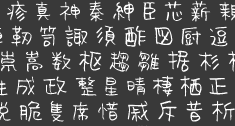 About 150 free original fonts by Masayuki Sato (from Futaba and/or Takasaki, Japan), over half of them pixel fonts. Maniackers designers started in 1995. For most fonts, he has a Latin alphabet (denoted by AL) and a katakana alphabet (denoted by KT). Some also have a hiragana version (denoted by HR). All fonts were made between 1998 and 2009.
 - By Masayuki Sato&Tsuyoshi Nagae: Merumo-AL, KT, PonyPony-AL, KT, HR, Topo-AL, TM Extended-AL / 2Type, MinnanoUta-AL, KT, HR, Seele-AL / 2Type, Robin-AL, Peco-AL, KT, Honey-AL, Blur-AL.
- By Masayuki Sato&Eri Nagae: Stitch-AL.
- By Masayuki Sato&T. Waka: Chihuahua-AL, KT, HR / 3Type.
- By Masayuki Sato&Mami Kobayashi: Alphabet Man, Detroit Type City-AL, Foood-AL, KT, Pokupoku-AL, KT, HR, Ball2-AL, Box2-AL, Button2-AL, Xtal-AL, KT, HR, Ikaho-AL, KT, MD Radiogram-KT, HR, Nepon-AL.
- By Mami Kobayashi: Ikaho-HR, TypeCantabile-KT, Kotodama-KT, Sandy-AL / 2Type, Yonimofushigina-AL, KT, Cloooud-AL, Yonimofushigina-HR, Timber-AL,KT, HR, Sunday-AL / 3Weight, Hyonnakotokara-AL, KT, HR.
- By Eiji Sunaga: Tanrei 2.0-KT.
- By Junya Yamada (Channel 67): Drip-KT, Bobo-AL.
- By Masayuki Sato&Junya Yamada: Maniac 2-AL, KT.
- By Atsushi Moda: Angle.
- By Shinji Naka: Typobokan katakana (at least, the graphics of this comic book style font were by Shinji Naka).
- By Masakazu Fukushima: Lucha-doll mask (a fantastic mask dingbat font).
- By Atsuko Onozato: Pazool.
- By Malte Haust of Bionic Systems: DorisOrange.
- By André Nossek: Collage Rmx-AL, Hard Rmx-AL.
-
- By Masayuki Sato&Hiroko Takiguchi: Holiday Bitmap14-AL, Holiday Ultra-AL, KT, HR, Holiday Bold-AL, KT, HR, Holiday-AL, KT, HR, Holiday-illust, Holiday Tategaki-KT, HR, Holiday-MDJP03 / 2Byte, Holiday-MDJP02, Ribbontic 2.0-AL.
- By Masayuki Sato and Masashi Kato: Pico (2009, rounded comic book style).
- By Masashi Kato&Mayucco: Yakitori-AL, KT, HR / 2Byte.
- By Masayuki Sato&Ryo Asoda: Wallpainting-AL, Cosmic-AL, Bellows-AL, KT.
- By Masayuki Sato&Kaori Inada: Sennin-AL.
- By Masayuki Sato&Shizuka Yamazaki: SwingingBird-AL, KT, HR.
- By Masayuki Sato&Junichi Omi: Omiyage-AL, KT, HR.
- By Masayuki Sato&Rollingcradle: Poranger-AL, Lucha doll-mask.
- By Masayuki Sato&Omnikono: Gt informat-AL, KT.
- By Masayuki Sato: Donki-KT (2010), Cherry-Cherry KT (2010), 239 Schablone-AL (2010), RBIO-AL (2010), FSB08 Klang-AL (2010), 224 MKSD-AL (2010), 223 MKSD-AL (2010), 235MKSD (2009, thin octagonal), Nepon-KT, Nepon-HR, Monday-AL / 3Type, Childish-AL, KT, HR, Volt-AL, KT, HR, Gavadon Ultra-KT, Building 2-AL, KT, Gachapon 2-KT, CinemaMa-AL, KT, HR, Skinny-AL, Magatama-AL, Astro 3.0-AL, KT, 160MKSD-AL, KT, TypoBokan-KT (3DCG), Lunch-KT, HR, Partner-AL / 3Type, Pico Super Ultra Bold-AL, 096MKSD-Synapse-AL, Millennium 5lines-AL, Tekuteku Round-AL, Warp-AL, Cherry Cherry-KT, Donki-KT, 078MKSD Medium Con-AL, Poco-AL, Temporary Extra-AL, 071MKSD Medium-AL, KT, 071MKSD Bold-AL, KT, Paco-AL, Collage-AL, Zerozero Nine-AL, KT, HR, Finger Five-AL, Electronica Nine-AL, Drifter Five-AL, Ultra Seven-AL / 3Type, Thaitype Ten-Thai, AL, KT, Gogo Five 2.0-AL, System Seven-AL / 7Type, 201MKSD-AL / 4Type, Fluorescent-AL / 2Type, FSB07 Astra-AL, KT, HR / 4Type, Nihonbashi 2.0-AL, KT, 176MKSD-AL, Continue-AL, Spaghettini-AL / 3Type, Pinponpan2, 3, 4-HR / 3Type, Pico-AL / 2Type, Kokecco2-KT, Charakyoro-AL, Coppepan-AL, KT, HR, Sardinen-KT, HR, Hachipochi Eight-AL, KT, Janis Heavy-AL, Futaba-KT, April Fool-AL, KT, HR, Arawasu-KT, Airline-AL, KT, HR, Astro 2.0-KT, Snail-AL, KT, Akachan-AL, KT, HR (Flop Design), Dorisorange-AL, KT (T26), Parade20-AL, KT, UFOnt-51silhouette, Rabbit35-silhouette, Dog30-Silhouette, Coil-AL, KT / 3Type, Frankfurter Custum Black-AL, COLOR-AL, Fivemani-AL, KT, Astroro-AL, KT, Puco-AL, 184MKSD Omnibus-AL, Alfadental-AL, FSB08 Klang-AL, KT / 3Type, TDA140607-AL, Shotaro V3-AL, KT, Colopocle-AL, KT, Melt-AL / 3Type, Tekuteku-AL, Crayon-AL, Digits-AL, Performar-AL, Pinponpan-HR, Airplane 2.0-AL, KT, Button-AL, Ball-AL, Box-AL, OLD CUBE-AL, Elekitel-HR, Retroket-AL, MKS Dot-AL, RikuKaiKu-Illust, Angle-AL, FontRemix 02 (36-kanji dingbat font). Font Pavilion sells these fonts: Building, Gavadon (kata), Volt (romaji, kata), Colopocle (katakana, romaji), Shotaro (katakana, romaji). Typo Bokan, Sennin, Snail. At Digitalogue, he published the screen font series Zerozero in 2000.
- Between 2009 and 2011 he designed 232 MKSD Round.
Abstractfonts link. Fontspace link. Artistic rendering of a kanji character. Behance link. [Google]
[More] ⦿
|
Mark van Bronkhorst
[MvB Design]
|
 [MyFonts]
[More] ⦿
[MyFonts]
[More] ⦿
|
Martin Vogel
|
 Martin Vogel from Dortmund made a great TrueType symbol font, MarVoSym, complete with the Euro symbol, useful office symbols, astrological symbols, gender symbols, toilet door glyphs, and a peace dove. The early version of this great font was called Martin Vogel's Symbols. Freeware.
 The type 1 version was created by Thomas Henlich from TU Dresden. Alternate URL. Yet another URL. Dafont link. [Google]
[More] ⦿
|
Martina Theisen
|
 German designer of the display typeface Linotype Typentypo (2002, part of TakeType 4), Linotype Creatures (2002), Linotype Improfil Outline and Black (2002, profiles of funny typefaces), Linotype Smileface, Linotype Maenneken (2002), and Linotype Astrolo (2002, hand-drawn astrological symbols).
 FontShop link. Klingspor link. [Google]
[MyFonts]
[More] ⦿
|
Masayuki Sato
[Maniackers Design (or: MKS)]
|
[More] ⦿
|
Matrix Software
|
The Fonts.zip file at this Russian site contains the truetype font WinstarTTv2 (1998, Matrix Software), a sans serif font with some astrological symbols. [Google]
[More] ⦿
|
Matthew Skala
|
British Columbia and/or Winnipeg-based computer scientist who obtained his PhD from Waterloo. Currently, he is a Postdoctoral Fellow at the University of Manitoba, in the Computational Geometry Laboratory of the Department of Computer Science. He developed these fonts: - Two free OCR fonts in truetype and type 1 formats: ocra10 (2006), ocrb10 (2006). Matthew points out that these fonts were generated from an existing metafont bitmap via mftrace.
- In 2010, he adapted Anthony I.P. Owen's StarFont (for astrological symbols) and placed type 1 versions together with the originals on CTAN.
- The free symbol font Genjimon (2010) in metafont and truetype.
- Tsukarimashou (2011) is a free metafont for Latin and kana, with an accompanying Opentype. A kanji extension is planned. This probably is the first metafont for Japanese. Styles include Kaku, Maru, Anbiruteki, Tenshi no kami, Bokukko, Mincho.
[Google]
[More] ⦿
|
Medieval
|
Small archive of medieval/gothic fonts: Alchemist (Computer Safari, 1995), AromatCapsSSK, FrankensteinPSMT, KellyAnnGothic, OldEnglishTextMT, Parchment-Regular (PhotoLettering, 1993), Ruritania. [Google]
[More] ⦿
|
Mercè Sumarroca
[Mercè SV]
|
[More] ⦿
|
Mercè SV
[Mercè Sumarroca]
|
Catalan creator of the free textured caps typeface Diamonds Are Forever (2013) and the spotted typeface Happy Cow (2013). In 2014, she designed Safari Zebra, Bones Roses, and Snake (a textured typeface). Typefaces from 2016: Constellations Ostia, Welcome Home (house dingbats), Love Amy (hearts). [Google]
[More] ⦿
|
Metafont Quellen
[Jobst-Hartmut Lueddecke]
|
Jobst-Hartmut Lueddecke's page has metafont sources for Suetterlin (by B. Ludewig), old Irish Uncial (by Jo Jaquinta), Italic (Cancellaresca corsiva) of Ludovico degli Arrighi, called Vicentino (Italy, early 16. century) by Willibald Kraml, yfrak, yinit, ygoth, yswab and cmfrak, Fraktur fonts by Yannis Haralambous. Also, the rune fonts bard (Celtic Bard Runes by Jobst-Hartmut Lueddecke), futhark (by Micaela Pantke and Sigrid Juckel), srune (by Jobst-Hartmut Lueddecke), the fantasy fonts cirth (dwarven runes created by J.R.R.Tolkien, by Jo Jaquinta), engwar (by Michael Urban), goblin (by Alan M. Stanier), tengwar (elven runes created by J.R.R.Tolkien, by Michael Urban), Jörg Knappen's EC fonts, hksym (a dingbat font by Hartmut Kennhöfer and Jobst-Hartmut Lueddecke), moonphases (dingbats by Stanislav Brabec, and wasy (dingbats by Roland Waldi). [Google]
[More] ⦿
|
Mies Hora
[Ultimate Symbol Fonts]
|
 [More] ⦿
|
MvB Design
[Mark van Bronkhorst]
|
 MvB Design (later called MVB Fonts) is Mark van Bronkhorst's company in Albany, CA, est. 1991 in San Francisco. It was also known as Markanna Studios Inc. Its fonts were first distributed by FontHaus, then by MyFonts, and most recently by Type Network.
 In the list below, unless explicitly mentioned, Mark van Bronkhorst is the designer: GryphiusMVB (2003), MVB Solano Gothic (2007-2009, six Bank Gothic lookalikes done for the city of Albany, CA), MVB Celestia Antiqua One and Two (1993-1996, a rustic font family in the Caslon Antique genre; it contains zodiac signs), MVB Greymantle (1993, Kanna Aoki), MvB Magnesium (1992-2003, Adobe: a hefty, contrasted, all-caps sans serif with angled terminals that pays homage to American sign lettering), Magnolia MvB (1997), Airedale (1992), BovinePoster or MVB Bovine (1993), DickAndJane (1994), MildewRoman (1994), QuercusRegular (1993), PFAnimals (1993), PFCommerceCommunication (1992), PFFoodDrink (1992), PFHolidaysCelebrations (1992), PFHouseholdItems (1993), PFTransportTravel (1992), QuercusHard (1993), MVB Emmascript (1996, Kanna Aoki), MVB Café Mimi (1996-2003, Kanna Aoki), MVB Pedestria (2002, a sans family by Akemi Aoki), MVB Pedestria Pict (2002, dingbats by Akemi Aoki), MVB Verdigris (2003-2011, a garalde close to Sabon), MVB Fantabular and MVB Fantabular Sans (2002, Akemi Aoki, monospaced, typewriter-style), MVB Grenadine One and Two (2003, sans families by Akemi Aoki), MVB Peccadillo (2002, by Holly Goldsmith and Alan Greene), MVB BossaNova (Holly Goldsmith, 1997), BatmanForever1 (1994, Maseeh Rafani/Warner Bros and Mark van Bronkhorst), Breakdown (1996), HornyDave (1995, based on illustrations of Georgia Panagiotopoulos), HypnoclipsLogoFont (1997), Ovidius (1993), Subterfuge (1995), ZedGothicMvB (1996), HotsyTotsy, MVB Sirenne Six, MVB Sirenne Text, MVB Sirenne Display (2002, display serif family by by MvB and Alan Greene), Veriris Pro Text (2003-2011). MVB Sacre Bleu (2007) is an award-winning handwriting typeface about which Joshua Lurie-Terrell writes: Sacre Bleu is the most flexible and accessible informal script of 2007, and rivals some of the best typefaces in this vein from the past decade. He compares it with Christian Robertson's Dear Sarah, Dave Farey's Lettres Eclatees, Letterror's Salmiak and Nick Cooke's Olicana, another very successful face. In 2008, Mark set up Sweet Fonts, where he and Linnea Lundquist designed Sweet Upright Script (2008), and Mark published the quintuple line blackboard board family Sweet Titling No. 22 (2010), Sweet Square (2011---in the style of Bank Gothic), Sweet Sans Pro (2011, a sans family from Hairline, Sweet Gothic to Heavy. He says: The family is based on antique engraver's lettering templates called masterplates. Professional stationers use a pantograph to manually transfer letters from these masterplates to a piece of copper or steel that is then etched to serve as a plate or die. This demanding technique is rare today given that most engravers now use a photographic process to make plates, where just about any font will do. But the lettering styles engravers popularized during the first half of the twentieth century---especially the engraver's sans---are still quite familiar and appealing. It is in the style of Burin Sans and Sackers Gothic. And Embarcadero MVB (2010, a near-grotesque superfamily). In 2012, van Bronkhorst released MvB Mascot (a signage script). In 2013, MVB published the utilitarian sans family MVB Solitaire. For Whole Foods Market, he created the corporate typefaces Grace's Hand and Molly Text in 2014. In 2015, Mark van Bronkhorst set up TypoBrand LLC in Berkeley, CA. As part of TypoBrand, he published several typefaces that are modern digital reinterpretations of ATF typefaces. The collection is published by TypoBrand LLC under the names ATF Type or American Type Founders Collection. At ATF Type foundry, they co-designed, sometimes with others, classics such as ATF Alternate Gothic (2015), ATF Brush (2015), ATF Egyptian Antique (an expansion of Schraubstadter's Rockwell Antique by Mark van Bronkhorst, Igino Marini, and Ben Kiel), ATF Garamond (2015), ATF Headline Gothic (2015), ATF Livermore Script (by Mark van Bronkhorst, Igino Marini, and Ben Kiel), ATF Poster Gothic (2015), ATF Railroad Gothic (2016), and ATF Wedding Gothic (2015). In 2017, he designed the plastic template font family MVB Diazo. Type Network link. Linotype link. FontShop link. Alternate URL. Klingspor link. View Mark van Bronkhorst's typefaces. [Google]
[MyFonts]
[More] ⦿
|
MyFonts: Astrology
|
MyFonts pages on astrological symbol fonts and zodiac symbol fonts. [Google]
[More] ⦿
|
MyFonts: Zodiac typefaces
|
A selection of typefaces with the symbols of the zodiac: Zodiac (Bitstream), Chinese Zodiac Symbols (Deniart Systems), BMF Zodiac Pi (BuyMyFonts), Hand Of Sean Pro (Sean Johnson), Witchfinder (Die Typonauten), Wingdings (Ascender), MVB Celestia Antiqua (MVB), Aure Westra (Aure Font Design), Planchette (Aerotype), Urbox Nu (UrbanPixel), Chaos1996 (Dawnland), Haakke (Dawnland), Simeon AS (astype), Missale Lunea (astype), Celtic Astrologer Symbols (Deniart Systems), Astrosym (ParaType), Astro (Dingbatcave), Linotype Astrology Pi (Linotype), Taroca (Blue Vinyl Fonts), 1689 Almanach (GLC), Okay Marker (Okaycat), Andron 1 Alchemical (SIAS), PIXymbols Astrology (Page Studio Graphics), Ingy Ding MCD (Ingrimayne Type), Almanac (Monotype), Urbix Nu (UrbanPixel), SIAS Symbols (SIAS), Urbix (UrbanPixel), Archemy (Sonic Savior), P22 Koch Signs (P22), Astera (ParaType), Astrologer Symbols (Deniart Systems), RLG Astro (RightLeft Graphics), EF Optiscope Astro (Elsner+Flake), EF Bilbo (Elsner+Flake), Subasmet (Subtitude), Linotype Astrology Pi (Adobe), Urbox (UrbanPixel), PIXymbols Luna (Page Studio Graphics), PIXymbols Dingbats (Page Studio Graphics), Trop Magus (Kickingbird), ITC Holistics (ITC), Wingdings (Microsoft), MVB Celestia Antiqua (Adobe), Revista (Latinotype), Egyptian Hieroglyphics – Dendera (Deniart Systems), Scrolls A (Wiescher Design), EF Typosigns (Elsner+Flake), Cerulea (Cerulean Stimuli), SpEYErals (Dingbatcave), Tabac Sans (Suitcase Type Foundry), EF Typomix (Elsner+Flake), Pentathlon Pro (DBSV), Chaweng (profonts). [Google]
[More] ⦿
|
Mythical Ireland
|
Small Celtic font archive. [Google]
[More] ⦿
|
Natalia Vasilyeva
|
 Natalya Vasilyeva (from Barnaul, Siberia) is a type designer, book designer and calligrapher, also engaged in editing, publishing, photography and computer design. She published these typefaces, which, unless explicitly mentioned, are all done at Paratype:
 - Adonis (2002). A 4-style text typeface. She added a major update, Adonis New, in 2021.
- Adventure (2000). A calligraphic script.
- Aelita (2014). A transitional typeface family.
- Astrosym (2010, Paratype).
- Barnaul Grotesk (2007): a humanist sans in 8 styles.
- Barry Gothic (1996, TypeMarket), a Cyrillic extension of Adobe's Charlemagne (1989).
- Bella.
- Blick (2008, ParaType): a decorative sans.
- Calendula (2017, Paratype). A very humanistic sans typeface family.
- Cometa.
- Crassula (2018). An organic sans.
- Deca Sans (2010) and Deca Serif (2010). It was designed to be readable at small sizes, thanks to its low contrast. In 2017, she added Deca Serif New.
- Elina and Elina Decor (2011). A graceful, decorative and calligraphic set of typefaces.
- Emploi (2009: Emploi Travesti and Emploi Ingenue) is pure calligraphic pleasure.
- Express (2001): a Cyrillic version of a brush typeface by the same name designed for Ludwig&Mayer in 1957 by Walter Hoehnisch.
- Hortensia (2000). A calligraphic typeface.
- Illusion (2019). A calligraphic typeface.
- Iowan Old Style (2017, Paratype). This is the Cyrillic extension of John Downer's Iowan Old Style (1990, Bitstream).
- Journal and Journal Sans Old School (2019), which is a modernized digital version of the widely popular (geometric) Journal Sans, which became famous via its use in Science and Life magazine of the 1960s.
- Kudryashev.
- Liana (1998, TypeMarket): a flowing script based on Lainie of Soft Horizons.
- Lockon (2008, ParaType): a slightly curly hanprinted script.
- Margon (2012, Paratype). This was a major contribution---a serif font family with a temperate design, i.e., small serifs, moderate contrast, and tiny roundings on the corners. The Margon font family consists of 18 members divided into 4 groups of different proportions with indices 360, 380, 400, 430.
- Master Flo (2007): simulation of a broad-nibbed pen.
- Melody.
- Mirandolina (2008, ParaType): a freestyle serif typeface family in seven styles.
- Mister Earl.
- Motiv (2003, Paratype). A cursive calligraphic script for Latin and Cyrillic.
- Muffin (2017, Paratype). A five-style soft and rounded humanistic low-contrast sans serif based on broad nib writing.
- Nat Flight (2009, ParaType). A text family.
- Nat Grotesk (2007, Paratype). A geometric sans family.
- Nat Vignette (2000-2002): a great set of ornamental and border typefaces).
- NataliScript (2000). A calligraphic script.
- Orbi Sans (2011) and Orbi (2010).
- Pallada (2008, ParaType) has the same genetic roots as Mirandolina but comes in only 4 styles.
- Prospect (1997-2001).
- Sans Rounded (TypeMarket, 1998): an extension of VAG Rounded.
- Scientia (2016, Paratype): a neutral sans for scientific publications. In that same genre, she designed the 22-style text family Hyperon (2020, Paratype) for publications on mathematics and physics. Each font is loaded with about 1100 glyphs, including many symbols. All fonts cover Latin, Greek and Cyrillic.
- Selina (2007). A 9-style low-contrast modern type family.
- Vesna. Zapf Elliptical 711.
Klingspor link. MyFonts interview. View Natalia Vasilyeva's typefaces. Another listing of Natalia Vasilyeva's typefaces. [Google]
[MyFonts]
[More] ⦿
|
Nelda Louise Tanner
|
 American type designer in Chino Valley, AZ. She created RLG Astro (2010). Her company, RightLeft Graphics, has published books, charts, and manuals on astrology and numerology since it was founded in 1989. [Google]
[MyFonts]
[More] ⦿
American type designer in Chino Valley, AZ. She created RLG Astro (2010). Her company, RightLeft Graphics, has published books, charts, and manuals on astrology and numerology since it was founded in 1989. [Google]
[MyFonts]
[More] ⦿
|
Oliver Weiss
[Walden Font]
|
 [MyFonts]
[More] ⦿
[MyFonts]
[More] ⦿
|
Online College of Astrology
|
Astro: a 5 USD shareware font in TrueType, by Cosmorama. [Google]
[More] ⦿
|
Only The Originals
|
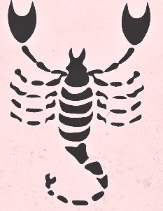 Istanbul, Turkey-based designer of these typefaces in 2016: La Alorta Script, Acarita Script, Qillimition, Saturday, Amsterdam (a great all caps dry brush typeface).
 Typefaces from 2015: LatiRil, Angela Hope, Wild Animal (brush font), Happy Hour, Deleted Font, The Cranberries (dry brush script), Jungle (fat dry brush), La Rose, Natural (dry brush), Moonlight (brush script), Wall (a mural brush or crayon script), Jessica, Tropical Juice, Julietta, Jesi Joe (this handcrafted typeface includes Aztec arrows and zodiac signs). Behance link. [Google]
[More] ⦿
|
P22 Type Foundry
[Richard Kegler]
|
 Richard Kegler's fun Buffalo-based foundry, which he founded in 1995 together with his wife, Carima El-Behairy. Currently, on staff, we find type designers James Grieshaber and Christina Torre. In 2004, it acquired Lanston Type. P22 has some great unusual, often artsy, fonts. In 2021, P22 jopined The Type Founders as a distribution outlet.
 The fonts are: Industrial Design (an industrial look font based on letters drawn by Joseph Sinel in the 1920s---this font is free!), LTC Jefferson Gothic Obliquie (2005, free), Sinel (free), P22Snowflakes (free in 2003 and P22 Snowflakes (retail) in 2020, finishedd by Richard Kegler and Terry Wüdenbachs), Acropolis Now (1995, a Greek simulation typeface done with Michael Want), P22 Albers (1995; based on alphabets of Josef Albers made between 1920 and 1933 in the Bauhaus mold), Arts and Crafts (based on lettering of Dard Hunter, early 1900s, as it appeared in Roycroft books), Ambient, Aries (2004, based on Goudy's Aries), Arts and Crafts ornaments, Atomica, Bagaglio (Flat, 3D; in the style of Il Futurismo), P22 Basel Roman (2020, Richard Kegler: an update of a 2015 typeface, P22 Basel, based on a garalde font used by Johannes Herbst (aka Ioannes Oporinus) in 1543 to publish Andreas Vesalius' On the Fabric of the Human Body (De humani corporis fabrica) in Basel), Bauhaus (Bauhaus fonts based on the lettering of Herbert Bayer), Bifur (2004, Richard Kegler, after the 1929 original by Cassandre), Blackout, P22 Brass Script Pro (2009, Richard Kegler; based on an incomplete script fond in a booklet from Dornemann&Co. of Magdeburg Germany, ca. 1910 entitled Messingschriften für Handvergoldung; for years, P22 and MyFonts claimed that Michael Clark co-designed this, but Michael does not want any credit, as he did only about 20 letters), Cage (based on handwriting and sketches of the American experimental composer John Cage), P22 Casual Script (2011, Richard Kegler, a digitization of letters by sign painter B. Boley, shown in Sign of the Times Magazine), Cezanne (Paul Cezanne's handwriting, and some imagery; made for the Philadelphia Museum of Art), Child's Play, Child's Play Animals, Child's Play Blocks, Constructivist (Soviet style lettering emulating the work of Rodchenko and Popova), Constructivist extras, Czech Modernist (based on the design work of Czech artist Vojtech Preissig in the 20s and 30s), Daddy-o (Daddy-o Beatsville was done in 1998 with Peter Reiling), Daddy-o junkie, Da Vinci, Destijl (1995, after the Dutch DeStijl movement, 1917-1931, with Piet Mondrian inspired dingbats; weights include Extras, P22 Monet Impressionist (1999), Regular and Tall), Dinosaur, Eaglefeather, Escher (based on the lettering and artwork of M.C. Escher), P22 FLW Exhibition, P22 FLW Terracotta, Folk Art (based on the work of German settlers in Pennsylvania), Il futurismo (after Italian Futurism, 1908-1943), Woodtype (two Tuscan fonts and two dingbats, 2004), P22 Woodcut (1996, Richard Kegler: based on the lettering carved out in wood by German expressionists such as Heckel and Kirchner), Garamouche (2004, +P22 Garamouche Ornaments; all co-designed with James Grieshaber), GD&T, Hieroglyphic, P22 Infestia (1995), Insectile, Kane, Kells (1996, a totally Celtic family, based on the Book of Kells, 9th century; the P22 Kells Round was designed with David Setlik), Koch Signs (astrological, Christian, medieval and runic iconography from Rudolf Koch's The Book of Signs), P22 Koch Nueland (2000), Larkin (2005, Richard Kegler, 1900-style semi-blackletter), London Underground (Edward Johnston's 1916 typeface, produced in an exclusive arrangement with the London Transport Museum; digitized by Kegler in 1997, and extended to 21 styles in 2007 by Paul D. Hunt as P22 Underground Pro, which includes Cyrillic and Greek and hairline weights), Pan-Am, Parrish, Platten (Richard Kegler; revised in 2008 by Colin Kahn as P22 Platten Neu; based on lettering found in German fountain pen practice books from the 1920s), P22 Preissig (and P22 Preissig Calligraphic, 2019), Prehistoric Pals, Petroglyphs, Rodin / Michelangelo, Stanyan Eros (2003, Richard Kegler), Stanyan Autumn (2004, based on a casual hand lettering text created by Anthony Goldschmidt for the deluxe 1969 edition of the book "...and autumn came" by Rod McKuen; typeface by Richard Kegler), Vienna, Vienna Round, Vincent (based on the work of Vincent Van Gogh), Way out West. Now also Art Nouveau Bistro, Art Nouveau Cafe and the beautiful ornamental font Art Nouveau Extras (all three by Christina Torre, 2001), the handwriting family Hopper (Edward, Josephine, Sketches, based on the handwriting styles of quintessential American artist Edward Hopper and his wife, Josephine Nivison Hopper, and was produced in conjunction with the Whitney Museum of American Art), Basala (by Hajime Kawakami), Cusp (by James Grieshaber), P22 Dearest (calligraphic, by Christina Torre and Miranda Roth), Dwiggins (by Richard Kegler), Dyrynk Roman and Italic (2004, Richard Kegler, after work by Czech book artist Karel Dyrynk), Gothic Gothic (by James Grieshaber), La Danse (by Gábor Kóthay;), Mucha (by Christina Torre), Preissig Lino (by Richard Kegler), P22Typewriter (2001, Richard Kegler, a distressed typewriter font), the William Morris set (Morris Troy, Morris Golden, Morris Ornaments, based up the type used by William Morris in his Kelmscott Press; 2002), Art Deco Extras (2002, Richard Kegler, James Grieshaber and Carima El Behairy), Art Deco Display, the Benjamin Franklin revival font Franklin's Caslon (2006), Dada (2006) and the Art Nouveau font Salon (bu Christina Torre). In 2006, Kegler added Declaration, a font set consisting of a script (after the 1776 declaration of independence), a blackletter, and 56 signatures. Many of the fonts were designed or co-designed by Richard Kegler. International House of Fonts subpage. Lanston subpage (offerings as of 2005: Bodoni Bold, Deepdene, Flash, Fleurons Granjon, Fleurons Garamont, Garamont, Goudy Thirty, Jacobean Initials, Pabst, Spire). Bio and photo. In-house fonts made in 2008 include Circled Caps, the Yule family (Regular, Klein Regular, Light Flurries, Heavy, Klein heavy, Heavy Snow, Inline; all have Neuland influences). Kegler / P22 created a 25-set P22 Civilité family in 2009 based on a 1908 publication from Enshedé, the 1978 English translation by Harry Carter, and a 1926 specimen also from Enshedé. P22 Declaration (Script, Signatures, Blackletter, 2009) is based on the lettering used in the 1776 Declaration of Independence. At ATypI 2004 in Prague, Richard spoke about Vojtech Preissig. Speaker at ATypI 2010 in Dublin, where he presented Making Faces: Metal Type in the 21st Century about which he writes: This film has the dual aim of documenting the almost-lost skill of creating metal fonts and of capturing the personality and work process of the late Canadian graphic artist Jim Rimmer (1931-2010). P22 type foundry commissioned Mr. Rimmer to create a new type design (Stern) that became the first-ever simultaneous release of a digital font and hand-set metal font in 2008. At ATypI 2011 in Reykjavik, he showed Making Faces. Typefaces from 2014: LTC Archive Ornaments (Richard Kegler and Miranda Roth). Typefaces from 2020: Showcard Script (by Terry Wüdenbachs, based on an original of Beaufont at the Hamilton Wood Type Museum, custom designed by the Morgan Sign Machine Company of Chicago). Typefaces from 2021: P22 Glaser Houdini (a layerable family, after Glaser's Houdini from 1964), P22 Glaser Babyteeth. Kegler writes: In 2019, P22 Type Foundry met with Milton Glaser (1929-2020) to initiate the official digital series of typefaces designed by Glaser in the 1960s and 70s. P22 Glaser Babyteeth is the first family released in the series. Milton Glaser's inspiration for his Babyteeth typeface came from a hand painted advertisement for a tailor he saw in Mexico City. He was inspired by that E drawn as only someone unfimilar with the alphabet could have concieved. So he set about inventing a completelly ledgible alphabet consistant with this model. P22 Glaser Babyteeth was based on original drawings and phototype proofs from the Milton Glaser Studios archives. Over the years there have been many typefaces that borrowed heavily from the Glaser designs, but these are the only official Babyteeth fonts approved by Milton Glaser Studio and the Estate of Milton Glaser. The solid and open versions are designed to overlap for two-color font effects and can even be mixed and matched for multi layer chromatic treatments. In 2021, he published the 3d art deco shadow font P22 Glaser Kitchen which is based on Big Kitchen (1976). MyFonts interview. View Richard Kegler's typefaces. View the IHOF / P22 typeface library. [Google]
[MyFonts]
[More] ⦿
|
Page Studio Graphics (or: Pixymbols)
[Roger Vershen]
|
 Page Studio Graphics is Roger Vershen's Oro Valley, AZ-based company specializing in symbols and symbol fonts, founded by him in 1986. Roger Vershen died in Tucson, AZ, in 2003.
 The fonts (grouped under the name PIXymbols) include ADA symbols v.2.0, Africa, Alphabox, Alphacircle, Ameslan (ASL), Antorff (blackletter), Antorff Fractions, Apothecary, Arrows, Astrology, Backstitch, Boxkey, BoxNLines, Braille grade 2, Casual, Chalk Casual, PIXymbols Chess, Command Key, Courex (typewriter family), Crossword, PIXymbols Deco Glass (2001), Digit&Clocks (+LED symbols), Dingbats&Online, DOSScreen, Fabric Care, FARmarks (Federal Aviation Regulations lettering), Flagman (semaphore), Fractions, Gridmaker, Highway Gothic (U.S. Department of Transportation's Standard Alphabets for Highway Signs), PIXymbols Highway Gothic 2002, Highway Signs (U.S. Department of Transportation), Hospital&Safety, LCD, Linea (2002, prismatic), Luna, Malkoff (calligraphic font), Marina, Meeting, Mejicana (2001, a Mexican party font), Menufonts, Morse, Musica (instruments), Newsdots, Orchestra, Passkey, Patchwork, PCx, Phone, PIXymbolsMusica, Prescott (2001, Western), Penman (2001, connected script), PrimerD (letters with lines), Recycle, Roadsigns, Shadowkey, Signet (family), Signet Shadow, Squared, Strings, Stylekey, Tolerances&Datum, Travel&Hotel, TV List, Unikey, US Map, Vershen (2001), Xcharting, Xstitch. They also sell EPS files of all Arms of Swiss cantons, and many nice initial caps. Look also for Faux Hebrew (simulated Hebrew), as part of the Faux package that also includes Faux Sanskrit, Faux Runic, Faux Hebrew, Faux Japanese, Faux Arabic, Faux Chinese and Faux Chinese Sans. Alternate URL. Previews at MyFonts. Klingspor link. View the Page Studio Graphics typeface library. [Google]
[MyFonts]
[More] ⦿
|
Pallavi Pardikar
|
Mumbai-based designer of a set of zodiac signs in 2016. [Google]
[More] ⦿
|
Patrick Adamove
[Charter Design]
|
[More] ⦿
|
PAW Software
[Walter Fürhauser]
|
Walter Fürhauser designed Astrological in 1996 for PAW Software. [Google]
[More] ⦿
|
Pencil Twist
[Janja Baznik]
|
 Talented illustrator and occasional type designer based in Kostanjevica na Krki, Slovenia. Her illustrations include zodiac sets and collections of animals. Her typefaces:
 - Logogriph (2021). A 44-style all caps family that has some stencil styles, various bilined forms, a papercliop style, and other fonts useful for logos.
- Manca (2019). A display sans.
- Nektarina (2020). A casual display sans.
- Nonfiction (2019). An old typewriter font.
[Google]
[More] ⦿
|
Penny Thornton's Astrolutely.Com
|
Download Astro (Kenneth Hirst, Cosmorama, 1993) or StarFont Sans (Anthony I.P. Owen, Denmark, 1993). [Google]
[More] ⦿
|
Peter Jonsson
[TTD Fonts (Typical Type Design Fonts)]
|
[More] ⦿
|
Peter Rempel
[PR Fonts]
|
[MyFonts]
[More] ⦿
|
Peter Schmitt
[AstroSym]
|
[More] ⦿
|
Peter von Zezschwitz
[Zetafonts (Tangram Studio)]
|
[More] ⦿
|
PR Fonts
[Peter Rempel]
|
 Peter Rempel (b. 1958) is a Winnipeg-based calligrapher. Nice graphic about classical roman types. He designed some exquisite shareware fonts: PR Uncial Creepy (2010), PR Agamemnon Bold (2008), PR-Uncial (2003), PR-UncialAltCapsExtended, PR-UncialAlternateCapitals (1998), Demo-ofGabrielCondensed, Demo-ofGabrielRegular, Demo-version:Gabrielextended, PR-CelticNarrow (1998), Magickal Signs, PR Runes (2000), PR Rune Stones (2000), Pi Rho Runestones (1998), PR Astrological (1998), PR Compass Rose (2007), PR Viking (2007; +Alternates) and Pirho Herakles (1998, an Etruscan-style or Greek simulation font). In preparation: PR Alchemyst, PR Snaggly, PR Monk's Holiday.
 He writes about himself: educated in music composition and visual design. In his family home, there were many wall plaques with German Bible verses, rendered in a variety of gothic and fraktur lettering styles. In the 1980s he discovered the art of calligraphy, first through the speedball lettering textbook, and later by joining the calligraphers Guild of Manitoba. He has studied a variety of lettering styles, but his strongest interest is in the letter styles of the Middle Ages, starting with the German Fraktur styles he knew from childhood, and extending back, into uncials, runic shapes, and the Classical Roman Letter. The Chancery cursive, or Italic hand, which to many people is synonymous with calligraphy, never held much interest for him. He released his first shareware fonts in 1996. In 2010, he went partially commercial. His first pay font is PR Pointers (2010, an arrows font). In 2011, he designed the commercial typefaces PR Mapping and PR Stars. In 2012, he published PR Arco (arcs for framing curved lines of text, in a style common on Victorian posters and almanac covers) and PR Hydra (a Greek simulation font). Typefaces from 2013 include PR Snowflakes 01, PR Bramble Wood 1 and 2, PR Valendoodle 01 (Valentine's Day ornaments), PR Swirlies (in series numbered 01 through 13), PR Swirlies Frames, PR HallowDoodles (Halloween dingbats), PR Nouveau Ornaments (art nouveau), PR Viking (a rune simulation face), PR Foxtail 01, PR Foxtail 02, PR Scrolls 03, 04 and 05 (2014), PR Sprucewood (2014), PR Swells One (2014), PR Xmas Doodles (2014), PR Hearts Take Wing 01, PR Mysticon 01 (star dingbats), PR Pointers 01 (arrows), PR Valknut (Norse god symbolism), PR Scrolls, PR Uncial (1998), PR Dim Sum (brush face), PR Columban (a Celtic uncial, named after Irish monk Columbanus), PR Columbian. Typefaces from 2014: PR Cauldron (a scary Celtic style font), Vanaheim (a flared display typeface influenced by Nordic runes). Typefaces from 2015: PR Hallow Doodles 03, PR Ex Cathedra (Trajan capitals). MyFonts link. MyFonts foundry link. Klingspor link. Fontsy link. Dafont link. Castles&Crypts link. [Google]
[MyFonts]
[More] ⦿
|
Psychonomicon Library
|
Archive with fonts for Hebrew, Greek, alchemy, Persian, Sanskrit, Coptic and runes. [Google]
[More] ⦿
|
Rainer Dörntge
|
Designer of the magic dingbat font "Magic", in metafont format. [Google]
[More] ⦿
|
Ralf D. Renz
|
DSA (Das schwarze Auge) fonts by Ralf D. Renz: Nanduria, Zhayad, and Alchimistische-Symbole and Astrologische-Symbole. Alternate URL. See also here and here. [Google]
[More] ⦿
|
Ralph C. Coxhead
[Varityper: 1946 Catalog]
|
[More] ⦿
|
Rav Janicki
|
 Szczecin, Poland-based designer of the minimalist cosmic display typeface Iota Persei (2015). [Google]
[More] ⦿
Szczecin, Poland-based designer of the minimalist cosmic display typeface Iota Persei (2015). [Google]
[More] ⦿
|
Richard Kegler
[P22 Type Foundry]
|
 [MyFonts]
[More] ⦿
[MyFonts]
[More] ⦿
|
RMacca's Domain
|
The fonts.zip file has about 15 truetype fonts, including MagicMedieval (Dave Howell, 1996) and MagicSymbols (Wizards of the Coast, Inc, 1994). [Google]
[More] ⦿
|
Robby Woodard
[WoodardWorks Type Design (was: Robby Woodard Design and Illustration)]
|
 [MyFonts]
[More] ⦿
[MyFonts]
[More] ⦿
|
Robyn Clancy
|
Creator of a free astrology font called AstroDotBasic (2013). [Google]
[More] ⦿
|
Rodrigo Gonzalez
[Southype]
|
[More] ⦿
|
Roger Hartley
[Silver Graphics]
|
[More] ⦿
|
Roger Vershen
[Page Studio Graphics (or: Pixymbols)]
|
 [MyFonts]
[More] ⦿
[MyFonts]
[More] ⦿
|
Roland Waldi
[Waldis Symbol fonts (wasy)]
|
[More] ⦿
|
Rumburaks Softwarestuebchen
|
Hub (Rumburaks Softwarestuebchen) is the German designer who created the genealogical and astrological symbol font Stepsym1 (1999). [Google]
[More] ⦿
|
Rundschreiben Download
[Jens Pielawa]
|
The PielawaSymbols dingbat (2000) font by Jens Pielawa is freeware. It has 256 useful glyphs, including a full astrological symbol set. He says that it is a compilation of various other fonts. [Google]
[More] ⦿
|
Samuel John Ross
[Cumberland Fontworks]
|
 [More] ⦿
|
Schueler
|
Original rune fonts by "Schueler", and some other ones: AlphGeniiFzpg100 (runes by Fuzzypeg), Alphabet-of-the-Magi, Angelic-Regular (Digital Type Foundry, 1992), AntoniousNormalThin (Greek), AntoniousOLOverLineThin, Astro (astrological symbols, Laser Printing Solutions&Cosmorama Enterprises, 1991-1992), DEEnoch (1997), Daggers (Digital Type Foundry, 1992), Enochian-Regular (Digital Type Foundry, 1991), Gary (astrological symbols), KoineMedium (Greek), Malachim (by Fuzzypeg), Schuelers-Enochian, Shalom (1993, Hebrew), ThebGL (Greekish runes by Richard Mitchell, the Underground Grammarian, 1994), Theban. [Google]
[More] ⦿
|
Science Fonts
|
Aubrey Blumsohn's archive with Marvosym Font (Martin Vogel), Alchemist Font (Jay Pierstorff, Computer Safari, 1995), Healthcare Font, Medical Font, Hazard Font. [Google]
[More] ⦿
|
Serge Agronsky
|
Designer at Graphic bureau Az-Zet of the zodiac sign font LifeSigns (1995), the Cyrillic/Latin fonts AZGaramondExtraBoldC (1990-1995), ParagonNordC (1990-1995), and ELIZAZPS (1993). [Google]
[More] ⦿
|
Seymour Caprice
[Kickingbird]
|
[MyFonts]
[More] ⦿
|
Shriya Bhattacharya
|
During her studies in New Delhi, Shriya Bhattacharya designed the arrowed Tuscan typeface Pisces Zodiac (2016). [Google]
[More] ⦿
|
SIAS (or: Signographical Institute Andreas Stötzner)
[Andreas Stötzner]
|
 Andreas Stötzner (b. 1965, Leipzig) is a type designer who lives in Pegau, Saxony. Graduate from the Hochschule für Grafik und Buchkunst Leipzig and the Royal College of Art in London (1994). Since then, free-lance. Started making typefaces in 1997. He edits the sign and symbol magazine Signa. He spoke at Typo Berlin 2004 and at ATypI 2005 in Helsinki where his talk was entitled On the edges of the alphabet. Coauthor with Tilo Richter of Signographie : Entwurf einer Lehre des graphischen Zeichens. He set up SIAS in 2006-2007 and started selling fonts through MyFonts.
 He created Andron Scriptor (2004, free), with original ideas for Greek and Cyrillic alphabets. The Andron project intends to extend this Venetian text typeface in many directions: right now, it covers Latin, Greek, Coptic, Gothic, runes, Cyrillic, Etruscan and Irish scripts, musical symbols, astronomical and meteorological symbols, and many dingbats. The Andron MC Corpus series (2012) contains Uncial, Mediaeval and Capital styles. He also created Andron 1 Monetary (2014), Andron 1 Alchemical and Andron 2 ABC (2014, for children's literature). On or before 2006, he created a few typefaces for Elsner & Flake. These include EF Beautilities, EF Ornamental Rules, EF Squares, EF Topographicals, EF Typoflorals, EF Typographicals, EF Typomix, EF Typosigns, EF Typospecs, EF Typostuff. Fonts from 2007-2010: Gramma (2007, three dingbats with basic geometric forms), Andron Corpus Publix (2007, dingbats including one called Transport), SIAS Freefont (2007, more dingbats), SIAS Lineaturen (2007, geometric dingbats) SIAS Symbols (2009), Andron Freefont (2009, text font), Andron 1 Latin Corpus (2009), Andron 1 Greek Corpus (2009), Andron Kyrillisch (2009, consisting of Andron 1 CYR, Andron 2 CYR and Andron 2 SRB where SRB stands for Serbian), Andron 2 English Corpus (2010, blackletter-inspired alphabet), Andron 2 Deutsch Corpus (2010), Andron Ornamente (2012), Reinstaedt (2009, blackletter family), Crisis (2009, economic sans). Lapidaria (2010) is an elegant art deco sans family that includes an uncial style and covers Greek. Hibernica (2010) is a Celtic variant of Lapidaria. Symbojet Bold (2010) is a combination of a Latin and Greek sans typeface with 400 pictograms. Rosenbaum (2012) is a festive blackletter face, obtained by mixing in didone elements. In 2013, he published Arthur Cabinet, a six-style inline art deco caps collection of typefaces, with accompanying Arthur Ornaments and Arthur Sans. Meanwhile, Andron Mega grew to 14,700 unicode glyphs in 2013. Typefaces from 2014: Behrens Ornaments (art nouveau ornaments based on Behrens Schuck by Peter Behrens, 1914), Fehlian (an open capitals typeface family with Plain, Gravur and Precious styles), Happy Maggie (a hand-drawn script based on Maggie's sketches when she was 13 years old), Abendschroth (for lullabies, girl's literature, murder poems, short stories and Christmas gift books), Abendschroth Scriptive, Albyona English No. 1 (as Andreas writes, suitable for children's books, fantasy literature, crime novels, natural food packaging and poison labeling, for infancy memories, vanitas kitsch items, dungeon museum bar menu cards, introductions to herbalism and witchcraft manuals), Lindau (a Venetian Jensonian typeface with considerable flaring in the ascenders), Grund (based on the 1924 art deco signage in Leipzig's Untergrundmesshalle Markt whose architect was Otto Droge), Leipziger Ornamente (based on variopus buildings in Gohlis, Leipzig, dating from the 1920s-1950s), Kaukasia Albanisch (ancient writing system of the Caucasus region, allegedly created by Mesrop Mashtots who also invented the Armenian alphabet in 405). Commissioned fonts include Runes (commission by Ludwig Maximilian University Munich), Lapidaria Menotec, Old Albanian, Dania (a special notation for Danish dialectology. Font extension of Latin Modern Italic (Open source), commissioned by the Arnamagnanean Institute, Copenhagen Universit). Typefaces from 2015: Andron 2 EIR Corpus (uncial, Gaeli), Artemis Sans (Greek version of Arthur Sans), Ardagh (a Gaelic / Irish version of Arthur Sans). Don Sans (a sturdy sans). Typefaces from 2016: Popelka (an uncial fairy tale font modeled after the opening sequence of the 1973 movie Drei Haselnüsse für Aschenbrödel). MyFonts. Behance link. Abstract Fonts link. Klingspor link. Showcase of Andreas Stötzner's typefaces at MyFonts. View the SIAS typeface library. [Google]
[MyFonts]
[More] ⦿
|
Silver Graphics
[Roger Hartley]
|
Company run by Roger Hartley, Pennington Gap, VA. The link went dead--its parent is The Design Center / DT&G. Some of the fonts are shown here: the Western fonts Hoedown and Laredo, the blackletter fonts Showcard, Water Lily, the caps font Penelope, the medieval script font Hemingway, the athletic lettering font Yorktown, and display typefaces Wellington (round hand calligraphy), Rumrunner, Rathskeller, Norseman, Almanac, Apothecary, Applegate, Archer, Archer Shadow, Carrie Lane, Dutch Master, Emporia, Flavius, Gigabyte and Hapsburg. All these are on their 60 USD CD called "The Great American Font Works", which has (had!) 132 nice decorative display fonts in all. In the old days, the font Jaclyn could be downloaded for free. The list of fonts, all made in the period 1992-1995: AceReporter-Bold, AceReporter-BoldItalic, AceReporter-Italic, AceReporter-Normal, Alchemy-Black, Alchemy-Bold, Alchemy-Light, Alchemy-Normal, Almanac, Antigone, Apothecary, Applegate, Archer, ArcherShadow, Aztek, Bandit, BaroniPoster, Bastion-Bold, Bastion-BoldItalic, Bastion-Italic, Bastion-Normal, Bebop, BerniesJukeJoint, BrightSky, CarrieLane, Chiaroscuro, Compute, Delphi, Derby, Duffy, DuffyInline, Durham, DutchMaster, Emporia, Entendre, Enterprise, EuroBold, Fairlane, Fatso, Figment, Flavius-Wide, Flynn, FlynnHollow, FriarTuck, Galaxy, Gigabyte, Gorky, GravureText, GuildSans-Bold, GuildSans-BoldItalic, GuildSans-Italic, GuildSans-Normal, Hapsburg, Hemingway, Hoedown, IBeam-Extruded, Inagodda, Ivanna-Mediaeval-Bold, Ivanna-Mediaeval-BoldItalic, Ivanna-Mediaeval-Italic, Ivanna-Mediaeval, Jaclyn, Jalopy, Jamaica, Jitterbug-Bold, Jitterbug-BoldItalic, Jitterbug-Italic, Jitterbug-Normal, Jitterbug, JitterbugB, JitterbugBO, JitterbugO, Kapanti, Kashmir, Kasparov, KeyWest, Keyclick, Krypton3, LED, Laredo, Layla, MardiGras, Marilyn, Matinee (their name for Busorama), Metro, Monica, NewWorldText, Norseman, Obsidian, Parade, Peacenik, Penelope, Phoebe, Pompeii, PompeiiB, PompeiiBold, Projectile, Publisher, Quasar, Radical, Rathskellar, Rathskeller, Recycler, RibaldEncounter-Bold, RibaldEncounter-Normal, Roundup, Rumrunner, Sailing-Freehand, Sanford, Satchmo, Scratch, Secret, Serenade, ShowBiz, Showcard, Sigmond, SilverDollar, SkinnyDip, Sophocles (Greekish stone-cut writing), Sport, StCroix, Sunshine-Bold, Sunshine, SunshineB, Superbowl, Taiwan, ThisEndUp, Toons, Tophat, TophatEngraved, TraciJo, TwinTubes, Twizzler, VanRose, WaterLily, Wellington, Westchester, Westside, Yorktown. [Google]
[More] ⦿
|
Southype
[Rodrigo Gonzalez]
|
Chilean designer of the Easter dingbat fonts Easter Eggs ST (2014) and UnTaRot ST (2014). Other free typefaces from 2014 include Shapes St, Stupenda ST, Grafeno (connect-the-dots), Puente Estrecho (hairline), Tipo Capital, Cuadrada (dot matrix style), Apurado Royitto (arched typeface), Brillante, Novation Box, Rudasteria, Presidiario (horizontally striped typeface), Puente Nuevo, Rockmia ST (a glaz krak face), Boceto ST (outlined typeface), Puente Bueno ST, Open 24 Display ST (LED font), Iniciales ST, Floreada ST, Concadenado ST, Phantom ST, Santiago Sans ST, Es La Dura WN ST, Ledsitex ST, Imnova ST, Cinema ST, Cathedral ST, And Run ST (textured caps typeface), Older ST (textured face), Asrelurio ST, Hearts ST, Other Display ST (LED font), Salpicado ST, Adornada ST, Extragna Rara ST, Fichas ST, LED Simple ST (dot matrix font), Dominos ST, News Papers, Our Display ST (LED emulation), Lineal Simples ST, Cuadradex Simple ST (hexagonal face), Edournida ST (a textured typeface), Tripleled ST (dot matrix), Bicolors ST, Absolutamente Rou ST, Flowers ST, Leders (dot matrix), Old Computer ST, Rounded Display ST, Lediz (dot matrix face), Alien Faces ST, Westranga (textured), Rostros y Emociones (smilies), Filligrees and Ornaments ST, Demionatibu and Cube Face ST. Typefaces from 2015: Shapes ST (kaleidoscopic ornaments), Questra Extra ST. Typefaces from 2016: Viexa Barbuda, Justo St, Mala Vida St, Hypnossia St (textured), Boulding Work St (textured), Hand Faces St, Astronomic Signs St, Alien Bats St, Snowflakes St, The Misty South, Discotheque St (trilined), Qualentaro Wallmapu St (textured), New Russia 2108 St (Cyrillic emulation typeface), Comics of South, Puntiyisca (textured), Calendulia (textured), The LED Display dot matrix style), My Older Life St, Xmasbats St, Merry Xmas St (alphadings), The Guns Smoke St, Cubox 3D St, Mr Techly St, Coming Soon St (movie font), Old Burlesque St, The Neckbreaker St, Big Daddy St, Chinese Wok Food St (oriental simulation type), Extra Gro St (3d, outlined), Halloween Scare St, Humongous of Eternity St, La Que Cuelga St, Litle Simple St, Metalo Of South St, Mostera St, My Valentine Now St, Panda Power St, Pumpkin Halloween St (pumpkin alphadings), Shadded of South, Sheriff of South St, The Flaggy St, Big Daddy St, Digital Play Hollow St, Digital Play Italic St (LED font), Digital Play St (LED font), Happy Balloon St (alphadings), Humongous of Eternity St, Notarized Openly Script Oblique, Notarized Openly Script St (comic book style), Panda Power St, Sheriff of South St, Antique Quest St, Blockys St (3d blocks), Comely St, Data Cards St, Don Moise St, Jackdaws Love St, Maxter Board St (dot matrix), Moderna Disco St, Pointed Laid St (dot matrix), Recoleta Sans St, SS Barracuda St (a great grungy style), Score Board St (dot matrix), Second Flowers St, The Drunked Man St, The Flowers St, The Inbox St, The Outbox St, Thempo New St, And Love st, Another Faces St, DhonJako St, DoubLe CoLor St, EasterFont St, Granite Rock St, Monster oF South Hollow St, Monster oF South St Italic, Monster oF South St, Satanyc Demoniac St, Tenebrous St, The South Flag St, UltraLED St, Halloween Party St, The Display St (LED font), Good Idea St (alphadings), Mi Nuevo Display St (dot matric), Otra Mas Stf, Fantasmytas St (alphadings), Urban Tribal STF, Foontastica St, Del Recuerdo St, Cuadritos St, I Love St (Valentine's Day alphadings), Eskimporce VSF (textured). Typefaces from 2017: The Quick Frog St, Shadded South St (shadow font), Consequad St, Warmerous St, The Bad Times St, The Jack Brown St (multilined), Alphin Merytous St, News Board St, Eat at Joe's St (marquee font), Any Meritous St, The Quick South St, Kasquiwane St, Jux Kadabra St, Flowered, It's Scary Now, Cooler South, Icons South, Glass & Bottles (dingbats), Squarex (octagonal). Typefaces from 2018: Scarythin St, New Led Display St, My Display St (LED font), Petroleum St (grunge), Blade Gunner 2049 St. Typefaces from 2019: Zodiac. [Google]
[More] ⦿
|
Stefan Krömer
|
Cofounder (b. 1975, Bueckeburg) and type designer at Typonauten, a Bremen-based commercial font foundry started in 1998. Creator of SingapurFlash, SingapurHeavy, SingapurHeavyColor, SingapurLight, SingapurLightExpert, SingapurWords in 2003, a collection of dingbats and fun tattoo scripts that evoke Asia. Codesigner in 2005 with Ingo Krepinsky of Toon Town (2005, a comic book face). Creator of the grotesk family Sheffield (2003) and of the Cyrillic simulation font Dimitri (2001). In 2006, he added the Witchfinder family (2006), which has handwritten scripts, and fonts for alchemy, astrology, icons, demons, and necronomicons. In 2007, he co-designed the brush font series BMovie Retro with Ingo Krepinsky and Florian Schick. Creator (with Gunnar Link and Ingo Krepinsky) of Royal Oak Decor (Victorian ornaments), Royal Oak Sans (2009, Edwardian headline sans) and Royal Oak Serif (Western headline face). Klingspor link. [Google]
[MyFonts]
[More] ⦿
|
Stephan Baitz
|
German designer of the freeware font Alphabet of the Magi, Alphabet of Daggers, and of Masonic-Rosicrucean (1997). [Google]
[More] ⦿
|
Steve Harrison
[Geckodude (or: Sleepy Gecko)]
|
 [More] ⦿
|
Steve White
[GNU Freefont (or: Free UCS Outline Fonts)]
|
[More] ⦿
|
Stichting Malatië Adventures
[Alex Révész]
|
Three original truetype fonts for magical effects and encrypting text: Priesterrunen and Malatië Magisch Maanschrift (1997) are made by Alex Révész. Drakenrunen (Nanduria) is by Ralph Renz. Can't find the fonts any more. [Google]
[More] ⦿
|
Studio 2G
|
Shino made several Japanese kanji handwriting fonts, including Moon-font-PRO, Moonfont, S2G-love, S2Gmemo, Sea-font-pro, Sea-font, moon-font-PRO, moon-font, nagurigaki-P, nagurigaki, seafont, uni-font-PRO, uni-font. The uni-font series is quite remarkable as it covers most of the Unicode spectrum (besides Japanese, also Cyrillic, Greek, many dingbats, astrological symbols, chess symbols, the works). Alternate URL. Alternate URL. [Google]
[More] ⦿
|
Su Lucas
[Su Lucas Fonts]
|
[More] ⦿
|
Su Lucas Fonts
[Su Lucas]
|
 Su Lucas is a South African designer who joined Apostrophic Labs [dead link] in March 2001. She published the barbed wire typeface Barbarello there in 2001.
 Her oeuvre includes SL Christmas Silhouettes (2000), JunariClaws (2002, with Bella Morte), JunariClawsItalic, SLBookArts (2003, book dingbats), SLDividers (2003, used to be called filets), SLForknFont (2000), SLSignLanguage (2001), SLSquareOrnaments (2003), SLZodiacIcons (2002), Boere Tudor (2002, a medieval font), SL Wash, SL Star of David, SL Squiggles, SL Zodiac Stencils, SL Woodcut Faeries, SL Kid's Alphabet, SL Safety, SL Mythological Silhouettes, Back to the Futurex, and Rock Art in South Africa dingbats (2000). About that last dingbat font, she writes: ...This font was made from photographs and drawings of the rock art in South Africa....The Bushmen (San) were the most prolific painters....A lot of the male figures are shown with a semi-erection, as can be seen in q, e, r, and p. This is a physical trait peculiar to the San, called "penis rectus". This characteristic helped with cooling and heat dissipation in the very hot summers experienced in South Africa. A recurrent image is that of one or more crossbars across the penis. The meaning of this is unclear, but it is theorised that the foreskin was adorned with ornaments like pieces of bone and feathers. Fontspace link. Dafont link. [Google]
[More] ⦿
|
Sue Lang
|
Sue Lang ("Zillah", "Moon in Aquarius") died on December 28, 2008. Under the alias Zillah, she made many free fonts at her now defunct Moon in Aquarius site, mostly made between 2001 and 2003: Zahstro Two, Zahstrology (handwriting; with astrological symbols), Zill O Wisp, Zill-O-Zynth, Zill Spills, ZillahModern (+Thin, Outline, Narrow, Expanded), Zillah Zoodles, Zillaroonies (runes and polyhedra), Zillgothex, Zilluncial. Her dingbat fonts were based on drawings by Last Horse (2003): Z-Most Critter, Z-Most Critter 2, Z-Most Devil, Z-Most Diva, Z-Most Eye 1, Z-Most Eye 2, Z-Most Foot, Z-Most Kachina 1, Z-Most Kachina 2, Z-Most Kachina 3, Z-Most Trickster, Z-Most Zimple. Postscriptum: I found a Sue Lang at the Zillah Library in Zillah, WA. Could that have been her? Can anyone help? Fontspace link. [Google]
[More] ⦿
|
Sun-Ext
|
Sun-ExtA and Sun-ExtB are two full free Unicode fonts, covering everything under the sun. Inside, we find information that these fonts were made by Beijing ZhongYi Electronics Co. [Google]
[More] ⦿
|
Symbole der Hermetik
|
Astrological fonts: Alchemy, Hermetic, Agathodaimon. [Google]
[More] ⦿
|
Tarallo Design
[Donald Tarallo]
|
 Donald Tarallo obtained a BA in Studio Arts and Graphic Design from Clark University, and an MFA in Graphic Design from Rhode Island School of Design (RISD). He also studied with André Gürtler and Wolfgang Weingart in the Weiterbildungsklasse at the Basel School of Design in Switzerland. Since 1998, Don has maintained a freelance practice working on projects in identity, publication, and web design. He has taught at Clark University, Guangzhou Academy of Fine Art, Rhode Island School of Design, Samsung Art and Design Institute, Siena Art Institute, and Bridgewater State University. Don currently teaches at Fitchburg State University in Fitchburg, MA.
 In 2017, he published the geometric sans serif typeface Binario. Donald writes: The design was inspired by elements of Italian Art Deco, early 1900s advertising, and shop signage. Binario pays homage to early modernism's optimism, modularity, and efficiency. Binario was followed in 2019 by Binario Soft. He also designed the geometric solid dingbat font FormPattern (+FormPattern Color, 2018; by Donald and Alex Tarallo) and the dingbat fonts Poeta and Poeta Color in 2017. In 2018, he designed the 8-weight sans family Scanno. In 2019, he released the zodiac sign font Starsigns, the art deco typeface Varese and FormPattern Color Three (2019: a typeface for creating borders and frames; with Alex Tarallo). In 2020, he released FormPattern Color Six (done with Alex Tarallo) and the plump bubblegum art deco typeface Varese Soft. Typefaces from 2021: East (a condensed sans in six weights; includes a variable font). [Google]
[MyFonts]
[More] ⦿
|
Terry Wei Kiat
|
Kuala Lumpur, Malaysia-based designer of the connect-the-dots typeface Stardust (2017). [Google]
[More] ⦿
|
The Dingbatcave (was: Ann-S-Thesia)
[Ann Stretton]
|
 The Dingbatcave offers many dingbat fonts by Ann Stretton from Racine, WI. Ann Crawlers (crawlers!) is free. Borders, spiders, ringbats, ornaments, annaments. The spirals (5 fonts) are absolutely wonderful! Fonts include EyeEyeMate, Characters, Wreck Tangles, WebBats, BrideofWebbats, Victorian Frames, VictorianTriplets, Scrollbars, Decobands, GuestStars, Shaped Spheres, Satellite, Frets, RolyPoly (great circles), Wreck Tile, Ornaborder, Butterfly Scrolls, Annuals MorningGlories, Pansies, Petunias, Poppies and Zinnias, Wingnuts, Kaleidoblocks, Gothblocks Tetrascopes, Spinafores, Pinaforms, Patchquirks and Interlochs, Mandalarama Florascopes, Cross Scrolls, Triangles, HexaGlyphs, DecoGlyphs. Seconds One and Two were free at some point. Stan Starbuck's Stan Nipple family of ornamental circles is great (Pallas, Plato's Laws, Timaeus). Nearly all fonts are commercial now. Alternate URL to Ann-S-Thesia.
 At the now defunct OmegaFrog site she published some fonts that may have disappeared or improved, so I will list them for the historical record only: Annaments, Basketweave, Borders, DecoFrieze, DecoGlyphs, DingBatik, Florascopes, Frieze, GothicFrieze, HexaGlyphs, Kaleidoblocks, Ringbats, Roundabouts, Scrolls, Speyerals (one of the greatest spiral fonts on earth!), Spinwheels, Spirals, Woodblocks. A quote from that site: Her art is abstract, geometric, embellished, decadent and fun. She's the webmistress behind The S.S.Studio, also known as Ann-S-Thesia's Gallery of Digital Delights. At Garagefonts, check Baroquoco (borders). Finally, several fonts can be bought at MyFonts, such as the great gender symbol and astrological font family Ann's Astro. One also finds Speyerals, Dividers, EyeEye Mate (eyes), Decorative Bands, GothBlocks, WreckTile, Deco Glyphs, Spirals, Ann's Valentines, Satellite, Victorian Franmes, Shaded Spheres, Butterfly Scrolls, Guest Stars (scanbats), Bijous, Quadtiles, Stellars, Florascopes, FriezeFrame, Scrolls, Savvy Navvy, Characters, Modules, Annaments, Gingerbread Borders, Victorian triplets, Borders, OctOs, Cross Scrolls, Crop Circuits, Scrollbars, Web Bats, Framemaker, WreckTangle, TimePieces, NatureSwirls, Primotifs, Breakfast at TifAnnie's, Annuals, Bride of WebBats, Whirligigs, Basketweave, Dingbatik, Wingnuts, Frets, Ornaborder. Gone are Anns Butterfly, Breakfast Muffins, Stan Bugs, and Wingnut5. Dafont link. FontShop link. Klingspor link. [Google]
[MyFonts]
[More] ⦿
|
The Sundial Primer
|
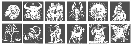 Zodiac font archive: Almanac MT (1995, Monotype), GE Zodiac (1998, Graphx Edge), Widget (1999, Jason Davies), Zodiac98 (1998, Listemageren). [Google]
[More] ⦿
Zodiac font archive: Almanac MT (1995, Monotype), GE Zodiac (1998, Graphx Edge), Widget (1999, Jason Davies), Zodiac98 (1998, Listemageren). [Google]
[More] ⦿
|
Tipografia Esoterica
|
From Magic Soft in Barcelona: six dingbat fonts, Zodiaco, Astrologia, Runas (3), and I-Ching. [Google]
[More] ⦿
|
Todd Jordan Greywolf Peacock
[Jordan Greywolf]
|
[More] ⦿
|
Tom Hidell
|
Canadian designer of Illuminati Masonic Cipher (2015: based on the Bavarian Illuminati Masonic Cipher from the Secret State Archives Prussian Cultural Center in Berlin and transcribed in The Secret School of Wisdom.) and Illuminati Dirigens Berlin (2015, an astrological symbol font: based on the 1776 Bavarian Illuminati Dirigens or Scottish Knight cipher found in the Secret State Archives Prussian Cultural Center in Berlin.). Aka Illuminati Rex. Dafont link. [Google]
[More] ⦿
|
Tomas Erlich
|
This Czech blog has an icon font archive: Atmandings, Bagarozz, Cartographer, DISTYolksEmoticons, DotCom, Emoticons, Entypo, Evilz, Heydings-Icons, IconBitOne, Kfon, MexicanOrnaments, ModernPictograms, NaiveOrnamentsFree, NoticeStd, Nymphette, Paskowy, SLZodiacIcons, SirucaPictograms, SoftOrnaments, SymbolSigns-Basisset, WCRhesusABta, WebSymbols-Regular, Webmasters, Zodiac01. [Google]
[More] ⦿
|
Tomas Kindahl
|
 Aka Rursus, this Swedish viking calls himself a nerd and a cyber vagabond---exactly my kind of guy! Designer of the slab typewriter font for Latin and Cyrillic called Rursus Compact Mono (2007-2010), an Open Font Library font that covers everything under the sun: Basic Latin, Latin-1 Supplement, Latin Extended-A, Latin Extended-B, IPA Extensions, Spacing Modifier Letters, Combining Diacritical Marks, Greek and Coptic, Cyrillic, Cyrillic Supplement, Armenian, Arabic, Runic, Phonetic Extensions, Phonetic Extensions Supplement, Latin Extended Additional, Greek Extended, General Punctuation, Superscripts and Subscripts, Currency Symbols, Number Forms, Arrows, Mathematical Operators, Miscellaneous Technical, Optical Character Recognition, Enclosed Alphanumerics, Geometric Shapes, Miscellaneous Symbols, Miscellaneous Mathematical Symbols-A, Latin Extended-C, Lycian, Carian, Old Italic, Gothic, Phoenician. [Google]
[More] ⦿
Aka Rursus, this Swedish viking calls himself a nerd and a cyber vagabond---exactly my kind of guy! Designer of the slab typewriter font for Latin and Cyrillic called Rursus Compact Mono (2007-2010), an Open Font Library font that covers everything under the sun: Basic Latin, Latin-1 Supplement, Latin Extended-A, Latin Extended-B, IPA Extensions, Spacing Modifier Letters, Combining Diacritical Marks, Greek and Coptic, Cyrillic, Cyrillic Supplement, Armenian, Arabic, Runic, Phonetic Extensions, Phonetic Extensions Supplement, Latin Extended Additional, Greek Extended, General Punctuation, Superscripts and Subscripts, Currency Symbols, Number Forms, Arrows, Mathematical Operators, Miscellaneous Technical, Optical Character Recognition, Enclosed Alphanumerics, Geometric Shapes, Miscellaneous Symbols, Miscellaneous Mathematical Symbols-A, Latin Extended-C, Lycian, Carian, Old Italic, Gothic, Phoenician. [Google]
[More] ⦿
|
TTD Fonts (Typical Type Design Fonts)
[Peter Jonsson]
|
TTD Fonts is a Swedish font foundry of Peter Jonsson and Michael Gisselberg. Started in 1989, it has over 300 commercial symbol fonts ad ornamental fonts. The list: Aboriginal Symbols, Aboriginal Symbols Two, Abstract Butterflies, Abstract Cars, Abstract Chiks, Abstract Insect Two, Abstract Magpies, Abstract Raptors, Abstract RT, Abstract Trees, Abstract Trees Two, Adinkra Amulets Four, Adinkra Amulets One, Adinkra Amulets Three, Adinkra Amulets Two, Adinkra Symbols Four, Adinkra Symbols One, Adinkra Symbols Three, Adinkra Symbols Two, Aeroplanes, Ageless Symbols, American Rock Art, Ancient Symbols, Ancient Symbols Two, Anglo-Saxon Runes, Animal Skull Art, Animal Skulls, Animal T-shirts, Animals, Animals Reverse, Antique Escutcheons, Antique Mirrors, Apples and Pears, Aquarium Fish, Aquatic Heaven, Arboreal One, Arboreal Two, Arrows, Ballerina, Ballerina Framed, Ballet, Ballet Art, Ballet Framed, Baseline Bullets, Basically Stars, Bats Galore, Batty Stars, Bike ART, Bird Paradise, Bird T-shirts, Birds, Birds of Prey, Birdy, Black n White, Body One, Body Three, Body Two, Body Art, Body Vision, Bodyesque, Bonsai Trees, Borders, Borders Fat, Boxed Bullets, Brass Instruments, Bug World, Bugs, Bullet Images, Bullet Perfect, Bullets, Bullets Two, Bullets Three, Butterflies, Butterflies Inside, Butterfly Dreams, Button Maker One, Button Maker Two, Car Park, Chairs, Chapter Head Vikings One, Chapter Head Vikings Two, Chapter Head Vikings Three, Chapter Head Vikings Four, Chickadee, Chili Peppers, Chinese Amulets, Chinese Lucky Charms, Chinese Symbols, Christian Crosses, Churinga Stones, Circular Symbols, Classic Car Signs, Common Animals, Common Bullets, Common Signs, Crests, Cross Hair, Crosses Framed, Cultural T-shirts, Daggers, Dance Art, Dinosauria, Dolphins, Dolphins Two, Dolphin Art, Don't Bug Me, Dream Cars, Eagle Flight, Elder Futhark, Electric Guitars, Elephant Walk, Encircled Animals, Encircled Birds, Encircled Butterflies, Encircled Suns, Enclosed Stars, Eternal Circles, Eternal Circles Two, Eternal Circles Three, Eternal Circles Four, Evening Star, Exotic Fruit, Falconidae, Famous Actresses, Famous Faces One, Famous, Fantasy Skulls, Fantasy Skulls Dark, Fantasy Swords, Fast Cars, Feather Art, Feathers, Feathers Three, Feathers Two, Feather Art Three, Flintlock Pistols, Floor Lamps, Flowery, Flutterflies, Fluttering Wings, Frog Art, Frogs, Frogs Two, Fruit Collection, Fruit Two, Furniture One, Furniture Two, Futhark Amulets, Garden, Garden Tools, Glassware Light, Glassware Medium, Good Morning, Grasses, Grass Decor, Gunslinger, Hallristningar, Harriers, Hawks and Buzzards, Hieroglyphs, Highlighted Animals, Horse Plaques, Horse Play, Horse Signs, Horses, Human Symbols, Human Symbols Two, Hummingbirds, Insect Markers, Insect T-shirts, Insectia, Insect Header One, Insect Header Two, Iron Horse, John Dalton Elements, Katana Tsubas, Kinda Fishy, Kites, Lamps, Le Ballet, Lepidoptera, Liqour Glasses, Little Fishes, Lizards, Magical Symbols One, Magical Symbols Two, Magpies, Mandatory Signs, Martial Arts, Martial Arts Framed, Martial Arts Weapons, MC Aprilia, MC BMW, MC Ducati, MC Harley D, MC Honda, MC Indian, MC Kawasaki, MC Suzuki, MC Yamaha, MC Art, MC Header One, MC Header Two, MC Old Sign, MC Windrider, Medieval Weapons, Metal Plates, Mix Bats, Mix Max, Modern Dance, Modern Dance Framed, Modern Mirrors, Morningstar, Movie Swords, Music One, Native American Petroglyphs, Native American Symbols, Normal Futhark, Normal Runes, Ornamental Fantasy Skulls, Ornamental Horses, Pacific Reef, Parrot World, Parrots, Penguins, Penguin Art, Penguins Framed, Pica, Pictograph Symbols, Pictograph Symbols Two, Pinup Girls, Plants, Plate Circles, Power Tools, Prima Ballerina, Prima Ballerina Framed, Rec Signs RA Series, Rec Signs RG Series, Rec Signs RL Series, Rec Signs RM Series, Rec Signs RS Series, Rec Signs RW Series, Recycle, Recycle Two, Religio, Religioso, Religious Symbols, Road Warning Signs, Roosters, Rooster Signs, Rooster Vanes, Royal Buttons, Royal Buttons Two, Royal Signs, Rune Stones Dark, Running Horse, Safety Warning Signs, Scissors, Scooters, Seabirds, Short Twig Futhark, Short Twig Runes, Simple Cartouche, Skull Sculptures, Snow, Soaring High, Solar System, Solaris, Sports, Square Symbols, St Symbol Signs, St Symbol Signs Two, Star Inside, Star Simplicity, Star Symbols, Steering Wheels, Sun Birds, Sun Flower, Sun Symbols, Sunset, Sunset Birds, Super Cars, Swedish Rock Carvings, Tasseography, Tattoo, Terns, Textile Care Symbols, Theban, Titty Dee, Tools, Toys, Traffic Signs, Transportation, Tree Leaf, Tree Silhouettes, Trees, Triangular Symbols, Triple Bugs, Tropical Fish, Twisted, Unicorn Art, Unicorn Signs, Unicorns, War Axes, Warning Signs, Vases&Urns, Washing Symbols (Celcius), Washing Symbols (Fahrenheit), Vegetables, Vehicle Country Codes: English Speaking Countries, Vehicle Country Codes: Europe, Vehicle Country Codes: European Union (+ candidate countries), Vehicle Country Codes: The Americas, Vehicle US States Codes, Wheel Trims Two, White Butterflies, White Dolphin, White Leaf, Viking Stones, Viking Symbols, Wild Animals, Wild West, Wild West Framed, Wine, Wine Decanters, Vintage Car Signs One, Vintage Cars, Vultures, Yin Yang Ornamental, Yoga One. [Google]
[More] ⦿
|
TungFont
|
 This was a dingbat font outfit around 2000. Its web site disappeared but some fonts can still be had at Dafont and Fontspace. Its fonts: Tungfontanimal2, Tungfontanimal3, Tungfontanimal4, Tungfontalpha001, Tungfontalpha002, Tungfontalpha003, TungFontArtFont, Tungfontartpart1, Tungfontartpart2, Tungfontartpart3, Tungfontastrology1, Tungfontastrology3, Tungfontastrology4, Tungfontastrology5, Tungfontastrology6, Tungfontastrology7, Tungfontbuilding1, Tungfontbuilding2, Tungfontbuilding, Tungfontcat, Tungfontcomputer1, Tungfontcomputer2, TungFontDance-Dance, Tungfontdog, Tungfontfish, TungFontFruit-Regular, Tungfonthead, Tungfontlogo, TungFontMusician-Regular, TungFontMusic-Regular, TungFontNature (2001), TungFontOutline, tungfontpeople1-Regular, tungfontpeople2-Regular, tungfontpeople3-Regular, tungfontpeople4-Regular, tungfontpeople5-Regular, Tungfontpeople6, TungFontQuiver, Tungfontshell, Tungfontsignature (2001: contains Zodiac symbols and weather dingbats), TungFontTin, tungfontzodiac1-Regular, tungfontzodiac2-Regular, tungfontzodiac3-Regular, tungfontzodiac4-Regular, tungfontzodiac5-Regular, tungfontzodiac6-Regular. Free (!!!) signature font service. [Google]
[More] ⦿
This was a dingbat font outfit around 2000. Its web site disappeared but some fonts can still be had at Dafont and Fontspace. Its fonts: Tungfontanimal2, Tungfontanimal3, Tungfontanimal4, Tungfontalpha001, Tungfontalpha002, Tungfontalpha003, TungFontArtFont, Tungfontartpart1, Tungfontartpart2, Tungfontartpart3, Tungfontastrology1, Tungfontastrology3, Tungfontastrology4, Tungfontastrology5, Tungfontastrology6, Tungfontastrology7, Tungfontbuilding1, Tungfontbuilding2, Tungfontbuilding, Tungfontcat, Tungfontcomputer1, Tungfontcomputer2, TungFontDance-Dance, Tungfontdog, Tungfontfish, TungFontFruit-Regular, Tungfonthead, Tungfontlogo, TungFontMusician-Regular, TungFontMusic-Regular, TungFontNature (2001), TungFontOutline, tungfontpeople1-Regular, tungfontpeople2-Regular, tungfontpeople3-Regular, tungfontpeople4-Regular, tungfontpeople5-Regular, Tungfontpeople6, TungFontQuiver, Tungfontshell, Tungfontsignature (2001: contains Zodiac symbols and weather dingbats), TungFontTin, tungfontzodiac1-Regular, tungfontzodiac2-Regular, tungfontzodiac3-Regular, tungfontzodiac4-Regular, tungfontzodiac5-Regular, tungfontzodiac6-Regular. Free (!!!) signature font service. [Google]
[More] ⦿
|
Type Market
[Alexey Kustov]
|
 Type Market is a Russian type foundry. Alexey Kustov made most fonts at Type Market (Moscow) between 1993-1995. Many of these are cyrillizations of Western typefaces: Aksent (futuristic, based on a design by Yevgeny Dobrovinsky), Bebit (similar to Baby Teeth by Milton Glaser, Photo Lettering), Countdown [based on a 1965 original by Colin Brignall], Cricket, Crystal, Europe, Everest, Gals, Gill Sans (1993), Glasten, Helios, Luxor [1993; based on Colin Brignall's Aachen, 1967], Micra, Micogramma (1952, Aldo Novarese and A. Butti, digitized in 1993), Miniature, Mistral, New Zelek [1993, inspired by the typeface of G. Klikushin, 1987, which in turn was based on the typeface of Bronislav Zelek of Mecanorma], Oliver, Peignot (A.M. Cassandre, 1937, done in 1993), Penta, Plain [after an art deco typeface by A. Grachev], Rodeo (F. Pierpont, 1934, cyrillicized in 1993), Start [1993, like Aldo Novarese's Stop from 1971], Stencil Bold Cyrillic (1993, based on Milton Glaser's Stencil Bold (1973)), Techno28 [1993, a MICR font based on Letraset's Data 70 by R. Newman, 1970], Trafaret [1993, a stencil font based on Tom Hultgren's Traffic, Letraset, 1973], Traktir [1993, based on Elsner&Flake's Old Town], Viola [1996, based on Adobe's Willow]. These are Cyrillic fonts that are typically extensions of well-known Roman fonts. Other designers at Type Market include A. Shevtsov, Anton Bisiajew, Oxana Doubovic, A. Babaljan, S. Shanovich, D. Gulinoff, Viktoria Grigorenko, Anna Terentieva. Fonts not by Kustov: Anastasia Script, Arthur, Dikovina, Dikovina Bildchen, Fita Church, Fita Poluustav, Fita Vjaz, Funny, HeinrichScript, Industry, Jatran, Keyboard, Magic, Morris, Office Type Sans, Oliver New, OpiumNew, OrnamentTM, OrnamentTM2, Palladium, Regata, Roger Script, Romul, Secretary, Sonet Serif, Unicum Condensed, Zodiac1, Zodiac2.
 Klingspor link. [Google]
[More] ⦿
|
Typeimage
[Jochen Hasinger]
|
Jochen Hasinger (b. 1964, München) lives in Frankfurt am Main, Germany. From 1992 until 1994, he studied typography with Wolfgang Weingart and André Guertler at the Schule für Gestaltung in Basel, and studied in Stuttgart before that, rom 1985-1988. He became art director at various ad agencies in Frankfurt and Hamburg. He founded Typeimage in 2003. Klingspor link. Typefaces designed by Jochen Hasinger: - Covent BT (2003, a display sans family, Bitstream). Covent Nano (2006, a narrow version of Covent).
- TIPS (2004, Linotype). This family consists of six logo and image fonts: BComTIPS, ThisWayTIPS, TravelTIPS, ActiveTIPS, AstroTIPS, CountTIPS. Linotype page where TIPS is discussed: Tips (which stands for Type-Image-Piktogramm-Schrift in German, or type-image-pictogram-font in English) contains six different fonts of pictograms and stylized icons. Tips Active is a font filled with characters reminiscent of Otl Aicher's sports pictograms from the 1972 Olympic Games. Tips Astro contains astrological signs. Tips Bcom depicts icons for use in business communication or web page design. Tips Count is a font featuring numbers inside of various circles. Tips This Way and Tips Travel are both collections of pictograms for use in navigation and other signage systems.
- Sabin (2006).
- Architextura (2001).
- Botta (1989, modern).
- DryGin (1979, headline face).
[Google]
[MyFonts]
[More] ⦿
|
Ultimate Symbol Fonts
[Mies Hora]
|
 Dingbat font foundry, whose designer(s) include Mies Hora. This useful collection of fonts was made before 2004, and finalized before 2006: USF Arrows-One, USF Arrows-Two, USF Arrows-Three, USF Arrows-Four, USF Auto National ID Plates, USF Arrows Pointers, USF Astronomy, USF Banners, USF Bells Bows, USF Birds-One, USF Birds-Two, USF Banners Bells Bows, USF Birds, USF Circular Designs, USF Circular, USF Dingbats-One, USF Dingbats-Two, USF Dingbats-Three, USF Dingbats-Four, USF Dingbats-Five, USF Dingbats-Six, USF Dingbats, USF Fish, USF Flourishes Accents-One, USF Flourishes Accents-Two, USF Flourishes Accents-Three, USF Flourishes Accents, USF Highway International-One, USF Highway International-Two, USF Highway USA-One, USF Highway USA-Two, USF Highway USA-Three, USF Highway USA-Four, USF Highway International, USF Highway USA, USF Insects, USF Leaves, USF Moons, USF Nature, USF Pointers-One, USF Plantlife, USF Pinwheels, USF Plantlife, USF Radials, USF Recreational SEGD-One, USF Recreational SEGD-Two, USF Recreational SEGD, USF Sealife, USF Spiral Rotors, USF Shapes-One, USF Shapes-Two, USF Shapes-Three, USF Shapes-Four, USF Shapes-Five, USF Snowflakes, USF Stars-One, USF Stars-Two, USF Suns-One, USF Suns-Two, USF Symbol Signs DOT-One, USF Symbol Signs DOT-Two, USF Symbol Signs DOT-Three, USF Sealife, USF Shapes, USF Stars, USF Suns, USF Suns Moons, USF Symbol Signs DOT, USF Typographic Devices-One, USF Typographic Devices-Two, USF Typographic Devices-Three, USF Typographic Devices, USF Zodiac. Monotype link. [Google]
[More] ⦿
Dingbat font foundry, whose designer(s) include Mies Hora. This useful collection of fonts was made before 2004, and finalized before 2006: USF Arrows-One, USF Arrows-Two, USF Arrows-Three, USF Arrows-Four, USF Auto National ID Plates, USF Arrows Pointers, USF Astronomy, USF Banners, USF Bells Bows, USF Birds-One, USF Birds-Two, USF Banners Bells Bows, USF Birds, USF Circular Designs, USF Circular, USF Dingbats-One, USF Dingbats-Two, USF Dingbats-Three, USF Dingbats-Four, USF Dingbats-Five, USF Dingbats-Six, USF Dingbats, USF Fish, USF Flourishes Accents-One, USF Flourishes Accents-Two, USF Flourishes Accents-Three, USF Flourishes Accents, USF Highway International-One, USF Highway International-Two, USF Highway USA-One, USF Highway USA-Two, USF Highway USA-Three, USF Highway USA-Four, USF Highway International, USF Highway USA, USF Insects, USF Leaves, USF Moons, USF Nature, USF Pointers-One, USF Plantlife, USF Pinwheels, USF Plantlife, USF Radials, USF Recreational SEGD-One, USF Recreational SEGD-Two, USF Recreational SEGD, USF Sealife, USF Spiral Rotors, USF Shapes-One, USF Shapes-Two, USF Shapes-Three, USF Shapes-Four, USF Shapes-Five, USF Snowflakes, USF Stars-One, USF Stars-Two, USF Suns-One, USF Suns-Two, USF Symbol Signs DOT-One, USF Symbol Signs DOT-Two, USF Symbol Signs DOT-Three, USF Sealife, USF Shapes, USF Stars, USF Suns, USF Suns Moons, USF Symbol Signs DOT, USF Typographic Devices-One, USF Typographic Devices-Two, USF Typographic Devices-Three, USF Typographic Devices, USF Zodiac. Monotype link. [Google]
[More] ⦿
|
Varityper: 1946 Catalog
[Ralph C. Coxhead]
|
 The Vari-Typer manual of 1946 was published by Ralph C. Coxhead Corporation, New York City. It contains a number of font specimen for the Varityper machine, predominantly typewriter-style typefaces and type for astrology, chemistry, mathematics and other specialized subjects. A small sample is reproduced here. The original PDF file was created at the University of Wisconsin. [Google]
[More] ⦿
The Vari-Typer manual of 1946 was published by Ralph C. Coxhead Corporation, New York City. It contains a number of font specimen for the Varityper machine, predominantly typewriter-style typefaces and type for astrology, chemistry, mathematics and other specialized subjects. A small sample is reproduced here. The original PDF file was created at the University of Wisconsin. [Google]
[More] ⦿
|
Vasya Kobelev
|
Petrozavodsk, Russia-based designer of several refined sets of zodiac signs. [Google]
[More] ⦿
|
Veronika Kapralova
|
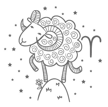 Czech designer in Prague who operates as Whynot. In 2015, she created the handcrafted typeface Bebekvi. In 2014, Nika created a splendid set of zodiac symbols in EPS format, and a colorful zoo alphabet for children. Creative Market link. [Google]
[More] ⦿
Czech designer in Prague who operates as Whynot. In 2015, she created the handcrafted typeface Bebekvi. In 2014, Nika created a splendid set of zodiac symbols in EPS format, and a colorful zoo alphabet for children. Creative Market link. [Google]
[More] ⦿
|
Vladimir Nikolic
|
 Belgrade, Serbia-based designer (b. 1981) of these typefaces:
 - The dingbat fonts Canavarlar (2020: funny men), Haircut (2020: women's hairdos), Ornament Borders (2020), Gourdy (2020: birds), Lizards (2020), Mantra (2020), All Star (2020), Speel (2020), Soavely (horses) (2020), Forma (2020), Hell Beasts (2020), Mistresses (2020), Paraiso (2020), Crow (2020), Traverser (2020: crosses), Cats (2020), Dogs (2020), Negative-Heads (2020), Otu (2020), Wakazi (2020), Risk (2020), Wurm (2020), Beard Man (2020), Hoder (2020), Damen (2018), Damen 2 (2020), Foliga (2020), Solo Drinker (2020), Congress (2020), Farmacy (2020), Elections (2020), Emergency (2020), VN Arrows (2020), Hexagonos (2020), Automobiles (2020), Cars (2020), Emoji Boom (2020), Bestia (2020), Aliens (2020), Insect (2020), Bytost (2020), Monstero (2020), Aveto (2020), Dancing Cat (2020), Atradimas (2020), Womanhood (2020), Figur (2020: an alien insect font), Halfwits (2020), Silly Donkey (2020), Crazy Monkey (2020), Round Masks (2020), The Quick Dog (2020), Flying Birds (2020), Maskid (2020), Monstra (2020), Bull Skulls (2020), War Items (2020), Public Transport (2020), Loomad (2020), Mokhabiso (2020: African patterns), Record (2020), Mulher (2020), Heroez (2020), Bulls (2020), Madarak (2020: birds), Bold People (2020), Munari (2019: a collection of drawings based on Bruno Munari's book "Artista e designer" from 1966), Screws (2019), White Mouse (2019), Schepselen (2019), Glatze (2019), Crosses (2019), Chefs (2019), Diamond Blocks (2019), Hexagons (2019), Maumbo (2019), Circles (2019), Enfeite (2019), Pigs (2019), Mythos (2019), Kreaturen (2019), Baby Alien (2019), Body Moving (2019), Various Boys (2019), Lines and Objects (2019), Mouvman (2019), Watch (2019), Credit Card (2019), Cycles (2019), Devil Emoji (2019), Fare (2019), Mund (2019), Labbra (2019), Circular Ornaments (2019), Cranium (2019), Ugok (2019), Ansigter (2019), Tsim (2019), Schmetterlinge (2019), Jungfrau Maria (2019: religious icons), Knights Helmets (2019), Kinderskizzen (2019), Wolves (2019), Various Cats (2019), Owls (2019), Spiral Object 3D (2019), Zodiac Signs (2019), Cyborg (2019), Duck (2019), Cat 3D (2019), Object 3D (2019), Circle and Line (2019), Various Girls (2019), Dulcet (2019), Erotic Symbols (2019), Frauen (2019), Pierre the Vampire (2019), Robotter (2019), Middle Finger (2019), Claudio The Cat (2019), Medusa (2019), Veggie (2019), Pablo (2019), Fishes (2019), Dream of Picasso (2019), Stam (2019), Animality (2019), Ink Drops (2019), Faces (2019), Bayan (2019), Froggy (2019), Senhoras (2019), Diamondo (2019), Skallen (2019: skulls), Swimmers (2019), Churches (2019), Easter Icons (2019), Lippen (2019), Gullar (2019), Bankwesen (2019), Creatures with Horns (2019), Vehicles (2019), Various Hands (2019), 3D Animals (2019), Abantu (2019), Herr (2019), Menge (2019), Funny Aliens (2019), Mustachos (2019), Kids Drawings (2019), Tierfarm (2019), Troep (2018), Women Heads (2018), Cats and Dogs (2018), Wanita (2018), Eyez (2018), Animales (2018), Peoples (2018), Mobile Icons (2018), Controllers (2018), Womano (2018), Lost in Space (2018), Blumen (2018: flowers), Tetriso (2018), Snowflake (2018), Meine (2018: masks), Horoscopicus (2018), Esoterica (2018), Astrologicus (2018, astrolical symbols), Abbild (2018: African masks), Being (2018: monsters), Gebell (2018), Headed (2018), Falter (2018), Filling (2018), Anichka (2018), Cyclopia (2018), Buggus (2018), Opa (2018), Messe (2017), Head of Idol (2018), Diavolo Nero (2017: funny silhouettes).
- The boxed or encircled alphabets Audience Capitals (2020), Galileo (2020), Compare (2020), Compare-Light (2020), Hexagonas (2020), Select (2020), Before (2020), Before-Dark (2020), Boxes (2020), Boxes-Extravagant (2020), Boxes-Fancy (2020), Calf-Negative (2020), Capital-Relationship (2020), Pyxidas (2020), Capitalica (2020), Tundra (2020), Ordinary Capitals (2020), Broadway Capitals (2020), Browser Capitals (2020), Capitalismo (2019), Schwarzenberg Capitals (2019), Retrospective Capitals (2019), Official Capitals (2020), Impression (2020), Oriental (2020), and Letters in Circles (2018).
- Shadowed caps: Cleopatra (2021), Farmers Market (2021), Erkekler (2021), Assignation (2021), Greek Tragedy (2021), Distorted (2021), Lightshow (2021), Credenza (2021), Ragusa (2021), Comunismo (2021), Scordia (2021), Gazelle (2021), Organ (2021), Strizhi (2021), Umoya (2021), Ninja Justice (2021), Unlimited (2021), Unicorns (2021), Labyrinth (2021), True Artisans (2021), Poker (2021), Donald (2021), Ferrari (2021), Booster (2021), Madness (2021), Favorita (2021), Vitamin (2021), Robot (2021), Robust (2021), Engine (2021), Whether (2021), Nucleus (2021), Trunk (2021), Ombre (2021), Viscosus (2021), Jewelry (2021), Verge (2021), Pursue (2021), Keener (2021), Visor (2021), Korvo (2021), Squash (2021), Scum (2021), Darker (2021), Education (2021), Cimice (2021), Tomb (2021), Bambola (2021), Calla (2021), Rump (2021), Complex (2021), Razor (2021), Driveller (2021), Karambol (2021), Princino (2021), Berger (2021), Adopted (2021), Bugbear (2021), Samara (2021), Talisman (2021), Waterway (2021), Megabus (2021: a marquee font), Roller (2021), Numerica (2020), Bond (2020), Gloom (2020: a marquee font), Chalkboard (2020: sketched), Unboxing (2020: techno), Antennas (2020), Secca (2020), Umfo (2020), Sabbia (2020), Squirrel (2020), Byzan (2020), Debtor (2020), Bridge (2020), Familie (2020), Lake (2020), Roma (2020), Tissue (2020), Bombay (2020), Osteology (2020), Restroom (2020), Speaker (2020), Bebika (2020), Center (2020), Gismo (2020), Fierce (2020), Gambler (2020), Afterparty (2020), Birdbrain (2020), Boner (2020), Divine (2020), Gelatin (2020), Lost (2020), Marshland (2020), Quadri (2020), Shadow (2020), Stairs (2020), Superba (2020), Techno (2020), Underman Book (2020), Wired Capitals (2020), Fineliner (2020), Fictive Kinship (2020), Exotica (2020), Ural (2020), Devianza (2020), Kultur (2020), Unmute (2020), Antiqua (2020), Chains (2020), Scheme (2020), Stumble (2020), Aroma (2020), Beans 2 (2020), Cover (2020), Cronica (2020), Fundament (2020), Horna (2020), Loce (2020), Mademoiselle (2020: art nouveau), Melodia (2020), Penny (2020), Taikun (2020), Assault (2020), Athletica (2020), Baraka (2020), Brassica (2020), Builder (2020), Chancellery (2020), Gwara (2020), Pliez (2020), Recinzione (2020), Right (2020), Rimes (2020), Seal (2020), Service (2020), Scorpions (2020), Terraces (2020: American flag font), Wedding Cabbage (2020), Wild Girl (2020), Tragedy (2020), Indos (2020), Starfish (2020), Vintage (2020), Adriatica (2020), Funeral (with American flag texture) (2020), Voleur (2020), Calzino (2020), Peshkop (2020), Metzger (2020), Asshole (2020), Puppet (2020), Broeksel (2020), Hals (2020), Escort (2020), Vortex (2020), Dades (2020), Boild Hedgehog (2020), Mermer (2020), Grower (2020), Rainbow (sketched) (2020), Baise (2020), Necklace (2020), Angels (2020), Smuggler (2020), Dommage (grungy) (2020), Squalor (2020), Fusto (2020), Course (2020), Fisheye (2020), Baiser (2020), Banda (2020), Cantaloupe (2020), Canto (2020), Begriff (2020), Trapeze (2020), Arabeska (2020), Silver (2020), Wasco (2020), Kosaken (2020), Triangle (2020), Banquet (2020), Demode Capitals (2020), Cultus Capitals (2020), Idiot Capitals (2020), Granary Capitals (2020), Liberta (2020), Montblanc (2020), Granary (2020), Blanket (2020), Tuyaux (2020), Wolf (2020), Comeback (2020), Oliba (2020), Idiot (2020), Trailer (2020), Bricks (2020), Toys (2020), Luxury (2020), Hertz (2020), Signal (2020), Serenada (2020), Kurven (2020), Schnecke (2020), Mona (2020), Sierra (2020), Search (2020), Tranchante (2020), Eccentric (2020), Fast (2020), Mosquito (2020), Speed-of-Light (2020), Thanks (2020), Album (2020), Boyhood (2020), Ending (2020), Trend (2020), Universal-Serial-Bus (2020), Fixed (2020), Kings (2020), Holiday (2020), Range (2020), Numbers (2020), Shipman (2020), Officer (2020), Video (2020), Order (2020), Route (2020), Cosa-Nostra (2020), Clowns (2020), Unique (2020), Voyeur (2020), Shape (2020), Brigadier (2020), Allora (2020), Spartacus (2020), Advisor (2020), Ambis (2020), Cables (2020), Genesa (2020), Horse (2020), Laptop (2020), Pork (2020), Mafioza (2020), Mucho (2020), Athens (2020), Audience (2020), Rotor (2020), Mundo (2020), Olympus (2020), Border (2020), Scale (2020), Survival (2020), Trouble (2020), Turnabout (2020), Catharsis (2020), Parade (2020), Discoteque (2020), Rude (2020), Fame (2020), Safran (2020), Ausweis (2020), Mechanica (2020), Moscowian-Party (2020), Beers (2020), Strengthen (2020), Tempo (2020), Unreal (2020), Poetico (2020), Bach (2020), Bach-Fat (2020), Energy (2020), Alexandra (2020), Basket (2020), Cushion (2020), Model (2020), Organiser (2020), White (2020), Anabela (2020), Cannibal (2020), Casablanca (2020), Castle (2020), Control (2020), Crazy (2020), Crazy-Gradient (2020), Emotion (2020), Honey-Bunny (2020), Knockout (2020), Linearo (2020), Murmure (2020), Polished (2020), Reon (2020), Sparrow (2020), Storms (2020), Street-Stars (2020), Franchise (2020), Pencil (2020), Ruanda (2020), Pepito (2020), Megalomania (2020), Rouleaux (2020), Frozen (2020), Together (2020), Saldo (2020), Museum (2020), Network (2020), Hunk (2020), Cultus (2020), Creator (2020), Flow (2020), Blocchi (2020), Possession (2020), Bad Germans (2020), Discounted (2020), Traversal (2020), Mangalica (2020), Murmansk (2019), Summer Candy (2019), Question (2019), Second Channel (2019), 3D Models (2019), Memory (2019), Computer (2019), Diversity (2019), Elastic Letters (2019), Businessman (2019), Kuchen (2019), Demode (2019), Objective (2019), Medication (2019), Nonsense (2019), Plagiat (2019), Toledo (2019), Tricks (2019), Common (2019: a trompe-l'oeil font), Mafia (2019), Releases (2019), Extradition (2019), Shoot To Kill (2019), Groowing (2019), Enough (2019), President (2019), Silence (2019), Dressed (2019), Already (2019), Hocus Pocus (2019), Password (2019), Ready (2018) and Messages (2017).
- The ornamental caps typefaces Mahal (2021), Stamp (2021), Hell Door (2021), Tangram (2021), Custom (2021), Remake (2021), Studio (2021), Adagio (2021), Oxidizer (2021), Mondial (2021), Paraglide (2021), Tattoo (2021), Developer (2021), Dama (2021), Lobby (2021), Gabaritos (2021), Sence (2021), Ombre (2021), Cresa (2021), Anniversary (2021), Wire (2021), Triton (2021), Lamina 92021), Hangup (2021), Years (2020), Dowry (2020), Sephora (2020), Jewels (2020), Straightforward (2020), Dance (2020), Necklace (2020), Maria (2020), Taxi2 (2020), Outlaw (2020), Combat (2020), Chewed (2020), Fantasy (2020), Observation (2020), Cure (2020), Pioneer (2020), Near (2020), Kleid (2020), Unitas (2020), Tomato (2020), Blader (2020), Canal (2020), Baked Snails (2019), Alcoholic (2019), Bonjour (2019), Zylinder (2019), Phenomenal (2019), Surfaces (2019), Success (2019: as in De Stijl), Retailer (2019: multilined), Havana (2019: multilined), Mechanismo (2019) and Pencil Letters (2019).
- The display typefaces Trader (2020), Oysters (2020), Furious Ride (2020), Portfolio (2019), Pontos (2019), Swordsman (2019), Regular (2019), Andrey (2019), Retrive (2019), Connected (2019), Locator (2018), Tracking (2018), Iceberg (2018: snow-capped letters), New Amsterdam (2018), Ana (2018), Enemy (2018), New Yorkers (2018), Happy Day at School (2018), Focused (2018), Modish (2018), Beholder (2018) and Principality (2017).
- The alphadings Birthdays and Parties (2021), Bahanalia (2020), Icecreams (2020), Brailler (2020), Night Dreams (2020), Flower Capitals (2020), Jingle Bells (2020), Neuron Capitals (2020), Easter Time (2020), Hearts and Arrows (2018), Penguins (2018), Kitties (2018), Doggy (2018), Teddy Bears (2018), International Capitals (2018), Aafia Capitals (2018), Answer Capitals (2018), Beholder Capitals (2018).
- The circuit font Simple Repairs (2021).
- The 3d typefaces Sharp (2021), Edited (2021), Three Dimensions (2020), Rental (2020), Shiny Blocks (2020), Turbulence (2020), Labor (2020), Worship (2020), Fantasy-3D (2020), Zucker (2020: stacked blocks) Perfetto (2020), Rude-3D (2020), Lover (2020), Kasten (2020), 3D Models (2019), Tricks (2019) and Metallic (2019).
- The multiline typefaces Yiphi (2021), Porker (2020), Formula (2020), Laguna (2020), Hypochondria (2020), Majestic (2020), Vibes (2020), Tubes (2020), Yogurt (2020), Turkish (2020), Question (2019), Pancake (2019), Remained (2017), Liquidrom (2018), Second Channel (2019), 3D Models (2019), However (2019), Confarreatio (2018) and Fudged (2018).
- The textured typefaces Incompetent (2021), Autumn (2021), Sangria (2021), Studio (2021), Kino (2021), Elixir (2021), Espace (2020), Mistress (2020), Heritage (2020), Silicone (2020), Hornettio (2018), Ignorant (2018), Americans (2020: the American flag embedded into the glyphs), Pollution (2020), Jakob (2019), Diversity (2019), Townscape (2019), Patriotic (2019: American flag theme), Meshes (2018), Complained (2019), Duration (2018) and its solid counterpart, Duration Book (2018).
- The Slavonic emulation typeface Russian Land (2017) and the Cyrillic emulation typefaces Monarch (2021), Cold War (2021), Beograd (2020), Ukrainian Princess (2019), Territory (2019), Kalinka (2019), Rubles (2018), Maniac (2018), Jurij (2018), Kachusha (2018), Soviet Program (2018), Armenia (2017), Fontograd (2018) and Russian Spring (2017).
- The constructivist typefaces Tokarev (2017), Russiano (2018), Suggested (2018), Hungaria (2018) and Schwachsinn (2018).
- Art deco typefaces: Cavalier (2021), Performer (2021), Angelica (2019), Protocol (2019), Retrospective (2019), Leculier (2018, after an alphabet in Georges Leculier's art deco lettering book from ca. 1930), Better (2018), Critical (2017).
- Art deco caps: Reverse (2020), Bathroom (2019), Idiotism (2019).
- The chess fonts Schach (2020) and Wisdom Chess (2020).
- The weather icon font Weather Symbols (2020).
- The decorative sans typefaces Shock (2021), Energia (2021), Pitviper (2021), Nemesis (2021), Addiction (2021), Nehad (2021), Chewer (2021), Nightfall (2021), Gourmet (2021), Flipside (2021), Layered Letters (2019), Imbecile (2019), Answer (2018), Hours (2018), Abandoned (2018), Sea Gardens (2017), Forvertz (2018), Yeysk (2018) and Closeness (2018).
- Sans: Wollicht (2021), Ministro (2021), Lonely (2021), Noix (2021), Messina (2021), Samara (2021), Rickrack (2021), Broadcaster (2021), Catamaran (2021), Official (2019).
- Comic book fonts: Reset (2021).
- Artsy fonts: Hornstick (2021), Kikundi (2021), Shanghai (2021), Skewed (2021), Company (2021), China (2020).
- The headline sans typefaces Finance (2020), Marija (2020), Fashion (2020), Magazine (2020), Policemen (2020), Impressum (2019), Educated Deers (2019), Hindenburg (2019) and Fixation (2018).
- The rounded organic sans typefaces Hofmann (2020), Adelino (2020), Available (2018) and Biysk (2018).
- The handcrafted typefaces Diana (2020), Flood In London (2019), Milord (2018), Sex and Breakfast (2018), Sweet Handwrite (2018), Industrial Revolution (2018), Oh Maria (2017), Sofija (2017) and Travelling (2017).
- The bubblegum typefaces Roller (2020), Jellies (2020), Designero (2019), Bubblicious (2019) and Icecreamer (2017), and its oily companions Gummy (2018) and Liquid (2018).
- The heavy deco typefaces Guest (2019), Bigger (2018), Hours (2018), Intransitive (2018: Dutch deco), Theatrical (2017) and Consequences (2017).
- The beveled fonts Iron (2020), Rising (2020), Novgorod (2020), Troy (2020), Fake Hope (2019), Diamond Ring (2019), Playback (2018) and Member (2018).
- The starred caps typefaces Farmers Market (2021), Donald (2021), Citizen (2021), Wizard (2021), Adrenaline (2021), Diabolo (2021).
- The stencil fonts Browser (2019), Serbia (2019), Belgrado (2019), Further (2019), Generals (2018), Mayor (2018) and Olga (2018).
- The semi-stencil all caps typefaces Restaurant Menu (2019), Queen Dea (2019), Latest (2019) and Large (2019).
- The fat rounded sans typefaces Guest (2019) and Subscribe (2019).
- The Western fonts Newlywed (2020) , Tombola (2019), Permission (2019), Alexander (2019), Retrosonic (2019), Kasplysk (2019).
- The experimental typeface Typo Layer (2019).
- The German expressionist outline typeface Robert (2018).
- Current Moment (2019): a digitized "Zuccini" plate by Frits Jonker.
- The LED fonts Remaster (2021), Ringing (2022), Gigabytes (2020), Error (2020) and Technology (2018).
- The octagonal athletic lettering fonts Academy (2021), Junk (2020), Barbara (2019), Soccer (2020), and Soccer League (2018) and the outlined athletic font Onderneming (2018).
- Leculier (2018). After an alphabet in Georges Leculier's art deco lettering book from ca. 1930.
- The speed fonts Live News (2020) and Speed Racing (2019).
- Essere (2018).
- The squarish typefaces Archipelago (2021), Haine (2020), Augsburg (2020), Legionary (2020), Cyber Princess (2019), Professor (2019), Layers (2018) and Cataclysmo (2017).
- Driving Around (2018).
- The decorative floral caps typefaces Floral Capitals (2018) and Narcissus (2018).
- Gradientico (2018). A textured didone.
- The Greek simulation font Meteora (2018).
- Griddy Blocks (2018) and Blocky Letters (2018).
- Decorattio (2018).
- Ordinary (2018) and Mina is Gone (2018).
- The trilined typeface Trio (2017).
- The connected handwriting typeface Eric's (2016).
- The military typefaces Login (2018), Commanders (2017) and Hunt (2017, after an alphabet by the Hunt Brothers in their 1930s book Lettering of Today).
- The neon typeface Bubble 3D (2017), and the neon and shadow font family Magia (2019).
- Schaeffer (2017). A revival of the famous multiline typeface Fatima (1933, Karl Hermann Schaefer).
- The grungy typefaces Horizont (2020), Cosmas (2020), Drunk Millionaire (2019), Leave No Fingerprints (2018), Haziness (2017) and Victorious (2017).
- The molecular typeface Neuron (2019).
- The inline caps typefaces Panther (2021), Africa (2021), Look (2019) and Speed (2019).
- The inline typefaces Green (2020), Bernard (2020), and Games (2017).
- The display serif typefaces Kandinsky (2021), Funia (2021), Army Guys (2021), Hoodie (2019).
- The marquee typefaces Squad (2021), Grotto (2021), Megabus (2021), Plagiat (2019), Dropped (2019), Casino (2018) and Chicago (2018).
- The layerable marquee font Rockefeller (2018).
- Movie fonts: Film Letters (2018).
- The outlined typeface Important (2018).
- The white-on-black typeface Circusant (2019).
- The didone typeface Vogue (2018).
- The geometric solid typeface family Ivan (2019).
- The geometric sans typeface Occupied (2017).
- Rise of Kingdom (2017).
- Cartoonish (2017).
- Hesitation (2017). A rounded handcrafted poster font.
- Leben and Leben Shadow (2018).
- Braillenum (2018).
- The condensed grotesks Around (2020), Heinrich (2019) and Schwarzenberg (2019).
- Schreibmaschine (2017). A dusty old typewriter font.
- The vintage initial caps typefaces Nautiica 3d (2018), Fantasy Capitals (2018) and Herne Capitals (2018).
- The Arabic emulation typefaces Bayram (2020) and Sinbad (2018).
- Herne (2018).
- Passage (2018).
- Knotty (2018).
- The Mexican style font Mexicanera (2018), Dilemma (2018: Mexican Calavera skulls), and Mexican Tequila (2018).
- The techno typefaces Flight 21 (2019), Cyber Princess (2019), Passionate Relationship (2019), Neighbor (2018), Bombardment (2018) and Leprosy (2018).
- The avant-garde typeface Typolino (2018).
- Regensburg (2018).
- The ultra-fat typefaces Crime (2020), Owners (2018) and Housebreak (2019).
- The prismatic typefaces Jumble (2020), Boogie Woogie (2019), Running (2019), Bigger Italic (2018; based on Bigger Book), Linerine (2018) and Cosmology (2018).
- Failed (2018).
- The codex typefaces Grille (2020), Compass (2020) and Measurements (2018).
- Damages (2018).
- The circle-themed fonts Sparks (2020) and Condition (2018).
- The textured typefaces Mitesser (2020), Object (a meshed font) (2020), Noisy Walk (2020), Brightness (2020), Mistress (2020), Heritage (2020), Silicone (2020), Hornettio (2018) and Ignorant (2018).
- The oriental simulation fonts Dasvidaniya Book (2020), Pearl Harbor (2020), Chinese Dragon (2019), Sudoku (2019), Hiroshima (2019) and Kamikaze (2018).
- Monograms: Quintete (2020), Formogram (2020), Diamond Monogram (2020), Ribbon-Monogram (2020), Bulged Monogram (2020), Monogramus (2019), Blocky Monogram (2018) and Monograma (2018).
- Blackletter: Bramble Princess (2021), Drunks (2021), Cosmopolite (2020).
- Fists: The-Point (2020).
- Scanbats: Retro-People (2020), Vladimir (2019: Putin scanbats), Portraits de Femmes (2019: scanbats), Notre Dame and Notre Dame de Paris (2019: scanbats), Hollywood Actors (2019: scanbats), European Leaders (2018: scanbats), Trumpolina (2018: Trump scanbats).
- Word fonts: Black-Lives-Matter (2020).
- Plank fonts: Wooden Planks (2020).
- The outlined typefaces Carwash (2020), Hypno (2020), George (2020), 3D Letters (2018), Milk & Chocolate (2018: trilined), Czar (2018), Classica (2018) and Created (2018).
- The glitch fonts Elderberry (2021), Sparkle (2021), Eclairages (2021), Nectar (2021), Check Your Connection (2020), Horizons (2020) and Searching For Signal (2019).
- The glaz krak font Smashed (2018).
- The circus font Amigo (2020).
- The kitchen tile font New Message (2020).
- The 3d dingbats typefaces Basic Objects (2020: geometric shapes) and Jigsaw Puzzles 3D (2018).
- The modular typefaces Orenburg (2018), Broadway (2018) and Assyrian (2018).
- Escher style: Illusion (2019), Vologda (2019).
- Slinky typefaces: Rings (2020), Zylinder (2019), Pipes (2019).
- Lombardic caps: Moher (2020), Dublin (2020), Moderno (2020).
- Ransom note caps: Today (2020).
- Artistic font: Meute (2020).
- Halftone fonts: Tourner (2020), Cinquecento (2020), Devotion (2020), Gulliver (2020), Bamboo (2020).
- Ornaments: Adornos (2020).
- Antique caps: Grandes (2020), Reveler (2020: from Draughtsman's Alphabets (1877) by Hermann Esser)).
- Funny faces: Isitolo (2020).
- Angular caps: Milk (2020), Strike (2020), Worldwide (2020).
- Tall sans caps: Bungler (2020), Shakeout (2020).
- Mecano typefaces: Shakers (2020).
- Titling sans: Steinberg (2020).
- Titling serif: Love (2020).
- Break (2020).
- China (2020).
Creative Fabrica link. [Google]
[More] ⦿
|
Waaagh Thor Fag
|
This small dingbat archive has some fonts from Dragon Den's Foundry: Ork-Glyphs (1995), Imperial-Symbols (1998). Also: JFRockOutcrop (2000., Jester Font Studio), Tau (2000, Games Workshop Ltd, digitixzed by Marc Gascoigne of the Black Library), Orky, Marines, ChaoSquat, Eldar. [Google]
[More] ⦿
|
Walden Font
[Oliver Weiss]
|
 Walden Font (est. 1997) sells historical typefaces&clip-art by Oliver Weiss from Winchester, MA. Walden's site includes a brief history of blackletter, as summarized in the PDF document The Gutenberg Press: Five Centuries of German Fraktur (1997). Typefaces by categories:
 - The nice 14-font package called Civil War Press.
- The free art nouveau font Jugend WF (2006).
- Kraftwerk Press (2016-2017), a collection of 25 German industrial fonts emulating the era from 1920-1930:
- WFBorderBergland, WFBorderLineal, WFBorderLorbeer, WFBorderRauhreif, WFBorderRiesel, WFBorderSaftig, WFBorderSandmann, WFBorderSchnuppe, WFBorderWolkig, WFBorderZahnung, WFKraftwerkOrnamente, WFKraftwerkVignettenFett, WFKraftwerkVignettenLicht. Great borders and ornaments that were mainly revived from Neues Schmuckmaterial (Schriftguss AG, formerly Brüder Butte).
- WFFettdruck, WFHochdruck, WFNormdruck: Examples of Reklameschrift originally designed in 1908, 1926 and 1920, respectively.
- WFFetteKrause. Inspired by an advertisement for printing machinery in a 1924 issue of the Hungarian trade magazine Magyar Grafika.
- WFKaracho: Inspired by a bit of hand-lettering from a 1926 issue of the German advertising art periodical Gebrauchsgrafik.
- WFLuftpost. Based on lettering samples for sign painters.
- WFNeueOhioSchrift. Weiss writes: The Brüder Butter foundry in Dresden had a good working relationship with ATF, and thus several American typefaces found their way into the Butter catalog. Among them was Pabst Oldstyle, designed in 1902. Brüder Butter changed the erect peak of Pabst's A to a flaccid one, and distributed the result as Ohio Schrift, starting about 1913. Throughout the 1920s, Brüder Butter marketed the Ohio family through a series of leaflets that put the typeface through its paces in innovative ways. WFNeueOhioKursiv is the Italian companion. In 1922, Brüder Butter added a bold typeface to the Ohio family. This was not an ATF transplant, but a new design by Eduard Lautenbach. It was available with a set of swash capitals, and several curly-cued, lowercase alternates, ideally suited for children's books. Weiss's revival is WFNeueOhioKraft.
- WFNeueWerbeKraft. Based on Arthur Schulze's Werbkraft (1926).
- WF Paletti. Loosely based on the popular monoline silent movie script typeface Tango-Kursiv (1913, Ernst Deutsch).
- WF Vulkan. A loud all caps typeface based on an advertisement in the April 1926 issue of Gebrauchsgraphik.
- Their Renaissance&Handwriting font pack has nine different handwriting fonts from 1450 to 1700.
- The Minuteman Printshop set contains 18 colonial fonts: Ancient Black, Caslon Book, Caslon Book Italic, Caslon Swash Italic, Webster Italic, Webster Roman, English Hand, Rev.War Heroes, Signers of the DoI, Colonial Bullets, Daisy Border, Lily Border, Marigold Border, Needlepoint Border, Pine Cone Border, Quilt Border, Rose Border, Tulip Border.
- Eighteen blackletter fonts, called the Gutenberg Press series: Alte Schwabacher, Breitkopf Fraktur, Coelnisch Current, Fette Haenel Fraktur, Ganz Grobe Gotisch, Grossvater Kurrent, Gutenberg Bibelschrift, Kurrent Kupferstich, Luthersche Fraktur, Maximilian Gotisch, Neue Schwabacher, Peter Schlemihl, Suetterlin, Theuerdank Fraktur, Unger Fraktur, W'bg. Schwabacher, Zentenar Fraktur.
- Wood type, the Wild West Press series (2010, 47 fonts), and related fonts: Sawtooth WF (2002), Acanthus Border, Ashwood Condensed, Ashwood Extra Bold, Asphaltum, Aubrey Landing, Baubles Border, Bear Gulch, Brass Rules, Bullion Extra Condensed, Bullion Italic, Bullion, Cattle Brands, Chalk Bluff, Clifford Eight, Cut and Shoot, Dead Man's Hand, Faywood Extra Condensed, Faywood Italic, Faywood, Fringe Border, Garland Border, Gatlin Bold, Grid Border, Heroes and Villains, Jawbones Condensed, Lace Border, Langtry, Matchwood Bold Italic, Matchwood Bold, Matchwood Italic, Matchwood, Muleshoe, Ophir, Rawhide, Round Mountain, Royal Nonesuch, Sageland, Sawtooth, Seal Border, Shelldrake, Stockton, Thousandsticks, Thunder Mountain, Vine Border, Western Bullets, Whitecross, Wildwash.
- Art nouveau revivals. His Art Nouveau Printshop Vol. 1 (2020) includes these fonts:
- WF Border Edellinien: Based on borders by Schelter & Giesecke, 1901.
- WF Border Eos.
- WF Border Flach: After a specimen seen in a 1915 specimen book at Bauersche Giesserei.
- WF Border Nimbus.
- WF Border Patriz Huber: After a Schelter & Giesecke design from 1906 called Patriz Huber Ornamente, which was named after designer, goldsmith and furniture maker Patriz Huber, 1878-1902.
- WF Border Peacock: Based on borders by Schelter & Giesecke, 1904 (or earlier).
- WF Border Seerosen.
- WF Border Ver Sacrum: Based on borders by Heinz Keune for Schelter & Giesecke, 1901 (or earlier).
- WF Dahlia: Closely based on a draft for F. Schweimann's Wodan, first issued by Stempel & Co in 1902.
- WF Fafner: After a poster typeface by Schelter & Giesecke first seen in 1905. Unknown designer.
- WF Habsburg: After an original by Heinz Keune from 1903 for Schelter & Giesecke.
- WF Jugendstil Ornaments.
- WF Liane Semibold: A condensed Plakatschrift that revives Liane Semibold (1908, Schelter & Giesecke).
- WF Maria Theresia: After Maria-Theresia-Versalien (1903, Heinz Keune for Schelter & Giesecke).
- WF Meierschrift: Based on Meierschrift (1903, C.F. Meier), which was produced by Schelter & Giesecke in 1904.
- WF Ovid: After an original by Heinz Keune from 1903 for Schelter & Giesecke.
- WF Radium: After an original white on black typeface by Schelter & Giesecke (1905).
- WF Rienzi Versalien: After Versalienschrift Rienzi (1901).
- WF Schelter Antiqua: A revival of Schelter Antiqua (1905, Schelter & Giesecke).
- WF Wallenstein: Based on an original by Heinz Keune (1904), who intended it as a heavy weight companion of Habsburg and Wittelsbach,
- WF Wittelsbach: After an original by Heinz Keune from 1903 for Schelter & Giesecke.
- Gnomos is a grungified merovingian typeface [Walden Font claims that it was found in a 16th century house].
- Magick: A series of 11 alchemic and medieval typefaces, including custom creations by Australian calligrapher Mark Calderwood: Astaroth, Bastarda, Batwynge, Gnomos, Luxeuil, Orgeuil, Runor, Salem 1692, Alchemy Symbols, Astrological Symbols.
- Diverse Handes: Nine historically accurate script fonts from the Renaissance era: 10th Century Bookhand WF, Bastarda WF, Copperplate 1672 WF, English Hand WF, German Latin WF, James the Second WF, Spanish Court Hand WF, Uncial WF, William Shakespeare WF.
- A collection of 62 American poster fonts of World War II, heavily influenced by art deco, was created in 2013: Acie WF, Almanzo WF, Balfrey WF, Bellofatto WF, Bleecker WF, Bleecker WFShaded, Bobbin WF, Bullshorn WF, Calt WF, Cassino WF, Cephus WF, Chippett WF, Cutright Bold ItalicWF, Cutright Bold WF, Cutright WF, Dickie WF, Dragoo WF, Elbie WF, Eldon WF, Elmira WF, Enlow WF, Epsom WF, Falaise WF, Fansler WF, Fustian WF, Glancy WF, Golden WF, Graveney WF, Greenlaw WF, Hackett WF, Hardwick WF, Harlie WF, Huntley WF, Irby WF, Iva WF, Jowdy WF, Kilroy WF, Kododa WF, Lacar WF, Maximino WF, Nelda WF, Nuisance WF, Odon WF, Olindo WF, Payson WF, Payson WFBold, Payson WFBold Italic, Payson WFItalic, Perlina WF, Poster Bullets WF, Remely WF, Reny WF, Sharkey WF, Sheffie WF, Telmoss WF, Tilmon WF, Toxie WF, Ula WF, Wallington WF, Wilber WF, Wylie WF, Zipnut WF.
- Other fonts in the collection: 10thCenturyBookhand, AcanthusBorder, Alchemy-Symbols, Alte Schwabacher, AncientBlack, AshwoodCondensed, AshwoodExtraBold, Asphaltum, Astaroth, Astrological-Symbols, AubreyLanding, Bastarda, Batwynge, BaublesBorder, BearGulch, BrassRulesBorder, BreitkopfFraktur, Bullion, BullionExtraCondensed, BullionItalic, BullionRoman, CWP_TypeNo08, CWP_TypeNo09, CaslonBook-Italic, CaslonBook, CaslonSwashItalic, Cattle Brands, ChalkBluff, CliffordEight, CoelnischCurrentFraktur, ColonialBullets, ConfederateSignatures, Copperplate1672, Cut&Shoot, DaisyBorder, Dead Man's Hand, EnglishHand, Faywood, FaywoodExtraCond, FaywoodItalic, FetteHaenelFraktur, FinalFrontierShipside, FringeBorder, GanzGrobeGotisch, GarlandBorder, GatlinBold, GebetbuchFraktur, GermanLatin, Gnomos, GridBorder, GrossvaterKurrent, GutenbergBibelschrift, Heroes & Villains, JamesII, JawbonesCond, Jugend, KurrentKupferstich, LaceBorder, Langtry, LilyBorder, LutherscheFraktur, Luxeuil, MarigoldBorder, Matchwood, MatchwoodBold, MatchwoodBoldItalic, MatchwoodItalic, MaximilianGotisch, Muleshoe, NeedlepointBorder, NeueSchwabacher, OldStateHouse, Ophir, Orgeuil, Pangho, Panghobl, Pangolin, Pangbl, PeterSchlemihl, PineConeBorder, QuiltBorder, Rawhide, RevolutionaryWarHeroes, RoseBorder, RoundMountain, RoyalNonesuch-Bold, Runor, Sageland, Salem1692, Sawtooth, SealBorder, Shelldrake, SignersoftheDOI, SpanishCourtHand, Stockton, Sütterlin, TheuerdankFraktur, Thousandsticks, ThunderMountain, TulipBorder, TypeNo1, TypeNo2, TypeNo3, TypeNo4, TypeNo5, TypeNo6, TypeNo7, TypeNo8, TypeNo9, TypeNo10, TypeNo11, TypeNo12, TypeNo13, TypeNo14, Uncial, UngerFraktur, UnionSignatures, VineBorder, WebsterRoman, Western Bullets, Whitecross, WilliamShakespeare, WittenbergSchwabacher, ZentenarFraktur.
- The New Victorian Printshop collection (56 fonts): Absalom, Adelar, Amaltea, Amilcar, Augur, Banter, Baretto Italic, Baretto Shaded, Baretto, Barettoshaded Italic, Beamish, Blaisdell, Blinov, Braham, Brinton, Brunel Script, Chatelaine, Cupboard, Devough, Dewitt, Ephinol, Gano Extended, Giglio, Gresley, Grubb Script, Hester, Hipolon, Hiram, Inigo, Isherwood, Jasper, Jophet, Klabasto, Lightburn, Medola, Monboddo, Nestor, Oldkirk Italic, Oldkirk, Ormsby, Pennyfarthing, Phectic, Pomeroy, Rebstock, Rudyard, Rungholt, Sedgwick, Steam Border Medium Aztec, Steam Border Medium Bar and Balls, Steam Border Medium Bar and Curls, Steam Border Medium Bar and Leaves, Steam Border Medium Baroque, Steam Border Medium Belgian Lace, Steam Border Medium Dish and Wire, Steam Border Medium Drainfly, Steam Border Medium Flourish, Steam Border Medium Frill, Steam Border Medium Geometric, Steam Border Medium Leaf, Steam Border Medium Loops, Steam Border Medium Picture Frame, Steam Border Medium Quatrefoil, Steam Border Medium Ribbon, Steam Border Medium Shells, Steam Border Medium Spruce, Steam Border Medium Tiles, Steam Border Medium Triangles, Steam Border Medium Woody, Steam Border Thin Brick Bar, Steam Border Thin Cordula, Steam Border Thin Double Wavy, Steam Border Thin Double, Steam Border Thin Fine Dots, Steam Border Thin Forward Wave, Steam Border Thin Oscillations, Steam Border Thin Scallop, Steam Border Thin Straight Rule, Steam Border Thin Tight Oscillations, Steam Border Thin Triple, Steam Border Thin Undulations, Steam Border Wide Arch and Vine, Steam Border Wide Argent Leaf, Steam Border Wide Bar and Acanthus, Steam Border Wide Bower, Steam Border Wide Knots and Weeds, Steam Border Wide Lattice, Steam Border Wide Mephisto, Steam Border Wide Peacock, Steam Border Wide Rebstock, Steam Border Wide Roccoco, Steam Border Wide Shield and Acanthus, Steam Border Wide Shield and Vine, Steam Border Wide Stipple, Steam Border Wide Stone Leaf, Steam Border Wide Vault, Steam Charms, Steam Flourishes, Steam Gems, Steam Logotypes, Steam News Cuts 1, Steam News Cuts 2, Steam News Cuts 3, Swartwood, Tempris, Tilson Initials, Tivadar, Trowbridge, Twiselton, Whitcomb, Whittle, Winan.
Dafont link. [Google]
[MyFonts]
[More] ⦿
|
Waldis Symbol fonts (wasy)
[Roland Waldi]
|
Extra mathematical symbols to complement the math symbol fonts. Has astronomy and physics symbols, for example. In metafont. PostScript versions also available. The wasy font series was developed by Roland Waldi in 1990-1992. The wasy package on CTAN is maintained by Michael Sharpe (2019--2020). [Google]
[More] ⦿
|
Walter Fürhauser
[PAW Software]
|
[More] ⦿
|
Walter Velez
|
 Original fonts by Walter Velez made between 2000 and 2004 include Cemi-Taino, Erotokritos, FontasiaClash, Fontasia (oriental simulation), InAFlash-Expanded, InAFlash-Italic, InAFlash, InnerFlasherVersion2.0, InnerFlasher, Minotaur-Phatte, Mythical&HopliteNoodgies (dingbats), Phrixus, Proto-Alphabet, SnotmasterV-Italic, SnotmasterV (2002, extraordinary hand-printed face), SpiltInk, Talons, FontasiaV2.0:TheRevenge, TrueCrimes, Velezodiac, WVelezLogofont, Zeus.
 Font Squirrel link. [Google]
[More] ⦿
|
Widget's World
[Jason Davies]
|
From Wales, Jason Davies' free astrological fonts, Widget (2003), AstroGanza (2003), AstroGadget (2003) and AstroScript (2003). Alternate URL. Dafont link. [Google]
[More] ⦿
|
Wilson Thomas
|
 Designer (aka Funk King, b. Fort Knox, KY) who lives in Orlando, FL, and/or Apopka, FL. He used FontStruct in 2008-2009 to make over 550 decorative fonts, and became one of the world's top experts on FontStruct, FontShop's on-line font editor. Most of his fonts were withdrawn in 2012. He did a few commercial typefaces at his commercial foundry, Funk King. His creations include
 - A Bit Eccentric.
- Alphabots
- Alphadings: Picnic Basket (2014), Rat Race (2014), Pod Invasion (2014), On Hangers (2012, a commercial series that includes Pants on Hangers, etc), Dog Tag, Black Bird, Easter Egg Dots, Ser Egghead T. handlebar, Ovoidotta (now called Sniff), Play Book, BuddhaBuddha, Swizzle Sticks, Computer Backplate, Milky Way, Sprout, Football, Clapboard (for movie makers), Teed Off, Book Stack, Speaker Box, Ant Farm, Sound and Vision, Speaker Grill, Tom Tom, Caged Type, Conga Lounge, Spinal, Add Van, Frostruct, Picket Fence, Regatta, Cranestruct, Impossible Alphabet, Igloo Village, Mortar Board, Jack, Marionette, Golden Gate (+Short, +Solid), Crossed, Eff U ("the finger"!), Tall Big Top, Jackpot, Skulls&Cross Bones Redux, Crosshairs, Drama Club, Good Day Sunshine, Butterfly, Steps and Windows, Heartbroken, O Christmas Tree, Christmas Lights, Candle, Supper Time (alphadings of plates), Sands of Time (alphadings of hour glasses), Fishbones (commercial since 2012), Handy (alphading with hands), Hang Ten (feet alphadings) and High Five (hand alphadings), Armade and Ghost Ship Armada (ship alphadings), Cut Here (stitching alphadings), Schematic (electric circuit alphading), Masquerade, Mortar Board, Gear Bits, Gearswork, Hi-Lo Gears, Gears, Resistor, Gear Shift, Castle, Castle with Flags, Antique Keys, Rounded Keys, Pods, Piano Keys (+Alt, +Correct), Framework, Dixieland Jazz, Spats, and City of New Orleans (the last three are alphdings based on the same Victorian alphabet), Saturn, Piggy Bank, Voodoo Doll, Dice, Fist Bump.
- Antennas, Antennas Outline
- Antiquity
- Arcostellati, Arcostellato, Arcangolo, Arcontorno (2011): a blackletter family.
- Architect, Ruled, Gridworks, Blueprint (Solid, Dashed), Quadular (+Serif), Isometric Modified (+Light, +Bold Outline), Isometric (a 3d gridded family: +Basic Latin, +Basic Latin Lite, +More Latin, +Bold, +Black).
- Art deco: Arc Neuvo (rounded letters), Arc Nuevo (2012, commercial), Toneelschuur (based on the letterhead created for the Theatre Toneelschuur Haarlem), Shift (bold), Eye Spy (this says Peter Sellers), Mod Squad.
- Atomic.
- Avenue, Avenue Alphabet (white on black).
- Badge
- Ball And Chain (neat), Ball Bearings.
- Balls and Bats
- Banjo (2012).
- Barber Shop
- Barcoded
- Basket
- Beachwear (horizontally striped)
- Beat Block, Beat Box.
- Beatnik.
- Beltway.
- Birdseye
- Birdsteps
- Bitten
- Blackletter: Abbey
- Blanket Serif Caps, Blanket Sans Serif
- Block Inline Block
- Block Mosaic (great gridded letters)
- Blockheads
- Blood Sweat&Tears
- Bolla Fratturato (2011): outlined blackletter face.
- Bolt, Bolted
- Bon Mots.
- Break, Balance Beam, After Party (2010).
- Bubble Zwrap (2010).
- Build A Bridge
- Buzz Kill
- Cafe Fumante.
- Carp Black, Carp Blanc
- Caterpillar, Tall Caterpillar.
- Cattails
- Chain Gang, Krazy King
- Channel
- Check Mate (checkered flag font).
- Cherry Bomb.
- Chubby
- Cinder Block (2010): a 3d typeface with texture thrown in.
- Circuit Board Solid, Circuit Board Outline, Circuit Board Outline Numbers, Circuit Board Simple, Micro Clean, Microcircuitz, Circuit Board Simple, Schematode (2013).
- Circus Maximus Outline
- Cirquela (2012). a non-FontStruct font, this is his first hand-printed typeface.
- Clean
- Cobblestones
- Code Hijack (2014).
- Compass (+Plain)
- Connected scripts: Cruise, Jet Cruise (2009), Notched Script (upright, connected), Rough Script (italic, connected), square Script (pixelish, connected).
- Computer Backplate, Milky Way.
- Contempole
- Crimped Pincushion (2010).
- Crispy Inline (classy)
- Crooked Marker, Marker
- Crop Circles
- Crownbar.
- Curls And Twirls
- Cut Here
- Daisies (nice rounded square letters with painted daisies)
- Decoscriptic, Decoish.
- Diamonds Are Forever, Liberty (dot amtrix fonts)
- Didactic fonts: Back to School.
- Digital, Digital Whimsy (gorgeous fonts in which the meat of the glyphs is made up of 0's and 1's), Digital Italics, Digital Non-italics.
- Dingbats: Digital Biz Bitz (2012), Capitalist Pictograms (2012), Kapitalist Kit (2011), Weather System (2011), Twelve Days of Christmas (2010), Learning For Business (2010), Calder Symbols (2010), Mad Aliens (2010), FSEmoticons, Maven Pictograms, Temp (weather dings), Sports Wave, Bullet Arrows
- Dinner at 8
- Diode
- Directional
- Ditier Cycles (2010): a grunge version of J. Hughes's Dirt Cycles.
- Disco Ball, Disco Salvation.
- Doggie Tracks (2010).
- Dollars and Cents.
- Domestic Bliss (+Solid), Blissful Hearts (Valentine's Day alphadings).
- Domino, Dominodot
- Dot matrix fonts: Belly Button (2013), Fandangle (2013), Trace Remains (2013), Billiards (2013), Pome (2013), Cow Poke (2013), Rouletto (2014), Crawler (2014), Zephyrelli (2012), Yoyo (2012), Carousel (2011), Corsivo Punti (2011), Wisp (2011), Amusement (2011), Menagerie (2011), Junk (2011), Iphont (white on black dot matrix face), Lyrical (dot matrix script), Petits Pois, Elli, Industrial Magic, Wind Chime, Domestic Bliss (2010, +Serif, +Sans Serif), Ying Yang (2009)
- Double Decker
- Eau de Kerning.
- Efficiency (2010).
- Eiffel family: mechanical.
- Electrifunkified (2013).
- Emergency
- eq Regular, eq Radio Waves, eq Tight.
- Erector Set (2010).
- Extension Cord
- Fairy Tale (curly)
- Fantastic
- Fast Cars, Fast Lane, Fast Forward
- Fifty Famous Fairy Tales (bi-lined and bejeweled)
- Flair Ornate, Flaired Script, Flair, Flaired
- Floor Plan
- Flash (gridded face)
- Folk Art (wooden plank simulation)
- Font Troll
- Fractal, Wireframe, Hemisphere, Origami (now Mummification): experiments in glyph partitioning.
- Funk, Funky palms
- Gancio (2014). Hand-drawn.
- Gemstone (letters in a mosaic)
- Glyphs made from broken objects: Broken Combs, Broken Glasses
- GI Joe
- Grain
- Graphont
- Grid1, Grid2, Pas De Grille Pli Isométrique (+Plombé), Grille Noir Pli Isométrique (+Plombé), Grille Intrépide Pli Isométrique (+Plombé), Grille Facile Pli Isométrique (+Plombé).
- Grunge typefaces: Feather (2010).
- Gummy (2010).
- Happily Ever After (2010).
- Heath Robinson (gorgeous mechanical font).
- Hexcavated (2010).
- High Anxiety.
- High Wire (dotted).
- Honeycomb Black (hexagonal).
- Horizontally Phased (like IBM logo from afar), Vertically Phased, Field Goal.
- Hot Diggity Dog (2010): a monoline rounded sans.
- Void.
- Inline: Hi-Fi Deco, Track (+Filled), Crispy Inline
- Imperfect Optical Experiment.
- Ironside, Ironworks.
- Isomixed (+Inline, +Inverted, +Light, +Inline Light), Isomixerd Moire (nine textured styles).
- Jacks (2010): a stitching font.
- Jeannie
- Jelly Bean series: I's, Wide, O's, Split
- Jetsons (futuristic).
- Jolly Swash 9+Tall, +Tall Wide Tail).
- Kaleidoscope, Kaleidoscope Solid
- Kitchen tile typefaces: MadisonAveAvenue (2010), Edgar Fernhout (2012).
- Lace
- Ladder
- Last Days Of Summer, Endless Summer, Beach.
- Lattice, Lattice Black
- Lean
- Leaves
- l-e-display
- Little Miss Muffet.
- Loom.
- Love, Love Letters
- Martini
- Metroliner and Metroliner Deluxe.
- MICR fonts: Wedge Solid.
- Mike
- Mitered, Zietgeist: striped 3d typefaces.
- Modal.
- Modern Ancient (chiseled font imitation)
- Molecular (+Complex, +Complex 1), Dense Molecular Complex (1 through 5), Molecular Architecture, Tessellation 1 (+Continuous), Tessellation 2.
- Monkey Bars.
- Montreal (+Italics)
- Monumental, Less Monumental,
- Mortar Booted (+Thick, Separated, Mission, Booted Mission).
- Mouthy
- Music fonts: Fret Full (2010), Fret Station (2010).
- MyBlock
- Mystere (2012, grunge).
- Necklace
- Ninja.
- Oblique
- Octovision Remix
- Open&Shuttered Day, Open&Shuttered Night
- Oriental simulation/look: Shoji Pixel, Shoji Stage&Screen Soapbox, Chinese Democracy, Asian Influence.
- Origami City (2010): formerly Simply Elevated Black. Simple Elevation (2012) is in the same family.
- Outline Habitat
- Ozmosis (2014), Ozian (2014), Cardinal (2014), Emblem (2014), Oblio (2014), Hollow Branch (2014)
- Pallina (2010, + Stampino, +Diluente).
- Palm, Tall Palm
- Paperclip typefaces: Neue Werner Paperclip (2012).
- Patterns
- Pavers
- Piccadilly (2010).
- Pipes
- Pisa.
- Pixel Dust, Pixels Dusted, Zogg Domination (video game font)
- Plaid
- Pop Arc (2010). In the same style: Conveyor Belt, Milk Bottle, Cookie Cutter, Erector Set (2010).
- Popsicle Sticks (nice vertically striped glyphs).
- Playbook (2010).
- Power Grid, Power Gridlocked
- Process This (2010) and Flowcahrt (2010): based on graphs of computer programs.
- Pump Boys (2010).
- Puzzle
- Quagmire (2010)
- Radio Waves
- Razorback Block
- Receipt (2012): a dot matrix face.
- Regular Habitat
- Relativity
- Remixintag (2011, a clone of Wallachia by Intaglio).
- Repeat
- Ribbodini (2010, ribbon font).
- Riveted
- Road Trip
- Sausalito Nautica (2011).
- Say What? (Exaggerated ink trap face)
- Scaffoldini (2010): a 3d gridded face. Followed by Scaffo (2012), Scaffoldini Senza Griglia (2010), Scaffoldini Ascendente Contrario SG, Scaffoldini Ascendente Senza Griglia, Scaffoldini Contrario Senza Griglia, Scaffoldini Ascendente, Scaffoldini Contrario, and Scaffoldini Ascendente Contrario, Scaffoldini Prospettico (+Contrario, +SG).
- Scichosis.
- Scripts: Diode (+Dioded, Diodoubled, Diodocked, Diodedocked, Diodiced), Scherzando, Fontstitution, Rough Script, Scriptilicious, Whipped Cream, 45 Degrees, Script Town (2013), Aloha (2013), Sinal Strength (2013), Ink Well (2013).
- Skulls, Skully
- Slice N dice
- Skyscraper.
- Small Wonder, Small World
- Snowflake (2010).
- Soap.
- Sole
- Soma (2009): 3d letters mades from cubes.
- Spooky Eyeballs (2009).
- Squiggles
- Stained Glass, Stained with Cross
- Starburst
- Stencil fonts: GI Joe (2012, military), Kid's Stencil (white on black), Black Tie, Matchstick, Stensei, Stencillated, Tri-Fold, Tri-Fold Cut, Tri-Fold Rounded, Stencil, Stencil Plate, Stencil Face, Semi Stencil, Psuedo Stencil, Psychedelic Stencil.
- Stitching fonts: Cross Worded (2013), Cut Here (2014), Sampler
- T-Shirts on a Clothesline
- Swamp Frog and Tadpole: artsy fat letters
- Swamp Funk, Mojo (curly letters)
- Swatches.
- Tabular
- Tall Habitat
- Techno look: Technified, Slick, Tangential (2010).
- Tanqueray (2010): octagonal face.
- Teepee (wood look)
- Tennis themed: Racket, Net Ball, World Cup.
- Tetrominoes Black (2010): a 3d typeface cloned from TP2 Marriott's Tetrominoes.
- Textile
- Texture fonts: Global (2011, globes), SS Half Tone (One, Two, Three), SS Watermark, SS Silk Screen (2010). These brush texture typefaces were cloned from Swifted Strokes by Mike Lee. Tramarada (2011) has a stunning woven look.
- Thalistic.
- The Adventure of the Dancing Men (2011, dingbats).
- The Big Top
- The Real McCoy
- Tiki.
- Time
- Timpani, Timpaniless, Timpaniblok, Alien Crop Circles (outer space face).
- Toothpaste (2011): imitating oozing toothpaste.
- Trapezoidot, Zoidot, Dotz (dotted typefaces).
- Upright connected scripts: Madie (2009)
- Valentine's fonts: Hearts and Flowers, Hearts and Arrows, Keys to your Heart, Bed of Hearts
- Vapors and Mirage: evaporating glyphs.
- Vibration (2010). This multiline typeface was followed by Echo (2010).
- Victorian fonts: Alouette, Swamp Funk
- Void.
- Waveform
- WPA Household Arts Stripes, WPA Household Arts Chex, WPA Household Arts (poster stencil face)
- Wee The People, Small World.
- Werner Paperclip (2009), Paperclip (2010): paperclip typefaces after a 1974 original by Ad Werner.
- Western fonts: Bolo (2010), Bow Tie (2010), Bowl (2010), Western Doodle, Sparky, Buckaroo, Diamond Buckaroo, Saloon and Desert Rose. Western style alphadings: Cart Before The Horse, Wagon Train
- Weird
- White on black typefaces: Tabs, Dot Keys, Rounded Keys, Block Keys, Keys.
- Wiggles
- Wim Crouwel-related fonts: Unknown Crouwel #1, Edgar Fernhout (2012: a Wim Crouwel tribute font in kitchen tile style taken from a 1963 poster), Kalender 1976 Letters (octagonal based on a Wim Crouwel calendar from 1976), Kalender 1976, Brusselmans (based on a Wim Crouwel poster), Rabobank (based on a Wim Crouwel poster), Brabant (based on a Wim Crouwel poster)
- Woodcut, Woodcut Recut, Woodcut Banjo.
- Woven.
- Wrenched
- Yay Team
- Zebeast (Zebra-striped letters)
- Zodiac Block
In 2012, he added these fonts at MyFonts: Architect, Black Tie, Carousel, Check Mate, Cobblestones, Cruise, Dog Tag, Edgar Fernhout (2012), Fifty Famous Fairy Tales, Fratturato Digitale (pixelish blackletter face), Ghost Town, Jackpot, Jelly Bean, Keyboard, Kingdom (a castle font), Lagniappe (Victorian), Lyrical, Madie, Matchstick, Menagerie, Q Typ, Scaffo, Sprinkle, Stained Glass, Stencillated, Stensei (stencil), Sweet Valley, Toothpaste, Vibration MF, Yoyo, Zephyrelli. Typefaces from 2013 (no longer freely downloadable!): Pome (dot matrix), Cow Poke (dot matrix), Sausalito Nautica, Cut Here (stitching typeface), Belly Button (dot matrix face), Rouletto (bejeweled typeface), Picnic Basket (alphadings), Fandangle (dot matrix), Trace Remains (dot matrix), Billiards (dot matrix), Cross Worded, Script Town, Schematode (connect-the-dots), Electrifunkified, Aloha, Signal Strength, Ink Well, Satellite, Supper Time (alphadings), Mike (alphadings), Licorice, Conga Lounge OF, Monkey Bars, Daisies, Fractal OF (textured face), Saloon OF, Ball and Chain, Say What. Typefaces from 2014: the multilined or inline typefaces Ozmosis, Ozian, Cardinal, Hollow Branch, Emblem, and Oblio. The alphading typefaces Rat Race and Picnic Basket. The pearly dot matrix typeface Rouletto and Crawler. The video game typefaces Pod Invasion and Zogg Domination. The stitching typeface Cut Here. The pixelized typeface Code Hijack. Klingspor link. Dafont link. Fontspace link. Additional URL. Myfonts link. MyFonts foundry link. View Wilson Thomas's commercial typefaces. [Google]
[MyFonts]
[More] ⦿
|
Windows On Wisdom (WOW)
|
WOW Serif and WOW Sans Serif are original Latin/astrological truetype fonts. Free. [Google]
[More] ⦿
|
WoodardWorks Type Design (was: Robby Woodard Design and Illustration)
[Robby Woodard]
|
 Robby Woodard is the Fresno, CA-based designer of fonts at Garagefonts such as Clarice (2004, a lapidary semi-sans with 16 weights), Arbuckle (2001-2003, fat comic book style; see Black, Bright: bubblegum typefaces), Clairmont (2002, a huge sans serif family), Dixon (2001, a monoline sans family with a hairline weight, garagefonts), Elkhorn, Fargon (2002, avant-garde family), P22 Hedonic (2003, a delicate slab serif family; +a chiseled version), Montclaire (2003, an interesting way of adding serifs to a sans serif font) and Bancroft (2000). At the L'ab [dead link], he designed the avant garde family Ashby (2001). He is working on Wiggins (2004) and Laconic (2007, a severe-looking futuristic sans). Alternate URL. Other fonts: Inyo (a high contrast slab serif), Joachim (Basque style), Kritter (mythological dings), Veggieburger (cartoon caption font with hints of Tekton), Nudgewink (2010-2018, P22, a bouncy comic book face), Clarice (2001-2009, a lapidary (flared serif) family, Garagefonts). FontShop link. Myfonts link. Laconic and Veggieburger are free at Fontsquirrel.
 In 2019, he added extreme weights (from hairline weights to extra black weights) to Joshua Darden's popular Freight series: Freight Big Compressed Pro (2019, a sturdy rational newspaper masthead and book cover typeface by Robby Woodard and Phil's Fonts), Freight Display Compressed Pro (2019), Freight Text Compressed Pro (2019), Freight Sans HPro Hairlines, Freight Sans HCnd Pro Hairlines, Freight Sans HCmp Pro, Freight Sans UPro Ultra Black. Typefaces from 2020: P22 Posies (a six-font system for creating multi-colored floriated initial caps in the spirit of illuminated manuscripts), P22 Bangersfield (P22: a casual monoline comic book font designed to replace or compete with Comic Sans). Typefaces from 2021: Quirkwood (Canada Type: a reverse stress Western font; Canada Type describes it as a spaghetti western with Shazam and Wile E. Coyote cast in prominent starring roles, a bluegrass album of Edith Piaf covers). Typefaces from 2022: ,a href="https://canadatype.com/product/robbins/">Robbins (a soft flared slightly undulating sans). Fontspace link. Klingspor link. Kernest link. View Robby Woodard's commercial typefaces. [Google]
[MyFonts]
[More] ⦿
|
Woodcutter Manero
[Jordi Manero Pascual]
|
 Prolific Barcelona-based type designer. He started out by creating the counterless hand-printed typefaces Woodcutter Dripping Nightmare (2012) and Woodcutter MMXII (2012).
 In 2013, he created Gothic Winter (snow-capped blackletter), Woodcutter Anonymous (ransom note font; +part2, 2014), The Shining (movie scanbats), Woodcutter Optical Army (op-art), Viking Runes Shields, Fresh Blood, Pig Rules, Pole Dance, Music+Party, Asian Food, Deers (sic), Woodcutter Amor de Madre (curly tattoo font), Tattoo Vieja Escuela 1, 2 and 3, Origami (animal dingbats), Vintage Motorcycle Club (scanbats), Vintage Christmas (dingbats), Terry Richardson World (scanbats), Woodcutter Wire Fence, Woodcutter Points (textured face), Made in Spain 4, I Love 80s (dings), Drugs (drug paraphernalia dings), Barber Shop (dingbats), Woodcutter del Reves, Adventure Time, New York New York (1 and 2), Woodcutter Dripping Classic, Woodcutter Tinta China (ink splatter font), Woodcutter Cross, Nightmare on Social Media, Breaking Bad (scanbats), Fight Club (boxing scanbats), Boligrafo (sketched font), Robots, Luxury Brands, Woodcutter Buena Lettra, Barcelona (scanbats), Devoto (religious dingbats), Joker (dingbats), Woodcutter Typewritter (sic), Banksy (scanbats), Made in Spain 1, 2 and 3 (company logos), Animal City (funny dingbats), LSD Junior (a scary alphading font), Woodcutter Army (army stencil), Woodcutter El Día De Todos Los Santos (Mexican dingbats), Woodcutter Summer Shadows, and the monster dingbat typeface Woodcutter El Dia del Juicio. Still in 2013, he designed Woodcutter Black Square, DaPunk, Woodcutter Pollita Alegre (a penis font), Woodcutter Hungry Pig, and Woodcutter Hand Light. Typefaces from 2014: Hospital Icons, Woodcutter Rare Drawings, Headache, Irresistible (rounded sans), Doctor Garcia (textured), Violence, Hipster Icons, Saint Valentine's Day, Mister Manson, Casino (dingbats), Christian Icons, Christmas Icons, Hermes Manero, Beauty (dingbats), Art Icons & Tools, Clouds Mix, Malamadre (grunge), Offset Punk, Manos de Cerdo, Hotel Oriental, Basic Trip, Popeye (scanbats), Viva la Fiesta (flag alphadings), Street Stencil, Supermarket, Ebola Font, Vintage Halloween, Motel Imperial, Clothes, The Second World War (army stencil), Tahs On A Rope, Penis (dingbats), Regular Show (dingbats), Parkinsonism, The 70 Greatest Directors of All Time (scanbats), Smartphone (alphadings), Dripping, Chaos in Wisconsin, Saturno, Gym (dingbats), Angie, Antique Book, Black Rodeo, Gutierrez+, Matias-Font, Viejo-Oeste, Woodcutter-Prison-Tattoo, old+sailor, Italian Revolution, Kid Nightmare, Anderson (rough stencil), Manero (scratchy script), Tecno-Chaos (dot matrix font), Neverland, Martian Font, Radical Block, Woodcutter Delicada, Bon Appetit, Termica, Kandinsky, Hotel Paradiso, Seven Arts, Street Icons, Militaria (dingbats), Undergramo (poster font), Woodcutter Avispa, Fuego Fatuo, Other Space, Electrica Sals, Woodcutter Dramatica, Cocinitas (cooking dingbats), Bad Mother Fucker, Quentin Tarantino (scanbats), El Extraño, Fine Disorder, Woodcutter BCN Style (dripping blood font), Woodcutter Virus, Efectiva, Mogambo (fat brush), Duck Tape, Warriors, Cutre Glam, Woodcutter Sutill Shadow, Woodcutter Future, Rage, Woodcutter Negative, Manolo, Vegetables, Woodcutter Storm (lightning texture), Woodcutter Rare Drawings, Rustic Heavy Metal, Grass, Virgin Mary (scanbats), Laurus Nobilis (wreaths), Mister Bambu, Woodcutter Barcode, Conquest, Multimedia Icons, Preschool, Cursors, Woodcutter Kaos, Woodcutter Lines, Ukraine (constructivist), Meccano, Woodcutter Simple Font, Crux (crucifixes), Dolores (3d), Eyes, MoneyMoneyMoney, Made in Spain 5, Barcelona Mon Amour, New Society (a 3d shadow face), Federico (a hand-printed shadow typeface), Aranea (spider dings), Fifth Avenue (art deco), Beware of Pitbull, Dictators (scanbats), Woodcutter Vintage Cartoon, The American (textured face), Woodcutter Mixed Icons, Apple Japanese Keyboard, Vintage Classics Disney, Carnage College (blood splatter font), Vintage Porn (scanbats), Woodcutter Fontana (textured caps), Woodcutter Mixed Icons, Woodcutter Jet Set, Woodcutter Gothic Drama (blackletter), Woodcutter Relieve, Mixed Icons Vol. 1, Woodcutter Electric, Woodcutter Cloth, Street Style (graffiti font), Gothic Punk, Human Body Parts, Dirty Harry, Woodcutter Fine Sketch, Woodcutter Invisible, Miley Cyrus (scanbats), Old Guard, Circus and Fair, Comic Cover, Woodcutter Gigantismo, Clockwork Orange (scanbats), Dosmilcatorce, The Walking Dead (scanbats). Typefaces from 2015: Rude High School, Imprenta Gonzales (white on black), Estrategia (textured style), Monkey Business, Venganza (dripping blood font), Woodcutter Executive, Left Hand Comic (textured), Dirty News, Gorilla BCN (a great handcrafted athletic lettering typeface), Neo Protein (bio-grunge), Barrio-Santo (graffiti style), Periodic-Table-of-Elements, TerrorToons, Vanilla-Candy, Baseball-Icons, Boots, Fine-Homage, Jesus-Christ (religious icons), Lock, Meredith (texturted typeface), Neo-Victorian, Old-Europe (soft blackletter), White-Army (military stencil), HeadWear, Oil-Icons, Pollito-Peligroso (white-on-black letters), Taxi, The-Dentist, Planeta Zero (white-on-black letters), Cronenberg, Hell Bar, Horror Poster, Big Gipsy Bro, Peccatum (bloo drip font), Tempus Fugit (grunge), Indiana State (a great shaded titling face), DJ Icons, Gentleman Icons, Dope Crisis (textured), Bad Quality, Love and Hate, Smoking (dingbats), Phantom of the Opera (dripping blood font), Video Games (dingbats), Beauty Initials, Knife, Ciudad Capital, System Error (dot matrix font), Rejilla (gridded font), Punk Survival, Watches, Barrio Chino (grungy typeface), Delayed (dot matrix font), Impertinencia, Ecology, Anchor, Comic Sandchez, Beard, Globe Icons, Jalisco Company (handcrafted 3d typeface), Summer Icons, New Art Deco (textured art nouveau typeface), Gordita Alegre, Banned World, Pixel Chaos, Dirty Grunge, Metal Curvy, Jazz Club, One Percent, Profile, Scoreboard, Sentencia, The Octopus (silhouettes of octopi), New Sailor (tattoo script), Cleaner, Bear Icons, Woodcutter Trama, Manolete (wavy font), Skully (alphadings), Big Designer, Vintage Punk (white on black), Streets of Fire (textured), Nordica, Belle Epoque (art deco), Bakery, The Worlds Best Logos, Special Unit (textured typeface), Manifesto, Shooter, Woodcutter Carnage, Black Rain (sketched), Soft Addiction, Digital Camera Symbols, Surf, Tailoring, Palo Santo, Morbida (rounded athletic letters), Fine Shadows, The Woodcutter (dings), Experimento (textured typeface), Seven Sisters, Senior Citizen (dingbats), Hotel California, Woodcutter Hand 2015, Fire Department (scanbats), Dolor de Muelas [toothache], Hamburger, Vintage Mixed Vol 1 and 2, Torremolinos, Ol Torero (bullfight scanbats), Formula 1 (scanbats), Presidents of the United States of America, Furure Blood (dripping blood typeface), Wild West Icons, Maravillosos, Territorio (textured display face), Forced Flowers, Black Hole, The Death, Extra Fat (comic book font), Cristobal, Cirilico, Fuck Off (a very useful raised middle finger font), Mexican Skull (the best Mexican skull font anywhere), Old Nuremberg, Maria Dolores, China, Street College, Rodriguez, Tourism, Community, Oklahoma (varsity font), Smartphone Icons, Science Icons, Horse, Greek Mythology, Persiana (a Venetian blind font), Alcohol, Whatsap Emoticons, Library (possibly the best library icon font today), Candelita, Remember Me, Flamenco, Universidad 2015 (athletic lettering), Sneakers, Fire, Industrial Worker, Europe, Abstemious, Police, School, Paris, Savage Empire, Nautical (dingbats), Crusader (dingbats), Woodcutter MMXV, Rats, Monster Mash, 5th Avenue Stencil, Baby Icons, New Space, City Icons, Diamonds, Punkland, Temblores, Puttana Antique, Human Anatomy (dingbats), Guerra Santa, Winter Icons, Farm, NeoWriter, Russia. Typefaces from 2016: Woodcutter People Faces, Ear, Codociosa (grungy), Viking Hell, Simple Myopia (textured, halftone style), Bulbs, Emblem, Vegan Icons, Fleur de Lis, Pregnancy, Harley Davidson, Window, Owl, Native American Indians, The Toy Castle, Aristogramos Chernow, Mediogramo (monogram font), Yes Darling, Dilema Emocional (white on black), Original 301 (draftsman style), Emperador Oscuro (scribbly), Vespa (scanbats), Fine-Sheriff, Hard-Western, Olivia-Garcia (brush script), Woodcutter-Rude-Press (a great handcrafted poster typeface), Printing, Disabled Icons, Golf Icons, Electric Guitar Icons, Airport-Icons, Prudencia (pixel style), Rude-Basic, Stencil-Guerrilla, Tramita-club, Drone, Garden Icons, Feminine Hygiene, Psycho Dad, Intransigencia (textured), Fat Food Icons, Torrebruno, Home Appliances, La Pecosa (textured), Gyn Toons, Insect Icons, Bomb, Special Forces, Business, Irish, Female Underwear, Zombie Salad, Isometric Love, Dinastia (textured), Fireworks, Happy Birthday, Snake Mix, US Election, Spectrum, Extreme Simple, Drunk Sailor (tattoo font), Mountain (dingbats), Cafe Madrid (white on black), Celebration, Rabbit, Rude College, Words, Wingding Review, Transilvania (blood drip font), Tattoo Museum, El Arropeiro (dry brush font), TV (scanbats), Western Dead, Star Wuarras, File Types, Industrial Poison (grunge), Future War, Masacre Digital, Senor Domingo (grungy), Workout Routine (dingbats), Gipsy Bar, Finegrams (ornamental caps, monogram font), Diving (dingbats), Extupida, Dictadura, Euro Estilazo, Cul de Sac, Lions, Woodcutter Olla Barrejada, Cocaine, Monogramos, Gobierno (rounded sans), Maldita Comebolsas, Macho (spurred style), Eagle (great eagle-themed dingbats for East European coup d'etats ca. 1880), Fuck Love, Woodcutter Rocks (white on black), England (dingbats), Mechanic (garage mechanic dingbats), Rodaja (script), Le Petit Chaos, Old Deutschland (blackletter), Mister George, Cloud Candy, Ceporro, Old School Toons, Big Drama (fat poster style), Serial Font, Hotel Madriz, Lady Fiesta, Punk Army, Enfermo Rules, The Laguna, Casa Camaron, Mister Muerte (dripping blood font). Typefaces from 2017: Sea Life, Sushi Sushi, Destruccion, The Barrio Caps (blackletter for gangs), Prehistoric Paintings, Sumo, Hot Air Balloons, Woodcutter Self-Portraits, Manero Universe (grune), Digital Dark Sister (LED font), New Watch (LED style), Free Biker (spurred tattoo font), The King, Canada, Super Hero, Target Shooting, Smokeland, Rabia Absoluta, Infringement, Gifts Icons, Sprinkled (textured), Miopia Internacional, Chupapollas, Orientalismus (oriental emulation), Technopollas, Doctor Punk (ransom note font), Global Terror, Bananas Social Club, Wedding, Coffee Icons, Archeology, Graffiti Tags, Maquina de Escribir (old typewriter font), Little Candy Shop, Madre Superiora (script), Territorial, Diogenes, Cyber Tittle, Pain Explosion, Panchito Style, Lightning Bolt, Pixeland, Club Seven Espadas, Chandelier, Computer Mouse, Restroom, Wash Care, Hell Circus, Extraterrestre, Pix Punk, Lamp, Pizza, Pirate Style, Vacaciones, Hecatombe, Fuente Manerismo, La Cucaracha (white on black), Plastic Surgery, Mafia Mix, Dirty Classic Machine (old typewriter), Woodcutter Noise, Cokelines, Simple Cream, Vintage Poison, Lighter Icons, Pacific Break, Maldito Gringo, Bazar Costa, Doctor Satan (dripping blood font), Caja Fuerte (textured stencil typeface), Saint Peter (brush script), Bela-Lisboa, Ear, Future-Socialism (constructivist), Poop, Retro-Toons, Tattoo-Pro-Icons, Victorian-Gang, Woodcutter-Justice, Writing, Amusement-Park, Linoleum, Funny Barber (shaded), Decadence, Victorian Gang, Depalma (spurred sans), Bela Lisboa. Typefaces from 2018: La Gilda, Portugal Vintage, Call to Huesi, Wood Xmas, Black Empire (a fancy blackletter), Benedicto (a textured all caps typeface), Pixel Icons, Hysterical, Cadalso 74 (grunge), Gramitos, Negroni Chaos, Carajillo de Anis, Hail Disney, Pen Icons, Neo Spain (a glitch font), Adolfito, Anesthesia, Don Pasquale, The Imperial, Juanita Banana, Sovereignty, Bloody Winter (dripping blood font), Drunk College, Sunset Boulevard (shadow font), Miss Order (3d effect font), Burning Manero, Dirty War (a grungy military stencil), Press Division (a shadow font), Fight Team 18, Time To Dead (grunge), Woodcutter Clasica, La Nueva Vieja Escuela (a paint drip font), Woodcutter Animal Faces, Crochet (a softly spurred typeface), Marshal Manero, Nou Barris Bcn, Bad Things (a dripping blood font), Biker Vamp, Insuperable, Pain Shop, El Monstruo del Raval, Arabesque Ornaments, Fans, Tarraco City, Woodcutter Basic Viking (rune simulation), The Hurraca Company, Broken Press, Carnage 1974 (a dripping blood font), Manicomio Woodcutter (a very funny comic book style dingbat font), Amor (spurred), Rompetechos, Electric Punk, Happy Square, Bad Signal (a glitch font), Funny Death, Fresh Nieve (paint drip font), Rota en mil Pedazos (a glitch font), Perra Gorda, Goma de Mascar (a bubblegum font), Mister Love, La Deco Klan, Glitchland, Hackerchaos, Vicious Stencil, Hippie (dings), Skate (dingbats), Dinosaur Icons, Mastodontus, Alphaletras, Torito Style (a woven font), Problems in Wisconsin, Alarma Social, Rue Mademoiselle, Tree Icons, Go Go Sports, Rage Against Mom, Hell Kitchen, Black Order, Black Trident, Sale, War Times (dingbats), Ice Cream Icons, Bastardo, Titi Yayo Rules, Jailbreak, Britannia (blackletter), Venenosa (grungy letterpress), The Gallery (3d, sketched), El Puto Amo, Finolis, Lovegramos (monogram font), Smartwatch, Interferencias (glitch font), Hostage (ransom note font), Miss Antonia (grungy caps), Bocadilla de Mortelada, Bitcoin, Car Parts, Celtic Knots, Cock (rooster dingbats), Dubious Reputation, Funny Chaos, Garage Imperio (shaded, vintage), Geometriarquia (archeological stone font), Good Morning, Graphic Design (dings), Hard Core, HoldFast (spurred), MacizoCompany, Milk, New Gang (garage dingbats), Ninja and Samurai, PhayaThai (Thai emulation), Robotic Arm, Rotunda, Social Media Circled, Stone Block, Unicorn, Victorious (Victorian), Gypsyland, Modernist Chaos, Rata Negra, MMA Champ, Love Initials, Doctor Glitch, Mad College, E-Commerce (dingbats), Sheriff (dingbats), Outline Mix, Stencil Icons, Fairy Tales (dingbats), Alfabetizacion, Night Fever Again, Jodido & Noble, Woodcutter Oligarquia, Screwdriver, Baroque Explosion, Seville Kid, Huesitos, Hanging Party, Brave Grams, Tower of London (outlined, Tuscan), Quintanar de la Orden, Punk West, El Forastero, The Enemigo (ink splash font), El Camino, Finisterre (thin sans). Typefaces from 2019: Ho Chi Minh City, Retro Team, Brushland, Stamp Empire, The Drama Army (an irregular military stencil), Space Grunge, Disturbed (a glitch font), Dead Corporation, El Tito Adolfo (textured), Dirty Deco, Mister Black, Grunge Manifesto, Dark College, Indian casino (a striped Far West font), Heil West (Tuscan), Bonesitos (a bone font), Bad Santa Company, Felipe Segundo, Vanity Garden, Rough Blacky, Rough City (textured, weathered caps), California, Canarias, Chernobyl (weathered), Beauty Bee (an inky script), Chain Style (a bike chain font), Spaniard Soldier, The Matadero (a slimey font), Lapicero, The Minima, House Icons, La Distinguida, Fuente Jalisco, Cordoba, Extreme Glitch, Simulacro, Dies Irae Saloon, El Hispano (decorative Tuscan capitals), Senorita Esmeralda (Tuscan; white on black), Easy Listening, Cool Chaos, Guarrilla, Big Dealer (a grungy poster typeface), Lord British (decorative caps), Cantina Jalisco (Tuscan), Disco Paradiso (brush font), Dark Metal Institute, Asteroide, Bloody Office (dripping blood font), Los Chapters, Home Entertainment, Witch, Cemetery King (dripping blood font), Steel Soldier (a military stencil), Estreno (a dot matrix font), Cat Faces, Gears Icons, Flower Icons, Hardcore Poster, Northern Army (a military stencil), Casimiro, Pantano Gipsy (sic), Zodiac Mix, Insane Empire, Break Summer, Wood Hell Company, Merluza Company (a grungy typeface), Metalurgia Sexual, Aztec Icons, Cemetery Picnic, Pantano Thing, Falange Punk, Jupiter Team, Breakdance, Origaminator, Gothic Gotera, Friday 14, Wifi Icons, Parque del Buen Retiro, Bato Todo El Rato (a graffiti font), Neo Nacional (a shadow font), Capitan Morgan (a Tuscan pirate font), Habitacion 37, Santa Monica (a shadow font), Casino Bar (shaded font), El Boxeador, Attack the Block, Sister Ant, Hard Tree, Another Round, Charcuteria, Thor Gonzalez, Crappy Town (grungy), European War (eroded military stencil), Rock of Times (3d), Crazy Saigon (shaded), Diamondgrams (monograms), Humanoide 2014 (a dripping blood font), Cheddar Cheese (weathered type), Alberto ha Vuelto, Sweet Cake, Cortocircuito (a glitch font), Potorro Angular, Hijo Puta Peligroso (a 3d shadow font), Constitution, Mastodonte, Street Reich, Hispania Manero, Pureta, Pandora, Spray Letters, Roca de Escama, Fat Mom Rules, Thespian, Stencil Time, Isometria Club (3d), Meteoritox, Cinema Capitol, Barna Break, Scratch Night Team, The Estampada, Afterhours, B-Team, Caballito, Ampersand, Gothic Manus, Espana (spurred, Western), Circus Manerus (Tuscan circus font), Hood Army Stencil, Negative System, Positive System, Pagan Symbols, Andy Capp, American Sign Language, Tiki Idols, Greek Column, Maze, Euro Western, Speed Grams, Tiki Tako, Burgos City (waethered caps), The Company (inline caps), Waste Money (a striped money font), Speedy Retro (a circus font), La Rapidita (a speed emulation font), Chill-out Gang, Resistance (grunge), Normandy Squad (condensed military stencil), Last Round, Tecno Extrema, Madrid Grunge, Escabetxina, Face To Sun, Sailor Gonzalez (a tattoo font), Times Now (a codex font), Sergi Tete, Orgasm Co. Typefaces from 2020: Pocket Change, Basura Humana, Korean Icons, Construction Icons, Cowboy Manero (handcrafted, Western), National College, Big Junkie Joe, New World Order, Le Club Parisien, Hardcore Attitude (grungy), Orchestra Icons, Soccer Icons, Tennis, Billiard, Startup Icons, The Fortune, Imperator, La Ramera de Barcelona, The North Hell, Soccer Team, Traditional Punk (a ransom note font), Seismo Club (a glitch font), Ugly, Pistolas, Thailand Icons, Renderland (beveled), Traditional Tattoo Parlour, Retro Computer (halftone font), Vintage Glitch, Torquemada in da house, Louisiana Biker Shop, Le Casino Royale (vintage caps, almost Tuscan), Property of Thor, Los Angeles MMXX (a dripping blood blackletter), American Dreamer (a circus font), American Signs, Back To The Fantasy, Badass Draws, Ballooning, Barcelona Streets (a dripping paint font), Battle of Gettysburg, Bisturi Night Club (a marquee font), Born To be Strong (grungy), Bourbon Whiskey, Century Manero (blackletter), Crunch Motel, Decorative Stencil, Drunk Company, Fat Enterprise, Fellini Club, Gameboard, Gorilla Team, Grandma Rules (a stitching font), Grindcore Records (a scratchy font), Hygiene Icons, La Cebadita, Laia the Great Blondie, Latino Heart, Mass Hysteria, Neo Metropolis, Old Celtiberian (blackletter), Oscuro Club (a heavy grungy brush font), Pandemic&co, Poster Queen, Retro Killer (splattered blood font), Saint-Tropez, Sangre y Arena, Se Esta Lianado, Skate Brand (grungy), Spanish Nightmare (a glitch font), The Happy Bear, The Poster King (grungy), Trabello, Trapeze Artist, Western Samurai, City of Brussels, Daddy Ink (a dripping blood font), Conflictive, Albacete Team, Ornaments Salad, Strong Brain, Hand Shadows Icons, Hello Kitty, Bunker Lowercase (a blackletter), LSD Glitch, Rounder Dirty Team, Ole Torrero, Doctor Terror, Hello Chilly (a glitch font), Donuts Icons, Candy Icons, Holy Bible, Old Japanese, Gothic Notausgang, Adventure Magazine, Nordic Thunder, Black Metal, Franco Bros, Saigon Hotel, Piratas, English Bulldog, Mount Olympus (stone cut Greek emulation), Recreativos, Coronavirus, Dirty And Elegant (grungy), 18 Army (an army stencil), Dirty Streets (grungy), Dark Citizen (grungy), Wild Spain, Marbella, Woodcutter People Faces Vol2, Hawaiian Icons, Vietnam, Maps of USA, Comandante Glitch, Planets, Documenta (a shadow font), Ghetto Bros, Charnego (a wooden plank font), Westfalia (a blackletter), Oi!oi!oi! Party (a ransom note font), Bad Gringo (Tuscan), La Formalita, Sabandija Asquerosa, Woman Faces, Dark Tales, Model Woman Silhouettes, Super Impacto, Adolfo's Punk Restuarant, Virginia, Henry McCarty (a grungy western font), Neo Euskal Herria (a Basque font), Heartbreaking, Battery Icons, Space Rangers, Terremoto, La Distorsionada (a glitch font), New York Press (textured ultra fat caps). Typefaces from 2021: Retro Grunge West, The Bandido (spurred), Casino Madrid, Rosita's Dinner, Mom's Gang (a grungy slab serif), Las Brigadas (a military stencil), Typewriter Grunge, Fire Safety Icons, Zodiac Killer Code, Hearts Salad, American Offset (a halftone texture font) Schizoid Personality, Happy Ending (a dripping semen font), María Magdalen, Nuevo Orden Nacional, Future Shit, Carnage Movie Poster (brush), Big Holidays (counterless), San Judas Tadeo, The King Of Wall (a ransom note font), Graffiti City, Spanish College (a sports font), Campo De La Bota, History Icons, Gothic War, Rocking Bunny, White Storm, Police Department, Rebel Hero, Graphic Lady, La Casa Del Cementerio, Picapiedra (a 3d stone font), Barcelona Scared (a dripping blood font), Nightmare On Raval Streets, High Moon, The Lord of War, La Isla Tortuga (a pirate font), Carmen Polo Superstar (script), Napolitana, New Dimension (3d), Heavy Steel, Barna Hardcore, Fine Books (Initial caps), Descompensada (a ransom note font), Rifle Casual, Espana Imperial, Big Titles, La Costa Dorada is Spain, Brasil Icons, Indonesian Icons, Los Guripas (a grungy blackletter). [Google]
[More] ⦿
|
Zane Townsend
|
Zane Townsend is from Georgia (b. 1977) but lives (lived?) in Tokyo. He gave away his fonts under foundry names such as Unrender.com, "The StyleMachine", "13th Degree Fonts" and "Ghost Font Foundry". Alternate URL at eksten.com. List of typefaces: 13DokusanNormal, 13Fletcher [hacker font], 13Ghosts [letters in circles], 13GhostsBlack, 13GhostsFull, 13Inka [dingbats], 13Misa, 13Roshi [sci-fi], Astro, Ghost. [Google]
[More] ⦿
|
Zemfira Alekperova
|
Baku, Azerbaijan and Florence, Italy-based designer of Carpet Font (2014) and Alchemical Font (2014). Behance link. [Google]
[More] ⦿
|
Zetafonts (Tangram Studio)
[Peter von Zezschwitz]
|
At 40 dollars per font, Peter von Zezschwitz's Durham, Ontario-based company digitized Art Nouveau designs created by M.J. Gradl, Philip Morris and other of their less well-known contemporaries. Mac or Windows. Great-looking typefaces. Not to be confused with the foundry ZETAFonts! Fontnames: Gradler, Greta, Gretchen, Heinisch, Kaiser (minimalist unicase font), Lydia (drop caps), Florentia, Mahlau (has also astrological symbols), Mirror, Odilia, Morelia, Pinks, Ramona, Blautopf (Fraktur), Vintago (caps). Odilia, Vintago and Morelia are beautiful Uncial/Celtic fonts. I say "Bravo!". Write-up at FontNews. Feena Casual and others are free at Eksten. FontShop link. Klingspor link. [Google]
[More] ⦿
|
Zodiac
|
Gorgeous Zodiac signs (in EPS and GIF) at Nikolay Dubina's site. Continued here. [Google]
[More] ⦿
|
Zodiac S
|
An orphaned astrological symbol font made in 2013. [Google]
[More] ⦿
|
Zodiacal Zephyr
|
Astrological fonts links page. [Google]
[More] ⦿
|
Zoroastrian truetype fonts
[Behram Cooper]
|
Zoroastrian truetype font Zoro (11 glyphs) created by Behram Cooper. [Google]
[More] ⦿
|

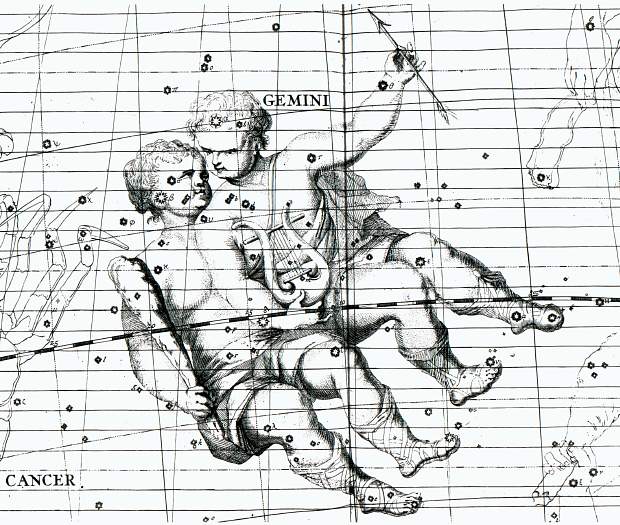
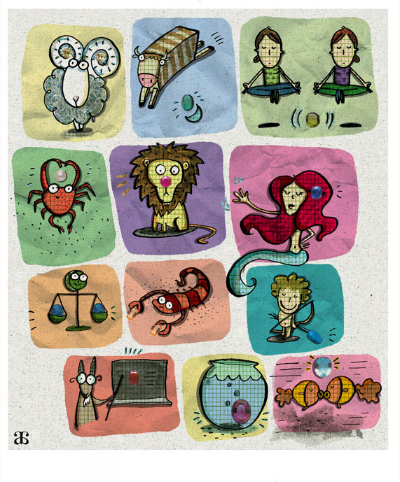
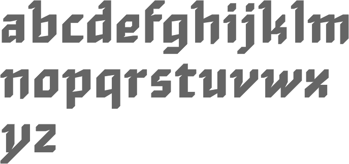
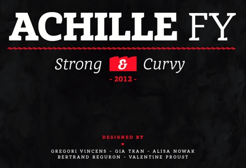
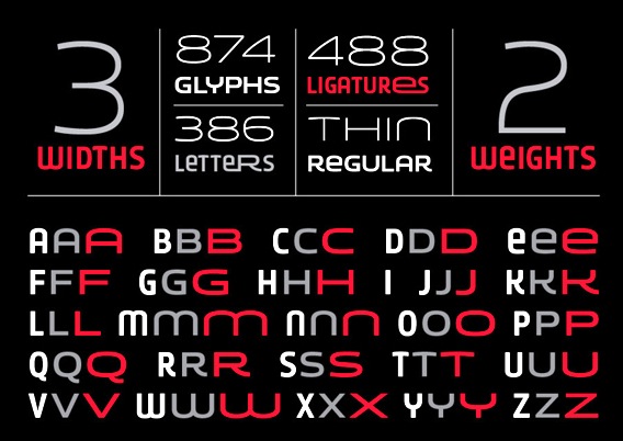
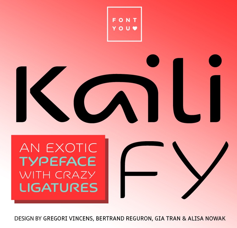
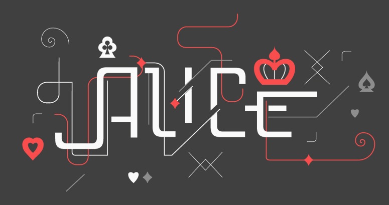
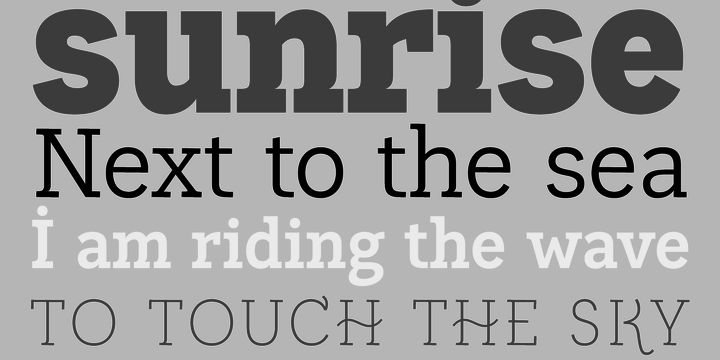
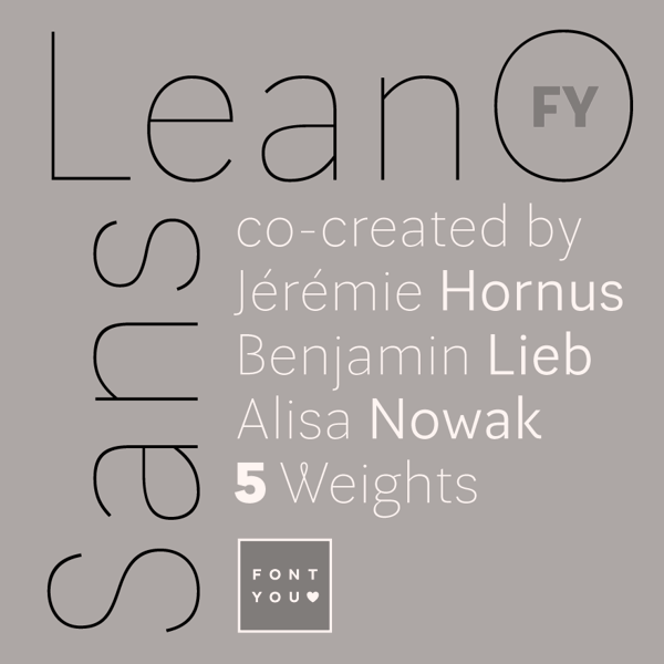
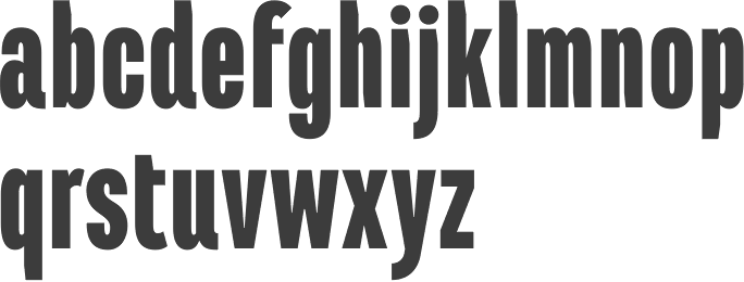
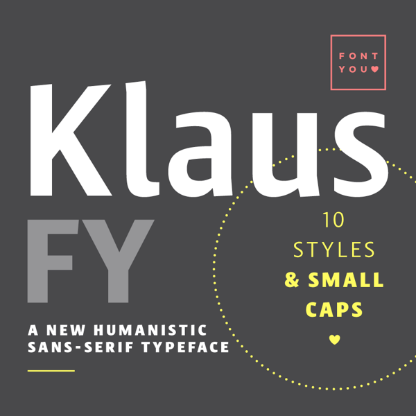
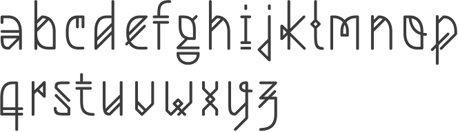
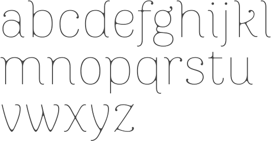
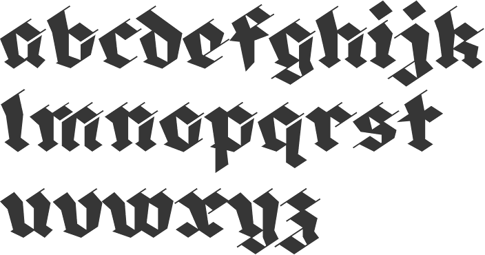
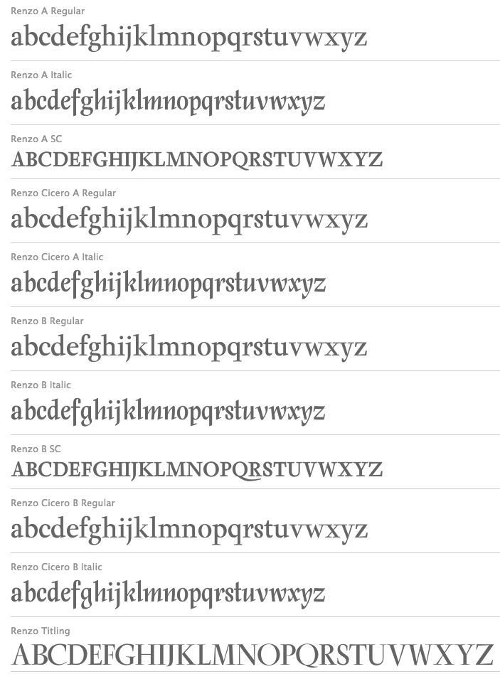
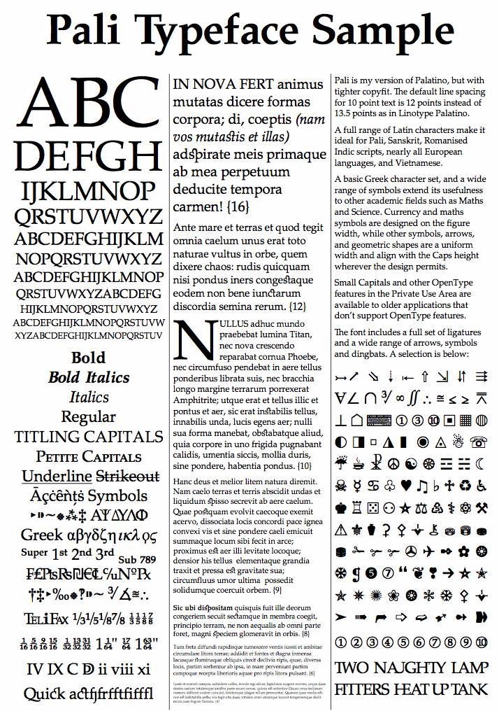
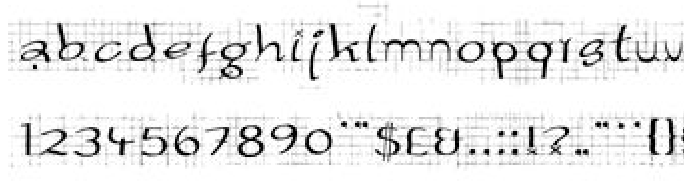
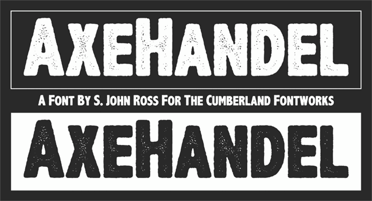
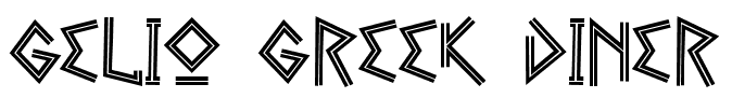
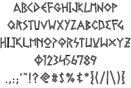
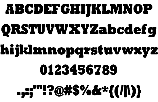
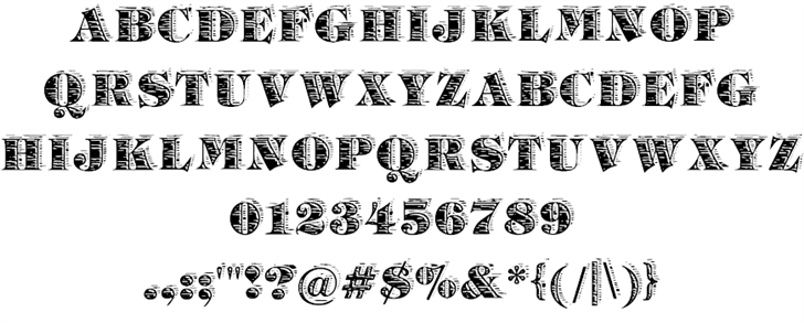
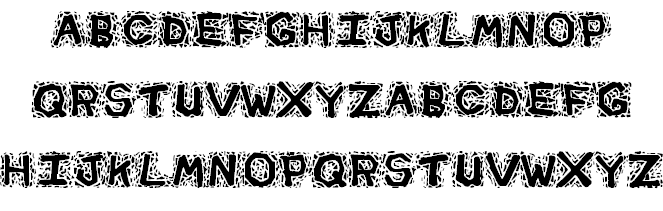
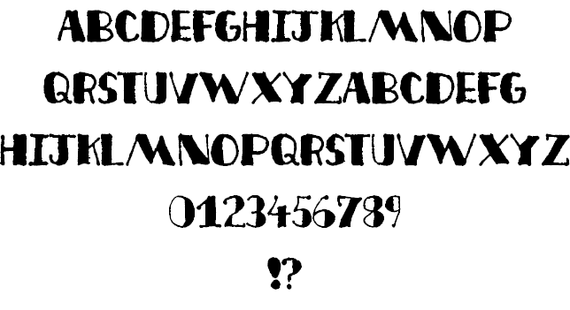
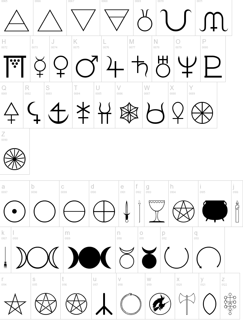
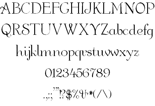
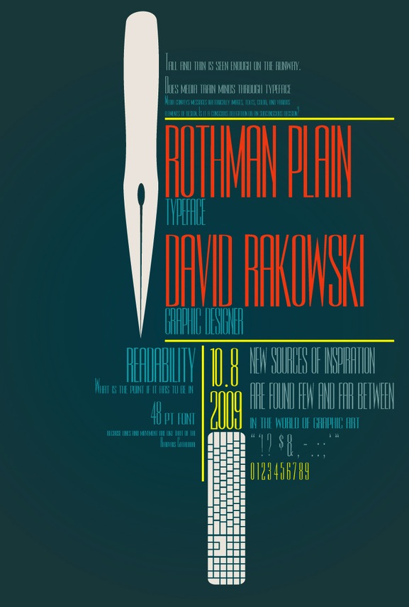
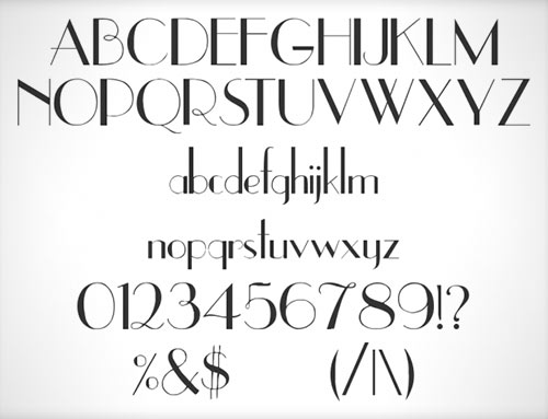
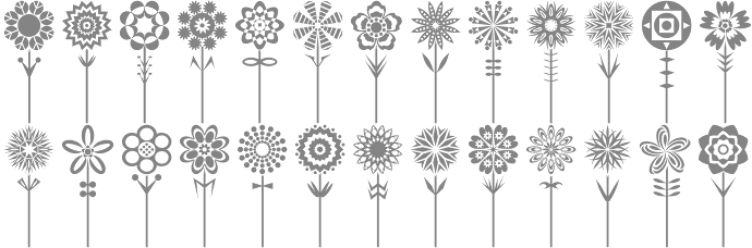
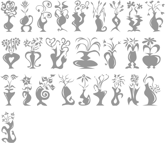
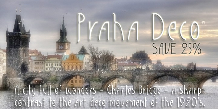
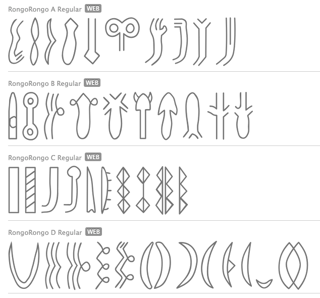
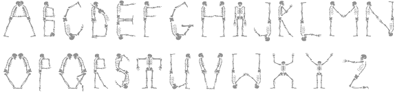
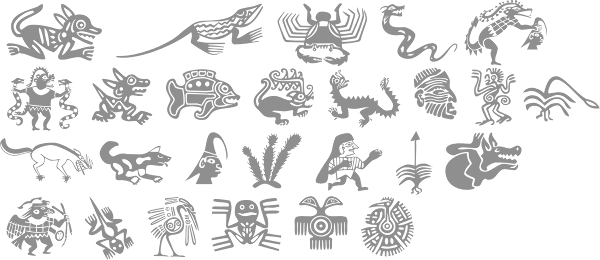
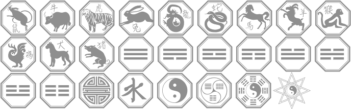
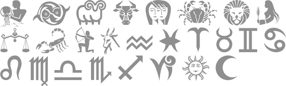
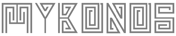
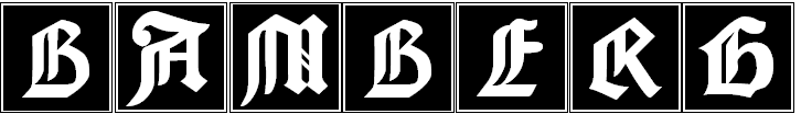
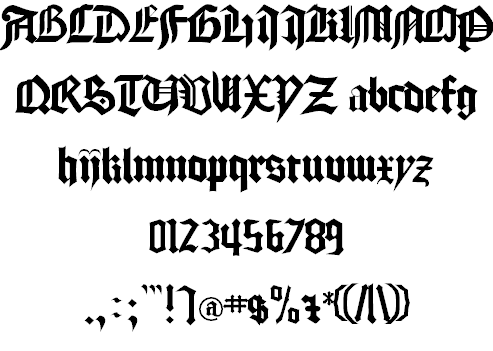
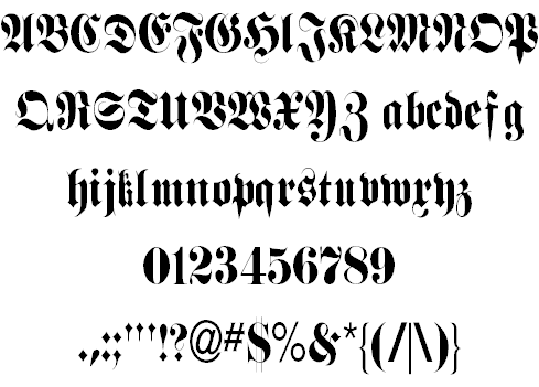
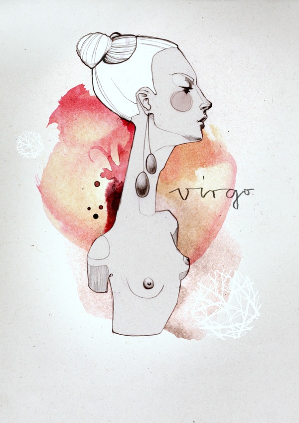
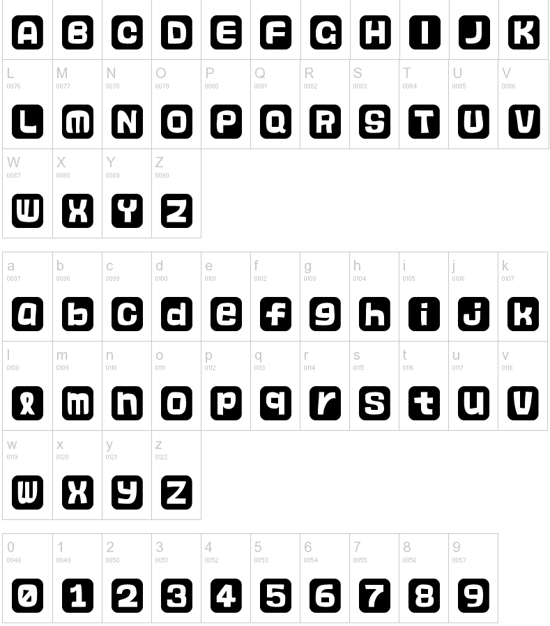
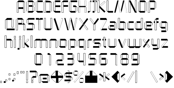
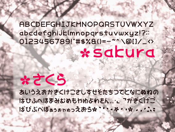
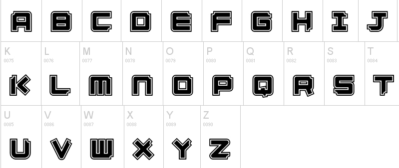
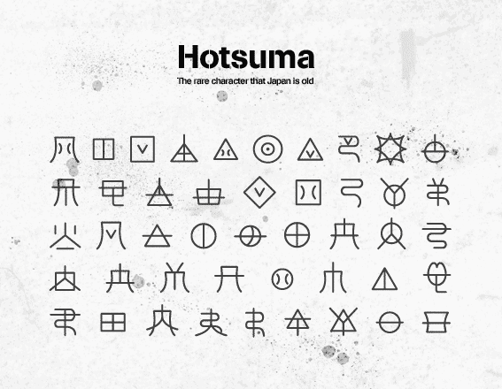
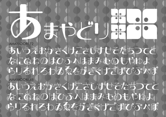
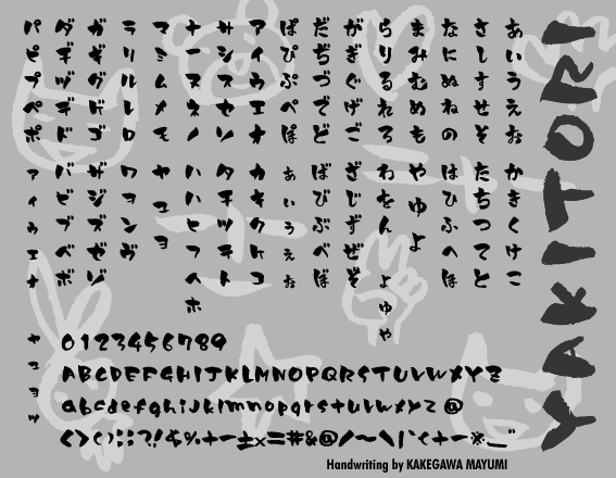
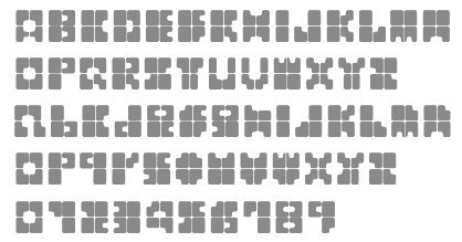
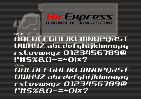
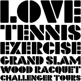
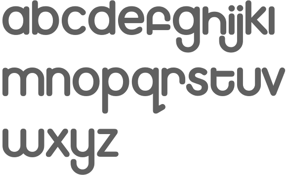
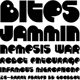
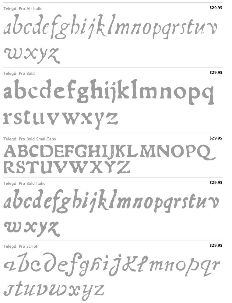
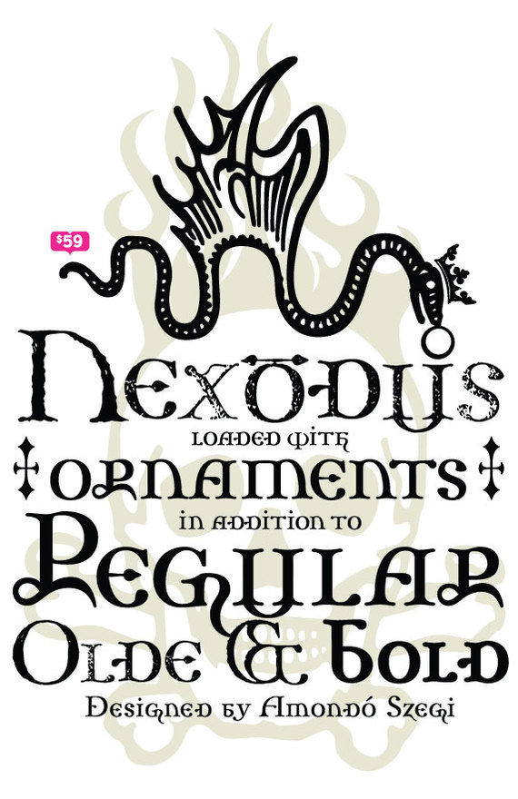
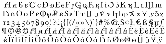
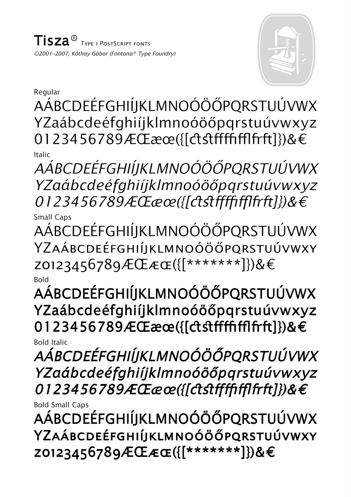
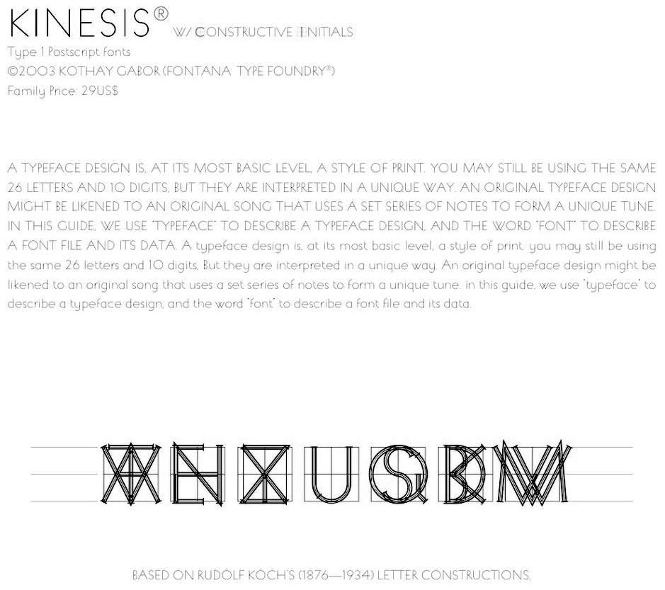
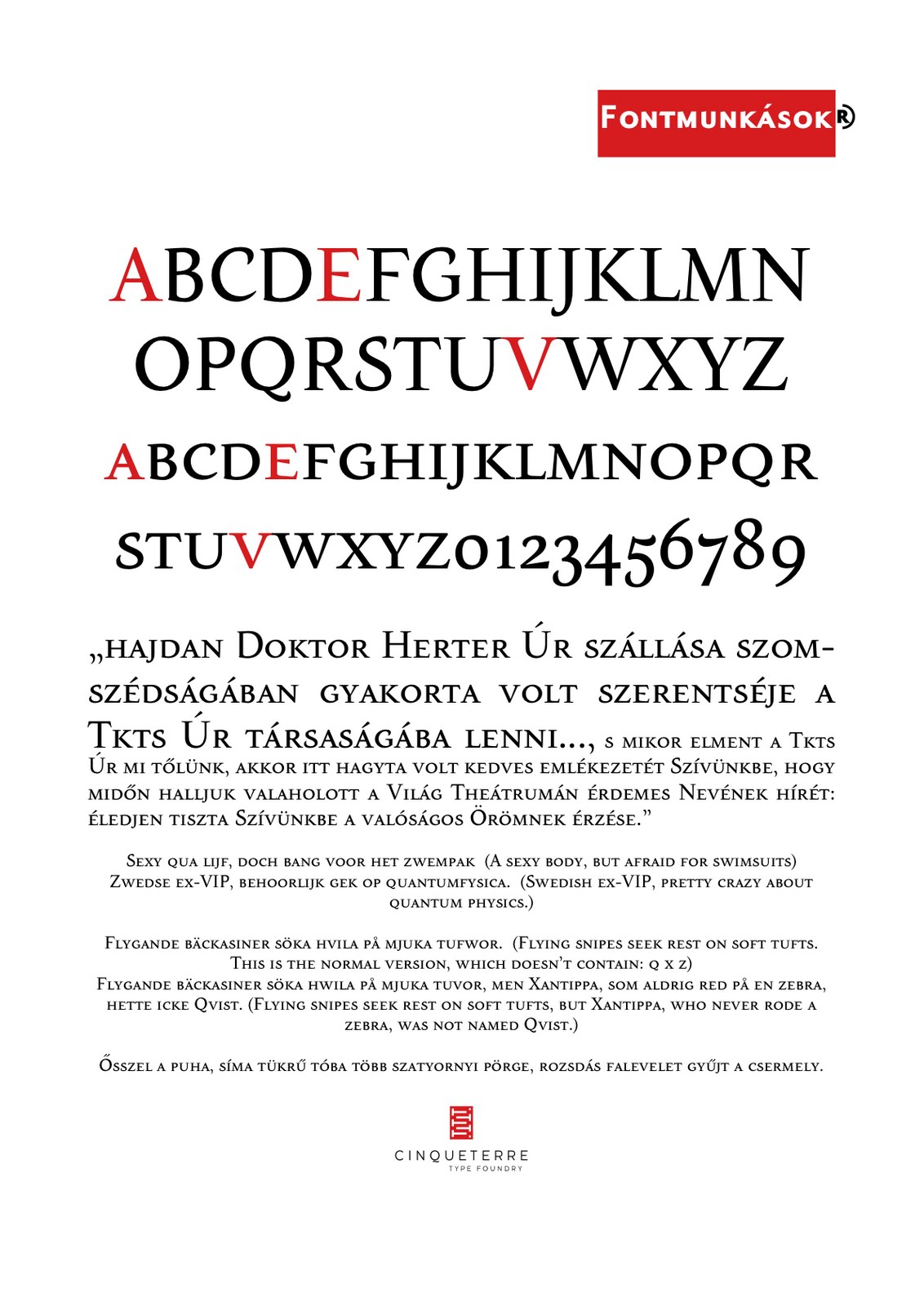
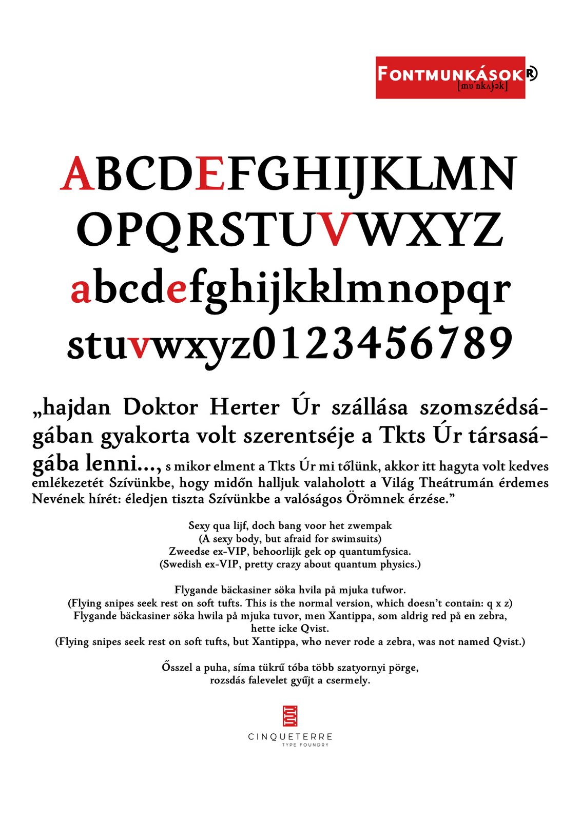
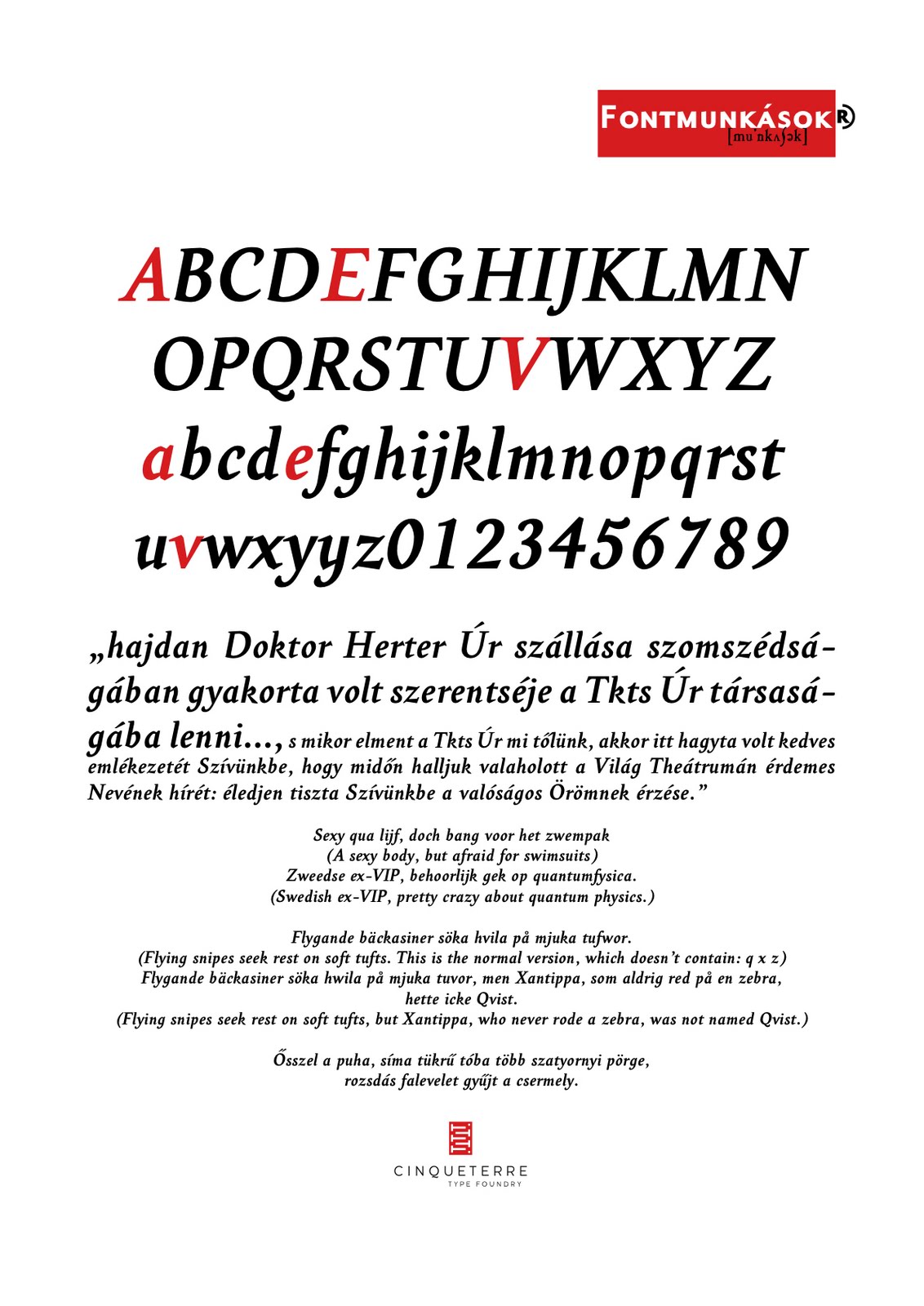
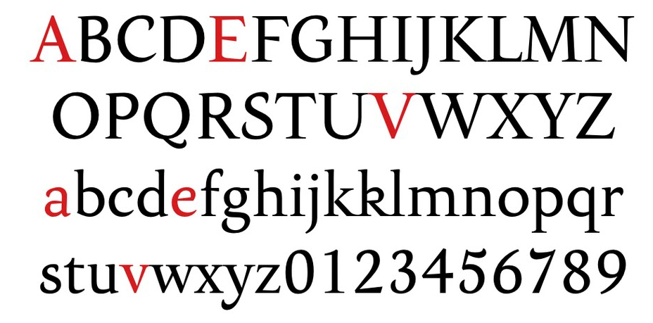
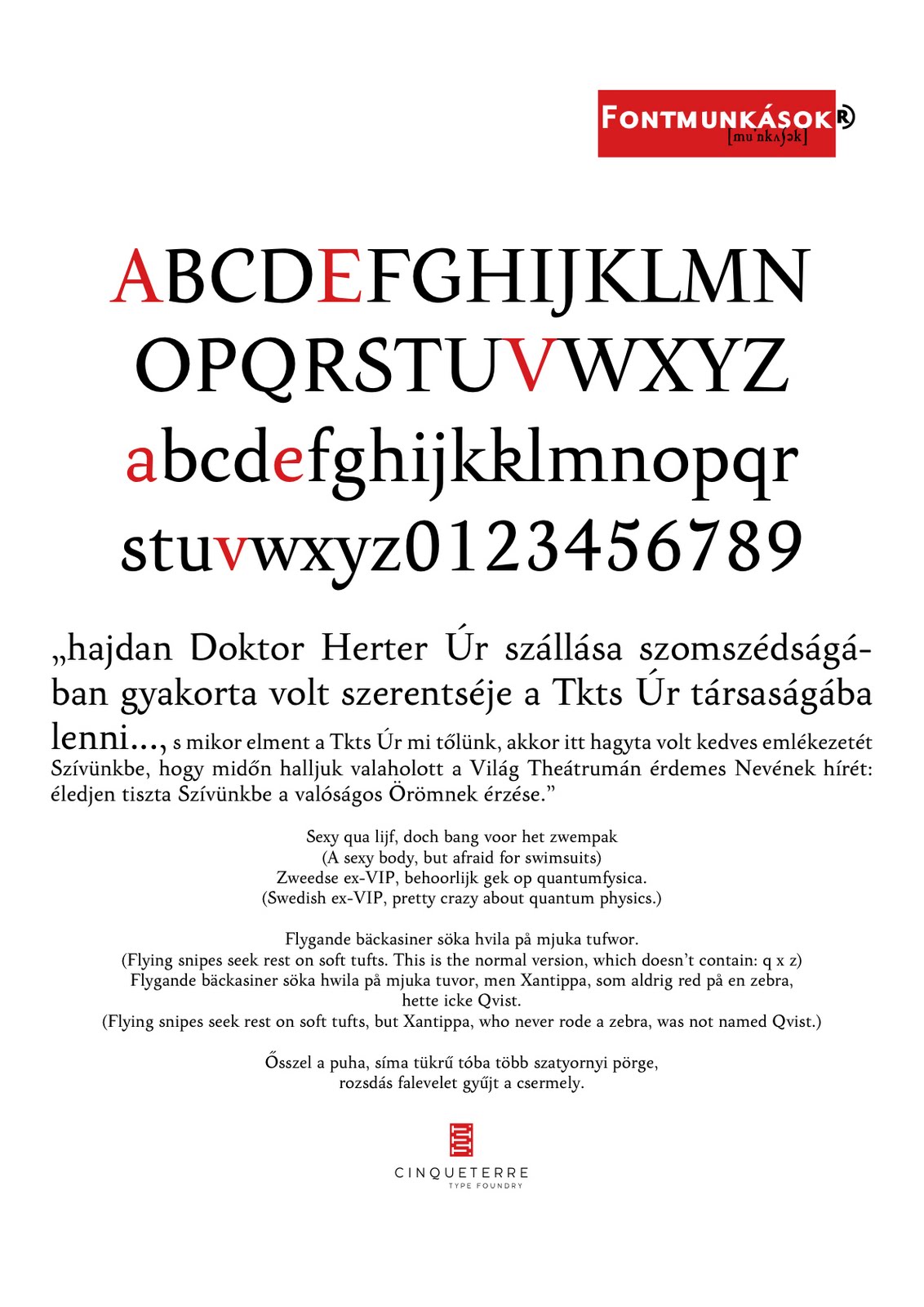
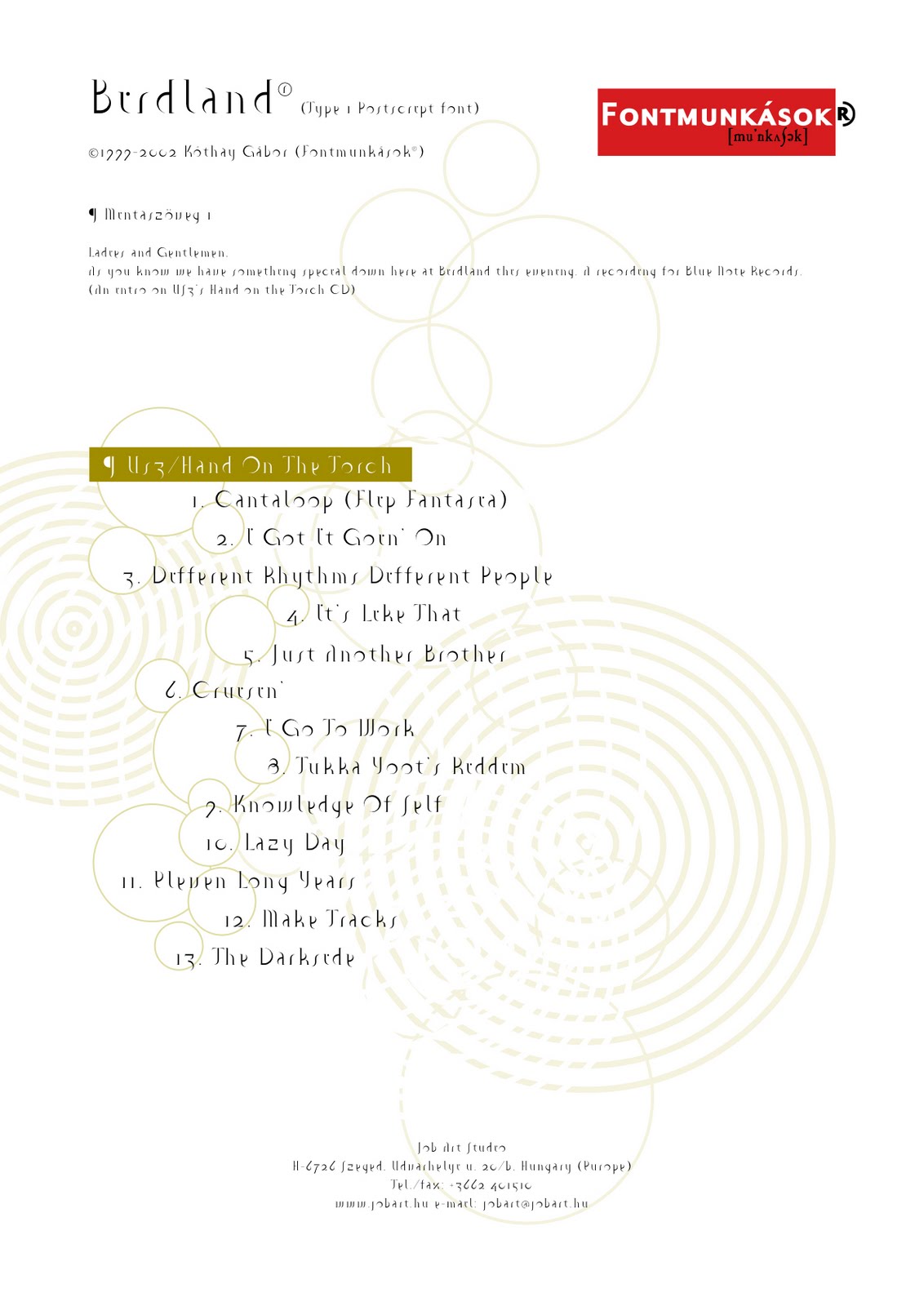
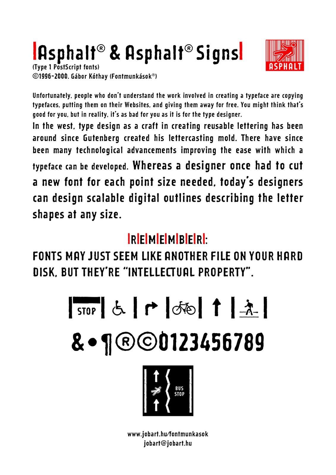
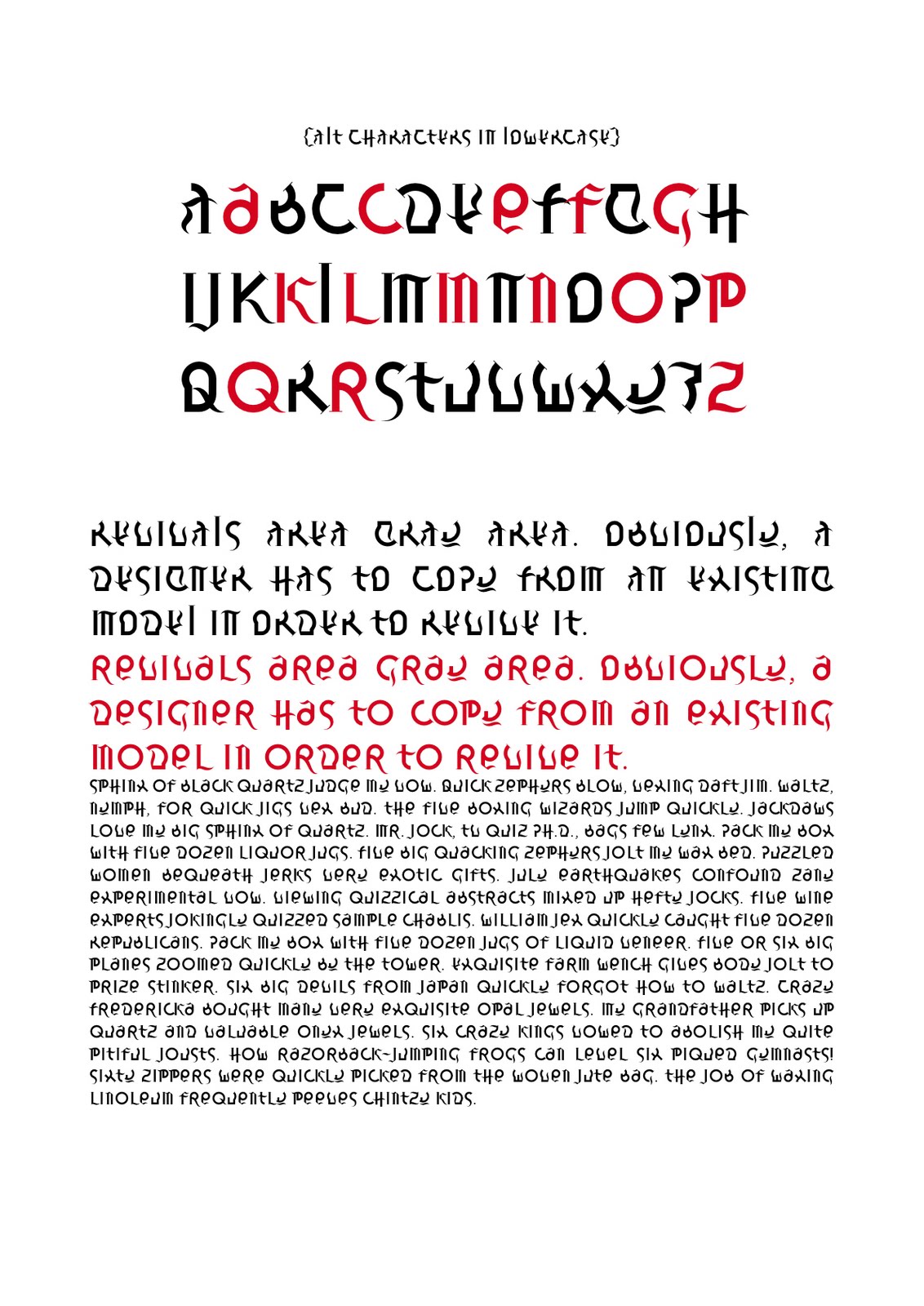
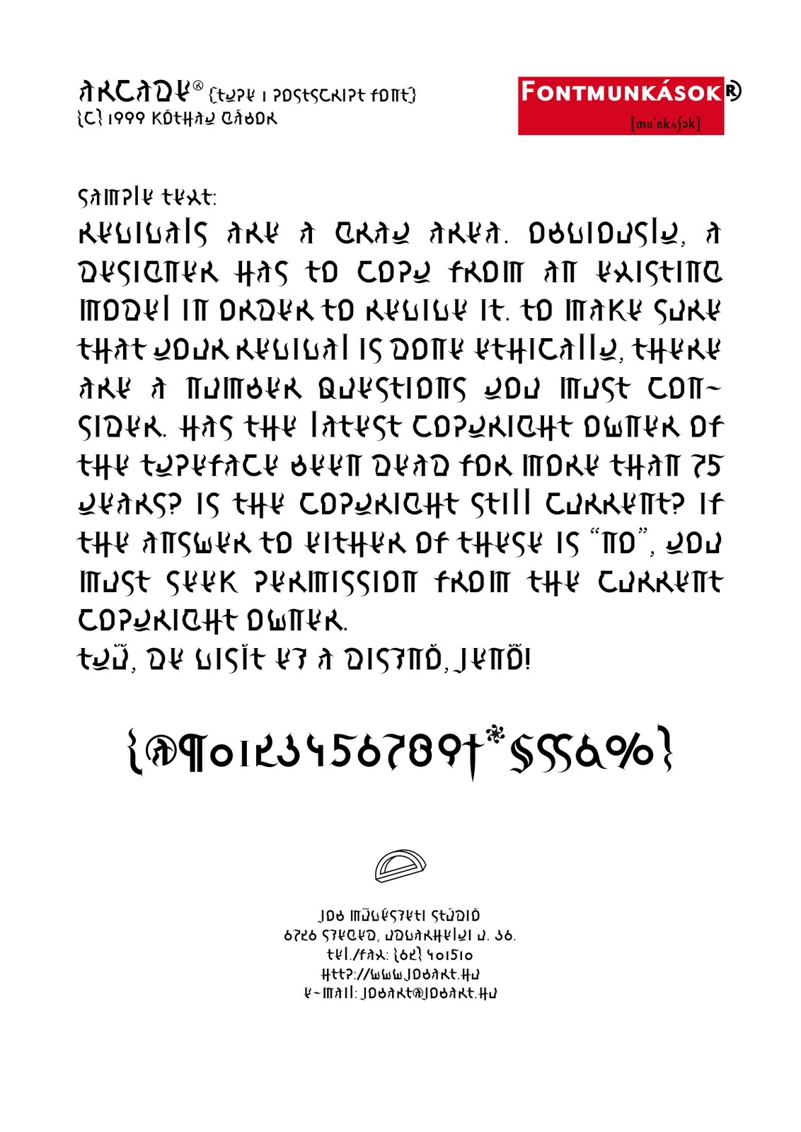
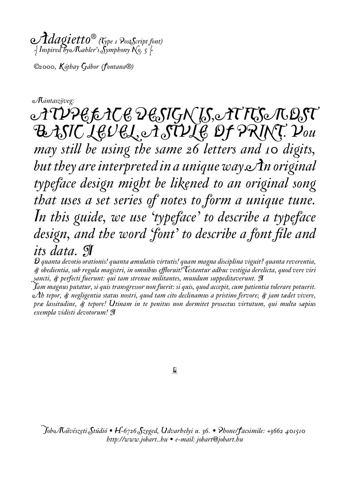
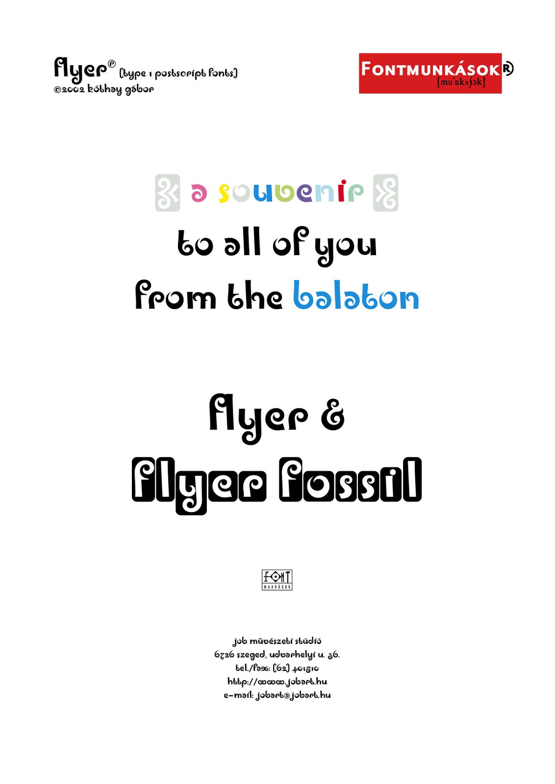
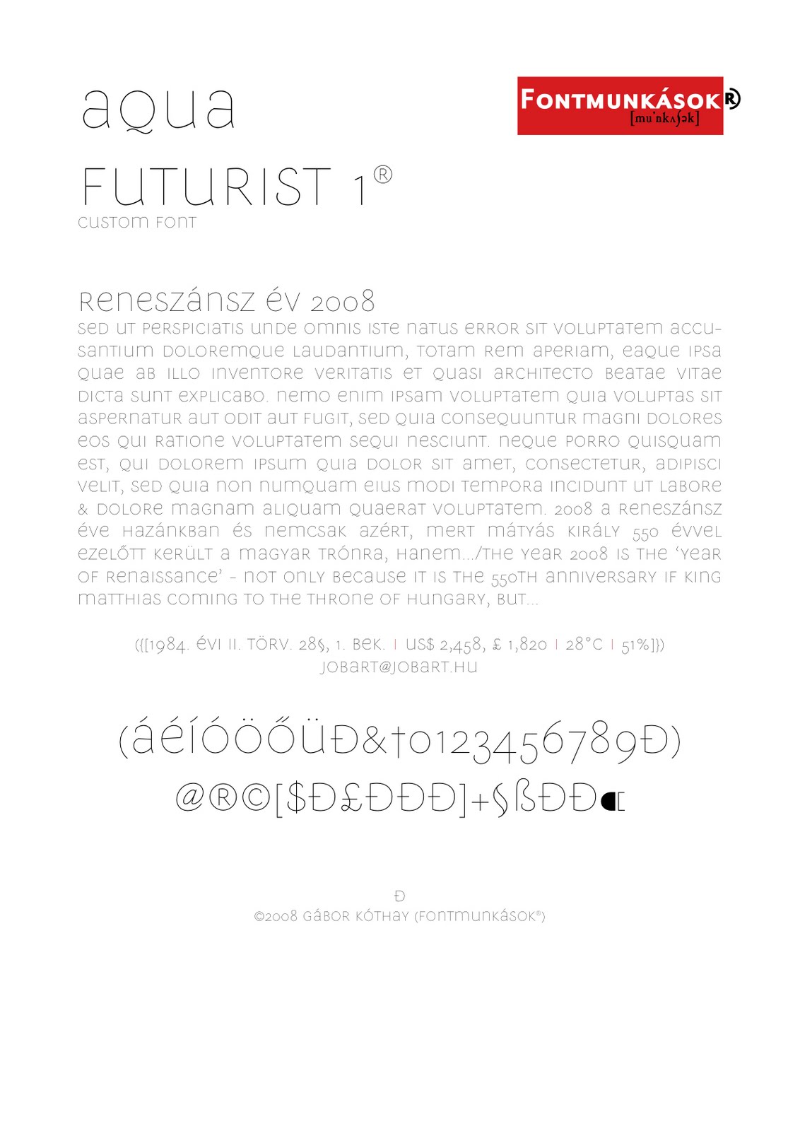
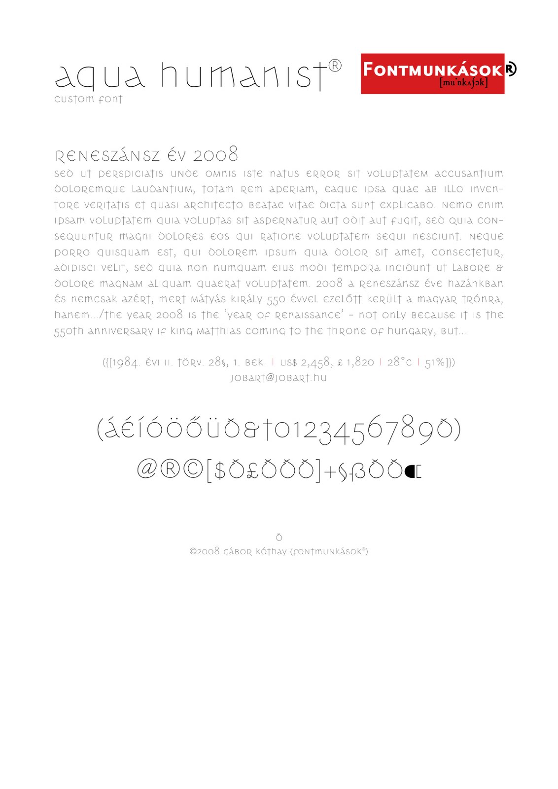
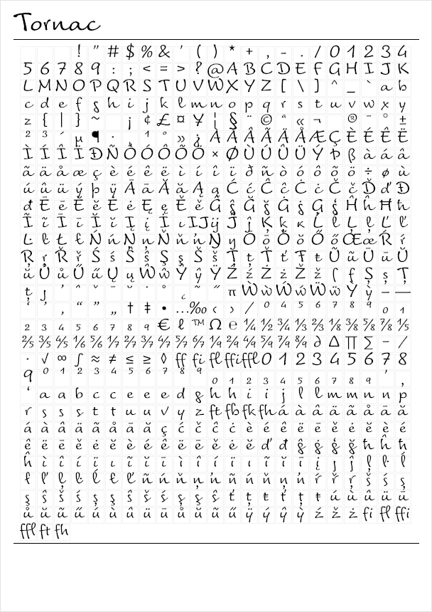
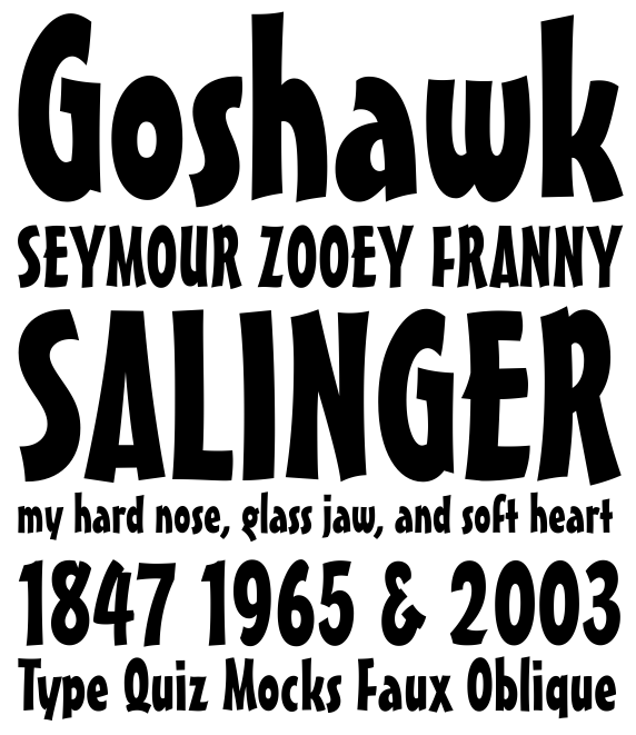
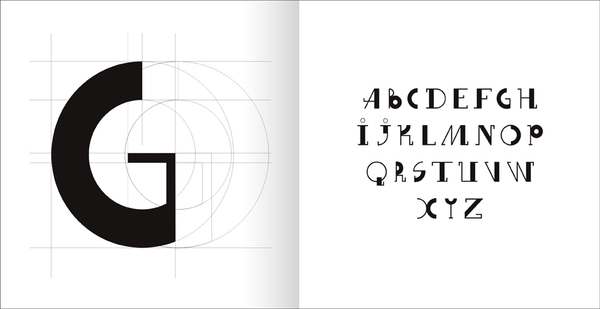
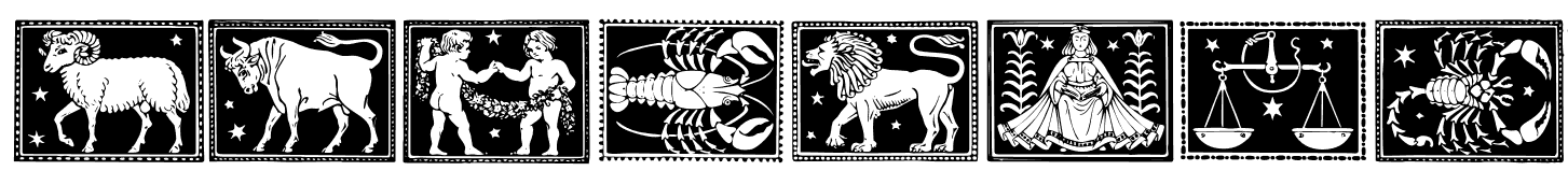
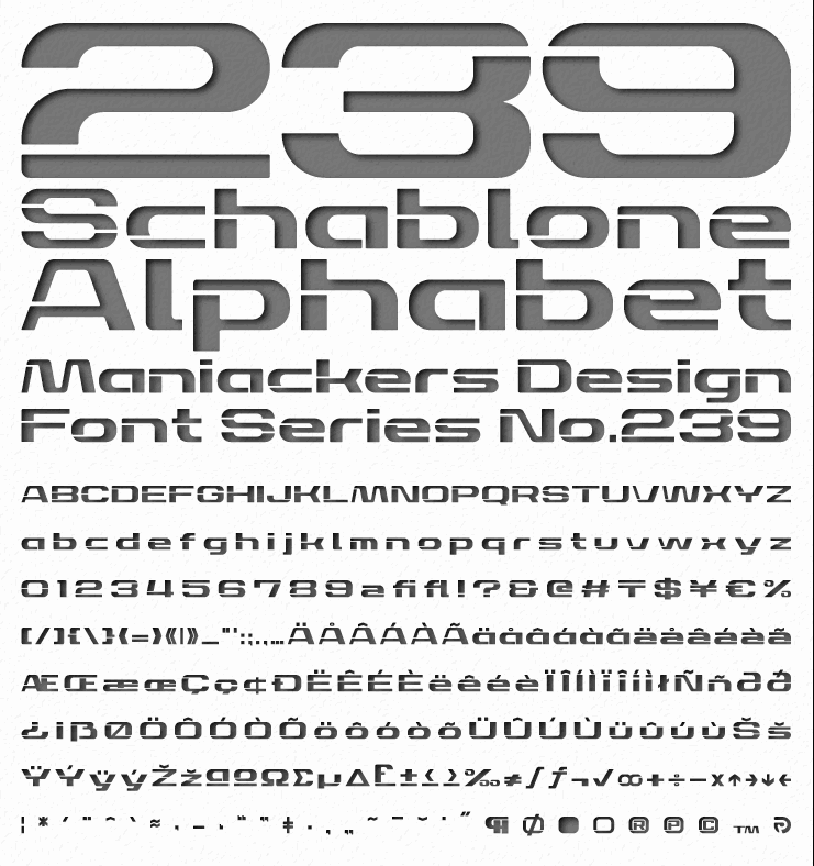
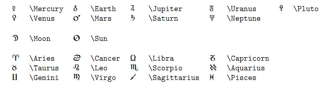
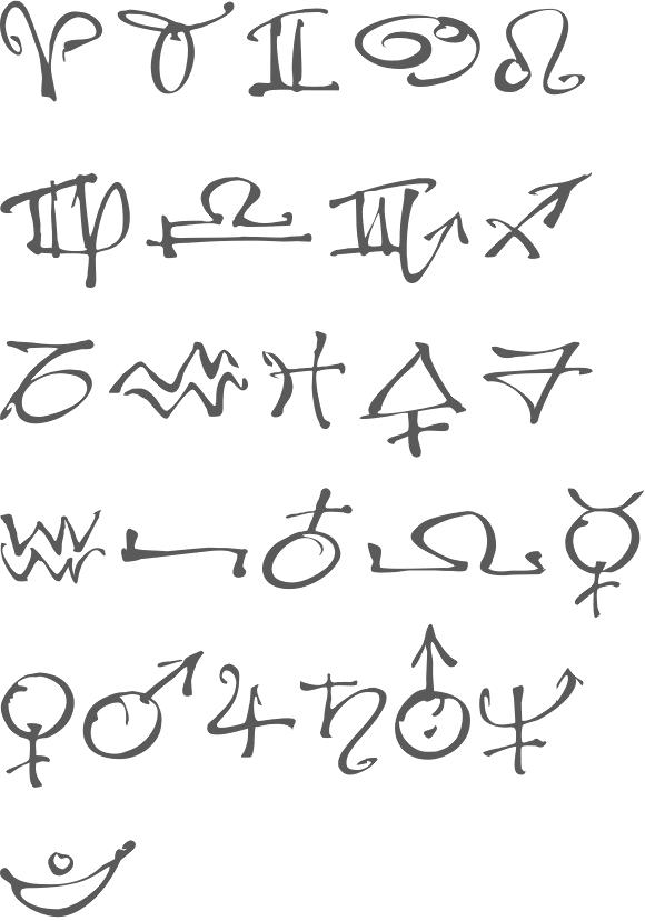
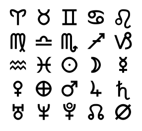
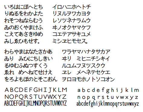
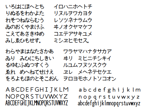
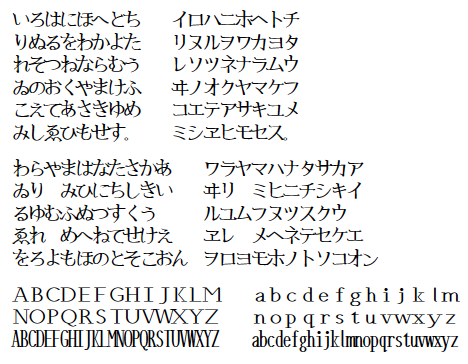
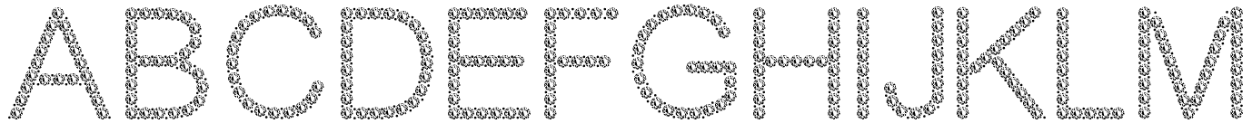
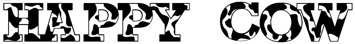
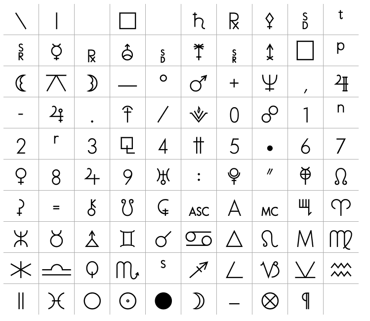
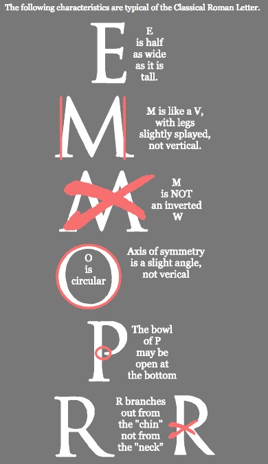
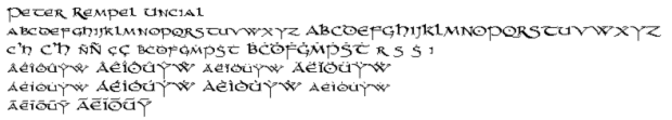
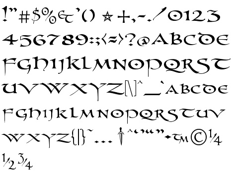
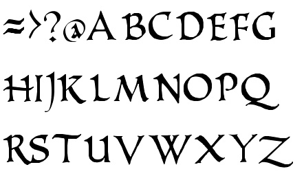
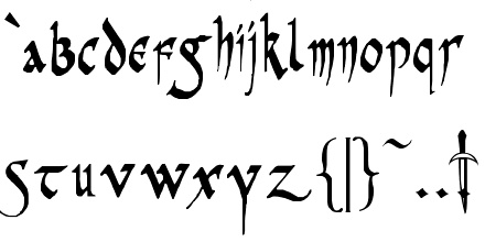
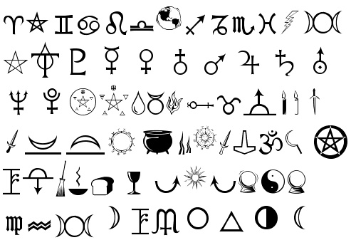
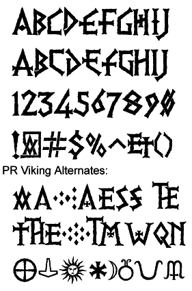
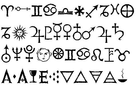
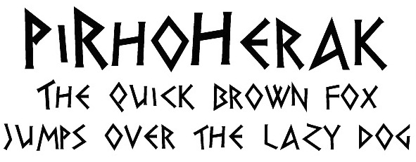
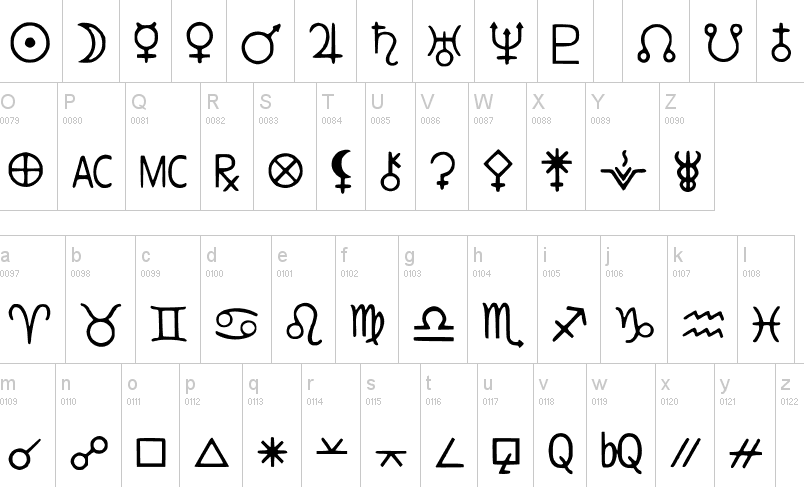
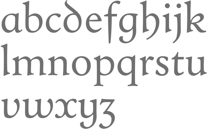
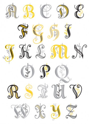
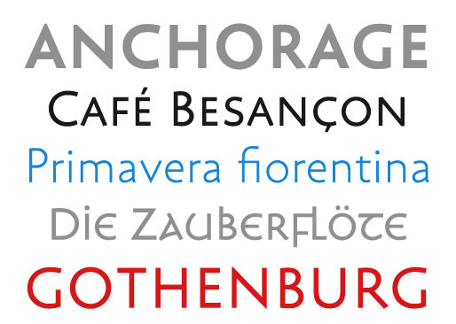
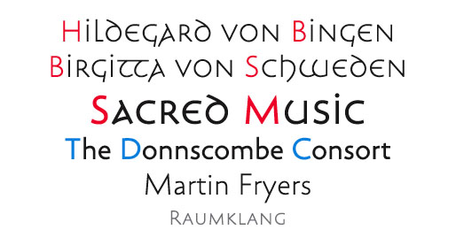
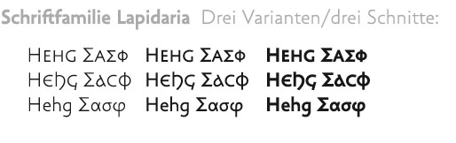
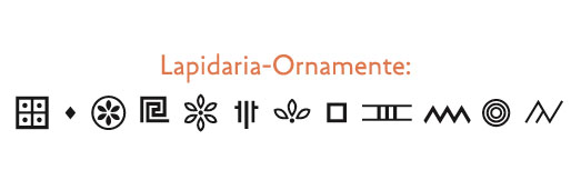
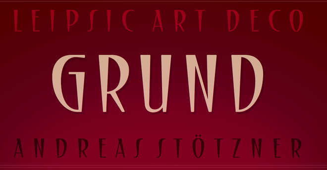
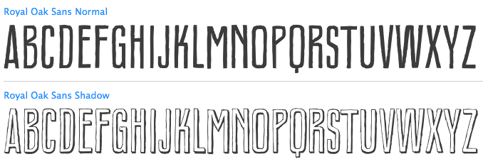
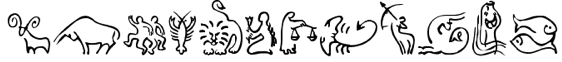
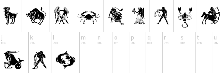
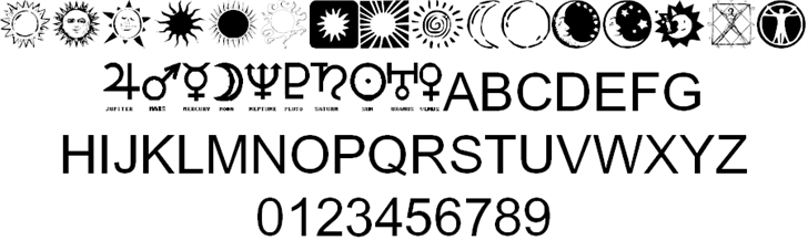
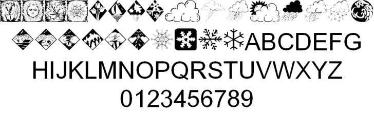
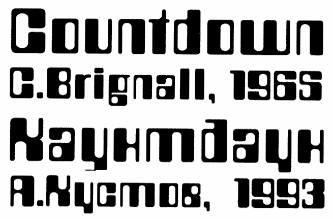
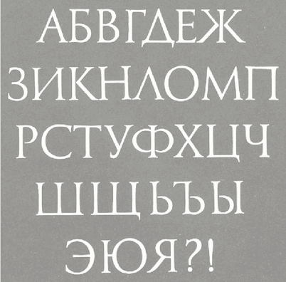
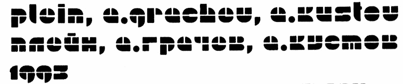
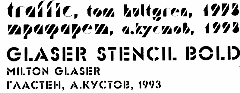
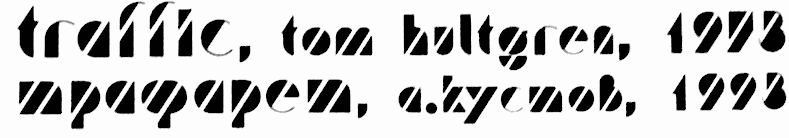
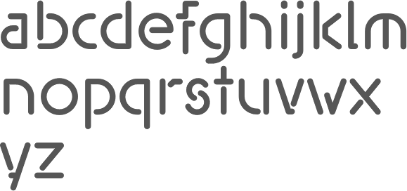
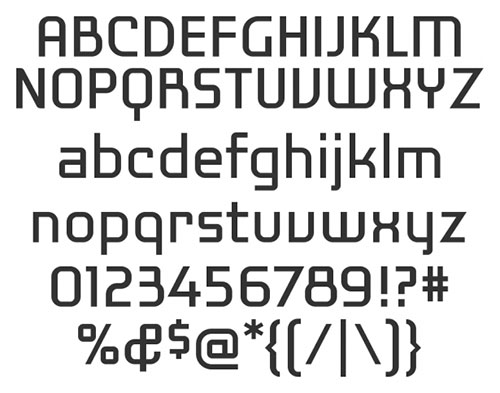
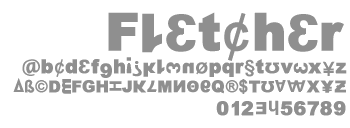