| | |
Abelardo Gonzalez
|
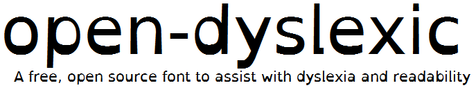
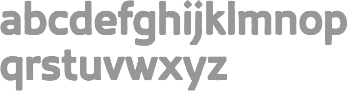
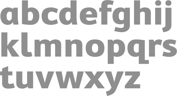
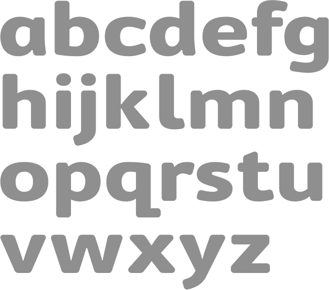
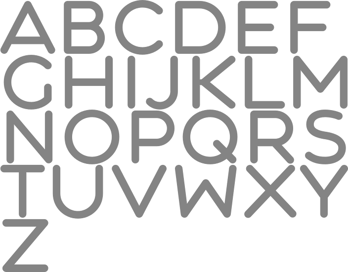
New Hampshire or Spain-based dyslexic creator of Open Dyslexic (2011), a free font specially designed for dyslexia, developed on the basis of Bitstream Vera Sans. Leo Kelion writes for the BBC: The OpenDyslexic font is designed to give "gravity" to letters to prevent the characters rotating in readers' minds. Other type designs by Gonzalez include Eulexia and Alpha Symbolic (a "dyslexic notation" typeface that uses symmetric symbols to reduce confusion in the alphabet). Dafont link. Open Font Library link. Github link. Open Dyslexic link. Free download of Open Dyslexic. [Google]
[More] ⦿
|
Abelardo Gonzalez versus Christian Boer
|
Abelardo Gonzalez is the New Hampshire-based dyslexic creator of Open Dyslexic (2011), a free font specially designed for dyslexia, developed on the basis of Bitstream Vera Sans. The trick he used, a thickening of the bottoms of the characters, had been used earlier by Dutch designer Christian Boer in a font called Dyslexie, which sells for $69 $USD per single-use license. Boer did not like the fact that Gonzalez's font was cheaper. Boer sent a cease-and-desist letter, even though the two fonts in question are quite dissimilar. Quoting Abelardo's reaction: Legal threats are not awesome. And making threats of violence against others to prevent competition is not very nice. It's really just preventing others from filling a gap in the market. And, if his work is really high quality work, he shouldn't have to resort to threatening me to succeed. He would succeed without them. I don't like seeing legal threats happen to others, and I really, really did not like it happening to me. His demands were also unreasonable. The end result? Abelardo's typeface is now free, and the dyslexic community has a great free font for its own use. [Google]
[More] ⦿
|
Alastair Montgomery
|
Ph.D. student at the University of Reading. Thesis topic: The role typography plays in developing symbol imagery skills for literacy in children with dyslexia. [Google]
[More] ⦿
|
Alejandro Valdéz Sanabria
[Jaguatelevisor]
|
[More] ⦿
|
Alessandro Da Corte
[Font Ale]

|
[MyFonts]
[More] ⦿
|
Alessia Nicotra
|
Italian medical doctor with a PhD in neurology and neurophysiology. She currently works as a clinical neurophysiologist at Charing Cross Hospital in the UK and is also involved in academic research into the autonomic and peripheral nervous systems. Together with Bruno Maag she researches the physiological emotional impact of different type styles. At ATypI Sao Paulo 2015, her talk, together with Dalton Maag, is entitled Busting the Dyslexia Myth. As the master communicator of type design, Dalton Maag shows that nearly all dyslexia type research in the past was ignorant. Witness the abstract of the Nicotra / Maag talk at ATypI: There have been a number of fonts in recent years which claim to improve reading for people with dyslexia. Many of these designs have a handwritten quality, similar to Comic Sans. Often, the designers of these fonts claim to understand what is required to design a dyslexic font, simply by virtue of being dyslexic themselves. There may be some design merit to these fonts but the claim that they are favourable to dyslexics is misleading, and shows a complete lack of understanding what dyslexia is. The presentation will critique the designs that claim to be "the font for dyslexia", based on a scientific overview of dyslexia, and how dyslexia is dependent on language and other factors. It will also highlight the ignorance of design institutions that have awarded MAs and PhDs for fonts designed in the name of dyslexia. The talk was forceful, entertaining and convincing, based on an analysis of various pathways in the brain. For one thing, opaque languages (i.e., with a very tentative connection between what is written and spoken, as in English) have a higher population density of dyslexia. Italian and German are notr opque and thus fare better. Alessia also spoke at ATypI 2014 in Barcelona. Speaker at ATypI 2016 in Warsaw: Bruno Maag and Alessia Nicotra review a selection of studies published in regards to the emotional and functional qualities of typefaces since Poffenberger in 1927. The presentation investigates the methodologies employed and questions the results in the cultural and technological contexts of their time, and provide guidance as to their relevance today. [Google]
[More] ⦿
|
Alex Reyes
|
Alex Reyes created Modular Font (2014, circle-based) and Dyslexia (2014). Dyslexia is not---as the name might suggest--a font to aid dyslexic readers. Instead, it is a typeface that emulates how dyslexics perceive letters. [Google]
[More] ⦿
|
André Génard
|
Belgian artist, b. 1954, Antwerpen. The DITT writes this about him: André is an adult dyslexic. At Bridges 2009, he presented an experimental typeface on which he had been working since 1975, under the title Zen Art. In 2007, he created another experimental geometric face, Alphabet Candy. [Google]
[More] ⦿
|
Annaëlle Cousinié
|
Graphic designer in Lyon, France. She created the colorful textured geometric solid typeface Dyslexie (2013), the geometric display typeface Codex (2016), and the connect-the-dots electronic circuit typeface Le Lien (2016, FontStruct). [Google]
[More] ⦿
|
Barrington Stoke
|
Edinburgh, Scotland-based company specializing in books for dyslexic children. For that purpose, they developed or acquired a very legible proprietary font. [Google]
[More] ⦿
|
Bonnie Shaver-Troup
[The Lexend Project]
|
[More] ⦿
|
Charlotte Travaillé
|
 Parisian designer of the thin condensed high-contrast typeface Lunatique (2013) and the display typefaces Sedegren (2014) and Dyslexia (2014). Behance link. [Google]
[More] ⦿
Parisian designer of the thin condensed high-contrast typeface Lunatique (2013) and the display typefaces Sedegren (2014) and Dyslexia (2014). Behance link. [Google]
[More] ⦿
|
Chris Corbett
[Pixelscript]
|
[More] ⦿
|
Christiaan Theo Boer
[Studiostudio]
|
[More] ⦿
|
Codesign (or: Aviation Partners, or AVP)
[Nicholas Garner]
|
 Nicholas Garner (b. 1949, Windsor) runs Codesign (or: Aviation Partners), a small London-based design firm which has created these commercial type families:
 - Cerafino (2005): informal sans.
- Delamere (2005): more classical sans.
- Kensington (2005): titling sans related to Gill Sans.
- Maisee (2005): an open, wide, generous and broadly smiling sans family.
- Tenison (2005): connected formal script.
- Fiendstar (2006, 16 styles; +Cameo (white on black), +Shaded) (after Gill Sans Schoolbook).
- Rosie (2010): a connected cosy script, in the Mistral style.
- Norwich (2006): a grungy version of Tenison. Outrage (2006) is more grunge.
- Cashback (2006).
- Crystal (2006): a slab serif family.
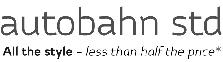
- Autobahn (2011) is a monoline elliptical sans family. Garner writes: Autobahn is a robust masculine sans of near monoline thickness and angular characteristics. Autocode (2011) is a monoline monospaced (for programs) elliptical sans based on Autobahn.
- LaCarte (2007): inspired by a series of handwritten menus produced in 1980. Further extended to La Carte Pen in 2010.
- Midas (2007).
- Sky Sans (including hairline weights) (2007).
- Lamoreli (2007).
- Backstage (2007). A stencil face.
- Amy (2010). Nicely hand-printed.
- Atria (2010) An ink-trapped sans-serif.
- Blocksta (2010). A rounded fat sans.
- The elegant script typeface Jacqueline (2010).
- New Fiendstar (2010).
- Omniscript (2010).
- Cambridge (2010). An elegant sans family with a misbehaving lower case q. Accompanied by a Cambridge Round family. It is designed as a schoolbook font, and is useful for dyslexics, since there are no ambiguities between letterforms.
- Central (2011). A rounded geometric sans family. Followed in 2012 by Central Inline.
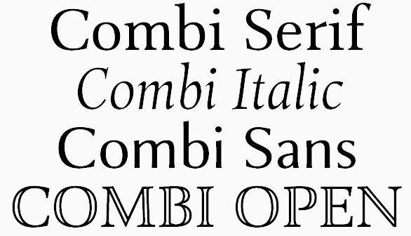
- Combi (2011). This is a wonderful effort, as described by Garner himself: The Combi collection includes Sans, Sans Oblique, a true Italic, Serif, Serif Oblique and a set of Openface capitals. Combi fonts have 5 compatible weights and metrics allowing them to be used in free combination. Inspiration came from Jan Van Krimpen's Romulus (Enschedé, 1931). In addition to the Roman style, Van Krimpen created a set of open capitals, a simple oblique variant and subsequently, an attractive calligraphic italic, Cancelleresca Bastarda. In addition to Van Krimpen's idea, Combi has been influenced by features from many typefaces including Bembo, Melior and Optima. The object was to create a versatile family of body text and titling typefaces for use in books, magazines and on the web.
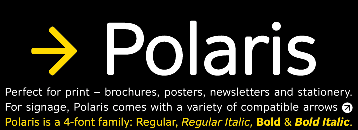
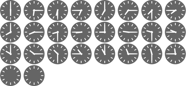
Polaris (2012) is a rounded sans family that reads well in print and on screens. Mensa (2012) is a 36-weight large x-height sans body family. - Beaulieu (2012).
- Clocktime (2012). A dingbat font with clocks.
- Chokey Pro (2012). A tall connected script face.
- Alleyn (2013). A soft geometric sans family. Followed in 2021 by the 12-style Alleyn Pro (2021).
- Corsica (2013). Corsica is an all-purpose geometric sans-serif typeface of visually uniform stroke thickness. The family contains six weights, two widths and three lowercase size options, together with an italic variant for each.
- Intrinseca (2014). An incised sans with some contrast and flaring, but still quite readable thanks to a good x-height.
- Browser Serif and Browser Sans (2014). These families were designed for use on screen.
Arethusa (2014) and Arethusa Pro (2014) are 12-style transitional typeface families. - Gimbal Egyptian (2018). Characterized by some asymmetric slabs and curvy italics. It covers Latin and Cyrillic and comes in several widths. See also Gimbal Grotesque (2018).
- Cadmium (2020). A 48-style grotesk family influenced by DIN.
- Varisse (2021). A 60-style superfamily consisting of Baskerville and transitional serifs on one end and Gill Sans-inspired humanist sans typefaces at the other end.
- Fielding (2022). A 12-style confident flared text and titling serif family.
MyFonts site. Klingspor link. Showcase of Nicholas Garner's typefaces. [Google]
[MyFonts]
[More] ⦿
|
Daniel Britton
|
London-based graphic designer who wants to show the world how dyslexics perceive words and letters. For that purpose, he created Dyslexia (2015), a special typeface. [Google]
[More] ⦿
|
David Santos
|
David Santos (Porto, Portugal) has a design degree from the Universidade de Aveiro, Portugal (2011) and a masters degree in graphic design from the Faculdade de Belas Artes da Universidade do Porto (2013), where he researched typefaces for dyslexics. In his type design class at FBAUP, he co-designed a decorative caps typeface with Francisca Paiva, Maria Branco and Margarida Basto in 2013. [Google]
[More] ⦿
|
Dyslexia: Article by Albert-Jan Pool
|
Albert-Jan Pool discusses the lack of scientific research that went into specially designed typefaces such as Dyslexie, Open Dyslectic, and Sylexiad. He supports well-tested experiments that compare many typefaces in controlled tests. In particular, he points out the work in the Ph.D. dissertation of Ann Bessemans at the University of Leiden, who (in Albert-Jan's words) scientifically tested modified versions of Frutiger and DTL Documenta that were distorted in ways that are similar to those in Dyslexia [the typeface] against the non-distorted versions of these typefaces. It was proved that none of this kind of distortions were of any help. The only kind of distortion that seems to help is one in which she changed the horizontal proportions by widening and narrowing some of the characters. But this was only of help for children who are beginning to read, it did not seem to be of any help for children with more reading experience. [Google]
[More] ⦿
|
Dyslexia: Reference articles
|
A list of articles discussing the pros and cons of certain typefaces for dyslexics: - Thomas Bohm in Baseline: Letter and symbol misrecognition in highly legible typefaces for general, children, dyslexic, visually impaired and ageing readers.
- Sue Walker: Typography in Children's Books.
- Thomas Phinney in Communication Arts: Should Dyslexics Unite on a Typeface? Recent typefaces for (and by) dyslexics and the science around them. See also here.
- Typophile discussion from 2005: Type for kids.
- Ann Bessemans: Type Design for Children with Low Vision (2012, PhD dissertation, University of Leiden). This thhesis was jointly supervised by Gerard Unger in Leiden, and Bert Willems at Hasselt University.
- Robert Hillier: A Typeface for the Adult Dyslexic Reader (2006, Ph.D. thesis).
[Google]
[More] ⦿
|
Dyslexic Font
[Rocio Egio]
|
The Dyslexic Font designed in 2022 by Lausanne, Switzerland-based artist Rocio Egio (b. Alicante, Spain) and Gurugram, India-based creative designer Pranav Bhardwaj uses colours, inversions and tilted positions. It is meant to emulate Egio's own experience with the alphabet. [Google]
[More] ⦿
|
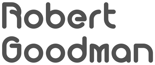
Dyslexica Font Foundry
[Robert Goodman]
|
Type foundry in Covington, GA, est. 2013. The goals of the foundry are to provide quality fonts and to develop dyslexic friendly font families and variations. Fonts from 2013 include Perkly (a rounded geometric stackable sans family). In 2016, Robert published Prolexia. [Google]
[MyFonts]
[More] ⦿
|
Easy Reading
[Federico Alfonsetti]
|
Federico Alfonsetti designed the highly legible font family Easy Reading in 2009. It is used on many web sites, including at the University of Turin, and is recommended by the designer for use by dyslexics. A comparative study was carried out by Dr. Christina Bachmann that showed the value of the font. [Google]
[More] ⦿
|
Fabula
[Sue Walker]
|
The Fabula typeface was originally designed as a screen font as part of a project that produced software to enable children and teachers to produce bilingual story books. Since then, changes have been made to its design and it is now, additionally, a font suitable for titling and text setting in large sizes. Fabula was designed by a team led by Sue Walker that included Conrad Taylor, Vincent Connare, Gerry Leonidas and José Scaglione. Sue writes: It has been used in a series of tests designed to find out what children in year 2 think about typefaces in the books they read. They descibed Fabula as 'clear, so you can see it properly'; 'normal'; 'like an ordinary book'. Stylistically, Fabula has long ascenders and descenders (to help identify the word shapes), an informal feel, rounded terminals, a rounded e, a clear distinction between characters that might be easily confused, such as the (a, o) pair and the (l, 1) pair. Fabula 1 has a double storey a. Fabula 2 has a single storey a. [Google]
[More] ⦿
|
Faruk Ate
[Serif vs sans serif]
|
[More] ⦿
|
Federico Alfonsetti
[Easy Reading]
|
[More] ⦿
|
Font Ale
[Alessandro Da Corte]
|
Italian designer of DS Greta (2021), a hand-crafted typeface advertized as dyslexic-friendly). [Google]
[MyFonts]
[More] ⦿
|
Fonts for dyslexics: comments by Stephan Peters
[Stephan Peters]
|
 Stephan Peters gives his opinions on fonts for dyslexics (in 2020) based on opinions by dyslexics.
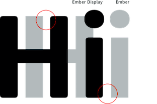
 - Amazon Ember (by Dalton Maag) is his favorite sans for small size readability.
- Modern versions of DIN like Datto D-Din by Charles Nix are also quite readable.
- The most readable serif, according to him, is the proprietary Barrington Stoke, which is a modified PMN Caecilia (by Gerrit Noordzij) featuring longer ascenders and descenders. He mentions that unlike most people with dyslexia, he prefers serifs: I have a bigger problem with tracking. I start to read on one line and my eye tracks to the line above or below. The serifs really help with that. A related font is Modum by The Northern Block.
- For e-readers and paperwhite, he points to Crimson Text (by Sebastian Kosch).
- Merriweather (by Eben Sorkin) and Carrig (by Paulo Goode) are also very readable serifs for him.
He adds: There's a lot of misinformation out there about "dyslexic fonts." Dyslexie is OK, but looks awful artistically. Open Dyslexic, which attempts to emulate Dyslexie is REALLY TERRIBLE! It is a disservice to people with dyslexia. Studies show it is not a helpful font [...] It has a high x-height, which leads to lower ascenders. p and q are just reversed, b and d are just reversed.... Terrible kerning... m looks like the Latin ligature rn... I could go on and on. [...] In reality, line height and font size have more to do with readability than the actual font, there are studies that show this, too. [Google]
[More] ⦿
|
Heinemann
|
Foundry whose fonts are sold via Fontworks UK, who write: The Heinemann fonts were initially developed by the in-house design team at Heinemann educational publishing out of the necessity to find the perfect font for use in early primary reading books and literacy products. Basic Heinemann is defined by longer ascenders and descenders which help children to distinguish between letters; rounded edges on all letterforms help focus the reader on the individual letter shape; and modified characters (e.g., a, g) ensure instant recognition of letterforms. Heinemann Special offers further modified characters and kerning pairs ideal for dyslexic or special needs use (eg a, d, b). The Heinemann fonts were developed in partnership with children, literacy advisors, teachers of special needs/dyslexia and primary school teachers, and are now released in response to hundreds of requests from publishers, designers and teachers to purchase them. They have been trialled in schools and learning institutions over an 8 year period, and are a favourite for use in both print and electronic product. Heinemann is a 12-style sans family. [Google]
[MyFonts]
[More] ⦿
|
Infant characters
|
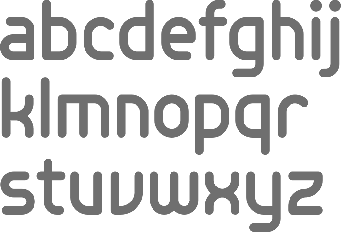
Infant characters include simple versions of characters, such as the single storey "a" and "g". They seem to be helpful for beginning readers. There is no strong evidence that they are to be preferred over standard forms of these characters for readers that have difficulties. [Google]
[More] ⦿
|
Jaguatelevisor
[Alejandro Valdéz Sanabria]
|
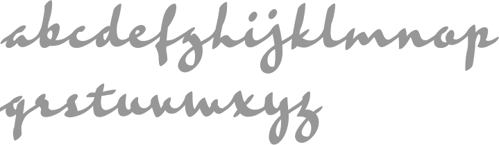
 Alejandro Valdéz's web site and blog, in Spanish, from Asuncion, Paraguay. Sarakanda is a typeface he made for dyslexics. Arguing in terms of bouma (word outlines), the font was developed to create bouncy and individualistic boumas by working on the ends of the ascenders and descenders. His script typeface López won an award at Tipos Latinos 2010.
 His [old] bibliography on typography and dyslexia [dead URL]. FADU-UBA link. Old URL. [Google]
[More] ⦿
|
James Gimlett-Taylor
|
Graduate of the University of Wales in Newport (BA, class of 2012), Cardiff University (Master of Design, 2013) and the TDi program at the University of Reading, UK, 2017. Whilst studying for his Masters of Design at Cardiff Metropolitan, he developed a dyslexia friendly concept typeface supported by research and rigorous testing. He currently is the Lead Graphic & Presentation Designer at Jaguar Land Rover. [Google]
[More] ⦿
|
Jessica Frankland
|
London-based designer of the free sans typeface Askew (2014), which was designed for dyslexics duiring her studies at Chelsea College of Art. Behance link. [Google]
[More] ⦿
|
Josep Drdic
|
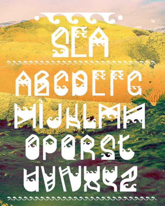
During his studies in Zagrebacka Dubrava, Croatia, Josep Drdic created an experimental typeface called Dyslexia (2013). He also created the decorative typeface Sea (2013). [Google]
[More] ⦿
|
Kanny Yeung
|
Over 600 million people in the world are dyslexic. Kanny Yeung (New York City) started a typography project in 2012 to address two types of Dyslexia. Kanny introduced an alphabet that has very different glyphs, and is remotely related to Latin. In 2014, she made the organic typeface Kanny Sans. Behance link. [Google]
[More] ⦿
|
Kate Butcher
|
Kate Butcher is from Cape Town, south Africa. She created the font Dyslexia (2011) which is intended to make non-dyslexic people read like dyslexic folk. [Google]
[More] ⦿
|
Keith Bates
[K-Type]
|
 [MyFonts]
[More] ⦿
[MyFonts]
[More] ⦿
|
K-Type
[Keith Bates]
|
 K-Type is Keith Bates' (b. 1951, Liverpool) foundry in Manchester, UK, est. 2003. Keith works as an Art&Design teacher at a Salford High School. They custom design type, and sell some of their own creations.
 Commercial typefaces: - Adequate (2012). A basic geometric monoline sans family.
- Adventuring (2010, comic book style)
- Alan Hand (2005, based on some blobby lettering, handwritten by printer and mail artist, Alan Brignall)
- Alex (2002-2004)
- Alright (2004, cursive script)
- Anna (2002-2007).
- Argot (2019). Characterized by square counters, this typeface family exhales brutalism and industrialism. See also Argot Machine (2019).
- Artist Hand (2019).
- Axis
- Bank of England (2012, blackletter): Bank of England is loosely based on blackletter lettering from the Series F English twenty pound banknote introduced in 2007. The font also takes inspiration from German Kanzlei (Chancery) typefaces and the 17th century London calligrapher, John Ayres.
- Banks & Miles (2018). Inspired by the geometric monoline lettering created for the British Post Office in 1970 by London design company Banks & Miles, a project initiated and supervised by partner John Miles, which included Double Line and Single Line alphabets. The new digital typeface is a reworking and extension of both alphabets.
- Barbica (2015). A glyphic typeface.
- Bricola (2020).
- Brush Hand New (2013): Brush Hand New is a full font based on a copy of Flash Bold called Brush Hand marketed by WSI in the 1990s and more recently distributed through free font sites. Brush Hand was an anonymous redrawing of Flash which simplified, slightly lightened, smoothed out ragged edges, and improved the legibility of the original classic created by Edwin W. Shaar in 1939.
- Building&Loan (2007, engaved face)
- Bigfoot (2005, a Western font based on the slab capitals used by Victor Moscoso in his 1960s psychedelic rock posters)
- Bolshy (2009)
- Bolton750 (2003, a mechanical typeface done with John Washington).
- Chancery Lane (2021). An italic text typeface that is based on chancery scripts.
- Charles Wright (2016). A set of fonts based on the UK license plate fonts.
- Chock (2009)
- Circa (geometric sans)
- Cloudbuster (2019). Inspired by Imre Reiner's Corvinus Skyline of 1934.
- Club.
- Coinage Caps (2017). Coinage Caps is a trilogy of small caps fonts based on the roman lettering used for the designs of British coinage. Coinage Caps Eric Gill is a regular weight, spur serif style drawn by Eric Gill for silver coin designs in the 1920s which were rejected by the Royal Mint. Coinage Caps Humphrey Paget is a medium weight serif based on the lettering of Thomas Humphrey Paget, designer of the Golden Hind Halfpenny first struck in 1937. This font simulates the soft, slightly rounded corners of the minted letterforms. Coinage Caps Kruger Gray is a glyphic, flare serif font typical of the bold style engraved by George Kruger Gray for numerous British and Commonwealth coins during the 1920s and 30s. This font also simulates the slightly rounded corners of the minted letterforms.
- Collegiate (2009)
- Component (2012). A font for lost civilizations and dungeon rituals.
- Context (experimental)
- Credit Card (2010, font for simulating bank cards)
- Curwen Sans (2018). A monoline sans from the early 1900s originally created for in-house use at the Curwen Press in London.
- Cyberscript (2006, connected squarish face)
- Deansgate (2015). Deansgate and Deansgate Condensed are based on the clearest and most distinctive of the sans-serif letterforms used on Manchester street nameplates, and easily identified by a pointy Z and pointed middle vertices on M and W.
- Designer
- Digitalis
- English
- Enamela (2013). Keith writes: Enamela (rhymes with Pamela) is based on condensed sans serif lettering found on vitreous enamel signage dating from the Victorian era and widely used in Britain for road signs, Post Office signs, the plates on James Ludlow wall postboxes, railway signs, direction signs and circular Automobile Association wayfinding plaques throughout the first half of the twentieth century. The original model goes back to Victorian times, ca. 1880.
- Engravia (2018). Engravia is a didone display typeface supplied in three varieties of engraving---Inline, Shaded and Sawtooth---plus a plain basic font.
- Example (2017). A workhorse neo-grtesque typeface family.
- Excite
- Flip (2011), a western grotesk billboard face.
- Flyer (2009, techno)
- Frank Bellamy (2009, an all-capitals family based on the hand lettering of English artist Frank Bellamy, who is most famous for his comic art for Eagle and TV21, and his Dr Who illustrations for Radio Times)
- Future Imperfect
- Gill New Antique (2003)
- Greetings
- Helvetiquette
- Hapshash (2010): an all capitals font inspired by the 1960s psychedelic posters of British designers Hapshash and the Coloured Coat (Michael English and Nigel Waymouth), in particular their 1968 poster for the First International Pop Festival in Rome. A dripping paint font.
- Irish Penny (2016). An uncial typeface based on the lettering from Percy Metcalfe's influential pre-decimal coinage of Ireland, the Barnyard Collection.
- Ivan Zemtsov (2009)
- Kato (2007, oriental simulation face)
- Keep Calm (2015). A geometric sans inspired by a British war poster from 1939.
- Keith's Hand
- Klee Print (2010, Klee Print is based on the handwriting of American artist Emma Klee)
- Latinate (2013). A vintage wedge serif wood style typeface, and a rough version.
- Lexie (an improved or "adult" version of Comic Sans) and Lexie Readable (2006, modified in 2015). Keith writes: Lexie Readable (formerly Lexia Readable) was designed with accessibility and legibility in mind, an attempt to capture the strength and clarity of Comic Sans without the comic book associations. Features like the non-symmetrical b and d, and the handwritten forms of a and g may help dyslexic readers.
- Licencia (2016). A blocky typeface inspired by the tall, soft-cornered lettering on vehicle licence and registration plates world-wide.
- Londinia (2016).
- Matchbox
- Max
- Ming
- Modernist Stencil (2009).
- Monterey Pop (2020). A psychedelic / popart typeface based on Tom Wilkes's poster lettering for the Monterey International Pop Festival in June 1967.
- Mythica (2012). A slightly condensed lapidary roman with copperplate serifs.
- Modulario (2010): a contemporary sans.
- New Old English (2010, blackletter)
- Norton (2006)
- Nowa (2004, a play on Futura)
- NYC (octagonal)
- Openline (2008, an art deco pair)
- Oriel Chambers Liverpool: A Lombardic small caps font based on the masonry lettering on Peter Ellis's 1864 building, Oriel Chambers, on Water Street in Liverpool.
- Pentangle (2008, based on album lettering from 1967)
- Pixel
- PixL (2002-2004)
- Plasterboard (2004-2005)
- Pop Cubism (2010) is a set of four texture fonts, combining elements of cubism and pop art.
- Poster Sans (2006). A wood type family based on Ludlow 6 EC. See also Poster Sans Outline.
- Rick Griffin (2006, more psychedelic fonts inspired by a 1960s Californian artist)
- Rima (2020). A stencil typeface with heavy slabs.
- Roundel (2009, white on black)
- Runestone (2010, runic).
- Sans Culottes (2008, grunge)
- Serifina
- Solid State (2008, art deco blocks)
- Solus (2004, a revival of Eric Gill's 1929 typeface Solus which has never been digitized; read about it here)
- Stockscript (2008, down-to-earth script based on the pen lettering of the writer, Christopher Stocks)
- Susanna (2004)
- Ticketing (2011): pixelish.
- Total and Total Eclipse (2004, squarish display typefaces based on the four characters of Jaroslav Supek's title lettering for his 1980s mailart magazine, Total)
- Transport New (2009: a redrawing of the typeface designed for British road signs. In addition to the familiar Heavy and Medium weights, Transport New extrapolates and adds a previously unreleased Light weight font originally planned for back-lit signage but never actually applied. Originally designed by Jock Kinneir and Margaret Calvert beginning in 1957, the original Transport font has subtle eccentricities which add to its distinctiveness, and drawing the New version has involved walking a tightrope between impertinently eliminating awkwardness and maintaining idiosyncrasy.)
- Union Jack (octagonal)
- Victor Moscoso (2008, psychedelic)
- Wanda (2007, art nouveau)
- Waverly
- Wes Wilson (2007, psychedelic, inspired by 1960s psychedelic poster artist Wes Wilson).
- 3x5
- Zabars (2001): a Western face.
His free fonts: - Blue Plaque (2006: a distressed font based on English heritage plaques)
- Blundell Sans (2009)
- Celtica (2007) has Celtic influences
- Dalek (2005, stone/chisel face: Dalek is a full font based on the lettering used in the Dalek Book of 1964 and in the Dalek's strip in the TV21 comic, spin-offs from the UK science fiction TV show, Doctor Who. The font has overtones of Phoenician, Greek and Runic alphabets). See also Dalek Pinpoint (2018).
- Designer Block (2006)
- Flat Pack (2006)
- Future Imperfect (2006, grunge)
- Gommogravure (2005)
- Greetings (2006), Greetings Bold (2006)
- Insecurity (2005, experimental) won an award at the 2005 FUSE type competition.
- International Times (2006, inspired by the masthead of the International Times underground newspaper of the 1960s and 1970s)
- Keep Calm (2011). Related to London Underground.
- Kindersley Sans (2017). A modernized version of David Kindersley's 1950s type used for many street name plates in Britain, about which Bates writes: Kindersley Sans is a humanist sans-serif that conserves the Gill-inspired character and some of the calligraphic qualities of Kindersley's lettering, it retains the Roman proportions and its Britishness, but traditional prettiness and intricacy are discarded in favour of a clean modernity.
- Klee Capscript (2005: based on the handwriting and capitals drawn by artist Emma Klee (USA) for her Color Museum Mail Art invitation. The upper case is based on Emma's capitals and the lower case is freely adapted from her script)
- Lexia and Lexia Bold (2004)
- MAGraphics (2004)
- Magical Mystery Tour (2005, outlined shadow face), Magical Mystery Tour Outline Shadow (2005), Magica (2015, a serifed titling typeface family).
- Mailart (2004), Mailart Rubberstamp (2004), Mailart Rubberstamp Sans (2018).
- Mandatory (2004, a UK number plate font based on the Charles Wright typeface used in UK vehicle registration plates).
- McKnight Kauffer (2021). A retro poster font in the style of poster artist Edward McKnight Kauffer.
- Motorway (2015), a companion typeface to Transport, the British road sign lettering. This is an extension of an original design by Jock Kinneir and Margaret Calvert: The Motorway alphabet was created for the route numbers on motorway signage, and is taller and narrower than the accompanying place names and distances which are printed in Transport. However, for Motorway Jock Kinneir and Margaret Calvert created only the numbers 0 to 9, the capitals A, B, E, M, N, S and W, ampersand, slash, parentheses and a comma. So, although the lettering made its first appearance on the Preston bypass in 1958, K-Type Motorway is the first complete typeface and contains all upper and lower case letters, plus a full complement of punctuation, symbols and Latin Extended-A accented characters. As with the Transport alphabet the starting point was Akzidenz Grotesk, Motorway taking inspiration from condensed versions. Changes were mainly driven by a quest for legibility, resulting in some reduced contrast between horizontal and vertical strokes, and Gill-esque straight diagonal limbs on the 6 and 9, and high vertex for the M.
- Penny Lane (2014). A a sans serif derived from twentieth-century cast-iron signs displaying Liverpool street names.
- Possible (2020). A 10-style mini-serif typeface.
- Provincial (2014). A Victorian set of outline fonts.
- Ray Johnson (2006-2008)
- Roadway (2005, based on New York roadside lettering).
- Romanica (2017). A humanist sans.
- Sam Suliman (2020). A condensed squarish typeface which was inspired by lowercase lettering on a Sarah Vaughan album cover designed by Sam Suliman in 1962. Suliman was born in Manchester, England in 1927. After working for McCann Erikson in London, he moved to New York where he took on freelance work designing album covers, particularly celebrated are his striking minimalist designs for jazz records. He moved back to England in the early 1960s, designing many book jackets, film titles and fabrics, also working in Spain and India before settling in Oxford in the 1980s.
- Savor (2011). An art nouveau family.
- Sgt Peppers Lonely Hearts Club (2014).
- Sinkin Sans (2014, free) and Sinkin Sans Narrow (2015, commercial). Open Font Library link.
- Soft Sans (2010)
- Subway Ticker (2005)
- Taxicab (2016). A squarish style.
- This Corrosion (2005).
- Toppler (2018). A modern and full range top-heavy cartoon font family that includes a Popdots style. Bates was striving to improe on 1990s clasics such as Baby Kruffy (Ben Balvanz), Comix Heavy (WSI) and Startling (Dave Bastian).
- Wildcat (2016). An athletics typeface family.
- Zinc (2018). A monoline sans with diagonal nubs.
- Colnage Caps Kruger Gray (2018). Coinage Caps is a trilogy of lapidary small caps fonts based on the Roman lettering used for the designs of British coinage.
- Dalek Pinpoint (2018). Based on Dalek comic book lettering from the 1960s.
- Icky Ticket Mono (2018). IckyTicket Mono is a monospaced font based on the coarsely printed numbering from 1960s bus tickets.
- Sexbomb (2018). A psychedelic typeface family.
- Mancunium (2019). A monoline sans family.
- Straight Line (2020). An outlined font with chamfered corners and straight edges, possibly useful as a blackboard bold type.
- We The People (a blackletter font based on the peamble of the American constitution).
- Bowdon (2021). A six-style warm, Bodoni-inspired English Modern, influenced by the 1930s lettering of designer Barnett Freedman.
- Oxford Street (2021). A condensed grotesque with horizontal and vertical stem terminals; it is a street a signage font that began as a redrawing of the capital letters used for street nameplates in the borough of Westminster, which in turn were designed in 1967 by the Design Research Unit using custom lettering based on Adrian Frutiger's Univers 69 Bold Ultra Condensed.
Custom / corporate typefaces: With Liverpool-based art director Liz Harry, Bates created a personalized font, loosely based on Coco Sumner's handwritten capitals, for the band I Blame Coco. Medium and Semibold weights of Gill New Antique were commissioned by LPK Design Agency. Stepping Hill Hospital and Bates created Dials, a pictorial font to help hospital managers input data about improvements. A custom font was designed for Bolton Strategic Economic Partnership. Abstract Fonts link. View Keith Bates's typefaces. Dafont link. Yet another URL. Fontspace link. Fontsy link. Behance link. [Google]
[MyFonts]
[More] ⦿
|
Mauro Abbattista
|
Mauro's graduation thesis in Rome was about the development of the Sady typeface, wg=here Sady stands for Sabon Dyslexic. He took Tschichold's Sabon and broke the smooth Beziers up to increase the angular aspect of each glyph. In addition, attention was paid to the spacing and global word shapes (or Boumas). [Google]
[More] ⦿
|
Michael Moore
|
Designer of the handcrafted typeface Dyslexia (2015), Drop Caps Narrow (2015, thin caps), and the sci-fi typeface Decoder (2015). Creative Market link. [Google]
[More] ⦿
|
Natalia Kosenko
|
Auckland, New Zealand-based designer of the rounded bi-colored typeface Dyslexia (2017). [Google]
[More] ⦿
|
Natasha Frensch
|
Designer of Read Regular, a typeface family designed for dyslexic people. Frensch, a dyslexic herself, is associated with the Royal College of Art and Design in London. See also here. The Dutch publishing house Zwijsen adopted Read Regular for its children's books and school texts. [Google]
[More] ⦿
|
Nicholas Garner
[Codesign (or: Aviation Partners, or AVP)]
|
 [MyFonts]
[More] ⦿
[MyFonts]
[More] ⦿
|
Panuwat Usakulwattana
|
Panuwat Usakulwattana (b. 1990) is a Thai typeface designer who studied communication design at Bangkok University, where his senior project involved research into the relationship between dyslexia and type design. Panuwat is co-founder of the Totem Project, which was launched for young designers who are interested in typeface production. Currently, Panuwat is senior type designer at Cadson Demak in Bangkok. He has designed many Thai fonts, most notably Thutiya, which won an award at Granshan 2017. He also designed the custom typeface Tatsana Suksa for the Tourism Authority of Thailand, and a custom font for the popular spa and skincare product Panpuri. He was a speaker at BITS MMXV (the Bangkok International Typographic Symposium, 2015). Interview by the Bangkok Post. Thutija won an award at Granshan 2017. Panuwat was also on the Google Fonts Thai Collection development team. In 2021, he designed Bree Thai for Type Together. [Google]
[More] ⦿
|
Parker Jones
|
Parker Jones (Dallas, TX) designed the dyslexia-awareness typeface Monsters in 2015. [Google]
[More] ⦿
|
Paul James Miller
[PJM Homebrew Fonts]
|
[More] ⦿
|
Pixelscript
[Chris Corbett]
|
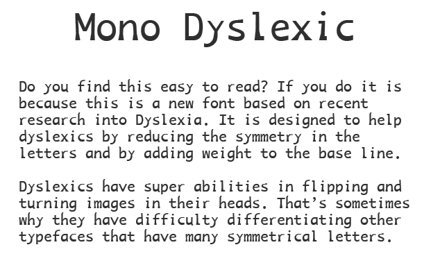
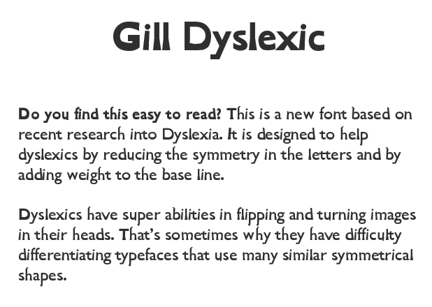
Teesside, UK-based designer of the pay fonts Mono Dyslexic (2011) and Gill Dyslexic (2011). [Google]
[More] ⦿
|
PJM Homebrew Fonts
[Paul James Miller]
|
 Sheffield, UK-based electronics engineer who works on CAD systems both mechanical and electrobic. An ardent supporter of the open source paradigm, he works for the NHS. Designer of these free fonts:
 - Balgruf (2020). A decorative typeface, inspired by the Skyrim game.
- Daniel Jaques (2019). He writes: This is a free decorative display font for signage and advertising.
- Cadman (2017-2018). An informal sans typeface designed for people with dyslexia that started out from SIL's Andika but was altered to include all the tips for legibility from the book Reading Letters by Sofie Beier. An outgrowth of Cadman is Bainsley.
- Kelvinch (2013-2016). Miller's first font. A free modified version of Gentium Book Basic. The Greek alphabet was ripped from Gentium Plus and then heavily modified. See also Kelvinch Italic.
- Munson (2017). A semi-Clarendon in four styles. He writes: There was a typeface by a company called Stephenson Blake Co. in Sheffield. This typeface was made around 1815 and was called Consort. It was a bracketed slab serif face with ball terminals where appropriate. I have obtained scanned documents and typeface samples from that era which depict the Consort typeface and I have attempted to re-create the look and style of that typeface in a modern font. I have photographs of an incomplete set of the Consort typeface, I have filled in the gaps and some of the characters in the Consort typeface were not to my liking so I have designed Munson according to my own aesthetic preferences and with a great deal of artistic license. There is also much of Clarendon in Munson. The Clarendon typeface was first made by Robert Besley in London in 1845 and is particularly well known. Munson is an amalgamation of all these influences, a sort of hybrid between the Consort and Clarendon with some of my own influence thrown in for good measure.
- Typey McTypeface (2015). An adaptation of Dieter Steffmann's Chelsea (1995). He writes: A good font for Arctic sailors.
- Bainsley (2020-2021). A sans leaning towards a serif, with supoort for Greek, Cyrillic and Armenian. It is free but the download button at Localfonts does not work.
- Wigner's Friend (2021). A single style slab serif.
Fontsquirrel link. Devian Tart link. Localfonts link. Wordpress link. Fontsquirrel link. [Google]
[More] ⦿
|
Rachele Lo Piano
|
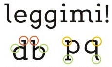 Italian designer of Leggimi (2008), a readable font in which confusion is minimized. It was made for dyslexics. [Google]
[More] ⦿
Italian designer of Leggimi (2008), a readable font in which confusion is minimized. It was made for dyslexics. [Google]
[More] ⦿
|
Randy Gootjes
|
Dutch graphic designer based in Zoetermeer, The Netherlands. In 2015, he designed the font Pica for dyslexics. Behance link. [Google]
[More] ⦿
|
Renske de Leeuw
|
Dutch researcher whose Masters thesis at the University of Twente in 2010 is entitled Special fonts for Dyslexia?. She compared Christiaan de Boer's Dyslexie typeface with Arial. Two of her followers wrote theses on similar subjects, Tineke Pijpker (2013, University of Twente)'s Dyslexie letters en kleurcontrast, and Liane van Someren (2014, University of Amsterdam)'s Aanwijzingen waarom dyslectici meer accuraat lezen met het lettertype Dyslexie. All three theses are refuted by typographic journalist Henk Gianotten in Dyslexie, letters en dwalingen (2014, De Boekenwereld, vol. 30, No. 4, pp. 92-93). Gianotten points out that Arial's x-height exceeds that of Dyslexie, contradicting de Leeuw's claim. He also complains about the lack of a scientific method. In Gianotten's view, three key things are needed for readability---larger letters, more spacing between letters, and more interline space. For dyslexics, he also recommends using columns not more than nine words wide. [Google]
[More] ⦿
|
Rica Dujon
|
Rica Dujon, a graphic designer in Singapore, created the sans typeface Lexis in 2013. It was based on the analysis of a dyslexic child's handwriting. Lexis Regular is a font specially designed to help dyslexic individuals better see, read and process words and information. Lexis was a school project at the Lasalle College of the Arts. The user-testings were conducted in partnership with the Dyslexia Association of Singapore. [Google]
[More] ⦿
|
Robert Goodman
[Dyslexica Font Foundry]
|
[MyFonts]
[More] ⦿
|
Robert Hillier
[Robs Fonts]
|
[More] ⦿
|
Robs Fonts
[Robert Hillier]
|
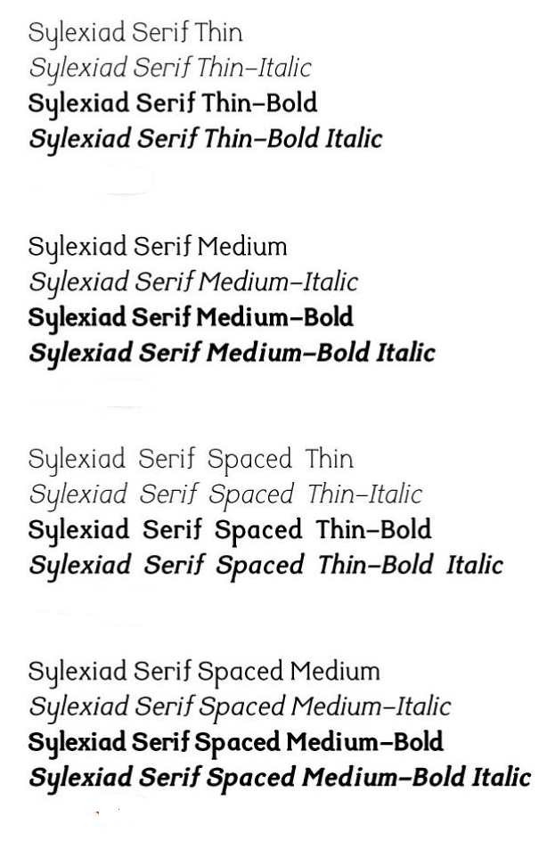
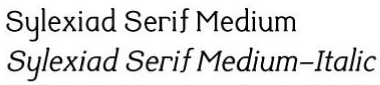 Dr. Robert Hillier is a Senior Lecturer at Norwich University College of the Arts in the UK. He designed and developed the Sylexiad range of fonts for adult dyslexic readers as part of his doctoral research. He has presented his research findings at design institutions and conferences, including the St.Bride Library Conference Fast Type Slow Type, Birmingham (2006). Sylexiad has been featured in publications including, Novum, Etapes, Ultrabold and the Journal of Writing in Creative Practice. Thesis in 2006 entitled A Typeface for the Adult Dyslexic Reader. Speaker at ATypI 2011 in Reykjavik, where we read this: The findings of developmental typeface testing identified the typographic characteristics adult dyslexic and non-dyslexic readers preferred and why. For the majority of non-dyslexic readers tested it was the combination of serif-style, lowercase forms, large x-heights, medium weight, variable strokes and normal inter-word spacing that was preferred. The non-dyslexic readers also favoured the form of Times New Roman. Conversely, for the majority of dyslexic readers tested it was the combination of handwritten style, uppercase forms, long ascenders and descenders, light weight, uniform strokes, perpendicular design and generous inter-word spacing that was preferred. The dyslexic readers also favoured the form of Serif Sylexiad.
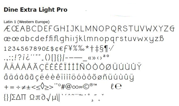
 Other typefaces by Hillier: Dine (an experimental interactive font) and CIRCS (experimental display font). [Google]
[More] ⦿
|
Rocio Egio
[Dyslexic Font]
|
[More] ⦿
|
Sally Castle
|
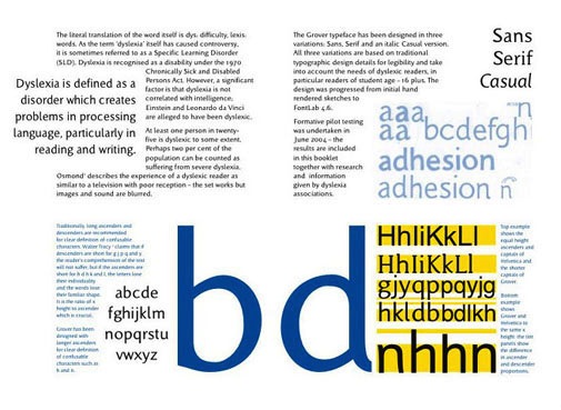
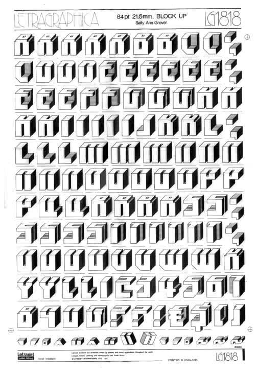
Type design student at Reading who created Grover (2004), a serif-sans-casual family specially designed for dyslexic people. Grover is Sally's maiden name. Sally also made the 3d typeface Blockup. [Google]
[More] ⦿
|
Serif vs sans serif
[Faruk Ate]
|
Faruk Ate discusses this old dilemma. Serif is more legible in print, but less so on screen. Serif is better for dyslexics though, as there is less confusion. At small screen size, sans serif is recommended. He concludes: Personally, I still prefer sans-serif for large chunks of text with a lovely serif heading. [Google]
[More] ⦿
|
Stephan Peters
[Fonts for dyslexics: comments by Stephan Peters]
|
 [More] ⦿
|
Studiostudio
[Christiaan Theo Boer]
|
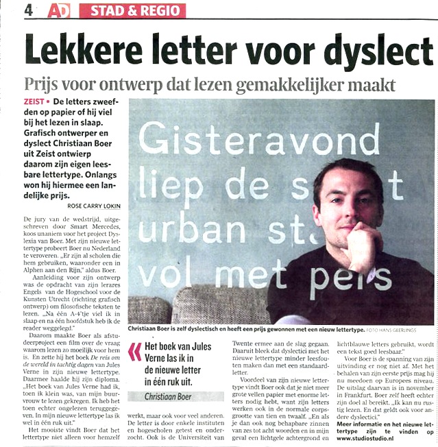
Studiostudio (The Netherlands) developed a commercial casual typeface called Dyslexie (2008) to minimize the errors perceived by dyslexics. Created by Christian Theo Boer (b. 1981; located in Zeist), the research was carried out at the University of Twente. In a research article about Dyslexie, Judith van de Vrugt writes: Dyslexia>... it is a word that many dyslexics find hard to pronounce. Christian Boer is one of them. Being a dyslexic student, he came upon the idea for his thesis to design a font that would make letters more distinguishable for someone with dyslexia. Due to the visible distinc- tion, it would be easier to read, and letters would dance less. The Dyslexie font is commercial, but a free trial version is available. [Google]
[More] ⦿
|
Sue Walker
[Fabula]
|
[More] ⦿
|
The Lexend Project
[Bonnie Shaver-Troup]
|
 Bonnie Shaver-Troup, EdD, the creator of the Lexend project (which is based in Irvine, CA), is focused on making reading easier for everyone. As an educational therapist, Bonnie created the first Lexend typeface in early 2001 aiming to reduce visual stress and to improve reading performance for those with dyslexia and other struggling readers. Today, Bonnie's goal is to make the Lexend fonts accessible to a larger spectrum of users.
 Bonnie writes: Lexend is a variable typeface designed by Bonnie Shaver-Troup and Thomas Jockin in 2018. Applying the Shaver-Troup Individually Optimal Text Formation Factors, studies have found readers instantaneously improve their reading fluency. Lexend was expanded to Arabic in January 2020. The Shaver-Troup Formulation was applied to Arabic with advise from Arabic typeface designer, Nadine Chahine. Lexend is based on the Quicksand project from Andrew Paglinawan, initiated in 2008. Quicksand was improved in 2016 by Thomas Jockin for Google Fonts. Thomas modified Quicksand for the specialized task of improving reading fluency in low-proficiency readers (including those with dyslexia. In 2019, Thomas Jockin released the free seven font family Lexend (Deca, Exa, Giga, Mega, Peta, Tera and Zetta) at Google Fonts, together with Bonnie Shaver-Troup. Github link. Dedicated site. Thomas Jockin writes that Lexend is empirically shown to significantly improve reading-proficiency. As prescription eyeglasses achieve proficiency for persons with short-sightedness, Lexend's families were developed using Shaver-Troup Formulations. We will eventually release all seven families as a single variable font featuring its own custom axis. Lexend is thus an implementation of Bonnie Shaver-Troup's 2000 study, in which she theorized that reading performance would improve through the use of (1) hyper expansion of character spacing [which creates a greater lag time and reduces potential crowding and masking effects], (2) expanded scaling, and (3) a sans-serif font [to reduce noise]. Lexend is indeed hyper-widely spaced. [Google]
[More] ⦿
|
Tom Besters
|
Designer at Typolis in Antwerpen, Belgium, where he designed the grunge font Dyslexic. Tom lives in Borsbeek. [Google]
[More] ⦿
|
Victor Gomez
|
Based in Bogota, Colombia, Victor Gomez developed Dixia (2013), a simple riound sans script that is geared towards children, both dyslexic and non-dyslexic. Behance link. [Google]
[More] ⦿
|

